| | |
100types
[Ben Archer]
|
Educational and reference site run by Ben Archer, a designer, educator and type enthusiast located in England (who was in Auckland, New Zealand, before that). Glossary. Timeline. Type categories. Paul Shaw's list of the 100 most significant typefaces of all times were recategorized by Archer: - Religious/Devotional: Gutenbergs B-42 type, Gebetbuch type, Wolfgang Hoppyl's Textura, Breitkopf Fraktur, Ehrhard Ratdolt's Rotunda, Hammer Uncial, Zapf Chancery, Peter Jessenschrift, Cancellaresca Bastarda, Poetica.
- Book Publishing&General Purpose Text Setting: Nicolas Jenson's roman, Francesco Griffo's italic, Claude Garamond's roman, Firmin Didot's roman, Cheltenham family, Aldus Manutius' roman, William Caslon's roman, Pierre-Simon Fournier's italic, Ludovico Arrighi da Vicenza's italic, Johann Michael Fleischmann's roman, ATF Garamond, Giambattista Bodoni's roman, Nicolas Kis' roman, Minion multiple master, Unger Fraktur, John Baskerville's roman, Lucida, Optima, Bauer Bodoni, Adobe Garamond, Scotch Roman, Romanée, ITC Stone family, Trinité, ITC Garamond, Sabon, ITC Novarese, Charter, Joanna, Marconi, PMN Caecilia, Souvenir, Apollo, Melior, ITC Flora, Digi-Grotesk Series S.
- Business/Corporate: Akzidenz Grotesk, Helvetica, Univers, Syntax, Courier, Meta, Rotis, Thesis, Antique Olive.
- Newspaper Publishing: Times Roman, Bell, Clarendon, Century Old Style, Ionic, Imprint.
- Advertising and Display: Futura, Robert Thorne's fat typeface roman, Vincent Figgins' antique roman (Egyptian), Memphis, Fette Fraktur, Avant-Garde Gothic, Deutschschrift, Peignot, Erbar, Stadia/Insignia, Penumbra, Compacta, Bodoni 26, WTC Our Bodoni.
- Prestige and Private Press: Romain du Roi, Golden Type, Johnston's Railway Sans, Doves Type, Walker.
- Signage: William Caslon IV's sans serif, Trajan.
- Historical Script: Snell Roundhand, Robert Granjon's civilité, Excelsior Script.
- Experimental/expressive: Mistral, Beowolf, Dead History, Behrensschrift, Eckmannschrift, Neuland, Element, Remedy, Template Gothic.
- Onscreen/multimedia: Chicago, Oakland, OCR-A, Base Nine and Base Twelve, Evans and Epps Alphabet.
- Telephone Directory publishing: Bell Gothic.
Link to Archer Design Work. [Google]
[More] ⦿
|
Alexandre Le Saulnier de Saint Jouan
|
As a student at ENSAD in Paris, he co-designed Poinçons (1999), a typeface based on a design of Fournier. [Google]
[More] ⦿
|
Ben Archer
[100types]
|
[More] ⦿
|
Besnowed
[Rory Snow]

|
 Hartlepool, UK-based graphic and book designer who specializes in bible designs. Creator of Barbou (2021). He explains: Barbou was originally cut in 1925 by Monotype as a counterpart to Fournier, siblings that were different in design but both based on the work of Pierre-Simon Fournier. Whether by choice, accident or oversight, Fournier was preserved digitally, and Barbou was lost to history. Barbou was notably used by Stanley Morrison, in particular as the face of The Fleuron. I fell in love with Barbou when I saw it, and knew that I wanted to bring it to a new generation of designers and readers. This is a revival of Barbou, a faithful recutting with new weights, characters and many of the best features that modern font technology brings. Particular attention was paid to the original Monotype Barbou 178 specimen sheet. Originally only available in a single weight, Barbou has been recut with a variable weight, providing a large degree of flexibility between Regular and Bold. Barbou excels as a comfortable reading face for books, and the variable weight allows you to fine tune the darkness and texture of the page in a way never before possible. Barbou has a distinctive softness, and this revival of Barbou preserves much of the effect the medium of metal type had on the letterforms. This results in a subtly rounded yet defined type, elegant not worn, with the utmost attention and respect to the smallest of details. Barbou was originally cut with disparate x-heights for roman and italic, and this revival of Barbou features both the original italic, as well as a new italic redesigned at the same height as the roman. In Fournier's time, roman and italic would not be mixed on the same line, but the type must change to meet the needs of a new generation. [Google]
[MyFonts]
[More] ⦿
|
Bitstream font analogue
|
 Bitstream font name equivalences. The original file, dated 2007, was at Fontinfo.net, but dispappeared some time ago. Here is that list in text format:
 Aachen == Charlemagne; Ruhr; Vanadium; Westlake Ad Lib == Alibi Adsans == Ad Gothic; Angro; Humanist 970; News Ad Akzidenz Grotesk == Ad Grotesk; Gothic 725; Grigat; Standard; Wayland Albertus == Adelon; Alburt; Flareserif 821 Aldus == Breklum; Luce; Mannucci Roman Alternate Gothic No.2 == Alpin Gothic; Gothic Amazone == Amazonia; Fredrika Amelia == Computer 651; Orbit; Orea American Text == Blackletter 851; National Text Americana == AM; American Classic; Aston; Colonial; Concord; Flairserif 721; Freedom; Independence Antique No. 3 == Egyptian 710 Antique Olive == Alphavanti; AO; Berry Roman; Gibson Antique; Incised 901; Oliva; Olivanti; Olive; Olive Antique; Oliver; Olivette; Olivette Antique; Olivia; Provence Antique Roman Open == Roman Stylus Antique Roman Shaded == Roman Shaded Arnold Bocklin; Auckland == Bock; Expo; Medusa; Nouveau; Youth; Freeform 715 Asta == Albany; AS; Astro; Aztec; Corolla; Dutch 823 Auriol == Freeform 721; Robur; Skylark Aurora Bold Condensed == Anzeigen Grotesk; Aura; Aurora; Grotesque Condensed Aurora == Empira; News 706; News No.12; News No.2; Polaris; Regal Baker Signet == Keene; Signature; Signatur Vario; Signete Balloon == BL; Freehand 041; Lasso Bank Gothic == Bond Gothic; Commerce Gothic; Deluxe Gothic; Magnum Gothic; Square 021; Stationer's Gothic Baskerville == Baskenland; Baskerline; Basque; Beaumont; BK; Transitional 401 Baskerville No.2 == Euro Baskerville; Transitional 404 Bauer Bodoni == Bodoni B; Euro Bodoni; Headline Bodoni; Modern 405 Bell Centennial == Gothic 762 Bell Gothic == Directory Gothic; Furlong; Gothic 761; Paddock Belwe == Belter; Welby Bembo == Aldine 401; Aldine Roman; Ambo; BE; Bem; Bernstein vario; Bingo; Griffo; Latinesque Berling == Carmichel; Revival 565 Bernhard Modern == Beacon; Bernie; BN; Duchess; Engravers Oldstyle Bernhard Tango == Aigrette; Carmine Tango Bingham Script == Freehand 591 Bison == Bison; Blizzard; Brush 738 Bitstream Alisal == Calligraphic 456 Bitstream Amerigo == Flareserif 831 Bitstream Arrus == Lapidary 721 Bitstream Carmina == Calligraphic 811 Bitstream Charter == Transitional 801 Bitstream Cooper == Freeform 741 Bitstream Fournier == Transitional 601 Bitstream Iowan Old Style == Venetian 801 Bitstream Oz Handicraft == Freehand 701 Bitstream Ventana == Humanist 800 Blippo == Geometric 755 Block == Black; Block; Gothic 821; Hobble Bloc == Geometric 885 Bodoni == BO; Bodoni No. 2; Brunswick; Empiriana; Gorvind; Modern 421 Bodoni Campanile == Modern 735; Palisade Bookman == Bookface; Bookman Antique; Bookprint; Revival 710 Bremen == Exotic 011 Britannic == Gallery; Grenoble Broadway == Big City; BW; Deco; Hudson; Moderne; Modernistic; Ritz; Showtime Brody == Brophy Script Bruce Old Style == Bruce; No. 31; Old Style No.3; Old Style No.7; Revival 704 Brush Script == Bombay; BR; Brush; Brilliant Bold Script; Brush 451; Punch Cable == Geometric 231; Kabel; Kabello; Kobel Caledonia == Calderon; Caledo; California; Cornelia; Edinburgh; Gael; Gemini; Highland; Laurel; Transitional 511 Candida == Candide Cascade == Freehand 471; Kascade Script Caslon 540 == Caslon 74; CL; Caslon 2; Caslon 484; Caslon 485 Caslon Bold == Caslon No. 3; New Caslon; Caslon 74 Bold Caslon Old Face == Caslon Old Style; Caslon; Caslon 128; Caslon 471; Caslon 76 Cataneo == Chancery 731 Centaur == Arrighi; Centaurus; Venetian 301 Century Expanded == Century Light/II; Century X; Cambridge Expanded; CE; Century; Century Bold Century Oldstyle == Cambridge Oldstyle Century Schoolbook == Century Text; Century Textbook; CS; Schoolbook; Cambridge Schoolbook; Century Medium; Century Modern Chapel Script == Mahogany Script; Monterey Cheltenham Old Style == Cheltonian; Chesterfield; Gloucester; Kenilworth; Nordhoff; Sorbonne; Winchester Choc == Staccato 555 City == Square Slabserif 711; Town Clarendon == Clarique; Clarion; Cerebral Cloister Black == Abbey; Cloister Black Codex == Calligraphic 421 Concorde == Dutch 809; Chinchilla; Concert Cooper Black == Bitstream Cooper; Burlesque; Coop; CP; Ludlow Black; Pabst; Plymouth; Rugged Black Copperplate Gothic == Atalante; Copperplate; Formal Gothic; Gothic No.29; Gothic No.30; Gothic No.31; Gothic No.32; Gothic No.33; Lining Plate Gothic; Mimosa; Spartan Corona == Aquarius; Cardinal; CR; Crown; Elmora; Ideal; Koronna; News 705 BT; News No.3; News No.5; News No.6; Nimbus; Quincy; Royal; Scotsman Royal; StarNews; Vela Coronet == Pageant; Ribbon 131 Courier == Messenger Davida == DaVinci De Vinne == Congressional; Industrial 731 Della Robbia == Cantoria; Canterbury; Dahila; Firenze; Westminster Old Style Diotima == Calligraphic 810; Diotima Dom Casual == Ad Bold; Brush 431; Brush Roman; Dom Casual; Polka Eckmann == Freeform 710 Egyptian 505 == Egyptios; Egypt 55 Egyptienne == Humanist Slabserif 712; Egyptien Electra == Avanta; Elante; Illumna; Selectra; Transitional 521 Embassy == Boston Script; Florentine Script; Hellana Script; Script No.1; Script No.2 Englische Schreibschrift == English 157; English Script Engravers' Old English == Old English; Old English Text Engravers' Roman == Lining Litho Engravers Roundhand == Roundhand No. 1; Signet Roundhand; Snell; Snell Roundhand Eurostile == Aldostyle; Astron; ES; Eurogothic; Europa; Gamma; Micro; Microstyle; Square 721; Waltham Excelsior == Angeles; Berlin; Camelot; Commerce No.1; Commerce No.2; Digi-Antique; Esquire; EX; Excel; Excella; League Text; News 702; News No.10; News No.14; Opticon; Paragon; Primus; Victoria Fairefax; Fairfield == Fairmont; Savant; Transitional 551 Financial == Letter Gothic Folio == Haverhill Fraktur == German Gothic Franklin Gothic == Gothic No.16; Pittsburgh Frutiger == CG Frontiera; Concorde; Freeborn; Humanist 777; Provencale; Roissy; Siegfried Fry's Baskerville == Baskerville Display; Baskerville F; Baskerville Old Face; Transitional 409 Futura == Alphatura; Atlantis; FU; Future; Photura; Sirius; Utica Gando == Gando Ronde Garamond == Aldine 511; American Garamond; Canberra; Carrera; Garamond No.2; Garamond No.3; Garamond No.49; Garamont; GD; Grenada Gill Sans == Eric; Gillies; Glib; Graphic Gothic; Hammersmith; Humanist 521; Sans Serif 2 Gothic No.13 == Gothic No.4 Goudy Old Style == Grecian; Number 11; Goudy; Goudy Bold; Goudy Extra Bold Granjon == Elegant Garamond; Garamont Premier; Grandeur Grotesque 126 == Gothic 720 Hanseatic == Swiss 924; Geneva 2 Hanoverian; Helvetica Compressed == Helvetica Pressed; Spectra Compressed; Swiss 911; Claro Compressed; Geneva 2 Compressed; Helios Compressed Helvetica Inserat == Swiss 921; Geneva 2 Sera; Geneva Inserat; Helios Inserat Helvetica Monospaced == Monospace 821 Helvetica == Aristocrat; CG Triumvirate; Claro; Corvus; Europa Grotesk; Geneva/2; Hamilton; HE; Helios/II; Helv; Helvette; Holsatia; Megaron/II; Newton; Spectra; Swiss 721; Vega; Video Spectra Hobo == Hobnob; Tramp Imperial == Bedford; Emperor; Gazette; New Bedford; News No.4; Taurus Imprint == Period Old Style; Dutch 766 Impuls == Impuls; Brush 439 Ionic No. 5 == Ionic-326; Ionic/2; News 701; News Text Medium; Rex; Windsor; Zar; Corinth; Doric; Ionic 342; Dow News; Ideal; Regal Italian Script == Lorraine Script; Lucia ITC American Typewriter == Amertype; AT; Newriter; Typewriter 911 ITC Avant Garde Gothic == AG; Avanti; Cadence; Geometric 711; Suave; Vanguard ITC Bauhaus == BH Geometric 752 ITC Benguiat Gothic == BT; Informal 851 ITC Benguiat == Beget; BG; Revival 832 ITC Berkeley Oldstyle == Venetian 519 ITC Bolt Bold == Square 821 ITC Bookman == Revival 711; Bookman; BM ITC Busorama == Geometric 075; Omnibus; Panorama; ITC Century == Centrum ITC Galliard == Seville ITC Garamond == Garamet ITC Kabel == Kabot ITC Korinna == Kordova ITC New Baskerville == Transitional 402 ITC Serif Gothic == Line Gothic ITC Souvenir == Sovran; SV ITC Tiffany == Jewel ITC Zapf Chancery == Chancelor Janson == Jason; Journal; Kis; Kis-Janson; Nikis; Dayton; Jan/Dutch Jefferson == Freehand 575 Kaufmann == Swing Bold; Tropez Liberty == Bernhard Cursive; Bernhard Schonschrift; Lotus; Viant Libra == Libretto; Libby Uncial Life == Fredonia Linotype Modern == Modern 880; Telegraph Modern London Text == Belvedere; Blackletter 686 Lydian Cursive == Granite Cursive; Lisbon Cursive Lydian == Granite; Lisbon Madison == Century 725 Mandate == Command; Freehand 521 Matt Antique == Garth Graphic Melior == Ballardvale/2; CG Melliza; Hanover/II; Lyra; Mallard; Matrix; ME; Medallion; Metrion; Uranus; Ventura; Vermilion; Zapf Elliptical Memphis == Alexandria; Cairo; Geometric Slabserif 703; Nashville; Pyramid Meridien == Zenith; Equator; Latin 725; Latine; Maximal Metro == Chelsea; Geometric 415; Gothic No.2; Gothic No.3; Megamedium; Meteor Mirarae == Calligraphic 808 Mister Earl == Freehand 651 Mistral == Aeolus; Missive; Staccato 222; Zephyr Script Neuland == Othello; Informal 011 Neuzeit Grotesk == Genneken; Geometric 706; Grotesk S News Gothic == Alpha Gothic; CG Trade; Classified News; Gothic Bold-131; Gothic No.17; Gothic No.18; Gothic No.19; Gothic No.20; Gothic-130; Lightline Gothic; Record Gothic; Toledo; Trade Gothic Nuptial Script == Bridal Script; Floridian Olympian == Olympus; Dutch 811 Ondine == Formal Script 421; Mermaid Onyx == Arsis; Onyx; Poster Bodoni Compressed Optima == Athena; CG Omega; Chelmsford/II; Musica; October; OP; Optimis; Optimist; Oracle/II; Orleans; Roma; Ursa; Zapf Humanist; Zenith Oscar == Formal 436 Palatino == Andover/II; CG Palacio; Compano; Elegante; Malibu/2; Paladium; Palatine; Palermo; Parlament; Patina; Pontiac; Zapf Calligraphic Palette == Brush 445; Palette Park Avenue == Parkway; PA Peignot == Exotic 350; Monterey; Penyoe Perpetua == Felicity; Lapidary 333; Percepta; Perpetual Piranesi Italic == Minuet Plantin == Aldine 721; Atlantic; PL; Planet; Plantin Poster Bodoni == Bodoni Extrabold/No. 2; Modern 721 Prestige == Prestige Elite Primer == Rector; Scholasta; Century 751; Premier; Bancroft Profil == Decorated 035 Raleigh == Cartier Rockwell == Slate; Geometric Slabserif 712; Rockland Romana == Romanisch; De Vinne; De Vinne Ornamental; French Old Style; Lorimer; Romaans Sabon == Berner; Classical Garamond; September; Sybil/2; Symposia Serifa == Seriverse; Sierra; Monty; Seraphim Shelley == Operinia Simoncini Garamond == Garamond Simoncini; Garamondus; Italian Garamond; Spartan == Technica; Techno; Times Gothic; Twentieth Century; Geometric 212; Sans; Sparta Star Trek == Square 051 Stempel Garamond == Euro Garamond; Garamond; Garamond Antiqua; Garamond Royale; Original Garamond Stempel Schneidler == Amalthea; Bauen Schrift; Bauer Text; Brewer Text; Kohinoor; Schneidler; Schneidler Old Style Stuyvesant == Wintergreen Stymie == ST Syntax == Synthesis; Cintal; Humanist 531; Symphony; Synchron Textype == Century 731 Times Roman == TmsRmn; TR; Varitimes; Claritas; Dutch 801; English; English 49; English Times; Euro Times; London Roman; Pegasus; Press Roman; Sonoran Serif; Tempora; Tiempo; Timeless; Times New Roman Torino == Contessa; Galileo; Industrial 736; Loren Trump Mediaeval == Activa; Ascot; Continental; Knight; Kuenstler 480; Mediaeval; Olympus; Renaissance; Saul Typo Upright == French Script; Interscript; Kaylin Script; Linoscript; Parisian Ronde Umbra == Durante; Meandme; Plastica Univers == Alphavers; Aries; Boston; Eterna; Galaxy; Kosmos; Swiss 742; UN; Versatile; Zurich University Roman == Ace; Celtic; Collegette; Forum Flair; Opera; Orna; Stunt Roman Wedding Text == Linotext; Marriage Windsor == Winslow [Google]
[More] ⦿
|
Bo Berndal
[T4 Typography AB]

|
[MyFonts]
[More] ⦿
|
Bodoni's books
|
Adam Koster from Oak Knoll in Delaware describes three of Bodoni's publications: - "FREGI E MAJUSCOLE INCISE E FUSE DA GIAMBATTISTA BODONI, DIRETTORE DELLA STAMPOERIA REALE". Parma, Italy: 1771. First edition of Bodoni's first type specimen book. It contains a preface by Bodoni describing the types and ornaments used in the earlier part of his career showing his admiration for the rococo style of Fournier, whom he copied in a flattering manner. "Granted that the most agreeable features of the book are copied, this "specimen" of 1771 is one of the most tasteful and charming volumes of its kind in existence. Each page is surrounded with borders, of which scarcely one is bad, or scarcely two alilke. The types are old style, but their delicacy shows current tendencies, being especially true of the italic. The book is enormously instructive to compare with Bodoni's great, chilly masterpieces, the "Oratio Dominica" and the "Manuale Tipografico" of 1818" (Updike, Printing Types, Vol. I, p.184). Illustrated with more than 400 type ornaments and several pages of capitals...Majuscole ornate e CARATTERI Moderni. Giambattista Bodoni (1740-1813) had recently (1768) been appointed director of the Duke of Parma's private press, the Stamperia Reale, on his way to becoming the most celebrated printer in Europe, and a leader in the development of the modern letter form. " If (Bodoni) was careful in his choice of paper, he relied still more on his type and from 1771 onwards issued a series of typographic manuals, which show the love and labour that he was continuously lavishing on the fashioning and perfecting of this weapon...there is something peculiarly satisfying in the thought of this man through all the vicissitudes of one of the most stormy periods of European history, heedless of changes of regime, cheerfully, unswervingly and successfully pursuing his artistic ideals (Brooks, preface, xi)." With the Borghese family coat of arms gilt-stamped on front boards. The Borghese family, originally from Siena and later from Rome, produced one pope, Paul V, several cardinals, many prominent citizens, and were noted patrons of the arts and letters.
- "Epithalamia exoticis linguis reddita. Parmae Ex Regio Typographeo", 1775. With engraved title page vignette, head- and tail-pieces and historiated initals after Ferrari. Considered one of Bodoni's finest type specimen books, it contains the alphabets of twenty-five exotic languages, including Tibetan, Phoenician and Coptic. Has a poem by Conte Della Torre di Rezzonico.
- "MANUALE TIPOGRAFICO." Two volumes. Parma, Italy: 1818. Bodoni's most substantial and famous type specimen. (Brooks 1216, Updike, Printing Types, II, pp. 169-171). This last specimen to be issued by Bodoni, "with a Discorso by his widow and Prefazione by Bodoni, appeared in 1818, five years after his death. It was completed under the care of his widow and Luigi Orsi, who was for twenty years foreman to Bodoni. Signora Bodoni, writing to M. Durand, of Metz, from Parma (November 14, 1817), says: 'The Manuale Tipografico in two volumes on papier-velin-the only kind of paper used for it-is not yet completed, but it will be, without fail, at the beginning of the coming year. I dare to believe that book-lovers will thank me for having published a volume which is so very important to Typography. The reception which it will have, will make up for the trouble it has cost me (although Bodoni has left the blocks or models for it) and the considerable expense which I shall have had to incur before it is finished. Also, in view of the fact that but 290 copies are struck off, I cannot dispose of them at less than 120 francs, without any reduction. M. Rosaspina has engraved au burin the portrait after one which the celebrated Appiani... painted in oils, which is a striking likeness.'" (Updike II, p.169) The first volume contains a discourse by Vendova Bodoni and a preface by G.B. Bodoni and is followed by the Latin type specimens. Twenty-six separate typefaces are described, each displayed in several different point sizes and most with specimens in Roman and italic. The display of the individual specimens in so many variations is particularly dramatic, the specimens for majuscole alone comprise 108 variations. The second volume displays thirty-four non-Latin type specimens including: Greek, Hebrew, Arabic, Armenian, Cyrillic, Tibetan, and many others. Many of these span multiple pages and present type in varying sizes. The Greek and Russian typefaces are the most comprehensive, with many pages devoted to large and impressive variations. This section is followed by specimens of 1036 decorative borders (Fregi), each designed to work with specific Bodoni typefaces, specimens of ornaments and rules, and specimens symbols for algebra, chemistry, astronomy, and music notation. Several of these are contained on large folding plates.
[Google]
[More] ⦿
|
Brian Lucid

|
Type designer from Massachusetts who made Narcissus Roman (1995, Font Bureau), a strong bold inline titling typeface with upper and lower case characters---in its genre, one of the best typefaces on earth. He also designed the ultra-condensed typeface Barcode (1994, Font Bureau). Font Bureau writes about Narcissus: In 1921, Walter Tiemann designed Narcissus for Klingspor after a suave set of ornamental inline capitals first cut by Simon Pierre Fournier about 1745. In 1925, Mergenthaler Linotype reproduced Tiemann's type, calling it Narciss. The elegance of Fournier's Louis XVI design created a vogue in late eighteenth-century Paris; Narciss and Narcissus sparked a revival in the twenties. Brian Lucid's cut reflects the urbane air of a master. Klingspor link. FontShop link. Font Bureau link. [Google]
[MyFonts]
[More] ⦿
|
Caroline Laguerre
|
As a student at ENSAD in Paris, she co-designed Poinçons (1999), a typeface based on a design of Fournier. [Google]
[More] ⦿
|
Cédric Murac
|
As a student at ENSAD in Paris, he co-designed Poinçons (1999), a typeface based on a design of Fournier. [Google]
[More] ⦿
|
Charte des Ornements
[Jacques André]
|
A PDF file compiled by Jacques André (Rennes) which lists the ornaments in several digital fonts such as Fourier-GUTenberg (futs), Fournier (mf1rp) the Monotype ornament series (mpi001 � mpi006). [Google]
[More] ⦿
|
Chris Brand

|
Born in Utrecht in 1921, Chris Brand lived in Breda, and died in 1998. He studied calligraphy in 1940, and worked in Brussels from 1948-1953. He taught design at various academies until 1986. Known for book cover jackets, Brand created the clean serif typeface Albertina in 1964-1965 (Monotype). This typeface was first used for a retrospecive on Stanley Morison's work exhibited at the Albertina Library in Brussels in 1966. Dean Allen [Textism]: Working designers should have at least one text family to focus on; to test its idiosyncrasies and stretch its limits, to see how it responds to the unpredictable demands of day-to-day work. Albertina is the family with which I do the most tinkering. It's remarkably flexible, offering a full complement of text and titling figures, roman and italic small caps, as well as supplemental Greek and Cyrillic fonts. It has the sort of strength, or presence on the page absent from most digital type, owing to sturdy construction, and it lacks fussiness. The digital font DTL Albertina saw the light in 1987 at Dutch Type Library. Brand also created Veerle Uncialis (1991, named after his granddaughter Veerle Simons) but it is unclear whether this font is his or a reworking of a typeface by the Parisian typefounder Fournier. Finally, he made the coptic font Draguet (1968). FontShop link. Klingspor link. [Google]
[MyFonts]
[More] ⦿
|
Christian Schwartz

|
 Christian Schwartz was born in 1977 in East Washington, NH, and grew up in a small town in New Hampshire. He attended Carnegie Mellon University in Pittsburgh, Pennsylvania, where he graduated in 1999 with a degree in Communication Design. After graduation, he spent three months as the in-house type designer at MetaDesign Berlin, under the supervision of Erik Spiekermann. In January 2000, he joined Font Bureau. Near the end of 2000, he founded Orange Italic with Chicago-based designer Dino Sanchez, and left Font Bureau in August 2001 to concentrate full-time on developing this company. Orange Italic published the first issue of their online magazine at the end of 2001 and released their first set of typefaces in the beginning of 2002. Presently, he is an independent type designer in New York City, and has operated foundries like Christian Schwartz Design and Commercial Type (the latter since 2009). He has designed commercial fonts for Emigre, FontShop, House Industries and Font Bureau as well as proprietary designs for corporations and publications. In 2005, Orange Italic joined the type coop Village.
 His presentations. At ATypI 2004 in Prague, he spoke about "The accidental text face". At ATypI 2006 in Lisbon, he and Paul Barnes explained the development of a 200-style font family for the Guardian which includes Guardian Egyptian and Guardian Sans. FontShop's page on his work. Bio at Emigre. At ATypI 2007 in Brighton, he was awarded the Prix Charles Peignot. Jan Middendorp's interview in October 2007. Speaker at ATypI 2009 in Mexico City, where he announced his new type foundry, simply called Commercial. FontShop link. Font selection at MyFonts. A partial list of his creations: - FF Bau (2001-2004): Art direction by Erik Spiekermann. Released by FontShop International. He says: Bau is based on Grotesk, a typeface released by the Schelter&Giesecke type foundry in Leipzig, Germany at the end of the 19th century and used prominently by the designers at the Bauhaus. Each weight was drawn separately, to give the family the irregularity of the original, and the Super is new.
- Neutraface (2002, House Industries) and Neutraface Condensed (2004). Art directed by Ken Barber and Andy Cruz. MyFonts offers Neutraface Slab Text, Neutraface Slab Display, Neutraface Display and Neutraface Text. Schwartz states: Neutraface was an ambitious project to design the most typographically complete geometric sans serif family ever. We didn't have many actual samples of the lettering that the Neutras used on their buildings, so it ended up taking a lot of interpretation. There was no reference for the lowercase, so it's drawn from scratch, looking at Futura, Nobel, and Tempo for reference. Stephen Coles reports: Reminiscent of the recent FB Relay and HTF Gotham, Neutraface is an exaggerated Nobel with nods to Bauhaus and architectural lettering. Yes, and maybe Futura? Maggie Winters, Ioana Dumitrescu, Nico Köckritz, Nico Kockritz and Michelle Regna made great Neutraface posters.
- Neutraface No. 2 (2007), discussed by Stephen Coles: By simply raising Neutrafaces low waist, most of that quaintness is removed in No. 2, moving the whole family (which is completely mixable) toward more versatile, workhorse territory. This release is surely Houses response to seeing so many examples of Neutraface standardized by its users. Also new is an inline version. Who doesn't love inline type? It so vividly recalls WPA posters and other pre-war hand lettering. There are other heavy, inlined sans serifs like Phosphate, but one with a full family of weights and text cuts to back it up is very appealing. A typophile states: Designed by Christian Schwartz for House Industries, Neutraface captures the 1950s stylings of architect Richard Neutra in a beautiful typeface meant for application on the screen, in print, and in metalwork. If you are ever in need of a classy retro face, they don't get any more polished than this.
- At House Industries, Christian Schwartz, Mitja Miklavcic and Ben Kiel co-developed Yorklyn Stencil.
- Farnham (2004, Font Bureau) and Farnham Headline (2006, Schwartzco). Commissioned by Esterson Associates and de Luxe Associates. Winner of an award at TDC2 2004. Based on work by Johannes Fleischman, a German punchcutter who worked for the Enschedé Foundry in Haarlem in the mid-to-late 1700s. Schwartz: Truly part of the transistion from oldstyle (i.e. Garamond) to modern (i.e. Bodoni) Fleischman's romans are remarkable for their energy and "sparkle" on the page, as he took advantage of better tools and harder steel to push the limits of how thin strokes could get. In the 1800s, Fleischman's work fell into obscurity as tastes changed, but interest was renewed in the 1990s as digital revivals were designed by Matthew Carter, the Hoefler Type Foundry, and the Dutch Type Library, each focusing on a different aspect of the source material. I think the DTL version is the most faithful to the source, leaving the bumps and quirks inherent to metal type untouched. I've taken the opposite approach, using the source material as a starting point and trying to design a very contemporary text typeface that uses the basic structure and character of Fleischman without duplicating features that I found outdated, distracting, or unttatractive (i.e., the extra "spikes" on the capital E and F, or the form of the y).
- FF Unit (2003-2004, Fontshop, designed with Erik Spiekermann). A clean and blocky evolution of FF Meta intended as a corporate typeface for the Deutsche Bahn (but subsequently not used).
- Amplitude (2001-2003, Font Bureau), Amplitude Classified and Amplitude Headline. A newspaper-style ink-trapped sans family, unfortunately given the same name as a 2001 font by Aenigma. Winner of an award at TDC2 2004. The typeface selected by the St Louis Post Dispatch in 2005. One of many agates (type for small text) successfully developed by him. This page explains that they've dumped Dutch 811 and Bodoni and Helvetica and Franklin Gothic and News Gothic (whew!) for various weights of Amplitude, Poynter Old Style Display and Poynter Old Style Text. AmplitudeAubi was designed in 2002-2003 by Schwartz and Font Bureau for the German mag AutoBild.
- Simian (2001, House Industries): SimianDisplay-Chimpanzee, SimianDisplay-Gorilla, SimianDisplay-Orangutan, SimianText-Chimpanzee, SimianText-Gorilla, SimianText-Orangutan. Designed at Font Bureau. Art Direction by Ken Barber and Andy Cruz. Schwartz: "Although Simian's roots are in Ed Benguiat's logos for the Planet of the Apes movies, Simian wound up veering off in its own direction. The display styles look very techno, and we really went nuts with the ligatures, since this was one of House's first Opentype releases."
- Publico (2007): A predecessor of Guradian Egyptian. Schwartz writes: During the two year process of designing the typeface that would eventually become Guardian Egyptian, Paul Barnes and I ended up discarding many ideas along the way. Some of them were decent, just not right for the Guardian, including a serif family first called Stockholm, then renamed Hacienda after the legendary club in the Guardian's original home city of Manchester. Everyone involved liked the family well enough, but it didn't fit the paper as the design evolved, and several rounds of reworking left us more and more unsure of what it was supposed to look like. In the summer of 2006, Mark Porter and Esterson Associates were hired to redesign Publico, a major Portuguese daily newspaper, for an early 2007 launch. He asked us to take another look at Hacienda, to see if we might be able to untangle our many rounds of changes, figure out what it was supposed to look like in the first place, and finish it in a very short amount of time. Spending some time away from the typeface did our eyes a world of good. When we looked at it again, it was obvious that it really needed its "sparkle" played up, so we increased the sharpness of the serifs, to play against softer ball terminals, and kept the contrast high as the weight increased, ending up with an elegant and serious family with some humor at its extreme weights. As a Spanish name is not suitable for a typeface for a Portuguese newspaper, Hacienda was renamed once more, finally ending up as Publico. Production and design assistance by Kai Bernau. Commissioned by Mark Porter and Esterson Associates for Publico
- Austin (2003): Designed by Paul Barnes at Schwartzco. Commissioned by Sheila Jack at Harper's&Queen.
- Giorgio (2007): Commissioned by Chris Martinez at T, the New York Times Sunday style magazine. Small size versions produced with Kris Sowersby. Not available for relicensing. A high contrast condensed "modern" display typeface related to Imre Reiner's Corvinus. Ben Kiel raves: Giorgio, like the fashion models that it shares space with in T, the New York Times fashion magazine, is brutal in its demands. It is a shockingly beautiful typeface, one so arresting that I stopped turning the page when I first saw it a Sunday morning about a year ago. [...] Giorgio exudes pure sex and competes with the photographs beside it. The designers at T were clearly unafraid of what it demands from the typographer and, over the past year, kept on finding ways to push Giorgio to its limit. Extremely well drawn in its details, full of tension between contrast and grace, it is a typeface that demands to be given space, to be used with wit and courage, and for the typographer to be unafraid in making it the page.
- Empire State Building (2007): An art deco titling typeface designed with Paul Barnes for Laura Varacchi at Two Twelve Associates. Icons designed by Kevin Dresser at Dresser Johnson. Exclusive to the Empire State Building.
- Guardian (2004-2005): Commissioned by Mark Porter at The Guardian. Designed with Paul Barnes. Not available for relicensing until 2008. Based on an Egyptian, this 200-style family consists of Guardian Egyptian (the main text face), Guardian Sans, Guardian Text Egyptian, Guardian Text Sans and Guardian Agate.
- Houston (2003): Commissioned by Roger Black at Danilo Black, Inc., for the Houston Chronicle. Schwartz: As far as I know, this typeface is the first Venetian Oldstyle ever drawn for newspaper text, and only Roger Black could come up with such a brilliant and bizarre idea. The basic structures are based on British Monotype's Italian Old Style, which was based on William Morris's Golden Type. The italic (particularly the alternate italic used in feature sections) also borrows from Nebiolo Jenson Oldstyle, and there is a hint of ATF Jenson Oldstyle in places as well.
- Popular (2004): Commissioned by Robb Rice at Danilo Black, Inc., for Popular Mechanics. An Egyptian on testosterone.
- Stag (2005): Commissioned by David Curcurito and Darhil Crooks at Esquire. Yet another very masculine slab serif family. Schwartz writes I showed them a range of slab serifs produced by French and German foundries around 1900-1940, and synthesized elements from several of them (notably Beton, Peignot's Egyptienne Noir, Georg Trump's Schadow, and Scarab) into a new typeface with a very large x-height, extremely short ascenders and descenders, and tight spacing. Also, we find Stag Sans (2007, Village) and Stag Dot (2008, Village).
- Plinc Hanover (2009, House Industries). A digitization of a blackletter font by Photo Lettering Inc.
- Fritz (1997, Font Bureau). Schwartz: "Fritz is based on various pieces of handlettering done in the early 20th century by Ozwald Cooper, a type designer and lettering artist best known for the ubiquitous Cooper Black. Galapagos Type foundry's Maiandra and Robusto are based on the same pieces of lettering."
- Latino-Rumba, Latino-Samba (2000, House Industries). Art Direction by Andy Cruz. Designed with Ken Barber. Jazzy letters based on an earlier design of Schwartz, called Atlas (1993).
- Pennsylvania (2000, FontBureau). A monospaed family inspired by Pennsylvanian license plates. Schwartz: "Thai type designer Anuthin Wongsunkakon's Keystone State (1999, T26) is based on the exact same source."
- Plinc Swiss Interlock (by Christian Schwartz and Adam Cruz for House Industries). Based on originals by PhotoLetteringInc.
- Luxury (2002, Orange Italic, co-designed with Dino Sanchez). Gold, Platinum and Diamond are the names of the 1930s headline typefaces made (jokingly) for use with luxury items. The six-weight Luxury family at House Industries in 2006, contains three serif text weights called Luxury Text, as well as three display typefaces, called Platinum (art deco), Gold, and Diamond (all caps with triangular serifs).
- Los Feliz (2002, Emigre). Based on handlettered signs found in LA.
- Unfinished typefaces: Masthead, Reform, Bitmaps, Bilbao, Boyband, Addison, Elektro, Sandbox, Vendôme, Bailey.
- Fonts drawn in high school: Flywheel (1992, FontHaus), Atlas (1993, FontHaus, a "a fairly faithful revival of Potomac Latin, designed in the late 1950s for PhotoLettering, Inc"), Elroy (1993, FontHaus), ElroyExtrasOrnaments, Hairspray (1993, "a revival of Steinweiss Scrawl, designed in the mid-1950s by Alex Steinweiss, best known for his handlettered record covers": HairsprayBlonde, HairsprayBrunette, HairsprayPix, HairsprayRedhead), Twist (1994, Precision Type and Agfa), Zombie (1995, Precision Type and Agfa), Morticia (1995, Agfa/Monotype), Gladys (1996, an unreleased revival of ATF's turn-of-the-century Master Script).
- Ant&Bee&Art Fonts (1994-1995): three dingbat fonts, Baby Boom, C'est la vie, and Raining Cats&Dogs, based on drawings by Christian's aunt, Jill Weber. Released by FontHaus.
- Digitizations done between 1993-1995: Dolmen (Letraset), Latino Elongated (Letraset), Regatta Condensed (Letraset), Fashion Compressed (Letraset), Jack Regular (Jack Tom), Tempto Openface (Tintin Timen).
- Hand-tuned bitmap fonts: Syssy, Zimmer's Egyptian, Elizzzabeth, Newt Gothic, Trags X, Tibia, Fibula, Tino, Digest Cyrillic (based on Tal Leming's Digest). Free downloads of the pixel typefaces Newt Gothic, Tibula and Fibia here.
- At Village and Orange Italic, one can get Local Gothic (2005), now in OpenType, a crazy mix of Helvetica Bold, Futura Extra Bold, Franklin Gothic Condensed and Alternate Gothic No. 2. It is a collection of alternates one can cycle through---thus a for of randomization.
- FF Oxide (2005), a Bank Gothic style stencil family. FF Oxide Light is free!
- Graphik (2008), a sans between geometric and grotesk made for thew Wallpaper mag. Kris sSwersby writes: In a sweltering typographic climate that favours organic look-at-me typefaces bursting with a thousand OpenType tricks, Graphik is a refreshing splash of cool rationality. Its serious, pared-back forms reference classic sans serifs but remain thoroughly modern and never get frigid. Any designer worth their salt needs to turn away from the screen&pick up the latest copy of Wallpaper magazine. There you will find one of the most beautiful, restrained sans serifs designed in a very long time. See also Graphik Wide (2018).
- In 2011, he created a 22-style revival of Helvetica called Neue Haas Grotesk (Linotype), which offers alternates such as a straigt-legged R and a differently-seriffed a. It is based on the original drawings of Miedinger in 1957.
Schwartz also made numerous custom fonts: [Google]
[MyFonts]
[More] ⦿
|
Civilité, a French cursive
|
A brief explanation and discussion of Civilité, the script typeface made by Robert Granjon in 1556 as a typical "French cursive". It was imitated and extended by Aimé Tavernier (1559), Hendrik van den Keere (1575), Richard Breton (1597), Philippe Danfrie (1597), Jean de Tournes (1598), Fleury Bourriquant (early 17th century: his type was called Civilité honneste), Pierre-Simon Fournier (1766), Matthias Rosart (1777, the Gros Romain Civilité), and Morris Fuller Benton (1922). Many have since created their own versions. We cite a few of the contemporary type designers: Klaus Burkhardt, Manfred Klein, Stephen Moye (CiviRegular), Ingo Zimmermann (almost a copy of Moye's version), Richard Beatty, Hans J. Zinken (civi4, 1996), Hermann Zapf (1984: Zapf Civilité), George Thomas (CivilitéMJ), and Tim Ryan (CivilitéTR). [Google]
[More] ⦿
|
Claude Mozet
|
Typefounder in Nantes, b. 1704, d. 1760, Nantes. Until 1743, he was typefounder in Paris, and settled in Nantes some time between then and 1754. His work can be found in Épreuves des caracteres de la fonderie de Claude Mozet, fondeur&graveur de caractères d'imprimerie (Nantes, 1754), and in Épreuves des caracteres de la fonderie de Claude Mozet, fondeur&graveur de caractères d'imprimerie (Paris, 1743). In 1760, Mozet's foundry was taken over by J. Fr. Hémery, who was based in Paris, where he had been director of the Fournier foundry (the elder and the younger) for over 30 years. [Google]
[More] ⦿
|
Daniel Benjamin Miller
|
 Daniel Benjamin Miller (b. 2000, New York) is an undergraduate student in philosophy at McGill University. His type design work:
 - BMucicFont (2020). Based on the Steinberg Media music fonts for LilyPond music software.
- Salieri (2020). A revival of Jan Tschichold's Sabon (1964-1967).
- GFS Heraklit. This started out from Zapf's Heraklit Greek (1954). A digital revival was first done by George Matthiopoulos. Later improvements by Antonis Tsolomitis and in 2020 by Daniel Benjamin Miller.
- NX Baskerville Bold Italic (2020). An addition to Libre Baskerville (2012, Rodrigo Fuenzalida and Pablo Impallari).
- He added OpenType support and made some minor adjustments to ET Bembo (2002, Dmitry Krasny / Deka Design), releasing the result as XETBook (2019). In 2020, that font family was extended by Michael Sharpe as ETbb.
- In 2019, he started working on Regis, an original face inspired by the work of Pierre-Simon Fournier and Monotype 178 Barbou.
- RW Garamond (2019) is a freeware Garamond font in OpenType format. RW stands for Rudolf Wolf, the designer who created Stempel's version of Garamond from the Egenolff-Berner specimen. RW Garamond is a modified version of URW Garamond No. 8. and GaramondX, with changes being made to support OpenType (better vertical metrics, added diacritics, better kerning, more mathematical symbols, Greek for mathematics, character variants). Copyrights: 2000, URW++; 2005, Ralf Stubner; 2009, Gaël Varoquaux; 2012-2017, Michael Sharpe; 2019, Daniel Benjamin Miller.
- Domitian (2019). Based on URW's Palladio which in turn is based on Hermann Zapf's Palatino. Domitian is a project to develop a full-featured, free and open-source implementation of Palatino design. "Domitian" refers to the builder of the Flavian Palace, which is located on the Palatine Hill. Miller added true small caps and old style figures to URW's Palladio. The metrics have been adjusted to more closely match Adobe Palatino, and hinting has been improved.
- Garamond Libre (2019). Based on Unicode Fonts for Ancient Scripts (George Douros, 2017). CTAN link. Miller writes: Garamond Libre is a free and open-source old-style font family. It is a "true Garamond," i.e., it is based on the designs of 16th-century French engraver Claude Garamond. The roman design is Garamond's; the italics are from a design by Robert Granjon. The upright Greek font is after a design by Firmin Didot; the "italic" Greek font is after a design by Alexander Wilson. The font family includes support for Latin, Greek (monotonic and polytonic) and Cyrillic scripts, as well as small capitals, old-style figures, superior and inferior figures, historical ligatures, Byzantine musical symbols, the IPA and swash capitals. Miller added a bold italic.
- The STEP fonts (2019), free at CTAN and Github, created to be metrically compatible with Adobe's digitization of Linotype Times. STEP is based on the STIX and XITS fonts, and includes support for OpenType mathematical typesetting, usable with LuaTeX, XeTeX and Microsoft Office. It contains an original STEP Greek (2020) in Elzevir style.
- Courier Ten (2020). This is Courier 10 Pitch BT, made available by Bitstream, offered here in OpenType format as well as Type 1 for use with LaTeX. Package maintained by Daniel Benjamin Miller starting in 2020.
- MLModern (2021). He explains: MLModern is a text and math font family with (LA)TEX support, based on the design of Donald Knuth's Computer Modern and the Latin Modern project [note: 2003-2009, by B. Jackowski and J. M. Nowacki]. Some find the default vector version of Computer Modern used by default in most TEX distributions to be spindly, sometimes making it hard to read on screen as well as on paper; this is in contrast with the older bitmap versions of Computer Modern. MLModern provides a sturdy rendition of the Computer Modern design. [...] A script by Chuanren Wu was used to blacken the fonts before manual adjustment.
- MFB Oldstyle (2024). A public domain font based on Morris Fuller Benton's classic serif font, Century Oldstyle.
Miller is a supporter of free and open-source fonts, as well as free and open-source software. He uses FontForge for design, and releases all his work under free licenses: I really just want people to be able to use my designs, improve them and share them. First, on a pragmatic level, I know that my work will be imperfect, and I'd like others to be able to use their judgment to make adjustments (which I hope they'll also release under a free license). Second, I think that too much material (and not just fonts) is behind barriers of restricted access and artificial scarcity. This kind of thing---useful tools and information---wants to be free, so let it out for everybody to use. Github link. [Google]
[More] ⦿
|
Darden Studio
[Joshua Darden]

|
 Joshua Darden is an exceptionally gifted typeface designer with a studio in Brooklyn, NY. Joshua Darden (b. 1979, Northridge, CA) founded the ScanJam Design Company in 1993, together with Tim Glaser. At ScanJam, he designed numerous retail and custom typefaces. In 2000, Josh Darden left Scanjam to work for the Hoefler Type Foundry. In 2004, he founded Darden Studio. In 2005, he joined the type coop Village. He has lectured at the University of California Santa Barbara and at Parsons School of Design and School of Visual Arts. Interview with Josh Darden. Old URL. FontShop link.
 Typefaces designed by Darden: - Index (Garage, with Tim Glaser), review by Fred Showker).
- Birra Stout (2008): a free chunky beer label font. Followed by Birra Bruin (2019, by Elena Schneider at darden Studio): a German expressionist typeface.
- Jubilat (2008). Darden writes: Commissioned by Michael Picon for First; further development underwritten by Tatler Asia&La Semaine. Recipient of a Type Directors Club award as Untitled. Jubilat explores the history of the slab serif in six weights, with generous curves and efficient spacing in both dimensions. Its large lowercase and high contrast make it suitable for headlines, decks, and sidebars.
- Bergamot (under development).
- Profundis (1999, with Timothy Glaser; Profundis andd Profundis Sans in three styles each, all accompanied by Ornaments).
- Vittoria.
- OUT (Garage, with Tim Glaser).
- Grosvenor.
- Firth.
- di Valzer.
- Hauteur.
- Cassandra.
- GarageFont.
- HolyCalliope (1999, with Timothy Glaser).
- Omnes (2005, Village). This has a hairline weight.
- Diva (Garage, with Tim Glaser, 1996). See also Omnes Cyrillic (designed by Eben Sorkin, John Hudson, Joshua Darden, Maxim Zhukov, and Viktoriya Grabowska) and Omnes Arabic (designed by Joshua Darden and Titus Nemeth).
- Locus.
- Interact (Garage).
- Freight (2004-2009, Garage): an extensive, all-round family of typefaces including Freight Sans Pro, Freight Display Pro, Freight Micro Pro, Freight Text Pro, and Freight Big Pro (2005; its heavier weights are high-contrast didones). The slab serif, sans and serif versions are related and derived from each other, in some cases, by snap-on technology (in the spirit of Thesis or Scala or Nexus). Freight Sans Condensed Pro followed in 2012 and Freight Sans Compressed Pro in 2015. Freight Micro Pro (2009) was specifically created for use in phone books and small size applications. Freight Macro Pro is more suited for corporate branding. Review by John Berry. Freight Neo Pro (a humanist sans) was published in 2013. In 2015, he offered the free font Freight Big Bold (2005) via Open Font Library. Freight Round Pro was added in 2016. Finally, in 2017, Freight moved to Type Network.
- Josh Darden collaborated with Chrstian Schwartz on Erik Spiekermann's FF Meta Headline (2005).
- Virtuoso Life (2005): a proprietary custom display typeface for the Virtuoso Limited magazine.
- Corundum Text (2006): a fantastic and full family based on Fournier's pre-modern alphabet from 1742. It covers all European languages and comes with almanac symbols, ligatures, zodiac symbols, the works. Corundum Text won an award at TDC2 2007.
- Untitled (2006, Joshua Darden Studio). It won an award at TDC2 2007.
- Dapifer (2011) and Dapifer Stencil (2015). Commissioned by Mucca Design for One Atlantic. By Joshua Darden, with design and production assistance by Thomas Jockin, Scott Kellum, Noam Berg, and Lucas Sharp.
- Halyard (2017). An information design sans typeface family by Joshua Darden, Lucas Sharp and Eben Sorkin.
[Google]
[MyFonts]
[More] ⦿
|
Dieu et mon droit
[Jas Rewkiewicz]
|
Jas Rewkiewicz ("Dieu et mon droit") was a Swiss graphic design student at ECAL (Lausanne) who made Armstrong (a revival of Letraset Neil Bold), Didot MAT (serifless Didot tailored for Man About Town magazine), Didot Builder, Eugenie (a didone), LOL (a clean sans), Miranda Sans, Miranda Serif and Roma 1560. He lived in Lausanne but is now in London, where he works as a graphic designer. Normandia Bold (2007) is in the spirit of the extra-black high contrast Didot caps typefaces. Fournier RD (2007) is his interpretation of the famous Fournier typeface. Doop (2007) is a basic sans made for a client in London. Ultra (2007) is based on a Clarendon, inspired by Beton and finally its borrowing certain details from more extreme fonts like the Gill Sans Ultra Bold and the Maple from Process Type Foundry. Bonbon (2009) is a stylized headline font designed for the unique typographic style of Bon magazine. Industria (2009, Light Italic, Light, and Medium) is a corporate font family of the Saturday Group. Neo Futura Book (2009, in progress) is a contemporary interpretation of Paul Renner's classic. [Google]
[More] ⦿
|
Douglas Crawford McMurtrie

|
 Author (1888-1944) of over 400 books on printing and typography. His life story is told by Scott Bruntjen and Melissa L. Young in Douglas C. McMurtrie, bibliographer and historian of printing (Metuchen, N.J. : Scarecrow Press, 1979). A partial list of his books, limited to the history of typography:
 - In 1923 (and reprinted in 1935, Chicago), Douglas C. McMurtrie published A mysterious type specimen; a note on the typeface showing of the typefounder Marquet, issued at Lyons, France, apparently during the last half of the eighteenth century: page 3, page 4 (where he notices that Marquet's type is difficult to categorize, and is different from anything he had seen in the types of Lammesle, Mozet. Gillé, or Fournier le jeune), a scan of the type, some vignettes.
- The invention of printing: a bibliography (Chicago, Chicago club of printing house craftsmen, 1942, 413 pages).
- Specimen of types at the Condé Nast Press (1923, Condé Nast Press, Greenwich, CT), a book athat showcases type from ATF and Monotype. At that time, the press liked Monotype's Caslon.
- Erhard Ratdolt, the father of typographic decoration (Chicago, Priv. print., 1936).
- Typography of magazines and house organs (Chicago, Priv. print., 1935).
- The Didot family, typefounders; the work in typographical design of a celebrated line of French typefounders, printers, and publishers (Chicago, Priv. print., 1935).
- The first printing on the island of Jamaica (Metuchen, N. J., 1934).
- Ludlow ornament. With an introduction on typographic ornament (Chicago, Ludlow Typograph Co., 1929).
- Balzac, printer&typefounder (New York, Priv. print., 1926).
- Fraktur type design : the attempt of J. F. Unger to make German types more readable (New York : Press of Ars typographica, 1926).
- American type design in the twentieth century, with specimens of the outstanding types produced during this period (Chicago, R. O. Ballou, 1924, introduction by F. Goudy).
- The First Swedish Type Specimen (Chicago, 1933).
- Pierre Cot Type Specimen of 1707 (1924, Robert O. Ballou, Chicago.
- The First Printers of Chicago. With a bibliography of the issues of the Chicago Press 1836-1850 (Chicago, The Cuneo Press Inc., 1927).
- Benjamin Franklin, Typefounder (1925, Douglas C. McMurtie, New York).
His typefaces include McMurtrie Title, Ultra-Modern&Italic (1928, an art deco typeface published at Ludlow), and Vanity Fair Capitals. Jim Spiece's UltraModernClassicSG is based on Ultra-Modern. And so is Steve Jackaman's Ultra Modern RR (Red Rooster). FontShop link. Klingspor link. [Google]
[MyFonts]
[More] ⦿
|
Elvire Volk Leonovitch

|
 French designer of Younion FY (2012, a monoline display sans serif typeface done with Alisa Nowak, Valentine Proust, Gregori Vincens, Gia Tran). This typeface was published at Fontyou. Younion One FY is free at Dafont.
 Exquise FY (2013) is a fashion mag didone co-designed by Bertrand Reguron, Alisa Nowak, Valentine Proust, Elvire Volk and Gia Tran at Fontyou. MyFonts link for Fontyou. Designer at Hubert & Fischer in 2014 of Rubik One and Rubik Mono One, freely downloadable from Google Web Fonts. These slightly rounded heavyweight fonts were designed under the art direction of Hubert & Fischer. They were originally created for the branding of the Rubik's Cube Exhibition "Beyond Rubik's Cube" the Liberty Science Center, Jersey City. Github link. In 2016, she created Meroweg, a font for monetary inscriptions. She also revived a Pierre-Simon Fournier typeface called Lilliputien, which is intended to be used at 5pt size. For the Musée de la Toile de Jouy, she created a didone stencil typeface. Finally, for the identity of IMEC (l'Institut Mémoire de l'Édition Contemporaine) she designed a sturdy typeface. [Google]
[MyFonts]
[More] ⦿
|
ENSAD
|
 This is a gallery and a discussion of the fonts created by the students at ENSAD since 1997. A partial list with the original (now defunct) links:
 - Bitmap (2003): a pixel typeface by Isabelle Guizard, Vladimir Mavounia Kouka, Grégoire Pierre, Gaëlle Richard.
- Caffeine (2003): an experimental typeface by Benjamin Raimbault, Eric Bricka, Stéphane Elbaz.
- Zinzolin (2003), a stencil typeface by Brieuc Dupont, Zai Jia Huang, William Hessel, and Cyrille de Jenken.
- Cooker Black (2004): a take on Cooper Black, by Isabelle Guizard, Adrien Portehaut, Grégoire Pierre, Zai Jia Huang, Brieuc Dupont, Odile Delaporte, Boris Petrovitch-Njegosh, Vladimir Mavounia Kouka, William Hessel, Eric Bricka, Stéphane Elbaz, Gaëlle Richard
- Bertrand (2003): A typeface by Grégory Bantzé, Étienne Chaillou, Vincent Défossé, Anne Denastas, Marielle Durand, Alicia Garcia Garcia, Anja Linke and Gabriel Pistre, based on work at the Fonderie bertrand in the late 19th century.
- Rosart (2002): A font by Aiko Oshima, Vincent Ciccone, Franck Kauffman and Delphine Cordier, based on lettering by the famous 18-th century Belgian typographer.
- Scripte (2002): By Sarah Fouquet, based on her own handwriting.
- Cargoth (2001): By Amélie Boutry.
- Jannet (2001): By Sandrine Auvray, Julia Cochonet, Sarah Fouquet, Boris Igelman, Jérôme Vogel, Yu Sou Yeon, based on Jannet's garalde revivals, ca. 1860.
- Recréation (2000): A Garamond typeface recreated by Amélié Boutry, Germain Caminade, Laurence Cordellier, Boroka Gergely, Paule Palacios Dalens, Gilles Vacheret.
- Poinçons (1999): Based on a Fournier font, implemented at ENSAD by Caroline Laguerre, Virginie Aiguillon, Maureen Valfort, Johanne Blain, Pierre Schnebelen, Cédric Murac, Alexandre Le Saulnier de Saint Jouan, Laurent Mészaros, Thibault Laurent.
- Métis (1998): By Anne-Mari Ahonen, Dorothé Billard, Yolanda Gil, Maria Körkel, Isabelle Maugin, Juliette Poirot, Jennifer Ward.
This is a successor of the Collectif ENSAD, which was energized by Jennifer Ward, Maria Körkel, Dorothée Billard, Isabelle Maugin, Anne-Mari Ahonen, Natalia Suarez, Yolanda Gil and Juliette Poirot. [Google]
[More] ⦿
|
Enschedé: Civilité
|
 Excerpts of the book Enschedé. Spécimen des Lettres françoises dites Caractères de Civilité des XVIme et XVIIme Siècles dans la Collection Typographique de Joh. Enschedé en Zonen (1926, Haarlem: Joh. Enschedé en Zonen). This collection contains six different Civilité fonts, five from the 16th century (numbered 8, 9, 11, 12 and 14) and one chiefly from the seventeenth century (No. 30). The first maker and user of Civilité was Robert Granjon of Lyon, France, in Dialogue de la vie et de la mort (1557, Lyon), where he calls it his lettre françoyse. Plantin purchased some of Granjon's letters, and Granjon engraved even more more new letteres d'escriture in Antwerp for Plantin. Many imitations were made in Antwerp and Ghent, both in present day Belgium. Notes on the six Civilité types in the Enschedé collection:
 - No. 8 and No.9: Almost identical fonts engraved by Franco-Flemish engraver Ameet Tavernier (b. Belle, ca. 1526) who worked as a typefounder and printer in Antwerp.
- No. 11: The author guesses that it is either Granjon's la petite françoise (ca. 1566) or Pierre Hautin's (aka Hamon) work. Pierre Hautin also sold lettres façon d'écriture to Plantin. The cursive françoise in the Manuel Typographique of Fournier le Jeune possesses many points of resemblance with No. 11.
- No. 12: The author credits this either to Granjon (ca. 1566) or to Henric vanden Keere of Ghent (aka Henri de la Tour). It is found together with Initials No. 10. The author thinks that vanden Keere is probably right since Jan van Hout, the secretary of the town printer of Leyden, seems to have purchased the same letter (i.e., No.12) from vanden Keere.
- No. 14: By vanden Keere, ca. 1575. A copy of the original specimen is still in the Plantin Moretus Museum.
- No. 30: The model for No. 30 was used before 1600 by Plantin in Antwerp and Jan van Hout in Leyden. It is possibly due to vanden Keere. It became popular in The Netherlands in the 17th century.
- Initials No. 13: Engraver unknown. Frequently used by Plantin and made in the 16th century.
[Google]
[More] ⦿
|
Fonderie Deberny&Peignot

|
 The timeline of this French foundry of the 19th century and early 20th century:
 - Gustave Peignot's type foundry was taken over by his son Georges Peignot when Gustave died. Georges's son Charles took it over when Georges and his three brothers were all killed in The Great War.
- 1923: The foundry becomes Deberny&Peignot when the Laurent&Deberny foundry was purchased. Merger with Girard et cie.
- 1923-1960: Charles Peignot directed the creation of a series of original designs.
- Phototype era: Starting in the late fifties, the company prepared the fonts for Lumitype, European Photon. In the sixties, Charles Peignot invested heavily in Lumitype, which used up some of the money to buy control of Deberny&Peignot, and let Charles go.
- Deberny&Peignot closes in 1979 (some say 1972...), at which time the designs passed to the Haas'sche type foundry in Basel/Münchenstein. Haas in turn was merged into D. Stempel AG in 1985, then into Linotype GmbH in 1989, and is now part of Monotype Corporation. Starting in 1925, Deberny & Peignot types were distributed in the United States by Continental Type Founders Association.
Their collection includes typefaces by: - A.M. Cassandre: Acier Noir (1936), Bifur (1928-1929), Peignot (1937), Touraine (1947, with Charles Peignot).
- Bernard Naudin: Naudin (1911-1924). A set of open capitals that complement this typeface were sold in France as Champlevé and in the United States as Sylvan.
- Robert Girard: Astrée (1921). The Stephenson Blake version is Mazarin (1926).
- Georges Auriol: Auriol (1901-1904), Auriol Laberur, Auriol Champlevé, Française allongée, Française légère, Robur Pale (ca. 1912; variations are known as Royal Lining and Claire de Lune).
- Marcel Jacno: Chaillot, Film (1934), Jacno (1950), Scribe (1937).
- Imre Reiner: Contact (1952), Floride (1939).
- Maximilien Vox: Eclair (1935).
- Georges and Charles Peignot: Le Garamont (1912-1928). That is to say, from 1912-1914, they directed the development of this Garamond based on Jean Jannon's roman. The typeface was finished by Henri Parmentier in 1926.
- M. Deberny: Sphinx (1925).
- Henri Bellery-Desfontaines: Bellery-Desfontaines (1910-1912).
- P. Roy and A. Marty: Cochin, Nicolas-Cochin (1912), and Moreau-le-Jeune (later copied by Ludwig & Mayer as Sonderdruck).
- A. Giraldon: Giraldon (1900).
- Eugène Grasset: Grasset (1898).
- Adrian Frutiger: Égyptienne, Méridien (1957), Ondine (1954), Phoebus (1953), Président (1954), Univers (1957).
- Rémy Peignot: Cristal Initiales (1955).
- G. Vidal: Amethyste (1954), Bolide (1954).
They also published Banjo (1930), Baskerville (1916), Calligraphiques Noires (1928, see also Ludwig&Mayer), Compactes Italiques, Cyclopéen, Firmin Didot, (cut from the original punches), Fournier-le-Jeune (1913), La Civilit&eacutye;, Olympic (1937, also known as Slimblack), Pharaon (1933), Polyphème (1926), Romain Ancien (1899, an Elzevir), Série 16, Série 18, Style moderne (ca. 1903, sold today as Fantastic), the garalde typeface Ancien, and the didone typeface Gras Vibert [for a digital version of Gras Vibert, see Vibertus (2007, Latrs Yörnqvist)]. Many specimen books were published by them. For their vignettes, see Spécimen de vignettes typographiques (Paris, Rue Visconti, 17, près le Palais des Beaux-Arts, faubourg Saint-Germain. [1870]) and Vignettes typographiques: attributs mélanges armes, médales (Paris, 1886). Early work is shown in Les créations de la fonderie typographique Deberny et cie depuis 1878 (1889) and in Les nouvelles creations de la fonderie typographique Deberny&cie (1895). Fancy type is shown in Les caractères d'affiches. Extrait du Livret typographique (Paris, 1905). Older fleurons are in Nouvelle série des fleurons de la fonderie de Laurent et Deberny (ca. 1844). Other publications by them include Album de clichés et gravures (1934), Premières épreuves du Caractère Peignot dessiné par A. M. Cassandre (Paris: 1937). Digital revivals include Sonderduck Antiqua (2008, Gerhard Helzel). Sphinx (1925) was revived by Steve Jackaman as Sphinx RR (1925), and by Douglas Olena as FFD Sphinx (1995). Peignot foundry genealogy. View the digital typeface that are descendants of Deberny. FontShop link. References: Wikipedia. History of Peignot, by Georges Peignot's grandson Jean-Luc Froissart. Rochester Institute of Technology: History of Deberny et Peignot [dead link]. And finally, the book L'or, l'âme et les cendres du plomb. L'épopée des Peignot, 1815-1983 (2004, Jean-Luc Froissart: Paris: librairie Tekhnê). [Google]
[MyFonts]
[More] ⦿
|
Fontaste
[Miguel Reyes]
|
 Miguel Reyes (b. 1984) is a graphic and type designer from Puebla, Mexico, who studied at Benemérita Universidad Autónoma de Puebla. He obtained a Masters in Type Design from Centro de Estudios Gestalt Veracruz. Since 2010, he cooperates with Typerepublic in Barcelona. Founder of Fontaste. Graduate of the TypeMedia program at KABK Den Haag in 2012.
 His graduation project consisted of two display typefaces, Naila (a wedge serif) and Rocco (a fattish round sans face). Typefaces at Fontaste, ca. 2013: Plastilina (+Display, +Deco: signpainter family), Sancho, Candela (signpainter script). He joined Commercial Type in New York City in 2013. Miguel's grandest achievement to date is Duplicate (2013, Commercial Type: with Christian Schwartz), a typeface family that comes in three substyles, Slab, Sans and Ionic. Commercial Type writes: Christian Schwartz wanted to see what the result would be if he tried to draw Antique Olive from memory. He was curious whether this could be a route to something that felt contemporary and original, or if the result would be a pale imitation of the original. Most of all, he wanted to see what he would remember correctly and what he would get wrong, and what relationship this would create between the inspiration and the result. Though it shares some structural similarities with Antique Olive and a handful of details, like the shape of the lowercase a, Duplicate Sans is not a revival, but rather a thoroughly contemporary homage to Excoffon. Duplicate Sans was finally finished at the request of Florian Bachleda for his 2011 redesign of Fast Company. Bachleda wanted a slab companion for the sans, so Schwartz decided to take the most direct route: he simply added slabs to the sans in a straightforward manner, doing as little as he could to alter the proportions, contrast, and stylistic details in the process. The bracketed serifs and ball terminals that define the Clarendon genre (also known as Ionic) first emerged in Britain in the middle of the 19th century. While combining these structures with a contemporary interpretation of a mid-20th century French sans serif seems counterintutive, the final result feels suprisingly natural. The romans are a collaboration between Christian Schwartz and Miguel Reyes, but the italic is fully Reyes's creation, departing from the sloped romans seen in Duplicate Sans and Slab with a true cursive. Mark Porter and Simon Esterson were the first to use the family, in their 2013 redesign of the Neue Züricher Zeitung am Sonntag. Because the Ionic genre has long been a common choice for text in newspapers, Duplicate Ionic is a natural choice for long texts. Duplicate Ionic won an award at TDC 2014. Early in 2014, Christian Schwartz, Paul Barnes and Miguel Reyes joined forces to create the manly didone typeface family Caponi, which is based on the early work of Bodoni, who was at that time greatly influenced by the roccoco style of Pierre Simon Fournier. It is named after Amid Capeci, who commissioned it in 2010 for his twentieth anniversary revamp of Entertainment Weekly. Caponi comes in Display, Slab and Text subfamilies. Gabriello (2015) is a soccer shirt font designed by Paul Barnes and Miguel Reyes: Inspired by brush lettering, Gabriello was commissioned by Puma. First used by their sponsored teams at the 2010 Africa Cup of Nations, it was later used at that year's World Cup, held in South Africa. It was used on the kits worn by Algeria, Cameroon, Cote d'Ivoire, and Ghana. Marian Text (2014-2016) is a grand collection of ultra thin typefaces designed at Commercial Type by Miguel Reyes, Sandra Carrera, and Paul Barnes. Marian Text 1554 depicts the old style of Garamond & Granjon; John Baskerville's transitional form becomes Marian Text 1757; the modern of Bodoni, with swash capitals and all, becomes Marian Text 1800, and the early Moderns of the Scottish foundries of Alexander Wilson & Son of Glasgow, and William Miller of Edinburgh, become Marian Text 1812. And like the original, a black letter: Marian Text Black, referencing the forms of Hendrik van den Keere. In 2015, Miguel Reyes designed the high-contrast sharp-edged yet curvy typeface family Canela at Commercial Type. It was followed in 2018 by Canela Condensed and Canela Text. Ayer is an elegant condensed display typeface designed by Miguel Reyes between 2016 and 2019 for the fashion magazine W. Ayer (Commercial Type) was designed to be malleable and to assert a strong personality at a variety of scales. Commercial Type writes: Ayer Poster has the extremely high contrast that is typical of a fashion typeface and features four different italic styles: the workmanlike italic featured in all optical sizes, a chaotically beautiful Cursive with a full complement of swash capitals, a sharply stylish Angular, and Miguel's decidedly non-traditional interpretation of the staid Blackletter genre. In comparison, Ayer also has high contrast, though less so than the Poster. Finally, Ayer Deck is a low-contrast sans serif with gentle flaring. Co-designer in 2019 with Paul Barnes of the fat face Isambard: The boldest moderns were given the name fat face and they pushed the serif letterform to its extremes. With exaggerated features of high contrast and inflated ball terminals, the fat face was the most radical example of putting as much ink on a page to make the greatest impact at the time. These over-the-top forms make the style not only emphatic, but also joyful with bulbous swash capitals and a wonderfully characterful italic. In 2021, he designed the inky script typeface Candy Darling (with Christian Schwartz; commissioned by Richard Turley for Interview magazine) and Canela Blackletter (inspired by the long tradition of blacketter in Mexico) at Commercial Type. In 2022, he designed the italic script typeface Eugenia at Commercial Type. Its four distinct fonts were derived from the 18th century work of Giambattista Bodoni. Eugenia was drawn to accompany Eugenio Serif, the design created for La Repubblica's weekly women's magazine D. [Google]
[More] ⦿
|
François Fournier

|
French typefounder. [Google]
[MyFonts]
[More] ⦿
|
François Rappo
|
 Swiss designer (b. 1955) located at Lake Geneva. Recipient of the 2012 Jan Tschichold prize. He is Head of the Master in Art Direction at ECAL/University of Art & Design Lausanne. His typefaces:
 - The gorgeous revival family Didot Elder (published at Optimo, 2004), which is based on work by Pierre Didot from 1819.
- The stylish typewriter family CEO (2005, Optimo).
- At B&P Foundry, the serif family LaPolice BP (2007-2008).
- The Theinhardt family (2009, Optimo), which was named after the (generally accepted) designer of the first sans. It covers Latin, Greek and Cyrillic. An update was issed in 2018.
- At B&P Swiss Typefaces, he published New Fournier (2011) based on the typography of Pierre-Simon Fournier. It comes in 24 styles.
- Genath (2011, Optimo). Erik Spiekermann twitters: Best Caslon alternative yet. The typeface is based on a baroque type from the Genath foundry in Basel, and is based on a specimen from 1720 that is most likely Johann Wilhelm Haas's first design in Basel.
- Clarendon Graphic (2015, Optimo). Comprehensive, perfect, all-encompassing, a new standard for Clarendon. It has 26 styles including some stencil cuts.
- Plain (2014), Apax (2016) and Rand (2019), a trilogy of grotesque typefaces. Rappo writes: As Plain investigated the rational simplicity of modernism and Apax re-evaluated the visual grammar of constructivism, Rand explores the shapes that brought a certain spirit and warmth to the rigidity of modern design---emerging notably from The New York School. While some glyphs like the a inherit the clarity of Swiss rationalism, other glyphs borrow from design icons such as the from the Westinghouse logo by Paul Rand. Rand also features a nice Rand Mono subfamily.
- Practice (2016). A typeface family for magazines.
- JJannon (2019). A revival of Jean Jannon's type from 1641. This 16-style family is crisp and sharp-edged.
Swiss Type Design link. Pointypo piece on him. [Google]
[More] ⦿
|
Frank Grießhammer
[Kiosk Fonts]

|
[MyFonts]
[More] ⦿
|
General Type Studio
[Stéphane Elbaz]

|
 General Type Studio is a New York-based type foundry founded by Stéphane Elbaz, a graduate of ENSAD in Paris, class of 2004. Since 2008, he lives in New York, where he is a freelance designer and teaches at Cooper Type. As of 2018, the font production is in the hands of Mathieu Réguer.
 In 2003 at ENSAD, Elbaz co-designed the experimental typeface Caffeine with Benjamin Raimbault and Eric Bricka. His Geneo (2008: an eight style nearly transitional serif) won an award at TDC2 2009. Geneo was published in 2012 by Typofonderie. Now an established designer, he created didone titling typefaces for the Stiletto mag in 2008. Other typefaces designed before General Type Studio was started: Sephora Pro (2015, ZeCraft), Galante (2005, a text typeface), Primota (2008, a strong grotesque), Etan (2008, an eroded text face), and PSFournier (2016, Typofonderie: a great revival of Fournier's French transitional typefaces). Typefaces at General Type Studio: - Mier A and Mier B (40 styles, 2018). A sans family that marries the grotesque and geometric styles.
- Cambon (16 styles). A contemporary flared serif influenced by Louis Perrin (1795-1865) and Berthold Wolpe (1905-1989).
- Pilat (48 styles). They write: Pilat is a constructed grotesque developed with a large range of weight and width variations. Its base structure, commonly called a superellipse or Lamé curve, could be described as a circle trapped inside a box. Though the letter-shape predates the 20th century, it is mostly seen as an expression of the post World War II era---a glorifying combination of craft and technology. Pilat won an award at the Type Directors Club's Type Design Competition 2019.
[Google]
[MyFonts]
[More] ⦿
|
Gerald Giampa
[Lanston Type Co]

|
 [MyFonts]
[More] ⦿
|
Gert Wiescher
[Wiescher Design]

|
 [MyFonts]
[More] ⦿
|
Giambattista Bodoni

|
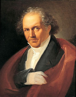 Italian typographer and type designer, b. Saluzzo (1740), d. Parma (1813). Bodoni began his career as a typesetter at the Vatican's Propaganda Fide printing press in Rome before setting up a Royal Press (Stamperia Reale) for the Duke of Parma. In 1782, he was appointed court typographer for Charles III of Spain and opened his own printing press, Tipi Bodoni. Bodoni designed hundreds of fonts in his lifetime. In 1788, he published his masterpiece, the Manuale Tipografico (look at it here), which contained 291 alphabets, and was full of ornaments and borders. In 1818, 5 years after his death, his wife Margherita Dall'Aglio published a second edition, which contained 373 alphabets. He was influenced by Fournier and Firmin Didot. Today, most of his work resides in the Museo Bodoni of Parma.
 The early modern attempts at recreating his type are due to ATF (ATF Bodoni by Morris Fuller Benton, 1907-1915), Mergenthales Linotype Bodoni (1914-1916), Haas Bodoni (1924-1939), Bauer Bodoni (by Louis Hoell, 1924), and Berthold Bodoni (1930). Today, Linotype lists 114 weights/versions/faces of Bodoni. Some find Bodoni too severe, but I like its proud upright strong and mathematically exact look. Links: The story of Bodoni Open. Bio by Nicholas Fabian. Another URL for that piece by Fabian. Another bio. FontShop link. MyFonts link. Wiki. Another wiki. Giambattista Bodoni, génie ou assassin? (2007, Jonathan Perez's thesis at Estienne). Linotype link. Klingspor link Pink poster below created by Michael Robinson (Raleigh, NC). [Google]
[MyFonts]
[More] ⦿
|
Giambattista Bodoni
[Manuale Tipografico: 1818 (full)]
|
[More] ⦿
|
Giambattista Bodoni
[Manuale Tipografico: 1818 (partial)]
|
[More] ⦿
|
Gilles Le Corre
[GLC --- Gilles Le Corre]

|
 [MyFonts]
[More] ⦿
|
GLC --- Gilles Le Corre
[Gilles Le Corre]

|
 French painter born in Nantes in 1950, who lives in Talmont St Hilaire. His fonts include 2010 Cancellaresca Recens (inspired by a chancery type of Francisco Lucas from the late 16th century), 2009 Handymade (comic book style), 2009 Lollipop (chancery style), 2009 GLC Plantin, 2009 Primitive (2009, a rough-edged roman script), 2008 Script 2 (2008), GLC Ornaments One (2008) and 2008 Xmas Fantasy (2008: blackletter). In 2008, he started GLC -- Gilles Le Corre and became commercial. Creative Market link. He is best known for his historic revivals:
 - 161 Vergilius (2010)
- 750 Latin Uncial (2010): inspired by the Latin script used in European monasteries from circa 5th to 8th, before the Carolingian style took over. The uppercases were mainly inspired by a 700's manuscript from Fécamp's abbey in France.
- 799 Insular (2010): inspired by the so-called insular style of Latin script that was used in Celtic monasteries from about 600 until 820.
- 825 Karolus (2009), and 825 Lettrines Karolus (2009).
- 1066 Hastings (2009).
- 1350 Primitive Russian (2012) was inspired by a Russian Cyrillic hand of Russkaja Pravda. It has rough-edged Latin charaters and many old Russian glyphs.
- 1420 Gothic Script (2008).
- 1431 Humane Niccoli (2010), after writings of Florence-based calligrapher Niccolo Niccoli (1364-1437).
- 1456 Gutenberg (2008, based on a scan of an old text). Followed by 1456 Gutenberg B42 Pro, which was based on the so called B42 character set used for the two Gutenberg Latin Bibles (42 and 36 lines).
- 1462 Bamberg (2008).
- 1467 Pannartz Latin (2009): inspired by the edition De Civitate Dei (by Sanctus Augustinus) printed in 1467 in Subiaco by Konrad Sweynheym and Arnold Pannartz, who was the punchcutter.
- 1470 Sorbonne (2010) was inspired by the first French cast font, for the Sorbonne University printing shop. The characters were drawn by Jean Heynlin, rector of the university based on examples by Pannartz. It is likely that the cutter was Adolf Rusch.
- 1470 Jenson-SemiBold (2008).
- 1475 BastardeManual (2008, inspired by the type called Bastarde Flamande, a book entitled Histoire Romaine (by Titus Livius), translated in French by Pierre Bersuire ca. 1475, was the main source for drawing the lower case characters).
- 1479 Caxton Initials (2009): inspired by the two blackletter fonts used by the famous William Caxton in Westminster (UK) in the late 1400s.
- 1483 Rotunda Lyon (2010): inspired by a Venetian rotunda found in a 1483 book called Eneide printed in Lyon by Barthélémy Buatier (from Lyon) and Guillaume Le Roy (from Liège, Belgium).
- 1484 Bastarda Loudeac (2008).
- 1470 Jenson Latin (2009), inspired by the pure Jenson set of fonts used in Venice to print De preparatio evangelica in 1470.
- 1491 Cancellarasca Normal and Formata (2009): inspired by the very well known humanist script called Cancellaresca. This variant, Formata, was used by many calligraphers in the late 1400s, especially by Tagliente, whose work was mainly used for this font.
- 1492 Quadrata (2008).
- 1495 Lombardes (2008): a redrawn set of Lombardic types, which were used in Lyon by printers such as Mathias Huss, Martin Havard or Jean Real, from the end of 14OOs to the middle of 1500s.
- 1495 Bastarde Lyon (2008, based on the font used in the "Conte de Griseldis" by Petrarque).
- 1499 Alde Manuce Pro (2010): inspired by the roman font used by Aldus Manutius in Venice (1499) to print Hypnerotomachia Poliphili, the well-known book attributed to Francesco Colonna. Francesco Griffo was the punchcutter. The Italic style, carved by Francesco Colonna, illustrates the so-called Aldine style.
- 1509 Leyden (2008; a Lombardic typeface inspired by the type used in Leyden by Jan Seversz to print Breviores elegantioresque epistolae).
- 1510 Nancy (2008, decorated initial letters was inspired by those used in 1510 in Nancy (France, Lorraine) for printing of Recueil ou croniques des hystoires des royaulmes d'Austrasie ou France orientale[...] by Symphorien Champion; unknown printer).
- 1512 Initials.
- 1514 Paris Verand (based on initial caps that Barthélémy Verand employed for the printing of Triumphus translatez de langage Tuscan en François.
- 1522 Vicentino (2011). Based on Ludovico Vicentino Arrighi's 1522 typeface published in La Operina.
- GLC 1523 Holbein (2010, after Hans Holbein's Alphabet of Death.
- GLC 1525 Durer Initials (2010). Sample R.
- 1529 Champ Fleury Pro and 1529 Champ Fleury Initials (2010): based on Geofroy Tory's original drawings and text face.
- 1532 Bastarde Lyon (2008, based on work by an anonymous printer in Lyon (France) to print the French popular novel Les Grandes et inestimables Chroniques du grand et enorme geant Gargantua).
- 1533 GLC Augereau Pro: inspired by one of Antoine Augereau's three roman typefaces: the Gros Romain size, used in 1533 to print Le miroir de l'&aciorc;me..., a poetic compilation by Marguerite de Navarre, sister of the French king François I.
- 1534 Fraktur (2009; inspired by the early Fraktur style font used circa 1530 by Jacob Otther, printer in Strasbourg (Alsace-France) for German language printed books).
- 1536 Civilité manual (2011). Based on a handwritten copy of Brief story of the second journey in Canada (1535) by French explorer Jacques Cartier.
- 1538 Schwabacher (2008, based on a font used by Georg Rhan in Wittemberg (Germany) to print Des Babsts Hercules [...], a German pamphlet against roman catholicism written by Johannes Kymeus).
- 1540 Mercator Script was inspired by an alphabet of Gerardus Mercator, who is known for his maps as well as his Literarum Latinarum, quas Italicas cursoriasque vocant, scribendarum ratio (1540).
- 1543 Humane Petreius (2012) was inspired by the typeface used in Nuremberg by Johannes Petreius for De Revolutionibus Orbium Coelestium, the well-known mathematical and astronomical essay by Nicolas Copernicus.
- 1543 German Deluxe (2009): a Schwabacher inspired by the sets of fonts used in 1543 by Michael Isengrin, printer in Basel, to print New Kreüterbuch, which is a book with numerous nice pictures, the masterpiece of Leonhart Fuchs, father of the modern botany.
- 1543 HumaneJenson-Bold (2008, after the typeface used in Vesalius' 1543 book De humani corporis fabrica).
- 1543 HumaneJenson-Normal (2008, same source).
- 1545 Faucheur (2011) is a rough garalde typeface that was inspired by the set of fonts used in Paris by Ponce Rosset, aka Faucheur, to print the story of the second travel to Canada by Jacques Cartier, first edition, printed in 1545.
- 1546 Poliphile (2009), inspired by the French edition of Hypnerotomachie de Poliphile ("The Strife of Love in a Dream") attributed to Francesco Colonna, 1467, and printed in 1546 in Paris by Jacques Kerver.
- 1550 Arabesques (2008, caps).
- 1557 Civilité Granjon (2010).
- 1557 Italique (2008, based on Italic type used by Jean de Tournes in Lyon to print La métamorphose d'Ovide figurée).
- 1565 Renaissance (2010), inspired by French renaissance decorated letters.
- 1565 Venetian Normal (2008, initial decorated letters that are entirely original, but were inspired by Italian renaissance engraver Vespasiano Amphiareo's patterns published in Venice ca. 1568).
- 1584 Rinceau (2008, a set of initial letters is an entirely original creation, inspired by French renaissance patterns used by Bordeaux printers circa 1580-1590).
- 1584 Pragmatica Lima (2011). Based on fonts used in 1584 by Antonio Ricardo to produce the first publication ever printed in Southern America.
- 1585 Flowery (2009): inspired by French renaissance decorated letters.
- 1589 Humane Bordeaux (2008, inspired by the Garamond fonts used by S. Millanges (imprimeur ordinaire du Roy) in Bordeaux ca. 1580-1590. The alphabets were used to reprint L'instruction des curés by Jean Gerson).
- 1590 Humane Warszawa is a rough-edged garalde typeface inspired by a font carved circa 1590 for a Polish editor.
- 1592 GLC Garamond (2008, inspired by the pure Garamond set of fonts used by Egenolff and Berner, German printers in Frankfurt, at the end of sixteen century. Considered the best and most complete set at the time. The italic style is Granjon's).
- 1610 Cancellaresca (2008, inspired by the Cancellaresca moderna type of 1610 by Francesco Periccioli who published it in Sienna).
- 1613 Basilius (2012) was based on the hand-drawn types used by Basilius Besler (Germany) for the carved plates of his botanical manual Hortus eystettensis.
- GLC 1619 Expédiée (2015). A grungy Civilté.
- 1621 GLC Pilgrims (2010).
- 1634 René Descartes (2009), based upon his handwriting in a letter to Mersenne.
- 1638 Civilité Manual (2010). Inspired by a French solicitor's document dated 1638.
- GLC 1648 Chancellerie (2011). Inspired by the hand-written 1648 Munster peace treaty signed by roi Louis XIV and Kaiser Ferdinand II.
- 1651 Alchemy (2010): a compilation created from a Garamond set in use in Paris circa 1651.
- GLC 1669 Elzevir (2011) was inspired by the font typefaces used in Amsterdam by Daniel Elzevir to print Tractatus de corde, the study of earth anatomy by Richard Lower, in 1669. The punchcutter was Kristoffel Van Dijk.
- GLC 1672 Isaac Newton (2012) is based on the hand of Isaac Newton.
- GLC Morden Map (2011). Based on an engraved typeface used on a pack of playing cards published by Sir Robert Morden in 1676.
- 1682 Writhed Hand: very irregular handwriting.
- 1689 GLC Garamond Pro (2010): inspired by Garamond fonts used in an edition of Remarques critiques sur les oeuvres d'Horace by DAEP, published in Paris by Deny Thierry and seprately by Claude Barbin.
- 1689 Almanach (2009): inspired by the eroded and tired fonts used by printers from the sixteenth century to the early years of twentieth for cheap or fleeting works, like almanacs, adverts, gazettes or popular novels.
- 1695 Captain Flynt.
- 16th Arabesques (2008, an exquisite ornamental caps scanfont).
- 1715 Jonathan Swift (2011). An example of the hand of Irish poet and novelist Jonathan Swift (1667-1745). It is a typical exemple of the British quill pen handwriting from about 1650-1720.
- GLC 1726 Real Espanola (2012). Based on the set of typefaces used by Francisco Del Hierro to print the first Spanish language Dictionary from the Spanish Royal Academy (Real Academia Española, Dictionario de Autoridades) in 1726. These transitional styles are said to have been the first set of official typefaces in Spain.
- 1741 Financiere (2009): inspired by the Fournier's font Financière. While it appears handwritten, it was in fact carved in 1741 by Pierre Simon Fournier le jeune and published in his Manuel Typographique in Paris (1764-1766).
- 1742 Frenchcivilite (2008).
- 1751 GLC Copperplate (2009), a 6-style family about which Gilles says: This family was inspired by an engraved plate from Diderot&Dalembert's Encyclopedia (1751), illustrating the chapter devoted to letter engraving techniques. The plate bears two engravers names: "Aubin" (may be one of the four St Aubin brothers?) and "Benard" (whose name is present below all plates of the Encyclopedia printed in Geneva). It seems to be a transitional type, but different from Fournier or Grandjean.
- 1756 Dutch (2011).
- 1776 Independence (inspired mainly from the font used by John Dunlap in the night of 1776 July 4th in Philadelphia to print the first 200 sheets of the Congress' Declaration of Independence establishing the United States of America).
- 1781 La Fayette (2010): a formal bâtarde coulée script with caitals inspired by Fournier (1781).
- 1785 GLC Baskerville (2011). Le Corre explains: The Baskerville's full collection was bought by the French editor and author Pierre-Augustin Caron de Beaumarchais who used it to print---in Switzerland---for the first time the complete work of Voltaire (best known as the Kehl edition, by the "Imprimerie de la société littéraire typographique"). We have used this edition, with exemplaries from 1785, to reconstruct this genuine historical two styles.
- 1786 GLC Fournier (2010), based on several books printed in Paris just before the Didot era set in. The Titling characters are based on hymns printed by Nicolas Chapart.
- 1790 Royal Printing (2009): inspired by various variants of Romain du Roy.
- 1791 Constitution (2011).
- 1792 La Marseillaise (2011). Based on the original manuscript of the French revolutionary song La Marseillaise which later became the French national hymn---it was composed in one night (April 25, 1792) by captain Rouget de Lisle.
- 1805 Austerlitz Script Light: a typical French handwriting style from that period, named after one of the few battles that Napoleon actually won.
- 1805 Jaeck Map (2011). Inspired by the engraved characters of a German map, edited in Berlin at the end of 1700s. The engraver was Carl Jaeck or Jaek (1763-1808).
- 1809 Homer (2011), a grungy typeface named after the "homer" message pigeons.
- 1815 Waterloo (2008): a handwriting typeface originating in Napoleon's government. Why do I feel that GLC is nostalgic for the era of Napoleon? Their own present dwarf-version of Napoleon is not exactly a huge success.
- 1820 Modern (2009) was inspired by a didone font used in Rennes by Cousin-Danelle, printers, for a Brittany travel guide.
- 1822 GLC Caslon (2010): inspired by a Caslon set used by an unknown Flemish printer from Bruges, in the beginning of 1800s, a little before the revival of the Caslon style in the 1840s.
- 1845 Mistress (2009): calligraphic script.
- 1848 Barricades Italic, a quill pen italic.
- 1859 Solferino (2009).
- 1863 Gettysburg (2008; inspired by a lot of autographs, notes and drafts, written by President Abraham Lincoln, mainly the Gettysburg address).
- 1864 GLC Monogram Initials (2011) was inspired by a French portfolio containing about two hundred examples of Chiffres---deux lettres, created for engravers and jewelers in Paris in 1864, and drawn by French engraver C. Demengeot.
- 1871 Victor Hugo (2011). Based on manuscripts from the final part of the life of Victor Hugo (1802-1885).
- 1871 Whitman Script (2008) and 1871 Dreamer Script (2008): inspired by manuscripts by American poet Walt Whitman. See also 1871 Dreamer 2 Pro (2012).
- 1880 Kurrentschrift (2010): German handwriting, based on late medieval cursive. It is also known as "Alte Deutsche schrift" ("Old German script"). This was taught in German schools until 1941.
- 1883 Fraktur (2009): inspired by fonts used by J. H. Geiger, printer in Lahr, Germany.
- 1885 Germinal: based on notes and drafts written by Émile Zola (1840-1902).
- GLC 1886 Romantic Initials (2012).
- 1890 Registers Script (2008): inspired by the French "ronde".
- 1890 Notice (2009): a fat didone family.
- 1902 Loïe Fuller (art nouveau face).
- 1906 Fantasio (2010): inspired by the hatched one used for the inner title and many headlines by the popular French satirical magazine Fantasio (1906-1948).
- 1906 French News: a weathered Clarendon-like family based on the fonts used by Le Petit Journal, a French newspaper that ran from 1863 until 1937.
- 1906 Fantasio Auriol (2010), inspired by the set of well known Auriol fonts used by the French popular satirical magazine Fantasio (1906-1948).
- 1906 Titrage (2009): a didone headline typeface from the same newspaper.
- Underwood 1913 (2007, an old typewriter font, whose commercial version is Typewriter 1913), and 1913 Typewriter Carbon (2008).
- 1920 French Script Pro (2010).
- 1920 My Toy Print Set, 1925 My Toy Print Deluxe Pro (2010): inspired by rubbert stamp toy print boxes called Le petoit imprimeur.
- 1968 GLC Graffiti (2009).
- 1917 Stencil (2009; with rough outlines).
- 2010 Dance of Death (2010): based on Hans Holbein's Alphabet of Death.
- 2009 Primitive (2016).
- 2009 GLC Plantin Pro (2016).
- 2010 Pipo Classic: a grungy typewriter slab serif family.
- 2010 Cancellaresca Recens (2016).
- 2011 Slimtype (2011, +Italic) and 2011 Slimtype Sans (2011): an old typewriter typeface.
Creative Market link. Fontspring link. [Google]
[MyFonts]
[More] ⦿
|
Guillaume Le Bé

|
 Born in Troyes in 1526, Guillaume Le Bé was a bookseller, engraver and typefounder, who studied under Claude Garamont. He set up his own foundry in 1545 and ran it until his death. In 1561, he became Garamont's successor---he took over Garamont's foundry that year. He was mainly known for his Hebrew fonts, but was also praised for a roman double canon. He died in Paris in 1598. The foundry started by Le Bé kept going until well into the nineteenth century through various successions. Since Robert Estienne's foundry ceased in 1545, Marius Audin speculates, but cannot prove, that Guillaume Le Bé got his start in 1545 by taking over Estienne's foundry. Scott-Martin Kosofsky seems to contradict Audin's observation that Le Bé was Garamont's student: There is no evidence that he was a student of Claude Garamont; rather, what we do know is that he trained in the Paris workshop of Robert Estienne. He lived for some twenty years in Venice (not ten years, as stated in some modern sources), where he worked largely for the major publishers of Judaic literature. After he returned to Paris, he did much work for the Antwerp publisher Christophe Plantin, including the text Hebrews used in the renowned Polyglot Bible (Biblia Regia, 1568-1572).
 The timeline of the foundry: - 1545-1598: Guillaume Le Bé starts and expands the foundry.
- 1598-1636: Guillaume II Le Bé (d. 1636), son of Guillaume Le Bé, runs the business.
- 1636-1685: Guillaume III Le Bé (d. 1685, Paris), son of Guillaume II Le Bé, runs the business.
- 1685-1707: Veuve Guillaume III Le Bé (d. 1707), runs the business, according to Marius Audin. According to Renouard, it was in fact Veuve Guillaume II Le Bé who succeeded her son, and who left the managerial task to the foundry of Claude Faure.
- 1707-1730: The Le Bé sisters. The four daughters of Guillaume III Le Bé ran the shop under the directorship of Jean Claude Fournier le père.
- 1730-1783: Jean Pierre Fornier heads the foundry. Born in 1706 in Paris, he was also called Fournier the elder (in French, l'aîné, or oldest son), son of Jean Claude. Upon his death in Mongé in 1783, he leaves the foundry to his three daughters.
- 1783-1818: The Fournier sisters are in charge: Elisabeth Françoise, Marie, and Adelaîde.
- 1818-1835: It is unclear what happened in 1818. I quote Audin, who notes that the foundry of Léger occupies the shop at 28, place de l'Estrapade in Paris, which is precisely where the Fournier sisters had their foundry. He thinks that Léger bought the Fournier foundry. The Léger foundry existed until 1835.
Digitizations of his work include - Le Bé (Large Hebrew, Hebrew Text), designed in 2010 by Scott-Martin Kosofsky and Matthew Carter. The Large Hebrew style is a replica, more or less, of Le Bés seven-line pica Hebrew (Vervliet Conspectus, #403) with some modifications and the addition of diacritics.
- Guillaume (2015) by George Tulloch. Guillaume's roman is based on Le Bé's double canon while the italic is based on Claude Garamond and the numerals are taken from a set cut by Le Bé's pupil Jacques de Sanlecque the elder.
- Hebrew Le Be Tanach (2022).
[Google]
[MyFonts]
[More] ⦿
|
Ian Party
[Swiss Typefaces]
|
 [More] ⦿
|
Iza Wilma Lima Peixoto

|
 Iza W is a Brazilian type designer who works with Paulo W at intellecta Design. Klingspor link. She created Kocham (2008, an art deco geometric typeface with dots centered in all letters), Orchis (2006, Intellecta Design), an art deco famliy in the style of Broadway. Other fonts, done with Paulo W at Intellecta Design in 2006: Advantage, Biza, Elegancy, Estiliza, Frompac. She designed DeutschePosterSteinschrift, Alta (5 styles), Apolo Decorative (Victorian era caps), Ariana, Black, Cresciesco (roman times lettering), Drianh (late 19th century styles), Easy Callig, Evangeliaire Uncial, Geodec N9 (high contrast sans family), Glaciana (decorative caps), Grid, Half Flower 2, Laureatus (Lombardic), Malvinna, Paola Decorative (caps), Passo Borgo (the ultimate spiky dungeon family), Schneider Kontrast (a 15-style art deco and ornamental family based on F.H. Ernst Schneidler's Kontrast (1930, Weber)), and Questy (semi-slab serif) in 2007.
 Productions in 2008: Basilissa (flowery caps), Calligraphia Latina Soft, Chyrllene (curly Victorian family), Clea (caps), Fridha (undrerstated and 3d calligraphy), Hostetler Kapitalen 2, Litho Romana Inland (a caps family), Ogden (calligraphic), Olivetti Typewriter (5 styles), Syl (frilly Victorian caps), Tissot (2008, fine caps), Triball (headline blackletter family), TTF TATTOEF 8 (tattoo dings). MyFonts says The mysteriously-named Iza W shares most of the development activities at Intellecta Design with Paulo W. She specializes in revivals of historic advertising types, specifically metal and wood display types of the Americas, from the early 19th to mid 20th century. and lists these fonts at the end of 2008 as having been designed by her: Advantage, Agua (2007, an extension of Heinrich Maehler's 1931 font, Salut), Alta, AltDeutsch, Anatomy, Antiqua Shaded, Apolo Decorative, Ariana, Basilissa, Biza, Black, Boliche, Bruce Borders, Bruce Flourished, Bruce Hairline, Bruce Miscelania, Bruce Ornament, Cadels, Calligraphia Latina Soft, Catania, Centennial Script Fancy (+Three), Chancelaresca Spanola, Chyrllene, Clea, Cleo (Lombardic ornamental caps), Cresciesco, Deco Experiment 2, Deco Experiment 3, Deco Experiment 4, Deco Experiment 5, Deco Experiment 6 (2007), Deco Experiment 7, Deutsche Poster Steinschrift, Donald, Drianh, Easy Callig, Egipcia, Elara (2009), Elegancy, Engel, Estiliza, Evangeliaire Uncial, Faroeste, Feosa, Figgins Brute, Fin Fraktur, Flower Essences, Flower Jars, Fofucha (2007, a psychedelic typeface modeled after Seymour Chwast's Artone from 1968), Frames 1, Francesco Decorative, Fridha, Frompac, Fry's Alphabet, Furniet Roman (2008, after Fournier), Gans Animals, Gans Carmen Adornada, Gans Cornucopia, Gans Gotico Globo, Gans Italiana, Gans Royality, Gans Sport Club, Gans Titania, Gans Titular Adornada, Gans Transportation, Gans Vessels Fishes, Geodec Bruce Ornamented (2006, a tribute to George Bruce), Geodec Minuskel, Geodec N9, Geodec Petras Enhanced, Glaciana, Gloo Biloo (2010, spooky alphading face), Gothic Handtooled Bastarda, Gotische, Gotische Frame, Gottar (blackletter), Gradl Initialen, Grid, Grissom (insect dingbats), Grolier (caps), Grolier Beveled (2011, free at Dafont), Half Flower, Hannover, Hostetler Kapitalen, Imperio Romano (2009, roman heads), Intellecta Bodoned (+Two, +Trash), Intellecta Borders, Intellecta Crowns (royal crowns), Intellecta Grotesca Compacta, Intellecta Slab Bold, Intellecta Square, Intellecta Typewriter, Intellecta Typewriter 2, Japonesa (2010, oriental simulation), Julisa Script, Kocham, Latinish, Laureatus, Lettering Deco (2008, art deco, +Shadow), Litho Romana Inland, Littler Serifada, Magro, Majestade, Malvinna, Manuscript XIV Century, Merona, Missal, Monograms Soft (2010, with Paulo W), Naturella (2009, leaf and grape dingbats), Neretta (2008, +Italic), Numbers, Ogden, Olivetti Typewriter, Orchis, Palermo, Paola Decorative, Peloponeso, Porcupine, Questy, Remington Elite Typewriter, Samuello, Schneider Kontrast, Schneidler Zierbuchstablen, Schwandner Versalia (2010, ornamental caps based on an alphabet by Austrian penman Johann Georg von Schwandner), Schwandner Black Fleurons (2010), Schwandner Ornaments (2010), Selena, Sinfonia, Southern Flight, Speedball, Standard Typewriter, Suciellid, Sunamy (oriental simulation, after lettering by Ross F. George), Surrey (2008), Syl, Tissot, Tondella, Triball, TTF TATTOEF 4, TTF TATTOEF 6, TTF TATTOEF 7, TTF TATTOEF 8, Tuska, Underwood Typewriter (+Underscore), Uthan, Versatile Initials, Victorian Exotical Capitals, Warp, Woodball, Yanna, Zooth. From 2009: Calligraphia Latina Soft3, Cantate (+Beveled), Remington Weather (old typewriter), Xyla (caps), Polen, Polen Two (2007), Arrius (calligraphic), Catilina, Pentagraph (upright connected script), Renania (calligraphic), Renania Double Line (free), Samantha (caps), Silius Engraved (caps), Stencil Intellecta (+Trash), Tatooyn, Urszula (caps), Victorio (caps), Elfort (formal calligraphy after Poppl Exquisite, a typeface by Friedrich Poppl), Pretoria Gross (2009), Holy Church (2009, blackletter), Holy Church Fleurons (2009), Single Silhouettes (2009). Typefaces done in 2010: Penabico (a calligraphic script; with Paulo W), Baltimore Typewriter (a great typewriter family, with a black-on-white typewriter keys style added), Izouda (an art deco Broadway-style beauty), Bernardo (an italic family, with swash initials thrown in, named after Lucian Bernhard), Netuno, Supermarket (shop signage family), Bruce Influence (interpretation of Great Primer Ornamented No. 30, from the Bruce's TypeFoundry 1869 catalog), Pretoria Gross (a Victorian family done with Paulo W), Reliant (2010, with Dmitrij Greshnev: a free interpretation of Bernhard Schönschrift (Lucian Bernhard) and Liberty, which was designed by W.T. Sniffin for ATF in 1927, following the original designs by Lucian Bernhard), Reliant Limited (2012, free version). Gostosinhos (2010) are hilarious faces put together in a dingbat font. Centennial Onaments (2010) was done with Paulo W. Calligraphic Birds is pure penmanship.  Fonts done in 2011: Ambrose Bierce Daned Font (ornamental caps), Menina Carinhosa (floriated caps), Menina Formosa (floriated caps), Menina Espinhosa (2011), Menina Graciosa Ornaments (2011, +Two), Menina Poderosa Ornaments (2011), Azalleia (floriated caps), Azalleia Ornaments, Naoko (a fantastic oriental simulation face), Bestiario (calligraphic penmanship dingbats based on the work of English writing master John Seddon, 1644-1700), Seddon Penmans Paradise Capitals (elaborate caps along the lines of Bestiario), Dolphus-Mieg Monograms (after a 1901 book by the Dollfus-Mieg company), Imprenta Royal Nonpareil, Dia de los muertos (2011), Naive Ornaments (2011), Eingraviert Dutch Capitals (2011). Fonts done in 2011: Ambrose Bierce Daned Font (ornamental caps), Menina Carinhosa (floriated caps), Menina Formosa (floriated caps), Menina Espinhosa (2011), Menina Graciosa Ornaments (2011, +Two), Menina Poderosa Ornaments (2011), Azalleia (floriated caps), Azalleia Ornaments, Naoko (a fantastic oriental simulation face), Bestiario (calligraphic penmanship dingbats based on the work of English writing master John Seddon, 1644-1700), Seddon Penmans Paradise Capitals (elaborate caps along the lines of Bestiario), Dolphus-Mieg Monograms (after a 1901 book by the Dollfus-Mieg company), Imprenta Royal Nonpareil, Dia de los muertos (2011), Naive Ornaments (2011), Eingraviert Dutch Capitals (2011).
Creations in 2012: Spirulina, Promotion Script, Soft Ornaments (+Two, +Three, +Four, +Five, +Six, +Seven, +Eight, +Nine, +Ten, +Eleven, +Twelve, +Thirteen, +Fourteen, +Fifteen, +Sixteen, +Seventeen, +Eighteen, +Nineteen, +Twenty, +21), Soft Garden (ornaments), The Black Shapes, Sabor Words, Sabor Digital (textured), Sabor Rasgos Escritura (upright connected script), Floreart (floral dingbats), Mirella Script (French bastarda penmanship script), Soft Flowers, Derriey Vignettes (after Charles Derriey), Gracious Azaleas (flowery dings). Design from 2013: Bruce Ornaments Collection, Invitation Script (after the calligraphy of Andrade de Figueiredo, 1722), Mirella Initials Ornamentals (a swashy calligraphic script done with Paulo W), Menina Graciosa (ornamental caps), Menina Gostosa (Loira (caps), Morena (calligraphic), Ornamentos (floral)), Alien Trees. [Google]
[MyFonts]
[More] ⦿
|
Jacques André
[Charte des Ornements]
|
[More] ⦿
|
James Mosley

|
James Mosley (born 1935) is a retired librarian and historian who specialized in the history of printing and type design. From 1958 until 1999, Mosley was librarian of St Bride Printing Library, London. He was lecturer and professor in the Department of Typography and Graphic Communication at the University of Reading, UK, 1964-present. He was a founding member of the Printing Historical Society and the first editor of its Journal. He is currently a faculty member in the Rare Book School, University of Virginia, Charlottesville, and in the Ecole de l'Institut d'histoire du livre, Lyon. He is a Senior Research Fellow in the Institute of English Studies, University of London. A specialist of type history from 1400 until today, he has written many articles, including "Les caractères de l'Imprimerie Royale" in "Le romain du roi: la typographie au service de l'état, 1702-2002" (2002, Lyon: Musée de l'Imprimerie). Among his recent writings are studies of the Italian 16th-century calligrapher Giovan Francesco Cresci, the origins in England of the modern sans serif letter, and notes to a facsimile edition of the Manuel typographique (1746) of Fournier le jeune. Speaker at ATypI 2007 in Brighton. He has a blog. At ATypI 2010 in Dublin, he spoke about the types of the Proclamation of the Irish Republic. [Google]
[MyFonts]
[More] ⦿
|
Jan Tschichold

|
 Born in Leipzig (1902), died in Locarno, Switzerland (1974). Influential German type designer whose typefaces include these:
 - Sabon (1964-1967, for Stempel). The most famous digital version of Sabon is Linotype's Sabon Next. See also Sabon eText Pro (2013, Linotype) and Salieri (2020, a free font by Daniel Benjamin Miller).
- Transit and Transito (1931). Transito has been remade by Nick Curtis in 2009 as Waddem Choo NF, and by Paulo Heitlinger in 2008 as Transito.
- Zeus (1931). Pleks Zeus (2008) is a revival of Zeus by Hans Munk.
- Saskia (1931, Schelter&Giesecke). Revived by Ralph M. Unger in 2016 as Saskia Pro.
- Uher Standard Grotesque.
- Between 1926 and 1929, he designed a "universal alphabet" to help with non-phonetic spellings in the German language. For example, he devised new characters to replace "ch" and "sch". Long vowels were indicated by a macron below them. The alphabet was presented in one typeface, which was sans-serif and without capital letters. Leicht und schnell konstruierbare Schrift (1930) is a Bauhaus-style geometric revived in 2008 by Sebastian Nagel as Iwan Reschniev. See also Architype Tschichold by The Foundry.
Links about him: Textism site. Nicolas Fabian's page on him. Links to his work. Bio at Linotype. Wikipedia site. Publications include: - Die neue Typographie (Berlin, 1928). Quote from this book: Type production has gone mad, with its senseless outpouring of new types. Only in degenerate times can personality (opposed to the nameless masses) become the aim of human development,
- Typographische Gestaltung (Basel 1935).
- Geschichte der Schrift in Bildern (Basel 1941).
- Schriftkunde, Schreibübungen und Skizzieren (Basel 1942, Berlin 1952).
- Schatzkammern der Schreibkunst (Basel 1946).
- Meisterbuch der Schrift (Ravensburg 1953).
- Erfreuliche Drucksachen durch gute Typographie (Ravensburg 1960).
- Willkürfreie Maßverhältnisse der Buchseite und des Satzspiegels (Basel 1962).
- Ausgewählte Aufsätze über Fragen der Gestalt des Buches und der Typography (Basel 1975).
- Jan Tschichold, Leben und Werk (Dresden 1977).
- Jan Tschichold. Schriften 1925-1974 (Berlin 1991).
- Recommended is this short essay entitled Consistent Correlation Between Book Page and Type Area.
- The book jan Tschichold. Vormveranderingen van het &-teken. In een hedendaagse context (Amsterdam, De Buitenkant, 1993) has contributions by Petr van Blokland, Peter Borgman, Bram de Does, Dick Dooijes, Paul Groenendaal, Martin Majoor, Karina Meister, Gerrit Noordzij, Helmut Salden and Gerard Unger.
[Google]
[MyFonts]
[More] ⦿
|
Jas Rewkiewicz
[Dieu et mon droit]
|
[More] ⦿
|
Jean Joseph Barbou

|
 French printer, 1683-1752. The Barbou's had a printing business starting with Jean Barbou, who printed in Lyon in 1539. The Barbou family printing shops remained active until 1808.
 There is Monotype typeface named after Barbou, namely the Fournier-genre Monotype 178 Barbou (1925). That typeface is being digitally revived in 2019 by Daniel Benjamin Miller as Regis. A second revival was made by Rory Snow, called Barbou (2021). [Google]
[MyFonts]
[More] ⦿
|
Jean Pierre Fournier l'ainé

|
French typefounder. [Google]
[MyFonts]
[More] ⦿
|
Jean-Baptiste Levée
[Production Type]
|
 [More] ⦿
|
Jean-Claude Fournier

|
French typefounder. [Google]
[MyFonts]
[More] ⦿
|
Jim Spiece
[Spiece Graphics]

|
 [MyFonts]
[More] ⦿
|
Johanne Blain
|
As a student at ENSAD in Paris, she co-designed Poinçons (1999), a typeface based on a design of Fournier. [Google]
[More] ⦿
|
John Albert Cavanagh

|
Author of Lettering (1946). Designer of fonts such as Cavanagh No. 17 (1939, Ludlow). At Photo Lettering Inc, he designed Appalacia, Beacon Shaded, Billboard, Bingo, Bruce (+Italic), Calliope (Western), Chandelier, Dahlia, Dock Stencil, Eighteen Ninety (Western), Fournier, Hamilton, Hansa (blackletter), Initials 1 and 2, Jason, Kaleidoscope, Lenox Gothic Italic, Ogden, Parliament (blackletter), Pony Express (Western), Royal (roundhand), Shaded, Tiffany, Versailles, Yonalassi (script), and Zinnia. [Google]
[MyFonts]
[More] ⦿
|
Joshua Darden
[Darden Studio]

|
 [MyFonts]
[More] ⦿
|
Julien Wendé
|
 Graduate of the Ecole Estienne in Paris (2012 and 2014), where he specialized in typography and type design. He now works as a graphic and type designer in Paris. His typefaces:
 - Gaillarde (2013). Based on the original by Pierre-Simon Fournier (1762).
- Roma (2014). A sans family in three weights.
- Philis (2014). An Elzevir with lapidary stems.
- Wave (2013). A wavy bespoke typeface for the Philharmonie de Paris.
- Rusko (2014). Rustic and gothic.
- Squarex (2014). A pixel typeface.
- Vanderposter (2014). An ornamental titling typeface based on a type by Fonderie Vanderborght in Brussels.
Behance link. [Google]
[More] ⦿
|
Kiosk Fonts
[Frank Grießhammer]

|
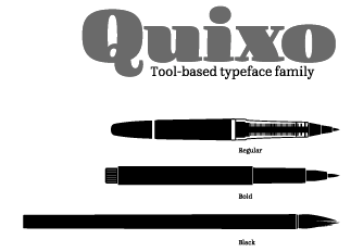 Kiosk Fonts (Berlin) was founded in 2008 by Frank Griesshammer (b. 1983, Nuremberg, Germany), a graduate of HBKsaar in Saarbrücken (2008) and of the Masters program in type design at KABK (2010). His graduation project in Den Haag involved the multi-pen typeface Quixo (2010), which seems to be have just the right flexibility for packaging and ads. Frank lived in Den Haag, but joined Adobe's type department in 2011.
 His alphabets from 2008: Fleischwurst Fett (blackletter), Drückerei (grunge by Haiko Günther), Sommerfest, Rex Mundi (by Haiko Günther), PX Barok (a stitching and needle typeface), Ghana Signpainters Divine Healer (by Haiko Günther), Pappe (randomized cut-out face), Wüste Fraktale (a pixel blackletter by Haiko Günther), A4, Ghana Signpainters Safari (by Haiko Günther), Ghana Signpainters Cocktail (comic book and ad style by Haiko Günther), Format, Black Frituur (blackletter by Haiko Günther), Monaural (geometric), Steelcut (based on Woodcut; by Haiko Günther), Coswig, Roundenau (very rounded). In 2009, he did revivals of Memphis (original by Rudolf Wolf, 1929) and Stempel Elan (original by Hans Möhring, 1936). The latter typeface was published by Linotype. In 2013, he made HWT Tuscan Extended (Hamilton Wood Type). Hamilton Wood Type explains: It is based on the 1872 William Page & Co. version, while also bearing a very close resemblance to the Morgans & Wilcox Tuscan Extended and No. 2106 from Tubbs Manufacturing Co. It is similar to the Heber Wells Tuscan Extended. All four manufacturers were eventually acquired by Hamilton. The Hamilton designation for this design was simply No. 303. The National Printers' Material Co. of New York also offered a similar Tuscan Extended. FontShop published his school project font Quixo as FF Quixo in 2013. Quixo won an award at TDC 2014. In 2014, Frank designed the free Source Serif typeface family at Adobe, to accompany Paul Hunt's Source Sans Pro (2012). It is a transitional family influenced by Perre Simon Fournier's styles from 1742. Google Web Fonts download link. CTAN download. He designed the Latin, Greek, and Cyrillic glyphs that are included with Source Han Serif (2017). In 2021, Frank Griesshammer updated Source Serif. This new version of Source Serif supports six weights and five optical sizes, both in static and variable formats. Design changes were made from the original Source Serif Pro. At Adobe, he participated in Adobe Handwriting (based on the handwriting of Frank Grießhammer, Ernest March and Tiffany de Sousa Wardle). Speaker at ATypI 2011 in Reykjavik. Speaker at ATypI 2013 in Amsterdam where he spoke on a renewed effort at Adobe with respect to kerning. In 2019, Colophon and Frank Griesshammer released DM Serif Display and DM Serif Text at Google Fonts. Based on Adobe Serif Pro (by Frank Griesshammer), it is a high-contrast transitional typeface with only one weight. Github link. Klingspor link. Old URL. Old home page. [Google]
[MyFonts]
[More] ⦿
|
Lanston Type Co
[Gerald Giampa]

|
 The Lanston Type Co was based in PEI, Canada, moved in 2002 to Vancouver, and moved later that year to Espoo, Finland. In 2004, Lanston was sold to P22. Its fonts can be licensed via P22 and The Type Founders. It has classic and wonderful offerings such as Albertan, Bodoni, Caslon, Deepdene (Frederic Goudy, 1929-1934; see D690 Roman on the SoftMaker MegaFont XXL CD, or URW Deepdene, or Barry Schwartz's Linden Hill (a free font)), Goudy Oldstyle, Jacobean Initials, Kennerly, Kaatskill, Water Garden and Jefferson Gothic. Owned by Gerald Giampa (b. 1950, d. Vancouver, 2009), who wrote me this: Frederic Goudy worked for us for 29 years. We manufactured Monotype casters and keyboards. The English sister company sold casters to England and the Commonwealth and we sold to the Americas and wherever else practical. Tolbert Lanston, our founder, was the inventor of Monotype. We still sell matrices and were punching them until several years ago. Soon we expect to have the equipment moved and operational once again. We are placing it into America's largest printing museum which is in Andover close to Boston. However there is a possibility that it will end up in Hull Québec. Our previous type director was Jim Rimmer of Vancouver, noted type designer. He designs, cuts and cast type in lead. Our typeface Albertan was designed by Jim and is very successful. John Hudson and Ross Mills of Tiro were directly inspired by our facilities in Vancouver. I encouraged them towards type design. The beautiful Bodoni 26 (unicase) can be bought at FontShop. Atlantic 35 (1909-1935) is a modern family first used by the Atlantic Monthly in 1909.
 The fonts: Albertan No. 977, Albertan Bold No. 978, Albertan Title No. 980,&Inline No. 979, Bodoni No. 175, Bodoni Bold No. 2175, Bodoni 26 (a Lanston unicase based on an interpretation by Sol Hess), No. 175, Caslon Old Style No. 337, Caslon Bold No's 637,&537, Deepdene No. 315, Figures Square No. 132, Flash No. 373, Fleurons C, Fleurons Granjon Folio, Fleurons Folio One, Forum No. 274, Francis No. 982, Garamont No. 248, Globe Gothic No's 240,&239,&230, Goudy Initials No. 296, Goudy Old Style No. 394, Goudy Thirty No. 392, Goudy Village (#2) No. 410, Hadriano Stone-Cut No. 409, Hadriano Title No. 309, Jacobean Initials, Jefferson Gothic No. 227, Jenson Old Style No. 508, Kaatskill No. 976, Kaufmann (Lanston Swing Bold) No. 217, Kennerley Old Style No. 268, Metropolitan No. 369, Obelisk No. 2577, Pabst Old Style No. 45, Pabst Old Style Open, Spire No. 377, 20th Century No. 605, Vine Leaves C, Vine Leaves Folio One, Vine Leaves Folio Two, Water Garden Ornaments. P22 writes this about Lanston: In the late 1800s, Tolbert Lanston licensed his technology to an English sister company and became a major international force. Lanston grew rapidly with America's pre-eminent type designer, Frederic Goudy, holding the position of art director from 1920-1947. The Philadelphia-based Lanston Monotype eventually parted ways with its English counterpart. English Monotype became simply known as Monotype from that time forth. Lanston was acquired by American Type Founders in 1969. After a series of other owners, the company found its way to master printer Gerald Giampa, who moved it to Prince Edward Island in 1988. During its time of transition, Lanston continued supplying the American market for monotype casters until January 21, 2000, when the hot-metal component of Lanston was tragically destroyed by a tidal wave. Giampa was one of the earliest developers of PostScript fonts. After the loss, he focused on digitization to an even greater extent. Under his stewardship, Lanston's classic typefaces were digitized in a style that was true to the sources, which are the brass and lead patterns from which the metal type was made. The past few years have seen Giampa and Lanston travel from Canada to Finland, and back again. Now, Lanston has completed another journey back to the United States to come under the care of a new steward: P22. Giampa is answering the call of the sea. He has traded his type founder's hat for that of a ship's captain to sail the northern Pacific coast. During his shore leaves, Giampa will act as typographic consultant to Lanston-P22. The P22 Lanston collection (2005-2006) was designed wih the help of people such as Paul Hunt and Colin Kahn. It includes these typefaces: - LTC Archive Ornaments (2014, Richard Kegler and Miranda Roth).
- LTC Artscript.
- LTC Athena.
- LTC Bodoni 175. Digital version by Paul Hunt. This is supposed to be close to the original Bodoni.
- LTC Bodoni 26.
- LTC Bodoni Bold.
- LTC Broadway. By Sol Hess.
- LTC Californian.
- LTC Camelot.
- LTC Caslon Remix.
- LTC Caslon.
- LTC Christmas Ornaments.
- LTC Circled Caps.
- LTC Cloister.
- LTC Creepy Ornaments.
- LTC Deepdene.
- LTC Figures.
- LTC Flash.
- LTC Fleurons Garamont.
- LTC Fleurons Granjon.
- LTC Fleurons Rogers.
- LTC Forum Title.
- LTC Fournier Le Jeune. A decorative all caps combines the font designed by Simon Fournier for the Peignot Foundry in 1768 with a more elaborate "Vogue Initials" caps offered by ATF in the 1920s.
- LTC Garamont.
- LTC Glamour. LTC Glamour was originally released by Lanston Monotype in 1948. It is based on Corvinus, designed by Imre Reiner. P22 designer Colin Kahn has added some unusual variants.
- LTC Globe Gothic.
- LTC Goudy Extras.
- LTC Goudy Handtooled.
- LTC Goudy Heavyface.
- LTC Goudy Initials.
- LTC Goudy Modern.
- LTC Goudy Oldstyle.
- LTC Goudy Open.
- LTC Goudy Ornate.
- LTC Goudy Sans. Goudy Sans Bold was originally designed by Fredric Goudy in 1922 as a less formal "gothic" and finished in 1929. The light was designed in 1930 and the Light Italic in 1931. Colin Kahn digitized them in 2006 to make a 6-style Goudy Sans family at P22/Lanston, which includes a Goudy Sans Hairline.
- LTC Goudy Text.
- LTC Goudy Thirty.
- LTC Hadriano.
- LTC Halloween Ornaments.
- LTC Hess Monoblack.
- LTC Holiday Ornaments.
- LTC Holly Leaves.
- LTC Italian Old Style (2007, by Paul Hunt, after Goudy Italian Oldstyle, 1924). Remastered in 2011 by Paul Grieshaber as LTC Italian Old Style Pro: LTC Italian Old Style is not to be confused with the English Monotype font also called "Italian Old Style", which is an earlier design from 1911 based on William Morris's Golden Type that is based on Nicholas Jenson's Roman face. Goudy went back to Jenson's original Roman and other Renaissance Roman typefaces for his inspiration and the result is what many consider to be the best Renaissance typeface adapted for modern use. Bruce Rogers was one of the biggest admirers of Italian Old Style and designed the original specimen book for Italian Old Style in 1924 using his trademark ornament arrangement. These ornaments are now contained in the pro versions of the Roman styles- Regular Pro and Light Pro.
- LTC Jacobean Initials.
- LTC Jefferson Gothic.
- LTC Jenson. LTC Jenson Oldstyle was designed by J. W. Phinney of the Dickinson Type Foundry in 1893 and is based on Morris's Golden Typeface. This remastered set features a true italic based on the 1893 ATF italic version as well as a newly digitized Jenson Regular (P22) and Jenson Heavyface (P22) based on Phinney's design of 1899.
- LTC Kaatskill. The italic was completed by Jim Rimmer.
- LTC Kennerley.
- LTC Keystone Ornaments.
- LTC Law Italic (Lanston's digital version from 2006). Mac McGrew: Law Italic is said to have originated as an imitation of formal styles of penmanship used for legal documents. The most common of several substantially different varieties is ATF's Law Italic No. 520, which originated with Marder, Luse about 1870. Several of the capitals are swash-like, while lowercase f and g have distinctive shapes. It has long thin serifs and sharp contrast between thick and thin strokes. Inland called the same design Caledonian Italic. Hansen had Barrister Italic. Monotype's Law Italic No. 23 is a sloped roman, somewhat similar to Ronaldson. Other Law Italics are obsolete.
- LTC Metropolitan.
- LTC Nicolas Cochin.
- LTC Obelysk Grotesk. A reconstruction of Sol Hess's Spire (1937) (digital versions first by Gerald Giampa and then by Colin Kahn).
- LTC Octic Gothic.
- LTC Ornamental Initials. Floriated caps.
- LTC Ornaments Animalia.
- LTC Ornaments One.
- LTC Ornaments Three.
- LTC Ornaments Two.
- LTC Pabst Oldstyle.
- LTC Powell.
- LTC Record Title.
- LTC Remington Typewriter.
- LTC Spire.
- LTC Squareface. By Sol Hess.
- LTC Swing Bold.
- LTC Tourist Gothic. By Sol Hess.
- LTC Twentieth Century.
- LTC Village No 2.
- LTC Vine Leaves.
- LTC Water Garden Ornaments.
- LTC Winchell (2021, Richard Kegler). A revival of Inland Type Foundry's Winchell (1906).
Fonts can be purchased from MyFonts where all fonts have the prefix LTC. Obituary of Giampa and links to obituaries. Catalog of the Lanston typeface library. View the typefaces designed by Lanston. A more extensive page of Lanston Monotype typefaces. [Google]
[MyFonts]
[More] ⦿
|
Lars Bergquist
[Timberwolf Type]

|
 [MyFonts]
[More] ⦿
|
Laurent Mészaros
|
As a student at ENSAD in Paris, he co-designed Poinçons (1999), a typeface based on a design of Fournier. [Google]
[More] ⦿
|
Ling Tsui
|
 Ling studied graphic design and art direction at Portfolio Center in Atlanta, Georgia. She holds a B.S. in Marketing from Clemson University. In New York City, she created a Fournier Revival in 2014. Later in 2014, now from San Francisco, she created Terrarium. Behance link. [Google]
[More] ⦿
|
Lo-ol Type foundry
[Loris Olivier]
|
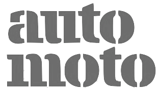 Talented type and graphic designer based in Morgin and/or Grand-Lancy, Switzerland. After obtaining a BFA from the Academy of Art University of San Francisco, he started a Masters in the TypeMedia program at KABK in Den Haag, graduating in 2015. After the KABK, he started working from Geneva on editorial identity, branding, editorial, graphic and type design. His spouse, Noheul Lee, is also a type designer. Loris's typefaces:
 - Animax (2016). A lineale geometric consisting of text and display.
- Aragon (2014). A transitional serif for display.
- Arancia (2016). A lineale geometric consisting of text and display.
- Bachus (2016). A heavy brush script.
- Brienz (2019).
- Chablaix (2015). A neo-textura.
- Civilitate (2016-2018). A blackletter with roots in Robert Granjon's Civilité..
- Cozette (2016). A didone.
- Fanny (2014). An exquisite display family.
- Fournier (2014). A revival.
- Gloubi (2019). A psychedelic font.
- Groo (2013). A lineale neo-grotesk for text and display.
- Kartel (2014). A lineale neo-grotesk for text.
- Katchka (2014). An all caps typeface for Latin and Cyrillic.
- Lemanic (2015). His graduation typeface at KABK. This large transitional text typeface family Lemanic is accompanied by a decorative blackletter typeface. Loris writes: The different weights and styles are made for magazine or newspaper environements. The entire family is constructed in order to decrease the usage of images next to the text. The shapes of the book weights and its inspiration are taken from the fluidity and the rhythm of the work of Fournier and certain shapes of the Romain du Roi.
- McQueen Superfamily (2020). A 20-style sans family in Display and Grotesque subfamilies by Loris Olivier, Noheul Lee and Katja Schimmel, realeased by Fontwerk.
- Medley (2015). A transitional serif for display.
- Merle (2016). A slab serif.
- Milwaukee (2014). A text typeface, + Stencil Bold.
- Misc (2013). A serif, sans and script trio.
- Moritz (2015). A slab serif.
- Orniere (2016). A lineale humanist sans, slightly flared and lapidary, for text and display.
- Phantom (2016). A transitional monospace serif (text and display).
- Phily (2015). A lineale geometric consisting of headline and display.
- Rouka (2015). A lineale neo-grotesk stencil typeface.
- Saudade (2013). A transitional serif in text and display versions.
- Scarpelli (2012). An étude in ball terminals.
- Soprana (2014). A transitional serif in text and display versions.
- Susanfe (2016). A sans typeface.
- Tuilots (2014). A gorgeous calligraphic text typeface.
- Tweelo (2014). A garalde.
- Volpe (2015). A transitional serif for display.
- Wicht (2016). A humanist serif.
Home page. Future Fonts link. Fontwerk link. [Google]
[More] ⦿
|
Loris Olivier
[Lo-ol Type foundry]
|
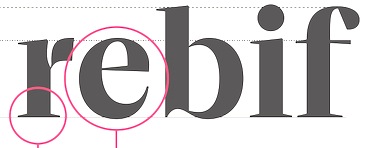 [More] ⦿
|
Manuale Tipografico: 1818 (full)
[Giambattista Bodoni]
|
In 1788, Giambattista Bodoni published his masterpiece, the Manuale Tipografico (look at it here), which contained 291 alphabets, and teemed with ornaments and borders. In 1818, 5 years after his death, his wife Margherita Dall'Aglio published a second edition, which contained 373 alphabets. He was influenced by Fournier and Firmin Didot. All images of the 1818 book are here. [Google]
[More] ⦿
|
Manuale Tipografico: 1818 (partial)
[Giambattista Bodoni]
|
In 1788, Giambattista Bodoni published his masterpiece, the Manuale Tipografico (look at it here), which contained 291 alphabets, and was full of ornaments and borders. In 1818, 5 years after his death, his wife Margherita Dall'Aglio published a second edition, which contained 373 alphabets. He was influenced by Fournier and Firmin Didot. Some images of the 1818 book are in this page. [Google]
[More] ⦿
|
Marquet
|
Type foundry in Lyon. Its work was published in Épreuves des caracteres de la fonderie du sr. Marquet (Lyon, ca. 1770). Even though this appeared in 1770, we already find many types with the characteristic square didone serifs, although with less contrast than a typical Didot face. Many publications from the pre-Bodoni and pre-Didot period already show a convergence towards the didone trend. In 1923 (and reprinted in 1935), Douglas C. McMurtrie published A Mysterious Type Specimen on a typeface by Marqet: page 3, page 4 (where he notices that Marquet's type is difficult to categorize, and is different from anything he had seen in the types of Lammesle, Mozet. Gillé, or Fournier le jeune), a scan of the type, some vignettes. [Google]
[More] ⦿
|
Matthieu Cortat
[Nonpareille (was: Chastellun.net)]

|
 [MyFonts]
[More] ⦿
|
Maureen Valfort
|
As a student at ENSAD in Paris, she co-designed Poinçons (1999), a typeface based on a design of Fournier. [Google]
[More] ⦿
|
Miguel Reyes
[Fontaste]
|
 [More] ⦿
|
Modern Typography
[Paul Barnes]

|
 Modern Typography is a dot com web presence organized by the London-based type designer and graphic designer, Paul Barnes (b. 1970), typophile extraordinaire. It is promised to have plenty of material for the typophile. In the 1990s, Paul Barnes worked for Roger Black in New York where he was involved in redesigns of Newsweek, US and British Esquire and Foreign Affairs. During this time he art-directed Esquire Gentleman and U&lc. He later returned to America to be art director of the music magazine Spin. Since 1995 he has lived and worked in London. He has formed a long term collaboration with Peter Saville, which has resulted in such diverse work as identities for Givenchy and numerous music based projects, such as Gay Dad, New Order, Joy Division and Electronic. Barnes has also been an advisor and consultant on numerous publications, notably The Sunday Times Magazine, The Guardian and The Observer Newspapers, GQ, Wallpaper, Harper's Bazaar and Frieze. Following the redesign of The Guardian, as part of the team headed by Mark Porter, Barnes was awarded the Black Pencil from the D&AD. They were also nominated for the Design Museum Designer of the Year. In September 2006, with Schwartz he was named one of the 40 most influential designers under 40 in Wallpaper. He cofounded Commercial Type with Christian Schwartz. Author of Swiss Typography: The typography of Karl Gerstner and Rudolf Hostettler (Modern Typography, 2000).
 His typefaces: - The (free) font Pagan Poetry (2001), done for one of the sleeves on Björk's albums. The font was made for Show Studio (see also here and here).
- Codesigner with Christian Schwartz in 2005 of the 200-font family Guardian Egyptian for The Guardian, about which he spoke at ATypI 2006 in Lisbon.
- In 2007, he worked with Peter Saville on the Kate Moss brand. As a font, he suggested a variation on Brodovitch Albro, a typeface by Alexey Brodovitch, the famous art director of Harper's Bazaar from 1934-58. The Creative Review reactions to this typeface are a bit negative though.
- In 2003, he created Austin, a high-contrast modern typeface. Now available at Schwartzco and at Commercial Type, Christian Schwartz writes: When hired to design a new headline typeface for Harper's&Queen, Britain's version of Harper's Bazaar, Paul thought to flick back through the pages of its 60's precursor, the über cool Queen. The high contrast serif headlines were lovely, but a little too expected in a contemporary fashion magazine. Some time poring through specimens in St Bride's Printing Library inspired the perfect twist: rather than taking our cues from Didot or Bodoni, we would start with [Richard] Austin's first creation, turn up the contrast, tighten the spacing and make a fresh new look that would look bold and beautiful in the constantly changing world of fashion. The end result is Richard Austin meets Tony Stan, British Modern as seen through the lens of late 1970s New York. iThe Cyrillic version was designed in 2009 and 2016 by Ilya Ruderman (CTSM Fonts).
- Dala Floda (1997-now) is based on gravestone inscriptions, and was turned in 2010 into a logotype stencil family at Commercial Type. As a stencil family, it is praised by the typophile community. Realted is the semi-stencil typeface family Dala Moa.
- Publico was designed from 2003-2006 with Christian Schwartz, Ross Milne and Kai Bernau. Originally called Stockholm and then Hacienda, and finally Publico for a Portuguese newspaper by that name. Publico Text Mono (Christian schwartz and Paul Barnes) was commissioned in 2012 for Bloomberg Businessweek. Greg Gadzowicz added the italics, which are optically corrected obliques, in keeping with the un-designed aesthetic, in 2014.
- Brunel (1995-now): an English modern, this is an anthology of the late eighteenth and nineteenth century English foundries. It was drawn from original source material, most notably the Caslon foundry and the work of John Isaac Drury).
- Marian (2012) is a type experiment based on Garamond, consisting of 19 hairline styles with names referring to dates between 1554 and 1812. Commercial Type writes: Marian is a series of faithful revivals of some of the classics from the typographic canon: Austin, Baskerville, Bodoni, Fournier, Fleischman, Garamont, Granjon, Kis and van den Keere. The twist is that they have all been rendered as a hairline of near uniform weight, revealing the basic structure at the heart of the letterforms. Together they represent a concept: to recreate the past both for and in the present. [...] Faithful to the originals, Marian comes with small capitals in all nine roman styles, with lining and non-lining figures, with swash capitals (1554, 1740, 1800&1820), alternate and terminal characters (1554&1571). And like the hidden track so beloved of the concept album, Marian is completed by a Blackletter based on the work of Henrik van den Keere.
- His classics series, mostly influenced by old Britsh type foundries, includes Figgins Sans (original 1832), Besley Grotesque, Caslon Antique, Fann Street Clarendon, Caslon Italian, Blanchard, Thorowgood Sans, Antique No. 6, Antique No. 3, and Ornamented (original c. 1850 at Caslon, Barnes use a Steven Shanks interpretation).
- VF Didot (2013) is a custom Didot by Paul Barnes and Christian Schwartz for Vanity Fair, as requested by its design director, Chris Dixon. Based on work of Molé Le Jeune, a punchcutter used by the Didot family in the early part of the 19th century, VFDidot has 7 optical sizes and up to 5 weights in each size, plus small caps and even a stencil style.
Early in 2014, Christian Schwartz, Paul Barnes and Miguel Reyes joined forces to create the manly didone typeface family Caponi, which is based on the early work of Bodoni, who was at that time greatly influenced by the roccoco style of Pierre Simon Fournier. It is named after Amid Capeci, who commissioned it in 2010 for his twentieth anniversary revamp of Entertainment Weekly. Caponi comes in Display, Slab and Text subfamilies. In 2014, Dave Foster and Paul Barnes (Commercial Type) designed Marr Sans. They write: The influence of Scotland in typefounding belies the nation's small size. Marr Sans, a characterful grotesque design, was inspired by a typeface from the 1870s found in the work of James Marr & Co. in Edinburgh, successors to Alexander Wilson & Sons. From a few lines in three sizes, and only one weight, Paul Barnes and Dave Foster have expanded the family from Thin to Bold, plus an Ultra Black weight, a wider companion to the six lighter weights. While Graphik and Atlas represent the greater homogenity of twentieth century sans serifs, Marr, like Druk, revels in the individuality of the nineteenth century, and is like an eccentric British uncle to Morris Fuller Benton's Franklin and News Gothics. - Le Jeune (2016, Greg Gazdowicz, Christian Schwartz and Paul Barnes): a crisp high-contrast fashion mag didone typeface family in Poster, Deck, Text and Hairline sub-styles, with stencils drawn by Gazdowicz. This large typeface family comes in four optical sizes, and was originally developed for Chris Dixon's refresh of Vanity Fair.
- Marian Text (2014-2016) is a grand collection of ultra thin typefaces designed at Commercial Type by Miguel Reyes, Sandra Carrera, and Paul Barnes. Marian Text 1554 depicts the old style of Garamond & Granjon; John Baskerville's transitional form becomes Marian Text 1757; the modern of Bodoni, with swash capitals and all, becomes Marian Text 1800, and the early Moderns of the Scottish foundries of Alexander Wilson & Son of Glasgow, and William Miller of Edinburgh, become Marian Text 1812. And like the original, a black letter: Marian Text Black, referencing the forms of Hendrik van den Keere.
- Gabriello (2015) is a soccer shirt font designed by Paul Barnes and Miguel Reyes: Inspired by brush lettering, Gabriello was commissioned by Puma. First used by their sponsored teams at the 2010 Africa Cup of Nations, it was later used at that year's World Cup, held in South Africa. It was used on the kits worn by Algeria, Cameroon, Cote d'Ivoire, and Ghana.
- Sanomat (2013-2017). This custom typeface by Paul Barnes was originally commissioned by Sami Valtere in 2013 for his acclaimed redesign of Helsinging Sanomat in Finland. Sanomat is now available for retail via Commercial Type in two subfamilies, Sanomat (serif) and Sanomat Sans.
- Chiswick (2017), a series of three typefaces families based on vernacular forms found in the British Isles from the eighteenth century.
- Darby Sans, Darby Sans Poster, Darby Serif, done together with Dan Milne, and published in 2014 and 2019 at Commercial Type, respectively.
- The Commercial Classics series from 2019:
- Brunel (Paul Barnes): Elegant and hardworking, Brunel is the Anglo variant of the high contrast Modern style. Based on designs that were cut first for Elizabeth Caslon at the end of the eighteenth century, we have expanded them to encompass a range of weights and sizes: from a roman to an emphatic black and from a text to a hairline for the largest sizes.
- Caslon Doric (Paul Barnes): The sans was the natural progression of nineteenth-century innovations. From the pioneering faces of Caslon and Figgins in the second and third decades, they quickly became a phenomenon across Europe and the United States, but it was only in the second half of the century that the British foundries would embrace lowercase forms and make faces that could be used in multiple sizes. Caslon Doric is the synthesis of these styles, from narrow to wide and from thin to heavy.
- Caslon Italian (Paul Barnes, Tim Ripper, Christian Schwartz): Perhaps the strangest and ultimate example of experimentation in letterforms during the early nineteenth century was the Italian. Introduced by Caslon in 1821, it reverses the fat face stress---thins becomes thicks and thicks become thins---turning typographic norms on their heads. This new version extends the forms into new territory: a lowercase, an italic, and another one of the more unusual ideas of the time, the reverse italic or Contra.
- Isambard (Paul Barnes and Miguel Reyes): The boldest moderns were given the name fat face and they pushed the serif letterform to its extremes. With exaggerated features of high contrast and inflated ball terminals, the fat face was the most radical example of putting as much ink on a page to make the greatest impact at the time. These over-the-top forms make the style not only emphatic, but also joyful with bulbous swash capitals and a wonderfully characterful italic.
- Caslon Antique (Paul Barnes and Tim Ripper): The slab serif or Egyptian form is one of the best letters for adding a drop shadow to. Its robust nature and heaviness support the additional weight of a prominent shading. First appearing in the 1820s, the style was pioneered and almost exclusively shown by the Caslon foundry, who introduced a wide range of sizes and, eventually, a lowercase.
- Caslon Sans Serif Shaded (Jesse Vega and Paul Barnes): The addition of graphic effects to typefaces was one of the most popular fashions of the nineteenth century, with the most common being the shaded form. Fashionable throughout this period, they largely disappeared from the typographic landscape, but their simple graphic qualities offer much potential today.
- Rapha (2018, Serif, Sans). A bespoke typeface at Commercial Type for the cycling clothing company.
- In 2019, Commercial Type released Caslon Ionic by Paul Barnes and Greg Gazdowicz. They write: Bolder and more robust than the modern, yet lighter and more refined than the Egyptian, the Ionic with its bracketed serif was another innovation of the nineteenth century. Lesser known than Thorowgood's Clarendon, Caslon's Ionic No. 2 is a superb example of the form and greatly influenced the newspaper fonts of the next century. With additional weights and a matching Egyptian companion, Antique No. 6, it is a masterpiece of type designed to be robust and legible. Antique No. 6 was designed by Paul Barnes in 2019.
- In 2019, Commercial Type released the Thorowgood Grotesque collection by Paul Barnes and Greg Gazdowicz. It is accompanied by the subfamilies Thorowgood Grotesque Dimensional (beveled) and Thorowgood Grotesque Open (based on Thorowgood's Seven-Line Grotesque Open), and the related condensed headline typeface Thorowgood Egyptian.
The crew in 2012 includes Paul Barnes (Principal), Christian Schwartz (Principal), Vincent Chan (type designer), Berton Hasebe (type designer, who worked at Commercial type from 2008 until 2013) and Mark Record (font technician). Miguel Reyes joined in 2013. Hrvoje Zivcic helps with font production. View Christian Schwartz's typefaces. His St Bride Type Foundry. Dafont link. Klingspor link. [Google]
[MyFonts]
[More] ⦿
|
MyFonts: Baroque
|
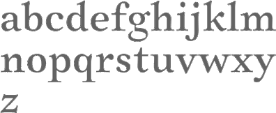 Baroque fonts at MyFonts---these are typefaces that have roots in the 18th century, and thus include many Fournier-style and transitional typefaces. See also here. For an extensive list of almost 300 type families see here [large web page warning] and here. [Google]
[More] ⦿
|
MyFonts: Fournier
|
Top-ranked fonts at MyFonts that are related to the 18th century style of Fournier. See also here and here. [Google]
[More] ⦿
|
Narciss
|
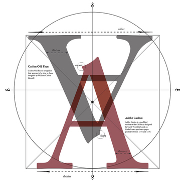 Mac McGrew: Narciss is an adaptation by Linotype in 1925 of Narcissus, designed by Walter Tiemann in 1921 for the Klingspor foundry in Germany, based on a typeface which Fournier had cut about 1745. It is a fairly heavy shaded roman, very similar to Cameo and Gravure, and somewhat similar to Caslon Shaded, Caslon Openface, Goudy Open, etc. (q.v.). This typeface is rather wide, and the white line that gives the shaded effect is narrow. Each size is undersize, about as big as the next smaller size should be. [Google]
[More] ⦿
|
Nicholas Gando

|
Or Nicolas Gando. French calligrapher, engraver and type founder, d. ca. 1767. He acquired the types of Claude Lamesle: Épreuves générales des caracteres provenants de la fonderie de Claude Lamesle, lesquels se trouvent présentement dans celle de Nicolas Gando, l'aîné (Paris, Cloître S. Julien le Pauvre, 1758). See also Epreuve des caractères de la fonderie Gando (Paris, Cloistre Saint Julien le Pauvre, imprimerie Jacques Guerin, 1745; local download), Recueil d'ornemens qui comprennent les différentes combinaisons des vignettes de la fonderie de N. Gando (1745; local download), and Epreuves des caractères de la fonderie Gando, père et fils (Paris, Cloître Saint Julien le Pauvre, 1760). His son is Pierre-François. He was involved in music typography and wrote an angry response Observations sur le traité historique et critique de M. Fournier (1766) as a reaction to accusations of plagiarism made by Pierre-Simon Fournier in 1765 in Traité historique et critique sur l'origine et les progrès des caractères de fonte pour l'impression de la musique. A 170-page specimen book was published in 1810: Specimen des caractères de la fonderie de N.P. Gando à Paris et de son fils TH. S. Gandon à Bruxelles. [facsimile reprint in 1992 by Lane and Lommen] This shows that his son, Th. S. Gando, had set up shop in Brussels. Nicolas Gando is often associated with the upright connected script style. Digital versions of his typefaces include Gando Ronde (a formal script by H.J. Hunziker and Matthew Carter in 1970; Linotype), French 111 (at Bitstream) and Gando BT (at Bitstream). Typo Upright / Linoscript is a genetically slightly different family of rondes (compare the k's). [Google]
[MyFonts]
[More] ⦿
|
Nicolas Portnoï
|
Paris-based designer. During a summer course called Type@Paris (2015), Nicolas Portnoï designed a delicate Fournier revival called Manuel (2015). [Google]
[More] ⦿
|
Nonpareille (was: Chastellun.net)
[Matthieu Cortat]

|
 Matthieu Cortat was born in Délémont (Switzerland) in 1982, and became a French citizen later. After a degree in graphic design in 2005, at the University of Art&Design Lausanne (Ecal), he obtained a Masters at the Atelier National de Recherche Typographie in Nancy (France). Cortat heads the Master Type design program at the École d'art de Lausanne (ECAL). He lives in Lyon where he is advisor to the collections of the museum of Printing and Graphic communication. He created the French typographical corpus, which brings together the typefaces in France between 1850 and today. He set up Nonpareille. Most of his typefaces can be bought at 205 Corp.
 His typefaces: - Bentham (transitional).
- Bonesana (2009, Gestalten, an elegant text family straight out of the 18th century).
- Brett (2004). A rounded pixel face.
- Chastelmail (a modification of ITC Officina).
- Goupil (2008, by Regis Tosetti).
- Ecstrat (2009, ornamental 18th century type in the style of Fournier or Rosart).
- Fairplay (transitional newspaper face).
- Glovis (2007, a monospaced typewriter typeface with ball terminals; with Régis Tosetti).
- Liberté.
- Tartan.
- Monolith.
- Stockmar (2007, Optimo: a 12-style baroque family inspired by by Johann Rudolf Genath II (1679-1740)).
- Stuart Pro and Stuart Standard (Nonpareille, 2008). These almost Venetian low-contrast text type families come in 18 styles each, and have three optical choices for the ranges below 8pt, 8-12 pt and above 12pt.
- Ecstrat.
- Glovis.
- Louize (2013). This is a contemporary revival of the Augustaux designed by Louis Perrin between 1846 and 1855. It mixes roman square capitals with a set of transitional / old style / incised lower case. In 2021, he added Louize Display Condensed. He explians: In 1846, Lyonnese printer, Louis Perrin commissioned founder Francisque Rey to cut a series of capitals inspired by monumental roman inscriptions. They have been used to compose "Les Inscriptions antiques de Lyon", a book by Alphonse de Boissieu. In 1855, the typeface was completed by a series of lowercase, some coming from the printshop of Rey, others designed by Perrin himself. His Augustaux, one of the first revivals in the history of typography, became rapidly successful, launching the Renouveau Elzévirien" movement. With the Louize Family, Matthieu Cortat provides a contemporary reinterpretation of the Augustaux. It retains a wise and serene tone, a clear grey of text, the soft roundness of the curves. Louize is discreet, calm, harmonious.
- Chrysaora (2013). An all caps art deco typeface family based on the engraved letters on the Palais de la Porte Dorée in Paris.
- Ebnor (2013). A digital version of the Écriture Bâton Normalisée (standardized sans serif) presented by M. Brun in a self-published booklet of 1959. The shape of letters respects the standard E-04-105 of the French Association for Standardization (AFNOR) which sets norms for industry, engineering and architecture. All letters are monolined and warmly rounded.
- Svafa (2013). This is a rune simulation typeface that revives lettering designed by Eugène Grasset in 1893, on a poster for Richard Wagner's opera, Valkyrie.
- Petit Serif (2013): Petit Serif is a caps typeface with copperplate endings, described as an interpretation (with Latin, Greek and Cyrillic versions) based on the lettering done at 55 Broadway, S.W.1, London, by Percy J. Delf Smith. It is a sans serif presenting the classic proportions of the Roman Square Capitals, yet it does show tiny serifs due to the use of a brush.
- Mecano Sans and Mecano Serif (2013). A revival of a condensed geometric Nebiolo family.
- Henry (2013). They write: Henry is a personal reinterpretation of the Garamond cut for the Deberny & Peignot type foundry between 1914 and 1926 by Henri Parmentier, under the management of Georges Peignot, who owned the foundry. Their purpose was to recreate the gracefulness of Claude Garamont's type typeface while allowing for the development of modern paper making, with its wood pulp paper, as opposed to 16th century rag paper. This elegant and smooth text family has its own mind: Henry is based on the text sizes (9 to 14) of the Garamond Peignot. It is a light and fluid Garald, rather skinny and narrow, with a slender grace. There is an art nouveau spirit in its z leaning on the left, its serpentine a and J, the roundish lower bowl of its t, the wide tail of its Q.
- Hans (2013). A dark Koch-style textura blackletter.
- Battling (2013). This is quite an interesting sans family, in the geometric style of 1930s Europe. The original rough model was a typeface family called Universelles by the Dutreix foundry in Limoges, first produced in the 1930s. The heavier weights are characterized by small cactus spurs. Apparently, Universelles is a renamed version of Hans Moehring's Elegant Grotesk (1928-1929).
- Anacharsis (2012). An experimental geometric sans family.
- Basetica Pro (2013). Even though only offered in two styles, the announcement says that Basetica aims to be the Helvetica for 2013.
- Helvetius (2016). A reinterpretation of a Fournier-style font used in a 1178 edition of De L'Homme by French philosopher Claude-Adrien Helvetius.
- Cosimo (2017, Bureau 205). A humanist sans.
- Yorick (2018). Yorick is based on a monospace typewriter font (model 3402U) found in the Campionario caratteri e fregi tipografici of the Nebiolo type foundry, dated 1920, but the font might probably be older. The source is a slab serif form very common in typewriter fonts (Pica, according to Olivetti naming system) with a little touch of classical flavour from the Imperial style (i.e. with thick and thin contrasts).
- Molitor (2019, 205TF). A great art deco-inspired sans typeface that looks great even for text on a screen.
- Muoto (2021), a variable sans serif font designed by Matthieu Cortat, Anthony Franklin and Sander Vermeulen (Base Design). They write: Muoto is the synthesis of a sensitive and human approach to modernist design. This font combines full curves and solid stems, showing that functionalism can actually be warm and softly effective. With its robust structure and subdued proportions, it evokes organic forms dear to Finnish architect Alvar Aalto, who in 1957 wrote: "We should work for simple, good, undecorated things, but things which are in harmony with the human being and organically suited to the little man in the street".
Speaker at ATypI 2017 Montreal. Klingspor link. View Matthieu Cortat's typefaces. View Nonpareille's font library. [Google]
[MyFonts]
[More] ⦿
|
Paul Barnes
[Modern Typography]

|
 [MyFonts]
[More] ⦿
|
Paul D. Hunt
[Pilcrow Type]

|
 [MyFonts]
[More] ⦿
|
Paul Shaw
|
Paul Shaw's choice of 100 best typefaces of all times: - 1-10: Gutenberg's B-42 type, Nicolas Jenson's roman, Francesco Griffo's italic, Claude Garamond's roman, Firmin Didot's roman, Akzidenz Grotesk, Gebetbuch type, Cheltenham family, Helvetica, Aldus Manutius' roman.
- 11-20: William Caslon IV's sans serif, William Caslon's roman, Pierre-Simon Fournier's italic, Futura, Times Roman, Chicago, Bell, Ludovico Arrighi da Vicenza's italic, Univers, Romain du Roi.
- 21-30: Johann Michael Fleischmann's roman, Clarendon, ATF Garamond, Giambattista Bodoni's roman, Century Roman, Nicolas Kis' roman, Minion multiple master, Unger Fraktur, John Baskerville's roman, Lucida.
- 31-40: Ionic, Golden Type, Robert Thorne's fat typeface roman, Wolfgang Hopyl's textura, Vincent Figgins' antique roman (Egyptian), Johnston's Railway Sans, Optima, Bauer Bodoni, Adobe Garamond, Breitkopf Fraktur.
- 41-50: Bell Gothic, Courier, Trajan, Mistral, Doves Type, Scotch Roman, Syntax, Snell Roundhand, Memphis, Robert Granjon's civilité.
- 51-60: Fette Fraktur, Ehrhard Ratdolt's rotunda, Romanee, ITC Stone family, Trinité, ITC Garamond, Avant-Garde Gothic, Oakland, Deutschschrift, Hammer Uncial.
- 61-70: Beowolf, Meta, OCR-A, Sabon, ITC Novarese, Zapf Chancery, Rotis, Base Nine and Base Twelve, Peter Jessenschrift, Excelsior Script.
- 71-80: Bitstream Charter, Peignot, Erbar, Cancellaresca Bastarda, Joanna, Dead History, Behrensschrift, Eckmannschrift, Poetica, Marconi.
- 81-90: PMN Caecilia, Stadia, Imprint, Souvenir, Thesis, Apollo, Penumbra, Melior, Neuland, Flora.
- 91-100: Element, Walker, Remedy, Template Gothic, Digi-Grotesk Series S, Compacta, Antique Olive, Bodoni 26, Evans and Epps Alphabet, WTC Our Bodoni.
[Google]
[More] ⦿
|
Pauline Nuñez
|
French type and book designer who is coeditor of Typographe.com and Pointypo, a French type news site. She graduated in 2007 from Ecole Estienne with a thesis entitled Pierre-Simon Fournier, typographe absolu, typographe accompli?. Old URL. [Google]
[More] ⦿
|
Peter A. Demeter
|
 German designer (1875-1939) at Weber of the shaded roman capital typeface Holländisch (1922-1926, also published by Schriftguss), which comes in breit, fett and licht styles. He also made Demeter Schraffiert (1922, Schriftguss), and Fournier Geperlt (1922, Schriftguss; called Dresden when it was later published by BB&S in Chicago).
 Mac McGrew writes: Demeter is a decorative, shaded letter produced by BB&S in 1925, by arrangement with Schriftguss A.-G. of Dresden, where it was designed by Peter A. Demeter. Serifs are leaf-like in form. This is one of a few German faces BB&S received in exchange for rights to the Cooper types. He adds: Dresden is a very decorative typeface designed by Peter A. Demeter for Schriftguss A.G. in Dresden and cut by BB&S in 1925 by arrangement with that firm, part of the deal by which the German company got rights to copy Cooper. In this face, the main strokes as well as the serifs are leaf-like. Digital revivals include Baroque Pearl (2016, Ralph M. Unger). Klingspor linkPeter A. Demeter [Google]
[More] ⦿
|
Philippe Grandjean de Fouchy

|
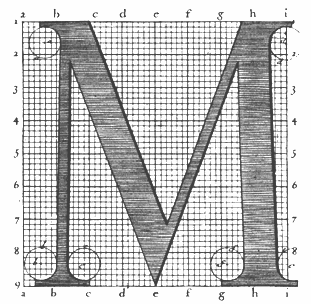 Engraver, b. Macon (1666), d. Paris (1714). In 1695, king Louis XIV of France commissioned a typeface, which until today is described as the first digital font, and at least as the first mathematicallly defined type, the Romain du roi (1702), used by Grandjean in Médailles sur les principaux énvenémens du règne de Louis-le-Grand, avec des explications historiques. (1702). This text was illustrated by sebastien Leclerc (1637-1714). See here and here for background. A specimen is here. Discussion at typophile.
 Romain du roi was digitized by Frank Jalleau under the name Grandjean and in 2008 by Gert Wiescher as Royal Romain (link). Wiescher writes: Royal Romain was commissioned by the most famous king of France, Louis XIV the Sun King. A group of Scientists set off to work on the task of producing the ultimate font for the king of all kings. After years of elaborations Philippe Grandjean then started to cut the final punches for the Imprimerie Royale and finished his part of the work with the fonts first appearance in the magnificent Médailles sur les principaux énvenémens du règne de Louis-le-Grand, avec des explications historiques. (1702). The complete set of 21 sizes of roman and italic letters was finished by Grandjean's successor Jean Alexandre and completed by Louis Luce in 1745. The font went by the name of Romain du Roi and was for the exclusive use of the Louis XIV. It was never sold or given to any other king or government. The king of Sweden tried to scrounge a set, but the king refused. This font is the basic design for Fournier and Bodoni. Another digital versuion exists, Romain BP and Romain BP Headline (2007), by Ian Party of B&P Typefaces. Ian Party writes: Based on the Commission Jeaugeon's models and on Philippe Grandjean's classic character, the Romain BP celebrates the marriage of geometric rationality and elegance, of science and craftsmanship. The Romain BP Text is actually closer to the Commission's model than Grandjean's Romain du Roi. It is more synthetic in its structure, more radical, and thus, more modern. It is a contemporary text typeface based on a structure that was created in 1690, not a revival mimicking Greandjean's shapes.. [Google]
[MyFonts]
[More] ⦿
|
Pierre Jannet
|
Parisian librarian who published a type specimen in 1856 made by him and cut by M. Gouet. With a large x-height and triangular serifs, this specimen is reminiscent of the "Dutch" typefaces and of Fournier. The specimen book entitled Specimen des Nouveaux Caracteres Destinees à l'Impression de la Bibliothèque Eléevirienne is published here. [Google]
[More] ⦿
|
Pierre Moreau
|
Pierre Moreau (ca. 1600-1648) was a notary, calligrapher and "écrivain juré" in Paris in the 17th century. He wrote several books on the art of writing, and designed the six typefaces used to print "Les Saintes Metamorphoses," in a style imitating handwriting. He created a script in 1644 that is discussed here. He endeavoured to cut printing types in the style of handwriting. In 1644, he published these handwriting imitation ideas in "Les Heures de la nouvelle imprimerie inventée par Pierre Moreau, dediées à Madame la Marquise de Senecey, gouvernante du Roy." Fournier, and later Updike and Doyald Young document this attempt. Christian Paput found some of Moreau's alphabets in the Cabinet des Poinçons of the Imprimerie nationale (of France). Isabelle de Conihout wrote a chapter on Moreau in Poésie&calligraphie imprimée à Paris au XVIIème siècle. His script type and ornaments from 1643 can be admired here. [Google]
[More] ⦿
|
Pierre Schnebelen
|
As a student at ENSAD in Paris, he co-designed Poinçons (1999), a typeface based on a design of Fournier. [Google]
[More] ⦿
|
Pierre-Simon Fournier

|
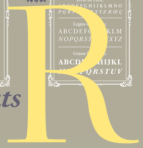 French typefounder (b. Paris, 1712, d. Paris, 1768) also called Fournier le jeune.
 - His books. Author of Manuel Typographique, two volumes published in 1764 and 1766. Nijhof&Lee write: The first volume is one of the major source books on the processes of making printing types in the era of the hand press. Volume two includes a comprehensive specimen of the types and ornaments of Fournier's own foundry, most of which he cut himself, and as such provides a record of one of the most remarkable personal achievements in the history of typefounding. The books are available as a Darmstadt Facsimile reprint (1995). He published other theoretical works, such as a 1737 manuscript on the spacing between letters for readability.
- His life. Son of typefounder Jean-Claude Fournier, he became famous as a type theoretician. He created his own point system in 1737, 14 years after the Frenchh government decreed that types should have standards. In 1739, he created his own foundry. The king of France, Louis XIV, commissioned new types for use during his reign, and turned to Fournier. Reproduction of these types by others was not tolerated. And so, Fournier modèles des caractères were in use throughout Louis XIV's reign. They had huge contrasts (after all, they just predated the outbreak of didones) and were crammed with rococo ornaments. Other contemporaries elsewhere, such as J.M. Fleischman and J. Enschedé, started imitating Fournier's style. In the 1750s, his career was at its peak. He advised royalty in Sweden and Sradinia on types, and set up a printing shop for Madame de Pompadour. He developed musical types in cooperation with J.G.I. Breitkopf in 1756. But other printers thoroughly disliked Fournier. There were several literary battles between rival typefounders, such as between Gando and Fournier, and between Ballard (a music symbol typfounder who held a monopoly before Fournier in that area) and Fournier. Fournier's type foundry existed until the 19th century.
- His typefaces. The Fournier MT family by Monotype (1924-1925) was based on the types cut by Pierre-Simon Fournier (ca. 1742) and was called St Augustin Ordinaire in Fournier's Manuel Typographique. These were the firtst transitional typefaces after the privately owned romains du roi. Mac McGrew: Fournier is an aristocratic roman typeface which had its inception in letters engraved and cast by Pierre Simon Fournier, a famous mid-eighteenth-century French typefounder. It is transitional, almost modern, in character, with a distinct French flavor, but with more grace and style than traditional French oldstyle designs. This modern character influenced the later work of Bodoni. This adaptation was made by English Monotype in 1925, and copied by Lanston Monotype in 1940. The specimen of the roman shown here is from English Monotype, in the absence of a good American specimen, but the italic is from Lanston. Narcissus-Roman (1995, Font Bureau) is based on a 1745 design of Simon Pierre Fournier, and a 1921 version of it called Narcissus by Walter Tiemann for Klingspor, and was digitized by Brian Lucid in 1995. Jim Spiece's version is called Narcissus SG. In 1768, he designed an ornamental all caps face, which Peignot produced as Fournier le Jeune. More elaborate caps were added by ATF in the 1920s, and the current digital version by P22/Lanston, also called Fournier le Jeune, is based on that [see LTC Fournier Le Jeune]. Alan Jay Prescott created APT New June (1996) based on Fournier le Jeune. In 2007, Tjorbjörn Olsson (T4) created Museum Fournier, inspired by a set of Rococo capitals designed by Pierre Simon Fournier le Jeune, ca. 1760. The matrices are part of a set imported to Sweden by J.P. Lindh in 1818 from Breitkopf&Härtel in Leipzig, Germany. They are now in the Nordiska Museum in Stockholm. Jas Rewkiewicz's Fournier RD (2007) is an interpretation of the famous Fournier typeface. The Castcraft version of Fournier is called OPTI Fourquet. Joshua Darden's Corundum Text (2006) and typeface Griesshammer;s free font Source Serif (2014, Adobe) are also based on Fournier. The ambitious PS Fournier (2016, Stéphane Elbaz) is perhaps one of the best digital revivals. At B&P Swiss Typefaces, François Rappo published New Fournier (2011) based on the typography of Pierre-Simon Fournier. It comes in 24 styles.
Pauline Nuñez graduated in 2007 from Ecole Estienne with a thesis entitled Pierre-Simon Fournier, typographe absolu, typographe accompli?. Publications by Pierre-Simon Fournier dit le jeune: - Epreuve, de deux petits caractères. Nouvellement gravés Et exécutés dans toutes les parties Typographiques, par Fournier le jeune, Graveur & Fondeur de Caractères d'imprimerie (1757, Paris). Local download.
- Dissertation sur l'origine et les progrès de l'art de graver en bois pour éclaircir quelques traits de l'histoire de l'imprimerie et prouver que Guttemberg [sic] n'en est pas l'inventeur (1758). Local download.
- De l'origine et des productions de l'imprimerie primitive en taille de bois, avec une réfutation des préjugés plus ou moins accrédités sur cet art, pour servir de suite à la dissertation sur l'origine de l'art de graver en bois (1759, Imprimerie Barbou, Paris). Local download.
- Observations sur un ouvrage intitul&eacutye; Vindiciae Typographicae,pour servir de suite au traité De l'origine et des productions de l'industrie primitive en taille de bois (1760, Imprimerie Barbou, Paris). Local download.
- Remarques sur un ouvrage intitulé: Lettre sur l'origine de l'imprimerie, etc. pour servir de suite au Traité De l'Origine et des productions de l'Imprimerie primitive en taille de bois (1761, Imprimerie Barbou, Paris). Local download.
- Traités historiques et critiques sur l'origine et les progrès de l'imprimerie (1763, Imprimerie Barbou, Paris). Local download.
- Les Caractères de l'imprimerie (1764, Paris). Local download.
- Manuel typographique utile aux gens de lettres (1764-1766, Paris). Volume I. Volume 2. Facsimile by Jacques André. Local download of the facsimile. Local download of volume I. Local download of volume II.
Klingspor link. FontShop link. View some digital typefaces based on designs by Fournier. [Google]
[MyFonts]
[More] ⦿
|
Pierre-Simon Fournier: Bibliography
|
This bibliography is on the basis of the study of Jacques André (Rennes, France), who placed a facsimile of Pierre-Simon Fournier's Manuel typographique (1764 and 1766) on his web page. - P. Beaujon, Pierre Simon Fournier 1712-1768, and XVIIIth Century French Typography. London 1926
- Allen Hutt, Fournier the Compleat Typographer, London 1972 (published in the USA by Rowman and Littlefield, Totowa, NJ).
- Bertram Schmidt-Friderichs, Pierre-Simon FOURNIER (Jacques Damase éiteur, Paris, 1991).
- Fernand Baudin, Pierre-Simon Fournier: la typographie absolue, in L'effet Gutenberg, éditions du cercle de la librairie, 1994, pp. 213-240.
- Jeanne Veyrin-Forrer, Simon-Pierre Fournier, successeur de Fournier-le-jeune, in La Lettre & le Texte – Trente annés de recherches sur l'histoire du livre, Collection de l'Éole Normale Supéieure de Jeunes Filles, No34, Paris, 1987.
- The Manuel Typographique of Pierre-Simon Fournier le jeune, together with Fournier on Typefounding, an English Translation of the Text by Harry Carter, in facsimile, with an Introduction and Notes by James Mosley. Three volumes. Volume 1 is Manuel typographique (1764). Volume 2 is Manuel Typographique (1766). Volume 3 is Fournier on Typefounding (1930). Printed in Germany by the Lehrdruckerei Technishe Hochschule Darmstadt
- Fred Smeijers, Counterpunch---making type in the sixteenth century, designing typefaces now, Hyphen Press, London, 1996.
[Google]
[More] ⦿
|
Pilcrow Type
[Paul D. Hunt]

|
 Type and graphic designer from Joseph City, AZ. His first degree was from Brigham Young University. He was a type designer at P22/Lanston from 2004-2007. In 2008, he obtained an MA in typeface design from the University of Reading where he designed the typefaces Grandia and Grandhara (Indic). In January 2009, he joined Adobe just after Thomas Phinney left. He lives in San Jose, CA. His talk at ATypI 2014 in Barcelona was entitled The history of non-Latin typeface development at Adobe.
 He created Howard (2006, a digitization of Benton's Sterling), P22 Allyson (2006, based on Hazel Script by BB&S; a winner at Paratype K2009), the P22 FLWW Midway font family (2006-2018: Midway One, Two and Ornaments; based on the lettering found on the Midway Gardens working drawings of Frank Lloyd Wright from 1913---tall-legged and casual), Kilkenny (2005, P22), a Victorian-style font based on the metal types named Nymphic and Nymphic Caps which were designed by Hermann Ihlenburg in 1889. This typeface has almost 1000 glyphs and comes in OpenType format. It includes Cyrillic characters. Check the studies here and here. For another revival of Nymphic Caps, see Secesja by Barmee. Designer of the display typefaces Seventies Schoolbook (2004) and Interlocq (2004). Hunt also digitized Goudy's Village (2005). Village was originally designed by Fredric Goudy in 1903 for Kuppenheimer & Company for advertising use, but it was decided it would be too expensive to cast. It was later adopted as the house face for Goudy's and Will Ransom's Village Press. The matrices were cut and the type cast by Wiebking. The design was influenced by William Morris's Golden Type. This Venetian typeface was digitized by David Berlow (1994, FontBureau) and by Paul D. Hunt (2005). Hunt's version was eventually released in 2016 by P22/Lanston as LTC Village. He revived Hazel Script (BB&S), which he renamed Allyson (2005). Still in 2005, he created a digital version of Sol Hess' Hess Monoblack called LTC Hess Monoblack. In 2006, he published a nice set of connected calligraphic script fonts, P22 Zaner. Bodoni 175 (2006, P22/Lanston) is a revival of Sol Hess' rendition of Bodoni. He was working on Junius (2006), a revival/adaptation of Menhart Antiqua. Frnklin's Caslon, or P22 Franklin Caslon, was designed in 2006 by Richard Kegler and Paul Hunt in collaboration with the Philadelphia Museum of Art. This slightly eroded font set includes faithfully reproduced letterforms digitized directly from images of impressions made by Benjamin Franklin and his printing office circa 1750. It comes with a set of ornaments. In 2007, he used Goudy's 1924 typeface Italian Old Style in the development at P22/Lanston of LTC Italian Old Style. That typeface was remastered and extended to cover several languages by James Grieshaber in 2011. In 2014, Paul Hunt finished work on the wood type revival font HWT Bulletin Script Two (P22 & Hamilton Wood Type). This backslanted psychedelic typeface can be traced back to the wood type manufacturers Heber-Wells (Bulletin Condensed, No. 5167), Morgans and Wilcox (Bulletin Script No. 2, No. 3184), Empire Wood Type (1870: Bulletin Script), Keystone Type Foundry (1899: Bulletin Script), Hamilton (117), and Wm. H. Page & Co (No. 111 through No. 113). Free fonts at Google Web Fonts: Source Sans Pro (2012; Source Sans Pro for the TeX crowd), Source Code Pro (2012, a companion monospaced sans set by Paul D. Hunt and Teo Tuominen). Source Serif Pro, its Fournier-style relative, was developed at Adobe by Frank Grießhammer. They can also be downloaded from CTAN and Open Font Library. Fun creations at FontStruct in 2008-2009: Possibly (a stencil loosely based on the Mission Impossible series logo), Probably (same as Possibly but not stenciled), Med Splode, Arcade Fever, negativistic_small, New Alpha_1line, New Alpha_4line, New Alpha_bit, New Alpha_dot [dot matrix font], New Azbuka [after Wim Crouwel's New Alphabet from 1967], positivistic, slabstruct_1, slabstruct_too, structurosa_1, structurosa_bold, structurosa_bold_too, structurosa_caps, structurosa_faux_bold, structurosa_leaf, structurosa_script, structurosa_soft, structurosa_tape, structurosa_too, structurosa_two, Slabstruct Too Soft, Structurosa Clean Soft, Structurosa Script Clean, Structurosa Clean, Structurosa Clean Too, Structurosa Clean Leaf, Structurosa Boxy, Stucturosa Script Heavy. In 2010, he designed he programming font Sauce Code Powerline. Well, this is probably a renaming of Source Code by some hackers. Just mentioning that sauce Code is on some Github pages. Klingspor link. Google Plus link. [Google]
[MyFonts]
[More] ⦿
|
Point sizes
|
A point size explanation, gleaned from "RSD99"'s posting. - The PostScript point: exactly 72 to the inch. [When the PostScript page description language was being designed by Adobe Systems (Jim Warnock and Charles Geschke), the PostScript point was defined as being exactly 72 points to the inch. Warnock and Geschke had an extensive knowledge of real-world printing, and of computerizing that process. They apparently took the position that 1/72.27000072 was ridiculous and overly computationally intensive, and decided to use 1/72 for the value of the point.] In other words:
- 1/72 inch
- or 0.013888888888 inches (the "8" is an endlessly repeating decimal)
- or 0.352777777777 millimeters (the "7" is an endlessly repeating decimal)
This is the point system used by nearly all software nowadays. - The "American Printer's Point": proposed in 1886, it is roughly 72.27000072 to the inch. [The traditional American printer's point was defined by the American Typefounders Association in 1886. This convention was used by printers in the United States and England, and is still in use by those printers who use cast metal type. It is sometimes referred to as the "Anglo-Saxon point." The value of 0.013837 inches is from the NIST Handbook 44, Appendix C.]
- 1/72.27000072of an inch
- or 0.013837 inches
- or 0.3514598 millimeters
- The Didot point (of the 18th century ... roughly 1770): roughly 67.55818249 to the inch [Usually written xx ptD, the Didot point was originally defined in 1770 as 1/72th of the French Royal Inch. This French Royal Inch was 27.07 mm long, which was slightly longer than the English inch of the time. The Didot point is commonly used by continental European printers and typesetters. Since it is visibly slightly larger than the commonly used Anglo-Saxon "printer's point," the Didot point is sometimes called the 'fat point.']
- 1/67.55818249 of an inch (roughly)
- or 0.014802056 inches
- or 0.3759722222 millimeters
- There are also historical "point" measurements by Fournier (1737) and Truchet (1695), and one by the French printer Imprimerie Nationale.
- Points (l'Imprimerie nationale): The l'Imprimerie nationale point was defined as 0.4 millimeter. It is now obsolete.
- Points (Truchet, 1694): The Truchet point is defined as 1/12th of 1/12th of the French Royal foot. It was never accepted by the printing industry, and is now obsolete.
- Points (Fournier, 1737): In 1737 Pierre Fournier formulated the first definition of the point as being 1/12th of the French "Cicero" type size. The "Cicero" was then 0.1648 inches, so the Fournier point was approximately 0.013733 inches. This definition was originally presented in his booklet "Tables des Proportions qu'il faut observer entre les caractères."
[Google]
[More] ⦿
|
Point system
|
I quote from a web page that is gone: The point measurement was developed as a standard in the 19th century by Pierre Simon Fournier and F(irmin) Didot. Known as the Didot Point System, 12 points equal one cicero. The British/American version (proposed by Nelson Hawks in 1878) is based on the pica - which is also 12 points, or 4.233 millimetres, but is actually slightly smaller that a Didot Point. The point size is determined by measuring the distance from the ascent line (top of the capitals) to the descent line (bottom-most descender). To confuse matters, many European countries measure type in millimetres (1mm equals 2.85pt). [Google]
[More] ⦿
|
Production Type
[Jean-Baptiste Levée]
|
 Jean-Baptiste Levée is a French type designer based in Paris. He is a co-founder of the Bureau des Affaires Typographiques, and teaches typeface design at ESAD Amiens (and before that, at the Caen-Cherbourg school of Arts & Media and at the University of Corte). His latest work is mostly published at Production Type which he manages. He designs custom and retail typefaces, and has won multiuple awards for his type designs. Other designers publishing at Production Type include Yoann Minet, Sandra Carrera, Yohanna My Nguyen, Emmanuel Besse, Mathieu Réguer, Quentin Schmerber and Loic Sander. In 2020, the support team included Hugues Gentile, Dorine Sauzet, Suehli Tan and Igino Marini. Levée's typeface portfolio:
 - Vuitton Persona (2007): a family made under the supervision of Porchez for Vuitton's bags.
- Wallpaper corporate typeface (2008): Under the art direction of Meirion Pritchard and Christian Schwartz, this 2-style sans was developed for the architectural magazine Wallpaper. It is a self-confessed blend of Meta and Amplitude.
- Le Monde Courrier (2008): an extension and OpenType completion of the glyph tables of Porchez's LeMonde Courrier (2002).
- Panorama (2004-2008): an elegant full-fledged sans family from hairline to extended bold, and from Extra Condensed to Extra Extended. It can be bought at Production Type.
- Henderson Serif & Sans (2006): This is a Baskerville family conceived by J.-F. Porchez, but extended and perfected by Levée. The Sans is in the style of Arial with large x-height. The Typofonderie page does not mention Levée.
- Retiro (2007): Done with J.-F. Porchez for Madriz Magazine. This is a didone family with juicy and classy alternates. It became a retail font at Typofonderie in 2015.
- Pimkie (2006): a playful feminine display face.
- Seenk Serif and Seenk Sans: a text family done with Christophe Badani in 2005.
- Expert (2009): a unicase typeface done for magazine, ca. 2009.
- Acier BAT (2009-2010, BAT Foundry): an extensive family that builds on Cassandre's 1930 font by the same name.
- Gemeli and Gemeli Mono (by Levée, assisted by Emmanuel Besse and Hugo Marucco). This sans family can be bought at Production Type. For Gemeli Micro (2018), Gemeli's x-height was enlarged, extenders shortened, stance widened, spacing loosened, and forms simplified.
- Synthese.
- Carrefour Origin (2011). A tall thin face. This custom typeface led to the vretail typeface family Origin Super Condensed.
- Cogito Atelier Malte Martin. The sans family Cogito can be bought at Production Type.
- Telerama Dogon. This is a matchstick or campground face.
- Nathan Enfantine (2011) and Enfantine (2015). A simple upright connected (school?) script.
- RMNGP Constellation (2013) is the bespoke dot matrix typeface of Réunion des Musées Nationaux---Grand Palais for their on-site, online and printed communications.
- Vanité for Vanity Fair France (2013).
- Plinc Beaux Arts Didot (2014). A classical didone digitized from the original Photo-Lettering film matrix by Jean-Baptiste Levée for House Industries.
- Countach (2014, Production type). Described as follows by the designers and team, Superscript2, J.-B. Levée, Sandra Carrera and Irina Smirnova: Countach, the tough compact sans supercharged with brawn & brains. Developed for The Crew, a critically acclaimed auto racing video game, Countach evokes the muscular and mechanical dynamics of fast cars and urban adventure.
- Reception Semi (2014). A hybrid corporate typeface for Unibail / Rodamco.
- Renault Carname for Renault cars. This typeface won an award in the TDC Typeface Design competition in 2017.
- Fournier Orchestre de Paris (2014): Fournier ODP is the exclusive corporate typeface of Orchestre de Paris. Named after Pierre-Simon Fournier Le Jeune (1712-1768), punchcutter and typefounder. Famous for his musical founts, the Parisian Pierre-Simon Fournier is considered one of the first French moderns. The typeface borrows from the numerous alphabets produced by Fournier, retaining only the finest cuts and adding its own peculiarities: anachronical ampersand, reversed letters in reverence to poster ephemeras of the times. The Graphiques series are designed to allow for polychromic settings. The Gothic series are a nod to the residues of modernism. Faithful to the tradition of optical sizes, different designs have been assigned to different scales of use. By Jean-Baptiste Levé, who was assisted by Yoann Minet, Mathieu Réguer, Laurent Bourcellier and Roxane Gataud.
- Libé (2015). Rob Mientjes writes about this custom typeface family done for Libération: Libé is a family of a wide array of sans serif fonts and a set of stubborn typewriter fonts with a slightly sloppy underline style. The sans part of the family is a hybrid Excoffon, nineteen-seventies, tight-but-not-touching fever dream. If the spirit of Excoffon is alive, it has possessed Libé Sans. The Typewriter styles are a typographically successful, if unexpected, match.
- Granville (2015). A Peignotian (or modulated) sans published by Production Type.
- Minotaur (2014, with Yoann Minet). Minotaur won an award in the TDC 2015 Type Design competition.
Proto Grotesk (2014). Proto Grotesk won an award in the TDC 2015 Type Design competition. Review by André Mora, who writes: This beast is a strong sans serif with two mean weights. While others were busy breeding show dogs, Proto emerged from the love den of a couple of mutts high as hell. It ain't tame. It'll never be domesticated. Proto Slab and Proto Slab Condensed followed later. - Cobalte (2015, Production Type). A flared lapidary sans serif family.
- Courrèges (2016) for the fashion house.
- Boreal (2016). A sans family.
- Columbia Sans and Columbia Sans Display (2016, Jean-Baptiste Levée). Initially intended as a sans version of Times New Roman, Levée's explorations take him far afield through his flirtation with reverse stress and his back-rotated small o. He writes: Columbia is an unorthodox blend of multiple historical models. It excavates the so-called Elzevir style, an example of permeability between French and Dutch flavours. The type's restrained nature eschews caricature, giving paragraphs a clean texture while retaining the classical touch expected from late Renaissance typefaces. Initially commissioned by science magazine Sciences & Avenir, Columbia strikes a balance between rigorous topics and an approachable, informal tone.
- ARC (2016). A custom multiline typeface for the City of Paris (L'Arc de l'Innovation).
- Spectral (2017). A 7-style sharp-edged book face by Jean-Baptiste Levée related to Mrs. Eaves, and freely available at Google Fonts. Levée describes the influence of the French Elzevir on Spectral. The type experts opine that the spacing is too loose.
- Alpine (2017). A custom sans family for the new Alpine Vision automobile.
- Antique Gothic (2017). A condensed vintage sans with extreme x-height, designed by Jean-Baptiste Levée, with the help of Emmanuel Besse, Yoann Minet, Quentin Schmerber, Hugues Gentile, Pauline Fourest, and Kristina Jandova.
- Cardinal Classic and Cardinal Fruit (2018). A large transitional typeface family by Jean-Baptiste Levée, Yoann Minet and Quentin Schmerber. The tightly set and high impact photojournalism typeface family Cardinal Photo was added in 2020.
- Media Sans (2018). A typeface family with tight spacing and some extra condensed styles to be used in headlines and on posters. It was influenced by Frutiger's Antique Presse (at Deberny & Peignot) and some European typefaces of the 1960s and 1970s, such as the tightly letterspaced Brasilia, the squarish caps of Eurostile, and the oddly contrasted Antique Olive.
- LVMH Air (2018). A knife-edged fashion typeface family custom designed for LVMH (Moet Hennessy & Louis Vuitton), a French multinational luxury goods conglomerate that specializes in snob appeal.
- Duperré Sans (2018). A custom sans by Jean-Baptiste Levée and Quentin Schmerber for École Duperré.
- Acier (2019). A bi-colored revival of Cassandre's Acier (1930, Deberny & Peignot).
- Tesseract (2019). A display typeface with edges as sharp as a bamboo-cutting machete. Stuff for James Bond movies.
Speaker at ATypI 2013 in Amsterdam and ATypI 2014 in Barcelona. Speaker at ATypI 2016 in Warsaw. Behance link. Old URL. Klingspor link. Home page of Jean-Baptiste Levée. [Google]
[More] ⦿
|
Ralph Michael Unger
[RMU (Ralph Michael Unger Typedesign)]

|
 [MyFonts]
[More] ⦿
|
RMU (Ralph Michael Unger Typedesign)
[Ralph Michael Unger]

|
 Ralph M. Unger (b. 1953, Thuringia, East Germany) says this about himself at MyFonts: Typesetter from the composing stick via Linotype setting machines to the Mac. Jobs in various Thuringian printeries. Barred further education by Communist authorities due to political reasons. Imprisoned in East Germany. Since 1988 in the state of Baden-Wuerttemberg, former West Germany. Jobs in several newspaper printing houses as advertisement compositor. Own office since 1995, in Aalen, Baden-Wuerttemberg. He lives in Schwaebisch Gmuend, and was a freelance type designer for Profonts and URW++, where he contributed frequently to their libraries between 2002 and 2009. In 2009, he founded RMU. MyFonts link. I split his contributions into two groups, the URW / Profonts group, and the RMU group. The prefix FontForum refers to a subseries of URW++ fonts. Unless specifically mentioned, all the following fonts are at URW++ and/or Profonts:
 - FontForum Admiral Script (2005): revival of Middleton's Admiral script from 1953.
- Amitié (2009): a garalde family.
- Arabella Pro (2006): after the script by Arnold Drescher from 1936, published at Joh. Wagner.
- Fontforum Atrament (2006): architectural lettering. Do not confuse with a Suitcase Type Foundry font from 2003 by the same name.
- Atze (2010): a comic book family.
- Behrensschrift D (2007): after the jugendstil typeface Behrens Schrift, 1902, by Peter Behrens.
- FontForum Bernhard Script (2005): after Bernhard Script from the 1920s.
- Bradley (2005): blackletter, after the original by William H. Bradley.
- Breite Kanzlei (2007).
- Breitkopf Fraktur (2003): after the original by Johann Gottlob Immanuel Breitkopf, done in 1793.
- Brocken (2011) is a signage typeface inspired by a design of Volker Küster (1960s).
- Profonts Bureau (2010, Profonts): a minimalist rounded sans family.
- FontForum Calypso (2005): a revival of Roger Excoffon's Calypso (1958).
- Card Pro (2006): a decorative display based on Ella Cursief (1916, Sjoerd Hendrik de Roos, Lettergieterij Amsterdam).
- Chaweng (2006, Profonts): an oriental all caps simulation face.
- Civilite URW (2005).
- Compliment (2004, casual script). Based on a 1965 script by Helmu Matheis for Ludwig & Mayer.
- Cranach (2007): a blackletter typeface modeled after Kuenstler Gotisch from the Krebs Foundry.
- Dominante (2007): a serif family based on Johannes Schweitzer's font by that name, 1959.
- Dominique (2010, profonts): an informal typeface.
- FontForum URW Ecsetiras (2005): revival of Ecsetirás (Zoltan Nagy, 1967, a brush face).
- Edda Pro (2008). An art nouveau typeface that revives a Heinrich Heinz Keune typeface from 1900.
- Energia Pro (2008, Profonts): connected monowidth script, based on Arno Drescher's Energos from 1932.
- Estro (2003, Western lettering). Seems close to Nebiolo's Estro from the 60s.
- Eurobrush Pro (2007, Profonts): handwriting.
- EuroSans (2008).
- Euroscript Pro (2006, Profonts): school script typeface based on his own handwriting.
- Flashes (2007): a revival of Crous-Vidal's Flash, 1953.
- Fox (2007): a brush script based on W. Rebhuhn's original from the 1950s.
- Gamundia (2010): a calligraphic copperplate script inspired by Excoffon's Diane.
- Ganz Grobe Gotisch (2006): a fat blackletter modeled after the original by F.H.E. Schneidler.
- Gmuender Elan Pro (2011) is a 1950s style script face.
- Gradl Nr 1 (2008): based on hand-drawn art nouveau upper case characters by M. J. Gradl, ca. 1900.
- Graphique Pro (2008): shaded caps face, based on Graphique, which was originally created by Swiss designer Hermann Eidenbenz in 1945, and issued as hot metal font by Haas'sche Schriftgießerei. See also New Graphique Pro (2011).
- Handel Slab (2009): a 6-style extension of Trogram's 1980 typeface Handel Gothic.
- Hanseat (2010): a grotesque family done at Profonts. It was heavily inspired by Germany's official DIN 1451 Engschrift.
- Iova Nova (2007): based on Jowa Script, designed by J. Wagner in 1967.
- Profonts>Impression (2008): art deco.
- Jessen Schrift (2004): after the Rudolf Koch blackletter typeface by that name.
- FontForum URW Konzept Pro (2005): revival of Konzept (1968, Martin Wilke's handprinting face).
- Legende (2002): a script typeface based on the original typeface of Friedrich Hermann Ernst Schneidler (1937).
- Leipziger Antiqua. The original Leipziger Antiqua by Alfred Kapr at Typoart dates from 1971 until 1973. The digital version of Leipziger Antiqua was developed by Ralph M. Unger in 2005.
- Manuskript Antiqua (2005): after Oldrich Meinhart's Manuskript Antiqua.
- The Maszynysta family of heavy industrial sans typefaces (2010) have a textured style (Struktura), a Shadow, and a plain Roman.
- Maxim (2003, Profonts): The heavy brush typeface Maxim was originally designed by Peter Schneidler in 1956 for the Bauer foundry.
- New Bayreuth (2008): after Friedrich Hermann Ernst Schneidler's Bayreuth from 1932.
- Old Borders and Lines (2010). A free font.
- Ornella (2008): Jugendstil.
- Peter Schlemihl (2008, Profonts): a revival of a blackletter by Walter Tiemann.
- Pedell (2009): a casual script.
- Polo (2002): a brush face modeled after Carl Rudolph Pohl's Polo (1960).
- In 2012, Ivana Koudelkova co-designed the grungy headline typeface Retroactive Pro with Ralph M. Unger at Profonts.
- Fontforum Rhapsody (2006): a revival of Ilse Schüle's rotunda face.
- Roberta (2003): art nouveau typeface after obert Trogman's typeface for FotoStar.
- FontForum Signs and Symbols (2006).
- Splendor (2009): a revival of a brush script typeface by Wilhelm Berg, Schriftguss, 1930. See also Splendor Pro (2014).
- Sportowy (2009): an outline face.
- Stanford (2011). A sports lettering face.
- Stiletto (2006): a medieval script.
- Fontforum Stripes (2007): a multistripe op art display typeface based on a Letraset font from 1973 by the same name.
- Fontforum Thalia (2006): retro font.
- Tintoretto (2006): shadow display face based on an origonal by Schelter & Giesecke.
- Tip Top Pro (2008): a Julius Klinkhardt art nouveau typeface revival.
- FontForum Unciala (2005): a revival of Oldrich Menhart's typeface Unciala (1953, Grafotechna).
- Unger Chancery (2005).
- Unger Script (2003): based on H. Matheis' Slogan typeface designed for Ludwig&Mayer in 1957.
- Veltro (2007): after a 1931 original by G. da Milano at Nebiolo.
- Profonts Woodpecker (2008).
The list of RMU fonts: - Affiche (2017). A revival of Helios Reklameschrift of the Klinkhardt foundry.
- Aldo Manuzio (2017). After a house typeface from 1897 by Schelter&Giesecke.
- Amati Pro (2010): after Georg Trump's condensed didone face, Amati, 1951.
- Antiqua Florenz (2021). A revival and extension of Paul Zimmermann's Antiqua Florenz (1960, Ludwig & Mayer), which is based on Venetian romans.
- Avus Pro (2012). A sans family that extends Gert Wunderlich's Maxima (1970).
- Baroque Pearl (2016). A pearly typeface that revives Peter A. Demeter's Fournier Geperlt (1922, Schriftguss).
- Behrens Kursiv (2013). After a 1906 original by Peter Behrens.
- RMU Belvedere (2020). A revival of Heinrich Wieynck's art nouveau / fin-de-siècle typeface Belvedere (1906, Bauer).
- RMU Bison (2020). A revival of Julius Kirn's brush script Bison (1935-1938, C.E. Weber).
- Bernhard Blackletter (2016). After Lucian Bernhard's extrafette Bernhard Fraktur (1921).
- Bernhard Cursive Extra Bold (2010).
- Borghese (2015). An art nouveau font after a Schelter & Giesecke original from 1904.
- Borgis Pro (2012). A Clarendon-style text family.
- Boulette (2015, a fat creamy script).
- RMU Bowery (2019) A revival of Old Bowery (1933, ATF)).
- Bravura Pro (2013). After G.G. Lange's Publica.
- Bricklayers (2012). An original fat slab display face.
- Brillant (2009): art nouveau and ultra heavy.
- Butti (2011). A script family paterned after Fluidum (1951, Alessandro Butti, Nebiolo).
- Cable Condensed (2014). Based on Koch's Kabel.
- Caesar Pro (2011). A flared sans typeface after Caesar Schrift (1913, Georg Schiller, C.F. Rühl).
- Capitol Pro (2012). An art deco typeface based on Capitol (Karl Hermann Schaefer for Schriftguss, 1931).
- Carina Pro (2017). A calligraphic script typeface based on Rautendelein (1929, Schriftguss).
- Carla Pro (2013). A broad-nibbed script modeled after Ballantines Script (Elsner & Flake, 1974; see also Ballantines Serial by SoftMaker).
- Carlsbad (2018). A couple of art nouveau typefaces based on originals from 1895 by H. Berhold called Regina Cursiv and Hansa Cursiv.
- Caslon Gotisch (2009): after the original by William Caslon from 1763.
- Celebration (2009): blackletter.
- Circensis (2016). A Western circus font based on a concept of Fritz Richter.
- Claudius (2010): after a 1937 blackletter font at Klingspor.
- Constanze Pro (2012). A light cursive typeface based on Constanze (1954, Joachim Romann, Klingspor).
- Contact Pro (2010): after Contact, a 1963 font by Helmut Matheis.
- Dante Alighieri (2018). Based on a Schelter & Giesecke original.
- Daphnis (2016). A revival of Daphnis (1929, Walter Tiemann).
- Deutschmeister (2017). A textura blackletter typeface after Deutschmeister by Berthold Wolpe for Ludwig Wagner in 1934. (Some dispute that Wolpe made this font.)
- Diamant Pro (2012). A transitional serif face.
- Emilia (2016). Based on Weiss Antiqua (1928) by Emil Rudolf Weiss.
- Neue Echo (2016). Based on Echo for Schriftguss.
- Elbflorenz (2020). A revival of Albert Auspurg's display typeface Miami (1934, Schriftguss).
- Emilia Gotisch (2016). After Weiss Gotisch (1936) by Emil Rudolf Weiss.
- Emilia Fraktur (2021). A revival of Emil Rudolf Weiss's Weiss Fraktur (1913).
- Erler Titling (2015). After Erler Versalien (1953, Herbert Thannhaeuser for Typoart).
- Eurotech Pro (2011): a slabby techno family.
- Faulkner Pro (2011): a connected heavy signage script based on Alan Meeks's Kestrel.
- Fette Kanzlei (2019).
- Fette Unger Fraktur (2010).
- Fichte Fraktur (2020). After Walter Tiemann's Fichte Fraktur (1934).
- Fontanesi RMU. An ornamental caps typeface that revives Aldo Novarese's Fontanesi (2018).
- Forelle Pro (2010): after the original Forelle script typeface by Erich Mollowitz, 1936.
- Frankenberg Pro (2012). An antique script face.
- Gabor Pro (2014). A connected copperplate script.
- Gaby Pro (2017). A revival of Hans Möhring's script typeface Gabriele (1938 or 1947, C.E. Weber).
- Garamond Antiqua Pro (2015).
- RMU Gilgengart (2020). A revival of Hermann Zapf's Fraktur font Gilgengart (1938).
- Gillray Pro (2015). A copperplate script after Hogarth Script (by Harald Bröder for Typoart).
- RMU Gloria (2019). After Gloria (1898, Emil Gursch).
- RMU Gong (2020). Based on Arno Drescher's Super Grotesk Schmalfett first released in 1933 at Schriftguss.
- Gmuender Gravur (2011). A 3d shadow face. Gmuender Antiqua Pro (2015) is influenced by the metal font Imprimatur (1952-1955, Konrad F. Bauer and Walter Baum). Gmuender Kanzlei (2018) is a blackletter typeface.
- Goethe Fraktur (2022). A revival of a blackletter typeface by Wilhelm Woellmer (1905).
- Gravira (2021). A revival of Herbert Thannhaeuser's Gravira, released by Schelter & Giesecke in 1935 .
- Haenel Antiqua (2020, based on a 19th century antiqua by Eduard Haenel) and Haenel Fraktur (2011, after Haenel Fraktur, ca. 1840).
- Hanse Textura (2020). A revival of a textura by Hermann Zapf.
- RMU Helion (2020). A revival of the 3d titling typeface Helion (1935, Arno Drescher for Schriftguss Dresden).
- RMU Herkules (2019). After a late 19th century font by Bauer and Berthold called Reklameschrift Herkules.
- Hoelderlin (2018). After Eugen Weiss's Hoelderlin blackletter font (1937).
- Hoyer Script (2017). After Hanns Thaddeus Hoyer's Hoyer Schoenschrift (1939, Stempel).
- Hupp Fraktur (2016). After Otto Hupp, 1911.
- Impuls (2010): a brushy typeface based on Paul Zimmermann's Impuls (1945).
- Initials RMU One (2012) consists of revivals of Rudhardsche Initialen (Otto Eckmann, ca. 1900) and Walthari Initials (ca. 1900, Rudhardsche Giesserei). Initials RMU Two (2012) consists of revivals of Jubilaeumsinitialen (by Bauersche) and Augsburger Initialen (by Peter Schnorr, 1901).
- Jean Paul Fraktur (2021). A revival of Breitkopf's Fraktur font Jean-Paul-Schrift (1798).
- Jobs Gravure (2011). It had to happen---a few days after Steve Jobs' death, Unger released the beveled engraved typeface Jobs Gravure, which is an extension of Trump Gravur (1954, Weber).
- Jolly Polly (2012): a curly non-connected script face.
- Kis Antiqua Pro (2018). A revival of Hildegard Korger's Kis Antiqua at Typoart.
- Kleist Fraktur (2010): after Walter Tiemann's original.
- Kompress Pro (2013). Two compressed sans typefaces.
- RMU Kontrast (2021). An art deco typeface that revives Kontrast (1930, F.H.E. Schneidler at Weber).
- Koralle RMU (2018). A revival of Schelter and Giesecke's Koralle (1915).
- Korpus Pro (2014). A text typeface family. Followed later in 2014 by Korpus Sans Pro.
- Korpus Serif Pro (2021). A revival and extension of Timeless (Typoart) that covers Greek, Latin and Cyrillic.
- Leibniz Fraktur (2012) is modeled after the famous Genzsch & Heyse blackletter font.
- Lenbach (2021). Inspired by a German font from the Victorian era.
- Liliom Pro (2012). A beautiful fat didone typeface based on an original from the Fonderie Française.
- Lipsia Pro (2011). An angular serif family.
- Literatura Pro Book (2012).
- Litfass (2021). A revival of an art nouveau font by Flisch.
- Lutetia Nova (2014). A fresh two-style take on Jan van Krimpen's Lutetia (1924).
- RMU Luchs (2021). A redesign of Jakob Erbar's inline all caps art deco font Lux (Ludwig & Mayer, 1929).
- Luxor Pro (2010): a Victorian/Western display face.
- Lyrica (2014). A revival of the informal blackletter typeface Lyrisch (1907, Georg Schiller).
- RMU Magnet (2021). A redesign and revival of Magnet (1951, Arthur Murawski at Ludwig & Mayer).
- RMU Manolo (2019). Based on the art nouveau typeface Manolo (Ludwig & Mayer).
- Manutius Pro (2012).
- Meister Antiqua (2011, +Bold, +Book). A Typoart original from 1951 in the tall flared ascender serif genre, revived and extended.
- Mitropaschrift (2016). An octagonal original.
- Mobil Pro (2011). A semi-script typeface in the fifties style of Matheis.
- Monument (2010): a 3d shadow roman caps face created after Oldrich Menhart's Monument.
- Narziss (2018). A revival of Walter Tiemann's Narziss from 1921.
- RMU Neptun (2021). A revival and extension of the art nouveau typeface Neptun by Aktiengesellschaft fuer Schriftgiesserei und Maschinenbau, Offenbach.
- Neue Kurier (2011). Typoart's popular signage script font in a new, completely remastered version.
- Neue Muenchner Fraktur (2010).
- Neue Schwabacher (2021). After Albert Anklam's Neue Schwabacher (Genzsch & Heyse, 1876).
- Neue Thannhaeuser (2011).
- Old Towne Pro (2010): a Western font.
- RMU Omega (2020). After Omega, an art deco typeface by Friedrich Kleukens at Stempel in 1926.
- Orbis Pro (2016). A revival of Walter Brudi's shadow typeface Orbis (1953, Stempel).
- Orplid Pro (2019). a layerable typeface that revives and extends Hans Bohn's all caps Bauhaus era typeface Orplid (1929).
- Parcival Antiqua (2016). A revival of Parcival Antiqua (1926, Herbert Thannhaeuser).
- Parfum (2013). A low x-height script that was inspired by Howard Allen Trafton's Quick (1933, bauer).
- Parler Fraktur (2018). A revival of Friedrich Poppl's Poppl Fraktur.
- Parler Gotisch (2011). A blackletter face.
- RMU Pittoreske (2019). A decorative Victorian typeface.
- Plastica Pro (2015, a chiseled typeface inspired by a J. Lehmann design).
- RMU Pergola (2021). A vintage shadow typeface inspired by a late-19th century font of Georg Giesecke.
- Post Fraktur (2014) and Postillon (2014). After Herbert Post, 1933-1937.
- Primana Pro (2012). A seductive geometric grotesk family.
- Prinzess Gravur (2010): a blackletter typeface modeled after Prinzeß Kupferstichschrift (1905, Berthold).
- Prisma Pro (2011). Revival and extension of Rudolf Koch's multiline typeface Prisma (1931).
- Reklame Fraktur (2016). After Reklame Fraktur by Albert Christoph Auspurg, 1914.
- Reflex Pro (2018). All caps, with an inline style.
- Reznicek Pro (2011) is a post-Victorian pre-art nouveau typeface named after Ferdinand von Reznicek (1868-1909), one of the leading artists and illustrators of those times.
- Rekord Antiqua (2020). A revival of the art nouveau era text typeface Rekord Antiqua (1911, Wagner & Schmidt).
- Rhythmus Pro (2016). After a Schriftguss AG and Schelter&Giesecke original grotesk, and extended to cover Cyrillic.
- Ridinger Std (2012). Based on Riedingerschrift (Franz Riedinger, 1906, for Benjamin Krebs Succ.).
- Ronde Pro (2011): roundhand script.
- Royal Grotesque (2021). A revival of Wotan by Wagner & Schmidt, 1914. Did this typeface become RMU Royal Sans (2022)?
- Salzmann Fraktur (2019). A revival of Max Salzmann's blackletter font released by Schelter & Giesecke in 1912.
- Saskia Pro (2016). Revival of Jan Tschichold's Saskia (1931, Schelter & Giesecke).
- Schmale Anzeigenfraktur (2009): based on Koch's Schmale Deutsche Anzeigenschrift, 1923, Klingspor.
- Schmale Mediaeval (2020). Based on Schelter & Giesecke's Schmale Mediäval (1840).
- Schmuckinitialen (2009): an ornamental caps typeface in the art nouveau style based on Walthari Initials [Walthari (1899, Heinz König for the Rudhard'sche Giesserei) in the upper case and Eckmann Initials (ca. 1900, by Otto Eckmann, Germany's chief art nouveau type designer) in the lower case].
- Schreibmeister (2021). Ralph's interpretation of Arno Drescher's formal cursive typeface for Ludwig Wagner (1958, Leipzig).
- Schwabacher Book (2013).
- Sebaldus (2019). A heavy blackletter typeface, after Sebaldus Gotisch (1926, H. Berthold).
- Senatsfraktur (2020). After Friedrich Bauer's Senats Fraktur done in 1907 for Genzsch & Heyse.
- Concordia (2020). A revival of Sensation Schmalfett (1914, Heinrich Hoffmeister).
- Siegfried Pro (2017). A revival of the art nouveau typeface Siegfried (1900, Wilhelm Woellmer).
- RMU Skizze (2021). This revives Walter Höhnisch's script typeface Skizze (1935, Ludwig&Mayer).
- Staxx Pro (2013). A prismatic typeface.
- Staufer Gotisch (2015). An engraved blackletter typeface modeled after Herbert Thannhaeuser's Hermann Gotisch (Schriftguss, 1934).
- Steinschrift Pro (2015). A single style condensed sans serif.
- Sylphe Pro (2019). A vintage script font that revives Schelter & Giesecke's Isabel (not Sylphide, as claimed by him).
- Tablica (2017). After Karl-Heinz Lange's DDR telephone directory font Minima (1984).
- Thannhaeuser Fraktur (2013) is a redesign of Typoart's Thannhaeuser Fraktur.
- Thomasschrift (2014). A rustic typeface that revives and extends Thomas-Schrift by Friedel Thomas (1957-1958, Typoart).
- Titanschrift (2011). A yummy soft and fat display face.
- Tombola (2018). After an alphabet from the 1920s by Otto Heim.
- RMU Trianon, renamed RMU Trifels (2020). After Heinrich Wieynck's Trianon (1905, Bauersche Giesserei).
- Trocadero Pro (2010): an extension and revival of Trocadero Kursiv, 1927, Albert Auspurg, Trennert.
- Troubadour Pro (2010): In Medium and Engraved styles.
- Trump Deutsch (2011): a blackletter face, after the 1935 original by Georg Trump.
- Trybuna (2013). Based on Herbert Thannhaeuser's Liberta Antiqua (1958), but completely redrawn.
- Turnier (2019). A revival of G.G. Lange's derby (1952-1953).
- Tyton Pro (2013). A brush script after Heinz Schumann's famous 1964 Stentor.
- Typoskript Pro (2010): a revival of Hildegard Korger's Typoskript, first done at TypoArt in 1968.
- Unger Fraktur (2010): after a 1793 design by Johann Friedrich Unger; includes fett and mager.
- Walbaum Antiqua Pro (2013). A revival of Justs Erich Walbaum's didone classic.
- RMU Wallau (2019). After Rudolf Koch's rotunda typeface Wallau (1926-1934).
- Werbedeutsch (2021). A revival of the blackletter typeface Buchdeutsch (Ernst Schneidler, 1926).
- Wieynck Fraktur (2019). after Heinrich Wieynck's Wieynck Fraktur (1912).
- Wieynck Gotisch (2018). After Wieynck Gotisch (1926, Heinrich Wieynck).
- Zentenar Fraktur (2010): mager and halbfett; after the 1937 workhorse by Ernst Schneidler at Bauer.
- Zierfraktur (2010): after Deutsche Zierschrift, an engraved blackletter font that was cut by Rudolf Koch between 1919 and 1921 for Klingspor.
Ralph made some typefaces outside URW/Profonts and RMU, such as Stripes (2014, a prismatic typeface puvlished by Thinkdust). Klingspor link. View Ralph M. Unger's typefaces. [Google]
[MyFonts]
[More] ⦿
|
Robin Nicholas

|
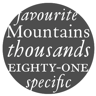 Born in Westerham, KE (1947). He joined the Monotype drawing office in 1965 and moved to the type design department in 1968, where he became manager in 1982. In 2009, he is head of typography at Monotype. Klingspor link. Robin Nicholas's typefaces:
 - With Patricia Saunders and a team of ten, he co-designed the Arial family at Monotype, an outgrowth of a program for low resolution sans typefaces started in 1982. I do not have to add anything here---Arial was made to mimic Helvetica and to adopt the same metrics. No other motivation. No higher artistic ideals. No admission from Nicholas, and no apologies. Arial is a stained 1982 stamp on the rest of Robin Nicholas' life.
- Still at Monotype, he made Nimrod (1980), which was first used by the Leicester Mercury in its year of introduction. Nimrod became a popular newspaper type.
- He created Plantin Headline Condensed (1995).
- He had a hand in the development and revival of Bell, Centaur, Clarion (a newspaper text face), Janson, Van Dijck and Walbaum, all between 1982 and 1989, all at Monotype. A blurb: Nicholas has directed the design of fonts such as the Clarion and Columbus fonts, as well as the digital versions of many Monotype typefaces including the Bell, Centaur, Dante, Monotype Janson, Fournier, Van Dijck, Monotype Walbaum, Bulmer and Pastonchi designs.
- He had a hand in Columbus (1992, Monotype). Ascender writes: Columbus has a fresh and lively hand-drawn feel but works well with today's computer systems and printers. An excellent text face, Columbus can also be used for display in advertising, posters, flyers and headlines, where the true elegance and beauty of the letters can be seen. Columbus was designed by Patricia Saunders and directed by Robin Nicholas in 1992 to celebrate the quincentenary of the voyage from Spanish shores by Christopher Columbus. The regular weight is based on types used in Spain by Jorge Coci circa 1513, and the italic is derived from a font cut by Robert Granjon circa 1543 and used by Bartolome de Najera in 1548 to print a famous manual by the writing master Juan de Yciar.
- He has done custom font projects for British Airways, Scandinavian Airlines, Barclays Bank, Opel automobiles (see Opel Sans; more here on this derivative of Futura; posted here), and Ikea (Ikea Sans is based on Futura and Ikea Serif on New Century Schoolbook).
- In 2003, he published the Felbridge family and Fairbank MT (a chancery hand) at Agfa-Monotype.
- Cambria, Jelle Bosma's 2006 typeface for Ascender and Microsoft, was a joint effort with Steve Matteson and Robin Nicholas.
- In a project started in 2002 at Monotype, and finished in 2005, he created Bembo Book. Monotype's page explains: Originally drawn by Monotype in 1929, Bembo was inspired by the types cut by Francesco Griffo and used by Aldus Manutius in 1495 to print Cardinal Bembo's tract de Aetna. A beautiful design with tall ascending lowercase and elegant letterforms, Bembo has been a favourite for book setting for over 70 years. No italic was used in the Aldine de Aetna work so another source was needed. This was found in a publication by the writing master, Giovantonio Tagliente, produced in Venice circa 1524. Considered by many to be one of Stanley Morisons finest achievements during his tenure as Typographical Advisor to the Monotype Corporation, Bembo has consistently been a best selling typeface, both in its original hot metal form and in todays digital formats. Not intended to be a facsimile of Manutius work, Bembo was drawn to embody the elegance and fine design features of the original but marry them with the consistency of contemporary production methods and to ensure that the typeface would work satisfactorily with high speed printing techniques. The first phototypesetting and digital versions were based on hot metal 9 point drawings. This gave good legibility in small sizes, due to a comparatively large x height, but lacked some of the elegance present in larger hot metal sizes. This new digital version of Bembo, called Bembo Book, has been designed to be more suited to text setting in the size range from 10 point to 18 point. Based on the hot metal 10/18 point drawings, which were used to cut all sizes from 10 point to 24 point, this new typeface has been carefully drawn to produce similar results to those achieved from the hot metal version when letterpress printed. The project started in 2002 when a high quality UK Printing House asked for a digital version of Bembo which would give a similar appearance on the page to the 13 point hot metal they were currently using. Hot metal drawings were digitised and extensive editing was carried out on the resultant outlines to ensure that design features and overall colour from the digital output remained close to that of the letterpress product. The resultant typeface is slightly narrower than existing digital versions of Bembo, it is a little more economical in use and gives excellent colour to continuous pages of text. Ascending lowercase letters are noticeably taller than capitals, giving an elegant, refined look to the text.
- In 2009, he co-designed Ysobel (Monotype; winner of an award at TDC2 2010) with type designers Alice Savoie, also working at Monotype Imaging's UK subsidiary, and Delve Withrington based in the U.S. The sales pitch: According to Nicholas, the idea for the Ysobel typefaces started when he was asked to create a custom, updated version of the classic Century Schoolbook typeface, which was designed to be an extremely readable typeface - one that made its appearance in school textbooks beginning in the early 1900s.. The web version by Linotype in 2013 is called Ysobel eText Pro. It has larger x-height and wider spacing.
View the typefaces made by Robin Nicholas. [Google]
[MyFonts]
[More] ⦿
|
Rory Snow
[Besnowed]

|
[MyFonts]
[More] ⦿
|
Sarah Lazarévic

|
 Ex-student at the Ecole Estienne in Paris (b. Estonia) whose diploma work consisted of the creation of typeface in the style of a first century typeface found in an archeological site near Millau in France. Graphic and type designer in the 15th arr. in Paris. Her early typefaces:
 - Métallo (2005): a futuristic text family.
- Vitalis (2005): titling stone-carved typeface in the style of a first century typeface found in an archeological site near Millau in France.
- Néva (2005): a Cyrillic didone face.
- Pop (2005).
Designer of the Fournier era family Rameau (2011, Linotype). Linotype writes: Sarah Lahzarevic is a graphic designer and typographer. She has worked for ten years with the photographer Max Yves Brandily. She is now working as a freelance graphic and type designer for clients such as the French Post Office (La Poste), Millau City Council and the International Francophone Organisation. She teaches graphics and typography at the Ecole Professionnelle Supérieure d'Arts Graphiques et d'Architecture de la Ville de Paris (Graduate Training School in Graphic Arts and Architecture in Paris). She is also developing her own work in copper-plate engraving. She derived the italics of Rameau from the manuscript of the opera Les fêtes de l'hymen et de l'amour, the music for which was composed by Jean-Philippe Rameau in 1747. Linotype: In the 18th century, musical compositions were published in the form of impressions from copper plates that had been hand-engraved in contrast with books and other texts, which were printed from moveable lead type. The italic letters of Rameau include many ligatures and are thus typical of the engraving style of the period. Linotype link. Klingspor link. [Google]
[MyFonts]
[More] ⦿
|
Schuyler Shipley
[Skyline Type Foundry]
|
 [More] ⦿
|
Skyline Type Foundry
[Schuyler Shipley]
|
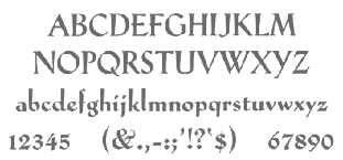 Metal font foundry in Prescott, AZ (was: Kampsville, IL), est. 2004. Run by Schuyler (Sky) Shipley, b. 1954. Shipley collects, restores and operates antique presses. He has been involved with type and letterpress printing since 1962. Check also T.H. Groves's site.
 As of 2010, Skyline's typefaces include Sans Serif Light w. Alts, Egmont Decorative Initials, Park Avenue, McMurtrie Title, Mercury Borders, Bewick Roman, Bradley, Cazxtonian, Cochin, Cooper Ted, Crayonette, Della Robbia, Extended Black, Fournier le Jeune, Glyptic (after Hermann Ihlenburg's Glyptic from 1878), Hadriano Stone-Cut, Ben Franklin Decorative Initials, John Alden Decorative Initials, Massey Two-Color Initials, Iroquois Condensed, Keynote, Lexington, Narciss, Neon, Neuland, Neuland Inline, Othello, Othello Inline, Paramount, Playbill, Sans Serif Light, Sans Serif Light Italic, Schoeffer Old Style, Trocadero, Worrell Uncial. They also have quite a number of ornamental border fonts. [Google]
[More] ⦿
|
Spiece Graphics
[Jim Spiece]

|
 James R. Spiece (b. 1946, Wabash, IN) attended Culver Military Academy and graduated from Wabash High School in 1964. Jim attended Indiana University and graduated with a B.S. in 1969 after serving two years in the US Army stationed in Germany. Based in Fort Wayne, IN, he liked to revive old type designs. Ji died in 2021 in Green Valley, AZ. Obituary.
 The typefaces made Jim Spiece: - Adonis Old Style SG (2004): a connected upright script modeled after a little stationery and greeting card typeface developed for American Type Founders in 1930 by Willard T. Sniffin.
- Anthology SG (2005).
- Arched Gothic Condensed: another Victorian type, developed around 1885 by the James Conners&Son Foundry (New York).
- Ark Monogram SG: Ark is a combination monogram set based on the ATF Virkotype designi from the 1930s.
- Asteroid Primo SG (2009).
- Astoria Antique (2003): 19th century style ornamental face.
- Aviator SG (1995), aka Ventura Slim, based on an old 1930s lettering style popularized by Carl Holmes in his book.
- Bernhard Brushscript SG: based on an extremely heavy informal script was created in the early 1920s by Lucian Bernhard.
- Bernhard Gothic SG
- Beverly Shores Script SG (2004).
- Birdlegs SG (1991).
- Cactus Flower SG (2006): a Wild West family based on lettering by Ross F. George.
- California Poster SG (1996).
- Centric Geo SG (1996) and Centric Serif SG (1996). These are squarish slab typefaces.
- Concerto Rounded SG: revival of some 1920s Lucian Bernhard lettering.
- Edison Swirl: A frilly Victorian blackletter typeface based on a design by Hermann Ihlenburg from ca. 1900.
- El Castillo SG (2008): an old style newsprint family.
- Epicerie One&Two SG (2008): a signage family.
- Eva SG. Eva Antiqua SG is an exquisite family based on the 1922 Klingspor model by German designer Rudolf Koch (known as Koch Antiqua or Locarno). It also includes Eva Paramount SG, which is a revival of a 1928 typeface, also flared, by Morris Fuller Benton called ATF Paramount. The Castcraft incarnation is called OPTI Eve.
- Frisco Antique Display SG (2004): based on a woodtype display typeface from the 1880s by Bruce Type Foundry.
- Gable Antique Condensed (2002): based on a Bauer Type Foundry art nouveau face.
- Gambit Nouveau SG (2004): art nouveau.(2004): art nouveau.
- Grand Slam SG (2002): based on an old cardwriting style known as Poster Gothic.
- Headline Helpers One SG and Headline Helpers Two SG (2009). Followed by Headline Helpers Three SG (2017), Headline Helpers Four SG (2017), Headline Helpers Five SG (2017).
- Hollywood Deco SG (1994): based on a Willard T. Sniffin deco-inspired original from 1932.
- ITC Blair (1997). Blair has its roots in the Inland Type Foundry, ca. 1900.
- ITC Deli Deluxe and ITC Deli Supreme (1999)
- ITC New Winchester
- Ironman SG (2002): art deco poster font.
- Kingsbury Condensed SG (1992): 1930s style art deco face.
- Kolinsky Sable SG (2004): a brush display typeface due to Charles P. Bluemlein, 1944.
- Little Brown Frog SG (2007).
- Melrose Modern SG (2005): art deco family.
- Memorandum SG (1992): a sans text family.
- Metropolis SG: revival of a long-legged 1932 classic design by W. Schwerdtner for the Stempel Foundry.
- In 1895, Julius Schmohl and Max Rosenow published an upright script with BBS. This ronde typeface was originally known as Oliphant and renamed Advertisers Upright Script in 1925. In 2014, Spiece Graphics created a digital version of it, Milroy Upright SG.
- Mingo Gothic SG (1991-1992).
- Narcissus SG (Open and Solid): Narcissus Open is a heavy typeface designed by Walter Tiemann in 1921 for the Klingspor Foundry in Germany.
- Newport Classic Basic SG and Newport Classic SG: based on an extra condensed art deco typeface designed by Willard T. Sniffin for American Type Founders in 1932.
- Nicolas Jenson SG: a large text family about which Spiece writes: It was the original work of fifteenth century designer Nicolas Jenson that formed the basis for this roman serif style developed by Ernst Detterer in 1923. Similar in spirit to other early twentieth century revivals such as Centaur, Cloister Old Style, and Italian Old Style, Nicolas Jenson is distinguished by its pristine and delicate nature. A gifted young apprentice to Detterer, Robert Hunter Middleton, greatly expanded the family. And by 1929, bold, italic, and open were part of the Ludlow Foundry's beautiful Nicolas Jenson Series. It was reintroduced under a new name, Eusebius, in 1941.
- Nova Script Recut One SG (2011): based on Nova Script (1937, George F. Trenholm).
- Pacific Clipper SG (1991): a mix between Koch's kabel and ATF's Novel Gothic (1929, Morris Fuller Benton and Charles H. Becker).
- Panorama SG (1995): art deco family, based on an old 1930s lettering style popularized by Carl Holmes is his wonderful book on the subject.
- Quaint Gothic: Arts&Crafts face.
- Replica Rough SG (2018). A grungy typeface.
- Samson Classic SG: a heavy display typeface based on a 1940 design by Robert Hunter Middleton for the Ludlow Foundry.
- San Remo Casual SG: a fifties style connected script.
- Sheridan Gothic SG: an art nouveayu face, ca. 1910, known as Grant Antique.
- Speedway SG (1992-1993): connected upright 1950s diner script.
- Stellar Classic SG (1997): Stellar was originally designed by by Robert Hunter Middleton in 1929 as a serifless roman well before Hermann Zapf's Optima, released in 1958.
- Stratosphere SG (1993).
- Telepod SG (2002): based on an old Speedball lettering style and has a very retro look.
- Thumbnail Text SG (2005).
- Travel Kit SG (2004): art deco.
- Tribunus SG: roman Trajanus style family, originally designed in 1939 by Warren Chappell for Stempel.
- Tweed SG (1992): handlettering.
- Ultramodern Classic SG: a marquee lettering font family in the style of Broadway. Based on a 1928 design by Douglas C. McMurtrie, Aaron Borad, and Leslie Sprunger.
- Valentina SG (1991-1992): a plump comic book style script.
- Veranda Poster SG: derived from a European art supply manufacturer's logotype done in the Vienna (Wien) Austria style, which was used by artists such as Julius Klinger and Willy Willrab in the 1920s.
- Wellsbrook Initials SG: based on the 1920s work at Bauer of the German graphic designer Emil Rudolf Weiss.
- Zinc Italian SG (2002): 19th century style curly ornamental face, aka Zinco in the Victorian era. Based on Zinco (1891, Hermann Ihlenburg for Mackellar, Smith & Jordan).
MyFonts link. Klingspor link. View Jim Spiece's typefaces. Listing of Jim Spiece's fonts. [Google]
[MyFonts]
[More] ⦿
|
Stéphane Elbaz
[General Type Studio]

|
 [MyFonts]
[More] ⦿
|
Swiss Typefaces
[Ian Party]
|
 Swiss Typefaces is a foundry run by Ian Party (Territet, Switzerland, b. 19777, Lausanne) and Emmanuel Rey. It evolved from B+P Swiss Typefaces and BP Type Foundry, where BP stands for Buechi et Party. Maxime Buechi is still loosely affiliated with Swiss Typefaces but is now spending more time in London. Ian Party studied first at ECAL in Lausanne and then at the KABK in The Hague. In 2004, he cofounded B&P Type Foundry with Maxime Buechi. Since 2005, he teaches type design at ECAL in Lausanne. Home page of Ian Party. The new site B+P Swiss Typefaces was born in 2011, and it was renamed just Swiss Typefaces at the end of 2013. Swiss Typefaces is headquartered in Vevey, Switzerland. Their fonts:
 - Romain BP and Romain BP Headline (2007). Party writes: Based on the Commission Jeaugeon's models and on Philippe Grandjean's classic character, the Romain BP celebrates the marriage of geometric rationality and elegance, of science and craftsmanship. The Romain BP Text is actually closer to the Commission's model than Grandjean's Romain du Roi. It is more synthetic in its structure, more radical, and thus, more modern. It is a contemporary text typeface based on a structure that was created in 1690, not a revival mimicking Greandjean's shapes..
- Sang Bleu (2008), designed for the magazine SangBleu. This is a fantastic set of fonts based on the structure of Romain du roi. The collection also extends to extremes unusual like the Hairline Compressed or the Hairline Sans, providing graphic designers very strong stylistic tools. It includes light serif typefaces and very structured and geometric sans typefaces. I expect this project to be showered with awards. In 2014, Romain and SangBleu will be combined in a new SangBleu.
- Celsiane (2007), a sans typeface with a chiseled-in-stone feel. Still being developed, it is based on Party's work at ECAL in 2004.
- Esquire (2009): A custom headline typeface originally designed in 2007 for the gentleman's magazine Esquire under the art directorship of David McKendrick. It will be commercially released in 2009.
- Aurora (2008, an experimental geometric face): not available.
- Hebdo (2008): a private typeface for the swiss news mag L'Hebdo. It has two slab weights and nine sans weights.
- Rosette BP: a serif typeface under development.
- Didot BP: Codesigned with Maxime Buechi in 2003, this will be released in the spring of 2009.
- La Police BP is a serif typeface by François Rappo.
- Folkwang (2008): an exploration in the area of artsy transitional typefaces.
- Codesigner in 2006 with Maxime Buechi of a corporate typeface for the Centre for Curatorial Studies Bard&Hessel Museum, New York.
- BP Diet (2009) is an extremely fat and rounded jello-fed typeface. Chris Lozos calls it morbidly obese.
- Suisse BP International (2011) by Ian Party is a very "Swiss" sans family by Ian Party. At the start of 2014, the Suisse collection consists of Suisse Works (a serifed family), Suisse Neue (with small slabs and/or serifs) and Suisse International (a sans; +Condensed, +Mono).
- New Fournier BP (2011) is a 24-style Fournier family by François Rappo.
- Simplon BP (2011) and its monospaced brother Simplon BP Mono (2011) were made by Emmanuel Rey. This geometric sans was made for information design purposes. Now just called Simplon.
- Euclid Flex (2012-2013). This sans family does something unique in the type world---it uses opentype to provide a smorgasbord of alternate styles for each weight---a mammoth undertaking! These substyles are called pixel, mixed, unicase, dotted, one-line, cut, hidden, drops, contrasted, zigzag, circular, triangle, square, and street. It grew out of a 2010 typeface by Emmanuel Rey called Euclid BP.
- New Paris (2014). A didone family with text and headline versions and a non-contrast sans version called Skyline. New Paris is characterized by soft-cornered vertices in the M, N, V and W.
- Azer (codesigned with Wael Morcos and Pascal Zoghbi) won an award at TDC 2014.
- Ikanseeyouall (2018): A fantastic exaggerated bulbous fat Caslon popularized in the 1970s and 1980s by designers like Tom Carnase and Ed Benguiat. Other typefaces in their experimental lab include Black Mamba, Kopyme, Vogy Smog, Euclid Mono, Krsna, Brrr, Euclid Stencil and Riviera.
- Riviera Nights (2020). A sharp-edged sans family with narrow joins. Apparently, this typeface is usaed by Rolls Royce.
Klingspor link. [Google]
[More] ⦿
|
T4 Typography AB
[Bo Berndal]

|
Swedish commercial foundry in Stockholm. Bo Berndal and Torbjörn Olsson are two of T4's main type designers. The sister company A4 designs newspapers. Typefaces at Myfonts include: - T4-Batory (2006). A futuristic elliptical monoline geometric family by Berndal.
- T4-Batoswash (2006).
- T4-Botobe.
- T4-CaballeroScript.
- T4-Cartesius (2006). A roman typeface by Berndal.
- T4-Eknaton.
- T4-Geometra.
- T4-Gertrud.
- T4-Hagalind.
- T4-Havel.
- T4-InterruptDisplayPro (2007, Olsson). A sturdy monoline packaging and/or gaspipe typeface.
- T4-Kantor.
- T4-Mixtra (2006: Roman, Sansserif, Slabserif). A masculine family by Berndal.
- T4-MotorMouth.
- T4-Museum (Borders, Fournier, Ornaments, Tertia Cursive).
- T4-OneNightStand.
- T4-Pelegotic.
- T4-Picadyll (2006). An art deco typeface by Berndal.
- T4-Sergel (2007). A multiline chiseled sculptural typeface.
- T4-TYMAGaramont (2007). Its designer, Bo Berndal, writes: The TYMA Garamont Roman was inspired by the Berner-Egenolff type sample from the 1560s. The Italic was inspired by a sample from Robert Granjon, also from the 1560s. The name TYMA is short for AB Typmatriser, a Swedish company founded 1948, because the Second World War stopped all import of matrices for Linotype and Intertype typesetting machines. It took until 1951-52 before the import was up to speed again. Until then, Sweden had to fend for itself. TYMA produced all technical equipment needed for type production, including the pantograph to cut the matrices, a complete set for each size and version. The templates for Garamont Roman were initiated by Henry Alm 1948. Bo Berndal was hired the following year, and continued the work by drawing and cutting templates for the rest of Garamont Roman, as well as for the remaining Garamont family. Bo Berndal stayed at TYMA until it went bankrupt in 1952. At that time Bo Berndal had already kick-started his career as type designer by drawing the typeface Reporter for one of the big daily newspapers, Aftonbladet, a version of Cheltenham for another daily, Dagens Nyheter, and copied several old typefaces for other customers. Librarian Sten G. Lindberg at The Royal Library of Stockholm, Kungliga Biblioteket, procured copies of original type samples. Henry Alm started the work in 1948, and Bo Berndal completed it - finally in this OpenType version.
Catalog at MyFonts. View Bo Berndal's typefaces. FontShop link. Klingspor link. [Google]
[MyFonts]
[More] ⦿
|
T4 Typography AB (was: Sinnebild, Olsson's Fonts, Torbjörns Typer, T-Type)
[Torbjörn Olsson]

|
 T4 Typography after Sinnebild (which still exists). Its sister company, A4, designs newspapers. Libretto, a text font with old style figures, is absolutely gorgeous! Ludovico is also brilliant as a text face, while Ornaments Ink and Pen is an elegantly original dingbats font with ink spots. Other fonts include Interrupt Display (a Morris Fuller Benton revival, done in 2001), Fin Tertia Kursiv (2001, a great modern font, digitized from matrices found in the Norstedt collection, dating back to about 1750), More, Lights (dot fonts), GenderFeminine (1997), GenderMasculine (1997), Fournier Initialer, KumlienMM (1993), Kumlien-Initialer (1994), Mecanic (1992), MixtureMM (1994), RendezvousMM (1993), Ornaments, Ornaments Ink and Pen, Rössjor. Olsson is one of today's grand masters. And now, multiple master fonts Vadau and DejaVue! Lights One, Two, Three, Sarajevo, Cirkelnummer. And a splendid revival of Doves Type created in 1900 by Emery Walker and used by Thomas J. Cobden-Sanderson at their Doves Press (1900-1916). It is called DovesType (1996, OpenType versions now also available). The PDF file on that site has Troycer (1996), also by Olsson. By clicking on "Info", you get free Borders and Ornaments fonts.
 MyFonts sells the T4 fonts Motor Mouth (2006, by Martin Fredrikson), Batory (techno) and Batoswash (both monoline sans designs by Bo Berndal, 2006), Mixtra Roma (forced serif), Havel (super-condensed constipated slab serif), Mixtra Sansserif, and Mixtra Slabserif. Mixtra is a versatile and complete type family designed by Bo Berndal in 2006. Olsson's Havel (2006) is an updated interpretation of a Czech type design from the 1930s, different from condensed types of the same era, such as Spire (Sol Hess, 1937), Onyx (Gerry Powell for ATF, 1937) or Quirinus Bold (Alessandro Butti, 1939). In 2007, Olsson added these fonts: One Night Stand (experimental), Interrupt Display Pro (2007, in the style of Impact), Eknaton (a powerful Egyptian family), Museum Tertia Cursive (2007, inspired by a beautiful set of 126 matrices in the Swedish Norstedts type collection. These types were probably manufactured in Germany before 1750. The matrices are part of a set imported to Sweden by J.P. Lindh from Breitkopf and Härtel 1818), Museum Ornaments (2007), Museum Borders, and Museum Fournier (2007, inspired by a set of Rococo capitals designed by Pierre Simon Fournier le Jeune ca. 1760. The matrices are part of a set imported to Sweden by J.P. Lindh in 1818 from Breitkopf&Härtel in Leipzig, Germany. They are now in the Nordiska Museum in Stockholm). Tyma Garamont (2007, five wonderful styles) was inspired by the Berner-Egenolff type sample from the 1560s. The Italic was inspired by a sample from Robert Granjon, also from the 1560s. The name TYMA is short for AB Typmatriser, a Swedish company founded in 1948, because the Second World War stopped all import of matrices for Linotype and Intertype typesetting machines. The templates for Garamont Roman were initiated by Henry Alm 1948. Bo Berndal was hired the following year, and continued the work by drawing and cutting templates for the rest of Garamont Roman, as well as for the remaining Garamont family. Bo Berndal stayed at TYMA until it went bankrupt in 1952. At that time Bo Berndal had already kick-started his career as type designer by drawing the typeface Reporter for one of the big daily newspapers, Aftonbladet, a version of Cheltenham for another daily, Dagens Nyheter, and copied several old typefaces for other customers. Librarian Sten G. Lindberg at The Royal Library of Stockholm, Kungliga Biblioteket, procured copies of original type samples. Bo Berndal completed TYMA Garamont in 2007. Klingspor link. Alternate URL. View the typefaces designed by T4. View the T4 library. View Torbjörn Olsson's typefaces. [Google]
[MyFonts]
[More] ⦿
|
Taro Yamamoto
|
 Taro Yamamoto (b. 1961, Kyoto) received a BFA from Musashino Art University in 1983, where he studied the history and art of typography. After a brief period doing type development with Morisawa, he joined Adobe in 1992 as Manager of Japanese Typography. In addition to management and engineering tasks, he led the design team that produced Adobe's original Japanese typefaces, including Kozuka Mincho and Kozuka Gothic, under the artistic direction of Masahiko Kozuka. He has also written a book on design (Representation or Expression: a Dialogue on Design) and an article on P.S. Fournier that appeared in "An Encyclopaedic Collection of Typefaces." At ATypI 2004 in Prague, he spoke about Japanese with InDesign and OpenType. Taro lives in Shanagawa-ku in Tokyo, and is Senior manager, Japanese Typography, Adobe. He is Chairman of Society of Typography, Japan. In 2008, he was awarded the 1st Motogi Shozo Prize by the Society of Typography, for his paper on the standardization of type body sizes. Following Kozuka's retirement, Yamamoto has been involved in the development of Adobe's Japanese fonts, and the Pan-CJK font development project by Adobe and Google, as Senior Manager of Japanese Typography.
 His talk at ATypI 2014 in Barcelona was entitled Designing a Large Multilingual Typeface. Speaker at ATypI 2017 Montreal. Speaker at ATypI 2019 in Tokyo on two post-war typographers and book designers in Japan, Etsushi Kiyohara and Helmut Schmid. [Google]
[More] ⦿
|
Tatukiyo Sakaguti
|
 Osaka-based designer (b. 1981) who recreated Simon-Pierre Fournier Le Jeune's Modèles des caractères de l'imprimerie (1742, Paris). Download site. In 2014, he published the ornament set Kado 108Z, and recreated a set of botders and ornaments originally designed by Enschede and Sons in 1891. As Feel Design, he specializes in high quality textures and patterns.
 Typefaces incl;ude the didone Bodoni F (2016), which can be bought here. [Google]
[More] ⦿
|
TeGeType
[Thierry Gouttenègre]

|
 Thierry Gouttenègre is a Belgian designer (b. 1961), who is located in Tullins-Fures, France. After a stint as type director of Alfac-Decadry in Belgium, Thierry Gouttenègre moved to the south of France and started his own Design Studio in the mid 90s. In 2007, he set up TeGeType. He is one of my favorite type designers. His fonts:
 - Aldogizio (2013). The name gives the font away, an amalgamation of Aldo Novarese and Egizio---this is a slab serif fest.
- Batarde Bourguignonne: a medieval blackletter.
- Carcel (2009): striped letters.
- Cinio (2009): used for signage by several French cities. For use on screen, he slightly rounded the corners and released the result as Cinio Text in 2019.
- David Aubert (1992, Alfac): a bastarda (bâtarde bourguignonne) named after David Aubert, the calligrapher of Philippe Le Bon and Charles Le téméraire, both dukes of Burgundy who worked and lived in Brussels in the 1500s.
- Dickens (1995, Fonderie Barthélémy).
- Dilectus (2019). Originally intended for musea, this lapidary typeface takes inspiration from paleochristian engravings.
- Falace (2008): a contemporary interpretation of the Didone typefaces.
- Firmin Didot (1989, Alfac).
- Fournier (1990, Alfac).
- Fraktur (1990, Alfac).
- Grégoire (1994, Fonderie Barthélémy).
- Alipe Script (2014). A calligraphic connected (wedding, chancery, greeting card, divrce) script.
- Hugo (1995, Fonderie Barthélémy).
- Kafka (1994, Fonderie Barthélémy).
- Limine (2008), a 3D beveled typeface family in styles called Creux and Relief.
- LouisJou (2000).
- Majuscule (1991, Alfac).
- Neutre (1997, Fonderie Barthélémy). A sans family specially designed for signposting applications. This type family is used by several cities in France.
- Oculi Magni (2020). Specially designed for small and tight texts, the glyphs have maximal x-height.
- Otsu Sans (2011) and Otsu Slab (2013).
- Poltrone (2010), a great titling family inspired by 19-th century public inscriptions.
- Rome (1995, Fonderie Barthélémy).
- Rosart (1991, Alfac), named after the 18th century Belgian typefounder, J.-F. Rosart.
- Sand (1996, Fonderie Barthélémy).
- Sursum (2009): a roman almost-typewriter family.
- Tolstoï (1994, Fonderie Barthélémy).
- Varvara (2017: a weathered all caps constructivist typeface created as a tribute to Barbara Stepanova (1894-1958)).
- Vizille (1998-2009): a phenomenal Fournier text family made for the Musée de la Revolution Française in Vizille.
- WebType (2002): a techno family.
Klingspor link. View Thierry Gouttenègre's typefaces. [Google]
[MyFonts]
[More] ⦿
|
Textism: Fournier
|
Archtypical French neoclassic typeface designed by Pierre Simon Fournier in 1742. Monotype made a version in 1924 that to this day has survived (available at Adobe). Textism warns against its use in small sizes. View digital versions of Fournier. [Google]
[More] ⦿
|
Thibault Laurent
|
As a student at ENSAD in Paris, he co-designed Poinçons (1999), a typeface based on a design of Fournier. [Google]
[More] ⦿
|
Thierry Gouttenègre
[TeGeType]

|
 [MyFonts]
[More] ⦿
|
Timberwolf Type
[Lars Bergquist]

|
 Lars Bergquist is the Swedish type designer (b. 1936) who runs Timberwolf Type in Sollentuna, just outside Stockholm. Bergquist designed numerous successful text families and display typefaces, including the free Beryll typeface. In 2016, the collection moved over to (was bought by?) 3IP. Some offerings:
 - Old Style romans: Sarabande (1998; based on Jean Jannon's famous "Garamond" of 1621), Pavane (1998, based on a text typeface by Rudolf Koch), Philomela (2000, also at PsyOps), Montrachet (2002, Fountain: a garalde family), Monteverdi (Fountain: with Granjon's Plantin Ascendonica italic).
- Baroque/transitional: Leyden, Leyden News (PsyOps, 2000), Baskerville 1757 and Baskerville Caps (1998; winner of a Bukvaraz award in 2001, available at Type Quarry).
- New Style Romans: Millennium, Eleonora (1999), Prospero (1998, a didone family), Waldstein (2003, Fountain: a Scotch typeface).
- Sans typefaces: Millennium, Millennium Sans, Millennium Linear, New Millennium, New Millennium Sans and New Millennium Linear (2000).
- Display typefaces: Diorite (2005, a calligraphic angular family), Corsiva Italica (2003), Paracelsus (2003, Fountain: a modern version of Schwabach), Foliant Blackletter (German 15th C Textur), Zeppelin Bauhaus Gothic, Berserk Scandinavian runes, Escorial (at PsyOps), Paestum (2001, a Greek simulation family), Sekhmet (2000), Praetorian, Pressroom (2003), Proconsular, Palaestra (the latter three are inspired by informal, painted Roman wall writing), Triumphalis Caps (also inspired by Roman imperial inscriptions), Bucintoro (1999, a modern version of the rotunda blackletter), Midnight (2000; a neon light/ blackboard bold family), Karolin Fraktur (at Psy/Ops: Fraktur modeled after the Bible of King Charles XII, printed in Stockholm in 1703), Rococo Titling (2001, ornate titling caps based on work done by Jacques-François Rosart (1714-1777) and Pierre Simon Fournier (1712-1768), and the Renaissance family Ronsard (at PsyOps, 2000).
Some fonts are available at Fountain, Psy/Ops and Type Quarry. Bukvaraz gave him an award for Absolut Type, a classic Renaissance family, so I wonder if that is not the same as Baskerville 1757. Lars says that Absolute Vodka complained, so the type is sold by Psy/Ops as Aalborg (2002). He published Whitenights at Linotype in 2003. FontShop link. Klingspor link. [Google]
[MyFonts]
[More] ⦿
|
Torbjörn Olsson
[T4 Typography AB (was: Sinnebild, Olsson's Fonts, Torbjörns Typer, T-Type)]

|
[MyFonts]
[More] ⦿
|
Virginie Aiguillon
|
As a student at ENSAD in Paris, she co-designed Poinçons (1999), a typeface based on a design of Fournier. [Google]
[More] ⦿
|
Walter Tiemann

|
 Famous German type designer, b. Delitzsch, 1876, d. Leipzig, 1951, who was active at Klingspor. He studied painting at the art academy in Leipzig. In 1898, Tiemann started working for various publishers, including S. Fischer, Reclam and Rütten&Loening. In 1903, he took up teaching at the Staatliche Akademie für Graphische Künste in Leipzig, where Jan Tschichold was one of his students [he was director of that school from 1920-1941 and from 1945-1946]. In 1907, Tiemann founded the Janus Presse with C. E. Poeschel. In 1946, he was awarded an honorary doctorate. Poster for BUGRA in 1914. Picture. Publications:
 - Georg Kurt Schauer Walter Tiemann. Ein Vermächtnis, Offenbach 1953.
- Biography by Wolfgang Neuloh (1971, Die deutsche Schrift, volume 42): 1 2 3 4 5.
- Biography by Wolfgang Neuloh (1981, Die deutsche Schrift, volume .--65): 1 2 3 4 5 6 7 8..
- Biography by Harald Suess (2001, Die deutsche Schrift): 1 2 3.
Designer at Klingspor of these typefaces: - Daphnis (1929). Digital revival by Ralph M. Unger in 2016 as Daphnis.
- Fichte Fraktur (1934-1939). This was originally called Hindenburg Fraktur. Revivals by Ralph M. Unger (as Fichte Fraktur, 2020), Delbanco (as DS Fichte Fraktur) and Gerhard Helzel (as Fichte Fraktur).
- Kleist Fraktur (1928). Kleist Fraktur was revived by Dieter Steffmann in 2002 as Kleist Fraktur and by Delbanco as DS Kleist Fraktur. Ralph Unger's version from 2010 is simply called Kleist Fraktur.
- Narziss (1921), based in part on earlier types of Pierre-Simon Fournier. The Font Bureau font Narcissus (1995) was based on this work. Further digitizations include Narziss (2018, Ralph M. Unger), and Narcissus SG (Open and Solid) (Jim Spiece).
- Janus-Pressen-Schrift (with C. E. Poeschel, 1906). Note: he founded the Janus Presse with C. E. Poeschel in 1907.
- Tiemann-Medieval (1909).
- Mediaeval Kursiv (1911).
- Tiemann Fraktur (1914).
- Tiemann-Antiqua (1923-1926). Available from Linotype.
- Tiemann-Gotisch (1924).
- Orpheus (1926-1928, Klingspor). This refined and elegant roman family languished for many years until its grand digital revival in 2011 by Patrick Griffin and Kevin Allan King at Canada Type, called Orpheus Pro.
- Euphorion (1935-1936). This was the italic of Orpheus. It too was revived digitally at Canada Type in their Orpheus Pro package.
- Offizin (1952).
- Peter-Schlemihl-Schrift (1914). Also called Lichte Tiemann Fraktur. Revived by Dieter Steffmann in 2002, and by Ralph M. Unger for Profonts as Peter Schlemihl in 2008.
Linotype link, FontShop link. Klingspor link. View some digital typefaces that are based on the work of Walter Tiemann. [Google]
[MyFonts]
[More] ⦿
|
Wiescher Design
[Gert Wiescher]

|
 Gert Wiescher was born in Braunsbach am Kocher, Germany, in 1944. Based in München, Gerd Wiescher designed many classy and classic Bodoni families, as well as New Yorker Type (1985). All of his typefaces are carefully fine-tuned and balanced. Wiescher founded first Munich Type and then Wiescher Design and Autographis. He is known as a hard, fast and prolific worker. His exquisite typefaces can be bought at MyFonts. Catalog of his bestselling typefaces. Interview in 2008. Wikipedia page. Creative Market link. List of typefaces:
 - Scripts: Prima Script (2017: for menus and cookbooks), Marmelade (2015, +Fruits, a set of dingbats), Triana (2014, a thin monoline penmanship script named after a Spanish sailor on the Pinta who in 1492 was the first to see America---in this case the Bahamas), Floral Script (2014, copperplate style script), Sherlock Script (2014: this comes with Sherlock Stuff (fingerprints) and Sherlock Stuff Dots (ink stains)), Felicita (2013, a swashy copperplate script), Vividangelo (2013, after the handwriting of a real person), Dreamline (2013, connected monoline cursive wedding scripts in A, B and C styles), Fiorentina (2012, a renaissance style script with 650 characters), Excelsia Pro (2012), Delicia Pro (2012, a fat brushy signage script), Nono (2011, formal swashy calligraphic family), Dyane (2011), Penn (2011), Lettera (2011, hand-drawn formal face), Tosca (2010, a high-contrast calligraphic typeface with 730 glyphs), Grandcafe (2010), Loulou (2010, curly and of extreme contrast), Schoolblock (2010, hand-printed school font), Grandezza (2010, calligraphic family; +Xtra), Sixtra (2010, a curly didone script), English Script (2010, classic Spencerian calligraphic script), Savage Initials (2009), Morning News (2009), Revolte (2009, a brush script for demonstration signs), Estelle (2009), Scriptofino (2008, 4 calligraphic styles to give Zapfino a run for its money), Exprima (2008), Daiquiri (2008), Lisa Bella, Lisa Fiore and Lisa Piu (2008, connected and calligraphic), Tati (2008), Movie Script (2007), Cake Script (2007), Eddy (2007, grungy calligraphy), Pointino (2007), Bohemio (2007, a great oriental-brush script), Artegio (2007, two calligraphic scripts), Xylo (2006, in the tradition of the 18th-century English calligrapher George Bickham and the 19th-century American calligrapher Platt Rogers Spencer), Tamara (2005, art-deco script based on some initials for Semplicita made in the 1930s by the Nebiolo foundry), Tecon, Ellida (2005, inspired by the elaborate scripts of 18th-century English calligrapher George Bickham, with additional influences from 19th-century American calligrapher Platt Rogers Spencer), Eloise (2009, a high-contrast version of Ellida), Nadine Script (2005, an elegant script inspired by a set of initials the French designer and artist Bernard Naudin drew for Deberny&Peignot in the 1920s), Royal Classic (2005, unbelievable script based on a design that has initially been comissioned by King Ludwig I of Bavaria for in-house-use), DesignerScript, Filzer Script (1995, handwriting), Futuramano-Condensed-Bold, Futuramano-Condensed, Futuramano-Plain, Futuramano-Thin, Giambattista, Scriptissimo-Plain, Scriptissimo-Forte, Scriptissimo-Swirls, Squickt (1989), Konstantin A, B and C (2005), Konstantin Forte (2005), MyScript, GrocersScript, Swanson (2006). Scriptissimo (2004) has versions named Start, Middle and End, tweaked for their position in the word, and there are plenty of ligatures. Check also Bodoni Classic Chancery (2007) and Bodonian Script (2012).
- Sans: Brute Sans (2018), Xpress (2018), Xpress Rounded (2019), Classic Sans (2017, a revival of Theinhardt Grotesk), Classic Sans Rounded (2017), Maxi (2017), Nic (2017), Azur (a large almost geometric sans famly with 1950s Roger Excoffon-style French flavours, called a Medterranean grotesk by Wiescher himself), Royal Sans (2017, after Theinhardt's Royal Grotesk---the forerunner of Akzidenz Grotesk--- from 1880), Docu (2016, a workhorse elliptical sans family), Viata (inspired by Bauhaus), Noticia (2016, in the Bauhaus tradition, with very pointy v and w, and a bipartite k; not to be confused with the 2011 Google Web Font Noticia Text by José Solé; followed in 2019 by Noticia Rounded), Avea (2015), Aramis, Nota Bene (2015: squarish, narrow, technical), Nota (2015, technical and cold: the rounded version, Nota Rounded, followed in 2019), Dylan Condensed (2014), Dylan Copperplate (2014), Supra (2013, grotesk: Supra Thin is free. See also Supra Condensed (2013), Supra Mezzo (2013, between regular and condensed), Supra Extended (2013), Supra Rounded (2015), Supra Classic (2014), and Supra Demiserif (2013, slab serif derived from Supra)), Dylan (geometric sans), Franklin Gothic Raw (2013, like Franklin Gothic but with raw, not rough, outlines, only visible at very large sizes), Blitz (2012, a flared family), Blitz Condensed (2012), Contra Sans (2011, which led to Contra Slab, Contra Condensed and Contra Flare), Vedo (2011, a Bauhaus style family that include a hairline weight), Germania (2011, a useful and beautiful monoline sans family), Geometa (2011, +Rounded, +Rounded Deco, +Deco: all based initially on Renner's Futura), Geometra Rounded (2011, a rounded family based on Futura and "much less boring than DIN"), Bombelli (2010, ultra-wide architect's hand), Bluenote Demi (2010, a grungy Franklin Gothic Condensed), Perfect Sketch (2010, sketched grotesque), Unita (2009), Antea (2009), Eterna (2009, sans with a swing), Pura (2008, an uncomplicated grotesk family), Purissima (2010, a decorated extension of Pura; +Bold), Copperplate Gothic Hand (2009, after a 1901 design by Goudy), Copperplate Alt (2011), Copperplate Wide (2011), FranklinGothicHandDemi (+Shadow), Franklin GothicHandCond (2009), Franklin Gothic Condensed Shadow Hand (2010), and Franklin Gothic Hand Light (2009, a hand-drawn version of Franklin Gothic), Papas (2005, sturdy, slightly curly), Julienne (2005, a condensed sans family; see the new versions Moanin and Julienne Piu, 2017), Cassandra (1996, an art deco style after Adolphe Mouron Cassandre), Futura Classic (2006), Cassandra Plus (2012), Ela Sans (2005, a large family), Mondial-Bold (2004), Mondial-Demi, Mondial-Light, Mondial-Medium, Mondial-Normal, Mondial-XBold, Monem-Bold, Monem-Medium, Monem-Normal, Monem-Roman.
 Serif: Imperia (2011, a Trajan column caps face), Monogramma (2012, a Trajan family for monograms), Imperium (2005, a precursor of Imperia with a Relief shadow style included), Hard Times (2011), Fat Times (2011, retraced Times), Elegia (2011, slightly Victorian family), Breathless (2010, a spiky family, inspired by nouvelle vague movie posters), Bodoni Classic 1, Bodoni Classic 2, Bodoni Classic 3, BodoniClassic-Condensed, BodoniClassic-Handdrawn, BodoniClassic-Swashes, BodoniClassic-Text, Bodoni Classic Deco, Bodoni Classic Swirls (2009), Bodoni Classic Pro (2011), Bodoni Classic Inline (2012), Bodoni Classic Fleurs (2014, ornamental caps), Bodoni Comedia (2010, one of my favorites: a funny "live one day at a time" curly Bodoni cocktail), Bodoni Classic Swing (2010), Bodoni Classic Free Style (2010, curly), Bodoni Classic Ultra (2010), La Bodoni Plain (+Italic, 2008), Take Five (2005, a jazzy take on Bodoni Classic), DonnaBodoniAa, DonnaBodoniBe, and DonnaBodoniCe (three scripts named after Bodoni's wife, Margharita dell'Aglio, who published his complete works, the Manuale Tipografico, in 1818, five years after his death), Edito, Robusta. A great series, some of which were originally published at Fontshop, see, e.g., FFBodoniClassic (1994). MyFonts: When the first of Wiescher’s Bodoni Classic fonts came out in the 1993, there was nothing like it. Up to then, virtually all Bodoni revivals had been given clear-cut forms and square serifs. But Bodoni’s originals from the late 1800s were never as straight and simplistic as is often assumed: they had rounded serifs and slightly concave feet. Wiescher digitized a wide range of Bodoni letterforms, including a wonderful script-like family called Chancery and a nice series of Initials. Having accomplished his mission twelve years later, he began making personal additions to the family, such as the more decorative Bodoni Classic Swashes. Recently a useful little family was added to the clan: LaBodoni is sturdier and less optically delicate than most Bodonis, and therefore more usable as a text face. Wiescher made Metra Serif (2009), Principe (2008) and Paillas (2009). Prince (2009) is a curlified didone. Serif: Imperia (2011, a Trajan column caps face), Monogramma (2012, a Trajan family for monograms), Imperium (2005, a precursor of Imperia with a Relief shadow style included), Hard Times (2011), Fat Times (2011, retraced Times), Elegia (2011, slightly Victorian family), Breathless (2010, a spiky family, inspired by nouvelle vague movie posters), Bodoni Classic 1, Bodoni Classic 2, Bodoni Classic 3, BodoniClassic-Condensed, BodoniClassic-Handdrawn, BodoniClassic-Swashes, BodoniClassic-Text, Bodoni Classic Deco, Bodoni Classic Swirls (2009), Bodoni Classic Pro (2011), Bodoni Classic Inline (2012), Bodoni Classic Fleurs (2014, ornamental caps), Bodoni Comedia (2010, one of my favorites: a funny "live one day at a time" curly Bodoni cocktail), Bodoni Classic Swing (2010), Bodoni Classic Free Style (2010, curly), Bodoni Classic Ultra (2010), La Bodoni Plain (+Italic, 2008), Take Five (2005, a jazzy take on Bodoni Classic), DonnaBodoniAa, DonnaBodoniBe, and DonnaBodoniCe (three scripts named after Bodoni's wife, Margharita dell'Aglio, who published his complete works, the Manuale Tipografico, in 1818, five years after his death), Edito, Robusta. A great series, some of which were originally published at Fontshop, see, e.g., FFBodoniClassic (1994). MyFonts: When the first of Wiescher’s Bodoni Classic fonts came out in the 1993, there was nothing like it. Up to then, virtually all Bodoni revivals had been given clear-cut forms and square serifs. But Bodoni’s originals from the late 1800s were never as straight and simplistic as is often assumed: they had rounded serifs and slightly concave feet. Wiescher digitized a wide range of Bodoni letterforms, including a wonderful script-like family called Chancery and a nice series of Initials. Having accomplished his mission twelve years later, he began making personal additions to the family, such as the more decorative Bodoni Classic Swashes. Recently a useful little family was added to the clan: LaBodoni is sturdier and less optically delicate than most Bodonis, and therefore more usable as a text face. Wiescher made Metra Serif (2009), Principe (2008) and Paillas (2009). Prince (2009) is a curlified didone. - Romain du roi: In 2008, Wiescher designed the two-style Royal Romain, which is based on the Romain du Roi of Philippe Grandjean, which was completed in 1745 after Grandjean's death by Grandjean's successor Jean Alexandre and Louis Luce. Wiescher: The Romain du Roi was for the exclusive use of the Louis XIV. It was never sold or given to any other king or government. The king of Sweden tried to scrounge a set, but the king refused. This font is the basic design for such famous fonts as the Fournier and Bodoni. Just so the Romain du Roi doesn't get lost in the digital turmoil I set out to redesign it in 2004 and finished now in early 2008. I did a lot of research in France's National Library. A good excuse to visit Paris is always welcome!!!
- Engravers: Dylan Copperplate (2014), Cavaliere (2010), Guilloche A (2009), Guilloche B (2013, op-art borders), CopperplateClassic-Plain, CopperplateClassic-Round, CopperplateClassic-Sans, Copperplate Classic Light Floral (2009), Cimiez-Bold, Cimiez-Roman (2004), Ela-Demiserif, Ela-Sans (2004), Eleganza (2008).
- Blackletter/Fraktur: Renais (2011, renaissance initials), Flipflop (2011), Fraktura and Fraktura Plus (2008), Royal Bavarian (2004, based on a typeface commissioned by King Ludwig 1st of Bavaria about 1834), Royal Blossom (2009), Royal Bavarian Fancy (2004), Bold Bavarian (2010, a heavy version of Royal Bavarian), Monkeytails (2008), Fat Fritz (2006, rounded endings), Ayres Royal (2005, blackletter typeface based on drawings of London's calligrapher John Ayres, ca. 1700; to be used with RoyalBavarian; followed in 2010 by BoldAyres).
- Slab serif: Slam Normal (2017), Slam Rounded (2017), Suez (2017: with extra tall ascenders and descenders), Egyptia (2010), Egyptia Rounded (2010).
- Typewriter: Lettera (2014), Lectra (2011), QuickType-Bold, QuickType-Plain, QuickType-Sans.
- Decorative: Tric (2017, art deco), Franklin Gothic Raw Semi Serif (2015), Frank Woods (2013, letterpress simulation based on Franklin Gothic Heavy), Ohio Bold (2012, a rough headline type in the tradition of Louis Oppenheim's Lo-Type from 1913), Viking Initials (2012), Cannonball (2012, a psychedelic typeface derived from a jazz record-sleeve for Cannonball Adderley), Byblos (2011, derived from the logo of St. Tropez's famous Hotel Byblos), Blockprint (2013, early 1900 German expressionist grunge face, renamed Bannertype after 24 hours), Ferrus (2010, inspired by Cassandre's Acier Noir, 1936), Petite Fleur (2009, flowery embellishments and the capitals of his redesigned Royal Romain, which in turn is based on the famous romain du roi), Glass Light (2012, a decoirative art nouveau type family based on Glass Light by Franz Paul Glass, 1912), Penstroxx (2009, 5 fonts that are based on the powerful, expressive Traits de plume (penstrokes) designed in Paris around 1930 by Alfred Latour), Liquoia A, B and C (2008, decorative scripts), Modernista (2008, an art nouveau headline face, based on an 1898 sample by Peter Schnorr), Ornata A, B, C, D, E, F and G (2008-2009: ornaments), Fleuraloha (2008), Floralissimo (2008: flowery ornaments), Frank Flowers (2011), Scrolls A (2010, penman's dingbats), Bacterio (2007), Alpha Bravo, Alpha Charlie, Alpha Echo (2006), Barracuda, Cacao (2005, fifties style), Cassandre Initials (2004, Elsner&Flake, after the 1927 original by Adolphe Mouron Cassandre), Contype, Fleurie (2005), Fleurons Two (2006), Fleurons Three (2006), Fleurons Four (2006), Fleurons Initials (2007), Fleurons Six (2008), Fleuron Labels (2008), HebrewLatino, Julius, Lunix (2006), MyHands, NewYorkerType (1985; extended in 2011 to NewYorker Plus, and in 2020 to New Yorker Type Classic and New Yorker Type Pro; after Rea Irvin's well-known typeface for The NewYorker), Venice Initials (2006, after a 15th century find, but Wiescher added about half of the caps), Ventoux, Vivian (2005), Woody.
- Pixel and/or futuristic: Nexstar (2013: this octagonal typeface is also useful or athletic lettering), Alpha Fox (2007), Alpha Juliet (2010), Alpha Papa (2010), Alpha Square (2010), Alpha Jazz (2010), Alpha Papa (2010, LED meets stencil).
- Stencil typefaces: Dripps (2010, handpainted, perhaps brutalist), Red Tape Plus (2014).
- Comic book fonts or brush fonts: Breezy (2015), Caboom (2014).
- Dingbats: Wayside Ornaments (2012), XX Century Ornaments (2012), Thistle Borders (2012), Greenaway Mignonettes (2012, after Kate Greenaway (1846-1901), author and illustrator of childrens books), Collins Florets (2012), Flourishes A (2010), Jingle Doodles (2010).
- Art deco: Trix (2017), Zelda (2017, named after F. Scott Fitzgerald's wife).
- Commissioned and special typefaces include a version of the logotype for the Munich's newspaper Abendzeitung, Maxi (variable width sans), NIC Grotesk, Tric (art deco), a Cyrillic version of Bodoni Classic for Vogue Moscow, a special Bodoni Classic for Ringier Publishers in Zurich, and Red Tape, a typeface that is on permanent exhibition at the German National Library in Leipzig.
- Typefaces from 2019: Elita (a condensed sqaurish typeface), Artis Sans, Sigma Condensed and Sigma (simplified readable sans families), Cosma (an elegant high-contrast text family with tapered upstrokes and crossbars, but otherwise didone roots), Quincy (a bebop typeface that started from some letterutouts), Phoebe (an elliptical techno family), Phoebe Rounded, Polygon A, Polygon I, Polygon X.
- Typefaces from 2020: Bullets Bannertype, Alpha One (a counterless experiment), Exec (a 14-style sans family), Exec Corners, Exec Demiserif, Penta (a grotesque family with large counters that make the ExtraLight style quite striking), Penta Rounded.
Author of many books, including Zeitschriften & Broschüren (Systhema-Verlag, München, 1990), Schriftdesign (Systhema-Verlag, München, 1991), and Blitzkurs Typografie (Systhema-Verlag, München, 1992). The following text was excerpted from his wikipedia page: At 14 years of age, Wiescher went to Paris to study fine art. He financed his stay by doing portraits on the Place du Tertre on Montmartre. In the sixties Wiescher studied graphic design at the Berlin Academy of Fine Arts. (Since November 2001, Berlin University of the Arts.) He financed his studies by sidewalk painting and drawing portraits. While doing sidewalk paintings, he met the typeface designer Erik Spiekermann, who inspired his love of this branch of design. After two years he quit his studies, and went to Barcelona where he worked at the offices of Harnden & Bombelli, for whom he designed the OECD-Pavilion of the 1970 Osaka World Expo. In 1972 he moved on to Johannesburg working as an art director at Grey and Young advertising . In 1975, he returned to Germany, working first for DFS+R-Dorland, and then for the "Herrwerth & Partner" ad agency. At Herrworth, he was involved in introducing IKEA into the German market. In 1977 he became a creative partner in the Lauenstein & Partner ad agency, creating mainly campaigns for large German retail chains. In 1982 he started his own design office, creating work for editors (Markt & Technik, Systhema and Langen-Müller-Herbig), computer companies (House of Computers, FileNet) and he worked for Apple Computers designing their publications (Apple-Age and Apple-LIVE). View Gert Wiescher's typefaces. Wikipedia link. [Google]
[MyFonts]
[More] ⦿
|


 Hartlepool, UK-based graphic and book designer who specializes in bible designs. Creator of
  Bitstream font name equivalences. The original file, dated 2007, was at
  Christian Schwartz was born in 1977 in East Washington, NH, and grew up in a small town in New Hampshire. He attended Carnegie Mellon University in Pittsburgh, Pennsylvania, where he graduated in 1999 with a degree in Communication Design. After graduation, he spent three months as the in-house type designer at MetaDesign Berlin, under the supervision of Erik Spiekermann. In January 2000, he joined Font Bureau. Near the end of 2000, he founded
  Daniel Benjamin Miller (b. 2000, New York) is an undergraduate student in philosophy at McGill University. His type design work:
  Joshua Darden is an exceptionally gifted typeface designer with a studio in Brooklyn, NY. Joshua Darden (b. 1979, Northridge, CA) founded the
  Author (1888-1944) of over 400 books on printing and typography. His life story is told by Scott Bruntjen and Melissa L. Young in
  French designer of
  This is a gallery and a discussion of the fonts created by the students at ENSAD since 1997. A partial list with the original (now defunct) links:
  Excerpts of the book Enschedé. Spécimen des Lettres françoises dites Caractères de Civilité des XVIme et XVIIme Siècles dans la Collection Typographique de Joh. Enschedé en Zonen (1926, Haarlem: Joh. Enschedé en Zonen). This collection contains six different Civilité fonts, five from the 16th century (numbered 8, 9, 11, 12 and 14) and one chiefly from the seventeenth century (No. 30). The first maker and user of Civilité was Robert Granjon of Lyon, France, in Dialogue de la vie et de la mort (1557, Lyon), where he calls it his lettre françoyse. Plantin purchased some of Granjon's letters, and Granjon engraved even more more new letteres d'escriture in Antwerp for Plantin. Many imitations were made in Antwerp and Ghent, both in present day Belgium. Notes on the six Civilité types in the Enschedé collection:
  The timeline of this French foundry of the 19th century and early 20th century:
  Miguel Reyes (b. 1984) is a graphic and type designer from Puebla, Mexico, who studied at Benemérita Universidad Autónoma de Puebla. He obtained a Masters in Type Design from Centro de Estudios Gestalt Veracruz. Since 2010, he cooperates with Typerepublic in Barcelona. Founder of Fontaste. Graduate of the
  Swiss designer (b. 1955) located at Lake Geneva. Recipient of the
  General Type Studio is a New York-based type foundry founded by
  [
[ [
[ Italian typographer and type designer, b. Saluzzo (1740), d. Parma (1813). Bodoni began his career as a typesetter at the Vatican's Propaganda Fide printing press in Rome before setting up a Royal Press (Stamperia Reale) for the Duke of Parma. In 1782, he was appointed court typographer for Charles III of Spain and opened his own printing press, Tipi Bodoni. Bodoni designed hundreds of fonts in his lifetime. In 1788, he published his masterpiece, the
  [
[
 Born in Troyes in 1526, Guillaume Le Bé was a bookseller, engraver and typefounder, who studied under Claude Garamont. He set up his own foundry in 1545 and ran it until his death. In 1561, he became Garamont's successor---he took over Garamont's foundry that year. He was mainly known for his Hebrew fonts, but was also praised for a roman double canon. He died in Paris in 1598. The foundry started by Le Bé kept going until well into the nineteenth century through various successions. Since Robert Estienne's foundry ceased in 1545, Marius Audin speculates, but cannot prove, that Guillaume Le Bé got his start in 1545 by taking over Estienne's foundry. Scott-Martin Kosofsky seems to contradict Audin's observation that Le Bé was Garamont's student: There is no evidence that he was a student of Claude Garamont; rather, what we do know is that he trained in the Paris workshop of Robert Estienne. He lived for some twenty years in Venice (not ten years, as stated in some modern sources), where he worked largely for the major publishers of Judaic literature. After he returned to Paris, he did much work for the Antwerp publisher Christophe Plantin, including the text Hebrews used in the renowned Polyglot Bible (Biblia Regia, 1568-1572).
  [
[ Iza W is a Brazilian type designer who works with Paulo W at intellecta Design.
  Fonts done in 2011:
  Born in Leipzig (1902), died in Locarno, Switzerland (1974). Influential
  [
[ [
[ [
[ Graduate of the Ecole Estienne in Paris (2012 and 2014), where he specialized in typography and type design. He now works as a graphic and type designer in Paris. His typefaces:
 The Lanston Type Co was based in PEI, Canada, moved in 2002 to Vancouver, and moved later that year to Espoo, Finland. In 2004,
  [
[ Ling studied graphic design and art direction at Portfolio Center in Atlanta, Georgia. She holds a B.S. in Marketing from Clemson University. In New York City, she created a Fournier Revival in 2014. Later in 2014, now from San Francisco, she created Terrarium.
  Talented type and graphic designer based in Morgin and/or Grand-Lancy, Switzerland. After obtaining a BFA from the Academy of Art University of San Francisco, he started a Masters in the
  [
[ [
[ [
[ Modern Typography is a dot com web presence organized by the London-based type designer and graphic designer, Paul Barnes (b. 1970), typophile extraordinaire. It is promised to have plenty of material for the typophile. In the 1990s, Paul Barnes worked for Roger Black in New York where he was involved in redesigns of Newsweek, US and British Esquire and Foreign Affairs. During this time he art-directed Esquire Gentleman and U&lc. He later returned to America to be art director of the music magazine Spin. Since 1995 he has lived and worked in London. He has formed a long term collaboration with Peter Saville, which has resulted in such diverse work as identities for Givenchy and numerous music based projects, such as Gay Dad, New Order, Joy Division and Electronic. Barnes has also been an advisor and consultant on numerous publications, notably The Sunday Times Magazine, The Guardian and The Observer Newspapers, GQ, Wallpaper, Harper's Bazaar and Frieze. Following the redesign of The Guardian, as part of the team headed by Mark Porter, Barnes was awarded the Black Pencil from the D&AD. They were also nominated for the Design Museum Designer of the Year. In September 2006, with Schwartz he was named one of the 40 most influential designers under 40 in Wallpaper. He cofounded Commercial Type with Christian Schwartz. Author of Swiss Typography: The typography of Karl Gerstner and Rudolf Hostettler (Modern Typography, 2000).
  Baroque fonts at MyFonts---these are typefaces that have roots in the 18th century, and thus include many Fournier-style and transitional typefaces. See also
  Mac McGrew: Narciss is an adaptation by Linotype in 1925 of Narcissus, designed by Walter Tiemann in 1921 for the Klingspor foundry in Germany, based on a typeface which Fournier had cut about 1745. It is a fairly heavy shaded roman, very similar to Cameo and Gravure, and somewhat similar to Caslon Shaded, Caslon Openface, Goudy Open, etc. (q.v.). This typeface is rather wide, and the white line that gives the shaded effect is narrow. Each size is undersize, about as big as the next smaller size should be. [
 [
[ [
[ German designer (1875-1939) at Weber of the shaded roman capital typeface
  Engraver, b. Macon (1666), d. Paris (1714). In 1695, king Louis XIV of France commissioned a typeface, which until today is described as the first digital font, and at least as the first mathematicallly defined type, the
  French typefounder (b. Paris, 1712, d. Paris, 1768) also called Fournier le jeune.
  Type and graphic designer from Joseph City, AZ. His first degree was from Brigham Young University. He was a type designer at
  Jean-Baptiste Levée is a French type designer based in Paris. He is a co-founder of the Bureau des Affaires Typographiques, and teaches typeface design at ESAD Amiens (and before that, at the Caen-Cherbourg school of Arts & Media and at the University of Corte). His latest work is mostly published at
  [
[ Ralph M. Unger (b. 1953, Thuringia, East Germany) says this about himself at
  Born in Westerham, KE (1947). He joined the Monotype drawing office in 1965 and moved to the type design department in 1968, where he became manager in 1982. In 2009, he is head of typography at Monotype.
  Ex-student at the Ecole Estienne in Paris (b. Estonia) whose diploma work consisted of the creation of
  [
[ Metal font foundry in Prescott, AZ (was: Kampsville, IL), est. 2004. Run by Schuyler (Sky) Shipley, b. 1954. Shipley collects, restores and operates antique presses. He has been involved with type and letterpress printing since 1962. Check also
 Swiss Typefaces is a foundry run by Ian Party (Territet, Switzerland, b. 19777, Lausanne) and Emmanuel Rey. It evolved from B+P Swiss Typefaces and BP Type Foundry, where BP stands for Buechi et Party. Maxime Buechi is still loosely affiliated with Swiss Typefaces but is now spending more time in London. Ian Party studied first at ECAL in Lausanne and then at the KABK in The Hague. In 2004, he cofounded
 Taro Yamamoto (b. 1961, Kyoto) received a BFA from Musashino Art University in 1983, where he studied the history and art of typography. After a brief period doing type development with Morisawa, he joined Adobe in 1992 as Manager of Japanese Typography. In addition to management and engineering tasks, he led the design team that produced Adobe's original Japanese typefaces, including
  Osaka-based designer (b. 1981) who recreated Simon-Pierre Fournier Le Jeune's
 [
[ Lars Bergquist is the Swedish type designer (b. 1936) who runs Timberwolf Type in Sollentuna, just outside Stockholm. Bergquist designed numerous successful text families and display typefaces, including the free
  Famous German type designer, b. Delitzsch, 1876, d. Leipzig, 1951, who was active at Klingspor. He studied painting at the art academy in Leipzig. In 1898, Tiemann started working for various publishers, including S. Fischer, Reclam and Rütten&Loening. In 1903, he took up teaching at the Staatliche Akademie für Graphische Künste in Leipzig, where Jan Tschichold was one of his students [he was director of that school from 1920-1941 and from 1945-1946]. In 1907, Tiemann founded the Janus Presse with C. E. Poeschel. In 1946, he was awarded an honorary doctorate.
  Gert Wiescher was born in Braunsbach am Kocher, Germany, in 1944. Based in München,
  Serif: