TYPE DESIGN INFORMATION PAGE last updated on Mon Mar 9 16:08:12 EDT 2026
FONT RECOGNITION VIA FONT MOOSE

|
|
|
|
|
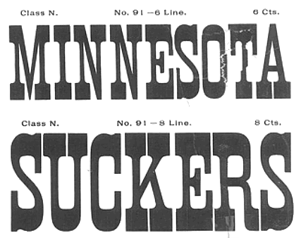
Type scene in Minnesota | ||
|
|
|
|
SWITCH TO INDEX FILE
Aaron Design
|
|
Minneapolis, MN-based creator of a techno typeface in 2013. [Google] [More] ⦿ | |
Aaron Shepherd
| |
Minneapolis-based freelancer who made BrokenRubber (2010). [Google] [More] ⦿ | |
During her graphic design studies in 2013, Abby Bartels (New Ulm, MN) designed an experimental typeface called Tiny Bubbles. [Google] [More] ⦿ | |
Interior designer in South Saint Paul, MN, who created Cross Stitch Cursive in 2016. [Google] [More] ⦿ | |
Minnesota-based creator (b. 1994) of Dot Splot (2013). [Google] [More] ⦿ | |
Ace Fonts
| Defunct Duluth, MN-based foundry, specializing in grunge, display and handwriting typefaces. Fonts made in 2000 by Ray Dittmeier: Analgesics (handwriting), NoProblem, ReadyForMyCloseUp, 01-01-00, After-Hours, De-Futura, I-Did-This!, Hacknslash, Illumination, Scottie-and-Judy, Ugly-Rumor, Persona, Fat-Free, Fat-Free-Solid, Filthy-Habits, Flip-the-Switch, The-Forbidden-Font-of-Death, Later-On, Mac-and-Sidney, Red-Lightning, Sad-Jane, Sheer-Terror, Thud, Trust-Us, Analgesics, Dr.Nerve, Rivalry, Runoff. All is archived by CybaPee at Typoasis. Dafont link. Fontspace link. [Google] [More] ⦿ |
Adam Turman is a Minneapolis-poster poster artist and bicycle enthusiast. At Chank's place, he designed the bicycle dingbat typeface B Complex (2012: The best things in life begin with a B. Bikes, Burgers, Beers, Babes.) and the fat finger typeface Turman Grotesk (2012). [Google] [MyFonts] [More] ⦿ | |
Minneapolis, MN-based musician and graphic artist who designed the avant garde / art deco typeface Obchod in 2018. [Google] [More] ⦿ | |
Foundry and studio in Minneapolis, MN, est. 1999. Creators of the layered beveled typeface family VALUCO (2012). [Google] [MyFonts] [More] ⦿ | |
Afrojet Type Foundry
|
FontStructions in 2008: Playtime (an original stencil family), Playtime Pattern Motifs (dings), Playtime Rounded (+Bold), Playtime Cutouts, Mango Solid (ultra fat, rounded), Mooch (experimental), Mooch Squared, Zombies Are The New Black, Jettison Stencil, Micromoog, hewett, hewett_bold, hewett_extended, Mikey (a Mickey Mouse font). Other creations there include Summer Grillz (about which he writes More gangster than Gill with more gold than Garamond, Summer Grillz is type jewelry for your mouth. All letterforms are diamond-kut using the finest type constructing software on the market today. Customize your grill with different fills., Lovestruc, Konstruct (multiline face), Steeplechase, Sawhorse, Sawhorse Braumarks (dingbats of a brewery), Alfred, Chesterfield, Hydroplane, Jettison-Stencil, Pop-Drops (kitchen tile face), Starstruc, Lovestruc, Chesterfield Prince, Chesterfield King, Chesterfield Queen (piano key font), Brainfreeze (ultra fat). Fontstructions in 2009: the Sans Serious family (a tribute to Dutch Bauhaus designer Jurriaan Schrofer), Factory (stencil), Hunstrüct (blackletter), Slug, Micromoog Remix, Get To The Falcon, Jetstream and Perforate (octagonal, loosely based on several styles of letter and numeral forms observed on various aircrafts at the Evergreen Aviation&Space Museum in McMinnville, Oregon), Get To The Falcon (multiline face), StacheStruct (moustache font), Factory (stencil), Playtime Bolda, Thunderball, Gaga, Gaga Stencil, Pinpression, Sessions (a take on type by Josef Albers; he writes: Having previously played around in Fontstruct with Anni Albers' textile patterns, I thought it time to turn my attention to her husband Josef's work. Josef Albers' constructivist typographic experiments are a perfect match for Fontstruct. Other Fontstructors have done great work with Alber's ideas. Most notably, Saberrider's fontsract and Stewf's Leaflet family. Using Josef Albers' Kombinationsschrift alphabet (1928-1931) as my foundation, I've been having a lot of fun remixing and experimenting with his letters.). Fonts made in 2010: Whoopee (piano key face), Prog. Commercial fonts: Sessions (2009, modular). The commercial fonts by Afrojet type foundry include Sessions, Playtime, Hydroplane, Lovestruc, Dansa, Pinpressions, Micromoog, Widjiwagen, Mooch, Hunstrüct, Slug, and Brutal Exchange. Cargocollective link. Behance link. Home page. Dafont link. [Google] [MyFonts] [More] ⦿ |
Creative director in Minneapolis, MN, working at Cue Inc. He designed the superb experimental typeface Popular Front (2012) using circle arcs only. Home page of Cue. [Google] [More] ⦿ | |
Alex Binenstock (Bloomington, MN) created the display typeface Hairline in 2013. Now, this is not a hairline font in the sense used on my web pages. [Google] [More] ⦿ | |
Art director and graphic designer in Minneapolis, MN. He created the grunge stencil typeface Graffetica (2010, named for grunge or graffiti Helvetica). [Google] [More] ⦿ | |
Graphic designer in Minneapolis, who designed the free display sans typeface Hakone (2013). Behance link. [Google] [More] ⦿ | |
Alice Savoie
| |
Alice Savoie, Frenchtype
|
Between 2008 and 2010 Alice joined Monotype as an in-house type designer, working mainly on custom type designs for international clients (The Times, Turner Broadcasting, Ogilvy, etc.). She has also contributed to the design of new typefaces for the Monotype library, such as the Ysobel type family (in collaboration with Robin Nicholas), and Rotis II Sans. Her type family Capucine is distributed by Process Type Foundry. In 2012 she collaborated with John Hudson/Tiro Typeworks over the development of the Brill typeface family for the Dutch publisher Brill. Since September 2013 she teaches typeface design at the Atelier National de Recherche Typographique in Nancy, and at ESAD Amiens (France). Her type foundry is called French Type. She holds an MA and a PhD from the University of Reading (UK). She collaborates with design studios and type foundries on the design of multi-script typeface families. In 2018 she released the typeface family Faune, commissioned by the Centre national des arts plastiques (CNAP) in partnership with the Groupe Imprimerie Nationale. Alice teaches and supervises research projects at ANRT Nancy and ENSBA Lyon (FR). She is the principal Post-doctoral Researcher on the Leverhulme-funded project Women in Type under the supervision of Fiona Ross at the University of Reading. Her typefaces:
Typecache link. Klingspor link. At ATypI 2014 in Barcelona she spoke about phototypesetting. Speaker at ATypI 2016 in Warsaw on Typefaces for telephone directories, a talk in which she and Dorine Sauzet describe Ladislas Mandel's oeuvre. Speaker at ATypI 2018 in Antwerp. Behance link. Estienne link. Reading link. Another link for the University of Reading. Fontsquirel link. [Google] [MyFonts] [More] ⦿ |
Graduate of Iowa State University. Designer in Minneapolis, MN, who designed the display typeface Disturbance in 2018. [Google] [More] ⦿ | |
Savage, MN-based designer of the watercolor alphabet Breakfast (2017). [Google] [More] ⦿ | |
North Branch, MN-based designer of Scribe Gothic (2016) during her studies at the University of Wisconsin-Stout. [Google] [More] ⦿ | |
Graphic designer in Minneapolis, MN. Creator of Optimus Vine (2012), a play on Optima. [Google] [More] ⦿ | |
Graduate of Macalaster Collegge in St.Paul, MN, class of 2002. Minneapolis, MN-based designer of the free EPS-format segmented typeface Sequioa Stained Glass (2013). Limkedin link. [Google] [More] ⦿ | |
Designer from Reno, NV, who was a student at MCAD in Minneapolis. Creator of the free font Tortuga (2008, Chank Store) and the commercial ink splatter typeface Collateral Damage (1999, with Chris Hunt and Chank Diesel). [Google] [MyFonts] [More] ⦿ | |
Andrea Tinnes
| |
André Zottolo
| |
During her studies at Concordia University in St. Paul, MN, Angela Niemi created the sans typeface Cookie Cutter (2013). [Google] [More] ⦿ | |
During her studies in Saint Paul, MN, Anna Joustra created the cursive typeface Saturday (2014). Behance link. [Google] [More] ⦿ | |
Student at the Minneapolis College of Art and Design. Creator of Form Font (2012, experimental). [Google] [More] ⦿ | |
Minnesota-based creator of the paper-cut typeface Piquant (2012). [Google] [More] ⦿ | |
Anne Lee (Anne Lee Designs, Minneapolis, MN) created Summer Alphabet (a set of capitals---not a font) in 2012 while pursing her BFA at the Maryland Institute College of Art (MICA). Behance link. [Google] [More] ⦿ | |
In 2015, she hooked up with Olson for a new typeface for Porsche. Anne writes: Porsche has always had a very clean and structured, well-known visual brand. Their custom headline font, Porsche Franklin Gothic, happens to be the exact same as Franklin Gothic. In order to create a refresh of the Porsche brand, while still maintaining the established look, there was opportunity for a new typeface. The core of the new typeface is based on the Porsche logo, as well as typeface Deutsches Institut für Normung 145---a precise, technical typeface; also the standard for German road signs. With a strong racing history, additional visual cues were also used in creating a truly unique, custom Porsche typeface. Dribble link. Twitter link. [Google] [MyFonts] [More] ⦿ | |
Anton's graduation project at MCAD in Minneapolis resulted in the design of a modernist sans serif typeface called Munan (2012). [Google] [More] ⦿ | |
Minneapolis, MN-based designer of the handcrafted typeface Handyman (2018). [Google] [More] ⦿ | |
Arrow Type (or: Typefloundry, or: Recursive Design)
|
Fontsquirrel link. [Google] [More] ⦿ |
Arthur Durkee
| |
Artist of Design
|
His earliest fonts were free. They included Alpha, Barracuda, Collem, Cornelia, Declan, Funtime, Roughfart, Tiki, MessyGirl. Typefaces from 2011: AZ Union is a Western face. AZ Text and AZ Dramamine are grungy hand-printed typefaces. AZ Sailor Tattoo is an outline tattoo face. AZ Hello Brushed is a brush typeface inspired by auto repair signs. AZ Rough Fart is a squarish mural brush face. AZ Wings is Victorian. AZ Placid is an eroded outline face. Type designs from 2012: AZ Mavericks (based on a skateboard logo), AZ Barista (inspired by Leonetto Cappiello's poster art from the 1920s), AZ Indian (signage script), AZ Harpers July (inspired by Edward Penfield's poster art from ca. 1900), AZ Plug Italic (inspired by the poster art of Edward Penfield and Franz Hazenplug, ca. 1900), AZ Audiotape, AZ Kiss (sketched type), AZ Varsity (athletic lettering), AZ Varsity Brush (textured version), AZ Claire (fat signage script). Typefaces from 2013: AZ Watercolor, AZ Brand (connect-the=dots script), AZ Hobie (signage script), AZ Storm (Western look), AZ Declan (scratchy typeface), AZ Clouds (spurred). Typefaces from 2014: AZ Scorch (a worn headline font family), AZ Black (didone engraved currency font), AZ Ultra, AZ Retro, AZ Postcard 3D. Typefaces from 2015: AZ Yoyo. Typefaces from 2016: AZ Cruisin. Klingspor link. Creative Market link. Fontspring link. View the typeface library of Artist of Design. [Google] [MyFonts] [More] ⦿ |
Associated Typographics (or: Public Type)
|
Typefaces from 2012 include the gas pipe modular typeface family Ramsey, which was followed in 2015 by Ramsey Condensed and in 2021 by an updated version of Ramsey to a 54-style rounded squarish typeface. In 2013, he published the eight-style bold geometric stencil family Skol, and created the custom sans typeface family Matterhorn with Matthew Desmond for Disney. In total, Cina made nine custom typefaces for Disney in 2013. In 2014, he published the squarish sans family Ramsey. In 2015, he published Atelier (octagonal), Reileta and Stadt. Also in 2015, he designed the custom sans typeface Kate Sans for Kate Spade in New York. Typefaces from 2016: YWFT Roamer. Typefaces from 2018: Query (2018). A sans family that is insired by civil rights posters from 1968. Typefaces from 2020: Ghostly Gothic. Klingspor link. Additional URL. Behance link. [Google] [MyFonts] [More] ⦿ |
Designer of the grungy typeface Screenprint (2014), which was developed during her studies at Saint Cloud State University in Saint Cloud, MN [Google] [More] ⦿ | |
Barry Schwartz
| |
At Concordia University St.Paul, Bee Xiong (Robbinsdale, MN) designed Simon Thick & Thin, and Wedding Display in 2017. Behance link. Creative Market link. [Google] [More] ⦿ | |
Ben Branum (b. 1981, USA, possibly located in Minneapolis or Saint Paul, MN) runs Branum Design. In 2014, he created the free typefaces Branum Cursive (shaded) and Modern Deco. In 2015, he added the sci-fi typeface Motorblock. Dafont link. [Google] [More] ⦿ | |
Minneapolis, MN-based designer of the bespoke cursive typeface Happy Birthday (2016). [Google] [More] ⦿ | |
Bill Kroll
| |
Bill Kroll Typography
| Bill Kroll's from Minneapolis, MN, is selling his creations: Kings Chancery, Minrose Black, Gambo, Korient (oriental simulation), Mu Initials, Rosecaps, Kyposh Light Extended, Kay Italic, Kaplumb Black, Kaligtry, Rosa Script, Ketex. [Google] [More] ⦿ |
Bill Moran
| |
Freelance designer in Minneapolis, MN, who created Source (2014, a 3d typeface). He studied at MCAD. [Google] [More] ⦿ | |
Blinc Publishing
|
At Blinc Publishing (est. 1996, St. Paul, MN) he released Goshen, Gommorah, and Prospect, typefaces that were done together with Darrel Austin at Chank. He also created Gideon (2001, 999USD!!!!!), Bell Martellus (2006, a Carolingian script family commissioned by the James Ford Bell Library at the University of Minnesota; co-designed with Chank Diesel), and Sodom (1999, with Chank). Hamilton Offset (2002, Chank) was based on an alphabet from the Hamilton Wood Type Printing Museum. He also made Flour Sack (2006). He writes: As a youngster in Green Bay, Bill began his career as an apprentice in his father's print shop [Jim Moran]. He honed his graphic design skills at the University Of Wisconsin-Stout and proceeded to work for Norwest Banks, The Artist known as Prince, and 3M before starting his own business. Bill serves as the Artistic Director for the Hamilton Woodtype and Printing Museum. Chank link. Blinc specializes in turn-of-the-century wood and lead type. [Google] [MyFonts] [More] ⦿ |
Booka B is a painter, dj, musician, poster artist, type designer and teacher who lives and works in St. Paul, MN. In 2012, he designed Blazedale (Chank). [Google] [MyFonts] [More] ⦿ | |
Boover Software (was: Tom's Software)
| Tom Schmidt of New Hope, MN, created the (originally shareware but now commercial) fonts SansFractions and SeriFractions. These fonts are used in the production of the Knoxville (Tennessee) News-Sentinel and Colorado Springs (Colorado) Gazette newspapers, and the AARP magazine. [Google] [MyFonts] [More] ⦿ |
| |
During her studies at Minnesota State University, Mankato, MN, Brittany Lischka (Kewaunee, WI) created a spurred modular typeface called Wild Rose (2014). [Google] [More] ⦿ | |
Brittany Sweney (Minnesota) graduated from UW-Stout with a BFA in Graphic Design. In 2011, she created a beautiful ornamental caps alphabet for a mock Sokol Blosser Vineyard annual report. Other typefaces include Havana (2012), Dr. Beezy's (2013, hand-drawn). Behance link. [Google] [More] ⦿ | |
During her studies at the University of Wisconsin-Madison, Saint Paul, MN-based Caitlin Hottinger designed the architectural font Cahedral (2016). Home page. [Google] [More] ⦿ | |
St. Paul, MN-based designer of a Bodoni-Helvetica hybrid (2004). [Google] [More] ⦿ | |
| |
At P22, Carolyn Porter published P22 Marcel Script in 2014. This stylish fountain pen script comes with a story: The font Marcel is named in honor of Marcel Heuzé, a Frenchman who was conscripted into labor during World War II. During the months Marcel was in Germany, he wrote letters to his beloved wife and daughters back home in rural France. Marcel's letters contain rare first-person testimony of day-to-day survival within a labor camp, along with the most beautiful expressions of love imaginable. The letters---stained and scarred with censor marks---were the original source documents used by designer Carolyn Porter to create a script font that retains the expressive character of Marcel Heuzé's original handwriting. The letters were found in an antique shop in Stillwater, Minnesota, and the 1300-glyph font was developed from 2011 until 2014. It comes with a set of filets and calligraphic ornaments, P22 Marcel Ornaments, and a set of capitals, P22 Marcel Caps. Marcel Script won an award at TDC 2014. Speaker at ATypI 2017 Montreal. The story of Marcel Heuzé is captured in her award-winning book Marcel's Letters: A Font and the Search for One Man's fate. [Google] [MyFonts] [More] ⦿ | |
Minnesota-based creator (b. 1995) of Sketchy (2009, Fontcapture). Alternate URL. [Google] [More] ⦿ | |
Graphic design student at The Art Institute Minnesota in Minneapolis. During his studies, he created the rounded squarish hairline sans typeface Needle (2011). [Google] [More] ⦿ | |
Born in Canby, MN, Chad Lindemann graduated from Augustana College and Kansas State University. At Kansas State University, he taught figure drawing. At Mid-Plains Community College in North Platte, Nebraska, he taught art. Today, he is Associate Professor of Art at Wisconsin Lutheran College (in Milwaukee, WI) teaching primarily printmaking and media design. He created one typeface, PF Lindemann Sans (2011, Parachute). [Google] [MyFonts] [More] ⦿ | |
Chad Reichert is the proprietor of spirit3design, a studio specializing in graphic design and typographic endeavors. He received his undergraduate degree in graphic design from Valparaiso University, attended graduate school at the California Institute of Arts and completed his MFA in graphic design from the Minneapolis College of Art and Design. Chad is also an assistant professor at the College for Creative Studies in Detroit. He teaches time-based media, typography, visual communications and graphic design history. His fonts: the rounded squarish typeface Nicollet (2003), Tense, Eve Three (text type), Construct, Bandwidth (pixel family), Fancysingle, Nicollet, Stitch (stitching font), Hudson, Palio, Stargazer. [Google] [More] ⦿ | |
Chank Fonts (or: Chank Store, or: Chank Diesel))
|
Chank became a popular and colorful figure who said this about himself: I like to drink a lot, and would like to think I'm known for it. Several of my fonts were inspired by booze, and I like to encourage other people to drink more, too. My best font is called Liquorstore. A partial list of his typefaces:
At Ascender: the mostly hand-printed typefaces Birthday Girl, Bleacher, Bobby Zee, Chauncy Decaf, Churros, Collateral Damage, Couchlover, Easterbuns, Loopy Fiesta, Mister Marker, Mister Twiggy, Prickly, Snowballs, Space Toaster, Tipsy, Twigdancer, Younger Than Me (2009, grunge). Chank also has a bunch of free fonts such as Yellabelly (handwriting), Fridley, Airboy, SundayLuck, Shadowboxer, Portastat, Fridayluck, Twenty Six Snake Rumba, and Blinkers. Dafont link. I Love Typography link. Behance link. Klingspor link. |
Graphic artist, b. 1930, Chicago, IL, d. 2017, Edina, MN. Hughes moved to Minnesota in 2002, but he spent most of his career as a lettering artist in Chicago and Milwaukee. He worked briefly for ATF in 1948. Hughes designed ads for the yellow pages in Milwaukee and worked for ten years as a letter designer at the Milwaukee Journal. At age 30 he became a freelancer, drawing letters for international ad agencies and design studios such as J. Walter Thompson and Leo Burnett. Hughes gained a reputation for his versatility as a lettering artist. He designed fonts for several food products, including Raisin Bran, DiGiorno Pizza and Quaker Oat Bran, and developed an entire alphabet for Marlboro. He once was given the job of designing the catchphrase for Tony the Tiger, the cartoon mascot for Kellogg's Frosted Flakes. His retail typefaces include Indy Italic (1990, Letraset), an informal script, and Century Nova (American Typefounders, 1966, one of the last metal typefaces), the latter as a variation on Century Expanded. | |
Charles Gibbons
| |
Charles R. Anderson
| |
Graduate of Mankato State University, class of 2015. New Prague, MN-based designer of the octagonal typeface New Prague (2015). Behance link. [Google] [More] ⦿ | |
During her studies in Mankato, MN, Chelsey Pittman created an artificial script (2014). [Google] [More] ⦿ | |
| |
Amercican designer of the deco sans typeface Minnesota (2016). [Google] [More] ⦿ | |
Christ Trek Fonts
|
Tim is working on Brampton. He writes about Squarish Sans: Squarish Sans is not a direct clone of any Bank Gothic. I have made conscious choices to deviate from existing designs. Yet it is strongly inspired by them, of course, particularly Michael Doret's DeLuxe Gothic, in that Squarish Sans has a true lower case as well as small caps. It should fit the bill should you have need of a Bank Gothic face. Motivation for Marapfhont came from the Marathon Trilogy game: Remember the Marathon Trilogy by Bungie Games back in the mid-1990s? If you do, you remember it's iconic logo font, Modula Tall. There are no free alternatives to Modula Tall, and the few similar fonts miss important aspects of its character. I wanted to create a typeface inspired by the appearance of Modula Tall in Marathon. The lowercase of Modula Tall didn't fit the Marathon "feel" at all, for me, so I have redesigned the miniscules, to carry the signature look throughout. Thus, Marapfhont is not a clone of Modula Tall, but may nonetheless be used to generate the "MARATHON" title. In 2013, he finished the pixelish typeface Looks Like Spht. In 2014, Tim Larson published the free Hebrew simulation font Hananiah (2014, OFL), which is based on Ezra SIL. It also includes regular Hebrew. In 2015, he published the German expressionist typeface Abibas [Abibas is a fork/extension of Gamaliel, a blackletter by Rafael Ferran i Peralta]. Typefaces from 2016: Politics As Usual (political dingbats for the United States), Horta (an angular sci-fi typeface). Open Font Library link. Home page. Aka Christ Trekker. [Google] [More] ⦿ |
Christina Huang (Minneapolis, MN, and later Brooklyn, NY) created the Latin typeface Fold (2013), which takes inspiration from the calligraphic strokes of Chinese. In 2015, she designed the karate chop alphading typeface Katatype. Home page. [Google] [More] ⦿ | |
Markato, MN-based designer of the modular typeface Beefy (2012). [Google] [More] ⦿ | |
Graphic designer in Minneapolis, MN, who started life in North Dakota. He created the (free) tall sans display typeface Insanability (2010). He also made a Didot specimen poster. Home page. [Google] [More] ⦿ | |
Craig Eliason
| |
Crud Factory
|
Links: Another URL. Dafont link. OFL link. Font Squirrel link. Googlecode link. Devian tart link. The League of Moveable Type. Abstract Fonts link. Kernest link. Klingspor link. Google Plus link. [Google] [More] ⦿ |
Crystal Kluge
| |
Commercial foundry selling these fonts: Cylinder, Goliard, Koten, Niles, Bigford (1999), Chuzpah (1999), Manzo, Tanek (1999), Valin, Gorgayse (1999), Paydirt (1999), Platon, Besonio, Biffin (1999), Gladhand, Lollop, Potsky (1999), Plookem, Flummox, Melvern, Mohan, ArchiveDingbats (1995, Charles Anderson), DailyGrind, FoodChain, JunkDrawer, Route66, SplitPersonalities. The company is doing the design and ad work for The French Paper Company which in turn is run by Jerry French. In the past, there were on occasion free fonts such as Bigford, but that practice was stopped. Typedia link. [Google] [More] ⦿ | |
Dan Bailey
| |
Graphic and web designer in Minneapolis. He created InvasionSans (2009), a custom typeface based on a poster for the 1950's classic Invasion of the Green Space-Men. [Google] [More] ⦿ | |
Photographer in Chenhassen, MN, who made a pixel typeface and Five Day Font (hand-printed: overlay of his handwriting over five consecutive days) in 2012. Personal web site. Trailhead (2012) is a pseudofont made from sticks and ropes. [Google] [More] ⦿ | |
Minneapolis, MN-based designer of the text typeface Swell (2020). [Google] [More] ⦿ | |
Graphic and web designer in St. Paul, MN, who studied at UW-Stout. He created Black eagle, a logotype, in 2007. [Google] [More] ⦿ | |
| |
David Bergsland
| |
David Buck
| |
Dawn Lewandowski
| |
Editor of "Metro Letters," (2003, a 144-page book, University of Minnesota Design Institute), which shows work by Peter Bilak (Peter Bilak, graphic design&typography/Typotheque), Erik van Blokland and Just van Rossum (LettError), Gilles Gavillet and David Rust (Optimo), Sybille Hagmann (Kontour), Conor Mangat (Inflection), and Eric Olson (Process Type Foundry), done in a design competition for the twin cities of Minneapolis and Saint Paul, Minnesota, as part of the Twin Cities Design Celebration 2003. The LettError contribution is a type family called Twin. [Google] [More] ⦿ | |
Saint Paul, MN-based designer of the sans typeface Bridge (2016). [Google] [More] ⦿ | |
This early digital type foundry managed by Jon Stern was based on 7156 Shady Oak Rd in Eden Prairie, MN, and was active from the late 1980s until 1991. Other related companies or company names include ColorSpan and Lasermaster. The quote below is from an ex-employee. The original DTC was not truly a type foundry, but rather a division of LaserMaster Corporation based in Eden Prairie, MN. LaserMaster was started in 1985 by Mel Masters (Melvin Newsom) and Lawrence Lukis (the tech guy) whose mission was to bring true WYSIWYG technology to the computer world. Their product was a circuit board that was inserted into the computer's existing system along with a laser printer that housed the same technology. It allowed the computer to accurately display, in high resolution (not bitmapped as the computers of the time), and output equally well. To ensure that the hardware performed as promised, they started with a package of 35 fonts including what they considered essentials such as Avant Garde and Goudy (see attached pdf). While the technology worked as promised, the fonts they bundled with it were not quality. They were purchasing all of their raw data from URW, and originally, they did nothing to improve or enhance them aside from improving their onscreen appearance with a proprietary PC program built to alter only the bitmapped portion of the two-part postscript fonts of the day. It allowed custom bitmapping and hinting of the typefaces, but did nothing to the font's outlines or metrics (spacing/kerning). As such, when included in a review of typeface manufacturers, they received a very poor rating. They realized if the fonts were to be a major selling point of their product, it would benefit them to create a team of typographers. DTC was established in the late 80s, but still lacked dedicated supervision and quality control. I was the one hired as Senior Typeface Designer in early 1990. They had just released their first 100 font package and were working on the second. My primary job responsibilities included the design of missing characters (all of the fonts had to have a full 256-glyph complement) and quality control. I spent literally hours upon hours scanning through print outs of each font at varying sizes printed by different manufacturer's printers, pointing out inconsistencies and calling for spacing/kerning adjustments. This lead to the developments of some rules for quality outlines that all designers employed there were required to follow. We produced the second 100-font set and were getting ready to decide on what was to be contained in the next set when a major shift in the industry happened, the development of TrueType. To help use make the transition into producing fonts in this new format, they brought in one of the designers from Bitstream (Adobe and Bitstream were the major players of the day) to teach us what was different about the process and how it is rendered and how to produce quality TrueType fonts. As training was going on, we received a request for a large 1000-font package from a software manufacturer that wanted to include a hand-picked set of fonts to be bundled with their software. We were never told who the client was, as the software was still in the development phase, but we worked diligently to finish the package within their specified timeframe. Shortly after we completed the project in mid-1991, we were informed that LaserMaster was dissolving DTC. With the advent of TrueType, their dedicated boards and technology were no longer required to get WYSIWYG performance. Sales were declining rapidly and the company made a huge shift into the large format printer field abandoning the type division completely. I am not certain how or when ProFonts obtained the DTC fonts, but I suspect the URW relationship had something to do with it, since ProFonts has a strong relationship to URW. As far as I know, there was absolutely no connection between DTC in the US and DTC in Hungary. [Google] [More] ⦿ | |
Company located in New York City, and St. Paul, MN, which sold stencils as standard equipment with the Style A-029 Stencillor. In 1930, they published the lettering book Display material catalogue. In 2013, Jeff Levine designed the typeface Floorwalker JNL, which is based on stencils made in 1926 by Display Material Company. [Google] [More] ⦿ | |
Graduate of Minnesota State University who works as a graphic designer in mankato, MN. He created the sci-fi / techno typeface Transformer (2013). [Google] [More] ⦿ | |
Doug Wilson (b. 1982) is a designer, filmmaker, and self-proclaimed font detective. Born and raised in the Midwest, he joined Process Type Foundry (Minneapolis, MN) early in his career. Doug received his BFA in Graphic Design from Missouri State University focusing on typography and letterpress printing. In 2012 Doug released his first documentary, Linotype: The Film, about the Linotype type casting machine. Since 2008, Doug has taught typography, design, and letterpress printing as an adjunct professor at Missouri State University. He has documented vernacular typography all across the United States. [Google] [More] ⦿ | |
| |
Designer and illustrator at YouWorkForThem in Minneapolis, MN. Her typefaces, made ca. 2008, include Polygons, Speakeasy (handwriting), and Adelaide (script). [Google] [More] ⦿ | |
Graduate of the Minneapolis College of Art and Design. Saint Paul, MN-based designer at YouWorkForThem. She created several interesting hand-drawn typefaces in 2008 such as Girlyque (curly), Faux Bois (wood type simulation), Mr. Hyde (2012), Dodoots, and Trithart (YWFT). In 2010, she added the YWFT font Trihart (hand-printed). In 2013, he designed the custom hand-drawn typeface Caribou Coffee. Behance link. Home page. Klingspor link. [Google] [More] ⦿ | |
Brussels-based designer who studied at the University of Minnesota in 2008. Home page. Creator of Three Sided Square (2008), a caps font based on a triangulation of the outlines of letters. [Google] [More] ⦿ | |
| |
Eric Gill and Jonathan Barnbrook: Designers as Authors at the Poles of the Twentieth Century
| Discussion of the work of Eric Gill and Jonathan Barnbrook, offered by Steven McCarthy (University of Minnesota). [Google] [More] ⦿ |
FontShop link. [Google] [MyFonts] [More] ⦿ | |
Eric Olson
| |
During his studies, Eric Turner (Eden Prairie, MN) created the modular typeface Bona Fide (2014). [Google] [More] ⦿ | |
Detroit Lakes, MN-based designer of Geometric Sans Serif (2017). Creative Market link. [Google] [More] ⦿ | |
During her studies, Erin Keeffer (Minneapolis, MN) designed the stencil typeface Klishe (2017). [Google] [More] ⦿ | |
During her studies at Northwestern College in St. Paul, MN, Erin Kleinjan (EK Design) designed the Stitch typeface (2013). Cargo Collective link. [Google] [More] ⦿ | |
Erin McLaughlin
| |
Minneapolis, MN-based graphic designer who created the free deco typeface Bowie in 2016. [Google] [More] ⦿ | |
Designer in Minneapolis. He created the organic sans typeface Level (2011). [Google] [More] ⦿ | |
Fargoboy
| Fargoboy is the foundry of Paul Wilde L'Heureux, who is based in New Brighton, MN. He studied at Savannah College of Art and design from 2004 until 2009. His creations include Pablo Skinny (2004), a lively condensed printed hand. Pablo Skinny was inspired by the film title work of Pablo Ferro. Alternate URL. Home page. [Google] [More] ⦿ |
Minneapolis, MN-based designer of the brush typeface Wax (2013), which was created during his studies there by pouring wax on glass and digitizing the results. Behance link. [Google] [More] ⦿ | |
Font vendor and foundry set up in 2006 in Minneapolis by Stuart Sandler (of Font Diner fame) and his partner, Mike Ibach. Companies selling through Font Bros include Font Diner, Astigmatic One Eye, ByAndreas, Chank, Mark Simonson Studio, Alphabet Soup, Fonthead Design, Wilton Type, CBdO, Sideshow, Blue Vinyl, Font-O-Ville, Outside-The-Line, Sparkytype, Typadelic, and Fontalicious. New 2007 fonts: Bamboozle (letters made out of pieces of wood), Silverstein and Seasoned Hostess (scripts by Crystal Kluge of the Tart Workshop), Woody (wood plank font) and Sweetheart Script (Ronna Penner). [Google] [More] ⦿ | |
Font Diner (or: Stu's Font Diner)
|
Catalog of the best selling Font Diner fonts. Images of Stuart Sandler's best-selling fonts. Free fonts: Rickles (2007, script), AirConditioner (2002, fifties style upright script), BahamaSlim (2004), BlackNight (2002, blackletter), BlackWidow, BubbleMan, ChannelTuning, Corrupter, CreakyFrank, DecayingKuntry, FeaturedItem, FontOnAGrain, FontOnAStick, Fontdinerdotcom (one of the earlist beatnik style digital typefaces), FontdinerdotcomHuggable, FontdinerdotcomLoungy, FontdinerdotcomSparkly, Fontdinerdotcom Jazz Dark, Fontdinerdotcom Jazz Light, Hothead, KeeponTruckinFW, Leftovers (2002), MaverickBE (stencil face), Musicals, PickAx, Rickles (2009; upright script), RocketScript (2002, retro script), Schnookums, SinsofRhonda, Spacearella (2002), StencilGothicBE, ThatsSuper, Turnpike (2009), Witless, XerkerFW. Commercial fonts: Continental Railway (1998, retro connected script), Anastasia, Chatty Cocktails (1998, art deco), El Nino, Guest Check, Hamburger Sandwitch (1998), Jumping Bean (1998, comic book style), Lionel Classic (1998, an art deco all caps face), Milwaukee, Motor Oil, and the greatest of them all, Coffee Shop (1998, exaggerated ascenders), a must! Other typefaces: Permanent Waves (1998, + Expanded: retro connected script), Yarn Sale (curlies), Fat Sam (not bad!), Etiquette, Taylors (1998, another great display font; co-designed with Dan Taylor), Kentucky Fried (1998, comic book / signage style), Beer Wip, Seuss, Jack Bisio and FinerDiner, Shivering, Dry Cleaners (2002), Singlesville Script (2002), Dripping Blood, Bowlorama, Action Is, Automatic, Chicken King (2002), CocktailShaker (2002, at Chank), Concurso Italian and Concurso Moderne (2003), DoggieBagScript, Johnny Lunchpail (2000, comic book style), Kitchenette (connected retro script), Lil Tipsy (2003), Milwaukee Neon (1998), Milwaukee Neon Shadow (1998), Motorcar Atlas (2000), Regulator, Stovetop (2002), Swinger (2002), WARNING (2002, rough stencil), BEBlob, BECROSS, DecayingAlternate, Decaying, EvilBrew, TheBlob, Insane Asylum, Creepy Crawly, Crossover, Fire Baaaad!, Rotten Teeth, Candy Good, EvilOfFrankenstein, HMan, HManPt2, PlasmaRain, Chicken Basket (2004), Chowderhead (2004), Cocktail Script (2004, upright), Country Store (2004, Western style), Dairyland (2004), Emblem Chief (2004, fifties diner script), Motel King (2004), Queen Rosie (2004), Sweet Rosie (2004, blackboard bold), Secret Recipe (2004), Square Meal (+Hearty) (2004), Bahama Slim (2004), Space Immortalizer, Matchbook and BE Streetwalker. Many font have a cool retro/fifties look. The InFlight Meal font set (2001) includes Al's Motor Inn, American Highway, Kiddie Cocktails, Lionel Text, Mosquito Fiesta, New York to Las Vegas, Pink Flamingo, Refreshment Stand, Starlight Hotel, Volcano King. The LasVegas font set: El Ranchero (2002), Hamburger Menu, Hamburger Menu Marquee, Holiday Ranch, International Palms, Lamplighter Marquee, Lamplighter Script, Las Vegas to Rome (stone chisel face), Leisure Script, Leisure Script Marquee, Mirage Bazaar (2002), Mirage Zanzibar (Arabic theme face), Mister Television, StarburstLanes, Starburst Lanes Twinkle, Vegas Caravan. At ITC, he published ITC Kiddie Cocktail (2003), ITC Mosquito Fiesta (2003), ITC Volcano King (2003). In 2006, Font Diner acquired the Filmotype collection and its trademark, Filmotype. Sandler writes: Filmotype initially manufactured a simple manual phototype machine utilizing display typeface designs on 2-inch filmstrips. Additional films were sold to start-up typesetting companies in order to increase their product selection. Font Diner will create new digital versions of the Filmotype collection, recreating it to meet todays graphic design standards. [...] We intend to release the Filmotype library in OpenType format so the original designs can be fully realized with a dynamic feature set including alternate glyph forms and automatic substitutive ligatures. In 2007, Font Diner started publishing digitizations of the collection: Glenlake (condensed Bank Gothic, by Mark Simonson), MacBeth (script), Alice (casual script), Zanzibar (calligraphic), La Salle (brush writing originally by Ray Baker in the 1950s, named after Chicago's LaSalle Street), Ginger (Mark Simonson; masculine headline typeface genetically linked to Futura), Austin (paintbrush), Brooklyn (hand-printed), Honey (handlettered script), Jessy (handwriting), Modern, Vanity, Filmotype Ford. In 2010, Stuart Sandler published a book entitled Filmotype by the Letter, in which he details the company's history. Free fonts on the Google Directory, dated 2010: Fontdiner, Swanky, Cherry Cream Soda, Permanent Marker, Homemade Apple, Schoolbell. In 2012, David Cohen and Stuart Sandler published these typefaces at Neapolitan: Irish Grover Pro (2010, a bouncy face), Satisfy Pro (2011, a connected retro script face), and Slackey Pro (2010, a paper cut out style face). At the same place, he also published Crafty Girls Pro (2010, co-designed with Crystal Kluge). With Crystal Kluge, he also co-designed the flowing connected script typeface Aya Script (2012). At Sideshow, he published the pen-drawn connected script Mister Brown (2013) and the retro signage script typeface Cocktail Sauce (2014). View Stuart Sandler's typefaces. Jolly Lodger (2012, Google Web Fonts) is an informal retro script. Typefaces from 2018: Cherry Soda, Deviliette, Fat Sam, Doggie Bag Script, Cherry Soda, Deviliette, Fat Sam, Doggie Bag Script, Black Night (an eerie blackletter), American Cheese (retro display style). Typefaces from 2019: Madelinette Grande (by Stuart Sandler and Crystal Kluge: created by hand with traditional pointed pen, it includes calligraphic penmanship and rustic styles). Typefaces from 2021: Bon Marche (a curly vernaculat script by Stuart Sandler and Crystal Kluge), Los Angelino (a script by Stuart Sandler and Crystal Kluge), La Bohemienne deLuxe (a calligraphic script by Stuart Sandler and Crystal Kluge), Epicursive Pro (a script by Stuart Sandler and Crystal Kluge). [Google] [MyFonts] [More] ⦿ |
FontConf --- The Unconference for Web Fonts
|
|
Fontosaurus
| Fontosaurus (est. 1996) has about 75 original giftware fonts by Dan Bailey (b. Minnesota, 1972) from Eagan, MN and now Coon Rapids, MN: Blowfish (2001), Negotiated (2006), GhettoBooty (2003), Laika (2003), Amerinese, Heptathalon, Riffic (2002), XMR (2002), Amerikatakana (2002), Experimenta (2002), Tapdance (2002, a great ultra-high contrast Broadway face), Casual Roman (2002, not free), Casual Roman Capitals (2002, not free), Heater (2001), Crank (2001), Halloweenies (2001), GaramOrbital (2001), Microbial (2001, pixelized), Inception (20USD), Fallen Thyme (a hacker font: letters are overlayed in Chank Diesel's Thymesans), Candycorn Overdose (2001), Statebats (2001), Whackbats (2001), 5by (bitmap font for the Mac), Deadwrong (2001), Alien Artifact (2001), Hoodoo Two (2001), Noonan (2001), YChrome (2001), Martini (2001), DresdenFirestorm (2001), Backlash, Brainwave, Whiplash, BlockheadInsecure, Blockhead, BlockheadSpeedy, CancunSiesta, CitizenDick (double writing), CSDAnorexic, CSDMegabold, CSDNormal, CSDPhattie, Danwriting, Eagan, Ebola Jones (2001), FallenDirty, Fallen, KaffeinePsychosisHeavy, KaffeinePsychosis, LucidityNormal, LuciditySlasher, MankatoHalfwit (outlines), MarsColony, MyFriendPoopa, OralExpulsive, Preternatural, Psychoactives (great!), RadiationBurn, Soviet2002, Starvetica, 989MaxProtect, Ablative (2001), Crackaddict, Harleysville, Juggernaut, LoveBot (a mashed Times Condensed), Packer, Sexypants (reworking of Calligraphic 421), Shadowboxer, Skylab (2000), Arduous, Bewbz, BungholioSurprise, Crotchrot, Numatrix, Oddziab, RonnieRaygun, Rusch (2006), Runningback, 1978NYC, Erg, Exclaim, Gigaton, Grackle, Kiloton, MashedPotatoes, Megaton, Moonbase, Mullet, Pornstar, PornStarAcademy, Scumbucket, SnowCrash (hacker face), Speeddealer, SpringBreak, Statebats. Gumbo (2001) and Tirade (2001) are commercial. Does also custom work. At some point, it was part of the Chank Army, where Fontosaurus had the commercial pixel font Noonan (2002). Creator of Jantze (2003), a comic book font based on the cartoon The Norm by Michael Jantze, and whose profits will go to the Lance Armstrong Foundation. Dafont link. MyFonts link. [Google] [MyFonts] [More] ⦿ |
Fonts for dyslexics: comments by Stephan Peters
|
He adds: There's a lot of misinformation out there about "dyslexic fonts." Dyslexie is OK, but looks awful artistically. Open Dyslexic, which attempts to emulate Dyslexie is REALLY TERRIBLE! It is a disservice to people with dyslexia. Studies show it is not a helpful font [...] It has a high x-height, which leads to lower ascenders. p and q are just reversed, b and d are just reversed.... Terrible kerning... m looks like the Latin ligature rn... I could go on and on. [...] In reality, line height and font size have more to do with readability than the actual font, there are studies that show this, too. [Google] [More] ⦿ |
Fontwala (was: Hindi Rinny)
|
She designed Katari for her thesis. Originally from Milwaukee, she received a BFA in Graphic Design from the Minneapolis College of Art & Design before her MA at Reading. Erin created an angular typeface---à la Oldrich Menhart---, and added a matching Devanagari style---the harmonious ensemble is called Katari. This typeface earned her the 2011 SoTA Catalyst award. In 2015, she published the free Google Web Font typeface Khula for Latin and Devanagari. The Latin is based on Steve Matteson's Open Sans. GitHub link. Still in 2015, she published the useful free Devanagari typeface family Yantramanav at Google Web Fonts, to accompany Christian Robertson's Roboto. Adobe Kannada was also designed in 2015---the Latin part of that font was by Robert Slimbach. Typefaces from 2016 include Hubballi (a free monolinear typeface for Kannada; Google Fonts link). In 2019, she aided with the Devanagari part of the free Google Fonts typeface IBM Plex Sans Devanagari (by Mike Abbink, Paul van der Laan, Pieter van Rosmalen, Erin McLaughlin). In 2021, Erin McLaughlin and Wei Huang developed the traditional workhorse sans serif typeface Tenorite for Microsoft for use as one of the default fonts in Office apps and Microsoft 365 products. Elements such as large dots, accents, and punctuation make Tenorite comfortable to read at small sizes on screen. In 2020, she published BhuTuka Expanded One at Google Fonts. BhuTuka Expanded One, originally designed in 2017, is a Gurmukhi companion to Aoife Mooney's BioRhyme Expanded Light typeface. Home page. Github link. Personal home page. [Google] [MyFonts] [More] ⦿ |
Minnesota-based creator of Subatomic Pygmy Shrew (2011, pixel face). [Google] [More] ⦿ | |
FrakturWeb
| This explains the mostly handwritten Fraktur documents and folk art practiced by Pennsylvania Germans principally from the mid-eighteenth to the mid-nineteenth centuries. By Joel Clemmer in St. Paul, MN. [Google] [More] ⦿ |
His typographic work:
Author of Monotype Ornaments (1928, Lanston Monotype Corp) [this book is freely available on the web thanks to Jacques André]. Many ornaments in this book have been digitized; see, e.g., Arabesque Ornaments (for the 16th century material) and Rococo Ornaments (for the 18th century ornaments). Warde also published the following privately in 1926 with Stanley Morison: The calligraphic models of Ludovico degli Arrighi, surnamed Vicentino---a complete facsimile and introduction by Ludovico degli Arrighi. Digital fonts based on his work include LTC Metropolitan (Lanston), Centaur (Monotype and Linotype versions) and Arrighi BQ (Berthold; this font has romans by Bruce Rogers and an italic by Frederic Warde). Wiki page. Linotype link. FontShop link. Klingspor link. [Google] [MyFonts] [More] ⦿ | |
Free Tracy Johnson
| Some free fonts designed by Tracy Johnson from Minneapolis: a funny typeface dingbat, for example, called Johnson and digitized by Chank Diesel (1996). [Google] [More] ⦿ |
| |
Garrick Van Buren
| |
Garrick Van Buren
| |
Designer from Minneapolis, MN. He is working on this monospaced programmers font. Designer of the monowidth Courier-inspired typeface Baka-mono (2003). [Google] [More] ⦿ | |
Minneapolis, MN-based designer of the children's alphabet Animal ABCs (2016). Shae also created the multicolor typeface RGB Type (2016). [Google] [More] ⦿ | |
Goatpatch Delux
| Scott Lindberg from Minneapolis, MN, made the arrowed letter font Y2K Dazey (1999). See also here. [Google] [More] ⦿ |
Designer of the hand-printed typeface Fulmer Hand (2013). Graham lives in Minneapolis, MN. [Google] [More] ⦿ | |
Graphic designer in Minneapolis, MN, and San Francisco, CA, who made the custom typeface UV Vodka (2012, 3d). At Dribble, he showcased Messing With Type (2012, a yet unnamed cursive typeface). Behance link. [Google] [More] ⦿ | |
Hackberry Font Foundry (Was: NuevoDeco Typography, or: Bergsland Design)
|
|
Graduate of the Minneapolis College of Art&Design, who created a few typefaces for her clients in Minneapolis. Alternate URL. Her work includes So Sew (2006: Each character is a derivative of sewing patterns and instructions), and a redesign of the signage for the city of Watertown. [Google] [More] ⦿ | |
Illustrator and designer in Minneapolis who created an ornamental didone typeface called Garbanzo Beans in 2012. [Google] [More] ⦿ | |
Helvetica, the Voice of Opposition
| Discussion and critique on Helvetica offered by Steven McCarthy (University of Minnesota). [Google] [More] ⦿ |
Hewitt Avenue
| Hewitt Avenue was founded by Sarah McFarland in 2014. Minneapolis, MN-based designer of the handcrafted Salty Sans (2018), Scout Sans (2018), Northern Lights (2017, a monoline script), Sota Mini (2017), Unstoppable (2017), Eleanor Sans Serif (2016), Lazy Sunday (2017) and Sweet Carolina (2017). Creative Market link. [Google] [More] ⦿ |
Graduate of the University of Minnesota, where he started the design of Human Sans in 2018. In 2021, he set up his own foundry, and released an 18-style set of fonts under that same name. Later in 2021, he designed Record Store Stencil (a formal almost piano key stencil typeface in nine styles). [Google] [MyFonts] [More] ⦿ | |
Ingrimayne Type (was: The Bovine Rebellion)
|
Dingbat fonts: XPhyngern (1990, pointing fingers), XPointedDesert and XSimpleHands (1994, more fists), Schneeflaken (two snow fonts, now available as XSchneeFlaken), ComputerBugz (nice butterflies, now available as XCompuTerBuggz), Galaxies (around the theme of the sun and stars), GlitzyFlash (1990), Grandecort (1994), LeakOrLeach (1995), Baumfuss (1990), LeafMeAlone (leaves), StarsAndStripes, StarPieces, Fingers, SimpleHands, PointedDesert, IngyDing (1996, 3 dingbat fonts in the style of Zapf Dingbats; in 2010 overhauled into one 1400-ornament monster face, Ingy Ding MCD, containing smilies, arrows, Zapfian ornaments, dice, chess pieces, fists, weather dingbats, and so forth), IngyDingLeftovers. A list of fonts:
Klingspor link. Dafont link. Abstract Fonts link. View Robert Schenk's typefaces. View Ingrimayne's typeface library. [Google] [MyFonts] [More] ⦿ |
German typographer (b. Würzberg) who studied in Colorado before moving to Minneapolis where he works and plays. He designed the ITC Vinyl family (1995). Linotype link. FontShop link. [Google] [MyFonts] [More] ⦿ | |
Type designer (b. Minneapolis, MN, 1962) at SIL International, UK since 1991, and an ex-M.A. student in type design at the University of Reading. He has worked on non-Latin typefaces, as well as his own extended Latin design, Gentium (2002). [Download from places such as OFL and FreeBSD]. Gentium Plus supports a wide range of Latin, Greek and Cyrillic characters. It was developed between 2003 and 2014 by J. Victor Gaultney (main designer), Annie Olsen, Iska Routamaa, an Becca Hirsbrunner. Papers by him include Multitudinous Alphabets: The design of extended Latin typefaces (2001), The influence of pen-based letterforms on Devanagari typefaces (2001), Balancing Typeface Legibility and Economy, Gentium---A Typeface for The Nations, Problems of Diacritic Design, and "Problems of diacritic design for Latin script text typefaces" (2002). The last one is a must-read. Projects in which he is the main or only designer include SIL Dai Banna Fonts, SIL Tai Dam Fonts, SIL Greek Font System, SIL IPA Fonts, and SIL Encore Fonts. At ATypI 2004 in Prague, he spoke about the technical problems with East European type. In 2008, he published Gentium Basic and Gentium Book Basic, each in four weights, but essentially limited to Latin, and added them to the Google Font Directory link. At ATypI 2010 in Dublin, he spoke about sculptural letterer Arnold Flaten (1900-1976). Speaker at ATypI 2011 in Reykjavik. Speaker at ATypI 2013 in Amsterdam: Open and collaborative font design in a web fonts world. Speaker at ATypI 2017 Montreal. Kernest link. Klingspor link. Google Plus link. [Google] [More] ⦿ | |
Jake Haugen
| |
Maple Grove, MN-based designer with Chris Bowman of Temple of the Dog (1991), a child's handwriting font. [Google] [More] ⦿ | |
Based in Madison, WI, Jason designed the beautiful free Christmas flakes font Spunkflakes (2002) at Chank's place, together with Jeff Johnson and Jack Wilcox. Jason is affiliated with Spunknation.com in Minneapolis. Home page. [Google] [More] ⦿ | |
Jeff Johnson
| |
Founder and creative director of Gestalt, est. 2002. Minneapolis, MN-based designer of the sharp-edged display typeface Zyfr (2018) and the squarish techno typeface Mila (2018). [Google] [More] ⦿ | |
Graduate of the Minneapolis College of Art and Design (MCAD) with a BFA in Graphic Design, class of 2014. Minneapolis, MN-based creator of Jailbird (2014). Behance link. [Google] [More] ⦿ | |
| |
Jeremy Mickel
| |
Jeremy Sinon (b. 1977) from Minneapolis, MN, is a creative director at Omnera Interactive. He designed the primitive dingbat font Blockobats (2001) at Devian Tart. He also made the handwriting fonts Dirty Uncle (2002, free at Chank) and Sinon (2001). Blockobats and DirtyUncle (2003) are available from Chank. Alternate URL. [Google] [More] ⦿ | |
Rochester, MN-based graphic designer who created the experimental display typeface Warble in 2015. Behance link. [Google] [More] ⦿ | |
Graphic designer in Markato, MN, who made a modular typeface in 2013. [Google] [More] ⦿ | |
Jim Kurrasch
| |
Jim Kurrasch's Kanji
| Jim's Kanji are shareware kanji characters (2550 in all) drawn in 1994 by Jim Kurrasch from Goleta, CA. James Kenneth Kurrasch (1948-2003), a Vietnam veteran and Japanese sword expert, died in 2003. His fonts can be downloaded here and here. They were converted to type 1 in 1999 by Jim Parsons (Verge). [Google] [More] ⦿ |
| |
Joel Clemmer
| |
John Skelton
| |
Jon Forss
| |
Joseph Kral
| |
| |
Creator of the fun poster entitled A Designer's Guide for Typestaches. Josh lives in Minneapolis. [Google] [More] ⦿ | |
Graphic designer from Minneapolis, MN, who created the squarish / octagonal typeface Paper Mill (2011). Behance link. [Google] [More] ⦿ | |
Mortadella (2012) is a hand-drawn burly-looking sans. Mol (2012) is a mini-serifed didone display face. MyFonts link. Behance link. Cargo Collective page. Klingspor link. YWFT link. [Google] [MyFonts] [More] ⦿ | |
Graphic designer in Minneapolis, MN, who created the squarish modular typeface Superfluous Grotesk in 2013. Behance link. [Google] [More] ⦿ | |
St. Paul, MN-based designer of the freeware font Oedipa (1996, a mishmash of characters). See also here and here. She writes: "Oedipa is the much cooler (well, my humble opinion) companion to Pierce Inverarity. I created this typeface for dummy spec pages I designed for Thomas Pynchon's intriguing satirical novel, The Crying of Lot 49. There's three other typefaces in my Trystero collection -- Baby Igor, W.A.S.T.E., and Mucho... they'll be here soon." Fontspace link. [Google] [More] ⦿ | |
Graphic design student at Minnesota State University Moorhead. She created the handwprinted ut structured family Malley (2011). [Google] [More] ⦿ | |
During her studies at University of Wisconsin-Stout, Karissa Cable (now in Elk River, MN) created Bitsans (2015). In 2016, she designed Double Type. [Google] [More] ⦿ | |
Karl Frankowski
| |
Karl Engebretson has been teaching typography and graphic design at the University of Minnesota College of Design since 2014. His MFA in graphic design is from the same institution. Saint Paul, MN-based creator of a custom font for the Surly Brewing Company called Surly (2012). In 2015, he made the barbed wire font Edges Barbed. Home page. At Associated Typographics, he created the squarish modular typeface Sagan (2016, with Michael Cina). Typefaces from 2017 include Egali, his graduation typeface for the Masters of Fine Arts, completed in May 2017 at the University of Minnesota, College of Design. Egali was designed by interpolation and covers all European languages, including Cyrillic. [Google] [MyFonts] [More] ⦿ | |
During her studies, Minneapolis, MN-based Kathleen Walsh designed the shadow display typeface Qi (2017). [Google] [More] ⦿ | |
During her studies at the University of Minnesota, Katie Johns designed the Speed Dating Typeface (2017). She explains: I created my own sans-serif typeface, using the short film, Speed Dating as inspiration. I based the basic structure of the font off of the typeface Gotham. [Google] [More] ⦿ | |
During her studies at Mankato State University in Mankato, MN, Katie Peterson created the Peterson Font (2014), which appears to be for an imaginary script. [Google] [More] ⦿ | |
Graphic design student at he Minneaplois College of Art and Design, b. 1989. At FontStruct, she made the ultra-condensed thin typeface Harvestman (2010). [Google] [More] ⦿ | |
Graphic designer in Minneapolis, MN. Creator of the handcrafting all-caps face Knots&Loops (2011). Behance link. [Google] [More] ⦿ | |
Student from Burnsville, MN, who designed Ventveau (2003). [Google] [More] ⦿ | |
Minneapolis, MN-based designer of the brush typeface Happy Pills (2016). Creative Market link. [Google] [More] ⦿ | |
Graduate of Minnesota State University Mankato. Creator of a simple monoline sans caps typeface called Raindrops (2012). [Google] [More] ⦿ | |
Book printer in St. Paul, Minnesota. Chank writes: Kent Aldrich of the Nomadic Press creates everything from invitations and stationery to hand-bound books and paper props, like origami or boxes. Though he works with metal type every day and has kept sketchbooks of letterforms for years, the is his first venture into the modern world of type. That first venture are sketches that were digitized by Chank in 2005 into two fonts, Nomadic Egyptian and Nomadic Sketchbook. [Google] [More] ⦿ | |
Kernest
| A site that offers to host fonts for use in @fontface tags on web pages. I do not quite understand the pricing---somewhere it says, for example, that Abia Wide by Tkachenko will cost 15 dollars per year and per web site. It is unclear who pays who in the triangle "web site (html page) maker", "font designer", "Kernest". I believe that some are free. Fontue is a free open-source, web font server built for Kernest.com. The list of designers participating in this effort is impressive. The list of designers as of March 2010: A. Korolkova | Aj Paglia | Alec Julien | Alexander Fell | Alexander Kalachev | Alexey Kryukov | Alexey Maslov | Andrew Paglinawan | Andrey V. Panov | Andy Chung | Annie Olsen | Apostolos Syropoulos | Apostrophic Labs | Ascender Corporation | B. Jackowski | Barry Schwartz | Ben Weiner | Bernd Montag | Bitstream | Bo Linnemann | Brandon Schoech | Caius Chance | Cal Henderson | Caroline Hadilaksono | Chank Diesel | Charles Bigelow | Choz Cunningham | Chris Miller | Christian Ghirardi | Christophe Féray | Coji Morishita | Colin Willems | Daniel Johnson | Daniel Midgley | Darren Rigby | Dave Crossland | Derek Weathersbee | Diego Quintana | Dieter Steffmann | Dimitri Castrique | Dot Colon | Dustin Norlander | Eat Street Fontmaking Workshop | Ed Merritt | Edgar Tadeo | Eric Schiller | Fontsite | Fredrick Nader | Friedrich Althausen | Garrett Le Sage | Georg Seifert | George Triantafyllakos | Giovanniello | Graham Meade | Greyscale | Gurkan Sengun | Haley Fiege | Han The Thanh | Harold Lohner | Hiran Venugopalan | Hirwen Harendal | J.M. Nowacki | James Puckett | Jan Gerner | Jan Sonntag | Janusz M. Nowacki | Jason Kottke | Jeffrey Visser | Jeroen Klaver | Jess Latham | Johan Aakerlund | Johan Mattsson | John Stracke | Jon Hicks | Jovanny Lemonad | Juan Pablo De Gregorio | Justus Erich Walbaum | Kris Holmes | La Tipomatika | Libertine Open Fonts Project | Lithu K Kumar | Ludivine Loiseau | M+ Fonts | Manfred Klein | Marcelo Magalhaes | Mark Simonson | Marko Jovanovac | Markus Waeger | Matt Mc Inerney | Matthew Welch | Meredith Mandel | Michael Tension | Mårten Nettelbladt | Nadia Knechtle | Nick Curtis | O. Umpeleva | Orgdot Consortium | Oscar Marchal | Patrick Broderick | Paul Lloyd | Paulo Silva | Peter Hoffman | Peter Wiegel | Philipp H. Poll | Philippe Cochy | Ralph Oliver Du Carrois | Raph Levien | Richard A. Ware | Robby Woodard | Robert Norton | Rodrigo Fuenzalida | Rogier Van Dalen | Roman Yershov | Ryoichi Tsunekawa | Ryoichi Tsunekawa Bagel | Sil Nrsi Team | Sebastian Mechelk | Sergiy Tkachenko | Sparanoid | Steeve Gruson | Stephen C. Gilardi | Stephen G. Hartke | Steve Jordi | Steve Matteson | Thatcher Ulrich | Thomas Schraitle | Tino Meinert | Tom Murphy 7 | Tom Tor | Tup Wanders | Tyler Finck | V. Yefimov | Valek Filippov | Vic Fieger | Victor Gaultney | Wolf Bain X | Yann Le Coroller | Yeah Noah | Yusuke Kamiyamane | Zygfryd Gardzielewski | Afrojet | Catrina | Craig Kroeger | Ficod | Gluk | Inkboy | Laura Kristen. [Google] [More] ⦿ |
Kevin Hayes from LSM Creative in Minneapolis and Chank Diesel created grunge blackletter typefaces called Newcastle (2005, free at Chank). Klingspor link. [Google] [MyFonts] [More] ⦿ | |
Kickstand Apps
|
Behance link. [Google] [More] ⦿ |
Designer and illustrator in Minneapolis. She created the illustrative typeface Seashore Spectacular (2012). [Google] [More] ⦿ | |
Kral Typefaces
| Born in Faribault, MN in 1974, Joseph Kral designs and sells his own typefaces. He lives in Pittsburgh. He founded Kral Typefaces (now defunct), and co-founded the Test Pilot Collective. His typefaces: AtariBaby (1998), Braille (1999), OCRJ (1998), OCRK (1998, monospaced family), Twin Sites, Xerxes (1998), Lakestreet (1998), JoesFoot (1998), Mechanical (1999), Kaliberuckus (2002, dot matrix), Pyrotechnics (1998), Saarikari (1998, rounded sans), Quayzaar (2002, a squarish font), Tricon (2002, unfocused pixel font), Shaolinstyle (1998), Stick26 (1998), Tryptomene (1998). At GarageFonts around 1996, he made HannahBad, Kindee, Kral, Pooty. Behance link. Home page. Klingspor link. View Joe Kral's typefaces. [Google] [MyFonts] [More] ⦿ |
Eden Prairie, MN-based creator of the artsy display typeface Madness (2013). [Google] [More] ⦿ | |
Kyle Meyer
| |
Lawrence Robert Brady (b. International Falls, MN, 1936-d. Salida, CO, 2023) was an American calligrapher, type designer, graphic designer, and educator. He studied Fine Arts at Montana State College and then completed a Masters Degree in design from California State University Long Beach. He taught for some time at Cerritos College. Brady's type designs include the titling font he designed in the 1980s for the J. Paul Getty Trust and Museum in Los Angeles (he was commissioned by Saul Bass to work on the museum's identity). Obituary. [Google] [More] ⦿ | |
Sonoma-based Adobe art director and designer of the Adobe font Giddyup (1993, with rope letters). And of the ornament font Giddyup Thangs. From her web page: Laurie Szujewska is the principal of Szujewska Design, a firm specializing in graphic design and typography for use in the education and entertainment of children. Ms. Szujewska received her MFA in Graphic Design from the Yale School of Art, where she studied with Paul Rand, Bradbury Thompson, Wolfgang Weingart, Armin Hofmann and Edward Tufte. She joined Silicon Valley's Adobe Systems early in its formation, serving as art director in Adobe's type products division under the leadership of Sumner Stone. Szujewska was responsible for the design of the award-winning Adobe Original type specimen books series, the magazine Font and Function, and the creation of the typeface Giddyup. The recipient of numerous design awards, she has taught design and typography at the California College of Arts and Crafts in San Francisco and Minneapolis College of Art and Design. She also studied and maintained a studio at the Center for Book Arts, New York City. MyFonts page. Poster by Joao Esse Andrade (2013). [Google] [MyFonts] [More] ⦿ | |
Lazy Dog Foundry (or: Franklin Type Founders)
| St. Paul, MN-based foundry run by Willie Ford, who at one point headed the graphic design deartment at Sarah Lawrence College in Yonkers, NY. Franklin Type Founders includes a collection of fonts from Lazy Dog Foundry but has also a library of fonts licenced from International Typeface Corporation (ITC) and, with the backing of URW++, from a number of smaller foundries. Some Lazy Dog fonts: Belmondo, Berliner, BigBlack, Boomerang, Bostonia (a gothic font), Chieftain Solid / Inline, Cypress, Durango, Emporium, Glorietta, GrecoDeco Solid / Inline, Harpers, Isadora, Little Louis, Manhattan, Medina, Minneapolis, Mississippi, Neuland Solid / Inline, Nova Bold, Riverboat, Schwere, Shrifteen, Socrates, Tombstone Outline / Solid, Thermo, Uptown, Yitsui. All fonts made in 1992. I have been looking for Willie Ford. The most interesting match is here. Font Factory sells these Franklin Type Founders fonts: Aster, Augustea, Barcelona, Baskerville Hancut, Berliner, Beton, Big Black, Blackboard, ITC Bolt Bold, Boomerang, Bordeaux, Bostonia, Brody, Bullfinch, Busorama, Cabaret, Camellia, Castle, Catherine, Chelmsford, Chieftan, Chisel, Colwell, Cypress, Diskus, Durango, Einhorn, Emporium, Erin Lynn, Fat Face, Flash, Glorietta, Greco, Harpers, Harris, Herald, Honda, Horndon, Ice Age, Isadora, Latin Tall, Lazy Script, Legriffe, Liberty, Lindsay, Little Louis, Madison, Magna, Magnus, Manhattan, Marker, Medina, Minneapolis, Mississippi, Nadall, national Modern, National Oldstyle, Nevision Casual, Nova, Pajamas, Phyllis Script, Piccadilly, Plaza, Primus, Punch, Quentin, Railroad, Recess, Riverboat, Rumpus, Scaffold, Schwere, Schrifteen, Slipstream, Socrates, Sophie, Sterling, Superstar, Synchro, Thermo, Timeless, Times Coop, Titus Light, Tombstone, Uptown, Victorian Script, Vienna, Weifz Rundfchrift, Windsor, Worcester, Yitsui. [Google] [More] ⦿ |
Minnapolis, MN-based graphic designer, who created the hand-printed Display Typeface (2012). [Google] [More] ⦿ | |
Born and raised in Kansas City, Leanna now studies at the Minneapolis College of Art and Design. FontStructor who made Robot Acid (2012, sci-fi face). [Google] [More] ⦿ | |
Libbie Bischoff
| |
Creator of free fonts, who lives in Minneapolis, MN. The first typeface made available is Etcetera (2009, a ribbon font). Behance link. [Google] [More] ⦿ | |
Originally from Minnesota, Lindsay Gergen is a graphic design student at the University of Wisconsin-Stout. She created the modular typeface Kink (2011). [Google] [More] ⦿ | |
Winona, MN-based designer (b. 1996) of the free fat poster typeface Olive Juice (2017). [Google] [More] ⦿ | |
Minneapolis, MN-based designer of the art deco typeface Metro (2016) and the drop caps alphabet Scribbles (2016). [Google] [More] ⦿ | |
Lucid Mind Designs
| Jake Haugen (Minneapolis) is the creator of Bulletica (2009, Helvetica with bullets), an alphabet in AI, PSD and JPG format only. [Google] [More] ⦿ |
Designer in Minneapolis, MN. He created Viatrace (2013), which is a decorative connect-the-dots geometric typeface for use in design applications requiring high-tech flair. [Google] [More] ⦿ | |
During his studies at the University of Minnesota-Duluth, Luke Pelant (Saint Michael, MN) designed the squarish typeface Kingz (2015) and the funky straight-edged Havoc (2016). Behance link. Home page. [Google] [More] ⦿ | |
| |
During her studies, Maddy Lykken (Moorhead, MN) designed the straight-edged display typeface China (2017). [Google] [More] ⦿ | |
| |
Graphic designer in Minneapolis. For MTV, Mallory made the custom typeface Nutura (2012). [Google] [More] ⦿ | |
Minneapolis, MN-based creator of the ornamental caps typeface Nom (2012). [Google] [More] ⦿ | |
Minneapolis, MN-based creators of the free grunge font NoMak (2008, Chank Store). [Google] [More] ⦿ | |
During her graphic design studies in Minneapolis, MN, Margaret Kennedy created the display typeface Soymilk (2014). [Google] [More] ⦿ | |
At Minnesota State University Moorhead, Minneapolis, MN-based Marissa Iversrud designed the Indo-Islamic and Hindu-style typeface Alai (2017). [Google] [More] ⦿ | |
Mark Simonson
| |
Mark Simonson Studio
|
Links to his typefaces, in decreasing order of popularity: Proxima Nova, Bookmania, Mostra Nuova, Proxima Nova Soft, Coquette, Refrigerator Deluxe, Felt Tip Roman, Grad, Changeling Neo, Goldenbook, Lakeside, Kinescope, Metallophile Sp8, Blakely, Felt Tip Woman, Snicker, Felt Tip Senior, Kandal, Sharktooth, Anonymous, Raster Bank, Raster Gothic. FontShop link. Fontspace link. MyFonts interview. View all typefaces designed by Mark Simonson. Fontspring link. Google Plus link. Klingspor link. Abstract Fonts link. Kernest link. I Love Typography link. Font Squirrel link. Old link to hos site. [Google] [MyFonts] [More] ⦿ |
Denver, CO-based typographer and graphic designer. He earned his BFA degree from Minneapolis College of Art&Design and MFA from the University of Denver. He is currently Chair: Graphic Design&Interactive Media at Rocky Mountain College of Art&Design in Denver, Colorado. At ATypI 2003 in Vancouver, he traces his ten year journey to develop a digital Hebrew font based in the ancient scribal writings found in the ancient Torah. Creator of the Hebrew typeface Shin. His typeface Torah was released in 2003 by Masterfont Ltd, and this was followed by Torah Neue in 2005. His completed designs (including his Torah font) are now available in Israel. [Google] [MyFonts] [More] ⦿ | |
Matt Volenec (Minneapolis, MN) created his own sans face in 2010. [Google] [More] ⦿ | |
Matthew Aaron Desmond
|
Free types as of 2010: Marble Roman, Environ regular, Dorkbutt, Europa, Exsect, Inthacity, Liquidy Bulbous, Lustria (2012, Google Web Fonts), Stomper. Commissioned types: 77kids (2007, for the children's brand; the sketched typefaces were done with Justin Thomas Kay), AE Aerie (2005-206, American Eagle Outfitters), AE Newburgh (2005-206, American Eagle Outfitters), AE Summer Fonts (2007, all for American Eagle Outfitters), EEL Futura (2006, for Enjoying Everyday Life), Nike World Cup (2006), Virgin America (2006). Typefaces from 2019: Starfire (2019, a retro geometric sans). Orphaned types that disappeared or were planned but never executed: BrotherMan, Caprice, Convolve, HipstersDelight, Lugubrious, ModestaSmallCaps, Serifity, Skitzoid, Sliver, ThrowupSolid, Auresh (1998, futuristic; Test Pilot Collective), Kcap6 (1998, with Cina; Test Pilot Collective), Epiphany (1997; Test Pilot Collective), Testacon (with Kral and Cina; Test Pilot Collective), Civicstylecom (1999; Test Pilot Collective), Lutix (1998; Test Pilot Collective), Xerian (1997; Test Pilot Collective), Swoon, Furtive (2004, a sans), the display typeface Flathead (2004), the blackletter typeface Bahn (2004), Mesotone BT (2006, Bitstream, a monoline sans), Practical (a monoline connec script, planned in 2007 but not published), Poliphili (planned in 2007, as a revival of an Aldus/Griffo font), Wutupdo (1996, Garage Fonts), GFDesmond (Garage Fonts), Drone, Golden Times (2014, a corporate small caps typeface for the University of Minnesota), Vapiano (2014: hand-printed typeface for Vapiano International). Behance link. View Matt Desmond's typefaces. Fontspring link. Fontsquirrel link. [Google] [MyFonts] [More] ⦿ |
Matthew Desmond
| |
MCKL (was: Mickel Design)
|
He is working on this VAR-Rounded sans serif style face (2007) that was based on plastic cut letters seen in New York's subway. See also here and here. Mickel's typefaces:
Klingspor link. Village link. Speaker at ATypI 2018 in Antwerp. [Google] [More] ⦿ |
Minneapolis, MN-based design studio that published the display typeface Hotdish (2016) at Animography. [Google] [More] ⦿ | |
Senior designer and illustrator in St. Cloud, MN. She designed a custom high-contrast ball terminal typeface in 2013. [Google] [More] ⦿ | |
| |
During his studies at Minnesota State University in Mankato, MN, Mel Bishop created the kitchen tile display typeface Blocking (2013). [Google] [More] ⦿ | |
Graphic designer in Minneapolis, MN, who created the free handcrafted typeface Allison in 2016. Behance link. [Google] [More] ⦿ | |
Michael Cina
| |
Michael Cina
| |
In 2012, he designed the tall typeface Towering Heights (2012). Behance link. [Google] [MyFonts] [More] ⦿ | |
Born in 1971 and based in Minnesota, Michael Herndon, aka Thamyris designed the faux oriental typeface O-Wee-Ental (2007) and the dingbats Christian Crew (2008) and Gtartings (2008). Fontsy link. [Google] [More] ⦿ | |
MyFonts page. Alternate URL at MyFonts. View Michael Jason Browers's typefaces. [Google] [MyFonts] [More] ⦿ | |
Minneapolis-based graphic designer who made the hookish font Rook (2003). [Google] [More] ⦿ | |
Minneapolis, MN-based designer of the sans typeface Juicepack (2016). [Google] [More] ⦿ | |
Minneapolis, MN-based and Rochester, NY-born designer of the rounded Lao typeface Nok (2016) and the Lao font Fohn Thohk (2016). Behance link. [Google] [More] ⦿ | |
Michael Wallner
| |
Based in Minnesota, Minn Type started in 2017 with the high fashion Couture Numerals, and the rounded industrial typeface Machinery. [Google] [More] ⦿ | |
There will be a type symposium on November 9-10, 2001, with speakers such as Sibylle Hagmann, Rick Poynor, Paul Mijksenaar and Mieke Gerritzen. Alternate URL. [Google] [More] ⦿ | |
| |
Graphic designer from Elk River, MN. Creator of Cape Monkey (2004, cartoonish display face). [Google] [More] ⦿ | |
Author, illustrator and yoga instructor based in Minneapolis. She created Yoga Studio (2010, Outside The Line), a yoga silhouette face, Vibrant Women (2011, female figure dingbat typeface done with Rae Kaiser), and Woof (2011, with Rae Kaiser: a dog silhouette face). Klingspor link. [Google] [MyFonts] [More] ⦿ | |
Natalia completed two years of graphic design at the Universidad del Pacífico in Santiago, Chile. Currently, she studies graphic design at the Minneapolis College of Art&Design. FontStructor who made Gradation Dots (2010) and JustDots (2010). [Google] [More] ⦿ | |
Nate Eul was born and raised in Faribault, MN, and is currently studying graphic design at the University of Wisconsin Stout in Menomonie. Behance link. Creator of the art deco typeface Hoodwink (2012), which is supposed to be used on a slant. Good for slogans. [Google] [More] ⦿ | |
Nate Koehler (Minneapolis, MN) created the fiery caps typeface Mangy Sasquatch (2010). [Google] [More] ⦿ | |
Minneapolis-based graphic designer (b. 1982) who created the rounded octagonal typeface GRIDLOCK (2008). [Google] [More] ⦿ | |
Designer of Popular Fron (2010), a minimalist circular typeface. He lives in Minneapolis. [Google] [More] ⦿ | |
Minneapolis, MN-based designer of the high contrast typeface Lusitania (2017). Behance link. [Google] [More] ⦿ | |
Nelson Borhek Press
| Nelson Borhek Press is located in Minneapolis, Minnesota. Its type designer, Steve Lenius, created these typefaces: Jetworld (2020: a retro-futuristic typeface). [Google] [MyFonts] [More] ⦿ |
Newton Ryan
| |
Designer in Minnesota. Behance link. Creator of Desiann (2011). [Google] [More] ⦿ | |
Minneapolis, MN-based designer of the modular typeface Espionage (2015). [Google] [More] ⦿ | |
Graphic designer in Milwaukee, WI. Student at Milwaukee Institute of Art and Design (MIAD). Creator of an octagonal typeface in (2011). Behance link. [Google] [More] ⦿ | |
Minneapolis, MN-based designer of Gestaltung (2014), a sans-serif typeface inspired by Univers, Helvetica, and Futura. Typefaces from 2016 include Maw (a sans) and Raster Display (a pixel type). Behance link. [Google] [More] ⦿ | |
Nicki Throndsen
| |
Nicole joined Process Type Foundry, where she published Elena in 2011 and the heavy brush (signage) typeface Pique in 2014-2015. She added Light and Medium weights to Elena in 2016. [Google] [More] ⦿ | |
Nicollazzi Xiong is a freelance graphic designer living in the Twin Cities, MN. Her typefaces, all done with Chank Diesel:
| |
Saint Cloud, MN-based designer of Amyst (2012). Behance link. [Google] [More] ⦿ | |
Minneapolis-based designer of the all caps 3-d display typeface Adspace (2004). [Google] [More] ⦿ | |
Non-Format
|
Typefaces by them include Heroine (2008), a titling typeface created for Very Elle Magazine, and Otto (2009, their first commercial family). Gridiron (2013-2014) is a custom typeface family commissioned by ESPN magazine for their 2013 College Football Preview issue. Three versions of the Gridiron typeface were developed for different applications: The lightest weight, Quarterback, is used for headlines. The two bolder weights are Fullback and the more intricately structured Touchdown. These three styles cover the entire spectrum from athletic lettering to labyrinthine extravaganza. The hipster typeface Coleman Air (2015) is a special version of their Nomi typeface, created for Coleman's Japanese catalogue of outdoor gear. In 2017, for SModa Magazine, they designed the summa cum laude partly curvy typeface Sølve. Klingspor link. Behance link. [Google] [More] ⦿ |
Graphic designer in Minneapolis, MN, who published the artsy typeface Noddi in 2019. [Google] [More] ⦿ | |
Norah Stone is a graphic designer born and raised in Minneapolis, MN. During her BFA studies at Minneapolis College of Art and Design, she created the hairline typeface Bodoni Curl (2012). [Google] [More] ⦿ | |
Graphic designer and artist who is studying at the Minneapolis College of Art and Design and who is based in Minneapolis, MN. Creator of Bodoni Curl (2012, a hairline typeface that is not really a Bodoni). [Google] [More] ⦿ | |
NR Productions
| St. Paul, MN-based designer of Amazona (2017, a stone age font) and Overdose (2017). Behance link. Creative Market link. [Google] [More] ⦿ |
Oddsorts
|
FontShop link. Oddsorts link. [Google] [MyFonts] [More] ⦿ |
Scott Makela (of the Cranbrook Academy of Arts) designed Dead History for Emigre. Born in St. Paul, MN, in 1960. In 1999, he died at age 39 in Detroit from a rare virus. Scott made Dead History (1990, Emigre) by using the "blend fonts" option in Fontographer to mix Bell Centennial, VAG Rounded and a shareware font. The Fight Club movie uses a font by him that looks like Folio Bold Italic. Interestingly, it took a friend of mine only one hour to replicate that movie font. FontShop link. [Google] [MyFonts] [More] ⦿ | |
Lakeville, MN-based designer of the display typeface Bitten (2014). [Google] [More] ⦿ | |
Partnrz
| Dawn was Senior Typeface Designer for DTC in the 1980s. Starting ca. 2010, she has been making original typefaces for Thinkdust and HypeForType. Based in the UK, she made the monoline slab serif typeface Rakki (2010), and she co-designed the brush typeface Lippy Sans (2012), Letro (2012, a modern slab), and the chalkboard typeface Mr Chalk (2012) with Alex Haigh at Thinkdust. In 2012, she set up her own type foundry, Partnrz, which is based in New Hope, MN. The first typeface at Partnrz is the hand-printed Kobely. She also made eight-style typeface family Direct Mail and the Halloween font Phantasm (2012). Klingspor link. [Google] [MyFonts] [More] ⦿ |
During his studies in Mankato, MN, Patrick Albrent designed the custom display typeface Do Not Touch (2014). [Google] [More] ⦿ | |
Type and graphic designer in St. Paul, MN. He created the ovate slab typeface Cadenza (2010). Behance link. [Google] [More] ⦿ | |
Graphic designer in Minneapolis, MN. In 2010, he created the heavy squarish typeface Captivating. [Google] [More] ⦿ | |
Paul Wilde L'Heureux
| |
From Minneapolis, Pepper Tharp designed Eclectics in 1995, a bouncy dingbat font. He also created PT Squiggle Kids (2002). [Google] [More] ⦿ | |
Peter Skwiot Smith is a graphic designer and graphic artist who lives and works in the Twin Cities. Originally from Saint Louis, he studied Graphic Design at the University of Minnesota's Twin Cities. During his time in acadamia, he also spent six months at the Gerrit Rietveld Academie in Amsterdam. Designer of the thin monoline sans typeface Thread (2008), which was started in 2004 while studying at the Gerrit Rietveld Academie. Free download. He is working on an informal poster headline typeface called Thé. [Google] [More] ⦿ | |
During her studies, Minneapolis, MN-based Phat Xiong designed the display sans typeface Reno (2018). [Google] [More] ⦿ | |
| |
Process Type Foundry
|
Fonts sold by MyFonts. Behance link. View the Process Type Foundry typeface library. View Eric Olson's typefaces. [Google] [MyFonts] [More] ⦿ |
Proportional Lime
|
Charlemagne (2010) is an imaginary medieval script. Fleurious (2010) are ornaments. Sweynheym Pannartz (2010) is modeled after an example Conrad Sweynheym and Arnold Pannartz used in their early printing venture in Subiaco, Italy which began around 1465. Ballard (2010) was inspired by a font used by Henrie Ballard, who operated on Fleet Street at the Signe of the Bear in London from ca. 1597-1608. White Now (2010) is a music note font. Enn'agrammaton (2010) is a cryptographic font. Pluton (2010) is a fixed width font with over 1400 glyphs. Old Venexia (2010) simulates an irregular medieval type. Black Tie (2010) is a simple monoline sans family. Azabercna (2010) is based on gothic principles. Alchimistes (2010) is a medieval symbol face, while Florati (2010) provides a set of ornamental caps. Wappenstein (2010) is an angular stone-carved face: The font Wappenstein was inspired by the carving on a memorial stone located in Paderborn, Germany. The stone was a Epitaph of the Brenkener family, and the carver is known as the Meister des Brenkener Familienepitaphs. The carving, dating to 1562, currently is curated by the Erzbischöfliches Diözesanmuseum in the city of Paderborn and was originally in the Brenkener Pfarr Kirche. Boston 1851 (2010) is based on a stereotype used by Wier and White, Printers of Boston, that was created by the New England Stereoype Foundry under the auspices of Hobart and Robbins, also of Boston. Cruxially (2010) is a 500-glyph dingbat font with crosses. Gaspardo (2011) is an art deco display face. Anguillette (2011) is a quaint grungy face. Ernst (2011) is a very simple but large hand-printed face. The blackletter typeface Schoeffer (2011) is based on Typ.7:146/148G also known as Gesellschaft für Typenkunde plate no. 258, by Peter the Younger (son of Peter Schoeffer), cut ca. 1509-1520. Printers in Marks is a printer mark dingbat typeface created in 2011. Cat E Poultry (2011) is a scanbat typeface of cats. Lucas Brandis (2011) is based on section headings used by printer Lucas Brandis, the first printer to operate in the city of Lübeck around 1473. Creations in 2012: Vine Street, Nicolaus Kesler (a blackletter type based on one of the typefaces of Basel-based Nicolaus Kessler, 15th century), Modality Antiqua (straight-edged and mechanical), Martin Crantz (2012: Martin Crantz (or sometimes Krantz) of the three, including Ulrich Gering and Michael Friburger, that set up a press at the Sorbonne in 1470 was likely the fellow who had the technical know how how to cast the type itself, hence the name of this new typeface that is based on his work.). Modality Antiqua and Modality Novus are explorations of the octagonal principle. Zainer is a rough-edges renaissance era typeface named after Augsburg-based printer Günther Zainer who was active from 1468 until 1478. Swine And Roses is based on a Free Mason script. Ammurapi is a Ugaritic script face. Typefaces from 2013: Michael Wenssler (an incunabula / blackletter typeface based on Michael wenssler typeface from 1482), Andreae (a Fraktur based on a 16th century font by Hieronymus Andreae, who first worked as woodblock cutter and then became a publisher in the city of Nuremberg until his death in 1565), Dropsomaniacal (Lombardic), Therhoernen (grungy medieval script after a Cologne-based printer Arnold Therhoernen, active from 1470 until 1483), Rusch (a 1000-glyph revival of a late 15th century antiqua by Adolf Rusch von Ingweiler, who was active in Strasbourg from 1460 until 1489), Gutknecht (a Schwabacher based on a font used by Jobst Gutknecht, a printer in Nuremburg from 1514 until 1542). The rough blackletter typeface Kachelofen and Konrad Kachelofen are named after Konrad Kachelhofen, a printer in Leipzig active from 1482 until 1529. Albrecht Pfister (2013) is a textura typeface based on Biblia Paperum, which was printed by Pfister in Bamberg, ca. 1460. Amerbach 883 (2013) is a rotunda typeface based on a typeface by Basel-based printer and typefounder Johann von Amerbach, who was active from 1477 until 1513. Typefaces from 2014: Willie Caxton (a blackletter used by William Caxton in his 1476 edition of Chaucer's Canterbury Tales), Azabercna, Lion of Antwerp (an incunabula typeface: Gerard Leeu met his untimely end in a work-related altercation in 1492. He was a notable printer in both the cities of Gouda and Antwerp. This font typeface is based on the "Die gesten of gheschienisse van romen" typeface, ca. 1481.), Hildegardis (an alphabetic cipher that was invented in the 12th century by Hildegard von Bingen to obscure a language called Lingua Ignota. The exemplar was found in the Riesencodex), Lady Vittoria (vampire script based on a German cross stitch pattern from the 1870s), Trowel. Typefaces from 2016: Holle There (a re-cut of a typeface that Lienhart Holle used in his epic edition of Ptolemy's Cosmographia that dates to the early 1480's, even predating italics). Typefaces from 2017: Archbishop (based on the legal documents of Archbishop Arnold von Selenhofen, who granted Hildegard von Bingen and her nuns rooms at the Rupertsberg Monastery in the year 1150), Schoensperger Der Altere (after a blackletter font used by the first female printer, Anna Ruuml;gerin, who was Johann Schönsperger der Altere's sister; Johann was a famous printer in Augsburg, Germany, during the last 20 years of the 15th century). Typefaces from 2018: Zell (a rough blackletter based on 15th century German typeface by Ulrich Zell), Captain Cookie (based on the original font used to print a short history of Captain Cook's exploits around the world), Adelheid (a great curly blackletter based on a 16th century Swiss publication), Feodorov (named after Russia's first printer, Ivan Feodorov). Creative Market link. Klingspor link. [Google] [MyFonts] [More] ⦿ |
During her studies at south Dakota State University, Rachael Dalland (Minneapolis, MN) designed the decorative typeface Keys (2016). [Google] [More] ⦿ | |
Randy Szarzynski
| |
Ray Dittmeier
| |
Red Kitten
|
|
American designer (b. 1926 in St. Paul, MN, d. 2000 in Edina, MN). Designer at the Visual Graphics Corporation of Serpentine (1972), Dingaling (1977) and Woodstock (1978). Mark Simonson says that he looked like Drew Carey. In 2007, Canada Type revived Harry Villhardt's VGC font Venture as Chopper. They write: In 1972, VGC released two typefaces by designer friends Dick Jensen and Harry Villhardt. Jensen's was called Serpentine, and Villhardt's was called Venture. Even though both typefaces had the same elements and a somewhat similar construct, one of them became very popular and chased the other away from the spotlight. Serpentine went on to become the James Bond font, the Pepsi and every other soda pop font, the everything font, all the way through the glories of digital lala-land where it was hacked, imitated and overused by hundreds of designers. But the only advantage it really had over Venture was being a 4-style family, including the bold italic that made it all the rage, as opposed to Ventures lone upright style. One must wonder how differently things would have played if a Venture Italic was around back then. Chopper is Canada Type's revival of Venture, that underdog of 1972. This time around it comes with a roman and an italic to make it a much more attractive and refreshing alternative to Serpentine. His niece, Janis Smith, writes: Dick Jensen, my uncle was not only the original designer of the Serpentine lettering (which he designed for the Visual Graphics Corporation, and is today a trademark of VGC), but he was also an accomplished commercial artist, wood carver and painter. Over the years Dick worked as a commercial artist at Artist Inc., K&K Freelancer, Studio One, and for Tanaka Advertising before retiring in 1998. He won an art award during his career. Unfortunately, my uncle Dick Jensen just passed away this last June 29, 2000 peacefully at home from colon cancer in Edina, Minnesota. My mother, my brother and myself took care of him to the end. He was 73 years old at the time of his death. He was born July 31, 1926, in St. Paul, Minnesota. He left my family and me many beautiful paintings, woodcarvings and memories! Dick Jensen was the son of Anthony and Florence (Dahlquist) Jensen and the grandson of Swedish and Danish emigrants. His father Anthony Jensen was also a sign painter and artist. Dick attended the U of M, Grand Marais Art Colony and was a graduate of the Minneapolis Art Institute in Minnesota. Dick Jensen served in the U.S. Army from 1944-1946 during WWII in Germany, France&Belgium with the 10th Infantry-2nd Armory. He married Jane Manley, Oct. 1, 1954 at St. James on the Parkway church, Mpls., MN. His wife Jane, suddenly died when she was only 39 years old on New Year's Day, January 1, 1972 from acute pancreatitis. Dick and Jane were like a golden couple, they traveled to Europe, had parties and enjoyed life to the fullest. Jane's death broke his heart. Dick's spirit lives on in the hearts of all of those who knew him. Serpentine was at the basis of some digital typefaces such as Serpentine (Linotype), Serpentine (URW++), Serpentine (Adobe), Serpentine (Image Club), Serpentine EF (Elsner+Flake), Serpentine Stencil (Apply Interactive), EF Serpentine Serif (Elsner+Flake), Serpentine Stencil EF (Elsner+Flake), Serpentine Sans (Image Club), Dungeon (Red Rooster Collection), Chopper (Canada Type), and Senator (Softmaker). Klingspor link. FontShop link. Bio at Linotype. [Google] [MyFonts] [More] ⦿ | |
| |
Rob Roy Kelly (b. Nebraska, 1925, d. Tempe, AZ, 2004) collected wood type from local printers for use by his students at the Minneapolis College of Art&Design. He began gathering the types in the late 1950s and continued adding to the collection over the next decade. He started researching the history, manufacture, and use of the growing collection partly in response to questions that arose from working with his students. His research was first published in the 1963 issue of Design Quarterly (No. 56), and was followed in 1964 by a limited-edition folio of specimen sheets from the collection, entitled American Wood Types 1828-1900, Volume One. Kelly's research would culminate with the publishing in 1969 of American Wood Type, 1828-1900: Notes on the Evolution of Decorated and Large Types and Comments on Related Trades of the Period. Since 1993, his substantive wood type collection resides at the University of Texas. At Dover, he published 100 Wood Type Alphabets. Kelly's final work with the Collection came in the early 1990s when he was asked by Adobe Systems to participate in a project to develop digital revivals of historic wood types as part of the Adobe Originals program. As consultant to the project, Kelly helped select, from his own collected materials, the type styles that would be made into digital fonts. Kelly died in January 2004. Obituary, which states: He studied design at the University of Nebraska and the Minneapolis School of Art and served in the Army during the Korean War. Later he did graduate work at the School of Art and Architecture at Yale, where he studied with Josef Albers, Alvin Eisenman, Alvin Lustig, Herbert Matter, Leo Lionni, Lester Beall and Alexey Brodovitch. He both taught and administered graphic design programs at the Minneapolis College of Art, Kansas City Art Institute, Carnegie Mellon University, Western Michigan University and, most recently, at Arizona State University. [Google] [More] ⦿ | |
Robert Schenk
| |
Minneapolis, MN-based designer of the glitchy retro font Active Child (2016). [Google] [More] ⦿ | |
During his studies in Minneapolis, MN, Ryan Stephany designed the modular typeface Flux (2018), which was inspired by Wim Crouwel's work. [Google] [More] ⦿ | |
Illustrator and lettering artist in Minneapolis, MN, who created Brush Type in 2014 during his studies at Minneapolis College of Art and Design. Behance link. [Google] [More] ⦿ | |
During her studies at Concordia University in St. Paul, MN, Sarah Lerum created Slab Sarah (2013). [Google] [More] ⦿ | |
Sarah McFarland
| |
During his studies at Minnesota State University Moorhead, Scotia MacNeil (Lino Lakes, MN) designed a handcrafted typeface called Glasgow University Type (2016). [Google] [More] ⦿ | |
Scott Lindberg
| |
Art director in Minneapolis, MN, who created the corporate techno typeface EPI Headline in 2016. [Google] [More] ⦿ | |
Shane Brandes
| |
| |
Minneapolis, MN-based designer of the chair-inspired typeface White Shadow (2016). [Google] [More] ⦿ | |
Sparky Type (or: Sparky Malarkey)
| From Wellington, New Zealand, David Buck's creations at SparkyType: Blankey (2002, OpenType, free), Kiwi (2001), Goose, Billy (1998), Charmy (2001), Panhandler (2004, hand-inked look), Pants, Munch Corn, Tarnation (2000, with Craig Duffney), Yakitty, Paste, Sheriff, Rubic (2001), Chicken (2000), ChickenBonus (2000). All fonts have a hand-printed look. Some fonts are sold at Chankstore: Cuba3D, Thri (2001, three-lined glyphs), Rubble, Timberlake, Stacker (2002), Chicken, McKracken (2001), Munter. In addition, Chankstore offered these free fonts by David Buck: Lowery Auto (2001), SpaceToaster, and PolarBear (2001). David worked from 2001-2002 at Chank Fonts in Minneapolis. Since 2003, his typefaces can also be bought at MyFonts: Amoeba (2007, computer look), Antelope (2007, futuristic), Milford (2007, art deco black without holes), Skyler (2007, almost architectural lettering family), Billy, Tarnation, Munter (2001), Rubic, Thri, Chickens, McKracken, Rubble, Lodge, Nisswa (2003, Western slab serif), Nine Thousand (2010), Fancy, Jolene (2003), Farmer (2003), Messcara (2004, handwriting), Ruby (2005, comic book face), Licenz (2006, license plate font), Sudsy (2007, comic book style), Milford (2007, art deco), Sundae (2005, informal script at YouWorkForThem), Billy Serif (2006), David Propane (2005). In 2003, David started DavidBuck.Com. You Work For Them link. Klingspor link. View David Buck's typefaces. [Google] [MyFonts] [More] ⦿ |
Spunk (or: Photophonts)
| Spunk is Jeff Johnson's Minneapolis-based (or Fargo, ND-based?) design studio. His fonts are available through Chank's place. With John Morris, Jeff designed Blow Me, Gary's Kids and Guts, graffiti fonts. With Jason Walzer and Jack Wilcox, he designed Spunkflakes (2002). [Google] [More] ⦿ |
Minneapolis-based designer who studied at the University of Wisconsin Madison and is currently attending Brainco School of Advertising and Design in Minneapolis. Creator of the Arco typeface (2012), which is inspired by the Islamic style architecture, the arches specifically, typical of Sevilla. Behance link. [Google] [More] ⦿ | |
University of Minnesota-based creator of the free paper cut font Rocko (2013). [Google] [More] ⦿ | |
Graduate of the College of Visual Arts in St. Paul, MN, class of 2011. Creator of Geometric (2014, an experimental typeface). [Google] [More] ⦿ | |
Stephan Peters
| |
Stephen Nixon
| |
Steve Lenius
| |
Graphic designer in Brooklyn, NY, and now in Minneapolis, MN. While working at Mucca Design and under the creative direction of Matteo Bologna, he designed a typeface for the identity of an Atlantic City restaurant called Teplitzky's (2009). He also made the art deco prismatic numerals called Lined Numerals (2009). Behance link. [Google] [More] ⦿ | |
Steven McCarthy
| |
Steven McCarthy
| |
Stuart Sandler
| |
Szar Design
| Randy Szarzynski (Szar Design) is a type designer from Maple Plain, MN, who was born in 1952 in Beloit, WI. Typefaces: Zar Brush (2011, +GothicM), Zar Bold Serif (2011), Zar Casual (2011), TILT (2011, cartoon face), Zar 2 Script (2011, fat signage script), Zar 2 Casual (2011), Zar Condensed (2012). Images of the typefaces by Szar Design. Klingspor link. [Google] [MyFonts] [More] ⦿ |
Saint Cloud, MN-based creator of several unnamed hand-drawn fonts in 2013. [Google] [More] ⦿ | |
Tart Workshop
|
In 2007, she made Silverstein and Seasoned Hostess. In 2008, she added Henparty Sans and Serif (casual curly scripts), and Darling Monograms. The calligraphic Nelly Script (copperplate script) and Nelly Script Flourish followed in 2009. Carrotflower (2009, hand-printed) comes with Carrotflower Christmas Icons, Carrotflower Invitation Icons, and Carrotflower Celebration Icons. Her designs in 2010 include Barocca (a monogram font, done with Stuart Sandler) and Nelly Frames. In 2011, she published the quaint teahouse typefaces Bookeyed Jack and Bookeyed Suzanne. At Google Web Fonts, we find Chelsea Market (2012), Butterfly Kids (2012, a curly script) and Princess Sofia (2012, a tipsy script). Crystal Kluge and Stuart Sandler made the children's party font Crafty Girls Pro (2010, with Stuart Sandler at Neapolitan). Typefaces from 2012: Emily's Candy (a curlified didone: free at Google Web Fonts), Madelinette (connected script). Codystar (a dot matrix face) is free at Google Web Fonts. Sugarplum (with Stuart Sandler) is a cheerful casual typeface. Aya Script (with Stuart Sandler) is a script with adjustable ribbons at front and rear of the letters. San Rafael is an upbeat curly script. Bookeyed Nelson is a tall caps only poster typeface. The teenage script typefaces Princess Sofia Royale Pro, Butterfly Kids Pro and Emily's Candy Pro and the bohemian typefaces Chelsea Marketplace Pro and Chelsea Market Open Pro were published by Crystal Kluge and Stuart Sandler at Neapolitan. Typefaces from 2013: Bookeyed Sadie (a quaint curly ball terminal typeface). Typefaces from 2014: Amoretta (a curly font family, co-designed with Stuart Sandler), Bookeyed Martin (another vintage curly script, with Stuart Sandler). Typefaces from 2016: Cherripops (by Crystal Kluge and Stuart Sandler). Typefaces from 2019: Madelinette Grande (by Stuart Sandler and Crystal Kluge: created by hand with traditional pointed pen, it includes calligraphic penmanship and rustic styles), Bella Monograms. Typefaces from 2021: Bon Marche (a curly vernaculat script by Stuart Sandler and Crystal Kluge), Los Angelino (a script by Stuart Sandler and Crystal Kluge), La Bohemienne deLuxe (a calligraphic script by Stuart Sandler and Crystal Kluge), Epicursive Pro (a script by Stuart Sandler and Crystal Kluge), Hey Eloise (hand-crafted). View Crystal kluge's typefaces. Google Plus link. Creative Market link. [Google] [MyFonts] [More] ⦿ |
Graphic designer and photographer in Minneapolis. In 2013, he created the display slab serif typeface Juliet. [Google] [More] ⦿ | |
During her studies at Minneapolis Community and Technical College, Taylor Heinz (Minneapolis, MN) designed the art deco typeface Tickles My Fancy (2017). [Google] [More] ⦿ | |
Originally from Minneapolis, MN, Taylor Hillestad studied at the Kansas City Art Institute, where she created the display chic typeface Highcraze (2013). [Google] [More] ⦿ | |
Born in Illinois, Taylor Iseminger moved to Minneapolis, MN, where she designed the computer system emulation typeface System Mode in 2014 during her studies at the Minneapolis College of Art and Design. Behance link. [Google] [More] ⦿ | |
Teeline Fonts
|
His typefaces:
|
Test Pilot Collective (est. 1998) is a type foundry located in San Francisco, CA, USA. Typeface designs by Joseph Kral, Matt Desmond, and Michael Cina. The fonts were available via Makambo: 6X7OCT (Michael Cina), AMBER (Matt Desmond), AMERICANGOTHIC (Matt Desmond), AOLSUCKS (Joseph Kral), ATARIBABY (Joseph Kral), Auresh (StarTrek font, Matthew Desmond, 1998), BASIS (Matt Desmond), Bastard (Michael Cina, 1998), BEAT (Matt Desmond), Braille (Joseph Kral, 1999), CALIPER (Michael Cina), CAM (Michael Cina), Cheese (Michael Cina, 1998), CINAHAND (Michael Cina), Civicstylecom (1999, Matt Desmond), COMPOSITE (Michael Cina), CROSSOVER (Michael Cina), CURBDOG (Matt Desmond), DATDATA (Joseph Kral), DESMONDTEXT (Matt Desmond), DOUBLEOSEVEN (Joseph Kral), ER9 (Matt Desmond), Europa (Matthew Desmond, 1998), FIREFLYLOVE (Joseph Kral), FORMATION (Michael Cina), FOURFORTY (Joseph Kral), GOTHICOANTIQUA (Matt Desmond), HALFWIT (Joseph Kral), INVOICE (Matt Desmond), JOESFOOT (Joseph Kral), Kcap6 (dingbats by Michael Cina and Matthew Desmond, 1998), KRALHND (Joseph Kral), Lakestreet (grunge font by Joseph Kral, 1998), LUNARMOD (Matt Desmond), Lutix (StarTrek font, Matthew Desmond, 1998), MAETL (Michael Cina), MECHANICAL (Joseph Kral), NANOCODE (Joseph Kral), NASH (Michael Cina), OCRJ (Joseph Kral), OCRK (Joseph Kral), OCTOBRE (Joseph Kral), OPENLUNCH (Joseph Kral), PLATFORMS (Joseph Kral), PYROTECHNICS (Joseph Kral&Michael Cina, 1998), RAZORSUITE (Joseph Kral), REFLECTOR (Joseph Kral), RETRON (Matt Desmond), SAARIKARI (Joseph Kral), SCREWMOPHEAD (Joseph Kral), SELECTOR (Michael Cina), SHAOLINSTYLE (Joseph Kral), SHIFTY (Matt Desmond, 1998, also [T26]), Stem (Michael Cina, 1998), STICK26 (Joseph Kral), Stomper (Matthew Desmond, 1999), SUBITO (Joseph Kral), Testacon (by Cina, Desmond and Kral, 1999), TRISECT (Michael Cina), TRYPTOMENE (Joseph Kral), TWINSITES (Joseph Kral), ULTRAMAGNETIC2 (Michael Cina), UNISECT (Michael Cina), WOODDALE (Matt Desmond), WRONGWAY (Joseph Kral), Xerian (Matthew Desmond, 1997), XERXES (Joseph Kral, 1998), ZEBRAFLESH (Joseph Kral). They made a custom font for Citibank, a modification of Joe Kral's OCRK (1998). MyFonts site. Dafont link. MyFonts link. [Google] [MyFonts] [More] ⦿ | |
Minneapolis, MN-based creators of the free Eatstreet font in 2008. The group consists of Heidi Andermack, Chank Diesel, Laura Drabandt, Catherine Grothe, Molly Hein, Sarah Johnson, Bridget McDonald, Christina Rimstad, P.J. Rimstad, and Joseph Rueter. Kernest link. [Google] [More] ⦿ | |
The Type Fetish
|
His typefaces include Pushki Pro (2011, a slabby poster typeface based on some hand lettering found on a Russian poster), Lard Pro (2011, very fat and high-contrast typeface; +Greek, +Cyrillic), Brogue (2009), Casualties Pro (2009, grunge), Kari Sans (alyered typeface family), Fabricate (2007, fururistic), Idiot Boy (2010, grunge), Numbskul (2007, grunge), Parcel (2007, grunge), Reverend Jim (2007, handwriting; with Jim Laitinen), Recreant (1998, grunge), Used (2002, grunge), Calligraphy-Unicase (2007), Commuter (2008, gridded letters), Fabricate-Inline, Fabricate-Regular, Fabricate-Thin (2009, techno family), Grimm (2008, a German expressionist blackletter), Fucsimile (2009---no idea what this is), S4QUFX (2009, dot matrix face), Amrep 026, Borough Pro (2010, random width squarish sans set), Broken Vows, Casualties, Cheapo, Cubage, Dimentia, Discharge (grunge), DIY-One (2002), DIY-Two (2002), Dimerit, Filth, Fucsimile (degraded fax or old typewriter), Insurgent (2009, grunge), Kaaos (2005, eroded stencil), Maim, Nascent, Quadrate, Refuse (2009, grunge), Sabotage, Squarish, Straphanger (2009, dot matrix face), The Crew (stencil font), Universally Corrupt, Whore, Xiphoid and Zen Arcade. Michael did not publish any fonts between 2011 and 2018. In 2018, he returned with a mammoth 50-font layerable typeface family, Apnea, which are based on old painted signs. MyFonts.Com is selling the fonts. The free font Sabotage (2002) can be downloaded here. Dafont link. Klingspor link. Behance link. Hellofont link. Home page. [Google] [MyFonts] [More] ⦿ |
Throndsen
| Throndsen is the commercial foundry of Nicki (or Nichole) Throndsen in Lakeland, MN. Designer of And Then (2012), Phat Brush (2012), Top Banana (2012), Kandy Kane (2012), Katyfaith (2012, curly letters), Thrond Sans (2012), Sam Pro (2012), Jaded Rock Stars (2012, faded dymo label font), Dandy Candy (2012), Anglier (2012, brush), Nicki (2012, inky hand), Sketchy Biz (2012, sketch font), Mock Chalk (2012), Modern Slim (2012), Bloomies (2012, flower dingbats), and Mod Blaq (2012, a rounded caps typeface). Earlier, Throndsen created free fonts such as Baxter Dash (2012), Victorias Sister (2012), Jaded (2012, dymo label font), Circus Circus (2012), Victoria (2012), Stitch It (2012) and Britty Rock (2012, ornamental caps). Typefaces from 2013: Crazy Christmas Trees, Vintage Vixen (a snowflake font), Polka Dotti, Wild Child, Flakes of Crystalline (snowflakes), Christmas Charm (2013, dingbats), Flakes & Trees (for Christmas), Best Cellar (a great roundish sans), Amino 33 (2014, a sci-fi font). Typefaces from 2018: Christmas Flakes, Throndsen, Nichole Jean, Penlovely, Deco Pro, Sloppy Joes, Stengel (sans). Typefaces from 2019: Brown Cow, Moscovium (a sci-fi typeface), Chicken Butt, Cow Pie, College Grad (athletic lettering slab serif), Hello Sunday (a rounded sans), Consilio (an elegant flattened wide squarish typeface). Defunct Dafont link. [Google] [MyFonts] [More] ⦿ |
Minneapolis, MN-based designer (while studying at the Minneapolis College of Art and Design) of the Eight Trigrams typeface (2014), which combines geometric modularity and stencil. Soundtype (2014) is a piano key typeface. [Google] [More] ⦿ | |
Tim Drabandt
| |
Tim Larson
| |
Timothée Génot
| |
Creator of a typographic poster called Ride Your Bicycle (2012). This work was done during his graphic design studies in Duluth, MN. [Google] [More] ⦿ | |
In 2019, he released the brushed blackletter typeface Fuzzy Franklin. [Google] [More] ⦿ | |
FontShop link. Klingspor link. [Google] [MyFonts] [More] ⦿ | |
Tom Schmidt
| |
Tracy Johnson
| |
Typefaces from 2012: Valley (a ball and stick display face), Basel (Basel is a heavy sans serif font that began as a revival of the metal type Spartan Black, an American copy of Futura developed in 1936, but ultimately took on a character of its own during the process). Behance link. Klingspor link. [Google] [More] ⦿ | |
Travis Zehren
| |
Freelance designer in Minneapolis, MN, who created the vector format typeface Drip Alphabet (2014). Behance link. [Google] [More] ⦿ | |
Type du Nord
|
In 2021, Libbie started a font-a-week program for 52 consecutive weeks, in the spirit of The Pyte Foundry: Frostie, Fan Gurl, Mercredi (a text typeface), Buds (an alphading font), Stockinette (a knitting magazine script), Spook City, Drench, Drench II, Cruz Control, Squiggees (doodles), Backflip (a slab serif), Backflip2, Backflip Mono, Byffy (blackletter), Rogier (an italic caps font with vampire serifs), Pattern Dingbats (including kitchen tile numbers), Shellphone (a Tuscan Western typeface with mermaid curves), Stilt House (numbers only), Stilt House II, Mort (Dutch deco), Mort Variable (with a rotation axis), Trimmies (borders), Rhub, Roundy Road, Yolker (inspired by egg yolks), Knotical, Knotical II, Mr. Rightside, Piecees (a dingbat font), Scraps2, Dazzle Razzle, Dazzle Razzle II, Mrs. Barb, Alexander The Babe, Scraps. Continuing that list in 2022: BudsII, Designer Dingbats (Sunbursts and Squiggles; Shapes), 414 (beveled numbers), Pulp, Socko, Ms Sherwood (a monospaced script), Clay Class, Lavandula (her graduation typeface at Type West in 2020), Backflip3, Backflip4, Pointees (an arrow font), Maede. |
Type Machine
|
|
TypeCon 2003 was held in Minneapolis, MN, from July 17-20, 2003. More than 60 speakers were lined up at TypeCon2003, including Jill Bell, Peter Bilak, Leslie Cabarga, Matthew Carter, Mike Cina, Rick Cusick, Joshua Darden, John Downer, Dave Farey, Victor Gaultney, Jemma Gura, Sibylle Hagmann, Allan Haley, Kent Lew, Akira Kobayashi, James Montalbano, Joachim Müller-Lancé, Jim Parkinson, Ilene Strizver, Armin Vit, and participants from Aesthetic Apparatus, Letterror, Miniml, Test Pilot Collective, Typographica, and Typophile. Armin Vit's report. Jemma Gura's pictures. John Butler's pictures. Richard Kegler's pictures. Keith Tam's pictures. Tony Di Pietro's pictures. Laurence Penney's pictures. Gary Munch's pictures. Brian Bonislawsky's pictures. Tony de Marco's pictures. Type gallery of new type presented. [Google] [More] ⦿ | |
TypeCon 2019 took place between August 28th and September 1st, 2019, at the Hilton Minneapolis. The list of speakers: Miriam Ahmed, Yeohyun Ahn, Agyei Archer, Aldo Arillo, Ladan Bahmani, Jan Ballard, Kourosh Beigpour, Aaron Bell, Matteo Bologna, Marie Boulanger, Pamela Bowman, Jennifer Bracy, Erik Brandt, Mary Bruno, Linda Byrne, Chris Campe, Alexandria Canchola, Phil Carey-Bergren, Albert Young Choi, Mia Cinelli, Jeane Cooper, Caitlyn Crites, Carolina de Bartolo, Meaghan Dee, Chank Diesel, Petra Docekalova, John Paul Dowling, John Downer, Kelsey Elder, Craig Eliason, Rachel Elnar, Denielle Emans, Karl Engebretson, Hannes Famira, Oscar Fernandez, Chris Fritton, Iliana Moreno Guzman, Jen Hadley, Basma Hamdy, Paul Herrera, Maryam Hosseinnia, Yuexin Huo, Gor Jihanian, Maryam Khaleghi Yazdi, Abbey Kleinert, Alice J. Lee, Helen Lee, Mathieu Lommen, Ruggero Magri, Maurice Meilleur, Wei Ming, Aoife Mooney, Bill Moran, Jim Moran, Kelly Murdoch-Kitt, Ryoko Nishizuka, Stephen Nixon, Ben Orozco, Juan Carlos Pagan, Jill Pichotta, Jean François Porchez, Carolyn Porter, Anna Richard, Rana Abou Rjeily, Fiona Ross, Vida Sacic, Alice Savoie, Georg Seifert, Reneé Seward, Paul Shaw, Nick Shinn, Radek Sidun, Alexandros Skouras, Perrin Stamatis, Neil Summerour, Dimitry Tetin, Astha Thakkar, Sergio Trujillo, Mark van Wageningen, Juan Villanueva, James Walker, Nathan Willis, Qiu Yin, Lynne Yun. [Google] [More] ⦿ | |
Typecuts
|
|
Typesites
| Kyle Meyer's type blog concerned with web typography. Based in Minneapolis, MN. He also runs Astheria. [Google] [More] ⦿ |
Typotect
| Typotect has a free pixel font by Minneapolis-based Karl Frankowski: Bew (2003). That font disappeared, to be replaced by the free typeface Subway R142 (2005). Frankowski also made Augustus (2008, YouWorkForThem, a hefty sans), KWQX (2003, a chunky font) and The Spectacle (2003, glyphs made of famous logos). It has a type blog. [Google] [More] ⦿ |
Vanna is a Vietnamese American designer from Bentonville, AR, living in Minneapolis. Graduate of TypeWest, class of 2021. Her typefaces:
| |
Free code at AHPCRC Graphics Software to convert Type 1 font outlines into Wavefront .obj files which in turn can be used with Wavefront's Advanced Visualizer. [Google] [More] ⦿ | |
Minneapolis, MN-based designer of the text typeface Chen (2015). Behance link. [Google] [More] ⦿ | |
| |
White Dragon Type Foundry
| Arthur Durkee (b. 1959, Detroit, MI) is the designer at White Dragon Type Foundry (earlier: Black Dragon Productions) in 2000-2003 of the native American font Dakota, on commission from the Dept. of American Indian Studies at the University of Minnesota. Other fonts by Durkee, mostly in the grunge category: Badwriter, Courier RIP, Futura Exotic AD (1998), Roughcut AD (1997), 26RueduDepartScrawl (2003), 26RueduDepartSophist (2003), 26RueduDepartSpearfisher (2003), 26RueduDepartSyllabus (2003), FractalOne (2002), Scraggle (2002), SmithWessonCorona (2003), UNAmericanTypewriter (2002), Undieline (2002). [Google] [More] ⦿ |
Willie Ford
| |
Point Central's year 2000 font contest for freeware/shareware fonts. The people were the jury. Organizer: Guillaume-Ulrich Chifflot. Free downloads of competing fonts: Bug2K (Meir Sadan), Dazey (nice: by Scott Lindberg of Minneapolis, MN, at Goatpatch Delux), Echelon (great numerals in this font by Ray Larabie), PhoenixArise (Graham Meade), StyleLiner (Brode Vosloo for Sacred Nipple), PictavesLight and StrangePhenomenaNormal (by Julien Janiszewski), Y2k-SubterranExpressKG (Kees Gajentaan), UniCase (Jacky Frossard), Virus53X (great futuristic font by Nate Bridi, Y2KFriendlyFuture (Salvo Nicolosi), Y2Kill (Dave Lovelace and Parallax), Y2KPopMuzikAOE (really great font by Brian J. Bonislawsky at Astigmatic One Eye), Y2KNeophyte and Y2KAnalogLegacy (Koen Hachmang at Glitch), Year2000Replicant (J.M. Everett of Chaos Fonts in Roeland Park, KS), YouWillDieIn2000 (Matt Dennewitz), BNYear2000 (Ben Nathan), GollanBill (Kane for Sector One), Year2000Boogie (Noah Rothschild at Victory Type), Queer Theory (Harold Lohner). [Google] [More] ⦿ | |
Minneapolis, MN-based designer of the geometric typeface Architypo (2014), which was finished at MCAD. [Google] [More] ⦿ | |
You Work For Them (or YWFT; formerly Cinahaus or TrueIsTrue)
|
Cina's fonts include the pixel fonts YWFT Caliper (1998), YWFT Bit (1998), 6x7oct (1998) and BlackGold; the handwriting font Cinahand; Blessed (1999, techno), YWFT Cam (1998, a slab serif based on industrial lettering), CommunityService, Crossover (1998, dot matrix with stars instead of dots), Composite (1998, octagonal), Formation (1999, a big octagonal family), Jute (2004, a masculine, military, sans-serif), YWFT Maetl (1999, octagonal, angular family), YWFT Moteur (a technical, retro, machine-like design; it briefly went under the name Alloy---in the early 2000s it was heavily used in the video gaming magazine Playstation), YWFT Novum (2002: a heavy block font that draws inspiration from a typeface originally used by the Swiss graphic designer Siegfried Odermatt), Pakt, Reversion (1997, squarish), Selector, Selek (1998, pixelish), YWFT Blackgold (2000, pixelish), Service (2001-2002, an octagonal family), YWFT Signature (1998), Trisect (1999, three-lined family), Unisect (1999, organic monoline sans), YWFT Ultramagnetic (1996, a popular rounded gothic typeface family), Ultramagnetic2 (1999), YWFT Ultramagnetic Expanded (2011), YWFT Ultramagnetic Rough (1996-2017), Unfinished. Bastard (1998), Kcap6 (with Matt Desmond), Cheese (1998), Novum (2002), Overcross (2002, unfocused letters), Stem (1998), Testacon (with Kral and Desmond, 1999), Praun (2002, pixel typefaces), OneCross (2002, pixelish stitching family), Estenceler (2004, a great stencil family a bit related to Milton Glaser's Glaser Stencil), Graphium (2004, octagonal Western style family), Expos (2004, graffiti or poster face), YWFT Pixacao (2007, after the Brazilian graffiti style), Vox (2007, monoline sans), Militia Sans (2007, like a Russian constructivist stencil), Jupiter (roman), Militia (2007, heavier stencil), Merc (2007, grunge), Guild (2007), Clarendon Text (2007, a complete revival), Jezebel (2007, script), Ambassador Script (2007, a digital revival of Novarese's typeface by that name), Enam (2002, influenced by Crouwel), Enigmatic Hand (2007), Dusty (2007, a Tuscan-eared Western font), YWFT Poplock (2007, experimental), YWFT Pakt (2004, geometric sans), Sudsy (2007), Black Sabbath (2008, ultra black slab serif, by Stefan Kjartansson), YWFT Belle (2008), YWFT Agostina (2008), YWFT Bitwood (2007-2017, pixelish Western typeface), YWFT Mullino (2009, letterpress emulation), Trithart (2008, grunge by Emma Trithart), YWFT Tapscott (2008-2017, informal and nostalgic all caps family, in the style of Rennie Mackintosh), Habano (2008, script), Amorinda (signage script), Retron (2008, connected script), MD01 (medical-themed dingbats), Adelaide (script), Centennial Script (calligraphic), Alexia (calligraphic), Ultramagnetic (experimental), Nash (1997, grunge), Amber (kitchen tile), Fab (3d), 6x7 Oct (1998, pixels and dots), Wool (2009, stencil), YWFT Matter (2009, a wide bold grotesque), YWFT Merriam (2009, a Clarendon-styled slab serif), Agostina Alternate (2011, with Michael Paul Young and Taechit Jiropaskosol), Ramsey (2012), YWFT Dessau (2013, schizograms and capitals like Bauhaus on drugs), YWFT League (2014, inspired by college football jerseys), YWFT Yoke (poster typeface done with Pintassilgo), YWFT Illuminati (2015, abstract capitals). Blog. His lovely g poster (2010). House fonts at YWFT by unknown designers: YWFT Knit (2010: knitting patterns), YWFT Motif (2015), Ramsey Condensed (2015), YWFT Roamer (2016), YWFT Whisky (alchemic), YWFT Psychosis, YWFT Processing (2001-2010: YWFT Processing was developed in 2001 for Casey Reas, the co-creator of the Processing programming language. We created this display face to be sharp, tall, unique and interesting...much like Mr. Reas himself. The font was derived from an original logo that already existed, and we continued the idea into a fully working six-weight font family. YWFT Processing was converted to Opentype format in 2010), YWFT Filbert (2012), YWFT Nim (2012, combining the hipster style with overlays for bevel and shadow effects), Dogma (2012, alchemic), Attic (spooky poster face, in EPS format), YWFT Yoke (textured all-caps), Riblah (2003, dot matrix), YWFT Fraktur (tattoo face), YWFT Burls (2013, fat poster typeface), YWFT Coltrane (2011, handdrawn poster typeface), YWFT Symplify (2013: haute couture snowflakes), YWFT Smoothie, YWFT Chance (2016), YWFT Skipper (2016), YWFT Wheatgrass (2016), YWFT Estee (2002-2017), YWFT Watermelon (2017), YWFT Ink (2017, originally designed in 2008), YWFT QUE, YWFT Burtonian (2017, named after Tim Burton), YWFT Crew (handcrafted), YWFT Maudlin (2017), YWFT Liana (2017; perhaps plumbing dingbats, who knows?), YWFT Victoria (2010: a bonbonnerie type), YWFT Valley (2017: a Memphis movement type), YWFT Wellsworth (2017), YWFT Harmony (2008-2017, a curly calligraphic script), YWFT Edger (2017), YWFT Chateau, YWFT Gummy (2002-2018), YWFT Blender (2018), YWFT Fluctuant (2018: a variable font), YWFT Gavin (a ransom note font) (2021), Ramsey (2021: a 54-style rounded squarish typeface), YWFT Hugo (2021: a child's hand). View Michael Cina's typefaces. Alternate URL. Behance link. Interview. [Google] [MyFonts] [More] ⦿ |
Graphic designer in Chanhassen, MN, who created the sci-fi typeface Odyssey (2015), which is inspired by NASA. Behance link. [Google] [More] ⦿ | |
Minneapolis, MN-based designer of the free thunderbolt font Hand Of God (2008). [Google] [More] ⦿ |

 Elko, MN-based design studio aaron Design is run by
  John Skelton is a
  [
[ Alice Savoie is an independent typeface designer and researcher, b. 1984, based in Lyon. She studied graphic design and typography in Paris at Ecole Duperré and Ecole Estienne, and in 2006 graduated from the MA in typeface design from the University of Reading (UK). In 2014 she was awarded a PhD from the University of Reading for the research she carried out in collaboration with the Musée de l'imprimerie in Lyon (France). Her research focuses on the design of typeface in France, the UK and the USA in the postwar period, and for phototypesetting technologies in particular: International cross-currents in typeface design: France, Britain, and the US in the phototypesetting era, 1949-1975. She collaborates with international type foundries such as Monotype, Process Type Foundry, and Tiro Typeworks, and specializes in the design and development of typefaces for editorial and identity purposes. She also designs multi-script type families, including Latin, Greek, Cyrillic and Hebrew. She intends to sell her typefaces via
  [
[ [
[ Anne Ulku is an established designer based in Minneapolis, MN. She graduated from Minneapolis College of Art&Design in 2007. Her typefaces include
  Stephen Nixon (b. South Dakota) was an undergraduate student at the University of Minnesota in the Twin Cities. After that, he moved to New York City to work as a product designer at IBM. There, he focused on visual design & UX for software products, then moved into brand experience design within IBM Watson. Stephen lives in Brooklyn, NY, where he operates Arrow Type, taking on freelance type design & development work. In 2018, he graduated from the
 Head of Cina Associates, Michael Cina (Minneapolis, MN), has started many a typographic and graphic design enterprise in his long career. Associated Typographics was founded in 2012.
 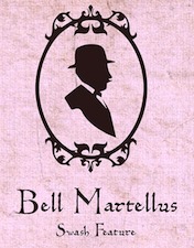 Bill Moran is Artistic Director of Hamilton Wood Type & Printing Museum in Two Rivers, Wisconsin. He also teaches typography and printing history at the University of Minnesota. Together with his brother Jim, Museum director, they are third generation letterpress printers, presiding over the largest collection of printing equipment and wood type in the U.S.
  Designer in Minneapolis, MN. As
  Carla is a graphic designer originally from Costa Rica. She attended the Universidad Iberoamericana in Mexico City, and graduated from the Minneapolis College of Art + Design (2007). She lives in Minneapolis, MN. With Chank Diesel, she is working on a curly bilined script typeface called
  Carolyn Porter is a St. Paul, Minnesota-based graphic designer, type designer, and author.
  [
[ Minneapolis, MN-based designer of the colorful geometric typeface Rudi Display (2015).
  Tim Larson (Christ Trek Fonts) is the Minnesota-based creator of the Open Font License fonts
  [
[
 [
[ A graduate of Detroit Lakes Vocational Technical school, Dave has been making signs since 1983. He designs storefronts, dimensional signage, banners and logos at his Faribault, MN-based sign shop. His typefaces at Letterhead Fonts include Anna Banana (2004),
  [
[
 Illustrator in Minneapolis, MN, who designed a colorful splashing water decorative caps typeface in 2016.
  Minneapolis, MN-based illustrator and travel writer. Creator of the dingbat typeface
  [
[ [
[
 Free (!!!) conference organized by Garrick Van Buren (
 Stephan Peters gives his opinions on fonts for dyslexics (in 2020) based on opinions by dyslexics.
 Born in Wells, Minnesota as Arthur Frederick Ward, 1894, d. New York, 1939. He enlisted in the United States Army in 1915 and attended the Army School of Military Aeronautics at the University of California, Berkeley during 1917-1918. On demobilisation he worked as a book editor for Macmillan&Co before undergoing training on the Monotype machine, after which he worked for the printers Edwin Rudge. He had met Beatrice Becker in 1919 and they married in December 1922. Warde was Printer for Princeton University (1922-1924). The couple moved to England in late 1924 for Warde had been offered work by the typographer Stanley Morison, designing for The Fleuron and the Monotype Recorder. The marriage did not last; they separated in 1926, and quickly divorced, though the break-up was an amicable one. Afterward Warde lived in France and Italy, where he became involved in Giovanni Mardersteig's Officina Bodoni. In 1926 Mardersteig printed The Calligraphic Manual of Ludovico Arrighi - complete Facsimile, with an introduction by Stanley Morison, which Warde issued in Paris while working for the Pleiad Press. He had his name changed several times, first his last name to Warde, and then his first name first to Frederique and then to Frederic. Warde returned to America permanently and he worked again for Edwin Rudge from 1927 to 1932, and also designed for private presses such as Crosby Gaige, the Watch Hill Press, Bowling Green Press, the Limited Editions Club and Heritage Press. Warde worked as production manager for the American office of the Oxford University Press from 1937 until his death in 1939.
 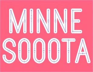 St. Paul, MN-based designer of the layerable typeface family Minnesooota (2018), with thin to heavy layers called Sweater, Light Jacket, and Parka. [
 In 2009,
 Graphic designer at the Art Institute International of Minnesota. Creator of the experimental typefaces Custom Typeface #1 (2011) and
  [
[ Minneapolis-based designer. At
  [
[ As an intern from the Minneapolis College of Art and Design, Josh Eshbach co-designed
  Type designer from Minneapolis, Minnesota, b. 1974. He created the monoline
  Kickstand Apps (Travis Zehren, Stillwater, MN) is an upstart software development company currently focusing on iOS apps. Designer of the
  During her studies, Macy Rajacich (Minneapolis, MN) designed a wonderful all caps color alphabet (2018). [
 Graduate of the University of Minnesota Duluth, class of 2012. Located in St. Paul, MN, she created
  [
[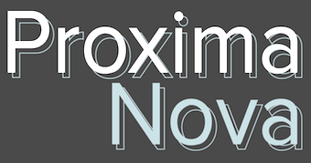 Mark Simonson Studio is located in StPaul, MN. Mark founded Mark Simonson Studio around 2000, and describes himself as a freelance graphic designer and type designer. From
 [
[
 Minneapolis, MN-based designer of a retro poster typeface in 2015. [
 [
[ Student at MNSU in Mankato, MN, who lives in Vernon Hills, IL. He made a text-based
  Duluth, MN-based designer (b. La Crosse, WI, 1977) of
  [
[ American designer (b. 1974) who earned a degree in photography from the University of Minnesota, in graphic design from the Minneapolis College of Art and Design (MFA) and in type design from the
  Ekhornforrss Limited / Non-Format is an Anglo-Scandinavian creative direction and design team. Creative directors and founding partners Kjell Ekhorn (from Norway) and Jon Forss (from the UK) started the company in 2000. In their own words: They work on a range of projects including art direction, design and illustration for arts&culture, music industry and fashion and advertising clients. They also art direct Varoom: the journal of illustration and made images. Nominated for Best Design Team in Music Week's Creative and Design Awards 2001. Non-Format is based in London, UK and Minneapolis, USA. In 2006, Kjell Ekhorn and Jon Forss designed a
 Ping Ji (Minneapolis, MN) created the typeface Xing (2014), which tries to blend Latin and Chinese. [
 Located in Minneapolis and/or Golden Valley, MN, Process Type Foundry is
  Oberlin, OH-based foundry of
  Timothée Génot (aka Red Kitten) is a Belgian freelance graphic designer who graduated from ENSAV La Cambre, Brussels, 2002. He then moved to Minneapolis, MN, where he still works.
  Riley Farrell is a graphic designer. He received his BFA in Graphic Design at the Minneapolis College of Art&Design.
  [
[ [
[ Sierra Kamatchus is a Minnesota-based designer and alumna of University of Minnesota Duluth. In 2014, she co-designed the vintage silent film typeface
  [
[ [
[ [
[ Minneapolis, MN-based illustrator and lettering artist. Designer who sells her script fonts through
 Born in Minneapolis, MN, in 1967,
  [
[ Designer (b. 1972) who lives in Le Sueur, Minnesota. Creator of
  Minneapolis, MN-based illustrator. Designer of
  Travis Stearns (was:
  TDN (Type du Nord) is a San Francisco (was: Minneapolis)-based foundry that produces funky fonts for designers who like to keep it friggity fresh. Typefaces designed by Libbie Bischoff, who finished the
  Tim Drabandt (Type Machine, located in Minneapolis, MN) is the designer of Eighthourday (2009, a commissioned sans face), Airborne (2009, octagonal typeface based on WWII airplane lettering),
 Commercial typefaces at this site: 6x7OCT (I think, it's hard to read: anyway, it's a dot matrix font made in 1997), Blackgold (2000, pixel), Blessed (2001, pixel), Formation (1999, octagonal font), Macil (1999, octagonal), Pakt (1999), Reversion (1999, pixel), Trisect (1998, tri-line font), Ultramagnetic2 (1996), Unfinished (2001, pixel), Unisect (1998). One of the subdivisions is YouWorkForThem. Offices in Baltimore, MD, and Minneapolis, MN. The fonts are all (I think) by Mike Cina. [
 Michael Cina (Minneapolis) is the cofounder of WeWorkForThem and
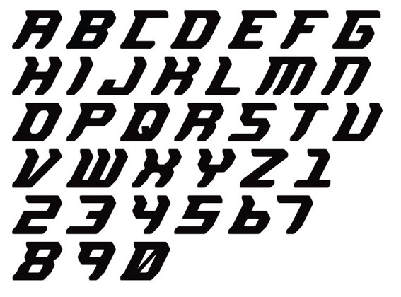
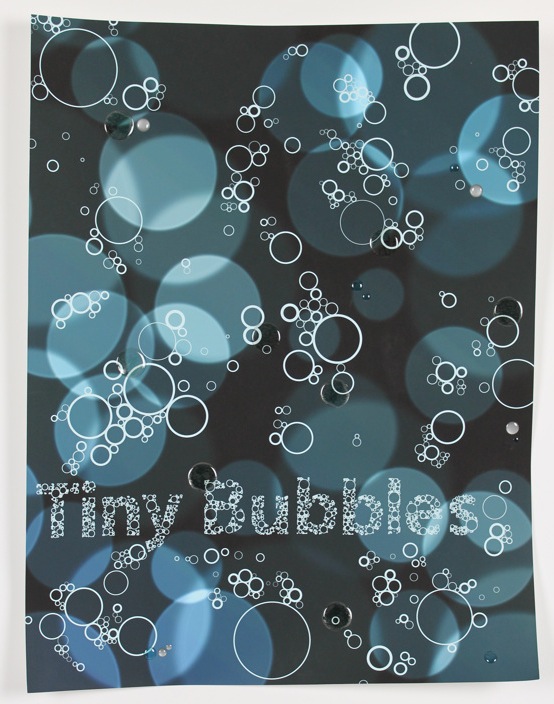
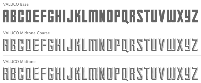
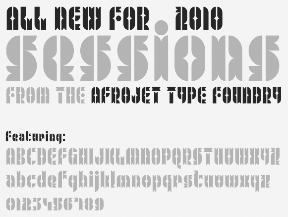
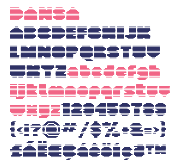
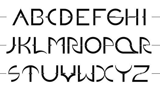
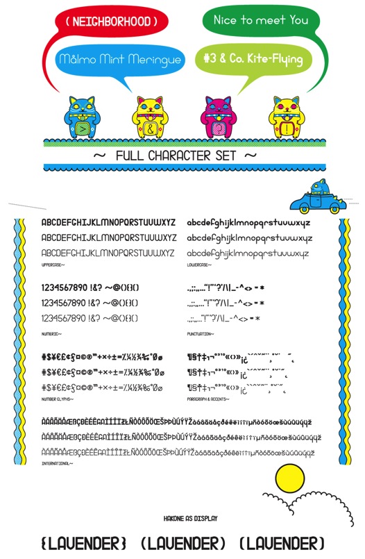
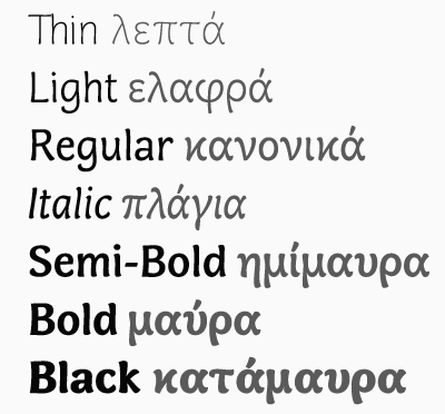
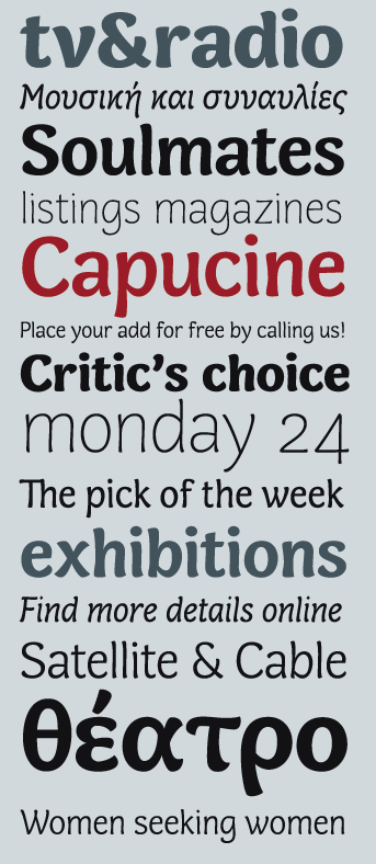
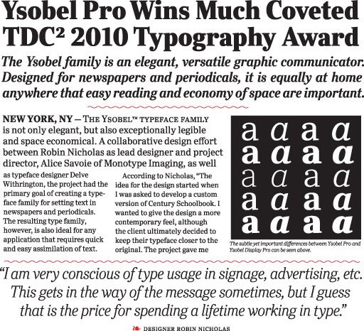
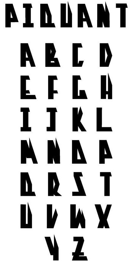
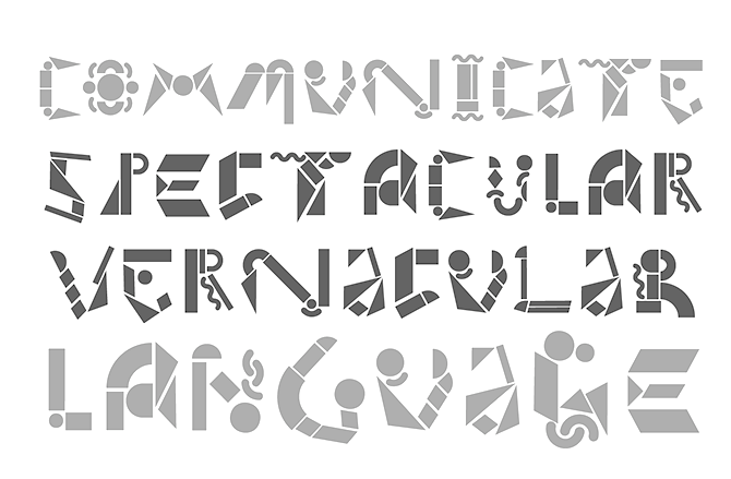
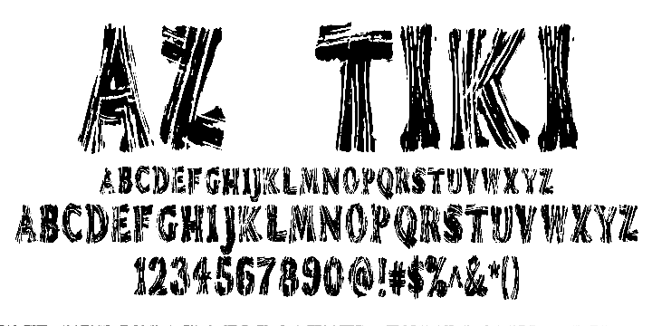
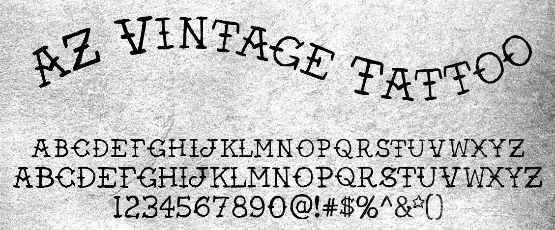
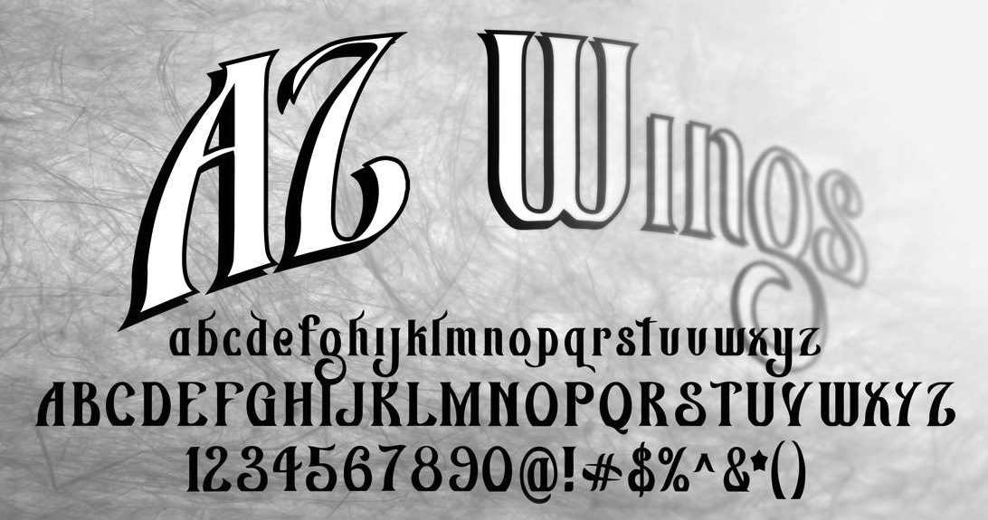
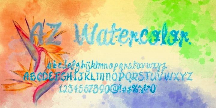
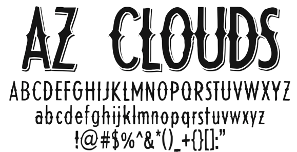
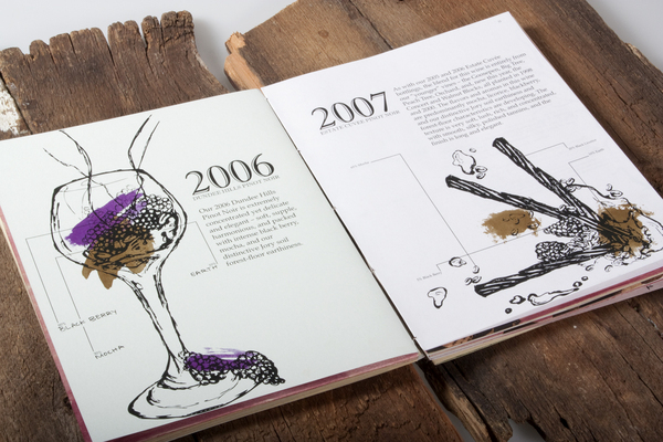
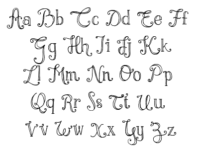
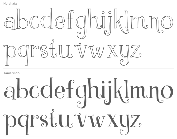
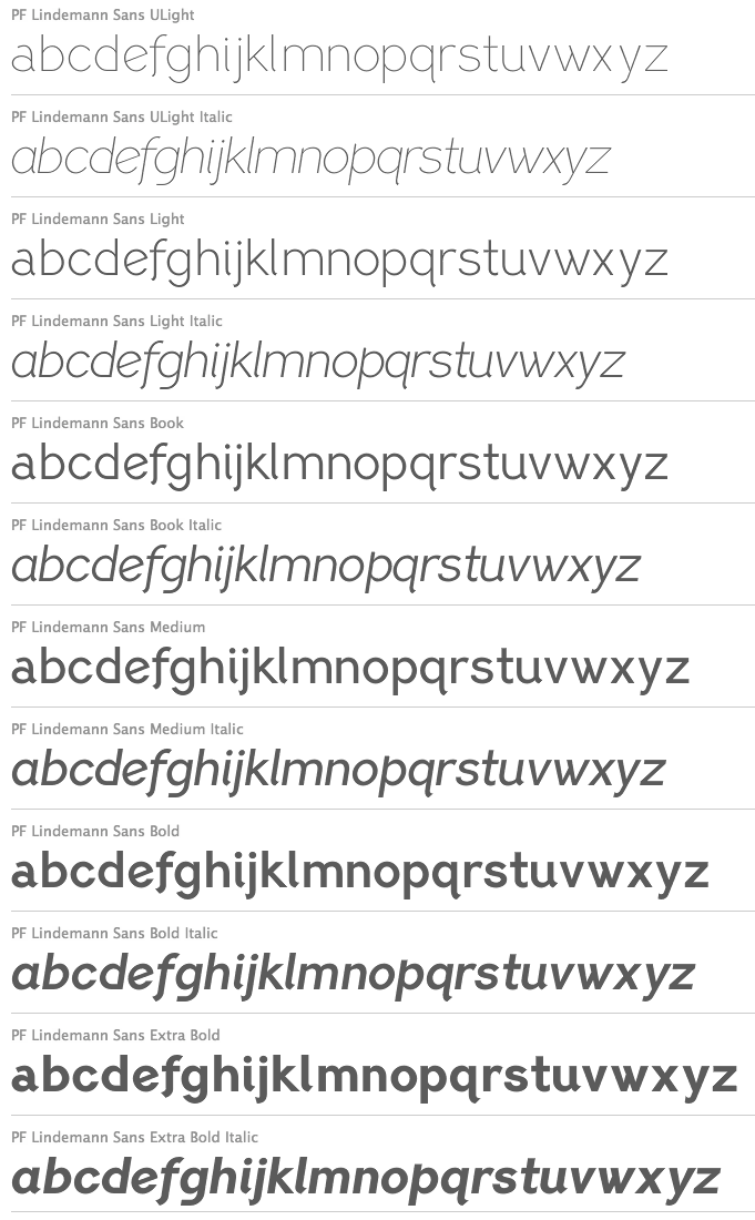
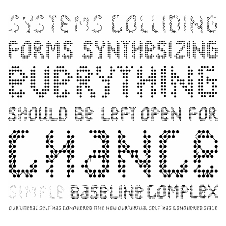
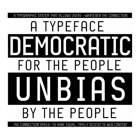
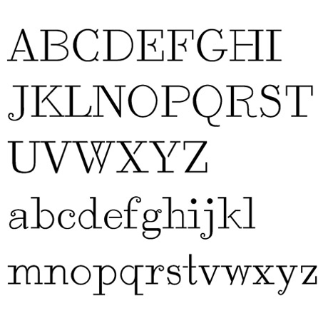
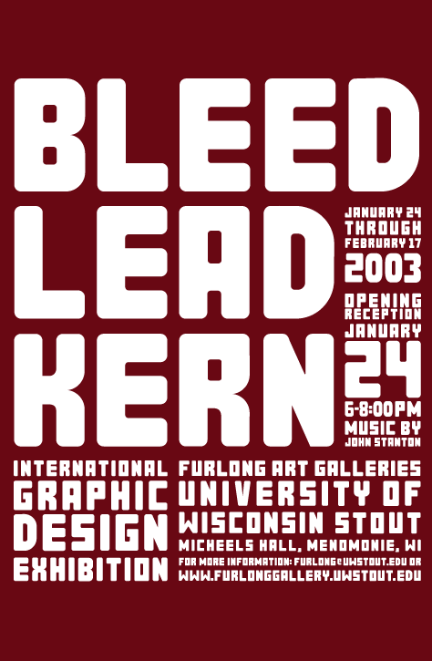
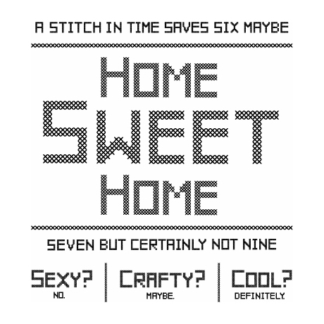
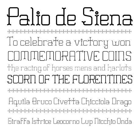
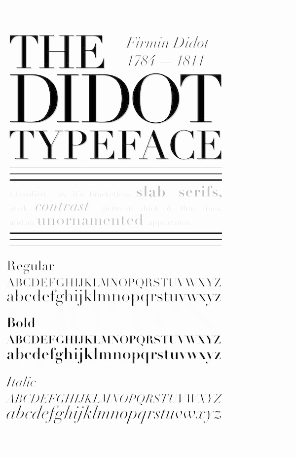
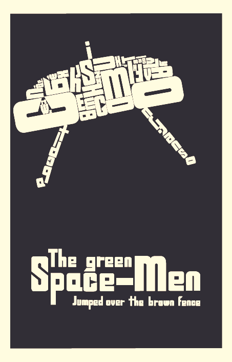
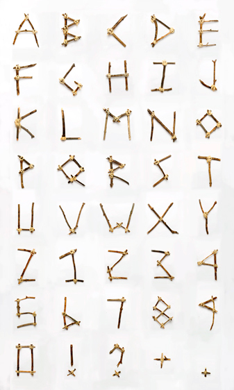
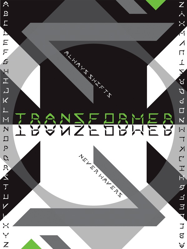
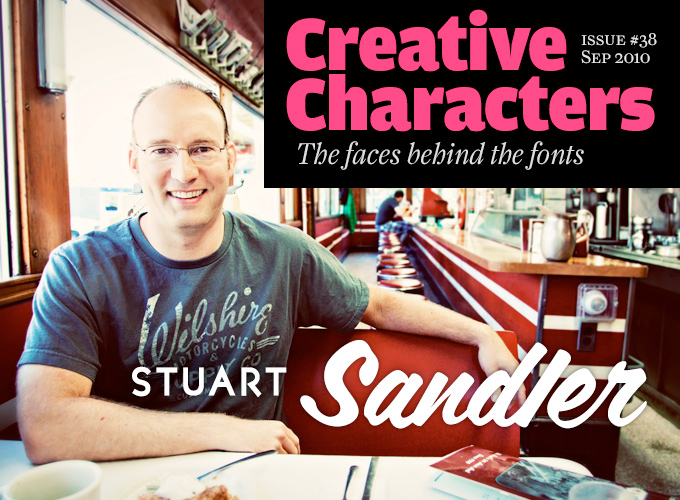
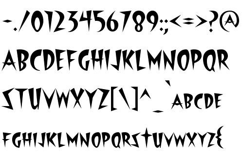
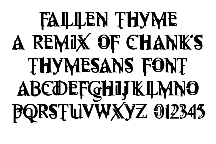
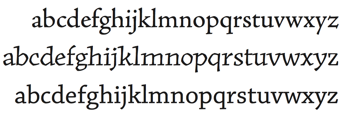
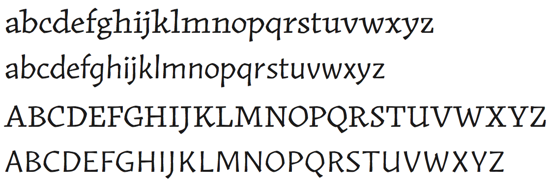
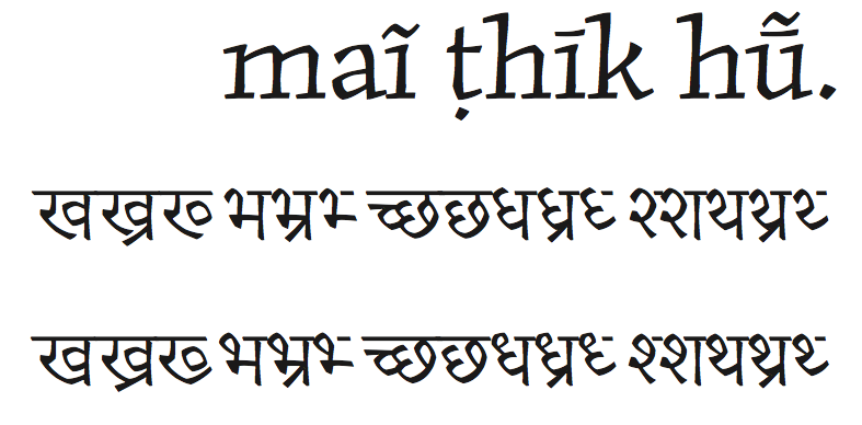
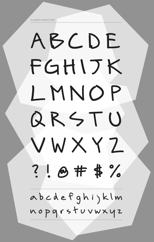
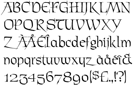
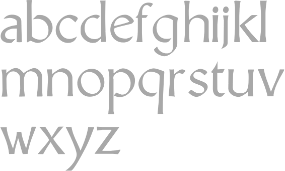
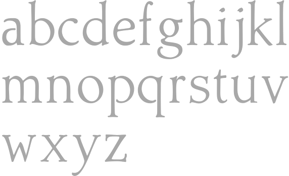
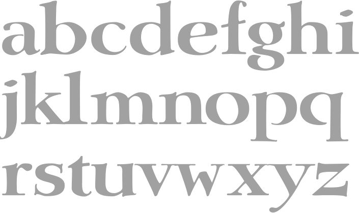
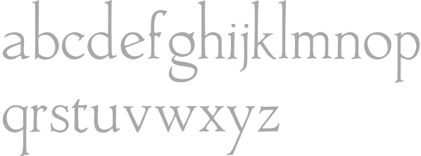
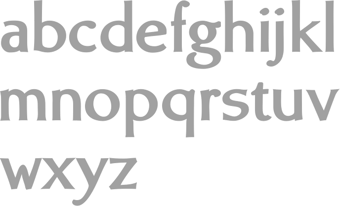
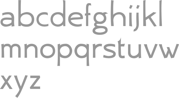
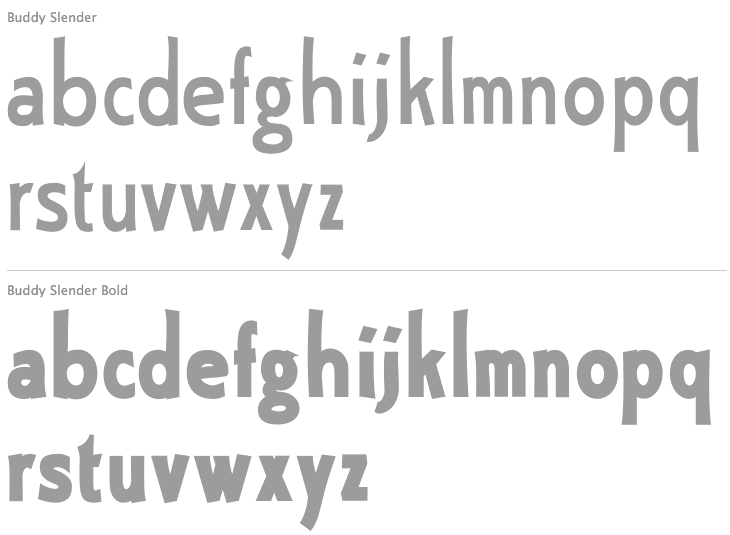
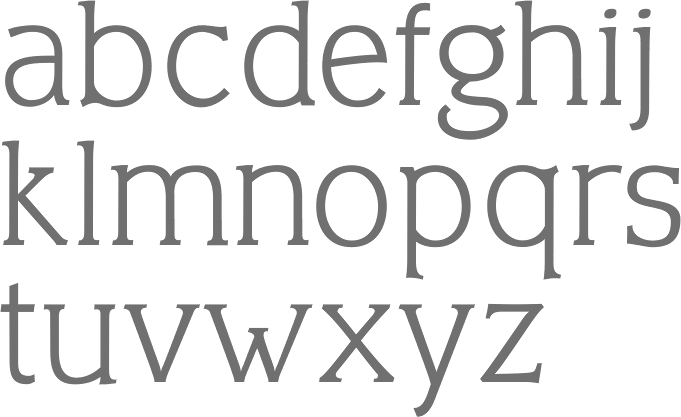
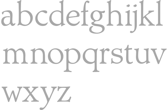
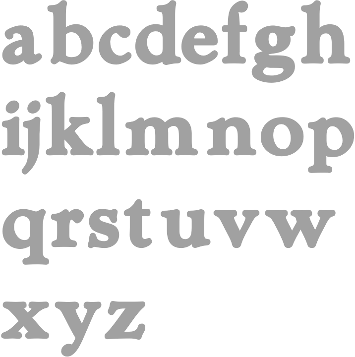
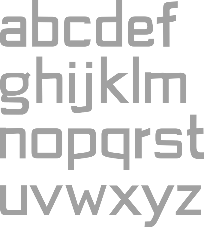
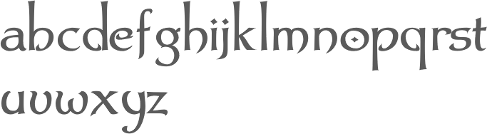
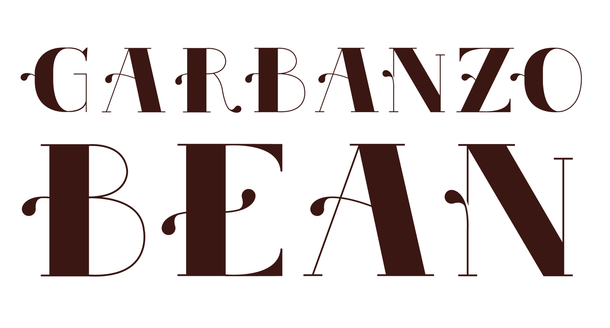
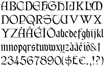
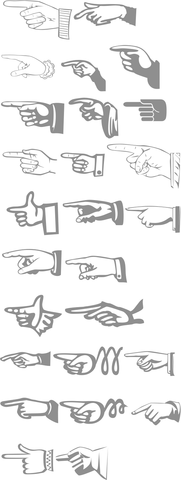
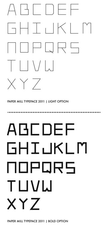
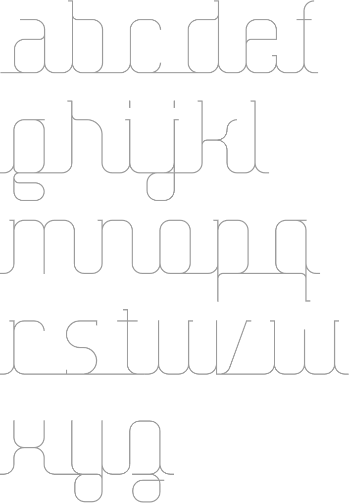
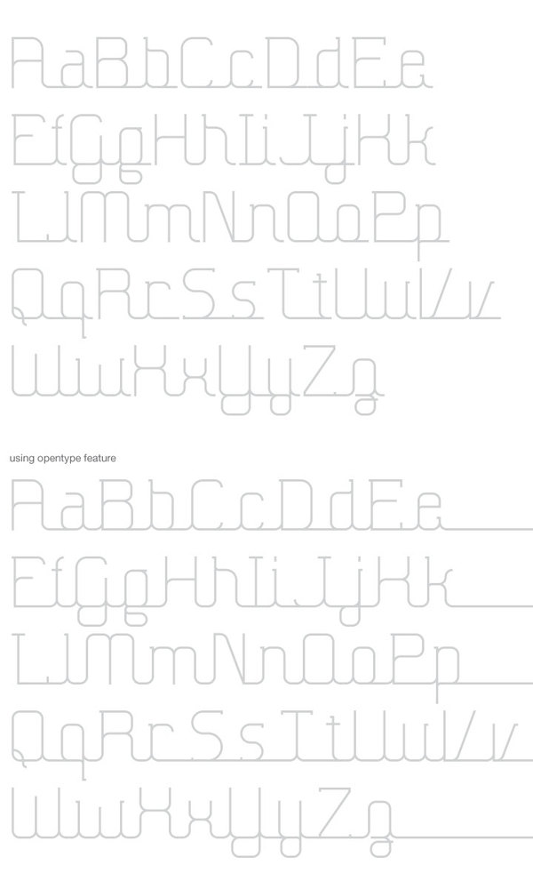
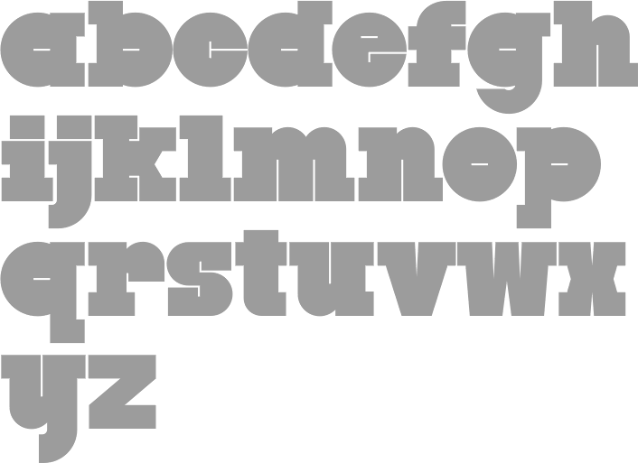
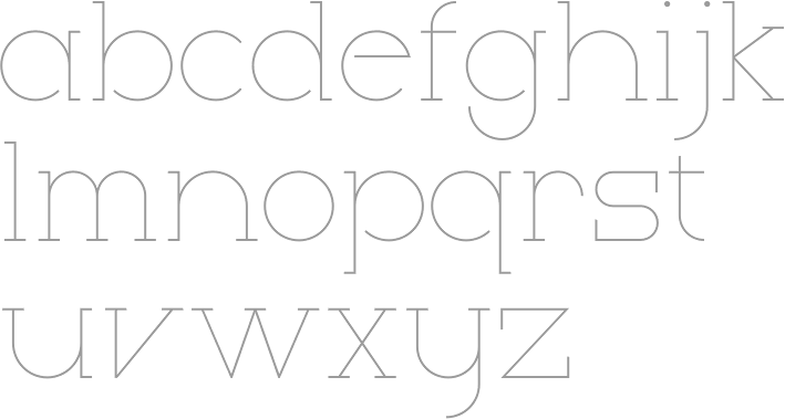
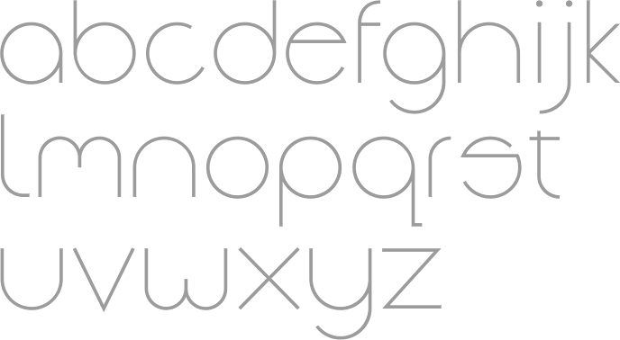
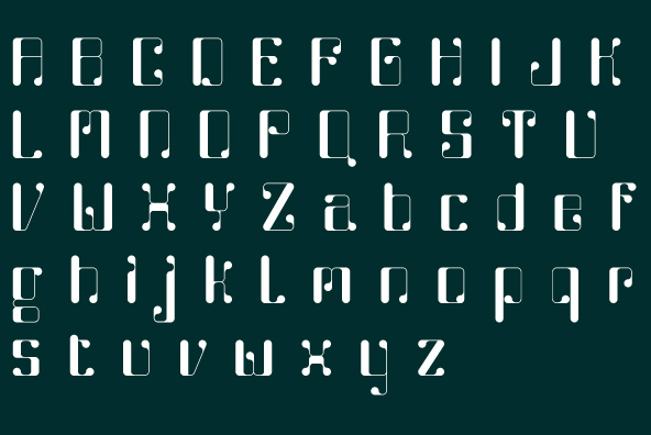
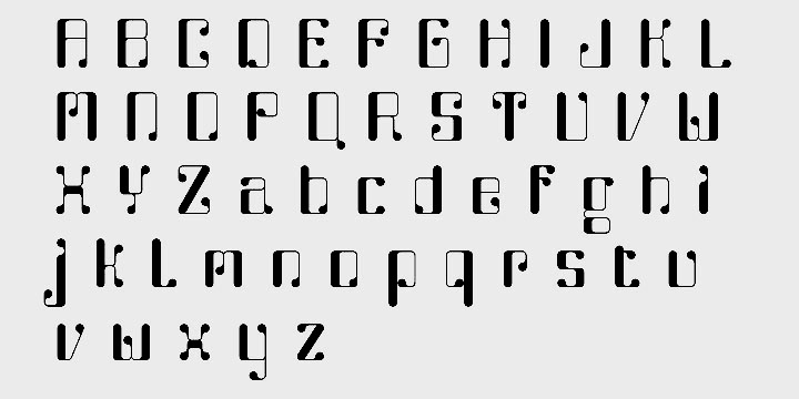
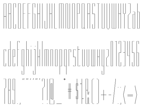
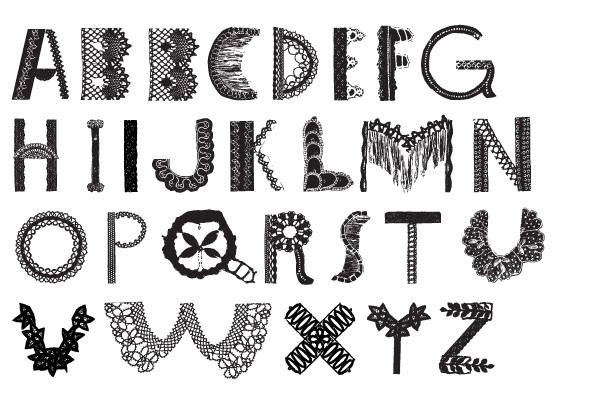
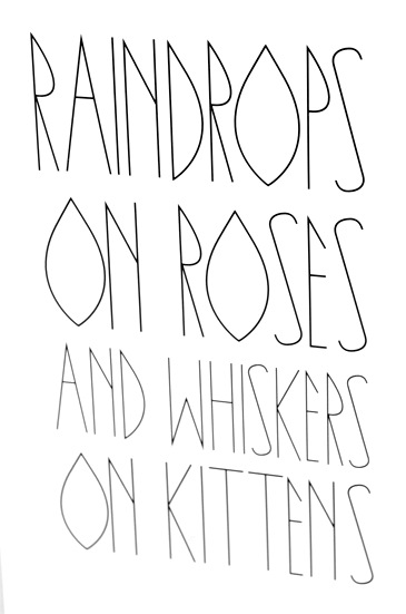
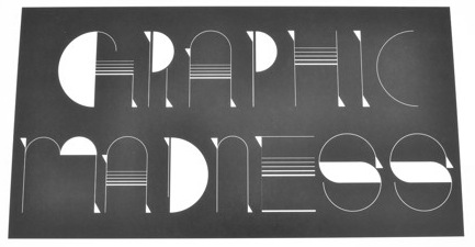
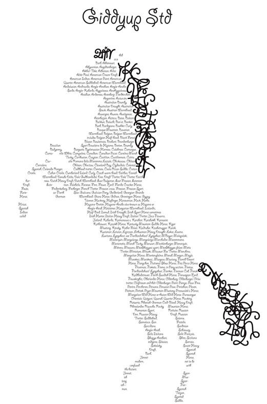
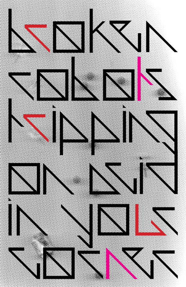
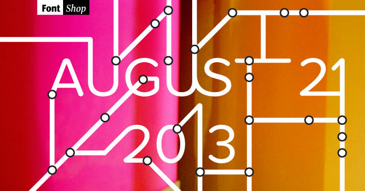
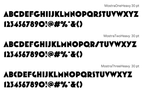
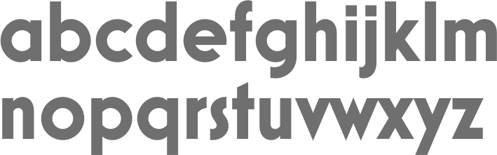
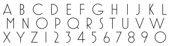
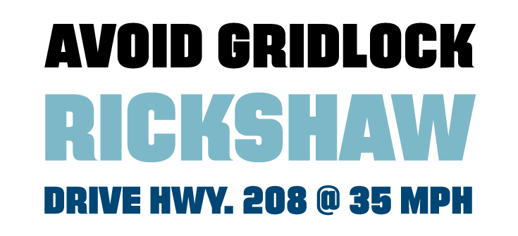
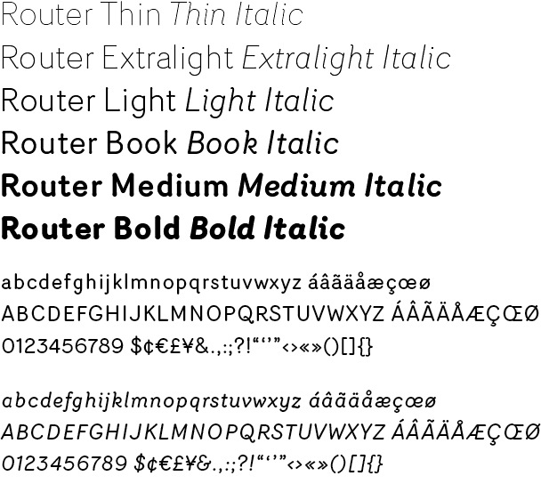
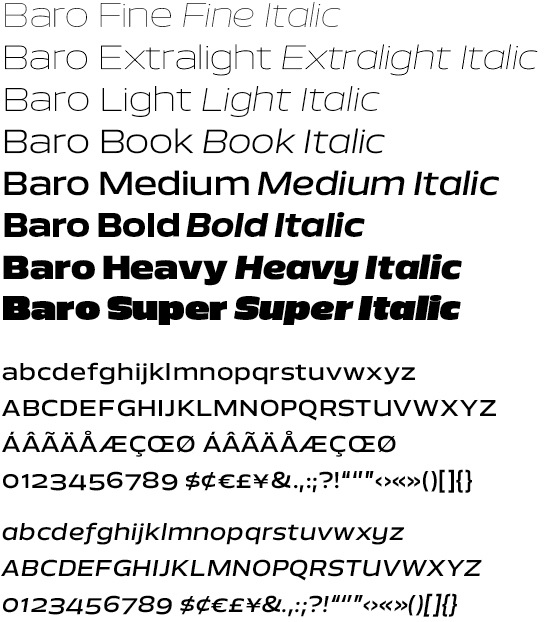
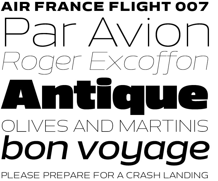
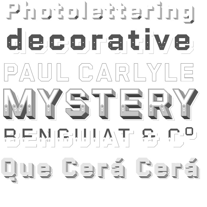
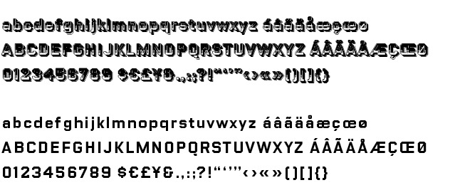
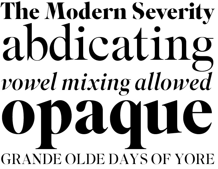
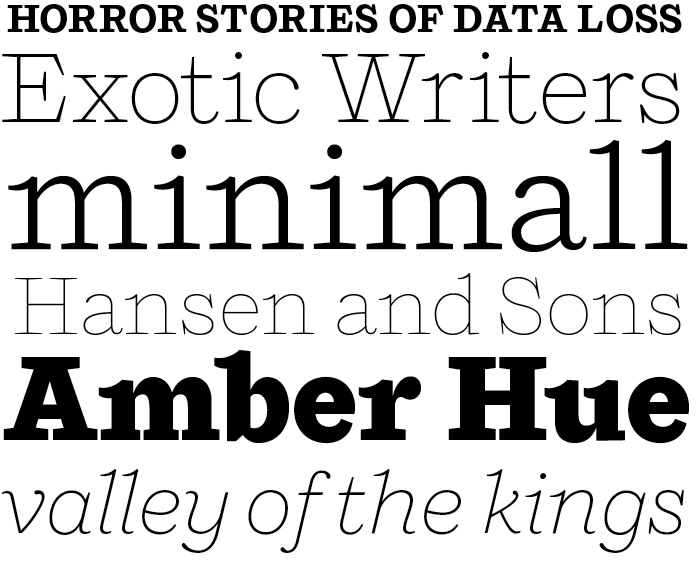
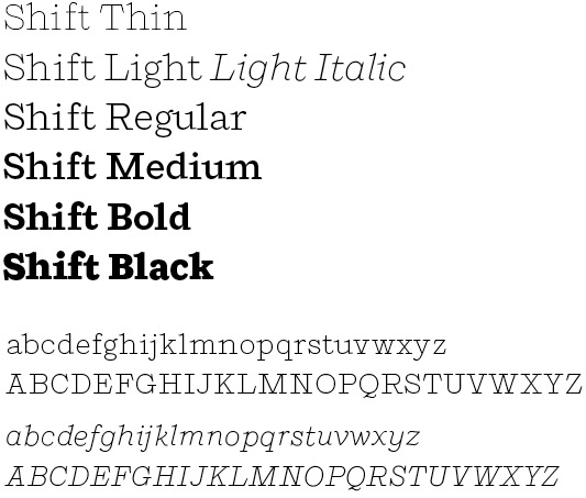
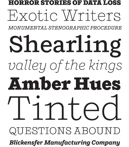
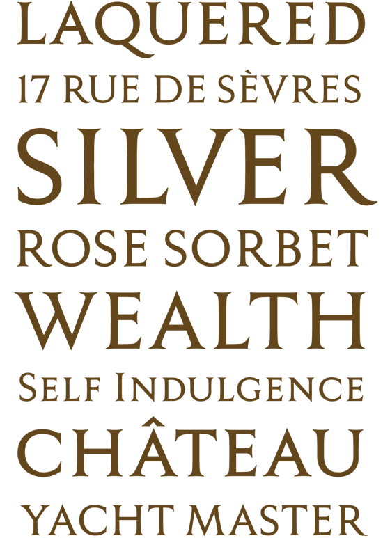
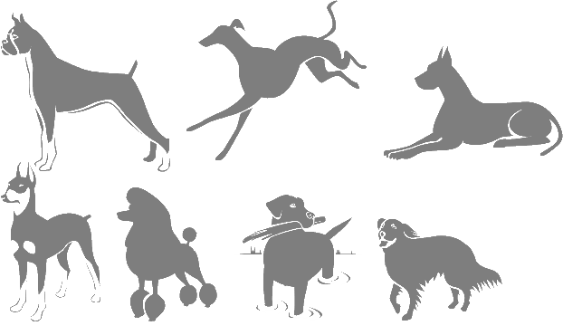
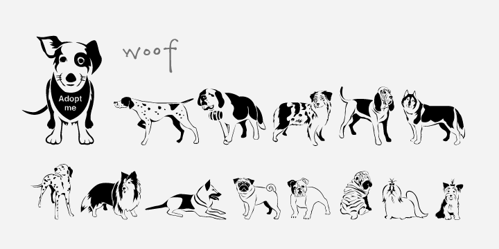
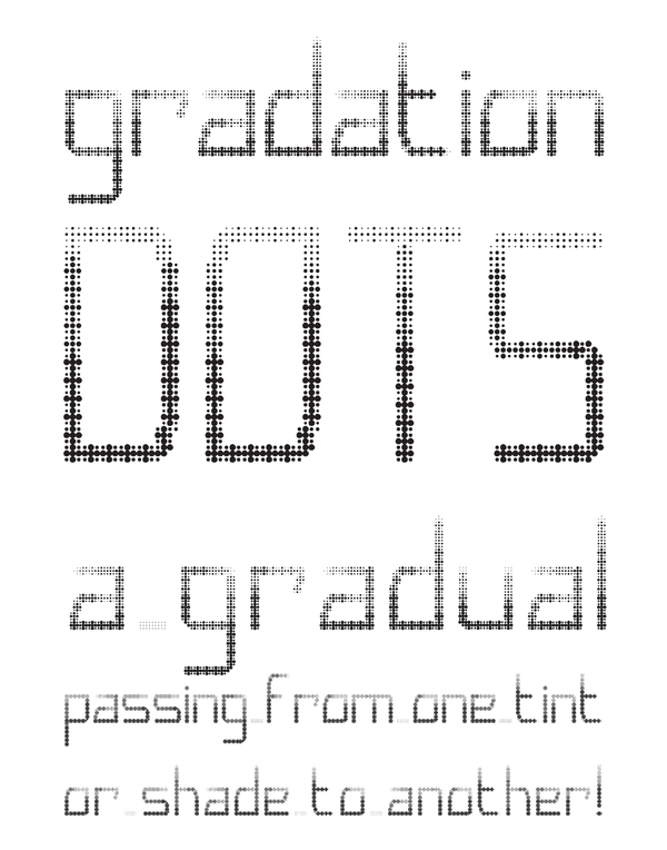
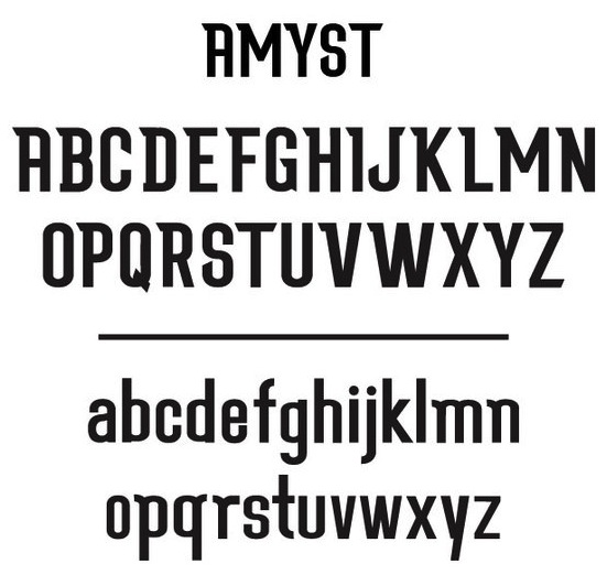
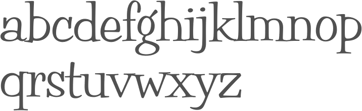
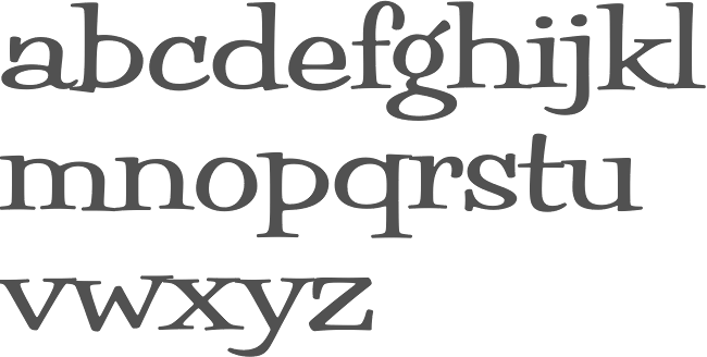
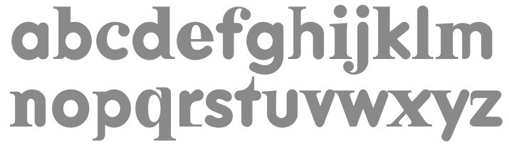
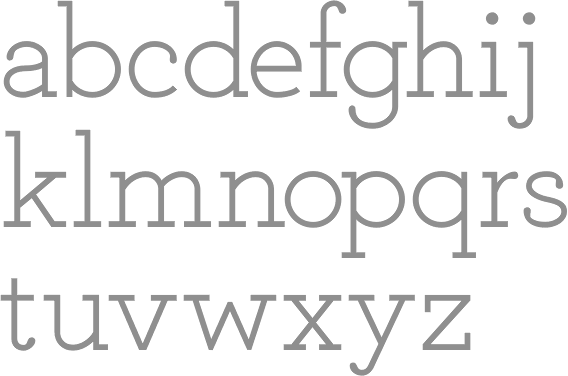
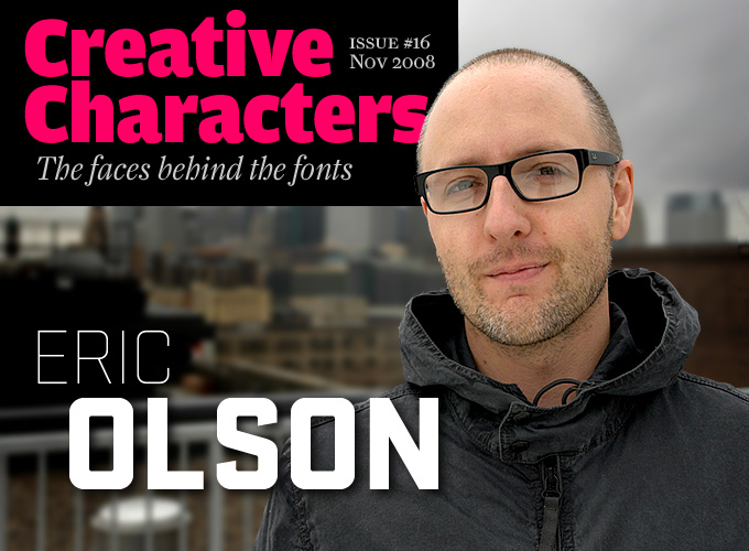
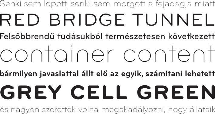
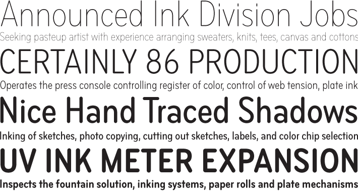
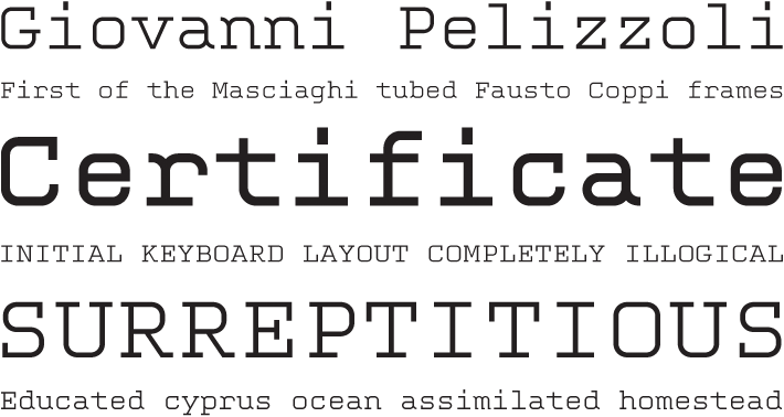
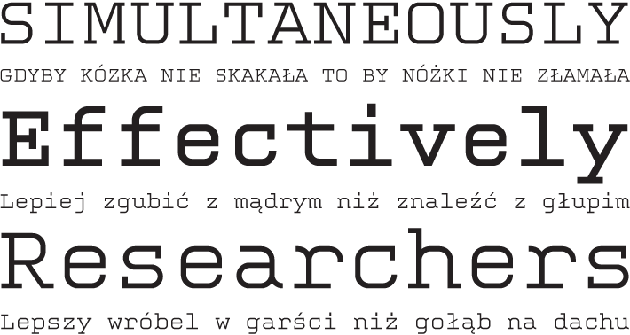
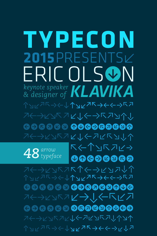
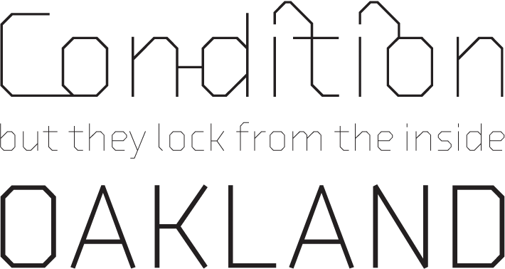
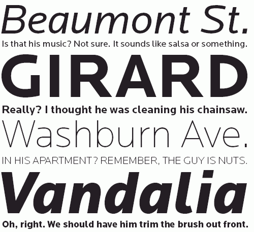
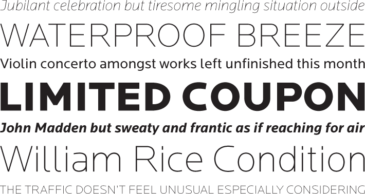
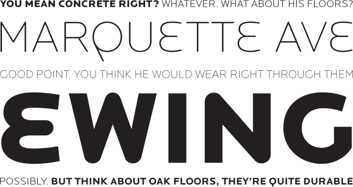
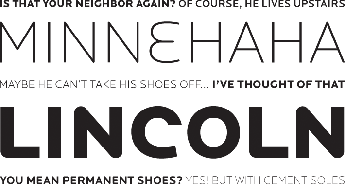
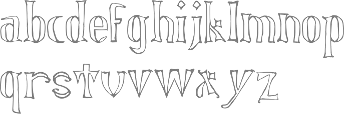
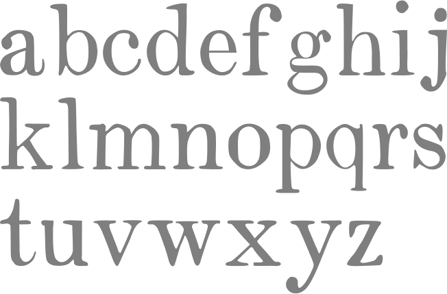
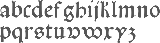
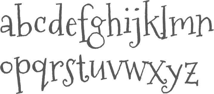
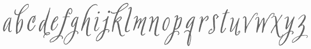
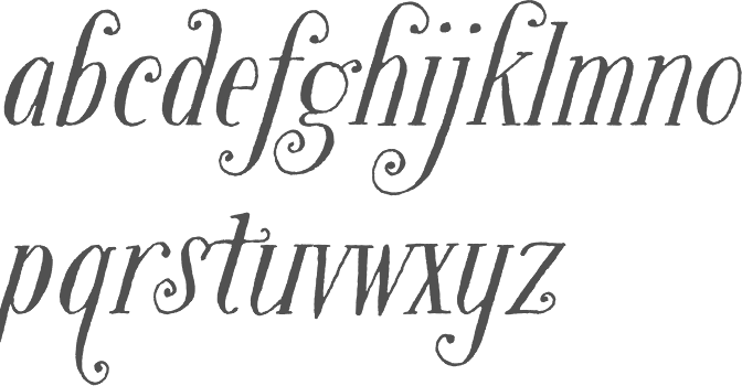
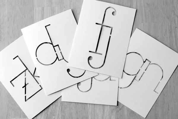
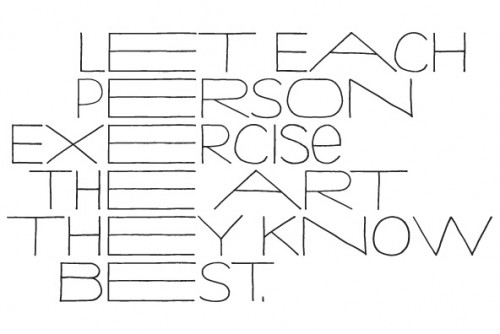
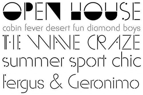
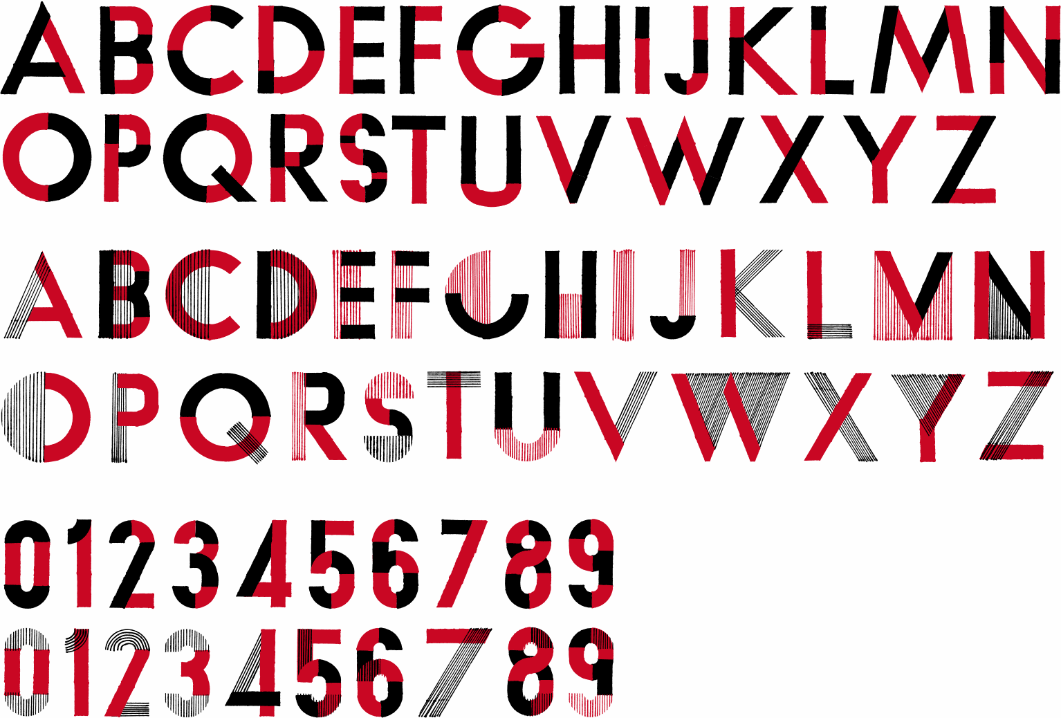
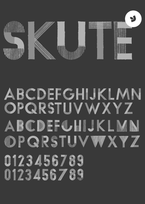
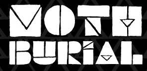
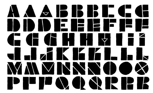
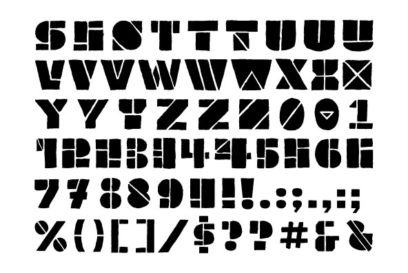
|
|
|
|