| | |
Ameet Tavernier
|
 Ameet (or Aimé) Tavernier (b. Bailleul, French Flanders, between 1522 and 1526, d. 1570) was a Belgian punchcutter and typefounder. He made a type which we shall call the Tavernier Civilité. Some claim it was made independently of Robert Granjon's Civilité (1556). However, Dr. Maurits Sabbe and Marius Audin in their wonderful 17-page treatise, Les caractères de civilité de Robert Granjon et les imprimeurs flamands (1921) (see also Die Civilité Schriften (1929), the German translation published by Herbert Reichner, Vienna), doubt that claim. They note that surely, Tavernier must have seen Plantin's Civilité. Besides, Tavernier's Civilité is first seen only in 1559 in La civilité puerile distribuée par petitz chapitres et sommaires ... traduictz par Jehan Louveau en Anvers chez Jehan Bellere (Imprimerie Aimé Tavernier). Considering that Sabbe was director of the Plantin Museum in Antwerp, and Audin a well-known type historian from Lyon, it is likely that they were right in their conclusion that Tavernier had indeed seen the Plantin version. Tavernier became well-known and started making type for export to neighboring countries. Unfortunately, he died very young in 1570. Plantin said in 1574 that after the death of Tavernier and François Guyot, his land had no outstanding typefounder left, but that there were some in Germany, but that he would not recommend the Germans because they were "irrgläubig". He said of Tavernier that he was the last good typefounder of the sixteenth century.
 Regarding revivals, we refer to George Tulloch's text typeface Cunaeus (2018) who explains: Cunaeus is intended primarily for use in running text. It brings together the types of two renowned sixteenth-century punchcutters: the roman is an interpretation of a pica font cut [in 1551] by Ameet Tavernier, and the italic that of a pica font [from 1565] of Robert Granjon (1513-1589/90). Granjon's italics have inspired a number of revivals in the past, but usually of his more slanted styles; the present digitization features the lesser slant of his so-called droit style typical of the mid 1560s. [Google]
[More] ⦿
|
Andreas Höfeld
[Fontgrube AH]
|
 [More] ⦿
|
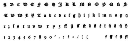
Civilité, a French cursive
|
A brief explanation and discussion of Civilité, the script typeface made by Robert Granjon in 1556 as a typical "French cursive". It was imitated and extended by Aimé Tavernier (1559), Hendrik van den Keere (1575), Richard Breton (1597), Philippe Danfrie (1597), Jean de Tournes (1598), Fleury Bourriquant (early 17th century: his type was called Civilité honneste), Pierre-Simon Fournier (1766), Matthias Rosart (1777, the Gros Romain Civilité), and Morris Fuller Benton (1922). Many have since created their own versions. We cite a few of the contemporary type designers: Klaus Burkhardt, Manfred Klein, Stephen Moye (CiviRegular), Ingo Zimmermann (almost a copy of Moye's version), Richard Beatty, Hans J. Zinken (civi4, 1996), Hermann Zapf (1984: Zapf Civilité), George Thomas (CivilitéMJ), and Tim Ryan (CivilitéTR). [Google]
[More] ⦿
|
Civilité: Comments by Mac McGrew
|
Mac McGrew on the ATF Civilité: Civilite in its modern adaptation was designed by Morris Benton in 1922 and cut by ATF in 1923-24. The original version was cut by Robert Granjon in 1557 to imitate the semi-formal writing then in vogue, and is believed to be the first cursive design cut in type. It became popular for the printing of poetry and for books of instruction for children, where the type itself could serve as a perfect model of handwriting. The first of these books was titled La Civilite puerile, printed at Antwerp in 1559. The books were so popular that the design came to be known as "civility" type. Other interpretations of the letter have been made, including Cursive Script, cut in the nineteenth century in 18-point only from French sources by ATF predecessors and by Hansen, but Benton's seems more attractive and legible to modern eyes. The French pronunciation of ci-vil'i-tay is indicated by the accented e, which was used only in ATF's earliest showings. The many alternate characters were included in fonts as originally sold; later they were sold separately and finally discontinued, although the basic font was still listed in recent ATF literature. Also see ZapfCivilite. Compare Freehand, Motto, Verona. [Google]
[More] ⦿
|
Civilité: Comments by Mac McGrew
|
Mac McGrew on the Zapf Civilité: Zapf Civilite is perhaps the latest typeface to be cut as metal type, having been announced in January 1985, although the designer, Hermann Zapf, had made sketches for such a typeface as early as 1940, with further sketches in 1971. But matrices were not cut until 1983 and 1984. The cutting was done by Paul Hayden Duensing in Kalamazoo, Michigan. The first Civilite typeface was cut by Robert Granjon in 1557, based on a popular French handwriting style of the time. Other interpretations have been made from time to time, notably the Civilite (q.v.) designed by Morris Benton in 1922 for ATF. The new Zapf design has the same general character but with a more informal and contemporary feeling. A smooth flow between weights of strokes replaces the stark contrast of thick-and-thin in older interpretations. There are several ligatures, and alternate versions of a number of characters, including several terminals. Only the 24-point Didot size is cut or planned. [Google]
[More] ⦿
|
Claude Lamesle
|
 Parisian printer, whose 1742 book Épreuves générales des caractères qui se trouvent chez Lamesle is at the Rochester Institute of Technology. A facsimile was published by A.F. Johnston in 1965 at Menno Hertzberger&Co, Holland: The Type specimens of Claude Lamesle, a facsimile of the 1st edition printed at Paris in 1742. Free Google Books download.
 Among many other types, Lamesle's 1742 text book shows a Civilité. Revivals: [Google]
[More] ⦿
|
Colin Kahn

|
 Type designer from Buffalo, NY. His typefaces were mostly developed at P22. Klingspor link. A partial list of his fonts:
 - In 2008, he revived and extended Cigno, a 1950s script typeface by Aldo Novarese, and called it P22 Cigno.
- LTC Circled Caps.
- P22 Civilité is a joint effort of Colin Kahn, Richard Kegler and Milo Kowalski.
- P22 Curwen. P22 Curwen Poster is a digitized version of a rare wood type used by the Curwen Press in England in the early 20th Century for poster work. P22 Curwen Maxima is a new hyper-stylized re-interpretation of Curwen Poster.
- The great display/comic book font Ebin (and Ebin Outline).
- In 2006, he created the P22 Gauguin font family (Regular, Alternate, Brush and Extras), a script font set based on the writings and sketches of post-impressionist artist Paul Gauguin.
- Glamour (2006, P22/Lanston; also called LTC Glamour Grotesque) is based on the 1948 design by the same name done at Lanston Monotype, which in turn is based on Imre Reiner's Corvinus.
- P22 Goudy Aries (2004, P22, by Richard Kegler and Colin Kahn). This typeface revives Goudy's aries from 1926.
- Goudy Sans (2006, P22/Lanston, 6 styles): Goudy Sans Bold was originally designed by Frederic Goudy in 1922 as a less formal gothic and finished in 1929. The Light was designed in 1930 and the Light Italic in 1931. Colin Kahn digitized them in 2006 to make a 6-style Goudy Sans family, which includes a Goudy Sans Hairline.
- In 2008, he revisited Richard Kegler's P22 Platten, which was based on lettering found in German fountain pen practice books from the 1920s, and created the extended typeface P22 Platten Neu.
- Internship (2003), or St G Schrift. P22 swrites: St. G Schrift (2005, P22) is a font based on the type designs of German poet Stefan George. This sans-serif typeface features a few variations found in books published by George in Berlin. Includes P22 St. G Schrift One, P22 St. G Schrift Two and P22 St. G Italic (an art nouveau version of the roman, newly designed). The original font was cast in 1907 by a small foundry in Germany and was used primarily for the works of George as well as other books including a monumental edition of Dante's Divine Comedy. This may or may not contradict the fact that Marcus Behmer designed Stefan George-Schrift in 1904.
- P22 Tuscan Expanded is a digitization of the mid-19th century wood type font Antique Tuscan Expanded - Wells&Webb 1854.
- P22 Vale (2007, in Roman and Kings Fount styles) are based on types by Charles Ricketts that were used by the Vale Press (which in turn were based on Jenson). The Kings Fount is originally dated 1903.
- In 2007 still, he revived Zebra (P22), a font originally designed in 1963-1965 by Karlgeorg Hoefer.
View Colin Kahn's typefaces. [Google]
[MyFonts]
[More] ⦿
|
Dr. Maurits Sabbe
|
Curator of the Plantin-Moretus Museum in the early part of the 20th century, and author of Antwerpsche Druckerye (Brussel, N. V. Standaard-Boekhandel, and Amsterdam, P. N. Van Kampen en Zoon, and Antwerpen, J. E. Buschmann, s. a.), a 153-page book on foundries and printers in Antwerp. Coauthor with Marius Audin of Die Civilité-Schriften des Robert Granjon in Lyon und die flämischen Drucker des 16 / Jahrhunderts (Wien, Bibliotheca Typographica, Herbert Reichner, 1929). That last book is a German version of Les caractères de civilité de Robert Granjon et les imprimeurs flamands (1921). Some of the findings in that beautiful book are reported here. [Google]
[More] ⦿
|
Enschedé: Civilité
|
 Excerpts of the book Enschedé. Spécimen des Lettres françoises dites Caractères de Civilité des XVIme et XVIIme Siècles dans la Collection Typographique de Joh. Enschedé en Zonen (1926, Haarlem: Joh. Enschedé en Zonen). This collection contains six different Civilité fonts, five from the 16th century (numbered 8, 9, 11, 12 and 14) and one chiefly from the seventeenth century (No. 30). The first maker and user of Civilité was Robert Granjon of Lyon, France, in Dialogue de la vie et de la mort (1557, Lyon), where he calls it his lettre françoyse. Plantin purchased some of Granjon's letters, and Granjon engraved even more more new letteres d'escriture in Antwerp for Plantin. Many imitations were made in Antwerp and Ghent, both in present day Belgium. Notes on the six Civilité types in the Enschedé collection:
 - No. 8 and No.9: Almost identical fonts engraved by Franco-Flemish engraver Ameet Tavernier (b. Belle, ca. 1526) who worked as a typefounder and printer in Antwerp.
- No. 11: The author guesses that it is either Granjon's la petite françoise (ca. 1566) or Pierre Hautin's (aka Hamon) work. Pierre Hautin also sold lettres façon d'écriture to Plantin. The cursive françoise in the Manuel Typographique of Fournier le Jeune possesses many points of resemblance with No. 11.
- No. 12: The author credits this either to Granjon (ca. 1566) or to Henric vanden Keere of Ghent (aka Henri de la Tour). It is found together with Initials No. 10. The author thinks that vanden Keere is probably right since Jan van Hout, the secretary of the town printer of Leyden, seems to have purchased the same letter (i.e., No.12) from vanden Keere.
- No. 14: By vanden Keere, ca. 1575. A copy of the original specimen is still in the Plantin Moretus Museum.
- No. 30: The model for No. 30 was used before 1600 by Plantin in Antwerp and Jan van Hout in Leyden. It is possibly due to vanden Keere. It became popular in The Netherlands in the 17th century.
- Initials No. 13: Engraver unknown. Frequently used by Plantin and made in the 16th century.
[Google]
[More] ⦿
|
Flat-It
[Ryoichi Tsunekawa]
|
 Japanese foundry in Nagoya that offers free and commercial Latin fonts made by Ryoichi Tsunekawa, who also runs Bagel & Co, Dharma Type, HolidayType and Prop-A-Ganda. Most of his work was done at Flat-It. His typefaces:
 - 2021: Best Choice (a monospaced sans), Short Films (an art deco sans in twelve styles), Golden Decades (a 16-style sans that borrows from several sans genres).
- 2019: Mid Century Sans, Tamba Sans, Rama Gothic Rounded, Bio Sans Soft.
- 2018: Fairweather (clean sans), Kaneda Gothic (a basic severe condensed gothic), Vincente (a tall condensed display didone family).
- 2017: Calling Code (monospaced programming font), Commuters Sans (elegant wide sans), Mighty Slab, Rigid Square (octagonal), Taro.
- 2016: Bio Sans, Gomme Sans, Quiet Sans, Siro (sans).
- 2014: Pero (condensed rounded organic sans), Kiro (minimalist organic sans), Graphie (modern geometric sans), Compasse (semi-condensed sans), Como (rounded sans).
- 2013: Spoon (organic, rounded, monoline sans family), Antoinette Monogrammes (based on early 1900s embroideries by Janon Co; with frames), Clonoid (a sci-fi family that pays tribute to arcade game logos in 80s and 90s), All Round Gothic Demi (a sans based on perfect circles), Griffon (copperplate titling face), Antique Spenserian (based on Spencerian Script by Mackellar, Smiths and Jordan).
- 2012: Geom Graphic (a retro sci-fi family that can be considered as a squarish version of Eurostile), Sheepman (modular), House of Cards, Space Colony (a lovely monoline futuristic techno family), Rama Slab (an antiqued wood-style slab serif), Rama Gothic. An antiqued sans serif family that recalls the wood type era), Diamond Ring (an art deco typeface inspired by Japanese cosmetics-packaging designs and posters from the late 19th and early 20th centuries), Controller (techno meets organic in this rounded squaris sans family), Revolution Gothic (an extended version of PAG Revolucion), 2008, which was inspired by retro propaganda posters and wallpainting in Cuba from the 60s to 80s; Revolution Gothic P followed in 2014), Diamond Ring (art deco).
- 2011: Yummo (monoline organic sans), Sheepman (based on the wood type No. 506 of William Page), Onick (2011, an art deco neojaponist fat display face done for Wordshape), Shiva (2011, hairline sans), Mocha Mattari (2011, grunge), Dharma Slab (2011, inspired by 1800s-style wood type), Dharma Gothic (2011, +P), Rama Gothic (2011, also inspired by 1800s-style wood type), Dimensions (2011, squarish), Design System (2011, a large family based on 70s style techno typefaces), Speedometer (2011, condensed piano key face).
- 2010: Stereo Gothic (2010: an extended all caps slightly techno sans family), Behrensmeyer Vigesimals (2010, a pixel format connected script), Civilite Vigesimals (2010, pixelized Civilite), Flat10 Arts and Crafts (2010), Flat20 Hippies, Flat10 Segments (2010), Flat10 Antique (2010), Flat20 Gothic (2010), Flat20 Streamer (2009, pixelized ribbon font), Flat10 Fraktur, Flat10 holy, Flat10 Holly, Flat10 Stencil, Flat20 Headline, Flat10 Artdeco, Word From Radio (2008-2010). Cigarette (2007, Bauhaus/Peignot-style).
- 2009: African Elephant Trunk (2009), Concrete Script, Concrete Stencil (2009, a stencil calligraphic script), Perfect Magic (2009), HT Maison (2009, signage face), HT Farmacia (2009, connected school script), HT Espresso (2008, upright script), HT Cartoleria (2008, connected script), HT Cafe (2009), Sneaker Script (2009).
- 2007-2008: Bistro Mono (2007, an awkward monoline face), Thousands (2007), Balaghat (2008), Garash Script (2008, a Halloween face), Woodstamp (2008), Banana (2008, brush script), Rebel Train Goes (2007, a piano key font), Rouge (2007, an elegant lipstick-on-the-bathroom-mirror pair of typefaces), Yasashii (2007, a great geometric art deco Broadway-style family, famous for being used in Damien Chazelle's La La Land, the 2017 blockbuster movie), Lily Wang (calligraphic script), Nothing (2007), Garash (2007, Arabic simulation), Moon Star Soul (2007, Western saloon font), Grandes Vacances (+ Une, Deux) (2007), Pansy Bo (calligraphic), Dremie (2007, an art deco headline typeface with Open and Fill weights), Grandes Vacances (2007, based on 19th century billboard letters), Xesy (2007, a fantastic "ronde" high-contrast upright connected script), Deluta Black (2007, a soft blackletter), Cotoris (2007, a 4-style family that takes inspiration from Koch Antiqua and the art nouveau movement).
- 2006: Daisy Lau (calligraphic), Agedage Luxeuil (based on a monasteric script from the 8th century), Agedage Cancellaresca, Agedage Beneventan, Agedage Simple Versal (2006, Lombardic caps simplified), Amsterdam Modern (art nouveau influences), Flat10 [Holly, Holy, Stencil, Fraktur] (a set of pixel typefaces), Machiarge (a heavy connected brushed signage script), Chic Hand (connected script), Double Dagger (geometric stencil family), Fault (an art deco striped lettering face), Killernuts (headline serif typeface with brush stroke endings), Underconstructionism! (a rectangular look family with associated dingbats), Machia (decorative script), Kiwi (geometric hairline), Bagel (roundish comic book face), Jaguarundi (distressed), Boycott (distressed), Tokyotrail (futuristic techno family), Coconut (noisy outline face), Coconut Split, Fresh Tomato (LED simulation), El Piedra (letterpress emulation), Dried Tomato (LED simulation), Dutch Style, Mocha Harrar (great stencil face), 103 (experimental, Bank Gothic style), Airhead, ArealBlack, Awkward, BagelNew, BagelOld, Banbino, Bebas (2005, industrial sans), Bebas Kai (2014: free!), Bebas Neue (2010: free!), Bebas Neue Bold, Berlin89, Blackout (redesigned in 2011 as the ulta-narrow Dimensions), Boycott (grunge), Built-1970, Bunyan, Busted, Camera (2007), Canstop, Chiangmai (Thai simulation face), DBLline, Dijkstra, Dutchstyle, Fling, Graphite, Harcomaso, Hiexplosive, Hitech, Honeycomb, Junkmix, Kanatypo, KemikalHi, Machia (a calligraphic family), Meegoreng, Mikrob, Natsupopy, Overwork, Palsu, Plamo, Plasitico, REC001, REC002, REC003, Resistance, SQRT, STdigi (LED font), Shandy, Superstar, Tembaga, Tenaga, Tomodachi, Tragedia, Trucker, VRdigital, VRembroidery, Welcome2M, Workaholic, Zeebraa, plot-A, plot-K, Appendix 3, Gesso (grunge), Pusab (ultra round; one free weight), Sushitaro, Typewrong, Celtics Modern (a Celtic family of fonts). At T-26, he published CRZ (2006), Guppy, Ohana (octagonal), Picnica (2006), and Wearetrippin.
MyFonts link. Fontsquirrel link for their free fonts such as Bebas (2005, industrial sans), Boycott, Gesso, and Pusab. Typefaces from 2022: Senpai Coder, Madromit (a layerable futuristic font inspired by the early computer fonts), Tokyo Olive (art deco), Poipoi (a layerable 3d or bubblegum font). YWFT link. Bagel & Co. link. Klingspor link. Dafont link. Dafont link. Interview. View Ryoichi Tsunekawa's typefaces. Kernest link. Adobe link. [Google]
[MyFonts]
[More] ⦿
|
Fleury Bourriquant
|
Fleury Bourriquant made a Civilité honneste, which was used in the region around Toul, Chatellerault and Troyes, in the early part of the 17th century. [Google]
[More] ⦿
|
Fontgrube AH
[Andreas Höfeld]
|
 At Fontgrube AH, Andreas Höfeld, a protestant pastor from Erbach/Odenwald, designed these typefaces:
 - A Charming Font (with Graham Meade).
- Adam's Family (based on Addams by John Roshell).
- Annifont FG (2002) is an improvement of Annie de la Vega's Annifont (1997).
- Auptimagh.
- Brinkmann (Fraktur font, 2000).
- Brubeck (2001).
- CD Numbers.
- Civitype (2013, a civilité font).
- Dragonwick.
- Fanjofey and Fanjofey Leoda (2002, Tolkien-like fonts that can also be viewed as Arabic simulation typefaces).
- Gabriele Bad and Gabriele Ribbon (2013). Old typewriter font families that are based on David Rakowski's Harting.
- Gapstown (2002, to replace Comic Sans, he says).
- Gismonda (2013, art nouveau).
- HermanDecanusAH (medieval handwriting based on the kanzleischrift of Dekan Hermann zu Soest, 1269).
- Hymnus FG (2015, notes of a 5-line staff).
- Invisible.
- Jorvik Informal.
- Lansbury (2013, art nouveau).
- MojacaloAH (2002) and Mojacalo Relief (2013).
- PaternosterAH (uncial).
- SeferAH (2001, Hebrew simulation).
- Slim Fast (2002-2013).
- SlotMachine (no longer there, only put here for historical reasons).
- Traditio (2013, blackletter).
- Trinigan (2013, art nouveau).
- He improved Jörgen Gedeon's Vurt and calls it Tusch FG (2002).
Dafont link. Abstract Fonts link. Klingspor link. Fontspace link. [Google]
[More] ⦿
|
Gareth Hague
|
 British type designer. With David James, [T-26] co-designer of AES, August. At Alias (a company he founded with David James in London), he made Barb (2016, a wide stencil typeface), Asperity (2012), Asphalt (2012), Aspic (2012), Caustic and Caustic Web (2012, chiseled), Lily (2012), Oban (2011, a gorgeous high-contrast didone family influenced by Thorowgood; with blackboard bold styles included), Ano (2012, a simple circle-based monoline sans family; followed in 2018 by the straight-edged Ano Angular), Cactus (2004, a condensed typeface family), Aspic (2011, a signage script), Asphalt (2011, signage script), Perla and Perla Outline (2004, an elegant artdeco unicase didone with teardrop terminals), Klute (Black, Capitals, White: an ugly and useless octagonal family that could be used for gnawing German expressionist pieces), Anomoly (2004), Key, Elephant, Harbour (2008: a medieval, broken look, with wedge serifs), Civility (2002, connected handwriting), Factory, Aminta, Granite (1995), Intimo, Jackdaw, Progress, Progress Two (2012), Sylvia, Jude (1999, a big text family), Mantis, Metropolitan, Metsys (1997), Pop (triline font), Sister (1995), Text.
 In 2009, he designed 2012 Headline for the London Olympics---typophiles are generally disappointed with this daring design in the general angular category, and refer to better representatives of this genre such as Cyrus Highsmith's Occupant Gothic, Emigre's Elektrix, Hubert Jocham's Keks, and Chris Lozos's Dez Sans Script. With David James, he designed Noah Text (2013). In 2018, he designed Quair: Quair mixes typographic and graphic reference points, most notably from market-stall trader lettering and from Thorowgood and Scotch nineteenth-century typefaces. He also published the stencil typeface High in 2018. Typefaces from 2019: Schism One, Schism Two, Schism Three [these are serifless versions of Alias Didot with various amounts of contrast. They are more modulated and twistier than Peignot], Vertical (a humanist sans with vertical terminals: a squarish, high-shouldered shape, suggesting Roger Excoffon's Antique Olive). Fontworks interview. Catalog of Gareth Hague's typefaces. FontShop link. Klingspor link. MyFonts interview. [Google]
[MyFonts]
[More] ⦿
|
George Thomas
[Majus Corporation]
|
[MyFonts]
[More] ⦿
|
Gilles Le Corre
[GLC --- Gilles Le Corre]
|
 [MyFonts]
[More] ⦿
[MyFonts]
[More] ⦿
|
GLC --- Gilles Le Corre
[Gilles Le Corre]
|
 French painter born in Nantes in 1950, who lives in Talmont St Hilaire. His fonts include 2010 Cancellaresca Recens (inspired by a chancery type of Francisco Lucas from the late 16th century), 2009 Handymade (comic book style), 2009 Lollipop (chancery style), 2009 GLC Plantin, 2009 Primitive (2009, a rough-edged roman script), 2008 Script 2 (2008), GLC Ornaments One (2008) and 2008 Xmas Fantasy (2008: blackletter). In 2008, he started GLC -- Gilles Le Corre and became commercial. Creative Market link. He is best known for his historic revivals:
 - 161 Vergilius (2010)
- 750 Latin Uncial (2010): inspired by the Latin script used in European monasteries from circa 5th to 8th, before the Carolingian style took over. The uppercases were mainly inspired by a 700's manuscript from Fécamp's abbey in France.
- 799 Insular (2010): inspired by the so-called insular style of Latin script that was used in Celtic monasteries from about 600 until 820.
- 825 Karolus (2009), and 825 Lettrines Karolus (2009).
- 1066 Hastings (2009).
- 1350 Primitive Russian (2012) was inspired by a Russian Cyrillic hand of Russkaja Pravda. It has rough-edged Latin charaters and many old Russian glyphs.
- 1420 Gothic Script (2008).
- 1431 Humane Niccoli (2010), after writings of Florence-based calligrapher Niccolo Niccoli (1364-1437).
- 1456 Gutenberg (2008, based on a scan of an old text). Followed by 1456 Gutenberg B42 Pro, which was based on the so called B42 character set used for the two Gutenberg Latin Bibles (42 and 36 lines).
- 1462 Bamberg (2008).
- 1467 Pannartz Latin (2009): inspired by the edition De Civitate Dei (by Sanctus Augustinus) printed in 1467 in Subiaco by Konrad Sweynheym and Arnold Pannartz, who was the punchcutter.
- 1470 Sorbonne (2010) was inspired by the first French cast font, for the Sorbonne University printing shop. The characters were drawn by Jean Heynlin, rector of the university based on examples by Pannartz. It is likely that the cutter was Adolf Rusch.
- 1470 Jenson-SemiBold (2008).
- 1475 BastardeManual (2008, inspired by the type called Bastarde Flamande, a book entitled Histoire Romaine (by Titus Livius), translated in French by Pierre Bersuire ca. 1475, was the main source for drawing the lower case characters).
- 1479 Caxton Initials (2009): inspired by the two blackletter fonts used by the famous William Caxton in Westminster (UK) in the late 1400s.
- 1483 Rotunda Lyon (2010): inspired by a Venetian rotunda found in a 1483 book called Eneide printed in Lyon by Barthélémy Buatier (from Lyon) and Guillaume Le Roy (from Liège, Belgium).
- 1484 Bastarda Loudeac (2008).
- 1470 Jenson Latin (2009), inspired by the pure Jenson set of fonts used in Venice to print De preparatio evangelica in 1470.
- 1491 Cancellarasca Normal and Formata (2009): inspired by the very well known humanist script called Cancellaresca. This variant, Formata, was used by many calligraphers in the late 1400s, especially by Tagliente, whose work was mainly used for this font.
- 1492 Quadrata (2008).
- 1495 Lombardes (2008): a redrawn set of Lombardic types, which were used in Lyon by printers such as Mathias Huss, Martin Havard or Jean Real, from the end of 14OOs to the middle of 1500s.
- 1495 Bastarde Lyon (2008, based on the font used in the "Conte de Griseldis" by Petrarque).
- 1499 Alde Manuce Pro (2010): inspired by the roman font used by Aldus Manutius in Venice (1499) to print Hypnerotomachia Poliphili, the well-known book attributed to Francesco Colonna. Francesco Griffo was the punchcutter. The Italic style, carved by Francesco Colonna, illustrates the so-called Aldine style.
- 1509 Leyden (2008; a Lombardic typeface inspired by the type used in Leyden by Jan Seversz to print Breviores elegantioresque epistolae).
- 1510 Nancy (2008, decorated initial letters was inspired by those used in 1510 in Nancy (France, Lorraine) for printing of Recueil ou croniques des hystoires des royaulmes d'Austrasie ou France orientale[...] by Symphorien Champion; unknown printer).
- 1512 Initials.
- 1514 Paris Verand (based on initial caps that Barthélémy Verand employed for the printing of Triumphus translatez de langage Tuscan en François.
- 1522 Vicentino (2011). Based on Ludovico Vicentino Arrighi's 1522 typeface published in La Operina.
- GLC 1523 Holbein (2010, after Hans Holbein's Alphabet of Death.
- GLC 1525 Durer Initials (2010). Sample R.
- 1529 Champ Fleury Pro and 1529 Champ Fleury Initials (2010): based on Geofroy Tory's original drawings and text face.
- 1532 Bastarde Lyon (2008, based on work by an anonymous printer in Lyon (France) to print the French popular novel Les Grandes et inestimables Chroniques du grand et enorme geant Gargantua).
- 1533 GLC Augereau Pro: inspired by one of Antoine Augereau's three roman typefaces: the Gros Romain size, used in 1533 to print Le miroir de l'&aciorc;me..., a poetic compilation by Marguerite de Navarre, sister of the French king François I.
- 1534 Fraktur (2009; inspired by the early Fraktur style font used circa 1530 by Jacob Otther, printer in Strasbourg (Alsace-France) for German language printed books).
- 1536 Civilité manual (2011). Based on a handwritten copy of Brief story of the second journey in Canada (1535) by French explorer Jacques Cartier.
- 1538 Schwabacher (2008, based on a font used by Georg Rhan in Wittemberg (Germany) to print Des Babsts Hercules [...], a German pamphlet against roman catholicism written by Johannes Kymeus).
- 1540 Mercator Script was inspired by an alphabet of Gerardus Mercator, who is known for his maps as well as his Literarum Latinarum, quas Italicas cursoriasque vocant, scribendarum ratio (1540).
- 1543 Humane Petreius (2012) was inspired by the typeface used in Nuremberg by Johannes Petreius for De Revolutionibus Orbium Coelestium, the well-known mathematical and astronomical essay by Nicolas Copernicus.
- 1543 German Deluxe (2009): a Schwabacher inspired by the sets of fonts used in 1543 by Michael Isengrin, printer in Basel, to print New Kreüterbuch, which is a book with numerous nice pictures, the masterpiece of Leonhart Fuchs, father of the modern botany.
- 1543 HumaneJenson-Bold (2008, after the typeface used in Vesalius' 1543 book De humani corporis fabrica).
- 1543 HumaneJenson-Normal (2008, same source).
- 1545 Faucheur (2011) is a rough garalde typeface that was inspired by the set of fonts used in Paris by Ponce Rosset, aka Faucheur, to print the story of the second travel to Canada by Jacques Cartier, first edition, printed in 1545.
- 1546 Poliphile (2009), inspired by the French edition of Hypnerotomachie de Poliphile ("The Strife of Love in a Dream") attributed to Francesco Colonna, 1467, and printed in 1546 in Paris by Jacques Kerver.
- 1550 Arabesques (2008, caps).
- 1557 Civilité Granjon (2010).
- 1557 Italique (2008, based on Italic type used by Jean de Tournes in Lyon to print La métamorphose d'Ovide figurée).
- 1565 Renaissance (2010), inspired by French renaissance decorated letters.
- 1565 Venetian Normal (2008, initial decorated letters that are entirely original, but were inspired by Italian renaissance engraver Vespasiano Amphiareo's patterns published in Venice ca. 1568).
- 1584 Rinceau (2008, a set of initial letters is an entirely original creation, inspired by French renaissance patterns used by Bordeaux printers circa 1580-1590).
- 1584 Pragmatica Lima (2011). Based on fonts used in 1584 by Antonio Ricardo to produce the first publication ever printed in Southern America.
- 1585 Flowery (2009): inspired by French renaissance decorated letters.
- 1589 Humane Bordeaux (2008, inspired by the Garamond fonts used by S. Millanges (imprimeur ordinaire du Roy) in Bordeaux ca. 1580-1590. The alphabets were used to reprint L'instruction des curés by Jean Gerson).
- 1590 Humane Warszawa is a rough-edged garalde typeface inspired by a font carved circa 1590 for a Polish editor.
- 1592 GLC Garamond (2008, inspired by the pure Garamond set of fonts used by Egenolff and Berner, German printers in Frankfurt, at the end of sixteen century. Considered the best and most complete set at the time. The italic style is Granjon's).
- 1610 Cancellaresca (2008, inspired by the Cancellaresca moderna type of 1610 by Francesco Periccioli who published it in Sienna).
- 1613 Basilius (2012) was based on the hand-drawn types used by Basilius Besler (Germany) for the carved plates of his botanical manual Hortus eystettensis.
- GLC 1619 Expédiée (2015). A grungy Civilté.
- 1621 GLC Pilgrims (2010).
- 1634 René Descartes (2009), based upon his handwriting in a letter to Mersenne.
- 1638 Civilité Manual (2010). Inspired by a French solicitor's document dated 1638.
- GLC 1648 Chancellerie (2011). Inspired by the hand-written 1648 Munster peace treaty signed by roi Louis XIV and Kaiser Ferdinand II.
- 1651 Alchemy (2010): a compilation created from a Garamond set in use in Paris circa 1651.
- GLC 1669 Elzevir (2011) was inspired by the font typefaces used in Amsterdam by Daniel Elzevir to print Tractatus de corde, the study of earth anatomy by Richard Lower, in 1669. The punchcutter was Kristoffel Van Dijk.
- GLC 1672 Isaac Newton (2012) is based on the hand of Isaac Newton.
- GLC Morden Map (2011). Based on an engraved typeface used on a pack of playing cards published by Sir Robert Morden in 1676.
- 1682 Writhed Hand: very irregular handwriting.
- 1689 GLC Garamond Pro (2010): inspired by Garamond fonts used in an edition of Remarques critiques sur les oeuvres d'Horace by DAEP, published in Paris by Deny Thierry and seprately by Claude Barbin.
- 1689 Almanach (2009): inspired by the eroded and tired fonts used by printers from the sixteenth century to the early years of twentieth for cheap or fleeting works, like almanacs, adverts, gazettes or popular novels.
- 1695 Captain Flynt.
- 16th Arabesques (2008, an exquisite ornamental caps scanfont).
- 1715 Jonathan Swift (2011). An example of the hand of Irish poet and novelist Jonathan Swift (1667-1745). It is a typical exemple of the British quill pen handwriting from about 1650-1720.
- GLC 1726 Real Espanola (2012). Based on the set of typefaces used by Francisco Del Hierro to print the first Spanish language Dictionary from the Spanish Royal Academy (Real Academia Española, Dictionario de Autoridades) in 1726. These transitional styles are said to have been the first set of official typefaces in Spain.
- 1741 Financiere (2009): inspired by the Fournier's font Financière. While it appears handwritten, it was in fact carved in 1741 by Pierre Simon Fournier le jeune and published in his Manuel Typographique in Paris (1764-1766).
- 1742 Frenchcivilite (2008).
- 1751 GLC Copperplate (2009), a 6-style family about which Gilles says: This family was inspired by an engraved plate from Diderot&Dalembert's Encyclopedia (1751), illustrating the chapter devoted to letter engraving techniques. The plate bears two engravers names: "Aubin" (may be one of the four St Aubin brothers?) and "Benard" (whose name is present below all plates of the Encyclopedia printed in Geneva). It seems to be a transitional type, but different from Fournier or Grandjean.
- 1756 Dutch (2011).
- 1776 Independence (inspired mainly from the font used by John Dunlap in the night of 1776 July 4th in Philadelphia to print the first 200 sheets of the Congress' Declaration of Independence establishing the United States of America).
- 1781 La Fayette (2010): a formal bâtarde coulée script with caitals inspired by Fournier (1781).
- 1785 GLC Baskerville (2011). Le Corre explains: The Baskerville's full collection was bought by the French editor and author Pierre-Augustin Caron de Beaumarchais who used it to print---in Switzerland---for the first time the complete work of Voltaire (best known as the Kehl edition, by the "Imprimerie de la société littéraire typographique"). We have used this edition, with exemplaries from 1785, to reconstruct this genuine historical two styles.
- 1786 GLC Fournier (2010), based on several books printed in Paris just before the Didot era set in. The Titling characters are based on hymns printed by Nicolas Chapart.
- 1790 Royal Printing (2009): inspired by various variants of Romain du Roy.
- 1791 Constitution (2011).
- 1792 La Marseillaise (2011). Based on the original manuscript of the French revolutionary song La Marseillaise which later became the French national hymn---it was composed in one night (April 25, 1792) by captain Rouget de Lisle.
- 1805 Austerlitz Script Light: a typical French handwriting style from that period, named after one of the few battles that Napoleon actually won.
- 1805 Jaeck Map (2011). Inspired by the engraved characters of a German map, edited in Berlin at the end of 1700s. The engraver was Carl Jaeck or Jaek (1763-1808).
- 1809 Homer (2011), a grungy typeface named after the "homer" message pigeons.
- 1815 Waterloo (2008): a handwriting typeface originating in Napoleon's government. Why do I feel that GLC is nostalgic for the era of Napoleon? Their own present dwarf-version of Napoleon is not exactly a huge success.
- 1820 Modern (2009) was inspired by a didone font used in Rennes by Cousin-Danelle, printers, for a Brittany travel guide.
- 1822 GLC Caslon (2010): inspired by a Caslon set used by an unknown Flemish printer from Bruges, in the beginning of 1800s, a little before the revival of the Caslon style in the 1840s.
- 1845 Mistress (2009): calligraphic script.
- 1848 Barricades Italic, a quill pen italic.
- 1859 Solferino (2009).
- 1863 Gettysburg (2008; inspired by a lot of autographs, notes and drafts, written by President Abraham Lincoln, mainly the Gettysburg address).
- 1864 GLC Monogram Initials (2011) was inspired by a French portfolio containing about two hundred examples of Chiffres---deux lettres, created for engravers and jewelers in Paris in 1864, and drawn by French engraver C. Demengeot.
- 1871 Victor Hugo (2011). Based on manuscripts from the final part of the life of Victor Hugo (1802-1885).
- 1871 Whitman Script (2008) and 1871 Dreamer Script (2008): inspired by manuscripts by American poet Walt Whitman. See also 1871 Dreamer 2 Pro (2012).
- 1880 Kurrentschrift (2010): German handwriting, based on late medieval cursive. It is also known as "Alte Deutsche schrift" ("Old German script"). This was taught in German schools until 1941.
- 1883 Fraktur (2009): inspired by fonts used by J. H. Geiger, printer in Lahr, Germany.
- 1885 Germinal: based on notes and drafts written by Émile Zola (1840-1902).
- GLC 1886 Romantic Initials (2012).
- 1890 Registers Script (2008): inspired by the French "ronde".
- 1890 Notice (2009): a fat didone family.
- 1902 Loïe Fuller (art nouveau face).
- 1906 Fantasio (2010): inspired by the hatched one used for the inner title and many headlines by the popular French satirical magazine Fantasio (1906-1948).
- 1906 French News: a weathered Clarendon-like family based on the fonts used by Le Petit Journal, a French newspaper that ran from 1863 until 1937.
- 1906 Fantasio Auriol (2010), inspired by the set of well known Auriol fonts used by the French popular satirical magazine Fantasio (1906-1948).
- 1906 Titrage (2009): a didone headline typeface from the same newspaper.
- Underwood 1913 (2007, an old typewriter font, whose commercial version is Typewriter 1913), and 1913 Typewriter Carbon (2008).
- 1920 French Script Pro (2010).
- 1920 My Toy Print Set, 1925 My Toy Print Deluxe Pro (2010): inspired by rubbert stamp toy print boxes called Le petoit imprimeur.
- 1968 GLC Graffiti (2009).
- 1917 Stencil (2009; with rough outlines).
- 2010 Dance of Death (2010): based on Hans Holbein's Alphabet of Death.
- 2009 Primitive (2016).
- 2009 GLC Plantin Pro (2016).
- 2010 Pipo Classic: a grungy typewriter slab serif family.
- 2010 Cancellaresca Recens (2016).
- 2011 Slimtype (2011, +Italic) and 2011 Slimtype Sans (2011): an old typewriter typeface.
Creative Market link. Fontspring link. [Google]
[MyFonts]
[More] ⦿
|
Hans J. Zinken
|
Köln-based designer whose web page has several pages related to calligraphy and Rechtschreibreform as well as calligraphy and handwriting education in schools. His (free) typefaces: - Deutsche Kurrent (2014). A historic German school script.
- Marktkirche.
- SchwungFraktur (2011). A Schwabacher.
- Fraktur 1900.
- AltDeutschHJZ (2002-2006). This is based on the types made for the prayer book of Maximilian I, by Johannes Schönsperger in 1514, and later adapted in metal type by Genzsch ca. 1890.
- KanzleiScriptHJZ. After Heinrichsen Kanzlei (1933, Trennert) by Friedrich Heinrichsen.
- The calligraphic handwriting font Hans Hand (1994-1996), HansHand2 (1996-2007).
- Juergen Script (1998-1999), a heavy fountain pen script. See also Juergen2 (2011).
- CiviliteHJZ (1997). This was first called civi4 (1996). Based on Lettres de Civilité.
- GutenbergHJZ. This was Fraktur Gutenberg B42 (2000).
Dafont link. Klingspor link. [Google]
[More] ⦿
|
Hendrik D.L. Vervliet
|
 Prolific Belgian type expert (b. 1923, Antwerp; d. 2020) who graduated in philology from the University of Leuven. He became adjunct director of the Museum Plantin-Moretus in Antwerp and was on the board of governors of the Plantin Instituut voor Typografie, which he helped renovate after the second worrld war together with Albert J.M. Pelckmans. Vervliet became librarian and lecturer at the University of Antwerp, and professor at the University of Amsterdam. Obituary that uses a text by Ludo Simons at the Plantin Instituut voor Typografie. Considered as the world's top expert on 15th and 16th century typography, Vervliet leaves a wealth of books on type from the renaissance era, and book history in general. Author of
 - Sixteenth-Century Printing Types of the Low Countries. With a Foreword by Harry Carter, Amsterdam: M. Hertzberger, 1968. This book has 267 facsimile-illustrations depicting 147 typespecimens. It was translated from the Dutch manuscript by Harry Carter.
- Civilité Types (with Harry Carter, 1966, Oxford, University Press), for The Oxford Bibliographical Society).
- Cyrillic & oriental typography in Rome at the end of the sixteenth century: an inquiry into the later work of Robert Granjon (1578-90) (1981, Berkeley Poltroon Press, 55+3 pages).
- The Palaeotypography of the French Renaissance Selected Papers on Sixteenth-Century Typefaces (Library of the Written Word, 2008, and Leiden: Koninklijke Brill NV, 2008). This is a 565-page 2-volume oeuvre about which the publisher writes: This collection of thirteen essays examines sixteenth-century type design in France. Typefaces developed during this period were to influence decisively the typography of the centuries which followed, and they continue to influence a great many contemporary typefaces. The papers' common goal is to establish the paternity of the typefaces described and critically to appraise their attributions, many of which have previously been inadequately ascribed. Such an approach will be of interest to type historians and type designers seeking better-documented attributions, and to historians, philologists, and bibliographers, whose study of historical imprints will benefit from more accurate type descriptions. The papers and illustrations focus on the most important letter-cutters of the French Renaissance, including Simon de Colines, Robert Estienne, Claude Garamont, Robert Granjon, Pierre Haultin, and also include a number of minor masters of the period.
- French Renaissance Printing Types: A Conspectus (New Castle, Delaware, and London: Oak Knoll Press, The Bibliographical Society, and The Printing Historical Society 2010). This conspectus aims at surveying exhaustively and regardless of aesthetics, all Roman, Italic, Greek, Hebrew, and Arabic typefaces made in France during the sixteenth century. Such a survey will be of interest to historians, bibliographers, and philologists wishing to identify the types used in the imprints they are investigating, as well as to type historians or type designers wishing to base their attributions on documentary evidence. The conspectus consists of introductory chapters on the sources available, the evolution of sixteenth-century type-casting and letter-engraving, biographical notices of 17 punchcutters (both famous ones, such as Colines, Garamont, Granjon, and lesser known ones, such as Vatel, Gryphius, or Du Boys) and the methodology used. The main part of the book consists of the facsimiles of 409 typefaces (216 Romans, 88 Italics, 61 Greeks, 41 Hebrews, 2 Arabics, and one phonetic) each with a short identifying notice, describing their letter family, size, punchcutter (or eponym), their first appearance in books or type-specimens, the surviving materials such as punches or matrices, and finally (for about two-thirds of them), the recent literature. Every typeface has been illustrated, several with multiple examples of their use.
- Vine Leaf Ornaments in Renaissance Typography: a survey (2012, New Castle, Delaware: Oak Knoll Press and HES & DE GRAAF Publishers). Oak Knoll writes about this 416-page book: This new survey deals with the birth and early history of the typographical ornament commonly known as a vine leaf or Aldine leaf. Starting in 1505, the introduction sketches the fleurons beginnings in handwritten form onwards to printed epigraphical handbooks. These small ornaments originated as type-cast sorts in the first decade of the sixteenth century in Augsburg and Basle at presses that attended to the interests of a humanist reading public. From the 1520s onwards, the design evolved into an all-purpose decorative motif fitting for any publication. Venice and Paris designers, such as Garamont and Granjon, cut new designs that can still be found in most digital fonts today. The main part of this book is a comprehensive catalogue of all sixteenth-century type-cast vine leaf designs. It provides a descriptive notice of each fleuron, irrespective of its aesthetic merit or country of origin.
- Robert Granjon, letter-cutter, 1513-1590: An oeuvre-catalogue (New Castle, Delaware: Oak Knoll Press, 2018, 200 pages).
- Granjon's Flowers Am Enquiry into Granjon's, Giolito's, and De Tournes' Ornaments, 1542-1586 (New Castle, Delaware: Oak Knoll Press, 2016, 248 pages). The contents include a chronology of Granjon's ornaments (1544-1586), ornaments used by Gabriele Giolito in Venice (1542-1550), and flowers and ornaments used by de Tournes in Lyons (1544-1577). Appendices include illustrated lists of ornaments by size, width, and date.
- Post-incunabula en hun uitgevers in de Lage Landen: een bloemlezing gebaseerd op Wouter Nijhoff's L'art typographique. Post-incunabula and their publishers in the Low Countries: a selection based on Wouter Nijhoff's L'art typographique (Den Haag-Boston-London: Martinus Nijhoff, 1978, 205 pages).
- Gutenberg of Diderot? De typografie als factor in de wereldgeschiedenis (Deventer: Van Loghum Slaterus, 1977, 33 pages). This is the speech he gave when he became professor of book history at the University of Amsterdam on May 16, 1977.
- Liber librorum : 5000 jaar boekkunst (by Hendrik D. L. Vervliet, Fernand Baudin and Herman Liebaers, Brussel: Uitgeverij Arcade, 1972). The French translation: Liber librorum: cinq mille ans d'art du livre., Bruxelles: Arcade, 1972. Engelse vertaling: The book through five thousand years London-New York: Phaidon, 1972. Duitse vertaling: Liber librorum: 5000 Jahre Buchkunst, Genève: Weber, 1973.
- Reproductions of Christopher Plantin's Index sive specimen characterum 1567 & Folio specimen of c. 1567, together with the Le Bé-Moretus Specimen, c. 1599 (by Hendrik D. L. Vervliet ans Harry Carter, London: Bodley Head, 1972).
- The type specimen of the Vatican Press 1628. A facsimile with an introduction and notes by H.D.L. Vervliet (by Andrea Brogiotti and Hendrik D. L. Vervliet, Amsterdam: Menno Hertzberger, 1967).
- Orientaliste [1882-1967] Specimen (by Hendrik D. L. Vervliet and René Draguet, Leuven: Drukkerij Orientaliste, 1967, 64 pages).
- Danfrie Reconsidered. Philippe Danfrié's (d. 1606) Civilité Types, in: The Library, vol 21:1, pp. 3-45, 2020.
Wikipedia link. [Google]
[More] ⦿
|
Hendrik van den Keere
|
 Born in Gent (now Belgium) around 1540, and aka Henry du Tour, he died in 1580. He delivered letters to Plantin (and exclusively so between 1570 and 1580). Enschedé's specimen book lists his 1575 Civilité as Civilité No. 14.
 His lettering was revived in 1994 by the Dutch Type Library as DTL VandenKeere. Myfonts.com writes that Van den Keere's 2-line Double Pica Roman (Gros Canon), cut around 1570 and shown in Plantin's c.1585 folio specimen, is the basis for Fred Smeijers' recent face, Renard. In Sixteenth-century Printing Types of the Low Countries (H.D.L. Vervliet, Amsterdam, 1968), van den Keere is called the best punchcutter of the Low Countries in the sixteenth century, being the link between the French, who dominated the 16th century, and the Dutch who led in the 17th century. In 1575, he made a Civilité, the "Van den Keere Civilité" (see here for more on that story). Matthew Carter's DTL Flamande (2004, Dutch Type Library) is based on a Textura by Hendrik van den Keere. DTL Flamande is available from URW++ since 2018. [Google]
[MyFonts]
[More] ⦿
|
Hermann Zapf
|
 Prolific master calligrapher and type designer, born in Nuremberg in 1918. Most of his life, he lived in Darmstadt, where he died in 2015. He is best known for Palatino, Optima, Melior, Zapf Dingbats, Zapfino, and ITC Zapf Chancery. He created alphabets for metal types, photocomposition and digital systems.
 He studied typography from 1938 until 1941 in Paul Koch's workshop in Frankfurt. From 1946 until 1956, he was type director at D. Stempel AG type foundry, Frankfurt. In 1951 he married Gudrun von Hesse. From 1956 until 1973, he was consultant for Mergenthaler Linotype Company, Brooklyn and Frankfurt. From 1977 until 1987, he was vice president of Design Processing, Inc., New York (which he founded with his friends Aaron Burns and Herb Lubalin), and professor of Typographic Computer Programs, Rochester Institute of Technology, Rochester, New York. Students at RIT included Kris Holmes and Charles Bigelow, who together created the Lucida type family. Other prominent students include calligrapher/font designer Julian Waters and book designer Jerry Kelly. From 1987 until 1991, he was chairman of Zapf, Burns&Company, New York. He retired in Darmstadt, Germany, but consulted on many font projects until a few years before his death. In the 1990s, Zapf developed the hz program for kerning and typesetting. It was acquired by Adobe who used ideas from it in InDesign. Awards: - 1969 Frederic W. Goudy Award, Rochester Institute of Technology, Rochester, New York.
- 1973 Gutenberg Prize, City of Mainz.
- 1975 Gold Medal, Museo Bodoniano, Parma.
- 1985 Honorary Royal Designer for Industry, Royal Society of Arts, London.
- 1987 Robert Hunter Middleton Award, Chicago.
- 1994 Euro Design Award, Oostende.
- 1996 Wadim Lazursky Award, Academy of Graphic Arts, Moscow.
- 1999 Type Directors Club award for Zapfino (1998), New York.
- 2010 Bundesverdienstkreuz 1. Klasse.
Some publications by Hermann Zapf: Feder und Stichel (1949, Trajanus Presse, Frankfurt) About Alphabets (1960) Manuale Typographicum (1954 and 1968). Only 1000 copies were printed of the original. Typographic Variations (1964), or Typografische Variationen (1963, Stempel), of which only 500 copies were printed. Orbis Typographicus (1980) Hermann Zapf and His Design Philosophy (Chicago, 1987) ABC-XYZapf (London, 1989) Poetry through Typography (New York, 1993) August Rosenberger (Rochester, NY, 1996). Alphabet Stories (RIT Cary Graphic Arts Press, Rochester, 2008). Review by Hans Hagen and Taco Hoekwater. My collaboration with Don Knuth and my font design work [just an article], TUGboat 22:1/2 (2001), 26-30. Local download. List of his typefaces: - Alahram Arabisch.
- Arno (Hallmark).
- Aldus Buchschrift (Linotype, 1954): Italic, Roman. Digital version by Adobe.
- Alkor Notebook.
- Attika Greek.
- Artemis Greek.
- Aurelia (1985, Hell).
- AT&T Garamond.
- Book (ITC New York). Samples: Book Demi, Book Demi Italic, Book Heavy, Book Heavy Italic, Book Medium Italic. The Zapf Book, Chancery and International fonts are under the name Zabriskie on the SoftMaker MegaFont XXL CD, 2002.
- Brush Borders.
- Comenius Antiqua (1976, Berthold; see C792 Roman on the SoftMaker MegaFont XXL CD, 2002).
- Crown Roman and Crown Italic (Hallmark).
- Chancery (officially called ITC Zapf Chancery): Bold, Demi, Italic, Light, Liht Italic, Mediu Italic, Roman.
- Civilité (Duensing). Mac McGrew on the Zapf Civilité: Zapf Civilite is perhaps the latest typeface to be cut as metal type, having been announced in January 1985, although the designer, Hermann Zapf, had made sketches for such a typeface as early as 1940, with further sketches in 1971. But matrices were not cut until 1983 and 1984. The cutting was done by Paul Hayden Duensing in Kalamazoo, Michigan. The first Civilité typeface was cut by Robert Granjon in 1557, based on a popular French handwriting style of the time. Other interpretations have been made from time to time, notably the Civilité (q.v.) designed by Morris Benton in 1922 for ATF. The new Zapf design has the same general character but with a more informal and contemporary feeling. A smooth flow between weights of strokes replaces the stark contrast of thick-and-thin in older interpretations. There are several ligatures, and alternate versions of a number of characters, including several terminals. Only the 24-point Didot size is cut or planned.
- Charlemagne (Hallmark).
- Digiset Vario (1982, Hell): a signage face.
- Edison (Hell), Edison Cyrillic. Scans: Bold Condensed, Book, Semibold Italic, Semibold, Book Italic.
- Euler (American Mathematical Society). Zapf was also consultant for Don Knuth on his Computer Modern fonts. In 1983, Zapf, Knuth and graduate students in Knuth's and Charles Bigelow's Digital Typography program at Stanford University including students Dan Mills, Carol Twombly, David Siegel, and Knuth's computer science Ph.D. students Scott Kim and John Hobby, completed the calligraphic typeface family AMS Euler for the American Mathematical Society (+Fraktur, Math Symbols, +script). Taco Hoekwater, Hans Hagen, and Khaled Hosny set out to create an OpenType MATH-enabled font Neo-Euler (2009-2010), by combining the existing Euler math fonts with new glyphs from Hermann Zapf (designed in the period 2005-2008). The result is here. The Euler digital font production was eventually finished by Siegel as his M.S. thesis project in 1985.
- Firenze (Hallmark).
- Festliche Ziffern (transl: party numbers).
- Frederika Greek.
- Gilgengart Fraktur (1938, D. Stempel). Some put the dates as 1940-1949. It was released by Stempel in 1952. Revivals include RMU Gilgengart (2020, Ralph M. Unger), and Gilgengart by Gerhard Henzel.
- Heraklit Greek (1954). A digital revival was first done by George Matthiopoulos, GFS Heraklit. Later improvements followed by Antonis Tsolomitis and finally in 2020 by Daniel Benjamin Miller.
- Hunt Roman (1961-1962, Pittsburgh). A display typeface exclusively designed for the Hunt Botanical Library (Hunt Institute for Botanical Documentation since 1971), situated on campus of Carnegie Mellon University in Pittsburgh, to accompany their text typeface Spectrum. Review by Ferdinand Ulrich.
- International (ITC, 1977). Samples: Demi, Demi Italic, Heavy, Heavy Italic, Light, Light Italic, Medium, Medium Italic.
- Janson (Linotype).
- Jeannette Script (Hallmark).
- Kompakt (1954, D. Stempel).
- Kalenderzeichen (transl: calendar symbols).
- Kuenstler Linien (transl: artistic lines).
- Linotype Mergenthaler.
- Melior (1952, D. Stempel; see Melmac on the SoftMaker MegaFont XXL CD, 2002). Samples: Bold, Bold Italic, Italic, Roman.
- Michelangelo (1950, D. Stempel, a roman caps face; a digital version exists at Berthold and at The Font Company).
- Marconi (1975-1976, Hell; now also available at Elsner&Flake and Linotype; according to Gerard Unger, this was the first digital type ever designed---the original 1973 design was intended for Hell's Digiset system; Marconi is a highly readable text face).
- Medici Script (1971).
- Musica (Musiknoten, transl: music symbols; C.E. Roder, Leipzig).
- Magnus Sans-serif (Linotype, 1960).
- Missouri (Hallmark).
- Novalis.
- Noris Script (1976; a digital version exists at Linotype).
- Optima (1955-1958, D. Stempel--Optima was originally called Neu Antiqua), Optima Greek, Optima Nova (2002, with Akira Kobayashi at Linotype, a new version of Optima that includes 40 weights, half of them italic). Samples: Poster by Latice Washington, Optima, Demibold Italic, Black, Bold, Bold Italic, Demibold, Extra Black, Italic, Medium, Medium Italic, Regular, Italic. Digital clones: Zapf Humanist 601 by Bitstream, O801 Flare on the SoftMaker MegaFont XXL CD (2002), Opus by Softmaker, Columbia Serial by Softmaker, Mg Open Cosmetica, Ottawa by Corel, October by Scangraphic, CG Omega by Agfa compugraphic, Chelmsford by URW, Classico by URW and Optus by URW.
- Orion (1974).
- Palatino (1948, D. Stempel; the original font can still be found as Palazzo on Softmaker's XXL CD, 2002), Palatino Nova (2005, Linotype), Palatino Sans (2006, Linotype, with Akira Kobayashi), Palatino Greek, Palatino Cyrillic. Palatino was designed in conjunction with August Rosenberger, In 2013, Linotype released Palatino eText which has a larger x-height and wider spacing. Palatino samples: black, black italic, bold, bold italic, italic, medium, roman, light, light italic. Poster by M. Tuna Kahya (2012). Poster by Elena Shkarupa. Poster by Wayne YMH (2012). Zapf was particularly upset about the Palatino clone, Monotype Book Antiqua. Consequently, in 1993, Zapf resigned from ATypI over what he viewed as its hypocritical attitude toward unauthorized copying by prominent ATypI members.
- Phidias Greek.
- Primavera Schmuck.
- Pan Nigerian.
- Quartz (Zerox Corporation Rochester, NY).
- Renaissance Antiqua (1985, Scangraphic). Samples: Regular, Bold, Book, Light Italic, Swashed Book Italic, Swash Italic.
- Saphir (1953, D. Stempel, see now at Linotype).
- Sistina (1951, D. Stempel).
- Scriptura, Stratford (Hallmark).
- Sequoya (for the Cherokee Indians), ca. 1970. This was cut by Walter Hamady and is a Walbaum derivative.
- Linotype Trajanus Cyrillic (1957).
- Textura (Hallmark).
- URW Grotesk (1985, 59 styles), URW Antiqua, URW Palladio (1990).
- Hallmark Uncial (Hallmark).
- Virtuosa Script (1952, D. Stempel). Zapf's first script face. Revived in 2009 as Virtuosa Classic in cooperation with Akira Kobayashi.
- Venture Script (Linotype, 1966; FontShop says 1969).
- Winchester (Hallmark).
- World Book Modern.
- ITC Zapf Dingbats [see this poster by Jessica Rauch], Zapf Essentials (2002, 372 characters in six fonts: Communication, Arrows (One and Two), Markers, Ornaments, Office, based on drawings of Zapf in 1977 for Zapf Dingbats).
- Zapfino (Linotype, 1998, winner of the 1999 Type Directors Club award), released on the occasion of his 80th birthday. This is a set of digital calligraphic fonts. Zapfino Four, Zapfino Three, Zapfino Two, Zapfino One, ligatures, Zapfino Ornaments (with plenty of fists). Poster by Nayla Masood (2013).
Books and references about him include: - Hermann Zapf: A Life in Letters (2016, Julian Waters).
- What Our Lettering Needs: The Contribution of Hermann Zapf to Calligraphy & Type Design at Hallmark Cards (2011, Rick Cusick, RIT Cary Graphic Arts Press, Rochester).
- Hermann Zapf and the World He Designed: A Biography (2019, Jerry Kelly, The Grolier Club, New York).
- Laudatio for Professor Hermann Zapf (Frank Mittelbach). TUGboat 22:1/2 (2001), 24-26. Local download.
- Book review: Hermann Zapf and the World He Designed: A Biography, by Jerry Kelly (Barbara Beeton). TUGboat, Volume 40 (2019), No. 3.
Pictures of Hermann Zapf: with Lefty, with Rick Cusick, in 2003, with Frank Jonen, with Jill Bell, with Linnea Lundquist and Marsha Brady, with Rick Cusick, with Rick Cusick, with Stauffacher, a toast, with Werner Schneider and Henk Gianotten, with Chris Steinhour, at his 60th birthday party. Pictures of his 80th birthday party at Linotype [dead link]. Linotype link. Klingspor link. [Google]
[MyFonts]
[More] ⦿
|
Hoefler (was: Hoefler&Frere-Jones, and Hoefler Type Foundry)
[Jonathan Hoefler]
|
 Born in 1970 in New York, Jonathan Hoefler ran the Hoefler Type Foundry (or: HTF) in New York. It employed Tobias Frere-Jones, Josh Darden, and Jesse Ragan. In 2004, it was renamed Hoefler&Frere-Jones, or HFJ for the cognoscenti. However, a legal problem between Jonathan and Tobias led to a corporate divorce in 2014---the company is renamed again The Hoefler Type Foundry. In September 2021, Monotype acquired Hoefler, and that is the end of that chapter. Their typefaces:
 - Acropolis.
- Archer (2001, by Jonathan Hoefler and Tobias Frere Jones). A humanist slab serif originally designed for Martha Stewart Living. It has a great range of features, including a classy hairline style. However, I see trouble down the road with the name Archer which has been used previously by several other foundries such as SignDNA, Arts&Letters and Silver Graphics. Some say that Archer is just Stymie with some ball terminals. Nevertheless, it became a grand hit, and has been used by Wes Anderson in The Budapest Hotel, and in Wells Fargo's branding. David Earls on Archer: with its judicious yet brave use of ball terminals, and blending geometry with sexy cursive forms, all brought together with the kind of historical and intellectual rigour you fully expect from this particular foundry, Archer succeeds where others falter.
- Champion Gothic.
- Chronicle Text. In 2007, HFJ published the "blended Scotch" newspaper serif text family Chronicle, which led to Chronicle ScreenSmart in 2015. See also Chronicle Display. In 2016, Hoefler published Chronicle Hairline. In Wired Magazine, Margaret Rhodes writes that it is for men who wear dress shoes without socks. Chronicle Hairline is a didone that breaks the didone rules. It is rounder, asymmetric (as in the mouth of the C), and as Hoefler puts it, more musical. As of 2016, the Chronicle typeface family consists of the display styles Chronicle Hairline, Chronicle Display (+Condensed, +Compressed), and Chronicle Deck (+Condensed), and the 60-style Chronicle Text family, which comes in G1, G2, G3 and G4 subfamilies.
- Many custom and branding typefaces, including, e.g., General GG (2005-2007) and typefaces for The New York Times Magazine, Times Mirror, Esquire and McGraw-Hill (1995, free download). Time.com provides previews of fonts made for Esquire, Lever House, eCompany Now, The Guggenheim Museum, The New York Times, and the Whitney Museum.
- Cyclone.
- Decimal (2019). A sans based on early wristwatch typefaces, i.e., the microscopic letters used by Swiss watchmakers in La Chaux-de-Fonds.
- Didot. HTF carefully designed and complete families include HTF-Didot (1991) in 42 weights/variations, originally designed for Harper's Bazaar; based on the grosse sans pareille no. 206 of Molé le jeune.
- Eyes Only (2019). A stencil typeface.
- Forza (2010). A sans typeface. Not to be confused with the 2007 font Forza by Michel Luther at Die Gestalten.
- Geometer Screen Fonts. Free Mac fonts.
- Giant.
- Gotham (2003). The stylish sans typeface made famous by Obama. See also Gotham Rounded.
- Historical Allsorts. This includes Historical-EnglishTextura, Historical-FellType, Historical-GreatPrimerUncials and Historical-StAugustin.
- Hoefler Text (+Ornaments). This antiqua text typeface consists of 27 fonts made in 1991-1992, and is distributed with many Apple products.
- Hoefler Titling.
- Ideal Sans. A slightly flared humanist sans. In the 1996 Morisawa Awards competition, Hoefler received a bronze prize for Ideal Sans. In 2011, HFJ writes it up beautifully: Typefaces are born from the struggle between rules and results. Squeezing a square about 1% helps it look more like a square; to appear the same height as a square, a circle must be measurably taller. The two strokes in an X aren't the same thickness, nor are their parallel edges actually parallel; the vertical stems of a lowercase alphabet are thinner than those of its capitals; the ascender on a d isn't the same length as the descender on a p, and so on. For the rational mind, type design can be a maddening game of drawing things differently in order to make them appear the same. Twenty-one years ago, we began tinkering with a sans serif alphabet to see just how far these optical illusions could be pushed. How asymmetrical could a letter O become, before the imbalance was noticeable? Could a serious sans serif, designed with high-minded intentions, be drawn without including a single straight line? This alphabet slowly marinated for a decade and a half, benefitting from periodic additions and improvements, until in 2006, Pentagram's Abbott Miller proposed a project for the Art Institute of Chicago that resonated with these very ideas. As a part of Miller's new identity for the museum, we revisited the design, and renovated it to help it better serve as the cornerstone of a larger family of fonts. Since then we've developed the project continuously, finding new opportunities to further refine its ideas, and extend its usefulness through new weights, new styles, and new features. Today, H&FJ is delighted to introduce Ideal Sans, this new font family in 48 styles. Ideal Sans is a meditation on the handmade, combining different characteristics of many different writing tools and techniques, in order to achieve a warm, organic, and handcrafted feeling.
- Idlewild (2012). A wide sans typeface family.
- Isotope (2018). A squarish typeface family. Not to be confused with Isotope by Fábio Duarte Martins, designed six years earlier.
- Inkwell (2017). Hoefler writes: Inkwell is provided in a range of styles with which readers already have clear associations: a bookish Serif and a cleanly printed Sans, a conversational Script, a ceremonial Blackletter, a fancy Tuscan for decoration, and a stately Open for titles. Each style is offered in six weights, from a technical pen Thin to a graffiti marker Black. Inkwell is a name used as far back as 1992 by Sam Wang, and additional older fonts called Inkwell exist by Dan Solo, Philip Cronerud and MXB Foundry.
- Knockout. The Knockout collection was designed to celebrate the beauty and diversity of nineteenth century sans serif wood types.
- Knox.
- Landmark (2013). In Regular, Inline, Shadow and Dimensional styles. A collection of architectural caps which started out as a custom typeface for Lever House in New York.
- Leviathan.
- Mercury Text and Mercury Display.
- Nitro & Turbo (2016). Hoefler writes: We designed Nitro for Pentagram's Michael Bierut, as part of a new identity for the New York Jets football team. Originally named Jets Bold, Nitro is rooted in the styles of lettering used by the team throughout its fifty-year history: even as its logotype evolved, it consistently used heavy, slanting forms to imply force and movement. and ends with corporate babble: Nitro embodies this indomitable spirit in the context of a fresh, contemporary design. About the naming: AF Nitro was made by Sylvia Janssen at the very popular Die Gestalten Studio in Germany, in 2001. It will be fun to watch that battle between giants. Not to mention that lesser known players also made commercial fonts called Nitro more than a decade earlier---these include Jack Wills at Sign DNA and Markus Schroeppel (in 2004).
- Numbers. In 2006, HFJ published the Numbers family, 15 fonts with nothing but numbers from various sources: Bayside (based on a set of house numbers produced around 1928 by H. W. Knight & Son of Seneca Falls, New York), Claimcheck (inspired by ticket stubs), Delancey (from tenement doorways), Depot (modeled on vintage railcars), Deuce (based on playing cards), Dividend (from an antique check writer), Greenback (based on U. S. currency), Indicia (inspired by rubber stamps), Premium (after vintage gas pumps), Prospekt (based on Soviet house numbers), Redbird (inspired by New York subways), Revenue (from cash register receipts), Strasse (after European enamel signs), Trafalgar (inspired by British monuments), Valuta (after Hungarian banknotes).
- Obsidian. In 2015, Jonathan Hoefler and Andy Clymer cooperated on the decorative copperplate engraved emulation typeface Obsidian. Various kinds of 3d illumination in Obsidian were obtained by an algorithmic process. Not to be confused with about ten other fonts called Obsidian--for example, we have Obsidian (pre 2003, Silver Graphics), Obsidian (2014, Steffi Strick), Obsidian (2012, Krzysztof Stryjewski), Obsidian Deco (2013, Yautja), Obsidian (2005, Sparklefonts), and Obsidian Chunks (pre 2002, Jeni Pleskow).
- Operator, Operator Mono, Operator Screensmart and Operator Screensmart Mono. The non-typewriter typewriter type..
- Peristyle (2017). A stylish condensed typeface family with piano key elements, and described by Hoefler as dramatic.
- Quarto.
- Requiem (1991-1994).
- In 2003, they published Retina (which was originally designed for the stock listings in the Wall Street Journal), but that font disappeared from their listing.
- Ringside.
- St. Augustin Civilité: St. Augustin Civilité is a digitization of Robert Granjon's extraordinary type of 1562, now in the collection of the Enschedé type foundry, Haarlem. This typeface is reproduced in Civilité Types by Harry Carter and H. D. L. Vervliet (Oxford Bibliographical Society, by the Oxford University Press, 1966.) As figures and punctuation were lacking in the original, these have been borrowed from two other Granjon types, the Courante and Bastarde of 1567. (The remainder of the character set has been invented.)
- Sagittarius (2021). A soft-edged compact semi-futuristic headline sans. In keeping with tradition, Hoefler dismisses or ignores the fact that the name Sagittarius was taken by a handful of other fonts since about 22 years ago.
- Saracen.
- Sentinel. Sentinel (1999) is HFJ's take on a Clarendon. I can't understand why they picked a name already taken by many foundries such as Graphx Edge Fonts, Comicraft, Dieter Steffmann and Sentinel Type. Anyway, in 2020, Sentinel got un upgrade (with smallcaps and ornaments) in 2020 in Sentinel Pro.
- Shades (2003). In Cyclone, Topaz, Giant and Knox weights.
- Surveyor (2014). An exquisite mapmaker and newsprint didone font family with Fine, Display and Text subfamilies.
- The Proteus Project.
- Topaz.
- Tungsten (2009) and Tungsten Rounded. Their sales pitch: That rarest of species, Tungsten is a compact and sporty sans serif that's disarming instead of pushy - not just loud, but persuasive. Douglas Wilson compares Tungsten with Alternate Gothic No. 3 (Morris Fuller Benton). Not to be confused with Tungsten (2005, Sparklefonts).
- Uncategorized early typefaces: Gestalt-HTF, Fetish-HTF (blackletter modernized, 1995), Ehmcke-HTF.
- Verlag (2006). A 30-style art deco-inspired semi-Bauhaus geometric sans family based on six typefaces originally designed for the Guggenheim. HFJ writes: From the rationalist geometric designs of the Bauhaus school, such as Futura (1927) and Erbar (1929), Verlag gets its crispness and its meticulous planning. Verlag's fairminded quality is rooted in the newsier sans serifs designed for linecasting machines, such as Ludlow Tempo and Intertype Vogue (both 1930), both staples of the Midwestern newsroom for much of the century. But unlike any of its forbears, Verlag includes a comprehensive and complete range of styles: five weights, each in three different widths, each including the often-neglected companion italic.
- Vitesse (2010). The typophiles react to the slab family with praise: I think they're chasing Cyrus Highsmith, Dispatch and Christian Schwartz, Popular on this one. Doing a pretty good job of it too! [...] Looks to me like the love-child of Eurostile and City. In 2020, Jonathan Hoefler added the inline Cesium, which forced him to modify the glyphs somewhat.
- Whitney. In 2004, they produced an amazing 58-weight sans serif family, Whitney (by Tobias Frere-Jones), designed for use in infographics. Whitney's sales blurb: While American gothics such as News Gothic (1908) have long been a mainstay of editorial settings, and European humanists such as Frutiger (1975) have excelled in signage applications, Whitney bridges this divide in a single design. Its compact forms and broad x-height use space efficiently, and its ample counters and open shapes make it clear under any circumstances. See also Whitney Condensed and Whitney Narrow.
- Ziggurat.
Hoefler received Bukvaraz 2001 awards for HTF Guggenheim, HTF Knockout, HTF Mercury (1997, no relationship with Goudy's Mercury of 1936) and HTF Requiem. At ATypI in 2002, he received the Charles Peignot award. FontShop link. [Google]
[MyFonts]
[More] ⦿
|
Infonta
[Vera Evstafieva]
|
 Or Vera Evstafeva. Infonta is Vera Evstafieva's foundry in Moscow, est. ca. 2011. Born in Moscow to a family of artists and architects in 1980, Vera Evstafieva graduated from the Moscow State University of Printing Arts, the Faculty of Graphic Arts Technology, in 2003. She created the Rossica typeface in 2003 as her final project under the direction of Alexander Tarbeyev. After graduation she went to the Netherlands to continue her type design studies by attending the famous Type & Media course at the KABK in Den Haag. Her final work there was the Basileus typeface that included Cyrillic, Latin and Greek character sets. Another project at KABK saw her design a cursive pixel face, aafje. During 2004 and 2005 she completed a number of type design projects for Typotheque. In 2005 she started lecturing at the Moscow State University of Printing Arts, and went on to give lectures at the Institute of Modern Arts. Vera has been working as type designer and calligrapher at Art. Lebedev Studio since July 2005. She has been working as a freelance type designer and calligrapher since November 2007. Her live journal (in Russian). Another URL. Typedia link. MyFonts link. Vera now lives in Cambridgeshire, England.
 Her typefaces: - She was working on a Latin-Greek-Cyrillic version of Civilité.
- The gorgeous upright connected Cyrillic/Latin script ALS Dulsinea (2007, Art Lebedev).
- Apriori (2009, script).
- The text family ALS Mirta (2008).
- The text family ALS Direct (2008, sans family, Art Lebedev Studio).
- Amalta (2010, Infonta). A round calligraphic typeface for Latin and Cyrillic. It won an award at TDC2 2011 and at Modern Cyrillic 2014.
- Rossica (2003). A typeface created for her final project under the direction of Alexander Tarbeyev at the Moscow State University of Printing Arts, the Faculty of Graphic Arts Technology.
- Basileus is a typeface done while studying at KABK. It covered the Cyrillic, Latin and Greek character sets.
- Another project at KABK saw her design a cursive pixel face, Aafje.
- In 2015, Vera Evstafieva and Taisiya Lushenko co-designed the antiqua typeface Flai at Art Lebedev.
- In 2014 and in collaboration with TypeTogether, Vera designed the Cyrillic for Literata, the custom typeface for the Google Play Books App.
- With Veronika Burian, she designed Bree Cyrillic for Type Together's vast multiscript typeface family Bree.
Type Together link. [Google]
[MyFonts]
[More] ⦿
|
Ingo Zimmermann
[Ingofonts]
|
 [MyFonts]
[More] ⦿
[MyFonts]
[More] ⦿
|
Ingofonts
[Ingo Zimmermann]
|
 Ingofonts is a foundry in Augsburg started by Ingo Zimmermann (b. 1967) in 1994. It offers Fraktur fonts, handwriting fonts, sans serif fonts, Antiqua fonts and some pixel fonts. Full fonts go for 50 USD a piece and up. Some fonts are free. Many fonts are adaptations or revivals of historically important fonts. Ingo also practices calligraphy, and in particular, calligraphy for wine labels. The list:
 - Absolut Pro (2008) is a classy sans family that comes in Regular, Licht, Thin and Schmuck.
- Amhara (2009): An experimental font inspired by the Ethiopic writing system.
- Analogue (2010).
- Anatole France (1997-2021). An art deco font in the style of Plakat Schrift by the munich-based printer Georg D. W. Callwey.
- August Sans (2013).
- Auxerre. A wedge-serifed text typeface. Ingo writes: Auxerre is a precursor of Etienne, which later became popular as an advertising script of the 19th century.
- Banknote 1948 (2010).
- Behrens Schrift (2008) is based on Behrens' famous 1902 Jugendstil typeface for Rudhard'sche Giesserei. Behrensschrift iF Plus (+Schmuck) followed in 2021.
- Biró Script is a handwriting font (2007-2012, +Biro Script Plus, 2020) named after the inventor of the ballpoint pen, Laszlo Joszef Biro, 1899-1985.
- Boule Plus (2020). A fat round circle-based bubblegum font family in Gras, Contour and Brilliant styles.
- CharpentierBaroqueIF, CharpentierClassicItaliqueIF, CharpentierClassicistiqueIF, Charpentier Renaissance Pro (1996 and Pro version from 2020; modeled on Roman Capitalis). Charpentier Classicistique Pro (2020; earlier called Classicist) is an absolutely charming didone display typeface family with an award quality Black. In 2014, he added Charpentier Sans Pro for Latin, Greek and Cyrillic with the Pro version following in 2020.
- Chiq Pro. After Apple's Chicago.
- Conté Script (2014). A phenomenal effort towards the creation of a typeface that emulates real handwriting. It even has three-letter ligatures to achieve the desired reality. Based on Ingo's own hand, it also achieves a crayon effect. See also Conte Script Plus (2020).
- Countries of Europe (2008). Outlines of countries. Free download.
- DeBorstel Brush Pro (2009): brush face.
- De Display (2010). A gridded type system.
- De Fonte (1995): a grungy blurred overexposed Helvetica. See also De Fonte Plus (2020).
- Déformé: a grungy Clarendon.
- Deko-Blakk, Deko-Yello (art deco typefaces from 2007).
- DeKunst (1995, deconstructivist). DeKunst Initialen (2007) is Bauhaus-inspired.
- DePixel (1999: based on Apple's Geneva and Chicago; and Illegible DePixel).
- Deutsche Schrift Callwey (1998). A free Sütterlin script that is based on a script sample from around 1920/30 by Karl Schäffer. DeutscheSchriftCallwey (1998): a free handwriting typeface in the style of the 1800s that was later taught in German schools under the generic name of "Sütterlin type".
- Rudolf Diesel Rudolf (2008-2009): Based on the handwriting of the inventor of the Diesel motor, Rudolf Kristian Karl Diesel (1858-1913).
- Die Überschrift (1998): headline sans.
- EconoSans Pro (2020). A 28-style sans that is meant to save space by squishing the letters together.
- Faber Eins, Faber Zwei (1996, legible sans family), Faber Drei, Faber Gotic (2002, +Text, +Gothic, +Gotic Capitals; a Textura based on Gutenberg's blackletter from 1450), Faber Fraktur (1994), Faber Sans Pro (2011). This comes with a great all caps Deko style.
- Façacde Pro (2007). An art nouveau brush typeface found in a 1900 booklet by Karl Otto Maier (a publisher in Ravensburg) entitled Schriften-Sammlung für Techniker Verkleinerte Schriften der wichtigsten Alphabete. Cyrillic version.
- Fixogum (1998, scratchy handwriting).
- Fundstueck (2021). A simplified squarish typeface.
- Graz2006 (1994, a sans family for the 2006 OlumTypographerpic Games in Graz; later renamed by Linotype to Olympia).
- Guhly (2011). An organic family.
- Gutenberg (1995, a textura).
- Handschrift (2007). Expressionist and rough.
- Hedwig Pro (2021). A tall condensed sans; 12 styles.
- Hero (angular handwriting).
- Josef (2000), Josefov (2003, slab serif for Josef), JosefPro (2006, a free sans family), Josefa Rounded Pro (2020: a rounded sans family).
- Klex Plus (1997): a calligraphic or watercolor brush font.
- Koch Schrift (1998-2021). A Schwabacher used by the Deutsche Reichsbahn and first developed by Rudolf Koch in 1909, first known as Neudeutsch and later as Koch Schrift. An earlier version of Zimmermann's Koch Schrift was called Schwabacher Deutsche Reichsbahn.
- Lech Sans (2020). A humanist sans family.
- LeDrôle Lettering Pro (2020).
- LettreCivilitdeGranjon (1997, a reworking of S. Moye's font by that name).
- Maier's No. 8 (2002) and Maier's Neue No. 8 based on forms found in work of Karl O. Maier from before 1914, which already has the geometrical simplicity characteristic of the Weimar period. Maiers No. 21 (2006) and Maiers Nr 21 Pro (2021) are based on a script found in the magazine Schriften-Sammlung für Techniker: Verkleinerte Schriften der wichtigsten Alphabete (Karl O. Maier, Otto Maier Publishing House, Ravensburg, ca. 1910)---a hand-crafted font for technicians. Finally, Maiers Nr. 42 Pro (2020) is a brush-painted art nouveau typeface based a pamphlet of script samples from around 1900 that was issued by Otto Maier's publishing house in Ravensburg, Germany.
- Marleen Script (2011, with over 400 ligatures).
- Menschenalphabet (1997), based on Peter Flötner's alphabet from 1534.
- Novello Pro (2009): The serifed counterpart of his Absolut Pro family.
- OlympiaBuchIF, OlympiaFettIF, OlympiaHalbfettIF, OlympiaLeichtIF, OlympiaSemiSansBuchIF
- Palmona Plus (2008). A German expressionist blackletter after Karl Schaeffer (1939). Palmona Plus was published in 2020.
- Saeculum (1996, cursive connected handwriting).
- Rudolf Diesel (2008-2009): Based on the handwriting of the inventor of the Diesel motor.
- Toby Font (2006(. A 3d doodle font for children.
- Wendelin Pro (1996). A grotesque family. The Pro was released in 2020.
- Whole Europe (2008, outlines of countries), now called Countries Of Europe. Pick it up, togeter with many suppoirt files for TeX by Herbert Voss, at CTAN.
Dafont link. Fontsy link. Klingspor link. Dafont link. Abstract Fonts link. [Google]
[MyFonts]
[More] ⦿
|
Jacques de Sanlecque the elder
[Robert Granjon]
|
 [MyFonts]
[More] ⦿
[MyFonts]
[More] ⦿
|
Jean de Tournes
|
French typefounder and printer whose version of Civilité was used in "Galathée (1598). [Google]
[More] ⦿
|
Jonathan Hoefler
[Hoefler (was: Hoefler&Frere-Jones, and Hoefler Type Foundry)]
|
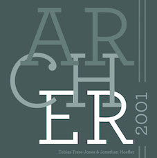 [MyFonts]
[More] ⦿
[MyFonts]
[More] ⦿
|
Klaus Burkhardt
|
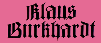 All 25 Fraktur fonts here were digitized by Klaus Burkhardt. After his death, his son Klemens was distributing the fonts. The typefaces: Altenburger Gotisch, Balmung, Fette Bernhard, Behrens-Schrift, Trump Deutsch, Hupp Fraktur (1999), Hans-Sachs-Gotisch, Kleukens, Hartwig (1999), Sinkwitz Gotisch, Sinkwitz Regular, CoellnCurrent, Deutsche Kanzlei, Enge Münchner Fraktur, Grosse Gotisch, Hotterfont, Jean-Paul-Schrift (a revival of a fraktur by Breitkopf of the 1790s, done in 1999), Scherenschnitt (2003), Klaus-Fraktur, Nuernberger, Barlösius (1999), KühneSchrift (2000), Walthari, Lautenbach, Leibniz Fraktur (1912, Genzsch&Heise; revived in 2003 by Petra Heidorn, in 2012 by Ralph M. Unger and in 2016 by Softmaker as Leibniz Fraktur Pro), Lyrisch Fraktur, Eckmann, Deutsche Kursiv, Peter-Jessen-Schrift, Romantisch, Rhapsodie. Other typefaces: Funny Type, Civilité, Fette Ella Kursiv, Ginkgo Schrift, Grossmütter Schreibschrift, Regenmettel, Sütterlin (2000, after the original by Ludwig Sütterlin, 1914; see DS-Sütterlin by Delbanco), Krimhilde, Kalligraf, Boutique. There was a nice sub-page with beer capsules featuring Fraktur lettering. [Google]
[More] ⦿
All 25 Fraktur fonts here were digitized by Klaus Burkhardt. After his death, his son Klemens was distributing the fonts. The typefaces: Altenburger Gotisch, Balmung, Fette Bernhard, Behrens-Schrift, Trump Deutsch, Hupp Fraktur (1999), Hans-Sachs-Gotisch, Kleukens, Hartwig (1999), Sinkwitz Gotisch, Sinkwitz Regular, CoellnCurrent, Deutsche Kanzlei, Enge Münchner Fraktur, Grosse Gotisch, Hotterfont, Jean-Paul-Schrift (a revival of a fraktur by Breitkopf of the 1790s, done in 1999), Scherenschnitt (2003), Klaus-Fraktur, Nuernberger, Barlösius (1999), KühneSchrift (2000), Walthari, Lautenbach, Leibniz Fraktur (1912, Genzsch&Heise; revived in 2003 by Petra Heidorn, in 2012 by Ralph M. Unger and in 2016 by Softmaker as Leibniz Fraktur Pro), Lyrisch Fraktur, Eckmann, Deutsche Kursiv, Peter-Jessen-Schrift, Romantisch, Rhapsodie. Other typefaces: Funny Type, Civilité, Fette Ella Kursiv, Ginkgo Schrift, Grossmütter Schreibschrift, Regenmettel, Sütterlin (2000, after the original by Ludwig Sütterlin, 1914; see DS-Sütterlin by Delbanco), Krimhilde, Kalligraf, Boutique. There was a nice sub-page with beer capsules featuring Fraktur lettering. [Google]
[More] ⦿
|
Klaus-Peter Schaeffel
[KPS Fonts]
|
 [More] ⦿
|
KPS Fonts
[Klaus-Peter Schaeffel]
|
 Swiss calligrapher in Basel who made and sells various medieval and historically important script fonts. Dedicated page. These included the paleographic (PAL) series and the KPS series. He lives in Ühlingen--Birkendorf, Germany. His fonts are uniformly of high quality and are usefl for illustrating historical alphabets.
 His early commercial collection: KPS Anglaise (calligraphic script), KPS Antiqua (+Kapitälchen), KPS Capitalis (classic Trajan caps), KPS Cicero, KPS Epona (calligraphic), KPS Fein (hand-printed), KPS Hand (calligraphic), KPS Horaz (calligraphic), KPS Iris (calligraphic), KPS Petit (calligraphic), KPS Plinius, KPS Spitzfelder, KPS Vitruv (calligraphy), PAL Bastarda, PAL Cancellaresca, PAL Carolina, PAL Gotisch, PAL Humanistica, PAL Lombarden, PAL Quadrata, PAL Rotunda, PAL Rustica, PAL Textura, PAL Uncialis, PAL Uncialis Roemisch, Weissranken Initialen, Ranken Initialen (Celtic capitals). Since September 2013, all of his fonts are free. They were renamed and have conveniently the date of original creation in the font name. The fonts dated in the 1990s and 2000s are new typefaces or creative revivals by Klaus-Peter. The list of revivals: 0100DeBellisMacedonicis [Pre-uncial letters from the fragment "de bellis macedonicis", ca. 1st century], 0300Petros [Greek hand from the oldest surviving copies of St. Peter's epistles, dated 3th / 4th century], 0362Vitalis [Roman Minuscule Cursive from the so called Vitalis letter, written before 362 on papyrus (Strasburg)], 0480VergiliusRomanus [Capitalis Rustica from the Vergilius Romanus written in Rome, ca. 480], 0500VergiliusSangallensis [Capitalis Quadrata from the Vergil fragments in Stiftsbibliothek St.Gallen], 0512Dioskurides [Greek Uncials from the Vienna Dioskurides (about 512)], 0746Beda [from Beda Venerabilis: Historia ecclesiastica gentis Anglorum, Northumbria, dated 746], 0800Kells [Half Uncials from the Book of Kells], 0800Remedius [So called "Lombardic-Raetic Minuscule" from Codex 348 of the Stiftsbibliothek St. Gallen], 0800 Theophanes [Greek Hand after a 9th century Theophanes manuscript], 0850CarolinaTours [Carolingian Minuscule], 0850Carolinaundulata [Carolingian Minuscule from the Scriptorium of Tours], 0864Folchart [St. Gall Carolingian from the Folachart Psalter], 1012Otto [Late Carolingian Minuscule from the Perikopes of Heinrich II, written at the Reichenau, donated to the dome of Bamberg in 1012], 1258FridericusII [Gothic Rotunda from the falcon book of Emperor Friedrich II, Southern Italy 1258-1266], 1400Wenzel [Bohemian Textura from Vienna], 1450Sebastos [Humanistic Greek hand from Homer, Ilias, Vatican Library], 1455GutenbergB42 [Gothic Textura types from the 42 line Gutenberg Bible], 1458GutenbergB36 [Gothic Textura types from the 36 line Gutenberg Bible], 1470Jenson [an antiqua by Nicolas Jenson], 1475HumanisticaCursiva [Humanistic Cursive of the kind Bartolomeo Sanvito of Padua wrote, after Cod. Pal. Lat. 1508], 1480Humanistica [Humanistic Book Hand from Valerius Maximus: Facta et dicta memorabilia, ca. 1480-1485. The calligraphy is attributed to Antonio Sinibaldi from Florence and the titling capitals to Bartolomeo Sanvito from Padua], 1483Koberger [Incunabula type from the Koberger Bible, printed in Nuremberg in 1483], 1485Grueninger [Incunabula type from the Grueninger Bible, printed in Strasburg in 148], 1493SchedelRotunda [Incunabula type from the Latin edition of Hartmann Schedel's World Chronicles, printed by Koberger at Nuremberg in 1493], 1501Manutius [First printed Italic Antiqua by Aldus Manutius (Venice 1501)], 1513Gebetbuch [Fraktur from Emperor Maximilian's Prayer Book, printed in Augsburg in 1513], 1517Gilgengart [Fraktur type from Emperor Maximilian's 1517 private print "Gilgengart"], 1517Teuerdank [Fraktur type from Emperor Maximilian's "Teuerdank", printed at Augsburg in 1517], 1519NeudoerfferFraktur [Fraktur alphabet from a woodblock model in Johann Neudoerffer the Elder's Calligraphy book "Fundament", Nuremberg 1519], 1739Bickham [Copperplate or running hand after models from "The Universal Penman" by George Bickham, printed in London 1743], 1741Bickham [Bickham's round hand from Universal Penman], 1782Thurneysen [Baroque Antiqua Type of J. Jacques Thourneysen fils, Basel 1782]. Original versions by Schaeffel, with date of design in the font name: 1999Anglaise1, 1999Anglaise2, 1999Cancellaresca, 1999Carolina (Carolingian minuscule), 1999Livius, 1999LiviusBold, 1999LiviusItalic, 1999LiviusSmC, 1999LiviusTitel, 1999Ovidius, 1999Stylus, 1999Textualis, 2000Bastarda, 2000Cicero, 2000Humanistica, 2000Plinius, 2000PliniusItalic, 2000Seneca-Italic, 2000Seneca, 2000TextualisFormata, 2000Uncialis, 2001RotundaFormata, 2002Cato, 2002Horatius, 2002Vitruvius, 2003Epona, 2003Lombarden, 2004CapitalisQuadrata, 2004CapitalisRustica, 2004Iris, 2004UncialisQuadrata, 2004UncialisRomana, 2008-Noeuds-1 [for making Celtic knots], 2008-Noeuds-2, 2008-Noeuds-3, 2009Xenophon, 2010Filigrane, 2010Gouttes, 2010Labyrinthe [squarish], 2010Pointu [a calligraphic blackletter], 2010Vergilius [a great calligraphic face]. Old URL. [Google]
[More] ⦿
|
Lesley Prince
|
Designer active on the High Logic / Font Creator site. His fonts posted there include Arcana (2011, a symbol font), Martha (2011), Cheriton Hand (2011), Corieltauvi (2016). [Google]
[More] ⦿
|
Louis Ferrand
|
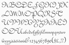 French type designer at FT Française who made the simple linear script font Clipper (1951). He is also credited at Identifont with a version of Civilité (1922; later digitized in 1994 at Monotype by George Thomas as Civilite MJ, and by Tim Ryan, also in 1994, as Civilité TR).
 Revivals of his work include the free font LF Clipped (2016, Pilaster Davy). Klingspor link. [Google]
[More] ⦿
|
Majus Corporation
[George Thomas]
|
George Thomas is a font expert who owns Majus Corp in Dallas, a company he founded after having contributed to many of the major font foundries. Creative Alliance designer: The first font to be released from Majus Corp., and licensed exclusively to the Creative Alliance, is Civilite MJ. The typeface was originally cut by Robert Granjon in 1557. This Civilité dates from 1994 and is based on a model by Louis Ferrand (1922). He also created the film fonts Eightball, Highball, and Cueball, which were licensed to Alphabet Innovations (Phil Martin's company). MyFonts page. Phil Martin said about him: George Thomas came to work for me. A technical genius in my view. He made my studio the branch office of Merganthaler. When type director Mike Parker quit Merg to found Bitstream and hire away all Merg's type-knowledgable people, Steve Byers had no way to keep Merg in production except for what George and I did for him. His fonts have the MJ suffix. FontShop link. [Google]
[MyFonts]
[More] ⦿
|
Marius Audin
|
Type historian from Lyon, 1872-1951. He had a major influence on the French typographical world before World War II. His son Maurice founded the Musée de l'imprimerie et de la banque in Lyon in 1964, starting from the family's archives. Author (1872-1951) of many books on typography and printing, including - Les livrets typographiques des fonderies françaises créées avant 1800 Étude historique et bibliographique (Paris: A l'Enseigne de Pégase, 1933), republished in 1964 by Gérard Th. van Heusden, Amsterdam. This book is a historian's dream, offering a complete genealogical picture of French foundries. Font page.
- Le Livre (two volumes, 1924 and 1926).
- Les caractères de civilité de Robert Granjon et les imprimeurs flamands (1921, with Dr. Maurits Sabbe, conservateur du Musée Plantin, à Anvers'; Lyon : impr. M. Audin&Co; Anvers : A la Grande Librairie, 1921).
- Histoire de l'imprimerie par l'image (4 volumes, Henri Jonquières éditeur, Paris, 1928-1929).
- In 1948, Audin edited the book Somme typographique. The second volume of that work appeared in 1949.
[Google]
[More] ⦿
|
Matthias Rosart
|
Matthias, or Matthieu, Rosart is the son of J.F. Rosart, who carried on with his father's foundry in Brussels after his death in 1777. Before that, he had a rough relationship with his father, lived for a while in Amsterdam, and even worked for a competing typefounder in Brussels, J.L. de Boubers starting in 1772. In 1789, Matthias Rosart published his specimen book, Epreuve des caractères. There he announces that he can supply all the fonts and fleurons to be found in the catalogue of his father. This seems to indicate [according to Baudin and Hoeflake] that the foundries of de Boubers and J.F. Rosart in Brussels joined. Indeed, in December 1779, we also find an Epreuve de la Fonderie de la Veuve Decellier, successeur de Jacques-François Rosart. Troisième édition augmentée. A Bruxelles, rue ditte Vinckt, près du Marché aux Grains, which reproduces all typefaces and fleurons of J.-F. Rosart. On page 12 of "Blackletter" (Peter Bain and Paul Shaw, 1998), Matthias Rosart is credited with Gros Romain Civilité (1777, Brussels), one of the most readable Fraktur fonts. [Google]
[More] ⦿
|
Milo Kowalski
|
 Type designer who helped in the design of the large P22 Civilité family, done together with Colin Kahn and Richard Kegler: P22 Civilite No 11 Historic, P22 Civilite No 11 Modern, P22 Civilite No 12 Historic, P22 Civilite No 12 Modern, P22 Civilite No 14 Historic, P22 Civilite No 14 Modern, P22 Civilite No 30 Historic, P22 Civilite No 30 Modern, P22 Civilite No 8 Historic, P22 Civilite No 8 Modern, P22 Civilite No 9 Historic, P22 Civilite No 9 Modern, P22 Civilite Titling. These are based on historic specimens from the Dutch Enschedé foundry. [Google]
[MyFonts]
[More] ⦿
Type designer who helped in the design of the large P22 Civilité family, done together with Colin Kahn and Richard Kegler: P22 Civilite No 11 Historic, P22 Civilite No 11 Modern, P22 Civilite No 12 Historic, P22 Civilite No 12 Modern, P22 Civilite No 14 Historic, P22 Civilite No 14 Modern, P22 Civilite No 30 Historic, P22 Civilite No 30 Modern, P22 Civilite No 8 Historic, P22 Civilite No 8 Modern, P22 Civilite No 9 Historic, P22 Civilite No 9 Modern, P22 Civilite Titling. These are based on historic specimens from the Dutch Enschedé foundry. [Google]
[MyFonts]
[More] ⦿
|
Morris Fuller Benton
|
 Prolific American type designer (b. 1872, Milwaukee, d. 1948, Morristown, NJ), who published over 200 alphabets at ATF. He managed the ATF type design program from 1892 until 1937. Son of Linn Boyd Benton. MyFonts page on him. Nicholas Fabian's page. Linotype's page. Klingspor page. Unos tipos duros page. His fonts include:
 - 1897: Cloister Old Style (ATF). [Stephenson Blake purchased this from ATF and called it Kensington Old Style, 1919] [Cloister (2005, P22/Lanston) is based on Jim Rimmer's digitization of Benton's Cloister.]
- 1898: Roycroft. Mac McGrew on Roycroft: Roycroft was one of the most popular of a number of rugged typefaces used around the turn of the century, when printing with an antique appearance was in vogue. It was inspired by lettering used by the Saturday Evening Post. then a popular weekly magazine, and has been credited to Lewis Buddy, a former Post artist and letterer, but ATF says it was designed "partly" by Morris Benton, about 1898. Gerry Powell, director of typographic design for ATF in the 1940s, says, "Roycroft was first known as Buddy, changed when it was adopted by Elbert Hubbard for the Roycroft Press." Henry L. Bullen, ATF librarian and historian, says, "The first font of type to be made from matrices directly engraved on the Benton machine was 24-point Roycroft. October 4, 1900." While the machine was originally designed in 1884 to cut punches rather than matrices, it is doubtful that no fonts of mats were cut before 1900. Roycroft is also said to be the first typeface for which the large size of 120-point was engraved in type metal, with matrices made by electrotyping. Many typefaces of the day had a number of alternate characters. For this face. ATF gave specific instructions for their intended use: "M with the short vertex, in words the letters of which are open; R with the long tail, as a final letter in all-cap words; the wide h, m, and n, as a final letter only; t with the swash tail, as a final letter but not too frequently; u with the descending stroke, in words having no descending letters; ct ligature, wherever possible; the long s and its combinations, in antique work." Roycroft Open was cut in 1902, probably from the same patterns as the parent face. Roycroft Tinted is a very unusual face, in which the typeface is engraved with the equivalent of a halftone screen of about 25 percent tone value, with a black shadow on the right side; this typeface was cut by the Dickinson Type Foundry branch of ATF in Boston, and includes the same special characters as Roycroft. Compare Post Oldstyle.
- 1900: Century Expanded (1900: poster by Heather Leonhardt). This was a complete redraw of Century Roman which was designed in 1894 by his father, Linn Boyd Benton, for Theodore Low DeVinne, the publisher of Century Magazine. Digitizations by Elsner&Flake, Bitstream and URW.
- 1901: Linotext (aka WedddingText).
- 1901-1910: Engravers.
- 1901: Wedding Text (some put this in 1907), Old English Text, Engravers' Old English (a blackletter font remade by Bitstream). Wedding Text has been copied so often it is sickening: Wedding Regular and Headline (HiH, 2007), Dan X. Solo's version, Comtesse, Elite Kanzlei (1905, Stempel), Meta, Lipsia, QHS Nadejda (QHS Soft), Blackletter 681, Marriage (Softmaker), Wedding Text TL (by Tomas Liubinas).
- 1902: Typoscript.
- 1902-1912: Franklin Gothic. Digital versions exist by Bitstream, Elsner&Flake (in a version called ATF Franklin Gothic), Red Rooster (called Franklin Gothic Pro, 2011), Linotype, and ITC (ITC Franklin Gothic). Discussion by Harvey Spears. Mac McGrew: Franklin Gothic might well be called the patriarch of modern American gothics. Designed in 1902 by Morris Fuller Benton, it was one of the first important modernizations of traditional nineteenth-century typefaces by that designer, after he was assigned the task of unifying and improving the varied assortment of designs inherited by ATF from its twenty-three predecessor companies. Franklin Gothic (named for Benjamin Franklin) not only became a family in its own right, but also lent its characteristics to Lightline Gothic. Monotone Gothic, and News Gothic (q.v.). All of these typefaces bear more resem- blance to each other than do the typefaces within some other single families. Franklin Gothic is characterized by a slight degree of thick-and-thin contrast; by the double-loop g which has become a typically American design in gothic typefaces; by the diagonal ends of curved strokes (except in Extra Condensed); and by the oddity of the upper end of C and c being heavier than the lower end. The principal specimen here is Monotype, but the basic font is virtually an exact copy of the ATF typeface in display sizes, except that Monotype has added f- ligatures and diphthongs. Franklin Gothic Condensed and Extra Condensed were also designed by Benton, in 1906; Italic by the same designer in 1910; and Condensed Shaded in 1912 as part of the "gray typography" series. Although Benton started a wide version along with the others, it was abandoned; the present Franklin Gothic Wide was drawn by Bud (John L.) Renshaw about 1952. Franklin Gothic Condensed Italic was added by Whedon Davis in 1967. Monotype composition sizes of Franklin Gothic have been greatly modi- fied to fit a standard arrangement; 12-point is shown in the specimen-notice the narrow figures and certain other poorly reproportioned characters. The 4- and 5-point sizes have a single-loop g. Gothic No. 16 on Linotype and Inter- type is essentially the same as Franklin Gothic up to 14-point; in larger sizes it is modified and more nearly like Franklin Gothic Condensed. However. some fonts of this typeface on Lino have Gagtu redrawn similar to Spartan Black. with the usual characters available as alternates; 14-point is shown. Western Type Foundry and later BB&S used the name Gothic No.1 for their copy of Franklin Gothic, while Laclede had another similar Gothic No. 1 (q.v.). On Ludlow, this design was originally known as Square Gothic Heavy with a distinctive R and t as shown separately after the Monotype diphthongs; when the name was changed to Franklin Gothic in 1928, it was redrawn, closer to Franklin Gothic but still a bit top-heavy; the unique R was retained in standard fonts but an alternate version like that of ATF was made available separately; also a U with equal arms, a single-loop g, and a figure 1 without foot serifs. Ludlow Franklin Gothic Italic, partially shown on the third line of the specimen, is slanted much more than other versions, to fit the standard 17 -degree italic matrices of that machine. Modern Gothic Condensed and Italic (q.v.) are often though not properly called Franklin Gothic Condensed and Italic, especially by Monotype users. Also see Streamline Block.
- 1903: Alternate Gothic (ATF). See Alternate Gothic Pro Antique (Elsner&Flake), Alternate Gothic No2 (Bitstream), Alpin Gothic (by Team77), League Gothic (2009-2011, The League of Movable Type), and Alternate Gothic No1, No2 and No3 (see the URW version). Mac McGrew: Alternate Gothic was designed in 1903 by Morris F. Benton for ATF with the thought of providing several alternate widths of one design to fit various layout problems. Otherwise it is a plain, basic American gothic with no unusual features, but represents a more careful drawing of its nineteenth-century predecessors. The Monotype copies in display sizes are essentially the same as the foundry originals, with the addition of f-ligatures. The thirteen alternate round capitals shown in the first line of Alternate Gothic No.1 were designed by Sol Hess in 1927 for Monotype, hence the "Modernized" name; with these letters the design is sometimes referred to as Excelsior Gothic. Monotype keyboard sizes, as adapted by Hess about 1911, are considera- bly modified to fit a standard arrangement; caps are not as condensed as in the original foundry design. In 6-point, series 51 and 77 are both the same width, character for character, but some letters differ a bit in design. Note that these two narrower widths are simply called Alternate Gothic on Monotype, while the wider version is Alternate Gothic Condensed! Alternate Gothic Italic, drawn about 1946 by Sol Hess for Monotype matches No.2, but may be used with other widths as well. Condensed Gothic on Ludlow, is essentially a match for Alternate Gothic No.1, but has a somewhat different set of variant characters, as shown in the third line. There is also Condensed Gothic Outline on Ludlow, introduced about 1953, essentially an outline version of Alternate Gothic No.2. On Linotype and Intertype there is Gothic Condensed No.2 which is very similar to Alternate Gothic No. 1 in the largest sizes only, but with even narrower lowercase and figures. Also compare Trade Gothic Bold and Trade Gothic Bold Condensed. For a free version of Alternate Gothic No. 1, see League Gothic (2009-2011, The League of Movable Type).
- 1904: Bold Antique, Whitin Black [see OPTI Bold Antique for a modern digitization], Cheltenham (digitizations by Bitstream and Font Bureau, 1992), Cloister Black (blackletter font, see the Bitstream version: it is possible that the typeface as designed by Joseph W. Phinney).
- 1905: Linoscript (1905). Originally at ATF it was named "Typo Upright". Clearface, about which McGrew writes: Clearface was designed by Morris Benton with his father, Linn Boyd Benton, as advisor. The bold was designed first, in 1905, and cut the following year. The other weights and italics were produced through 1911. As the name implies, the series was intended to show unusual legibility, which it certainly achieved. The precision of cutting and casting for which ATF is noted produced a very neat and handsome series, which had considerable popularity. Clearface Heavy Italic has less inclination than the lighter weights, and is non-kerning, a detail which helped make it popular for newspaper use; the specimen shown here is from a very worn font. Some of the typefaces have been copied by the matrix makers. But the typeface Monotype calls Clearface and Italic is the weight called Bold by other sources. Monotype also includes Clearface Italic No. 289, a copy of the lighter weight. Revival and expansion by Victor Caruso for ITC called ITC Clearface, 1978. Also, American Extra Condensed, an octagonal mechanical typeface revived in 2011 by Nick Curtis as Uncle Sam Slim NF.
- 1906: Commercial Script (versions exist at Linotype, URW, Bitstream (called English 144), SoftMaker (2012), and Elsner&Flake), Miele Gothic, Norwood Roman.
- 1907: Lincoln Gotisch, named after Abraham Lincoln. This found found its way from ATF to Schriftguss, Trennert und Sohn, and Ludwig Wagner. Digital revivals include Delbanco's DS Lincoln-Gotisch. Compare with Comtesses, Lipsia, Elite Kanzlei, Lithographia and Wedding Text.
- 1908: News Gothic, Century Oldstyle (digital versions by Bitstream, Elsner&Flake, and URW), Clearface Gothic (1907-1910: digital revivals include Clear Gothic Serial (ca. 1994, SoftMaker) and Cleargothic Pro (2012, SoftMaker). McGrew: Clearface Gothic was designed by Morris Benton for ATF in 1908, and cut in 1910. It is a neat, clean gothic, somewhat thick and thin, which incorporates some of the mannerisms of the Clearface (roman) series. However, it can hardly be considered a part of that family. There is only one weight, and fonts contain only the minimum number of characters.
- 1909-1911: Rugged Roman. McGrew: Rugged Roman was designed for ATF by Morris F. Benton in 1909-11. It was patented in 1915, but the earliest showing seems to have appeared in 1917. It is a rugged face, as the name says, of the sort that was popular early in the century, but appears to have no relation to other typefaces having the name "Rugged." It somewhat resembles Roycroft, but is lighter. But to add to the uncertainty, fonts contained a number of ligatures of the kind which were more common in the early 1900s, in addition to the usual f-ligatures.
- 1910: Cloister Open Face, Hobo (1910, strongly influenced by the Art Nouveau movement; Hobo Light followed in 1915), ATF Bodoni (Bitstream's version is just called Bodoni, and Adobe's version is called Bodoni Book or Bodoni Poster or Bodoni Bold Condensed, while Elsner&Flake call theirs Bodoni No Two EF Ultra; Font Bureau's version has just two weights called BodoniFB-Bold Condensed and Compressed). McGrew writes about Hobo: Hobo is unusual in two respects---it is drawn with virtually no straight lines, and it has no descenders and thus is very large for the point size. It was designed by Morris F. Benton and issued by ATF in 1910. One story says that it was drawn in the early 1900s and sent to the foundry without a name, which was not unusual, but that further work on it was continually pushed aside, until it became known as "that old hobo" because it hung around so long without results. More time elapsed before it was patented in 1915. The working name was Adface. Hobo was also cut by Intertype in three sizes. Light Hobo was also drawn by Benton, and released by ATF in 1915. It is included in one list of Monotype typefaces, but its series number is shown elsewhere for another Monotype face, and no other evidence has been found that Monotype actually issued it.
- 1911-1913: Venetian, Cromwell. Mac McGrew: Cromwell is a rather playful typeface, designed by Morris Benton in 1913 but not released by ATF until three years later. It uses the same capitals as Cloister (q.v.) and has the same small x-height with long ascenders and descenders, but otherwise is quite different, with much less formality. Notice the alternate characters and the double letters including overhanging f's.. Cromwell was digitized by Nick Curtis in 2010 as Cromwell NF. Mac McGrew on Venetian: Venetian and Italic were designed by Morris F. Benton for ATF about 1911, with Venetian Bold following about two years later. They are rather reserved transitional typefaces, almost modern, instead of classic designs of Venetian origin as the name implies. The result is closer to Bodoni than to Cloister. The working title was Cheltenham No.2, but the relationship to that family is not apparent. It is carefully and neatly done, but never achieved widespread use. Compare Benton, a later typeface by the same designer, which has similar characteristics but more grace and charm.
- 1914: Adscript, Souvenir, Garamond (with T.M. Cleveland).
- 1916: Announcement, Light Old Style, Goudy Bold. Mac McGrew writes: Announcement Roman and Announcement Italic were designed by Morris F. Benton in 1916, adapted from steel or copperplate engravings, but not completed and released until 1918. These delicate typefaces have had some popularity for announcements, social stationery, and a limited amount of advertising work, but are a little too fancy for extensive use. Oddly, some of the plain caps shown in the specimens, both roman and italic, do not seem to appear in any ATF specimens. Foundry records show that a 48-point size of the roman was cut in 1927, but no other listing or showing of it has been found. In fact, sizes over 24-point were discontinued after a few years, and all sizes were discontinued in 1954.. Digitizations: Announcement Roman was revived by Nick Curtis in 2009 and called Society Page NF. Rebecca Alaccari at Canada Type revived it as Odette in 2004. See also Castcraft's OPTI Announcement Roman.
- 1916-1917: Invitation. For a digital revival, see Sil Vous Plait (2009, Nick Curtis).
- 1917: Freehand.
- 1917-1919: Sterling. Digitizations include Howard (2006, Paul D. Hunt), Argentina NF (2009, Nick Curtis), and Argentina Cursive NF.
- 1918: Century Schoolbook (1918-1921). (See ITC Century (Tony Stan, 1975-1979), or the Century FB-Bold Condensed weight by Greg Thompson at Font Bureau, 1992. For Century Schoolbook specifically, there are versions by Elsner&Flake, Bitstream and URW. Bitstream has a monospaced version.) URW Century Schoolbook L is free, and its major extension, TeXGyre Schola (2007) is also free.
- 1920: Canterbury. Mac McGrew: Canterbury is a novelty typeface designed by Morris F. Benton for ATF in 1920, when trials were cut, but not completed for production until 1926. It features a very small x-height, with long ascenders and descenders; monotone weight with minute serifs; and a number of swash capitals. It is primarily suitable for personal stationery and announcements. Compare Camelot Oldstyle. Digital versions were done by Nick Curtis in his Londonderry Air NF (2002-2004), and Red Rooster in the series Canterbury, Canterbury OldStyle, and Canterbury Sans.
- 1922: Civilité. Mac McGrew on the ATF Civilité: Civilite in its modern adaptation was designed by Morris Benton in 1922 and cut by ATF in 1923-24. The original version was cut by Robert Granjon in 1557 to imitate the semi-formal writing then in vogue, and is believed to be the first cursive design cut in type. It became popular for the printing of poetry and for books of instruction for children, where the type itself could serve as a perfect model of handwriting. The first of these books was titled La Civilite puerile, printed at Antwerp in 1559. The books were so popular that the design came to be known as "civility" type. Other interpretations of the letter have been made, including Cursive Script, cut in the nineteenth century in 18-point only from French sources by ATF predecessors and by Hansen, but Benton's seems more attractive and legible to modern eyes. The French pronunciation of ci-vil'i-tay is indicated by the accented e, which was used only in ATF's earliest showings. The many alternate characters were included in fonts as originally sold; later they were sold separately and finally discontinued, although the basic font was still listed in recent ATF literature. Also see ZapfCivilite. Compare Freehand, Motto, Verona.
- 1924: Schoolbook Oldstyle.
- 1926-1927: Typo Roman.
- 1927: Chic (American Typefounders; doubly shaded capitals and figures), Gravure, Greeting Monotone, Goudy Extra Bold. The art deco typeface Chic was revived by Nick Curtis as Odalisque NF (2008) and Odalisque Stencil NF (2010).
- 1928: Parisian, Bulmer (revival of William Martin's typeface from 1792 for the printer William Bulmer; digital forms by Monotype, Adobe, Linotype, and Bitstream), Broadway (1928-1929, see two styles offered by Elsner&Flake, Linotype, Bitstream, and 11 weights by URW), Goudy Catalogue, Modernique, Novel Gothic (ATF, designed with Charles H. Becker), Dynamic. Novel Gothic has seen many digital revivals, most notably Telenovela NF (2011, Nick Curtis), Naked Power (Chikako Larabie) and Novel Gothic SG (Jim Spiece). Images of Bulmer: i, ii, iii, iv, v, vi, vii, viii, ix, x, xi, xii.
- 1929: Louvaine. McGrew: Louvaine series was designed by Morris F. Benton for ATF in 1928. It is an adaptation of Bodoni (the working title was Modern Bodoni), and many of the characters are identical. Only g and y are basically different; otherwise the distinction is in the more abrupt transition from thick to thin strokes in this series. In this respect, Ultra Bodoni has more affinity to Louvaine than to the other Bodoni weights. The three weights of Louvaine correspond to Bodoni Book, Regular, and Bold. This series did not last long enough to appear in the 1934 ATF specimen book, the next complete one after its introduction. Compare Tippecanoe.
- 1930: Benton, Engravers Text, Bank Gothic (see Bitstream's version), Garamond-3 (with Thomas Maitland Cleland), Paramount (some have this as being from 1928: see Eva Paramount SG by Jim Spiece). McGrew: Paramount was designed by Morris Benton in 1930 for ATF. It is basically a heavier companion to Rivoli (q. v.), which in turn is based on Eve, an importation from Germany, but is heavier than Eve Bold. It is an informal typeface with a crisp, pen-drawn appearance. Lowercase is small, with long ascenders and short descenders. Vertical strokes taper, being wider at the top. It was popular for a time as an advertising and announcement type.
- 1931: Thermotype, Stymie (with Sol Hess and Gerry Powell). Stymie Obelisk is a condensed Egyptian headline face---the latter was revived by Nick Curtis as Kenotaph NF (2011).
- 1932: Raleigh Gothic Condensed (the digital version by Nick Curtis is Highpoint Gothic NF (2011)), American Text (blackletter). Mac McGrew: Raleigh Gothic Condensed was designed by Morris F. Benton for ATF in 1932. It is a prim, narrow, medium weight gothic face, with normally round characters being squared except for short arcs on the outside of corners. The alternate characters AKMNS give an even greater vertical appearance than usual. At first, this typeface was promoted with Raleigh Cursive as a stylish companion face, although there is no apparent relationship other than the name. Compare Phenix, Alternate Gothic, Agency Gothic.
- 1933: American Backslant, Ultra Bodoni (a great Bodoni headline face; see Bodoni FB (1992, Font Bureau's Richard Lipton). About Agency Gothic, McGrath writes: Agency Gothic is a squarish, narrow, monotone gothic without lower- case, designed by Morris F. Benton in 1932. It has an alternate A and M which further emphasize the vertical lines. Sizes under 36-point were added in 1935. Agency Gothic Open was drawn by Benton in 1932 and introduced in 1934; it follows the same style in outline with shadow, and probably has been more popular than its solid companion. Triangle Type Foundry, a Chicago concern that manufactured matrices, copied this typeface as Slim Open, adding some smaller sizes. ATF's working titles for these typefaces, before release, were Tempo, later Utility Gothic and Utility Open. Compare Raleigh Gothic Condensed, Poster Gothic, Bank Gothic. Digital versions include Warp Three NF (2008, Nick Curtis), which borrows its lowercase from Square Gothic (1888, James Conner's Sons), FB Agency (1995, David Berlow at FontBureau), Agency Gothic (by Dan Solo) and OPTI Agency Gothic (by Castcraft).
- 1934: Shadow, Tower (heavy geometric slab serif), Whitehall. Font Bureau's Elizabeth Cory Holzman made the Constructa family in 1994 based on Tower. Digital versions include Warp Three NF (2008, Nick Curtis), which borrows its lowercase from Square Gothic (1888, James Conner's Sons), FB Agency Gothic (1995, David Berlow at FontBureau) and Agency Gothic by Castle Type. Eagle Bold followed in 1934. McGrew: Eagle Bold is a by-product of the depression of the 1930s. The National Recovery Administration of 1933 had as its emblem a blue eagle with the prominent initials NRA, lettered in a distinctive gothic style. Morris Benton took these letters as the basis for a font of type, released later that year by ATF, to tie in with the emblem, which businesses throughout the country displayed prominently in advertising, stationery, and signs; naturally it was named for the eagle. Compare Novel Gothic. USA Resolute NF (2009, Nick Curtis) is based on Eagle Bold.
- 1935: Phenix. This condensed artsy sans was revived in 2011 at Red Rooster by Steve Jackaman and Ashley Muir as Phoenix Pro.
- 1936: Headline Gothic. For a digital version, see ATF Headline Gothic (2015, Mark van Bronkhorst, Igino Marini, & Ben Kiel at American Type Founders Collection).
- 1937: Empire. This ultra-condensed all caps skyline typeface was digitally remade and modernized by Santiago Orozco as Dorsa (2011). Jeff Levine reinterpreted it in 2017 as Front Row JNL. Bitstream also has a digital revival.
Linotype link. FontShop link. Picture. Typefaces alphabetic order: - Adscript
- Agency Gothic (+Open
- Alternate Gothic No.1 (+No.2, +No.3)
- American Backslant
- American Caslon&Italic
- American Text
- Announcement Roman&Italic (1916). For digital revivals or influences, see Friendly (2012, Neil Summerour), Odette (2004, Canada Type) and Society Page NF (2009, Nick Curtis).
- Antique Shaded
- Bank Gothic Light (+Medium, +Bold, +Light Condensed, +Medium Condensed, +Bold Condensed). For digital versions, see Bank Gothic AS Regular and Condensed (2008, Michael Doret).
- Baskerville Italic
- Benton (Whitehall)&Italic
- Bodoni&Italic (+Book&Italic, +Bold&Italic, +Bold Shaded, +Bold Open)
- Bold Antique (+Condensed)
- Broadway (+Condensed). The prototyical art deco typeface (1928-1929).
- Bulfinch Oldstyle (1903).
- Bulmer&Italic
- Canterbury
- Card Bodoni (+Bold). 1912-1916.
- Card Litho (+Light Litho)
- Card Mercantile
- Card Roman
- Century Expanded&Italic
- Century Bold&Italic (+Bold Condensed, +Bold Extended)
- Century Oldstyle&Italic (+Bold&Italic, +Bold Condensed)
- Century Catalogue&Italic
- Century Schoolbook&Italic (+Bold)
- Cheltenham Oldstyle&Italic (+Condensed, +Wide)
- Cheltenham Medium&Italic (+Medium Condensed, +Medium Expanded, +Bold&Italic, +Bold Condensed&Italic, +Bold Extra Condensed&Title, +Bold Extended, +Extrabold, +Bold Outline, +Bold Shaded&Italic, +Extrabold Shaded, +Inline, +Inline Extra Condensed, +Inline Extended)
- Chic
- Civilite
- Clearface&Italic (1907, +Bold&Italic, +Heavy&Italic)
- Clearface Gothic: a flared version of Clearface.
- Cloister Black
- Cloister Oldstyle&Italic (+Lightface&Italic, +Bold&Italic, +Bold Condensed, +Cursive, +Cursive Handtooled, +Title&Bold Title)
- Commercial Script
- Copperplate Gothic Shaded
- Cromwell.
- Cushing Antique (1902).
- Della Robbia Light
- Dynamic Medium
- Eagle Bold
- Empire (1937). A skyline typeface.
- Engravers Bodoni
- Engravers Old English (+Bold)
- Engravers Bold
- Engravers Shaded
- Engravers Text
- Franklin Gothic&Italic (+Condensed, +Extra Condensed, +Condensed Shaded)
- Freehand (1917). Mac McGrew: Freehand, a typeface based on pen-lettering, was designed for ATF by Morris Benton in 1917. The working title before release was Quill. Derived from Old English, it is an interesting novelty, and has had quite a bit of use. Compare Civilite, Motto, Verona.
- Garamond&Italic (+Bold&Italic, +Open)
- Globe Gothic (+Condensed, +Extra Condensed, +Extended, +Bold&Italic)
- Goudy Bold&Italic (+Catalogue&Italic, +Extrabold&Italic, +Handtooled&Italic, +Title)
- Gravure
- Greeting Monotone
- Headline Gothic
- Hobo&Light Hobo (1910). For digital versions, see Informal 707 (Bitstream), Hobbit (SF), Homeward Bound (Corel), Hobo No2 (2012, SoftMaker), Bogo (2016, Harold Lohner), and Hobo (Bitstream).
- Invitation (+Shaded)
- Light Oldstyle
- Lightline Gothic&Title (1908). For a revival, see Benton Gothic Thin NF (2014, Nick Curtis).
- Lithograph Shaded (1914, with W.F. Capitain).
- Louvaine Light&Italic (+Medium&Italic, +Bold&Italic)
- Miehle Extra Condensed&Title
- Modernique
- Monotone Gothic&Title
- Motto (1915). Mac McGrew: Motto is a calligraphic typeface designed by Morris F. Benton for ATF in 1915. It is similar to the same designer's Freehand, drawn a couple of years later, but has plainer capitals, heavier thin strokes, and shorter descenders. But letters combine into legible words with a pleasant, hand-lettered appearance. Also compare Humanistic, Verona. For a digital version, see Motto by Juan Kafka.
- News Gothic (+Condensed, +Extra Condensed&Title)
- Norwood Roman
- Novel Gothic
- Othello
- Packard (+Bold)
- Paramount
- Parisian
- Pen Print Open
- Phenix
- Piranesi Italic (+Italic Plain Caps, +Bold&Italic, +Bold Italic Plain Caps)
- Poster Gothic (1934).
- Raleigh Gothic Condensed (1934).
- Rockwell Antique
- Roycroft
- Rugged Roman
- Schoolbook Oldstyle
- Shadow
- Souvenir (1914). Revived in 1977 by Ed Benguiat as ITC Souvenir, but a total failure as a type design. Simon Garfield: Souvenir was the Comic Sans of its era, which was the 1970s before punk. It was the typeface of friendly advertising, and it did indeed appear on Bee Gees albums, not to mention the pages of Farrah Fawcett-era Playboy. Mark Batty from International Typeface Corporation (ITC) on one of his best-selling fonts: A terrible typeface. A sort of Saturday Night Fever typeface wearing tight white flared pants. Garfield also retrieved this quote by type scholar Frank Romano in the early 1990s: Real men don't set Souvenir. Digital revivals also include Sunset Serial by Softmaker, and ITC Souvenir Mono by Ned Bunnel.
- Sterling&Cursive
- Stymie Light&Italic (+Medium&Italic, +Bold&Italic, +Black&Italic)
- Thermotypes
- Tower Condensed (1934). Revived by Photo-Lettering Inc as PL Tower.
- Typo Roman&Shaded
- Typo Script and Typo Script&Extended (1902)
- Typo Shaded
- Typo Slope
- Typo Upright&Bold
- Ultra Bodoni&Italic (+Condensed, +Extra Condensed)
- Venetian&Italic (+Bold)
- Wedding Text&Shaded
View Morris Fuller Benton's typefaces. A longer list. A listing of various digital versions of News Gothic. More News Gothic-like typefaces. Even more News Gothic-like typefaces. [Google]
[MyFonts]
[More] ⦿
|
MyFonts: Civilité
|
The main typefaces at MyFonts that are in the Civilité style. [Google]
[More] ⦿
|
P. Moreau / Veuve Hérissant
[Pierre Moreau]
|
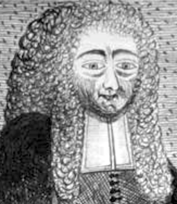 The print shop and foundry of Pierre Moreau was operational in Paris from 1640 until 1792. It had various directors, listed here in chronological order:
 - Pierre Moreau ran the business from 1640 until his death in Paris in 1649. In 1643 he became imprimeur ordinaire du roi. In 1640, he created (Marius Audin even says invented) a set of ronde and bastarda typefaces called Financières. There is a publication from 1643 until 1644 entitled Les saintes métamorphoses ov les changemens iraculeux de quelques grands saints tirez de leurs vies. Paris, en 'Imprimerie des nouueaux caracthères de P. Moreau...1643-1644. This book was selling for 15,000 Euros in 2013. In 1645, he published a book to help children write: Alphabeth, pour apprendre les enfants à promptement lire et escrire---Composé de six sortes de caracteres, representans le naturel de la plume (Imprimerie de Pierre Moreau, rue S. Germain de l'Auxerrois, proche la Vallée de Misere). Local download of Alphabeth.
- Denis Thierry (d. 1657) and Denis Thierry II (d. 1712, Paris) were in charge from 1648 until 1712. Only Lottin mentions that the business of Moreau went to Thierery, and that Thierry in 1712 passed it to Collombat.
- Jacques Collombat (b. 1668, Grenoble, d. 1744, Paris) ran the business from 1712 until 1744. In 1714 he was imprimeur du roi.
- Jacques François Collombat (b. 1701, Paris, d. 1751, Paris) was the son of Jacques. He continued the operation from 1744 until 1751. He too was imprimeur du roi. His early death and the early death of his wife Jacqueline Tarlé in 1752 [Veuve Collombat thus ran the foundry from 1751 until 1752] meant that his son Jean Jacques Etienne Collombat was not old enough to continue the foundry. In 1763, Jean Jacques Etienne passed the foundry to Jean Thomas Hérissant.
- Jean Thomas Hérissant continued the foundry from 1763 until 1772. Born in Paris in 1704, he died there in 1772. He too was imprimeur du roi.
- Veuve Hérissant, ran the business from 1772 until 1788. Her maiden name was Marie Nicole Estienne. She published, e.g., Epreuves des Caractères Samartains provenant de l'Imprimerie de la Veuve Hérissant (1772), and Epreuves des Caractères de la Fonderie de la Veuve Hérissant (1772). She was an imprimeur ordinaire du roi. In 1788, she passed the foundry on to Anisson.
- Etienne Alexandre Jacques Anisson-Dupéron (b. 1749, Paris, d. 1794, Paris) was the son of Louis Laurent II Anisson. In 1788, when he took over the foundry, he was the director of the Imprimerie Royale.
[Google]
[More] ⦿
|
P22 Type Foundry
[Richard Kegler]
|
 Richard Kegler's fun Buffalo-based foundry, which he founded in 1995 together with his wife, Carima El-Behairy. Currently, on staff, we find type designers James Grieshaber and Christina Torre. In 2004, it acquired Lanston Type. P22 has some great unusual, often artsy, fonts. In 2021, P22 jopined The Type Founders as a distribution outlet.
 The fonts are: Industrial Design (an industrial look font based on letters drawn by Joseph Sinel in the 1920s---this font is free!), LTC Jefferson Gothic Obliquie (2005, free), Sinel (free), P22Snowflakes (free in 2003 and P22 Snowflakes (retail) in 2020, finishedd by Richard Kegler and Terry Wüdenbachs), Acropolis Now (1995, a Greek simulation typeface done with Michael Want), P22 Albers (1995; based on alphabets of Josef Albers made between 1920 and 1933 in the Bauhaus mold), Arts and Crafts (based on lettering of Dard Hunter, early 1900s, as it appeared in Roycroft books), Ambient, Aries (2004, based on Goudy's Aries), Arts and Crafts ornaments, Atomica, Bagaglio (Flat, 3D; in the style of Il Futurismo), P22 Basel Roman (2020, Richard Kegler: an update of a 2015 typeface, P22 Basel, based on a garalde font used by Johannes Herbst (aka Ioannes Oporinus) in 1543 to publish Andreas Vesalius' On the Fabric of the Human Body (De humani corporis fabrica) in Basel), Bauhaus (Bauhaus fonts based on the lettering of Herbert Bayer), Bifur (2004, Richard Kegler, after the 1929 original by Cassandre), Blackout, P22 Brass Script Pro (2009, Richard Kegler; based on an incomplete script fond in a booklet from Dornemann&Co. of Magdeburg Germany, ca. 1910 entitled Messingschriften für Handvergoldung; for years, P22 and MyFonts claimed that Michael Clark co-designed this, but Michael does not want any credit, as he did only about 20 letters), Cage (based on handwriting and sketches of the American experimental composer John Cage), P22 Casual Script (2011, Richard Kegler, a digitization of letters by sign painter B. Boley, shown in Sign of the Times Magazine), Cezanne (Paul Cezanne's handwriting, and some imagery; made for the Philadelphia Museum of Art), Child's Play, Child's Play Animals, Child's Play Blocks, Constructivist (Soviet style lettering emulating the work of Rodchenko and Popova), Constructivist extras, Czech Modernist (based on the design work of Czech artist Vojtech Preissig in the 20s and 30s), Daddy-o (Daddy-o Beatsville was done in 1998 with Peter Reiling), Daddy-o junkie, Da Vinci, Destijl (1995, after the Dutch DeStijl movement, 1917-1931, with Piet Mondrian inspired dingbats; weights include Extras, P22 Monet Impressionist (1999), Regular and Tall), Dinosaur, Eaglefeather, Escher (based on the lettering and artwork of M.C. Escher), P22 FLW Exhibition, P22 FLW Terracotta, Folk Art (based on the work of German settlers in Pennsylvania), Il futurismo (after Italian Futurism, 1908-1943), Woodtype (two Tuscan fonts and two dingbats, 2004), P22 Woodcut (1996, Richard Kegler: based on the lettering carved out in wood by German expressionists such as Heckel and Kirchner), Garamouche (2004, +P22 Garamouche Ornaments; all co-designed with James Grieshaber), GD&T, Hieroglyphic, P22 Infestia (1995), Insectile, Kane, Kells (1996, a totally Celtic family, based on the Book of Kells, 9th century; the P22 Kells Round was designed with David Setlik), Koch Signs (astrological, Christian, medieval and runic iconography from Rudolf Koch's The Book of Signs), P22 Koch Nueland (2000), Larkin (2005, Richard Kegler, 1900-style semi-blackletter), London Underground (Edward Johnston's 1916 typeface, produced in an exclusive arrangement with the London Transport Museum; digitized by Kegler in 1997, and extended to 21 styles in 2007 by Paul D. Hunt as P22 Underground Pro, which includes Cyrillic and Greek and hairline weights), Pan-Am, Parrish, Platten (Richard Kegler; revised in 2008 by Colin Kahn as P22 Platten Neu; based on lettering found in German fountain pen practice books from the 1920s), P22 Preissig (and P22 Preissig Calligraphic, 2019), Prehistoric Pals, Petroglyphs, Rodin / Michelangelo, Stanyan Eros (2003, Richard Kegler), Stanyan Autumn (2004, based on a casual hand lettering text created by Anthony Goldschmidt for the deluxe 1969 edition of the book "...and autumn came" by Rod McKuen; typeface by Richard Kegler), Vienna, Vienna Round, Vincent (based on the work of Vincent Van Gogh), Way out West. Now also Art Nouveau Bistro, Art Nouveau Cafe and the beautiful ornamental font Art Nouveau Extras (all three by Christina Torre, 2001), the handwriting family Hopper (Edward, Josephine, Sketches, based on the handwriting styles of quintessential American artist Edward Hopper and his wife, Josephine Nivison Hopper, and was produced in conjunction with the Whitney Museum of American Art), Basala (by Hajime Kawakami), Cusp (by James Grieshaber), P22 Dearest (calligraphic, by Christina Torre and Miranda Roth), Dwiggins (by Richard Kegler), Dyrynk Roman and Italic (2004, Richard Kegler, after work by Czech book artist Karel Dyrynk), Gothic Gothic (by James Grieshaber), La Danse (by Gábor Kóthay;), Mucha (by Christina Torre), Preissig Lino (by Richard Kegler), P22Typewriter (2001, Richard Kegler, a distressed typewriter font), the William Morris set (Morris Troy, Morris Golden, Morris Ornaments, based up the type used by William Morris in his Kelmscott Press; 2002), Art Deco Extras (2002, Richard Kegler, James Grieshaber and Carima El Behairy), Art Deco Display, the Benjamin Franklin revival font Franklin's Caslon (2006), Dada (2006) and the Art Nouveau font Salon (bu Christina Torre). In 2006, Kegler added Declaration, a font set consisting of a script (after the 1776 declaration of independence), a blackletter, and 56 signatures. Many of the fonts were designed or co-designed by Richard Kegler. International House of Fonts subpage. Lanston subpage (offerings as of 2005: Bodoni Bold, Deepdene, Flash, Fleurons Granjon, Fleurons Garamont, Garamont, Goudy Thirty, Jacobean Initials, Pabst, Spire). Bio and photo. In-house fonts made in 2008 include Circled Caps, the Yule family (Regular, Klein Regular, Light Flurries, Heavy, Klein heavy, Heavy Snow, Inline; all have Neuland influences). Kegler / P22 created a 25-set P22 Civilité family in 2009 based on a 1908 publication from Enshedé, the 1978 English translation by Harry Carter, and a 1926 specimen also from Enshedé. P22 Declaration (Script, Signatures, Blackletter, 2009) is based on the lettering used in the 1776 Declaration of Independence. At ATypI 2004 in Prague, Richard spoke about Vojtech Preissig. Speaker at ATypI 2010 in Dublin, where he presented Making Faces: Metal Type in the 21st Century about which he writes: This film has the dual aim of documenting the almost-lost skill of creating metal fonts and of capturing the personality and work process of the late Canadian graphic artist Jim Rimmer (1931-2010). P22 type foundry commissioned Mr. Rimmer to create a new type design (Stern) that became the first-ever simultaneous release of a digital font and hand-set metal font in 2008. At ATypI 2011 in Reykjavik, he showed Making Faces. Typefaces from 2014: LTC Archive Ornaments (Richard Kegler and Miranda Roth). Typefaces from 2020: Showcard Script (by Terry Wüdenbachs, based on an original of Beaufont at the Hamilton Wood Type Museum, custom designed by the Morgan Sign Machine Company of Chicago). Typefaces from 2021: P22 Glaser Houdini (a layerable family, after Glaser's Houdini from 1964), P22 Glaser Babyteeth. Kegler writes: In 2019, P22 Type Foundry met with Milton Glaser (1929-2020) to initiate the official digital series of typefaces designed by Glaser in the 1960s and 70s. P22 Glaser Babyteeth is the first family released in the series. Milton Glaser's inspiration for his Babyteeth typeface came from a hand painted advertisement for a tailor he saw in Mexico City. He was inspired by that E drawn as only someone unfimilar with the alphabet could have concieved. So he set about inventing a completelly ledgible alphabet consistant with this model. P22 Glaser Babyteeth was based on original drawings and phototype proofs from the Milton Glaser Studios archives. Over the years there have been many typefaces that borrowed heavily from the Glaser designs, but these are the only official Babyteeth fonts approved by Milton Glaser Studio and the Estate of Milton Glaser. The solid and open versions are designed to overlap for two-color font effects and can even be mixed and matched for multi layer chromatic treatments. In 2021, he published the 3d art deco shadow font P22 Glaser Kitchen which is based on Big Kitchen (1976). MyFonts interview. View Richard Kegler's typefaces. View the IHOF / P22 typeface library. [Google]
[MyFonts]
[More] ⦿
|
Pedro Leal
|
 Pedro Leal graduated in graphic design and advertising from the ESEIG-Escola Superior de Estudos Industriais e de Engenharia in Vila do Conde, Portugal, and lives in Porto. In 2010 he obtained a degree in type design at ESAD (Escola Superior de Artes e Design, Matosinhos) and started working at DSType. MyFonts link. Behance link.
 He used FontStruct in 2008 to create the pixel typeface Minimal 8pt (514 glyphs!). In 2010, he created the text family Mafra at DSType. This was followed a bit later by Mafra Display (2010; +Medium, +Black). Apud and Apud Display (2010, DSType) are high-contrast typefaces. Penna (2011) is a calligraphic type system. Braga (2011, Dino dos Santos and Pedro Leal, DS Type) is a layered font design family. Dino writes: Braga is an exuberant baroque typeface, named after a Portuguese city, also known as the baroque capital of Portugal. Our latest typographic extravaganza comes with a multitude of fonts designed to work like layers, allowing to insert color, lines, gradients, patterns, baroque, floral swashes, and many other graphic elements. Starting with Braga Base, you can add any of the twenty-three available styles, to create colourful typographic designs. In 2012, he designed User, User Stencil and User Upright>/a>, a monospaced type family with 30 styles, from Hairline to Bold. This too will many awards. Girga (+Italic, +Engraved, +Banner, +Stencil) is a strong black Egyptian family designed together with Dino dos Santos at DS Type. Solido (2012, with Dino dos Santos, DS Type) is a versatile type system with five widths: Solido, Solido Constricted, Solido Condensed, Solido Compressed and Solido Compact. In total there are 35 fonts. In 2020, a variable font was added to Solido. In 2012, he created the sans family Global, with its own dedicated web site, The Global Font. In 2013, he followed that up with the Global Stencil typeface family. In 2013, Dino dos Santos and Pedro Leal published Diversa, a set of nine very different fonts that are jointly kerned so that letters can be swapped out and replaced at will. Diversa Std (2014) extends this to include Stencil, Inline and other decorative styles. Pedro Leal's main typeface of 2013 is Aparo, a script that is calligraphic, yet keeps the characteristics of penmanship scripts, and the pizzazz of a good fashion font. In 2014, he published Ocre and Ocre Poster in sans and slab serif substyles inspired by W.A. Dwiggins, Torio, a penmanship script based on a style used in Arte de Escribir por Reglas y con Muestras (1798, by Spanish penman Torcuato Torío de la Riva y Herrer). Torio received the Communication Arts Type Award of Excellence in 2014. In 2015, he created the large Rudo and Rude Slab typeface families that exhibit many humanist traits: Rude ExtraWide, Rude Icons, Rude SemiCondensed, Rude SemiWide, Rude Wide, Rude, Rude Condensed, Rude ExtraCondensed, Rude Slab, Rude Slab Condensed, Rude Slab ExtraCondensed, Rude Slab ExtraWide, Rude Slab SemiCondensed, Rude Slab SemiWide, Rude Slab Wide, Rude Slab, Rude Slab Condensed, Rude Slab ExtraCondensed, Rude Slab ExtraWide, Rude Slab SemiCondensed, Rude Slab SemiWide, Rude Slab Wide. Early in 2015, he also did a custom typeface family for the Jornal de Notícias, including sans, serif and micro sub-styles. Dino dos Santos and Pedro Leal published Jules and Jules Text in the summer of 2015---a fat fashion mag didone 45-style family inspired by several plates from Portuguese calligrapher Antonio Jacintho de Araujo; it comes in Big, Colossal and Epic. Ecra is a workhorse slab serif, also done in 2015. Viska (2015, by Dino dos Santos and Pedro Leal) is designed for small print. Finally, TCF Zellige (2015, TypeCult) is a modular typeface inspired by the tiles that can be found in Southern Europe and North Africa. Typefaces from 2016: Oposta (Italian, Western style pushed to the esthetic extreme; received the Communication Arts Type Award of Excellence in 2017), Ardina (with Dino dos Santos: a text typeface family with three optical sizes). Typefaces from 2017: Scrittore (a heavy dark Italian bastarda influenced by the connected hand of Giovanniantonio Tagliente and Robert Granjon's Civilité; at DS Type), Zart (a voluptuous ebullient black didone, or fat face; +Script). Fusta (a gorgeous wood-type inspired poster typeface), Ordem (a low-contrast contemporary Capitalis Monumentalis). Typefaces from 2018: Glitched (an experimental variable spacing font), Striver (a crisp contrasted curvy display typeface), Certo Slab and Certo Sans, Foreday (a forward-looking typeface family with associated variable font, covering sans, serif, semi-sans and semi-serif), Perfil (an inline and swashy high end script). Typefaces from 2019: Akut (a purely angular typeface with some rounded corners), Denso (by Dino dos Santos and Pedro Leal: a great condensed variable font with weight, serif and optical size axes), Jornada (a multistyle family with a Fraktur, a chancery, a bookish style called Libro, a news text serif, a clean sans, a slab serif, a monospace, and a penmanship script, all in one family dubbed hygienic post-punk by Leal). In 2020, Dino dos Santos and Pedro Leal designed Larga, which was inspired by the typefaces shown in the specimens of the Fundiçãao Typographica Portuense from 1874. Larga is a wide all caps family and comes with a variable opentype format. Pedro also designed Effigy (a text typeface with slightly ballooning stems), Haste (a typeface that flirts with reverse contrast), Mescla and Enorme (an ultra massive and modular 3000-glyph mastodont of a font, together with Dino dos Santos; based on constructivist principles) in 2020. Typefaces from 2021: Orla (a straightforward interpretation of the Skeleton Antique No2 from the Stephenson, Blake & Co. foundry; for the sans, the serifs were removed), Elaine (+Ombre, +Fleurer; a complete baroque / Elzevir family influenced by Jacques-François Rosart in its ornamental styles). [Google]
[MyFonts]
[More] ⦿
|
Peter Rosenfeld
[Profonts]
|
[MyFonts]
[More] ⦿
|
Philippe Danfrié
|
Typefounder and printer in Paris, who made a Civilité in 1597. His oeuvre is explored in the article Danfrie Reconsidered. Philippe Danfrié's (d. 1606) Civilite Types (March 2020, Hendrik D. L. Vervliet, Volume 21, Issue 1, March 2020, Pages 3-45). The abstract of that freely available paper, perhaps the last paper published by Vervliet before his death, reads: Though little known to the general public, to type historians Philippe Danfrie (c. 1532-1606) will be recognized as a competitor to Robert Granjon's claim for being the inventor of the first Civilité type, a mid-sixteenth-century gothic script type that superseded the French bâtarde. The bâtarde was the usual script for vernacular texts north of the Alps (with the exception of German speaking countries): authors such as Caxton or Rabelais were read in this script. In their Civilité Types (Oxford, 1966) Carter & Vervliet described five of Danfrie's founts. This article aims to present an update of their work and to expand it with four more founts. Danfrie's civil career is broadly documented and that may be a help for gaining a closer insight in the characteristics of a late sixteenth-century type production that balanced between an incunabular model of private type ownership and the seventeenth-century norm of sales of cast types through large monopolistic typefoundries. Danfrié cut these Civilité types for or with others: - (1) Richard Breton and François Desprez (1558). His three Civilité fonts in this cooperation are known as the Breton Civiltés.
- (2) Michel Fezandat (1560).
- (3) Pierre Hamon and Jean Le Royer (1561).
- (4) Graphometre (1597).
[Google]
[More] ⦿
|
Pierre Moreau
[P. Moreau / Veuve Hérissant]
|
[More] ⦿
|
Print and Penmanship 1450-1830
|
Course by James Mosley at l'Institut de l'Histoire du Livre (IHL) in Lyon, France, from October 14-17, 2002. Limited to twelve persons. 450 Euros. A beautiful course content: Introduction---the writing, of the Roman capital to the tiny Gothic. The discovery of the Roman capital in Italy to the 15 E century. L B Alberti, Felice Feliciano, Luca Pacioli, Geoffroy Tory, Albrecht Dürer. The invention of printing works and Gothic character. The Italian writing: scrittura umanistica and corsiva cancellaresca. Roman characters and italics in Italy and France, 1470-1600. Nicolas Jenson, Francesco Griffo, Claude Garamond, Pierre Haultin, Robert Granjon, Guillaume Bé. Literature of the engraving of the punches and the foundry of the characters: Joseph Moxon (London, 1683), Jacques Jaugeon (Paris, 1704) Pierre-Simon Baker (Paris, 1764). Characters with the "taste hollandois". Hendrik van den Keere, Nicolas Briot, Christoffel van Dijk, Nicolas Kis, Joseph Moxon, William Caslon. Towards a new penmanship 1560-1740 G.F. Cresci, Lucas Materot, Louis Barbedor, Charles Snell, George Bichkam. Of the "Roman of the roi" in Didot. Philippe Grandjean, John Baskerville, Pierre-Simon Baker, François-Ambroise (and others) Didot, Giambattista Bodoni. A new typography: use of the conceited person-face, antique and the Egyptian woman in printed publicity. [Google]
[More] ⦿
|
Profonts
[Peter Rosenfeld]
|
 Profonts is Peter Rosenfeld's German foundry in Norderstedt near Hamburg, est. 2005, and closely associated with URW++. Dr. Jürgen Willrodt is the other cofounder. The in-house designers as of 2013 are Volker Schnebel, Ralph M. Unger, Jörn Oelsner and Ivana Koudelkova.
 Typefaces include Frau Becker (2011, hand-printed typeface by Daniel Henry Bastian and Volker Schnebel), Gallegos Pro (2011, a classic pen-drawn uopright script family), Manuskript Antiqua (2010, an angular Czech design), Charade (2009, psychedelic era style family), Balladeer (2009, formal script with imperfect connections), HH Sonora (2005, comic book or signpainting style script) and HH Valentine (2005, formal script). Link at MyFonts, where one can buy these script fonts: Adagio Pro (2006, a copperplate wedding script by Karl Krauß), Sonora (2005), Eurobrush Pro (2007, by Ralph M. Unger), Euroscript Pro (2006, a school script by by Ralph M. Unger), Civilite (2008), Ballerina Pro (2006), Laredo Pro (2010), Arabella Pro (2006, a calligraphic script typeface sold at URW; Arabella was originally designed by Arnold Drescher around 1936/1939 for Johannes Wagner), Chaweng (2006, an oriental simulation typeface by Ralph M. Unger) and Laramie Pro (2006, a free form script family). In 2007, the Montauk Pro family of casual (comic book style) scripts was added, despite the fact that there already exists a similarly named script font since 1992 made by Sylvester A. Cypress. It can be had from URW. Other 2007 designs: Iova Nova (based on Jowa Script by J. Wagner, 1967), Concerto and Sonata Pro (calligraphic scripts, co-designed with Jürgen Willrodt), Symphony Pro (calligraphic with lots of alternates; for a knock-off, see Opti Sybaris, Castcraft, 1990-1991), and Veltro Pro (based on a 1931 Nebiolo design by that name). Designs from 2008: the signage family Santa Fe, the connected monoline script typeface Energia Pro (by Ralph Unger), and the blackletter typeface Peter Schlemihl (by Ralph Unger). Designs from 2011: Northport (a casual upright non-connecting script face). About Rosenfeld, taken from his CV: Peter Rosenfeld started, after finishing his business studies in 1980, his first position in the font production department at Dr. Hell in Kiel, a once well-known company in the area of CRT/laser composing and scanning systems. It was there where he first got in touch with digital type, (still in bitmap form at that time). Peter joined URW in Hamburg in 1982 and a little later he became the manager of the URW font studio. He says, 'All I am in this small font business, and all I know about font technology, I owe to Peter Karow. I had the luck to work very closely for and with this visioneer and pioneer of our industry for more than a decade.' Roughly ten years later Peter became Managing Director of URW++ and the company has established itself in the graphic design industry by continually developing and marketing innovative font and software products. URW++ is particularly successful in the area of corporate type development and production, as well as a supplier of so-called world or global fonts for OEM customers. Speaker at ATypI 2011 in Reykjavik. Behance link. Showcase of the most popular Profonts typefaces. View all Profonts typefaces. [Google]
[MyFonts]
[More] ⦿
|
Progothics
|
Fraktur site run by Petra Heidorn and Dieter Steffmann (in German). Books on Fraktur. Tons of history. The fonts: - Fontsmith et.al.: Crusades Alternate
- Petra Heidorn: Semper Idem (2001)
- James Fordyce: Deutsch Gothic
- Richard Gast: LeeBee Schwarz, Swedie Cruel
- Iconian Fonts: Uberhölme
- Manfred Klein: Broken Brains, Frax Initials, MKaslon Textura, Civilité Edges, Very Broken Frax, Fraxx Sketch Quill (2001, inspired by the work of Imre Reiner), Cowboy Caxton (2001), TShirts for Frax.
- Graham Meade: Heidorn Hill, Labrit
- Darren Rigby: Bayern
- Mickey Rossi: Bongo Fraktur
- Dieter Steffmann: Lautenbach
- Tepid Monkey: Benegraphic
- Derek Vogelpohl: Gothican, Iron Gothic, Ironsides
- Matthew Welch: Fraktur Modern
- Sara: Hilda Sonnenschein (2001)
[Google]
[More] ⦿
|
Ralph Michael Unger
[RMU (Ralph Michael Unger Typedesign)]
|
 [MyFonts]
[More] ⦿
[MyFonts]
[More] ⦿
|
Rémi Jimenes
|
Author of Les Caractères de civilité: Typographie et calligraphie sous l'Ancien Régime (2011). [Google]
[More] ⦿
|
Richard Beatty
|
 Richard Beatty (Colorado) died on May 14, 2018. He made beautiful fonts, often revivals and interpretations of old typefaces and calligraphic designs, and was influenced by Frederic Goudy. In the 1990s, he operated as Richard Beatty Designs, making over 500 typefaces. Most were only for private or corporate use. Richard's typefaces:
 - Baxter New Style (1988), Baxter Old Style (1988)
- Beatty Victoriana (1991): a set of five Victorian era fonts---Wanted, Spiral, Recherché, Hermosa and Childs (1985). Hermosa and Childs are nearly art nouveau. Childs is a revival of an 1892 typeface by Hermann Ihlenburg. Puzzling note: the Linotype catalogue says that Kismet was designed in 1879 by John F. Cumming. When you look at Spiral by Richard Beatty, you find a close copy of Kismet; Beatty says it's an "edited version of Kismet", but he holds the copyright. Is this another case of legal cloning? Finally, Wanted is based on an ATF typeface, Fantail, that was already shown in 1889 by the Franklin Type Foundry.
- Benjamin (2002, BeattyType): from sketches by Ed Benguiat.
- BernardsHand (beautiful medieval hand)
- Borders (1990, some designed by R. Mitchell and R. Beatty)
- Calligraph Initials (1997): a Lombardic face.
- Childs. After a design from 1893 by Hermann Ihlenburg.
- Civilite
- Cooper
- Desdemona (1994, +Black): art nouveau
- Doric
- Doves Type (2006). After the famous Venetian typeface designed by Emery Walker and T.J. Cobden-Sanderson, 1900.
- Duchy Blackletter, Duchy Initials (2002): A blackletter typeface based on a sketch by Ed Benguiat of Benton's Dutch Initials.
- Elizabeth RB. After Frederic Goudy, 1900.
- Elizabeth (1994, BeattyType): An all caps almost uncial face.
- Fanny Mitchell, Fanny Mitchell Initials (2005).
- GeneralMenou
- Goodhue (2005).
- Goudy Claremont (1993: based on Scripps College Old Style, 1941).
- Goudy Italian Old Style (1992).
- Goudy Mediaeval (1992).
- Goudy Saks (1990: based on a typeface designed in 1934 by Goudy for Saks Fifth Avenue in New York).
- Hermosa (1991). a Victorian typeface.
- Kennerley Old Style (1986, after Goudy's 1911 design)
- Jensen Eusebius, Jensen Eusebius New Style (1989). A Venetian typeface.
- 11LivingstonJCL
- Lucianard
- Mediaeval Calligraphy
- Ornaments (based on 1928 figures drawn by E. Adler)
- Overdressed (2002): based on a sketch by Edward Benguiat for his Phototype Company.
- Prairie Poster (Plain, Fancy): arts and crafts face.
- Quillsong (calligraphic)
- Recherché (1991). A curly Victorian typeface.
- Rene Louis (1992)
- Rolls Royce.
- Spiral (1991). Revival of John F. Cumming's Victorian typeface.
- Troyer
- University Old Style. After Frederic Goudy, 1938.
- Velda (2005, connected hand): the handwriting of Velda Burgess Will, classmate of the designer.
- Wanted RB (1991). A western font.
- White Tie, White Tie Relaxed (2005): roman lettering.
[Google]
[More] ⦿
|
Richard Breton
|
Typefounder and printer in the Rue St Jacques, Paris, who made a Civilité in 1597. [Google]
[More] ⦿
|
Richard Kegler
[P22 Type Foundry]
|
 [MyFonts]
[More] ⦿
[MyFonts]
[More] ⦿
|
RMU (Ralph Michael Unger Typedesign)
[Ralph Michael Unger]
|
 Ralph M. Unger (b. 1953, Thuringia, East Germany) says this about himself at MyFonts: Typesetter from the composing stick via Linotype setting machines to the Mac. Jobs in various Thuringian printeries. Barred further education by Communist authorities due to political reasons. Imprisoned in East Germany. Since 1988 in the state of Baden-Wuerttemberg, former West Germany. Jobs in several newspaper printing houses as advertisement compositor. Own office since 1995, in Aalen, Baden-Wuerttemberg. He lives in Schwaebisch Gmuend, and was a freelance type designer for Profonts and URW++, where he contributed frequently to their libraries between 2002 and 2009. In 2009, he founded RMU. MyFonts link. I split his contributions into two groups, the URW / Profonts group, and the RMU group. The prefix FontForum refers to a subseries of URW++ fonts. Unless specifically mentioned, all the following fonts are at URW++ and/or Profonts:
 - FontForum Admiral Script (2005): revival of Middleton's Admiral script from 1953.
- Amitié (2009): a garalde family.
- Arabella Pro (2006): after the script by Arnold Drescher from 1936, published at Joh. Wagner.
- Fontforum Atrament (2006): architectural lettering. Do not confuse with a Suitcase Type Foundry font from 2003 by the same name.
- Atze (2010): a comic book family.
- Behrensschrift D (2007): after the jugendstil typeface Behrens Schrift, 1902, by Peter Behrens.
- FontForum Bernhard Script (2005): after Bernhard Script from the 1920s.
- Bradley (2005): blackletter, after the original by William H. Bradley.
- Breite Kanzlei (2007).
- Breitkopf Fraktur (2003): after the original by Johann Gottlob Immanuel Breitkopf, done in 1793.
- Brocken (2011) is a signage typeface inspired by a design of Volker Küster (1960s).
- Profonts Bureau (2010, Profonts): a minimalist rounded sans family.
- FontForum Calypso (2005): a revival of Roger Excoffon's Calypso (1958).
- Card Pro (2006): a decorative display based on Ella Cursief (1916, Sjoerd Hendrik de Roos, Lettergieterij Amsterdam).
- Chaweng (2006, Profonts): an oriental all caps simulation face.
- Civilite URW (2005).
- Compliment (2004, casual script). Based on a 1965 script by Helmu Matheis for Ludwig & Mayer.
- Cranach (2007): a blackletter typeface modeled after Kuenstler Gotisch from the Krebs Foundry.
- Dominante (2007): a serif family based on Johannes Schweitzer's font by that name, 1959.
- Dominique (2010, profonts): an informal typeface.
- FontForum URW Ecsetiras (2005): revival of Ecsetirás (Zoltan Nagy, 1967, a brush face).
- Edda Pro (2008). An art nouveau typeface that revives a Heinrich Heinz Keune typeface from 1900.
- Energia Pro (2008, Profonts): connected monowidth script, based on Arno Drescher's Energos from 1932.
- Estro (2003, Western lettering). Seems close to Nebiolo's Estro from the 60s.
- Eurobrush Pro (2007, Profonts): handwriting.
- EuroSans (2008).
- Euroscript Pro (2006, Profonts): school script typeface based on his own handwriting.
- Flashes (2007): a revival of Crous-Vidal's Flash, 1953.
- Fox (2007): a brush script based on W. Rebhuhn's original from the 1950s.
- Gamundia (2010): a calligraphic copperplate script inspired by Excoffon's Diane.
- Ganz Grobe Gotisch (2006): a fat blackletter modeled after the original by F.H.E. Schneidler.
- Gmuender Elan Pro (2011) is a 1950s style script face.
- Gradl Nr 1 (2008): based on hand-drawn art nouveau upper case characters by M. J. Gradl, ca. 1900.
- Graphique Pro (2008): shaded caps face, based on Graphique, which was originally created by Swiss designer Hermann Eidenbenz in 1945, and issued as hot metal font by Haas'sche Schriftgießerei. See also New Graphique Pro (2011).
- Handel Slab (2009): a 6-style extension of Trogram's 1980 typeface Handel Gothic.
- Hanseat (2010): a grotesque family done at Profonts. It was heavily inspired by Germany's official DIN 1451 Engschrift.
- Iova Nova (2007): based on Jowa Script, designed by J. Wagner in 1967.
- Profonts>Impression (2008): art deco.
- Jessen Schrift (2004): after the Rudolf Koch blackletter typeface by that name.
- FontForum URW Konzept Pro (2005): revival of Konzept (1968, Martin Wilke's handprinting face).
- Legende (2002): a script typeface based on the original typeface of Friedrich Hermann Ernst Schneidler (1937).
- Leipziger Antiqua. The original Leipziger Antiqua by Alfred Kapr at Typoart dates from 1971 until 1973. The digital version of Leipziger Antiqua was developed by Ralph M. Unger in 2005.
- Manuskript Antiqua (2005): after Oldrich Meinhart's Manuskript Antiqua.
- The Maszynysta family of heavy industrial sans typefaces (2010) have a textured style (Struktura), a Shadow, and a plain Roman.
- Maxim (2003, Profonts): The heavy brush typeface Maxim was originally designed by Peter Schneidler in 1956 for the Bauer foundry.
- New Bayreuth (2008): after Friedrich Hermann Ernst Schneidler's Bayreuth from 1932.
- Old Borders and Lines (2010). A free font.
- Ornella (2008): Jugendstil.
- Peter Schlemihl (2008, Profonts): a revival of a blackletter by Walter Tiemann.
- Pedell (2009): a casual script.
- Polo (2002): a brush face modeled after Carl Rudolph Pohl's Polo (1960).
- In 2012, Ivana Koudelkova co-designed the grungy headline typeface Retroactive Pro with Ralph M. Unger at Profonts.
- Fontforum Rhapsody (2006): a revival of Ilse Schüle's rotunda face.
- Roberta (2003): art nouveau typeface after obert Trogman's typeface for FotoStar.
- FontForum Signs and Symbols (2006).
- Splendor (2009): a revival of a brush script typeface by Wilhelm Berg, Schriftguss, 1930. See also Splendor Pro (2014).
- Sportowy (2009): an outline face.
- Stanford (2011). A sports lettering face.
- Stiletto (2006): a medieval script.
- Fontforum Stripes (2007): a multistripe op art display typeface based on a Letraset font from 1973 by the same name.
- Fontforum Thalia (2006): retro font.
- Tintoretto (2006): shadow display face based on an origonal by Schelter & Giesecke.
- Tip Top Pro (2008): a Julius Klinkhardt art nouveau typeface revival.
- FontForum Unciala (2005): a revival of Oldrich Menhart's typeface Unciala (1953, Grafotechna).
- Unger Chancery (2005).
- Unger Script (2003): based on H. Matheis' Slogan typeface designed for Ludwig&Mayer in 1957.
- Veltro (2007): after a 1931 original by G. da Milano at Nebiolo.
- Profonts Woodpecker (2008).
The list of RMU fonts: - Affiche (2017). A revival of Helios Reklameschrift of the Klinkhardt foundry.
- Aldo Manuzio (2017). After a house typeface from 1897 by Schelter&Giesecke.
- Amati Pro (2010): after Georg Trump's condensed didone face, Amati, 1951.
- Antiqua Florenz (2021). A revival and extension of Paul Zimmermann's Antiqua Florenz (1960, Ludwig & Mayer), which is based on Venetian romans.
- Avus Pro (2012). A sans family that extends Gert Wunderlich's Maxima (1970).
- Baroque Pearl (2016). A pearly typeface that revives Peter A. Demeter's Fournier Geperlt (1922, Schriftguss).
- Behrens Kursiv (2013). After a 1906 original by Peter Behrens.
- RMU Belvedere (2020). A revival of Heinrich Wieynck's art nouveau / fin-de-siècle typeface Belvedere (1906, Bauer).
- RMU Bison (2020). A revival of Julius Kirn's brush script Bison (1935-1938, C.E. Weber).
- Bernhard Blackletter (2016). After Lucian Bernhard's extrafette Bernhard Fraktur (1921).
- Bernhard Cursive Extra Bold (2010).
- Borghese (2015). An art nouveau font after a Schelter & Giesecke original from 1904.
- Borgis Pro (2012). A Clarendon-style text family.
- Boulette (2015, a fat creamy script).
- RMU Bowery (2019) A revival of Old Bowery (1933, ATF)).
- Bravura Pro (2013). After G.G. Lange's Publica.
- Bricklayers (2012). An original fat slab display face.
- Brillant (2009): art nouveau and ultra heavy.
- Butti (2011). A script family paterned after Fluidum (1951, Alessandro Butti, Nebiolo).
- Cable Condensed (2014). Based on Koch's Kabel.
- Caesar Pro (2011). A flared sans typeface after Caesar Schrift (1913, Georg Schiller, C.F. Rühl).
- Capitol Pro (2012). An art deco typeface based on Capitol (Karl Hermann Schaefer for Schriftguss, 1931).
- Carina Pro (2017). A calligraphic script typeface based on Rautendelein (1929, Schriftguss).
- Carla Pro (2013). A broad-nibbed script modeled after Ballantines Script (Elsner & Flake, 1974; see also Ballantines Serial by SoftMaker).
- Carlsbad (2018). A couple of art nouveau typefaces based on originals from 1895 by H. Berhold called Regina Cursiv and Hansa Cursiv.
- Caslon Gotisch (2009): after the original by William Caslon from 1763.
- Celebration (2009): blackletter.
- Circensis (2016). A Western circus font based on a concept of Fritz Richter.
- Claudius (2010): after a 1937 blackletter font at Klingspor.
- Constanze Pro (2012). A light cursive typeface based on Constanze (1954, Joachim Romann, Klingspor).
- Contact Pro (2010): after Contact, a 1963 font by Helmut Matheis.
- Dante Alighieri (2018). Based on a Schelter & Giesecke original.
- Daphnis (2016). A revival of Daphnis (1929, Walter Tiemann).
- Deutschmeister (2017). A textura blackletter typeface after Deutschmeister by Berthold Wolpe for Ludwig Wagner in 1934. (Some dispute that Wolpe made this font.)
- Diamant Pro (2012). A transitional serif face.
- Emilia (2016). Based on Weiss Antiqua (1928) by Emil Rudolf Weiss.
- Neue Echo (2016). Based on Echo for Schriftguss.
- Elbflorenz (2020). A revival of Albert Auspurg's display typeface Miami (1934, Schriftguss).
- Emilia Gotisch (2016). After Weiss Gotisch (1936) by Emil Rudolf Weiss.
- Emilia Fraktur (2021). A revival of Emil Rudolf Weiss's Weiss Fraktur (1913).
- Erler Titling (2015). After Erler Versalien (1953, Herbert Thannhaeuser for Typoart).
- Eurotech Pro (2011): a slabby techno family.
- Faulkner Pro (2011): a connected heavy signage script based on Alan Meeks's Kestrel.
- Fette Kanzlei (2019).
- Fette Unger Fraktur (2010).
- Fichte Fraktur (2020). After Walter Tiemann's Fichte Fraktur (1934).
- Fontanesi RMU. An ornamental caps typeface that revives Aldo Novarese's Fontanesi (2018).
- Forelle Pro (2010): after the original Forelle script typeface by Erich Mollowitz, 1936.
- Frankenberg Pro (2012). An antique script face.
- Gabor Pro (2014). A connected copperplate script.
- Gaby Pro (2017). A revival of Hans Möhring's script typeface Gabriele (1938 or 1947, C.E. Weber).
- Garamond Antiqua Pro (2015).
- RMU Gilgengart (2020). A revival of Hermann Zapf's Fraktur font Gilgengart (1938).
- Gillray Pro (2015). A copperplate script after Hogarth Script (by Harald Bröder for Typoart).
- RMU Gloria (2019). After Gloria (1898, Emil Gursch).
- RMU Gong (2020). Based on Arno Drescher's Super Grotesk Schmalfett first released in 1933 at Schriftguss.
- Gmuender Gravur (2011). A 3d shadow face. Gmuender Antiqua Pro (2015) is influenced by the metal font Imprimatur (1952-1955, Konrad F. Bauer and Walter Baum). Gmuender Kanzlei (2018) is a blackletter typeface.
- Goethe Fraktur (2022). A revival of a blackletter typeface by Wilhelm Woellmer (1905).
- Gravira (2021). A revival of Herbert Thannhaeuser's Gravira, released by Schelter & Giesecke in 1935 .
- Haenel Antiqua (2020, based on a 19th century antiqua by Eduard Haenel) and Haenel Fraktur (2011, after Haenel Fraktur, ca. 1840).
- Hanse Textura (2020). A revival of a textura by Hermann Zapf.
- RMU Helion (2020). A revival of the 3d titling typeface Helion (1935, Arno Drescher for Schriftguss Dresden).
- RMU Herkules (2019). After a late 19th century font by Bauer and Berthold called Reklameschrift Herkules.
- Hoelderlin (2018). After Eugen Weiss's Hoelderlin blackletter font (1937).
- Hoyer Script (2017). After Hanns Thaddeus Hoyer's Hoyer Schoenschrift (1939, Stempel).
- Hupp Fraktur (2016). After Otto Hupp, 1911.
- Impuls (2010): a brushy typeface based on Paul Zimmermann's Impuls (1945).
- Initials RMU One (2012) consists of revivals of Rudhardsche Initialen (Otto Eckmann, ca. 1900) and Walthari Initials (ca. 1900, Rudhardsche Giesserei). Initials RMU Two (2012) consists of revivals of Jubilaeumsinitialen (by Bauersche) and Augsburger Initialen (by Peter Schnorr, 1901).
- Jean Paul Fraktur (2021). A revival of Breitkopf's Fraktur font Jean-Paul-Schrift (1798).
- Jobs Gravure (2011). It had to happen---a few days after Steve Jobs' death, Unger released the beveled engraved typeface Jobs Gravure, which is an extension of Trump Gravur (1954, Weber).
- Jolly Polly (2012): a curly non-connected script face.
- Kis Antiqua Pro (2018). A revival of Hildegard Korger's Kis Antiqua at Typoart.
- Kleist Fraktur (2010): after Walter Tiemann's original.
- Kompress Pro (2013). Two compressed sans typefaces.
- RMU Kontrast (2021). An art deco typeface that revives Kontrast (1930, F.H.E. Schneidler at Weber).
- Koralle RMU (2018). A revival of Schelter and Giesecke's Koralle (1915).
- Korpus Pro (2014). A text typeface family. Followed later in 2014 by Korpus Sans Pro.
- Korpus Serif Pro (2021). A revival and extension of Timeless (Typoart) that covers Greek, Latin and Cyrillic.
- Leibniz Fraktur (2012) is modeled after the famous Genzsch & Heyse blackletter font.
- Lenbach (2021). Inspired by a German font from the Victorian era.
- Liliom Pro (2012). A beautiful fat didone typeface based on an original from the Fonderie Française.
- Lipsia Pro (2011). An angular serif family.
- Literatura Pro Book (2012).
- Litfass (2021). A revival of an art nouveau font by Flisch.
- Lutetia Nova (2014). A fresh two-style take on Jan van Krimpen's Lutetia (1924).
- RMU Luchs (2021). A redesign of Jakob Erbar's inline all caps art deco font Lux (Ludwig & Mayer, 1929).
- Luxor Pro (2010): a Victorian/Western display face.
- Lyrica (2014). A revival of the informal blackletter typeface Lyrisch (1907, Georg Schiller).
- RMU Magnet (2021). A redesign and revival of Magnet (1951, Arthur Murawski at Ludwig & Mayer).
- RMU Manolo (2019). Based on the art nouveau typeface Manolo (Ludwig & Mayer).
- Manutius Pro (2012).
- Meister Antiqua (2011, +Bold, +Book). A Typoart original from 1951 in the tall flared ascender serif genre, revived and extended.
- Mitropaschrift (2016). An octagonal original.
- Mobil Pro (2011). A semi-script typeface in the fifties style of Matheis.
- Monument (2010): a 3d shadow roman caps face created after Oldrich Menhart's Monument.
- Narziss (2018). A revival of Walter Tiemann's Narziss from 1921.
- RMU Neptun (2021). A revival and extension of the art nouveau typeface Neptun by Aktiengesellschaft fuer Schriftgiesserei und Maschinenbau, Offenbach.
- Neue Kurier (2011). Typoart's popular signage script font in a new, completely remastered version.
- Neue Muenchner Fraktur (2010).
- Neue Schwabacher (2021). After Albert Anklam's Neue Schwabacher (Genzsch & Heyse, 1876).
- Neue Thannhaeuser (2011).
- Old Towne Pro (2010): a Western font.
- RMU Omega (2020). After Omega, an art deco typeface by Friedrich Kleukens at Stempel in 1926.
- Orbis Pro (2016). A revival of Walter Brudi's shadow typeface Orbis (1953, Stempel).
- Orplid Pro (2019). a layerable typeface that revives and extends Hans Bohn's all caps Bauhaus era typeface Orplid (1929).
- Parcival Antiqua (2016). A revival of Parcival Antiqua (1926, Herbert Thannhaeuser).
- Parfum (2013). A low x-height script that was inspired by Howard Allen Trafton's Quick (1933, bauer).
- Parler Fraktur (2018). A revival of Friedrich Poppl's Poppl Fraktur.
- Parler Gotisch (2011). A blackletter face.
- RMU Pittoreske (2019). A decorative Victorian typeface.
- Plastica Pro (2015, a chiseled typeface inspired by a J. Lehmann design).
- RMU Pergola (2021). A vintage shadow typeface inspired by a late-19th century font of Georg Giesecke.
- Post Fraktur (2014) and Postillon (2014). After Herbert Post, 1933-1937.
- Primana Pro (2012). A seductive geometric grotesk family.
- Prinzess Gravur (2010): a blackletter typeface modeled after Prinzeß Kupferstichschrift (1905, Berthold).
- Prisma Pro (2011). Revival and extension of Rudolf Koch's multiline typeface Prisma (1931).
- Reklame Fraktur (2016). After Reklame Fraktur by Albert Christoph Auspurg, 1914.
- Reflex Pro (2018). All caps, with an inline style.
- Reznicek Pro (2011) is a post-Victorian pre-art nouveau typeface named after Ferdinand von Reznicek (1868-1909), one of the leading artists and illustrators of those times.
- Rekord Antiqua (2020). A revival of the art nouveau era text typeface Rekord Antiqua (1911, Wagner & Schmidt).
- Rhythmus Pro (2016). After a Schriftguss AG and Schelter&Giesecke original grotesk, and extended to cover Cyrillic.
- Ridinger Std (2012). Based on Riedingerschrift (Franz Riedinger, 1906, for Benjamin Krebs Succ.).
- Ronde Pro (2011): roundhand script.
- Royal Grotesque (2021). A revival of Wotan by Wagner & Schmidt, 1914. Did this typeface become RMU Royal Sans (2022)?
- Salzmann Fraktur (2019). A revival of Max Salzmann's blackletter font released by Schelter & Giesecke in 1912.
- Saskia Pro (2016). Revival of Jan Tschichold's Saskia (1931, Schelter & Giesecke).
- Schmale Anzeigenfraktur (2009): based on Koch's Schmale Deutsche Anzeigenschrift, 1923, Klingspor.
- Schmale Mediaeval (2020). Based on Schelter & Giesecke's Schmale Mediäval (1840).
- Schmuckinitialen (2009): an ornamental caps typeface in the art nouveau style based on Walthari Initials [Walthari (1899, Heinz König for the Rudhard'sche Giesserei) in the upper case and Eckmann Initials (ca. 1900, by Otto Eckmann, Germany's chief art nouveau type designer) in the lower case].
- Schreibmeister (2021). Ralph's interpretation of Arno Drescher's formal cursive typeface for Ludwig Wagner (1958, Leipzig).
- Schwabacher Book (2013).
- Sebaldus (2019). A heavy blackletter typeface, after Sebaldus Gotisch (1926, H. Berthold).
- Senatsfraktur (2020). After Friedrich Bauer's Senats Fraktur done in 1907 for Genzsch & Heyse.
- Concordia (2020). A revival of Sensation Schmalfett (1914, Heinrich Hoffmeister).
- Siegfried Pro (2017). A revival of the art nouveau typeface Siegfried (1900, Wilhelm Woellmer).
- RMU Skizze (2021). This revives Walter Höhnisch's script typeface Skizze (1935, Ludwig&Mayer).
- Staxx Pro (2013). A prismatic typeface.
- Staufer Gotisch (2015). An engraved blackletter typeface modeled after Herbert Thannhaeuser's Hermann Gotisch (Schriftguss, 1934).
- Steinschrift Pro (2015). A single style condensed sans serif.
- Sylphe Pro (2019). A vintage script font that revives Schelter & Giesecke's Isabel (not Sylphide, as claimed by him).
- Tablica (2017). After Karl-Heinz Lange's DDR telephone directory font Minima (1984).
- Thannhaeuser Fraktur (2013) is a redesign of Typoart's Thannhaeuser Fraktur.
- Thomasschrift (2014). A rustic typeface that revives and extends Thomas-Schrift by Friedel Thomas (1957-1958, Typoart).
- Titanschrift (2011). A yummy soft and fat display face.
- Tombola (2018). After an alphabet from the 1920s by Otto Heim.
- RMU Trianon, renamed RMU Trifels (2020). After Heinrich Wieynck's Trianon (1905, Bauersche Giesserei).
- Trocadero Pro (2010): an extension and revival of Trocadero Kursiv, 1927, Albert Auspurg, Trennert.
- Troubadour Pro (2010): In Medium and Engraved styles.
- Trump Deutsch (2011): a blackletter face, after the 1935 original by Georg Trump.
- Trybuna (2013). Based on Herbert Thannhaeuser's Liberta Antiqua (1958), but completely redrawn.
- Turnier (2019). A revival of G.G. Lange's derby (1952-1953).
- Tyton Pro (2013). A brush script after Heinz Schumann's famous 1964 Stentor.
- Typoskript Pro (2010): a revival of Hildegard Korger's Typoskript, first done at TypoArt in 1968.
- Unger Fraktur (2010): after a 1793 design by Johann Friedrich Unger; includes fett and mager.
- Walbaum Antiqua Pro (2013). A revival of Justs Erich Walbaum's didone classic.
- RMU Wallau (2019). After Rudolf Koch's rotunda typeface Wallau (1926-1934).
- Werbedeutsch (2021). A revival of the blackletter typeface Buchdeutsch (Ernst Schneidler, 1926).
- Wieynck Fraktur (2019). after Heinrich Wieynck's Wieynck Fraktur (1912).
- Wieynck Gotisch (2018). After Wieynck Gotisch (1926, Heinrich Wieynck).
- Zentenar Fraktur (2010): mager and halbfett; after the 1937 workhorse by Ernst Schneidler at Bauer.
- Zierfraktur (2010): after Deutsche Zierschrift, an engraved blackletter font that was cut by Rudolf Koch between 1919 and 1921 for Klingspor.
Ralph made some typefaces outside URW/Profonts and RMU, such as Stripes (2014, a prismatic typeface puvlished by Thinkdust). Klingspor link. View Ralph M. Unger's typefaces. [Google]
[MyFonts]
[More] ⦿
|
Robert Granjon
[Jacques de Sanlecque the elder]
|
 Born in Rome, Robert Granjon (1513-1589) worked for various printers in Lyon, Paris, Frankfurt, Antwerp, and Rome. In Lyon, he was active as librarian, printer, and engraver of typefaces. Granjon is an exponent of the French renaissance. Granjon's designs live on in the balanced Plantin family, designed by Frank Hinman Pierpont in 1913 at Monotype, and available at Linotype (and elsewhere).
 The Gothic italic typeface Civilité (1566; some say 1557) is also due to him. The first book in this typeface was Dialogue de la vie et de la mort by Ringhieri (1557). The first modern metal version of Civilité is due to Morris Fuller Benton (1922, ATF). Among the digital versions, Ralph M. Unger's Civilité (Profonts / URW++) is noteworthy. W.A. Dwiggins' Eldorado (1953) was based on an early roman lowercase of Granjon. Font Bureau's Eldorado (1993-1994), developed by David Berlow, Jane Patterson, Tobias Frere-Jones and Tom Rickner for Premiere Magazine, was a far-reaching extension of that. Brigitte Schuster did a revival of Monotype Plantin at KABK in 2010. In 1578, he moved to Rome, where he worked on types for Oriental characters needed by the Catholic missionaries: Armenian (1579), Syriac (1580), Cyrillic (1582), and Arabic (1580-1586). He collaborated with Giambattista Raimondi, the scientific director of the Stamperia Medicea Orientale, and Domenico Basa, the technical director of the Stamperia Vaticana, and contributed the earliest printed editions in certain Oriental languages. He also created a Greek typeface, Parangonne Grecque. The Linotype Granjon typeface designed by George W. Jones in 1928 is a Garamond though---Jones used Granjon's work as a model for his italic---, and the name seems to suggest that Granjon created the model for this garamond, which is not the case. Image of Linotype's Granjon. For related typefaces, see ITC Galliard (1978, Matthew Carter). In 2020, Aad van Dommelen released his 4-style revival of Granjon's Ascendonica as Romaine at Fontwerk. He writes: There are two digitizations of Granjon Ascendonica available: the previously mentioned Granjon LT [by Linotype: it deviates too much from the original and shows some inconsistencies] and Matthew Carter's ITC Galliard. Carter's version is quite rightly very popular and widespread, but he allowed himself significantly more freedom, especially with the italic. The fine details of the template led to a special feature of Romaine. While all other digital Garamonds or Granjons have rounded or cut serifs, Romaine has sharp ends. In 2021, Juanjo Lopez published his Graveur, which was based on original artifacts by Granjon kept in the Plantin-Moretus Museum in Antwerp. Also noteworthy is the Granjon-inspired text family Allrounder Antiqua (2020) by Moritz Kleinsorge, who was able to experience first-hand Granjon's work in the Plantin Moretus Museum in Antwerp. References include Maurits Sabbe and Marius Audin: Die Civilité-Schriften des Robert Granjon in Lyon: und die flämischen Drucker des 16. Jahrhunderts. [This is Vol. 3 of Bibliotheca Typographica, 1929]. Images of digital typefaces that descend from Granjon's work. FontShop link. Klingspor link. [Google]
[MyFonts]
[More] ⦿
|
Ryoichi Tsunekawa
[Flat-It]
|
 [MyFonts]
[More] ⦿
[MyFonts]
[More] ⦿
|
Stephen G. Moye
|
 Designer from Cranston, Providence, RI, b. 1947, who made these free typefaces:
 - Architext (1991). An octagonal typeface. Artlookin (1991) and Trooklern (1991) are identical.
- CiviRegular (a free version of Civilite by Moye and Beatty).
- Fleurons A (1991-1993). Based on A Suite of Fleurons by John Ryder.
- Goudy Hundred (1999). A rendering of Goudy's Bertham font, which in turn was named after Goudy's wife Bertha. The drawings and matrices were lost in a fire in 1939.
- Hook Read (1991).
- Kellnear (1991).
- Koch (1991). A rendering of Rudolf Koch's Antiqua.
- Lichtner (1991). Livia (1991) is identical. A Trajan pair of typefaces.
- Paddington (1997, a simulation of Edward Johnston's writing for the London Transport in 1918).
Author of Fontographer: Type by Design (MIS Press, 1995), a book set in Livingston, a font Moye designed himself. Moye was saddened by the demise of Fontographer at the hands of Macromedia, and elated by its resurrection at FontLab in 2005. He also wrote Tex TypeSpec [free PDF at CTAN]. Dafont link. Abstract Fonts link. [Google]
[More] ⦿
|
Tim Ryan
[Type Revivals (or: SourceNet)]
|
[MyFonts]
[More] ⦿
|
Tom Grace
|
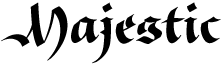 Born in Boston in 1976. Graduated with an MA in Typeface Design from-the University of Reading and studied at the Rhode Island School of Design. After graduation, he worked briefly for Jeremy Tankard and Font Bureau. In 2005, he worked briefly for Porchez Typofonderie. He currently lives in Heidelberg, Germany.
 He designed these typefaces: - Strela (2003). This typeface covers Latin, Cyrillic, Albanian, Belorussian, Bosnian, Catalan, Croatian, Czech, Estonian, Greenlandic, Hungarian, Latvian, Lithuanian, Macedonian, Maltese, Polish, Romanian, Sami, Serbian, Slovak, Slovenian, Turkish, Ukrainian, and Welsh.
- Deréon (2005, Porchez Typofonderie). This is a 6-font family done together with J.F. Porchez for House of Deréon, the clothing label of Beyoncé and Tina Knowles.
- Other typefaces done for Porchez: Henderson Serif (2006, black weight and production help), Verspieren (2007, for an insurance company), Le Monde Journal PTF (2007, help with the expansion of the 1994 original by J.F. Porchez), Le Monde Livre PTF (2008, help with the expansion of the 1997 original), Parisine PTF (2006, production assistance), Parisine Office (2006, production assistance), Sabon Next (2002, assistance), Mencken (2005, help with this font for The Baltimore Sun).
- In June 2007, he won the best Greek display typeface catgory at the Hellenic Alphabet competition.
- In 2008, he made a bastarda typeface Givry (Type-Together) created in the spirit of the bâtarde flamande as shown in the styles of the prominent scribes Jean Fouquet, Loyset Liédet, and Jean Bourdichon. It has Civilité influences.
- Trade Gothic Next (2008), with Akira Kobayashi at Linotype.
- In 2009, he created Alizé (Type-Together), a 3-weight italic beauty based on the chancery italic of the 16th century, with a Garamondesque "h".
- In 2012, Type Together published his typeface Iskra, a rounded family that covers Latin and Cyrillic. Iskra won an award at TDC 2013.
- Aeris (2010, Linotype). A flared sans family.
- Neue Helvetica Compressed (2014, Linotype).
- In 2014, Akira Kobayashi, Sandra Winter and Tom Grace joined forces to publish DIN Next Slab at Linotype.
- In 2018, Tom Grace and Steve Matteson published VAG Rounded Next at Monotype. It is an extension of the Volkswagen font VAG Rounded from the 1970s.
Speaker at ATypI 2017 Montreal. Behance link. Old URL. Klingspor link. View Tom Grace's typefaces. [Google]
[MyFonts]
[More] ⦿
|
Type Revivals (or: SourceNet)
[Tim Ryan]
|
 Tim Ryan is a Thousand Oaks, CA-based type designer and font enthusiast, who has helped me out generously with font links in the 1990s. FontShop link.
 His fonts are distributed by ITF and Monotype and Precision Type. Font list: AES, AcmeTR, AdmiralTR, AlpineWhiteTR, AncientTextTR, AssayTR, August family, AutomationTR, BinnerGothicTR, BinnerTR, BlackboardLinedTR, BlackboardTR, BoboCapsTR, BonGuia, Bondage-Oblique, Bondage-Regular, BoomerangTR (1995, a typical art nouveau face), CameraStencilTR, CartoonPartyCapsTR, ChopinTR, CiviliteTR, ClaudiusTR, CollegeCapsTR, CoreDumpTR, DirectionTR, EclipseCapsTR, EngravedTR, ExpressTR, FlairTR, FrenchCapsTR, GabrielleTR, GaelicCapsTR, GoudyMediaevalTR, HelvinBlackTR, HelvinTR, HostessTR, KhayyamTR (Arabic simulation face), KiddoKapsTR, KleukensTR, LadyDawnTR, MaximeTR, ModTR, PencilCapsTR, PlayBlocksTR, SaltinoTR, SansPlateCapsTR, SchoolScript-Bold, SchoolScript (1994), SchoolScriptDashed, SchoolScriptLined-Bold, SchoolScriptLined, ShalimarTR (Indic simulation), ShalomTR (Hebrew simulation), SimplexTR, SpringtimeTR, SukiakiTR (Japanese simulation), SusieQTR, VarianteInitialsTR, WashingtonTextTR, XerxesTR (Greek simulation face, now at Monotype), SchoolOblique. Santa Barbara, CA-based SourceNet used to market school fonts, ca. 1992-1994, such as those listed above: SchoolScript-Bold, SchoolScript (1994), SchoolScriptDashed, SchoolScriptLined-Bold, SchoolScriptLined, but also DnealianCursive, DnealianCursiveLined, DnealianManuscript, DnealianManuscriptLined. [Google]
[MyFonts]
[More] ⦿
|
Typedia: Typeface classification
|
The classification from the Typedia community: - Blackletter
- Fraktur: A German form of Blackletter with broken strokes. Classic example: Fraktur.
- Old English: The English blackletter style. Classic example: Cloister Black.
- Rotunda: A Blackletter style featuring wider lowercase with more rounded strokes.
- Schwabacher: A German form of Blackletter with simplified, rounded strokes.
- Textura: A Blackletter style featuring tall, narrow lowercase made mostly of straight strokes.
- Calligraphic
- Chancery: A script style of calligraphy made with a broad-point pen with slightly sloping, narrow letters that are the basis for italics in serif typefaces. Capitals may or may not have flourishes. Originated during the Renaissance. Classic example: Zapf Chancery.
- Etruscan: An early Roman form of calligraphy drawn with a flat brush held at a steep angle. Caps only, as lowercase had not been invented yet. Classic example: Adobe Pompeii.
- Uncial: A Celtic style of calligraphic script with forms created by a broad-nibbed pen at an almost horizontal angle, but sometimes more tilted in later variants. Roman lowercase is derived from Uncial forms. There is only one case in pure Uncial designs. Used during the middle ages. Classic example: American Uncial.
- Inscriptional---Roman Inscriptional: Stone-cut serif style from the late Roman Empire. The basis of modern roman capitals. Classic example: Trajan.
- Non-alphanumeric
- Dingbats
- Ornaments
- Pictorial
- Ornamented, Novelty
- Art Deco: A geometric display typeface style popular in the 1920s and 1930s. Classic example: Broadway.
- Art Nouveau: Display typefaces with a flowing, organic style popular in the early 20th Century. Classic example: Arnold Bocklin.
- Comic Strip Lettering: A style meant to look like the hand-drawn letters associated with comics or cartoons. This style is usually san serif, often having a loose, informal structure and is sometimes based on brush lettering. Classic example: Balloon.
- Dot Matrix: A style whose characters are composed of a pattern of dots used mainly for low-resolution impact printers, or to simulate the look of the output of such printers. Classic example: FF Dot Matrix.
- Futuristic: A style meant to suggest a futuristic theme. Often cold, brutal and geometric with a machine aesthetic and simplified construction. Classic example: Stop.
- Machine Readable: A style designed to be read by machine. These fonts are usually san serif and often feature unusual character shapes to make them more distinguishable from one another. Classic example: OCR-B.
- Pixel: A style whose characters are composed of pixels (usually represented as squares) used mainly for low-resolution computer display. Outline fonts are sometimes made to look like Pixel Fonts. Classic example: Silkscreen.
- Pseudo Foreign Script: A style intended to mimic non-Western letters. For example, a font that looks like Chinese, but is actually composed of Latin characters. Faux Chinese/Arabic/Hebrew. Classic example: Bruce Makita.
- Victorian: A whimsical, eclectic display style popular in the late 19th Century. Classic example: Skjald.
- Sans Serif
- Gothic: A sans serif style with moderate stroke contrast and modern proportions particular to the U.S. Usually features a two-story lowercase g, angled strokes on C and S, and a sloped, non-cursive italic. Classic example: Franklin Gothic.
- Grotesque: A sans serif style with moderate stroke contrast and modern proportions particular to the U.K. Usually features a two-story lowercase g, closed strokes (usually curving in slightly) on C and S, and a sloped, non-cursive italic. Classic example: Bureau Grot.
- Geometric Sans: A sans serif style made with rigidly geometric forms and little to no stroke contrast. Classic example: Futura.
- Grotesk: A sans serif style with low stroke contrast and modern proportions. Usually features a one-story lowercase g, closed or angled strokes on C and S, and a sloped, non-cursive italic. Classic examples: Akzidenz Grotesk, Helvetica.
- Humanist Sans: A sans serif style with proportions modeled on old-style typefaces. Characterized by open strokes on characters like C and S. Italics of this style often are more cursive in appearance, rather than a simple slanted version of the roman. Often has more slightly stroke contrast than other sans serifs. Classic examples: Gill Sans, Frutiger.
- Square Gothic: A sans serif style composed mainly of straight or nearly straight lines and (often) curved corners. Stroke contrast is usually low. Classic example: Bank Gothic.
- Swiss Gothic: A sans serif style with noticeable stroke contrast, straight sides on round characters, modern proportions, and large x-height. Usually features a one-story lowercase g and closed strokes on C and S. Classic example: Jay Gothic.
- Script
- Brush Script: Typefaces modeled after lettering made with a brush. Strongly associated with advertising in the mid-20th Century on. Classic example: Brush Script.
- Casual Script: Typefaces based on a style of lettering characterized by informal appearance, somewhat like handwriting, but more refined. Similar to Brush Script or Sans Serif. Classic example: Murray Hill.
- English Roundhand: A connecting-script style of calligraphy made with a flexible tipped pen. The characters are usually steeply sloped and capitals are often very elaborate. Popular in the 18th and 19th Century. Sometimes called Copperplate Script. Classic example: Bickham Script.
- French Roundhand: A connected-script style of calligraphy, sometimes with upright characters, a high stroke contrast and decorative capitals. Used in France in the 17th through 19th Century. Also called Civilité. Classic example: Typo Upright.
- Handwriting: A script style based on ordinary handwriting. Characters may or may not be connected. Classic example: Felt Tip Roman.
- Rationalized Script: A script style with sans serif qualities, low stroke contrast, and a formal appearance. Characters may or may not connect. Associated with 20th Century commercial design. Classic example: Gillies Gothic.
- Serif
- Grecian: A typically heavy display typeface with octagonal shapes where curves are normally used. Also known as Chamfered or Beveled. Popular in the 19th Century for wood types. Classic example: Acropolis.
- Latin: A serif style with large triangular or wedge-shaped serifs. Stroke contrast is medium to low. Popular in the 19th Century for wood types. Classic example: Latin.
- Modern: A serif style with high stroke contrast and vertical stress. Classic example: Modern No. 20.
- Didone: A serif style with high stroke contrast and vertical stress. Serifs are usually unbracketed. Classic examples: Bodoni (Italian), Didot (French).
- Scotch Modern: A serif style with medium to high stroke contrast and vertical stress, known for large serifs and tiny aperture. Serifs are usually bracketed. Classic examples: Modern No. 20, Scotch Modern.
- Old Style: A serif typeface with relatively low stroke contrast, angled stress, angled serifs. Classic example: Bembo.
- Antique: A serif style with moderate stroke contrast, bracketed serifs and usually vertical stress. Serifs are angled as in Old Style. Popular in the 19th Century. Classic example: Bookman.
- Dutch Old Style: A serif style with somewhat angled stress, bracketed serifs, and medium to high stroke contrast. Characteristic of Dutch and English types of the 18th Century. Classic examples: Caslon, Plantin, Times Roman.
- French Old Style: A serif style with angled stress on rounds; usually features a small eye on the lowercase e; soft, bracketed serifs and moderate stroke contrast. Classic example: Garamond.
- Spanish Old Style: A serif style with soft, bracketed serifs, medium to high stroke contrast, and often highly angled stress. Classic example: Rongel.
- Venetian Old Style: A serif style with angled stress on rounds; usually a tilted crossbar on the lowercase e; usually has somewhat low stroke contrast. Serifs are sometimes unbracketed. This style is associated with very early printing (Incunabula) in the West. Classic example: Jenson.
- Slab Serif: A serif style with serifs equal to or nearly the same thickness of the main strokes. Main strokes usually have low contrast. Classic example: Rockwell.
- Clarendon: A slab serif style with heavy, bracketed serifs, modern proportions and construction, low stroke contrast. Classic example: Clarendon.
- Egyptian: A serif style with heavy, unbracketed serifs, modern proportions, low stroke contrast. Basic construction is similar to Modern, but with low stroke contrast. Sometimes called Antique. Classic example: Egiziano.
- French Clarendon: A serif style with reverse stress (horizontal strokes thicker than vertical strokes) and slab serifs, sometimes bracketed, usually condensed. Popular in the 19th Century. Classic example: Playbill.
- Geometric Serif: A serif style made with rigidly geometric forms. Usually features slab serifs. Classic example: Stymie.
- Spur Serif: A serif style with very small serifs. Usually similar in design to san serif typefaces, except for the serifs. Usually very little stroke contrast. Classic example: Copperplate.
- Transitional: A serif style which, historically, bridges the gap between Old Style and Modern. Stroke contrast is stronger than old style, but less than modern. Bracketed serifs. Stress is mainly vertical. Characteristic mainly of English types around 1800. Classic example: Baskerville.
- Scotch Roman: A serif style with medium contrast and vertical stress, medium-sized bracketed serifs. Classic examples: Miller, Caledonia.
- Tuscan: A serif style with splayed or ornate serifs. Classic example: Thunderbird.
[Google]
[More] ⦿
|
Vera Evstafieva
[Infonta]
|
[MyFonts]
[More] ⦿
|

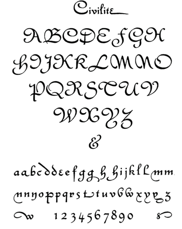
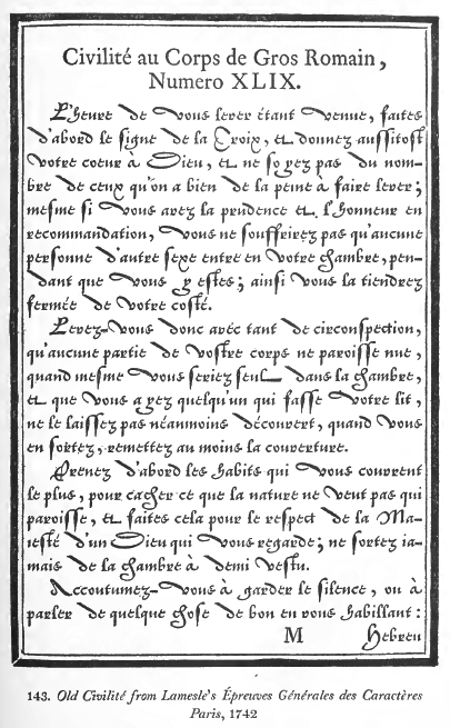
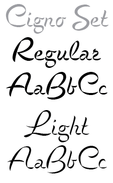
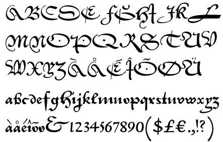
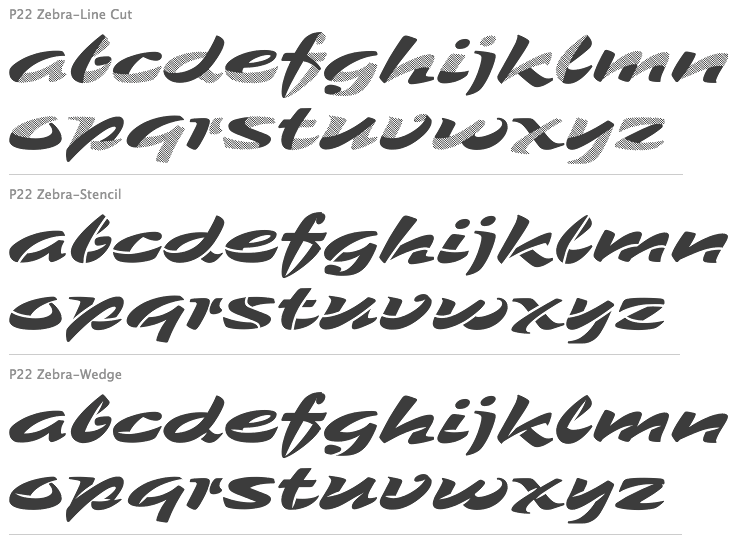
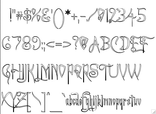
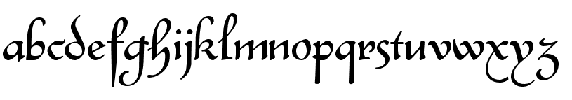
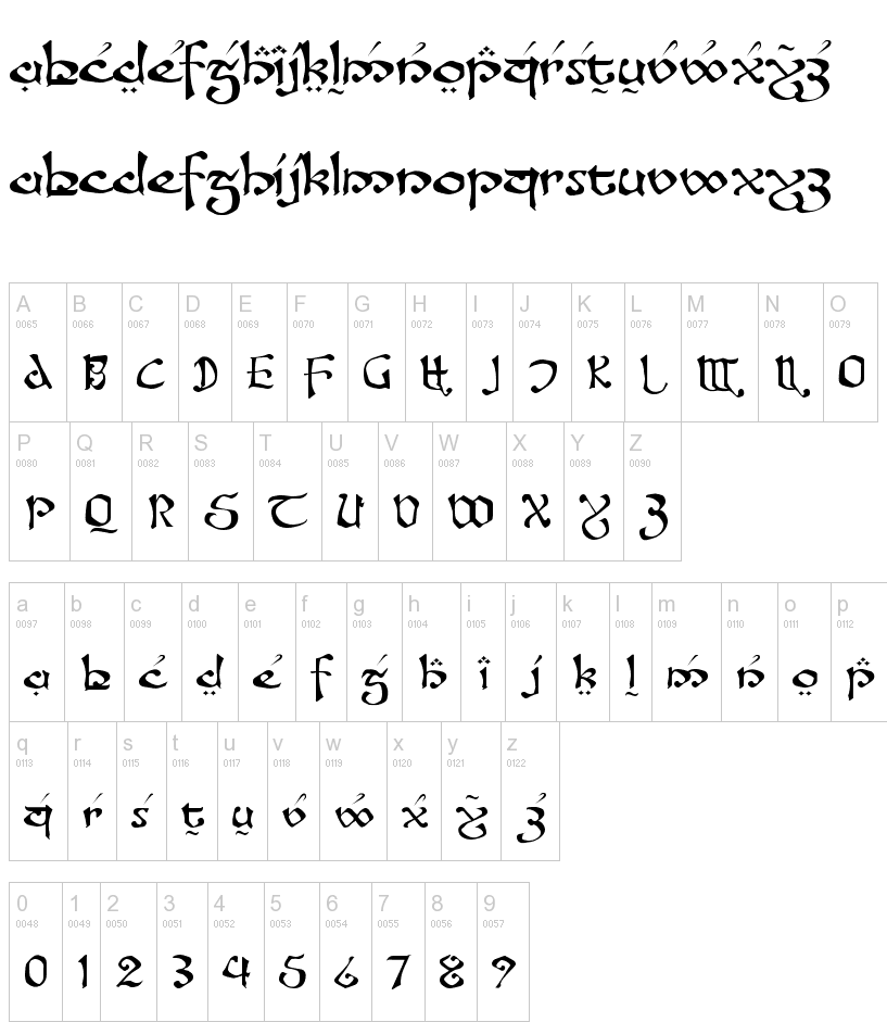
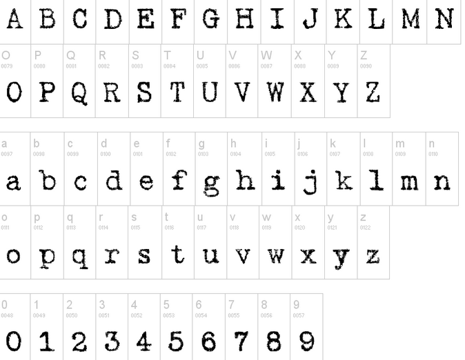
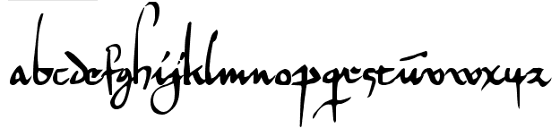
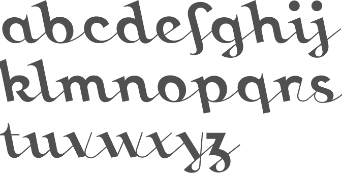
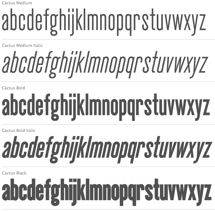
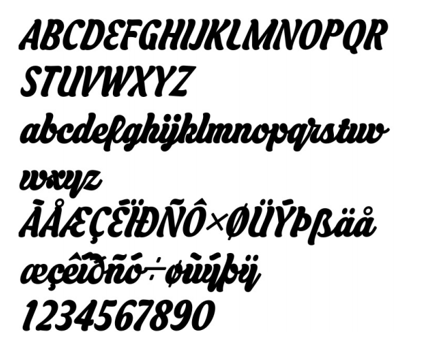
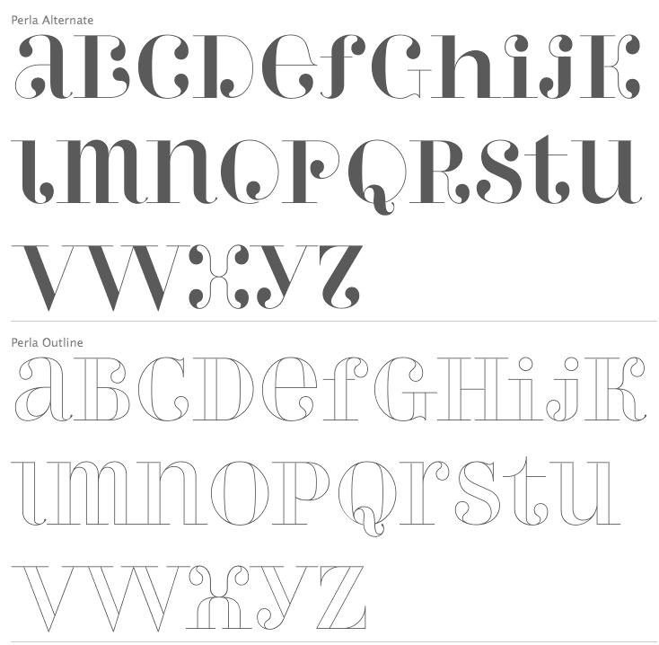
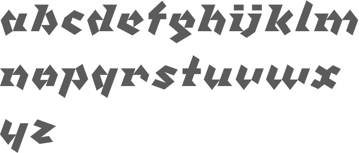
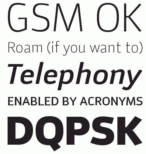
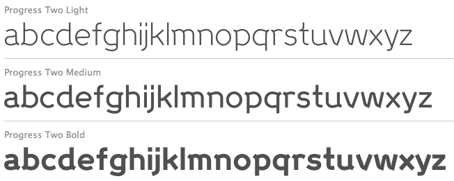
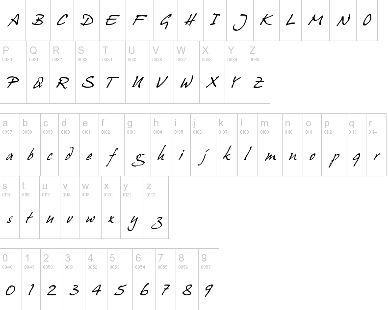
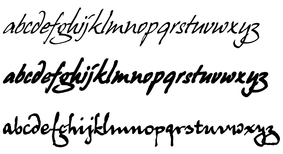
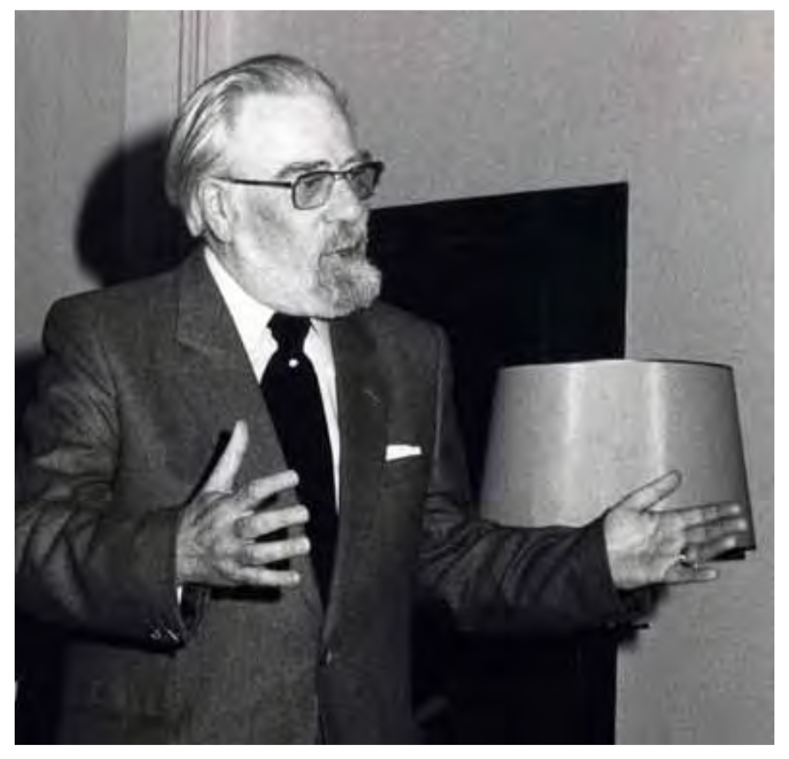
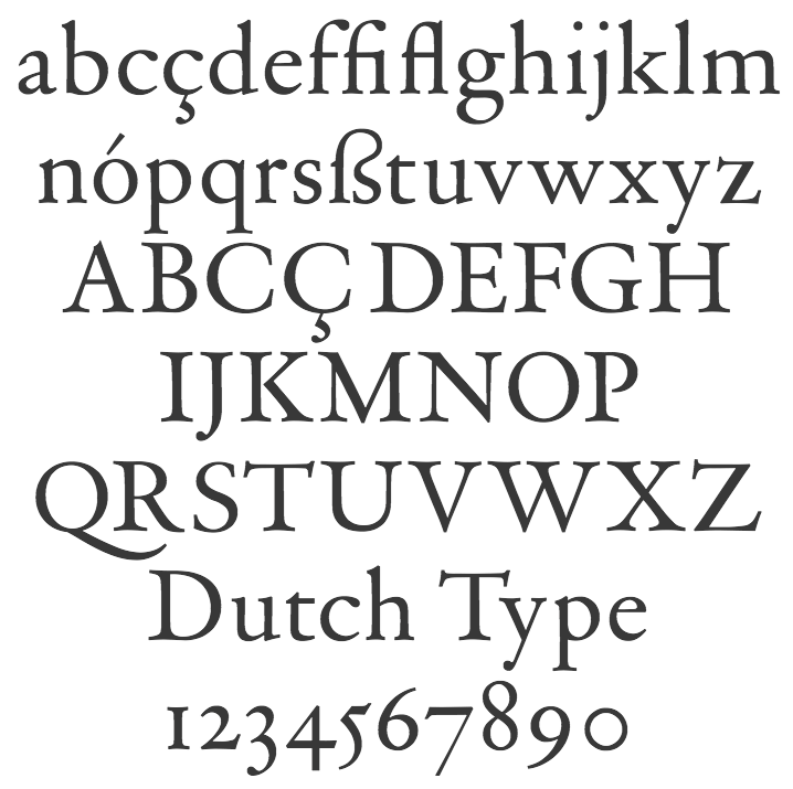
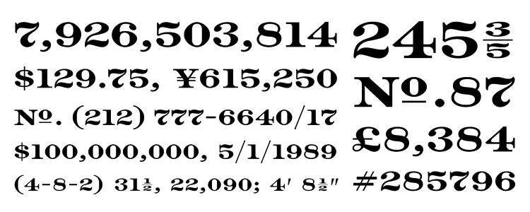
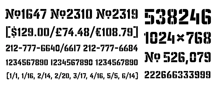
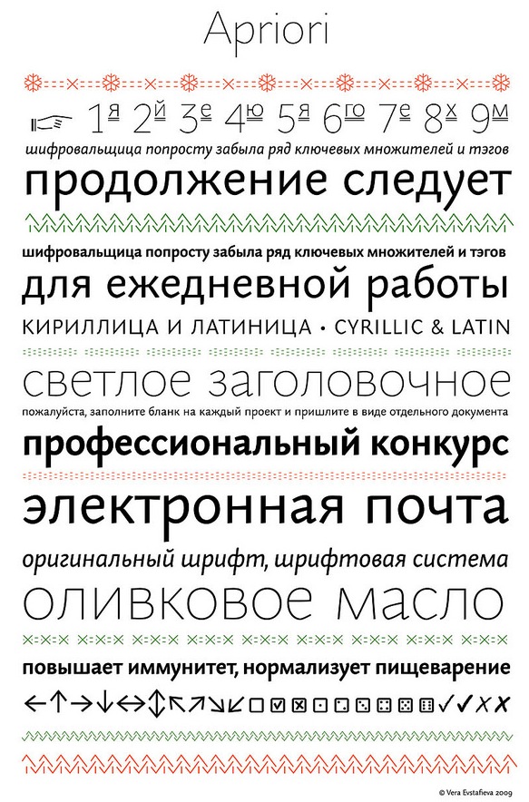
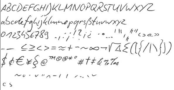
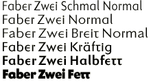
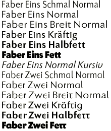
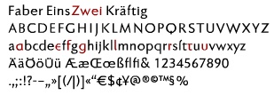
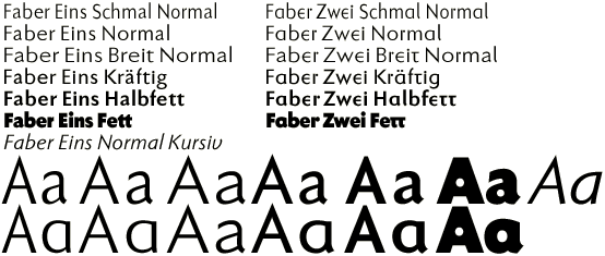
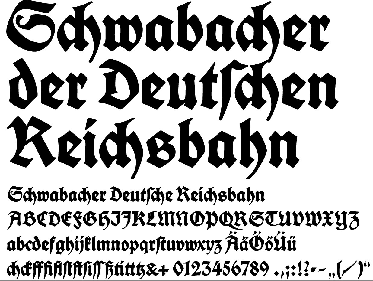
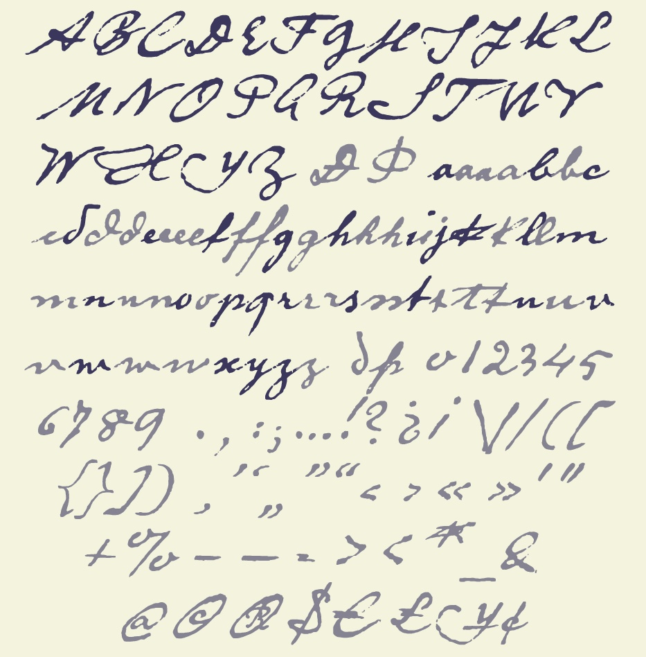
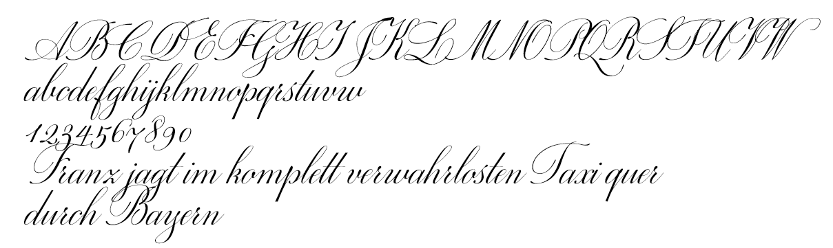
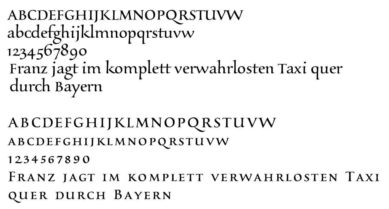
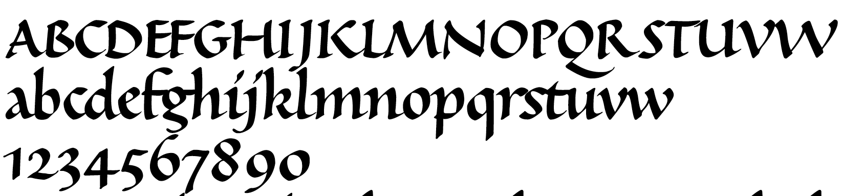
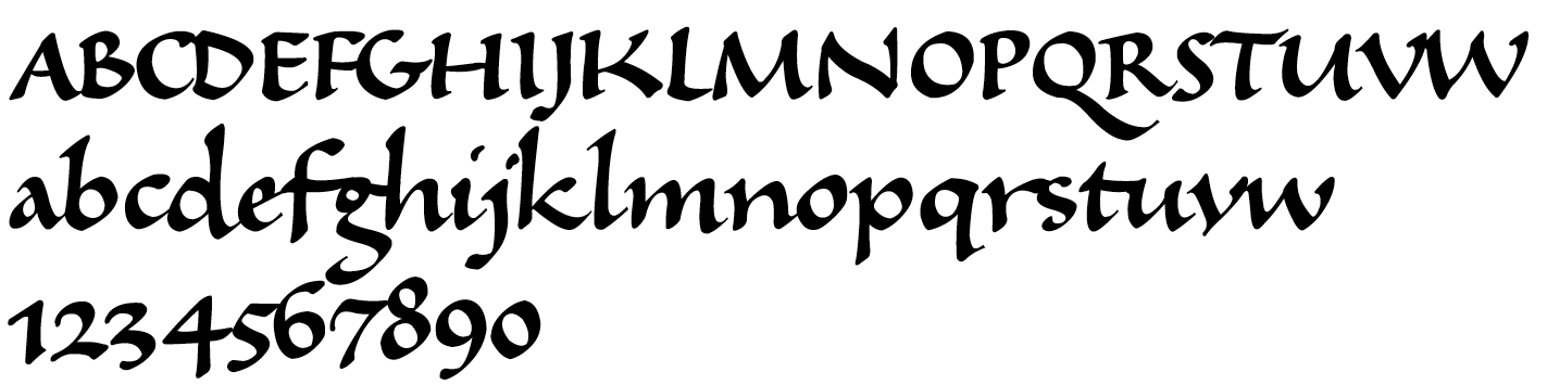
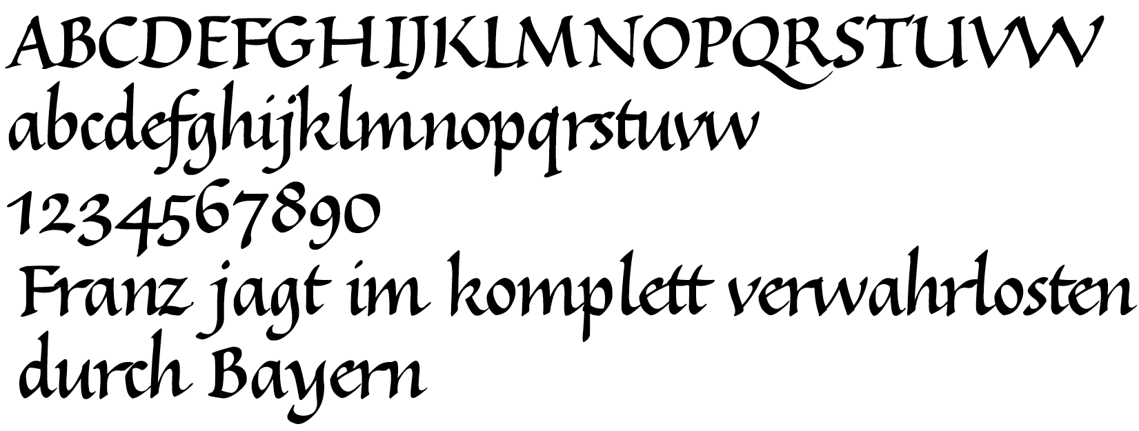
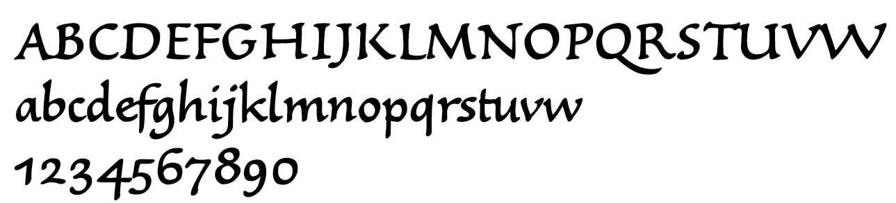
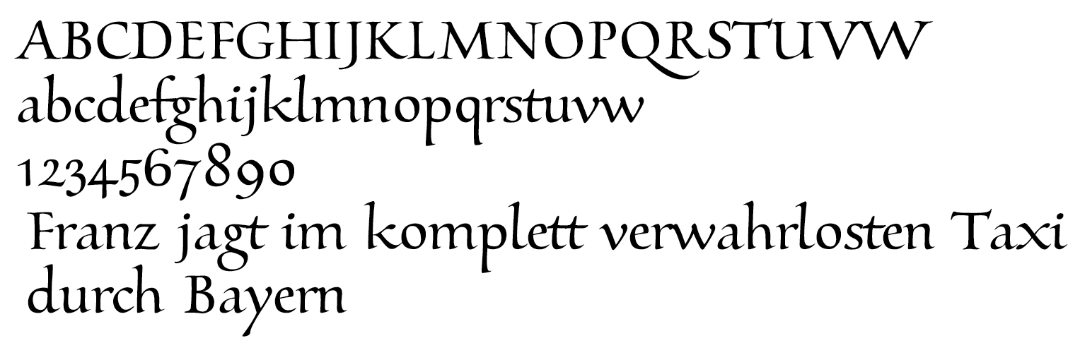
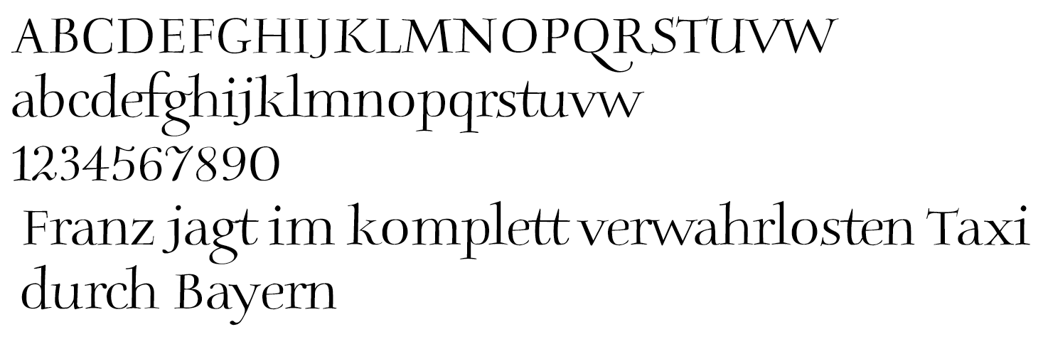
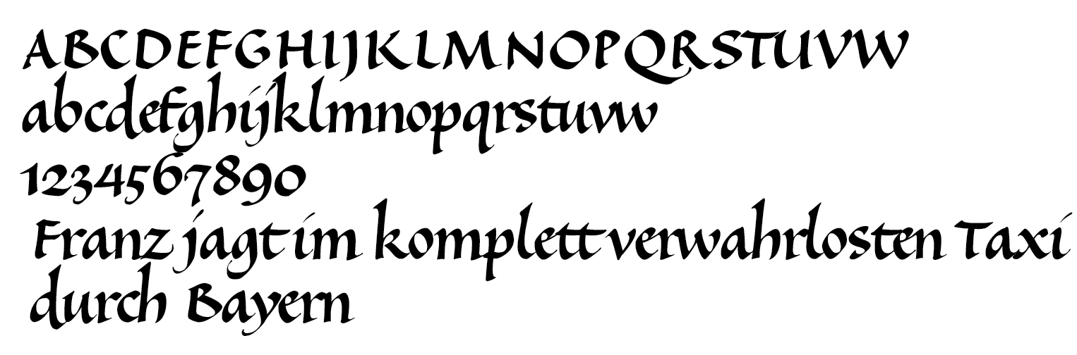
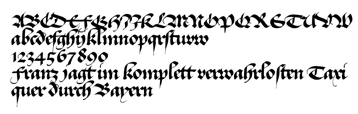
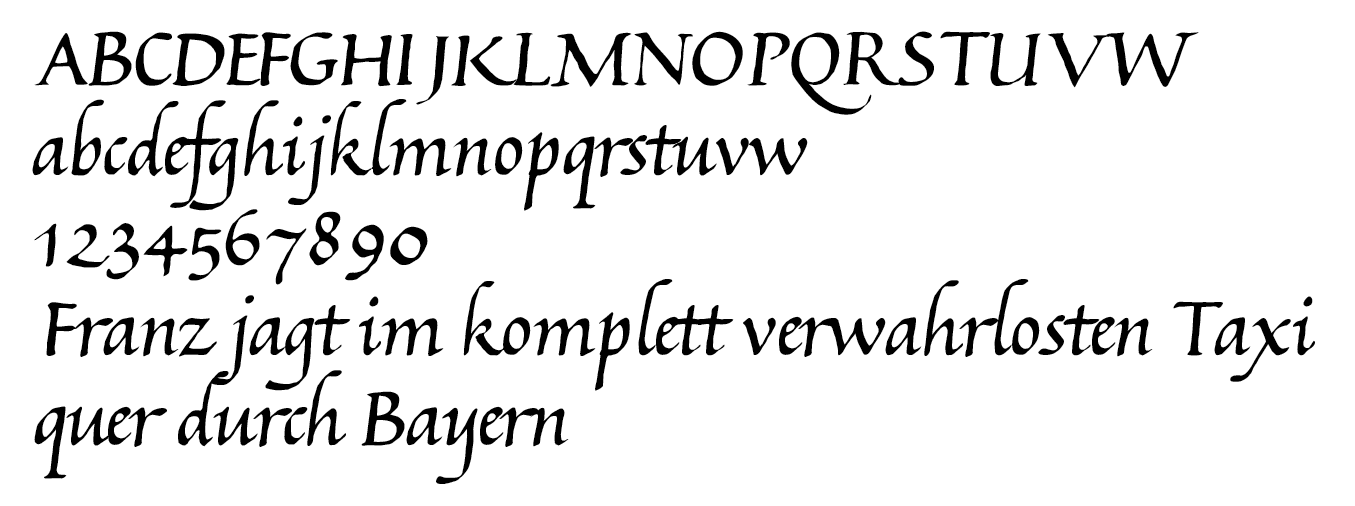
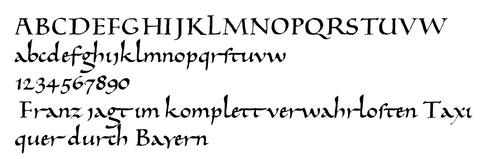
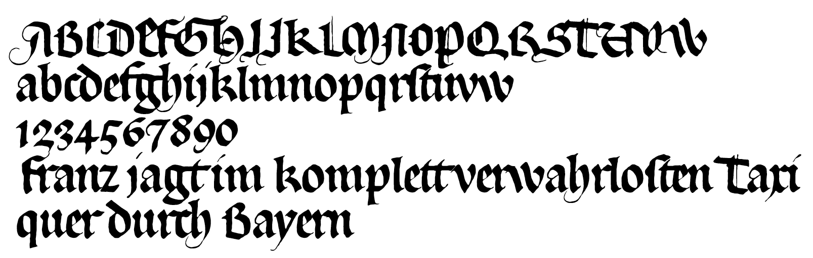
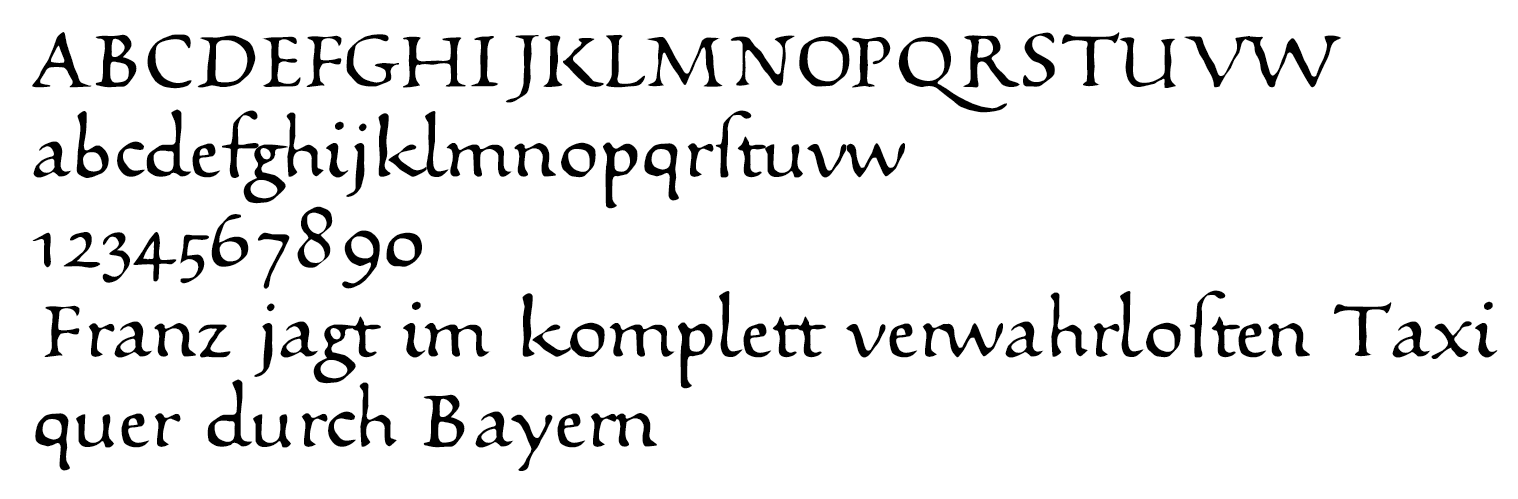
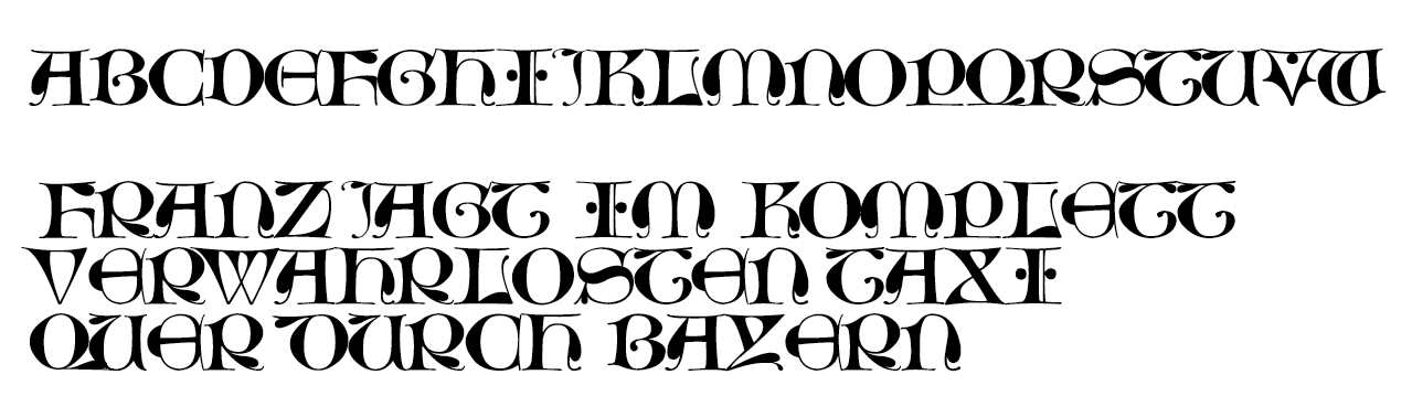
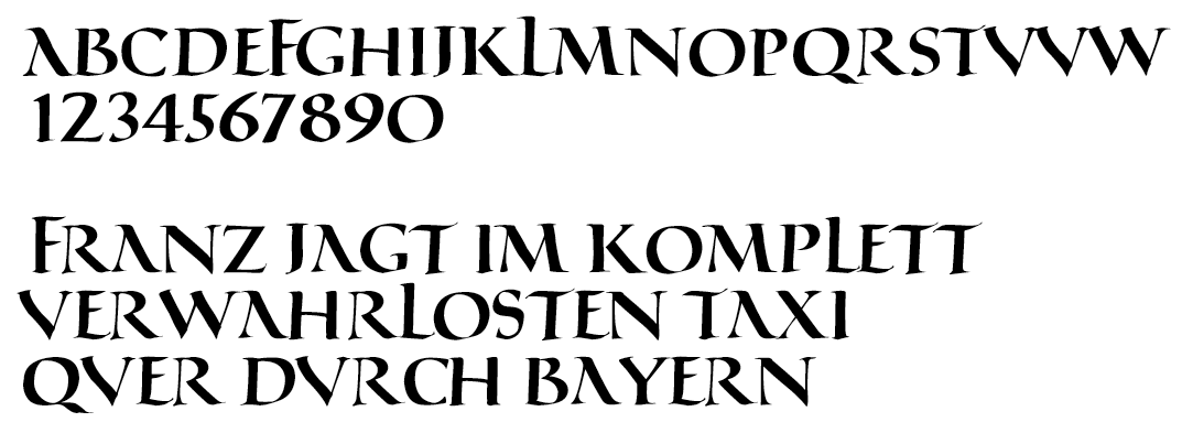
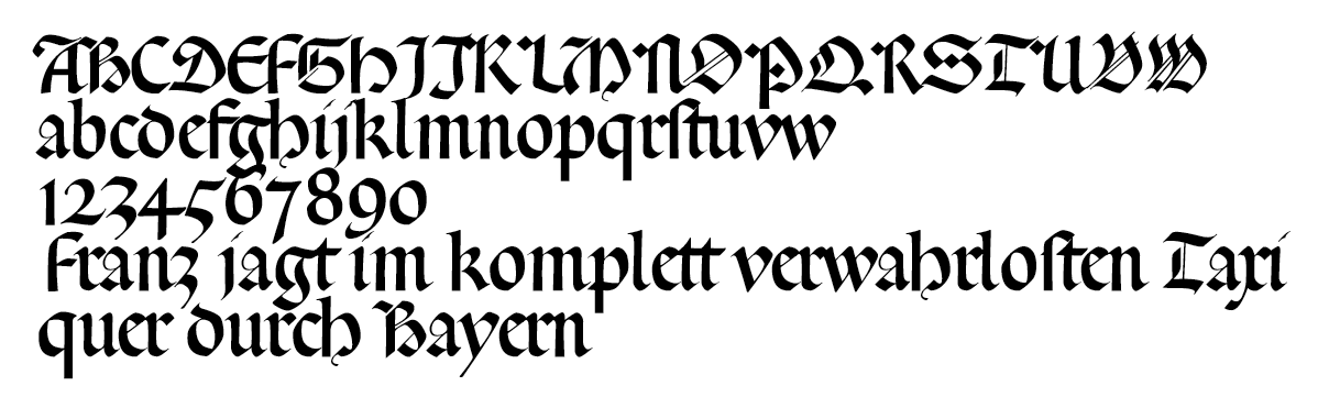
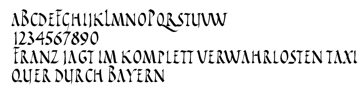
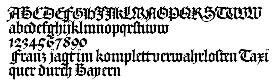
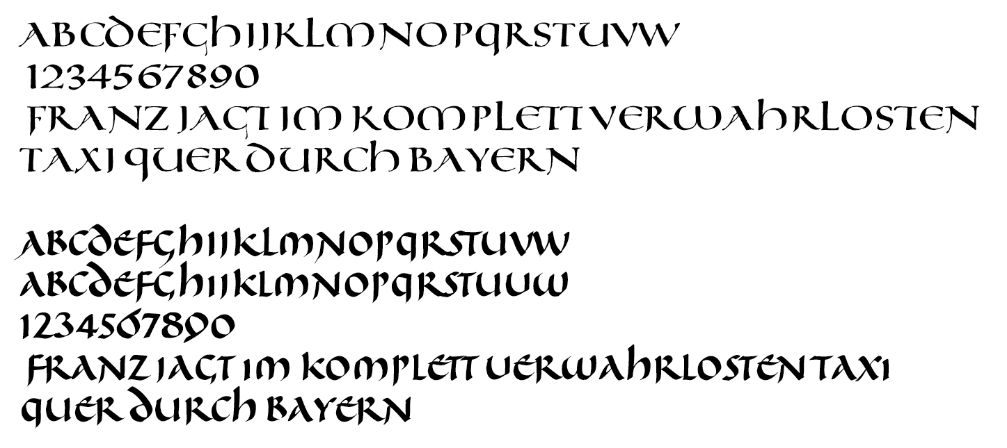
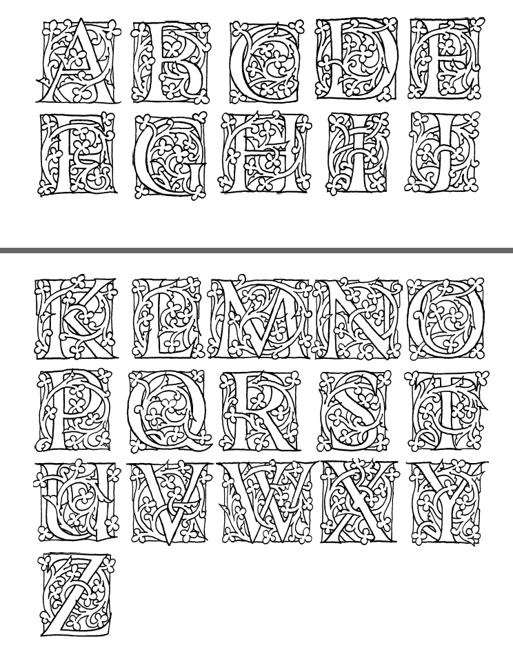
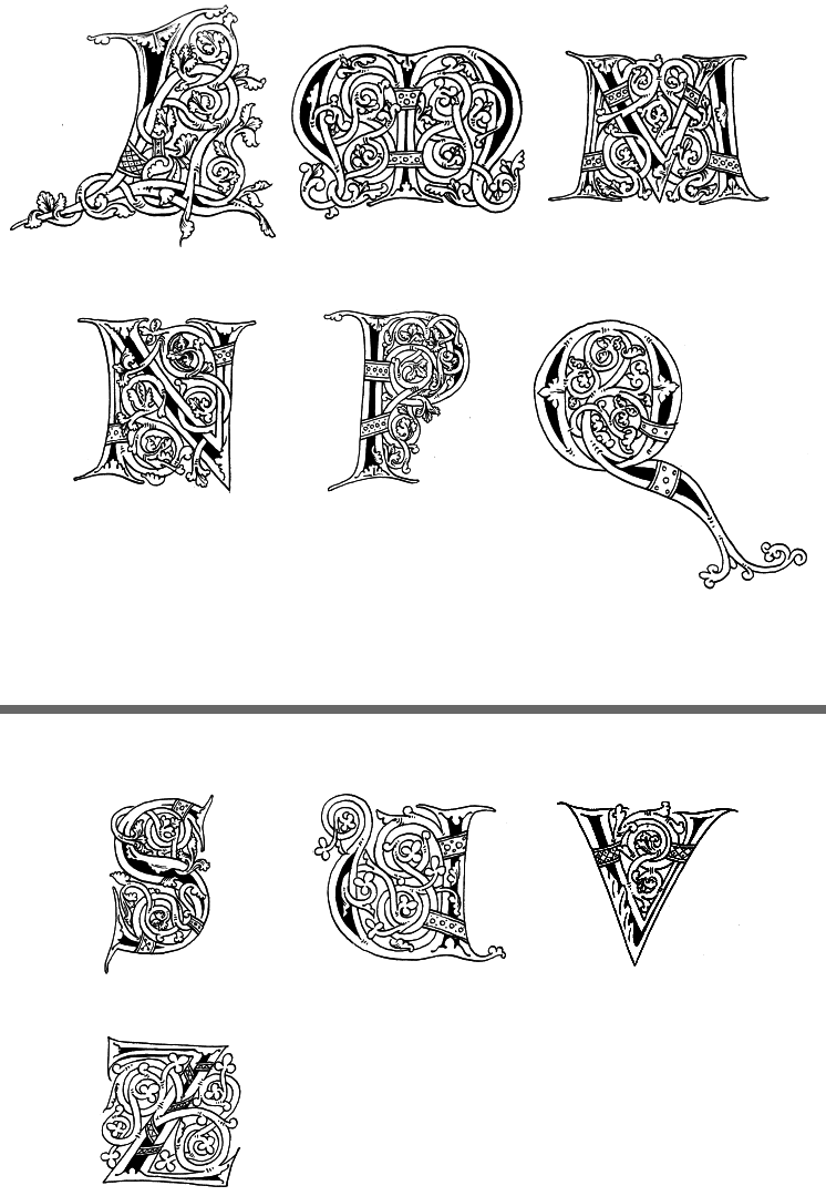
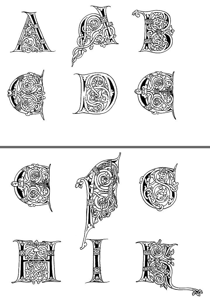
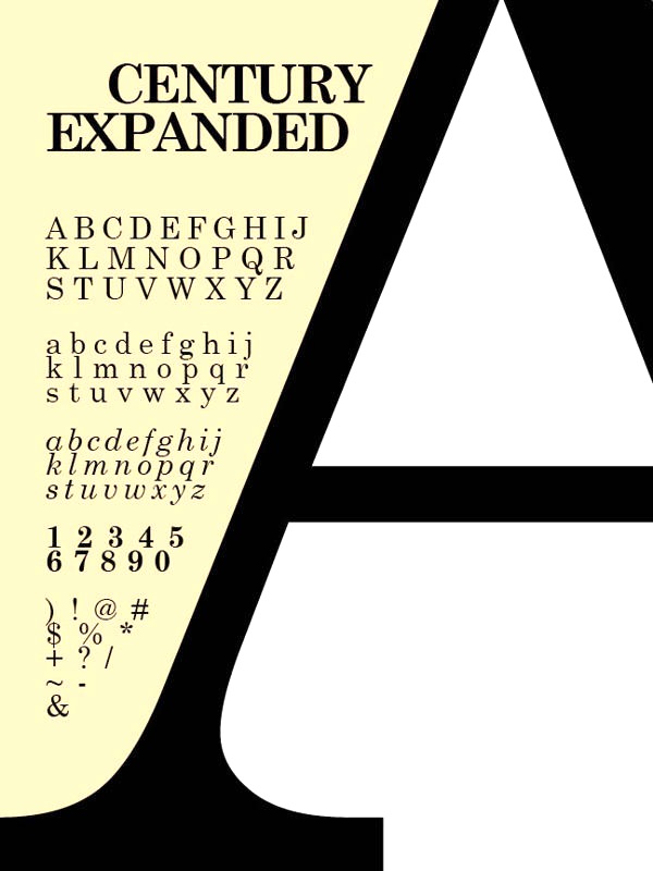
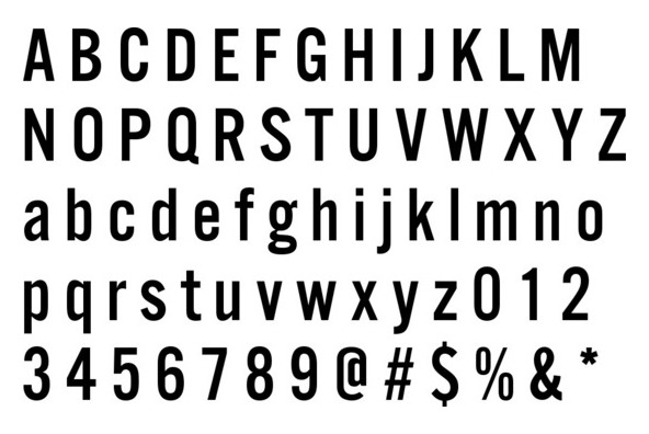
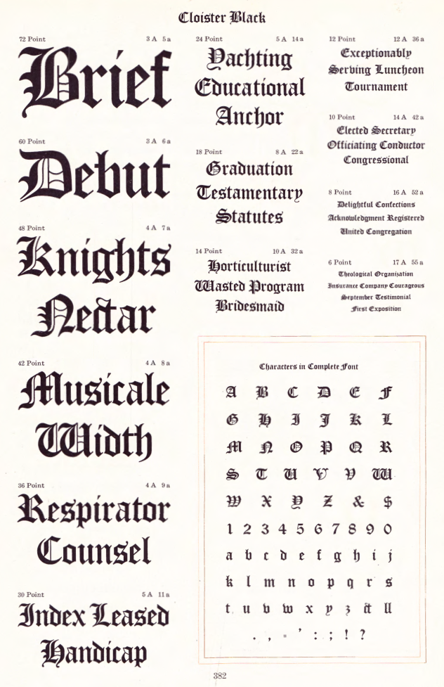
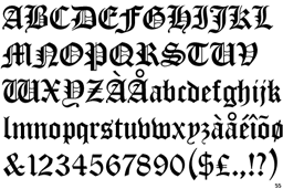
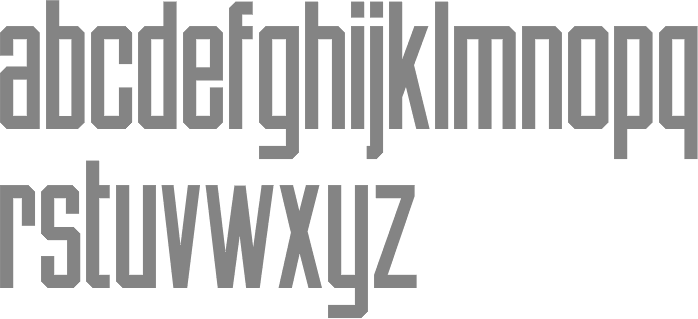
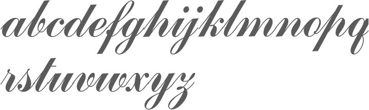
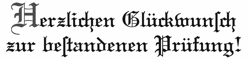
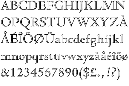
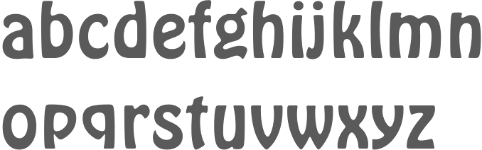
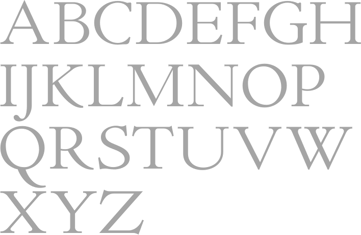
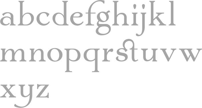
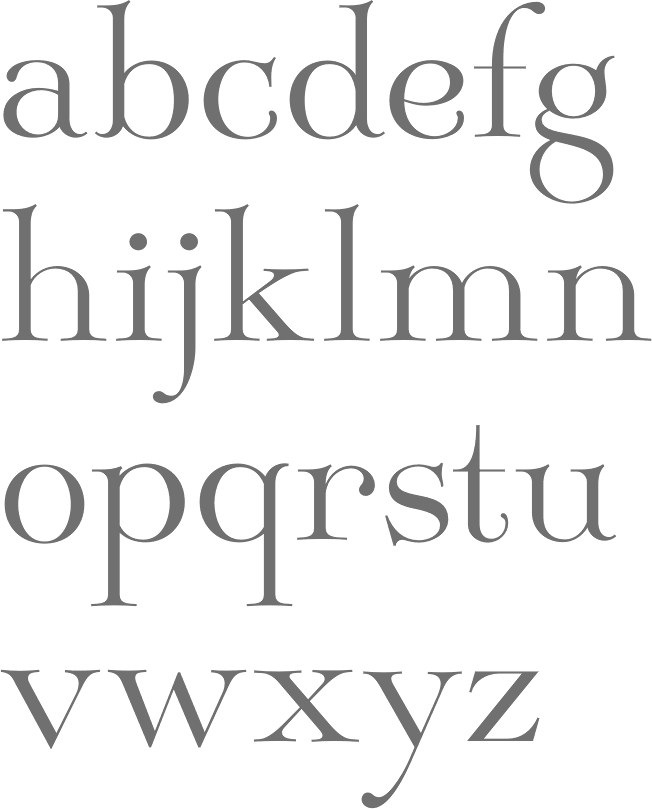
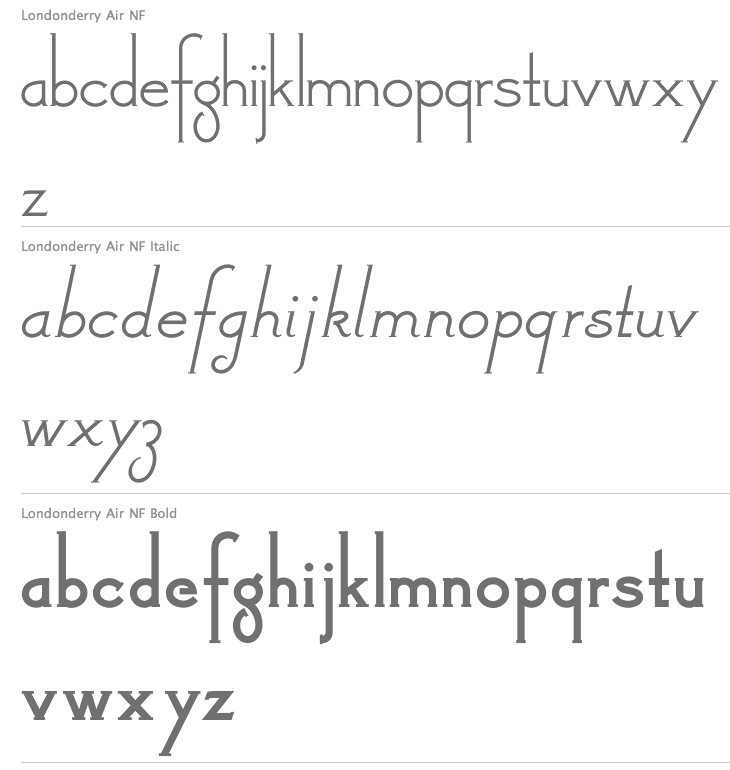
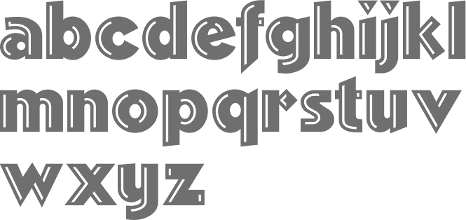
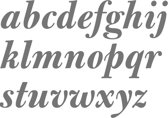
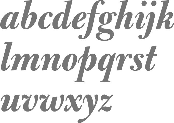
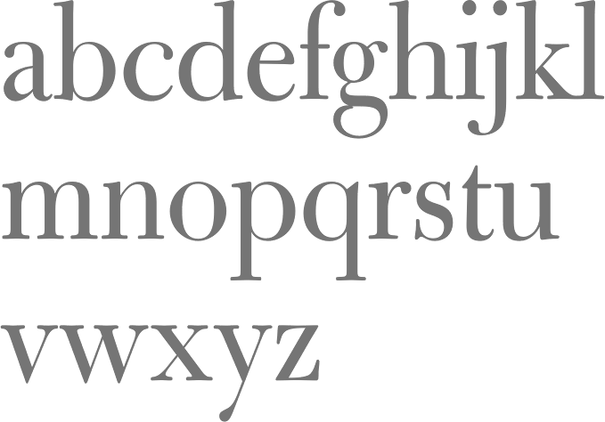
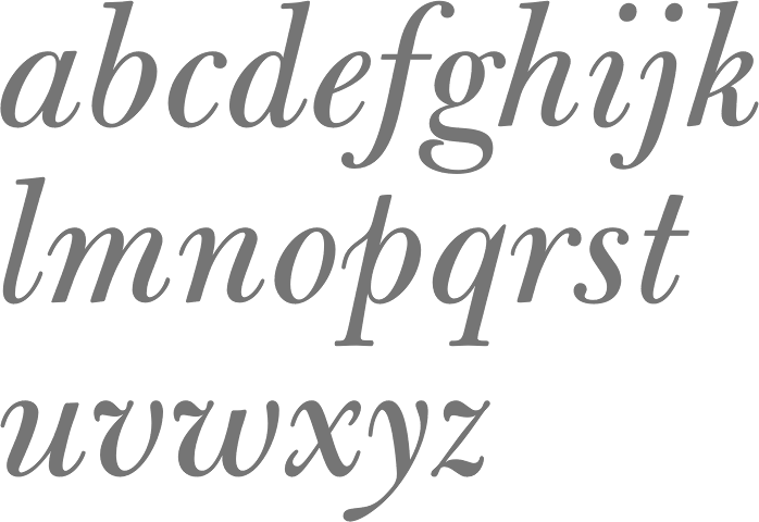
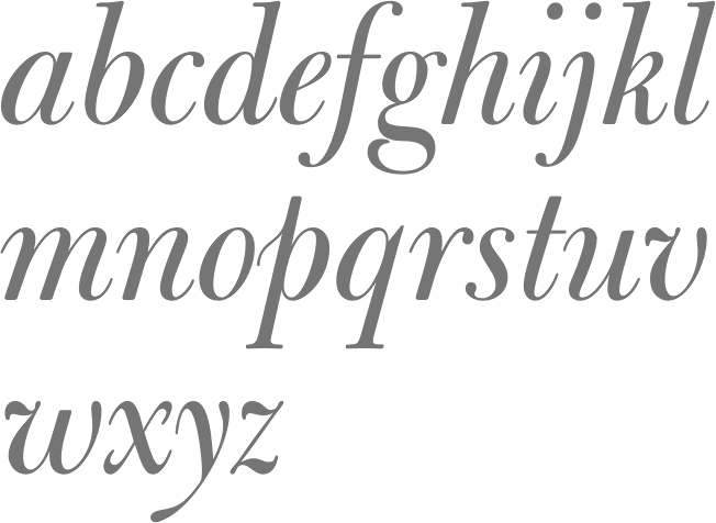
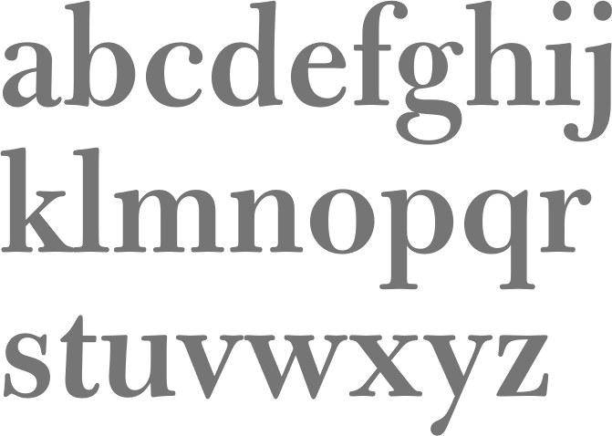
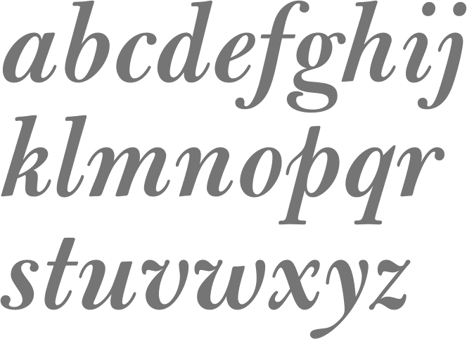
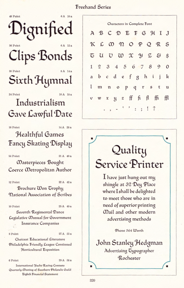
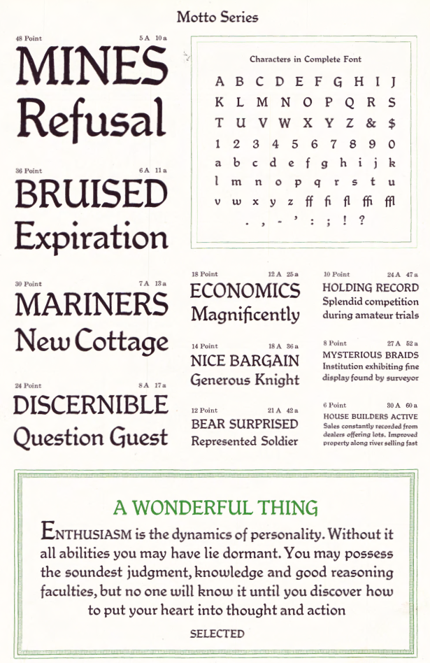
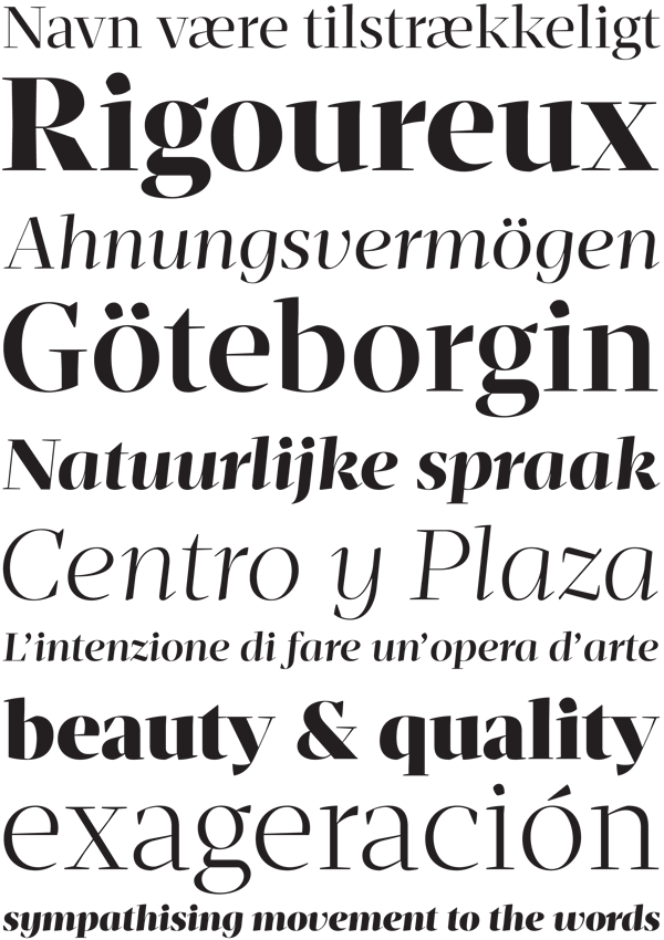
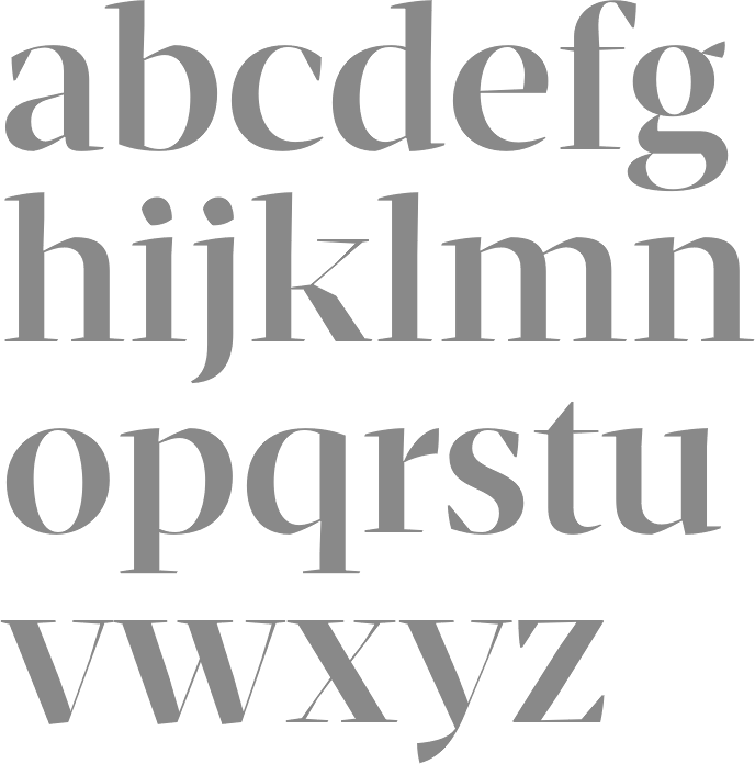
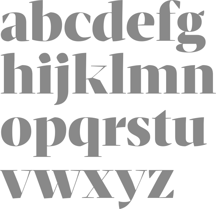
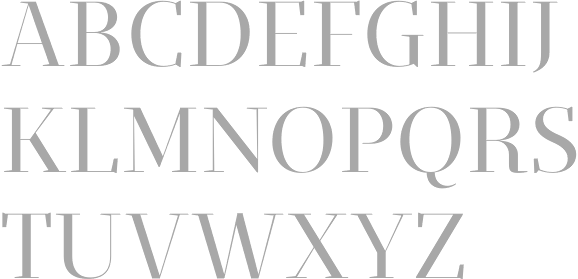
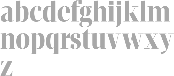
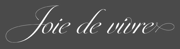
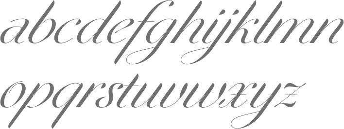
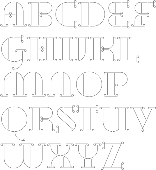
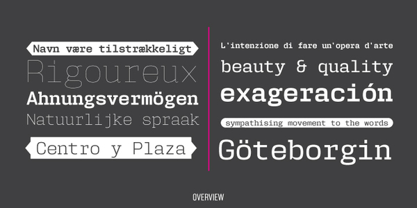
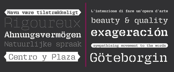
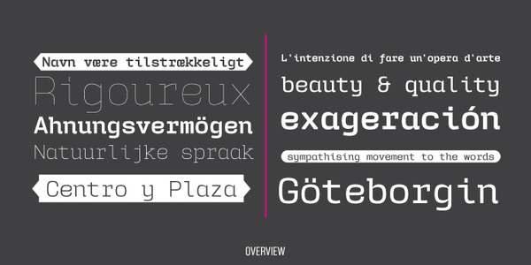
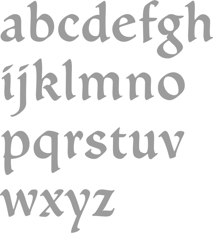
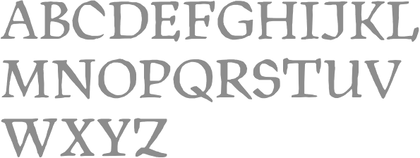
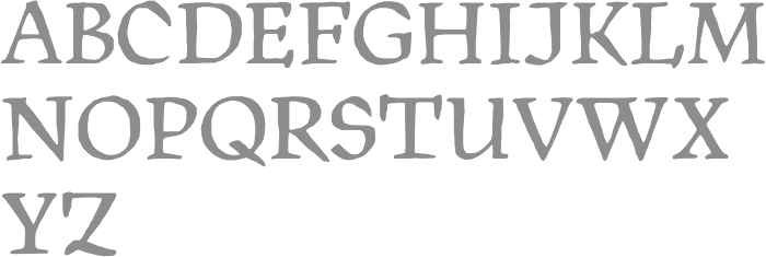
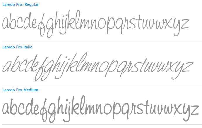
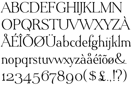
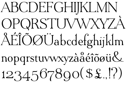
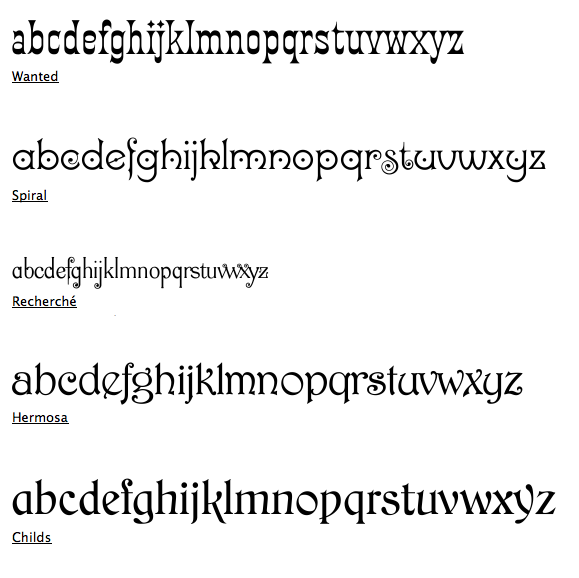
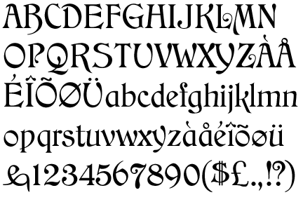
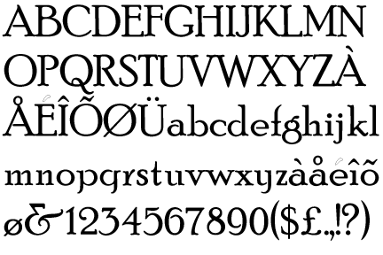
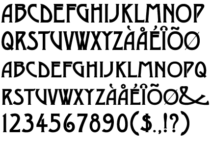
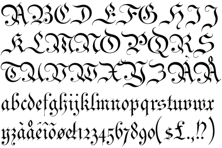
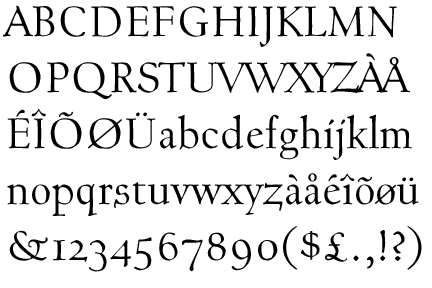
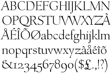
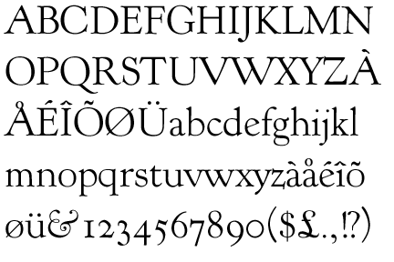
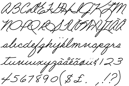
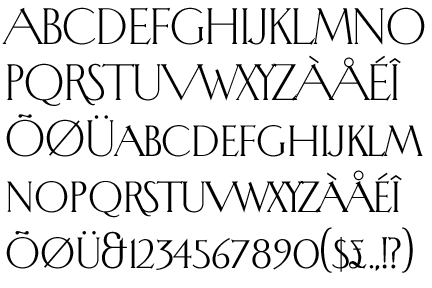
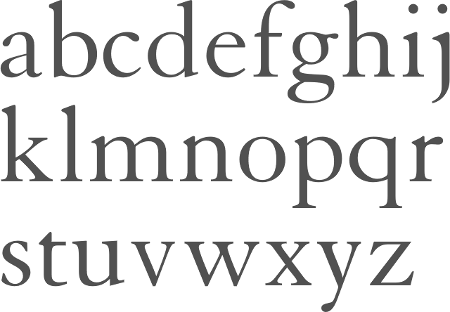
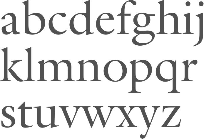
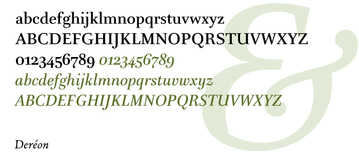
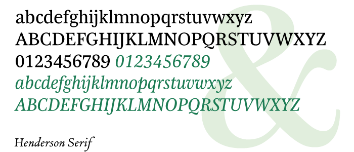
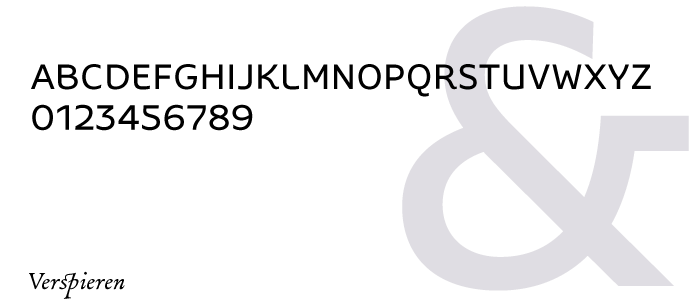
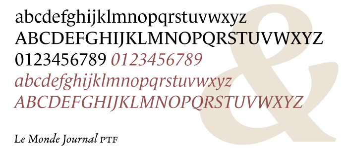
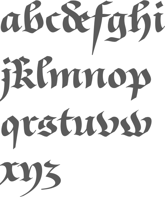