| | |
Abdul Basith
|
Colombo, Sri Lanka-based designer of the alchemic typeface Geometric (2015), which according to the designer was influenced by De Stijl. Behance link. [Google]
[More] ⦿
|
Adila Rahma
|
 FontStructor whose typefaces in 2012 include the De Stijl stencil typeface DThree Stencil Bold, DFive Other Bricks (dot matrix), DFour Small Bricks (horizontally striped typeface), DTwo Monster Mouth, and One Time. [Google]
[More] ⦿
|
Aeolien
[J. Fürst Gardiner]
|
 Creator at FontStruct of Aeolien (2011, alphadings), Gazebo Line Aeo (2012), Chateau d'Air (2013, castles), Like Fabergé (2013, oval), Fold Line (2013, a sewing font), Toothache (2013), Linoleum (2013), Sandor Basic Stripes (2013), Compass Norden (2013, a dot matrix font), Sambuccus (2013), Abneuroniques (2013, neurotic typeface), Zebra (2013, horizontally striped), Amazed (2013, maze font), Card Reading (2013), 3paths (2013), Raidho (2013), Floraeolien (2013, flower dings), the Art of Square series (2013), and Ostara Egg Box (2013, ornamental caps for Easter).
 Typefaces from 2014: Ceques (op-art), Indentional, The Tunnels of Tralyoxx, ClickPop Beads, Blue Moon, Nurdal's Walk (LED font), Dumultix (techno, in De Stijl fashion, based on Mondrian), Wever Ding, My Unintended, Haltero, Linuta, Murexa, Abfahrt, Arrivee Mercredi, Mabon (vintage slab serif, art nouveau), Treat or Trick, Aerix Stencil Serify, Noba M, Plaque Emaille (white-on-black), Gleiteri, Strega nona, Kubetus (artsy), Kubetuffo, Pixiel, Werner, Free Masonry, Airy Brickwork, Aerix Stencil Sans, Sim Card, Kerbe, Fool's Beans, Gift Tag (alphadings), Tag Letters, Varsity Outline UC. Typefaces from 2015: 3Fino, S-chablo Sans (stencil), August, Shifted (op-art), Arroed, Apprentice Quill, Spitze, Melusine. Aka Jutta Gi. FontStruct link. [Google]
[More] ⦿
|
A.J. Goddard Designs
|
In 2013, A.J. Goddard (Essex, UK) drew a De Stijl-genre alphabet by hand for a project at South Essex College. [Google]
[More] ⦿
|
Alex Trochut

|
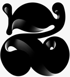 Brooklyn, NY-based grandson of Joan Trochut of Super-Veloz fame, b. 1981, Barcelona. After completing his studies at Elisava Escola Superior de Disseny in Barcelona, Alex established his own design studio in Barcelona before relocating to New York City.
 He is the codesigner with Andreu Balius of SuperVeloz (2005, TypeRepublic), a digital version of his grandfather's typeface. It won an award at the TDC2 2005 type competition. Balius says about this typeface originally created by Joan Trochut from 1920-1980: Super-Veloz could be considered as an Ornamental type design, but in its core it is an experimental typeface based on a set of modular features that, with the combining of its modules, a great range of typefaces, ornaments ---even illustrations---, could be made. That is perhaps the most interesting experiment in early modern type design ever made in Spain during the immediate years after the War. The lecture, considering the borders between type design and ornament design, will introduce the context where Joan Trochut's Super-Veloz was produced (from sketches to published brochures and speciments) in 1942. Also will explain how Super-Veloz works. It is really a "type-ornament" design that could be considered on the edge of what we call type design. Alex has created design, illustration and typography for a diverse range of clients: Nike, Adidas, The Rolling Stones, Katy Perry, BBC, Coca-Cola, Pepsi, The Guardian, The New York Times and Time Magazine. Alex Trochut's lettering must be seen to be believed---it has to be genetic transmission. Recurring themes include adorned initials and modular types. His numerical all-caps alphabet for British Airways is phenomenal and pushes the bling-bling to the fashionable extreme. Stunning dollar sign drawn by him in 2007 for Acido Surtido. In 2009, he published Neo Deco at HypeForType. Noteworthy type treatments of that year include Nixon and the Futurecraft logo. In 2012, he designed Trojan Font (like Trajan). He also did some stunning multiline alphabet for V Magazine. Also noteworthy is a swashy calligraphic logo for Wiz Khalifa and Atlantic Records. Typographic picture by TDC55. In 2013, Barcelona-based creative agency, Herraiz Soto commissioned Alex Trochut to create an original typeface collection titled Raw for Notegraphy. In 2017, he made the color font Megazero at Fontself in Opentype SVG format. In 2018, Alex Trochut and Sudtipos cooperated on Utopian and Dystopian. Utopian is a color font family based on primary colors and pure geometric shapes, influenced by Bauhaus and De Stijl. Dystopian, its black and white companion with square features of Renner's original Futura drawings, emits a darker look and evokes Trumpian gloom and doom. Behance link. Debutart link. Klingspor link. [Google]
[MyFonts]
[More] ⦿
|
Alfonso Armenteros Parras
|
During his studies, Madrid, Spain-based Alfonso Armenteros Parras designed the free pixel font family Notorobo (2017) for Memex's UI. He also created the experimental geometric typeface Stijla (2017). [Google]
[More] ⦿
|
Alfonso Armenteros Parras
|
 During his studies in Madrid, Spain, Alfonso Armenteros designed the free De Stijl / Bauhaus / Kandinsky typeface Stijla (2016). Dafont link. [Google]
[More] ⦿
|
Alisa Peti
|
During her studies in Limassol, Cyprus, Alisa Peti created a typeface called De Stijl (2014), named after the neo-plasticist movement. [Google]
[More] ⦿
|
Ally White
|
Moscow, Russia-based designer, at The British Higher School of Art and Design, of the Cyrillic typefaces Mondrian (2018) and Crosstype (2018). [Google]
[More] ⦿
|
Alvin Lustig

|
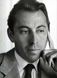 Modern American design pioneer (b. 1915, Denver, CO, d. 1955), known for his books, graphic design, interior and architectural design, and typefaces. Lustig studied design at Los Angeles City College, Art Center, and independently with American architect Frank Lloyd Wright at his Taliesin studio and French painter Jean Charlot. He began his career designing book jackets in 1937 in Los Angeles. In 1944 he became Director of Visual Research for Look Magazine. He also designed for Fortune, and Girl Scouts of the United States. The Rochester Institute of Technology maintains an Alvin Lustig Collection. Wikipedia link.
 Digital typefaces based on Lustig's work: - Greta Bassanese's Alvin Lustig Typeface (2014).
- Lustig Elements (2016, P22). Craig Welsh (Lancaster, PA) and AIGA Medalist Elaine Lustig Cohen (NY), Alvin's widow, extended Alvin Lustig's 1939 geometric typeface Euclid, and named it Lustig Elements. It was cut in wood by Hamilton Wood Type & Printing Museum in 2015, and produced as a digital typeface in 2016 by P22.
[Google]
[MyFonts]
[More] ⦿
|
Anaïs Guigue
|
Paris-based designer of the De Stijl typeface La Flottante (2017). Behance link. [Google]
[More] ⦿
|
Andreas Lindkvist
[ByAndreas (was: Andreas Lindkvist Fonts, or The Bright Side)]

|
[MyFonts]
[More] ⦿
|
Anna Bulycheva
|
Florence-based Anna Bulycheva designed Deconstruction in 2015 for a school project. She took inspiration from Mondrian's paintings. For another school project she created the doctor's handwriting typeface Lefty (2015). [Google]
[More] ⦿
|
Anne-Marie Gordon
|
Hamilton, New Zealand-based designer of Destijl (2014). [Google]
[More] ⦿
|
aphoria
|
 Designer at FontStruct in 2008 of Interest (dot matrix), Order (constructivist), Attica, Continuum (rounded bold), Fairway (+Slab, +Serif), Slant (techno), Cowboy (2008, Western-themed), Lights in the sky, Olymia Bold, Solida (psychedelic), Digi (pixel face), Villa (heavy slab serif) and Olympia Light. In 2009, he added Versional, Crown, Vend, Reed (Slab, Sans, both octagonal), Spaced Out (Bold, Italic, Regular), Jingle, ReMix (kitchen tile), Squire (3d face), Garage Sale (stencil), Signage, Futility (blackletter), Expearemint, Textual, Callout, tweedie, Embolden, Clipped, Economical, Emphasis, Vessel, Honest, Union (+Flat, +Sans, +New), Interest (pixel/dotted face), Venus Sans, Minanim, Diner (rounded), Lights in the Sky (De Stijl-like font), Opine, Charmer (+Inverse), Tweedle, Textual, Solida (ultra round), Slant, Slant, Villa (heavy slab serif), Versional, Vend, Union, Union Sans, Union New Sans, Union New Flat, Paperclip, Poofy, Steel (+Outline: octagonal), Crown, Diner (rounded), Solemn Bold, Solemn, reed Sans Mono (octagonal).
 Fonts from 2010: Full Deck (playing card font), Scrollboard, Power Up (piano key face), Groovy Fu, Formality, Union New (+Sans, +Flat), Angle Tutorial, Aurora Light (elliptical monoline sans), Pushpins, Aurora Light, Scrawl (marker face), Evity (a grotesk face), Altipen (upright script). Fonts from 2011: Obleak (oblique techno face), Likea (a heavy mechanical sans), Uptake (elliptical). Fonts from 2012: Omit (a bilined stencil face). Fonts from 2013: Emblazoned. Typefaces from 2014: Game Over, Aurora Light, Flowidity, Oxquad (textured, octagonal). [Google]
[More] ⦿
|
Argos Sastre Santoveña
|
Graduate of Escuela Superior De Diseño De La Rioja in Logrono, Spain, class of 2016. Madrid-based creator of the vector format font Theo (2014). This 3d experimental font was influenced by De Stijl. [Google]
[More] ⦿
|
Athina Konstiantou
|
Athina Konstiantou (Athens, Greece) took inspiration from the De Stijl movement, and in particular, Piet Mondrian, when she created the typeface Mondrian in 2015. [Google]
[More] ⦿
|
Austin Kurowski
[NK Fonts and Photoshop (was: Ank Fonts and Photoshop)]
|
[More] ⦿
|
Autograph
[Peter Korsman]
|
 Autograph is Peter Korsman (b. 1982), the 's Hertogenbosch, The Netherlands-based co-founder and former member of Attak Powergestaltung, a creative partnership with Casper Herselman. In May 2016, after almost twelve years, he left Attak and started Autograph. He also teaches at AKV St. Joost. The fonts (which cost the last two digits of the year, so 17 dollars in 2017) at Autograph have the prefix APK and include:
 - APK Rigimono (2017). A wonderful monospaced Wim Crouwel / Bauhaus / De Stijl-inspired typeface family.
- APK Reformas (2017). A fifties Swiss style sans.
- APK Katalogue (2017). Aka Korsman's Grotesk.
- APH Galeria (2017).
Behance link. A newer Behance link. [Google]
[More] ⦿
|
Baltimore Type Foundry (or: Baltotype)
[Herbert F. Czarnowsky]
|
Also known as Fielding Lucas, Jr., Lucas Bros., H.L. Pelouze&Son, and Chas. J. Cary&Co. Specimen may be found in Convenient Specimen Book of Type, Rules, Borders, and Electrotype Cuts from the Baltimore Type Foundry (Baltimore: Chas. J. Cary&Co., 1888. Banta Book of Types&Typographical Tips. Menasha: George Banta, 1961). The company existed until well into the 20th century, and published a catalog as late as 1957 called Type and Rule Catalogue 13, Baltotype. A selected list of typefaces: - Airport Gothic: Turista Gorda NF (2009, Nick Curtis) is based on Baltimore Type Foundry's Airport Tourist which in turn used ideas from Renner's 1932 typeface Futura Display. Mc McGrew on Airport Gothic: Most of this series is the first American copy of Futura, which originated in Germany in 1927, designed by Paul Renner for Bauer. One source says it was cut from original Futura drawings, smuggled out of that country, but it seems more likely that matrices were made by electrotyping the imported type. An extrabold weight, Airport Black, was cut by Baltimore about 1943; information on this cutting is scarce and contradictory- one account says it was designed by Bill Stremic or Bill Blakefield, another that it was designed by Carl Hupie (or Hooper), and cut by Herman Schnoor. There is also Airport Black Condensed Title and Airport Broad. The latter is a modification of Airport Black, cut 50 percent wider on the pantagraph by Herman Schnoor. Baltimore later cast some of its Airport series from Monotype Twentieth Century matrices, and in a few cases listed both series. Airport Relief, Baltimore 299, is English Monotype Gill Sans Cameo Ruled, while Airport Tourist, Baltimore 602, is Futura Display, cast from electrotype mats of the German foundry type.
- Baltimore Script (1955). Mac McGrew: Baltimore Script is a fancy style designed by Tommy Thompson and cut by George Battee for Baltimore Type in 1955. The lowercase follows the general style of a script letter hand-written with a broad pen, although the inclination is slight and the letters don't quite connect. Capitals are flourished. It is suitable for stationery, announcements, and greeting cards, but its range of small sizes is hardly enough for advertising use.
- Mac McGrew: Czarin and Czarin Title were produced by Baltimore Type&Composition Corporation about 1948, the name being derived from the Czarnowsky family which owned the foundry. Czarin Title, issued first, is a copy of Offenbach Medium, a set of pen-drawn capitals designed by Rudolf Koch about 1935 for the Klingspor foundry in Germany. Czarin has minor changes in a few characters, but adds a lowercase, designed by Edwin W. Shaar, that is substantially different from that of Steel, the cap-and-lowercase version of Offenbach. The new lowercase harmonizes well with the capitals, and makes a handsome appearance. Compare Lydian. Footnote: McGrew spelled the name of the owner as Czarnowski. Irene Traeger, the granddaughter of Herbert F. Czarnowsky, pointed out the incorrect spelling to me.
- Mac McGrew: Elegante is a decorative, nearly monotone typeface cut by George Battee for Baltimore Type, after the German typeface Sensation of 1913, from Foundry Heinrich Hoffmeister. It is upright, with flourished caps and loops on some of the ascenders and descenders, and is suitable particularly for announcements and personal stationery. Compare Greeting Monotone.
- Mac McGrew: Emperor is a 1957 adaptation by Baltimore Type of Wide Latin which was cut by Stephenson Blake in England and related to nineteenth-century typefaces under other names. However, this Baltimore Type version has been modified and resized, and is less successful due to excess space between letters (although not as much as in the specimen shown here, which is letterspaced). Emperor was originally shown as Imperial.
- Their geometric series from 1884 became famous, and was often imitated. HiH created two font families based on it: Teutonia (2007) and Baltimore Geometric (2008, a revival of Antique Geometric by Baltimore Type Foundry, 1883). HiH writes: Roos&Junge of Offenbach am Main in Germany produced Teutonia in a "back-to-basics" effort that has seen many quite similar attempts in the field of topography. In 1883, Baltimore Type Foundry released its Geometric series. In 1910, Geza Farago in Budapest used a similar letter design on a Tungsram light bulb poster. In 1919 Theo van Doesburg, a founder with Mondrian and others of the De Stijl movement, designed an alphabet using rectangles only -- no diagonals. In 1923 Joost Schmidt at Bauhaus in Weimar took the same approach for a Constructivist exhibit poster. The 1996 Agfatype Collection catalog lists a Geometric in light, bold and italic that is very close to the old Baltimore version. Even though none of these designs took the world by storm, they all made a contribution to our understanding of letterforms and how we use them.
- Mac McGrew: Greco Bold and Italic are Spanish typefaces of the mid-1920s. They are very heavy, with long ascenders and small x-height, and have a hand-lettered appearance. Linotype Vulcan (q.v.) is equivalent. National Matrix&Type Co. in Baltimore, one of several independent companies which made matrices for the popular casting machines, offered Greco Bold in 1929 as its series 100; this was the source of Baltimore Type's mats, but Baltimore and some other sources cast Greco Bold and Italic as series 326-3261. These numbers have not been found in Monotype literature; perhaps another independent source also made mats. Notice the figures, which are termed hanging or old style, although they do not follow the usual form. However, taller 1, 2, and 0 are also available to convert the set to lining figurees. Compare Hess Monoblack. Greco Adornado, an ornamented version, has also been imported.
- Mac McGrew: Homewood is a recutting by Baltimore Type of Metropolis Lined, a German typeface of the 1930s. It was made from a large size of Metropolis Bold, with the fine white lines cut in, and differs from the original in minor details of the curves. Other sizes were cut by pantagraph and do not necessarily match original sizes.
- IBM Executive Modern, a typewriter type.
- Mac McGrew: Mademoiselle was designed by Tommy Thompson in 1953 as a display typeface for Mademoiselle magazine. It was cut by Herman Schnoor at Baltimore Type, which also offered fonts for general sale. It is a delicate, narrow modern roman, with long ascenders and short descenders, rather loosely fitted, and works well for display with transitional text typefaces such as Bulmer and Scotch Roman. Both lining and oldstyle figures are provided, along with several pointing hands as shown.
- Tourist Extra Condensed. Turista Flaca NF (2009, Nick Curtis) is based on Tourist Extra Condensed. McGrew: Tourist Extra Condensed of Baltimore Type is a copy of Phenix (q.v.) in 24- to 48-point sizes, and is Jefferson Gothic (q.v.) in larger sizes. Phenix is a 1935 ATF typeface by Morris Fuller Benton.
- Mac McGrew: Trend is a brush-lettered typeface cut by Baltimore in 1953. It is very similar to Dom Casual (q.v.), but has a slight back slant.
- Mac McGrew: Trylon as made by Baltimore Type was a 1949 copy of Stephenson Blake's Playbill (see Imports in Appendix), but Trylon Shaded and Trylon Shaded Oblique were designed and cut by George Battee of the Baltimore foundry. The solid version has lowercase in some sizes; it is somewhat similar to P. T. Barnum, with greatly exaggerated horizontal strokes and serifs at top and bottom, but is heavier and narrower. The Shaded versions are more properly outlines of the same design, with a small shadow effect at the top (which is unusual) and right of each letter, but without lowercase.
- Mac McGrew: Vernen is essentially a copy of Huxley Vertical (q.v.), but omitting the round characters AKMNWY and using the alternate pointed characters instead. In addition, the slight extensions of cross strokes to the left of stems have been omitted, and a few other characters have been redrawn. It was offered by Baltimore in 1953.
- Mc McGrew: Vista is a very wide square-serif face, cut by Baltimore Type in 1956. It is said to be a pantagraphic modification of Hellenic Wide from Bauer in Germany; actually it does not match that typeface in details, though it has the same general effect.
- Mac McGrew: Wide Line Gothic is a creation of Herman Schnoor for Baltimore Type, modified by pantagraph from Philadelphia Lining Gothic, increasing the width by about 50 percent. The flat sides of round letters. acceptable in the moderately condensed original, make awkward shapes in this extended version. Compare Franklin Gothic Wide, Tempo Black Extended.
- Among the wood types, we have Oak Leaf (1832, ornamental caps).
Rich Hopkins, a printing historian, acquired Baltotype ca. 1993. Based on drawings from the 1950s in the Baltotype material, Miranda Roth at P22 designed LTC Athena, a narrow art deco typeface, in 2013. [Google]
[More] ⦿
|
Bart van der Leck
|
Born in 1876 in Utrecht, died in 1958 in Blaricum. Bart van der Leck was a Dutch painter and designer. With Theo van Doesburg and Piet Mondriaan he founded the De Stijl (abstract, geometric) art movement. In 1930, he was commissioned by Jo de Leeuw, owner of the prestigious Dutch department store Metz&Co. to design interiors, window packaging, branding and advertising. For these print materials van der Leck developed a rectilinear geometrically constructed alphabet. In 1941, he designed a typeface based on this alphabet for the avant-garde magazine Flax. One digital version of this typeface exists: Architype van der Leck (1994, by David Quay and Freda Sack of The Foundry). The wiki page writes: The typeface is geometrically constructed, and based upon an earlier stencil lettering alphabet van der Leck designed in the early 1930s for use in branding and advertising Jo de Leeuw's presigious Dutch department stores Metz&Co. The typeface shares structural similarities with Theo Van Doesburg's 1919 geometric alphabet, and anticipates later typographic explorations of geometric reductionism of Wim Crouwel's 1967 New Alphabet and early digital typefaces like Zuzana Licko's typefaces Lo-Res and Emperor 8. One of his alphabets was creatively used by Marc ter Horst in Restaurant Walem. In 2012, for an exhibition in Paris, Chloe Marchand designed a special van der Leck style poster. [Google]
[More] ⦿
|
Ben Weiner
[Reading Type]
|
[More] ⦿
|
Borja Holke
[Holke 79]
|
[More] ⦿
|
Borutta (or: Duce Type)
[Mateusz Machalski]

|
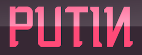 Borutta (or Duce Type) is the creative studio of über-talented Warsaw-based designer Mateusz Machalski (b. 1989), a graduate of Wydziale Grafiki ASP in 2014, and of Warsaw Academy of Fine Arts. His oeuvre is simply irresistible, charming and a worthy representative of the Polish poster style---witness Alergia (2016), Magiel Pro (2017) and Madiso (2017).
 He is the creator of the blackletter-inspired typeface Raus (2012), which also could pass for a Cyrillic simulation font. It was possibly made with Pawel Wypych. He also made Kebab (2012, a fat caps face), Duce (2012, art deco: withdrawn from MyFonts after Charles Borges complained that it was a rip-off of his own Gloria), Fikus (2012), Woodie (2012, a condensed rough wood type face), Polon (2012), Aurora (2012, a German expressionist poster face), Musli (monoline connected script), HWDP (2012, poster font), Wieczorek Script (2012, hand-printed), Hamlet (2012, a sword and dagger typeface, renamed to Prince), Caryca (2012, Cyrillic simulation, done with Pawel Wypych), Bezerro (2012, poster face), Bitmach (2012, pixel face), Meat Script (2012, a caps only market signage brush script), Krac (2012, a tall poster font), Hermes (2012: Ten Dollar Fonts), Berg (2012, a roughened blackletter face), Buldog (2012), Dudu (2012, tall condensed face). In 2012, Polish designer Wojciech Freudenreich and Mateusz Machalski combined forces to design the techno typeface SYN, which is based on an earlier De Stijl-genre alphabet by Freudenreich. In 2020, they released the free typeface family SYN Nova, which includes additional styles and a variable font. Machalski likes old wood types, which inspired him in 2012 to publish a wood type collection of weathered display typefaces: Condom, Hype, Whore, Banger, Buka. Elo (2012) and Duce (2012) are fat weathered wood types. Typefaces made in 2013: Wood Type Collection 2 (which includes Brie, Kaszti, Mader, Modi, Rena, Roast, Ursus), Zigfrid (headline face), Salute (letterpress style), Benito (a letterpress or geometric wood typeface), Bojo (heavy wood style poster face), Picadilly (heavily inktrapped open counter sans family), GIT (a manly headline sans), Lito (an eroded poster typeface), Haine (vernacular caps), Aneba (an organic sans family, renewed in 2016 as Aneba Neue), Vitali (sans), Korpo Serif (slab serif), Korpo Sans (elliptical family; +Greek, +Cyrillic). Typefaces from 2014: Adagio Slab, Adagio Serif, Adagio Sans (a superfamily not to be confused with the 2006 typeface Adagio Pro by Profonts), Adagio Sans Script, Adagio Serif Script, Adagio Slab Script, Tupperware Pro. Tupper Pro (42 styles) was designed by Mateus Machalski and the RR Donnelley team. Typefaces from 2015: Tupper Serif (again with RR Donnelley: a custom superfamily for pairing Latin, Cyrillic, Hebrew an Greek; for Tupperware), Vitali Neue, Legato Serif, Corpo Serif, Corpo Sans, Zigfrid, Picadilly (a great ink-trapped sans typeface family with an erect g). Typefaces from 2016: Nocturne (just like Magiel, this free typeface was designed as part of the Warsaw Types project: this wedge serif text typeface is inspired by the lettering on stone tablets commemorating the victims of World War II, and prewar Jewish shop signage), Favela (an experimental, geometric sans, for headline and fashion magazine use), Gangrena (a weathered typeface system co-designed with Ania Wielunska), Migrena Grotesque (earlier named Enigma Grotesque but probably in view of a clash with the name Enigma used by Jeremy Tankard changed to the appropriately named Migrena Grotesque), Alergia Grotesk (a take on the classical geometric grotesque style, in 60 weights, for Latin, Greek and Cyrillic), Alergia Remix (a hipster / hacker / Futura take on Alergia Grotesque). Typefaces from 2017: Nocturne Serif, Massimo (copperplate semi-serif influenced by New York; originally called Madison, they were frced to change the name to Massimo), Magiel Pro (a geometric display family influenced by Polish banners from the Russian occupatuon era, 1945-1989; it has a charming Black and a hairline, and covers Cyrillic too). A particularly intriguing project in 2017 was Bona, which set out to revive and extend Andrzej Heidrich's old typeface Bona. Mateusz Machalski contacted him for advice on the revival project. The resulting typeface families were published by and are available from Capitalics. The centerpiece is the warm and wonderful text typeface Bona Nova. It is supplemented by the extreme contrast typeface family Bona Title and the inline typeface family Bona Sforza. Participants in the project also include Leszek Bielski, Ania Wielunska and Michal Jarocinski. Google Fonts link for Bona Nova. Github link for Bona Nova. Typefaces from 2018: Bilbao (an innovative blend of sans, slab and mono genres in 18 styles), Cukier (a logo font family inspired by the vernacular typography from Zanzibar). In 2018, Mateusz Machalski, Borys Kosmynka and Przemek Hoffer co-designed the six-style antiqua typeface family Brygada 1918, which is based on a font designed by Adam Poltawski in 1918. Free download from the Polish president's site. The digitization was made possible after Janusz Tryzno acquired the fonts from Poltawski's estate. The official presentation of the font took place in the Polish Presidential Palace, in presence of the (right wing, ultra-conservative, nationalist, law and order) President of Poland, Andrzej Duda. Calling it a national typeface, the president assured the designers that he would use Brygada 1918 in his office. It will be used for diplomas and various other official forms. In 2021, with Anna Wielunska added to the list of authors, it was added as a variable font covering Latin, Greek and Cyrillic to Google Fonts. Github link. Typefaces from 2019: Gaultier (a sans family that is based on the styles of Claude Garamond, Robert Granjon and Eric Gill---a serifless Garamond and Gill Sans hybrid; includes a fine hairline weight), Aioli (a commissioned type system), Promo (a rounded sans family), Sigmund (the main style is inspired by the Polish road signage typeface designed in 1975 by Marek Sigmund: With the increase of weight, Sigmund turns into a geometric display in the spirit of vernacular typography from the signs of Polish streets; followed in 2022 by Sigmund Pro (15 styles)), Podium Sharp (based on Dudu, this 234-style family is a hybrid between different old Polish modular and geometric woodtypes such as Rex, Blok and Bacarat; note that 234=2x9x13, so fonts are numbered in Univers style from 1,1 (ultra-compressed hairline) to 9,13 (ultra expanded heavy)), Harpagan (an experiment in reverse and unusual stresses). Typefaces from 2020: Tyskie (a custom sans for Tyskie Magazine), Habibi Display (an ultra-fat display typeface inspired by bold Arabic headline typefaces), Podium Soft, Afronaut (an experimental Africa-themed font). In 2020, the team at Capitalics in Warsaw, namely Mateusz Machalski, Borys Kosmynka and Ania Wielunska, revived Adam Poltawski's Antykwa Poltawskiego (1928-1931) as Poltawski Nowy. Typefaces from 2021: Alfabet (a 20-style Swiss-inspired sans with narrow connectors, with support for Latin (+Vietnamese), Greek and Cyrillic scripts, including Ukrainian, Bulgarian and Serbian forms), Change Serif (a 10-style Robert Granjon-genre garalde designed as a part of Mateusz Machalski's PhD project, carried out in 2015-2021; the main goal was to create a typeface allowing for the typesetting of complex humanistic texts, containing many historical letterforms; each font contains 4000 glyphs and covers Latin, Cyrillic and Greek), Engram (a soft geometric sans family in 22 styles; close to his own earlier font, Enigma, 2016). Typefaces from 2022: Yalla (inspired by Arabic headline type). Home page. Behance link. Personal Behance link. Behance link for Duce Type. Another link. Fontsquirrel link. [Google]
[MyFonts]
[More] ⦿
|
Bowie Shum
|
Toronto-based designer of Mondrian (2013), a geometric font inspired by the geometric shapes of the De Stijl art movement and of Piet Mondrian. [Google]
[More] ⦿
|
Brian Johnson
[Design Concern]
|
[More] ⦿
|
ByAndreas (was: Andreas Lindkvist Fonts, or The Bright Side)
[Andreas Lindkvist]

|
Here we had shareware fonts and dingbats designed by Andreas Lindkvist from Stockholm: TheBrightSide (great dingbats), Messydots, Kraft und Stil (as in De Stijl), Leftside, Green Babe, DoYourThing, Dekoside, Apapa, Brightside Dingbats, lindkvistdotcom, AllMyHands (fingers, hands--including "the finger"), Gumpy One (comic book font), GetTheMessage (letters in hearts), GetATicket, PunkTCom (dot matrix), and Happy Dots. The commercial fonts include Champion Sparkplug, ArcadeFontPack, BurningBats, Container, New Home, oFont, Organic Font, DigDotDot, PlasticBag, Lazzaroni, RetroBats, CynCyn and Cherish Font. Home page. [Google]
[MyFonts]
[More] ⦿
|
Candice Hoffmeyer
|
Strasbourg, France-based designer of the De Stijl-genre typeface Mondrian (2016). [Google]
[More] ⦿
|
Carole Charette
|
Keith Tam writes this: "A fellow of the Society of Graphic Designers of Canada and partner/founder of the design firm Trio, Carole Charette recently exhibited her MA thesis project titled Sixx Styles at the Emily Carr Institute of Art&Design in Vancouver. The exhibit consisted of 12 posters created as reinterpretations of six chosen typographic styles in the twentieth century including Constructivism, De Stijl, Bauhaus, New Typography, International Style and New Functionalism. She gave a fascinating lecture at the institute last Monday titled Zeitgeist and Typography, which was a culmination of her academic research on the cultural study of typographic styles in the twentieth century at Université Laval, Québec City. The lecture included two very engaging multimedia presentations." [Google]
[More] ⦿
|
Cecilia Maurin
|
Graphic designer in New York City. Creator of the Mondriaan-inspired typeface Awchitek (2011). [Google]
[More] ⦿
|
Chloé Marchand
|
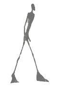 During her graphic design studies, Chloé Marchand (Paris) designed a poster in 2012 for the exhibition of Bart Van der Leck, an artist of the Modern De Stijl Movement (1910-1930), at the Museum of Modern Art in Paris.
 In 2013, she used Giacometti's sculptures to create a Giacometti lettering alphabet. Nahkoa (2013) is an angular typeface that is inspired by the native American culture. [Google]
[More] ⦿
|
Chris E. Lozos
[Dezcom Typefaces]

|
 [MyFonts]
[More] ⦿
|
Constantina Klepetsani
|
During her studies in Athens, Greece, Constantina Klepetsani designed the hipster typeface Geom (2016) and Mondrian Font (2016). [Google]
[More] ⦿
|
Corentin Noyer
[Corentin Noyer]

|
 Aspet, France-based type designer. His fonts:
 - The rounded monospaced monoline typeface family Buro (2018-2021). Partly based on the Olympia De Luxe typewriter type.
- In 2013 and 2014, he and Olivier Raimbaud assisted Damien Gautier with the development of the large sans typeface family Plaak, which was inspired by French street name signage.
- Alfabet Bold (2020-2021). A squarish typeface influenced by De Stijl, and in particular, Theo van Doesburg.
- Bevel Medium (2017-2021). A stencil typeface.
[Google]
[MyFonts]
[More] ⦿
|
Corentin Noyer
[Corentin Noyer]

|
[MyFonts]
[More] ⦿
|
Courtney Olver
|
Gold Coast, Australia-based designer of the stencil typeface Construct (2018), which combines geometric elements and was inspired by the De Stijl movement. [Google]
[More] ⦿
|
Craig Welsh

|
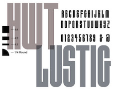 Born in 1971, Craig Welsh is professor at Marywood University since 2000, where he teaches the history of graphic design. Designer who runs Go Welsh Design in Lancaster, PA. Walsh contacted Alvin Lustig's widow, AIGA Medalist Elaine Lustig Cohen (NY) to suggest collaborating on a complete typeface based on the few existing characters of Alvin Lustig's geometric typeface Euclid (1939). Together Lustig Cohen and Welsh, utilizing Alvin's existing grid, created all the necessary characters, punctuation and glyphs, and renamed the font HWT Lustig Elements. The face has been cut as wood type by Hamilton Wood Type & Printing Museum in 2015, and there is a digital version from P22 in 2016. [Google]
[MyFonts]
[More] ⦿
|
Craig Wills
[delicraig]
|
[More] ⦿
|
Dadaism
|
Dada or Dadaism is a cultural movement that began in Zürich, Switzerland, during World War I and peaked from 1916 to 1922. The movement primarily involved visual arts, literature-poetry, art manifestoes, art theory-theatre, and graphic design, and concentrated its anti-war politics through a rejection of the prevailing standards in art through anti-art cultural works. For many participants, the movement was a protest against the bourgeois nationalist and colonialist interests which many Dadaists believed were the root cause of the war, and against the cultural and intellectual conformity - in art and more broadly in society - that corresponded to the war. Dada was anti-art. It is believed that Dadaism started in October 1916 in Zurich where Hugo Ball, Emmy Hennings, Tristan Tzara, Jean Arp, Marcel Janco, Richard Huelsenbeck, Sophie Täuber, along with others, discussed art and put on performances in the Cabaret Voltaire expressing their disgust with the war and the interests that inspired it. In the Netherlands the Dada movement centered mainly around Theo van Doesburg, most well known for establishing the De Stijl movement and magazine of the same name. The dadaists developed some art techniques such as collages, assemblages (3d collages), photomontages, and readymades. Another encyclopedia. German page on Dada's history. Summary. [Google]
[More] ⦿
|
Dan Pike
[The Letter D (was: Entica Typograffiti)]
|
[More] ⦿
|
David Kerkhoff
[Hanoded]

|
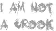 [MyFonts]
[More] ⦿
|
De Stijl
|
Influential Dutch magazine founded in 1917 by Theo van Doesburg in cooperation with Piet Mondrian, Bart van der Leck, Anthony Kok, Vilmos Huszar and J.J.P. Oud. It became the catalyst for the De Stijl movement. Ninety numbers were published in 8 volumes, the last one in 1932. All have been scanned in. The De Stijl movement lived and died with the magazine. [Google]
[More] ⦿
|
De Stijl
|
De Stijl is a Dutch word that means The Style. It is a Dutch artistic movement started in 1917 and that lasted until 1931. The movement is also known as neoplasticism. The group's principal members were the Dutch painter, designer, writer and critic Theo van Doesburg, the painters Piet Mondrian, Vilmos Huszár and Bart van der Leck, and the architects Gerrit Rietveld, Robert van 't Hoff and J.J.P Oud. De Stijl is also the name of an influential Dutch magazine founded in 1917 by Theo van Doesburg in cooperation with Piet Mondrian, Bart van der Leck, Anthony Kok, Vilmos Huszar and J.J.P. Oud. It became the catalyst for the De Stijl movement. Ninety numbers were published in 8 volumes, the last one in 1932. All have been scanned in. The De Stijl movement lived and died with the magazine. De Stijl stood for a new ideal of spiritual harmony and order. Its members proposed abstraction and universality by a reduction to the essentials of form and colour. For example, they simplified visual compositions by limiting everything to vertical and horizontal directions, even in the typefaces used. They used only primary colors along with black and white. [Google]
[More] ⦿
|
delicraig
[Craig Wills]
|
Craig Wills ("delicraig") is the designer at FontStruct in 2008 of plato, stadium, steadelijk (based on Architype Steadelijk by Wim Crouwel, developed by The Foundry). Related De Stijl typefaces: fg65, Delicraig Sq, Delicraig Ci. [Google]
[More] ⦿
|
Denis Orlenok
|
Vilnius, Lithuania-based creator of the De Stijl typeface Neo-Constructivism (2014). [Google]
[More] ⦿
|
Design Concern
[Brian Johnson]
|
 Scottsdale, AZ-based creator of the hand-lettered tattoo typeface Xibalba (2014) and the squarish De Stijl-related typeface family Adaptype (2016). In cooperation with Stan Can Design in Reno, NV), Adaptype was extended to Adapt for the visual identity for the annual DICE Design Conference in northern Nevada. [Google]
[More] ⦿
|
Device Fonts
[Rian Hughes]

|
 Rian Hughes studied at the LCP in London before working for an advertising agency, i-D magazine, and a series of record sleeve design companies. Under the name Device he now provides design and illustration for the advertising, entertainment, publishing, and media industries. He works from Richmond, UK, as a comic book artist, letterer and typefounder---his foundry is called Device. He creates mostly display type. List of fonts. Interview. Review by Yves Peters. Monotype Imaging page. Interview by Die Gestalten. Various (overlapping) font listings, still unorganized.
 - Dingbats: Pic_Format, Mastertext Symbols, MacDings, RiansDingbats, Autofont.
- FontFont fonts: Identification (1993), Revolver, Rian's Dingbats, LustaOneSixtySans, Knobcheese, CrashBangWallop, and Outlander.
- [T-26] fonts: English Grotesque (1998), Data90 (2003; a free FontStruct typeface that is virtually identical to Data90 is Bitrate by Kummaeno (2010)), Flak Heavy (2003, stencil), Flak (2003, stencil), Freeman (2003), Klaxon (2003, kitchen tile font), Cordite, Substation (2003), September (2003), West Way (2003), Egret (2003), Paralucent Complete (2003), Paralucent Condensed, Paralucent Stencil (2003), Mercano Empire (2003), Iconics (2003), Cantaloupe (2003), Gravel (2003), Acton (blocky screen font, 2002), Ainsdale, Amorpheus, Anytime Now (alarm dingbats), Bingo, Blackcurrant (Blackcurrant Cameo (1997) is free), Bordello, Elektron, Haulage (U-Haul lettering, 2002), WexfordOakley, Telecast, Terrazzo, Transit, Untitled, Scrotnig, Skylab (2002), Silesia (1993), SlackCasual, Ritafurey, Reasonist-Medium, Regulator, GameOver, Novak, Quagmire, PicFormat, Jakita Wide (2000, techno font), Metropol-Noir, Motorcity, Mastertext, Mystique (2002), MacDings, Lusta, Laydeez, Sinclair, Paralucent (sans serif), Judgement, Bullroller, Zinger (a fifties font), Citrus (2002), Popgod (2003), Range (2000, a futuristic font), Hounslow, Jemima, Griffin, GranTurismo, Gargoyle, Foonky, DoomPlatoon, Darkside ("remixed" by FontStructor Kummaeno in his Ubangi (2011)), Kallisto (2010), Kallisto Lined (2010), Cyberdelic, Contour, and the very original Stadia Outline family (Stadia is a kitchen tile font).
- List of all fonts by Rian Hughes, as of 2004: Acton, Ainsdale, Amorpheus, Anytime Now, Bingo, Blackcurrant, Bordello, Bull Roller, Chascarillo, Contour, Cottingley (1992), FF CrashBangWallop, Cyberdelic, Darkside, Data90, Doom Platoon (1996), Elektron, English Grotesque, Flak, Foonky, Freeman, Game Over, Gargoyle, Gran Turismo, Griffin, Haulage, Hounslow, Iconics, FF Identification, Jakita, Jemima, Judgement, FF Knobcheese, Laydeez Nite, Lusta (big family), Mac Dings, Mastertext, Men Swear, Metropol Noir, Motorcity, Mystique, Novak, FF Outlander, Paralucent, Pic Format, Platinum, Quagmire, Range, Reasonist, Register (A and B), Regulator, FF Revolver, FF Rian's Dingbats, Ritafurey, Scrotnig, September, Silesia, Sinclair, Skylab, Slack Casual, Space Cadet, Stadia, Substation, Telecast, Terrazzo, Transmat, Untitled One, Vertex, Westway, Wexford Oakley, Why Two Kay, Zinger.
- At Veer, in 2005, these Device fonts were published: Gentry, Gridlocker, Valise Montreal, Custard, Box Office (moviemaking letters), Sparrowhawk, Monitor, Moonstone, Miserichordia, Yolanda (a great playful medieval text typeface in three styles: Duchess, Princess, Countess), Gusto, Dauphine, Rogue, Ritafurey, Dynasty, Radiogram, Xenotype, Roadkill (grunge), Payload (stencil family comprising Regular, Outline, Spraycan, Narrow, Narrow Outline, Wide, Wide Outline), Catseye, Electrasonic, Absinthe (psychedelic style), Straker, and Chantal (brush).
- In 2006, Veer added these: Profumo, Ironbridge, Cheapside, Battery Park (grunge), Forge, Shenzhen Industrial, Hawksmoor (grunge), Coldharbour Gothic, Wormwood Gothic (grunge), Chase (grunge), Diecast, Roadkill Heavy, Tinderbox (fuzzy blackletter), Dazzle (multiline face), Nightclubber (art deco), Klickclack (2005, comic book or cartoon caper typeface), Vanilla (art deco), Wear it's at (grunge), Diecast, Drexler, Box Office (movie icon font).
- Fonts from 2007: DF Conselheiro (2007, grunge), DF Glitterati (2007), Indy Italic (script), DF Apocrypha (2006, rough outline), DF Quartertone (2007), DF Lagos (2007, rough stencil), DF Pulp Action, DF Reliquary #17 (2006, grunge didone), DF Dukane (2007, octagonal grunge), DF Strand (2007, striped stencil), DF Rocketship from Infinity (2006, futuristic), DF Appointment with Danger (2006), DF Las Perdidas (2006, grunge stencil), DF Kelly Twenty (2007, grunge stencil), DF Heretic, DF Roadkill, DF Ironbridge, DF Forge, DF Shenzhen Industrial, DF Hawksmoor, DF Cheapside, DF Battery Park, DF Saintbride, DF Profumo, DF Coldharbour Gothic, DF Wormwood Gothic, DF Tinderbox, DF Flickclack, DF Vanilla (multiline art deco face), DF Chase, DF Nighclubber (art deco jazz club face), DF Diecast, DF Dazzla, DF Zond Diktat (grunge), DF Yellow Perforated, DF Mulgrave (grunge), DF Ministry B, DF Ministry A (with a hairline weight), DF Gridlocker, DF Gentry, DF Valise Montréal (grunge), DF Custard, DF Box Office, DF Roadkill, DF Payload Wide, DF Payload Narrow, DF Catseye Narrow, DF Catseye, DF Yolanda, DF Xenotype, DF Telstar, DF Straker, DF Sparrowhawk, DF Rogue Serif, DF Rogue Sans Extended, DF Rogue Sans Condensed, DF Rogue Sans, DF Ritafurey B, DF Ritafurey A, DF Radiogram, DF Pitshanger, DF Payload (stencil), DF Outlander Nova, DF Moonstone, DF Monitor, DF Miserichordia, DF Interceptor, DF Gusto, DF Glitterati, DF Galicia (2004), DF Galaxie, DF Electrasonic, DF Dynasty B, DF Dynasty A, DF Drexler, DF Dauphine, DF Chantal, DF Absinthe, DF Register Wide B, DF Register Wide A, DF Register B, DF Register A, DF Quagmire B, DF Cordoba (2007, grunge), Mellotron (2004, stencil), Seabright Monument (2007), Charger (2007, grunge).
- T-26 releases in 2007: Klickclack, Hawksmoor (grunge), Heretic, Ironbridge (old letter simulation), Battery Park (grunge), Chase (grunge), Cheapside (grunge), Dazzle (multiline art deco), Diecast (grunge), and Forge (grunge).
- T-26 releases in 2008: Automoto (fat multiline deco face), Straker (organic). Also from 2008: Mission Sinister (grunge), Gonzalez (grunge).
- FontBros release in 2009: Filmotype Modern. Other Filmotype series fonts include Filmotype Miner (2012), Filmotype Manchester (2012), Filmotype Meredith (2012), Filmotype Marlette (2012), Filmotype Mansfield (2012), Filmotype Power (2012) and Filmotype Major (2012: this is based on a typeface used as the titling font for the popular children's book by Dr. Seuss entitled One Fish Two Fish Red Fish Blue Fish, 1960). Other 2009 fonts: Degradation (grunge).
- Creations in 2010: Pod (2010, fat round stencil), Korolev (2010, a 20-style monoline sans family based on communist propaganda from 1937), DF Agent of the Uncanny (2010, brush face), DF Destination Unknown (2010, Kafkaesque brush), DF Maraschino Black (a sleek, sophisticated high-contrast swash capital font).
- Creations in 2011: DF Capitol Skyline, DF Capitol Skyline Underline and DF Capitol Skyline Capitals (a multi-weight all-caps pair that epitomizes Streamline Moderne), DF Korolev (a 20-weight sans serif family based on lettering by an anonymous Soviet graphic designer who did the propaganda displays at the Communist Red Square parade in 1937. Named in honor of Sergey Pavlovich Korolyov, or Korolev, considered to be the father of practical astronomics). In 2018, Korolev was expanded to Korolev Rounded and Korolev Rough.
- Typefaces from 2012: Ember (informal script), Kane (based on the Batman logo), Glimmer Glossy, Glimmer Mate, Galleria (avant-garde caps), Clique (flared sans).
- Typefaces from 2013: Wulf Utility (grungy), Charterhouse (an aggressive black sans), Filmotype Melon (after a 1959 original, this is an offbeat Googie era doo-wop typeface), Filmotype Melody (similar to Melon), Filmotype Mellow (also similar to Melon), Raw (worn wood type), Cadogan (a rhythmic connected script), Whiphand (brush face), Steed (heavy codensed masculine sans inspired by the titles of the Avengers TV show), State Stencil (Clean and Rough: in the style of Futura Black), Korolev Military Stencil (named after Sergei Korolev, father of Soviet astronautics, and based on signs from the Red Army parade of 1932), Armstrong (a 1950s automobile font).
- Typefaces from 2015: 112 Hours (numerals font).
- Typefaces from 2016: Typex (an angular yet rounded monospaced typewriter or OCR-style typeface based on the lettering used on Alan Turing's and Tutte's famous code-breaking machine at Bletchley Park, the Bombe, and the subsequent British answer to the German Enigma machine, the Typex), Serenity (a legible sans family).
- Typefaces from 2017: Pitch (a heavy block sans in chrome and solid variants), Shard (originally commissioned for Nickelodeon's 3D reboot of the Teenage Mutant Ninja Turtles franchise), Championship Inline, Mood (a great liquid deco font), Grange, Grange Rough, Dazzle Unicase, Urbane (sans), Urbane Rounded, Albiona (a modern take on Clarendon; includes Albiona Heavy Stencil), Albiona Soft (a rounded version of Albiona), Pact (a modular geometric font).
- Typefaces from 2018: Rutherford, Salvation (a potato cut font), Kano (inspired by the work of Dutch furniture designer and architect Gerrit Rietveld, one of the principal members of the Dutch artistic movement De Stijl), Rogue Sans Nova, Fairtrade (rough-edged font), Goddess (Victoriana), Neuropa (a five-weight semi-extended sans that projects a muscular corporate authority), Worthington Arcade (a caps-only lapidary typeface), Zeno (a piano key stencil typeface), Vektra (an experimental crosshatch-textured typeface), Recon (a quartz display font), Kinesis (Kinesis is inspired by the work of Dutch furniture designer and architect Gerrit Rietveld, one of the principal members of the Dutch artistic movement De Stijl. It is a modular headline font, constructed from white, black and grey overlapping rectangles), Freehouse (Freehouse is a reinterpretation of the well-remembered Watney's logo, a brewery and pub chain infamous for its poor quality beer and brutalist decor.), Zipline (a great multiline typeface), Argent Sans, Craska (a multiline font), Panther Black, Carilliantine (art nouveau with many interlocking letter pairs), Regulator Nova, Broadside, Bubblegum Pop, Heft (a heavy slab serif), Faction (stencil style), Metaluna (techno, engineering), Magnetron (futuristic), Urbane Rough, Urbane Adscript (a monoline semi-linking sans), Revolver (original from 1992), Albiona Inked (a Clarendon).
- Typefaces from 2019: Gerson Rand, Gravesend Sans (an all caps sans family based on the unique typeface used for the iconic grass-green signage for the now-defunct Southern Railway in England).
- Other: Customised Foonky Starred, Altoona, DfAncestorITC, DfAttitudesPlain, HotRod (2002).
- Typefaces from 2020: Breach (a display typeface with partitioned capital letters), Epiphany (stencil), Aurore Grotesque (an elegant geometric art deco sans family with small x-height), Faculty (a geometric sans with large x-height), Fathom (a flared serif typeface), Atomette (a stylized comic book typeface family), Conquera (a stylish extended caps-only font in five weights plus an inline), Dare (a tape font, that borrows a pinch of the hand-drawn swagger of Bauer's Cartoon (designed in 1936 by H. A. Trafton), used as Dan Dare's signature logo in the British boy's comic Eagle, and also the upward-pointing serifs of machine-moderne typefaces such as Dynamo (designed by K. Sommer for Ludwig & Mayer in 1930), Urbane Condensed.
- Typefaces from 2021: Maximum (a blocky techno or sports font), Paralucent Slab (a monolinear slab serif), Guildhall (a 10-style strong-willed mechanical font family), Broadside Text (14 styles), Cynosure (a 14-style elliptical sans), Valvolina (a geometric display typeface inspired by Italian Futurismo), Chassis (a sci-fi or computer game font), Fomalhaut (a space exploration font), Disclosure (a grungy font), Sheffield Fiesta (a squarish font based on the brutalist concrete landmark nightclub in Sheffield, now the Odeon Cinema), Grange Text (a 14-style sans), Wilko (a fat rounded poster typeface), Farthing (a 5-style wedge serif).
- Typefaces from 2022: Bradbury Five (a vernacular / bubblegum / supermarket / cartoon typeface in 18 styles), Tracker (an inline space-age disco font from the 1960s or 1970s, reminiscent of the Mexico City olympics font), Salient (a 12-style didone).
FontShop link. Klingspor link. [Google]
[MyFonts]
[More] ⦿
|
Dezcom Typefaces
[Chris E. Lozos]

|
 Chris Lozos (aka Dezcom and Dezcom Typefaces) is a Washington, DC-based (well, now Falls Church, VA-based) graphic designer and Vietnam veteran, b. 1944, Pittsburgh, PA. He studied Design at Carnegie Mellon University where he earned a BFA in Graphic Design (1966). While at CMU, he studied with calligraphers Arnold Bank and Howard Glasser, who both brought out the love of historic letter-forms and learned to set hot metal type in the Laboratory Press established there by Jack Stauffacher. Chris also was influenced by guest professors Hermann Zapf, Rudy DeHarek, Martin Krampen and Gui Bonnsieppe (of the HfG Ulm). He attended Graduate School in Visual Communication Design at the Ohio State University from 1972 through 1974.
 His typefaces: - Dez Petranian (2013). A warm text typeface designed for story-telling, and related to Souvenir.
- Des Squeeze Pro (2013). A great condensed display family with large x-height. The Pro version of Des Squeeze (2009).
- Dez Weimar Plakat (2013). Inspired by a 1923 Weimar Bauhaus / constructivist exhibition poster. This is a finished version of Weimar Plakat 1923 Pro (2006-2007). See also here.
- Dez Yinznat Stencil (2012). A military stencil dedicated to the industrial past of Pittsburgh.
- Dez Quo Vadis Titling (2010).
- Dez Boulder (2010).
- The bold headline typeface family Dez Squeeze (2009, +Fat). Discussions: Squeeze, Fat Squeeze.
- Leporello (2004).
- The semi-techno typeface Align Sans (2005).
- Now (2005). A geometric sans family with several novel ideas, which was followed by Now Bold (2006), Now Regular, Now Light, Now Gaunt Display (hairline) and Dez Now Sans (2018), about which he writes: A humanistic typeface family that was begun in 2005 by Chris Lozos of Dezcom. Since then, it has been nurtured, revised, and expanded to include 12 weights in both upright roman and true italics totaling 24 variations.
- The sans families Boulder Ego and Boulder Alter Ego (2006).
- Tovarich.
- Froggy (2006).
Flickr page. . [Google]
[MyFonts]
[More] ⦿
|
Elaine Lustig Cohen

|
 Modern American design pioneer in New York City, b. 1927, Jersey City, d. 2016. Wife of Alvin Lustig (1915-1955). In his book, Elaine Lustig Cohen: Biography, Steven Heller writes: Pioneering graphic designer, artist and archivist, Elaine Lustig Cohen is recognized for her body of design work integrating European avant-garde and modernist influences into a distinctly American, mid-century manner of communication. She is a living link between design's modernist past and its continually changing present. Wikipedia link. Codesigner of Lustig Elements (2016) with Craig Welsh (Lancaster, PA). Welsh and Lustig Cohen extended Alvin Lustig's 1939 geometric typeface Euclid, and named it Lustig Elements. It was cut in wood by Hamilton Wood Type & Printing Museum in 2015, and produced as a digital typeface in 2016 by P22. [Google]
[MyFonts]
[More] ⦿
|
Elizabeth McCulla
|
Mandeville, LA-based designer of a Piet Mondrian alphabet in 2014, during her studies at LSU. [Google]
[More] ⦿
|
Emil Ruder

|
Swiss typographer (b. Zürich 1914, d. Basel, 1970), and type guru in the 50s and 60s. Ruder taught at the Basel School of Design (Kunstgewerbeschule), and founded the International Center for the Typographic Arts in New York, 1962. Author of Typographie: Ein Gestaltungslehrbuch - A Manual of Design - Un Manuel de Creation (Teufen: Niggli, 1967), and Typographie. Ein Gestaltungslehrbuch. Mit über 500 Beispielen (7th edition in 2001, Niggli). The Road to Basel (Helmut Schmid) is an homage to Emil Ruder by Helmut Schmid, one of Ruder's students, who headed a group of other ex-students and organized their contributions. The former students who participated are Harry Boller, Roy Cole, Heini Fleischhacker, Fritz Gottschalk, André Gürtler, Hans-Jürg Hunziker, Hans-Rudolf Lutz, Fridolin Müller, Marcel Nebel, Åke Nilsson, Bruno Pfäffli, Will van Sambeek, Helmut Schmid, Peter Teubner, Wolfgang Weingart, and Yves Zimmermann. Karl Gerstner and Kurt Hauert also contributed. Paul Shaw reviews this book and Ruder's contributions. Quotes from Shaw's piece: - It is clear that those lucky enough to study under Ruder found him as exciting and demanding as they had expected. With a few exceptions these former students quickly and permanently fell under the sway of the charismatic and ambitious Ruder.
- Ruder promised a new functionalism derived from the Bauhaus. His was a new approach to typography that went beyond the technical fundamentals of metal type composition to embrace modern art (especially that of Paul Klee and Piet Mondrian). Ruder focused on the point, the line, the plane, and the way in which typography activated space. His article Die Flache (the plane or the space), following lessons he had learned from The Book of Tea by Kakuzo Okakura and from modern art, stressed the activation and destruction of space as the goal of typography as well as of art and architecture.
- Ruders typography is defined by asymmetry and an emphasis on counter, shape, and negative space.
- Harry Boller writes that Ruder and his students were Puritans on a mission, serious, humorless. We had been led to a morality, and strong convictions remain. Banality, lack of imagination, and swiping of ideas were all ridiculed, while sincerity of expression was encouraged. Gottschalk says that Ruder taught courtesy, ethics, and modesty as much as he taught typography.
IDEA Mag's special issue #332 entitled Ruder Typography Ruder Philosophy (2009), with articles by Leon Maillet (Tessin), Armin Hofmann (Lucerne), Karl Gerstner (Basel), Kurt Hauert (Basel), Lenz Klotz (Basel), Wim Crouwel (Amsterdam), Adrian Frutiger (Paris), Hans Rudolf Bosshard (Zurich), Andre Gutler (Basel), Juan Arrausi (Barcelona), Ake Nilsson (Uppsala), Fridolin Muller (Stein am Rhein), Harry Boller (Chicago), Maxim Zhukov (New York), Taro Yamamoto (Tokyo), Fjodor Gejko (Düsseldorf), Helmut Schmid (Osaka), and Susanne Ruder-Schwarz (Basel). Article on Ruder by Shane Bzdok, 2008. [Google]
[MyFonts]
[More] ⦿
|
Emily Schlotter
|
During her studies in Kutztown, PA, Emily Schlotter designed a colorful font, PM21 (2018), which is based on Piet Mondrian's style. [Google]
[More] ⦿
|
Escaphandro (or: Rafael Cervi Barrozo)
[Rafael Nascimento]
|
 Rafael Nascimento (b. 1977) is a Sao Paulo, Brazil-based graphic designer whose fonts are mostly free. FontStructor who made these modular display typefaces in 2014: Wim Gestreept (an octagonal typeface inspired by Wim Crouwel's work), Sao Paulo (pixacao emulation), Pixel Spaceships, Chippanze (+LoRes, +DotMatrix), Kamada, Illusion (op-art based on the work of visual artist Martijn Sandberg), De Lorean, Pulse (pixel face), De Stijl, Soundwave (experimental), Ninja Gaiden, Pony PX, Act1, Platypus, Geo Geo, Expressionista, Soundwave Round, Video, Geo Libre (a tangram font).
 Typefaces from 2019: the dot matrix typeface Ghouls (attributed to Rafael Cervi Barrozo). Typefaces from 2020: - Geo (a free kitchen tile or stencil font based on retro record covers).
- Choripan. A revival typeface based on the classic round font Frankfurter (1970, Bob Newman at Letraset).
- The free brutalist typeface Blknd (made with FontStruct).
- The free sports lettering font Wim Pro.
- The graffiti font SP011.
- Refuse. A revolutionary or military stencil font. Free download.
- Sumano. Squarish, tribal, and experimental. Free download.
- Volume Dealers. A free bold art deco font This typeface that references the photo typeface Black Body (Peter Steiner, 1973) and the classic lettering of the album Vol 4 by Black Sabbath.
- Swiss Grit. A free grungy typeface in the destructionist style of Brody and Carson.
Typefaces from 2021: Volume Round (Volume Round takes its cousin Volume Dealer structure to a retro-weird leve; it too is inspired by late 1960s photo typesetting designs, and in particular the works of Peter Steiner, adding a little sci-fi flair to the details). Typefaces from 2022: Ghosts (a 4-style experimental geometric display font), CMYK (an experimental textured typeface). You Work For Them link. [Google]
[More] ⦿
|
Fabian Hubeli
|
Graphic designer in Aarau, Switzerland. In 2017, he published the De Stijl font Der Stil. Behance link. [Google]
[More] ⦿
|
Fabio Furlanis
|
Graphic designer in Portogruaro, Italy. Creator of the geometric sans typeface called BAC (2012), and of the heavy octagonal typeface C-Alphabet (2013, collaboration with Roberto Duse), which was named after Wim Crouwel. Behance link. [Google]
[More] ⦿
|
Fermin Guerrero

|
 Born in Carmelo, Colonia, Uruguay in 1983, then based in Geneva, Switzerland, where he studied Visual Communication at the Haute Ecole d'Art et de Design, and now back in Montevideo, Uruguay, this graphic designer created the counterless geometric typeface Circ (2011), and the triangulated experimental typeface VIGA (2011). Fermin has a Bachelors degree in Industrial Design (2009). At his foundry, also called Fermin Guerrero, one can buy VIGA and MANIFESTA (2012, a De Stijl typeface).
 For his Bachelors thesis at HEAD in Geneva, he created the typeface Genève (2014): In developing Genève I was inspired by the typeface used by French printer/editor/publisher Henri II Estienne in his famous book Thesaurus Linguae Graecae, published in Geneva in 1572. This typeface was brought to Geneva by Henri's father, Robert Estienne, who, before settling in Geneva and working as Calvin's printer, was the printer of France's King, François I. This typeface highly influenced the typographers and printers in Geneva at that time. Henri and Robert Estienne's work in Geneva helped it to become one of the most important cities in Europe for print and typography in the sixteenth century. Genève consists of four styles: Classique (humanist serif), Austère (geometric serif), Spontanée (humanist sans-serif) and Alternative (stencil, display version). Graduate of the MATD program at the University of Reading, class of 2015. His graduation typeface was Exentra which was was conceived for publications promoting forward-thinking through a contemporary and experimental vision of modern culture and trends. It supports Latin, Gurmukhi and Greek. In addition, Fermin added the fat face didone / gothic mixture mixture font Black Display for applications in fashion, and the super-angular and scary Franky as sub-styles of Exentra. In 2017, he published Thesaurus, the renaming and outgrowth of Genève, at Typotheque. Thesaurus Display Italic followed in 2018. Well-deserved winner at Tipos Latinos 2018 of a grand prize. In 2019, he designed Brick Pro (Display, Text) for Colophon, which explains: Brick's foundations lie in the signage of three prominent pubs in London's East End, The Jolly Butchers (Brick Lane---now closed), The Royal Oak (Columbia Road), and The Prince Albert (Acton Street). Referencing their Art Deco traits, with a trace of Art Nouveau heritage, Brick is Fermín Guerrero’s re-interpretation and continuation of the vernaculars elegant gestures, brought into the 21st century. [Google]
[MyFonts]
[More] ⦿
|
Florzinha
|
FontStruct artist who made the artsy typeface Mondrian (2008), influenced, obviously, by the painter. [Google]
[More] ⦿
|
Frank Nichols
|
Creator of the square typeface van Doesburg, one of many digital incorporations of this famous 1920's style lettering. [Google]
[More] ⦿
|
Garrett Boge

|
 Seattle-based type designer (b. 1951, Spokane, WA) who founded LetterPerfect Fonts in 1986. He designed many wonderful typefaces, and specializes in particular in classical roman (renaissance, Trajan) typefaces. Creator of a revival of Free Roman, designed by Ross George, or the fun handwriting font Bermuda LP (1996), the wonderful wonderful wonderful Spumoni (1990, possibly based on a Speedball example; similar to Art Department JNL made in 2011 by Jeff Levine), the original jungle family Kolo (with Paul Shaw, 1996; an Adobe face), the OldClaude family (with Paul Shaw, 1993, 1997, also at Adobe; named after Claude Garamond), ChevalierLP (great caps!), DidotLP (1995, now at Adobe), Longhand (handwriting, 1998), Spring (clean script, 1990), DeStijl (1990), Hardwood (1990), Hadrian Bold (1990), Koch (1990), Longhand (1998), Roslyn (1990), Silhouette (1990), Tomboy (1990), Visage (1990), Wendy (1990, 1997, also at Adobe), Uppsala (with Paul Shaw, 1998), Manito (1990), Florens, Pontif (a Trajan font done with Paul Shaw, 1996), Cresci (with Paul Shaw, 1996), Catacomb, Philocalus, Sabina, Stockholm (1998, with Paul Shaw), Göteborg, Kryptic, Binney, Pietra (with Paul Shaw, 1996), Donatello (with Paul Shaw, 1997), Ghiberti (with Paul Shaw, 1997), Beata (with Paul Shaw, 1997). All of these fonts are available at LetterPerfect. He has made others too, such as Creme (1990), InkjetNine, InkjetSeven (1992, for ReadersDigestInkjetFonts). Unclear if he also made NYCaslon in 1990 for Monotype. At Letterperfect, Kathy Schinhofen, Garrett Boge and Myron McVay together designed the whimsical curly connected script family Jackalope LP (2011).
 After a fontmaking hiatus, he released these fonts in 2020: - Boge Text.
- Bramante LP. An original all caps Trajan-style display font modeled after a fifteenth-century inscription in the church of Santa Cecilia in Trastevere, Rome. The name is a tribute to the pre-eminent Renaissance architect Donato Bramante, whose Tempietto (1502, San Pietro in Montorio) marked the beginning of the High Renaissance in Rome.
FontShop link. Bestselling typefaces at MyFonts. Klingspor link. View Garrett Boge's typefaces. [Google]
[MyFonts]
[More] ⦿
|
Garrett Boge
[LetterPerfect]

|
[MyFonts]
[More] ⦿
|
Gerrit Rietveld
|
Famous Dutch architect and graphic and furniture designer (b. Utrecht, 1888, d. Utrecht, 1964). He was part of the De Stijl movement. Several typefaces were directly influenced by his style. These include: - Kinesis (2018, Rian Hughes). This is a modular headline font, constructed from white, black and grey overlapping rectangles.
- Rietveld Fatface (2007, Dries Wiewauters).
- SM Maxeville (2017, Soft Machine).
[Google]
[More] ⦿
|
Giedre Balcytyte
|
Lithuanian-born Newcastle, UK-based designer (b. 1994) of a De Stijl genre typeface in 2016. [Google]
[More] ⦿
|
Giulia Filippi
|
Illustrator, graphic designer, photographer, model and self-declared Berliner based in Vicenza, Italy. In 2019, she designed an alphabet called Mondrian (2019). [Google]
[More] ⦿
|
Gonzalo Carretero
|
Argentinian designer of the squarish font Theo Van Doesburg V4.0, based on his lettering dating from 1917 (note: Van Doesburg founded De Stijl magazine, and thus started the De Stijl movement). For some reason, the web site also mentions the name Gonza Ramone, so I am not sure what the designer's real name is. [Google]
[More] ⦿
|
György Szönyei
|
Hungarian designer (b. Budapest, 1951) whose creations are often geometrical compositions. His (mostly geometric) fonts include the multiline geometric family FF Archian [Archian Boogie-Woogie was inspired by the last work of the Piet Mondrian], Archian Wilmos, Labirinth (1989), and M&ounl;bius (a kanji font). He teaches typography in Hungary. In 1996, he won the Morisawa prize for his kanji signs. Read about him here. Typedia link. [Google]
[More] ⦿
|
Hajime Kawakami

|
 Japanese graphic designer, b. 1953, who started out as an industrial designer, and became a graphic designer in 1974. He won the 1990 Morisawa International Typeface Design Competition with an Honorable Mention in the Latin Category. The list of his typefaces:
 - Cat Cat Cat (2005, URW++). Cat dingbats.
- Juline (2016, FontForum). fantastic hipster robot font.
- Kotohogi (2016, FontForum). A display sans.
- Light Fit (2005, URW++). A hairline sans.
- Mond (2005, URW++). An artsy typeface inspired by Mondriaan.
- P22 Akebono (2001, IHOF).
- P22 Basala (2001, IHOF).
- P22 Ching Mang (2003, IHOF). Dingbats based on a cartoon character Hajime created for a Japanese mag in the 1980s.
- P22 Hiromina 03 (2003, IHOF). Kana and Latin.
- P22 Komusubi (2005, IHOF). An informal typeface including Latin, Hiragana and Katakana.
- Letraset Magatami (2001). A contemporary typeface.
- P22 Rakugaki (2003, IHOF). Kana and Latin.
- P22 Relax (2003, IHOF).
- P22 Vidro (IHOF).
- Seed (2005, URW++). A sans.
- Wavy Rounded BT (2004, Bitstream).
- With Ink (2005, URW++). Hand-printed.
[Google]
[MyFonts]
[More] ⦿
|
Hanna Jakobs
|
During her graphic design studies at the Maryland Institute College of Art in Baltimore, Hanna Jakobs created the De Stijl typeface Blockie (2012). [Google]
[More] ⦿
|
Hanoded
[David Kerkhoff]

|
 Hanoded is the foundry (est. 2010) of Dutch designer and photographer David Kerkhoff, b. Epe / Vaassen, 1969. In its first year, Hanoded was a free font outfit specializing in handwriting and hand-printed typefaces. Its creations could be seen at Dafont, Abstract Fonts and Fontspace. Fontspring link. Klingspor link.
 In 2011, he went partially commercial via MyFonts. His typefaces became more diversified and are quite stunning at times: - A: Aardvark Dreams (2016), Abeille (2016), Abelia (2015), Abysmal Gaze (2011. scratchy face), Aceituna (2018), Adagietto (2018), Aderyn (2012: a poster family), Adieu Mon Ami (2021: a crayon font), Aeronic (2015, based on a 1937 Japanese poster for Nikke Coat by Japanese print artist Gihachiro Okuyama (1907-1981)), Aficionado (2019), After Nightfall (2018: spooky), Aiguille (2018), Aint Nothing Fancy (2010). All Over Again (2010), All Over Again All Caps (2010), Allez Hop (2011), Ambleside (2018: a fun scratchy curly script), Ambrosine (2017), Americain (2012, constructivist), American Grunge (2015), Amoebica (2014), Andorra Script (2014), Another Monday (2020), Antisocial Behavior (2010), Antidote (2016, 3d and handcrafted), Apex Brush (2019), Appelstroop (2016), Arancello (2018, a connected didone), Artful Dodger (2012, a grungy Clarendon), AshesToAshes (2010), Ashtanga (2013, curly caps), Astromonkey (2016), Atonement (2018: a great irregular inky script), Attaboy (2016, dry brush), Attention Seeker (2017), Au Revoir (2012), Autumn Voyage (2017), Avontuur (2017), Awesome Sauce (2019).
- B: Background Echo (2021), Backyard Hero (2018), Badehaus (2015, an art npuveau typeface modeled after the lettering on the Thermal Badehaus in Bad Neuenahr, Germany), Bad Medicine (2017), BadPaintjob (2010), Bakeapple (2019), Balagan (2010), Bandolina (2014), Band Wagon (2018: Western), Baznat (2010), Beanstalker (2018), Bearskin (2019), BehindDirtyBlinds (2010), DK Bergelmir (2014), Bergie Seltzer (2019), Betula (2018), Bintang (2016), Bitterbrush (2018), Bitumen (2017: a sticky typeface), Blabbermouth (2018), Black Bamboo (2014), Black Cluster (2018), Black Mark (2012, a heavy brush face), Blackminster (2017: blackletter), Bladesmith (2018), Blauhaus (2015, a rounded organic monoline Bauhaus), Bloemgracht (2014, Dutch deco), Bloomer (2019), Blueberry Jam (2016), Boarding House (2017), Bocadillo (2016, brush script), Bodiam (2016, beatnik style), Bombay Blue (2014, handcrafted poster font), Blue Sheep (2016, comic book style), Bogeyman (2019), Boris Brush (2016), Borrowdale (2016, a crayon font), Bottle Brush (2017, dry brush), Bottle Shop Faded (2010), Bratislava (2015), Breadcrumbs (2019), Breakfast Noodles (2020), Brochette (2019), Bronwen (2018: a vampire or bewitched font), Brouwerij (2021), Brushcrazy (2019), Brush Crush (2016), Buckthorn (2017, grungy), Bugbear (2019: a cartoon font), Bunny Daydream (2020), Bupkis (2017), Breakfast Burrito (2015), Brooklyner (2013: an art deco caps typeface based on the typeface used for The Brooklynite, a magazine from the 1920's), Brouillard (2017), Brushzilla (2017), Bullet in your Head (2010), Bumper Sticker (2020), Bungehuis (2015, Dutch deco after the lettering on a building in Amsterdam, 1931), Buntaro, Burobu (a blobby typeface), Business As Usual (2011, scratchy), Buttered Toast (2015), Butterfly Ball (2014), Bygone (2017, brush font).
- C: Cadora Woods (2020), Caerphilly (2018), Caffe Lungo (2019), Camping Holiday (2018: comic book style), Canned Whale (2012, outlined and hand-printed), Canoodle (2016), Capricious (2020: a dry brush font), Carambola (art deco sans), Carbonara (2011, grungy typewriter), Carpe Noctem (2017, a haunted font), Carrot Juice (2017), Carte Blanche (2012, a gorgeous arched / sketched caps face), Castanea (2012, a painter's font), Castle On The Hill (2017), Castlerigg (2020), Catskin, Mon Petit Cahier (a children's handwriting emulation) (2021), Celluloid Bliss (2010), Cerulean Blue (2018), Chalkaholic (2018), Charons Obol (2011, scary brush face), Cheat Sheet (2013, handwritten), Checkout (2015, a basic supermarket script), Cherubina (2016, beatnik style), Chewy Caramel (2020), Chillerz (2020), Chilly Cherry (2018), China Syndrome (2019: a brush-lettered typeface), Chocolatte (2016), Chunky Chicken (2013), Cinnamon Swirl (2016, curly lettering), Cinnabar Brush (2016), DK Clair de Lune (2012, an exquisite curly poster font), Clochard (funky quirky lettering), Closet Skeleton (a scary font based on the cover of the 1946 book De Sprookjeshoorn by Anton Eijkens (1920-2012)), Clootie (2020), Coal Brush (2016), Coconut Punch (2018, dry brush), Codswallop (2011, fat hand-printed), DK Coliseu (2014, art deco), Colporteur (2017), Combustible (2017), Compagnon (2017), Concertina (2018), Cookie Crumble (2019: beatnik style), Cookie Supply (2019), DK Cool Crayon, Cool Daddy (2017, bubblegum font), Coquillage (2017), Corner Shop Chique (2010), Cortese (2016: an interlocking letter poster font based on a 1971 Italian movie poster for La Morte Cammina Con I Tacchi Alti directed by Luciano Ercoli), Cosmo Stitch (2015), Cosmic Turtle (2021: hand-crafted, in beatnik style), Couldnt be bothered (2010), Courant (2011, grungy blackletter), Cover Up (2017), Crayon Crumble (2011, chalk face), Crayon En Folie (2016, a crayon or chalk typeface), DK Crayonista (2012), Crayon Works (2021), Crimson Skyline (2019), Criss Cross (2011), Crocodile Feet (2018: beatnik style), Crowbar (2017), Crowd Pleaser (2021), Crowfeather (2018), Crowd Funded (2018), Crypt (2016), Cry Wolf (2017), Cubissimo (2013, a cubist geometric font inspired by a 1929 poster advertising a museum exhibition), Cul de Sac (2010, 3d outline face, hand-printed and sketched), Cut Along (2017: a paper cutout typeface), Cykelsmed (2018).
- D: Daft Script (2021), Daily Challenge (2021), Daitengu (2020), Dapplegrim (2018), Darker Marker (2016), Darkness Rising (2018), Deco Pimp (2011), Delivery Note (2019), Demagogue (2020), Die Bruecke (2013, a woodblock printing emulation typeface named after the Die Brücke movement), Dinosaur Cake (2018), Dirrrty (2016, a grungy brush font), DK Allez Hop (2011), Discolicious (2017), Display Patrol (2017), Dominant Type (2021), Donkeyman (2021), Don Quixote (2011. nice grunge calligraphic hand), DK Dortmunder Ecke (2015, inspired by cubism), Doubledecker (2019), Double Quick (2014), Douceur (2014, a blackboard bold / tattoo script), Downhill Dive (2019), Down The Wall (2017), Downward Fall (2014, a rough brush), Dragonblood (2015), Dragon Spell (2017, drawn with Chinese ink), Drawing Blood (2010), Dreadnought (2014, brush face), Dreamworld (2022: a comic book brush font), Drop Dead Gorgeous (an all caps brush typeface), Dubbel Zout.
- E: Early Morning Coffee (2012), Earworm (2018), Elbow Grease (2017), Element 120 (2018, a hand-drawn Ultra Bodoni), Endgame (2019), Entourage (2017), Ersatz Quality (2010), Erstwhile (2019), Evil Laughter (2019: a typewriter font with blood drips), Exit Strategy (2020: all caps, dry brush).
- F: Face Your Fears (2011), Face Your Fears II (2015), FairNSquare (2010), Fairy Godmother (2018), Fallout Font (2010), Fantastique (2012, a 3d hand-printed caps face), Fat Little Piggy (2010), Father Frost (2012), Fearsome (2018), Fictional Friend (2019), Fiebiger Eins (2013, an art nouveau / arts & crafts typeface after a 1908 poster by Franz Fiebiger), Fiebiger Zwei (2013), Fingerfood (2018), Flagellum Dei (2016, a rough brush script), Fleabitten (2019), Fledermaus (2012: Fledermaus ("bat") was a cabaret theater from Vienna. The original Jugendstil decor was designed by Josef Hoffman and several posters, advertising performances, were designed by other members of the Vienna Workshop. The Fledermaus font was based on a 1907 poster by Bertold Löffler.; the missing glyphs were created by Kerkhoff), Flying Saucer (2019), Follow The Light (2018), Food Truck (2016, vernacular style), Forgotten Dream (2020: a heavy brush typeface), DK Formosa (2012), Framboisier (2017), Frozen Memory (2017), Fruity Snack (2022), Full Blast (2017: dry brush), Full English (a handcrafted stencil) (2021), Fully Automatic (2022), Funky Flamingo (2018).
- G: Galangal (a phenomenal poster typeface that plays on thick and thin, in the style of Horst Caps), Gallows Hill (2019), Gamboge (2017), Garden Bed (2016, a fat brush font), Garden Gnome (2016), Genki Desu (2019: comic book style), Gerards Gold (2010, script face), Getaway Car (2019). Ghost Reverie (2010, a scratchy family), Gingerline (2018), Glitter Candy (2018), Gobsmacked (2019: dry brush style), Goodie Bag (2019), Grafiker (2013, a brush typeface loosely based on the work of designers Oskar Kokoschka (1886-1980) and Jean Carlu (1900-1997)), Gravitational Pull (2021: a fat finger font), Gravity Well (2021: a rough brush), Greyfriars (2017, a hand-drawn Baskerville), Griezelig (2019: eerie), Grigory (2017), Grindylow (2020), Gritstomper (2020), Grumpy Tiger (2017), Guerilla Handshake (2017), Guilty Pleasure (2019: a fat brush font), Gulag Decay (2010), Gumbo (2019), Gumboots (2020).
- H: Halewyn (2017), Halfway There (a fat finger font) (2021), Hangmans Delight (2016), Hanoded Hand (2010), Hanoded-Heavy (2010), Harajuku Script (2017), Harimau (2012, a rounded children's book font), Harimau Dua (2015), Harrumph (2011, a fat poster lettering family), Hasta Luego (2020), Hasty Tasty (2011), HaraldRunicDEMO (2010), Headlock (2017), Heartsome (2020), Heckel (2013, a German expressionist hand-drawn typeface based on the handwriting of Erich Heckel (1883-1970), a founding member of Die Brücke, a group of German expressionist), Hedgehog Hans (2012, comic book typeface), Henceforth (2017), Hex (2012), Hexenhammer (2017, a font for witches and vampires), Hey Comrade (2016: a messy script font made with a bamboo satay skewer), Hibagon (a rough dry brush font) (2021), Hieratic Numerals (2010), High Tea (2012), Himawari Script (2019), DK Himmelblau (2012, art nouveau font based on a poster from 1902 made by the Künstlerbund Hagen), Hjem (2019), Hobgoblin (2014), Hofstad (2014, after an art deco typeface used by poster designer John Lavies), Hokitika (2014, art deco), Home Education (2021), Homeward Bound (2017, a grungy slab serif), Honey Dew (2016), Honeyguide (2017), Huggin and Muninn (2012, script face), Hungry Zombie (2020), Hummus Chips Salat (2010), Hyggelig (2015), Hyldemoer (2018).
- I: Ice Cream Man (2018), Identity Check (2022: handprinted), Impending Distaster (2022), Inky Fingers (2013, a fat finger font), Innuendo (2015), Interstellar Erosion (2010), DK Insomniac (2015), Instant Harmony (2019), Irena (2016, a cubist/expressionist font inspired by Czech type designer Vojtech Preissig), Ishtar (2012: spooky brush font).
- J: Jalebi (2015), Jambo (2014, bouncy and funky), Joe Schmoe (2011, hand-printed), John Brown (2016), Jubileum (2013), Juicer (2021), Just Before Liposuction (2010).
- K: Kabouter (2019), Kaikoura (2014, art deco), Kandij (2020), Kapsalon (2019, +Pencil, +Brush), Katsudon (2020), Katzenjammer (2015), Kempoka (2014, brush script), Kerberos Fang (2011), Keswick (2013, a lipstick font created using a 6B pencil), Ketimun (2019), Kingsmead Script (2020), Fat Kitty Kat (2013), DK Koerier (2014, a 3d outlined typeface), Knockdown (2016, brush style), Knucklebones (2017), Kodama Forest (2017, Treefrog style), Kokomo (2012, 3d and outlined), Kolkata Hotelroom (2010), Komsomol (2014: was modeled on several Soviet propaganda posters and anmed after the youth division of the Communist Party of the Soviet Union, the Komsomol, or Kommunisticheskii Soyuz Molodyozhi), Konditorei (2018), Koshatnik (2011, all caps brush face), Kubikajiri (2011, an India ink brush face), DK Kundalini (2013, curly), Kunstschau (2012: a beautiful poster font that was modeled on a stamp, designed by Austrian artist Bertold Löffler, for the Kunstschau 1908 exhibition in Vienna), Kurkuma (2013, a wonderful poster caps face), Kuroneko (2019), Kusukusu (2011, hand-printed), Kwark (2013: a 3d poster font).
- L: Lachrymose (2021: a brush font), Lampion (2012, a condensed unicase hand-drawn face), Leakage (2010, ink splash face), Languedoc (2016), Larks Tongues (2017), Laser Vision (2022: a marker font), Lazy Morning (2020), Leftover Crayon (2017), Lemon Yellow Sun (2014), Lenox Avenue (2017, after Studio Handbook Letter And Design For Artists And Advertisers by Samuel Welo), Lille Snemand (2015), DK Limoen (2012, shadow outline face), Liquid Amber (2018), Liquid Embrace (2015, a brush font), Little Boy Blue (2016), Lokomotiv (2012, an art deco caps typeface based on poster for the 1930 Geneva Motor Show), Longreach (2018), DK Louise (2012, art deco, cubist: based on the art of Louise Marie (lou) Loeber, a Dutch painter), Lucky Goldfish, Lunisolar (2017).
- M: Maduki (2013), Majolica (2014, art deco), Magical Brush (2017), DK Mama Bear (2012), Mandarin Whispers (2017, a brush font actually made by a marker pen), Mandolin (2014), Mango Smoothie (2015), Mariken (2017), Market Square (2017, vernacular style; +Market Square Marker), Mary Ate a Little Lamb (2010), Matrijs (grungy, stencil) (2021), Mayblossom (2021: a fat finger font), Mayonaise (2011), Meshuggeneh (2013---crazy fool on Yiddish; a twisted 3d typeface), Midnight Chalker (2016, a chalk or crayon font), Midnight Hour (2011), Midnight Sun (2019), Mikan (a bold rounded handcrafted sans) (2020), Millefeuille (2017), Mind Boggle (2020), Minehead (2020), Modern Fantasy (2020), Moi Non Plus (2011), Minou (2018), Mission Accomplished (a fat finger font) (2021), Momotaro (2015, a fun rough brush script), DK Monsieur Le Chat (2012, curly face---can't wait for Madame La Chatte...), Montello (2018), Moonlight Serenade (2016), Moonlight Shadow (2010, a nice scribbly pair of fonts), More Or Less (2016), Morgenfrisk (2017), Mortal Coil (2020: a dry brush font), Mosca (2013), Mothman (2011, a spooky scratchy face), Motley Crew (2016), Mr Stickman (2015, funny dingbats), Mulhouse (2019), Mundbind NL (2021), Mysterious (2017).
- N: Nakata (2012, a great notebook style script), Nanuk (2013, an outlined 3d typeface), Nefarious (2019: a great Halloween font), Neuer Weltschmerz (2019: a rounded sans), Neues Bauen (2011), New Beginnings (2016), Nightbird (2011, blood drip face), Northumbria (2012: modeled on original 7th and 8th century monastic gospel books from Northern England), Notaris (2015, a bouncy typeface), Nouveau Crayon (2016), Numpty (2019), DK Nutnik (2012, a mural paint font), Nuuk (2018), Nyctophobia (2010, brush face).
- O: Obrigado (2012, rounded art deco face), Odaiba Script (2019), Oei (2010), Office Squeeze (2017, a sketched font made with a Japanese brush pen), Ogenblik (2020), Oomph (2010), Okiku (2014, a scratchy poster typeface), Oranjerie (2013, poster typeface), Orenji (2016), Original Quality (2019), Oslo Stitch (2020), Otago (2014: a classic all caps art deco typeface), Output Volume (2021), Overseas (2020: a dry brush font), DK Oyuki's Ghost (2013, scratchy scary typeface made with a steel pen and Chinese Ink---the name comes from a painting by Maruyama Okyo (1733-1795), which depicts his mistress who died young. Maruyama Okyo claimed she haunted him in his sleep).
- P: Palembang (2015, a Dutch art deco typeface), Pandanus (2014), Panettone (2018: upright script), Paradise Lost (2016, created using a broken bamboo satay skewer and Chinese ink), Pardesi (2013, a fat marker pen font), Party Pocket (2019), DK Pastis (2016, a lovely handcrafted typeface), Paviljoen (2014: Dutch art deco), Pawn Shop Pretty (2010), Peanut Crunch (2019), Peking Duck (2021), Perfect Day (2019), Petit Four (2015), Petit Oiseau (2013), Phantom Peach, Pigeon Post (2020), Pimpernel (2012), Pinda (2011), P.I. (2011), Pineapple Daydream (2018), Pingo (2012, display face), Pinkus (2013, a caps-only poster font), Pisang (2013, an all caps poster font), Plague Master (2016), Plakkaat (2011), Plastic Fantastic (2019: a comic book face designed to fight the overuse of plastic), Poison Ivy (2014, scratchy hand), Pondicherry (2014, a hand-sketched 3d typeface), Popty Ping (2018, beatnik style), Popular Vote (2021), Porcupine Pickle (2011), Power Breakfast (2021), Primordial (2017), Prince Frog (2015, a cartoon / children's book font), Printout (2018: a sketched font), ProjectX (2010), ProjectY (2010), ProjectZ (2010), Promedanenmischung (2010), Psycho Killer (2013), Public Secret (textured, handcrafted) (2021), Pumpkins Brush (2021), Pumpkin Soup (2013: a poster typeface), Pundak (2014, all caps 3d outlined typeface), DK Pusekatt (2013).
- Q: DK Qilin (2014: a great inky font), Quatrain (a hand-drawn didone), Quid Pro Quo (2011, scratchy calligraphic), Quilted Butterfly (2010), Quite Something (2018), QuoVadisQuasimodo (2010).
- R: Rabbit Escape (2016), Rabbit on the Moon (2011, children's typeface), Radical Brush (2019), Rainclouds (2020), Rainforest (2010), Ramkoers (2018), Raspberry Sherbet (2020), Rat Infested Mailbox (2010), Ravenheart (2017, Treefrog or Ralph Steadman style: scary and inky), Ravenstonedale (2018: based on a number of handwritten letters by English author D.H. Lawrence), Reality Check (2019), Rearview Mirror (2018), Redcurrant (2020), Reluctant Aviator (2020), Republica Banana (2019), Retch (2013, frightening scratchy script), Retrouvailles (2018), Return Policy (2018), Roskilde (2018), Rosy Lee (2016), Rotorua (2014, art deco), Roughcast (2020: an all caps brush typeface), Rough Patch (2017), Rough Therapy (2019), Route Du Soleil (2018), Ruby Red (2015, brush style), Rum Doodle (2013), Rumpelstiltskin (2011, comic book family), Runaround Kid (2018), Runic Series [Gunfjaun Runic (2010), Modraniht Runic (2010), Leakage (2010), Hyrrokkin Runic (2010), Harald Runic (2010). Gunnar Runic (2010), Nidhogg Runic (2010), Nippon Note (2016), Skraeling Runic (2010), Sleipnir Runic (2010), Tjelvar Runic (2010), Yggdrasil Runic (2010), Graip Runic (2010), Fenrir Runic (2010), Beowulf Runic (2010)], Running Hipster (2016), Rusty Cage (2011).
- S: Saffron Walden (great fattish inky brush script), Same Same but Different (2010), DK Samhain (2012, dry brush face), Sammy Boy (2011, fat poster face), Sanseki (2016, Chinese ink brush script named after Sanseki, a Japanese term used to describe three famous Heian period calligraphers: Yaseki, Gonseki and Saseki), Satsuma (2013, a poster face), Saturday Sunday Monday (2010), Scapegoat (2018), Scissor Madness (2021: cutout font), Scrawlerz (brush script), Scratch Up (2018), Scrawny Cat (2016, a brush and China ink typeface), Scribble Note (2020), Scribbler (2015), Scurvy Dog (2011, scratchy hand), Secret Diary (2013: hand-printed), Semarang (2015, an art deco sans), Senko Hanabi (2020), Sensory Overload (brushed typeface), Seven Seas (2018: a curly script), Shadowfield (2018), Shaken Not Stirred (2015), Sheepman (2012), Shesek (2011, a fat finger face), Shibby (2019), Shinano (2017, made using a Japanese brush), Shoganai (2019), Sibylle (2018: dry brush), Silent Echo (2018), Sing Along (2021; hand-printed), Single Malta (2010), Sirius B (2013, poster font), Skeletal Wish (2019: an inky brush script), Sketchy Smiley (2010, smilies), Sketchy Smiley II (2012), Skratch (2010, broken glass face), Skulduggery (2019), Sleepy Time (2013, hand-printed), Sleight of Hand (2010), Slipstream Sweetheart (2010), Slivowitz (2017), Smiling Cat (2017), Smooth Brushings (2016), Smurrie (2016), Snemand (2013, a poster titling typeface), Snippity Snap (2015, paper cut typeface), Sobriquet (2012: a wonderful antique poster face), Soerabaja (2017, all caps Dutch art deco), Sound Bubble (2020), Souplesse (2013), Southside Fizz (2017, handcrafted art deco), Southwark (2017: sketched), Spaghetti And Cheese (2017), Spandau (art deco), Spiced Pumpkin (2016), Spiderlegs (2011, Spinnenkop (2018: a curly vampire script), Spinwash (2019), Spiraling Down (2019), Splinterhand (2017), Spoonbread (2020), Spring Chicken (2019), Springwood (2019), Springwood Display (2019), Square Beat (2021), SquareOne (2010), SquareOneGrunge (2010), Squint (2013, squarish), Starboard (2021: a dry brush font), Starlight Lovers (2016), Statendam (2014, caps only Dutch art deco influenced by interbellum ads for the Holland America Line), Steamed (2021), Sticky Toffee (2017), Struffoli (2017), Studio Brush (2019), Subway Circle (2021: an informal typeface, perhaps for comic books), Suco de Laranja (2012), Sugarloaf (2018), Sumida Script (2019), Sunbird (2019), Summer Romance, SundayMonday (2010), Sugary Pancake (2016), Superbrush (2017, a Great Chinese ink brush font), Sushi Bar (2016, dry brush), Sweet Lemon (2018: paper cutout type), Sweet Steeffie (2010), Sibylle (2018: Japanese brush), Sunny Weather (2021), Symbolic Prophecy (2020: a dry brush typeface), Symptomatic (2018: brush script), Syphon Spritz (2010, a great curly script; a Pro version appeared in 2010 at CheapProFonts), System Overload (2020).
- T: Takeshi (2019), Tartufo (sketched font), Teacup (2017), Tequileria (2016), That Little Piggy (2010), Technojunk (2014, 3d squarish hand-drawn typeface), Tenterhooks (2019), The Cats Whiskers (2016), Terpentijn (2017, grungy), Thievery (2012, curly script), Third Time Lucky (2019), This Little Piggy (2010), Toadstool (2017), Tobu (2014), Tombouctou (2019), Tompouce (2017), Tokeh (2019), Tough Cookie (2018), Tournedos (2019), Toverheks (2016, a bewitched typeface), Traiectum (2017, a messy roman caps typeface based on Goudy Old Style), Treacle (2021), Treppenwitz (2018), Trashtype (2011, grungy), Trained Monkey (2017, a cartoon font), Tripping on Acid (2010), Trollslayer (2011, brush face), Troutbeck (2020), Twelve Weeks Pregnant (2010), Twirrewyn (2018), Twisted System (2018), Tzeva Tari (2010, grunge Hebrew).
- U: Udon Soup (2018), Ugh (2010), Utroligt (2021), Umbilical Noose (2014, a rough brush), Umbrella Man (2019: dry brush), Uncle Edward, Uncle Oscar (2016, a crayon font), Under My Umbrella (2018), Understory (2019), Utroligt (2021).
- V: Vegetability (2020), Ventana (2013, created using Chinese ink and a bamboo pen), Vermilion (2013, hand-printed poster face), DK Viareggio (2012, an art deco font Viareggio is based on the handlettering found on a 1931 poster, advertising the carnival of Viareggio), Vienna Workshop (2012, an art nouveau typeface based on some of the artwork produced by Vienna Workshop artists, in particular that of Koloman Moser), Visum (2014), Vlinder (2017), Vox Populi (2012, an ancient parchment look font).
- W: Waiting For My Girl (2019), Wandering Pencil (2020), Warpspeed (2010), Wayang (2013, influenced by Indonesian puppets), Wayland (2018), Weekend Warrior (2010), Weeping Willow (2018), Welt Schmerz (2012, a post-art nouveau typeface based on a 1910 poster from Austria), WetDream (2010), Whalebone (2020), Whale Song (2017), Whatnot (2013), Whynot (2014), Widdershins (2018), Wild Bunch (2015: Western font), WindshieldMassacre, Wintanceastre (2018: an uncial based on a 10th century Latin manuscript), Winterberry (2017: a messy script), With A Twist (2011), Woebegone (2018).
- X: Xanthine (2017, a messy brush type).
- Y: Yasuragi (2021), Yellow Balloon (2013, a fat poster face), Yuge (2020), Yuli (2014).
- Z: Zealand (2017, sketched), Zeebonk (2013, a tattoo font), Zesty Lime (2016, brush font), Zombie Starfish (2017), Zonnig (2011).
[Google]
[MyFonts]
[More] ⦿
|
Heinz Widmer
|
Heinz Widmer (b. 1967) published these free fonts at Burodestrict / Typedifferent: BD Band (2002), BD BillDing (2002, in De Stijl's style), BD Chantilly (2005), BD de la France (2005), BD Designer (2004, pixelish), BD El Autobus (2004), BD Outline (2009), BD Reishalle (2007), BD Spacy 124 (2008, sci-fi), BD Times New Digital (2006, weathered). [Google]
[More] ⦿
|
Hendricus Theodorus Wijdeveld

|
Hendrik Wijdeveld was a Dutch architect and art deco paper artist (1885-1987). He founded the trendsetting art deco magazine Wendingen in 1918 and remained its chief editor until 1931. Wijdeveld designed many letter types for special projects, such as book covers, buildings, and letterheads. Examples include a poster entitled Architectuur Tentoonstelling (1931), a poster entitled Internationaal Theater Tentoonstelling (1922), and an illustration for De Bijenkorf (1922). In 2003, Hans Oldewarris published Wijdeveld---Art Deco Design on Paper at 2010 Publishers. That book shows stencil-like art deco typefaces such as Wendingen and Amsterdam Deventer, both designed in the 1920s. Wijdeveld's lettering and alphabets inspired these digital typefaces: - AF Wendingen (1998, Christian Küsters for ACME Fonts). An LED simulation typeface named after Wijdeveld's art deco magazine.
- Architectuur NF (2006, Nick Curtis).
- Hendrikus Wijdeveld (2010). By swiftw5 at FontStruct. Based on the poster entitled Architectuur Tentoonstelling Frank Lloyd Wright (1931).
- Wijdeveld by Matthew Bardram of Atomic Media.
[Google]
[MyFonts]
[More] ⦿
|
Herbert F. Czarnowsky
[Baltimore Type Foundry (or: Baltotype)]
|
[More] ⦿
|
Herbert Spencer

|
Herbert Spencer (1924, London-2002, Falmouth) was a designer, editor, writer and photographer. Working in London, Spencer launched Typographica in 1949 and wrote for it for 18 years. He is the author of The Visible Word: Towards a new alphabet. Visual Communication Books (Hastings House Publishers, 1968-1969) and Pioneers Of Modern Typography (1969). Creator of the De Stijl like alphabet NPL, Epps+Evans in the former book, which was digitized in 1997 by Michael Hernan. New York Times obituary. [Google]
[MyFonts]
[More] ⦿
|
HiH (Hand in Hand)
[Tom Wallace]

|
 Tom Wallace's foundry, HiH (est. 2005), was first located in Woodbridge, CT. Subsequently, Tom Wallace (b. 1944) moved from Woodbridge to Naugatuck to Waterbury and finally in 2009 to New Britain, CT. His type designs are based on historical letterforms:
 - Augsburger Initialen and Augsburger Schrift (2001), an art nouveau pair found in Ludwig Petzendorfer's Treasury of authentic art nouveau alphabets, decorative initials, monograms, frames and ornaments (1984, Dover). Augsburger Schrift is originally due to Peter Schnorr (1901, Berthold). In 2007, Wallace added Augsburger Ornamente.
- Figgins Tuscan (2005) is based on the first metal Tuscan typeface by Figgins in 1817.
- Freak, based on Bamboo (1889, The Great Western Type Foundry). HiH explains: Great Western became Barnhart Brothers & Spindler in 1868. At some point, prior to 1925, Freak was renamed Bamboo by BB&S. It was delisted when BB&S was absorbed by ATF in 1929. Compare with Dan Solo's Bamboo (2004).
- Gradl Initialen (2005): based on caps designed by Max Joseph Gradl ca. 1900 for engraving on his art nouveau jewelry in Germany. Samples are in Petzendorfer.
- Huxley Alt (2005), an alternative to the ultra-condensed Lutherian church font Huxley Vertical (or Aldous Vertical) by Walter Huxley (ATF). Huxley Amore (2006) is a major extension of this, and Huxley Cyrillic (2008) adds Russian characters.
- Künstler Grotesk (2005): a simple blackletter caps typeface based on a design seen in Petzendorfer's book.
- Page No. 508 (2006): Page No. 508 was designed by William H. Page in 1887 as one of a series of designs for die-cut wood types for the firm of Page & Setchell of Norwich, CT. Page & Setchell was the successor to The William H. Page Wood Type Company and was sold to the Hamilton Manufacturing Company of Two Rivers, Wisconsin in 1891.
- Pekin (2005): first designed by Ernst Lauschke in 1888 at the Great Western Foundry under the name Dormer.
- Schnorr Dekorativ, Demi Bold and Initialen (2007), all due to Peter Schnorr (ca. 1900), as well as Schnorr Gestreckt (2006), an art nouveau typeface from 1898.
- Rundgotisch (2005): based on a design by Schelter and Giesecke, ca. 1900.
- Edison (2005) is based on Edison Swirl SG, a Spiece Graphics digitization of a late 18-th century design of the Bauersche Giesserei.
- Bethlehem Star (2005) is based on the typeface Accent with the permission of URW++: HiH only added stars to the glyphs.
- Antique Tuscan No. 9 (2006). One of the earlier wood-type designs by William Hamilton Page. It was first shown among the specimens produced in 1859, shortly after Page entered into a new partnership with Samuel Mowry, owner of the Mowry Axle Company. Antique Tuscan No.9 is an extra-condensed version of the tuscan style that had been released in moveable type by Vincent Figgins of London in 1817.
- Secession (2006): a sans family with art nouveau twists.
- French Plug (2007): A sign painters font based upon work of Frank H. Atkinson, a popular Art Nouveau sign painter in Chicago, who worked for Cadillac, and published Sign Painting in 1908.
- T-Hand Monoline (2007): a printed script family.
- Figgins Antique (2007): an all-caps black slab serif headline typeface based on Figgins, ca. 1815.
- Mulier Moderne (2007): Based on a font designed ca. 1894 by E. Mulier, a French art nouveau era artist.
- Regina Cursiv (2007): an art nouveau design that revives a typeface published by H. Berthold Messinglinienfabrik und Schriftgiesserei around 1895.
- Edelgotisch (2007): a bold Jugendstil design (with caps), based on a design released by Schelter & Giesecke of Leipzig, Germany about 1898 and is very similar to Eckmann-Schrift released by Rudhard'schen Giesserei (later Klingspor) during the same period.
- Teutonia (2007), a revival of Teutonia by Roos & Junge, a squarish art nouveau face. HiH writes: There are many quite similar attempts in the field of topography. In 1883, Baltimore Type Foundry released its Geometric series. In 1910, Geza Farago in Budapest used a similar letter design on a Tungsram light bulb poster. In 1919 Theo van Doesburg, a founder with Mondrian and others of the De Stijl movement, designed an alphabet using rectangles only -- no diagonals. In 1923, Joost Schmidt at Bauhaus in Weimar took the same approach for a Constructivist exhibit poster. The 1996 Agfatype Collection catalog lists a Geometric in light, bold and italic that is very close to the old Baltimore version. And in 2008, HiH itself published Baltimore Geometric.
- Austin Antique, based on Richard Austin's 1827 antique typeface.
- Morris Gothic, Morris Ornaments and Morris Initials One and Two (2007): The gothic that Morris designed was first used by his Kelmscott Press for the publication of the Historyes Of Troye in 1892. It was called Troy Type and was cut at 18 points by Edward Prince. It was also used for The Tale of Beowulf. The typeface was re-cut in at 12 points and called Chaucer Type for use in The Order of Chivalry and The Works of Geoffrey Chaucer. Morris' objective is designing his gothic was to preserve the color and presence of his sources, but to create letters that were more readable to the English eye. ATF copied Troy and called it Satanick. Not only was the ATF version popular in the United States; but, interestingly, sold very well in Germany. There was great interest in that country in finding a middle ground between blackletter and roman styles -- one that was comfortable for a wider readership. The Morris design was considered one of the more successful solutions.
- Larisch (2007): a hand-lettered design by the Austrian calligrapher and teacher, Rudolf von Larisch. The original was used for the title page of the 1903 edition of Beispiele Kunstlerischer Schrift Examples of Artistic Writing).
- Patent Reclame (2007): an art nouveau typeface first cast around 1895 by Schriftgeisserei Flinsch, and then by Stephenson Blake, ca. 1896.
- Jugendstil Initials (2007): an all caps decorative blackletter typeface designed by Heinrich Vogeler around 1905.
- Wedding (2007): a multi-style English blackletter family, based on a Morris Fuller Benton original called Wedding Text.
- Brass (2007): two blackletter typefaces from the early 1500s described by Alexander Nesbitt in his Decorative Alphabets And Initials (Mineola, NY, 1959) as initials and stop ornaments from brasses in Westminster Abbey.
- Auchentaller (2007), a monoline art nouveau typeface inspired by a travel poster by Josef Maria Auchentaller (b. Vienna, 1865, d. Grado, 1949; studied at the Vienna Academy, professor in Munich, member of the secession from 1898, artist) in 1906.
- Phinney Jenson (2007): a Venetian by Nicolas Jenson from the 15th century, about which Wallace writes: In 1890 a leader of the Arts & Crafts movement in England named William Morris founded Kelmscott Press. He was an admirer of Jensons Roman and drew his own somewhat darker version called Golden, which he used for the hand-printing of limited editions on homemade paper, initiating the revival of fine printing in England. Morris' efforts came to the attention of Joseph Warren Phinney, manager of the Dickinson Type Foundry of Boston. Phinney requested permission to issue a commercial version, but Morris was philosophically opposed and flatly refused. So Phinney designed a commercial variation of Golden type and released it in 1893 as Jenson Oldstyle. Phinney Jenson is our version of Phinneys version of Morris' version of Nicolas Jensons Roman.
- Advertisers Gothic (2008): based on Robert Wiebking's tasteless 1917 design for Western Type foundry. HiH writes: Advertisers Gothic is bold and brash, like the city it comes from, Chicago. It was designed by the accomplished German-American matrix engraver, Robert Wiebking, for the Western Type Foundry in 1917. As its name suggests, it was designed for commercial headliner work, much as Publicity Gothic by Sidney Gaunt for BB&S the year before. See our Publicity Headline.
- Publicity Headline (2006): an allcaps version of Sidney Gaunt's advertising typeface, Publicity Gothic (1916, Barnhart Brothers & Spindler). Its heavy weight and robust strength allows it to be used against complex backgrounds or reversed out on dark backgrounds without getting lost.
- Herold (2008): a revival of Berthold Herold Reklameschrift BQ (Hermann Hoffmann, 1901), an art nouveau advertising typeface.
- Yes Dear (2008) is a funny hyper-curly blackletter face.
- Besley Clarendon (2008) is the HiH version of the Clarendon registered by Robert Besley and the Fann Street Foundry in 1845. This condensed typeface was very popular in the 19th century, and was copied by most foundries of that era. It was followed by Gutta Percha (2008), a Clarendon in which the upper case letters are dropcaps.
- Waltari (2008): a revival of Walthari (1899, Heinz König for the Rudhardsche Giesserei), a Jugendstil type.
- Hispania Script (2008): revival of a pirate map script typeface called Sylphide by Schelter & Giesecke (1896) (and not Schelter & Giesecke's Hispania).
- Cloudy Day (2008), an alphading.
- HiH stumbled on a 1902 publication by Bruno Seuchter called Die Fäche, in which he found the art nouveau typeface that HiH revived in 2008 as Seuchter Experimental.
- Petrarka ML (2006). HiH writes: Petrarka may be described as a Condensed, Sans-Serif, Semi-Fatface Roman. Huh? Bear with me on this. The Fatface is a name given to the popular nineteenth-century romans that where characterized by an extremity of contrast between the thick and thin stroke. The earliest example that is generally familiar is Thorowgood, believed to have been designed by Robert Thorne and released by Thorowgood Foundry in 1820 as "Five-line Pica No. 5." Copied by many foundries, it became one of the more popular advertising types of the day. Later, in the period from about 1890 to 1950, you find a number of typeface designs with the thin stroke beefed up a bit, not quite so extreme. What you might call Semi-Fatfaced Romans begin to replace the extreme Fatfaces. Serifed designs like Bauer's Bernard Roman Extra Bold and ATF's Bold Antique appear. In addition, we see the development of semi-fatface lineals or Sans-Serif Semi-Fatfaces. Examples include Britannic (1906, Stephenson Blake), Chambord Bold (Olive), Koloss (Ludwig & Mayer), Matthews (ATF) and Radiant Heavy (Ludlow). Petrarka has much in common with this latter group, but is distinguished by two salient features: it is condensed and it shows a strong blackletter influence, as seen in the H particularly. See also Nick Curtis's Petrushka NF (2012). Footnote: Fonts in Use refer to the metal typeface Petrarka by Schelter & Giesecke (1900) and Milton (by Societa Augusta). The Solotype catalog has a related typeface, Ophelia.
- Haunted House (2008), Halloween-themed fonts.
- Gothic Tuscan One (2008) is an all-caps condensed gothic with round terminals and decorative Tuscan center spurs. It was first shown by William H. Page of Norwich, CT, among his wood type specimen pages of 1859.
- HiH Firmin Didot (2008) is a one-style didone based on an 1801 version of Didot. It led to a combined alphabet/stick people alphading called Gens de Baton (2008) after a lower case alphabet that appeared in the Almanach des Enfants pour 1886 (Paris, 1886) under the title Amusing Grammar Lessons.
- Shout (2008), a Compacta-like fat headline sans about which HiH writes: Its lineage includes the Haas Type Foundrys 19th century advertising font, Kompakte Grotesk, which Jan Tschichold (1902-1974) dryly described as extended sans serif and which graphic designer Roland Holst (1868-1938) would have disapprovingly referred to as a shout, as opposed to the quiet presentation of information that he believed was the proper function of advertising. In 1963 Letraset released what appears to be an updated variation in multiple weights designed by Frederick Lambert called Compacta. Shout draws heavily on Compacta, as well as other similar fonts of the 50s and 60s like Eurostile Bold Condensed and Permanent Headline. In weight, it falls about halfway between Compacta Bold and Compacta Black.
- The heavy art deco typefaces Guthschmidt and Guthschmidt Condensed (2008) are based on a 1924 KLM Royal Dutch Airline poster designed by Anthonius Guthschmidt. The poster draws on the imagery of the legend The Flying Dutchman.
- Cherub and Cherub Caps (2008) are based on Phinney Jenson. Not to be confused with the many fonts that already existed with that name, such as Cherub from House of Lime, Twopeas, Graph Edge Fonts, and Fuelfonts.
- HiH Large (2009) is a poster sans.
- Mira (2009) is an art nouveau / Victorian typeface patterned after a font by the Roos & Junge Foundry in Offenbach, ca. 1902.
- Thorowgood Sans (2009): A three-dimensional all-cap font for title use, Thorowgood Sans Shaded was released by the Fann Street Foundry of W. Thorowgood & Co. in 1839. Interestingly, it more closely resembles Figgins' Four-Line Emerald Sans-Serif Shaded of 1833 than Fann Street's own Grotesque Shaded of 1834 (with light and shadow reversed).
- Fantastic ML (2009): an art nouveau typeface originally released as "Modern Style" by Fonderie G. Peignot & Fils, Paris, France some time before 1903.
- Gundrada ML (2010): a medieval style typeface inspired by the lettering on the tomb of Gundrada de Warenne, who was buried at Southover Church at Lewes, Sussex, in the south of England in 1085.
- Wedge Gothic (2010). HiH writes: Wedge Gothic ML is the original name of this font released by Barnhart Bros. and Spindler of Chicago in 1893. [...] The typeface was dropped for awhile -- it does not appear in the 1907 catalog for example -- but reappeared in 1925 as Japanette. McGrew says that the new name was Japanet. It was recast by ATF in 1954.
- Norwich Aldine ML (2010) is an all caps typeface with enlarged serifs, designed and produced in wood by William H. Page of Norwich, CT in 1872.
- Rodchenko Constructed ML (2010) is constructivist (Latin and Cyrillic).
- Cruickshank ML (2012): a decorative typeface from the late Victorian period. The typeface was designed by William W. Jackson and released by MacKellar, Smiths and Jordan Type Foundry of Samson Street, Philadelphia, Pennsylvania in 1886.
- Habana Deco ML (2013).
- Chicago Ornaments (2015). a collection of decorative cuts cast by the Chicago Type Foundry of Marder, Luse & Co. of Monroe Street in Chicago, Illinois. This collection was shown in their 1890 catalog. Some of them were designed by William F. Capitain. Included in the font are a set of Victorian caps inspired by Ernst Lauschke's Dormer (or Pekin, 1888).
View Tom Wallace's fonts. View the typefaces designed by Tom Wallace. MyFonts link. [Google]
[MyFonts]
[More] ⦿
|
Holke 79
[Borja Holke]
|
 Holke 79 (Borja Holke) is a graphic and motion designer in Madrid. His work includes the animated font Lasio Grotesk (2013), which is based on art deco geometrics, Futura and De Stijl. Behance link [Google]
[More] ⦿
|
Holmkvist Creative
[Robert Holmkvist]
|
 Holmkvist Creative is the London-based studio of Robert Holmkvist that created the octagonal typeface family Labour that includes a few stencil styles (2013). Buy Labour via Hype For Type.
 Into Film Rounded is a rounded bubblegum sans typeface. It was created for Into Film, a film education charity that puts film at the heart of the educational and personal development of children and young people aged 5-19 across the UK. Avios (2014) is a set of custom icons for Avios. Decade (2015) is a piano key typeface influenced by Albers, Crouwel, Garland and Gerstner. Schear Grotesk (2017) is a compressed grotesk custom font in the style of Haettenschweiler. In 2020, it went retail 175 dollars per computer. [Google]
[More] ⦿
|
hwllq
|
Designer at FontStruct in 2008 of fwnt_1. In 2009, he added Arkitect (Regular, Heavy), De Stijl-like creations. Home page. [Google]
[More] ⦿
|
Icelar
|
 Spanish art student (in 2013). FontStructor who created these typefaces in 2013: Beauvoir, Lancaster, Figaro, Abel, Cawdor (octagonal), Dilior (a didone), Harmond (blackletter), Antelopes, Godiva (blackletter), Autumn, Sasanida, Help I Need Somebody (circle-based geometric sans), Goodbye Fontstruct, Fairy Tale Vanishing, Slanton, Kyrie, Eat Me, De Stijl, Chiara, Hecate, Stancyl (piano key), Ionica, Winty's Gothica, Vintage America, El Greco, Fairy Tale, Ozawa, Donibo Display, Decade (blackletter), Donibo, Weirdy Moves (+Party), Bliss (crayon font), Ibsen (a dark copperplate style inspired by an Ikea logo), Avenzo, Avenzo Mad Serif, The Code of Honour (constructivist), Yago, Vienna Cafe Big (art nouveau), Castillian (Textura, +SmallCaps), Lumpy, Origami (3d face), Baldur2 (a lava lamp typeface), Trinity (Victorian), Patterns For Everyone, Evangelion, Scriptura, Maverick, Giralda, Freak Fraktur, Vienna Cafe (art nouveau), Sportiva (Small Caps, Deco1, Deco2 [blackboard bold], Sans, Alternates 1, Alternates 2, Alternates 3, Regular), Carmina, Hieronimus (a pixelish typeface inspired by Bauhaus: +Slab, +Stencil).
 Typefaces from 2014: Bronzino, Hagia, Decodrops, Kobe Slab, Enoe (blackletter), Adagio, Nemesis (thin avant garde sans), Shalott (geometric sans), Origami, Kobe Regular, Kobe Stencil, Giovanni (textura blackletter), Decan, Thoreau (blackboard bold), Blue Requiem, Funky Business, Red Requiem, Dreamcatcher, Drastic, Retropix, Vanity Strong, Dotchild, Reya (blackletter). Typefaces from 2015: Stanwyck (stencil), Tiberian (roman caps), Dresde Sans, Fraktur in the Forest, Dingbat Tribe, Action (in the style of Impact), Hibiscus (sans), Oranienbaum (a stylish serif), Amphora (sans), Lazzaro (squarish), Pineapple Juice, Sheldon. Typefaces from 2016: Watercolor (an art deco sans inspired by Carlos Winkow's Grotesca Radio), Hipster, Lakme Mondrianesque, Humanist Sans. Typefaces from 2017: Dublin, Dresde Serif. [Google]
[More] ⦿
|
Igor Rossi
|
 Designer who used FontStruct in 2008-2010 create these fonts: Dutch (gridded), IR Fritz The Fat, IR Zephyr Light (geometric, IR Kohler (multiline), IR Dotted Condensed, IR Pieces, IR City Blocks, IR-2Stijl-Box, IR-2Stillj-Regular (both are De Stijl fonts, one the negative of the other), IR-Beringer, IR-Blackfolded, IR-Depthorama, IR End of the Line (multiline), IR-Fitzgerald-Heavy-Display, IR-Fountain, IR-HugoTheHuge, IR-Kohler (multiline), IR-Labyrinth, IR-MechanicalChildScript-Regular, IR-Pixel-Condensed, IR-RetroBlocks-Display, IR-Spiral, IR-Stones-Deco, IR-Summer-Drops-Display (extreme contrast and didone balls), IR-UniSans-Heavys, Crouwel's Paper Cuts (kitchen tile), Crouwel's Stedelijk Alphabet (pixel face), IR UniSans Heavy, IR Zephyr Black, IR Zephyr Black, IR Letters and Stripes, IR Summer Games. [Google]
[More] ⦿
|
Ipsum Planet
[Pedro Pan]
|
 Design group associated with Neo2 magazine in Spain, for which they created some (free) experimental typefaces. The designer seems to be Pedro Pan. These include the paperclip typeface Aria (2002), the bold rounded typeface Bassel (2002), Barco.D.A. (2006), Web (2002, pixel face), Teletype (2003, stitching font), Video (2002, blocky face), Puntogotic (2002, fuzzy blackletter), Gallega (octagonal), Zarautz (2006, fashionable simple sans, free here), Track (octagonal), Ciclo (2007, bike chain-themed glyphs), Rotring (arc-themed), Paperfont (2006, alphabet made out of paper), Canaletto (2006, rounded monoline font), New Euro (2002, vertically etched all-caps face), Pixar Five (2002, pixel face), Quiniela (2002, stitching font), Steroid (2008, Star Trek font), Spectrum (2002, rectangularly-pixeled face), Regaliz (2005, a multiline face), Icon (2002, a multiline face), Alpha and Airline (2002, octagonal monoline typefaces), Elo (2004, a good-looking art deco face), Tipod (2006, dot matrix face), Button (2002, dot matrix face), Lobula (2007, art deco), Bit (2002, pixel face), TCK-2000 (2000, futuristic), Rubik (2002, art deco), Error PostScript (2002), Strokes (2003, a multiline face), Maciza (2003), DNNR (2004), Sector-96 (2007, modular), Novich (2007, glyphs based on musical notes), Funk (2003, simple sans), De Stijl (2002), Hi-Fi (2002, pixelish), Salami. [Google]
[More] ⦿
|
Isaac Gonzalez
|
Spanish creator of Karlstad (2014: octagonal typeface), The Hummel Font (2013: squarish, rounded), Reactor Sans (2013, octagonal), Dysfunctional (2013, gridded face), Isaac Script 2 (2013, brush script), Yummy (2013), a (free) squarish outline shadow titling typeface. Odessa (2013) is an octagonal stencil typeface. Error Stencil (2013, known as Artificial Stencil at FontStruct) is a De Stijl typeface pushed to the extreme. It was the basis of Artificial Script (2013) and Artificial Serif (2013). Isaac Gonzalez works as 1saac at FontStruct. His FontStructions from 2011 include the black pixel typeface Minimalist (2011) and the labyrinthine typeface Thessalonica (2011). In 2012, still at FontStruct, he added Redondo (art deco), Pilot V Ball Pen, Dynamic 12, Buzz1, Talk, Eroded Pixel v1, Belica (Regular, Oversized), Odessa (stencil face), Belica Rude (octagonal typeface), Yummy (3d shadow face) and Friendly Rounded 1. [Google]
[More] ⦿
|
J. Fürst Gardiner
[Aeolien]
|
[More] ⦿
|
J. Hepkema
|
FontStructor who made the De Stijl-like pixel typeface JFont (2010). [Google]
[More] ⦿
|
James Grieshaber
[Typeco]

|
 [MyFonts]
[More] ⦿
|
Jiri Nvk
|
Jiří Novák (b. 1973) is the Czech FontStructor whose fonts in 2011 include Repropolis, Cyklopilot (a nice Peignotian face), Duotwin (De Stijl stencil face), Polystereon (counterless, octagonal), Plexilesk (square stencil), Naocetka (pixelish), Motodidakt (pixelish), Kultivar (stencil), Autogramot, and Uradia (octagonal). In 2012, he made Sadorost and Rototuc (stencil face). In 2013, he created PolystereonAB2416 and PolystereonAD2416, In 2015, he published MuratoporAA24, MandatetrinkaAC60 and MandatetrinkaAA60. His floral typeface Floriituta won an award in the 2016 Love Competition at Fontstruct. It was extended in the years following this award. In 2017, one of his best typefaces was the graph-theoretic font Mocholata AA55. [Google]
[More] ⦿
|
J.L. Mathieu Lauweriks
|
Johannes Ludovicus Mathieu Lauweriks was a Dutch architect and designer, b. Roermond, 1864, d. Amsterdam, 1932. As a theorist and an artist, Lauweriks had great influence on early 20th-century movements such as the Amsterdam School, De Stijl and the Bauhaus. He was also a key propagator of proportion theory and system thinking. He taught at the School voor Kunst en Kunstnijverheid in Haarlem (1900-1904), the Kunstgewerbeschule in Düsseldorf (1904-1909) and the Staatliche Handfertigkeitskurs in hagen (1909-1916), where he was director. After returning to the Netherlands in 1916, he taught art and architecture at Voortgezet en Hooger Bouwkunst Onderricht in Amsterdam, from 1916 onwards. From 1918 until 1931, he was editor in chief of the art magazine Wendingen. He created Quadratuuralfabet in 1900. That typeface was digitally revived and extended by Nick Sherman ca. 2019 as Lauweriks. [Google]
[More] ⦿
|
Joe Allison
[Joseph Allison Graphic Design]
|
[More] ⦿
|
Jonathan Hill
[The Northern Block (TNB)]

|
 [MyFonts]
[More] ⦿
|
Jordan Harper
|
British designer of Cimex Bold (2005, a geometric sans), Lingwood (2003, a slab serif), Boxybit (2005, a display bitmap face), Bayopic (2005, another display bitmap face), the De Stijl typefaces Doesburg and Doesburg Fat, and the futuristic sans Nivelo (2004). Jordan used to live in Cheshire. He now resides in Islington, London. [Google]
[More] ⦿
|
Joseph Allison Graphic Design
[Joe Allison]
|
 Joe Allison (Joseph Allison Graphic Design) is a London, UK-based graphic designer.
 As a FontStructor and student at Bristol UWE, he created Rebuild Metal, Newbuild Featherlight, Skylight, Newbuild, Picaresque, Newbuild Reflecto, Convention (a great experimental face), Newbuild Demi, Newbuild Bold, Newbuild Modular (octagonal), Familiar Face Inkjet, Familiar Face Grey (texture face) and The New Alphabet (a Wim Crouwel face) in 2008 and 2009. In 2010, he made Global Village (an organic grotesk). In 2017, he designed the tall display sans typeface Raceband. His blog. Behance link. Creative Market link. [Google]
[More] ⦿
|
Julia Hyojung Seo
|
 During her studies at York University, Toronto-based Julia Seo created a Theo van Doesburg typographic poster (2014). Behance link. [Google]
[More] ⦿
|
Katrina Lappen
|
As a design student in Colombo, Sri Lanka, Katrina Lappen created the De Stijl typeface Edges (2015) that was inspired by Mondriaan. Behance link. [Google]
[More] ⦿
|
Kisman Studio (was: Holland Fonts)
[Max Kisman]

|
 Max Kisman (b. 1953, Doetinchem) is a Dutch freelance graphic designer who graduated in 1977 in graphic design, typography, illustration and animation at the Gerrit Rietveld Academy in Amsterdam. In 1986, he co-founded TYP/Typografisch Papier, and taught graphic design and typography at various colleges in the Netherlands in the years following that. He is principal of MKDSGN, his studio in Mill Valley, California, and founded Holland Fonts, a foundry for his typeface designs in 2002. Max teaches graphic design, typography and typeface design in San Francisco. He currently lives in Mill Valley, CA.
 His early typefaces: ExtendedMaxMixOne (1991), Rosetta, Jacque (1991, FontFont), Fudoni (1991), the experimental font Linear Konstruct (FUSE 2). He wrote a coffeetable book on typography in the streets of Paris, but no book store in Paris seems to have it, and I have looked! He is editor of Tribe. In 2002, he started Holland Fonts. His fonts there: Bebedot Blonde (2002), Bebedot Black, Bfrika (2002, an interesting African lettering font), Cattlebrand (2002), Chip 96 (2002), Chip 02 (2002), Circuit Closed (2002), Circuit Open, Interlace Single (2002), Interlace Double, Mundenge Rock (2002), Nevermind (2003, a cut-out style reminiscent of Saul Bass's movie titling types), Pacific Sans (2003), Pacific Serif (2003), Pacific Standard L, Pacific Standard B, Pacific Classic L (2002, artsy, stylish), Pacific Classic B, Quickstep Regular (2002, an angular font), Quickstep Bold, Quickstep Sans R, Quickstep Sans B, Submarine (2003, an octagonal font family), Traveller Regular (2002), Traveller Bold, Tribe Mono (2003, a tech font), Zwartvet (2002, a Van Doesburg/ De Stijl type font). Four free ransom note fonts made in 2003: Dutch Doubles, Frisco Remix, We Love Your Font, MaxMix One. At Union Fonts, he (re-)published Bebedot, BFRIKA, Cattlebrand, Chip01, Chip02, Pacific, Quickstep, Submarine and Traveller in 2003, and Mata Hari (Indic simulation typeface in weights called Exotique, Hollandaise and Parisienne) and Xbats (2004, Christmas dingbats) in 2004. In 2017, Max Kisman was asked to design a naked font for the Dutch printing association, Drukwerk in de marge. It is called Genitaal XXX. Speaker at ATypI 2004 in Prague. FontShop link. Klingspor link. Illustration Daily link. His bestselling fonts at MyFonts. Pic. [Google]
[MyFonts]
[More] ⦿
|
Klaudia Petrakova
|
Slovakian designer of a De Stijl-inspired typeface in 2017. [Google]
[More] ⦿
|
Laura Hurst
|
West Hartford, CT-based designer of the great geometric outline font called De Stijl (2014). [Google]
[More] ⦿
|
LetterPerfect
[Garrett Boge]

|
Established in Seattle in 1986 by Garrett Boge: Since 1986, LetterPerfect has supplied carefully-crafted, original display fonts to designers and desktop publishers. We now offer over 50 unique designs in 2 distinctive lines: Viva la Fonts&Legacy of Letters. Many fonts were inspired by Trajan roman lettering and by the great Italian renaissance artists. Letter Perfect's typefaces include Catacomb, Philocalus, Sabina, Beata, Donatello, Ghiberti, Cresci, Pietra, Pontif, Stockholm, Göteborg, Uppsala, Didot LP, Kolo, Visage, Bermuda, Old Claude, Wendy, Tomboy, Spumoni, Spring, Silhouette, Roslyn, Longhand, Manito, Kryptic, Koch, Hardwood, Hadrian Bold, Florens, DeStijl, Chevalier Light, Binney. View Garrett Boge's typefaces. [Google]
[MyFonts]
[More] ⦿
|
Linnosaurus
|
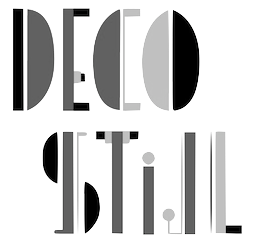 Illustrator and graphic designer located in Oslo, Norway. His/her typefaces:
 - Deco Stijl (2008). An art deco typeface inspired by Paris in the 1920s and De Stijl.
- Snørypa (2008). A modular typeface made within the limitations of Letterrors.
- Dadada (2008). A selection of dadaist characters. The typeface was made for the festival Scandale! Paris 1920 at The Barratt Due Institute of Music.
[Google]
[More] ⦿
|
Lula Rocha
[Sugiro Design (was Rocha Design)]
|
[More] ⦿
|
Lumir Kajnar
|
Idea and identity designer in Prague. The LK font (2011) is an exclusive purely geometric typeface designed by graphic designer Lumír Kajnar in collaboration with Lars Kemper: The layout of the LK font was inspired by the styles of modern typographers from the first part of the 20th century (DeStijl movement, Theo van Doesburg typeface 1919). [Google]
[More] ⦿
|
Mahmoud Yacoub
|
Lodz, Poland-based designer of the De Stijl / Mondrian-inspired typeface Mondriano (2017). [Google]
[More] ⦿
|
Manfred Klein
[TypOasis, 2002]

|
 [MyFonts]
[More] ⦿
|
Manfred Klein
[Manfred Klein: Blackletter, Fraktur, Rotunda]

|
 [MyFonts]
[More] ⦿
|
Manfred Klein: Blackletter, Fraktur, Rotunda
[Manfred Klein]

|
 Manfred's fascination with blackletter and its German roots is apparent from the tens of typefaces he designed that are either revivals of historic typefaces or playful and not so playful extensions. Here we go:
 - ArthritishSpringtime
- BarlosRandom, BarlosRandomRings
- BarlosiusEdged (2007)
- Bastarda-K, BastardaButtonsBeta, BastardaMajuskel1300, BastardusSans
- BauernFraktur (2004, after the 1911 original by Bauersche)
- BayreuthFraktur, Bayreuther-BlaXXL (2005, a variation of Schneidler's Bayreuth)
- BigBroken, BigBrokenTwo
- BigElla
- Brahms-Gotisch (2005, with Petra Heidorn: a revival of Heinz Beck's 1937 typeface at Genzsch&Heyse)
- BrokenAlphabetTradition, BrokenBrainsFrax, BrokenCapsJumperB, BrokenHand-Bold, BrokenHand, BrokenHandLight, BrokenRoman-Bold, BrokenSansCaps, BrokenSansCapsJumper, BrokenWoodtypes, BrokentTraditionRound
- BruchRund
- BruchschriftMK
- Burte-Fraktur
- Burtine (2003: handwritten freestyle version of Burte Fraktur, 1928), Burte-Fraktur, Burtinomatic, Burtinomatic-DemiBold
- Burtinomatic-DemiBold, Burtinomatic
- CancellerescA
- CantaraGotica
- Cantzley Inverse Caps (2007), CantzleyAD1600 (2005)
- CaslonishFraxx
- ClaudiusImperator
- Clausewitz-Fraktur (2005). Designed in memory of Klaus Burkhardt.
- CaslonishFraxx
- ClaudiusImperator
- CowboyCaxton
- Cuxhaven Initials Round (2006), CuxhavenFraktur (2006), CuxhavenInitials (2006), CuxhavenTimes (2002). All named in honor of Petra Heidorn, who is from Cuxhaven.
- DecadentaFrax (2007)
- DirtyThinkwitz (2003). In honor of his good friend Klaus Burkhardt.
- DizzyBrokenWritten
- DolbyFraxCaps (2005)
- DornspitzGrotesk
- DoubleBrokenTextura
- Druckschrift-Initialen
- DrunkenSailor (2006)
- DuerersMinuskeln
- ElectrUnciale (2005)
- ElephantaBlack (2006)
- FatFreeFrax
- FlyingHollander (2005)
- FracturiaSketched, FracturiaSketchedCaps
- FraktKonstruct, FraktSketch, FraktSketchFS, FraktalConPablos, FrakturInRings (2007), FrakturInitials07 (2007), FrakturNitials (2006), FrakturaFonteria, FrakturaFonteriaSlim (2006)
- FrakturCondensedHeadline, FrakturCondensedHeadlineExtra
- FraxBoxes, FraxBricKs, FraxBrix, FraxHandwritten-RoundCaps, FraxHandwritten, FraxHandwrittenXtrem-Medium, FraxInCage, FraxInCageLeftOblique, FraxInCageRightOblique, FraxInitials, FraxMouseSketches, FraxxSketchQuill
- FrungturaFS
- GGothiqueMK
- GermanFatman (2006)
- GingkoFraktur (2006)
- GoldenSwing
- GotenborgFraktur (2007)
- GothicLetters (2007)
- Gotic Caps (2006), GoticaBastard, GotischeMajuskel, GothicMajuscles
- GotikaButtons (2005, after Imre Reiner's Gotika from 1933)
- GutenbergsGhostypes, GutenbergsTraces
- HamletOrNot, HamletTobeornot
- HansFraktur
- HansSachsCaps (2007)
- HansSchoenspergerRandomish
- HappyFrax (2006)
- Haunted-Normal, HauntedBricks
- Heimat
- Holland Gotisch (with Petra Heidorn; a revival of Nederduits by Johann Michael Fleischmann, ca. 1750)
- ImresFraktur, ImresFraxCaps (2007)
- Incunitials
- IronFraktur
- JessicaPlus
- JoeCaxton
- JohannesBricks, JohannesButtons-02, JohannesGDiamonds, JohannesGLastTraces (2007), JohannesTraces
- Jugendstil (2006)
- KaiserRotbartCaps (2007)
- KL1CiviliteEdges
- Kl1RheumaticFraktur
- KleinSchwabach (2005)
- KleinsBrokenGotik (2006)
- KlungerCaps (2006)
- Leibniz-Regular
- LombardPlattfuss, Lombardic
- LookBrokenTypes
- LuFraktorsoBroad
- LudwigHohlwein (2006)
- LufrakturBricks (2006)
- LutherDuemille, LutherMousedrawn-Bold, LutherMousedrawn
- MKBritishWriting
- MK Broken Types (2006)
- MKFraxConstr (2007)
- MKImresTshirtsA
- MKalligFrax, MKalligFrax-MediumItalic
- MKancellerescaCaps (2005)
- MKantzley (2005), MKanzleiCaps-One (2006)
- MKapitalisRusticaMedium
- MKaslonTextura
- MoKsford, MoKsfordBold, MoKsfordDemiBold, MoKsfordExtraLight, MoKsfordLight
- MonAmourCaps (2006), MonAmourFraktur-Broken (2006), MonAmourFrakturRegular
- MonksWriting
- MorbusParcinsonFraxx
- MorscheKnochen
- MountFirtree
- MousefraKtur
- Münchner-Fraktur (2005). A revival of Renaissance Fraktur by Heinz König, 1885, Genzsch&Heyse.
- MyElectronicSchwabach
- NeuGothic-Bold
- Neudoerffer, NeudoerfferScribbleQuality. Both codex style typefaces are from 2003. Manfred writes that Neudoerffer is an unaltered version of the original Neudoerffer Initialen from 1660.
- OKsfordBadFat, OKsfordItalic
- OldTypographicSymphony-Regular, OldTypographicSymphony-Round
- PopFraxFrankfurt (2007), PopFraxFrankfurtCondensed (2007)
- PrinzEugen
- Potsdam (2005, a revival of a 1934 typeface by Robert Golpon)
- Prothesis-Black, Prothesis-Caribiqu, Prothesis-Caripix
- RandomFrax
- ReadableGothic
- RememberReinerFS
- RotundaEspagna
- Schaftstiefel Kaputt (2003)
- SchmaleGotischMK, SchmalfetteGotisch
- SchneidlerSchwabacher, SchneidlerSolitaires, SchneidlerSolitairesRound
- Schwabach, SchwabachDuemille, SchwabachScribbels, SchwabachScribbelsSecond
- ScribbledFrakturX-Heavy (2006)
- SketchedCassiusBroken
- SmallEdgedFrax (2006)
- Snoutlike (2003)
- SpaceWinningFrax (2007)
- TizonaDance
- TshirtsForFrax
- TypoasisBoldGothic (2003)
- VanDoesburgBrokenFS
- VeryBrokenFrax
- WaldarbeiterGotisch
- WeimarInline
- WeissGotischRandom
- Weissgotnitials (2005, based on Weiss's Lichte Initialen, 1935)
- WittewittMajuscles-Flourish, WittewittMajuscles-FlourishBricks
- WrittenFrax (2007)
Download page. Download all these fonts in onze zip file.               
[Google]
[MyFonts]
[More] ⦿
|
Marc ter Horst
|
Creator of a typeface out of spices to adorn the walls of Restaurant Walem. The underlying shpae is a De Stijl alphabet by Bart van der Leck. Behance link. [Google]
[More] ⦿
|
Mariana Avila
|
Graphic designer in Balneario Camboru, Brazil, who created several display typefaces in 2016 such as Fileteada, Mond Min (inspired by Piet Mondrian) and Cosmic. [Google]
[More] ⦿
|
Mario Mora
|
Santiago, Chile-based designer of the free art nouveau typeface Mandala (2013). In 2018, he published the De Stijl typeface Cuadrata. Graphicriver link. [Google]
[More] ⦿
|
Mark Niemeijer
[Soft Machine (or: Open Studio)]
|
[More] ⦿
|
Mateusz Machalski
[Borutta (or: Duce Type)]

|
 [MyFonts]
[More] ⦿
|
Mathias Guaraldo
|
Designer in 2019 of Actrice, Dusty Ranch, Rhino Sans, Sunglass (script), Pricedrop (a supermarket font), Guaraldo (all caps, display sans) and She Rocks (a weathered all caps headline typeface). In 2020, he released Bandito, the De Stijl Cyrillic emulation typeface Ozobarof, the handcrafted Colombina, the all caps titling font Gin and Soda, and the bold font Santa Eliza. [Google]
[More] ⦿
|
Matthew Aaron Desmond
[Matthew Desmond]

|
 MADtype (est. 1996) is Matt Desmond's place in the type world. He has had a prolific career that started out with shareware fonts while Matt was at the Minneapolis Technical and Community College. His page back then said A haven for quality shareware type for the Mac. Later, Matt started mattdesmond.com, and co-founded the Test Pilot Collective (est. 1998 with Joseph Kral and Mike Cina). Many of his early typefaces were experimental and/or futuristic. In late 2003, mattdesmond.com disappeared, and MADtype, commercial now, resurfaced at the MyFonts site. Currently, Matt is based in Minnetnka, MN. He has also lived in Atlanta, GA, Fayetteville, GA, Rochester, NY, Redwood City, CA, and San Francisco, CA. His fonts can also be purchased via You Work For Them. He also does commissioned type design. Some fonts are freely available at the Google Font Directory.
 Retail types as of 2011: - Abel (2011, Google Font Directory). Abel Pro was published in 2013.
- Aldrich (2011). A Bank Gothic style face, free at OFL.
- Amber (2000): kitchen tile face.
- American Gothic (1998): squarish.
- Audebaud (2010): a 19-th century style French Clarendon (wood type look). The design was inspired by the work of Constant Audebaud, an engraver of wooden type that was used for posters. Audebaud's work appeared in the 1880s in the Deux-Sèvres département of France.
- Beat (1998): rounded OCR face.
- Brauhaus (2004): Textura face.
- Cagliostro (2011). A free font at Google Web Fonts that is based on the handlettering of Ozwald Cooper.
- Curbdog (1998).
- Desmond Text (1998): a roman that has features of University Roman.
- Distill (2009): a De Stijl font that shouts 1920s.
- Dunelm (1996): emulation of 17th century printing styles.
- Dwiggins Deco (2009): This typeface was originally designed in 1930 by W.A. Dwiggins as the cover for the book "American Alphabets" by Paul Hollister. Only the 26 letters of the alphabet were included on the cover, so the rest of the numbers, punctuation, symbols, and accented characters have been crafted in a matching [art deco] style.
- Findon (2007): stencil.
- Futuristic category: ER9 (1999), KAH (2005, LCD style), Lunarmod (1997), Retron (1997; can be considered as a retro upright connected script as well), Shifty (1998).
- Grunge category: Bulletin (1997), Gothico Antiqua (1999), Rubba (1997), Stomper (1997--a rubber stamp font), Zapatista (1998-2007).
- Handwriting, handprinting category: Casino Hand (2005), Ghouliez (1996), Handegypt (2002---hand-drawn slab serif), Handy Sans (1997, hand-drawn sans), Joppa (1997), Pufficlaude BT (1998).
- Hessian (2009): Tuscan style wood type.
- Hydrochlorica (2004): organic.
- Invoice (1997).
- Ironside Crosses (2004): dingbat face.
- Marble Roman (2004-2009): angular roman all caps type.
- Matterhorn (2013). A 9-style sans family created with Michael Cina for Disney. Not to be confused with the many retail typefaces that are also called Matterhorn, such as Paratype's PT Matterhorn (1993) and Treacyfaces' TF Matterhorn (1990s).
- Pacioli or Luca Pacioli Caps (2007: emulating a mathematically constructed caps font by Pacioli (1509) published in his treatise De divina proportione.
- Pixel category: Basis (1999), Mang (1997).
- Plenti (2004): ultra plump.
- Quantico (2007): octagonal.
- Stencil category: Bandoleer (2009, +Tracer: a couple of stencil fonts with art deco and army influences), Madison (2007, slab serif stencil), Mercado (2005; has a non-stencil Mercado Sans).
- Urbandale (2018). A basic sans family.
- Variable (2004-2010): a sans-serif monoline typeface that includes ultra thin weights.
- Vexed (2005): sketched face.
- Wolfsburg (2007): blackletter stencil.
- Wooddale (1999): wood type emulation.
Free types as of 2010: Marble Roman, Environ regular, Dorkbutt, Europa, Exsect, Inthacity, Liquidy Bulbous, Lustria (2012, Google Web Fonts), Stomper. Commissioned types: 77kids (2007, for the children's brand; the sketched typefaces were done with Justin Thomas Kay), AE Aerie (2005-206, American Eagle Outfitters), AE Newburgh (2005-206, American Eagle Outfitters), AE Summer Fonts (2007, all for American Eagle Outfitters), EEL Futura (2006, for Enjoying Everyday Life), Nike World Cup (2006), Virgin America (2006). Typefaces from 2019: Starfire (2019, a retro geometric sans). Orphaned types that disappeared or were planned but never executed: BrotherMan, Caprice, Convolve, HipstersDelight, Lugubrious, ModestaSmallCaps, Serifity, Skitzoid, Sliver, ThrowupSolid, Auresh (1998, futuristic; Test Pilot Collective), Kcap6 (1998, with Cina; Test Pilot Collective), Epiphany (1997; Test Pilot Collective), Testacon (with Kral and Cina; Test Pilot Collective), Civicstylecom (1999; Test Pilot Collective), Lutix (1998; Test Pilot Collective), Xerian (1997; Test Pilot Collective), Swoon, Furtive (2004, a sans), the display typeface Flathead (2004), the blackletter typeface Bahn (2004), Mesotone BT (2006, Bitstream, a monoline sans), Practical (a monoline connec script, planned in 2007 but not published), Poliphili (planned in 2007, as a revival of an Aldus/Griffo font), Wutupdo (1996, Garage Fonts), GFDesmond (Garage Fonts), Drone, Golden Times (2014, a corporate small caps typeface for the University of Minnesota), Vapiano (2014: hand-printed typeface for Vapiano International). Behance link. View Matt Desmond's typefaces. Fontspring link. Fontsquirrel link. [Google]
[MyFonts]
[More] ⦿
|
Matthew Desmond
[Matthew Aaron Desmond]

|
 [MyFonts]
[More] ⦿
|
Max Kisman
[Kisman Studio (was: Holland Fonts)]

|
 [MyFonts]
[More] ⦿
|
Michael Golovachev
[Scorpy Design Studio]
|
 [More] ⦿
|
Michael Want

|
 British type designer from Waltham Abbey who worked as a staff designer for P22 from 1994 until 1999. Morisawa Judge's Choice Award winner in 1996 for his typeface Fusaka (an oriental simulation font, 1996, Adobe). Other designs: P22 ToyBox Blocks, P22 ToyBox Animals (1996), P22 ToyBox Regular (1996, child's hand), P22 Vincent, P22 DeStijl (1995, with Richard Kegler--Regular, Stencil, Extras and Tall: of these, Want only did the Stencil style), P22 DaddyO (1998; a beatnik set that includes Blackface, Crazy, fatface, Gaunt, Hip, Junkie and Square styles; by Richard Kegler and michael Want), P22 Bayer Fonetik (1997), P22 Acropolis (1995, Greek simulation typeface done with Richard Kegler), P22 Kells Square (1996, Michael Want and David Setlik), P22 Insectile (1995), P22 Cezanne (1996, a popular handwriting face), P22 Fonosaurus, P22 Folk Art (1997, a number of stitching fonts done with Richard and Denis Kegler), P22 Vincent and P22 Vincent Extras (1998, dingbats and script based on Vincent Van Gogh's work), P22 GD&T (1997: a geometric dimensioning and tolerancing fot), P22 Prehistoric Pals, P22 Prehistoric Pen, P22 Garamouche (+Ornaments; Think of Garamouche as Garamond's drunken cousin, he writes). The ToyBox set was co-designed by Michael Want, Jennifer Kirwin, Richard Kegler, Kevin Kegler, and Mariah Kegler in 1996. The P22 Kells set was co-designed by David Setlik, Richard Kegler, and Michael Want in 1996.
 FontShop link. View Michael Want's typefaces. [Google]
[MyFonts]
[More] ⦿
|
Miriam Ortega
|
Aka Mimi Grafiks. Barcelona, Spain-based designer of the De Stijl-themed typeface Geoplastic (2014) and the modular typeface Pipeline (2016). [Google]
[More] ⦿
|
MyFonts: De Stijl
|
MyFonts hit list for typefaces influenced by the De Stijl movement. [Google]
[More] ⦿
|
Natasha Nefedova
|
Ukrainian graphic designer who created the square pattern font Mondrian Piet (2011), the experimental typeface Module (2013) and the mysterious Glyphs (2013). Pic. [Google]
[More] ⦿
|
Nayashyn Maumoor
|
As a graphic design student in Colombo, Sri Lanka, Nayashyn Maumoor created a squarish geometric typeface in 2015 that was influenced by the De Stijl movement and colored it in Piet Mondriaan's palette. [Google]
[More] ⦿
|
Nechama Zukin
|
Brooklyn, NY-based designer of the Mondrian-inspired bilined typeface Mondri (2016). [Google]
[More] ⦿
|
Nick Curtis
[Nick Curtis: Typefaces from 2004]

|
[MyFonts]
[More] ⦿
|
Nick Curtis
[Nick Curtis: Typefaces from 2005]

|
 [MyFonts]
[More] ⦿
|
Nick Curtis
[Nick Curtis: Typefaces from 2006]

|
 [MyFonts]
[More] ⦿
|
Nick Curtis
[Nick Curtis: Typefaces from 2007]

|
 [MyFonts]
[More] ⦿
|
Nick Curtis
[Nick Curtis: Typefaces from 2008]

|
[MyFonts]
[More] ⦿
|
Nick Curtis
[Nick Curtis: Typefaces from 2009]

|
 [MyFonts]
[More] ⦿
|
Nick Curtis
[Nick Curtis: Typefaces from 2010]

|
 [MyFonts]
[More] ⦿
|
Nick Curtis
[Nick Curtis: Typefaces from 2011]

|
 [MyFonts]
[More] ⦿
|
Nick Curtis: Typefaces from 2004
[Nick Curtis]

|
 Typefaces made by Nick Curtis from 2004, not listed elsewhere on these pages. Bayern Handschrift, De Rigueur NF, Refugio Rustic WBW, Refugio Refined WBW, Ponte Vecchio NF, Brazzaville NF (based on Congo, a 1910 font by Barnhart Brothers \& Spindler), Moonshine Script NF (a casual connected script patterned after an offering from the 1930s chapbook 60 Alphabets by The Hunt Brothers), West Coast Antics (based on a showing from Carl Holmes' 1950s book, ABC of Lettering), Nanki Poo NF (based on Mikado from the Boston Type Foundry), Picture Postcard NF (a Broadway style typeface based on work by lettering artist Alf Becker), Curly Shuffle NF (described as a mix of Alf Becker's style and Leslie Cabarga's), Hardy Har Har NF (based on Samoa from BB&S, 1900), Krazy Kracks NF (based on the so-called California style of lettering used extensively in travel posters of the 30s to the 50s. This version is based on its interpretation by Carl Holmes in a Walter T. Foster artbook entitled ABC of Lettering), Whoa Nelly NF (a comic book face--based on Dan X. Solo's Funhouse), Bushwacked, Cressida (triline face), New Boston (far West typeface of the "italian" kind), Rumble Seat, Kartoon Kutz 3&4 NF, Magic Twanger NF, Snoodle Toons NF, Beanie Kopter NF, Delysian NF (based on Greeting card from the 1923 catalog of BB&S), Mazurka NF (based on Swagger Capitals and Gothic Novelty title from the 1923 catalog of BB&S), Jungle Holiday Cuts NF (based on holiday ornaments by Carl S. Junge, 1929), Stone Soup NF (based on lettering for a 1925 Buster Keaton movie), Tintern Abbey NF (based on the lettering for a 1905 poster for the Austrian National Highway by artist Gustav Jahn), Period Borders NF, Parsnip and Parsnip Outline (Will Ransom designed the exemplar for this series for Barnhart Brothers&Spindler in the early 1900s---the typeface was originally named Parsons (1918), after the advertising director of a Chicago department store), Wurstwagen (suggested by a poster for beer, designed by German artist Ludwig Hohlwein around 1920), Jackson Park NF (1920s style), Kenosha Antique NF (from the 1903 Racine typeface of Barnhart Brothers&Spindler), Catty Wumpas (based on lettering of Ross F. George). [Google]
[MyFonts]
[More] ⦿
|
Nick Curtis: Typefaces from 2005
[Nick Curtis]

|
 Typefaces made by Nick Curtis from 2005, not listed elsewhere on these pages. Chantilly Lace NF (2005: uppercase letters by Bergling and lowercase letters by Roland W. Paul), Edda MorganaNF (medieval English), Gnarly Dude NF (rough script based on material of Ross F. George), Whirled Peas NF (based on a typeface called Whitestone Scrawl by Dan X. Solo in his "Showcard Alphabets"), Cool Cat Jim NF (based on a 1953 headline by Jim Flora in Park East Magazine), Sulphur Springs WBW (bone font), Grand Rapids (based on a typeface named Archer from the 1905 specimen book from Barnhart Brothers&Spindler), Hasta La Pasta (designed after a typeface from a pre-1900 specimen book from the Central Type Foundry of St. Louis, called Spiral), La Coupole (based on lettering on a 1927 menu by prominent poster artists Razzia), Shadowlands (this is like Wilcox Initials from the 1992 Solotype Catalog), Possum Saltare NF (a Trajan column style caps face), Pismo Clambake NF (a connected formal script typeface after a Richard Gans handwriting typeface from 1933, Gloria), Ransom Clearcut NF (an extension of Will Ransom's 1920s caps-only typeface Clearcut Shaded Caps for BBS), Almost Heaven (sold in the early 1900s as Perfection), Goodbye Crewel World (stitching font), Jimbatz NF (dingbats inspired by album cover artist Jim Flora), Bad Dookie NF (from The Advertising Cartoon Clip Art Book, 1971), Maple Leaf Rag NF (revival of Nova Bold by Continental Typefounders), Surely You Jest NF (called Arbor in the 1890's type specimen catalog from Farmer, Little&Co), Merry Old Soul NF (a display typeface discovered in one of the many books on sign writing produced by Eric Matthews), Funky Tut NF (205; the caps are based on J.M. Bergling's Morocco (1914), and the lower cases on Bergling's Kermaic Text (1914)), Groove Thang NF (based on a font called Dado), Novadam Obese (geometric black modern typeface based on a logotype by the same name of Joan Trochut Blanchard, ca. 1940s), Smackeroo NF (2005, engraved US dollar-bill style typeface based on Steelplate, a monocase typeface from ca. 1900 by Barnhart Brothers&Spindler), Snooty Fox NF (an elegant typeface found in Pen&Brush Lettering and Practical Alphabets, Blandford Press, Ltd., London, 1929), Chez Nous (based on Card Italic from a 1930s Mergenthaler Linotype Company specimen book), Slapdash Deco NF (2005, based on a showcard alphabet presented by Cecil Wade in his Manual of Lettering), Rockin Roman NF (from Blandford Press' Pen&Brush Lettering and Practical Alphabets), Kunstgewerbe NF (artsy typeface after work by J.M. Bergling, 1914), Details Details NF (a geometric design from Pen and Brush Lettering and Practical Alphabets), Escondido NF (inspired by an Austrian travel poster designed by Johann Süssenbek in the 1930s), Ballyhaunis NF (based on Celtic lettering by Laurence Schall, early 1900s), Inglenook Corner NF (based on art nouveau lettering by Laurence Schall, early 1900s), Mohair Sam NF (caps based on letters of Samuel Welo, and lower case based on ATF's Romany Script), Partenkirchen NF (a Basque style display face), Helena Handbasket NF (after Antique Light, found in the 1888 edition of the James Conner & Sons United States Type Foundry specimen book), Kudos Kaps NF (2006: five nice ornamental caps and associated alphabet and border sets, including a Lombardic set, an engraved set; they are based on typefaces from Ludwig&Mayer). [Google]
[MyFonts]
[More] ⦿
|
Nick Curtis: Typefaces from 2006
[Nick Curtis]

|
 Typefaces made by Nick Curtis from 2006, not listed elsewhere on these pages: Magic Lantern NF, Duly Noted NF (after an ATF typeface from 1912 called Freeahand), Got That Bling NF (a connected script based on the work of Al Mack, from his Lettering: Brush&Pen in the Single Stroke), Haarlem Nights NF (based on a 1920 Dutch poster for Public Placement Services by Johan Dijsktra), Architectuur NF (based on De Stijl type lettering by H. Th. Wijdeveld, 1925), Gandy Dancer NF (a revival of Tabard, ca. 1912, ATF), Pomfrit Dandy NF (based on Frys Ornamented No. 2 by Stephenson Blake), Smith Premier (Clean and Schmutzy) NF (a typewriter pair after the letters of the Smith Premier No. 3), ed Hot Mama NF (2006), Jumbo Mumbo NF (a revival of Independant done in 1930 by Collette and Dufour), Union Telegraph NF (2006), Major Production NF (which was followed in 2009 by Major Pro Extras NF), Teeny Boppin NF (gleaned from Schrifti Alphabeti, a book of Cyrillic alphabets published in Kiev in 1979), Rutin Tutin NF (based on Wild West lettering found in Schrifti Alphabeti, 1979), Jampact NF (2006, an ultra fat headline face), Beagle Boyz NF (a bouncy typeface based on a Cyrillic alphabet presented in the book Schrifti Alphabeti, 1979), Midtown Tessie NF and Downtown Tessie NF (mosaic tile typefaces), Scary Scrimshaw (based on a 1968 poster for a Doors concert), Speedball No1, Speedball No2 SW (2001), Speedball No3 (2001), Bellagio NF (an interpretation of Robert Wiebking's 1917 font Advertisers Gothic, designed for BB&S), High Society NF (2006, a fashion mag typeface based on an alphabet found in Lettering for the Commercial Artist by Blandford Press, 1946), Osiyo Dohitsu NF (based on letterforms in the Cherokee Syllabary, reputedly devised by Sequoyah in the early nineteenth century; it has petroglyphs as well), Micro Manager NF (pixel face), Paper Caper NF (2006), Shady Grove (a condensed version of Thorne Shaded), American Pi NF (2006: ATF ornaments from the catalogs between 1913-1934, including some designed by Will Bradley, Frederic Goudy and George Trenholm), The Donald NF (a hyper-curly decorative face), Boo Meringue NF (a Halloween font based on Lithotint (1897, ATF)), Lesser Arcana (a mystical type), Zyklop NF (2006), Deux Chasses NF (based on ATF's Thermotype), Bon Mot NF (based on Barnhart Brothers&Spindler's Engravers Upright Script), Munchkin Land NF (based on a work called Thor, issued by Frederic Wesselhoeft Ltd of London in the 1930s), Didgeree Doodle NF (2006, a curly cursive originally released as Bernhard Heavy Antique Cursive by the Bauersche Giesserei by Lucien Bernhard), Kudo Kaps One, Two, Three and Four NF (a total of eight classical initial caps typefaces), Crane Titling NF (medieval-inspired uppercase letters drawn by famed book illustrator Walter Crane with charming, if somewhat quirky, lowercase letters by J. W. Weekes), DecimoSexto NF (+italic) (includes Spanish Roman letters and Griffo style italics, both hand-drawn by Francisco Lucas in Madrid, 1577), Visillo Adornado (a caps typeface based on the typeface Vesta, originally designed by Albert Auspurg for H. Berthold AG, Berlin in 1926), Edsel Font, Deco Dingbats. [Google]
[MyFonts]
[More] ⦿
|
Nick Curtis: Typefaces from 2007
[Nick Curtis]

|
 Typefaces made by Nick Curtis from 2007, not listed elsewhere on these pages: Dundee Castle NF (based on lettering by Harvey Hopkins Dunn, 1930), Sheik Of Araby NF (2007), Aethelred NF (a unicase typeface, with alternate characters in several of the lowercase positions, is patterned after Mosaik, designed by Martin Kausche for Schriftgiesserei Stempel in 1954; Sultan (2005, Canada Type) is also based on Mosaik). Cerulean NF (a sans based on Lining Gothic No. 71 (BBS and ATF, 1907)), Rimshot NF (script), Jaunty Gent NF (based on the upright connected script Forelle, aka Rheingold Kräftig, by Erich Mollowitz in 1936-1937 for the Hamburg foundry of J. D. Tennert&Sohn), Baby Cakes NF (a bubblegum face based on a 1974 release by Karlgeorg Hoefer at the Ludwig&Mayer foundry called Big Band), Amper Sans NF (after Hobby, a script designed in 1956 by Werner Rebhuhn for Schriftgießerei Genzsch&Heyse), Wacky Duck NF (2007), By George Titling NF (inspired by silent movie lettering), Dinky Rink NF (partially based on Steile Futura), Fuller Brush NF (a bouncy signage script from The New Lone Pine ABC of Showcard and Ticketwriting by Australian author C. Milnes), Tiddly Winks NF (2007), Iraan (a stars and stripes typeface based on the ATF typeface Rodeo), Haut Relief (a 3d typeface based on a 1960s typeface called Sculpture), Fiddle Sticks (based on West Banjo (Dave West, 1960s)), Djibouti (an African theme font modeled after African Queen (Dave West, 1960s), Wacky Duck NF (2007), Turing Car NF (2007, a monospaced typeface based on a lineprinter font from the 1960s, the Unisys 0776), Route 66 NF (based on the typefaces used on U.S. Highway signs from the 1930s to the 1950s), Anna Nicole NF (2007, based on the upright semiscript Mirabelle (1926, Wagner&Schmidt); Nick Curtis: Round, firm and fully-packed, it is sure to get attention anywhere it is used.), Keynote Speaker NF (an awkward blocky typeface patterned after Bloomsbury (1920s, P. M. Shanks&Sons)), Twitty Bird NF (2007, an architectural drawing font based on Dan X. Solo's Conway), Balder Dash NF (the caps are based on Breda-Gotisch (1928, H. Berthold AG) and the lowercase on Goudy Text)), Outer Loop NF (2007), Tutti Paffuti NF (after Stymie Black Flair by Dave West for Photolettering), Weedy Beasties NF (after a variation of Seymour Chwast's Blimp), Bully Pulpit NF (2007), Keepon Truckin NF (a 3d typeface based on Milton Glaser's Baby Fat). In the 1970s, Vincent Pacella made a Photolettering Egyptian headline typeface called Blackjack, which was digitized in 2007 by Nick Curtis as Flap Jacks NF. ITC Jeepers and Woodley Park (based on Naudin) won awards at the TDC2 Type Directors Club's Type Design Competition 2002. Artone (Seymour Chwast, 1968) was revived as Loose Caboose NF (2007). Edwin Sisty's upright curly semiscript Belcanto (1970s, Photolettering) was revived in 2007 by Nick Curtis as Glissando NF. F.W. Kleukens' Kleukens Antiqua (1910) was digitized by Nick as Kleukens Antiqua NF (2007). Holo Fernes NF (2007) is based on Christian Heinrich Kleukens' Judith Type (1923), a hookish hell-inspired face. Pudgy Puss (2007) is an ultra-fat modern display type based on Fat Face (Herb Lubalin, Tom Carnase). Omaha Bazoo (2007) is patterned after Viola Flare, issued by Franklin Photolettering in the 1970s. Lateral Incised NF (2007) is an engraved old style typeface originally released in 1929 as Gravure by the London foundry of C. W. Shortt. Tall Scrawl NF (2007) is an original Curtis hand-printed font. Alfred Riedel's Domino (Ludwig&Mayer, 1954) was revived as Idle Fancy NF (2007). Boxcar Willie NF (2007) is a quaint curly face. [Google]
[MyFonts]
[More] ⦿
|
Nick Curtis: Typefaces from 2008
[Nick Curtis]

|
Typefaces made by Nick Curtis from 2008, not listed elsewhere on these pages: Dave West's Nickelodeon was revived by Curtis as Lily Hilo NF (2008). Funky Rundkopf NF (2008) is an adaptation of an LED simulation font of Ray Larabie, called Dignity of Labour. Daffadowndilly NF (2007-2008) is based on art work by Alf Becker from the 1940s. Babes In Toyland NF (2008) has some of the Rennie Mackintosh charm and is based on "Sheet music for Babes in Toyland, USA, 1903". Anagram Shadow NF (2008) is based on handlettering from a 1928 poster for a steamship line by renowned British artist Austin Cooper. Kandinsky NF (2008) is based on shapes found on Kandinsky's painting Succession (1935). An experimental typeface by Jeremy Pettis, illustrating the concept of kangaroo, inspired Pal Joey NF (2008). One of René Knip's experiments, a unicase typeface with an Arabic feel, was digitized by Nick Curtis as Turban Hey NF (2008). Calamity Jane (2008) is a stylish Edwardian script based on a 1930s logotype for the Theatre Moderne in Paris. Orion Radio NF (2008) is a 1930s style display typeface on an African theme. Quinceanera NF (2008) is a a new take on an old dry-transfer standard from the 70s named Barrio. Jobber Wacky NF (2008) is a bouncy handlettering font based on designs of Alan Denney found on greeting cards in the 1950s and 1960s. Franciscan Caps (2008) is based on a 1932 typeface by Frederic Goudy called Franciscan. Morning Glory (2008) is a simple display typeface that goes back to the Cleveland Type Foundry, 1893. Tickety Boo (2008) is a take on Goudy Fancy (or: Goudy Black Elongated Swash). Yo Quiero Taquitos uses letters taken from Rotalución Decorativa (Barcelona, 1940s), Disco 79 (2008, multiline), Eclectic Crumpany (2008, multiline monocase neon or paperclip typeface based on The Electric Company TV Show), Fire Down Below (2008, block gothic), Joufflou NF (2008, very fat), Bala Cynwyd NF (2001) is an Arts&Crafts style poster typeface inspired by lettering of Dard Hunter. Csiszarz Latein NF (2008) recreates an old typeface (ca. 1910) of J.V. Csiszarz. Owah Tagu Siam NF (2008) is a faux Thai font. Langoustine Rouge NF (2008) is based on Dan Solo's Sorbonne. Cecil Wade again provided inspiration for Bloc Party NF (2008). My Little Eye NF (2008) is an elegant piano key font. Roundabout NF (2008) is rounded octagonal. Neubank NF (2008) is Nick Curtis's take on Bank Gothic. Warp Three NF (2008) is a Bank Gothic-style family with an uppercase as in Agency Gothic (1932-1933, Morris Fuller Benton) and a lowercase from Square Gothic (1888, James Conner). [Google]
[MyFonts]
[More] ⦿
|
Nick Curtis: Typefaces from 2009
[Nick Curtis]

|
 Typefaces made by Nick Curtis from 2009, not listed elsewhere on these pages: Society Page NF (semi-script based on Morris Fuller Benton's Announcement, 1916), Glyphix One NF (dingbats), Glyphix Two NF (dingbats), Velveteen Round NF (based on Vellvé's only font, 1971), Steno Stout NF (the venerable Underwood Victoria typewriter on steroids), Diosa Rubia NF (condensed headline face), Mono Amono NF (octagonal), Turista Flaca NF (based on Baltimore Type Foundry's Tourist Extra Condensed), Boop Boop NF (based on handlettering found on Hallmark Studio Cards of the 1950s), Samosata NF (based on Bernhard Gothic), Waddem Choo NF (based on Tschichold's Transito from 1931), Jane Plain NF (architectural blueprint style), Hacky Sack NF (a zany typeface based on Ross F. George's Stunt Roman), Free Holeys NF (after the 1972 Letraset font Beans by Dieter Zembsch), Kingstown NF (semiscript), Kudos Kaps NF (2006: five nice ornamental caps and associated alphabet and border sets, including a Lombardic set, an engraved set; they are based on typefaces from Ludwig&Mayer), Melvin Eustace NF (handlettered), Weekly Bazaar NF (based on Harpers by the Central Type Foundry), Really Big Shoe NF (after a Cleveland Type Foundry typeface called Oxford), Bellwether Antique NF (after a 1913 typeface by Georg Belwe), Garmisch Rund NF (inspired by Rundgotisch, Emil Rudolf Weiss, 1937), Whitefriars NF (based on a font from the Blackfriars Type Foundry in London), Society Page NF (a curly serif typeface based on Morris Fuller Benton's Announcement Roman, designed for American Type Founders in 1917), USA Resolute NF (a unicase headline typeface based on Morris Fuller Benton's Eagle, ATF, 1934), Saturday Morning Toast (2001, based on the logotype font of the Saturday Evening Post from the 1920s), Examiner NF (based on Dwiggins' Metro from the 1930s). Hans Lijklema's Free Font Index has a CD which contains AirstreamNF-Italic, CalamityJaneNF-Bold, CalamityJaneNF, DaddyLonglegsNF, HamburgerHeavenNF, HeavyTrippNF, HutSutRalstonNF (2001), OrionRadioNF, ParkLaneNF, PhattPhreddyNF, RhumbaScriptNF (a silent movie font), Riot Squad NF (2000, after Otto Heim). [Google]
[MyFonts]
[More] ⦿
|
Nick Curtis: Typefaces from 2010
[Nick Curtis]

|
 Typefaces made by Nick Curtis from 2010, not listed elsewhere on these pages.
 Typefaces made in 2010: Conners Corners NF (2010: gleaned from the 1888 specimen books of James Conner's Sons United States Type Foundry), Tumbling Dice NF and Banner Year NF (both were done after scroll typefaces featured in the 1869 MacKellar Smiths and Jordan specimen book), Standing Room Only NF (after Broadway, designed by Morris Fuller Benton for ATF in 1928, originally named Broadway Poster), Proud Mary NF (a plump typeface based on Joseph Churchward's Marianna), Slapsie Maxi NF (based on a Carl Holmes alphabet found in Holmes's ABC of Lettering), Umbriago NF (trying to do a Cooper Black Swash Italic), Picaro NF (based on Harlequin), Palo Pinto NF (based on Pacella Vega Extended 10, a 1960s typeface by Vincent Pacella), Cartella NF (a 3d beveled shadow typeface based on a Morris Fuller Benton 1934 offering for American Type Founders called Poster Gothic), Pracht Antiqua NF (a faithful rendering of the cuddly headline script typeface Pracht Antiqua Schmallfett, which was designed by Carl Pracht for the Norddeutsche Schriftgießerei in 1942), Gitfiddler NF (a futuristic oblique typeface based on the lettering on a package of Gibson guitar strings from the 1950s), Seta Reta NF (after Walter Diethelm's 1965 VGC typeface Arrow), Kleukens Kursiv NF (after Kleukens Scriptura, 1926 by F.W. Kleukens), Kallilu NF (a display face, after George Piscitelle's VGC typeface Thomac from the 1960s), Occidental Tourist NF (an avant-garde sans inspired by Dave West's Futura Casual), Schelter Grotesk NF (after Schelter's Breite Grotesk, 1886), Vuvuzela NF (a casual, almost sign-painted, and nearly African display face), Block Party NF (2008, a 3d face), Cromwell NF (a faithful digitization of Cromwell, 1913, Morris Fuller Benton, ATF), Liguria NF (2010, after a typeface found in a Nebiolo specimen book, ca. 1900), Pony Express NF (2010, after Palmer and Rey's Courier from 1885), Linndale Square NF (a beefed up version of Geometric, 1885, Cleveland Type Foundry---a typewriter style face), Binghamton NF was inspired by the wedge-serifed angular typeface Bingham (Vincent Patella, PLINC). Albert Kapr designed Faust in 1959, so Nick's derived sans typeface is called Kaprice NF. Double D NF (2010, +Fill, +Outline) is a 3d beveled typeface based on Dave Davison's Dimensional from the 1970s. Old Softy NF (2010) is a rounded typeface based on Round Gothic (Keystone Type Foundry, 1884 catalog). [Google]
[MyFonts]
[More] ⦿
|
Nick Curtis: Typefaces from 2011
[Nick Curtis]

|
 Typefaces made by Nick Curtis from 2011, not listed elsewhere on these pages: Jersey City NF (modeled after Times Gothic (1905, ATF)), Petty Despot NF (2011, also modeled after Times Gothic, and possibly renamed from Jersey City NF after Berthold---yes, the same Berthold again---complained about the name Jersey since one of its fonts by Gustav Jaeger was named Jersey. This is my educated guess..., and two thumbs up to Nick for picking the appropriate name Petty Despot NF). Olde Megrat NF is patterned after Antikva Margaret, designed by Zoltán Nagy for VGC in the mid-60s. Herkimer Bunrab NF is an upright scriptish typeface with bunnyears that is based on Hercules (1926, Amsterdam Type foundry). Blackbarry NF (2011) is a faithful revival of Deutsch Black (1966, Barry Deutsch, VGC), a unicase piano key typeface. Bindlestiff NF (2011), which won the 2011 Devroye Memorial Medal for funniest typeface name, revives Schmallfette Binder Style (1959, Joseph Binder, Stempel AG), a squarish tightly set headline face. Decked Out NF (2011) is a fat inline typeface modeled on Dektiv in Homage to the Alphabet. Bazoo Tow NF (2011) is a fun fattish headline typeface that is a faithful reroduction of Basuto (1927, Stanley Baxter for Stephenson Blake). Are You Shaw NF (2011) is an all-caps blackboard bold typeface inspired by Pygmalion, a typeface found in Homage to the Aplhabet. Hoodoo U NF (2011) is a roly-poly romp through the alphabet, based on Jürgen Riebling's irrepressible Mr. Big from the 1970s. Big, bold, bubbly and a little brash, it's a natural choice for happy headlines. The handlettered Mikeys Roman NF (2011) has an uppercase based on the work of Mike Stevens, and a lowercase based on the work of Alf Becker. Outgribe NF (2011) is a rough, raw typeface that is based on the lettering in Ben Shahn's iconic poster protesting the execution of Nicolo Sacco and Bartolomeo Vanzetti in 1927. Nellie Kay NF (2011) is a monoline script face, based on an example by Ross F. George. Shaq Attack NF (2011) is a wooden plank style or brushy typeface inspired by an alphabet of Alf R. Becker. Relampago NF (2011) revives Hans Möhring's bilined typeface Elegante Lichte (1928). Squirrely Shirley NF (2011) is a bouncy typeface based on Phoenix (unknown creator) in Schriftatlas. Spread Out NF (2011) is modeled after Ross F. George's Split Caps. Salzburger Plakat NF (2011) is based on an Austrian winter sports festival poster from 1907 by Swiss poster designer Otto Baumberger (1889-1961). Rightly So NF (2011) is a squarish typeface based on Geometric Gothic (1884, Palmer and Rey)---it is hard to imagine that this almost pixelish style was around at that epoch. Kenotaph NF (2011) is a condensed headline slab serif modeled after Stymie Obelisk (1930s, Morris Fuller Benton). Vasari NF (2011) is based on Ancient Gothic (1891, William W. Jackson, Keystone Type Foundry). Moslem (Boston Type Foundry) was revived as Suffiya NF (2011). Looky Cookie NF (2011) has eyes placed on the glyphs. Iago NF (2011) is a powerful headline sans inspired by two ATF typefaces from the 1880s, Othello and ATF Black Caps. Big Bag NF (2011) is called an industrial-strength titling face by Nick Curtis---it has design elements of Hans Eduard Meier's Syntax Antiqua. Highpoint Gothic NF (after Morris Fuller Benton's 1932-1935 typeface Raleigh Gothic Condensed). Fernburner NF is an all caps shadow face, modeled after Hans Bohn's 1929 typeface Orplid. Planscribe NF is based on types used by the Leroy Automatic Lettering Machine, a tool for architects. [Google]
[MyFonts]
[More] ⦿
|
Nick Shinn
[Shinn Type]

|
 [MyFonts]
[More] ⦿
|
NK Fonts and Photoshop (was: Ank Fonts and Photoshop)
[Austin Kurowski]
|
Free designs of Austin Kurowski include Radius, Radii, Radii Remix, DeStijl, Speed Bowling, BrandNew, Alphabeta, Alphabold, Untitled, Untitled2, Highboot, Shapeses, Heavy as in Metal, and Untitled3. All fonts have a strong geometric component. See also here. Aka Ank Fonts. [Google]
[More] ⦿
|
nnnick77
|
Designer who used FontStruct in 2008 to make De Stijl. [Google]
[More] ⦿
|
Noctambulum
|
Argentinian creator of Bairestijl (2011, a De Stijl stencil face) and Opus Pix (2011, an artsy pixel face). [Google]
[More] ⦿
|
Oleg Mushta
|
Moscow, Russia-based designer of the angular experimental typeface Mondriburg (2017), which was influenced by the De Stijl movement, and Van Doesburg and Mondrian in particular. [Google]
[More] ⦿
|
Ozge Celebi
|
Istanbul, Turkey-based designer of the De Stijl typeface De Lijn (2017). [Google]
[More] ⦿
|
P22 Type Foundry
[Richard Kegler]

|
 Richard Kegler's fun Buffalo-based foundry, which he founded in 1995 together with his wife, Carima El-Behairy. Currently, on staff, we find type designers James Grieshaber and Christina Torre. In 2004, it acquired Lanston Type. P22 has some great unusual, often artsy, fonts. In 2021, P22 jopined The Type Founders as a distribution outlet.
 The fonts are: Industrial Design (an industrial look font based on letters drawn by Joseph Sinel in the 1920s---this font is free!), LTC Jefferson Gothic Obliquie (2005, free), Sinel (free), P22Snowflakes (free in 2003 and P22 Snowflakes (retail) in 2020, finishedd by Richard Kegler and Terry Wüdenbachs), Acropolis Now (1995, a Greek simulation typeface done with Michael Want), P22 Albers (1995; based on alphabets of Josef Albers made between 1920 and 1933 in the Bauhaus mold), Arts and Crafts (based on lettering of Dard Hunter, early 1900s, as it appeared in Roycroft books), Ambient, Aries (2004, based on Goudy's Aries), Arts and Crafts ornaments, Atomica, Bagaglio (Flat, 3D; in the style of Il Futurismo), P22 Basel Roman (2020, Richard Kegler: an update of a 2015 typeface, P22 Basel, based on a garalde font used by Johannes Herbst (aka Ioannes Oporinus) in 1543 to publish Andreas Vesalius' On the Fabric of the Human Body (De humani corporis fabrica) in Basel), Bauhaus (Bauhaus fonts based on the lettering of Herbert Bayer), Bifur (2004, Richard Kegler, after the 1929 original by Cassandre), Blackout, P22 Brass Script Pro (2009, Richard Kegler; based on an incomplete script fond in a booklet from Dornemann&Co. of Magdeburg Germany, ca. 1910 entitled Messingschriften für Handvergoldung; for years, P22 and MyFonts claimed that Michael Clark co-designed this, but Michael does not want any credit, as he did only about 20 letters), Cage (based on handwriting and sketches of the American experimental composer John Cage), P22 Casual Script (2011, Richard Kegler, a digitization of letters by sign painter B. Boley, shown in Sign of the Times Magazine), Cezanne (Paul Cezanne's handwriting, and some imagery; made for the Philadelphia Museum of Art), Child's Play, Child's Play Animals, Child's Play Blocks, Constructivist (Soviet style lettering emulating the work of Rodchenko and Popova), Constructivist extras, Czech Modernist (based on the design work of Czech artist Vojtech Preissig in the 20s and 30s), Daddy-o (Daddy-o Beatsville was done in 1998 with Peter Reiling), Daddy-o junkie, Da Vinci, Destijl (1995, after the Dutch DeStijl movement, 1917-1931, with Piet Mondrian inspired dingbats; weights include Extras, P22 Monet Impressionist (1999), Regular and Tall), Dinosaur, Eaglefeather, Escher (based on the lettering and artwork of M.C. Escher), P22 FLW Exhibition, P22 FLW Terracotta, Folk Art (based on the work of German settlers in Pennsylvania), Il futurismo (after Italian Futurism, 1908-1943), Woodtype (two Tuscan fonts and two dingbats, 2004), P22 Woodcut (1996, Richard Kegler: based on the lettering carved out in wood by German expressionists such as Heckel and Kirchner), Garamouche (2004, +P22 Garamouche Ornaments; all co-designed with James Grieshaber), GD&T, Hieroglyphic, P22 Infestia (1995), Insectile, Kane, Kells (1996, a totally Celtic family, based on the Book of Kells, 9th century; the P22 Kells Round was designed with David Setlik), Koch Signs (astrological, Christian, medieval and runic iconography from Rudolf Koch's The Book of Signs), P22 Koch Nueland (2000), Larkin (2005, Richard Kegler, 1900-style semi-blackletter), London Underground (Edward Johnston's 1916 typeface, produced in an exclusive arrangement with the London Transport Museum; digitized by Kegler in 1997, and extended to 21 styles in 2007 by Paul D. Hunt as P22 Underground Pro, which includes Cyrillic and Greek and hairline weights), Pan-Am, Parrish, Platten (Richard Kegler; revised in 2008 by Colin Kahn as P22 Platten Neu; based on lettering found in German fountain pen practice books from the 1920s), P22 Preissig (and P22 Preissig Calligraphic, 2019), Prehistoric Pals, Petroglyphs, Rodin / Michelangelo, Stanyan Eros (2003, Richard Kegler), Stanyan Autumn (2004, based on a casual hand lettering text created by Anthony Goldschmidt for the deluxe 1969 edition of the book "...and autumn came" by Rod McKuen; typeface by Richard Kegler), Vienna, Vienna Round, Vincent (based on the work of Vincent Van Gogh), Way out West. Now also Art Nouveau Bistro, Art Nouveau Cafe and the beautiful ornamental font Art Nouveau Extras (all three by Christina Torre, 2001), the handwriting family Hopper (Edward, Josephine, Sketches, based on the handwriting styles of quintessential American artist Edward Hopper and his wife, Josephine Nivison Hopper, and was produced in conjunction with the Whitney Museum of American Art), Basala (by Hajime Kawakami), Cusp (by James Grieshaber), P22 Dearest (calligraphic, by Christina Torre and Miranda Roth), Dwiggins (by Richard Kegler), Dyrynk Roman and Italic (2004, Richard Kegler, after work by Czech book artist Karel Dyrynk), Gothic Gothic (by James Grieshaber), La Danse (by Gábor Kóthay;), Mucha (by Christina Torre), Preissig Lino (by Richard Kegler), P22Typewriter (2001, Richard Kegler, a distressed typewriter font), the William Morris set (Morris Troy, Morris Golden, Morris Ornaments, based up the type used by William Morris in his Kelmscott Press; 2002), Art Deco Extras (2002, Richard Kegler, James Grieshaber and Carima El Behairy), Art Deco Display, the Benjamin Franklin revival font Franklin's Caslon (2006), Dada (2006) and the Art Nouveau font Salon (bu Christina Torre). In 2006, Kegler added Declaration, a font set consisting of a script (after the 1776 declaration of independence), a blackletter, and 56 signatures. Many of the fonts were designed or co-designed by Richard Kegler. International House of Fonts subpage. Lanston subpage (offerings as of 2005: Bodoni Bold, Deepdene, Flash, Fleurons Granjon, Fleurons Garamont, Garamont, Goudy Thirty, Jacobean Initials, Pabst, Spire). Bio and photo. In-house fonts made in 2008 include Circled Caps, the Yule family (Regular, Klein Regular, Light Flurries, Heavy, Klein heavy, Heavy Snow, Inline; all have Neuland influences). Kegler / P22 created a 25-set P22 Civilité family in 2009 based on a 1908 publication from Enshedé, the 1978 English translation by Harry Carter, and a 1926 specimen also from Enshedé. P22 Declaration (Script, Signatures, Blackletter, 2009) is based on the lettering used in the 1776 Declaration of Independence. At ATypI 2004 in Prague, Richard spoke about Vojtech Preissig. Speaker at ATypI 2010 in Dublin, where he presented Making Faces: Metal Type in the 21st Century about which he writes: This film has the dual aim of documenting the almost-lost skill of creating metal fonts and of capturing the personality and work process of the late Canadian graphic artist Jim Rimmer (1931-2010). P22 type foundry commissioned Mr. Rimmer to create a new type design (Stern) that became the first-ever simultaneous release of a digital font and hand-set metal font in 2008. At ATypI 2011 in Reykjavik, he showed Making Faces. Typefaces from 2014: LTC Archive Ornaments (Richard Kegler and Miranda Roth). Typefaces from 2020: Showcard Script (by Terry Wüdenbachs, based on an original of Beaufont at the Hamilton Wood Type Museum, custom designed by the Morgan Sign Machine Company of Chicago). Typefaces from 2021: P22 Glaser Houdini (a layerable family, after Glaser's Houdini from 1964), P22 Glaser Babyteeth. Kegler writes: In 2019, P22 Type Foundry met with Milton Glaser (1929-2020) to initiate the official digital series of typefaces designed by Glaser in the 1960s and 70s. P22 Glaser Babyteeth is the first family released in the series. Milton Glaser's inspiration for his Babyteeth typeface came from a hand painted advertisement for a tailor he saw in Mexico City. He was inspired by that E drawn as only someone unfimilar with the alphabet could have concieved. So he set about inventing a completelly ledgible alphabet consistant with this model. P22 Glaser Babyteeth was based on original drawings and phototype proofs from the Milton Glaser Studios archives. Over the years there have been many typefaces that borrowed heavily from the Glaser designs, but these are the only official Babyteeth fonts approved by Milton Glaser Studio and the Estate of Milton Glaser. The solid and open versions are designed to overlap for two-color font effects and can even be mixed and matched for multi layer chromatic treatments. In 2021, he published the 3d art deco shadow font P22 Glaser Kitchen which is based on Big Kitchen (1976). MyFonts interview. View Richard Kegler's typefaces. View the IHOF / P22 typeface library. [Google]
[MyFonts]
[More] ⦿
|
Patrick H. Lauke
|
Lauke runs Splintered in the UK, a design company. He made a number of free pixel fonts in 2004: 3x7-High, 3x7-Low, 3x7-Normal, Chaos-Engine, Erix-Outline, Robovox, syndicate, xenon2. FontStructions in 2012 involve mostly pixel fonts that are related to video games. We have Lucasfont (+Alternate), TFX Tactical Fighter Experiment, F-16 Falcon, F-19 Stealth Fighter, Phonephreak, Architypixel Doesburg 25x25 (based on Theo van Doesburg's Architype), Architypixel Doesburg 5x5, Dogs of War, Hoodlum samurai, 3x7 High, 3x7 Low, Isaac Espy Sans system, Chaos Engine, Erix Outline, Syndicate, Xenon2, Robovox, Sierra, Ages. Pre-2012 Fontstructions include Greeked, Robotron 2084, Cosimo, 3x7 Pixels. FontStruct link. Fontspace link. [Google]
[More] ⦿
|
Pedro Pan
[Ipsum Planet]
|
[More] ⦿
|
Peter Korsman
[Autograph]
|
[More] ⦿
|
Philippe Apeloig
|
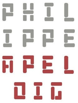 French type designer (b. Paris, 1962) who designed the experimental fonts Carré, Octobre (a stencil in the De Stijl genre), and Aleph in 1994. [The digital versions of these fonts are due to Franck Montfermé.] First prize at the Tokyo Type Directors Club in 1995, and a Judges' Special Prize at the same competition in 1999. Poster exhibition. Bio.
 Since 1992, he has been teaching typography at the Ecole Nationale Superieure des Arts Decoratifs. In 2012, the people at Nouvelle Noire in Zurich helped produce several of Apeloig's typefaces: - In the De Stijl genre: Octobre (1994), Ndebele.
- The geometric typeface ABF.
- ABF Lineaire (2013). A stencil typeface with elements of LED letters.
- ABF Silhouette (2009). Based on ABF Petiit, this typeface was developed for the 2009 conference on the Space and Architecture of Libraries.
- ABF Petit. Custom designed as part of a new corporate identity for the Association des Bibliothécaires de France.
- Coupé (2013): The font Coupé is based on the streamlined elegance of vintage sports cars. Apeloig designed these letterforms for an exhibition of fashion designer Ralph Lauren's car collection. The exhibition made its European premiere at the Musée des Arts Décoratifs in Paris accompanied by a poster inspired by the clean engineering of the automobiles.
- Izocl (2013). At Nouvelle Noire.
- Poudre (2013). This font was created by Apeloig for a poster advertising an exhibition on the prolific inventor and industrialist Alfred Nobel. Apeloig's concept was inspired by Nobel's invention of dynamite and work with subatomic particles.
- Ali (2013). An origami stencil typeface.
- Aleph (1994). Based on a simple arc, and influenced by Excoffon's banco (1952).
- In 2016, he designed the numbers for the Slim d'Hermes watch.
Alternate URL. Photograph. Winner in 2009 of the typographic design award of the International Society of Typographic Designers (ISTD). Nouvelle Noire Behance link. Klingspor link. [Google]
[More] ⦿
|
Piet Zwart

|
 Dutch designer, b. 1885, Zaandijk, d. 1977, Wassenaar. Author of Cable Book (1925) and creator of many classic advertisements for the Netherlands Post Office (PTT). His work was influenced by Hungarian De Stijl artist Vilmos Huszar and Dutch architect Jan Wils, whom he met when he moved in 1913 to Voorbug. Wils had worked for Berlage. In 1913-1914, he studied at TU Delft and started his career with Berlage in Voorburg. From 1919 until 1922 he worked for Wils. In 1959, he received the Quellinus Prize in typography. The David Roellprijs followed in 1964. In 2000, Zwart was posthumously awarded the "Designer of the Century" award by the Association of Dutch Designers. From 1919 until 1933 he taught at the Rotterdamse Academie van Beeldende Kunsten en Technische Wetenschappen.
 Quoting Design Observer: Piet Zwart's work was multi-disciplinary and spanned the gamut of industrial design, typography, photography, and most notably graphic design. As an industrial designer, Zwart is best known for his design of the Bruynzeel modular kitchen in 1937, which is still available today. As a graphic designer, the work he produced for Nederlandse Kabelfabriek Delft (Dutch Cable Factory in Delft) and Dutch Postal Telegraph and Telephone Company (PTT) is arguably among the best known Dutch graphic design of the 20th century. His graphic design work clearly shows the influence of Constructivism and, though he was not a part of the De Stijl, his work reflects elements of this movement. Recurring themes are the use of repetitious patterns, lines, circles, primary colors, photomontage and explorations of experimental typography. Examples: Toneel Wij Nu, 1925, Kataloog PTT, 1924, Nutter margarine inpakpapier, 1923. Type revivals of Piet Zwart's typefaces include - Trio Grotesk (2012, Florian Schick at Bold Monday, and since 2020 at Type Network), a rounded sans family. It revives Zwart's Kaart Antieke from 1909.
- Rubber Vloeren (Ian Lynam, Wordshape). A geometric display typeface adapted from an alphabet used by Piet Zwart in the Netherlands for a series of advertisements for rubber flooring.
- Zoa Wassenaar (2013, David Rudnick).
- Monumental Grotesk (2016, Robin Mientjes, Tiny Type Co) is a stone-carving emulation typeface based on Piet Zwart's lettering for his architect friend, Hendrik Berlage.
[Google]
[MyFonts]
[More] ⦿
|
Pieter
|
Designer of Buckets of Bits (2010, FontStruct), a "De Stijl" font. [Google]
[More] ⦿
|
Pieter Baan
|
Rotterdam-based designer of the De Stijl typeface Piet Mondrian (2015). Behance link. [Google]
[More] ⦿
|
Princia Itoua
|
Fontstructor who made fonts such as Origami My Last Chance (2011), Circle Line (2011), Circle Pixel (2011), and the interesting white on black De Stijl typeface called Void (2011). [Google]
[More] ⦿
|
Rafael Nascimento
[Escaphandro (or: Rafael Cervi Barrozo)]
|
 [More] ⦿
|
Ray Meadows

|
 Aka p2pnut, b. Wales, 1943, who started making fonts in 2009 at FontStruct. Alternate URL. Dafont link. Klingspor link. In 2010, Ray Meadows set up shop at MyFonts.
 Prolific creator at FontStruct in 2009 of the 3d typefaces Alphabox, Alphabox Reverse, Alphabox Lite, Alphabox Lite Complete, Alphabox Shadow and Alphabox Basic. He also made RM Playtime (outlined 3d family), Art DECOrated, Single DECOr, Romantic (+Carved, +Carved Shadow), TripleDECOr, New Romantic, SOFA, Mondrianish, Eye Test, Meltdown (grunge), Ameslan (American Sign Language), DECO Noir, DECOction, DECOserif (+Bold), DECOoction (+Bold Open), DEChrome, DECOpix, DECOr (a pure art deco typeface like Levine's Art Lover JNL), DECOThin (+Medium), Scrapheap, Westward (Far West font), Cheese Fondue, Alphabox Reverse (shadow font), AlphaRune, Spaced, Gothicky, Grand Prix, Entrees (alphadings), Compround, Phatzzo (nice!), DECOr8, Gothicky, Gothicky Grey, RM Ginger, RM Albion (blackletter), and Opening (outline face). RM Squarial (2009) is a hairline sans. Its 3d version is RM Squarial 3D. RM Typewriter (2009, +Medium, +Bold, +Old) is an old typewriter face. RM Serifangle (outline art nouveau face, +3D, +Chrome, +3DChrome) and RM Corrugation (postage stamp, white on black style) are both interesting. RM DECO Serif (2009) is in the RM Typewriter style series. RM Bowie Basic is a futuristic typeface based on the typeface used on Mars in "The Waters of Mars" (2009). RM Playtime Stencil (2009) is a rounded stencil typeface based on RM Playtime Solid. There are more styles such as RM Playtime 3D. Additions in 2010: RM New Albion (blackletter), RM Lined, RM Serifancy (Western face), RM Almanack (+Old), RM Tubeway (+Chrome), RM Thinny, RN White Letter, RM Blacklet, RM Squarial (+Ribbon, +3d), RM Typewriter Old, RM 7even, RM SideSlip, RM Teeny, RM Teeny 1.5, RM Narrowboat (+3D) (athletic lettering). His typefaces at MyFonts include RM Victoriana (2010, caps only Victorian face), RM Whiteletter (2010), RM Signwriter (athletic lettering), RM Deco (pure Broadway art deco), RM True to Type (typewriter face), RM Scrapheap, RM Elegance (condensed, with high ascenders), RM Playtime, Graphite Creations in 2011: RM Celtic, RM Uncialic (+RMWL Uncialic: Carolingian), RM Opensans, RM A Sign of the Times, RM Sans, RM Oliver (bold rounded sans), RM Soft Sans (wonderfully round sans), RM True To Old Type (old typewriter), RM True to Type (new typewriter), RM Middy, RM Phatso (textured), RM Phatso 2.0, RM Phatso 2.0 Solid (texture typefaces). Creations in 2012: RM Luceat (a bullethole typeface), RM Jazz Age, RM Basic Serif (roman face), Alphabox (a 3d family: +Reverse, +Lite, +Reverse Stencil), RM Slab, RM Slabb, RM Tubes (3d typeface), RM Smoothsans (rounded sans), RM Romantic Carved (+Shadow: a beautiful set of beveled typefaces), RM Westward, RM Typerighter, RM Uncorrugated, RM Snowtime, RM Smooth Jazz, RM Smooth Age, RM Nova Albion (blackletter), RM Tubes Chrome, RM Squarial FS10, RM Basic Serif. Typefaces from 2013: RM Bloc, RM Greek, RM Victoriana, All Bricks, RM Deco, RM Random Outline, RM Random 3D, RM Random (cartoon face), RM Celtic Condensed, RM Westus Condensed, RM Westus (Western, spurred), RM Hunky (chunky and modular), RM Thunk (piano key face, thick and chunky), Westward Ho (spurred Western face), RM Hangle (chuunky and elliptical). Typefaces from 2014: RM Firmstone (+Outline, +Condensed, +Outline Condensed), RM Ebdon Outline, RM Imber Outline, RM Moss Outline, RM Imber, RM Art Decorated, RM Celtic Inline. Typefaces from 2015: RM Deco, RM Stoney, RM Mondrianish, RM Stoney Shaded, RM Middy, All Bricks, RM Shepherds. Abstract Fonts link. Dafont link. [Google]
[MyFonts]
[More] ⦿
|
Reading Type
[Ben Weiner]
|
Reading Type is a UK enterprise that offers free fonts designed by Ben Weiner, a British information designer specialising in internet work. Fonts: Acknowledgement (2001, heavy slab serif), Bentham (2008, didone), Crop, Geo (1999, a squarish typeface completed in four hours---influenced by modernist designers such as Theo van Doesberg and Herbert Bayer), GeoOblique, Lineastraightforward, Puritan (grotesque), PuritanBold, PuritanBoldItalic, PuritanItalic, RolloutBold, RolloutBoldItalic, RolloutPlain, RolloutRegularItalic, St. Margaret's Cross (2008, a Victorian Gothic revival cross drawn over a photo of a stone cross in the masonry of St Margaret's church, Oxford, England). Acknowledgement (2001, OFL) is an Egyptian face. Dafont link. Another URL. And another Open Font Library URL. Fontsquirrel link. Google Code link. Klingspor link. Fontspace link. Google Plus link. [Google]
[More] ⦿
|
Rian Hughes
[Device Fonts]

|
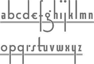 [MyFonts]
[More] ⦿
|
Ricardo Cordoba
|
Designer in New York. Creator of a beautiful squarish poster font called Barrio (2006). As SquarePeg at FontStruct, he made the Braille font family Braille Basic (2008), as well as blob, Ligne Claire (2009, tri-line font), Bonset (based loosely on a 1919 alphabet by Theo van Doesburg, whose pseudonym for Dada poetry was I.K. Bonset), ribbon_inline, Ribbon (octagonal stencil), Tape Writer (shadow font based on the Dymo label writers), InstaFrieze, International Morse Code Stacked, Prometheus, Prometheus Light and Prometheus Shadow (2008, all inspired by a Fonderie Peignot typeface simply called No. 1229, dated 1896, and on condensed Grecian typefaces by Darius Wells and William Hamilton Page), Brite Lite (white on black billboard light font), strata_blocks, strata_dots, strata_dots_inverted, Chocobot Solid (Dark, Milk, White; cloned from the Chocobot series by Lex Kominek), Strata Blocks Caps (2009), Strata Dots Caps (2009), and Strat Blocks 2.0 (fountain effect dot matrix font). Abstract Fonts link. Behance link. FontStruct link. [Google]
[More] ⦿
|
Richard Kegler
[P22 Type Foundry]

|
 [MyFonts]
[More] ⦿
|
Robert Holmkvist
[Holmkvist Creative]
|
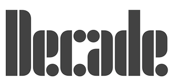 [More] ⦿
|
Rodrigo Franci Trotta
|
Designer of the blocky stencil typeface Lawrence (2013), which follows the De Stijl movement and was done for Studio Lawrence. Rodrigo is based in Sao Paulo, Brazil. [Google]
[More] ⦿
|
Ron Ruedisueli
[Sed4 Type Foundry (or: Sed4tives)]
|
 [More] ⦿
|
Roney Filipe
|
Graphic designer in Brasilia, Brazil, who created the Bauhaus-style font Bauhofi (2014). [Google]
[More] ⦿
|
Ronin Design

|
Malang, Indonesia-based designer of Origin Tech (2020: a techno or circuit font), Radio Classic (a signage script) (2020), the upright script Lily Liana (2020), the glitch font Split On (2020), the monoline script typeface Sefiyah (2020) and the squarish De Stijl-like stencil typeface New System (2020). Typefaces from 2021: Encrypto (labyrinthine), Jeztec Empire (blackletter), Anticode (a marquee font), The Beast (all caps, chamfered), Moonllys (display serif), Wrecked Ship (an eroded font), Talidia (a squarish sans), Night Hunt (an eerie font), Beatles (an upright rabbit ear calligraphic script). [Google]
[MyFonts]
[More] ⦿
|
Sandra Diaz
|
During her studies in San Luis Potosi, Mexico, Sandra Diaz created the De Stijl-genre typeface Mondrian (2016). [Google]
[More] ⦿
|
Scorpy Design Studio
[Michael Golovachev]
|
 Samara, Russia-based designer of several experimental typefaces, mostly, but not exclusively from 2009 until 2013. These include Ringrid (experimental), Jamaica, Stubdetail, Elisabeth, Displace, Oshi Kito (patterns), Radius (an arc-based minimalist font), Squarefont, SOS, Applefont2 (based on Apple's logo), Egypt Concept (hieroglyphic simulation font), Punto, Anomaly (2005), Worm Form, Middle, Bendliner (paperclip font), Mobile Module, Constructure, Twillinger (modular), Longliner (piano key typeface in Crouwel's style), Anomaly2 (connect-the-dots face), Anomaly Quadro, New Display, Strange Font, Ptich (Martian font), Eleven Element (circle and arc font), Home Station (octagonal, techno), Horizontal (squarish and modular), Strategy (swastika-based typeface), Twirl (wavy), Microtwirl, Absolute Logic, Minim, Moonoom, Hybread, Breakthrough (numerals), Industrial Garbage (2013), Unnecessary Element, Electro Station (2009-2010), Circle In Sphere, New Paisley, Vertigo Vertical.
 Noteworthy projects include Limiting Concentration (2010), an experiment with concentric circles. Behance link. Dribble link. [Google]
[More] ⦿
|
Sebastian Seidler
|
Sebastian is the Buenos Aires (and before that, Quilmes), Argentina-based designer of OpusPix (2007, letters with hairline swashes), the sci-fi typeface Playmoon (2017), and Baire Stijl (2017: a De Stijl stencil font). Dafont link. Type blog. Abstract Fonts link. Behance link [Google]
[More] ⦿
|
Sed4 Type Foundry (or: Sed4tives)
[Ron Ruedisueli]
|
 Dutch professional music producer and audio engineer who founded his own record label. He also makes (mostly free) fonts. His work:
 - A FontStruct series called STF Letters op Maat, which attempts to recreate all alphabets designed by Dutch Bauhaus designer Jurriaan Schrofer (1926-1990). That list: STF Cutout 1985 (+Solid), STF JS Bevel (+Fill), STF Grafisch, STF Etage Aanduiding (17x17-Inline 1, 17x17-Inline 2, 17x17-Medium Fill, 17x17-Multiline, 17x17-Full Fill, 5x5 Matrix, Hi-res) [op-art, prismatic], STF Gemeentereiniging, STF Berlage (after the letters Schrofer originally designed for The "Beurs Van Berlage", a commodity market building located in the centre of Amsterdam. Later it was also digitalized and used to for the Dutch passport), STF Elevated (3d shadow typeface), STF Semiotica (Incised Outline, Incised, Book, Regular, Title), STF Sater, STF Sans Severe (Light, Heavy, Outlined, Multilines), STF Sans Rounded, STF Avant-Garde i10, STF Schrofer Modular Blocks, STF Social Human Trends (Outlined, Solid, Fill Isolated, Outined Isolated), STF Girokantoor, STF Marx (Solid, Striped), STF Squared Sans, STF Onleesbaar Alfabet (Stroke, Solid, Outlined), STF Bols Jaarverslag, STF Bredero (for the Bredero Bouwbedrijf), STF A.S.C. Communications, STF Connaissance et Langage, STF Paspoort, STF Last Warning (v1), STF Connected Squares (+Fill, +v2 Headline, +v2 Fill, +v2 Outline).
- Other FontStruct typefaces, now over 180 in all, made in 2017-2018. Included are STF Down Vote, STF Slab Inn (a Western font), STF Polygon Window (hexagonal), STF Kalender (based on a 1976 calendar with octagonal letters by Wim Crouwel), STF See You in 2019 (a tiled font), STF Uni (a varsity font), STF Geo Gothique, STF Tegel (a kitchen tile font), STF Don't Count on Me, STF Hyster (a modernist stencil), STF Der Zyklus, STF Scriptorium (blackletter), STF Paradox, STF Sutoraipu Origami Multiline, STF Sutoraipu Origami Filled Stencil, STF Futureline, STF Frescher (Escher-inspired), STF Whiskey-A-Go Go, STF Labrat (op-art, prismatic), STF Tranziztor, STF Otto Font Schirach (mosaic lettering), STF BFG (condensed piano key style), STF Ace of Maze, STF Amsterdam School, STF Neon Flux, STF Wendingen 1922 (based on a old brochure by Wendingen for the Internationale Theater Tentoonstelling Amsterdam 1922; letters designed by Hendricus Theodorus Wijdeveld (1885-1987)), STF Van Nelle (based on an early 1900's poster ad for Van Nelle coffee), STF Purple Maze, STF Militia Stencil, STF Idiocracy (stencil), STF Rode Draad, STF Praesens (based on the lettering found in the second issue of Polish avant garde architectural magazine Praesens), STF Fabricon (a De Stijl stencil; +Outline, +CrossSection), STF Defrag, STF Trilineae, STF Bolsjewie (constructivist), STF Kraftwerk (a tiled typeface; after a 2015 poster by Chuck Sperry for Kraftwerk), STF De Stijl, STF Portfolio Peeters (a tribute to Belgian modernist artist Jozef Peeters (Antwerp, 1895-1960), based on the folder art for his 1921 linocut portofolio), STF Sector 7 (military stencil).
- Pax Romana. Based on the capitalis monumentalis seen at the base of Trajan's Column.
- STF Espionaje. Inspired by the lettering found on a vintage sheet music cover art for "La Java bousculée" (1924).
- STF Oudvreugde's Ontwaken. Based on the Dutch deco lettering of Dutch graphic designer Frederika Sophia (Fré) Cohen (1903-1943). The letters were taken from a book cover design for the "Arbeiders-jeugdcentrale Amsterdam" which was published in 1924.
- Typefaces from 2019: STF Blauhaus (Bauhaus-inspired), STF Type O Negative, STF Bodidone, STF Textualis Batavicum (blackletter), STF Alhambra Blvd, STF Type O Negative, STF Ein Berliner, STF Geo Grotesque (in the style of TT Norms and LL Circular), STF Innercity (art deco), STF Photonia (futuristic), STF Square Grylls, STF Mizollen (labyrinthine), STF Mr Bob Doubalina, STF Plateau Disco (groovy), STF Uncialis Modularis (uncial).
- Typefaces from 2020: STF Schlanke Schöne, STF Care Sensitive.
FontStruct link. [Google]
[More] ⦿
|
Shinn Type
[Nick Shinn]

|
 Nick Shinn (b. London, 1952) is an art director and type designer. He teaches at York University in Toronto, and is a founding member of the Type Club of Toronto. He writes regularly for Graphic Exchange magazine, and has contributed to Applied Arts, Marketing, Design, and Druk. He founded Shinn Type in 1999, and made fifteen type families. Interview by Jan Middendorp, in which he describes himself as a contrarian. Pic by Isaias Loaiza. Pic by Chris Lozos at Typo SF in San Francisco in 2012. Custom typefaces have been produced for newspapers such as The Birmingham News (Alabama), The Chicago Tribune, The Daily Express (London), The Daily Mail (London), The Globe and Mail (Toronto), The Montreal Gazette, and The St. Petersburg Times (Florida). Custom fonts, with exclusive rights, have been created for corporations such as Thomson Nelson, Enbridge, Rogers Communications Inc., and Martha Stewart Living. Nick organizes type evenings in Toronto all year long.
 Shinn Type fonts at MyFonts. Behance link. He is the designer of Fontesque (a wild family of curly glyphs), the monospaced font Monkey Mono, Artefact (1999), Beaufort (a sharply serifed family done in 1999; in 2008, he published a 10-style extension called Beaufort Pro), Bodoni Egyptian (1999), Alphaville (2000, techno typeface with straight mono-width strokes), Brown, Brown Gothic, Duffy Script (2008, in 4 styles: an interpretation of the lettering of contemporary illustrator Amanda Duffy, aka Losergirl), Handsome (1999, cursive handwriting family, since 2005 available in OpenType), Merlin, Oneleigh (1999, masterful!!), Paradigm (1995, updated in 2008, inspired by 15th century letterforms), Shinn, Walburn (1996) [note: Walburn and Brown were originally commissioned for the 2000 redesign of the Globe and Mail. Walburn is an adaptation of a didone typeface by Erich Walbaum, c.1800], Worldwide (1999). In 2001, he designed the Richler font in honour of the memory of Mordecai Richler. The Richler font was only available to the Giller Prize, Random House and the Richler family until its public release in May 2013 at MyFonts, where Richler (+Cyrillic, +Greek) is advertised as a 21st century antiqua book face. In 2002, he published Goodchild (a Jenson revival; see also Goodchild Pro (2017). Goodchild is a Venetian with clean (not antiqued!) outlines and a larger-than-Jensonian x-height. It comes in 4 styles and is targeted at sophisticated academic typography) and the liquid lettering family Morphica, exclusively at Veer. In 2003, he released the absolutely gorgeous "modern" sans Eunoia (which has a unicase weight), and the quirky sans family Preface (2003; Preface Thin is a hairline weight; Preface Light is free at FontShop). In 2003, he also published the mmonowidth unicase family Panoptica (2003), which includes styles called Regular, Sans, Egyptian, Doesburg and Octagonal, to name a few. In 2004, he released Nicholas, a Jensonian serif family, which is the headline version of Goodchild. Additions in 2006 include Softmachine (VAG Rounded/comic book style family). Sexy type from Toronto is an article by Erin Kobayashi about Shinn's work published in the Toronto Star on April 15, 2007. Nick Shinn designed the type for the redesign of The Globe and Mail in April 2007: Globe and Mail Text [look at the f], Globe and Mail Sans (or GM Sans), Globe and Mail News (or GM News). In 2008, these typefaces went retail. One typeface is called Pratt, named after David Pratt, the design director at The Globe and Mail who commissioned the typeface for his redesign of the paper. The companion typeface will be called Pratt Sans. Additions in 2008: Figgins Sans (4 styles), Scotch Modern (a 5 style didone family that revives the typeface used in New York State Cabinet of Natural History), Scotch Micro. Paul Shaw writes: Scotch Roman, beloved by D.B. Updike and W.A. Dwiggins, was a standard in the typographic repertoire of pre-World War II printers but fell out of favor after the war, supplanted by Bodoni. Nick Shinn of Shinntype has made a bid to resurrect this oft-maligned typeface with Scotch Modern. Scotch Modern is not a revival of the familiar Scotch Roman of Linotype and Monotype, but of a more modern design attributed to George Bruce, the great 19th-century New York punchcutter. Shinn used a sample of the typeface from the New York State Cabinet of Natural History's 23rd Annual Report for the Year 1869 (printed in 1873) as a model. He drew it by eye, aided by a sharp loupe: no photographic enlargements, no scans, no tracing. The ends of the strokes are slightly rounded, to capture the effect of metal type being impressed into soft paper. Shinn contends that the 19th-century Scotch types were "eminently readable" and a factor in the rise of modern literacy. His rendition, an OpenType font, aims for readability in all situations with display, regular, and microtype versions. The display roman includes a unicase font-a nod to Bradbury Thompson's Alphabet 26 experiment-and the italic has elegant swash caps. Scotch Roman has never been a typeface for those seeking eternal beauty or anyone desperate for typographic kicks. Dwiggins gave it a 10 for legibility (where 10 was "reasonable human perfection") but only 4 for grace and 0 for novelty. Shinn's Scotch Modern, with its many OpenType extras, scores well on all three counts. It's a typeface for those who prefer a mature single malt: simple at first, but more complex as it is savored. Photograph. At ATypI 2008 in St. Petersburg, his talk was entitled Scotch Modern. Several catalogs have been published by Shinntype. Particularly noteworthy is The Modern Suite (2008, Nick Shinn, Coach House Press, Toronto), which showcases Figgins Sans and Scotch Modern. Sample of some Scotch Modern dingbats. Production in 2010: Sensibility (a humanist sans superfamily), Sense (a modernist sans superfamily), Bodoni Egyptian Pro (a monoline slab Bodoni experiment---the Pro version of a 1999 family by him). In 2011, he created Checker, an all caps 3d black and white-tiled typeface, and Parity (a roman unicase pair). Naiad (2013) is a didone, or neoclassical, typeface with Victorian curlicues thrown in to create a Victorian look. Pratt Nova (2014) is a 17-style large x-height typeface family that attempts to achieve visual and semantic opulence, equipping the typographer with a comprehensive array of harmonized fonts, all rigorously drawn, superbly fitted iterations of a single, profoundly original design. Neology (2014) is a 15-style sans family subdivieded into Deco, Grotesque and plain sans subfamilies. Brown Pro (2016) is a classic grotesque, distinguished by its semi-condensed proportions and slight flaring of the edges and some ink traps. Figgins Standard (2016) is a take on the low-contrast original sans typefaces designed in the 1830s in industrial London. Gambado (2016). This is a collection of shaken typefaces with bouncing letters. Particular fonts include Gambado Sans and Gambado Scotch. Dair (2017) is a revival of Canada's first home-grown typeface, Cartier, which was completed by Carl Dair in 1967 and named after 16th century explorer Jacques Cartier, who mapped the Gulf of St. Lawrence in the 1530s. Dair 67 and Dair 67 Italic are facsimiles of the original fonts. Dair and Dair Italic are fully-featured 21st century fonts. In 2018, Nick Shinn published Phiz, a diverse suite of 27 decorative fonts based on Figgins Sans Extra Bold. Designer of Boxley (2016), a superelliptical sans typeface family. At the end of 2020, he published the 14-style condensed rounded sans typeface family Aptly. o Typefaces from 2021: Buslingthorpe (a tall-necked typeface in which the x-height is only 29% of the ascender height, beating classic tall fonts such as Rudolf Koch's Koch Antiqua, and Lucian Bernhard's Lucian and Bernhard Modern). Speaker at ATypI 2017 Montreal. MyFonts interview. I Love Typography link. FontShop link. Klingspor link. View Nick Shinn's typeface library. [Google]
[MyFonts]
[More] ⦿
|
Soft Machine (or: Open Studio)
[Mark Niemeijer]
|
 Soft Machine (part of Open Studio) is a digital type foundry based in Deventer, The Netherlands, set up in 2017 by Mark Niemeijer. He writes: Architectural and industrial design movements are a big influence on the work of Soft Machine---De Stijl, Union des Artistes Modernes, Congrès Internationaux d'Architecture Moderne, Neues Bauen, structuralism, metabolism, and post-modernism. These are also reoccuring themes in the visual output.
 Typefaces by Soft Machine: - Jos (2012).
- Fade (2016). Commissioned.
- Ijssel (2016). Commissioned.
- Hauser (2017). A stick stencil typeface.
- SM Maxeville (2017). A (ten style) compact typeface family inspired by Gerrit Rietveld, Jean Prouvé, De Stijl and Union des Artistes Modernes. Contains stencil styles. Followed by Maxeville Mono (2021).
- Marres (2019). Commissioned.
- Solaris (2020). A 6-style neo-grotesk with modulated contrast.
- Stellage (2020). A 5-style wedge serif family that includes a few stencil styles.
- Affairs (2021, +Monospace).
Instagram link for Soft Machine. Instagram link for Open Studio. Fonts in Use link. Github link. [Google]
[More] ⦿
|
Stefan Romanu
|
Romanian graphic and type designer based in Timisoara. He created the experimental typefaces Mondrian (2009) and Beautiful Urban (2009), and the futuristic typeface Hell (2009). Behance link. [Google]
[More] ⦿
|
Stencil fonts
|
Partial list of stencil fonts recently posted on abf: AGBook-Stencil (Adobe, 1992, and Berthold), AustralianFlyingCorpsStencil, BrideOfTheMonsterStencil (Harold Lohner, 1998), DeStijl-Stencil (P22, 1995), Dollar Store Stencil (Josh Wilhelm 1999), FuturaStencilICG (Image Club Graphics, 1995), FuturistStencil (WSI, 1996), GlaserStencil (URW, 1994), Rugged Stencil (The Font Emporium / Matt Dennewitz), SexySilouetteStencils (Darrian and California Cosmo, 1999), SprayStencil (SWFTE, 1995), Stencil Camera, Army Stencil, Stencil D (URW, 1994), Stencil Compress D (URW, 1994), Stencil Export (Allen R. Walden, 1993), Stencil Gothic BE (B.O. Nelson/Brain Eaters Font Co.&Jeff Levine, 1999), Stencil Sans (Agfa, 1995), StencilSansCondensed (WSI, 1996), StencilSet (SWFTE, 1995), Stencilcase (John Martz, Robotic Attack Fonts, 1997), Stenciled Out Left (Fantazia Concepts, 1993). [Google]
[More] ⦿
|
Stephen Brock
|
Newcastle upon Tyne, UK-based designer of a De Stijl movement font (2015). [Google]
[More] ⦿
|
Steve Mehallo

|
 Steve Mehallo was born in San Francisco in 1967. He is a freelance graphic designer, educator, illustrator and font designer specializing in brand strategies, custom font development and logos. His clients have included Monotype, Microsoft, Ascender Corp, The Unicode Consortium, Netscape, TiVo, Nike, The David and Lucile Packard Foundation, The Learning Company and several more. He is also a past president of the Art Directors and Artists Club of Sacramento, board member of Another Poster for Peace, was the lead curator of the contemporary graphic design exhibition Spoken With Eyes at the UC Davis Design Museum and has taught design courses at UC Davis, Santa Clara University, The Art Institute of California and Sacramento-based American River College. First Redwood City, CA, and now Sacramento, CA-based. Creator of these fonts:
 - The street lettering font Alta California in 1994 (Agfa): Alta California is a ransom note-style sample of wood type and other types.
- The beautiful old typewriter family Chandler 42 at Psy/Ops.
- MartiniAtJoes family (1996-1997) is available through Agfa-Monotype and PsyOps: futuristic meets the 50s.
- Niedermann Grotesk (2011). He writes: It is a peculiar style of lettering---which was originally inspired by the Sachplakat (object poster) work of Lucien Bernhard---and adapted for hot metal in 1908 by Hermann Hoffmann. 100 years ago, the style became a workhorse of the German printing industry.
- Escoffier Capitaux (2008) is named for culinary legend Auguste Escoffier (1846-1835) and inspired by lettering used in vintage French advertising---including the work of commercial illustrator/fashion designer Ernst Dryden (1887-1938), with a hearty serving of 1960s ligatures influenced by the work of Herb Lubalin (1918-81) as well as a twist of Claude Garamond (1480ish-1561).
- TwentyFourNinetyOne (2008, Ascender Corp) is a reinterpretation of the alphabet of 1919 by Theo van Doesburg.
- Jeanne Moderno (2009) is an art deco take on Bodoni, in 9 styles.
Klingspor link. FontShop link. Blog. MyFonts link. View Steve Mehallo's typefaces. [Google]
[MyFonts]
[More] ⦿
|
Sugiro Design (was Rocha Design)
[Lula Rocha]
|
Brazilian foundry of Lula Rocha which evolved from Rocha Design in 2003. Lula Rocha designed the freeware typefaces Enigmaquatro (1999, disturbed pixel font), Hellvetikacinquenta (1999, gothic) and Skova (1999, with Rodrigo Bleque, LED influences). In 2016, he experimented with features of Adobe Illustrator in the design of Mondrian Type and Scrolling Pen Type. Lula Rocha is a professor at PUC Rio. Personal web page. Behance link. [Google]
[More] ⦿
|
Tano Veron
|
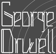 Buenos Aires-based creator of the children's hand font Nicolina (2012) and of the techno typeface Hifix (2012).
 Zephyr (2013) is a striped ornamental caps typeface. In the ornamental caps style, Tano also made Las Mejores Cosas De La Vida No Son Cosas (2013). Boxing (2013) is a condensed sans headline face. In 2014, he made the free multicolored vector format typeface Mondrian, which is named after De Stijl artist Piet Mondrian. In the same vane, he made the decorative caps typeface Kandinsky (2014). Keplerian (2014) is an alchemic typeface. In 2014, Tano Veron and Yai Salinas co-designed the free vector format colored display typeface Carioca. In 2015, he published Natureza (alchemic / hipsterish), Theremin (great variable-width san; free download), Mapuche (a free native symbol font), Pettoruti Type (a colorful cubsy typeface influenced by the cubist Argentinian painter Emilio Pettoruti (1892-1971), Sandre (based on Cassandre's Bifur), Dionisia (a great free art deco poster typeface), Jekyll & Hyde (a free EPS format vintage display pair of typefaces), Binary Font (free), the free sci-fi typeface Houston, the free hipster typeface Belladona, the tweetware constructivist font Moscu, the decorative caps typeface Guernica (named after Picasso's famous civil war painting from 1937), the free vector format typeface Miro and the tweetware colored circus font Circo. Typefaces from 2017: Hot Rod (free art deco style), Hangar (rounded sans), Belladona Stencil, Bardo (an all caps typeface described as classic, transgressive and badass as Shakespeare, it has a bit of the art deco charm of the The New Yorker typeface). Behance link. Dafont link. [Google]
[More] ⦿
|
Tessman
|
 FontStructor who made Black Box (2011), a De Stijl / Bauhaus stencil face. [Google]
[More] ⦿
|
The Foundry Types

|
 London-based foundry set up by David Quay and Freda Sack in 1989, and after Freda's death, continued by David Quay and Stuart de Rozario. Their typefaces were first made using the Architype label:
 - Architype Albers (1997).
- Architype Aubette. Based on Theo van Doesburg's 1928 signage lettering for the Café Aubette in Strasbourg.
- Architype Ballmer. A De Stijl typeface inspired by the experimental, universal letterforms drawn by Bauhaus trained Swiss designer Theo Ballmer for a series of 1928 posters, most notably for an exhibition on industrial standards.
- Architype Bayer. Drawn from Bauhaus Archiv sketches for a minimal sans typeface that was created in 1925 by Herbert Bayer.
- Architype Bayer-Type. Based upon Herbert Bayer's 1931 universal, modern serifed alphabet. Although the modern style appears to be a radical departure from his first sans single alphabet of 1925, the structure of this later serifed style is still grid based and geometrically constructed.
- Architype Bill. The Foundry writes: Architype Bill was developed from the few letterforms created by Max Bill for a 1949 exhibition poster. All the forms, with the exception of the letter o, were constructed using only straight lines and triangles on a purely mathematical basis, that showed the continued influence of his earlier Bauhaus training, and the universal alphabet principle.
- Architype Catalogue Outline, Architype Catalogue Solid (2016). Architype Catalogue originates from Wim Crouwel's Stedelijk Museum exhibition catalogue for sculptor Claes Oldenburg, 1970. The cover's soft padded letterforms evoke the artist's work. Oldenburg was so taken with the design, that he asked Wim Crouwel to complete the alphabet.
- Architype Fodor. Based on Wim Crouwel's work, the Fodor letterforms were created for the magazine published by Museum Fodor, Amsterdam. To save cost it was designed to be typeset on their own electric typewriter.
- Architype Ingenieur. Architype Ingenieur was inspired by Wim Crouwel's late 1950s exhibition catalogues and posters, for which he had created a few geometrically constructed, simplified letterforms. In the 1960 Venice Biennale Dutch entry poster, he drew grid-based letters with 45-degree angles for olanda, the style influenced by his boyhood fascination with naval lettering. A subtle variation appeared in the Stedelijk Museum catalogue for painter Jean Brusselmans. Several dot matrix versions followed. The themes and systems in these early letterforms are encapsulated in this new (2016) four-weight family Architype Ingenieur.
- New Alphabet 1 through 3. Based on Crouwel's New Alphabet and developed in consultation with him)---a free version of this is New Alphabet (2008, Matt McInerney).
- Architype Renner. Related to the early experimental versions of Paul Renner's Futura.
- Architype Stedelijk (1997). LED-like, based on Crouwel's ideas. The Foundry writes: Stedelijk first appeared in the seminal Vormgevers poster, commissioned by the Stedelijk Museum, Amsterdam in 1968. Crouwel created a rigid grid system across the poster of 57 vertical by 41 horizontal lines, also forming the basis for the construction of the letterforms. Although all hand drawn, the resulting typeface had a machine-made appearance. This striking black and white poster with its visible grid became one of Crouwel's most iconic designs. Architype Stedelijk now re-creates these letterforms as a single alphabet typeface in a digital font.
- Architype Schwitters. Developed from the phonetic experiments made by Kurt Schwitters with his 1927 universal alphabet.
- Architype Tschichold. A very thin avant-garde sans: Architype Tschichold is a faithful rendering of Jan Tschichold's 1929 experimental alphabet which was influenced by Bayer's single-alphabet. His design was never put into production. This re-creates his original geometrically constructed design, including some phonetic characters.
- Architype Van der Leck (1993-1994). Based on a 1941 De Stijl alphabet designed by Bart van der Leck for the avant-garde magazine Flax.
- Architype Van Doesburg (1996). Based on a 1919 alphabet by Van Doesburg obtained by dividing a square into 25 equal smaller squares.
- Architype Vierkant. This typeface was developed from the few letterforms that Crouwel created for an opening spread in a 1972 Drupa catalogue, on the theme "typo vision international".
Their other fonts have the label Foundry and include Foundry Sans (1990, a humanist sans inspired by Stempel Garamond), Foundry Old Style (1990-1994, inspired by Nicholas Jenson's types), Foundry Wilson (a Baskerville that revives a 1760 font from Scottish type founder Alexander Wilson), Foundry Journal, Foundry Gridnik, Foundry Form Sans, Foundry Form Serif, Foundry Monoline (2000), Foundry Origin, Foundry Sterling (2002, sans serif, in the style of Bliss and Gill Sans), Foundry Context (a sans family), Foundry Dat, Foundry Dit, Foundry Fabriek (an industrial orthogonal almost military stencil developed in consultation with Wim Crouwel), Foundry Flek (a dot matrix font), Foundry Plek, Foundry New Johnston, and Foundry Wilson Expert. Michael Barbosa started work on Metroplis (1995) for Metroplisboa, the Lisbon subway, while he was working at Wolff Olins. That custom font project was finished by David Quay and Freda Sack. [Google]
[MyFonts]
[More] ⦿
|
The Letter D (was: Entica Typograffiti)
[Dan Pike]
|
 Aussie design and type company, est. 2003 by Dan Pike from Brisbane (and now based in Melbourne). Their typefaces include Airport (2004, fantastic airport tile font), FourFive (2001, thin octagonal face), Block (2004), Pixel (2002), Route (2006), Slabamond (2002), Stencil (1999), Theo Fine (2005) and Theo (2000, inspired by the work of two great Bauhaus movers, Theo van Doesburg [1883-1938] and Theo Ballmer [1902-1965] both of whom created an alphabet based on a basic 5x5 grid system), Font 705 (2003, pixel face), Schwarz*Weiss (2003, swooshy face), Grave Archaize (2003, this is unbelievable--to be seen!), Flip&Rotate (2003), Valetta (2003). Most fonts are by Dan Pike. Some are by "Phil". Designer at FontStruct in 2008 of Font Airport (stencil-like), Font Theo Fine, Font Theo, Font Block and Font Pixel, and in 2009 of Font Pixel (SC, OB, BD, OS), Font Stencil (stencilized pixel face), and Font Theo Fine. [Google]
[More] ⦿
|
The Northern Block (TNB)
[Jonathan Hill]

|
 The Northern Block (TNB) is Jonathan Hill's foundry based in Leeds and/or Sheffield and/or Newcastle, UK, est. 2006. The designer and funder is Jonathan Hill (b. Sheffield, 1971) who lives in Newcastle-upon-Tyne, UK. Maria Pigoulevskaya joined The Northern Block as type designer in 2012. Home page. Free fonts by Jonathan Hill can be found at Dafont and Fontspace.
 Another Dafont link. MyFonts link. Hellofont link. Behance link. Klingspor link. Abstract Fonts link. Alternate URL. In 2010, he started FontStructing typefaces. His first was the grungy wooden plank typeface Timber Remnants. Also in this category is Laser Disco (2008, futuristic). Typefaces from 2006 until 2008: Sylar (2008, a techno family in 16 styles), Geta Robo (2008, a mechanical typeface influenced by Japanese animation), Arctic Patrol (angular family), Dokter Bryce (2008, octagonal and severe), Orange Royale (2008, 8 styles of fat techno and stencil fonts), CorTen (2008, octagonal ultra-fat stencil), QueueBrick (2008, LED simulation), Center Forward (2008, futuristic), Platform One (2008, a futuristic family), Line Wire (2008, octagonal, influenced by the work of Dutch designer #Wim Crouwel), StealWerks (2006, LED-inspired stencil face; published at T-26) and Blockout (2007, 5 weights of a futuristic blocky type family). In 2008, these were followed by more computer-related typefaces such as VideoTech (futuristic), JoyRider and AstroNaut (octagonal+futuristic, now at T-26). WerkHaus (2008) is a 5-style family inspired by the minimal sans typefaces of Herbert Bayer and the Bauhaus movement. Typefaces from 2009: Scriber (2009, octagonal techno family), Get A Robo (2009, a 10-weight mechanical family influenced by Japanese animation (Anime)), Ten Gu (2009, paperclip font remastered from the 1970's Letragraphica font Tangui), Orange Royal (2009, rounded stencil), VideoTech (2009, inspired by computer games for the Commodore 64), SkyWing (2009, rounded typeface inspired by Japanese computer console games, such as Captain Tsubasa created by Yoichi Takahashi), VanBerger (2009, an octagonal family influenced by the De Stijl movement), Logan Five (2009, techno family inspired by the 1976 sci-fi film Logan's Run), Zaius (2009, a bold sans family that includes a stencil style, all based on Ed Benguiat's work for the 1968 movie poster for Planet of the Apes), Oric Neo (2009, a free octagonal techno family; +Stencil), VanBerger Stencil (2009, a free geometric sans influenced by Theo Van Doesburg and the De Stijl movement), Aldo (2009, +Open: a bold stylized type typeface re-worked from the original 1970s movie poster The Battle For The Planet Of The Apes), Sylar Stencil. Typefaces from 2010: Intropol (2010; image), Arcle (a monoline organic sans), Hoxton (humanist sans family), Lintel (monoline sans family with a large x-height), Knul (monoline sans), Dohrma (a machismo geometric face; +Inline), Planer (a technical writing family), Otomo (a Japanese techno family that includes a stencil), Yodo (a geometric experimental family in 3 weights), Nu Order (a sans family that includes a very thin weight), PyeMan (2009, a piano key font named after the PacMan game), ProtoFet, DraftWerk (a minimal rounded typeface inspired by architecture and furniture detail drawings), DyeLine (a geometric face with a great hairline weight), Cobol (2010, great octagonal monowidth face), Draftwerk (architectural lettering), Olympik (a gorgeous multiline family based on Letraset's Optex, 1970), Kaine (a slab family inspired by 1960s spaghetti westerns: +Stencil, +Outline, +Italic +Block; Hill says that The grid template is based on Welt Extra Bold from Letraset with detailed changes, additional characters and new style variations.), Brion (a modernization and extension of A. Mailay's rounded sans font Arpad (1971, VGC); Kaine Block, the counterless version, is free at Dafont). Mekon (2010) is a fat sans display typeface with a free horizontally striped style. It revives and extends Peter Steiner's phototype Black Body (1973). MarkusLow (2010) is a revival and extension of Basilea (1965, Markus Low, VGC). Teletex (2010; +Ultra Light, +Light, +Medium) is a typewriter style slab serif whose design was influenced by Rockwell.  Typefaces from 2011: Dekal (nice fat multiline family, +Inline), Norpeth (2011, a humanist neutral sans family), Bosko (+Stencil, +Block), Bosko Block (2011, free), Woolworth (sans family), NeoGram (sans family), Juhl (an organic/ geometric sans family with the bowls of b, c, d. p and q modeled after chairs). Millar (2011) is a simple monoline sans family. Tondu (2011) is a strong sans poster face---its early version, Tondu Beta (2011), is free. Gelder Sans (2011) is a clean modern sans serif typeface. Brokman (2011) is a contemporary 10-style sans family. Vitro (2011) is a monoline geometric sans family. Beval (2011) is a humanist sans family. Nurom (2011), Monsal (2011), Tadao (2011) and Kuro (2011) are additional sans families. Heltar (2011) is a revamping, TNB style, of Helvetica. Regan Slab is a readable slab family. It was followed in 2012 by Regan (the sans version) and Regan Alt. Typefaces from 2011: Dekal (nice fat multiline family, +Inline), Norpeth (2011, a humanist neutral sans family), Bosko (+Stencil, +Block), Bosko Block (2011, free), Woolworth (sans family), NeoGram (sans family), Juhl (an organic/ geometric sans family with the bowls of b, c, d. p and q modeled after chairs). Millar (2011) is a simple monoline sans family. Tondu (2011) is a strong sans poster face---its early version, Tondu Beta (2011), is free. Gelder Sans (2011) is a clean modern sans serif typeface. Brokman (2011) is a contemporary 10-style sans family. Vitro (2011) is a monoline geometric sans family. Beval (2011) is a humanist sans family. Nurom (2011), Monsal (2011), Tadao (2011) and Kuro (2011) are additional sans families. Heltar (2011) is a revamping, TNB style, of Helvetica. Regan Slab is a readable slab family. It was followed in 2012 by Regan (the sans version) and Regan Alt.
Jonathan Hill's most popular typefaces. Type designs done in 2012: Hackman (elliptical sans), Borda (octagonal), Savile (humanist sans), Metrik (a nice geometric---borderline organic---sans family), Metral (rounded octagonal typeface), Uniman, Kobern (a strong sans), Reznik (techno sans). Type designs from 2013 by Jonathan Hill: Nauman (a humanist sans family with attention paid to the triple (1, i, j)), Gunar, Nuber (followed in 2018 by Nuber Next), Eund (a modulated sans), Corbert (Bauhaus-inspired sans), Corbert Condensed. Typefaces from 2014: Byker (geometric sans), Schar (humanist sans), Loew (geometric information design sans; extended in 2018 by him and Donna Wearmouth to Loew Next (for Latin and Cyrillic) and Loew Next Arabic), Bitner (spurless organic sans named after bitcoins), Modum, Modum. Typefaces from 2015: Facto (a simple sans family with large x-height), Halcom (influenced by Futura), Scharf, Itoya. Typefaces from 2016: Syke Mono (a stylish monospaced typeface family), Oyko (an octagonal industrial typeface family), Kylo Sans, Syke (a sans typeface family), Hoxton North (a condensed humanist, very British, sans), Celdum (geometric sans). Typefaces from 2017: Tomarik, Typold. Typefaces from 2018: Paradroid, Sprout (a low-contrast 6-weight sans). Typefaces from 2019: Roag (an industrial geometric sans paying homage to mechanical designs of the 1930s), Syke (14-style sans), Scharf (a sturdy sans family), Mynor (a modern squarish sans inspired by machine-readable typefaces of the 1950s including OCR-A and B). Typefaces from 2020: Corbert Wide, Blom (a humanist sans family). Typefaces from 2021: Waldo (a 4-style bold, stencil-focused display typeface loosely based on a 1973 science fiction movie poster for The Battle For The Planet of The Apes), Nauman Neue (a 60-style humanist sans), Kopik (a comic book typeface with rounded forms; it was inspired by the 1960's architectural handwriting style practised by draftsmen), Duran (a 14-style geometric sans with built-in strength). Creative Fabrica link. View Jonathan Hill's typefaces. Another list of Jonathan Hill's fonts. Interview in 2014. [Google]
[MyFonts]
[More] ⦿
|
Theo van Doesburg

|
 Dutch cofounder (1883-1931) with Piet Mondriaan, Bart van der Leck, Anthony Kok, Vilmos Huszar and J.J.P. Oud of the De Stijl magazine in 1917. This was also the start of the De Stijl movement. Born Christiaan Emil Marie Küpper on August 30, 1883 in Utrecht as the son of the photographer Wilhelm Küpper and Henrietta Catherina Margadant. Early in his twenties he started using the name of his stepfather Theodorus Doesburg to sign his early paintings. His first exhibition was in 1908. He died in Davos, Switzerland, in 1931. In 1919 he created an alphabet by dividing a square into 25 equal smaller squares. This alphabet predates Bauhaus experimental types by Kurt Schwitters and others. van Doesburg's alphabet has been mimicked and digitized and used as inspiration by many. A partial list:
 - Foundry Architype Van Doesburg (1996, David Quay and Freda Sack, The Foundry).
- Zwartvet (2002, Max Kisman, Holland Fonts).
- van Doesburg by Frank Nichols.
- Bonset (2008, Ricardo Cordoba): the name I.K. Bonset was used by van Doesburg in his Dada poetry. Bonset is a free FontStruct font.
- Theo (2003, Dan Pike) was inspired by the work of Theo van Doesburg and Theo Ballmer (1902-1965), both of whom created an alphabet based on a basic 5x5 grid system.
- Doesburg and Doesburg Fat by Jordan Harper.
- Theo Van Doesburg V4.0, a free font by Gonzalo Carretero.
- VanDoesburgBrokenFS and VanDoesburg (2002), free fonts by Manfred Klein.
- TwentyFourNinetyOne [2491] (2008) by Steve Mehallo.
- DeStijl, a free font by Austin Kurowski.
- Typeco De Stijl (2012, FontStruct) is by James Grieshaber.
- Distill (2009): A type family by Matt Desmond (MAD Type).
- Panoptica Doesburg (2003) is a unicase typeface Nick Shinn.
Els Hoek, Marleen Blokhuis, Ingrid Goovaerts, Natalie Kamphuys, et al. penned Theo Van Doesburg: Oeuvre Catalogus (2000, Centraal Museum). Picture of a dada poster by him. Page at Design History. [Google]
[MyFonts]
[More] ⦿
|
Tibor Lantos
|
 Budapest-based creator (aka Frodo 7) in 2009 at FontStruct of FontMoot 01 (pixel face), Brego, Magor (minimalist, De Stijl typeface), Andromeda Strain, Elrond (Tengwar font), Oil Stencil, Optill 2A and 2B and 3A and 3B (optical illusion fonts), Rivendell (Celtic weaving), Cubeology (patterned cubes), The Two Towers, Mike Wazowski (emoticon face), Edoras Stencil, Elessar, Earendil, LE Meta (dot matrix), Coccinella (dot matrix), +Two, +TwoB, Picosec, Picosec Rounded (ultra fat retro), Palindrome, Valimar, Fundin Eco, Fundin Regular, Lost Entropy (series of rectangular fonts), Bombs and Men (2009, modular and blocky), Eärendil, Chromosomes, Denethor-Sans (octagonal), Edoras-, Elspeth-, Elspeth-Grey, FontMoot-01 (pixel face), French-Defence-v2 (chess font), French-Defence (chess font), Gilgalad-v2, Gilgalad (octagonal), Hommage-a-Escher-LC1, Hommage-a-Escher-LC2, Legolas-Codex-Stencil, Legolas-Codex (blackletter family), Legolas-Stencil (+v2; art nouveau style), Mirkwood-Regular and Mirkwood Outline (pixel typefaces), Nimrodel-FS, Faramir (gridded), Faramir Black (octagonal, mechanical), Elessar, Vertebrae, Etudes Pour Noir et Blanc (01, 02, 02 Vertebrae), Eomer FS, Karyotype (horizontal stripes), Snooker Ball, Aragorn, Mirkwood Nano (pixel face), Mirkwood Second Iteration, Mirkwood First Iteration, Haldir (pixel face).
 Creations in 2010: Hasta Siempre (military stencil), Hasta Siempre Supplement (Fontstruct rendering of the iconic photograph of Che Guevara by Alberto Korda), Belfalas, Fractal Font, Sierpinski White, Sierpinski Black, Sierpinski Dalmatian, Remolino Stencil, Boikot Stencil, Legolas Pixel, Brego, Vortices (dings), Gamling, Coccinella Two (+B), Cyrillic 02, Waves, Hommage à Escher v2 extLat. Creations in 2011: Midori Dot (2011, a dotted kana face), Sierpinski Black Initials (a stunning decorative caps typeface based on Sierpinski triangles), Fontstructivism (constructivist Latin/Cyrillic face), Sierpinski White Initials, Vasarely Squares (experimental---letters based on Victor Vasarely's work), Hurin (counterless, created after Nagasaki by Tom Muller), Strider (an optical illusion 3d multilined face), Dot Dot White (texture face), Dot Dot Black (texture face), Garamond Italic SP (a pixelized version of Garamond Italic), Rohan (+NE01, +NE03: a textured lined 3d logotype family, +NE04, +NE10), Gray Scale (a very interesting texture experiment in which gray scales are "simulated" by simple font mechanisms). Fonts made in 2012: Font Neuf, Khazad (stencil font), Oktogon Stencil, Oktogon Outline, Thorin Stencil (army stencil), Deagol Stencil. Typefaces from 2013: the Voxelstorm family (3d, Escher-style), Elendil (3d face), Denethor Sans (strong mechanical sans), Mirkwood Nano (pixel face), Waves (op art). Typefaces from 2014: Wrath of Mordor (video game font), Gray Scale, Luthien Pixel (blackletter pixel), Gimli (Bevel Black, Inline Shadow, Inline, Bevel Shadow, Shadow), Zebroid, Hunor, Denethor Sans v2, Vasarely Squares (op-art), Waves (op-art), Ecthelion, Hast Siempre (octagonal stencil). FontStruct link. [Google]
[More] ⦿
|
Tim Drabandt
[Type Machine]
|
[More] ⦿
|
Tom Wallace
[HiH (Hand in Hand)]

|
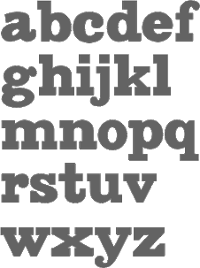 [MyFonts]
[More] ⦿
|
Type Machine
[Tim Drabandt]
|
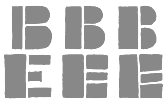 Tim Drabandt (Type Machine, located in Minneapolis, MN) is the designer of Eighthourday (2009, a commissioned sans face), Airborne (2009, octagonal typeface based on WWII airplane lettering), Eggman, an irregular font (2002), Savalas, Victor Hailey (2001) and Whipple (2002, an architectural font), also shown here, MiG (handwriting). These free fonts are incomplete and under development. At Chank, he published the calligraphic font Brimley (2003) and the falred roman typeface Venis (2003). You Work For Them link. Krakt (2009, You Work For Them) is an homage to the geometric typefaces used during the De Stijl movement. The letterforms are primarily composed of geometric shapes, which aid in it's modularity. [Google]
[More] ⦿
|
Typeco
[James Grieshaber]

|
 James Grieshaber earned a BFA in Graphic Design from Rochester Institute of Technology. Based first in Rochester, NY, and then in Chicago, IL, and then again in Rochester, Grieshaber ran Typeco, a typographic services and solutions company established in 2002. James Grieshaber (b. Detroit, 1967) most recently was on staff of P22 Type Foundry, where he designed many type families and helped establish International House of Fonts. He has been honoured with an award of Excellence in Type Design from Association Typographique International (ATypI) for his Gothic Gothic (2004, blend of blackletter and English style), and by TypeArt'05 (for Operina Cyrillic). Designer and Co-editor of the Indie Fonts book series, Grieshaber now teaches typography at RIT and runs Typeco. MyFonts sells his fonts now. YouWorkForThem sells the Super Duty family (stencil), Glyphic Neue, the Trapper families, Chunk Feeder, Gothic Gothic and Cusp. Identifont page. FontShop link. Behance link. Details on some of his typefaces:
 - Gothic Gothic (2001), an extended blackletter co-designed with Christina Torre. In 2004, he received an award of Excellence in Type Design from Association Typographique International (ATypI) for his Gothic Gothic type design.
- The Glyphic Neue display family was inspired by the Op Art style of lettering in the United States that ran rampant in many photo type houses in the 1960's and 1970's---I like to call it the "piano key style".
- Chunkfeeder (2002) is a beautiful monospaced octagonal OCR-like family.
- Cypher (2003, an LED/LCD family) has 24 weights. Of these, Cypher7 is free.
- Duty (2002) is a sans typeface co-designed at T26 with Lee Fasciani.
- The stencil family Super Duty (2004) has 8 variations. There are also techno variant called Superduty Condensed, Superduty Regular, Superduty Narrow and Superduty Text.
- Cusp (2001-2005): a techno display family with 18 weights, including an LED style, art deco styles and Cusp De Stijl.
- Trapper (2004) is an 8-weight exaggerated ink trap font family which comes in Trapper Round and Trapper Sharp versions.
- Zaftig (2008, Typeco) is a super-fat face.
- P22 Operina (2003, in Romano, Corsivo and Fiore versions) is based on Vicentino Ludovico degli Arrighi's calligraphy used in his 1522 instructional lettering book La Operina da Imparare di scrivere littera Cancellarescha. This book contains what is considered to be the earliest printed examples of Chancery Cursive. P22 Operina won an award at TypeArt 05. Operina Pro contains over 1200 glyphs. In 2010, Paulo Heitlinger compared P22 Operina favorably to another digital chancery font, Poetica (by Robert Slimbach, Adobe), which, according to him [and I agree], lacks vigor and dynamism.
- P22 Posada (2003, with Richard Kegler): based on lettering of Mexican printmaker José Guadalupe Posada (1851-1913) that was used for some of his posters and broadsides.
- P22 Arts and Crafts Tall (1995, art nouveau), P22 Arts and Crafts Hunter (1995). Both based on alphabets by Dard Hunter, 1908-1910.
- P22 Art Deco Chic (2002), based on the Art Deco hand lettering of Samuel Welo, ca. 1930. P22 Art Deco Display (2002) is a Broadway style face.
- Churchy (2002).
- He offered (offers?) a handwriting font service for 100 USD. Free trial typeface Reenie Beanie (2002). Signature font service for 50 USD. Reenie Beanie (2002) is now offered (as a joke, I assume) as part of the Google open font directory (for free web fonts).
- P22 Garamouche (2004, with Richard Kegler). Comes with Garamouche Ornaments (2004).
- Segoe Print (2006, Monotype Imaging). [Isn't this Googlee's competition?] This is an informally hand-printed typeface co-designed with Brian Allen, Carl Crossgrove, James Grieshaber and Karl Leuthold at Ascender.
- P22 Cezanne Pro (2006). Has over 1,200 glyphs.
- P22 Yule (2005; Heavy, Inline): a stone chisel family with a hint of Neuland.
- P22 Numismatic (2005): originally offered by the Devinne Press, and based on ornaments and letters used by 15th and 16th century engravers of seals and coins; however it looks very much like Otto Hupp's Numismatisch (1900, Genzsch&Heyse).
- Black Ops One (2011) is a military stencil face, available at the Google Font Directory.
- Short Stack (2011) is Grieshaber's free contribution to the Comic Sans genre. It was published by Sorkin Type and can be downloaded from Dafont.
- Atomic Age (2011) is a free font at Google Font Directory. It was inspired by 1950s era connected scripts seen on nameplates of American cars.
- Sarina (2011). A connected script published by Sorkin Type.
- Supermercado One (2011, Google Font Directory) is a low contrast semi geometric typeface inspired by naive industrial letters. More a signage typeface than a web font.
- Typeco Grecian (2012, FontStruct) is loosely based on a Wells & Webb Grecian style woodtype circa 1846.
- Typeco De Stijl (2012, FontStruct) is based on Van Doesburg's De Stijl magazine's name plate in 1923. Typeco Topaz Serif Tall (2012, FontStruct) is a pixel typeface. Typeco New Wave (2012, FontStruct) is an op art party font.
- Metamorphous (2012, Sorkin Type) borrows its arches from Gothic cathedrals---it was inspired by Jonathan Barnbrook and by the free font Morpheus. Google font download.
- HWT Geometric (2013, Hamilton Wood Type Foundry) is a squarish wood type family: Geometric began its life as a metal typeface from the Central Type Foundry, circa 1884. Soon after, this design was officially licensed to Morgans & Wilcox and was shown in their 1890 catalog in Regular, Light and Condensed Light variations. After acquiring Morgans & Wilcox, Hamilton Manufacturing offered Geometric Light Face Condensed as their own No 3020 and the Geometric Light Face as No 3021. HWT Geometric has been expanded digitally to include a Regular Condensed version.
- Trattatello (2014). An Apple system font.
- HWT Archimedes (2017, P22). A revival of the Page No. 122 wood type called Mansard Ornamented, done together with Richard Kegler (P22) and Virgin Wood Type. They write: This new digital version is a simultaneous release with Virgin Wood Type and features a variety of styles including the standard screw head option plus a Phillips head, hex/Allen wrench head, and even the vexing Apple pentalobe tamper resistant star screw. As a bonus, the screwheads themselves are accessible via a glyph palette, so you can put the screws to Comic Sans, or any other font, if you so desire.
Klingspor link. Google Plus link. Behance link. Fontsquirrel link. [Google]
[MyFonts]
[More] ⦿
|
Typemachine
|
Designer Krakt (2012), an EPS-format font in the De Stijl stencil style. [Google]
[More] ⦿
|
TypOasis, 2002
[Manfred Klein]

|
 The fonts produced in 2002 by Manfred Klein: Bauhouse, ClassiCaps Xmas 2002, GGothique MK, Lombardic, Mouse Traces, Music Elements, DreiDreiDreiBlack, Griffo's Font, Noisy Buttons, Hamlet ToBeOrNot, Oszillo Caps, Cave Paintings, Rodgauer (a CODEX-like font), Prinz Eugen (medieval font), DreiDee Sketches, Typo Cubes, AustralBats, RoundMouseBats, Torynitialen, Wood Cutted, FlowerPower, Graf Typo (a CODEX-like family), Solitaire, Breeze, Eyes, Lead Types Heap, Petit Fleur, ABCari, Floralalpha, Karlas ABC-Start, OliJo Bold, Athena Handwritten, The BroadWay, MK Squares, Incunitials, Luc's Plants, Monte Petito, Before Alphabets 4, Threedimensional, Blind Reading, Zebral Caps, Before Alphabets 3, Braille Latin, Tangoasis, Katrins (handwriting of Katrin Dillmann, Manfred's daughter), Laurens Erste (handwriting of Laurens Dillmann, Manfred's grandson), Tangodoni, Typesetters TV, Unscreen, Caps MKS, Haunted, Mouse Scribbles, RunishMK, Fatsans, Rotten Script, Stormy, Strong Dots, Caro Mio, Reduce 2 Max, Pudels Kerning, Cheerio, Gersans, ArabDances (Arabic simulation font, with Cybapee), Slab Serif Written, Shalom (Hebrew simulation), Bloxx Serif, Kara Ben Nemsi (an Arabic simulation font), Remember Cassandre, Wieynk Caps Round, Fragment Caps, Golden Swing, Tango Macabre (a gorgeous font in which letters are made with skeletons), Eye Beings, Frax Handwritten, HotsBlots, Latin China (oriental lettering), Dinos Fragments, HotchPotch, SketchBats, AmorE, Chinawestern (oriental simulation), Valentine Flies, AmorEatPersia, AmorEmoticons, Artfacts, The Kiddies, ConstrAccident, Kochs Roots, AnimSilhous, Framed Frax Caps, K-Arrows, GridEx Gallery, K-Arrows B, Swinging Petidoni, Big Swinging SlabS, Relief Caps, Shapes 1-3, Petitscript, Shapes Four, Fullsize Sans, Petitscript Italic, Shapes A 1-3, Imperium Serif, Big Broken, Semaphore, MKalligFrax, Pix Caps, Slabsoft, Windy City, Slabsoft, Windy City, Timeless, Against Rules, Berolina, FabCreatures, CookinDada, FoodnDrinks One, HabSpass-HaveFun, Mighty, Klammeraffen Italic, Elefontitis Xtreme, Cairotiqua Freestyle, Eastereggs, Cave People, RandoMiKa, Big Ella, Hands Subversive 1+2, Build Your Own People, Antroposofia, EasterChicken, GridRiding, Irish Sketches, KidPicts, MatrixbuK, Dornspitz Grotesk, PeaceBats, Arte FS, Eagles Buttons, BlowinInWind, Cave Popart, Karla 1B, Crosses, SharkJockey, Toscanienne, SilhousTwo, Kleins Three Pixel, Religionen, Shapes One-Popart, Shapes Two, ShapesTwo, QuickBats, QuickWritten, KidsDrawings, QuickBats 1.1, Shapes Strokebrushes, SteepQuickHand, Steepiqua, Sleepklill, Steepodoni, New Aliens, SteepTypewriter, CarpetParts, Fourfeeters, Steepidien, Yumiya Arrows, HotHats FS, Eyes Gallery, Steeprump, Zebra Shapes, GrafFitty, KidsArt, Klones, Belly Sans Condensed, Tshirts Springtime, Landscapes, Pastfuturum, typOasis Uncial, ABC Thru, Parma Petit, SpaceLiving, FS Funkturm, TorysTools, Aero Sans, MouseToons, Parma Petit Outline, KL1 MonoCaseKrux, Remember Reiner, Frungtura FS, Perforation Strip, Weimar, Gothic Caps, HumanPartsPoetry, Archetypo Bricks, Human Parts, Big Dots, Spiders Club, MirrorBlack, Mirror Chicken, MonoMouse, MousefraKtur, AmericanNatives, DaVincy Cut, Mouse Liturgic Sketches, MKlunger FS, Waldoni New Torsi, Bradburys Shadow Paseo, Horses, Jessica Plus, Farm Animals, Fat Free Frax, BugsNFriends, Gut Joe Black, People Sketches, Human Parts, Cycling, MousePen, Unknown Heads, NowTheWeather, Qbicle MK, Strange Friends, AfroBats, AmNativeTwo, Bayreuth Fraktur, FingerSinging, Cuxhaven Times, Schwabach Duemille, Balloons, MathRosetts, Folks, Frankophile, Caslonish Fraxx, Has Bodoni Scribbled, Peace Damaged, Wrong Types Shadows, AnimaliaScissored, Bredda, Variations In Geo Dur, QuarrelerPlus, Montages Surrealistiques, Twinset Sans, The Muscle Fetish, Mammothisch, Animali Silhouetti, EleFontissimo, Neopan, Animals Two, Loopings, Logovals, Spiderish FS, Jugendstil FS, LucSan Faces, Crazy Written, Luc Plants Growin Again, Klein Hollywood, For Kids, Total Krass, Pesces Bizarri, Headbirthes Two FS, Stampede, Tribut to Warhol, DadaSchwitters, Van Doesburg, KleinScribere, MK Uncilae, FranKlein, Tschich and Near Jan Tschich (unicase type suggested by Jan Tschichold in 1929), MK Logo Sketches, Something FS, Stencilia, Kritzel Three, Steep Oldstyle, Steepimbo, Cairotiqua Light, SteepSlab, Toms Beings (a great!!!! collection of critters), FraktSketch, MouseGrafitty, Luther Stencil, RudolfsBats, Blackberry Plants, Circus Klein, Klein Reunion, Squashed Random, Strokey, Uncial Buttons, WaComToon, JohannesButtons, BlackWhiteGrids, Johannes Buttons / Bricks+Traces, MAntiKwa, Vehicles, EyesNStrokes, Babelfish Children, Chaos, MKarolingish, Swiss Cheese, Archibeta, Frankly Spoken, Hardware, Neptunia, Rotunda Espagna, Hardware, Arabuttons, Bodoni Flying, Eggheads Crying, PopNonsens, ScrapTiqua, St Dinah, Confusica, Crazygrams, Human Redesign, Crazyness, MKorsair, Big Caesar, MoveU, MyMedieval, RodauButtons, RodauButtonsInverse, Owls&Friends, Obliqua Romana, Oggi Angular, JohG Diamonds, Ornamen, SlabStick, Morbus Parkinson Fraxx, FolksTypo, AidaSerifaCondensed, Big Cheese, Viecher, MKOCR, Decollagena, Concrete Poets, Swinging Sans, KlausBFraktur, Peitinho, Openbuttons, MCapitals, Cavebats 1-4, BonSans, Folks, Gotica Caps, SketchesForPainting, XmasSketches, FolksCircleNegative, FolksCirclePositive, FolksDecoon-Light, KarlasBats, KleinSlabSerif, KleinSlabSerifBold, CantaraGotica (Fraktur), Logomatique (experimental, minimalist), LogomatiqueShadow, LogomatiqueBold, WorkWithGrids1202, WorkWithGridsButtons, WorkWithGridsRandom, WorkWithGridsStageC, Living Yesterday, Xmas 2002, Schneesterne, CaveBats 1A+2B, Nautilus, LateBirds, SpiralusKrux, SpiralusFaces, Smokescreen (with Petra Heidorn). [Google]
[MyFonts]
[More] ⦿
|
Uma Iñes
|
During her studies at ESAD.CR, Leiria, portugal-based Uma Iñes designed a De Stijl-themed typeface (2016). [Google]
[More] ⦿
|
Vilmos Huszar
|
Hungarian cofounder of the influential Dutch magazine De Stijl in 1917 (with Theo van Doesburg, Piet Mondrian, Bart van der Leck, Anthony Kok and J.J.P. Oud). His logotypes from that magazine inspired Nick Curtis to develop the digital font De Stencil NF. [Google]
[More] ⦿
|
Vivi Manthou
|
 Thessaloniki, Greece-based designer of Stijl De K (2016), a typeface influenced by Kandinsky. [Google]
[More] ⦿
|
Wei Wan Wang
|
Santo Domingo (Dominican Republic)-based creator of a Piet Mondrian poster (2013). [Google]
[More] ⦿
|
William Scott Simpson Jr
|
 Graphic designer and illustrator in the St Louis area in Missouri. Scott Simpson graduated with a Bachelor of Fine Arts in graphic design and illustration from Southeast Missouri State.
 FontStructor who made Paper Cutout WSS (2011, counterless, geometric, Bauhaus?), De Stijl Mag (+Rounded, 2011), Randstand, Randstand Slab, Randstand Fat Face (art deco), and Randstand Practical (2011). In 2012, he published the free sans typefaces Gram (hairline), Merit (part of a student project to redesign Home Depot's brand identity), Mermaid (a bold didone) and Young. Dafont link. [Google]
[More] ⦿
|
Wojciech Freudenreich

|
 Polish designer, b. Poznan, 1939. In 2012, Polish designer Wojciech Freudenreich and Mateusz Machalski combined forces to design the techno typeface SYN, which is based on a 1996 De Stijl-genre alphabet by Freudenreich. In 2020, they released (the free typeface family) SYN Nova, which includes additional styles and a variable font.
 Interview in 2019 by Mateusz Machalski (in Polish). [Google]
[MyFonts]
[More] ⦿
|


 FontStructor whose typefaces in 2012 include the De Stijl stencil typeface
  Creator at FontStruct of Aeolien (2011, alphadings),
 Brooklyn, NY-based grandson of Joan Trochut of Super-Veloz fame, b. 1981, Barcelona. After completing his studies at Elisava Escola Superior de Disseny in Barcelona, Alex established his own design studio in Barcelona before relocating to New York City.
  During his studies in Madrid, Spain, Alfonso Armenteros designed the free De Stijl / Bauhaus / Kandinsky typeface Stijla (2016).
  Modern American design pioneer (b. 1915, Denver, CO, d. 1955), known for his books, graphic design, interior and architectural design, and typefaces. Lustig studied design at Los Angeles City College, Art Center, and independently with American architect Frank Lloyd Wright at his Taliesin studio and French painter Jean Charlot. He began his career designing book jackets in 1937 in Los Angeles. In 1944 he became Director of Visual Research for Look Magazine. He also designed for Fortune, and Girl Scouts of the United States. The Rochester Institute of Technology maintains an Alvin Lustig Collection.
  Designer at FontStruct in 2008 of Interest (dot matrix), Order (constructivist), Attica, Continuum (rounded bold), Fairway (+Slab, +Serif), Slant (techno), Cowboy (2008, Western-themed), Lights in the sky, Olymia Bold, Solida (psychedelic), Digi (pixel face), Villa (heavy slab serif) and Olympia Light. In 2009, he added Versional, Crown, Vend, Reed (Slab, Sans, both octagonal), Spaced Out (Bold, Italic, Regular), Jingle, ReMix (kitchen tile), Squire (3d face), Garage Sale (stencil), Signage, Futility (blackletter), Expearemint, Textual, Callout, tweedie, Embolden, Clipped, Economical, Emphasis, Vessel, Honest, Union (+Flat, +Sans, +
 Autograph is Peter Korsman (b. 1982), the 's Hertogenbosch, The Netherlands-based co-founder and former member of Attak Powergestaltung, a creative partnership with Casper Herselman. In May 2016, after almost twelve years, he left Attak and started Autograph. He also teaches at AKV St. Joost. The fonts (which cost the last two digits of the year, so 17 dollars in 2017) at Autograph have the prefix APK and include:
  Borutta (or Duce Type) is the creative studio of über-talented Warsaw-based designer Mateusz Machalski (b. 1989), a graduate of Wydziale Grafiki ASP in 2014, and of Warsaw Academy of Fine Arts. His oeuvre is simply irresistible, charming and a worthy representative of the Polish poster style---witness Alergia (2016), Magiel Pro (2017) and Madiso (2017).
  During her graphic design studies, Chloé Marchand (Paris) designed a poster in 2012 for the exhibition of
  [
[ Aspet, France-based type designer. His fonts:
  Born in 1971, Craig Welsh is professor at Marywood University since 2000, where he teaches the history of graphic design. Designer who runs Go Welsh Design in Lancaster, PA. Walsh contacted Alvin Lustig's widow, AIGA Medalist Elaine Lustig Cohen (NY) to suggest collaborating on a complete typeface based on the few existing characters of Alvin Lustig's geometric typeface Euclid (1939). Together Lustig Cohen and Welsh, utilizing Alvin's existing grid, created all the necessary characters, punctuation and glyphs, and renamed the font
  [
[ Scottsdale, AZ-based creator of the hand-lettered tattoo typeface Xibalba (2014) and the squarish De Stijl-related typeface family Adaptype (2016). In cooperation with
  Rian Hughes studied at the LCP in London before working for an advertising agency, i-D magazine, and a series of record sleeve design companies. Under the name Device he now provides design and illustration for the advertising, entertainment, publishing, and media industries. He works from Richmond, UK, as a comic book artist, letterer and typefounder---his foundry is called
  Chris Lozos (aka Dezcom and
  Modern American design pioneer in New York City, b. 1927, Jersey City, d. 2016. Wife of Alvin Lustig (1915-1955). In his book,
  Rafael Nascimento (b. 1977) is a Sao Paulo, Brazil-based graphic designer whose fonts are mostly free.
  Born in Carmelo, Colonia, Uruguay in 1983, then based in Geneva, Switzerland, where he studied Visual Communication at the Haute Ecole d'Art et de Design, and now back in Montevideo, Uruguay, this graphic designer created the counterless geometric typeface
  Seattle-based type designer (b. 1951, Spokane, WA) who founded
  Japanese graphic designer, b. 1953, who started out as an industrial designer, and became a graphic designer in 1974. He won the 1990 Morisawa International Typeface Design Competition with an Honorable Mention in the Latin Category. The list of
  Hanoded is the
  Tom Wallace's foundry, HiH (est. 2005), was first located in Woodbridge, CT. Subsequently, Tom Wallace (b. 1944) moved from Woodbridge to Naugatuck to Waterbury and finally in 2009 to New Britain, CT. His type designs are based on historical letterforms:
  Holke 79 (Borja Holke) is a graphic and motion designer in Madrid. His work includes the animated font
  Holmkvist Creative is the London-based studio of Robert Holmkvist that created the octagonal typeface family
  Spanish art student (in 2013). FontStructor who created these typefaces in 2013: Beauvoir, Lancaster, Figaro, Abel, Cawdor (octagonal), Dilior (a didone), Harmond (blackletter), Antelopes, Godiva (blackletter), Autumn, Sasanida, Help I Need Somebody (circle-based geometric sans), Goodbye Fontstruct, Fairy Tale Vanishing, Slanton, Kyrie, Eat Me, De Stijl, Chiara, Hecate, Stancyl (piano key), Ionica, Winty's Gothica, Vintage America, El Greco, Fairy Tale, Ozawa, Donibo Display, Decade (blackletter), Donibo, Weirdy Moves (+Party), Bliss (crayon font),
  Designer who used FontStruct in 2008-2010 create these fonts:
  Design group associated with
  [
[ [
[ Joe Allison (Joseph Allison Graphic Design) is a London, UK-based graphic designer.
  During her studies at York University, Toronto-based Julia Seo created a Theo van Doesburg typographic poster (2014).
 Illustrator and graphic designer located in Oslo, Norway. His/her typefaces:
  [
[ [
[ Manfred's fascination with blackletter and its German roots is apparent from the tens of typefaces he designed that are either revivals of historic typefaces or playful and not so playful extensions. Here we go:


 [
[
 [
[ [
[ [
[ British type designer from Waltham Abbey who worked as a staff designer for P22 from 1994 until 1999. Morisawa Judge's Choice Award winner in 1996 for his typeface
  [
[ [
[ [
[ [
[ [
[ [
[ Typefaces made by Nick Curtis from 2004, not listed elsewhere on these pages. Bayern Handschrift, De Rigueur NF, Refugio Rustic WBW, Refugio Refined WBW, Ponte Vecchio NF, Brazzaville NF (based on Congo, a 1910 font by Barnhart Brothers \& Spindler),
  Typefaces made by Nick Curtis from 2005, not listed elsewhere on these pages.
  Typefaces made by Nick Curtis from 2006, not listed elsewhere on these pages:
  Typefaces made by Nick Curtis from 2007, not listed elsewhere on these pages:
  Typefaces made by Nick Curtis from 2009, not listed elsewhere on these pages:
  Typefaces made by Nick Curtis from 2010, not listed elsewhere on these pages.
  Typefaces made by Nick Curtis from 2011, not listed elsewhere on these pages:
  [
[
 French type designer (b. Paris, 1962) who designed the experimental fonts Carré, Octobre (a stencil in the De Stijl genre), and
  Dutch designer, b. 1885, Zaandijk, d. 1977, Wassenaar. Author of Cable Book (1925) and creator of many classic advertisements for the Netherlands Post Office (PTT). His work was influenced by Hungarian De Stijl artist Vilmos Huszar and Dutch architect Jan Wils, whom he met when he moved in 1913 to Voorbug. Wils had worked for Berlage. In 1913-1914, he studied at TU Delft and started his career with Berlage in Voorburg. From 1919 until 1922 he worked for Wils. In 1959, he received the Quellinus Prize in typography. The David Roellprijs followed in 1964. In 2000, Zwart was posthumously awarded the "Designer of the Century" award by the Association of Dutch Designers. From 1919 until 1933 he taught at the Rotterdamse Academie van Beeldende Kunsten en Technische Wetenschappen.
  [
[ Aka p2pnut, b. Wales, 1943, who started making fonts in 2009 at FontStruct.
  [
[ [
[ [
[ [
[ Samara, Russia-based designer of several experimental typefaces, mostly, but not exclusively from 2009 until 2013. These include
  Dutch professional music producer and audio engineer who founded his own record label. He also makes (mostly free) fonts. His work:
  Nick Shinn (b. London, 1952) is an art director and type designer. He teaches at York University in Toronto, and is a founding member of the Type Club of Toronto. He writes regularly for Graphic Exchange magazine, and has contributed to Applied Arts, Marketing, Design, and Druk. He founded Shinn Type in 1999, and made fifteen type families.
  Soft Machine (part of
 Buenos Aires-based creator of the children's hand font
  FontStructor who made
  London-based foundry set up by David Quay and Freda Sack in 1989, and after Freda's death, continued by David Quay and Stuart de Rozario. Their typefaces were first made using the Architype label:
  Aussie design and type company, est. 2003 by Dan Pike from Brisbane (and now based in Melbourne). Their typefaces include Airport (2004, fantastic airport tile font), FourFive (2001, thin octagonal face), Block (2004), Pixel (2002), Route (2006), Slabamond (2002), Stencil (1999), Theo Fine (2005) and Theo (2000, inspired by the work of two great Bauhaus movers, Theo van Doesburg [1883-1938] and Theo Ballmer [1902-1965] both of whom created an alphabet based on a basic 5x5 grid system), Font 705 (2003, pixel face), Schwarz*Weiss (2003, swooshy face), Grave Archaize (2003, this is unbelievable--to be seen!), Flip&Rotate (2003), Valetta (2003). Most fonts are by Dan Pike. Some are by "Phil". Designer at
  The Northern Block (TNB) is Jonathan Hill's foundry based in Leeds and/or Sheffield and/or Newcastle, UK, est. 2006. The designer and funder is
  Typefaces from 2011:
  Dutch cofounder (1883-1931) with Piet Mondriaan, Bart van der Leck, Anthony Kok, Vilmos Huszar and J.J.P. Oud of the
  Budapest-based creator (aka Frodo 7) in 2009 at FontStruct of FontMoot 01 (pixel face), Brego,
  [
[ Tim Drabandt (Type Machine, located in Minneapolis, MN) is the designer of Eighthourday (2009, a commissioned sans face), Airborne (2009, octagonal typeface based on WWII airplane lettering),
 The fonts produced in 2002 by
  Thessaloniki, Greece-based designer of Stijl De K (2016), a typeface influenced by Kandinsky. [
 Graphic designer and illustrator in the St Louis area in Missouri. Scott Simpson graduated with a Bachelor of Fine Arts in graphic design and illustration from Southeast Missouri State.
  Polish designer, b. Poznan, 1939. In 2012, Polish designer Wojciech Freudenreich and Mateusz Machalski combined forces to design the techno typeface