| | |
A six is not a six: the Landis case
|
An analysis of the handwriting in the Floyd Landis Tour de France doping case shoots down at least one of the arguments of Landis's lawyer. By yours truly. [Google]
[More] ⦿
|
Adobe's Cronos
|
A sad story of how Adobe misled the world about the origins of Robert Slimbach's Cronos family, which was modeled after Kuester's Today Sans Serif, available from Mannesmann-Scangraphic. [Google]
[More] ⦿
|
Akademie der bildenden Künste Stuttgart
|
Description of the main type work at the Academy of Graphic Arts in Stuttgart. The big names there were Walter Brudi, J.V. Cissarz, F.H.E. Schneidler and Walter Veit. From 1920 until 1948, F.H.E. Schneidler was head of the graphics division of the Akademie der bildenden Künste Stuttgart. Some stencil alphabet by them (ca. 1930), and later digitized by "Mindofone" as free art deco stencil typeface Glas Deco (2012). Other examples [taken from the book Handsatzschriften des Instituts für Buchgestaltung an der Staatlichen Akademie der bildenden Künste Stuttgart von Walter Brudi, J.V. Cissarz F.H.E. Schneidler und Walter Veit include Veit Antiqua (Walter Veit), Brudi Mediaeval, Brudi Kursiv and Pan (Walter Brudi), Cissarz-Latein. The following typefaces are by F.H.E. Schneidler: Amalthea, Bayreuth, Buchdeutsch Zierbuchstaben, Buchdeutsch, Deutsch Roemisch Fett, Deutsch Roemisch Kursiv, Deutsch Roemisch, Die Zierde, Ganz Grobe Gotisch, Graphik, Halbfette Buchdeutsch, Halbfette Deutsch, Halbfette Schneidler Schwabacher, Juniperus Antiqua, Kontrast, Legende, Schmalfetten Gotisch, Schneidler Antiqua, Schneidler Fraktur Zierbuchstaben, Schneidler Mediaeval Halbfett, Schneidler Mediaeval Kursiv, Schneidler Mediaeval, Schneidler Schwabacher Initialen, SSchneidler Untergrund, Schneidler Werk Latein, Schneidler Zierat, Schneidler, Suevia Fraktur Initialen, Zentenar Fraktur Halbfett, Zentenar Fraktur, Zentenar. [Google]
[More] ⦿
|
Akke Ragnar Kumlien

|
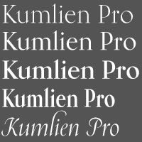 Swedish painter, poet, scholar, publisher, typographer and type designer (b. Stockholm, 1884, d. Stockholm, 1949) who designed fonts at Klingspor such as Kumlien (1943), Kumlien Bold and Kumlien Antiqua. Tjörbjörn Olsson created interpretations such as KumlienMM (1993) and Kumlien-Initialer (1994). The fist major digital revival and extension came in 2011 at Canada Type, where Patrick Griffin and Kevin King designed the Kumlien Pro family.
 Bror Zachrisson penned Akke Kumlien: 1884-1949 in PAGA, volume 1, number 3, pp. 45-56, 1953. Kumlien studied the history of arts and literature at Uppsala University, which later bestowed on him an honorary doctorate. He was also the founder of the Institute for Research of Materials at the Royal Academy of Arts in Stockholm, the head of the Thiel Gallery's well-known art collection, and the main artistic consultant at P. A. Norstedt&Sons, the royal printing house. His Kumlien transitional typeface was the first major Swedish-designed typeface in over a hundred years. Specimen. Author of Bokstav och ande (The Letter and the Spirit: 1948), and Kunstneren og bokkunsten (Artist and Book Art). MyFonts link. Klingspor link. [Google]
[MyFonts]
[More] ⦿
|
Amelia's Adventure
|
 Stanley Davis is the designer of the well-known font Amelia (1964), a winner at an international type competition run by Visual Graphics Corporation (VGC). In this article, we investigate why Stan is mad at Linotype and Bitstream (in his words: [...] Bitstream and Linotype have stolen my Amelia font [...] their renditions of it are pathetic). A comparison is made between these fonts: A770Deco (SoftMaker Software GmbH) [true to the original, a feature of most of the SoftMaker collection], BarbarellaSF (Brendel Informatik&SoftMaker Software GmbH, 1990-1993), PerkleDisplaySSi (Southern Software, Inc, 1992), AmeliaBT-Regular (Bitstream, 1990-1992), LinotypeAmelia (Linotype Hell AG, 1997), and Amy (Corel, 1991). Stan is in favor of strengthened copyright protection to avoid this sort of thing.
 Additional revivals: Yellow submarine (1995, unknown designer), Amelia (Tilde), Amber (2019, Softmaker). [Google]
[MyFonts]
[More] ⦿
|
ATypI 2001 report
|
Report by yours truly of the 45th ATypI meeting held in Copenhagen from September 20-23, 2001. Dean Allen's report. Programme and CVs of the speakers. John Berry's report. Joachim Müller-Lancé's report. Report by Chester of Thirstype. [Google]
[More] ⦿
|
ATypI 2002 report
|
Report by yours truly of the 46th ATypI meeting held in Rome from September 19-22, 2002. Bread and circuses: on-line report by Mark Barratt and Ben Weiner. From an ATypI Board's member: John Berry's report. Jill Bell's pictures. Joachim Müller-Lancé's picture report and text report. Jef Tombeur's report (in French). Michail Semoglou's report. Luciano Perondi's report (English version). [Google]
[More] ⦿
|
ATypI 2004
|
ATypI 2004 was held in Prague from 30 September-3 October 2004. ATypI's own newsletter. Report by yours truly. Picture report by yours truly. Pictures by J.-F. Porchez. More pictures by J.-F. Porchez. Report by Dan Reynolds. Pictures by Richard Kegler. Laurence Penney's pictures. Pictures by Ryan Pescatore Frisk. Report by John Berry. Pictures by Letterror. Pictures by Diederik Corvers. Tony De Marco's pictures. Lettering in Prague by Robert Kravjanszki. Ilya Ruderman's extensive picture report (in Russian), continued here. Vera Evstafieva's report of the Type Tech Forum (in Russian). Pictures by Erik Van Blokland. Report and pictures by Andrzej Leraczyk. Report and pictures by Filip Blazek and Pavel Zelenka. [Google]
[More] ⦿
|
ATypI 2006
|
ATypI 2006 was held in Lisbon, Portugal, from 27 September-1 October 2006 on the theme Typographical Journeys. Mario Feliciano was the main organizer. Luc's report. Picture report by Dan Reynolds. One by Jean-Baptiste Levée. Pictures at Flickr. Pictures by Dan Rhatigan. Van Lancker's pictures. A French report with pics by Jean-Baptiste Levée. His pictures. General Flickr site. Pics by Rob Keller. Roger Black's pic of Spiekermann. Oleg Koshe's pics of Verena Gerlach's talk. Tagir Safaev's pics of the newspaper design track. Oleg Koshe's pics of Massimo Vignelli and François Chastanet and Spiekermann's main talk. Comments and links by Dan Reynolds. Lisbon Letters by Jerrold Maddox (Penn State University). Oleg Koshe's report on Kindel&Smeijers. Brief report by Ana Sabino. Pictures by Birx. Henrique Nardi's shots. Ukrainian report (+pics) by Victor Kharyk. Pics by Protype. Pics by Vera Evstafieva. Pictures by Iria Cunha (and many transparencies of talks). Yves Peters comments. letters.sdu (VinOlga, Annette) shows a collection of Lisbon street lettering images. See also the fontme site for Lisbon stree lettering. The student volunteers have their own photographs on Picasa: 1, 2, 3, 4, 5, 6. [Google]
[More] ⦿
|
ATypI 2009
|
 A brief report (with pictures) of the ATypI meeting held in October 2009 in Mexico City, by your humble servant. [Google]
[More] ⦿
A brief report (with pictures) of the ATypI meeting held in October 2009 in Mexico City, by your humble servant. [Google]
[More] ⦿
|
ATypI 2012
|
 ATypI 2012 was held at Hong Kong Polytechnic University and Hotel Icon in Kowloon from 10-14 October 2012. The conference was hosted by the School of Design of the Hong Kong Polytechnic University. The main organizer was Keith Tam.
 Report by Luc Devroye. [Google]
[More] ⦿
|
ATypI '99 report
|
Report by Luc Devroye of the ATypI '99 meeting held in Boston, 7-10 October 1999. Great pictures by Jill Bell, including two close-up shots of BenguiatFrisky. [Google]
[More] ⦿
|
A.V. Haight
[Inland Type Foundry]
|
 [MyFonts]
[More] ⦿
[MyFonts]
[More] ⦿
|
Barnhart Bros. Spindler Type Founders: Book of Type Specimens, 1907
|
 Trying to fit this 1000-page book into one web page, with discussion of many types. It's impossible, but I tried it. Download link for Book of type specimens: Comprising a large variety of superior copper-mixed types, rules, borders, galleys, printing presses, electric-welded chases, paper and card cutters, wood goods, book binding machinery etc., together with valuable information to the craft. Specimen book no.9. Another download link. [Google]
[More] ⦿
Trying to fit this 1000-page book into one web page, with discussion of many types. It's impossible, but I tried it. Download link for Book of type specimens: Comprising a large variety of superior copper-mixed types, rules, borders, galleys, printing presses, electric-welded chases, paper and card cutters, wood goods, book binding machinery etc., together with valuable information to the craft. Specimen book no.9. Another download link. [Google]
[More] ⦿
|
BERTLib Library
|
A listing, with comments, of the fonts in the BERTLib library. [Google]
[More] ⦿
|
Bruce Type Foundry
[George Bruce]
|
Founded in New York in 1813, and acquired by ATF in 1901, this foundry made fonts such as Bruce Old Style (now Bitstream), Madisonian (now available from Présence Typo), Ornamented No. 1007 (Mac McGrew: Old Bowery is an ATF revival, in 1933 and again in 1949, of Round Shade No.2, originated by Bruce, one of its predecessor companies, about 1854, as Ornamented No. 1007.), and Old Style 7 (Linotype, Adobe). Also called D.&G. Bruce, George Bruce, George Bruce&Co., George Bruce's Son, George Bruce's Son&Co., and V.B. Munson. They published a 592-page specimen book in 1901: Bruce Type Foundry: Our Handy Book of Types, Borders, Brass Rule and Cuts, Printing Machinery&General Supplies.. In 1869, George Bruce (b. 1791, Edinburgh, Scotland; d. 1866, New York) published An abridged specimen book Bruce's New York Type-Foundry (1869), now available as a free Google book. Page with specimen of Great Primer Ornamented No. 5, Meridian Black Open (blackletter), Canon Teutonic Ornamented, Small Pica No. 2, Double Pica Graphotype, all taken from An Abridged Specimen of Printing Types Made at Bruce's New-York Type-Foundry (1868) and stolen from Luc Devroye's web site. Fists by the Bruce Foundry. Revivals: Bruce Ornamented No. 6 was digitized by Iza W from Intellecta Design in 2006 as GeodecBruceOrnamented. Gold Rush (2008, FontMesa) is a family of Western style typefaces based on a Bruce type family from 1865. FontMesa also made Belgian (2008) based on a Bruce Type Foundry design from the 1860s. Bruce 532 Blackletter (2011, Paulo W, Intellecta Design) is an excessively ornamental blackletter face. Michael Hagemann's slab serif family Gold (2011) is based on Bruce's Gold Rush (1865) after removing the shadows. RMU Bowery (2019, Ralph M. Unger revives Old Bowery). [Google]
[MyFonts]
[More] ⦿
|
C. E. Weber
|
 Stuttgart-based foundry established in 1827, and taken over by D. Stempel in 1970, which in turn became Linotype in the eighties. Their library included Druckhaus Antiqua (1919), Schadow Antiqua (1938), Mars Grotesk, Weber Fraktur (1860) and typefaces by these designers:
 - Albert Auspurg: Start (1935).
- Julius Kirn: Bison (1935-1938). This brush typeface was revived as Brush 738 BT (Bitstream) and as RMU Bison (2020, Ralph M. Unger).
- Walter Jakobs (or Jacobs): Chronika (1936), Verzierte Chronika (1937), Chronika fett (1938) and Chronika licht (1939).
- Hans Möhring: Gabriele (1938; Hastings mentions 1947).
- Erich Mollowitz: Forelle and Forelle Auszeichnung (1936, script types).
- Willy Schaefer: Neon (1935).
- Friedrich Hermann Ernst Schneidler: Bayreuth (1935), Deutsch Roemisch (1923; Kursiv in 1926, fett in 1930), Roemisch fett (1930), Kontrast (1930), Suevia Fraktur (+halbfett).
- Georg Trump: Amati (1951), Codex (1954), Delphin I and II (1951), Forum I and II (1948 and 1952), Jaguar (1965), Palomba (1954, script), Schadow (Antiqua 1938, Antiqua werk, 1948, Kursiv 1942, Antiqua Fett 1952, Antiqua halbfett 1939, Antiqua Schmalfett 1945), Signum (1955), Time Script (+Light and Medium) (1956), Trump Mediaeval (1954; Kursiv and halbfett in 1956; fett in 1958; Kursiv fett and schmal halbfett in 1962).
- Wagner&Schmidt, Leipzig: Colonna Antiqua (1908; halbfett in 1911), Druckhaus Kursiv, Druckhaus Antiqua (1919; +fett, + halbfett, +schmalhalbfett), Ekkehard (1903), Erika (1920; +halbfett), Margarete (<1927), Orient Antiqua (1914), Parlements Fraktur (1908), Progress Reklameschrift.
[Google]
[MyFonts]
[More] ⦿
|
Cali Ruchala
|
Cali Ruchala does not think that the attacks on shareware and freeware sites are being done in a haphazard manner. Read on. [Google]
[More] ⦿
|
Carl Gustav Naumann
|
 C.G. Naumann is Carl Gustav Naumann, who ran a family printing business in Leipzig. In 1901, he published Schriftproben der Firma C.G. Naumann. Sample pages of that book are shown in the link. Poster by Naumann. [Google]
[More] ⦿
C.G. Naumann is Carl Gustav Naumann, who ran a family printing business in Leipzig. In 1901, he published Schriftproben der Firma C.G. Naumann. Sample pages of that book are shown in the link. Poster by Naumann. [Google]
[More] ⦿
|
Carl Stephen Junge
|
Illustrator and poster designer in Chicago in the 1920s and 1930s, who lived from 1880 (b. Stockton, CA)-1972 (d. Des Plaines, IA). Many of the ornamental typefaces in the Barnhart Brothers&Spindler catalog of 1931, Typefaces: border designs, typecast ornaments, brass rule: selective specimens of preferred matter, are due to Junge. His typefaces: - Caslon Italic Specials (1924).
- Swagger Capitals, which already appeared in the 1922 catalog of BBS. Swagger Capitals was reworked by Nick Curtis in 2004 as Mazurka NF [the lower case of Mazurka NF is based on Gothic Novelty Title, perhaps not a Junge type]. Swagger Capitals also inspired Pencraft (2010, Intellecta Design).
Mac McGrew: Swagger Capitals or Swagger Initials were designed by Carl S. Junge for BB&S in 1925. They are virtually monotone, with an elongated flourish on each of the letters, most of which are cursive in character. There are only twenty-four letters, without X or Z. The foundry promoted them as being usable as initials with various typefaces. - Many ornaments were collected and digitized by Nick Curtis in Junge Holiday Cuts NF (2004).
[Google]
[More] ⦿
|
Charles Percival Bluemlein
|
 Charles Percival (or just Percy) Bluemlein (b. 1891) served in the 346th Infantry in World War I. In 1920, he married Mildred Vanderbilt and settled in Brooklyn, NY. He died in 1944 and is buried in the Long Island National Cemetery in Farmingdale, NY. Famous for his scripts and penmanship, his best known book is Script and Manuscript Lettering (1947, Higgins Ink Co, Brooklyn). Earlier editions are from 1943 and 1944 and have Bertram Cholet and Dorothy Sara (1943 edition only) as co-authors.
 Modern revivals of his scripts include - KolinskySable SG (Jim Spiece, 2004), based on a 1944 brush design called Mr. Ronald G. Sheppards.
- Bender Script (2008) by Alison Argento. She writes: Would you hire one of the top hand lettering artists that worked for companies like Max Factor for your designs? Of course you would! Chas Bluemlien passed away many years back, and you couldn't have afforded his services anyway, but his lettering prowess which graced many advertisements, primarily cosmetic ads, has been pulled together from numerous samples to make this font.
- Alejandro Paul's Bluemlein Scripts (2004-2005, Umbrella and Veer) are based on Bluemlein's alphabets from the book cited above: Miss Le Gatees, Mr Rafkin, Mr Keningbeck, Mr Lackboughs, Lady Dawn, Mrs Von Eckley, Mr Sheppards, Mr Dafoe, Mr Canfields, Mr Stalwart, Mr Sandsfort, Mr Leopolde (and later, Mr. Leopolde Pro), Mr DeHaviland, Mr Blaketon, Miss Stanfort, Miss Packgope, Miss Fajardose, Mrs Saint-Delafield, Mrs Blackfort, Mr Sopkin, Mr Sheffield, Miss Lankfort, Herr Von Muellerhoff, Dr Sugiyama, Dr Carbfred. In 2011, that series was made available at Google Web Fonts. Al;ejandro writes: From the early 1930s through World War II, there were about 200 professional hand letterers working in New York City alone. This occupation saw its demise with the advent of photo lettering, and after digital typography, became virtually extinct.
- Soft Horizon's Lainie Day (1993) is an earlier free font in the style of Paul's Lady Dawn and Mr Lackboughs.
- In 2012, Intellecta Design got into the act and promised to digitize the entire series under the name Bluelmin instead of Bluemlein. They created Bluelmin Kisaburo, Bluelmin Ralph (2012), Bluelmin Ronald (2012), Bluelmin Sandsfort (2012) and Bluelmin Benedict (2012).
Credits: Several of the images below, as well as some biographical information, are courtesy of Charles's grandson, David Musgrave. [Google]
[MyFonts]
[More] ⦿
|
Cornelis Dirckszoon Boissens
|
 Dutch letterer and calligrapher, 1568-1634 (or 1635). He published the calligraphic masterpiece Gramato graphices in Amsterdam in 1605. This book has several blackletter and chancery alphabets proposed by Boissens. Teaser web site by yours truly. [Google]
[More] ⦿
Dutch letterer and calligrapher, 1568-1634 (or 1635). He published the calligraphic masterpiece Gramato graphices in Amsterdam in 1605. This book has several blackletter and chancery alphabets proposed by Boissens. Teaser web site by yours truly. [Google]
[More] ⦿
|
Dead History
[P. Scott Makela]
|
Dead History (Emigre: Scott Makela, 1990, redrawn "from scratch" by Zuzana Licko in 1994) has some characters that do not seem to be redrawn from scratch, as Emigre claims. It sure looks like they were borrowed from VAG Rounded (an Adobe font) and thrown in a font editor for a minor touch-up. [Google]
[More] ⦿
|
Douglas C. McMurtrie
[McMurtrie: A Memorandum on Early Printing on the Island of Malta]
|
[More] ⦿
|
Douglas C. McMurtrie
[McMurtrie: The Didot Family of Typefounders]
|
[More] ⦿
|
Emil Gursch
|
A peek into Schriftgiesserei Emil Gursch Berlin: Gesamtprobe Schriften Ornamente Vignetten Messinglinien (488 pages), one of Gursch's gorgeous specimen books. Emil Gursch was the main principal/owner of the Schriftgießerei Gursch in Berlin from 1866 until 1917, at which point the foundry was acquired by Otto Tech Berlin, an arm of H. Berthold AG. MyFonts link. [Google]
[MyFonts]
[More] ⦿
|
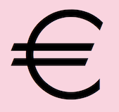
Eurocrat and Eurofart
[Luc Devroye]
|
 In 2009, I decided to make Eurocrat, a Euro symbol font, according to the European specifications. I added various weights and an outline version, called Eurofart, to celebrate the hot air surrounding Europarliamentarians. Finally, there is also a single-official-glyph font, Euron. [Google]
[More] ⦿
In 2009, I decided to make Eurocrat, a Euro symbol font, according to the European specifications. I added various weights and an outline version, called Eurofart, to celebrate the hot air surrounding Europarliamentarians. Finally, there is also a single-official-glyph font, Euron. [Google]
[More] ⦿
|
Formatting Font Formats
|
A research article published in 1993 by Luc Devroye at EuroTeX. [Google]
[More] ⦿
|
FotoStar
[Robert Trogman]
|
 Los Angeles-based company that distributed a 5000+ library of two-inch film fonts for display typefaces, some of which were original, such as Yagi Double (the CNN logo font) and Yagi Link Double. It ceased operations in 1985. Trogman maintains a design studio in Palm Springs, California.
 The FotoStar collection includes Blippo (1970), Handel Gothic (by Robert Trogman), Buxom (a beveled 3-d athletic lettering typeface sold, e.g., by Elsner&Flake as Buxom SB, Scangraphic) and Embrionic (an ink-trapped typeface family revived by Claude Pelletier). Yagi Link Double was revived by Alex Haigh as Miyagi (2008, Thinkdust). Yagi Bold and Yagi Double were revived in 2010 by Gus Thessalos as Retro Mono Wide and Retro Stereo Wide, respectively. Gus Thessalos revived Yagi Link Double as Retro Stereo Thin. Nick Curtis revived Horse Tank as Feedbag NF (2015), Welling Black as Well Said Black NF (2014) and Angelica as Vauxhall NF (2014). Claude Pelletier too revived Angelica: see his free font Angelica CP (2011). In 2015, Harold Lohner revived Roberta, which Trogman cut based on an art nouveau sign in a Belgian restaurant in 1962. FontShop link. FotoStar is a small web page made by yours truly that showcases some typefaces in the FotoStar collection taken from their catalog, Film Font Digest FotoStar Graphic Supply. Images of some of his fonts. [Google]
[MyFonts]
[More] ⦿
|
FOX versus Graham Meade
|
FOX complained that Graham Meade made a font called Buffied, which looks to much like the letters from the "Buffy the Vampire Slayer" television series owned by FOX. Graham counters that he made the font from scratch and that letterforms cannot be protected. In June 2000, Graham's web site was pulled by Fortunecity. Then Graham Meade called his font Rebuffed. But now, ironically, FOX itself is using new letters that are directly taken from Graham's Rebuffed font. But what can you expect from the network that brought TV down the gutter with Temptation Island? See also here. [Google]
[More] ⦿
|
Frank Denman
|
Author of The Shaping of our Alphabet (1955, Alfred A. Knopf, New York), a 228-page type history book. His oeuvre. [Google]
[More] ⦿
|
Free ATypI
|
A personal opinion on the membership and conference fees for ATypI. After a Typophile discussion, ATypI's president, Mark Batty, lowered ATypI's membership fee for citizens of developing countries on February 18, 2003. A positive move! [Google]
[More] ⦿
|
Fritz Genzmer
|
Author of Das Buch des Setzers (1948), an overview of the hand composition typefaces available by German type foundries at the end of World War II: - From Frankfurt: Bauersche Giesserei, Ludwig&Mayer, D. Stempel.
- From Berlin: H. Berthold, Norddeutsche Schriftgiesserei.
- From Hamburg: Genzsch&Heyse.
- From Offenbach: Gebr. Klingspor.
- From Leipzig: J.G. Schelter&Giesecke, Ludwig Wagner.
- From Dresden: Brüder Butter.
- From Altona: J.D. Trennert und Sohn.
- From Stuttgart: C.E. Weber.
[Google]
[More] ⦿
|
Gender fonts
|
A survey of fonts with the gender symbols, and a creation by yours truly, called Sekushii. In 2002 was struck by the lack of complete fonts with gender symbols, so I made my own. The world's gay community started using their own symbols, derived from those for male (the symbol for Mars) and female (the symbol for Venus). But, not to be left out, the bisexuals, both male and female by birth, suggested their own glyphs. Outnumbered but not outgunned, the hermaphrodites picked their own symbol, that of Mercury. But it does not end there. The transexuals do not fit into any of the above categories, so they have their own symbols. Transgendered people are usually defined as those who are aware of all people of all sexual orientations and preferences, and approach relationships in a gender-free manner. Well, they have their own symbol. I never located the symbol for eunuchs, but I am sure there must be one. Of course, the combinations multiply. However, I refuse to create symbols for gay hermaphrodites, transsexuals who like eunuchs, and males who had two sex change operations (to get back to where they started from). The ultimate place for symbols is the highly recommended site Symbols.com. For definitions of transsexual, transgender, bisexual, and other terms, see here. Some symbols are shown here. Official books always lag behind, so I went looking for what people actually use to represent different sexual orientations, preferences and situations. At present, the world seems to agree on the following symbols:  | Mars, or Tuesday: symbol for males. |  | Venus, or Friday: symbol for females. |  | Gay males. |  | Gay males. |  | Lesbians. |  | Aware of the joint cause of gays and lesbians. Also (sometimes) transsexuals. Also, quite universally in science, used for hermaphrodites. See here. Symbol.com states that it is used in botany for double-sexed plants. Also, (sometimes) heterosexuals in general. See here or here. |  | Bisexuals. Sometimes used for people fighting for gay and lesbian rights. |  | Transgender. See here. |  | Another symbol for transgender: see here. |  | Bisexuals. |  | Bisexuals, as proposed here. Closely related in some places to the symbol for bisexual men. |  | Bisexual men. |  | Bisexual women. |  | Mercury, or Wednesday: Hermaphrodites. See here. The Greek equivalent of Mercury is Hermes, hence the name. Apparently, biologists use this for hermphrodites. |
For completeness, here is a partial list of gender fonts: - The TeX/Metafont community lives with Denis Roegel's Genealogy font, created in 1996 and updated in 1999. Denis Roegel essentially compiled the genealogical symbols found in Roland Waldi's Wasy font (1992), which has a male and female symbol set, and Knuth's "gen" font, and added the standard symbols for males and females.
- The truetype world probably is most acquainted with Marvin Vogel's useful (and free!) symbol font Marvosym, which contains symbols for sexless, male, female and hermaphrodite. Marvin recognizes that there are other people in this world besides straight males or females, but the symbol he suggests for hermaphrodites is not the one used by or suggested by the world of sex experts [read on below]. Curtis Clark made the free font called Female and Male Symbols (1996), which contains the same gender symbols as Marvosym.
- WordPerfect's WP IconicSymbolsA (1993) just has a male and a female symbol.
- There are, of course, a number of commercial outfits that have the standard pair of gender symbols in some of their fonts. Particularly artistic are P22's Koch Signs 3 and Koch Signs 4. Whether by design or accident, these also have a glyph for hermaphrodites. An even more complete set is Ann's Astro family of fonts from Dingbatcave (Ann Stretton).
- Unicode has reserved position 9792 for the female sign, and 9794 for the male sign. Nothing is reserved for the others. Some Unicode fonts indeed do have these two characters. However, no Unicode font has more than this bare minimum, and thus, the Unicode path is a cul-de-sac.
- The Sekushii font was designed by Luc Devroye in 2002. It is part of the Sugaku series [sugaku is Japanese for mathematics]. It has all the symbols menyioned above, in many sets, in both light and medium weights. There are straight-arrowed sets for combining with sans serif text, flared arrows for serif text, and fun experiments and extensions with various sexual undertones. And, it is free! Have a ball.
- A late addition, in 2017: Represent (Tony de Marco). It is quite complete as well.
[Google]
[More] ⦿
|
Generic fonts
|
Luc argues for the creation of generic fonts (copyright and trademark protection disappear after about ten years) in a piece entitled "the font patrimony" (2003). [Google]
[More] ⦿
|
George Bruce
[Bruce Type Foundry]
|
[MyFonts]
[More] ⦿
|
Gerald Giampa: 1950-2009
|
 Reporting on the death of Lanston Type owner and metal/digital type expert Gerald Giampa (1950-2009). On June 24, 2009, Gerald Giampa died in Vancouver of a massive stroke. Several eulogies and obituaries appeared, which are summarized below.
  John Hudson: It was in large part due to his generosity and encouragement that I started down the path that led to my career as a type designer. When Ross and I met Gerald, in the early 1990s, the Lanston Type Co. was based in Vancouver and he operated an open-door policy to anyone with a genuine interest in type, even neophytes like us. Gerald had a strong sense of historical continuity in his chosen crafts of printing and type founding. His office space at Lanston, with its memorabilia of Frederic Goudy and other former Lanston associates, embodied this continuity even as it sat next to the room where the Ikarus tablets were used to convert metal type designs into digital fonts. But digitisation was only part of the work going on. New designs were also being developed, notably Jim Rimmer's Albertan. Even then, the Monotype matrix punching and finishing machines were in occasional use, and sometimes one was greeted at the door by the sound of the Heidelberg presses running. By that time though, the customers for hot metal type and for the kind of quality letterpress printing that Gerald offered were few and far between. There was a sense that the kind of work he wanted to do was increasingly difficult to find and to justify financially. A lot of time was available for talking about type and printing, for looking through drawers and specimens, for making plans and, it must be said, for drinking. Gerald made no bones about his alcoholism and, as he explained, treated the wine glass as one more lever on the press, to be pulled in sequence. Colleagues came to visit. Sumner Stone came, and Gerald cut metal patterns of Stone Serif, perhaps the first type designed for a digital medium to be back-engineered for hot metal setting. Dave Farey came to draw new weights for Lanson's Bodoni. It was on the back porch, under the grape vines from which Gerald made his own wine, that I first met Mike Parker, drawn to Vancouver by certain rumours regarding Times New Roman. When Ross and I attended our first ATypI conference, in San Francisco in 1994, it was with introductions to Matthew Carter and Dave Farey, courtesy of Gerald. P22, where Giampa's Lanston Type ended up recently, writes: Lanston Type's rich history dates back to 1887 when Tolbert Lanston received his first patent for a mechanical typesetting device. Later refinements led to the Monotype casting machine and the emergence of the Lanston Monotype Company as one of the most renowned type supply companies in the world. The Monotype caster was revolutionary and along with other automated typesetting machines helped to usher in a new age of printing technology. Typesetting had, until this time, remained the same as Gutenberg's first hand-set movable type. In the late 1800s, Tolbert Lanston licensed his technology to an English sister company and became a major international force. Lanston grew rapidly with America's pre-eminent type designer, Frederic Goudy, holding the position of art director from 1920-1947. The Philadelphia-based Lanston Monotype eventually parted ways with its English counterpart. English Monotype became simply known as Monotype from that time forth. Lanston was acquired by American Type Founders in 1969. After a series of other owners, the company found its way to master printer Gerald Giampa, who moved it to Prince Edward Island in 1988. During its time of transition, Lanston continued supplying the American market for monotype hot metal type needs until January 21, 2000, when the majority of Lanston's machinery and historical records were tragically destroyed by a tidal wave. Giampa was one of the earliest developers of PostScript fonts. After the loss, he focused on digitization to an even greater extent. Under his stewardship, Lanston's classic typefaces were digitized in a style that was true to the sources, which are the brass and lead patterns from which the metal type was made. The past few years have seen Giampa and Lanston travel from Canada to Finland, and back again. In late 2004, Lanston has completed another journey back to the United States to come under the care of a new steward: P22 type foundry. Giampa is answering the call of the sea. He has traded his type founder's hat for that of a ship's captain to sail the northern Pacific coast. During his shore leaves, Giampa continues to act as typographic consultant to Lanston-P22. [Google]
[More] ⦿
|
Gillen versu Jami
|
Jeff Gillen (Mincandy) insults Jami (TrueType Resource). Find out how and why. [Google]
[More] ⦿
|
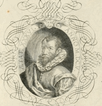
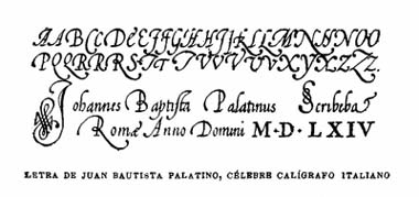
Giovambattista Palatino
[Libro di M. Giovambattista Palatino cittadino romano]
|
 [More] ⦿
|
H.C. Hansen Type Foundry
|
Boston-based foundry. [Google]
[More] ⦿
|
Henrik Keyser II
|
Swedish book printer and typographer, whose story is told be Douglas McMurtrie in The First Swedish Type Specimen (Chicago, 1933). He published Sweden's first type specimen book in 1691: "Någre få prooff. Hoos Henrick Keiser Kongl. Maytz: och Upsal. Acad. Booktryckiare Stockholm 1691". Only two copies of this specimen book remain, one in Stockholm, and one in Upsala, where Keiser was the University of Upsala printer. The type specimen book shows Fraktur, Schwabacher, music notation, Hebrew, Greek, Cursive, Antiqua, Roamyn and title capitals. Later on, Keyser became the royal printer. He died in 1699. Bio in Swedish. [Google]
[More] ⦿
|
Imprimerie L. Danel
|
Imprimerie L. Danel was founded in 1698, as a successor of Imprimerie Fache, which existed in Lille since the early 1600s. It has remained a family business, and occupies two factories, one in Lille, and one in Loos. It appears that some original type was made by L. Danel over the years, although it cannot be said that such was the focus of the business. The Livret Typographique L. Danel (Lille, 1935) describes some of its history and typefaces. [Google]
[More] ⦿
|
Inland Type Foundry
[A.V. Haight]
|
 The Inland Type Foundry in Saint Louis was established in 1892 by the three sons of Carl Schraubstadter (1827-1897), William A. Schraubstadter (1864-1957), Oswald Schraubstadter (1868-1955) and Carl Schraubs Jr. (1862-1947). Carl had run the Central Type Foundry in Saint Louis and sold it to ATF (American Type Founders) in 1892, and the sons reacted by setting up Inland. Until 1911, Inland was one of the most successful foundries in the United States. In 1911 Inland was purchased by ATF and its equipment divided between that foundry and Barnhart Brothers and Spindler (BBS). A.V. Haight (Poughkeepsie) designed Rogers (art nouveau) at Inland Type foundry in 1902. He also designed Haight. Nicholas J. Werner, who used to work for Central, also created many designs at Inland. Look for "Specimen book and catalog, a price list of printers' supplies, showing types and rules in which are embodied all the latest styles ... among which ... may be especially mentioned the casting of types on standard line and unit sets." (1902, 464 pages), Specimen Book and Catalog. A Price List of Printers Supplies, Showing Types and Rules in which Are Embodied all the Latest Ideas that Enable the Printer to Produce Superior Work in a most Economical Manner Among which Betterments May Be Especially Mentioned the Casting of Types on Standard Line and Unit Sets (St. Louis, 1897) (a free copy is here and here) and Specimen Book and Catalog. A Price List of Printers Supplies, Type, Rules and Accessories of the Very Latest Designs which Facilitate the Economical Production of Superior Printing. A Notable Improvement Is the Casting of All Type on Standard Line&Unit Sets (St. Louis, 1907). MyFonts page.
 Scans of some typefaces: Becker (art nouveau), Blanchard Italic [Blanchard was revived in 2013 by Paulo W as Blanchard Inland], Commercial Script, Edwards (art nouveau), Inland, Lightface Blanchard, Matthews (1902: revived in 2019 by Chuck Mountain as Cotrell CF), Extended Studley (revived by Chuck Mountain in 2019 as Dukas CF, and by Jeff Levine in 2008 as Bayview JNL), Rogers (art nouveau), Poster French Oldstyle (1897 catalog), Poster Ionic (1897 catalog), Poster Latin Antique (1897 catalog), Pacific Bikes (ornaments, 1897 catalog), Recut Caslon (1907, as taken from the 1923 ATF catalog), Drew (1910, from the 1923 ATF catalog: a digital version called Droobie NF was created by Nick Curtis in 2014), Title Shaded Litho (1911), Litho Roman (1907), Gothic No.578 (1898), Pen Print (1911), Blair (1900; Condensed Blair was revived in 2022 by Jeff Levine as Generic Sans JNL), Mitchell (1906, a bold version of the all caps grotesque face Blair; digitally revived by Nick Curtis in 2015 as Mitchell NF), Comstock (1902), Inland Copperplate (1901), Shaw Text (1907). Commentaries by Mac McGrew on some of the typefaces: - Gothic No. 578: Gothic No. 578 was shown as Gothic No.8 by Inland in 1898 as "the latest candidate for the printer's favor; a popular old typeface entirely recut." It was shown until 1941. It is a bold weight, and is quite similar to Standard Bold which as an import from Germany was very popular in this country in the 1950s. It is also similar to Comstock, but without the added outline. Keystone called it Standard Gothic, although it is not identical to the German face. As a nineteenth-century gothic, the cap G had no crossbar. Paragon Gothic is the same design, without lowercase, cast as a title face.
- Pen Print: Pen Print and Pen Print Bold were introduced by Inland Type Foundry in 1911, with the latter thought to have been the last typeface cut by that foundry before its sale to ATF. Pen Print Open was designed for ATF in 1921 by Morris Benton, and includes open versions of all the characters shown for the bold. The series has more the appearance of rather crude brush lettering than pen "printing," but the inclusion of an open version is contrary to the conception; perhaps it was intended for two-color printing. The letters have a slight backslant. The bold was also cut by Intertype, in 1927. Compare Dom Casual.
- Blair: Blair was advertised in 1900 by Inland Type Foundry as new and original, calling it "an exact imitation of the small gothic letter now so popular with engravers for stylish stationery." Its production was continued by ATF until the 1950s. It is similar to Copperplate Gothic Light, but without the tiny serifs of that face. Litho Gothic is the same design but with lowercase. Mitchell (1906) is the same design but slightly heavier. The condensed version was produced in 1903 or earlier. Hansen copied Blair as Card Gothic No.2. Compare Lightline Gothic.
- Comstock: Comstock was advertised by Inland Type Foundry in 1902 as "a striking novelty, our brand new face." It was revived by ATF in 1957. It is a medium weight conventional gothic, distinguished by a hairline surrounding each letter. The G lacks a crossbar, typical of many nineteenth-century gothics. The design was sponsored by A. H. Comstock of Omaha, according to a review at the time of its introduction. Condensed Comstock was introduced by Inland in 1905, but patented in the name of William A. Schraubstadter in 1908. It has no lowercase, but the design is more contemporary. Monotype has copied both typefaces, but Monotype Comstock Condensed is in 18-point only, without figures. In both foundry typefaces, there are several sizes on 12-point body; No.1 is the largest in regular, but No.1 is the smallest in Condensed. In 1911, a copy of Comstock was issued by Bauer in Germany under the name Astoria, revived in 1957.
- Inland Copperplate: Inland Copperplate is a shaded Old English typeface, first shown by Inland Type Foundry in November 1901. It is similar to Typo Text (q.v.). although the specimen here, reproduced from an over-inked showing, doesn't reveal the shading.
- Mac McGrew writes: Matthews is a very heavy, thick-and-thin, serifless type introduced by Inland Type Foundry in 1901. It is somewhat similar to the later Globe Gothic (Bold-in fact it is more carefully designed and seems to agree better with the lighter Globe Gothics than the latter typeface does. ATF cast both typefaces for a while after acquiring Inland in 1912, as well as Condensed Matthews, which Inland had introduced in 1903 as "a new gothic letter." The specimen of Matthews shown here is from a font showing considerable wear, with rounded corners. Compare Radiant Heavy. For a digital revival, see Merchant Trade JNL (2020, Jeff Levine).
- Shaw Text: Shaw Text was introduced by Inland Type Foundry in 1907 as its "latest novelty," although it is a rather conventional Old English face, a little heavier than Wedding Text, and a little lighter and fancier than Engravers Old English. After Inland merged with ATF, Shaw Text continued to be shown until 1954. Compare Plate Text.
- Litho Antique (1910). Mac McGrew: Rockwell Antique was a reissue of Litho Antique, cut by William Schraubstadter for Inland Type Foundry and introduced in January 1910 when it was advertised as the "newest typeface; one of our best; closely imitating steelplate and lithography." In the late 1920s similar typefaces became popular in Europe, and some were imported into the United States. Morris Benton of ATF added several characters to the old Inland face, matrices of which were then in ATF's vaults, and it was reissued in 1931 as Rockwell Antique. But Benton saw that something more was needed, and redrew it as Stymie Bold (q.v.) in the same year. The alternate characters which were added to Rockwell are the same ones now shown with Stymie Bold. Monotype copied Rockwell but erroneously called it Stymie Bold in some literature, and there has been confusion between the two typefaces ever since; the latter name is often applied to fonts of Rockwell cast on Monotype machines by secondary suppliers. Indicative of this confusion, Stymie Bold Italic on Mono is series 1891, corresponding to Rockwell series 189, while Stymie Bold is 790. English Monotype has several weights of Rockwell, a square serif family which differs from this typeface and should not be confused with it; see Imports in Appendix. Antique Shaded (q. v.) is sometimes called Rockwell Antique Shaded.
- Herald Extra Condensed (1909). An octagonal typeface.
- Extra Condensed Title Gothic No.12.
[Google]
[MyFonts]
[More] ⦿
|
ITF versus McCullough
|
On October 23, 2002, Anna McCullough is alleged to have posted a bunch of Red Rooster (ITF) fonts on alt.binaries.fonts. ITF reacts by sending a letter (via their lawyers, Ballard Spahr Andrews&Ingersoll) in which they threaten to ask 22,500 dollars in damages ***per download***. Analysis and details in this web page. [Google]
[More] ⦿
|
John Ryder
|
Prolific British author (b. 1917), who published, e.g., A suite of fleurons : or a preliminary enquiry into the history&combinable natures of certain printers' flowers (London : Phoenix House, 1956). Pictures, including cover page. The typeface Fleurons A (developed by S. G. Moye, 1991-1993) is based on A Suite of Fleurons by John Ryder. [Google]
[More] ⦿
|
Koch Neuland
[Rudolf Koch]
|
 A listing and comparison of various digital implementations of Koch's German expresionist Neuland typeface from 1923. Rudolf Koch chiseled an all caps typeface directly from metal and called it Neuland (Gebr. Klingspor). This experimental typeface has been copied and revived over and over again. It was even used as the typeface for Jurassic Park. A non-exhaustive list includes
 - Neuland and Neuland Star (Linotype). Linotype owns the trademark to Neuland. This typeface is possibly identical to Adobe's Neuland Std.
- Othello MT (Pierpont at Monotype, 1928-1929). The digital version is by Carl Crossgrove and Steve Matteson.
- URW Neuland.
- Albertus MT (Berthold Wolpe at Monotype, 1932).
- Informal 011 Roman and Black (Bitstream).
- Newfish (PrimaFonts).
- ITC Outback (based on Bob Alonso's interpretation at Photo-Lettering).
- FFD Neuland (Doug Olena, Keystrokes, 1995).
- PLS Neutun (2026) by Noah Johnson at Practical Lettering Studio.
- Culpepper (George Ryan, Galapagos): a family with lower cases added and glyphs freely interpreted.
- Newfoundland (Corel).
- N691 Deco (Softmaker).
- AINeuland (Lester Dore at Alphabets Inc).
- Tribeca (David Rakowski), an outline version, as in the Jurassic Park movie font. Others in this category include BD Jurassic Black (Streetwise Software), Jurassic (Computer Support Corporation, 1996), Jurassic (COSMI, 1993), Jurassic (WSI, 1993), JurassicNormal (Elfring, 1993), JurassicPark (Sierra On-Line, Inc), Jurassic (Allen R. Walden), Tambor-Inline (Casteletype), FFD Neuland Inline (Keystrokes).
- Tambor (Light, Black, Inline and Adornado) (Jason Castle, Castletype).
- Rudolf (Jason Castle, Castletype).
- BrideOfTheMonster (Harold Lohner, 1998).
- Newland Black (Andrey Mel'man).
- P22 Koch Nueland (sic) (Richard Kegler, P22, 2000).
- Jungle Fever NF (Nick Curtis) and Blandford Woodland NF (2005, Nick Curtis).
- On Kochs Roots (Manfred Klein, 2002): a lower case and hair-serifed extension.
- KochNeu-ExtraBlack (Manfred Klein, 2003). Now called New Country.
- Neuerland (2010, Ian Lynam).
- OPTI Neuland (by Castcraft).
- (Metal typefaces by Baltimore Type). Mac McGrew: Neuland and Neuland lnline were originally handcut by Rudolf Koch for Klingspor foundry in Germany, about 1923. Being handcut, each size differed somewhat from others, and the lnline differed from the regular. The copies cast by Baltimore Type were recut by pantagraph from one size of the regular. and thus are uniform from one size to another. The white inline was added to this same recutting, and is slightly wider than in the German version.
Shown are some of the versions of Koch's Neuland. Indeed, there is no true "original", because each of Koch's type sizes comes with its own peculiarities (recall that each was cut directly in metal). The Linotype version, which is supposed to be the digital counterpart of the "original", is a bit too "clean". The Softmaker face, N691 Deco, is probably closer to Koch's original cuts, as most of Softmaker's historical typefaces aspire to be true revivals. However, only AI Neuland and FFD Neuland have the pointy M's that we find in the "Encyclopedia of Typefaces" of Jasper, Berry and Johnson, so go figure. The P22 typeface and Klein's typeface have K's with horizontal right upper arms and U's that hang together similarly, so they are in a category by themselves and one may well have inspired the other. View and compare some digital versions and extensions of Koch Neuland. [Google]
[More] ⦿
|
Leslie Cabarga
|
Agfa Creative Alliance designer Leslie Cabarga has the following thesis: all free fonts are either of poor quality or are in some way pirated. This is a disappointing view from a talented type designer. Clearly, there are top-of-the-line original free fonts out there made by the likes of Apostrophe, Nick Curtis, Manfred Klein, Petra Heidorn and Dieter Steffmann. On the other hand, Cabarga is right about the abundance of poor quality fonts (unfortunately, both free and commercial), and the proliferation of pirated fonts, renamed time and again, but the renaming is mostly done by commercial companies (often cheap CD vendors). The page used to be here. [Google]
[More] ⦿
|
Lettering in Havana
|
Pictures from Havana (by yours truly, dated April 2003), and a brief report on type in Cuba. [Google]
[More] ⦿
|
Lettering in Santiago
|
Pictures of lettering in Santiago de Compostela, taken by yours truly with a cheap digital camera in 2003. [7MB] [Google]
[More] ⦿
|
Libro di M. Giovambattista Palatino cittadino romano
[Giovambattista Palatino]
|
 This jewel of a book was published in 1550 by Antonio Blado asolano in Rome. It is now available on the web and contains of complete alphabets, from chancery scripts, to blackletter and roman. There are also Greek, Hebrew, Cyrillic, Syrian, Arabic and other alphabets. Selected pics to make you drool. [Google]
[More] ⦿
This jewel of a book was published in 1550 by Antonio Blado asolano in Rome. It is now available on the web and contains of complete alphabets, from chancery scripts, to blackletter and roman. There are also Greek, Hebrew, Cyrillic, Syrian, Arabic and other alphabets. Selected pics to make you drool. [Google]
[More] ⦿
|
Linotype enforces Helvetica
|
More harassment in 2001 by Linotype lawyers for people who merely use the word Helvetica, a Linotype trademark. Linotype has to protect its trademarks, yet the military approach it takes with respect to your average internet user is not acceptable. I wrote this article in 2001. In 2007, I came across a (now defunct) Russian link of equivalences with Helvetica: Pragmatica (ParaType), Crash (ParaType), Helvetica Neue (Linotype/2Alex), Helios (TypeMarket), AxxxxHelvetika (Tygra), Arial (Monotype), Artsans (.), Bastion (2Alex), BastionX (Unknown Soldier), Cyrvetica (SoftUnion), Encyclopaedia (!22!), Encyclopedia (Intermicro), Europa Grotesk (Scangraphic), Global Cyrillic (Global), NTHarmonica (IpexR), Hebar (Eurotype), Helga (Intermicro), Helios (Agfa), Helios Black (Anonymous), HelvCondenced (Vita BBS), HelvDL (DynaLab), Helvetica Y (Apple), AZ Helvetica (AzZet), Helvetica (Tilde), NTHelvetica (IpexR), Hylvetica (SoftUnion), Ladoga (MacCampus), AG Letterica (Tilde), Megaron (Tegra), NewhouseDT (DTP Type), Nimbus Sans (URW++), Nimbus Sans (URW++/Valek Filippov), Pragmatica (!22! Soft), Prague (N&L), PromtImperial (PROject MT), Swiss 721 (Bitstream), Swiss 721 (Bitstream/Tilde), Switzerland (Corel), Vanta (Intermicro), Vanta (!22! Soft), Sans (Anonymous, 1991 Font Collection), SvobodaFWF (Cassady&Green). Yet, in 2001, CybaPee was harassed by Linotype for using HelvAssim for a non-Helvetica font. This is not logical, and convinces me that the legal threats were selective, targeting the free font defenders. [Google]
[More] ⦿
|
Linotype harassment
|
The lawyers' letters signed by N. Yilmaz continue to flow out of the Linotype offices to unsuspecting typographers such as Dieter Steffmann, Markus Wäger, Dirk Uhlenbrock and others, all claiming trademark violations, and asking for immediate payment of sums ranging from 300 to over 10,000 Euros. This page explains how Linotype itself is "interpreting" the law. (Dead) German language page on the same topic by Cybapee. [Google]
[More] ⦿
|
Linotype versus Beaumont
|
In 2002, Linotype harassed Beaumont at Freelang.net and called Times SudEuro, a Monotype font, the "intellectual property of Linotype". This was before Monotype absorbed Linotype. Linotype's lawyer Yilmaz asked an immediate 300 dollar payment from Beaumont for, among other things, posting that Monotype font. [Google]
[More] ⦿
|
Luc Devroye
[Eurocrat and Eurofart]
|
 [More] ⦿
|
Luc Devroye
[UPM]
|
[More] ⦿
|
Luc Devroye
[Sugaku fonts]
|
 [More] ⦿
|
MacKellar, Smiths & Jordan
|
A study of the types made by MacKellar, Smiths & Jordan, the company that grew out of the Lawrence Johnson Type Foundry in 1860 and led to the creation of ATF in 1892. [Google]
[More] ⦿
|
Matthew Urlwin Sears
|
British wood engraver of the first part of the 19th century. Author of "Specimen of stereotype ornaments, 1825". [Google]
[More] ⦿
|
McMurtrie: A Memorandum on Early Printing on the Island of Malta
[Douglas C. McMurtrie]
|
Scans of a 13-page booklet by Douglas C. McMurtrie published in Chicago in 1936: A Memorandum on Early Printing on the Island of Malta. [Google]
[More] ⦿
|
McMurtrie: Le Moreau-le-Jeune A Typographical Specimen with an Introduction by Douglas C. Murtrie
|
 Scans of an 8-page booklet by Douglas C. McMurtrie published in Chicago in 1936: Le Moreau-le-Jeune A Typographical Specimen with an Introduction by Douglas C. Murtrie. McGrew writes about Caslon Openface: Caslon Openface was originated by BB&S in 1915, where it was first called College Oldstyle. It started out as a reproduction of a delicate 18th century French typeface known as Le Moreau le Jeune, by the foundry of G. Peignot&Son, but in the American version some strokes are heavier. In a later ad, BB&S said, "Placing it in the Caslon group of types is taking a liberty, but it assuredly 'belongs.' " Actually it has somewhat more affinity for the Cochin types. Caslon Shaded was adapted by ATF from Heavy Caslon in 1917, by W. F. Capitain. Caslon Shadow Title was adapted from Caslon Bold by Monotype about 1928. Compare Cameo, Cochin Open, Gravure, Narciss. [Google]
[More] ⦿
Scans of an 8-page booklet by Douglas C. McMurtrie published in Chicago in 1936: Le Moreau-le-Jeune A Typographical Specimen with an Introduction by Douglas C. Murtrie. McGrew writes about Caslon Openface: Caslon Openface was originated by BB&S in 1915, where it was first called College Oldstyle. It started out as a reproduction of a delicate 18th century French typeface known as Le Moreau le Jeune, by the foundry of G. Peignot&Son, but in the American version some strokes are heavier. In a later ad, BB&S said, "Placing it in the Caslon group of types is taking a liberty, but it assuredly 'belongs.' " Actually it has somewhat more affinity for the Cochin types. Caslon Shaded was adapted by ATF from Heavy Caslon in 1917, by W. F. Capitain. Caslon Shadow Title was adapted from Caslon Bold by Monotype about 1928. Compare Cameo, Cochin Open, Gravure, Narciss. [Google]
[More] ⦿
|
McMurtrie: The Didot Family of Typefounders
[Douglas C. McMurtrie]
|
Scans of an 8-page booklet by Douglas McMurtrie published in Chicago in 1935: The Didot Family of Typefounders. [Google]
[More] ⦿
|
Memimas and LittleDays
|
Stephen Coles claims that Memimas (by Joan Barjau at Type-o-tones) was knocked off by Westwind in its free font Little Days. He suggested that it would be considerate to remove Little Days (2001) from the Westwind archive. My page shows that this is an exaggerated claim and request. [Google]
[More] ⦿
|
Monotype and ITC versus Bitstream
|
On July 12, 2005, plaintiffs Monotype and ITC bit the dust against defendant Bitstream, when the Judge Amy J. St. Eve in Northern Illinois found Bitstream not liable under any of the plaintiffs' claims of contributory copyright infringement, contributory trademark infringement, or infringement under the DMCA. The case was about Bitstream's TrueDoc and PFR software for embedding/porting fonts in web pages. [Google]
[More] ⦿
|
More on Palatino
|
A list of equivalent names for Palatino in the font world. And some more discussion on the rip-off of Zapf's font by the major foundries. This page also shows the original Palatino designed in 1948 at Stempel AG, and proves that all later versions, including Linotype's, are very different. [Google]
[More] ⦿
|
Morgans&Wilcox Mfg Co.
[William T. Morgans]
|
 American wood type manufacturer from the 19th century, set up in 1880 by William T. Morgans and H.K. Wilcox. The latter had taken over Young's shares at Young and Morgans Mfg Co., prompting a company name change. It was located in Middletown, NY. Morgans and Wilcox was absorbed by Hamilton Manufacturing.
 On-line 1890 catalog by Robert Lee. On page 22, that 1890 catalog even shows a typeface called Belgian. Digitizations: - HWT Geometric (2013, James Grieshaber, Hamilton Wood Type Foundry). This is a squarish wood type family based on a design by Gustave F. Schroeder from 1881, as explained by HWT: Geometric began its life as a metal typeface from the Central Type Foundry, circa 1884. Soon after, this design was officially licensed to Morgans & Wilcox and was shown in their 1890 catalog in Regular, Light and Condensed Light variations. After acquiring Morgans & Wilcox, Hamilton Manufacturing offered Geometric Light Face Condensed as their own No 3020 and the Geometric Light Face as No 3021. HWT Geometric has been expanded digitally to include a Regular Condensed version.
- Dick Pape designed AWT Morgans Wilcox Doric Cond in 2013.
- Matt Braun (Wood Type Revival) designed French Octagon (2016) based on a Morgans&Wilcox model.
- Cosmopolitan (1890s) was revived by Matt Braun in 2016.
- HWT Tangent (2021, Patrick Griffin at P22) revives a Morgans & Wilcox wood typeface known as Tangent in the Hamilton Manufacturing collection (after Hamilton took over Morgans & Wilcox).
[Google]
[MyFonts]
[More] ⦿
|
Murray Hill
|
Emil J. Klumpp's Murray Hill script font (ATF, 1956) has been imitated many times. This page shows some of the imitations by several major foundries. It was written as a reaction to a vicious attack on SnapFonts (a small new foundry) by John Butler, who claims that SnapFonts should not imitate MurrayHill [I do not think that John is writing URW, Bitstream, Elsner&Flake, Softmaker, Linotype, Image Club Graphics, or Berthold about removing their imitations]. [Google]
[More] ⦿
|
N. Glaise
|
French painter in Paris, who published many (painted) alphabets in Album du peintre en bâtiment (1882, ed. Ducher et Cie, Paris). The captions of the alphabets, in alphabetic order: Lettres, Lettres à Boule Fantaisie, Lettres Antiques Monumentales, Lettres Bronze Fantaisie Penchées, Lettres Capitales Antiques, Lettres Capitales Fantaisie, Lettres Capitales Ornées, Lettres Capitales Penchées Fantaisie, Lettres Capitales Romaine, Lettres Capitalesa Gros Deliés, Lettres Demi Monstre Allongées, Lettres Demi Monstre Fantaisie, Lettres Egyptiennes Ou Baton Allongées, Lettres Fantaisie, Lettres Monstre, Lettres Renaissance à Boule Fantaisie, Lettres Romaine et Batarde, Lettres Types Divers. For digital revivals, see the stackable fonts by Lev Berry called Monstre Display (2015) and Fantaisie Display (2015). [Google]
[More] ⦿
|
Oh it's not a circle
|
Piece by Luc Devroye about the lack of circles in font description languages. This was a pre-publication version of an article by the same title that appeared in Volume 1 of Pica Magazine (2009, pp. 88-91). [Google]
[More] ⦿
|
OpenType crashes Windows
|
 A defect in the design of OpenType and in the way the Windows operating system handles it can cause a Windows crash. Read here exclusively how this could happen. A demo OpenType font is included, as well as instructions on how to change OpenType files to behave in this manner.
[Google]
[More] ⦿
|
Opentype problems
|
I have predicted the collective frustration of type designers with any type format that would demand too much technical input. One such format is OpenType, with its numerous tables that have to be adjusted. This effort turns off the true artists, the letter painters. A type designer friend, who will remain anonymous, wrote: I get the impression that OpenType has just begun troubling the type design world -- when Windows Vista and XPress will be published. Especially Windows seems to implement certain OT features differently than Adobe applications do, which means that Adobe will have to change their applications too, and font developers will have to update their fonts again. [...] I could imagine doing other things than keeping up with ever new developments which, unfortunately, don't improve anything. [Google]
[More] ⦿
|
OpenType rant
|
By yours truly, dated 2002. I can't take the corporate manipulations and halftruths any longer. [Google]
[More] ⦿
|
P. Scott Makela
[Dead History]
|
[More] ⦿
|
Paulus Franck
|
Designer of a set of curly baroque initials in Nürnberg in 1601, published in Schatzkammer. Allerhand Versalien. The original book was scanned in at the BSB (Bayerische Staats Bibliothek and can be downloaded. Joseph Kiermeier-Debre and Fritz Franz Vogel published a facsimile that can be seen at Google Books and at Amazon (Ravensburger Buchverlag, 1998). A penmanship book due to Paulus (or Paul) Franck from 1655 under the title Kunstrichtige Schreibart: allerhand Versalien oder AnfangsBuchstaben der teütschen, lateinischen und italianischen Schrifften aus unterschiedlichen Meistern der edlen Schreibkunst zusammen getragen was published in 1655 in Nürnberg by Paul Fürst (ca. 1605-1666) and printed by Christoph Gerhard (1624-1681). This text, of which some pictures can be viewed here, consists largely of hyper-ornamental blackletter initials. Franck's über-ornamental decorative caps were revived digitally in several typefaces: - PaulusFranckInitialen (2002) was created by Dieter Steffmann based on those initials, but they are apparently incomplete.
- Paulo W (Intellecta Design) created the font Paulus Franck 1602 (2006).
Open Library link. [Google]
[More] ⦿
|
Pelouze
|
A family of typefounders, starting with Edward Pelouze in Boston in 1818 until the last of the third generation of Pelouzes sold out in September 1901 to ATF to become branch 5 of American Type Founders. The link has a reproduction of The Pelouze Family of Typefounders, an article by Steve L. Watts in PAGA, vol. 4, no. 2, pp. 29-35, 1956 and a Pelouze family tree courtesy of yours truly. [Google]
[More] ⦿
|
R. H. Munsch
|
 Author of Recueil d' Alphabets à Dessiner (1951, Eyrolles, Paris). [Google]
[More] ⦿
Author of Recueil d' Alphabets à Dessiner (1951, Eyrolles, Paris). [Google]
[More] ⦿
|
Robert Trogman
[FotoStar]
|
 [MyFonts]
[More] ⦿
[MyFonts]
[More] ⦿
|
Rudolf Koch
[Koch Neuland]
|
[More] ⦿
|
Rudolf von Larisch
|
Information about the books written by Rudolf von Larisch. [Google]
[More] ⦿
|
Samuel Louis "Sem" Hartz
|
 Dutch designer at Johan Enschedé en Zonen in Haarlem, whose work was also published by Stephenson Blake and Linotype. Born in Leiden in 1912, he died in Haarlem in 1995. He studied at the Academy of Fine Arts (Rijksakademie van beeldende kunsten) in Amsterdam, specializing in engraving. He joined Enschedé in 1936 where he would become art director. During the war, like many other Dutch Jews, he had to hide in closets and secret rooms. Sem writes about his time at Enschedé: As you know,I am a designer and engraver, mostly of postage stamps and banknotes, sometimes of books and dust-jackets, zegt Hartz, I have designed more than a hundred stamps and banknotes for The Netherlands, Belgian Congo, Luxemburg, Indonesia, United Nations etcetera. My practice has been to rough out the design and afterwards cut it immediately in steel or copper. For stamps I relied on the best lettering one could possibly get, Jan Van Krimpen. In 1953, he became professor at the Plantin Genootschap in Antwerp. Hartz made these typefaces:
 - Juliana (Linotype, 1958). The original commission by Walter Tracy dates back to 1952. Many penguin editions used Juliana. In 2006, Mathieu Lommen published Sem Hartz and the Making of Linotype Juliana (Inferno Press, Vancouver). Digitizations of Juliana include Juliana Text (Linotype) and Juliana Text by David Berlow at Font Bureau.
- Emergo (1949, Enschedé). A typeface that was never released. Hertz wrote The Emergo Type in PAGA, volume 2, number 3, pages 57-60, 1954. The article explains his cooperation and apprenticeship with Jan Van Krimpen and P.H. Rädisch (Van Krimpen's punch-cutter), and his hopes of using Emergo in his press and of his plans of spending time at Officina Bodoni in Verona with Giovanni Mardersteig.
- Molé Foliate (1960). Molé Foliate is a great floriated caps font designed by the Parisian founder Molé, with floral decorations inside the open typeface 3d letters. Redrawn in 1960 by Hartz at Stephenson Blake. A free digital version, Molé Foliated, was made in 1997 by an unknown designer.
- Panture (1971). A typeface designed for Enschedé's Pantotype system. Read about it in Ramiro Espinoza's interview in 2018 with Piet Jacobs.
Lines&Splines reports the famous line by Hartz about Jan van Krimpen, his predecessor at Enschedé: the story of Van Krimpen's life could be subtitled, From Angry Young Man to Angry Old Man (note: Van Krimpen did not get along with many people.) A collection of Hartz's correspondence and prints (from his own press, Tuinwijkpers) can be found at the University of Amsterdam. He also designed some Dutch postage stamps. Books by or about Hartz: - Sem Hartz: The Elseviers and their contemporaries: an illustrated commentary (1955, Joh. Enschedé & Zonen, Haarlem, Amsterdam/Brussels).
- Sem Hartz: Essays, compiled by Mathieu Lommen, 1992 (Serifpers, Amsterdam).
- Chr. de Moor [et al.]: S. L. Hartz in de grafische wereld, 1969.
- Mathieu Lommen: Letterontwerpers: gesprekken met Dick Dooijes, Sem Hartz, Chris Brand, Bram de Does, Gerard Unger, 1987>
- Mathieu Lommen: Sem Hartz and the making of Linotype Juliana, in: Quaerendo: a quarterly journal from the Low Countries devoted to manuscripts and printed books, vol. 36, 2006.
[Google]
[MyFonts]
[More] ⦿
|
Samuel Welo
|
Information on the oeuvre of American advertising letterer Samuel Welo: his books, his alphabets, samples of his work, and a list of digital typefaces inspired by his creations. [Google]
[More] ⦿
|
Scanner to bitmap to PostScript
|
With Sandro Mazzucato, we developed a program that takes fonts from scanner to bitmap to PostScript type 1 outline. The Bézier curves in the outline are found by a specially adapted random search method. "The Thienen family of fonts" (44 fonts) are freely available for everyone except for persons or companies that are now selling (or intend to sell) fonts for profit (see the readme file). Type 1 fonts with a larger but unusual FontMatrix (which somehow seem to upset some programs, even though they follow PostScript rules and are accepted by native PostScript printers and Ghostscript) may be found here [dead link]. Random search in automatic font generation (1994) is an article by Luc Devroye and Sandro Mazzucato that describes the entire process. [Google]
[More] ⦿
|
Stempel's history, 1895-1955
|
Stempel's first 60 years, from its start in 1895, through the purchases of the Juxberg-Rust foundry from Offenbach in 1897 and W. Drugulin in 1919, to the era of Hermann Zapf in the 50s. That same publication was extended here. [Google]
[More] ⦿
|
Stephenson Blake
|
A few notes and type specimens on the Stephenson Blake Foundry, compiled by your servant. [Google]
[More] ⦿
|
Sugaku fonts
[Luc Devroye]
|
 The Sugaku family of fonts (over 120 at the end of 2003) consist of ornaments and symbols. These fonts were generated by a PostScript program because the placement of the points of the outlines had to mathematically exact (for example, the vertices of a polygon with 17 sides cannot be correctly placed using a mouse in a font editor). All brought by yours truly, for free. I had (mathematical) fun making them.
 Mola's font plays based on Sugaku. Fontplay by Zillah (Sue Lang), and another one by Zillah. [Google]
[More] ⦿
|
Technical problems with Lino's Palatino and Zapfino
|
The famous Linotype Palatino font and the Linotype Zapfino family are technical nightmares, full of errors, omissions, and sloppy mistakes. Read about the details here. [Google]
[More] ⦿
|
Testing fonts for web pages
|
A small web page by yours truly for testing what a given font name in the "font-family" field of a web page produces. The results depend upon one's operating system and browser! [Google]
[More] ⦿
|
TEX and Type 1
|
Help using type 1 fonts in (pure) TEX files. LATEX is harder, see elsewhere. [Google]
[More] ⦿
|
The best commercial typefaces of 2015: Luc's selection
|
 This is my own selection of the best commercial typefaces published in 2015, grouped by category.
 Text typefaces:  Strato Pro (Olivier Gourvat). Strato Pro (Olivier Gourvat).  Trueca (Senso Type). Humanistic and very legible. Trueca (Senso Type). Humanistic and very legible.  Marco (Toshi Omagari, 2011; produced by Type Together in 2015). A humanist text family with calligraphic roots for Latin, Cyrillic and Greek. Marco (Toshi Omagari, 2011; produced by Type Together in 2015). A humanist text family with calligraphic roots for Latin, Cyrillic and Greek.  Brenta (Ludwig Ubele). A sharp-edged wedge serif typeface family. Brenta (Ludwig Ubele). A sharp-edged wedge serif typeface family.  Neacademia Subhead (Sergei Egorov, Rosetta Type). Neacademia is Egorov's impressive revival of Aldine / Venetian types, first developed in 2009. Its Subhead subfamily for Latin and Cyrillic was added in 2015. Neacademia Subhead (Sergei Egorov, Rosetta Type). Neacademia is Egorov's impressive revival of Aldine / Venetian types, first developed in 2009. Its Subhead subfamily for Latin and Cyrillic was added in 2015.
| Sans typefaces: - URW Geometric (Jörn Oelsner). Inspired by the German geometric typefaces of the 1920s.
 Cobalte (Jean-Baptiste Levée). Lapidary and flared, and very warm and legible in long texts. Cobalte (Jean-Baptiste Levée). Lapidary and flared, and very warm and legible in long texts.  Quotient (James Montalbano). James describes it as Trajan Sans. Quotient (James Montalbano). James describes it as Trajan Sans.  Mallory (Tobias Frere-Jones). Mallory (Tobias Frere-Jones). - Comspot and Comspot Tec (Nils Thomsen at TypeMates). A useful and readable rounded sans for mobile devices and advertizing.
 Quenda (Marc Lohner). Quenda (Marc Lohner).  Gill Sans Nova (George Ryan, Monotype). A 48 weight extension of Gill Sans, with coverage of Greek and Cyrillic, and plenty of fancy styles such as Deco, Inline and Shadow. Gill Sans Nova (George Ryan, Monotype). A 48 weight extension of Gill Sans, with coverage of Greek and Cyrillic, and plenty of fancy styles such as Deco, Inline and Shadow.  Setimo (Fernando Caro, at Dalton Maag). In the corporate sans category. Setimo (Fernando Caro, at Dalton Maag). In the corporate sans category. - Core Sans GS (S-Core). A rounded version of the earlier Core Sans G typeface family.
 Woodford Bourne (Paulo Goode). A 19th century grotesque family. Woodford Bourne (Paulo Goode). A 19th century grotesque family.  Bill Corporate (Oliver Jeschke, OGJ Type Design). A geometric family inspired by Max Bill. Bill Corporate (Oliver Jeschke, OGJ Type Design). A geometric family inspired by Max Bill.  Objektiv (Bruno Mello at Dalton Maag). Objektiv (Bruno Mello at Dalton Maag).  Frygia (Stawix Ruecha and Kawisara Vacharaprucks). A soft industrial sans family. Frygia (Stawix Ruecha and Kawisara Vacharaprucks). A soft industrial sans family.  Akko Pro Condensed (Akira Kobayashi, Linotype). Akko Pro Condensed (Akira Kobayashi, Linotype).  Abrade (Jason Vandenberg). A 12-style geometric sans with medium x-height and perfect rhythm. Abrade (Jason Vandenberg). A 12-style geometric sans with medium x-height and perfect rhythm.  PF Centro Sans Condensed (Parachute). PF Centro Sans Condensed (Parachute).  Vito (Thomas Gabriel, Typejockeys): Masculine and sporty for adrenaline junkies, reliable and elegant for serious typographers, but with a touch of bling for high snobiety. Vito (Thomas Gabriel, Typejockeys): Masculine and sporty for adrenaline junkies, reliable and elegant for serious typographers, but with a touch of bling for high snobiety.  Diodrum (Indian Type Foundry). A great set of organic / spurless sans typefaces with inflated outlines and a friendly character. Diodrum (Indian Type Foundry). A great set of organic / spurless sans typefaces with inflated outlines and a friendly character.  Druk, Druk Text, Druk Wide, Druk Condensed and Druk Text Wide (Berton Hasebe, Commercial Type). An unbelievable collection with extreme styles that will appeal to all tastes. My favorite in this bold collection is Druk XX Condensed Super. Druk, Druk Text, Druk Wide, Druk Condensed and Druk Text Wide (Berton Hasebe, Commercial Type). An unbelievable collection with extreme styles that will appeal to all tastes. My favorite in this bold collection is Druk XX Condensed Super.  Canal (Étienne Aubert Bonn). A workhorse sans designed to recreate the atmosphere of blue collar America in the 19th and 20th centuries, named after the industrial Lachine Canal in Montreal. Canal (Étienne Aubert Bonn). A workhorse sans designed to recreate the atmosphere of blue collar America in the 19th and 20th centuries, named after the industrial Lachine Canal in Montreal.  Muller (Radomir Tinkov, Fontfabric). Twenty styles from hairline to heavy, and a wider glyph projection than normal. Muller (Radomir Tinkov, Fontfabric). Twenty styles from hairline to heavy, and a wider glyph projection than normal.  Scandia (Eric Olson, Process Type Foundry). Scandia (Eric Olson, Process Type Foundry).  Geomanist (Atipo). Nine styles from hairline to black, clean and stylish---the geometric parent clearly dominated its humanist partner. Geomanist (Atipo). Nine styles from hairline to black, clean and stylish---the geometric parent clearly dominated its humanist partner.  Nordikka Sans (Luciano Vergara). Normally I do not like tall x-height or Scandinavian look, but I will make an exception for this one while waiting for a Norwegian ferry in the North Sea fog. Nordikka Sans (Luciano Vergara). Normally I do not like tall x-height or Scandinavian look, but I will make an exception for this one while waiting for a Norwegian ferry in the North Sea fog.  Karlsen Round (Type Union). A 14-style rounded mobile device sans family. Karlsen Round (Type Union). A 14-style rounded mobile device sans family.  Panton (Fontfabric). A broad 34-weight sans family with softened geometric forms. With icons and a Cyrillic and a made-for-iphone look, this is sure to be a mega-hit. I mean a blockbuster. Panton (Fontfabric). A broad 34-weight sans family with softened geometric forms. With icons and a Cyrillic and a made-for-iphone look, this is sure to be a mega-hit. I mean a blockbuster.  Amsi Pro (Stawix Ruecha). Inspired by Block Berthold, this rounded sans with dwarfy descenders shines in the narrow and ultra fat corner of the spectrum. Amsi Pro (Stawix Ruecha). Inspired by Block Berthold, this rounded sans with dwarfy descenders shines in the narrow and ultra fat corner of the spectrum.  Don Sans (Andreas Stötzner). Like good wine and Billie Holiday, anything Andreas touches sparkles. An industrial sturdy workhorse no-nonsense sans. Don Sans (Andreas Stötzner). Like good wine and Billie Holiday, anything Andreas touches sparkles. An industrial sturdy workhorse no-nonsense sans.
| Type systems:  Jornal de Notícias (Pedro Leal). A complete set of newspaper types with special attention paid to the condensed and agate (micro) styles. Jornal de Notícias (Pedro Leal). A complete set of newspaper types with special attention paid to the condensed and agate (micro) styles.  Karlo (Sans, Serif, Open) designed by Sofie Beier for Die Gestalten. Karlo (Sans, Serif, Open) designed by Sofie Beier for Die Gestalten.
| | Art deco typefaces: | | Hipster typefaces: | | Script typefaces: | Sketched, Layered or Poster typefaces:  Triump Rough (Enrique Hernandez at Latinotype). Triump Rough (Enrique Hernandez at Latinotype).  Balboa Plus (Jim Parkinson). An extension of his earlier condensed sans headline typeface Balboa (2001). Balboa Plus (Jim Parkinson). An extension of his earlier condensed sans headline typeface Balboa (2001).  Mrs Onion (Hipopotam Studio). Mrs Onion (Hipopotam Studio).  Smile Pro (Rodrigo Araya and Andrey Kudryavtsev). Smile Pro (Rodrigo Araya and Andrey Kudryavtsev).  Brim Narrow (Jamie Clarke). Brim Narrow (Jamie Clarke).  Intro Rust (Ani Petrova, Svetoslav Simov and Radomir Tinkov at Fontfabric). A 214-style roughened version of Intro. Intro Rust (Ani Petrova, Svetoslav Simov and Radomir Tinkov at Fontfabric). A 214-style roughened version of Intro. - Le Havre Hand (Jeremy Dooley). A large sketched layered typeface family.
- Granz (Pintassilgo). Based on the beatnik style retro lettering on David Stone Martin's jazz album covers.
 Bazaruto (Brian J. Bonislawsky and Jim Lyles). Bazaruto (Brian J. Bonislawsky and Jim Lyles).  Natura (Giuseppe Salerno, Resistenza). This has a fountain pen script and accompanying icons, stamps and notebook styles. Natura (Giuseppe Salerno, Resistenza). This has a fountain pen script and accompanying icons, stamps and notebook styles.  Irrlicht (Ari Hausel, Aarhaus) is based on Christian Heinrich Kleukens's 1923 typeface Judith Type. The is pure German expressionism for the 21st century. Perfection. Irrlicht (Ari Hausel, Aarhaus) is based on Christian Heinrich Kleukens's 1923 typeface Judith Type. The is pure German expressionism for the 21st century. Perfection.  Babar (Oscar Guerrero). Babar (Oscar Guerrero).  Crafty Caps (Art of Sun). Crafty Caps (Art of Sun).  Signpost (Keith Tricker). Signpost (Keith Tricker).
| | Blackletter typefaces: | | Dingbats and ornaments: | Garalde typefaces:  Guillaume (George Tulloch). Guillaume (George Tulloch).  ATF Garamond (Mark van Bronkhorst, Igino Marini, & Ben Kiel). An 18-style family based on the Garamond designed between 1918 and 1923 by Morris Fuller Benton and Thomas M. Cleland at ATF. ATF Garamond (Mark van Bronkhorst, Igino Marini, & Ben Kiel). An 18-style family based on the Garamond designed between 1918 and 1923 by Morris Fuller Benton and Thomas M. Cleland at ATF.
| Display typefaces:  ATC Duel (Alex Sheyn). ATC Duel (Alex Sheyn).  Salvaje (Cristian Vargas). An exuberant flashy in-your-face typeface family inspired by Birds of Paradise and designed at the KABK in Den Haag. Salvaje (Cristian Vargas). An exuberant flashy in-your-face typeface family inspired by Birds of Paradise and designed at the KABK in Den Haag.  Moholy Sans (Laszlo Mihaly Naske). Moholy Sans (Laszlo Mihaly Naske).  Stolzl Display (Mariya V. Pigoulevskaya) and Stolzl. Named after Gunta Stölzl, the Bauhaus's only female master. Stolzl Display (Mariya V. Pigoulevskaya) and Stolzl. Named after Gunta Stölzl, the Bauhaus's only female master.  Dalat (Kasper Pyndt). Dalat (Kasper Pyndt).  Escritura (Ricardo Santos). Display text type with renaissance elements. Escritura (Ricardo Santos). Display text type with renaissance elements. - Emeritus (Galen Lawson). A lapidary typeface family.
 OCR-T (Martin Tiefenthaler). OCR-T (Martin Tiefenthaler). - Proza Display (Jasper de Waard, Bureau Roffa). The flashy sister of Proza (2013).
 Gosdin (Andrew Walsh, TypeTrough). An elegant inline serif titling typeface. Gosdin (Andrew Walsh, TypeTrough). An elegant inline serif titling typeface.  RNS Obesa Fat Font (Yorlmar Campos). RNS Obesa Fat Font (Yorlmar Campos). - Nord Form (Letterwerk). A beveled typeface with three accompanying styles.
 Piepie (Ryoichi Tsunakawa). Fat was never this beautiful. Piepie (Ryoichi Tsunakawa). Fat was never this beautiful.  Blesk (Ksenya Samarskaya). Blesk (Ksenya Samarskaya).  Bautype (Malwin Béla Hürkey). Bautype (Malwin Béla Hürkey).
| Slab serif typefaces:  Calanda (Dieter Hofrichter). Calanda (Dieter Hofrichter). - Clarendon Graphic (François Rappo, Optimo). With 26 styles including stencils and all necessary Opentype features, this optically optimized typeface family replaces all previous Clarendons.
| Copperplate:  Dolcetto (Drew Melton). Dolcetto (Drew Melton).  Glade (Alison Argento). A formal calligraphic copperplate script a useful suite of widths. Glade (Alison Argento). A formal calligraphic copperplate script a useful suite of widths.  Valentia (Olcar Alcaide). Valentia (Olcar Alcaide).  Barracuda (Vates Design). Barracuda (Vates Design).
| Wood type revivals:  Titular (Latinotype). Not a revival, but a large headline family inspired by wood type. Titular (Latinotype). Not a revival, but a large headline family inspired by wood type.  Gothic Open Shaded (Matt Braun, Wood Type Revivals). After a typeface shown in George Nesbitt's 1838 catalog. Gothic Open Shaded (Matt Braun, Wood Type Revivals). After a typeface shown in George Nesbitt's 1838 catalog.
| Letterpress emulation:  Racon (Ahmet Altun). Racon (Ahmet Altun).  Sucrose (Ryan Martinson). Sucrose (Ryan Martinson).  Bronn Rust (Fontfabric). Bronn Rust (Fontfabric). - Caston (Gearwright). A revival of Morris Fuller Benton's Card Litho (1917).
- True North Textures (Cindy Kinash and Charles Gibbons).
| | Didone typefaces: | Fashion mag typefaces:  D'Lotus (Kevin He). D'Lotus (Kevin He).  Rastignac Black (Tomato Kosir). A fat face didone. Rastignac Black (Tomato Kosir). A fat face didone.  Grandesque (Julian Hrankov). Grandesque (Julian Hrankov).  Lingerie (Moshik Nadav). Lingerie (Moshik Nadav).  Revista (Paula Nazal Selaive, Marcelo Quiroz and Daniel Hernandez, at Latinotype) is a fashion mag typographic system. It has Revista Script (connected style), Revista Stencil, Revista Dingbats, Revista Inline and the didone Revista all caps set of typefaces. Revista (Paula Nazal Selaive, Marcelo Quiroz and Daniel Hernandez, at Latinotype) is a fashion mag typographic system. It has Revista Script (connected style), Revista Stencil, Revista Dingbats, Revista Inline and the didone Revista all caps set of typefaces. - Poster (Inigo Jerez, Textaxis). A fat face didone. Developed between 2008 and 2014 and published in 2015.
 Glam (Rakel Thomas). This typeface is used in Glamour Iceland Magazine. Glam (Rakel Thomas). This typeface is used in Glamour Iceland Magazine.  Giaza (Anthony James). A fashion mag didone with a free Stencil style. Giaza (Anthony James). A fashion mag didone with a free Stencil style.  Jules (Dino dos Santos and Pedro Leal). This fat fashion mag didone in 45-styles is inspired by several plates from Portuguese calligrapher Antonio Jacintho de Araujo. Jules (Dino dos Santos and Pedro Leal). This fat fashion mag didone in 45-styles is inspired by several plates from Portuguese calligrapher Antonio Jacintho de Araujo.  Lince (Typomancer). A 16-style display family rooted in didones. Lince (Typomancer). A 16-style display family rooted in didones.  Coco Gothic (Cosimo Lorenzo Pancini, Zetafonts), a small x-height geometric fashion mag sans family named after Coco Chanel: elegant, beautiful, wonderful. Coco Gothic (Cosimo Lorenzo Pancini, Zetafonts), a small x-height geometric fashion mag sans family named after Coco Chanel: elegant, beautiful, wonderful.  Lust Hedonist (Neil Summerour), with Didone, Italic and Script sub-styles. The ultimate fashion mag typeface. Lust Hedonist (Neil Summerour), with Didone, Italic and Script sub-styles. The ultimate fashion mag typeface. - Model (Maximiliano Sproviero).
- Couture (Neil Summerour).
| Stencil typefaces: 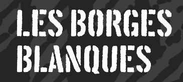 Trepa (Josep Patau). Inspired by commercial signs and the 1960s French art movement Graphie Latine. Trepa (Josep Patau). Inspired by commercial signs and the 1960s French art movement Graphie Latine.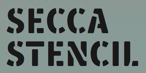 Secca Stencil (Andreas Seidel). Secca Stencil (Andreas Seidel).
| Multilingual typefaces: - Croogla (Sergiy Tkachenko). An informal rounded sans with an almost unicase Latin part that harmonizes perfectly with its Cyrillic companion.
- Koppla (Minjoo Ham). Her graduation typeface at KABK, Koppla covers Latin and Hangul in multiple styles.
 Molsaq Pro (Ali Almasri). An Arabic / Latin rounded poster typeface family with perfect interplay between the different scripts. Molsaq Pro (Ali Almasri). An Arabic / Latin rounded poster typeface family with perfect interplay between the different scripts.  Noort (Juan Bruce). For Latin, Greek and Bengali. Another superb effort by the graduates of the University of Reading. Noort (Juan Bruce). For Latin, Greek and Bengali. Another superb effort by the graduates of the University of Reading.  Lida for Perso-Arabic and Latin. By Borna Izadpanah at the University of Reading. Lida for Perso-Arabic and Latin. By Borna Izadpanah at the University of Reading. - Levnam (Manvel Shmavonyan, Paratype). A flared terminal sans of wide proportions for setting small text. Covers Latin and Cyrillic.
 Kazimir (CSTM, Ilya Ruderman and Yury Ostromentsky). A didone family for Latin and Cyrillic, designed for short texts and headlines. Kazimir (CSTM, Ilya Ruderman and Yury Ostromentsky). A didone family for Latin and Cyrillic, designed for short texts and headlines. - HS Headline by Gunnlaugur Briem and Hasan Abu Afash. This fat calligraphic didone display typeface covers Latin (Briem's contribution) and Arabic (by Afash, based on the simple lines of Naskh calligraphy).
 Finos (Anastasia Dimitriadi and Iordanis Passas). A gorgeous typeface family based on Greek retro cinema. Finos (Anastasia Dimitriadi and Iordanis Passas). A gorgeous typeface family based on Greek retro cinema.
| Technical drawing:  R&C (Jean Boyault). R&C (Jean Boyault).
| Wonderful, adorable, refreshing typefaces:  Marquesa (Mario Mimoso). Marquesa (Mario Mimoso).  Stuffed Crust (Drew Melton). Described by Drew as follows: Big and greasy never looked so good. Stuffed Crust (Drew Melton). Described by Drew as follows: Big and greasy never looked so good.
| [Google]
[More] ⦿
|
The best commercial typefaces of 2016: Luc's selection
|
 This is my own selection of the best commercial typefaces published in 2016, grouped by category. The list will grow until December 31, 2016.
 Text typefaces: - Scientia (Natalia Vasilyeva, Paratype). A neutral text typeface for scientific publications.
 Sole Serif (Luciano Perondi, for CAST). Designed for newspapers and books. Sole Serif (Luciano Perondi, for CAST). Designed for newspapers and books.  Classica Pro (Bernd Moellenstadt and Volker Schnebel, URW). Classica Pro (Bernd Moellenstadt and Volker Schnebel, URW).  Bara (Nikola Djurek). Bara (Nikola Djurek).  Kopius (Sybille Hagmann). Kopius (Sybille Hagmann).  Pensum Pro (Nils Thomsen). Pensum Pro (Nils Thomsen).  PSFournier (Stéphane Elbaz, Typofonderie). A revival of Pierre Simon Fournier's French transitional typefaces. PSFournier (Stéphane Elbaz, Typofonderie). A revival of Pierre Simon Fournier's French transitional typefaces.  Talia (Robert Jarzec, Poland). Talia (Robert Jarzec, Poland).  William (Maria Doreuli, Typotheque). A clean and logical contemporary take on Caslon, in Text, Subhead and Display subfamilies. William (Maria Doreuli, Typotheque). A clean and logical contemporary take on Caslon, in Text, Subhead and Display subfamilies.  PF DIN Serif (Panos Vassiliou). Maybe not natively a text typeface, but the idea is of a serif companion of DIN is worth exploring. PF DIN Serif (Panos Vassiliou). Maybe not natively a text typeface, but the idea is of a serif companion of DIN is worth exploring. - Logica (Dino dos Santos).
 Marbach (Dieter Hofrichter). Marbach (Dieter Hofrichter).
| Sans typefaces:  Apax (François Rappo). Apax (François Rappo).  Monrad Grotesk (Jan-Christian Bruun). Monrad Grotesk (Jan-Christian Bruun).  Aspen (Ludwig Uebele). Aspen (Ludwig Uebele).  Zeitung Pro (Underware). Perfectionism, optical sizes, macro and micro type in one, variable fonts, the works. Zeitung Pro (Underware). Perfectionism, optical sizes, macro and micro type in one, variable fonts, the works.  Bw Modelica Expanded (Alberto Romanos). Bw Modelica Expanded (Alberto Romanos).  Soin Sans Neue (Stawix Ruecha). Soin Sans Neue (Stawix Ruecha).  Retina and Retina MicroPlus (Tobias Frere-Jones). The Retina typeface goes back to 1999-2000 at Hoefler Frere Jones, but this 2016 edition is expanded. Retina and Retina MicroPlus (Tobias Frere-Jones). The Retina typeface goes back to 1999-2000 at Hoefler Frere Jones, but this 2016 edition is expanded.  Alpinist (Jeremie Hornus and Alisa Nowak). Alpinist (Jeremie Hornus and Alisa Nowak).  Brother 1816 (Ignacio Corbo and Fernando Diaz, TipoType). Brother 1816 (Ignacio Corbo and Fernando Diaz, TipoType). - Core Sans CR (Hyun-Seung Lee, Dae-Hoon Hahm and Dong-Kwan Kim).
 Enigma Grotesque (Mateusz Machalski). This was renamed Migrena Grotesque after a short time, probably under pressure from Jeremy Tankard's lawyers (as Tankard created a typeface called Enigma in 2004). Enigma Grotesque (Mateusz Machalski). This was renamed Migrena Grotesque after a short time, probably under pressure from Jeremy Tankard's lawyers (as Tankard created a typeface called Enigma in 2004).  Muller Narrow (Radomir Tinkov, Fontfabric). Muller Narrow (Radomir Tinkov, Fontfabric).  MTT Roma (Mattia Bonanomi). MTT Roma (Mattia Bonanomi). 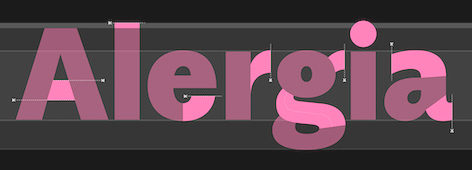 Alergia Grotesk (Mateusz Machalski). A take on the classical geometric grotesque in 60 styles/weights, for Latin, Greek and Cyrillic. Alergia Grotesk (Mateusz Machalski). A take on the classical geometric grotesque in 60 styles/weights, for Latin, Greek and Cyrillic.  Classic Grotesque (Rod McDonald, Monotype): 54 styles, eight years of work, inspired by Monotype Grotesque, Ideal Grotesk and Venus, and served in a crystal goblet. Classic Grotesque (Rod McDonald, Monotype): 54 styles, eight years of work, inspired by Monotype Grotesque, Ideal Grotesk and Venus, and served in a crystal goblet.  RNS Sanz (Yorlmar Campos). Conceived for wayfinding and information design. RNS Sanz (Yorlmar Campos). Conceived for wayfinding and information design.  Noir (Milos Mitrovic). An early 20th century-style geometric sans family. Noir (Milos Mitrovic). An early 20th century-style geometric sans family.  Uni Grotesk (Peter Bilak, Nikola Djurek and Hrvoje Zivcic at Typotheque). A revival and extension of Universal Grotesk (1951, Grafotechna). Uni Grotesk (Peter Bilak, Nikola Djurek and Hrvoje Zivcic at Typotheque). A revival and extension of Universal Grotesk (1951, Grafotechna).  Stratos (Yoann Minet and Emmanuel Labard at Production Type). Geometric grotesque with especially attractive heavier weights. Stratos (Yoann Minet and Emmanuel Labard at Production Type). Geometric grotesque with especially attractive heavier weights. | Rounded sans display typefaces: - Gasket (Cyrus Highsmith).
- Yuzu (Elliott Amblard, Indian Type Foundry).
- Globa (Pedro Gonzalez Jorquera, Latinotype).
| Type systems: 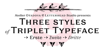 Triplet (Yana Kutyina and Andrey Belonogov in cooperation with Valery Golyzhenkov) in Erste, Zweite and Dritte styles, for Latin and Cyrillic. Triplet (Yana Kutyina and Andrey Belonogov in cooperation with Valery Golyzhenkov) in Erste, Zweite and Dritte styles, for Latin and Cyrillic. 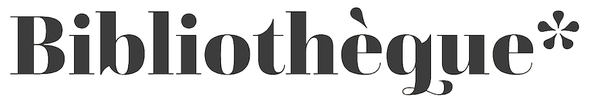 Questa (Maarten Majoor and Jos Buivenga). This type system was started in 2010, and finished in 2014. With Regular, Slab, Sans and Grande subfamilies, this type system keeps on giving and growing through 2016. Questa (Maarten Majoor and Jos Buivenga). This type system was started in 2010, and finished in 2014. With Regular, Slab, Sans and Grande subfamilies, this type system keeps on giving and growing through 2016. 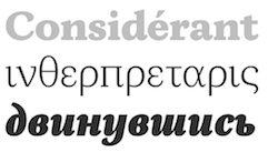 Tupper Serif (Mateusz Machalski and RR Donnelley). This superfamily covers Latin, Greek, Hebrew and Arabic. Tupper Serif (Mateusz Machalski and RR Donnelley). This superfamily covers Latin, Greek, Hebrew and Arabic. - 90 Minutes (Tal Leming). A 37-style type system exclusively licensed to U.S. Soccer, consisting of Display, Kit and Text subfamilies, and largely influenced by Morris Fuller Benton.
| Art deco typefaces: 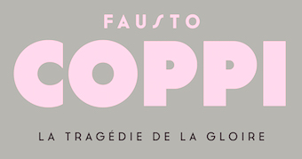 Cassannet Plus (Atipo). An expansion of Cassannet (2012), which is based on the art deco poster lettering used by Cassandre in the 1920s. Cassannet Plus (Atipo). An expansion of Cassannet (2012), which is based on the art deco poster lettering used by Cassandre in the 1920s.  Inbox (Alisa Nowak, Indian Type Foundry). Inbox (Alisa Nowak, Indian Type Foundry).  Barbecue (Roman Shchyukin for Gaslight; the typeface was first called BarBQ). Barbecue (Roman Shchyukin for Gaslight; the typeface was first called BarBQ).  Eileen (Julie Soudanne, Indian Type Foundry). Eileen (Julie Soudanne, Indian Type Foundry).
| Hipster typefaces:  Bobo (Jean-Baptiste Morizot). Bobo (Jean-Baptiste Morizot).
| | Script typefaces: | | Brush typefaces: | | Sketched, Layered or Poster typefaces: | | Blackletter typefaces: | Dingbats and ornaments:  Roijer Ornaments and Roijer Dingbats (Pedro Gonzalez Jorquera, aka Peggo). Roijer Ornaments and Roijer Dingbats (Pedro Gonzalez Jorquera, aka Peggo).  Ciao Bella (Charles Gibbons and Cindy Kinash at Oddsorts). These floral ornaments can be set in multicolors and stacked by making clever use of kerning. Ciao Bella (Charles Gibbons and Cindy Kinash at Oddsorts). These floral ornaments can be set in multicolors and stacked by making clever use of kerning.  Kinfolk Pro (Hanneke Classen). Check out the useful set of hand-drawn arrows, and the way in which they correlate with the brushed mother font. Kinfolk Pro (Hanneke Classen). Check out the useful set of hand-drawn arrows, and the way in which they correlate with the brushed mother font.
| | Garalde typefaces: | Display typefaces:  Kaligari (Franziska Weitgruber). A German expressionist typeface family. Kaligari (Franziska Weitgruber). A German expressionist typeface family.  Juline (Hajime Kawakami, URW). Juline (Hajime Kawakami, URW).  Becky (Magdalena Arasanz). Becky (Magdalena Arasanz).  Gothiks Compressed (Daniel Sabino). Gothiks Compressed (Daniel Sabino).  Gastromond (James Todd). Gastromond (James Todd). - Breul Grotesk (Chatnarong Jingsuphatada). A 32-style Bauhaus-inspired geometric typeface with sharp (A) and rounded (B) subfamilies.
- Amphibia (Frantisek Storm).
 Krana Fat (Schick Toikka). Krana Fat (Schick Toikka).  Title (Julie Soudanne and Jérémie Hornus). Designed for movie credits. Title (Julie Soudanne and Jérémie Hornus). Designed for movie credits.  Canilari (Patricio Truenos). Canilari (Patricio Truenos).  Cortese (David Kerkhoff). A poster typefaces with many interlocking ligatures. Cortese (David Kerkhoff). A poster typefaces with many interlocking ligatures.  Ciutadella Display (Eduardo Manso). Ciutadella Display (Eduardo Manso).  Oposta (Pedro Leal). Oposta (Pedro Leal).  Chercan (2016, Francisco Galvez, Pampa Type). Chercan (2016, Francisco Galvez, Pampa Type). - Schizotype Grotesk (Dave Rowland).
 Brim Combined (Jamie Clarke). Brim Combined (Jamie Clarke). - Bumpo (Deepak Dogra). An exercise in plumpness.
 ATC Harris (Quan Ika, Avondale Type Company). A nifty monospaced programming font. ATC Harris (Quan Ika, Avondale Type Company). A nifty monospaced programming font.  Triade (Etienne Aubert Bonn). A heavy titling or display typeface with tons of personality. Triade (Etienne Aubert Bonn). A heavy titling or display typeface with tons of personality.
| Slab serif typefaces:  Bombarda (Alexander Lubovenko, Paratype). An ultra-black slab for Latin and Cyrillic. Bombarda (Alexander Lubovenko, Paratype). An ultra-black slab for Latin and Cyrillic.  Humble (Aylin Karaman). Humble (Aylin Karaman).  Sagona (René Bieder). Sagona (René Bieder).  Gimlet (David Jonathan Ross). Inspired by Georg Trump's Schadow (1938) and turned into a 112-style Opentype family. Gimlet (David Jonathan Ross). Inspired by Georg Trump's Schadow (1938) and turned into a 112-style Opentype family. - Davis (Patrick Griffin, Canada Type).
 Knile (Maria Ramos, Atipo). Knile (Maria Ramos, Atipo).
| Copperplate:  Bluebell (Emil Bertell, Fenotype). Bluebell (Emil Bertell, Fenotype).  Spencerio (Jérémie Hornus and Julie Soudanne, Indian Type Foundry). Not quite copperplate, but this Spencerian calligraphic script comes close. Spencerio (Jérémie Hornus and Julie Soudanne, Indian Type Foundry). Not quite copperplate, but this Spencerian calligraphic script comes close.
| Wood type revivals:  MFC Rodizio (Brian J. Bonislawsky and Jim Lyles). MFC Rodizio (Brian J. Bonislawsky and Jim Lyles).  Gothiks (Daniel Sabino, Blackletra). Not exactly a wood type revival, but these condensed variable width typefaces were influenced are undeniably linked to the early gothic wood types in style. Gothiks (Daniel Sabino, Blackletra). Not exactly a wood type revival, but these condensed variable width typefaces were influenced are undeniably linked to the early gothic wood types in style.
| | Letterpress emulation: | Didone typefaces: 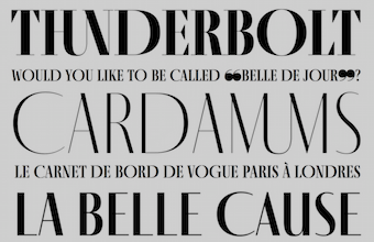 Fino, Fino Sans and Fino Stencil by Ermin Mededovic at Type Together. A tall and stately caps-only didone family. Fino, Fino Sans and Fino Stencil by Ermin Mededovic at Type Together. A tall and stately caps-only didone family. - Ambroise Pro (2016, Jean-François Porchez). A revision and extension of the 2001 version.
 Pergamon (Coen Hofmann, URW++). A revival of Alfons Scheider's Pergamon Antiqua (1937, at Ludwig Wagner). Pergamon (Coen Hofmann, URW++). A revival of Alfons Scheider's Pergamon Antiqua (1937, at Ludwig Wagner).  Trianon Normande (Loic Sander, with the aid of Sandra Carrera, Roxane Gataud and Yoann Minet at Production Type). Trianon Normande (Loic Sander, with the aid of Sandra Carrera, Roxane Gataud and Yoann Minet at Production Type). - Leducation (David Engelby).
 Haboro (Jeremy Dooley). A large didone family with wedge serifs and without ball terminals. Haboro (Jeremy Dooley). A large didone family with wedge serifs and without ball terminals.
| Fashion mag typefaces: 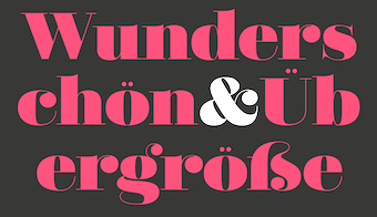 Didonesque (Paulo Goode). Didonesque (Paulo Goode). 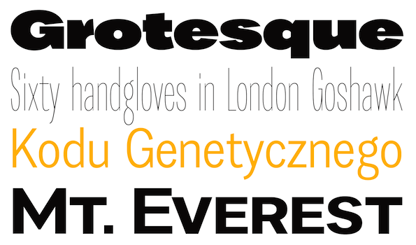 Favela (Mateusz Machalski). Favela (Mateusz Machalski).  Le Jeune (2016, Greg Gazdowicz, Christian Schwartz and Paul Barnes). Done for a revamp of Vanity Fair. Le Jeune (2016, Greg Gazdowicz, Christian Schwartz and Paul Barnes). Done for a revamp of Vanity Fair.  FS Siena (Krista Radoeva and Jason Smith). FS Siena (Krista Radoeva and Jason Smith).  Camila (Paula Nazal Selaive, Latinotype). Didone fashion magic. Camila (Paula Nazal Selaive, Latinotype). Didone fashion magic.  Prangs (Alejandro Paul, Sudtipos). A swashy perfectly rendered italic fashion didone. Prangs (Alejandro Paul, Sudtipos). A swashy perfectly rendered italic fashion didone.
| Revivals:  Baroque Pearl (Ralph M. Unger). A revival of Peter A. Demeter's Fournier Geperlt (1922, Schriftguss). Baroque Pearl (Ralph M. Unger). A revival of Peter A. Demeter's Fournier Geperlt (1922, Schriftguss).  Schmalfette CP (Jason Walcott and Rob King). A revival of Walter Haettenschweiler's original from 1954. Schmalfette CP (Jason Walcott and Rob King). A revival of Walter Haettenschweiler's original from 1954. Irena (David Kerkhoff). A tribute to Vojtech Preissig's cubist / expressionist style. Irena (David Kerkhoff). A tribute to Vojtech Preissig's cubist / expressionist style. - Monument Grotesk (Robin Mientjes). This stone carving typeface revives architectural lettering by Piet Zwart.
 LTC Village (Paul D. Hunt, P22). Developed in 2005 and released in 2016, it is based on Goudy's warm Venetian typeface, Village. LTC Village (Paul D. Hunt, P22). Developed in 2005 and released in 2016, it is based on Goudy's warm Venetian typeface, Village.
| Stencil typefaces:  Acherus Militant (Horizon Type). Acherus Militant (Horizon Type).  Armatura (Sergey Godovalov). Armatura (Sergey Godovalov).  Paradise Sans Stencil (Teo Tuominen). Paradise Sans Stencil (Teo Tuominen).  Milka. By Ani Petrova, Botio Nikoltchev, Adam Twardoch and Andreas Eigendorf, based on a 1979 original by Milka Peikova. Milka. By Ani Petrova, Botio Nikoltchev, Adam Twardoch and Andreas Eigendorf, based on a 1979 original by Milka Peikova.  Popsky (Igor Petrovic). A popart font described as constructivism wearing sunglasses. Popsky (Igor Petrovic). A popart font described as constructivism wearing sunglasses.  Clerk (Kasper Pyndt). Clerk (Kasper Pyndt).
| Multilingual typefaces: - GT Eesti (Reto Moser, Grillitype). GT Eesti (Latin & Cyrillic) is a free-spirited interpretation of the Soviet geometric sans serif Zhurnalnaya Roublennaya, first released in 1947 and designed by Anatoly Shchukin.
- Bustani (Kamal Mansour and Patrick Giasson, Monotype). A Naskh style adaptive font for Arabic, Farsi and Urdu.
| | Wonderful, adorable, refreshing typefaces: | [Google]
[More] ⦿
|
The best free typefaces of 2015: Luc's selection
|
 This is my own selection of the best free typefaces published in 2015, grouped by category.
 Text typefaces: - Clara (Séamas Ó Brógáin). This typeface family also covers Greek and Cyrillic.
 Inknut Antiqua (Claus Eggers-Sørensen). An angular text typeface that will survive earthquakes and tsunamis. Inknut Antiqua (Claus Eggers-Sørensen). An angular text typeface that will survive earthquakes and tsunamis.  Caslon OS (Alfredo Marco Pradil). A revival typeface for those who can't afford Adobe Caslon. Caslon OS (Alfredo Marco Pradil). A revival typeface for those who can't afford Adobe Caslon.
| | Sans typefaces: | | Type systems: | | Art deco typefaces: | | Hipster typefaces: | | Script typefaces: | Sketched, Layered or Poster typefaces:  Pelmeshka (Cyril Mikhailov). A handcrafted fat didone for Latin and Cyrillic. Pelmeshka (Cyril Mikhailov). A handcrafted fat didone for Latin and Cyrillic.  HB Sketch (Mehmet Abaci, Studio Typo). A gorgeous sketched didone. HB Sketch (Mehmet Abaci, Studio Typo). A gorgeous sketched didone. - Flowers Power Nega (imagex). A textured ornamental caps typeface by the prolific free font designer simply known as imagex. Shall we ever know his or her identity?
 Monstre Display (Lev Berry). A stackable system based on a model from 1882. Monstre Display (Lev Berry). A stackable system based on a model from 1882. - Ahoj. A free all caps layered typeface family made in 2015 by the crew at Type Together, namely, Veronika Burian, Jose Scaglione, Sonja Stange, Elena Veguillas and Irene Vlachou. Ahoj is a bold display sans serif inspired by images of old signs and lettering found in different cities. The typeface family was produced in a four-day workshop in Prague. Voluntary contributions will be used to help the victims of the 2015 quake in Nepal.
 Plump (Steven Whitfield). Plump (Steven Whitfield).  ALT Smaq (Andreas Leonidou). Eight beveled styles for Latin and Greek. Download link. ALT Smaq (Andreas Leonidou). Eight beveled styles for Latin and Greek. Download link.  Chubby (Anders Kristoffersen). Download link. Chubby (Anders Kristoffersen). Download link.
| | Blackletter typefaces: | Dingbats and ornaments:  Asap Symbol (Tania Quindos, Marcela Romero, Elena Gonzalez Miranda and Pablo Cosgaya at Omnibus Type). Asap Symbol (Tania Quindos, Marcela Romero, Elena Gonzalez Miranda and Pablo Cosgaya at Omnibus Type).
| Garalde typefaces:  Cormorant (Christian Thalmann, Open Font Library). See also CTAN. Cormorant (Christian Thalmann, Open Font Library). See also CTAN.
| Display typefaces:  rBH (Morten Rostgaard Olsen, Ole Søndergaard and Henrik Birkvig). A typeface family custom designed for the identity of the city of Copenhagen. rBH (Morten Rostgaard Olsen, Ole Søndergaard and Henrik Birkvig). A typeface family custom designed for the identity of the city of Copenhagen.  Infini (Sandrine Nugue). A lapidary typeface family, winner of a contest for CNAP in France in 2014. Infini (Sandrine Nugue). A lapidary typeface family, winner of a contest for CNAP in France in 2014.  Blackentina (Sergiy Tkachenko). Blackentina (Sergiy Tkachenko).  Red Velvetica Shadows Bold (Jeff Bensch). Red Velvetica Shadows Bold (Jeff Bensch). 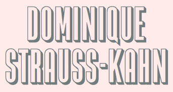 Zacatecas (Fernando Haro). For that special condensed title. Zacatecas (Fernando Haro). For that special condensed title. 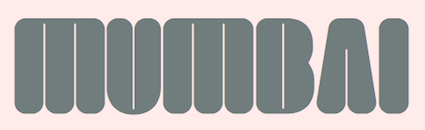 Kayfabe (Steven Waring). Download site. Kayfabe (Steven Waring). Download site. - Kanji PA (Pedro Azedo). A bilined logo font inspired by kanji.
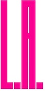 Pxl Supercondensed (Alberto Malossi). In Wim Crouwel's piano key style. Pxl Supercondensed (Alberto Malossi). In Wim Crouwel's piano key style. 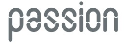 Slot (by Adrien Coquet and Hugo Dath). Slot (by Adrien Coquet and Hugo Dath).  George A Rebours and Georges Labeur Corps 8 (Ivan Louette). An impeccable reproduction of Georges Auriol's first typeface, a precursor of the iconic art nouveau typeface Auriol. George A Rebours and Georges Labeur Corps 8 (Ivan Louette). An impeccable reproduction of Georges Auriol's first typeface, a precursor of the iconic art nouveau typeface Auriol.
| Slab serif typefaces:  Ansley Display (Kady Jesko). Ansley Display (Kady Jesko).  Bariol Serif (Atipo). This wonderful rounded typeface family accompanies the sans family Bariol (2012) and is specifically designed for screen, mobile applications and the web. Two weights are tweetware, and the others are donationware. Bariol Serif (Atipo). This wonderful rounded typeface family accompanies the sans family Bariol (2012) and is specifically designed for screen, mobile applications and the web. Two weights are tweetware, and the others are donationware.
| | Copperplate: | | Wood type revivals: | Letterpress emulation:  Bernier (Ryan Pyae). Bernier (Ryan Pyae). - Cocogoose Letterpress (Cosimo Lorenzo Pancini at Zetafonts). Great design---too bad the free version is crippled (no numerals).
| Didone typefaces:  Libre Bodoni (Pablo Impallari and Rodrigo Fuenzalida). Based on Morris Fuller Benton's Bodoni types, this 4-style family was developed in 2014 and published in 2015 by Open Font Library. Libre Bodoni (Pablo Impallari and Rodrigo Fuenzalida). Based on Morris Fuller Benton's Bodoni types, this 4-style family was developed in 2014 and published in 2015 by Open Font Library.  Chonburi (Cadson Demak). Covers Latin and Thai. Chonburi (Cadson Demak). Covers Latin and Thai.  Goral (Ofir Shavit). A 12-style Peignotian (sans) and didone (serif) typeface family, which was made with his own software, FontArk. Goral (Ofir Shavit). A 12-style Peignotian (sans) and didone (serif) typeface family, which was made with his own software, FontArk. - Burlesque (Fernando Paravela). In the fat face style, this typeface has great carved out design details.
| | Fashion mag typefaces: | | Stencil typefaces: | Multilingual typefaces:  Catamaran (Pria Ravichandran, Google Fonts). This family covers Latin and Tamil. Catamaran (Pria Ravichandran, Google Fonts). This family covers Latin and Tamil.  Yantramanav (Erin McLaughlin, Google Web Fonts) is a Devanagari typeface family designed to accompany Christian Robertson's Roboto. Yantramanav (Erin McLaughlin, Google Web Fonts) is a Devanagari typeface family designed to accompany Christian Robertson's Roboto. - Shumi (Ivan Shumikhin). A macho octagonal typeface for Latin and Cyrillic.
 Modak (Ek Type; Google Fonts). The chubbiest bubblegumiest Devanagari typeface in existence today. Modak Devanagari was designed by Sarang Kulkarni and Maithili Shingre and Modak Latin by Noopur Datye with support from Girish Dalvi and Pradnya Naik. Modak (Ek Type; Google Fonts). The chubbiest bubblegumiest Devanagari typeface in existence today. Modak Devanagari was designed by Sarang Kulkarni and Maithili Shingre and Modak Latin by Noopur Datye with support from Girish Dalvi and Pradnya Naik.
| Wonderful, adorable, refreshing typefaces:  Iosevka (Belleve Invis). This monospaced programming font for Latin, Greek and Cyrillic is generated by code using the parametric paradigm. A tour de force. Iosevka (Belleve Invis). This monospaced programming font for Latin, Greek and Cyrillic is generated by code using the parametric paradigm. A tour de force.
| [Google]
[More] ⦿
|
The best free typefaces of 2016: Luc's selection
|
 This is my own selection of the best free typefaces published in 2016, grouped by category. The list will grow until December 31, 2016.
 Text typefaces:  HK Venetian (Alfredo Marco Pradil). A revival of Venetian (+Italic) by Morris Fuller Benton, 1911. HK Venetian (Alfredo Marco Pradil). A revival of Venetian (+Italic) by Morris Fuller Benton, 1911. Avila (Cesar Doreste). A forceful text typeface with some didone features and lots of personality. Avila (Cesar Doreste). A forceful text typeface with some didone features and lots of personality.
| Sans typefaces: - LSTK Dayfly (Constantin Demner, Studio Elastik).
 Fuji Sans (Mathieu Desjardins). Fuji Sans (Mathieu Desjardins). - Gilroy (Radomir Tikov). A free weight of a geometric commercial family.
- Libre Franklin (Pablo Impallari and Rodrigo Fuenzalida). A revival of Morris Fuller Benton's 1912 classic, Franklin Gothic. Created in 2015, it was only published in 2016 at Google Fonts.
- Pupa (Gabrielius Mackevicius).
- Mosk (Iulian Maftei).
 Pangram (Mathieu Desjardins). A phenomenal geometric sans family---free for personal use. Pangram (Mathieu Desjardins). A phenomenal geometric sans family---free for personal use.
| Type systems:  Libertinus (Khaled Hosny). A large font family for the math world now maintained by Khaled Hosny. Libertinus (Khaled Hosny). A large font family for the math world now maintained by Khaled Hosny.
| | Art deco typefaces: | | Hipster typefaces: | | Script typefaces: | | Sketched, Layered or Poster typefaces: | Blackletter typefaces: 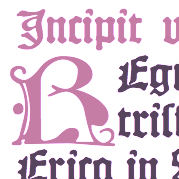 Missaali (Tommi Syrjänen). A textura based on the Missale Aboense from 1488. Complete with all abbreviations and alternate forms for historical accuracy. Missaali (Tommi Syrjänen). A textura based on the Missale Aboense from 1488. Complete with all abbreviations and alternate forms for historical accuracy.  Rakkas (Zeynep Akay, Google Fonts). It also covers Arabic in a style inspired by Ruq'ah lettering on Egyptian movie posters from the 50s and 60s. Rakkas (Zeynep Akay, Google Fonts). It also covers Arabic in a style inspired by Ruq'ah lettering on Egyptian movie posters from the 50s and 60s.
| Dingbats and ornaments:  Open Commons Linz (or OCL) (Manuel Radde and Igor Labudovic). A set of multiline icons and corresponding fonts developed for the city of Linz in Austria. Open Commons Linz (or OCL) (Manuel Radde and Igor Labudovic). A set of multiline icons and corresponding fonts developed for the city of Linz in Austria.
| | Garalde typefaces: | | Display typefaces: | Slab serif typefaces:  Napo (Isabella Ahmadzadeh, Zetafonts). Well, this is only partly free. Napo (Isabella Ahmadzadeh, Zetafonts). Well, this is only partly free.
| | Copperplate: | Programming Fonts:  Go and Go Mono (Kris Holmes and Charles Bigelow). Go and Go Mono (Kris Holmes and Charles Bigelow).
| | Wood type revivals: | | Letterpress emulation: | | Didone typefaces: | | Fashion mag typefaces: | | Stencil typefaces: | Multilingual typefaces:  Ossem (Kiril Semkov and Typedepot). Ossem (Kiril Semkov and Typedepot).  Lalezar (Borna Izadpanah). A Farsi / Latin typeface modeled after the lettering of old Farsi / Hollywood movies. Lalezar (Borna Izadpanah). A Farsi / Latin typeface modeled after the lettering of old Farsi / Hollywood movies. - Kawkab Mono (Abdullah Arif).
 Phenomena (Plamen Motev, Fontfabric). Covering Latin and Cyrillic. Phenomena (Plamen Motev, Fontfabric). Covering Latin and Cyrillic.  Diab Orient (Diab Jaser). For Arabic and 31 other languages, in 8 weights, and 24,000+ glyphs in all. Diab Orient (Diab Jaser). For Arabic and 31 other languages, in 8 weights, and 24,000+ glyphs in all.
| | Wonderful, adorable, refreshing typefaces: | [Google]
[More] ⦿
|
The best typefaces of 2013: Luc's selection
|
 This is my own selection of the best commercial and non-commercial typefaces published in 2013, grouped by category.
 Text typefaces: - Aria Text (Rui Abreu, R-Type). A magazine or newspaper type in three optical sizes of six styles each.
 Essay (Stefan Ellmer, Type Together). Still under development, I can't resist adding this very readable text font to the best-of-2013 list. Essay (Stefan Ellmer, Type Together). Still under development, I can't resist adding this very readable text font to the best-of-2013 list.  Louize (Matthieu Cortat). Six styles, about 6000 glyphs in all. This is a major revival of the Elzevirian style Augustaux type by Louis Perrin, 1846-1855. A slightly flared version is called Louize Display. Louize (Matthieu Cortat). Six styles, about 6000 glyphs in all. This is a major revival of the Elzevirian style Augustaux type by Louis Perrin, 1846-1855. A slightly flared version is called Louize Display. - Desire (Charles Borges de Oliveira). A good old condensed typeface for book covers, editorial work, packaging, advertising, branding and more.
- Quars Black, a weight of Quars by Pilar Cano and Ferran Milan, Letterjuice.
- Urge Text (Dave Rowland).
- Damien, the graduation typeface family of Lukas Schneider at KABK in Den Haag.
 Richler (Nick Shinn). Originally designed in 2001 to commemorate Mordecai Richler, it was released to the public in 2013. Richler (Nick Shinn). Originally designed in 2001 to commemorate Mordecai Richler, it was released to the public in 2013. - FF Dora by Slavka Paulikova.
- Karol (Daniel Sabino, Type O Tones).
 Mauritius (Patrick Griffin and Kevin King, Canada Type). A revival of Georg Trump's last typeface, the transitional Mauritius (or: Barock Antiqua; 1967, Weber). Mauritius (Patrick Griffin and Kevin King, Canada Type). A revival of Georg Trump's last typeface, the transitional Mauritius (or: Barock Antiqua; 1967, Weber). - Bridone (Josep Patau Bellart). This is a didone typeface family that takes elements from Victorian British slab typefaces to add a dash of old charm and sturdiness.
| Sans typefaces: - PF Square Sans Condensed Pro (Panos Vassiliou, Parachute).
 Canaro (Rene Bieder). Large counters, no spurs, simplicity and under-the-radar charm, ideal for information design. Canaro (Rene Bieder). Large counters, no spurs, simplicity and under-the-radar charm, ideal for information design.  Clear Sans (Neil Summerour). Unclassifiable, semi-geometric, appealing. A good choice for web use. Clear Sans (Neil Summerour). Unclassifiable, semi-geometric, appealing. A good choice for web use. - Divenire (by FF3300 and Molotro Type Design). This typeface was commissioned for the identity of the Italian Democratic Party.
 Sensato (Jasper De Waard, Bureau Roffa). A humanist almost flared sans family. A few days after its publication, Sensato had to be renamed---the new name is Proza. Sensato (Jasper De Waard, Bureau Roffa). A humanist almost flared sans family. A few days after its publication, Sensato had to be renamed---the new name is Proza.  MTT Milano (Mattia Bonanomi). Inspired by the Milanese typographic heritage and the Futurist movement behind it. MTT Milano (Mattia Bonanomi). Inspired by the Milanese typographic heritage and the Futurist movement behind it. - FF Mark (by Hannes von Döhren, Christoph Koeberlin and the FontFont team).
- Equip (Dieter Hofrichter) and Equip Condensed. A geometric sans in two families of 16 styles each.
- Mandag-Fredag (Maximilian Huber; buy it at Ten Dollar Fonts).
- Freight Neo Pro (Joshua Darden, Garage fonts).
 Westeinde (by Adam Katyi). This geometric sans is Adam Katyi's graduation typeface at the KABK in Den Haag. Westeinde (by Adam Katyi). This geometric sans is Adam Katyi's graduation typeface at the KABK in Den Haag. - Brisbane: a wayfinding sans created by Troy Leinster for his graduation project at KABK.
 Gentona (2013, Rene Bieder) is a neutral neo-grotesque sans that has 18 styles/weights. Gentona (2013, Rene Bieder) is a neutral neo-grotesque sans that has 18 styles/weights. - Niveau Grotesk (Hannes von Döhren).
 Bicyclette (Nikola Kostic). A slightly rounded sans with small x-height and elegant proportions. Bicyclette (Nikola Kostic). A slightly rounded sans with small x-height and elegant proportions. - Tenso by Jos Buivanga. A lively humanist sans family.
- Core Sans NR (Hyun-Seung Lee, Dae-Hoon Hahm, Min-Joo Ham). This large soft-edged typeface family has a few oddities like very short descenders but should be useful in a variety of situations.
- Core Sans G (Hyun-Seung Lee, Dae-Hoon Hahm, Min-Joo Ham). The G sans for geometric. This is my favorite typeface family from S-Core.
 Mettro Pro (Olivier Gourvat) is an elliptical style sans family. The family was renamed Metronic Pro after a few weeks. Mettro Pro (Olivier Gourvat) is an elliptical style sans family. The family was renamed Metronic Pro after a few weeks. - Rams (Ramiz Guseynov).
 Azo Sans (Rui Abreu, R Type) and Azo Sans Uber, its heavy headline partner. Azo Sans (Rui Abreu, R Type) and Azo Sans Uber, its heavy headline partner. - Estragon (Johannes Steil, Stabenfonts). This humanist sans has Venetian touches and small uppercase characters for use in languages such as German.
- Acronym (Michael Jarboe, Reserves).
 Brandon Text (Hannes von Döhren). Brandon Text (Hannes von Döhren). | Type system:  Duplicate (Sans, Slab, Ionic) (Christian Schwartz and Miguel Reyes, Commercial Type). Duplicate (Sans, Slab, Ionic) (Christian Schwartz and Miguel Reyes, Commercial Type).  Audree (Typonine's Nikola Djurek and Marko Hrastovec): a parametrized tour de force with hundreds of type styles. Audree (Typonine's Nikola Djurek and Marko Hrastovec): a parametrized tour de force with hundreds of type styles.  Hermecito (Ari Rafaeli, AR Types) has 46 styles including phonetic, mathematical, Cyrillic, Vietnamese and Greek subsets geared towards readability in small print. Hermecito (Ari Rafaeli, AR Types) has 46 styles including phonetic, mathematical, Cyrillic, Vietnamese and Greek subsets geared towards readability in small print. - Unimed (Sans, Slab, Serif): a large bespoke type system by Eduilson Coan for the Brazilian health care company, Unimed.
 Herman (Rogier van der Sluis, Geen Bitter). A layered monospaced elliptical signage family. Herman (Rogier van der Sluis, Geen Bitter). A layered monospaced elliptical signage family.
|  Architectural typefaces: Landmark (Jonathan Hoefler and Tobias Frere-Jones, HFJ). Architectural typefaces: Landmark (Jonathan Hoefler and Tobias Frere-Jones, HFJ). | | Garalde: | | Typewriter typefaces: Courier Prime (Alan Dague-Greene). | Display typefaces: - Trump Gothic Pro and Trump Soft Pro (Patrick Griffin). A revival and major optimization of Georg Trump's Signum (1955) and Stanislav Marso's Kamene.
- Elettra (Leonardo Di Lena). A Titling typeface with mostly but not entirely didone features.
 Spoloch (Denis Izotov). Spoloch (Denis Izotov). - Progressiva (a sans family by Ricardo Esteves Gomes).
 VF Didot (Paul Barnes and Christian Schwartz), a custom Didot for Vanity Fair, based on Didot specimen of Molé le Jeune. VF Didot (Paul Barnes and Christian Schwartz), a custom Didot for Vanity Fair, based on Didot specimen of Molé le Jeune. - Streets of London. A lapidary typeface family by Boris Kochan and Robert Strauch of Lazydogs Type Foundry, based on David Kindersley's street signs in the city of London.
- New Paris (Swiss Typefaces). A didone family.
 Domaine Text and Display (by Kris Sowersby, KLIM). A wedge serif family with 48 weights, on a didone body. The Display and Fine subfamilies are pure fashion mag delights. Domaine Text and Display (by Kris Sowersby, KLIM). A wedge serif family with 48 weights, on a didone body. The Display and Fine subfamilies are pure fashion mag delights.  Curtis, the calligraphic and text typeface family by Bernd Volmer. This is his his graduation typeface at KABK, Den Haag. Curtis, the calligraphic and text typeface family by Bernd Volmer. This is his his graduation typeface at KABK, Den Haag.  Core Circus (Hyun-Seung Lee, Dae-Hoon Hahm, Min-Joo Ham). A layered type system. Core Circus (Hyun-Seung Lee, Dae-Hoon Hahm, Min-Joo Ham). A layered type system. - Woodstik (Pedro Lobo, Uppertype). A layered wood / letterpress style typeface family. I will also nominate Pedro Lobo's other layered 3d typeface system, Player.
- Capline (Jeremy Tankard). A bilined and inline all-caps layered typeface system.
- Le Havre Layers (Jeremy Dooley). A layered art deco typeface system.
- Houston (Alexey Frolov).
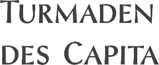 Styla Pro (Joao Henrique Lopes, URW++): a flared romantic sans with a gorgeous small caps weight. Styla Pro (Joao Henrique Lopes, URW++): a flared romantic sans with a gorgeous small caps weight.  Selenic (Paul Dersidan). Selenic (Paul Dersidan).  Taxi (Patrick Seymour). Taxi (Patrick Seymour). - Tushi (Ossi Gustafsson). A brush face.
| | Sketched or poster typefaces: | | Fat typeface didone: | | Technical sans: Herrmann (Antje Driemeyer). | Scripts:  Australis Pro Swash (Francisco Galvez). Australis Pro Swash (Francisco Galvez). - XXII Yonia (Doubletwo Studios). A yummy signage script.
- Tulipan (Felipe Calderon).
 Al Fresco (Laura Worthington). Al Fresco (Laura Worthington). - Ameglia (Carine de Wandeleer, Eurotypo).
 Odesta (Ondrej Job, URTD). Odesta (Ondrej Job, URTD).  Mercy (Eduardo Recife). A set of Spencerian scripts and ornaments. Mercy (Eduardo Recife). A set of Spencerian scripts and ornaments. - Chameleon (Hanneke Classen). A 16-style family of script typefaces with the possibility of layering.
- Caligo (Aron Jancso, Die Gestalten). A calligraphic script with flared serifs.
- Asterism (Dathan Boardman and Molly Jacques Erickson).
 Erotica (by Maximiliano Sproviero). A copperplate calligraphic script of extreme contrast and award winner at TDC 2013. Erotica (by Maximiliano Sproviero). A copperplate calligraphic script of extreme contrast and award winner at TDC 2013. - String (Maximiliano Sproviero): a hairline Spencerian script.
 Ondise (Jessica McCarty, Magpie Paper Works). Ondise (Jessica McCarty, Magpie Paper Works).  Cantoni Pro (Debi Sementelli). Cantoni Pro (Debi Sementelli). - Ignorance (Michael Parson).
 Zulia (by Joluvian and Alejandro Paul). A gorgeous brushy packaging script. Zulia (by Joluvian and Alejandro Paul). A gorgeous brushy packaging script. - Lust Script (Neil Summerour). A high-contrast curvy fashion script.
 Aparo (Pedro Leal and/or Dino dos Santos, DS Type). Calligraphy, flair and penmanship, all in one. Aparo (Pedro Leal and/or Dino dos Santos, DS Type). Calligraphy, flair and penmanship, all in one. - Cal Cursive Roman (Lazar Dimitrijevic). A pure calligraphic cursive script.
 Harlowe (Laura Worthington). A rough-edged quirky script, later renamed to Harlean. Harlowe (Laura Worthington). A rough-edged quirky script, later renamed to Harlean. - Voyage (Emil Karl Bertell). A vintage script.
- Medusa (Ramiro Espinoza, Re-Type).
 Bellissima (Alejandro Paul, Sudtipos). Bellissima (Alejandro Paul, Sudtipos). - Southern Aire (Mans Grebäck).
|  Dingbats: Wayfinding Sans Symbols (Andreas Wohlleben, FDI). Dingbats: Wayfinding Sans Symbols (Andreas Wohlleben, FDI). | | Fashion mag typefaces: | | Slab Serif: | | Art Deco: | Copperplate:  Niveau Serif (Hannes von Döhren). Niveau Serif (Hannes von Döhren). | | Multilingual typefaces: | | Blackletter: | | Wood type revivals: | [Google]
[More] ⦿
|
The best typefaces of 2014: Luc's selection
|
 This is my own selection of the best commercial and non-commercial typefaces published in 2014, grouped by category.
 Text typefaces:  Amster Pro (Francisco Galvez Pizarro, Pampa type). The original is from 2008. Amster Pro (Francisco Galvez Pizarro, Pampa type). The original is from 2008.  Berenjena (Javier Quintana Godoy). This charming antiqua text typeface from 2007 won a Tipos Latinos award in 2012 but was only published in 2014 by Pampa Type. Berenjena (Javier Quintana Godoy). This charming antiqua text typeface from 2007 won a Tipos Latinos award in 2012 but was only published in 2014 by Pampa Type.  Kaius (Lisa Fischbach). A University of Reading typeface family created for very small text. See also Kaius Pro (2020). Kaius (Lisa Fischbach). A University of Reading typeface family created for very small text. See also Kaius Pro (2020).  Pratt Nova (Nick Shinn). Shinn's 17-style large x-height typeface family strives for visual and semantic opulence, equipping the typographer with a comprehensive array of harmonized fonts, all rigorously drawn, superbly fitted iterations of a single, profoundly original design. Pratt Nova (Nick Shinn). Shinn's 17-style large x-height typeface family strives for visual and semantic opulence, equipping the typographer with a comprehensive array of harmonized fonts, all rigorously drawn, superbly fitted iterations of a single, profoundly original design.  GT Sectra (Dominic Huber, Marc Kappeler and Noel Leu at Grilli Type). Broad coverage, angular design, readable yet elegant, the works. GT Sectra (Dominic Huber, Marc Kappeler and Noel Leu at Grilli Type). Broad coverage, angular design, readable yet elegant, the works.  Milio (Josep Patau Bellart). A ten-style transitional family. Milio (Josep Patau Bellart). A ten-style transitional family.  FF Franziska (Jakob Runge). A multidimensional typeface family based on Runge's 2012 Masters project. FF Franziska (Jakob Runge). A multidimensional typeface family based on Runge's 2012 Masters project.  Big Moore (Matthew Carter, Font Bureau). Based on a 1766 specimen by Isaac Moore. Big Moore (Matthew Carter, Font Bureau). Based on a 1766 specimen by Isaac Moore. - Mengelt Basel Antiqua (Christian Mengelt, Linotype). Based on the Basel types from the 16th century, this typeface family for Latin, Cyrillic and Greek brings classical and relaxing Venetian charm.
 Garibaldi (Henrique Beier, Harbor Type). Angular and based on calligraphic strokes, this is quite powerful and legible. Garibaldi (Henrique Beier, Harbor Type). Angular and based on calligraphic strokes, this is quite powerful and legible.  Tautz (Mariya V. Pigoulevskaya, The Northern Block). Tautz (Mariya V. Pigoulevskaya, The Northern Block).  Essay Text (Stefan Ellmer, TypeTogether). A warm slightly angular and extremely legible book text typeface. Essay Text (Stefan Ellmer, TypeTogether). A warm slightly angular and extremely legible book text typeface.  Epica (Oscar Guerrero, Sumotype). Epica (Oscar Guerrero, Sumotype). - Leidener (Jesus Barrientos). Based on letters used by the Elzevir family in their workshop in Leiden.
 Pesaro (Dieter Hofrichter). Pesaro (Dieter Hofrichter).
| Sans typefaces:  London Luton Airport (Atipo). A wayfinding sans typeface commissioned for London Luton Airport. London Luton Airport (Atipo). A wayfinding sans typeface commissioned for London Luton Airport.  FF Bauer Grotesk (Thomas Ackermann and Felix Bonge). A revival of the Trennert & Sohn metal art deco era sans Friedrich Bauer Grotesk (1933-1934). FF Bauer Grotesk (Thomas Ackermann and Felix Bonge). A revival of the Trennert & Sohn metal art deco era sans Friedrich Bauer Grotesk (1933-1934). - Pembroke (Jeremy Tankard).
 Galano Grotesque Alt (René Bieder) and Galano Classic. An important geometric sans family. Free demos of some styles. Galano Grotesque Alt (René Bieder) and Galano Classic. An important geometric sans family. Free demos of some styles.  Karlsen (Type Union). Minimalist in conception. Karlsen (Type Union). Minimalist in conception.  Naste (Josep Patau). Sixteen styles in a strong-willed purely geometric exercise. Naste (Josep Patau). Sixteen styles in a strong-willed purely geometric exercise. - Dic Sans (Luciano Perondi, CAST). Eurostile-inspired, the Extra Bold and Ultra Black Dic weights are yummy (and expensive).
 Balto (Tal Leming, 2007-2014). An American Gothic family. Balto (Tal Leming, 2007-2014). An American Gothic family. 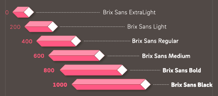 Brix Sans (Hannes von Döhren and Livius Dietzel). A typeface family, wichich together wioth Brix Slab (2011) has carefully engineered glyphs for use in information design and corporate applications. This could possibly become a blockbuster package. Brix Sans (Hannes von Döhren and Livius Dietzel). A typeface family, wichich together wioth Brix Slab (2011) has carefully engineered glyphs for use in information design and corporate applications. This could possibly become a blockbuster package.  Franz Sans (Mona Franz). Franz Sans (Mona Franz).  Certa Sans (Elena Kowalski). Certa Sans (Elena Kowalski). - Klef (Adrian Talbot). A geometric sans family influenced by Avant Garde.
 Orgon (Dieter Hofrichter). Orgon as in organic, and in Argon, the inert gas---uncomplicated, unpretentious, neutral, but still distinctive. Orgon (Dieter Hofrichter). Orgon as in organic, and in Argon, the inert gas---uncomplicated, unpretentious, neutral, but still distinctive.  Lipa Agate (Ermin Mededovic, Type Together). A sans workhorse family for very small print. Lipa Agate (Ermin Mededovic, Type Together). A sans workhorse family for very small print.  Founders Grotesk Mono (Kris Sowersby, KLIM). Founders Grotesk Mono (Kris Sowersby, KLIM).  Glober (Ivan Petrov, Fontfabric). Glober (Ivan Petrov, Fontfabric). - Nokio (Type Union). A geometric rounded minimalist family for mobile devices.
- Como (Ryoichi Tsunekawa). A rounded sans family with large x-height.
- Campton (René Bieder).
 Arquitecta (Miguel Hernandez and Daniel Hernandez, Latinotype). Arquitecta (Miguel Hernandez and Daniel Hernandez, Latinotype). - Museo Sans Display (Jos Buivenga). Great new Hairline and Extra Black weights.
 Bague Sans (Panos Vassiliou). A geometric grotesk. Also take a look at PF Bague Inline Pro and PF Bague Round Pro to get a fuller picture. Bague Sans (Panos Vassiliou). A geometric grotesk. Also take a look at PF Bague Inline Pro and PF Bague Round Pro to get a fuller picture.
| | Type systems: | | Art deco typefaces: | | Hipster typefaces: | | Script typefaces: | | Sketched, Layered or Poster typefaces: | | Blackletter typefaces: | Dingbats and ornaments:  Tepu (Sergio Ramirez Flores, Latinotype). A large set of infographics icons with rounded shapes. Tepu (Sergio Ramirez Flores, Latinotype). A large set of infographics icons with rounded shapes.
| | Garalde typefaces: | Display typefaces:  Orwellian (Shiva Nallaperumal, Lost Type). The Italian genre refitted for 2015. Orwellian (Shiva Nallaperumal, Lost Type). The Italian genre refitted for 2015.  Jeames (Kyle Benson). Jeames (Kyle Benson). - Spot Mono (Lauri Toikka and Florian Schick). Attractively rounded monotype typeface.
- Vezus Serif Texture (Slobodan Jelesijevic).
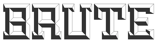 Brute (Kirby Matherne, Ten Dollar Fonts). A layered beveled type system with oomph. Brute (Kirby Matherne, Ten Dollar Fonts). A layered beveled type system with oomph.  Manola (Ira Lensberr). An expressive lapidary typeface family with applications in stonecutting. Manola (Ira Lensberr). An expressive lapidary typeface family with applications in stonecutting. - Getter (Camilo Zamora). A large family influenced by Japanese robots and advertized as Bogotá cyberpunk.
 Attica RSZ (Giuseppe Salerno). A Western typeface inspired by Caslon's Italian and Aldo Novarese's Estro. Attica RSZ (Giuseppe Salerno). A Western typeface inspired by Caslon's Italian and Aldo Novarese's Estro.  Rubik One (Elvire Volk Leonovitch, under art direction of Philipp Hubert and Sebastian Fischer at Hubert and Fischer). A rounded heavyweight sans of attractive proportions. It is a free Google Web Font. Rubik One (Elvire Volk Leonovitch, under art direction of Philipp Hubert and Sebastian Fischer at Hubert and Fischer). A rounded heavyweight sans of attractive proportions. It is a free Google Web Font. - Hedon Display (Dusan Jelesijevic).
- Valter (Nikola Djurek, Typotheque). A variable contrast sans inspired by pointed-pen writing.
 Helsinki XXL (Ludwig Übele). Helsinki XXL Black and Helxinki XXL Thin are free additions to Übele's successful Helsinki typeface family. Helsinki XXL (Ludwig Übele). Helsinki XXL Black and Helxinki XXL Thin are free additions to Übele's successful Helsinki typeface family. - TDL Ruha Hairline and Latin (Tipos das Letras). A didone foundation morphed into a slab serif and wedge serif pair of typefaces.
 Marigny (Tal Leming). This warm roundish display typeface might just as well fit into the text typeface category. Marigny (Tal Leming). This warm roundish display typeface might just as well fit into the text typeface category.  Briller (Nikola Kostic). A striking ultra-wide sans typeface family. Briller (Nikola Kostic). A striking ultra-wide sans typeface family. - UT Amen (Marco Virgillito). In search of the fattest and artsiest poster typeface.
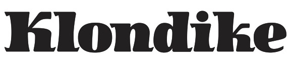 Jack London (Terezija Donlic). A fat and lively poster typeface family based on a revival. Jack London (Terezija Donlic). A fat and lively poster typeface family based on a revival.  Terrorista (Tony de Marco and Bernardo Faria, Just in Type). A masculine sans headline typeface created to honor all those who fought against Brazil's military regime from 1964 until 1985. Terrorista (Tony de Marco and Bernardo Faria, Just in Type). A masculine sans headline typeface created to honor all those who fought against Brazil's military regime from 1964 until 1985.  Lichtspiele (Stefan Huebsch). Retro cinema marquee and lettering typeface family. Lichtspiele (Stefan Huebsch). Retro cinema marquee and lettering typeface family.
| | Slab serif typefaces: | | Copperplate: | Wood type revivals:  HWT Artz (Erik Spiekermann, P22). A true wood type with a digital version added to support the Hamilton Wood Type Museum. HWT Artz (Erik Spiekermann, P22). A true wood type with a digital version added to support the Hamilton Wood Type Museum. - Dobro (Mariana Alen).
| | Letterpress emulation: | Didone typefaces: - Jeles (Slobodan Jelesijevic, Tour de Force). A soft-edged didne typeface family with large x-height.
 Surveyor (Hoefler). A mapmaker and newsprint font family. Surveyor (Hoefler). A mapmaker and newsprint font family.  Lewis (Alexandre Saumier Demers). A graduation typeface family at KABK in Den Haag, this didone family was specially designed for typesetting mathematics and for use with TeX. Lewis (Alexandre Saumier Demers). A graduation typeface family at KABK in Den Haag, this didone family was specially designed for typesetting mathematics and for use with TeX. - Yo Italic series by James Montalbano. One hundred didone italics were added in 2014 to the 100 regular didones from 2010.
 Parmigiano Typographic System (Riccardo Olocco and Jonathan Pierini). Parmigiano Typographic System (Riccardo Olocco and Jonathan Pierini).  Encorpada Essential (Eduilson Wessler Coan). A fat didone that completes the Encorpada font series started in 2011. Encorpada Essential (Eduilson Wessler Coan). A fat didone that completes the Encorpada font series started in 2011. 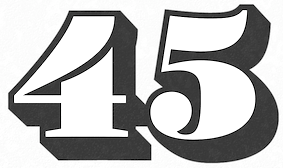 Barkley (Poster and Block) by Björn Gogalla, Letter Edit. Barkley (Poster and Block) by Björn Gogalla, Letter Edit. - Normandie Modern FY (Julien Priez, Fontyou). A wide fat typeface didone.
- Caponi (Christian Schwartz, Paul Barnes, Miguel Reyes). A sturdy didone family in Text, Display and Slab versions that can survive the flagellations of print.
| | Fashion mag typefaces: | | Stencil typefaces: | Multilingual typefaces:  Raylaw (Ryota Doi). A Latin / Greek / Cyrillic Latin typeface family for use in travel magazines. Raylaw (Ryota Doi). A Latin / Greek / Cyrillic Latin typeface family for use in travel magazines. 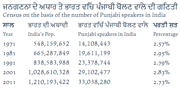 Makar (Leo Phelp). This graduation project at the University of Reading covers Cyrillic, Greek, Latin and Gurmukhi. Makar (Leo Phelp). This graduation project at the University of Reading covers Cyrillic, Greek, Latin and Gurmukhi. -
 Mirna (Teja Smrekar). Her graduation project at the University of Reading covers Latin, Cyrillic, Greek and Khmer. Mirna (Teja Smrekar). Her graduation project at the University of Reading covers Latin, Cyrillic, Greek and Khmer. - Source Han Sans, a new open source Pan-CJK typeface family brought by Adobe and Google for Japanese, Korean, Traditional Chinese, and Simplified Chinese, all in one font. It also includes Latin, Greek, and Cyrillic glyphs from Adobe's Source Sans Pro. Each of the 42 fonts has 65,535 glyphs. This monolinear sans design is not beautiful or artsy---it is a basic and useful workhorse. The Google version is called Noto.
 Journal Sans New (Alexandra Korolkova and Maria Selezeneva, Paratype). A typeface family for Latin and Cyrillic that updates and extends the old Journal Sans (1990s) with charming new Erbar Grotesk-based styles such as an Inline and tall-legged Display. Journal Sans New (Alexandra Korolkova and Maria Selezeneva, Paratype). A typeface family for Latin and Cyrillic that updates and extends the old Journal Sans (1990s) with charming new Erbar Grotesk-based styles such as an Inline and tall-legged Display.  Gion (Mariko Takagi). A modern serif typeface for multi-lingual typesetting in Latin, Japanese and Chinese. Gion (Mariko Takagi). A modern serif typeface for multi-lingual typesetting in Latin, Japanese and Chinese.  Bustan (Jamal Bustan and Mamoun Sakkal). An Arabic jewel with tens of stylistic sets and opentype features, based on calligraphic originals. Bustan (Jamal Bustan and Mamoun Sakkal). An Arabic jewel with tens of stylistic sets and opentype features, based on calligraphic originals.
| | Wonderful, adorable, refreshing typefaces: | [Google]
[More] ⦿
|
The Canadian Flag Font
|
Tired of looking for a Canadian flag in a font, I made one myself, and named it after Julius Grey. [Google]
[More] ⦿
|
The Hunts
|
Read on the story of the Hunts, and how they are dragging Berthold down with them. [Google]
[More] ⦿
|
The Janet Jackson Nipple font
|
The Janet Jackson Nipple font (2004), brought to you by your faithful servant. [Google]
[More] ⦿
|
The Lisa Jenkins story
|
The sad story of how Lisa Jenkins ended up removing KitchenTiles from her site. [Google]
[More] ⦿
|
The mysterious Linotype table
|
An analysis of the mysterious LINO table found in the most recent Linotype truetype and opentype fonts. [Google]
[More] ⦿
|
The Solus story
|
Keith Bates from K-Type tells us the story of his revival of Eric Gill's Solus (1929), which has never been digitized. His revival is also called Solus (2004). [Google]
[More] ⦿
|
The SSi--Adobe case
|
The SSi/Adobe court case and settlement provoked some reactions. Of all these, the best point was made by Richard Kinch. I extracted his comments and added a few of my own. [Google]
[More] ⦿
|
The truetype embedding byte
|
I will tell you how to locate and alter the truetype embedding byte. No program, just a brief educational tour. If fonts can't be embedded in certain documents, this trick might help you out. There are programs that do this, such as Tom Murphy's embed, so I doubt that you will ever need my silly instructions. Direct download (C program). PC executable. [Google]
[More] ⦿
|
Thomas Ewing French
|
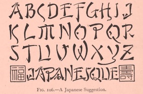 Scientific lettering expert, 1871-1944. His book The Essentials of Lettering (1912, McGraw-Hill, New York), coauthored with Robert Meiklejohn, has many historical examples and takes the reader on a grand tour of lettering. The tease. Local download.
 For a digital revival of some alphabets, see Jeff Levine's New Thin Roman JNL (2019) and Drafting Class JNL (2021). [Google]
[More] ⦿
|
Toronto Type Foundry
|
Toronto-based foundry, located on Bay Street. It was active in the late 19th century, and published a specimen book on wood type: "Wood Type" (1897). It went out of business in 1967 and was taken over by Howard Graphic Equipment. [Google]
[More] ⦿
|
Truetype versus type 1
|
Short piece by yours truly. [Google]
[More] ⦿
|
Type preservation
|
Signed by Luc in 2004, some immature thoughts on preserving type for future generations. Comments by the type community. [Google]
[More] ⦿
|
UPM
[Luc Devroye]
|
A discussion by yours truly about UPM, or "units per em", a quantity that matters in the design of fonts. I argue of course for larger values of the UPM than are normally used in fonts today. But just to make a point, I designed two fonts that have an UPM of one. [Google]
[More] ⦿
|
Vincent F. Apicella
|
Vincent V. Apicella, Joanna V. Pomeranza and Nancy G. Wiatt co-authored The Concise Guide to Type Identification (1990, Lund Humphries, London), in which modern day types are classified, listed, and named. It contains equivalences between type names for various type manufacturers. Most importantly, it shows typeface equivalences for various typefaces from the phototype era. [Google]
[More] ⦿
|
Wilhelm Hilder
|
Author of Moderne Alphabete (1922, Verlag Bernhard Friedrich Voigt. Leipzig), a booklet in which Hilder shows about 40 of his hand-drawn alphabets. I scanned in most of that book for all of you. [Google]
[More] ⦿
|
William T. Morgans
[Morgans&Wilcox Mfg Co.]
|
 [MyFonts]
[More] ⦿
[MyFonts]
[More] ⦿
|


 Miasto (

 Voltaire (

 Biplo (
 Magellan (
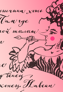
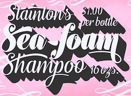
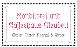


 Sen (
Sen (


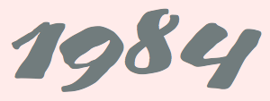
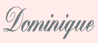
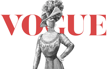


 Rieux (


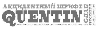


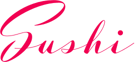
 Haltrix (
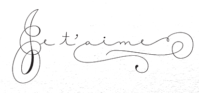
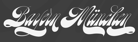
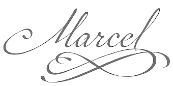
 Meritage (

 Core Magic (
 Ciao Bella (
 Krullcoplate Script (


 Argö (
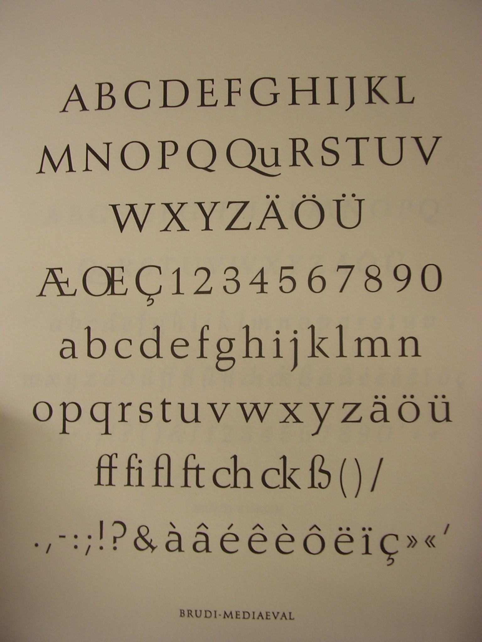
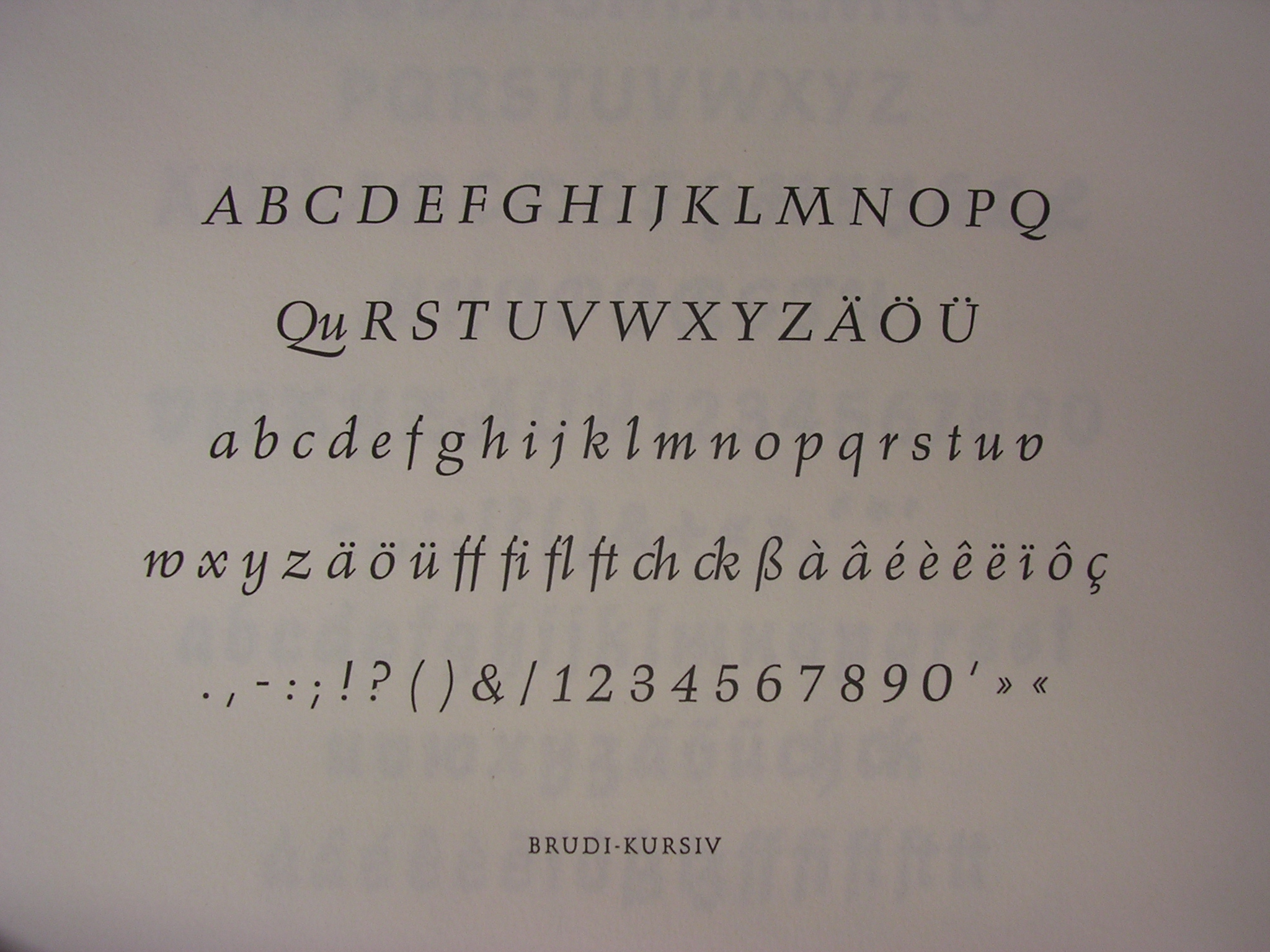
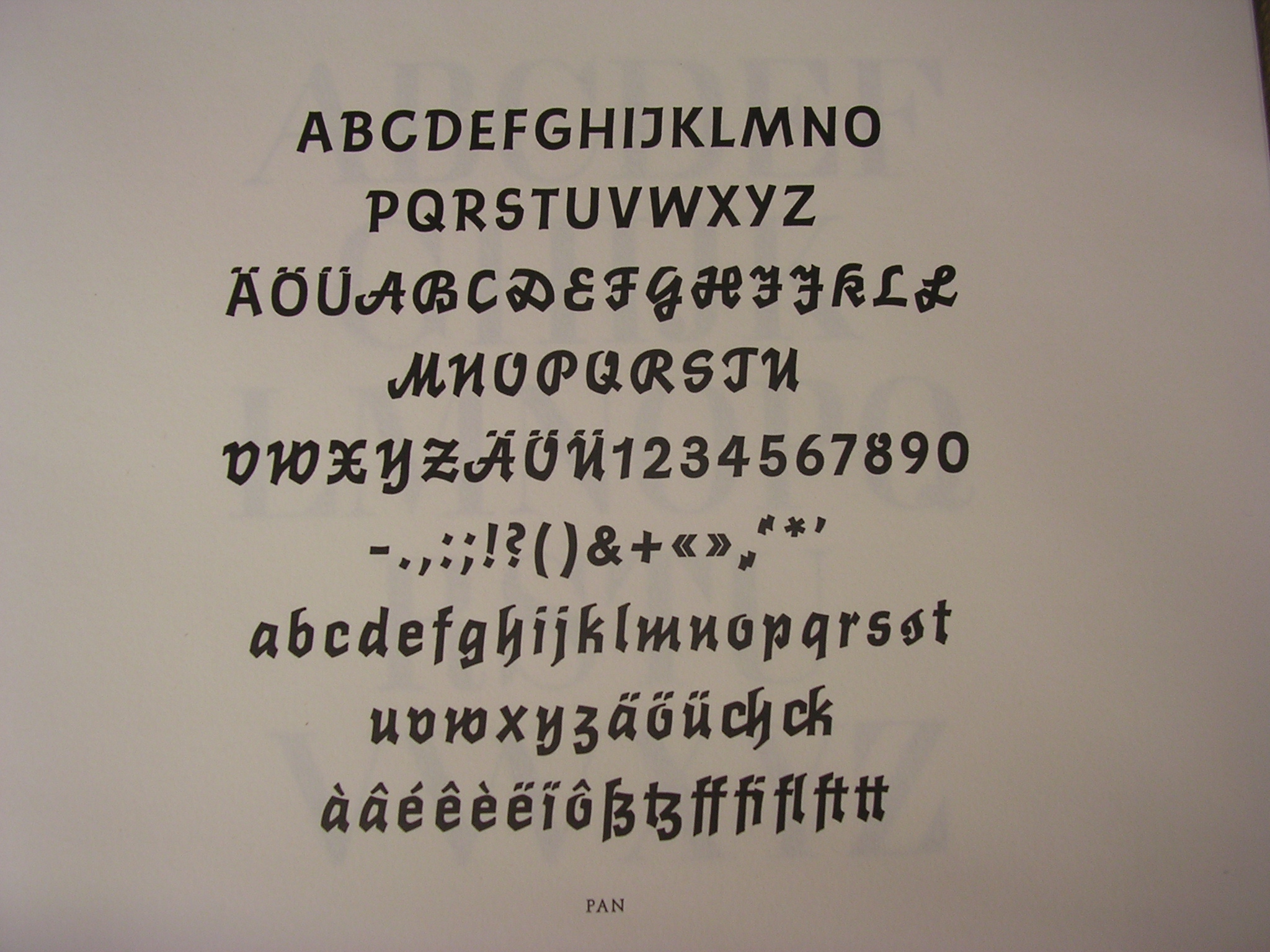
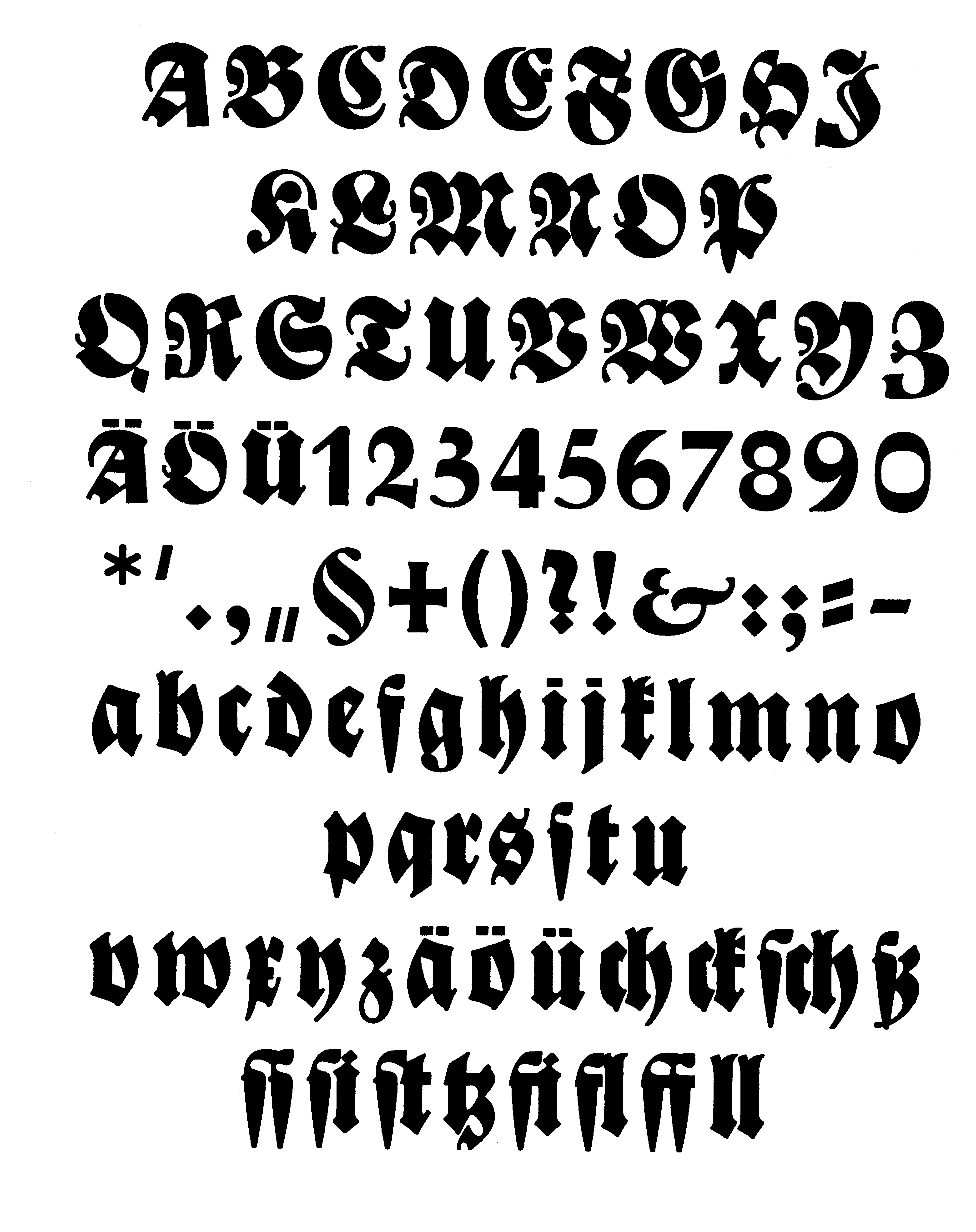
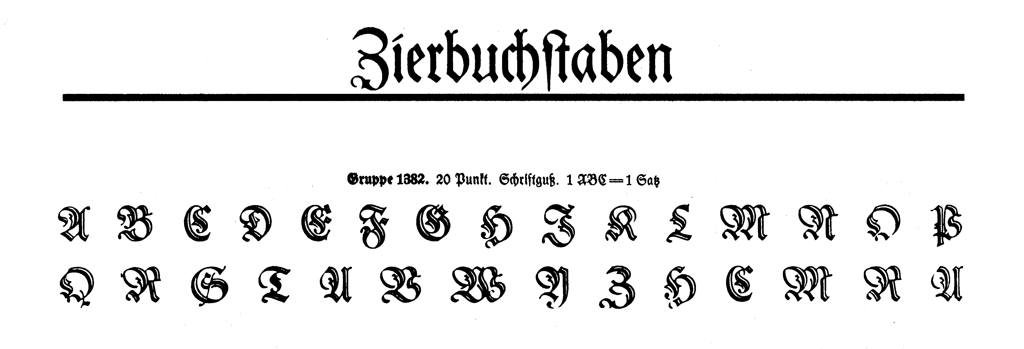
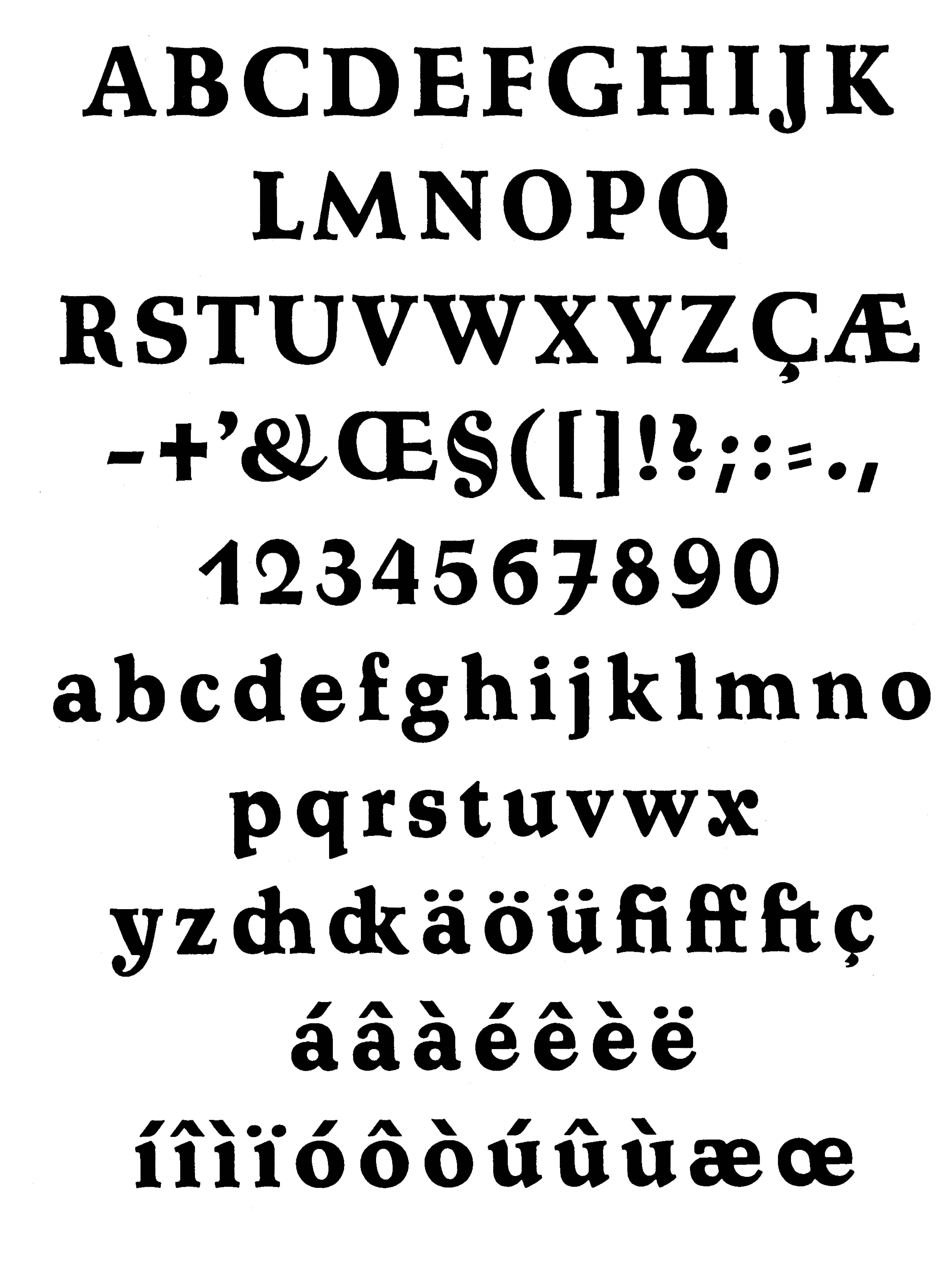
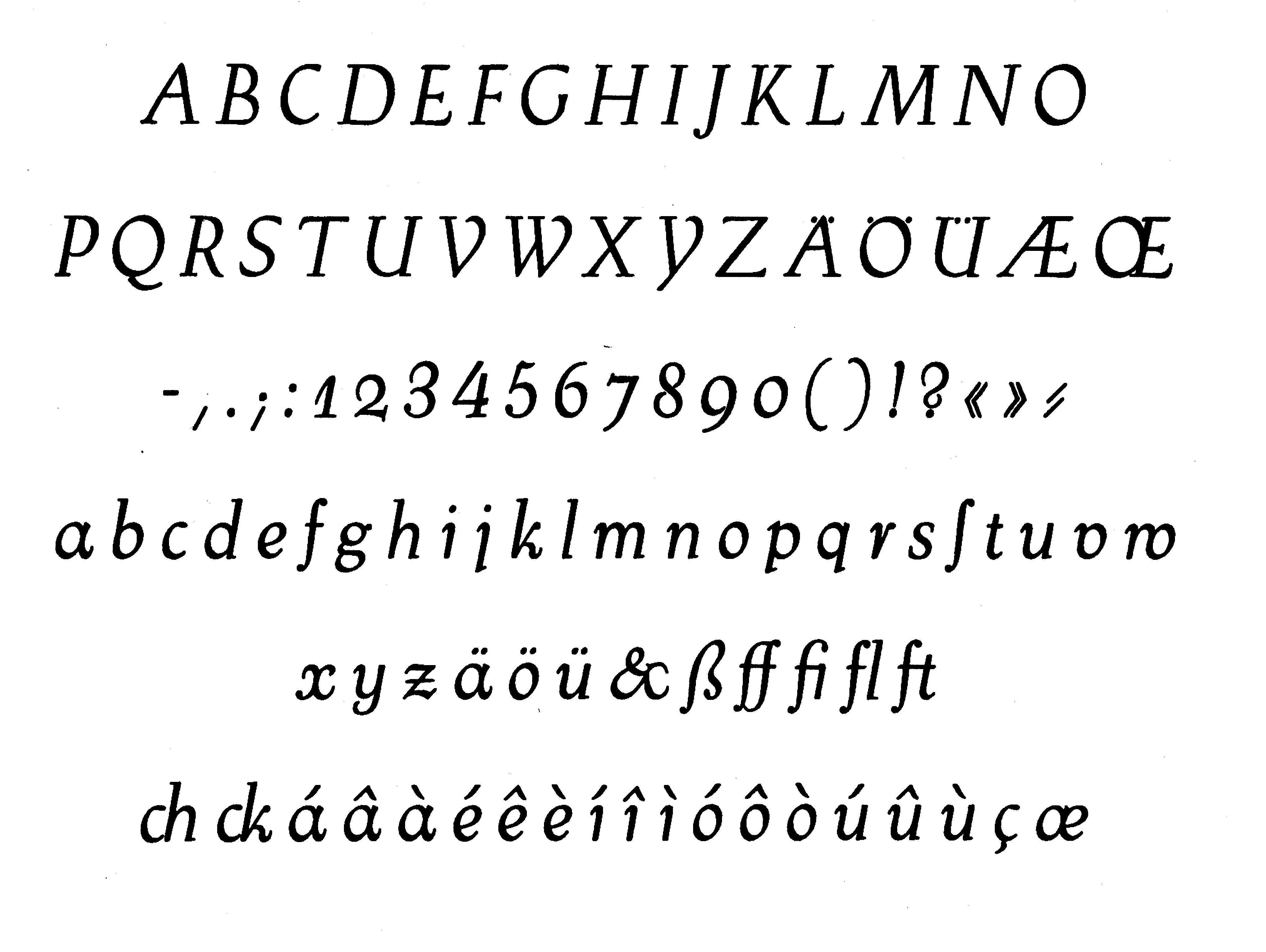
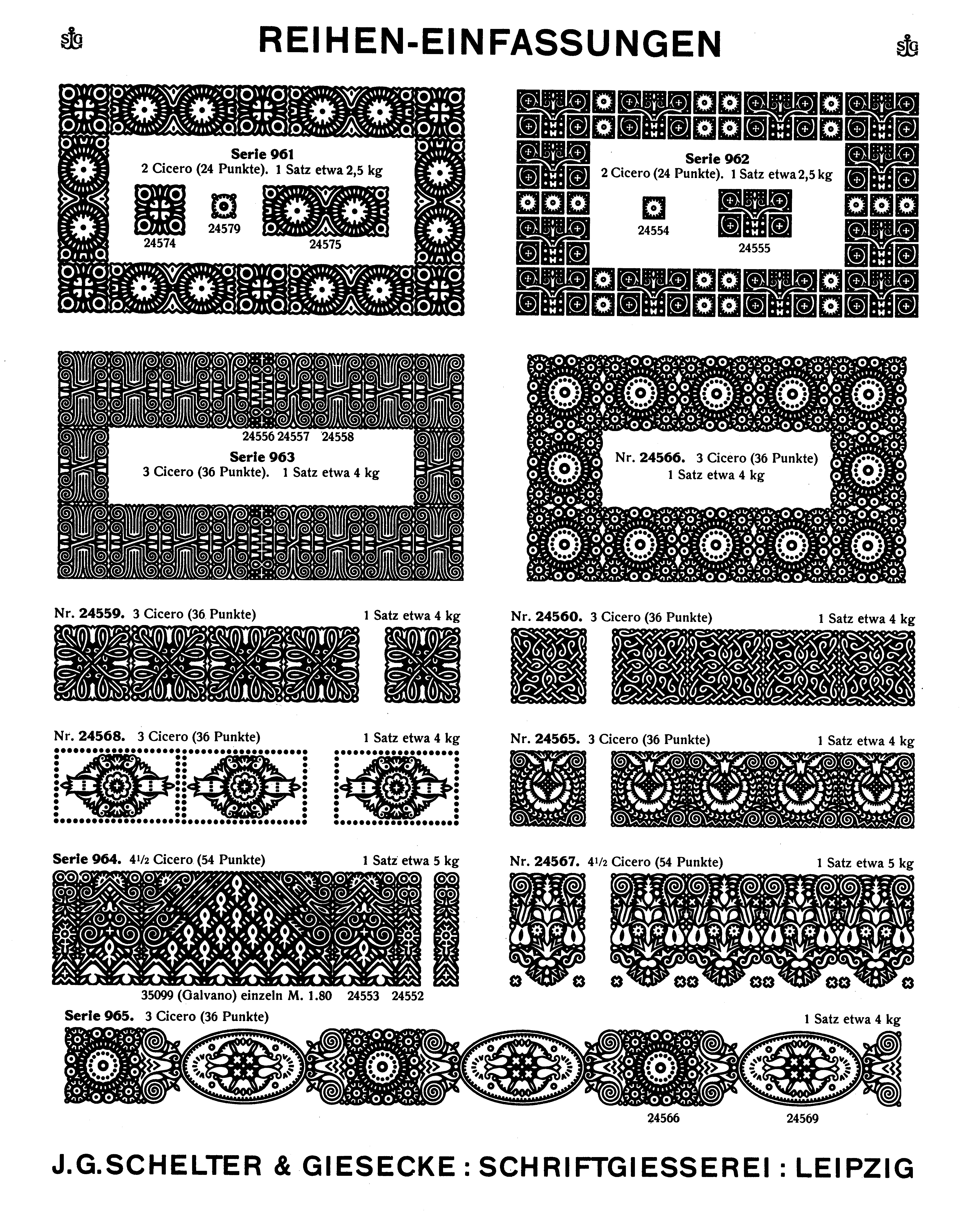
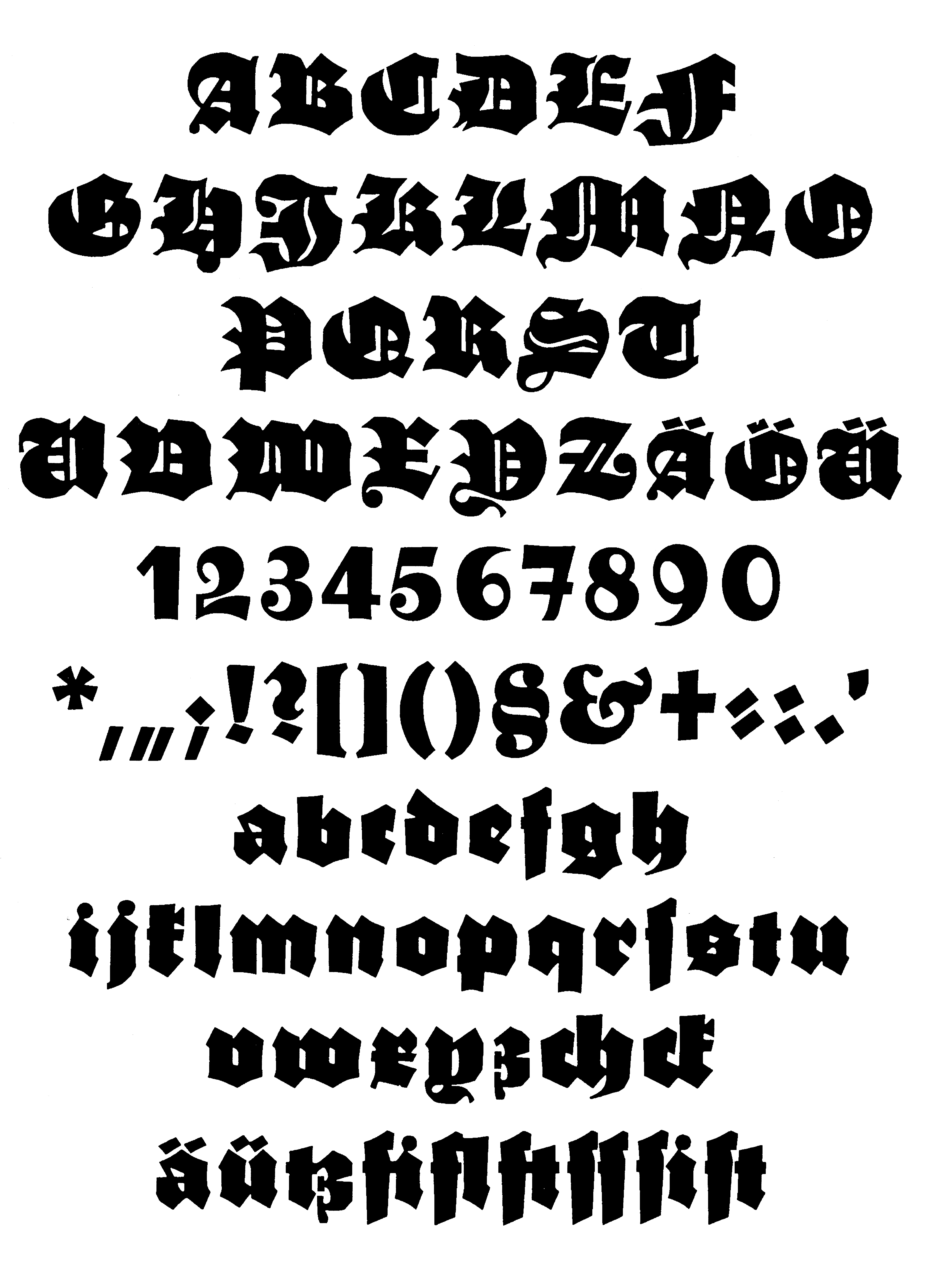
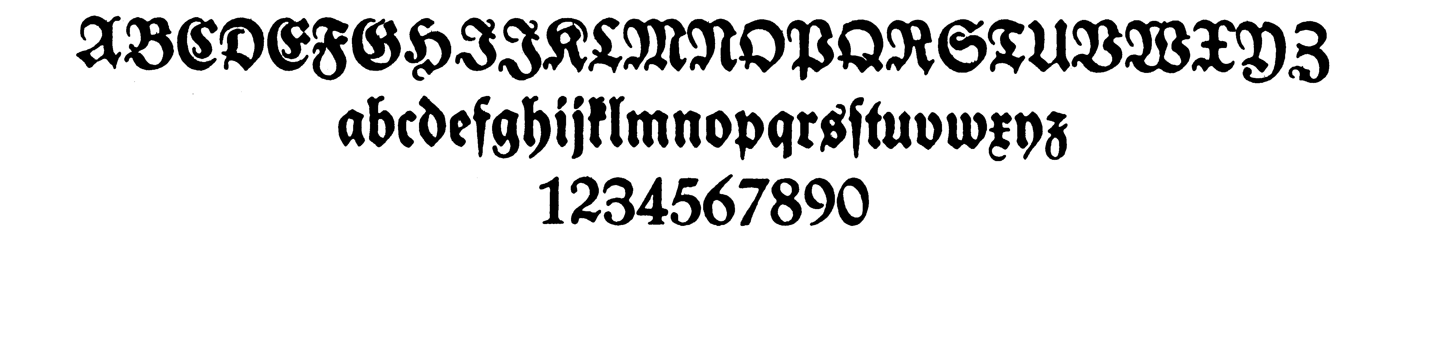
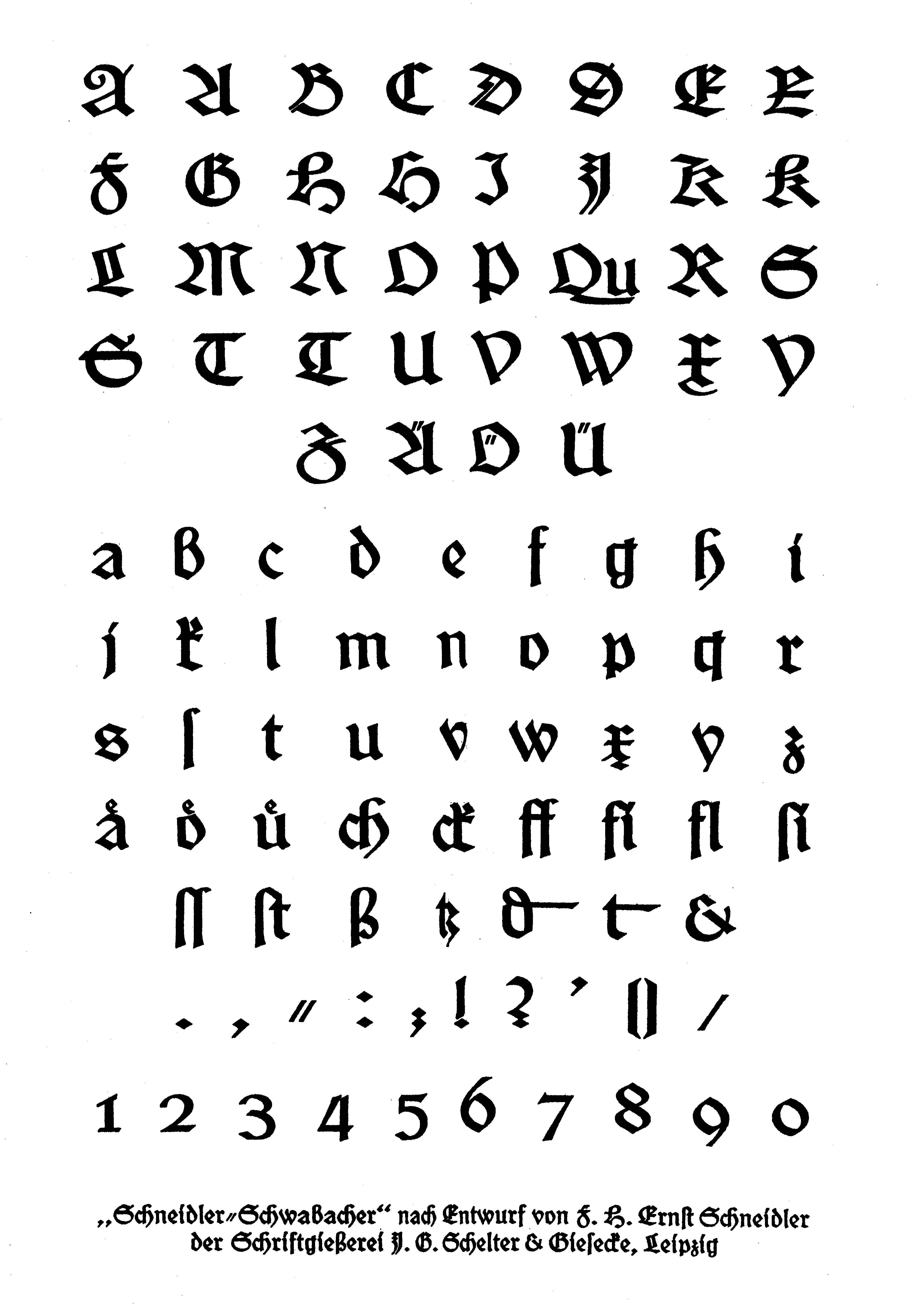
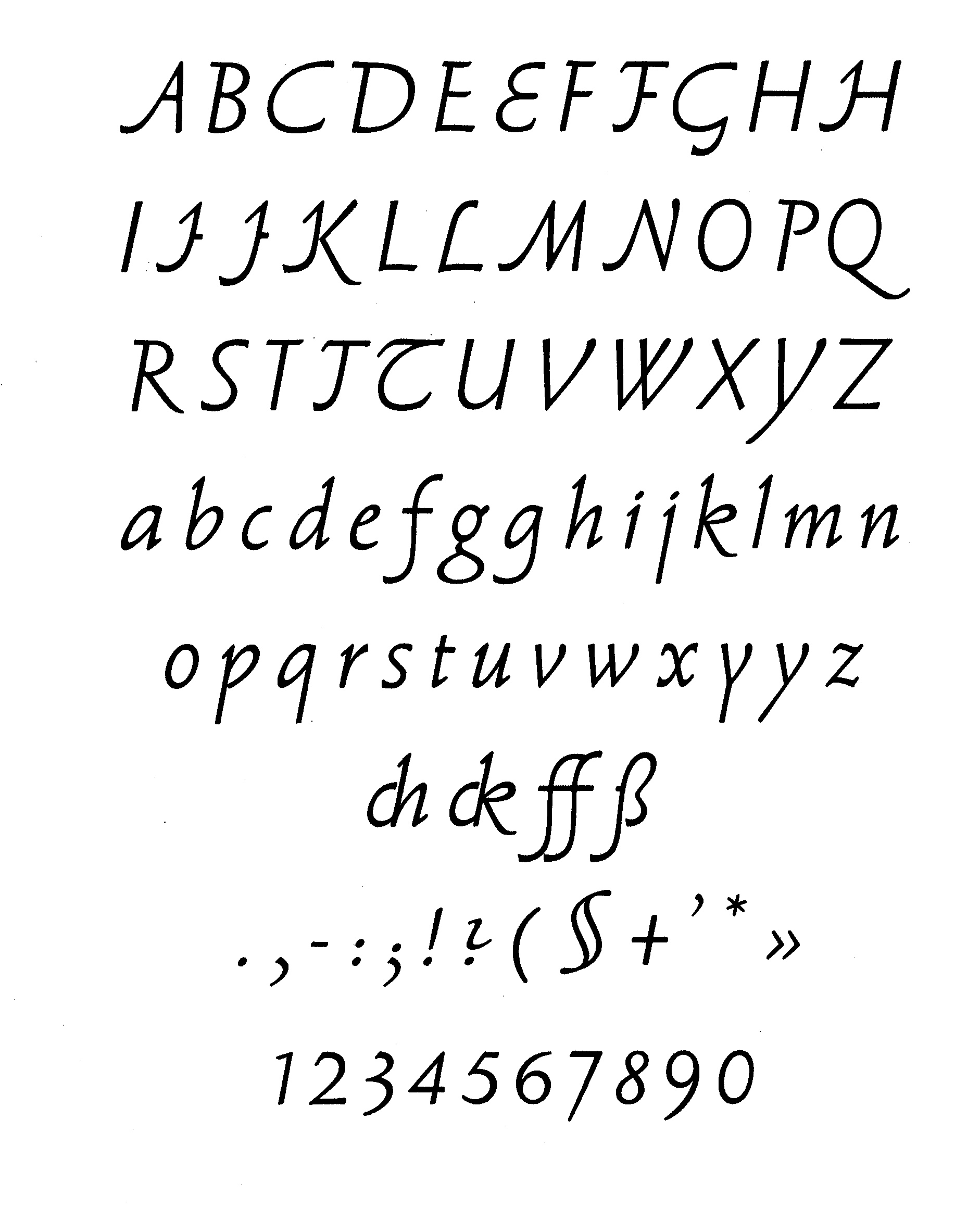
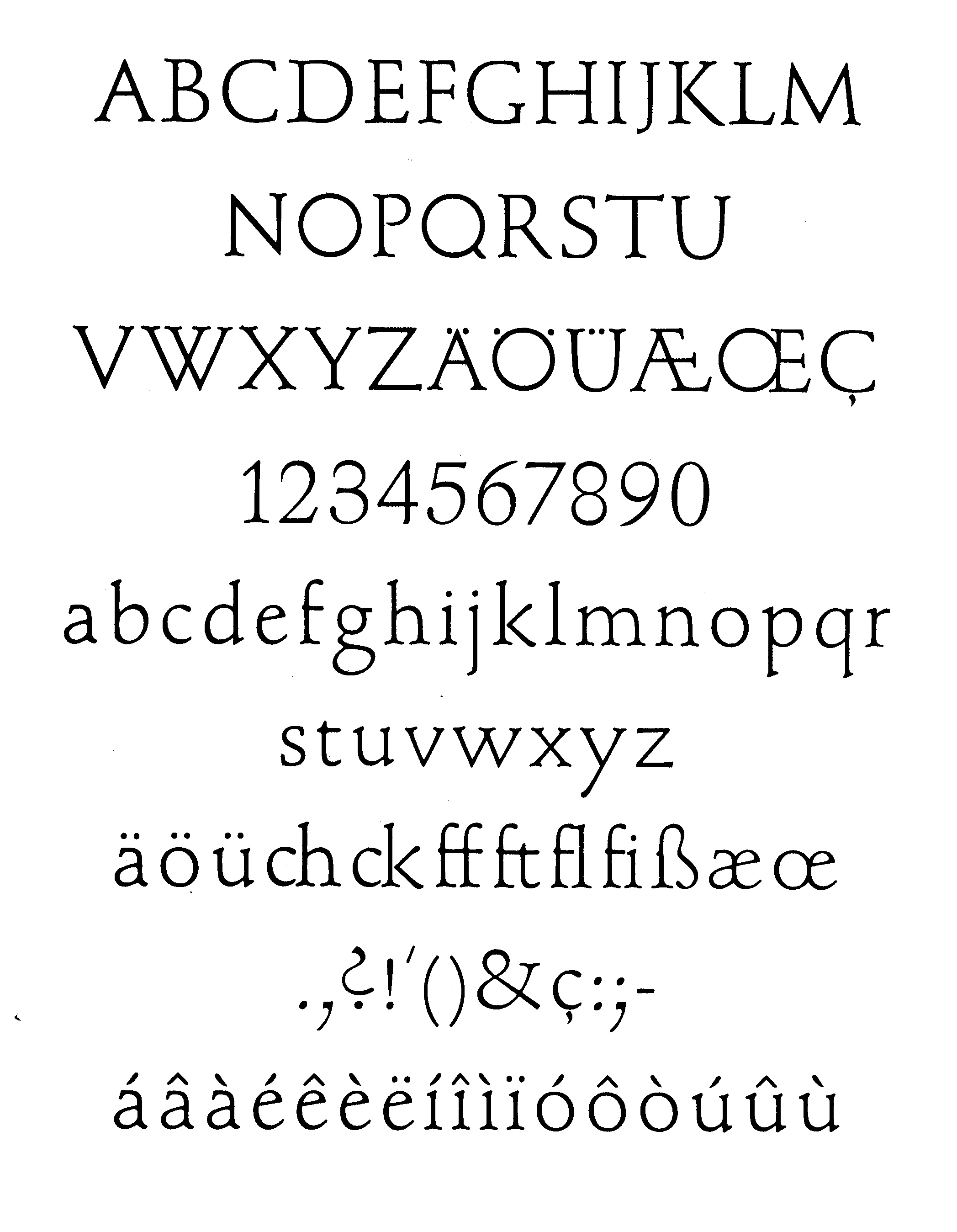
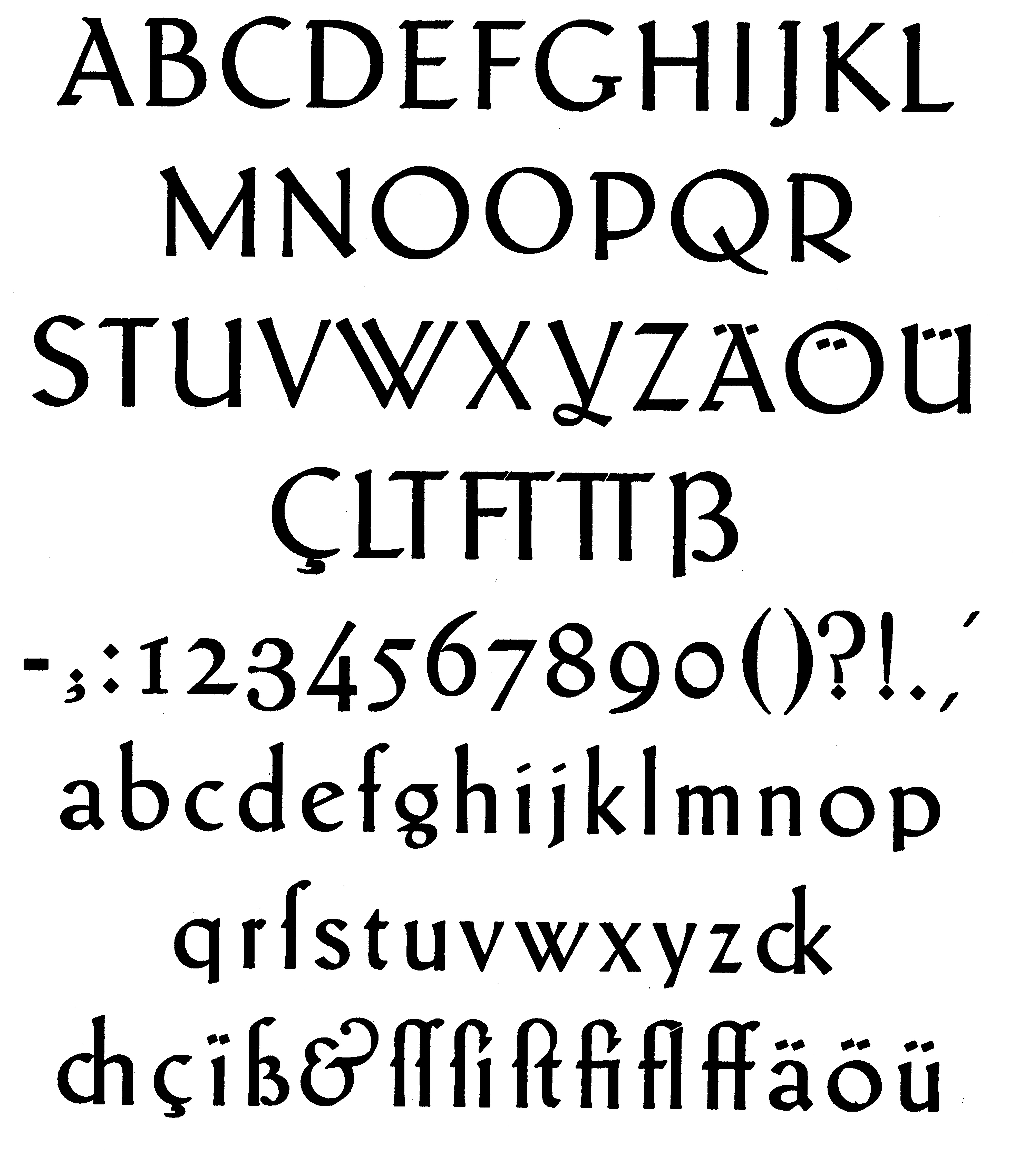
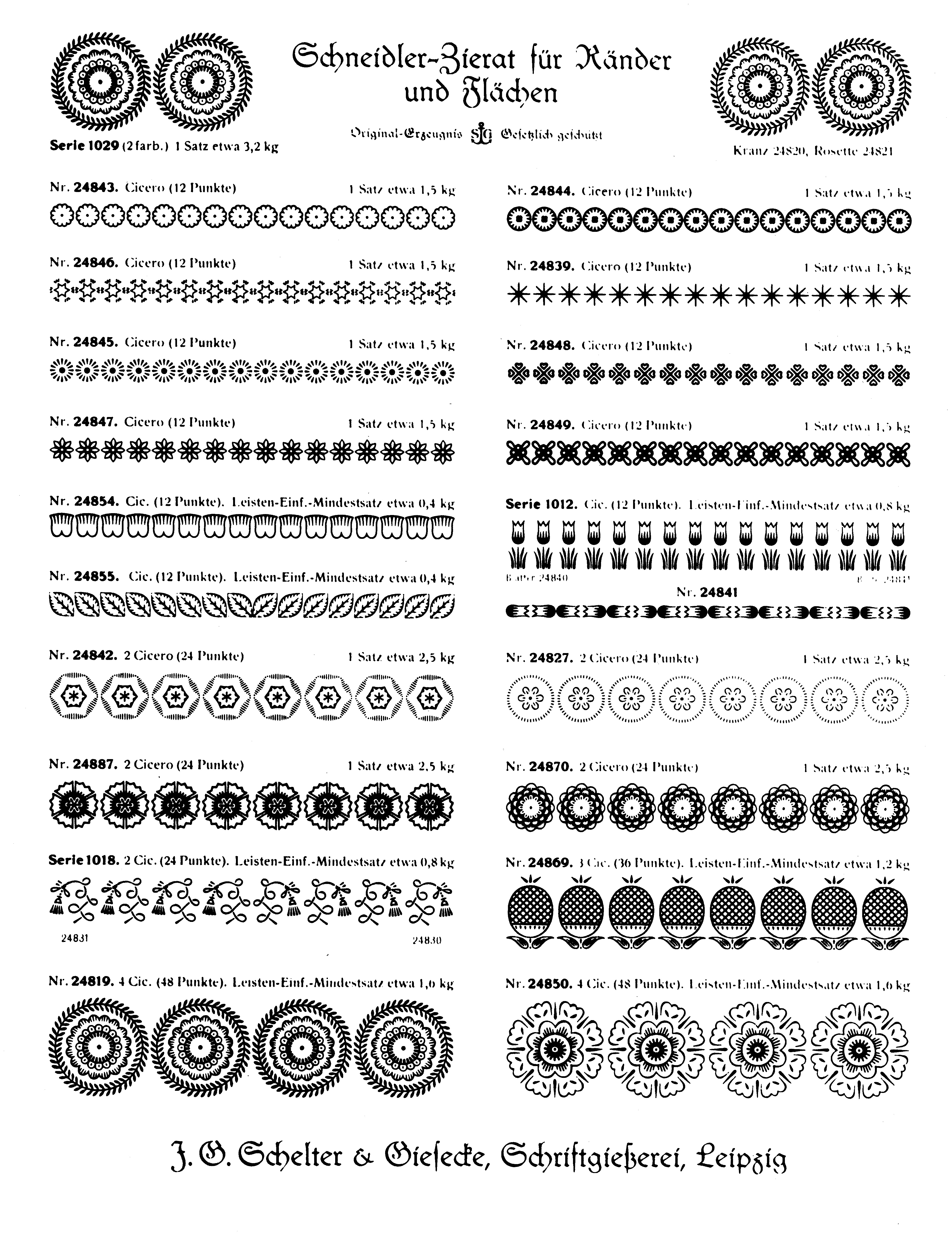
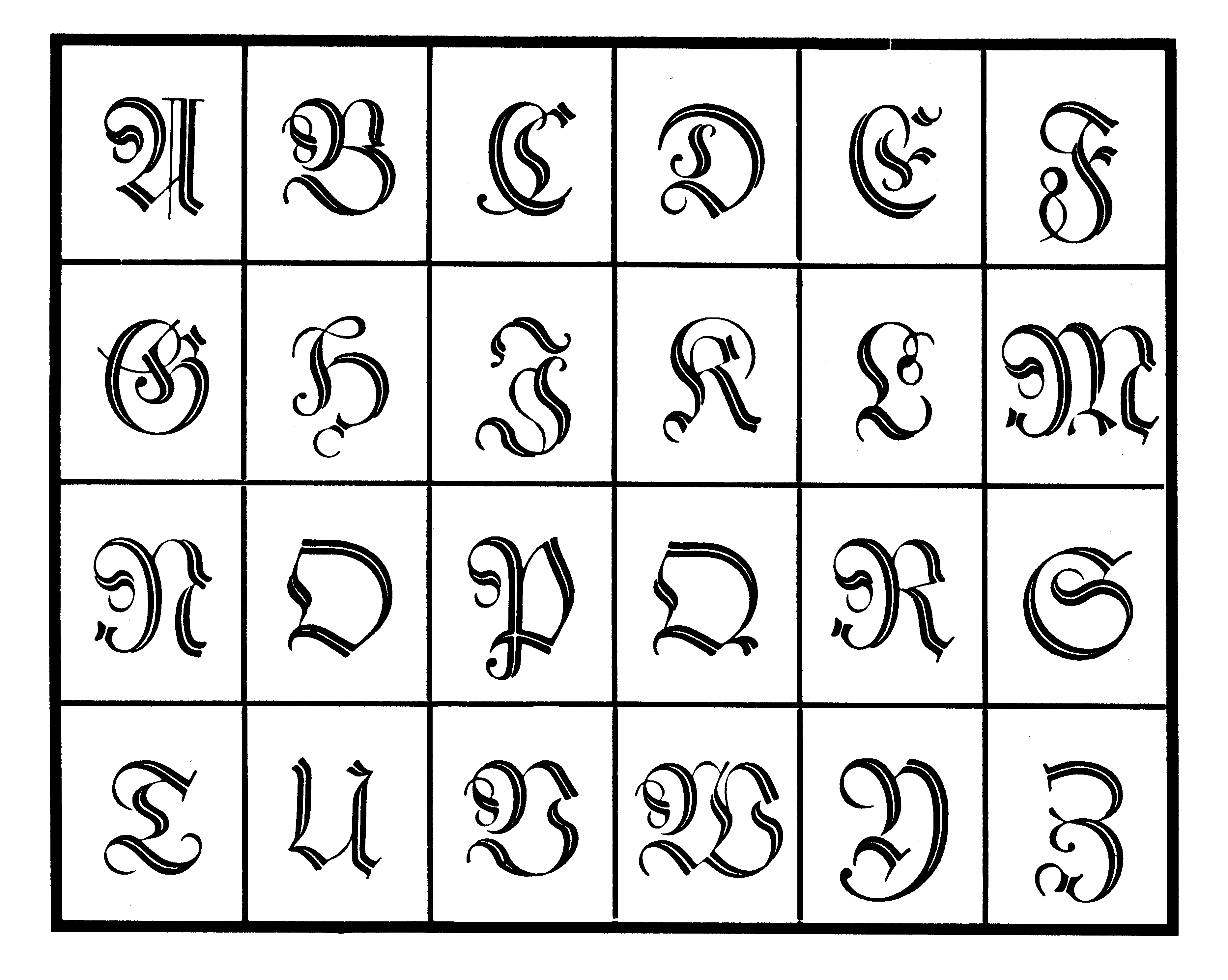
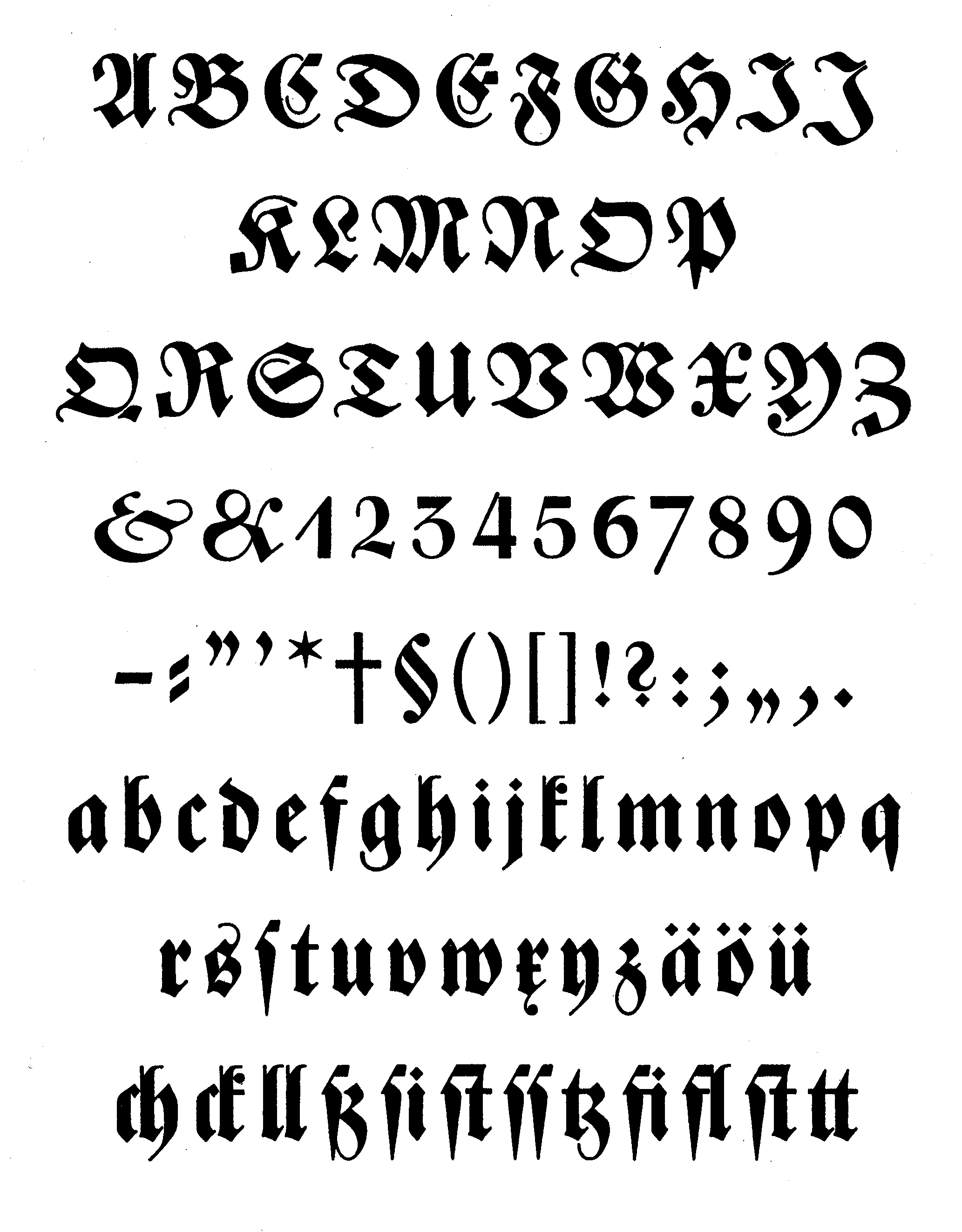
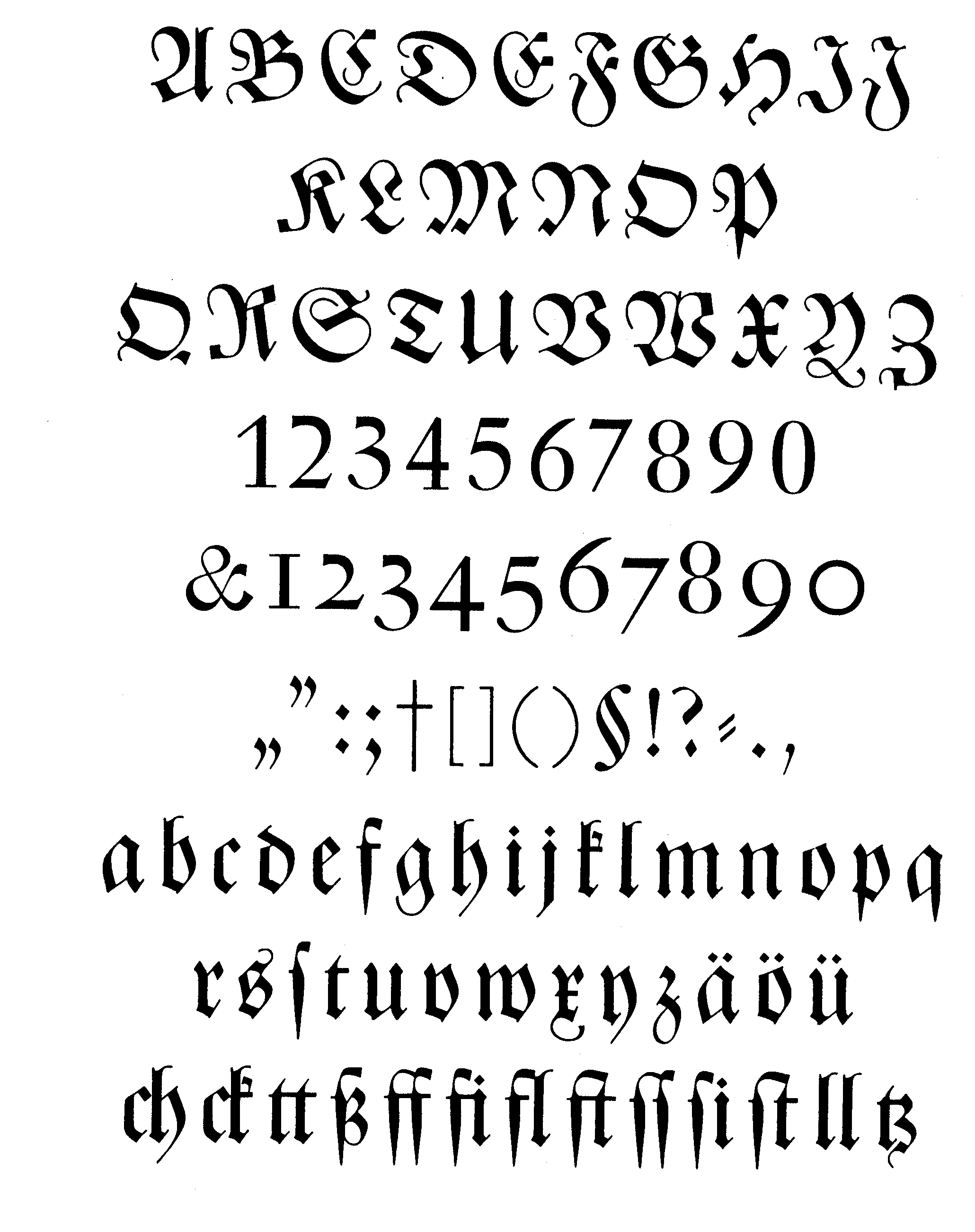
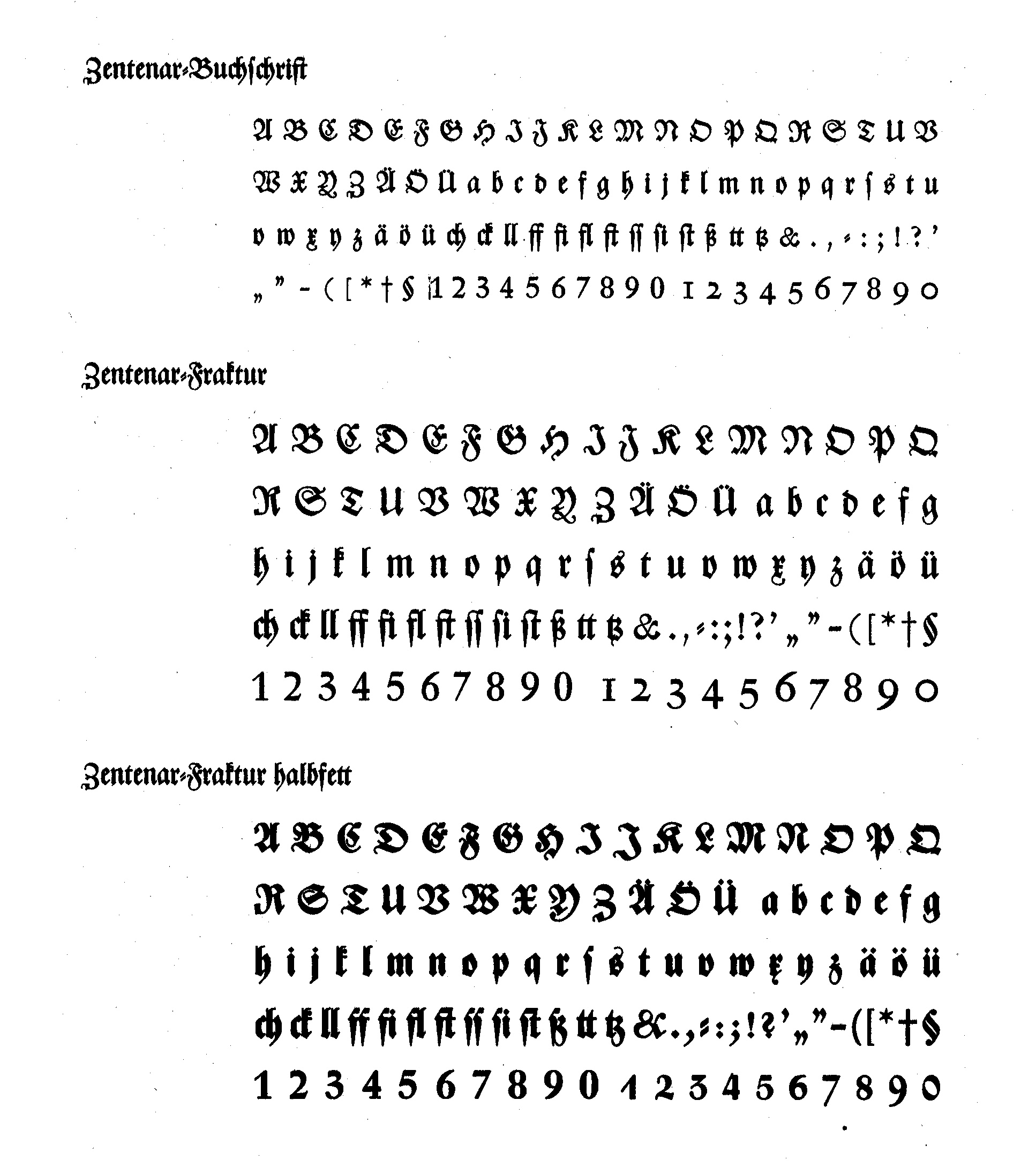
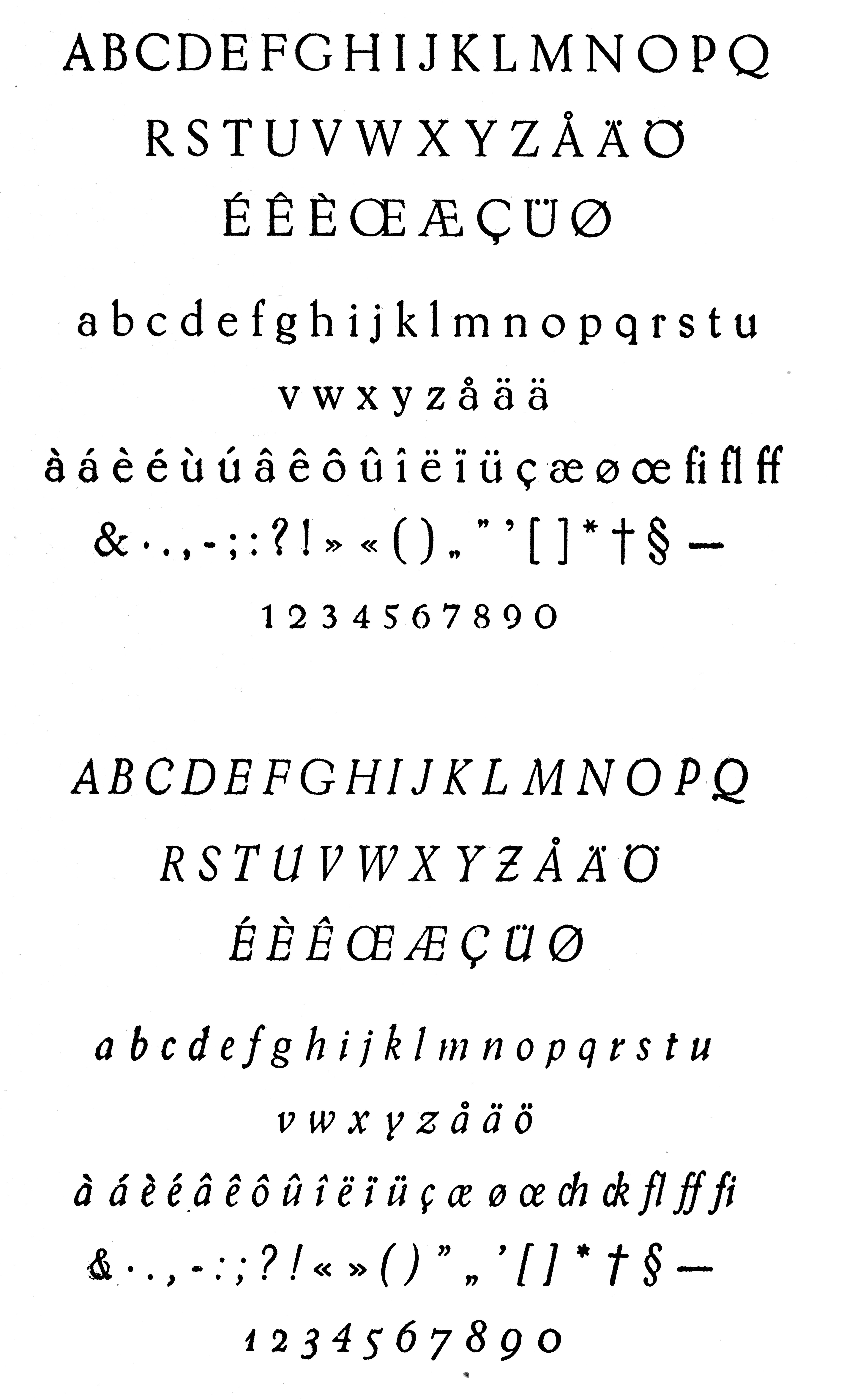
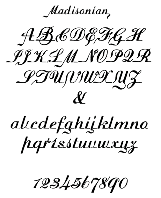
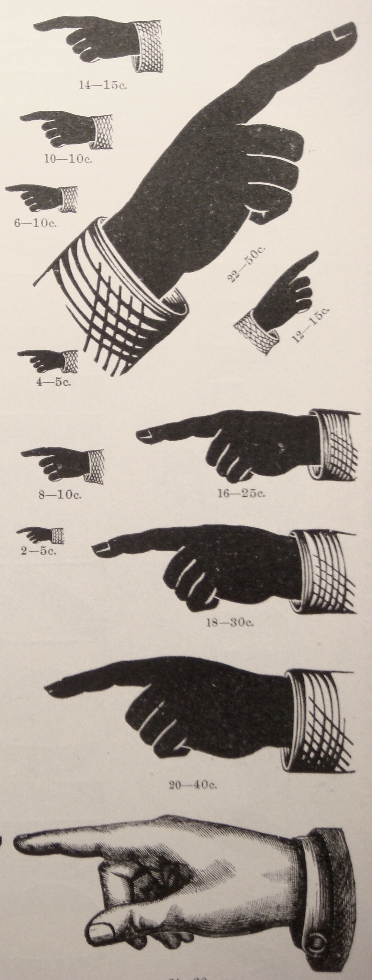
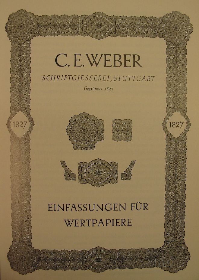
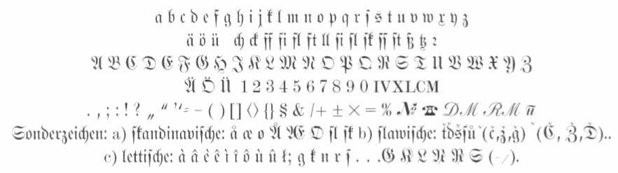
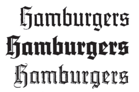
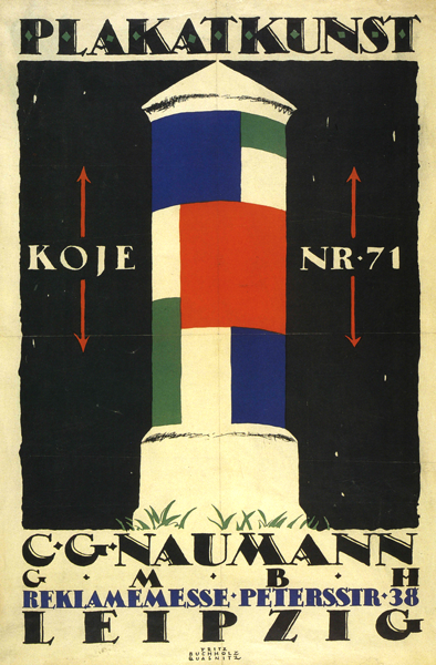
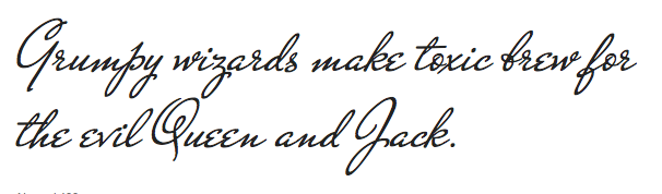
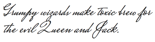
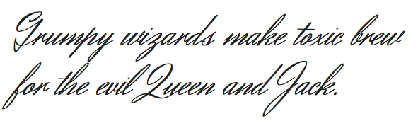
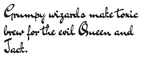
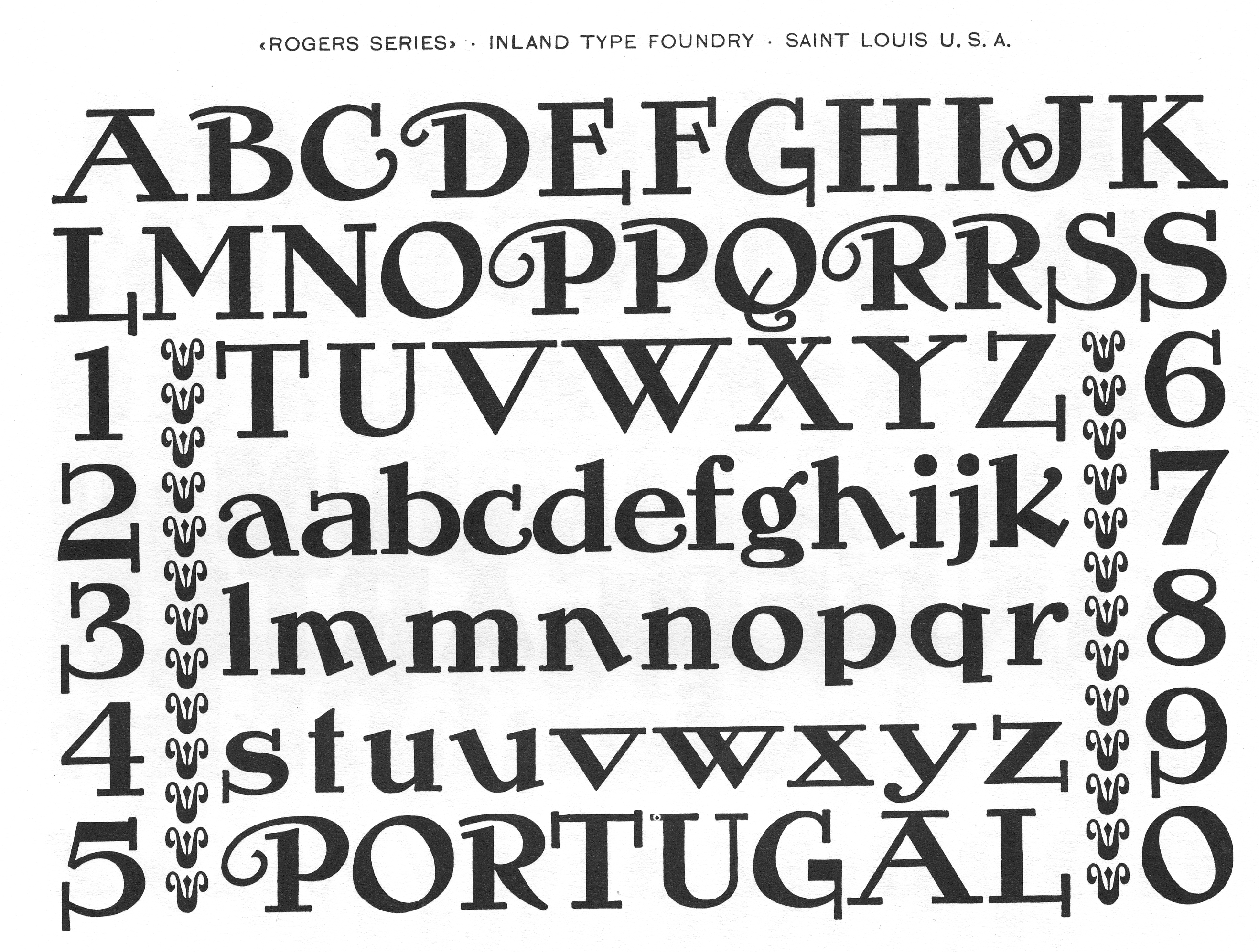
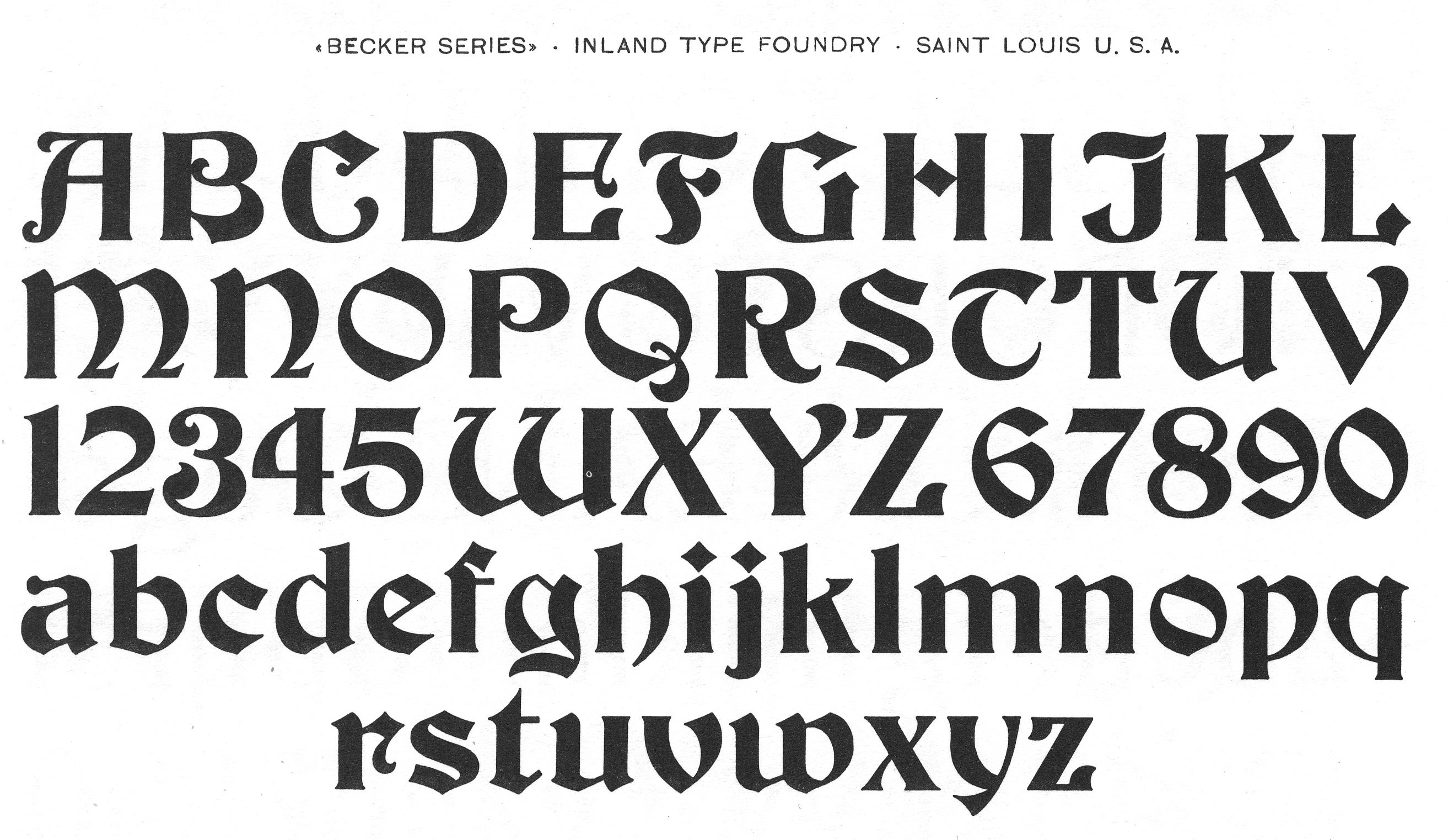
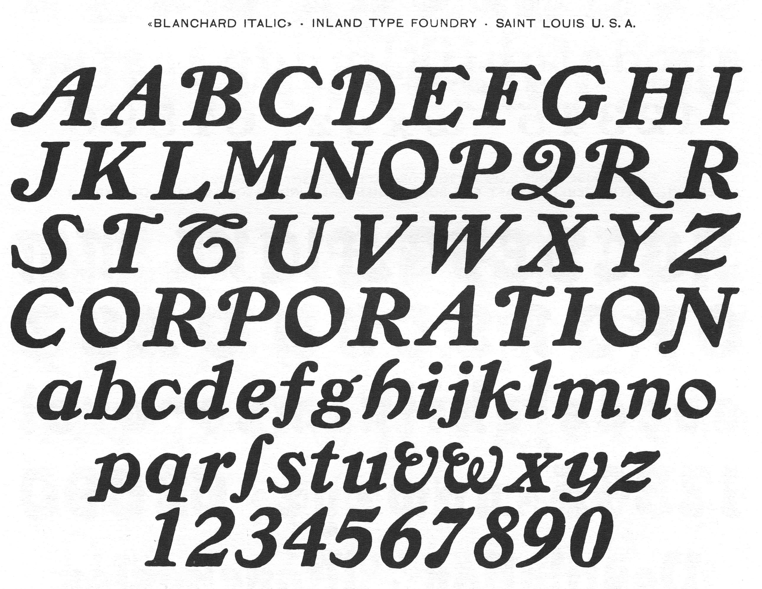
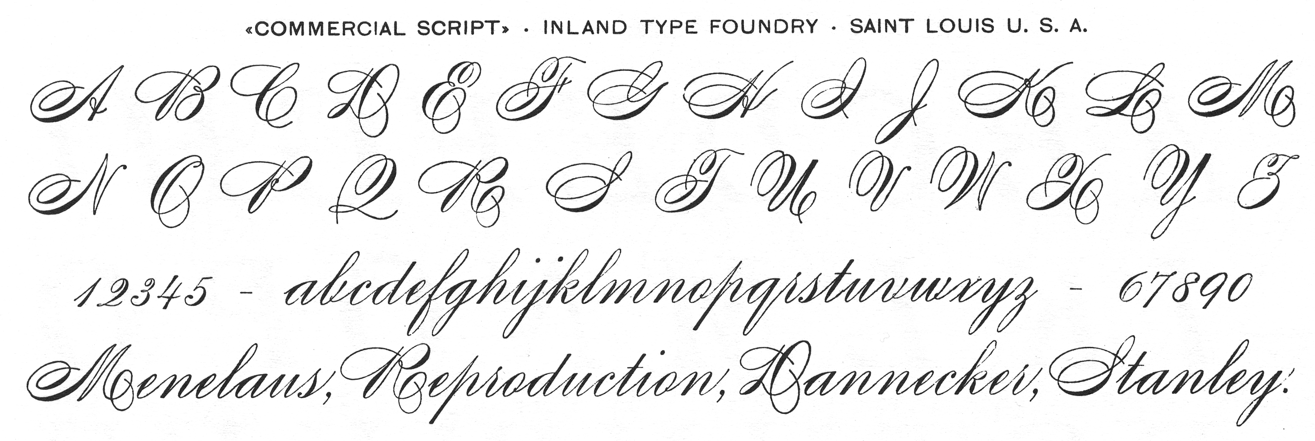
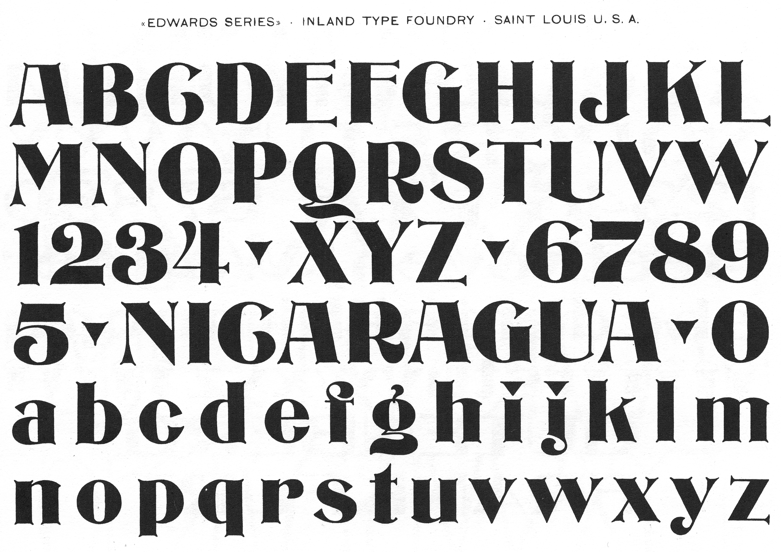
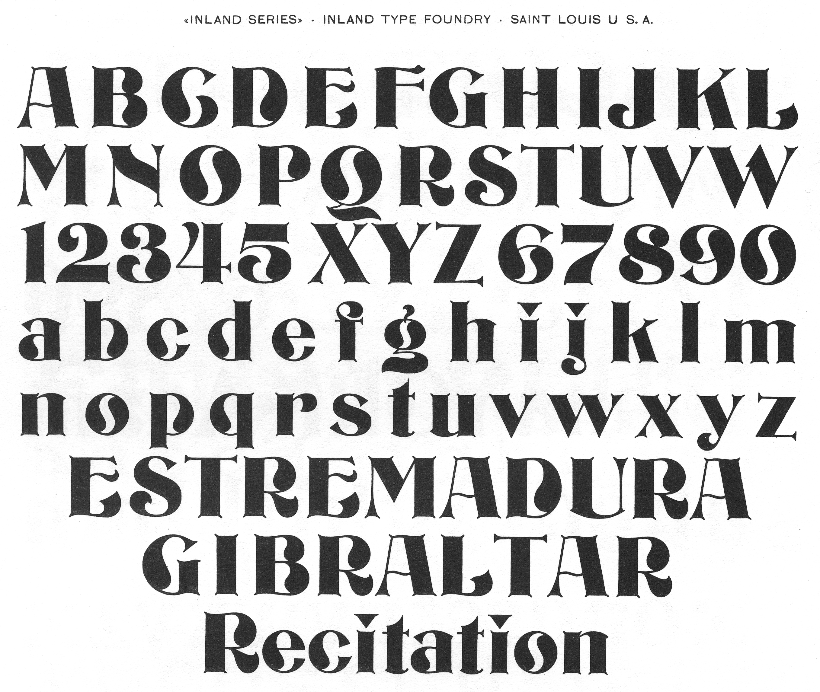
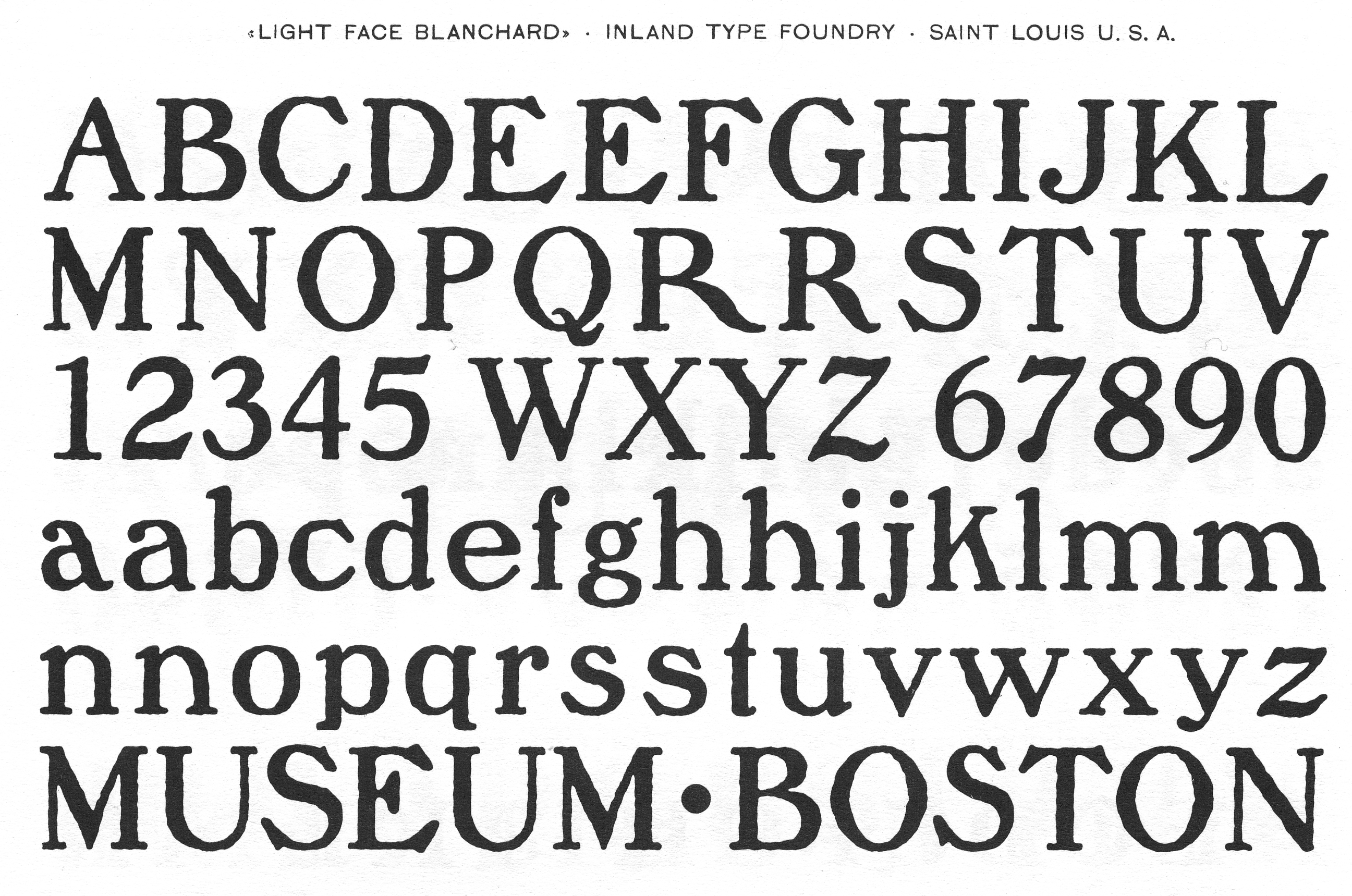
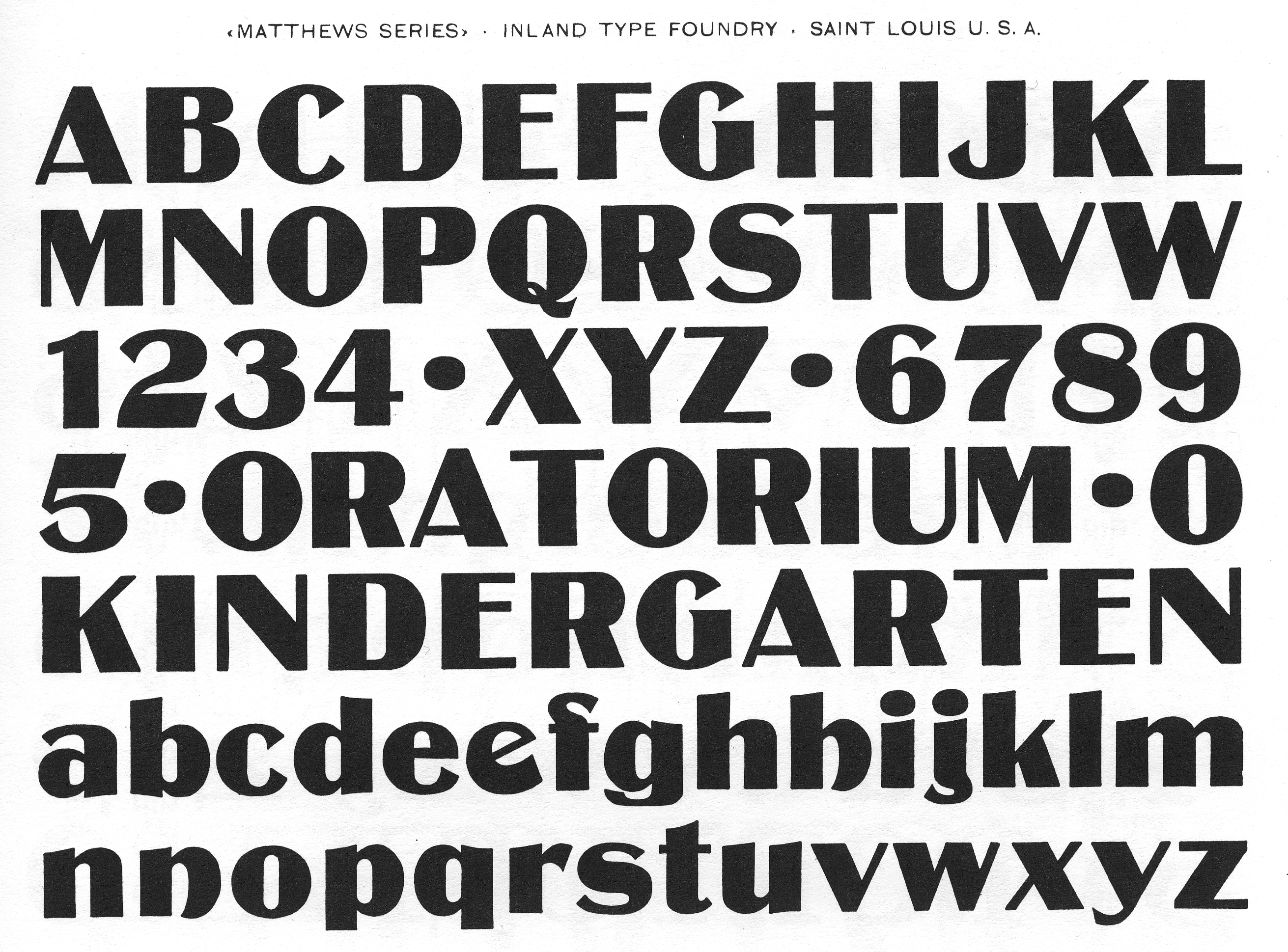
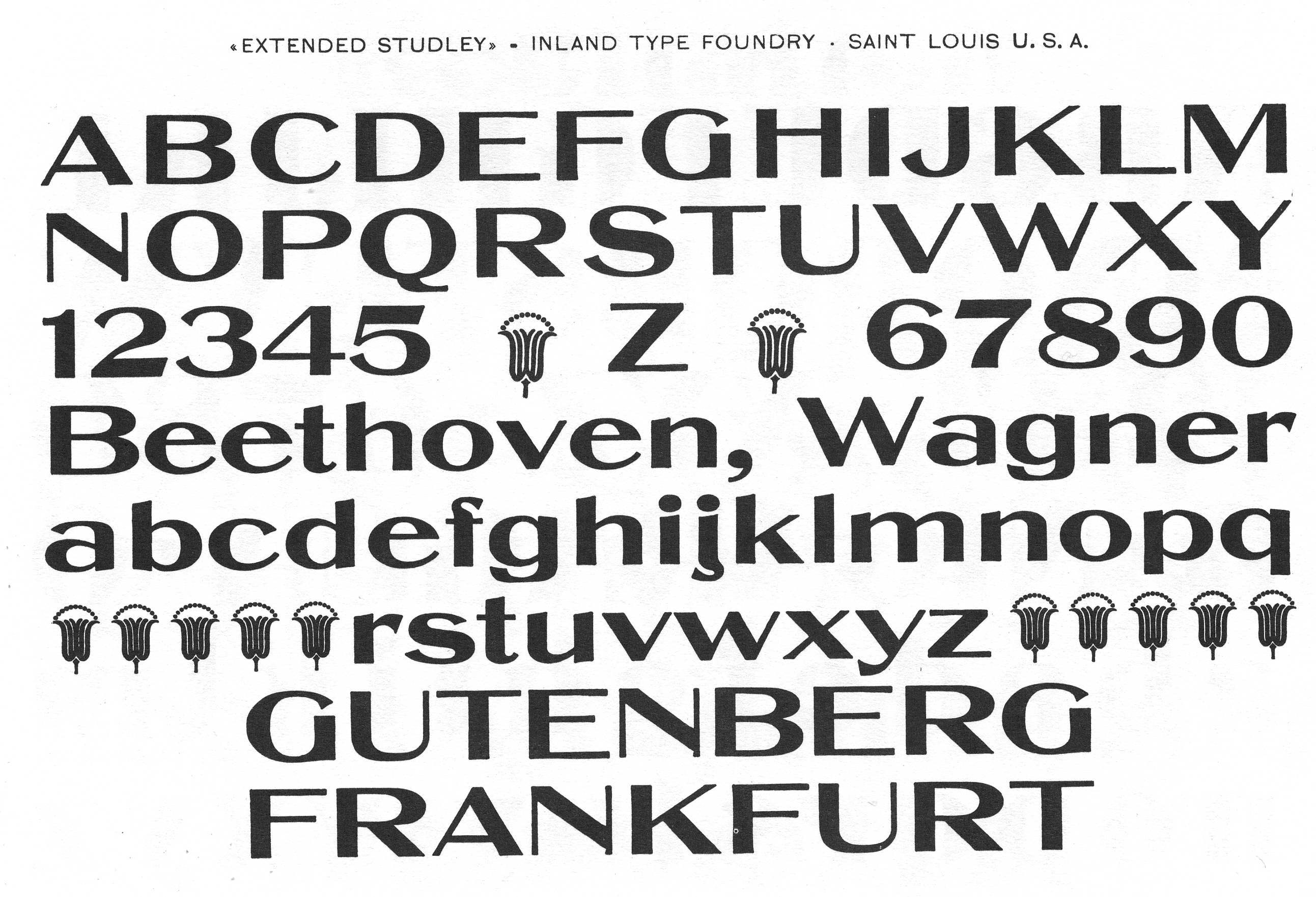
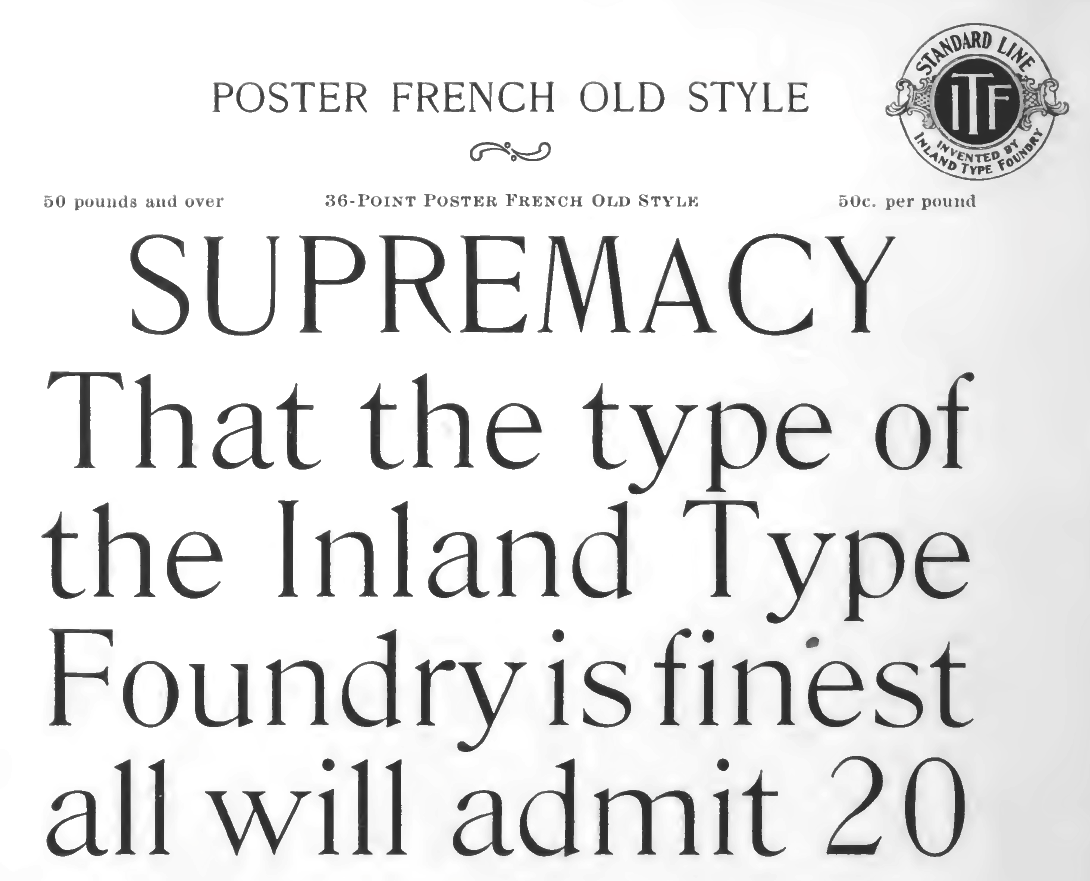
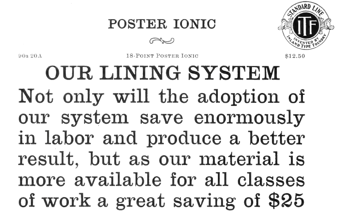
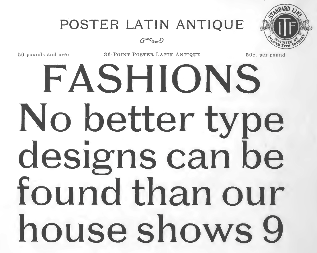
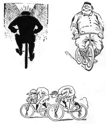
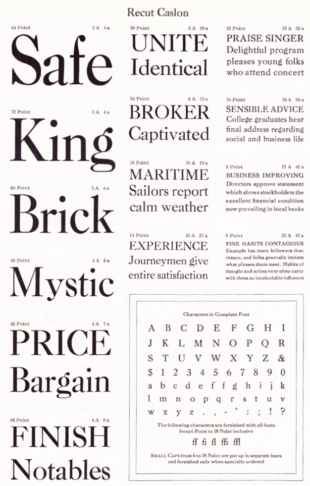
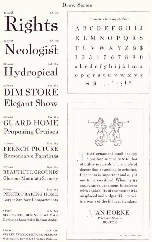
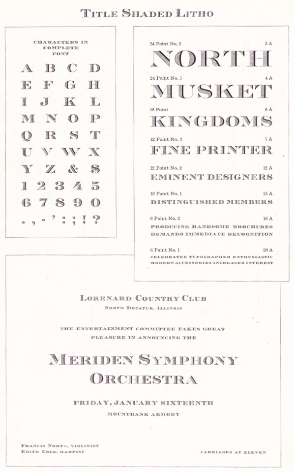
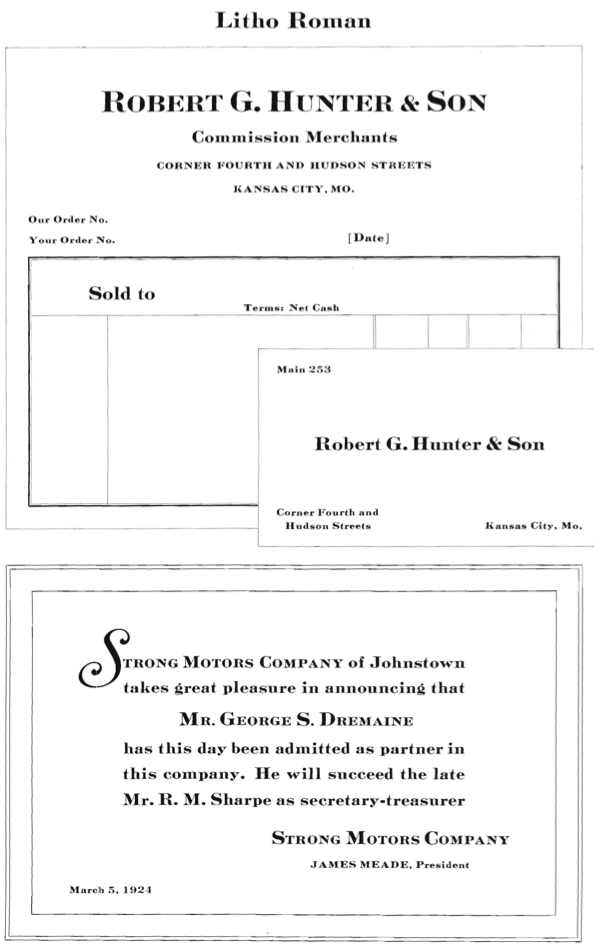
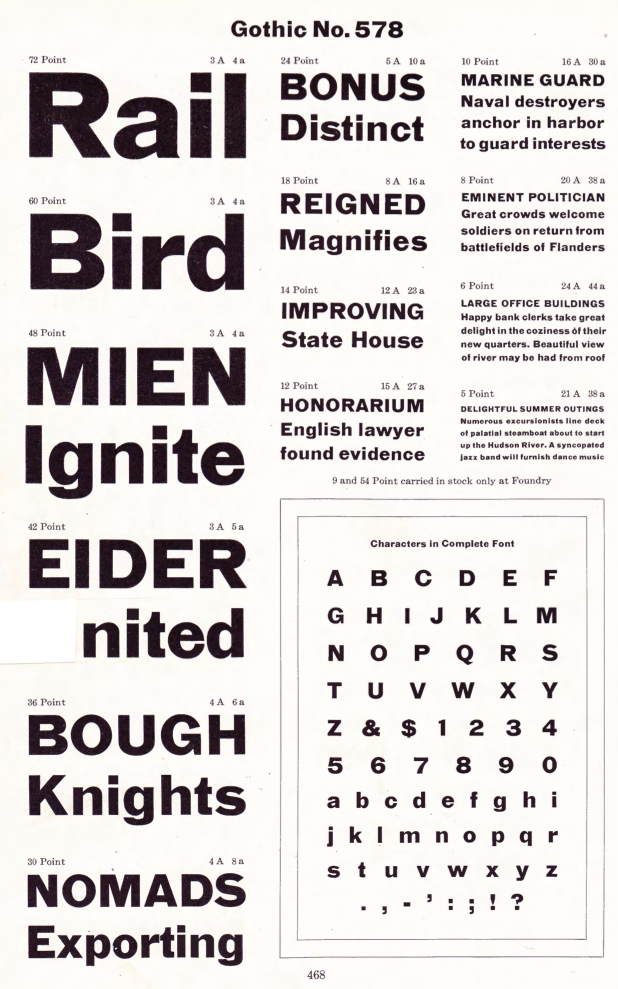
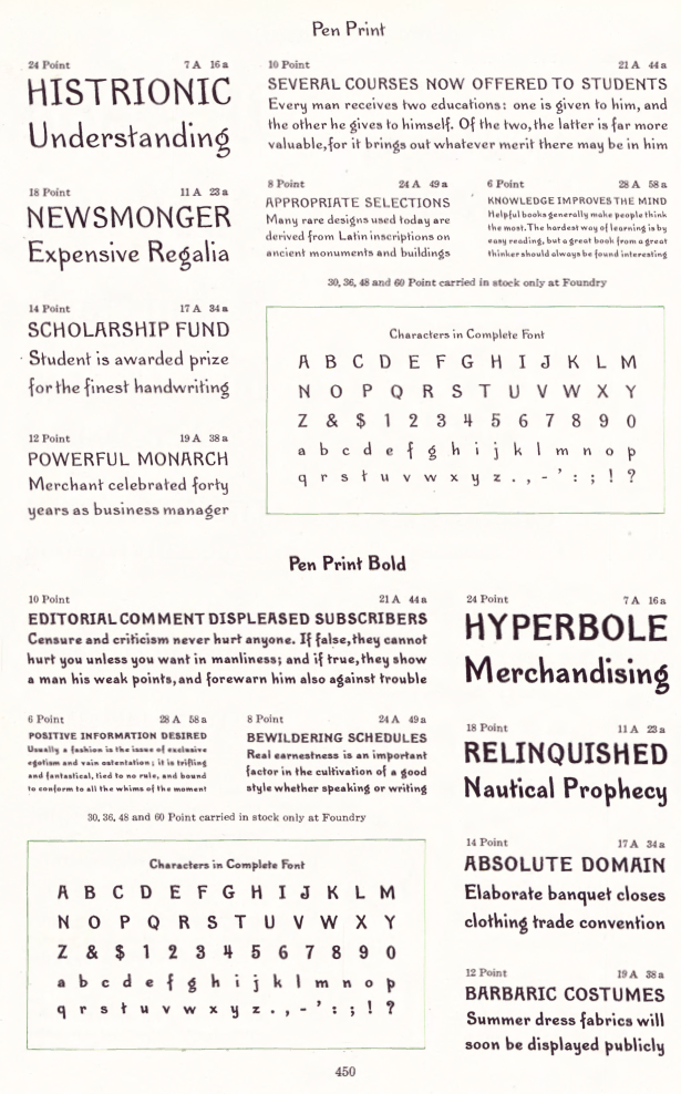
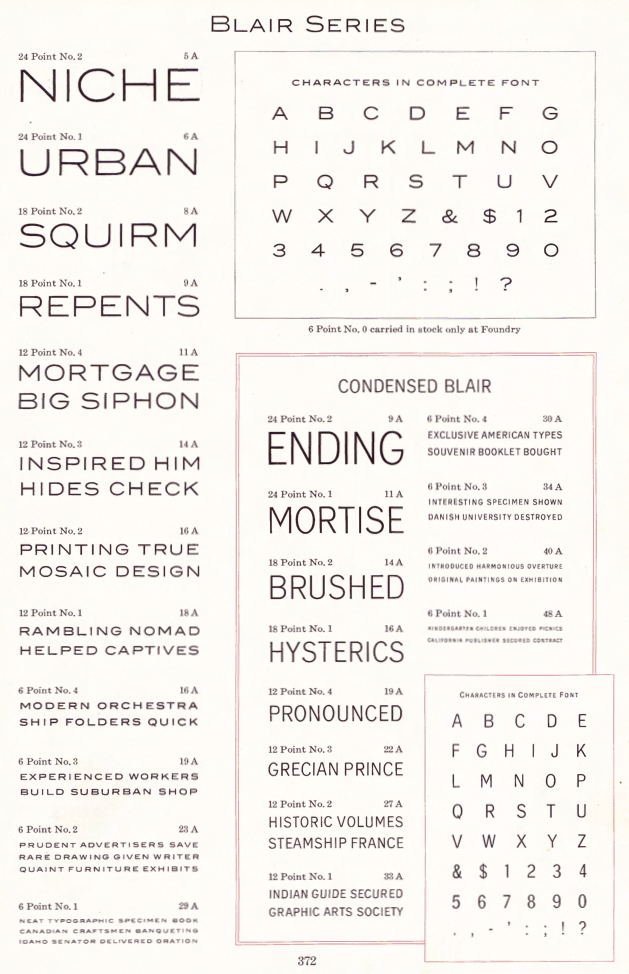
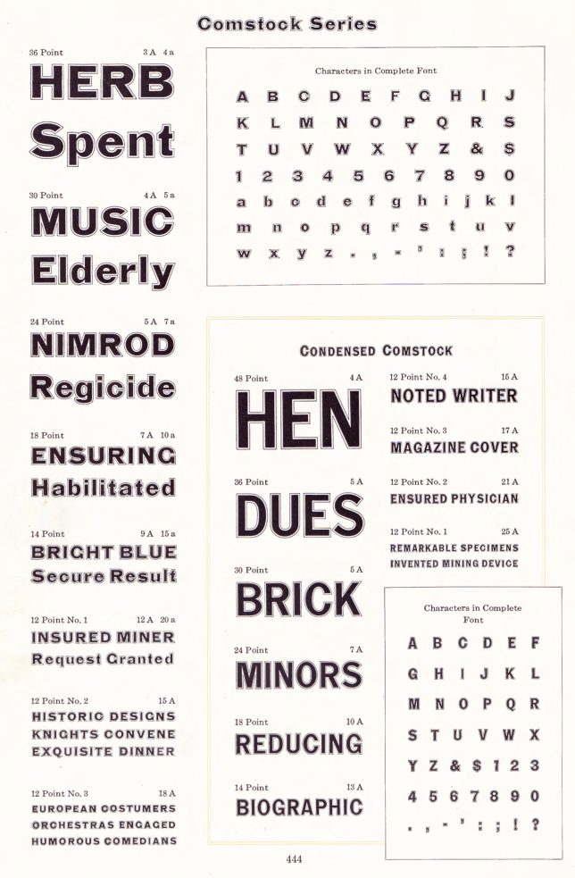
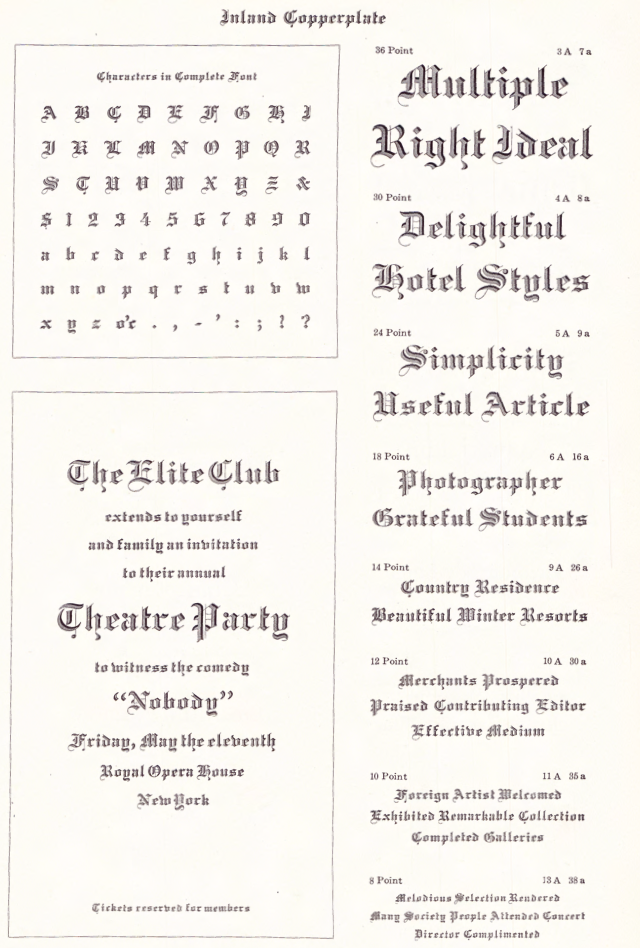
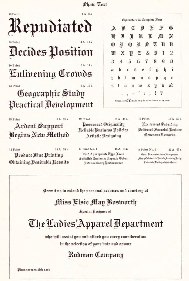
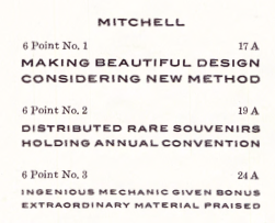
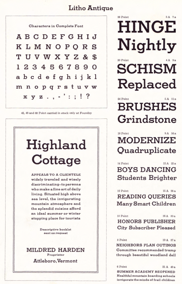
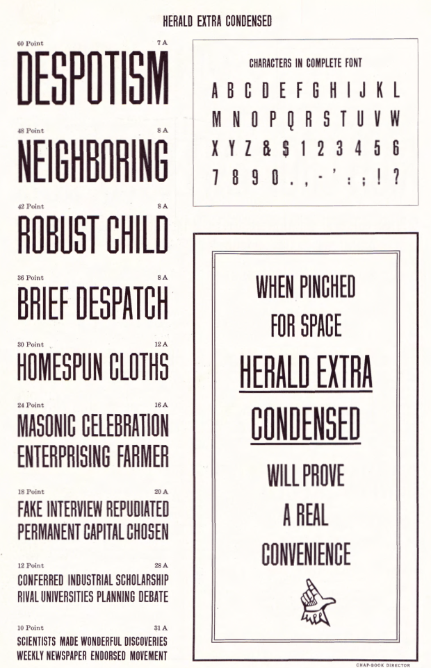
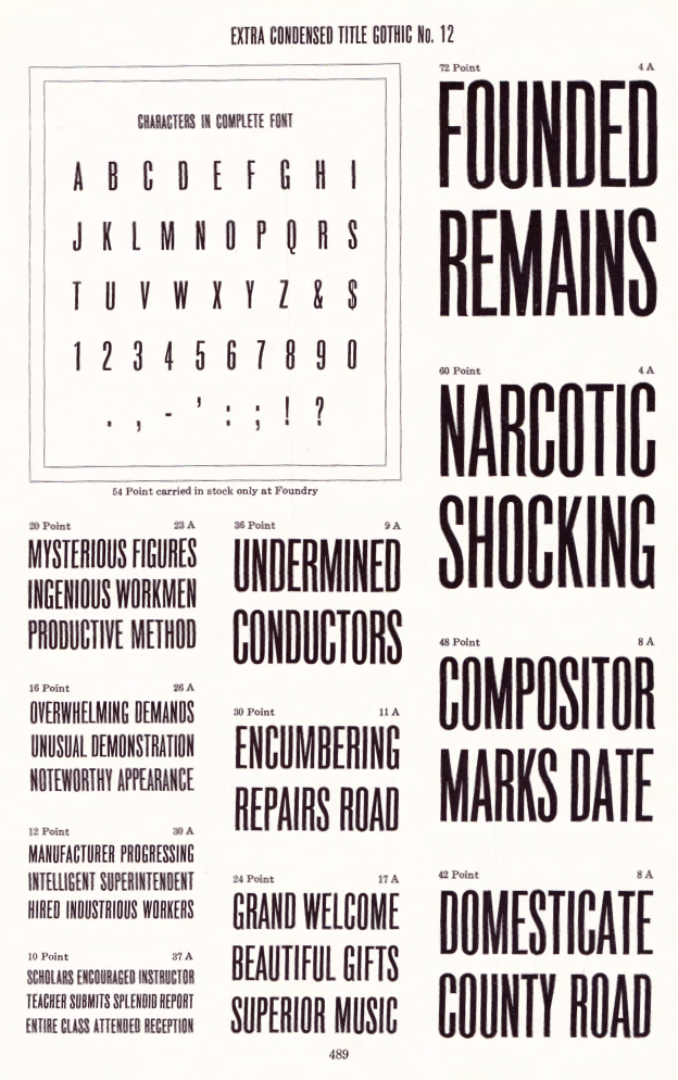
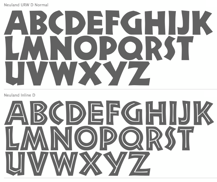
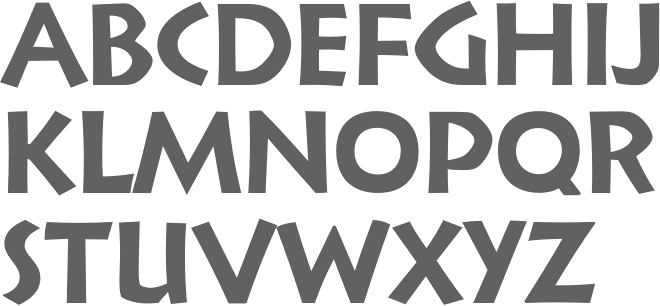
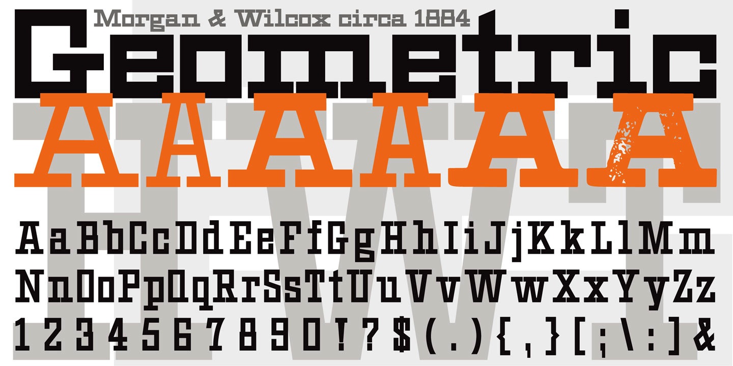
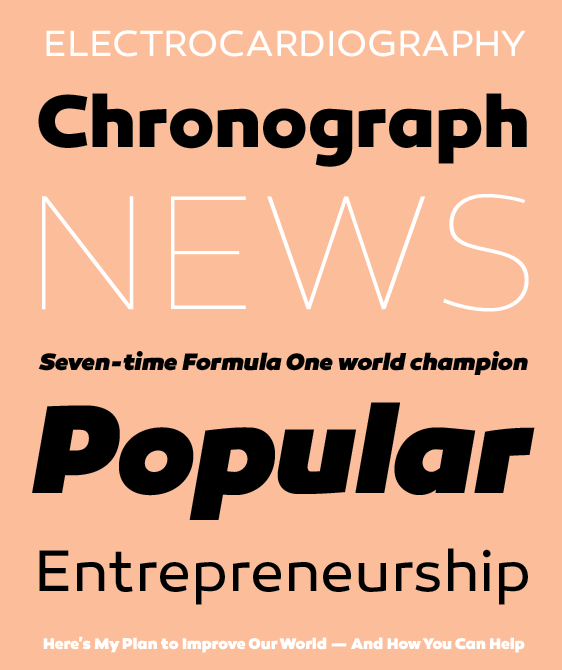
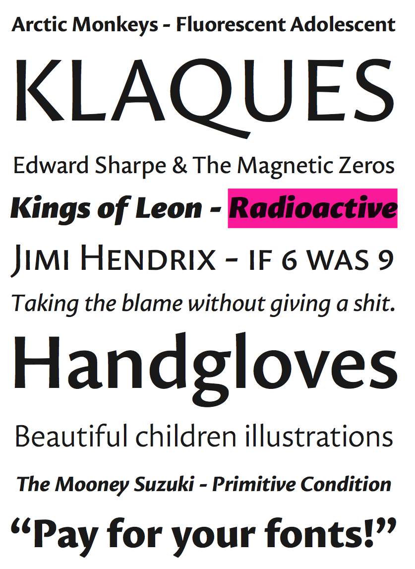
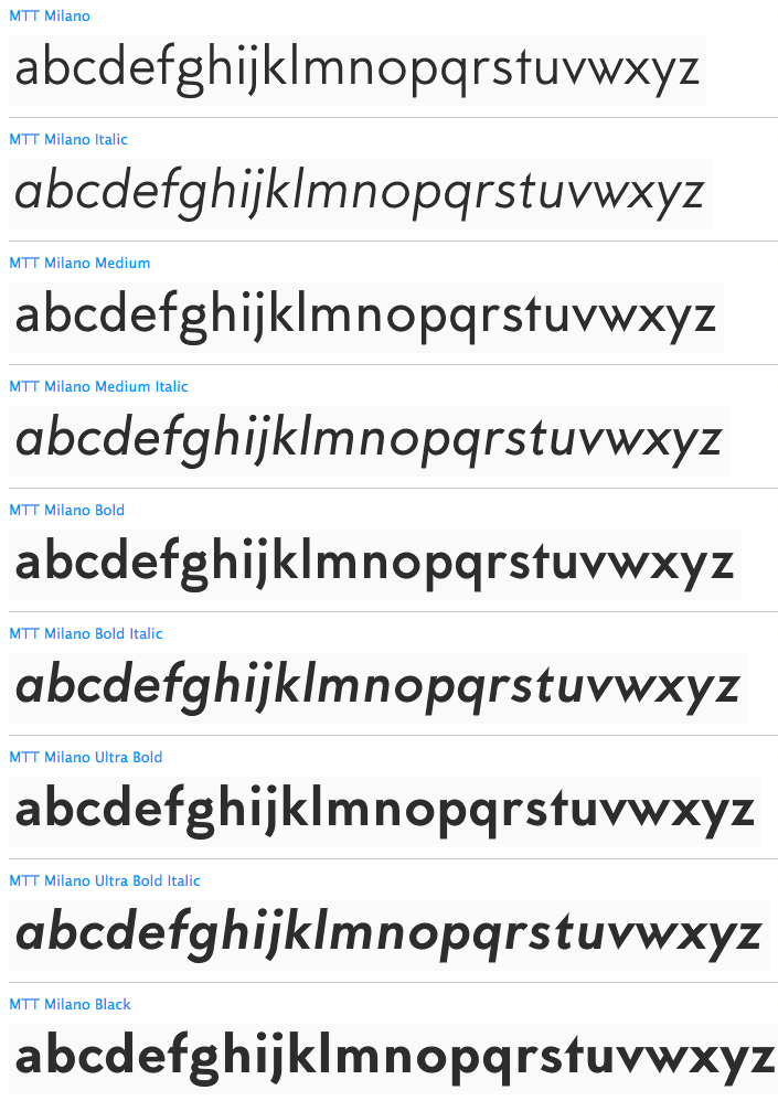
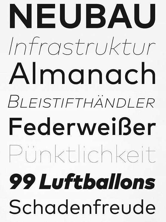
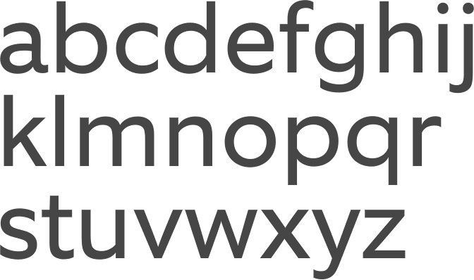
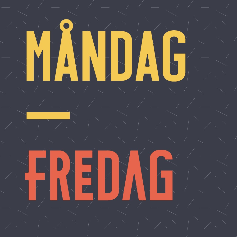
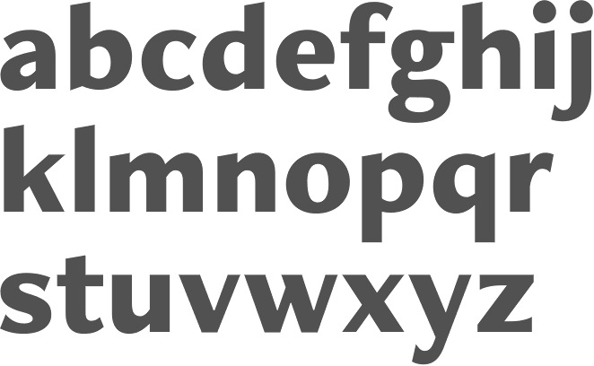
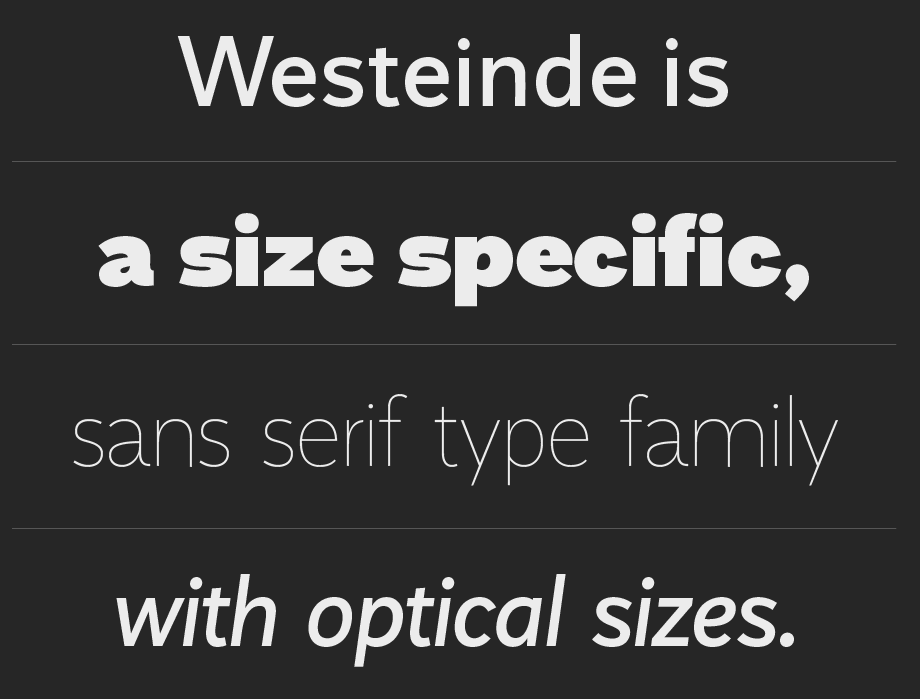
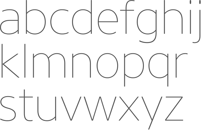
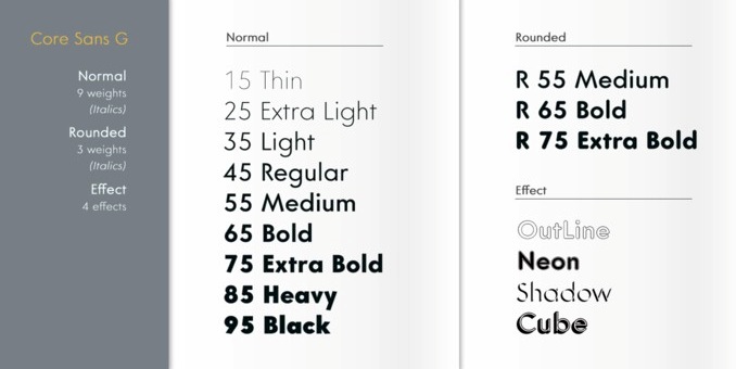
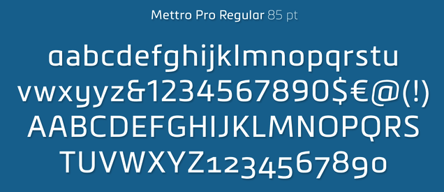
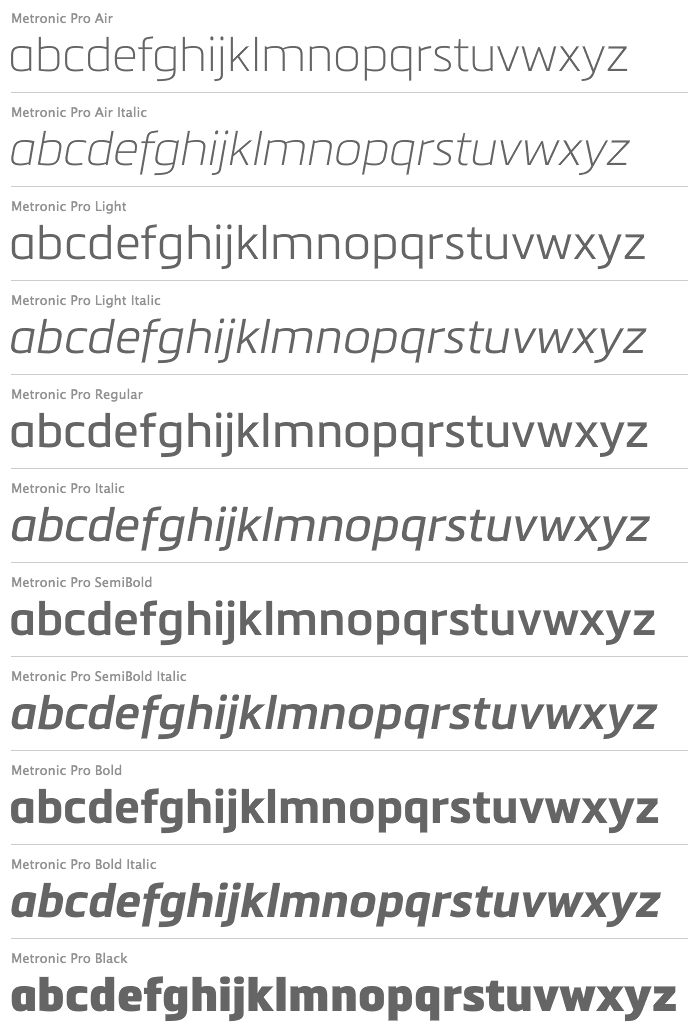
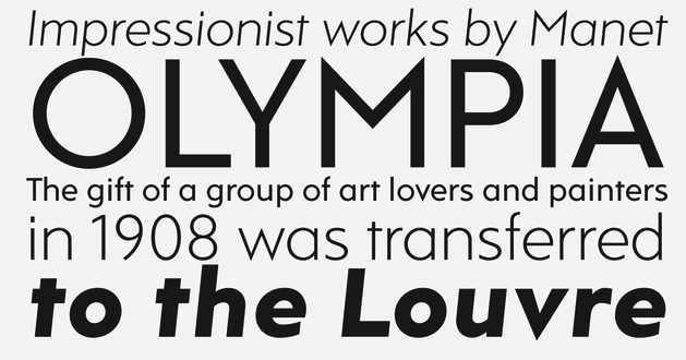
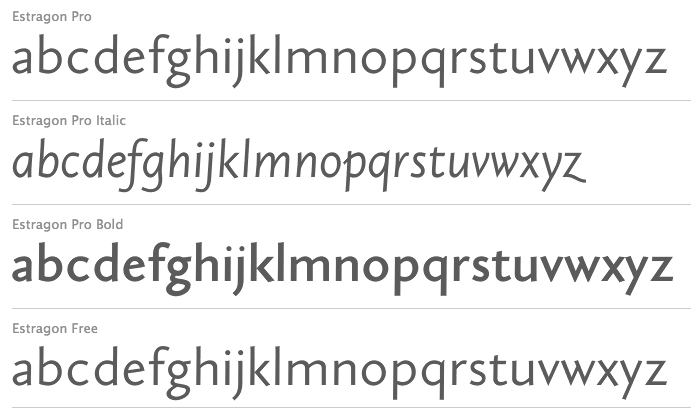
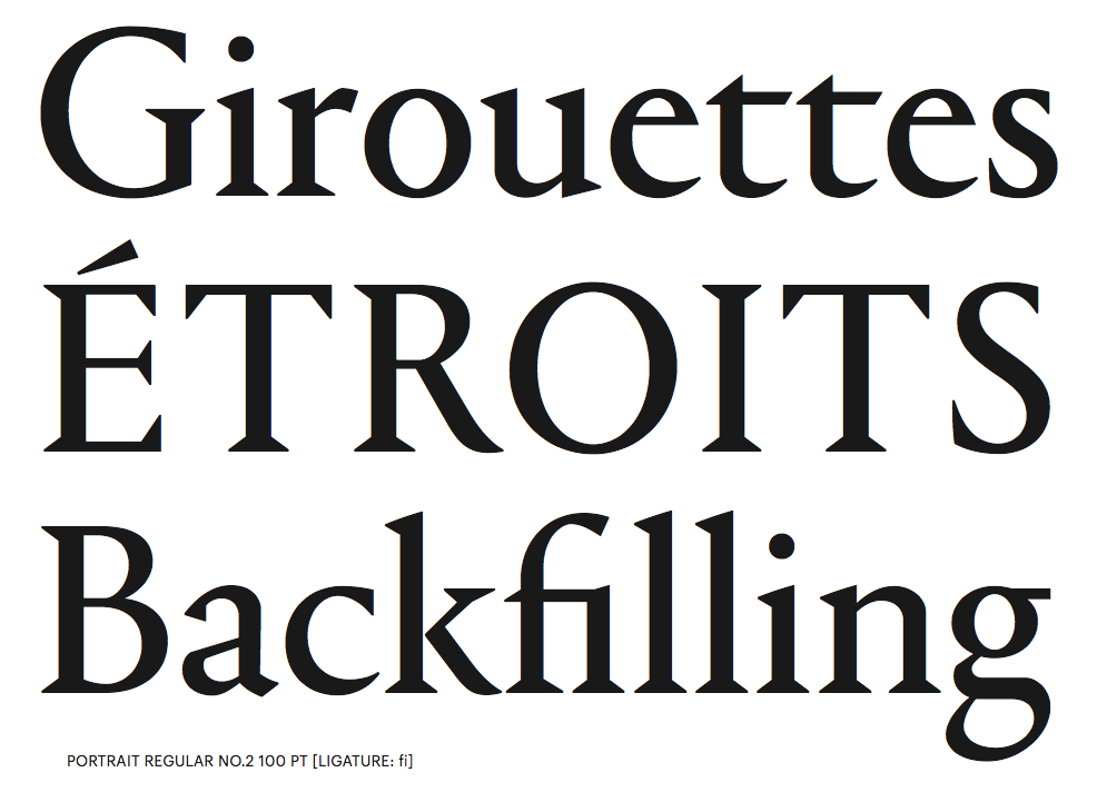
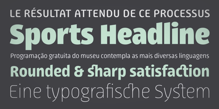
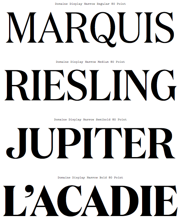
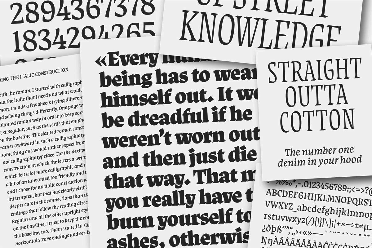
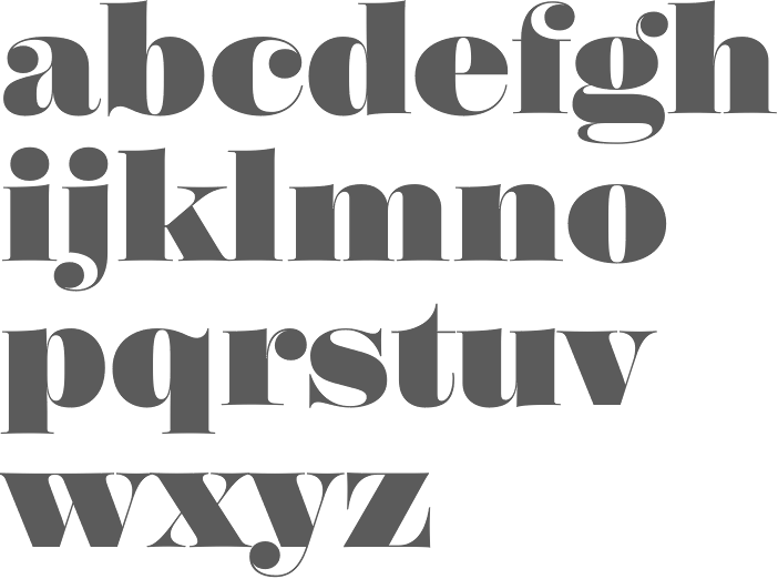
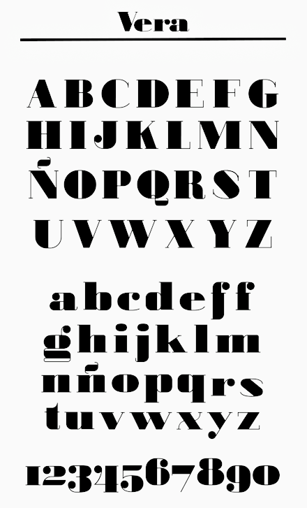
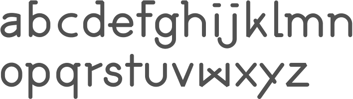
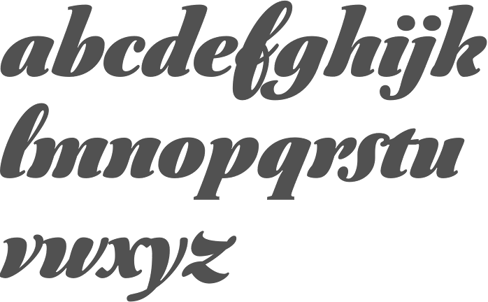
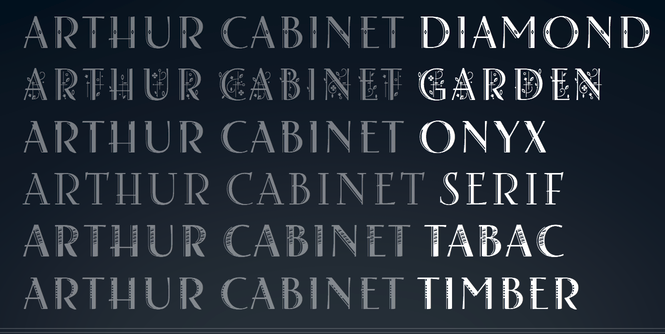
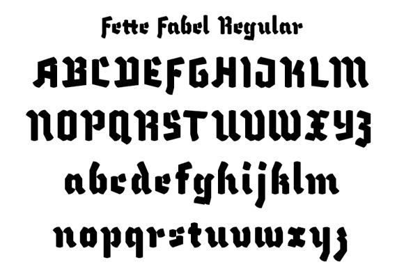
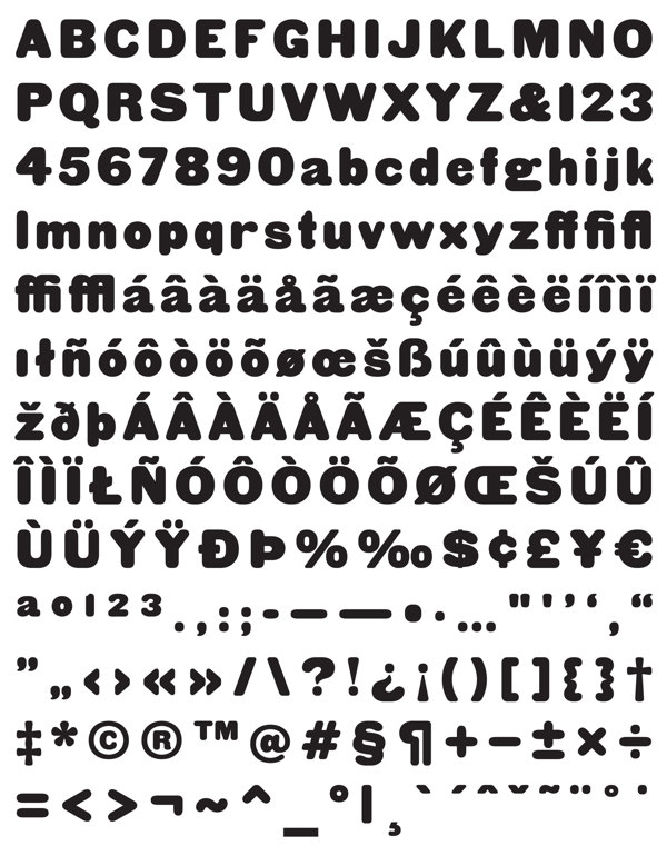
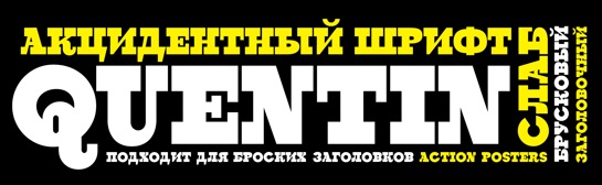
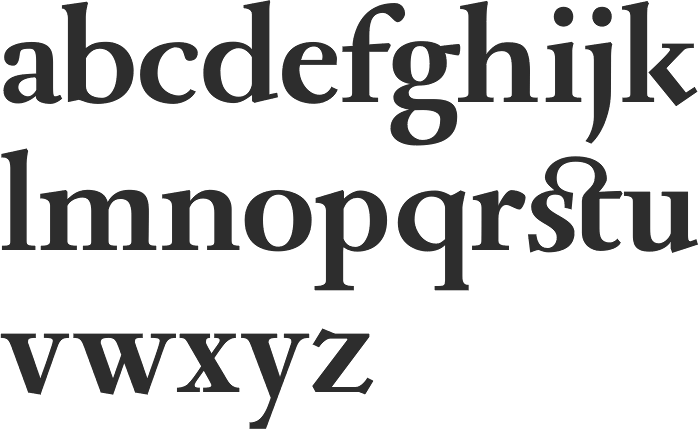
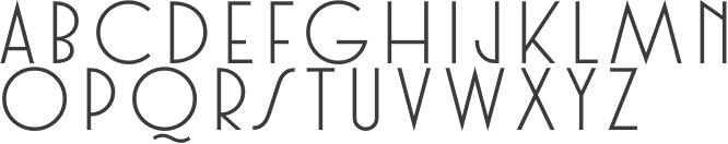
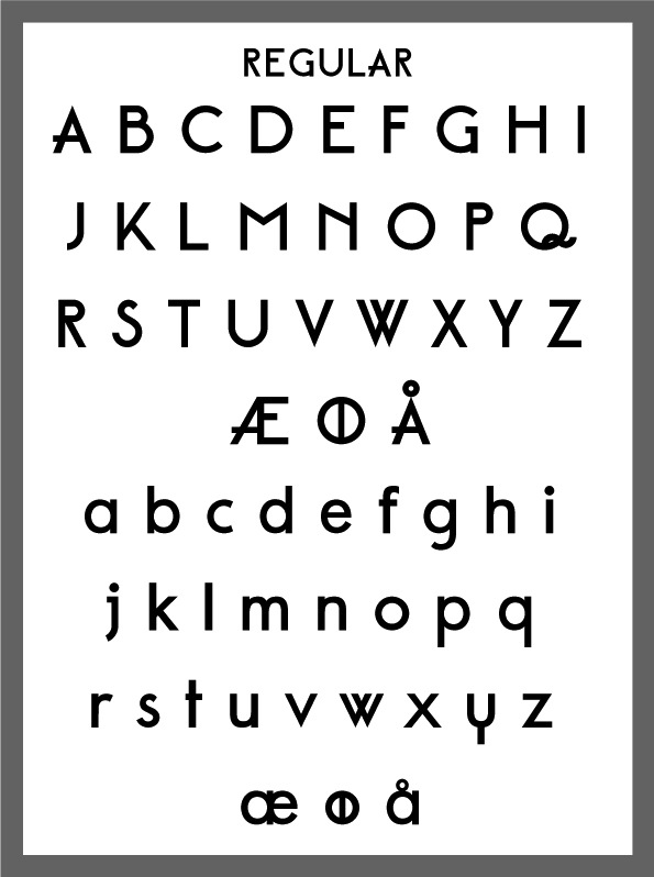
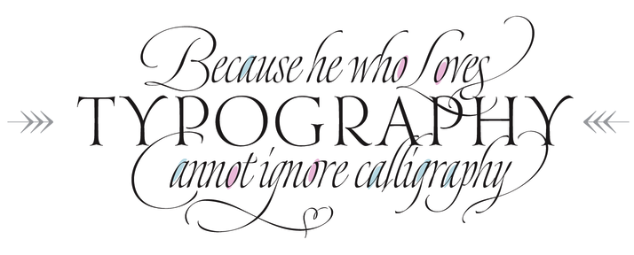
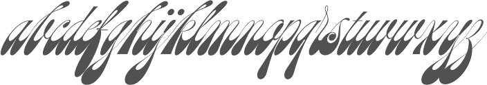