TYPE DESIGN INFORMATION PAGE last updated on Sat May 16 08:20:44 EDT 2026
FONT RECOGNITION VIA FONT MOOSE

|
|
|
|
|
Music fonts | ||
|
|
|
|
SWITCH TO INDEX FILE
Designer of the Paganini, Arenski, ChopinOpenFace, KhachaturianCaps, Capinini (blackletter) and Debussy families of fonts. [Google] [More] ⦿ | |
Typefaces from 2017: Time Exactly (just type in the four numbers of any time from 0000 to 2359 and it will give you that clock face, in one of 60 styles of your choice), Rebista, Magg (a corroded condensed sans typeface family), Sanstone. Typefaces from 2018: Hypersans (12 weights), Martian Tiles, Dominoes (a domino tile font). Typefaces from 2020: Yafferbuddle (a cartoon font). View the Aah Yes typeface library. [Google] [MyFonts] [More] ⦿ | |
abctab2ps
| Free program for setting music and tablature, which translates an input file in the abc language into postscript. It is based on Michael Methfessel's program abc2ps. While abc2ps can only typeset music, abctab2ps is an extension by Christoph Dalitz that can also handle lute tablature. Included are four type 3 fonts: FrenchTabFont (2000, Markus Lutz), Francisque (2000, Christoph Dalitz, for french tablature in abctab2ps, designed after Francisque's lute print from 1600), SW-Borrono-PS (adaptation of the StringWalker font Borrono by Christoph Dalitz, 2000), and ItalianTabFont. [Google] [More] ⦿ |
Abraham Lee
| |
Pages no longer found. Signature/logo font service (70 USD per font). Download a free Halloween font and some free music fonts (George's Music): bagpipe, tin whistle, tablature. Based in Prince George, British Columbia. The fonts Recorder and Whistle can be found here. [Google] [More] ⦿ | |
Adam Numrich
| |
Adrienne Weidner (Scottburgh, South Africa) obtained a Bachelor of Journalism at Rhodes University in 2015. In 2016, she designed a handcrafted slab serif and a music note inspired typeface. [Google] [More] ⦿ | |
African Drum Rhythms
| Free Djembe truetype font for Djembe drum music notation. By Lennart Hallström from Stockholm. [Google] [More] ⦿ |
Alain Veylit
| |
Alexis Luengas
| German type designer in Karlsruhe. He created Rhetorica (2011): Its design is motivated by the elegant roman letters of the Rennaissance, capturing the vitality seen in the hand of masters like Granjon, Garamond, Jenson and Van den Keere, but also neohumanist typographers like Zapf. In 2012, Luengas published the Meleo family. This organic semiserif family is characterized by a large x-height, and a contrast between the round nature of the regular style and the angular calligraphic features of the italic styles. In 2013, he started work on Didotesque. His main project in 2014 was Cavatina, a font for writing music: Cavatina is my misuse (to put it nicely) of the OpenType font architecture, inspired by Travis Kochel's FF Chartwell. Similarly, the font relies on contextual alternates and ligatures to take care of the formatting and allow the support of a wide range of musical grammar. Among others, it is possible to write over four octaves of different notes, key and time signatures, barlines, accidentals, articulations as well as ornamentation, providing a system robust enough to allow fast musical composition. Additionally, I have written an open-source converter that translates the Cavatina text files to MIDI and MusicXML. A browser based text editor with integrated MIDI playback is also provided for those who don't have a Mac. Cavatina exploits the liga, calt and gsub rules in Opentype. [Google] [MyFonts] [More] ⦿ |
Alexis Luengas Zimmer
| |
American Popular Song Sheet Covers
| Fonts by Dick Pape based on American Popular Song Sheet Covers: Music Covers-1890, Music_Covers-1891, Music Song Covers - 1899a, Music Song Covers - 1899b, Music Song Covers-1899c, Music Covers 1901-1909, Music_Covers-1910-11. Download here. [Google] [More] ⦿ |
In 2012, she created the tall high contrast fashion typeface Kilimanjaro. Her Textappeal lettering from 2014 is also noteworthy. Her experimental typeface Floating Typescapes won an award at ProtoType in 2016. Behance link. Old Behance link. [Google] [More] ⦿ | |
Tbilisi, Georgia-based designer of Georgian Musical Alphabet (2021). [Google] [More] ⦿ | |
The Anastasia music font is here (by Ken Drake&Chris Poehler, 1995), as well as the Garamond and Opus families (URW/SoftMaker, 1994). [Google] [More] ⦿ | |
Dr. Anders Ekenberg who teaches at the Theological Institute of the University of Uppsala (Sweden), has a medieval music notation font. [Google] [More] ⦿ | |
German designer André Maaßen (b. 1963, Neuss) studied communication design at the University of Wuppertal. In 1994, he founded Atelier für Kommunikationsdesign together with Anne Franke. Additionally, Maaßen has been teaching at the Ruhrakademie in Schwerte since 1992, and has also taught briefly at the University of Wuppertal. His first typeface was the funky calligraphic serif typeface family Varius (2004, Linotype). Varius includes ornamental styles with music notation and standard ornaments, called Livius Musika and Livius Ornaments, respectively. In 2007, he released the 4-style display sans typeface Anno at Linotype. Anno was inspired by the design of a New Year's card for the year 2000. [Google] [MyFonts] [More] ⦿ | |
Andreas Egler
| |
Andreas Höfeld
| |
In 2014, he also created the Open Source fonts Gidole Play (later renamed Gidolinya) and Gidole Sans [micropage], which is patterned after DIN 1451 and uses Euler spirals. Dedicated page for Gidole Sans. Github link for Gidole. In 2015, he published Gidole Regular and the monoline sans programming font families Monoid and Mono 16, which cover Latin, Greek and Cyrillic. Gidole was forked and extended in 2016 at Open Font Library by Cristiano Sobral as Normung. He modified the free M+ font to design MonoMusic for chords and tabs. Behance link. Dafont link. Open Font Library link. Use Modify link. [Google] [More] ⦿ | |
Commercial fonts (partial demos available) by Professor Ansgar Krause: Funktionsanalyse, Generalbass, SmartTools, GitarrenTools, Lyrics. Mac and Windows. Names of the demo fonts: FinalAnalyseDemo, FinalGeneralbassDemo, FinalGitarreDemo, FinalGriffbrettHorizDemo, FinalGriffbrettVertDemo, FinalLyricsRegularDemo, FinalSmartToolsDEMO. The demos are useless (the fonts of course will be fine!). [Google] [More] ⦿ | |
St. Petersburg-based graphic designer who made the experimental typeface Can You Read Music (2010), in which letters are replaced by music notes. [Google] [More] ⦿ | |
Argentinian compositor (b. 1971, Buenos Aires), who created a free music font called Woodwinds (for writing woodwind fingerings as in trills, multiphonics, bisbigliando, and so forth). [Google] [More] ⦿ | |
Antonis Tsolomitis
| |
Arev Fonts
| Motivated by mathematical applications, the "Arev" set of fonts adds Greek, Cyrillic, Latin-A, and some Latin-B, and Symbol characters (music and math, mainly) to Bitstream's Vera fonts. Stephen Schrenk (whose nom de plume is Tavmjong Bah) created the Arev Sans font. The text accompanying the Arev Sans package is: The package arev provides virtual fonts and LaTeX packages for using Arev Sans. Arev Sans is a derivative of Bitstream Vera Sans created by Tavmjong Bah by adding support for Greek and Cyrillic characters. Bah also added a few variant letters that are more appropriate for mathematics. The primary purpose for using Arev Sans in LaTeX is presentations, particularly when using a computer projector. Arev Sans is quite readable for presentations, with large x-height, "open letters," wide spacing, and thick stems. The style is very similar to the SliTeX font lcmss, but heavier. Stephen Hartke converted Arev Sans to Type 1 format, and created the virtual fonts and packages for using Arev Sans in LaTeX. [Google] [More] ⦿ |
Savannah, GA-based designer of the prismatic typeface Saxofon (2015). Behance link. [Google] [More] ⦿ | |
Located in Warrenville, IL, this company developed Mup: Mup takes a text file as input and produces PostScript output for printed music. It can handle both regular notation and tablature notation. It can also produce MIDI output. Free trial, but 29$ if you keep it. Windows and UNIX/Linux. [Google] [More] ⦿ | |
Arun Konanur
| |
Ashley Wells is the Orlando-based designer of the RussMusic music font. [Google] [More] ⦿ | |
San Francisco-based designer of the display typefaces Mille Crepe (2017) and Music (2017). [Google] [More] ⦿ | |
From the Abbaye Notre-Dame in Fontgombault (France), a program called GregEdit2. Included is a font for Gregorian chant notation. About 400USD. [Google] [More] ⦿ | |
Ayres
| Taunton, UK-based designer of Ayres Mono (2020), which includes some music and mathematical symbols. A guitarist and guitar teacher, he also created The Ayres Music Standard font for use in Sibelius and Finale. [Google] [MyFonts] [More] ⦿ |
Bach
|
|
Barry Graham
| |
Barry Ware
| |
Commercial music fonts at this French site: Virtuoso, Charleston, Grupetto, Staccato, Vivace, Espressivo, Koechlin, Fingering, Ars Nova, Flamenco, Oratorio, Timpani. [Google] [More] ⦿ | |
Madrid-based designer of the music notation font Capitan (2018). [Google] [More] ⦿ | |
Antwerp, Belgium-based designer of the beautiful free musical symbols font Euterpe (2007). Alternate URL. He is also involved in the management of the DejaVu free font family. [Google] [More] ⦿ | |
Bill Duncan
| |
Blackmoon Foundry (was: La Letteria, or: Anatole Type Foundry)
|
At the Rencontres de Lure 2005, she spoke about OpenType and Latin characters. Her typefaces:
Alternate URL. MyFonts link. Behance link. Klingspor link. Google Plus link. [Google] [MyFonts] [More] ⦿ |
Blake Hodgetts
| |
FontStructor who made two music fonts for use with Sibelius 7 o Windows: Extra Mensural (2013), Mensural 1 (2013). [Google] [More] ⦿ | |
In 2012, he created type 1 versions of two large font packages, Philipp H. Poll's Biolinum and Libertine. [Google] [More] ⦿ | |
Boxmarks
| A truetype font by Barry Graham (1998) from Melbourne containing trills, mordants, glissandi, arpeggio marks, rehearsal marks for music. Dominique Portier (marsu) updated the font in 2000. See also here. [Google] [More] ⦿ |
The font file has 9 music fonts by Sibelius Software (1993-1998), mainly for guitar tablature: InkpenChords, Inkpen, InkpenSpecial, InkpenText, Opus, OpusChords, OpusPercussion, OpusSpecial, OpusText. [Google] [More] ⦿ | |
Bright Ideas Fonts
|
Typefaces in alphabetical order with a few additional fonts mentioned separately later: Abraham, Accumulation, Adderley, Aerosol, Akimbo, Alexander, Amadeus-Regular, Amadeus, Amadeuz, Anderson, Arkitex, Arthur, Ashley, Asphalt, Asphalt'Wicker', Avante, Aztecan, Backlit, Balcony, Banshee, Barbarian, Barnaby, Barney, Beanbag, Bender, Bicycle, Billie, BlackRose, Blanchard, Blazed, Blossom, Bodkin, Bogsley, Boingo, Bonham, Botica, Bradley, Braxton, Brittany, Brownie, Bubbly, Bullwinkle, Bumper, Bunker, Butterscotch, Cajalco, Camelot, Candles, CandlesChrome, Candy, Canterbury, Cappuccino, Capsule, Carbiner, Carousel, Carrington, Carson, Casanova, Catfish, Cathedral, Catnip, Cecily, Ceremony, Challenge, Chamberlain, Chance, Chantilly, Cheetah, Chilled, Chocolate, Chopstick, Chump, Conniption, Corrigan, Corrosion, Crawford, Cyborg, Daffodil, Dakota, Danferno, DantesInferno, Darcie, Daytona, Delineator, Dementia, Diamondhead, Donika, Donnah, Dribble, Einstein, Elizabeth, Energy, Espresso, EspressoBI, FabreseDemi, Fairytale, Fallbrooke, Fiancee, Fido, Fionah, Fontana, Fonture, Fortress, Framed, Frankie, Frazier, Freddy, Frederick, Frizbee, Funhouse, Futana, Gapetto, Gatsby, Gemini, Gershaw, Gobbledygook, Godfrey, Goliath, Gonzales, Gonzo, Gothica, Graphitti, Grasshopper, Grendel, Griffin, Groovy, Habibe, Hannah, Hansel, Haskel, Havisham, Hawthorne, Henderson, Hendrix, Higgins, Highland, Holmes, Horton, Humphry, Hutchinson, Incense, Independence, IndependencefromBrightIdeas, Interpret, Invisible, Jacinda, Jacoby, Jaddarack, Jagger, Jamboe, Jangazoo, Jeremy, Jigsaw, Jokester, Joplin, Joseph, Joshua, Jubilee, Junior, Kaboom, Kamden, Karissa, Katherine, Kaufman, Kayleigh, Kendra, Kennedy, Khaki, KhakiBold, KhakiBoldOblique, KhakiOblique, Khakiripp, Khakiwrink, Kilcher, Killian, Kincade, Kingdom, Kinison, Klinker, Komodo, Kramer, Kromeon, Kryski, Kurrajong, Kyanna, Labrador, Leallie, Leland, Licorice, Limousine, Lindsy, Liquitek, Lockleer, Lockwood, Londonderry, Loyalty, Machine, Maddox, Madman, Magazine, Magellan, Maggie, Magician, Majesty, Malachite, Malone, Mandolin, Margarita, Marilyn, Marley, Marmalade, Marquardt, Martin, Mascara, Masters, McMahon, Mckinsey, Mechanizm, Meddler, Michelle, Milano, Millenium, Moccasin, Mongrel, Monolyth, Monster, Montey, Montoya, Moonstar, Morgan, Morrison, Morteza, Moteefe, Muskrat, Mustard, Napkin, Neolite, Newlywed, Nirvana, Noodles, Nouveau, OldWood, Oliver, Omicron, Pajama, Palooza, Panache, Paperclip, Papercut, Parbuckle, Parkinson, Paschico, Patches, Patriot, Patton, Payton, Pebbles, Pegasus, Perkins, Phantom, Picante, Picasso, Pickles, Pigeon, Pinhead, Pirouette, Platinum, Poodle, Pugsly, Quantum, Quentin, Radford, Ragetta, Ramirez, Rampart, Ramsey, Rapunzel, Rathskeller, Ravage, Ravish, Razor, Rebecca, Recess, Rediculous, Reefrash, Remeus, Revenge, Rhackoon, Rhodes, Ricksha, Riesling, Rockafella, Rockford, Rockola, Romance, Romulus, Rookie, Rutger, Ruxton, SMCChicago, SMCHollywood, SMCMiami, SMCMonteCarlo, SMCPhoenix, Sabien, Sampson, Samurai, Sangrial, Sapphire, Sapporo, Sawyer, Scarab, Scarlet, Scirocco, Scorpio, Scratch, Scrubblack, Scrubbold, Scrubcle, Scrublight, Sebastian, Seymour, Shakah, Shardee, Sheela, Skatty, Sketcher, Skyline, Skywalker, Snoozie, Snowboard, Squared, Stacker, Starsky, Stencil, Stencilla, Stiltskin, Sublime, Sundance, Surkle, Surrender, Swashed, Swingreg., Tagger, Tamarin, Tamborine, Tanner, Tantrum, Tarzana, Taylor, Teriyaki, Thompson, Thrash, Thrust, Tiddwell, Trapeze, Trident, Trinket, TrujillietXtra, Tuolumne, Twinkle, Tybette, Urbana, Vargas, Ventolin, Ventura, Vitrono, Vulmere, Waynne, Weiland, Whitney, Windsong, Winslow, Winton, Wonton, Wookie, Zargon, Ziggie. Additional fonts not in the list above: Andrew, Boogie, Fracas, Mandrel, Sinclair, Tuxedo, Varsity. Annotations:
|
Designer who used FontStruct in 2009 to make the native American 6-hole flute font NAF-BI. [Google] [More] ⦿ | |
Bund für Liturgie und Gregorianik
| The defunct site www.nocturnale.de had commercial music fonts by Holger Peter Sandhofe (1972-2005) from Bonn:
|
Byzantine Catholics in Slovakia
| The following fonts can be downloaded at this Slovak site of the Byzantine catholic church in Slovakia: the music fonts Juhasevic (2006, David Pancza), Lviv (2006, David Pancza), Lvov (2006, David Pancza), Manjava (2006, David Pancza), and the Olsavica family (also 2006, David Pancza). Also: S407 (David Pancza), Izitsa StarosloviencinaA (1995, old Slavonic), bwgrkl (1994, Michael S. Bushell), pismotest, znamC (David Pancza). [Google] [More] ⦿ |
Byzantine Music Fonts
| The Byzantine Music Fonts (2005) were designed by Ioannis A. Vamvakas. Aesthetic help came from Panagiotis Kotopoulis. The metafont contains the Jesus Christ symbol, Greek Capital Letters, and music symbols. Byzantine music is the official ecclesiastical music used by the Greek Orthodox Church. Alternate URL. [Google] [More] ⦿ |
Music software. This site used to have a free chord symbols truetype font, as well as Arial Chords (truetype, Monotype), Georg Di Filippo's GChords, Gitarrengriffe (for guitar), seville (a truetype music font from Codamusic) and Capella (truetype, by Peter Becker). [Google] [More] ⦿ | |
Czech music software. Free fonts here: Acordeon, Gitarrengriffe, Chord-Symbols. [Google] [More] ⦿ | |
Florence, Italy-based designer of Old Tape (2018) and Chord (2018: a musical connect-the-dots typeface). [Google] [More] ⦿ | |
Torres Novas, Portugal-based designer of the monoline modular sans typeface Comba (2017). She also published a set of pictograms called Guitarra (2017). [Google] [More] ⦿ | |
Codesigner with Fernanda Fendt of the decorative music-themed typeface C-Fone (2014). [Google] [More] ⦿ | |
Fonts designed by Lou Harrison and implemented by Carter Scholz include Pluma, Rotunda, Lou Casual, Federov, Lou Titling, Aptos Uncial. He also made Kepatihan Cipher Notation Font, a typeface for cipher notation based on the Central Javanese system called kepatihan, which includes symbols for punctuating instruments, octave dots, phrase markings, bowing marks and more. [Google] [More] ⦿ | |
Publisher of the music notation font specimen book Noten- und Schriftproben der Röder'schen Officin in Leipzig (1860). [Google] [More] ⦿ | |
Chant Times is Colin Lunt's modification of Times to provide accents for pointing Psalms and canticles. Colin Lunt runs Lunt Fonts. [Google] [More] ⦿ | |
Kuala Lumpur, Malaysia-based art director who made the music note-inspired typeface Musiqa (2013). [Google] [More] ⦿ | |
Khmer font designer. Here one can download Khmer Arrow (2010), Khmer Dotted Extend (2010), Khmer Eng (2010), Khmer Music (2011). [Google] [More] ⦿ | |
Creates PostScript sheet music from chord and lyric files. Written by Martin Leclerc and Mario Dorion at SUN. Original page. [Google] [More] ⦿ | |
In 2008 he designed Flag Semaphore (+Smooth, Peace), Articulate, Font from NATO (military slab serif), Glockenwerk (pixel clock font), Glockenwerk Uhrzeit, Flags-and-NATO (dingbats), Font from NATO alpha, Tall, Flying-Circus (Western showtime typeface to imitate the Monty Python titling font), LCD-display, Simple (stencil font with 700 glyphs), TMNT, Tetris, sharp-pixels, Raster, Quad (nice stencil face), Inverted, Propaganda (Cyrillic font simulation), Empty Monospace, Pride, Stadium, Rounded, Dear God (script pixel face), Celtic Style. In 2009, he added 7x12 Pixel Mono, @bcde, Abstract Letter Patterns, Music, Texture, Diagonal, Gothic, Illusio, Unispace (typewriter type), Narrow Serif, Delta, Alien Double (great!), Donut, Flags-and-NATO, Simple-Fraktur-Initial, Simple-Fraktur, Texture, Friendly Serif, (+Soft), Invisible, Sharp, Heavy Diacritics, Concentrium, Continuous Digital Display, Elves, Pixies, Space Movie (+Ligatures), Flag Semaphore (+Smooth, +Peace), Articulate, BBT Biline Twist, Biline Twist, Empty Monospace, Unfix, Infix, Pride, Tyre Stencil (like tire threads---nifty...), and Overlap. FontStructions from 2010: Even (gridded), Brilliance, Slalom Vision, Quirky Serif, 7x12PixelMono, Ball Terminator, Gearbox, Prefix, Upside Down, Way Too Small (a minimalist pixel face), Butterfly, Ribbon Gymnastics, 2D Barcode, Horizon Stencil, Biline Twist, Blocktur, Symmetricus (alien writing?). FontStructions in 2011: 12 dice, Monotwist (tall, monospaced), Squarific (fat octagonal), Swirl (curly), Sweet (Victorian), Easter Eggs, 50 Fifty (experimental, geometric), Squarific (+Stencilious), Spiralix (spiral-themed for Latin and Cyrillic), Bloccus, Feet (monospaced). Creations from 2012: Düpbøl (German expressionist face), Slice, Blocktur, Alien Double, 7:12 serif (pixel face), Blick, Dry Heat (Isolates and Initials, Medials, Finals: an Arabic simulation family), FF9 Coin Slots, FF8 Untalic, FF7 w1de, FF6 Lean Mean, FF5 Bamana, FF4 Circulation, FF3 3times7, FF3 Runization, FF1 Glitchy, Squared, Puzzlish, Steep, Digitalis (octagonal), 50 Fifty (artsy and geometric), Monotwist, Infix. FF stands for Forgotten Fonts. Typefaces made in 2013: Ribbons And Banners, Digital Rome (pixel face), Censorship, Interlock, Bouma, Glaedelig Script, Hand XL Smooth, Vascomat, Spitzschtruct (emulation of Suetterlin), Neonic, Fish Scales, 7:12 Serif, Analogly, Squarific Fraktastic, Metro Sans (pixelish). Typefaces from 2014: Word Games, Shadows, Yuuroppuna pixel, Spines, Numbers, Tal Dansk, Zahlen Deutsch, Insular Typewriter, Nudge Nudge (dot matrix), 7:12 Serif (monospaced pixel font), Jovian, Squarafic Fraktastic, Computer Says No, Runic, Fluorescent (neon tube typeface). Typefaces from 2015: Hexagonia, Kapow (a comic book font), Fauxreign (a Thai emulation font). Typefaces from 2016: Ziplock (art deco), Vexillum (maritime signal flags). Typefaces from 2019: Drop Cap (Lombardic), Fun with Cubes (3d). [Google] [More] ⦿ | |
Free music fonts for all platforms by Christian Texier: ACOUSTICA, CONCRETA, CONTROLA, ELECTRONICA, SONORA, TEMPERA (1993-2002). To be used with the music software Finale. His company is called Midi Design. [Google] [More] ⦿ | |
Christoph Dalitz
| |
Christophe Féray
| |
Clalez Design
| Graduate of UJMD, El Salvador. San Salvador, El Savador-based designer of the free music note-themed font My Symphonic (2019). [Google] [More] ⦿ |
Based in Gold Coast, Australia, Clara Mendiola designed the music note-insppired vintage typeface Symphony (2016) while studying at Queensland University of Technology. [Google] [More] ⦿ | |
Claude Melle Derieppe
| |
Claudia Granados
| |
| |
Music fonts for Finale 2000: Maestro (by Blake Hodgetts), Jazz. Company run by Lenore Mamer. Maestro is absolutely wonderful! [Google] [More] ⦿ | |
Colin Ayres
| |
Small archive of music fonts: Anastasia, FretsA, FretsB, FretsC. [Google] [More] ⦿ | |
The Microsoft truetype font collection. Also, the musical font PowerTab (2000), PalatinoLinotype, Sylfaen, Raavi, Shruti, Latha, Mangal and Gautami. [Google] [More] ⦿ | |
The CorelDraw dingbats can be found in many places. The fonts: Animals-1, Animals-2, Arrows1, Arrows2, Awards, Balloons, Borders1, Borders2, Buildings, Bullets1, Bullets2, Bullets3, Bullets-4(Japanese), Bullets-5(Korean), Business&Government, Borders1, Borders2, Boxes, Charting, Clocks, CommonBullets, Computers, Chinese-Generic1, Electronics, Festive, Food, Furniture, GeographicSymbolsNormal, Household, Hygiene, HomePlanning, HomePlanning2, Japanese-Generic1, Kidnap, Korean-Generic1, Landmarks, LandscapePlanning, Medicine, Military, MilitaryID, MorseCode, Music, MusicalSymbolsNormal, NauticalFlags, OfficePlanning, People, Plants, Science, Semaphore, Signs, Space, SportsFigures, Sports&Hobbies, Stars1, Stars2, SymbolProportionalBT-Regular, Shapes1. [Google] [More] ⦿ | |
Greek/Byzantine music fonts: ED-Fthora, ED-Isson, ED-Psaltica, UB-Byzantine-Italic (Unibrain), UB-Byzantine (Unibrain), bem13. [Google] [More] ⦿ | |
| |
Miller is a supporter of free and open-source fonts, as well as free and open-source software. He uses FontForge for design, and releases all his work under free licenses: I really just want people to be able to use my designs, improve them and share them. First, on a pragmatic level, I know that my work will be imperfect, and I'd like others to be able to use their judgment to make adjustments (which I hope they'll also release under a free license). Second, I think that too much material (and not just fonts) is behind barriers of restricted access and artificial scarcity. This kind of thing---useful tools and information---wants to be free, so let it out for everybody to use. | |
Foundry in Sao Paulo, Brazil. Daniel Fontenele Saracho studied at the School of Advertising and Design in Sao Paulo, Brazil. Creator of Sampa New Symphony (2011, letters based on music notes). He is credited by Bung Letter for part of the design of the calligraphic typeface Dayton Script (2020). [Google] [MyFonts] [More] ⦿ | |
Daniel Lüthi
| |
This small archive has, e.g., Atlantean (1999, Walt Disney Company: runes), Disney-Dingbats, Dracula, Kidnap, MorseCode (Corel), MusicalSymbolsNormal, SignLanguage, Signs, Tribal, WDIMemo (Monotype). [Google] [More] ⦿ | |
Daniel Taupin (1936-2003) held a degree of the ESPCI school and was a doctor in physics. He was a researcher in a solid-state physics lab at Orsay University (Physique des Solides, University Paris-Sud). Obituary. Another obituary with details of his mountain climbing career and death in the mountains. He published ttfmf2t1, a free C program, to clean up the output of Oleg Motygin's ttf2mf program that converts ttf files installed (!!) in Windows to metafont format. Metafont sources for Garamond, Times, Arial, Book Antiqua and Bookman Oldstyle are also at this site. He also codeveloped OpusTeX and Musixtex (for music notation) with Andreas Egler and Ross Mitchell. He published Les polices TTF converties en Metafont and MusiXTeX: L'écriture de la musique polyphonique ou instrumentale avec TEX. Designer of the metafont fraktur font families CM Fraktur and DM Fraktur. CM Fraktur, or cmfrak, is based on Yannis Haralambous' font yfrak (1990). [Google] [More] ⦿ | |
Typefaces from 2016: Mikelis (connected upright script), Cartame (an urban vernacular signage brush typeface). Typefaces from 2018: Handnilo. Typefaces from 2019: Librasnilo (Brazilian sign language), Cordenilo (an angular vernacular typeface). [Google] [More] ⦿ | |
Krasnoyarsk, Russia-based designer of several music instrument pictograms (2017) and a thin all caps Cyrillic display sans typeface (2017). [Google] [More] ⦿ | |
David Defois created four music fonts (free) for partitions of "didjeridoo": Kanbi_A3, Kanbi_C2, Kanbi_R3, Kanbi_V3. Dated 2003-2004. [Google] [More] ⦿ | |
| |
David Kettlewell
| |
David Pancza
| |
Designer of the music notation typeface Chords (2008, FontStruct). [Google] [More] ⦿ | |
For a school assignment, Jakarta, Indonesia-based Deadra Ivanka Qintara designed the music note-inspired typeface Musica (2017). [Google] [More] ⦿ | |
Denis Mitchell
| |
Japanese commercial foundry. They offer Latin fonts as well. Among dingbats and special fonts, we cite Benzion, Fraktura, MathFont, Nota, Numerals, Ornament, PiGraphA, PiGraphB. Designers of Takoyaki, sold at Font Pavilion. [Google] [More] ⦿ | |
Original dingbat truetype fonts by Destiny's Lady in 1998-1999: DLDesigns3, DLDesignsFour, DLDesignsTwo, DLSantaCaps, DLBirdz (1999), DLTreeCaps, DestinysBorderDings, DestinysButterflyDingbats, DestinysCherubsDing, DestinysDecorativeDings, DestinysDesigns, DestinysEasterDings, DestinysFancys, DestinysFloralDings, DestinysFlowers, DestinysGingerbreadDings, DestinysLittleHouses, DestinysMusicDings, DestinysNewYearsDings, DestinysTeddbearDingsTwo, DestinysTeddyDingsOne, DestinysTeddybearDingsThree, DLFillegreeCaps, Destiny's Design Dings (6 fonts), Framers, Buttons, Interfaces. Has gone partially commercial with these fonts: Destiny's Interfaces (3 fonts), Destiny's Framers (2 fonts), Destiny's Buttons. Her original site disappeared. Dafont keeps some of the fonts. [Google] [More] ⦿ | |
Designer of the music font NWC Extra Ornaments. [Google] [More] ⦿ | |
Dick Pape
| |
Designer of the free music font Rousseau (1999). Based in Ledignan, France, Montel is responsible for the Berlioz music software. Berlioz link. [Google] [More] ⦿ | |
Don Rice in New York made four truetype fonts (all formats, 65 USD) for jazz sheet music: GoldenAgeMusic, GoldenAgeText, GoldenAgeTitle, GoldenAgeXtras. [Google] [More] ⦿ | |
Designer in 1994 of the music font Aloisen. [Google] [More] ⦿ | |
Designer (aka "strat") of the free automobile outline dingbat font DJ Autocar (2008). She also made DJ Horses 1 (2009), DJ Coinage (2008), WW2 Aircraft (2009), DJ Kitchen (2009, kitchen dingbats), and DJ Stringed (2008, guitar dingbats). Alternate URL. Fontsy link. [Google] [More] ⦿ | |
Composer who created the free fonts Recorders (2013) and Accordion (2012): This font contains 120 mostly accordion-related symbols, including registrations, chord notations, and bellows indications. [Google] [More] ⦿ | |
Dry Heaves Fonts (was: Phil Fonts)
|
The list: BlownDroid, Neatified, HappyLarry, IShotTheSheriff, Alien Marksman, EvilCow, Corporate Suit, BadHairDay, Tiptonian, Philbats. Grouped as Scroll fonts from the dead Sea, we find: Habbakuk Scroll (Hebrew), Manual of Discipline (Hebrew), Parthenon (Greek), Ambrosius, Problem Secretary (old typewriter), DeadCircuit, MoldyPillow, Pastorswrit, RadiatedPancake, StolenLlama, Untitled, WetNapkin, Worn Manuscript (1999, grungy blackletter), DustyWombat, NasalDrip, Alphasnail, CarbonatedFont, RaptorAttack (2001), Warped Greased Monkey, Alphasnail (2001), Beth David (1999, Hebrew), Greased Monkey (2001), Lost City (1999, Hebrew), Missing man out (2001), No Brainer (2001), Raptor Kill (2001), Spazbats (2002, dingbats), Speed of Oatmeal (2001), Troglodyte (2001), Polyphemus (2000), Infestation (2000), Hand Drawn Wasabi (2002, katakana font), I Am A Font Designer (2003, scanbats), Neosight (2003), FirstTemple (2003, an old Phoenician lettering font), ScreamingGuitar (2002, guitar dingbats), DHUgaritic (2003), PeskyPhoenicians (2003). Devian tart link. Alternate URL. Fontspace link. Dafont link. Abstract Fonts link. [Google] [More] ⦿ |
DVM Publications
| Steven Powell's Pennsylvania-based company. Designers and sellers (for 40USD) of the Kidnotes font: notes with letters embedded in them for students. Also made Metronome and MetTimes: "A collection of number sets and built-in music characters combined with MetTimes lets you mix text with markings and music symbols without changing fonts." Free demo fonts for Kidnotes, Metronome and DVMarticulations. Alternate URL. [Google] [More] ⦿ |
Creator of the free musical notation font Forte (2009, FontStruct). [Google] [More] ⦿ | |
Free Ocarina Notes truetype font by Ed Boudreaux, Ocarina Enthusiast and Computer Scientist. [Google] [More] ⦿ | |
Sells handwriting-fonts designed to exactly replicate many educational handwriting styles. In particular, they have these:
| |
Elena Albertoni
| |
Ellbound Studio
| In 2016, Jan Angermüller (Germany) compiled the best list to date for music fonts. He also compares various fonts. His lists are subdivided as follows: (1) Classic music notation fonts (all) (1a) Classic music notation fonts (only SMuFL) (1b) Classic music notation fonts (only Unicode Musical Symbols area) (2) Handwritten music fonts (3) Examples of unavailable fonts (4) Medieval, Byzantine and ancient Greek fonts (5) Music fonts for word processing (i.e., stafflines and/or stems, beams included) (6) Chord fonts (7) Figured bass fonts (8) Fretboard fonts (9) Fingering/pedal fonts (10) Microtonal notation fonts (dedicated fonts or those with many accidentals) (11) Special music fonts (12) Text fonts for rehearsal marks (with border) (13) Suitable text/lyrics fonts. [Google] [More] ⦿ |
Emerald City Fontworks
| Run by Steven Lundeen from Seattle, ECF does customized handwriting / signature / company logo fonts, for 39 dollars per font. Shareware and freeware fonts, such as Augie, Codex, Decadence, Intimacy, Intimacy Deux, JD (1997, handwriting font), Movieola, Spanky's Bungalow (1997), Syriac, the beautiful handwriting typeface TallPaul (1997), Teen Spirit, Curtain Call, Stillframes, Birds A, Webster. ECF also makes your handwriting into a font. They offer some clipart fonts of the first quality. There are three mollusk fonts, three musical instrument fonts, three insect fonts, three reptile fonts and four mythology fonts, for example! Some of the clipart fonts are free. Handwriting fonts like j.d., Augie, Skeetch and TallPaul are well worth a try. Display freeware fonts include Crowns and Coronets (dingbats), Decadence, Intimacy, Codex and the Spanky family. Many fonts have both T1 and TT versions for both Mac and Windows. The shareware fonts are of the display type, like Moonpie, Puzzleface, Thump, Sputnyk, KingsCourt, Festus, Daddio, Chester Shag, King's Court, the Pookie family, and a knot font. Dafont link. Abstract Fonts link. Fontspace link. [Google] [MyFonts] [More] ⦿ |
Graphic and information designer. Emilio Grazzi focuses on typography issues related to music notation and representation. After his graduation in Cello at Conservatorio G. Rossini in Pesaro, in 2012, he completed the editorial design course at ISIA Urbino with a dissertation about parametric type design applied to music notation. Since then, Emilio Grazzi continued his activities in this multidisciplinary field, co-supervising thesis projects, and promoting layout and design solutions for music notation. [Google] [More] ⦿ | |
Designer of Pendant Ocarina (2008, FontStruct), a music font for finger tabs for 6 hole pendant ocarinas. [Google] [More] ⦿ | |
Four music symbol truetype fonts for the Encore package made by Ken Drake and Chris Poehler: Anastasia (Passport Designs), FretsA and FretsB (MusicWriter), and FretsC (FN Passport Designs). Well, this link has gone dead. [Google] [More] ⦿ | |
Dr. Anton Thanner at EOS Verlag St.Ottilien is developing a program and a truetype font for quadratic music notation. [Google] [More] ⦿ | |
Eric Oehler
| |
Bangkok-based designer (b. 1987) of Musiker (2009, a music note-themed face), and Leicht (2009, a monoline sans family). [Google] [More] ⦿ | |
Designer of the bagpiping font Marl (1993). Home page. [Google] [More] ⦿ | |
Express Music Publishing
| Commercial music fonts AshMusic (by Ashley Wells), LeeMusic (by Lee Monroe) and RussMusic (by Russ Ward). EMP is headed by Lee Monroe out of Orlando, FL. [Google] [More] ⦿ |
Three commercial music fonts for 40USD: Ashmusic, Leemusic and Russmusic. [Google] [More] ⦿ | |
Greek/Byzantine music font package brought to you by Father Ephraim from the Greek Orthodox St. Anthony's Monastery in Arizona: EZ-Oxeia, EZ-Fthora, EZ-Psaltica, EZ-Special-I, EZ-Special-II, EZ Omega. These fonts are similar to the fonts from CYLLOGOS MOUSIKOFILON CON. The Byzantine Drop Caps package includes Agion Oros XHR (1994, by I.M. Grhgorioy), EileenCaps, Genesis, MgAgiaSofiaUC, MgAgionOrosUC, MgByzantineUCPol, MgEkklisiaUC, MgGothicOld, MgKonstantinosUC, MgViking, MrSByzantinePT, Mt, PFGoudyInitials, PFKonstantinople and PFKonstantinopleInitials. The fonts starting with Mg are by Magenta, ca. 1989. The PF fonts refer to Parachute, ca. 2003. [Google] [More] ⦿ | |
Graphic designer and illustrator in Lima, Peru, who created the decorative caps alphabet The Musicians in 2017. [Google] [More] ⦿ | |
Designer of the music font Volpiano (2003). [Google] [More] ⦿ | |
Federico Garcia
| |
Graphic designer in Selangor, Malaysia. He created a music-themed display typeface, Beat (2013). [Google] [More] ⦿ | |
Finale Jazz font
| Nice fonts such as Jazz, JazzText, JazzCord and JazzPerc, designed by Richard Sigler from Bowie, MD. "JazzFont is a collection of fonts for use with computer notation software, such as Finale, and is designed to look like hand-written manuscript. It's a great alternative to music fonts that look too computerized." Here you can find JazzCord-Regular, Jazz-Regular, JazzText-Regular (free). [Google] [More] ⦿ |
Florian Feuser
| |
Designer of the free music text font Nepomuk (2014), a didone in the style of Computer Modern. Hosted at my site: Nepumok Italic. Nepumok Regular. [Google] [More] ⦿ | |
Fontgrube AH
|
Dafont link. Abstract Fonts link. Klingspor link. Fontspace link. [Google] [More] ⦿ |
Fonts for microtonal music
| New York-based designer of shareware music fonts. From his page: "MICRO 2ß is a Postscript(c) font designed for the 1/12th-tone notation system developed by Ezra Sims for his own music and now taught in the microtone classes of New England Conservatory. " [Google] [More] ⦿ |
A.M. Schweitzer's Gregorian chant font links. [Google] [More] ⦿ | |
Franck and Brahms Music Fonts
| Commercial type 1 and truetype fonts (Franck, Brahms) made by Florian Feuser. Franck is compatible with the Petrucci font, and Brahms contains a variety of nonstandard symbols. [Google] [More] ⦿ |
The 150 USD Fronimo music package by Francesco Tribioli comes with four custom fonts, each with an Italian and French tablature style. The fonts can be extracted from the free demo. Link died. [Google] [More] ⦿ | |
In 2013, Jennifer Lind designed these free fonts for Frontiers: Frontiers-CleanHandwriting, Frontiers-MusicNotation, Frontiers-PrintingPress, Frontiers-SloppyHandwriting, Frontiers-VerySloppyHandwriting. [Google] [More] ⦿ | |
G. William Music Production
| Bill Duncan sells music fonts she made for use with Finale. These include: BDNotes, Brackets, BracketsBold, ChordSuffix, ChordSymbol, EnclosureSans, EnclosureSerif, EngraverTime (not for sale), Hairpins, Salzedo, Loops&Squiggles, Rehearsal, RehearsalSans, RehearsalDbl, RehearsalSansDbl, Rolls, RollsBig, TempoTime, TempoTimeSans. Now located in Seattle, GWMP was founded in 1984 by Bill Duncan as a commercial music production company. [Google] [More] ⦿ |
Gaël Chrétien
| |
| |
George D. Secor
| |
George Delanghe
| |
George Douros
| |
George's Music
| Three free music fonts: Bagpipe, Tinwhistle and Harmonica Tablature. Made by George Delanghe. The fonts Recorder and Whistle can be found here. [Google] [More] ⦿ |
Gerd Castan has many links to music fonts. [Google] [More] ⦿ | |
Germ Art
| Barranquilla, Colombia-based designer of Musical Illustrated Alphabet (2018). [Google] [More] ⦿ |
German Parada Diaz
| |
| |
GNU Freefont (or: Free UCS Outline Fonts)
|
Fontspace link. Crosswire link for Free Monospaced, Free Serif and Free Sans. Download link. [Google] [More] ⦿ |
PostScript generator of music sheets. By Han-Wen Nienhuys and Jan Nieuwenhuizen. [Google] [More] ⦿ | |
Four fonts for 65USD by Donald Rice Music Preparation (75 Park Terrace E. #D-54 New York, NY 10034). Advertised for "professionally hand-copied sheet music ... for use in big band charts, lead sheets, jingles, record dates, ...". [Google] [More] ⦿ | |
Music Department at Princeton: instructions on where to get fonts for Gregorian chants. The Gregorian Chant Font (Mac, PC): StMeinrad and its auxiliary, StMeinradAux, contain the symbols necessary to reproduce Gregorian chant. About 40USD. All is run by St. Meinrad Archabbey, St. Meinrad, IN. [Google] [More] ⦿ | |
Great page on the symbols used in Gregorian chant notation. By Rick Kephart. [Google] [More] ⦿ | |
During his studies at ESDA (Spain) and ESAD of Matosinhos (Portugal), Guillermo Mendoza co-designed Didona en do menor (2018) together with Maria Sancho Garcia. This typeface combines Didot with musical elements. [Google] [More] ⦿ | |
Designer of the music notation font Nocturnal Experience (2005). [Google] [More] ⦿ | |
Harold Lohner
| |
Harold's Fonts
|
|
Harry Hagan
| |
He studied typography from 1938 until 1941 in Paul Koch's workshop in Frankfurt. From 1946 until 1956, he was type director at D. Stempel AG type foundry, Frankfurt. In 1951 he married Gudrun von Hesse. From 1956 until 1973, he was consultant for Mergenthaler Linotype Company, Brooklyn and Frankfurt. From 1977 until 1987, he was vice president of Design Processing, Inc., New York (which he founded with his friends Aaron Burns and Herb Lubalin), and professor of Typographic Computer Programs, Rochester Institute of Technology, Rochester, New York. Students at RIT included Kris Holmes and Charles Bigelow, who together created the Lucida type family. Other prominent students include calligrapher/font designer Julian Waters and book designer Jerry Kelly. From 1987 until 1991, he was chairman of Zapf, Burns&Company, New York. He retired in Darmstadt, Germany, but consulted on many font projects until a few years before his death. In the 1990s, Zapf developed the hz program for kerning and typesetting. It was acquired by Adobe who used ideas from it in InDesign. Awards:
Some publications by Hermann Zapf: List of his typefaces:
Books and references about him include:
Pictures of Hermann Zapf: with Lefty, with Rick Cusick, in 2003, with Frank Jonen, with Jill Bell, with Linnea Lundquist and Marsha Brady, with Rick Cusick, with Rick Cusick, with Stauffacher, a toast, with Werner Schneider and Henk Gianotten, with Chris Steinhour, at his 60th birthday party. Pictures of his 80th birthday party at Linotype [dead link]. Linotype link. Klingspor link. [Google] [MyFonts] [More] ⦿ | |
Hiroshi Tachibana
| |
Seoul-based designer who created the caps typeface Music Instrument Font (2012). Behance link. [Google] [More] ⦿ | |
Holger Peter Sandhofe
| |
Free dingbat truetype font of classical instruments. [Google] [More] ⦿ | |
| |
Ioannis A. Vamvakas
| |
One 13MB zipped font file. Alternate site. Yet another site. This collection contains many fonts in Corel's distribution, about 20 Bitstream fonts, the QuickType family, Voyetra:SPW music font, and many Monotype fonts such as Photina and Haettenschweiler, for a total of about 400 fonts. [Google] [More] ⦿ | |
Jan Angermüller
| |
Creator of high quality music typefaces. Belgium-based designer of the one-weight Roman Ionic (2017) who explains: Roman Ionic is a unique revival of a typeface that was once popular and used in many late 19th century and early 20th century music publishing houses, such as Durand et fils. It displays a happy marriage between the beautiful features of the Clarendon type and the legibility of the Scotch roman class and is thus aimed to work for titling and body text. Other music typefaces by Jawher Matmati: HP Diagram (Jawher Matmati: a font for harp pedal diagrams). His fonts can be bought at Abraham Lee's Music Type Foundry. [Google] [MyFonts] [More] ⦿ | |
Annemasse, France-based creator of the Music Typography typeface (2012). [Google] [More] ⦿ | |
Jeff Kellem
| |
Jeff Levine
| |
Jeff Levine: Dingbats and Alphadings
|
|
Jess Burns
| Graphic and web designer in San Diego, CA, who created the script typeface Musical Alphabet in 2013. In 2014, she published Roundabout, Paisley Numerical Font, and Strobe Font (a textured typeface inspired by epilepsy). [Google] [More] ⦿ |
Jess Frederick
| |
| |
Proben der Schriften in der Breitkopfischen Schriftgießerey zu Leipzig (1787, Leipzig) shows Breitkopf's specimens. Local download. Breitkopf designed Breitkopf Fraktur ca. 1760. Walden Font sells a version of this typeface, which was used for most of the 19th century. Dieter Steffmann's version is free. Helzel's version is sold by Fraktur.de. Breitkopf's simplified fraktur of the 1790s was revived in 1914 as Jean-Paul-Schrift, and was revived again around 2000 by Gerhard Helzel in digital form as Jean-Paul Fraktur. See also Breitkopf Fraktur Pro (2016, SoftMaker), URW Breitkopf Fraktur D by Ralph Unger, Jean Paul Fraktur (2021, Ralph Unger), and DS-Breitkopf-Fraktur (2001, Delbanco). Breitkopf is perhaps best known for his original music characters. Metal versions of Breitkopf Fraktur are at Stempel (1912), Klinkhardt (1912), Berthold (1919) and C.F. Rühl (1912). Ben Archer writes: Breitkopf Fraktur was the preferred Fraktur of the German Baroque period. With wider proportions and a lower x-height than its predecessors, this graceful gothic type was modelled on the Neudörffer-Andreä Fraktur that had been used by Albrecht Durer in several of his works. Samples: A, B, C. Klingspor link. [Google] [MyFonts] [More] ⦿ | |
Fleischmann created blackletter typefaces such as Holländische Gotisch (1739-1760, digitally revived by Gerhard Helzel; Manfred Klein and Petra Heidorn made the free revival also called Holland-Gotisch, in 2005 and mention that their source was "Nederduits"; see the Fleischmann Flamande), Mediaan Duyts (1744) and Fleischmann Gotisch (ca. 1750, digitally revived by Ingo Preuss in 2004 as Fleischmann Gotisch PT, by SoftMaker in 2016 as Fleischmann Gotisch Pro, and by Alter Littera in 2012 as Nederduits). Fleischmann was also renowned for his work on music typography. He worked for the publisher Johann Gottlob Immanuel Breitkopf, who was interested in improving the typography of musical notation. Fleischmann created a complex music notation font that proved unsuccessful in the marketplace, but was subsequently used to create many designs including the decorative edging on the first Dutch banknote called the roodborstje (robin). [Google] [MyFonts] [More] ⦿ | |
British designer of Vox Humana containing reed organ glyphs created by Jonathan Reed. [Google] [More] ⦿ | |
Jonathon Baxter
| |
Designer of the music notation font Ukelele (2020). [Google] [More] ⦿ | |
Owensville and/or Vincennes, IN-based art student (b. 1985) and designer of the Courier-like Shavian font Shaw Mono (2004), ChordBoxes (2010, to create chord diagrams), Bee Skep (2004, for Deseret), Box Puzzle Font (2010), Litterae Ignotae (2010: A Lingua Ignota (Latin for unknown language) was described by the 12th century abbess of Rupertsberg, Hildegard of Bingen, who apparently used it for mystical purposes. To write it, she used an alphabet of 23 letters, the litterae ignotae), Seftos Nandor (2004, for an artificial language called Lower Geldorian), Sëftos Parathenia (2005, also in the Seftos script), this decorative serif (2006, experimental), Alberne Handlung (2007, a narrow all-caps Latin and Cyrillic face), Swartsbok (2007, a nice gothic font), Lumaro (2007, in the style of Times-Roman), Duck Hunt (2004, fat display face, based on the lettering of the title of the game), Anquietas (2004, "the Ancient alphabet from Stargate"), Gothic Book (2005), and Dadh Ath (2004, containing the Ath characters used to write Baronh created by Morioka Hiroyuki and used in Sekai no Monshou). Spicer now lives in Terre Haute, IN. Another web page. [Google] [More] ⦿ | |
He modified the music font NWC15, to include more "normal" numbers. [Google] [More] ⦿ | |
| |
Irish designer of the free music dingbat font Frets. [Google] [More] ⦿ | |
For a school project, Juri Muñoz Montoya (Lima, Peru) designed the looney tunes typeface Notas Musicales (2016). [Google] [More] ⦿ | |
In 2012, he made Stickerman Bad Times, Rock X Start TFB, Aespiro TFB, Perspectivo TFB (3d face), Desgarvuda (textured face), Estancofida TFB (textured face), LEDisplay TFB, Restroom Signs TFB, Chinese Cally TFB, Discontinuo, Suast Ornad TFB (a textured face), Scoolar TFB (3d face), Katakana TFB, Hiragana TFB, Dragons TFB, Arrows TFB, Old Retro Keys TFB, Pycuaf, Pycuafodi, Dragon Ball TFB, Escaned (texture face), Chess TFB, Seagram TFB, Army Weapons TFB, Stamp Seal TFB, Logos TFB, Scripto TFB, Another Ornaments TFB, Vintage Auto Cars TFB, Simple (a monoline sans), Travesia TFB (information design dings), Music TFB (dingbats), Xmas Cartoon, Wings of Wind TFB, Mickey M TFB, Pincel Handwrite, Jigsaw Pieces TFB, Valentines Day TFB (heart dingbats), Proportional TFB (squarish sans), Stars TFB, Working Signs TFB, Signs Language TFB, Ornaments Labels and Frames, Snowflakes TFB, Christmas Nativity TFB, Chinese Zodiac TFB, Zodiac TFB, Only Skulls, Calendar Note TFB, Sports TFB (sports silhouettes), Old Retro Labels TFB, 11 Vator TFB, Xmas TFB (Christmas dings), Trees TFB, Clothing Logos TFB, Dirty Sweb, Can Dog TFB, Ornaments, Finger Print, Kitty Kats TFB, Batman Logo Evolution TFB, Light TFB (avant garde sans), Digital Display TFB (LED face), Skullx (dingbats), Tribal Tattoo (dingbats), Klingon, The Meme Font (dingbats), Rongorongo (a system of glyphs discovered in the 19th century on Easter Island), Strangferfixcs, Hotel Transilvania and Frankenwine. Typefaces made in 2013: Pudahuel Sans, Variada TFB (simple circle-and-arc-based sans), Estorea TFB, New LED Board TFB, Rayada TFB (textured face), New Barcode Font TFB, Estrellas TFB (stars), Estrellass (sic) TFB, Spirits Dots Drinks, Mero Ornad TFB (fishnet textured), Toolz TFB, New Stencil TFB, Logocarsbats TFB, Caritons TFB (smilies), Illustrations TFB (scanbats), Edgebat TFB (knives), Crossbats TFB (crosses), Abstrec TFB (organic sans), Frames TFB, BitxMap Font TFB, Austera Simple TFB, Traffic Signs TFB, Extranger Sol TFB, Rifle Bats TFB, New X Digital TFB (LED typeface family), Dasgastada TFB, El Alambre TFB, Punk Not Dead TFB, Triangled TFB, Noxtrey Auf TFB, Cross LED TFB (+Bold), Cursi Extra TFB, Hearts Shapes TFB, Ornamentsss TFB, Eggfaces TFB, Orniste TFB, Shadded TFB (sic) (shadow face), Spoghetti Western (sic) (Italian Far West face), Groovy Font (shaded), Fireguns TFB (dingbats), Only Revolver TFB (dingbats), Aeg Flyon Now (condensed sans), Espinuda TFB, T1 Logoso TFB, Social Logos TFB, Hearts and Flowers for valentines, Astrology Astrological TFB, Ornametss TFB, Astrology TFB, Old Ornaments, Old Foundry Prints TFB, Old seals TFB, English Two Line TFB (pearly alphabet from 1796), Amame TFB (dot matrix face), Fontesda TFB (sketched face), Flowers Dots Bats TFB, Queen Destroy TFB, Bicycle TFB (dingbats), Stone Army, Ancient Weapons TFB, Numismatic Bats TFB, Elizabethan Initials TFB, Anome Ibul, Big Daddy LED, Mavole Sinpo TFB (spurred), Dowted Remix TFB (dot matrix face), QR Font TFB, Another Barcode, Display Free TFB (LED face), Cadabra Debilex, Initials TFB, Music Logos TFB, Toxic Waste TFB, Ornad Dentro TFB, Logos and Logos TFB, Amore Mio, Hearts Shapes TFB, Another X Display TFB (dot matrix), Pro Display TFB (dot matrix), Juino Net, Quiwo Luse TFB, Aliencons Two, Cargante TFB, News Board TFB, Aliencons TFB, Barcode TFB, Birthday Balon TFB, Birds TFB (silhouettes), Le Fish (fish silhouettes), Motos TFB, Love You Too TFB (Valentine's day font), LED LCD 123, Noteame (fat sans), Badopus TFB (monoline script), Estrellado TFB, Love You TFB (Valentine's Day font), Cubs LED TFB (LED / dot matrix typeface), Text Inside TFB (textured face), Kuwa Ronmcie Q (circle-based face), Zebra TFB, Distrogrunge TFB, Carillas TFB (smilies). Another URL. [Google] [More] ⦿ | |
Karen E. Willard designed Doremi for shaped note vocal (fasola) music. This font was available in Postscript 1 and Truetype. [Google] [More] ⦿ | |
Graphic designer in Singapore. Creator of Honk (2012), an ornamental caps typeface on the theme of musical instruments. She also designed the triangulated colored typeface Rainbow Puke (2012) and the geometric solid typeface Playful Type (2014). [Google] [More] ⦿ | |
Ken Johnson of Music Environment, Inc, in Aurora, CO, made the Interlude music font. No home page or email address. [Google] [More] ⦿ | |
Kiwi Media (Eric Oehler)
| Fonts by Eric Oehler from Middleton, WI:
Dafont link. Klingspor link. Fontspace link. [Google] [More] ⦿ |
German music software company located in Friedland. Medieval is a Finale plug-in (200USD). It contains two truetype and type 1 fonts, Neuma und Neuma Symbol. The software can be used to set early music, such as
| |
kottattf contains the HTimes (Hungarian Times?) family by Kim-Soft, and MusicalSymbols by Corel. Truetype. [Google] [More] ⦿ | |
Spanish music teacher. In 2017, she released the free music notefonts LaSolsi Figuras and LaSolsi Not. [Google] [More] ⦿ | |
Laboratory of Digital Typography and Mathematical Software
|
About GFS Complutum, they write: The ancient Greek alphabet evolved during the millenium of the Byzantine era from majuscule to minuscule form and gradually incorporated a wide array of ligatures, flourishes and other decorative nuances which defined its extravagant cursive character. Until the late 15th century, typographers who had to deal with Greek text avoided emulating this complicated hand; instead they would use only the twenty four letters of the alphabet separately, often without accents and other diacritics. A celebrated example is the type cut and cast for the typesetting of the New Testament in the so-called Complutensian Polyglot Bible (1512), edited by the Greek scholar, Demetrios Doukas. The type was cut by Arnaldo Guillén de Brocar and the whole edition was a commision by cardinal Francisco Ximénez, in the University of Alcalá (Complutum), Spain. It is one of the best and most representative models of this early tradition in Greek typography which was revived in the early 20th century by the eminent bibliographer of the British Library, Richard Proctor. A font named Otter Greek was cut in 1903 and a book was printed using the new type. The original type had no capitals so Proctor added his own, which were rather large and ill-fitted. The early death of Proctor, the big size of the font and the different aesthetic notions of the time were the reasons that Otter Greek was destined to oblivion, as a curiosity. Greek Font Society incorporated Brocar's famous and distinctive type in the commemorative edition of Pindar's Odes for the Athens Olympics (2004) and the type with a new set of capitals, revived digitaly by George D. Matthiopoulos, is now available for general use. He also made GFS Solomos (2007) and GFS Baskerville (2007; note that several sites state that GFS Baskerville Classic is due to Sophia Kalaitzidou and George D. Matthiopoulos). In 2010, Tsolomitis published txfontsb, in which he added true small caps and Greek to the txfonts package. These fonts form a family called FreeSerifB, in type 1, that covers Latin, Greek, many Indic languages, Armenian, chess symbols, astrology, music, domino, and tens of other ranges of symbols. GFSNeohellenicMath was published in 2018: The font GFSNeohellenicMath was commissioned to the Greek Font Society (GFS) by the Graduate Studies program "Studies in Mathematics" of the Department of Mathematics of the University of the Aegean, located on the Samos island, Greece. The design copyright belongs to the main designer of GFS, George Matthiopoulos. The OpenType Math Table embedded in the font was developed by the Mathematics Professor Antonis Tsolomitis. The font is released under the latest OFL license, and it is available from the GFS site at http://www.greekfontsociety-gfs.gr. The font is an almost Sans Serif font and one of its main uses is for presentations, an area where (we believe) a commercial grade sans math font was not available up to now. In 2019, Tsolomitis released the free New Computer Modern package. An outgrowth of Knuth's Computer Modern, the fonts cover Latin and accented Latin letters and combinations, Greek (monotonic and polytonic), Hebrew, Cherokee and Cyrillic, and basically any possible math glyph. He writes in 2020: As far as the NewCMMath font is concerned, this is a derivative of lm-math with a huge amount of improvements and new glyphs. Currently the font should at least match STIX fonts in glyph coverage. [...] Finally, a long awaited feature, a Book weight for ComputerModern is added (math included). It produces slightly heavier output suitable for book production with high resolution printing. Further changes were added in 2021. [Google] [More] ⦿ |
In 2014, Lauriane Cailleau (Limoges, France) designed a typeface that was inspired by lined music sheets. [Google] [More] ⦿ | |
Lee Monroe
| |
Lennart Hallström
| |
Lilypond
| Lilypond is a Swedish site with Mats Bengtsson's fonts which are useful for music composition and mathematics (different sets of braces and numbers). Mats created the type 1 versions from Metafont bitmaps using pktrace. The fonts in the Feta font series: TeX-feta-braces0, TeX-feta-braces1, TeX-feta-braces2, TeX-feta-braces3, TeX-feta-braces4, TeX-feta-braces5, TeX-feta-braces6, TeX-feta-braces7, TeX-feta-braces8, TeX-feta-din10, TeX-feta-din11, TeX-feta-din12, TeX-feta-din13, TeX-feta-din14, TeX-feta-din17, TeX-feta-din19, TeX-feta-din4, TeX-feta-din5, TeX-feta-din6, TeX-feta-din7, TeX-feta-din8, TeX-feta-din9, TeX-feta-nummer10, TeX-feta-nummer11, TeX-feta-nummer12, TeX-feta-nummer13, TeX-feta-nummer4, TeX-feta-nummer5, TeX-feta-nummer6, TeX-feta-nummer7, TeX-feta-nummer8, TeX-feta11, TeX-feta13, TeX-feta16, TeX-feta19, TeX-feta20, TeX-feta23, TeX-feta26, TeX-parmesan11, TeX-parmesan13, TeX-parmesan16, TeX-parmesan19, TeX-parmesan20, TeX-parmesan23, TeX-parmesan26. See also here. [Google] [More] ⦿ |
FontStructor who made the tenor drum note font Tenor Notation (2010). [Google] [More] ⦿ | |
Lime
| Lippold Haken (Lime) created two free music fonts, Marl (2003) and Tufa (2003), both embedded in the shareware Lime music software program. [Google] [More] ⦿ |
Small music font archive: Accords, AlphaMusicMan, LD-Music, Lassus, MusicMuseal, MusicalSymbols, MusicalSymbols, NWCV15. [Google] [More] ⦿ | |
Lippold Haken
| |
Locker
| Rénald Lévesque offers a few self-made dingbat files (Valentine, HalloweenDingbats, Egyptian Hieroglyphics, Christmas Dingbats, Clipart Dingbats, Music Notation Font). [Google] [More] ⦿ |
Graphic artist, illustrator, and web designer who lives and works in Parma, Italy, and studied at the European Institute of Design in Milan. He says to be inspired by the work of Belgian comic artist Hergé, Georges Remi, creator of the popular comic character, Tintin. Designer of the innovative display font Orchestra (2003, Bitstream), which has letters made up from instruments. Home page. Alternate URL for home page. Yet another URL. FontShop link. [Google] [More] ⦿ | |
In 2018, she published Elisetta at Sudtipos. This type family of 6 fonts was specially crafted to write, edit and compose music sheets, lyrics, texts and notes. Winner at Tipos Latinos 2018 of a type design award for Elisetta. In 2019, she published Frambuesa at Sudtipos. [Google] [MyFonts] [More] ⦿ | |
Machinchouette
| Gaël Chrétien (aka Machinchouette) is the French creator of the FontStruct fonts Comédie (2012: 1800 glyphs), Anguleux (2012: 2888 glyphs), Micursif (2012, an organic typeface with over 2700 glyphs), and Mozart (2012, music font). In 2013, he created the round informal typeface family Rondouillard. Dafont link. [Google] [More] ⦿ |
Commercial music software company. One of their products is the StaffWriter music font. [Google] [More] ⦿ | |
In 1949, Manuel Rollan Rodriguez (d. 1996) set up the publishing house Editorial Rollan in Madrid. It became a very successful venture. For the Spanish educational publisher Edelvives SA, he designed the school font Edelfontmed. It was made public by Compolaser S.L. in 1998, and can be downloaded here. He also made a musical notation font. [Google] [More] ⦿ | |
Buenos Aires-based mussic professor who offers free music fonts such as FarHat (2005, free). Dafont link. [Google] [More] ⦿ | |
Graphic designer in Barranquilla, Colombia, who created the experimental Typomusic (2015) and Frida Kahlo Icons (2015). [Google] [More] ⦿ | |
During her studies, Maria Sancho Garcia (Huesca, Spain) co-designed Didona en do menor (2018) together with Guillermo Mendoza. [Google] [More] ⦿ | |
The font creators at MB Music Engraving In Greely, CO, write: "MBPercussion is a 116 character symbol or pictogram font created for the engraver, copyist, and composer who work with contemporary percussion notation. Advantages of percussion symbol use include clarity, efficiency of space, and the elimination of translation problems." 30 USD, Windows and Mac. Notational symbols for wind chimes, ratchets, vibes, slide whistle. [Google] [More] ⦿ | |
Martin Keary
| |
Mats Bengtsson
| |
Matt Hindson
| |
Matt Hindson's music fonts
| Free music fonts by composer Matt Hindson, dated 1997-2006: Harp Pedals, Recorder Fingering, Saxophone Fingering, TimesMusical, Accidentals, Clefs, FiguredBassMH, FiguredBassMH, GuitarStrings, Rhythms, StaffClefPitchesEasy, TempoIndicationsLite, TempoIndicationsLiteTrebuchet, TupletNumbersPetrucci, TupletNumbersSonata, WoodwindTablatureRec11, WoodwindTablatureSaxEuro, WoodwindTablatureSaxEuro, WoodwindTablatureSaxGraphic, WoodwindTablatureSaxGraphic, WoodwindTablatureSaxUS, WoodwindTablatureSaxUS. [Google] [More] ⦿ |
Creator of the guitar dingbat typeface Jazzed Up (2005), downloadable at Dafont. [Google] [More] ⦿ | |
Designer of Surakarta (1992, screen font for the traditional Javanese script called Hanacaraka) and KepatihanPro (for the Central Javanese musical notation system called Kepatihan). [Google] [More] ⦿ | |
Medienwerkstatt Mühlacker
| German commercial school font outfit based in Mühlacker. Free demo fonts. The categories: Lateinische Ausgangsschrift, Vereinfachte Ausgangsschrift, Schulausgangsschrift, Druckschriften, Druckschriften Bayern, Pädagogische Zeichensätze, Zeichensätze für die Mathematik, Weihnachtsfonts, Sekundarfonts. There are subpages for Swiss and Austrian school fonts. Of the many fonts, here are some made by Manfred Klein: KreuzWort, Norddruck, Sdfett, Vahalb, Veraus, Verfett. Ralf Lohuis (from Hünxe) made these fonts: Adam, Atlas, Bausteine, Blackwhite, Boxquestion, Domino, Eisenbahn, FlaggenABC, Geheim, Guitar, KreuzWort, Lapunkt, Lineatur, MatheRechner, MatheTangram, Meteo, Musik, Norddruck, Nordspur, Saspunkt, Sdfett, Sport, Telegraf, Trainee, Vahalb, VeenPikto, Veraus, Verfett, ZahlenABC. Subpage on school fonts. Christmas fonts made between 1999 and 2002, also by Lohuis: Fichten, Lichterglanz, Osterei, Schnee, Tannen, Verschneit, Weihnacht. Sub-page on Swiss school fonts where one finds CH Schrift 1 through 4, and Stein and Stein 1-Linie, Stein 2-Linie and Stein 4-Linie. At the Austrian school font sub-page, we find Druckschrift and Schulschrift 95. There is also a set of Suetterlin fonts. An alphabetic list: ABCKIDS, Abgedeckt, Animalabc, Anlaut, Anlautbilder 1, Anlautbilder 2, Astro, Atlas, Ausdruck, Babylon Keilschrift, Baerchen, Bausteine, BayernOutline, BayernSpur, Bayernband, Bayerndruck, Bayernf, Bayernfine, Bayernline, Bayernmiba, Bayernpunkt, Bayernpunktliniert, Bayernunter, Blackfoot, Blackwhite, Boxquestion, Braille, Briefmarken, CH-1_B, CH-1_L1, CH-1_L2, CH-1_L4, CH-1_R, CH-1_SPF, CH-1_Um, CH-1_ouL, CH-1_out, CH-1_pt, CH-1_ptL, CH-2_B, CH-2_L1, CH-2_L2, CH-2_L4, CH-2_R, CH-2_SPF, CH-2_Um, CH-2_ouL, CH-2_out, CH-2_pt, CH-2_ptL, CH-3_B, CH-3_L1, CH-3_L2, CH-3_L4, CH-3_R, CH-3_SPF, CH-3_Um, CH-3_ouL, CH-3_out, CH-3_pt, CH-3_ptL, CH-4_B, CH-4_L1, CH-4_L2, CH-4_L4, CH-4_R, CH-4_SPF, CH-4_Um, CH-4_ouL, CH-4_out, CH-4_pt, CH-4_ptL, Clocktime, DIN-Schrift Kapitalien, DIN-Schrift bold, DIN-Schrift capitals, DIN-Schrift italic, DIN-Schrift outline, DIN-Schrift shadow, DIN-Schrift, Dinosabc, Dontworry, Dontworry, Druck Au, Eisenbahn, Faces, Faraline, Fichten, First, FlaggenABC, Geheim, Gotisch unicial, Guitar, Gutenberg Druckschrift, Halloween Bilder, Halloween Schrift, Handschrift, Hieroglyphen Monumental, Hieroglyphen Papyrus, Hieroglyphen hieratisch, Isis, Kanzlei kursiv, Keys, Kontur, KreuzWort, Lahalb, Lapunkt, Lapunktliniert, Lateinaus, Latf, Latline, Latmiba, Latout, Lauflos, Launter, Lautgebueden, Lichterglanz, Lineatur, Linequestion, Lokos, Luftballon, Maps, Maramo, Math.Soma, Mathe.Adam, Mathe.Domino, Mathe.Euklid, Mathe.Euler, Mathe.EuroAdam, Mathe.Gaus, Mathe.Geobr, Mathe.Rechner, Mathe.Riese, Mathe.Tangram, Mathematik Bilder 1, Mathematik Bilder 2, Meteo, Mixed, Musik Notensatz, Musik, Noline, Nomiba, NordFaraFu, Norddruck, Nordf, Nordfine, Nordout, Nordpunkt, Nordpunktliniert, Nordspur, Nounter, Novokal, Osterei, Phoenizisch, Phonetic, Phonetic, Puzzle, Rounded bold Bold, Roemer, Saspunkt, Saspunktliniert, Schnee, Schuf, Schul 95, Schulaus, Schuline, Schulout, Schulunter, Schumiba, Schwunguebungen 1 Bilder, Schwunguebungen 2 Bilder, Schwunguebungen 3 Bilder, Schwunguebungen 4 Zeichen, Spiegel, Sport, Ste-1_1L, Ste-1_2L, Ste-1_4L, Ste-1_PL, Ste-1_Pt, Ste-1_SP, Ste-1_Um, Ste-1_bo, Ste-1_no, Ste-1_oL, Ste-1_ou, Ste-2_1L, Ste-2_2L, Ste-2_4L, Ste-2_PL, Ste-2_Pt, Ste-2_SP, Ste-2_Um, Ste-2_bo, Ste-2_no, Ste-2_oL, Ste-2_ou, Ste-3_1L, Ste-3_2L, Ste-3_4L, Ste-3_PL, Ste-3_Pt, Ste-3_SP, Ste-3_Um, Ste-3_bo, Ste-3_no, Ste-3_oL, Ste-3_ou, Suetterlin L2 outline, Suetterlin L4 outline, Suetterlin Lineatur 2, Suetterlin Lineatur 4, Suetterlin bold, Suetterlin normal, Suetterlin outline, Suetterlin, Suedout, Sueline, Suemiba, Sueddruck, Sueddrne, Sueddrnkt, Sueddrnktliniert, Sueddrur, Sueddrter, Tannen, Telegraf, Tiere, Tierspuren, Traffic, Trainee, Uhrzeit, Unterlinie, Vahalb, Valine, Vamiba, Vapuli, Vaunter, VeenPikto, Veraus, Veraus, Verbig, Verf, Verout, Verpunkt, Verpunktliniert, Verschneit, Weihnacht, WinkerABC, Xschrift, Zahlen.ABC, Zahlen.XYZ, Zetadrei, Zetaeins, Zetazwei. [Google] [More] ⦿ |
Music type designer at Harvard: free fonts include Ciconia (14th and 15th century early music notation) and ClarFinger (clarinet fingering font). [Google] [More] ⦿ | |
Creator of the free music font Djembe (2010). [Google] [More] ⦿ | |
Mobius Megatar
| Trakbats (2003) is a free geometric dingbat font designed by Traktor Topaz of Mobius Megatar. The readme file says: "The TrakBats font is useful for showing finger symbols in chord diagrams, or in the 'lyrics' line beneath standard notation to show fingering on bass or guitar." [Google] [More] ⦿ |
Mozart
| Denis Mitchell's free truetype font, BigBandSymbols (copyright Woodsloke, 1999). [Google] [More] ⦿ |
Bandar Seri Begawan, Brunei-based designer of the free monospaced music-themed font Guitar Tuner (2014) and the free font Fret Strings (2014). [Google] [More] ⦿ | |
| |
MuseScore
|
As text font, Martin Keary and Simon Smith developed Edwin (2021). Edwin is a free typeface adapted from the C059 typeface (from URW++ Design and Development GmbH) by MuseScore BVBA for its music notation and scoring applications. C059 in turn is an interpretation of New Century Schoolbook. Github link for Edwin. [Google] [More] ⦿ |
Musescore Shakuhachi
| Free music fonts at this Japanese site by Hiroshi Tachibana who made shakuhachi18 (2010, iFontMaker), Shakuhachi Kinko (2010, iFontMaker) and Shinobue (2010, iFontMaker). [Google] [More] ⦿ |
Bach, Lassus and Clefs music fonts for the Mac. Bach also in truetype version. [Google] [More] ⦿ | |
Based in Freiburg, Germany, this company published the 150 USD Susato font (1994, all formats), designed by Werner Eickhoff. Mixchael Müller-Hillebrand from Erlangen is also involved in the design. [Google] [More] ⦿ | |
Long list of music notation software links. [Google] [More] ⦿ | |
Great web notes edited by Rudolf Rasch with contributions by Bianca Maria Antolini, Axel Beer, Anik Devriès, Laurent Guillo, Rudolf Rasch, Rupert Ridgewell and David Wyn Jones. Lots of information on musical type through the ages. [Google] [More] ⦿ | |
Music Type Foundry (was: LilyPond)
|
His fonts can be bought at Music Type Foundry., which was founded by Abraham Lee in 2016. At that site, we find these fonts in 2020: MTF Scorlatti (sic) (a cleaned-up revival of the music symbols used by the famous SCORE notation program by Leland Smith (1925-2014)), MTF Arnold, MTF Beethoven (based on the scores engraved by G. Henle Verlag in the 1950s), MTF Cadence, MTF Gutenberg1939 (based on a specimen found in the (non-music) typesetting book Buchgewerbliches Hilfsbuch, by Otto Säuberlich, Verlag Oscar Brandstetter, Leipzig), MTF Haydn (attempting to mimic the look of an Edition Peters score), MTF Improviso (based on specimens found in the book Music Preparation: A Guide to Music Copying by Ken J. Williams), MTF Ross (based on a specimen found in Ted Ross's book The Art of Music Engraving and Processing). In 2017, Araham Lee designed the free pixelized computer terminal font family VecTerminus. [Google] [More] ⦿ |
A document describing the various music symbols, and their names in Unicode and in fonts. [Google] [More] ⦿ | |
Two free music notation fonts: Musicator (1992) and MusRoman (1996). [Google] [More] ⦿ | |
Commercial music fonts made by "Rachel". The MusicEd Fingerings font collection contains Flute, Oboe, Clarinet, Bassoon, Sax and Brass. The basic MusicEd font (truetype) is a general music font with, in addition, Kodály and Orff style notation, keyboard tablature and Curwen/Kodály handsigns. MusicEd is run by MusicTeachersTools.Com, located in Castro Valley, CA. [Google] [More] ⦿ | |
Music font links and suggestions at the University of Colorado. [Google] [More] ⦿ | |
MusiQwik Fonts
| Robert Allgeyer's MusiQwik series of music fonts (2001-2008) is now hosted by me. In 2009, Allgeyer wrote: Welcome to my now-obsolete home page. In early 2009, I removed my web site from the Internet. I have done enough of it, and reached the stage in my life where I want to spend time doing other things. I have left this page for a couple of extra months, so that occasional visitors can find it, before I finally remove everything. I now live in Ormond Beach, Florida USA. Formerly, I was in Aptos, California USA. My name is prominent on the Internet due to my music fonts, fiction, essays, and travel comments. However, do not confuse me with the Midwestern jazz musician, the artist, the dancer, or any number of others with my same name. His free fonts besides MusiQwik and MusiSync, include Bongos, FretQwik, and MusiTone, all made in 2001. NWC Scriptorium has further fonts by him: NWslur (2002), Romital (2002, text font). In 2005, he added NoteHedz. Fontspace link. [Google] [More] ⦿ |
Musixtex
| Music macros and fonts for use in TeX. These fonts were originally created in Metafont format, as a successor of the Musictex package. All the work was done by Daniel Taupin. The Musixtex package is due to Dr. Daniel Taupin (who died in a climbing accident in 2003), Ross Mitchell and Andreas Egler. The 71 type 1 fonts were generated and hand-tuned by Takanori Uchiyama: TeXMUSIX11-Regular, TeXMUSIX13-Regular, TeXMUSIX16-Regular, TeXMUSIX20-Regular, TeXMUSIX24-Regular, TeXMUSIX29-Regular, TeXMUSIXSPS-Regular, TeXMUSIXSPX-Regular, TeXXGREG11-Regular, TeXXGREG13-Regular, TeXXGREG16-Regular, TeXXGREG20-Regular, TeXXGREG24-Regular, TeXXGREG29-Regular, TeXXSLD11-Regular, TeXXSLD11D-Regular, TeXXSLD13-Regular, TeXXSLD13D-Regular, TeXXSLD16-Regular, TeXXSLD16D-Regular, TeXXSLD20-Regular, TeXXSLD20D-Regular, TeXXSLD24-Regular, TeXXSLD24D-Regular, TeXXSLD29-Regular, TeXXSLD29D-Regular, TeXXSLDD20-Regular, TeXXSLDU20-Regular, TeXXSLHD11-Regular, TeXXSLHD11D-Regular, TeXXSLHD13-Regular, TeXXSLHD13D-Regular, TeXXSLHD16-Regular, TeXXSLHD16D-Regular, TeXXSLHD20-Regular, TeXXSLHD20D-Regular, TeXXSLHD24-Regular, TeXXSLHD24D-Regular, TeXXSLHD29-Regular, TeXXSLHD29D-Regular, TeXXSLHU11-Regular, TeXXSLHU11D-Regular, TeXXSLHU13-Regular, TeXXSLHU13D-Regular, TeXXSLHU16-Regular, TeXXSLHU16D-Regular, TeXXSLHU20-Regular, TeXXSLHU20D-Regular, TeXXSLHU24-Regular, TeXXSLHU24D-Regular, TeXXSLHU29-Regular, TeXXSLHU29D-Regular, TeXXSLHZ20-Regular, TeXXSLHZ20D-Regular, TeXXSLU11-Regular, TeXXSLU11D-Regular, TeXXSLU13-Regular, TeXXSLU13D-Regular, TeXXSLU16-Regular, TeXXSLU16D-Regular, TeXXSLU20-Regular, TeXXSLU20D-Regular, TeXXSLU24-Regular, TeXXSLU24D-Regular, TeXXSLU29-Regular, TeXXSLU29D-Regular, TeXXSLUD20-Regular, TeXXSLUP20-Regular, TeXXSLZ20-Regular, TeXXSLZ20D-Regular, TeXXTIE20-Regular. As of 2015, Musixtex credits these designers for creation and/or maintenance: Daniel Taupin, Ross Mitchell, Andreas Egler, Oliver Vogel, Don Simons, Andre van Ryckeghem, Cornelius Noack, Hiroaki Morimoto and Bob Tennent. [Google] [More] ⦿ |
His new site offers these fonts: Elizabeth_TT-Italic, Elizabeth_TT, Elizabeth_tt-Roos-Italic, Elizabeth_tt-Roos, Orthodox.tt-Ucs8-Caps-SpacedOut, Orthodox.tt-Ucs8-Caps-tight, Orthodox.tt-Ucs8-Caps, Orthodox.tt-Ucs8-Drop-Caps, Orthodox.tt-Ucs8-SpacedOut, Orthodox.tt-Ucs8-tight, Orthodox.tt-Ucs8, Orthodox.tt-eRoos-SpacedOut, Orthodox.tt-eRoos. The Elizabeth_TT series is a gorgeous done family from 1993 (by "ATRI"Graphic Bureau "Az-Zet"), and renovated in 2003 by Andrushchenko. The Orthodox series is by SoftUnion, 1994, rejuvenated by Andrushchenko in 2003. Free Coda music fonts by Andrushchenko, dated 2000, at the same site: MaestroSquare, MaestroWideSquare, PetrucciSquare. [Google] [More] ⦿ | |
During his studies at IES Puerta Bonita in Madrid, Nacho Herraiz designed a great typographic music poster for the Salzburger Festspiele (2013). [Google] [More] ⦿ | |
For a music streaming site, Nadzrin Hakim (Kuala Lumpur, Malaysia) created Notes Font (2014). [Google] [More] ⦿ | |
Native Flutes
| Site by Ronnie Payne with two of his native flute fonts (for 5 and 6 holes). Here you can download these music fonts: Aloisen (Donald E. Williams Jr, 1994-1999), Fughetta (Blake Hodgetts, 1995), Chopin-, NA_flute5 (Robyn Phillips, 1999), Recorder (by George's Music, 1996), Whistle (1996), Naf-6hole-Fingering (Ronnie Payne), NafNoteFont. Plus these fonts from Y. Tomita (1992-2001): Bach, Bach-stem-down, 1992-2001), Bach-stem-down-2h, Bach-stem-down-2l, Bach-stem-down-3h, Bach-stem-down-3l, Bach-stem-up-2nd-higher, Bach-stem-up-2nd-lower, Bach-stem-up-3rd-higher, Bach-stem-up-3rd-lower. [Google] [More] ⦿ |
A musical notation metafont for transcribing Hildegard von Bingen's music. [Google] [More] ⦿ | |
Music software seller, where one can download the music font PhotoScore (2003). [Google] [More] ⦿ | |
New Renaissance Fonts (was: New Fontografia, or: David's Fontografia 2006)
| David Kettlewell (b. Edinburgh, Scotland, 1946, d. Bollstabruk, Sweden, 2011) moved to Sweden in 1984 to take the role of head of music at a college. He was soon putting his musical and linguistic talents to researching and performing early Swedish church and choral music. He was a guest lecturer at four of Sweden's universities and for a period a professor at Tartu University in Tallin, Estonia. He worked from his forest farmhouse in Bollstabruk, Northern Sweden. Kettlewell also ran Fontografia, a medieval and calligraphic type site featuring subpages on Ludovico Vicentino [degli Arrighi], Giovambattista Palatino, and Giovanniantonio Tagliente. He also told us why Fontlab is so much better than Fontographer when developing fonts from scans. Obituary. David Kettlewell is a harper, renaissance musicologist and conductor who illuminate his work with text and type. His own work through New Renaissance Fonts is mostly with medieval and renaissance scripts, calligraphic alphabets and ornamental capitals. Direct acess. MyFonts link for New Renaissance. Klingspor link. Free fonts: AliceScrolltipRoman, AndersFancyCapitals, AndersPlainCapitals, BickhamSwashCaps, Cartouches, CelticNoadProtoype, Chiswickblack, DagmarIlluCaps, Davies-RomantiqueCaps, DaviesIlluminatedcapitals, DaviesRoundhand, DaviesSapphire, DeBeauChesneRoman, FantasiaCaps, GothicCaps, KarinsFreeLombardyCaps (2006, with Karin Skoglund), KingRichard2Caps, Kurbits3, Lettreornee, LubnaCaps, NesbittDecoratedCaps-Medium, RicksClassicItalic, RicksDecoratedUncial-Medium, RicksFolkloreRoman, RicksRelaxedHand-Italic, Samuel, SevilliaDancingText, Sevilliastandingtext, Sevilliatiles, ShawDecoratedInitials1, ShawDecoratedInitials4-Medium, Taliente-IlluCaps, WestminsterMemorialBrasses-Medium. Other fonts (some no longer available or shown): Soest St. Mary (2006, decorative capitals from embroidery work in a German church), Kurbits, Samuel, Celtic Noad, Dagmar IlluCaps, Lettre ornée, Phalesiodecor (medieval caps, 1998), American Uncial (adaptation of a URW font), FinalRomanfat or FatRoman50 (adaptation of an RWE font), Marshall (made from an 1822 parchment). Some fonts are developed in conjunction with Richard Bradley. Others involved more loosely include Adam Twardoch, Karin Skoglund, Dagmar Varaksits and Anders Rosen. MyFonts offers fonts like Chiswick Illuminated Caps (2009, Lombardic), Alice Scrolltip (2006), Albrecht Fraktur (2011), Edward's Uncial 1904 (2011, after an alphabet drawn by Edward Johnston), Davids Roundhand, Karins Lombardy Caps, Sevillia (2006, with Richard Bradley), and Soest St Mary. View the New Renaissance Fonts library. [Google] [MyFonts] [More] ⦿ |
Or Nicolas Gando. French calligrapher, engraver and type founder, d. ca. 1767. He acquired the types of Claude Lamesle: Épreuves générales des caracteres provenants de la fonderie de Claude Lamesle, lesquels se trouvent présentement dans celle de Nicolas Gando, l'aîné (Paris, Cloître S. Julien le Pauvre, 1758). See also Epreuve des caractères de la fonderie Gando (Paris, Cloistre Saint Julien le Pauvre, imprimerie Jacques Guerin, 1745; local download), Recueil d'ornemens qui comprennent les différentes combinaisons des vignettes de la fonderie de N. Gando (1745; local download), and Epreuves des caractères de la fonderie Gando, père et fils (Paris, Cloître Saint Julien le Pauvre, 1760). His son is Pierre-François. He was involved in music typography and wrote an angry response Observations sur le traité historique et critique de M. Fournier (1766) as a reaction to accusations of plagiarism made by Pierre-Simon Fournier in 1765 in Traité historique et critique sur l'origine et les progrès des caractères de fonte pour l'impression de la musique. A 170-page specimen book was published in 1810: Specimen des caractères de la fonderie de N.P. Gando à Paris et de son fils TH. S. Gandon à Bruxelles. [facsimile reprint in 1992 by Lane and Lommen] This shows that his son, Th. S. Gando, had set up shop in Brussels. Nicolas Gando is often associated with the upright connected script style. Digital versions of his typefaces include Gando Ronde (a formal script by H.J. Hunziker and Matthew Carter in 1970; Linotype), French 111 (at Bitstream) and Gando BT (at Bitstream). Typo Upright / Linoscript is a genetically slightly different family of rondes (compare the k's). [Google]
[MyFonts]
[More] ⦿
| |
Graphic designer in Milan who was born in 1990 in Ancona, Italy. In 2011, he made a grid and compass-based geometric typeface called Le Tour Eiffel. At Politecnico in Milan, Nicolo Arena and Claudia Consiglieri did research under Marta Bernstein on the use of typefaces in the music field. Nicolo Arena designed the compass and ruler-based typeface Tour Eiffel (2012). Behance link. [Google] [More] ⦿ | |
Together, Nikita Sawant (Mumbai), Shruti Kamath, and Shomali Partagalkar designed a Latin ornamental caps typeface for a school project in 2013 that was inspired by Indian musical instruments. [Google] [More] ⦿ | |
Also, Nikolai Nikolajewitsch Kudryashev. Russian type designer, b. Moscow, 1908, d. Moscow, 1981. His name is also written Kudrashov sometimes. Intermicro published KudrashovC (1992-1995) based on his work. Some weights were co-designed by Zinaida A. Maslennikova. At Polygraphmash, he and Maslennikova designed the family Kudryashevskaya Encyclopedicheskaya (1960-1974). The latter family was digitized and finished by Vladimir Yefimov at Paratype and called Petersburg (1992). The math font of that family was digitized by Vladimir Yefimov at Polyraphmash in 1987 and became PT MathFont 1. The music font of that set became PT Nota 1 (Vladimir Yefimov at Polyraphmash, 1987). From 1986 until 2002, he developed the Paratype Parangon family, available in Latin and Cyrillic versions from URW. FontShop link. Paratype link. Klingspor link. [Google] [More] ⦿ | |
Madrid-based graphic designer, who created Boumber (2011), a typeface of concentric circles designed for percussion instruments. [Google] [More] ⦿ | |
Nor Eddine Bahha
| |
NorFonts (was: NorMusic)
|
In 2007, he released the BopMusic font family for Sibelius and Finale. This is a third party set of music symbol fonts which can be used with Sibelius to produce handwritten music in a style similar to that of many jazz charts, including a complete script font for text, chord symbols, and hundreds of symbols for jazz and commercial music. The fonts set includes BopMusic, BopMusic Script, BopMusic Chords, BopMusic Text, BopMusic Special, BopMusic Metronome and BopMusic Time. All the fonts are commercial. BopMusic Script and NorText are two handwritten fonts that are sold separately. NorScript Fonts v2 (2009) contains seven new handwrittren text fonts similar to JazzText with different effects: NorScript Bold Font v2, NorScript Cased Oblique Font v2, NorScript Cased Font v2, NorScript Italic Font v2, NorScript Font v2, NorScript Shadow Font v2 and NorScript Title Font v2. In 2011, he designed RealScore Jazz Font Set for Sibelius and Finale. This is a third party music symbols font which can be used with Sibelius to produce handwritten music in a style similar to that of many jazz charts, including a complete script font for text, chord symbols, and hundreds of symbols for jazz and commercial music. The fonts set includes seven accompanying fonts to help transform the overall appearance of the music and titles. RealScore Sibelius includes these fonts: RealScore, RealScore Script, RealScore Extended, RealScore Oblique, RealScore Chords, RealScore Text, RealScore Special, RealScore Metronome, RealScore Time, RealScore Title. In 2020, he released the architectural lettering font family NorB Architect, NorB Architect CF, NorB Architect Pencil Condensed, NorB Architect Line and NorB Architect Pencil, Jazz Copyist (an informal comic book font), NorB Type Writer Roughen, NorB Croquis, Ricks Cafe, NorB Bop, NorB Cobalt, NorB TypeWriter, NorB Sans, NorB Sans Expanded, NorB Scribe, NorB Casual, NorB Chalk, NorB Pen, NorB Pen Cased, NorB Sketch, NorPen Script, NorB Comic (a comic book font), NorB Note, NorB Felt Tip, NorB Marker, NorB Felt Marker, and LeadSheet Pen. [Google] [MyFonts] [More] ⦿ |
NoteWareCo
| Commercial type 1 and truetype fonts for chords and guitar tablatures accompany the music software NameThatChord and Fretfinder. By Barry Ware. [Google] [More] ⦿ |
Two musical symbol fonts: MusicalSymbolsNormal, NWCV15 (1997, NoteWorthy ArtWare Inc). See also here for the former font. [Google] [More] ⦿ | |
Number Chart Pro
| Type 1 and truetype font for Nashville Number System song charts for PCs and Macs. Made and sold by musician Rob Haines. [Google] [More] ⦿ |
"Noteworthy Composer Scriptorium" has many links to music fonts. Plus many music font downloads. [Google] [More] ⦿ | |
San Francisco-based creator (b. 1993) of the music note-themed typeface Sing With Me (2013). [Google] [More] ⦿ | |
OpusTeX
| TeX software for setting Gregorian chant music, developed by Andreas Egler, Daniel Taupin and Ross Mitchell. FTP download. Some macros of OpusTeX are due to Youping Huang. Stanislav Kneifl also joined the project. OpusTeX is a set of TeX macros to typeset polyphonic, orchestral or choral music. It is mainly intended to be used to type wide scores. There is a big metafont family called Opus. [Google] [More] ⦿ |
Or Ottaviano dei Petrucci. Quoting wikipedia: Ottaviano Petrucci (born in Fossombrone on 18 June 1466; died on 7 May 1539 in Venice) was an Italian printer. His Harmonice Musices Odhecaton, a collection of chansons printed in 1501, is commonly misidentified as the first book of sheet music printed from movable type. Actually that distinction belongs to the Roman printer Ulrich Han's [de] Missale Romanum of 1476. Nevertheless, Petrucci's later work was extraordinary for the complexity of his white mensural notation and the smallness of his font, and he did in fact print the first book of polyphony using movable type. He also published numerous works by the most highly regarded composers of the Renaissance, including Josquin des Prez and Antoine Brumel. A total of 61 music publications by Petrucci are known. The most prolific period of his life for publishing music was the period between 1501 and 1509, during which he published three volumes of chansons (the Odhecaton being the first), sixteen books of masses, five books of motets, eleven anthologies of frottole and six books of music for lute. The last publication is dated 1520. [Google] [More] ⦿ | |
Otto Maurer
| |
Otto Maurer (was: Tattoofont)
|
Otto Maurer (Tattoofont) created Ipoint (2008, a 15-style fun-filled Bauhaus-inspired family), Black and Beauty (2007, blackletter family), Big Rain (2007), Blood (2007, dripping blood type), Preussen (2007, a 4-style blackletter family), Otto Bismarck Italic (2007), an italic blackletter face, and its parent, Otto Bismarck (2007). Designer of the free curly font Corps Script (2006) and Corps Script Shadow (2006). Creator with Sabrina of the free handwriting fonts Sabsis Handwriting Version 3 (2007) and Sabsis Handwriting (2007). Home page. Dafont link. Yet another URL. In 2007, he went partially commercial and set up shop at MyFonts. His fonts there include the artsy Sailors Tattoo (2006), SailorsTattoo-waves (2007), Sailors Tattoo Pro Xmas (2007), Sick Skull (2007, scary), Tribal Maori (2007), MauBo Flatline (2007, experimental), Tribal Dingbats (2007), Tribaltypo (2007: quite interesting), MauBo (2007, mechanical look), Hotrod (2007), Blood (2007, scary), MauBo Flatline (2007, white on black) and Corpse Fairy (2007), Mrs. Sabo (2007, calligraphic and grunge hand), Tribal King (2007), Pierced (2007), Big Rain (2007), Detective Maurice (2007, a typeface with fingerprints on the alphabet), Cutdown Maurice (2007), Digital Maurice (2007), Good Old Fifties (2007, 11 styles), Tribal Dingbats II (2008, a tattoo font), Tribal tattoos III (2010), Hot Flames (2008), Drago (2008, a blackletter and alphading family), Party Night (2009), Tattoo Girl (2008). Typefaces from 2009: Yuma (2009, Western saloon font), Freiheit (2009, blackletter), Lycaner (2009, blackletter), Sud France (2009, script), Psychbilly (2009, fat brush), Love Mom (2009), Vampire (2009), Animal Zoo (2009), Turtle (2009), Grunge (2009, cracked marble family), Crate (2009). Typefaces from 2010: Big Mom (2010, a family that includes a blackboard bold style), Haike (2010). Typefaces from 2011: Tinka Babe (2011, a gangster or tattoo script), Poisoni Pro (2011, tall art nouveau style brush face, with Shadow and College sub-styles), Lanzelott (2011, a very elegant retro display family, followed in 2017 by New Lanzelott), Stencilla (2011, a heavy stencil face), Guilin (2007, brushy), Darkwood (2011), Rock n Roll Typo (2011), Loreen (2011: an elegant display family that includes a hairline and a shadow style). In 2012, he made the pointy Psychomonster typeface. In 2013, Otto Maurer published the gangster tattoo font Bibiana as a companion for Tinka Babe. Typefaces from 2014: Cupcakes Winterwonder (snowy font), Soul Winterwonder, Loreen Hollywood (art deco), Soul Material Design Dingbatz, Soul Love (Valentine's Day font), AZ Cupcakes, Soul (a sans family with some flaring), Christe Wagner (a great set of curly Victorian music sheet-inspired typefaces), Spider Type, Marie Lyn, Mariedean (a Victorian titling set, including decorative caps), Peachy (+ Shadow: a slab serif). Typefaces from 2015: Maori New Zeeland, Chika Tattoo (12-style tattoo script), Chino Tattoo, Big Yukon (Wild West font), Bonecracker, Freibeuter NR (Western Tuscan family), Sailor Marie (tattoo font family), Baby Lyns ABC (children's book alphabet). Typefaces from 2017: Anchorage (a sailor's tattoo font), Friedrichsfeld (blackletter). Typefaces from 2018: Lettre Damour (handwriting font), Cryptolucre (started in 2014, Cryptolucre is a font specifically for all crypto currencies like Bitcoins, Litecoins, Ethereum, Ark, Siacoin and Golem--the icon version includes some existing currency logos and newly invented currency logos), Haike, Soul Leo (textured), Soul Skull, Tattooflash Fingers, Tattooflash Marie. Typefaces from 2019: Stencilla. Showcase of Otto Maurer's fonts. View the typefaces made by Otto Maurer. [Google] [MyFonts] [More] ⦿ |
Ouvrez!!! Police!!!
| From Lille, France, Claude (Chloe) Derieppe's (now Madame Claude Bernollin-Derieppe) wonderful archive with many fonts displayed in an artistic manner. Specializing in music group, movie and animal theme fonts and dingbats. Go here for her own (free) creations: AbcdaireEnfantin, AgendaduDirecteur, AlphaBones, AlphaClouds, AlphaFitness (2005), AlphaGraphics, AlphaMusicMan (2004, letters with instruments built in), AlphaNails, AlphaRunning, Alpha Sports (2004, letters made of athletes), Crazy Zoo (2004, alphadings with animals), Woman Hair (2004), Elephant and Alpha Elfin (2004), Good Fellow (2005, caps typeface made from people), AlphaSmoke, AlphaTrees, Amadeus, AmericanDream, Arbitre, BeMyValentine, Bouhbouh, CDCrossword, CafeduMatin, ChatBada, ChausettesdeNoel, CountryButton, Cuicui, Elles, FirstAid, FleursdeLiane, Georges, GoodFellow, GrazingOnGrass, HalloweenBats, HalloweenSpider, JackO, JoeDiMaggio, Lucky-Font, MixedGrill, MovingCarton, PaquetCadeaux, TheFontWithNoName, Touchdown, Tourbillon, ValentineRibbon, WhiteChristmas, WienerGentilToutou, Zazou, Alpha Unplugged, Patchwork Angel, Alpha Topiary, Alpha Elfin, Alpha Paint, Wiener Gentil Toutou, Grazing On Grass, Hungry Frog, Amadeus, AmericanDream, Aquarium, Arbitre, AStarisBorn, BasicFont, Bestioles, Beurk, Bouhbouh, BrokenGlass, BzzzBee, CanadianAutumn, ChausettesdeNoel, ChloeConfetti, CheeseandMouse, CouteauSuisse, CrazyZoo, DaddyTie, DowntheDrain, DecoStamp, Boum-Boum, ExtravaDance, FleursdeLiane (1999, caps font with branches), Halloween Spider (1999), JoeDiMaggio, LotusPaws, Lucky-Font, MapleLeafRag, Mariposa, MissingPiece, Once-uponatime, PatchworkLetter, Georges, PanierdePaques, PetitsBateaux, RoseNote, RubanExtravaganza, ScaryMonsters, SpottyFont, StrictoSensu, SavageSausage, TavernDoors, Touchdown, Tomate, Zippo (2000), HobbyHeadline, ryp_snata1, PapaNoel, PoleNord, Three Little Pink Pigs, LuckyFont, MixedGrill, Explosif, Abcdaire Enfantin, AgendaduDirecteur, BasicFont, BzzzBee, CafeduMatin, CrackBoum, EroticaCD, FirstAid, MovingCarton, PersonaNonGrata, TacoBox (Mexican simulation face), WalkingAround. Her site featured an erotic font archive with Big Breast Font (Lions Den), Condom Font (Lions Den), Koksure (Les Rowe), StripLetter, Martini Olive (Solar*Sister Fonts/Isabelle Trolio), SexFont (Lions Den), Marlboro (WSI), ScripteaseLetPlain (Letraset), DongCasual (Chank Diesel), Hole (Dieter Schumacher), Pigpen (Thomas Rogerstam), Pornhut (Fontalicious), MargueritaLetPlain (Letraset), and Groupsex (Fish Dicks). Plus links. Many music theme fonts. Warning: Someone reported to me that visiting this site will infect your computer with a nasty script (I could not verify this as this seems to apply to PC users only). Alternate URL. Dafont link. Dafont link. Fontspace link. [Google] [More] ⦿ |
P. Gottfried Meier from the Benediktinerabtei Gerleve in Billerbeck, Germany has made a truetype font for Gregorian music notation. Lives in Kloster Gerleve. Unclear how to get that font. [Google] [More] ⦿ | |
Peter Billam's free Perl module muscript: a generator of PostScript music sheets. Other PostScript utilities: line_drawing.ps, colours.ps. He also has a comparison of Perl and PostScript. [Google] [More] ⦿ | |
P22 Music Pro is a commercial font system soild by P22. With it, one can compose music using text editing and page layout programs capable of OpenType features and contextual substitutions. The OpenType features speed up the composing process by adding chords, contextual accidentals (sharps and flats), contextual key signatures and time signatures. P22 Music Pro covers a wide range of symbols and notation used in traditional western music composition. [Google] [More] ⦿ | |
Page Studio Graphics (or: Pixymbols)
|
The fonts (grouped under the name PIXymbols) include ADA symbols v.2.0, Africa, Alphabox, Alphacircle, Ameslan (ASL), Antorff (blackletter), Antorff Fractions, Apothecary, Arrows, Astrology, Backstitch, Boxkey, BoxNLines, Braille grade 2, Casual, Chalk Casual, PIXymbols Chess, Command Key, Courex (typewriter family), Crossword, PIXymbols Deco Glass (2001), Digit&Clocks (+LED symbols), Dingbats&Online, DOSScreen, Fabric Care, FARmarks (Federal Aviation Regulations lettering), Flagman (semaphore), Fractions, Gridmaker, Highway Gothic (U.S. Department of Transportation's Standard Alphabets for Highway Signs), PIXymbols Highway Gothic 2002, Highway Signs (U.S. Department of Transportation), Hospital&Safety, LCD, Linea (2002, prismatic), Luna, Malkoff (calligraphic font), Marina, Meeting, Mejicana (2001, a Mexican party font), Menufonts, Morse, Musica (instruments), Newsdots, Orchestra, Passkey, Patchwork, PCx, Phone, PIXymbolsMusica, Prescott (2001, Western), Penman (2001, connected script), PrimerD (letters with lines), Recycle, Roadsigns, Shadowkey, Signet (family), Signet Shadow, Squared, Strings, Stylekey, Tolerances&Datum, Travel&Hotel, TV List, Unikey, US Map, Vershen (2001), Xcharting, Xstitch. They also sell EPS files of all Arms of Swiss cantons, and many nice initial caps. Look also for Faux Hebrew (simulated Hebrew), as part of the Faux package that also includes Faux Sanskrit, Faux Runic, Faux Hebrew, Faux Japanese, Faux Arabic, Faux Chinese and Faux Chinese Sans. Alternate URL. Previews at MyFonts. Klingspor link. View the Page Studio Graphics typeface library. [Google] [MyFonts] [More] ⦿ |
Panos' site used to have free Byzantine music fonts: Notes, Fthores, Isokrathma. Names: ED Psaltica, ED Fthora, ED Isson. [Google] [More] ⦿ | |
Paul A. McKlveen (Overland Park, KS) made and sells the Handbell Notation Font, in all formats. Fonts include Hbell and Hbellfin. [Google] [More] ⦿ | |
Monterrey, Mexico-based designer of the music sheet inspired Fret Font (2015). [Google] [More] ⦿ | |
PG Text (like Tekton) and PG-Music, two fonts by PG Music Inc, 1995-1996. [Google] [More] ⦿ | |
Philippe et François Blondel
| |
Phillip Andrade
| |
Mark van Bronkhorst writes about his MVB Verdigris font: MVB Verdigris is a Garalde text typeface for the digital age. Inspired by the work of 16th-century punchcutters Robert Granjon (roman) and Pierre Haultin (italic), Verdigris celebrates tradition but is not beholden to it. Fred Smeijers designed a (private, unreleased, non-revival) typeface, Haultin (2003-2017), based on one of Haultin's types. The second edition of his book Counterpunch (2011) was set in it. That garalde typeface was finally released by Smeijers at Type By: Haultin (2003-2017). Fred writes: Pierre Haultin was a contemporary punchcutter of the well known Claude Garamond and the lesser known Robert Granjon. In the earlier years of their careers, each of them practised for a while in Paris. All three of them were, probably, ambitious young men, descending from families that held a foot in printing and publishing or fine metal work and jewelry. Claude Garamond is the best known, of all three of them, due to his good connections. After all he was commissioned the cut the Greque du Roi. Somehow having connections with the royal court does pay off even centuries later. Robert Granjon comes next, but perhaps Granjon is still overshadowed by a fourth but younger very well known Parisian punchcutter Guillaume le Bé. Robert Granjon had the biggest output of all four, but second is Pierre Haultin. Haultin is however rather unknown, but he is a punchcutter to reckon with. A man with a clear goal and probably the one who fits our image of the early punchcutter best. A person who has a deeper understanding of most of the processes with in the printing trade. Somebody who could cut type, or woodcut illustrations who would make casting moulds and justify matrices. He could not be fooled when it came down to the quality of presswork, who could oversee, and plan the casting of type as well as judging the overall quality of it and, at the same time, having a sense and ambition for publishing. In short, a person not only very familiar but also trained in the all the important stages of printing, and the reach of it. Haultin is a fervent believer in the calvinistic branch of Christian religion. His aim is to help in spreading the only right and holy word, and printing is a good aid in that. For a big part Haultin is cutting type in order to reach a higher goal. In some way he is a true propagandist and in his cutting he is therefore rather pragmatic. It should be readable and efficient concerning space. So Haultin strives for a efficient typography which makes the printing of small, cheap and compact handheld bibles a reality. Concerning true typographic material there is unfortunately little left, except for some matrices of rather small-sized type, either greek or roman, and a few italics. Some of these were still in use well into the early 19th century. In looking at Haultin's original work, we depend mainly on printed material. And from that material, Smeijers distilled what he would call his interpretation of a Haultin-ic roman and italic. Finally, in 2020, Ivan Louette embarked on a revival of one of Pierre Haultin's Augustine, and named his new font Gustine. [Google] [MyFonts] [More] ⦿ | |
In 2000, he wrote a music font, Crescendo-PS, to insert "hairpins" (crescendo and descrescendo symbols) into your NWC files. See also here. [Google] [More] ⦿ | |
American digital artist who created an alphabet of instruments in the forms of letters in 2011. I do not think that it is a proper font though. [Google] [More] ⦿ | |
Free dingbats at this Japanese site include Hibiscus and Hawaiian Quilt 1 through 3, with symbols that could be used for snow crystals as well. In addition, we have the guitar dings font Ukelele (2005). [Google] [More] ⦿ | |
Polices True-Type Manuscrites
| Original truetype fonts by Philippe and François Blondel 9France): New Bernard (2013), CNC Vector (2012, hairline sans), Braille 1998, Braille 1998 3d version, Braille (2012), Accords (for guitar), Langage des signes (ASL), Signes, Phonetique. He also designed many handwriting fonts: Michelle, Ginette, Sophie, Amandine, Virginie, MissClaude, LalexBigBadaboum, Karine. All these fonts are free. For font services: 40 USD for a handwriting font, 70 for a connected handwriting font, 10 USD for a logo font, 8USD to add the Euro symbol to any font, 50 USD for any on-demand truetype font based on your drawings. Handwriting type designer Philippe Blondel offers some of his handwriting fonts (such as BrandysHand, PatriciasHand, JaninesHand, LisasHand, LaurensHand, FarrahsHand, CarolinesHand, RandysHand, BrooksHand, Philing (1998-2009), Jean-Claude'sHand and Jimmy-Hand) regularly for free. Send in your handwriting on the form he provides: each week, he'll make one of the samples into a TrueType font (for free). Additional fonts include 7LED (2010, LED face), Philippe, Bernard, Adelyne, Georges, Brigitte, Barguzin, Breeze, Fog, Lightning, Monsoon, Stream, Valerie, Jami, and Zephyr. Typefaces from 2014: Shade of Adelyne. Fontspace link. Dafont link. Abstract Fonts link. Alternate URL. Yet another URL. Another Fontspace link. [Google] [More] ⦿ |
Files with fonts for archaic Greek. In addition, Byzantine music fonts: ED-Fthora, ED-Isson, ED-Psaltica. Font files: LucidaCalligraphy-Italic, MgGreekArchaic-Plain, SymbolGreekPF and OdysseaF (by Payne Loving Trust), UB-Byzantine-Italic and UB-Byzantine-Normal (by Unibrain), ALBXHRNormal (by I.M. Grhgorioy). [Google] [More] ⦿ | |
Proportional Lime
|
Charlemagne (2010) is an imaginary medieval script. Fleurious (2010) are ornaments. Sweynheym Pannartz (2010) is modeled after an example Conrad Sweynheym and Arnold Pannartz used in their early printing venture in Subiaco, Italy which began around 1465. Ballard (2010) was inspired by a font used by Henrie Ballard, who operated on Fleet Street at the Signe of the Bear in London from ca. 1597-1608. White Now (2010) is a music note font. Enn'agrammaton (2010) is a cryptographic font. Pluton (2010) is a fixed width font with over 1400 glyphs. Old Venexia (2010) simulates an irregular medieval type. Black Tie (2010) is a simple monoline sans family. Azabercna (2010) is based on gothic principles. Alchimistes (2010) is a medieval symbol face, while Florati (2010) provides a set of ornamental caps. Wappenstein (2010) is an angular stone-carved face: The font Wappenstein was inspired by the carving on a memorial stone located in Paderborn, Germany. The stone was a Epitaph of the Brenkener family, and the carver is known as the Meister des Brenkener Familienepitaphs. The carving, dating to 1562, currently is curated by the Erzbischöfliches Diözesanmuseum in the city of Paderborn and was originally in the Brenkener Pfarr Kirche. Boston 1851 (2010) is based on a stereotype used by Wier and White, Printers of Boston, that was created by the New England Stereoype Foundry under the auspices of Hobart and Robbins, also of Boston. Cruxially (2010) is a 500-glyph dingbat font with crosses. Gaspardo (2011) is an art deco display face. Anguillette (2011) is a quaint grungy face. Ernst (2011) is a very simple but large hand-printed face. The blackletter typeface Schoeffer (2011) is based on Typ.7:146/148G also known as Gesellschaft für Typenkunde plate no. 258, by Peter the Younger (son of Peter Schoeffer), cut ca. 1509-1520. Printers in Marks is a printer mark dingbat typeface created in 2011. Cat E Poultry (2011) is a scanbat typeface of cats. Lucas Brandis (2011) is based on section headings used by printer Lucas Brandis, the first printer to operate in the city of Lübeck around 1473. Creations in 2012: Vine Street, Nicolaus Kesler (a blackletter type based on one of the typefaces of Basel-based Nicolaus Kessler, 15th century), Modality Antiqua (straight-edged and mechanical), Martin Crantz (2012: Martin Crantz (or sometimes Krantz) of the three, including Ulrich Gering and Michael Friburger, that set up a press at the Sorbonne in 1470 was likely the fellow who had the technical know how how to cast the type itself, hence the name of this new typeface that is based on his work.). Modality Antiqua and Modality Novus are explorations of the octagonal principle. Zainer is a rough-edges renaissance era typeface named after Augsburg-based printer Günther Zainer who was active from 1468 until 1478. Swine And Roses is based on a Free Mason script. Ammurapi is a Ugaritic script face. Typefaces from 2013: Michael Wenssler (an incunabula / blackletter typeface based on Michael wenssler typeface from 1482), Andreae (a Fraktur based on a 16th century font by Hieronymus Andreae, who first worked as woodblock cutter and then became a publisher in the city of Nuremberg until his death in 1565), Dropsomaniacal (Lombardic), Therhoernen (grungy medieval script after a Cologne-based printer Arnold Therhoernen, active from 1470 until 1483), Rusch (a 1000-glyph revival of a late 15th century antiqua by Adolf Rusch von Ingweiler, who was active in Strasbourg from 1460 until 1489), Gutknecht (a Schwabacher based on a font used by Jobst Gutknecht, a printer in Nuremburg from 1514 until 1542). The rough blackletter typeface Kachelofen and Konrad Kachelofen are named after Konrad Kachelhofen, a printer in Leipzig active from 1482 until 1529. Albrecht Pfister (2013) is a textura typeface based on Biblia Paperum, which was printed by Pfister in Bamberg, ca. 1460. Amerbach 883 (2013) is a rotunda typeface based on a typeface by Basel-based printer and typefounder Johann von Amerbach, who was active from 1477 until 1513. Typefaces from 2014: Willie Caxton (a blackletter used by William Caxton in his 1476 edition of Chaucer's Canterbury Tales), Azabercna, Lion of Antwerp (an incunabula typeface: Gerard Leeu met his untimely end in a work-related altercation in 1492. He was a notable printer in both the cities of Gouda and Antwerp. This font typeface is based on the "Die gesten of gheschienisse van romen" typeface, ca. 1481.), Hildegardis (an alphabetic cipher that was invented in the 12th century by Hildegard von Bingen to obscure a language called Lingua Ignota. The exemplar was found in the Riesencodex), Lady Vittoria (vampire script based on a German cross stitch pattern from the 1870s), Trowel. Typefaces from 2016: Holle There (a re-cut of a typeface that Lienhart Holle used in his epic edition of Ptolemy's Cosmographia that dates to the early 1480's, even predating italics). Typefaces from 2017: Archbishop (based on the legal documents of Archbishop Arnold von Selenhofen, who granted Hildegard von Bingen and her nuns rooms at the Rupertsberg Monastery in the year 1150), Schoensperger Der Altere (after a blackletter font used by the first female printer, Anna Ruuml;gerin, who was Johann Schönsperger der Altere's sister; Johann was a famous printer in Augsburg, Germany, during the last 20 years of the 15th century). Typefaces from 2018: Zell (a rough blackletter based on 15th century German typeface by Ulrich Zell), Captain Cookie (based on the original font used to print a short history of Captain Cook's exploits around the world), Adelheid (a great curly blackletter based on a 16th century Swiss publication), Feodorov (named after Russia's first printer, Ivan Feodorov). Creative Market link. Klingspor link. [Google] [MyFonts] [More] ⦿ |
Archive with files and fonts related to Finale. Includes PDF files of the Cyberscore and ChordSymbol fonts f. Access denied. [Google] [More] ⦿ | |
Cyrillic fonts: AvantGardeCTT, AvantGardeCTT-Bold, AvGarRBold, AvGarR, BalticaCTT, BookmanCTT, BalticR, DecorCTT, DecR, FSetRBold, FSetR, HoeflerText-Ornaments, JournalCTT, JakR, AXP-Nota1 (music font by ParaGraph, 1994), ParsR, PragCRBold, PragCR, ProunRBold. All fonts except HoeflerText-Ornaments by ParaGraph, 1994. [Google] [More] ⦿ | |
Ralf Lohuis
| |
Rénald Lévesque
| |
Really Loud Font Company
| Sells Finale music notation software, as well as many music fonts: Partita, Musica (by David Rakowski), Lassus (by David Rakowski, includes multiple master), MetriFont, ThesisFont, TempiFont, Barnett Music Font (by David Rakowski) and Figured Bass Font. This is a very specialized outfit. For example, ThesisFont contains the following: Dynamics, Stimmen, Microtonal Accidentals, Pedal Indications for Organ, Brackets, Miscellaneous Articulations, and Harp Pedalings. All fonts by Arun Konanur. [Google] [More] ⦿ |
Don Rice's 65USD jazz or show type font called Golden Age. [Google] [More] ⦿ | |
Richard Sigler
| |
Rick Hutchinson
| |
Rob Haines
| |
Robert Allgeyer
| |
In 2000, he updated the music font NWC15 font and called it NWCJazz. He also made Nucour3-tr (2002), a Courier-like text font. [Google] [More] ⦿ | |
Robyn Phillips
| |
Roger Vershen
| |
Ron Caltabiano's music fonts
| Ronald Caltabiano (b. 1959) is an American arts administrator and composer of contemporary classical music, with his music showing elements of modernism and romanticism. A composer, he has served on the faculties of the Manhattan School of Music, Peabody Institute (Peabody Conservatory) of the Johns Hopkins University, and San Francisco State University, where he also was Associate Dean of the College of Creative Arts until June 2011. In January 2011 Ronald Caltabiano was named dean of the Jordan College of Fine Arts at Butler University (Indianapolis, Indiana). He designed some music fonts. Downloadable demo fonts and online purchase were available, but seem to have disappeared. The fonts included Ghent Percussion Font Set (2 fonts), Sicilian Numerals (Figured Bass and Roman Numerals), and Rehearsal Font Set (3 fonts). [Google] [More] ⦿ |
Ronald Caltabiano
| |
Ronnie Payne
| |
Ross Mitchell is with the CSIRO Division of Atmospheric Research in Australia. He codeveloped OpusTeX (music notation fonts and macros) with Andreas Egler and Daniel Taupin. [Google] [More] ⦿ | |
| |
Russ Ward is the Orlando-based designer of the RussMusic music font. [Google] [More] ⦿ | |
Sagittal
| The Sagittal notation system is a comprehensive system for notating musical pitch in all possible scales and tunings. Sagittal was developed by George D. Secor and David C. Keenan, two Australians. The pages describe the notation, and include two free fonts: Sagittal72 and SagittalSAT. [Google] [More] ⦿ |
Designer of the Fournier era family Rameau (2011, Linotype). Linotype writes: Sarah Lahzarevic is a graphic designer and typographer. She has worked for ten years with the photographer Max Yves Brandily. She is now working as a freelance graphic and type designer for clients such as the French Post Office (La Poste), Millau City Council and the International Francophone Organisation. She teaches graphics and typography at the Ecole Professionnelle Supérieure d'Arts Graphiques et d'Architecture de la Ville de Paris (Graduate Training School in Graphic Arts and Architecture in Paris). She is also developing her own work in copper-plate engraving. She derived the italics of Rameau from the manuscript of the opera Les fêtes de l'hymen et de l'amour, the music for which was composed by Jean-Philippe Rameau in 1747. Linotype: In the 18th century, musical compositions were published in the form of impressions from copper plates that had been hand-engraved in contrast with books and other texts, which were printed from moveable lead type. The italic letters of Rameau include many ligatures and are thus typical of the engraving style of the period. Linotype link. Klingspor link. [Google] [MyFonts] [More] ⦿ | |
Graphic designer in Toulouse, France. Behance link. Creator of the wonderful music note-inspired typeface Musica (2011). [Google] [More] ⦿ | |
Schriftgiesserei A. Numrich & Co
| Leipzig-based type foundry, est. 1885 by Adam Numrich (who was employed by C. Kloberg at the time), taken over by Bauersche Giesserei in 1912 (or 1927?). Its first manager was Emil Moll, who was later joined by Bruno Diesel in that role. In its book Leipziger Fraktur (1906), a nice readable Leipziger Fraktur is shown in 13 weights, accompanied by four sets of Initialen. Numrich's typefaces include several sets of music notation symbols, Leipziger Fraktur (1906; see also Bauersche Giesserei, 1909), Breite Leipziger Fraktur, Universitäts-Antiqua, Romana Initialen, Chic (ca. 1909), and International (1902, blackletter). Bauernschrift (1906, also called Fritz-Reuter-Schrift) was designed by Max Fröhlich. It appeared at Bauersche Giesserei in 1911. [Google] [More] ⦿ |
| |
Shane Brandes
| |
Free music symbol fonts: Petrucjt (1995, Coda Music Technology), Shape Notes (1995, Coda Music Technology). Also, free text fonts Times-NR-60, Times-NR-70, Times-NR-80, Times-NR-90, Times-NR-95. [Google] [More] ⦿ | |
Music fonts in this directory include Aloisen (Donald E. Williams Jr, 1994), and the following fonts from Sibelius Software (1997-2000): Opus, OpusChords, OpusPercussion, OpusSpecial, OpusText. See also here. [Google] [More] ⦿ | |
Simon Tatham designed the free font Gonville in 2010 for music typesetting with GNU Lilypond. He says: I designed it because Lilypond's standard font (Feta) was not to my taste: I found it to be (variously) over-ornate, strangely proportioned, and subtly not like the music I was used to reading. Music set in Feta looks to me like strangely stylised music; music set in Gonville just looks to me like music, so I can read it without being distracted so much. [Google] [More] ⦿ | |
Skeldale House Treasures
| This site used to have shareware dingbats by Missi (Robyn Phillips from Cascade, Montana). For a short while, it was a commercial site featuring 246 fonts on one CD for 49USD. And some time after that, it shut down altogether. However, the fonts will forever be floating around in cyberspace. Fontspace link. The font names start with Ryp or ryp, and with that prefix omitted, we have: Abctrain, Animal, Aquatic, Bars 1, Birds 1, Buildings, Butterfly 1+2, Button 1-4, Caps Fonts (60 typefaces !), Cartoon Bugs, Cats 1 + 2, Children 1-3, China Art (11 typefaces), Christmas 1-4, Christmas Bells, Christmas Caps, Deco 1-20, Element 1+2, Evil 1, Facets 1, Fat 1, Fiesta 1+2, Floral 1-11, Frames 1+2, Geometrics, Greek Vases 1+2, Halloween 1, Hats 1+2, Hearts 1, Jewels 1-4, Keys 1+2, Kokopelli Flute, Ladies Hats 1+2, Leaves 1, Lighthouse 1, Nature 1, Nymphic, Old Wood Cuts 1-6, 10-14, Old World Art 1-4, Ornate 1-7, Pipes 1+2, Quilt 1-10, Real Bugs, Ropes 1+2, Santa 1+2, Scarey, Snowflake 1-8 (image of Snowflake 1 and of Snowflake 3), Silhouette 1-20, Thanksgiving, Transportation 1-3, Trees, Victorian 1-3. Dafont link. [Google] [More] ⦿ |
Slanted Hall
| Slanted Hall features the type designs of Jeff Kellem, who is located in the Silicon Valley Bay Area, California. In 2012, after a 20+ year hiatus, Jeff Kellem returned to type design. The first typeface release of 2013, 1403 Vintage Mono Pro, includes Latin (including Vietnamese), Cyrillic, Greek, and Hebrew. An updated version was released in early 2016. He writes: 1403 Vintage Mono was inspired by the 1960s era IBM 1403 mainframe line printer and the 52 glyphs on the A and H print chains. It is an all uppercase, monospace (fixed width) font and has been expanded way beyond what the original printer supported. He is working on 1403 Hebrew Sans. In the 1980s, Jeff focused on music notation fonts while working on music notation software research and is also designing new typefaces for scoring, with planned releases in 2020. [Google] [More] ⦿ |
Adobe's famous music font, Sonata, was designed in 1985 by Cleo Huggins. [Google] [More] ⦿ | |
In the late 1990s, SSi used to sell foreign fonts for Arabic, Urdu, Greek, Hebrew, Armenian, Baltic, Burmese, Cherokee, Cyrillic, Cree, Simplified Chinese, Ethiopian, Inuktitut, Gaelic, IPA, Japanese, Korean, Laotian, Mayan. Farsi, Punjabi, Sanskrit, Syriac, South Arabian, Tamil, Thai, Tibetan, Turkish, Ugaritic, and Vietnamese. Plus musical dingbats. Of course, they did not make a single of these fonts themselves. [Google] [More] ⦿ | |
St. Meinrad Fonts
| Truetype fonts for Gregorian chants made and sold by Harry Hagan, OSB, Liturgical Music Office, Saint Meinrad Archabbey, St. Meinrad, IN 47577-1010. There is a free demo font. The full fonts are called MeinradA, B and C. For standard music notation, they offer "Melody" for sale. Alternate URL. [Google] [More] ⦿ |
Steinberg Soft- und Hardware GmbH (and Steinberg Media Technologies) | Music software company in Hamburg, Germany, which also employs designers in England. Some of their music typefaces are downloadable from Github. A partial list:
|
At Auckland University of Technology (AUT) in Auckland, New Zealand, Stephanie Love created the fun music chart-inspired Crescendo typeface (2015). [Google] [More] ⦿ | |
A graduate from the Hochschule für Gestaltung in Pforzheim, where she wrote a thesis on music notation (Notationstypografie). She is a freelance designer in Stuttgart. [Google] [More] ⦿ | |
Stephen Carisse
| |
Stephen Schrenk
| |
Creator at FontStruct in 2008 of Ukulele, a ukulele chords fonts. Aka Ukulele. [Google] [More] ⦿ | |
Steve White
| |
Steven J. Lundeen
| |
Steven Powell
| |
StringWalker
| Free program for setting music, which has two type 3 fonts embedded in it, by Alian Veylit. The font Francisque was designed by Christoph Dalitz. One of the other fonts is called FlagsFont. Alkain Veylit made StringWalkerGaultier (2001, in the file fonts.zip), an unfinished font with possibilities. The following fonts of his are also largely unfinished: StringWalker-Besardus, StringWalker-Gaultier, StringWalker_Ornament, StringWalker_Sampson. They may be found here, together with SW-Borrono, SW-EnglishMS, and SW-Vallet. Here, you find StringWalker_Dowland, SWAdrian, SWGalilei, SWRoccoco, StringWalker-Baroque, StringWalker-Phalese, StringWalker (the music font), and StringWalker-Cursive, all incomplete. [Google] [More] ⦿ |
From Chris Poehler&Ken Drake: FretsA (1991), FretsB (1992) and FretsC (1992), guitar fonts. [Google] [More] ⦿ | |
Takanori Uchiyama
| |
Designers of the music font Hibas97 (1997). [Google] [More] ⦿ | |
A family of nine fonts was designed to allow for the notation of large-sized time signatures on conductor's scores and in multi-stave parts. Complements the MetricFont family. PostScript only. [Google] [More] ⦿ | |
TambEdit
| Music software by Daniel Lüthi (Tafers, Switzerland). The demo software, when unzipped, contains TambEdit, a music font for drums by Daniel Lüthi. [Google] [More] ⦿ |
Ted Mook
| |
TeXmuse
| TeXmuse is the program for musical typography written by Federico Garcia. There are some metafont fonts (called texmuse), as well as an article in TUGboat, vol. 24 #2 (2003) entitled On musical typesetting: Sonata for TeX and METAFONT, Op. 2. [Google] [More] ⦿ |
| |
Canadian designer of the music notation font Heji (2020). He writes: The Helmholtz-Ellis JI Pitch Notation (HEJI), devised in the early 2000s by Marc Sabat and Wolfgang von Schweinitz, explicitly notates the raising and low- ering of the untempered diatonic Pythagorean notes by specific microtonal ratios defined for each prime. The helmholtz-ellis-ji-notation package is a simple LATEX implementation of HEJI2 that allows for in-line typesetting of microtonal accidentals for use within theoretical texts, program notes, symbol legendsThe helmholtz-ellis-ji-notation package is a simple LATEX implementation of HEJI2 that allows for in-line typesetting of microtonal accidentals for use within theoretical texts, program notes and symbol legends. [Google] [More] ⦿ | |
Tijs Krammer (Zeist, The Netherlands) created the commercial sans typeface Chord Symbols (2012). He says: Chord Symbols is a font for musicians. With this font, you can quickly write beautiful chords, using only simple keyboard characters as input. Musicians tend to write chords with regular characters. They use # instead of a genuine sharp, b instead of a genuine flat, dim instead of a small circle, etc. With Chord Symbols, your chords will be better looking, more easily readable and more efficiently notated. Chord Symbols is originally created out of the need to write chords above pop song lyrics. It is designed to also work smoothly in music notation software, like Sibelius, Finale and Encore. [Google] [MyFonts] [More] ⦿ | |
Paris-based designer of the decorative typeface Musicatypha (2017). [Google] [More] ⦿ | |
Toccata&Fughetta
| Music fonts by Blake Hodgetts: Toccata, Fughetta. [Google] [More] ⦿ |
Traktor Topaz
| |
Developer of these Byzantine music score fonts made for use with the Kassia software:
| |
Tucker Myers
| |
| |
Type Minds
| Foundry of Tucker Myers in Spartanburg, SC, est. 2010. Creator of Piano Keybuild (2010) and Cell (2010, octagonal and futuristic). He also made Piano Keybuild (2011, piano key dingbat face) and Hydragyrum (2011, a squarish almost techno sans family). [Google] [MyFonts] [More] ⦿ |
Ukefarm
| American designer of the ukelele chord notation font Chordette for Education - Ukulele (2019) and the mandolin notation font Chordette for Mandolin (2019). In 2021, he released Chordette for Guitar. Other fonts by him include Chordette for Guitalele, Chordette for Soprano Uke, Chordette for Baritone Uke, Chordette for Banjo, and Chordette for Tenor Banjo. [Google] [MyFonts] [More] ⦿ |
Unicode Fonts for Ancient Scripts
|
Since George permits redistribution, I am offering his work for download here. [Google] [More] ⦿ |
The UNICODE positions 1D100 through 1D1FF reserved for music symbols. [Google] [More] ⦿ | |
Urtext Music Fonts
|
They write: Urtext Music Fonts began when we sought to publish a collector's edition of transcriptions from J.S. Bach. We could not find a commercial music font that matched the quality of the private fonts controlled by the major music publishers, so we created our first designer-quality music font: Kapellmeister, based on the classic musical typography of the historic Bach-Gesellschaft edition of Bach's complete works. Since then we have added designs based on Baroque, Classical and 19th century musical editions, as well as modern styles. FontShop link. [Google] [More] ⦿ |
| |
Free truetype musical symbol font called "SPW font". See also here. They also made Mozart. [Google] [More] ⦿ | |
Designer who used FontStruct to make Saddlesore (2008, a wanted poster font) and Fretboard (2008, for music). [Google] [More] ⦿ | |
WC Fonts
|
Dafont link. Wunderbach Weiß (2008, stencil font used by the Germans in the catacombs of Paris) abd Wunderbach Paint (2006) are free fonts at Chank. Fontsquirrel link. Fontspace link. Atypeek Design link. In 2011, he went partially commercial via T26, where one can buy Big Black (2011) and La Marseillaise Xtra (2011). In 2012, he made WC Pixhole Light (dot matrix). Typefaces from 2015: WC Schlaass, WC Slaassch (dingbats). Abstract Fonts link. [Google] [More] ⦿ |
Wendy Carlos designed GraceNotes and Crescendo, about 50USD from Casady and Greene. [Google] [More] ⦿ | |
The abstract of his talk in Amsterdam, entitled Making Notes: The Art of Musical Print Punctus contra punctum Typography in music notation Counterpoint has been a predominant compositional principle in music for centuries. In this talk I will expand about music notation, from the first examples of printed music in the 15th century to the latest computer software, showing the development of tools and techniques used in the evolution of musical type. The printing of musical scores has always been a unique craft, one which is much more involved than the printing of text. For that reason, it has taken another 50 years or so after Gutenberg's invention, before the Venetian music printers were able to set professional standards. In the 18th century, the Leipzig-based typographer Breitkopf (creator of Breitkopf-Fraktur) refined the use of movable type by breaking down all musical symbols into their smallest components. However, this technique was still incapable of fulfilling the needs of composers and professional musicians. Plate engraving, both on copper and on pewter, was explored for that purpose, but again it was type that eventually took the lead. In the 1730s, John Walsh in London was able to establish a technique used for almost 250 years thereafter: most of the elements created in music engraving are not drawn but punched (The Greek tupos also means punch) into the metal plate. During the second half of the 20th century various type-based methods, like Letraset and stencils, were explored, until digital music typesetting became standard. Although nowadays fewer than twenty music-fonts are used professionally, there is still a demand for the development of new glyphs. Some 1000 symbols are known, yet the vast majority of them are rarely used. For contemporary music, as well as for music from the pre-printing era, these are still not enough. [Google] [More] ⦿ | |
Directory with several music truetype fonts, such as Acordeon, Arial Chords (Monotype), Chord Symbols. [Google] [More] ⦿ | |
Yankadi-Western, Yankadi-Tribal, and Yankadi-Graphic are free music truetype fonts: "This TrueType font is designed especially for noting down Djembe rhythms, as well as DounDounba, Sangban, Kenkeni, bells and so on." By Merlin Software, 2000. [Google] [More] ⦿ | |
Yo Tomita
| |
Kuala Lumpur, Malaysia-based designer of the music-themed typeface Harmoney in 2018. [Google] [More] ⦿ |

 Southampton, UK-based foundry, est. 2006. Font families include Regalese (2008, 8 weights with stylish rounded serifs), Arrow Heaven (2007, 6 styles of fonts with 62 arrows in 40 orientations each), Lydiard (2007, sans cum comic book), Demigrunge (2007), Nidex (2007, caps-only grunge), Rocksolid (2007),
  [
[
 [
[ Copenhagen-based designer (b. 1986) of Tal (2014), a full set of numerals in many weights for use on small devices. Tal is advertized as free, but there are no download buttons anywhere.
  [
[ Music fonts by Dr. Yo Tomita from the School of Music, Queen's University of Belfast: Bach Antico, Bach TS, Bach Slurs, Bach 41 (1992-2010), Kodaly (1998), Bach-stem-down, Bach-stem-down-2h, Bach-stem-down-2l, Bach-stem-down-3h, Bach-stem-down-3l, Bach-stem-up-2nd-higher, Bach-stem-up-2nd-lower, Bach-stem-up-3rd-higher, Bach-stem-up-3rd-lower.
 Canadian computer scientist who used to be at Queen's University in Kingston. In 2006, he published the
  A foundry which made over 500 fonts, mostly in 1998-1999, and was located in Carlsbad, CA, where Gail Conwell edited their Bright Ideas Magazine at that time, and Rick Hutchinson is listed as one of the directors / managers / owners.
  Danish designer (b. 1991), aka CMunk, who used
  [
[ Type designer who made the
  Designer of these Mongolian-Cyrillic fonts in 1993: DTAdverGothicBold, DTAntiqua, DTAntiquaBold, DTAntiquaItalic, DTBaltic, DTBalticBold, DTBalticItalic, DTFreeset, DTFreesetBold, DTFuturaEugeniaBold, DTFuturis, DTFuturisBold, DTInform, DTJournalSans, DTJournalSansBold, DTJournalSansBoldItalic, DTJournalSansItalic, DTSchoolbook, DTSchoolbookBold, DTSchoolbookBoldItalic, DTSchoolbookItalic, DTTimesType, DTTimesTypeBold, DTTimesTypeBoldItalic, DTTimesTypeItalic, DTZhikharevItalic. These can be found
  Daniel Benjamin Miller (b. 2000, New York) is an undergraduate student in philosophy at McGill University. His type design work:
  Marilia, Brazil-based designer (b. 1985) of the music score emulation typeface Musicografi (2013), the script typefaces Cursiva (2015) and Bico de Pena (2015), the outlined typeface Tubolacao (2015), and the handcrafted shaded typeface Riscada (2015, +Black).
  Prague-based designer of the geometric experimental typeface Anthology (2015) and the display sans typeface Note (2015) whose tall ascenders emulate musical notes. [
 Not to be confused with Phil's Fonts, Phil Fonts offers charityware fonts by Phillip Andrade who uses the nicknames Dry Bohnz, neatoguy and
  [
[ At Fontgrube AH, Andreas Höfeld, a protestant pastor from Erbach/Odenwald, designed these typefaces:
  During her graphic design studies, Gemma Estadella Colomé (Sabadell, Catalunya) created the tall-legged display typeface
  [
[ Vilnius, Lithuania-based student-designer of the wavy font Flexia (2018) and a wonderful Music Icon Set (2018). [
 The GNU Freefont is continuously being updated to become a large useful Unicode monster. GNU FreeFont is a free family of scalable outline fonts, suitable for general use on computers and for desktop publishing. It is Unicode-encoded for compatability with all modern operating systems. There are serif, Sans and Mono subfamilies. Also called the "Free UCS Outline Fonts", this project is part of the larger Free Software Foundation. The original head honcho was
  [
[ Harold Lohner was born in upstate New York in 1958. He received an MFA in printmaking from the University at Albany and is Professor of Visual Arts at Sage College of Albany. He began making fonts in 1997 and starting distributing them the next year through Harold's Fonts. He lives in Albany, NY, with his partner, Al Martino. Originally, most of his typefaces were freeware or shareware, but gradually, he started selling most on his site or via
  Prolific master calligrapher and type designer, born in Nuremberg in 1918. Most of his life, he lived in Darmstadt, where he died in 2015. He is best known for Palatino, Optima, Melior, Zapf Dingbats, Zapfino, and ITC Zapf Chancery. He created alphabets for metal types, photocomposition and digital systems.
  Iñigo López Vázquez is a graphic designer from Puebla, Mexico. As part of his final project at the Rhode Island School of Design, he created Ivrea (2015), which is simultaneously a typeface and a dedicated text editor. It was inspired by Olivetti typewriters---Ivrea is named after the town where Olivetti typewriters were made. During a summer course called
  [
[ Before 2006, Jeff Levine was mostly known for his free dingbats, having made over one hundred of them. He keeps making them, but now commercially, and less frequently. The list is long though:
  Dingbats: 50s Yesterdings, Action is the Sequel, ActionIsJL, Alpha Test, Another Dingbat Font JL, Antique Decorations JNL (2012),
  Born in Bedford, IN, in 1959,
  Printer, type designer and type cutter in Leipzig (b. 1719, Leipzig, d. 1794, Leipzig), who created over 400 different alphabets. Also known as Johann Gottlob Immanuel Breitkopf. Author of
  Or Fleischman, with one "n". A German punchcutter (b. Nuremberg, 1701, d. Amsterdam, 1768) who lived in Amsterdam, and practiced his art at Enschedé in Haarlem, from 1743-1768. Enschedé's 1768 specimen book,
  As a student at Universidad Anahuac in Mexico City, Romo designed the calligraphic serif typeface
  Kaiser Zhar Khan (b. 1980, Chile), aka Zanatilja, used to run a new defunct archive called True Type Fonts. He also designed many typefaces himself. The most famous among these is his free African-themed typeface South Afirkas 2100 (2009), which is downloadable from
  The Department of Mathematics of the University of the Aegean (Samos, Greece) has established a laboratory on Digital Typography and Mathematical Software in 2006. It supports the Greek language with respect to the TeX typesetting system and its derivatives. Antonis Tsolomitis (who lives in Karlovassi, Samos, and is a professor of Mathematics at that university) writes: After the support for Greek was added by A. Syropoulos and the first complete Greek Metafont font was presented by Claudio Beccari there was an obvious need, to be able to use a scalable Greek font with LaTeX. With this in mind, we developed the first Greek fontfamily in Type1 format with complete LaTeX support, called "Kerkis". Their Greek font
  Aka Lu Ronderos. Lucia is a visual communication designer who studied at the National University of La Plata. During 2015-2017, she was part of the first Masters in Typography cohort at the University of Buenos Aires. In 2016, Micaela Novarini and Lucia Ronderos designed the Nordic style display typeface family
 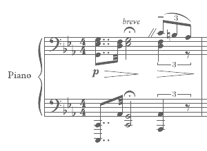 Creators of various commercial sets of music fonts for use in the notation programs such Finale or Sibelius. The fonts are called Berlin, Zurich, Firenze, Paris,
  Free music notation software. MuseScore uses notation fonts Bravura, Emmentaler,
  Open Source fonts by Abraham Lee for
  N. Andrushchenko's beautiful free old Cyrillic fonts called Orthodox (1994 Soft Union, 2000 Andrushenko), OrthodoxDigits, OrthodoxDigitsLoose, OrthodoxLoose, OrthodoxOrnament. An earlier version of this font family is called EvangelieTT (1994, SoftUnion Ltd., created by A. Shishkin and N. Vsesvetskii). See also
  Nor Eddine Bahha (jazz pianist, composer, copyist, researcher and teacher at "The Karawen Music School" in Morocco) designed the NorMusic fonts in 2005. This is a set of jazz music fonts with a handwritten look designed to work with Finale, Sibelius, Overture, Mozart, NoteWorthy Composer and Encore/MusicTime Deluxe. He coauthored
  [
[ Tattoo artist and graphic designer from Dinslaken (Duisburg), Germany, b. 1968, Duisburg.
  Page Studio Graphics is Roger Vershen's Oro Valley, AZ-based company specializing in symbols and symbol fonts, founded by him in 1986. Roger Vershen died in Tucson, AZ, in 2003.
  French engraver and punchcutter who worked with Paulo Manucius from 1588 on, and who was commissioned to create a typeface for the Vatican. He cooperated with Granjon. Although he cut roman and Greek types, he was mmainly known for his music types---for example, he started using musical notes with parts of lines attached to make a second impression unnecessary.
  Oberlin, OH-based foundry of
  [
[ Leipzig-based publisher of the music notation typeface specimen book Noten und Schriftproben der Röder'schen Offizin in Leipzig (ca. 1860). [
 Ex-student at the Ecole Estienne in Paris (b. Estonia) whose diploma work consisted of the creation of
  Free German school fonts, all made by Ralf Lohuis from Hünxe in 2002: Bayernmiba, Latmiba, Nomiba, Schumiba, Suemiba, Vamiba. There are even more commercial fonts for uses in schools, including official pedagogical handwriting fonts, Christmas fonts, and many symbol fonts for mathematics and other subjects. Most fonts were designed between 1996 and 2000. Free demos: Adam, Atlas, Bausteine, Bayerndruck, Blackwhite, Boxquestion, Domino, Eisenbahn, FlaggenABC, Geheim, Guitar, KreuzWort, Lahalb, Lapunkt, Lateinaus, Lineatur, MatheRechner, MatheTangram, Meteo, Musik, Norddruck, Nordspur, Saspunkt, Schulaus, Sdfett, Sport, Sueline, Telegraf, Trainee, Vahalb, VeenPikto, Veraus, Verfett, ZahlenABC. [
 [
[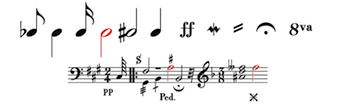 [
[ Nantes, France-based graphic designer who created the decorative alphabets Trompetto Game and Alphabet Alambique Gloire & Beauté in 2014. In 2015, he created Uptown Valley and Monmort.
  This was a dingbat font outfit around 2000. Its web site disappeared but some fonts can still be had
  This is a fantastic source of free high-quality fonts for scripts of the greater Aegean vicinity, Egyptian Hieroglyphs, Meroitic, Sumero-Akkadian Cuneiform, Musical Symbols and all Symbol Blocks in the Unicode Standard. George Douros is their Greek font designer. His free fonts come with this exemplary footnote: In lieu of a licence: Fonts in this site are offered free for any use; they may be opened, edited, modified, regenerated, posted, packaged and redistributed. Many of his fonts contributed to important section in the GNU Freefont project. Here is the list:
 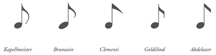 Urtext Music Fonts sell fonts that are compatible with most scorewiters, including Sibelius and Finale. All font packages contain a complete music font as well as supplementary fonts with ornaments as well as special text characters---over 275 characters in most designs. The fonts are
  For a school project at ISCV Rosario in Argentina, Valeria Grela designed the text typeface Vox (2016) especially for use on music sheets. [
 WC Fonts is run by Christophe Féray, and is located in Avignon, Lyon and Nantes. He is the designer of WC Pixhole Beta (2012), WC Pixhole Thin Beta (2012, dot matrix face),
  Musician Werner J. Wolff founded Notengrafik Berlin / Wolff & Okrzeja GbR in 2001, and runs it together with Andrew Okrzeja. The company specializes in contemporary music and offers engraving and related digital services to opera houses, music publishers and composers throughout Europe.
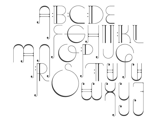
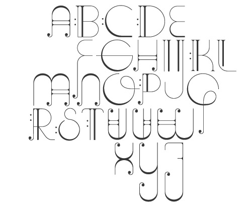
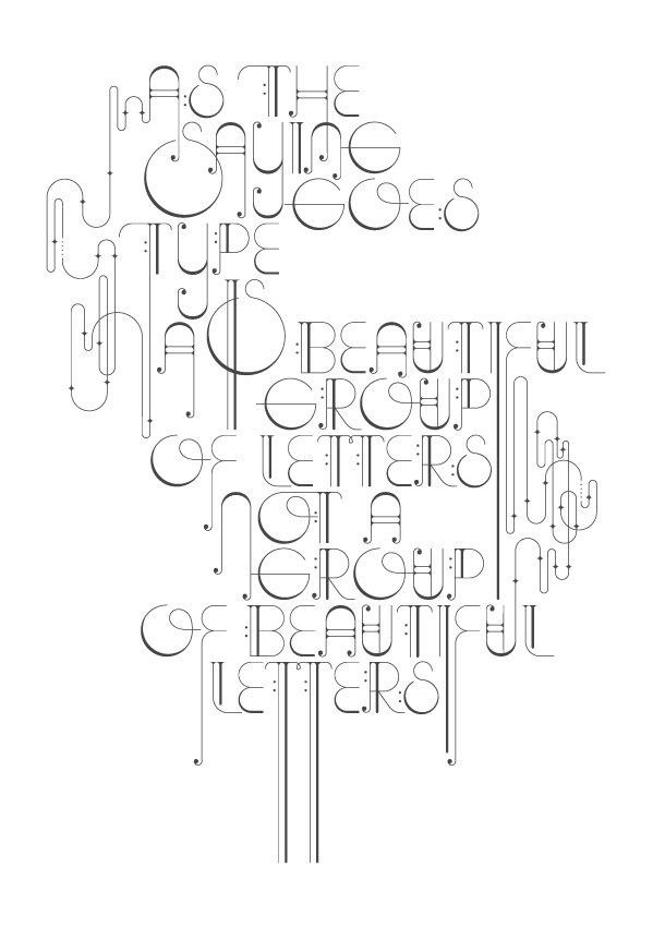
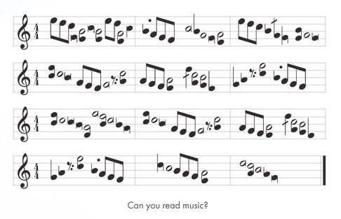
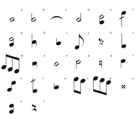
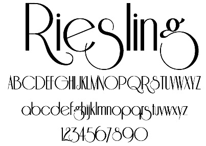
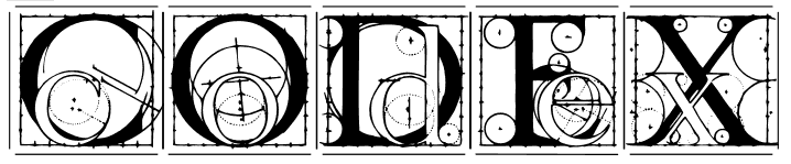
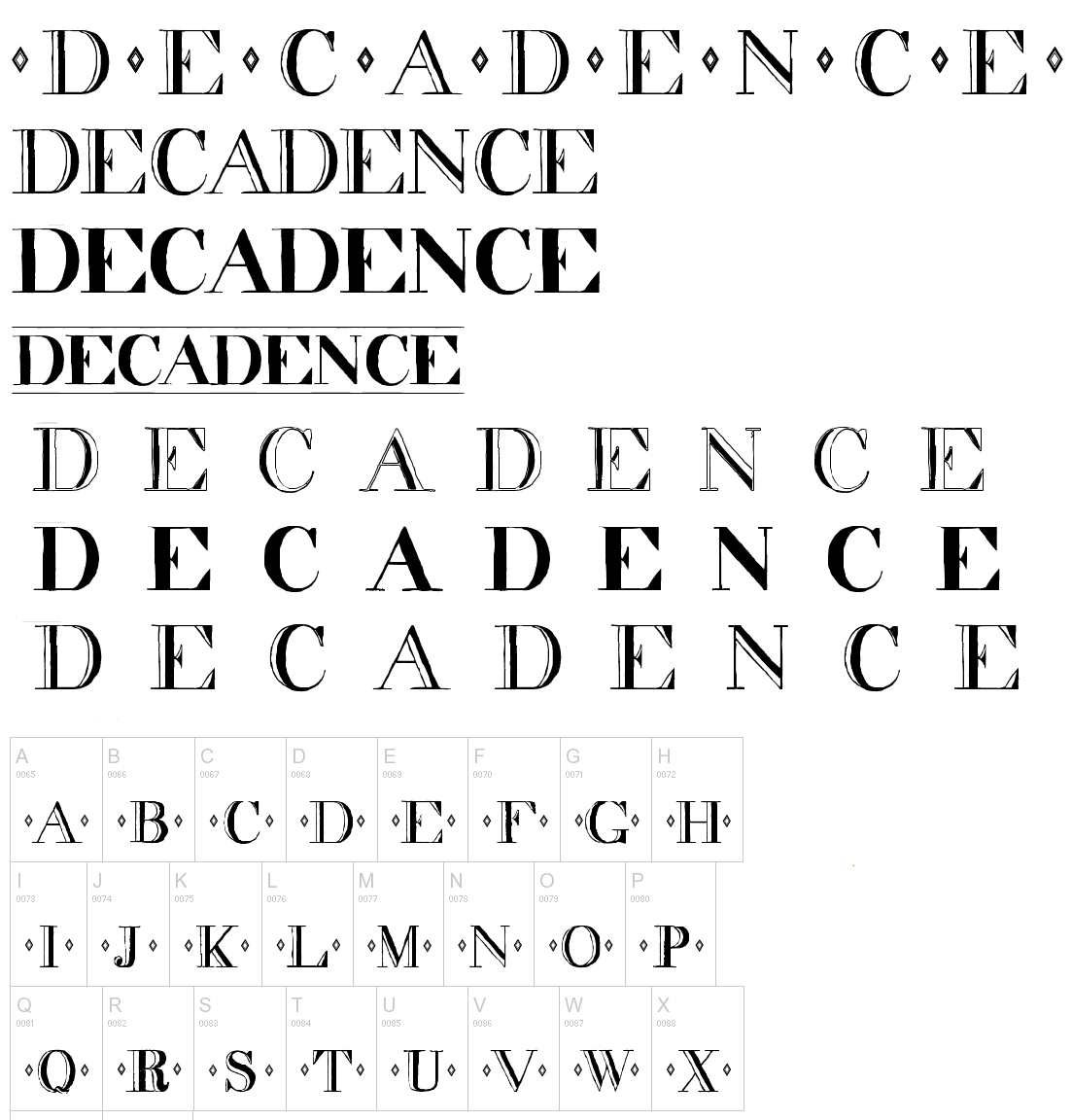
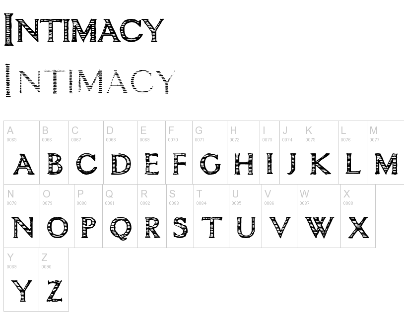
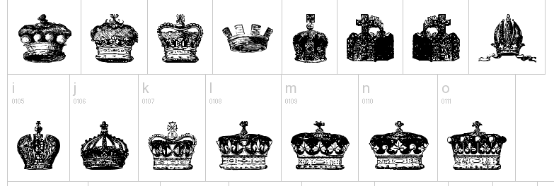
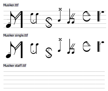
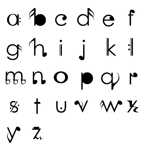
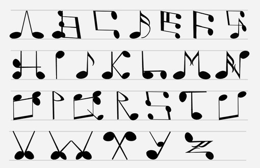
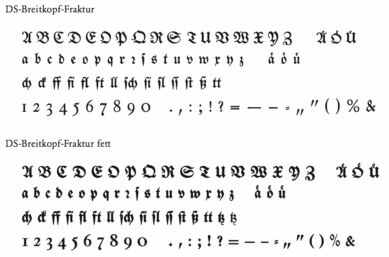
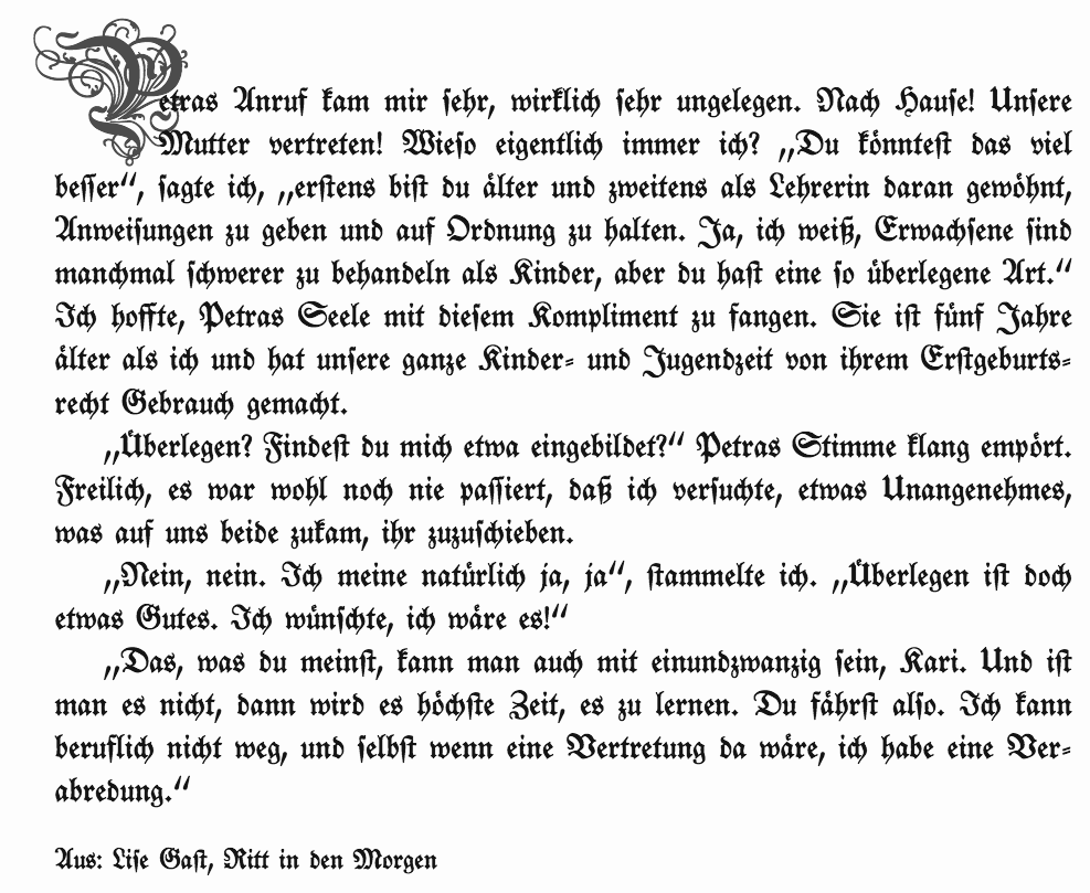
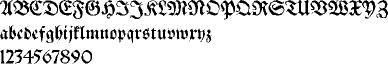
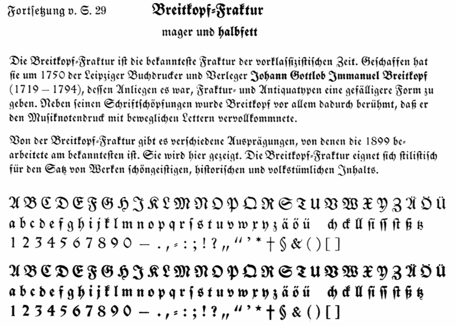
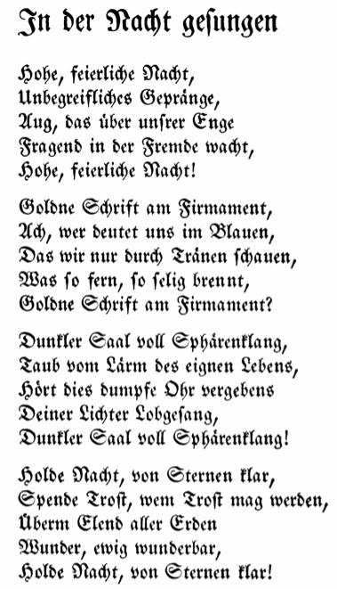
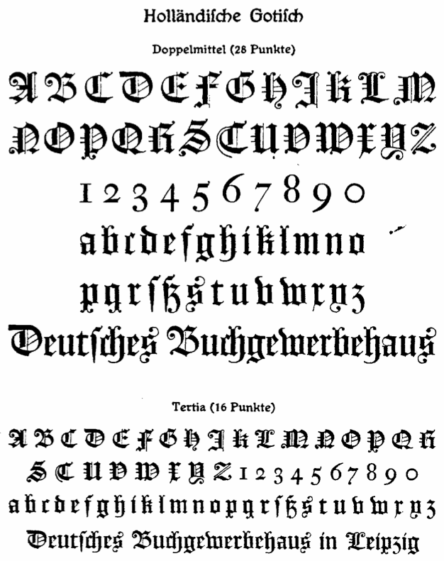
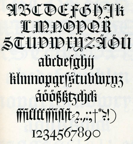
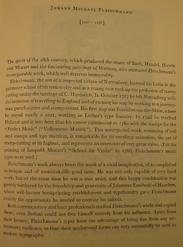
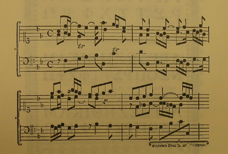
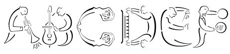
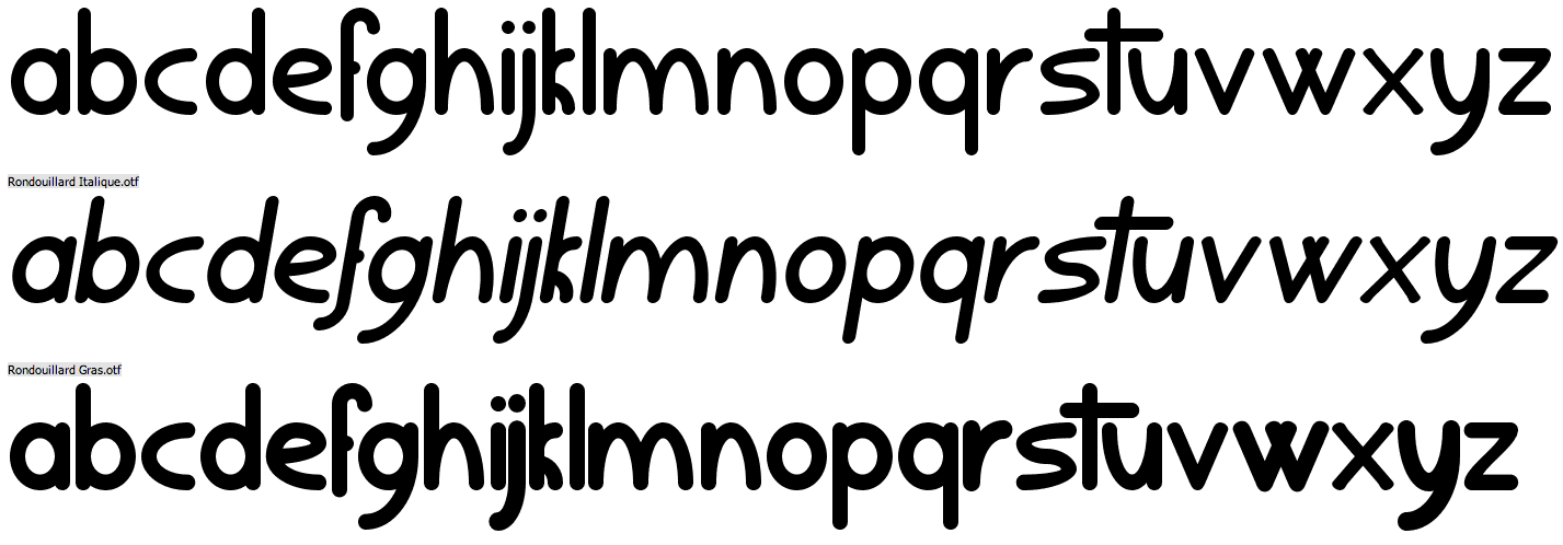
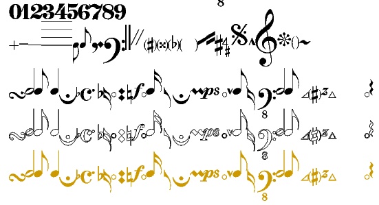
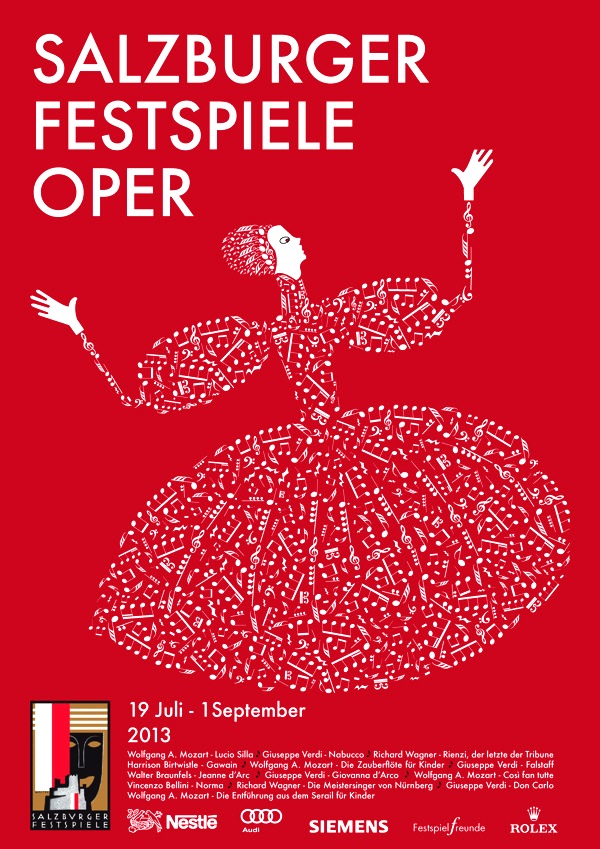
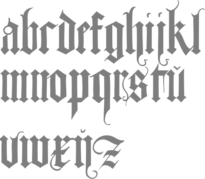
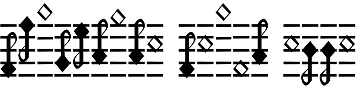
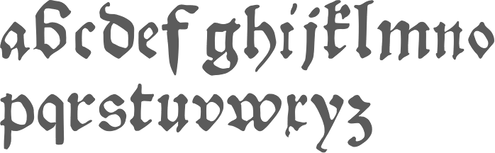
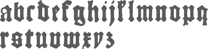
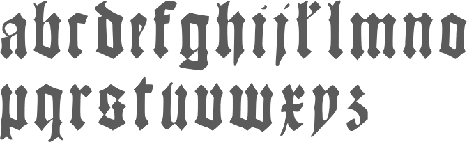
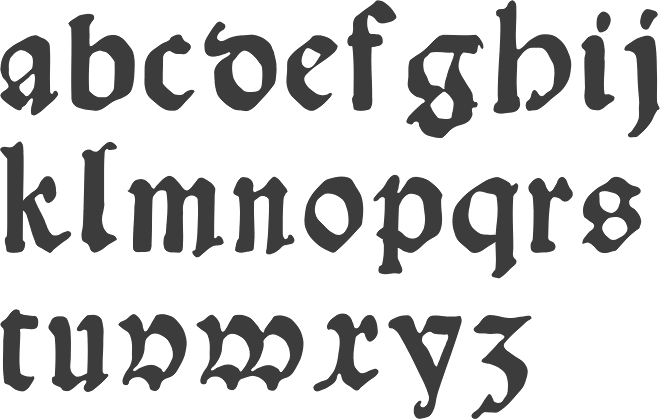
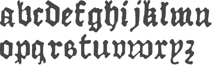
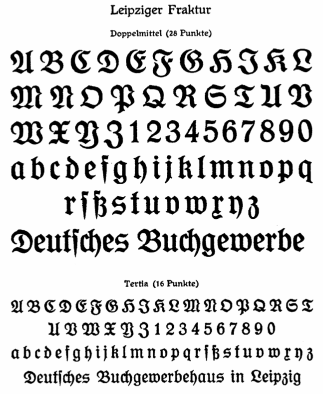
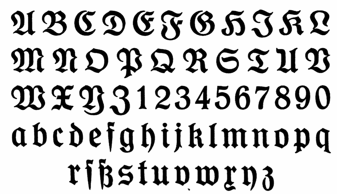
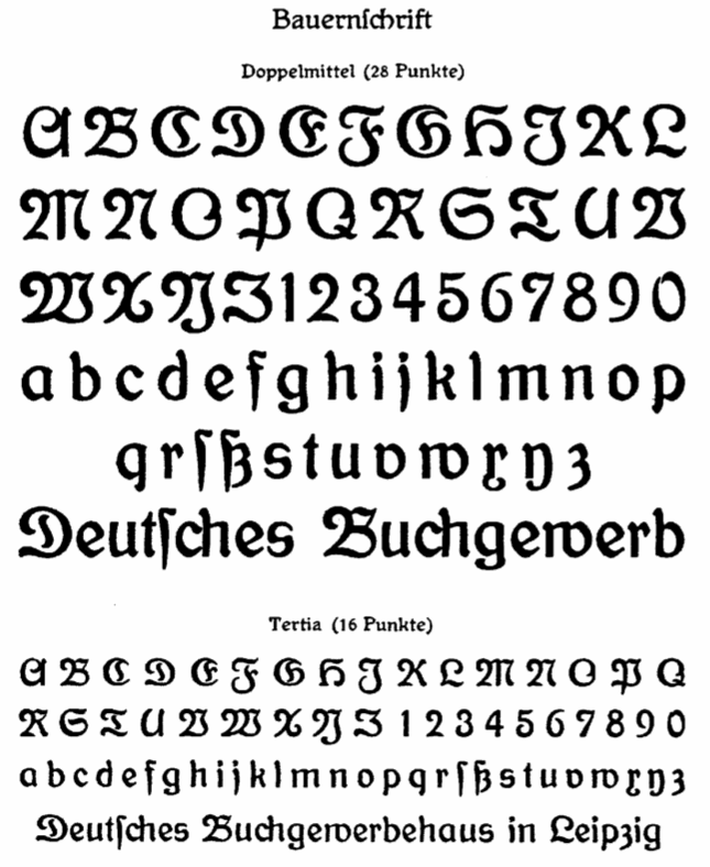
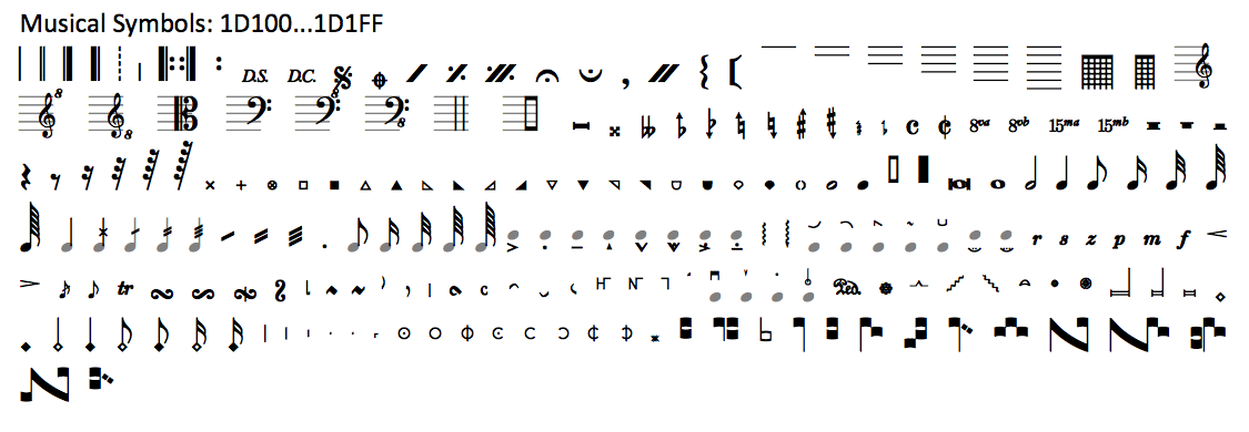
|
|
|
|