| | |
4px.me (was: CtrlAltF12)
|
French designer (b. 1978) of the dingbat fonts Social Shapes (2015, social media icons), World CXup 2k14 (2014), Social Logos (2011), Clubz (2007, shields of European soccer teams), 2006 Team (2006, soccer team emblems), IT Logos (2005), OpenLogos (2007) and Illustrate IT (2005). Dafont link. Yet another URL. Old URL. [Google]
[More] ⦿
|
90 Minutes
[Tal Leming]
|
 In 2016, Tal Leming (TypeSupply) created 90 Minutes, a typeface that is exclusively licensed to the United States Soccer Federation in perpetuity. He writes: I wanted to introduce some more American typographic and lettering influences. We have a rich history from Morris Fuller Benton's iconic work to the impactful lettering on Works Progress Administration posters to the bluntness of wood type on letterpressed event posters. I wanted to subtly reference these to make the typeface as distinctively American as possible. The typeface has 37 unique styles partitioned over three families, 90 Minutes Display, 90 Minutes Kit (a set of styles developed exclusively for use on uniforms, taking into account FIFA regulations), and 90 Minutes Text (drawn specifically for use in small sizes, paragraphs and tables of statistics). [Google]
[More] ⦿
In 2016, Tal Leming (TypeSupply) created 90 Minutes, a typeface that is exclusively licensed to the United States Soccer Federation in perpetuity. He writes: I wanted to introduce some more American typographic and lettering influences. We have a rich history from Morris Fuller Benton's iconic work to the impactful lettering on Works Progress Administration posters to the bluntness of wood type on letterpressed event posters. I wanted to subtly reference these to make the typeface as distinctively American as possible. The typeface has 37 unique styles partitioned over three families, 90 Minutes Display, 90 Minutes Kit (a set of styles developed exclusively for use on uniforms, taking into account FIFA regulations), and 90 Minutes Text (drawn specifically for use in small sizes, paragraphs and tables of statistics). [Google]
[More] ⦿
|
Abdul
|
Lebanese designer who created Beantown (2004, an athletic lettering font), Staubach (2004, an athletic lettering typeface based on the lettering of the Dallas Cowboys), Wagner Modern (2011), Kroftsmann (2004, on octagonal face), Kavelry (2004, based on the Kemper Insurance logo), 4th and inches (2008, rounded octagonal; based on the proprietary font used by Russell Athletic, makers of sports apparel as used by Georgia Tech BKB, Washington State, Alabama State, Tennessee State, Mississippi Valley State, and many others in college football), and PopWarner (2004, a Bank Gothic lookalike), Wagner Zip Change (grotesque), Richardson Fancy Block. Creator of some free soccer team lettering alphabets in 2010: Louisville, Puff Script, Red Raiders, Richardson Fancy Block, Wagner Zip-Change (based on grotesque signage letters), ACMilan2009, ASRoma, ChampionsLeague, England2007, MLSUniform, RealMadrid2009. About his GeauxXPDF typeface (2010), he writes: I had extracted a nearly complete set on this one a few years back, except for J and Z which I created on my own. As best I can tell, it only exists as an upper case font without most punctuation, so I created that too to make it more useable. I don't know how much LSU [Louisiana State University] paid for this design, but to me it always looked like something that Larabie or Iconian would have given away. He also extracted HDRadioAlphabet from a rounded Arial typeface he found on HD radio. His UScoreRGK (2012) is a blocky angular font used on-screen by Fox Sports. LCD Display (2012) is a 28-segment LED font. UA Terrafont (2012) was based upon the vector art in this PDF file. In 2013, he published the athletic lettering family High School USA and the octagonal typeface UA Cadet. See also here. Dafont link. Fontspace link. Another URL. [Google]
[More] ⦿
|
Albert Lionheart
|
Creator of a facsimile font called Real Madrid 1213 (2012), after the lettering Real Madrid is using in the 2012-2013 season. Download site. Check also the small improvement by Character. [Google]
[More] ⦿
|
Alejo Bergmann
|
 Graduate of Universidad Nacional de Rosario, and co-founder of Designals who is associated with the free font foundry Rostype, which is also located in Rosario. He is the cofounder of Rosario Design, an event aimed at students and design professionals whose objective is the exchange of experiences in order to promote academic ties with the professional field of design. He designed these typefaces:
 - Sauce Type (2014: experimental).
- The free modular sans typeface Cunia (2018)
- The free bilined typeface Potra (2018).
- Facon (2018). A free speed emulation font designed by modifying Christian Roberston's Roboto.
- Bondi (2018). A free art deco poster type.
- Fulbo (2019, with Emmanuel Baldor). A free athletic lettering / soccer shirt font family published at Rostype. See also Fulbo Tano.
Fontsquirrel link. [Google]
[More] ⦿
|
Alexandre Saumier Demers
[Coppers & Brasses]
|
 [More] ⦿
|
Alif Yoga
[Font Football and Design]
|
[More] ⦿
|
Alvaro Franca
[Naipe Foundry]

|
 [MyFonts]
[More] ⦿
[MyFonts]
[More] ⦿
|
Ana Cruz
|
For a project at Universidade Feevale, Ana Cruz (Porto Alegre, Brazil) designed the soccer shity typeface Mannschaft (2017). [Google]
[More] ⦿
|
Anand Naorem
[Missin Glyphs]
|
[MyFonts]
[More] ⦿
|
Andrew Bagsit
|
Taguig, Philippines-based designer of the free soccer font PF UEFA Super Cup (2018). [Google]
[More] ⦿
|
Anthony Robinson
|
 UK-based creator (b. 1967) at FontStruct in 2008 of Metal Vampire (athletic lettering meets vampire), Moonbase Tokyo (neat futuristic oriental simulation), Sir Robin's Minstrels (blackletter), Starscraper (techno), Moonmonkey (outline LED font), First.
 In 2010, he added the non-FontStruct typefaces Chromium (a great special effect face), Clawripper, Dirty Play, HairyMonster, HairyMonsterSolid, Punched, and Slasha, mostly inspired by blood, guts, and murders. Static Buzz (2010) is a texture face. Newcastle (2010) is a castle-themed alphabet. Blinger (2010) is a star-studded outline face. New York Punk (2010) is grungy. Dinosaurs (2011) is a dingbat face. NUFC Shield (2011) is a shield face. Zombified (2011) and Sound Sample (2012) are grunge typefaces. Rollerball 1975 (2012) is the font used in the Rollerball movie. Western Show Caps (2012) is a Western circus font. Stoned (2012) evokes letters carved in stone. In 2013, Robinson published the textured athletic lettering font Robbie Rocketpants, Airlock, Cargo Bay (a great army stencil, with a negative letter option), Dogma (a grungy Lombardic face), and the grungy blackletter typeface Flesh Wound. MDMA (2013) is a halftone simulation texture face. Barbarian (2013) is an alphading typeface on the theme of swords. Camouflage (2013) is a textured typeface. Atheist (2013) is an outline typeface. Power (2013) is inspired by lettering on pwer buttons. Witching Hour (2013) is a halloween font. Dystopian Future (2013) is a grungy typeface. Olde Stencil (2013) is a stenciled blackletter typeface. Anonbats (2013) has scanbats and dingbats related to the famous hacker group Anonymous. Creature Feature (2013) is a slimy typeface. Ka Blamo (2013) is a comic book font. Beer Goggles (2013), Supercreep (2013), KaBoing (2013), Gloop (2013, an oil slick face), Voodoo Vampire (2013) and Ye Olde Oak (2013) are textured typefaces. Anti Everything (2013) is a blood drip typeface. PCB (2013) is a printed circuit board font. Dickensian Christmas (2013) is a decorative Christmas font. Typefaces from 2014: Spondulix (hacker type), War Wound, Lasso of Truth, Counter Dial. Typefaces from 2015: English Football Club Badges, Fuzzy Cops, Kick to the Face (oriental simulation). Typefaces from 2016: Squeal Piggy. Typefaces from 2019: Footy Scarf. Dafont link. Aka Anfa. Home page. Another URL. FontStruct link. [Google]
[More] ⦿
|
Architaraz Type (or: Kassymkulov Design)
[Zhalgas Kassymkulov]
|
 Architaraz Type (Kassymkulov Design) is located in Shanghai, China, and Taraz, Kazakhstan. Its type designer, Zhalgas Kassymkulov, was born in 1986 in Kazakhstan. His initial type designs were all done with the help of FontStruct. In 2013, he went commercial as Architaraz Type.
 He made a gridded modular typeface called Targeted (2011). Sliced (2011) is a counterless stencil face. Discostructed (sic) (2011) is a texture face. Mono Dot (2011) is a thin dot matrix face. Mono Hor (2011) is a horizontally striped version of it, Mono Ver (2011) a vertically striped version, and Mono Bold (2011) a bold version. Promo (2011) is purely geometric. Semiz (2011) and Semiz Light (experimental) are partly art deco. Audio (2011) is based on the logo of audiojelly. Arro (2011) has letters with arrowed terminals. Hexa (2011) is hexagonal. Happi (2011) is a fat finger face. Semiz Black (2011) is a free fat pixel face. Creations from 2012: Pearls of Margar, Korgan, Phunni, Carbo, Carbo ii, Lenta, Phunni, Jambul, Extraterrestrial (sci-fi), Rap My Hip-Hop, Armada 1991 (monospaced), Venus (white on black), Garage Garbage (bold avant-garde design), WHAQ, Extra Fontestrial, Algae, A Tasbaqa, Salem (rounded bold typeface), Thaiana Jones, Salem (fat rounded face), Audio 2012, Balapan, Dalmat, Bonn (an art nouveau army stencil face), Mgla, Teris (white on black), Degoratix (curly), Barney Stencil (a fantastic brushy stencil), Lentalicious, Blackway Str, Schengbers (a great piano key stencil family), Tramcar Typo, Mgia, Brushure (a fat curvy display face), Extralien, Serrific Terif, Missinger, Tolkyn, Murt, Twisture, Soliture, Threedure, Antillic, Garage Garbage, Arro, Happi, Schengbergs Hi. Typefaces from 2013: AT Dombra (psychedelic typeface after Motter Ombra), AT Hoppy (fat letters), AT Liniya (blackboard bold), AT Karagai, Hed Kandi (techno face), AT Traffa Stencil, AT Schema, Naation, AT Nayman, AT Roughin, AT Rooktura Stencil, AT Duba, AT Archistency, AT Liena, AT Bombarda (fat stencil face), AT Sulfur ii, AT Mad Pilot, AT Tasbaqa, Vaia Con Dios, Betaport, Mooltyashka, AT Stincel (a lively stencil font), Millio, Tamshy, Offelia, Jalgas (retro script: a winner in the FontStruct Connected Script Competition), Laffa (connected stencil script), Dlinalys, Diagona, Kitara (psychedelic), Archtitalic, Bonn (bony stencil), Teka 1, Teka 2, Unknownim, Khara (ultra-heavy slab face), Shlab (slab serif), Unknownim (slab serif), Archtalic, Argyn, Linea Runde, Mechatraps (+Plain), Eliksir, Drilliant, Katamaran (art deco), Lagman, Neurojet (experimental), Jazzure (bullet hole display face), Diagon, Aroth, Pharaoh's Delight (piano key / art deco typeface), Cocomi, AT Burshak, AT Sulfur, AT Taspa, AT Affina. Commercial typefaces done in 2013: KD William, William Shakespears, AT Archistency (piano key stencil face) AT Bombarda (piano key stencil face), AT Audio, AT Argyn. Typefaces from 2014: AT Sudoku (each letter is actually a sudoku puzzle!), AT Tactica (tic tac toe voard), AT Sudoku+, AT Pixtensans, AT Ayna, AT Kerey, AT Giveaway, AT Lagman, AT Asotika, AT Tugan, AT Yertegi, AT Nudgera, AT Diagona, AT Golovkin (stencil typeface named after middleweight boxer Gennady GGG Golovkin), AT Arachis (stencil), AT Tugan (fat rounded sans), AT Baktera, AT Jumpa Jumpa (stencil), AT Nudgera, AT Digitta, AT Archaus, AT Ladya (ball terminal stencil), AT Yin Yang, At Keste, AT Yazyk (rounded stencil), AT Sulfurian (techno stencil), AT Fasten Your Seatbelts (diagonally cut stencil), AT Buckle Up (like AT Fasten Your Seatbelts), AT Droppix, AT Knitka (knitting font), AT Sagat, AT Wild Archid (african theme font), AT Steglo. Typefaces from 2015: ATAday, ATArchistruct, ATAttache, ATBogomol, ATCastleryRock, ATChaperon, ATKitay (oriental simulation), ATQuba, ATRaushan, ATRoyal, ATShlanga, ATSkos, ATTrassa, AT Giveaway 4, AT Sherit, AT Ribborn. Typefaces from 2016: ATArchaus2, ATArchistructOutline, ATDornach, ATDrogo, ATEnschede, ATExtrema, ATGiveawayNo5, ATGiveawayNo6, ATHadamard, ATTwelve, Windows Icon Font. Typefaces from 2017: ATBals, ATBevelour, ATEsrever, ATHitchook, ATImagiro, ATLauda, ATMigdalia, ATRozalla, ATUniversiade, ATYangster, ATZabor, ATThinnetry. Typefaces from 2018: KD Eight, KD Tramcar, KD Algae Brush, Forza Juve (inspired by Juventus FC's logo), KD Hachure (a multiline typeface family), KD Half Arc, KD Space Band, KD Hachure (+Inline, +Outline), KDAnniversary, Armiya (army stencil), KD Baba Yaga (multiline). Typefaces from 2019: KD Para, KD Pempo (a multiline art deco font). Typefaces from 2021: KD Ziberia (based on Antonio J. Morata's Ziberia typeface from 2011), KD Dekorat (a modular labyrinthine or Maya genre set of capital letters). FontM link. Behance link. FontStruct link. [Google]
[MyFonts]
[More] ⦿
|
Artill (or Artill Typs)
[Lukas Bischoff]
|
 Artill is Lukas Bischoff's foundry in Aachen (and before that, Trier), Germany, est. 2009. Lukas is a stylist and designer based in Trier. He created Sketch Rockwell (2008), one of the nicest sketched style fonts anywhere.
 Commercial typefaces include Luco Sans (2009), Sketch Block (2009) and the octagonal family Wombat (2009). Yaa (2010) is a hand-sketched headline font. Dock 11 (2011) is a (free) heavy art deco headline face. Sketch Gothic (2011) is a sketched Franklin Gothic. Typefaces from 2012: Zwodrei, Kurt (a hand-printed typeface), Artill Weather Icons (free). In 2014, together with Sascha Timplan at Stereotypes, he created the athletic lettering typeface family Atletico. See also here. In 2016, Sascha Timplan and Lukas Bischoff published the handsome sans typeface family Golden Sans. In 2016, Fargus Meiser and Lukas Bischoff co-designed Paul Grotesk and Paul Soft. In 2018, they added Paul Slab and Paul Slab Soft. In 2021, they released Paul Grotesk Stencil. Behance link. Blog. Old URL. Klingspor link. Abstract Fonts link. Dafont link. Behance link. [Google]
[MyFonts]
[More] ⦿
|
Asyan Design
[Ismail Abdurrasyid]
|
 Bantul, Indonesia-based designer of several icon sets (Ecommerce, Football, Bathroom, Moslem Worship), and handcrafted typefaces sucxh as Kinley (2019: monoline script), Layla Script (2019), Star Medina (2019: an Arabic simulation typeface), Zamalek (2019: a script typeface), Seggo Jagung (2019: a minimalist monoline sans), Jaguar (2019: squarish), Sinau (2019: a script typeface) and Modaz (2019: an all caps brush typeface for horror applications).
 Typefaces from 2020: Sharifa (script), Emyrla (2020: a minimalist futuristic sans), Samosan (2020: titling sans), and Marrowish (titling serif). Creative Fabrica link. [Google]
[More] ⦿
|
Babel Font
[Brahim Boucheikha]
|
 Babelfont is a design studio located in Paris and Casablanca that was co-founded by Gia Tran and Brahim Boucheikha. They were later joined by Salaheddine Bellizi. Their typefaces, mostly bespoke, include:
 - Luset (2012). A font commissioned by Dragon Rouge for an actor.Their typeface family is called PSG.
- PSG (2013). A font commissioned by Dragon Rouge to create a typeface family for the soccer club Paris Saint-Germain.
- The Latin/ Arabic sans typeface Gibraltar (2014).
- The Latin / Arabic sans typeface Ines (2013).
- The Latin and Maghrebi Arabic typeface Alegia (2015).
- Mao (2013). A decorative simplified Chinese font.
Gia Tran is a self-taught calligrapher and type designer. He has worked for Dragon Rouge, 4uatre and A&Mcreative in Paris, as well as Saffron Brand Consultants in Madrid. Gia was the Type Director at the French foundry Fontyou. He also teaches calligraphy and type design at various graphic design and visual communication schools such as Strate College Designer, Intuitlab and ESAV Marrakech. Brahim Boucheikha (b. Morocco) studied graphic design at the ECV in Paris and was an apprentice of Arabic calligraphy expert Abdallah Akar. He joined the branding agencies Landor (Dubai) and Dragon Rouge (Paris). He has worked at the ESAV (School of Visual Arts) in Marrakech since 2009 as head of the Arabic typography laboratory. Salaheddine Bellizi is a typographer and 3D designer at Babelfont Studio. He studied at the ESAV (School of Visual Arts) in Marrakech, Morocco, and specializes in Arabic calligraphy and typography. He also works intermittently as an assistant at ESAV Marrakech. [Google]
[More] ⦿
|
Ben Gilchrist
|
London-based designer (b. 1990) of the heavy typeface Mundial (2020), which is based on retro soccer fonts. Mundial also has a colored version. [Google]
[More] ⦿
|
Brahim Boucheikha
[Babel Font]
|
[More] ⦿
|
Brandia Central
|
Designer of Dusha V5 (2014) for the FIFA World Cup in Russia in 2018. Free download. Dusha is discussed at Type Today, in light of an aggressive tweet by Christian Koeberlin who pointed out the similarities between the Russian World Cup designs and those of the previous World Cup in Brazil. Brandia had created a proposed design, and asked Dino dos Santos to make a typeface from their proposed drawings. Dino objected to many design details, but they were never implemented. [Google]
[More] ⦿
|
Brody Fonts (was: Brody Associates, Research Studios, Research Arts UK)
[Neville Brody]
|
 Neville Brody (b. 1957, North London) is a famous graphic designer who has influenced the practice of design in the 1990s. He created record covers, did magazine design and was art director for projects for companies like Christian Dior, Nike, and the BBC. His company was first called Research Studios, and then morphed into Brody Associates. In 2018, Brody joined Type Network with a new foundry, Brody Fonts.
 Largely focused on typography, Brody has been at the forefront of many developments in type culture, from his hand-drawn headlines for The Face magazine and experimental typographic platform FUSE to global fonts for Coca-Cola, Samsung, and Channel4. Iconic posters by him include the Tyson vs Tubs Tokyo poster from 1988. Check also Pat Tmhu's Brody-style Weather Forecast poster (2012). Other people working on Brody's original site include Mike Williams and Simon Staines. His early type was experimental, and was collected under the name FUSE fonts. Direct access. He did the following FUSE fonts: in FUSE 1, he started with the experimental font State; in FUSE 5, he published Virtual; at FUSE 6, he published Code; at FUSE 7, he drew Crash (Regular and Cameo); in FUSE 8, he showed us Religion (Order, Obidience, Loss of Faith); at FUSE 9, he did F-AutoSuggestion (1994); in FUSE 11, he published Peep, a font only showing parts of letters; in FUSE 13, Ritual, in FUSE 14, CyberStatic, in FUSE 15, F-City Avenue (1997), in FUSE 16, GeneticsSecond Generation, in FUSE 17, Echo Downloaded, Page Three, in FUSE 18, Lies. Born in 1957 in London, his fonts include FF Autotrace (1994, a sans family progressively distorted by Fontographer's autotrace feature), F Cyber Static (1997, letters based on layered sequences of halftone dots), Arcadia (1990), Industria (1990, readapted in 2012 by Yautja into the free font Instrumenta), Insignia (1990), Blur (1991; FF Blur is from 1992; see poster), FF Pop (1991, a rectagular font originally made for a German music TV program), FF Dirty (1994), Gothic (1991), Harlem (1991). In 1993, Neville Brody published the poster font family FF World (FontFont), which used his lettering from his Tyson versus Tubbs Tokyo match poster (1988). This became a free web font in 2010 over at FontFont under the name FF World Wide Web. In 2006, Neville Brody published Times Modern, designed for The Times. The press release states: The new typeface, called "Times Modern", encapsulates the paper's heritage while adapting to the demands of the new compact format. Like The Times' previous typeface, Times Classic, Times Modern has been designed as a bespoke type family. The Times is the only newspaper to create and use bespoke fonts, all other UK newspapers purchase ready-to-use fonts. The project has been led by Ben Preston, Deputy Editor of The Times, in partnership with Neville Brody, formerly art director of The Face, and lead designer on Actuel, City Limits and Arena magazines. Brody also worked on the redesign of Times2 in 2005. Collaborating with Neville is lead designer Jon Hill supported by Research Studios' Luke Prowse. Jon has worked on many large editorial projects, including the design of supplements for The Guardian, the redesign of Swiss newspaper Le Temps and UK business-to-business magazine Media Week. Twenty-three year old Prowse has created the new Times Modern headline font for the newspaper. That press release has been blasted by the typophiles for being plainly wrong ("The Times is the only newspaper to create and use bespoke fonts, all other UK newspapers purchase ready-to-use fonts." What, and how about The Guardian, for example?) and disrespectful of its designers (you really have to dig through it to learn that Luke Prowse actually did the type work). And controversy keeps following Neville Brody: in 2009, New Deal, a constructivist typeface, was made for the Micheal Mann film "Public Enemies", starring Johnny Depp and Christian Bale. The bloggers comment that the type is "rubbish" (sic), and that others such as Chank beat him to this type style. In 2012, Research Studios published Vetena (HypeForType). For FIFA's World Cup in 2014, Neville Brody custom-designed Case Brody for England's Nike kit. In 2015, Neville Brody designed Horseferry and Chadwick for the new visual identity for UK broadcaster Channel 4. In 2018, Brody Associates announced their custom font, TCCC Unity, for Coca Cola. It was jointly designed by Neville Brody and Luke Prowse. The first fonts at Brody Fonts in 2018 are BF Bonn (1989-2018) and BF Buffalo. Neville Brody originally designed the geometric sans BF Bonn for The Boon Ausstellungshalle and the Bundeskunsthalles signage and identity systems in 1989-1991. BF Buffalo (2009-2018) is a soft octagonal punk-meets-sci-fi design debuted as an editorial type in 2009 in Arena Homme Plus. It later appeared as the signature face for London's Anti Design Festival. Brody significantly reworked Buffalo with the help of David Jonathan Ross. Linotype link. Klingspor link. FontShop link. FontFont link. Short bio. Check out another biography at FontNet. Type Network link. View Neville Brody's typefaces. [Google]
[MyFonts]
[More] ⦿
|
Bruce Wayne
|
 Creator of the octagonal athletic lettering font Nike Motto (2011), which is patterned after the lettering used by Juventus and Werder Bremen. Other athletic lettering typefaces include Liverpool FC (2011), Atletico Madrid Varsity (2011), FC Barcelona 2011 (2011), and Digital Brazil (2011). Free downloads at abhostia. Aka Dekabreak. [Google]
[More] ⦿
Creator of the octagonal athletic lettering font Nike Motto (2011), which is patterned after the lettering used by Juventus and Werder Bremen. Other athletic lettering typefaces include Liverpool FC (2011), Atletico Madrid Varsity (2011), FC Barcelona 2011 (2011), and Digital Brazil (2011). Free downloads at abhostia. Aka Dekabreak. [Google]
[More] ⦿
|
Carlos Matteoli
[Q-BO]
|
 [MyFonts]
[More] ⦿
[MyFonts]
[More] ⦿
|
Character
[Herbert F. Van Brink]
|
 Prolific Woodland Hills, CA-based typophile and type designer (1937-2013) whose portfolio consisted largely of revivals and who used the alias Character for his typographic work. The Los Angeles Times posted this obituary: Herb passed away after a brief fight against esophageal cancer. He was a 42 year resident of Woodland Hills CA. Son of the late Jean and Mary Van Brink, he was born in Manhattan, graduated from Stuyvesant High School (1952) and Queens College (1956) and always considered himself a New Yorker. He had a long career in Information Technology and retired from Arco. He loved traveling, bowling, genealogy, and was a bridge Life Master among his many interests. He was a trickster and a perfectionist. He leaves his wife, Paula, his son, David Van Brink and DIL Deb Culmer of Santa Cruz CA, his daughter Qarin Van Brink and SIL James Ray of Burien WA, grandchildren Amelia and Wilhelmina Ray Van Brink, brother and sister-in-law Jeffrey and Louise Van Brink of E. Northport NY and nephews Matthew and Jordan Van Brink.
 His typefaces: - Animal dingbat fonts: AbecedarianZoo (2003, created from an alphabet in Art Explosion 200,000), Turf&surf (2005).
- Alphadings: Jennifer's train (2011), ABCPlay (2005), DiddleTheMouse (2005), Silly Set (2005), Stone Carving (2005), Snow Persons (2005), Alaskan Ice (2005), Peppermin Canes (2005), USStarsNStripes (2003, first called USFlags), XmasTree (2002), XmasTree II (2004), Xmas Alpha (2005).
- Erotic alphabets: Flotner (2002, based on a scan of the human character alphabet by Peter Flötner (1534)), SilvestreBodies (2006, based on a figurative alphabet designed by Joseph Balthazar Silvestre in 1834, with engravings made by Girault), ErotiCaps Outline (2007), ErotiCaps Solid (2007), WeygelBodies (2006, adapted from Martin Weygel's 1560 interpretation of Peter Flotner's 1534 figurative alphabet).
- Stained glass themed fonts: ModernStainedGlass (2007), ModernStainedGlass2Tone (2007).
- Capital alphabets: Cameo Antique (2011, after Cameo Antique on page 17 of The Solotype Catalog of 4,147 Display Typefaces---a shaded outline version of the typeface called NightShade, on the same page of Dan Solo's book; the only known digitized fonts of NightShade are "Shadowed Serif" by James Fordyce (1994) and NigelSadeSH, from Soft Horizons (1993)), Modern French Capitals (2010, after a set of capitals drawn by Alphonse Mucha), Mucha French Capitals (2010, similar?), Marcel Caps (2007; based on "Crossroads" by August Will (1891)), WoodLook (2007, an improvement of 101's Wooden Alpha BlockZ), 3DAlphabet (2008, based on an alphabet coloring book designed by Jean Larcher, 1978), RomantiqueInitials (2007, based on work by Aridi), Blistered, BlisteredFramed, BlisteredReverse (2005, based on Marwan Aridi's Blister from the Initial Caps Vol I), ChiseledRound, Contemporary CH (2010), CourierInitials (2005, based on an alphabet by Johan)), Eclectica (2003, party-theme), FeathersInYourCaps (2002), FlowerSketches (2002), LACETRIM (2002), LeafyStencil (2003), QuiltedStippled (2004, based on an embroidery alphabet created by DesignsInStitches), RetroCapsBW (2004), RetroCapsWB (2004), Rope5 (2004, rope font), Rustic Black Shadow (2011. He explains: In the Solotype Catalog of 4,147 typefaces, RUSTIC is shown with a black shadow. RUSTIC WHITESHADOW has a white shadow. However, the Solotype digital font named RUSTIC has no shadow. Similar no-shadow fonts are also available as Pinewood (by Rick Mueller and one by Dieter Steffmann) and as Woody (by DincType). As of October, 2011, no digitized version of Rustic Whiteshadow is known. Character has produced a font named RusticBlackShadow, which matches the font named Rustic in the Solotype Catalog. Dick Pape had created an earlier version named Pepin Press Caps FA204, based on fonts contained in the Pepin Press book Fancy Alphabets. ), THINROPE (2002), VALENTINEHEARTS (2002), Printed Circuit (2005), SportsABC (2005), Feathered Flight (2005), Joe Clement (2007, Western pixel face), Ribbon Shadow (2007).
- Fonts based on scans from Awesome Alphabets (Mike Artell, 1999, Good Year): SketchBoards, SketchBones, SketchClothes, SketchLogs (2005), SketchPencils, SketchPipes, SketchTools, all done in 2005.
- Athletic lettering: Collegiate Heavy Outline (2006), Real Madrid 2011-2012 (2011, an expansion of a font by "Adriano"), The Football League (2011), Adidas Euro 2008 (2011), Puma World Cup 2010 (2010: based on Crepello, a custom-made font by Paul Barnes for Puma, that was used on the jersey of Italy, Switzerland and Uruguay during the 2010 FIFA World Cup), Adidas Unity (2010), LINKEB+Regular (2008) uses the lettering of the Geaux font used by LSU.
- Pixel or dot matrix style fonts: Dash It All (2007, based on Cooper Black), Even Hearted (2007, an improvement of CK More Hearts), Square 9x9 (2007).
- Brush typefaces: Skippingbrush (2006), GraffitiPaintBrush (2008).
- Dingbats: Being Sport Pictograms (2008).
- Scanbats: PilobusSilhouettes (2010) is based upon a human alphabet photographed by John Kane.
- Techno: BultacoDual (2010), Dr Who 42 (2007), London MMXII (2008), ArrowheadLake (2009, +Shadows, +Sunlit; based on the nearly blackletter typeface Arrowhead from the Solotype Catalog and alphabet books).
- Historic typefaces: Driftwood 67 (2011, Driftwood on page 67 of The Solotype Catalog of 4,147 Display Typefaces), ArrowheadLake and ArrowheadLakeShadows (2011, based on Solotype Catalog p.74), Cutin (2011, a simple rounded monoline sans called Cut-in Medium on page 163 of The Solotype Catalog of 4,147 Display Typefaces),Cutin (2011, a simple rounded monoline sans called Cut-in Medium on page 163 of The Solotype Catalog of 4,147 Display Typefaces), Pepin FA288 (2011, based on Matra, or Bifur, on page 54 of The Solotype Catalog of 4,147 Display Typefaces by Dan X. Solo), Varicka (2010, from "Decorative Condensed Alphabets", by Dan Solo, p. 94. It is similar to Red Rooster's Triple Gothic Condensed, but the Solo's font has different features), MaxfieldParrish140 (2007: From an incomplete (no "N") hand-drawn alphabet by Maxfield Parrish. See figure 140 of "Letters&Lettering" by Frank C. Brown, 1921. This is a different source than the P22 Parrish font family.), Ronde Antique (2009, based on page 110 of the Verlag Gerlach 1881 catalog).
- Other: Scramble Mixed (2006, scrabble face), Happy Fourth, Emperor AN (2009: this semi-art nouveau typeface is Emperor on page 42 of The Solotype Catalog of 4,147 Display Typefaces---not the same as Dan Solo's Emperor at MyFonts), Wood Gothic Caps (2011, blackletter), WoodWud (2011), Gallia Two (2010, based on a font found on page 55 of The Solotype Catalog of 4,147 Display Typefaces as Gallia No. 2), Charleston (2010, based on page 46 of The Solotype Catalog of 4,147 Display Typefaces), Azteca Regular (2010: based on Azteca Condensed by Dan X. Solo, page 74 of The Solotype Catalog of 4,147 Display Typefaces), Othello Fill and Solid (2011, derived from Othello on page 155 of The Solotype Catalog of 4,147 Display Typefaces), Sharons Shadows (2010, +Bold), Masked Menace (2012, based on Bodoni Poster).
Fontspace link. Dafont link. Fontspace link. And another one. See also at abfonts. Dafont link. [Google]
[More] ⦿
|
Charlie S. Romeo
|
Belgian (?) designer of the free face Lame Bee (2010) and the free face Wild Cat Stencil (2011), a typeface based on a custom font for Puma lettering. Real Dozy Tracy (2012) is a free look-alike of the Real Madrid 2012-2013 season font. [Google]
[More] ⦿
|
Christoph Koeberlin
[Sportsfonts]
|
[MyFonts]
[More] ⦿
|
Colophon Foundry
[Edd Harrington]
|
 Colophon Foundry was a London and Los Angeles-based digital type foundry established in 2009. Its members comprised Benjamin Critton (US), Edd Harrington (UK), and Anthony Sheret (UK). The foundry's commissioned work in type design was complemented by independent and interdependent initiatives in editorial design, publishing, curation, and pedagogy. It grew out of the Brighton-based design studio, The Entente (Anthony Sheret&Edd Harrington) in April 2009. Benjamin Critton (Brooklyn, NY) joined them later. In December 2023, it was acquired by Monotype.
 Fonts: - Aperçu (2010, +Mono), a sans family by Anthony Sheret / The Entente.
- Archive (2013). A text family by Anthony Sheret and Edd Harrington.
- Basis Grotesque (2015). Influenced by Akzidenz Grotesk.
- Burgess (2014). A Times-Roman-like typeface family by The Entente and Benjamin Critton.
- Castledown (2014). A sans family for educational purposes. They write: From 2012-2014 we collaborated closely with Castledown Primary School, Hastings, UK. The project began as a custom typeface commission for the school but soon developed into an initiative to develop and unify typography within primary education. Extended in 2020.
- Central Avenue (2011). By Studio Makgill.
- Coign (2018-2021). An extensive study of ultra condensed forms based on the DeLittle type foundry's Elongated Sans.
- DM Mono (2020). A free 3 weight, 3 style family designed for DeepMind. DM Mono was loosely based off of Jonny Pinhorn's DM Sans, with a reduction in contrast and less geometric proportions. The type design and font development was commissioned from Colophon Foundry, with Creative Direction from the DeepMind team. Design by Edd Harrington and Anthony Sheret. They also developed DM Sans, DM Serif Text and DM Serif Display (2019). The Serif families are derived from Source Serif Pro. The Sans family is derived from Jonny Pinhorn's Poppins (2014-2017). Github link. Google Fonts link.
- Fann Grotesque (2019). A 9-weight sans family inspired by the 19th century British Grotesque types from British type foundries such as Stephenson Blake, Day & Collins and Miller & Richard.
- Fortescue (2009): a text family with triangular serifs commissioned for the identity of artist and printmaker, Jake Spicer.
- La Fabrique Pro (2012-2017). A sans by The Entente.
- Goodall. A 10-style take on the geometric slab serif genre; bringing together a melting pot of 19th century wood type influences and more contemporary reference points such as Memphis (Rudolf Wolf, 1929) and Rockwell (Monotype, 1934).
- Grenette (2020). Colophon writes: Combining influences from Windsor (from Stephenson Blake & Co's Wood Letter Specimen, 1915) and Richmond Old Style (from DeLittle's Wood Type Specimens, 1966), Grenette's imposing serifs contrast with the serif-less interiors of certain forms such as n, h and v.
- Leroy (2012). By Stockholm-based Oscar & Ewan.
- Lisbon (2013, Anthony Burrill). Lisbon is a geometric stencil typeface based on an original metal stencil that Burrill found in a sign makers shop in Lisbon, Portugal. The font was first used in a series of posters commissioned by the British Council for Experimenta cultural biennale in Lisbon (2010).
- Lydia Bold Condensed (2013, Benjamin Critton) revives an angular typeface by Warren Chappell from 1946.
- Mabry (2018, Benjamin Critton): Originally commissioned in 2014 for Los Angeles-based apparel company Nasty Gal---named as such after the 1975 album and song of the same name by influential funk singer Betty Davis (b. Betty Mabry, 1945)---Mabry is the commercial iteration of the former NG Grotesque.
- MAD Sans and MAD Serif (2011-2017) by Dries Wiewauters.
- Marché (2014). By The Entente, inspired by Eurostile.
- Midnight sans (2021). Colophon writes: Midnight Sans was initially drawn for Gary Green's "When Midnight Comes Around", published by our friends at Stanley/Barker in 2020. The condensed-only style embodied a warm but idiosyncratic flavour: a reflection of the publication's photographs, which document the burgeoning downtown alternative music scene of 1970s New York City.
- Monosten (2011). A rounded monospace sans by Anthony Sheret that includes a couple of stencil styles.
- Montefiore (2009): a grotesque with wood type influences.
- One Night Sans (2020). A bespoke typeface for condom manufacturer Durex.
- Pantograph: Pantograph is an authentic redraw of the typeface employed by the British pantograph etching process. Designed by Hamish Makgill in 2009.
- Peggs (2009): typewriter style for the identity of Peggs&Son, designed by Edd Harrington.
- PDU (2010). By Dries Wiewauters. PDU stands for Plaque Découpée Universelle, a stencil system patented in 1876 by Joseph A. David.
- Perçu (2010): a full sans family that is---in their own words---an amalgamation of classic humanist typefaces such as Johnston and Gill Sans with Neuzeit and Franklin Gothic.
- Perfin (2009, by Alison Haigh).
- PIN (2015). By Hoon Kim / Why Not Smile LLC.
- Raisonné (2010). By Benjamin Critton. Raisonné is a 7-weight geometric sans-serif type initially designed in 2010 and subsequently expanded upon, first in 2012 and again in 2018-2019. Colophon writes: The typeface is parodic-serious, intended to be blunt, candid, and affable all at the same time. It outwardly pays homage to noteworthy precedents, among them Rudolf Koch's Kabel (1927) and Victor Caruso's later redrawing for ITC (1976), Joseph Churchward's Crossbred (1970s), Paul Renner's Futura (also 1927), and Herb Lubalin's Avant Garde (1968).
- Reader (2009): Reader is a neo-grotesque typeface initially created in a medium weight, and now re-cut into a base family of six weights with an additional seventh in the form of Reader Black. The typeface itself has been referenced from an RSPB letter dating 1972. The original typeface, which is unknown, was a monospaced, rounded face. It had geometric proportions which felt like they wanted to break free of the restrictions of a monospaced grid.
- Relative (2011). By The Entente: Initially drawn in August 2010 for Outside In by Stephen Gill; a book designed for the Brighton Photo Biennale 2010. Includes monospaced styles.
- System85 (+Mono). A sans family.
- Transcript Pro (2017).
- Value Sans and Value Serif (2012): Value Sans borrows in style and behaviour from precedents like Elegant Grotesk and Granby. Value Serif pays homage to forebears like Plantin Infant and Italian Old Style. The Sans was drawn first by The Entente (Edd Harrington & Anthony Sheret, UK). The Serif was drawn shortly after, by Benjamin Critton (US). Each borrows their geometries from the other, and nuances were finalised by all parties as Colophon Foundry.
- Visuelt (2013-2016, The Entente). Originally created as a bespoke face for the 2013 and 2014 identity for Visuelt, Oslo, Norway, Visuelt spawned from a more considered and constrained version of Aperçu. Visult Pro (2019) covers Cyrillic and Greek as well.
Bespoke projects: - Battlebridge for the area of King's Cross, London (2016).
- Burberry Apercu Bespoke (2010-2017).
- Chelsea Basis (2015) and Chelsea Basis Chiselled (2018). For FC Chelsea.
- Corona Headline for Corona (2016).
- Europa Nuova & Europa Mono (2016). For UEFA's Europa League.
- Fanta Playful for Fanta (2017).
- Fulham First XI & Substitute XI for Fulham Football Club (2013). Stencil types.
- FQ Value for New Covent Garden Market (2016).
- GF Smith for paper manufacturer and merchant G.F. Smith (2014).
- Grey Goose for the French Vodka Producer (2014).
- Helen for Race Against Dementia (2016).
- Mondial for Rapha's Magazine (2015).
- NG Grotesque for LA-based fashion label, Nasty Gal, with Benjamin Critton (2014).
- Poynings, for printer Generation Press (2014).
- Tesco Modern, Tesco Modern Condensed, Tesco Slab and Tesco Serif for supermarket chain Tesco (2016-2017).
- Ubisoft Sans for French games publisher, Ubisoft (2016).
- Unify for the English Rugby Football Union (2013).
- Wales and Cymru Sans for Visit Wales / Welsh Government (2015).
[Google]
[More] ⦿
|
Connor Fitzgerald
|
Connor Fitzgerald (New York City) created the hand-printed poster typeface Ginga Freestyle (2011) for a series of ads for Ginga, a soccer company based in Toronto. [Google]
[More] ⦿
|
Copa America
|
Typeface by The Works made in 2015 for the 2016 Centennial in the United States. [Google]
[More] ⦿
|
Coppers & Brasses
[Alexandre Saumier Demers]
|
 Quebec-based type type foundry Coppers & Brasses was set up in 2011 by Alexandre Saumier Demers and Étienne Aubert Bonn in the plateau area of Montreal. Both graduated from the graphic and type design program at UQAM in Montreal and went on do the Type and Media program at KABK in The Hague, The Netherlands.
 Creators of these typefaces in 2012: Martha (monospaced slabby grotesque done by both founders), Sardine (fat signage typeface by Bonn), Freitt (blackletter typeface by Bonn). Nicole (2012) is an elegant basic sans typeface by Olivier Mercier-Chan Kane. In 2013, Etienne graduated from the Type & Media program at KABK in Den Haag. In 2014, Alexandre in turn graduated from the Type & Media program at KABK. For his graduation, Alexandre developed the didone typeface family Lewis. He writes: Lewis is a typeface designed for mathematical typesetting, specifically for the TeX typesetting system. It consists of 3 text styles (Roman, Bold, Italic) and 3 math styles (Math Italic, Greek, Blackboard) for use as variables. The text Italic relates to the Roman while the Math Italic stand out with its cursive construction. Likewise, the Greek differentiate easily from Latin characters. The Blackboard inlines are adapted for text sizes with their wide and open cut. Lewis features many size variants and extending shapes, ideal in displayed equations. The list of their retail and custom fonts: - Guillon (2016). Manufactured for Studio Feed.
- GSM Grotesque (2016). A custom typeface by Coppers and Brasses and Studio Feed, for GSM Project.
- Caserne (2015). A custom stencil typeface designed with Samuel Larocque for the Montreal-based studio Caserne.
- CCM Grotesk (2015, Latin and Cyrillic). A custom typeface for Canadian sporting goods brand CCM, with a textured version. The Cyrillic was overseen by Russian type designer Maria Doreuli.
- VLNL Wurst (2015, VetteLetters). This wurst-themed typefaces comes in three styles, Brat, Blut and Bier Wurst. The interesting aspect of this font is that Demers developed a special Wurst Schreiber software for drawing segments as sausages in RoboFont.
- Double (2015, Alexandre Saumier Demers and Étienne Aubert Bonn). A retail typeface family from condensed to wide with wedge serifs, a copperplate feel, and slight flaring. Ideal for display work.
- Canal (2015, Étienne Aubert Bonn). A fantastic retail sans typeface family: Canal is a typeface family inspired by the blue collar, hard working people that were the late 19th and early 20th centuries labor force of the new continent. It is a sturdy workhorse with a wink of humanism.
- Martha (2014, Alexandre Saumier Demers and Étienne Aubert Bonn). A retail typeface family with curvy typewriter influences, some monospaced styles and a grotesque to boot.
- Klaus (2014, Étienne Aubert Bonn). Developed for personal web and paper work.
- Théorie (2014, Alexandre Saumier Demers and Étienne Aubert Bonn). A techno stencil typeface commissioned by UQAM's Bureau de Design for the Bâtisseurs of the science faculty award.
- Lewis (2014, Alexandre Saumier Demers). A font system for typesetting mathematics in TeX, developed at KABK.
- Alphonse (2014, Alexandre Saumier Demers). An elegant garalde custom text typeface.
- Nurraq (2013, Étienne Aubert Bonn). Developed as a school project at KABK, Nurraq is a multi-script typeface system that matches a Latin serif text typeface with a Canadian aboriginal syllabics character set for the Inuktitut language.
- Compass (2013, Étienne Aubert Bonn). A revival based on the early drawings of Monotype Plantin series 110 by Frank Hinman Pierpont and Fritz Stelzer.
- MLS Soccer (2012). A handcrafted custom typeface by Alexandre Saumier Demers and Étienne Aubert Bonn, commissioned by Sid Lee.
- Radio Canada (2017). A custom corporate humanist sans typeface for the French TV network in Quebec, co-designed by Charls Daoud and Alexandre Saumier-Demers of Coppers and Brasses. Google Fonts link. Github link.
- Mortier (2021): A typeface inspired by old hand-painted advertisements on brick walls---many of which still exist as ghost signs in cities across the world. This unique style of lettering was influenced by precomputer techniques wherein sign painters would use the brick wall on which they were painting as a reference for laying out their text.
Alexandre spends most of his time since 2016 working on variable font projects for The Type Network (ex-Font Font Bureau). Home page of Alexandre Saumier Demers. Behance link for Coppers and Brasses. [Google]
[More] ⦿
|
Craig Ward
|
Craig Ward is a British graphic designer and art director wjho moved to New York City in 2009, where he set up Words and Pictures in 2011. In 2015, he created the experimental typeface Fe203, and wrote: To form the glyphs, a tiny amount of ferrofluid was placed between two glass plates and subjected to a combination of spinning vertical and horizontal magnetic fields. The result is an array of complex hieroglyphics and shapes - each one as unrepeatable as a snowflake - that simultaneously call to mind ancient indigenous markings or symbols from science fiction. Designer of nice typographic examples, such as his Hairy Futura (2008). He designed the fat didone display typeface Lovechild (2009) and the spurred typeface Killer (2013). Other typefaces: Go Vote (2012, a brush poster and modular typeface for the American elections), Dark White (didone), Epitaph (alchemic), NM Serif (2015, for the branding of Dior's new perfume, Sauvage), England World Cup Kit (2018). Home page. [Google]
[More] ⦿
|
David Sum
[David Sum]
|
Budapest-based designer of the piano key typeface family Tango (2012), the thin octagonal typeface Standard (2012), the piano key typeface Slink (2012), and the experimental typefaces Wang (2012), Galtor (2012, an inline font available from Ten Dollar Fonts) and Krix (2012). Typefaces from 2013: Fatty, Borg (free), Neugol (a geometric sans with slanted cuts). He writes about Borg: Borg is a geometric typeface with a curved incision. My inspiration was Swedish furniture. The PAOK FC is a Greek football team and they used my font on their new jersey in 2015. In 2016 Levante UD, SSC Napoli and Paris Saint-Germain too used my font on their new jerseys. Behance link. Devian Tart link. Hellofont link. Home page for Titus Prod. [Google]
[MyFonts]
[More] ⦿
|
David Sum
[David Sum]
|
[MyFonts]
[More] ⦿
|
Didem Ogmen
|
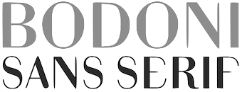 Graphic and lettering designer in Istanbul, who created these typefaces:
 - Bodoni Sans Serif (2013). A beautiful serifless Bodoni.
- Siamese Webfont (2013). To save space in web pages, a lot of glyph contractions are proposed by Didem.
- A custom brush script typeface for Tropic Labs (2018).
- An inline football shirt typeface for a local apparel company (2018).
- The color font family Terrazzo (2018). See also Terrazzo Mono (2019).
[Google]
[More] ⦿
|
Dipankar Bose
|
Bose designed the soccer hero scanbat typeface Soccerman (2010). [Google]
[More] ⦿
|
Doug Larson
[Illustration Ink (was: Lettering Delights)]
|
 [MyFonts]
[More] ⦿
[MyFonts]
[More] ⦿
|
Edd Harrington
[Colophon Foundry]
|
 [More] ⦿
|
Eduard Arajol Lopez
|
During his studies at EINA in Barcelona, Eduard Arajol Lopez created the octagonal soccer shirt typeface Revolutype Bold (2016). [Google]
[More] ⦿
|
Eduardo Escobar Beckwith
[Escobas]
|
[MyFonts]
[More] ⦿
|
Eduardo Manso
[Emtype]
|
 [MyFonts]
[More] ⦿
[MyFonts]
[More] ⦿
|
Emmanuel Baldor
|
Rosario, Argentina-based codesigner of Fulbo (2019, with Alejo Bergmann). A free athletic lettering / soccer shirt font family published at Rostype. [Google]
[More] ⦿
|
Emtype
[Eduardo Manso]
|
 Emtype is the foundry in Barcelona that was founded in 1997 (in Buenos Aires) by Eduardo Manso. Eduardo was born in Buenos Aires in 1972 and studied graphic design at the Escuela de Artes Visuales Martín A. Malharro and at the Universidad Nacional de Mar del Plata, both in Mar del Plata. Art director of the Argentinian graphic design mag "el Huevo". He currently lives in Barcelona. His typefaces include the pixel font family Dixplay (2003, Emtype), the grunge font Eroxion (1997) and Rina Linea and Rina (2001), all at Bitstream, the Scotch roman text family Bohemia (2004), Andromeda ([T-26]), Garadonis, Fluxus, Ovalus (2005, free dot matrix face), Relato (2005, advertised as a muscular serif family), Relato Sans (2005, which won an award at TDC2 2006), Merss (2000, ITC), Argot (2004, winner of an award at TDC2 2004), Flour, and Flour Inline.
 Argot was renamed Bohemia (published in 2004 with Linotype), and won an award at the Linotype International Type Design Contest 2003. EMT Lorena won an award at TDC2 2007. He custom designed Sunday Times Modern (2008) for the Sunday Times. Still in 2008, he published Geogrotesque, a semimodular geometric display typeface in 7 styles. Geogrotesque won an award at Tipos Latinos 2010. This was followed in 2009 by Geogrotesque Stencil and in 2015 by Geogrotesque Stencil Italic, Geogrotesque Compressed, Geogrotesque Condensed, and Geogrotesque Extra Compressed. In 2016, he added Geogrotesque Slab, in 2018 Geogrotesque Cyrillic, in 2019 Geogrotesque Expanded and in 2020 Geogrotesque Sharp (98 styles, and a variable font). He created the custom typeface La Grilla. Periodico (Text, Display) was originally commissioned by the Spanish daily newspaper 'ABC', and was published as a 30-font family with lots of old Spanish ingredients in 2011. In 2012 the London agency GBH commissioned Emtype to develop a custom typeface for the Puma football teams for use in the Brazil World Cup 2014 as well as in the national competitions. Ciutadella (2012) was originally commissioned by Mario Eskenazi's studio. It is a versatile geometric sans serif, a simple, clean and direct family. In 2015, Emtype published Ciutadella Rounded and in 2016 Ciutadella Slab and Ciutadella Display. Typefaces from 2014: Shentox. This squarish nearly monoline typeface family started out from British license plates. Camber (2015) is a workhorse sans typeface, slightly squarish and on a geometric base. Eduardo's keen eye strikes again in the variable width grotesque typeface family Akkordeon (2017), whose black weight will give Impact serious competition. Akkordeon Slab< (2017) is equally impressive. Other typefaces from 2017: Isotonic (a rounded almost monoline sans typeface based on Ciutadella). Corporate typefaces: Sunday Times, Lorena Serif (newspaper type; certificate of excellence in TDC2 2007). Typefaces from 2018: Steradian (a geometric sans), Aribau Grotesk (a low contrast geometric sans). Typefaces from 2019: Approach (a low contrast sans in the style of the earliest grotesques, with slightly angled terminals and plenty of elbow pipes, and a characteristic snub nose "1"). Typefaces from 2020: Approach Mono (a typewriter or programming font family derived from Approach), Majorant (a stocky monoline avant-garde geometric sans). Typefaces from 2021: Classike (a 13-style high contrast squarish display typeface inspired by art deco), Chiaroscura (Eduardo writes: inspired by an art technique, Chiaroscura is a display typeface that conveys elegance and finesse; it has high contrast, sharp terminals and compact vertical proportions that makes it ideal for headlines), Inklination (a low x-height neo-grotesque with five romans, ten italics, five monospaced versions and 50 fun fists and icons). Interview in 2013. Myfonts page. Linotype page. Behance link. FontShop link. Klingspor link. Catalog of Eduardo Manso's typefaces. View Eduardo Manso's typefaces. View even more of Eduardo Manso's typefaces. [Google]
[MyFonts]
[More] ⦿
|
Erica Jung
|
 Brazilian printmaker, graphic artist and illustrator, b. 1975. Her fonts are created together with Ricardo Marcin at Pintassilgo Prints (est. 2009). Pintassilgo relocated to Florianopolis at some point. Her fonts at PintassilgoPrints include Petulante (scratchy caps) (2021), Skaligari (eighties punk) (2021), Slotrip (2021), Soapy (foam-textured caps) (2021), Conversa (2021), Tenacious Brush (2021), Clarks (2021: a modular typeface based on the work of Lygia Clark, one of the giants of Brazilian postwar art), Cachalote (a poster typeface) (2021), Search (an all caps dry brush font) (2020), Grok (2020), Pickles (2020), Pain de Mie (2020), Outside (2020), Altogether (2020: a doodling beauty with eight choices for each glyph), Ars Nova (2019: art nouveau), Pind-O-Rama (2019), Pieches (2019: a linocut font inspired by the powerful political and social posters by Paul Peter Piech), Soundstar (2019), Clafoutis (2019), Pedrita (2018), Transmogrified (2018), Melodia (2018), Minute (2018), Mindset (2018), Salted (2018), Plunct Plact (2017: a children's script), Manihot, Brushtones (2017), Strange Times (2017), Mudstone (2017), Plumcake (2017), Cordelia (2017), Dunkelbunt (2016, inspired by the eccentric artist, architect and designer Friedensreich Hundertwasser), Chronic (2016, influenced by the work of HAP Grieshaber and Willem Sandberg; expanded in 2020 to Anachronic), Unboring (2016), Sunbeat (beatnik style), Hand It (2016, a childish script), Botanique (2016, after Lucian Bernhard's Schmalfette Bernhard Antiqua, 1912), Somehand (2015), Gumdrop, Granz (2015: retro lettering based on a Porgy & Bess album cover by David Stone Martin), Stabile and Stabile Toys (2015, handcrafted), Cluster (2015, a layered letterpress emulation typeface), Stick Around (2014), Marker Aid, Unpack, Felt Noisy (fat brush), Blueshift (2014), Daft Brush (2014, a vernacular brush), Tuesnight (2014, offbeat poster font), Periplus (2013), Marujo (2013: a decorative typeface inspired by paintings of Arthur Bispo do Rosário, a Brazilian artist who lived for 50 years in a psychiatric institution), Brush Up (2013: a rough brush script), Undersong (a stackable script system), Tremendous (2013: a retro poster typeface), Rockinstead (2013), Runcible (2013, +Cleft, its glaz krak version), Mamute (2013: a layered letterpress style type system), Sabotage (2013: squarish poster font inspired by the iconic Vertigo movie poster by Saul Bass), Sheldon (2013, based on posters by the Polish graphic artist Marian Stachurski; +Extras), Dranskof (2013, inspired by a page from a publication for children by Serbian writer, poet and journalist Dusko Radovic), Gentil (2012, an all caps poster font), Sundowners (retro poster face), Kokoschka (2012, based on the lettering on the poster of an expressionist play by Austrian painter, printmaker and writer Oskar Kokoschka in 1909), Monstrinhos (2012, dingbats), YWFT Duncan (2012), Card-o-mat (2012, bird dingbats), Soundtrack (2012), Monstro (2012, fat poster face), Attic (2012).
 Typefaces from 2011: Melkslijter (2011, a stylish art deco typeface based on a brochure by Dutch graphic artist Dirk Hart), Polyspring (2011, a Victorian typeface hand-drawn based on Italia Condensed, Keystone, 1906), Berimbau (2011), Populaire (2011, a hand-drawn poster caps typeface that was inspired by the electrifying posters from May 1968 by Atelier Populaire, and loaded with alternates to give a random effect), Manicuore (2011, a hand-drawn typeface inspired by Italian movie posters by the prolific movie poster artist Symeoni, aka Sandro Simeoni), Smashing (2011, a fat hand-printed poster face), Smashing (2011, a fat hand-printed poster face), Chancellor (2011), the eccentric poster face Polygraph (2011, based on lettering of the Polish poster artist Leszek Zebrowski. Images: i, ii, iii, iv, v, vi, vii, viii, ix, x), the vintage serif typeface Organically (2011), Transitore (2011: Transitore is a lively hand-drawn font with loads of alternates and ligatures which, managed by advanced OpenType features, help create a convincing handcrafted look), the poster display typeface Sforzando (2011; +Alto), the signage typeface Jongleur (2011). Typefaces from 2010: the Cuban poster typeface Transmogrifier (2010, based on lettering by Cuban poster artist Eduardo Muñoz Bachs), the ultra-fat art deco typeface Loudine (), Crocante (2010, comic book face), Love Birds Pattern (2010), Swung Note (2010), Amarelinha (2010, hand-printed), Cuadrifonte (2010, a fat hand-printed family including styles called Pics, Sketch (regular), Fill and Line), Xylo Sans (2010, wooden texture face), Ritornelos (2010, a curly all caps hand-printed face), Roadway (2010, based on wood Clarendons), Bandoliers (2010, an informal hand-printed sketched face, with 3D versions such as Beefy, High and Rocky), Changing (2010), Vitrines (2010, hand-printed), Prokaryotic (2010, a "bacterial attack" face), Football World (2010, soccer silhouettes), Singela (2010), Butterfly Effect (2010), Tonal (2010, ultra-fat with mini-counters), Dynatomic (2010, inspired by the hand-drawn lettering of a 1964 polish movie poster designed by Andrzej Krajewski), Lovebirds (2010, bird silhouettes), Somewhat (2010, hand-drawn), Oyster (2010, hand-drawn dingbats), Grante (2009, a lively poster face), Mondiale (2009), Nanquim (2009, sketched letters), Merceria Antique (2009) and Arca (2009, + Dashed). All have an informal and attractive look, and were co-designed with Ricardo Marcin. The prints of Horst Janssen had a characteristic uneven hand-printed lettering that led Erica Jung and Ricardo Marcin to design the multi-featured opentype typeface Horst (2010). Nova Horst followed in 2012. Creative Market link. Klingspor link. [Google]
[MyFonts]
[More] ⦿
|
Erico Oleachea
|
Creator of OM12 (2012), a free font available from abfonts. This font is based on the organic lettering used on the jerseys of Olympique Marseille soccer team during the 2011-2012 season. [Google]
[More] ⦿
|
Erken Kagarov
|
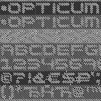 Art director. Designer of the op art font Opticum at Paratype in 2009. In 2016, he designed a sports shirt font, CSKA, at Art Lebedev for the CSKA ice hockey club.
 Fontshop link. [Google]
[MyFonts]
[More] ⦿
|
Escobas
[Eduardo Escobar Beckwith]
|
 Mexican foundry of Eduardo Escobar, which sells its fonts through MyFonts. Creations include the wrestling dingbats typeface YaVez (2006), the great wrestling mask typeface DosDeTres (2005), the soccer dingbat typeface Futboles (2006, by Guillermo Serrano), and the grunge typefaces LepperGothic (2006) and Monaca (2006), both by Guillermo Serrano.
 The fonts are also marketed via Volcano Type at MyFonts. Volcano Type link. Klingspor link. [Google]
[MyFonts]
[More] ⦿
|
Etienne Aubert-Bonn
|
 Étienne is a graduate of the graphic and type design program at UQAM in Montreal. Cofounder in 2011 of Coppers & Brasses in Montreal, together with Alexandre Saumier Demers. He studied at Type@Cooper in New York and at KABK in Den Haag, The Netherlands (class of 2013). He also teaches type design at UQAM in Montreal.
 In 2012, he designed the signage typeface Sardine and the blackletter typeface Freitt. Together with Alexandre, he created Martha (a monospaced slabby grotesque), still in 2012. At The Cooper Union, he created Barapa (2012). His fonts at Coppers Brasses: - Double (2015, Alexandre Saumier Demers and Étienne Aubert Bonn). A retail typeface family from condensed to wide with wedge serifs, a copperplate feel, and slight flaring. Ideal for display work.
- Canal (2015). A fantastic retail sans typeface family: Canal is a typeface family inspired by the blue collar, hard working people that were the late 19th and early 20th centuries labor force of the new continent. It is a sturdy workhorse with a wink of humanism.
- Energir (2017). A corporate stencil typeface for Gaz Metro, now called Energir.
- Ilisarniq (2018). Designed for the Kativik School Board---the only school board of Nunavik. The education programs developed by the school board are offered in all schools of the 14 Nunavik communities, in Inuktitut as first language and in French and English as second languages. The school board operates 17 primary and secondary schools as well as 5 adult education centers all over Nunavik. The goal was to create a modern and clean looking typeface that incorporates both the Latin alphabet and the Inuktitut Syllabics characters. The typeface family has been developed with the help of the board and the community to make sure its readability was optimal. The design has also been optimized to make sure that the color of text was similar between the two scripts. The typeface is available for free at Coppers and Brasses.
- With My-Lan, Etienne co-designed Mammouth (2017). Mammouth is a gala on Tele Quebec where teenagers can vote for the people, events, and causes that influenced them the most during the year. This commissioned typeface family contains a heavy and an ultra-fat style.
- Codesigner, with My-Lan Thuong of Maple Leafs (2017), a fast and aggressive typeface commissioned for the Toronto Maple Leafs as a display face to use along with their existing typefaces.
- McGill Sans and McGill Serif (2019), custom designs for McGill University in Montreal.
- Martha (2014, Alexandre Saumier Demers and Étienne Aubert Bonn). A retail typeface family with curvy typewriter influences, some monospaced styles and a grotesque to boot.
- Klaus (2014). Developed for personal web and paper work.
- Théorie (2014, Alexandre Saumier Demers and Étienne Aubert Bonn). A techno stencil typeface commissioned by UQAM's Bureau de Design for the Bâtisseurs of the science faculty award.
- Nurraq (2013). In 2013, Etienne graduated from the Type & Media program at KABK in Den Haag. His graduation typeface is called Nurraq. He explains this Latin/ Inuktitut typeface: Nurraq is a multi-script typeface system that matches a Latin serif text typeface with a Canadian aboriginal syllabics character set for the Inuktitut language. The very different nature and origin of these two scripts creates an interesting context for both typefaces to share influences coming from each other's tradition, and, by doing so, bridging the gap that usually separates these two forms of writing. Nurraq won an award in the Morisawa 2014 type competition.
- Compass (2013). A revival based on the early drawings of Monotype Plantin series 110 by Frank Hinman Pierpont and Fritz Stelzer.
- MLS Soccer (2012). A handcrafted custom typeface by Alexandre Saumier Demers and Étienne Aubert Bonn, commissioned by Sid Lee.
- Triade (2016). A heavy titling or display typeface with tons of personality.
- Hochelaga (2012-2017). In cooperation with Feed Type. An all caps sans inspired by old street signs in Montreal.
- Bookmark (2020). A 2-style geometric sans made for the Canadian mobile company Fizz.
- In 2020, Etienne Aubert Bonn and My-Lan Thuong co-designed Baryton at Coppers and Brasses, a revival of Frank Bartuska's playful photo era didone typeface Century Bartuska.
- Agena and Agena Display (2021). A large display sans family with many hipster traits.
[Google]
[More] ⦿
|
Fabio Haag Type (was: ByType, and: Foco Design)
[Fabio Luiz Haag]
|
 Fabio Haag Type is Fabio Haag's type foundry in Brazil. Earlier, he ran ByType, the type subdivision of Foco Design, and worke for Dalton Maag's Brazilian division. Fabio Luiz Haag (b. 1981, Taquara, Rio Grande do Sul) is located in Sapiranga, Rio Grande do Sul.
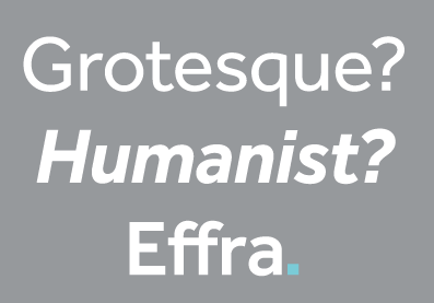
 Fabio Haag designed FH After (2006, futuristic display typeface to which After Text and After Headline were added in 2007), FH Foco (2003) (a large x-height sans), this futuristic typeface (2003), and Minas Headline, a custom family made for the government of Minas Gerais. He was working on this display font (2005). In 2006, Foco became a Dalton Maag Ltd font family, and Fabio Haag became the new Creative Director of the Brazilian wing of Dalton Maag in 2008. MyFonts sells Foco and Foco Corp (2007). Designer (with Jonas Schudel) of a grotesque sans at Dalton Maag, 2007-2009, called Effra, which was inspired by a 1816 design from the Caslon font foundry. Discussion at Typophile. Followed in 2013 by Effra Corp (Dalton Maag) which also supports Greek and Cyrillic. In 2007, he created the organic sans typeface IronThree. Cordale (2008) is a workhorse serif typeface jointly done with Lukas Paltram at Dalton Maag. Cordale Corp, the corporate edition, includes Latin Extended A, Greek and Cyrillic characters sets. Cordale Arabic was published in 2013. In 2009, Foco Italics was published. At ATypI 2009 in Mexico City, he spoke about Dalton Maag and about the elements necessary to make it in the type business today. In 2012, the Dalton Maag Brazil team designed the font for the Rio 2016 Olympic Games The 5448-character connected script font Rio2016 was developed by Dalton Maag Brazil, and involved a team that includes Fabio Haag, Fernando Caro and Gustavo Soares. Beth Lula is the Branding Director of the Rio 2016 Olympic and Paralympic Games Organising Committee. Passages of the press release: Each letter expresses a characteristic of Rio 2016 Games, its people and city. The letters are written with a single continuous linework, with a fast and fluid movement, suggesting the movements of the athletes in action. The variety of curves in the letters has a unique informality, inspired by the joyfulness of the Brazilian people. Fabio Haag: As a Brazilian typophile, designing the Rio 2016 font was a dream job. This is a milestone for the design scene in Brazil---it's a great example of how type designers can collaborate with graphic designers, sharing their expertise to strengthen an identity. In 2013, Fabio designed Almaq, a pair of sans display typefaces in cuts called Refined and Rough. Codesigner with Bruno Mello, Fernando Caro, Rafael Saraiva and Ron Carpenter of Soleto (2014, Dalton Maag), a sans typeface that won an award at Tipos Latinos 2014. Setimo (2015) was co-designed by Fernando Caro, Ken Gitschier, Fabio Haag and Lukas Paltram at Dalton Maag, and won an award at Tipos Latinos 2016. In 2016, Fabio Haag published Lembra (a sans that was created specifically for branding, characterized by tapered terminals) at his new type foundry, Fabio Haag Type, set up after he left Dalton Maag after eight years. Fabio Haag Type grew in 2020 to a team of four, now also including Ana Laydner, Henrique Beier and Eduilson Coan. In 2019, a variable font option was added top Lembra. In 2017, he designed the 28-unit legible humanist sans variable font family Margem (Fabio Haag Type), which includes a yummy Rounded subfamily. Still in 2017, he developed the sans typeface Sua, which as a variable option. In 2018, he published pictograms for SporTV, a forceful constructivist font for the World Cup 2018 also for SporTV and Furacão (for Atletico Paranaense). Typefaces from 2019: Suzano Sans (a commissioned rounded branding typeface done for Suzano). Typefaces from 2020: Margem (a fine 7-style rounded sans family by Henrique Beier, Ana Laydner and Eduilson Coan). Typefaces from 2021: Seiva (by Henrique Beier, Eduilson Coan and Fabio Haag: a distant relative of Didot, this exotic sans family is partitioned into Text, Display and Poster subfamilies, and welcomes variable font technology), Salva (2021, Fabio Haag Type). A versatile workhorse sans family: Eduilson Coan was the lead designer. He was assisted by the Fabio Haag Type team of Henrique Beier, Ana Laydner and Fabio Haag himself. View Fabio Haag's typefaces. Fabio Haag Type. [Google]
[MyFonts]
[More] ⦿
|
Fabio Luiz Haag
[Fabio Haag Type (was: ByType, and: Foco Design)]
|
 [MyFonts]
[More] ⦿
[MyFonts]
[More] ⦿
|
FC Barcelona, Real Madrid
|
FC Barcelona (2009), Premier League (2007), and Real Madrid 2009 (2009) are athletic lettering typefaces made by a designer who wishes to remain anonymous. Even though I know the designer, I am classifying these typefaces now as orphaned. [Google]
[More] ⦿
|
Felipe Casaprima
|
 Brazilian graphic and type designer, who co-founded Naipe Foundry with Alvaro Franca in Rio de Janeiro in 2018. A graduate of ESDI Cartapaccio, Felipe has interned at Coppers & Brasses in Montreal. He is also associated with Rodrigo Saiani's type foundry Plau. In 2021, he was located in Perth, Australia.
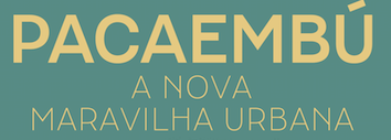
 In 2020, Naipe released Pacaembu. Advertized as a tropical art deco sans, this seven-style sans serif typeface by Alvaro Franca and Felipe Casaprima finds its roots in Brazilian soccer. In particular, it took inspiration from the stone lettering found in the 1940 art deco style Sao Paulo Municipal Stadium, also known as Estadio Pacaembu. A variable style is included. Carlos Mignot and Felipe Casaprima designed the corporate family iN Serif and iN Sans (+Mono) for iN Consultoria de Marcas in 2021. Naipe published Discordia in 2021. Discordia is an experimental type family with various styles of contrast; by Felipe Casaprima and Alvaro Franca; and a Hebrew extension thanks to Ben Nathan. Future Fonts link. [Google]
[MyFonts]
[More] ⦿
|
Filippo Morara
|
Graduate of ISIA Faenza, Italy. Imola, Italy-based creator of the art deco typeface Italian Football (2010) and the Hebrew and Arabic simulation typeface Ryja (2015). [Google]
[More] ⦿
|
Filthymedia
|
British studio located in Brighton. Creators of the oily display typeface Filthy Black Italic (2011). Filthymedia is mainly into identity and corporate type. They created the sturdy typeface Filthy Seagull Display for the Premier League Football Club Brighton in 2018, and the multiline Filthy Threeway Display for Adidas, also in 2018. In 2019, they designed Filthy Altitude Display for The North Face. Other typefaces include Filthy Blacksmith Display (for Patagonia), Filthy Daylight Display (for Kodak), Filthy Duke Display (a stencil font for Ben Sherman), and the grungy Filthy Desert Display. Hype For Type link. [Google]
[More] ⦿
|
Font Football and Design
[Alif Yoga]
|
 Commercial outfit in Bandung, Indonesia, specializing in soccer fonts, sold at 7 dollars a shot. Their typefaces cover most big teams in the world. A sampling as of 2016: 1816-BayernMunich-2014-2015, ACMilan-2007-2008, ACMilan-2008-2009, ACMilan-2009-2010, ACMilan-2010-2011, ACMilan-2011-2012, ACMilan-2012-2014, ACMilan-2014-2016, ASRoma-1996-1997, ASRoma-1997-1998, ASRoma-1998-1999, ASRoma-2000-2002, ASRoma-2003-2005, ASRoma-2013-2014, ASSaintEtienne-2014-2015, Ajax-1997-1998, Ajax-2013-2014, Ajax-2015-2016, Arsenal-1994-1997, Arsenal-2005-2006, Arsenal-2007-2008, Arsenal-2012-2013, Arsenal-2013-2014UEFA, Arsenal-2014-2015UEFA, Arsenal-2015-2016UCL, AtleticoBilbao-2016-2017, AtleticoMadrid2013-2014, AtleticoMadrid2015-2016, Atleticomadrid-2014-2015, Barcelona-2006-2008, Barcelona-2010-2011, Barcelona-2011-2012, Barcelona-20122013, Barcelona-2013-2014, Barcelona-20142015, Barcelona-20152016, BayernMunich-2007-2009, BayernMunich1970,80,90, BorussiaDortmund-2012-2014, BorussiaDortmund-2015-2016, Chelsea-2004-2006, Chelsea-2006-2008, Fenerbahce-2012-2013, Fiorentina-2015-2016, InterMilan-1997-1998, InterMilan-2014-2015, InterMilan-2015-2016. Behance link. [Google]
[More] ⦿
Commercial outfit in Bandung, Indonesia, specializing in soccer fonts, sold at 7 dollars a shot. Their typefaces cover most big teams in the world. A sampling as of 2016: 1816-BayernMunich-2014-2015, ACMilan-2007-2008, ACMilan-2008-2009, ACMilan-2009-2010, ACMilan-2010-2011, ACMilan-2011-2012, ACMilan-2012-2014, ACMilan-2014-2016, ASRoma-1996-1997, ASRoma-1997-1998, ASRoma-1998-1999, ASRoma-2000-2002, ASRoma-2003-2005, ASRoma-2013-2014, ASSaintEtienne-2014-2015, Ajax-1997-1998, Ajax-2013-2014, Ajax-2015-2016, Arsenal-1994-1997, Arsenal-2005-2006, Arsenal-2007-2008, Arsenal-2012-2013, Arsenal-2013-2014UEFA, Arsenal-2014-2015UEFA, Arsenal-2015-2016UCL, AtleticoBilbao-2016-2017, AtleticoMadrid2013-2014, AtleticoMadrid2015-2016, Atleticomadrid-2014-2015, Barcelona-2006-2008, Barcelona-2010-2011, Barcelona-2011-2012, Barcelona-20122013, Barcelona-2013-2014, Barcelona-20142015, Barcelona-20152016, BayernMunich-2007-2009, BayernMunich1970,80,90, BorussiaDortmund-2012-2014, BorussiaDortmund-2015-2016, Chelsea-2004-2006, Chelsea-2006-2008, Fenerbahce-2012-2013, Fiorentina-2015-2016, InterMilan-1997-1998, InterMilan-2014-2015, InterMilan-2015-2016. Behance link. [Google]
[More] ⦿
|
Fontaste
[Miguel Reyes]
|
 Miguel Reyes (b. 1984) is a graphic and type designer from Puebla, Mexico, who studied at Benemérita Universidad Autónoma de Puebla. He obtained a Masters in Type Design from Centro de Estudios Gestalt Veracruz. Since 2010, he cooperates with Typerepublic in Barcelona. Founder of Fontaste. Graduate of the TypeMedia program at KABK Den Haag in 2012.
 His graduation project consisted of two display typefaces, Naila (a wedge serif) and Rocco (a fattish round sans face). Typefaces at Fontaste, ca. 2013: Plastilina (+Display, +Deco: signpainter family), Sancho, Candela (signpainter script). He joined Commercial Type in New York City in 2013. Miguel's grandest achievement to date is Duplicate (2013, Commercial Type: with Christian Schwartz), a typeface family that comes in three substyles, Slab, Sans and Ionic. Commercial Type writes: Christian Schwartz wanted to see what the result would be if he tried to draw Antique Olive from memory. He was curious whether this could be a route to something that felt contemporary and original, or if the result would be a pale imitation of the original. Most of all, he wanted to see what he would remember correctly and what he would get wrong, and what relationship this would create between the inspiration and the result. Though it shares some structural similarities with Antique Olive and a handful of details, like the shape of the lowercase a, Duplicate Sans is not a revival, but rather a thoroughly contemporary homage to Excoffon. Duplicate Sans was finally finished at the request of Florian Bachleda for his 2011 redesign of Fast Company. Bachleda wanted a slab companion for the sans, so Schwartz decided to take the most direct route: he simply added slabs to the sans in a straightforward manner, doing as little as he could to alter the proportions, contrast, and stylistic details in the process. The bracketed serifs and ball terminals that define the Clarendon genre (also known as Ionic) first emerged in Britain in the middle of the 19th century. While combining these structures with a contemporary interpretation of a mid-20th century French sans serif seems counterintutive, the final result feels suprisingly natural. The romans are a collaboration between Christian Schwartz and Miguel Reyes, but the italic is fully Reyes's creation, departing from the sloped romans seen in Duplicate Sans and Slab with a true cursive. Mark Porter and Simon Esterson were the first to use the family, in their 2013 redesign of the Neue Züricher Zeitung am Sonntag. Because the Ionic genre has long been a common choice for text in newspapers, Duplicate Ionic is a natural choice for long texts. Duplicate Ionic won an award at TDC 2014. Early in 2014, Christian Schwartz, Paul Barnes and Miguel Reyes joined forces to create the manly didone typeface family Caponi, which is based on the early work of Bodoni, who was at that time greatly influenced by the roccoco style of Pierre Simon Fournier. It is named after Amid Capeci, who commissioned it in 2010 for his twentieth anniversary revamp of Entertainment Weekly. Caponi comes in Display, Slab and Text subfamilies. Gabriello (2015) is a soccer shirt font designed by Paul Barnes and Miguel Reyes: Inspired by brush lettering, Gabriello was commissioned by Puma. First used by their sponsored teams at the 2010 Africa Cup of Nations, it was later used at that year's World Cup, held in South Africa. It was used on the kits worn by Algeria, Cameroon, Cote d'Ivoire, and Ghana. Marian Text (2014-2016) is a grand collection of ultra thin typefaces designed at Commercial Type by Miguel Reyes, Sandra Carrera, and Paul Barnes. Marian Text 1554 depicts the old style of Garamond & Granjon; John Baskerville's transitional form becomes Marian Text 1757; the modern of Bodoni, with swash capitals and all, becomes Marian Text 1800, and the early Moderns of the Scottish foundries of Alexander Wilson & Son of Glasgow, and William Miller of Edinburgh, become Marian Text 1812. And like the original, a black letter: Marian Text Black, referencing the forms of Hendrik van den Keere. In 2015, Miguel Reyes designed the high-contrast sharp-edged yet curvy typeface family Canela at Commercial Type. It was followed in 2018 by Canela Condensed and Canela Text. Ayer is an elegant condensed display typeface designed by Miguel Reyes between 2016 and 2019 for the fashion magazine W. Ayer (Commercial Type) was designed to be malleable and to assert a strong personality at a variety of scales. Commercial Type writes: Ayer Poster has the extremely high contrast that is typical of a fashion typeface and features four different italic styles: the workmanlike italic featured in all optical sizes, a chaotically beautiful Cursive with a full complement of swash capitals, a sharply stylish Angular, and Miguel's decidedly non-traditional interpretation of the staid Blackletter genre. In comparison, Ayer also has high contrast, though less so than the Poster. Finally, Ayer Deck is a low-contrast sans serif with gentle flaring. Co-designer in 2019 with Paul Barnes of the fat face Isambard: The boldest moderns were given the name fat face and they pushed the serif letterform to its extremes. With exaggerated features of high contrast and inflated ball terminals, the fat face was the most radical example of putting as much ink on a page to make the greatest impact at the time. These over-the-top forms make the style not only emphatic, but also joyful with bulbous swash capitals and a wonderfully characterful italic. In 2021, he designed the inky script typeface Candy Darling (with Christian Schwartz; commissioned by Richard Turley for Interview magazine) and Canela Blackletter (inspired by the long tradition of blacketter in Mexico) at Commercial Type. In 2022, he designed the italic script typeface Eugenia at Commercial Type. Its four distinct fonts were derived from the 18th century work of Giambattista Bodoni. Eugenia was drawn to accompany Eugenio Serif, the design created for La Repubblica's weekly women's magazine D. [Google]
[More] ⦿
|
Francesco Fioretto
|
Italian designer of the (imaginary) AS Velasca soccer font (2016). He writes that it has been designed for the most artistic football club in the world, the A.S. Velasca. The typeface respects the proportions, the curves and the morphology of the Velasca Tower in Milan. The structuralistic appearance is studied not to bother the clarity of the letters both form closed and far reading. [Google]
[More] ⦿
|
Gabriel Ruiz
|
 Nicaraguan designer of these typefaces:
 - Neue GR Grotesk (2017). An extended and reimagined 14-style version of the Premier League Logo design.
- New York City Metro Font (2017). Inspired by the New York City Transit Authority (NYCTA) Graphics Standards Manual of Massimo Vignelli and Bob Noorda, ca. 1970.
- Kloko (2017). Inspired by modern wayfinding sans typefaces in East Europe.
Creative Market link. [Google]
[More] ⦿
|
Gerard Sierra
|
 Barcelona-based designer of these typefaces:
 - Centcelles (2018). A typeface that is inspired by the calligraphic shapes of the Capitalis Rustica.
- Rhinob (2020). A custom octagonal / industrial / soccer / sports font for the identity of Rhinob.
- Hooligan (2020). An ultra-condensed octagonal family custom-designed for Palco23. It was inspired by Matt Willey's Timmons, the previous corporate typeface used.
- BigSlab Quadrata (2020). Each letter occupies a full square, and the reverse stress provides a Western aura.
- Triomf Display (2020). Triomf is an experimental cubist display face inspired by a Spanish civil war poster . The designer also claims inspiration from Herb Lubalin and Avant Garde.
- Derrida (2021). A lapidary poster typeface.
[Google]
[More] ⦿
|
German Blanco
|
 Based in Miami, FL, German Blanco created the fun figurines typeface Soccer Player Font (2012).
 Behance link. [Google]
[More] ⦿
|
Gianfranco Barco
|
 Marostica, Italy-based art director who created Juventus Font in 2015 for the jerseys of Juventus Torino. Behance link. [Google]
[More] ⦿
Marostica, Italy-based art director who created Juventus Font in 2015 for the jerseys of Juventus Torino. Behance link. [Google]
[More] ⦿
|
Giulio Grigollo
|
Based in Verona, Italy, this graphic designer and art director created the typeface Swan (2009) and the avant garde typeface Architecta (2009, Happycentro). In 2015, he designed the condensed piano key typeface Clexidra 8. In 2016, he designed the data typeface No Fly Zone, and the airport signage typeface Terminale. Typefaces from 2018: Ragazi Fugazi, Sabotage (experimental), Abracadabra (condensed and modular), Nultras (a free all caps monoline and monospace typeface). [Google]
[More] ⦿
|
Guillermo Serrano
|
Mexican designer at the Mexican foundry of Eduardo Escobar, called Escobas. He created the soccer dingbat typeface Futboles (2006) and the grunge typefaces LepperGothic (2006) and Monaca (2006). [Google]
[More] ⦿
|
Herbanu Tri Sasongko
[Herbanuts (or: LetterStuff Type Foundry)]
|
[More] ⦿
|
Herbanuts (or: LetterStuff Type Foundry)
[Herbanu Tri Sasongko]
|
 Wonosari, Yogyakarta, Indonesia-based designer (b. 1991) of Primera (2018), Ballicons (2017) and Glyphicons (2017). In 2018, he added Larys Manice (a children's book font), Typis, Sweet Dessert, Rossela, Kiddos and the sci-fi typeface Space Surfer.
 Typefaces from 2019: Rolas Sans (a great rounded sans), Thumbelina, Alenka, Oceania (Victorian), Cherishia. Typefaces from 2020: Misro (a fat supermarket typeface), Chillok (plump, handcrafted), Qolak Pisank, Pastelova (a fat finger font). Typefaces from 2021: Silverback (an inline blackletter typeface). [Google]
[More] ⦿
|
Herbert F. Van Brink
[Character]
|
[More] ⦿
|
Horatiu Radoiu
|
 New York City-based designer of Atletico BK Jersey Font (2016). For the 2016 NFL draft he created two brush typefaces, Draft 16 and Digidraft. Behance link. [Google]
[More] ⦿
New York City-based designer of Atletico BK Jersey Font (2016). For the 2016 NFL draft he created two brush typefaces, Draft 16 and Digidraft. Behance link. [Google]
[More] ⦿
|
Illustration Ink (was: Lettering Delights)
[Doug Larson]
|
 Lettering Delights (later renamed Illustration Ink) is a company founded by Doug Larson in 1994, and located in Pleasant Grove, UT. Before that, Doug was at WordPerfect Corporation. Lettering Delights specializes in scrapbook, handwriting, doodle and alphading fonts. MyFonts link. MyFonts sells the following fonts, made in 2007-2008: LD Chaver (faux Hebrew), LD Cottage (blackletter), LD Daffy, LD Castle (Lombardic), LD Christmas Ale (uncial), LD Appliquée, LD Count Fontula (a grungy blackletter), LD Absurd, LD Bohemian Filigree, and many more. The "LDJ" series is made by Jillustration. A more complete list, as of March 2009: DB Dainty Swirl, LD Bohemian Filigree, LD Honeydukes, LDJ Christmas Troll, DB Trees, DB Floridity, DB Frilly Frames, DB Animal Occasion, DB Roman Philosophy, LD Garbo, DB Flornaments, DB Post Master, LD Daffy, LDJ Flirt, DB Flower Power, LD Absurd, DB Fancy Flourishes, LDJ Exhibit, LDJ Crafty (2007), LD Lamestain, DB Borders Birthday, DB Journal Doodles, LD Dirty Drusillus, LD Unconventional, DB Circles-Frilly, DB Foliage, LD Kung Pow, LDJ Jill Bird, DB Spring Fling, LD Goober, DB Artsy, DB Girly Flowers, DB Girly Girl, DB Journaling Boxes, DB Falalalala Doodle, LD Rock Hero, LDJ Yuletide, LD Count Fontula, LD Hang Ten, LD Horror Movie, DB Bridal Doodles, DB Floragraphy, LDJ Silly Sister, LDJ Jillk And Cookies, DB Birthday Cheer, LDI Fancy Folk, LD Imagine That, TXT Bethlehem, LD Distorted Drusillus, LD Romeo, LD Ugly Duckling, DB Beach Doodles, DB Easter Bunny, DB Smartypants, LD Christmas Ale, LD Shmutz, LDJ Eccentric, LD Cottage, LD Roman Sketch, LD Flutter, LD Generation X, LDJ Whimsey, LDJ Bash, LDJ Hen Hand, LD Roman Engraving, LDJ Scribble Scriptish, DB Fleuries, DB Pit Stop, DB Post Stamp, LDJ Distressed Yuletide, LDJ Jillegible, LDJ Cool Play, LD Demure, LDJ Caper, LD Poco, LD Softy, LD This Way, DB Easter Fun Doodles, DB Family Tree, DB Fright Night, DB Frilly Paisley, DB Just For U, DB Wedding Book, LD Scary, LD Appliqué, LDJ Forever Friends, LD Castle, LDJ Jill Scratch, LD Puck, LD Chaver, DB Bugs, DB Doodledeedoo, DB Frilly Words, DB Girly Soccer, DB Once Upon A Time, DB Spooky Doodles, DB Vintage Halloween, DB 'Tis The Season Modern, DB 'Tis The Season Words, DB Buggy Christmas, DB Christmas Doodles, DB Christmas Fun Doodles, DB Circles -, DB Circles - Christmas, DB Snowflakes, LD Hoot. Additions in 2009: TXT Fat Hatch, TXT Santa Font, LD Deck The Halls, LD Heather, LD Astoria, LDJ Doodaddles, TXT Brush Script, LD Elementary, LDJ Jingleberry, LDJ Knick Knack, LDJ Sneezes, LDJ Snow Doodles, TXT Annesia, TXT Groovy Smooth, TXT Hoopla, LD Let It Snow, LDJ Ho Ho Snow, TXT Altius, TXT HunkaSpunk, TXT Jubulation, TXT Monkeyshine, TXT Long Hand, LD Painters Hand, TXT Soda Shoppe, TXT Stonewashed, TXT Antique Italic, LD Wait, LD Soccer Mom, LDJ Sweet Potatoes, Scrap Caps, TXT Romanesque, Scrap casual, TXT Scribbletti, TXT Sloppy Script, LDJ Billy Bob, LDJ Cool Cat, LD Wedding, TXT Menu Item, LD Red Hatters Hand, Scrap Twiggy, LD Lanky, TXT Modern Mom, TXT Nuptials, TXT Delicate Script, LDJ Fadoodle, LD Kiss The Cook, LD Kooky, LD Old Country, LD Remington Portable, LD Underwood 5 (old typewriter), TXT Personality, TXT Jersey, LD Wanted (Far West), LDJ Dear Santa, TXT Monique, TXT Old English (blackletter), LD Christmas Carol (blackletter), LDJ Cooligraphy, LDJ Elf writing, LDJ Friend Font, LD Harry, Scrap Brother, LDJ Squirrel Tracks, TXT Tough Love, TXT Small World, TXT Stitched, LDJ Elf Note, LD Engraved, Scrap Sloppy, LD Sidewalk Chalk, LDJ Story Stamp, LDJ Tickled Tourist, LD Little Buggy (2008), LD Platform Soul (2011), PN Finnegan Fine (2017), LD Laundry Night (2018).
 Images of some fonts made in 2010: LD Chaplin, LD Confucius, LD Cursive, LD Cursive Flourish, LD Eleanor Ray, LD Elegance, LD Gettysburg, LD Newborn Vampire, LD Twilight, LD Werewolf. The list of typefaces at Creative Fabrica at the end of 2018: Abomination, Americana Preserves, Aphrodisiac, Apple Crisp, Arachno Horror, Bane Existence, Batabulous, Beddie Bye, Belly Laughs, Bigshot Jitter, Blackbird Pie, Bomb Diggity, Boogieman, Bough Breaks, Bounce Print, Brainpop, Bread and Sugar, Build Me Up, Bunny Hop, Buttermilk, Canoodling, Carbohydrate, Catawampus, Chocolate Candies, Cilantro Leaf, Clacker Jax, Cookie King, Cranky, Cupcake Face, Destination Wedding, Deutschland, Doohickey, Dream Catcher, Earthlings Obey, Eat Your Vegetables, Enthusiasm Serif, Evil Olivia, Farmhouse, Fidgety, Finnegan, Finnegan Fine, Firefly, Frankenfont, Frapple, Gelato, Ghostwriter, Gingerbread Cake, Gladstick Thick, Gooey Gumdrops, Gooey Gumdrops Gorey, Gooey Gumdrops Script, Goose Pimples, Graham Cracking, Grumble, Half Baked, Halloween Bean, Halloween Elegance, Happy Haunted Holidays, Hatch It Inline, Hatch-it-all, Housewife, Hummingbird, Hustle Time, Imaginary Cherry Juice, Incandescent Bulb, Invitation Only, Jack Sprat, Jelly Doughnut, Just Hatched, Kick the Can Serif, Kicks and Giggles, LD Lost and Found, Ladyfinger, Laundry Night, Long Island, Long Island Independence, Lucky Star, Mabel Rose, Macaroni Salad, Magenta, Magnolia, Maunaloa, Megabite, Megajoule, Migelson, Millionaire Bachelor, Millionaire Bleeds, Mingle, Monkey Potluck, Moshing, Mother May I, Mousetrap, Mr. Brown Goes To Town, Necrophobia, Nether Lights, Newfangled, Night Fox, Nightliter, Oh My Gourd, Oogety Hand, PN Alphabet Soup, PN Banana Split, PN Banana Split Script, PN Breakfast Burrito, PN Juneberry, PN Neighborhood, PN Octopus Socks, PN Phat Script Sheen Duo, PN Shenanigan, PN Ski-Doozy and Ski-Dazy Font Duo, PN South Carolina, PN Epoisses de Bourgogne, Peach Mango, Peach Preserves, Peanut Butter and Honey, Peppermint, Playmate, Popsicle Dream, Positively, Pumpkin Patch, Pumpkin Pie, Radioactive, Radioactive Decay, Ragamuffin, Razzle Berry, Rejuvenation, Saddlesore, Said No One, Sand and Sea Drool, Saturday Duo, Say What, Scamper, Seagully, Sharky Pants, Sharkypants Pow, Shoofly, Shugarpie Honeybunch, Singleton, Smarty Pants, Spicy Margarita, Spiegel, Spine Chilling, Spooksville, Spotlight, Stars & Swirls Monogram Banner, Stinkbug, Storybrooke, Storybrooke Script, Sugar Britches, Sugar Cookie, Sugar Rush, Sugarcane, Sundance, Supercilious, Superlunacy, Sweater Weather Serif, Sweeter Dreams, Sweetie Face, The Dead Walk, Threadcount, Thurday's Child, Toastie, Tomatoes, Tombstone, Triassic Dinosaurs, Type Right, Unfortunate News Ooze, Unicorn Script Jitter, Whisk It, Yahoolagism, Yoga Master, ZP Beastly Gorgioso, ZP Bookaholic, ZP Frozen Lemonade, ZP Glue Stick, ZP Jack and Diane, ZP Jack and the Beanstalk, ZP Prehistoric Age, ZP Raisin Cookie, ZP Schnugguns, ZP Seaside, Zucchini Bread, Zweetie Curliecue. Typefaces from 2019: DB Lucky Sunshine. Typefaces from 2020: PN Sharkypants. Creative Fabrica link. View Doug Larson's typefaces. [Google]
[MyFonts]
[More] ⦿
|
Ipanema Gráfica
[Rubén Prol]
|
 Ruben Prol is based in A Coruña, Spain. He used to run Ipanema Gráfica, a Brazilian photoblog site, where original fonts such as Rita (2010, slabby), Comic Arousa (2007), Nantronte (2005), Velvet Illusions (2005, retro futuristic), Vila Morena (2006), Johnyokonysm (2005), As pedras da Belle Otero (2006, an artsy pixel font), Milocha (2010, sans), Rita (2010, slab serif), and Marela (2005) may be found.
 Rubén Prol created the sans face Carme (2011), which is free at Google Font Directory. Ancient Galician stone inscriptions led Prol to design Uralita (2012, +Bold, 2013), which is also free. In 2016, he designed the soccer shirt lettering typeface Hibernia, and the multilined Starman. In 2014, he designed the custom soccer shirt typeface RCD Carme Condensed for the new (2014-2015) RC Deportivo kits. Typefaces from 2017: Chuca Mono, Lordela (an angular German expressionist typeface), Abisinia (a unicase poster font). Dafont link. Behance link. Old URL. Behance link for Ruben Prol. [Google]
[MyFonts]
[More] ⦿
|
Ismail Abdurrasyid
[Asyan Design]
|
[More] ⦿
|
Jaime Compean Dolphyn
|
Graphic designer in Mexico City, who created the free sports typeface Mixe Ayuuk (2016) for the basketball team Mixes de Totontepec (Oaxaca, Mexico). [Google]
[More] ⦿
|
Jayanth Nune
[Pastelle Pyrex]
|
[More] ⦿
|
Jens Kutilek
|
 Jens Kutilek studied Communication Design in Braunschweig. After graduating he founded the web design agency Netzallee. He works at the font technology department at the Berlin office of FSI (FontShop International) since 2007. Jens Kutilek had a small typology page proving that Arial is not Helvetica, Courier is not Courier New, and Times-Roman is not Times-New Roman. That page disappeared. His typefaces:
 - Azuro (2011). Designed by Georg Seifert and fine-tuned by Jens Kutilek, and published by FontShop.
- Bulette Bold (2008). A fat octagonal / mechanical design.
- The free font Comic Jens (2007-2009), a free alternative to Comic Sans: see here. See also the update Comic Jens UI (2014).
- Conta: A coding font. Monospaced and proportional variants, italics.
- The sturdy 6-style typeface family FF Hertz (2015) that was influenced by German cartographic alphabets.
- FF Uberhand. An 11 style marker pen font family---casual and informal---that could serve as a replacement and improvement of Comic Sans.
- Grotesk 812: A condensed grotesque typeface.
- Helvers (2011). A blend of Univers and Helvetica.
- Homecomputer (2019). Two-axis variable interpretations of monospaced pixel fonts for the Commodore 64 and Amiga home computer systems from the 1980s, with adjustable effects to simulate artifacts of old CRT displays. Github link for the open source fonts. Particular fonts include Workbench and Sixtyfour.
- Malerblock: A signpainter's typeface.
- Mergenthaler Antiqua (2012). A digitization of a forgotten typeface by Hermann Zapf.
- Pathos: A monumental sans-serif with classical proportions.
- Selectric Century: A digitization of the Century typeface from IBM's Selectric Composer.
- Soccer Sans: A constructivist sans with extra low legibility. Ideal for soccer kits.
- Stecker: A typeface made of round elements.
- Sudo (2009-2013). A programming font family developed from Experimental 710.
- Topography: A version of the classic German cartography typeface.
Github page with many of his unfnished typefaces. Github page with free programming and system fonts such as Arimo, Clear, Cousine, Droid, Fira, Material Icons, Noto, Open, Roboto, Source, Special Elite, Tinos, and WinJS Symbols. [Google]
[MyFonts]
[More] ⦿
|
Joe Hall
|
In 2017, during his studies at Staffordshire University, Joe Hall (Stoke-on-Trent, UK) designed the soccer shirt font Conquer, taking inspiration from the domed London Stadium. Behance link. [Google]
[More] ⦿
|
Johannes Lang
[Langustefonts]
|
 [MyFonts]
[More] ⦿
[MyFonts]
[More] ⦿
|
Jonas Niedermann
|
 Swiss-born MATD University of Reading graduate, class of 2013, who lives in St. Gallen, Switzerland. He describes his graduation typeface Caligula as follows: The roman emperor Gaius Julius Caesar, also known as Caligula is described as a noble and moderate ruler during the first six months of his rule. After an illness, the sources focus upon his cruelty, extravagance, and sexual perversity, presenting him as an insane tyrant and maniac with a split personality. Caligula is a typeface family originally intended for both magazines in print as well as on screen. Styles for highly legible bodytext are accompanied by various and distinctive display styles for expressive headlines. The Latin has an angular character which makes it readable. It is harmonized with an Armenian style.
 Cofounder of the Swiss type foundry ABC Litera together with Jost Hochuli and Roland Stieger. In 2018, he designed the soccer shirt font Gruenweiss for FC Sankt Gallen 1879. Creator with Roland Stieger of the sans typeface Alena, about which they write: It all started with the woodcut from Jost Hochuli, published in the year 1980. I found this woodcut in a bookshop around 1992 and was fascinated by it for many years. Until my interest in type design became so huge that I took it as a starting point to design an own typeface, a sans serif, called Alena, which builds on the shapes and proportions of this woodcut. Released in 2019 at Nouvelle Noire. [Google]
[More] ⦿
|
Jordi Manero Pascual
[Woodcutter Manero]
|
 [More] ⦿
|
Jose Gonzalez
|
Jose Gonzalez (Chicago, IL, b. 1994) designed Soccer Derby Display Font in 2016. [Google]
[More] ⦿
|
K22 Fonts
[Toto]
|
 Quezon City or Kyusi (Philippines)-based designer of revivals and opportunistic typefaces, who is quite active on newsgroups like alt.binaries.fonts. His production is impressive:
 - Typefaces from Dan Solo's books: Pluto Outline (2012), a 3d beveled typeface from page 82 of Solo's Outline Alphabets. K22 Angular Text (2012, an interpretation of Herman Ihlenburg's 1884 Victorian typeface Angular Text at MacKellar, Smiths and Jordan), K22 Helve Cursive (based on Helvetica Serif by Dan Solo; other digitizations include Pen Tip (WSI) and Renania (Intellcta)), K22 Spiral Swash (Victorian), K22 Athenian Wide (2011: K22 Athenian Wide is Athenian Wide on page 5 of Circus Alphabets: 100 Complete Fonts by Dan X. Solo; see also Tobias SSK), K22 TriLine Gothic (2011, a multiline art deco typeface based on Ross F. George's TriLine Gothic from 1956), K22 Timbuctu (2011: this is the Arabic simulation typeface Timbuctu on page 73 of The Solotype Catalog of 4,147 Display Typefaces and on page 95 of Special Effects and Topical Alphabets: 100 Complete Fonts by Dan X. Solo), K22 Didoni (2011, + Swash: a fat typeface based on Didoni from page 33 of Swash Letter Alphabets: 100 Complete Fonts by Dan X. Solo and also on page 140 of The Solotype Catalog of 4,147 Display Typefaces), K22 K22 Eureka (2010, based on Eureka from Dan X. Solo's book "Circus Alphabets, 100 Complete Fonts"), K22 Monastic (2010, based on Monastic from Victorian Display Alphabets by Dan X. Solo), Solo Ornaments (2003, based on Solo's books), K22 Eclair (2010, a decorative Western typeface Toto found in Dan X. Solo's book on Victorian alphabets, but which in fact dates back to Hans Brehmer in 1868), K22 Karnak Deco (2009, a slab serif based on Karnak Deco from the Moderne Alphabets by Dan X. Solo and published by Dover Publications in 1999).
- Revivals of Letraset phototypes: K22 Lucifer No. 1 (2012, a beveled neon-look face).
- Typefaces from 101 Alphabets (W. Ben. Hunt and Ed. C. Hunt, The Bruce Publishing Company, New York, 1958): Saisa (2011, art deco face), K22 Amihan (2011, an art deco face, after this original).
- MICR fonts: K22 GKW Computer (2011, a MICR font which is based on KW Computer from ATF, and looks very similar to Moore Computer), Auto Mission (2011, after Auto Mission was derived from the MICR font Automation Shaded on page 3 of Solo's Special Effects and Topical Alphabets, and is more complete than Otto Mason SH, the Soft Horizon digitization of Automation).
- Fonts based on work by Ross F. George: K22 TriLine Gothic (2011) is based on Tri-Line Gothic by Ross F. George in Speedball Text Book, 17th Edition, 1956.
- K22 Xanthus (2012, based on Xanthus Computer, a dry transfer (or rub-on) font from Mecanorma).
- K22 Stile Ballmer (2011, after an art deco typeface made by Walter Ballmer for Olivetti), Mallary (2011, based on Mallary from page 43 of Dan X. Solo's Moderne Alphabets).
- K22 Landi Linear (2011, after Nebiolo's Landi Linear).
- Le Pochoir (2011, an art deco stencil typeface (à la Futura Stencil) based on an alphabet from Plate 40 of La Lettre dans la Peinture et la Publicité by Jean Joveneaux, Paris, 1987), Le Pochoir Creux (2011), Lettre dans le decor (2011, based on an alphabet from "La Lettre dans le Decor et la Publicité Modernes").
- Splash Gordon (2011, +Inline; after the title of Flash Gordon, the movie).
- Soccer shirt fonts: Brooks Chile (2011, used by Chile in the 2010 world cup), SwitchImage FC Copenhagen (2011, used by FC Kopenhagen), Azmie WC2010 South Korea (2010), SwitchimageACMilan (2010), FCBarcelona (2010), Azmie WC2010 United States (2010), Azmie WC2010 England (2010), Azmie WC2010 Australia (2010), Azmie WC2010Brazil (2010, based on a vector image by Kuala Lumpur-based Azmie for the Brazilian World Cup team), Azmie WC2010Portugal, Azmie WC2010Netherlands, Azmie2Slovenija-2010, Real Madrid 2011 (2010), ABFonts RCD Mallorca 2012 (based on the shirts of Real Club Deportivo Mallorca, for the 2012-2013 season).
- K22 EricGill Shadow (2011, after Gill's 1929 face, Gill Sans Shadow 338; and K22 EricGill Shadow Line, an inline version).
- Sajou Fancy Gothic (2011, based on pages 3 and 4 of Sajou No. 236, a late 19th century French embroidery booklet).
- RAWB (2010, ultra fat family).
- Linyat Bilog (2010). A geometric monoline typeface.
- K22 Ambelyn Condensed (2010, based on Ambelyn Condensed, page 2 of Condensed Alphabets: 100 Complete Fonts by Dan X. Solo and also page 21 of The Solotype Catalog of 4,147 Display Typefaces where it is called Ambelyn), K22 Spiral Swash (2010, based on Spiral Swash from Dan X. Solo's Swash Letter Alphabets (p79)).
- Art Jam MakingFaces (2003, a great dingbat font based on designs found in Image Club Graphics' volume 30, called Art Jam).
- Town Sketches Bandstand (2003, based on volume 35 (Sketches On The Town)).
- Fonts based on Aridi's designs: Nabel Initials (2005, based on Marwan Aridi's Nabel from the Initial Caps Vol I), Anabel (2005, a simpler version of Nabel Initials), Blister Caps (2005, based on the Blister set from the Aridi Initial Caps Vol. 1), RegalAlt, RegalInitials (2005, based on the Regal set from the Aridi Initial Caps Vol. I), SpringAlt, SpringInitials (2005, based on the Spring set from the Aridi Initial Caps Vol. I), VictorianaAlt, VictorianaInitials (2005, based on the Victoriana set from the Aridi Initial Caps Vol. III), Tuscan Initials (2005, based on more of Marwan Aridi's alphabets), Napoli Initials (2009, more Aridi capitals), Gothic Initials (2009, Aridi-based), Romant Initials (2009, Aridi-based), Royal Initials (2009, Aridi-based), Stone Initials (2009, also based on Aridi).
- K22 You Know Who (2004, dingbats based on Dark Mark from the Harry Potter books).
- Gidget Cameo (2004).
- K22 Xerxes (2003, a stone carving typeface).
- Dover Birds (2012, based on the Birds Alphabet Coloring Book by Ruth Soffer, Dover Publications).
- K22 Spotty Face (2012, +Cyrillic) is a dot matrix font based on Tony Huggett's Spotty (Zipatone).
- K22 Gadget Lined (2012) is an art deco typeface based on Gadget Lined by Peter Bennett at Zipatone. See also K22 Gadget (2014).
- K22 Lawenta (2012). A teepee-styled typeface (check also Nick Curtis's Wigwam NF). He says: The font is based on the alphabet on page 63 of 101 Alphabets by W. Ben. Hunt and Ed. C. Hunt (The Bruce Publishing Company, New York, 1958).
- K22 My Didot (2012). This is one of three known digitizations of CBS Didot.
- K22 Aking Didot (2012). free.
- K22 Plural (2013) is a revival of the op-art font Plural made in 1971 by Vicente Rojo for the Mexican magazine Plural.
- Sabbath Paranoid (2018). It is based on the letters used in Paranoid, the 1970 album of Black Sabbath.
- UP Fighting Maroons (2018). An unreleased custom font based on the sports font on the shirts of the Fighting Maroons at the University of the Philippines. The original Fighting Maroons font, called Maroons (Sharp Strong, Wide) is an octagonal family by AJ Dimarucot, Joanna Malinis of Plus63 Design Co., and Dan Matutina of Plus63 Design Co.
Alternate URL. Fontspace link. Partial catalog from 2010. Dafont link. Abstract Fonts link. [Google]
[More] ⦿
|
Kailey Deason
|
Designer of Respect (2015), a typeface that was inspired by soccer fields. [Google]
[More] ⦿
|
King Kern Studio
[Olly Wood]
|
Graduate of at West Kent College and The School of Communication Arts in Vauxhall, London, who is presently art director in London. Designer of Rodondo (2013, a sharp-edged sans caps typeface). In 2021, he released the Tuscan typeface Palestra Moderna to celebrate the culture and heritage of the Brazilian football club Palmeiras, formerly known as Palestra Italia. [Google]
[MyFonts]
[More] ⦿
|
Kleber Lopes
|
Graduate of Centro Universitario Tiradentes (UNIT) in Sao Paulo, Brazil. During his studies at Miami Ad School in Sao Paulo, he designed the copperplate font Pepper (2017) and the soccer shirt typeface family Canarinho (2018). [Google]
[More] ⦿
|
KonKhmer
[Suonmay Sophanith]
|
Between 2015 and 2018, Suonmay Sophanith designed these free typefaces and dingbat fonts for Latin and Khmer: 2022-unoifficial (for the Qatar FIFA World Cup in 2022), FIFA-18-ART, Jun Ho, KH-NITH-MUFAN, KonKhmer_S-Phanith1, KonKhmer_S-Phanith10, KonKhmer_S-Phanith11, KonKhmer_S-Phanith12, KonKhmer_S-Phanith13, KonKhmer_S-Phanith14, KonKhmer_S-Phanith2, KonKhmer_S-Phanith3, KonKhmer_S-Phanith4, KonKhmer_S-Phanith5, KonKhmer_S-Phanith6, KonKhmer_S-Phanith7, KonKhmer_S-Phanith8, KonKhmer_S-Phanith9, PHANITH-FONTER, Phanith-FONTER-aZ, Phanith-Fonter-THAT, Phanith-THAT, S-PHANITH-FONTER-ROCK, S-PHANITH-FONTER-SAM, S-PHANITH-FONTER-TOUCH, S-PHANITH-FONTER-WW, S-PHANITH-FONTER-ZOUL, S-PHANITH-FONTER-ZZ, S-PHANITH-FONTER, S-PHANITH_FPefect, S-PHANITH_FTHIN, S-PHANITH_THINKE, S-Phanith-FONTER-DRAQ, S-Phanith-FONTER-GONE, S-Phanith-FONTER-PC-TOOL, S-Phanith-FONTER-THIN, S-Phanith-FONTER-WEEN, S-Phanith-Fonter-LAM, S-Phanith14-GREAT-1, S-Phanith14-GREAT-2, S-Phanith14-KH-PENCIL, S-Phanith_2019, S-Phanith_miss-you. [Google]
[More] ⦿
|
Konstantin Lukyanov
|
Russian designer, at Art Lebedev, of the Latin / Cyrillic handwriting typeface Vlas (2018), the slab serif NF64 (2018), the informal Junior (2019), the straight-edged Dutch rococo Brevier (2019), the bubble motiv font January (2019), and the architectural blueprint typeface Arc (2019). With Ksenia Erulevich and Konstantin Lukyanoiv, he co-designed the soccer shirt font Russian Premier League (2018, at Art Lebedev). [Google]
[More] ⦿
|
Ksenia Erulevich
|
Ksenia Yerulevich (or Erulevich) was born in Novotroitsk, Russia, in 1986. She graduated from The British Higher School of Art and Design (Moscow) with a Type and Typography degree. Since 2011, Ksenia has worked as a type designer and calligrapher at Art. Lebedev Studio. Designer of the quaint text typeface Alice (2011, Cyreal, Google Font Directory) and the curly typeface Bonbon (2011, Google Web Fonts). Creator of the feminine script typeface ALS Fuchsia (2012, Art Lebedev Studio). In 2013, Ksenia published ALS Malina, a plump packaging and children's book face. In 2016, she published the informal sans typeface ALS Lavanda and the flaring ALS Alumna at Art Lebedev. ALS Sector, a grotesque typeface family, followed in 2017, and the rounded all caps sans Contract and Russian Premier League (a soccer shirt font by Ksenia Erulevich, Nikolay Nedashkovsky, and Konstantin Lukyanov at Art Lebedev) in 2018. Her corporate typefaces at Art Lebedev Studio include M.Video (2013, done with Olga Umpeleva) and Yandex (2013: by Ksenia Erulevich, Taisiya Lushenko, and Elena Novoselova). [Google]
[MyFonts]
[More] ⦿
|
Langustefonts
[Johannes Lang]
|
 Johannes Lang (Langustefonts) is a graduate of the KABK in Den Haag in 2008. Originally from Vienna, he created the transitional text family Dendra as a student at KABK. Other fonts made by him at his Langustefonts: Alefbet, A Maze Thing, Audiotypi (filled in art deco letters), Baguette (smudged), Canard (octagonal), Canontire, Crossword, Doggy, Donotiron (glyphs like clothes), Elfenfreund (2006-2012, handwriting), Ella (connected upright script), Fontball Field, Fontballet (soccer dingbats), Hellvetica, Kapitalschaden (grunge), Klatschmohn, Lamb, Lichtenberg, LF Pixel, Noncept, Overdressed, Schnoerkel2512, Setzkasten, Somehand, Tak (child's hand), Unisize, Vin rouge (handwriting with scratchy hairy endings). He also made the Armenian text typeface Foltyn (2011).
 In 2013, Johannes Lang and Stefan Ellmer co-designed the free display typeface Brevier Viennese. It is based on a Victorian typeface called Viennese by the Fann Street Foundry from 1874. In 2014, Johannes Lang and Stefan Ellmer revived the frilly Victorian typeface Stencil Gothic [MyFonts link] originally designed by John West in 1885. In 2014, Stefan Ellmer and Johannes Lang cofounded Ellmer Stefan & Johannes Lang. Alternate URL. [Google]
[MyFonts]
[More] ⦿
|
Les Chemins D'En Haut
|
Free demos of the Amazing Webdings dingbat series: Babies n Teens, Lifestyle, Leisure, Cool Tools (four fonts for now). Full versions cost $$. They also sell display fonts. Now also butterfly dingbats in the BombyxConnection font. And religious dingbats: New Age-Channeling (1 through 5), Jesus' Life (1 through 3), and Holy Art (1 through 3). Plus Pict'Animos, Toys'4U, Baby's World, Soccer Dance, Schooldays, Lifestyle Delight, Feast Day, P'tit-Dij, SmaragDings, Flower Show, Music for a while, Paradise's Fruits, Pharaoh, Summer Time, Little Gardener, Lovely Kitchen, Measure Tools, Pretty Pottery, Workshop Dings, Merry Christmas, My World, Chinese Cocktail, Happy Eggs, Paris Perfume, Potato'n Tomato, Bombyx Connection, Alpages, Hot Hat, Light Office. [Google]
[More] ⦿
|
Letterbeeld
[Sander Neijnens]
|
 A discussion on the typography of numbers on shirts, by Dutchman Sander Neijnens, a Tilburg-based Dutch graphic designer (b. Valkenswaard, 1957) who drew a character in the September 11 charity font done for FontAid II. Specializing in numbers on athletic shirts, and displeased with the sameness of the letters in classical typefaces like ITC Machine or Superstars, he proposes serifed numbers, which were used by the soccer team Willem II from Tilburg in 2002-2003. A new athletic number design, King III, is in the works. He created Hia (a stencil typeface for use on doors and fences), Streep (horizontally striped letters for fences), and Klinker (based on street tile patterns).
 Codesigner of the free font Tilburg Sans (2016) and Tilburg Sans Text (2017). [Google]
[More] ⦿
|
LetteringDelights.com
|
This outfit will make your handwriting into a font. There are commercial fonts from Cock-A-Doodle Design (2USD/font), Creating Keepsakes (names start with CK), Inspire Graphics, Karen Foster Design (names start with KF, as in KF Bonkers, KF Bugs, KF Carnival, KF Fun Font), LetteringDelights.com (names start with LD), PrintDog Design, PC Hugware. If you fill out a form, send email, become a member and spend ten minutes on their page, you'll get five free fonts. List of about 500 fonts as of April 2003. All fonts have an "Inspire Graphics" copyright notice. A partial list of the LD fonts: LDAgua, LDAmore, LDAntique, LDAntler, LDApple, LDArchitect, LDArtsy, LDBabyPin, LDBaby, LDBallet, LDBaseball, LDBasketball, LDBatBall, LDBeach, LDBeehive, LDBikini, LDBillboard, LDBooBoo, LDBoogie, LDBows, LDBubbles, LDBubbley, LDButterfly, LDButton, LDCake, LDCalligraphix, LDCamping, LDCandles, LDCarolers, LDCats, LDCeltic, LDChalk, LDCharming, LDChildish, LDChristmasBulbs, LDChristmasLights, LDChubby, LDCityScape, LDClover, LDConfetti, LDCool, LDCostumes, LDCritters, LDCrosstich, LDCupid, LDCuteCurls, LDDabble, LDDainty, LDDaisy, LDDelightful, LDDenim, LDDerby, LDDiary, LDDiver, LDDoodles, LDDotty, LDDoubleLine, LDEarMuffs, LDEasterBasket, LDEasterEggs, LDEasy, LDElementary, LDFallingLeaves, LDFierro, LDFigureSkating, LDFillIn, LDFinePrint1, LDFinePrint10, LDFinePrint11, LDFinePrint12, LDFinePrint13, LDFinePrint14, LDFinePrint15, LDFinePrint16, LDFinePrint17, LDFinePrint2, LDFinePrint3, LDFinePrint4, LDFinePrint5, LDFinePrint6, LDFinePrint7, LDFinePrint8, LDFinePrint9, LDFineScript1, LDFineScript2, LDFineScript3, LDFineScript4, LDFineScript5, LDFineScript6, LDFineScript7, LDFirecracker, LDFloaties, LDFlora, LDFlowers, LDFlurry, LDFlyfish, LDFootball, LDFrankenstein, LDFrosty, LDFunky, LDFunnySerif, LDGala, LDGhosts, LDGhouls, LDGift, LDGingerbread, LDGirlyCurls, LDGobble, LDGoingNuts, LDGolf, LDGreeting, LDGridiron, LDGrin, LDHand, LDHappyHats, LDHeartThrob, LDHeliumEars1, LDHolly, LDHuggyBear, LDHugs, LDIrish, LDItalic, LDJersey, LDJournaling, LDJoyful, LDJubilee, LDJumpy, LDLaundry, LDLeaves, LDLoneStar, LDLoveStruck, LDLuvnLace, LDMaple, LDMasquerade, LDMickE, LDMickE, LDMixed, LDMonster, LDMusic (2001), LDMusical, LDNativity, LDNativity, LDNeighborhood, LDNorthPole, LDNotePad, LDNotebook, LDOwie, LDPalmTrees, LDParade, LDPartyHats, LDPartyTime, LDPeekABoo, LDPenInk, LDPlank, LDPlumbing, LDPoof, LDPookie, LDPopCorn, LDPotoGold, LDPresents, LDPretty, LDPrint1, LDPrint10, LDPrint11, LDPrint12, LDPrint13, LDPrint14, LDPrint15, LDPrint16, LDPrint17, LDPrint18, LDPrint19, LDPrint2, LDPrint20, LDPrint21, LDPrint3, LDPrint4, LDPrint5, LDPrint6, LDPrint7, LDPrint8, LDPrint9, LDPuffy, LDPumpkin, LDQuickScript, LDQuilt, LDRV, LDRiverRun, LDRosebud, LDRoses, LDRounded, LDRoyal, LDSailing, LDSandCastle, LDScouter, LDScrapbooking, LDScratch, LDScratchyPen, LDScript1, LDScript2, LDScript3, LDScript4, LDScript5, LDScroll, LDSeashells, LDShadow, LDShamrock, LDShellyPrint, LDShellyScript, LDSign, LDSketch, LDSlanted, LDSlapHappy, LDSleek, LDSlender, LDSmiles, LDSmokey, LDSmooch, LDSnowman, LDSoccerBall, LDSoccer, LDSpecs, LDSpider, LDSplash, LDSpooks, LDSportDots, LDSports, LDSpringtime, LDSquiggle, LDStarSerif, LDStars, LDStencil, LDStringBean, LDStylin, LDSunflower, LDSunshine, LDSuper, LDTallPen, LDTallTale, LDTennis, LDTopHat, LDTuxedo, LDTwitterpated, LDUSA, LDVolleyball, LDWalt, LDWaterski, LDWeb, LDWildFlower, LDWitchy, LDWormy, LDWroughtIron, LDYoungster, LDZoo. Typefaces from 2007: LD Unique. Fonts from 2008: LD Platform Soul, LD Little Piggy, LD Little Buggy (scratchy face), LDJ Boxed Flirt, LD Santa Fe (grunge), LD Socialite, LD Teensel, LDJ Verdant Leaves. Additions at the end of 2009: LD Adornment, LD Dear Miss Rose, LD Bostonian, LD Artist's Intent, LD Abe Lincoln, LD Baskin Sundae, LD Bold Blake, LD Edward, LD Bella, LD Bon Vivant. Fonts from 2010: LD Dear Diary (hand-printed). [Google]
[More] ⦿
|
LeVision
|
Company that (re?)made the soccer lettering font Puma Pace in 2007. This was used by the Italian soccer team during the 2006 World Cup. Download here. [Google]
[More] ⦿
|
Luis Abaladas
|
Graduate of ESAD Matosinhos, class of 2014, who is based in Porto, Portugal. During his studies, he created the soccer shirt font Chile (2013). [Google]
[More] ⦿
|
Luis Abaladas
|
During his graphic design studies at ESAD Matosinhos, Porto-based Luis Abaladas created the soccer jersey typeface Chile (2013). [Google]
[More] ⦿
|
Lukas Bischoff
[Artill (or Artill Typs)]
|
 [MyFonts]
[More] ⦿
[MyFonts]
[More] ⦿
|
Mac Rhino Fonts (MRF)
[Stefan Hattenbach]
|
 Stefan Hattenbach (b. Stockholm, 1961) is an art director and graphic designer specializing in type and logo solutions. He lives in Stockholm, and has been creating typefaces since 1997. He describes himself as an espresso-fueled art director and graphic designer specializing in type and logo solutions. In 2003, he established Mac Rhino Fonts. His clients included Greenpeace, Amnesty International, Telia, and Hennes&Mauritz. Some of his early typefaces were at Nakedface (now extinct).
 His typefaces: - Abnormal Regular/Italic.
- Anziano (2006, Fountain). A wonderful and flowing text family influenced by Weiss (1926). See also Anziano Pro (2021).
- Brasserie (2007). Has hints of Peignot.
- Carte Normal.
- Delicato (2004-2005, Fountain). This was inspired by Jeremy Tankard's Enigma and Petr van Blokland's Proforma. See also Delicato Pro (2021).
- Euroglory (2009, Fountain). A smooth rounded sans family.
- Expansion (2009). A display sans.
- At GarageFonts:
- Hattrick.
- New Global. This is also at Umbrella Type/Veer.
- Stylish.
- Hangover.
- Kerning (2001).
- Montessori Script (2001). Free at Phil's.
- Pomodoro
- Speed Freak (2002).
- Global (at T-26).
- Graficz (1999-2001, PsyOps). An art deco typeface based on a Polish magazine cover from 1930 by I. Rubin.
- Islamabad (at PsyOps).
- Luminance (2002, PsyOps). An interpretation of Pracht, made in 1941-1943 by Carl Pracht.
- Lunda Modern (1998, PsyOps). After an original from 1938-1942 by Karl-Erik Forsberg called Lunda.
- Ommegaand (2007, Fountain). A stylish serif based on a 1920s Dutch poster.
- Oxtail (1998-2000, PsyOps). Starting out from an Egyptienne, Hattenbach created an upright cursive typeface.
- Polyester (PsyOps).
- Remontoire (1998, PsyOps). Based on one of the first typefaces drawn by Karl-Erik Forsberg.
- Replay (2010). Hattenbach's homage to Caslon. Followed in 2021 Replay Pro.
- Sophisto (2003, PsyOps). A 21-weight monolinear sans family.
- Stalemate (2002-2008). A workhorse sans family first made as a custom type for a German IT company. Released by Garage Fonts in 2002, and then Fountain in 2004, and expanded in 2007-2008. Now available as Stalemate Pro (2021).
- Tarocco (2000, PsyOps). A serif family based on Friedrich Bauer's 1906 face, Nordisk Antiqua.
Custom typefaces: Absolut Headline and Script (2008; for Absolut Vodka), Cancerfonden (2018, with Söderhavet), DFDS (sans and serif), Djurgårdens IF (2017: DIF Display, by Kurppa Hosk and Stefan Hattenbach is an octagonal soccer shirt typeface), Dometic Icons (2016), Exotic Snacks (grunge face), Filmstaden (2015-2017, a sans done with Söderhavet), Halebop (2017: octagonal, +Arabic), H&M Script, Hästens (a delicate serif family), Jernhusen (2017, done with Söderhavet), Resurs Bank (2018, done with Söderhavet), SJ (2015), Skanska (2016, done with Söderhavet: Skanska Sans), Skrapan Sans (2006-2007), So-Type (2017-2018, done with Söderhavet: So Ray, So Sargo and So Wrasse), Svenska Arkitekter (2016: the stencil typeface SA Display; done with Ramiro Oblitas), Svenska Dagbladet (2006, a cooperation of Macrhino described as follows: Svenska Dagbladet (SvD) needed a specific headline font for their business section, and ordered a custom typeface from Typecraft and Pangea design, which had both been involved in previous redesigns of the newspaper. The objective was to design something that had a distinctive and unique character, but that would also interact well with their existing grotesque typefaces. Mac Rhino Fonts was then commissioned by Pangea design to do the basic typeface design, and then developed the final design together with Orjan Nordling at Pangea. Mark Winelid at Typecraft then took the font through the final production stages by making detail adjustments as requested by SvD, technical optimization of outlines, kerning and OpenType formatting.), Swedbank (2016: Swedbank Headline), Sweden Sans (2013-2014, with Stockholm design agency Söderhavet:. this nationalistic typeface was commissioned by the Swedish government), Tallink (2017: Tallink Script), Thomas Cook (2013-2016: Thomas Headline and Thomas Script), TV4 (2016: Quattro Sans, developed together with Bold Scandinavia), Urban Escape (2017, UE Display was done for AMF Fastigheter), WAD (2018: Dwiggins Script, which was developed together with Glenn Sjökvist for Antikvariat Morris). Free typefaces: Hattrick Smal Caps, Kerning Unicase, Montessori Script, Stylish Small Caps. Scheduled type: Beef, Fontanino, Hangover, Pomodoro, Republicana. MyFonts interview. Interview. Bio at Garagefonts. Presence at PsyOps. I Love Typography link. FontShop link. View Stefan Hattenbach's typefaces. [Google]
[MyFonts]
[More] ⦿
|
Marco Arlotti
|
Soccer enthusiast and graphic designer in West Lancashire, UK, who created the display typeface MUFC in 2015. He writes: Typographical based project for Manchester United and Adidas to promote and market the new kit. [Google]
[More] ⦿
|
Marco Moreira
|
 Marco Moreira is Magel Studio in Sao Paulo. Creator of the leaf-shaped typeface Follaje (2012) and the squarish Soccer Type (2013). Na Type (2013), Rubber Type (2013) and Dog Type (2013) are experimental, while Hand Type (2013) is ornamental caps alphabet.
 Behance link. [Google]
[More] ⦿
|
Marcos Morales
|
Marcos Morales Cruz is the Curico, Chile-based designer of the hand-drawn titling font Box Project (2011). For the Chilean national soccer team, he proposed Cehachei in 2016. In 2017, he designed th informal monoline typeface Tipa Regular. Behance link. Newest Behance link. [Google]
[More] ⦿
|
Mariano Garcia Barraza
|
Graphic designer in Buenos Aires who designed the vectror format poster typeface Russia World Cup 2018 (2014). Free download. [Google]
[More] ⦿
|
Marina Kagukina
|
Odessa, Ukraine-based designer of the soccer shirt font JuegoFut (2016) and the curly display typeface Kerlingar (2016, for Latin and Cyrillic). [Google]
[More] ⦿
|
Mark White
|
 Mark White (Bournemouth, UK) designed the free playful soccer-inspired triptych Tiki Taka (2016, in Mediocentro, Trequartista and Ramdeuter styles), the free monoline sans typeface Inflecto and the free thin avant garde typeface Abyssopelagic in 2016. In 2017 he designed the free all caps sans typeface False Nine, the modular typeface Petrichor and the free neon typeface Klaxons. [Google]
[More] ⦿
Mark White (Bournemouth, UK) designed the free playful soccer-inspired triptych Tiki Taka (2016, in Mediocentro, Trequartista and Ramdeuter styles), the free monoline sans typeface Inflecto and the free thin avant garde typeface Abyssopelagic in 2016. In 2017 he designed the free all caps sans typeface False Nine, the modular typeface Petrichor and the free neon typeface Klaxons. [Google]
[More] ⦿
|
Martina Hartmann
|
Born in 1977 in Karlsruhe, she graduated in 2007 from Hochschule Pforzheim. She lives and works in Köln. Designer in 2006 at Volcano Type of the soccer / World Cup-inspired free scanbat and logo fonts KickItKlinsi, KickItLiga, KickItTooor and the stitching fonts Stich Dings and Stich Me. Volcano Type link. [Google]
[MyFonts]
[More] ⦿
|
Massimo Dalle Pezze
|
Soccer enthusiast in Verona, Italy. During his studies at Politecnico di Milano in 2014, he created font proposals for FC Inter and AS Roma. In 2015, he created NBA Basketball Font and a proposalfont for Chelsea FC. [Google]
[More] ⦿
|
Michael Bernal
|
Graphic designer in Medford, NY. He created the soccer shirt number typeface Tuzografia for the Mexican soccer team Club Pacheco (2015-2018). [Google]
[More] ⦿
|
Miguel Reyes
[Fontaste]
|
 [More] ⦿
|
Missin Glyphs
[Anand Naorem]
|
Indian designer of the bilined square-edged soccer jersey typeface Holo (2020), the display serif typeface Summer Display (2020). [Google]
[MyFonts]
[More] ⦿
|
Modern Typography
[Paul Barnes]
|
 Modern Typography is a dot com web presence organized by the London-based type designer and graphic designer, Paul Barnes (b. 1970), typophile extraordinaire. It is promised to have plenty of material for the typophile. In the 1990s, Paul Barnes worked for Roger Black in New York where he was involved in redesigns of Newsweek, US and British Esquire and Foreign Affairs. During this time he art-directed Esquire Gentleman and U&lc. He later returned to America to be art director of the music magazine Spin. Since 1995 he has lived and worked in London. He has formed a long term collaboration with Peter Saville, which has resulted in such diverse work as identities for Givenchy and numerous music based projects, such as Gay Dad, New Order, Joy Division and Electronic. Barnes has also been an advisor and consultant on numerous publications, notably The Sunday Times Magazine, The Guardian and The Observer Newspapers, GQ, Wallpaper, Harper's Bazaar and Frieze. Following the redesign of The Guardian, as part of the team headed by Mark Porter, Barnes was awarded the Black Pencil from the D&AD. They were also nominated for the Design Museum Designer of the Year. In September 2006, with Schwartz he was named one of the 40 most influential designers under 40 in Wallpaper. He cofounded Commercial Type with Christian Schwartz. Author of Swiss Typography: The typography of Karl Gerstner and Rudolf Hostettler (Modern Typography, 2000).
 His typefaces: - The (free) font Pagan Poetry (2001), done for one of the sleeves on Björk's albums. The font was made for Show Studio (see also here and here).
- Codesigner with Christian Schwartz in 2005 of the 200-font family Guardian Egyptian for The Guardian, about which he spoke at ATypI 2006 in Lisbon.
- In 2007, he worked with Peter Saville on the Kate Moss brand. As a font, he suggested a variation on Brodovitch Albro, a typeface by Alexey Brodovitch, the famous art director of Harper's Bazaar from 1934-58. The Creative Review reactions to this typeface are a bit negative though.
- In 2003, he created Austin, a high-contrast modern typeface. Now available at Schwartzco and at Commercial Type, Christian Schwartz writes: When hired to design a new headline typeface for Harper's&Queen, Britain's version of Harper's Bazaar, Paul thought to flick back through the pages of its 60's precursor, the über cool Queen. The high contrast serif headlines were lovely, but a little too expected in a contemporary fashion magazine. Some time poring through specimens in St Bride's Printing Library inspired the perfect twist: rather than taking our cues from Didot or Bodoni, we would start with [Richard] Austin's first creation, turn up the contrast, tighten the spacing and make a fresh new look that would look bold and beautiful in the constantly changing world of fashion. The end result is Richard Austin meets Tony Stan, British Modern as seen through the lens of late 1970s New York. iThe Cyrillic version was designed in 2009 and 2016 by Ilya Ruderman (CTSM Fonts).
- Dala Floda (1997-now) is based on gravestone inscriptions, and was turned in 2010 into a logotype stencil family at Commercial Type. As a stencil family, it is praised by the typophile community. Realted is the semi-stencil typeface family Dala Moa.
- Publico was designed from 2003-2006 with Christian Schwartz, Ross Milne and Kai Bernau. Originally called Stockholm and then Hacienda, and finally Publico for a Portuguese newspaper by that name. Publico Text Mono (Christian schwartz and Paul Barnes) was commissioned in 2012 for Bloomberg Businessweek. Greg Gadzowicz added the italics, which are optically corrected obliques, in keeping with the un-designed aesthetic, in 2014.
- Brunel (1995-now): an English modern, this is an anthology of the late eighteenth and nineteenth century English foundries. It was drawn from original source material, most notably the Caslon foundry and the work of John Isaac Drury).
- Marian (2012) is a type experiment based on Garamond, consisting of 19 hairline styles with names referring to dates between 1554 and 1812. Commercial Type writes: Marian is a series of faithful revivals of some of the classics from the typographic canon: Austin, Baskerville, Bodoni, Fournier, Fleischman, Garamont, Granjon, Kis and van den Keere. The twist is that they have all been rendered as a hairline of near uniform weight, revealing the basic structure at the heart of the letterforms. Together they represent a concept: to recreate the past both for and in the present. [...] Faithful to the originals, Marian comes with small capitals in all nine roman styles, with lining and non-lining figures, with swash capitals (1554, 1740, 1800&1820), alternate and terminal characters (1554&1571). And like the hidden track so beloved of the concept album, Marian is completed by a Blackletter based on the work of Henrik van den Keere.
- His classics series, mostly influenced by old Britsh type foundries, includes Figgins Sans (original 1832), Besley Grotesque, Caslon Antique, Fann Street Clarendon, Caslon Italian, Blanchard, Thorowgood Sans, Antique No. 6, Antique No. 3, and Ornamented (original c. 1850 at Caslon, Barnes use a Steven Shanks interpretation).
- VF Didot (2013) is a custom Didot by Paul Barnes and Christian Schwartz for Vanity Fair, as requested by its design director, Chris Dixon. Based on work of Molé Le Jeune, a punchcutter used by the Didot family in the early part of the 19th century, VFDidot has 7 optical sizes and up to 5 weights in each size, plus small caps and even a stencil style.
Early in 2014, Christian Schwartz, Paul Barnes and Miguel Reyes joined forces to create the manly didone typeface family Caponi, which is based on the early work of Bodoni, who was at that time greatly influenced by the roccoco style of Pierre Simon Fournier. It is named after Amid Capeci, who commissioned it in 2010 for his twentieth anniversary revamp of Entertainment Weekly. Caponi comes in Display, Slab and Text subfamilies. In 2014, Dave Foster and Paul Barnes (Commercial Type) designed Marr Sans. They write: The influence of Scotland in typefounding belies the nation's small size. Marr Sans, a characterful grotesque design, was inspired by a typeface from the 1870s found in the work of James Marr & Co. in Edinburgh, successors to Alexander Wilson & Sons. From a few lines in three sizes, and only one weight, Paul Barnes and Dave Foster have expanded the family from Thin to Bold, plus an Ultra Black weight, a wider companion to the six lighter weights. While Graphik and Atlas represent the greater homogenity of twentieth century sans serifs, Marr, like Druk, revels in the individuality of the nineteenth century, and is like an eccentric British uncle to Morris Fuller Benton's Franklin and News Gothics. - Le Jeune (2016, Greg Gazdowicz, Christian Schwartz and Paul Barnes): a crisp high-contrast fashion mag didone typeface family in Poster, Deck, Text and Hairline sub-styles, with stencils drawn by Gazdowicz. This large typeface family comes in four optical sizes, and was originally developed for Chris Dixon's refresh of Vanity Fair.
- Marian Text (2014-2016) is a grand collection of ultra thin typefaces designed at Commercial Type by Miguel Reyes, Sandra Carrera, and Paul Barnes. Marian Text 1554 depicts the old style of Garamond & Granjon; John Baskerville's transitional form becomes Marian Text 1757; the modern of Bodoni, with swash capitals and all, becomes Marian Text 1800, and the early Moderns of the Scottish foundries of Alexander Wilson & Son of Glasgow, and William Miller of Edinburgh, become Marian Text 1812. And like the original, a black letter: Marian Text Black, referencing the forms of Hendrik van den Keere.
- Gabriello (2015) is a soccer shirt font designed by Paul Barnes and Miguel Reyes: Inspired by brush lettering, Gabriello was commissioned by Puma. First used by their sponsored teams at the 2010 Africa Cup of Nations, it was later used at that year's World Cup, held in South Africa. It was used on the kits worn by Algeria, Cameroon, Cote d'Ivoire, and Ghana.
- Sanomat (2013-2017). This custom typeface by Paul Barnes was originally commissioned by Sami Valtere in 2013 for his acclaimed redesign of Helsinging Sanomat in Finland. Sanomat is now available for retail via Commercial Type in two subfamilies, Sanomat (serif) and Sanomat Sans.
- Chiswick (2017), a series of three typefaces families based on vernacular forms found in the British Isles from the eighteenth century.
- Darby Sans, Darby Sans Poster, Darby Serif, done together with Dan Milne, and published in 2014 and 2019 at Commercial Type, respectively.
- The Commercial Classics series from 2019:
- Brunel (Paul Barnes): Elegant and hardworking, Brunel is the Anglo variant of the high contrast Modern style. Based on designs that were cut first for Elizabeth Caslon at the end of the eighteenth century, we have expanded them to encompass a range of weights and sizes: from a roman to an emphatic black and from a text to a hairline for the largest sizes.
- Caslon Doric (Paul Barnes): The sans was the natural progression of nineteenth-century innovations. From the pioneering faces of Caslon and Figgins in the second and third decades, they quickly became a phenomenon across Europe and the United States, but it was only in the second half of the century that the British foundries would embrace lowercase forms and make faces that could be used in multiple sizes. Caslon Doric is the synthesis of these styles, from narrow to wide and from thin to heavy.
- Caslon Italian (Paul Barnes, Tim Ripper, Christian Schwartz): Perhaps the strangest and ultimate example of experimentation in letterforms during the early nineteenth century was the Italian. Introduced by Caslon in 1821, it reverses the fat face stress---thins becomes thicks and thicks become thins---turning typographic norms on their heads. This new version extends the forms into new territory: a lowercase, an italic, and another one of the more unusual ideas of the time, the reverse italic or Contra.
- Isambard (Paul Barnes and Miguel Reyes): The boldest moderns were given the name fat face and they pushed the serif letterform to its extremes. With exaggerated features of high contrast and inflated ball terminals, the fat face was the most radical example of putting as much ink on a page to make the greatest impact at the time. These over-the-top forms make the style not only emphatic, but also joyful with bulbous swash capitals and a wonderfully characterful italic.
- Caslon Antique (Paul Barnes and Tim Ripper): The slab serif or Egyptian form is one of the best letters for adding a drop shadow to. Its robust nature and heaviness support the additional weight of a prominent shading. First appearing in the 1820s, the style was pioneered and almost exclusively shown by the Caslon foundry, who introduced a wide range of sizes and, eventually, a lowercase.
- Caslon Sans Serif Shaded (Jesse Vega and Paul Barnes): The addition of graphic effects to typefaces was one of the most popular fashions of the nineteenth century, with the most common being the shaded form. Fashionable throughout this period, they largely disappeared from the typographic landscape, but their simple graphic qualities offer much potential today.
- Rapha (2018, Serif, Sans). A bespoke typeface at Commercial Type for the cycling clothing company.
- In 2019, Commercial Type released Caslon Ionic by Paul Barnes and Greg Gazdowicz. They write: Bolder and more robust than the modern, yet lighter and more refined than the Egyptian, the Ionic with its bracketed serif was another innovation of the nineteenth century. Lesser known than Thorowgood's Clarendon, Caslon's Ionic No. 2 is a superb example of the form and greatly influenced the newspaper fonts of the next century. With additional weights and a matching Egyptian companion, Antique No. 6, it is a masterpiece of type designed to be robust and legible. Antique No. 6 was designed by Paul Barnes in 2019.
- In 2019, Commercial Type released the Thorowgood Grotesque collection by Paul Barnes and Greg Gazdowicz. It is accompanied by the subfamilies Thorowgood Grotesque Dimensional (beveled) and Thorowgood Grotesque Open (based on Thorowgood's Seven-Line Grotesque Open), and the related condensed headline typeface Thorowgood Egyptian.
The crew in 2012 includes Paul Barnes (Principal), Christian Schwartz (Principal), Vincent Chan (type designer), Berton Hasebe (type designer, who worked at Commercial type from 2008 until 2013) and Mark Record (font technician). Miguel Reyes joined in 2013. Hrvoje Zivcic helps with font production. View Christian Schwartz's typefaces. His St Bride Type Foundry. Dafont link. Klingspor link. [Google]
[MyFonts]
[More] ⦿
|
Morphoria Collective
|
 Düsseldorf, Germany-based designer of Fortuna Sans (2018), a sports branding typeface custom made for the soccer team Fortuna Düsseldorf 1895, aka F95. [Google]
[More] ⦿
Düsseldorf, Germany-based designer of Fortuna Sans (2018), a sports branding typeface custom made for the soccer team Fortuna Düsseldorf 1895, aka F95. [Google]
[More] ⦿
|
MyFonts: Soccer typefaces
|
Typefaces associated with soccer, from dingbats to lettering for soccer jerseys. [Google]
[More] ⦿
|
Nadezda Gudeleva
|
Moscow-based designer of Turkey Time (2020), Happy Pumpkin (2020), Naturaling (2020: a monolinear rounded organic sans), Best Friends (2019: a children's script), Autumn (2020), Camping Pack (2020), Pixel (2020), Skeleton (2020), Halloween Kid (2020), Cute Halloween (2019), Happy Pumpkin (2019: a cartoon font), Adventure (2019: an informal font, with camping dingbats as a bonus), Brush Font (2019), Summer (2019), School Icons (2019), Feel Time (2019: script), Memphis (2019: in the style of the Memphis Group), Happy Valentine's Day (2019: pixel font), Happy New Year (2018), Bridge (2018), Chalk (2018), the handcrafted Kitty (2018), Fantasm 3D (2018: a vector font), the monoline sans Gravitation (2018), the LED font FIFA (2018) and the monoline sports font Jordan (2018). Her icon sets in 2017 include Space Icons and Ice Cream Icons. [Google]
[MyFonts]
[More] ⦿
|
Naipe Foundry
[Alvaro Franca]
|
 Naipe Foundry is the type design, lettering & font production company set up in 2018 by Alvaro Franca and Felipe Casaprima (and before that, Leandro Assis as well). Alvaro Franca is a graphic designer from Rio de Janeiro who studied at ESDI in Rio and EINA in Barcelona. He teaches at Domestika and ELISAVA in Barcelona. He created Aladdin Sans (2011) when he was studying at ESDI in Rio. Other early typefaces by him include the wedge serif text typeface Selsdon (2015) and the didone numerals typeface Baleia Heavy (2015), which was influenced by Herb Lubalin's style.
 In 2016, he created the 9-width titling or poster typeface family Bonde and wrote: It is the result of a year long research project on the hand painted lettering used in Rio de Janeiro tramways between 1868 and 1966. The carioca engineers who lettered the original signs used compression and expansion of letters so that station names of all sizes would occupy the same horizontal space. Because they didn't have lettering training or a model to follow, they had to come up with their own unique solutions for the problem of width variation in letterforms. Bonde applies these quirky and ingenious designs to a multi width type family, but adapts letterforms for contemporary use in their original function: signage and wayfinding. In 2016, he designed the informal typeface Noturna. In 2017-2018, he participated in the Type Expert program at the Plantin-Moretus Institute in Antwerp. He won an award at Tipos Latinos 2018 for Discordia (Naipe Foundry and Future Fonts): Developed originally for use in magazines, the goal was to create a concise text family that blurred the lines of type classification, mixing things that normally don't go together but which could be persuaded to play nice this one time. In 2020, Hebrew support was added thanks to Ben Nathan. In 2021, MyFonts published Discordia and credited Felipe Casaprima and Alvaro Franca. In 2020, Naipe released Pacaembu. Advertized as a tropical art deco sans, this seven-style sans serif typeface by Alvaro Franca and Felipe Casaprima finds its roots in Brazilian soccer. In particular, it took inspiration from the stone lettering found in the 1940 art deco style Sao Paulo Municipal Stadium, also known as Estadio Pacaembu. A variable style is included. Future Fonts link. https://fonts.ilovetypography.com/fonts/naipe-foundry">I Love Typography link. [Google]
[MyFonts]
[More] ⦿
|
Navika Diseno
|
Graphic designer in Medellin, Colmbia, who created the soccer typeface Sportype in 2015. Behance link. [Google]
[More] ⦿
|
Neville Brody
[Brody Fonts (was: Brody Associates, Research Studios, Research Arts UK)]
|
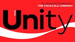 [MyFonts]
[More] ⦿
[MyFonts]
[More] ⦿
|
Nick Nedashkovskiy
[NN Type Foundry (or: NN Studio)]
|
[More] ⦿
|
NN Type Foundry (or: NN Studio)
[Nick Nedashkovskiy]
|
Or Nikolay Nedashkovsky, type designer and font engineer based in Moscow, working at Paratype. He also started an experimental type coop, called Type Improvisation. Designer in 2020 at Paratype of Helsa Display, a slim and eccentric serif typeface for Latin and Cyrillic. Helsa Display is, in Nick's words a free interpretation of the narrow elzevirs of the beginning of XX century for use in titles and short texts. With Ksenia Erulevich and Konstantin Lukyanov, he co-designed the soccer shirt font Russian Premier League (2018, at Art Lebedev). Github link. Art Lebedev Studio link. [Google]
[More] ⦿
|
Olly Wood
[King Kern Studio]
|
[MyFonts]
[More] ⦿
|
Panos Vassiliou
[Parachute]
|
 [MyFonts]
[More] ⦿
[MyFonts]
[More] ⦿
|
Parachute
[Panos Vassiliou]
|
 London, UK, and Athens and Kifissia, Greece-based type foundry started in 2001 by Panos Vassiliou. It specializes in fine multilingual (usually Latin, Greek and Cyrillic) typeface families. He is a graduate of the University of Toronto, Canada with a major in Applied Science and Engineering. Following his University of Toronto graduation, he studied Graphic Communications at Ryerson University. Panos Vassiliou has conducted numerous seminars for Canadian companies such as Bank of Nova Scotia, Royal Bank and Sony Canada. He graduated from the University of Toronto/Canada, where he studied Applied Science and Engineering. He has been Creative Director for the Canadian design firm AdHaus, former Publisher of the monthly magazine DNA (Greece) and Secretary-General for the Hellenic Canadian Congress (Ontario, Canada). He has been designing typefaces since 1993, including commercial fonts as well as commissions from Vodafone, Nestlé, Ikea and National Geographic. He started Parachute in 2001 setting the base for a typeface library that reflected the works of some of the best contemporary Greek designers, as well as creatives around the world obsessed with type. Apart from its commercial line of typefaces, Parachute offers bespoke branding services for corporate typefaces and lettering. Customers include Bank of America, the European Commission, UEFA, Samsung, IKEA, Interbrand, National Geographic, Financial Times, National Bank of Greece, Alpha Bank and many others.
 Myfonts link. Behance link. Other type designers at Parachute include Kanella Arapoglou, Alexandros Papalexis, Dimitris Foussekis, Aggeliki Skandalelli, Helen Gabara, Babis Touglis, Vangelis Karageorgos, George Toumbalis, Eva Karapidaki, Charis Tsevis, Pavlos Levendellis, Panos Vassiliou, and George Lygas. At Granshan 2010, Vassiliou won Second Prize in the Greek text typeface category for PF Encore Sans POro, and First and Second Prizes in the display typeface category for PF Regal Pro and PF Champion Script Pro, respectively. Typefaces: - Adamant
- PFAgora Pro: Agora Sans, AgoraSerif, AgoraSlab.
- Amateur
- PF Archive Pro (2004). He received a design award for his typeface Archive at the E AWARDS 2004. It has special typographic features and multilingual support for all European languages including Greek and Cyrillic.
- Armonia
- Astrobats
- Bague Universal and Bague Sans (2014). A geometric grotesk that dares to be different. Accompanied by Bague Slab Pro (2014), PF Bague Inline Pro (2014), and PF Bague Round Pro (2014).
- Baseline
- Beatnick
- Beau Sans (2011). Inspired by Bernhard Gothic.
- A custom didone font for Greece's Benaki Museum (2020-2021).
- PF Benchmark Pro (2014).
- Bodoni Script (2009).
- PF Brummell (2016). A sans characterized by sharp angled terminals and a diamond dot on the i.
- Bulletin Sans (2000-2005)
- Centro (Centro Sans, Centro Serif, Centro Slab) a typeface originally developed for the redesign of the Financial Times Deutschland. PF Centro Pro family (Sans, Serif, Slab, a trillion styles) won an European Design Award in May 2008 in Stockholm and at Paratype K2009. It was completed by PF Centro Serif Compressed, PF Centro Sans Condensed and PF Centro Sans Compressed in 2015. In 2016, he published PF Centro Slab Press.
- PFChampion Script Pro (2004-2008). A much lauded connected calligraphic script that is based on a calligraphic script by Joseph Champion, 1709-1765. Winner at Paratype K2009 and Granshan 2010. Images: i, ii iii, iv, v. The 4245-glyph family comprises Cyrillic, Latin and Greek subfamilies.
- Cosmonut (sic) (2002). A retro futuristoc typeface made by Dimitris Foussekis.
- PF Das Grotesk Pro (2014). Panos writes: Das Grotesk was inspired by earlier nineteenth-century grotesques, but it is much more related to American gothic designs such as those by M.F. Benton.
- DaVinciScript (2001-2006). A Treefrog-style script typeface by Vassiliou and Dimitris Foussekis.
- PF Dekka (2014). This solid elliptical sans family was influenced by Monaco's outline version called MPW. It includes PF Dekka Mono.
- PF DIN (2010): PF DIN Display (2002-2005), PF DIN Mono, PF DIN Serif (2016; this great serif version of DIN---a first---contains a wealth of goodies: just look at the great weather icons; it won an award at Granshan 2016), PF DIN Stencil Pro (2010), PF DIN Stencil, PF DIN Stencil B (2016), PF DIN Text Pro, PF DIN Text Condensed, PF DIN Text Compressed, PF DIN Text Arabic, and PF DIN Text Universal. With Latin, Cyrillic and Greek coverage, each font has about 1300 glyphs. The designs go back to the lettering of the Prussian railways around 1900. In 2013, PF Din Text Pro was published. In 2021, the three-axis (weight, width, italic) variable type system PF DIN Max saw the light.
- Eco Park. A 3d outline face.
- PF Encore Sans (2009). A rich and versatile sans family supporting Greek, Latin and Cyrillic.
- PF Fuel Pro
- PF Fusion Sans (1996-2006)
- PF Garamond Classic.
- PF Goudy Intials and PF Goudy Ornaments. A winner at Paratype K2009.
- PF Grand Gothik (2019). A large grotesque typeface family with three subfamilies and a variable font option. He writes: Grand Gothik is a postmodern, multiscript, multifaceted and variable type system which shines at its heavier extended versions with its hip, expressive, almost brutal energy. Grand Gothik's design space includes 3 axes for weight, width and one for italics. It is available as a variable font or as five separate opentype families---compressed, condensed, normal, wide and extended. Each family comes with 9 weights spanning from Extra Thin to Black plus italics.
- PF Handbook (2005-2007, sans family)
- HausSquare
- HellenicaSerif. Chiseled look, Greek simulation face.
- PF Highway Sans (2001-2015). Highway Sans Pro is based on the standard typefaces used for highway signs and other byways open to public travel in the United States. These standards were established by the US Federal Highway Administration in 1966 following several studies which were conducted at the California Department of Transportation in the 1940s. It covers Latin, Greek and Cyrillic.
- House Square. A Bank Gothic lookalike.
- PF Isotext (2005). Meant for technical documentation, it is modeled after Isonorm.
- Kids, KidsStuff
- Libera
- Lindemann and PF Lindemann Sans (2012).
- PF Marlet (2019). A sharp-edged humanist sans family fit for fashion mags: Marlet Titling, Marlet Finesse, Marlet Swash, Marlet Display, Marlet Text. PF Marlet, collected three awards one after the other, a year after appearing on Luc's best-of-2019 list. First, the coveted TDC Certificate of Typographic Excellence 2020 (at 23RDC), followed by another one from European Design Awards, a third distinction from Tokyo TDC and a fourth crown, Red Dot Award 2020, all in 2020.
- Mechanica A and B, 2002-2006. Octagonal families.
- PF Mellon (2019). A modernist variable grotesque influenced by nineteenth and early twentieth century condensed sans serif typefaces such as Stephenson Blake's Grotesque No.77 and ATF's Alternate Gothic.
- PF Monumenta (2002-2006). A majestic lapidary roman family.
- Muse
- Online (One, Two and Three). Pixelish family.
- PF Ornamental Treasures (2008). Byzantine ornaments and borders.
- PF Pixelscript
- Playskool
- Psychedelia (2003, Dimitris Foussekis). A psychedelic typeface.
- Regal Pro and Regal Finesse Pro: Award-winning high fashion display didone families, 2010-2012, originally designed for the Grazia magazine. Awards include Red Dot Awrd 2012, Communication Arts Annual Competition 2012, Creative Review Type Annual 2011, European Design awards 2011, EBGE awards 2011, Granshan Awards 2010. See also PF Regal Swash and PF Regal Stencil.
- PF Reminder Pro (2003). A hand-printed typeface.
- Scandal
- PF Spekk (2020). A simple versatile geometric sans for Latin, Greek and Cyrillic.
- PF Square Sans Pro, PF Square Sans Condensed Pro (2013).
- PF Stamps (2002-2006). A grungy stencil typeface by Panos Vassiliou and George Lygas.
- PF Synch Pro (2006). An industrial strength slab-serif typeface.
- PF UEFA Super Cup (2013).
- PF Uniform
- PF Venue (2017). Semi art deco, and free-spirited, a great poster typeface family.
- VideoText
- PF Wonderbats (2003). Funky and strange animals.
- Wonderland (2006). By Dimitris Foussekis.
Their type blog is called Upscale typography. Catalog. View all typefaces designed by Parachute. Klingspor link. MyFonts interview. [Google]
[MyFonts]
[More] ⦿
|
Pastelle Pyrex
[Jayanth Nune]
|
Khammam, India-based designer of the free variable condensed sans typeface Kamino, which seems to be intended for soccer shirts. [Google]
[More] ⦿
|
Paul Barnes
[Modern Typography]
|
 [MyFonts]
[More] ⦿
[MyFonts]
[More] ⦿
|
PintassilgoPrints
[Ricardo Marcin]
|
 Brazilian printmaker, graphic artist and illustrator in Vitoria, b. 1973, Rio de Janeiro. His fonts are created together with Erica Jung at PintassilgoPrints (est. 2009). Pintassilgo relocated to Florianopolis at some point. In 2021, Pintassilgo Prints joined The Type Founders.
 Their typefaces include Petulante (scratchy caps) (2021), Skaligari (eighties punk) (2021), Slotrip (2021), Soapy (foam-textured caps) (2021), Conversa (2021), Tenacious Brush (2021), Clarks (2021: a modular typeface based on the work of Lygia Clark, one of the giants of Brazilian postwar art), Cachalote (a poster typeface) (2021), Search (an all caps dry brush font) (2020), Grok (2020), Pickles (2020), Pain de Mie (2020), Outside (2020), The King (2020), The Spoilers (2020), Altogether (2020: a doodling beauty with eight choices for each glyph), Ars Nova (2019: art nouveau), Pind-O-Rama (2019), Pieches (2019: a linocut font inspired by the powerful political and social posters by Paul Peter Piech), Soundstar, Clafoutis (2019), Pedrita (2018), Transmogrified (2018), Melodia (2018), Minute (2018), Mindset (2018), Salted (2018), Plunct Plact (2017: a children's script), Manihot (2017), Brushtones (2017), Strange Times (2017), Mudstone (2017), Plumcake (2017), Cordelia (2017), Dunkelbunt (2016, inspired by the eccentric artist, architect and designer Friedensreich Hundertwasser), Chronic (2016, influenced by the work of HAP Grieshaber and Willem Sandberg; expanded in 2020 to Anachronic), Unboring (2016), Sunbeat (beatnik style), Hand It (2016, a childish script), Botanique (2016, after Lucian Bernhard's Schmalfette Bernhard Antiqua, 1912), Somehand (2015), Gumdrop, Granz (2015: retro lettering based on a Porgy & Bess album cover by David Stone Martin), Stabile and Stabile Toys (2015, handcrafted), Cluster (2015, a layered letterpress emulation typeface), Stick Around (2014), Marker Aid, Unpack, Felt Noisy (fat brush), Blueshift (2014), Daft Brush (2014, a vernacular brush), Tuesnight (2014, offbeat poster font), Periplus (2013), Marujo (2013: a decorative typeface inspired by paintings of Arthur Bispo do Rosário, a Brazilian artist who lived for 50 years in a psychiatric institution), Brush Up (2013: a rough brush script), Undersong (a stackable script system), Tremendous (2013: a retro poster typeface), Rockinstead (2013), Runcible (2013, +Cleft, its glaz krak version), Mamute (2013: a layered letterpress style type system), Sabotage (2013: squarish poster font inspired by the iconic Vertigo movie poster by Saul Bass), Gentil (2012, an all caps poster font), Card-o-mat (2012, bird dingbats), Kokoschka (2012, based on the lettering on the poster of an expressionist play by Austrian painter, printmaker and writer Oskar Kokoschka in 1909), Sundowners (2012), YWFT Duncan (2012), Rather Jazzy (2012), Rather Loud (2012), Soundtrack (2012), Monstrinhos (2012, dingbats), Monstro (2012, fat poster face), Attic (2012), Melkslijter (2011, a stylish art deco typeface based on a brochure by Dutch graphic artist Dirk Hart), Polyspring (2011, a Victorian typeface hand-drawn based on Italia Condensed, Keystone, 1906), Berimbau (2011), Populaire (2011, a hand-drawn poster caps typeface that was inspired by the electrifying posters from May 1968 by Atelier Populaire, and loaded with alternates to give a random effect), Manicuore (2011, a hand-drawn typeface inspired by Italian movie posters by the prolific movie poster artist Symeoni, aka Sandro Simeoni), Ziclets (2011, a bubblegum typeface), Smashing (2011, a fat hand-printed poster face), Chancellor (2011, a plakatstil style caps face), the eccentric poster face Polygraph (2011, based on lettering of the Polish poster artist Leszek Zebrowski. Images: i, ii, iii, iv, v, vi, vii, viii, ix, x.), the vintage serif typeface Organically (2011), Transitore (2011: Transitore is a lively hand-drawn font with loads of alternates and ligatures which, managed by advanced OpenType features, help create a convincing handcrafted look), the poster display typeface Sforzando (2011; +Alto), the signage typeface Jongleur (2011), the Cuban poster typeface Transmogrifier (2010, based on lettering by Cuban poster artist Eduardo Muñoz Bachs), the ultra-fat art deco typeface Loudine (), Crocante (2010, comic book face), Love Birds Pattern (2010), Swung Note (2010), Amarelinha (2010, hand-printed), Cuadrifonte (2010, a fat hand-printed family including styles called Pics, Sketch (regular), Fill and Line), Xylo Sans (2010, wooden texture face), Ritornelos (2010, a curly all caps hand-printed face), Roadway (2010, based on wood Clarendons), Changing (2010), Vitrines (2010, hand-printed), Prokaryotic (2010, a "bacterial attack" face), Football World (2010, soccer silhouettes), Singela (2010), Bandoliers (2010, an informal hand-printed sketched face, with 3D versions such as Beefy, High and Rocky), Butterfly Effect (2010), Tonal (2010, ultra-fat with mini-counters), Dynatomic (2010, inspired by the hand-drawn lettering of a 1964 polish movie poster designed by Andrzej Krajewski: caps only), Grante (2009, a lively poster face), Somewhat (2010, hand-drawn), Mondiale (2009), Merceria Antique (2009), Nanquim (2009, sketched letters), Lovebirds (2010, bird silhouettes), Oyster (2010, hand-drawn dingbats), and Arca (2009, +Dashed). All have an informal and attractive look, and were co-designed with Erica Jung. Dafont link. He created the grunge typeface Talvezassim (2009) and the fat geometric typefaces Parafuse Ultrablack (2009, +Outline, Shadow) and DeLarge (2009). Monster Boxes (2009) is a dingbat face. Oyster (2010) is hand-printed. The prints of Horst Janssen had a characteristic uneven hand-printed lettering that led Erica Jung and Ricardo Marcin to design the multi-featured opentype typeface Horst (2010). Nova Horst was published in 2012. Alternate URL. Open Font Library link. Fontspace link. YWFT link. Creative Fabrica link. Fontsy link. Klingspor link. Creative Market link. Catalog of typefaces. View all of Pintassilgo's typefaces. [Google]
[MyFonts]
[More] ⦿
|
Primedia Scrapbooking
|
Scrapbooking company related to the brand Creating Keepsakes (or: CK), which in turn is run by Tracy White. Creating Keepsakes made fonts which lead to the web site Scrap N Fonts. They are selling over 1,000 fonts whose names all start with CK or LDJ. They are of the playful kind. The older fonts: CKAnythingGoes, CKArrows, CKArtisan, CKAshleyAlpha, CKBabyBottle, CKBalloons, CKBamboo, CKBarbedWire, CKBeachcomber, CKBella, CKBlackTie, CKBlock, CKBlockRose, CKBouquet, CKBreeze, CKBroadPen, CKBubbles, CKButterfly, CKBuzz, CKCalligraphy, CKCalligraphy, CKCalligraphy, CKCamp, CKCandles, CKCandyCorn, CKCatsDogs, CKCelebration, CKChecks, CKChemistry, CKChick, CKChildsPlay, CKChoppyBlock, CKChristmasBerries, CKChristmasMemories, CKChunky, CKChunkyBlock, CKClassic, CKColumn, CKConcave, CKConstitution, CKContemporaryCapitals, CKContemporaryCapitals, CKCorners, CKCorral, CKCracked, CKCrayons, CKCrescent, CKCrookedClassic, CKCurly, CKCursive, CKCute, CKDaydream, CKDelight, CKDiva, CKDoodles, CKEasyGoin, CKEclectic, CKElegant, CKElusive, CKEvolution, CKExpedition, CKExtra, CKFairytale, CKFanClub, CKFantasy, CKFiesta, CKFillIn, CKFishBones, CKFishingPole, CKFlair, CKFlourish, CKFlowerGarden, CKFlowerPower, CKFootnote, CKFortune, CKFrankenstein, CKFraternity, CKFrayed, CKFreedom, CKFreestyle, CKFreezing, CKFresh, CKFriend, CKFrosting, CKFun, CKFunBoxes, CKFunkieFun, CKFunkyWave, CKGala, CKGameNight, CKGardenVariety, CKGeometric, CKGifts, CKGirl, CKGlyph, CKGrandstand, CKGrandstand, CKGrapevine, CKGroovy, CKGutenberg, CKHandprint, CKHandprint, CKHappyCamper, CKHappyKids, CKHarvest, CKHearts, CKHigginsHandprint, CKHollyBerries, CKHopscotch, CKHunting, CKHustle, CKIndigo, CKInky, CKItalic, CKJot, CKJournaling, CKJuneBugs, CKJustPlainWide, CKKeystroke, CKKiddo, CKKinder, CKKittyScratch, CKLala, CKLazyDays, CKLeafyCapitals, CKLeftyLisa, CKLetterHome, CKLogs, CKLongLanky, CKLoveLife, CKLumpy, CKMansPrint, CKMarker, CKMonogram, CKMuddy, CKMystery, CKNewsprint, CKNoah, CKNostalgia, CKOffRoad, CKOrnament, CKOuch, CKOverall, CKPaintbrush, CKPeekingPosies, CKPencils, CKPenman, CKPicketFence, CKPillow, CKPink, CKPlainJane, CKPlayBall, CKPopsicle, CKPorridge, CKPosies, CKPretty, CKPrimary, CKPrint, CKPumpkin, CKPumpkinPatch, CKQuake, CKQuick, CKQuickStitch, CKQuiltSquares, CKQuirky, CKRanch, CKRansom, CKRocketShips, CKRoses, CKRubberPencil, CKRugged, CKSassy, CKScript, CKScript, CKShadowedBlock, CKShearMadness, CKShiver, CKSignature, CKSimple, CKSimplicity, CKSimplicity, CKSingleSerif, CKSinkOrSwim, CKSketch, CKSkinnySerif, CKSlice, CKSlime, CKSloppy, CKSmokey, CKSmoothRock, CKSnow, CKSnowman, CKSouthwest, CKSpikyBlock, CKSpikyClassic, CKSpirit, CKSplitBox, CKSportsBalls, CKSportsBasketball, CKSportsBowling, CKSportsFootball, CKSportsGolf, CKSportsHockey, CKSportsPlain, CKSportsSoccer, CKSportsTennis, CKSportsVolleyball, CKSpringtime, CKSpringtime, CKSquiggle, CKStacks, CKStalk, CKStenography, CKStitches, CKStoneAge, CKStorybook, CKStrips, CKSugarCookie, CKSummerDays, CKSunshine, CKSweetBows, CKSweetDreams, CKSwirl, CKTags, CKTakeaHike, CKTallTrees1, CKTallType, CKTeachersPet, CKTemplate, CKTies, CKTimeless, CKTipsy, CKToDoList, CKToddler, CKToggle, CKTools, CKTrellis, CKTulips, CKTwiggy, CKTwigs, CKTwilight, CKTypeset, CKTypewriter, CKUrban, CKVogue, CKVoluptuous, CKVoluptuous, CKWanted, CKWavey, CKWedding, CKWeddingRose, CKWendy, CKWhereItsAt, CKWhirl, CKWildnCrazy, CKWildnCrazy, CKWindsong, CKWinter, CKWired, CKWrangler, CKWreaths, CKZigZag, CkBlockhead, CkCircleSerif, CkStars, CkStarsStripes, Frankieghost, LDSpecs, ck_jewels. Their designers: Ali Edwards, Allison Kimball, Andie Smith, Ashley Bennett, Becky Higgins, Beth Opel, Candice Stringer, Candice Stringham, Cherie Mask, Cindy Knowles, Deb Anderson, Deb Perry, Elizabeth Cass, Elsie Flannigan, Emily Magleby, Francesca Saccarola, Jennifer Antoini, Jillustratin, Jillustration, Kim Crothers, Kim Hughes, Kim Shields, Leora Sanford, Lettering Delights, Jillustration, Lisa Botte, Lori Buehrig, Maegan Jenn, Marna Hill, Monica Moss, Peay Carter, Rebecca Sjonger, Renee Senchenya, Sara Winnick, Shannon Zickel, Simple Scrapbooks, Stacy McFadden, Stephanie Ford, Susan Cyrus, Talia Audenart, Tammy Moore, TexType, Tiffany Tillman, Tracey Odachowski, TXT Type, TxType, Wendy Groff. [Google]
[More] ⦿
|
Q-BO
[Carlos Matteoli]
|
 Q-BO is the foundry of Carlos Daniel Matteoli, a type designer from Santiago del Estero, Argentina, b. 1980.
 Old URL. His typefaces, both free and commercial, often have a sci-fi or industrial component: - Djs Symbols (2011). A scanbat font of famous disc jockeys.
- Q-Bo (2011) is a fat typeface in which each glyph occupies a perfect square.
- 2Lines (2011) is a squarish bilined caps face.
- Equ (2011).
- Ovnis (2011, a flying saucer dingbat face).
- Voker (2011, +Rounded: a techno family) and Basica (2011; +Basica 2.0, 2012; +Basica Cartoon, 2014), Teio (2011), Sistema (2011), Ameba (2011) and Abix (2011) are techno typefaces.
- Bim (2011) is an outlined techno face. It was followed in 2012 by Bim Eroded.
- Hexa (2011) is an experimental hexagonal face.
- Cable (2011) is an experimental face.
- Crakos (2011) is slightly grungy.
- Kram (2011, +Espaciada) is a rounded techno / sci-fi / stencil face.
- Spac3 (2011, a sci-fi all caps face), Spac3 Selenium (2014), Spac3 Halftone (2012), Spac3 Destroyed (2011), Spac3 Neon (2011), and Spac3 Tech (2011, a tech stencil face), Spac3 Slim (2017).
- Digital (2011), Digital Cognitive (2011) and Digital Tech (2011): semi-pixelized.
- Bim (2011).
- Djs Symbols (2012). A scanbat of disc jockeys.
- Plig (2012) and Plig Nova (2012). An avant garde family.
- Capital (2012). A squarish all caps typeface.
- Zuber (2012), Zuber Stone (2012, a heavy chiseled textured typeface), Zuber Tech (2015), and Zuber Future (2012, a fat counterless octagonal typeface).
- Orena (2012-2016). A squarish caps-only futuristic typeface.
- Complex (2012). A block-serifed all caps typeface.
- Plig Nova (2012).
- Amirox (2012). A fat counterless typeface.
- Basica Industrial (2012). An industrial grunge face.
- Zian (2012). A fat rounded sans.
- Complex Bruja (2012).
- Voker Baxer (2012).
- Oxin (2012), Oxin Army (2013, stencil), Oxin War (2013), Oxin Brush (2013).
- Moiser (2013), Moiser Techno (2013, counterless), and Heavy Moiser (2013). A purely geometric sans.
- Argentina (2013). A copperplate style caps face, possibly created after a national soccer team lettering style. Followed in 2014 by the grungy Argentina Austral.
- Rixon (2013). A mechanical octagonal typeface.
- Gtek (2013). A sci-fi face. Followed by Gtek Broken (2014), Gtek Technology (2014), Gtek Nova (2014), Gtek Cavern (2015), and Gtek Minimal.
- Xenik (2014).
- Fiker (2014, squarish sci-fi face) and Fiker Futura (2014).
- Oki (2014). A blocky outlined typeface.
- Cerena (2015).
- Zian V15 (2015). A rounded techno sans.
- Begok (2015) and Begok v15 (2016). A techno sans.
- Kiwik (2017). A heavy display sans.
- Basica Cicionica (2017). A squarish techno typeface.
- Ertek (2017). A trekkie font.
- Abser 391 (2017). Straight-edged.
- Spac3 Slim and Spac3 Tech v17 (2019).
- Esba (2019).
- Basica (2020).
- Tauler (2020). A floriated typeface.
Creative Market link. Graphicriver link. [Google]
[MyFonts]
[More] ⦿
|
Ricardo Carvalho
|
 Brazilian graphic and type designer in Sao Paulo, b. 1990. He made the hand-printed brushy typeface Sanguessuga (2010), the real brush typeface Brush01 (2010), and the hand-printed Accustica (2011).
 In 2013, he published Pacaembu, an extraordinary multilined typeface family inspired by graphic patterns of Brazilian indians. Carona (2013) is a vernacular typeface based on wall writing. Lock Type (2013) is a heavy rounded techno sans typeface family. In 2014, he published the dadaist paper-cut typeface Pulso, the octagonal typeface Louco, and the plump bubblegum typeface Burle Marx, which shares the roundness of the official Olympics 2016 typeface. The vernacular typeface Copa (2014) was designed to honor the world cup in 2014 in Brazil. It is based on street painting. This project was supported by illustrations made by Henrique Mamede. Hincha (2015) is a paper tape font used for soccer posters. Block (2015) and United Squad (2015) are soccer lettering fonts. Behance link. Another Behance link. Dafont link. [Google]
[More] ⦿
|
Ricardo Marcin
[PintassilgoPrints]
|
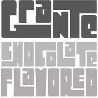 [MyFonts]
[More] ⦿
[MyFonts]
[More] ⦿
|
Rubén Prol
[Ipanema Gráfica]
|
 [MyFonts]
[More] ⦿
[MyFonts]
[More] ⦿
|
Sander Neijnens
[Letterbeeld]
|
[More] ⦿
|
Sascha Timplan
[Stereotypes.de]
|
 [MyFonts]
[More] ⦿
[MyFonts]
[More] ⦿
|
Sergen Temel Bayram
|
Art director in Istanbul, Turkey. In 2018, he published the sports and soccer shirt typeface Besiktas. [Google]
[More] ⦿
|
Shrenik Ganatra
|
 New York City (and before that, Mumbai, India)-based designer of the partially free all caps art deco geometric sans typeface Adam (2014), which is based on Futura. It was renamed Adam CG Pro. He also made the free comic book typeface Raggedways (2014).
 In 2015, he designed the free squarish spurred hipster typeface Quirko. In 2016, during his studies at MICA (Maryland Institute College of Art) in Baltimore, he designed the free font Minaxi Hairline Text (monoline sans). Additionally, his collaborative typeface design project titled Bird Grotesk, created with Ninad Kale and Potch Auacherdkul, another MICA MFA Graphic Design student, has secured a Gold Award in the Typeface Design category of Graphis. Still at MICA, he designed the cricket shirt typeface family The Wall in 2016 under the supervision of Tal Leming. In 2017, upon graduation from MICA, he published the free custom sans typeface family SG Alternative, which was designed to support his alternative rock band project Mountains and You. [Google]
[More] ⦿
|
someshinzz.com
|
Japanese foundry. They published free fonts such as Honeydripper (2005, gothic), Someshin (futuristic), Bacon (2004, dripping blood letters), Soccer (2004, free soccer dingbats), Beeper (Western style), Ballet (2004, dingbats), Bunbury, Cecily, Fairfax, FairfaxSpottie, Gwendolen, JPhont, Locomo, MoncrieffShadow, Plant, Prism, Plymdale (2005, liquid), Cardew 3, 4 and 6 series (2005, horizontally striped typefaces). Alternate URL. [Google]
[More] ⦿
|
Sportsfonts
[Christoph Koeberlin]
|
 German type foundry, est. 2016 by Christoph Koeberlin, whose passion for FC Kaiserslautern in the Bundesliga led to the creation of Sportsfonts. Koeberlin previously designed retail typefaces such as Fabrikat and FF Mark (the latter with Hannes von Döhren and the FontFont Type Department).
 His first typeface at Sportsfonts is the 24,000-glyph 49-font athletic lettering superfamily, Winner (2016), and its follow-up fonts, Winner Numerals and Winner Sans (2019, designed with Sven Fuchs). In 2016, he created the free variable font typeface Gingham. [Google]
[MyFonts]
[More] ⦿
|
Stefan Chinoff
|
Art director in Sofia, Bulgaria. Designer of the free octagonal Latin / Cyrillic soccer font April 1876 (2017) for the Bulgarian national soccer team. [Google]
[More] ⦿
|
Stefan Hattenbach
[Mac Rhino Fonts (MRF)]
|
 [MyFonts]
[More] ⦿
[MyFonts]
[More] ⦿
|
Stereotypes.de
[Sascha Timplan]
|
 Stereotypes is Sascha Timplan, a German type and graphic designer from Trier, b. 1979, who studied Communication Design at FH Trier.
 He created these typefaces: - 2009: St Substance, St Booka Shade (purely geometric), ST Moviehead, an ultra-condensed family (Dafont), St. Atmosphere (fat, rounded), St Transmission (free), St Shadowplay, St-Lorie (connected upright script), St Notorious (after the titling font in Hitchcock's Notorious---a beautiful high-legged serif face), St Technique, St Atmos (a commercial ink trap plaything), St Mika, Apfelstücke (a hookish face).
- 2010: St Marie (a nice free typewriter typeface), St Ryde, Fridge (casual sans family), St Frika, Friska.
- 2011: Elsa (sans), Villa Didot (this layered font family was created for the posters of the club VillaWuller).
- 2012: Florence (a swashy poster typeface that was also influenced by VillaWuller), St Transmission (industrial sans), Flenja (a narrow retro didone family), Christmas Numerals.
- 2013: Sarre (sans), Prism (prismatic, multiline typeface, influenced by Rudolf Koch's Prisma and Herb Lubalin's Avant garde).
- 2014: Timplan published a large antiqua family with wedge serifs in the heavier weights, Christel Text excepted, partitioned into three subfamilies, Christel Text, Christel Display, and Christel Poster. His main contribution in 2014 is the great Stereotesque (a grotesque family). Together with Lukas Bischoff, he created the athletic lettering typeface family Atletico.
- In 2016, Sascha Timplan and Lukas Bischoff published the handsome sans typeface family Golden Sans [no relationship with Tarin Yuangtrakul's Golden Sans from 2010 or Heitor Latosinski's Golden Sans from 2013]. Free Golden Sans Light demo.
Behance link. Blog. Klingspor link. Dafont link. Abstract Fonts link. Interview by MyFonts in 2014. Showcase of Sascha Timplan's fonts. [Google]
[MyFonts]
[More] ⦿
|
Suonmay Sophanith
[KonKhmer]
|
[More] ⦿
|
Tal Leming
[Type Supply]
|
 [MyFonts]
[More] ⦿
[MyFonts]
[More] ⦿
|
Tal Leming
[90 Minutes]
|
[More] ⦿
|
Toto
[K22 Fonts]
|
 [More] ⦿
|
Type Supply
[Tal Leming]
|
 Tal Leming is a graphic designer, type designer and letterer who lived in Wilmington, DE, but moved his stakes to Baltimore, MD. He graduated from Louisiana State University in 1997. As a Python scripting guru, he worked with Letterror and House Industries on projects using FontLab and Robofab. An avid RoboFog scripter, he joined Erik van Blokland and Just van Rossum to initiate the RoboFab project in 2003. After graduation in 1997 from the Louisiana State University Graphic Design program, he worked as a designer at two agencies in south Louisiana. In September of 2001, Tal joined the House Industries staff as a designer in the Type Development, Product Promotions and Python Systems Implementation Department. He worked on the Ed Benguiat collection, for example.
 In 2005, he left House and started his own company eventually called Type Supply. Type Supply designs typefaces for corporations and publications. Their typefaces: - Baxter. An informal typeface used as a casual typeface in MyPublisher's BookMaker software. Commissioned by Christian Schwartz.
- Bullet (House). Bullet is based on a bit of lettering drawn by Ken Barber for the House Industries Pop Art package.
- Burbank (2006-2007, House Industries), a bouncy signage, animation, and package lettering family, about which Christian Schwartz writes: Well-drawn one-off display typefaces are easy to find, especially bouncy sans serifs. Complete suites of typefaces in this genre, however, are nearly impossible to find, especially families that are crafted with as much care as Burbank. I really appreciate seeing the attention to detail that usually goes into serious text family put into a family primarily intended for display use.
- House Gothic 23. Tal Leming writes: The family was originally designed by Allen Mercer for use on the company's commissions, most notably the legendary promotions for Custom Papers Group. In 1995, House released the family to the public with modest success, but it was largely relegated to the back of House's catalogs. House went through a bit of a sans serif obsession in the early 2000s and decided that it was time to give House Gothic its time in the spotlight. Rich Roat asked me to polish up House Gothic and make it a bit more usable. I completely reworked Allen's original drawings, making the letterforms work better in headlines, added accented glyphs, reorganized the styles and more. Once that was done, I added completely new Extended and Text styles. The family more than doubled its size into 23 total fonts and was rechristened House Gothic 23.
- Marigny (2014). He writes about this pleasant casual roundish typeface: Marigny, designed by Tal Leming, is a casual typeface that was drawn with serious typography in mind. It has the same basic proportions as classical oldstyle typefaces (think of Garamond and friends) and these give it a similar typographic rhythm to one that we have known for several hundred years. The hand-rendered forms transform this familiar texture into something very warm and pleasant. In a way, dipping into a block of text set in Marigny is like putting on your favorite pair of comfortable slippers.
- Mission and Control. An athletic lettering family commissioned by Reebok for their 2008 NFL Sideline and NHL Center Ice collections.
- Ohm (2009). A neon type family.
- Queue and Queue Mono (2021). A sans typeface family.
- Runway (House). Runway is an ode to House's sans serif obsession of the early 2000s.
- Shag Lounge. a signage family: When I was working at House Industries, we decided that we should develop a font kit inspired by the work of Josh "Shag" Agle. Josh hadn't done much lettering work so we asked him to send us samples of lettering that he liked. Many of the things he sent featured whimsical, hand-cut lettering from the 1960s. We were really into this as well, so that formed the starting point for Shag Lounge. The typeface evolved into an amalgamation of a neo-grotesque style sans serif and hand-cut lettering.
- Timonium (2012) can be bought from Type Supply.
- Torque. An octagonal family with a great inline style. Torque (2009) began its life as an amalgamation of an American athletic lettering style and classic space lettering styles. There were also references to the video games, laser games and 1980s pre-teen sci-fi action movies of my youth.
- United Ark. A military stencil face: Clint Schultz hired me to create a custom version of United for use on props in a Paramount feature film. The main goal of the project was to perfectly match stenciled lettering seen in a film released 27 years earlier. How exciting was it to make a typeface for a sequel to a classic film that I grew up with? Very, very, very, very exciting. This font is not, and will never be, available for relicensing, so please don't ask.
- United. House industries commissioned me to develop the United family as an homage to stereotypical U.S. Military lettering styles. [...] United has become quite popular since its release and it has been seen just about everywhere from NFL coverage on FOX to the New York Times editorial page.
- Balto (2007-2014) is a large American Gothic family.
- In 2016, Tal Leming created 90 Minutes, a typeface that is exclusive licensed to the United States Soccer Federation in perpetuity. He writes: I wanted to introduce some more American typographic and lettering influences. We have a rich history from Morris Fuller Benton's iconic work to the impactful lettering on Works Progress Administration posters to the bluntness of wood type on letterpressed event posters. I wanted to subtly reference these to make the typeface as distinctively American as possible. The typeface her 37 unique styles partitioned over three families, 90 Minutes Display, 90 Minutes Kit (a set of styles developed exclusively for use on uniforms, taking into account FIFA regulations), and 90 Minutes Text (drawn specifically for use in small sizes, paragraphs and tables of statistics).
- Stoneleigh. A fashion mag Caslon revival done for Martha Stewart Living. Stoneleigh is licensed exclusively to Martha Stewart Living through October 2019.
- Smoosh (2015-2020). A super-compressed high-contrast typeface with thorny serifs designed to work in very big sizes.
- Iota (2021). A geometric sans family that he made only because of his fear of not being innovative. And not because every other foundry is making its own geometric sans. But he could not resist throwing in some distractions that make Iota a geometric with a tantrum.
- Epoxy (2022). An experimental sans with odd shapes.
At ATypI 2008 in St. Petersburg, his talk (shared with Ken Barber) was entitled Pac-Man fever, quantum mechanics and the design of digital type. Tal Leming's personal web site. Village link. Author of Letters. [Google]
[MyFonts]
[More] ⦿
|
Vahe Dashyan
|
Creator of the brush typeface Real Madrid 13-14 (2013). [Google]
[More] ⦿
|
Victor Gonzalez
|
 Los Angeles-based designer of these typefaces in 2019: Rex Modified (a multi-line modification of Fontfabric's Rex), Elftal (a soccer shirt font inspired by Wim Crouwel's grid method), Art Deceau (a soccer shirt font inspired by art deco). [Google]
[More] ⦿
Los Angeles-based designer of these typefaces in 2019: Rex Modified (a multi-line modification of Fontfabric's Rex), Elftal (a soccer shirt font inspired by Wim Crouwel's grid method), Art Deceau (a soccer shirt font inspired by art deco). [Google]
[More] ⦿
|
Vladimir Nikolic
|
 Belgrade, Serbia-based designer (b. 1981) of these typefaces:
 - The dingbat fonts Canavarlar (2020: funny men), Haircut (2020: women's hairdos), Ornament Borders (2020), Gourdy (2020: birds), Lizards (2020), Mantra (2020), All Star (2020), Speel (2020), Soavely (horses) (2020), Forma (2020), Hell Beasts (2020), Mistresses (2020), Paraiso (2020), Crow (2020), Traverser (2020: crosses), Cats (2020), Dogs (2020), Negative-Heads (2020), Otu (2020), Wakazi (2020), Risk (2020), Wurm (2020), Beard Man (2020), Hoder (2020), Damen (2018), Damen 2 (2020), Foliga (2020), Solo Drinker (2020), Congress (2020), Farmacy (2020), Elections (2020), Emergency (2020), VN Arrows (2020), Hexagonos (2020), Automobiles (2020), Cars (2020), Emoji Boom (2020), Bestia (2020), Aliens (2020), Insect (2020), Bytost (2020), Monstero (2020), Aveto (2020), Dancing Cat (2020), Atradimas (2020), Womanhood (2020), Figur (2020: an alien insect font), Halfwits (2020), Silly Donkey (2020), Crazy Monkey (2020), Round Masks (2020), The Quick Dog (2020), Flying Birds (2020), Maskid (2020), Monstra (2020), Bull Skulls (2020), War Items (2020), Public Transport (2020), Loomad (2020), Mokhabiso (2020: African patterns), Record (2020), Mulher (2020), Heroez (2020), Bulls (2020), Madarak (2020: birds), Bold People (2020), Munari (2019: a collection of drawings based on Bruno Munari's book "Artista e designer" from 1966), Screws (2019), White Mouse (2019), Schepselen (2019), Glatze (2019), Crosses (2019), Chefs (2019), Diamond Blocks (2019), Hexagons (2019), Maumbo (2019), Circles (2019), Enfeite (2019), Pigs (2019), Mythos (2019), Kreaturen (2019), Baby Alien (2019), Body Moving (2019), Various Boys (2019), Lines and Objects (2019), Mouvman (2019), Watch (2019), Credit Card (2019), Cycles (2019), Devil Emoji (2019), Fare (2019), Mund (2019), Labbra (2019), Circular Ornaments (2019), Cranium (2019), Ugok (2019), Ansigter (2019), Tsim (2019), Schmetterlinge (2019), Jungfrau Maria (2019: religious icons), Knights Helmets (2019), Kinderskizzen (2019), Wolves (2019), Various Cats (2019), Owls (2019), Spiral Object 3D (2019), Zodiac Signs (2019), Cyborg (2019), Duck (2019), Cat 3D (2019), Object 3D (2019), Circle and Line (2019), Various Girls (2019), Dulcet (2019), Erotic Symbols (2019), Frauen (2019), Pierre the Vampire (2019), Robotter (2019), Middle Finger (2019), Claudio The Cat (2019), Medusa (2019), Veggie (2019), Pablo (2019), Fishes (2019), Dream of Picasso (2019), Stam (2019), Animality (2019), Ink Drops (2019), Faces (2019), Bayan (2019), Froggy (2019), Senhoras (2019), Diamondo (2019), Skallen (2019: skulls), Swimmers (2019), Churches (2019), Easter Icons (2019), Lippen (2019), Gullar (2019), Bankwesen (2019), Creatures with Horns (2019), Vehicles (2019), Various Hands (2019), 3D Animals (2019), Abantu (2019), Herr (2019), Menge (2019), Funny Aliens (2019), Mustachos (2019), Kids Drawings (2019), Tierfarm (2019), Troep (2018), Women Heads (2018), Cats and Dogs (2018), Wanita (2018), Eyez (2018), Animales (2018), Peoples (2018), Mobile Icons (2018), Controllers (2018), Womano (2018), Lost in Space (2018), Blumen (2018: flowers), Tetriso (2018), Snowflake (2018), Meine (2018: masks), Horoscopicus (2018), Esoterica (2018), Astrologicus (2018, astrolical symbols), Abbild (2018: African masks), Being (2018: monsters), Gebell (2018), Headed (2018), Falter (2018), Filling (2018), Anichka (2018), Cyclopia (2018), Buggus (2018), Opa (2018), Messe (2017), Head of Idol (2018), Diavolo Nero (2017: funny silhouettes).
- The boxed or encircled alphabets Audience Capitals (2020), Galileo (2020), Compare (2020), Compare-Light (2020), Hexagonas (2020), Select (2020), Before (2020), Before-Dark (2020), Boxes (2020), Boxes-Extravagant (2020), Boxes-Fancy (2020), Calf-Negative (2020), Capital-Relationship (2020), Pyxidas (2020), Capitalica (2020), Tundra (2020), Ordinary Capitals (2020), Broadway Capitals (2020), Browser Capitals (2020), Capitalismo (2019), Schwarzenberg Capitals (2019), Retrospective Capitals (2019), Official Capitals (2020), Impression (2020), Oriental (2020), and Letters in Circles (2018).
- Shadowed caps: Cleopatra (2021), Farmers Market (2021), Erkekler (2021), Assignation (2021), Greek Tragedy (2021), Distorted (2021), Lightshow (2021), Credenza (2021), Ragusa (2021), Comunismo (2021), Scordia (2021), Gazelle (2021), Organ (2021), Strizhi (2021), Umoya (2021), Ninja Justice (2021), Unlimited (2021), Unicorns (2021), Labyrinth (2021), True Artisans (2021), Poker (2021), Donald (2021), Ferrari (2021), Booster (2021), Madness (2021), Favorita (2021), Vitamin (2021), Robot (2021), Robust (2021), Engine (2021), Whether (2021), Nucleus (2021), Trunk (2021), Ombre (2021), Viscosus (2021), Jewelry (2021), Verge (2021), Pursue (2021), Keener (2021), Visor (2021), Korvo (2021), Squash (2021), Scum (2021), Darker (2021), Education (2021), Cimice (2021), Tomb (2021), Bambola (2021), Calla (2021), Rump (2021), Complex (2021), Razor (2021), Driveller (2021), Karambol (2021), Princino (2021), Berger (2021), Adopted (2021), Bugbear (2021), Samara (2021), Talisman (2021), Waterway (2021), Megabus (2021: a marquee font), Roller (2021), Numerica (2020), Bond (2020), Gloom (2020: a marquee font), Chalkboard (2020: sketched), Unboxing (2020: techno), Antennas (2020), Secca (2020), Umfo (2020), Sabbia (2020), Squirrel (2020), Byzan (2020), Debtor (2020), Bridge (2020), Familie (2020), Lake (2020), Roma (2020), Tissue (2020), Bombay (2020), Osteology (2020), Restroom (2020), Speaker (2020), Bebika (2020), Center (2020), Gismo (2020), Fierce (2020), Gambler (2020), Afterparty (2020), Birdbrain (2020), Boner (2020), Divine (2020), Gelatin (2020), Lost (2020), Marshland (2020), Quadri (2020), Shadow (2020), Stairs (2020), Superba (2020), Techno (2020), Underman Book (2020), Wired Capitals (2020), Fineliner (2020), Fictive Kinship (2020), Exotica (2020), Ural (2020), Devianza (2020), Kultur (2020), Unmute (2020), Antiqua (2020), Chains (2020), Scheme (2020), Stumble (2020), Aroma (2020), Beans 2 (2020), Cover (2020), Cronica (2020), Fundament (2020), Horna (2020), Loce (2020), Mademoiselle (2020: art nouveau), Melodia (2020), Penny (2020), Taikun (2020), Assault (2020), Athletica (2020), Baraka (2020), Brassica (2020), Builder (2020), Chancellery (2020), Gwara (2020), Pliez (2020), Recinzione (2020), Right (2020), Rimes (2020), Seal (2020), Service (2020), Scorpions (2020), Terraces (2020: American flag font), Wedding Cabbage (2020), Wild Girl (2020), Tragedy (2020), Indos (2020), Starfish (2020), Vintage (2020), Adriatica (2020), Funeral (with American flag texture) (2020), Voleur (2020), Calzino (2020), Peshkop (2020), Metzger (2020), Asshole (2020), Puppet (2020), Broeksel (2020), Hals (2020), Escort (2020), Vortex (2020), Dades (2020), Boild Hedgehog (2020), Mermer (2020), Grower (2020), Rainbow (sketched) (2020), Baise (2020), Necklace (2020), Angels (2020), Smuggler (2020), Dommage (grungy) (2020), Squalor (2020), Fusto (2020), Course (2020), Fisheye (2020), Baiser (2020), Banda (2020), Cantaloupe (2020), Canto (2020), Begriff (2020), Trapeze (2020), Arabeska (2020), Silver (2020), Wasco (2020), Kosaken (2020), Triangle (2020), Banquet (2020), Demode Capitals (2020), Cultus Capitals (2020), Idiot Capitals (2020), Granary Capitals (2020), Liberta (2020), Montblanc (2020), Granary (2020), Blanket (2020), Tuyaux (2020), Wolf (2020), Comeback (2020), Oliba (2020), Idiot (2020), Trailer (2020), Bricks (2020), Toys (2020), Luxury (2020), Hertz (2020), Signal (2020), Serenada (2020), Kurven (2020), Schnecke (2020), Mona (2020), Sierra (2020), Search (2020), Tranchante (2020), Eccentric (2020), Fast (2020), Mosquito (2020), Speed-of-Light (2020), Thanks (2020), Album (2020), Boyhood (2020), Ending (2020), Trend (2020), Universal-Serial-Bus (2020), Fixed (2020), Kings (2020), Holiday (2020), Range (2020), Numbers (2020), Shipman (2020), Officer (2020), Video (2020), Order (2020), Route (2020), Cosa-Nostra (2020), Clowns (2020), Unique (2020), Voyeur (2020), Shape (2020), Brigadier (2020), Allora (2020), Spartacus (2020), Advisor (2020), Ambis (2020), Cables (2020), Genesa (2020), Horse (2020), Laptop (2020), Pork (2020), Mafioza (2020), Mucho (2020), Athens (2020), Audience (2020), Rotor (2020), Mundo (2020), Olympus (2020), Border (2020), Scale (2020), Survival (2020), Trouble (2020), Turnabout (2020), Catharsis (2020), Parade (2020), Discoteque (2020), Rude (2020), Fame (2020), Safran (2020), Ausweis (2020), Mechanica (2020), Moscowian-Party (2020), Beers (2020), Strengthen (2020), Tempo (2020), Unreal (2020), Poetico (2020), Bach (2020), Bach-Fat (2020), Energy (2020), Alexandra (2020), Basket (2020), Cushion (2020), Model (2020), Organiser (2020), White (2020), Anabela (2020), Cannibal (2020), Casablanca (2020), Castle (2020), Control (2020), Crazy (2020), Crazy-Gradient (2020), Emotion (2020), Honey-Bunny (2020), Knockout (2020), Linearo (2020), Murmure (2020), Polished (2020), Reon (2020), Sparrow (2020), Storms (2020), Street-Stars (2020), Franchise (2020), Pencil (2020), Ruanda (2020), Pepito (2020), Megalomania (2020), Rouleaux (2020), Frozen (2020), Together (2020), Saldo (2020), Museum (2020), Network (2020), Hunk (2020), Cultus (2020), Creator (2020), Flow (2020), Blocchi (2020), Possession (2020), Bad Germans (2020), Discounted (2020), Traversal (2020), Mangalica (2020), Murmansk (2019), Summer Candy (2019), Question (2019), Second Channel (2019), 3D Models (2019), Memory (2019), Computer (2019), Diversity (2019), Elastic Letters (2019), Businessman (2019), Kuchen (2019), Demode (2019), Objective (2019), Medication (2019), Nonsense (2019), Plagiat (2019), Toledo (2019), Tricks (2019), Common (2019: a trompe-l'oeil font), Mafia (2019), Releases (2019), Extradition (2019), Shoot To Kill (2019), Groowing (2019), Enough (2019), President (2019), Silence (2019), Dressed (2019), Already (2019), Hocus Pocus (2019), Password (2019), Ready (2018) and Messages (2017).
- The ornamental caps typefaces Mahal (2021), Stamp (2021), Hell Door (2021), Tangram (2021), Custom (2021), Remake (2021), Studio (2021), Adagio (2021), Oxidizer (2021), Mondial (2021), Paraglide (2021), Tattoo (2021), Developer (2021), Dama (2021), Lobby (2021), Gabaritos (2021), Sence (2021), Ombre (2021), Cresa (2021), Anniversary (2021), Wire (2021), Triton (2021), Lamina 92021), Hangup (2021), Years (2020), Dowry (2020), Sephora (2020), Jewels (2020), Straightforward (2020), Dance (2020), Necklace (2020), Maria (2020), Taxi2 (2020), Outlaw (2020), Combat (2020), Chewed (2020), Fantasy (2020), Observation (2020), Cure (2020), Pioneer (2020), Near (2020), Kleid (2020), Unitas (2020), Tomato (2020), Blader (2020), Canal (2020), Baked Snails (2019), Alcoholic (2019), Bonjour (2019), Zylinder (2019), Phenomenal (2019), Surfaces (2019), Success (2019: as in De Stijl), Retailer (2019: multilined), Havana (2019: multilined), Mechanismo (2019) and Pencil Letters (2019).
- The display typefaces Trader (2020), Oysters (2020), Furious Ride (2020), Portfolio (2019), Pontos (2019), Swordsman (2019), Regular (2019), Andrey (2019), Retrive (2019), Connected (2019), Locator (2018), Tracking (2018), Iceberg (2018: snow-capped letters), New Amsterdam (2018), Ana (2018), Enemy (2018), New Yorkers (2018), Happy Day at School (2018), Focused (2018), Modish (2018), Beholder (2018) and Principality (2017).
- The alphadings Birthdays and Parties (2021), Bahanalia (2020), Icecreams (2020), Brailler (2020), Night Dreams (2020), Flower Capitals (2020), Jingle Bells (2020), Neuron Capitals (2020), Easter Time (2020), Hearts and Arrows (2018), Penguins (2018), Kitties (2018), Doggy (2018), Teddy Bears (2018), International Capitals (2018), Aafia Capitals (2018), Answer Capitals (2018), Beholder Capitals (2018).
- The circuit font Simple Repairs (2021).
- The 3d typefaces Sharp (2021), Edited (2021), Three Dimensions (2020), Rental (2020), Shiny Blocks (2020), Turbulence (2020), Labor (2020), Worship (2020), Fantasy-3D (2020), Zucker (2020: stacked blocks) Perfetto (2020), Rude-3D (2020), Lover (2020), Kasten (2020), 3D Models (2019), Tricks (2019) and Metallic (2019).
- The multiline typefaces Yiphi (2021), Porker (2020), Formula (2020), Laguna (2020), Hypochondria (2020), Majestic (2020), Vibes (2020), Tubes (2020), Yogurt (2020), Turkish (2020), Question (2019), Pancake (2019), Remained (2017), Liquidrom (2018), Second Channel (2019), 3D Models (2019), However (2019), Confarreatio (2018) and Fudged (2018).
- The textured typefaces Incompetent (2021), Autumn (2021), Sangria (2021), Studio (2021), Kino (2021), Elixir (2021), Espace (2020), Mistress (2020), Heritage (2020), Silicone (2020), Hornettio (2018), Ignorant (2018), Americans (2020: the American flag embedded into the glyphs), Pollution (2020), Jakob (2019), Diversity (2019), Townscape (2019), Patriotic (2019: American flag theme), Meshes (2018), Complained (2019), Duration (2018) and its solid counterpart, Duration Book (2018).
- The Slavonic emulation typeface Russian Land (2017) and the Cyrillic emulation typefaces Monarch (2021), Cold War (2021), Beograd (2020), Ukrainian Princess (2019), Territory (2019), Kalinka (2019), Rubles (2018), Maniac (2018), Jurij (2018), Kachusha (2018), Soviet Program (2018), Armenia (2017), Fontograd (2018) and Russian Spring (2017).
- The constructivist typefaces Tokarev (2017), Russiano (2018), Suggested (2018), Hungaria (2018) and Schwachsinn (2018).
- Art deco typefaces: Cavalier (2021), Performer (2021), Angelica (2019), Protocol (2019), Retrospective (2019), Leculier (2018, after an alphabet in Georges Leculier's art deco lettering book from ca. 1930), Better (2018), Critical (2017).
- Art deco caps: Reverse (2020), Bathroom (2019), Idiotism (2019).
- The chess fonts Schach (2020) and Wisdom Chess (2020).
- The weather icon font Weather Symbols (2020).
- The decorative sans typefaces Shock (2021), Energia (2021), Pitviper (2021), Nemesis (2021), Addiction (2021), Nehad (2021), Chewer (2021), Nightfall (2021), Gourmet (2021), Flipside (2021), Layered Letters (2019), Imbecile (2019), Answer (2018), Hours (2018), Abandoned (2018), Sea Gardens (2017), Forvertz (2018), Yeysk (2018) and Closeness (2018).
- Sans: Wollicht (2021), Ministro (2021), Lonely (2021), Noix (2021), Messina (2021), Samara (2021), Rickrack (2021), Broadcaster (2021), Catamaran (2021), Official (2019).
- Comic book fonts: Reset (2021).
- Artsy fonts: Hornstick (2021), Kikundi (2021), Shanghai (2021), Skewed (2021), Company (2021), China (2020).
- The headline sans typefaces Finance (2020), Marija (2020), Fashion (2020), Magazine (2020), Policemen (2020), Impressum (2019), Educated Deers (2019), Hindenburg (2019) and Fixation (2018).
- The rounded organic sans typefaces Hofmann (2020), Adelino (2020), Available (2018) and Biysk (2018).
- The handcrafted typefaces Diana (2020), Flood In London (2019), Milord (2018), Sex and Breakfast (2018), Sweet Handwrite (2018), Industrial Revolution (2018), Oh Maria (2017), Sofija (2017) and Travelling (2017).
- The bubblegum typefaces Roller (2020), Jellies (2020), Designero (2019), Bubblicious (2019) and Icecreamer (2017), and its oily companions Gummy (2018) and Liquid (2018).
- The heavy deco typefaces Guest (2019), Bigger (2018), Hours (2018), Intransitive (2018: Dutch deco), Theatrical (2017) and Consequences (2017).
- The beveled fonts Iron (2020), Rising (2020), Novgorod (2020), Troy (2020), Fake Hope (2019), Diamond Ring (2019), Playback (2018) and Member (2018).
- The starred caps typefaces Farmers Market (2021), Donald (2021), Citizen (2021), Wizard (2021), Adrenaline (2021), Diabolo (2021).
- The stencil fonts Browser (2019), Serbia (2019), Belgrado (2019), Further (2019), Generals (2018), Mayor (2018) and Olga (2018).
- The semi-stencil all caps typefaces Restaurant Menu (2019), Queen Dea (2019), Latest (2019) and Large (2019).
- The fat rounded sans typefaces Guest (2019) and Subscribe (2019).
- The Western fonts Newlywed (2020) , Tombola (2019), Permission (2019), Alexander (2019), Retrosonic (2019), Kasplysk (2019).
- The experimental typeface Typo Layer (2019).
- The German expressionist outline typeface Robert (2018).
- Current Moment (2019): a digitized "Zuccini" plate by Frits Jonker.
- The LED fonts Remaster (2021), Ringing (2022), Gigabytes (2020), Error (2020) and Technology (2018).
- The octagonal athletic lettering fonts Academy (2021), Junk (2020), Barbara (2019), Soccer (2020), and Soccer League (2018) and the outlined athletic font Onderneming (2018).
- Leculier (2018). After an alphabet in Georges Leculier's art deco lettering book from ca. 1930.
- The speed fonts Live News (2020) and Speed Racing (2019).
- Essere (2018).
- The squarish typefaces Archipelago (2021), Haine (2020), Augsburg (2020), Legionary (2020), Cyber Princess (2019), Professor (2019), Layers (2018) and Cataclysmo (2017).
- Driving Around (2018).
- The decorative floral caps typefaces Floral Capitals (2018) and Narcissus (2018).
- Gradientico (2018). A textured didone.
- The Greek simulation font Meteora (2018).
- Griddy Blocks (2018) and Blocky Letters (2018).
- Decorattio (2018).
- Ordinary (2018) and Mina is Gone (2018).
- The trilined typeface Trio (2017).
- The connected handwriting typeface Eric's (2016).
- The military typefaces Login (2018), Commanders (2017) and Hunt (2017, after an alphabet by the Hunt Brothers in their 1930s book Lettering of Today).
- The neon typeface Bubble 3D (2017), and the neon and shadow font family Magia (2019).
- Schaeffer (2017). A revival of the famous multiline typeface Fatima (1933, Karl Hermann Schaefer).
- The grungy typefaces Horizont (2020), Cosmas (2020), Drunk Millionaire (2019), Leave No Fingerprints (2018), Haziness (2017) and Victorious (2017).
- The molecular typeface Neuron (2019).
- The inline caps typefaces Panther (2021), Africa (2021), Look (2019) and Speed (2019).
- The inline typefaces Green (2020), Bernard (2020), and Games (2017).
- The display serif typefaces Kandinsky (2021), Funia (2021), Army Guys (2021), Hoodie (2019).
- The marquee typefaces Squad (2021), Grotto (2021), Megabus (2021), Plagiat (2019), Dropped (2019), Casino (2018) and Chicago (2018).
- The layerable marquee font Rockefeller (2018).
- Movie fonts: Film Letters (2018).
- The outlined typeface Important (2018).
- The white-on-black typeface Circusant (2019).
- The didone typeface Vogue (2018).
- The geometric solid typeface family Ivan (2019).
- The geometric sans typeface Occupied (2017).
- Rise of Kingdom (2017).
- Cartoonish (2017).
- Hesitation (2017). A rounded handcrafted poster font.
- Leben and Leben Shadow (2018).
- Braillenum (2018).
- The condensed grotesks Around (2020), Heinrich (2019) and Schwarzenberg (2019).
- Schreibmaschine (2017). A dusty old typewriter font.
- The vintage initial caps typefaces Nautiica 3d (2018), Fantasy Capitals (2018) and Herne Capitals (2018).
- The Arabic emulation typefaces Bayram (2020) and Sinbad (2018).
- Herne (2018).
- Passage (2018).
- Knotty (2018).
- The Mexican style font Mexicanera (2018), Dilemma (2018: Mexican Calavera skulls), and Mexican Tequila (2018).
- The techno typefaces Flight 21 (2019), Cyber Princess (2019), Passionate Relationship (2019), Neighbor (2018), Bombardment (2018) and Leprosy (2018).
- The avant-garde typeface Typolino (2018).
- Regensburg (2018).
- The ultra-fat typefaces Crime (2020), Owners (2018) and Housebreak (2019).
- The prismatic typefaces Jumble (2020), Boogie Woogie (2019), Running (2019), Bigger Italic (2018; based on Bigger Book), Linerine (2018) and Cosmology (2018).
- Failed (2018).
- The codex typefaces Grille (2020), Compass (2020) and Measurements (2018).
- Damages (2018).
- The circle-themed fonts Sparks (2020) and Condition (2018).
- The textured typefaces Mitesser (2020), Object (a meshed font) (2020), Noisy Walk (2020), Brightness (2020), Mistress (2020), Heritage (2020), Silicone (2020), Hornettio (2018) and Ignorant (2018).
- The oriental simulation fonts Dasvidaniya Book (2020), Pearl Harbor (2020), Chinese Dragon (2019), Sudoku (2019), Hiroshima (2019) and Kamikaze (2018).
- Monograms: Quintete (2020), Formogram (2020), Diamond Monogram (2020), Ribbon-Monogram (2020), Bulged Monogram (2020), Monogramus (2019), Blocky Monogram (2018) and Monograma (2018).
- Blackletter: Bramble Princess (2021), Drunks (2021), Cosmopolite (2020).
- Fists: The-Point (2020).
- Scanbats: Retro-People (2020), Vladimir (2019: Putin scanbats), Portraits de Femmes (2019: scanbats), Notre Dame and Notre Dame de Paris (2019: scanbats), Hollywood Actors (2019: scanbats), European Leaders (2018: scanbats), Trumpolina (2018: Trump scanbats).
- Word fonts: Black-Lives-Matter (2020).
- Plank fonts: Wooden Planks (2020).
- The outlined typefaces Carwash (2020), Hypno (2020), George (2020), 3D Letters (2018), Milk & Chocolate (2018: trilined), Czar (2018), Classica (2018) and Created (2018).
- The glitch fonts Elderberry (2021), Sparkle (2021), Eclairages (2021), Nectar (2021), Check Your Connection (2020), Horizons (2020) and Searching For Signal (2019).
- The glaz krak font Smashed (2018).
- The circus font Amigo (2020).
- The kitchen tile font New Message (2020).
- The 3d dingbats typefaces Basic Objects (2020: geometric shapes) and Jigsaw Puzzles 3D (2018).
- The modular typefaces Orenburg (2018), Broadway (2018) and Assyrian (2018).
- Escher style: Illusion (2019), Vologda (2019).
- Slinky typefaces: Rings (2020), Zylinder (2019), Pipes (2019).
- Lombardic caps: Moher (2020), Dublin (2020), Moderno (2020).
- Ransom note caps: Today (2020).
- Artistic font: Meute (2020).
- Halftone fonts: Tourner (2020), Cinquecento (2020), Devotion (2020), Gulliver (2020), Bamboo (2020).
- Ornaments: Adornos (2020).
- Antique caps: Grandes (2020), Reveler (2020: from Draughtsman's Alphabets (1877) by Hermann Esser)).
- Funny faces: Isitolo (2020).
- Angular caps: Milk (2020), Strike (2020), Worldwide (2020).
- Tall sans caps: Bungler (2020), Shakeout (2020).
- Mecano typefaces: Shakers (2020).
- Titling sans: Steinberg (2020).
- Titling serif: Love (2020).
- Break (2020).
- China (2020).
Creative Fabrica link. [Google]
[More] ⦿
|
Walter Friedrich Haettenschweiler
|
 Swiss type designer, b. 1933, Zug. He studied at Kunstgewerbeschule Zürich, and from 1957 onwards he ran a design studio in Zug. His typefaces, often published in the Lettera book series (Lettera2, 1961; Lettera3, 1968 and Lettera4, 1972) all printed by Teufen.
 - Abschattierte
- Africaine
- Aleman con Adorno
- Allshadow 1969
- Alphabet Art Nouveau
- Alphabets Capitale&Romain Penches en....
- Alphabet Capitales de Fantasie
- Alphabet Majeur d'Anglaise Rubannee
- Alphabet de Broderies (with Armin Haab)
- Alphabet de L'Amour
- Arnold Boecklin
- Audrey Hepburn 1951
- Bauhaus 1952
- Beggarstaff 1961
- Black'n white 1960 (with Armin Haab)
- Blues (with Armin Haab)
- Boris Vian (with Armin Haab)
- Box-Letter 1972
- Breitfette Etienne 1960
- Breitfette Unziale 1968 (with Armin Haab)
- Broad
- Busride 1969
- Calder 1952 (with Armin Haab)
- Carnaby 1967
- Caron 1952
- Chelsea Type 1967
- Coal 1969
- Cocteau 1951
- Congo 1952
- Disney 1952
- Driving 1975 (with Armin Haab)
- Eckmann-Schrift
- Edelgotisch-Initialen
- Eleanora 1970
- Ella forever (with Armin Haab)
- Ellington (with Armin Haab)
- End 1972
- Expo 1967 (with Armin Haab)
- Für das Alter
- Fancy Letter 1957
- Fantail
- Favorit
- Flat Letter 1967 (with Beat Frick)
- Fraktur-Bastard
- Gaité 1961
- Girlish Face
- Green Leaves 1960 (with Armin Haab)
- Grotesk
- Haettenschweiler 1954 (Microsoft, Linotype). He is most famous for the black headline typeface Haettenschweiler (1954)---a renaming of schmalfette Grotesk by Photoscript in the photo font era---, which made it to the Microsoft library in 1995 as part of Microsoft Office. Haettenschweiler was used by Paris Match for headlines. The soccer team Nottingham Forest has a logo based on it as well.
- Haettenschweiler Display 2006
- Haettenschweiler Face 1970
- Haetti-Antiqua 1972
- Halbstarke Pica 1960 (with Armin Haab)
- Happening 1967 (with Armin Haab)
- Historismus
- Jugendstil-Unziale
- Kalligraphia
- Klee 1952
- Knock out 1967
- Lawless Type 1961 (with Armin Haab)
- Lefthand drive lineale 1975 (with Armin Haab)
- Leslie 1952
- Lettre coupée
- Lettres Ombrees
- Lichte
- Lichte Italienne-Kursiv
- Lima
- Maidenform 1960
- Maotse (with Armin Haab)
- Marino Marini 1952
- Metropolitaines
- Mira
- Mondrian 1952
- New Fashion
- Nouvelle Vague
- OP-Letter 1968
- Oberoy 1971
- Ornamentale Antiqua
- Picasso 1952
- Plastische Verzierte Italienne Toscanienne
- Polyp (with Armin Haab)
- Roaring Twenties 1967 (with Armin Haab)
- Romantique
- Sacral Letter 1960
- Schenk ein Buch 1953
- Schmale Mediaeval 1960
- Schmalfette Grotesk 1954
- Schraffiert+abschattiert
- Schraffierte Etienne
- Sezession S 1967
- Shark 1974
- Siegfried
- Smoke
- Soutache
- Strada 1967
- Subway 1971
- Symphonie 1952
- TV-Letter 1973
- Teutonia
- Thalia
- That bad Eartha
- The Ugly American 1972 (with Armin Haab)
- Timeless 1971
- Tropic (with Armin Haab)
- Umrandete
- Unziale 1967 (with Armin Haab)
- Vanishing Letter
- Verzierte Antiqua 1961
- Verzierte Unziale
- Walhalla
- Wir Wunderkinder (with Armin Haab)
- Wornout 1972
- Wotan
- Yardley 1967
- Zierliche Antiqua 1961 (with Armin Haab)
Revivals of his typefaces include Capital Ideas 2 NF (2012, Nick Curtis), which is based on Breitfette Unziale (1958). Schmalfette CP (Jason Walcott and Rob King) revives Walter Haettenschweiler's original titling sans from 1954. [Google]
[MyFonts]
[More] ⦿
|
Wim Crouwel
|
 Willem Hendrik Crouwel is a Dutch graphic designer who was born in Groningen in 1928, and died in Amsterdam in 2019. He studied at the Academy Minerva from 1947-1949. In 1952, he founded his design agency, and in 1963, he created the Total Design agency together with four others. In 1967, he created his New Alphabet for cathode ray tubes---it had only vertical and horizontal strokes. It was used in the Dutch pavillon at the World Exhibition in Osaka in 1970. Crouwel became professor of industrial graphic design in 1973 at the Technical University of Delft and was also professor of art at the Erasmus University in Rotterdam. From 1963 until 1984, Crouwel managed all posters and catalogs for Stedelijk Museum Amsterdam. In 1981, he became director of Museum Boijmans-Van Beuningen, and remained director until 1991.
 Besides New Alphabet (1967), he also designed Stedelijk (1968, for his poster for Stedelijk Museum Amsterdam), and the Fodor Alphabet (1969, pixelish). He led Total Design in the 70s. His typeface Gridnik (1974), an octagonal typeface made for a typewriter, was never released as a font. Crouwel's love for grids had earned him the nickname Gridnik or Mr. Gridnik. This name is well-deserved: he once stated, I am a functionalist troubled by aesthetics. Creator of Dutch postage stamps in 1976. In 2009, Crouwel won the Gerrit Noordzij prize. In 2019, he won the TDC Medal. Biography. In 2007, there was a special Crouwel event in Paris. Pictures of Crouwel by Michael Levy: Crouwel with Pierre Bernard, Crouwel and Étienne Robial, Crouwel signing books, portrait. Many have continued along the path shown by Crouwel: - Jay Vidheecharoen made the font Atmosphere based on Wim Crouwel's New Alphabet.
- Architype New Alphabet 1 through 3 by The Foundry are also based on Crouwel's New Alphabet. The Foundry also made Architype Stedelijk and Architype Fodor based on Crouwel's work.
- A free version of New Alphabet was made by Matt McInerney (2008). As mattmc over at FontStruct, he made a number of New Alphabet lookalikes in 2008 such as Neuescreen, Pentagrid Alkphabet, and Pentagrid v2.
- Klean Regular (2011, Gershon Paul) is an octagonal take on New Alphabet.
- Funk King used FontStruct in 2008 to make a series of fonts based on posters by Wim Crouwel: Edgar Fernhout (based on a 1963 poster), Amsterdamse School (1975, art deco lettering), Kalender 1976 Letters (octagonal), Kalender 1976, Brusselmans, Rabobank.
- The pixel typeface Amsterdam (2008, Fizgig at FontStruct) was based on Wim Crouwel's hand lettering for the 1968 Vormgevers poster.
- Jonathan Hill's LineWire (2009) is an octagonal typeface influenced by Crouwel's work.
- Nate Navasca's piano key typeface Shima (2011) is based on Wim Crouwel's Hiroshima poster (1957). So are Oscar Cobo and Wete's UT Morph (2018), Sean Kane's Suzuka (2012), Hello Muller's Nagasaki, and Sasha Iacob's Nagasaki (2012, free font).
- Igor Rossi used FontStruct in 2009 to make Crouwel's Paper Cuts and Crouwel's Stedelijk Alphabet.
- Antonio Morata fontstructed ztedelijk-Crouwel eYe/FS (2011) based on the same Stedelijk Museum poster.
- Michael Hernan's 1996 typeface New Alphabet is also influenced by Crouwel.
- In 2011, Boris de Vries weighed in with two typefaces. Wim Crouwel's Hiroshima poster (2011) served as a model for Boris's unnamed piano key typeface created in 2011. And a 1968 poster for Stedelijk Museum Amsterdam was the model for another typeface created by Boris in 2011.
- Paul Hunt designed New Alpha BBit, New Alpha 1 Line, New Azbuka, and New Alpha Dot using FontStruct.
- Mrman created New Alphabet Substance Style (2008, FontStruct).
- Shawn Grima's squarish typeface Architect (2012) was inspired by Crouwel as well.
- Duncan Robertson developed a 42-cut typeface family called New Alphabet 13, in one of the best researched attempts to date to push Crouwel's ideas even further.
- Fabio Furlanis made the octagonal C-Alphabet (2013, collaboration with Roberto Duse).
- Tom Seddon's typeface The Empty Space (2013) was inspired by Wim Crouwel's New Alphabet.
- th3lonius created Gendai Block and Gendai round in 2013 based on Crouwel's Hiroshima poster.
- Darren O'Driscoll's Newer Alphabet (2013) is based on New Alphabet.
- Foundry Gridnik (2016, by David Quay at The Foundry): Foundry Gridnik was developed from the single weight monospaced typewriter face, originally created by Dutch designer Wim Crouwel in the 1960s.
- For FIFA's World Cup 2014, the Dutch team played in Case Crouwel, a bespoke octgaonal and inline typeface by Wim Crouwel done for Nike.
Flickr group on Wim Crouwel. Wim Crouwel Exhibition at the Stedelijk Museum Amsterdam, 28 September 2019-22 March 2020. [Google]
[MyFonts]
[More] ⦿
|
Woodcutter Manero
[Jordi Manero Pascual]
|
 Prolific Barcelona-based type designer. He started out by creating the counterless hand-printed typefaces Woodcutter Dripping Nightmare (2012) and Woodcutter MMXII (2012).
 In 2013, he created Gothic Winter (snow-capped blackletter), Woodcutter Anonymous (ransom note font; +part2, 2014), The Shining (movie scanbats), Woodcutter Optical Army (op-art), Viking Runes Shields, Fresh Blood, Pig Rules, Pole Dance, Music+Party, Asian Food, Deers (sic), Woodcutter Amor de Madre (curly tattoo font), Tattoo Vieja Escuela 1, 2 and 3, Origami (animal dingbats), Vintage Motorcycle Club (scanbats), Vintage Christmas (dingbats), Terry Richardson World (scanbats), Woodcutter Wire Fence, Woodcutter Points (textured face), Made in Spain 4, I Love 80s (dings), Drugs (drug paraphernalia dings), Barber Shop (dingbats), Woodcutter del Reves, Adventure Time, New York New York (1 and 2), Woodcutter Dripping Classic, Woodcutter Tinta China (ink splatter font), Woodcutter Cross, Nightmare on Social Media, Breaking Bad (scanbats), Fight Club (boxing scanbats), Boligrafo (sketched font), Robots, Luxury Brands, Woodcutter Buena Lettra, Barcelona (scanbats), Devoto (religious dingbats), Joker (dingbats), Woodcutter Typewritter (sic), Banksy (scanbats), Made in Spain 1, 2 and 3 (company logos), Animal City (funny dingbats), LSD Junior (a scary alphading font), Woodcutter Army (army stencil), Woodcutter El Día De Todos Los Santos (Mexican dingbats), Woodcutter Summer Shadows, and the monster dingbat typeface Woodcutter El Dia del Juicio. Still in 2013, he designed Woodcutter Black Square, DaPunk, Woodcutter Pollita Alegre (a penis font), Woodcutter Hungry Pig, and Woodcutter Hand Light. Typefaces from 2014: Hospital Icons, Woodcutter Rare Drawings, Headache, Irresistible (rounded sans), Doctor Garcia (textured), Violence, Hipster Icons, Saint Valentine's Day, Mister Manson, Casino (dingbats), Christian Icons, Christmas Icons, Hermes Manero, Beauty (dingbats), Art Icons & Tools, Clouds Mix, Malamadre (grunge), Offset Punk, Manos de Cerdo, Hotel Oriental, Basic Trip, Popeye (scanbats), Viva la Fiesta (flag alphadings), Street Stencil, Supermarket, Ebola Font, Vintage Halloween, Motel Imperial, Clothes, The Second World War (army stencil), Tahs On A Rope, Penis (dingbats), Regular Show (dingbats), Parkinsonism, The 70 Greatest Directors of All Time (scanbats), Smartphone (alphadings), Dripping, Chaos in Wisconsin, Saturno, Gym (dingbats), Angie, Antique Book, Black Rodeo, Gutierrez+, Matias-Font, Viejo-Oeste, Woodcutter-Prison-Tattoo, old+sailor, Italian Revolution, Kid Nightmare, Anderson (rough stencil), Manero (scratchy script), Tecno-Chaos (dot matrix font), Neverland, Martian Font, Radical Block, Woodcutter Delicada, Bon Appetit, Termica, Kandinsky, Hotel Paradiso, Seven Arts, Street Icons, Militaria (dingbats), Undergramo (poster font), Woodcutter Avispa, Fuego Fatuo, Other Space, Electrica Sals, Woodcutter Dramatica, Cocinitas (cooking dingbats), Bad Mother Fucker, Quentin Tarantino (scanbats), El Extraño, Fine Disorder, Woodcutter BCN Style (dripping blood font), Woodcutter Virus, Efectiva, Mogambo (fat brush), Duck Tape, Warriors, Cutre Glam, Woodcutter Sutill Shadow, Woodcutter Future, Rage, Woodcutter Negative, Manolo, Vegetables, Woodcutter Storm (lightning texture), Woodcutter Rare Drawings, Rustic Heavy Metal, Grass, Virgin Mary (scanbats), Laurus Nobilis (wreaths), Mister Bambu, Woodcutter Barcode, Conquest, Multimedia Icons, Preschool, Cursors, Woodcutter Kaos, Woodcutter Lines, Ukraine (constructivist), Meccano, Woodcutter Simple Font, Crux (crucifixes), Dolores (3d), Eyes, MoneyMoneyMoney, Made in Spain 5, Barcelona Mon Amour, New Society (a 3d shadow face), Federico (a hand-printed shadow typeface), Aranea (spider dings), Fifth Avenue (art deco), Beware of Pitbull, Dictators (scanbats), Woodcutter Vintage Cartoon, The American (textured face), Woodcutter Mixed Icons, Apple Japanese Keyboard, Vintage Classics Disney, Carnage College (blood splatter font), Vintage Porn (scanbats), Woodcutter Fontana (textured caps), Woodcutter Mixed Icons, Woodcutter Jet Set, Woodcutter Gothic Drama (blackletter), Woodcutter Relieve, Mixed Icons Vol. 1, Woodcutter Electric, Woodcutter Cloth, Street Style (graffiti font), Gothic Punk, Human Body Parts, Dirty Harry, Woodcutter Fine Sketch, Woodcutter Invisible, Miley Cyrus (scanbats), Old Guard, Circus and Fair, Comic Cover, Woodcutter Gigantismo, Clockwork Orange (scanbats), Dosmilcatorce, The Walking Dead (scanbats). Typefaces from 2015: Rude High School, Imprenta Gonzales (white on black), Estrategia (textured style), Monkey Business, Venganza (dripping blood font), Woodcutter Executive, Left Hand Comic (textured), Dirty News, Gorilla BCN (a great handcrafted athletic lettering typeface), Neo Protein (bio-grunge), Barrio-Santo (graffiti style), Periodic-Table-of-Elements, TerrorToons, Vanilla-Candy, Baseball-Icons, Boots, Fine-Homage, Jesus-Christ (religious icons), Lock, Meredith (texturted typeface), Neo-Victorian, Old-Europe (soft blackletter), White-Army (military stencil), HeadWear, Oil-Icons, Pollito-Peligroso (white-on-black letters), Taxi, The-Dentist, Planeta Zero (white-on-black letters), Cronenberg, Hell Bar, Horror Poster, Big Gipsy Bro, Peccatum (bloo drip font), Tempus Fugit (grunge), Indiana State (a great shaded titling face), DJ Icons, Gentleman Icons, Dope Crisis (textured), Bad Quality, Love and Hate, Smoking (dingbats), Phantom of the Opera (dripping blood font), Video Games (dingbats), Beauty Initials, Knife, Ciudad Capital, System Error (dot matrix font), Rejilla (gridded font), Punk Survival, Watches, Barrio Chino (grungy typeface), Delayed (dot matrix font), Impertinencia, Ecology, Anchor, Comic Sandchez, Beard, Globe Icons, Jalisco Company (handcrafted 3d typeface), Summer Icons, New Art Deco (textured art nouveau typeface), Gordita Alegre, Banned World, Pixel Chaos, Dirty Grunge, Metal Curvy, Jazz Club, One Percent, Profile, Scoreboard, Sentencia, The Octopus (silhouettes of octopi), New Sailor (tattoo script), Cleaner, Bear Icons, Woodcutter Trama, Manolete (wavy font), Skully (alphadings), Big Designer, Vintage Punk (white on black), Streets of Fire (textured), Nordica, Belle Epoque (art deco), Bakery, The Worlds Best Logos, Special Unit (textured typeface), Manifesto, Shooter, Woodcutter Carnage, Black Rain (sketched), Soft Addiction, Digital Camera Symbols, Surf, Tailoring, Palo Santo, Morbida (rounded athletic letters), Fine Shadows, The Woodcutter (dings), Experimento (textured typeface), Seven Sisters, Senior Citizen (dingbats), Hotel California, Woodcutter Hand 2015, Fire Department (scanbats), Dolor de Muelas [toothache], Hamburger, Vintage Mixed Vol 1 and 2, Torremolinos, Ol Torero (bullfight scanbats), Formula 1 (scanbats), Presidents of the United States of America, Furure Blood (dripping blood typeface), Wild West Icons, Maravillosos, Territorio (textured display face), Forced Flowers, Black Hole, The Death, Extra Fat (comic book font), Cristobal, Cirilico, Fuck Off (a very useful raised middle finger font), Mexican Skull (the best Mexican skull font anywhere), Old Nuremberg, Maria Dolores, China, Street College, Rodriguez, Tourism, Community, Oklahoma (varsity font), Smartphone Icons, Science Icons, Horse, Greek Mythology, Persiana (a Venetian blind font), Alcohol, Whatsap Emoticons, Library (possibly the best library icon font today), Candelita, Remember Me, Flamenco, Universidad 2015 (athletic lettering), Sneakers, Fire, Industrial Worker, Europe, Abstemious, Police, School, Paris, Savage Empire, Nautical (dingbats), Crusader (dingbats), Woodcutter MMXV, Rats, Monster Mash, 5th Avenue Stencil, Baby Icons, New Space, City Icons, Diamonds, Punkland, Temblores, Puttana Antique, Human Anatomy (dingbats), Guerra Santa, Winter Icons, Farm, NeoWriter, Russia. Typefaces from 2016: Woodcutter People Faces, Ear, Codociosa (grungy), Viking Hell, Simple Myopia (textured, halftone style), Bulbs, Emblem, Vegan Icons, Fleur de Lis, Pregnancy, Harley Davidson, Window, Owl, Native American Indians, The Toy Castle, Aristogramos Chernow, Mediogramo (monogram font), Yes Darling, Dilema Emocional (white on black), Original 301 (draftsman style), Emperador Oscuro (scribbly), Vespa (scanbats), Fine-Sheriff, Hard-Western, Olivia-Garcia (brush script), Woodcutter-Rude-Press (a great handcrafted poster typeface), Printing, Disabled Icons, Golf Icons, Electric Guitar Icons, Airport-Icons, Prudencia (pixel style), Rude-Basic, Stencil-Guerrilla, Tramita-club, Drone, Garden Icons, Feminine Hygiene, Psycho Dad, Intransigencia (textured), Fat Food Icons, Torrebruno, Home Appliances, La Pecosa (textured), Gyn Toons, Insect Icons, Bomb, Special Forces, Business, Irish, Female Underwear, Zombie Salad, Isometric Love, Dinastia (textured), Fireworks, Happy Birthday, Snake Mix, US Election, Spectrum, Extreme Simple, Drunk Sailor (tattoo font), Mountain (dingbats), Cafe Madrid (white on black), Celebration, Rabbit, Rude College, Words, Wingding Review, Transilvania (blood drip font), Tattoo Museum, El Arropeiro (dry brush font), TV (scanbats), Western Dead, Star Wuarras, File Types, Industrial Poison (grunge), Future War, Masacre Digital, Senor Domingo (grungy), Workout Routine (dingbats), Gipsy Bar, Finegrams (ornamental caps, monogram font), Diving (dingbats), Extupida, Dictadura, Euro Estilazo, Cul de Sac, Lions, Woodcutter Olla Barrejada, Cocaine, Monogramos, Gobierno (rounded sans), Maldita Comebolsas, Macho (spurred style), Eagle (great eagle-themed dingbats for East European coup d'etats ca. 1880), Fuck Love, Woodcutter Rocks (white on black), England (dingbats), Mechanic (garage mechanic dingbats), Rodaja (script), Le Petit Chaos, Old Deutschland (blackletter), Mister George, Cloud Candy, Ceporro, Old School Toons, Big Drama (fat poster style), Serial Font, Hotel Madriz, Lady Fiesta, Punk Army, Enfermo Rules, The Laguna, Casa Camaron, Mister Muerte (dripping blood font). Typefaces from 2017: Sea Life, Sushi Sushi, Destruccion, The Barrio Caps (blackletter for gangs), Prehistoric Paintings, Sumo, Hot Air Balloons, Woodcutter Self-Portraits, Manero Universe (grune), Digital Dark Sister (LED font), New Watch (LED style), Free Biker (spurred tattoo font), The King, Canada, Super Hero, Target Shooting, Smokeland, Rabia Absoluta, Infringement, Gifts Icons, Sprinkled (textured), Miopia Internacional, Chupapollas, Orientalismus (oriental emulation), Technopollas, Doctor Punk (ransom note font), Global Terror, Bananas Social Club, Wedding, Coffee Icons, Archeology, Graffiti Tags, Maquina de Escribir (old typewriter font), Little Candy Shop, Madre Superiora (script), Territorial, Diogenes, Cyber Tittle, Pain Explosion, Panchito Style, Lightning Bolt, Pixeland, Club Seven Espadas, Chandelier, Computer Mouse, Restroom, Wash Care, Hell Circus, Extraterrestre, Pix Punk, Lamp, Pizza, Pirate Style, Vacaciones, Hecatombe, Fuente Manerismo, La Cucaracha (white on black), Plastic Surgery, Mafia Mix, Dirty Classic Machine (old typewriter), Woodcutter Noise, Cokelines, Simple Cream, Vintage Poison, Lighter Icons, Pacific Break, Maldito Gringo, Bazar Costa, Doctor Satan (dripping blood font), Caja Fuerte (textured stencil typeface), Saint Peter (brush script), Bela-Lisboa, Ear, Future-Socialism (constructivist), Poop, Retro-Toons, Tattoo-Pro-Icons, Victorian-Gang, Woodcutter-Justice, Writing, Amusement-Park, Linoleum, Funny Barber (shaded), Decadence, Victorian Gang, Depalma (spurred sans), Bela Lisboa. Typefaces from 2018: La Gilda, Portugal Vintage, Call to Huesi, Wood Xmas, Black Empire (a fancy blackletter), Benedicto (a textured all caps typeface), Pixel Icons, Hysterical, Cadalso 74 (grunge), Gramitos, Negroni Chaos, Carajillo de Anis, Hail Disney, Pen Icons, Neo Spain (a glitch font), Adolfito, Anesthesia, Don Pasquale, The Imperial, Juanita Banana, Sovereignty, Bloody Winter (dripping blood font), Drunk College, Sunset Boulevard (shadow font), Miss Order (3d effect font), Burning Manero, Dirty War (a grungy military stencil), Press Division (a shadow font), Fight Team 18, Time To Dead (grunge), Woodcutter Clasica, La Nueva Vieja Escuela (a paint drip font), Woodcutter Animal Faces, Crochet (a softly spurred typeface), Marshal Manero, Nou Barris Bcn, Bad Things (a dripping blood font), Biker Vamp, Insuperable, Pain Shop, El Monstruo del Raval, Arabesque Ornaments, Fans, Tarraco City, Woodcutter Basic Viking (rune simulation), The Hurraca Company, Broken Press, Carnage 1974 (a dripping blood font), Manicomio Woodcutter (a very funny comic book style dingbat font), Amor (spurred), Rompetechos, Electric Punk, Happy Square, Bad Signal (a glitch font), Funny Death, Fresh Nieve (paint drip font), Rota en mil Pedazos (a glitch font), Perra Gorda, Goma de Mascar (a bubblegum font), Mister Love, La Deco Klan, Glitchland, Hackerchaos, Vicious Stencil, Hippie (dings), Skate (dingbats), Dinosaur Icons, Mastodontus, Alphaletras, Torito Style (a woven font), Problems in Wisconsin, Alarma Social, Rue Mademoiselle, Tree Icons, Go Go Sports, Rage Against Mom, Hell Kitchen, Black Order, Black Trident, Sale, War Times (dingbats), Ice Cream Icons, Bastardo, Titi Yayo Rules, Jailbreak, Britannia (blackletter), Venenosa (grungy letterpress), The Gallery (3d, sketched), El Puto Amo, Finolis, Lovegramos (monogram font), Smartwatch, Interferencias (glitch font), Hostage (ransom note font), Miss Antonia (grungy caps), Bocadilla de Mortelada, Bitcoin, Car Parts, Celtic Knots, Cock (rooster dingbats), Dubious Reputation, Funny Chaos, Garage Imperio (shaded, vintage), Geometriarquia (archeological stone font), Good Morning, Graphic Design (dings), Hard Core, HoldFast (spurred), MacizoCompany, Milk, New Gang (garage dingbats), Ninja and Samurai, PhayaThai (Thai emulation), Robotic Arm, Rotunda, Social Media Circled, Stone Block, Unicorn, Victorious (Victorian), Gypsyland, Modernist Chaos, Rata Negra, MMA Champ, Love Initials, Doctor Glitch, Mad College, E-Commerce (dingbats), Sheriff (dingbats), Outline Mix, Stencil Icons, Fairy Tales (dingbats), Alfabetizacion, Night Fever Again, Jodido & Noble, Woodcutter Oligarquia, Screwdriver, Baroque Explosion, Seville Kid, Huesitos, Hanging Party, Brave Grams, Tower of London (outlined, Tuscan), Quintanar de la Orden, Punk West, El Forastero, The Enemigo (ink splash font), El Camino, Finisterre (thin sans). Typefaces from 2019: Ho Chi Minh City, Retro Team, Brushland, Stamp Empire, The Drama Army (an irregular military stencil), Space Grunge, Disturbed (a glitch font), Dead Corporation, El Tito Adolfo (textured), Dirty Deco, Mister Black, Grunge Manifesto, Dark College, Indian casino (a striped Far West font), Heil West (Tuscan), Bonesitos (a bone font), Bad Santa Company, Felipe Segundo, Vanity Garden, Rough Blacky, Rough City (textured, weathered caps), California, Canarias, Chernobyl (weathered), Beauty Bee (an inky script), Chain Style (a bike chain font), Spaniard Soldier, The Matadero (a slimey font), Lapicero, The Minima, House Icons, La Distinguida, Fuente Jalisco, Cordoba, Extreme Glitch, Simulacro, Dies Irae Saloon, El Hispano (decorative Tuscan capitals), Senorita Esmeralda (Tuscan; white on black), Easy Listening, Cool Chaos, Guarrilla, Big Dealer (a grungy poster typeface), Lord British (decorative caps), Cantina Jalisco (Tuscan), Disco Paradiso (brush font), Dark Metal Institute, Asteroide, Bloody Office (dripping blood font), Los Chapters, Home Entertainment, Witch, Cemetery King (dripping blood font), Steel Soldier (a military stencil), Estreno (a dot matrix font), Cat Faces, Gears Icons, Flower Icons, Hardcore Poster, Northern Army (a military stencil), Casimiro, Pantano Gipsy (sic), Zodiac Mix, Insane Empire, Break Summer, Wood Hell Company, Merluza Company (a grungy typeface), Metalurgia Sexual, Aztec Icons, Cemetery Picnic, Pantano Thing, Falange Punk, Jupiter Team, Breakdance, Origaminator, Gothic Gotera, Friday 14, Wifi Icons, Parque del Buen Retiro, Bato Todo El Rato (a graffiti font), Neo Nacional (a shadow font), Capitan Morgan (a Tuscan pirate font), Habitacion 37, Santa Monica (a shadow font), Casino Bar (shaded font), El Boxeador, Attack the Block, Sister Ant, Hard Tree, Another Round, Charcuteria, Thor Gonzalez, Crappy Town (grungy), European War (eroded military stencil), Rock of Times (3d), Crazy Saigon (shaded), Diamondgrams (monograms), Humanoide 2014 (a dripping blood font), Cheddar Cheese (weathered type), Alberto ha Vuelto, Sweet Cake, Cortocircuito (a glitch font), Potorro Angular, Hijo Puta Peligroso (a 3d shadow font), Constitution, Mastodonte, Street Reich, Hispania Manero, Pureta, Pandora, Spray Letters, Roca de Escama, Fat Mom Rules, Thespian, Stencil Time, Isometria Club (3d), Meteoritox, Cinema Capitol, Barna Break, Scratch Night Team, The Estampada, Afterhours, B-Team, Caballito, Ampersand, Gothic Manus, Espana (spurred, Western), Circus Manerus (Tuscan circus font), Hood Army Stencil, Negative System, Positive System, Pagan Symbols, Andy Capp, American Sign Language, Tiki Idols, Greek Column, Maze, Euro Western, Speed Grams, Tiki Tako, Burgos City (waethered caps), The Company (inline caps), Waste Money (a striped money font), Speedy Retro (a circus font), La Rapidita (a speed emulation font), Chill-out Gang, Resistance (grunge), Normandy Squad (condensed military stencil), Last Round, Tecno Extrema, Madrid Grunge, Escabetxina, Face To Sun, Sailor Gonzalez (a tattoo font), Times Now (a codex font), Sergi Tete, Orgasm Co. Typefaces from 2020: Pocket Change, Basura Humana, Korean Icons, Construction Icons, Cowboy Manero (handcrafted, Western), National College, Big Junkie Joe, New World Order, Le Club Parisien, Hardcore Attitude (grungy), Orchestra Icons, Soccer Icons, Tennis, Billiard, Startup Icons, The Fortune, Imperator, La Ramera de Barcelona, The North Hell, Soccer Team, Traditional Punk (a ransom note font), Seismo Club (a glitch font), Ugly, Pistolas, Thailand Icons, Renderland (beveled), Traditional Tattoo Parlour, Retro Computer (halftone font), Vintage Glitch, Torquemada in da house, Louisiana Biker Shop, Le Casino Royale (vintage caps, almost Tuscan), Property of Thor, Los Angeles MMXX (a dripping blood blackletter), American Dreamer (a circus font), American Signs, Back To The Fantasy, Badass Draws, Ballooning, Barcelona Streets (a dripping paint font), Battle of Gettysburg, Bisturi Night Club (a marquee font), Born To be Strong (grungy), Bourbon Whiskey, Century Manero (blackletter), Crunch Motel, Decorative Stencil, Drunk Company, Fat Enterprise, Fellini Club, Gameboard, Gorilla Team, Grandma Rules (a stitching font), Grindcore Records (a scratchy font), Hygiene Icons, La Cebadita, Laia the Great Blondie, Latino Heart, Mass Hysteria, Neo Metropolis, Old Celtiberian (blackletter), Oscuro Club (a heavy grungy brush font), Pandemic&co, Poster Queen, Retro Killer (splattered blood font), Saint-Tropez, Sangre y Arena, Se Esta Lianado, Skate Brand (grungy), Spanish Nightmare (a glitch font), The Happy Bear, The Poster King (grungy), Trabello, Trapeze Artist, Western Samurai, City of Brussels, Daddy Ink (a dripping blood font), Conflictive, Albacete Team, Ornaments Salad, Strong Brain, Hand Shadows Icons, Hello Kitty, Bunker Lowercase (a blackletter), LSD Glitch, Rounder Dirty Team, Ole Torrero, Doctor Terror, Hello Chilly (a glitch font), Donuts Icons, Candy Icons, Holy Bible, Old Japanese, Gothic Notausgang, Adventure Magazine, Nordic Thunder, Black Metal, Franco Bros, Saigon Hotel, Piratas, English Bulldog, Mount Olympus (stone cut Greek emulation), Recreativos, Coronavirus, Dirty And Elegant (grungy), 18 Army (an army stencil), Dirty Streets (grungy), Dark Citizen (grungy), Wild Spain, Marbella, Woodcutter People Faces Vol2, Hawaiian Icons, Vietnam, Maps of USA, Comandante Glitch, Planets, Documenta (a shadow font), Ghetto Bros, Charnego (a wooden plank font), Westfalia (a blackletter), Oi!oi!oi! Party (a ransom note font), Bad Gringo (Tuscan), La Formalita, Sabandija Asquerosa, Woman Faces, Dark Tales, Model Woman Silhouettes, Super Impacto, Adolfo's Punk Restuarant, Virginia, Henry McCarty (a grungy western font), Neo Euskal Herria (a Basque font), Heartbreaking, Battery Icons, Space Rangers, Terremoto, La Distorsionada (a glitch font), New York Press (textured ultra fat caps). Typefaces from 2021: Retro Grunge West, The Bandido (spurred), Casino Madrid, Rosita's Dinner, Mom's Gang (a grungy slab serif), Las Brigadas (a military stencil), Typewriter Grunge, Fire Safety Icons, Zodiac Killer Code, Hearts Salad, American Offset (a halftone texture font) Schizoid Personality, Happy Ending (a dripping semen font), María Magdalen, Nuevo Orden Nacional, Future Shit, Carnage Movie Poster (brush), Big Holidays (counterless), San Judas Tadeo, The King Of Wall (a ransom note font), Graffiti City, Spanish College (a sports font), Campo De La Bota, History Icons, Gothic War, Rocking Bunny, White Storm, Police Department, Rebel Hero, Graphic Lady, La Casa Del Cementerio, Picapiedra (a 3d stone font), Barcelona Scared (a dripping blood font), Nightmare On Raval Streets, High Moon, The Lord of War, La Isla Tortuga (a pirate font), Carmen Polo Superstar (script), Napolitana, New Dimension (3d), Heavy Steel, Barna Hardcore, Fine Books (Initial caps), Descompensada (a ransom note font), Rifle Casual, Espana Imperial, Big Titles, La Costa Dorada is Spain, Brasil Icons, Indonesian Icons, Los Guripas (a grungy blackletter). [Google]
[More] ⦿
|
Xavier Boluda
|
Barcelona-based creator of the free modular techno (perhaps soccer shirt?) typeface Melbourne (2014) and the free handcrafted typeface Munich (2016). Behance link. [Google]
[More] ⦿
|
Yasar Popz
|
Cochin, India-based creator of the bullethole typeface Suarez (2014), named after the biting Uruguayan soccer player Suarez (for those who have followed the Brazilian World Cup in 2014). [Google]
[More] ⦿
|
Zakk Waleko
|
 Washington, DC-based designer of DC United (2017), a condensed sans that was inspired by the new logo of the DC United soccer team. [Google]
[More] ⦿
Washington, DC-based designer of DC United (2017), a condensed sans that was inspired by the new logo of the DC United soccer team. [Google]
[More] ⦿
|
zesccp
|
Fontstructor who made these typefaces in 2012: FIEL, Laviva (octagonal), NoHole, Imgres, Distorted, Nool, Sportfan, Brasil 2011 (based on the lettering of Brazil's soccer team). [Google]
[More] ⦿
|
Zhalgas Kassymkulov
[Architaraz Type (or: Kassymkulov Design)]
|
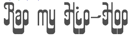 [MyFonts]
[More] ⦿
[MyFonts]
[More] ⦿
|


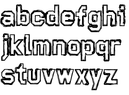
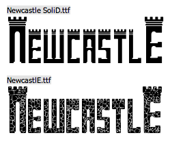
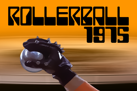
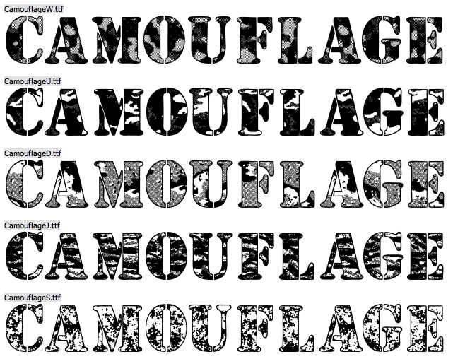
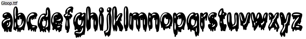
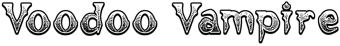
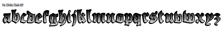
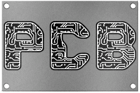
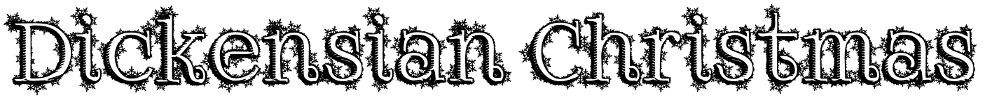
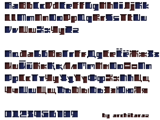
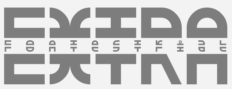
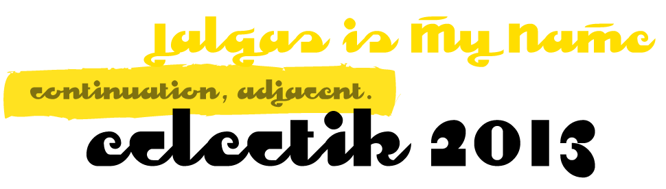
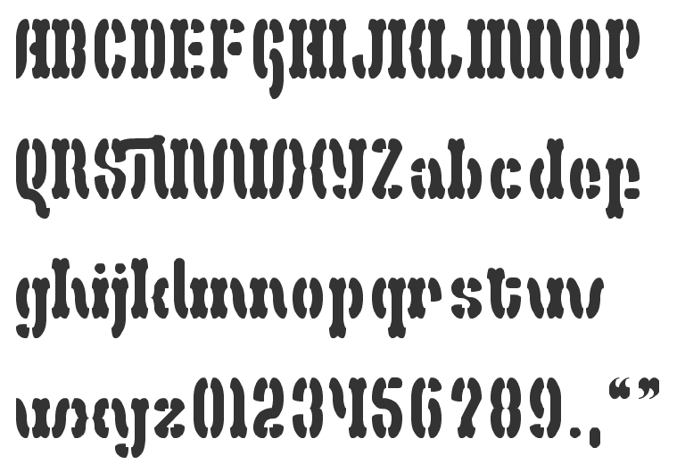
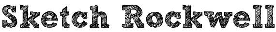
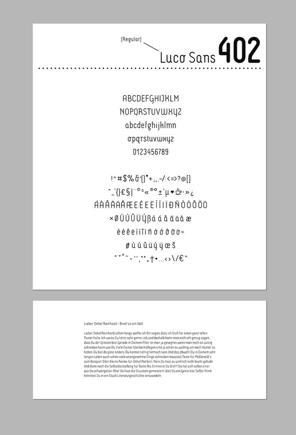
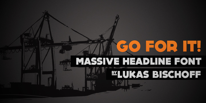
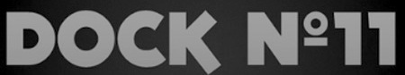
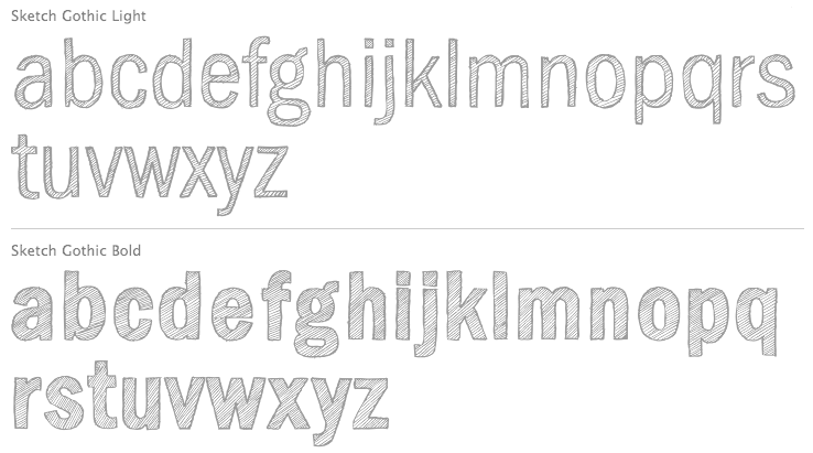
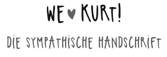
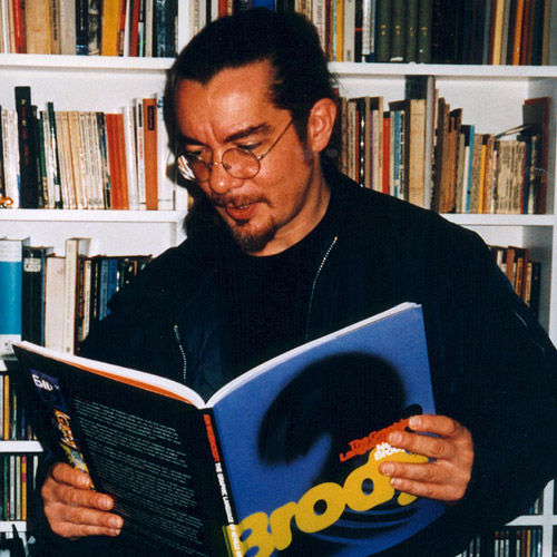
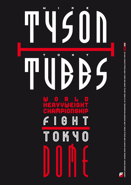
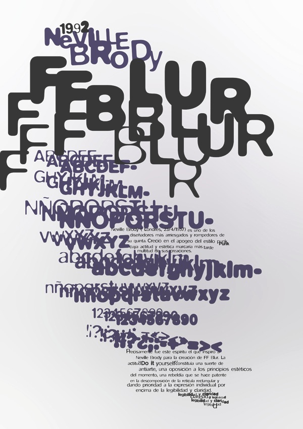
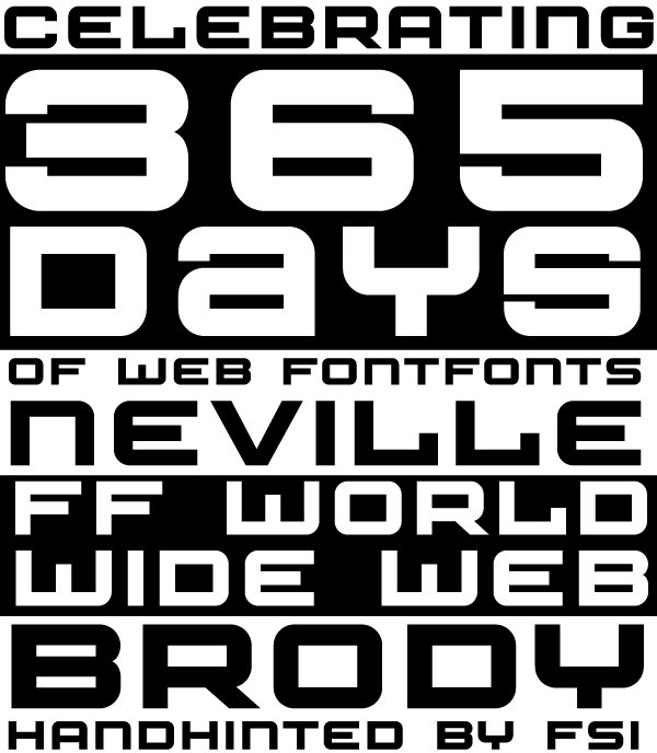
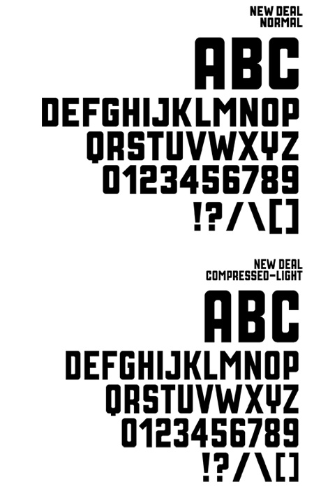
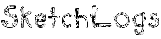
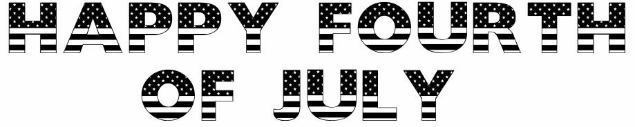
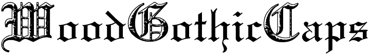
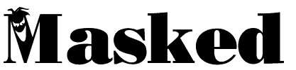
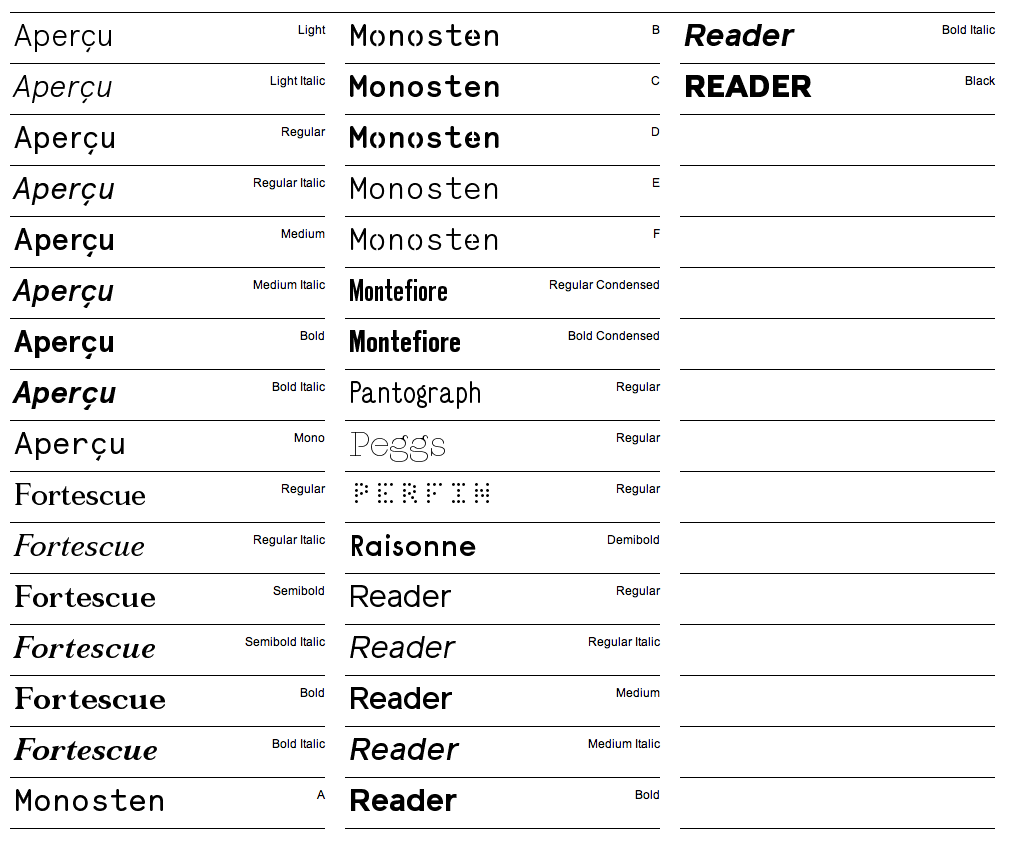
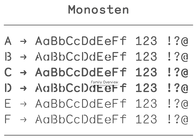
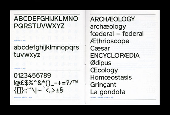
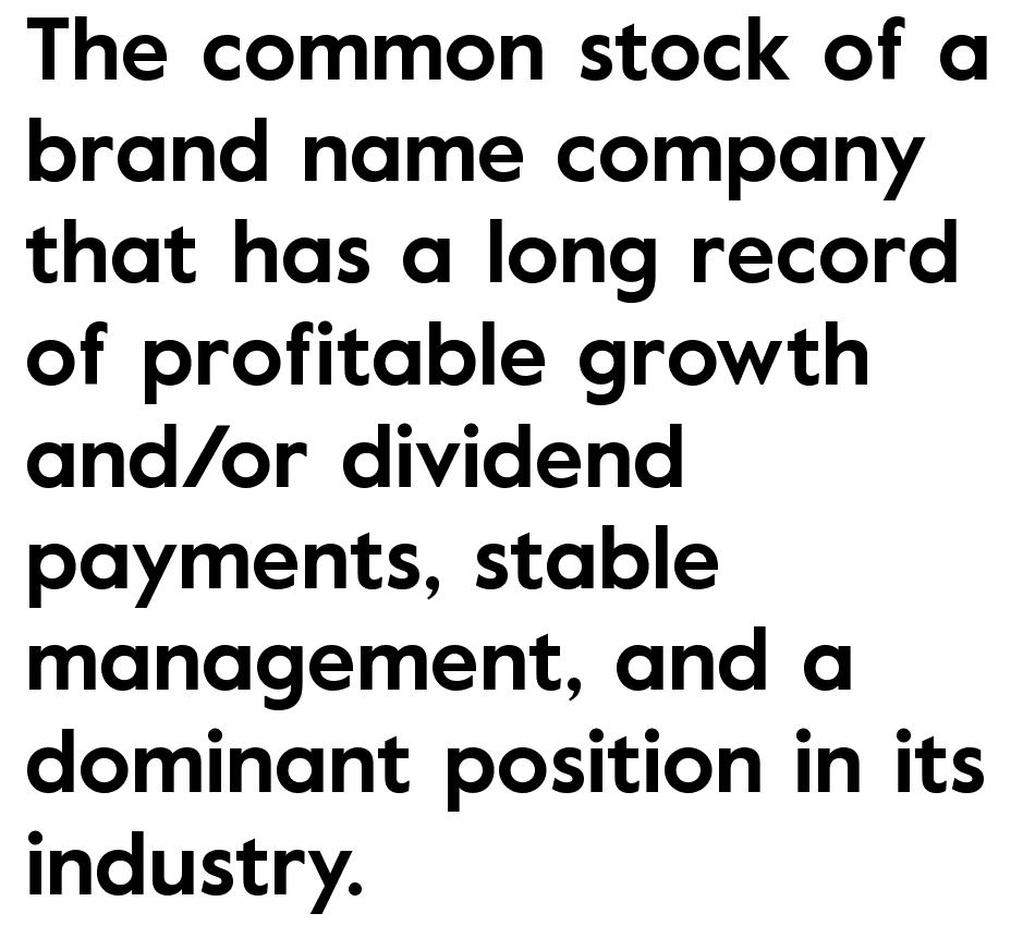
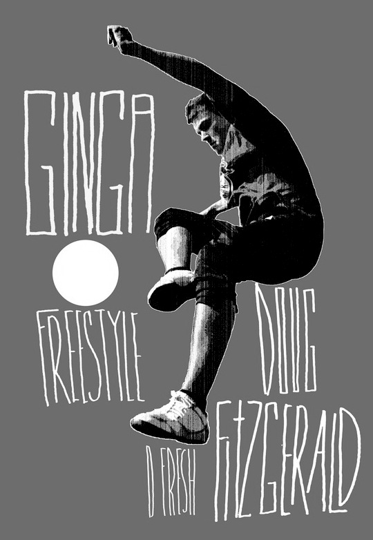
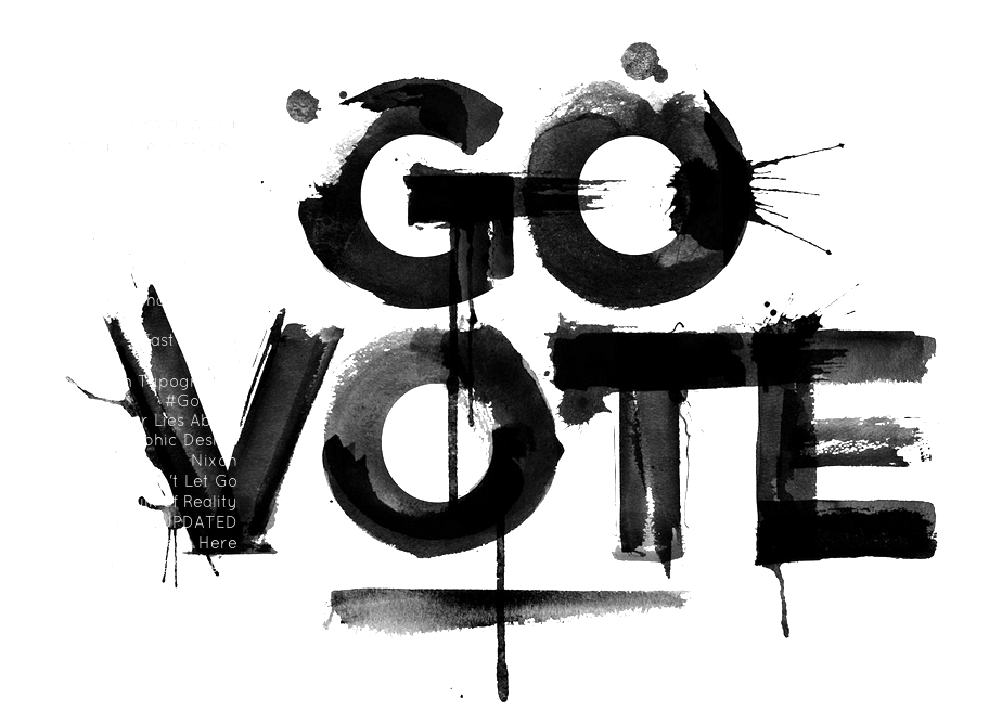
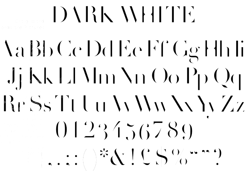
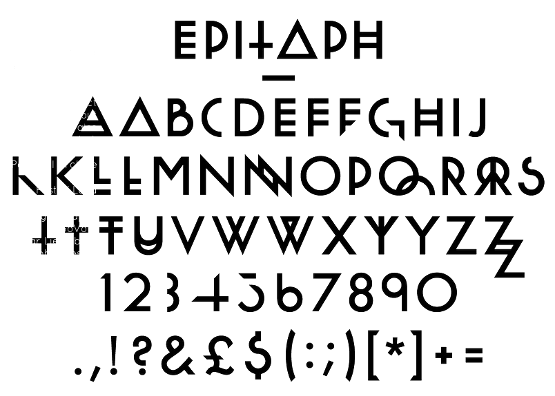
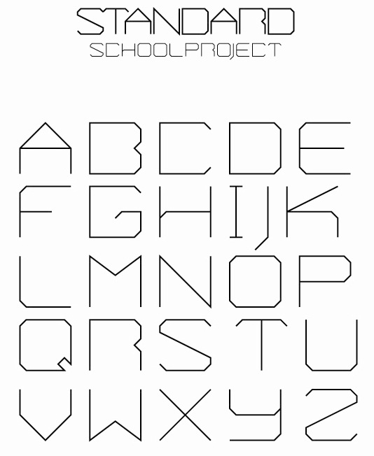
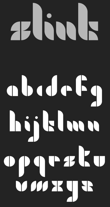
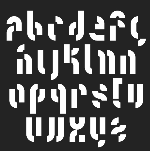
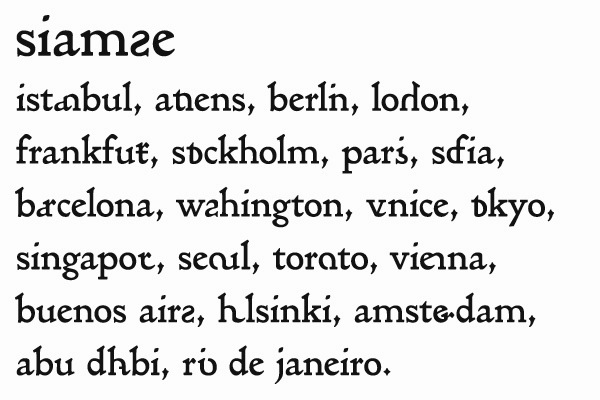
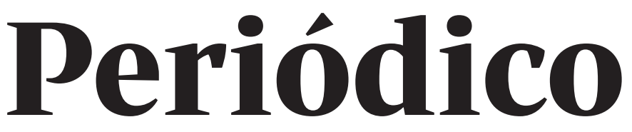
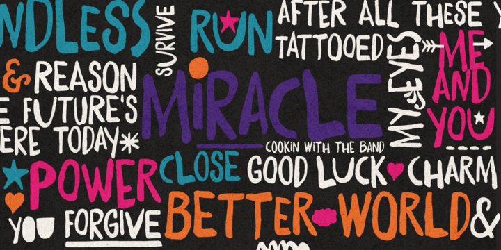
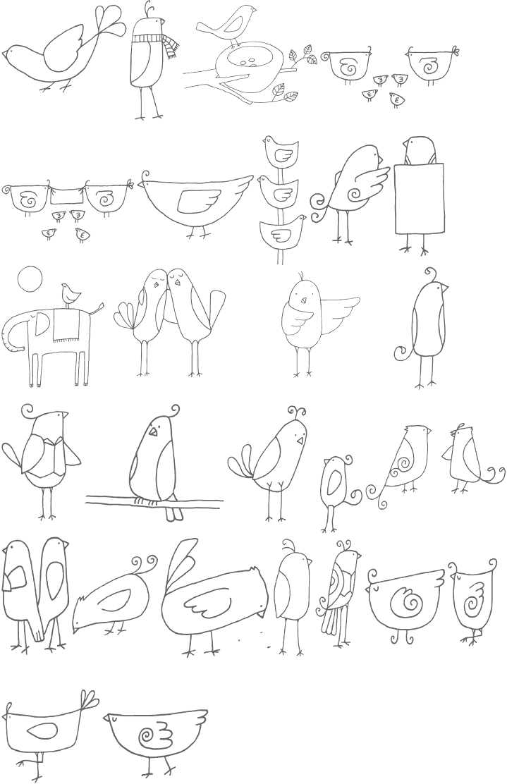
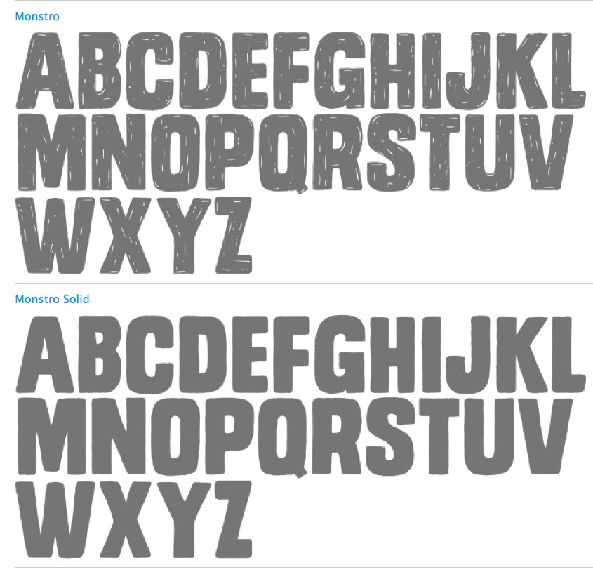
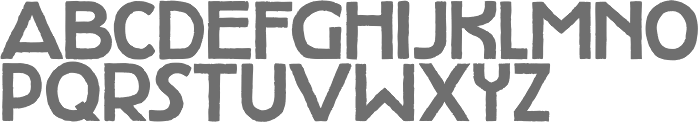
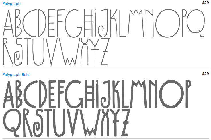
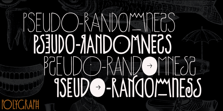
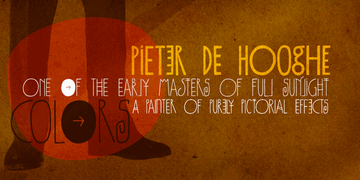
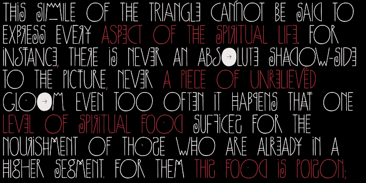
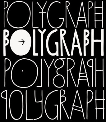
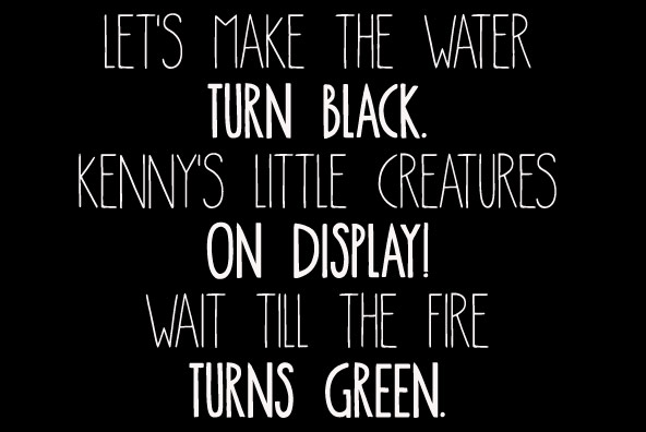
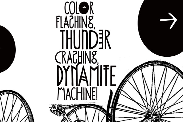
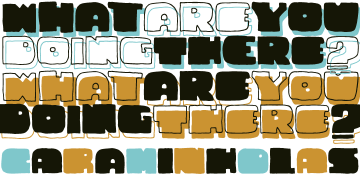
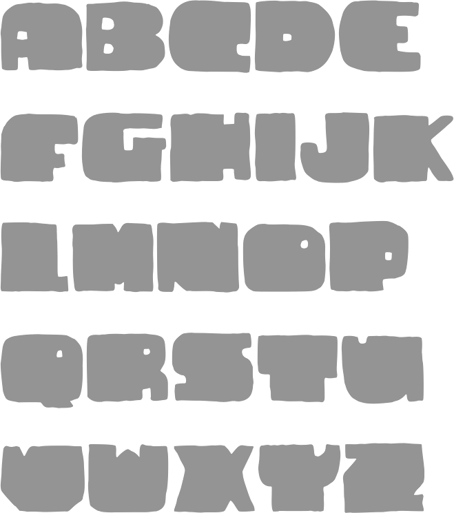
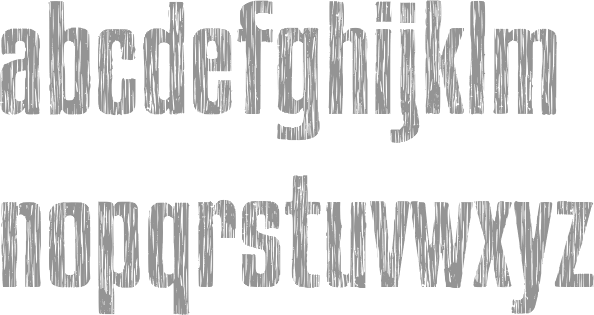
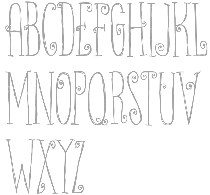
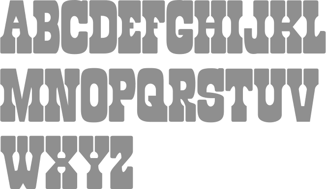
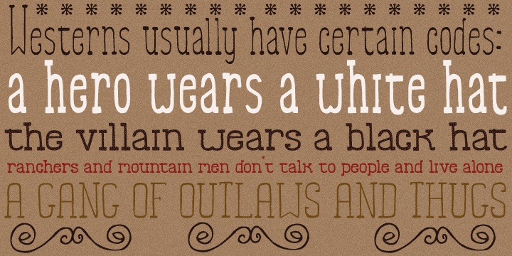
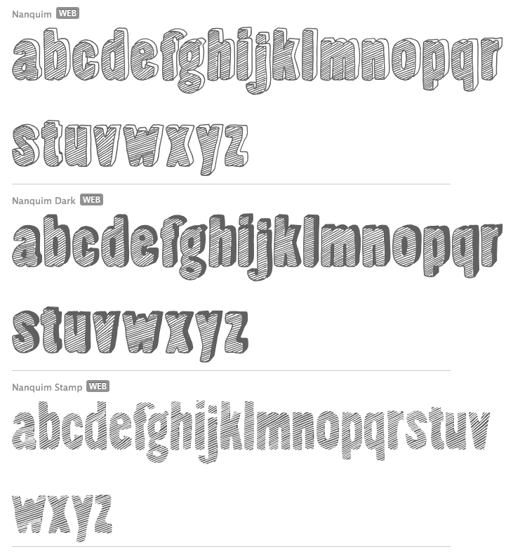
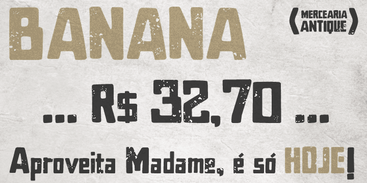
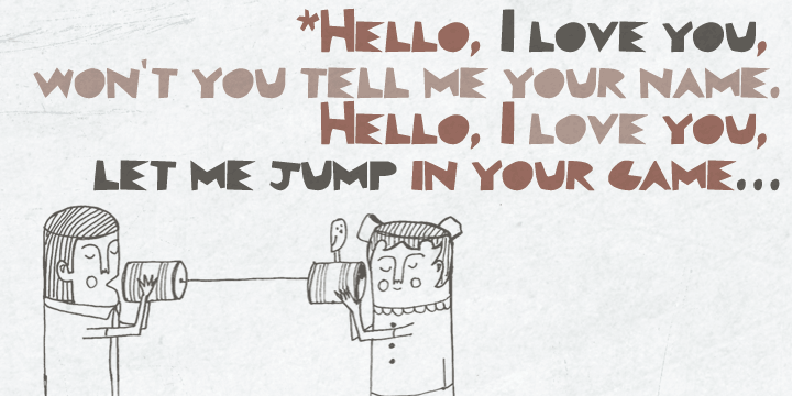
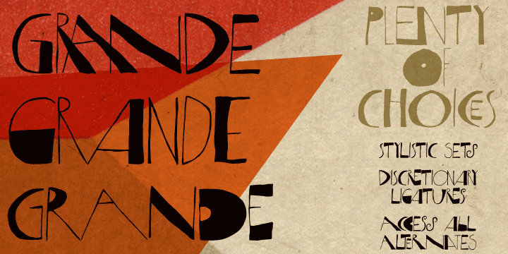
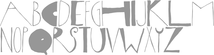
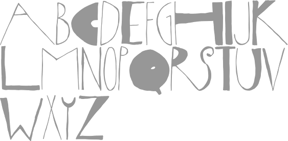
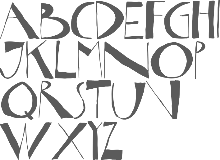
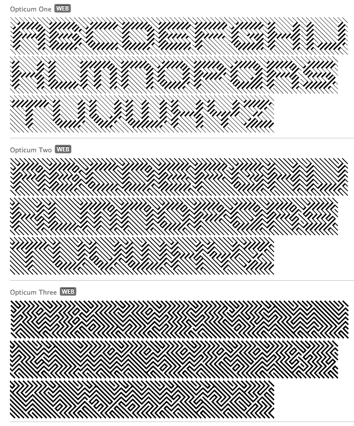
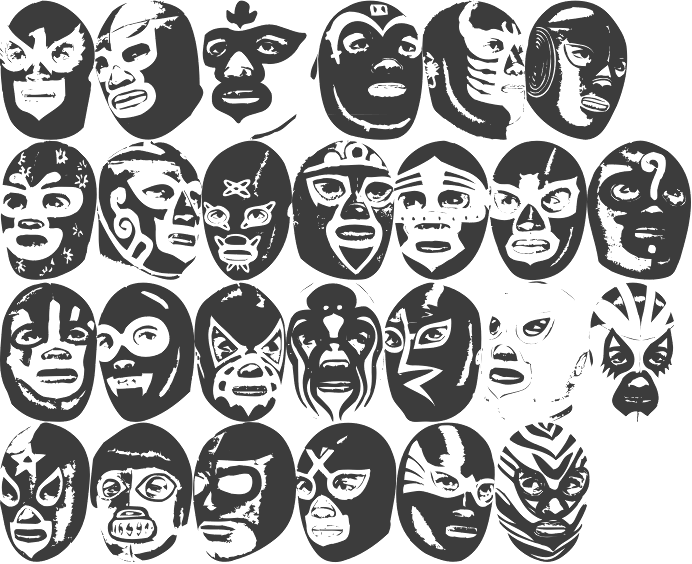
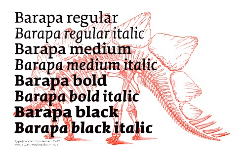
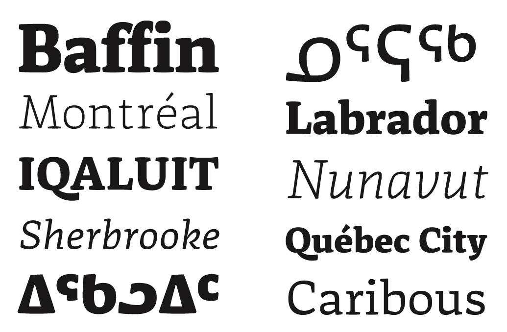
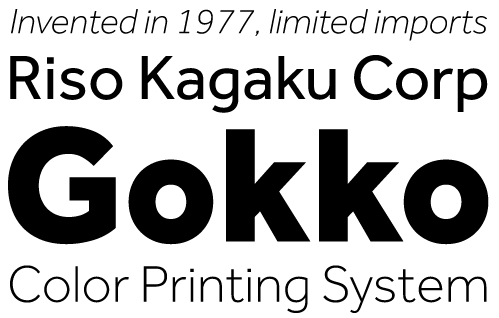
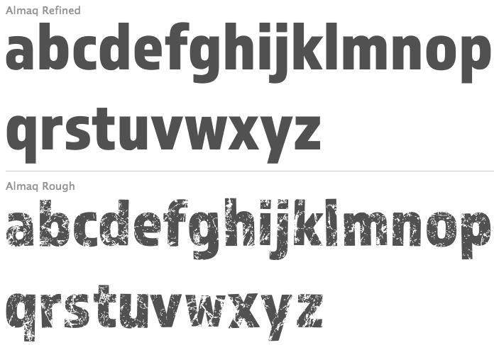
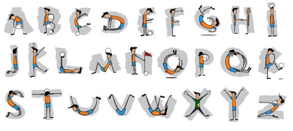
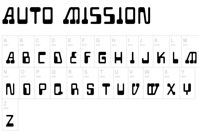
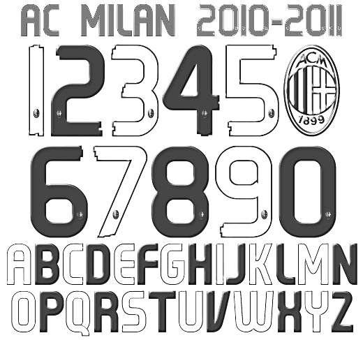
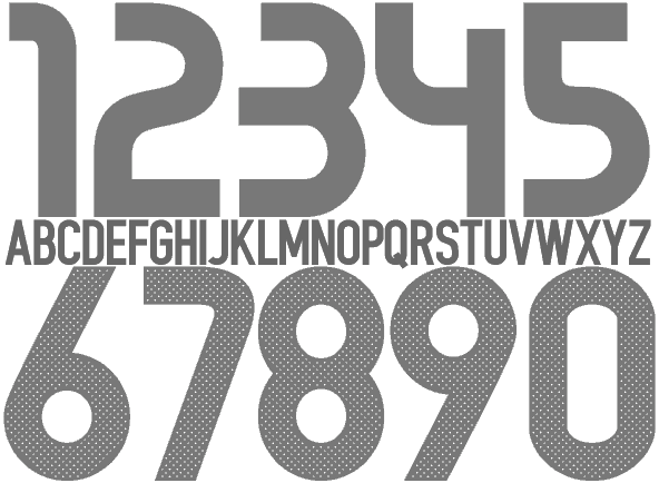
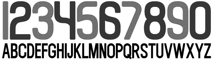
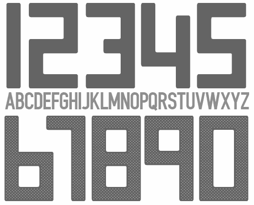
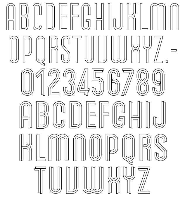
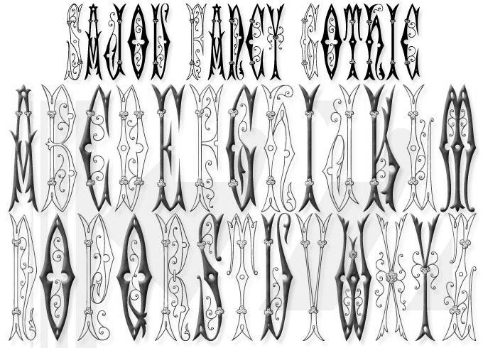
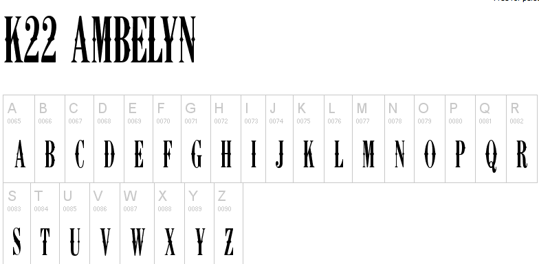
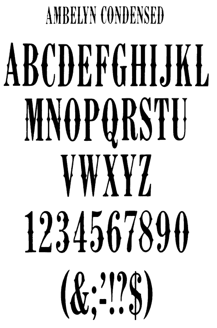
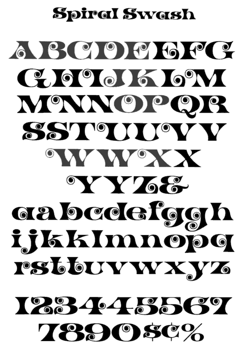
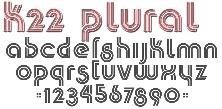
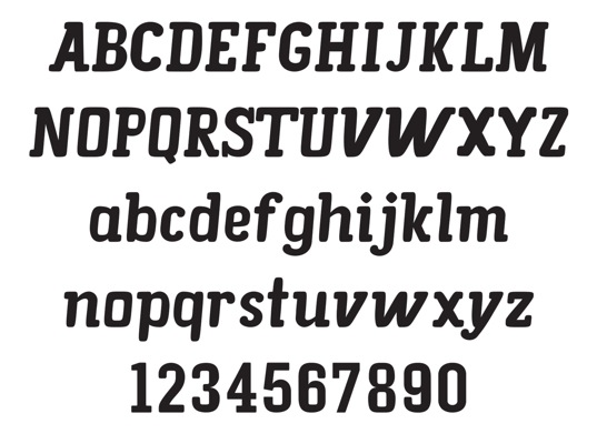
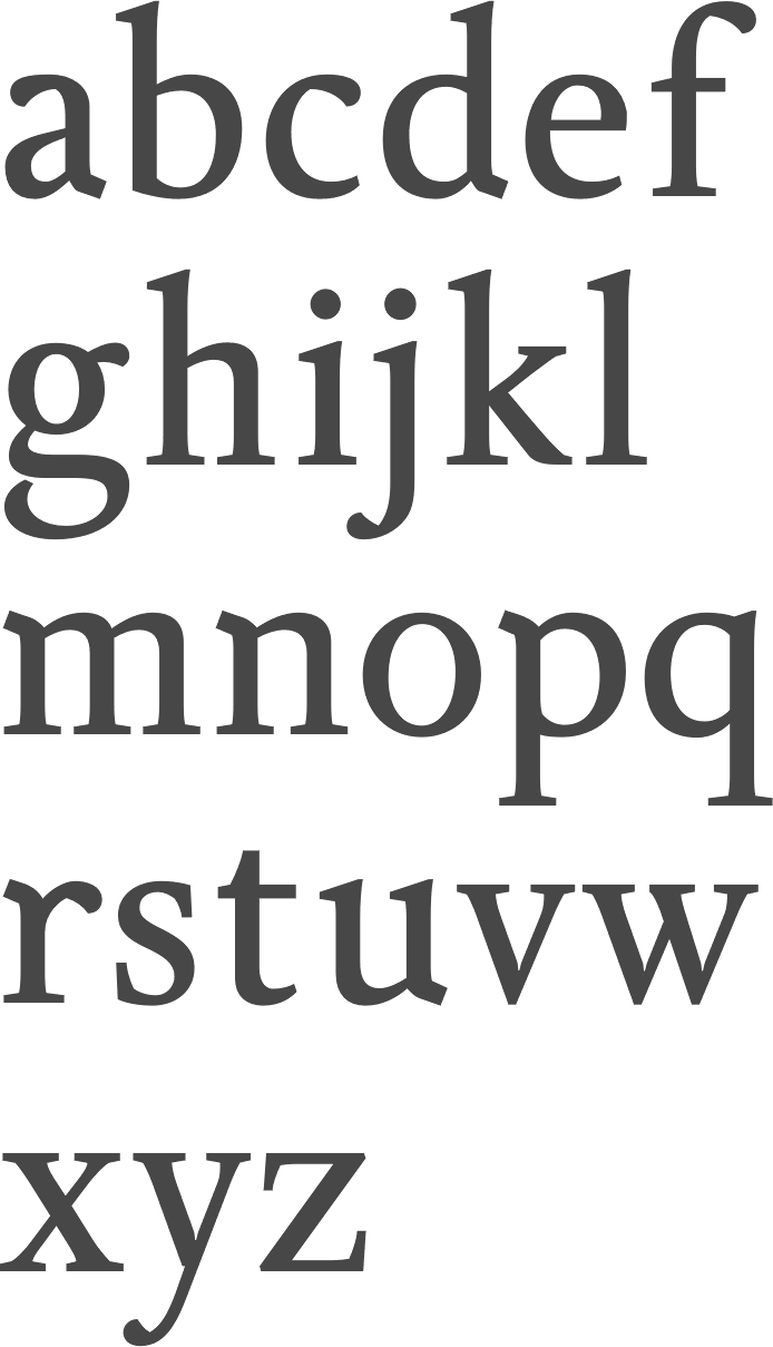
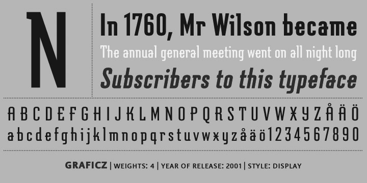
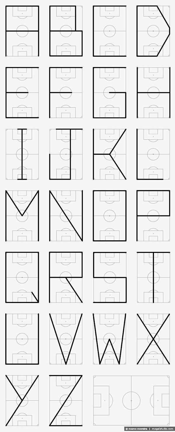
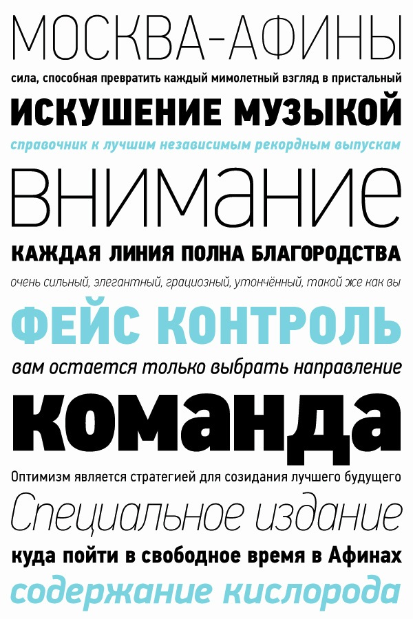
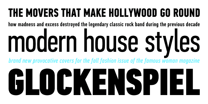
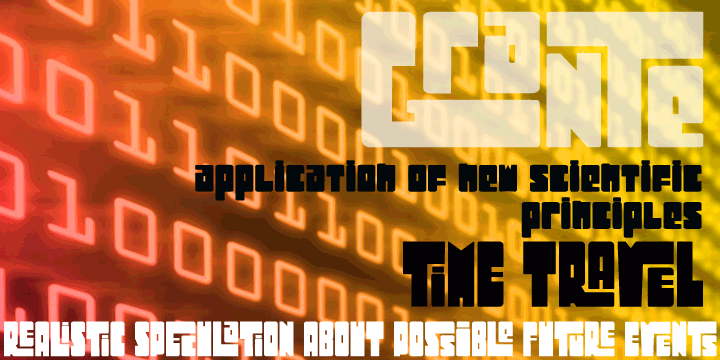
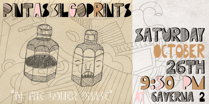
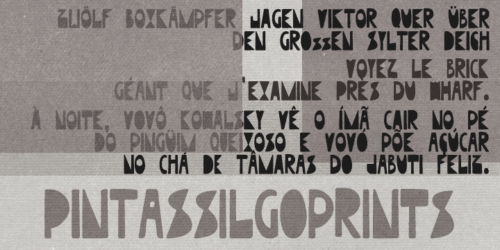
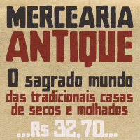
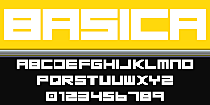
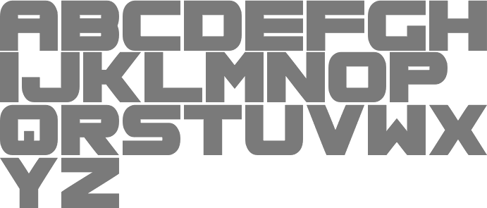
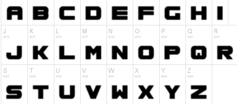
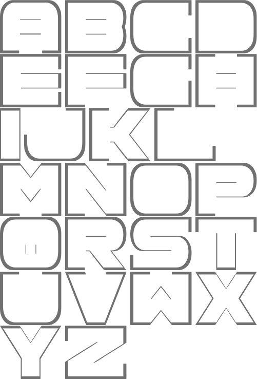
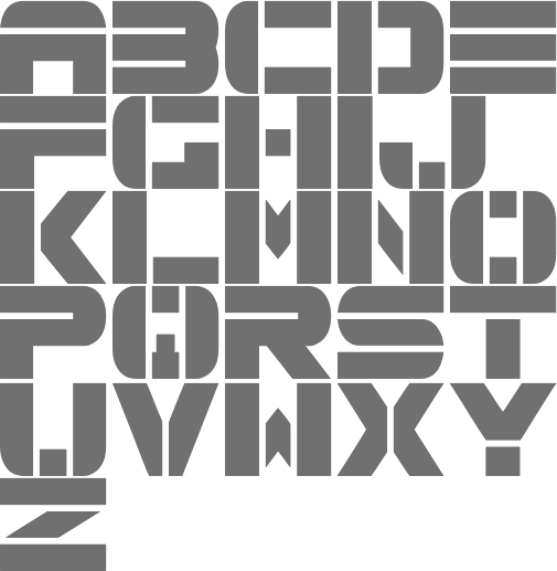
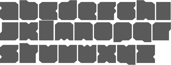
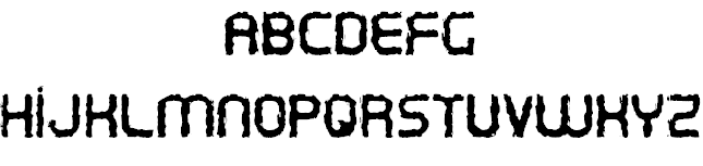
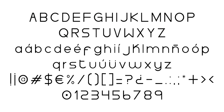
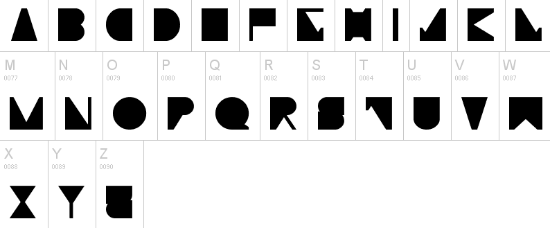
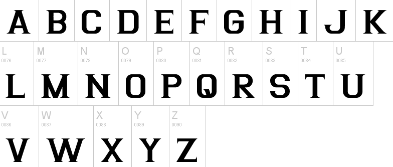
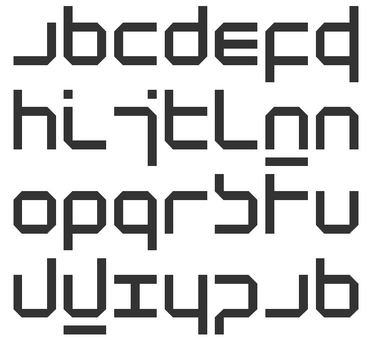
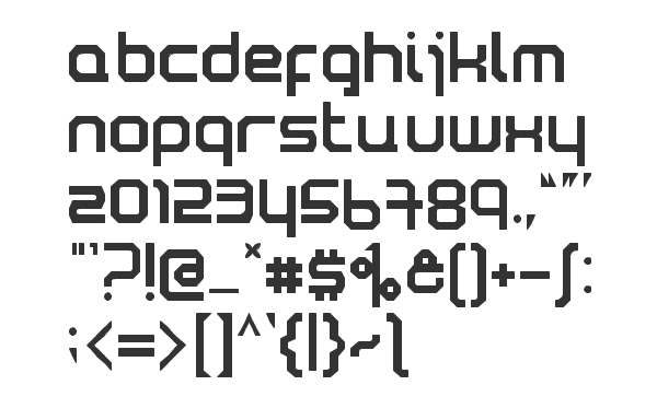