| | |
100types
[Ben Archer]
|
Educational and reference site run by Ben Archer, a designer, educator and type enthusiast located in England (who was in Auckland, New Zealand, before that). Glossary. Timeline. Type categories. Paul Shaw's list of the 100 most significant typefaces of all times were recategorized by Archer: - Religious/Devotional: Gutenbergs B-42 type, Gebetbuch type, Wolfgang Hoppyl's Textura, Breitkopf Fraktur, Ehrhard Ratdolt's Rotunda, Hammer Uncial, Zapf Chancery, Peter Jessenschrift, Cancellaresca Bastarda, Poetica.
- Book Publishing&General Purpose Text Setting: Nicolas Jenson's roman, Francesco Griffo's italic, Claude Garamond's roman, Firmin Didot's roman, Cheltenham family, Aldus Manutius' roman, William Caslon's roman, Pierre-Simon Fournier's italic, Ludovico Arrighi da Vicenza's italic, Johann Michael Fleischmann's roman, ATF Garamond, Giambattista Bodoni's roman, Nicolas Kis' roman, Minion multiple master, Unger Fraktur, John Baskerville's roman, Lucida, Optima, Bauer Bodoni, Adobe Garamond, Scotch Roman, Romanée, ITC Stone family, Trinité, ITC Garamond, Sabon, ITC Novarese, Charter, Joanna, Marconi, PMN Caecilia, Souvenir, Apollo, Melior, ITC Flora, Digi-Grotesk Series S.
- Business/Corporate: Akzidenz Grotesk, Helvetica, Univers, Syntax, Courier, Meta, Rotis, Thesis, Antique Olive.
- Newspaper Publishing: Times Roman, Bell, Clarendon, Century Old Style, Ionic, Imprint.
- Advertising and Display: Futura, Robert Thorne's fat typeface roman, Vincent Figgins' antique roman (Egyptian), Memphis, Fette Fraktur, Avant-Garde Gothic, Deutschschrift, Peignot, Erbar, Stadia/Insignia, Penumbra, Compacta, Bodoni 26, WTC Our Bodoni.
- Prestige and Private Press: Romain du Roi, Golden Type, Johnston's Railway Sans, Doves Type, Walker.
- Signage: William Caslon IV's sans serif, Trajan.
- Historical Script: Snell Roundhand, Robert Granjon's civilité, Excelsior Script.
- Experimental/expressive: Mistral, Beowolf, Dead History, Behrensschrift, Eckmannschrift, Neuland, Element, Remedy, Template Gothic.
- Onscreen/multimedia: Chicago, Oakland, OCR-A, Base Nine and Base Twelve, Evans and Epps Alphabet.
- Telephone Directory publishing: Bell Gothic.
Link to Archer Design Work. [Google]
[More] ⦿
|
Academy Press of Tyrnavia
|
Hungarian foundry/press run by Jesuits in the late 18th century. Gábor Kóthay based some of his fonts on their 1773 type specimen book. One is the 2-weight Schwabacher style Fraktur font SchwarzKopf (2002). LaDanse is based on a scan of a handwritten inventory found in that book. [Google]
[More] ⦿
|
Agfa Monotype
|
Fraktur typefaces sold by Agfa Monotype (including Elsner&Flake and Linotype typefaces): Linotype Buckingham Fraktur, Fette Fraktur, Fraktur, EF Fraktur Bold, EF Fraktur Bold Dfr, EF Fraktur CE Bold, EF Fraktur T Bold, EF Fraktur, Hoyerswerda Fraktur, EF Justus Fraktur Bold, EF Justus Fraktur Bold Dfr, EF Justus Fraktur Regular, EF Justus Fraktur Regular Dfr, Linotype Luthersche Fraktur, Linotype Luthersche Fraktur DFR, EF Neue Luthersche Fraktur Medium, EF Neue Luthersche Fraktur Medium Alt, EF Neue Luthersche Fraktur Medium Dfr, EF Neue Luthersche Fraktur Medium Titel, EF Neue Luthersche Fraktur Regular, EF Neue Luthersche Fraktur Regular Alternate, EF Neue Luthersche Fraktur Regular Dfr, EF Neue Luthersche Fraktur, Linotype Richmond Fraktur, Walbaum Fraktur, EF Walbaum Fraktur CE Regular, EF Walbaum Fraktur Regular, EF Walbaum Fraktur Regular Dfr, EF Walbaum Fraktur T Regular, EF Walbaum Fraktur, Wittenberger Fraktur Bold, Wittenberger Fraktur, Alte Schwabacher, EF Alte Schwabacher, Fette Gothic, EF Gotisch Bold, EF Gotisch Bold Dfr, EF Gotisch, Weiss Rundgotisch, Weiss Rundgotisch Antique, EF Weiss Rundgotisch Regular, EF Weiss Rundgotisch Regular Dfr, EF Weiss Rundgotisch, Wilhelm Klingspor Gotisch. [Google]
[More] ⦿
|
Albert Christoph Auspurg

|
 German type designer, b. Frankfurt am Main, 1868, d. Leipzig, 1943. His oeuvre:
 - At C.E. Weber: Start (1934).
- At Ludwig&Mayer: Aristokrat (1912), Miracle (1931, a script face), Rasse (1924), Schöndeutsch (1934), Reklame-Fraktur (1914; revived in 2016 by Ralph M. Unger as Reklame Fraktur), the gorgeous long-legged Mona Lisa (1930; digital version by Pat Hickson, 1992), the blackletter typeface Deutsche Kraft (1915), Brigitte (1935), the display roman typeface Krimhilde (1933-1934; with Schwabacher-style capitals, though).
- At Schriftguss: Lido (1936, script face) and Miami (1934). Digital revivals of Krimhilde were done by Ralf Herrmann (as Krimhilde, 2018) and Klaus Burkhardt (also as Krimhilde). Rick Banks's F37 Attila was inspired by Krimhilde. Miami was revived in 2020 by Ralph M. Unger as Elbflorenz.
- At Benjamin and Krebs: Brentano Fraktur (1915-1916), Federzug Antiqua (1913), Nürnberger Kanzlei (1906), Schönbrunn (1928), Trajan Versalien (1928).
- At Genzsch&Heyse, he did Hans Sachs Gotisch (1911, revived in 2005 by Petra Heidorn; the typeface also appeared at Ludwig & Wagner, where some date the Initialen style at 1902---Hans Sachs Gotisch was named after Hans Sachs from Nürnberg, 1494-1576, who was a master singer and songwriter), Domina (1929), Souverän (1913).
- At Haas: Castor (1924), Pollux (1925).
- At Trennert: Trocadero Kursiv (1927, a script font with flourished capitals). In 2010, it was extended and revived by Ralph Unger as Trocadero Pro.
- At Berthold: the peculiar Messe Grotesk family (1921-1927) and the shaded titling typeface Vesta (1926, a Mexican simulation face; for a digitization, see Visillo Adornado (2006, Nick Curtis) or Venezuela RR (2000, Pat Hickson at Rabbit Reproductions Type foundry, aka Red Rooster)). The Messe Grotesk design was revived by Nick Curtis as Troglodyte NF (2006-2011) and by Paul Hickson as Messe Grotesk (1997, Red Rooster).
- At AG für Schriftgiesserei in Offenbach: the blackletter typefaces Apart (1911) and Fraktur-Kursiv (1923).
- At Schelter & Gisecke: Kolibri (1915; for a digital version of this multiline open typeface caps face, see Trochilida NF (2012, Nick Curtis)).
- At Berling: the italic open capitals typeface Berling Kortversaler.
- At Lettergieterij Amsterdam: Albert or Select (ca. 1936). Revived by Paul Hickson as Honduras RR at Red Rooster.
[Google]
[MyFonts]
[More] ⦿
|
Albert Kapr

|
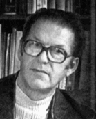 German type designer, typographer, calligrapher, author and educator, b. Stuttgart (1918), d. 1995. He was art director at the Dresden type foundry VEB Typoart from 1964 until 1977. He founded and led the Institut für Buchgestaltung at the Hochschule für Grafik und Buchkunst at Leipzig from 1956 until 1978. Obituary by Harald Suess. Page at Klingspor. MyFonts page. Catalog of Albert Kapr's typefaces
 He designed these typefaces: - Faust-Antiqua (1958-1959), or just Faust. This right-footed serif typeface suffers from the ugly duck syndrom. Nevertheless, it inspired Nick Curtis to design Kaprice NF (2010). In 1993, Steve Jackaman revived it as Faust RR.
- Leipzig (with Otto Erler in 1963). A font with large x-height.
- Leipziger-Antiqua (1959). Revived by Tim Ahrens in 2004 as JAF Lapture. It was also digitized--close to the original and under the original name--by Ralph Unger at URW in 2005. And it was shamelessly digitized by Linotype and sold as Hawkhurst without mentioning the Leipziger Antiqua source, in fact claiming that Hawkhurst is an original.
- Calendon-Antiqua (1965).
- Prillwitz-Antiqua (1971, Typoart, with Werner Schulze).
- Magna Kyrillisch (1975).
- Circa 1975, he created Garamond Cyrillic at Typoart.
A specialist of blackletter, he was passionate about Gotische Bastarda. Author of these books: - Fraktur: Form und Geschichte der gebrochenen Schriften (1993, H. Schmidt, Mainz).
- F.H.Ernst Schneidler Schriftentwerfer, Lehrer, Kalligraph (SchumacherGebler a.o., München, 2002). Co-authors: Max Caflisch, Albert Kapr, Antonia Weiss and Hans Peter Willberg.
- The Art of Lettering; The history, anatomy, and aesthetics of the roman letterforms (München, K.G. Saur, 1983, original edition in German by VEB Verlag: Dresden, 1971).
- Schriftkunst. Geschichte, Anatomie und Schönheit der lateinischenn Buchstaben (Dresden, 1971).
- Schrift- und Buchkunst (VEB Fachbuchverlag, Leipzig, 1982).
[Google]
[MyFonts]
[More] ⦿
|
Alexandra Pushkova
|
 Digital type artist at ParaType. Among her contributions is the digital version of a bastarda blackletter alphabet (Blonde Fraktur, 2010) that was drawn with a quill by Alexandra Korolkova. [Google]
[More] ⦿
|
Allain Guillaume
|
 Typefounder in Paris, ca. 1900, whose production included Batardes coulées, Gauloises, and Ronde Ancienne (upright script). [Google]
[More] ⦿
|
Alte Schwabacher
|
 A classic form of blackletter first seen in 1472 in Augsburg where Johann Bämler created a version. It was very popular in the 16th century. Revived, e.g., by the following foundries: Drugulin/D. Stempel (1919), Benjamin Krebs (1918), Genzsch&Heyse (1835), Berthold, C.F. Rühl (1903). [Google]
[More] ⦿
|
Alter Littera
[José Alberto Mauricio]

|
 Spanish foundry, est. ca. 2009, and on the web since 2012. It is located in Madrid. Alter Littera's fonts and web site are designed and managed by José Alberto Mauricio, who holds a doctorate degree in Economics and Business Administration, and is Associate Professor of Econometrics at the Universidad Complutense de Madrid.
 Alter Littera produces and markets opentype fonts reviving some of the most beautiful bookhands from medieval Western manuscripts, as well as some of the finest European and North-American typefaces from the mid-fifteenth through the early-twentieth centuries. The "Bookhand", "Oldtype" and "Initials" font collections cover gothic and/or blackletter letter forms. The typefaces: - Gutenberg (B42-type) A (Johann Gutenberg, Mainz, ca. 1455). Includes the full set of special characters, alternates and ligatures from The 42-line Bible. Under development.
- Gutenberg (B42-type) B (Johann Gutenberg, Mainz, ca. 1455). Includes the full set of special characters, alternates and ligatures from The 42-line Bible. Published as Gutenberg B in 2012, this is a clean, smooth rendition of the B42-type used by Johann Gutenberg in his famous 42-line Bible. The font includes a comprehensive set of special characters, alternates and ligatures, plus Opentype features, that can be used for typesetting (almost) exactly as in Gutenberg's Bible and later incunabula. He says: The main historical sources used during the font design process were high-resolution scans from several printings of Gutenberg's Bible. Other sources were as follows: Kapr, A. (1996), Johann Gutenberg - The Man and his Invention, Aldershot: Scolar Press (ch. 7); De Hamel, C. (2001), The Book - A History of The Bible, London: Phaidon Press (ch. 8); Füssel, S. (2005), Gutenberg and the impact of printing, Burlington: Ashgate (ch. 1); and Man, J. (2009), The Gutenberg Revolution, London: Bantam (ch. 7).
- Gutenberg (B42-type) C (Johann Gutenberg, Mainz, ca. 1455). Includes the full set of special characters, alternates and ligatures from The 42-line Bible. Published in 2012 as Gutenberg C, this is a slightly roughened version of the Oldtype "Gutenberg B" Font, simulating irregularities and ink spreads associated with old metal types, papers and parchments.
- Psalterium (Psalter-type) (Peter Schoeffer, Mainz, 1457). Includes the full set of special characters, alternates and ligatures from The Mainz Psalter (Psalterium Moguntinum). He writes: A clean, smooth adaptation of the magnificent gothic types used by Johann Fust and Peter Schöffer in their famous Mainz Psalter (Psalterium Moguntinum) of 1457, also used in their Canon of the Mass (Canon Missae) of 1458, and in their Benedictine Psalter (Psalterium Benedictinum) of 1459. [Although these works were published after Gutenberg's break with Fust, it is generally agreed that Gutenberg was working along with Fust and Schöffer on the Mainz Psalter while the 42-line Bible was still being printed.] In addition to the usual standard characters for typesetting modern texts, the font includes a comprehensive set of special characters, uncial initials (adapted from both the Mainz Psalter and early sixteenth-century Dutch types by Henric Pieterszoon), alternates and ligatures, plus Opentype features, that can be used for typesetting (almost) exactly as in the Mainz Psalter and later incunabula.
- Oude Hollandse (Henric Pieterszoon "Lettersnijder", Antwerp, 1492). Under development.
- French Textura (Joos Lambrecht, Ghent, 1541). Under development.
- Flamand A (Hendrik van den Keere, Antwerp, 1571). Under development.
- Flamand B (Hendrik van den Keere, Antwerp, 1571). Under development.
- Nederduits (Johann M. Fleischmann, Haarlem, 1733). Under development.
- Psalter Gotisch (Benjamin Krebs Nachfolger, Frankfurt am Main, 1890). Under development.
- Manuskript Gotisch (Bauersche Giesserei, Frankfurt am Main, 1899). Under development.
- Munthe Schrift (Gerhard Munthe, Offenbach am Main, 1904), Under development.
- Deutsche Schrift (Rudolf Koch, Offenbach am Main, 1910). Includes both normal and large, ornamental capitals (two sets), plus several finial characters and ornaments from Koch's original designs. He writes:A comprehensive and faithful rendition of Rudolf Koch's first release, usually referred to as "Fette Deutsche Schrift" or "Koch-Schrift". In addition to the regular character set, the font includes a large number of alternates and ligatures, plus two sets of ornamental initials (Initialen mit Zierstrichen und Punkten zur Koch-Schrift, and Initialen zur halbfetten deutschen Schrift). The main sources used during the font design process were a sample page from Hendlmeier, W. (1994), Kunstwerke der Schrift, Hannover: Bund für Deutsche Schrift und Sprache (p. 164), and several specimen sheets from the Gebrüder Klingspor Type Foundry for Koch's Deutsche Schrift type family.
- Maximilian (Rudolf Koch, Offenbach am Main, 1914). Includes normal, small (Klein), and roman (Antiqua) capitals, plus ornamental capitals and alternates (Zierbuchstaben). Under development.
- Wilhelm Klingspor Schrift (Rudolf Koch, Offenbach am Main, 1925). Includes both normal (wide) and narrow capitals, plus the full set of alternates, ligatures and finial characters from Koch's original designs.
- Caslon Gotisch (D. Stempel A.G., Frankfurt am Main, 1926). Produced in 2012 as Caslon Gotisch, it is a faithful adaptation of the "Caslon-Gotisch" type acquired (among several other types) by D. Stempel A.G. in 1919 from the Leipzig printer Wilhelm E. Drugulin, and further developed by Stempel in later years. Details: In addition to the usual standard characters for typesetting in modern Western languages, the font includes a comprehensive set of special characters, alternates and ligatures, plus Opentype features, that can be used for typesetting as in antique writings and printings. The main sources used during the font design process were as follows: A sample page from Typographische Mitteilungen - XXIII Jahrgang - Heft 2 (1926), and a sample page from Hendlmeier, W. (1994), Kunstwerke der Schrift, Hannover: Bund für Deutsche Schrift und Sprache (p. 37).
- Gótico Cervantes (Fundición Tipográfica Richard Gans, Madrid, 1928). Under development.
- Wallau (a rotunda by Rudolf Koch, Offenbach am Main, 1930). Includes German, Uncial, and Ornamental capitals. Under development.
- Alter Gothic (Alter Littera, Madrid, 2012), or Alter Gothisch. This is Alter Littera's first original design. They write: Two specific sources must be acknowledeged: (1) the "Black" type from William Caslon's A Specimen of Printing Types (1785), and (2) the "Caslon Gotisch" type by D. Stempel A.G. (1926).
- Gothic A. After late Carolingian and early Gothic manuscripts (12th century). Under development.
- Gothic B. After Erhard Ratdolt's Lombardic Capitals (1491). Under development.
- Gothic C. After Henric Pieterszoon's Uncials (1508). A comprehensive set of initials (usually referred to as Uncials, Lombardic Initials, or Lombards) of the Germanic variety, designed after Henric Pieterszoon's Gothise Monnikke Letteren as appearing in Enschedé, J. (1768), Proef van Letteren, Haarlem (p. 120); also mentioned as Great Primer Uncials and 2-line Brevier Uncials in Vervliet, H.D.L. (1968), Sixteenth-Century Printing Types of the Low Countries, Amsterdam: Hertzberger (pp. 54-55, and 212-213).
- ATF Cincinnati, ATF Caxton, ATF Missal. From American Type Founders Company's American Specimen Book of Type Styles (1912). Under development.
- Initials Bergling (2012, Alter Littera) is a comprehensive set of initials (usually referred to as Uncials, Lombardic Initials, or Lombards) of the French variety, adapted from Bergling's book Art Alphabets and Lettering (Second Edition) (1918, Chicago: Blakely-Oswald Printing Company).
- Bergling B. From J.M. Bergling's Art Alphabets and Lettering (1918). Under development.
- Morris. From William Morris's The Kelmscott Chaucer (1896). Under development.
- Initials ATF Cloister (2012). After F.W. Goudy's Cloister Initials (1917).
- Roman Square Capital. From 1st century B.C. onwards. Under development.
- Roman Rustic. 1st to 6th centuries. Under development.
- Uncial. 3rd to 6th centuries. Under development.
- Artificial Uncial. 6th to 10th centuries. Under development.
- Roman Half-Uncial. 3rd to 9th centuries. Under development.
- Insular Majuscule. 6th to 9th centuries. Under development.
- Insular Minuscule. From 6th century onwards. Under development.
- Luxeuil Minuscule. 7th and 8th centuries. Under development.
- Beneventan Minuscule. 8th to 13th centuries. Under development.
- Carolingian Minuscule. 8th to mid-12th centuries. Under development.
- Early Gothic. 11th and 12th centuries. Under development.
- Gothic Textura Quadrata. 13th to 15th centuries. Under development.
- Gothic Textura Prescisus. 13th to 15th centuries. Under development.
- Gothic Rotunda. 12th to 16th centuries. Under development.
- Gothic Littera Bastarda. From 13th century onwards. Under development.
- Fraktur. From 15th century onwards. Under development.
- Humanistic Book Script. From 15th century onwards. Under development.
- Humanistic Cursive. From 15th century onwards. Under development.
- ATF Missal Caxton (2012): A comprehensive set of initials, frames and borders, adapted from American Type Founders (ATF) Company's American Specimen Book of Type Styles, Jersey City, 1912 (pp. 944-5). The font contains over one hundred glyphs, including clean renditions of both Missal Initials and Caxton Initials, plus adaptations of Department Store Initials and French Cast Squares. Caxton Initials were first designed by F. Goudy in 1905. Missal Initials is originally due to Will Bradley in 1904.
- Alter Headletter (2012). An original from Alter Littera in the style of Century Bold Condensed.
- The Oldtype Gutenberg A Font (2012, free) is a free abridged edition of the full-featured Gutenberg B and Gutenberg C fonts.
[Google]
[MyFonts]
[More] ⦿
|
Anastasia Vrublevska
|
Prague, Czechia-based designer of 8Bit Schwabacher (2016, pixel font) and Polska Jutra (2016), a 3d typeface inspired by Polish folklore embroidery. Behance link. [Google]
[More] ⦿
|
Anthony Nash
[Classic Font Company]

|
[MyFonts]
[More] ⦿
|
Anton Koberger

|
Nürnberg-based printer who created many interesting typefaces in the late 15th century, as narrated by Christoph Reske in Eine neue Entdeckung zur Druckgeschichte der Schedelschen Weltchronik (note: Schedelschen Weltchronik (1492) is a book by Hartmann Schedel). These include a gorgeous Rotunda and Schwabacher (1492), a Druckbastarda, and other original Fraktur typefaces, called No. 9 and No. 11 by Reske. Koberger was first and foremost a printer, who made the first illustrated bible in 1475, and printed, as hinted to above, Schedelschen Weltchronik (1492). He died in 1515. MyFonts page. Modern digital types based on Koberger abound: - Manfred Klein created the blackletter typeface FF Koberger for Fontfont.
- Ernst H. Wulfert created a blackletter typeface called Koberger.
- Paulo W created ScotoKobergerFrakturN11 (2007) and ScotoKobergerFrakturN9 (2007). He chose the name because of Ottaviano Scotus, whose blackletter types were similar to Koberger's. Paulo W writes: Ottaviano Scotus headed a distinguished family of Venetian printers. Born of a noble family of Monza, he came to Venice at the age of 35 and operated a press there between 1479 and 1484. He continued as an editor until 1499 whereupon his heirs, including his brothers and nephews, undertook their own activity (1499-1532).
[Google]
[MyFonts]
[More] ⦿
|
Antonin Kavalec
|
Czech Fraktur page. It has a lot of information and samples, includes a table (reproduced below), and has a small archive: Gothenburg (WSI), MA-Gotic (Will Software), Magdeburg (Scriptorium), SchwabenAlt-Bold, Diamond-Gothic (Jim Fordyce, 1993), Engrossing (Scriptorium, 1994), Fiorne (WSI), GF-Gesetz (Lorenz Goldnagl, 1999), JGJDurerGothic (Jeffrey Glen Jackson, 1997, based on Albrecht Dürer), OffenbachChancery, Ruritania, Schwabach, WornManuscript (Phillip Andrade, 1999), Suetterlin, MA-Bastarda1 (Will Software), FFraktur1, DSNormalFrakturBold (BfdS, 1997), Old-London, WilhelmKlingsporGotisch-Dfr. | Alte Schwabacher | 1470 | | | Andreas-Schrift | 1942-1948 | Hans Kühne (1910-1961) | | Breitkopf-Fraktur | 1750 | Johann Gottlob Imanuel Breitkopf (1719-1794) | | Caslon-Gotisch | 1760 | William Caslon (1692-1766) | | Claudius | 1931-1937 | Rudolf Koch (1876-1934) | | Deutsche Kursiv | 1909 | Richard Ludwig | | Deutsche Werkschrift | 1934 | Rudolf Koch (1876-1934) | | Deutsche Zierschrift | 1919-1921 | Rudolf Koch (1876-1934) | | Eckmann-Schrift | 1900-1902 | Otto Eckmann | | Ehmcke-Schwabacher | 1920 | Fritz Helmut Ehmcke (1878-1965) | | Eisenacher Fraktur | 1994 | Christian Spremberg (1956) | | Fette Gotisch | 1893 | Hausschnitt | | Fichte-Fraktur | 1934-1939 | Walter Tiemann (1876-1951) | | Frühling | 1913-1914 | Rudolf Koch (1876-1934) | | Gilgengart | 1938 | Hermann Zapf (1918) | | Kleist-Fraktur | 1928 | Walter Tiemann (1876-1951) | | Koch-Fraktur | 1910-1921 | Rudolf Koch (1876-1934) | | Lincoln-Gotisch | 1907 | Morris Fuller Benton | | Maximilian | 1926 | Rudolf Koch (1876-1934) | | Normal-Fraktur | 1913-1914 | Rudolf Koch (1876-1934) | | Offenbacher Schwabacher | 1926 | Rudolf Koch (1876-1934) | | Peter-Jessen-Schrift | 1899-1900 | Rudolf Koch | | Post-Fraktur | 1935-1940 | Herbert Post (1903-1978) | | Rhapsodie | 1951 | Ilse Schüle (1903-1997) | | Straßburg | 1926 | Hausschnitt der H. Berthold AG | | Tannenberg | 1933-1935 | Emil Mayer (1898-1983) | | Thannhaeuser-Fraktur | 1937 | Herbert Thannhaeuser (1898-1963) | | Unger-Fraktur | 1794 | Johann Friedrich Unger (1750-1804) | | Walbaum-Fraktur | 1800 | J. G. Justus Erich Walbaum (1768-1837) | | Wallau | 1924-1936 | Rudolf Koch (1876-1934) | | Wartburg-Fraktur | 1998 | Christian Spremberg | | Weißgotisch | 1936-1937 | Emil Rudolf Weiß (1875-1942) | | Wilhelm-Klingspor-Schrift | 1920-1926 | Rudolf Koch (1876-1934) | | Zentenar-Fraktur | 1937-1938 | Friedrich Hermann Ernst Schneidler (1882-1956) | [Google]
[More] ⦿
|
Arriere Garde
[Piotr Lukaszkiewicz]

|
 Graphic designer from Warsaw, Poland, now based in Pruszkow, who created the blackboard bold typeface Prushkov in 2017. In 2018, he designed the absolutely wonderful modern bastarda typeface family Mezalia and the related Mezalia Sans.
 In 2020, he released the 26-style humanist sans Phrasa. YWFT link. [Google]
[MyFonts]
[More] ⦿
|
Babylon Schrift Kontor
[Klaus Bartels]
|
Commercial German foundry, est. 2000 by Klaus Bartels (1948-2005). BSK also has on board Wolfgang Talke, Bernd Pillich, and the type experts René Kerfante and Frank Sax. It specializes in major text families, mostly based on fonts from the Berthold collection. Bartels was previously responsible for the digitization of that collection at Berthold, so this is a natural progression. Some amount of renaming of the typefaces seems to have been necessary. Partial list: Adlon Sans BSK, Adlon Serif BSK, Admira BSK, Albion Script BSK, Albion Script 2 BSK, Alte Schwabacher BSK, Ancora BSK, Atlantica BSK, Avenue BSK, Babylon Schreibschrift BSK, Baskerville BSK, Baskerville Text BSK, Bodoni BSK, Bodoni Expert BSK, Bodoni Condensed BSK, Bodoni Text BSK, Bodoni Text Expert BSK, Carissa BSK, Caslon Text BSK, Centra BSK, Champion BSK, Cogita BSK, Elega BSK, Fabiana BSK, Fonica BSK, Francesa BSK, Garamond BSK, Garamond Expert BSK, Herold Reklameschrift BSK, KG privata BSK, KG privata II BSK, KG vera BSK, KG vera II BSK, Lettura BSK, Mirage BSK, Mirage Expert BSK, Mirage New BSK, Pintura BSK, Signal BSK, Standard-Grotesk BSK, Standard-Grotesk Condensed BSK, Standard-Grotesk Extended BSK, Standard-Grotesk Classic BSK, Standard-Grotesk Next BSK, SG Next Condensed BSK, SG Next Extended BSK, SG Next Rounded BSK, SG Next Stencil BSK, SG School BSK, SG School 2 BSK, Story BSK, Supersonic BSK, T & T Form BSK, T & T Form Condensed BSK, T & T Form Ey BSK, Tomos-Antiqua BSK, Tomos-Mediaeval BSK, Trump Tower BSK, Unger Fraktur BSK, Walbaum BSK, Walbaum Expert BSK, Walbaum Fraktur BSK, Walbaum Text BSK. I have no idea what happened after Bartels' death--the page disappeared! [Google]
[More] ⦿
|
Bastarda -- Schwabacher
|
 Bastarda (Schwabacher in German) dominated printing in Europe in the last part of the 15th and the first part of the 16th centuries. It breaks with the heavy Textura that Gutenberg used in his first books and his bible. All of the Lutherian books were set in Schwabacher, which was nearer to handwriting. It was probably first used by Johannes Bäumler in Augsburg in 1472. In any case, it was in use in Nürnberg in 1485, and showed up in 1490 in Anton Koberger's Schedelsche Weltchronik and in 1498 in Albrecht Dürer's Apokalypse. Examples: a hand-drawn Schwabacher from 1489, a sample by Johann Schoeffer in Mainz, dated 1521, and a fancy title page. In the middle of the 16th century, it was displaced by fraktur as the most-used German typeface. German link. Characterized by the pointed o (both top and bottom), the Asian-looking "g", the Garamond-like "h" and the "A" that thinks it is a "U", it was rejuvenated in the 18th century by German foundries such as Genzsch and Heyse (Alte Schwabacher, 1835, and Neue Schwabacher, 1876) and Klingspor (Offenbacher Schwabacher, 1900), and type designers such as Ehmcke (1916) and Schneidler (1918) who all produced beautiful readable typefaces.
 The French bâtarde (bastarda) became popular in France under the patronage of Jean, Duc de Berry, 1340-1416, and remained popular well into the 1600s. It is largely similar to Schwabacher although Schwabacher shows the (unreadable, U-like) open capital A that bâtarde avoids, as a rule. There are many digital Schwabacher typefaces. See, e.g., Alte Schwabacher by Berthold, Alte Schwabacher by URW++, or Adobe's Duc de Berry, Bigelow's Lucida Blackletter, or P22's SchwarzKopfNew and SchwarzKopfOld. [Google]
[More] ⦿
|
Bauersche Giesserei blackletter fonts
|
 Andreas Seidel lists the blackletter typefaces published by the Bauersche Giesserei (and I added a few more):
 - Flinsch Privat, 1919
- Renata, 1914. Digital revivals as renata by Gerhard Helzel, and later by Peter Wiegel.
- Bernhard Fraktur, 1913-22
- Frankfurter Fraktur, 1905 / after 1911 renamed to Flinsch Fraktur
- Flinsch Germanisch, 1876
- Zentenar Fraktur, 1937, named after the 100-year anniversary of the Bauer Foundry
- Herkules-Gotisch (1898)
- Hoyer Fraktur, 1935-37
- Weiß Gotisch, 1936, E. R. Weiß
- Weiß Rundgotisch, 1937
- Weiß Fraktur, 1914
- Element, 1933
- Gotika, 1933
- Laudan Kanzlei, 1913
- Manuskript Gotisch (1905-1923; note: I thought the correct date was 1899), made after letters created by Wolfgang Hopyl in 1514.
- Leipziger Fraktur, 1909
- Wieynck Fraktur, 1912, Prof. Heinrich Wieynck
- Gotisch, 1906, Georg Barlösius
- Enge Gotisch (1880). Digital version by Gerhard Helzel done in 2008.
[Google]
[More] ⦿
|
Bauersche Schriftgiesserei

|
 Frankfurt-based foundry started in 1837 by Johann Christian Bauer. At the end of the 19th century, the new owner was Georg Hartmann. On its staff, it had designers such as Konrad F. Bauer [Alpha (1954), Beta (1954), Folio (1956-63), Imprimatur (1952-55), Volta (1956), Verdi (1957), Impressum (1963), all made with Walter Baum], Lucian Bernhard [Bernhard Condensed, 1912], Hugo Steiner-Prag [Batarde, 1916], Julius Diez [vignetten, 1910-1912], Henri Wieynck [Trianon, 1906; Cursive Renaissance, 1912; Wieynck-Kursiv, 1912], Georg Hartmann, Paul Renner [Futura, 1937], Emil Rudolf Weiß [Weiß Fraktur, 1924], Berthold Wolpe [Handwerkerzeichen, 1936; Hyperion, 1931; Rundgotisch, 1938] and F.H. Ernst Scheidler [Legend, 1937]. In its glory period, Bauer's leader was Heinrich Jost (1889-1949), from 1922 until 1948, who with punchcutter Louis Hoell made a beautiful version of Bodoni, now known as Bauer Bodoni. A New York office was set up in 1927, but after the 1960s, the foundry declined and finally closed its doors in 1972. Its typefaces were passed on to its Barcelona branch, Fundición Tipográfica Neufville. See also here. Digitized typefaces include Futura ND (Paul Renner, redigitized by Marie-Therésè Koreman at Neufville in 1999), Edison Swirl SG (late 1800s, digitized by Spiece Graphics), Gable Antique Condensed SG (late 1800s, digitized by Spiece Graphics), Weiß (Bitstream, based on a family made in 1924-1931 by Emil Rudolf Weiss), Bauer Bodoni (1926, FT Bauer, made by Heinrich Jost and Louis Hoell), Bauer Bodoni (Adobe version), Candida (1936, now digitized at FT Bauer), Charme (1957, now available from FT Bauer), Impressum, Imprimatur, Venus (1907-1927, now at FT Bauer), Venus and Hermes (both available at Linotype; Venus is also at URW), Volta (1955), and Phyllis (1911, aka Wieynck Cursive). Other typefaces: Bernhard Cursive (1962), Constantia, Hellenic Wide (1962), Lucian (1962), Cantate (1962), Gillies Gothic (1962), Horizon (1962), Folio (1962), Bauer Beton (1962), Bauer Topic (1962), Bauer Classic (1962), Elizabeth (1962), Cartoon (1962), Trafton Script, Astoria, Lilith, Legend (1937), Fortune, Folio Kursiv, Folio Grotesk (1960), Cantate (1958), Papageno (1958), Verdi (1957), Amalthea (1957), Magic (1955), Steile Futura Kursiv (1955), Columna (1955), Maxim (1955), Tivolischmuck (1950), Symphonie (1938, by Imre Reiner, in 1945 called Stradivarius), Weiß Antiqua (1950), Legende (1950), Quick (1950), Ballé Initials (1940), Beton (1940), Corvinus (1934), Bernhard Roman (1930), Hyperion (1931), Volta Kursiv (1955), Rundgotisch (1938), Hoyer Fraktur (1935), Gotika (1934), Jubilaeums-Initialen (1902), Jubilaeums Antiqua (1902), Victoria Antiqua (1902), Künstler Grotesk, Lichte Futura (1931), Weiß Fraktur (1924), Reklameschrift Herkules, Herkules-Gotisch (1898), Enge Gotisch (ca. 1880: digital version by Gerhard Helzel), Ehmcke Antiqua (1921), Batarde (1916), Wieynck-Kursiv (1912), Zweifarbige Grotesk Kursiv, Cursive Renaissance (1912), Manuskript Gotisch (1899; after Wolfgang Hopyl, 1514), Graziosa (1914 or earlier, script face), Kleukens Antiqua (1910), Barlösius Schrift (1906-1907, H. Barlösius), Trianon (1906), Hohenzollern (1902, + Initialen), Telefunken (1959), Sinfonia (script), Amerikanische Alt-Gotisch (1903, influenced by Henry William Bradley's and Joseph Warren Phinney's 1895 art nouveau face, Bradley). Some of their vignettes were captured in Dieter Steffmann's Schluss Vignetten (2002). In house samples: AntiquaBrotschriften-IX-Garnitur, Einfache Kanzlei (ca. 1830), Enge halbfette Zeitungsfraktur, Fette Gotisch, Moderne halbfette Fraktur, Gotisch. [Google]
[MyFonts]
[More] ⦿
|
Ben Archer
[100types]
|
[More] ⦿
|
Benjamin Krebs
[Benjamin Krebs]

|
 German foundry established in 1816 by Benjamin Krebs (1785-1858) and based in Frankfurt, which grew out of Schriftgießerey der Andreäischen Buchhandlung. Many of its shares were acquired by D. Stempel in 1933. A list of the typefaces:
 - By Franz Riedinger: Merian Fraktur (1910), Phänomen (1927), Riedingerschrift (1903), Riedinger Mediäval (1929), Riedinger Kursiv (1929), Ideal Schreibschrift (Franz Riedinger, 1927) Ideal I (Krebs staff, 1903), Brentano Fraktur Schmalfett (1917), Archiv Kursiv (1907), Altschwabacher (Werkschrift 1917, Schmalfett 1922, Mager 1923), Epoche (1912), Rohrfeder Fraktur (1909), Rediviva (1905-1907, blackletter in halbfett and schmalfett; also called Deutsche Werkschrift Rediviva), Altschwabacher Werkschrift (1918).
- By A. Auspurg: Brentano Fraktur (1916), Federzug Antiqua (1913), Nürnberger Kanzlei (1906), Schönbrunn (1928), Trajan Versalien (1928).
- By P.E. Lautenbach: Epoche (1912), Frankfurter Buchschrift (1906).
- By L. von Hohlwein: Hohlweinschrift (1907).
- By W. Grosz: Künstler Gotisch (1900).
- Hartwig Poppelbaum: Hartwig-Schrift (1928), Hartwig Werkschrift (1927).
- By the staff: Faksimile (1898 script face), Eureka, Oceana, Robusta, Ideal Schreibschrift (1903; kräftige, also called Ideal II, was added in 1909), Katalog Antiqua (1911), Komet (1907, an art nouveau typeface revived by Dimitriy Horoshkin in 2017 as DXKometa), Latina (1922: a heavy roman with tall ascenders; identical to ATF's Avil), Pompadour (1911), Reklame Elzevir (1896), Xylo (1924: for a digital version, see Xylo by ITC), Bureaukrat (1918), Buchschrift, Alte Schwabacher (1914), Karten-Gotisch (1903), Reform (1903), Viktoria Gotisch, Viktoria-Ornamente (1903), Archiv-Antiqua (+halbfette) (1908), Archiv-Kursiv (1908). [Reichardt attributes some of these to Riedinger]
Krebs published Handbuch der Buchdruckerkunst in 1827, a 830 page monster. Type specimen books started appearing in 1885 under the name Benjamin Krebs, Nachfolger (successor). An 1890 publication identifies this successor as Hartwig Poppelbaum. In 1916, Gustav Mori published a book on the foundry, Die Schriftgiesserei Benjamin Krebs Nachf., Frankfurt a.M. Ein Beitrag zur Geschichte des Frankfurter Schriftgiesser-Gewerbes. They were taken over by Ludwig&Mayer, and then Klingspor and finally Stempel (in 1933). Hans Reichardt's PDF file on Krebs. [Google]
[MyFonts]
[More] ⦿
|
Benjamin Krebs
[Benjamin Krebs]

|
 [MyFonts]
[More] ⦿
|
Best fonts of 2005 (Jan-Jun): Typographica
|
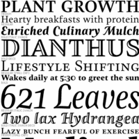 The Golden Globe Awards of type design, nominated by regulars at Stephen Coles' Typographica, a selection from the ground up. I feel these are the true winners---unlike all those awards for which one has to apply, pay a fee and be subject to the scrutiny of a "selection committee". Masterfully brought to you by Stephen Coles---bravo! As Stephen himself notes this year (2005), there are three trends: (1) Gone are the days when large commercial outfits put out the bulk of serious type. Nine of the 14 top selections come from one-man studios. Meanwhile, several of the big boys (ITC, Linotype, Monotype, URW) are absent. (2) Nearly every featured font is available in OpenType, and many exclusively so. (3) Xavier Dupré: the Cambodia-based Frenchman is perhaps todays most productive single source of creative type design, rivaled only by Christian Schwartz. Drumrolls:
 - Lisboa (Ricardo Santos): Hrant Papazian writes: Lisboa harbors the sagacity to merely vie for — and thereby achieve — a simple Iberian warmth, something especially difficult in a sans. In the severely over-crowded field of humanist sans-serifs, Lisboa distinguishes itself through completeness (including expert characters and two numeral styles) and technical sophistication (as in its trapping), but mostly by providing two subtly varied cuts: one that helps exhibit the design's particular character; and another that eschews detail for maximal clarity in small sizes.
- Freight (Joshua Darden). Dyana Weissman: While we move out of the era of the antiseptic sans-serifs, Freight offers refreshing anomalies that warm up the design.[...] This family is insane. Not only because of the 100 styles, but also because of its charming little quirks.
- Ministry Script (Alejandro Paul). Paul Hunt comments: How do you convey sexiness with type? Use a sultry script face. The only thing more typographically titillating might be a set of canoodling ligatures.
- Garamond Premier Pro (Robert Slimbach).
- Deréon (Jean-François Porchez). Chris Rugen writes: When I see Déreon, I see a Whitman and Dalliance mix (two of my favorites) creating something unique. Like Whitman, Deréon gets its body from the Scotch Didone Caledonia.
- Proxima Nova (Mark Simonson). Kyle Hildebrant: It nestles neatly in a place between the geometric, grotesque, and gothic. Its generous x-height, thoughtfully balanced color, and expert typographic features (small caps, text figures, lining figures, etc.) position it as a prime candidate for extended textual setting.
- Zingha (Xavier Dupré, Font Bureau). Norbert Florendo comments: Reviewing Zingha is as delightful as discovering several long lost cases of unreleased ATF hot metal typefaces.
- Vista Sans (Xavier Dupré). Stephen Coles: With its friendly quirks, Vista Sans is a lot like Tarzana — another Emigre font — but succeeds everywhere Tarzana fails. The more distinctive glyphs feel harmonious with the rest of the font, never jarring. Gentle swashes and a large x-height make for a friendly sans that would work just right in so many settings.
- Cézanne Pro (James Grieshaber).
- FF Maiola (Veronika Burian). Dan Reynolds drools: Just when you thought your collection's text categories were set, Veronika Burian burst the stable doors open, reviving the Czech genre and its warm idiosyncrasies. A “warm” typeface? FF Maiola solves this puzzle using discrete play of irregularity and multiple angles, hearkening back to Menhart and Preissig's approaches.
- Maple (Eric Olson). Mark Simonson: Other type designers have mined the 19th century English grotesque, but Eric Olson gives it an energetic crispness which makes earlier attempts seem a bit stuffy. Maple captures the exuberant quirkiness of the grots without slavishly imitating them.
- Garda (Mario Feliciano). William Berkson notes: With great elegance and style—and alternative characters and ligatures—the set offers superb alternatives to Trajan, Optima, and Futura for titling.
- Litteratra (Karsten Lücke). Yippie! Keep it up, Karsten! Joshua Lurie-Terrell: It's a sort of roman amalgam of textura and Schwabacher, channeling the expressionist spirit of Vojtech Preissig. [...] It's an entire historical movement.
- Relato (Eduardo Manso). My compatriot Yves Peters: Emtype Relato combines Dutch purposefulness with Latin sensuality. Its serifs are constructed following a clever principle, and the typefaces look simply gorgeous.
Honorable mentions: FF Absara Sans (Xavier Dupré), Amor (František Storm), Arrival (Keith Tam), Avebury Black and Open (Jim Parkinson), Ayres Royal (Gert Wiescher), Bembo Book (Robin Nicholas), Bluemlein Scripts (Alejandro Paul), Botanika (Tomáš Brousil), Cabazon (Jim Parkinson), Chocolate (Angel Koziupa and Alejandro Paul), Crank8 (Greg Lindy & Henk Elenga), Deutsche Bahn [PDF] (Christian Schwartz and Erik Spiekermann), Dynasty (Rian Hughes), Fedra Sans Display (Peter Bilak), Flama (Mário Feliciano), Galicia (Rian Hughes), Gill Sans Pro (Monotype), Groovin' (Jason Walcott), Handsome Pro (Nick Shinn), Happy Hour (Jason Walcott), Incognito (Gábor Kóthay), Kaffeesatz (Jan Gerner), Kingfisher (Jeremy Tankard), Lapture (Tim Ahrens), Mashine (Tim Ahrens), Mercury Display & Text (Jonathan Hoefler & Tobias Frere-Jones), Miserichordia (Rian Hughes), Modesto Text (Jim Parkinson), Morice (Stephen Banham), Nerva (Dino dos Santos), Nicholas (Nick Shinn), Ogravan (Tomáš Brousil), Paperback (John Downer), Propane (David Buck), Radiogram (Rian Hughes), Rough Riders and Redux (Michael Hagemann), Sculptura (Jason Castle), ITC Stone Humanist Sans (Sumner Stone), Soap (Ray Larabie), Sovereign (Nick Cooke), Tamarillo (Jason Walcott), Tourette (Jonathan Barnbrook), Wanderer (Michael Hagemann). [Google]
[More] ⦿
|
Bigelow&Holmes
[Charles Bigelow]

|
 Bigelow&Holmes was founded by Charles Bigelow and Kris Holmes. Charles Bigelow (b. 1945, Detroit) is a type designer and teacher, who runs his own studio, Bigelow&Holmes. Bigelow was a colleague of Donald Knuth at Stanford University when Knuth developed his Computer Modern typeface family for TeX. In mid-2006, Bigelow accepted the Melbert B. Cary Distinguished Professorship at Rochester Institute of Technology's School of Print Media. Before that, he taught at Stanford University, Rhode Island School of Design, and other institutions. Typefaces designed by Bigelow:
 - The Lucida family (1985). Lucida is used in several scientific publications such as Scientific American. Its origins go back to Computer Modern. I find it more appropriate for screens than paper, but that is just a personal view. The Lucida family contains LucidaConsole (1993), LucidaSansTypewriter (1991), LucidaFax, LucidaCalligraphy, LucidaBright, Lucida Blackletter (1991, a bastarda) and Lucida Handwriting. It has been recently expanded to comply with the Unicode Standard, and includes non-Latin scripts such as Cyrillic, Greek, Arabic and Hebrew. Charles Bigelow created the font families Lucida Math (with Kris Holmes, 1993), Lucida Sans (with Kris Holmes, 1985), Lucida Typewriter Sans (with Kris Holmes, 1985) and Lucida Serif (with Kris Holmes, 1993). The paper by Charles Bigelow and Kris Holmes, The design of a Unicode font (Electronic Publishing, 1993, pp.289-305), explains the design issues such as letter heights, readability studies, and typeface designs for readers versus non-readers of the various scripts.
- Syntax Phonetic.
- Leviathan (1979).
- Apple Chicago (1991), Apple Geneva (1991).
- Microsoft Wingdings (1992).
- For the Go Project, Kris Holmes and Charles Bigelow designed the free typeface families Go Sans and Go Mono in 2016. The font family, called Go (naturally), includes proportional- and fixed-width faces in normal, bold, and italic renderings. The fonts have been tested for technical uses, particularly programming. These fonts are humanist in nature (grotesques being slightly less legible according to recent research) and have an x-height a few percentage points above that of Helvetica or Arial, again to enhance legibility. The name Go refers to the Go Programming Language. CTAN link.
Ascender link. Wikipedia link. FontShop link. Klingspor link. Font Squirrel link. Ascender link. Lucida Fonts is a dedicated commercial site. [Google]
[MyFonts]
[More] ⦿
|
Bormanns Schrifterlass, Lucian Bernhard und der Völkische Beobachter
|
Lutz Schweizer published the text of the decree of January 3, 1941 signed by M. Bormann on behalf of the Nazi party. He declares: "Die sogenannte gotische Schrift als eine deutsche Schrift anzusehen oder zu bezeichnen ist falsch. In Wirklichkeit besteht die sogenannte gotische Schrift aus Schwabacher Judenlettern." [It is wrong to consider the gothic script (Fraktur) as a national German script. It is in fact nothing but Jewish Schwabacher characters.] Lucian Bernhard (1883-1972), one of Germany's main designers, had created Bernhard Fraktur (1913), and this was subsequently used in Der Völkische Beobachter, the central party newspaper and publication. It is ironic, Schweizer notes, that Lucian Bernhard himself was Jewish. On the topic Bormann's decree, Heinrich Heeger wrote Verbot Deutschen Schrift Durch Adolf Hitler in volume 55 (1997) of Die deutsche Schrift. [Google]
[More] ⦿
|
Bryde's Free Medieval Fonts
|
Great archive with many blackletter fonts. Features fonts such as AngloSaxon 8th, Bastarda, CelticFrames (Omega Font Labs), Celtic Gaelige (Susan K. Zalusky), The Middle Ages (dingbats), Monsters of Stone (dingbats), Stonehenge, Theodoric, Windsor, Magic Medieval (Dave Howell's modification of Goudy Medieval), Kelly Ann Gothic (Mike Allard), Judas, Houters Normal. Has Celtic fonts and Heraldic fonts as well. Page by Bryde the Webmistress. Alternate URL. [Google]
[More] ⦿
|
Calligraphy Shop
|
Daniel Quinn's calligraphy shop in Firenze shows nice examples of these hands (names in Italian): Onciale, Maiuscola Insulare, Minuscola Insulare, Carolina, Gotico Antico, Textura Quadrata, Capitali Gotiche, Beneventana, Rotunda, Capitali Rotunda, Bastarda Cancelleresca, Batarde Français, Fraktur Tedesca, Capitali Bastarde, Cadel, Capitali Longobarde, Foundational. [Google]
[More] ⦿
|
Carl Hermann Albert Anklam
|
German type designer, b. 1842, Berlin, d. 1931, Berlin. In 1870, he started working at Genzsch and Heyse in Hamburg as punchcutter and engraver. His Neue Schwabacher of 1876 became a very popular typeface. Anklam created Mönchs-Gotisch (or: Mediaeval-Gotisch) in 1877 (Schnelle says 1881) at Genzsch & Heyse. In 1876, he made Neue Schwabacher (normal and halbfett) at Genzsch & Heyse (and Klinkhardt). That same type can also be found at many other typefoundries, including J. John&Söhne, Shelter&Giesecke, Ludwig & Mayer, Gebr. Klingspor, AG Schriftguss, Barnhart Brothers Spindler, H. Berthold AG, etcetera. Author/editor of Kunstwerke der Schrift Bund für deutsche Sprache und Schrift (Großenkneten 1994). Digital revivals include Schwabacher Mager Gross and Möncgs-Gotisch, both by Gerhard Helzel, and Neue Schwabacher (2021) by Ralph Unger. [Google]
[More] ⦿
|
Carl Kloberg
[Giesserei Carl Kloberg]
|
[More] ⦿
|
CAT Design Wolgast
[Peter Wiegel]
|
 Wolgast-based type designer Peter Wiegel (b. 1955) runs CAT Design Wolgast. Designer of these free fonts:
 - In 2019: Kufi Pattern.
- In 2018: Aurach Tri (a trilined typeface), Googee (monoline circle-themed sans), Gianna (medieval script), Hamburger Schwabacher.
- In 2017: Eyechart (heavy slab serif), Border Control (inline), Espresso Dolce (rounded sans), Gotisch Weiss, Halt (a dry brush typeface after Walter Hoehnisch's Stop from 1939), Kanzler, Llewie (rounded sans), Schulze Werbekraft (expressionist, after Arthur Schulze, 1926).
- In 2016: Ronaldson Gothic (after a MacKellar, Smiths & Jordan Co original), Vorgang (a great 1920s geometric sans), 5by7 (LED pixel font), BP 12-22 (industrial sans), u DIN 1451 Mittelschrift, Flubby, Gaeilge (Irish / uncial), Junior CAT (after Hans Heimbeck, 1936), CAT Liebing Gotisch (after Kurt Liebing), Tippa (an old typewriter font based on Adler Tippa 1).
- In 2015: Nuernberg (blackletter), CAT Schmalfette Thannhaeuser (blackletter), Offenbacher Reform (a revival of Offenbacher Reform, a blackletter typeface by Roos & Junge), Autobahn (blackletter), Barloesius Schrift (after Georg Barloesius's Barlösius Schrift, 1906), CAT-Franken-Deutsch (after Alfons Schneider, 1936), Fuckin Gwenhwyfar, CAT Kurier (a script after Herbert Thanhaeuser's Kurier from 1939), CAT Linz, CAT Rhythmus (a sharp-edged black grotesk after a Schriftguss AG original), DIN Schablonierschrift (DIN-based stencil), CAT North Licht, Feronia, Fette National Fraktur (after Walter Hoehnisch, 1934), Grobe-Plakat-Fraktur, CAT Childs (fifties style cursive typeface), Jena Gotisch (decorative caps), Kabinett Fraktur (after Johann Friedrich Unger, 1793-1794), Wattauchimma (heavy hipster sans), Friedolin (blackletter), Lorem Ipsum, Symphonie (a calligraphic script, reviving Imre Reiner's Symphonie (1938), also called Stradivarius (1945)), Power (a retro techno typeface), Krugmann Brush, Omega.
- In 2014: BernerBasisschrift1, BernerBasisschrift2 (school script), Berolina, Brausepulver (after Brause & Co., 1912), Fette Mikado (psychedelic style oriental look), Germanica, Gloria, HentimpsCirclet (blackletter), Hofstaetten (blackletter), Kleinsemmering, KuenstlerGotisch (blackletter), LacledeCAT (psychedelic), NeptunCAT, Neue Zier Schrift (a mischievous curly script), Pommern Gotisch, Reclame, CAT Report (retro brush script), Rueck-Italic, Rueck, RueckLeft, RueckLicht, RundschriftCAT (hairline ronde), Standard Graf (German expressionist and hexagonal typeface), Teutonic, VerzierteFavorite, VictoriaCAT, AdmiralCAT (a retro script), Dynamo (poster font), Des Malers Fraktur, Kanzleyrath (blackletter), Ober-Tuerkheim (art nouveau), PopplFrakturCAT (blackletter), Rundkursiv, Modeschrift (fifties script), Biedermeier Kursiv, Ehmcke Federfraktur (after a 1935 font by F.H. Ehmcke), Wernicke Schwabacher (after an original by Emmi Wernicke), Gotische Missalschrift, Hand Textur (after a 1935 font by F.H. Ehmcke), Renata (after a 1914 bastarda by Bauersche Giesserei), Rundgotisch Rauh (possibly after a Schelter & Giesecke design from 1903), Offenbacher Schwabacher (after Kurt Wanschura's bastarda from 1900), Incopins Clusters (multilined typeface), BadGong, Bernardo Moda (Bold, Semibold, Moda, Contrast: modeled after Lucian Bernhard's Bernhard fashion), CAT-Hohenzollern (after a 1902 art nouveau font by Bauersche), CATNorth, CATNorthLicht, CATNorthShadow, CAT Zentenaer Fraktur UNZ1 (a blackletter after a 1937 original by F.H.E. Schneidler), Coggers-Tariqa, EirikRaude, Fabrik (a geometric sans), Grobe Deutschmeister (German expressionist face), Harry Piel (or Piehl--a tattoo font), Kanalisirung, Klaber-Fraktur, Peter Obscure, Rumburak (a fat retro script), Flottflott (retro script), Indira K, Regent UNZ (a Schwabacher), Postamt, TGL 0-1451 Engschrift (a DIN-like font).
- In 2013: Spartakus (+Round), Cut Me Out (white on black sans), 5by9 (dot matrix face), Tartlers End (high-contrast ball terminal face), Alpha 54 (rounded flared script face), Chunk Five Ex (slab serif; he writes: With permission of Meredith Mandel, the original author of the ASCII-Font Chunk Five, I have extended Chunk Five Ex to a full featured unicode font with all figures used in Latin and Cyrillic writing), Simple Print (simple sans), Fette Bauersche Antiqua (a didone fat face), Manuskript Gothisch (after Manuskript Gotisch (1899, Bauersche), which was modeled after Wolfgang Hopyl's 1514 Textura), Quast (hairy font).
- Still in 2013, he published a number of school scripts, including Neue Rudelskopf, Deutsche Normalschrift, Imrans School, Rastenburg (German school font), and Bienchen.
- In 2012: Hardman (connected fifties script), Immermann (a quaint slab serif), Quast (grunge), Fundamental Brigade (sans family), DiffiKult (a bilined face), Men Nefer (a Memphis lookalike), Fette Unz Fraktur (like Fette Fraktur), Mutter Krause (for the reconstruction of the 1929 silent movie "Mutter Krausens Fahrt ins Glück", where it is used for intertitles, that where missing. The font is redrawn from the original intertitles), Youbilee (a font with laurels).
- In 2010: Alfabilder (dingbats), Gondrin (athletic lettering with a 3d effect), Helvetia Verbundene (making Helvetica into a school script? The original typeface was by Carl Albert Fahrenwaldt 1901), Proletarsk (a grotesk face), Vis-à-vis (great idea--a double-storied serif face), ApolloASM (Victorian), BertholdrMainzerFraktur, Doergon-Regular (license plate font), DoergonBackshift, DoergonShift, Eureka (Victorian, ornamental face), GoeschenFraktur (1880-style Fraktur used in Sammlung Göschen books), Makushka, MakushkaKontura, MakushkaQuadriga, MakushkaSecunda, Moderne3DSchwabacher, ModerneGekippteSchwabacher, StrassburgFraktur, TGL0-16 (same as DIN 16), TGL0-17 (same as DIN 17), TGL0-17Alt, Tank (emblems of gas companies), EricaType-Bold, EricaType-BoldItalic, EricaType-Italic, EricaType-Regular (typewriter), ErikaOrmig, Fibel Vienna (2012, a high-legged sans), GreifswalderTengwar-Regular, GreifswalerDeutscheSchrift (German Schreibschrift), Midroba-Regular (a strong mechanical octagonal face), MidrobaSchatten, MMX2010 (futuristic), Präsent60, Rotunda Pommerania (blackletter), TengwarOptime, TengwarOptimeDiagon, cbe-Bold, cbe-BoldItalic, cbe-Italic, cbe.
- In 2009: 18thCenturyInitials, 18thCenturyKurrent-Regular, 18thCenturyKurrentAlternates, German writing from the 18th century), CentreClaws, CentreClawsBeam1, CentreClawsSlant, Cöntgen Kanzley Regular (blackletter), Cöntgen Kanzley Aufrecht (2009), ElficCaslin, H1N1, Loxembourg1910Shadow (an art nouveau-influenced stencil face), Luxembourg1910, Tschichold, VarietScala (an art deco sans family), Varietee, VarieteeArtist, VarieteeCabaret, VarieteeCascadeur, VarieteeCasino, VarieteeCirque, VarieteeColege, VarieteeConferencier, VarieteeFolies, VarieteeIkarier, VarieteeJongleur, VarieteeMirage, VarieteeRevue, VarieteeTheatre, KochFetteDeutscheSchrift (blackletter), MoradoFelt-Regular (upright connected script), MoradoMarker (2009), MoradoNib, PreussischeVI9 (DIN-like family), PreussischeVI9Linie, PreussischeVI9Schatten-Linie, PreussischeVI9Schatten, SchatternvonPreussischeVI9, Stage (art deco), Ring Matrix (dot matrix), Nathan, Amptmann Script (2009, upright connected script), Cat Shop, Blankenburg (blackletter), Murrx (arched face), Schwaben Alt (1988, bastarda), Vrango, 14LED (Regular, Phattt-Heavy, Rised-Black), 24LED (+Bright, +Grid, +Modul), DIN1451fetteBreitschrift1936-Regular, FibelNord (basic sans family with an architectural twist), FibelSued (family), PaneuropaBankette, PaneuropaCrashbarrier-Black, PaneuropaFreeway, PaneuropaHighway, PaneuropaRoad, PaneuropaStreet, PaneuropaWrongWay, Quirkus (family), RingMatrix (dot matrix family), RingMatrix3D, RingMatrixTwo, DiscipuliBritannica (connected script), GruenewaldVA-Regular (connected school script), Rudelskopfdeutsch-Aufrecht, WiegelLatein (connected school script), WiegelLateinMedium (2009), Morado, Moebius Bicolor (art deco), Elbaris (sans), ElbarisOutline, Nomitais (multiline face), RostockKaligraph, Waschkueche, WaschkuecheGrob-Ultra, WiegelKurrent (traditional German school script), WiegelKurrentMedium, XAyax, XAyaxOutline (2009), Kaufhalle (squarish), Quimbie (art deco), CasaSans-Regular, Elb-Tunnel, MeyneTextur (blackletter), Yiggivoo, TGL 31034-1 (futuristic sans), Beroga (a simple organic sans).
- Before 2009: Xayax, PreussischeIV44Ausgabe3 (2006, a severe sans), Utusi Star (1989, very condensed all-caps face), Avocado (2006, script face), CbeNormal (2006, script face), Leipzig Fraktur (+Bold) (2006), Berlin Email (2006, a condensed sans family, followed in 2009 by Berlin Email Serif), MaassslicerItalic (2006, a futuristic typeface made for Rudolf Maass + Partner GmbH), Powerweld (a gorgeous avant-garde typeface made for OPTI Pumpen und Technik GmbH), WolgastScript (2005), WolgastTwo (2006, connected script), WolgastTwoBold, ZeichenDreihundert-Regular, ZeichenHundert-Regular, ZeichenVierhundert-Regular, ZeichenZweihundert-Regular (2006, traffic dingbats), Djerba simplified (Arabic font, Computer and Technologie, Hamburg, 1995; it can be downloaded here), Titus FrakturBaltic (1998), TITUS FrakturEast Normal (1998), and TITUS FrakturWest Normal (1998) [which used to be downloadable here; these fonts were retired and the Titus name dropped; most of the glyphs made it to Schwaben Alt].
Dafont link. One more URL. Fontspace link. Yet another URL. Font Squirrel link. Fontsy link. The list of his truetype and opentype typefaces as of 2011: 18thCenturyInitials, 18thCenturyKurrentStart, 18thCenturyKurrentText, Alfabilder, AlteDIN1451Mittelschrift, AlteDIN1451Mittelschriftgepraegt, AmptmannScript, ApolloASM, Avocado, Barnroof, BerlinEmail, BerlinEmail2, BerlinEmailBold, BerlinEmailBold, BerlinEmailHeavy, BerlinEmailHeavy, BerlinEmailOutline, BerlinEmailOutline, BerlinEmailSchaddow, BerlinEmailSchaddow, BerlinEmailSemibold-Bold, BerlinEmailSemibold-Bold, BerlinEmailSerif, BerlinEmailSerif, BerlinEmailSerifSemibold, BerlinEmailSerifSemibold, BerlinEmailSerifShadow, BerlinEmailWideSemibold, BerlinEmailWideSemibold, Beroga, Beroga, BerogaFettig-Bold, BerogaFettig-Bold, BertholdMainzerFrakturUNZ1A-Italic, BertholdMainzerFrakturUNZ1A, BertholdrMainzerFraktur, Blankenburg-Regular, BlankenburgUNZ1A-Italic, BlankenburgUNZ1A, CasaSans-Regular, CasaSans, CasaSansFettig-Bold, CatShop, CentreClaws, CentreClawsBeam1, CentreClawsSlant, ChunkFiveEx, CntgenKanzley-Regular, CntgenKanzleyAufrecht, DIN1451fetteBreitschrift1936-Regular, DiscipuliBritannica, DiscipuliBritannicaBold, Doergon-Regular, DoergonBackshift, DoergonShift, DoergonWave-Regular, Elb-Tunnel, Elb-TunnelSchatten, Elbaris, ElbarisOutline, ElficCaslin, EricaType-Bold, EricaType-BoldItalic, EricaType-Italic, EricaType-Regular, ErikaOrmig, Eureka, FibelNord-Bold, FibelNord-BoldItalic, FibelNord-Italic, FibelNord, FibelNordKontur, FibelSued-Bold, FibelSued-BoldItalic, FibelSued-Italic, FibelSued, FibelSuedKontur, GoeschenFraktur, GoeschenFrakturUNZ1A-Italic, GoeschenFrakturUNZ1A, Gondrin, GreifswalderTengwar-Regular, GreifswalerDeutscheSchrift, GruenewaldVA-Regular, GruenewaldVA1.Klasse, GruenewaldVA3.Klasse, H1N1, HelvetiaVerbundene, KochFetteDeutscheSchrift, KochFetteDeutscheSchriftUNZ1A-Italic, KochFetteDeutscheSchriftUNZ1A, LeipzigFrakturBold, LeipzigFrakturHeavy-ExtraBold, LeipzigFrakturLF-Bold, LeipzigFrakturLF-Normal, LeipzigFrakturNormal, LeipzigFrakturUNZ1A-Bold, LeipzigFrakturUNZ1A-BoldItalic, LeipzigFrakturUNZ1A-Italic, LeipzigFrakturUNZ1A, Luxembourg1910, Luxembourg1910Contur, Luxembourg1910Ombre, MMX2010-Regular, Maassslicer3D, Maassslicer3D, MaassslicerItalic, MaassslicerItalic, Makushka, MakushkaKontura, MakushkaQuadriga, MakushkaSecunda, MeyneTextur, MeyneTexturUNZ1A-Italic, MeyneTexturUNZ1A, Midroba-Regular, MidrobaSchatten, Moderne3DSchwabacher, ModerneFetteSchwabacher, ModerneFetteSchwabacherUNZ1A-Italic, ModerneFetteSchwabacherUNZ1A, ModerneGekippteSchwabacher, MoradoFelt-Regular, MoradoMarker, MoradoNib, MoradoSharp-Regular, Murrx, Nathan-CondensedRegular, Nathan-ExpandedRegular, Nathan-Semi-expandedRegular, Nathan, NathanAlternates-CondensedRegular, NathanAlternates-ExpandedRegular, NathanAlternates-Semi-expandedRegular, NathanAlternates, Nomitais, Nomitais, Numikki, Numukki-Italic, Numukki-Italic, Numukki, Powerweld, PreussischeIV44Ausgabe3, PreussischeIV44Ausgabe3, PreussischeVI9, PreussischeVI9Linie, PreussischeVI9Schatten-Linie, PreussischeVI9Schatten, Proletarsk, Prsent60, Quimbie, Quimbie3D, QuimbieShaddow, QuimbieUH, Quirkus-Bold, Quirkus-BoldItalic, Quirkus-Italic, Quirkus, QuirkusOut, QuirkusUpsideDown, RostockKaligraph, RotundaPommerania, RotundaPommeraniaUNZ1A-Italic, RotundaPommeraniaUNZ1A, Rudelskopfdeutsch-Aufrecht, SchatternvonPreussischeVI9, Schulfibel-Nord-Linie-2, SchwabenAlt-Bold, SchwabenAltUNZ1A-Italic, SchwabenAltUNZ1A, Stage, StrassburgFraktur-Regular, TGL0-16, TGL0-17, TGL0-17Alt, TGL31034-1, TGL31034-1, TGL31034-2, TGL31034-2, Tank, TengwarOptime, TengwarOptimeDiagon, TitilliumMaps29L-1wt, TitilliumMaps29L-400wt, TitilliumMaps29L-800wt, TitilliumMaps29L-999wt, TitilliumText22L-1wt, TitilliumText22L-250wt, TitilliumText22L-400wt, TitilliumText22L-600wt, TitilliumText22L-800wt, TitilliumText22L-999wt, TitilliumTitle20, UtusiStar-Bold, UtusiStar, VarietScala, Varietee, VarieteeArtist, VarieteeCabaret, VarieteeCascadeur, VarieteeCasino, VarieteeCirque, VarieteeColege, VarieteeConferencier, VarieteeFolies, VarieteeIkarier, VarieteeJongleur, VarieteeMirage, VarieteeRevue, VarieteeTheatre, Via-A-Vis, Vrng, Waschkueche, Waschkueche, WaschkuecheGrob-Ultra, WaschkuecheGrob-Ultra, WiegelKurrent, WiegelKurrent, WiegelKurrentMedium, WiegelKurrentMedium, WiegelLatein, WiegelLateinMedium, WolgastScript, WolgastScript, WolgastTwo, WolgastTwo, WolgastTwoBold, WolgastTwoBold, XAyax, XAyax, XAyaxOutline, XAyaxOutline, YiggivooUnicode-Italic, YiggivooUnicode-Italic, YiggivooUnicode, YiggivooUnicode, YiggivooUnicode3D-Italic, YiggivooUnicode3D-Italic, YiggivooUnicode3D, YiggivooUnicode3D, ZeichenDreihundert-Regular, ZeichenDreihundertAlt, ZeichenHundert-Regular, ZeichenHundertAlt, ZeichenVierhundert-Regular, ZeichenZweihundert-Regular, ZeichenZweihundertAlt, cbe-Bold, cbe-BoldItalic, cbe-Italic, cbe, kaufhalle, kaufhalle, kaufhalleblech, kaufhalleblech, moebius. His type 1 fonts as of 2011: Avocado, BerlinEmail, BerlinEmail2, BerlinEmailBold, BerlinEmailHeavy, BerlinEmailOutline, BerlinEmailSchaddow, BerlinEmailSemibold-Bold, BerlinEmailSerif, BerlinEmailSerifSemibold, BerlinEmailSerifShadow, BerlinEmailWideSemibold, Beroga, BerogaFettig-Bold, CasaSans, Elb-Tunnel, Elb-TunnelSchatten, Maassslicer3D, MaassslicerItalic, Numukki-Italic, Numukki, Powerweld, PreussischeIV44Ausgabe3, Quimbie, QuimbieUH, RostockKaligraph, TGL31034-1, TGL31034-2, UtusiStar-Bold, UtusiStar, Waschkueche, WaschkuecheGrob-Ultra, WolgastScript, WolgastTwo, WolgastTwoBold, YiggivooUnicode-Italic, YiggivooUnicode, YiggivooUnicode3D-Italic, YiggivooUnicode3D, cbe-Bold, cbe-BoldItalic, cbe-Italic, cbe, kaufhalle, kaufhalleblech. A list of typefaces in alphabetical order, with descriptive comments provided by Reynir Heidberg Stefansson from Iceland: 18th Century Kurrent (Kurrent-style handwriting, Wiegel-coded), Alfabilder (Alphabetic picture font for the German alphabet), Amptmann Script (Partly-connected, upright writing, used on Prussian Railways pattern drawings), ApolloASM (Jugendstil, vaguely resembling an ornate Bocklin), Avocado (Handwriting, broad-nib pen-style), Berlin Email (Narrow sans-serif, based on emailled signage; Wiegel-coded), Berlin Email Serif (Narrow serif, based on emailled signage; Wiegel-coded), Beroga (All-minuscule, rounded marker-style sans-serif with ca. 8° slope), Berthold Mainzer Fraktur (Fraktur in Wiegel (Regular only) and UNZ1(A) coding), Blankenburg (Semicondensed Tannenberg in Wiegel (Regular only) and UNZ1(A) coding), Casa Sans (Squarish, broad-nib pen-style block writing), CatShop (Serif, soft of an acid-washed didone), cbe Normal (Sans-serif, narrow, somewhat cuneiform), Centre Claws (Sans-serif, Art Deco display, a bit like Broadway), Cöntgen Kanzlei (Cöntgen Kanzley) (Fraktur-based calligraphy by Heinrich Hugo Cöntgen, Wiegel coding), DiffiKult (Sans-serif, display, no horizontal lines), DIN 1451 fette Breitschrift 1936 (The now-withdrawn Wide version of DIN 1451 traffic font), Discipuli Britannica (UK school handwriting), Doergon (Slab-serif, narrow-ish, all majuscule), CAT Eckmann, Elabris (Elbaris) (Sans-serif, caps/smallcaps, shades of DIN1451 Engschrift), Elb-Tunnel (Sans-serif, based on signage in the old Elbe tunnel in Hamburg), Elbic Caslon (Elfic Caslon, Elfic Caslin) (a Caslon for the Queen Galadriel), Erika Type (Erica Type) (Slab-serif, typewriter, comes from Wiegel's old Erika typewriter), Eureka (Serif, caps/smallcaps, Art Deco/Jugendstil), Fibel Nord (2009, sans-serif, based on German school primer), Fibel Sued (2009, sans-serif, based on German school primer), Fibel Vienna (Sans-serif, based on Austrian school primer), Fundamental Brigade (Sans-serif, geometric, some UNZ1 ligatures), Göschen Fraktur (Goeschen Fraktur) (Fraktur with a biblical feel, Wiegel (Rg only) and UNZ1 coding), Gondrini (Gondrin) (Sans-serif, geometric, display, shaded outlines, cookie-cutter), Greifswalder Deutsche Schrift (Handwriting, based on Rudolf Koch's Offenbacher Kurrent, Wiegel coding), Greifswalder Tengwar (Tengwar handwriting in Offenbach style), Gruenewald VA (Latin-style schoolhand, Wiegel coding), H1N1 (Heavy display typeface made of parallel wavetrains), Hardman (Heavy, wide, squarish logotype with connecting letters), Helvetia Verbundene (Swiss handwriting), Immermann (Display, resembles a seriffed Radio/Rundfunk, UNZ1 coding), Kaufhalle (Display, recreation of HO Kaufhalle logotype), Koch Fette Deutsche Schrift (Very plain fraktur, Wiegel (Rg only) and UNZ1 coding), Leipzig Fraktur (Fraktur for bread text, Wiegel coding), Leipzig Fraktur UNZ1A (Fraktur for bread text), Luxembourg 1910 (Sans-serif, Jugendstil display typeface from old spice drawers), Maass Slicer (Maassslicer) (Sans-serif, oblique display face, orig. logotype), Makushka (Sort-of an Elabris with minuscules, looks overlayable), Men Nefer (Slab-serif, geometric, UNZ1 coding), Midroba (Spur-serif, display, all-majuscule, heavy, octal), MMX2010 (Sans-serif, display, caps/smallcaps, TV game machine feel), Moderne Schwabacher (Heavily reworked, Wiegel coding), Moderne Fette Schwabacher UNZ1A (Heavily reworked, Wiegel coding), Möbius (moebius) (Sans-serif, display, bicolour (u/c = non-spacing fills, l/c = spacing outlines)), Morado (Connected handwriting with nib or marker pen), Murrx (Heavy display typeface made from ellipsoids on NE-SW axis), Mutter Krause (Serif, slanting, Jugendstil-feel), CAT Neuzeit and CAT Neuzeit Schatten (2012-2014), Nathan (Slab-serif, hand-drawn.), Nomatais (Nomitais) (Elabris with multiple levels of outlines), Numukki (Conlang, knotted-line, good for separators and scenebreaks), Powerweld (Sans-serif, Bauhaus style, all-minuscule), Präsent 60 (PI font with various East German logos), Preussische IV 44 (PreussischeIV44Ausgabe3) (Repro of Prussian Railways pattern type IV 44 version 3), Preussische VI 9 (Repro of Prussian Railways pattern type VI 9 version 2), Proletarsk (Sans-serif, monoline, doubled-up questionmark), Quast (Brush type, all-majuscule, very rough outline), Quimbie (Sans-serif, all-majuscule, resembles Amelia), Quirkus (Sans-serif), Ring Matrix (LED matrix with ring LEDs, solid LEDs and ring LEDs with shadow), Rostock Kaligraph (Very round calligraphy, resembles rotunda), Rotunda Pommerania (Rotunda style, Wiegel-code (Regular only) or UNZ1-coded), Rudelskopf deutsch (Sans-serif, based on Kurrent-style letterforms), Schwaben Alt (Schwabacher in Wiegel- (Rg only) or UNZ1-coding.), Stage (Sans-serif, narrow, Art Deco, fleeting taste of Broadway), Strassburg Fraktur (Handwritten fraktur, ornate majuscules, Wiegel-coding), Tank (PI font with (gas/petrol) tank station logos), TengwarOptime (Optima for Tengwar), TGL 0-16/0-17 (East German versions of DIN 16 and DIN 17 blueprint types), TGL 31034-1, TGL 31034-2 (East German versions of DIN 6776 / DIN EN ISO 3098 blueprint types), Utusi Star (Sans-serif, slight resemblance with Rundfunk), Varieté (Sans-serif, all-majuscule or caps/smallcaps), Vis-A-Vis (Serif, all-majuscule, split in middle), Volk Redis (Kurrent handwriting, anno 1930-1941), Vrångö (LED matrix type like Ring Matrix), Waschküche (Serif, resembles Antykwa Torunska), Wiegel Kurrent (Kurrent-style handwriting), Wiegel Latein (Latin-style handwriting), Wolgast Script (Sloppy-looking handwriting with a broad-nib pen), Wolgast Two (Latin/Cyrillic handwriting), XAyax (Serif, Jugendstil, narrow, all-majuscule), Yiggivoo Unicode (Sans-serif, wide, tall x, board game packaging feel), Youbilee (PI font with various jubilee laurels), Verkehrszeichen (Zeichen) (PI fonts with traffic signs (in layers)), Verkehrszeichen alt (Zeichen Alt) (PI fonts with old traffic signs (in layers)). Abstract Fonts link. Dafont link. Kernest link. Klingspor link. CAT Fonts link. Fontesk link. [Google]
[More] ⦿
|
C.F. Rühl
|
 Leipzig-based foundry. It produced typefaces such as Neuwerk-Type (1908, Georg Schiller's blackletter), Breitkopf-Fraktur (original by JGI Breitkopf, ca. 1760, redone in 1912), Alte Schwabacher, Diadem (1912, a blackletter by Georg Schiller), Neudeutsch, and Elementar-Deutsch (1911, a blackletter by Georg Schiller).
 C.F. Rühl is perhaps best known in the Hebrew community for its Frank Rühl typeface for Hebrew. The original Frank Rühl was designed in 1908 by Rafael Frank in collaboration with Auto Rühl of the C. F. Rühl foundry. A final version was released in 1910. Many Israeli books, newspapers and magazines use Frank Rühl as their main body text typeface in the 20th century. Many digital versions of this font exist. In 2016, Yanek Iontef designed the free Google Font Frank Ruhl Libre for Latin in Hebrew. Iontef's extension and modernization has five styles. [Google]
[More] ⦿
|
Charles Beaudoire
|
 Nineteenth century typefounder based in Paris. Examples of their work include Batardes and Lettres Angulaires.
 Specimen books include Beaudoire & Cie., fonderie générale de caractères français et étrangers (18xx, by Théophile Beaudoire). In 2012, Parisian graphic designers Thomas Bizzarri and Alain Rodriguez co-designed Thermidor, a revival based on the work of Baudoire---it was a custom design for the Feu Sacré books. [Google]
[More] ⦿
|
Charles Bigelow
[Bigelow&Holmes]

|
 [MyFonts]
[More] ⦿
|
Christian Zinck
|
German punchcutter who ran the Christian Zinck foundry in Wittenberg. Most of his work was done in the early part of the 18th century, when he supplied matrices to the Leipzig-based foundry B.C. Breitkopf. Zinck was born in Leipzig in 1698, and moved ca. 1720 to Wittenberg. Examples taken from the Norstedt foundry in Stockholm which had acquired some of the matrices: Colonel Fractur No22 and Nonpareil Fractur No23, Grobe Mittel No1, Grobe Mittel No2, Kleine Mittel Schrift No1, Petit Gammal Schwabach, Tertia Antiqua, Tertia Antiqua. Christian Zinck had a son, Johann Ludwig Zinck, b. 1728, Wittenberg. He moves in 1752 to Berlkin, where he was in charge of Fredrik II's type foundry and died in 1770. Christian Gottlob Zinck started a type foundry in 1764 in Augsburg, where he died in 1778. [Google]
[More] ⦿
|
Christine Hartmann
|
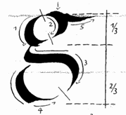 Author (b. 1938) of Kalligraphie. Die Kunst des schönen Schreibens (1986-1989, with Christian Scheffler). In that book, she drew several alphabets, including an Antiqua Versalien, a Fraktur, a Humanistische Kursiv, a Schwabacher, and a Schwung Kursiv. She studied with Karlgeorg Hoefer at the Offenbacher Kunsthochschule. [Google]
[More] ⦿
|
Classic Font Company
[Anthony Nash]

|
 The Classic Font Company is a small foundry with absolutely gorgeous commercial fonts (often revivals of pen drawings) by Tony Nash (b. Bristol, 1944): Abby (blackletter family), Amadeus (1997), Batard, Bede, Byro, Carol (1997, blackletter family), Classic (2000-2002), Copper, Doodles (2000), El Cid (2000), Frameworks, Karen, Kells (celtic uncial), Prima, Priory (1997), Savoy (1997, a great bastarda font family accompanied by Savoy Frames), Scriptoria, Theodore (1995, blackletter font), Tuscany (Lombardic face), Versals (2000, Lombardic capitals). Plus 13 sets of fantastic caps (but not in font format) by Andy Jeffery. Based in North Somerset, UK.
 Not to be confused with the rip-off outfit "Classic Font Corporation, USA". Linotype link. Identifont lists these typefaces: Abby, Abby Hilite, Abby Lowlite, Abby Open, Abby Split, Amadeus, Carol, Classic, Copper, Doodles (CFC), El-Cid, FW-Leaves, Kells, Priory, Savoy, Theodore, Theodore Fancy, Tuscany (CFC), Versals. View Classic Font Company's typeface library. Klingspor link. [Google]
[MyFonts]
[More] ⦿
|
Claude Médiavilla

|
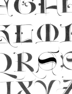 French type designer (b. 1948) who was born in the South of France. He studied typography, calligraphy and painting at the School of Fine Arts in Toulouse. He received the Prix Charles Peignot in 1982. In 1992, the President of France invited him to design the inscriptions for the royal tombs in the Basilique Saint Denis in Paris. He published Calligraphie (Imprimerie Nationale, 1993). Author of Calligraphy (Wommelgem, Belgium, 1996) and Histoire de la calligraphie française (Albin Michel, 2006; examples here). In 2009, with the help of Atelier des Signes, he created a typeface for the signage at Chateau de Fontainebleau. Additional URL. In 2010, Mediavilla cofounded Media type Foundry with Sonia Da Rocha and Joel Vilas Boas in Paris.
 His typefaces: - Galba: an elegant roman titling face, done at Mecanorma in 1987.
- Media Script (Mecanorma, 1985).
- Mediavilla (CCT, 1976).
- Mediavilla Script (Graphitel, 1986).
- Palazzo (Mecanorma, 1984).
- Tory (1991).
Examples of calligraphic alphabets drawn by him and shown in his Histoire de la calligraphie française (2006): Bastarda, Cancellaresca, Carolingian, Cursive gothic 1410, Luxeuil, Roman Capitals, Roman cursive 1st century, Roman cursive 4th century, Rustica 1st century, Textura 14th century, Textura 15th century, , Tourneure 15th century, Uncial 4th century. Klingspor link. [Google]
[MyFonts]
[More] ⦿
|
Communitas Monacensis
|
Free Fraktur fonts: MA-Bastarda1, MA-BastardAnglicana, MA-FereTextura, MA-GKursiv1, MA-Gotbuch, MA-InsularMinuscule, MA-Minuskel1, MA-Urkunde, all published by Will Software. [Google]
[More] ⦿
|
Cornel Windlin
[Lineto]

|
[MyFonts]
[More] ⦿
|
Cornelis Henricszoon Lettersnijder
|
Son of Henric Pieterszoon Lettersnijder, b. Delft. Dutch letter cutter ("lettersnijder"). He cut a Netherlandisch Bastarda, which he used from 1524 onwards, and a big double pica Textura to continue with the type family popularized by his father. Vervliet in his 1968 book ranks Cornelis a "cut" below his father. [Google]
[More] ⦿
|
CybaPeeCreations (or: Typoasis)
[Petra Heidorn]
|
 CybaPee is the nom de plume of Petra Heidorn who lives near Hamburg. She has created many typefaces (listed below) between 1997 and 2005 and has cooperated with several type designers on interesting projects. She is undoubtedly best known for her successful web site Typoasis (discontinued in 2016), where one could download her own creations, and those of her many friends. Petra was also heavily involved in several attempts to revive blackletter fonts, in cooperation with Manfred Klein, Dieter Steffmann, Paul Lloyd and others. She organized several revivals of the typefaces of Rudolf Koch and Ernst Schneidler. She also managed the extensive web presence of Manfred Klein.
 In 2016, she allowed me to host her fonts on my site. Download page. Download all her fonts in one zip file. Her typefaces: - AlphanatismConHeads (2001). Stamped style.
- ArabDancesMediumItalic (2002). An Arabic simulation typeface done with Manfred Klain's assistance.
- Azimech (1999).
- Bauernschrift (2004). After a 1911 typeface from Bauersche Giesserei.
- Bayreuth (2003). A nice scan-version of Bayreuth Fraktur by Ernst Schneidler for C.E. Weber in 1932.
- Bibelschrift (2004). Codesigned with Manfred Klein, Bibelschrift revives a Fraktur from 1926-1928 used by the Bremer Presse, est. 1911. The Bremer Presse was bombed by the Americans in 1944.
- BirthdayGreetz (1999).
- Brahms Gotisch (2005). A blackletter typeface co-designed with Manfred Klein. It is a revival of a 1937 Genzsch&Heyse typeface designed by Heinz Beck.
- Burte Fraktur (2003). After Christian Heinrich Kleukens for the Mainzer Presse, 1928.
- CalliBrush (1999).
- Camouflage (1999). Textured.
- Chaos-Theorie (2000). A Halloween or vampire font.
- Charon (1999). An angry and / or scary typeface.
- Crystopian.
- CursedKuerbis (1999).
- Cyclin (2000). An ironwork font.
- DecoCaps (1999). Ornamental caps.
- DeutscheDruckschrift (2004). A revival of Heinz König's 1888 blackletter typeface for Genzsch&Heyse.
- DeutscherSchmuck (2004). Codesigned with Manfred Klein, this ornamental dingbat font is a revival and extension of the Schmuck für Deutsche Druckschrift by Eduard Ege, Genzsch and Heyse, 1922.
- DiamondDreams (1999). A pearly all caps typeface.
- Ellipsoideogram (2000). An italic headline sans.
- Epitough (1999). A sans.
- Extemplary (1999).
- Funtastique (1999). An exagerrated, almost bubbkly, art nouveau typeface.
- Gondoliere (2000). A light-hearted poster typeface.
- Gotika (2005). After Reiner's 1933 blackletter typeface for Bauer.
- Greex (1999). A Greek emulation typeface.
- Hans Sachs Gotisch (2005). Based on a typeface by that name of Albert Auspurg, 1911, Genzsch&Heyse.
- Hartwig-Schrift (2005). A blackletter typeface that revives Hartwig Poppelbaum's Hartwig Schrift from 1927-1928.
- Hasenchartbreaker (1999). A handcrafted typeface.
- Heimat (2005). After Wilhelm Weimar's Heimat from 1917, Genzsch&Heyse.
- HelvAssim (1999). A naughty take on Helvetica to needle Linotype.
- Hohenzollern (2004). Based on Carl Albert Fahrenwaldt's blackletter typeface for Bauersche Giesserei, 1902.
- HollandGotisch (2005). Designed together with with Manfred Klein, this is a revival of the textura typeface Nederduits (aka Fleischmann Gotisch) by Johann Michael Fleischmann, ca. 1750.
- InkyDinky (1999).
- IsleOfTheDead (1999). An angular handcrafted typeface reminiscent of the movie titling of Dr. Caligari.
- Jaecker-Schrift (2005). Revival of the 1912 blackletter typeface by Wilhelm Jaecker for D. Stempel.
- Kleukens-Fraktur (2004). A Schwabacher based on a design by Friedrich Wilhelm Kleukens, 1910.
- KrasniFellows (1999). An old Slavonic emulation typeface.
- KuehneRevised (2003). A blackletter typeface.
- LadyIce-Italic, LadyIce-SmallCaps, LadyIce, LadyIceRevisited, LadyIceRevisitedUpper. An organic monoline sans typeface family developed together with Apostrophe.
- Leibniz-Fraktur (2003). A Schwabacher typeface based on a house font at Genzsch & Heyse, 1912.
- LeontineLoew. A warm and plump informal typeface.
- LightBats (1999). Dingbats.
- Lupinus (1999).
- Lurzing-Initials (1997). A decorative caps typeface based on a 1908 typeface by Karl Lürzing that depicts naked figures.
- Manuskript Gotisch (2004). A revival of a 1514 Textura typeface by Wolfgang Hopyl, which was a house typeface at the Bauersche Giesserei in 1899.
- ModerneSchwabacher (2005). After a ca. 1900 typeface by the Otto Weisert foundry called Moderne Halbfette Schwabacher.
- MonkeyHouseParty (2001).
- MothproofScript (1999). A calligraphic typeface. The name is a take on frostmoth, one of Petra Heidorn's early aliases.
- MuseAsis (2002). Artsy fartsy.
- Napapiiri (1999).
- Neudeutsch (2004). After a 1900 original by Otto Hupp for Genzsch&Heyse.
- NeueFraktur, NeueFrakturExtraBold (2004). Revivals of typefaces by Johannes Wagner Schriftgiesserei in 1927.
- NinjaLine (2000). An outlined graffiti typeface.
- Nordland (2005). Based on a typeface by Heinz Beck for Trennert&Sohn, 1935.
- Oetztype (1999). German expressionist. Named after the Tyrolian Iceman, Oetzi.
- Oktoberfest (1999).
- Pachyderm (1999). A nice ultra-fat typeface.
- PeesCelticItalic, PeesCelticPlain, PeesCelticOutline (1999). Ornamental Celtic caps.
- Pegypta, Pegyptienne (1999). Hieroglyph-inspired typewriter fonts.
- PostmoderneFraktur (1999).
- Rammstein (1999). A tall condensed typeface.
- ResPublica (2000).
- RoteFlora (1999). Garffiti style typeface.
- RoyalGothic (1999). A swashy set of initials.
- SadLisa. A kitchen tile font designed to support Lisa Jenkins in a copyright battle.
- Sagittarius (1999). An arrowed typeface.
- SailingJunco (1999). A stencil typeface.
- Scalper-Bold, Scalper, ScalperInk (2001). Grunge style.
- SchmalfetteGotisch (2004). Codesigned with Manfred Klein, this semi-Textura typeface is based on a type of Ernst Schneidler.
- SchneidlerInitialen (2004). After F.H.E. Schneidler.
- Schneidler Schwabacher (2004). After F.H.E. Schneidler.
- SchwabachDeko (2005). This is Verzierte Schwabacher by Carl Kloberg, Leipzig, 1891. In 2005, Petra co-designed a similar revival of Verzierte Schwabacher with James Arboghast, simply called Verzierte Schwabacher. Her SchwabachDeko attempted to be as close as possible to the original.
- Scoglietto (1999). A text typeface.
- SerpentisBlack (2004). Digitization of a typeface by E.W. Tieffenbach for Officina Serpentis, 1913. This in turn is based on a Gotico-Antiqua by Peter Schoeffers (Mainz, 1462) which was refined in the late 15th century by Creussner and Koberger.
- SlimlinerMicro (1999).
- Smoke-Rasterized-Medium (2001). Degraded and textured.
- SoftAutumn (1999).
- Stoertebeker (1999). A mediaeval typeface with a rough outline.
- SunnySide (2000).
- Symphonie (2005). A digitization of Imre Reiner's Symphonie from 1938 (renamed Stradivarius in 1945).
- TaraType (1999). A lapidary typeface named after Petra's friend, Sabine Taranowski.
- Teutonia (2004). Based on a typeface by Roos & Junge, ca. 1900.
- TipTop (2004). Based on a typeface from Schriftgiesserei Julius Klinkhardt, Leipzig, ca. 1900. Virtually identical to Teutonia.
- ToolTime (1999). Dingbats.
- TypesourceFanclub (2001). A heavy semi-slab serif.
- Urdeutsch (2004). A rounded blackletter typeface based on Urdeutsch (1924-1925, Adolf Heimberg for Genzsch&Heyse).
- Vogeler Caps (2002). Based on Heinrich Vogeler's decorative blackletter caps typeface Jugendstil Initialen (1905).
- Weiss-Gotisch (2004). A revival of E.R. Weiss's typeface by that name, published in 1936 at the Bauersche Giesserei.
- WelcomeY2K (2000). A casual typeface.
- XmasTerpiece, XmasTerpieceSwashes (2001). A Fraktur font based on Rhapsodie by Ilse Schuele.
Dafont link. Klingspor link. Fontspace link. [Google]
[More] ⦿
|
D. Stempel (or: Stempel Studio)

|
 Frankfurt-based type foundry started in 1895 by David Stempel. Took over Roos&June in 1915. Gained a majority share in Klingspor Bros in 1917. Takes over Leipzig's Heinrich Hoffmeister foundry in 1918 and Leipzig's W. Drugulin foundry in 1919. Gains shareholding in the Haas'sche type foundry in 1927, and Benjamin Krebs in 1933. It becomes owner of Klingspor in 1956. In 1985 D. Stempel's type division was taken over by Linotype, and became Linotype's type department. Stempel's history, 1895-1955. Designers and fonts:
 - J. F. G. Binder: Binder Style (1959).
- J. Boehland: Balzac (1951).
- H. Bohn: Mondial (1936).
- Walter Brudi: Orbis (1953), Pan (1954).
- W. Buhe: Buhe Fraktur (1915).
- W. Chappell: Trajanus (1939).
- J. Christiansen: Christiansen Schrift (1909).
- F. Heinrichsen: Gotenburg (1935-1937).
- K. Hoefer: Prima (1957), Zebra (1965).
- H. Hoffmeister: Amts Antiqua (1909), Stempel Fraktur (1914).
- Holzhausen: Holzhausen Antiqua (1916).
- M. Jacoby-Boy: Bravour (1912).
- M. Kausche: Mosaik (1954).
- F. W. Kleukens: Gotische Antiqua (1914), Helga Antiqua (1913), Ingeborg Antiqua (1910), Kleukens Fraktur (1911), Omega (1926), Radio Latein (1923, display didone).
- R. Koch: Anzeigenschrift Deutsch (1923).
- H. König: Heinz-König-Setzmaschinen-Fraktur (1913).
- E. Meyer: Tannenberg (1933-1935).
- Hans Eduard Meier: Syntax (1968).
- H. Möhring: Elan (1928), Elegant Grotesk (1928).
- C. Wilhelm Pischiner: Neuzeit Grotesk (1929).
- H. Pauser: Petra (1954).
- I. Reiner: Bazar (1956), Mustang (1956).
- P. Renner: Renner Antiqua (1939).
- H. Rhode: Humboldt Fraktur (1938).
- F. K. Sallwey: Present (1974).
- A. M. Schildbach: Montan (1954).
- F. Schweimanns: Diana (1909), Propaganda (1901), Graziella (1905), Korso (1913).
- W. Schwerdtner: Metropolis (1928), Mundus Antiqua (1929), Standard Latein (1929).
- J. Tschichold: Sabon (1967).
- M. Wilke: Diskus (1938), Gladiola (1936), Konzept (1968).
- Friedrich Hermann Wobst: Globus (1932).
- Rudolf Wolf: Memphis (1930).
- Hermann Zapf: Gilgengart, Kompakt (1954), Melior (1952), Michelangelo (1950, roman caps), Optima (1958), Palatino (1950), Saphir (Linotype, 1953), Sistina (1951), Virtuosa (1952, revived in 2009 as Virtuosa Classic at Linotype with the help of Akira Kobayashi).
- G. Zapf-von Hesse: Diotima Antiqua (1952), Smaragd (1953).
- Staff: Büxenstein Antiqua (1912: revival by Gerhard Helzel), GerhardHelzel-BuxensteinFraktur-after-DStempel-1912.png">Büxenstein-Fraktur (1912: revival by Gerhard Helzel), AltSchwabacher, Europe, Eurostile, Forma, Garamond, Künstlerschreibschrift (1902), Univers, and the typewriter types Deberny, Haas and Olive.
Specimen book of 1920. View the Stempel typeface library. [Google]
[MyFonts]
[More] ⦿
|
Daniel Wenzel
|
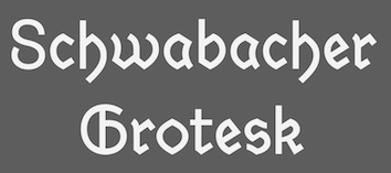 During his studies at HTWG Konstanz, Germany, Daniel Wenzel created the sans and serif typeface family Dekan (2015) and the sans typeface Hass Grotesk (2016). Still in 2016, he revived Alte Schwabacher as Schwabacher Grotesk.
 In 2017 he designed the sans typeface family Veelo. In 2017, Sergi Delgado and Daniel Wenzel co-designed the textured op-art typeface Aigua. Daniel wrote Automatisierte Schriftgestaltung / Automated Type Design to showcase how type design can be automated. That work was done under the mentoship of professors Brian Switzer and Jo Wickert. [Google]
[More] ⦿
|
David Fleming Nalle
[Scriptorium (Ragnarok Press, Fontcraft)]

|
 [MyFonts]
[More] ⦿
|
Delbanco-Frakturschriften
[Gerda Delbanco]
|
 Gerda Delbanco's German foundry in Ahlhorn, specializing in blackletter fonts. Great web presentation, and gorgeous glyphs. The company is owned by Gerda Delbanco, but it is not clear if she designed some or all of the typefaces. Some fonts were designed by Gerhard Helzel, and others by Christian Spremberg. This is one of the best sources of blackletter fonts in the world. Names of the fonts, which are nearly all historical revivals of the great blackletter fonts: Alte Schwabacher, Andreas Schrift, Breitkopf Fraktur, Caslon Gotisch, Claudius (1998, after Rudolf Koch, 1934-1937), Deutsche Kursive, Deutsche Werkschrift (+halbfett), Deutsche Zierschrift, Eckmann Schrift, Eisenacher Fraktur (1994, by Christian Spremberg), Ehmcke Schwabacher, Fette Gotisch, Fichte Fraktur, Frühling (after Rudolf Koch's original from 1917) [sample 1, sample 2, sample 3], DS-Garalang, DS-Garamond, DS Gotenbrg, Hermersdorf, Humboldt Fraktur (after a typeface by H. Rhode), Kleist Fraktur (1996, after the Walter Tiemann original from 1927-1928), Wilhelm Klingspor Schrift, Koch Fraktur, Rudolf Koch Kurrent (after the original school alphabet by Koch, done in 1935), Kurrent (a connected writing font based on examples from J.B. Henning, ca. 1817), Lincoln Gotisch, DS Maximilian Gotisch, DS Maximilian Zierbuchstaben, Normal Fraktur (this is a nameless typeface in the group of Biedermeier-Fraktur typefaces which also includes Schelter's Schulfraktur; also known elsewhere as Armin-Fraktur, Bürenstein-Fraktur, Mars-Fraktur and Pressa-Fraktur), Offenbacher Schwabacher (1996, after the 1899 font by Gustav Ruprecht at Rudhardsche), Old English, Peter Jessen Schrift (1997, after the original from 1924-1929 by Rudolf Koch), Post Fraktur, DS Ratdolt Rotunda, DS Salzmann Fraktur, DS Schmuck, Strassburg, DS Suetterlin, Tannenberg (after a 1933 Stempel typeface by Emil Meyer), DS Thannhaeuser Fraktur, DS Unger Fraktur (1999), DS Walbaum Fraktur, DS Wallau (1996, after Rudolf Koch, 1924-1936), Wartburg Fraktur, DS Weiss Gotisch, DS Wilhelm Klingspor Schrift, Wohe Kursive and Zentenar Fraktur (1997 (after F.H.E. Schneidler's original from 1937).
 Some of the copyright notices refer to the Bund für deutsche Sprache und Schrift, and others to PrimaFont, and this may explain some of the foundry's history. 1994 catalog. Part of the 1999 catalog. Part of the 2002 catalog. [Google]
[More] ⦿
|
Die Entwicklung unserer Schrift
[Peter Doerling]
|
Peter Doerling's visual overview of the styles of writing in Germany, for books, official documents (Urkunden) and in letters. For books, he takes us here: - 200-300: Roman capitals.
- 300-500: Quadrata.
- 500 on: Uncial.
- 900 on: Karolingian minuscules.
- 1200 on: Gothic minuscules.
- Textura.
- 1400 on: Rotunda.
- 1500 on: Schwabacher.
- 1600 on: Fraktur.
- 1500 on: Humanistic style.
- 1570 on: Antiqua.
- 1900 on: Grotesk, Egyptian. [Note that he omits the modern style.]
- 1960 on: Helvetica. (???)
For official documents: - 200-300: Roman capitals.
- 400-600: Rustica.
- 500 on: Half Uncial.
- 900 on: Karolingian minuscules.
- 1500 on: Notula.
- 1600 on: Canzlei (Cantzley, Kanzlei).
- 1600 on: Humanistic Canzlei
- 1875: Ronde, Rondo, Rundschrift.
- 1915: Jugendstil.
- 1930: Tannenberg.
For letters: - 200-300: Roman capitals.
- 400 on: Young Roman cursive.
- 900 on: Karolingian minuscules.
- 1300 on: Cursive.
- 1600 on: Cancellaresca [refined formal script].
- 1600 on: Kurrente.
- 1600 on: Humanistic cursive.
- 1800 on: deutsche Schreibschrift.
- 1800 on: Lateinische (Latin) Schreibschrift.
- 1930: Tannenberg.
[Google]
[More] ⦿
|
Die Schwabacher Schrift
|
 A German blackletter page on Schwabacher. The free Schwabacher truetype font Deco-A761 (1999) can be found here too. The page is run by SPD Bürgerbüro. The text on the page is quoted from Dr. Heinrich ten Wolde's article "Die Schwabacher Schrift" which appeared in "Die deutsche Schrift", Nr. 4, March 1952. Modern (19th and 20th century) versions of the Schwabacher style of Fraktur font:
 - Alte Schwabacher (1835, Genzsch&Heyse).
- Neue Schwabacher (1876, Genzsch&Heyse).
- Offenbacher Schwabacher (1900, Kurt Wanschura, Gebr. Klingspor).
- Ehmcke Schwabacher (1914, Fritz Helmut Ehmcke, D. Stempel).
- Schneidler Schwabacher (1918, Friedrich Hermann Ernst Schneidler, J.G. Shelter&Giesecke).
[Google]
[More] ⦿
|
Die Schwabacher Schrift
[Heinrich ten Wolde]
|
Essay by Dr. Heinrich ten Wolde on the history of Fraktur. [Google]
[More] ⦿
|
Dieter Steffmann
|
 FontShop was the name of Dieter Steffmann's foundry in Kreuztal, Germany (not to be confused with the FontShop foundry and font vendor). He made about 600 self-proclaimed "old-fashioned" fonts, and among these many Fraktur fonts. His site became too expensive to run, and was for about two decades hosted by Typoasis. His fonts can now de downloaded afrom 1001 Fonts. Alternate URL. Current list of fonts. See also here. New stuff. Fontspace link. A nice essay about Fraktur fonts accompanies the fonts. News. As Dieter puts it: I am not a designer but I add missing letters to public domain fonts in order to get a complete character set and I hint the fonts and create new weights (shadow, inline etc.) His Christbaumkugeln font, and how it was made. The font families:
 - Acorn Initialen (2000), Adine Kirnberg (2000, after David Rakowski's Adine Kirnberg Script, 1991), AI Parsons (1999: a simple conversion to truetype of AI Parsons (1994, Inna Gertsberg ans Susan Everett), which in turn revived Will Ransom's Parsons from the 1920s), Albert Text (2000), Alpine (2000), Altdeutsche Schrift (1998: a rotunda), Alte Caps (2000: white on black), Alte Schwabacher (2000, +Shadow), Ambrosia (2000), American Text (2000: a blackletter), Aneirin (2000: Lombardic), Angel (2000: an ironwork font), Anglican Text (2000: a frilly blackletter), Angular (1999: +Inline, +Shadow), Ann-Stone (2000: boxed art nouveau caps), Antique No. 14 (2000: fuzzy hand-crafted letters), Arabella (2000: script), ArabesqueInitialen (2002), Argos George (1999, an art nouveau font after Georges Lemmen's George-Lemmen-Schrift (1908); Steffmann added Argos Geirge Contour), Aristokrat Zierbuchstaben (2002, after a house font at Ludwig&Mayer, 1911), Ariston Script (2000: a formal calligraphic script), Art Nouveau Initialen (1999), Attic Antique, Augusta (2000: a rotunda; +Shadow).
- Baldur (2000: art nouveau; +Shadow, +RoughSliced; after a schelter typeface from 1895), Ballade Bold (2002, a Schwabacher font based on Ballade Halbfette designed by Paul Renner in 1937; +Contour, +Shadow), Barock Initialen (2002: an incomplete decorative initials typeface), Becker (1999; +Shadow, +Inline), Beckett-Kanzlei (2001), Behrens-Schrift (2002: an art nouveau-inspired blackletter typeface based on an original by Peter Behrens), Belshaw (2000: a Victorian decorative serif), Belwe (2002, after an original by Georg Belwe, 1913; Gotisch, Vignetten), Benjamin Franklin Antique (2000, after a warm wood type designed in 1991 by Walter Kafton-Minkel simply called Benjamin), Berlin Squiggle Condensed, Bernhard Schmalfett, Bier und Wein Vignetten (2002, based on drawings from the Bauersche Giesserei), Billboard, Bizzaro, Black Forest (2000, blackletter; +Text, +ExtraBold), Black Knight (1999: blackletter), Blackletter (2001; +ExtraBold, +Shadow), Blackwood Castle (2000: an almost Lombardic blackletter; +Shadow), Breitkopf Fraktur (2000), Bretagne Gaelic (1999), Brian James Bold (2000, +Contour), Bridgnorth, Broadcast Titling (2000, 3d caps), Broadway Poster, Brock Script (2000: formal calligraphic script).
- Cabaret (2000: all caps, +Contour, +Shadow), Campanile (2000: Victirian), Camp Fire (2000: wooden plank font), Canterbury Old English (2001: blackletter), Cardiff (2000: textured caps), Cardinal (2000: almost Lombardic; +Alternate, +Anglican), Carmen (1998: art nouveau style; +Shadow), Carrick Caps (2000), Caslon Antique, Caslon Fette Gotisch, Cavalier (2000), Celtic Frames (2000), Celtic Hand (2000), Challenge (2000; +Contour, +Shadow), Chelsea (2000: a serif), Chopin Script (2000, a formal penmanship script identical to Polonaise), Christbaumkugeln (1999: art nouveau alphadings consisting of Christmas ornaments), Chursächsische Fraktur, Cimbrian (2001: blackletter), Circus Ornate Caps (2001, a Western or circus font), Cloister Black Light (2001: blackletter), Coaster Black (2001, +Shadow), Coelnische Current Fraktur (2000), Colchester Black (2001: an ornamental blackletter), College, Courtrai (2000: a decorative blackletter), Coventry Garden, Cruickshank (2000: art nouveau caps).
- Damn Noisy Kids (2002: a heavy brush font), Davy's Dingbats, Debussy, Decorated Roman Initials (2003), Deutsch Gotisch (2002: an expressive blackletter font; +Dutesch Gotisch Heavy, +Outline, +Shadow), Deutsche Uncialis (+Shadow) (2000), Deutsche Zierschrift (2002, after Rudolf Koch, 1919-1921), Devinne Swash (2000), Digits (2000), Direction (2000: letters with embedded arrows), Dobkin Script (2000: after David Rakowski, 1992, Domino, Domo Arigato (1999: oriental emulation), Dover, Driftwood Caps (2000: a wooden plank font), Due Date (2000: a grungy stencil typeface), Duerer Gotisch (2001), Duo Dunkel (+Licht), Durwent (2001: a rotunda).
- Easter Bunny (after a 1994 font by Apropos Creations), Easter Egg (2001; after a 1994 font by Apropos Creations), Eckmann Initialen (2002, after the famous art nouveau typeface from 1900 by Otto Eckmann), Eckmann Plakatschrift (2002), Eckmann-Schrift (2002), Eckmann Titelschrift (2002), Eckmann Schmuck (2002), Egyptienne Zierinitialen (2002), Egyptienne Zierversalien (2002), Ehmcke-FrakturInitialen (2002), Ehmcke-Schwabacher Initialen (2002), Eichenlaub Initialen (2000), Eileen Caps (2000; after David Rakowski, 1992), Eisenbahn (2002, based on train vignettes at Bauersche Giesserei), Elzevier Caps (2000; after David Rakowski), Enge Holzschrift (2000; +Shadow), English Towne Medium (2000: a Fraktur), Epoque (1999; an art nouveau typeface; +Shadow, +Inline), Erbar Initialen, Estelle, Evil of Frankenstein, Express (1999).
- Faktos (1998; a rip-off of Cory Maylett's Faktos, 1992; +Striped, +Contour, +Shadow), Fabliaux (2000: Lombardic caps), Fancy Card Text (2000: a textura), Fat Freddie (2000: a fat all caps font; +Shadow, +Outline), Faustus (2000: a Schwabacher), Fenwick Woodtype (blackletter: 2001), Fette Caslon Gotisch (2001), Fette Deutsche Schrift (2002, a revival of a Rudolf Koch font from 1908), Fette Egyptienne, Fette Haenel Fraktur (2000), Fette Kanzlei (2002), Fette Mainzer Fraktur (2001), Fette Steinschrift (2002), Fette Thannhäuser (2002; after Herbert Thannhäuser, 1937-1938; +Schattiert), Fette Trump Deutsch (20002, after Georg Trump, 1936), Firecat, Flaemische Kanzleischrift (2000: calligraphic), Flowers Initials (2000: floriated caps), Forelle (2002: a retro script; +Shadow), Fraenkisch Spitze Buchkursive (2002; after Lorenz Reinhard Spitzenpfeil, 1906), Fraktur Coelnische Current (2000), Fraktur Schmuck (2001: ornaments), Fraktur Shadowed (2001), Fraktur Theuerdank (2000: a Schwabacher), Frederick Text (2001: a blackletter), Futura Script.
- Gabrielle (1999: a retro script), Ganz Grobe Gotisch (2000), Gebetbuch Fraktur (2000: a Schwabacher), Gebetsbuch Initialen (2001), Germania (2001, a revival of the 1903 blackletter typeface by Heinz König called Germania as well), Germania-Versalien, Gille Fils Zierinitialen (2002, after Gillé Fils, ca. 1820), Gingerbread Initials (Victorian initials, after an original from ca. 1890), Globus, Gloucester Initialen (2001), Gorilla Black (2000: rounded elephant feet font), Gotenburg A+B (2002, after Friedrich Heinrichsen), Gothenburg Fraktur (2000), Gotische Initialen (two different sets with the same name, one from 2000 and one from 2002), Gotisch Schmuck (2002, Fraktur), Goudy Initialen (2000), Goudy Medieval (2000), Goudy Thirty (2000), Grange (1999), GrenzschInitials (2001), Grusskarten Gotisch (2001), Gutenberg Textura (2000).
- Haenel Fraktur Fett, Hansa (1999: art nouveau), Hansa Gotisch (2001: a textura), Hansen (1998; +Contour, +Shadow), Happy Easter (1994, by Apropos Creations: art deco caps), Harrowgate (2001: a textura), Hazard Signs (2000), Headline Text (2001: a textura), Hercules (1999: art nouveau), Herkules (2004: art nouveau), Hermann-Gotisch (2002; after an original by Herbert Thannhaeuser, 1934), Herold (2002), Hippy Stamp (2000: after rubber stamps from the 1960s), Hoedown (2000; +Shadow), Holla (2001; after Rudolf Koch), Holidayfont, Holtzschue(2000: a circus font, after David Rakowski, 1992), Honey Script (2000: a retro script), Horror Dingbats (2000; after Letters from the Claw, 1998), Houtsneeletter, Humboldt Fraktur (2002-2005; after a Schwabacher font by Hiero Rhode, 1938; +Zier, +Initialen).
- Iglesia Light (2002), Iron Letters (2000), Isadora Original.
- Jan Brad, Journal Dingbats, Jahreskreis (seasonal dingbats, 2002), JSL Blackletter Antique (2000, by Jeffrey S. Lee), Jugendstil Fraktur (originally designed by Heinz Koenig, 1907-1910), Jugendstil Ornamente (2002, art nouveau ornaments, after Schelter & Giesecke).
- Kabinett Fraktur, Kaiserzeit Gotisch (2001), Kanzle (2001)i, Kanzlei Initialen (2002), Kalenderblatt Grotesk (2000), Kashmir (2001: an arts and crafts typeface), Kinder Vignetten (2002), KingsCross (2001: blackletter), Kinigstein Caps (2000: art nouveau initials after David Rakowski, 1990), Klarissa (2000), Kleist Fraktur + Zierbuchstaben (2002, after Walter Tiemann, 1928), Koch Antiqua (2002), Koch Antiqua Zierbuchstaben (2002), Koch Initialen (2000, after Rudolf Koch, 1922), Koenigsberger Gotisch (2001), Koenig-Type (2002; a Jugendstil Fraktur originally designed by Heinz Koenig, 1907-1910), Kohelet (2001), Koloss, Konanur Kaps (2000, after David Rakowski, 1991), Kramer, Krone Bold.
- La Negrita (2000, +Shadow), Latina (2001: script), Lautenbach (2001, +Zierversalien), Legrand (1999: art nouveau), Lemiesz (2000), Lettres ombrées ornées (2002, based on a typeface by Schriftgiesserei J. Gillé, 1820), Linolschrift (2000, +Heavy, a linocut font as in the Munch paintings), Lintsec (2000, a stencil typeface, after David Rakowski, 1992), Liturgisch + Zierbuchstaben (2002, after Otto Hupp, 1906), Logger (2000, after David Rakowski, 1991), Lohengrin Fraktur (2000), Long Island Antiqua, Louisianne (1998-2000: +Contour, +Shadow; a bold upright connected script), Ludlow Dingbats (2000, after Ludlow, 1930), Luthersche Fraktur (2000).
- Mainzer Fette Fraktur, Marker Felt (2001), Marketing Script (1999, +Shadow, +Inline), Marlboro (2000), Maximilian (2002, a Fraktur font and decorated caps based on Rudolf Koch, 1914; +Zier), Mayflower Antique (2000), Mediaeval Caps (2000), Medici Text (2002: an ornamental blackletter), Menuetto (1994, after K.R. Field), Messing Lettern (2000), Metropolitain (2000, an art nouveau font like the ine used for the Paris metro; +Contour, +Condensed), Middle Saxony Text (2001), Moderne Fraktur (1999), Monats-Vignetten (2002, based on drawings by Franz Franke for Bauersche Giesserei, 1920), Montague (2000), Monument (2002, after Oldrich Menhart, 1952), Mordred (2000), Morgan Twenty-Nine (1999: Victorian caps), Morris Roman Black (2002, after William Morris, 1893), Morris Initialen (2000, after William Morris).
- Napoli Initialen (2000), Neptun Gotisch (1999), Neugotische Initialen (2002, after an original from 1890), North Face (2000), Nougat (2000), Nougat Nouveau Drop Caps (2000), Nubian (after Walter T. Sniffin's font from 1928).
- Olde English, Old English Five (2000: blackletter), Old Town (2000: Western), Old London (2000: blackletter).
- Packard Antique (2000), Paganini Text (2000: blackletter), Pamela (2000: an ornamental blackletter), Paris Metro (1998; +Outline), Parsons Heavy (2000, after Bill Ransom, 1918), Paulus Franck Initialen (2002), Penelope (2000, Victorian), Peter Schlehmil (2002, after Walter Tiemann, 1918-1921), Peter Schlemihl Fraktur, Picture Alphabet (2000; after an original from 1834), Pilsen Plakatschrift (2000), Pinewood (2000, like wooden branches), Pinocchio (based on a psychedelic typeface by Gustav Jaeger, TypeShop, 1994), Plakat-Fraktur (2001), Plakat Antiqua, Plastisch (2002: ornamental caps), Plastische Plakat Antiqua (2002), Plum Script (2000: an upright script)), Pointage (2000; after David Rakowski, 1992), Polonaise (1999: a formal calligraphic script), Polo Semi (2000), Powell Antique (2000), Prince Valiant (1999: blackletter), Printer's Ornaments One (after Blake Haber, 1994), Prisma (2003, a four-line typeface inspired by Rudolf Koch's Prisma), Progressive Text (2001), Puritan (2000, +Swash).
- Quentin Caps (2001: Tuscan).
- Rediviva (2002), Rediviva Zierbuchstaben (2002: a Schwabacher font after a 1905 typeface at Benjamin Krebs designed by Franz Riedinger), Reeperbahn (1999; aka Rope), Regatta Relief, Reiner Script, Relief Grotesk (2003), Revue Decor, Reynold Art Deco (2000: arts and crafts; +Contour), Rheinische Fraktur (1999: after a 1905 Stempel font called Arminius Fraktur and Rheinische Fraktur), Rio Grande, Rockmaker (2000, after David Rakowski, 1992), Roland 92000. +Shadow, +Contour), Rolling No. 1 ExtraBold (2000), Roman Antique (+Italic) (2000), Romantik Initialen (2000), Romantiques (2002: ornamental caps, perhaps a circus font), Rondo, Rosemary Roman (2001: a great calligraphic script based on Rosemary Hall's Rosemary Roman), Roskell (1998: a poster font, +Bold, +Shadow), Roslyn Contour (2000), Rossano (2000, +Shadow), Rothenburg Decorative (2000: a frilly blackletter), Rothenburg Fraktur, Royal Initialen (1999), Roycroft Initials (2000), Rudelsberg (Schrift, Initialen, Schmuck: a typeface family in Munch Jugendstil style, based on Otto Eckmann's Eckmann from 1901).
- Saddlebag Black (2000: Western), Saloon ExtraBold, Saltino, Salto, Sans Plate Caps (2000), San Remo (2000: a Parisian art nouveau typeface), Sans Serif Shaded (2000, after a font by Stephenson Blake), Savings Bond, Schampel Black (2001: a blackletter), Schmalfette Fraktur (2000; +Schattiert), Schluss-Vignetten (2002, also from Bauersche Giesserei), Schmale Anzeigenschrift + Zierbuchstaben (2002, after Rudolf Koch's Deutsche Anzeigenschrift, 1916-1923), Schmuck Initialen (2001), Schwabacher (2002), Sebaldus-Gotisch (2002, a blackletter after H. Berthold's Sebaldus Gotisch from 1926), Sentinel (decorative caps from 2001), Sesame (2000, +Shadow), Shaded (2002, a take on Sans Serif Shaded by Stephenson, Blake & Co. Ltd., Sheffield), Sholom (1999: Hebrew emulation), Showboat Caps (2000), Shrapnel (2000: in the font, we find a reference to David Rakowski, 1992), Siegfried (2001, art nouveau, based on a typeface by Wilhelm Woellmer), Simplex, Sixties, Snowtop Caps (2001), Starburst (2000; after a 1990 font by David Rakowski), Steelplate Textura (2002), Stencil Display, Subway (2001: Black, Shadow), Supermarkt.
- Tanach (2003: Hebrew emulation), Tannenberg (Fette Gotisch, Fett, Umrandet, Schattiert: after Emil Meyer, 1933-1935), Thannhaeuser Fette Fraktur, Thannhäuser Zier (2002; original by Herbert Thannhauser, 1937/38), Theuerdank Fraktur (2000; after Schoensperger's Theuerdank, 1517), Thorne Shaded (2002, a shaded didone based on a Robert Thorne design of 1810), Tierkreiszeichen (2002, zodiac signs, based on drawings by Franz Franke for Bauersche Giesserei), Tintoretto (2000, after a Schelter & Giesecke original), Titania (2001; after Titania by Haas, 1906), Titling Roman Antique, Tobago Poster (2001; +Shadow), Tone And Debs (2002; after a 1991 snow capped font by D. Rakowski; identical to Snowtop Caps in 2001), Tonight (2002: a marquee font), Topic, Toskanische Egyptienne Initialen (2003: after a 1889 font by Schelter & Giesecke), Transport Pictorials, Tribeca (2001, after a David Rakowski original), Trocadero Caps, Trucker Style ExtraBlack, Turtles (2000; an extension of Turtles by Neale Davidson), Typographer Caps (2000), Typographer Fraktur (2002), Typographer Gotisch (2002), Typographer Holidayfont (2002: Christmas dingbats), Typographer Rotunda (2002), Typographer Subway (2011), Typographer Textur (2002, Fraktur), Typographer Uncial Gotisch (2002), Typographer Woodcut Initials (2002), Typographer's Schmuck-Initialen.
- Uechi Gotisch, Uncialis Deutsche, Unger Fraktur Zierbuchstaben (2002; after an ornamental caps typeface by Julius Nitsche done in 1908), Unicorn (2000).
- Vadstena Rundgotisch, Varah Caps, Ventura Bold (2000), Verve (+Shadow, 2000), Victorian Initials (2001), Victorian Text (2001), Viking (2000), Vivian (2000, +Shadow), Vogeler Initialen (2002, aka Vogeler Caps), Volute (1999: art nouveau caps).
- Walbaum Fraktur (after Justus Erich Walbaum, 1800), Wallau Deutsch, Wallau Rundgotisch, Wallau Unzial and Wallau Zierbuchstaben (2002; originals by Rudolf Koch 1925-1930), Walthari Text, Washington Text, Waterloo Relief, Wave, Weiß Initialen (2000), Weiss Lapidar (2002, revival of a typeface by Emil Rudolf Weiss), Weiss Rundgotisch (1998; Bold and Shadow), Werbedeutsch (2002, original by Herbert Thannhaeuser, 1934), Westminster Gotisch (2001: Lombardic), Wharmby (2000, a shadow font), White Bold (2003, a shadow font), Wieynk Fraktur (2002, +Initialen, + Caps Round; after a Schwabacher by Heinrich Wieynck, 1912), Wieynk Fraktur Vignetten (2001), Will-Harris Caps (2002, after David Rakowski, 1992), Woodcut.
- Yellow Submarine (1995; after Stanley Davis's Amelia, 1966), Yentus (2001: Hebrew emulation), Yonkers (2001: a Rundgotisch font), Yorktown (2000: a Western wood type emulation font).
- Zallman Caps (2000, after David Rakowski, 1991), Zentenar Fraktur (2003: after Friedrich Hermann Ernst Schneidler, 1937), Zentenar Zier (2002; after F.H.E. Schneidler, 1937), Zierinitialen 1 (2002, after an original from ca. 1800), Zierinitialen Two (2002; based on Deutsche Zierschrift by Rudolf Koch), Ziffern und Pfeile, Zither Script, Zodiac Pictorials.
A set of TeX service files for many of the decorative caps fonts was published by Maurizio Loreti from the University of Padova. The collection is now also available in OpenType. 1001Fonts link. Fontsquirrel link. Dafont link. Fontspace link. Abstract Fonts link. Home page. [Google]
[More] ⦿
|
Dieter Steffmann's blackletter typefaces
[Tim Larson]
|
 A list of Dieter Steffmann's blackletter typefaces, as compiled by Tim Larson (Christ Trekker). Download them here.
 - Fraktur: Breitkopf Fraktur, Chursaechsische Fraktur, Cimbrian, DS Ballade, DS Luthersche, DS Walbaumfraktur, Durwent, Ehmcke-Fraktur Initialen, Fette deutsche Schrift, Fette Haenel Fraktur, Fraktur Shadowed, Gebetbuch Fraktur, Humboldt Fraktur, Kabinett-Fraktur, Kanzlei, Kleist-Fraktur, Koenig-Type, Moderne Fraktur, Neptun, Paganini, Peter Schlemihl, Plakat-Fraktur, Rediviva, Rothenburg Decorative, Schampel, Schmale Anzeigenschrift, Schmuck Initialen, Theuerdank Fraktur, Typographer Fraktur, Unger-Fraktur Zierbuchstaben, Walbaum Fraktur, Wallau, Washington Text, Wieynk Fraktur, Yonkers, Zentenar Fraktur.
- Rotunda: Typographer Rotunda, Weiss Rundgotisch.
- Schwabacher: Alte Schwabacher, Schwabacher.
- Textura: American Text, Anglican Text, Beckett-Kanzlei, Black Forest, Blackletter Blackwood Castle, Canterbury, Cloister Black, Coelnische Current Fraktur, Colchester, Courtrai, Deutsch-Gotisch, DS Caslon Gotisch, DS Fette Gotisch, DS Weiss-Gotisch, DS Zierschrift, English Towne, Faustus, Fette Trump-Deutsch, Frederick Text, Ganz Grobe Gotisch, Gotenburg, Gothenburg Fraktur, Grusskarten Gotisch, Gutenberg Textura, Hansa Gotisch, Harrowgate, Headline Text, Iglesia, Kaiserzeit Gotisch, Kings Cross, Koenigsberger Gotisch, Liturgisch, Lohengrin, Maximilian, Medici Text, Middle Saxony Text, Old English Five, Old London, Olde English, Pamela, Prince Valiant, Progressive Text, Steelplate Textura, Tannenberg, Thannhaeuser Zier, Typographer Gotisch, Typographer Textur, Victorian Text, Werbedeutsch, Westminster Gotisch.
- Script: DS Admiral.
- Unclassified: Alpine, Aristokrat Zierbuchstaben, Augusta, Belwe, DS FetteThannhaeuser, DS HermannGotisch, DS Wallau, Fraenkisch, Lautenbach, Neugotische Initialen, Typographer Uncialgotisch, Zentenar Zier.
[Google]
[More] ⦿
|
Eduardo Herrera Fernandez
|
Professor of typography at the Faculdad de Bellas Artes (FBA) of the Universidad del Pais Vasco (UPV) in Bilbao. Eduardo Herrera and Leire Fernández (a colleague at FBA UPV) developed a Bastarda based on work of Juan de Yciar. They wrote about it in Recuperación y digitalización de la letra bastarda de Juan de Yciar (GFM Grafema, No. 1, April 2009). [Google]
[More] ⦿
|
Elsner&Flake

|
 German type foundry in Hamburg established in 1986 by Veronika Elsner and Günther Flake. They offer original fonts as well as improved versions of classical fonts. There are many non-Latin fonts as well. In-house designers include Jessica Hoppe (Carpediem), Verena Gerlach (Aranea), Petra Beisse (Petras Script), Uwe Melichar, Manuela Frahm (Fritz Dittert), Ralf Borowiak, Lisa von Paczkowski, and Achaz Reuss.
 Additions in 2005 include the dingbat typefaces Beautilities EF Alpha, Ornamental Rules EF, Diavolo Rules EF, Squares EF (Alpha, Beta and Gamma), Topographicals EF Alpha, Typoflorals EF Alpha, Typographicals EF Alpha, Typomix EF Alpha, Typosigns EF Alpha, Typospecs EF Alpha and Beta (which have several fists), Typostuff EF Alpha, Diavolo EF, Schablone EF, Gigant EF, Maloni EF, OCRA EF, EF Unovis (a 16-weight family inspired by Quadrat). In the hand-printed category, let us mention Filzerhand. Their blackletter collection includes some bastardas (Alte Schwabacher, Lucida Blackletter), some frakturs (Fraktur, Fette Fraktur EF, Justus Fraktur, NeueLutherscheFraktur, Walbaum-Fraktur), some rotundas (Weiss-Rundgotisch), and some texturas (Gotisch, Old English). Commissioned fonts include Castrol Sans (2007). Selected additional typefaces: Garamond Rough Pro (2018), Bluset Now Mono (2018), Newspoint (2017, based on Morris Fuller Benton's News Gothic), Meier Kapitalis (2013, a lapidary typeface based on a 1994 sketch by Hans Eduard Meier in his book Die Schriftentwicklung), Gillies Gothic EF (after William S. Gillies's 1935 original), EF Medieva, Bank Sans Caps EF, Metropolitain (1985) (after a 1905 art nouveau typeface by Fonderie Berthier). Fonts4ever link (2008). Listing at Fontworks. Future events schedule. New fonts. List of their fonts. Catalog of their typefaces [large web page warning]. See also here. [Google]
[MyFonts]
[More] ⦿
|
Emil Gursch

|
 German foundry based in Berlin, active from 1866 until 1917, when it was acquired by H. Berthold AG. Klingspor's file on Gursch. Typefaces published by them include:
 - Accidenz-Versierungen.
- Akademisch.
- Alexandra (<1897).
- Antiqua No. 2 through 9.
- Apollo Grotesque (1897).
- Alt-Gotisch (1899) mager&halbfett. Altgothische initialen.
- Bambus Grotesque (1896).
- Berliner Fraktur (ca. 1897).
- Briefschrift Deutsch (<1899).
- Britannia-Versalien (1902).
- Continental Grotesque.
- Dekorative Vignetten (1899).
- Egyptienne.
- Elzevir, ca. 1899: many weights and styles.
- Eskorial (1909) and Eskorial halbfett (1908) by Eduard Lautenbach, published by Emil Gursch.
- Flächer Ornamente (1899).
- Fraktur 14g (1910), Fraktur 14 halbfett (1915), Fraktur 16 (1916), Fraktur No.4 through No.8. Halbfette and Moderne schmale halbfette Fraktur, Schmale Fette Zeitungs-Fraktur, Fette Fraktur.
- Gloria (1898), Fette Gloria Kursiv (1904), Gloria fett (1902), Gloria schmalfett. Gloria Kuric schmalfett. Digitally revived in 2019 by Ralph M. Unger as RMU Gloria.
- Gothisch (schmale enge, Courante and Accidenz), Renaissance Gothisch (1902: eng, magere and halbfette), Fette Gothisch (neueste and breite). Gothische Federzüge.
- Grandezza I and II (1904) by Hermann Zehnpfundt.
- Grotesque.
- Hermes Grotesque (1897).
- Hortensia (<1902). A digital version of this Victorian script was finished in 2009 as Hortensia by Canada Type: Hortensia was Gursch's most popular typeface, used extensively and prominently in many beautiful type catalogs, and a commonly seen design element in Germany for quite a while after its release.
- Industria (1913, a grotesk designed for ads). Weights include Zart, Halbfett, Fett and Zephyr. By Hermann Zehnpfundt.
- Journal (1912-1913) by Hermann Zehnpfundt. Weights include Antiqua, Kursiv, Antiqua Halbfett.
- Breite Kanzlei, Moderne halbfette Kanzlei, Antike Kanzlei (wow!).
- Kavalier (1910) by Hermann Zehnpfundt.
- Klinger (1919, +Antiqua) by Julius Klinger.
- Koenig-Type (1903-1907, Heinz König), Koenig Schwabacher (1912-1913, Heinz König), Koenig-Fraktur (1910, Heinz König. This is also called Gursch Fraktur),
- Kontinental Grotesk.
- Korona (1905, + Halbfett) by Albert Auspurg.
- Mediaeval, Cursiv, Mediaeval Cursiv.
- Monument (+Halbfett).
- Moderne Schreibschrift.
- Phönix-Cursiv (1897).
- Polygon Undine (1904).
- Roma (ca. 1897).
- Rubens (1905) by Albert Auspurg.
- Rundschrift.
- Saxonia Einfassung (borders).
- Schwabacher, Fette Schwabacher (1899).
- Schwarze Hände, and many great math and astrological sets.
- Senefelder (1908).
- Sirius Ornamente (1908).
- Skulptur (1901): has styles called Halbfett and Licht.
- Sütterlin Unziale (+Halbfett), made in 1905 by Ludwig Sütterlin himself.
- uncial gotisch or Morris Gotisch. For a digital version, see Morris Gotisch by Gerhard Helzel.
- Versierte Italienne.
- Werk Fraktur (fett, halbfett), done before 1907.
- Zierschrift Roma, Zierschrift Apollo, Zierschrift Gloria, Boston Zierschrift.
- Zirkular Kursiv (1913) by F. Müller-Münster.
There were also numerous ornaments and vignettes. Published documents include Industria, eine charaktervolle Reklame-Grotesk (1913), Polygon-Undine. Fette Gloria-Kursiv (1904), Nachtrag zur Handprobe. Neue Erzeugnisse aus den Jahren 1898-1901 (1902), Munster-Sammlung der Schriftgiesserei Emil Gursch, Berlin S., Messinglinien-Fabrik und Gravir-Anstalt (1899). That last book is their main publcation, 112 pages of nicely presented specimens covering all lettertypes and ornaments in detail. A peek into one of Gursch's specimen books. PDF prepared by Klingspor Museum. [Google]
[MyFonts]
[More] ⦿
|
Emmi Wernicke
|
Designer of a blackletter typeface that was revived by Peter Wiegel in 2014 as Wernicke Schwabacher. [Google]
[More] ⦿
|
Ernst Hermann Karl Engel

|
 Typographer, type designer (b. 1879, Kassel, d. 1967, Bad König), teacher (at the Frankfurt Vocational School and at the College of Arts and Crafts in Offenbach am Main) and author of typographic books. In 1905, Engel became supervisor of in-house printing at the Klingspor foundry.
 At his own Ernst Engel Privatpresse (est. 1921; it would later be called Ernst Engel Presse Walter Stähle), he designed Mörike Fraktur (1922) with the punchcutter Rudolf Schiffner. Somehow, this typeface is also associated with Klingspor. In 1927, he created an art deco typeface which was revived in 2008 by Nick Curtis as Engel Stabenschrift NF. He made three Unziale that were all unicase ("Einbuchstabenschrift"), in 1927, 1930/31, and 1935, respectively. In 1939, he made a Schwabacher and finished Deutsche Schrift. Picture. Klingspor link. [Google]
[MyFonts]
[More] ⦿
|
Exclamations (or: The Boutons)
[Gary David Bouton]
|
 Gary David Bouton and Barbara Bouton's site was called Exclamations. Gary has been writing books on computer graphics for over 20 years, inlcuding eight books on Corel Draw. In 2015, Gary went commercial as Gare.
 Their typefaces: International Symbols (2015, an icon font), Twooth (2015), Greek Diner Inline (2015, based on Carol Twombly's Lithos), BifurOverlay (2015, an overlay font based on Cassandre's Bifur (1929)), Bouton Kursiv (2008), Odissey (2008), Russel Write (2010), Elephants and Bears (dingbats), GreekDiner Inline, GeotypeTT (1997), WebKnobsTT (1997), Beacon (2008, a Schwabacher), BOUTON Nouveau Ornaments II (2009), BifurFoundation (2010), BifurOverlay (2010, after Cassandre's Bifur), Frankfurter Venetian (2008, fat rounded horizontally striped all caps face), Folks (medieval caps), Nouveau Rococo Deco Dings I (2008, art nouveau ornaments), Simulata (2006, geometric deco typeface with Bifur influences), Whimsy (comic book font), SymbolsTT (1998, charityware dingbat font). Exclamations link. Alternate URL. Dafont link. Creative Market link. [Google]
[More] ⦿
|
Fontmunkások
[Gábor Kóthay]
|
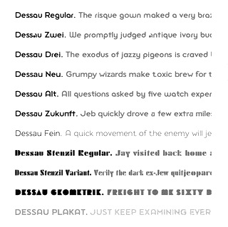 Gábor Kóthay (Fontmunkások) is a Hungarian type designer (b. 1962) who lives in Szeged. Gábor Kóthay's fonts include:
 - At T-26: Alphabet2, Alphabet4, Archetype, Axis No 1, Bacchus, and Tyrnavia in 2000, and the Roman inscription inspired family Minerva Modern, Minerva Display (a Roman family) in 2002. Also, Betabet sans, Betabet web, Gnosis (hairline italic), Oceanus (2004, hairline sans), Pelso (2004, hairline), Laureate (2004, hairline art deco), Picaresque (2004, irregular handwriting).
- At FONTana: LaDanse, Y2K, Domino, QwertyRegular and Luxury, all in 1999-2000.
- At P22: Driade (2005, Regular, Linea and Aged: calligraphic futuristic experiments), Zephyr (2001, curly; +Open Face), Schwarzkopf (2003, a Schwabacher face), La Danse (2001), Ambient (2001), the Schwabacher Fraktur font SchwarzKopf (2002), Caffe (2009: originally designed for the Artz Gallery Cafe in Budapest Hungary. The design is a contemporary handwriting style adapted from examples in lettering exercise books. It has been redrawn and expanded into six styles. The four weights were created by drawing the style using different mediums: Cappuccino in pen, Pastry in felt-tip, Lemonade in brush and Tobacco, the original, in pencil, and Poster and Poster Inline are additional styles).
- At PsyOps: the formal script Anglia (2001), Berill (2001), SchwarzKopf (2002, Fraktur) and Plexo (2001).
- At Job Art Studio (his own studio in Szeged, which he founded): Cats (free dingbats), Disasters (dingbats), Bubble (comic book font), 103 kék.
- At Fountain: Zanzibar (2003, nice script face), Incognito (2007, a typical old map typeface), Dessau (2007-2008, a collection of eleven Bauhaus and Bauhaus stencil styles).
- At Fontana: Zodiac, Tisza (2001-2007), a sans family. And Kinesis (2003), a sans typeface based on geometrically precise instructions.
- At Cinqueterre Type Foundry: Eva (wedge serif; sample, another sample).
- At Fontmunkások: Birdland (1999-2002), a minimalist face; Asphalt and Asphalt Signs (1996-2000), a slightly grungy set of fonts; Arcade (1999); Adagietto (2000); Flyer and Flyer Fossil (2002), a curly family.
- Custom typefaces: Aqua Futurist (2008): a hairline unicase sans family with uncial influences. It is unclear if he had a hand in the typography of stockings, which I found on his site.
Blog. Dafont link. FontShop link. [Google]
[More] ⦿
|
Fontscape: Bastarda
|
Commercial Bastarda fonts listed at Fontscape: Duc de Berry, Lucida Blackletter, Alte Schwabacher. [Google]
[More] ⦿
|
Fontscape: Blackletter
|
Fontscape shows many font examples in each of these blackletter categories: - Bastarda (in German: Schwabacher): based on cursive writing. It is typified by an 'o' which is pointed at the top and bottom.
- Fraktur, the most common form, with o's that are D-shaped.
- Textura (in German: Gotisch; also: Old English): An angular family of blackletter type, characterised by a hexagonal 'o'.
- Rotunda (in German: Rundgotisch): the Italian version of Textura blackletter type, called Rundgotisch in German, typified by a smooth circular 'o'.
[Google]
[More] ⦿
|
Fountain--A Friendly Type Foundry
[Peter Bruhn]

|
 Fountain is a Swedish foundry in Malmö, founded in 1994 by Peter Bruhn (1969-2014). In 2008, its designers include Rui Abreu, Lee Basford, Lars Bergquist, Felix Braden, Lotta Bruhn, Peter Bruhn, Lucas Brusquini, Matthew Chiavelli, Stefan Claudius, Thomas Crolla, Jay David, Stefan Hattenbach, Peter Hoffman, Nina Hons, Sylvia&Daniel Janssen, Randy Jones, Gábor Kóthay, Martin Lexelius, Ricardo Santos, Góran Sóderstróm, Simon Schmidt, and Dirk Uhlenbrock.
 Some offerings over the years: the avant-garde Anarko (nice!), the curly Pizzicato (also nice), Pussy, Udo, Barbera, Gas, the gorgeous bottle dingbats Mini (by Peter Bruhn), Kundera, the free downloads Animals, Doggystyle, Egg, Egg Cameo, Fat Ultra, Kundera, Maceo, Mothafucka, Pavement, Pavement-Kana and Sevenet. All of the aforementioned typefaces have mostly been designed by Peter Bruhn. They also do custom work. Other fonts: Jinchi1, Hebrew, Greek. Recent fonts by Simon Schmidt include CloseCall, CloseGridder, Ogra and Schlager. Martin Fredrikson Core made the fat display typeface Filt (based on Antique Olive, it now has a Greek weight as well), Borgstrand, FTN Sauerkrauto [see also Sauerkrauto Pro (2000)], and Malmo Sans. Matthew A. Chiavelli made Ultura (1996). Peter Hoffmann created Alita. Lars Bergquist published Paracelus (a modern version of Schwabacher), Baskerville 1757 (2002), Montrachet, Monteverdi, and Waldstein (a Scotch typeface). Steve Payne designed COMA. Felix Braden made Sadness and Grimoire. Lee Basford created Nuephoric. Peter Bruhn made the commercial fonts Mayo, Ketchupa, Mustardo and the free fonts Partisan, Jinichi, Lipo-D, Dopil, Deuzhood, Azteak (initial caps) and Anticca. Lotta Bruhn designed Lucifer. Stefan Caludius made Dekoria (2003), a Tuscan titling face. Fountain released Stefan Hattenbach's sans family Stalemate in 2004, which was originally an OEM family designed for but not used by a German IT company, Gretel (by Sylvia&Daniel Janssen), Scrixel 8 and 16 (pixel families by Thomas Crolla). View Peter Bruhn's typefaces. [Google]
[MyFonts]
[More] ⦿
|
Fraktur: main dates
|
Main dates in the history of Fraktur. - Gothic script (gotische Schrift) developed in France in the middle ages during the time of the gothic architecture.
- Gutenberg's bible in Latin (1455) contains this gothic script.
- 1470-1530: All Lutherian books in Germany are printed in the (renaissance) Schwabacher style. The first one in this style was by the Augsburg-based printer Johannes Bämler (1472). It blossoms around 1490 in "Schedelschen Weltchronik", printed by Anton Koberger, and in Dürer's "Apokalypse" (1498).
- 1517: The Schwabacher script developed into the "Fraktur". Dürer uses this Fraktur script.
- 19th century, early 20th century: all styles of Fraktur are further enhanced, generalized, extended and refined.
- Until Bormann's "Schrifterlass" decree in 1941, nearly all publications, newspapers and books in Germany are printed in Fraktur. After that date, it became a "forbidden" script in Germany.
[Google]
[More] ⦿
|
Francisco Lucas
|
 Full name: Francisco Lucas Vezino De Sevilla. Spanish lettering master in the 16th century who wrote Arte de Escrevir (Madrid, 1571 [Paulo Heitlinger says that this is 1580, while others mention 1577]), in which he introduced the so-called Spanish Bastarda. He also published Arte de Escrivir (1608, Iuan de la Cuesta, Madrid). Local download.
 Digitizations of his Griffo-style lettering in 1577 include: - Decimosexto NF (2006, Nick Curtis).
- Francisco Lucas Llana Regular (2003). A chancery hand by Pia Frauss. She writes Written in Madrid in 1570, by a man called Francisco Lucas. He classified it as a Bastarda; but actually, it is a humanist cursive -- the type of writing that is mostly known under the name of Chancery.
- Francisco Lucas Brioso Regular (2003, Pia Frauss). A chancery hand.
Scans: Grifa italica and Batarda, Redondilla (1570), Letra. [Google]
[More] ⦿
|
Franz Riedinger
|
 Designer at the Benjamin Krebs foundry who made Epoche (1912---well, I think this was by Eduard Lautenbach), Merian Fraktur (1910), Phänomen (1927, a heavy informal script), Ideal Schreibschrift (1927, a condensed formal script; this was later passed to Stempel), Riedingerschrift (1903: for a digital version, see Ridinger Std (2012, Ralph Unger)), Riedinger Mediäval (1929), Rohrfeder Fraktur (1909), Rediviva (1905, a Schwabacher published by Benjamin Krebs; a digital revival by Dieter Steffmann in 2002 is also called Rediviva), Altschwabacher Werkschrift (1918; followed by Altschwabacher mager in 1923 and Altschwabacher schmalfett in 1922; also, Altschwabacher Werkschrift Angangsbuchstaben). Reichardt also credits him with Rediviva (1905; halbfett 1906, schmalfett 1907), Riedinger Kursiv (1929), Riedinger Mediäval halbfett (1929), and Brentano Fraktur schmalfett (1917). [Google]
[More] ⦿
|
Friedrich Heinrichsen
|
 Type designer and calligrapher (b. Passau, 1901, d. 1980, Traunstein) who made Gotenburg (1935-1937, D. Stempel) [with Zierversalien, 1936]. This was digitized in 2001 by Delbanco as DS-Gotenburg. GotenburgA and GotenburgB were revived by Dieter Steffmann in 2002. Heinrichsen was associated with the Werkstattgemeinschaft Rudolf Koch. Other typefaces: Heinrichsen-Kanzlei (1933, Trennert), a gorgeous tall-ascendered blackletter face [for a free digital descendant, see KanzleiScriptHJZ by Hans J. Zinken]. His calligraphic work was also outstanding, and includes Initialen, a proposal for Lichte Schwabacher (never actually cut), and numerous handwriting and calligraphic keepsakes.
 In 1986, Wolfgang Hendlmeier wrote a brief biography. Picture. [Google]
[More] ⦿
|
Friedrich Hermann Ernst Schneidler

|
 Type designer, teacher, publisher and calligrapher, b. Berlin (1882), d. Gundelfingen (1956). He worked initially with J.G. Schelter&Giesecke in Leipzig and C.E. Weber in Stuttgart. In the 1930s, he published his type designs with Bauer. He studied at the school for applied arts in Düsseldorf under F. H. Ehmcke and Peter Behrens. From 1920 until 1948, he was head of the graphics division of the Akademie der bildenden Künste Stuttgart, where his students included Albert Kapr, Imre Reiner and Lilo Rasch-Naegele. His oeuvre resides now in the Klingspor Museum in Offenbach. He is famous for his Amalthea, Zentenar Fraktur, Schneidler Antiqua, Schneidler Mediaeval and Legende. In general, due to his calligraphic tendencies, his types have great rhythm. In his era, he was at the top of his craft (in my view). A list and samples of his work. His typefaces, by foundry:
 - C.E. Weber: Deutsch Römisch (1923; Berry et al give the date 1926 for this old face; the A has a flat apex; the M has thin slab serif; Q has the tail outside the bowl; in the lower case the round letters are condensed; f is narrow; g has an oval-like bowl and wide tail), Kontrast (1930, an art deco collection which was revived in 15 styles in 2007 by Iza W as Schneider (sic) Kontrast and which saw another revival, RMU Kontrast, by Ralph M. Unger in 2021), Bayreuth (1932: this blackletter font was remade from a scan by Petra Heidorn in 2003 as Bayreuth-Black; for a variation, see Manfred Klein's Bayreuther-BlaXXL (2005); see also the free orphaned typeface Bayreuth), Suevia-Fraktur.
- J.G. Schelter&Giesecke: Schneidler Schwabacher (1912-1913; revival in 2004 by Petra Heidorn and Manfred Klein), Schneidler Schwabach Initials (digitized by Manfred Klein in 2004 as SchneidlerSchwabachInitials), Buchdeutsch (1923; a blackletter revived in 2021 by Ralph Unger as Werbedeutsch), Buchdeutsch halbfett (1926), Schneidler-Deutsch [a blackletter revived in 2009 by Intellecta Design as Schneidler Halb Fette Deutsch], Schneidler Fraktur (1914-1916), Schneidler Kursiv (1921).
- Schneidler Latein, released in 1916, the bold version in 1920 and the italics in 1921. This typeface was first revived and extended by Lena Schmidt in 2019 as Schneidler Latein. Lena writes: Schneidler Latein is a sharp and elegant Antiqua based on the ductus of the broad edged pen with a strong character. Running perfectly in paragraph text giving it something quite special and being effortlessly legible at the same time, Schneidler Latein works great in headings as well. Each glyph is a piece of art ready to be used in branding and blowup combining beauty and personality in a kick-ass blend. It is absolutely new to the digital world as it never has been digitized before.
- Bauersche Giesserei: Ganz Grobe Gotisch (1930): this was revived by Ralph Unger as (FontForum) Ganz Grobe Gotisch (2006, URW), by Dieter Steffmann as Ganz Grobe, by Manfred Klein as TypoasisBoldGothic (2003), by Mars Attacks as Grobe Hand (2012, free), by Paulo W as Schneidler Grobe Gotisch (2008), and by Petra Heidorn as Bayreuth.
- Bauersche Giesserei: Graphik (aka Herald, 1934).
- Bauersche Giesserei: Schneidler Old Style (or Bauer Text), 1936.
- Bauersche Giesserei: Zentenar Fraktur (1937). So called to honor the 100th anniversary of Bauersche, est. 1837: Peter Wiegel (CAT Zentenar Fraktur, 2014), Delbanco (DS Zentenar Fraktur), Ralph M. Unger (Zentenar Fraktur mager, halbfett, 2010), Softmaker (2016) and Dieter Steffmann each have digital versions. See also Z690 Blackletter on the SoftMaker MegaFont XXL CD, 2002. Followed by Zeichen Zentenar Fraktur (1937; see also the 2007 digitization of the caps by AR Types entitled Zentenar Initialen).
- Bauersche Giesserei: Zentenar Buchschrift (1937-1938). Digital version by Delbanco.
- Bauersche Giesserei: Schneidler Mediaeval (1936). See URW Schneidler Mediaeval (2011).
- Bauersche Giesserei: Schmalfette Gotisch. Revived as SchmalfetteGotisch in 2004 by Petra Heidorn and Manfred Klein, and extended by Manfred Klein to SchmaleGotischMK, also in 2004.
- Bauersche Giesserei: Schneidler Initials (1937, a Trajan face). See the 2004 revival by Petra Heidorn as Schneidler Initialen, and Shango (1993, Castle Type), and Shango Gothic (2007, Castle Type), the free font Au Bauer Text Initials (1990, Auras Design), OPTI Bauer Text Initials (Castcraft), and the 1994 revival by GroupType as Schneidler Initials. Schneidler Initials is in fact originally known as Schneidler-Mediaeval mit Initialen.
- Schneidler Amalthea (1936). See A770 Roman on the SoftMaker MegaFont XXL CD (2002), OPTI Schneidler Swash by Castcraft, Stempel Schneidler by Bitstream, Amalthea SH by Scangraphic, Amalthea SB by Scangraphic, and URW Schneidler Amalthea (2011, URW).
- Bauersche Giesserei: Legende (1937). A faux Arabic script font digitized at Profonts/URW++ by Ralph M. Unger in 2002, by Brendel (as Legend) in 1990, by SoftMaker (as Legende Script) in 2012, By SoftMaker as L690 Script, and by Ari Rafaeli in 2006. Elsner and Flake published the script font Graphis (1934, revival by Jürgen Brinckmann).
- Bauersche Giesserei: Schneidler (1936). It was published in digital form by Bitstream, Adobe, and Elsner&Flake.
For Schneidler, the best source is the book by Max Caflisch, Albert Kapr, Antonia Weiss, and Hans Peter Willberg entitled F.H. Ernst Schneidler Schriftentwerfer Lehrer Kalligraph SchumacherGebler, München, 2002. FontShop link. Klingspor link. View F.H. Ernst Schneidler's typefaces. [Google]
[MyFonts]
[More] ⦿
|
Friedrich Pustet
|
 Type foundry in Regensburg, Germany. Its typefaces included Neue Kirchenschrift (ca. 1890, a typeface acquired from Bauer) and Neue Zeitings Schwabacher (ca. 1900). For digital revivals, see Gerhard Helzel's Halbfette Neue Zeitings-Schwabacher. [Google]
[More] ⦿
|
Fritz Helmuth Ehmcke
|
 Born in 1878 in Hohensalza, Ehmcke died in 1965 in Widdersberg. Graphic artist, book and type designer, and professor. From 1893 until 1897, he studied lithography in Berlin, and from 1899-1901 he studied at the Kunstgewerbemuseums Berlin. With Georg Belwe and Friedrich W. Kleukens, he founded the Steglitzer Werkstatt in 1900. He taught from 1903 at the Kunstgewerbeschule Düsseldorf, and from 1913-1938 at the Kunstgewerbeschule München . He ran the Rupprecht Presse in Munich from 1913-1934. Since 1941, he worked for the Bund für Deutsche Schrift, which is partially concerned with blackletter type. Finally, from 1946-1948, he was professor at the Hochschule der bildenden Künste München. He designed these typefaces:
 - Ehmcke Flinsch (1908, Bauersche Giesserei).
- Ehmcke Antiqua (1908-1909, Flinsch). A beautiful Belle Epoque font. Linotype sells the digital version as Carlton, after acquiring ITC and Letraset which had digitized Carlton in 1983, based on a Stephenson Blake typeface from the 1910s. It appears that Ehmcke Antiqua predates that Stephenson Blake face. For another revival, see Antiqua Roman (2015, Yuanchen Jiang).
- Ehmcke Kursiv (1910, Flinsch).
- Ehmcke Fraktur (1910, Offizin W. Drugulin and 1912, at D. Stempel). The halbfett is from 1917. Revived by Dieter Steffmann as Ehmcke-FrakturInitialen (2002).
- Ehmcke Rustika (1914, Stempel).
- Ehmcke Schwabacher (1914, D. Stempel; some mention the dates 1916 and 1920; see also Ehmcke Schwabacher Zierbuchstaben). The halbfett is from 1915. The Delbanco revival is called DS-Ehmcke Schwabacher. Revived by Dieter Steffmann as Ehmcke-Schwabacher Initialen (2002).
- Ehmcke Mediaeval (1922, Stempel). The kursiv is from 1923 and the halbfett from 1924.
- Ehmcke Latein (1925, Ludwig&Mayer).
- Ehmcke Brotschrift (1927, Ruprecht Presse).
- Ehmcke Elzevier (1927, L. Wagner).
FontShop link. Klingspor link. [Google]
[More] ⦿
|
Gábor Kóthay
[Fontmunkások]
|
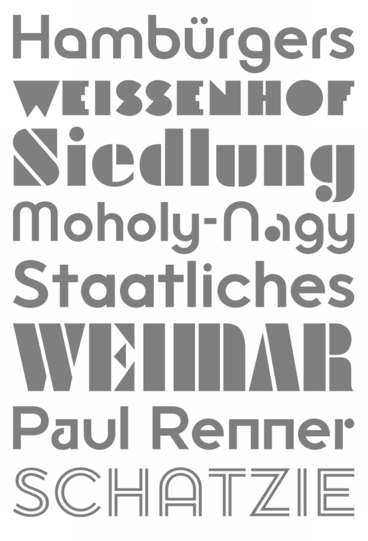 [More] ⦿
|
Gary David Bouton
[Exclamations (or: The Boutons)]
|
 [More] ⦿
|
Gebr. Klingspor: Schriftkartei
|
 In 1950, Gebr. Klingspor published a nice small booklet simply called Schriftkartei. The images below are from that book. [Google]
[More] ⦿
|
Gebrochene Schriften
|
Proposed classification of blackletter typefaces. Main page, by Bernhard Schnelle. He has: - Xa Gotisch. Examples: Bamberg, Belwe Gotisch, Caslon-Gotisch, Cloister Black, Fette Gotisch, Ganz Grobe Gotisch, Goudy-Text, Manuskript-Gotisch, Maximilian, Sebaldus-Gotisch, Trump-Deutsch, Weiß-Gotisch Wilhelm-Klingspor-Gotisch.
- Xb Rundgotisch. Examples: Gotico, Kühne-Schrift, San Marco, Uhlen-Rundgotisch, Wallau, Weiß-Rundgotisch.
- Xc Schwabacher. Examples: Alte Schwabacher, Ehmcke-Schwabacher, Neue Schwabacher, Nürnberger Schwabacher, Rediviva, Renata-Schwabacher.
- Xd Fraktur. Examples: Amts-Fraktur, Breitkopf-Fraktur, Fette Fraktur, Fichte-Fraktur, Humboldt-Fraktur, König-Type, Luthersche Fraktur, Mainzer Fraktur, Poppl-Fraktur, Thannhaeuser-Fraktur, Unger-Fraktur, Walbaum-Fraktur, Wieynk-Fraktur, Wittenberger Fraktur (Monotype, 1904 or 1906; Adobe's digital Wittenberger Fraktur), Zentenar-Fraktur.
- Xe Fraktur-Varianten. Examples: Claudius, Engravers Text, Fette Deutsche Schrift (Koch), Fette Kanzlei, Hermann-Gotisch, Hölderlin-Fraktur, London Text (Blackletter 686), Post-Fraktur, Rhapsodie, Wedding Text (Blackletter 681).
[Google]
[More] ⦿
|
Genzsch&Heyse

|
 Hamburg-based foundry ifounded by Emil Julius Genzsch (1856-1906). It was taken over by Linotype in 1963. Their library included typefaces by these designers:
 - F. Bauer: Fortuna (1930), Genzsch Antiqua (1906), Genzsch Fraktur (1931), Heyse Antiqua (1921), Senats Fraktur (1907).
- K. Klauß: Arkona (1935), Horizontale (1942).
- Heinz Beck: Brahms Gotisch (1937).
- Carl Otto Czeschka: Czeschka Antiqua (1914), Olympia (1929).
- A. Auspurg: Hans Sachs Gotisch (1911), Domina (1929), Souverän (1913).
- O. Hupp: Heraldisch (1910), Neudeutsch (1900), Numismatisch (1900).
- J. Kirn: Oleander (1938).
- H. König: Suberpia (1913).
- Adolf Heimberg: Urdeutsch (1924).
- Helmut Matheis: Verona (1958).
- E. Mollowitz: Anemone (1955).
- E. Ege: Basalt (1926), Ege-Schrift (1921).
- W. Rebhuhn: Fox (1953), Hobby (1955).
- H. Schmidt: Gigant (1926), Monument.
- F. P. Glaß: Glaß Antiqua (1912).
- Eickhoff: Lithograph (1903).
- H. Möhring: Phalanx (1931).
- C. Adam: Rex (1924).
- H. Pauser: Semper Antiqua (1940).
- Eugène Grasset: Römisch Grasset (1913), Grasset Antiqua (1900).
- Albert Anklam: Mönchs-Gotisch (or: Mediaeval-Gotisch) in 1877 (Schnelle says 1881); Neue Schwabacher (normal and halbfett) in 1876.
- J. Göbler: Ballerina (1959, script face).
In addition we find house typefaces such as Adagio (1939, script face), Blockschrift (1897; revived by Nick Curtis in 2015 as Bothas Ruhm NF and by Moritz Zimmer in 2016 as Die Blockschrift), Leibniz-Fraktur (1912; digital versions exist by Klaus Burkhardt, Petra Heidorn (free), Softmaker (Leibniz Fraktur Pro, 2016), and Ralph M. Unger), Nero Kursiv (1913), Alster (1926), Elzevir-Antiqua and Kursiv and Elzevir-Versalien (1925), Rex Versalien (1925), Richard Wagner Fraktur (ca. 1920), Glass Antiqua (1912, Franz Paul Glass: remade in 2011 by Nick Curtis as Half Full NF), Halbfette Hansa Fraktur (1912), Hansa Fraktur (ca. 1915), Hansa Gotisch (digital version by Gerhard Helzel), Plantin Antiqua and Kursiv (1913), Ondosa Ornamente (1912), Preziosa Ornamente (1912), Psalterium (1907, blackletter), Serpentin Ornamente (1912), Hamburger Druckschrift (1909), Nordische Antiqua and Cursiv (1907), Renaissance Ornamente (1901), Römische Antiqua (1899), Sparta (1939), Hauptproben (1910), Negrita, Neugotisch, Neue Pittoresk, Ornamente, Pionier, Renaissance Initialen, Römische Initialen, Römische Kursiv, Venetianische Schreibschrift. Flickr page on Genzsch and Heyse. Proben von Schriften (1902). View the digital legacy of Genzch & Heyse. [Google]
[MyFonts]
[More] ⦿
|
George Williams
|
 George Williams's site (now defunct) site was a discovery! George Williams (b. 1959) wrote spline-generating code and then went on to produce several fonts with his software between 1987 and 1998:
 - Art nouveau style: Carmen, Ambrosia (1989), Fantaisie Artistique, Baldur, Monopol, Parisian, Peignot, Bocklin, Edda.
- Lombardic: Lombardic.
- Victorian: Caprice, Ringlet.
- Uncial: Uncial Animals, Roman Uncial Modern.
- Ornamental caps: Versal, Decorative, Square Caps, Extravagant Capitals, Floral Caps, Morris, Andrade.
- Display typefaces: Crystal, Flash, Cupola, Santa Barbara Streets (2013-2014; after the street signs in Santa Barbara, CA).
- Blackletter: Rotunda (1998), Bastarda, Textura Modern, Fractur (a remake of Wittenbach).
- Art deco: Piccadilly, Mirage (1999, prismatic).
- Calligraphic: Humanistic.
- Text: Caslon.
- Slab: Monospace.
- Sans: Caliban.
- Bamboo Gothic (2007).
- TIS620-2529 (a Thai font).
George Williams writes: I have been slowly working to provide free unicode postscript fonts for the three major groupings of styles used by European (Latin, Greek and Cyrillic anyway) type designs: serif, sans-serif and typewriter (or Times, Helvetica and Courier). Monospace is my approximation to Courier. Close examination will reveal that it is a bad copy of courier. Caslon Roman (1992-2001) is a serif font (designed by William Caslon in 1734), it's not a bad copy of Times, it's a bad copy of something else. Caliban is a bad copy of Helvetica. If Microsoft can call their version of Helvetica Arial, then Caliban seems appropriate for mine. Yet another URL. George Williams is best known as the inventor and creator of FontForge, the biggest and best free font editor today. It made him the darling of the Open Software community. Interview with OSP. Fontspace link. Dafont link. Abstract Fonts link. [Google]
[More] ⦿
|
Gerda Delbanco
[Delbanco-Frakturschriften]
|
 [More] ⦿
|
Gerhard Helzel
|
 Diplom Engineer, turned type designer and painter, b. Pößneck, DDR, 1948, d. Hamburg, 2025. In 1991, he started digitizing blackletter fonts and offered them for sale on his website. In his last digital leaflet, dated September 2022, he showcased 531 predominantly blackletter fonts, which would make Helzel the leading provider of blackletter fonts in the world. He was involved in the Bund für Deutsche Schrift und Sprache. Twice annualy, Helzel republished the 1939 suspended newspaper Hamburger Nachrichten in blackletter typesetting featuring modern local news.
 Around 1953, Helzel's parents moved to Ludwigshafen in then West Germany, where Gerhard went to primary and high school. He went on to study electrical engineering in Karlsruhe (Diplomingenieur). After moving to Hamburg, he studied Latin and Greek and became interested in art. He lived from private lessons for grammar school students. Helzel led a modest life as he invested most of his earnings in books, painting materials and technical equipment. He lived alone in a small flat in the north of Hamburg. Helzel was the designer at Delbanco-Frakturschriften of DS-DtWerkschrift (1997), DS-Fruehling (1996), DS-MaximilianGotisch (1994), DS-MaximilianTitel (1994), DS-Post-Fraktur (1997). He hand-digitized over 200 blackletter fonts, including: - BreitkopfInitialen (2000). Breitkopf Fraktur was made in the 18th century.
- ElementSchmalfett (1998). Element is a modern Textura by Max Bittrof (1933, Bauersche Giesserei).
- Fichte Fraktur, after M. Tiemann, 1934.
- GotenburgA and GotenburgB (1998-2000). Gotenburg was originally designed by Friedrich Heinrichsen (1935-37, Stempel AG).
- HamburgerDruckschriftFett (1996). Hamburger Druckschrift is due to Friedrich Bauer (1904, Genzsch&Heyse). According to "Blackletter: Type and National Identity", Hamburger Druckschrift "is an accomplished entry in this category of hybrid typefaces made before the 1st World War. They work within the black-letter tradition while borrowing lighter weight, softer curves and more open proportions from roman. Bauer maintained the structure of broken script, but subdued any flourishes. The width of his letters are generally wider than in traditional frakturs and, as in Jugendstil hybrids, some lowercase letterforms are modernized." It has been used as headliner for "Hamburger Nachrichten" which was stopped by the Nazis in 1939. Today's "Hamburger Abendblatt", the daily Hamburg Times, is still using it as headliner.
- Humboldt Fraktur (2000, gross and klein). Humboldt Fraktur was made originally by Hiero Rhode (1938, Stempel AG).
- KochFrakturSchmaleHalbfette (2000). This font is due to Rudolf Koch (1910-1921, Gebr. Klingspor), and was originally named Deutsche Schrift. Digitized in 1998.
- Mainzer Fraktur. After an original in 1901 by Carl Albert Fahrenwaldt.
- Mars Fraktur (1995, free family).
- RatdoltRotunda (1998). Named after Erhard Ratdolt (1443-1528), typesetter. Designed by Wolfgang Hendlmeier in 1989. Available at Delbanco. Tannenber (after E. Meyer, 1934).
- Weber Fraktur.
- WieynckGotischLicht (2001). A font by by Heinrich Wieynck (1926, Schriftguss Dresden), inspired by William Morris' work.
Helzel also offers a free "Frakturconverter" program for Windows which transforms Antiqua fonts into Fraktur fonts. List of his fonts as of 2009: (Anker-)Schul-Fraktur, Accidenz-Gotisch, Akzidenz-Gotisch, Aldine, Albion-Gotisch, Alt-Fraktur, Alt-Gotisch (Bradley), Alt-Deutsch (after Ferdinand Theinhardt, 1851), Alte Münchner Fraktur (after a 1850 typeface by Gustav Lorenz), Alte deutsche Schreibschrift, Alte Schwabacher, Amts-Fraktur (after Heinrich Wilhelm Hoffmeister), Andreae Fraktur, Andreas-Schrift, Angelsächsisch, Angelsächsisch, Verzierte, Antike Gotisch, Aramäische Quadratschrift, Astra, Bastard, Bernhard-Fraktur, Bismarck-Gotisch, Breite deutsche Anzeigenschrift, Breite Kanzlei, Breitkopf-Fraktur, Britannia (Alt-Gotisch), Büxenstein-Antiqua, Büxenstein-Fraktur (after a house style at D. Stempel, 1912), Canzlei, Caxton, Caxton-Type, Claudius, Courante Gotisch, Danziger Fraktur (after A. W. Kafemann), Derby, Deutsche Reichsschrift (after a 1910 typeface by Wilhelm Woellmer), Deutsche Schrägschrift, Deutsche Schreibschrift (Bismarck-Zeit and Goethe-Zeit: school fonts), Deutsche Schrift, Deutsche Werkschrift, Deutsche Zierschrift, Deutsch-Gotisch, Deutschland, Dresdner Amts-Fraktur, Eckmann-Schrift, Einfache Kanzlei, Elegant, Element, Enge Gotisch (2008, after an 1880 font by Bauersche Giesserei), Enge moderne Kanzlei, Enge König-Type, Enge Kanzlei, Englische Antiqua, Faust-Fraktur, Fette Gotisch, Fette Schwabacher, Fichte-Fraktur, Fractur, Französische Antiqua, Frühling-Fraktur (1997, after Koch's original from 1917), Garamond-Antiqua, Genzsch-Antiqua, Germanen-Fraktur (this is the same as Stempel's Normannia from 1905), Germanisch, Goethe-Fraktur (after Wilheml Woelmmer), Gotenburg, Graeca, Gronau-Gotisch (after Heinrich Ehlert, 1850), Gursch-Fraktur, Gutenberg-Fraktur, Gutenberg-Bibelschrift, Gutenberg-Gotisch, Haenel-Antiqua, Halbfette Aldine, Halbfette Kanzlei, Halbfette Normalfraktur, Halbfette Schwabacher-Flinsch, Halbfette Wallau, Hamburger Druckschrift, Hamburger Fraktur, Hamburger Schwabacher, Hammonia-Gotisch, Hansa-Fraktur, Hansa-Gotisch (after a Genzsch & Heyse original), Hebräisch, Hellenistische Antiqua "Graeca", Hölderlin (after Eugen Weiss, 1937), Holländische Gotisch, Hoyer-Fraktur, Humboldt-Fraktur, Hupp-Fraktur, Ideal-Fraktur, Jean-Paul-Fraktur, Jubiläumsfraktur, Kaiser-Gotisch, Kanzlei, Karl-May-Fehsenfeld-Fraktur, (after a 1870 font used in the Karl-May books) Karl-May-Radebeul (after a 1890 font used in the Karl-May books), Kirchengotisch, Moderne, Kleist-Fraktur, Kleukens-Fraktur, Koch-Antiqua, Koch-Fraktur, König-Fraktur G14, König-Type, Kühne-Gotisch, Kühne-Schrift, Kurante Gotisch, Kurmark, Lichte National, Liebing-Type, Liturgisch (after Otto Hupp, 1906), Logos, Ludlow-Wartburg-Fraktur (after Ludlow, ca. 1920), Magere Wallau, Mainzer Fraktur, Manuskript-Gotisch, Mars-Fraktur, Maximilian-Gotisch, Mediaeval-Gotisch, Leipziger Altfraktur (after a 1912 typeface by Carl Kloberg), Midoline (after Jean Midolle's typeface from 1840 at Julius Klinkhardt), Moderne Kanzlei, Moderne Kirchen-Gotisch (based on an original from ca. 1880), Mönchs-Gotisch, Morris-Gotisch (Uncial-Gotisch, Unzial-Gotisch, after Emil Gursch), Münster-Gotisch, Neu-Gotisch klein, Neudeutsch(-Hupp), Neue (moderne) Fraktur, Neue Schwabacher, Nordisch-Antiqua, Normal-Fraktur (1999, after the font by Gustav Schelter, 1835), Normannia-Fraktur, Nürnberg, Offenbach, Post-Fraktur, Psalter-Gotisch, Ratdolt-Rotunda, Reklame-Fraktur halbfett, Renaissance-Fraktur, Renaissance-Kanzlei, Renata (after a Schwabacher of the Bauersche Giesserei, 1914), Richard-Wagner-Fraktur, Romeo Fraktur (2009, after a Stempel font from 1910), Rundgotisch, Russisch-Römisch, Salzmann-Fraktur, Schmale Accidenz-Gotisch, Schmale Haas-Gotisch, Schmale halbfette Fraktur, Schmale halbfette Gotisch, Schneidler-Schwabacher, Schraffierte Gotisch "Stella", Schreibschrift, Schul-Fraktur, Schwabacher, Schwabacher Mager Gross (after Albert Anklam, 1876), Sonderdruck-Antiqua (2008, after a 1913 typeface by Deberny and Peignot), Stahl (2007, after a 1937 typeface by Hans Kühne), Stahl Kursiv (2009, after Hans Kühne), Stella, Stempel-Fraktur, Straßburg (a blackletter based on fter H type by H. Berthold, 1926), Tannenberg, Thannhaeuser-Fraktur, Tiemann-Fraktur, Tiemann-Gotisch, Tiemann-Mediaeval, Unger-Fraktur, Verzierte Angelsächsisch, Verzierte Musirte Gotisch, Victoria-Gotisch (Viktoria-Gotisch), Wallau, Wartburg-Fraktur, Weber-Fraktur, Weiß-Fraktur, Werkschrift Germanisch, Wieynck-Gotisch, Wilhelm-Klingspor-Gotisch, Wohe-Kursive (after Wolgang Hendlmeier, 1988), Wohe Textura (2009, after Wolfgang Hendlmeier), Zeitungs-Fraktur, Zeitungs-Schwabacher (halbfette Neue Zeitungs-Schwabacher, to be more precise---based on a 1900 typeface by Pustet), Zentenar-Buchschrift. Catalog from 1996. Article in 1995 by him on Normal Fraktur. Another catalog, in pieces: I, II, III, IV, V, VI, VII, VIII. Antiqua catalog. Three free blackletter fonts. I would like to thank Wolfgang Hendlmeier and Harald Süß for providing additional information about the Gerhard Helzel's life. [Google]
[More] ⦿
|
Gerrit Noordzij

|
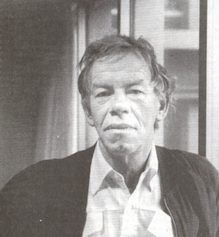 Gerrit Noordzij (b. 1931, Rotterdam; d. 2022) was a Dutch graphic designer, typeface designer, author, teacher, calligrapher, and design artist who made drawings, wood and copper engravings, and postage stamps. From 1960 until 1990 he taught writing and type design at the Royal Academy of Art in The Hague. One of his many students there was Lucas de Groot. Noordzij has worked as graphic designer for various Dutch publishers. Since 1978 he has been the house designer for the publishing company Van Oorschot. His intellectual influence is matched by his physical heritage, in the form of two talented sons in the field of type design, Christoph and Peter Matthias. The Gerrit Noordzij Prize, a prize given to typographers and type designers for extraordinary contributions to the field, is named after him. He was also the first person to receive this prize in 1996. In 2013, Gerrit Noordzij reveived the TDC Medal at the ATypI in Amsterdam.
 The influence he had on Dutch type design is based on a theoretical system he called The stroke of the pen, and his position as the main teacher of type design in the country for three decades. Books on his system include The stroke of the pen: fundamental aspects of western writing (1982), and De Streek: Theorie van het schrift (1985) (translated by Peter Enneson in 2005 at Hyphen Press in London: The Stroke: Theory of Writing). His point in his oeuvre is that letterforms are rooted in handwriting. Other publications: Letterletter (Vancouver, Hartley&Marks Publishers, 2000), De Staart van de Kat (1988,GHM, Leersum), De Handen van de Zeven Zusters (with Willem Dijkhuis: Van Oorschot, Amsterdam, 2001), Das Kind und die Schrift (Typographische Gesellschaft, München, 1985). His typefaces: - Gerrit designed what some consider the perfect font, Ruit, but it is nowhere to be had.
- Dutch Roman (1980).
- Batavian (1980).
- Remer.
- Ruse: a huge text family that started out based on Gerrit's own handwriting, published at TEFF, or The Enschedé Font Foundry. He writes: From 000 to 100 the family is divided into 11 variants of increasing contrast. Each variant contains four different kinds of figures (supplied in four font layouts - HgTb, HgTx, LnTb and LnTx) and a special version for ligatures (Lig). HgTb is a version that has old style figures with identical widths, HgTx has old style figures with individual widths, LnTb has lining figures with identical widths and LnTx has lining figures with individual widths. Any typesetting job for figures, whether it be in tables or plain text, can be carried out easily with Ruse. Each variant is available in roman, italic and small capitals. The complete family consists of 154 fonts.
- The bastarda typeface Burgundica (1983, TEFF). He writes: The design of Burgundica emerged from analyzing the elongated version of the Burgundian Bastarda appearing firstly in manuscripts from the calligraphic workshop of Jacquemart Pilavaine in Bergen (Hainaut) in 1450. The Burgundian bookproduction of the time owed much of its splendor to this elegant script. In Burgundica I followed the shapes of the Burgundian bastarda rather closely. Of course, there was no use for the shapes of the bastarda in the roman and italic fonts of Tret; instead I adapted the spatial proportions of the calligraphic pattern to the shapes of that typeface. (Note: Tret is to be released by TEFF, currently in production). In the last quarter of the 15th century the first bastarda typefaces were cut in Bruges. Many similar typefaces followed that were founded on the typefaces by such predecessors as Caxton, Mansion and Brito. Contrarily Burgundica has its origin in the script itself.
In 2013, Geen Bitter (Thom Janssen, Jorn Henkes and Rogier van der Sluis) copublished Gewone letters Gerrit's early models at Uitgeverij De Buitenkant, Amsterdam. The text has contributions by Albert-Jan Pool, Frank E. Blokland, Aad van Dommelen, Huug Schipper, and Petr van Blokland. The blurb: A couple of years back, while cleaning the letterpress workshop at the KABK in The Hague, we had an amazing find. A package that hasn't been opened for some time. We opened it and found eighteen printing plates in mint condition. The printing plates, we soon found out, were made by Gerrit Noordzij and date back to the late 1960s. They contain a brief lesson about writing with the broad nib and, once familiar with this basis, writing and drawing some different techniques. Since it seemed the plates are never published before, we decided to do so and made a book containing prints from the plates. Next to the plates we asked former students if they still had old work and sketches with comments by Gerrit Noordzij. The result is a collection of sketches and material, together with five writings about the plates, Gerrit Noordzij and his contribution to the field of type and typography. Scan of a 1974 postage stamp by Noordzij. Klingspor link. Letterror link. Flickr group with Noordzij photographs. Interview by Robin Kinross, 2001. The Enschedé Font Foundry link. Video from 2014 by TYPO Berlin. [Google]
[MyFonts]
[More] ⦿
|
Giesserei Carl Kloberg
[Carl Kloberg]
|
 Leipzig-based foundry of Carl (or Karl) Kloberg which was taken over by Berthold in 1922.
 One of their house typefaces was Verzierte Schwabacher (1891) (Schwabacher Handtooled), which was revived in 2005 by Petra Heidorn as Schwabach Deko, with further fine-tuning still in 2005 by James Arboghast and Petra Heidorn in Verzierte Schwabacher. Related typefaces are Hermann-Gotisch by Herbert Thannhaeuser, 1934 and Peter Schlemihl, also known as Lichte Tiemann-Fraktur by Walter Tiemann, 1918-1921. Both were digitized by Dieter Steffmann. House typefaces also include Leipziger Altfraktur (1912, mentioned by some as a Berthold face; revived by Gerhard Helzel), Bavaria-Buchschrift (ca. 1900), Bavaria-Brotschrift (ca. 1900), and Gotisch Enge (1882, Berthold). In 1909, they published a 63-page specimen book, Spezial-Musterbuch für Buchdruckereien über moderne Schriften, Einfassungen, Messinglinien, Ornamente und Vignetten. [Google]
[More] ⦿
|
Gilles Le Corre
[GLC --- Gilles Le Corre]

|
 [MyFonts]
[More] ⦿
|
GLC --- Gilles Le Corre
[Gilles Le Corre]

|
 French painter born in Nantes in 1950, who lives in Talmont St Hilaire. His fonts include 2010 Cancellaresca Recens (inspired by a chancery type of Francisco Lucas from the late 16th century), 2009 Handymade (comic book style), 2009 Lollipop (chancery style), 2009 GLC Plantin, 2009 Primitive (2009, a rough-edged roman script), 2008 Script 2 (2008), GLC Ornaments One (2008) and 2008 Xmas Fantasy (2008: blackletter). In 2008, he started GLC -- Gilles Le Corre and became commercial. Creative Market link. He is best known for his historic revivals:
 - 161 Vergilius (2010)
- 750 Latin Uncial (2010): inspired by the Latin script used in European monasteries from circa 5th to 8th, before the Carolingian style took over. The uppercases were mainly inspired by a 700's manuscript from Fécamp's abbey in France.
- 799 Insular (2010): inspired by the so-called insular style of Latin script that was used in Celtic monasteries from about 600 until 820.
- 825 Karolus (2009), and 825 Lettrines Karolus (2009).
- 1066 Hastings (2009).
- 1350 Primitive Russian (2012) was inspired by a Russian Cyrillic hand of Russkaja Pravda. It has rough-edged Latin charaters and many old Russian glyphs.
- 1420 Gothic Script (2008).
- 1431 Humane Niccoli (2010), after writings of Florence-based calligrapher Niccolo Niccoli (1364-1437).
- 1456 Gutenberg (2008, based on a scan of an old text). Followed by 1456 Gutenberg B42 Pro, which was based on the so called B42 character set used for the two Gutenberg Latin Bibles (42 and 36 lines).
- 1462 Bamberg (2008).
- 1467 Pannartz Latin (2009): inspired by the edition De Civitate Dei (by Sanctus Augustinus) printed in 1467 in Subiaco by Konrad Sweynheym and Arnold Pannartz, who was the punchcutter.
- 1470 Sorbonne (2010) was inspired by the first French cast font, for the Sorbonne University printing shop. The characters were drawn by Jean Heynlin, rector of the university based on examples by Pannartz. It is likely that the cutter was Adolf Rusch.
- 1470 Jenson-SemiBold (2008).
- 1475 BastardeManual (2008, inspired by the type called Bastarde Flamande, a book entitled Histoire Romaine (by Titus Livius), translated in French by Pierre Bersuire ca. 1475, was the main source for drawing the lower case characters).
- 1479 Caxton Initials (2009): inspired by the two blackletter fonts used by the famous William Caxton in Westminster (UK) in the late 1400s.
- 1483 Rotunda Lyon (2010): inspired by a Venetian rotunda found in a 1483 book called Eneide printed in Lyon by Barthélémy Buatier (from Lyon) and Guillaume Le Roy (from Liège, Belgium).
- 1484 Bastarda Loudeac (2008).
- 1470 Jenson Latin (2009), inspired by the pure Jenson set of fonts used in Venice to print De preparatio evangelica in 1470.
- 1491 Cancellarasca Normal and Formata (2009): inspired by the very well known humanist script called Cancellaresca. This variant, Formata, was used by many calligraphers in the late 1400s, especially by Tagliente, whose work was mainly used for this font.
- 1492 Quadrata (2008).
- 1495 Lombardes (2008): a redrawn set of Lombardic types, which were used in Lyon by printers such as Mathias Huss, Martin Havard or Jean Real, from the end of 14OOs to the middle of 1500s.
- 1495 Bastarde Lyon (2008, based on the font used in the "Conte de Griseldis" by Petrarque).
- 1499 Alde Manuce Pro (2010): inspired by the roman font used by Aldus Manutius in Venice (1499) to print Hypnerotomachia Poliphili, the well-known book attributed to Francesco Colonna. Francesco Griffo was the punchcutter. The Italic style, carved by Francesco Colonna, illustrates the so-called Aldine style.
- 1509 Leyden (2008; a Lombardic typeface inspired by the type used in Leyden by Jan Seversz to print Breviores elegantioresque epistolae).
- 1510 Nancy (2008, decorated initial letters was inspired by those used in 1510 in Nancy (France, Lorraine) for printing of Recueil ou croniques des hystoires des royaulmes d'Austrasie ou France orientale[...] by Symphorien Champion; unknown printer).
- 1512 Initials.
- 1514 Paris Verand (based on initial caps that Barthélémy Verand employed for the printing of Triumphus translatez de langage Tuscan en François.
- 1522 Vicentino (2011). Based on Ludovico Vicentino Arrighi's 1522 typeface published in La Operina.
- GLC 1523 Holbein (2010, after Hans Holbein's Alphabet of Death.
- GLC 1525 Durer Initials (2010). Sample R.
- 1529 Champ Fleury Pro and 1529 Champ Fleury Initials (2010): based on Geofroy Tory's original drawings and text face.
- 1532 Bastarde Lyon (2008, based on work by an anonymous printer in Lyon (France) to print the French popular novel Les Grandes et inestimables Chroniques du grand et enorme geant Gargantua).
- 1533 GLC Augereau Pro: inspired by one of Antoine Augereau's three roman typefaces: the Gros Romain size, used in 1533 to print Le miroir de l'&aciorc;me..., a poetic compilation by Marguerite de Navarre, sister of the French king François I.
- 1534 Fraktur (2009; inspired by the early Fraktur style font used circa 1530 by Jacob Otther, printer in Strasbourg (Alsace-France) for German language printed books).
- 1536 Civilité manual (2011). Based on a handwritten copy of Brief story of the second journey in Canada (1535) by French explorer Jacques Cartier.
- 1538 Schwabacher (2008, based on a font used by Georg Rhan in Wittemberg (Germany) to print Des Babsts Hercules [...], a German pamphlet against roman catholicism written by Johannes Kymeus).
- 1540 Mercator Script was inspired by an alphabet of Gerardus Mercator, who is known for his maps as well as his Literarum Latinarum, quas Italicas cursoriasque vocant, scribendarum ratio (1540).
- 1543 Humane Petreius (2012) was inspired by the typeface used in Nuremberg by Johannes Petreius for De Revolutionibus Orbium Coelestium, the well-known mathematical and astronomical essay by Nicolas Copernicus.
- 1543 German Deluxe (2009): a Schwabacher inspired by the sets of fonts used in 1543 by Michael Isengrin, printer in Basel, to print New Kreüterbuch, which is a book with numerous nice pictures, the masterpiece of Leonhart Fuchs, father of the modern botany.
- 1543 HumaneJenson-Bold (2008, after the typeface used in Vesalius' 1543 book De humani corporis fabrica).
- 1543 HumaneJenson-Normal (2008, same source).
- 1545 Faucheur (2011) is a rough garalde typeface that was inspired by the set of fonts used in Paris by Ponce Rosset, aka Faucheur, to print the story of the second travel to Canada by Jacques Cartier, first edition, printed in 1545.
- 1546 Poliphile (2009), inspired by the French edition of Hypnerotomachie de Poliphile ("The Strife of Love in a Dream") attributed to Francesco Colonna, 1467, and printed in 1546 in Paris by Jacques Kerver.
- 1550 Arabesques (2008, caps).
- 1557 Civilité Granjon (2010).
- 1557 Italique (2008, based on Italic type used by Jean de Tournes in Lyon to print La métamorphose d'Ovide figurée).
- 1565 Renaissance (2010), inspired by French renaissance decorated letters.
- 1565 Venetian Normal (2008, initial decorated letters that are entirely original, but were inspired by Italian renaissance engraver Vespasiano Amphiareo's patterns published in Venice ca. 1568).
- 1584 Rinceau (2008, a set of initial letters is an entirely original creation, inspired by French renaissance patterns used by Bordeaux printers circa 1580-1590).
- 1584 Pragmatica Lima (2011). Based on fonts used in 1584 by Antonio Ricardo to produce the first publication ever printed in Southern America.
- 1585 Flowery (2009): inspired by French renaissance decorated letters.
- 1589 Humane Bordeaux (2008, inspired by the Garamond fonts used by S. Millanges (imprimeur ordinaire du Roy) in Bordeaux ca. 1580-1590. The alphabets were used to reprint L'instruction des curés by Jean Gerson).
- 1590 Humane Warszawa is a rough-edged garalde typeface inspired by a font carved circa 1590 for a Polish editor.
- 1592 GLC Garamond (2008, inspired by the pure Garamond set of fonts used by Egenolff and Berner, German printers in Frankfurt, at the end of sixteen century. Considered the best and most complete set at the time. The italic style is Granjon's).
- 1610 Cancellaresca (2008, inspired by the Cancellaresca moderna type of 1610 by Francesco Periccioli who published it in Sienna).
- 1613 Basilius (2012) was based on the hand-drawn types used by Basilius Besler (Germany) for the carved plates of his botanical manual Hortus eystettensis.
- GLC 1619 Expédiée (2015). A grungy Civilté.
- 1621 GLC Pilgrims (2010).
- 1634 René Descartes (2009), based upon his handwriting in a letter to Mersenne.
- 1638 Civilité Manual (2010). Inspired by a French solicitor's document dated 1638.
- GLC 1648 Chancellerie (2011). Inspired by the hand-written 1648 Munster peace treaty signed by roi Louis XIV and Kaiser Ferdinand II.
- 1651 Alchemy (2010): a compilation created from a Garamond set in use in Paris circa 1651.
- GLC 1669 Elzevir (2011) was inspired by the font typefaces used in Amsterdam by Daniel Elzevir to print Tractatus de corde, the study of earth anatomy by Richard Lower, in 1669. The punchcutter was Kristoffel Van Dijk.
- GLC 1672 Isaac Newton (2012) is based on the hand of Isaac Newton.
- GLC Morden Map (2011). Based on an engraved typeface used on a pack of playing cards published by Sir Robert Morden in 1676.
- 1682 Writhed Hand: very irregular handwriting.
- 1689 GLC Garamond Pro (2010): inspired by Garamond fonts used in an edition of Remarques critiques sur les oeuvres d'Horace by DAEP, published in Paris by Deny Thierry and seprately by Claude Barbin.
- 1689 Almanach (2009): inspired by the eroded and tired fonts used by printers from the sixteenth century to the early years of twentieth for cheap or fleeting works, like almanacs, adverts, gazettes or popular novels.
- 1695 Captain Flynt.
- 16th Arabesques (2008, an exquisite ornamental caps scanfont).
- 1715 Jonathan Swift (2011). An example of the hand of Irish poet and novelist Jonathan Swift (1667-1745). It is a typical exemple of the British quill pen handwriting from about 1650-1720.
- GLC 1726 Real Espanola (2012). Based on the set of typefaces used by Francisco Del Hierro to print the first Spanish language Dictionary from the Spanish Royal Academy (Real Academia Española, Dictionario de Autoridades) in 1726. These transitional styles are said to have been the first set of official typefaces in Spain.
- 1741 Financiere (2009): inspired by the Fournier's font Financière. While it appears handwritten, it was in fact carved in 1741 by Pierre Simon Fournier le jeune and published in his Manuel Typographique in Paris (1764-1766).
- 1742 Frenchcivilite (2008).
- 1751 GLC Copperplate (2009), a 6-style family about which Gilles says: This family was inspired by an engraved plate from Diderot&Dalembert's Encyclopedia (1751), illustrating the chapter devoted to letter engraving techniques. The plate bears two engravers names: "Aubin" (may be one of the four St Aubin brothers?) and "Benard" (whose name is present below all plates of the Encyclopedia printed in Geneva). It seems to be a transitional type, but different from Fournier or Grandjean.
- 1756 Dutch (2011).
- 1776 Independence (inspired mainly from the font used by John Dunlap in the night of 1776 July 4th in Philadelphia to print the first 200 sheets of the Congress' Declaration of Independence establishing the United States of America).
- 1781 La Fayette (2010): a formal bâtarde coulée script with caitals inspired by Fournier (1781).
- 1785 GLC Baskerville (2011). Le Corre explains: The Baskerville's full collection was bought by the French editor and author Pierre-Augustin Caron de Beaumarchais who used it to print---in Switzerland---for the first time the complete work of Voltaire (best known as the Kehl edition, by the "Imprimerie de la société littéraire typographique"). We have used this edition, with exemplaries from 1785, to reconstruct this genuine historical two styles.
- 1786 GLC Fournier (2010), based on several books printed in Paris just before the Didot era set in. The Titling characters are based on hymns printed by Nicolas Chapart.
- 1790 Royal Printing (2009): inspired by various variants of Romain du Roy.
- 1791 Constitution (2011).
- 1792 La Marseillaise (2011). Based on the original manuscript of the French revolutionary song La Marseillaise which later became the French national hymn---it was composed in one night (April 25, 1792) by captain Rouget de Lisle.
- 1805 Austerlitz Script Light: a typical French handwriting style from that period, named after one of the few battles that Napoleon actually won.
- 1805 Jaeck Map (2011). Inspired by the engraved characters of a German map, edited in Berlin at the end of 1700s. The engraver was Carl Jaeck or Jaek (1763-1808).
- 1809 Homer (2011), a grungy typeface named after the "homer" message pigeons.
- 1815 Waterloo (2008): a handwriting typeface originating in Napoleon's government. Why do I feel that GLC is nostalgic for the era of Napoleon? Their own present dwarf-version of Napoleon is not exactly a huge success.
- 1820 Modern (2009) was inspired by a didone font used in Rennes by Cousin-Danelle, printers, for a Brittany travel guide.
- 1822 GLC Caslon (2010): inspired by a Caslon set used by an unknown Flemish printer from Bruges, in the beginning of 1800s, a little before the revival of the Caslon style in the 1840s.
- 1845 Mistress (2009): calligraphic script.
- 1848 Barricades Italic, a quill pen italic.
- 1859 Solferino (2009).
- 1863 Gettysburg (2008; inspired by a lot of autographs, notes and drafts, written by President Abraham Lincoln, mainly the Gettysburg address).
- 1864 GLC Monogram Initials (2011) was inspired by a French portfolio containing about two hundred examples of Chiffres---deux lettres, created for engravers and jewelers in Paris in 1864, and drawn by French engraver C. Demengeot.
- 1871 Victor Hugo (2011). Based on manuscripts from the final part of the life of Victor Hugo (1802-1885).
- 1871 Whitman Script (2008) and 1871 Dreamer Script (2008): inspired by manuscripts by American poet Walt Whitman. See also 1871 Dreamer 2 Pro (2012).
- 1880 Kurrentschrift (2010): German handwriting, based on late medieval cursive. It is also known as "Alte Deutsche schrift" ("Old German script"). This was taught in German schools until 1941.
- 1883 Fraktur (2009): inspired by fonts used by J. H. Geiger, printer in Lahr, Germany.
- 1885 Germinal: based on notes and drafts written by Émile Zola (1840-1902).
- GLC 1886 Romantic Initials (2012).
- 1890 Registers Script (2008): inspired by the French "ronde".
- 1890 Notice (2009): a fat didone family.
- 1902 Loïe Fuller (art nouveau face).
- 1906 Fantasio (2010): inspired by the hatched one used for the inner title and many headlines by the popular French satirical magazine Fantasio (1906-1948).
- 1906 French News: a weathered Clarendon-like family based on the fonts used by Le Petit Journal, a French newspaper that ran from 1863 until 1937.
- 1906 Fantasio Auriol (2010), inspired by the set of well known Auriol fonts used by the French popular satirical magazine Fantasio (1906-1948).
- 1906 Titrage (2009): a didone headline typeface from the same newspaper.
- Underwood 1913 (2007, an old typewriter font, whose commercial version is Typewriter 1913), and 1913 Typewriter Carbon (2008).
- 1920 French Script Pro (2010).
- 1920 My Toy Print Set, 1925 My Toy Print Deluxe Pro (2010): inspired by rubbert stamp toy print boxes called Le petoit imprimeur.
- 1968 GLC Graffiti (2009).
- 1917 Stencil (2009; with rough outlines).
- 2010 Dance of Death (2010): based on Hans Holbein's Alphabet of Death.
- 2009 Primitive (2016).
- 2009 GLC Plantin Pro (2016).
- 2010 Pipo Classic: a grungy typewriter slab serif family.
- 2010 Cancellaresca Recens (2016).
- 2011 Slimtype (2011, +Italic) and 2011 Slimtype Sans (2011): an old typewriter typeface.
Creative Market link. Fontspring link. [Google]
[MyFonts]
[More] ⦿
|
Gottfried Pott

|
 Calligrapher, born in 1939. He studied graphic design at the Werkkunstschule in Wiesbaden under F. Poppl. Since 1988, he is professor of calligraphy at the University for Applied Science and Art at Hildesheim/Holzminden, Germany. Bio. Well-known for the highly decorative bastarda typeface Duc de Berry (1991, Adobe, and later also at Linotype), for Karolina (1990, Linotype, in the style of the Carolingian Minuskel), for Arioso (1990, Linotype) and for Ruling Script (1992, Linotype, a calligraphic script). The Duc de Berry font was aped in Casual Tudor Script (SSi), Agincourt (Swfte) and Talleyrand (Scriptorium). In 2010, he made the sketchy brush face Potpourri (Linotype).
 FontShop link. Klingspor link. [Google]
[MyFonts]
[More] ⦿
|
Greater Albion Typefounders (or: GATF)
[Paul James Lloyd]

|
 Paul J. Lloyd's type foundry in Western Australia, est. 2008. Lloyd (b. UK) made over 100 free truetype fonts before that. He writes: What we will offer is new designs, replete with Edwardian Fun, Victorian distinction, or any other piece of elegance we can manage.
 Edwardian creations from 2008-2010: Ark Wright (traditional shop signage), Adantine, Goldbarre, Brosse, Crewekerne, Crewekerne Magna and Crewekerne Magister (arts and crafts face), Larchmont, Brissard, Brossard (slab serif), Bonavia, Bonavia Blanc, Clementhorpe, Veneribe, Chiara Script, Howlett, Svengali Roman, Bonning and Bonnington (1920's style families with ideas from University Roman), Absinette (2009, art nouveau), Bamberforth, Tumbletype, Vertrina, Bromwich, Great Bromwich, Fleete, Helenium. Chipping emulates the Edwardian 1920s. In 2012, he added the Bolton Commercial family (late Edwardian, early art nouveau). Art deco typefaces: Oakland (2011, multiline typeface gleaned from a 1930s French car ad), Zenia (2010, trilined), Plebe (Plebia, 2008: a grotesk emulating the 1930s), Whitehaven (2008, an extensive art deco family with several shadow weights), Merry Fleurons (2008, Christmas ornament dingbats), Braxia (2008), Keynsia (fifties style art deco family with Peignot influences). Other typefaces: Haymer is a large sans family made in 2010. Clunic (2008) is a blackletter face. Tectura (2008) is a handwriting font. Eldridge is a slab serif family. Aliqua (2009), Chipperly (2009) and Syondola (2008, Tuscan) are Wild West families. Terazza Tilings (2009) and Valentine's Fleurons (2009) are dingbat typefaces. Additions in 2009 include Lowndes (soft blackletter), Christmas Fleurons, Merry Snowmen, Cherritt (described as a Victorian era Courier), DoodleBirds, Halloween Fleurons, ButtonFaces, Sabio (neither slab nor sans), Daub (brush graffiti font), Sabinard (a modern swash face), Cullions (futuristic blackletter), Coronard (blackletter / roman hybrid), Easter Fleurons, Chapter Initials, Paveline (19th century calligraphic script), Mellin Sans and Open, Gildersleeve (evoking the 1920s Arts and Crafts movement), Stannard (a 1920's advertising inspired small caps face), Slattery (a horizontally shaded fun face), Slatterine (2009, more retro futurism), Spillsbury (2010, Victorian family), Cirflex (2010, geometric display typeface based on arcs of circles), Oxonia (2010, a classic roman family) and Vectis (classic Roman elegance, another small caps face). Creations in 2010: Windevere, Albion's White Christmas, Paragon (a great didone display family with a wood type feel), Compton (slab serif family), Mexborough, Morover (Schwabacher family), Anavio (a classical roman family), Corvone (3d-effect font), Granville (Victorian), Corton (Victorian), Wellingborough (Victorian), Worthing (Victorian), Ark Wright (traditional shop signage), Bonaventure (art nouveau), Federal Streamliner (1950s feel techno face), Deva (classical roman), Crucis Ornaments (crosses), Bronzino (a roman with Arts and Crafts roots), Bertoni (2010, a didone family), Pardon Me Boy (train dingbats), Woodruff (Open Face fonts with a wood type look), Jonquin (based on a WWI poster; +Incised), Luscombe (1920s display family; +Parva), Movella (futuristic from the 1950s), Magdalena Sans (2010: a clear monoline sans), Endymion (2010: Tuscan), Paget (a Tuscan experimental all caps face), Portello (Victorian). Typefaces made in 2011: Admiral (art nouveau), Tuscaloosa (Tuscan face), Eccles (bombastic Victorian), Wolverhampton (pre-Victorian), Doncaster (Victorian family), Metropole (art nouveau family), Corsham (stone engraved lettering family), Leibix (casual), Albia Nova (an elegant futuristic organic face), Flapper (art nouveau face), Bertolessi (curly Victorian), Tulk's Victorian Banner (all caps banner face), Fitzgerald (Victorian all caps face), Cleveden (Victorian headline family), Spargo (an extensive set of early 20th century-look engraved typefaces for official documents and securities), Bettendorf (2011, based on a 1900s masthead typeface), Wolvercote (2011, similar to Bettendorf), Pittsburgh (2011, a Western-style engraved face), Chubbly (2011), Portmeirion No. 6 (2011, a Victorian / circus design), Bronzetti (2011; images: i, ii, iii, iv, v, vi), Sophie J (hanprinted), Dem Bones (2011, glyphs made from bones), Stout (2011), Birmingham New Street (a Victorian family inspired by the hand lettered title on a 19th century railway map), Beckinslade (ornamental blackletter). Production in 2012: Alfere Sans Stripes, Albion's Americana (Western stars and stripes face), Tudor Perpendicular (blackletter), Amici (rounded headline face), Amie (rounded sans), Wolverton Text (Edwardian family), Vinea (10-style display family), Par Avion (retro futuristic), AstroBats (retro sci-fi dingbats), Beeching (+Shadowed), Gondolieri (didone meets Tuscan), Penrose Slabserif (an Escher-like trompe l'oeuil 3d face), Haldane (art nouveau, Arabic look), Solidarius (chubby, fat felt-tip pen font), Bluebottle (angular display face), Merrivale (Victorian), Future Runes (runic simulation), Coliseo, Alfrere Sans (inspired by a 1950s television caption style), Tectura II (Lloyd's answer to Comic Sans), Secombe (Edwardian caps family), Milligan, London Court (Tudor-era caps family). Typefaces from 2013: Speedblur, Belhampton (Edwardian), Merry Baubles (Christmas tree dings), Merry Bauble Letters (Christmas alphadings), Wroxeter (blackletter), Thurbrooke (+Banner, +Initials, +Black, +Reverso, all based on 19th century banner headings and engraved lettering), Bourne (a rounded type system), Henrician (a set of eight Tudor style display typefaces), Belle Jardin (art deco marquee face), Lavery (Edwardian), Baldione (a stylized didone), Chequers (a vintage poster face), Turvy Topsy (fat finger face), Merrivaux (faux medieval), Blout (German expressionist typeface), Easter Egg Letters, Isometrica (a banner typeface family), Valentine's Letters, Imperial Granum (roman titling face), Brollo (chunky display face). Typefaces from 2014: Albions Very Old Masthead, Albions Engraved Black, Albions Old Masthead, Albions Incised Masthead, Albions Black Holly, Zanderley (pure Victoriana, +Initials), Landsdowne Commercial, Friendly Shaded Sans, Trivette, Wellmere Sans, Uncia Black, Henry VII, Greene and Rollins (layered Victorian typeface), Barollo, Alfrine, Alfrere Banner (+Incised), Lugano, Lanvier (1930s-style caps typeface family), Bonlivet (a hyper-decorative capitals alphabet from the late Victoian or early art nouveau era), Ames Text (a didone family with rounded brackets), Ames Roman (related to didones but with wedge serifs), Ames Weathered, Ames Shadow, Ames Shaded, Amersham (vintage signage family, 2013-2014). Typefaces from 2015: Netherland Perpendicular (Victorian blackletter), Ledbury (Victorian), Ambergate (Edwardian poster face), Empyrean (futuristic, yet curvy), Flinscher (1920s script), Signwriter Standard, Display Hatched, Albions Marker No.1 (a charming outlined marker pen typeface inspired by Bembo and Caslon), Joyvrie, Kinver (Victorian), Nationale (Victorian), Doges Banner, Doges Darker (Victorian), Doges Delight (Victorian), Doges Venezia (Victorian). Typefaces from 2016: Buntisland, Elmcourt, Allorette, Albion Sharp Italic, Deco Metro (art deco), SpeedSwash (blackletterish), Stridere (blackletterish), SpeedSketch. Typefaces from 2017: Shervington, Cantebriggia 1207 (a weathered blackletter), Algreve, Alambart, Duquesne Dark Woodcut, Courtold Shadow, Athabasca (Wild West Tuscan), Fargo Tuscan, Millerstown (Western), Millerstown Races, Old Millerstown, Sasparillo (Tuscan), Sasparillo Fizz, Wylgate, Herald Banner. Typefaces from 2018: Garstang Engraved, Halliwell Casual, Portculliard, Rotham Industria, Sombrieul (Edwardian), Shervington Engraved (a shaded typeface that appears hand-engraved on copper-plate). Typefaces from 2019: Dewhirst Display, Rakia (retro futuristic), Eurobia (art nouveau style). Typefaces from 2020: Draughtsman Engraved, Draughtsman Label Hand (Victorian), Civic Triline. Typefaces from 2021: Albion Seventies, Portculliard Engraved (an engraved ultra-decorative blackletter). Type announcements. Behance link. Klingspor link. Abstract Fonts link. Font Squirrel link. Kernest link. Abstract Fonts link. Hellofont link. View all typefaces by Paul Lloyd. Images of Paul Lloyd's best-selling typefaces. Greater Albion Typefounders: typeface collection. View Paul Lloyd's Victorian typefaces. [Google]
[MyFonts]
[More] ⦿
|
Guillaume Jean-Mairet
[Wraith Types (or: Fantomas Types)]

|
[MyFonts]
[More] ⦿
|
Gustav Mori
|
Type designer (1872-1950) who reconstructed Gutenberg-Textura (1928, Stempel). In 1916, he published a book on the Frankfurt-based foundry of Benjamin Krebs, Nachfolger, Die Schriftgiesserei Benjamin Krebs Nachf., Frankfurt a.M. Ein Beitrag zur Geschichte des Frankfurter Schriftgiesser-Gewerbes. Die Hochdeutschen Schriften aus dem 15ten bis zum 19ten Jahrhundert der Schriftgiesserei und Druckerei was published in 1919 at Elsevier. [Google]
[More] ⦿
|
Haas'sche Schriftgiesserei

|
 German/Swiss foundry established in 1790 (however, see timeline below) and based in Basel/Münchenstein. Many of its shares were acquired by D. Stempel in 1927. Linotype takes over Haas in 1989. Their collection includes:
 - Kompakte Grotesk (1893)
- Steinschrift (1834). See also here.
- Enge Grotesk (ca. 1870)
- Commercial-Grotesk Halbfett (1940)
- Altgrotesk halbfett (1880)
- Haas gotisch schmal. This typeface was digitally revived by Gerhard Helzel.
- Bodoni-Kursiv, Bodoni-Antiqua (Bodoni, 1780). The 1924 cuts of Bodoni formed the basis of Berthold Bodoni, which can now be had under that name in digital form.
- Ideal-Antiqua (ca. 1880)
- Caslon Antiqua and Caslon Kursiv (William Caslon, London, 1720)
- Alt-Fraktur and Fette Alt-Fraktur (ca. 1840)
- Fette Gotisch (ca. 1860)
- Halbfette Normande (1850) and Normande fett (by Thorne, London, 1810)
- Nürnberger Schwabacher (originally, ca. 1600, published in 1930)
- E.A. Neukomm: Bravo (1945), Chevalier (1946). Digital forms of Chevalier can be found at Agfa and LetterPerfect. Elsner&Flake's Escorial is another digital form of it. And so is PrimaFont's Chauvinist.
- A. Auspurg: Castor (1924), Pollux (1925).
- Hermann Eidenbenz: Graphique (1941), Clarendon (1953). Clarendon became a Linotype face.
- Adrian Frutiger: Ondine (1954), a calligraphic font done at Deberny et Peignot before it was taken over by Haas.
- Walter J. Diethelm: Diethelm Antiqua (1945-1950).
- M. Miedinger: Helvetica (1957), Horizontal (1964), Pro Arte (1954). Helvetica became Linotype's big prize face.
- Eugen+M. Lenz: Profil (1943-1947). In the digital era, Profil became Decorated 035 at Bitstream.
- P. Wezel: Constellation (1970).
- H. Baumgart: Quirinale (1970).
- Richard Gerbig: Riccardo (1941, a script face).
- Edmund Thiele: Superba (1934), Normale Grotesk (1942), Troubadour Lichte (1931, script). Troubadour survives digitally as Rechtman Script (Intecsas). Superba was digitally revived by Red Rooster as Superba Pro (1992 and 2017).
- Anzeigen Grotesk (1943, Haas / Linotype) is a heavy condensed sans in the style of Impact. Modern digital versions include Anzeigen Grotesk (2009) by URW and Anzeigen Grotesk (2006) by Linotype.
- Estienne is a condensed roman with small pointed serifs that revives a nineteenth century design. Not to be confused with the old face Linotype estienne.
In Chronik der Haas'schen Schriftgiesserei (2002), Hans Reichardt describes this timeline: - 1654: Johann Jakob Genath (1582-1654) runs a print shop and foundry in Basel.
- 1708: His son Johann Rudolf Genath (1638-1708) leaves the foundry to his second son Johann Rudolf Genath II.
- 1737: Johann Rudolf Genath II has no children and makes Johann Wilhelm Haas (1698-1764) his official heir. Haas had come from Nürnberg to Basel in 1718 to work with Genath.
- 1745: Haas takes over, and dies in 1764. His son Wilhelm Haas Münch (1741-1800) then takes over.
- 1772: Wilhelm invents a hand press, and in 1776 develops a system for printing maps.
- 1790: Publication of Epreuves des caracteres d'usage ordinaire dans l'imprimerie. Local download.
- 1800: Wilhelm is succeeded by his son, Wilhelm Haas Decker (1766-1838).
- 1830: Wilhelm Haas Decker leaves the business to his son Georg Wilhelm Haas (1792-1853) and to Karl Eduard Haas (1801-1853).
- 1852: Two employees, Jakob Haas and G. Münch take over. But in 1857, they sell the company to Otto Stuckert (1824-1874) who lived in Lörrach.
- 1866-1895: The Basler Handelsbank was the main investor in the business, and sells it in 1895 to Fernand Vicarino.
- 1904: Max Krayer becomes owner.
- 1921: A new plant is built in Münchenstein.
- 1924: Work on a new cut of Bodoni has started. Later, Stempel and Berthold would use this type, and it became well-known as Berthold Bodoni.
- 1927: The company becomes an AG (Aktiengesellschaft) and strikes business cooperation deals with D. Stempel AG and H. Berthold AG.
- 1940-1941: Caslon Antiqua and Kursiv (1940) and Riccardo (1941) are created.
- 1941: Ideal Roman is cast. Berry, Johnson and Jaspert write: This Haas revival is a condensed semi-bold nineteenth-century design, which is almost a Fat Face. There is the usual long spur to the G, curled tail to the R, and long serifs in the E, F and T. Ascenders and descenders in the lower case are very short. Cf. Contact. The present design is cast from 1941 matrices, and the identical type is cast by Stempel, who call it Jeannette. The type is quite different from Amsterdam and Intertype Ideal.
- 1944: Eduard Hoffmann becomes Director when Max Krayer dies.
- 1945-1958: In the Post World War II boom, these typefaces were created: Bravo (1945), Graphique (1945), Chevalier (1946), Profil (1947), Clarendon kräftig and fett (1953), Pro Arte (1954), Neue Haas-Grotesk halbfett (1957), Neue Haas-Grotesk mager (1958).
- 1968: Alfred Hoffmann succeeds Eduard Hoffmann.
- 1972-1982: An expansion period follows. The company takes over Deberny&Peignot (Paris) in 1972, Fonderie Olive (Marseille) in 1978, and Grafisk Compagni (Copenhagen) in 1982.
- 1989: Linotype takes over Haas and dissolves the company. Linotype itself keeps the name and the rights to the typefaces, and gives the foundry to Walter Fruttiger, who continues that part of the business as Fruttiger AG.
- 1990: Società Nebiolo (Turin) is taken over.
View the Haas typeface library. See also here. [Google]
[MyFonts]
[More] ⦿
|
Hans J. Zinken
|
Köln-based designer whose web page has several pages related to calligraphy and Rechtschreibreform as well as calligraphy and handwriting education in schools. His (free) typefaces: - Deutsche Kurrent (2014). A historic German school script.
- Marktkirche.
- SchwungFraktur (2011). A Schwabacher.
- Fraktur 1900.
- AltDeutschHJZ (2002-2006). This is based on the types made for the prayer book of Maximilian I, by Johannes Schönsperger in 1514, and later adapted in metal type by Genzsch ca. 1890.
- KanzleiScriptHJZ. After Heinrichsen Kanzlei (1933, Trennert) by Friedrich Heinrichsen.
- The calligraphic handwriting font Hans Hand (1994-1996), HansHand2 (1996-2007).
- Juergen Script (1998-1999), a heavy fountain pen script. See also Juergen2 (2011).
- CiviliteHJZ (1997). This was first called civi4 (1996). Based on Lettres de Civilité.
- GutenbergHJZ. This was Fraktur Gutenberg B42 (2000).
Dafont link. Klingspor link. [Google]
[More] ⦿
|
Hans-Otto Keunecke
|
German type historian. As example of his work was published in die Deutsche Schrift in 1988: Geschichte der Schwacher (history of Schwabacher). [Google]
[More] ⦿
|
Hartwig Poppelbaum
[K. u. K. Hof-Schriftgiesserei Poppelbaum]
|
 [More] ⦿
|
Heinrich Flinsch
[Schriftgiesserei Flinsch]
|
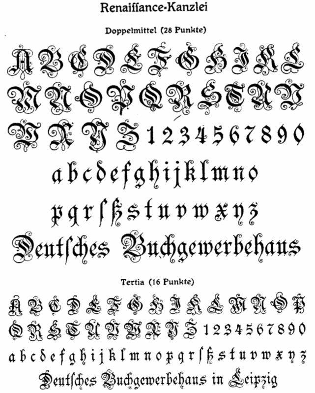 [More] ⦿
|
Heinrich ten Wolde
[Die Schwabacher Schrift]
|
[More] ⦿
|
Heinz König
|
 German type designer (b. Lüneburg, 1856, d. Lüneburg, 1937). After years in Braunschweig and Stuttgart, Heinz had contact with Genzsch&Heyse in Hamburg in 1881 and with Otto Hupp in 1887. After that, he returned to his home town to take over the printing business of his father. Brief bio by Harald Süß in 1999.
 List of his fonts compiled by Harald Süß. - Typefaces for J. D. Trennert: Alarm (1928), Wiking (1925: blackletter), Wiking licht (1927). Wiking Licht and Wiking Dunkel were revived digitally by Chiron in 2012 as TbC Wiking Licht and TbC Wiking Dunkel, and in 2019 by Ralf Herrmann as FDI Wiking.
- Typefaces for J. Klinkhardt: Rundine (1909), Rundine halbfett (1909), Askania, Askania halbfett (1910).
- Typefaces for Genzsch&Heyse: Segretario (before 1902), Superbia (1913), Renaissance Fraktur (1885; revived by Manfred Klein in 2005 as Münchner Fraktur and by Softmaker in 2016 as Renaissance Fraktur Pro), Renaissance Fraktur fett (1885), Deutsche Druckschrift (1888/1922; a revival under the same name was done by Petra Heidorn in 2004; the initials were done by König after drawing by Eduard Ege in München), Frappant (1913).
- Typefaces for Gebr. Klingspor: Falstaff (1906, a strong black titling face), König Antiqua (1905), König Antiqua fett (1906), Offenbacher Fraktur (1901), Reform Kursiv and Reform Kursiv halbfett (1904), Walthari (1899-1900, Jugendstil font originally done at the Rudhardsche Giesserei), Walthari halbfett (1901). A revival in 2008 by HiH named Waltari is here. Schmuckinitialen (2009, Ralph Unger) is also a revival. Walthari Initialen (Rudhardsche, ca. 1900) was revived by Ralph Unger in 2012 in his Initials RMU One.
- Typefaces for Schriftguss: Germania (1903), Germania halbfett (1903). Schnelle mentions that Germania was done for Aktiengesellschaft für Schriftgiesserei und Maschinenbau. Digital revival by Dieter Steffmann in 2001 under the same name.
- Typefaces for Emil Gursch: Koenig-Fraktur (1910-1915). This is also called Gursch Fraktur. A revival by Gerhard Helzel exists), Koenig-Fraktur halbfett, Koenig Schwabacher (1912-1913) and Koenig Schwabacher halbfett (1912), Koenig-Type (1903: revived by Gerhard Helzel; Wetzel and Die deutsche Schrift mention 1913), Koenig-Type halbfett (1906), Koenig-Type fett (1910), Koenig-Type eng (1908), Koenig-Type schmallfett (1908). Article about Koenig Type.
- Typefaces that ended up in the Linotype library: Heinz-Koenig schmallschrift (1927), Heinz-Koenig schmallschrift halbfett, Heinz-Koenig Setzm. Scans: Roemische Antiqua (1888), Schmalfett, Warm (1928), Heinz König Fraktur (1913), Heinz-Koenig Setzmaschinen Fraktur (+halbfett) (1913, originally Stempel). Dieter Steffmann offers a revival of Heinz Koenig (2002). Chiron has TbC Neue Roemische Antiqua (2012), based on Neue Roemische Antiqua (1924, Julius Klinkhardt).
[Google]
[More] ⦿
|
Henrik Keyser II
|
Swedish book printer and typographer, whose story is told be Douglas McMurtrie in The First Swedish Type Specimen (Chicago, 1933). He published Sweden's first type specimen book in 1691: "Någre få prooff. Hoos Henrick Keiser Kongl. Maytz: och Upsal. Acad. Booktryckiare Stockholm 1691". Only two copies of this specimen book remain, one in Stockholm, and one in Upsala, where Keiser was the University of Upsala printer. The type specimen book shows Fraktur, Schwabacher, music notation, Hebrew, Greek, Cursive, Antiqua, Roamyn and title capitals. Later on, Keyser became the royal printer. He died in 1699. Bio in Swedish. [Google]
[More] ⦿
|
Herbert Lemme
|
Designer (b. 1933, Bismark) associated with VEB Typoart. At that East German foundry, he created the blackletter revivals Alte Schwabacher and Luthersche Fraktur (with Volker Küster; digitized in 1989). [Google]
[More] ⦿
|
Herbert Maring

|
German designer, b. 1923 Heilbronn. Creator of the gothic bastarda typeface Clairvaux (Linotype, 1990-1991, Adobe and Monotype). Typedia: Designed by Herbert Maring and released by Linotype in 1990, Clairvaux is based on early Gothic typefaces used by the White Monks. It has the same simplicity of the old Cistercian order but yet is closer than any other bastarda to the forms of the Caroline minuscule, thus making it more legible than most. Linotype page. FontShop link. Typedia link. [Google]
[MyFonts]
[More] ⦿
|
Hermann Ihlenburg

|
 German-American type designer (b. 1843, Berlin) who apprenticed at the Trowitzsch & Son type foundry in Berlin, and then worked as a punchcutter in Dresden and at the G. Haase & Sons foundry in Prague. After positions at the Flinsch foundry in Frankfurt, the Battenburg foundry in Paris, and the Fonderie Haas in Basel, Ihlenburg moved to the United States in 1866 to work for the L. Johnson & Company foundry in Philadelphia, which became MacKellar, Smiths & Jordan some time later. Specializing in ornamental (Victorian) fonts and borders, he designed over eighty typefaces for that Mackellar and a few more for American Type Founders after it purchased MacKellar, Smiths & Jordan in 1901. Ihlenburg became an American citizen in 1874, and died in Philadelphia in 1905. He will be remembered as the prototypical Victorian type designer.
 His typefaces at MacKellar: - American (1876), Angular Text (1884, a Victorian blackletter at MacKellar, Smiths & Jordan; digitally interpreted by Toto in his free font K22 Angular Text (2012) and by Alan Jay Prescott as Angolan Text (2017)), Arboret (1884), Arboret No. 2 (1885), Archaic (1888), Artistic (1886), Attic (1879). Artistic was revived by Alan Jay Prescott in 2017 as Beltane Roman. He wrote: this letterform started out in 1886 as drawn by the great Herman Ihlenburg as Artistic and assigned to MacKellar Smiths & Jordan. Dan Solo called this face Belmont but only showed caps and was suspect anyway. I was able to find specimens elsewhere and a motherlode of other interesting things in the Inland Printer. I developed my first full-featured OTF using this typeface and designed Greek and Cyrillic glyphs as well. I also fitted it out with a set of small caps to make a font that now has 4,000 glyphs for nearly every non-Asian language. To top it off, Robert Donona revived the decorative caps for this typeface, an excruciating task that I once considered for myself but was lucky enough to have this other crazy person take up. The number of hours dedicated between Robert and myself in reviving this complete series digitally is probably unprecedented.
- Bijou (1883: digital copies include Bangle (1990-1991, FontBank), Riccio Display Script by Southern Software (1994, SSi, SSK), Grebe (1994, by an anonymous designer) and Mexacali by Swfte), Black Ornamented (1873), Broadgauge Ornate (1868: a spurred Western typeface at MacKellar Smiths & Jordan; revived by Michael Hagemann), Byzantine (1868).
- Centennial Script (1874, a spectacular high-contrast script digitized in 2007 by Canada Type and in 2011 as a free font called Mortem Stylus by Stylus, and by Intellecta Design as Centennial Script), Chaucer (1883), Childs (1892, revived by R. Beatty, and by Ingo Preuss as Daring), Circular Black (1883), Columbian (1891), Columbus (1890: for metal recuts, see Victor Hugo by Nebiolo and Columbia (1909) by Urania); for digital revivals, see Cristoforo by Thomas Phinney, 2012, Cristoforo (2012) by SoftMaker, F37 Drago (2021, Rick Banks) and Colombo by Ingo Preuss), Columbus No.2, Columbus Outline (1892), Copperplate (1877), Crayon (1886), Culdee (1885).
- Dado (1882), Drapery Border (1876), Dynamo (1891).
- Elliptical Border (1878), Eureka Text (1870, blackletter), Eureka Shaded (1870).
- Ferdinand (1892, now at Dover), Filigree (1878), Fillet (1890), Flourish Ornaments (1884).
- Glyptic, Glyptic No. 2 and Glyptic Shaded (1878), Gothic Ornate (?), Greenback (1871), Grolier (1887), Gutenberg (1888).
- Houghton (ca. 1880). Same as Edison. Revived by Jim Spiece as Edison Swirl SG.
- Illuminated and Illuminated No. 2 (1876), Isabella (1892, a bastarda face; digital version at Agfa, Adobe, and Linotype, 2001), Italic Copperplate (1878).
- Japanesque and Japanesque No. 2 (1877, oriental simulation typefaces), Johnson (1892).
- Lady Text (1884, blackletter), Lippincott (before 1895).
- MediaevalText and Mediaeval Text Ornate (1870, blackletter), Minaret (1868), Minster (1878), Mortised and Mortised No. 2 (1884).
- Newfangle (1892, revived in 2015 by Nick Curtis as Newfangle NF), Nymphic (1889 [Ruffa says 1884], revived by Barmee in Secesja Pro (2013), and by Paul D. Hunt (2004), who published it as Kilkenny (2005, P22)).
- Obelisk (1881), Oxonian (1881). Digital revival of Obelisk in 2014 by Robert Donona.
- Pencraft (1885; digital revival in 2013 by Robert Donona), Pencraft No.2, Phidian (1870, redone by Dan X. Solo), Philadelphian (1867; digital revival by Michael Hagemann as Philadelphian in 2020), Pynson (1887).
- Quenn Bess Script (1882).
- Radiant (1876), Radiant Antique (1876: a money font), Radiated (1871), Relievo (1878), Relievo No. 2 (1879), Rimpled (1895), Ringlet (1882, the prototypical Victorian typeface; Dan X. Solo and George Williams made different digital versions in 1998 which are both also called Ringlet), Romanesque (1874).
- Sansom Script (1888), School Text (1876), Spiral (1890, revived by R. Beatty), Stipple (1890), Stylus and Stylus No. 2 (1883).
- Tendril (1878), Tilted (1886), Treasury (1874), Treasury Open (1875).
- Unique (1874), Unique No. 2 (1875).
- Zinco (1891, revived by Jim Spiece in 2002 as Zinc Italian SG).
At ATF: Taylor Gothic (1894), Schoeffer Old Style (1897: revived and extended by Alfonso Garcia in 2020 as Spirits), Roundhand Series (1902), Post Oldstyle Roman No. 2 (1901---possibly made by E.J. Kitson and/or Guernsey Moore), Post Oldstyle Italic (1901), Ihlenburg Series (1900?), Bradley Series (1895-1897, now at Dover), American Italic (1902). Ludlow offers a digital version of Hannibal. Comments on some typefaces by Mac McGrew: - American Italic is a heavy, novel design by Herman Ihlenburg introduced by ATF in 1902, as a companion to Columbus, which had been designed for ATF's MacKellar Smiths&Jordan branch in 1892. The italic survived its roman mate, being shown by itself in 1906, but was gone by 1912. It is essentially a nineteenth-century design.
- Bradley (or Bradley Text) was designed by Herman Ihlenburg-some sources credit it to Joseph W. Phinney--from lettering by Will H. Bradley for the Christmas cover of an Inland Printer magazine. It was produced by ATF in 1895, with Italic, Extended, and Outline versions appearing about three years later. It is a very heavy form of black-letter, based on ancient manuscripts, but with novel forms of many letters. Bradley and Bradley Outline, which were cut to register for two-color work, have the peculiarity of lower alignment for the caps than for the lowercase and figures, as may be seen in the specimens; Italic and Extended align normally. The same typeface with the addition of German characters (some of which are shown in the specimen of Bradley Extended) was sold as Ihlenburg, regular and Extended. Similar types, based on the same source and issued about the same time, were St. John by Inland Type Foundry, and Abbey Text by A. D. Farmer&Son. They were not as enduring as Bradley, which was resurrected for a while in 1954 by ATF. Also compare Washington Text.
- Round Hand was designed for ATF about 1900, and has been ascribed to Herman Ihlenburg. It has the appearance of handwriting with a broad pen, but letters are not quite connected.
- Schoeffer Old Style [No.2] was designed by Herman Ihlenburg for ATF in 1897. It is typical of a number of typefaces of the day-a plainly lettered roman with small, blunt serifs. Some references list Schoeffer Condensed, cut in 1902; this is probably the typeface shown a little later as Adver Condensed (q.v.). On Linotype, Schaeffer Oldstyle was called Elzevir No.2.
In 2021, Noah Bryant set out to revive many of Ihlenburg's Victorian typefaces. Ihlenburg at the Rochester Institute of Technology's Cary Graphic Arts Collection. [Google]
[MyFonts]
[More] ⦿
|
History of blackletter fonts
|
Birgit Stehno tells the story of black letter fonts. (1) Textura (written typeface developed in France in the 13th c.). (2) Rotunda, a "soothed" form of Textura, important in Southern Europe in the 15th c. (3) Humanistic Minuscule, written in Italy in the 15th century, and developing into the Antiqua typeface (4) At the end of the 1th century, Bastarda appears (more ornaments and curved strokes): the first printed books use Textura, Rotunda and Bastarda (5) Schwabacher appears around 1481, used in Martin Luther's bible; the umlauts are minuscule e's; until the 19th c. most books in Bavaria are in Schwabacher (5) The German emperor Maximilian (1493-1519) directed that a new typeface based on traditional 'German' fonts had to be created; thus, the Fraktur was designed by the calligrapher Leonhard Wagner; this type was adopted by the Renaissance artist Albrecht Dürer and by the reformation movement, and soon became popular all over Europe. [Google]
[More] ⦿
|
Hugo Steiner-Prag
|
Illustrator and book designer (b. 1880, Prague, d. 1945, New York). He became German in 1907. From 1907 until 1933, he was professor of graphics at the Staatlichen Akademie fü Graphische Künste und Buchgewerbe in Leipzig. He fled Germany in 1933 and after a long voyage, ended up in the USA, where he died. Blackletter typefaces designed by him include Steiner-Prag-Schrift (1912, Genzsch&Heyse), Batarde (Bauersche Giesserei, 1916). Designer of Akzidenz und Kalender Schmuck (1912, C.F. Rühl, Leipzig). Some of his work is archived at the Department of Rare Books and Special Collections of the Princeton University Library. [Google]
[More] ⦿
|
Ilse Schüle

|
German type designer, b. 1903 Vaihingen as Ilse Brentel, d. 1997 in Schwäbisch-Hall. She studied at Kunstgewerbeschule Stuttgart. Ilse created the bastarda font Rhapsodie in 1949-1951 for Ludwig und Mayer. This font can now be bought from Fraktur.de. Ralph Unger designed his Rhapsody (2006) based on Rhapsodie. XmasTerpiece (Cybapee, 2001) is a free font based on Rhapsodie. Klingspor link. [Google]
[MyFonts]
[More] ⦿
|
Infinitype
|
 German company that sells 9999 fonts on a CD for 229 USD. In 2017, Infinitype 4 has 7444 fonts for 299 USD. One can download 20 fonts for free, as a teaser. The company is run by Martin Kotulla, owner of Softmaker, who also made the MegaFont CD. Many (most?) fonts are licensed from URW and come with a performance guarantee. Font catalog. Most fonts cover all European languages. Font catalog. Direct download of that catalog. Font name equivalences. The list: Aargau, Abott Old Style, Accent, Accolade, Adelon (lapidary), AdLib, Advertisers Gothic, Aldebaran, Alfredo, Allstar, Alternate Gothic, Alte Schwabacher, American Text, Ancona, Ancona Condensed, Ancona Extended, Ancona Narrow, Antigone, Antigone Compact, Antigone Nord, Antigone Condensed, Antiqua, Artistic, Avignon, Avignon Condensed, Avignon PS, Ballad Script, Ballantines (a broad-nib script), Balloon, Barbedor, Barbedor Osf, Baskerville, Baskerville Nova, Baskerville Old Face, Bay Script, Belfast Serial (a remake of Forsberg's Berling), Belfort, Bellboy, Benjamin [based on ITC Benguiat; identical to Softmaker's B693 Roman], Benjamin Condensed, Benjamin Gothic [free here; this comic book style typeface is based on ITC Benguiat Sans (1979-1980) and is similar to B691 Sans from Softmaker)], Benson, Bergamo, Bergamo Osf, Bernhard Condensed, Bernhard Fashion, Bestseller, Bilbao, Birmingham, Bluff, Boa Script, Bodoni, Bodoni Display, Bodoni No. 2, Bodoni Recut, Bodoni Recut Condensed, Bodoni Standard, Bonita, Book PS, Boston, Boulder, Bravo, Bristol, Broadway, Broadway Engraved, Brush Script, Bryce, Calgary, Calgary Osf, Cambridge, Cambridge Serial, Canossa, Canyon, Carlisle, Casablanca, Casad, Caslon, Caslon Antique, Caslon Osf, Caslon Elegant, Casual, Cathedral Open, Centrum, Century Old Style, Century Expanded, Century PS, Century Schoolbook, Chandler, Chantilly, Chantilly Condensed, Chantilly Extra Condensed, Chantilly Display, Chantilly Serial, Chatelaine, Cheltenham, Cheltenham Condensed, Cheltenham Old Style, Cheltenham Extra Condensed, Cimarron, Clarendon, Clarendon Serial, Clearface, Clearface Serial, Cleargothic, ClearGothic Serial, Colonel, Comix, Commercial Script, Compressed, Computer, Concept, Concept Condensed, Congress, Cooper Black, Copperplate Gothic, Copperplate Condensed, Cornered, Courier PS, Curacao, Curzon, Deco B691, Deco Black, Deco C720, Deco C790, Deco F761, Delano, Delaware, Denver, Derringer, Diamante, Digital, Durango, Disciple, Egyptian Wide, Egyptienne Standard, Elegant Script (revival of the 1972 Berthold formal calligraphic typeface Englische Schreibschrift), Elmore, Ennis, Entebbe, Estelle, Ewok, Expressa, Falcon, Farnham, Fette Engschrift, Fette Mittelschrift, Flagstaff, Flipper, Florence Script, Fraktur, Franklin Gothic, Franklin Gothic Condensed, Franklin Gothic Condensed Osf, Franklin Original, Frascati, Fremont, Front Page, Fuego, Function, Function Condensed, Function Display, Function Script, Gainsborough, Gandalf, SoftMaker Garamond, SoftMaker Garamond Condensed, SoftMaker Garamond No. 7, Garamond Elegant [based on Letraset Garamond], Garamond Nova, Garamond Nova Condensed, Garamond Original, Garamond Standard, German Garamond"> [based on TypoArt Garamond], Giulio, Glasgow Serial [based on Georg Salden's Polo, 1972-1976], Glendale Stencil, Gotisch, Goudita, Goudy Catalogue, Goudy Handtooled, Goudy Old Style, Goudy Heavyface, Granada, Grenoble, Grotesk, Handmade Script, Harlem Nights, Helium, Henderson, Hobo, Hoboken, Hobson, Honeymoon, Horsham, Hudson, Huntington, Iceberg, Illinois, Imperial Standard, Inverserif, Isonorm, Istria, Italian Garamond [based on Simoncini Garamond], Japanette, Jessica, Joseph Brush, Jugendstil, Kaleidoscope, Karin, Kingston, Koblenz, Kremlin Script, Leamington, Letter Gothic, Lingwood, Litera, Livorno, Lyon, Macao, Madeira, Malaga, Marriage, Marseille, Marseille Serial, Maurice, Medoc, Melbourne, Melville, Mercedes, Metaphor, Mexico, Micro, MicroSquare, MicroStencil, Moab, Mobil Graphics, Montreal, Napoli, Neutral Grotesk, Nevada, Newcastle, Nicolas [after Lanstpn's Nicolas Cochin], OCR-A, OCR-B, Oklahoma, Old Blackletter, OnStage, Opus, Organ Grinder, Orkney, Ornitons, Osborne, Otis, Palazzo, Palladio, Palmer, Pamplona, Park Avenue, Pasadena, Pedro, Pelota, Peoria, Persistent, Persistent Condensed, Persistent Osf, Philadelphia, Pizzicato [based on Letraset's Plaza], Plakette, Pollock, Prescott, Prestige, Quadrat, Raleigh, Roman PS, Salmon, Sans, Sans Condensed, Sans Diagonal, Sans Extended, Sans Outline, Sans PS, Sans PS Condensed, Savoy, Savoy Osf, Saxony, Scott, Seagull, Sebastian [based on ITC Serif Gothic], Sigvar [based on ATF's Baker Signet], Soledad, Square Serif, Stafford" [based on Rockwell MT], Stafford Serial, Sterling, Stratford, Stymie, Sunset [a version of ITC Souvenir], Sunset Serial, Sydney Serial, Tabasco, Tampa, Tampico, Tioga Script, Toledo [based on Trooper VGC], Typewriter, Typewriter Osf, Typewriter Condensed, Unic, VAG Rounded, Velo, Veracruz, Verona, Violin Script, Winona, Worcester. [Google]
[More] ⦿
|
Ingo Zimmermann
[Ingofonts]

|
 [MyFonts]
[More] ⦿
|
Ingofonts
[Ingo Zimmermann]

|
 Ingofonts is a foundry in Augsburg started by Ingo Zimmermann (b. 1967) in 1994. It offers Fraktur fonts, handwriting fonts, sans serif fonts, Antiqua fonts and some pixel fonts. Full fonts go for 50 USD a piece and up. Some fonts are free. Many fonts are adaptations or revivals of historically important fonts. Ingo also practices calligraphy, and in particular, calligraphy for wine labels. The list:
 - Absolut Pro (2008) is a classy sans family that comes in Regular, Licht, Thin and Schmuck.
- Amhara (2009): An experimental font inspired by the Ethiopic writing system.
- Analogue (2010).
- Anatole France (1997-2021). An art deco font in the style of Plakat Schrift by the munich-based printer Georg D. W. Callwey.
- August Sans (2013).
- Auxerre. A wedge-serifed text typeface. Ingo writes: Auxerre is a precursor of Etienne, which later became popular as an advertising script of the 19th century.
- Banknote 1948 (2010).
- Behrens Schrift (2008) is based on Behrens' famous 1902 Jugendstil typeface for Rudhard'sche Giesserei. Behrensschrift iF Plus (+Schmuck) followed in 2021.
- Biró Script is a handwriting font (2007-2012, +Biro Script Plus, 2020) named after the inventor of the ballpoint pen, Laszlo Joszef Biro, 1899-1985.
- Boule Plus (2020). A fat round circle-based bubblegum font family in Gras, Contour and Brilliant styles.
- CharpentierBaroqueIF, CharpentierClassicItaliqueIF, CharpentierClassicistiqueIF, Charpentier Renaissance Pro (1996 and Pro version from 2020; modeled on Roman Capitalis). Charpentier Classicistique Pro (2020; earlier called Classicist) is an absolutely charming didone display typeface family with an award quality Black. In 2014, he added Charpentier Sans Pro for Latin, Greek and Cyrillic with the Pro version following in 2020.
- Chiq Pro. After Apple's Chicago.
- Conté Script (2014). A phenomenal effort towards the creation of a typeface that emulates real handwriting. It even has three-letter ligatures to achieve the desired reality. Based on Ingo's own hand, it also achieves a crayon effect. See also Conte Script Plus (2020).
- Countries of Europe (2008). Outlines of countries. Free download.
- DeBorstel Brush Pro (2009): brush face.
- De Display (2010). A gridded type system.
- De Fonte (1995): a grungy blurred overexposed Helvetica. See also De Fonte Plus (2020).
- Déformé: a grungy Clarendon.
- Deko-Blakk, Deko-Yello (art deco typefaces from 2007).
- DeKunst (1995, deconstructivist). DeKunst Initialen (2007) is Bauhaus-inspired.
- DePixel (1999: based on Apple's Geneva and Chicago; and Illegible DePixel).
- Deutsche Schrift Callwey (1998). A free Sütterlin script that is based on a script sample from around 1920/30 by Karl Schäffer. DeutscheSchriftCallwey (1998): a free handwriting typeface in the style of the 1800s that was later taught in German schools under the generic name of "Sütterlin type".
- Rudolf Diesel Rudolf (2008-2009): Based on the handwriting of the inventor of the Diesel motor, Rudolf Kristian Karl Diesel (1858-1913).
- Die Überschrift (1998): headline sans.
- EconoSans Pro (2020). A 28-style sans that is meant to save space by squishing the letters together.
- Faber Eins, Faber Zwei (1996, legible sans family), Faber Drei, Faber Gotic (2002, +Text, +Gothic, +Gotic Capitals; a Textura based on Gutenberg's blackletter from 1450), Faber Fraktur (1994), Faber Sans Pro (2011). This comes with a great all caps Deko style.
- Façacde Pro (2007). An art nouveau brush typeface found in a 1900 booklet by Karl Otto Maier (a publisher in Ravensburg) entitled Schriften-Sammlung für Techniker Verkleinerte Schriften der wichtigsten Alphabete. Cyrillic version.
- Fixogum (1998, scratchy handwriting).
- Fundstueck (2021). A simplified squarish typeface.
- Graz2006 (1994, a sans family for the 2006 OlumTypographerpic Games in Graz; later renamed by Linotype to Olympia).
- Guhly (2011). An organic family.
- Gutenberg (1995, a textura).
- Handschrift (2007). Expressionist and rough.
- Hedwig Pro (2021). A tall condensed sans; 12 styles.
- Hero (angular handwriting).
- Josef (2000), Josefov (2003, slab serif for Josef), JosefPro (2006, a free sans family), Josefa Rounded Pro (2020: a rounded sans family).
- Klex Plus (1997): a calligraphic or watercolor brush font.
- Koch Schrift (1998-2021). A Schwabacher used by the Deutsche Reichsbahn and first developed by Rudolf Koch in 1909, first known as Neudeutsch and later as Koch Schrift. An earlier version of Zimmermann's Koch Schrift was called Schwabacher Deutsche Reichsbahn.
- Lech Sans (2020). A humanist sans family.
- LeDrôle Lettering Pro (2020).
- LettreCivilitdeGranjon (1997, a reworking of S. Moye's font by that name).
- Maier's No. 8 (2002) and Maier's Neue No. 8 based on forms found in work of Karl O. Maier from before 1914, which already has the geometrical simplicity characteristic of the Weimar period. Maiers No. 21 (2006) and Maiers Nr 21 Pro (2021) are based on a script found in the magazine Schriften-Sammlung für Techniker: Verkleinerte Schriften der wichtigsten Alphabete (Karl O. Maier, Otto Maier Publishing House, Ravensburg, ca. 1910)---a hand-crafted font for technicians. Finally, Maiers Nr. 42 Pro (2020) is a brush-painted art nouveau typeface based a pamphlet of script samples from around 1900 that was issued by Otto Maier's publishing house in Ravensburg, Germany.
- Marleen Script (2011, with over 400 ligatures).
- Menschenalphabet (1997), based on Peter Flötner's alphabet from 1534.
- Novello Pro (2009): The serifed counterpart of his Absolut Pro family.
- OlympiaBuchIF, OlympiaFettIF, OlympiaHalbfettIF, OlympiaLeichtIF, OlympiaSemiSansBuchIF
- Palmona Plus (2008). A German expressionist blackletter after Karl Schaeffer (1939). Palmona Plus was published in 2020.
- Saeculum (1996, cursive connected handwriting).
- Rudolf Diesel (2008-2009): Based on the handwriting of the inventor of the Diesel motor.
- Toby Font (2006(. A 3d doodle font for children.
- Wendelin Pro (1996). A grotesque family. The Pro was released in 2020.
- Whole Europe (2008, outlines of countries), now called Countries Of Europe. Pick it up, togeter with many suppoirt files for TeX by Herbert Voss, at CTAN.
Dafont link. Fontsy link. Klingspor link. Dafont link. Abstract Fonts link. [Google]
[MyFonts]
[More] ⦿
|
Intellecta Design (or: Monocracy Types)
[Paulo W]

|
 Intellecta Design is a design company in Brazil run by Paulo W (b. 1970) from Recife. In 2020, he also set up Monocracy Types. Paulo W is a gaúcho (Brazilian southerner), with interests in multiple areas, including poetry (he has published the digital opus Magical Book), graphic design and, most recently, type design.
 Dafont link. MyFonts. MyFonts link. Abstract Fonts link. YWFT link. Behance link. Blog. Home page. Fonthaus. Monotype. Eshops. Facebook. Flickr. Klingspor link. Wordpress. Devian tart. T26. Linkedin. Identifont. Linotype. ITC. Faces.co. His typefaces: - Free fonts: Inductive Resonance (2014: connected script), Retrodings (+Two, 2014), Living In The Past (outlined Tuscan face), Rough Ornaments Free (2014), CornPop Three (borders), Too Good To Be True (2013, retro script), Blanchard Inland (2013), Living Together (2013), Arresto (2013, brush script), Hertziano (2013, non-connected fat script), Japanese Tourist (2013), Nouveau Never Dies Free (2013), The Beat Goes On (2012, fifties script), Stencix (2012), Figgins Brute Trash (grunge), Fontaniolo Beveled (2011, ornamental caps), Czech Gotika (2011), Random Dingbats (2011), Victorian Free Ornaments (2011), Rustic (2011), Armorial (2011), Woman Silhouettes (2011), The Nile Song (2010, hieroglyphics), Smith Typewriter (2009), Sign Flags (2010, semaphore dingbats), Senectus Morbus (2010), MesoAmerica (2010, Indian symbols), ClassicSketches (2010, dingbats), Columns (2010, dingbats of Greek and Roman columns), EasyCuneiform (2010), EasyLombardicTwo (2010), EasyOpenFace (2010, blackboard bold style), Egidia (2010), Significante (2010, dingbats with, e.g., gender symbols), WhiteDominoes (2010, domino pieces), Easy Heraldics (2010), Intellecta Heraldics (2010), Heraldic Devices (2011), KidingsFree (2010, dingbats), RoughTuscan (2010), The French (2009, Fleur de Lys dings), AprendizCaligrafico (2010), Volitiva (2006, Trajan caps and chancery lower case, all based on work by Ludovico Vicentino Arrighi), Gaivota (2006), KurrentKupferstichThin (2006), PaulKlein (2010), PaulKleinTwo (2010), PortuguesArcaicoLectura (2005), ReproxScript (2009, based on Jerry Mullen's Repro Script from 1953-1954), RickGearyHomage (2007, scanbats), WestBalaio (2006, ornamental caps), Corto Maltese (2006, scanbats), Renaissance Coiffure (2006), Renaissance Ornaments (2007), Renaissance Shoes (2012, free), TTF Tattoef (2006, tattoo-inspired dingbats), ExperiTypo5 (2006), Lower Metal (2006), Geometric Serif PW (2006), Geometric (2006), Geometric Petras PW (2006), War II Warplanes (2005), Carbono (2005), Times New Vespasian (2005), BoldBold (2005), Vengeance (2005), Doppleganger (2005), Chancelaresca (2005), Cursivo Saxonio (2005), Gotische Minuskel 1269 (2005: a Kanzlei Schrift after Dekan Hermann zu Soest, 1269) and Guto Lacaz (2005, dingbats).
- Richard Gans revival project: Gans Tipo Adorno, Gans Lath Modern, Gans Titular Adornada (2006), Gans Ibarra (2006, after Carlos Winkow's Elzeviriano Ibarra), Gans Antigua (2006), Gans Antigua Manuscrito (2006), Gans Radio Lumina (2006), Gans Fulgor (2006), Gans Carmem Adornada (2006), Gans Italiana (2006, extensive Italian-style slab serif family), Gans Titania (2007), Gans Titania Adornada (2007), Gans Titular (2007), Gans Gotico Globo (2007: 9 styles by Iza W), Gans Royality (2007: 3 styles by Iza W), Gans Headpieces (2008), Gans Rasgos Escritura (2010: filets---followed in 2011 by Rasgos Escritura Nuevos), Gan Esquinazos (2010, frames), Gans Blasones (2010, shields), Gans Neoclassic Fleurons (2008), Gans Classical Fleurons, Gans Ding.
- Wood-inspired typefaces: Dead Wood Rustic (2007), Taranatiritza (5 wood type styles, after William Hamilton Page), Majestade (2007, by Iza W---two Tuscan style typefaces), Decorative Tuscanian (2007), Concave Tuscan (2010, wood type), Palermo (2007, by Iza W---Tuscan style family), Teatro (2009, Tuscan), Bruce Double Pica (2009, Tuscan; the Beveled weight is free), Antique Extended (2010, slab serif wood type), Dark Wood (2009, gothic), Dark Wood Beveled (2011).
- Charles Bluemlein's script revivals: Bluelmin Kisaburo (2013), Bluelmin Ralph (2012), Bluelmin Ronald (2012), Bluelmin Sandsfort (2012) and Bluelmin Benedict (2012). (2012).
- Blackletter: Salterio (2012, +Trash, +Three, +Gradient, +Shadow, +Shadow Two), Leothric (2011, bastarda), Bruce 532 Blackletter (2011, after George Bruce), Schneider Buch Deutsch (2007, +Trash, +Shadow, +Shadow Two), Schneidler halb fette Deutsch (2009, +Beveled), Schneidler Zierbuchstaben, Hostetler Fette Ultfraktur Ornamental (2007, blackletter caps), Gothic 16 CG (2007), Gothic 16 CG Decorative (2007, blackletter caps), Schneidler Grobe Gotisch (2008, Iza W, T-26), Allerlei Zierat (2008, ornament fonts based on a 1902 catalog of Schelter & Giesecke), Allerlei Zierat Capitals (2007), Psalter Gotisch (2009, a blackletter after the Benjamin Krebs blackletter face by the same name, ca. 1890), Münster-Gotische (2009, a blackletter family after a 1896 typeface by the same created by Schelter&Giesecke), Koberger N24 Schwabacher (2007), Student's Alphabet (2007, blackletter), Like Gutemberg Caps (2007), Nürnberg Schwabacher, Gotische Frame (2007: four framed blackletter styles by Iza W), Gotische (2007: ten ornate blackletter styles by Iza W), Gothic Garbage, Gothic Shadow, Gothic Trashed, Gothic Flourish (2009), Gotica Moderna (octagonal, blackletter), AltDeutsch (2007, four severe blackletter fonts by Iza W), Fin Fraktur, Gotische Bouffard, Heimat RGS, Gothic Handtooled Bastarda (2006), HostetlerFetteUltfrakturOrnamental (2007, blackletter caps), Gothic Handtooled Bastarda (2006).
- Historical revivals: Pantographia (2010: a digitization, as is, of several alphabets from Edmund Fry's Pantographia, 1799), Caslon2000, Caslon B, Delamotte Large Relief (2010), Figgins Brute (2007: 8 heavy Egyptian styles by Iza W based on Figgins' 1817 specimen book), Erased Figgins Brute (2007), Gras Vibert (2007, a didone family; followed by Gras Vibert Two in 2009).
- Erotic or human alphabets: American Way of Life (2011), Roman Silhouettes (2011), Silvestre Weygel (2007, named after Martin Weygel'a erotic alphabet from 1560, which in turn was based on Peter Flötner's 1534 alphabet), Gravure (caps typeface made of human silhouettes), Innocence (2007, dingbats of girls).
- Medieval chancery hand: Portugues Arcaico (2005, three medieval handwriting styles), Kurrent Kupfertisch (2006, a medieval hand done with Fernanda Salmona), Dovtrina Christam 1622 (authentic old manuscript face), Catania (2007, exquisite medieval caps in 3 styles by Iza W).
- Typewriter typefaces: Remix Typewriter (2012), Smith Trash (2012), Neo Bulletin (2010, +Trash), Remington PW (old typewriter face), Olivetti Linea (old typewriter face), Erased Typewriter 2 (2007: 4 styles by Paulo W), RIP Typewriter (2009), Shadow Typewriter (2007), Underwood Typewriter (by Iza W).
- Calligraphic: Broken Kiss (2015), Derniere Script (2015), Bradstone Parker Script (after Zaner's penmanship), Jan van den Velde Script (2011, based on the penmanship of Jan van den Velde as illustrated in vna den Velde's 1605 book Spieghel der schrijfkonste; developed jointly by Paulo and Iza W), Penabico (2010, with Iza W); Penabico is a free interpretation of the copperplate script styles to be found in the Universal Penman, London, 1741, by George Bickham---it contains over 1500 calligraphic glyphs and 250 ornaments. Samples of Penabico: i, ii, iii, iv, v, vi, vii, viii, ix), Easy Calig, Intellecta Mixed Script (2008), Spencerian Constancia (2008), Calligraphia Latina Soft4 (2010, quilled ornaments), Intellecta Script commercial (2009), Spencerian By Product (2009), Spencerian Palmer Penmanship Pro (2010), Indenture English Penman (2010), Calligraphia Latina (2008-2010, in weights called Soft2, Dense, 3, Soft4, Mixed, Square Edition).
- Victorian, Edwardian: Engel (2007, by Iza W in 15 styles that have a 1870s look), Compendium (Victorian), Costado (2009, a Victorian / Western face).
- Ornamental caps: Campi (2009), Doppel Mittel Lapidar Azure (2012), Musirte Antiqua (2012), The House of Usher (2012), Peterlon (2012), Dolphus Mieg Alphabet (2011, +Two), Dolphus Mieg Monograms (2011), Human Nature (2011), English Arabesque Revival 1900 (2011), Imprenta Royal Nonpareil (2011), XVI Century Shaw Woodcuts (2011), Ichweis Caps (2011), Cherubim Caps (2011), Rara Beleza (2011), Gothic 1880 Revival (2011), Angelicaps (2010), Unnamed Caps Two (2010), VertiCaps (2010) Rebimboca Caps (2010), Rebimboca Beveled (2012, free), Rebimboca Gradient (2012, free), Rebimboca Trash (2012, free), Rebimboca Outlined (2012, free), Republica Presente (2010), Speedball Metropolitan Caps (2010, after a design by Ross F. George), Nice Initials (2010), Morphelic (2010), DurerGotischCapitals (2010), Egmontian (2007, ornamental caps family), Saducismus Triumphatus (ornamental caps), Vogus (Victorian caps), Victorian Ornamental Capitals (2009) and Frompac 1889 Arabesque (2007) [both are classical arabesques published in Ludwig Petzendorfer's Schriften-Atlas. Eine Sammlung der wichtigsten Schreib- und Druckschriften aus alter und neuer Zeit nebst Initialen, Monogrammen, Mappen, Landeskarten und heraldischen Motiven fur die praktischen Zwecke des Kunstgewerbes, 1889], Lettrines Petin (+Ornée), Numa Initials (2006), Gradl Initialen, Vampirevich (2009, ornamental caps), Paulus Franck 1602 (2006, ornate caps), Geodec (2006, baroque caps), HostetlerFetteUltfrakturOrnamental (2007, blackletter caps), Cadels (2007, ornate caps by Iza W), Manuscript XIV Century (2007, by Iza W--four Lombardic caps), Merona (2007, by Iza W--ten Lombardic caps fonts), Selena (2007, by Iza W---ornate Victorian caps), Leyenda (great Victorian era ornamental caps), Mixed Capital Style (2007, caps), Lenda (2008, capitals), Kidnaped at Old Times (2008, ornamental caps, ransom note style), Mortised Capitals, Is Not ABrazilian Font (hand-printed blackboard bold caps), Robur The Conqueror (2009, ornamental caps), Georgia Capitals (2009), Decadence avec Elegance (exaggerated ornamental caps).
- The American Advertise series: American Advertise No. 9 (2008), American Advertise No. 17 (2007, 19th century caps), American Advertise 018 and 019 (2008), American Advertise Square Series (2007), American Advertise 003 (2012), American Advertise 004 (2010), American Advertise 005 (2010), American Advertise 006 (2010, alphadings), American Advertise 007 (2010, ornamental caps).
- Ornaments, fleurons: Transportation Dings *2015), Cornucopia of Dingbats Eight (2015), Animals Old Cuts Two (2015), Unpublished Ornaments Two (2013), Classix (2012), Cornucopia of Dingbats (2012-2014, +Two, +Three, +Four, +Five, +Six, +Seven), Cornucopia of Ornaments (2013; +Two, +Three, +Four, +Five, +Six, 2014), Cornucopia Caligrafica (2012), Vintage Hands (2012), Human Silhouettes (2012; +Free, 2013; +Two, 2013; +Human Silhouettes Three, 2013; +Four, 2013; +Five, 2014; +Six, 2014; +Seven, 2014; +Eight, 2014; +Nine, 2015), Easy Fleurons (2012), Floreale Two (2012), Neoclassic Fleurons Free (2011), Calligraphic Frames Soft (2011, +Two), Jugendstil Flowers Free (2011), Easy Ornaments (2011), Blasons (2011), Blasons Free (2012), Armorial (2011), Monograms Soft (2010, with Iza W), Easy Tiles (2010), Free Tiles (2010), Rough Fleurons Two (2010), Vegetable Breathe (2010), Corn Pop Plus (2010), Mortised Fleurons (2010), Mortised Ornaments (2011), Mortised Ornaments Free Two (2013), Golden Times (2010), Stahlhelme und Kronen (2010), Rough Fleurons (2006), Nouveau Never Dies (2009, ornaments), GeodecBruceOrnamented6 (2006, after a sample from the Bruce Type Foundry), Grave Ornamental (2006), BlackOrnaments (2008), Hera Hedelix (2009, ornamental tiles), Mortised Ornaments (2009), Soft Fleurons (2007), Half Flower (2007), Frames 1 (2007, by Iza W), Flower Essences, Micro Fleurons (2009), Naturella (2009, leaf and grape dingbats by Iza W), Black Fleurons (2010), Easy Fleurons Two (2011), Intellecta Borders (2008, by Iza W), Intellecta Style (2007, borders).
- Fonts made before 2007: Brute Aldine (2007, Western family), Bad Situation (2007, after a design by Freeman Delamotte from 1864), Benjamin Franklin (2007), Geodec Petras Enhanced (2006), Deutsche Poster (2006), FatFontGrotesk (2006), Orchis (2006, an art deco family by Iza W), Fantis (2006), Frompac (2006, with Iza W), Geodec Fog (2006), Intellecta Modern (2006), Intellecta Modern 2 (2006), Intellecta Romana Humanistica (2006), Advantage (2006, together with Iza W), Biza (2006, together with Iza W), Elegancy (2006, together with Iza W), Estiliza (2006, a sans family together with Iza W), Experitypo 4, Stairway to Heaven, Copperplate PW, Dings PW, Roger Dean, Gliphs PW, Luxeuil, Watchtower Bible 1965, Gabinete Portugues (11 fonts), Elara (2009), Xilografuras (dingbats), Beta, Alta, Paleolitica Nacional, Shakespeare Studs, Copperplate collection (5 fonts), Wine, Ampersamp, James Poem, Leal Conselheiro, Haeckel Enygma, Iza B, Of, Lementa (2006, ornate family), Pirates (dingbats), Wire Clip (2009), Divina Proportione (2009, dingbats), Tharagaverung (2007), Correo (2009, a nice manly bold face), Titivilus (2007, Roman lettering), Pirates De Luxe (2007, dingbats), Geodec Minuskel (2006), Geodec Spyral (2006), Copperplate Decorative (2006), Feosa (2006), Francesco Decorative (2006, Iza W), Geodec Petras Enhanced (2006), Ibarra Flourished (2006), Intellecta Decorative 017 (2006), Intellecta Decorative 018 (2006), Intellecta Slab Bold (2006), Kansas Decorative (2006), Pingente (2006), Sixties Living (2006), Caractere Doublet (2007), DeutschePosterSteinschrift (2007; by Iza W), Bailarina (2007), GP Casual Script (2007), Colonia Portuguesa (2007), Contouration (2007), Deco Experiment 3 (2007), Floresco (2007), Flower Jars (2007, by Iza W---a very nice idea), Frutisis (2007), Intellecta Monograms (2007: 19 monogram fonts by Paulo W), Intellecta Monograms Random Sample (2012-2013: several typefaces), Peloponeso (2007, by Iza W), Porcupine (2007, by Iza W), Southern Flight (2007, by Iza W---condensed), TTF TTTOEF 4 (2007, by Iza W---dingbats), GeodecBruceFlourished, HostetlerNormande, Victorian Ultra Parphernalia (2007), Angels (2007), Angels Free (2013), Mondrongo (2007), Oorlog (2007).
- Fonts in 2008: Das Riese (3d engraved caps, +Shadow), Economica (sans, T26), Antiqua Double 12, Bad Baltimore (+Beveled, +Typewriter), Calligraphia Latina (2008-2009, in weights called Soft2, Dense, 3, Mixed, Square Edition, Free), Fry's Alphabet, Grissom (bug dingbats, by Iza W), Latinish (by Iza W), Lettering Deco (by Iza W), Litho Romana Inland, Quadratta Serif (a slab serif by Fernando Diaz), TTF TATTOEF 7 (by Iza W).
- Fonts made in 2009: Eingraviert (engraved; scans: i, ii, iii), Eingraviert Beveled (2011), Greko Roman Oldstyle, Ortodoxa do oriente, Sans Square, Speedball (by Iza W, Victorian style), Speedball Western Letters (after Ross F. George's lettering), Elara (2009), Intellecta Roman Tall, Force Brute & Ignorance, Sunamy Caps, Starret, The Pilgrim (alphadings), Renaisperian (alphadings), Real Caps Two, Mateus Bold (4 bold styles), Intellecta Crafts (arts and crafts family), Bruce 1490, Bradley Dingies (five dingbat typefaces, after William H. Bradley), Allerlei Zierat Renaissance, Grave Plus, the grungy Monkey series (Victorian Monkey, Monkey Poesy, Monkey Messed Gutenberg Caps, Monkey Was Here, Monkey Insinuation, Monkey In The Middle Ages), Montezuma (dingbats), Grotesque and Arabesque, Calhambeque (old car dingbats), Eiger (2009, a 3d sketched headline face).
- Faces made in 2010: Polen, Pencraft (capitals were inspired in Swagger Capitals, an original design from Carl Stephen Junge, at Barnhart Brothers & Spindler; lowercase based Pencraft Specials, an ornamental variation of the Pencraft Oldstyle series, as displayed in the BBS catalog from 1922), Salamemingoe (children's hand), BarberPoles, Beware the neighbors (scary), BlackInitialText, CaligrafiaDivina, CornPop, CowboyHippie Pro, Grotesca3-D, Nardis, Senzacuore, Speedball Metropolitan Poster (2010, after a design by Ross F. George), TagWood, Tosca, TypographyTribute, Zooland, Bubbleboddy-Fat, bubbleboddylight-Light, Pretoria Gross (a Victorian family done with Iza W), Wood Font Five (wood plank font), Wood Font Four, Herr Foch (art nouveau), Rebimboca, Octagon French (a 3d beveled typeface due to George Nesbitt, 1838), Picuxuxo (retro futuristic, comic book style), Large Old English Riband, Ornamental Riband, Kidings (Dutch dingbats), Hostil (originally done in 2007: a headline family; followed by Hostil Shadow Two (free, 2012) and Hostil Gradient (free, 2012)), Grotesca, Heptagon French, Antiquariaat (condensed), Cortinado, Sanoxio (3d headline face), Violentia (grunge), Swirlies (spiral dings).
- Faces from 2011: Dia de los Muertos (fantastic skeletal masks), Inland Becker, Rasgos Escritura Nuevos, Jaggard (2007, a renaissance penmanship caps typeface modeled after Joachim Romann's Queen (1954-1956, Stempel)), Jaggard Two, Naive Ornaments Black, Augustus (+Beveled: roman letters), Sayonara (oriental simulation face; the Beveled style is free), Trash Barusa (inline ornamental face), Free Ribbons, Black Ornaments Three, Calligraphia Latina Soft 5, Heraldic Devices Premium, Ornate Blackboards, Benjamin Franklin Beveled, Baltimore Typewriter Beveled, Bernardo Beveled, Van den Velde Script (a free interpretation of the work of the famous master penman Jan van den Velde, found in the Spieghel der schrijfkonste, in den welcken ghesien worden veelderhande gheschrifften met hare fondementen ende onderrichtinghe (Haarlen, 1605)), Indenture English Penmanship, Penmanship Birds and Ornaments (2012), Beware The Neighboors Shadow (texture face), White Free (shadow face), Delamotte Large Relief Beveled.
- Typefaces made in 2012: Porosa, Presto, Derradeira (signage script), About Sweet Memories (brush script), Intellecta Ribbons, Irrelevante (beveled caps), Laus Sus Chris (Christian dingbats), Unpublished Ornaments, Heavy Squared Writing (brush face), Mezcla Titan, Sweet About (retro script), Publicité, Hard to read monograms, Free Medieval, Doctor Polidori (initial caps), Mixed Silhouettes (One through Five), Glosilla Castellana Cursiva (inline type family), Sayonax (a textured version of the oriental simulation typeface Sayonara), Wood Stevens (free), Rockabilly (fifties script), Interdite Script (heavy calligraphic face), Prismatica (free), Cristalid (free prismatic face), Zed Leppelin (free), Neo Bulletin Outline (free), Neo Bulletin College (2012), Victorian Free Ornaments (+Two), Spanish Army Shields (+Two), Varius Multiplex, Stephens Heavy Titling.
- Typefaces from 2013: Face of Yesterday (calligraphic script), Ribbon in the sky, Dreamer (a flowing upright semi-connected script), Vorname (blackletter), Barocque Capitals, Close To You (a rabbit-eared script), Wappen (heraldic shields), Eletroz (hand-printed), Morcrepito (blackletter), Metropolitan Poster Black, Animal Silhouettes, Intellecta Pointers and Hands, The Loyalist (script), Vonnegut (a left-leaning script), Perhaps Love (left-leaning script), So Lonely (script), Exposition (upright script), Plaster of Paris (connected script), Volstead (connected script), Versitia (connected script), Porongo (heavy brush script), Fat Fantasy, Das Krieg (soldier dingbats), Corn Pop Two (ornamental corners), Corn Pop Four, Corn Pop Five, Astrodings, Vulnavia Sans (comic book face), Capitular Heraldica, Mirella Initials Ornamntals (a swashy calligraphic script; with Iza W), Carpete (retro script), Free Writer, Round Hand, Exclusivite (fifties script), Hertz Oscillations (fat retro script), Heavy Rock (fifties script), Raindrops (retro script), Ralph Walker (ronde), Exiles (retro signage script), Mr. Richmond Caps (art nouveau alphadings), Berengard Caps Two.
- Typefaces from 2014: Prester John, Animals Old Cuts, Take a Pebble, Corn Pop Five (borders), Kidnapped at German Lands (ransom note font), Kidnapped at German Lands 2, Kidnapped at German Lands 3, Kidnapped at German Lands 4 (finished in 2016).
- Typefaces from 2015: Rogeer (script), Chart Moss, Eliensee, Speedball Ragged, State Bridge, Derniere Script, Grissom Four (dingbats of critters), Das Modern, Zona Pro (a sans family).
- Typefaces from 2016: Ares Modernos, Soldier William Holmes (vintage handwriting), Doctor Russel (script), Hollandisch Closed (blackletter), Rough Flowers (floral ornaments), Equis (crosses), Mattaaus (a counterless poster font), Holland Morleau (a Kanzlei style blackletter font), Rough Vignettes, Rechnung (a bejeweled didone), Alphabet Fantasie (decorative caps), Phantasinian (blackletter), Loosing Memory (blackletter), Laandbrau (blackletter), Lord Radcliff.
- Typefaces from 2019: Penmanship Feather.
- Typefaces from 2020: Victorian Alphabets (a weathered engraved money font; despite its name, this is just one alphabet), Mortised Vignettes, Mortised Caps, Monocracy Cuts And Clips, Sincelo Ornaments, Augusta Torino Ornaments (based on art nouveau ornaments from Societa Augusta Torino), Renouveau (art nouveau).
Typefaces from 2021: Gotteslob (blackletter), Cotton Mather (a medieval blackletter), Josef Wein Moderne Blackletter (after an alphabet by Josef Heim from the 1900 book Moderne Schriften / herausgegeben und verlegt von Josef Heim, Supernouveau (art nouveau ornaments). Showcase of Intellecta Design's fonts, numbering 554 as of early 2017. [Google]
[MyFonts]
[More] ⦿
|
Ivana Pazos Boullón
|
Graduate from FADU, University of Buenos Aires, and graphic designer and illustrator in Buenos Aires. She created the hairline Bastarda typeface Finola (2009). [Google]
[More] ⦿
|
Iza Wilma Lima Peixoto

|
 Iza W is a Brazilian type designer who works with Paulo W at intellecta Design. Klingspor link. She created Kocham (2008, an art deco geometric typeface with dots centered in all letters), Orchis (2006, Intellecta Design), an art deco famliy in the style of Broadway. Other fonts, done with Paulo W at Intellecta Design in 2006: Advantage, Biza, Elegancy, Estiliza, Frompac. She designed DeutschePosterSteinschrift, Alta (5 styles), Apolo Decorative (Victorian era caps), Ariana, Black, Cresciesco (roman times lettering), Drianh (late 19th century styles), Easy Callig, Evangeliaire Uncial, Geodec N9 (high contrast sans family), Glaciana (decorative caps), Grid, Half Flower 2, Laureatus (Lombardic), Malvinna, Paola Decorative (caps), Passo Borgo (the ultimate spiky dungeon family), Schneider Kontrast (a 15-style art deco and ornamental family based on F.H. Ernst Schneidler's Kontrast (1930, Weber)), and Questy (semi-slab serif) in 2007.
 Productions in 2008: Basilissa (flowery caps), Calligraphia Latina Soft, Chyrllene (curly Victorian family), Clea (caps), Fridha (undrerstated and 3d calligraphy), Hostetler Kapitalen 2, Litho Romana Inland (a caps family), Ogden (calligraphic), Olivetti Typewriter (5 styles), Syl (frilly Victorian caps), Tissot (2008, fine caps), Triball (headline blackletter family), TTF TATTOEF 8 (tattoo dings). MyFonts says The mysteriously-named Iza W shares most of the development activities at Intellecta Design with Paulo W. She specializes in revivals of historic advertising types, specifically metal and wood display types of the Americas, from the early 19th to mid 20th century. and lists these fonts at the end of 2008 as having been designed by her: Advantage, Agua (2007, an extension of Heinrich Maehler's 1931 font, Salut), Alta, AltDeutsch, Anatomy, Antiqua Shaded, Apolo Decorative, Ariana, Basilissa, Biza, Black, Boliche, Bruce Borders, Bruce Flourished, Bruce Hairline, Bruce Miscelania, Bruce Ornament, Cadels, Calligraphia Latina Soft, Catania, Centennial Script Fancy (+Three), Chancelaresca Spanola, Chyrllene, Clea, Cleo (Lombardic ornamental caps), Cresciesco, Deco Experiment 2, Deco Experiment 3, Deco Experiment 4, Deco Experiment 5, Deco Experiment 6 (2007), Deco Experiment 7, Deutsche Poster Steinschrift, Donald, Drianh, Easy Callig, Egipcia, Elara (2009), Elegancy, Engel, Estiliza, Evangeliaire Uncial, Faroeste, Feosa, Figgins Brute, Fin Fraktur, Flower Essences, Flower Jars, Fofucha (2007, a psychedelic typeface modeled after Seymour Chwast's Artone from 1968), Frames 1, Francesco Decorative, Fridha, Frompac, Fry's Alphabet, Furniet Roman (2008, after Fournier), Gans Animals, Gans Carmen Adornada, Gans Cornucopia, Gans Gotico Globo, Gans Italiana, Gans Royality, Gans Sport Club, Gans Titania, Gans Titular Adornada, Gans Transportation, Gans Vessels Fishes, Geodec Bruce Ornamented (2006, a tribute to George Bruce), Geodec Minuskel, Geodec N9, Geodec Petras Enhanced, Glaciana, Gloo Biloo (2010, spooky alphading face), Gothic Handtooled Bastarda, Gotische, Gotische Frame, Gottar (blackletter), Gradl Initialen, Grid, Grissom (insect dingbats), Grolier (caps), Grolier Beveled (2011, free at Dafont), Half Flower, Hannover, Hostetler Kapitalen, Imperio Romano (2009, roman heads), Intellecta Bodoned (+Two, +Trash), Intellecta Borders, Intellecta Crowns (royal crowns), Intellecta Grotesca Compacta, Intellecta Slab Bold, Intellecta Square, Intellecta Typewriter, Intellecta Typewriter 2, Japonesa (2010, oriental simulation), Julisa Script, Kocham, Latinish, Laureatus, Lettering Deco (2008, art deco, +Shadow), Litho Romana Inland, Littler Serifada, Magro, Majestade, Malvinna, Manuscript XIV Century, Merona, Missal, Monograms Soft (2010, with Paulo W), Naturella (2009, leaf and grape dingbats), Neretta (2008, +Italic), Numbers, Ogden, Olivetti Typewriter, Orchis, Palermo, Paola Decorative, Peloponeso, Porcupine, Questy, Remington Elite Typewriter, Samuello, Schneider Kontrast, Schneidler Zierbuchstablen, Schwandner Versalia (2010, ornamental caps based on an alphabet by Austrian penman Johann Georg von Schwandner), Schwandner Black Fleurons (2010), Schwandner Ornaments (2010), Selena, Sinfonia, Southern Flight, Speedball, Standard Typewriter, Suciellid, Sunamy (oriental simulation, after lettering by Ross F. George), Surrey (2008), Syl, Tissot, Tondella, Triball, TTF TATTOEF 4, TTF TATTOEF 6, TTF TATTOEF 7, TTF TATTOEF 8, Tuska, Underwood Typewriter (+Underscore), Uthan, Versatile Initials, Victorian Exotical Capitals, Warp, Woodball, Yanna, Zooth. From 2009: Calligraphia Latina Soft3, Cantate (+Beveled), Remington Weather (old typewriter), Xyla (caps), Polen, Polen Two (2007), Arrius (calligraphic), Catilina, Pentagraph (upright connected script), Renania (calligraphic), Renania Double Line (free), Samantha (caps), Silius Engraved (caps), Stencil Intellecta (+Trash), Tatooyn, Urszula (caps), Victorio (caps), Elfort (formal calligraphy after Poppl Exquisite, a typeface by Friedrich Poppl), Pretoria Gross (2009), Holy Church (2009, blackletter), Holy Church Fleurons (2009), Single Silhouettes (2009). Typefaces done in 2010: Penabico (a calligraphic script; with Paulo W), Baltimore Typewriter (a great typewriter family, with a black-on-white typewriter keys style added), Izouda (an art deco Broadway-style beauty), Bernardo (an italic family, with swash initials thrown in, named after Lucian Bernhard), Netuno, Supermarket (shop signage family), Bruce Influence (interpretation of Great Primer Ornamented No. 30, from the Bruce's TypeFoundry 1869 catalog), Pretoria Gross (a Victorian family done with Paulo W), Reliant (2010, with Dmitrij Greshnev: a free interpretation of Bernhard Schönschrift (Lucian Bernhard) and Liberty, which was designed by W.T. Sniffin for ATF in 1927, following the original designs by Lucian Bernhard), Reliant Limited (2012, free version). Gostosinhos (2010) are hilarious faces put together in a dingbat font. Centennial Onaments (2010) was done with Paulo W. Calligraphic Birds is pure penmanship.  Fonts done in 2011: Ambrose Bierce Daned Font (ornamental caps), Menina Carinhosa (floriated caps), Menina Formosa (floriated caps), Menina Espinhosa (2011), Menina Graciosa Ornaments (2011, +Two), Menina Poderosa Ornaments (2011), Azalleia (floriated caps), Azalleia Ornaments, Naoko (a fantastic oriental simulation face), Bestiario (calligraphic penmanship dingbats based on the work of English writing master John Seddon, 1644-1700), Seddon Penmans Paradise Capitals (elaborate caps along the lines of Bestiario), Dolphus-Mieg Monograms (after a 1901 book by the Dollfus-Mieg company), Imprenta Royal Nonpareil, Dia de los muertos (2011), Naive Ornaments (2011), Eingraviert Dutch Capitals (2011). Fonts done in 2011: Ambrose Bierce Daned Font (ornamental caps), Menina Carinhosa (floriated caps), Menina Formosa (floriated caps), Menina Espinhosa (2011), Menina Graciosa Ornaments (2011, +Two), Menina Poderosa Ornaments (2011), Azalleia (floriated caps), Azalleia Ornaments, Naoko (a fantastic oriental simulation face), Bestiario (calligraphic penmanship dingbats based on the work of English writing master John Seddon, 1644-1700), Seddon Penmans Paradise Capitals (elaborate caps along the lines of Bestiario), Dolphus-Mieg Monograms (after a 1901 book by the Dollfus-Mieg company), Imprenta Royal Nonpareil, Dia de los muertos (2011), Naive Ornaments (2011), Eingraviert Dutch Capitals (2011).
Creations in 2012: Spirulina, Promotion Script, Soft Ornaments (+Two, +Three, +Four, +Five, +Six, +Seven, +Eight, +Nine, +Ten, +Eleven, +Twelve, +Thirteen, +Fourteen, +Fifteen, +Sixteen, +Seventeen, +Eighteen, +Nineteen, +Twenty, +21), Soft Garden (ornaments), The Black Shapes, Sabor Words, Sabor Digital (textured), Sabor Rasgos Escritura (upright connected script), Floreart (floral dingbats), Mirella Script (French bastarda penmanship script), Soft Flowers, Derriey Vignettes (after Charles Derriey), Gracious Azaleas (flowery dings). Design from 2013: Bruce Ornaments Collection, Invitation Script (after the calligraphy of Andrade de Figueiredo, 1722), Mirella Initials Ornamentals (a swashy calligraphic script done with Paulo W), Menina Graciosa (ornamental caps), Menina Gostosa (Loira (caps), Morena (calligraphic), Ornamentos (floral)), Alien Trees. [Google]
[MyFonts]
[More] ⦿
|
J. Ch. Zanker
|
Nürnberg-based foundry. Types carried by them include Alte Schwabacher and Fleischmann-Antiqua. [Google]
[More] ⦿
|
Jan van Krimpen

|
 Major Dutch typographer and type designer, b. Gouda, 1892, d. Haarlem, 1958. He studied at the Koninklijke Academie van Beeldende Kunsten in Den Haag (1908-1912) and joined Enschedé in 1925. He had a considerable influence on the next generation of type designers. His typefaces include:
 - Cancellaresca Bastarda (1934-1935, Enschedé). 100 Types writes: Cancellaresca Bastarda is a graceful narrow italic with long descenders and ascenders, and a large array of character variations and swashes. The uppercase and lowercase alone ran to 167 characters including ligatures, anticipating large-family calligraphic fonts such as Poetica Chancery by at least 50 years. Jan van Krimpen's types have been called 'austerely beautiful' but are little known outside of his native Holland. The Enschedé Foundry for whom he worked in the mid 20th century still rigidly controls his types, and none of these have been cross licensed, redistributed or pirated. As a result, Cancellaresca Bastarda is one of the rarest typefaces.
- Haarlemmer (1938). Berry, Johnson and Jaspert write: Designed by Jan van Krimpen, and commissioned in 1938 by the Vereeniging voor Druk- en Boekkunst. This originally private type was intended for an edition of the Staten Bijbel to be printed in small folio format. The type has the qualities of an old face. The serifs on the capitals are thin; on the lower case they are stronger and not quite horizontal. The capitals are wide, especially the M. The g has a large bowl. The italic is slightly inclined and has angular beginning strokes; the g has a calligraphic tail; v and w have cursive forms. Two styles of figures are provided. Now digitized as DTL Haarlemmer and DTL Haarlemmer Sans (1994). Frank E. Blokland published it at Monotype in 1998, and later at his own type foundry, Dutch Type Library. This is a prototype example of a design that is totally destroyed by one glyph, the lower case g in the italics.
- Lutetia (Enschedé, 1924). Berry, Johnson and Jaspert write: The type shares some of the qualities which we have found in a number of contemporary types, small serifs and unobtrusive capitals. The capitals are wide, note especially E and F. U has the lower-case design. In the lower case the e has an oblique stroke to the eye, the g a large bowl, and the t is very short. The figures are old style. In the italic there is a swash series of capitals with prolonged strokes in A, K, M, N and R. The lower case, very slightly inclined, resembles Blado in the angularity of the begininng strokes, but the serifs on ascenders are flat. The g has a calligraphic form. It is an italic which, again like Blado, will stand on its own. The roman alphabet shown here is the first Lutetia of 1925 designed 1923-1924. With the co-operation of Jan van Krimpen an American printer, Porter Garnett, had it revised in 1928. The present Enschedé Lutetia is of the first form with the exception of the horizontal bar to the e. Monotype Lutetia was adapted by the designer to the Mono-unit system. Lutetia Open was cut about 1930 on the model of handtooled capitals which the designer had been using occasionally. Lutetia was digitally revived as Lutetia Nova Book in 2014 by Ralph M. Unger, and as Lutetia Open by ARTypes in 2007. For her type revival project at KABK, Barbara Bigosinska picked Lutetia (2013) and writes: Lutetia was designed as a commission from Enschedé by Jan van Krimpen. The drawings of the typeface were ready in the middle of 1924 and first cut and cast in 16 point size in the Enschedé Type Foundry. For the first time the typeface was used in the book dedicated to the exhibition that took place in Paris in 1925. Therefore the name Lutetia refers to the Roman name of Paris. Essay by Doyald Young on Van Krimpen and his Lutetia.
- Open Roman Capitals (or: Open Kapitalen, revived in 2006 by Ari Rafaeli; see also Open Capitals by ARTypes, 2007).
- Romanée (Enschedé, 1928). For a digital revival, interpretation and extension, we refer to Holger Koenigsdoerfer's Renommée (2017-2018, published at Lazydogs).
- Romulus (Enschedé, 1931 for the Capitals and 1936 for the Open version). Romulus Kapitalen and Romulus Open were revived in 2006 by Ari Rafaeli. See also Romulus Capitals and Romulus Open in 2007 by ARTypes. Now digitized as DTL Romulus (2002).
- Curwen Initials, done in 1925 for The Curwen Press at Plaistow, London. Digitized by ARTypes as Curwen Initials (2008, Ari Rafaeli).
- Spectrum (Monotype, 1952--a very beautiful modern type family, legible, and flexible in all situations; part of the Linotype library). MyFonts writes: Spectrum is based on a design by Jan van Krimpen, who worked on his typeface from 1941 to 1943 for use in a Bible of the Spectrum publishing house in Utrecht. The bible project was later cancelled but the typeface was so beautifully formed and universal that the Monotype Corporation in London completed it.
- Van Dijck.
Van Krimpen had a difficult character. Lines&Splines wrote this: Alastair Johnston, from an issue of Ampersand, once posed the question, "Do you have to be an asshole to be a good type designer?" Gerard Unger replied to the effect that even to this day, people will look over their shoulders before discussing Van Krimpen. One can almost imagine Van Krimpen waving one of his sharp serifs over his head like a stick, flailing against the difficulties of his everyday relations, his nostrils flared as they were in every portrait taken of him. MyFonts page. CV at Linotype. FontShop link. Some of his work and correspondence can be found at the University of Amsterdam. Klingspor link. A list of typefaces based on Jan Van Krimpen's work: Author of On Designing and Devising Type (1957, New York: the Typophiles, & Heemstede). [Google]
[MyFonts]
[More] ⦿
|
Jana Horackova
|
Jana Horackova (b. 1962) studied at the Type and Book Culture department of the Academy of Arts, Architecture and Design in Prague. During her studies, she participated in an internship at the Nottingham Polytechnic University, focusing on digital font processing. She is currently involved in research work among tribal communities of the Alto Purus river basin in Amazonia, where she she is studying medicinal and ritual herbs as part of her doctorate studies. Designer of the uncial/blackletter typeface Rebeka, which is based on 13th century Italian bastarda scripts. Read its review by Dan Reynolds. We find it published in 2014 at Briefcace Type as BC Rebecca. [Google]
[More] ⦿
|
Jay Rutherford
[Typoart GmbH (or: VEB Typoart)]

|
 [MyFonts]
[More] ⦿
|
Jean de Beauchesne
|
Influential French master penman, 1538-1620. Jean de Beauchesne and John Baildon published the first writing manual in England: A Booke containing divers sortes of hands, as well the English as French secrataries with the italic, roman, chancelry&court hands (1570-1571, London: Thomas Vautrollier). In 1580, he published Le Tresor d'escriture, auquel est contenu tout ce qui est requis&necessaire à tous amateurs dudict art. His third book was La Clef de l'escriture laquelle ouvre le chemin à la jeunesse, pour bien apprendre à excrire la vraye lettre françoyse&italique (1595, London: G. Boulengier). He also published Specimens manuscrits anglais dédiés à Mme Elizabeth fille unique du roi de Grande Bretaigne (1610, England). Sample of his batarde angloise (1570). Digital typefaces based on his examples include Piacevole (2008, Marc H. Smith). [Google]
[More] ⦿
|
Joachim Romann

|
 Type designer (b. 1916, Dantzig, d. 1996, Kronberg). He studied lithography from 1933-1937 in Dantzig, and typography in Offenbach until 1944. After that he was associated loosely with Gebr. Klingspor, and was a freelance graphic designer from 1948 onwards.
 Romann designed fonts at Klingspor. Chief among these is Constance or Constanze (1954, a light script). Several digital revivals exist such as Stanzie JF at Veer, Constanze Pro (2012, Ralph M. Unger)), and Constanze Initialen (calligraphic; digitally revived as Constanze Initials (2010, Claude Pelletier) and as VIP (2008, Canada Type)). Other typefaces at Klingspor include Doppelmittel halbfette Constanze, Doppelmittel fette Constanze, Queen (1954, outline and decorated renaissance penmanship initials typeface revived as Jaggard (2007) by Paulo W at Intellecta Design), Variante (1951, formal script without lower case). Various typefaces remained unpublished such as Constanze fett, Constanze halbfett (1956) and Kronberg (blackletter). At the Ernst Engel Presse, he created a Schwabacher in 1940 and an Antiqua in 1941. Alternate image from Klingspor. Revivals of his work also include Jaggard (2007), a renaissance penmanship initials typeface developed by Paulo W at Intellecta Design. Klingspor link. [Google]
[MyFonts]
[More] ⦿
|
Joana Maria Correia da Silva
[Nova Type Foundry]

|
 [MyFonts]
[More] ⦿
|
Johann Bämler
|
German printer and type developer, who ca. 1472 created the type style called Alte Schwabacher in Augsburg. [Google]
[More] ⦿
|
Johann Gottfried Pöetzsch
|
Johann Gottfried Pöetzsch was a typefounder from Stötteritz near Leipzig. In 1753 he became manager of the Berling type foundry in Copenhagen. In 1755, Pöetzsch takes over the printing privileges in Denmark (from Hesse). Until his death in 1783, Pöetzsch successfully operates his type foundry. His market includes all Scandinavian countries. Elisabeth Krey, his widow then takes over the foundry, which eventually was sold to Sebastian Popp, and finally to J.P. Lindh (Stockholm) in 1814. Pöetzsch used mainly imported German matrices. Samples of the typefaces: Mittel Gammal Schwabach, Cicero Gammal Schwabach, Calender Zeigen auf Rheinlaender Kegel. [Google]
[More] ⦿
|
Joos Lambrecht
|
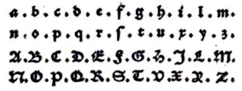 One of the first Belgian printers and typefounders, who lived and operated in Gent, Belgium, in the early 16th century. Born in Gent in 1491, he died in Wezel (Wesel) in Germany in 1556 or 1557. Peter Van Lancker describes his contributions. In 1539, he introduced the roman letter form in Gent, and even proposed an upright italic (IT 16 in Vervliet, It57 in Machiels, according to Van Lancker) in the publication Refereynen int Vroede, int Zotte, int Amoureuze. To read about Lambrecht, besides the plentiful of information on Van Lancker's page, one can also consult the thick opus by Dr. Hendrik D.L. Vervliet, Sixtienth-Century Printing Types of the Low Countries, Menno Hertzberger&Co, Amsterdam 1968, who wrote: Son of Jan Lambrecht, he came, it would seem, from a family long established in the town, engravers of seals and of marks for authenticating the renowed Ghentish cloth. Certainly Joos was successor to Vincent Lambrecht who performed this office from 1512 until 1537-1538. During the nearly 20-year period (1536-1553) of his activity at Ghent Joos Lambrecht proved to be a many-sided man typical of the Renaissance, poet, schoolmaster, seal-engraver, printer and punchcutter. As printer he came to be known for the outstanding quality of his presswork, the best of the Netherlands of his century, Plantin was de tweede helft? nvdr), and for his numerous mint-ordinances with woodcuts of coins that were copied until late in the century, by Jan Ewoutszoon of Amsterdam and others. His capacity of punchcutter is quite firmly established by the colophons in his numerous books, where he calls himself "lettersteker, typoglyphus, tailleur de lettres", by entries in the town's taxation, where he is described from 1540 onwards as "letterstekere", by a contract of 7 April 1548 binding Lambrecht to deliver new founts of type to Cornelius Manillus, printer at Ghent. Moreover, it is known that in 1553 Lambrecht sold his printing-office and type foundry to Pieter van den Kere, the father of Hendrik van den Keere the elder (and great-grandfather of the famous Dutch map engraver Pieter van de Keere, alias Kaerius), that Ameet Tavernier learned punchcutting from him, and that in 1580 Hendrik van den Keere the younger had several sets of matrices that he described as Lambrecht's. Van Lancker discusses several sources and analyzes Lambrecht's oeuvre. Some types by Lambrecht (not all cut by himself though):
 - T37, "Lambrecht's Pica Textura" (after 1541). Vervliet is not sure this was done by Lambrecht.
- T48, "Lambrecht's Brevier Textura" (after 1541). Same doubts in Vervliet's mind.
- T25, "English-bodied French Textura" dates 1499-1500. Used by, but not cut by Lambrecht.
- R12, "Lambrecht's 2-line Great Primer Lower-Case" was probably cut by Lambrecht in 1546.
- R23, "Lambrecht's English Roman" (after 1543).
- R25, "Lambrecht's Pica Roman" (after 1536).
- R30, "Lambrecht's Roman Capitals on Bourgeois" (1545).
- IT16, Lambrecht's Bourgeois Italic (after 1536). Vervliet: Lambrecht was the only printer to use this small Italic, which for its time is not without merit, and he did so from the beginning of his career in 1536. In a book of 1538 a set of narrower capitals occurs as well as the original capitals. In his well-known Refereynen of 1539 Lambrecht used this type for the passage in which he expressed his preference for Roman (and Italic) letters and his objection to the Gothic; but for this passage he used it with Gothic capitals and a few variant lower-case sorts. In the inventory of the remaining stock in Van den Keere's type foundry drawn up by Thomas de Vechter soon after 1581, there is an entry, 'An old Brevier by Joos Lambrecht', probably referring to matrices for this face. One of Lambrecht's italics inspired Laurent Bourcellier in 2009 to create Joos.
Some scans courtesy of Peter Van Lancker who researched Lambrecht's work: Bastaard Mediaan (1548), Grieks Mediaan (1536), Italiek Bourgeois (1536), Italiek Mediaan (1541), Romein Augustijn 91543), Romein Mediaan (1536), Schwabacher Augustijn 91550), Textura Augustijn (1539), Textura Bible (1541), Textura Gros Paragon (1551), Textura Gros Romain (1541), Textura Mediaan (1541), Textura Moyen Canon (1539). [Google]
[More] ⦿
|
José Alberto Mauricio
[Alter Littera]

|
 [MyFonts]
[More] ⦿
|
José Francisco de Iturzaeta
|
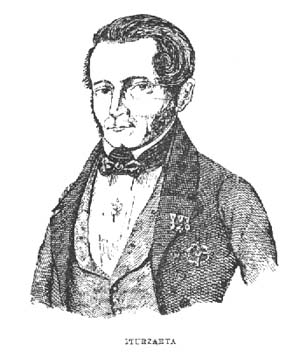 Basque penman, 1788-1853. His designs were engraved in 1833 by Giraldos and Nicolás de Gangioti and dedicated to the Queen Governor. That work was published in Colección General de los Caractéres de Letras Europeas (see here).
 Author of Arte de escribir la letra bastarda española (1827). The second edition, dated 1835, was published by Imprenta de don A. Mateis Muñoz in Madrid. Local download of that book. [Google]
[More] ⦿
|
Joshua Eberli
|
Swiss designer (Zofingen, b. 1996) of Elbisch (2013), described as the Elbisch letters for the German language In 2014, he made Handwriting Schwabacher and the runic typeface Zwerge (based on Herr der Ringe by J.R.R. Tolkien). [Google]
[More] ⦿
|
Juan de Iciar
|
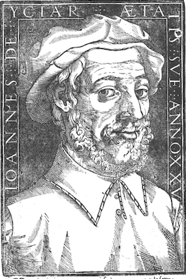 Also written as Juan de Yciar or Juan de Ycíar or Ioannes de Yciar. Spanish calligrapher, mathematician and writing master, 1515-1590. Author of Arte Subtillissima (1553, Zaragossa) and Arte Breve (1559, Zaragossa). According to Heitlinger, he was born in 1523, not 1515, in the Basque city of Durango (Vizcaya). He studied calligraphy with Tagliente and Palatino, and invented the so-called Spanish Bastarda, and drew many beautiful chancery alphabets.
 Image of Spanish gothic capitals (1550). He published Recopilación subtillísima intitulada Orthographia Practica in 1547-1548 (Zaragoza), the first writing manual in Spain. He also published Arte Subtilissima por la cual se enseña a escribir perfectamente in 1548 (8 editions from 1548 to 1566). Recopilación subtillísima intitulada Orthographia Practica was republished in 2003 by Jakider. From that book, his beautiful Latina initial caps. Scan of his Spanish renaissance alphabet, other alphabets, Ave Maria (1548, from Arte Subtilissima), chancery hand, and Cancellaresca gruesca (1548). Biblioteca complutense de Madrid has images on-line. [Google]
[More] ⦿
|
Juan Rodríguez Cuberes
|
Graduate from FADU, University of Buenos Aires, who created the Bastarda typeface Norton Gothic (2009). [Google]
[More] ⦿
|
Julien Chazal
|
Frenchman who has a wonderful historic overview of the calligraphic styles. Here are his categories: - Renaissance, starting with Gutenberg, and the re-use of Greek and Roman architecture and lettering. It has the chancery hand (or italic) and the humanist (or antiqua). But also in this category are the ronde (upright curvacious scripts), the Flemish cursive (stunning calligraphy) and the fine or modern chancery.
- Gothic, or medieval, alphabets: Primitive gothic (S, T, U, V), textura (P, Q, R), cursive gothic (D, E, F, G, H), bastarda (A, B, C), rotunda (M, N, O), and Fraktur (I, J, K, L). Chazal adds to these six groups the Lombardian (lettre tourneure: A, B, C, D, E, F, G), the tourneure gestuelle (modern hand-printed version of the Lombardian: A, B, C), and the lettres cadeaux (overly ornamental caps).
- Anglaises: voluptuous and difficult calligraphy.
- Gestuelles in modern calligraphy: the cola pen, the tire-ligne, the flat nib, and the pointed nib.
Additional scans of his work: The letter G | Happy 2005 | Abcdefg | Fine chancery alphabet | Lettres cadeaux | Starting alphabet for the lettres cadeaux | Trial 1 | Trial 2 | Trial 3. [Google]
[More] ⦿
|
Julius de Goede

|
 Dutch Creative Alliance designer of Uncia (1999, uncial), Rudolph (Fraktur), Julius Primary (1999, a school font family), Amadeo (handwriting, 1999, with Fiel van der Veen) and Augusta (1999, +Cancellaresca, +Schnurkl). He published Xander (2001) at Agfa, a font based on the handwriting of the Dutch type designer Alexander Verberne. Finally, he published the calligraphic script family Gaius (2002), the calligraphic Bastarda typeface family Bernhardt Standard (2003), the Fraktur typeface family Frakto (2003), and the blackletter family Rockner (2005) at Linotype.
 Linotype link. FontShop link. Klingspor link. [Google]
[MyFonts]
[More] ⦿
|
Julius Klinkhardt
[Julius Klinkhardt Schriftgiesserei]
|
 [More] ⦿
|
Julius Klinkhardt Schriftgiesserei
[Julius Klinkhardt]
|
 Julius Klinkhardt designed typefaces such as the blackletter font Neue Schwabacher (1922, Berthold). He ran the Julius Klinkhardt Schriftgiesserei in Leipzig in the late 19th century, after having acquired the type foundry of Gustav Schelter in 1871. It was taken over by Berthold in 1920. Their typefaces include Flora Ornamente (1906), Lithographia (1895), Secessions Schriften (1906), Baldur (1903, art nouveau; for a digital revival, see Alan Presott's New Baldur APT, 1996, and Dieter Steffmann's Baldur from 2000), Britania-Gotisch (1900, also known as Altgotish, and as Kloster Gotisch, and as Mammut Gotisch), Breitkopf Fraktur (just like versions of this typeface at C.F. Rühl (1912)), Helios Reklameschrift (revived by Ralph M. Unger in 2017 Affiche), Stempel (1912) and Berthold (1919)), Rosen Zierat (ca. 1910), Negro (1908), Elvira (1908), Cornelia Einfassung (1908), Hubertus Schmuck (1909), Filigran Ornamente (1910), Doris Ornamente (1917), Stigma Ornamente (1911), Bastard gross (a Kanzlei typeface with mager and fett versions), Werkschrift Germanisch (ca. 1880), Tango-Cursiv (1914), and Bismarck-Gotisch gross, all digitally revived by Gerhard Helzel. His TipTop (ca. 1900) was digitized under the same name by Petra Heidorn (2004). Tip Top Pro (2008, URW++) is a commercial revival of the same typeface by Ralph M. Unger.
 On EBay, they were selling the specimen book: See here. Their main specimen books are Gesamt-Probe der Schriftgiesserei Julius Klinkhardt in Leipzig und Wien (1885, 690 pages) and Oktav-Probe II (1890, 452 pages). See the cover of an earlier specimen book. Some type designers: - Richard Grimm-Sachsenberg: Grimm-Antiqua und Schmuck (1914), Neue römische Antiqua (1907), Saxonia (1907), magere römische Antiqua (1912).
- Heinz König: Rundine (1913).
- Hermann Delitsch: Ramses (1912, an Antiqua face), Delitsch-Kanzlei (1903), Delitsch Antiqua (1911).
- Julius Nitsche: Unger Fraktur (1910; Wetzig says 1907), Neudeutsche Ornamente (1911), Buchschmuck (1905), Akzidenz-Zierat (1905).
- Remarkable typefaces: Schmale Runde Grotesk (1885, a forerunner of DIN?).
- Gadso Weiland: Toscana Schriften und Schmuck (1908).
Examples from their catalog from 1890: Fette Universal, Garnitur XII and XIII, Garnitur XIV, Kurrentschrift, Verzierte Merkur Kanzlei, and Neue Cursiv Zierschrift, Antika and Italia Grotesk Versalien, drawing of a boudoir, Enge Egyptienne, Fette Cursiv, Fraktur, Halbfette Fraktur, Holz Schriften (wood type), more wood type, drawing of horses, Moderne Fette Fraktur, monograms, Neue Fette Fraktur and Victoria Gotisch, Neue Fette Fraktur, Neue Schmale Fette Egyptienne, Romanische Gotisch, Rundschrift Polytypen, Schmale Antiqua, Schmale Fraktur, Schmale Halbfette Grotesk, Schwabacher, Silhouette Initialen, Stickmuster Typen, vignetten, more vignetten, Zierschriften, more Zierschriften, Zweifarben-Schriften. [Google]
[More] ⦿
|
Jürgen F. Schopp
|
From the University of Tampere, Finland, Jürgen F. Schopp's list of books on typography. He also has a nice page on type classification. For "broken" typefaces (gebrochene Schriften), Schopp proposes this: - Gotisch: e.g., Cloister Black, Engravers Old English, Manuskript-Gotisch, Weiß-Gotisch, Wilhelm-Klingspor-Schrift.
- Rundgotisch: e.g., Rhapsody, Weiß-Rundgotisch, Wallau.
- Schwabacher: e.g., Alte Schwabacher.
- Fraktur: e.g., Kanzlei fett, Neue Luther-Fraktur, Zentenar-Fraktur, Unger-Fraktur, Walbaum-Fraktur.
- Frakturvarianten: e.g., American Text.
[Google]
[More] ⦿
|
K. u. K. Hof-Schriftgiesserei Poppelbaum
[Hartwig Poppelbaum]
|
 Viennese foundry acquired in 1926 by D. Stempel AG (50%) and H. Berthold AG (50%). Designers of Original-Schwabacher (before 1925) and Messe-Gotisch (before 1925). Kurt Liebing made Liebing-Fraktur, also some time before 1925. A small timeline of the company:
 - 1858: Benjamin Krebs dies. His son-in-law Gustav Rosalino, partner in Benjamin Krebs Nachfolger) dies in 1870. That year, the Benjamin Krebs foundry opens an office in Vienna under the lead of Bernhard Alexander Poppelbaum. The firm Poppelbaum & Bossow (with Karl Bossow) is set up in Vienna with five foundry machines.
- 1880: Karl Bossow dies.
- 1890: Hartwig Poppelbaum and Karl Gsottschneider, the son and son-in-law of Hermann Poppelbaum become partners in the company.
- 1892: Hermann Poppelbaum dies.
- 1903: Compressa (an Inserat typeface family), Reform and Massiv are finished.
- 1903: The script typeface Ideal is finished.
- 1904: Publication of Ridingerschrift (a feather / copperplate script for weddings and invitations).
- 1905: Publication of the work horse typeface Rediviva.
- 1906: Biedermeier (an Inserat cursive) is finished. Frankfurter Buchschrift (designed by Paul Ed. Lautenbach) follows.
- 1907: Reklameschrift Komet, and Hohlweinschrift (by Ludwig Hohlwein).
- 1908: The book typeface Renata-Serie and the Gigantea typeface are published.
- 1909: Pompadour (an elegant Zirkularschrift after copperplate examples of the era of Louis XVI in France), Merian-Fraktur (after the typeface of Math. Merian used in bibles in the 19th century), the Rohrfederschrift Diavolo, the Rohrfeder-Fraktur are published.
- 1910: Karl Gsottschneider dies. Hartwig Poppelbaum is now the sole president. Publication of Katalog-Antiqua (a book face), Brunhilde (a Zirkularschrift), Federzug-Antiqua and Epoche.
- 1912: Opening of a shop in St. Petersburg where Cyrillic fonts are produced. The war brings an end to this project in 1914, and all machines and matrices are destroyed.
- 1923: The new leaders are Hartwig Poppelbaum Jr. and Dr. Karl Poppelbaum. New weights are added to Epoche and Merina Fraktur. New typefaces include Brentano-Fraktur, Alt-Schwabacher Werkschrift, Latina, Antiqua Firmin-Didot, Kanzlist (sans), Burokrat (sans), Konigin Luise (sans), All Right (sans), Schonbrunn (sans), Ideal-Schreibschrift III (sans), Hartwig-Schrift (by Hartwig Poppelbaum Jr: Hartwig Schrift was digitized by Petra Heidorn in 2005), Hartwig-Werkschrift (by Hartwig Poppelbaum Jr), Xylo, and Phänomen (signage script).
- 1926 or 1927: The foundry is acquired by D. Stempel AG (50%) and H. Berthold AG (50%).
[Google]
[More] ⦿
|
Karl Klingspor
[Klingspor (or: Gebrüder Klingspor)]

|
[MyFonts]
[More] ⦿
|
Karlgeorg Hoefer

|
 German scribe, type designer and unbelievable calligrapher, b. 1914 in Schlesisch-Drehnow, d. 2000 in Offenbach. Following schooling in Schlesien and Hamburg, he served a four-year typesetting apprenticeship from 1930-1934 in Hamburg and later at the Kunstgewerbeschule (School of Arts and Crafts) in Offenbach am Main. From 1939 until 1945 he was in active military service and became a prisoner of the Russians. After that ordeal, he became a calligraphy teacher at the Werkkunstschule in Offenbach, and developed a universal pen with novel writing and drawing techniques for the company Brause. It is at that point that Hoefer started designing types as well. From 1970 to 1979, Hoefer was a lecturer and later professor at the HfG (School of Design) in Offenbach. From 1981 to 1988, Hoefer ran summer calligraphy workshops in the USA (Los Angeles, San Francisco, Boston, New York, Washington, and other cities). In 1982, Karlgeorg Hoefer founded a calligraphy workshop in Offenbach for everyone, with evening courses and summer school, and in 1987, the registered association "Calligraphy Workshop Klingspor, Offenbach, Supporters of International Calligraphy." From 1987 to 1995, he was the chairman of the association while teaching continuing courses and summer school classes with leading foreign calligraphers. Hoefer has written two books about calligraphy: "Das alles mit einer Feder" (Brause, 1953) and "Kalligraphie, gestaltete Handschrift" (Econ, 1986). Numerous articles about Hoefer's work have appeared in calligraphy journals in Holland, France, the USA, and Japan. In 1989, the book "Schriftkunst/Letterart Karlgeorg Hoefer" was published as part of Calligraphy-Editions Herbert Maring (Die Kalligraphie Edition, Hardheim, Germany, 1989). For his activities as a calligrapher, Hoefer received the Order of Merit of the Federal Republic of Germany in 1993. His typefaces:
 - At Klingspor: Salto (1952), Saltino (1953), Saltarello (1954), Monsun (1954). Salto is a famous and often-copied brush script.
- At D. Stempel: Prima (1957), Zebra (1963-1965, D. Stempel, a script that plays on the simulation of grey and the use of two colors; revived by Colin Kahn in 2007 as P22 Zebra).
- At Ludwig&Mayer: Permanent (1962-1969, a large Grotesk family developed over many years---this was revived by Daylight in 2010 as Permanent Massiv; URW sells Permanent Headline URW D without even a word about the original designer; Softmaker has Plakette Serial and P700 sans; Castcraft has OPTI Permanent and OPTI Pinacle; Marcus Sterz published Letterpress Headline in 2009), Stereo (1963, an outline poster headline script developed between 1957 and 1968; digitally revived in 1993 as Stereo (Tobias Frere-Jones, Font Bureau)), Elegance (1964, a handwriting script, which was the basis for Sincerely (2005, Canada Type)), Big Band (1974, a fat poster script revived in 2007 by Nick Curtis as Baby Cakes NF (2007)), Big Band Terrazzo (1974, a glaz krak face), Headline (1964, a poster typeface that emanated from Permanent).
- Programm-Grotesk (1970): Hoefer's first digital typeface, commissioned by JT Hellas for the Greek telephone books It was first used in the digital machine Digiset of Dr. Ing. Hell in Kiel.
- From 1978 until 1980, Karlgeorg got involved in the development of a German license plate font that could withstand forgery by black marker pens. The typeface, FE Mittelschrift/Engschrift, had also input from other sources.
- Lateinischen Ausgangsschrift (1974): a school script for the Linotype phototypesetter. This led later to VA Schrift (Berthold and Linotype).
- At Linotype: Omnia (1990, a unicase typeface with a Celtic uncial feel), San Marco (1990, round gothic / Rundgotisch), Notre Dame (1991-1993, a full blackletter face), Dominatrix (1994), Sho (1992, an Asian brush script), Beneta (1992, a French bastarda inspired by the Littera beneventana, the script of the Benedictine scribes from the 10th to the 12th century).
Linotype page. FontShop link. View Karlgeorg Hoefer's typefaces. [Google]
[MyFonts]
[More] ⦿
|
Klaus Bartels
[Babylon Schrift Kontor]
|
[More] ⦿
|
Klaus-Peter Schaeffel
[KPS Fonts]
|
 [More] ⦿
|
Klingspor (or: Gebrüder Klingspor)
[Karl Klingspor]

|
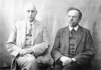 German foundry established in 1906 by brothers Karl Klingspor (1868-1950) and Wilhelm Klingspor (1871-1925) in Offenbach am Main. About half of its catalog consists of blackletter types (as listed in 2000 by Harald Süß), and many of its typefaces were designed by German über-designer Rudolf Koch. History (in German, PDF), resummarized here:
 - 1892: Carl Klingspor (1839-1903), the father, buys the Rudhardsche Gießerei in Offenbach am Main in 1892, which was originally founded in 1842 by Johann Peter Nees, Phillip Rudhard and Johann Michael Huck.
- 1899: Heinz König designs Walthari (a light Fraktur font).
- 1900: Otto Eckmann designs the Fraktur font Eckmann Schrift, and Kurt Wanschura (from Leipzig) designs the Fraktur font Offenbacher Schwabacher. Reform appears!
- 1901: Peter Behrens publishes Behrensschrift (art nouveau style). Offenbacher Fraktur appears too.
- 1902: Behrens Schrift by Peter Behrens. Fette Eckmann Schrift und Ziermaterial by Peter Behrens. Vignetten by Emil Doepler d.J., and Schmuck für Bücher und Akzidenzen by Robert Engels, München.
- 1903: Reform Kursiv.
- 1904: Karl and Wilhelm Klingspor become the sole owners of the Rudhardsche Gießerei. As a private typeface, they decide on Munthe Schrift by Norwegian Gerhard Munthe.
- 1905: Heinz König designs König Antiqua. Breitkopf Fraktur is published, based on the original design of Joh. Gottl. Immanuel Breitkopf (1719-1794). Also new is Auszeichnungsschriften für Fraktur, as well as Die Leidensstationen by Robert Engels.
- 1906: The form is renamed Gebr. Klingspor. Otto Hupp makes Liturgisch (another Fraktur font). Jugendschrift is published.
- 1907: Peter Behrens publishes Behrens-Kursiv.
- 1908: Peter Behrens publishes Behrens Antiqua. Otto Hupp makes Neue Anzeigen Schriften. Halbfette Reform is published.
- 1909: Otto Hupp makes Hupp Antiqua (a Basque "A" in here!), Hupp Unziale. Walter Tiemann designs Tiemann Mediäval.
- 1910: Rudolf Koch designs Fette Deutsche Schrift (Fraktur) and Fette Kochschrift (are these not the same?). Hupp Fraktur appears. The company publishes Kalender Bilder by Heinrich Vogeler.
- 1911: Tiemann makes Halbfette Tiemann Mediäval.
- 1912: Tiemann makes Tiemann Mediäval. Kursiv and Tiemann-Kursiv. Koch makes Halbfette Deutsche Schrift and Deutsche Schrägschrift.
- 1913: Peter Behrens publishes Behrens Mediäval. Koch makes Schmale deutsche Schrift.
- 1914: Rudolf Koch publishes Frühling, Maximilian Gotisch, Maximilian-Antiqua and Maximilian. Walter Tiemann makes Peter Schlemihl and Tiemann Fraktur.
- 1915: Klingspor acquires F. W. Aßmann and Wilhelm Gronau in Berlin.
- 1917: Albert Windisch makes Windisch Kursiv.
- 1919: Karl Michel designs Schraffierte Antiqua. Some cooperation is established with D. Stempel AG, which acquires some shares.
- 1920: Tierbilder-Probe is published.
- 1921: Rudolf Koch publishes Deutsche Zierschrift (Fraktur) and Magere deutsche Schrift. Walter Tiemann makes Narziß. The company publishes Elfenschmucjk, as well as Schräge Schwabacher. Leo Wackerle makes Kalender Bilder.
- 1922: Rudolf Koch designs Koch Antiqua and Koch Antiqua Kursiv. Otto Hupp publishes Deutsche Schrägschrift. Ernst Engel designs Mörike Fraktur, a private typeface just created for the Ernst Engel Presse.
- 1923: Rudolf Koch designs Koch Antiqua Kursiv and Neuland. Walter Tiemann designs Tiemann Antiqua.
- 1924: Koch designs Grosse Koch Antiqua, and Tiemann makes Tiemann Gotisch.
- 1925: Wilhelm Klingspor dies. Rudolf Koch designs Wilhelm-Klingspor-Schrift (Fraktur), and Victor Hammer creates an uncial font, Hammerschrift.
- 1926: Tiemann makes Tiemann Antiqua Kursiv and Koch publishes Klingsporschrift.
- 1927: Rudolf Koch designs Kabel.
- 1928: Rudolf Koch designs Neuland Licht. Walter Tiemann makes Kleist Fraktur.
- 1929: Rudolf Koch creates Zeppelin.
- 1930: Rudolf Koch designs Wallau (rotunda) and Jessen-Schrift (Fraktur).
- 1931: Heinrich Maehler makes Salut.
- 1932: Rudolf Koch designs Holla.
- 1934: Walter Tiemann makes Fichte Fraktur.
- 1935: Rudolf Koch creates Koch Kurrent.
- 1937: Rudolf Koch publishes Claudius.
- 1940: Rudo Spemann's Gavotte appears.
- 1944: A bombardment destroys a lot of material and drawings.
- 1950: Karl Klingspor dies. Walter Tiemann makes Offizin. According to Chronik und Stammfolge der Familie Klingspor (1989, Reinhard Klingspor and Gerhard Moisel), Karl Klingspor died on January 1, 1951, but everywhere on the web we find 1950.
- 1951: Karl Hermann Klingspor (1903-1986), son of Wilhelm, takes over the company.
- 1952: Karlgeorg Hoefer makes Salto.
- 1953: Karlgeorg Hoefer publishes Saltino. Victor Hammer makes Hammer Unziale. The Klingspor Museum in Offenbach is created.
- 1954: Hans Kühne designs Andreas Schrift (Fraktur) and Kühne Schrift (Fraktur). Joachim Romann makes Constanze (a formal script) and Queen. Alfred Finsterer designs Duo Licht and Duo Dunkel.
- 1955: Karlgeorg Hoefer makes Monsun.
- 1956: D. Stempel AG buys the remaining shares of Klingspor, and incorporates many of its types in its own catalog.
That library included typefaces by these designers: - H. Kühne: Andreas Schrift (1954, carried by Delbanco and Gerhard Helzel), Kühne Antiqua (1954), Kühne Schrift (1954), Stahl (1933-1939).
- P. Behrens: Behrens Antiqua (1907), Behrensschrift (offered by Intecsas as Sprecher Gothic), Behrens Initialen (called Sprecher Initials at Intecsas).
- Rudolf Koch: Claudius (carried by Delbanco), Deutsche Schrift (1910), Frühling (1917, carried by Delbanco), Deutsche Zierschrift (1921, offered by Delbanco and Gerhard Helzel), Holla (1932), Jessen-Schrift (1924-1929, carried by Delbanco), Kabel (1927, at Linotype now; called Geometric 231 at Bitstream, and Kalten at PrimaFont, and Koch Original at LetterPerfect), Koch Antiqua (1922, published by Linotype now; available from Alphabets Inc as AI Koch Antiqua MM; called Eva Antiqua SG at Spiece Graphics), Zeppelin (1929, available from Agfa now), Koch Kurrent (1935, offered by Delbanco), Koch Fraktur (offered by Delbanco, Gerhard Helzel, and Christian Richter), Marathon (1938), Maximilian (1917, available at Castle Systems, and carried by Delbanco), Maximilian-Gotisch (carried by Gerhard Helzel and by Walden Font), Neuland (1923, available from Linotype; available from Alphabets Inc as AI Koch Neuland, and at Bitstream as Informal 011, and at PrimaFont as Newfish, and at Keystrokes as Neuland inline), Prisma (1928; a multiline typeface revived in 2003 by Dieter Steffmann, and extended in the large family LL Prismaset at Lineto), Wallau (1926-1934, carried by Delbanco, and called Wal at PrimaFont), Wilhelm Klingspor-Schrift (1925, carried by Delbanco and Linotype; Wilhelm Klingspor-Gotisch is called Wilson at PrimaFont).
- J. Romann: Constanze (1954), Queen (1954, called Ferrante by Intecsas).
- Walter Tiemann: Daphnis (1929), Fichte Fraktur (1934-1939, carried by Delbanco and Gerhard Helzel), Kleist Fraktur (1928, revived by Dieter Steffmann in 2002, and carried by Delbanco), Narziss (1921, available from Font Bureau and Spiece Graphics as Narcissus), Offizin (1952), Peter Schlemihl (revived by Walden Font, and by Dieter Steffmann in 2002), Tiemann Mediäval (carried by Gerhard Helzel), Tiemann Antiqua (1923, now at Linotype).
- A. Finsterer: Duo licht/Duo dunkel (1954).
- O. Eckmann: Eckmann Schrift (1900, called Freeform 710 at Bitstream, and called Eckmann at Elsner&Flake, ScanGraphic, Linotype, URW++, Gerhard Helzel and Delbanco), Eckmann Initialen (called Jan Bent at Intecsas).
- Kurt Wanschura: Offenbacher Schwabacher (1900, Offered at Delbanco).
- H. König: Falstaff (1906).
- H. Schardt: Folkwang (1949).
- R. Spemann: Gavotte (1940, available from Linotype).
- V. Hammer: Hammerschrift (1923, available as Martel at Scriptorium), Hammer Unziale (1953). [Linotype has it as Neue Hammer Unziale. Agfa carries Uncial, which is really Neue Hammer Unziale. The Electric Typographer calls it Electric Uncial. Elsner&Flake have a version called American Uncial.]
- O. H. W. Hadank: Ornata (1943).
- H. Bohn: Orplid (1929).
- O. Hupp: Liturgisch (1906, carried by Gerhard Helzel), Hupp Antiqua (1909).
- F.K. Sallwey: Information breitfett (1958).
- A. Kumlien: Kumlien Antiqua.
- R. Bauer: Magnet (1906).
- K. Hoefer: Monsun (1955), Salto (1952, now at Linotype), Saltino (1953, carried by TypeRevivals), Saltarello (1954).
- H. Maehler: Salut (1931, version available from Agfa).
An unclassified condensed elongated Victorian fat face, Slimback-style, is Figura. No date known. View the Klingspor typeface library. [Google]
[MyFonts]
[More] ⦿
|
KPS Fonts
[Klaus-Peter Schaeffel]
|
 Swiss calligrapher in Basel who made and sells various medieval and historically important script fonts. Dedicated page. These included the paleographic (PAL) series and the KPS series. He lives in Ühlingen--Birkendorf, Germany. His fonts are uniformly of high quality and are usefl for illustrating historical alphabets.
 His early commercial collection: KPS Anglaise (calligraphic script), KPS Antiqua (+Kapitälchen), KPS Capitalis (classic Trajan caps), KPS Cicero, KPS Epona (calligraphic), KPS Fein (hand-printed), KPS Hand (calligraphic), KPS Horaz (calligraphic), KPS Iris (calligraphic), KPS Petit (calligraphic), KPS Plinius, KPS Spitzfelder, KPS Vitruv (calligraphy), PAL Bastarda, PAL Cancellaresca, PAL Carolina, PAL Gotisch, PAL Humanistica, PAL Lombarden, PAL Quadrata, PAL Rotunda, PAL Rustica, PAL Textura, PAL Uncialis, PAL Uncialis Roemisch, Weissranken Initialen, Ranken Initialen (Celtic capitals). Since September 2013, all of his fonts are free. They were renamed and have conveniently the date of original creation in the font name. The fonts dated in the 1990s and 2000s are new typefaces or creative revivals by Klaus-Peter. The list of revivals: 0100DeBellisMacedonicis [Pre-uncial letters from the fragment "de bellis macedonicis", ca. 1st century], 0300Petros [Greek hand from the oldest surviving copies of St. Peter's epistles, dated 3th / 4th century], 0362Vitalis [Roman Minuscule Cursive from the so called Vitalis letter, written before 362 on papyrus (Strasburg)], 0480VergiliusRomanus [Capitalis Rustica from the Vergilius Romanus written in Rome, ca. 480], 0500VergiliusSangallensis [Capitalis Quadrata from the Vergil fragments in Stiftsbibliothek St.Gallen], 0512Dioskurides [Greek Uncials from the Vienna Dioskurides (about 512)], 0746Beda [from Beda Venerabilis: Historia ecclesiastica gentis Anglorum, Northumbria, dated 746], 0800Kells [Half Uncials from the Book of Kells], 0800Remedius [So called "Lombardic-Raetic Minuscule" from Codex 348 of the Stiftsbibliothek St. Gallen], 0800 Theophanes [Greek Hand after a 9th century Theophanes manuscript], 0850CarolinaTours [Carolingian Minuscule], 0850Carolinaundulata [Carolingian Minuscule from the Scriptorium of Tours], 0864Folchart [St. Gall Carolingian from the Folachart Psalter], 1012Otto [Late Carolingian Minuscule from the Perikopes of Heinrich II, written at the Reichenau, donated to the dome of Bamberg in 1012], 1258FridericusII [Gothic Rotunda from the falcon book of Emperor Friedrich II, Southern Italy 1258-1266], 1400Wenzel [Bohemian Textura from Vienna], 1450Sebastos [Humanistic Greek hand from Homer, Ilias, Vatican Library], 1455GutenbergB42 [Gothic Textura types from the 42 line Gutenberg Bible], 1458GutenbergB36 [Gothic Textura types from the 36 line Gutenberg Bible], 1470Jenson [an antiqua by Nicolas Jenson], 1475HumanisticaCursiva [Humanistic Cursive of the kind Bartolomeo Sanvito of Padua wrote, after Cod. Pal. Lat. 1508], 1480Humanistica [Humanistic Book Hand from Valerius Maximus: Facta et dicta memorabilia, ca. 1480-1485. The calligraphy is attributed to Antonio Sinibaldi from Florence and the titling capitals to Bartolomeo Sanvito from Padua], 1483Koberger [Incunabula type from the Koberger Bible, printed in Nuremberg in 1483], 1485Grueninger [Incunabula type from the Grueninger Bible, printed in Strasburg in 148], 1493SchedelRotunda [Incunabula type from the Latin edition of Hartmann Schedel's World Chronicles, printed by Koberger at Nuremberg in 1493], 1501Manutius [First printed Italic Antiqua by Aldus Manutius (Venice 1501)], 1513Gebetbuch [Fraktur from Emperor Maximilian's Prayer Book, printed in Augsburg in 1513], 1517Gilgengart [Fraktur type from Emperor Maximilian's 1517 private print "Gilgengart"], 1517Teuerdank [Fraktur type from Emperor Maximilian's "Teuerdank", printed at Augsburg in 1517], 1519NeudoerfferFraktur [Fraktur alphabet from a woodblock model in Johann Neudoerffer the Elder's Calligraphy book "Fundament", Nuremberg 1519], 1739Bickham [Copperplate or running hand after models from "The Universal Penman" by George Bickham, printed in London 1743], 1741Bickham [Bickham's round hand from Universal Penman], 1782Thurneysen [Baroque Antiqua Type of J. Jacques Thourneysen fils, Basel 1782]. Original versions by Schaeffel, with date of design in the font name: 1999Anglaise1, 1999Anglaise2, 1999Cancellaresca, 1999Carolina (Carolingian minuscule), 1999Livius, 1999LiviusBold, 1999LiviusItalic, 1999LiviusSmC, 1999LiviusTitel, 1999Ovidius, 1999Stylus, 1999Textualis, 2000Bastarda, 2000Cicero, 2000Humanistica, 2000Plinius, 2000PliniusItalic, 2000Seneca-Italic, 2000Seneca, 2000TextualisFormata, 2000Uncialis, 2001RotundaFormata, 2002Cato, 2002Horatius, 2002Vitruvius, 2003Epona, 2003Lombarden, 2004CapitalisQuadrata, 2004CapitalisRustica, 2004Iris, 2004UncialisQuadrata, 2004UncialisRomana, 2008-Noeuds-1 [for making Celtic knots], 2008-Noeuds-2, 2008-Noeuds-3, 2009Xenophon, 2010Filigrane, 2010Gouttes, 2010Labyrinthe [squarish], 2010Pointu [a calligraphic blackletter], 2010Vergilius [a great calligraphic face]. Old URL. [Google]
[More] ⦿
|
Kurt Wanschura
|
 Leipzig-based designer of Offenbacher Schwabacher (1900, Rudhardsche Gießerei). This bastarda was digitally revived by Peter Wiegel in 2014 and Delbanco in 1996 under the same name, Offenbacher Schwabacher. Klingspor link. [Google]
[More] ⦿
|
Lars Bergquist
[Timberwolf Type]

|
 [MyFonts]
[More] ⦿
|
Lazar Dimitrijevic
[Posterizer KG]

|
 [MyFonts]
[More] ⦿
|
Lineto
[Cornel Windlin]

|
 Since 1993, Swiss type designer Cornel Windlin (b. 1964, Küssnacht am Rigi) heads "lineto" in Zürich, with Stephan "Pronto" Mueller. Lineto is based in Zürich, Switzerland. The foundry has grown in size and influence and includes work by many type designers. Windlin himself made these typefaces:
 - The old typewriter family FF Magda (1995) and its smooth versions, FF Magda Clean (1995) and FF Magda Clean Mono (1995). Noteworthy is the white-on-black FF Magda Cameo. See also Mono (2003, Lineto).
- Airport (FontFont).
- Dot Matrix (FontFont).
- Experimental typefaces: In FUSE 10, Windlin designed the symbol font Robotnik, and at FUSE 7, he made Mogadishu. He alsi created FUSE Classic 1.
- FF Watertower (1998-1999, stencil font).
- Screen Matrix (1995, with Stephan Mueller, FontFont).
- ThermoNuclear (1999).
- Mono-book (1998).
- Autoscape-Regular (1998).
- LL Alpha Headline (1997, based on the British license plates). This initial caps-only headline font in a Bold cut was redrawn and extended to a full character set in 2002, also adding an italic style, and additional Regular and Italic weights. The resulting fonts as exclusively licensed as corporate typeface for Mitsubishi Motors across Europe between 2002 and 2012. Since then, Alpha Headline was extended to Cyrillic, and two Stencil cuts were introduced. A new, revised and entirely redrawn version of Alpha Headline will be published by Lineto in 2019.
- LL Lutz Headline (1997, derived from the lettering on British license plates).
- Luggage Tag.
- LL Gravur Condensed (1999, with Gilles Gavillet). This initial version of LL Gravur Condensed has been replaced by an entirely redrawn version, with additional Italic cuts (2010–2012, in collaboration with Radek Sidun).
- Cobra: a phenomenal geometric font combining ideas of kitchen tile and stencil fonts, made in 1996.
- FF Moonbase Alpha (1991, part of FUSE 3).
- With Gilles Gavillet, dated 1999: Pixel Crude, Pixel World, Vectrex (1999), Vectrex World (skyline dingbats), Liquid Crystal (1999), Supermax (1999). Pixel World and Vectrex World are free.
- VFutura (2004). Used as a corporate typeface by, e.g., Vitra Internatonal AG.
FontFont write-up. Fonts by designers. The Lineto collection has many beautiful trend-setting digital-look typewriter typefaces. From other designers: - Stephan Mueller: Regular (typewriter family), Valentine (typewriter family), Aveugle (Braille font, 1995), Parking, FF Gateway (1997), Grid (1996), Paragon, Batarde Coulee, Shuttle, FE Mittelschrift and FE Engschrift (1997), 104 (nice geometric font), FF Chernobyl (1998, from stenciled letters on the Chernobyl plant), FF Container, Bitmap-Condensed and Bitmap-Regular (1998), Office (Eurostile-like monospace, 1999).
- Norm: Normetica (1999, now retired), Prima (1999, now retired), LL Simple (1999-2000), LL Replica and LL Replica Mono (2008), LL Riforma (2012-2017).
- James Goggin, Rafael Koch, Mauro Paolozzi, Alex Rich and Arve Båtevik: LL Prismaset (2003-2014).
- Elektrosmog/Pierre Miedinger: LL Storno (1999, an interpretation of the numerals of an old Sharp cash register; by Marco Walser & Valentin Hindermann), LL Brauer. Brauer was Marco Walser's digital revival of Pierre Miedinger's original design for a mid-1970s corporate typeface for the Zurich-based Hürlimann brewery. This was later developed into the six weights of LL Brauer Neue (1999-2006) by Marco Walser and Philippe Desarzens, and has since been extended further (publication pending, scheduled for early 2019). The copyright for LL Brauer Neue is held by Lineto, the author's rights are held by Marco Walser/Elektrosmog.
- Marco Walser and Philippe Desarzens: Le Corbusier Oldface (2004).
- Nico Schweizer: Albroni (1992), Hoboken-High (1998, a US sports jersey font), LeCorbusier (great stencil font, 1999), Le Corbusier Condensed (1999), Typ1451 (1999, sans family), Gigaflop (1999), Ultrateens (1999).
- Martha Stutteregger: Number Two (1996), Lord (1996).
- Jonas Williamsson: Biff (1999).
- Urs and Juerg Lehni and Rafael Koch: Lego (1999).
- Laurent Benner: Pez (1999), renamed Tablettenschrift.
- Hansjakob Fehr: Deadtype (dingbats consisting of metal parts of a typewriter, 1999).
- Masahiko Nakamura: Terminal One (1999).
- James Goggin: Courier Sans (2001).
- Laurenz Brunner: LL Akkurat and LL Akkurat Mono (2004), LL Circular (2011), LL Bradford and LL Bradford Mono (2018).
- Aurèle Sack: LL Purple (2006, together with NORM), LL Brown (2011), LL Grey (2004-2016).
- Christian Mengelt/Team77: LL Unica77 (2012-2014).
- Kobi Benezri: LL Lettera (2008), LL Lettera Text (2012).
- Robert Huber: LL Moderne (2017).
- Nazareno Crea: LL Gulliver (2008-2018), renamed LL Catalogue in 2019.
[Google]
[MyFonts]
[More] ⦿
|
Lorenz Reinhard Spitzenpfeil
|
Blackletter type designer at Ludwig&Mayer, b. 1874 Michelau, d. 1945 (by suicide), who lived most of his life in Kulmbach, and is often called the forgotten designer. His typefaces: - Welt-Fraktur (Magere and Halbfette) (1908-1910). Also called Spitzenpfeil Fraktur.
- Werk-Fraktur (1918; the mager is from 1913). Revived by Gerhard Helzel.
- Kulmbacher Fraktur. Unpublished.
- Kulmbacher Schwabacher (1935).
- Fränkisch Spitze Buchkursive (or just Fränkisch) (1906, Genzsch & Heyse; Seemann and Wetzig both mention 1910). Revived by Dieter Steffmann in 2002.
- Spitzenpfeil Splendid (Ludwig&Mayer).
His life story was told in 1983 by Hermann Stettner and others in the magazine of the Bund für die deutsche Schrift, volume 69: Page 1, Page 2, Page 3, Page 4, Page 5, Page 6, Page 7, Page 8, Page 9. See alo Kurt Muhlhausser's article Lorenz Reinhard Spitzenpfeil. Ein Lebensbild des oberfränkischen Künstlers und Forschers (in: Geschichte am Obermain, Bd. 17, 1989-1990). Author of Die Behandlung der Schrift in Kunst und Gewerbe. Eine Einführung in die Schriftbildung, Schrifttechnik und Schriftanwendung (Nürnberg, 1911), Die Grundformen neuzeitlicher Druckschriften (Leipzig, 1912) and Der Schriftkünstler. Anleitung zur Kunstschrift (Hannover/Wien, 1912). [Google]
[More] ⦿
|
Lucida Blackletter
|
Lucida Blackletter is a bastarda typeface designed in 1991 by Bigelow&Holmes, and republished by URW, Elsner&Flake, and others. See here, here, or here. [Google]
[More] ⦿
|
Ludwig&Mayer

|
 Big German foundry active in the first half of the 20th century. It was absorbed by Neufville in 1984, which will make its typefaces available in digital form. Type designers and typefaces:
 - House typefaces: Allemannia Fraktur (1908, or: Alemannia Fraktur; a digital revival in 2018 by Mew Varissara Ophaswongse), Allright (1936), Altenburger Gotisch (1928), Aristokrat Zierbuchstaben (1911: digital revival by Dieter Steffmann in 2002), Bastard Mediaeval, Beatrice (1931), Chic, Cochin (1922), Commerciale, Die Mode (1914-1915), Diplomat (1964, see the digital version Diploma by Hans van Maanen, 2009), Excelsior (1914, script face), Firmin Didot (1929), Hallo (1956), Kombinette (1932), Kupferplatte (1950), Largo (1939), Magnet (1951), Manolo (art nouveau: revival in 2019 by Ralph Unger as RMU Manolo), Nelson (1902, art nouveau), Wren, Samson Script, Luminous, Behrens. Kudos Kaps NF (2006, Nick Curtis) is a set of five nice ornamental caps and associated alphabet and border sets, including a Lombardic set, and an engraved set--they are based on typefaces from the Ludwig&Mayer library.
- Albert Christoph Auspurg: Rasse (1924), Mona Lisa (1930), Brigitte (1935), Krimhilde (1934)
- Hans Bohn: Allegro (1936-1937)
- Jakob Erbar: Erbar-Grotesk (1922-1930), Lucina, Lumina, Lux, Phosphor, Koloss (1923), Candida (1936, a mediocre didone family), Feder Grotesk (1910), Fette Feder Grotesk, Erbar
- Hace Frey: Charleston (1967, Alphonse Mucha-style display face)
- G. Germroth: Germroth-Deutsch (1935, blackletter)
- Erhard Grundeis: Achtung (1932)
- Karlgeorg Hoefer: Stereo (1968), Permanent (1962), Headline (1964), Elegance (1968), Big Band (1974)
- Walter Höhnisch: Tempo (1930), Werbeschrift Deutsch (1933), National (Fraktur, 1933-1934), Schräge National (1937), Skizze (1935, a script face), Stop (1939), Antiqua die Schlanke (1938-1939), Express (1952), Candida Italic (1937), Slender (1939)
- Heinrich Jost: Aeterna (or Jost Mediaeval, 1927)
- Walter Ferdinand Kemper: Colonia (1938-1939, a humanist sans)
- Wilhelm Krause: Professor-Krause-Fraktur (1930, blackletter)
- Paul Eduard Lautenbach: Prägefest (1926)
- Richard Ludwig: Augenheil (1908)
- Helmut Matheis: Charme (1957-1958, calligraphic), Slogan (1959, connected script), Primadonna (1956, a formal script), Matheis Mobil (1960), Compliment (1965, an angular vertical script)
- Joshua Reichert: Reichert-Gotisch (1930s).
- Imre Reiner: Contact (Deberny&Peignot, 1952; Ludwig&Mayer, 1968 (according to Jaspert), and 1963 according to others), Corvinus (ca. 1932), Stradivarius (1945)
- Lorenz Reinhard Spitzenpfeil: Welt-Fraktur (1910), Werk-Fraktur (1918)
- Alfred Riedel: Domino (1954: a fat face)
- Georg Schiller: Lyrisch (1907)
- Arthur Schulze: Werbekraft (1926)
- Ilse Schüle: Rhapsodie (1949-1951, bastarda)
- Johannes Schweitzer: Dominante (1959)
- Francesco Simoncini: Aster (or Aster Simoncini, 1958), Life (1965), Armstrong (1970), Simoncini Garamond (1961)
- K. Sommer: Dynamo (1930)
- Hans Wagner: Altenburger Gotisch (1928, Fraktur font), Welt (1931, slab serif), Wolfram (1930, a heavy upright italic).
- Eugen Weiss: Hoelderlin (1937-1938, blackletter)
[Google]
[MyFonts]
[More] ⦿
|
Luke William Turvey
[Okaycat]

|
[MyFonts]
[More] ⦿
|
Luthersche Schriftgiesserei
[Paulus John Christian Egenolff]
|
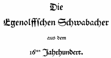 One of the oldest type foundries, founded by Paulus John Christian Egenolff (1502-1555), who was a printer in Strasbourg (1528-1530) and later in Frankfurt, where he was the first book printer. After his death, until 1572, his foundry was headed by family members, Magdalena, Barbara and Maria Egenolff. In 1572, punchcutter Jacob Sabon (d. 1580) took over after marrying Judith Egenolff, Christian's only daughter, in 1571. The widow remarries with Konrad Berner, a typefounder. Upon his death in 1606, the foundry is left to his son Hans Berner who dies in 1626. His daughter Katharina Berner takes over and marries Johann Luther in 1629, son of Friedrich Luther and family of Martin Luther. Out of this marriage was born Johann Erasmus Luther (1642-1683), who marries Anna Katharina Hoffmann. Their son is Johann Nikolaus Luther (1662-1740), a lawyer. His son is a doctor in law, Heinrich Ehrenfried Luther (1700-1770), and the latter's son is also a doctor in law, Johann Nikolaus Luther (1732-1805).
 The foundry was heavily involved at first in Schwabacher typefaces, such as the Egenolffschen Schwabacher (1500s). Among the Schwabacher typefaces, Johan Enschedé's catalogue mentions Garamond Luther (1678), Gross Petit Luther (1718), Mittel Luther (1678), Cicero Luther (1718), Tertia Luther (1678), Gross Mittel Luther (1718), as well as the Fraktur typefaces Petit Luther (1678), Colonel Luther (1718), Luther (1718), Cicero Luther (1678 and 1718), Gross Cicero Luther (1678 and 1718). Digitizations include Coelnische Current Fraktur by Dieter Steffmann, Coelnische Current Pro (2016, SoftMaker), and JubiläumsFraktur by Gerhard Helzel. [Google]
[More] ⦿
|
Manfred Klein
[TypOasis 2005]

|
 [MyFonts]
[More] ⦿
|
Manfred Klein
[TypOasis, 2002]

|
 [MyFonts]
[More] ⦿
|
Manfred Klein
[Manfred Klein: Blackletter, Fraktur, Rotunda]

|
 [MyFonts]
[More] ⦿
|
Manfred Klein
[TypOasis 2004]

|
 [MyFonts]
[More] ⦿
|
Manfred Klein
[Manfred Klein: Decorative caps and initials]

|
[MyFonts]
[More] ⦿
|
Manfred Klein: Blackletter, Fraktur, Rotunda
[Manfred Klein]

|
 Manfred's fascination with blackletter and its German roots is apparent from the tens of typefaces he designed that are either revivals of historic typefaces or playful and not so playful extensions. Here we go:
 - ArthritishSpringtime
- BarlosRandom, BarlosRandomRings
- BarlosiusEdged (2007)
- Bastarda-K, BastardaButtonsBeta, BastardaMajuskel1300, BastardusSans
- BauernFraktur (2004, after the 1911 original by Bauersche)
- BayreuthFraktur, Bayreuther-BlaXXL (2005, a variation of Schneidler's Bayreuth)
- BigBroken, BigBrokenTwo
- BigElla
- Brahms-Gotisch (2005, with Petra Heidorn: a revival of Heinz Beck's 1937 typeface at Genzsch&Heyse)
- BrokenAlphabetTradition, BrokenBrainsFrax, BrokenCapsJumperB, BrokenHand-Bold, BrokenHand, BrokenHandLight, BrokenRoman-Bold, BrokenSansCaps, BrokenSansCapsJumper, BrokenWoodtypes, BrokentTraditionRound
- BruchRund
- BruchschriftMK
- Burte-Fraktur
- Burtine (2003: handwritten freestyle version of Burte Fraktur, 1928), Burte-Fraktur, Burtinomatic, Burtinomatic-DemiBold
- Burtinomatic-DemiBold, Burtinomatic
- CancellerescA
- CantaraGotica
- Cantzley Inverse Caps (2007), CantzleyAD1600 (2005)
- CaslonishFraxx
- ClaudiusImperator
- Clausewitz-Fraktur (2005). Designed in memory of Klaus Burkhardt.
- CaslonishFraxx
- ClaudiusImperator
- CowboyCaxton
- Cuxhaven Initials Round (2006), CuxhavenFraktur (2006), CuxhavenInitials (2006), CuxhavenTimes (2002). All named in honor of Petra Heidorn, who is from Cuxhaven.
- DecadentaFrax (2007)
- DirtyThinkwitz (2003). In honor of his good friend Klaus Burkhardt.
- DizzyBrokenWritten
- DolbyFraxCaps (2005)
- DornspitzGrotesk
- DoubleBrokenTextura
- Druckschrift-Initialen
- DrunkenSailor (2006)
- DuerersMinuskeln
- ElectrUnciale (2005)
- ElephantaBlack (2006)
- FatFreeFrax
- FlyingHollander (2005)
- FracturiaSketched, FracturiaSketchedCaps
- FraktKonstruct, FraktSketch, FraktSketchFS, FraktalConPablos, FrakturInRings (2007), FrakturInitials07 (2007), FrakturNitials (2006), FrakturaFonteria, FrakturaFonteriaSlim (2006)
- FrakturCondensedHeadline, FrakturCondensedHeadlineExtra
- FraxBoxes, FraxBricKs, FraxBrix, FraxHandwritten-RoundCaps, FraxHandwritten, FraxHandwrittenXtrem-Medium, FraxInCage, FraxInCageLeftOblique, FraxInCageRightOblique, FraxInitials, FraxMouseSketches, FraxxSketchQuill
- FrungturaFS
- GGothiqueMK
- GermanFatman (2006)
- GingkoFraktur (2006)
- GoldenSwing
- GotenborgFraktur (2007)
- GothicLetters (2007)
- Gotic Caps (2006), GoticaBastard, GotischeMajuskel, GothicMajuscles
- GotikaButtons (2005, after Imre Reiner's Gotika from 1933)
- GutenbergsGhostypes, GutenbergsTraces
- HamletOrNot, HamletTobeornot
- HansFraktur
- HansSachsCaps (2007)
- HansSchoenspergerRandomish
- HappyFrax (2006)
- Haunted-Normal, HauntedBricks
- Heimat
- Holland Gotisch (with Petra Heidorn; a revival of Nederduits by Johann Michael Fleischmann, ca. 1750)
- ImresFraktur, ImresFraxCaps (2007)
- Incunitials
- IronFraktur
- JessicaPlus
- JoeCaxton
- JohannesBricks, JohannesButtons-02, JohannesGDiamonds, JohannesGLastTraces (2007), JohannesTraces
- Jugendstil (2006)
- KaiserRotbartCaps (2007)
- KL1CiviliteEdges
- Kl1RheumaticFraktur
- KleinSchwabach (2005)
- KleinsBrokenGotik (2006)
- KlungerCaps (2006)
- Leibniz-Regular
- LombardPlattfuss, Lombardic
- LookBrokenTypes
- LuFraktorsoBroad
- LudwigHohlwein (2006)
- LufrakturBricks (2006)
- LutherDuemille, LutherMousedrawn-Bold, LutherMousedrawn
- MKBritishWriting
- MK Broken Types (2006)
- MKFraxConstr (2007)
- MKImresTshirtsA
- MKalligFrax, MKalligFrax-MediumItalic
- MKancellerescaCaps (2005)
- MKantzley (2005), MKanzleiCaps-One (2006)
- MKapitalisRusticaMedium
- MKaslonTextura
- MoKsford, MoKsfordBold, MoKsfordDemiBold, MoKsfordExtraLight, MoKsfordLight
- MonAmourCaps (2006), MonAmourFraktur-Broken (2006), MonAmourFrakturRegular
- MonksWriting
- MorbusParcinsonFraxx
- MorscheKnochen
- MountFirtree
- MousefraKtur
- Münchner-Fraktur (2005). A revival of Renaissance Fraktur by Heinz König, 1885, Genzsch&Heyse.
- MyElectronicSchwabach
- NeuGothic-Bold
- Neudoerffer, NeudoerfferScribbleQuality. Both codex style typefaces are from 2003. Manfred writes that Neudoerffer is an unaltered version of the original Neudoerffer Initialen from 1660.
- OKsfordBadFat, OKsfordItalic
- OldTypographicSymphony-Regular, OldTypographicSymphony-Round
- PopFraxFrankfurt (2007), PopFraxFrankfurtCondensed (2007)
- PrinzEugen
- Potsdam (2005, a revival of a 1934 typeface by Robert Golpon)
- Prothesis-Black, Prothesis-Caribiqu, Prothesis-Caripix
- RandomFrax
- ReadableGothic
- RememberReinerFS
- RotundaEspagna
- Schaftstiefel Kaputt (2003)
- SchmaleGotischMK, SchmalfetteGotisch
- SchneidlerSchwabacher, SchneidlerSolitaires, SchneidlerSolitairesRound
- Schwabach, SchwabachDuemille, SchwabachScribbels, SchwabachScribbelsSecond
- ScribbledFrakturX-Heavy (2006)
- SketchedCassiusBroken
- SmallEdgedFrax (2006)
- Snoutlike (2003)
- SpaceWinningFrax (2007)
- TizonaDance
- TshirtsForFrax
- TypoasisBoldGothic (2003)
- VanDoesburgBrokenFS
- VeryBrokenFrax
- WaldarbeiterGotisch
- WeimarInline
- WeissGotischRandom
- Weissgotnitials (2005, based on Weiss's Lichte Initialen, 1935)
- WittewittMajuscles-Flourish, WittewittMajuscles-FlourishBricks
- WrittenFrax (2007)
Download page. Download all these fonts in onze zip file.               
[Google]
[MyFonts]
[More] ⦿
|
Manfred Klein: Decorative caps and initials
[Manfred Klein]

|
 Capitals are a favoritre playground for illustrators, drawers, and artists. They go beyond just mere type. So, to no one's surprise, Manfred Klein has created well over one hundred initial caps typefaces: AlkoInitials, AlkoInitialsFramed, AnarchoCaps, Arabuttons, Archeologicaps, ArtNouveauCaps, BreezedCapsBoldOblique, BrokenSansCaps, CapitalisTypOasisMedium, CapsMKS, CapsRandomish, CapsRandomishBricks, CassandraTwo, ChaosStripesCaps, ChristianInitials, CircleInitialsFreeshape, ClassiCapsBricksBlack, ClassiCapsC, ClassiCapsShields, ClassiCapsXmas, ClassicRomanCaps, ClassicaCaps, ClownNormal, ConstrAccident, ConstruCaps, CorrodetClassicaps, CorrodetInitials, CrazyConstructor, CuneateCaps, CuxInitials, CuxhavenInitialsRound, DeKonitials, DeconstructionCaps, DelitschInitialen, DelitzschCaps, DevilsAlphabets, DirtyHatchCaps, DodgesCaps, DolbyFraxCaps, DotCapsMK, DotsCapsTwo, DrunkenConstructor, DuodezInitialen, EaglesButtons, ErikGCapsSkInvers, ErikGCapsSketches, Ermir-Normal, FatFloralphabetXperimental, FifthCenturyCaps, FilledABC, FloRaTialen, FlorAlphabet-Bold, Florabetic, FloralOne, FloralTwo, FloralalphaLight, FloraliaCaps, FlowerPower, FlowerPowerRound-Medium, ForJeffTwo, FragmentCaps-Cross, FragmentCapsRound-Medium, FrakturInitials07, GaraNitials, GaraNitialsFramed, GaranitialRings, Glitter, GlitterOblique, GoticCaps, GoticaCaps, GotikaButtonsDrei, GotikaButtonsOne, GotikaButtonsTwo, GoudamentBricks, GriffosSCapsFont, HansSachsCaps, HansSachsCapsTwo, HansSchoensCapsInGrid, ImresCorrodetCaps, ImresCorrodetCapsInvers, Incunitials, InitialenFramedMK, JahnsCaps, JahnsCapsRound50, JugendstilCaps, JuliusCaesarBlack, KaiserRotbartOneCaps, KaiserRotbartTwoCaps, KleinFeodoraCaps, KleinsWrittenCaps, KlungerCaps, KochsLongCapsSquares, LambordicCaps, LeiterplattenSans, LetterBuildings, LetterBuildingsTHREE, LettersAnimales, LettersBats, LinoCapsA, LinoCapsAR, LinocapsB, LinocapsBR, LombardInitials, LombardiCaps-Round, LombardiCaps, LucaPacioliCaps, LucaPacioliRough, MKapitalisRusticaMedium, MKapsMixed, MKidge, Magyarish, MammothishCaps, ManFont, MaximilianAntiquaSmallCaps, Mighty-Normal, MightyContour-Black, MightyShadowBlack, MightySpecial-Normal, MightyWindyBlack, MonAmourCapsAprilFraktur, MultiCapsOne, MultiCapsTwo, NeoPanFrames, NeudoerfferScribbleQuality, NoisyButtons, OldConstructedCaps, OldiesButGoodies, OrnamentalInitial, OrnamentalInitialButtons, OszillCapsSecond, OszilloCapsFirst, ParmaInitialenMK, PetitFleurLight, PetitFleurNormal, PixCaps, PixCapsRound, PixCapsShadow, PixCapsWinding, PreRomanCaps, QuaNauticale_Initials_No1, QuaNauticale_Initials_No2, QuaNauticale_Initials_No3, QuadratZiffernNegativ, QuadrataRoma-MediumOblique, QuasimodoCaps, ReliefCaps-Italic, ReliefCaps, RememberCassandre, RememberManhattanBolkd, RememberManhattanSeptember, RememberScribbledTypes, RodGauApesInitials, RodgauCaps, RomanGridCaps, RomanaCapsClassicSquares, SaltoOne-Normal, SaltoTwo-Normal, SchneidlerSchwabachInitials, SchnoerkelCaps, SchoenspergerCaps, Schraffura, SerifsCaps, SilvestreInitials, SilvestreInitialsSquares, SnowCupsCaps, Solitaire, Solitaires, SomeCapsStories, StoneCapsIngrid, TangoMacabre, Tangoasis, TokayMK, TokayOSeven, ToleCaps, TornielloInitials, Torynitialen, TorynitialenInversed, TorysToolsFS, ToscanButtons, ToskanaCapsRound, TrajanSmallCaps, TrajanusBriX-Invers, TrajanusBricks, TrajanusBricksXtra, TwilightCaps, TypOasisInitials, TypoGhosts, VForVictory, VariationsForImre, VaticanianInitials, VenetianBlind, VenetianBlindInverse, VespasianCaps, VespasiansFlorials, VictorianInitialsOne, WalNussCaps, WeimarCaps, WieynkCapsRound, WindyCityCaps, ZagzagCaps, ZebralCaps, ZebralSketchedCapsItalic, ZierCaps.
 Download page. Download all these fonts in onze zip file. [Google]
[MyFonts]
[More] ⦿
|
Marcelo Granero
|
Graduate from FADU, University of Buenos Aires, who created the Schwabacher (Bastarda) typeface unfortunately named Kraut (2009). [Google]
[More] ⦿
|
Matrero G
|
Lanus, Argentina-based designer of Gayacos Primaria Bastarda (2002), Tapi (2006, monoline octagonal), Negada (2006, handwriting), Cementeria (2006), Chingolo Pro (2006), Letrograda (2006, bad typewriter), Bloqueada (2006), Alsina (2006), Reienhardt (2006, scratchy handwriting), Cholo Sperry Rand R20 (2006, old typewriter), Daft (2006, handwriting), Kill All Fonts (2006, experimental stencil), Venerada (2002, shadow face), Thapkie MG (2002, pixel face). [Google]
[More] ⦿
|
Mauricio Amster
|
 Polish-Spanish designer, 1907-1980, who fled Spain in 1939 to Chile on board of the Winnipeg, and who revolutionized editorial design in Chile. He worked on the mag Zig-Zag. Examples of his sublime lettering: calligraphy, Cancellaresca, Gotica Bastarda, Romana Antigua, Romantica Humanistica, Rotunda.
 Photo. Joaquin Contreras wrote a thesis at the Faculty of Architecture of the University in Chile in 2007 entitled Diseño de fuentes tipográficas, basadas en los libros integramente caligrafiados por Mauricio Amster en Chile. I quote from a talk given by Contreras in 2021: Mauricio Amster Cats is a leading Polish editorial designer who worked for 40 years in Chile as a publisher, potter, lettering artist and teacher. He published two books on graphic standards to support his classes at the school of journalism and design hundreds of books. Son of Jewish parents persecuted by the Nazi regime, as a young man he studied graphic arts in Germany. Together with his friend Mariano Rawicz he travelled to Spain to take part in the civil war. In Madrid he designed newspapers, pamphlets, posters and books, the best known being the Cartilla Escolar Antifascista, a study book for militiamen. As a refugee he travelled to Chile on the Winnipeg, a ship prepared by Pablo Neruda (Chilean poet, diplomat, winner of the Nobel Prize) where he arrived with his wife Adina, a Spanish bookbinder with whom he shared his life. In Chile he started out as an anarchist, but as time went by he became part of Chilean culture until he became probably the most important designer of the last century. [Google]
[More] ⦿
|
Medieval Fonts
[Peter Keel]
|
Detailed listing of medieval fonts on the web, by Peter Keel (Switzerland), with downloads. Categories: - Roman fonts used until the 7th century: Justinian and justinian2 (Iconian), JGJ Roman Rustic (Jeffrey Glen Jackson), CelticHand90.
- Early medieval fonts: InsularMinusculeNormal-6th, LatinUncialNormal-1st, RomanHalfuncialNormal-1st, RomanRusticaNormal-1st, CarolingianMinuscule (all by Jack Kilmon), Beowulf1 and AngloSaxonCaps (Peter S. Baker), AngloSaxon-8th, BattelAbbey-8th, VaticanRoughLetters-8th, LibraryOfMinerva-9th, BritishBlockFlourish-10th (all by Robert Anderson), JGJUncial (Jeffrey Glen Jackson), GeschlossenGotikKaps (Jim Fordyce), Gothic1.
- Medieval fonts: BritishOutlineMajuscules and FloralMajuscules-11th (by Robert Anderson), Pontifica-12th (Michael Scarpitti), GothicTextureQuadrata-13th and EarlyGothicbold (by Jack Kilmon).
- Late medieval fonts: MAGotic-14th (Will Software), GothicLeaf, BritishMuseum-14th, DecoratedMajuscules-14th, ItalianCursive-14th and GermanBlackletters-15th (all by Robert Anderson), GoodcityModern-15th (A.S. Meit), MABastarda1-15th (Will Software), BastardaPlain.
- Renaissance and later: JGJDuererGothic-1535 (Jeffrey Glen Jackson), ElegantCapitalsII-16th (Paul Lloyd), MAGKursiv1-16th (WillSoftware), GothicStraightFaced-16th, SpanishRoundBookhand-16th, CurvedManuscript-17th, TraditionalGothic-17th, EnglishGothic-17th (all by Robert Anderson), JohnSpeedDemo-17th (Scriptorium), BuccaneerRegular-18th, CourthandPlain, Fraktur BT, ILShakeFest.
[Google]
[More] ⦿
|
melbar
|
Small Fraktur font archive. Includes these fonts from Will Software: MA-Bastarda1 (1996), MA-GKursiv1 (1996), MA-Gotic (1996), Romand-Genealogie (1996). [Google]
[More] ⦿
|
Monotype blackletter typefaces
|
 Old metal era blackletter typefaces at Monotype: Armin-Fraktur (1904), Helen-Fraktur (Robert Haas), Halbfett Kasseler Fraktur, Wittenberger Fraktur (or Mars-Fraktur) (1904), Würzburger Fraktur. Their digital blackletter typefaces include LucidaBlackLetter, ClementeRotunda, Cresci Rotunda, Gothique, OldEnglish, Old English Text, Rudolph, Wedding Text, Engravers Old English, Goudy Text.
 View Monotype's blackletter typefaces. [Google]
[More] ⦿
|
MyFonts: Bastarda
|
The MyFonts listing of Bastarda (Schwabacher) fonts includes [Google]
[More] ⦿
|
MyFonts: Schwabacher
|
Top-ranked Schwabacher fonts at MyFonts. [Google]
[More] ⦿
|
Neufville Digital

|
 Fundicion Tipografica Neufville SA is a foundry based in Barcelona, headed by Wolfgang Hartmann, which writes about itself: Neufville Digital produces and markets the fonts from Fundicion Tipografica Neufville, Bauersche Giesserei, Ludwig&Mayer, Fonderie Typographique Française and Fundicion Tipografica Nacional.
 List of typefaces. MyFonts link. Fonts include a newly digitized Futura family (Paul Renner, 1928), in the Bauer Classics collection. In the collection Grafia Latina, we find Diagonal ND (Antoni Morillas, 1970), Uncial Romana (Ricardo Rousselot, 1996), Pascal ND (José Mendoza y Almeida, 1959), Sully-Jonquieres (José Mendoza y Almeida, 1980), Fidelio ND (José Mendoza y Almeida), Llerda ND, Paris ND, Flash ND and Arabescos ND, all by Enric Crous Vidal (1945 to 1953). They write: Within the GRAPHIE LATINE collection Neufville Digital releases the works of famous typographers like José Mendoza y Almeida, René Ponot, Tomas Vellvé, Antonio Morillas, Ricard Giralt Miracle, Ricardo Rousselot, Juan Trochut and others. The BAUER CLASSICS collection includes the many typefaces from the Bauersche Giesserei. The first fontfamily available is FUTURA that has been completely digitized anew to meet today's professional demands. Many other fonts are to follow. Neufville Digital produces and markets the fonts from Fundición Tipográfica Neufville, Bauersche Giesserei, Ludwig&Mayer, Fonderie Typographique Française and Fundición Tipográfica Nacional. You will certainly be familiar with famous typefaces like Futura, Bauer Bodoni, Weiss, Folio, Imprimatur and many others from the rich type founding era. Neufville Digital digitizes them from their original artwork using state of the art technology and makes them available in compliance with the latest standards. Among the fonts to be reissued, we cite a few. From Ludwig&Mayer: Allemannia Fraktur (1908), Allright (1936), Altenburger Gotisch (1928), Bastard Mediaeval, Beatrice (1931), Chic, Cochin (1922), Commerciale, Diplomat (1964), Firmin Didot (1929), Hallo (1956), Kombinette (1932), Krimhilde (1934), Kupferplatte (1950), Largo (1939), Magnet (1951), Wolfram (1930). From FT Neufville: Antiqua (1850). From FT Nacional: Astur (1940), Belinda (like 15th century Spanish calligraphic writing, with fine curved serifs on the tips of the ascenders), Cervantes, Elzeviriano, Hispalis (1940), Imperio (1949), Inglés (1940), Interpol (1950), Numantina (1940; for a digital version, see Nick Curtis's Numancia NF (2011)), Radar (1940), Romana, Victoriana (1940). From the Bauersche Giesserei: Astoria (1911), Azurée (1908), Baron (1911), Baroness (1911), Baskerville-Antiqua (1923), Batarde (1915), Bauer Bodoni (1926), Fette Antiqua (1850), Lithographia (1895), Manuskript Gotisch (1899), Noblesse (1908), Steile Futura, Stephanie (1890), Times-Antiqua, Venus (1907). From FT Française: Bizerte, Italienne, Romantiques (1937), Stylo (1937). Their Catalogo de tipos (1978) shows many other typefaces too, so, with some repetition, we find the handwriting/script typefaces Vigor, Sinfonia, Privat, Sirena, Maxim, Litografia, Leyenda (Legend), Bernhard Cursive and Adagio, the federal money typeface Azuree (1908), the typewriter family Ibematic, OCR A-1, the blackletter typeface Gotico (or Manuskript-Gotisch), the outline fonts Royal and Columna, the checkbook typeface Litho, the display typefaces Nobleza and Carnaby, the Egyptian family Epoca (=Beton), as well as Homera (=Hyperion), Corvinus, Volta and Impressum. Galaxy ND (2006) is a mysterious, organic and quite useless typeface. Go here for a description of the old printing machines. Check also the Fundicion Tipografica Bauer in Barcelona and Visualogik Technology and Design in the Netherlands. Showcase of Neufville's fonts. Neufville Digital's typeface library. Neufville Digital's collection of fonts: [Google]
[MyFonts]
[More] ⦿
|
Noelia Romero Mendoza
|
 Graduate from FADU, University of Buenos Aires, who created the Bastarda typeface Olden Zebra (2009). [Google]
[More] ⦿
|
Norstedt Tryckeri
[Per Adolf Norstedt]
|
Stockholm-based foundry, est. by P.A. Norstedt. The managers of the type foundry include C. and J. Riis (Denmark) (1817, under Lindh--1849, under Norstedt), Thomas Christian Ebbesen (1849-1869), Axel Kock (1869-1920s), Ernst Jonasson (1920s-1950), and Rune Wennborn (1950-1980). A timeline: - 1821: Per Adolf Norstedt, a magistrate in Örebro, acquires Johan Pehr Lindh's business in Stockholm, and founds P.A. Norstedt & Söner in Stockholm in 1823. Lindh had been typefounding since 1816 at Mariedal outside Stockholm, and continued on until 1832, when it was amalgamated with the Norstedt printing works at No. 6 Riddarholmen, where Norstedt remained until it closed down. In the 19th century, many German and French matrices were imported, but after that, Norstedt became self-sufficient.
- 1833: Norstedt became Printer to the King. Because of this, the business boomed and expanded.
- 1846: Acquisition of Lars Johan Hierta's Stockholm type foundry.
- 1916: Art historian and designer Akke Kumlien joins Norstedt, and will remain art director until the 1950s.
- 1950s: Karl-Erik Forsberg, whose type designs include Berling Antikva, the first entirely Swedish typeface since van Selow's in the XVIIth century, becomes art director.
- 1973: Norstedt closes down. Esselte Norstedt donated its entire collection of matrices in 1973 to the Nordiska Museet in Stockholm.
- 1983: Publication of Type Studies The Norstedt Collection of Matrices in the Type foundry of the Royal Printing Office (Norstedt Tryckeri, Stockholm, 1983), by Christian Axel-Nilsson. This book details all metal typefaces in the collection of the Norstedt foundry.
From the Norstedt collection: Roessjor, Cicero Pragisk Fraktur No. 4, Cicero Fraktur No. 5, Cicero Fraktur No. 7, Cicero Fraktur No. 9, Korpus Gammal Schwabach, Cicero Gammal Schwabach, Hiertas Mittel Antikva No.1, NS89a, Grov Mittel Antikva, Mittel Antikva, Text Antikva, Text Antikva, Mittel Utsirade Versaler (ca. 1750), Mittel Utsirade Versaler (ca. 1750). View Norstedt's digital legacy. [Google]
[More] ⦿
|
Nova Type Foundry
[Joana Maria Correia da Silva]

|
 Graduate of the University of Reading in 2011, who was born in Porto, Portugal. Joana worked as an architect and graphic designer in Portugal. She currently lives in the UK and/or Porto, Portugal. Since 2011, she teaches type design at ESAD (Escola Superior de Artes e Design). Since 2021, Joana Correia is foundry relations manager at The Type Founders in New York.
 In 2010, under the supervision of Dino dos Santos at ESAD, Joana designed an unnamed bastarda / chancery typeface that is based on originals by Francisco Lucas. Creator of the script typeface Violet (2011). Artigo (2011) is an angular type family for Latin, Hindi and Greek that was created during her studies at Reading. Artigo won Second Prize for Greek typefaces at Granshan 2011. It also won an award at TDC Typeface Design 2018. In 2017, Ndiscovered published Artigo Global and Artigo Pro. Artigo Display followed in 2018. In 2020, Nova Type Foundry republished Artigo, Artigo Display. In 2012, she published the didone text typeface Cantata One at Google Web Fonts. Quando (Google Web Fonts) is a serifed text typeface inspired by brushy handwritten letters seen on an Italian poster from the second world war. In 2013, at MSTF Partners, a Portuguese consultancy, she created Writers Font (2013). This is a script typeface by Joana Correia that combines the handwriting of famous Portuguese authors. For example the A is by José Luis Peixoto, the B by José Saramago and the C by António Lobo Antunes. Link with the story. Still in 2013, she showed an unnamed unicase sans typeface and participated in the Canberra typeface competition. In 2014, she made the round connected script typeface Jasmina FY (Fontyou), the Google Web Font Karma (for Latin and Devanagari: Karma is an Open Source multi-script typeface supporting both the Devanagari and the Latin script. It was published by the Indian Type Foundry; see also Open Font Library), and Canberra FY (at Fontyou: a short-serifed typeface family). In 2015, Adrien Midzic and Joana Correia co-designed Saya Serif FY. Still in 2015, she published the humanist sans typeface family Vyoma at Indian Type Foundry. Amulya (2015-2021) is another humanist sans, now in 8 styles with two variable fonts, published by Correia at Indian Type Foundry's Fontshare. In 2016, Joana Correia and Natanael Gama co-designed the Latin / Tamil typeface Arima Madurai (free at Google Fonts). Their Arima Koshi (2016) covers Tamil, Malayalam and Latin. In 2016, Joana Correia and Natanael Gama co-designed the connected typeface Tidy Script at Indian Type Foundry. In 2017, Joana published Laca Pro: Laca is a semi-sans serif inspired by retro Portuguese packaging of soaps. Laca is the Portuguese word for hairspray. Free download. Laca Text (2018) is a sans serif version of Laca. For Nova Type versions, see Laca (2019) and Laca Pro (2020). The latter versions cover Greek and Cyrillic as well. In 2018, Joana published the soft script typeface Lemongrass: It was inspired by brush lettering and the sea and the strong winds that exist in Porto. At Future Fonts, she released the didone typeface Alga (2019), in which ball terminals are replaced by genuflections. She was the principal designer of the sans family Varta (2019, Sorkin Type), which is available from Google Fonts and Github. Assistance of Viktoriya Grabowska and Eben Sorkin. Typefaces from 2020: Loretta (with Abel Martins; see also Future Fonts; Loretta is a low contrast text typeface that comes in 12 styles), Loretta (Future Fonts: a low contrast text typeface in 12 styles; by Joana Correia and Abel Martins). Interview in 2021. Behance link. Another Behance link. Old home page. Joana Correia link at Behance. Future Fonts link. Type Department link. Speaker at ATypI 2018 in Antwerp. [Google]
[MyFonts]
[More] ⦿
|
Okaycat
[Luke William Turvey]

|
Takamatsu, Japan-based design division of The LOLO, a content creation company, which was established in 2006. Luke William Turvey (b. London, Ontario, 1978) who lives in Japan started out with street murals but is doing digital work now. His early fonts include Giacinta Ornate (2008, a lovely bastarda), Parabrite (2008, techno), Stefani EHYO Sans Rounded (2008, a clean geometric sans), Antikka (2008, art deco), Calisso (2008, experimental), LOLO Dingcats (2008), Clementine (2008: artsy serif), Okaytext (2008, a fashionable geometric sans in the style of Bernhard Fashion), Okay Cursive (2008, an upright connected script), Okay Crayon (2008), Okay Paint (2008), Japanese Brush Master (2008), Tag Banger (2008, graffiti font), Bapalopa (2008, more graffiti), Hive Mind (2008, nuts and bolts look), Trees of Africa (2008, dings), 3D Fantablock Beveled (2008), Shababa (2008, shadow font), LOLO Animals (2008), LOLO City (2008, inner city dingbat face), LOLO Cursive (2008, curly handwriting), Japoneh (2008, a great oriental-look drippy paintbrush font). In 2009, Okaycat published Arco Crayon (blackboard writing, but also a lipstick font), 3D Blocky (with Natsuko Hayashida), Carbon Neutral, Hand Writing OC, Okay Cotton, Hand Cursive, Stitch Cursive, Antique Dubplate, Porto (rough calligraphic), Brush Writing OC, Nouveau Rock (engraved), Shababa, 3D Techno, Stefani EHYO (4-style geocratic sans), Japanese calligraphy poster. With Natsuko Hayashida, he did Rustic Stamp (grungy). Fonts from 2010: Uncertainty (grunge), CASU Aerospatiale (an etched 3d font family), Geodot (a dot matrix face), Zampichi (a video game font family), Country Charm (Natsuko Hayashida: a dingbat face), The Inlines No Inlines (Natsuko Hayashida: a black rounded minimalist sans), CC Angular (Turvey: an octagonal typeface that comes with an outlined and shaded style), Pentastic (hand-printed), Candy Cursive (a monoline connected script). Typefaces made in 2011: Okay-A (this font lets one make 3D letters that look to be fastened down with screws), Teselka (a 3d outlined shadow face), Joopica (a casual typeface created together with Natsuko Hayashida). Typefaces made in 2012: Meksa (techno). In 2013, he created Pixapp Inter (a pixel face). Typefaces from 2014: Maple Street (a vintage wood type emulation typeface done with Natsuko Hayashida), Nunooska (a medium-heavy rounded sans). Klingspor link. View Luke William Turvey's typefaces. View the Okaycat typeface collection. [Google]
[MyFonts]
[More] ⦿
|
Oldrich Menhart: Classification of blackletter types
|
Oldrich Menhart compares and classifies various blackletter typefaces in his book Nauka o Pismu (1954). He also compares Quadrata and Rustica in the uncial genre. [Google]
[More] ⦿
|
Oliver Weiss
[Walden Font]

|
 [MyFonts]
[More] ⦿
|
Orell, Gessner, Fuessli&co
|
Typefounders in Zürich since the mid 18th century. One of its founders was the artist Johann Caspar Füssli, 1706-1782. Their work can be found in Épreuves des caractères de la fonderie de Orell, Gessner, Fueslin&compagnie. A Zuric (Zurich, 1781). This book already shows some didone influences, but its main typefaces are all Fraktur, with sizes in Sabon, Grosze Missal, Kleine Misaal, Grosze Canon, Kleine Canon, Mignone, Garmond and Petit. It offered a Garmond Schwabacher too. Publishers of Épreuves des caractères de la fonderie de Orell, Gessner, Fuessli&compagnie. A Zuric (Zurich, 1782). Local download of the 1782 book. The company still exists today, and specializes in cartography as Orell FüssliKartographie AG. [Google]
[More] ⦿
|
Otto Weisert

|
 Typefounder who ran the Schriftgiesserei Otto Weisert in Stuttgart. Designer of the prototypical Jugendstil font Arnold Boecklin in 1904, a typeface named after the Swis symbolist painter Arnold Böcklin. Arnold Boecklin is available at URW, Linotype, Adobe, Scangraphic, Mecanorma, and Softmaker [where it is known as Jugendstil]. A monolinear version was done in 2020 by Mario Feliciano, called Korrodi.
 Otto Weisert also designed the blackletter typefaces Moderne Fette Schwabacher and Brabanter Gotisch (1905). He also made the great-looking art nouveau style Kalligraphia (digital revivals at Linotype, URW, Scangraphic and Elsner&Flake). For recent revivals of Kalligraphia, see Kalligraphia (2012, SoftMaker) and Karin Pro (2019, SoftMaker). His 1890 catalog has an extensive series of caps typefaces. A catalog of digital typefaces that descend from Otto Weisert's work. See also here. And another one. FontShop link. View some digital implementations of Arnold Boecklin. [Google]
[MyFonts]
[More] ⦿
|
Otto Weisert
[Schriftgiesserei Otto Weisert]
|
[More] ⦿
|
Patricia Lillie

|
 From Ashtabula, OH, Patricia Lillie (b. 1958) is the respected designer of the wonderful (shareware) Poptics dingbat fonts series (I, II and III) in 1993. See also here or here. Please read her remarks about rip-off font sellers. She sold many wonderful wonderful wonderful dingbat fonts via Eyewire: Gargoil, Fidelma, Lil Creatures (great!), Lil Ancients, Lil Critters, Lil Dings, Lil Fishies, Lil Stuff, Lil Features, Lil Folks, Lil Faces, Lil Events, Lil Flowers, Mini Pics Doohickies, Lil Edibles and Lil Vehicles. These were marketed by Image Club Graphics as their MiniPics series in 1995. She also had display fonts such as Horsefeathers, WhimsyICG, Whassis, Farrier, Shatterday, Chilada and Chilada Dos (1994), Burweed, Alleycat, Ashtabula, Damosel, and Syllogon. [T-26] designer of Ashtabula, Damosel, DamoselDingbats.
 Review of Poptics by Fred Showker. Noteworthy is that Poptics became Poptics Delux in 2010, and is now a pay font at MyFonts. Other fonts: Fidelma (at Type Quarry), Samson, Delilah, Benderville, ElegeionScript (2001, formal handwriting), ITC Tickle (2001), ITC Tickle Too, ITC Cinderella (2002), Miss Kitty Deluxe (2009, comic book face), Zarlino (2011, a brand new bastarda blackletter family), Boppa Delux (2011, an elegant bold display family). [Google]
[MyFonts]
[More] ⦿
|
Paul James Lloyd
[Greater Albion Typefounders (or: GATF)]

|
 [MyFonts]
[More] ⦿
|
Paul Shaw
|
Paul Shaw's choice of 100 best typefaces of all times: - 1-10: Gutenberg's B-42 type, Nicolas Jenson's roman, Francesco Griffo's italic, Claude Garamond's roman, Firmin Didot's roman, Akzidenz Grotesk, Gebetbuch type, Cheltenham family, Helvetica, Aldus Manutius' roman.
- 11-20: William Caslon IV's sans serif, William Caslon's roman, Pierre-Simon Fournier's italic, Futura, Times Roman, Chicago, Bell, Ludovico Arrighi da Vicenza's italic, Univers, Romain du Roi.
- 21-30: Johann Michael Fleischmann's roman, Clarendon, ATF Garamond, Giambattista Bodoni's roman, Century Roman, Nicolas Kis' roman, Minion multiple master, Unger Fraktur, John Baskerville's roman, Lucida.
- 31-40: Ionic, Golden Type, Robert Thorne's fat typeface roman, Wolfgang Hopyl's textura, Vincent Figgins' antique roman (Egyptian), Johnston's Railway Sans, Optima, Bauer Bodoni, Adobe Garamond, Breitkopf Fraktur.
- 41-50: Bell Gothic, Courier, Trajan, Mistral, Doves Type, Scotch Roman, Syntax, Snell Roundhand, Memphis, Robert Granjon's civilité.
- 51-60: Fette Fraktur, Ehrhard Ratdolt's rotunda, Romanee, ITC Stone family, Trinité, ITC Garamond, Avant-Garde Gothic, Oakland, Deutschschrift, Hammer Uncial.
- 61-70: Beowolf, Meta, OCR-A, Sabon, ITC Novarese, Zapf Chancery, Rotis, Base Nine and Base Twelve, Peter Jessenschrift, Excelsior Script.
- 71-80: Bitstream Charter, Peignot, Erbar, Cancellaresca Bastarda, Joanna, Dead History, Behrensschrift, Eckmannschrift, Poetica, Marconi.
- 81-90: PMN Caecilia, Stadia, Imprint, Souvenir, Thesis, Apollo, Penumbra, Melior, Neuland, Flora.
- 91-100: Element, Walker, Remedy, Template Gothic, Digi-Grotesk Series S, Compacta, Antique Olive, Bodoni 26, Evans and Epps Alphabet, WTC Our Bodoni.
[Google]
[More] ⦿
|
Paulo Heitlinger
|
 Portuguese author of Tipografia: origens, formas e uso das letras (2006, Paulo Heitlinger, Lisbon) and Alfabetos, Caligrafia e Tipografia (2010, Lisbon). Born in Lisbon, he studied nuclear physics in Germany. He lectured on communication design at the Universidade do Algarve. His pages (in Portuguese) are quite complete, with a great glossary, a beautiful section on the history of type, a mag called Cadernos de Tipografia, links to type design in the world in general, and in Brazil, Spain and Portugal in particular, and more general information on type. Font-making how to. Useful timeline of 16th century writing manuals. An absolute must. He has also created or revived a number of typefaces, which can be bought on-line.
 An incomplete list of his typefaces: - Sinalética: A sober serif typeface for excellent legibility.
- CantoneirosRegular (2008), Cantoneiros-Thin (2008): art deco / avant-garde.
- Transito (2008): the famous 1930s stencil face of Jan Tschichold at Lettergieterij Amsterdam, with reinvented forms for f, g and y. [Note: the pic on the right-hand-side is Transito, as grabbed from Heitlinger's page---the grammatical error is not mine.]
- Sturmblond-Medium (2008): Revival of simple lettering of Herbert Bayer.
- Bayer Condensed: Revival of simple lettering of Herbert Bayer.
- Imperatorum (2008)
- Ratdoldt (2008): a blackletter typeface made from scans, and attributed to Erhard Ratdolt.
- Valentim (2008): a blackletter typeface made from scans of the book Vita Christi. Named after Valentim Fernandes, a printer active in Lisbon, ca. 1480-1519.
- Incunabulo Normalizado (2008): a blackletter typeface made from scans of the book Vita Christi.
- Uhertype-Medium (2007): Revival of another Bauhaus era typeface, by Joost Schmidt.
- Arkitekto: A Bauhaus style piano key font based on an image found in a book of Kurt Weidemann.
- His Spanish collection includes Bastarda de Francisco Lucas, a versão espanhola da Cancelleresca italiana do século XVI. Um ponto alto da Caligrafia del Siglo de Oro.
- Redondilla de Francisco Lucas, a penmanship font based on Arte de Escribir (1577).
- Gótica Rotunda Gans.
- Juan Bravo, based on azulejos (tiles).
- Segovia, a titling font.
- Centauro, a decorative font.
- Kurrsiva, inspired by scripts from the 1960s.
- Deco de Avila, an avant-garde face.Bertrand (2008): an art deco typeface patterened after the shop sign of Livraria Bertrand in Chiado, Lisbon.
- Rotunda:
- Visigotica: based on the calligraphic writings of the 10th and 11th centuries. This font has many alternates. Based on scans of a text of the 10th century called Actas de Concilio de Caledonia de 451. Styles: Imperatorum, Isidoro.
- Typefaces based on the calligraphic work of Francisco Lucas, 1570: Bastarda de Lucas Italic (2009), Bastarda de Lucas (2009), Redondilla de Lucas (2009).
- Uncialis (2009): a Lombardian type based on a 16th century model of Giralde de Prado.
- Escolar Portugal (Fino, Forte) and Escolar Brasil are school fonts of the "upright connected script" style that were made in 2008. For more on didactic fonts, read the booklet Caderno de Tipografia e Design Nr. 14 (March 2009).
[Google]
[More] ⦿
|
Paulo W
[Intellecta Design (or: Monocracy Types)]

|
 [MyFonts]
[More] ⦿
|
Paulus John Christian Egenolff
[Luthersche Schriftgiesserei]
|
[More] ⦿
|
Pedro de Flórez
|
Spanish Jesuit father and penman, who lived around 1600. He published Método del Arte de Escribir (1614, Madrid, Luys Sánchez), a book in which he teaches how to write and draw Bastarda. [Google]
[More] ⦿
|
Pedro Díaz Morante
|
Spanish penman, calligrapher and engraver, 1565-1636. He lived in Toledo from 1591 on and moved to Madrid in 1612. He published Arte nueva de escribir in which he explains his system for teaching cursive writing, published in five volumes between 1615 and 1631. He was respected as a great penman, who, incidentally, was ambidexterous. Scans: a calligraphic drawing of Felipe IV in 1624, a Spanish Bastarda (1624), a chancery hand (1630). For digital typefaces based on Morante's work, check out Ramiro Espinoza's Dulcinea (2012). Picture. [Google]
[More] ⦿
|
Pedro Leal

|
 Pedro Leal graduated in graphic design and advertising from the ESEIG-Escola Superior de Estudos Industriais e de Engenharia in Vila do Conde, Portugal, and lives in Porto. In 2010 he obtained a degree in type design at ESAD (Escola Superior de Artes e Design, Matosinhos) and started working at DSType. MyFonts link. Behance link.
 He used FontStruct in 2008 to create the pixel typeface Minimal 8pt (514 glyphs!). In 2010, he created the text family Mafra at DSType. This was followed a bit later by Mafra Display (2010; +Medium, +Black). Apud and Apud Display (2010, DSType) are high-contrast typefaces. Penna (2011) is a calligraphic type system. Braga (2011, Dino dos Santos and Pedro Leal, DS Type) is a layered font design family. Dino writes: Braga is an exuberant baroque typeface, named after a Portuguese city, also known as the baroque capital of Portugal. Our latest typographic extravaganza comes with a multitude of fonts designed to work like layers, allowing to insert color, lines, gradients, patterns, baroque, floral swashes, and many other graphic elements. Starting with Braga Base, you can add any of the twenty-three available styles, to create colourful typographic designs. In 2012, he designed User, User Stencil and User Upright>/a>, a monospaced type family with 30 styles, from Hairline to Bold. This too will many awards. Girga (+Italic, +Engraved, +Banner, +Stencil) is a strong black Egyptian family designed together with Dino dos Santos at DS Type. Solido (2012, with Dino dos Santos, DS Type) is a versatile type system with five widths: Solido, Solido Constricted, Solido Condensed, Solido Compressed and Solido Compact. In total there are 35 fonts. In 2020, a variable font was added to Solido. In 2012, he created the sans family Global, with its own dedicated web site, The Global Font. In 2013, he followed that up with the Global Stencil typeface family. In 2013, Dino dos Santos and Pedro Leal published Diversa, a set of nine very different fonts that are jointly kerned so that letters can be swapped out and replaced at will. Diversa Std (2014) extends this to include Stencil, Inline and other decorative styles. Pedro Leal's main typeface of 2013 is Aparo, a script that is calligraphic, yet keeps the characteristics of penmanship scripts, and the pizzazz of a good fashion font. In 2014, he published Ocre and Ocre Poster in sans and slab serif substyles inspired by W.A. Dwiggins, Torio, a penmanship script based on a style used in Arte de Escribir por Reglas y con Muestras (1798, by Spanish penman Torcuato Torío de la Riva y Herrer). Torio received the Communication Arts Type Award of Excellence in 2014. In 2015, he created the large Rudo and Rude Slab typeface families that exhibit many humanist traits: Rude ExtraWide, Rude Icons, Rude SemiCondensed, Rude SemiWide, Rude Wide, Rude, Rude Condensed, Rude ExtraCondensed, Rude Slab, Rude Slab Condensed, Rude Slab ExtraCondensed, Rude Slab ExtraWide, Rude Slab SemiCondensed, Rude Slab SemiWide, Rude Slab Wide, Rude Slab, Rude Slab Condensed, Rude Slab ExtraCondensed, Rude Slab ExtraWide, Rude Slab SemiCondensed, Rude Slab SemiWide, Rude Slab Wide. Early in 2015, he also did a custom typeface family for the Jornal de Notícias, including sans, serif and micro sub-styles. Dino dos Santos and Pedro Leal published Jules and Jules Text in the summer of 2015---a fat fashion mag didone 45-style family inspired by several plates from Portuguese calligrapher Antonio Jacintho de Araujo; it comes in Big, Colossal and Epic. Ecra is a workhorse slab serif, also done in 2015. Viska (2015, by Dino dos Santos and Pedro Leal) is designed for small print. Finally, TCF Zellige (2015, TypeCult) is a modular typeface inspired by the tiles that can be found in Southern Europe and North Africa. Typefaces from 2016: Oposta (Italian, Western style pushed to the esthetic extreme; received the Communication Arts Type Award of Excellence in 2017), Ardina (with Dino dos Santos: a text typeface family with three optical sizes). Typefaces from 2017: Scrittore (a heavy dark Italian bastarda influenced by the connected hand of Giovanniantonio Tagliente and Robert Granjon's Civilité; at DS Type), Zart (a voluptuous ebullient black didone, or fat face; +Script). Fusta (a gorgeous wood-type inspired poster typeface), Ordem (a low-contrast contemporary Capitalis Monumentalis). Typefaces from 2018: Glitched (an experimental variable spacing font), Striver (a crisp contrasted curvy display typeface), Certo Slab and Certo Sans, Foreday (a forward-looking typeface family with associated variable font, covering sans, serif, semi-sans and semi-serif), Perfil (an inline and swashy high end script). Typefaces from 2019: Akut (a purely angular typeface with some rounded corners), Denso (by Dino dos Santos and Pedro Leal: a great condensed variable font with weight, serif and optical size axes), Jornada (a multistyle family with a Fraktur, a chancery, a bookish style called Libro, a news text serif, a clean sans, a slab serif, a monospace, and a penmanship script, all in one family dubbed hygienic post-punk by Leal). In 2020, Dino dos Santos and Pedro Leal designed Larga, which was inspired by the typefaces shown in the specimens of the Fundiçãao Typographica Portuense from 1874. Larga is a wide all caps family and comes with a variable opentype format. Pedro also designed Effigy (a text typeface with slightly ballooning stems), Haste (a typeface that flirts with reverse contrast), Mescla and Enorme (an ultra massive and modular 3000-glyph mastodont of a font, together with Dino dos Santos; based on constructivist principles) in 2020. Typefaces from 2021: Orla (a straightforward interpretation of the Skeleton Antique No2 from the Stephenson, Blake & Co. foundry; for the sans, the serifs were removed), Elaine (+Ombre, +Fleurer; a complete baroque / Elzevir family influenced by Jacques-François Rosart in its ornamental styles). [Google]
[MyFonts]
[More] ⦿
|
Per Adolf Norstedt
[Norstedt Tryckeri]
|
[More] ⦿
|
Peter Bruhn
[Fountain--A Friendly Type Foundry]

|
[MyFonts]
[More] ⦿
|
Peter Doerling
[Die Entwicklung unserer Schrift]
|
[More] ⦿
|
Peter Keel
[Medieval Fonts]
|
[More] ⦿
|
Peter Schoeffer

|
 Peter Schöeffer, a calligrapher, was an assistant to Johannes Gutenberg in Mainz, Germany, through the years of preparation necessary for the printing of the 42 line Bible, in 1455. Schöeffer designed the font under Gutenberg's supervision, during the preceding years. The font was a very accurate imitation of the best manuscript style of the period, and it contained nearly 300 letters, ligatures, and abbreviations. Later in 1455, Gutenberg lost his business to Johann Füst, but Schöeffer stayed on with the new owner. In 1459, Schöeffer designed the first "transitional" typeface from Gothic to Roman and it was used in the publication of Rationale Divinorum Officiorum by Guillaume Durand (Durandus). Some of the upper-case characters have full roman shapes and several of the lower case characters are noticeably rounded. Example of Schoeffer's early Schwabacher, created in Mainz in 1465. His son, Peter the Younger, moved to Mainz and carried on the trade.
 Among digital revivals, see Psalterium (2012, Alter Littera), Schoeffer GP Roman (2015, Philippe Gauthier), and Germanica (2010, Seamas O'Brogain). Fust&Schoeffer-Durandus-GoticoAntiqua118G (2016-2019, Alexis Faudot and Rafael Ribas, ANRT, France) is a recent revival of Durandus. Faudot and Ribas write Durandus's 118G Gotico-Antiqua was first used in Mainz by Peter Schoeffer and Johann Fust for Guillaume Durand's Rationale Divinorum Officorum in 1459. The book displays two sizes, the smaller 92G for the main text and the bigger and more contrasted 118G used only for the colophon and later for the famous 48-line Bible in 1462. It was used until the end of the 15th century. [Google]
[MyFonts]
[More] ⦿
|
Peter Wiegel
[CAT Design Wolgast]
|
 [More] ⦿
|
Petra Heidorn
[CybaPeeCreations (or: Typoasis)]
|
 [More] ⦿
|
Philipp Luidl
|
Author of Die Schwabacher (2004), and Ornaments. Philipp Luidl and Günter Gerhard Lange coauthored Paul Renner (1978, Typografische Gesellschaft München). Philipp Luidl and Helmut Huber wrote Typographical ornaments (Poole, Dorset: Blandford Press; New York, N.Y.: Distributed in the U.S. by Sterling Pub. Co., 1985), a 368-page in-depth treatise on the subject. Cover page and selected images such as this end piece with tendril decorations, 17th century, this cast unit piece assembled from various elements, these great ornamented caps, and this vignette from the Academicism period. They divide type ornaments up by historical periods: - Gothic period (1150-1500): Abstract leaves, trefoil, quatrefoil, sixlobe tracery, paisley, interlace and plant motifs.
- Renaissance (1500-1600): Fabulous creatures instead of animals, weapons, music instruments, hop, fig leaf and symmetry everywhere. In the early renaissance (1520-1570), we find grotesque (symmetry, leaves and creatures), mauresque (lines and forms only--no humans or animals!), and basketwork (geometrical designs made up from lines and bands). The late renaissance sees scrollwork (border ornament) and strapwork (wrought-iron).
- Baroque period (1600-1730): Ornate, exaggerated, swepping curves, no corners. In the high baroque (1680-1715), straight curves are not tolerated, and curlicues appear in lettering.
- Rococo period (1720-1780): From "rocaille" (shellwork), form is secondary to decoration. Shell shapes, flame shapes, some Asian patterns.
- Neoclassicism (1770-1830): Sobriety, a nostalgic return to antiquity. Urns and garlands, running dogs, oval cartouches. The Empire style refers to Napoleon times, with laurels, lotuses, sphinxes, and pyramids dominating. Another substyle is Romanticism or Biedermeier, with domestic tranquility.
- Academicism (1850-1900): Revival of Gothic, Baroque and Renaissance elements during this industrial growth period.
- Art Nouveau (1895-1914): Based on Asiatic or folkloric plant and animal motifs, asymmetrical, planar, and reactionary. A truly new style.
- Modernism: The geometrical patterns of the Art Deco movement (1920-1940), and other ornamental styles, often austere, reactionary, or experimental.
[Google]
[More] ⦿
|
Pia Frauss
|
 German designer (whose real name is Marianne Steinbauer) of these beauuuuuuutiful (free) fonts:
 - Francisco Lucas Llana Regular (2003, chancery hand). Pia writes: Written in Madrid in 1570, by a man called Francisco Lucas. He classified it as a Bastarda; but actually, it is a humanist cursive -- the type of writing that is mostly known under the name of Chancery.
- Francisco Lucas Brioso Regular (2003, medieval hand). Also based on Francisco Lucas.
- WirWenzlawRough (2003). Pia writes: This is a genuine Bastarda, written at Prague in the year 1400, at the chancery of one Wenzlaw who was king of Bohemia and Roman king. His elixir of life was booze, his first occupation fighting off a brother who tried and retried to have him dethroned for insanity, his favourite pasttime having people drowned in the Moldava, and his only claim at immortality causing thereby the death of a court clerk called John of Pomuk, who afterwards became renowned as a saint.
- XenippaRegular (2003). Absolutely original Rotunda capitals mixed in with French Bastarda.
- XirwenaRegular (2003). A swash font invented by Pia.
- Dei Gratia (2005): This font is rather closely based on a charter issued in 1275 by Rudolf of Hapsburg (the first of his house to make it on the German throne).
- JaneAusten (2005): handwriting based on Jane Austen's hand.
- Tagettes and Tagettes Plus (2005): Pia writes Tagettes&TagettesPlus are the type of Italian chancery cursive of the 16th and 17th century that is mostly called Cancellaresca. Swashes galore!
- Xiparos (2005): an extract of some German charters issued nine hundred years ago by Henry, the last of the Salic kings. This medieval typeface was followed by Xiparos Lombard (2005).
- XiBeronne (2005): "XiBeronne is, of course, plain Black Letter -- at least as far as the lower case glyphs are concerned. They were inspired by a very beautiful and very celebrated French manuscript written at the beginning of the 15th century, containing -- and splendidly illustrating -- Gaston Phoebus' Book of the Hunt."
- EtBoemieRex (2007): a 14-th century blackletter face. Boemie means Bohemia...
- Tycho's Recipe: based on the Antiqua used by Peter Payngk (Denmark, 1575-1645) or his helpers in copying astronomer Tycho Brahe's recipe against the plague, ca. 1610.
- Love's Labour (2007): a blackletter based on a sample that Pia Frauss suspects is due to Michael Baurenfeind, ca. 1716.
- aeiou (2007): a blackletter based on the chancery used by the Hapspurg's who reigned from 1440 to 1493.
- XalTerion (2007): another blackletter.
- Mala Testa (2012). A chancery hand based on a writing sample titled Lettere piacevolle taken from A booke containing divers sortes of hands, published by J. de Beauchesne and J. Baildon, in 1571.
- Mitre Square (2012). A script typeface based on a handwriting dsample from the files of the Jack The Ripper case in 1888.
- Son of Time (2012). Based on the handwriting of Giovanni Borgia (Joan Borja), duke of Gandia, who was the son of a pope and the grandfather of a saint.
- Tycho's Elegy (2012). Based on the chancery hand of Tycho Brahe (1597, Denmark).
Dafont link. Yet another URL. Klingspor link. Abstract Fonts link. [Google]
[More] ⦿
|
Piotr Lukaszkiewicz
[Arriere Garde]

|
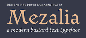 [MyFonts]
[More] ⦿
|
Posterizer KG
[Lazar Dimitrijevic]

|
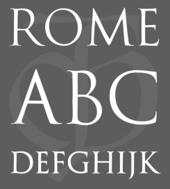 Lazar Dimitrijevic, who set up the foundry Posterizer KG, was born in 1981 in Bajina Basta, Serbia, and lives in Kragujevac, Serbia. He obtained a Master of Graphic Design from the Department of Graphic Design, FILUM Kragujevac, Serbia. Presently, he is art director at Design Studio BOX.
 His first font, Art Decor (2009), is a brush typeface in the style of Treefrog. Koma Latin (2009) is a roughly outlined script face. Bajka (2010) is a wonderfully entertaining Baskerville family (Latin, Cyrillic, dingbats, ornamental caps) made for children's fairy tale books. Scarface (2010) is a sublime scratchy hand ideal for torture movies. Kaligraf Latin (2010) is a rough-edged calligraphic face. In 2012, he published Collage BB (hand-drawn didone), the heavy Egyptian typeface Posterizer KG at DizajnDesign. This font was created for Celebration of 5 years anniversary of Design Studio Box from the city of Kragujevac (KG), the industrial city of Serbia. Posterizer KG (+Rounded) contains all the Latin and Cyrillic glyphs. Posterizer KG Inline and Posterizer KG Rough (a letterpress emulation version) were added in 2013. Posterizer KG Sketch followed in 2015. Still in 2012, he designed the ink splatter typeface Oops, and the calligraphic typefaces Cal Humanistic Cursive (a renaming of Cal Humanist Corsiva, posibly under pressure from Monotype), Cal Humanist Minuscule and Cal Humanist Corsiva. He also creates stunning calligraphic works. Cal Roman Capitals (2012) is a Trajan typeface. In the same calligraphic series, we find Cal Rustic Capitals (2012), Cal Square Capitals (2012), and Cal Uncial (2012). Typefaces from 2013: Posterizer KG Sketch, Cal Expressive, Cal Bakerly (calligraphic script in the style of Arthur Baker), Cal Cursive Roman, Cal Rustic Black, Cal Neuland Bold (after the German expressionist typeface Neuland by Rudolf Koch), Cal Gothic Bastard, Cal Gothic Fraktur, Cal Fraktur Modern, Cal Rotunda, Cal Gothic Textura, Cal Carolingian Minuscule, Cal Carolingian Gothic, Cal Insular Minuscule, Cal Insular Majuscule, Cal Beneventan Minuscule. Typefaces from 2014: Cal Neuland Shadow, Mozzart Sketch (a decorative hand-sketched version of Mozzart Sans, a slightly rounded, neo-Grotesque corporate font, that was originally created for the Belgrade-based company Mozzart DDO; followed in 2015 by Mozzart Rough). In 2015, he designed Drina (brush typeface), My Way (a TreeFrog style handwritten face). Typefaces from 2016: Bali Beach (brush script), Omorika (a rustic handcrafted sketched serif typeface). Typefaces from 2017: Workshop Brush (dry brush), Workshop Marker, Workshop Pencil. Typefaces from 2018: Miro (after the lettering in Joan Miro's art), Ernest (based on the hand of Ernest Hemingway), Natron (rounded condensed sans; +Pictograms). Typefaces from 2019: My Tara (a thick brush script), Natron Rough, Kalli Hand, Kalli Sketch. Typefaces from 2020: Panorama KG (based on the principle nothing below the baseline), Hubble (a rhythmic display typeface with thorny serifs), Liceum (a rhythmic calligraphic script for Latin and Cyrillic), Cal Fraktur Brush, Cal Roman Black, Cal Roman Modern, Cal Uncial Rough. Typefaces from 2021: PKG Roman Capitals (Trajan capitals with a hand-drawn finish, for Latin and Cyrillic), Monodia (a slab serif and its glitched version). [Google]
[MyFonts]
[More] ⦿
|
Proportional Lime
[Shane Brandes]

|
 Oberlin, OH-based foundry of Shane Brandes (b. Lakefield, MN, 1974), who made the historic semi-blackletter revival Augsburger2009 (2009), which was inspired by one of Ernhardt Ratdolt's (1442-1528) many beautiful typefaces. Ratdolt was a printer from Augsburg, hence the name. River Liffey (2009) is based on a typeface used by James Williams an Irish printer active in Dublin during the late 18th century. Rising Sun (2009, blackletter) was inspired by Gering and Remboldt's work during the late 1490s in Paris.
 Charlemagne (2010) is an imaginary medieval script. Fleurious (2010) are ornaments. Sweynheym Pannartz (2010) is modeled after an example Conrad Sweynheym and Arnold Pannartz used in their early printing venture in Subiaco, Italy which began around 1465. Ballard (2010) was inspired by a font used by Henrie Ballard, who operated on Fleet Street at the Signe of the Bear in London from ca. 1597-1608. White Now (2010) is a music note font. Enn'agrammaton (2010) is a cryptographic font. Pluton (2010) is a fixed width font with over 1400 glyphs. Old Venexia (2010) simulates an irregular medieval type. Black Tie (2010) is a simple monoline sans family. Azabercna (2010) is based on gothic principles. Alchimistes (2010) is a medieval symbol face, while Florati (2010) provides a set of ornamental caps. Wappenstein (2010) is an angular stone-carved face: The font Wappenstein was inspired by the carving on a memorial stone located in Paderborn, Germany. The stone was a Epitaph of the Brenkener family, and the carver is known as the Meister des Brenkener Familienepitaphs. The carving, dating to 1562, currently is curated by the Erzbischöfliches Diözesanmuseum in the city of Paderborn and was originally in the Brenkener Pfarr Kirche. Boston 1851 (2010) is based on a stereotype used by Wier and White, Printers of Boston, that was created by the New England Stereoype Foundry under the auspices of Hobart and Robbins, also of Boston. Cruxially (2010) is a 500-glyph dingbat font with crosses. Gaspardo (2011) is an art deco display face. Anguillette (2011) is a quaint grungy face. Ernst (2011) is a very simple but large hand-printed face. The blackletter typeface Schoeffer (2011) is based on Typ.7:146/148G also known as Gesellschaft für Typenkunde plate no. 258, by Peter the Younger (son of Peter Schoeffer), cut ca. 1509-1520. Printers in Marks is a printer mark dingbat typeface created in 2011. Cat E Poultry (2011) is a scanbat typeface of cats. Lucas Brandis (2011) is based on section headings used by printer Lucas Brandis, the first printer to operate in the city of Lübeck around 1473. Creations in 2012: Vine Street, Nicolaus Kesler (a blackletter type based on one of the typefaces of Basel-based Nicolaus Kessler, 15th century), Modality Antiqua (straight-edged and mechanical), Martin Crantz (2012: Martin Crantz (or sometimes Krantz) of the three, including Ulrich Gering and Michael Friburger, that set up a press at the Sorbonne in 1470 was likely the fellow who had the technical know how how to cast the type itself, hence the name of this new typeface that is based on his work.). Modality Antiqua and Modality Novus are explorations of the octagonal principle. Zainer is a rough-edges renaissance era typeface named after Augsburg-based printer Günther Zainer who was active from 1468 until 1478. Swine And Roses is based on a Free Mason script. Ammurapi is a Ugaritic script face. Typefaces from 2013: Michael Wenssler (an incunabula / blackletter typeface based on Michael wenssler typeface from 1482), Andreae (a Fraktur based on a 16th century font by Hieronymus Andreae, who first worked as woodblock cutter and then became a publisher in the city of Nuremberg until his death in 1565), Dropsomaniacal (Lombardic), Therhoernen (grungy medieval script after a Cologne-based printer Arnold Therhoernen, active from 1470 until 1483), Rusch (a 1000-glyph revival of a late 15th century antiqua by Adolf Rusch von Ingweiler, who was active in Strasbourg from 1460 until 1489), Gutknecht (a Schwabacher based on a font used by Jobst Gutknecht, a printer in Nuremburg from 1514 until 1542). The rough blackletter typeface Kachelofen and Konrad Kachelofen are named after Konrad Kachelhofen, a printer in Leipzig active from 1482 until 1529. Albrecht Pfister (2013) is a textura typeface based on Biblia Paperum, which was printed by Pfister in Bamberg, ca. 1460. Amerbach 883 (2013) is a rotunda typeface based on a typeface by Basel-based printer and typefounder Johann von Amerbach, who was active from 1477 until 1513. Typefaces from 2014: Willie Caxton (a blackletter used by William Caxton in his 1476 edition of Chaucer's Canterbury Tales), Azabercna, Lion of Antwerp (an incunabula typeface: Gerard Leeu met his untimely end in a work-related altercation in 1492. He was a notable printer in both the cities of Gouda and Antwerp. This font typeface is based on the "Die gesten of gheschienisse van romen" typeface, ca. 1481.), Hildegardis (an alphabetic cipher that was invented in the 12th century by Hildegard von Bingen to obscure a language called Lingua Ignota. The exemplar was found in the Riesencodex), Lady Vittoria (vampire script based on a German cross stitch pattern from the 1870s), Trowel. Typefaces from 2016: Holle There (a re-cut of a typeface that Lienhart Holle used in his epic edition of Ptolemy's Cosmographia that dates to the early 1480's, even predating italics). Typefaces from 2017: Archbishop (based on the legal documents of Archbishop Arnold von Selenhofen, who granted Hildegard von Bingen and her nuns rooms at the Rupertsberg Monastery in the year 1150), Schoensperger Der Altere (after a blackletter font used by the first female printer, Anna Ruuml;gerin, who was Johann Schönsperger der Altere's sister; Johann was a famous printer in Augsburg, Germany, during the last 20 years of the 15th century). Typefaces from 2018: Zell (a rough blackletter based on 15th century German typeface by Ulrich Zell), Captain Cookie (based on the original font used to print a short history of Captain Cook's exploits around the world), Adelheid (a great curly blackletter based on a 16th century Swiss publication), Feodorov (named after Russia's first printer, Ivan Feodorov). Creative Market link. Klingspor link. [Google]
[MyFonts]
[More] ⦿
|
Purah
|
A few truetype fonts: Batarde, PompeiiCapitals (Agfa, 1995), Ruritania, CelticmdDecorativeWDropCaps, OffenbachChancery, Stonehenge. [Google]
[More] ⦿
|
Rainer Wiechmann
|
Graduate of Fachhochschule für Druck in Stuttgart Vaihingen, Germany. Freelance teacher and founder of a studio. He created the free typefaces RaBi Fraktur (a Schwabacher) and Dörfler (marker script). Klingspor link. [Google]
[More] ⦿
|
Rainer Will
[Will Software]
|
[More] ⦿
|
Ralph Michael Unger
[RMU (Ralph Michael Unger Typedesign)]

|
 [MyFonts]
[More] ⦿
|
RMU (Ralph Michael Unger Typedesign)
[Ralph Michael Unger]

|
 Ralph M. Unger (b. 1953, Thuringia, East Germany) says this about himself at MyFonts: Typesetter from the composing stick via Linotype setting machines to the Mac. Jobs in various Thuringian printeries. Barred further education by Communist authorities due to political reasons. Imprisoned in East Germany. Since 1988 in the state of Baden-Wuerttemberg, former West Germany. Jobs in several newspaper printing houses as advertisement compositor. Own office since 1995, in Aalen, Baden-Wuerttemberg. He lives in Schwaebisch Gmuend, and was a freelance type designer for Profonts and URW++, where he contributed frequently to their libraries between 2002 and 2009. In 2009, he founded RMU. MyFonts link. I split his contributions into two groups, the URW / Profonts group, and the RMU group. The prefix FontForum refers to a subseries of URW++ fonts. Unless specifically mentioned, all the following fonts are at URW++ and/or Profonts:
 - FontForum Admiral Script (2005): revival of Middleton's Admiral script from 1953.
- Amitié (2009): a garalde family.
- Arabella Pro (2006): after the script by Arnold Drescher from 1936, published at Joh. Wagner.
- Fontforum Atrament (2006): architectural lettering. Do not confuse with a Suitcase Type Foundry font from 2003 by the same name.
- Atze (2010): a comic book family.
- Behrensschrift D (2007): after the jugendstil typeface Behrens Schrift, 1902, by Peter Behrens.
- FontForum Bernhard Script (2005): after Bernhard Script from the 1920s.
- Bradley (2005): blackletter, after the original by William H. Bradley.
- Breite Kanzlei (2007).
- Breitkopf Fraktur (2003): after the original by Johann Gottlob Immanuel Breitkopf, done in 1793.
- Brocken (2011) is a signage typeface inspired by a design of Volker Küster (1960s).
- Profonts Bureau (2010, Profonts): a minimalist rounded sans family.
- FontForum Calypso (2005): a revival of Roger Excoffon's Calypso (1958).
- Card Pro (2006): a decorative display based on Ella Cursief (1916, Sjoerd Hendrik de Roos, Lettergieterij Amsterdam).
- Chaweng (2006, Profonts): an oriental all caps simulation face.
- Civilite URW (2005).
- Compliment (2004, casual script). Based on a 1965 script by Helmu Matheis for Ludwig & Mayer.
- Cranach (2007): a blackletter typeface modeled after Kuenstler Gotisch from the Krebs Foundry.
- Dominante (2007): a serif family based on Johannes Schweitzer's font by that name, 1959.
- Dominique (2010, profonts): an informal typeface.
- FontForum URW Ecsetiras (2005): revival of Ecsetirás (Zoltan Nagy, 1967, a brush face).
- Edda Pro (2008). An art nouveau typeface that revives a Heinrich Heinz Keune typeface from 1900.
- Energia Pro (2008, Profonts): connected monowidth script, based on Arno Drescher's Energos from 1932.
- Estro (2003, Western lettering). Seems close to Nebiolo's Estro from the 60s.
- Eurobrush Pro (2007, Profonts): handwriting.
- EuroSans (2008).
- Euroscript Pro (2006, Profonts): school script typeface based on his own handwriting.
- Flashes (2007): a revival of Crous-Vidal's Flash, 1953.
- Fox (2007): a brush script based on W. Rebhuhn's original from the 1950s.
- Gamundia (2010): a calligraphic copperplate script inspired by Excoffon's Diane.
- Ganz Grobe Gotisch (2006): a fat blackletter modeled after the original by F.H.E. Schneidler.
- Gmuender Elan Pro (2011) is a 1950s style script face.
- Gradl Nr 1 (2008): based on hand-drawn art nouveau upper case characters by M. J. Gradl, ca. 1900.
- Graphique Pro (2008): shaded caps face, based on Graphique, which was originally created by Swiss designer Hermann Eidenbenz in 1945, and issued as hot metal font by Haas'sche Schriftgießerei. See also New Graphique Pro (2011).
- Handel Slab (2009): a 6-style extension of Trogram's 1980 typeface Handel Gothic.
- Hanseat (2010): a grotesque family done at Profonts. It was heavily inspired by Germany's official DIN 1451 Engschrift.
- Iova Nova (2007): based on Jowa Script, designed by J. Wagner in 1967.
- Profonts>Impression (2008): art deco.
- Jessen Schrift (2004): after the Rudolf Koch blackletter typeface by that name.
- FontForum URW Konzept Pro (2005): revival of Konzept (1968, Martin Wilke's handprinting face).
- Legende (2002): a script typeface based on the original typeface of Friedrich Hermann Ernst Schneidler (1937).
- Leipziger Antiqua. The original Leipziger Antiqua by Alfred Kapr at Typoart dates from 1971 until 1973. The digital version of Leipziger Antiqua was developed by Ralph M. Unger in 2005.
- Manuskript Antiqua (2005): after Oldrich Meinhart's Manuskript Antiqua.
- The Maszynysta family of heavy industrial sans typefaces (2010) have a textured style (Struktura), a Shadow, and a plain Roman.
- Maxim (2003, Profonts): The heavy brush typeface Maxim was originally designed by Peter Schneidler in 1956 for the Bauer foundry.
- New Bayreuth (2008): after Friedrich Hermann Ernst Schneidler's Bayreuth from 1932.
- Old Borders and Lines (2010). A free font.
- Ornella (2008): Jugendstil.
- Peter Schlemihl (2008, Profonts): a revival of a blackletter by Walter Tiemann.
- Pedell (2009): a casual script.
- Polo (2002): a brush face modeled after Carl Rudolph Pohl's Polo (1960).
- In 2012, Ivana Koudelkova co-designed the grungy headline typeface Retroactive Pro with Ralph M. Unger at Profonts.
- Fontforum Rhapsody (2006): a revival of Ilse Schüle's rotunda face.
- Roberta (2003): art nouveau typeface after obert Trogman's typeface for FotoStar.
- FontForum Signs and Symbols (2006).
- Splendor (2009): a revival of a brush script typeface by Wilhelm Berg, Schriftguss, 1930. See also Splendor Pro (2014).
- Sportowy (2009): an outline face.
- Stanford (2011). A sports lettering face.
- Stiletto (2006): a medieval script.
- Fontforum Stripes (2007): a multistripe op art display typeface based on a Letraset font from 1973 by the same name.
- Fontforum Thalia (2006): retro font.
- Tintoretto (2006): shadow display face based on an origonal by Schelter & Giesecke.
- Tip Top Pro (2008): a Julius Klinkhardt art nouveau typeface revival.
- FontForum Unciala (2005): a revival of Oldrich Menhart's typeface Unciala (1953, Grafotechna).
- Unger Chancery (2005).
- Unger Script (2003): based on H. Matheis' Slogan typeface designed for Ludwig&Mayer in 1957.
- Veltro (2007): after a 1931 original by G. da Milano at Nebiolo.
- Profonts Woodpecker (2008).
The list of RMU fonts: - Affiche (2017). A revival of Helios Reklameschrift of the Klinkhardt foundry.
- Aldo Manuzio (2017). After a house typeface from 1897 by Schelter&Giesecke.
- Amati Pro (2010): after Georg Trump's condensed didone face, Amati, 1951.
- Antiqua Florenz (2021). A revival and extension of Paul Zimmermann's Antiqua Florenz (1960, Ludwig & Mayer), which is based on Venetian romans.
- Avus Pro (2012). A sans family that extends Gert Wunderlich's Maxima (1970).
- Baroque Pearl (2016). A pearly typeface that revives Peter A. Demeter's Fournier Geperlt (1922, Schriftguss).
- Behrens Kursiv (2013). After a 1906 original by Peter Behrens.
- RMU Belvedere (2020). A revival of Heinrich Wieynck's art nouveau / fin-de-siècle typeface Belvedere (1906, Bauer).
- RMU Bison (2020). A revival of Julius Kirn's brush script Bison (1935-1938, C.E. Weber).
- Bernhard Blackletter (2016). After Lucian Bernhard's extrafette Bernhard Fraktur (1921).
- Bernhard Cursive Extra Bold (2010).
- Borghese (2015). An art nouveau font after a Schelter & Giesecke original from 1904.
- Borgis Pro (2012). A Clarendon-style text family.
- Boulette (2015, a fat creamy script).
- RMU Bowery (2019) A revival of Old Bowery (1933, ATF)).
- Bravura Pro (2013). After G.G. Lange's Publica.
- Bricklayers (2012). An original fat slab display face.
- Brillant (2009): art nouveau and ultra heavy.
- Butti (2011). A script family paterned after Fluidum (1951, Alessandro Butti, Nebiolo).
- Cable Condensed (2014). Based on Koch's Kabel.
- Caesar Pro (2011). A flared sans typeface after Caesar Schrift (1913, Georg Schiller, C.F. Rühl).
- Capitol Pro (2012). An art deco typeface based on Capitol (Karl Hermann Schaefer for Schriftguss, 1931).
- Carina Pro (2017). A calligraphic script typeface based on Rautendelein (1929, Schriftguss).
- Carla Pro (2013). A broad-nibbed script modeled after Ballantines Script (Elsner & Flake, 1974; see also Ballantines Serial by SoftMaker).
- Carlsbad (2018). A couple of art nouveau typefaces based on originals from 1895 by H. Berhold called Regina Cursiv and Hansa Cursiv.
- Caslon Gotisch (2009): after the original by William Caslon from 1763.
- Celebration (2009): blackletter.
- Circensis (2016). A Western circus font based on a concept of Fritz Richter.
- Claudius (2010): after a 1937 blackletter font at Klingspor.
- Constanze Pro (2012). A light cursive typeface based on Constanze (1954, Joachim Romann, Klingspor).
- Contact Pro (2010): after Contact, a 1963 font by Helmut Matheis.
- Dante Alighieri (2018). Based on a Schelter & Giesecke original.
- Daphnis (2016). A revival of Daphnis (1929, Walter Tiemann).
- Deutschmeister (2017). A textura blackletter typeface after Deutschmeister by Berthold Wolpe for Ludwig Wagner in 1934. (Some dispute that Wolpe made this font.)
- Diamant Pro (2012). A transitional serif face.
- Emilia (2016). Based on Weiss Antiqua (1928) by Emil Rudolf Weiss.
- Neue Echo (2016). Based on Echo for Schriftguss.
- Elbflorenz (2020). A revival of Albert Auspurg's display typeface Miami (1934, Schriftguss).
- Emilia Gotisch (2016). After Weiss Gotisch (1936) by Emil Rudolf Weiss.
- Emilia Fraktur (2021). A revival of Emil Rudolf Weiss's Weiss Fraktur (1913).
- Erler Titling (2015). After Erler Versalien (1953, Herbert Thannhaeuser for Typoart).
- Eurotech Pro (2011): a slabby techno family.
- Faulkner Pro (2011): a connected heavy signage script based on Alan Meeks's Kestrel.
- Fette Kanzlei (2019).
- Fette Unger Fraktur (2010).
- Fichte Fraktur (2020). After Walter Tiemann's Fichte Fraktur (1934).
- Fontanesi RMU. An ornamental caps typeface that revives Aldo Novarese's Fontanesi (2018).
- Forelle Pro (2010): after the original Forelle script typeface by Erich Mollowitz, 1936.
- Frankenberg Pro (2012). An antique script face.
- Gabor Pro (2014). A connected copperplate script.
- Gaby Pro (2017). A revival of Hans Möhring's script typeface Gabriele (1938 or 1947, C.E. Weber).
- Garamond Antiqua Pro (2015).
- RMU Gilgengart (2020). A revival of Hermann Zapf's Fraktur font Gilgengart (1938).
- Gillray Pro (2015). A copperplate script after Hogarth Script (by Harald Bröder for Typoart).
- RMU Gloria (2019). After Gloria (1898, Emil Gursch).
- RMU Gong (2020). Based on Arno Drescher's Super Grotesk Schmalfett first released in 1933 at Schriftguss.
- Gmuender Gravur (2011). A 3d shadow face. Gmuender Antiqua Pro (2015) is influenced by the metal font Imprimatur (1952-1955, Konrad F. Bauer and Walter Baum). Gmuender Kanzlei (2018) is a blackletter typeface.
- Goethe Fraktur (2022). A revival of a blackletter typeface by Wilhelm Woellmer (1905).
- Gravira (2021). A revival of Herbert Thannhaeuser's Gravira, released by Schelter & Giesecke in 1935 .
- Haenel Antiqua (2020, based on a 19th century antiqua by Eduard Haenel) and Haenel Fraktur (2011, after Haenel Fraktur, ca. 1840).
- Hanse Textura (2020). A revival of a textura by Hermann Zapf.
- RMU Helion (2020). A revival of the 3d titling typeface Helion (1935, Arno Drescher for Schriftguss Dresden).
- RMU Herkules (2019). After a late 19th century font by Bauer and Berthold called Reklameschrift Herkules.
- Hoelderlin (2018). After Eugen Weiss's Hoelderlin blackletter font (1937).
- Hoyer Script (2017). After Hanns Thaddeus Hoyer's Hoyer Schoenschrift (1939, Stempel).
- Hupp Fraktur (2016). After Otto Hupp, 1911.
- Impuls (2010): a brushy typeface based on Paul Zimmermann's Impuls (1945).
- Initials RMU One (2012) consists of revivals of Rudhardsche Initialen (Otto Eckmann, ca. 1900) and Walthari Initials (ca. 1900, Rudhardsche Giesserei). Initials RMU Two (2012) consists of revivals of Jubilaeumsinitialen (by Bauersche) and Augsburger Initialen (by Peter Schnorr, 1901).
- Jean Paul Fraktur (2021). A revival of Breitkopf's Fraktur font Jean-Paul-Schrift (1798).
- Jobs Gravure (2011). It had to happen---a few days after Steve Jobs' death, Unger released the beveled engraved typeface Jobs Gravure, which is an extension of Trump Gravur (1954, Weber).
- Jolly Polly (2012): a curly non-connected script face.
- Kis Antiqua Pro (2018). A revival of Hildegard Korger's Kis Antiqua at Typoart.
- Kleist Fraktur (2010): after Walter Tiemann's original.
- Kompress Pro (2013). Two compressed sans typefaces.
- RMU Kontrast (2021). An art deco typeface that revives Kontrast (1930, F.H.E. Schneidler at Weber).
- Koralle RMU (2018). A revival of Schelter and Giesecke's Koralle (1915).
- Korpus Pro (2014). A text typeface family. Followed later in 2014 by Korpus Sans Pro.
- Korpus Serif Pro (2021). A revival and extension of Timeless (Typoart) that covers Greek, Latin and Cyrillic.
- Leibniz Fraktur (2012) is modeled after the famous Genzsch & Heyse blackletter font.
- Lenbach (2021). Inspired by a German font from the Victorian era.
- Liliom Pro (2012). A beautiful fat didone typeface based on an original from the Fonderie Française.
- Lipsia Pro (2011). An angular serif family.
- Literatura Pro Book (2012).
- Litfass (2021). A revival of an art nouveau font by Flisch.
- Lutetia Nova (2014). A fresh two-style take on Jan van Krimpen's Lutetia (1924).
- RMU Luchs (2021). A redesign of Jakob Erbar's inline all caps art deco font Lux (Ludwig & Mayer, 1929).
- Luxor Pro (2010): a Victorian/Western display face.
- Lyrica (2014). A revival of the informal blackletter typeface Lyrisch (1907, Georg Schiller).
- RMU Magnet (2021). A redesign and revival of Magnet (1951, Arthur Murawski at Ludwig & Mayer).
- RMU Manolo (2019). Based on the art nouveau typeface Manolo (Ludwig & Mayer).
- Manutius Pro (2012).
- Meister Antiqua (2011, +Bold, +Book). A Typoart original from 1951 in the tall flared ascender serif genre, revived and extended.
- Mitropaschrift (2016). An octagonal original.
- Mobil Pro (2011). A semi-script typeface in the fifties style of Matheis.
- Monument (2010): a 3d shadow roman caps face created after Oldrich Menhart's Monument.
- Narziss (2018). A revival of Walter Tiemann's Narziss from 1921.
- RMU Neptun (2021). A revival and extension of the art nouveau typeface Neptun by Aktiengesellschaft fuer Schriftgiesserei und Maschinenbau, Offenbach.
- Neue Kurier (2011). Typoart's popular signage script font in a new, completely remastered version.
- Neue Muenchner Fraktur (2010).
- Neue Schwabacher (2021). After Albert Anklam's Neue Schwabacher (Genzsch & Heyse, 1876).
- Neue Thannhaeuser (2011).
- Old Towne Pro (2010): a Western font.
- RMU Omega (2020). After Omega, an art deco typeface by Friedrich Kleukens at Stempel in 1926.
- Orbis Pro (2016). A revival of Walter Brudi's shadow typeface Orbis (1953, Stempel).
- Orplid Pro (2019). a layerable typeface that revives and extends Hans Bohn's all caps Bauhaus era typeface Orplid (1929).
- Parcival Antiqua (2016). A revival of Parcival Antiqua (1926, Herbert Thannhaeuser).
- Parfum (2013). A low x-height script that was inspired by Howard Allen Trafton's Quick (1933, bauer).
- Parler Fraktur (2018). A revival of Friedrich Poppl's Poppl Fraktur.
- Parler Gotisch (2011). A blackletter face.
- RMU Pittoreske (2019). A decorative Victorian typeface.
- Plastica Pro (2015, a chiseled typeface inspired by a J. Lehmann design).
- RMU Pergola (2021). A vintage shadow typeface inspired by a late-19th century font of Georg Giesecke.
- Post Fraktur (2014) and Postillon (2014). After Herbert Post, 1933-1937.
- Primana Pro (2012). A seductive geometric grotesk family.
- Prinzess Gravur (2010): a blackletter typeface modeled after Prinzeß Kupferstichschrift (1905, Berthold).
- Prisma Pro (2011). Revival and extension of Rudolf Koch's multiline typeface Prisma (1931).
- Reklame Fraktur (2016). After Reklame Fraktur by Albert Christoph Auspurg, 1914.
- Reflex Pro (2018). All caps, with an inline style.
- Reznicek Pro (2011) is a post-Victorian pre-art nouveau typeface named after Ferdinand von Reznicek (1868-1909), one of the leading artists and illustrators of those times.
- Rekord Antiqua (2020). A revival of the art nouveau era text typeface Rekord Antiqua (1911, Wagner & Schmidt).
- Rhythmus Pro (2016). After a Schriftguss AG and Schelter&Giesecke original grotesk, and extended to cover Cyrillic.
- Ridinger Std (2012). Based on Riedingerschrift (Franz Riedinger, 1906, for Benjamin Krebs Succ.).
- Ronde Pro (2011): roundhand script.
- Royal Grotesque (2021). A revival of Wotan by Wagner & Schmidt, 1914. Did this typeface become RMU Royal Sans (2022)?
- Salzmann Fraktur (2019). A revival of Max Salzmann's blackletter font released by Schelter & Giesecke in 1912.
- Saskia Pro (2016). Revival of Jan Tschichold's Saskia (1931, Schelter & Giesecke).
- Schmale Anzeigenfraktur (2009): based on Koch's Schmale Deutsche Anzeigenschrift, 1923, Klingspor.
- Schmale Mediaeval (2020). Based on Schelter & Giesecke's Schmale Mediäval (1840).
- Schmuckinitialen (2009): an ornamental caps typeface in the art nouveau style based on Walthari Initials [Walthari (1899, Heinz König for the Rudhard'sche Giesserei) in the upper case and Eckmann Initials (ca. 1900, by Otto Eckmann, Germany's chief art nouveau type designer) in the lower case].
- Schreibmeister (2021). Ralph's interpretation of Arno Drescher's formal cursive typeface for Ludwig Wagner (1958, Leipzig).
- Schwabacher Book (2013).
- Sebaldus (2019). A heavy blackletter typeface, after Sebaldus Gotisch (1926, H. Berthold).
- Senatsfraktur (2020). After Friedrich Bauer's Senats Fraktur done in 1907 for Genzsch & Heyse.
- Concordia (2020). A revival of Sensation Schmalfett (1914, Heinrich Hoffmeister).
- Siegfried Pro (2017). A revival of the art nouveau typeface Siegfried (1900, Wilhelm Woellmer).
- RMU Skizze (2021). This revives Walter Höhnisch's script typeface Skizze (1935, Ludwig&Mayer).
- Staxx Pro (2013). A prismatic typeface.
- Staufer Gotisch (2015). An engraved blackletter typeface modeled after Herbert Thannhaeuser's Hermann Gotisch (Schriftguss, 1934).
- Steinschrift Pro (2015). A single style condensed sans serif.
- Sylphe Pro (2019). A vintage script font that revives Schelter & Giesecke's Isabel (not Sylphide, as claimed by him).
- Tablica (2017). After Karl-Heinz Lange's DDR telephone directory font Minima (1984).
- Thannhaeuser Fraktur (2013) is a redesign of Typoart's Thannhaeuser Fraktur.
- Thomasschrift (2014). A rustic typeface that revives and extends Thomas-Schrift by Friedel Thomas (1957-1958, Typoart).
- Titanschrift (2011). A yummy soft and fat display face.
- Tombola (2018). After an alphabet from the 1920s by Otto Heim.
- RMU Trianon, renamed RMU Trifels (2020). After Heinrich Wieynck's Trianon (1905, Bauersche Giesserei).
- Trocadero Pro (2010): an extension and revival of Trocadero Kursiv, 1927, Albert Auspurg, Trennert.
- Troubadour Pro (2010): In Medium and Engraved styles.
- Trump Deutsch (2011): a blackletter face, after the 1935 original by Georg Trump.
- Trybuna (2013). Based on Herbert Thannhaeuser's Liberta Antiqua (1958), but completely redrawn.
- Turnier (2019). A revival of G.G. Lange's derby (1952-1953).
- Tyton Pro (2013). A brush script after Heinz Schumann's famous 1964 Stentor.
- Typoskript Pro (2010): a revival of Hildegard Korger's Typoskript, first done at TypoArt in 1968.
- Unger Fraktur (2010): after a 1793 design by Johann Friedrich Unger; includes fett and mager.
- Walbaum Antiqua Pro (2013). A revival of Justs Erich Walbaum's didone classic.
- RMU Wallau (2019). After Rudolf Koch's rotunda typeface Wallau (1926-1934).
- Werbedeutsch (2021). A revival of the blackletter typeface Buchdeutsch (Ernst Schneidler, 1926).
- Wieynck Fraktur (2019). after Heinrich Wieynck's Wieynck Fraktur (1912).
- Wieynck Gotisch (2018). After Wieynck Gotisch (1926, Heinrich Wieynck).
- Zentenar Fraktur (2010): mager and halbfett; after the 1937 workhorse by Ernst Schneidler at Bauer.
- Zierfraktur (2010): after Deutsche Zierschrift, an engraved blackletter font that was cut by Rudolf Koch between 1919 and 1921 for Klingspor.
Ralph made some typefaces outside URW/Profonts and RMU, such as Stripes (2014, a prismatic typeface puvlished by Thinkdust). Klingspor link. View Ralph M. Unger's typefaces. [Google]
[MyFonts]
[More] ⦿
|
Rudhardsche Gießerei
|
 German foundry established in 1842 by Johann Peter Nees, Phillip Rudhard and Johann Michael Huck, that was located in Offenbach am Main. Carl Klingspor (1839-1903), the father, bought the Rudhardsche Gießerei in 1892. It was renamed Gebr. Klingspor in 1906. Scans of some of its typefaces:
 - By Peter Behrens: Behrens Schrift (1901-1902), a Jugendstil font. It was digitized by Intecsas (as Sprecher Gothic), Dan X. Solo, Ralph M. Unger for URW++ (2007, as Behrensschrift D), Ingo Zimmermann (2008, as Behrens Schrift), and Klaus Burkhardt)
- Eckmann Schrift: the prototypical art nouveau typeface by Otto Eckmann. This Munch Jugendstil style typeface from 1900-1901 is often simply called Eckmann or Eckmann Schrift, Rudhardsche Initialen, or Fette Eckmann (1902). Digital versions of it exist at Linotype, Delbanco, Ralph Unger (Schmuckinitialen, 2009, and Initials RMU One, 2012), Bitstream (where it is called Freeform 710), Elsner&Flake (Eckmann EF), URW, Brendel/Softmaker, and Dieter Steffmann (an excellent free font called Rudelsberg; Steffmann has an accompanying Jugendstil Ornamente).
- Offenbacher Schwabacher (1900) by Kurt Wanschura. The idea for this type came from Gustav Ruprecht. Revivals at Delbanco (as DS-Offenbacher-Schwabacher) in 1996.
- Walthari, a mix between art nouveau and blackletter, designed in 1899 by Heinz König. Walthari Initialen.
- Behrens Initialen. Also by Peter Behrens.
- Schwabacher Initialen.
[Google]
[More] ⦿
|
Rudolf Koch

|
 Great German type designer (b. Nürnberg, 1876; d. Frankfurt, 1934) who worked mainly at the Klingspor foundry. He founded the Offenbach Werkstatt in 1921.
 Many of his typefaces can be classified as German expressionist. These include Kabel (a sans), and Neuland (an angular poster face). An early Nazi sympathizer and supporter, Koch's fonts were heavily used by the Nazi regime. This page lists 158 royalty-free Christian symbols drawn by Rudolf Koch, a religious Lutheran, with the collaboration of Fritz Kredel (1900-1973) (see also here). His typefaces, with notes on digitizations: - Claudius (1931-1934, 1937, D. Stempel AG). His son Paul Koch followed Rudolf's instructions to make one weight in 1931-1934. Klingspor completed it in 1937. Delbanco (as DS-Claudius) and Klaus Burkhardt (1991) digitized it. Based on the latter, Manfred Klein made ClaudiusImperator (2001). Dieter Steffmann made Claudius, ClaudiusAlternate, and ClaudiusHeadline in 2003. Ralph M. Unger published Claudius in 2010.
- Deutsche Anzeigenschrift (1913-1914), Deutsche Anzeigenschrift schmal (1916-1923, D. Stempel AG). revivals include SchmaleAnzeigenschrift (2002) and SchmaleAnzeigenschriftZier (2002) by Dieter Steffmann, and Schmale Anzeigenfraktur (2009) by Ralph Unger. Later weights by Koch: Deutsche Anzeigenschrift eng (1923) , Deutsche Anzeigenschrift breit (1923, D. Stempel AG) , Deutsche Anzeigen. schmalhf. (1934, D. Stempel AG).
- Deutsche Schrift (1908-1921), consisting of Deutsche Schrift schmal (1913, Gebr. Klingspor), Deutsche Schrift fett (1910, Gebr. Klingspor), Deutsche Schrift mager (1918, Gebr. Klingspor) and Deutsche Schrift halbfett (1912, Gebr. Klingspor). Also known as Koch Fraktur. Revived by Gerhard Helzel as KochFrakturSchmaleHalbfette (2000), by Christian Richter as Rudolf Koch (2003), and by Delbanco as DS Koch Fraktur. It was a popular family, known in England as Oxford. For comparison, here is a phototype version. Deutsche Schrift fett, aka Fette Deutsche Schrift, was revived by Dieter Steffmann in 2002 (as Fette Deutsche Schrift) and by Alter Littera in 2012 as Deutsche Schrift.
- Deutsche Schrägschrift (1912, Gebr. Klingspor).
- Deutsche Werkschrift (1934, D. Stempel AG) and Deutsche Werkschrift hablfett (1934, D. Stempel AG): This is really the "mager" version of Deutsche Anzeigenschrift. Delbanco revived it digitally as DS Deutsche Werkschrift.
- Deutsche Zierschrift (1919-1921, Gebr. Klingspor). Revived as Dutesche Zierschrift (2002) and Zierinitialen> (2002) by Dieter Steffmann. See also Delbanco's DS Deutsche Zierschrift.
- Frühling (1913-1917, Gebr. Klingspor). A blackletter that seems to have been executed with a shaky hand---it is definitely one of Koch's weakest and ugliest designs. Incredibly, the revival gang was still eager to spring into action: it was revived and interpreted by Frantisek Storm in Monarchia. See also Delbanco's DS Frühling. For another revival, see Next Stringtime by Manfred Klein (2003). Frühling is sometimes called Kartenschrift.
- Geschriebene Initialen zur Grotesk (1930, Gebr. Klingspor).
- Grotesk Initialen (1933, Gebr. Klingspor). Paul Hayden Duensing made Koch Initials (metal).
- Holla (1932, Gebr. Klingspor). Digitized by Dieter Steffmann in 2001.
- Jessen Schrift (1924-1930) is a hybrid of gothic (blackletter) minuscules and roman capitals (including the characteristic Basque capital A) designed and cut without preliminary drawings in Offenbach am Main by Rudolf Koch for The Four Gospels, which was printed at the Klingspor press in 1926 and published by Koch himself. Formerly named Bibel-Gotisch, the type was developed between 1924 and 1929 as Peter Jessen Schrift and released as Jessen in several sizes by the Klingspor foundry in 1930. See DS-Jessen-Schrift (1998, Christian Spremberg), Peter Jessen Schrift (Delbanco), Jessica Plus (2002) and JessicaSerif (2003) by Manfred Klein, Peter Jessen Schrift Pro (Softmaker, 2016), and Jessen Schrift (2004, Ralph M. Unger). Jessen Mittel 14 and Jessen Cicero 12 were developed by Alexis Faudot and Rafael Ribas in 2016 during an ANRT workshop in Valence, France.
- Kabel (1927, Gebr. Klingspor), Klingspor's competing design for Paul Renner's Futura. The most famous digitization of this Koch Sans family is by Victor Caruso in ITC Kabel (1976), and with its exaggerated x-height, much larger than the original, it is a poor bastard. The modern Bitstream version is called Geometric 231. Softmaker calls it Koblenz. Poster by Jorge Martinez. At Linotype, Marc Schütz designed the large family Neue Kabel (2016) that revives Kabel by making it more consistent. This version overshadows all previous digital versions or extensions of Kabel. Dates of the various weights: Kabel Kursiv (1929, Gebr. Klingspor), Kabel groß (1928, Gebr. Klingspor), Kabel Kursiv groß (1930, Gebr. Klingspor), Norm Kabel (1930, Gebr. Klingspor): LinotypeLibrary, Kabel fett (1929, Gebr. Klingspor): LinotypeLibrary, Kabel schmal (1930, Gebr. Klingspor), Kabel schmalhalbfett (1929, Gebr. Klingspor).
- Koch Antiqua (or: Locarno) (1920-1922, Gebr. Klingspor). It was sold by Continental Type in the United States as Eve. This gorgeous tall-legged and flared typeface was designed in 1917, but cut in 1922. Koch Kursiv (1923, Gebr. Klingspor) is the Kursiv version of Koch Antiqua. See also Koch Kursiv groß (1929, Gebr. Klingspor) and Koch Antiqua fett (1926, Gebr. Klingspor: some give the date 1923-1924). Rivoli is a similar metal typeface. Digital versions include Rudolf Antiqua (2018, Now Type), Eva Antiqua, Eva SG (Spiece Graphics), Eva (Monotype), AIKochAntiqua (a multiple master font by Randall Jones for Alphabets Inc), Astaire Pro (2004, Bergslund Design, or Hackberry), Koch Altschrift (2004, Moorstation crew), Locarno (1985, Alan Meeks for Letraset), Kuenstler 165 (Bitstream), Koch Antiqua (Adobe, Linotype), Evadare (David Nalle), Hellen (2019, Genilson Lima Santos).
- Koch Kurrent (1933, Gebr. Klingspor). This is Koch's version of school scripts, a variant of his earlier proposal, Offenbacher Schrift (1927). It was only cut in 1935. See Rudolf Koch Kurrent at Delbanco .
- Koch Schrift (1909) is a Schwabacher first known as Neudeutsch and later as Koch Schrift. It was used by the Deutsche Reichsbahn, ca. 1930. For a digital revival, see, e.g., Koch Schrift (1998-2021) by Ingo Zimmermann.
- Marathon (1930-1938, Gebr. Klingspor). Digitized by Linotype in 2003 as Marathon LT (by Ute Harder, aka Frau Jenson), and by Softmaker a bit earlier. The best digital version is by the Koch Memorial team of Petra Heidorn under the name Romantha (a permutation of the letters) in 2003 (it preserves the original x-height better, for example).
- Maximilian Antiqua (1913-1917, Gebr. Klingspor). Digitization by Manfred Klein, who made Maximilian Antiqua (2003) and MaximilianAntiquaSmallCaps (2003). For an initial caps extension, see Typograf's Maximilian Antiqua Initialen (2015).
- Maximilian (Gotisch) (1914-1917, Gebr. Klingspor). Walden Font has a revival. See also Maximilian at Delbanco. Castletype made MaximilianCS. In 1995, Doug Olena revived it as Maximilian. Dieter Steffmann made Maximilian (2002) and Maximilian Zier (2002). Maximilian (2012) is due to Alter Littera. Drawings for Maximilian-Gotisch. Gerhard Helzel's revival from 1995. Stephen Miggas's revival is called Gothicus (2006).
- Neu Fraktur (1933-1934, Gebr. Klingspor): Koch's last Fraktur.
- Neuland (1923, Gebr. Klingspor) and Neuland licht (1928, Gebr. Klingspor), an outline version of Neuland. Neuland is all caps German expressionist typeface chiseled directly by Koch from metal. Copied by Monotype in 1929 as OthelloMT. Digitized by Linotype Library. Also digitized as Newland Black by Andrey Mel'man. In 1995, Doug Olena (Keystrokes) revived it as FFD Neuland (1995). A lower case and hair-serifed extension was created by Manfred Klein as On Kochs Roots (2002) and KochNeu-ExtraBlack (2003). Nick Curtis made Jungle Fever and Jungle Fever Shaded (2008) after Neuland. In 2010, Ian Lynam published yet another update, Neuerland. In 2013, Lazar Dimitrijevic created Cal Neuland Bold.
- Offenbach (1928-1934, Gebr. Klingspor). Made for display in church windows, Koch designed the "mager" weight (1931) and an uncial version. His student Hans Kühne finished the "halbfett" and the gothic after his death.
- Prisma (1928-1931, Gebr. Klingspor): A four-lined art deco face. Revived by Dieter Steffmann (2003-2004) as Prisma, and by Ralph Unger as Prisma Pro (2011). See also the 10-style typeface family LL Prismaset at Lineto (2003-2017, Mauro Paolozzi, James Goggin, Alex Rich, Arve Båtevik, and Raphael Koch).
- Stahl (1933-1939): Done with H. Kühne. Revived by J.F.Y.Daniel Gauthier (GautFonts) as StahlSteel (2003) and StahlSteelRiveted (2003).
- Wallau (1924-1932, Gebr. Klingspor), Wallau halbfett (1930, Gebr. Klingspor), Wallau fett (1935, Gebr. Klingspor), Wallau schmal (1934, Gebr. Klingspor). See Wallaby on the SoftMaker MegaFont XXL CD, 2002, or Wallau by Fraktur.de or DS Wallau by Delbanco, or Wallau (2012) by Alter Littera. Pictures by Dan Reynolds about Klingspor's Wallau speciman book (1939). Wallau, which comes in rotunda (Rundgotisch) and uncial, was named after Heinrich Wallau (1852-1925), a printer from Mainz. Originally, the typeface was going to be called Missale. Also revived by Dieter Steffmann (as WallauDeutsch-Bold (2002), Wallau Rundgotisch Heavy (2002), Wallau Rundgotisch OsF Heavy (2002), WallauUnzial-Bold (2002) and WallauZierBold (2002)) iand by PrimaFont.
- Wilhelm-Klingspor-Schrift. (1920-1926, Gebr. Klingspor): This was originally called Missal. To commemorate Wilhelm Klingspor, who died in 1925 from a war injury, it was renamed Wilhelm-Klingspor-Gotisch. Paul Hayden Duensing made a metal version under the latter name. Digitizations by Fraktur.de and Delbanco. See also Wilhelm-Klingspor-Schrift at LinotypeLibary, Wilhelm Klingspor Schrift (2012) by Alter Littera, Wilhelmschrift (2006) by Stephen Miggas, and Missal by Dieter Steffmann (2003). Matching decorative caps were made in 2004 by Paul Lloyd under the name Holzschnitt-Initialen.
- Zeppelin (1929, Gebr. Klingspor). This is a decorative (inline) version of Kabel. Revived as Zeppelin (2003, Dieter Steffmann) and Evadare (1993, David Nalle).
In 1984, Wolfgang Hendlmeier discussed the blackletter typefaces in Koch's oeuvre: A, B, C, D, E, F, G. Brief bio by Wolfgang Hindlmeier (1984). Koch's involvement in handwriting education in Germany led to these Schreibschrift examples from 1930 (also called Deutsche Verkehrsschrift), and to the development by Martin Hermersdorf of the Deutsche Schreibschrift for fourth graders in Bavaria in 1950. Wood engraving of Koch by Bernard Brussel-Smith. Publications by Rudolf Koch: - Die Schriftgießerei im Schattenbild, Offenbach 1918.
- Das Schreiben als Kunstfertigkeit, Leipzig 1921.
- Das ABC-Büchlein, Leipzig 1934.
- Das Schreibbüchlein, Kassel 1939.
- Klassiche Schriften.
- Das Zeichenbuch. This book contains 493 old-world symbols, monograms and runes and was reprinted in 1955 in the Dover Pictorial Archive Series as The Book of Signs.
- Das Blumenbuch.
References: - Gerald Cinamon: Rudolf Koch: Letterer, Type Designer, Teacher (2000, Oak Knoll Press and The British Library).
- Georg Haupt: Rudolf Koch der Schreiber, Leipzig 1936.
- Wilhelm H. Lange: Rudolf Koch, ein deutscher Schreibmeister, Berlin, Leipzig 1938.
- Oskar Beyer: Rudolf Koch. Mensch, Schriftgestalter und Erneuerer des Handwerks, Berlin 1949.
- Friedrich Friedl, Nicolaus Ott (Editor), Bernard Stein: Typography An Encyclopedic Survey of Type Design and Techniques Throughout History, Könemann Verlagsgesellschaft mbH.
Rudolf Koch's carved lettering inspired spin-offs like PGF Americas (2021, Pedro Gonzalez). FontShop link. Klingspor link. Biography by Nicholas Fabian. Bio at Linotype. Bio in German. The Koch Memorial page [now defunct] offered historical notes and many free revivals of his typefaces. View digital typefaces based on Rudolf Koch's work. [Google]
[MyFonts]
[More] ⦿
|
Schriftarten
|
Horst Enzensberger's pages on German ways of writing, and type forms. He deals briefly with these type forms: Antiqua; Bastarda; Beneventana; Buchschrift; Capitalis; Fraktur; gotische Minuskel; Halbkursive; Halbunziale; Kalligraphie; Kanzleischrift; karolingische Minuskel; Kurrentschrift; Kursive; Lateinschrift; Ligatur; Nationalschriften; Rotunda; Textura; Unziale; Urkundenschrift. [Google]
[More] ⦿
|
Schriftgiesserei Flinsch
[Heinrich Flinsch]
|
 Foundry in Frankfurt am Main. House typefaces include Enge Antiqua (1859), Renaissance Kanzlei (also known as Antike Kanzlei), Verzierte Musirte Gotisch (ca. 1870, digitally revived by Gerhard Henzel), Flinsch-Germanisch (1876, blackletter by Karl Klimsch), Magere Kloster-Gotisch (ca. 1900), Neugotisch (1907), Universal-Gotisch (ca. 1900), Bernhard-Fraktur (1913, plus Extrafette), Dürer-Gotisch (ca. 1900), Flinsch-Fraktur, aka Frankfurter Fraktur (1911), Tages Antiqua (1915), Flinsch-Privat (1919, by Lucian Bernhard), Halbfette Schwabacher-Flinsch (which was used for titling in the Fehsenfeld editions of the Karl-May books; a digital revival at Gerhard Helzel's place), Breite halbfette Roemisch, Elzevier Initialen, Fette Mikado, Franconia, Jenson, Langschrift, Patent reclame, Reclame, Samson, and Victoria.
 For digital revivals, see Edna Text (Reymund Schroeder, 2017) and Litfass (2021, Ralph M. Unger). Their Book of Type Specimens (1904) has 719 pages. An earlier book from 1899, Einundzwanzigstes Fortsetzungs-Heft 1899 has just 70 pages. [Google]
[More] ⦿
|
Schriftgiesserei Otto Weisert
[Otto Weisert]
|
Stuttgart-based foundry run by Otto Weisert. Their publications and specimen books have dates between 1875 and 1922. Faces produced there include Nürnberger Buchschrift (ca. 1900), Kaiser-Gotisch (ca. 1900), Brabanter Gotisch (ca. 1900), Moderne fette Schwabacher (ca. 1900), Moderne Halbfette Schwabacher (ca. 1900, digitized by Petra Heidorn in 2005 as Moderne Schwabacher), Wilhelmina Ornamente (1914), Romanisch (1912), DeVinne Antiqua (1912), Giralda Graphik (1934), Cheltenham (1911). Designers: - Otto Weisert: the Jugendstil-styled Arnold Boecklin (1904), Brabanter Gotisch (1905).
- Ernst Schneidler: Ganz grobe Gotisch (1930).
- Heinrich Wieynck: Wieynck Mediaeval (1928) and Wieynck Mediaeval Kursiv (1929).
[Google]
[More] ⦿
|
Schriftklassifikation nach DIN 16 518
|
 Type classification (in German) according to the DIN 16 518 system invented in 1964. Pages by Bernhard Schnelle. I will use his German nomenclature, and quote his examples of each style.
 - I. Venezianische Renaissance-Antiqua: Amalthea, Ascot, Berkeley Old Style, Centaur, Concorde, Deepdene, Eusebius, Goudy Italian, Guardi, Horley Old Style, Jersey, Lutetia, Menhart-Antiqua, Normandy, Seneca, Schneidler-Mediaeval, Trajanus, Verona, Weidemann, Worcester Round.
- II. Französische Renaissance-Antiqua [garalde types]: Aeterna, Aldus-Buchschrift, Bembo, Berling, Charter, Comenius-Antiqua, Garamond, Granjon, Leipziger Antiqua, Meridien, Michelangelo, Octavian, Palatino, Perpetua, Plantin, Sabon-Antiqua, Trump-Mediaeval, Van Dijck, Vendome, Weiß-Antiqua.
- III. Barock-Antiqua [transitional types]: Baskerville, Bernhard Modern, Bookman, Caledonia, Caslon, Century, Century Schoolbook, Cheltenham, Cochin, Diotima, Ehrhardt, Imprimatur, Janson, Life, Nicolas Cochin, Poppl-Antiqua, Raleigh, Schoolbook, Scotch, Tiffany, Times.
- IV. Klassizistische Antiqua [modern or didone types]: Bauer Bodoni, Bodoni-Antiqua, Linotype Centennial, Corvinus, De Vinne, Linotype Didot, Ellington, Falstaff, Fat Face, Fenice, Madison-Antiqua (Amts-Antiqua), Normande, Tiemann-Antiqua, Torino, Walbaum-Antiqua.
- V. Serifenbetonte Linear-Antiqua [slab serif]: Aachen, Clarendon, Memphis, Old Towne, Pro Arte Schadow-Antiqua, Serifa, Volta.
- VI. Serifenlose Linear-Antiqua [sans]: Akzidenz-Grotesk, Antique Olive, Avant Garde Gothic, Cosmos, Delta, Erbar-Grotesk, Eurostile, Folio, Franklin Gothic, Frutiger, Futura, Gill, Helvetica, Univers.
- VII. Antiqua-Varianten: Abbot Old Style, Amelia, Americana, Arnold Böcklin, Banco, Calypso, Churchward, Cooper Black, Dynamo, Eckmann, Glaser Stencil, Hobo, Lasso, Mexico Olympic, Plastica, Profil, Souvenir, Stop, Superstar, Tintoretto, Traffic, Washington, Windsor, Zipper.
- VIII. Schreibschriften [scripts]: Arkona, Amazone, Bison, Boulevard, Brush Script, Caprice, Charme, Choc, Diskus, Englische Schreibschrift, Künstler-Schreibschrift, Lithographia, Mistral, Reiner Script, Rondo, Signal, Swing, Vivaldi.
- IX. Handschriftliche Antiqua: American Uncial, Antikva Margaret, Arcade, Codex, Delphin Dom Casual, Hadfield, Klang, Koch-Antiqua, Libra, Lydian, Ondine, Poetica, Post-Antiqua, Prima, Ritmo, Solemnis, Studio, Time Script.
- X. Gebrochene [Fraktur, blackletter], subdivided into Xa Gotisch, Xb Rundgotisch, Xc Schwabacher, Xd Fraktur, Xe Fraktur-Varianten.
- XI. Fremde Schriften [foreign types]: all non-Latin typefaces.
[Google]
[More] ⦿
|
Schrift-Klassifikationen
|
Type classification at typografie.info. By Ralf Hermann. Interesting to get used to the German terminology, so here we go: - Venezianische Renaissance-Antiqua (ca. 1470): Venetians such as Berkeley Old Style, Centaur, Deepdene, Horley Old Style, Kennerley Old Style, Trajanus, Schneidler-Mediaeval, Seneca.
- Französische Renaissance-Antiqua (ca. 1540, humanist): Garamond, Aldus-Buchschrift, Bembo, Berling, Diethelm-Antiqua, Goudy, Palatino, Sabon-Antiqua, Trump-Mediäval, Weiss-Antiqua.
- Barock-Antiqua (1750, transitional): Baskerville, Caslon, Imprimatur, Janson-Antiqua, Poppl-Antiqua, Tiffany, Times-Antiqua.
- Klassizistische Antiqua (1800, didone, modern): Bodoni-Antiqua, Didot, Madison-Antiqua, Torino, Walbaum-Antiqua.
- Serifenbetonte Linear-Antiqua (1850, slab serif) Egyptienne: American Typewriter, Beton, City, Lubalin Graph, Memphis, Rockwell, Serifa, Stymie.
- Serifenbetonte Linear-Antiqua Clarendon: Clarendon, Impressum, Melior, Volta.
- Serifenbetonte Linear-Antiqua Italienne: Figaro, Hidalgo, Memory, Old Towne, Pro Arte.
- Serifenlose Linear-Antiqua (1850, sans): Akzidenz-Grotesk, Avant Garde Gothic, Avenir, Berthold Imago, Franklin Gothic, Frutiger, Futura, Folio, Gill Sans, Helvetica, Kabel, Meta, Neuzeit-Grotesk, Rotis Sans, Stone Sans, Syntax, Univers.
- Antiqua-Varianten: Arnold Böcklin, Blur, Eckmann, Exocet, Mambo Bold, Moonbase Alpha, Revue.
- Schreibschriften: Ariston, Ballantines, Berthold-Script, Commercial Script, Diskus, Englische Schreibschrift, Künstlerschreibschrift, Lithographia, Mistral, Slogan.
- Handschriftliche Antiqua: Arkona, Delphin, Dom Casual, Express, Impuls, Justlefthand, Poppl-College, Post-Antiqua, Vivaldi.
- Gebrochene Schriften (blackletter): Gotisch (Fette Gotisch, Wilhelm-Klingspor-Gotisch), Rundgotisch (Tannenberg, Wallau, Weiss-Rundgotisch), Schwabacher (Alte Schwabacher, Renata), Fraktur (Fette Fraktur, Neue Fraktur, Unger-Fraktur, Walbaum-Fraktur, Zentenar-Fraktur), Fraktur-Varianten (Breda-Gotisch, Breite Kanzlei, Rhapsodie).
[Google]
[More] ⦿
|
Schwabacher Judenletter
|
German page that explains the false myths about Fraktur and the Nazi regime. In fact, on January 3, 1941, the Nazis decreed to abort the use of Fraktur letters for all official purposes and in the media. The page also has these truetype fonts: FrakturBT-Regular, Germen-Type, SchwabenAlt-Bold. [Google]
[More] ⦿
|
Scriptorium (Ragnarok Press, Fontcraft)
[David Fleming Nalle]

|
 Dave Nalle was born in Beirut on March 19, 1959, and died on February 13, 2021 from COVID in his home town of Manor, Texas. From his wiki page: Dave Nalle is a political writer, game author and font designer who was active in the early history of the development of the internet. Nalle was at one time Chairman of the Republican Liberty Caucus, a group that promotes libertarianism within the Republican Party, Senior Politics Editor at Blogcritics online magazine, and was the CEO of Scriptorium Fonts. Obituary [PDF] by Steve Jackson at the Daily Illuminator. Obituary by Shannon Appelcline at RGG Net. Obituary [PDF] at Dungeon Master Magazine.
 A creative and prolific designer, he has made hundreds of beautiful (often historic) fonts. His outfit, Scriptorium (based near Austin, TX, est. 1989), also does custom font and logo design. At some points, Scriptorium was also known as Ragnarok Press and Fontcraft. It specializes in artsy and ancient typefaces. Some subset of the fonts is made by Michael Scarpitti. Free font demos. Images of his best selling fonts. Special subpages: - Three free fonts: Onuava (a mini-serifed hybrid fixed-width font), Divona (sans), Sirona (based on Lombardic calligraphy).
- Lombardic: Aneirin, Benevento (8th century Lombardic), Cymbeline, Fabliaux, Formidable, Locksley.
- Decorative initials such as the 20th century sign lettering initials set Pencraft Initials (2009), New Saxon Initials (2016, based on work by F.G. Delamotte), Delamotte Initials One (2016), Delamotte Initials Two (2016), Holly Initials (2010, based on Real PenWork (1880s, Knowles and Maxim), Vyones (2010), Vergennes (2001), Cascade (2009), Bergling (2010; based on initials by John M. Bergling).
- Steampunk typefaces: Clockwork, Gearhead, Gears, Verne, Draughtwork, Belgravia, Boetia, Blackthorn, Linthicum, Good-fellow, Necromantic, Mephisto.
- Wild West fonts: Academy, Alcalde, Atkinson Boomtown (2009, after the lettering of Frank Atkinson), Atkinson Eccentric (2009), BigIron, Cibola, Del Norte, Lachesis, Perdido, Plowright, Primer, Riudoso, Niederwald, San Lorenzo (2011, with a Mexican and Tuscan look), Stonehouse, Manquo, Rochambeau, Purcell, Vaquero.
- Arabic simulation fonts: Samaritan is based on the poster lettering of Alphons Mucha from his poster for the play La Samaritan. Serendib and Waziri are based on the hand lettering of René Bull from his edition of the Arabian Nights. Caliph (1993) is derived from Ernst Schneidler's classic Legende font, with variant characters based on his original lettering. Also: Satampra, Jerash, Samarkand, Isfahan.
- Celtic fonts: the fonts include Constance, Durrow (1993, traditional rendering of Insular Minuscule calligraphy), Malvern, Glendower (based on the most common lettering in the Book of Kells), Knotwork (caps based on Celtic knots), Alba Text (modernized text font based on Celtic uncial lettering), Lindisfarne (based on a square uncial style), Stonecross (1997, derived from Celtic cross and gravestone inscriptions), Celtic Spirals (dingbats), Celtic Borders font (lets you combine key strokes to form decorative borders; many frames and borders are original Celtic designs by Arts&Crafts period artists like Evelyn Paul and Louis Rhead), Spiral Initials, Brigida (based on Rudolph Koch's interpretation of a squared uncial), Macteris Uncial, Coverack (heavy non-traditional uncial), Dahaut (modernized uncial), Dunsany, Glendower, Morgow (1999, spiral uncial), Teyrnon (elaborate spurred uncial), Padstow (heavy uncial), Vafthrudnir (2011, uncial), Sualtim and Columba (decorative initials based on characters found in the Book of Kells), Albemarle (2001).
- Oriental simulation fonts: Yoshitoshi (2003, based on the 1900-style writing by Yoshi Toshi.
- Gothic fonts, including Alt Gothic, Koch Gothic, Barnabas (2011), Sternhagen (2014), Montgisard (2010, roman capitals with blackletter lower case), Serenissima, Gelderland, Alcuin, Monumental, Goldwork, Waldeck, Roncesvalles, Montressor (2010, ornamental blackletter capitals), T4C Beaulieux (1998, a free copy here), Bastarda (2011), Burgundian, Cadeaulx, Collins Old English, Courtrai, Descant, Ereshkigal, Faustus, Franconian (1993, a Schwabacher), Froissart (2000), Ghost Gothic, Katisha, Koch Gothic, Ligeia, Magdeburg, Magdelena, Melusine, Pyle Gothic, Rheingold, Sanctum, Stuttgart Gothic (2010), Textura, Theodoric, Yngling (2002).
- German expressionist: Dromon.
- Renaissance fonts: Monumental Gothic, Caswallon (a Caslon family), humanist cursive (Palmieri, Castiglione and Hanes Italic), quirky Italian cursives (Fiorenza and Alleghieri), a Roman style hand-lettered font (Rudolfo and Rudolfo Swash), a Trajan-style Roman lettering (Hadrianus), a classic flourished cursive (Trinculo) and a set of floral intials from the Quattrocento (Fraticelli).
- Modern poster fonts: Ascelon, Bilitis, Cosmic Dude, Dromon, Ducatus Rough, Eglantine (after Central Type Foundry's Quaint Roman), Ekberg (2002, based on Samuel Welo's posters), Fortinbras, Hamilton, Jambon, Oblivion, Posada (2008, based on the poster lettering of Mexican artist José Guadalupe Posada), Squiffy, Suspicion, Magnin (2003).
- Mapmaker fonts: building elements are available in Basilica; Ortelius is a map dingbat font; Queensland (based on lettering by artist and calligrapher Eric Sloane), is bold, hand-drawn and reminiscent of medieval writing on maps. There are also Brandywine, Daresiel, Hesperides, Longhorne, Windlass (1996), and Cityscape. Orford (2008) is based on samples of hand lettering from a 1693 manuscript collected by Lewis Day in his classic book on historical paleography, Alphabets Old and New.
- Calligraphic fonts: Albemarle (2001), Azariel, Moncrief (2011, based on the calligraphy of J.M. Bergling), Pavane, Rasael (2009), Abdiel (2005), Roncesvalles, Gazardiel (2003, connected script), Spoonbill (2003, arts and crafts), Macteris (Roman uncial font), Antioch Uncial (Roman uncial font), Burgundian (Classic black letter font), Franconian (993, a classic black letter font), Castiglione (Attractive Renaissance lettering), Cicero (Roman Rustica font), Formidable (1993, very bold late medieval / Lombardic style), Collins Old English (Classic Old English style gothic), Corbei Uncial (Roman uncial font), Cymbeline (late medieval lettering), Durrow (Standard insular minuscule uncial font), Theodoric (Classic black letter font), Gazardiel, Ghost Gothic (Unusual gothic font), Glendower (Uncial font based on Book of Kells), Gloriana (Interesting hand lettering style), Folkard (from the hand-lettering of Charles Folkard), Offenbach Chancery, Ranegund Merovingian Courthand, Benevento (8th century Lombardic), Hesperides.
- Art deco typefaces: Imperatore (2018: based on a hand lettered design from California art deco master designer Pedro de Lemos in the 1920s), Speakeasy (2018), Gates of the West (2018), Lyceum (2014), Borealis (2009), Criterion (2011), Illuminata, Madding (2009, a bold poster font that grew out of Aventine), Alexandrine (2009), art Deco Stencil (2009, based on samples of Art Deco stencil lettering by Pedro Lemos), Falmouth.
- Art nouveau typefaces: Acadian, Agravain (2009), Amphitryon (2009), Ariosto, Asphodel, Averoigne, Beaumains (2011, based on J.M. Bergling's lettering), Beauvoir, Belgravia (based on J.M. Bergling), Bernhardt (based upon the lettering of the Czech art-nouveau artist Alphonse Mucha), Bentham, Berenicia, Boetia (2003, based on J.M. Bergling's lettering), Bruges, Bucephalus (1993), Burd Ellen (2009), Butterfield (1993; in Alfred Roller's style), Cafe Society (2018), Curetana, Damariscotta, Elsene (2011, based on lettering by early 20th century illustrator Clara Elsene Peck), Elysian, Exotique, Flaubert, Gaheris, Ganelon, Gehenna, Goodfellow, Grammophon (2019: a bold Jugendstil poster font), Harbinger, Huyot (2016, after Georges Auriol's types), Jugendstil Kunsthand (2003), Lysander, Maginot (1993; after Peter Schnorr, 1898), Munich (after the Munchner Jugend magazine), Norumbega, Odeon, Ormandine (2010), Pantagruel, Phaeton, Reggio, Rochmbeau, Rockne (2009), Rudolfo, Setebos, Sprite, Summerisle, Sylphide (2005), Undine, Valentin (2008), Vambrace (2010), Walhal, Wendingen (2016), Wormwood (2018), Zeitschrift (2016, based on the Ver Sacrum magazine).
- Modern poster fonts: Field Day (2003), Ascelon, Bilitis, Cosmic Dude, Dromon, Ducatus Rough, Eglantine (after Central Type Foundry's Quaint Roman), Ekberg (2002, based on Samuel Welo's posters), Fortinbras, Hamilton, Jambon, Oblivion, Squiffy.
- Constructivist fonts: Krasny Mir (2009), Vrubel, Structura (1997).
- Futuristic fonts: Alecto, Angelus, Circuit, Culdrose, Gearhead, Ironclaw, Parika, Sanhedrin, Semiramis (1997), Slither, Structuro, Yazata, Adastra (dings).
- Borders and ornaments. These include New Arets and Crafts Borders (20912, based on The Calendar of Golden Thoughts (Barse and Hopkins Publ, 1911).
- Boneyard fonts: Undertaker (2014), Antrobus (2010), Sepultura (2002), Halloweenies, Dementia, Boneyard, Skull and Bones, Malagua (1999-2013), Paleos (2002, from titling of B movies in the cave girl genre), Carmilla, Abaddon, Black Cow (1998), Valdemar, Cuede, Ligeia, Mayhem, Mephisto, Golgotha, Sanguinary, Ironworks, Moravia, Gehenna, Nosegrind (2005, graffiti), Corpus, Ghostly.
- School fonts: Schoolhand (2010).
- Arts and Crafts movement (late Victorian period, 19th century), based on work and lettering by Walter Crane, William Morris, Charles Rennie Mackintosh and Elbert Hubbard. The Arts&Crafts movement was enormously influential on the works of designers, artists and architects of the 20th century, and inspired the Art Nouveau and Art Deco movements. Fonts include William Morris' Kelmscott (based on Morris' Troy type), and True Golden, fonts from the Glasgow branch of the movement like Chelsea Studio (1997), which is based on Charles Rennie Mackintosh's lettering, fonts from the Roycrofters of New York like Semiramis and Ganelon, fonts based on Walter Crane's work such as Crane Gothic, Pencraft Initials (2009) and Walter Crane, and even fonts from the California Arts&Crafts period of the early 1900s like Coloma. Other typefaces: Jesse M. King (refreshed in 2015, and based on hand lettering from a frontispiece design by Glasgow-based Jessie King who was known for her lavish book covers), Aylward, Palmyra (based on work by the Roycrofters, a design community founded by Elbert Hubbard), Aylward (2010, Victorian), Hyacinth Initials, Spoonbill, Adresack (1996: inspired by the arts and crafts lettering styles of designers like Charles Rennie MacKintosh and Jessie M. King), Brandywine, Changeling (2009, based on lettering by fairy artist Fanny Railton), Goddard, and Advertising Gothic (2003), Valentin, Gaheris, Agravain (2009). Delaguerra (2001-2009) is based on a lettering style originating in the California Arts&Crafts period commonly associated with Mission Style. It is still in common usage in signage at historical sites in California.
- Victorian: Beaumarchais, Berenicia, Bilibin, Brandywine, Brigidis, Curetana, Durendal, Elphinstone, Flaubert, Folkard, Gjallarhorn, Gloriana, Hermia, Ironclaw, Magnus.
- Typewriter: Fontcraft Courier.
- Anthroposophic: Ekberg (2002, based on a sample of poster lettering by Samuel Welo).
- Medieval fonts of Scriptorium, critiqued by Marc Smith, page 65: Batwynge is based on lettre gffe by Geofroy Tory (1529), and not on an illuminated manuscript of the tenth century as claimed by Scriptorium. Perigord (1993) is based on a Carolingian alphabet drawn by Ernst Bentele in 1952. Allencon is a calligraphic font based on an interpretation of 6th century Ostrogothic Italian calligraphy.
Some selected fonts: Finchley (psychedelic), Captain Kidd (2012, an original font design based on the title lettering from the classic pirate movie starring Charles Laughton), Aerobrush (2011), Fondry Ornament (2009), Atkinson Egyptian (2008, after the lettering of Frank Atkinson), Verne (2008: remade in 2020 into Covid19), Goldwork (almost blackletter), BigBlok (2010), LetterpressGothic (2010), Plymouth (2010, in the style of Cooper Bold), Broadley (2008, an architecturally inspired script based on lettering by British architect and designer C.F.A. Voysey), Locksley (2004, medieval lettering), Tuscarora (curly lettering), Fiorenza (Renaissance calligraphy), Hesperides (old colonial calligraphic script), Angelus (beautifully printed monospaced script), Esperanza (1996, connected medieval handwriting), Ithuriel (2002), Alleghieri (2002), Hamilton (2002), Spiral Initials, Zothique (great font, based on hand lettering from a map of Clark Ashton Smith's fantasy world of Zothique), Reynard (semi-Celtic), Daresiel (elegant script), Caliph (1992, Arabic simulation), Bassackwards, Rosalinde (1999, handwriting), Arakne (2000, connected handwriting), Falconis (by Michael Scarpitti), Asrafel (semi-Celtic), Swithin (2004), Tyrfing (Art Nouveau/Fraktur, 1999), Waldeck (2008, blackletter), Woburn Initials, Stampwork, Draughtwork, Roughwork (a codex font derived from Nalle's own True Golden which is based on a=n earlier typeface by arts and crafts master William Morris), Melusine (gothic calligraphy), Corbei (uncial), Niederwald (hand lettering), Gjallarhorn (great uncial), Gaiseric (early medieval uncial), Taranis (1987, an uncial first drawn as a font for the cover of the old Ysgarth roleplaying system), De Bellis (roman era, by Michael Scarpitti), Engravers Gothic, Monimental Initials, Sanhedrin (Enemy of the State font), Vespasiano (roman capitals, by Michael Scarpitti), Bilitis, Hendrix (2002), Collins OE (old English), Samedi, Praitor, Evadare (1993, based on a character set which was hand calligraphed by Rudolf Koch), Koch Fantasie (1993), Black Cow (1998). Zothique, Ruritania, Mariner (2004, based on hand lettering originally done by Willy Pogany), Trinculo (a swinging cursive font), Texas Star (2002), Octavian (antique demi-serif font), Ruffian (antique type font), Ascelon (thin sans serif font), Munich (title lettering from Munchner Jugend magazine), Necromantic (bizarre bold titling font), Titania (romantic decorative lettering font), Oberon (bold romantic font), Knotwork, Guede (1993), Pullman, Purcell (Victorian circus poster style font), Allegheny, Carmilla, Malagua (1999-2013), Ardenwood, Platthand, Buccaneer, Cochin Archaic (2010), Boswell (1994), Guilford (based on lettering by artist and calligrapher Eric Sloane), Death Ray (2012, constructivist), Alecto (futuristic), Candlemas (2003), Bridgeport (2003, based on lettering by artist and calligrapher Eric Sloane), Medieval Tiles (2003), Linthicum (2003), Draughtwork (2003), Yngling (Fraktur, 2003), Rheingold (elaborate Fraktur: Music Hall Text elsewhere; see also Teuton Text, Cincinnati Type Foundry, 1877), Kidd (2003), Belgravia (2004), Peck Shields (2004), Scrawlies (2000, handcrafted), Albrecht Durer Gothic (2004), Orpheus (2004), InduXtrial (2004, a grunge face), Yoshitoshi (2003), Veronique (2004), Veneto (2006), Vidilex (1993, monospaced), Abelarde (2006), John Speed (1993: a mapmaker font), Furbelow (2006), Estoril (2006), Tangle, Aventine (sans), Texas Star (2002), Groningen (Bauhaus design), Nevins Hand, Scrapple (2011, Victorian, ornamental), Leodegar (2011, based on samples of 7th century Frankish hand lettering), Candlemass (2012). Fonts from 2013: Doge (a Venetian font based on a J.M. Bergling revival), Original Django (after the titling font in Quentin Tarantino's movie Django Unchained). Fonts from 2014: Highball, Carillon (based on a typeface by Samuel Welo), Edifice (based on lettering by J.M. Bergling). Fonts from 2015: Gods of Mars (an inline sci-fi typeface), Rykov (based on a 1930s Ukrainian constructivist style; Latin and Cyrillic), Vie Moderne (French art deco), Dahlgren, Grand Concours (art deco), Tantalus, Power Tie (art deco), Marquis Greeking. Fonts from 2016: Ekberg Modern (based on lettering samples by Samuel Welo from poster designs of the 1920s), Knuckleduster, Tzaphkiel, Sarandiel, Primrose Initials, Elizabethan Script (chancery style), Zeitschrift (an art nouveau font based on the Ver Sacrum magazine), Wendingen (Dutch deco), Memento Mori (Tuscan), Rounders (art deco). Fonts from 2017: Buzzmill (wooden plank font), Pumpkin Patch Initials, Talinn, Reliquary, Nopalito, Scattershot (script). Typefaces from 2018: Marionettas (a Mexican horror movie poster font), Fascination, Architextura, Santa Sangre, Glyphos. Typefaces from 2019: Cafe Corso (art nouveau), Comic Classix. Fnts released in 2020: Epigramatic (based on lettering by Dard Hunter for the Roycroft Press in the early 1900s), Cryptos (graffiti). Klingspor link. Abstract Fonts link. Dafont link. View David Nalle's typefaces. Scriptorium's library. [Google]
[MyFonts]
[More] ⦿
|
Shane Brandes
[Proportional Lime]

|
 [MyFonts]
[More] ⦿
|
Softmaker: Blackletter fonts

|
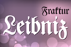 The blackletter fonts sold by Softmaker (which are based on hand-digitizations of Berthold's and and other collections by URW and Primafont):
 - Alte Schwabacher
- E780 Blackletter: This is Engravers Old English (1902, Morris Fuller Benton, ATF).
- F692 Blackletter: This is Fette Fraktur, or simply Fraktur.
- Fraktur-Regular: A 1875 typeface by Wagner, see also F692 Blackletter. Elsewhere: Frankenstein.
- G820 Blackletter: This is also known as Gregorian elsewhere.
- Headlight: Made by URW in 1994. Another name: Blacklight.
- J790 Blackletter: This is Unger Fraktur (1800, Berthold).
- Marriage: This is Mariage or Wedding Text (1901, Morris Fuller Benton, 1901).
- Old Blackletter: Also known as Old English, Ottoman.
- Ottoman: Also known as Old English, Old Blackletter.
- P650 Blackletter: This is Paladin. Elsewhere known as Excalibur.
- P790 Blackletter: This is Poppl Fraktur (1986, Friedrich Poppl, Berthold).
- Walbaum Fraktur
- W650 Blackletter: This is Walbaum Fraktur (1800, J.E. Walbaum).
- Z690 Blackletter: This is Zentenar Fraktur (1937, F. H. Ernst Schneidler, Neufville).
Later, the Elegant Blackletter collection was published in which the fonts were renamed, and new ones added: The blackletter collection published in 2016 by SoftMaker includes these typefaces: Albrecht Duerer Fraktur Pro, Barock 1720, Breitkopf Fraktur Pro, Coburg No1, Coburg No2, Coelnische Current Pro, Diamant Gotisch Pro, Fleischmann Gotisch Pro, Fraktur No2 Pro, Fraktur No3 Pro, Alte Schwabacher No1 Pro, Alte Schwabacher No2 Pro, Fraktur Pro (+ Arrow,Broken Glass, Broken Glass No2, Directions, Falling, Falling No2, Flash, Flash No2, Glass, Glass Nop2, Gradient, Gradient No2, Inkjet, Inkjet No2, Plant, Rising, Rising No2, Sawmill, Sawmill No2, Squiggle, Squiggle No2, Stars, Stars No 2, Strings, Stripes, Stripes No3, Strokes, Teensy No2, Winding, Winding No2), Fraktur No4, Gothic Pro, Gotisch Pro, Grail Fraktur Pro, Gravure Pro, Bold;Gravure Pro Bold;Gravure Pro-Bold, Gutenberg Textura Pro, Hans Fraktur Pro, Hohenstein Gotisch Pro, Hungarian Fraktur Pro, Innsbruck Initials, Leibniz Fraktur Pro (after Genzsch & Heyse, 1912), Light Text Pro, Lincoln Text Pro, Marriage Pro, Offenbacher Kanzlei Pro, Old Londontown Pro, Ottoman Pro, Peter Jessen Schrift Pro (after Rudolf Koch's Peter Jessen schrift, 1930), Poem Fraktur Pro, Renaissance Fraktur Pro (after Heinz Koenig's Renaissance Fraktur, 1885), Rundgotisch No1 Pro, Rundgotisch No2 Pro, Schwarzwald Pro, Schwere Fraktur Pro, Theuerdank Fraktur Pro, Walbaum Fraktur No1 Pro, Walbaum Fraktur No2 Pro, Walbaum Zierfraktur Pro, Wallau No1 Pro, Wallau No2 Pro, Wilde Fraktur Pro, Wilhelm Gotisch Pro, Zentenar Fraktur Pro (after Friedrich Hermann Ernst Schneidler, 1937-1938), Zwickau Fraktur Pro. [Google]
[MyFonts]
[More] ⦿
|
Stempel blackletter fonts
|
 Andreas Seidel lists the blackletter typefaces in D. Stempel's Probe No. 100 specimen book from the early 1940s. Verbatim, with some missing dates and designers filled in:
 - Fraktur designs
- Amts Fraktur 1906-11 Heinrich Hoffmeister
- Balmung
- Breitkopf Fraktur 1912
- Buhe Fraktur 1915-22-35 Prof. Walter Buhe
- Büxenstein Fraktur (1912)
- Deutsche Anzeigen-Schrift (1923-34, Rudolf Koch)
- Deutsche Werkschrift (1934, Rudolf Koch)
- Deutsche Zeirschrift
- Ehmcke Fraktur (1912, F. H. Ehmcke)
- Ekkehard Fraktur 1912 (1917? by Heinrich Hoffmeister)
- Elfen Fraktur (1919, M. Beck)
- Faust Fraktur (1910, E. Brox)
- Fette Fraktur
- Frühling (1914, Rudolf Koch: Klingspor?)
- Halbfette Fraktur
- Heinz König Setzmaschienen Fraktur (1913, Heinz König)
- Humboldt Fraktur (1938, Hiero Rhode)
- Kleukens Fraktur (1911, F.W. Kleukens
- Luthersche Fraktur (1919, acquired from Drugulin, and revived)
- Matthies Kursiv (1912, Karl Matthies)
- Neuzeit Fraktur
- Reform Fraktur (1903, Heinrich Hoffmeister)
- Schumacherische Fraktur
- Stempel Fraktur (1914, Heinrich Hoffmeister)
- Unger Fraktur 1794 Joh. Friedrich Unger (revival in 1919)
- Schwabacher designs
- Alte Schwabacher (1919, acquired from Drugulin and revived)
- Ehmcke Schwabacher 1920 Prof. F. H. Ehmcke
- Nürnberger Schwabacher
- Offenbacher Schwabacher
- Schwabacher (1906)
- Gotische&Kanzlei designs
- Aristokrat
- Caslon Gotisch
- Elegant
- Elite Kanzlei
- Gotenburg Garnitur A&B 1935-37 Friedrich Heinrichsen
- Jaecker Schrift 1912 Wilhelm Jaecker
- Lithurgisch
- Tannenberg 1933-35 Emil Meyer
- Victoria Kanzlei
- Wieynck Kanzlei 1926 Prof. Heinrich Wieynck
He goes on to say: In a newer specimen book "Gesamtprobe der lieferbaren Schriften D. Stempel AG from 1962 you will find also: - Claudius original Klingspor design
- Jessen original Klingspor design
- Fette Gotisch
To which I should add - Achilles Fraktur (1910)
- Ariadne Fraktur (1910)
- Arminius Fraktur (1905). Also called Rheinische Fraktur. Revival by Dieter Steffmann in 1999 as Rheinische Fraktur.
- Caslon Gotisch (1926, revival)
- Ceres Fraktur (1903)
- Danziger Fraktur (1905, Cohn Stempel)
- Deutsche Laufschrift (1911, Rudolf Engelhardt, Heinrich Hoffmeister)
- Egmont Fraktur (1909)
- Fraktur (1908)
- Fenella Fraktur (1911)
- Frankfurt (1906, F. Schweimanns)
- Frankfurter Schwabacher (1912)
- Fröbel Fraktur (1910)
- Gilgengart (1941, Hermann Zapf---some say 1952)
- Gutenberg Fraktur (1900)
- Gutenberg Juniläums Fraktur (1900)
- Marius Fraktur (1910)
- Moderne Schwabacher (1926)
- Moderne Setzmachinen Schwabacher (1908)
- Neue Fraktur (1913)
- Neue Luthersche Fraktur (1934, revival)
- Normal Fraktur (1908, Roos&Junge)
- Normannia (1905, mager, halbfett). Digitizations in 1995 by Gerhard Helzel. This Hausschrift of Stempel was also adopted by linotype, where it became Germanen-Fraktur.
- Reform/Offenbacher (1916, Roos&Junge)
- Romeo Fraktur (1910)
- Rheinische Fraktur (1905). Same as Arminius Fraktur.
- Romulus Fraktur (1910)
[Google]
[More] ⦿
|
Stephan Mueller

|
 Swiss graduate (b. 1965) of Luzern School of Art and Design, who settled in Berlin in 1997. Co-founder with Cornel Windlin in 1993 of Lineto, with Cornel Windlin and Andreas Eigendorf in 2014 of Alphabet Type (Berlin), and in 2018 of Forgotten Shapes, a Leipzig-based digital foundry dedicated to historical reconstructions. Since 2011, Müller has been directing the type design master class at HGB Leipzig, together with Fred Smeijers.
 His fonts can be obtained at Lineto and FontFont. These include: Aveugle (Braille font, 1995), Berlin-Schnefeld and Berlin-TegelSmallSizes (1995), Parking, FF Gateway (1997 a triangulated font family done with Cornel Windlin), and Grid (1996), FF Chernobyl (1998, from stenciled letters on the Chernobyl plant), Paragon, Batarde Coulee, Shuttle, FE Mittelschrift and FE Engschrift (1997, modeled after the impossible-to-counterfeit German license plate font), 104 (nice geometric font), FF Container, Bitmap-Condensed and Bitmap-Regular (1998), Regular (2004, Lineto, a typewriter family), SMonoHand (2009, a handwritten monospaced Latin font with support for German). FF Screen Matrix (1995) was done with Cornel Windlin. In 2003, he released the LL Numberplate series at Lineto, which covers Austria, Belgium, Finland, France, Germany, Italy, Luxemburg, and Switzerland. Other Lineto fonts include LL Office (1999: an Eurostile-like monospaced font), LL Excellent (2004), LL Freundschaft (2001: a dystiopian / constructivist typeface) and LL Valentine (2002: a typewriter typeface based on the Olivetti Valentine machine from 1969 designed by Ettore Sottsass and Perry A. King). Open Font Library link. View Stephan Mueller's typefaces. [Google]
[MyFonts]
[More] ⦿
|
TeGeType
[Thierry Gouttenègre]

|
 Thierry Gouttenègre is a Belgian designer (b. 1961), who is located in Tullins-Fures, France. After a stint as type director of Alfac-Decadry in Belgium, Thierry Gouttenègre moved to the south of France and started his own Design Studio in the mid 90s. In 2007, he set up TeGeType. He is one of my favorite type designers. His fonts:
 - Aldogizio (2013). The name gives the font away, an amalgamation of Aldo Novarese and Egizio---this is a slab serif fest.
- Batarde Bourguignonne: a medieval blackletter.
- Carcel (2009): striped letters.
- Cinio (2009): used for signage by several French cities. For use on screen, he slightly rounded the corners and released the result as Cinio Text in 2019.
- David Aubert (1992, Alfac): a bastarda (bâtarde bourguignonne) named after David Aubert, the calligrapher of Philippe Le Bon and Charles Le téméraire, both dukes of Burgundy who worked and lived in Brussels in the 1500s.
- Dickens (1995, Fonderie Barthélémy).
- Dilectus (2019). Originally intended for musea, this lapidary typeface takes inspiration from paleochristian engravings.
- Falace (2008): a contemporary interpretation of the Didone typefaces.
- Firmin Didot (1989, Alfac).
- Fournier (1990, Alfac).
- Fraktur (1990, Alfac).
- Grégoire (1994, Fonderie Barthélémy).
- Alipe Script (2014). A calligraphic connected (wedding, chancery, greeting card, divrce) script.
- Hugo (1995, Fonderie Barthélémy).
- Kafka (1994, Fonderie Barthélémy).
- Limine (2008), a 3D beveled typeface family in styles called Creux and Relief.
- LouisJou (2000).
- Majuscule (1991, Alfac).
- Neutre (1997, Fonderie Barthélémy). A sans family specially designed for signposting applications. This type family is used by several cities in France.
- Oculi Magni (2020). Specially designed for small and tight texts, the glyphs have maximal x-height.
- Otsu Sans (2011) and Otsu Slab (2013).
- Poltrone (2010), a great titling family inspired by 19-th century public inscriptions.
- Rome (1995, Fonderie Barthélémy).
- Rosart (1991, Alfac), named after the 18th century Belgian typefounder, J.-F. Rosart.
- Sand (1996, Fonderie Barthélémy).
- Sursum (2009): a roman almost-typewriter family.
- Tolstoï (1994, Fonderie Barthélémy).
- Varvara (2017: a weathered all caps constructivist typeface created as a tribute to Barbara Stepanova (1894-1958)).
- Vizille (1998-2009): a phenomenal Fournier text family made for the Musée de la Revolution Française in Vizille.
- WebType (2002): a techno family.
Klingspor link. View Thierry Gouttenègre's typefaces. [Google]
[MyFonts]
[More] ⦿
|
Testegiatta
|
Calligraphic term: the headed ascenders or plumelike terminals to b, d, h, and l, in particular, which became an ornamental feature of the 16th-century italic bastarda script. [Google]
[More] ⦿
|
Textura
|
 A gothic letterform that first appeared at the end of the XIIth century. More or less like a heavy form of blackletter, it endured until the XVIth century. Example of German Textura from 1494. Nicolaus Everardi de Middelburgo's example of Rotunda and French Textura (1516). The original form of Textura is called Textura Quadrata. Also called Gothic or Gotisch, Textura spread around Europe from ca. 1140 together with Gothic art and architecture. Textura Quadrata has diamond-shaped heads and feet, whereas Textura Prescisus is castrated (no feet). Around 1400, nearly all books in Europe were in Textura handwriting, and so, Gutenberg's first movable type was also based on this form. But soon afterwards, it was replaced by Schwabacher and Antiqua. Wynken de Worde brought a Textura font of type to England in 1480. Old English types of the 19th Century are sometimes based on typefaces that developed out of his contribution. Textura (gotisch) examples of digital types:
 - From Bitstream: Cloister Black, Engravers Old English, Wedding Text.
- From Castle Type: CloisterBlack, GoudyTextOldStyle.
- From Ingrimayne: BeneScriptine.
- From ITC: ITC Agincourt, ITC Old English.
- From Lanston: GoudyText.
- From Omine: GoticaLumina.
- From Parkinson: Amador, Cabazon.
- From Preusstype: SinkwitzGotisch.
- From Aerotype: Octoberfest.
- From Mecanorma: Gothique.
- From Linotype: FetteGotisch, TexturGotisch.
- From URW++: Old English Standard, FetteGotisch, OldEnglish.
- From Adobe: GoudyText, LinoText, NotreDame, WilhelmKlingsporGotisch.
[Google]
[More] ⦿
|
Thierry Gouttenègre
[TeGeType]

|
 [MyFonts]
[More] ⦿
|
Tim Larson
[Dieter Steffmann's blackletter typefaces]
|
[More] ⦿
|
Timberwolf Type
[Lars Bergquist]

|
 Lars Bergquist is the Swedish type designer (b. 1936) who runs Timberwolf Type in Sollentuna, just outside Stockholm. Bergquist designed numerous successful text families and display typefaces, including the free Beryll typeface. In 2016, the collection moved over to (was bought by?) 3IP. Some offerings:
 - Old Style romans: Sarabande (1998; based on Jean Jannon's famous "Garamond" of 1621), Pavane (1998, based on a text typeface by Rudolf Koch), Philomela (2000, also at PsyOps), Montrachet (2002, Fountain: a garalde family), Monteverdi (Fountain: with Granjon's Plantin Ascendonica italic).
- Baroque/transitional: Leyden, Leyden News (PsyOps, 2000), Baskerville 1757 and Baskerville Caps (1998; winner of a Bukvaraz award in 2001, available at Type Quarry).
- New Style Romans: Millennium, Eleonora (1999), Prospero (1998, a didone family), Waldstein (2003, Fountain: a Scotch typeface).
- Sans typefaces: Millennium, Millennium Sans, Millennium Linear, New Millennium, New Millennium Sans and New Millennium Linear (2000).
- Display typefaces: Diorite (2005, a calligraphic angular family), Corsiva Italica (2003), Paracelsus (2003, Fountain: a modern version of Schwabach), Foliant Blackletter (German 15th C Textur), Zeppelin Bauhaus Gothic, Berserk Scandinavian runes, Escorial (at PsyOps), Paestum (2001, a Greek simulation family), Sekhmet (2000), Praetorian, Pressroom (2003), Proconsular, Palaestra (the latter three are inspired by informal, painted Roman wall writing), Triumphalis Caps (also inspired by Roman imperial inscriptions), Bucintoro (1999, a modern version of the rotunda blackletter), Midnight (2000; a neon light/ blackboard bold family), Karolin Fraktur (at Psy/Ops: Fraktur modeled after the Bible of King Charles XII, printed in Stockholm in 1703), Rococo Titling (2001, ornate titling caps based on work done by Jacques-François Rosart (1714-1777) and Pierre Simon Fournier (1712-1768), and the Renaissance family Ronsard (at PsyOps, 2000).
Some fonts are available at Fountain, Psy/Ops and Type Quarry. Bukvaraz gave him an award for Absolut Type, a classic Renaissance family, so I wonder if that is not the same as Baskerville 1757. Lars says that Absolute Vodka complained, so the type is sold by Psy/Ops as Aalborg (2002). He published Whitenights at Linotype in 2003. FontShop link. Klingspor link. [Google]
[MyFonts]
[More] ⦿
|
Tom Grace

|
 Born in Boston in 1976. Graduated with an MA in Typeface Design from-the University of Reading and studied at the Rhode Island School of Design. After graduation, he worked briefly for Jeremy Tankard and Font Bureau. In 2005, he worked briefly for Porchez Typofonderie. He currently lives in Heidelberg, Germany.
 He designed these typefaces: - Strela (2003). This typeface covers Latin, Cyrillic, Albanian, Belorussian, Bosnian, Catalan, Croatian, Czech, Estonian, Greenlandic, Hungarian, Latvian, Lithuanian, Macedonian, Maltese, Polish, Romanian, Sami, Serbian, Slovak, Slovenian, Turkish, Ukrainian, and Welsh.
- Deréon (2005, Porchez Typofonderie). This is a 6-font family done together with J.F. Porchez for House of Deréon, the clothing label of Beyoncé and Tina Knowles.
- Other typefaces done for Porchez: Henderson Serif (2006, black weight and production help), Verspieren (2007, for an insurance company), Le Monde Journal PTF (2007, help with the expansion of the 1994 original by J.F. Porchez), Le Monde Livre PTF (2008, help with the expansion of the 1997 original), Parisine PTF (2006, production assistance), Parisine Office (2006, production assistance), Sabon Next (2002, assistance), Mencken (2005, help with this font for The Baltimore Sun).
- In June 2007, he won the best Greek display typeface catgory at the Hellenic Alphabet competition.
- In 2008, he made a bastarda typeface Givry (Type-Together) created in the spirit of the bâtarde flamande as shown in the styles of the prominent scribes Jean Fouquet, Loyset Liédet, and Jean Bourdichon. It has Civilité influences.
- Trade Gothic Next (2008), with Akira Kobayashi at Linotype.
- In 2009, he created Alizé (Type-Together), a 3-weight italic beauty based on the chancery italic of the 16th century, with a Garamondesque "h".
- In 2012, Type Together published his typeface Iskra, a rounded family that covers Latin and Cyrillic. Iskra won an award at TDC 2013.
- Aeris (2010, Linotype). A flared sans family.
- Neue Helvetica Compressed (2014, Linotype).
- In 2014, Akira Kobayashi, Sandra Winter and Tom Grace joined forces to publish DIN Next Slab at Linotype.
- In 2018, Tom Grace and Steve Matteson published VAG Rounded Next at Monotype. It is an extension of the Volkswagen font VAG Rounded from the 1970s.
Speaker at ATypI 2017 Montreal. Behance link. Old URL. Klingspor link. View Tom Grace's typefaces. [Google]
[MyFonts]
[More] ⦿
|
Tory Text
|
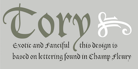 A blackletter typeface by Frederic Goudy, designed in 1935, and modeled after the lettre batarde used by Geoffroy Tory in his Champs Fleury. Mac McGrew: Tory Text was a frankly archaic type designed and produced by Frederic W. Goudy in 1935. For a small edition of a twelfth-century story which he intended to print, Goudy chose a sixteenth-century type design to express the qualities he had in mind. This was redrawn in an attempt to make it more legible for modern readers while retaining the ancient spirit. Goudy describes Tory Text as one of his favorite types, and says that he enjoyed every minute of its making. See Village Text.
 For a digital revival, we refer to Steve Matteson's Tory (2018). [Google]
[More] ⦿
|
Type Together
[Veronika Burian]

|
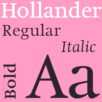 Foundry est. in 2005 by Veronika Burian (Czechia) and José Scaglione (Argentina). TypeTogether's library of retail fonts includes
 - Karmina (Veronika Burian / José Scaglione, a text typeface for newspapers, winner of the ED Awards) and Karmina Sans (12 styles). Award winner at Tipos Latinos 2010. Karmina, Bree and Ronnia were selected as part of the travelling exhibition Tipos Latinos 2008.
- Athelas (José Scaglione / Veronika Burian, 2008, a calm and balanced 4-style book type family, winner of the first prize at the Granshan 2008 competetion).
- Ronnia (Veronika Burian / José Scaglione, a flexible sans serif for editorial use with 28 styles).
- Maiola (an award-winning calligraphic serif family by Burian).
- Crete (Veronika Burian, 2007, inspired by lettering in a chapel in Crete, winner of the Gransham 2008 competition; ideal for posters). Followed by Crete Round (2011).
- Bree (Veronika Burian / José Scaglione, 2008). A 10-style upright italic with a matchting oblique for display usage. In the years that followed, Bree was substantially expanded: Bree is available in Greek (by Irene Vlachou), Cyrillic (by by Veronika Burian, with expert support by Vera Evstafieva), Arabic (by Azza Alameddine) and Thai (by Cadson Demak's Panuwat Usakulwattana). Bree Latin now supports Pinyin and features improved Vietnamese diacritics (with the help of Donny Truong). Bree Devanagari (by Pooja Saxena) is in the works.
- Adelle Sans. A 12-style slab serif family made in 2009. Award winner at Tipos Latinos 2010. Adelle Condensed followed in 2013. With the help of Erin McLaughlin and Vaibhav Singh, Adelle Sans Devanagari was finished in 2017. Adelle Mono was added in 2020.
- Abril (2010) is a didone font family engineered mainly for newspapers and magazines that features friendly and elegant styles for headlines and robust and economic styles for text. It won an award at Tipos Latinos 2012. Abril Fatface is free at Google Font Directory. Abril Titling was published in 2013-2014.
- Jockey One (2011) is a free sans typeface at Google Font Directory.
- Birdy (2011). A free angular inline typeface by Veronika Burian.
- Fonts by third party designers: Cora (by Bart Blubaugh), Alizé (2009, by Tom Grace) and Givry (by Tom Grace: a bastarda typeface), Iskra (2012, by Tom Grace; not to be confused with Iskra by Edgar Reyes, 2009), Gitter (a modular type with letters built up of triangles).
- Tablet Gothic (2012). A joint design of Veronika Burian and José Scaglione, it is a grotesque meant for titling. Tablet Gothic won an award at Tipos Latinos 2014.
- Alverata (2013). A lapidary flared typeface with a huge x-height influenced by roman ("romanesque") lettering from the XIth and XIIth centuries. Alverata consists of three different fonts: Alverata, Alverata Irregular and Alverata Informal. For the development of the Greek letterforms, Unger collaborated with Gerry Leonidas (University of Reading) and Irene Vlachou (Athens). He cooperated with Tom Grace for the Cyrillic letterforms. Alverata was published by Type Together in 2014 and 2015. It appears to have Vesta's skeleton and dimensions. PDF file.
- In 2015, Veronika Burian and José Scaglione finally published the 18-style editorial sans typeface family Ebony, which won an award at Tipos Latinos 2016.
- TypeTogether and Design Sessions Studio collaborated in the development of a logotype and an associated type family for the government-owned TV channel and Radio station of Puerto Rico, WIPR Unicase.
- Protipo (2018) is a 52-font information design sans family designed by Veronika Burian and José Scaglione. This was a major team effort. Irene Vlachou will soon finish the variable font production. The information icons were designed by Luciana Sottini. Kerning by Radek Sidun and engineering by Joancarles Casasin.
- In 2019, Type Together released Catalpa (Veronkia Burian, Jose Scaglione, Azza Alameddine) and wrote: Primed for headlines, Catalpa is designed to give words bulk and width and gravity itself. The Catalpa font family is José Scaglione and Veronika Burian's wood type inspired design for an overwhelming headline presence.
- Postea (2021). A geometric sans with some eccentric details and variable font support. Noemi Stauffer writes: Postea comes with a collection of Bauhaus-inspired geometric patterns and ornaments and a suite of icons that can be called up simply by enclosing their names between a pair of colons, and choosing the correct stylistic set. Now that is typographic magic!
- Type Together made many custom typefaces. These include Abril Almeria(for Spanish newspaper La Voz de Almeria), Athelas Apple Books (for Apple iBooks), Bodoni Stencil (for Levi's---based on ParaType Bodoni), Clarín Titulos(for Argentine newspaper Clarin), Karmina Cyrillic (for Bible Society in Russia), Spore (for Electronic Arts), Twinkl Cursive (for Twinkl educational materials), Twinkl Sans, WIPR (for Puerto Rican broadcaster WIPR), NRK Etica Super and Slab, Bree Peru, Literata Book, Qlikview Sans.
- In 2021, Veronika Burian and José Scaglione designed Belarius, a three-axis variable family that shifts from sans to slab serif, from condensed to expanded widths, and includes every possibility in between. Published by Type Together in 2021, it was developed under the guidance of Veronika Burian and José Scaglione, with type design by Azza Alameddine and Pooja Saxena, and additional kerning and engineering help from Radek Sidun, Joancarles Casasin and Irene Vlachou.
Speaker at ATypI 2017 Montreal. MyFonts link. Klingspor link. Type Together occasionally published educational books as well. In 2022, they released Building Ligatures The Power of Type. MyFonts interview. Catalog of the Type Together typeface library. Adobe link. [Google]
[MyFonts]
[More] ⦿
|
Typedia: Typeface classification
|
The classification from the Typedia community: - Blackletter
- Fraktur: A German form of Blackletter with broken strokes. Classic example: Fraktur.
- Old English: The English blackletter style. Classic example: Cloister Black.
- Rotunda: A Blackletter style featuring wider lowercase with more rounded strokes.
- Schwabacher: A German form of Blackletter with simplified, rounded strokes.
- Textura: A Blackletter style featuring tall, narrow lowercase made mostly of straight strokes.
- Calligraphic
- Chancery: A script style of calligraphy made with a broad-point pen with slightly sloping, narrow letters that are the basis for italics in serif typefaces. Capitals may or may not have flourishes. Originated during the Renaissance. Classic example: Zapf Chancery.
- Etruscan: An early Roman form of calligraphy drawn with a flat brush held at a steep angle. Caps only, as lowercase had not been invented yet. Classic example: Adobe Pompeii.
- Uncial: A Celtic style of calligraphic script with forms created by a broad-nibbed pen at an almost horizontal angle, but sometimes more tilted in later variants. Roman lowercase is derived from Uncial forms. There is only one case in pure Uncial designs. Used during the middle ages. Classic example: American Uncial.
- Inscriptional---Roman Inscriptional: Stone-cut serif style from the late Roman Empire. The basis of modern roman capitals. Classic example: Trajan.
- Non-alphanumeric
- Dingbats
- Ornaments
- Pictorial
- Ornamented, Novelty
- Art Deco: A geometric display typeface style popular in the 1920s and 1930s. Classic example: Broadway.
- Art Nouveau: Display typefaces with a flowing, organic style popular in the early 20th Century. Classic example: Arnold Bocklin.
- Comic Strip Lettering: A style meant to look like the hand-drawn letters associated with comics or cartoons. This style is usually san serif, often having a loose, informal structure and is sometimes based on brush lettering. Classic example: Balloon.
- Dot Matrix: A style whose characters are composed of a pattern of dots used mainly for low-resolution impact printers, or to simulate the look of the output of such printers. Classic example: FF Dot Matrix.
- Futuristic: A style meant to suggest a futuristic theme. Often cold, brutal and geometric with a machine aesthetic and simplified construction. Classic example: Stop.
- Machine Readable: A style designed to be read by machine. These fonts are usually san serif and often feature unusual character shapes to make them more distinguishable from one another. Classic example: OCR-B.
- Pixel: A style whose characters are composed of pixels (usually represented as squares) used mainly for low-resolution computer display. Outline fonts are sometimes made to look like Pixel Fonts. Classic example: Silkscreen.
- Pseudo Foreign Script: A style intended to mimic non-Western letters. For example, a font that looks like Chinese, but is actually composed of Latin characters. Faux Chinese/Arabic/Hebrew. Classic example: Bruce Makita.
- Victorian: A whimsical, eclectic display style popular in the late 19th Century. Classic example: Skjald.
- Sans Serif
- Gothic: A sans serif style with moderate stroke contrast and modern proportions particular to the U.S. Usually features a two-story lowercase g, angled strokes on C and S, and a sloped, non-cursive italic. Classic example: Franklin Gothic.
- Grotesque: A sans serif style with moderate stroke contrast and modern proportions particular to the U.K. Usually features a two-story lowercase g, closed strokes (usually curving in slightly) on C and S, and a sloped, non-cursive italic. Classic example: Bureau Grot.
- Geometric Sans: A sans serif style made with rigidly geometric forms and little to no stroke contrast. Classic example: Futura.
- Grotesk: A sans serif style with low stroke contrast and modern proportions. Usually features a one-story lowercase g, closed or angled strokes on C and S, and a sloped, non-cursive italic. Classic examples: Akzidenz Grotesk, Helvetica.
- Humanist Sans: A sans serif style with proportions modeled on old-style typefaces. Characterized by open strokes on characters like C and S. Italics of this style often are more cursive in appearance, rather than a simple slanted version of the roman. Often has more slightly stroke contrast than other sans serifs. Classic examples: Gill Sans, Frutiger.
- Square Gothic: A sans serif style composed mainly of straight or nearly straight lines and (often) curved corners. Stroke contrast is usually low. Classic example: Bank Gothic.
- Swiss Gothic: A sans serif style with noticeable stroke contrast, straight sides on round characters, modern proportions, and large x-height. Usually features a one-story lowercase g and closed strokes on C and S. Classic example: Jay Gothic.
- Script
- Brush Script: Typefaces modeled after lettering made with a brush. Strongly associated with advertising in the mid-20th Century on. Classic example: Brush Script.
- Casual Script: Typefaces based on a style of lettering characterized by informal appearance, somewhat like handwriting, but more refined. Similar to Brush Script or Sans Serif. Classic example: Murray Hill.
- English Roundhand: A connecting-script style of calligraphy made with a flexible tipped pen. The characters are usually steeply sloped and capitals are often very elaborate. Popular in the 18th and 19th Century. Sometimes called Copperplate Script. Classic example: Bickham Script.
- French Roundhand: A connected-script style of calligraphy, sometimes with upright characters, a high stroke contrast and decorative capitals. Used in France in the 17th through 19th Century. Also called Civilité. Classic example: Typo Upright.
- Handwriting: A script style based on ordinary handwriting. Characters may or may not be connected. Classic example: Felt Tip Roman.
- Rationalized Script: A script style with sans serif qualities, low stroke contrast, and a formal appearance. Characters may or may not connect. Associated with 20th Century commercial design. Classic example: Gillies Gothic.
- Serif
- Grecian: A typically heavy display typeface with octagonal shapes where curves are normally used. Also known as Chamfered or Beveled. Popular in the 19th Century for wood types. Classic example: Acropolis.
- Latin: A serif style with large triangular or wedge-shaped serifs. Stroke contrast is medium to low. Popular in the 19th Century for wood types. Classic example: Latin.
- Modern: A serif style with high stroke contrast and vertical stress. Classic example: Modern No. 20.
- Didone: A serif style with high stroke contrast and vertical stress. Serifs are usually unbracketed. Classic examples: Bodoni (Italian), Didot (French).
- Scotch Modern: A serif style with medium to high stroke contrast and vertical stress, known for large serifs and tiny aperture. Serifs are usually bracketed. Classic examples: Modern No. 20, Scotch Modern.
- Old Style: A serif typeface with relatively low stroke contrast, angled stress, angled serifs. Classic example: Bembo.
- Antique: A serif style with moderate stroke contrast, bracketed serifs and usually vertical stress. Serifs are angled as in Old Style. Popular in the 19th Century. Classic example: Bookman.
- Dutch Old Style: A serif style with somewhat angled stress, bracketed serifs, and medium to high stroke contrast. Characteristic of Dutch and English types of the 18th Century. Classic examples: Caslon, Plantin, Times Roman.
- French Old Style: A serif style with angled stress on rounds; usually features a small eye on the lowercase e; soft, bracketed serifs and moderate stroke contrast. Classic example: Garamond.
- Spanish Old Style: A serif style with soft, bracketed serifs, medium to high stroke contrast, and often highly angled stress. Classic example: Rongel.
- Venetian Old Style: A serif style with angled stress on rounds; usually a tilted crossbar on the lowercase e; usually has somewhat low stroke contrast. Serifs are sometimes unbracketed. This style is associated with very early printing (Incunabula) in the West. Classic example: Jenson.
- Slab Serif: A serif style with serifs equal to or nearly the same thickness of the main strokes. Main strokes usually have low contrast. Classic example: Rockwell.
- Clarendon: A slab serif style with heavy, bracketed serifs, modern proportions and construction, low stroke contrast. Classic example: Clarendon.
- Egyptian: A serif style with heavy, unbracketed serifs, modern proportions, low stroke contrast. Basic construction is similar to Modern, but with low stroke contrast. Sometimes called Antique. Classic example: Egiziano.
- French Clarendon: A serif style with reverse stress (horizontal strokes thicker than vertical strokes) and slab serifs, sometimes bracketed, usually condensed. Popular in the 19th Century. Classic example: Playbill.
- Geometric Serif: A serif style made with rigidly geometric forms. Usually features slab serifs. Classic example: Stymie.
- Spur Serif: A serif style with very small serifs. Usually similar in design to san serif typefaces, except for the serifs. Usually very little stroke contrast. Classic example: Copperplate.
- Transitional: A serif style which, historically, bridges the gap between Old Style and Modern. Stroke contrast is stronger than old style, but less than modern. Bracketed serifs. Stress is mainly vertical. Characteristic mainly of English types around 1800. Classic example: Baskerville.
- Scotch Roman: A serif style with medium contrast and vertical stress, medium-sized bracketed serifs. Classic examples: Miller, Caledonia.
- Tuscan: A serif style with splayed or ornate serifs. Classic example: Thunderbird.
[Google]
[More] ⦿
|
Typoart GmbH (or: VEB Typoart)
[Jay Rutherford]

|
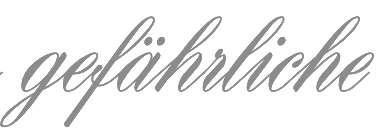 Dresden (East Germany)-based font studio that evolved from the former East German centralized press, VEB Typoart. VEB Typoart operated from 1948 until 1989, when it was renamed Typoart GmbH. Typoart GmbH dissolved mysteriously in 1995, perhaps due to bankrupcy.
 MyFonts catalog of digitizations. Timeline as provided by Typoart-Freunde, a project of Jay Rutherford at the Bauhaus University in Weimar (and published in 2007 in a book by the same title, Heinz Wohlers Verlag, Harrlach): - 1945: Schriftguß KG (before that, Gebr. Butter) produces type again.
- 1946: Schelter&Giesecke in Leipzig becomes VEB Druckmaschinenwerk Leipzig.
- 1948: Schriftguß KG becomes VEB Schriftguß Dresden. This is the true start of Typoart.
- 1951: the foundry section of VEB Druckmaschinenwerk Leipzig is absorbed by the VEB Schriftguß Dresden. Herbert Thannhaeuser becomes art director. We see the name Typoart.
- 1952: Herbert Thannhaeuser publishes Papier und Druck, and creates Meister-Antiqua and Technotype.
- 1957: Typoart is in full production now. An eyecatcher is Albert Kapr's Leipziger Antiqua.
- 1958: Thannhaeuser publishes his Liberta Antiqua and Garamond Antiqua. The Party decides that all private industrial property now belongs to the state.
- 1961: Typoart absorbs Ludwig Wagner KG in Leipzig and Norddeutsche Schriftgießerei Berlin. The Berlin wall is built.
- 1962: There is some negative press about Typoart's domination by Thannhaeuser's designs. VEB Typoart is absorbed by Vereinigung Volkseigener Betrieb (VVB) Polygrafische Industrie.
- 1963: Thannhaeuser dies. Albert Kapr becomes art director.
- 1965: The annual production reaches 4,5 million matrices. Purchase of the Digiset machine, built by Firma hell in Kiel, which is the first machine for electronic typesetting.
- 1967: Sabon Antiqua appears.
- 1970: Typoart is now owned by SED. In the DDR, all phototype printing is now done in Berlin, Leipzig and Dresden.
- 1971: Typoart is now producing its own phototype for the Linotron 505. Their prime productions include Maxima (by Karl-Heinz Lange; based on Gert Wunderlich's Linear-Antiqua) and Prillwitz-Antiqua (Albert Kapr).
- 1973: Albert Kapr publishes Typoart-Typenkunst, in which 19 typefaces are showcased.
- 1976: Phototype fonts are developed for Diatype, Diacomp (such as Maxima, Liberta, Garamond-Antiqua, Tschörtner-Antiqua, Leipziger-Antiqua), and 2NFA (Russian). Detlef Schäfer becomes head of research and development.
- 1977: To help with the digital transition, Norbert du Vinage joins Typoart.
- 1980: New types include Kleopatra, Biga, Zyklop, Quadro and Molli.
- 1987: Albert Kapr hands the art directorship to Norbert du Vinage. Publication of the first phototype catalog by Typoart.
- 1989: Publication of Fotosatzschriften, Typoart's typeface program. Typoart folds.
- 1990: VEB Typoart is changed into a GmbH with 230 employees.
- 1991: Eckehart Schumacher Gebler acquires all of Typoart's matrices. This collection is kept in the Werkstätten und Museum für Druckkunst Leipzig GmbH. Typoart GmbH and HL Computer (Karl Holzer's company) are joined.
- 1995: Typoart GmbH still has 100 employees. It offers typefaces in truetype and postscript formats. Albert Kapr dies in Leipzig. The demise of Typoart is mysterious, and not much is known about who owes what to whom. The copyright status of its typefaces remained uncertain. This page mentions the present situation. Andreas Seidel explains that Typoart has digitized lots of its type typefaces using Ikarus, and that the rights are held by Mr. Holzer, who may be in some financial trouble. He says that no living Typoart designers have received any royalties or public recognition.
Typoart Freunde and Typowiki have partial lists of typefaces. Here is my own: - Agitator (1960). By Wolfgang Eickhoff. This rough-brush typeface was digitally revived in 2007 by Patrick Griffin at Canada Type as Merc.
- Alte Schwabacher: blackletter by Herbert Lemme.
- Antiqua (fett, kursiv fett and schmalfett) by Barbara Cain. A didone family.
- Baskerville (1982) by Volker Küster and Peter Greinke.
- Bembo: Typoart's version is by Erhard Kaiser.
- Biga: a shaded headline typeface made by Fritz Richter in 1985.
- Caslon-Gotisch: a blackletter typeface originally created by William Caslon in 1760, it was brought to Leipzig from England in 1904 by Carl Ernst Pöschel.
- Eckmann: a soft blackletter, dating from 1900.
- Egyptienne. By Hans-Peter Greinke.
- Erler Versalien (1953, Herbert Thannhaeuser). Digital versions: Erler Titling (2015, Ralph M. Unger), Missale Incana (2004, Andreas Seidel).
- Garamond (1955): the metal Typoart version is by Herbert Thannhaeuser. The digital version is Garamond No.5 at Elsner&Flake. See also here. URW published a different digital version, Garamond No. 4. And Infinitype / SoftMaker says that its German Garamond is based on TypoArt's.
- Fleischmann: a serif based on Fleischmann's historical face. An original cursive by Harald Brödel was added.
- Halbfette Baskerville: an interpretation of Baskerville by Volker Küster.
- Hogarth Script: an elegant script based on 18th century copperplate originals by William Hogarth. Font by Harald Brödel. Digital versions at URW, Softmaker (as Hobson), Alexandra Gophmann (Cyrillic version, 2005), Ralph M. Unger (as Gillray Pro, 2015), Castcraft (as OPTI Historic Script), Linotype and Elsner&Flake. Incredibly, Linotype owns the Hogarth Script trademark.
- Kis Antiqua: Hildegard Korger's interpretation of this classic Dutch Antiqua by Nikolaus Kis. For a digital revival, see Ralph Unger's Kis Antiqua Pro (2018).
- Kleopatra: a double-line decorative typeface by Erhard Kaiser (1985), digitized in 1989.
- Leipziger Antiqua: a very legible Antiqua designed by Albert Kapr in 1959, developed for phototypesetting by Hans-Peter Greinke, and further developed in digital form by Tim Ahrens in 2002 as Lapture.
- Liberta Antiqua and Kursiv: a robust house typeface from 1958 made by Herbert Thannhaeuser. Klingspor gives the date 1956.
- Lotto (1955). By Herbert Thannhaeuser.
- Luthersche Fraktur: a blackletter by Volker Küster and Herbert Lemme, digitized in 1989.
- Magna: a DDR magazine text typeface from 1968, by Herbert Thannhaeuser. In 1975, Albert Kapr added Cyrillic letters. Karl-Heinz Lange developed the phototype. URW, Linotype and Elsner&Flake (who owns the trademark) have a digital version.
- Maxima: a sans family by Gert Wunderlich (1970). Elsner&Flake (who owns the trademark), Linotype and URW have a digital version.
- Minima: Karl-Heinz Lange's narrow sans designed for the DDR's telephone directory in 1984. Revived by Ralph M. Unger in 2017 as Tablica.
- Molli: a comic book typeface by Harald Brödel.
- Neutra (1968): A variant of Clarendon, rendered more legible by Albert Kapr. Used in the DDR for advertising.
- Nidor: a slab serif by Harald Brödel.
- Norma-Steinschrift: a house sans.
- Prillwitz (1971-1987): a didone by Albert Kapr and Werner Schulze based on the original from 1790 by Johann Carl Ludwig Prillwitz. Elsner&Flake have a digital version. See also the 2015 revival by Ingo Preuss called Prillwitz Pro.
- Polo by Carl Pohl. URW++ has a digital version.
- Primus: a 1962 workhorse family (with Magna and Timeless) for the magazines in the DDR. Conceived in 1962, it was later adapted in Phototype by Karl-Heinz Lange. However, the Berthold Phototypes book of 1982 and Klingspor Museum put the date of creation at 1950.
- Publika: a sans typeface developed between 1981 and 1983 by Karl-Heinz Lange. Sometimes spelled Publica.
- Quadro: a four-line showstopper typeface by Erhard Kaiser.
- Roesner Versalien (1960). By Wolfgang Roesner.
- Schwabacher T09, T20 and T48. By Herbert Lemme.
- Sinkwitz Gotisch and Versalien (1950). By Paul Sinkwitz.
- Stentor: a brush script by Heinz Schumann (1964). Digital versions by Scangraphic, Ralph M. Unger (2013, as Tyton Pro), Elsner&Flake and URW. Rosalia (2004, Ingo Preuss) is based on Stentor.
- Super Grotesk: a legible sans by Arno Drescher (1930, Schriftguss). Super Grotesk Buchtype (kursiv and halbfett) are placed in 1951. For a digital version, see FF Super Grotesk (1999, Svend Smital).
- Technotyp (1951). By Herbert Thannhaeuser.
- Thomas Schrift (1956). By F. Thomas.
- Timeless (1982). See also Elsner&Flake and URW. In 2021, Ralph Unger revived and extended Timeless, calling it Korpus Serif Pro.
- Tschörtner Antiqua and Kursiv (1955). By Helmut Tschörtner.
- Typo Skript (1968). By Hildegrad Korger.
- Typoart Didot (antiqua, kursiv and halbfett). Added in 1958 by Herbert Thannhaeuser.
- Typoart Garamond (1955). By Herbert Thannhaeuser.
- Walbaum (1984): a didone by Hans-Peter Greinke based on Walbaum's originals.
- Zyklop: an art nouveau/Jugendstil face by Fritz Kossack.
References on Typoart: - Walter Begner: 25 Jahre Typoart Dresden In: Papier und Druck, Leipzig 6/1973.
- Walter Begner: Entwurf und Herstellung von Schrifttypen in Ostdeutschland. In: Leipziger Jahrbuch zur Buchgeschichte. Jahrgang 6 (1996), pages 405-436.
- Albert Kapr and Hans Fischer: Typoart Typenkunst. Leipzig, 1973.
- Albert Kapr and Detlef Schäfer: Fotosatzschriften, Itzehoe, 1989.
- Detlef Schäfer: Fotosatzschriften Type-Design+Schrifthersteller, VEB Fachbuchverlag Leipzig, 1989.
- Norbert du Vinage (as artistic director of Typoart): 40 Jahre Typoart---vier Jahrzehnte intensives Bemühen um niveauvolle Schriften. In: Papier und Druck, Leipzig 11/1988.
Personal home page of Jay Rutherford. MyFonts link. View Typoart's typefaces. [Google]
[MyFonts]
[More] ⦿
|
TypOasis, 2002
[Manfred Klein]

|
 The fonts produced in 2002 by Manfred Klein: Bauhouse, ClassiCaps Xmas 2002, GGothique MK, Lombardic, Mouse Traces, Music Elements, DreiDreiDreiBlack, Griffo's Font, Noisy Buttons, Hamlet ToBeOrNot, Oszillo Caps, Cave Paintings, Rodgauer (a CODEX-like font), Prinz Eugen (medieval font), DreiDee Sketches, Typo Cubes, AustralBats, RoundMouseBats, Torynitialen, Wood Cutted, FlowerPower, Graf Typo (a CODEX-like family), Solitaire, Breeze, Eyes, Lead Types Heap, Petit Fleur, ABCari, Floralalpha, Karlas ABC-Start, OliJo Bold, Athena Handwritten, The BroadWay, MK Squares, Incunitials, Luc's Plants, Monte Petito, Before Alphabets 4, Threedimensional, Blind Reading, Zebral Caps, Before Alphabets 3, Braille Latin, Tangoasis, Katrins (handwriting of Katrin Dillmann, Manfred's daughter), Laurens Erste (handwriting of Laurens Dillmann, Manfred's grandson), Tangodoni, Typesetters TV, Unscreen, Caps MKS, Haunted, Mouse Scribbles, RunishMK, Fatsans, Rotten Script, Stormy, Strong Dots, Caro Mio, Reduce 2 Max, Pudels Kerning, Cheerio, Gersans, ArabDances (Arabic simulation font, with Cybapee), Slab Serif Written, Shalom (Hebrew simulation), Bloxx Serif, Kara Ben Nemsi (an Arabic simulation font), Remember Cassandre, Wieynk Caps Round, Fragment Caps, Golden Swing, Tango Macabre (a gorgeous font in which letters are made with skeletons), Eye Beings, Frax Handwritten, HotsBlots, Latin China (oriental lettering), Dinos Fragments, HotchPotch, SketchBats, AmorE, Chinawestern (oriental simulation), Valentine Flies, AmorEatPersia, AmorEmoticons, Artfacts, The Kiddies, ConstrAccident, Kochs Roots, AnimSilhous, Framed Frax Caps, K-Arrows, GridEx Gallery, K-Arrows B, Swinging Petidoni, Big Swinging SlabS, Relief Caps, Shapes 1-3, Petitscript, Shapes Four, Fullsize Sans, Petitscript Italic, Shapes A 1-3, Imperium Serif, Big Broken, Semaphore, MKalligFrax, Pix Caps, Slabsoft, Windy City, Slabsoft, Windy City, Timeless, Against Rules, Berolina, FabCreatures, CookinDada, FoodnDrinks One, HabSpass-HaveFun, Mighty, Klammeraffen Italic, Elefontitis Xtreme, Cairotiqua Freestyle, Eastereggs, Cave People, RandoMiKa, Big Ella, Hands Subversive 1+2, Build Your Own People, Antroposofia, EasterChicken, GridRiding, Irish Sketches, KidPicts, MatrixbuK, Dornspitz Grotesk, PeaceBats, Arte FS, Eagles Buttons, BlowinInWind, Cave Popart, Karla 1B, Crosses, SharkJockey, Toscanienne, SilhousTwo, Kleins Three Pixel, Religionen, Shapes One-Popart, Shapes Two, ShapesTwo, QuickBats, QuickWritten, KidsDrawings, QuickBats 1.1, Shapes Strokebrushes, SteepQuickHand, Steepiqua, Sleepklill, Steepodoni, New Aliens, SteepTypewriter, CarpetParts, Fourfeeters, Steepidien, Yumiya Arrows, HotHats FS, Eyes Gallery, Steeprump, Zebra Shapes, GrafFitty, KidsArt, Klones, Belly Sans Condensed, Tshirts Springtime, Landscapes, Pastfuturum, typOasis Uncial, ABC Thru, Parma Petit, SpaceLiving, FS Funkturm, TorysTools, Aero Sans, MouseToons, Parma Petit Outline, KL1 MonoCaseKrux, Remember Reiner, Frungtura FS, Perforation Strip, Weimar, Gothic Caps, HumanPartsPoetry, Archetypo Bricks, Human Parts, Big Dots, Spiders Club, MirrorBlack, Mirror Chicken, MonoMouse, MousefraKtur, AmericanNatives, DaVincy Cut, Mouse Liturgic Sketches, MKlunger FS, Waldoni New Torsi, Bradburys Shadow Paseo, Horses, Jessica Plus, Farm Animals, Fat Free Frax, BugsNFriends, Gut Joe Black, People Sketches, Human Parts, Cycling, MousePen, Unknown Heads, NowTheWeather, Qbicle MK, Strange Friends, AfroBats, AmNativeTwo, Bayreuth Fraktur, FingerSinging, Cuxhaven Times, Schwabach Duemille, Balloons, MathRosetts, Folks, Frankophile, Caslonish Fraxx, Has Bodoni Scribbled, Peace Damaged, Wrong Types Shadows, AnimaliaScissored, Bredda, Variations In Geo Dur, QuarrelerPlus, Montages Surrealistiques, Twinset Sans, The Muscle Fetish, Mammothisch, Animali Silhouetti, EleFontissimo, Neopan, Animals Two, Loopings, Logovals, Spiderish FS, Jugendstil FS, LucSan Faces, Crazy Written, Luc Plants Growin Again, Klein Hollywood, For Kids, Total Krass, Pesces Bizarri, Headbirthes Two FS, Stampede, Tribut to Warhol, DadaSchwitters, Van Doesburg, KleinScribere, MK Uncilae, FranKlein, Tschich and Near Jan Tschich (unicase type suggested by Jan Tschichold in 1929), MK Logo Sketches, Something FS, Stencilia, Kritzel Three, Steep Oldstyle, Steepimbo, Cairotiqua Light, SteepSlab, Toms Beings (a great!!!! collection of critters), FraktSketch, MouseGrafitty, Luther Stencil, RudolfsBats, Blackberry Plants, Circus Klein, Klein Reunion, Squashed Random, Strokey, Uncial Buttons, WaComToon, JohannesButtons, BlackWhiteGrids, Johannes Buttons / Bricks+Traces, MAntiKwa, Vehicles, EyesNStrokes, Babelfish Children, Chaos, MKarolingish, Swiss Cheese, Archibeta, Frankly Spoken, Hardware, Neptunia, Rotunda Espagna, Hardware, Arabuttons, Bodoni Flying, Eggheads Crying, PopNonsens, ScrapTiqua, St Dinah, Confusica, Crazygrams, Human Redesign, Crazyness, MKorsair, Big Caesar, MoveU, MyMedieval, RodauButtons, RodauButtonsInverse, Owls&Friends, Obliqua Romana, Oggi Angular, JohG Diamonds, Ornamen, SlabStick, Morbus Parkinson Fraxx, FolksTypo, AidaSerifaCondensed, Big Cheese, Viecher, MKOCR, Decollagena, Concrete Poets, Swinging Sans, KlausBFraktur, Peitinho, Openbuttons, MCapitals, Cavebats 1-4, BonSans, Folks, Gotica Caps, SketchesForPainting, XmasSketches, FolksCircleNegative, FolksCirclePositive, FolksDecoon-Light, KarlasBats, KleinSlabSerif, KleinSlabSerifBold, CantaraGotica (Fraktur), Logomatique (experimental, minimalist), LogomatiqueShadow, LogomatiqueBold, WorkWithGrids1202, WorkWithGridsButtons, WorkWithGridsRandom, WorkWithGridsStageC, Living Yesterday, Xmas 2002, Schneesterne, CaveBats 1A+2B, Nautilus, LateBirds, SpiralusKrux, SpiralusFaces, Smokescreen (with Petra Heidorn). [Google]
[MyFonts]
[More] ⦿
|
TypOasis 2004
[Manfred Klein]

|
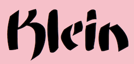 Manfred Klein's typefaces from 2004: Bauernschrift (the original Bauernschrift, published in 1911 by Bauersche Gießerei, had a Jugendstil form and a classical gothic form), ArthritishSpringtime, Declared, DigitsCarpet, FraktKonstruct, GalleriaGeometricaA, GalleriaGeometricaB, Logotrainer, MKLatin-Bold, MKLatin-BoldOblique, MKLatinLight, MkLatinLight-Oblique, OldiesButGoodies, RomaMonumentalBC, SportSatyre-Medium, Uncitronica-Medium, Nasenbear, CircusEarth, FolksXXHeavy, PoliticiansWorking, AlkoInitialsFramed, AlkoInitials, CutAwayOne, FragmentBO4, FragmentF, LetterSoupMainz, MKaos-Regular, Menschenskinder, RodGauApesInitials, StoneCapsIngrid, TangramBlack, TangramWhiteBlack, TixBats, TypoApish, Ubahn-Light, Ubahn, UltraCondensedSansSerif, WalbaumTorsoThree-Regular, ArrowFaces, Associations, AssociationsBirds, DotCapsMK, FrakturaFonteria, GuernicaMemories, MultiCapsOne, MultiCapsTwo, Schwabach, SketchesOfSpain, DotsCapsTwo, KleerikaleConBlack, ManiaK, MonksWriting, MonospaceTypewriter, PablosChildren, RuebenNosesFour, SometimesSmiley, TherapeuticApplications, TraditionellSans-Bold, TraditionellSans-Normal, VForVictory, EuroGyptians, Fabeltiere04, GiambattistaDueMille-Oblique, GiambattistaDueMille, KlillLightCondensed, PhonebookFont, PreColumbus, StrokeBorn-Bold, StrokeBorn, TracesOfKandinsky, Amputation, EarthquakeTypewriter, HandwrittenSlim, MyPrivateZoo, PotatoMonsters, RoundOpArt, Sansumi-DemiBold, Sansumi-Regular, Sansumi-UltraLight, Santana-Black, Santana-BlackCondensed, Santana-Bold, Santana-RegularCondensed, Santana, SantanaXtraCondensed, WacObats, Warlord, AfterAtomWar, AnAlphaBetIsmXtreme, AnalphabetismBats, Eulenspiegel, FlyingWomen, FraktalConPablos, KleinsTypen, Napoleodoni, BackgroundBricks, Decreations, Faustant, Faustitalic, GeoGraphics, GuantanamoHumanism, LipoDVectorized, MKritzeleien, Napoleodoni-Bold, ReadingRailroad3D, ReadingRailroad, SchoenspergerCaps, StageGlyphs, StageGlyphsTwo, CarneVale, Cock-Bold, Cock-Italic, Cock (high ascender face), FranklySpokenTwo, GenManipulated, GenManipulatedRounded, KarlasAndManfreds, Lipsiantiqua-Regular, PostConstructivism, PostConstructivismInvers, SketchedCassiusBroken, SpaceGarbage, WinterCoat, Artistiques-Bricks, DoubleBrokenTextura, GoetheGothic, GoetheGothicBold, GoetheGothicOblique, PabloSansCaps, PreRomanCaps, RodgauHeads, ScribblesCalligraphique, SomeParts, SomePartsAlphabet, WomanWithDoveTwo, WritersFont, Russian, SpikyBrush, TechnoMK, Bastarda-K, LuFraktorso, OldGreekButtons, SchwabachScribbles, ToscanButtons, TrajanusBricks, Couples, LookForLeonardo, Morphes, NanaBallett, Rocky, BeastlyBats, ChildrenSketchings, CloseUp, IdenOfMarch, OrnaRosettes, StrangePeople, SurReal, TrajanSmallCaps, Aprilapril, Confuseyecons, Cucumbers, DuererUnd, Exhumations, MankBalloons, MankZieglers, OptimusPrinceps, OptimusPrincepsSemiBold (roman Trajan style), SlabRomana-Bold, SlabRomana-BoldOblique, SlabRomana-Oblique, SlabRomana, CapsRandomish, CapsRandomishBricks, CondensansPaneurope-Medium, CondensansPaneurope-MediumOblique, CondensansPaneurope-Oblique, CondensansPaneurope, HansSchoenspergerRandomish, HelloSirPeter, MankSans-Medium, MankSans-MediumOblique, MankSans-Oblique, MankSans, StencilBricksMK, StencilBricksRandom, AfriquArtes, EggsOne, EggsTwo, EggsnPills, FaceToFace, KarlasWelt, LookBrokenTypes, Schablonski-LessFat, Schablonski (stencil), BlaxxOnGrid, DancingVampyrish, EmkaSansCondensed-Bold, EmkaSansCondensed, Othermil, OwlsNOtherWitches, PrisonBricks, Renaiss-Italic, Runners, VignettSketches, AbsoluteImprovisations, Aparta, BlackLiving, Blowing, BullerBuPapercut-BoldOblique, BullerBuPapercut, CryArgentina, EnFace, EyeBeings, KidsPhantasies, Klats, Linearus, LinearusCentSix, Monofred-UltraLight, Pabloesques, Planless-Bold, Planless, ScribbleDichFrei, SilhouettesAnimalish, Spontifex, Spontifex, TokyoFrankfurtRound, XamStern, BlackSplinters, Linolphabet, Tomahawked, Typobricks, AmericanInhabitants, HypocriSymbols, LastWit, MK-Symbols, StrokesFonds, ThinkBats, UseBats, Klimes, MonoSpatial, Architypogra, CaslonDadaesque, Cuneate, CuneateCaps, MauMauKlein, FatGrafCalliKlein, CavePaint, Goblins, NudesSilhous, RainyDay, AidaSerifaShadow, BodonisBulemy, SuperSansCondLight, Adonis-Bold, Batmania, CactusBlossom, CrazyCrazySans, Eyeballs, FacesAndCaps, FigaroFigaro, FraxBricKs, LaughBajazzo, M-sKetches, MKGrotesque, MoreMonK, NextGeneration, Orcas, PragRoman, RomanGridCaps, StrangeCharacters, TypoTracesOne, Typotraces-Cinque, Typotraces-Four, Typotraces-Three, Typotraces-Zwo, UmDieEckePlus, Vampyrish, VespasianCaps, VespasiansFlorials, Wacofaces04, ZagzagHeads, Klexalfabeta, GotischeMajuskel, PompejiPetit, Birrrdds, Spontcomic, SprayersSujets, TypoElements, WacoMusish, BemBolz, BrokenRoman-Bold, MarinumBreezed, SansFat, Africaans, AllHands, AlwaysPeople, BauAHaus-Black, DeconstructaWide-ExpandedUltra, GrafFittyPunk, LeArchitect, MiszellenKOne, MiszellenTwo, OhLauri, Shamanbats, TrajanusBriX-Invers, TrajanusBricks, TrajanusBricksXtra, Wenceslas-Oblique, Wenceslas, Monofred Ultralight Update, GenotypiPrototype, VivaBodoni, WhatsHappened, Cancellereska, JuniusIrish, LombardPlattfuß, SketchesDuererInvers, TornielloInitials, Birds-Relaunch, KoeppHeads, MiszellenThree, ImperiumCond, KleinsWrittenCaps, SigismundoDiFanti, Zwiebelfisch, ChildWritten, KleinKallig, GoGo, FantasyBats, KarlasMiszellen, LosAngelesBold, MiszCinque, MiszellenQuattro, MouseTraps, LittleRock, Dinotiqua-Heavy, MountFirtree, FarmFont, Karlas704, MesoFaunaBats, PhaistosAlphabet, Quicktypes, AbstractBats, AztecBats, BienMaya, ForefathersSketches, HumanDeformations, MiszellenJuly, NativeAmericans, OldEgyptGlyphs, PeoplesParts, RainmansWeatherreport, SheAndHe, MKlimesCondensed, SansBlack, WinterthurCondensed, MonoSerifBased70, Rehacles, RustiCalligraphia, ScrapDealer, Vampyriqua, Zebraesq, FracturiaSketched, FracturiaSketchedCaps, OrnamentInitials, CavePeoplePainting, FontBetaOne, HierobatsSketches, PrehistFantasies, Roundlings, VampyrBats, WacoheadsTwo, Cybatiqua, HassianUncial, PittoresqJugendstil, BonFood, PoeticRound, ReligionSpirituality, Running Gnomes, WesternPastHeroes, WritersReaders, AdAstra, Practiqua, DistroyA, DottyShadow, QuickMary, QuickMax, StrokeyHand, EasterIslandsToday, EthnicReconstructions, MotherAfrica, Scherenschnitt, Napoleon, Newspaper, RoundSlabSerif, DisPropBold, FishHooks, VariationsForImre, GoticaBastarda, ImresFraktur (modeled after a blackletter by Reiner), ToskanaCapsRound, KidsStuff, MKDingBats, Offbeats, PeopleSketches, StrangeTypes, WeatherBats, MoldauQua, Postertypes, ThinManGiambattista, AnimalTypeFaces, DoubleFaces, ItalianEvolution, TodayRunes, BeachBats, MiszellenEight, PrettyPeople, ZeroPoints, Scherenschnitt, ScissorThree, Crosses, MayanMexican, MKarlasBats, LimesCondensed, SkiCargo, MonogramsToolbox, SerifCaps, SpaceDreams, TaxTaxation, ArrowsCompetition, Damaged, TypewriterCondensed, AfricanAngels, AfricanArtifacts, AfricanQueens, CaviarBats, CircusClowns, Hands, HelloDoc, MedicoBats, ModernPeace, SchoolStuff, LatinumTall-X, LucaPacioliCaps, LucaPacioliRough, UnclassicQuill-Condensed, ChildrenBats, Sketched, Egypt, SlimSans, WeekdaysRomanSlant, AbcariFond, Gastronom, HalfEnough-Bold, HelloweeniA, Mkristall, Stoerung, WildQuill, Artests, Burlesque, Exercises, FacesFaces, MenFiftyTwo, MSkizzen, BradbOGilvy, Centuriqua-Ultra, Ogirema, Africain, Angelinos, Assoziazione, BadCircumstances, FacesTypes, Gymnastics, HalloweenTwo, KidsStuffAdded, Proportions, Roaring29, ToyToy, WellnessBoom, WoodcutsOne, WoodcutsTwo, Bamboo, SansBlackSmall, FilledABC, FolksInCubes, SprayersTypes, JoeCaxton04, AfricEggs, BusinessPeople, DueMillePix, EarlyMidage, Musicus, NiceBoys, Sculpturs, SilhouettA, WildAnimalsOne, WoodcutAnimals, RomanSerif, RomanSerifOblique, DiskO-LightInverse, GreeKish, BatsDa, Djungle, E-Motions, EyesTests, HalloweensUfos, OldEgyptOne, OldEgyptTwo, RareClothes, SeeItInMuseum, SFAliens, Shamanish, TrafficVehicles, Users, Sansibar-CXCondensed, KidsFirstABC, KleinsKrempelTypes, QuasimodoCaps, VisitCard, ZigZagThree, QuadrataRomaMediumOblique, Climbers, EmkaBats, Homunculus, ReligiousSymbols, Schoolish, GrotesqueBoldTallX, RightSo, RomanWoodcut, Diogenes, HappyBirdsday, ProthesisBlack, StylosCapitale, Kinderkram, ReallyAnimalishOne, ReallyAnimalsTwo, VoteMe, JoaoCond-Light, JoaoImprovisations, LeiterplattenSans, ProthesisCaribiqu, ArmadaPirata, Bikers, DancingPeople, DeepSwimmers, Engel, MusicMuseal, PiratesOne, PiratesTwo, PiratesThree, PiratesSymbols, PreColumbats, RohrschachEtcetera, SciencesBats, Swimming Beautys, TrialNError, TwelveYearsAfter, WintersAbstract, WoodcutsAgain, YoungScene, UglyQua, SchneidlerSolitaires, Bibelschrift (with Petra Heidorn), CircusAir, FreeLife, Mirodish, Pixelsoup, PrositBats, Sports, Unlucky, WorkingClassHero, XmasOne, Zoobats, GeosansLightOblique, HoffmanFL, HamletOrNot (with Petra Heidorn), AstroCalligraphs, AstroDingbats, AtHome, BiblishPictures, BusyPeople, FamousBuildings, Landscapes, MoreDancing, Neighbours, RomansAntePortas, Seefahrer, Shopping, TheaterSymbols, Callimundial, OgiremaSlab, Delitsch Initialen, HartzVier, Hingehudelt, Hingeschludert-Black, MatisseThree, MrKlein, RemiDur, Burgfest, DelitschInitialen, UncialeOrnamentale, UncialeXpressLight, AbermalsAnimals, Buddhism, BuyMe!, LifeEyecons, LifeIcons, Tourists, Wintersports, FourEarsArrows, MensFriends, MKartoonsHeads, OetzisTimesWillCome, SportsTraining, XmasBatzz, ClassicBats, FramesAnd, HistoricMoments, OldFramesSymbols, PabloInTown, RomanArchitectura, Sleep, VeryBusy, BrokenHand, Burtinomatic (blackletter based on Burte Fraktur), MonumentA, Athena, DisPropSans, Zyprian, MiscellenDec04, MiszellenK, MoreBusy, OldTestament, ScienceFictions, Taucher, XmasOnMoon, Weiß Fraktur (with Petra Heidorn), DeutscherSchmuck (with Petra Heidorn, based on Schmuck für Deutsche Druckschrift by E. Ege, 1922), SchmaleGotischMK (after type by Ernst Schneidler), SchmalfetteGotisch (with Petra Heidorn, again based on Ernst Schneidler), SchneidlerSchwabachInitials, Serpentina, Schooltime, HistoricPeople, WYSIWYG, MK-Signatures, TheManyMKFaces. [Google]
[MyFonts]
[More] ⦿
|
TypOasis 2005
[Manfred Klein]

|
 Fonts published in 2005: Mirobattz, MK-SchmalHands, OperaSemper, BarlosRandom, BarlosRandomRings, JuliusC2, LambordicCaps, MyElectronicSchwabach, QuickJuliusC, AsABird, Climbers-2005, FunnyCharacters, MasKs, Myths, OurPoliticians, PeaceOnEarth, StadtLandFont, RandomUnciale, BirdsNFishes, Circus, GreekMythes, MK-Doodles, SomeSketches, TypoOrnaments, Zettelkasten, Draculas, MonkeyUncialica (2005, based on AI-UnciTronica (1994)), VollkegelTypewriter, AfricanissimaInvers, AfroParts, BirdsCuts, Horoscopish, KarlasUndOpas, MArteFact, Occasiones, OutdoorSports, SomeSymbols, Stages, WildFaces, Bodidota, SaiGon, ForJeffTwo, SilhousForJeff, KochRootsRoundBold, Africanissima, DirtyVectors, EgyptianSilhouettes, Egypticons, FaceToolsbox, FromTheMoon, GangsMembers, Geobatz, Overheads, GaranitialRings, ZeitGeisterbahn (nice curly face), ZigZagDisplays, AfricQuattro, CyberDinxx, FlyingOne, KiddiesR, Polygonish, SecurityPeople, Services, Signals, SundriesBats, Surrealbats, ThingsAndSomethings, MKAbel, MKAbelRough, Anarchica, FragmentAZ, PiratiquaVertical, AbstractFragments, HeadToHead, Hispaniola, MarineBats, ModernArts, NewYork, Piratical, ShadowPlaying, SomeSilhous, TafelrundeKnights, Wonderlanders, Woodcuts5, CantzleyAD1600, ChildrensWorld, ForgottenArtOne, ForgottenArtTwo, Musicians, PiCaSolitaires, Risky, Women, Blackredis, CyberCaligraphic, Desastra, EtruskRough, KleinSchwabach, Beardfaces, Hanswurste, Heads+Hands2, HumanHeads, KinderUndEngel, PlayingChildren, PoliticiansOrArtists, BohrDonni, KleinSlabBlaxx, KleinSlabserif, BlaxBloxx, BradburysBoldShadow, GridConcrete, Easteria, EyesNoseMouth, Fabulous, Getier, GetierTwo, Lifestyle, Madhubania, TheHammerSlab, Cyrillatina, Diversitia, Letterbeings, Biblical, Casting, FaceLab, Mythologicals, ZooWoodcuts, BalloonDigits, BirthdayDigits, Florabetic, MovingLetters, Piratiqua, Clausewitz-Fraktur, ArtMonsters, Jokers, MansPartsPlaying, ShipsNBoats, DoradoHeadline, Nilland, Nilland-SmallCaps, EveryLetterTellsAStory, AncientBats, Apish, CaveNTribalArt, Drawings, FarmersLife, Kampfsport, WeInside, Carissima, HelpUsGiambattista, ManTiquaBlaXX, EyesAlphabet, ArtistsTraces, FitnessSilhouettes, MusiciansFriends, Offbeat, OldBirdsDesigns, Testroom, Vectortrials, Viechereien, WebTubbies, FrancophilSans, Winterthur Condensed, Biblicals, FineArts, Karlchens, LaughOrNot, RareAnimals, RenaissanceWoodcuts, ShoppingBats, DirtyHatchCaps, FrenzyWut, ManFont, StackCaps, Vampyrs, ArtesCocktail, Blackheads, Geoplays, KarlasInterpreted, KarlasSketches, SeeAndAct, DancingSuperserif, KleinsSansCondBold, CompositLetters, VaticanianInitials, BeautyMaking, FantasticCreations2, FantasticCreatures, HelmbuschCrest, HeraldryPartsOne, Insects, Musikantenstadel, OwlsAndMore, StrangersOnEarth, Surrealism, Winners, BlackIsBeauty, WeissGotnitials, AfterLastWar, CuteFaces, Fishing, NastyHorrorShow, RenaissancePeople, TypicalFaces, VikingDesigns, ZigzagZoo, ChristianInitials, EinsteinsWorlds, Relative, HumanABC, 5thCenturyCaps, BalletSketches, Denkmal, LadiesGentlemen, Maritime, MensBestFriends, NewAliens, OldArtGallery, Sportler, WetWorld, Anarchistica, Archeologicaps, MissalUncialeBricks, MissalUncialeMaster, SnowCupsCaps, AbstractFaces, AnimalShadows2, OnStage, OrnamFaces, VisitTheNil, WhoWasTheArtist, Petita, FlyingHollander, Goudament, GoudamentBricks, 20thCenturyArt01, 20thCenturyTwo, 20thCenturyThree, AnthropolTraces, ChiefCook, Prehistorish, TheIkeaUniform, WebWideWorld, NoArtOnlyChaos, MKantzley, BatsAntiques, CelticOrnamBats, ColumbusTraces, InLandBetween, MiszellMay, Phantabats, StrangersInTheDays, StrangersTwo, MediaevalItalique, LinoLeumInvers, MouseCuts, ExcuseMe, LookingMasreel, VasarelyWasHere, VirtualWoodcuts, Senats-Antiqua, BastardaMajuskel1300, Abstractions, AfriqueDrawings, DancingTraces, Floranimals, FlyWithMe, InsectsMK, InternationalSigns, YouAndMe, ZockersHomeland, Cuban AnimalsAnywhere, ArtistSketches, Circularium, GirlsGirls, It'sAllTheater, Monstrous, MythologicBats, PuzzleParts, SteubenHelpsPresident, TangramAnimals, ToonCharsOne, ToonCharsTwo, DolbyFraxCaps, BirdsEtcetera, DadaSays, MasereelThree, MasereelTwo, RoundMarks, TangramBam, TangramBumBirds, Punktum!, ArtEtcetera, BauhausFragments, CatsCo, CreaturesShadows, MagicMoments, MPictures, Professions, SwimmingHotelTitanic, ElectrUnciale, MKancellerescaCaps, Arrowy-Three, BeautyFaces, FantasyBeings, HundeDogsChiens, MoreClimbing, MWaKomia, CorrosClassicClimbers, MKapish, MKapsMixed, MünchnerFraktur, MKapishTwo, MouseToonsTwo, OpenParlament, SchauSchau, ScienceBats, Scurile, SansKleinCut, DadadaBats, FightersForFreedom, HumanFollowUp, IndustrialBats, ClownsAlphaBeta, InkAlphabet, FlyingHistory, HumanInside, KinderKinder, KinderAbsurdo, LeuteHeute, MKarla, PeaceAndNightmares, PosterFrames, SometimesDocCanHelp, Tourism, RoundSans, AnimalComedians, ArteStuff, AthletenEins, BirthdaySurprises, Heads4Ads, MagicBats, NightlifeRoaring Twenties, Woodcuts06, Clothes, Idols, KarlasZeichnungen, Mangalia, RomanticShadows, AugenWappen, BoatsShipsAhoi, Cherubians, DesignBasics, DesignersWeAll, ILikeBW, OldEyeCatchers, OldSignArts01, OurLeadersArms, SpeakingHands, TodayArms, WappenAltNeu, Zoology, AnimalShadowsDrei, DrawingTraces, Haringe, MeteoSat, OldArts, Peculiar, PointToPoint, PrestoWritten, ToolsInstrumentsGadgets, PlantsLetters, BatzBatz, Characters-A, ConstructionFreehand, Grandparents, HelloVienna2005, Hobbies, Horses, RefuelStation, StillLeben, BlaxSlabXXL, Magyarish, GotikaButtons, FantasyPix2, From KarlasIdeas, GrandfathersDesigns, Martial01, BusinessAsUsual, CalligrSketches, CharactersB, DramaAndCo, EarlySurrealismus, GraphicAnimals, Maskenball, OldTypoPieces, Sammelsuriart, Tanzbar, Trivialiartes, Bayreuther-BlaXXL, BubbleToBird, DesignElementsTwo, Floralia, MicroBeings, MicroBeingsTwo, Outside, SansSerifVarying-Black, XmasGinger2005, LettersAnimales. BlackStrokeBeings, Coincidences, HeadsConstructed, Maskenball04, OldFashionPeople, ProBeauty, Dyonisius, ArtDekoParts, Austranimals01, ConfusEyecons2005, DesignPartsSix, DueTresQuattro, EyeEye, EyeSee, GenesisSketches, Western, AntiKwa, OldTypefaces, BrokenLinoCut, EgyptianFreehand, Hurrikanish, LettersBats, AbstractFaces03, Botanicals, BrickToBrick, EyesAugenMouth, DiskJockeys, ToolsSymbols, Back2School, BeforeE-Mail, CircledHeads, CircleFaces, CircleMixes, EyeMen, GeometricGlyphs, IAmSailing, SchiessScheibe, SchnörkelCaps, MagicHelloWien, Mittelalter, PeaceFighters, StrokeToBirds, UpUpAndAway, XmasPromotions, ArteNero, ArtFound, EighteenMayanMonths, PeaceWeapons, PopIcons, Strokemen, TypologicalAccidents, VectorPaintings, WebFolks, WoodcutBats, Zoological, ArtistsOr, Characters-C, Characters-C, ChildrenAnimalsFriends, Christmas05, DramaticArts, FlightDreamsTwo, FlightsDreams, FlyBirdFly, GeometricFaces, HeadsVectorAttempt, IhrHunde, Letterly, NewDinos, NiceNeighbours02, OldFashionedClichees, OldstyleZoo, PatternsAnimals, PeopleSurreal, QuakeRoman, SpiralTraces, Vectories, XmasCaps, XmasCapsRound, BooksBats, CountryLife, MoreSilhousFrame, PhantasticSketches, Precassos, SilhouetteSituations, SilhouetteSquaresInvers, SomeSilhous2, SpaceStationHokus, TypoPieces, WoodcutsFound, AfricanSymbols, BauhausReminisce, CeltishParts, ClassicoAntiqua, Florenius, MotherAfricaArchetypo, NewTechnoFaces, Scherenschnitte, SomeSilhouBatsOne, VectorPaintingsOne, AllThatStress, Ancestors, HorosCopies, LittleFriendsTwo, LosAngelesBatzz, OurLittleFriends, Pabloesque2005, PopArtes, SomeNewSilhous, SomeSilhousPlus, Webmasters, XmasGsuffa. [Google]
[MyFonts]
[More] ⦿
|
Ute Harder

|
 Born in Glückstadt a.d. Elbe, Germany in 1972, Ute Harder (known as Frau Jenson at P22) studied Illustration and Communication design at the University of Applied Science in Hamburg under Jovica Veljovic. Since 2002, she works as a freelance graphic designer, collaborating on diverse projects for Linotype and developing her own fonts. She lives in Hamburg.
 At P22, she published Alpha Initials (2004), Alpha Roman (2006, described by her as a playful calligraphic display face), Cilati (2004, calligraphic script; +Swash caps), Frau Jenson People (2004, pictograms), Bastyan Pro (2006, a bastarda based on the Carolingian minuscules), and Tulda (2004, letters done for a calendar), which includes Tulda Symbols. At Linotype, she designed Marathon LT Display and Book (1999, after the famous 1931 font by Rudolf Koch). Other fonts by her include My People, Some Indiduals, Initials, Out Now, Pixi Bilderbuch and Pixi Outline, as well as the Gracy, Grocy and Groby families. Close-up look at her work. FontShop link. Klingspor link. P22 link. View Ute Harder's typefaces. [Google]
[MyFonts]
[More] ⦿
|
Veronika Burian
[Type Together]

|
 [MyFonts]
[More] ⦿
|
Vespasiano Amphiareo
|
 16th century Franciscan scribe and calligrapher (1501-1563), known for his 1554 writing manual Opera di Frate Vespasiano Amphiareo da Ferrara ... nella quale si insegna a scrivere varie sorti de lettere (Venice, 1554), the first place where one can find a Bastarda. Typefaces based on scans of his work include Gothic Majuscles (2003, Manfred Klein, based on Gothic Initials, 1554), and Amphiareo (2002, a Mac font made by Michael Schrauzer). Pictures of his capitals. [Google]
[More] ⦿
|
Visual Rebelion
|
Mexico City-based designer of a Schwabacher typeface in 2016. [Google]
[More] ⦿
|
Wahnfrid-Musik
|
Heraldic, old German and Fraktur font archive. Has these fonts by Will Software: MA Bastarda1, MA GKursiv1, MA Gotic. Page by Mark-Oliver Konrad. [Google]
[More] ⦿
|
Walden Font
[Oliver Weiss]

|
 Walden Font (est. 1997) sells historical typefaces&clip-art by Oliver Weiss from Winchester, MA. Walden's site includes a brief history of blackletter, as summarized in the PDF document The Gutenberg Press: Five Centuries of German Fraktur (1997). Typefaces by categories:
 - The nice 14-font package called Civil War Press.
- The free art nouveau font Jugend WF (2006).
- Kraftwerk Press (2016-2017), a collection of 25 German industrial fonts emulating the era from 1920-1930:
- WFBorderBergland, WFBorderLineal, WFBorderLorbeer, WFBorderRauhreif, WFBorderRiesel, WFBorderSaftig, WFBorderSandmann, WFBorderSchnuppe, WFBorderWolkig, WFBorderZahnung, WFKraftwerkOrnamente, WFKraftwerkVignettenFett, WFKraftwerkVignettenLicht. Great borders and ornaments that were mainly revived from Neues Schmuckmaterial (Schriftguss AG, formerly Brüder Butte).
- WFFettdruck, WFHochdruck, WFNormdruck: Examples of Reklameschrift originally designed in 1908, 1926 and 1920, respectively.
- WFFetteKrause. Inspired by an advertisement for printing machinery in a 1924 issue of the Hungarian trade magazine Magyar Grafika.
- WFKaracho: Inspired by a bit of hand-lettering from a 1926 issue of the German advertising art periodical Gebrauchsgrafik.
- WFLuftpost. Based on lettering samples for sign painters.
- WFNeueOhioSchrift. Weiss writes: The Brüder Butter foundry in Dresden had a good working relationship with ATF, and thus several American typefaces found their way into the Butter catalog. Among them was Pabst Oldstyle, designed in 1902. Brüder Butter changed the erect peak of Pabst's A to a flaccid one, and distributed the result as Ohio Schrift, starting about 1913. Throughout the 1920s, Brüder Butter marketed the Ohio family through a series of leaflets that put the typeface through its paces in innovative ways. WFNeueOhioKursiv is the Italian companion. In 1922, Brüder Butter added a bold typeface to the Ohio family. This was not an ATF transplant, but a new design by Eduard Lautenbach. It was available with a set of swash capitals, and several curly-cued, lowercase alternates, ideally suited for children's books. Weiss's revival is WFNeueOhioKraft.
- WFNeueWerbeKraft. Based on Arthur Schulze's Werbkraft (1926).
- WF Paletti. Loosely based on the popular monoline silent movie script typeface Tango-Kursiv (1913, Ernst Deutsch).
- WF Vulkan. A loud all caps typeface based on an advertisement in the April 1926 issue of Gebrauchsgraphik.
- Their Renaissance&Handwriting font pack has nine different handwriting fonts from 1450 to 1700.
- The Minuteman Printshop set contains 18 colonial fonts: Ancient Black, Caslon Book, Caslon Book Italic, Caslon Swash Italic, Webster Italic, Webster Roman, English Hand, Rev.War Heroes, Signers of the DoI, Colonial Bullets, Daisy Border, Lily Border, Marigold Border, Needlepoint Border, Pine Cone Border, Quilt Border, Rose Border, Tulip Border.
- Eighteen blackletter fonts, called the Gutenberg Press series: Alte Schwabacher, Breitkopf Fraktur, Coelnisch Current, Fette Haenel Fraktur, Ganz Grobe Gotisch, Grossvater Kurrent, Gutenberg Bibelschrift, Kurrent Kupferstich, Luthersche Fraktur, Maximilian Gotisch, Neue Schwabacher, Peter Schlemihl, Suetterlin, Theuerdank Fraktur, Unger Fraktur, W'bg. Schwabacher, Zentenar Fraktur.
- Wood type, the Wild West Press series (2010, 47 fonts), and related fonts: Sawtooth WF (2002), Acanthus Border, Ashwood Condensed, Ashwood Extra Bold, Asphaltum, Aubrey Landing, Baubles Border, Bear Gulch, Brass Rules, Bullion Extra Condensed, Bullion Italic, Bullion, Cattle Brands, Chalk Bluff, Clifford Eight, Cut and Shoot, Dead Man's Hand, Faywood Extra Condensed, Faywood Italic, Faywood, Fringe Border, Garland Border, Gatlin Bold, Grid Border, Heroes and Villains, Jawbones Condensed, Lace Border, Langtry, Matchwood Bold Italic, Matchwood Bold, Matchwood Italic, Matchwood, Muleshoe, Ophir, Rawhide, Round Mountain, Royal Nonesuch, Sageland, Sawtooth, Seal Border, Shelldrake, Stockton, Thousandsticks, Thunder Mountain, Vine Border, Western Bullets, Whitecross, Wildwash.
- Art nouveau revivals. His Art Nouveau Printshop Vol. 1 (2020) includes these fonts:
- WF Border Edellinien: Based on borders by Schelter & Giesecke, 1901.
- WF Border Eos.
- WF Border Flach: After a specimen seen in a 1915 specimen book at Bauersche Giesserei.
- WF Border Nimbus.
- WF Border Patriz Huber: After a Schelter & Giesecke design from 1906 called Patriz Huber Ornamente, which was named after designer, goldsmith and furniture maker Patriz Huber, 1878-1902.
- WF Border Peacock: Based on borders by Schelter & Giesecke, 1904 (or earlier).
- WF Border Seerosen.
- WF Border Ver Sacrum: Based on borders by Heinz Keune for Schelter & Giesecke, 1901 (or earlier).
- WF Dahlia: Closely based on a draft for F. Schweimann's Wodan, first issued by Stempel & Co in 1902.
- WF Fafner: After a poster typeface by Schelter & Giesecke first seen in 1905. Unknown designer.
- WF Habsburg: After an original by Heinz Keune from 1903 for Schelter & Giesecke.
- WF Jugendstil Ornaments.
- WF Liane Semibold: A condensed Plakatschrift that revives Liane Semibold (1908, Schelter & Giesecke).
- WF Maria Theresia: After Maria-Theresia-Versalien (1903, Heinz Keune for Schelter & Giesecke).
- WF Meierschrift: Based on Meierschrift (1903, C.F. Meier), which was produced by Schelter & Giesecke in 1904.
- WF Ovid: After an original by Heinz Keune from 1903 for Schelter & Giesecke.
- WF Radium: After an original white on black typeface by Schelter & Giesecke (1905).
- WF Rienzi Versalien: After Versalienschrift Rienzi (1901).
- WF Schelter Antiqua: A revival of Schelter Antiqua (1905, Schelter & Giesecke).
- WF Wallenstein: Based on an original by Heinz Keune (1904), who intended it as a heavy weight companion of Habsburg and Wittelsbach,
- WF Wittelsbach: After an original by Heinz Keune from 1903 for Schelter & Giesecke.
- Gnomos is a grungified merovingian typeface [Walden Font claims that it was found in a 16th century house].
- Magick: A series of 11 alchemic and medieval typefaces, including custom creations by Australian calligrapher Mark Calderwood: Astaroth, Bastarda, Batwynge, Gnomos, Luxeuil, Orgeuil, Runor, Salem 1692, Alchemy Symbols, Astrological Symbols.
- Diverse Handes: Nine historically accurate script fonts from the Renaissance era: 10th Century Bookhand WF, Bastarda WF, Copperplate 1672 WF, English Hand WF, German Latin WF, James the Second WF, Spanish Court Hand WF, Uncial WF, William Shakespeare WF.
- A collection of 62 American poster fonts of World War II, heavily influenced by art deco, was created in 2013: Acie WF, Almanzo WF, Balfrey WF, Bellofatto WF, Bleecker WF, Bleecker WFShaded, Bobbin WF, Bullshorn WF, Calt WF, Cassino WF, Cephus WF, Chippett WF, Cutright Bold ItalicWF, Cutright Bold WF, Cutright WF, Dickie WF, Dragoo WF, Elbie WF, Eldon WF, Elmira WF, Enlow WF, Epsom WF, Falaise WF, Fansler WF, Fustian WF, Glancy WF, Golden WF, Graveney WF, Greenlaw WF, Hackett WF, Hardwick WF, Harlie WF, Huntley WF, Irby WF, Iva WF, Jowdy WF, Kilroy WF, Kododa WF, Lacar WF, Maximino WF, Nelda WF, Nuisance WF, Odon WF, Olindo WF, Payson WF, Payson WFBold, Payson WFBold Italic, Payson WFItalic, Perlina WF, Poster Bullets WF, Remely WF, Reny WF, Sharkey WF, Sheffie WF, Telmoss WF, Tilmon WF, Toxie WF, Ula WF, Wallington WF, Wilber WF, Wylie WF, Zipnut WF.
- Other fonts in the collection: 10thCenturyBookhand, AcanthusBorder, Alchemy-Symbols, Alte Schwabacher, AncientBlack, AshwoodCondensed, AshwoodExtraBold, Asphaltum, Astaroth, Astrological-Symbols, AubreyLanding, Bastarda, Batwynge, BaublesBorder, BearGulch, BrassRulesBorder, BreitkopfFraktur, Bullion, BullionExtraCondensed, BullionItalic, BullionRoman, CWP_TypeNo08, CWP_TypeNo09, CaslonBook-Italic, CaslonBook, CaslonSwashItalic, Cattle Brands, ChalkBluff, CliffordEight, CoelnischCurrentFraktur, ColonialBullets, ConfederateSignatures, Copperplate1672, Cut&Shoot, DaisyBorder, Dead Man's Hand, EnglishHand, Faywood, FaywoodExtraCond, FaywoodItalic, FetteHaenelFraktur, FinalFrontierShipside, FringeBorder, GanzGrobeGotisch, GarlandBorder, GatlinBold, GebetbuchFraktur, GermanLatin, Gnomos, GridBorder, GrossvaterKurrent, GutenbergBibelschrift, Heroes & Villains, JamesII, JawbonesCond, Jugend, KurrentKupferstich, LaceBorder, Langtry, LilyBorder, LutherscheFraktur, Luxeuil, MarigoldBorder, Matchwood, MatchwoodBold, MatchwoodBoldItalic, MatchwoodItalic, MaximilianGotisch, Muleshoe, NeedlepointBorder, NeueSchwabacher, OldStateHouse, Ophir, Orgeuil, Pangho, Panghobl, Pangolin, Pangbl, PeterSchlemihl, PineConeBorder, QuiltBorder, Rawhide, RevolutionaryWarHeroes, RoseBorder, RoundMountain, RoyalNonesuch-Bold, Runor, Sageland, Salem1692, Sawtooth, SealBorder, Shelldrake, SignersoftheDOI, SpanishCourtHand, Stockton, Sütterlin, TheuerdankFraktur, Thousandsticks, ThunderMountain, TulipBorder, TypeNo1, TypeNo2, TypeNo3, TypeNo4, TypeNo5, TypeNo6, TypeNo7, TypeNo8, TypeNo9, TypeNo10, TypeNo11, TypeNo12, TypeNo13, TypeNo14, Uncial, UngerFraktur, UnionSignatures, VineBorder, WebsterRoman, Western Bullets, Whitecross, WilliamShakespeare, WittenbergSchwabacher, ZentenarFraktur.
- The New Victorian Printshop collection (56 fonts): Absalom, Adelar, Amaltea, Amilcar, Augur, Banter, Baretto Italic, Baretto Shaded, Baretto, Barettoshaded Italic, Beamish, Blaisdell, Blinov, Braham, Brinton, Brunel Script, Chatelaine, Cupboard, Devough, Dewitt, Ephinol, Gano Extended, Giglio, Gresley, Grubb Script, Hester, Hipolon, Hiram, Inigo, Isherwood, Jasper, Jophet, Klabasto, Lightburn, Medola, Monboddo, Nestor, Oldkirk Italic, Oldkirk, Ormsby, Pennyfarthing, Phectic, Pomeroy, Rebstock, Rudyard, Rungholt, Sedgwick, Steam Border Medium Aztec, Steam Border Medium Bar and Balls, Steam Border Medium Bar and Curls, Steam Border Medium Bar and Leaves, Steam Border Medium Baroque, Steam Border Medium Belgian Lace, Steam Border Medium Dish and Wire, Steam Border Medium Drainfly, Steam Border Medium Flourish, Steam Border Medium Frill, Steam Border Medium Geometric, Steam Border Medium Leaf, Steam Border Medium Loops, Steam Border Medium Picture Frame, Steam Border Medium Quatrefoil, Steam Border Medium Ribbon, Steam Border Medium Shells, Steam Border Medium Spruce, Steam Border Medium Tiles, Steam Border Medium Triangles, Steam Border Medium Woody, Steam Border Thin Brick Bar, Steam Border Thin Cordula, Steam Border Thin Double Wavy, Steam Border Thin Double, Steam Border Thin Fine Dots, Steam Border Thin Forward Wave, Steam Border Thin Oscillations, Steam Border Thin Scallop, Steam Border Thin Straight Rule, Steam Border Thin Tight Oscillations, Steam Border Thin Triple, Steam Border Thin Undulations, Steam Border Wide Arch and Vine, Steam Border Wide Argent Leaf, Steam Border Wide Bar and Acanthus, Steam Border Wide Bower, Steam Border Wide Knots and Weeds, Steam Border Wide Lattice, Steam Border Wide Mephisto, Steam Border Wide Peacock, Steam Border Wide Rebstock, Steam Border Wide Roccoco, Steam Border Wide Shield and Acanthus, Steam Border Wide Shield and Vine, Steam Border Wide Stipple, Steam Border Wide Stone Leaf, Steam Border Wide Vault, Steam Charms, Steam Flourishes, Steam Gems, Steam Logotypes, Steam News Cuts 1, Steam News Cuts 2, Steam News Cuts 3, Swartwood, Tempris, Tilson Initials, Tivadar, Trowbridge, Twiselton, Whitcomb, Whittle, Winan.
Dafont link. [Google]
[MyFonts]
[More] ⦿
|
Wenceslaus Joannes Crabat
|
 Typefounder Vaclav Jan Krabat (1719-1805) set up his shop in the center of Prague in 1751. His first specimen book was Specimen characterum latinorum existentium in Pragensi typorum fusura (1761). This work showcases 41 Latin typefaces in roman and italic styles, 33 Fraktur and Schwabacher typefaces, and 21 Greek and Hebrew typefaces, as well as ornaments, headers, border elements, and decorative lines. Other specimen books follwowed between 1767 and 1772, and a script type was created in 1775. The foundry started declining in 1782. Crabat died in Prague in 1805. Local download of Krabat's 1761 specimen book.
 Tomas Brousil's 72-style family Crabath (2021), which contains subfamilies for Text, Display, Subhead and Intials, is based on samples seen in Crabat's 1761 text. [Google]
[More] ⦿
|
Will Software
[Rainer Will]
|
Rainer Will Softwareentwicklung (Schöffengrund, Germany) developed many school and cursive writing fonts, ca. 1996-2005. They sell their fonts in 10 to 30-font packages, such as handwriting, Altdeutsche schrift, Barcodes, Schulschriften (school fonts). There are also East-European, Cyrillic, Greek, Thai and IPA fonts. Here, we have demos for various programs, and if you download and unzip them, you will discover these alphading fonts: FT-BruchTon, FT-HochztsGlocken, KD-Kaesweich, HB-Kegel, HB-Kegelhardt, HB-Kegelweich, KD-Pilz, KD-Singvogel, and these dingbat fonts: NW-BioBlatt (leaves, 1998), Pikto5 (1997). The caps font IN-Barock is here. Will Software made hundreds of fonts, including the handwriting fonts Jeff and HW Stone (1998), KL-Antiqua2, Old-London, Fraktur. A fuller list, by type: - Alte Schriften (blackletter): Black-For, Chevalin, Civotype, Fleisman, Fraktur, German-Script, Germen-Type, Ghiollier, Goethe, Gotik, Gudenberg, Heinrich-Kanzlei, IN-Barock, IN-Barock2, IN-Barock3, IN-Florentine, IN-Fraktur2, IN-Fraktur3, IN-Geometric, IN-Gothic, IN-Gothic1880, IN-Innsbruck, IN-Jugendstil, IN-Jugendstil1920, IN-Jugendstil3, IN-LaRose, IN-OldGothic, IN-Schwabach, IN-Silhouette, IN-Uncial1475, IN-Walbot1, IN-Woodcut, IN-Woodcut2, KL-Antiqua1, KL-Antiqua2, KL-CapitalisQuadrata, KL-Fraktur1, KL-Gotic1, KL-Gotic2, KL-HKursive1, KL-HKursive2, KL-HKursive3, KL-Karolin1, KL-MKursive1, KL-MKursive2, KL-Rotunda1, KL-Rotunda2, KL-Unziale1, KL-Unziale2, Limpach, Luthan, MA-BastardAnglicana, MA-Bastarda1, MA-Bastarda3, MA-Current, MA-FereTextura, MA-GKursiv1, MA-GKursiv2, MA-Gotbuch, MA-Gotic, MA-InsularMinuscule, MA-Kurrent1814, MA-KurrentBarock, MA-Minuskel1, MA-Minuskel2, MA-Schreibschrift1900, MA-Schreibschrift1900Bold, MA-Urkunde, Meriage, Offenbacher, Old-Germen, Old-London, Petjes, Ried, Romand-Genealogie, Schlei, Schwaben, Suetterlin-2, Theudan, Verdn17, Verdn2, Walbot, Zentar-Bold, Zentar.
- Alte Schriften 2 (more blackletter fonts): AD-AlbrechtDuerer, AD-AltSchwaben, AD-Ballo, AD-Barock1720, AD-Blackpool, AD-British, AD-Burgundy, AD-CalligraphicAntiqua, AD-CalligraphicFraktur, AD-CalligraphicTextura, AD-Celtic, AD-CelticCollege, AD-Coburg1, AD-Coburg2, AD-Diagoth, AD-Dublin900, AD-Fraktur2, AD-GothQuad, AD-Gothisch, AD-Gotisch2, AD-Gotisch3, AD-GottfriedLeibniz, AD-Handschrift1, AD-Handschrift2, AD-Handschrift3, AD-Handschrift4, AD-Handschrift5, AD-Handschrift6, AD-Hans, AD-Herefordshire, AD-Hohenstein, AD-Huddersfield, AD-Italia1650, AD-Kaiser, AD-Odin, AD-Offenbach, AD-OldEire, AD-Patron, AD-Ponti, AD-Renaissance, AD-Sachsen, AD-Stebark, AD-Thingvellir, AD-Toulouse, AD-Turin, AD-University, AD-Wallgau, AD-Zierfraktur, Col-Barock, Col-Barock3, Col-Celtic, Col-Florentine, Col-Fraktur3, Col-Geometric, Col-Gothic, Col-Gothic1880, Col-Jugendstil, Col-Jugendstil1920, Col-Jugendstil3, Col-LaRose, Col-OldGothic, Col-Uncial1475, Col-Woodcut, Col-Woodcut2, Suetterlin-2, Suetterlin-4, Suetterlin.
- Familienschriften (fonts for kids, alphadings, dingbats): ArGlas3, ArSchatten7, Calos-Glas1, EffOutline, FT-Amor, FT-BruchGlas, FT-BruchTon, FT-GluecksKaefer, FT-GluecksKlee, FT-GluecksSchwein, FT-HerzanHerz, FT-Herzhardt, FT-Herzkranz, FT-Herzweich, FT-HochztsGlocken, FT-HochztsHerz, FT-Karneval, FT-Klecks, FT-Osterhase, FT-Sektknall, FT-Trommler, FT-WeihnachtsBaum, FT-WeihnachtsMann, Fingprnt-1, HB-Brfmarkclassic, HB-Brfmarkhardt, HB-Dart, HB-Fackel, HB-Fechten, HB-Filmklappe, HB-FrzBlattHardt, HB-Kegel, HB-Kegelhardt, HB-Lorbeerkranz, HB-Palette, JD-Halali, JD-Kerbe, JD-Pille, JD-Popblut, JD-Pseudokinese, JD-Pseudonippon, JD-Pseudoruski, JD-Schachhardt, JD-Timur, JD-Wurm, KD-Blumehardt, KD-Esel, KD-Franja, KD-Handschrift, KD-Kaeshardt, KD-Kaesmaus, KD-Katze, KD-LKW, KD-Lamm, KD-Nacht, KD-Obstigel, KD-Schneemann, KD-Zwerg, Revont-Kraeusel1, Teje.
- Festtagsschriften (holiday-themed fonts): FT-Amor, FT-Babyputte, FT-Babystorch, FT-Bethand, FT-Betkind, FT-BruchGlas, FT-BruchTon, FT-Clownslachen, FT-Cupido, FT-Eihardt, FT-Eikranz, FT-Eiweich, FT-Familienbande, FT-Getreide, FT-GluecksKaefer, FT-GluecksKlee, FT-GluecksSchwein, FT-HerzanHerz, FT-Herzbruch, FT-Herzhardt, FT-Herzkranz, FT-Herzweich, FT-HochztsGlocken, FT-HochztsHardt, FT-HochztsHerz, FT-HochztsJubilaeum, FT-HochztsKranz, FT-HochztsPaar, FT-Hufeisen, FT-Kalenderblatt, FT-Kanzel, FT-Karneval, FT-Kerze, FT-Klecks, FT-Kreuzlamm, FT-Menora, FT-Osterhase, FT-Schule, FT-Sektknall, FT-Spiegelfrau, FT-Spiegelmann, FT-Spukhaus, FT-Torte, FT-Trauerzweig, FT-Trommler, FT-Trompeter, FT-WeihnachtsBaum, FT-WeihnachtsMann, FT-ZuckrtuetHardt, FT-ZuckrtuetWeich, FTH-Fische, FTH-Jungfrau, FTH-Krebs, FTH-Loewe, FTH-Schuetze, FTH-Skorpion, FTH-Steinbock, FTH-Stier, FTH-Waage, FTH-Wassermann, FTH-Widder, FTH-Zwillinge, HB-Fackel, HB-Lorbeerkranz, HW-Handpic, KD-Blumebundt, KD-Lamm, KD-Nacht, KD-Schneemann, SP-Blume, SP-DRHH2, SP-DRHH3, SP-Face, WinterNacht.
- Geheimschriften (codes or secret fonts): SP-DRBYQuadrat, SP-DRHHQuadrat, SR-Abstrakt1, SR-Abstrakt2, SR-Abstrakt3, SR-Abstrakt4, SR-Abstrakt5, SR-Abstrakt6, SR-Astro, SR-Blatt, SR-Braille, SR-Chaos, SR-ChaosBold, SR-ChaosItalic, SR-Finger, SR-Geheim0, SR-Gesicht, SR-Labyrinth, SR-LabyrinthBold, SR-Marine, SR-Morse, SR-Puzzle, SR-Radierer, SR-Rune, SR-Schatten, SR-Schiffe, SR-Schloss, SR-Schmetterling, SR-Skyline, SR-Strichmann, SR-Tiere, SR-Wabe, SR-WabeBold, SR-Wappen.
- Handschriften: A1, A2, A3, Agnieszka, F1, F10, F2, F3, F4, F5, F6, F7, F9, Ghiollier, Goethe, HW-Agilo, HW-Andrew, HW-Brouet, HW-Burg, HW-Clay, HW-Emmi, HW-Feliks, HW-Foster, HW-Guga, HW-Handpic, HW-Harico, HW-Hilly, HW-Jeff, HW-Jesco1, HW-Jesco3, HW-Jesco7, HW-Josh, HW-Marbo, HW-Pablo, HW-Phil, HW-PizPaz, HW-Renate, HW-Sarx, HW-Schneid, HW-Stone, HW-Tolomeo, HW-Tommi, HW-Turandot, HW-Veneto, HW-Vincent, HW-Vogel, HW-Volker, Handwrites-CTrac, KD-Handschrift, KG-Hand, Limpach, Offenbacher, Ried, Rw2, Schlei, Teje, Uggy, Verdn17, Verdn2.
- Handschriften 2: HW-Alec, HW-Allan, HW-Armand, HW-Bjarne, HW-Brian, HW-Carlo, HW-Cathy, HW-Claude, HW-Danielle, HW-Dario, HW-Eleanor, HW-Enrico, HW-Estelle, HW-Fabio, HW-Federico, HW-Giorgio, HW-Giovanna, HW-Giuliano, HW-Hakon, HW-Harald, HW-Jacques, HW-Jaro, HW-Jelena, HW-Juri, HW-Justine, HW-Kuno, HW-Larissa, HW-Laslo, HW-Lennart, HW-Lizzy, HW-Luitpold, HW-Manolo, HW-Marcello, HW-Murielle, HW-Nadine, HW-Paolo, HW-Pascal, HW-Pietro, HW-Roxana, HW-Thery, HW-Valerian, HW-Vittorio, HW-Wally, HW-Wilma.
- Schulschriften (lined fonts, didactic fonts): DR-HH, DR-HH1, DR-HH1Bold, DR-HH2, DR-HH2Bold, DR-HH3, DR-HH3Bold, DR-HH4, DR-HH4Bold, DR-HHBold, DR-HHEl, DR-HHEl1, DR-HHEl1Bold, DR-HHEl2, DR-HHEl2Bold, DR-HHEl2Italic, DR-HHEl3, DR-HHEl3Bold, DR-HHEl3Italic, DR-HHEl4, DR-HHEl4Bold, DR-HHEl4Italic, DR-HHElBold, DR-HHElItalic, DR-HHOL, LA-El, LA-El1, LA-El1Bold, LA-El2, LA-El2Bold, LA-El3, LA-El3Bold, LA-El4, LA-El4Bold, LA-ElBold, LA-ElOL, MA-Schreibschrift1900, Offenbacher, SAS-1, SAS-2, SAS-2Bold, SAS-3, SAS-3Bold, SAS-4, SAS-4Bold, SAS-Bold, SAS-OL, SAS, SP-AnlEssen, SP-AnlHaus, SP-AnlTiere, SP-Anlaut1, SP-Anlaut2, SP-Anlaut8, SP-Anlaut9, SP-Bear, SP-Blume, SP-DRHH1, SP-DRHH2, SP-DRHH3, SP-DRHHKubik, SP-DRHHQuadrat, SP-Dino, SP-Face, SP-VAKubik, SP-VAQuadrat, SPAnlMensch, Suetterlin-2, Suetterlin-4, Suetterlin, VA-Ansi, VA-Pe, VA-Pe1, VA-Pe1Bold, VA-Pe2, VA-Pe2Bold, VA-Pe3, VA-Pe3Bold, VA-Pe4, VA-Pe4Bold, VA-PeA, VA-PeABold, VA-PeBold, VA-PeOL.
[Google]
[More] ⦿
|
Wolfgang Hopyl
|
Hopyl (Hoppyl) was a printer in Paris (1489-1523). He made Textura typefaces (some are now called Hopyl Textura) and his work served as inspiration for many. For example, the Bauersche Giesserei published the Manuskript-Gotisch typeface (Hopyl, 1514) in 1899 (see also Stempel's version), which was digitally revived by Gerhard Helzel and Petra Heidorn (2004). [Google]
[More] ⦿
|
Wraith Types (or: Fantomas Types)
[Guillaume Jean-Mairet]

|
Swiss designer of the Venetian typeface WT Mediaeval (2019: a revival of a font designed by Goudy in the 1920s) and WT Fallen (2019: a revival and modernization of Peter de Walpergen's Fell Types from 1693). In 2020, he released the bastarda typeface WT Arthas (which has a great Enf=raved style) and the large type system WT Volkolak, which he describes as the ultimate serif-sans-grotesque tribrid. Typefaces from 2021: WT Solaire (in Text and Display versions; a 20-style wedge serif that is based on the "charmingly quirky weights of the Fell Types designed by Peter De Walpergen"). [Google]
[MyFonts]
[More] ⦿
|
Y&Y
|
 Past foundry of Charles Bigelow, Kris Holmes, and Berthold Horn, which ceased operations near the start of the 21st century. They had the following font sets: Galilei, XY_Pic fonts (Nine ATM compatible fonts in Adobe Type 1 format for use with Ross Moore and Kristoffer Rose's XY Pic drawing package for TeX), Y&Y American Mathematical Society (AMS) fonts (Computer Modern, Euler), Y&Y European Modern (EM) fonts, Y&Y Lucida fonts (1996), LucidaBrightAstro, Lucida Bright Expert, LucidaConsole, Lucida Fixed Narrow, Lucida Greek, Lucida Latin, Lucida Sans Cyrillic and Latin 2, Lucida Sans Hebrew, Lucida Sans Linedraw, Lucida Sans School, Lucida Sans Unicode, Y&Y MathTime 1.1 fonts, Y&Y MathTime Plus fonts, Y&Y TeX Pi fonts, Alan Jeffrey Geometric Sans Serif Blackboard Bold, Ralph A. Smith Formal Script typeface (based on R. Hunter Middeleton), Jeremy Gibbons and Alan Jeffrey St. Mary's Road Symbolic Logic, Roland Waldi extension of LASY symbol --- version 2.0, APL (free), Crufty (free old typewriter font), Finger (free finger dingbats), MarVoSym (free).
 The Lucida collection (Lucida Blackletter, Lucida Bright, Lucida Bright Math, Lucida Calligraphy, Lucida Casual, Lucida Console, Lucida Fax (1985), Lucida Handwriting, Lucida Sans, Lucida Sans Typewriter, Lucida Typewriter, and Lucida Unicode) is being distributed by Ascender Corporation from 2005 onwards. There is also a dedicated commercial site, Lucida Fonts. [Google]
[More] ⦿
|

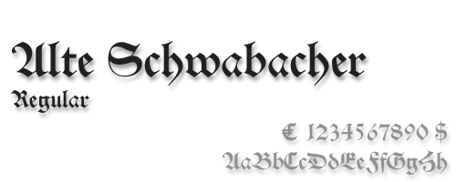

 German type designer, b. Frankfurt am Main, 1868, d. Leipzig, 1943. His oeuvre:
  German type designer, typographer, calligrapher, author and educator, b. Stuttgart (1918), d. 1995. He was art director at the Dresden type foundry VEB Typoart from 1964 until 1977. He founded and led the Institut für Buchgestaltung at the Hochschule für Grafik und Buchkunst at Leipzig from 1956 until 1978.
  Digital type artist at ParaType. Among her contributions is the digital version of a bastarda blackletter alphabet (
 Typefounder in Paris, ca. 1900, whose production included
  A classic form of blackletter first seen in 1472 in Augsburg where Johann Bämler created a version. It was very popular in the 16th century. Revived, e.g., by the following foundries: Drugulin/D. Stempel (1919), Benjamin Krebs (1918),
  Spanish foundry, est. ca. 2009, and on the web since 2012. It is located in Madrid. Alter Littera's fonts and web site are designed and managed by José Alberto Mauricio, who holds a doctorate degree in Economics and Business Administration, and is Associate Professor of Econometrics at the Universidad Complutense de Madrid.
  Graphic designer from Warsaw, Poland, now based in Pruszkow, who created the blackboard bold typeface
  Bastarda (Schwabacher in German) dominated printing in Europe in the last part of the 15th and the first part of the 16th centuries. It breaks with the heavy Textura that Gutenberg used in his first books and his bible. All of the Lutherian books were set in Schwabacher, which was nearer to handwriting. It was probably first used by Johannes Bäumler in Augsburg in 1472. In any case, it was in use in Nürnberg in 1485, and showed up in 1490 in Anton Koberger's Schedelsche Weltchronik and in 1498 in Albrecht Dürer's Apokalypse. Examples:
  Andreas Seidel lists the blackletter typefaces published by the Bauersche Giesserei (and I added a few more):
  Frankfurt-based foundry started in 1837 by Johann Christian Bauer. At the end of the 19th century, the new owner was Georg Hartmann. On its staff, it had designers such as Konrad F. Bauer [
 German foundry established in 1816 by Benjamin Krebs (1785-1858) and based in Frankfurt, which grew out of Schriftgießerey der Andreäischen Buchhandlung. Many of its shares were acquired by D. Stempel in 1933. A list of the typefaces:
  [
[ The Golden Globe Awards of type design, nominated by regulars at Stephen Coles' Typographica, a selection from the ground up. I feel these are the true winners---unlike all those awards for which one has to apply, pay a fee and be subject to the scrutiny of a "selection committee". Masterfully brought to you by Stephen Coles---bravo! As Stephen himself notes this year (2005), there are three trends: (1) Gone are the days when large commercial outfits put out the bulk of serious type. Nine of the 14 top selections come from one-man studios. Meanwhile, several of the big boys (ITC, Linotype, Monotype, URW) are absent. (2) Nearly every featured font is available in OpenType, and many exclusively so. (3) Xavier Dupré: the Cambodia-based Frenchman is perhaps todays most productive single source of creative type design, rivaled only by Christian Schwartz. Drumrolls:
  Bigelow&Holmes was founded by Charles Bigelow and Kris Holmes. Charles Bigelow (b. 1945, Detroit) is a type designer and teacher, who runs his own studio, Bigelow&Holmes. Bigelow was a colleague of Donald Knuth at Stanford University when Knuth developed his Computer Modern typeface family for TeX. In mid-2006, Bigelow accepted the Melbert B. Cary Distinguished Professorship at Rochester Institute of Technology's School of Print Media. Before that, he taught at Stanford University, Rhode Island School of Design, and other institutions. Typefaces designed by Bigelow:
  Wolgast-based type designer Peter Wiegel (b. 1955) runs CAT Design Wolgast. Designer of these free fonts:
  Leipzig-based foundry. It produced typefaces such as Neuwerk-Type (1908, Georg Schiller's blackletter),
  Nineteenth century typefounder based in Paris. Examples of their work include
  [
[ Author (b. 1938) of Kalligraphie. Die Kunst des schönen Schreibens (1986-1989, with Christian Scheffler). In that book, she drew several alphabets, including an
  The Classic Font Company is a small foundry with absolutely gorgeous commercial fonts (often revivals of pen drawings) by Tony Nash (b. Bristol, 1944): Abby (blackletter family),
  French type designer (b. 1948) who was born in the South of France. He studied typography, calligraphy and painting at the School of Fine Arts in Toulouse. He received the Prix Charles Peignot in 1982. In 1992, the President of France invited him to design the inscriptions for the royal tombs in the Basilique Saint Denis in Paris. He published
  CybaPee is the nom de plume of Petra Heidorn who lives near Hamburg. She has created many typefaces (listed below) between 1997 and 2005 and has cooperated with several type designers on interesting projects. She is undoubtedly best known for her successful web site
 During his studies at HTWG Konstanz, Germany, Daniel Wenzel created the sans and serif typeface family Dekan (2015) and the sans typeface Hass Grotesk (2016). Still in 2016, he revived Alte Schwabacher as Schwabacher Grotesk.
  [
[ Gerda Delbanco's German foundry in Ahlhorn, specializing in blackletter fonts. Great web presentation, and gorgeous glyphs. The company is owned by Gerda Delbanco, but it is not clear if she designed some or all of the typefaces. Some fonts were designed by Gerhard Helzel, and others by Christian Spremberg. This is one of the best sources of blackletter fonts in the world. Names of the fonts, which are nearly all historical revivals of the great blackletter fonts:
  FontShop was the name of
  A list of
  German type foundry in Hamburg established in 1986 by Veronika Elsner and Günther Flake. They offer original fonts as well as improved versions of classical fonts. There are many non-Latin fonts as well. In-house designers include Jessica Hoppe (Carpediem), Verena Gerlach (
 German foundry based in Berlin, active from 1866 until 1917, when it was acquired by H. Berthold AG.
  Typographer, type designer (b. 1879, Kassel, d. 1967, Bad König), teacher (at the Frankfurt Vocational School and at the College of Arts and Crafts in Offenbach am Main) and author of typographic books. In 1905, Engel became supervisor of in-house printing at the Klingspor foundry.
  Gábor Kóthay (Fontmunkások) is a Hungarian type designer (b. 1962) who lives in Szeged.
  Fountain is a Swedish foundry in Malmö, founded in 1994 by Peter Bruhn (1969-2014). In 2008, its designers include Rui Abreu, Lee Basford, Lars Bergquist, Felix Braden, Lotta Bruhn, Peter Bruhn, Lucas Brusquini, Matthew Chiavelli, Stefan Claudius, Thomas Crolla, Jay David, Stefan Hattenbach, Peter Hoffman, Nina Hons, Sylvia&Daniel Janssen, Randy Jones, Gábor Kóthay, Martin Lexelius, Ricardo Santos, Góran Sóderstróm, Simon Schmidt, and Dirk Uhlenbrock.
  Full name: Francisco Lucas Vezino De Sevilla. Spanish lettering master in the 16th century who wrote
  Designer at the Benjamin Krebs foundry who made Epoche (1912---well, I think this was by Eduard Lautenbach),
  Type designer and calligrapher (b. Passau, 1901, d. 1980, Traunstein) who made Gotenburg (1935-1937, D. Stempel) [with
  Type designer, teacher, publisher and calligrapher, b. Berlin (1882), d. Gundelfingen (1956). He worked initially with J.G. Schelter&Giesecke in Leipzig and C.E. Weber in Stuttgart. In the 1930s, he published his type designs with Bauer. He studied at the school for applied arts in Düsseldorf under F. H. Ehmcke and Peter Behrens. From 1920 until 1948, he was head of the graphics division of the Akademie der bildenden Künste Stuttgart, where his students included Albert Kapr, Imre Reiner and Lilo Rasch-Naegele. His oeuvre resides now in the Klingspor Museum in Offenbach. He is famous for his Amalthea, Zentenar Fraktur, Schneidler Antiqua, Schneidler Mediaeval and Legende. In general, due to his calligraphic tendencies, his types have great rhythm. In his era, he was at the top of his craft (in my view).
  Type foundry in Regensburg, Germany. Its typefaces included Neue Kirchenschrift (ca. 1890, a typeface acquired from Bauer) and Neue Zeitings Schwabacher (ca. 1900). For digital revivals, see Gerhard Helzel's
  Born in 1878 in Hohensalza, Ehmcke died in 1965 in Widdersberg. Graphic artist, book and type designer, and professor. From 1893 until 1897, he studied lithography in Berlin, and from 1899-1901 he studied at the Kunstgewerbemuseums Berlin. With Georg Belwe and Friedrich W. Kleukens, he founded the Steglitzer Werkstatt in 1900. He taught from 1903 at the Kunstgewerbeschule Düsseldorf, and from 1913-1938 at the Kunstgewerbeschule München . He ran the Rupprecht Presse in Munich from 1913-1934. Since 1941, he worked for the Bund für Deutsche Schrift, which is partially concerned with blackletter type. Finally, from 1946-1948, he was professor at the Hochschule der bildenden Künste München. He designed these typefaces:
  [
[ [
[ In 1950, Gebr. Klingspor published a nice small booklet simply called Schriftkartei. The images below are from that book. [
 Hamburg-based foundry ifounded by Emil Julius Genzsch (1856-1906). It was taken over by Linotype in 1963. Their library included typefaces by these designers:
  George Williams's site (now defunct) site was a discovery! George Williams (b. 1959) wrote spline-generating code and then went on to produce several fonts with his software between 1987 and 1998:
  [
[ Diplom Engineer, turned type designer and painter, b. Pößneck, DDR, 1948, d. Hamburg, 2025. In 1991, he started digitizing blackletter fonts and offered them for sale on his website. In his last digital leaflet, dated September 2022, he showcased 531 predominantly blackletter fonts, which would make Helzel the leading provider of blackletter fonts in the world. He was involved in the
  Gerrit Noordzij (b. 1931, Rotterdam; d. 2022) was a Dutch graphic designer, typeface designer, author, teacher, calligrapher, and design artist who made drawings, wood and copper engravings, and postage stamps. From 1960 until 1990 he taught writing and type design at the Royal Academy of Art in The Hague. One of his many students there was Lucas de Groot. Noordzij has worked as graphic designer for various Dutch publishers. Since 1978 he has been the house designer for the publishing company Van Oorschot. His intellectual influence is matched by his physical heritage, in the form of two talented sons in the field of type design, Christoph and Peter Matthias. The Gerrit Noordzij Prize, a prize given to typographers and type designers for extraordinary contributions to the field, is named after him. He was also the first person to receive this prize in 1996. In 2013, Gerrit Noordzij reveived the TDC Medal at the ATypI in Amsterdam.
  [
[
 Calligrapher, born in 1939. He studied graphic design at the Werkkunstschule in Wiesbaden under F. Poppl. Since 1988, he is professor of calligraphy at the University for Applied Science and Art at Hildesheim/Holzminden, Germany.
 German/Swiss foundry established in 1790 (however, see timeline below) and based in Basel/Münchenstein. Many of its shares were acquired by D. Stempel in 1927. Linotype takes over Haas in 1989. Their collection includes:
  [
[ [
[ German type designer (b. Lüneburg, 1856, d. Lüneburg, 1937). After years in Braunschweig and Stuttgart,
  German-American type designer (b. 1843, Berlin) who apprenticed at the Trowitzsch & Son type foundry in Berlin, and then worked as a punchcutter in Dresden and at the G. Haase & Sons foundry in Prague. After positions at the Flinsch foundry in Frankfurt, the Battenburg foundry in Paris, and the Fonderie Haas in Basel, Ihlenburg moved to the United States in 1866 to work for the L. Johnson & Company foundry in Philadelphia, which became MacKellar, Smiths & Jordan some time later. Specializing in ornamental (Victorian) fonts and borders, he designed over eighty typefaces for that Mackellar and a few more for American Type Founders after it purchased MacKellar, Smiths & Jordan in 1901. Ihlenburg became an American citizen in 1874, and died in Philadelphia in 1905. He will be remembered as the prototypical Victorian type designer.
  German company that sells 9999 fonts on a CD for 229 USD. In 2017, Infinitype 4 has 7444 fonts for 299 USD. One can download 20 fonts for free, as a teaser. The company is run by Martin Kotulla, owner of Softmaker, who also made the MegaFont CD. Many (most?) fonts are licensed from URW and come with a performance guarantee.
  [
[ Ingofonts is a foundry in Augsburg started by Ingo Zimmermann (b. 1967) in 1994. It offers Fraktur fonts, handwriting fonts, sans serif fonts, Antiqua fonts and some pixel fonts. Full fonts go for 50 USD a piece and up. Some fonts are free. Many fonts are adaptations or revivals of historically important fonts. Ingo also practices
  Intellecta Design is a design company in Brazil run by
  Iza W is a Brazilian type designer who works with Paulo W at intellecta Design.
  Fonts done in 2011:
  Major Dutch typographer and type designer, b. Gouda, 1892, d. Haarlem, 1958. He studied at the Koninklijke Academie van Beeldende Kunsten in Den Haag (1908-1912) and joined Enschedé in 1925. He had a considerable influence on the next generation of type designers. His typefaces include:
  [
[ Type designer (b. 1916, Dantzig, d. 1996, Kronberg). He studied lithography from 1933-1937 in Dantzig, and typography in Offenbach until 1944. After that he was associated loosely with Gebr. Klingspor, and was a freelance graphic designer from 1948 onwards.
  [
[ One of the first Belgian printers and typefounders, who lived and operated in Gent, Belgium, in the early 16th century. Born in Gent in 1491, he died in Wezel (Wesel) in Germany in 1556 or 1557.
  [
[ Basque penman, 1788-1853. His designs were engraved in 1833 by Giraldos and Nicolás de Gangioti and dedicated to the Queen Governor. That work was published in Colección General de los Caractéres de Letras Europeas (see
  Also written as
  Dutch Creative Alliance designer of Uncia (1999, uncial), Rudolph (Fraktur), Julius Primary (1999, a school font family), Amadeo (handwriting, 1999, with Fiel van der Veen) and Augusta (1999, +Cancellaresca, +Schnurkl). He published Xander (2001) at Agfa, a font based on the handwriting of the Dutch type designer Alexander Verberne. Finally, he published the calligraphic script family Gaius (2002), the calligraphic Bastarda typeface family Bernhardt Standard (2003), the Fraktur typeface family Frakto (2003), and the blackletter family Rockner (2005) at Linotype.
  [
[ Julius Klinkhardt designed typefaces such as the blackletter font Neue Schwabacher (1922, Berthold). He ran the Julius Klinkhardt Schriftgiesserei in Leipzig in the late 19th century, after having acquired the type foundry of Gustav Schelter in 1871. It was taken over by Berthold in 1920. Their typefaces include Flora Ornamente (1906),
  Viennese foundry acquired in 1926 by D. Stempel AG (50%) and H. Berthold AG (50%). Designers of Original-Schwabacher (before 1925) and Messe-Gotisch (before 1925). Kurt Liebing made Liebing-Fraktur, also some time before 1925. A small timeline of the company:
  German scribe, type designer and unbelievable calligrapher, b. 1914 in Schlesisch-Drehnow, d. 2000 in Offenbach. Following schooling in Schlesien and Hamburg, he served a four-year typesetting apprenticeship from 1930-1934 in Hamburg and later at the Kunstgewerbeschule (School of Arts and Crafts) in Offenbach am Main. From 1939 until 1945 he was in active military service and became a prisoner of the Russians. After that ordeal, he became a calligraphy teacher at the Werkkunstschule in Offenbach, and developed a universal pen with novel writing and drawing techniques for the company Brause. It is at that point that Hoefer started designing types as well. From 1970 to 1979, Hoefer was a lecturer and later professor at the HfG (School of Design) in Offenbach. From 1981 to 1988, Hoefer ran summer calligraphy workshops in the USA (Los Angeles, San Francisco, Boston, New York, Washington, and other cities). In 1982, Karlgeorg Hoefer founded a calligraphy workshop in Offenbach for everyone, with evening courses and summer school, and in 1987, the registered association "Calligraphy Workshop Klingspor, Offenbach, Supporters of International Calligraphy." From 1987 to 1995, he was the chairman of the association while teaching continuing courses and summer school classes with leading foreign calligraphers. Hoefer has written two books about calligraphy: "Das alles mit einer Feder" (Brause, 1953) and "Kalligraphie, gestaltete Handschrift" (Econ, 1986). Numerous articles about Hoefer's work have appeared in calligraphy journals in Holland, France, the USA, and Japan. In 1989, the book "Schriftkunst/Letterart Karlgeorg Hoefer" was published as part of Calligraphy-Editions Herbert Maring (Die Kalligraphie Edition, Hardheim, Germany, 1989). For his activities as a calligrapher, Hoefer received the Order of Merit of the Federal Republic of Germany in 1993. His typefaces:
  [
[ German foundry established in 1906 by brothers
  Swiss calligrapher in Basel who made and sells various medieval and historically important script fonts.
  Leipzig-based designer of
  [
[ [
[ Since 1993, Swiss type designer
  Big German foundry active in the first half of the 20th century. It was absorbed by Neufville in 1984, which will make its typefaces available in digital form. Type designers and typefaces:
  One of the oldest type foundries, founded by Paulus John Christian Egenolff (1502-1555), who was a printer in Strasbourg (1528-1530) and later in Frankfurt, where he was the first book printer. After his death, until 1572, his foundry was headed by family members, Magdalena, Barbara and Maria Egenolff. In 1572, punchcutter Jacob Sabon (d. 1580) took over after marrying Judith Egenolff, Christian's only daughter, in 1571. The widow remarries with Konrad Berner, a typefounder. Upon his death in 1606, the foundry is left to his son Hans Berner who dies in 1626. His daughter Katharina Berner takes over and marries Johann Luther in 1629, son of Friedrich Luther and family of
  [
[ [
[ [
[ [
[ Manfred's fascination with blackletter and its German roots is apparent from the tens of typefaces he designed that are either revivals of historic typefaces or playful and not so playful extensions. Here we go:


 Capitals are a favoritre playground for illustrators, drawers, and artists. They go beyond just mere type. So, to no one's surprise,
 Old metal era blackletter typefaces at Monotype: Armin-Fraktur (1904), Helen-Fraktur (Robert Haas), Halbfett Kasseler Fraktur,
  Fundicion Tipografica Neufville SA is a foundry based in Barcelona, headed by Wolfgang Hartmann, which writes about itself: Neufville Digital produces and markets the fonts from Fundicion Tipografica Neufville, Bauersche Giesserei, Ludwig&Mayer, Fonderie Typographique Française and Fundicion Tipografica Nacional.
  Graduate from FADU, University of Buenos Aires, who created the Bastarda typeface
 [
[ Typefounder who ran the Schriftgiesserei Otto Weisert in Stuttgart. Designer of the prototypical Jugendstil font Arnold Boecklin in 1904, a typeface named after the Swis symbolist painter Arnold Böcklin. Arnold Boecklin is available at URW,
  From Ashtabula, OH,
  [
[ Portuguese author of Tipografia: origens, formas e uso das letras (2006,
  [
[
 Peter Schöeffer, a calligrapher, was an assistant to Johannes Gutenberg in Mainz, Germany, through the years of preparation necessary for the printing of the 42 line Bible, in 1455. Schöeffer designed the font under Gutenberg's supervision, during the preceding years. The font was a very accurate imitation of the best manuscript style of the period, and it contained nearly 300 letters, ligatures, and abbreviations. Later in 1455, Gutenberg lost his business to Johann Füst, but Schöeffer stayed on with the new owner. In 1459, Schöeffer designed the first "transitional" typeface from Gothic to Roman and it was used in the publication of Rationale Divinorum Officiorum by Guillaume Durand (Durandus). Some of the upper-case characters have full roman shapes and several of the lower case characters are noticeably rounded.
  [
[ [
[ German designer (whose real name is Marianne Steinbauer) of these beauuuuuuutiful (free) fonts:
  [
[ Lazar Dimitrijevic, who set up the foundry Posterizer KG, was born in 1981 in Bajina Basta, Serbia, and lives in Kragujevac, Serbia. He obtained a Master of Graphic Design from the Department of Graphic Design, FILUM Kragujevac, Serbia. Presently, he is art director at
  Oberlin, OH-based foundry of
  [
[ Ralph M. Unger (b. 1953, Thuringia, East Germany) says this about himself at
  German foundry established in 1842 by Johann Peter Nees, Phillip Rudhard and Johann Michael Huck, that was located in Offenbach am Main. Carl Klingspor (1839-1903), the father, bought the Rudhardsche Gießerei in 1892. It was renamed Gebr. Klingspor in 1906. Scans of some of its typefaces:
  Great German type designer (b. Nürnberg, 1876; d. Frankfurt, 1934) who worked mainly at the Klingspor foundry. He founded the Offenbach Werkstatt in 1921.
  Foundry in Frankfurt am Main. House typefaces include
  Type classification (in German) according to the DIN 16 518 system invented in 1964. Pages by Bernhard Schnelle. I will use his German nomenclature, and quote his examples of each style.
  Dave Nalle was born in Beirut on March 19, 1959, and died on February 13, 2021 from COVID in his home town of Manor, Texas. From his
  [
[ The blackletter fonts sold by Softmaker (which are based on hand-digitizations of Berthold's and and other collections by URW and Primafont):
  Andreas Seidel lists the blackletter typefaces in D. Stempel's Probe No. 100 specimen book from the early 1940s. Verbatim, with some missing dates and designers filled in:
  Swiss graduate (b. 1965) of Luzern School of Art and Design, who settled in Berlin in 1997. Co-founder with Cornel Windlin in 1993 of Lineto, with Cornel Windlin and Andreas Eigendorf in 2014 of
 [
[ Lars Bergquist is the Swedish type designer (b. 1936) who runs Timberwolf Type in Sollentuna, just outside Stockholm. Bergquist designed numerous successful text families and display typefaces, including the free
  Born in Boston in 1976. Graduated with an MA in Typeface Design from-the University of Reading and studied at the Rhode Island School of Design. After graduation, he worked briefly for Jeremy Tankard and Font Bureau. In 2005, he worked briefly for
  A blackletter typeface by Frederic Goudy, designed in 1935, and modeled after the lettre batarde used by Geoffroy Tory in his Champs Fleury. Mac McGrew: Tory Text was a frankly archaic type designed and produced by Frederic W. Goudy in 1935. For a small edition of a twelfth-century story which he intended to print, Goudy chose a sixteenth-century type design to express the qualities he had in mind. This was redrawn in an attempt to make it more legible for modern readers while retaining the ancient spirit. Goudy describes Tory Text as one of his favorite types, and says that he enjoyed every minute of its making. See Village Text.
  Foundry est. in 2005 by
  Dresden (East Germany)-based font studio that evolved from the former East German centralized press, VEB Typoart.
  The fonts produced in 2002 by
 Born in Glückstadt a.d. Elbe, Germany in 1972, Ute Harder (known as Frau Jenson at P22) studied Illustration and Communication design at the University of Applied Science in Hamburg under Jovica Veljovic. Since 2002, she works as a freelance graphic designer, collaborating on diverse projects for Linotype and developing her own fonts. She lives in Hamburg.
  [
[ 16th century Franciscan scribe and calligrapher (1501-1563), known for his 1554 writing manual Opera di Frate Vespasiano Amphiareo da Ferrara ... nella quale si insegna a scrivere varie sorti de lettere (Venice, 1554), the first place where one can find a Bastarda. Typefaces based on
  Walden Font (est. 1997) sells historical typefaces&clip-art by Oliver Weiss from Winchester, MA. Walden's site includes a
  Typefounder Vaclav Jan Krabat (1719-1805) set up his shop in the center of Prague in 1751. His first specimen book was
  Past foundry of Charles Bigelow, Kris Holmes, and