| | |
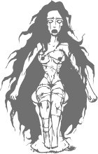
26Woman
|
A women's silhouette font made in 1997 by an unknown designer. [Google]
[More] ⦿
|
Adam Jagosz

|
 Aka Iorveth Aen Seidhe. Katowice, Poland-based designer of Slowglass (2017: a stocky 30-style geometric semi-serif sans family with vast language coverage that includes Cyrillic, Greek and Vietnamese), the rune simulation font Pertho (2016) and the penis font Semi (2016). He also made several interesting calligraphic pieces.
 In 2019, he designed the 62-style sci-fi typeface family Ares (+Ares VF), the condensed Latin / Greek / Cyrillic sans Rywalka, the creamy stencil typeface Aromatron and the leafy Aromatron Ornaments. Typefaces from 2020: AJ Quadrata (a revival of Textura Qadrata). Aka Quadratype. Devian Tart link. Creative Fabrica link. [Google]
[MyFonts]
[More] ⦿
|
Adam Turman
|
Adam Turman is a Minneapolis-poster poster artist and bicycle enthusiast. At Chank's place, he designed the bicycle dingbat typeface B Complex (2012: The best things in life begin with a B. Bikes, Burgers, Beers, Babes.) and the fat finger typeface Turman Grotesk (2012). [Google]
[MyFonts]
[More] ⦿
|
Alena Zhokina
|
Moscow-based designer of these Cyrillic typefaces in 2014: Cross Type, Art Type (all-caps ornamental typeface on the theme of breasts). [Google]
[More] ⦿
|
Alex Merto
|
Creator of the erotic alphading alphabet Effing (2010). Alex lives in Brooklyn, NY, was born in New York City, and was raised in Los Angeles. [Google]
[More] ⦿
|
Alex Szekely
|
Hungarian painter known for his erotic drawings, b. 1901, Budapest, d. 1968. He lived in Budapest, Paris and Vienna. In Vienna, he was a caricaturist in cabarets such as Der Liebe Augustin (1931) and at ABC (1934-1937). In 1946, he drew an erotic alphabet. [Google]
[More] ⦿
|
Alexandre Castanet
[Strip Letter]
|
[More] ⦿
|
Alexia Yang
|
Graphic designer from Long Beach, CA. She created an illustrated caps typeface inspired by contortion, called Grotesque Beauty (2011). Parakeet (2011) is a display face. [Google]
[More] ⦿
|
Alina Popa
|
During her studies at the University of Reading, UK, Alina Popa created the photographic alphabet Desire (2014), which is based on photographs of sexual paraphernalia. [Google]
[More] ⦿
|
Alphabet érotique
|
This Lesbian erotic alphabet was published ca. 1910 by an anonymous French artist in Livre d'heures ou guide de la Dégrafée parisienne. [Google]
[More] ⦿
|
Alphabet Sexe
|
An orphaned sexual position alphabet found on the web. [Google]
[More] ⦿
|
Alphabet Street Fonts
|
Designers of Sexy-MF. Web page no longer valid. [Google]
[More] ⦿
|
Alphabeth de la Bourbonnoise
|
 A French naked figure initial caps typeface from 1789. High quality image [46MB]. [Google]
[More] ⦿
A French naked figure initial caps typeface from 1789. High quality image [46MB]. [Google]
[More] ⦿
|
Anastasia Mastrakouli
|
Designer of a (photographic) naked silhouette alphabet done in the shower. The model is Anastasia herself. [Google]
[More] ⦿
|
Andrej Krahne
|
Branding director in Braunschweig, Germany. His typographic work in Type Sex with Durex (2010) is remarkable. Behance link. [Google]
[More] ⦿
|
Andres Quijano
|
During his graphic design studies in Santa Tecla, El Salvador, Andres Quijano designed the ornamental caps alphabet Leg Font (2013). [Google]
[More] ⦿
|
Anecdota Americana
|
This 1927 collection by William Passemon contains drawings by Anton Erdman and wood blocks by Bruce MacAile. [Google]
[More] ⦿
|
Angel Sanchez
|
Graduate of the Univsity of Guadalajara, mexico. Now based in Mexico City, he created a beautiful typographic poster called Sexo in 2015. Behance link. [Google]
[More] ⦿
|
Angie Wang
|
Self-proclaimed illustratress in Portland, OR, with a beautiful web page intro: angie wang has not gone to art school and has not won any awards for illustration and got no job and no cats no dogs and no birds so dont give her no shit.She made a nice all caps illustrated alphabet called Space Nomads (2009). Behance link. [Google]
[More] ⦿
|
Anke Arnold
[Anke Art]
|
 [More] ⦿
|
Anke Art
[Anke Arnold]
|
 Wernau (was: Wendlingen), Germany-based Anke Arnold's free fonts: aa QWERTZ-Tasten (2012: German keyboard font), aa Halftone (2012: texture face), aa Tafelschrift (2012, school font), Car Go Frame (2011), Car-Go Plain (2011, modeled after German license plate lettering), Typo Garden (2010, alphadings), 80er Teenie Demo (2009), Acki Preschool (2009), Just Another Stamp (2009), Firlefanz (2009, curly letters), Pixelstitch (2006), AnkeHand (2003), Hole-Hearted (2003, Gill Sans with hearts), KRITZEL (scratchy pen), MilkyWay, FrightNight, Eminenz (2002), Scribble, Skribus, Why, TooLazyToPractice, XXX, CheapInkkilledmyPrinter, Storch (alphadings), Alexandras-Stempelkasten, Anatevka-Caps, BulletMix, Catwalk, Duke, Dukeplus (2000, blackletter), Riddleprint, Anke-Print, AnkeCalligraph, Titanic, Wasser, butterbrotpapier, distracted-musician, dyslexic, manko, quixotic, verrutscht, zladdi, barcoded, BulletMix2, CAR-GO-2, Fortunaschwein (nice curly script; no punctuation or numbers), Round, BigBrothers&Sisters, BoringLesson, CrimesceneAfterimage, Incognitype (old typewriter), Jenna'sPopsicles, Japanese Brush (1996), Knuffig (2000), MonkyBusiness, Olympia2000, Samba, Dandelion, Kritzel (2003, scratchy hand), Krystal (2000, snow simulation typeface based on Gill Sans), Nervous, ParryHotter (2001, a Harry Potter blackletter face), Pffft, Tschiroki, Heart2Heart (heart alphadings), Anke Sans.
 English page. For 10DM (5 USD), Anke will make your handwriting into a font! Alternate URL. Dafont link. Another link. Open Font Library link. [Google]
[More] ⦿
|
Anthon Beeke
|
Author of Body Type (1969), reedited in 2011 by Spinhex, Amsterdam, with the help of René Knip. Nijhof and Lee write: Body Type is a re-edition of the legendary naked-women alphabet by Anthon Beeke originally published in 1969. This alphabet, which was published in the famous Kwadraadblad serie by Pieter Brattinga, is a carefully composed representation of the letters of the alphabet using naked women. Beeke made the alphabet as a tongue in cheek response to Wim Crouwel's New Alphabet published in the same serie a year earlier. This new edition which is in colour, is complimented and enlarged with the numbers modelled by naked men all on individual sheets. It also contains a cahier with the history of the alphabet and a block containing the letters which can be used to make a streamer. His alphabet is also referred to as the "Nude Alphabet" in Kwadraat (Steendrukkerij De Jong&Co, Hilversum, The Netherlands, 1970). Using twelve nude women, it is also known as Naked Ladies. Anthon Beeke died in 2018. [Google]
[More] ⦿
|
António Carreira
|
Brazilian designer of OralSex, PaintBrush-Draws, Peace-Symbol, Psicadelic, Sex-Machine, Shaking-Bones, Scully, Sacha, Demon-Bones, Vaca, Virus, Eraser (2006). [Google]
[More] ⦿
|
Apostrophic Laboratory
[Fredrick M. Nader]
|
 One of the most dynamic foundries from 2000 until 2003. The "Lab" was run by Apostrophe (Fredrick Nader) and was based in Toronto. The name Apostrophe comes from a Frank Zappa song. It has produced well over 1000 original free fonts, in all formats (type 1, truetype, and opentype, PC and Mac), and nearly all fonts have full character sets. Many have character sets for extended European languages and Cyrillic as well. It was for a few years the only active producer of multiple master fonts. Download site at Typoasis. Original URL, now being reworked. Highlights:
 - Miltown (from the Matrix movie).
- Fluoxetine (old typewriter).
- Desyrel (handwriting, Dana Rice).
- PicaHole-1890Morse font.
- Ritalin has almost 500 glyphs, and is a family designed for Latin, Greek, Turkish, eastern European, Cyrillic and Baltic.
- The 3-axis multiple master ImpossibleMM (of Mission Impossible fame).
- Carbolith Trips (letters from cuneiforms).
- Diehl Deco (revival of 1940 lettering by Wooster Bard Field; with Marley Diehl).
- Textan (with Rich Parks or Richard D. Parker; inspired by the Chinese Tangram).
- Poultrygeist (horror comic font).
- Hard Talk (an R-rated font by Slovenian Marjan Bozic).
- Independant (with Phynette; a faithful revival of a 1930s font by Collette and Dufour for Maison Plantin in Belgium---a fantastic Art Deco font family).
- Metrolox ("Enemy of the State" font, with Karen Clemens; a Unicode font with 567 glyphs for over 20 Latin-based languages and some math symbols).
- Komikaze, Komikazba, Komikahuna and Komikazoom (comic book fonts: 1280 glyphs for Latin, Greek, Cyrillic, Baltic, Turkish, East-European, with dingbats and Braille).
- Republika (a 300-font techno family; read about it here).
- ChizzlerMM (3-axis multiple master, a reworked version of Graham Meade's Chizzler).
- Street (a 87-font family by Graham Meade).
- Amerika (fantastic Armenian-look font series, with support for Greek, Cyrillic/Russian, Baltic, Turkish and Central European).
- The dingbats Eyecicles and Texticles, both with Graham Meade.
- Insula (2001, a Celtic/uncial font with Cybapee).
- Komika (2001, 50 comic book fonts designed with Vigilante). A spoof on Comic Sans, this family includes Komika Hand and Komika Text.
- Labrit (a great Fraktur font, with Graham Meade).
- Frigate (a Roman-kana font by Melinda Windsor).
- Scriptina (an unbelievable calligraphic font by Apostrophe, 2000-2001). In 2010, CheapProFonts published an extension, Scriptina Pro.
- Freebooter Script (an equally unbelievable calligraphic font by Graham Meade, 2001).
- Choda (a display font like none you have seen before; Apostrophe and Meade, 2001).
- Endor (with Meade, a Gothic font; 2001).
The list of designers and their fonts: - Apostrophe [dead link]: Day Roman (2002, the first digitization of Fr. Guyot's "Two Line Double Pica Roman", designed in the early 1600s), Bombardier (2002), Propaganda (2002), PropagandaCyrillic (2002), PropagandaGreek (2002), Contra (2003), Ergonome (2002), Ergonomix (2002, techno dingbats), Alfabetix (2002), SoMM (2002, a multiple master font), Templo (2001, a pixelish font), Zoloft, Miltown, Witches Brew, Celexa, Labrat, Effexor, Fluoxetine, Tralfamadore, Halcion, RxMM, Paxil, Valium, Fight This, Ritalin, Xanax, Maskalin, PicaHole, ImposMM, MiltownII, Carbolith, Komikaze, Komikazoom, Komikahuna, Diogenes, Komikazba, MistressScript, Sledge, Mary Jane, Republika, StarBat, Merkin, Erectlorite, Halter, Estrogen, Steinem (based on Dalton Maag's British Steel typeface), Lab Mix, Mary Jane II, Amerika, Masque, Konfuciuz, Mastodon, Broad, Amerika Sans, Scriptina, Karnivore, Cholo, Sedillo and Reprobate (all three based on Mike Sedillo's handwriting, 2001), Templo (screen font family, 2001).
- Marjan Bozic and Apostrophe: Hard Talk.
- Karen Clemens and Apostrophe [dead link]: Wellbutrin, Metrolox, Jagz.
- CybaPee and Apostrophe [dead link]: Cyclin, Lady Ice, Insula.
- CybaPee [dead link], Graham Meade and Apostrophe: Yellowswamp, Lady Ice revisited.
- Steve Deffeyes: Loopy.
- Marley Diehl and Apostrophe: Diehl Deco.
- Fleisch and Apostrophe: Colwell, Hadley.
- Steve Graham: Hypnosis.
- Frank Guillemette and Apostrophe: Ankora.
- Jeri Ingalls and Apostrophe: Paxil.
- Neumat Ick and Apostrophe: Icklips, Powderfinger.
- Keya Kirkpatrick: Extasy
- Keya Kirkpatrick and Apostrophe: Kimono.
- Jeff Lan: Healthy Alternative, Haven Code.
- Su Lucas and Apostrophe: Barbarello.
- Brigido Maderal and Apostrophe: Lab Bats.
- Graham Meade: Quastic Kaps (8-weight family, 2003), Quixotte (2002), Mechanihan (2002), Kameleon (2002), Lady Ice Extra (2002), Gizmo (2002), Zillah Modern (2002), Wazoo (2002), JamesEightEleven (2002), Equine (2001), Street Corner (2001), Freebooter Script, Street (31 font sans and slab serif), Bipolar Control, Lane, Street, Street Slab, 2nd Street, Kronika, Thong, Whackadoo Upper, Charrington, Lady Copra, Zebra, Extra Meade Pack, Control Freak, Dekon, Asenine, Heidorn Hill (a Fraktur font), Castorgate, Troglodyte.
- Graham Meade and Apostrophe: Moondog (2001), Choda, Futurex, Duralith, Epyval, BooterMM, Pamelor, Sabril, Erinal, Karisma, Whackadoo, Bicicles, Drummon, Primary Elector, Youthanasia, Grunja, Prussian Brew, ChizMM, Luciferus, Labtop, Gilgongo, Labrit, Kandide, Brassiere (which became the commercial typeface Ipscus in 2009), Eskargot, Endor, Labag.
- Graham Meade and Rich Parks: Luteous, Luteous II.
- Link Olsson and Apostrophe: Librium, Severina, Poultrygeist, Extrano, Komikandy.
- Rich Parks and Apostrophe: Textan, Glaukous, Textan Round, TexSquareMM, TexRoundMM.
- Alejandro Paul and Apostrophe: Fontcop, Usenet, Cayetano, Elektora.
- Evelyne Pichler: Sindrome.
- Evelyne Pichler and Apostrophe: 1910 Vienna.
- Phynette and Apostrophe: Independant.
- Peter Ramsey and Apostrophe: Distro, Futurex Distro (2001).
- Dana Rice and Apostrophe: Desyrel, Lilly.
- Wayne Sharpe: Ovulution I and II.
- Jessica Slater: Wiggles.
- Jessica Slater and Apostrophe: McKloud.
- Derek Vogelpohl: Phosphorus, Florence sans, Plasmatica, Covington, Avondale, Phosphorus II.
- Melinda Windsor: Plastic, Frigate.
- Robby Woodard: Ashby (2001).
- WolfBainX and Apostrophe: Tribal, Komika.
- Yol: Traceroute.
Font Squirrel link. Dafont link. Abstract Fonts link. [Google]
[MyFonts]
[More] ⦿
|
Apply Design Group
[Thomas Sokolowski]
|
German foundry (est. 1989) based in Hannover and run by Thomas Sokolowski, selling mainly display fonts. Thomas made standard ransom note fonts such as Mystery EF Mixed (1990). He also designed about ten clean old typewriter fonts such as Old Typewriter EF Regular, 1990. Other fonts include the ultra-thin Spirit EF, Imprimeur Classique (1989, a computer modern face), Scripture (1990, handwriting). Sokolowski founded Apply Design Group in Hanover, Germany, in 1989. Apply Design Typeface Library. Overview. Fonts and designers: DNA (by Steven Boss), CasaSeraSera (by Yanek Iontef), Nurse Ratchet (by Don Synstelien), Thordis, Amoebia (by Jens Gehlhaar), Aspera (by Harald Oehlerking), Bastard (1995, Ansgar Knipschild), BigDots (1993, Andreas Klimek-Falke), Birds (Manfred Klein), Blindfish (1992, Jens Gehlhaar), BodoniRough (1998, Thomas Sokolowski), FuturRough, GaramondRough (1997, Christian Terbeck), Rohrfeder-Rough (1997, Christian Terbeck), Bumpers, Casc Seta, Coltrane, Concept One, Concept Two, Cornwall, DamnedDingbats, DeconStruct, Electrobazar, Elside, EthnoFont, Fuzzy (1998, Jonas Gonell), Gagamond (1993, Jens Gehlhaar), Grind (1994, Ansgar Knipschild), Hansel (Catinka Keul, children's handwriting), Homeboyz (1994, Oliver Hoffmann), ImprimeurClassique (a didone font, 1993, Thomas Sokolowski), Indian Summer, Las Bonitas (1992, Thomas Sokolowski), MarieLuise (1994, Dietmar Schmidt), MedLed, Merz (1993, Thomas Sokolowski: not clear idf this is supposed to be a dada typeface), Monterrey (1993, Thomas Sokolowski), MoreKaputt, Mex (1992, Thomas Sokolowski), Mystery (1992, Thomas Sokolowski), Old Typewriter (1992, Thomas Sokolowski), Tierfreund, Thing (1993, Mathias Maassen-Pohlen), Paccer, Rio (1994, Alfred Smeets), Scripture, Spirit, Steelplate, Truck, Uhura (1993, Ansgar Knipschild), Xtronic (1995, Thomas Sokolowski), Tokay, ScreamHot, scanneZ, Fanatique, Euredice, and WhyNot. Great web presentation, and complete character sets. In grunge, Concept is as good as they come, for example. The company also sells a CD with erotic icons. CD ROM called "typografica" with high quality display fonts in PostScript. List of fonts. Fonts sold by Faces. Other type designers: Manfred Klein, Alexander Koch, Carlo Krüger, Antje Wolf. FontHaus link. Klingspor link. [Google]
[More] ⦿
|
Art Illustration Gaspard
|
Gaspard sells 26 illustrations, one for each letter, showing people in interesting positions. He sells similar sets called Fish, Danse, T-Bone (skeletons), M.I.B. (men in black), Bonne Année and Acid. [Google]
[More] ⦿
|
ArtistMike.com
|
ArtistMike (real name unknown) designed Komica Halftone, Shaded Art Brush, Animal Letters, Gargoyle 11, YellowSub&Dings, Mickey Letters, Mickey Dings, Mickey Mouse Dings&Letters 3.0, Rooster Font, Scary Clowns, School Dings, PinUps, Scrolls Dings, MC Borders, MC Pinup, SandDaisy, ScaryClowns, Donald&Dings, ArtistMike.Orniments12, Sun Dingbats. Get the fonts by email. Logo to font and signature to font conversion service. [Google]
[More] ⦿
|
Astro Fonts (was: FontGrrl)
|
Charlotte's 150-font archive. Nicely categorized. Includes a few "sexy" fonts. [Google]
[More] ⦿
|
Atomic Alley
|
Adam McCauley (Atomic Alley) is the creator of beautiful erotic letters. [Google]
[More] ⦿
|
Behind The Sun
|
Original Mac and PC fonts in all formats, 2000-2002: Rena, Nanako, Sexy and Sexy Dynamite. [Google]
[More] ⦿
|
BeJota
[Bruno Jara Ahumada]
|
 Santiago, Chile-born type designer who graduated from Universidad de Santiago de Chile in 2015 and 2016. After work at the Museo de Arte Contemporaneo and Museo Nacional de Bellas Artes, he joined the Latinotype foundry in Santiago. He moved to Konstanz, Germany and set up his own type foundry, BeJota in 2021.
 In 2016, Bruno Jara Ahumada, Alfonso Garcia, Luciano Vergara, Daniel Hernandez and the Latinotype Team designed the roman square capital headline typeface family Assemblage. With Luciano Vergara, he designed the angular Jurassic park style typeface Los Lana Niu (2016). In 2018, inspired by Herb Lubalin's ITC Serif Gothic, Jorge Cisterna and Bruno Jara co-designed the layerable font family Lumiere at Latinotype. Typefaces from 2019: Galeria (Latinotype: a monoline slab serif typeface inspired by modern art gallery buildings, museums and cultural centers where organic forms and straight lines predominate). In 2019, Jorge Cisterna and Bruno Jara developed the vintage layerable typeface Blackberry (Los Andes). Blackberry is inspired by vintage packaging and old fashion ads. It has woodtype characteristics such as angular serifs, and light and diagonal curves. Typefaces from 2020: Diablito One (a two-font and four dingbat-font package by Rodrigo Araya Salas and Bruno Jara Ahumada), Galpon Pro (a great vernacular signage and/or comic book typeface for Latin, Greek and Cyrillic; with Rodrigo Araya Salas), Skippie (a comic book family by Andrey Kudryavtsev, Rodrigo Araya Salas, Bruno Jara Ahumada and Franco Jonas, and four sets of dingbats including Skippie Monster Lucha Libre and Skippie Monster Halloween). Typefaces from 2021: Rhein (an 18-strong rounded monoline sans family with a gorgeous inline style), Loyola Next (a 14-style sans by Rodrigo Araya Salas and Bruno Jara Ahumada), Showcase Sans (as part of a custom job for Vino Licensioso; this project includes sexy icons), Konstanz (an 8-style Bauhaus-inspired sans family), Picaflor (a titling or children's book typeface by Rodrigo Araya Salas and Bruno Jara Ahumada), Picaflor Soft (a fine national park or children's book family of organic sans fonts by Rodrigo Araya Salas and Bruno Jara Ahumada). Typefaces from 2022: Garvo and Garvo Poster (6 styles each; based on old Hollywood movie posters, vintage film credit designs; Garvo pays homage to Herb Lubalin's Serif Gothic font and is named after Greta Garbo). Linkedin link. [Google]
[MyFonts]
[More] ⦿
|
Bill Ward
|
Designer of the erotic silhouette font Beauties by Bill Ward. [Google]
[More] ⦿
|
Blanca Campins Otero
|
Barcelona-based designer of the hand-drawn Taboo (2019) and the ultra-condensed piano key typeface Queso (2019). [Google]
[More] ⦿
|
Blonde Fonts (was: Siesta)
[Charlotte Iona Dymock]
|
Free fonts by Charlotte Iona Dymock with some erotic overtones such as Kinky Valentine (2000: dingbats). Other fonts: AngelLust, Celestial, PaperCutouts, Matrix, ParanoidAndroid, PlasticExplosive, RaindropSplash, ShadyLady, Stamped!, ThunderCats, UnderwaterLove, Weimar, Flaming Fire, Thundercats. Site disappeared. [Google]
[More] ⦿
|
BluHead Studio LLC
[Steve Zafarana]
|
 Type design studio located in Norwood, MA, est. 2005. Fonts can be bought at MyFonts.
 BluHead Studio LLC was founded in 2005 by a group of type designers, including Steve Zafarana, who founded Tail Spin Studio in 1999, also in Norwood, MA. Steve Zafarana was senior type designer at Bitstream from 2006-2012 and at Monotype from 2012 onwards. BluHead Studio was filling out the character sets and digitizing the font designs of New Zealand designer Joseph Churchward. These include the psychedelic Ta Tiki CW (2006) and Conserif CW, Design CW (2006, geometric). Creations by Tallulah Bluhead include Soylent Blu BH (2006: a bouncy cartoony wedge serif)) and Conference Call BH (2006). Roy Preston published the Prenton RP humanist sans family in 2006 and the comic book style families Comixed RP and Roy Hand RP in 2007. Between 2006 and 2008, several hand-printed typefaces were published. These include Barbara Script BH (2007, after the hand of Barbara Bemiss), Ciof Script BH (2008, a felt tip pen font after Susan Ciofolo Antico), Sally Script BH (2006, after Sally Muspratt), and Joanne Script BH (2007, by Joanne Paul). Sparkle Bluff BH (2007) is a ball and stick font for children. Notebook BH (2008) is a block letter face. In 2007, BluHead started publishing fonts by Joseph Churchward: Churchward Asia, Churchward Brush, Churchward Chinatype, Churchward Heading, Churchward Lorina (2014---the original by Churchward goes back to 1996), Churchward Maori, Churchward Maricia, Churchward Ta Tiki, Churchward Conserif, Churchward Design Lines, Churchward Freedom, Churchward Isabella (2015, a sans), Churchward Marianna (bubblegum face), Churchward Montezuma (2012, based on an Aztec-inspired design), Churchward Newstype (2008), Churchward Samoa, Churchward Supascript, Churchward Typestyle (2022; a 12-style sans). FontShop link. Creative Market link. Klingspor link. View the BluHead typeface library. [Google]
[MyFonts]
[More] ⦿
|
Brady Clark
|
Logo designer who did some nice lettering, including the logo for "Pleasure Box" (great!!!) and "Suck" (a satiric publication). [Google]
[More] ⦿
|
Bruno Jara Ahumada
[BeJota]
|
 [MyFonts]
[More] ⦿
[MyFonts]
[More] ⦿
|
Camille Laurent
|
Or Camille Laurent-Dánielfy. During her studies at École Supérieure d'Arts et Médias de Caen, France, Camille Laurent designed Blanchardscript (2014), which is based on the handwriting of type designer and typographer Gérard Blanchard. This typeface was developed together with Julie Patat (École Estienne) and Sara Frigault (ESAM Caen) in a workshop led by Franck Jalleau at l'Institut Mémoires et Édition Contemporaine. Together with Marie Dubois, she created the suggestive typeface Pigalle (2015). [Google]
[More] ⦿
|
Carine Abou
|
French designer of the human figure silhouette font C Comme Corps (2015). [Google]
[More] ⦿
|
Carlos
|
Designer of the erotic silhouette font Cuties-by-Carlos. [Google]
[More] ⦿
|
Carlotta Megali
|
Milan, Italy-based designer of Amore (2020), a female breast dingbat typeface. [Google]
[More] ⦿
|
Carolyn Gibbs
[Hedonia]
|
[More] ⦿
|
Catherine D'Amours
|
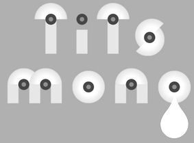 Graphic designer in Montreal who created Tits Mono (2014). She founded the Collectif Pointbarre in 2010. [Google]
[More] ⦿
Graphic designer in Montreal who created Tits Mono (2014). She founded the Collectif Pointbarre in 2010. [Google]
[More] ⦿
|
CCGirlsGirlsGirls
|
CCGirlsGirlsGirls Nice (2002) and CCGirlsGirlsGirlsNaughty (2002) are two erotic outline fonts made by Comicraft by Richard Starkings or John Roshell. [Google]
[More] ⦿
|
Céline Teiten
|
Independent graphic designer in Strasbourg, France. Behance link. She created an erotic typography poster in 2012. [Google]
[More] ⦿
|
Character
[Herbert F. Van Brink]
|
 Prolific Woodland Hills, CA-based typophile and type designer (1937-2013) whose portfolio consisted largely of revivals and who used the alias Character for his typographic work. The Los Angeles Times posted this obituary: Herb passed away after a brief fight against esophageal cancer. He was a 42 year resident of Woodland Hills CA. Son of the late Jean and Mary Van Brink, he was born in Manhattan, graduated from Stuyvesant High School (1952) and Queens College (1956) and always considered himself a New Yorker. He had a long career in Information Technology and retired from Arco. He loved traveling, bowling, genealogy, and was a bridge Life Master among his many interests. He was a trickster and a perfectionist. He leaves his wife, Paula, his son, David Van Brink and DIL Deb Culmer of Santa Cruz CA, his daughter Qarin Van Brink and SIL James Ray of Burien WA, grandchildren Amelia and Wilhelmina Ray Van Brink, brother and sister-in-law Jeffrey and Louise Van Brink of E. Northport NY and nephews Matthew and Jordan Van Brink.
 His typefaces: - Animal dingbat fonts: AbecedarianZoo (2003, created from an alphabet in Art Explosion 200,000), Turf&surf (2005).
- Alphadings: Jennifer's train (2011), ABCPlay (2005), DiddleTheMouse (2005), Silly Set (2005), Stone Carving (2005), Snow Persons (2005), Alaskan Ice (2005), Peppermin Canes (2005), USStarsNStripes (2003, first called USFlags), XmasTree (2002), XmasTree II (2004), Xmas Alpha (2005).
- Erotic alphabets: Flotner (2002, based on a scan of the human character alphabet by Peter Flötner (1534)), SilvestreBodies (2006, based on a figurative alphabet designed by Joseph Balthazar Silvestre in 1834, with engravings made by Girault), ErotiCaps Outline (2007), ErotiCaps Solid (2007), WeygelBodies (2006, adapted from Martin Weygel's 1560 interpretation of Peter Flotner's 1534 figurative alphabet).
- Stained glass themed fonts: ModernStainedGlass (2007), ModernStainedGlass2Tone (2007).
- Capital alphabets: Cameo Antique (2011, after Cameo Antique on page 17 of The Solotype Catalog of 4,147 Display Typefaces---a shaded outline version of the typeface called NightShade, on the same page of Dan Solo's book; the only known digitized fonts of NightShade are "Shadowed Serif" by James Fordyce (1994) and NigelSadeSH, from Soft Horizons (1993)), Modern French Capitals (2010, after a set of capitals drawn by Alphonse Mucha), Mucha French Capitals (2010, similar?), Marcel Caps (2007; based on "Crossroads" by August Will (1891)), WoodLook (2007, an improvement of 101's Wooden Alpha BlockZ), 3DAlphabet (2008, based on an alphabet coloring book designed by Jean Larcher, 1978), RomantiqueInitials (2007, based on work by Aridi), Blistered, BlisteredFramed, BlisteredReverse (2005, based on Marwan Aridi's Blister from the Initial Caps Vol I), ChiseledRound, Contemporary CH (2010), CourierInitials (2005, based on an alphabet by Johan)), Eclectica (2003, party-theme), FeathersInYourCaps (2002), FlowerSketches (2002), LACETRIM (2002), LeafyStencil (2003), QuiltedStippled (2004, based on an embroidery alphabet created by DesignsInStitches), RetroCapsBW (2004), RetroCapsWB (2004), Rope5 (2004, rope font), Rustic Black Shadow (2011. He explains: In the Solotype Catalog of 4,147 typefaces, RUSTIC is shown with a black shadow. RUSTIC WHITESHADOW has a white shadow. However, the Solotype digital font named RUSTIC has no shadow. Similar no-shadow fonts are also available as Pinewood (by Rick Mueller and one by Dieter Steffmann) and as Woody (by DincType). As of October, 2011, no digitized version of Rustic Whiteshadow is known. Character has produced a font named RusticBlackShadow, which matches the font named Rustic in the Solotype Catalog. Dick Pape had created an earlier version named Pepin Press Caps FA204, based on fonts contained in the Pepin Press book Fancy Alphabets. ), THINROPE (2002), VALENTINEHEARTS (2002), Printed Circuit (2005), SportsABC (2005), Feathered Flight (2005), Joe Clement (2007, Western pixel face), Ribbon Shadow (2007).
- Fonts based on scans from Awesome Alphabets (Mike Artell, 1999, Good Year): SketchBoards, SketchBones, SketchClothes, SketchLogs (2005), SketchPencils, SketchPipes, SketchTools, all done in 2005.
- Athletic lettering: Collegiate Heavy Outline (2006), Real Madrid 2011-2012 (2011, an expansion of a font by "Adriano"), The Football League (2011), Adidas Euro 2008 (2011), Puma World Cup 2010 (2010: based on Crepello, a custom-made font by Paul Barnes for Puma, that was used on the jersey of Italy, Switzerland and Uruguay during the 2010 FIFA World Cup), Adidas Unity (2010), LINKEB+Regular (2008) uses the lettering of the Geaux font used by LSU.
- Pixel or dot matrix style fonts: Dash It All (2007, based on Cooper Black), Even Hearted (2007, an improvement of CK More Hearts), Square 9x9 (2007).
- Brush typefaces: Skippingbrush (2006), GraffitiPaintBrush (2008).
- Dingbats: Being Sport Pictograms (2008).
- Scanbats: PilobusSilhouettes (2010) is based upon a human alphabet photographed by John Kane.
- Techno: BultacoDual (2010), Dr Who 42 (2007), London MMXII (2008), ArrowheadLake (2009, +Shadows, +Sunlit; based on the nearly blackletter typeface Arrowhead from the Solotype Catalog and alphabet books).
- Historic typefaces: Driftwood 67 (2011, Driftwood on page 67 of The Solotype Catalog of 4,147 Display Typefaces), ArrowheadLake and ArrowheadLakeShadows (2011, based on Solotype Catalog p.74), Cutin (2011, a simple rounded monoline sans called Cut-in Medium on page 163 of The Solotype Catalog of 4,147 Display Typefaces),Cutin (2011, a simple rounded monoline sans called Cut-in Medium on page 163 of The Solotype Catalog of 4,147 Display Typefaces), Pepin FA288 (2011, based on Matra, or Bifur, on page 54 of The Solotype Catalog of 4,147 Display Typefaces by Dan X. Solo), Varicka (2010, from "Decorative Condensed Alphabets", by Dan Solo, p. 94. It is similar to Red Rooster's Triple Gothic Condensed, but the Solo's font has different features), MaxfieldParrish140 (2007: From an incomplete (no "N") hand-drawn alphabet by Maxfield Parrish. See figure 140 of "Letters&Lettering" by Frank C. Brown, 1921. This is a different source than the P22 Parrish font family.), Ronde Antique (2009, based on page 110 of the Verlag Gerlach 1881 catalog).
- Other: Scramble Mixed (2006, scrabble face), Happy Fourth, Emperor AN (2009: this semi-art nouveau typeface is Emperor on page 42 of The Solotype Catalog of 4,147 Display Typefaces---not the same as Dan Solo's Emperor at MyFonts), Wood Gothic Caps (2011, blackletter), WoodWud (2011), Gallia Two (2010, based on a font found on page 55 of The Solotype Catalog of 4,147 Display Typefaces as Gallia No. 2), Charleston (2010, based on page 46 of The Solotype Catalog of 4,147 Display Typefaces), Azteca Regular (2010: based on Azteca Condensed by Dan X. Solo, page 74 of The Solotype Catalog of 4,147 Display Typefaces), Othello Fill and Solid (2011, derived from Othello on page 155 of The Solotype Catalog of 4,147 Display Typefaces), Sharons Shadows (2010, +Bold), Masked Menace (2012, based on Bodoni Poster).
Fontspace link. Dafont link. Fontspace link. And another one. See also at abfonts. Dafont link. [Google]
[More] ⦿
|
Charlotte Iona Dymock
[Blonde Fonts (was: Siesta)]
|
[More] ⦿
|
Chef
|
Creator of the penis-themed alphabet Pimmel (2011, iFontMaker). From the name of the font, I suspect that the creator is Dutch or Flemish. [Google]
[More] ⦿
|
Christophe Féray
[WC Fonts]
|
 [More] ⦿
|
Cinderella Jimu Harrington
[CindiGirl]
|
[More] ⦿
|
CindiGirl
[Cinderella Jimu Harrington]
|
 The CindiGirl site closed. Cartoonist and computer specialist who ran (runs?) The Art of Jimu. Her pages show an exquisite collection of celtic style erotic caps in the style of Aubrey Beardsley. Unknown origin---I must conclude that Harrington drew these caps herself. A download site. [Google]
[More] ⦿
The CindiGirl site closed. Cartoonist and computer specialist who ran (runs?) The Art of Jimu. Her pages show an exquisite collection of celtic style erotic caps in the style of Aubrey Beardsley. Unknown origin---I must conclude that Harrington drew these caps herself. A download site. [Google]
[More] ⦿
|
Claude Melle Derieppe
[Ouvrez!!! Police!!!]
|
[More] ⦿
|
Concept: Alte Zachen
|
Small Hebrew foundry. Carries fonts by a number of designers. We find AhavaBats, BNConcept, BNCombination, IdoBold, IdoNormal, StormtrooperBold, Stormtrooper, Concept, AddamMF-BoldItalicA (pixelfont, 1996, copyright tammy2000), AhavaBats (2001, Meir Sadan, a sexual positions font), BN Combination (2001, arrow dingbats by Ben Nathan), BN Concept (200, Hebrew handwriting by Ben Nathan), Concept (2000, pixel font by Meir Sadan), Ido (2002, pixel font by Itay Kander), Stormtrooper (2002, by Daniel Levy and Ben Nathan). [Google]
[More] ⦿
|
CybaPeeCreations (or: Typoasis)
[Petra Heidorn]
|
 CybaPee is the nom de plume of Petra Heidorn who lives near Hamburg. She has created many typefaces (listed below) between 1997 and 2005 and has cooperated with several type designers on interesting projects. She is undoubtedly best known for her successful web site Typoasis (discontinued in 2016), where one could download her own creations, and those of her many friends. Petra was also heavily involved in several attempts to revive blackletter fonts, in cooperation with Manfred Klein, Dieter Steffmann, Paul Lloyd and others. She organized several revivals of the typefaces of Rudolf Koch and Ernst Schneidler. She also managed the extensive web presence of Manfred Klein.
 In 2016, she allowed me to host her fonts on my site. Download page. Download all her fonts in one zip file. Her typefaces: - AlphanatismConHeads (2001). Stamped style.
- ArabDancesMediumItalic (2002). An Arabic simulation typeface done with Manfred Klain's assistance.
- Azimech (1999).
- Bauernschrift (2004). After a 1911 typeface from Bauersche Giesserei.
- Bayreuth (2003). A nice scan-version of Bayreuth Fraktur by Ernst Schneidler for C.E. Weber in 1932.
- Bibelschrift (2004). Codesigned with Manfred Klein, Bibelschrift revives a Fraktur from 1926-1928 used by the Bremer Presse, est. 1911. The Bremer Presse was bombed by the Americans in 1944.
- BirthdayGreetz (1999).
- Brahms Gotisch (2005). A blackletter typeface co-designed with Manfred Klein. It is a revival of a 1937 Genzsch&Heyse typeface designed by Heinz Beck.
- Burte Fraktur (2003). After Christian Heinrich Kleukens for the Mainzer Presse, 1928.
- CalliBrush (1999).
- Camouflage (1999). Textured.
- Chaos-Theorie (2000). A Halloween or vampire font.
- Charon (1999). An angry and / or scary typeface.
- Crystopian.
- CursedKuerbis (1999).
- Cyclin (2000). An ironwork font.
- DecoCaps (1999). Ornamental caps.
- DeutscheDruckschrift (2004). A revival of Heinz König's 1888 blackletter typeface for Genzsch&Heyse.
- DeutscherSchmuck (2004). Codesigned with Manfred Klein, this ornamental dingbat font is a revival and extension of the Schmuck für Deutsche Druckschrift by Eduard Ege, Genzsch and Heyse, 1922.
- DiamondDreams (1999). A pearly all caps typeface.
- Ellipsoideogram (2000). An italic headline sans.
- Epitough (1999). A sans.
- Extemplary (1999).
- Funtastique (1999). An exagerrated, almost bubbkly, art nouveau typeface.
- Gondoliere (2000). A light-hearted poster typeface.
- Gotika (2005). After Reiner's 1933 blackletter typeface for Bauer.
- Greex (1999). A Greek emulation typeface.
- Hans Sachs Gotisch (2005). Based on a typeface by that name of Albert Auspurg, 1911, Genzsch&Heyse.
- Hartwig-Schrift (2005). A blackletter typeface that revives Hartwig Poppelbaum's Hartwig Schrift from 1927-1928.
- Hasenchartbreaker (1999). A handcrafted typeface.
- Heimat (2005). After Wilhelm Weimar's Heimat from 1917, Genzsch&Heyse.
- HelvAssim (1999). A naughty take on Helvetica to needle Linotype.
- Hohenzollern (2004). Based on Carl Albert Fahrenwaldt's blackletter typeface for Bauersche Giesserei, 1902.
- HollandGotisch (2005). Designed together with with Manfred Klein, this is a revival of the textura typeface Nederduits (aka Fleischmann Gotisch) by Johann Michael Fleischmann, ca. 1750.
- InkyDinky (1999).
- IsleOfTheDead (1999). An angular handcrafted typeface reminiscent of the movie titling of Dr. Caligari.
- Jaecker-Schrift (2005). Revival of the 1912 blackletter typeface by Wilhelm Jaecker for D. Stempel.
- Kleukens-Fraktur (2004). A Schwabacher based on a design by Friedrich Wilhelm Kleukens, 1910.
- KrasniFellows (1999). An old Slavonic emulation typeface.
- KuehneRevised (2003). A blackletter typeface.
- LadyIce-Italic, LadyIce-SmallCaps, LadyIce, LadyIceRevisited, LadyIceRevisitedUpper. An organic monoline sans typeface family developed together with Apostrophe.
- Leibniz-Fraktur (2003). A Schwabacher typeface based on a house font at Genzsch & Heyse, 1912.
- LeontineLoew. A warm and plump informal typeface.
- LightBats (1999). Dingbats.
- Lupinus (1999).
- Lurzing-Initials (1997). A decorative caps typeface based on a 1908 typeface by Karl Lürzing that depicts naked figures.
- Manuskript Gotisch (2004). A revival of a 1514 Textura typeface by Wolfgang Hopyl, which was a house typeface at the Bauersche Giesserei in 1899.
- ModerneSchwabacher (2005). After a ca. 1900 typeface by the Otto Weisert foundry called Moderne Halbfette Schwabacher.
- MonkeyHouseParty (2001).
- MothproofScript (1999). A calligraphic typeface. The name is a take on frostmoth, one of Petra Heidorn's early aliases.
- MuseAsis (2002). Artsy fartsy.
- Napapiiri (1999).
- Neudeutsch (2004). After a 1900 original by Otto Hupp for Genzsch&Heyse.
- NeueFraktur, NeueFrakturExtraBold (2004). Revivals of typefaces by Johannes Wagner Schriftgiesserei in 1927.
- NinjaLine (2000). An outlined graffiti typeface.
- Nordland (2005). Based on a typeface by Heinz Beck for Trennert&Sohn, 1935.
- Oetztype (1999). German expressionist. Named after the Tyrolian Iceman, Oetzi.
- Oktoberfest (1999).
- Pachyderm (1999). A nice ultra-fat typeface.
- PeesCelticItalic, PeesCelticPlain, PeesCelticOutline (1999). Ornamental Celtic caps.
- Pegypta, Pegyptienne (1999). Hieroglyph-inspired typewriter fonts.
- PostmoderneFraktur (1999).
- Rammstein (1999). A tall condensed typeface.
- ResPublica (2000).
- RoteFlora (1999). Garffiti style typeface.
- RoyalGothic (1999). A swashy set of initials.
- SadLisa. A kitchen tile font designed to support Lisa Jenkins in a copyright battle.
- Sagittarius (1999). An arrowed typeface.
- SailingJunco (1999). A stencil typeface.
- Scalper-Bold, Scalper, ScalperInk (2001). Grunge style.
- SchmalfetteGotisch (2004). Codesigned with Manfred Klein, this semi-Textura typeface is based on a type of Ernst Schneidler.
- SchneidlerInitialen (2004). After F.H.E. Schneidler.
- Schneidler Schwabacher (2004). After F.H.E. Schneidler.
- SchwabachDeko (2005). This is Verzierte Schwabacher by Carl Kloberg, Leipzig, 1891. In 2005, Petra co-designed a similar revival of Verzierte Schwabacher with James Arboghast, simply called Verzierte Schwabacher. Her SchwabachDeko attempted to be as close as possible to the original.
- Scoglietto (1999). A text typeface.
- SerpentisBlack (2004). Digitization of a typeface by E.W. Tieffenbach for Officina Serpentis, 1913. This in turn is based on a Gotico-Antiqua by Peter Schoeffers (Mainz, 1462) which was refined in the late 15th century by Creussner and Koberger.
- SlimlinerMicro (1999).
- Smoke-Rasterized-Medium (2001). Degraded and textured.
- SoftAutumn (1999).
- Stoertebeker (1999). A mediaeval typeface with a rough outline.
- SunnySide (2000).
- Symphonie (2005). A digitization of Imre Reiner's Symphonie from 1938 (renamed Stradivarius in 1945).
- TaraType (1999). A lapidary typeface named after Petra's friend, Sabine Taranowski.
- Teutonia (2004). Based on a typeface by Roos & Junge, ca. 1900.
- TipTop (2004). Based on a typeface from Schriftgiesserei Julius Klinkhardt, Leipzig, ca. 1900. Virtually identical to Teutonia.
- ToolTime (1999). Dingbats.
- TypesourceFanclub (2001). A heavy semi-slab serif.
- Urdeutsch (2004). A rounded blackletter typeface based on Urdeutsch (1924-1925, Adolf Heimberg for Genzsch&Heyse).
- Vogeler Caps (2002). Based on Heinrich Vogeler's decorative blackletter caps typeface Jugendstil Initialen (1905).
- Weiss-Gotisch (2004). A revival of E.R. Weiss's typeface by that name, published in 1936 at the Bauersche Giesserei.
- WelcomeY2K (2000). A casual typeface.
- XmasTerpiece, XmasTerpieceSwashes (2001). A Fraktur font based on Rhapsodie by Ilse Schuele.
Dafont link. Klingspor link. Fontspace link. [Google]
[More] ⦿
|
Dan M. Zadorozny
[Iconian Fonts]
|
 [More] ⦿
|
Dan Meyer
[Fictionalhead (was: Smashmethod)]
|
[More] ⦿
|
Daniel Reed
[DR Foundry]
|
 [More] ⦿
|
Daniel Viberg
[Dawnland]
|
[MyFonts]
[More] ⦿
|
Daniella
|
Artist in Bethesda, MD, who designed the decorative alphabet Chains (2015). [Google]
[More] ⦿
|
Daria Yakovenko
|
Kiev-based illuistrator. Designer of a fun naked fat people alphabet in 2012. [Google]
[More] ⦿
|
Darrian Lynx
|
Designer of wonderful teasing fonts: Alpha Silouettes (three versions), Cherished Teddies. And now, the most exquisite of all erotic fonts, VintageErotique (by Darrian and Itieu), LilGent, DelightfulLilDragons, DarriansSexySilouettes, SexySilouetteStencils, Butterflies by Darrian (dingbat), Hearts by Darrian (dingbat), Equestrian by Darrian (dingbat), EasterGirl, Butterfly Letters, Catstuff (by Glenda Moore and Darrian), Critters by Darrian (dingbat), Lots of Frames (dingbat), DarriansFrames, Buds and Blossoms (dingbat), Dollybat (adult), ElvgrenPin-ups (adult), FloralGarnish, SnowflakeLetters, BatmanandCompany, BeautiesbyBillWard, ButterfliesbyDarrian, ComixCuties, CrittersbyDarrian, CutiesbyCarlos, DarriansFramesTwo, DarriansSexySilhouettes (4 files), Egyptian, FloralGarnish, LatticeLetter, Portrait, Smurf. Since May 2003, the new erotic dingbat fonts (such as Femlin) are no longer free. Dafont link. Fontspace link. [Google]
[More] ⦿
|
David Koehne
[PaleAle's Fonts]
|
[More] ⦿
|
Dawnland
[Daniel Viberg]
|
 Daniel Viberg (Dawnland, est. 1999) is a Swedish designer, b. 1976, Nyköping. His early fonts could be downloaded at Dafont. His later fonts can be bought via MyFonts. In general, Dawnland Fonts are for headlines, posters for event graphics and music/media/game packaging.
 He created the Chaos font series, which comprises Paradox (1999, trembling hand face; +Paradox X, 2011, +Paradox Runa, 2011), Lamenta (1999, scratchy face), Lamenta X (2011), Lilith (2000, initials made with human figures), Nihil (2011, grungy) and Dissonus (2004, a nihilist grunge typeface inspired by the type treatments of Dave McKean as well as the Manson Anti Christ Superstar-artwork). Other typefaces include Victualia (brushy), Aeterna (2011, grunge), Haakke (2011, a children's hand), Awe (hand-printed), Victualia X (2011, a hand-drawn brush font), Chaos 1996 (2011, pen illustrations), Massiva GrotesQ (2012), Lore (2012, blackletter), Nokturnia, Nekromantea, Pandemonia, Meep (2013), Blck Phnx (2013, a lava lamp font), Auntie Lee (2013, hand-printed), Uncle Lee (2013, hand-printed), Ponderous (2013, a poster titling face), Cirque De La Lune (2013, poster lettering), Dulcet (2014, vintage script), Left Hand path (2015, hand-printed), Lost + Forlorn (2017, a punk/horror typeface), Wounds (2018: a scribbly horror font), Murk (2020: an all caps typeface with 26 ghastly creatures). Behance link. Creative Market link. Klingspor link. Dafont link. [Google]
[MyFonts]
[More] ⦿
|
Dick Pape
[Dick Pape: Initials]
|
 [More] ⦿
|
Dick Pape: Initials
[Dick Pape]
|
 Dick Pape revived hundreds of initial caps typefaces. Some came from collections. The unclassified ones include these fonts from 2009 (unless date specially mentioned): Antique Alphabet, Avante Light (2010, avant garde caps), Babylon Initials (2009), Bird Drawings Alphabet (2008), Boast Feder Bold (2010, horizontally-striped caps), Boast Plain Bold (2010), BoldCameo (2009), Clea Initials (2010, nudes), Command (2010), Dover Old Fashion Alphabet (2010, silhouettes), Fancy Nouveau (2010, art nouveau caps), Floral Initials (2010), Flotner Anthropomorphic (2010), Flower Panels Outline (2010), Flower Panels (2010), Flower Vines (2010), Flowery Alphabet (2010), Framed Alphabet (2010), Frankfurt Stempel-Series 52 (2011), Frankfurt Stempel-Series 55 (2011), Garden Nouveau Initials (2010: great art nouveau initials), Genteliza Hand (2011), Gothic Metal Initials (2008), Goudy Initials (2008), Haas'sche 1925 (2010), Humanistic Alphabet 107 (2011, uncial), Humanistic Alphabet 109 Swash (2011), Humanistic Alphabet 110 (2011), In Bloom Alpha (2010), Iniciales Greco (2010, after Richard Gans, 1922), Initialen Feder Grotesk (2010, after Jakob Erbar's 1908-1910 typeface at Ludwig & Mayer), Lichte Jonisch (2008), Light Me Up (2010), Madeleine (2010), Nelma (2011), New Music (2010), Rankin-Initialen (2010: Celtic), Rosart Initials (2010), Sacon Initials (2010: birds, beasts and flowers by Jacques Sacon, Lyon, 1519), Schmale Jonisch (2008), Schriftgiesserei Series 56 (2013: after D. Stempel, 1915), Victorine Embellished (2010).
 Download here. [Google]
[More] ⦿
|
Dick Skinner
[Nicolas Guagnini]
|
New York City-based publisher of Dickface (2012), a font apparently made by Nicolas Guagnini and Bill Hayden. It can be bought for one dollar. Discussion at Typophile. Behance link. [Google]
[More] ⦿
|
Dingbat Crazy (was: Fonts R Us)
|
Possibly the greatest dingbat archive, about 1200 fonts strong, it went silent after about a decade. [Google]
[More] ⦿
|
Dirk Uhlenbrock
[Eyesaw (was: Fontomas.com, or Signalgrau)]
|
[MyFonts]
[More] ⦿
|
Dirk Uhlenbrock
[Signalgrau *(was: eyesaw fontz)]
|
[More] ⦿
|
DJ Monkeyboy
|
 Monterey, CA-based designer (b. 1981) of the erotic shadow typefaces Norp Icons (2003) and Norp Icons 2 (2004). Devian Tart link. Fontspace link. Dafont link. [Google]
[More] ⦿
Monterey, CA-based designer (b. 1981) of the erotic shadow typefaces Norp Icons (2003) and Norp Icons 2 (2004). Devian Tart link. Fontspace link. Dafont link. [Google]
[More] ⦿
|
DR Foundry
[Daniel Reed]
|
 Everything he touches turns to gold. Manchester (was: Sheffield), UK-based creator of these typefaces:
 - 2012: Paper Cut (a geometric typeface).
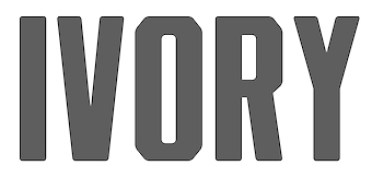
- 2015: Plate Mono (a monospaced all caps stencil typeface), Ivory (2015, a rounded octagonal titling sans).
- 2016: Sidekick (an all caps typeface for children), Incido (a straight-edged typeface family),
- 2017: Analog (a fantastic techno stencil typeface), Plunk (a funky typeface inspired by early jazz posters), Raymond (a warm bold display serif), Kong.
- 2018: DR Bulk (want fat yet 2018-style fashionable?).
- 2019: DR Pecker (a penis font), Vorga (stencil), Spira (a spiral font), DR Worker (octagonal, slab serif, mechanical).
- 2020: DR Spindling (ultra tall, piano key style), DR Break (a stick font), DR Chi 26 (monospaced, sci-fi).
- 2021: DR Gan (a kitchen tile font).
[Google]
[More] ⦿
|
echrom
|
Creator of Cock Font (2014). [Google]
[More] ⦿
|
Edward de Leau
|
Skinletter is a collection of 26 letters with beautiful women in the background. In GIF format only. By Dutchman Edward de Leau. [Google]
[More] ⦿
|
Eloi Canals Serra
|
 For a school project, Eloi Canals Serra (Barcelona, Spain) created the free Gaudi-inspired curly and curvy typeface Gaudinia (2011, Farga Catalana de Fonts). In 2015, he created the fun erotism-inspired La Castiglione (2015), and the futuristic stencil font Hangar 18. Still drawing inspiration from his hometown, he designed Barcelona City Block in 2016. This octagonal typeface reflects on the characteristic octagonal intersections in the city. Behance link. [Google]
[More] ⦿
For a school project, Eloi Canals Serra (Barcelona, Spain) created the free Gaudi-inspired curly and curvy typeface Gaudinia (2011, Farga Catalana de Fonts). In 2015, he created the fun erotism-inspired La Castiglione (2015), and the futuristic stencil font Hangar 18. Still drawing inspiration from his hometown, he designed Barcelona City Block in 2016. This octagonal typeface reflects on the characteristic octagonal intersections in the city. Behance link. [Google]
[More] ⦿
|
Emma
|
Graduate of Leeds College of Art and Design. Creator of the stocking-themed typeface Legs (2013). [Google]
[More] ⦿
|
Erik Freer
|
Graphic designer Erik Freer invented a collage typeface of naked men in tribute to Leaves of Grass, Walt Whitman's (in)famous poetry collection. [Google]
[More] ⦿
|
Erika Carter
|
During her studies in Leeds, UK, Erika Carter designed an original typographic poster on sexual health. [Google]
[More] ⦿
|
Erté
|
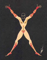 Erté (Romain de Tirtoff) was a well-known art deco era artist. Born in St. Petersburg, Russia in 1892, he died in 1990 in Paris. In 1912, Erté moved to Paris. In 1915, he began an association with Harper's Bazaar by designing covers of each of their magazines for the next 22 years. He became known for elegant lithographs and sculptures for the fashion industry. On my pages, you find an elegant set of capitals and numerals in which the glyphs are formed by elegantly drawn naked women, from The Alphabet Suite (Chicago, 1976).
 Wikipedia. [Google]
[More] ⦿
|
Eszter Herczeg
|
Photographer Eszter Herczeg earned her Bachelor degree in graphic design at Visart Academy of Art and Design, Budapest. She designed the (naked) Body Typeface (2013). [Google]
[More] ⦿
|
Ethel Larcombe
|
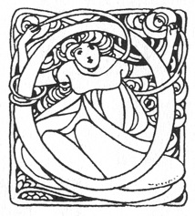 Ethel Larcombe (1879-1965, Britain) created this romantic art nouveau alphabet, ca. 1900. [Google]
[More] ⦿
Ethel Larcombe (1879-1965, Britain) created this romantic art nouveau alphabet, ca. 1900. [Google]
[More] ⦿
|
Eyesaw (was: Fontomas.com, or Signalgrau)
[Dirk Uhlenbrock]
|
Dirk Uhlenbrock's (b. Essen, 1964) studied communication design at BUGH Wuppertal. His typographic contributions were presented under various labels such as Signalgrau, Fontomas.com, Eyesaw, or TypeType. His fonts: Buddies (funny dingbat font), Scrabble (1999), Pizzo (pixel font, 2000), Accient (2000), EURASIAOblique, Freak (1998), SpaceAge, Fivejive (2000), Missu (2001), T-Series (a family by Stephen Payne (UK, 2000) for Territory), XXX (1998, sexy silhouettes), Y2k (2000), Basm (family by Miguel Basm Visser, 2000), Corner-bi and Corner-mono (both by Ole Fischer for Fischer Jr Design), Persona, Creatures (dingbats by Dirk Uhlenbrock, 1998), Thaipe, Thaiga, (squaregrid (Jay Marley, 2001), Bath (Heiko Hoos, 2001), Honey (Dirk Uhlenbrock, 2001), Pinx (Dirk Uhlenbrock, 2001), Tuna Salad (Dirk Uhlenbrock, 2001), Evo (2002), EvoThin (2002), Gen3000 (2002), Gen3000Thin (2002), HanneloreOutline (2001), Hannelore (2001), MassBlack (2002), MassOutline (2002), Mass (2002), MassStriped (2002), MassThin (2002), Microbe (2002), PellegriniItalic (2002), Pellegrini (2002), PileOutline (2002), Pile (2002), Rickshaw (2002, Indic letter simulation), Swisz (2002), SwiszThin (2002), TurbonItalic (2002), Turbon (2002), Apollo9, Apollo9Italic, Bite, Blob, BlobThin, Bubble, BubbleWild, Crack, Creatures, Dennis, Dioptrin, Dna, Electrance, Frakt, Launchpad, ORAV, Paul5, Paul6, PlakatOne, PlakatTwo, Push, Rubbermaid, RubbermaidSingle, Ticker, Tubeone, Tubetwo, Tvdinner, TvdinnerFull, Ufo, UfoItalic, Yodle. At Fountain, he designed Robotron and Super and Girl (2003, a Bauhaus experiment). Kombi was created in 2003. The Fontomas CD published in 2005 (40 dollars for 75 fonts) is reviewed by Yves Peters. On it, we find older fonts as well as newer ones by Dirk himself: Ove, Gen1000 (DNA style), Hannelore, Mass, Micro B, Pellegrini (script), Pile, Swisz, Turbon, Rickshow (Indic simulation). At 14. tage der typographie in 2013, he spoke on Grafik gegen Rechts. Dafont link. Old URL. Another old URL. Alternate URL. FontShop link. Klingspor link. Fontspace link. Fountain Type link. [Google]
[MyFonts]
[More] ⦿
|
Fabien Gailleul
|
 French designer who graduated in 2011 with a DSAA from ESDRA in Lyon. Paris-based creator of Potemkin (constructivist face), Fractions (experimental), Sex Type (fun), Frogs, Glossy Bitch (connected paint simulation face), Western Spaghetto and Face Cachée.
 In 2013, he collaborated with designers Jérémie Hornus and Alisa Nowak at FontYou on the design of the astrological simulation typeface Astral FY. The same group of three collaborated in 2014 on Naive Gothic FY. In 2014, fabiel Gailleul and the Fontyou team co-designed Seawave FY. Behance link. [Google]
[MyFonts]
[More] ⦿
|
Felix Farjas
[Penis Designer]
|
[More] ⦿
|
Fictionalhead (was: Smashmethod)
[Dan Meyer]
|
Fictionalhead is the outfit of Dan Meyer (Michigan, b. 1982), who before that had a web site (now obsolete) called Smashmethod. His Smashmethod fonts have names that start with SM: SM_contextisM (2003, octagonal), SMPixelism (2005), SM Pianoism (2004), SM Perceptionism (2004), SM ContextisM (2004), SM ReversisM (2003, techno), Sugar Water, Glue, Wide Angle, Mad Flava, SMballerisM (2003, circle dingbats), SMpletzisM, SMshenisM (2003, sans), SMreversisM (2004), SMsuggestivisM (2003, erotic outline font), SMvinylisM (2004), SMscriptisM (2004, handwriting), SMcrystalisM (2004), SMwaterisM (2004), SM_middlisM-Bold (2005), SM_middlisM (2005), SM_obscenisM-Bold (2005), SM_obscenisM (2005), SM_scriptisM (2004), SMbluisM (2003), SMbournisM-Bold (2006), SMbournisM (2006), SMhollyisM (2006), SM_coarsisM (2006), SM_euphorisM (2006), SM_inkisM (2006), SM_ownisM (2006), SM_phantisM (2006), SM_pigisM (2006), SM_recussionisMCaps (2006), SM_recussionisMRegular (2006). His Fictionalhead fonts have names that start with Fh and are all dated 2007: Fh_Euphoria, Fh_Ink (sketch font), Fh_Letter, Fh_Nicole, Fh_Obscene, Fh_Reverse, Fh_Scribble, Fh_Script, Fh_Space, Fh_Ugly, Fh_Sheena, Fh_Perception, Fh_Owned, Fh_Join, Fh_Holly, Fh_Faith, Fh_Blue, Fh_Annie. Additions in 2009: Fh Lentil, Fh_Allisa. These are mostly handwritring and techno fonts. In 2012, he added FH Hyperbole. Typefaces from 2013: FH Sneaky. Devian tart link. Home page. Dafont link. Another Dafont link. Klingspor link. [Google]
[More] ⦿
|
FishDicks.Com
[Jonny Quest]
|
About fifteen original free fonts by Jonny Quest: Fuzzy Cootie, Artsy Fartsy, Monica'sDress (letters formed by sperm), Head Dick, Ate Up With Dumb Ass, Antpile, Cangoods, Checkers, DanceStep, Hourphoto, Balltack, MachineGun, Flying Penguins, Grandfunk Railroad, Shaved, Jungle Leaves, Nailed, Frank Zappa, Angel Bear, Zipper, Iron Pipe, Roar and the great Groupsex. Links. [Google]
[More] ⦿
|
Flavi
|
Designer in 2016 of the free handcrafted typeface Penis For Kata at iFontMaker. [Google]
[More] ⦿
|
Flop Design
[Kato Masashi]
|
 Japanese site with original fonts by Kato Masashi (b. 1973), who lives in Takasaki (Gunma prefecture, Japan): Parismatch (2004), SAKUalp (2000, handwriting), Steeltype, Broadband, Hivision, Cinematime, Ultracomic, Ice Cream, Be Happy, Summer Beauty, Flyermix, Cheerscript, Breakstyle, Breakfont, Round, H-Five, Natsucomi, Long Vacation, Lovers, Breakfont (2003, graffiti style), Pokkaman, BeHappy, Natsucomi, Momolcan, Seasons Dings, Electron, Round, Lovers, FlyerMix (fifties style), CheerScript (comic book style), Hi-Five (pixel font), Summer Beauty, SummerDrive, White Day, Long Vacation, Amayadori (high contrast kana font), Fuyucomi, Icecream, Pickett, 321, Pingpong, Frontline, Ginza, Yago (nice free dings), Polaris, 321eng, 321kana, APPLE, CLIQUE, Clover (kitchen tile font, 1998), DIGI, Eneneng, Enenhira, FDalp, FDwhie, Hnoodle, Hanko (free black on white stamp font, 1998, see also here), MKCuer, MOOGIRLALP, MOOMILKKANA, Noodle, Origami, Pers, SA0kmh, SA100kmh, SA50kmh, SK0kmh, SK100kmh, SK50kmh, Template6, Tenten, Ami Font, Speedfont, Supercar, Sakura, Regoty, Shopping Famiry, Ticket, Yohic, Recording, Akachan, Wafont, Frontbit7, MusicNetwork, Yakitori (free handwriting font), Ticket, Folkdance (pixelized people), Human Building (dings of famous buildings), Bunny (free), Frontline0, Side5 (pixel font), Side6, Side7. Some pixel fonts, many techno fonts, some kana fonts, and the Japanese kids dingbat font, Folkdance. Some fonts, such as his Latin/Japano font ShoppingFamily (1998), are sold by Font Pavilion. Major Japanese free font links.
 In 1999, he published the AMI screen pixel font series in Digitalogue's DPI72 package. Other commercial fonts: Pine Apple, the WM family, Cutie Girl, Astratic, PictPlasma, Minivan, Frontbit 7, Ginza, Zoological. Free fonts as of 2007: Aiko, a 4-weight rounded sans with support for Latin and kana (see also here). Fonts made in 2007-2008: MobileDisco, AbbeyRoad-Alternative, HighwayStar, Kompakt, AbbeyRoad, Prefuse, Readymade (didone inspired by Corvinus and Giorgio). Additions in 2009: Kanna W4, Sweet Doughnuts (rounded sans). Fonts made between 1998 and 2008: 321, AirExpress, AirTickt, AMAYADORI, AMIFONT, APPLE, ASTRA, AYANO, BeHappy, bitneon, BORDER7, BREAKFONT, BroadBand, BUNNY, CALENDER, CheerScript, CinemaTime, CLIQUE, CLOVER, CutieGirl, Departure, DIGIT, ELECTRON, FlyerMix, FolkDance, FOLKDANCE2, FrontBit, FRONTLINE, FRONTLINE01, FUYUCOMI, GINZA, HANKO, HappyEnd, hiFive, HumanBuild, IceCream, ICHIGO, JAPON2, KAKIZOME, KEYMODE, LabLife, LongVacation, LoversMINIMONO, MKCUTTER, MOMOKAN, MooFont, MusicNet, NATSUCOMI, Nenga, Noodele, OnePiece, oneBox, Origami, ParisMatch, Pers, Pickett, PICTdings, PictPlasma, PineApple, PingPong, pokkaman, Polaris, PopStar, Puzzle, Recoya, REGO, ROUND, SAKURA, SAMACAN, Seazons, Shopping, SIDE5, SIDE51byte, SIDE6, SIDE61byte, SIDE7, SPEED, STAMPER, SteelType, SummerBeauty, SummerDrive, SuperCar, Template5, TenTen, Ticket2, UltraComic, WHITEday, Yabako, Yago, Yakitori (handwriting of Mayumi Kakegawa), Yothic, Zoological, Nippondings, Caredings, TraficSignsWLD, TraficSigns, JPN, Kamondings, Kamondings2, Kurashidings, Okonomi, FunnyFace, Hotsuma, Toyokuni, Constellation, SunnyDay, BOXdings, Machinedings, CLICKdings, Berrys, Container Box, Twinkleline, Minivan, Akachan. Dingbats: Kurashidings, IchigoC, TraficsignsWLD, TraficsignJPN, Nenga, Kamondings2, Kamondings, Breakstyle, Pictdings, Zoological, Caredings, Clickdings, Funnyface, seasons, Pictplasma, Humanbuilding, Nippondings, Yago, Boxdings, Toyokuni, Constellation (astrological symbols), Machinedings, Hotsuma, Folkdance, Calender. Japanaese handwriting fonts: Aiko, Haruka, Syuntaro, YUKI, Ryunosuke. Futuristic/ geometric fonts: MobileDisco, AbbeyRoad-Alternative, HighwayStar, Kompakt, AbbeyRoad, Prefuse. "Funny" fonts: IchigoR, Ultracomic, Amayadori, Parismatch, hanko, LongVacation, Cinamatime, Natsucomi, Okonomi, IceCream, Yakitori, Cutiegirl, Monokan Wa, Shopping, Lovers, Fuyucomi, Berrys, Akachan, Bunny, Clover, Pokkaman, Pickett, Electron. Cool fonts: Sunnyday, HiVision AirTicket, Lablife, Flyermix, Popstar, AirExpress, Broadband, Recording, Breakfont, Frontline, Ami, Minivan, Side5, Side6, Summerdrive, Digit, Supercar, Frontline00, BeHappy, Steeltype, Onepiece, Puzzle, Astlatic, Stamper. Download page of their free silhouette dingbat images. In 2014, they created the free art deco typeface Jazzkissa. In 2018, they published the full CJK font Soukou Mincho (by Ken Lunde and Masataka Hattori) at Fontsquirrel for free download. Dafont link. Abstract Fonts link. Fontspace link. Direct access. Alternate URL for free stuff. And another URL. Klingspor link. Fontsquirrel link. [Google]
[More] ⦿
|
fontasm:::Erotica Typographica
|
Seems to be a new erotic fonts place, but the links are bad, it seems. [Google]
[More] ⦿
|
Fonticon
[John Joe Mittler]
|
John Joe Mittler (b. Tampere, Finland, 1974) runs Fonticon in Lapua, Finland. He specilaizes in dingbats, and made the Mannequin font series (2006), which has "anatomically correct high-resolution illustrations of women with diverse body weights and shapes, in diverse levels of clothing." Subfonts include Stout, Slim, Cup C, and Pregnant. MyFonts page. [Google]
[MyFonts]
[More] ⦿
|
Fontopia
[Peter Slager]
|
Dutch type designer Peter Slager set up his own foundry, Fontopia, in Kampen in 2015. He created the display typefaces Ps Javier (2015), Ps Rooster 1, Ps Rooster 2 (2015), Ps Kampen (2015) and Ps Campen (2015). Typefaces from 2016: Ps Strijkijzer, Ps Snackbar Prn (a fun font for swingers and late late night people), PS Willy. Typefaces from 2017: Ps Willy Small But Fine. [Google]
[MyFonts]
[More] ⦿
|
Fredrick M. Nader
[Apostrophic Laboratory]
|
[MyFonts]
[More] ⦿
|
Fritz Janschka
|
Austrian artist (b. 1919) affiliated with the Wiener Schule des Phantastischen Realismus, who created exquisite detailed drawings of figures involved in any imaginable form of intercourse. These are mainly initial caps, such as in Ulysses Alphabet (Dortmund, 1983). From 1949 until 1984, he was a professor at Bryn-Mawr-College in Philadelphia. [Google]
[More] ⦿
|
Fuck
|
I have no idea who made this interesting alphabet. If anyone does, please let me know! [Google]
[More] ⦿
|
Fuck or treat
|
Neiman Marcus uses a dotless i on Trick. [Google]
[More] ⦿
|
Gabriel de Souza
[LeType]
|
[MyFonts]
[More] ⦿
|
Gatis Cirulis
[RAWTYPE]
|
[More] ⦿
|
GemFonts98
[Graham Meade]
|
Prolific Australian type designer who has made over 300 free fonts to date. Creations: Bonk Fatty, Worstveld Sling (2003), Quastic Kaps (2003), Quadlateral (2003), Junge Burnout (2003), Choktoff (2003), Hall Fetica (2002), Lady Ice Extra (2002), Gizmo (2002), Arggh@$*# (2002), Republika Ego (a huge family made in 2002, as an extension of the large family Republika by Apostrophe), Zillah Modern Offset Outline (2002), Feldicouth (2002, medieval lettering), GM Exp (2002), Pecot, Pecot #2 and Pecot #3 (2002), Wazoo (2002), JamesEightEleven (2002), AnalSatisfaction (2002), GenericFont (2002), PanAm (2002), Border Base Future (2002), Moondog (2001, with Apostrophe), Equine (2001), Street Corner (2001), Mister Belvedere (2001), Freebooter Script (2001), Street (2001, an 31 font sans and slab serif at the Lab), Choda (2001, with Apostrophe), Walkway (2001, see here), Castorgate (2001), Heidorn Hill (2001, a Fraktur font with Apostrophe), Labag (2001, with Apostrophe), 11S01 Black Tuesday (2001, for Life Saving Fonts), Endor (2001; a gothic font with Apostrophe), Dekon (2001), Asenine (2001), Eskargot (2001, with Apostrophe, a "tango" font), Brassier (2001, with Apostrophe), Kandide (2001, with Apostrophe), Labrit (2001, a Fraktur font done with Apostrophe), Control Freak, Gilgongo, Eskargot, LabtopGraphed, PhoenixArise, PrussianBrewSolid, YouthanasiaTexture, Dumbledor, Luciferius, Zebrra, Street, Kronika, PrimaryElector (all at Apostrophic Labs), Scaling the Dragon, Primary Elector, Blacksmith Delight, Birthday Dingbats, Halloween 2, Comicbook Smash, AcidDreamer, Arialic, AvQest, Battered Cooper, Beerglass, Berthside, Bloodgutter 99, Blown Away, Boneribbon, Boneribbon Tall, Bunny Rabbits, Callistroke, Carbonized Timber Chizzler, Deathhead KeltCaps Drummon, Family .., Effluence, Ericott, Erozion, Erthqake, Fanfold, Gemerald, GemFont One, Gorlock, Hungover, Impressed Metal, Inked Weird, Inningham, Isildur High, JaggaPoint, KeltCaps, Kharnorric, Kharnorric Royal, Knights Quest, Knights Quest Callig, Lane Humouresque (2000), Layaway, Linear Beam, Line Etch, Melted Moments, Metal Spagetti, NeoSpacial, Niew CroMagnon, Offset Plain, Old Copperfield, Old Oak, Old Virus, Ooky, Parkvane, Pee's Celtic, Pi in the SciFi, Quilted Indian, Ribbon, Ripplemere, Roughhewn, Rounheads, Rusty Sign, Rykindor, Satan Possessed, Seventy Flares, Simpleman, Skunkline, Slinked, Snail n Ink, SnottMM (multiple master), Solid Ooky, Squashed, Static Charge, StaidMM (multiple master), Steamroller, Stiltedman, Stretch, Tear, Tearoff, Textapoint, Thor version 1.5, Time Pundits (a CODEX-like face), Torcing Away, Trilayered, Ulse Freehand, Uncey, Untidy Skrawl, Vale Shadow, Waif Thin, Warpy Roundhead, Whoosit, Wonkers, Woodbrush, Wormfont, Woven Brick, Woven Outline, Yurine Overflow, Dingbats, Americanic, BirdArt, Cattart, Chyld, Culinary Art, Doggart, Doggon, Drinks - Various, EasterArt, Ein Schwein, Gembats 1, Gembats 2, Helloween, JFC, KidClipart 1, KidClipart 2, Komedy Kritters, Krazy Kritters, Luvya Babe, Moolah, Multicasion, Odds N Sods, Sportzs, Teddyber, Teddyber Too, Vehicular, Whethers, Xmas Clipart 1, Xmas Clipart 2, PenicMasturbata, Aliensatemymum, AustralianSunrise, AustralianSunset, Blockstepped, BoldlyGo, BarredOut, Blockstepped3D, BoldlyGoOut, Daemonesque, Efentine, FuzzyXmas, Gazzarelli, Jhunwest, JhunwestConcaveGM, LickcurlPetite, LupusBlight, MilleniGem, PhilteredPhont, SlicedIron, Stargit, StargitVer2, ZappedSticks, AlphaRomanieG98, BraveNewEraG98, BlobfontG98, BoxingBrophius, CacophonyLoud, ChainzG98, CulinaryArt, DarkBastion, FortuneCity, GorlockBold, HornsofDilemma, LlynfyrchFwyrrdynn, Maranallo, OptimisticPessimist, PositiveNhilism, UniversalShatter, Bonk, Bonk College, Bonk Fatty, Bonk Offset, Bonk Outercut, Bonk Undercut, ChefsSliceNovice, MeteorGM, TreasureMapDeadhand, TechnicallyInsane, Futurex (with Apostrophe), Street, Calan, Lady Copra, Thing, Dexetrine, ChizzMM (multiple master, with Apostrophe, 2001), Charrington (2001), Lady Copra (2001), Likkle (2007), Luteous (with Rich Parks, 2001), Thorazine and Thorazone (last eleven at Apostrophic Labs [dead link]). Interview. In March 2001, Graham's Charming Font (done with Andreas Höfeld) won the 2001 Friday Night Type Fights competition. Alternate URL. Fontfreak link. Other fonts: Choktoff (2003), Etched Fractals, Film Cryptic (2003), Future Sallow, Hardnsharp (2003), Jagged Dreams, Jungle Burnout, Kyiss M'ass (2003), Tall Films (2004), Meichic (2003), Nightmare Blend Revisited, ReducedEfficiency (2003), Wasted in this job, Western Taint (2003), Wytherness, Yuma Sunset (Western style font), and Zone Linear. Klingspor link. Fontspace link. Dafont link. View Graham Meade's typefaces. [Google]
[MyFonts]
[More] ⦿
|
Gender fonts
|
A survey of fonts with the gender symbols, and a creation by yours truly, called Sekushii. In 2002 was struck by the lack of complete fonts with gender symbols, so I made my own. The world's gay community started using their own symbols, derived from those for male (the symbol for Mars) and female (the symbol for Venus). But, not to be left out, the bisexuals, both male and female by birth, suggested their own glyphs. Outnumbered but not outgunned, the hermaphrodites picked their own symbol, that of Mercury. But it does not end there. The transexuals do not fit into any of the above categories, so they have their own symbols. Transgendered people are usually defined as those who are aware of all people of all sexual orientations and preferences, and approach relationships in a gender-free manner. Well, they have their own symbol. I never located the symbol for eunuchs, but I am sure there must be one. Of course, the combinations multiply. However, I refuse to create symbols for gay hermaphrodites, transsexuals who like eunuchs, and males who had two sex change operations (to get back to where they started from). The ultimate place for symbols is the highly recommended site Symbols.com. For definitions of transsexual, transgender, bisexual, and other terms, see here. Some symbols are shown here. Official books always lag behind, so I went looking for what people actually use to represent different sexual orientations, preferences and situations. At present, the world seems to agree on the following symbols:  | Mars, or Tuesday: symbol for males. |  | Venus, or Friday: symbol for females. |  | Gay males. |  | Gay males. |  | Lesbians. |  | Aware of the joint cause of gays and lesbians. Also (sometimes) transsexuals. Also, quite universally in science, used for hermaphrodites. See here. Symbol.com states that it is used in botany for double-sexed plants. Also, (sometimes) heterosexuals in general. See here or here. |  | Bisexuals. Sometimes used for people fighting for gay and lesbian rights. |  | Transgender. See here. |  | Another symbol for transgender: see here. |  | Bisexuals. |  | Bisexuals, as proposed here. Closely related in some places to the symbol for bisexual men. |  | Bisexual men. |  | Bisexual women. |  | Mercury, or Wednesday: Hermaphrodites. See here. The Greek equivalent of Mercury is Hermes, hence the name. Apparently, biologists use this for hermphrodites. |
For completeness, here is a partial list of gender fonts: - The TeX/Metafont community lives with Denis Roegel's Genealogy font, created in 1996 and updated in 1999. Denis Roegel essentially compiled the genealogical symbols found in Roland Waldi's Wasy font (1992), which has a male and female symbol set, and Knuth's "gen" font, and added the standard symbols for males and females.
- The truetype world probably is most acquainted with Marvin Vogel's useful (and free!) symbol font Marvosym, which contains symbols for sexless, male, female and hermaphrodite. Marvin recognizes that there are other people in this world besides straight males or females, but the symbol he suggests for hermaphrodites is not the one used by or suggested by the world of sex experts [read on below]. Curtis Clark made the free font called Female and Male Symbols (1996), which contains the same gender symbols as Marvosym.
- WordPerfect's WP IconicSymbolsA (1993) just has a male and a female symbol.
- There are, of course, a number of commercial outfits that have the standard pair of gender symbols in some of their fonts. Particularly artistic are P22's Koch Signs 3 and Koch Signs 4. Whether by design or accident, these also have a glyph for hermaphrodites. An even more complete set is Ann's Astro family of fonts from Dingbatcave (Ann Stretton).
- Unicode has reserved position 9792 for the female sign, and 9794 for the male sign. Nothing is reserved for the others. Some Unicode fonts indeed do have these two characters. However, no Unicode font has more than this bare minimum, and thus, the Unicode path is a cul-de-sac.
- The Sekushii font was designed by Luc Devroye in 2002. It is part of the Sugaku series [sugaku is Japanese for mathematics]. It has all the symbols menyioned above, in many sets, in both light and medium weights. There are straight-arrowed sets for combining with sans serif text, flared arrows for serif text, and fun experiments and extensions with various sexual undertones. And, it is free! Have a ball.
- A late addition, in 2017: Represent (Tony de Marco). It is quite complete as well.
[Google]
[More] ⦿
|
Genitaal XXX
[Max Kisman]
|
 In 2017, famous Dutch graphic and type designer Max Kisman was asked to design a naked font for the Dutch printing association, Drukwerk in de marge. It is called Genitaal XXX. [Google]
[More] ⦿
In 2017, famous Dutch graphic and type designer Max Kisman was asked to design a naked font for the Dutch printing association, Drukwerk in de marge. It is called Genitaal XXX. [Google]
[More] ⦿
|
Gerald Nowaczyk
|
Parisian designer of the fun sexual innuendo typeface Aimer (2014). [Google]
[More] ⦿
|
Giacomo Franco
|
Italian copper engraver and publisher (1550-1620), who in 1596 published a human form alphabet largely influenced by similar alphabets of Peter Flötner in Germany. A font based on this was made by Ulrich Stiehl: GiacomoFranco (download link). [Google]
[More] ⦿
|
Giovanni Battista Braccelli
|
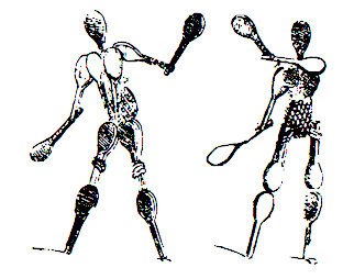 Giovanni Battista Braccelli (ca. 1600, d. before 1650) was an Italian engraver and painter of the Baroque period, who was active in Firenze. He is best known for his book of prints, Bizzarie di Varie Figure [a variety of human shapes], published in 1624 in Livorno, and dedicated to Don Pietro Medici. It contains wonderful futuristic engravings. Wikipedia: In this book, he engraves baroque experiments recalling Arcimboldo, engaging in a rarified set of conceits. Some of the figures are composed of boxes or raquets or curlicues. He published a second collection of prints entitled Figure Con Instrumenti Musicali E Boscarecci. Finally, he created Alfabeto figurato (1632, Italy), letters made by human forms.
 Link to his human figure alphabet. Digitization of his Bizzarie di varie figure include Bracelli Geometric Human Forms (Dick Pape, 2010). Dick Pape writes: Giovanni Battista Braccelli's Bizzarie di varie figure contains a suite of 50 etchings that celebrate the human figure in geometric forms. (1624) Squares, triangles, circles, and parallelograms take the place of muscle, bone, and tissue, defining the body in a new visual vocabulary. Braccelli's designs are unique in the history of book illustration. They represent a high point in the Mannerist style of etching that flourished in the 17th century. Mannerism incorporated the techniques of the Renaissance but rejected the classical imagery and harmonious style that is the hallmark of much 15th- and 16th-century European art. Braccelli's work had considerable influence on later generations of artists. His figures were adopted, for example, during the 20th century by the Surrealists, who lavished praise on his geometric forms and his ability to invest mechanical images with graceful, human qualities. Some of the etchings portray human emotion, as when figures dance across the page or struggle with one another in mortal combat. [Google]
[More] ⦿
|
Graham Meade
[GemFonts98]
|
[MyFonts]
[More] ⦿
|
Grant Wang
|
North York, Ontario-based designer of the silhouette typeface Parra (2017). [Google]
[More] ⦿
|
Ground Control (was: Penny Font Foundry, or: Pennyzine)
[Jason Ramirez]
|
As part of the (ex-) Chank Army, Jason Ramirez (b. 1978, Wisconsin) offers free and commercial fonts. He started out as Pennyzine or Penny Fonts, or Penny Font Foundry, with free fonts that were typically made with the Data Becker software program. Later, his fonts became commercial, and the new site changed its name to Ground Control. The list of their free fonts, which are mostly in the grunge style that was in vogue ca. 2000: Locals Only (2011), Cocaine Nosejob (2008), Made (2004, grunge blackletter), Strip Club Motion Sickness (2003), One Fell Swoop (2003, scratchy calligraphic), Fear of a Punk Planet (2005), Futon Revolutionist (2002), Bill Hicks (2002, grungy blackletter), Elliot Swonger (2002), Elliots Bad Day (grunge), Don Giovonni (2006, grungy typewriter), Don Giovonni Makin Enemies (2006), Gumuski (2002), DUMMY (1999), Acid Reflux Baby (2002), Avenge Me (2004, multiline, octagonal), Times-New-Omen (1999), punk rock rummage sale (2001), Thatluvinfeelin1 (2001, a sexual positions font), cut-n-paste (1999), Maydogg (1999-2002, handwriting), My-wife-sucks (1999), Stamped-out (1999), Stank (1999), StankII (1999), uncle-tom (1999), uno (1999), Coopdeville (2002), Dirtysocks, FourMoreYears (2003), Punkrockrummagesale (2001), Theregoestheneighborhood (2003), Thiskettle (2002, handwriting), Mr. Rogers (2003), Regime Change (2004), Hotel Coral Essex (2006, grunge), Limp Noodle (2006). Commercial fonts: Sparkle House (2011), Chompsky Fancy (2011), Redneck Superstar (2002, Chank's). Dafont link. Yet another URL. Fontspace link. Abstract Fonts link. Alternate URL. Direct downloads. Alternate direct download path. Ground Control web site. [Google]
[More] ⦿
|
Handling the Curves: The Erotics of Type
|
Essay by Yale University's Deb Margolin for Nerve Magazine. [Google]
[More] ⦿
|
Harold Lohner
[Harold's Fonts]
|
 [More] ⦿
|
Harold's Fonts
[Harold Lohner]
|
 Harold Lohner was born in upstate New York in 1958. He received an MFA in printmaking from the University at Albany and is Professor of Visual Arts at Sage College of Albany. He began making fonts in 1997 and starting distributing them the next year through Harold's Fonts. He lives in Albany, NY, with his partner, Al Martino. Originally, most of his typefaces were freeware or shareware, but gradually, he started selling most on his site or via FontBros. His typefaces:
 Link at Dafont. . Abstract Fonts link. [Google]
[More] ⦿
|
Hedonia
[Carolyn Gibbs]
|
Hedonia is an ozzie company run by Carolyn Gibbs who has made web sites for a fetish wear company, Hedonia, and for an SM conference. The font Hedonia (2000) has drawings of corsets, but does not seem to be available, unfortunately. [Google]
[More] ⦿
|
Heikki Morgan Hämäläinen
[Morganismi]
|
 [MyFonts]
[More] ⦿
[MyFonts]
[More] ⦿
|
Heinritzh Sales
|
Graphic designer who created a gorgeous lettering poster called Friday Pleasure (2009). [Google]
[More] ⦿
|
Herbert F. Van Brink
[Character]
|
[More] ⦿
|
Heriberto Noguera
[Lagalga]
|
[More] ⦿
|
Hugo Fresse
|
Bordeaux, France-based designer of the sexual toy-themed typeface queerfuck (2018). [Google]
[More] ⦿
|
Human Alphabets
|
Slideshare pages on the topic of human alphabets. Collected by Sotirios Raptis. [Google]
[More] ⦿
|
Huong Nguyen
|
Art director in Singapore who put condoms on glyphs in FF Durex (2010). [Google]
[More] ⦿
|
Iconian Fonts
[Dan M. Zadorozny]
|
 Born in Philadelphia and a resident of McKinney, Texas, Dan Zadorozny's creations at Iconian. He is a prolific type designer who specializes in techno and sci-fi typefaces. Dafont link. Fontsy link. Abstract Fonts link. Font Squirrel link. His fonts in alphabetical order:
 - #44 font (2002), 00Starmap (2001, pixel font), 1968 Odyssey (2016), 1st Cav (2008), 1st Enterprises (2017), 2-Tech, 21 Gun Salute (2013), 2nd Amendment (2007, guns), 2nd Amendment 2050 (2009, more gun silhouettes), 2Toon, 300 Trojans (2008, comic book family), 4114 Blaster (2008, futuristic), 5th Agent (2008, techno), 7th Service (2002), 8th Element (2013), 911Porscha, 98 Bottles of Beer (2016).
- Achilles, Action-Men (2008), Action Women (2008, female outlines), Aegis (2010, Greek simulation family), Aetherfox (2013), AirCobra (2002), Aircruiser (2011, trekkie family), AirForce (planes and copters), Airstrike (2013), Airstrip One (2003), Aldo's Moon, Aldo's Nova, Alexis (2001), Alien League, Alpha Century (2020), Alpha Men (2015), Alpha Sentry, Alpha Taurus (2007, octagonal, athletic lettering), Amalgam, American Kestrel (2019), Americorps (2012), Ampire (2019), Anakefka (2009, ultra-fat family), Annapolis (2016), Antietam (2015), Antikythera (2013, Greek simulation face), Antilles (2009, sans family), Arctic Guardian (2019), Argosy, Arilon (2008), Armed Lightning (2017), Army Rangers (2013, octagonal), Assassin Nation (2015, scary and perhaps referring to the "tradition" of school shootings in the USA), Astro Armada (2020: sci-fi), Astropolis (2009), Atlantia (2012, futuristic), Avenger (2008, futuristic).
- Babes&Bond (2009, erotic silhouettes), Babe-alicious (2002, erotic outlines), Bad Axe (2017), Bad Robot (2007, computer game look), Bal-Astaral (2016, octagonal), Bamf (2011, techno family), Banjin (2016), Banshee Pilot (2016), Barcade (2018), Battlefield, Battleworld (2016), Beam Rider, Beam Weapon (2015), Beastian (2011), Behemoth (2018), Ben Zion (2008, Hebrew simulation), Berserker (2008, grunge), Beta Biergärten (2008), Big Blue Bug (2021), Bio-disc, Bio-discSolid, Bio-discThin, Bionic Comic (2002), Bionic Type (2002), Birds of a Feather (2007, dingbats), Black Bishop (2015), Black Gunk (2016), Blade Singer (2021), Blizzard Shaft (2020), Block, Blood Crow (2009), Blood Drenched (2020), Bloodlust (2011, dripping blood face), Blue Cobra (2020), Blue July (2009), Body Swipers (2014, Halloween font), Bog Beast (2013), Bomber Escort (2020), Boomstick (2015), Borgsquad (2014, mechanical/octagonal), Bretton (2018), Brin Athyn (2008, uncial/Celtric), Broken Cyborg (2019), Bronic (2004), Bubble Butt (2014, bubblegum typeface), Buchanan (2016), Buddy Champion (2015), Bummer (2007, octagonal), Bushido (2008, oriental simulation), Butch and Sundance (2013), Buttons the Bear (2008, children's hand), Byte Police.
- Camp Justice (2018), Capella (2011, a wide techno family), Capricus (2018), Captain Canaveral (2019), Carnival Corpse (2016), CasperComics, Centaurus (2015), Chardin Doihle (2008), a useful informal handprinting family), Charlemagne, Charlie's Angles (2018: octagonal), Charmling (2019), Cheyenne Hand (2008), Chicago Express (2016), Christendom, Classic Cobra (2016), Clubber Lang (2013, grungy), Cobalt Alien (2015), C.O.D.E.R. (2012), Coffin Stone (2019: a stone age font), College Collage (2017), Colony Marines (2017), Colossus (2011, old chipped stone look), Combat Droid (2019), ComicBookCommando, ComicFX, Commonwealth, Concielian, Concielian Break (2015), Concielian Classic (2018), Concielien Jet (2015), Contour of Duty (2016), Corinthian, Count Suckula (2015, horror font), Covert Ops (2012, army stencil), Coyote Deco (2007, art deco), Crappity-Crap-Crap (2007), Crazy Ivan (2017: constructivist), Creepy Crawlers (2015, horror font), Crime Syndicate (2013), Crixus (2011, a squarish sans that includes an athletic lettering style), Cro-Magnum (2003), Cruiser Fortress (2016), CryUncial, Cyberdyne (2016), Cyberia (like Soviet: neat Russian imitation letters), Cyborg Rooster (2015), Cydonia Century (2017), Cyrus The Virus (2012, grungy, hand-printed).
- DS Man, Daedalus (2008), Daemonicus (2012), Dagger Dancer (2020), Dameron (2016), Dangerbot (2016), Danger Flight (2015), Dan Stargate (2008), Dan'sHand, Dark Alliance (2014), Dark Dominion (2019), Dark Hornet (2020: a great blocky mechanical typeface family), Dark Horse (nice brush font), Darklighter (2018), Darkwind, Dassault (2013), Deathblood (2014, Halloween font), Deathshead (2019: a metal band font), Deceptibots (2019: stencil), Defcon Zero (2016), Dekaranger (2015), Delta Phoenix (2019), Delta Ray, Demon Priest (2013), Department-K, DepartmentH, Deranian (2008), Devil's Tongue (2019), Detonator, Devil Summoner (2014), DiegoCon (2004), Digital Desolation (2014), Ding-o-saurs (2007), Direktor (2008, Cyrillic simulation techno), Dire Wolf (2013), Disco-Dork, Disco Deck (2005), Disco Duck, Discotechia (2015), Dodger, Dokter Monstro (2017: a great fat hand-painted typeface), Domino Jack (2016, an octagonal stencil typeface), Domino Mask Condensed (2016), Dotcom (2002), Drafting Board (2008), Drafting Table (2008), Dragon Order (oriental simulation), Dread Ringer (2015), Drid Herder (2002), Drive (2015, techno font), Droid-Lover (2008), Drone Tracker (2016), Drosselmeyer (my favorite), Dusk Demon (2020: grungy).
- Eagleclaw (2009), Eaglemania, Eagle Strike (2015), Early Warning (2021), Earth Orbiter (2016), Earthrealm (2013), Earthshake (2013), Earth's Mightiest (2002), East West (2015, constructivist), Echo Station (2017), Eco-files, Edge Racer (2917), Egg Roll (2016, oriental simulation), Elastic Lad (2020), Eldebaran (2012), Elder Magic (2009), Election Day (2009), Elephant Gun (2021), Elite Danger (2017), Emissary (2014, sci-fi), Empire Crown (2011, blackletter), Enduro, Ensign Flandry, Ephesian (2007), Eridanus (2015, octagonal / mechanical), Erin Go Bragh (2009, Celtic/uncial), Escape Artist (2015), Eskindar (2013), Eternal Knight (2013), Eurofighter (2015), Eva Fangoria (2018: a dripping blood font), EverettSteele'sHand, Excelerate, Excelsior, Excelsior Comics, Exedore (2008), Exoplanet (2013, techno), Extechchop (2005), Eyes Only (2018).
- Factor (2016), Falconhead, Falcon Punch (2015), Famous Spaceships (2007), Famous Spaceships 2 (2019), Fanfare Ticket (2018: dot matrix family), FantasticCreatures, Fantazian (2003), Fantom (2009, bad handwriting), Federal Blue (2019), Federal Escort (2014), Federal Service (2011), Federapolis (2008, octagonal techno face), Fedyral (2019), Fedyral-II (2019), Feldercarb (2003, octagonal font), Ferret Face (2013), Fiddler's Cove (2012), Fight Kid (2009), Final Front (2019), First Order (2001), Flash Rogers (2016), Flesh Eating Comic (2013, grunge), Flight Corps (2008, techno/pixelish), FlyingLetaherneck (2002), Force Commander (2019), Force Majeure (2016), Foreign Alien (2020), Foucault (2014, uncial), Fox on the Run (2018), Fox on the Run Academy (2018: athletic lettering), Frank-n-Plank (2013, a wooden plank font), Freakfinder (2014: Halloween font), Free-Agent (2008), Freedom Fighter (2013, stencil), From Bond With Love (2014: military stencil), Front Runner (2019), Frost Giant (2019), Frozen Crystal (2016, LED font), Funk Machine (2016, a great ultra-black techno family of typefaces), FunnyPages, Furiosa (2019), Future Forces (2015), Futurex Grunge (2005).
- Galactic Storm (2014), Galant, Galaxy-1 (2008), Galaxy Far Far Away (2009, futuristic dingbat font), Galaxy Force (2014), Galga (2008, futuristic), Gamma Sentry, Gemina (2011, sci-fi / techno family), Gemina2 (2013), Generation Nth, Gentleman Caller (2014), GeoBats (2007), Gearhead (2013, octagonal), Ghost Clan (2014), GI Incognito (2012), Global Dynamics (2014), Globe Trekker (2021), Goalie (2008, hockey mask alphading), Goblin Creek (2016: Halloween font), Gods of War, Gotharctica (2015, blackletter for horror flicks), Governor (2017), Graffiti Street (2019), Grand National (2015), Grand Sport (2015), Graymalkin (2011, trekky), Grease Gun (2012), Grendel's Mother, Grim Ghost (2013), Ghoulish Intent (2016: Halloween font), Grimlord (2009), Groovy Smoothie (2018), Guardian (2008), Guardian-Laser (2008), Guardian-Pro (2008), Guardian-Shadow (2008), Gunner Storm (2015), Gunrunner (2016: techno), Gunship, Gunship V2 (2002), Gypsy Killer (2013), Gyrfalcon.
- Hadriatic (2008, roman lettering), Half Elven (2013), Halfshell Hero (2013), Hall of Heroes (2007), Halo, Hanging Tree (2019: a wood print emulation font), Han Solo (2013), Hard Science (2019), Harrier (2002), Hawkmoon (2011), Head Human (2021), Heavy Copper (2020), Heavy Falcon (2019), Hello Copters (2013: helicopter dingbats), Hemogoblin (2017: spooky font), Heorot (2009, stone age fonts), Hermetic Spellbook (2017: alchemic), Heroes Assemble (2011), Heroes Assemble Dingbats (2014: all Avenger characters), Hero Worship (2021), Hexgon (2018), Hexkey (2020), Highrise Heaven (2007, city skyline dingbats), Hip Pocket (2014: psychedelic), Hitchblock (2017), Hollow Point (2015), Holly Dingle (2015), Holy Empire, Home Base (2020), Homemade-Robot, Holo Jacket (2016), Homebase (2020: heavy, octagonal), Homelander (2020), Homeworld (2003), Homeworld Translator (2003), Hong Kong Hustle (2015), Horroroid (2015), Horroween (2013, Halloween font), Hot Kiss (2017: paint splatter font), Howlin Mad (2017), Hula Hoop Girl (2019), Hulkbusters, Hydronaut (2019), Hydro Squad (2014), Hyper Vyper (2019: octagonal), Hypno Agent.
- Iapetus (2014, sci-fi), Icebox Art (2012), iChrono (2018), IWantMyTTR!, Iconian (2002), Iconified, iDroid (2020), Illuminati, Illumino (2016), Imaginary Forces (2008, mythical dingbats), Imperial Code (2003, Startrek style face), Imperium, Incubus, Incubus-Italic (2008), Incubus-Shadow (2008), Indigo Demon (2017), Infinity Formula (2003, super techno), Infobubble, Inhumanity (2014), I-House Edition (2014), Inspector General (2020), Instand Zen (2016: Halloween font), Inter Bureau (2019), Interceptor (2008), Interdiction (2012), Intergalactic (2017), International Super Hero (2002), Intrepid, Iron-Cobra (2008), Iron Forge (2012).
- Jack's Candlestick (2013), Jackson, Jannisaries, Jedi Special Forces (2012), Jeebra (2018), Jerusalem (1999, Hebrew font simulation)[see also here], Jetta, JettaTech, Jetway (2012, a stencil face), Johnny Torch (2012), Joy Shark (2018), Judge, Judge Hard, Jugger Rock (2018), Justice (2009), Jumpers (2017), Jumptroops (2003-2015), Justinian.
- Kahless, KameraDings (2009), Kangaroo Court (2018), KarateChop (2009), Kartoons (2008), Katana, Kaylon (2019), Kennebunkport (2013, script), Keystone (pixel font), Khazad-Dum (2011), Kid Cobalt (2008, comic book face), Kinex, King Commando (2011), King's Ransom, Kinnihuman (2020: dingbats), Knievel, KnightsTemplar, Kittrick (2019: a heavy octagonal type), Knock Furious (2003, dingbats), Kobold (2008, futuristic), Kondor (2013), Kountry Kodes (2008, international license plate lettering), Kovacs (2018), Kovacs-Spot (2016), Kreature Kombat (2018), Kreeture (2002), Kubrick (2008).
- Lamprey (2012, techno family), LandShark (2001), LandWhale (2001), Laredo Trail (2013, a Western face), Laser Corps (2020), Laserian, Laser Wolf (2018), Law and Order (2005, dingbats), League Wars (2013, sci-fi stencil), Leatherface (2013), LED Sled (2016, LED font), Left-Hand Luke (2016), Legacy Cyborg (2019), LegalTender, Legion, Legionnaires (2017: silhouettes), Legio Sabina (2017), Lethal (2014), Liberty Island (2013, sci-fi), Liberty Legion (2015), Lifeforce (2018), Light Brigade (2018), Lightsider (2011, Star Trekkish family), Lincoln Lode, Livewired (2015, sci-fi), Lionel (2009), Low Gun Screen (2008, a totally square screen type family), Lincoln Chain, Lionheart, Lobo-Tommy (2008), Lord of the Sith, Loveladies, Low Gun Screen (2008, screen face), Lux Contra Tenebras (2018: a fat Textura typeface).
- Machiavelli, Mad Marker, Magic Beans (2007), Major Force (2016), Mandalore (2019: squarish), Marathon-II, Marathon, Marsh Thing (2014, Halloween font), Masked Marvel (2002), Master Breaker (2017), Masterdom (2004), Merri Christina (2015, children's hand), Metal Storm 3D (2008), Metronauts (2013), Metroplex, MetroplexLaser, MetroplexShadow, Michaelmas, Michigan (2015), Milk Bar (2003), Micronian (2008, extensive pixel-based family), Military-RPG (2008), Mindless Brute (2015), Miracle Mercury (2017), Missile Man (2002, futuristic), Miss Amanda Jones (2004, brush style), Mister Twisted (2018), Mobile Infantry, Modi Thorson (2013, techno), Monsterama (2011, scary face), Monster Hunter (2017), Montroc (2015: squarish and varsity style), Moon Dart (2008), Moon Runner (2016), Morse Kode, MorseNK, Motorama (2018: car maker icons), Movie Gallery (2008, dingbats), Mrs. Monster (2013, Halloween brush font), Mystery Mobile (2015), Mystic Singler (2008, rough brush face).
- Nathan Brazil (2013, art deco), National Express (2003), Native Alien, Navy Cadet (2016), Nemesis Enforcer (2013), Neo-Geo (like the letters on the Neon cars), Neo Navy (2015), Neuralnomicon, Neuralnomicon (2018), Neutron Dance (2020), New Come Title (2016), New Mars (2015), New York Escape (2015), Nextwave (2014), NGC 292 (2020), Nick Turbo (2001), Nicomedia (2020), NifeFite, NifeFiter, NifeFites, Nightchilde (2013), Nightmare Alley (2016: Halloween font), Nightrunner (2008, sci-fi), Night Traveler (2020), Nightwraith (2011, techno family), Ninja Garden (2018), Ninjas (2002), Nobody's Home (2014: poster font), NoloContendre, Northstar (2014), Nostromo, Nuevo Passion (2013), Nyet (2002, Soviet letter simulation).
- Oberon, Oberon-Deux, Obsidian Blade (2020), Obsidiscs (2003, dingbats), Oceanic Drift (2013), October Guard (2013, Cyrillic simulation face), Odinson (2007, runes), Oh Mighty Isis (2014, Greek simulation family), Olympic Carrier (2017), Olympicons (2003), Omega 3 (2010, futuristic), Omega Flight (2020), Omega Force (2013, octagonal / mechanical), Omega Sentry, Omni Boy (2019), OmniGirl (2003, techno), Opilio (2012), Opus Magnus (2013, metal band font), Opus Mundi (2015), Oramac (2004), Ore Crusher (2013), Oubliette (2020), Outlands-Truetype (2001), Outrider (2013), Overstreet Bible (2014, hand-printed), Ozda (2011, a fat techno family with several horizontally striped styles), Ozymandias.
- Psyonic VII (2012), Paladins (2015), Pandemonious Puffery (2002), Parker's Hand (2002, handwriting), Peace & Houston (2019: squarish), Pepperland (2019), Perdition, Peregrine, Phantacon (2017), Phaser Bank (2008, techno), Philadelphia, Philly Dings (2003), Phoenicia (2015), Piper Pie (2007), Pistoleer (2011), Planet N (2016), Planet S, Planet X, Player 1 Up (2012: architectural family), Pocket Ball (2016, dot matrix style), Pocket Monster (2016), Police Cruiser (2013), Postmaster, Power Lord (2011), Predataur (2019), Presley-Press (2007), Press Darling (2012), Procyon, Prokofiev (2009, rounded and squarish), Promethean (2008), Protoplasm, Prowler (2013), Pseudo Saudi (1999, Arabic simulation), Psycho Butcher (2014, ransom note font), PuffAngel, Pulsar Class (2018), Pulsar Class Solid (2018), Pulse Rifle (2009), Punch (2020), Pyrabet.
- QTs (2013: erotic silhouettes), Quake-&-Shake, Quantum of Malice (2013), Quark Storm (2013), Quarrystone (2015), Quartermain (2002), Quasar Pacer (2018), Quasitron (2009, futuristic), Quatl (2002, an Inca font), Queen&Country (2009), Quest Knight (2009), Questlok, Quicken (2013, horizontal stencil), Quickening (2014), QuickGear (2019), Quickmark (2004), Quick Quick (2019), Quick Strike, QuickTech, Quill Sword (2016: soft blackletter style).
- RCMP, Racket Squad (2017), RadZad, Radio-Space, Raider Crusader (2016), Raise Your Flag (2013), Range Paladin (2018), Ranger Force (2020), Realpolitik, Rebecca, Rebel Command (2012, Star Trek family), Redcoat (2008, blackletter), Red Delicious (2019), Redline (2015), Red Rocket (2011, techno), Red Undead (2016: Halloween font), Regulators, Renegado (2014), Replicant, Repulsor (2013, pixelish), Rhalina (2011, a nice upright script), Rhinoclops (2019), Righteous Kill (2009), Right Hand Luke (2016), Robo Clone (2018), Robotaur (2008), Rocket Junk, Rocket Pop (2016), Rocket Type (2002), Rockledge (2019: an eroded stone look font), Rogue-Hero, Roid Rage (2003), Ro'Ki'Kier (2008), Rosicrucian (2009, stone age font), Royal Samurai (2018), Rubber Boy (2013, poster font family), Rumble Tumble (2020: a rough military stencil), Rune Slasher (2019).
- Sable Lion (2002), Sagan (2008, futuristic), Samurai Terrapin (2018: blocky), Scarab, ScarabScript, Sci-Fi (2008), SDF (2013), Sea-Dog, Searider-Falcon (2008), Secret Files (2011), Sever, Shablagoo (2015: thick creamy poster font), Shining Herald (2013), Shogunate (2019: a heavy octagonal typeface), Singapore Sling (2014), SisterEurope, Skirmisher (2014), Sky Cab (2017), Skyhawk (2014), Sky Marshal (2015), Sky Ridge (2020), Snubfighter (2009, sci-fi), Soldier (2011), Soloist (2018), Sound FX (2003), Soviet, Space Cruiser, Space Junker, Space Ranger (2013), Space Runner (2019), Spartaco (2016), Speed Phreak (2020), Speedwagon (2015), SPQR (2008, grunge roman), Spy Agency (2012), Spy Lord (2001), Starcruiser (2019), Starduster (2011), Star Eagle (2014), Star Fighter (2017), Star Guard (2019), Star Navy (2009: dingbats), Star Nursery (2018, fat stencil), Stranger Danger (2014: grunge), Strike Fighter (2017), Strikelord (2011, trekkie family), Stuntman, Subadai Baan (2013), Super Commando (2015), Super Soldier (2014, silhouettes), Super Submarine (2017: stencil), SuperUltra911, Superago (2002), Swordtooth (2017).
- Talkies (2008, dingbats), Tarrget (2013, based on the Tekken "Tag Tournament" logo), Taskforce (2008), Tauro (2012), Team America (2014), Team Galaxy (2020), Tele-Marines, Tempest Apache (2018), Terra Firma, Terran, Terror Babble (2017), Texas, Texas2, The Immortal (2019), TheRifleman, The Shire (2009), The Shooter (2012: gun dingbats), Texas Ranger (2014: Western font), Thundergod, Thundergod II (2013), Thunder-Hawk (2011, an aviation techno face), Thunderstrike (2016), Thunder Titan (2017), Thunder Trooper (2017: stencil), Tigershark (2013), Timberwolf (2011), Time Warriors (2007), Tokyo Drifter (2016), Tool (2012, dingbats of tools), Toon Town Industrial (2005, comic book font), Tower Ruins (2014: stencil), Tracer (2015), Trajia (2008, a techno/stencil/athletic lettering family), TransAmerica (2015), Traveler (2008), Travelicons (2009), Travesty (2003, scrawly handwriting), Trek Trooper (2008, Startrek font), Trigger Man (2013, octagonal and mechanical), Trireme (2011, Star trek family), Tristram (2008, uncial), Troopers (2011, futuristic), Trueheart (2009, Celtic), Turbo Charge (2016), Turtle Mode (2020: heavy octagonal), Tussle (2002), Typeecanoe (hand-printed), Typhoon (2013).
- Uberholme, Uberholme Lazar (2001), UFO Hunter (2009), Uglier Things (2018), Ultra 911, Ultramarines (2013), Underground Rose (2014, connect-the-dots), Union Gray (2015), Unisol, United Palanets (2014), UniversalJack, Uno Estado (2009, constructivist), Urban Defender (2019), U.S.A., US Angel (2017), USArmy, US Army II (2013), US Marshal (2012), US Navy (2007), U.S.S. Dallas (2008), Usuzi.
- Valerius (2009, uncial), Valiant Times (2021), Valkyrie (2008), Valley Forge (2008), Vampire Bride (2016: Halloween font), Vampire Games (2001), VariShapes (2001), Viceroy of Deacons (2016), Vicious Hunger (2014, grunge), Victory Comics (2017), VideoStar, Vigilante Notes (2003), Viking Squad (2015, stencil), Villain Team-Up (2020: a fat finger font), Vilmos Magyar, Vindicator (2012, techno), Virgin Hybrid (2014), voxBOX, Voortrekker Pro (2009: octagonal and athletic lettering family), Vorpal (2012: sci-fi stencil face), Vorvolaka (2013), Voyage Fantastique (2013), VX Rocket (2014, fat octagonal face), Vyper (2008, futuristic stencil).
- War Eagle (2009), Warlock's Ale (2014), War Machine, War Priest (2012), Warp Thruster (2013: military or Star Trek stencil), Warrior Nation (2011), Wars of Asgard (2009), Watchtower (2012), Weaponeer (2008, military lettering), Ween Dings (2918: Halloween dingbats), Were-Beast (2008), Westdelphia (2015, blackletter), Western Rail (2015), Wet Works (2013, grungy stencil), Whatafont, Ensign Flandry (2003), Whiskey Bravo (2003), Whovian (2015, scanbats of all Dr. Who characters owned by the British Broadcasting Corporation), Wiccan Ways (2020: alien writing), Wicker Man (2017), Wildcard (2011, Star trek family), Wimp Out (2004), Winter Solstice (2016), Wolf Brothers (2015), Wolf's Bane (+II, +Super-Extended, 2013), Woodgod (2013), Worldnet (great), Worm Cuisine (2016), Write Off, Writer's-Block, WyldStallyns.
- Xaphan (2003), XBones (2018), XCryption (1999, a hacker face), X-Fighters (2014), XPED, Xcelsion (2002), Xeno Demon (2017), Xenophobia, Xephyr, Xeppelin (2005, zeppelin dingbats), X-Grid (2008), Xiphos (2007), Xmas Xpress (2013), Xoxoxa, X-Racer (2012).
- Yahren, Yamagachi 2050 (2019), Yama Moto (2009: oriental simulation), Yankee Clipper (2011), Yay USA (2013), Year 2000, Year3000 (2001), Yellow Jacket (2002), Yeoman Jack (2021), Y-Files (2016), Yiroglyphics (2004), Yorstat (oriental simulation), Younger Brothers (2014), Younger Blood (2017), Young Frankenstein (2013), Young Patriot (2019: squarish), Youngtechs (2008, futuristic), Yukon Tech, Yummy Mummy (2018).
- Za's Vid (2001, pixel font), Zado (2002, dot-matrix font), Zakenstein (2011, caps only grunge), Zamboni Joe (2002, hand-printed)), Zealot (2008), Zee Lance, Zen Masters (2002, pixelish), Zero Prime (2019), Zeta Reticuli (2019), Zeta Sentry (2009, techno/futuristic), Zirconian (2021), Zollern (2013), Zombie Control (2013: a bloody paint drip face), Zone Rider, Zoologic (2009, animal dingbats), Zoomrunner (2016), Zounderkite (2017), Zyborgs, Zymbols.
[Google]
[More] ⦿
|
Igor Dekhtiarenko
|
Dusseldorf, Germany-based creator of the corporate type family Karmigor Sans (2012) for Wekita. This was accompanied by the grunge version, Karmigor Trash. Besides this contribution to type design, he also did some great illustrations, including the hilarious Das ABC den Sex, an erotic alphabet unlike any other. [Google]
[More] ⦿
|
Imre von Santho
|
Hungarian fashion photographer, 1900-1946. Under the pseudonym of Chanteau, he published Erotic Alphabet ca. 1920. [Google]
[More] ⦿
|
Ingo Zimmermann
[Ingofonts]
|
 [MyFonts]
[More] ⦿
[MyFonts]
[More] ⦿
|
Ingofonts
[Ingo Zimmermann]
|
 Ingofonts is a foundry in Augsburg started by Ingo Zimmermann (b. 1967) in 1994. It offers Fraktur fonts, handwriting fonts, sans serif fonts, Antiqua fonts and some pixel fonts. Full fonts go for 50 USD a piece and up. Some fonts are free. Many fonts are adaptations or revivals of historically important fonts. Ingo also practices calligraphy, and in particular, calligraphy for wine labels. The list:
 - Absolut Pro (2008) is a classy sans family that comes in Regular, Licht, Thin and Schmuck.
- Amhara (2009): An experimental font inspired by the Ethiopic writing system.
- Analogue (2010).
- Anatole France (1997-2021). An art deco font in the style of Plakat Schrift by the munich-based printer Georg D. W. Callwey.
- August Sans (2013).
- Auxerre. A wedge-serifed text typeface. Ingo writes: Auxerre is a precursor of Etienne, which later became popular as an advertising script of the 19th century.
- Banknote 1948 (2010).
- Behrens Schrift (2008) is based on Behrens' famous 1902 Jugendstil typeface for Rudhard'sche Giesserei. Behrensschrift iF Plus (+Schmuck) followed in 2021.
- Biró Script is a handwriting font (2007-2012, +Biro Script Plus, 2020) named after the inventor of the ballpoint pen, Laszlo Joszef Biro, 1899-1985.
- Boule Plus (2020). A fat round circle-based bubblegum font family in Gras, Contour and Brilliant styles.
- CharpentierBaroqueIF, CharpentierClassicItaliqueIF, CharpentierClassicistiqueIF, Charpentier Renaissance Pro (1996 and Pro version from 2020; modeled on Roman Capitalis). Charpentier Classicistique Pro (2020; earlier called Classicist) is an absolutely charming didone display typeface family with an award quality Black. In 2014, he added Charpentier Sans Pro for Latin, Greek and Cyrillic with the Pro version following in 2020.
- Chiq Pro. After Apple's Chicago.
- Conté Script (2014). A phenomenal effort towards the creation of a typeface that emulates real handwriting. It even has three-letter ligatures to achieve the desired reality. Based on Ingo's own hand, it also achieves a crayon effect. See also Conte Script Plus (2020).
- Countries of Europe (2008). Outlines of countries. Free download.
- DeBorstel Brush Pro (2009): brush face.
- De Display (2010). A gridded type system.
- De Fonte (1995): a grungy blurred overexposed Helvetica. See also De Fonte Plus (2020).
- Déformé: a grungy Clarendon.
- Deko-Blakk, Deko-Yello (art deco typefaces from 2007).
- DeKunst (1995, deconstructivist). DeKunst Initialen (2007) is Bauhaus-inspired.
- DePixel (1999: based on Apple's Geneva and Chicago; and Illegible DePixel).
- Deutsche Schrift Callwey (1998). A free Sütterlin script that is based on a script sample from around 1920/30 by Karl Schäffer. DeutscheSchriftCallwey (1998): a free handwriting typeface in the style of the 1800s that was later taught in German schools under the generic name of "Sütterlin type".
- Rudolf Diesel Rudolf (2008-2009): Based on the handwriting of the inventor of the Diesel motor, Rudolf Kristian Karl Diesel (1858-1913).
- Die Überschrift (1998): headline sans.
- EconoSans Pro (2020). A 28-style sans that is meant to save space by squishing the letters together.
- Faber Eins, Faber Zwei (1996, legible sans family), Faber Drei, Faber Gotic (2002, +Text, +Gothic, +Gotic Capitals; a Textura based on Gutenberg's blackletter from 1450), Faber Fraktur (1994), Faber Sans Pro (2011). This comes with a great all caps Deko style.
- Façacde Pro (2007). An art nouveau brush typeface found in a 1900 booklet by Karl Otto Maier (a publisher in Ravensburg) entitled Schriften-Sammlung für Techniker Verkleinerte Schriften der wichtigsten Alphabete. Cyrillic version.
- Fixogum (1998, scratchy handwriting).
- Fundstueck (2021). A simplified squarish typeface.
- Graz2006 (1994, a sans family for the 2006 OlumTypographerpic Games in Graz; later renamed by Linotype to Olympia).
- Guhly (2011). An organic family.
- Gutenberg (1995, a textura).
- Handschrift (2007). Expressionist and rough.
- Hedwig Pro (2021). A tall condensed sans; 12 styles.
- Hero (angular handwriting).
- Josef (2000), Josefov (2003, slab serif for Josef), JosefPro (2006, a free sans family), Josefa Rounded Pro (2020: a rounded sans family).
- Klex Plus (1997): a calligraphic or watercolor brush font.
- Koch Schrift (1998-2021). A Schwabacher used by the Deutsche Reichsbahn and first developed by Rudolf Koch in 1909, first known as Neudeutsch and later as Koch Schrift. An earlier version of Zimmermann's Koch Schrift was called Schwabacher Deutsche Reichsbahn.
- Lech Sans (2020). A humanist sans family.
- LeDrôle Lettering Pro (2020).
- LettreCivilitdeGranjon (1997, a reworking of S. Moye's font by that name).
- Maier's No. 8 (2002) and Maier's Neue No. 8 based on forms found in work of Karl O. Maier from before 1914, which already has the geometrical simplicity characteristic of the Weimar period. Maiers No. 21 (2006) and Maiers Nr 21 Pro (2021) are based on a script found in the magazine Schriften-Sammlung für Techniker: Verkleinerte Schriften der wichtigsten Alphabete (Karl O. Maier, Otto Maier Publishing House, Ravensburg, ca. 1910)---a hand-crafted font for technicians. Finally, Maiers Nr. 42 Pro (2020) is a brush-painted art nouveau typeface based a pamphlet of script samples from around 1900 that was issued by Otto Maier's publishing house in Ravensburg, Germany.
- Marleen Script (2011, with over 400 ligatures).
- Menschenalphabet (1997), based on Peter Flötner's alphabet from 1534.
- Novello Pro (2009): The serifed counterpart of his Absolut Pro family.
- OlympiaBuchIF, OlympiaFettIF, OlympiaHalbfettIF, OlympiaLeichtIF, OlympiaSemiSansBuchIF
- Palmona Plus (2008). A German expressionist blackletter after Karl Schaeffer (1939). Palmona Plus was published in 2020.
- Saeculum (1996, cursive connected handwriting).
- Rudolf Diesel (2008-2009): Based on the handwriting of the inventor of the Diesel motor.
- Toby Font (2006(. A 3d doodle font for children.
- Wendelin Pro (1996). A grotesque family. The Pro was released in 2020.
- Whole Europe (2008, outlines of countries), now called Countries Of Europe. Pick it up, togeter with many suppoirt files for TeX by Herbert Voss, at CTAN.
Dafont link. Fontsy link. Klingspor link. Dafont link. Abstract Fonts link. [Google]
[MyFonts]
[More] ⦿
|
Ira Oksman
|
New York City (was: Toronto)-based designer of the free naughty script typeface Sansual (2013). [Google]
[More] ⦿
|
Irina Batkova
|
 Moscow-based illustrator and digital artist.
 In 2010, with the help of Dick Pape, she created an ornamental caps alphabet called HRG that was inspired by the sexy surrealist drawings of Swiss Oscar-winning artist H.R. Giger [wiki]. Behance link. Scans: Logo, illustration, more illustrations, HRG's letter F, HRG's letter E. The full HRG alphabet: A, B, C, D, E, F, G, I, J, K, L, M, N, O, P, Q, R, S, T, U, V, W, X, Y, Z. In 2012, she published Lettercats, an all caps alphabet of cats. Behance link. Another Behance link. [Google]
[More] ⦿
|
Jade Ludski
|
During her studies in Cape town, South Africa, Jade Ludski designed the decorative caps typeface Nude HBO Girls (2017). [Google]
[More] ⦿
|
James Dudley
|
Graphic designer in Plymouth, UK, who made the fun set of icons called Marginalia (2016). [Google]
[More] ⦿
|
Jason Ramirez
[Ground Control (was: Penny Font Foundry, or: Pennyzine)]
|
[More] ⦿
|
Javier Medellin Puyou
|
Illustrator in Mexico City. He created the illustrative figure caps typeface Smoking Hot Alphabet in 2012. Behance link. [Google]
[More] ⦿
|
Jeff Levine
|
 Prolific type designer in Florida, b. New York, 1952. His fonts were originally free and consisted largely of dingbats. Around 2005 he went commercial, and now sells his work (over 350 fonts as of 2009) via MyFonts. He has branched out into several font styles, with a soft spot for stencil fonts, fonts for signage, art deco, and fonts for advertising. Born in New York, his family moved to Florida in 1963, where he has been ever since.
 An interview. Alternate URL. Yet another URL with his early free fonts. My pages on him. Dafont link. Abstract Fonts link. MyFonts link. Klingspor link. [Google]
[MyFonts]
[More] ⦿
|
John Beader
|
Graphic designer in Paris who created the decorative erotic caps typeface The Sexy Font (2015) and The Fight Font (2015, modular construction). [Google]
[More] ⦿
|
John Joe Mittler
[Fonticon]
|
[MyFonts]
[More] ⦿
|
Jonny Quest
[FishDicks.Com]
|
[More] ⦿
|
Jordi Manero Pascual
[Woodcutter Manero]
|
 [More] ⦿
|
Jorge Luis Maya Camargo
|
Bogota, Colombia-based art director and graphic designer who cooked up the Drunk Cherry typeface in 2009, taking inspiration from Maraschino cherries. Behance link. [Google]
[More] ⦿
|
Jose A. Calvo
[Monica Comic (or: The Art of Monica)]
|
[More] ⦿
|
José Guadalupe Posada
|
Mexican lithographer and engraver, b. Aguascalientes, 1852, d. Mexico City, 1913. P22 Posada (2003, P22, James Grieshaber, Richard Kegler) is based on his lettering. The latter family contains some of Posada's favorite dingbats such as skulls. Site about Posada. Alphabet made with skeletons. [Google]
[MyFonts]
[More] ⦿
|
Joseph Apoux
|
French creator of the wonderful decorative caps called Alphabet Pornographique, circa 1880. As an example, the letter C is a nun performing a certain oral service on a hooded monk who is holding a whip. The full set of naughty caps can be seen here. The caps were digitized in 2007 by bobistheowl. For the sake of completeness, here is that alphabet again: A, B, C, D, E, F, G, H, I, J, K, L, M, N, O, P, Q, R, S, T, U, V, W, X, Y, Z. [Google]
[More] ⦿
|
Joseph Balthazard Silvestre
|
Author of Alphabet Album Collection de soixante feuilles d'alphabets historiques et fleurons (Paris, 1843). Creator of an alphabet in 1834 in which each letter consists of human figures. See also here. The alphabet is referred to as the Silvestre-Girault alphabet, because it was etched by Girault. A digitization by Character (2006) is called SilvestreBodies. [Google]
[More] ⦿
|
Joseph Kiermeier-Debre
|
Joseph Kiermeier-Debre and Fritz Franz Vogel wrote Menschenalphabete. Nackte Models, Wilde Typen, Modische Charaktere (2001, Jonas Verlag, Marburg), about alphabets made up of people. See also here. [Google]
[More] ⦿
|
Joseph Maalouf
|
Graphic design student from Beirut, Lebanon. He created the bellydancer silhouette alphabet Alphabet vs Venus (2011). [Google]
[More] ⦿
|
Josh Strong
|
Designer who will forever be known as the designer of the typographic poster Suck Me (2011). Student at Southampton Solent University, UK. Home page. [Google]
[More] ⦿
|
Joshua Tetreault
|
Creator of Frank Gina Typeface (hmmm---the name suggests what this is about), Friday Night Type (2009, alphadings made out of used condoms), and the calligraphic Albinoni Script (2009). He is a 2007 graduate of the Art Center College of Design in Pasadena, CA. [Google]
[More] ⦿
|
Jost Amman
|
Nürnberg-based painter and illustrator (b. 1539, Zürich, d. 1591, Nürnberg) who created some ornamental alphabets, including an anthropomorph alphabet (1567) that shows some influences of Peter Flötner. [Google]
[More] ⦿
|
Juliette Coulloudon
|
Paris, France-based designer of Alphabite (2017), a very manly dingbat font, and Sign Wanguage (2018). Behance link. [Google]
[More] ⦿
|
Julius Mordecai Pincas
|
Aka Jules Pascin, 1885-1930, a painter born of an Italian Serbian mother and a Spanish Jewish father, in Bulgaria. Around 1910, he designed the rather primitive and light-hearted Pascin Alphabet. [Google]
[More] ⦿
|
Kailey KillDone
|
From the fingertips of a guy in Brooklyn comes the cartoonish Helvedicka (2012), an alphabet that celebrates all dicks in the world. [Google]
[More] ⦿
|
Karl Lürzing
|
Designer of the naked figures initials typeface Lurzing Initials (1908), which was digitized in 1997 by Petra Heidorn. [Google]
[More] ⦿
|
Karupisu font
|
The Karupisu font (2004, Luc Devroye), the Japanese way of saying calpis, shows 254 randomly generated spermatozoids. [Google]
[More] ⦿
|
Kato Masashi
[Flop Design]
|
 [More] ⦿
|
Katrin Kremmler
|
German artist (b. 1972) who drew a hilarious erotic alphabet for the book Lauras Animositäten&Sexkapaden by Laura Merrit (1994). Some letters are shown in specimen is in "Menschenalphabete" (Joseph Kiermeier-Debre and Fritz Franz Vogel, 2001). [Google]
[More] ⦿
|
Kelly Tan
|
Singapore-based designer of the condom font Durex (2018). [Google]
[More] ⦿
|
Kirill Sirotin
|
 Moscow-based letterer, and graphic and type designer, b. Tver, 1979. He graduated from the Venezianov Art College in Tver in 1998, and entered Moscow State Printing University. Kirill works as a graphic designer at Leo Bernett, Moscow.
 He received a TypeArt 05 award for the dingbat family OutpuThereIs (or Vykhod Est), which in a prehistoric manner describes copulation and pregnancy. He won Kyrillitsa 99 awards for his typefaces Pupygi and Rybizna. In 2009, his thesis work at the Moscow Department of the British Design School under Ilya Ruderman was the hookish and lively humanist sans serif typeface Gross Kunst, which was later published at Art Lebedev Studio. Deservedly, Gross Kronst / Gross Kunst won an award at Paratype K2009. In 2011, he released Chalk & Honey at Art Lebedev. [Google]
[MyFonts]
[More] ⦿
|
Kisman Studio (was: Holland Fonts)
[Max Kisman]
|
 Max Kisman (b. 1953, Doetinchem) is a Dutch freelance graphic designer who graduated in 1977 in graphic design, typography, illustration and animation at the Gerrit Rietveld Academy in Amsterdam. In 1986, he co-founded TYP/Typografisch Papier, and taught graphic design and typography at various colleges in the Netherlands in the years following that. He is principal of MKDSGN, his studio in Mill Valley, California, and founded Holland Fonts, a foundry for his typeface designs in 2002. Max teaches graphic design, typography and typeface design in San Francisco. He currently lives in Mill Valley, CA.
 His early typefaces: ExtendedMaxMixOne (1991), Rosetta, Jacque (1991, FontFont), Fudoni (1991), the experimental font Linear Konstruct (FUSE 2). He wrote a coffeetable book on typography in the streets of Paris, but no book store in Paris seems to have it, and I have looked! He is editor of Tribe. In 2002, he started Holland Fonts. His fonts there: Bebedot Blonde (2002), Bebedot Black, Bfrika (2002, an interesting African lettering font), Cattlebrand (2002), Chip 96 (2002), Chip 02 (2002), Circuit Closed (2002), Circuit Open, Interlace Single (2002), Interlace Double, Mundenge Rock (2002), Nevermind (2003, a cut-out style reminiscent of Saul Bass's movie titling types), Pacific Sans (2003), Pacific Serif (2003), Pacific Standard L, Pacific Standard B, Pacific Classic L (2002, artsy, stylish), Pacific Classic B, Quickstep Regular (2002, an angular font), Quickstep Bold, Quickstep Sans R, Quickstep Sans B, Submarine (2003, an octagonal font family), Traveller Regular (2002), Traveller Bold, Tribe Mono (2003, a tech font), Zwartvet (2002, a Van Doesburg/ De Stijl type font). Four free ransom note fonts made in 2003: Dutch Doubles, Frisco Remix, We Love Your Font, MaxMix One. At Union Fonts, he (re-)published Bebedot, BFRIKA, Cattlebrand, Chip01, Chip02, Pacific, Quickstep, Submarine and Traveller in 2003, and Mata Hari (Indic simulation typeface in weights called Exotique, Hollandaise and Parisienne) and Xbats (2004, Christmas dingbats) in 2004. In 2017, Max Kisman was asked to design a naked font for the Dutch printing association, Drukwerk in de marge. It is called Genitaal XXX. Speaker at ATypI 2004 in Prague. FontShop link. Klingspor link. Illustration Daily link. His bestselling fonts at MyFonts. Pic. [Google]
[MyFonts]
[More] ⦿
|
Kulvinder Dhillon
|
Illustrator in London, who created an untitled saucy all caps alphabet in 2014. Behance link. [Google]
[More] ⦿
|
Lady Timeless
|
Jane, aka Lady Timeless, aka GraphXGoneWild created a number of dingbats. Born in 1961, she lives in Ohio. In her own words: These Dingbats were all created by me (Lady Timeless). Some of the files were created from using OutLaw by Designs Poser graphics (with permission) and some were created from The Big Box of Art clipart, but some are my own original designs too. The fonts, all dated 2005-2006: 12HalloweenSignsLT, 7DingbatSlatsLT, CaliKatsPathDrawsLT, CathysArtDecoDings, FreakyCommentBalloonsLT, CatsvsDogsLT, CharmHoldersLT, FencedInLT, JewelryPartsLT, LadyFootwearLT, MakeYourOwnPetsLT, PostItLT, SilhouettesfromPoserLT, WindowsLT. [Google]
[More] ⦿
|
Lagalga
[Heriberto Noguera]
|
Heriberto Noguera (Mostoles, Spain) designed LG Janfri (2010, bilined), LG Taladra (2010, a geometric typeface with bullet holes), Monodespaced (2010, hand-printed), JICA (2009, poster font), Tocco (2009, heavy sans), Barjola (2009, blackletter), Garjola (2009, pixelish blackletter), Nada Ultralight (2009), Mika Medium (2009), Grapafont (2007), Mika (2005, techno), Pelos (2006), FuckSans Joder (2006, pornographic symbols), Graphia (2005, script), Floja Script (2005, nice and scratchy) and Nada (2005, a futuristic face). Home page of Heriberto. Dafont link. Behance link. [Google]
[More] ⦿
|
Lasca Sartoris
[Pinterest]
|
[More] ⦿
|
legzie
|
Erotic font archive. [Google]
[More] ⦿
|
Len Lin
|
Shanghai-based designer of Typeface of Feminism Masturbation (2015). Behance link. [Google]
[More] ⦿
|
León Ferrari
|
Argentinian artist (b. 1920) who uses letters in very sexy ways such as on mannequins. [Google]
[More] ⦿
|
Les Rowe
|
Designer of the dingbat fonts Koksure (cocks, really) and Newlyn. [Google]
[More] ⦿
|
LeType
[Gabriel de Souza]
|
 Type foundry in Bahia, Brazil, run by Gabriel de Souza. Creator of the 72-font sans typeface families Clio, Clio Condensed, Clio Icons, and Clio XS in 2012.
 Typefaces made in 2013: Only You Sexy, Only You Sexy Icons, Only You Icons (frames, kitchen dings, romantic dingbats), Only You Pro (a curly hand-printed set of typefaces). Behance link. [Google]
[MyFonts]
[More] ⦿
|
LGF Fonts (or LG Tipos)
[Manuel Lage]
|
 LGF fonts is the foundry of Manuel Lage Novo, a Galician type designer in La Coruña, b. 1970. He inherited the Richard Gans collection.
 Manuel specialized initially in sexy silhouette fonts: Sexy Spanish Erasmus Girls (2007), Chicas y Mujeres (2007), Sexy Spanish Woman (2007), Gimnasia (2009). He also made the distressed typefaces TNewPro (2009) and Carboncillo Palo (2007), Galería Coruña (2008, Victorian), the geometric display typeface WFF Lage Grafica (2007) and the elegant upright script Lage Goyesca (2008). In 2009, he published Sistemas Font BT, which seems to be a copy of or very close to the well-known stencil typeface Futura Black BT. Fuck This Copy (2011) is a counterless grunge face. In 2012, he published LGF Goyesca, LGF Disco Inferno, LGF Terra Demo and LGF Patuko (fat finger face). In 2013, he created Belter (a vinyl disk font), LGF Besitos Square, LGF Besitos Round, LGF Lovevelyn, LGF Lage Logo TresD (a 3d shadow face), and the inline typeface Elucidar Titulares. Fonts from 2015: LGF Centelleo, LGF Cup. Typefaces from 2016: Circus LGF (an art deco layered family, ideal for coloring), Primavera LGF (based on Richard Gans's Primavera, and extended with a bold weight), Alicia LGF (a Broadway style art deco typeface based on Fatima, a font designed by Karl Hermann Schaefer in 1933 at Schriftguss), Mario LGT, LGF Avadar (an inline display typeface), ImanRG (a great shadow headline typeface after Richard Gans's Iman), Lgf Besitos Round Light (an architectural font). Typefaces from 2017: Decorativa RG (after Richard Gans), Elucidar, Ornato, Escorial RG (after Richard Gans), Rias Altas Ribadeo, Escritura Luis XVI (after Richard Gans), Maruxa (a script typeface after Richard Gans), Ortegal, Gauntlet LGt (a great neon / metal / disco typeface), LGF A Lage Logo (origami), Alage Evo + Evo Century (octagonal). Typefaces from 2018: Ornamentos Orlas y Vinetas. Typefaces from 2020: Patri LG (a belle epoque display typeface). Typefaces from 2021: Volvoreta RG LG (or Bolboreta; a revival of Richard Gans's Decorativa). Dafont link. Klingspor link. Abstract Fonts link. [Google]
[MyFonts]
[More] ⦿
|
Lina Grin
|
Lina Grin (or: Lina Grigorenko, or Alina Grigorenko) is from Moscow, Russia, where she studied at the British Higher School of Art and Design. At that school, she designed the dada paper cutout typeface People Were Here (2011). She continued her studies at the University of the Arts London / London College of Communication, where she created the experimental circle-based typeface Sigma (2012), the "cloudy" Sky (2013), he playful Jamze (2013), Lily (2013), and the scratchy typeface Saiko (2013). She also created the experimental geometric Latin typeface Zepta (2011), the free modular typeface family Utopia (2015), Loony (2015, a squarish font), Sex Revolution (2015, an icon font), the free circle-based Greko family, and the free compass-and-rular typeface Draw (2015). Currently, Lina is based in London. Behance link. [Google]
[More] ⦿
|
Lions Den International
|
Producers of the erotic fonts ADULTDINGBATS1, BIGBREASTFONT, SEXFONT, ADULTDINGBATS2, CONDOMFONT, SPERMFONT, ADULTDINGBATS3, LEATHERFONT, WHIPFONT, ADULTDINGBATSALL, LUBEFONT, BALLSFONT, PENISFONT1, PENISFONT2, PenisFont3. Local download. [Google]
[More] ⦿
|
Lisa Buckalew
[Mystical Modality (was: LwayzSmiln, and before that: Lisa Marie Dingfonts)]
|
[More] ⦿
|
Lolonger
|
Designer of the semi-erotic alphabet Big Breast (2020). [Google]
[More] ⦿
|
London Stokes
[London's Letters (was: Kitten's Korner)]
|
[More] ⦿
|
London's Letters (was: Kitten's Korner)
[London Stokes]
|
 London Stokes is a Utah-based designer who made mostly alpha dings. First her pages were called Kitten's Korner, and now they are just London's Letters. A partial font list: Birthday-Balloons, Conradasaur, Cat-Treats, Conrad's-Cows, Christmas-Cardinals, Cuddle-Cats, David's-Ducks, Hound-Dog, Jeremy's-Rigging, LondonBugs, Merry-Go-Round, PokeDex, Ringling-Brothers, Rykers-Pram, Stalking-Kitten, Tin-Soldiers, Toy-Soldier, Ty-Babies, Under-An-Acacia-Tree, Baby Egg, Helpful Hunnybee, Irish Beer, Pill Toad, Pokemon Master, SunshineMoonshine, Christmas Lights, LMS-HeroesAmongTheAshes, LMS-Beach-Wedding, LMS-Beautiful-Butterfly, LMS-Boyton-Alphabet, LMS-Calla-Lily, LMS-Darren's-Delight, LMS-Darren's-Diversion, LMS-Loves-Me, LMS-Tulips, Utah Welcomes The Olympics, LMS-Becca's-Wedding, LMS-Hogle-Zoo-Flutterbys, LMS-Inside-My-Claddah, LMS-Kat's-Cat, LMS-Lazy-Dayz, LMS-Oh-Canada, LMS-Rose, LMS-She-Shells, LMS-Summer-Camp-Love, LMS-Sunflowers-for-Jodie, LMS-Traci's-High-Flying-Hubby, LMS-A-Berry-Nice-Baby, LMS-Back-To-School, LMS-Bed-of-Ivy-and-Ribbons, LMS-Bloodsucker-Proxy, LMS-Comedy-of-Tragedies, LMS-Coral-Colt, LMS-Costume-Party, LMS-Friendly-Skys, LMS-God-Save-The-Queen (on the theme of the union jack), LMS-Hippy-Chick (flower power typeface), LMS-I-Wanna-Be-A-Superhero, LMS-Lights,-Camera,-Action, LMS-New-Cheerleader, LMS-Pumpkin-Pal, LMS-School-Spirit, LMS-The-Sorcerer's-Font, LMS-We-Love-To-Fly, Candle Lit, Collections Specialist, Daisy Days, Deck The Font, Everlasting, Festival of Lights, He Filled Both Stockings, Holly Jolly Christmas, Jazz Fan, Jolly Holiday, Let It Snow, Tropical Island Dream, Saint Nick, Snail Mail, You Better Watch Out, You've Got Mail, LMS-Just-A-Little-Pacers-Fan, LMS-Peppermint-Twist, LMS-Survive-Africa, LMS-Survive-The-Island, LMS-Survive-The-Outback, LMS-You-Are-My-Sunshine, LMSTyBears, Canadian Olympic Spirit, Charismatic Care Bears, Picnic Parade, Spring Lily, We're the chipmunks, By The Power of Grayskull, Pretty Baby Pony, Pretty Pony, Zoorific, LMS Zoo and aquarium Life, LMS-A-Berry-Nice-Baby, LMS-A-Berry-Nice-Font, LMS-A-Berry-Nice-Girl, LMSASnailsPace, LMSAliciasHorses, LMS-America-LSF, LMS-Anniversary-Dinner, LMS-Baby-Egg, LMSBabyHaydensShoes, LMS-Back-To-School, LMS-Beach-Wedding, LMS-Beautiful-Butterfly, LMS-Becca's-Wedding, LMS-Bed-of-Ivy-and-Ribbons, LMSBettyandVeronica (two women posing), LMSBeyondInfinity, LMSBirdWatching, LMS-Birthday-Balloons, LMSPebblesandBamBam, LMSScoobyDoo, LMSScrapPaper, LMSTheTruthIsOutThere, MS Circus Bugs, LMS Cut It Out, LMS Monday Night Football, LMS Paper Work, LMS Pigglet's Prize, LMS Rugrats Need Love Too, LMS Bloody Brujah (Treefrog-lookalike).
 Fontspace link. Dafont link. [Google]
[More] ⦿
|
Loreto Noce
|
Graphic designer in Toronto. He used glyphs from Helvetica to illustrate sexual positions in Helvetisutra (2012). Behance link. [Google]
[More] ⦿
|
Loretta Aho
|
I am surprised that we had to wait until 2017 before someone made a dingbat font consisting only of behinds, but Loretta Aho obliged with her Alphabutt in 2017. Well, the font info says that Brandon Korvas was the designer, and that Loretta Aho holds the copyright. [Google]
[More] ⦿
|
Lucas Corte
|
Brazilian illustrator and fashion world designer. He created the sexy caps typeface Objeto (2012). [Google]
[More] ⦿
|
Lucas de Groot
[MoveMeMM]
|
[More] ⦿
|
Lucas de Groot
[LucasFonts (and: FontFabrik)]
|
 [MyFonts]
[More] ⦿
[MyFonts]
[More] ⦿
|
LucasFonts (and: FontFabrik)
[Lucas de Groot]
|
 Luc(as) de Groot (b. 1962, Noordwijkerhout, The Netherlands) studied at the Royal Academy of Fine Arts in Den Haag and worked from 1989-1993 as a freelancer at the design bureau Premsela Voonk. From 1993 until 1997, he was with Meta Design in Berlin as typographic director in charge of many corporate design projects. In 1997, he set up FontFabrik and in 2000 LucasFonts in Berlin. He creates retail and custom fonts, and made his reputation with his humongous font family Thesis. Originally, he published most of his retail fonts with FontFont, but his "FF" fonts were withdrawn from FontFont in 1999, and renamed with LF instead of FF, where LF stands for LucasFonts. His most popular typefaces include Thesis (the superfamily that includes TheSans, TheSerif, TheMix and The Antiqua), Calibri (a default font at Microsoft), Sun, Taz and Corpid. He is also well-nown for his Anisotropic Topology-Dependent Interpolation theory which roughly states that a 50% interpolation is not the optical middle between two weights. He teaches type design at the University of Applied Sciences in Potsdam, Germany. His typefaces:
 - Agrofont (1997, for the Dutch Ministry of Agriculture, Environment and Fisheries) and Agro Sans, developed in collaboration with the Dutch design bureau Studio Dumbar.
- BellSouth Basis, Serif and Bold, developed with Dutchman Roger van den Bergh.
- BolletjeWol (1997, Fontshop).
- Calibri. Done for Microsoft, Calibri is the default typeface in MS Word. Calibri received a TypeArt 05 award and won an award at the TDC2 2005 type competition. For a yet-to-be-revealed reason, Google decided to support a metric-compatible free clone of Calibri for its Chrome OS system, Lukasz Dziedzic's Carlito (2014). Calibri became the standard font for all Microsoft 365 apps, but will be replaced some time in 2021 by one of five candidates, Bierstadt (by Steve Matteson), Grandview (by Aaron Bell), Seaford (by Tobias Frere-Jones, Nina Stössinger, and Fred Shallcrass), Skeena (by John Hudson and Paul Hanslow) or Tenorite (by Erin McLaughlin and Wei Huang).
- Consolas. Done for Microsoft, this typeface was intended as a successor for Courier.
- Corpid III (2002-2007). A sans family with support for Cyrillic, Greek and Turkish.
- Floris (a ball terminal text typeface in 18 styles, Floris was developed on a four-dimensional grid of several axes or parameters: weight, width, x-height and ascender/descender height).
- Fohla Serif (2001). Designed for a Brazilian newspaper in Sao Paulo. This collection includes a multiple master font, FohlaMM.
- FF Jesus Loves You all, now LF Jesus Loves You all.
- Koning (2017), co-designed by Luc(as) de Groot, Martina Flor, Jan Fromm, Phillipp Neumeyer and Daria Petrova. Koning won an award at TDC Typeface Design 2018. The first retail release of this flared typeface family came in 2019: Koning Display (a 20 style sans with Peignotian traits and occasionally, flared terminals).
- LucPicto (dingbats for private use at FontFabrik). Not available to the world.
- LeMonde (2002, new headline family). An OEM family made for LeMonde in 2001 includes Lucas-Bold, Lucas-BoldItalic, Lucas-ExtraLight, Lucas-ExtraLightItalic, Lucas-Italic, Lucas-Light, Lucas-LightItalic, Lucas-SemiBold, Lucas-SemiBoldItalic, Lucas.
- MetaPlus (1993, with Erik Spiekermann).
- MoveMeMM (erotic multiple master font)
- FF Nebulae, now LF Nebulae.
- LF Punten: Punten Straight, Punten Extremo and Punten Rondom.
- Spiegel and Spiegel Sans, originally designed for Der Spiegel. The retail versions are called Spiegel Sans (a 32 style American gothic family) and LF Spiegel Serif.
- Sun (1997, for Sun Microsystems) later became a retail font, also called Sun, a 28-style humanist compact sans typeface in the genre of industrial era American newspaper headlines.
- LF Taz (sans family, 2002), Taz III (2003, including a hairline weight) and Taz Text (for "taz", the magazine), sans typefaces designed for use in newspapers. Are these the same fonts as Tazzer and Tazzer Text? Taz has grown as follows: TazText, Taz Condensed (2010), Taz Text Small Caps (2011), Taz Wide (2013-2014), Taz Textended (2013-2014). By 2021, the Taz family contained 128 styles.
- Thesis (1994-1999) originally known as FF Thesis. This consists of many subfamilies all starting with the prefix The. MyFonts links for the Thesis family: TheAntiqua, TheMix, TheSans, TheSerif. Thesis includes
- LF TheAntiqua (a 14-style medium contrast oldstyle typeface), LF TheAntiquaSun, Qua Text (a newstext version of TheAntiqua developed in close collaboration with the Berlin newspaper Die Tages�zeitun taz), TheAntiquaB (1997; 1999 Type Directors Club award), TheAntiquaE, TheAntiquaSun. TheAntiqua received a TypeArt 05 award.
- LF TheMix (69 styles: semi-serif), TheMix Mono (48 styles; a monospaced version of TheMix), The Mix Classic, The Mix Basic, The Mix Office. TheMix is part of the Thesis superfamily. It originated as an alphabet for the logotypes of the Dutch Ministry of Transport, Public Works and Water Management drawn by Luc(as) while working at BRS Premsela Vonk in Amsterdam. The alphabet later became the starting point of the entire Thesis system.
- Thesis Mono.
- LF TheSans, The Sans Classic, The Sans Basic, The Sans Office, The Sans Condensed, The Sans Mono (48 styles), The Sans Mono Dc, The Sans Mono 11pitch, The Sans Mono Cd Office, The Sans Typewriter (a monospaced and grungy version of TheSans). First published in 1994 as a descendant of Franklin Gothic, The Sans is a modern classic.
- LF TheSerif (52 styles), The Serif Classic, The Serif Basic, The Serif Office. TheSerif is part of the Thesis superfamily. The Serif's ancestors include Linotype Rotation.
- The Stencil (2021).
- SPD 2002 TheSans. An OEM for the SPD party.
- Grundfos TheSans (2007).Another commissioned font.
- Transit and Transit Pict (both at FontShop).
- Volkswagen Headline and Volkswagen Copy (1996), extensions of Futura. Note: the other Volkswagen house font is VW Utopia, a descendant of Utopia.
DeGroot designed custom fonts for newspapers such as Folha de S.Paulo, Le Monde, Metro, Der Spiegel, taz.die tageszeitung, Freitag and Jungle World. In addition, he created corporate type for international companies such as Sun Microsystems, Bell South, Heineken, Volkswagen and Miele. Speaker at many international conferences. At ATypI 2015 in Sao Paulo, he spoke about his Folha Sao Paulo newspaper typeface. In 2021, LucasFonts joined Type Network. FontShop link. Klingspor link. I Love Typography link. View the typeface library at Lucasfonts. View Lucas de Groot's typefaces. [Google]
[MyFonts]
[More] ⦿
|
Lucia Cerda
|
Lucia Cerda (Belfast, Northern Ireland) designed Alphabet Erotique in 2015. [Google]
[More] ⦿
|
Lucía León
|
 Designer in Madrid, who created a nice poster for the 2008 festival in Madrid called Erotica. [Google]
[More] ⦿
Designer in Madrid, who created a nice poster for the 2008 festival in Madrid called Erotica. [Google]
[More] ⦿
|
Luke Lucas
|
 Art director, illustrator, designer and typographer from Melbourne, Australia, but who is now located in Sydney. Creator of these typefaces for Lifelounge Magazine in 2008: Aeroplane, Halen Roek (thunderbolt face), Inline Hell, Lightning Rock, Lukano (after Mekano), Miami Nice (multilined), Mother Nature bilined), Snag, Superfine (minimalistic), Tight Fade, Type (headline serif), Sneaky and Future Deco (multilined). In 2009, still for Lifelounge, he created Love& Unicorns (psychedelic). Of course, this Melbourne-based photographer may be best known for his "interesting" applications of type in posters such as Dirty Type (2008), Tits and Type and Swing City (2008).
 Home page. HypeForType link (where one can buy his typefaces). Klingspor link. Behance link. [Google]
[More] ⦿
|
Maarten Ploeg
[Teletext Babez]
|
[More] ⦿
|
Maciej Maciej
|
Designer of the penis symbol font Chujowy (2018), Polish for shitty. [Google]
[More] ⦿
|
Madonna Erotica
|
Beautiful lettering on Madonna's CD cover. Smaller pic. [Google]
[More] ⦿
|
Malika Favre
|
 French designer for Airside of the Alphabunnies all caps alphabet in 2008. She also designed the NSFW Kama Sutra font (2013). Further images for this alphabet. Interview. [Google]
[More] ⦿
French designer for Airside of the Alphabunnies all caps alphabet in 2008. She also designed the NSFW Kama Sutra font (2013). Further images for this alphabet. Interview. [Google]
[More] ⦿
|
Manuel Egal
|
Spanish designer of the erotic outline font Sexy Spanish Woman (2007). [Google]
[More] ⦿
|
Manuel Lage
[LGF Fonts (or LG Tipos)]
|
 [MyFonts]
[More] ⦿
[MyFonts]
[More] ⦿
|
Mara Espejel
|
Mara is a typographer and designer in Mexico City. She made some promising typefaces: Keranium (2009) is a fine display face, used, with success, on the cover of the Mexican mag Orgásmica (2009). Nectar (2010) is very much in the same style. She also made some type anatomy posters in 2010. [Google]
[More] ⦿
|
Marcos Buccini
|
Brazilian type designer who works at Tipos do aCaso. His fonts include Estruturas, Cafeina, Poracaso, and Quadra (pixel font). Residing in Recife, he was educated at UFPE. Dafont link, where one can find Passarela (2007, female silhouettes) and Cafeina Dig. [Google]
[More] ⦿
|
Maria Neves
|
Born in Porto, Portugal in 1994, Maria Neves moved to London to attend a Foundation course in Art and Design at London College of Communication. During her studies at LCC University of the Arts London, she created the naked figurine typeface Thou Shalt Give Thy Love (2015). Behance link. [Google]
[More] ⦿
|
Marie Dubois
|
Graphic designer and illustrator in Bayonne, France. Together with Camille Laurent, she created the suggestive rounded sans typeface Pigalle (2015). [Google]
[More] ⦿
|
Marjan Bozic
|
Slovenian designer, at Apostrophic Laboratory, of the R-rated dingbat font Hard Talk. [Google]
[More] ⦿
|
Martien Heijmink
[VIBE]
|
[More] ⦿
|
Martin Friedl
|
 German designer who studied at the Stuttgart Academy of Arts. He is developing a series of pictograms to cover all aspects of everyday life. In this spirit, he made the Poppi family (2003-2004, Emigre): Poppi Clocks, Poppi Food, Poppi Household, Poppi Medical, Poppi Office, Poppi Sex'n'crime, Poppi Sports, Poppi Tools. He is at Beluga Design in Stuttgart. See also here.
 FontShop link. Klingspor link. [Google]
[MyFonts]
[More] ⦿
|
Martin Weigel
|
Publisher who worked in Nürnberg in the 16th century, and whose alphabets of human forms were largely influenced by those of Peter Flötner. [Google]
[More] ⦿
|
Martin Weygel
[Weygel's Menschenalphabet]
|
[More] ⦿
|
Matt Gainan
|
During his studies at the Art Institute of Colorado (Denver, CO), Matt Gainan created the all caps typeface Just Get Naked (2014). [Google]
[More] ⦿
|
Max Bruinsma
|
Dutch typographer and graphic designer. In 2000-2001, he published a piece on the erotics of type, and reviewed the book Sex Appeal: The art of allure in graphic and advertising design (Steve Heller, Allworth Press, New York, 2000). He spoke at ATypI 1998 in Lyon on Words on screens. Ed Annink and Max Bruinsma edited the book Gerd Arntz Graphic Designer (2010, Rotterdam). [Google]
[More] ⦿
|
Max Kisman
[Genitaal XXX]
|
[More] ⦿
|
Max Kisman
[Kisman Studio (was: Holland Fonts)]
|
 [MyFonts]
[More] ⦿
[MyFonts]
[More] ⦿
|
Mesut Ugurlu
|
 Mesut Ugurlu, art director at McCann Erickson in Istanbul, designed the font I have been waiting for all my life---Penis Type (2011), especially the multi-purpose Y. Images: i, ii, iii, iv, v, vi, vii, viii, ix, x, xi, xii. Behance link. Creator of the fanciful Evil Eye font (2011). [Google]
[More] ⦿
Mesut Ugurlu, art director at McCann Erickson in Istanbul, designed the font I have been waiting for all my life---Penis Type (2011), especially the multi-purpose Y. Images: i, ii, iii, iv, v, vi, vii, viii, ix, x, xi, xii. Behance link. Creator of the fanciful Evil Eye font (2011). [Google]
[More] ⦿
|
Metaphase Brothel Graphix
|
 bobistheowl (lower case b) is the Ontario-based designer of the dingbat fonts HaydenPanettiereBats (2007, about 30 headshots of Hayden Panettiere) and LaetitiaBats1 and 2 (2007, based on images of Corsican supermodel Laetitia Casta). He also digitized the Rider-Waite-Smith Tarot (copyright Pamela Colman Smith for The Rider Company, 1909) in 2007 as Gypsy-Tarot-Major-Arcana, Gypsy-Tarot-Minor-Arcana, Gypsy-Tarot-Minor-Arcana-Inverted. Other fonts: Through the Looking Glass (2007, based on images dating from 1871 by Sir John Tenniel for the first Edition of Lewis Carroll's Through the Looking Glass, and What Alice Found There), Alice in Wonderland (2007, based on Sir John Tenniel's 1865 illustrations of Lewis Carroll's Alice in Wonderland), Apoux (2007, a digitization of the naughty all-caps collection of letters by Joseph Apoux, ca. 1880, called Alphabet Pornographique), KleinKarpets (2007, a snake skin-based geometric pattern font dedicated to Manfred Klein), AmyBats 1 though 4 (2008, Amy Winehouse scanbats), JessicasSoftballFont (2008, softball scanbats), GrimNatwickBettyBoop (2008, a Betty Boop dingbat font), Obey (2009---a huge family of scanbats), SINSofBOBCO (2008, a one glyph font made for Bob Dobbs), Woodland Creatures (2008, forest animals), Princess Madeleine of Sweden (2008). In 2010, he added FixCystNeon, a typeface that emulates Terminal, the 1981 IBM systems font.
 In 2012, he made MockingJay XL (a single glyph dingbat face), Outstanding (a Victorian caps set that looks like a rounded version of Ernst Voelker's Vineta (1973)), and Beauty Marks (an erotic silhouette scanbat font). In 2016, he finally published Cabbagetown, which he started in 2014. Cabbagetown is based on Light Shade (1874, Richard Smith). It later appeared in Dan X. Solo's The Solotype Catalog of 4,147 Display Typefaces on page 17 as Night Shade. The first known digital version of this typeface was Nigel SadeSH (1993, Soft Horizons). Other versions include Shadowed Serif (1994, James Fordyce), Cameo Antique (2009, by Character), and Outstanding (2012, Bobistheowl). Link at Dafont. Fontspace link. Abstract Fonts link. Devian Tart link. [Google]
[More] ⦿
|
Michael Worthington
|
Program Director, Graphic Design program California Institute of the Arts. Designer of the Fraktur font Dominatrix (1994) and of Kookoo (1994). In 2012, he designed the techno typeface Aviator. Interview in 2000. [Google]
[More] ⦿
|
Microvector
|
Designer of hundreds of black and white, and color vector icon sets in or about 2020. These include Animal Tracks Icon Set, Arrows Icon Set, Bacteria Germ Icon Set, Belgium Icon Set, Dandelion Icon Set, Diamond Icon Set, Flamingo Icon Set, Funny Monsters Icon Set, Gender Symbols Icon Set, Germs Icon Set, Memphis Graphic Elements, Optical Military Aims Icon Set, Sexual Positions Icon Set, Web Loading IconSet. [Google]
[More] ⦿
|
Monica Comic (or: The Art of Monica)
[Jose A. Calvo]
|
Erotic comic book artist in Spain, who offers the free comic book font Monicacomic (2019). [Google]
[More] ⦿
|
Morganismi
[Heikki Morgan Hämäläinen]
|
 Morgan (whose real name is Heikki Juhani Hämäläinen) is an artist and gardener in Finland who was born in 1963 in Pälkäne.
 In 2010, he founded Morganismi (in Finland's Sysmä), and created the children's hand Morganshand, the petroglyph font Rock Painting, the retro futuristic typeface 2010 Outta Space (2010), and the insult-inspired dingbat typeface 1HarshLanguage. Morganismi (2010) is a primitive human alphabet. Kauhaatos (2010) is a scary gothic face. Fraught (+Icons, which includes some fists) (2010) is a rough hand-printed stencil face. Curser (2010) is an old typewriter face. Morgothick (2011) is described as follows: Morgothick is an ugly not-so-decorative blackletter font, hand-drawn like straight from the dark Middle Ages of drunk monks and dim chambers. Riipale (2012) is a font family with two sets of hand-drawn characters. Typefaces from 2013: However (ransom note font), Alph Deco (art deco outline font), Seriffi Morgan (an antiqued roman typeface). Typefaces from 2014: Snow Now. In 2015, Morganismi published the handcrafted typeface Nippon. Typefaces from 2016: Circus Minimus Pulex (+Icons). Typefaces from 2017: Sulawesi (an adventurous font imitating old map styles), Sulawesi Kuwa (dingbats). Typefaces from 2018: Ruutu (a funny faces font). Typefaces from 2021: Pandemizing (a COVID-themed alphabet). Typefaces from 2022: Alternasci (emulating medieval manuscript text, +Alchemia, +Magia, +Picturae dingbats; the upper case of Magia is the so-called Theban or Witch's Alphabet). View the typefaces made by Morganismi. [Google]
[MyFonts]
[More] ⦿
|
MoveMeMM
[Lucas de Groot]
|
Lucas de Groot pornographic multiple master font, MoveMeMM (FontShop, 1994), originally part of the FUSE 11 collection. Picture 1. Picture 2. [Google]
[More] ⦿
|
Mustafa Kural
|
 Turkish illustrator and graphic designer who lives in Istanbul. A graduate of Hacettepe University in Ankara, Mustafa Kural has llustrated many children's books for different publishing houses during his student years. He created the compass and ruler custom typeface Girginler (2011). Tintotype (2011) is an experimental geometric typeface for posters and motion graphics. It comes with an interesting subfont called Tintotype Icons.
 In 2012, he created Petek (2012, hexagonal typeface). Behance link. Cargo Collective link. [Google]
[More] ⦿
|
Mystical Modality (was: LwayzSmiln, and before that: Lisa Marie Dingfonts)
[Lisa Buckalew]
|
Lisa Marie Dingfonts, then LwayzSmiln, and now Mystical Modality offers mainly dingbat fonts by Lisa Marie (Lisa Buckalew): LMAnimalToons (2000), LMCapsItalic (2000), LMCapsThin (2000), LMCaps (2000), LMCupids (2000), LMDesignerDingsII (2000), LMDesignerDingsIII (2000), LMDesignerDings (2000), LMFathersDay (2000), LMFloralBorders (2000), LMFrames (2000), LMHolidayToons (2000), LMKidFrames (2000), LMMiscBordersandClips (2000), LMMothersDay (2000), LMNatureBorders (2000), LMOrnaments (2000), LMPhilsPhlorals (2000), LMRomantix (2000), LMSportToons (2000), LMSportsFrames (2000), LMValentines1 (2000), LMWhimsicalFrames (2000), LMWomenBorders (slightly erotic, 2000). Alternate URL. Dafont link. Fontspace link. [Google]
[More] ⦿
|
Nawthy Things
|
Erotic font archive. [Google]
[More] ⦿
|
Nelson Costa
|
Lisbon-based graphic designer (b. 1982). Behance link. He created a human body alphabet called Body Type (2010). Not sure if this has been fonted. [Google]
[More] ⦿
|
Neue Deutsche (was: Der Graph)
[Wolf Böse]
|
 Wolf Böse (Der Graph, NeueDeutsche, est. 2010, Berlin) is the alias of prolific German experimental font designer Thomas Helbig. His typefaces date from ca. 2009. In 2021, he opened a shop on MyFonts as NeueDeutsche. His typefaces there, published in 2021, include ND Dildo (an 8-style sex-positive rounded sans for Latin, Greek and Cyrillic), ND Gestalt (experimental and circle-based), ND Kronenberg (experimental and circle-based), ND Alias (a modular font that uses basic geometric elements) and ND Gambit (an experimental font with glyphs composed of arcs, circles and line segments). [Google]
[MyFonts]
[More] ⦿
Wolf Böse (Der Graph, NeueDeutsche, est. 2010, Berlin) is the alias of prolific German experimental font designer Thomas Helbig. His typefaces date from ca. 2009. In 2021, he opened a shop on MyFonts as NeueDeutsche. His typefaces there, published in 2021, include ND Dildo (an 8-style sex-positive rounded sans for Latin, Greek and Cyrillic), ND Gestalt (experimental and circle-based), ND Kronenberg (experimental and circle-based), ND Alias (a modular font that uses basic geometric elements) and ND Gambit (an experimental font with glyphs composed of arcs, circles and line segments). [Google]
[MyFonts]
[More] ⦿
|
Nicolas Guagnini
[Dick Skinner]
|
[More] ⦿
|
Nokia Operator Logos
|
Adult logos by Rick Clark (used to be Rick's Art). [Google]
[More] ⦿
|
Norasoft Zierschriften
|
Rainer Nowoczin's German handwriting and signatures service. A truetype font for 140 DM (100 USD). There is also a 50-font truetype archive (standard, but includes some SSi fonts), and a demo font of drop caps. Some drop cap fonts contain semi-erotic symbols. P_Behr_1 (1996) and Erasmus-Initialen (1996) drop caps. [Google]
[More] ⦿
|
Ntembiso Velemane
|
Durban, South Africa-based student-designer of the sexual position font Marhosha (2017). [Google]
[More] ⦿
|
Olivia Ettema
|
Dutch illustrator. In 2017, she designed a naked alphabet for the columns of Ewoud Sanders in NRC Handelsblad. Together with Ewoud Sanders, she published this in a booklet entitled Pruimen op Sap. [Google]
[More] ⦿
|
Omar Shammah
|
 Born in Damascus, Syria, in 1992, the über-talented Omar Shammah studies Visual Communications (Graphic Design) in the Faculty of Fine Arts in Damascus. In 2012, at the height of the Syrian conflict, Omar created a disturbing yet hauntingly beautiful set of drawings in his Inked Sketchbook. From that, he derived his illustrated caps typeface, Blowjob. Omar also developed a set of signage icons for the Faculty of Arts in Damascus, still in 2012.
 In 2013, he created the straight-edged typeface POV. In 2015, he designed Steven for Blanc Marc, a marketing firm in Riyadh, Saudi Arabia. [Google]
[More] ⦿
|
Ombretta Tavano
|
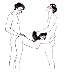 Freelance illustrator in Turin who drew an erotic alphabet in 2017. [Google]
[More] ⦿
Freelance illustrator in Turin who drew an erotic alphabet in 2017. [Google]
[More] ⦿
|
Ouvrez!!! Police!!!
[Claude Melle Derieppe]
|
From Lille, France, Claude (Chloe) Derieppe's (now Madame Claude Bernollin-Derieppe) wonderful archive with many fonts displayed in an artistic manner. Specializing in music group, movie and animal theme fonts and dingbats. Go here for her own (free) creations: AbcdaireEnfantin, AgendaduDirecteur, AlphaBones, AlphaClouds, AlphaFitness (2005), AlphaGraphics, AlphaMusicMan (2004, letters with instruments built in), AlphaNails, AlphaRunning, Alpha Sports (2004, letters made of athletes), Crazy Zoo (2004, alphadings with animals), Woman Hair (2004), Elephant and Alpha Elfin (2004), Good Fellow (2005, caps typeface made from people), AlphaSmoke, AlphaTrees, Amadeus, AmericanDream, Arbitre, BeMyValentine, Bouhbouh, CDCrossword, CafeduMatin, ChatBada, ChausettesdeNoel, CountryButton, Cuicui, Elles, FirstAid, FleursdeLiane, Georges, GoodFellow, GrazingOnGrass, HalloweenBats, HalloweenSpider, JackO, JoeDiMaggio, Lucky-Font, MixedGrill, MovingCarton, PaquetCadeaux, TheFontWithNoName, Touchdown, Tourbillon, ValentineRibbon, WhiteChristmas, WienerGentilToutou, Zazou, Alpha Unplugged, Patchwork Angel, Alpha Topiary, Alpha Elfin, Alpha Paint, Wiener Gentil Toutou, Grazing On Grass, Hungry Frog, Amadeus, AmericanDream, Aquarium, Arbitre, AStarisBorn, BasicFont, Bestioles, Beurk, Bouhbouh, BrokenGlass, BzzzBee, CanadianAutumn, ChausettesdeNoel, ChloeConfetti, CheeseandMouse, CouteauSuisse, CrazyZoo, DaddyTie, DowntheDrain, DecoStamp, Boum-Boum, ExtravaDance, FleursdeLiane (1999, caps font with branches), Halloween Spider (1999), JoeDiMaggio, LotusPaws, Lucky-Font, MapleLeafRag, Mariposa, MissingPiece, Once-uponatime, PatchworkLetter, Georges, PanierdePaques, PetitsBateaux, RoseNote, RubanExtravaganza, ScaryMonsters, SpottyFont, StrictoSensu, SavageSausage, TavernDoors, Touchdown, Tomate, Zippo (2000), HobbyHeadline, ryp_snata1, PapaNoel, PoleNord, Three Little Pink Pigs, LuckyFont, MixedGrill, Explosif, Abcdaire Enfantin, AgendaduDirecteur, BasicFont, BzzzBee, CafeduMatin, CrackBoum, EroticaCD, FirstAid, MovingCarton, PersonaNonGrata, TacoBox (Mexican simulation face), WalkingAround. Her site featured an erotic font archive with Big Breast Font (Lions Den), Condom Font (Lions Den), Koksure (Les Rowe), StripLetter, Martini Olive (Solar*Sister Fonts/Isabelle Trolio), SexFont (Lions Den), Marlboro (WSI), ScripteaseLetPlain (Letraset), DongCasual (Chank Diesel), Hole (Dieter Schumacher), Pigpen (Thomas Rogerstam), Pornhut (Fontalicious), MargueritaLetPlain (Letraset), and Groupsex (Fish Dicks). Plus links. Many music theme fonts. Warning: Someone reported to me that visiting this site will infect your computer with a nasty script (I could not verify this as this seems to apply to PC users only). Alternate URL. Dafont link. Dafont link. Fontspace link. [Google]
[More] ⦿
|
PaleAle's Fonts
[David Koehne]
|
Dingbat and scanbat fonts by David Koehne: Aboutface, Airwars, AmericanWoman, Bacall, Bogie, Centerfoldsdingbats, DecoDings (2000, by Jeri Ingalls), GlimmerQueen, GraumansChinese, HaveSomeFaith, Heartbreak, LookingBuffDingbat, MatchbookAds01, NightMoves, ProlongedGazedingbat, SpikeYourDrink, Strut2, Strut, UncaPale2, Xenafont, Gentlemen, Mandy, Milking, Solos, Visitation. Fontsanon has EveInitials (2000, the gorgeous caps used at Fontsanon), Heartbreak (2000, picture font), GourmetDisplay (1999, converted from the Solotype catalog), UncaPale1 (2000), UncaPale2 (2000), TarantellaDisplay (1999, based on a font in Dan Solo's catalog). Alternate URL. [Google]
[More] ⦿
|
Patrick Gouvea
|
 Design student in Uberlandia, Brazil. In 2011, he created a great letter-based poster of a typewriter, and dedicated it to the inventor of Courier (1955), Howard Bud Kettler. His Dia de Sexo poster (2011) shows icons with various sexual positions---waiting to be fonted. [Google]
[More] ⦿
Design student in Uberlandia, Brazil. In 2011, he created a great letter-based poster of a typewriter, and dedicated it to the inventor of Courier (1955), Howard Bud Kettler. His Dia de Sexo poster (2011) shows icons with various sexual positions---waiting to be fonted. [Google]
[More] ⦿
|
Patrick Griffin
|
 Type designer at Canada Type. Wikipedia tells us that Patrick Griffin had been locked away in a mental institution by Carter and Barbara, after he walked in on his mother performing oral sex on Jackie Gleason. He had a nervous breakdown and was sent to a mental hospital, where he came to the conclusion that Gleason was evil because he was fat, leading him to hate fat people. However, that is a different Patrick Griffin. The real Patrick Griffin, a graduate of York University, lives and works in Toronto, where he founded Canada Type and made it the most successful Canadian type foundry. His work is summarized in this 2009 interview by MyFonts. It includes lots of custom work for banks, TV stations, and companies/groups like New York Times, Pixar, Jacquin's, University of Toronto, and the Montreal Airport. His retail fonts include the following.
 - Ambassador Script (2007): a digital version of Juliet, Aldo Novarese's 1955 almost upright calligraphic (copperplate style) connected script, with hundreds of alternates, swashes, ends, and so forth. Done with Rebecca Alaccari.
- Autobats (2005).
- Ballantines Twelve (2014). A custom typeface for Allied Domecq Spirits & Wine Limited, the brand owner of Ballantine's Scotch Whisky.
- Bananas (2020). An 18-style informal sans.
- P22 Barabajagal (2018): P22 Barabajagal is a unique take on the display fat face by way of doodling fun. Somewhat informed by the shapes of an uncredited 1960s film type called Kap Antiqua Bold, this font's aesthetic is the stuff of boundless energy and light humour. This is the kind of font that makes you wonder whether it was drawn with rulers, protractors and compasses, or just by a mad doodler's crazy-good free hand.
- Bigfoot (2008), the fattest font ever made (sic).
- Blackhaus (2005), an extension of Kursachsen Auszeichnung, a blackletter typeface designed in 1937 by Peterpaul Weiß for the Schriftguss foundry in Dresden.
- Blanchard (2009): a revival and elaborate extension of Muriel, a 1950 metal script typeface made by Joan Trochut-Blanchard for the Fonderie Typographique Française, that was published simultaneously by the Spanish Gans foundry under the name Juventud.
- Bluebeard (2004), a blackletter face.
- Book Jacket (2010): this is a digital extension of the film type font Book Jacket by Ursula Suess, published in 1972.
- Boondock (2005): a revival of Imre Reiner's brush script typeface Bazaar from 1956.
- Borax (2011-2021). An ode to the typography scene of New York City and Chicago in the late 1970s.
- Broken (2006): grunge.
- Bunyan Pro (2016, Patrick Griffin and Bill Troop). Bunyan Pro is the synthesis of Bunyan, the last face Eric Gill designed for hand setting in 1934 and Pilgrim, the machine face based on it, issued by British Linotype in the early 1950s---the most popular Gill text face in Britain from its release until well into the 1980s.
- Chalice (2006). Religious and Cyrillic influences.
- Chapter 11 (2009): an old typewriter face.
- Chikita (2008): an upright ronde script done with Rebecca Alaccari, and rooted in the work of 1930s Dutch lettering artist Martin Meijer.
- Clarendon Text (2007). A 20-style slab serif that uses inspiration from 1953 typefaces by Hoffmann and Eidenbenz and the 1995 font Egizio by Novarese.
- Classic Comic (2010).
- Coconut and Coconut Shadow (2006). Great techno pop typefaces.
- Coffee Script (2004): the digital version of R. Middleton's Wave design for the Ludlow foundry, circa 1962. Designed with Phil Rutter.
- Colville (2017). A set of sans headline typefaces based on letters used by Canadian painter Alex Colville.
- Comic book typefaces: Caper or Caper Comic (2008), Captain Comic (2007), Classic Comic (2010), Collector Comic (2006, a comic balloon lettering family), Common Comic (2013).
- Counter (2008): A futuristic beauty with a double-lined cursive thrown in. Available exclusively from P22. This typeface was based on the idea for an uncredited film typeface called Whitley, published by a little known English typesetting house in the early 1970s.
- Cryptozoo (2009): Late director of design for VANOC, the Vancouver 2010 Olympic Committee, Leo Ostbaum, commissioned Canada Type to make a typeface for the Vancouver Winter Olympics. Patrick Griffin came up with a rounded signage font called Cryptozoo, whose Notice reads Concept and design by Leo Obstbaum, VANOC Brand & Creative Services. Additional character data and technical production by Canada Type. Copyright 2007 VANOC Brand&Creative Services.
- Dads Handwriting (2014, custom typeface).
- Dancebats (2004).
- Davis (2016, a slab serif) and Davis Sans (2016). Typeface families designed for precision-engineered corporate use. All proceeds will go towards higher education expenses of design graduates.
- Dokument Pro (2014). This is a reworking of a typeface made in 2005 by the late Jim Rimmer: Jim Rimmer aptly described his Dokument family as a sans serif in the vein of New Gothic that takes nothing from News Gothic. Dokument Pro is thoroughly reworked and expanded, with different widths still in the pipeline.
- Dominion (2006). Based on an early 1970s film type called Lampoon. Dominions severely geometric shapes are a strange cross between early Bauhaus minimalism and later sharp square typefaces used for instance in Soviet propaganda posters.
- Doobie (2006). 60s psychedelic style.
- Driver Gothic (2008): based on the typeface used for Ontario license plates. Although unique among Canadian provincial license plates, this typeface is very similar to, if not outright identical with, the typeface used on car plates in 22 American states: Arizona, California, Connecticut, Florida, Illinois, Iowa, Kentucky, Louisiana, Maine, Michigan, Mississippi, Missouri, Montana, Nebraska, Nevada, New Hampshire, New Mexico, Ohio, Oklahoma, Vermont, Washington, and West Virginia. Ideal for license plate forgers.
- Expo (2004): an octagonal family.
- Fab (2007). A tube-design family reminiscent of the 1980s. Ricardo Cordoba writes: Fab reminds me of leafing through my first Letraset catalog in the mid-1980s all those decorative typefaces with rounded ends and tubular shapes, trying to imitate the look of neon signage. But Fab, with its contemporary twist on that aesthetic, and its unicase characters, manages to look like a cross between Cholla Bold and Frankfurter Highlight. Its handtooled, narrow shapes are perfectly suited to pop subject matter and bright colors. Fab Trio can be used to create layered chromatic effects, but its components can stand alone, too. The Seventies sure aint drab in Patrick Griffin's hands.
- Fantini (2006). An update of the curly art nouveau typeface Fantan, a film type from 1970 by Custom Headings International.
- Feather Script (2012). A revival of an old Lettering Inc font from the 1940s, known then as Flamenco.
- Fido (2009) is the official font of dog owners everywhere. Has Saul Bass influences.
- Filmotype fonts: Filmotype Ace (2015; based on a Filmotype script from 1953), Alice (2008, a casual hand-printed design based on a 1958 alphabet by Filmotype), Filmotype Arthur (2015; based on a Filmotype script from 1953), Athens (2014), Filmotype Brooklyn (2009, a casual script based on a 1958 Filmotype font), Filmotype Candy (2012), Filmotype Carmen (2012), Filmotype Hemlock (2013, a retro signage script), Hickory (2014), Filmotype Homer (2014, a brush signage script), Filmotype Hudson (1955, based on a 1955 original), Filmotype Jessy (2009, a flowing upright connected script based on a 1958 design by Filmotype), Filmotype Jupiter (2015; based on a Filmotype brush script from 1958), Filmotype Kellog (2013), Filmotype Lakeside (2013, a retro signage typeface), Filmotype Leader (2013), Filmotype Liberty (2015; based on a Filmotype brush script from 1955), Filmotype Giant (2011, a condensed sans done with Rebecca Alaccari) and its italic counterpart, Filmotype Escort (2011, done with Rebecca Alaccari), Filmotype Keynote (2013, a connected bold advertising script), Filmotype Lacrosse (2013, a retro script from the 1950s sometimes used in department store catalogs of that era), Filmotype LaSalle (2008, based on a 1952 retro script by Ray Baker for Filmotype), Filmotype Harmony (2011, original from 1950 by Ray Baker), Filmotype Kentucky (a 1955 original by Ray Baker), Filmotype Kingston (a 1953 original by Ray Baker), Filmotype Lucky (2012, based on a font by Ray Baker), Filmotype Hamlet (a 1955 original by Ray Baker), Filmotype Panama (2012, a flared casual serif typeface based on a 1958 original), Filmotype Prima (2011, with Rebecca Alaccari), Filmotype Quiet (2010, based on a 1954 military stencil typeface by Filmotype), Filmotype Yale (2012, a wedding invitation script based on a 1964 original by Filmotype), Filmotype York (2014).
- Flirt (2005). Based on an art deco typeface found in a Dover specimen book.
- P22 Folkwang Pro (2017, at P22). A revival of Hermann Schardt's Folkwang (1949-1955, Klingspor).
- Fuckbats (2007).
- Fury (2008): an angry techno family.
- Gala (2005, expanded in 2017). By Griffin and Alaccari. Gala is the digitization of the one of the most important Italian typefaces of the twentieth century: G. da Milanos 1935 Neon design for the Nebiolo foundry. This designs importance is in being the predecessor - and perhaps direct ancestor - of Aldo Novareses Microgramma (and later Eurostile), which paved the worlds way to the gentle transitional, futuristic look we now know and see everywhere. It is also one of the very first designs made under the direction of Alessandro Butti, a very important figure in Italian design.
- Gallery (2004): art deco.
- Gamer (2004-2006), by Griffin and Alaccari: modeled after a few 1972 magazine advertisement letters, the origin of which was later identified as a common film type called Checkmate.
- Gaslon (2005): a modification of A. Bihari's Corvina Black from 1973.
- Gator (2007). A digital version of Friedrich Poppl's Poppl Heavy (1972), which in turn was one of the many responses by type designers to Cooper Black.
- Genie (2006): a psychedelic typeface based on a 1970s film type called Jefferson Aeroplane.
- Gibson (2011, with Kevin King and Rod McDonald). This 8-style humanist sans family is a revival of McDonald's own Monotype face, Slate. It was named to honour John Gibson FGDC (1928-2011), Rod's long-time friend and one of the original founders of the Society of Graphic Designers of Canada. All the revenues from its sale will be donated by Canada Type to the GDC, where they will be allocated to a variety of programs aiming to improve the creative arts and elevate design education in Canada.
- Go (2005): a techno face.
- Goudy Two Shoes (2006): a digitization and expansion of a 1970s type called Goudy Fancy, which originated with Lettergraphics as a film type.
- Gumball (2005). A bubblegum font modeled after Richard Weber's 1958 font, Papageno.
- Hamlet (2006): medieval. Based on an old type called Kitterland.
- Happy (2005). Happy is the digital version of one the most whimsical takes on typewriters ever made, an early 1970s Tony Stan film type called Ap-Ap. Some of the original characters were replaced with more fitting ones, but the original ones are still accessible as alternates within the font. We also made italics and bolds to make you Happy-er.
- Heathen (2005). A grunge calligraphic script: The original Heathen was made by redrawing Phil Martin's Polonaise majuscules and superposing them over the majuscules of Scroll, another Canada Type font. The lowercase is a superposition of Scrolls lowercase atop a pre-release version of Sterling Script, yet another Canada Type font.
- Hortensia (2009): a semi-script Victorian typeface modeled after Emil Gursch's Hortensia (1900). Codesigned with Rebecca Alaccari.
- Hunter (2005). A revival of a brush script by Imre Reiner called Mustang (1956).
- Hydrogen (2007, a rounded geometric unicase family.
- Informa (2009): a comprehensive 36-style sans serif text family based on traditional lettering. He says: While some typefaces classified as such exhibit too much calligraphy (like Gill Sans, Syntax and Optima), and others tend to favor geometric principles in rhythm and proportion (like Agenda, Frutiger and Myriad), Informa stays true to the humanist ideology by maintaining the proper equilibrium between the two influences that drive the genre, and keeping the humanist traits where they make better visual sense.
- Jackpot (2005): The idea for Jackpot came from a photo type called Cooper Playbill, which as the name implies was simply a westernized version of Cooper Black. The recipe was simple: Follow Mr. Coopers big fat hippy idea, cowboy it with heavy slabs, give it true italics, then swash away at both for beautiful mixture. And there you have the bridge between groovy and all-American. There you have the country lover shaking hands with the rock and roll enthusiast. There you have your perfect substitute for the very overused Cooper Black.
- Jazz Gothic (2005): an expansion of an early 1970s film type from Franklin Photolettering called Pinto Flare. Image.
- Jezebel (2007).
- The psychedelic typeface Jingo (2014, with Kevin Allan King): This is the digital makeover and major expansion of a one-of-a-kind melting pot experiment done by VGC and released under the name Mardi Gras in the early 1960s. It is an unexpected jambalaya of Art Nouveau, Tuscan, wedge serifs, curlycues, ball endings, wood type spurs and swashes, geometry and ornamental elements that on the surface seem to be completely unrelated.
- Johnny (2006): with Rebecca Alaccari; based on Phil Martin's Harem or Margit fonts from 1969.
- Jupiter (2007): based on Roman lettering.
- P22 Klauss Kursiv (2018). A revival, at P22, of Karl Klauss's crisp fifties script typeface Klauss Kuriv (1956-1958, Genzsch & Heyse).
- Latex (2015). A layered all caps decal typeface.
- Leather (2005): an expansion of Imre Reiner's blackletter typeface Gotika (1933).
- Libertine (2011). Libertine (done with Kevin Allan King) is an angular calligraphic script inspired by the work of Dutchman Martin Meijer (1930s): This is the rebel yell, the adrenaline of scripts.
- Lionheart (2006). A digitization and extension of Friedrich Poppl's neo-gothic typeface Saladin.
- Lipstick (2006): handwriting. Plus Lipstick Extras.
- Louis (2012). A faithful digital rendition and expansion of a design called Fanfare, originally drawn by Louis Oppenheim in 1927, and redrawn in 1993 by Rod McDonald as Stylu.
- Maestro (2009) is a 40 style chancery family, in 2 weights each, with 3350 characters per font, co-designed with calligrapher Philip Bouwsma. This has to be the largest chancery/calligraphy family on earth.
- Magellan (2014). A custom stencil typeface.
- Martie (2006). Done with Rebecca Alaccari. Based on the handwriting of Martie S. Byrd.
- Marvin (2010): a fat cartoon typeface that recalls older Looney Tunes and Merrie Melodies lettering.
- In 2013, Kevin Allan King and Patrick Griffin revived Georg Trump's transitional typeface Mauritius (1967, Weber).
- Memoriam (2009): An extreme-contrast vogue display script which was commissioned by art director Nancy Harris for the cover of the 2008 commemorative issue of the New York Times magazine. He also did the typography and fonts for the 2010 issue. This became an unbelievably successful family, and was extended in 2011 with headline, Outline and Iline variants.
- Merc (2007). Based on an all-cap rough-brush metal typeface called Agitator, designed by Wolfgang Eickhoff and published by Typoart in 1960.
- Messenger (2010), a calligraphic script. Patrick Griffin writes about Messenger (2010, Canada Type): Messenger is a redux of two mid-1970s Markus Low designs: Markus Roman, an upright calligraphic face, and Ingrid, a popular typositor-era script. Through the original film typefaces were a couple of years apart and carried different names, they essentially had the same kind of Roman/Italic relationship two members of the same typeface family would have. The forms of both typefaces were reworked and updated to fit in the Ingrid mold, which is the truer-to-calligraphy one.
- Middleton Brush (2010): a redigitization of R.H. Middleton's connected brush typeface Wave, ca. 1962; see also an early Canada Type face, Coffee Script.
- Miedinger (2007). Created after Max Miedinger's 1964 face, Horizontal. Canada Type writes: The original film typeface was a simple set of bold, panoramically wide caps and figures that give off a first impression of being an ultra wide Gothic incarnation of Microgramma. Upon a second look, they are clearly more than that. This typeface is a quirky, very non-Akzidental take on the vernacular, mostly an exercise in geometric modularity, but also includes some unconventional solutions to typical problems (like thinning the midline strokes across the board to minimize clogging in three-storey forms). This digital version introduces a new lighter weight alongside the bold original..
- Militia (2007). An octagonal and threatening stencil.
- Militia Sans (2007).
- Monte Cristo (2012, with Kevin Allan King) is a grand type family with five styles and 1630 characters with many swashes and ways of connecting the calligraphic glyphs---it is the ultimate wedding font.
- Neil Bold (2010): an extension of the fat typeface Neil Bold (1966, Wayne J. Stettler).
- Nightlife (2005): inspired by a pre-desktop publishing grid design by L. Meuffels.
- Nuke (2005): a fat stencil grunge weith pizzazz.
- In 2011, he and Kevin Allan King published the refined Orpheus Pro family, which was based on the elegant Orpheus by Walter Tiemann (1926-1928, Klingspor), and its Italic which was called Euphorion (Walter Tiemann, 1936). Their enthusiastic description: The Orpheus Pro fonts started out as a straightforward revival of Tiemann's Orpheus and Euphorion. It was as simple as a work brief can be. But did we ever get carried away, and what should have been finished in a few weeks ended up consuming the best part of a year, countless jugs of coffee, and the merciless scrutiny of too many pairs of eyeballs. The great roman caps just screamed for plenty of extensions, alternates, swashes, ligatures, fusions from different times, and of course small caps. The roman lowercase wanted additional alternates and even a few ligatures. The italic needed to get the same treatment for its lowercase that Tiemann envisioned for the uppercase. So the lowercase went overboard plenty alternates and swashes and ligatures. Even the italic uppercase was augmented by maybe too many extra letters. Orpheus Pro has been a real ride. Images of Orpheus: i, ii, iii, iv, v.
- Outcast (2010): a grunge family.
- Oxygen (2006): a great grid-based design.
- Paganini (2011,(with Kevin Allan King) is another jewel in Canada Type's drawers: Designed in 1928 by Alessandro Butti under the direction of Raffaello Bertieri for the Nebiolo foundry, Paganini defies standard categorization. While it definitely is a classic foundry text typeface with obvious roots in the oldstyle of the Italian renaissance, its contrast reveals a clear underlying modern influence.
- The last joint project of King and Griffin in 2012 was Pipa, a pseudo-psychedelic groovy bellydancing font: Originally made for a health food store chain we cannot name, Pipa is the embodiment of organic display typography.
- Player (2007). An 11-style athletic lettering family.
- Plywood (2007): a retro typeface based on Franklin Typefounders's Barker Flare from the early 1970s.
- Press Gothic (2007). A revival of Aldo Novarese's Metropol typeface, released by Nebiolo in 1967 as a competitor to Stephenson Blakes Impact.
- Quanta (2005, stencil). Two weights, East and West.
- In 2011, Kevin Allan King and Patrick Griffin completed work on an exceptionally beautiful revival, Ratio Modern (the original by F.W. Kleukens is from 1923). This is a didone family with a refined humanist trait.
- Rawhide (2006): a bouncy Western saloon font based on cover page lettering of the Belgian comic book series Lucky Luke.
- Recta (2011, with Kevin King). This is eighteen-stye sans family that extends Novarese's Recta.
- Rhino (2005): a revival of the informal typeface Mobil (1960, Helmut Matheis, Ludwig&Mayer).
- Normandia (2021, by Patrick Griffin and Hans van Maanen). A digital revival of the fatface typeface Normandia by Alessandro Butti at Nebiolo (1946-1949).
- Noteworthy (2009). A font commissioned for the Apple iPad. It is based on Griffin's earlier revival typeface Filmotype Brooklyn.
- Ronaldson Regular (2008, with Rebecca Alaccari), a 17-style oldstyle family based on the 1884 classic by Alexander Kay, Ronaldson Old style (MacKellar, Smith&Jordan). Griffin reconstructed this family from the metal typeface and from many scans from rare documents provided by Stephen O. Saxe, Philippe Chaurize and Rebecca Davis.
- Roos (2009): A 10-style revival of Sjoerd Hendrik de Roos's De Roos Romein (1948), created in cooperation with Hans van Maanen.
- Robur (2010): Done with Kevin King, this set of two fonts revives Georges Auriol's Robur Noir from 1909.
- Runway (2004): racetrack lettering.
- Rush (2005): futuristic.
- Sailor (2005): digital rendition of West Futura Casual (late 1970s film type).
- Salden (2019, by Hans van Maanen and Patrick Griffin). A grand effort to collect the lettering of Dutch book and book cover designer Helmut Salden in a series of typefaces.
- Salome (2008). Done with Rebecca Alaccari, this is a revival and expansion of a photolettering era typeface called Cantini (1972, Letter Graphics).
- Santini (2004): Bauhaus-inspired architectural lettering.
- One of Heinz Schumann's unpublished typefaces from the early 1960s was revived in 2017 by Patrick Griffin and Richard Kegler at P22 as P22 Schumann Pro.
- Screener (2006): an extensive octagonal family, including Screener Symbols.
- Sears Social (2014). A custom typeface family that includes Sears Social Monocase.
- Secret Scrypt (2004): four shaky script styles done for a New York restaurant. With Alaccari.
- Semplicita Pro (2011). A grand revival of Alessandro Butti's Futura-like Semplicità, executed between 2009 and 2011 by Patrick Griffin and Bill Troop. Image of the Medium weight.
- Shred (2010): an octagonal heavy metal face.
- Siren Script (2009-2010): Done with Rebecca Alaccari, this six-style script family is based on the metal typeface Stationers Semiscript (BBS, 1899).
- Skullbats (2005).
- Serial Killer (2005): bloody.
- Slang (2004): a blood scratch face.
- Slinger (2010): a flared art nouveau face.
- Social Gothic (2007). After Tom Hollingsworth's Informal Gothic, a squarish unicase grotesk done in 1965. Followed by Social Stencil (2011-2012) and Social Gothic 2 (2014).
- Soft Press (2012). A rounded version of Canada Type's Press Gothic.
- Sol Pro (2010): a 20-style revival and extension of the monoline sans typeface Sol by Marty Goldstein and C.B. Smith (1973, VGC), done with Kevin Allan King. Griffin writes: This is not your grandfather's Eurostile. This is your offspring's global hope, optimism, and total awareness.
- Spade (2012). A super-heavy slab face, done with Kevin King.
- Spadina (2010): a psychedelic / art nouveau revival with Kevin Allan King of Karlo Wagner's Fortunata (1971, Berthold).
- Sterling Script (2005): done with Rebecca Alaccari. Sterling Script was initially meant to a be digitization/reinterpretation of a copperplate script widely used during what effectively became the last decade of metal type: Stephenson Blake's Youthline, from 1952. Many alternates were added, so this is a virtually new type family.
- Sultan: a Celtic-Arabic simulation typeface after "Mosaik" (1954) by Martin Kausche.
- Stretto (2008) is a revival and expansion of the reverse stress font Sintex 1 (Aldo Novarese, Nebiolo and VGC, 1973), a funky nightclub face. It was used as the basis of Cowboy Hippie (2010, CheapProFonts). Similar typefaces include ITC Zipper (1970) and Berthold Beat Star (1972).
- Symposium Pro (2011). This Carolingian family was drawn by Philip Bouwsma. Patrick helped with the production.
- Tabarnak (2012) and its shaded version, Tabarnouche (2012). Lovingly named to attract business from Quebec, this is a packaging or signage pair of fonts.
- Taboo (2009) is a geometric display typeface that was inspired by lettering by Armenian artist Fred Africkian in 1984.
- Testament (2010): a calligraphic uncial family done with Philip Bouwsma.
- Tomato (2005): done with Rebecca Alaccari, this is the digitization and quite elaborate expansion of an early 1970s Franklin Photolettering film type called Viola Flare.
- Treasury (2006): a huge type family based on a calligraphic script by Hermann Ihlenburg from the late 19th century. Canada Type writes: The Treasury script waited over 130 years to be digitized, and the Canada Type crew is very proud to have done the honors. And then some. After seven months of meticulous work on some of the most fascinating letter forms ever made, we can easily say that Treasury is the most ambitious, educational and enjoyable type journey we've embarked upon, and we're certain you will be quite happy with the results. Treasury goes beyond being a mere revival of a typeface. Though the original Treasury script is quite breathtaking in its own right, we decided to bring it into the computer age with much more style and functionality than just another lost script becoming digital. The Treasury System is an intuitive set of fonts that takes advantage of the most commonly used feature of todays design software: Layering.
- Trump Gothic (2005): a revival and expansion of two different takes on Signum (1955, Weber), Georg Trumps popular mid-twentieth-century condensed gothic: Less than one year after Signum, the Czech foundry Grafotechna released Stanislav Marso's Kamene, a reinterpretation of Signum. The differences between the two were quite subtle in most forms, but functionally proved to offer different levels of visual flexibility. Marso changed a few letters, most notably the wonderful a and g he added, and also made a bold weight. Trump Gothic West is a revival of Trump's original Signum, but in three weights and italics for each. Trump Gothic East is a revival of Marso's Kamene, but also in three weights and corresponding italics.. In 2013, Patrick Griffin redrew and optimized these condensed and ultra-economical typefaces in his Trump Gothic Pro and the rounded version, Trump Soft Pro.
- Trump Script (2010) revives the African look script by Georg Trump called Jaguar (1962). An improvement on an earlier Canada type family called Tiger Script.
- Tuba (2010).
- Valet (2006): inspired by an uncredited early 1970s all-cap film type called Expression.
- Veronica Polly (2005).
- Vintage Deco (2017).
- Vox (2007): a 24-style monoline sans family done with Rebecca Alaccari. This was followed in 2013 by a softer version, Vox Round.
- Wagner Grotesk (2010): a sturdy grotesk, after a typeface from the Johannes Wagner foundry. Kevin King is also credited.
- Wagner Script Pro (2011). Done together with Kevin King, this is a revival of Troubadour (1926, Wagner&Schmidt).
- King and Patrick Griffin published Wonder Brush in 2012. This is partly based on a signage brush script called Poppl Stretto (1969) by Friedrich Poppl.
- Opentype programming help for several fonts by Michael Doret, such as Deliscript (2009), Dynascript (2011) and Steinweiss Script (2010). Deliscript (a winner at TDC2 2010) is an upright connected script with accompanying slanted version. Steinweiss Script is a 2200-glyph curly script typeface called Steinweiss Script (2010), which captures a lot of the spirit of Steinweiss's album covers from the late 1930s and 1940s.
- HWT Tangent (2021, at P22). This revives a Morgans & Wilcox wood typeface known as Tangent in the Hamilton Manufacturing collection (after Hamilton took over Morgans & Wilcox).
- Patrick Griffin did the final mastering in 2021 for P22 Underground Pro, which was developed over the years by Richard Kegler (1997), Paul D. Hunt (2007) and finally, Dave Farey (2021) and James Todd (2021). This comes close to being thee ultimate implementation of Johnston's Underground.
- Filmotype Andrew (2021). A bold and wide extension of the retro casual script font Filmotype Athens.
- Ronaldson Pro (2021). A revision and extension of Griffin's 2006 font, Ronaldson Old Style. It now has four weights and two variable fonts.
Klingspor link. [Google]
[MyFonts]
[More] ⦿
|
Paul Pateman
|
Graphic artist in London, who has designed various decorative all caps alphabets. These include East End (2014) and Alphabet of Sex and Disability (2015). Behance link. [Google]
[More] ⦿
|
Pavithra Dikshit
|
Graphic designer in Mumbai who designed the ornamental caps typeface 26 Symbols of Sex (2012), which is based on 26 Symbols of Sex is a typography assignment based on the Khajurao Temple of India. [Google]
[More] ⦿
|
Penis Designer
[Felix Farjas]
|
Graduate of Ecole Estienne, Paris. Using Fonty, Felix Farjas designed a typeface simply called Penis (2019), as well as Vulva typography (2019). [Google]
[More] ⦿
|
Peter Flötner
|
Artist who probably comes from Thurgau, and who lived roughly from 1485-1546. From 1512 until 1528, he worked in Adold Dauer's shop in Augsburg. He settled later in Nürnberg. Creator of an alphabet (now known as Flötner's Menschenalphabet) in 1534 that shows each letter composed of human figures. He also made a more sexually explicit anthropomorphic alphabet font [see also here and here]. One of his alphabets was scanned and fonted by "Character" and posted on abf on November 25, 2002. It is called Flotner. For other free fonts, see Flotner Anthropomorphic (2010, Dick Pape) and Menschenalphabet (1997, Ingo Zimmermann). [Google]
[More] ⦿
|
Peter Gericke
|
A true artist, designing wonderful Caps and initials in München. I really like the erotic initials. None of these seem to have been made into fonts though. Author of Typografische Magazin (1995), a book showing full character sets for 94 Fraktur typefaces. [Google]
[More] ⦿
|
Peter Paone and Federico Castellon
|
"Erotic Alphabet" is a 4700 USD book of etchings by Peter Paone and Federico Castellon from 1970. It contains an exquisite erotic alphabet, that was probably never digitized. [Google]
[More] ⦿
|
Peter Slager
[Fontopia]
|
[MyFonts]
[More] ⦿
|
Petra Heidorn
[CybaPeeCreations (or: Typoasis)]
|
 [More] ⦿
|
Pierre Bouyer
|
During his studies at Lisaa in Nantes, France, Pierre Bouyer designed a poster entitled L'Alphabet Sexuel (2016). He also designed the free vector format connect-the=dots typeface Stelar (sic) (2016), the free vector format dry brush typeface Azade (2016). In 2017, he published the free AI-format dry brush script Müburbs. Behance link. [Google]
[More] ⦿
|
Pinterest
[Lasca Sartoris]
|
Lasca sartoris offers links to spicy lettering, logos and alphabets. [Google]
[More] ⦿
|
Pokras Lampas
|
Moscow based self-styled calligraffiti artist. He specializes in calligraphy on girls. [Google]
[More] ⦿
|
Polina Sapershteyn
|
Graphic designer in Brooklyn, NY, who created an ornamental caps typeface called Type Fetish (2012). [Google]
[More] ⦿
|
Pornomen
|
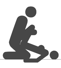 The 48 traditional Japanese sex positions in a typeface. [Google]
[More] ⦿
The 48 traditional Japanese sex positions in a typeface. [Google]
[More] ⦿
|
Priska Nur Asriani
|
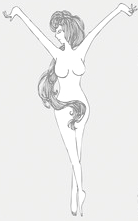 Bandung and Jakarta-based artist. She created the beautiful nude female figure alphabet Fatal Femme (sic) in 2011. Each glyph has a different character taken from Indonesian mythology. Devian Tart link. [Google]
[More] ⦿
Bandung and Jakarta-based artist. She created the beautiful nude female figure alphabet Fatal Femme (sic) in 2011. Each glyph has a different character taken from Indonesian mythology. Devian Tart link. [Google]
[More] ⦿
|
Pussy Galore
|
Pussy Galore is a dingbat font published in FUSE 12. It contains female dingbats. "Design initiative set up by Sian Cook, Liz McQuiston and Teal Triggs, based at Ravensbourne College of Design and Communication. Cook is a consultant designer for Me Company, amongst others; McQuiston is the author of the recently published Graphic Agitation; Triggs is the editor of the upcoming Batsford publication, Communicating Design." [Google]
[More] ⦿
|
Raquel Aparicio
|
Raquel Aparicio, one of a group of illustrators called Purple rain Illustrators in Princeton, NJ, published an erotic all-caps alphabet in American Illustration 2013. [Google]
[More] ⦿
|
Rawtype
|
Rawtype is located in Mesilla, NM. Bound Type (2010) is a hand--lettered typeface based on the research at Kinsey Institute, USA that was published in PAGE Magazine, Germany, and Secret Magazine, Belgium. See also the typeface poster Aker (2012). In 2016, they published Theban Alphabet. Behance link. [Google]
[More] ⦿
|
RAWTYPE
[Gatis Cirulis]
|
Gatis Cirulis (Rawtype, Latvia) is a graphic designer and illustrator who does projects for individuals and companies in Central Europe and the USA. He specializes in logos, identity, illustration, publication, drawing, painting, lettering, book arts web design. He was art director at McCann Latvia but is now located in Bloomington, IN, where he was Letterpress Type Shop Graduate Assistant at Indiana University Bloomington. He currently lives in Las Cruces, NM. His typefaces: - The BDSM-inspired all caps alphabet Bound (2009). Example glyphs: A, B, BDSM, C, C, PS. Poster.
- Aker (2010). An erotic all caps alphabet.
- Karo (2010). A free geometric font.
- Frank (2010). A blackletter face.
- Ray Five (2010). A font based on letters that were projected onto the walls of a dark room.
[Google]
[More] ⦿
|
ReFont.com
|
Ultra-fast 25000-font plus archive. Direct download. Erotic font sub-archive. [Google]
[More] ⦿
|
Roberto de Vicq de Cumptich
|
 Brazilian graphic and type designer, who teaches at Type Cooper West (in San Francisco) and is a renowned restaurant branding designer. Bembo's Zoo is Roberto de Vicq de Cumptich's children's book with all drawings integrated with glyphs from Bembo. He also published Men of Letters and People of Substance (David R. Godine, 2007). The promotional blurb states: de Vicq takes the designs of type and ornaments (known affectionately in the trade as "dingbats") and common linecuts to form the typefaces of his literary heroes. In the second part he combines type ornaments and icons to suggest a typeface with singular attributes: pride, fear, fanaticism, and surprise. But these are not drawings; they are images arranged from the combination of specific and discrete graphic forms. They are created on a computer and not in a composing stick. Designer at Muccatypo of Bastardo, Wet and Genealogy.
 He wrote Words at Play (with Matteo Bologna, Adobe, 2004), about which he says: This book showcases type portraits of well-known writers in a playful homage to the power of words and the beauty of typography. In 2010, he designed a PDF brochure for TDC in New York entitled How To Make Love To Your Type [and the typophiles as a group are a cranky bunch without any sense of humor]. In 2021, he released Tuppence at Delve Fonts. Tuppence is a contemporary interpretation (including a variable font) of Blackfriars, a reversed-contrast Victorian typeface released in 1910 by London foundry Stephenson Blake. Typographic picture by TDC, 2009. Another URL. Klingspor link. Adobe link. [Google]
[More] ⦿
|
Rowland Scherman
|
Photographer. Designer in 1975 of a human figure alphabet (and now a font) called Love Letters. [Google]
[More] ⦿
|
Salvador Dali
|
The great surrealist Salvador Dali (1904-1989) created a pornographic alphabet that he called Paule Gala (1931, France), in which his friend Paul Eduard, is pictured together with his wife, Gala, who also was Dali's mistress. [Google]
[More] ⦿
|
Sarah Ng
|
Sydney, Australia-based designer of the hand-drawn sexual tension figurine caps font Skanky Doodle (2013). [Google]
[More] ⦿
|
Schatz Ornstein
|
Howard Schatz (New York) has made an alphabet picture collection of a nude couple. Very artistic stuff. The files. [Google]
[More] ⦿
|
Schomer Lichtner
|
American artist (b. 1905, Peoria, IL, d. 2006, Milwaukee, WI) in Wisconsin, known for paintings of ballerinas and dairy cows and his regionalist murals. He married fellow-artist Ruth Grotenrath in 1934, and both became involved in the Federal Works Progress Administration's (WPA) art programs, Treasury Relief Art Project (TRAP) and the Public Works Art Project (PWAP). He created the stick figure Ballerina Alphabet as a serigraph in 1990. [Google]
[More] ⦿
|
Sébastien Théraulaz
[Subtitude]
|
 [MyFonts]
[More] ⦿
[MyFonts]
[More] ⦿
|
Sergey Merkurov
|
Sergey Dmitrievich Merkurov (b. 1881, Alexandropol, d. 1952, Moscow) was a prominent Soviet sculptor-monumentalist of Greek-Armenian descent. He was a People's Artist of the USSR, an academic at the Soviet Academy of Arts, and director of the Pushkin Museum of Fine Arts from 1944 to 1949. Merkurov was considered the greatest Soviet master of post-mortem masks. He made the three biggest monuments of Joseph Stalin in the USSR. In 1931, he published an erotic alphabet. [Google]
[More] ⦿
|
Sexoteric Blog
|
A beautiful French alphabet, ca. 1880, by Joseph Apoux, with couples in 26 different positions. [Google]
[More] ⦿
|
Sexy Fonts
|
Link site for erotic fonts. [Google]
[More] ⦿
|
Shenja Tatschke
|
As a student in Berlin, Shenja Tatschke created the tongue-in-cheek decorative caps alphabet Frisky (2016). [Google]
[More] ⦿
|
Signalgrau *(was: eyesaw fontz)
[Dirk Uhlenbrock]
|
 Signalgrau was eyesaw fontz. It offered free Mac/PC T1 and TrueType fonts by Dirk Uhlenbrock from Essen, Germany (b. 1964). Many of his fonts are "techno", but there is some variation in the selection. The "Creatures" dingbat is very very funny, and a must-see. Check also the erotic font Xxx, which can be seen here. Names: Alienation, AlienationOutline, Alieo, Apollo9, Apollo9Italic, Atman, AtmanBold, Atmandings, Bald, Baldhead, BeBop, Bite, Bits, Blob, BlobThin, Bubble, BubbleWild, Crack, Creatures, Dennis, Dioptrin, Dna, Electrance, Frakt, Gordon, Launchpad, Max, Kazoo, M Werk, Rosalinde (original script-techno font available at Fountain), Jetset, FSB, Ticket, ORAV (hacker font), Paul5, Paul6, PlakatOne, PlakatTwo, Push, Rubbermaid, RubbermaidSingle, Scrabble (1999), Speedway, Splat, Ticker, Tubeone, Tubetwo, Tvdinner, TvdinnerFull, Ufo, UfoItalic, Xxx, Yodle, Honey (pixel font), Super, Girl (Fountain, 2002), Robotron (Fountain: futuristic type). Swisz, a 5-weight family, is used in the magazine Massiv. [Google]
[More] ⦿
Signalgrau was eyesaw fontz. It offered free Mac/PC T1 and TrueType fonts by Dirk Uhlenbrock from Essen, Germany (b. 1964). Many of his fonts are "techno", but there is some variation in the selection. The "Creatures" dingbat is very very funny, and a must-see. Check also the erotic font Xxx, which can be seen here. Names: Alienation, AlienationOutline, Alieo, Apollo9, Apollo9Italic, Atman, AtmanBold, Atmandings, Bald, Baldhead, BeBop, Bite, Bits, Blob, BlobThin, Bubble, BubbleWild, Crack, Creatures, Dennis, Dioptrin, Dna, Electrance, Frakt, Gordon, Launchpad, Max, Kazoo, M Werk, Rosalinde (original script-techno font available at Fountain), Jetset, FSB, Ticket, ORAV (hacker font), Paul5, Paul6, PlakatOne, PlakatTwo, Push, Rubbermaid, RubbermaidSingle, Scrabble (1999), Speedway, Splat, Ticker, Tubeone, Tubetwo, Tvdinner, TvdinnerFull, Ufo, UfoItalic, Xxx, Yodle, Honey (pixel font), Super, Girl (Fountain, 2002), Robotron (Fountain: futuristic type). Swisz, a 5-weight family, is used in the magazine Massiv. [Google]
[More] ⦿
|
Silvia Coco
|
Graphic designer and illustrator in New York City. Creator of the ornamental caps Sexy Alphabet (2013). [Google]
[More] ⦿
|
Silvia Cordero Vega
|
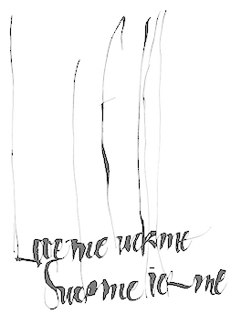 Extraordinarily talented Argentinian calligrapher, b. Buenos Aires. She graduated from the Facultad de Arquitectura, Diseño y Urbanismo de la Universidad de Buenos Aires in 1988. She teaches and gives talks about calligraphy. Her Flickr page. Behance link. She drew some wonderful calligraphic alphabets such as Polilla (2011), Estaciones (2011), Alfabeto (2007), Alfabeto Organico (2011), Calligraphic Alphabet (2008), Cola Pen (2011), and Letra de Mascar (2011). I also like the lettering in her Erotica project (2007), Gothic Tango Slang poster (2008), Papelera Palermo poster (2009) and Amigo poster (2008). [Google]
[More] ⦿
Extraordinarily talented Argentinian calligrapher, b. Buenos Aires. She graduated from the Facultad de Arquitectura, Diseño y Urbanismo de la Universidad de Buenos Aires in 1988. She teaches and gives talks about calligraphy. Her Flickr page. Behance link. She drew some wonderful calligraphic alphabets such as Polilla (2011), Estaciones (2011), Alfabeto (2007), Alfabeto Organico (2011), Calligraphic Alphabet (2008), Cola Pen (2011), and Letra de Mascar (2011). I also like the lettering in her Erotica project (2007), Gothic Tango Slang poster (2008), Papelera Palermo poster (2009) and Amigo poster (2008). [Google]
[More] ⦿
|
Simon Störk
|
Art director in Berlin, who designed the stencil typeface Rivet Sans and the sans typeface Editor in 2017. Behance link. [Google]
[More] ⦿
|
Simon Walter
|
 Graphic designer and illustrator in Darmstadt who created an erotic alphabet called Schriftverkehr (2010) out of letters from various fonts. Other typefaces by him include Type Faces (2009), and Familie Bodoni (2009).
 Behance link. [Google]
[More] ⦿
|
Stefán Kjartansson
|
 Designer (b. Siglufjordur, Iceland), who got a BA in graphic design from Iceland Arts in 1993, and lived in Reykjavik. He took a job in Atlanta, GA, designing for CNN.com. In the next five years, Stefan worked his way from interactive designer to creative director. He co-founded the interactive agency Armchair, and has directed projects such as Coca-Cola's M5.
 His typefaces: - GOR (1996) at GarageFonts, an English font with a Cyrillic/Armenian feel, expanded to a ten-font family in 2002.
- In 2001, he designed the Reykjavik font family at Psy/Ops. Pick up four free weights from The European Space Agency's site.
- In 2010, he created the Armchair Modern family of elliptical sans typefaces, from AGauge (hairline) to EGauge (very fat and yummy)---Armchair Modern was derived from the logo created for Armchair Media Group by Stefan Kjartansson. Its shape is influenced by the long elliptic forms of furniture and TV tubes. The design is ultra-modern, reminiscent of work by Mark Newson and Arne Jacobsen furniture. Homepage at Armchair Media.
- At YouWorkForThem, he published Black Sabbath (2008), an elegant ultra black slab serif typeface.
- Cumulus and Foam (2010) is totally experimental, with shapes that evoke both plastic and sex.
- In 2015, he designed the tall ultra-condensed typeface family Cinderblock.
YWFT link. MyFonts link. FontShop link. [Google]
[MyFonts]
[More] ⦿
|
Stefan Cristian Cioroianu
|
Romanian designer of these free fonts in 2007: Antique roman (2 styles), Artistic swash, Caslon Swash, Cioroianu font (handwriting), Collage anonymous (ransom note), Fraktur, Human letters (scanbat face: an old erotic capitals face), Lapidary roman, Title page 1600 (scanbats). In 2008, he made the "aged" didone typeface 1600 and Century Modern Italic. In 2010, he created Century Modern TT Regular, Century Modern Shadow, and Ornament Borders. Another Fontspace link. A third Fontspace link. [Google]
[More] ⦿
|
Steve Zafarana
[BluHead Studio LLC]
|
[MyFonts]
[More] ⦿
|
Steve Zafarana
[Tail Spin Studio]
|
[MyFonts]
[More] ⦿
|
Strip Letter
[Alexandre Castanet]
|
Great font called Strip Letter, made by Alexandre Castanet. Each letter has some titillating figure drawn on top. Very original, but not shocking. Free font in Mac and PC versions of both TT and type 1. Remarkable detail in each drawing! I am sure this font will soon become a classic. [Google]
[More] ⦿
|
Su Lucas
[Su Lucas Fonts]
|
[More] ⦿
|
Su Lucas Fonts
[Su Lucas]
|
 Su Lucas is a South African designer who joined Apostrophic Labs [dead link] in March 2001. She published the barbed wire typeface Barbarello there in 2001.
 Her oeuvre includes SL Christmas Silhouettes (2000), JunariClaws (2002, with Bella Morte), JunariClawsItalic, SLBookArts (2003, book dingbats), SLDividers (2003, used to be called filets), SLForknFont (2000), SLSignLanguage (2001), SLSquareOrnaments (2003), SLZodiacIcons (2002), Boere Tudor (2002, a medieval font), SL Wash, SL Star of David, SL Squiggles, SL Zodiac Stencils, SL Woodcut Faeries, SL Kid's Alphabet, SL Safety, SL Mythological Silhouettes, Back to the Futurex, and Rock Art in South Africa dingbats (2000). About that last dingbat font, she writes: ...This font was made from photographs and drawings of the rock art in South Africa....The Bushmen (San) were the most prolific painters....A lot of the male figures are shown with a semi-erection, as can be seen in q, e, r, and p. This is a physical trait peculiar to the San, called "penis rectus". This characteristic helped with cooling and heat dissipation in the very hot summers experienced in South Africa. A recurrent image is that of one or more crossbars across the penis. The meaning of this is unclear, but it is theorised that the foreskin was adorned with ornaments like pieces of bone and feathers. Fontspace link. Dafont link. [Google]
[More] ⦿
|
Subtitude
[Sébastien Théraulaz]
|
 Sébastien Théraulaz from Lausanne lives in Montreal since 1997. There, he started his type foundry Subtitude (as part of Sub Communications Inc). The first fonts: Subix (2005, bitmap font), Subedge (2005), Subamera (2005, free), Subaccuz-Bold, Subaccuz-Light, Subaccuz-Regular (2003, all free), Subinter (2003, with Valérie Desrochers), SubinterLightCondensed (2003), Subelair (2005), Subeve (erotic outlines, free), Subroyal (2005, octagonal), Subalde (2005, Valérie Desrochers), Subikto_one (2005, a beautiful hand sign dingbat font), Subikto Two (2007, flowers and leaves), Subikto Tree (2010, tree silhouettes), Subyep (2005, pixel face), Subzoete (2005, cultural calendar icons), Subelek (2009, heavy geometric face), and Suboel (2005, Christmas icons pixelized; by Theraulaz and Desrochers). Working on Subytro (2006) and Subima (2006).
 MyFonts site. Dafont link. Behance link. [Google]
[MyFonts]
[More] ⦿
|
Tail Spin Studio
[Steve Zafarana]
|
Steve Zafarana (b. 1951, Wakefield, MA) Steve began his professional design career at Compugraphic in 1977 where over the next seven years he assisted in the production of their phototype library. In 1984, he moved to Bitstream and helped in the development of that early digital font library, which included standard and custom fonts. In 1994, Steve and four other designers founded the Galapagos Design Group. In 2001, he returned to Bitstream as the graphic designer for the two subsidiaries, MyFonts.com and Pageflex Inc. His studio is Tail Spin Studio (est. 1999, Norwood, MA). His fonts are available from MyFonts. Steva Zafarana's type designs include - At ITC: ITC Fontoon (handprinting), the dingbats ITC Fontoonies, the wonderful dingbat fonts ITC Gargoonies, ITC BackyardBeasties.
- At Galapagos: TangientGD, the condom-shaped letters of Safefont GD, the grungy Big Clyde GD, Spleeny Decaf, and Wakefield GD.
- At Tail Spin Studio: Stuph, a dingbat font, SafeFont (a condom lettering font), Roger (2002, a quirky comic book style font done with Sue Zafarana), Softie (2003, with Sue Zafarana), Alph Dog (2007), and Rostra (2004, with Sue Zafarana).
a FontShop link. Klingspor link. [Google]
[MyFonts]
[More] ⦿
|
Tamara Yasser
|
 Graphic designer and illustrator in Beirut, who created the corset-themed typeface Tighten Up (2012) for Latin and Arabic. [Google]
[More] ⦿
Graphic designer and illustrator in Beirut, who created the corset-themed typeface Tighten Up (2012) for Latin and Arabic. [Google]
[More] ⦿
|
Tanvi Ghaisas
|
Designer and illustrator Tanvi Ghaisas (Mumbai, India) created the condom-inspired photographic Cover Story Font (2015). [Google]
[More] ⦿
|
Taylor Lane
[Taylor Lane Typography]
|
[More] ⦿
|
Taylor Lane Typography
[Taylor Lane]
|
Sexy compositions of letters in the shapes of pin-ups by LIDA Agency in the UK. Creative and Art Director: David Harris. Typographers: David Harris, Justin Shill, Stuart Addy, Jan Hansen. Additional URL. Miss Bodoni, Miss Meta, Miss Sabon, Miss Serifa, Miss Perpetua, Miss Bembo, Miss Joanna, Miss Gothic. [Google]
[More] ⦿
|
Teletext Babez
[Maarten Ploeg]
|
Maarten Ploeg's pixel images of women. [Google]
[More] ⦿
|
The Janet Jackson Nipple font
|
The Janet Jackson Nipple font (2004), brought to you by your faithful servant. [Google]
[More] ⦿
|
Theresa Rezzyn Bail
|
Denver, CO-based creator (b. 1973) of these free dingbat fonts: ReZZyN'SHeartsDesire (2008), ReZZyN'S-KissNBuds (2008), ReZZyNSScrolls (2008), ReZZyN'SHeartsDesire (2008), ReZZyNTattoo1 (2008). Alternate URL. Before that, she was known as Theresa Mustaccio and Theresa Mustaccio-Bail and Theresa Bail, and had a web presence called Fontageous. She was (is?) a bridal consultant and seamstress from Northglenn, CO, who offered her own font designs: HotHotHot, Fiesta, Computer Calculator, TheresaDolphins, WeddingCelebrationsDings, Bail Celebrations, Theresa Cursive Hand (2001), Chicken Hatchlings (1998), BailPlayfulDolphins (1998), PotOfGold (alphadings, 1998), Wedding Script Bail (1999), Swyfp, Dawson's Creek (1998, see also here), Tamagotchi, FemaleBodyParts (demo), WedDing (1998), Heads. [Google]
[More] ⦿
|
Thomas Sokolowski
[Apply Design Group]
|
[More] ⦿
|
Tim Sutcliffe
|
UK-based designer who used FontCapture to make the human position alphabet Naked Chicks and the 3d font Chunky (2010). [Google]
[More] ⦿
|
Tom Rouleau
|
Graphic designer and illustrator in Joinville-le-Pont, France. Creator of the funny decorative caps typefaces glass Box (2018: 3d style), GunGunType (2017) and Detectype (2017). His illustrations are wonderfully mischievous, and so are some of his typefaces such as Typo Gras Filles (2018). [Google]
[More] ⦿
|
Tomas de Carcer
|
Graphic designer in Brooklyn, NY, and student at SVA MFAD in New York City, who created a scanbat typeface called Porn Type (2013) and a set of sexula position icons called Typo Kamasutra (2013). Previously, he was a designer in Santiago, Chile. [Google]
[More] ⦿
|
Tomasz Jura
|
Polish graphic designer (b. 1943). In 1991, he drew a naked woman alphabet for the title page of "Szpilli". Other humoristic drawings are here, under the theme "How to make love today", based on a poster sold by the German monthly journal Das Magazin. A specimen is in "Menschenalphabete" (Joseph Kiermeier-Debre and Fritz Franz Vogel, 2001). See also here, here and here. [Google]
[More] ⦿
|
Tony Grieger
|
Designer of an erotic alphabet (jpg only) based on pictures of naked bodies. [Google]
[More] ⦿
|
Total Immersion (or: Felina Cat)
|
Free fonts by Sarah from Baden-Württemberg, b. 1985 (in the fonts, it says Catty): Pixelshit (2005), First (2005, handwriting), Mediaeval (2006), Dirty little secret (2005, grunge), Devil's Snare (2005, gothic), Twist of Fate (2005), Screwed (2005), Reality Sucks (2005), Drive Shaft (2005), Just Chalking (2005), Ginny (2005), Love is like Dirt (2005), Black Catty (2005, a blackboard math face), Just Brittled (2005, grunge), Highschool memories (2005, superfat outline font---not bad!!!), Save Me (2005, scratchy handwriting), Iron Brew (2005), Scared (2006, gothic), Treebeard (2006, gothic), Esprit (2006, stencil based on the fashion brand), Bored Now (2006), Whatever (2006), Crazy (2006), Oscar (2005, Oscar show-themed), Mommy (2005, handwriting), Supernatural (2007), Human Alphabet (2008), Alien (2005), paulchen (2008, handwriting), Cartoon Me (2009), curly Whurly (2010). Alternate URL. [Google]
[More] ⦿
|
Tsiplakos Grigoris
|
Illustrator in Athens, Greece, who drew Bondage Alphabet in 2019. [Google]
[More] ⦿
|
Type tart cards
|
A tart card competition at the St. Bride Library in London in 2009. They explain: We would like you to design a tart card either for a typeface or a letter of the alphabet. If you are unfamiliar with these things, tart cards are the means by which London prostitutes advertise their services. Step in to any Central London call box and you can contemplate up to eighty cards inviting you to be tied, teased, spanked or massaged either in luxury apartments, fully-equipped chambers or the privacy of your own hotel room. So pervasive are these things, and so curious is their typography, images and copy writing they are now regarded as bona fide items of accidental art and have something of a cult following. Once on the periphery of design, the cards have influenced the work of many mainstream artists including Royal Academician Tom Philips and Sex Pistols designers, Ray and Nils Stevenson. Perhaps they can inspire you too? Examples: 1, 2, 3. Exhibition at KasselsKramer, London, 22-29 June 2009. See also Wallpaper's June 2009 issue entitled Sex Issue: Type Tart Cards. [Google]
[More] ⦿
|
Ultrasonicmen
|
Designer of the pin-up typeface Argentinas (2005). [Google]
[More] ⦿
|
Valentina Moroni
|
As a student in Bolzano, Italy, Valentina Moroni designed a Fetish Alphabet (2016). [Google]
[More] ⦿
|
Vertigo Kid
|
 Designer at FontStruct in 2009 of the creative typefaces Laters (texture), Masheensmith, Ratchet, Hairpin Turn, Masheenury (pipeline-inspired glyphs), Hyperblurr, Vortext and Circuit Bored. In 2010, he made Razorwing (futuristic) and Knutz & Boltz. In 2011, he created Konstrukt, a 3d technical caps face, and Konduitz.
 In 2012, he created Robot Raid (dingbats), Do Or Diode, Dark Arcanna, Hairpin Turn, Circuit Braker, Koily Kord, Kouch Kushion II, Kouch Kushion (monospaced and artistic), Flame Retarded, and Revoltage (a circuit font). In 2013, he made the traffic sign alphading typeface Road Rage, the penis font Dicktionary, the textured typeface Feedback attack, and the horizontally striped Bad Latitude. Typefaces from 2015: Zipper Teeth, Mad Caps. Typefaces from 2016: Block Party (3d). Typefaces from 2017: Pistons & Vinegar, Meanderthal, Mardi Goth. Typefaces from 2019: Best Buds (flowery alphadings). [Google]
[More] ⦿
|
VIBE
[Martien Heijmink]
|
Martien Heijmink's Dutch page on the theme of human or experimental all caps alphabets. [Google]
[More] ⦿
|
Vincenzo Silvestroni
|
Italian designer in Russi. Home page. Creator of Eros Simboli and Eros Simboli Simboli (2009). [Google]
[More] ⦿
|
Vladimir Nikolic
|
 Belgrade, Serbia-based designer (b. 1981) of these typefaces:
 - The dingbat fonts Canavarlar (2020: funny men), Haircut (2020: women's hairdos), Ornament Borders (2020), Gourdy (2020: birds), Lizards (2020), Mantra (2020), All Star (2020), Speel (2020), Soavely (horses) (2020), Forma (2020), Hell Beasts (2020), Mistresses (2020), Paraiso (2020), Crow (2020), Traverser (2020: crosses), Cats (2020), Dogs (2020), Negative-Heads (2020), Otu (2020), Wakazi (2020), Risk (2020), Wurm (2020), Beard Man (2020), Hoder (2020), Damen (2018), Damen 2 (2020), Foliga (2020), Solo Drinker (2020), Congress (2020), Farmacy (2020), Elections (2020), Emergency (2020), VN Arrows (2020), Hexagonos (2020), Automobiles (2020), Cars (2020), Emoji Boom (2020), Bestia (2020), Aliens (2020), Insect (2020), Bytost (2020), Monstero (2020), Aveto (2020), Dancing Cat (2020), Atradimas (2020), Womanhood (2020), Figur (2020: an alien insect font), Halfwits (2020), Silly Donkey (2020), Crazy Monkey (2020), Round Masks (2020), The Quick Dog (2020), Flying Birds (2020), Maskid (2020), Monstra (2020), Bull Skulls (2020), War Items (2020), Public Transport (2020), Loomad (2020), Mokhabiso (2020: African patterns), Record (2020), Mulher (2020), Heroez (2020), Bulls (2020), Madarak (2020: birds), Bold People (2020), Munari (2019: a collection of drawings based on Bruno Munari's book "Artista e designer" from 1966), Screws (2019), White Mouse (2019), Schepselen (2019), Glatze (2019), Crosses (2019), Chefs (2019), Diamond Blocks (2019), Hexagons (2019), Maumbo (2019), Circles (2019), Enfeite (2019), Pigs (2019), Mythos (2019), Kreaturen (2019), Baby Alien (2019), Body Moving (2019), Various Boys (2019), Lines and Objects (2019), Mouvman (2019), Watch (2019), Credit Card (2019), Cycles (2019), Devil Emoji (2019), Fare (2019), Mund (2019), Labbra (2019), Circular Ornaments (2019), Cranium (2019), Ugok (2019), Ansigter (2019), Tsim (2019), Schmetterlinge (2019), Jungfrau Maria (2019: religious icons), Knights Helmets (2019), Kinderskizzen (2019), Wolves (2019), Various Cats (2019), Owls (2019), Spiral Object 3D (2019), Zodiac Signs (2019), Cyborg (2019), Duck (2019), Cat 3D (2019), Object 3D (2019), Circle and Line (2019), Various Girls (2019), Dulcet (2019), Erotic Symbols (2019), Frauen (2019), Pierre the Vampire (2019), Robotter (2019), Middle Finger (2019), Claudio The Cat (2019), Medusa (2019), Veggie (2019), Pablo (2019), Fishes (2019), Dream of Picasso (2019), Stam (2019), Animality (2019), Ink Drops (2019), Faces (2019), Bayan (2019), Froggy (2019), Senhoras (2019), Diamondo (2019), Skallen (2019: skulls), Swimmers (2019), Churches (2019), Easter Icons (2019), Lippen (2019), Gullar (2019), Bankwesen (2019), Creatures with Horns (2019), Vehicles (2019), Various Hands (2019), 3D Animals (2019), Abantu (2019), Herr (2019), Menge (2019), Funny Aliens (2019), Mustachos (2019), Kids Drawings (2019), Tierfarm (2019), Troep (2018), Women Heads (2018), Cats and Dogs (2018), Wanita (2018), Eyez (2018), Animales (2018), Peoples (2018), Mobile Icons (2018), Controllers (2018), Womano (2018), Lost in Space (2018), Blumen (2018: flowers), Tetriso (2018), Snowflake (2018), Meine (2018: masks), Horoscopicus (2018), Esoterica (2018), Astrologicus (2018, astrolical symbols), Abbild (2018: African masks), Being (2018: monsters), Gebell (2018), Headed (2018), Falter (2018), Filling (2018), Anichka (2018), Cyclopia (2018), Buggus (2018), Opa (2018), Messe (2017), Head of Idol (2018), Diavolo Nero (2017: funny silhouettes).
- The boxed or encircled alphabets Audience Capitals (2020), Galileo (2020), Compare (2020), Compare-Light (2020), Hexagonas (2020), Select (2020), Before (2020), Before-Dark (2020), Boxes (2020), Boxes-Extravagant (2020), Boxes-Fancy (2020), Calf-Negative (2020), Capital-Relationship (2020), Pyxidas (2020), Capitalica (2020), Tundra (2020), Ordinary Capitals (2020), Broadway Capitals (2020), Browser Capitals (2020), Capitalismo (2019), Schwarzenberg Capitals (2019), Retrospective Capitals (2019), Official Capitals (2020), Impression (2020), Oriental (2020), and Letters in Circles (2018).
- Shadowed caps: Cleopatra (2021), Farmers Market (2021), Erkekler (2021), Assignation (2021), Greek Tragedy (2021), Distorted (2021), Lightshow (2021), Credenza (2021), Ragusa (2021), Comunismo (2021), Scordia (2021), Gazelle (2021), Organ (2021), Strizhi (2021), Umoya (2021), Ninja Justice (2021), Unlimited (2021), Unicorns (2021), Labyrinth (2021), True Artisans (2021), Poker (2021), Donald (2021), Ferrari (2021), Booster (2021), Madness (2021), Favorita (2021), Vitamin (2021), Robot (2021), Robust (2021), Engine (2021), Whether (2021), Nucleus (2021), Trunk (2021), Ombre (2021), Viscosus (2021), Jewelry (2021), Verge (2021), Pursue (2021), Keener (2021), Visor (2021), Korvo (2021), Squash (2021), Scum (2021), Darker (2021), Education (2021), Cimice (2021), Tomb (2021), Bambola (2021), Calla (2021), Rump (2021), Complex (2021), Razor (2021), Driveller (2021), Karambol (2021), Princino (2021), Berger (2021), Adopted (2021), Bugbear (2021), Samara (2021), Talisman (2021), Waterway (2021), Megabus (2021: a marquee font), Roller (2021), Numerica (2020), Bond (2020), Gloom (2020: a marquee font), Chalkboard (2020: sketched), Unboxing (2020: techno), Antennas (2020), Secca (2020), Umfo (2020), Sabbia (2020), Squirrel (2020), Byzan (2020), Debtor (2020), Bridge (2020), Familie (2020), Lake (2020), Roma (2020), Tissue (2020), Bombay (2020), Osteology (2020), Restroom (2020), Speaker (2020), Bebika (2020), Center (2020), Gismo (2020), Fierce (2020), Gambler (2020), Afterparty (2020), Birdbrain (2020), Boner (2020), Divine (2020), Gelatin (2020), Lost (2020), Marshland (2020), Quadri (2020), Shadow (2020), Stairs (2020), Superba (2020), Techno (2020), Underman Book (2020), Wired Capitals (2020), Fineliner (2020), Fictive Kinship (2020), Exotica (2020), Ural (2020), Devianza (2020), Kultur (2020), Unmute (2020), Antiqua (2020), Chains (2020), Scheme (2020), Stumble (2020), Aroma (2020), Beans 2 (2020), Cover (2020), Cronica (2020), Fundament (2020), Horna (2020), Loce (2020), Mademoiselle (2020: art nouveau), Melodia (2020), Penny (2020), Taikun (2020), Assault (2020), Athletica (2020), Baraka (2020), Brassica (2020), Builder (2020), Chancellery (2020), Gwara (2020), Pliez (2020), Recinzione (2020), Right (2020), Rimes (2020), Seal (2020), Service (2020), Scorpions (2020), Terraces (2020: American flag font), Wedding Cabbage (2020), Wild Girl (2020), Tragedy (2020), Indos (2020), Starfish (2020), Vintage (2020), Adriatica (2020), Funeral (with American flag texture) (2020), Voleur (2020), Calzino (2020), Peshkop (2020), Metzger (2020), Asshole (2020), Puppet (2020), Broeksel (2020), Hals (2020), Escort (2020), Vortex (2020), Dades (2020), Boild Hedgehog (2020), Mermer (2020), Grower (2020), Rainbow (sketched) (2020), Baise (2020), Necklace (2020), Angels (2020), Smuggler (2020), Dommage (grungy) (2020), Squalor (2020), Fusto (2020), Course (2020), Fisheye (2020), Baiser (2020), Banda (2020), Cantaloupe (2020), Canto (2020), Begriff (2020), Trapeze (2020), Arabeska (2020), Silver (2020), Wasco (2020), Kosaken (2020), Triangle (2020), Banquet (2020), Demode Capitals (2020), Cultus Capitals (2020), Idiot Capitals (2020), Granary Capitals (2020), Liberta (2020), Montblanc (2020), Granary (2020), Blanket (2020), Tuyaux (2020), Wolf (2020), Comeback (2020), Oliba (2020), Idiot (2020), Trailer (2020), Bricks (2020), Toys (2020), Luxury (2020), Hertz (2020), Signal (2020), Serenada (2020), Kurven (2020), Schnecke (2020), Mona (2020), Sierra (2020), Search (2020), Tranchante (2020), Eccentric (2020), Fast (2020), Mosquito (2020), Speed-of-Light (2020), Thanks (2020), Album (2020), Boyhood (2020), Ending (2020), Trend (2020), Universal-Serial-Bus (2020), Fixed (2020), Kings (2020), Holiday (2020), Range (2020), Numbers (2020), Shipman (2020), Officer (2020), Video (2020), Order (2020), Route (2020), Cosa-Nostra (2020), Clowns (2020), Unique (2020), Voyeur (2020), Shape (2020), Brigadier (2020), Allora (2020), Spartacus (2020), Advisor (2020), Ambis (2020), Cables (2020), Genesa (2020), Horse (2020), Laptop (2020), Pork (2020), Mafioza (2020), Mucho (2020), Athens (2020), Audience (2020), Rotor (2020), Mundo (2020), Olympus (2020), Border (2020), Scale (2020), Survival (2020), Trouble (2020), Turnabout (2020), Catharsis (2020), Parade (2020), Discoteque (2020), Rude (2020), Fame (2020), Safran (2020), Ausweis (2020), Mechanica (2020), Moscowian-Party (2020), Beers (2020), Strengthen (2020), Tempo (2020), Unreal (2020), Poetico (2020), Bach (2020), Bach-Fat (2020), Energy (2020), Alexandra (2020), Basket (2020), Cushion (2020), Model (2020), Organiser (2020), White (2020), Anabela (2020), Cannibal (2020), Casablanca (2020), Castle (2020), Control (2020), Crazy (2020), Crazy-Gradient (2020), Emotion (2020), Honey-Bunny (2020), Knockout (2020), Linearo (2020), Murmure (2020), Polished (2020), Reon (2020), Sparrow (2020), Storms (2020), Street-Stars (2020), Franchise (2020), Pencil (2020), Ruanda (2020), Pepito (2020), Megalomania (2020), Rouleaux (2020), Frozen (2020), Together (2020), Saldo (2020), Museum (2020), Network (2020), Hunk (2020), Cultus (2020), Creator (2020), Flow (2020), Blocchi (2020), Possession (2020), Bad Germans (2020), Discounted (2020), Traversal (2020), Mangalica (2020), Murmansk (2019), Summer Candy (2019), Question (2019), Second Channel (2019), 3D Models (2019), Memory (2019), Computer (2019), Diversity (2019), Elastic Letters (2019), Businessman (2019), Kuchen (2019), Demode (2019), Objective (2019), Medication (2019), Nonsense (2019), Plagiat (2019), Toledo (2019), Tricks (2019), Common (2019: a trompe-l'oeil font), Mafia (2019), Releases (2019), Extradition (2019), Shoot To Kill (2019), Groowing (2019), Enough (2019), President (2019), Silence (2019), Dressed (2019), Already (2019), Hocus Pocus (2019), Password (2019), Ready (2018) and Messages (2017).
- The ornamental caps typefaces Mahal (2021), Stamp (2021), Hell Door (2021), Tangram (2021), Custom (2021), Remake (2021), Studio (2021), Adagio (2021), Oxidizer (2021), Mondial (2021), Paraglide (2021), Tattoo (2021), Developer (2021), Dama (2021), Lobby (2021), Gabaritos (2021), Sence (2021), Ombre (2021), Cresa (2021), Anniversary (2021), Wire (2021), Triton (2021), Lamina 92021), Hangup (2021), Years (2020), Dowry (2020), Sephora (2020), Jewels (2020), Straightforward (2020), Dance (2020), Necklace (2020), Maria (2020), Taxi2 (2020), Outlaw (2020), Combat (2020), Chewed (2020), Fantasy (2020), Observation (2020), Cure (2020), Pioneer (2020), Near (2020), Kleid (2020), Unitas (2020), Tomato (2020), Blader (2020), Canal (2020), Baked Snails (2019), Alcoholic (2019), Bonjour (2019), Zylinder (2019), Phenomenal (2019), Surfaces (2019), Success (2019: as in De Stijl), Retailer (2019: multilined), Havana (2019: multilined), Mechanismo (2019) and Pencil Letters (2019).
- The display typefaces Trader (2020), Oysters (2020), Furious Ride (2020), Portfolio (2019), Pontos (2019), Swordsman (2019), Regular (2019), Andrey (2019), Retrive (2019), Connected (2019), Locator (2018), Tracking (2018), Iceberg (2018: snow-capped letters), New Amsterdam (2018), Ana (2018), Enemy (2018), New Yorkers (2018), Happy Day at School (2018), Focused (2018), Modish (2018), Beholder (2018) and Principality (2017).
- The alphadings Birthdays and Parties (2021), Bahanalia (2020), Icecreams (2020), Brailler (2020), Night Dreams (2020), Flower Capitals (2020), Jingle Bells (2020), Neuron Capitals (2020), Easter Time (2020), Hearts and Arrows (2018), Penguins (2018), Kitties (2018), Doggy (2018), Teddy Bears (2018), International Capitals (2018), Aafia Capitals (2018), Answer Capitals (2018), Beholder Capitals (2018).
- The circuit font Simple Repairs (2021).
- The 3d typefaces Sharp (2021), Edited (2021), Three Dimensions (2020), Rental (2020), Shiny Blocks (2020), Turbulence (2020), Labor (2020), Worship (2020), Fantasy-3D (2020), Zucker (2020: stacked blocks) Perfetto (2020), Rude-3D (2020), Lover (2020), Kasten (2020), 3D Models (2019), Tricks (2019) and Metallic (2019).
- The multiline typefaces Yiphi (2021), Porker (2020), Formula (2020), Laguna (2020), Hypochondria (2020), Majestic (2020), Vibes (2020), Tubes (2020), Yogurt (2020), Turkish (2020), Question (2019), Pancake (2019), Remained (2017), Liquidrom (2018), Second Channel (2019), 3D Models (2019), However (2019), Confarreatio (2018) and Fudged (2018).
- The textured typefaces Incompetent (2021), Autumn (2021), Sangria (2021), Studio (2021), Kino (2021), Elixir (2021), Espace (2020), Mistress (2020), Heritage (2020), Silicone (2020), Hornettio (2018), Ignorant (2018), Americans (2020: the American flag embedded into the glyphs), Pollution (2020), Jakob (2019), Diversity (2019), Townscape (2019), Patriotic (2019: American flag theme), Meshes (2018), Complained (2019), Duration (2018) and its solid counterpart, Duration Book (2018).
- The Slavonic emulation typeface Russian Land (2017) and the Cyrillic emulation typefaces Monarch (2021), Cold War (2021), Beograd (2020), Ukrainian Princess (2019), Territory (2019), Kalinka (2019), Rubles (2018), Maniac (2018), Jurij (2018), Kachusha (2018), Soviet Program (2018), Armenia (2017), Fontograd (2018) and Russian Spring (2017).
- The constructivist typefaces Tokarev (2017), Russiano (2018), Suggested (2018), Hungaria (2018) and Schwachsinn (2018).
- Art deco typefaces: Cavalier (2021), Performer (2021), Angelica (2019), Protocol (2019), Retrospective (2019), Leculier (2018, after an alphabet in Georges Leculier's art deco lettering book from ca. 1930), Better (2018), Critical (2017).
- Art deco caps: Reverse (2020), Bathroom (2019), Idiotism (2019).
- The chess fonts Schach (2020) and Wisdom Chess (2020).
- The weather icon font Weather Symbols (2020).
- The decorative sans typefaces Shock (2021), Energia (2021), Pitviper (2021), Nemesis (2021), Addiction (2021), Nehad (2021), Chewer (2021), Nightfall (2021), Gourmet (2021), Flipside (2021), Layered Letters (2019), Imbecile (2019), Answer (2018), Hours (2018), Abandoned (2018), Sea Gardens (2017), Forvertz (2018), Yeysk (2018) and Closeness (2018).
- Sans: Wollicht (2021), Ministro (2021), Lonely (2021), Noix (2021), Messina (2021), Samara (2021), Rickrack (2021), Broadcaster (2021), Catamaran (2021), Official (2019).
- Comic book fonts: Reset (2021).
- Artsy fonts: Hornstick (2021), Kikundi (2021), Shanghai (2021), Skewed (2021), Company (2021), China (2020).
- The headline sans typefaces Finance (2020), Marija (2020), Fashion (2020), Magazine (2020), Policemen (2020), Impressum (2019), Educated Deers (2019), Hindenburg (2019) and Fixation (2018).
- The rounded organic sans typefaces Hofmann (2020), Adelino (2020), Available (2018) and Biysk (2018).
- The handcrafted typefaces Diana (2020), Flood In London (2019), Milord (2018), Sex and Breakfast (2018), Sweet Handwrite (2018), Industrial Revolution (2018), Oh Maria (2017), Sofija (2017) and Travelling (2017).
- The bubblegum typefaces Roller (2020), Jellies (2020), Designero (2019), Bubblicious (2019) and Icecreamer (2017), and its oily companions Gummy (2018) and Liquid (2018).
- The heavy deco typefaces Guest (2019), Bigger (2018), Hours (2018), Intransitive (2018: Dutch deco), Theatrical (2017) and Consequences (2017).
- The beveled fonts Iron (2020), Rising (2020), Novgorod (2020), Troy (2020), Fake Hope (2019), Diamond Ring (2019), Playback (2018) and Member (2018).
- The starred caps typefaces Farmers Market (2021), Donald (2021), Citizen (2021), Wizard (2021), Adrenaline (2021), Diabolo (2021).
- The stencil fonts Browser (2019), Serbia (2019), Belgrado (2019), Further (2019), Generals (2018), Mayor (2018) and Olga (2018).
- The semi-stencil all caps typefaces Restaurant Menu (2019), Queen Dea (2019), Latest (2019) and Large (2019).
- The fat rounded sans typefaces Guest (2019) and Subscribe (2019).
- The Western fonts Newlywed (2020) , Tombola (2019), Permission (2019), Alexander (2019), Retrosonic (2019), Kasplysk (2019).
- The experimental typeface Typo Layer (2019).
- The German expressionist outline typeface Robert (2018).
- Current Moment (2019): a digitized "Zuccini" plate by Frits Jonker.
- The LED fonts Remaster (2021), Ringing (2022), Gigabytes (2020), Error (2020) and Technology (2018).
- The octagonal athletic lettering fonts Academy (2021), Junk (2020), Barbara (2019), Soccer (2020), and Soccer League (2018) and the outlined athletic font Onderneming (2018).
- Leculier (2018). After an alphabet in Georges Leculier's art deco lettering book from ca. 1930.
- The speed fonts Live News (2020) and Speed Racing (2019).
- Essere (2018).
- The squarish typefaces Archipelago (2021), Haine (2020), Augsburg (2020), Legionary (2020), Cyber Princess (2019), Professor (2019), Layers (2018) and Cataclysmo (2017).
- Driving Around (2018).
- The decorative floral caps typefaces Floral Capitals (2018) and Narcissus (2018).
- Gradientico (2018). A textured didone.
- The Greek simulation font Meteora (2018).
- Griddy Blocks (2018) and Blocky Letters (2018).
- Decorattio (2018).
- Ordinary (2018) and Mina is Gone (2018).
- The trilined typeface Trio (2017).
- The connected handwriting typeface Eric's (2016).
- The military typefaces Login (2018), Commanders (2017) and Hunt (2017, after an alphabet by the Hunt Brothers in their 1930s book Lettering of Today).
- The neon typeface Bubble 3D (2017), and the neon and shadow font family Magia (2019).
- Schaeffer (2017). A revival of the famous multiline typeface Fatima (1933, Karl Hermann Schaefer).
- The grungy typefaces Horizont (2020), Cosmas (2020), Drunk Millionaire (2019), Leave No Fingerprints (2018), Haziness (2017) and Victorious (2017).
- The molecular typeface Neuron (2019).
- The inline caps typefaces Panther (2021), Africa (2021), Look (2019) and Speed (2019).
- The inline typefaces Green (2020), Bernard (2020), and Games (2017).
- The display serif typefaces Kandinsky (2021), Funia (2021), Army Guys (2021), Hoodie (2019).
- The marquee typefaces Squad (2021), Grotto (2021), Megabus (2021), Plagiat (2019), Dropped (2019), Casino (2018) and Chicago (2018).
- The layerable marquee font Rockefeller (2018).
- Movie fonts: Film Letters (2018).
- The outlined typeface Important (2018).
- The white-on-black typeface Circusant (2019).
- The didone typeface Vogue (2018).
- The geometric solid typeface family Ivan (2019).
- The geometric sans typeface Occupied (2017).
- Rise of Kingdom (2017).
- Cartoonish (2017).
- Hesitation (2017). A rounded handcrafted poster font.
- Leben and Leben Shadow (2018).
- Braillenum (2018).
- The condensed grotesks Around (2020), Heinrich (2019) and Schwarzenberg (2019).
- Schreibmaschine (2017). A dusty old typewriter font.
- The vintage initial caps typefaces Nautiica 3d (2018), Fantasy Capitals (2018) and Herne Capitals (2018).
- The Arabic emulation typefaces Bayram (2020) and Sinbad (2018).
- Herne (2018).
- Passage (2018).
- Knotty (2018).
- The Mexican style font Mexicanera (2018), Dilemma (2018: Mexican Calavera skulls), and Mexican Tequila (2018).
- The techno typefaces Flight 21 (2019), Cyber Princess (2019), Passionate Relationship (2019), Neighbor (2018), Bombardment (2018) and Leprosy (2018).
- The avant-garde typeface Typolino (2018).
- Regensburg (2018).
- The ultra-fat typefaces Crime (2020), Owners (2018) and Housebreak (2019).
- The prismatic typefaces Jumble (2020), Boogie Woogie (2019), Running (2019), Bigger Italic (2018; based on Bigger Book), Linerine (2018) and Cosmology (2018).
- Failed (2018).
- The codex typefaces Grille (2020), Compass (2020) and Measurements (2018).
- Damages (2018).
- The circle-themed fonts Sparks (2020) and Condition (2018).
- The textured typefaces Mitesser (2020), Object (a meshed font) (2020), Noisy Walk (2020), Brightness (2020), Mistress (2020), Heritage (2020), Silicone (2020), Hornettio (2018) and Ignorant (2018).
- The oriental simulation fonts Dasvidaniya Book (2020), Pearl Harbor (2020), Chinese Dragon (2019), Sudoku (2019), Hiroshima (2019) and Kamikaze (2018).
- Monograms: Quintete (2020), Formogram (2020), Diamond Monogram (2020), Ribbon-Monogram (2020), Bulged Monogram (2020), Monogramus (2019), Blocky Monogram (2018) and Monograma (2018).
- Blackletter: Bramble Princess (2021), Drunks (2021), Cosmopolite (2020).
- Fists: The-Point (2020).
- Scanbats: Retro-People (2020), Vladimir (2019: Putin scanbats), Portraits de Femmes (2019: scanbats), Notre Dame and Notre Dame de Paris (2019: scanbats), Hollywood Actors (2019: scanbats), European Leaders (2018: scanbats), Trumpolina (2018: Trump scanbats).
- Word fonts: Black-Lives-Matter (2020).
- Plank fonts: Wooden Planks (2020).
- The outlined typefaces Carwash (2020), Hypno (2020), George (2020), 3D Letters (2018), Milk & Chocolate (2018: trilined), Czar (2018), Classica (2018) and Created (2018).
- The glitch fonts Elderberry (2021), Sparkle (2021), Eclairages (2021), Nectar (2021), Check Your Connection (2020), Horizons (2020) and Searching For Signal (2019).
- The glaz krak font Smashed (2018).
- The circus font Amigo (2020).
- The kitchen tile font New Message (2020).
- The 3d dingbats typefaces Basic Objects (2020: geometric shapes) and Jigsaw Puzzles 3D (2018).
- The modular typefaces Orenburg (2018), Broadway (2018) and Assyrian (2018).
- Escher style: Illusion (2019), Vologda (2019).
- Slinky typefaces: Rings (2020), Zylinder (2019), Pipes (2019).
- Lombardic caps: Moher (2020), Dublin (2020), Moderno (2020).
- Ransom note caps: Today (2020).
- Artistic font: Meute (2020).
- Halftone fonts: Tourner (2020), Cinquecento (2020), Devotion (2020), Gulliver (2020), Bamboo (2020).
- Ornaments: Adornos (2020).
- Antique caps: Grandes (2020), Reveler (2020: from Draughtsman's Alphabets (1877) by Hermann Esser)).
- Funny faces: Isitolo (2020).
- Angular caps: Milk (2020), Strike (2020), Worldwide (2020).
- Tall sans caps: Bungler (2020), Shakeout (2020).
- Mecano typefaces: Shakers (2020).
- Titling sans: Steinberg (2020).
- Titling serif: Love (2020).
- Break (2020).
- China (2020).
Creative Fabrica link. [Google]
[More] ⦿
|
WC Fonts
[Christophe Féray]
|
 WC Fonts is run by Christophe Féray, and is located in Avignon, Lyon and Nantes. He is the designer of WC Pixhole Beta (2012), WC Pixhole Thin Beta (2012, dot matrix face), WC Zyzi Bta (2011, sexual devices), WC Musica Bta (2009, instrumental dingbats), WC Big Black (2009, T-26), WC Speed Bta (2008), WC XXXplicit Bta (2008, dildos and sex toy dingbats), WC Sold Out A Bta (2007, dingbats), WC Sold Out B bta (2008, more nice dingbats), WC Wunderbach Spider Bta (2005, brush script), WC Wunderbach Bta (2005, stencil), WC Wunderbach Wimpern (2006, scary), WC Wunderbach Perfo Bta (2006), WC Wunderbach Rough Bta (2006), WC Mano Negra Bta (2005, handwriting), WC Marseillaise (2005, handwriting), WC Sold Out Bta (2005), WCSoldOutEBta (2010, dingbats), WC Rhesus B Bta (2007, ink blots), WC Rhesus C 1Bta (2007), WC Rhesus C 2Bta (2007), WC Fetish Bta (2006, female shoe dingbats), WC_AquaBlues (2006, LED simulation), and the grunge typefaces WC Rough Trad Bta (2005: a sketch font), WC Rhesus Beta (2006, ink spill dingbat face), WC Wunderbach Mix Bta (2007, grunge) and WC Addendum Bta (2005, grunge).
 Dafont link. Wunderbach Weiß (2008, stencil font used by the Germans in the catacombs of Paris) abd Wunderbach Paint (2006) are free fonts at Chank. Fontsquirrel link. Fontspace link. Atypeek Design link. In 2011, he went partially commercial via T26, where one can buy Big Black (2011) and La Marseillaise Xtra (2011). In 2012, he made WC Pixhole Light (dot matrix). Typefaces from 2015: WC Schlaass, WC Slaassch (dingbats). Abstract Fonts link. [Google]
[More] ⦿
|
Weygel's Menschenalphabet
[Martin Weygel]
|
 Bavarian creator of an alphabet in 1560 (etched in wood) in Augsburg (Germany), but basically a copy of Peter Flötner's Menschenalphabet of 1534. The alphabet shows letters composed of human figures. A digitization was done in 2007 by Paulo W at Intellecta Design: Silvestre Weygel. Character did another one, Weygel Bodies (2006). [Google]
[More] ⦿
Bavarian creator of an alphabet in 1560 (etched in wood) in Augsburg (Germany), but basically a copy of Peter Flötner's Menschenalphabet of 1534. The alphabet shows letters composed of human figures. A digitization was done in 2007 by Paulo W at Intellecta Design: Silvestre Weygel. Character did another one, Weygel Bodies (2006). [Google]
[More] ⦿
|
Wolf Böse
[Neue Deutsche (was: Der Graph)]
|
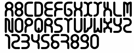 [MyFonts]
[More] ⦿
[MyFonts]
[More] ⦿
|
Woodcutter Manero
[Jordi Manero Pascual]
|
 Prolific Barcelona-based type designer. He started out by creating the counterless hand-printed typefaces Woodcutter Dripping Nightmare (2012) and Woodcutter MMXII (2012).
 In 2013, he created Gothic Winter (snow-capped blackletter), Woodcutter Anonymous (ransom note font; +part2, 2014), The Shining (movie scanbats), Woodcutter Optical Army (op-art), Viking Runes Shields, Fresh Blood, Pig Rules, Pole Dance, Music+Party, Asian Food, Deers (sic), Woodcutter Amor de Madre (curly tattoo font), Tattoo Vieja Escuela 1, 2 and 3, Origami (animal dingbats), Vintage Motorcycle Club (scanbats), Vintage Christmas (dingbats), Terry Richardson World (scanbats), Woodcutter Wire Fence, Woodcutter Points (textured face), Made in Spain 4, I Love 80s (dings), Drugs (drug paraphernalia dings), Barber Shop (dingbats), Woodcutter del Reves, Adventure Time, New York New York (1 and 2), Woodcutter Dripping Classic, Woodcutter Tinta China (ink splatter font), Woodcutter Cross, Nightmare on Social Media, Breaking Bad (scanbats), Fight Club (boxing scanbats), Boligrafo (sketched font), Robots, Luxury Brands, Woodcutter Buena Lettra, Barcelona (scanbats), Devoto (religious dingbats), Joker (dingbats), Woodcutter Typewritter (sic), Banksy (scanbats), Made in Spain 1, 2 and 3 (company logos), Animal City (funny dingbats), LSD Junior (a scary alphading font), Woodcutter Army (army stencil), Woodcutter El Día De Todos Los Santos (Mexican dingbats), Woodcutter Summer Shadows, and the monster dingbat typeface Woodcutter El Dia del Juicio. Still in 2013, he designed Woodcutter Black Square, DaPunk, Woodcutter Pollita Alegre (a penis font), Woodcutter Hungry Pig, and Woodcutter Hand Light. Typefaces from 2014: Hospital Icons, Woodcutter Rare Drawings, Headache, Irresistible (rounded sans), Doctor Garcia (textured), Violence, Hipster Icons, Saint Valentine's Day, Mister Manson, Casino (dingbats), Christian Icons, Christmas Icons, Hermes Manero, Beauty (dingbats), Art Icons & Tools, Clouds Mix, Malamadre (grunge), Offset Punk, Manos de Cerdo, Hotel Oriental, Basic Trip, Popeye (scanbats), Viva la Fiesta (flag alphadings), Street Stencil, Supermarket, Ebola Font, Vintage Halloween, Motel Imperial, Clothes, The Second World War (army stencil), Tahs On A Rope, Penis (dingbats), Regular Show (dingbats), Parkinsonism, The 70 Greatest Directors of All Time (scanbats), Smartphone (alphadings), Dripping, Chaos in Wisconsin, Saturno, Gym (dingbats), Angie, Antique Book, Black Rodeo, Gutierrez+, Matias-Font, Viejo-Oeste, Woodcutter-Prison-Tattoo, old+sailor, Italian Revolution, Kid Nightmare, Anderson (rough stencil), Manero (scratchy script), Tecno-Chaos (dot matrix font), Neverland, Martian Font, Radical Block, Woodcutter Delicada, Bon Appetit, Termica, Kandinsky, Hotel Paradiso, Seven Arts, Street Icons, Militaria (dingbats), Undergramo (poster font), Woodcutter Avispa, Fuego Fatuo, Other Space, Electrica Sals, Woodcutter Dramatica, Cocinitas (cooking dingbats), Bad Mother Fucker, Quentin Tarantino (scanbats), El Extraño, Fine Disorder, Woodcutter BCN Style (dripping blood font), Woodcutter Virus, Efectiva, Mogambo (fat brush), Duck Tape, Warriors, Cutre Glam, Woodcutter Sutill Shadow, Woodcutter Future, Rage, Woodcutter Negative, Manolo, Vegetables, Woodcutter Storm (lightning texture), Woodcutter Rare Drawings, Rustic Heavy Metal, Grass, Virgin Mary (scanbats), Laurus Nobilis (wreaths), Mister Bambu, Woodcutter Barcode, Conquest, Multimedia Icons, Preschool, Cursors, Woodcutter Kaos, Woodcutter Lines, Ukraine (constructivist), Meccano, Woodcutter Simple Font, Crux (crucifixes), Dolores (3d), Eyes, MoneyMoneyMoney, Made in Spain 5, Barcelona Mon Amour, New Society (a 3d shadow face), Federico (a hand-printed shadow typeface), Aranea (spider dings), Fifth Avenue (art deco), Beware of Pitbull, Dictators (scanbats), Woodcutter Vintage Cartoon, The American (textured face), Woodcutter Mixed Icons, Apple Japanese Keyboard, Vintage Classics Disney, Carnage College (blood splatter font), Vintage Porn (scanbats), Woodcutter Fontana (textured caps), Woodcutter Mixed Icons, Woodcutter Jet Set, Woodcutter Gothic Drama (blackletter), Woodcutter Relieve, Mixed Icons Vol. 1, Woodcutter Electric, Woodcutter Cloth, Street Style (graffiti font), Gothic Punk, Human Body Parts, Dirty Harry, Woodcutter Fine Sketch, Woodcutter Invisible, Miley Cyrus (scanbats), Old Guard, Circus and Fair, Comic Cover, Woodcutter Gigantismo, Clockwork Orange (scanbats), Dosmilcatorce, The Walking Dead (scanbats). Typefaces from 2015: Rude High School, Imprenta Gonzales (white on black), Estrategia (textured style), Monkey Business, Venganza (dripping blood font), Woodcutter Executive, Left Hand Comic (textured), Dirty News, Gorilla BCN (a great handcrafted athletic lettering typeface), Neo Protein (bio-grunge), Barrio-Santo (graffiti style), Periodic-Table-of-Elements, TerrorToons, Vanilla-Candy, Baseball-Icons, Boots, Fine-Homage, Jesus-Christ (religious icons), Lock, Meredith (texturted typeface), Neo-Victorian, Old-Europe (soft blackletter), White-Army (military stencil), HeadWear, Oil-Icons, Pollito-Peligroso (white-on-black letters), Taxi, The-Dentist, Planeta Zero (white-on-black letters), Cronenberg, Hell Bar, Horror Poster, Big Gipsy Bro, Peccatum (bloo drip font), Tempus Fugit (grunge), Indiana State (a great shaded titling face), DJ Icons, Gentleman Icons, Dope Crisis (textured), Bad Quality, Love and Hate, Smoking (dingbats), Phantom of the Opera (dripping blood font), Video Games (dingbats), Beauty Initials, Knife, Ciudad Capital, System Error (dot matrix font), Rejilla (gridded font), Punk Survival, Watches, Barrio Chino (grungy typeface), Delayed (dot matrix font), Impertinencia, Ecology, Anchor, Comic Sandchez, Beard, Globe Icons, Jalisco Company (handcrafted 3d typeface), Summer Icons, New Art Deco (textured art nouveau typeface), Gordita Alegre, Banned World, Pixel Chaos, Dirty Grunge, Metal Curvy, Jazz Club, One Percent, Profile, Scoreboard, Sentencia, The Octopus (silhouettes of octopi), New Sailor (tattoo script), Cleaner, Bear Icons, Woodcutter Trama, Manolete (wavy font), Skully (alphadings), Big Designer, Vintage Punk (white on black), Streets of Fire (textured), Nordica, Belle Epoque (art deco), Bakery, The Worlds Best Logos, Special Unit (textured typeface), Manifesto, Shooter, Woodcutter Carnage, Black Rain (sketched), Soft Addiction, Digital Camera Symbols, Surf, Tailoring, Palo Santo, Morbida (rounded athletic letters), Fine Shadows, The Woodcutter (dings), Experimento (textured typeface), Seven Sisters, Senior Citizen (dingbats), Hotel California, Woodcutter Hand 2015, Fire Department (scanbats), Dolor de Muelas [toothache], Hamburger, Vintage Mixed Vol 1 and 2, Torremolinos, Ol Torero (bullfight scanbats), Formula 1 (scanbats), Presidents of the United States of America, Furure Blood (dripping blood typeface), Wild West Icons, Maravillosos, Territorio (textured display face), Forced Flowers, Black Hole, The Death, Extra Fat (comic book font), Cristobal, Cirilico, Fuck Off (a very useful raised middle finger font), Mexican Skull (the best Mexican skull font anywhere), Old Nuremberg, Maria Dolores, China, Street College, Rodriguez, Tourism, Community, Oklahoma (varsity font), Smartphone Icons, Science Icons, Horse, Greek Mythology, Persiana (a Venetian blind font), Alcohol, Whatsap Emoticons, Library (possibly the best library icon font today), Candelita, Remember Me, Flamenco, Universidad 2015 (athletic lettering), Sneakers, Fire, Industrial Worker, Europe, Abstemious, Police, School, Paris, Savage Empire, Nautical (dingbats), Crusader (dingbats), Woodcutter MMXV, Rats, Monster Mash, 5th Avenue Stencil, Baby Icons, New Space, City Icons, Diamonds, Punkland, Temblores, Puttana Antique, Human Anatomy (dingbats), Guerra Santa, Winter Icons, Farm, NeoWriter, Russia. Typefaces from 2016: Woodcutter People Faces, Ear, Codociosa (grungy), Viking Hell, Simple Myopia (textured, halftone style), Bulbs, Emblem, Vegan Icons, Fleur de Lis, Pregnancy, Harley Davidson, Window, Owl, Native American Indians, The Toy Castle, Aristogramos Chernow, Mediogramo (monogram font), Yes Darling, Dilema Emocional (white on black), Original 301 (draftsman style), Emperador Oscuro (scribbly), Vespa (scanbats), Fine-Sheriff, Hard-Western, Olivia-Garcia (brush script), Woodcutter-Rude-Press (a great handcrafted poster typeface), Printing, Disabled Icons, Golf Icons, Electric Guitar Icons, Airport-Icons, Prudencia (pixel style), Rude-Basic, Stencil-Guerrilla, Tramita-club, Drone, Garden Icons, Feminine Hygiene, Psycho Dad, Intransigencia (textured), Fat Food Icons, Torrebruno, Home Appliances, La Pecosa (textured), Gyn Toons, Insect Icons, Bomb, Special Forces, Business, Irish, Female Underwear, Zombie Salad, Isometric Love, Dinastia (textured), Fireworks, Happy Birthday, Snake Mix, US Election, Spectrum, Extreme Simple, Drunk Sailor (tattoo font), Mountain (dingbats), Cafe Madrid (white on black), Celebration, Rabbit, Rude College, Words, Wingding Review, Transilvania (blood drip font), Tattoo Museum, El Arropeiro (dry brush font), TV (scanbats), Western Dead, Star Wuarras, File Types, Industrial Poison (grunge), Future War, Masacre Digital, Senor Domingo (grungy), Workout Routine (dingbats), Gipsy Bar, Finegrams (ornamental caps, monogram font), Diving (dingbats), Extupida, Dictadura, Euro Estilazo, Cul de Sac, Lions, Woodcutter Olla Barrejada, Cocaine, Monogramos, Gobierno (rounded sans), Maldita Comebolsas, Macho (spurred style), Eagle (great eagle-themed dingbats for East European coup d'etats ca. 1880), Fuck Love, Woodcutter Rocks (white on black), England (dingbats), Mechanic (garage mechanic dingbats), Rodaja (script), Le Petit Chaos, Old Deutschland (blackletter), Mister George, Cloud Candy, Ceporro, Old School Toons, Big Drama (fat poster style), Serial Font, Hotel Madriz, Lady Fiesta, Punk Army, Enfermo Rules, The Laguna, Casa Camaron, Mister Muerte (dripping blood font). Typefaces from 2017: Sea Life, Sushi Sushi, Destruccion, The Barrio Caps (blackletter for gangs), Prehistoric Paintings, Sumo, Hot Air Balloons, Woodcutter Self-Portraits, Manero Universe (grune), Digital Dark Sister (LED font), New Watch (LED style), Free Biker (spurred tattoo font), The King, Canada, Super Hero, Target Shooting, Smokeland, Rabia Absoluta, Infringement, Gifts Icons, Sprinkled (textured), Miopia Internacional, Chupapollas, Orientalismus (oriental emulation), Technopollas, Doctor Punk (ransom note font), Global Terror, Bananas Social Club, Wedding, Coffee Icons, Archeology, Graffiti Tags, Maquina de Escribir (old typewriter font), Little Candy Shop, Madre Superiora (script), Territorial, Diogenes, Cyber Tittle, Pain Explosion, Panchito Style, Lightning Bolt, Pixeland, Club Seven Espadas, Chandelier, Computer Mouse, Restroom, Wash Care, Hell Circus, Extraterrestre, Pix Punk, Lamp, Pizza, Pirate Style, Vacaciones, Hecatombe, Fuente Manerismo, La Cucaracha (white on black), Plastic Surgery, Mafia Mix, Dirty Classic Machine (old typewriter), Woodcutter Noise, Cokelines, Simple Cream, Vintage Poison, Lighter Icons, Pacific Break, Maldito Gringo, Bazar Costa, Doctor Satan (dripping blood font), Caja Fuerte (textured stencil typeface), Saint Peter (brush script), Bela-Lisboa, Ear, Future-Socialism (constructivist), Poop, Retro-Toons, Tattoo-Pro-Icons, Victorian-Gang, Woodcutter-Justice, Writing, Amusement-Park, Linoleum, Funny Barber (shaded), Decadence, Victorian Gang, Depalma (spurred sans), Bela Lisboa. Typefaces from 2018: La Gilda, Portugal Vintage, Call to Huesi, Wood Xmas, Black Empire (a fancy blackletter), Benedicto (a textured all caps typeface), Pixel Icons, Hysterical, Cadalso 74 (grunge), Gramitos, Negroni Chaos, Carajillo de Anis, Hail Disney, Pen Icons, Neo Spain (a glitch font), Adolfito, Anesthesia, Don Pasquale, The Imperial, Juanita Banana, Sovereignty, Bloody Winter (dripping blood font), Drunk College, Sunset Boulevard (shadow font), Miss Order (3d effect font), Burning Manero, Dirty War (a grungy military stencil), Press Division (a shadow font), Fight Team 18, Time To Dead (grunge), Woodcutter Clasica, La Nueva Vieja Escuela (a paint drip font), Woodcutter Animal Faces, Crochet (a softly spurred typeface), Marshal Manero, Nou Barris Bcn, Bad Things (a dripping blood font), Biker Vamp, Insuperable, Pain Shop, El Monstruo del Raval, Arabesque Ornaments, Fans, Tarraco City, Woodcutter Basic Viking (rune simulation), The Hurraca Company, Broken Press, Carnage 1974 (a dripping blood font), Manicomio Woodcutter (a very funny comic book style dingbat font), Amor (spurred), Rompetechos, Electric Punk, Happy Square, Bad Signal (a glitch font), Funny Death, Fresh Nieve (paint drip font), Rota en mil Pedazos (a glitch font), Perra Gorda, Goma de Mascar (a bubblegum font), Mister Love, La Deco Klan, Glitchland, Hackerchaos, Vicious Stencil, Hippie (dings), Skate (dingbats), Dinosaur Icons, Mastodontus, Alphaletras, Torito Style (a woven font), Problems in Wisconsin, Alarma Social, Rue Mademoiselle, Tree Icons, Go Go Sports, Rage Against Mom, Hell Kitchen, Black Order, Black Trident, Sale, War Times (dingbats), Ice Cream Icons, Bastardo, Titi Yayo Rules, Jailbreak, Britannia (blackletter), Venenosa (grungy letterpress), The Gallery (3d, sketched), El Puto Amo, Finolis, Lovegramos (monogram font), Smartwatch, Interferencias (glitch font), Hostage (ransom note font), Miss Antonia (grungy caps), Bocadilla de Mortelada, Bitcoin, Car Parts, Celtic Knots, Cock (rooster dingbats), Dubious Reputation, Funny Chaos, Garage Imperio (shaded, vintage), Geometriarquia (archeological stone font), Good Morning, Graphic Design (dings), Hard Core, HoldFast (spurred), MacizoCompany, Milk, New Gang (garage dingbats), Ninja and Samurai, PhayaThai (Thai emulation), Robotic Arm, Rotunda, Social Media Circled, Stone Block, Unicorn, Victorious (Victorian), Gypsyland, Modernist Chaos, Rata Negra, MMA Champ, Love Initials, Doctor Glitch, Mad College, E-Commerce (dingbats), Sheriff (dingbats), Outline Mix, Stencil Icons, Fairy Tales (dingbats), Alfabetizacion, Night Fever Again, Jodido & Noble, Woodcutter Oligarquia, Screwdriver, Baroque Explosion, Seville Kid, Huesitos, Hanging Party, Brave Grams, Tower of London (outlined, Tuscan), Quintanar de la Orden, Punk West, El Forastero, The Enemigo (ink splash font), El Camino, Finisterre (thin sans). Typefaces from 2019: Ho Chi Minh City, Retro Team, Brushland, Stamp Empire, The Drama Army (an irregular military stencil), Space Grunge, Disturbed (a glitch font), Dead Corporation, El Tito Adolfo (textured), Dirty Deco, Mister Black, Grunge Manifesto, Dark College, Indian casino (a striped Far West font), Heil West (Tuscan), Bonesitos (a bone font), Bad Santa Company, Felipe Segundo, Vanity Garden, Rough Blacky, Rough City (textured, weathered caps), California, Canarias, Chernobyl (weathered), Beauty Bee (an inky script), Chain Style (a bike chain font), Spaniard Soldier, The Matadero (a slimey font), Lapicero, The Minima, House Icons, La Distinguida, Fuente Jalisco, Cordoba, Extreme Glitch, Simulacro, Dies Irae Saloon, El Hispano (decorative Tuscan capitals), Senorita Esmeralda (Tuscan; white on black), Easy Listening, Cool Chaos, Guarrilla, Big Dealer (a grungy poster typeface), Lord British (decorative caps), Cantina Jalisco (Tuscan), Disco Paradiso (brush font), Dark Metal Institute, Asteroide, Bloody Office (dripping blood font), Los Chapters, Home Entertainment, Witch, Cemetery King (dripping blood font), Steel Soldier (a military stencil), Estreno (a dot matrix font), Cat Faces, Gears Icons, Flower Icons, Hardcore Poster, Northern Army (a military stencil), Casimiro, Pantano Gipsy (sic), Zodiac Mix, Insane Empire, Break Summer, Wood Hell Company, Merluza Company (a grungy typeface), Metalurgia Sexual, Aztec Icons, Cemetery Picnic, Pantano Thing, Falange Punk, Jupiter Team, Breakdance, Origaminator, Gothic Gotera, Friday 14, Wifi Icons, Parque del Buen Retiro, Bato Todo El Rato (a graffiti font), Neo Nacional (a shadow font), Capitan Morgan (a Tuscan pirate font), Habitacion 37, Santa Monica (a shadow font), Casino Bar (shaded font), El Boxeador, Attack the Block, Sister Ant, Hard Tree, Another Round, Charcuteria, Thor Gonzalez, Crappy Town (grungy), European War (eroded military stencil), Rock of Times (3d), Crazy Saigon (shaded), Diamondgrams (monograms), Humanoide 2014 (a dripping blood font), Cheddar Cheese (weathered type), Alberto ha Vuelto, Sweet Cake, Cortocircuito (a glitch font), Potorro Angular, Hijo Puta Peligroso (a 3d shadow font), Constitution, Mastodonte, Street Reich, Hispania Manero, Pureta, Pandora, Spray Letters, Roca de Escama, Fat Mom Rules, Thespian, Stencil Time, Isometria Club (3d), Meteoritox, Cinema Capitol, Barna Break, Scratch Night Team, The Estampada, Afterhours, B-Team, Caballito, Ampersand, Gothic Manus, Espana (spurred, Western), Circus Manerus (Tuscan circus font), Hood Army Stencil, Negative System, Positive System, Pagan Symbols, Andy Capp, American Sign Language, Tiki Idols, Greek Column, Maze, Euro Western, Speed Grams, Tiki Tako, Burgos City (waethered caps), The Company (inline caps), Waste Money (a striped money font), Speedy Retro (a circus font), La Rapidita (a speed emulation font), Chill-out Gang, Resistance (grunge), Normandy Squad (condensed military stencil), Last Round, Tecno Extrema, Madrid Grunge, Escabetxina, Face To Sun, Sailor Gonzalez (a tattoo font), Times Now (a codex font), Sergi Tete, Orgasm Co. Typefaces from 2020: Pocket Change, Basura Humana, Korean Icons, Construction Icons, Cowboy Manero (handcrafted, Western), National College, Big Junkie Joe, New World Order, Le Club Parisien, Hardcore Attitude (grungy), Orchestra Icons, Soccer Icons, Tennis, Billiard, Startup Icons, The Fortune, Imperator, La Ramera de Barcelona, The North Hell, Soccer Team, Traditional Punk (a ransom note font), Seismo Club (a glitch font), Ugly, Pistolas, Thailand Icons, Renderland (beveled), Traditional Tattoo Parlour, Retro Computer (halftone font), Vintage Glitch, Torquemada in da house, Louisiana Biker Shop, Le Casino Royale (vintage caps, almost Tuscan), Property of Thor, Los Angeles MMXX (a dripping blood blackletter), American Dreamer (a circus font), American Signs, Back To The Fantasy, Badass Draws, Ballooning, Barcelona Streets (a dripping paint font), Battle of Gettysburg, Bisturi Night Club (a marquee font), Born To be Strong (grungy), Bourbon Whiskey, Century Manero (blackletter), Crunch Motel, Decorative Stencil, Drunk Company, Fat Enterprise, Fellini Club, Gameboard, Gorilla Team, Grandma Rules (a stitching font), Grindcore Records (a scratchy font), Hygiene Icons, La Cebadita, Laia the Great Blondie, Latino Heart, Mass Hysteria, Neo Metropolis, Old Celtiberian (blackletter), Oscuro Club (a heavy grungy brush font), Pandemic&co, Poster Queen, Retro Killer (splattered blood font), Saint-Tropez, Sangre y Arena, Se Esta Lianado, Skate Brand (grungy), Spanish Nightmare (a glitch font), The Happy Bear, The Poster King (grungy), Trabello, Trapeze Artist, Western Samurai, City of Brussels, Daddy Ink (a dripping blood font), Conflictive, Albacete Team, Ornaments Salad, Strong Brain, Hand Shadows Icons, Hello Kitty, Bunker Lowercase (a blackletter), LSD Glitch, Rounder Dirty Team, Ole Torrero, Doctor Terror, Hello Chilly (a glitch font), Donuts Icons, Candy Icons, Holy Bible, Old Japanese, Gothic Notausgang, Adventure Magazine, Nordic Thunder, Black Metal, Franco Bros, Saigon Hotel, Piratas, English Bulldog, Mount Olympus (stone cut Greek emulation), Recreativos, Coronavirus, Dirty And Elegant (grungy), 18 Army (an army stencil), Dirty Streets (grungy), Dark Citizen (grungy), Wild Spain, Marbella, Woodcutter People Faces Vol2, Hawaiian Icons, Vietnam, Maps of USA, Comandante Glitch, Planets, Documenta (a shadow font), Ghetto Bros, Charnego (a wooden plank font), Westfalia (a blackletter), Oi!oi!oi! Party (a ransom note font), Bad Gringo (Tuscan), La Formalita, Sabandija Asquerosa, Woman Faces, Dark Tales, Model Woman Silhouettes, Super Impacto, Adolfo's Punk Restuarant, Virginia, Henry McCarty (a grungy western font), Neo Euskal Herria (a Basque font), Heartbreaking, Battery Icons, Space Rangers, Terremoto, La Distorsionada (a glitch font), New York Press (textured ultra fat caps). Typefaces from 2021: Retro Grunge West, The Bandido (spurred), Casino Madrid, Rosita's Dinner, Mom's Gang (a grungy slab serif), Las Brigadas (a military stencil), Typewriter Grunge, Fire Safety Icons, Zodiac Killer Code, Hearts Salad, American Offset (a halftone texture font) Schizoid Personality, Happy Ending (a dripping semen font), María Magdalen, Nuevo Orden Nacional, Future Shit, Carnage Movie Poster (brush), Big Holidays (counterless), San Judas Tadeo, The King Of Wall (a ransom note font), Graffiti City, Spanish College (a sports font), Campo De La Bota, History Icons, Gothic War, Rocking Bunny, White Storm, Police Department, Rebel Hero, Graphic Lady, La Casa Del Cementerio, Picapiedra (a 3d stone font), Barcelona Scared (a dripping blood font), Nightmare On Raval Streets, High Moon, The Lord of War, La Isla Tortuga (a pirate font), Carmen Polo Superstar (script), Napolitana, New Dimension (3d), Heavy Steel, Barna Hardcore, Fine Books (Initial caps), Descompensada (a ransom note font), Rifle Casual, Espana Imperial, Big Titles, La Costa Dorada is Spain, Brasil Icons, Indonesian Icons, Los Guripas (a grungy blackletter). [Google]
[More] ⦿
|
Yachna Marwah
|
During her studies in New Delhi, Yachna Marwah designed a decorative caps typeface called Sex Education (2016-2018). [Google]
[More] ⦿
|
Yesim Endes
|
 Istanbul-based creator of a hilarious type poster called Typeman (2012). [Google]
[More] ⦿
Istanbul-based creator of a hilarious type poster called Typeman (2012). [Google]
[More] ⦿
|
Zoe-Zoe Sheen
|
Graphic designer and visual artist living in Los Angeles. She created the caps typeface Bitch Tits (2013). Behance link. [Google]
[More] ⦿
|

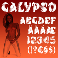

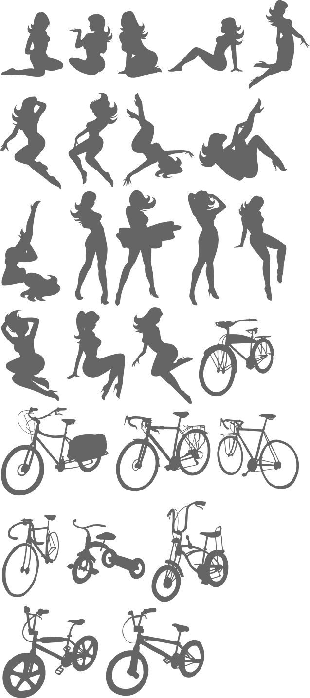
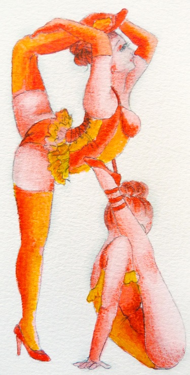
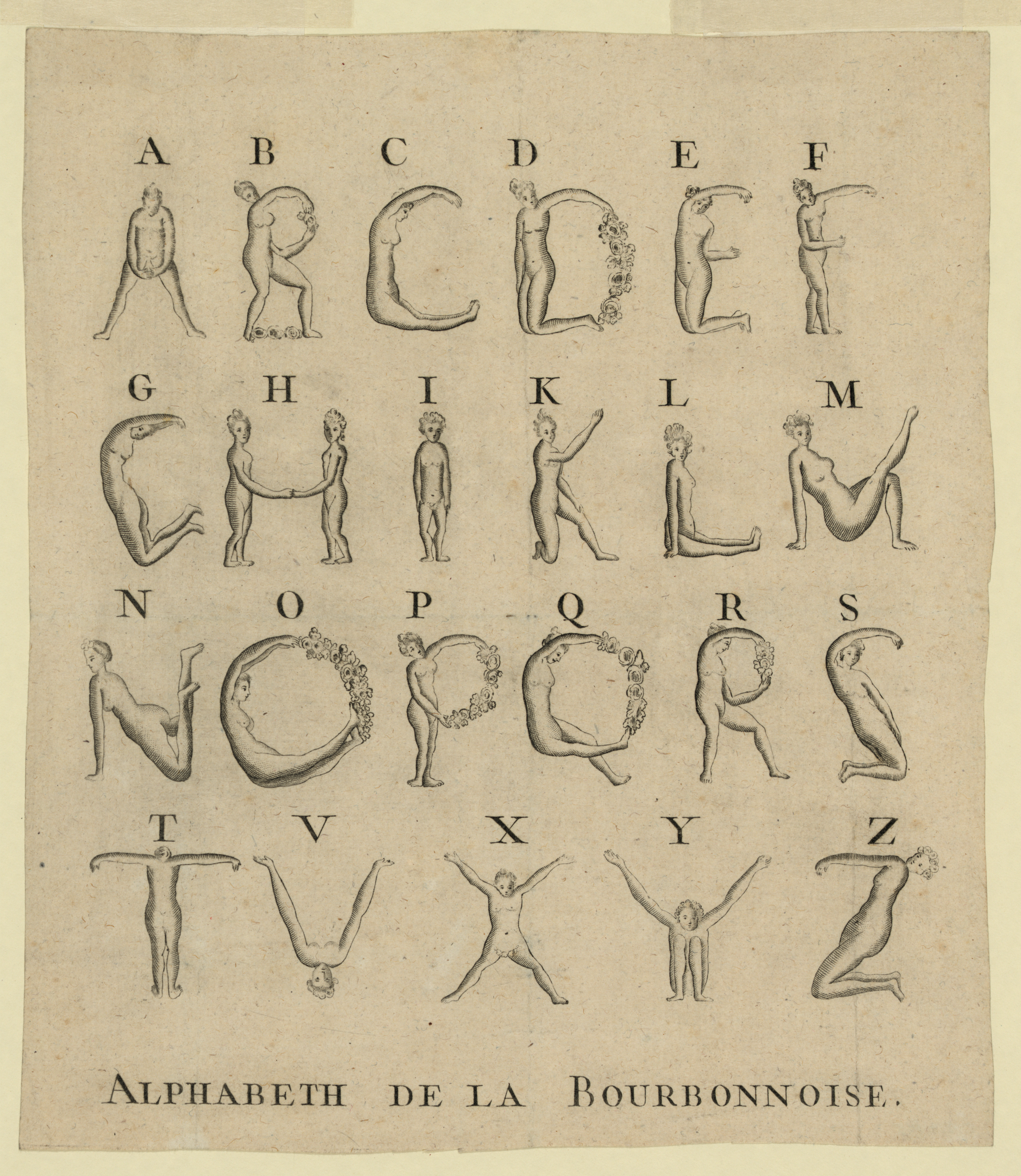
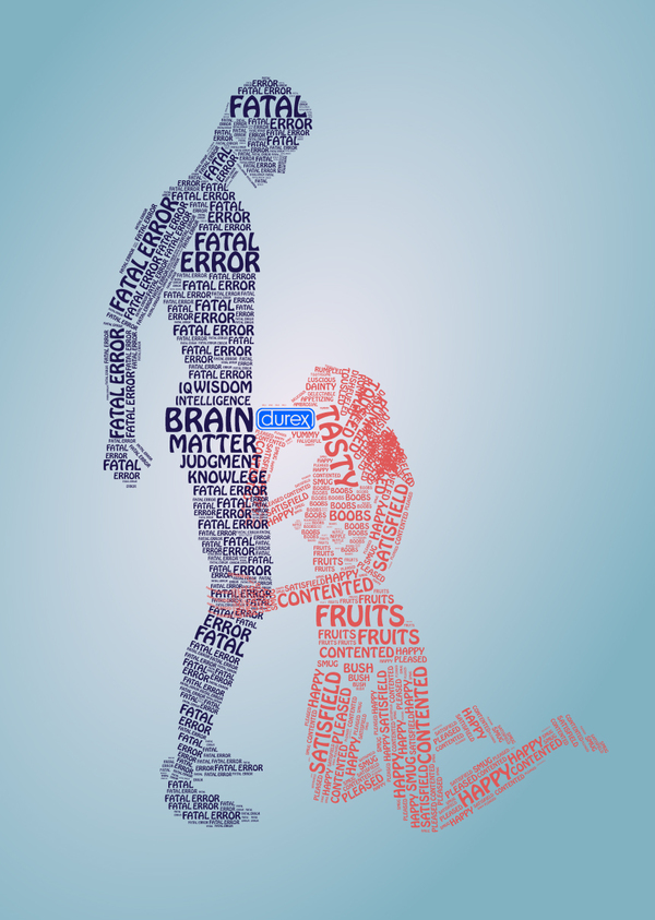
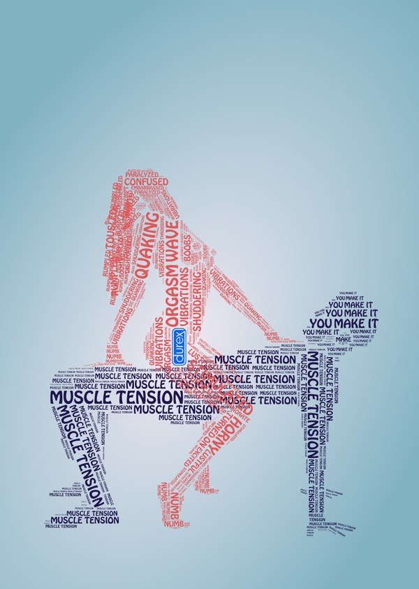
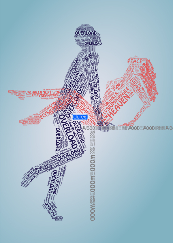
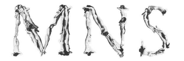
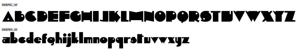
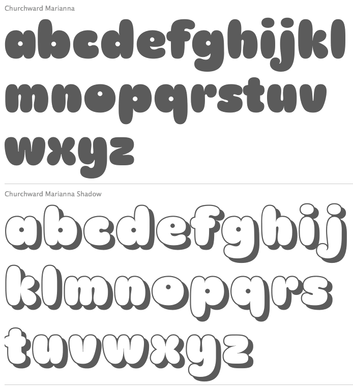
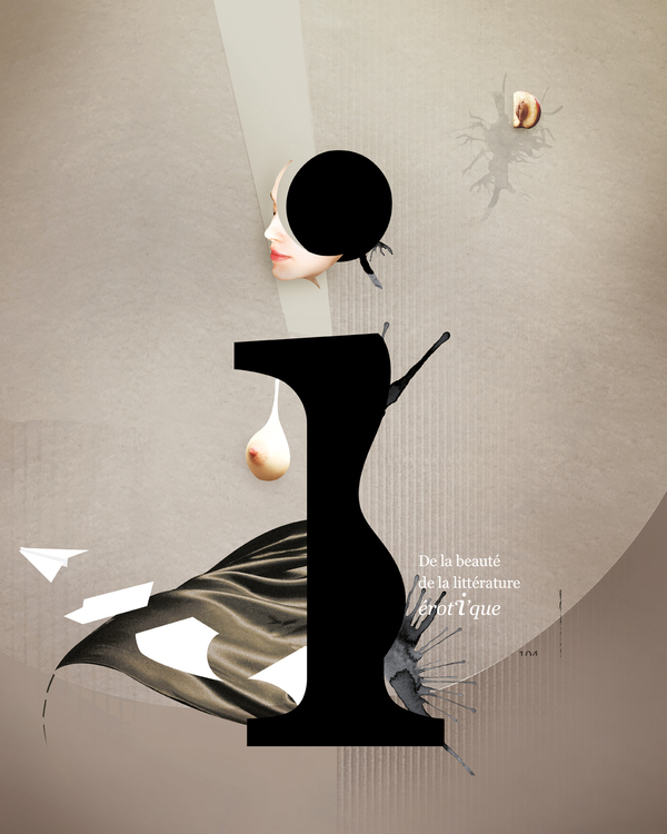
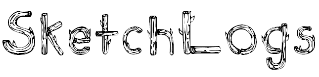
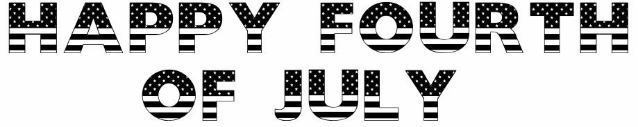
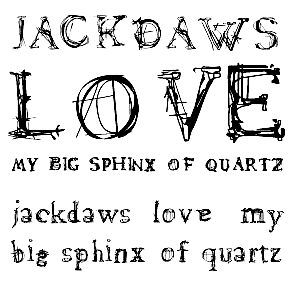
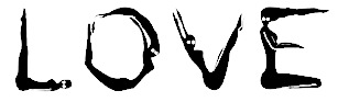
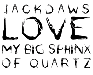
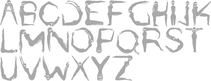
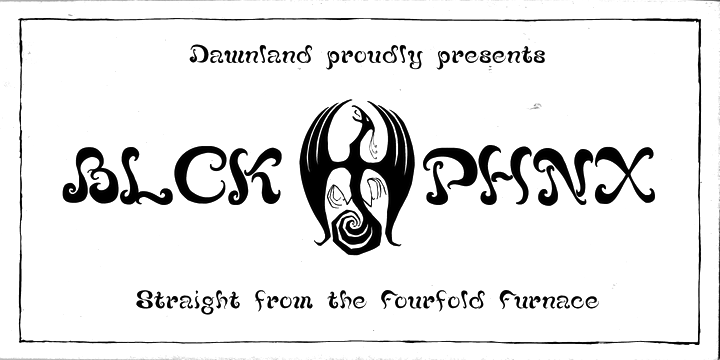
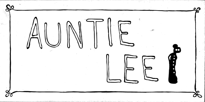
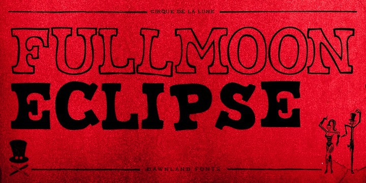
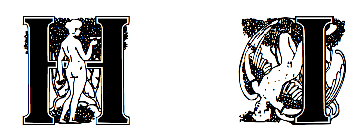
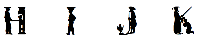
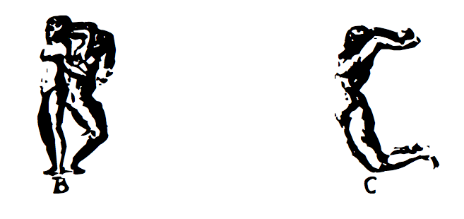
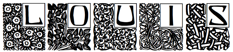
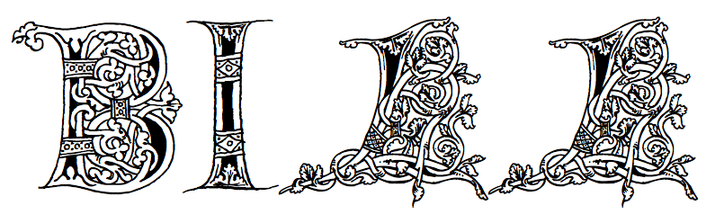
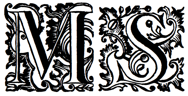
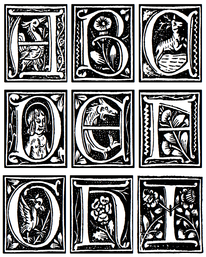
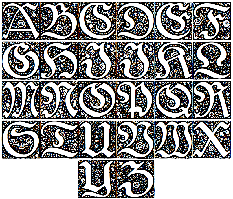
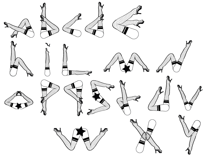
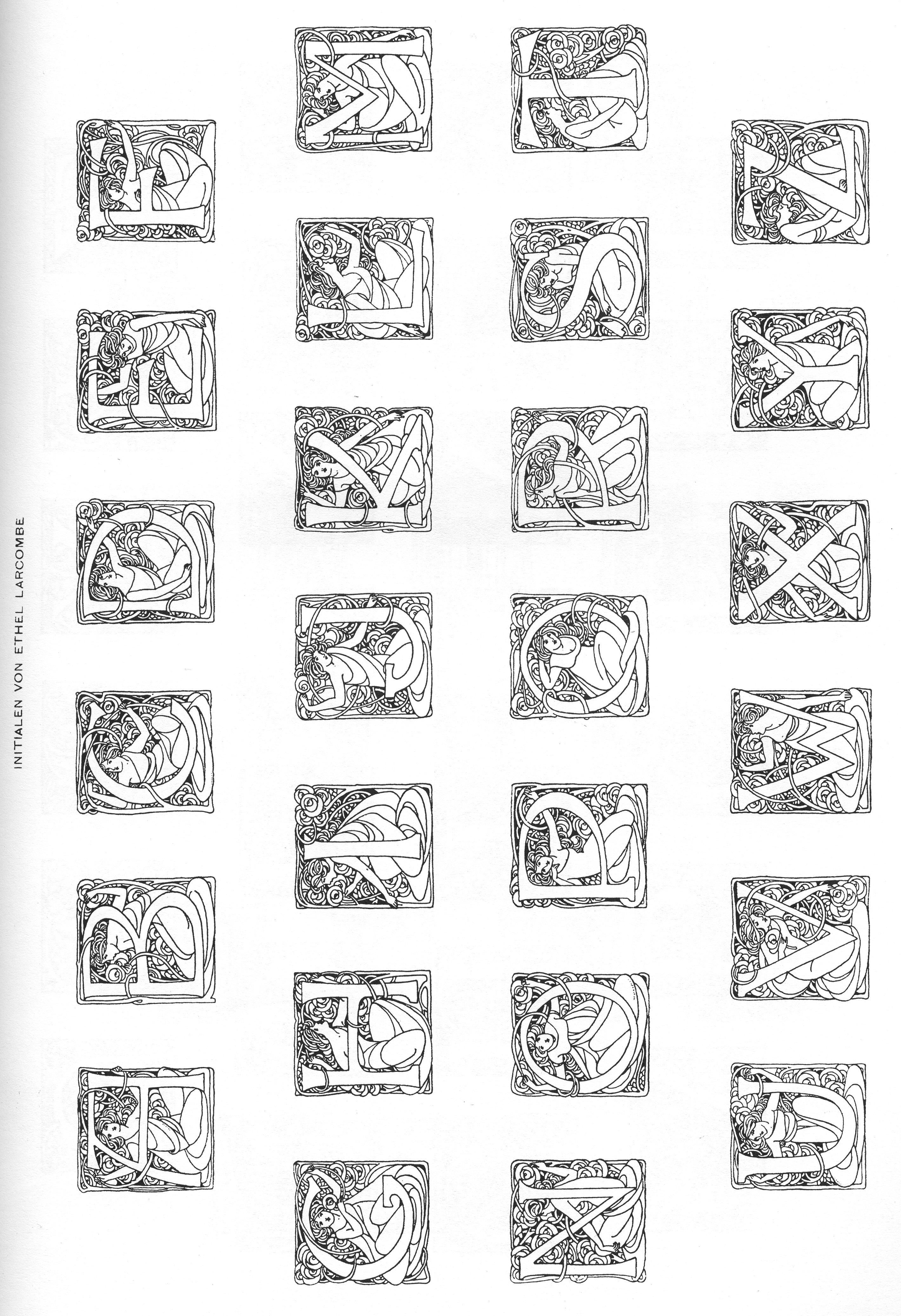
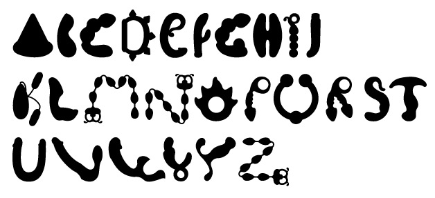
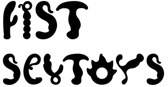
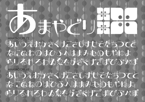
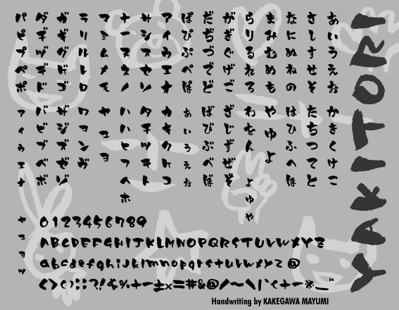
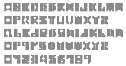
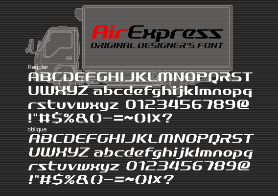
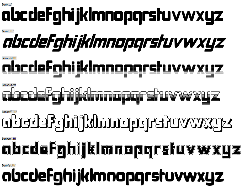
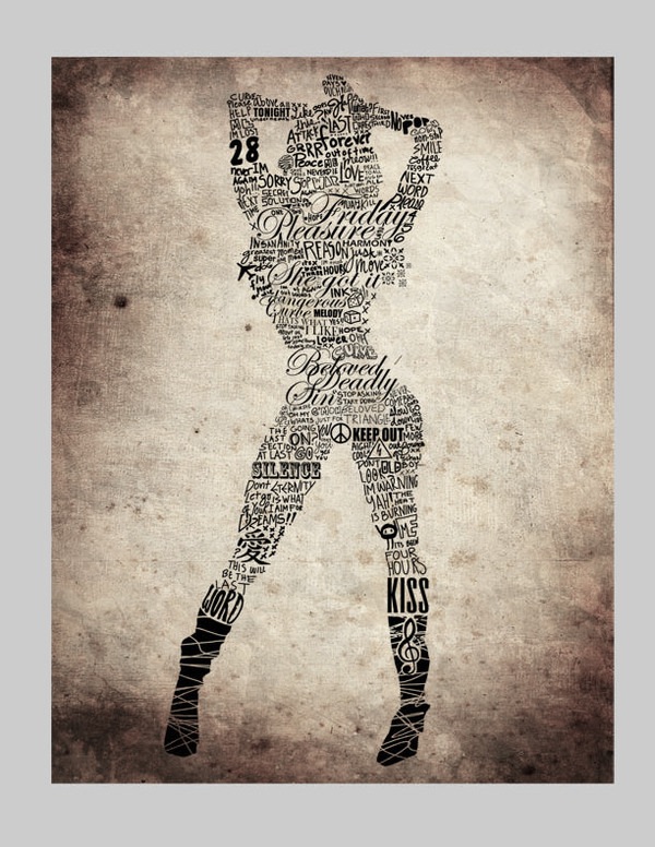
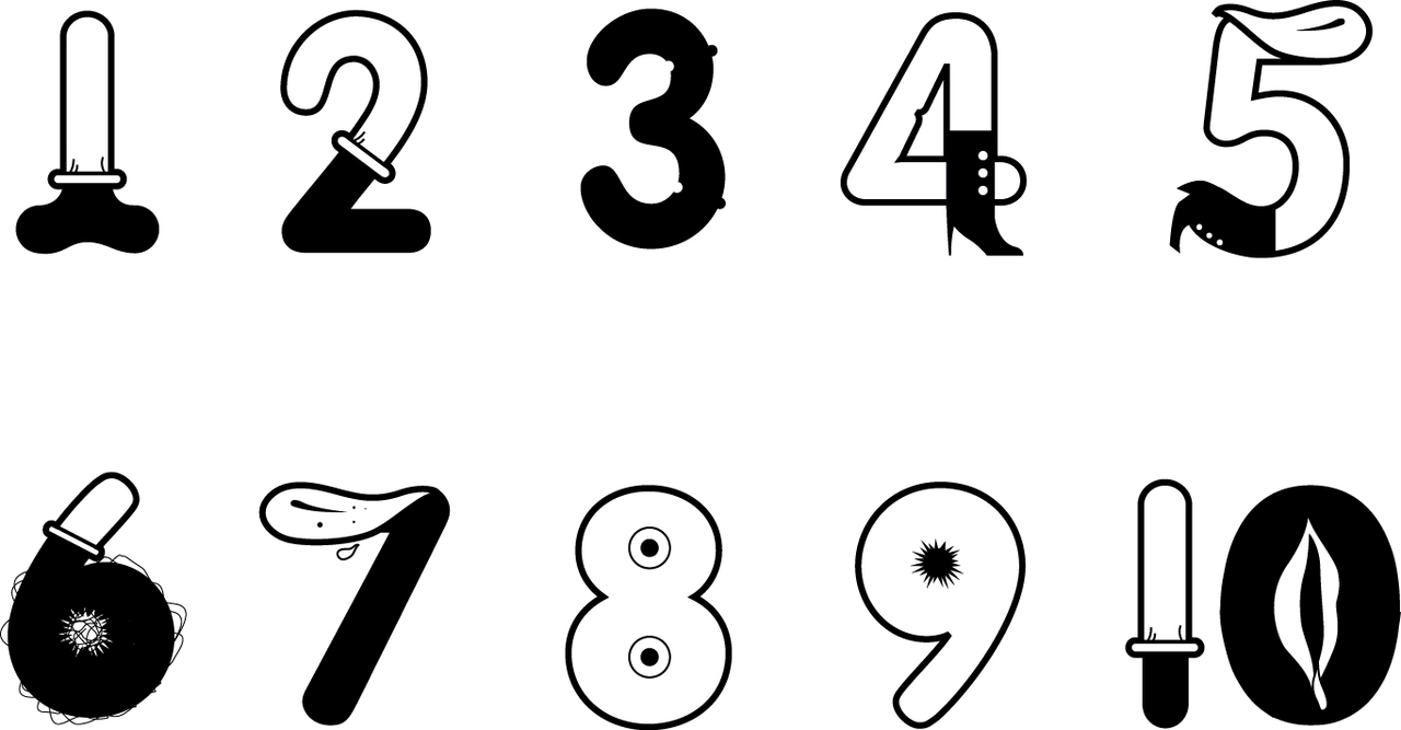
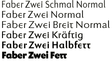
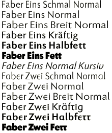
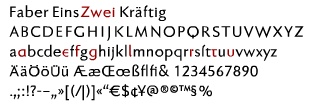
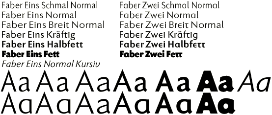
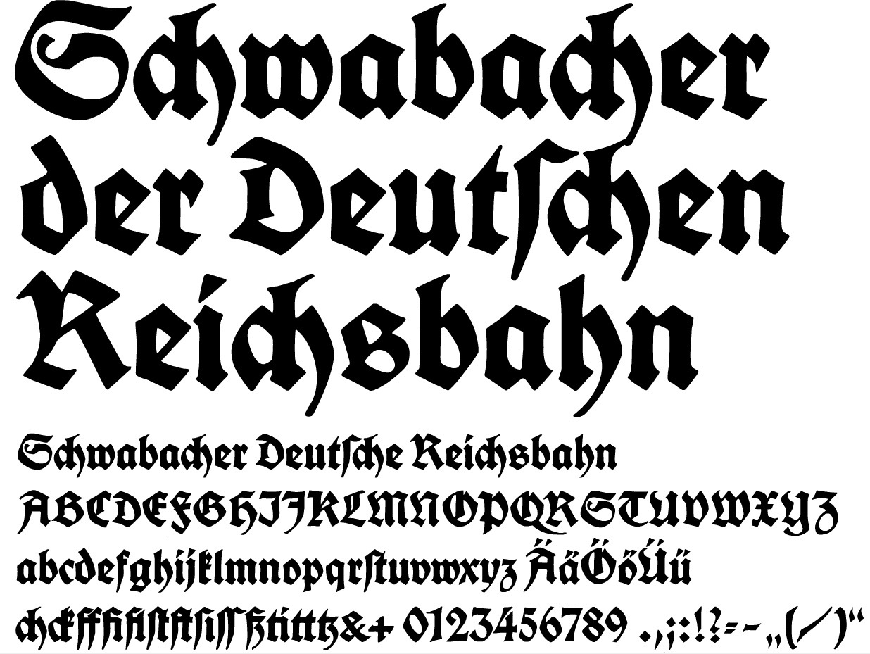
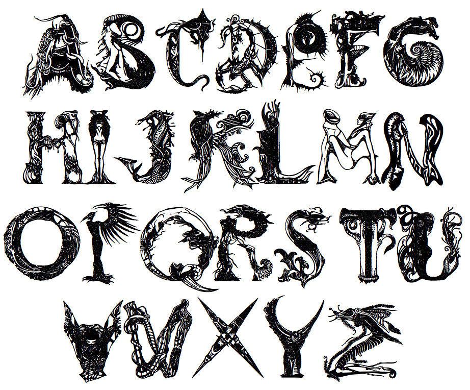
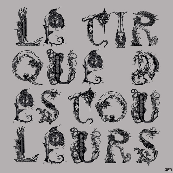
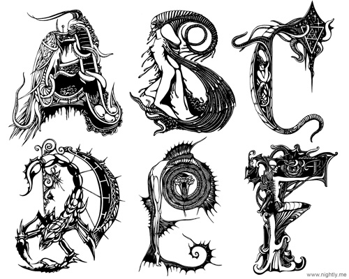
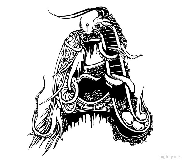
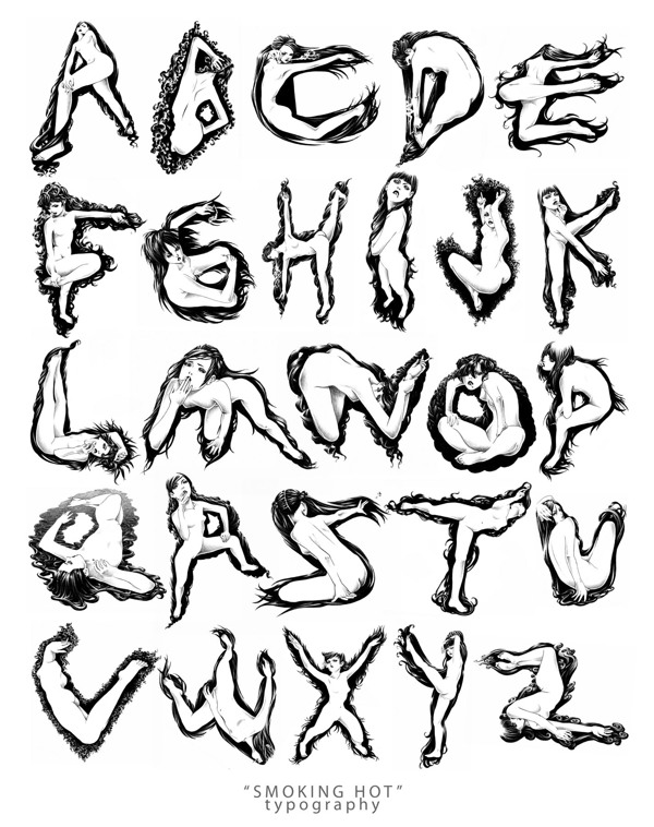
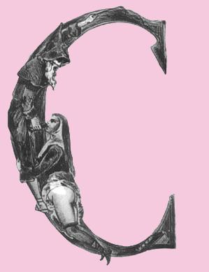
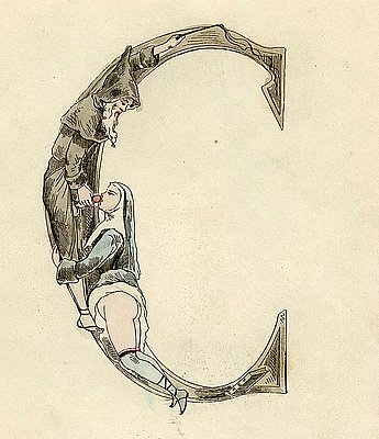
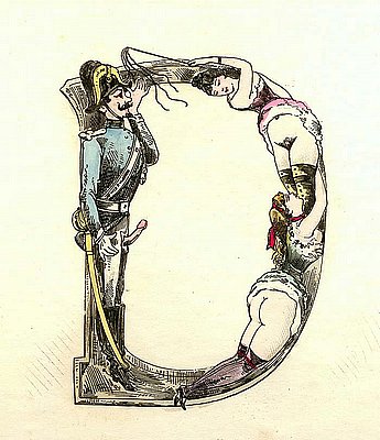
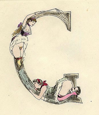
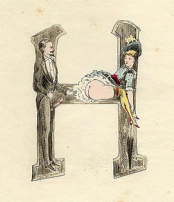
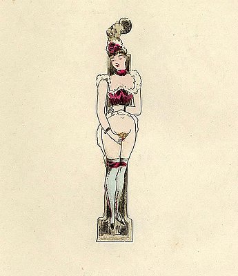
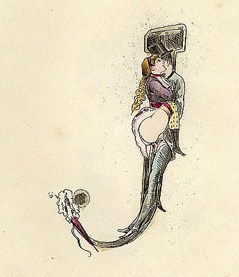
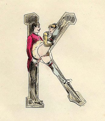
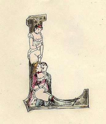
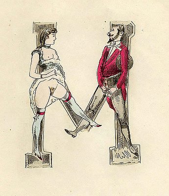
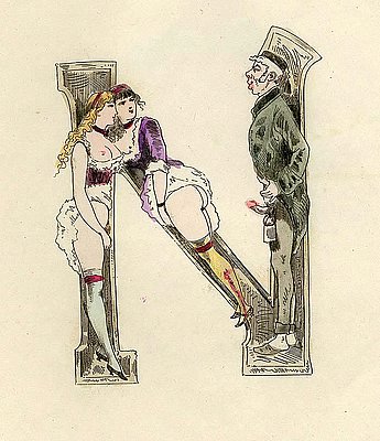
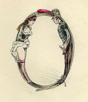
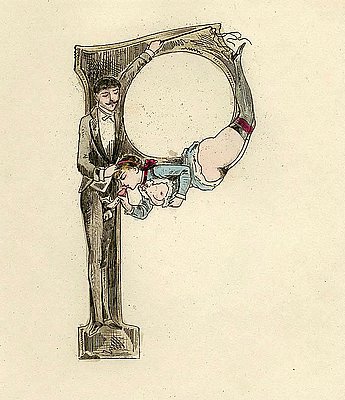
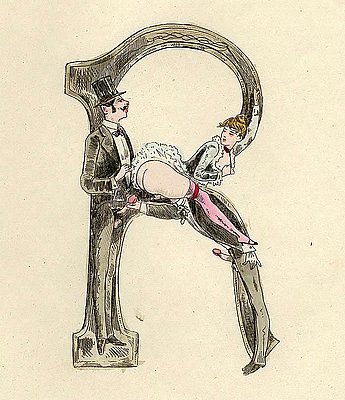
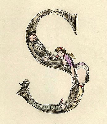
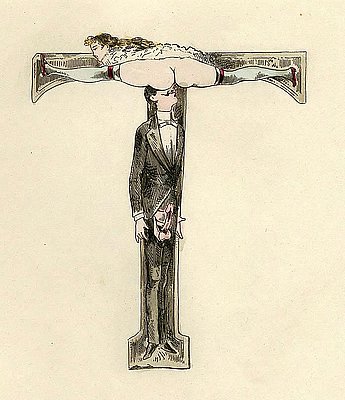
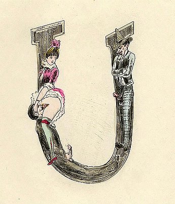
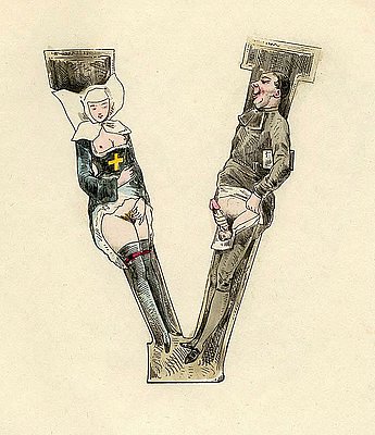
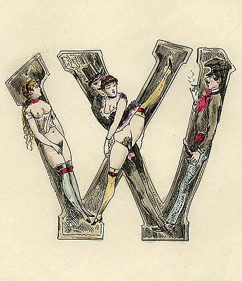
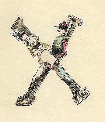
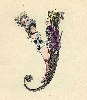
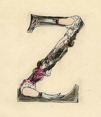
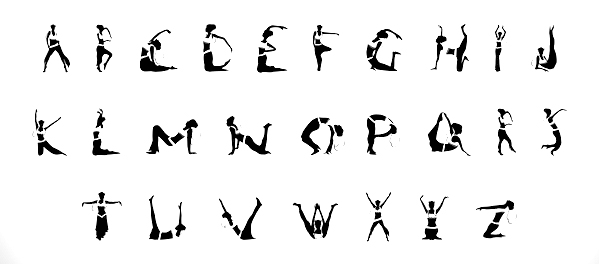
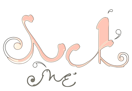
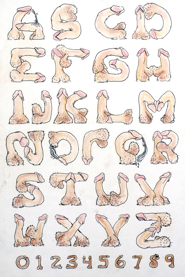
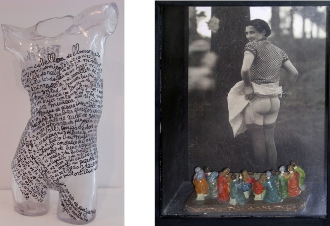
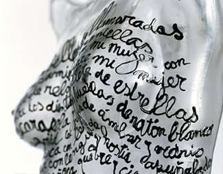
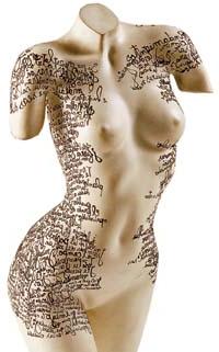
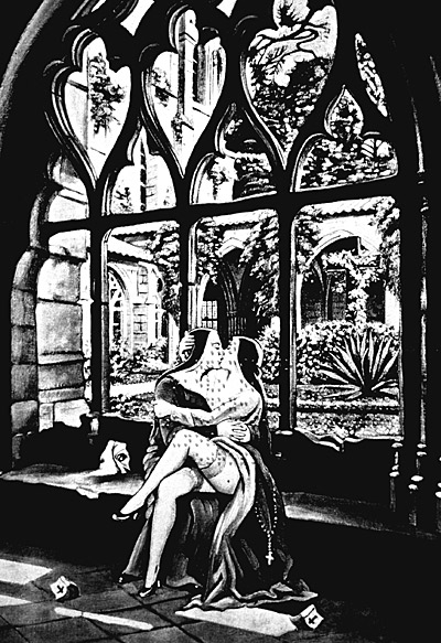
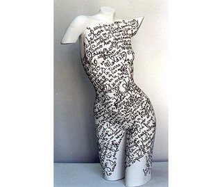
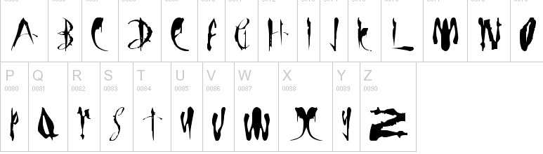
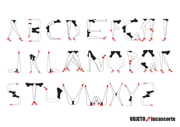
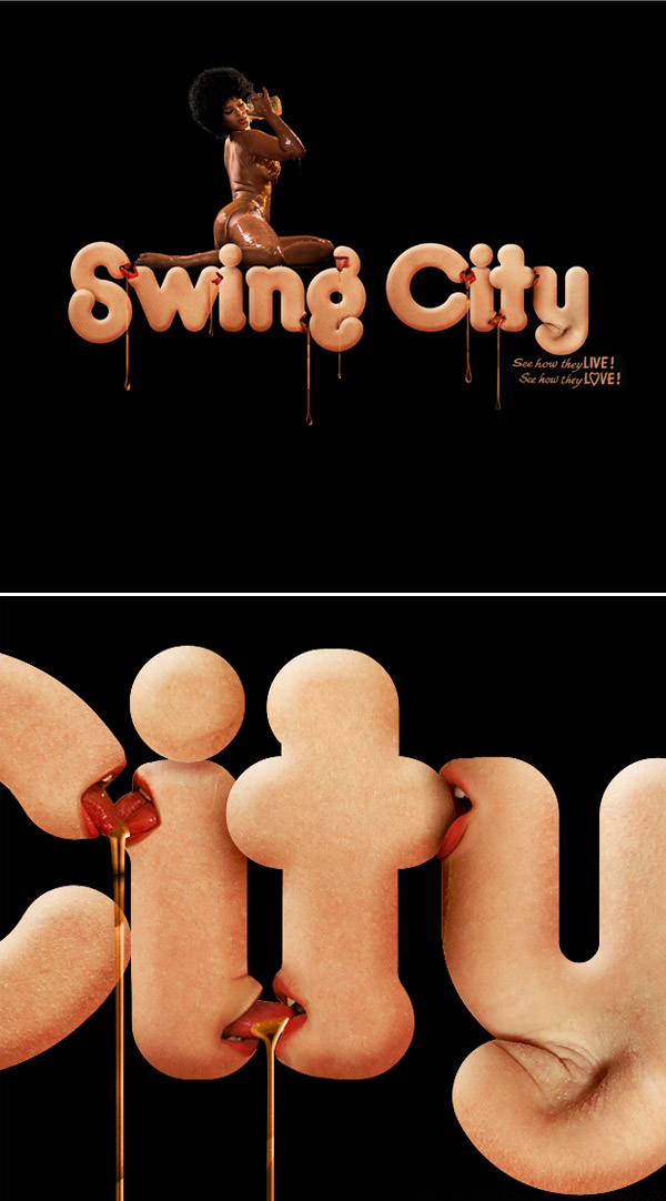
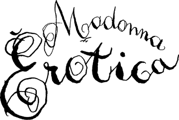
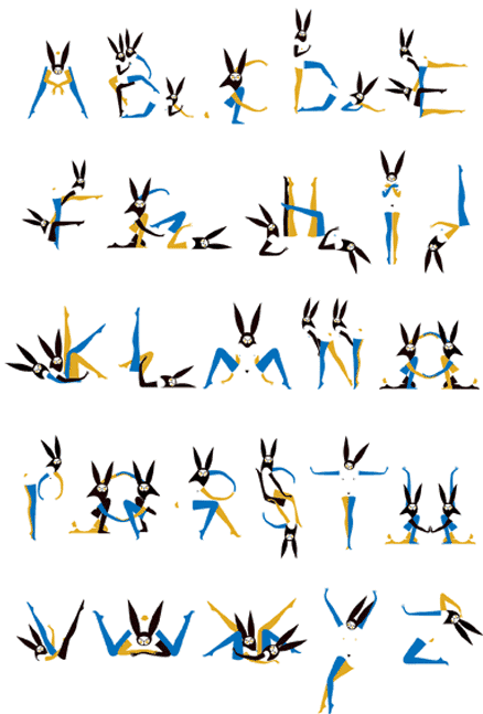
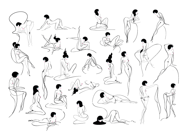
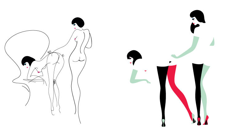
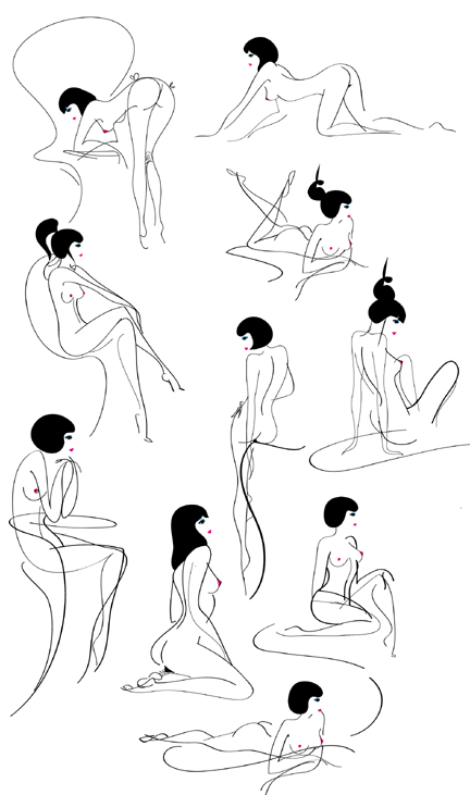
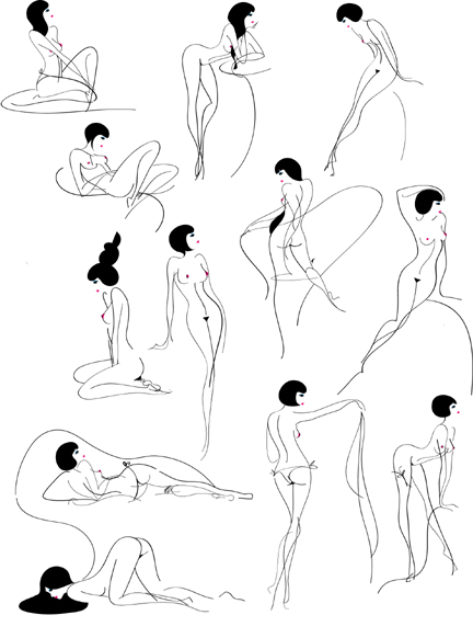
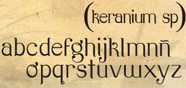
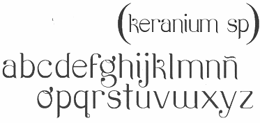
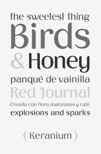
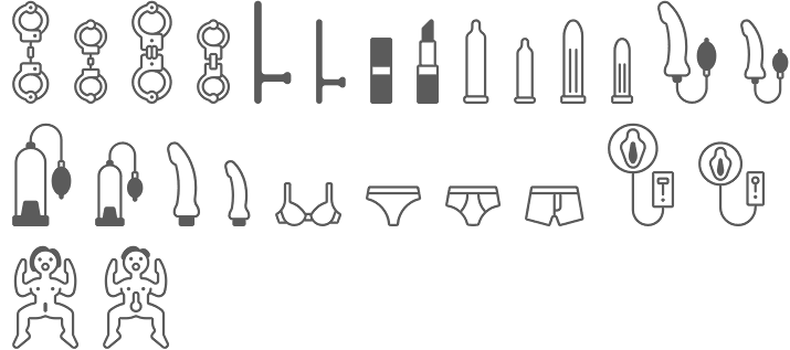
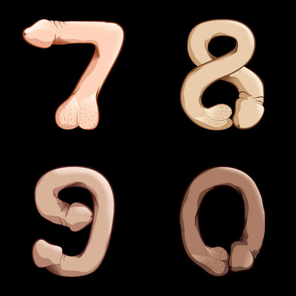
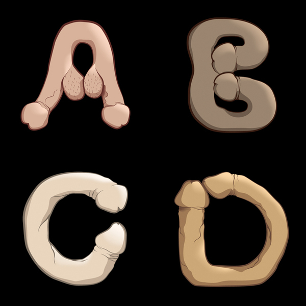
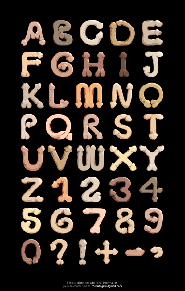
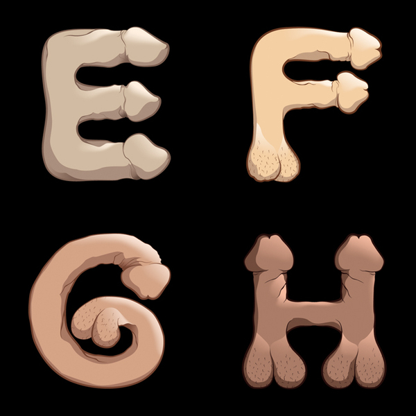
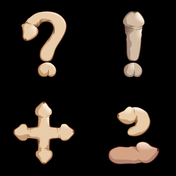
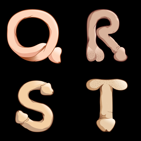
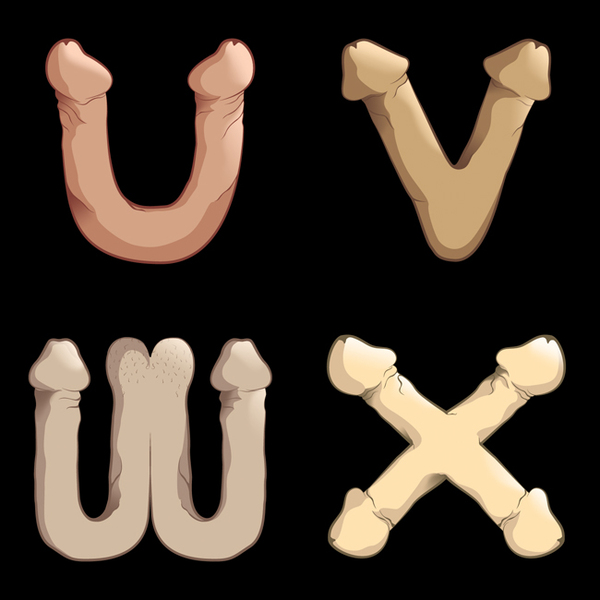
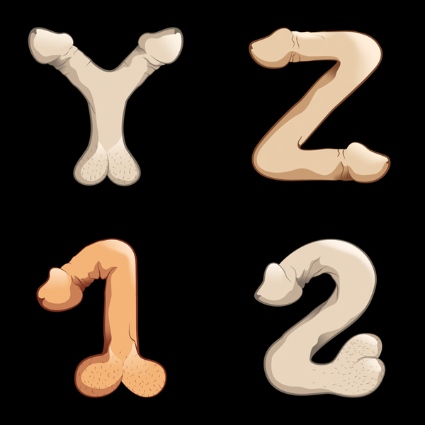
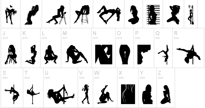
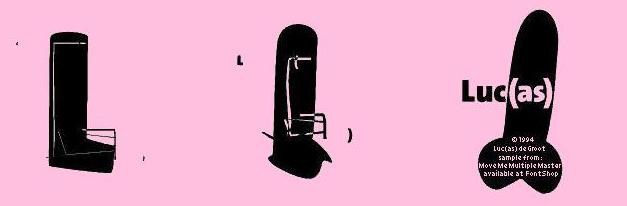
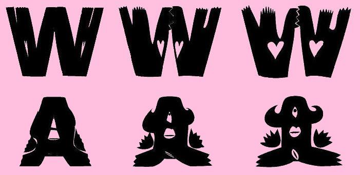
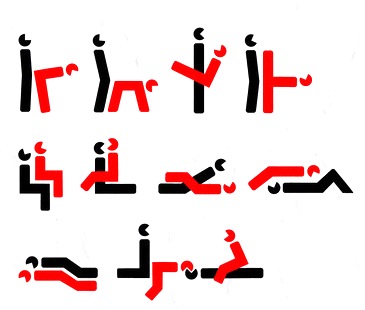
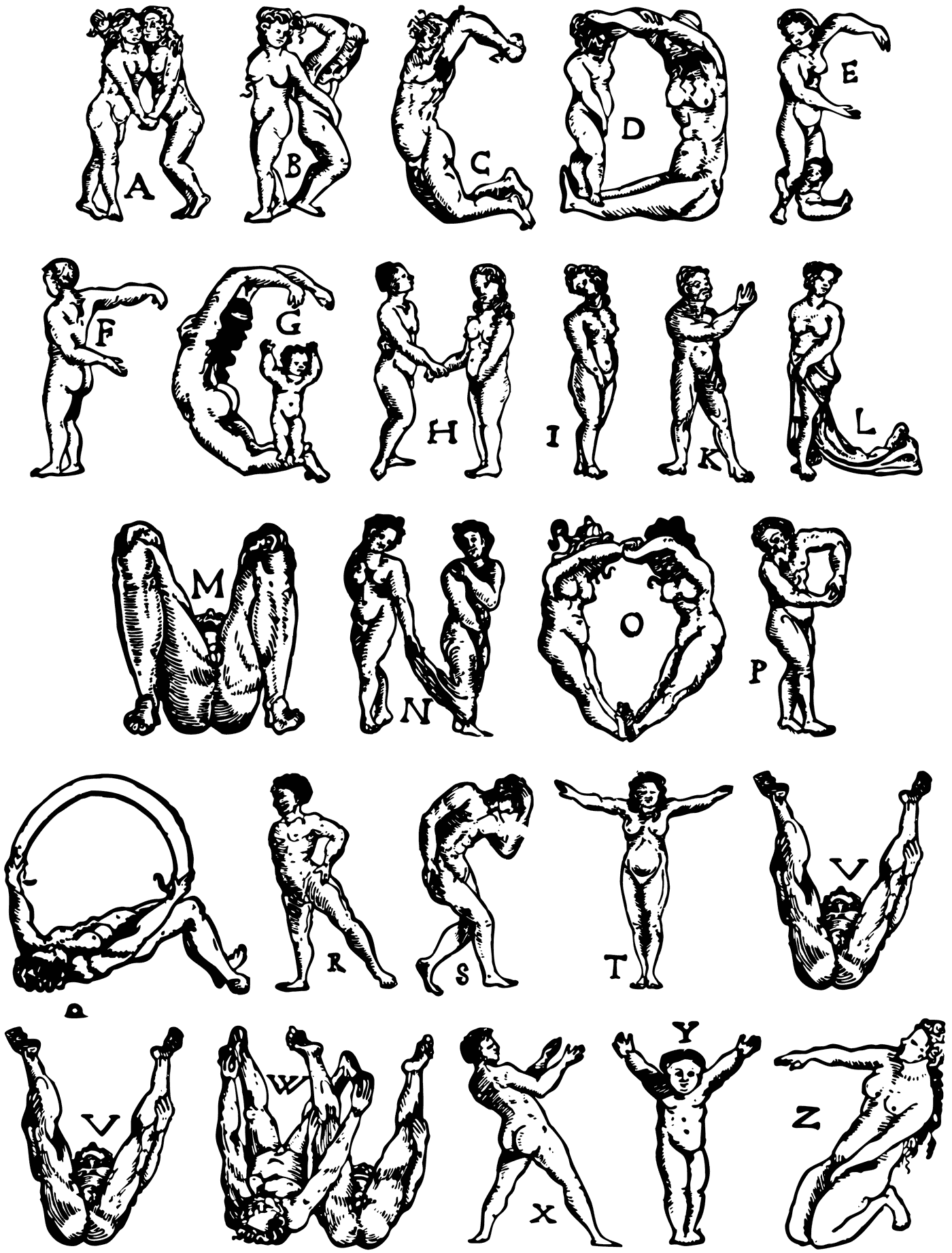
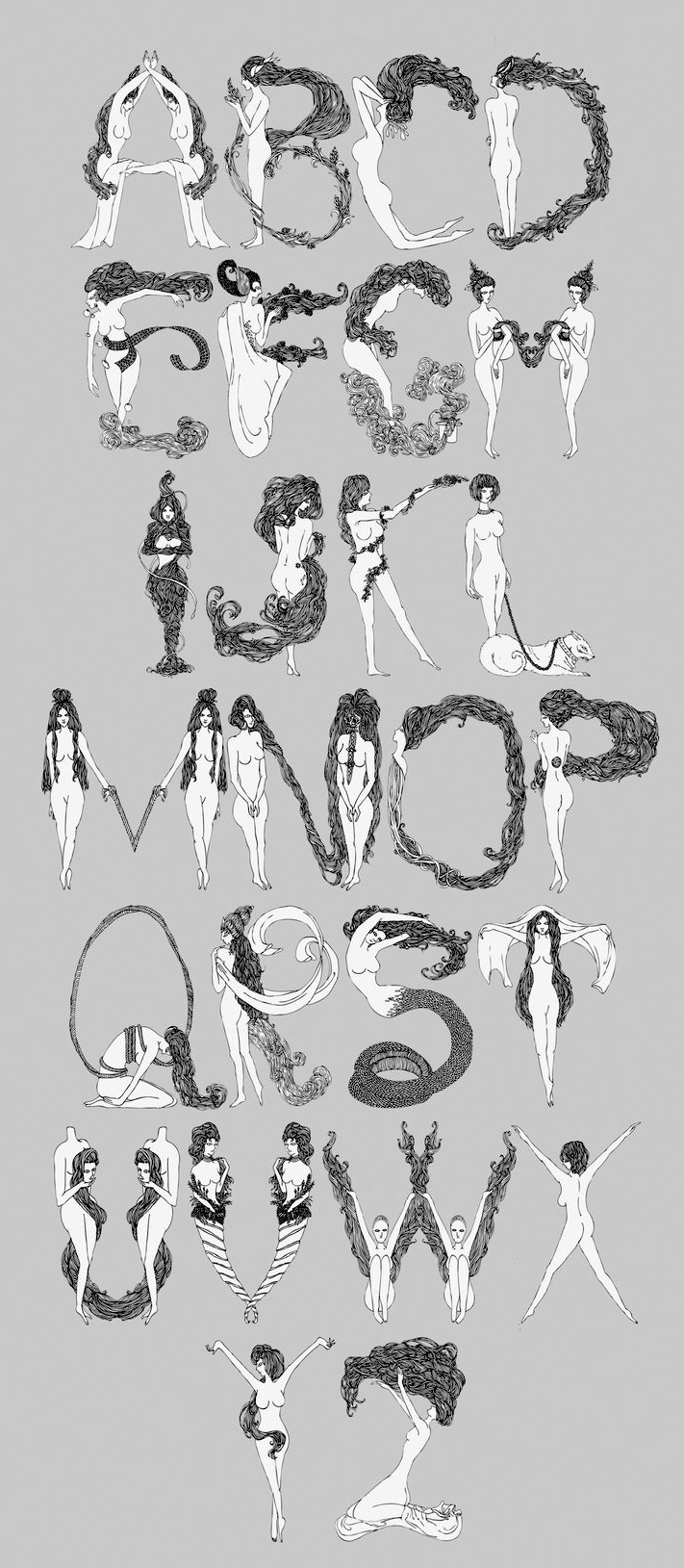
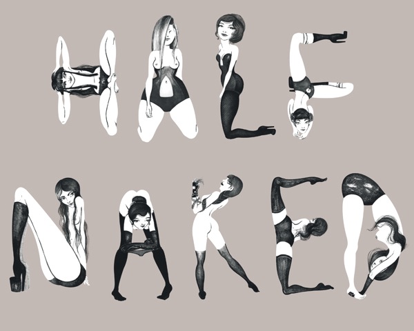
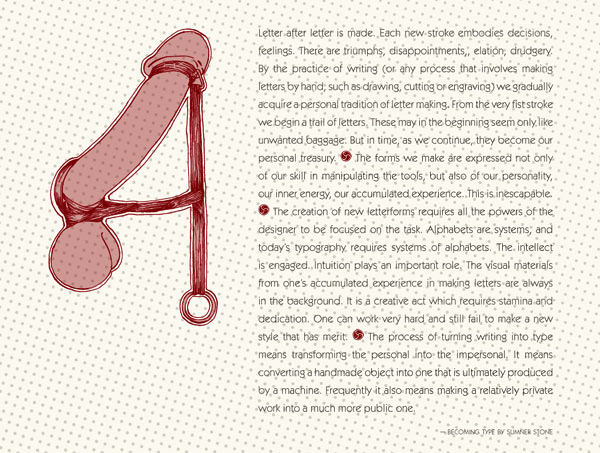
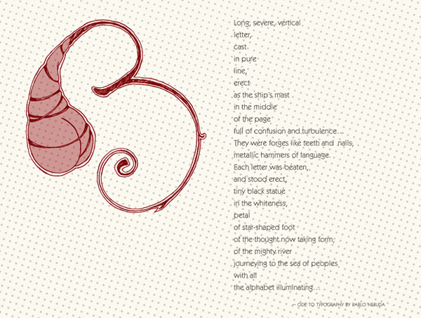
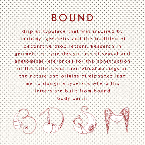
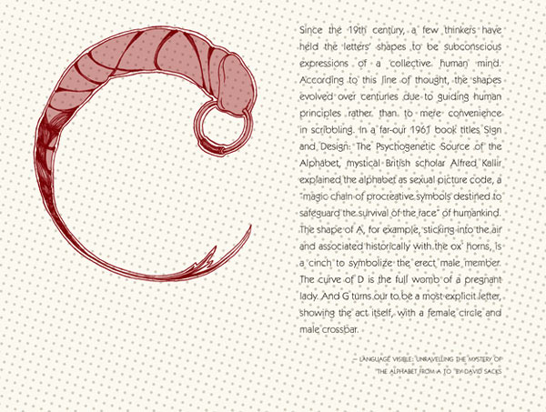
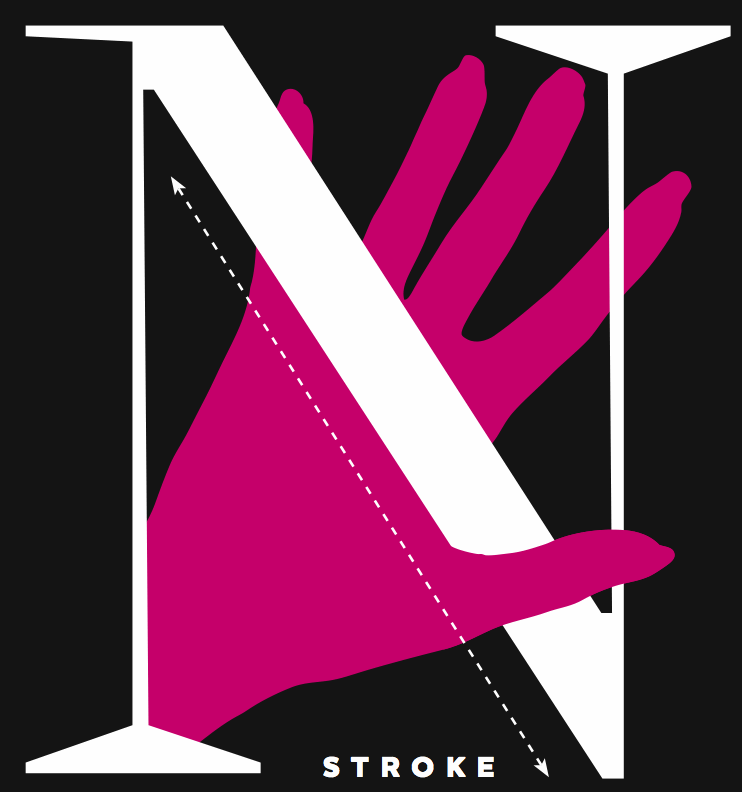
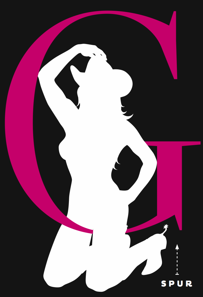
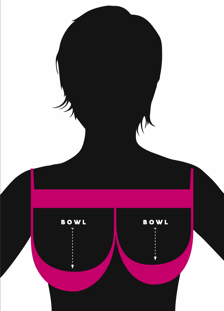
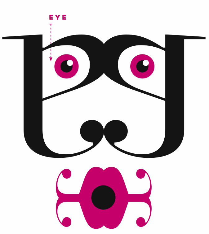
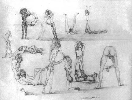
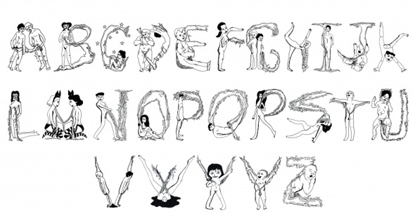
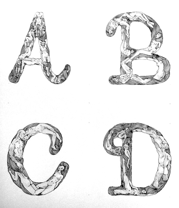
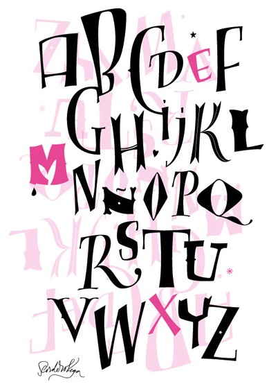
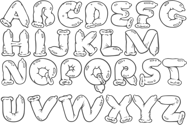
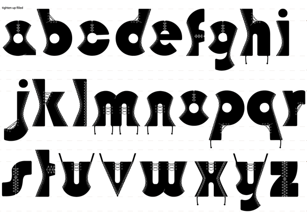
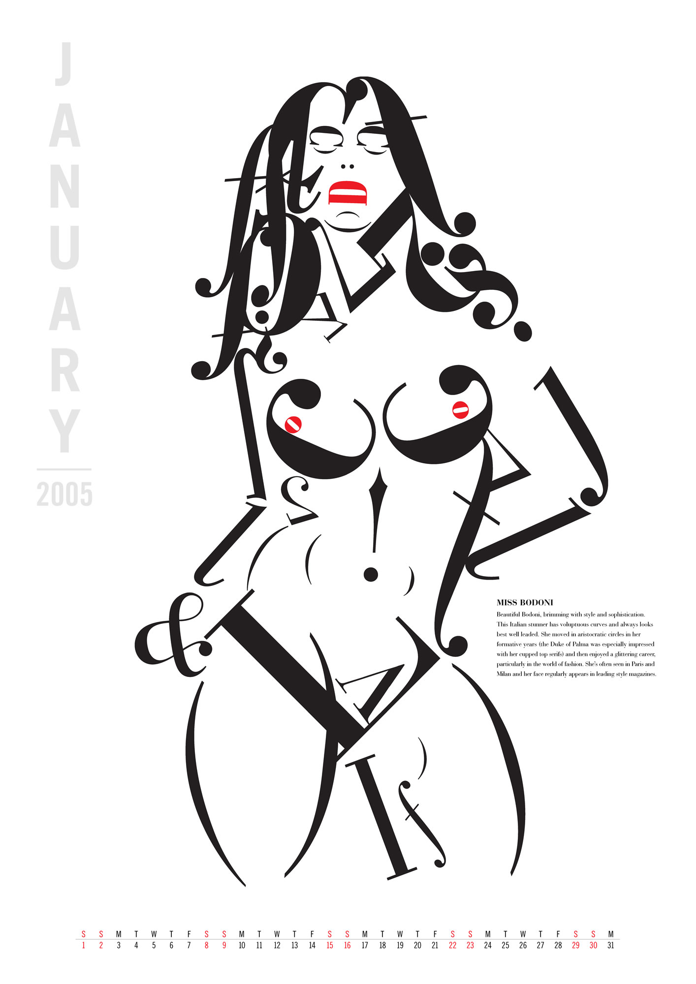
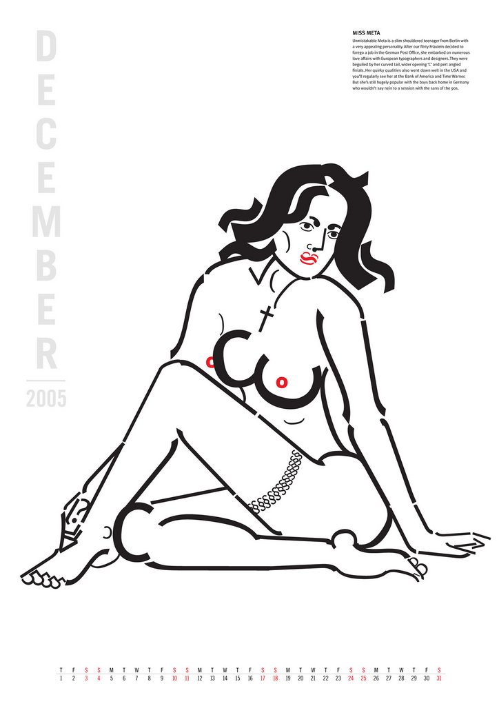
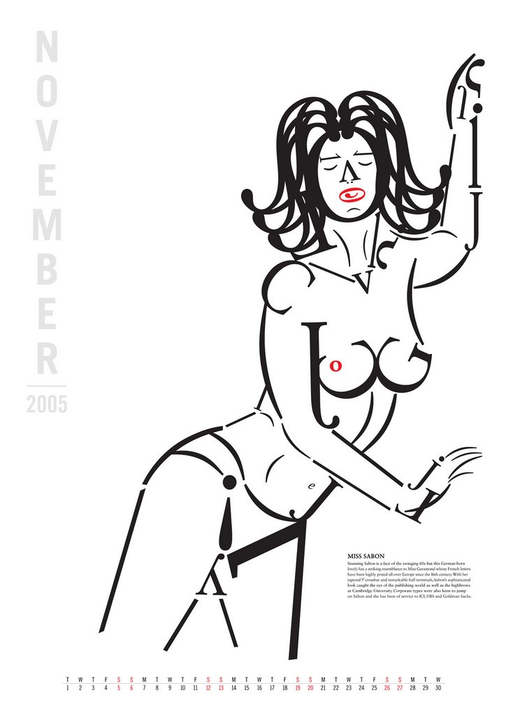
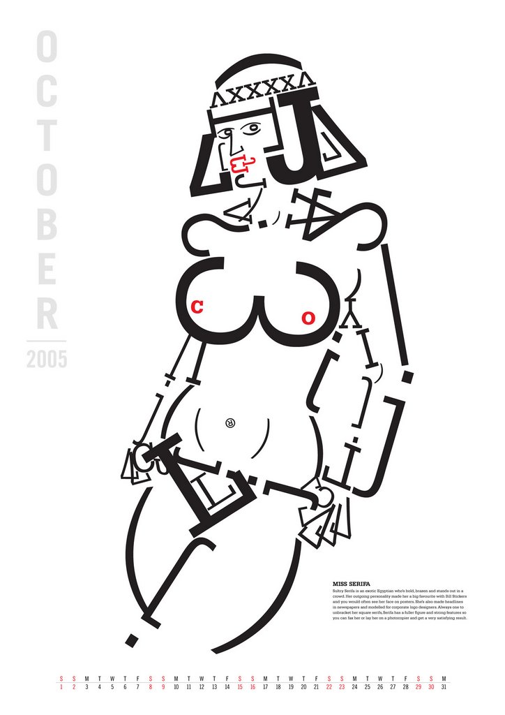
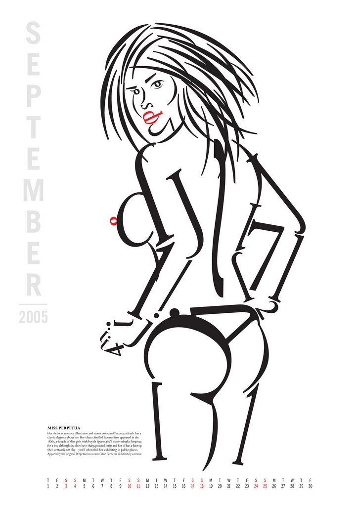
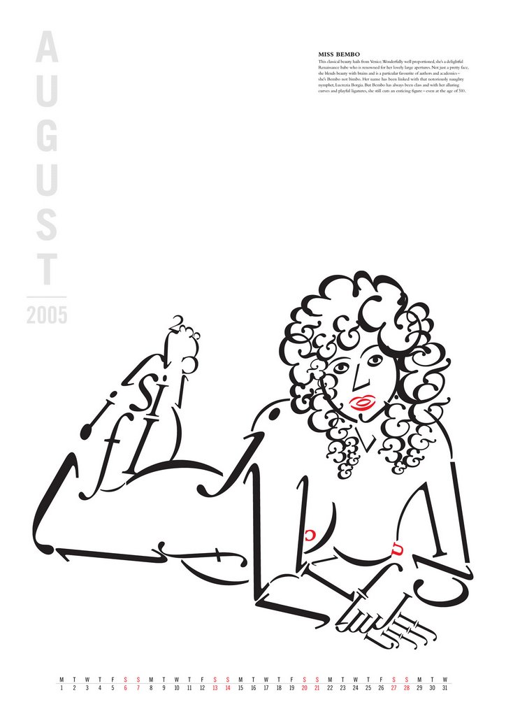
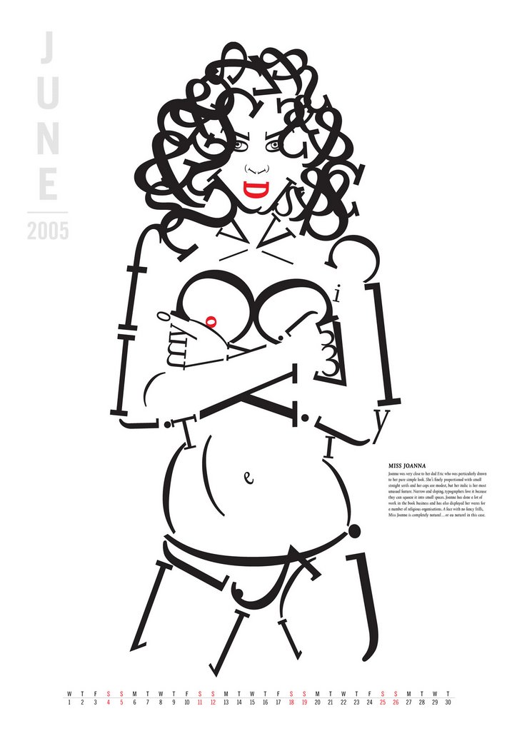
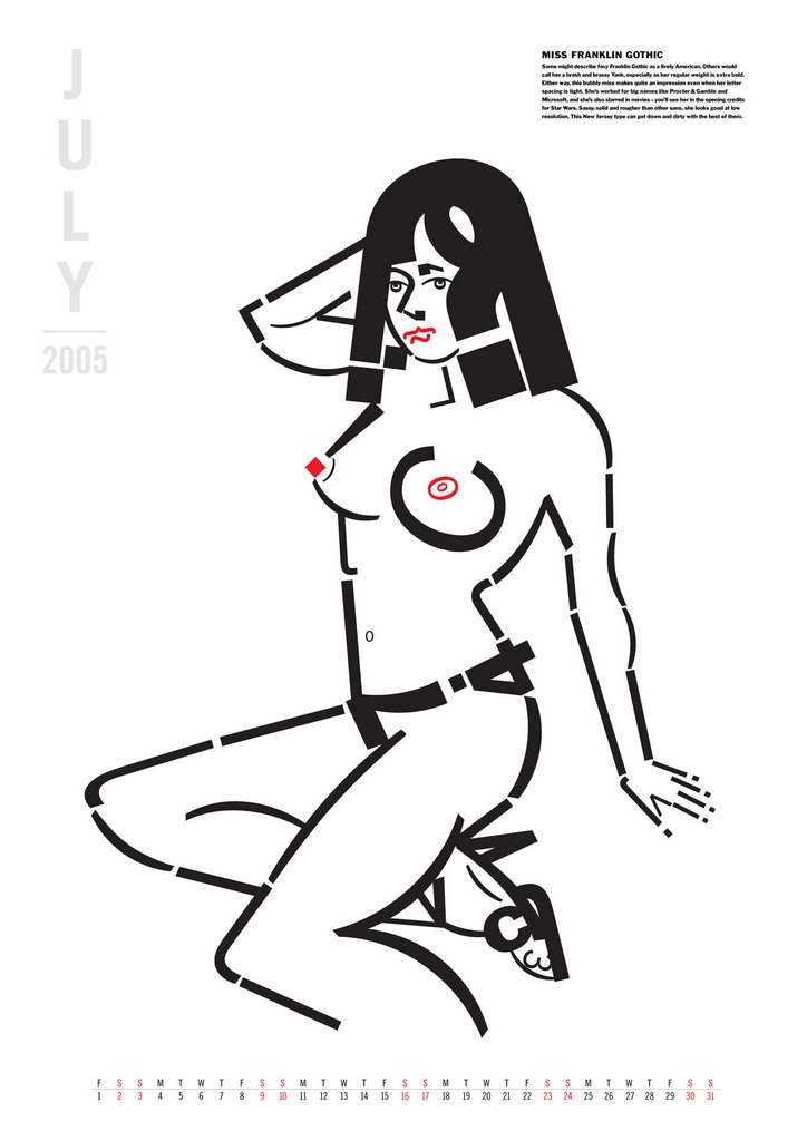
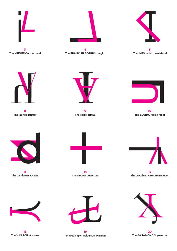
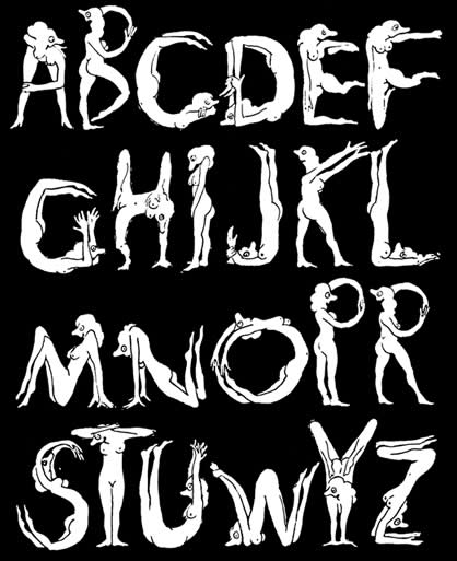
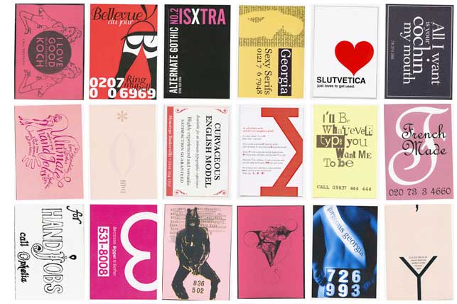
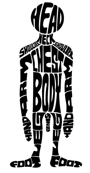
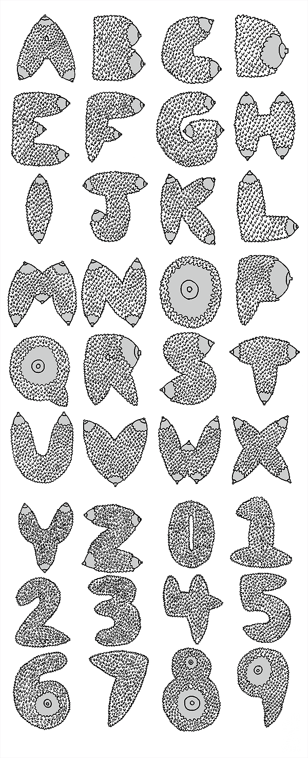