TYPE DESIGN INFORMATION PAGE last updated on Sun Jul 12 21:46:43 EDT 2026
FONT RECOGNITION VIA FONT MOOSE

|
|
|
|
|
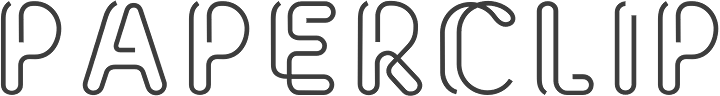
Paperclip faces | ||
|
|
|
|
SWITCH TO INDEX FILE
21 Lab
|
It offers Nieu Font (2012, organic), Free Font 21 (2010, a free paperclip face) and the counterless gometric alphabet Navia (2012). Clasia (2013) is an interesting experimental sans typeface. It looks geometric, but has original stroke cuts meant for legibility. In its presentation, the designer works with subtly shaded parts where strokes join---I guess that is also for enhanced legibility. Fontspace link. Behance link. [Google] [More] ⦿ |
27th Studios
| Designer of the free paperclip typeface Wireplay (2012). Dafont link. [Google] [More] ⦿ |
3rieart
| Malang, Indonesia-based designer, b. 1988, of the paperclip typeface Melankola (2018), the script typefaces Leonie (2018) and Highbury (2018), and the thin connected script typefaces Saitama (2018) and Cherissa (2018). Typefaces from 2019: Scarlette, Burdette (script), Blaster (brush script), Rationale (signature script). |
Abdul Malik Wisnu
| |
Abraham Beltran
| |
Acmé-Paris
|
Typefaces from 2015 include the multiline neon font Neo Neon. In 2016, Acmé Paris designed the copperplate style poster typeface Aylak, the titling sans Truck, the art nouveau typeface Bertand, the art deco typeface Beaumont, and the avant-garde typeface Cattolica. In 2017, they designed the artsy rounded sans typeface Kasha. Typefaces from 2022: Madrid (inspired by vintage posters from the Spanish Civil War). [Google] [More] ⦿ |
In 1972, he published the inline art deco typeface Dubbeldik at Mecanorma as a transfer sheet typeface. Dubbeldik was digitally revived in 2020 by Claudio Rocha (Now Type) as Werner. See also Dubbeldik (Mecanorma). [Google] [More] ⦿ | |
Addax Designs
| Japanese foundry with a nice web presence. Free original fonts made in 2000 and 2001 by "Gurucho": Spiral-Bitmap, TeaPot, XSquare, XSquare-Katakana, XSquare-Lite. Most of these fonts are either pixel fonts or inspired by the pixel movement. Teapot (2001-2006) is an informal sans. Hosobiki (2005) is a paperclip font. N.E.L. (2007) is a sans face. [Google] [More] ⦿ |
Rouen, France-based designer of Paperclip Type (2015). [Google] [More] ⦿ | |
Adi Dizdarevic
| |
Adrian Talbot
| |
American designer of these display typefaces in 2019: Toothpicks and Hooks, Curly Hair, paper Clip Edges. [Google] [More] ⦿ | |
The Ajeet Mestry Foundry is located in Thane, Maharashtra. Behance link. [Google] [MyFonts] [More] ⦿ | |
Puebla, Mexico-based designer of the free (vector format) paperclip font Clip (2018). [Google] [More] ⦿ | |
Alex Haigh
| |
Alex Haigh
| |
Alexander McCracken
| |
During his graphic design studies in Santa Ana, El Salvador, Alexander Saavedra designed the paperclip typeface Fasten Wire (2014). [Google] [More] ⦿ | |
Graphic designer, who has made Thin (2009, octagonal), Arrow (2009), Decade (2009), Fat (2009), Hiploe (2009), Player (2009, upright connected script), Mini (Bauhaus style), Winter (paperclip face), and Unic (experimental). Some typefaces can be bought. Old link at Die Gestalten. [Google] [More] ⦿ | |
Budapest-based designer of Lightline (2013, a paperclip font) and Papercut (2014, octagonal), two typefaces that were created during her studies. [Google] [More] ⦿ | |
Alexandre Venancio
| |
Sao Paulo-based designer of the paperclip / neon typeface Caqui (2013), which is designed by ruler and compass. [Google] [More] ⦿ | |
During his studies at ESAG Penninghen in Paris, Allen O'Toole created an outline typeface (2014). In 2015, he designed Subway Round (based on the principle of the bent paperclip), System A and a pixelish typeface. His graduation project in 2016 was the incised Midi typeface. Behance link. [Google] [More] ⦿ | |
Almarkha Type
|
Typefaces from 2020: Banana Juice, Bella Sweety, Bubble Bobble (a bubblegum font), Dear Sunshine, Oatlander (retro baseball script), Sweet Purple, Monieta (an inky and creamy rabbit ear script), Orange Milk (a playful handcrafted typeface), Rockbitz (a children's book font), Seathera, Avocado Creamy, Bolyvina, Charlie Angela (an inky calligraphic script), Lovemy, Chadelova (an enhanced script), Grumbear, The Mezirane, Charlotte Amalie, Crash Soul (a dry brush script), Costiera (a dry brush script), Handestonie (a monoline script), Mentality (a signage script), Technovier (a monolinear squarish sans), Antiquesta (a dry brush script), Belgium Catherine, Cronisse (a display serif), Pronave (an all caps display typeface), Uniser (condensed all caps sans), Westack (a display serif), Avone (a stencil serif), The Roletta (a dry brush script), Waluxe (a fashion mag all caps sans with flared stems), Dear Sunshine, Mikalotta (poster script), Walker Knight (a vintage all caps typeface), Towards (stencil), Cronisse (a decorative serif), Avaneonz (a neon font), The Heista Killer (a dry brush horror font), Someone (a dry brush font), Vicenza (an all caps skyline font), Bristone (a wide sans in six styles; perhaps for car tire ads), Shutterlocks (a dry brush script), Romantics (a creamy script), Revoxa, Yippie Yeah, Wonderful Day (calligraphic), Girly (a girly script), Kamelitta (a wild curvy script), Roadstore (a spurred vintage all caps typeface), Springloved (a paper cutout typeface and a a fine inline poster font), Saturated, Choxr, Blackheat (a super condensed all caps sans), Retrohols, Alibabe, Lordcorps (an octagonal sports or military font; with a stencil style), Headcorps (a sports shirt or military stencil font), Pineforest (with soft spurs), Airborne 86 (a military stencil), Orchide (a dry brush script), Beneficha (wild calligraphy), Radens (a retro bold signage script), Brokenz (a heavy condensed sans), Delninoys (a playful sans), Lorenza (sans), Elcatraz (Mexican simulation font), Hubby Bunny, Rosadetta (script), Swingsnug, Chickens Lovers, Rollinkland, Grumbear, Bubble Bobble (a bubblegum font), Blackheat (a heavy ultra condensed typeface), Brokenz (a muscular display sans), Lorenza (a fashion mag sans), Belgium Catherine (a signature script), Amazed Breath (script), Rockmore (a brush script), Empirez (an octagonal slab serif sports font), Amazed Breath. Typefaces from 2021: Neurock (pure sci-fi), The Cheelaved (spurred, Victorian), Headbears (a sports font), The Antique (a vintage typeface), Vespalogy (a vintage display font), Bestorika (a decorative serif by Abdul Malik Wisnu and Rivo Adriansyah), Quakerhack (a rough brush font), Balietta (a flowing script), Brothery (a retro signage script), Beauticella (a signature script), Glamorez (a luxurious serif), Reloaded (a military stencil font), Austragen (a bold sharp-edged display typeface), Bearetta (script), Keawneta (a display font), Racerz (a speed font), Stangith (a decorative serif co-designed with Rivo Adriansyah), Quick Letter (a wide signature script), Arcinoll (a graffiti font), Charlie Brocklin (a thin signature script), Retrolight (a multiline neon sign typeface), Mokalatte (a wild script), Thugolatz (an all caps typeface with many interlocking ligatures), Author Think (a signature script), Bionetha (calligraphic), Bouncyland (a stylish wild script), Little Knight (a scrapbook typeface), The Brushentica (a beautiful dry brush script), The Soulmate (a dry brush script), Bettawork (a dry brush script), Philips Dutcher (a signature script), Recons (a techno font), Heezpiero (futuristic), Milky Quaker (a playful supermarket font), Rostemary (a fat finger font), Therestone (a Flintstone font), The Checkmate, Chick Chack (a heavy rushed script), Retroman (an Italian Western font), Brown House (a national park font), Emeralde Chamerions (a serif and script duo), Redzein (an octagonal slab serif), Rostera (a bold script), Sketchup (a sketched font), Thealiens (a condensed all caps sans), Williesh (a meaty display serif), Amazing Sweety (a scrapbook font), Heellaaz (an all caps children's book font), Almeira, Americans Classy, The Corps 86 (a military stencil), Brexo (a techno font with solid and stencil versions), Romeline (a scrapbook font), Yippie Yeah (a rounded monolinear marker pen font), Avaneonz (a neon or paperclip font), Sangira (a stylish serif), The Blackheads (a bold script), Kandaline, Marinaga (a creamy brush script), Mochalosta (script), Morning Sweety, Rockmore (a bold script), Deloire (a 4-style all caps sans), Montelova (script), Quinger (a monolinear decorative serif), Wonderella, Wonderful Sunset, Bellachia (a scrapbook script), Choxr (a very condensed all caps sans), Keepsmile (a rounded children's book font), Lovely Sweetie (a scrapbook font), Melanista (a wild script), Rollinkland (a brush font), Bellamona (a monolinear script), Bettanesia (handwriting), Bonalisha (script), Overwave (wavy), Beautimy (a wild script), Melatie (a wild script), Memorita (a wild script), The Handnature (a Treefrog script), Heinch (a 5-style all caps sans), Sweetie Banana (a scrapbook script), Sweetie Moment (a wild calligraphic script), The Dear (a retro script), Winterline (a wild script), Young Evaline (a signature script), Salt + Pepper, Sindenetta (a signature script), Autumnilla, Bella Ciao, Rosadetta (a wild calligraphic script), Saturated (a wild calligraphic script), Wondiletta, Bubblez, Lovely Orange, Milkalotta, Luxoorea (a stylish fashion-model-skinny all caps typeface), Momotako (a paper cutout font), Neonblitz (a neon font), Unione Force (an octagonal sports or military font; with a stencil style), Westman (a Western font), Delamoore (an all caps high-contrast display serif), Delaproza (an all caps display serif), Kinglead (a cartoonish font), Modesfa (an all caps display serif), Hexore (a slab serif), Deluxes (a stylish display sans), Kenzomaru (an oriental brush font), Lumbero (wooden plank font), Pineforest (a Victorian label or sign painting font), Beneficha (a wild calligraphic script), Brokenz (a bold condensed sans), Orchide (a dry brush script), Revoxa (a 4-style sans), Romantics (script), Schein (a sans and slab serif pair), Someone (a dry brush script), Towards (a minimalist stencil font), Averox (a futuristic all caps sans), Chicken Lovers (a playful informal font), Hubby Bunny (a cute display sans), Swingsnug (an informal monolinear sans). As Typotypea">Typotypea, he published the script typeface Manthoels (2020) and the roman all caps typeface Stinker (2020). Typefaces from 2022: Signattimes (a signature script), Thematheka (a constructivist font published on the day Putin invaded Ukraine), Overbillions (a dry brush script), Brolachess (a stylish all caps semi-serif), Suntage (a wide vintage all caps font). Typefaces from 2021 published by Gassstype but made by Abdul Malik Wisnu: Ruthless (a heavy dry brush font), Timeless Nature (script), Unranked (a rough mural font). Creative Fabrica link. [Google] [MyFonts] [More] ⦿ |
Auckland, New Zealand-based designer of the paperclip typeface Angulus (2015). [Google] [More] ⦿ | |
In 2014, she made the free hipster font Aesthetika. Dafont link. [Google] [More] ⦿ | |
Tabriz, Iran-based designer (b. 1990) of these typefaces:
Github link. [Google] [More] ⦿ | |
Graphic designer in Barcelona who created these typefaces in 2014: Honolulu, Western, Arsenal, SciFi, Paperclip, Tangram. [Google] [More] ⦿ | |
Saint Petersburg, Russia-based designer of the Cyrillic paperclip typeface Razrabotka Akcidentnogo (2018). She also cyrillicized Agonz's Ailerons in 2018. [Google] [More] ⦿ | |
Typefaces from 2016: Prosto (a handcrafted Latin / Cyrillic typeface), Sofia (thick brush. free), Astrid (hipster style), Giglio (paperclip style). Typefaces from 2017: Palma Nana (script). Typefaces from 2019: Module (a monoline display typeface), Unmoor (an outlined and color rope font). Typefaces from 2020: Katrin Sketch, Be My Candy.nastasiiaMacaluso-Module-2019 [Google] [More] ⦿ | |
Andrea Braccaloni
| |
Andrea Deinert (b. 1985) studied Communication Design at the Trier University of Applied Sciences and graduated in 2013. Since then she has been working as a designer in Cologne. She created the thin paperclip typeface Filament (2013) and Mrs Tailor (2014, Volcano). Dafont link. Volcano Type link. [Google] [More] ⦿ | |
Typefaces from 2016: the non-conformist typeface family Caractère Anal (the name was chosen in reference to people with an anal personality. Some may prefer the equivalent name Caractère Trumpiste), Baechlemeid (a handcrafted typeface for the Bächlemeid architects in Konstanz) and Japanische Populärkultur (stretchable gridded letters). [Google] [More] ⦿ | |
Creator of the paperclip font Mothership Connection (2009). He is located in Odessa, Ukraine. [Google] [More] ⦿ | |
Creator of the Greek paperclip font Common Greek (2013). Behance link. [Google] [More] ⦿ | |
Designer in Bombay, who made a custom Hindi font (2012), as well as a typeface for teaching children how to draw the Latin alphabet. He also created Hexy (2012, a hexagonal family that includes an inline face), Hindustan Hipsters Icons (2012), the thin geometric typeface Elefont Sans (2012) and the paperclip typeface Incomple (2012). Another Behance link. [Google] [More] ⦿ | |
Anne Bradt
| |
Moscow-based designer of a modular monoline typeface in 2012. In 2013, at the British Higher School of Art and Design in Moscow, he created the paperclip typeface Stepan, the shaky typeface Artquake, the display typeface Duchess, and Sketch Font (alphadings). [Google] [More] ⦿ | |
Fonts from 2010: Full Deck (playing card font), Scrollboard, Power Up (piano key face), Groovy Fu, Formality, Union New (+Sans, +Flat), Angle Tutorial, Aurora Light (elliptical monoline sans), Pushpins, Aurora Light, Scrawl (marker face), Evity (a grotesk face), Altipen (upright script). Fonts from 2011: Obleak (oblique techno face), Likea (a heavy mechanical sans), Uptake (elliptical). Fonts from 2012: Omit (a bilined stencil face). Fonts from 2013: Emblazoned. Typefaces from 2014: Game Over, Aurora Light, Flowidity, Oxquad (textured, octagonal). [Google] [More] ⦿ | |
Cheboksary, Russia-based designer (b. Arkhangelsk, 1977) at AType of the paperclip fonts Scripio A, Scripio B and Scripio C (2003), Scripio A Simple (2004), Doughnut (2005: with the plumpness and a bit of the DNA of Bronislaw Zelek's Bron), Galleon (2004: a faux italic), Cubes (3d), Sennit (2003: textured like sandals), D Block A (2003: blackboard bold), and Fatman (2003). [Google] [MyFonts] [More] ⦿ | |
Arty Type
|
His typefaces are often modular, and include Somaskript Tall (2012), Origami Incised (2012), Groovy (2012, +Inline: sixties face), Dropout (2012), Rough Diamond (2012), Thorny (2012), Tangent (2011, a geometric monoline sans), Scroll (2010), Marsh Scroll (2011), Tulip (2011, modular, heavy, and counerless), Somatype (2011, über-organic; +Skwosh), SomeSkript and SomaSkript Incised (2012, organic), and Nutcase (2010). In 2013, he published Soma Slab, Soma Slab Tall, Angleface, Anglepoise (a paper clip typeface family) and Mortice (octagonally cut). In 2014, he designed Sanzibar (a decorative sans), Sliced, Sliced Open, Omni (a minimalist organic monoline sans) and its companion, Omni Serif, and Tangential Semiserif, Tangential Rounded, and Tangential. Typefaces from 2015: Storybook (informal script), Sliced, Sliced Open, Sanzibar Schreef (swashy typeface), Galerie, Galerie2. Typefaces from 2016: Polke, Avocado Sans, Cyclic Uncial, Cyclic Serif. The Cyclic series was extended in 2018 to include Cyclic Sans. Typefaces from 2017: Troika (monoline display typeface), Caché. Typefaces from 2018: Sanzibar Script, Cyclic Sans. Typefaces from 2019: Sanzibar Script. Typefaces from 2021: Cyclic Eclipse (art deco), Bodonieqsque (a decorative didone), Cyclic Elite (a stylish sans). |
Auckland, New Zealand-based graphic design student who made the monospaced typeface Paperclip (2012). [Google] [More] ⦿ | |
Typefaces made in in 2008 as thalamic: Hello (connected upright script), Epilogie (blocks), WimSoft (+U/C), Chunk Chip, Konstruct (Russian constructivism face), Sensei Says, FS Tributary, Twotype Font, Urge (fat octagonal), Subliminal, FS United One, The Game of Type, Anaximander Zooom!, Corrupt and Corrupt Ed (piano key stencil fonts), Blueprint, Monomum, Synergy, Insert Coin Italic, Write I Careful, Write I Casual, Write I Dump, Loop UC, Loop LC, Emergic, Prick!, Insert Coins Pixels, Retro Electro, Bubble Lab IJ, Bubble Lab Bang, A Needle Pulling Thread, Send, Scan (IBM logo look), Intermittent and Intermittent Sans (stencil typefaces), Melt x DR and Melt x tDR (dot matrix), Oval x DR and Oval x tDR (original design by theDesignersRepublic for Issey Miyake), On Grid, Indigo (almost blackletter), orange_2 (dot matrix), Scan (horizontal stripes), Bass, Grape (simple pixel face), Nachahmung and Nachahmung Block (fat and extra condensed, Wim Crouwel simulation typefaces), Nachahmung Block Serif, Conjunction, Interjection, Is It, Sangular (nice experiment), Anonon (nails in square letters), Purple and Purple Very (slab serif headline typefaces, pixelized), Arc Echo (biline and strutted), The Question (a fantastic 3d paper fold imitation face), FS Minimal (a fantastic ultra fat decorative face), FS FontStructor, Vibrant (multiline labyrinthine or op-art face), Writ (upright pixel script), Castor, Ooki (octagonal), Industrial, The I Flat, The I, Indiscrete, Analog (connected script), Dent (mechanical), Digital (connected script), Hello Hello, and Sensei Says. In 2009, he made Clone It, Entwined, C64, Helix, Fontsration, Bent, Stripe Zoo, Dull, Indent (stencil), Quartertined (kitchen tile), Firox, Orfix, A Priori, Ignore, Confused, S-Ookii, Ookii (octagonal), Very Becoming, Crisis Averted, Crisis (neat bold octagonal face), Penmanship, Up All Night, Sleep All Dayi, Chunk Chip, Grayletter (upright script), Soso, Mostly Harmless (textured face), Etched, La Cross, Twotype, Etched Bare, Aught (One, Two, Three), as: Inflate (Pop, Pfft, Puff, Poof), Istic, Very Becoming, Ignore, Ought, Balance, Broken, Dry Flat (dot matrix), La Cross, Etched (+Bare), Fontsration (+Refined: multilined beauties), FS Institutional (fat multiline face), FS Industrial, FS Pixelayers. Additions in 2010 as thalamic: fs Section, fs Reboot, fs Easy DNA Auto Stencil, fs Institutional (+Ho, +Elements), fs Quartertined, fs Stencil 2.0, fs Rivet, fs Intaglish, fs Dumb Italic, fs Loop Gap, fs GoTeam (stencil), fs ITilic, fs Kerplunk (Startrek face), fs Dumb Italic, fs Ribbon, fs Beringer, fs Ooki Woodcut, fs Croissant (stencil), fs 45 (octagonal stencil), fsXO, fs Pipe, fs Confused Less. Fonts from 2011 as thalamic: fs Xenon (a paperclip face), fs Instant, fs Twist, fs WIP (blackletter), fs Sparc, fs Reboot (texture face), fs Pod, fs Flute Tune, fs Special, fs Watch Out (stencil), fs Etched Nyle (labyrinthine face), fs No Kerning Required (2011, connected upright script). Creations in 2012 as thalamic: fs Flip, fs Mom, fs Noise, fs Noise II, fs Junk, fs You Are Here, fs Flash (outlined), FS Easy Too (paperclip face), FS Strict, FS Fix, fs in three (octagonal stencil face), fs Single, fs Wakarimasen, fs r-failed (white on black), fs Permutation X, fs Pan Am, fs Institutional, fs Institutional 2, fs Chunky (counterless), fs Grayletter (textured face), fsXply (op-art). Creations in 2013 as thalamic: fs So Not Right, fs Grid Urdu (pixel face), fs Not So Right, fs Six Sticks, fs Half (octagonal family), fs Bored, fs Make it Happen, fs Salvage, fs To Be Discarded, fs Connect (stencil), fs Whomp, fs Praxis, fs Fez (3d face), fs Input, fsTramp, fs Five Alive, fs Hote-Zyd (labyrinthine), fs Patterns (Layers, Quarters), fs Five Alive (origami font), fs Go To Sleep (retro speed font), fs Vaerktoj (inspired by the brand identity of Hoejmark Cycles), fs Permutation B, fs Jester, fs Permutation XII (op-art), fs Insatiable, fs Electronic, fs Carbon (a nice chequered face), fs When We Were Young (multiline typeface), fs Shogun Tiny (a lined kitchen tile typeface), fs Optical, fs When We Were Young (multilined), fs Slate, fs Shogun (gridded), fs Iie (+Filled), fs Blocky (dot matrix), fs Thalamic. Creations in 2014 as thalamic: fs Perhaps, fs Perhaps Perhaps, fs Stability (Turmoil, Flux), fs Industrial (an artsy fat dot matrix face), fs Rehash, fs Ah, fs Curly, fs So, fs Flint, fs ICK (blackboard bold style), fs Wiggle, fs Grid, fs Ah. Creations from 2015 as thalamic: fs B-Chain (bike chain font), fs Risque (art deco), fs Squangular (Impair, Square, Flair, Pair), fs Oval, fs MIP, fs Flower (kitchen tile face). Creations as minimum: fs Chips (2014), fs Oh (2014, piano key style), fs Stack (2014, +Overflow), fs llljjj (2014), fs Turn Off The Sun (2014, beveled), fs Zag (2013 textured), fs Zig (2013, textured), fs Mullions (2013), fs The Italic (2013), Gridlock (2009), Mingle Minx (2009), Mingle Co (2009), Mingle (2009, gridded letters), Bevel (2009, 3d beveled family), illiij (2009, multiline family), m.ove.r (2009, multiline family), Grayscale (2009, multiline family), fs Cubed (2010, 3d-face), Bas Relief (2009, 3d face), Silver (2009, 3d face), Tin (2009), Lead (2009), Bevel (2009), Bevel Just (2009), Bevel Just Shadowed (2009), Ceci n'est pas une vague (2009), A Fault in Reality (2009, optical effect font), Blit Slash (2009, experimental), Blit Hack (2009), Dot Dot Hex (2009), Super Black (2009), fs Overlap (2010), fs Fabric (2010, texture font), fs Original (2010), fs Ink Blot (2010), fs Dots and Dashes (2010), fs I Square (2010), fs Squared Up (2010), fs Super Black (2010), fs Unoriginal (2010), fs Minimum (2010, geometric stencil face), fs Pin and Thread (2010, stitching face), fs Shade (2012, 3d face). FontStructions from 2011: fs Perpetual (dotted line face), fs Slither, fs No Escape, fs Prompt (a DNA-inspired biochemical lab face), fs Plus H (horizontally striped face), fs Arc Test 2:2 (a modular blackboard bold face), fs V Simple (2010, textured face), fs Instant, fs Permutation V, fs Rehash Monoic (labyrinthine), fs Meta (texture face), fs Scroll, fs Scroll Not (stencil). FontStructions from 2012: fs Translucent (a texture face), fs Bank, fs Shade, fs Confined (white on black), fs Institutional (+Vo, +HeVe, +Ho, +He, +Ve: texture typefaces), fs Bang, fs Random (textured face), fs Random Pattern, fs Lead, fs Tin, fs Silver, fs Tungsten. Klingspor link. Abstract Fonts link. Behance link. [Google] [More] ⦿ | |
Graduate of UNSW Art & Design. Sydney, Australia-based designer of the paperclip-styled typeface Unfinished Business (2014). Behance link. [Google] [More] ⦿ | |
Baku, Azerbaijan-based designer of the free paperclip font Halfomania (2018) and the free sans typeface Beway (2018). [Google] [More] ⦿ | |
Backpacker
|
He set up the independent foundry Atypical. Designer of TapeBold (2015, iFontMaker). In 2016, he released the free all caps sans typeface Hellenica for Latin, Greek and Cyrillic. In 2017 he participated in the team of designers who won the competition for the design of the new visual identity of the National Library of Greece (George D. Matthiopoulos, Dimitris Papazoglou, George Triantafyllakos and Axel Peemöller). Fontsquirrel link. Kernest link. iFontMaker link. Cannibal Fonts link. [Google] [More] ⦿ |
Bagas Setriawan
| |
FontStructor who made these typefaces in 2014: Sushi (3d), Buzz Wire (paperclip face), Spaghetti, Propeller, Parallel Lines, Slinky, Fineliner, Constellation (connect-the-dots typeface), Dotted Pixels, Folded Pixels, Fish Filled In (fat poster face), Fish, Paper Cut, Three, Orange, Constellation (connect-the-dots), Geometric Script (octagonal, connected, straight-edged), Geometric Script 2, Wire (paperclip font), Cardboard Box (3d and outlined), Fatty, Chamfer (octagonal), Half Moon (inline font), Paper Clips, Square (ultra-fat), Loop de Loop (connected), Rounded Mono. | |
BenBenWorld (or: BB Bureau)
|
Designer of the pixel fonts Logotix (2004), Latham and 5x7 Negatie Moyenne. In 2010, he made the paperclip typeface Pipo (first published in 2011 by Die Gestalten, and in 2017 by bb-bureau). He created the commercial angular sans typeface S-L (2006) which was originally made for the University of Arts Saint-Luc in Tournai. It was published by Volcano. Commercial typefaces include S-L Bold (2012, a hexagonal typeface based on his design at St. Luc in 2006), Zigzag (2012, Volcano Type; a font originally made for the Vivat theater), and Marianne (2012, BenBenWorld: an inline and modular typeface family). In 2013, he published the stencil / fractured typeface Mineral. In 2014, he designed the experimental triangle-based Bauhaus-inspired Side A typeface. In 2016, Bodhuin designed the expressive Italian typeface family BB Book A and bb-book Contrasted. He added the wedge serif BB Book B, BB Book Mono and BB Book Text to that series in 2018. Typefaces from 2017: Brutal, Elastik. Typefaces from 2019: Grotesk Remix (extended to Grotesk Remix Monospace and Grotesk Remix Variable in 2020), Tme (experimental: an update of Sl drawn in 2006 for the University of Arts Saint-Luc de Tournai), Standard-bb, Pickle Standard (extravagant and thought-provoking). Typefaces from 2020: Gikit (in Text and Title version, for a perfect gridnik feel), Ballpill (designed for printing at very small sizes). Typefaces from 2021: Bilibot (an experiment with overlapping strokes), Pimpit (rounded, condensed and with reverse stress), Volcano Type link. View Bodhuin's commercial typefaces. [Google] [MyFonts] [More] ⦿ |
Sandnes, Norway-based creator of the techno / paperclip font Binders (2013). [Google] [More] ⦿ | |
Benoît Bodhuin
| |
Blackout Fonts
| Blackout is run by Raymond Robert Holling (b. Phoenix, AZ, 1987) who studied visual communication at Arizona State University. Designer of MyFonts link (2007, futuristic), Curves Accent (2007, multilined and artsy), and Paperclip Wire (2007). [Google] [MyFonts] [More] ⦿ |
Bran (or: Fractal Eye)
|
The list of fonts, all made between 2006 and 2008: Tulip, Fragments of Eter (2007, upright connected paperclip script), Next Level (display sans), Ironbeauty, Esquizofrenia (grunge), Nü, Yellow Move (a great art deco sans), The King and Queen (2007, grunge medieval calligraphy), Foelia (dot matrix), Ank (2007, grungy sketch face), Nü Creactivo 2008 (spurred Western face), Further, One and Four, Quiñók (2007, experimental), Defekto (2007, gothic), Mondula (more calligraphic grunge). Alternate URL. [Google] [More] ⦿ |
Brass Fonts
|
Custom fonts by Schneider: Girato (Giraffentoast), Fiona (MDR - Mitteldeutscher Rundfunk), Sion Script (Sion Brauerei), Supralux (Super RTL). He is working on Veltro Pro (a script) and Breite Kanzlei (blackletter). MyFonts sells BF Anorexia (a grunge typeface by Schneider), BF Corpa Gothic (a DIN-like family done in 1997 by Schneider), Corpa Gothic Pro (a 2019 revival of Corpa Gothic), BF Corpa Serif (1997, a slab serif family by Schneider), BF Cuba (a pixel typeface by Schneider), Fiona Script (2006, connected), Fiona Serif, BF Fiona Slab (2006, Guido Schneider), BF Fluxgold (1998, Schneider), BF Invicta (2006, a roman inscriptional family by Schneider), BF Jaruselsky (1997, Guido Schneider), BF Matula (1996, an organic typeface by Guido Schneider), BF Nobody (1995, a roman typeface by Schneider with pointy experimental serifs), BF Paul D (a grunge blackletter typeface by Schneider), BF Rotwang (1997, a transitional typeface by Guido Schneider), BF Solo Sans (1995, Schneider's grotesk family), BF Stoneman (1997, a decorative poster typeface by Schneider), BF Styptic (a grunge paperclip typeface by Schneider), BF Sub Zero (experimental, by Schneider), BF Tara (1999, a humanist sans family by Schneider), BF Girando Pro (a garalde made by Guido Schneider in 2010). Typefaces from 2018: BF Rotwang Pro (a redesign by Schneider of his 1997 typeface, BF Rotwang; named after C.L. Rotwang, the inventor of the Mensch-Maschine from the film Metropolis (1925/1926), BF Rotwang relates to the high-contrast transitional and didone styles), BF Konkret Grotesk Pro (a 16-style grotesk family by Guido Schneider with over 1500 glyphs per font). Typefaces from 2021: BF Garant (a 20-style geometric sans with open counters, tapered spurs and diagonal cut ascenders and descenders). View Guido Schneider's typefaces. [Google] [MyFonts] [More] ⦿ |
Breauhare Fonts
|
MyFonts sells Cooper Goodtime (2007, inspired by the lettering used on the CBS-TV variety series The Glen Campbell Goodtime Hour (1969-1972)), Happy Trails (2007, based on the lettering (all upper case) that was used on most Trailways buses from 1936 through the very early 1960s), Jesus Saves (2008), Jesus Heals (2010), Neon Bugler (2008, a neon-light or paperclip font; digital help by John Bomparte; +Neon Bugler Squared), Future Bugler (2008), Future Bugler Upright (2010), Future Bugler Soft (2015, digitized by John Bomparte), Handmade Bugler (2009, digitized by John Bomparte), Southern Nights (2009, disconnected script), Scan (2010, a barcode-themed font), My Left Hand (2011), Minnesota Plaid (2011, a gaspipe family digitized by John Bomparte), Bauhaus Bugler (2013, digitized by John Bomparte: monoline Bauhaus style sans; compare with Qero Nite), Bauhaus Bugler Soft (2015), Fast Food (2014), Daddys Hand (based on Harry Warren's father's hand; digitized by John Bomparte), Chili Beans (2021: a Bauhaus-inspired wide grotesque with oval shoulders), and Dime Store (2007). Showcase of Harry Warren's typefaces at MyFonts. [Google] [MyFonts] [More] ⦿ |
Pulau We, Indonesia-based designer of these display typefaces in 2018: Brave Youth (a hipster typeface), Brokeline (a neon outline font), Hermano (a tottoo font), Bare Book (script), Badabooks (script), Linealone (paperclip font), Revault (glitch font). [Google] [More] ⦿ | |
Leigh, UK-based creator of the bilined compass-and-ruler display typeface Endless (2015). [Google] [More] ⦿ | |
| |
Sydney, Australia-based creator of the paperclip font Whitehall Gates (2012). [Google] [More] ⦿ | |
In 2011, she made some typefaces, including a paperclip face. In 2012, she added Disorder, Water (a wavy typeface), and New Typeface. In 2013, Chinthye designed the outline typeface Onyx and the hip display typeface City. In 2015, she designed a modular typeface and the circle-themed typeface Space. In 2019, she released the geometric solid typeface Cargo and the bubblegum typeface Home. [Google] [More] ⦿ | |
Designer at Linotype of the multiline art deco or marquee typeface Piccadilly (1973). It can also be viewed as a paperclip face. [Google] [MyFonts] [More] ⦿ | |
Fortaleza, Brazil-based designer of the paperclip typeface Grampuh (2017). [Google] [More] ⦿ | |
T-26 designer who made the neon / paperclip font Relava (2008). [Google] [More] ⦿ | |
During her graphic design studies in Lawrence, KS, Claire Zimmerman designed an unnamed paperclip typeface (2013). Her second typeface, Seams (2012-2015), is a carefully designed sans specially made for white tee shirts. Kiosk (2015) is an all caps display typeface. She graduated from the University of Kansas in 2016. Home page. [Google] [More] ⦿ | |
Norwegian designer of Tom Yum Superslim (2001-2002) and Tom Yum Superfat (2001-2002). She also designed the Thai simulation typefaces Decomposing Lover (2003) and Tom Yum Superhot (2002). The Birchleaf (sans) typeface, done for Bjørka, a workshop for art photography in Oslo, is still under development. Snøfnugg is a fat paperclip font. Sucomandante (2002) is octagonal and computer-inspired. Bjørkeblad (2002-2003) is futuristic. CC Lisbao (2005) is experimental and modular. Museum X (2005, co-designed with Halvor Bodin and Tone Hansen) was a custom type done for Museum X for kunst/arkitektur/design. Claudia lives and works in Oslo. [Google] [More] ⦿ | |
Fontstructor who made the paperclip typeface CLIPS (2010) and the techno typeface New Computer Data (2010). [Google] [More] ⦿ | |
Corradine Fonts
|
Fonts from 2007: Kidwriting (a family which includes Kidwriting Dingbats 1 and 2), Garabata (a fantastic handwriting face), Garabata Dingbats, Hexagona Digital, Quadrat (grunge), Quadrat Old (grunge), Quadrat Dirty (grunge), Quadrat Broken, Quadrat Ugly, Neogot (experimental, 8 styles). Fonts from 2008: Mucura (handwriting), Prissa (handwriting), Salpicon (a script), Cuento Serif (a bouncy hand-printed family), Memoria (brush script), Charco, Happy Day (comic book family with Happy Day Dingbats), Espectro (a swinging script with swashes and a Dingbats style), Furia (handwriting), Candelaria (based on house signs in the La Candelaria neighborhood of Bogotá), Old Village (1600's style), Old Village Ornaments, Rapidda (a successful simulation of quick handwriting), Hueca (an outline children's script), Antigua (an old swashbuckler family), Colegial (a great-looking hand script), Pincel (a fantastic paint brush family with accompanying splatter dingbats), Trazo (Corradine's handwriting), Arcos (a techno family), Caveman (a primitive stone-look type family), Rumba (two styles; an elegant flowing brush script), Parche (graffiti family), Elegance Monoline (a greeting card script typeface that won an award at Tipos Latinos 2008), Abuelito (script). Fonts from 2009: Helga (flowing script), Mussica (+Swash, +Antiqued: a delicate Victorian typeface; followed in 2017 by Mussica Italic), Guarapo (hand-printed), Toxic (futuristic stencil), Emotion (comic book face), Bloque 3D, Rock and Cola, Betco's Hand, Telefante (comic book family), Nancy's Hand (more comic book hand-printing), Alambre (multiline/paperclip), Sensual (calligraphic hand), Zape (in the style of Tekton), Antrax Tech (grunge), Masato (handwriting), Hu Kou (oriental simulation). Fonts fgrom 2010: Miel (a curly script), Oferta (a signage script), Corradine Handwriting (and Corradine Handwriting Italic, 2015), Alberto (connected hand), Changua (hand-printed). Fonts from 2011: Plebeya (2011, connected hand), Mimi's Hand Connected, Legendaria (an extensive connected calligraphic family). Fonts from 2012: Tecna (a techno family co-designed with Sergio Ramirez), Neuron (a fantastic 16-style rounded elliptical sans family created together with Sergio Ramirez), Bucanera Soft (blackletter), Bucanera Antiqued (grungy blackletter), Official (a simple monoline sans family), Almibar (a connected calligraphic Spencerian script), Eterea (a roman all-caps family), Eterea LC (the lower case set), Canciller (an italic roman, done with Sergio Ramirez), Quarzo (2012, a formal copperplate script done with Sergio Ramirez). Typefaces from 2013: Neuron Angled (still with Sergio Ramirez), Alianza Slab (a great-looking slab family), Alianza Italic and Alianza Script (a packaging font), all made jointly by Manuel Eduardo Corradine and Sergio Ramirez. Typefaces from 2014: Whisky (a large blackletter family with inlines and fills for layering co-designed with Sergio Ramirez; related to German expressionism, it won an award at Tipos Latinos 2016), Whisky Italics, Beauty Script (with Juan Sebastian Rincon), Emblema and Emblema Headline (tall-legged art deco sans family by Duvan Cardenas), Wild Pen (a 1200-glyph set of typefaces that can be used to simulate handwriting thanks to smart replacements in Opentype), Sinffonia (a thin informal typeface with oodles of choices for swashes). Typefaces from 2015: Be Creative (a vintage display typeface), Typnic (a varied handcrafted layered and script typeface family; rhymes with picnic), Typnic Headline Slab. Typefaces from 2016: Naugles (thick display face based on the Naugles logo), Scrans (a modern signage script), Bloque (heavy slab family), Bloque Italic. Typefaces from 2017: Cristal (layered, triangulated and beveled font family, including exquisite Cristal Dingbats and Cristal Frames), Almibar Pro (connected calligraphic script). Typefaces from 2018: Tierra Script, Pueblito (rustic style). Typefaces from 2019: Austera Text (a comfortable workhorse serif). Typefaces from 2020: Kidwriting Pro. Klingspor link. Behance link. Creative Market link. MyFonts link. Fontspring link. Font Squirrel link. View Corradine's typefaces. [Google] [MyFonts] [More] ⦿ |
During her graphic design studies in Bucharest, Romania, Cristiana Costin created Single Line Typeface (2014) and Braila City Icon Set (2014). In 2016, she designed a hybrid of Bodoni and Gill. Behance link. [Google] [More] ⦿ | |
German designer of Vision Regular (1997, Linotype), a font that takes inspiration from paperclips. FontShop link. Klingspor link. Linotype link. [Google] [MyFonts] [More] ⦿ | |
Dave Lawless
| |
Creator of the paperclip alphabet Bulldog Clip (2008), which is here. [Google] [More] ⦿ | |
Los Angeles-based graphic designer who created Paperclip Type in 2015. Behance link. [Google] [More] ⦿ | |
Designer based in Ferreira do Zezere. Portugal. In 2011, David created the paperclip typeface New Line. [Google] [More] ⦿ | |
Greenville, SC-based designer of the bilined typeface Neon (2017). [Google] [More] ⦿ | |
Dedi Tri Anggara
| |
Dene Studios
| Known as James Dene or James Partington. Malaga, Spain-based designer of the handcrafted typefaces Rune (2018), Calx (2018), Calligraphy Rough (2018), Back to School (2018). In 2019, he published Barleycorn, Atomic, Lost in Space, Centuria (a clean modern sans), Nadir, Geneva, Control, Cosmic, Myrkheim (a Norse or hipster font), Perehilion (a paperclip font), Aphilion (stencil), Equinox (a connect-the-dots typeface), Revolve (hipster style), Ascension, Orion (circle-based), Nova (sci-fi), Voyager (stencil), Black Velvet, Quamir (a hipster sans), Norse Elder Futhark, Interlace (a multiline typeface), Exoplanet, Orson (a serif typeface), Dr Jekyll & Mr Hyde, Sterling, Queen, Horace, Amos (a fashion mag sans), Allegra (serif), Archibald (slab serif), Cuneiform, the medieval typeface Reznor, the blackletter typefaces Griffin, Edgar and Deimos, Matrix, Egyptian Hieroglyph, Elder Futhark and Detective (a fingerprint texture font). Typefaces from 2020: Horizon, Barleycorn, Ancient Language Package, Perihelion (a paperclip typeface), Maze, Lost in Space, Quick, Assassin, Constantine, Drastica, Grace, Orson, Alistair, Antoinette, Bernard, Edgar, Lila, Anastasia, Angelica, Annabelle, Black Velvet, Centuria, Jinx (handcrafted). [Google] [MyFonts] [More] ⦿ |
Deniart Systems
|
List of font packages: Aglab, Alchemy Symbols, American Sign Alphabet, Ancient Writings Vol. 1, Ancient Writings Vol. 2, Angelica, The Astrologer Bundle, Astrologer, Aztec Day Signs, Black Magick, Braille Alphabet, Castles&Shields, Celestial Writing, Celtic Astrologer, Certar, Chinese Zodiac, Coptic Alphabet, Daggers Alphabet, Dendera, Dinosauria, Dragons, Egyptian Deities, Enochian Writing, Egypt. Hieroglyphics Vol 1, Egypt. Hieroglyphics Vol 2, Egypt. Hieroglyphics Vol 3, Egypt. Hieroglyphics Vol 4, Futhark, Greco, Hebrew Basic, Hypnotica, Magi Writing, Magick&Mystic, Malachim Writing, Masonic Writing, Maya Day Names, Maya Month Glyphs, Meso Americano, Meso Deko, Morse Code, Old Persian Cuneiform, Passing the River, Phaistos, Pike's Alphabets, Powers of Marduk, Sanskrit Writing, Semaphore Code, Signals&Signs, Skeleton Alphabet, Sublimina, Tengwanda Gothic, Tengwanda Namarie, Theban Alphabet, The Egyptologist, Tolkien Scripts, WhiteMagick, Skeleton Alphabet, Hebrew Basic, Sanskrit Writing. Note: I cannot find an entry for Jan Koehler at MyFonts, where all Deniart fonts are said to have been made by Denise Koehler. [Google] [MyFonts] [More] ⦿ |
Illustrator in Istanbul, who designed the paperclip typeface Atac in 2017. [Google] [More] ⦿ | |
Designer Shock
| Commercial pages with about 80 (mainly pixel, techno and screen) fonts. Designer Shock is located in Berlin. Some of the fonts: DSBees (2003), DSBeeswax (2004), DSBembi (2002, paperclip type), DSBembijaga (2001), DS 1D (2000), DS 2D (2000), DS 3D (2000), DSClone, DSClone3D, DSCutout, DSHomeBack (2001), DSHomeFront, DSHomeSide, DSHomeTop, DSImitate, DS IBM series (2004), DSMrGreenies, DSGutschrift series (2003), DS Lane (2001: triline type), DSMufdi, DSMufdi3DL, DSMufdi3DR, DSNSW45, DSNSW55, DSNSW65, DSNSW75, DSNSW85, DSNSW95, DSP9RMX (2001), DSP9RMX3D, DSSQR35, DSSQR45, DSSQR553DL, DSSQR553DR, DSSQR55, DSSQR65, DSSQR75, DSSQR85, DSTicket35, DSTicket45, DSTicket55, DSTicket65, DSTicket75, DSTicket85, DSTicket95, DSVDOTXT1, DSVDOTXT2, DSVDOTXTError, DSYogasaanAdvanced, DSYogasaanBeginners, DS1D, DS2D, DS3D. Alternate URL. The main designer is Stefan Gandl. Others include Markus Angermeier, Birte Ludwig and Robert Meek. [Google] [More] ⦿ |
Dick Pape
| |
Dick Pape
| |
Dick Pape: February 2013
|
|
Diki Mametos Setiadi
| |
| |
Creator in Brooklyn, NY, of a paperclip typeface in 2011. [Google] [More] ⦿ | |
Din Studio (or: Doni, Ditatype)
|
Typefaces from 2019: Smooth Fantasy, Le Jour (font duo), Kafina, The Stranger (dry brush), Rolling Back, Marline, Blue Rose, Better Summer, Lemonday, Rottely (a decorative serif) (by Muhammad Romzul Khoir?), Monday Vacation (a dry brush or chalk font; +Sans), Brilliant Soulmate (a signature font), Perfect Redemption (dry brush), Redemption (dry brush), Andasia, Saturday Lovers, Pondspell (a free dry brush font), Sailing Heart (dry brush script), Calling Loves Script, Just Calling, Zingakon (a brush font), Anastik, Miracle Script, Camellia, Blueberry, Lovely, Gulali (a heavy monoline script), Boga Bogi, Bigtime (script). Typefaces from 2020: Bright Angels, Blaster Timers, Hawken (a sharp-edged display typeface), Lemonlove (squarish and interlocking), Darknight (a dystopian typeface), Kickout (a sports font), Vintage Melody (a vintage signage script), Anyva (a formal calligraphic script), White Pigeon (a heavy retro signage script), Ayalena, Gamerock (squarish, dystopian), Marrline (an upright monoline script), Black Bones, Westlake (a bold display serif), Anzilam (a regular script with a beheaded lower case f), Among (a condensed monolinear sans), Black Indie, Blue Rose, Kanetin (a sans), Menthol Signature, The Fox Tail (a lava lamp script), Willson (all caps, slightly flared), Kasdio, Lovely, Miftah, Shall Blossom (a dry brush script), Striker (squarish, modular and characterized by square counters), Waranty (a display serif), Aiytha (formal calligraphic), Blastine (a fine inky script), Sporten (squarish; a sports font), Vantely (a one-style monolinear sans), Atteron (a refined decorative all caps typeface), Carade (a decorative serif), Esporte (constructivist), Kafina (a decorative serif), Netraly (a condensed bold organic sans), Regular Brush (a dry brush script), Jafrine, Watterline, Redkits (a dry brush script), Feel Better (a dry brush font), Maraton (a blackboard bold font), Hellomind (a monoline script), Rodwick (a sports font), Norwill (a sports font), Kaithryn (an inky script), Ventralie (blackletter), Kingroad (a blackletter or tattoo font), Hunterlife (a blackletter font), Lovera (a display serif with tall x-height), Rankfine (a formal script), Slashmine (a calligraphic blackletter font), Blackside (a blackletter or tattoo font), Fiosthic (an inky script), Calvera (squarish), Revillia (a decorative serif), Aniyah (formal calligraphy), Better Saturday, Gacor (sans), Bright Rainbow, Dellons Signature, Le Jour, Mister Jacky (brush script), Panama (brush script), Roaster Brush (a dry brush script), Speedline, Sawah (a wide techno logo font), Finest Butter, Garetha (a decorative serif), Rithem (a dry brush script), Vintage Rotter (a monoline script), Amelliyo (a dry brush script), Okinawa (a dry brush script), Rostave (futuristic), Voyntea (calligraphic), Montheylin (a formal calligraphic script), Soage (all caps, mini-serifed), Avalors (a sci-fi font), Mister Sally, Razor Bland (all caps, a heavy razor-sharp sans), Request, Halvert (layered, all caps, vintage), Jasson Gillen (script), Mertalion (a vintage all caps mini-wedge serif), Black Bones (a dry brush script), Halleyo (a dry brush script), Pitchey Bloom, Rocklay (a smooth brush script), Black Arcade (Tuscan), Blaster Timers, Batteny, Bettermind Signature, Castrade (a thin architectural sans), Brown Sunflower, Slash Signature, Chyali, Rockel (squarish, techno, cybernetic), Best Quotes (a brush script), Sweet Fig, Remind (a heavy decorative serif), Stradas (spurred, Victorian), Neon Planet (a neon or paperclip font), Neon Planet Script, Malion (a display serif), Akserant, Akserant Display, Moderrat (a 7-style wide tuxedoed sans family), Pretty Queen, Cybero (a techno / cyberpunk typeface), Sisterhood (a dry brush script), Qeskile Voyage, Breathing (a dry brush script), Fogie (a ten-style display serif), Feeling Passionate, Bella Vista (a thin monoline script), Spring Sunday, Bogota (a display serif), Marcelo (an all caps train font), Montaseli (Sans, Script), March (a display mini-serif font family), Crowded (a vintage font), Grown, Gellatio (a dry brush font), The Poisoned Heart (an art nouveau style script), Costa Rica (script), Brightwall (a dry brush script). Typefaces from 2021: Valiety (an 8-style display serif), Lafayette (a dry brush script), Margita (an 8-style cultured sans), Steamy Miracles, Smiling Lovely (a dry brush script), Grandift (a squarish typeface), Writable Story (an inky script), Beach Vibes (a brush font), Bigruns Brush (a horror brush font), Blimps (a dry brush script), Yellow Palette (dry brush script), Hysteria Rollers (a brush script font duo), Wild Month (a chubby flared all caps typeface), Denlia, Mirava (an 8-style geometric sans, from hairline to bold), Medyan Script (a bold retro signage script), Morning Vintage (a heavy reverse stress retro script), Misslena (a decorative serif), Boldy Vintage (a bold retro signage script), Finest Vintage (a creamy retro signage script), Reverse Vintage (a reverse stress script), Brave Gates (a dry brush font), Retro Vibes (a signage script), Angella White (a dry brush script), Carloti (a stylish all caps sans), Fitriyah (a decorative, almost painted, serif), Stay Retro (a signage script), Arthur Keith (a brush script oozing personality), Beauty Satine (script), Handoyo Signature, Lost Monday (a heavy monoline script), Vintage Round (a vintage signage script), Vintage Lander (a fat script), Sending (a dry brush script), Sweet Moments (a dry brush script), Vilane (a 7-style geometric sans), Windey Signature (calligraphic), Wonderful Branding (a dry brush script), Glory Signature (upright), Basking (a decorative serif), Billie Sight (an inky script), Finding Beauty, Antique Heritage (a rounded monolinear upright script), Fancy Matter (a monoline script), Safira March (a display serif), Beauty Swing (a decorative serif), White Space (a decorative serif), Billion Miracles (a signature script), Kickoff (a squarish font), Skater Squad (a graffiti font), Streetbomber (graffiti), Streetfire (graffiti), Streetlife (graffiti), Bomber Dreams (graffiti), Bosskids (graffiti), Bostero (a graffiti font), Urban Blocker (a fine bulky graffiti font), Bomberboy (a graffiti font), Billionary (a 7-style slab serif), Magelo (a thin-slabbed serif; seven styles), Miguel (a tuxedoed mini-serif typeface in seven styles), Chicago Makers (a fine vintage decorative serif; eight styles), Feeling Steady (a dry brush script), Flatlion (a monolinear script), Javyer (a thin script), Romely (a 7-style fashionable Peignotian typeface), Billastim (a thin and wild script), Universe (futuristic, octagonal), Wertign (a thin and wild script), Boomber Rockstar (a graffiti font), Vintage Rovery (a plumpish decorative serif), Starstone (squarish, modular), Portaly (a rounded monolinear sans), Spaceline (a sci-fi font). Din Studio spun off Vintage Division in 2021, where it published their vintage fonts. The initial collection in 2021: Big Flask, Black Arcade, Blacktail, Boosters, Carlingthon, Cravery, Crowded, Dracolas, Fieldstone, Finest Vintage, Lastones (art deco), Lostcowboy, Medyan Script, Mertalion, Monoline Fighter, Morning Vintage, Mostlatest, Reverse Vintage, Royale Dreams, Stay Retro, Vintage Bridge, Vintage Feeling, Vintage Lander, Vintage Melody, Vintage Rotter, Vintage Round, Vintage Rovery, Western Brother. Typefaces from 2022: Stainger (a 16-style display sans), Rakeny (a 7-style sharp-edged display serif), Billstone Signature. [Google] [MyFonts] [More] ⦿ |
Donis Miftahudin
| |
Graphic designer and typographer in Toronto. In 2009, she created the experimental geometric typeface Kolo (This typeface design was inspired by tin can pull tabs. Thank you chicken of the sea.), the cool Newmar (Newmar was designed to compliment the symbol above. Influences: paperclips, Julie Newmar 1966&a gold belt. This typeface has two ascender lines&three descender lines.), and the curly display face Gallnut (gallnut---a round gall produced on the leaves and shoots of various species of the oak tree.). Home page. About Newmar, she writes: Newmar was designed to compliment the symbol above. Influences: paperclips, Julie Newmar 1966&a gold belt. This typeface has two ascender lines&three descender lines. In 2012, Dorothy published the fun alchemic family Gelato (2012). [Google] [More] ⦿ | |
Dhaka, Bangladesh-based outfit. Vendor of ripped-off typefaces (copied with a new name). The typefaces include Legacy (2018: a sans), Nayori (2018), Lemon Love (2018), Alita (2018), Adamant (2018), Ping Pong (2018, possibly a neon font), Scriptton (2018), Forest (2018), Latest Zig Zag (2018), Latest Shadow (2018), Latest Outline (2018), Latest Blur (2018), Latest Distort (2018), Latest Round (2018), Positive (2018), Victory (2018: script), Lider (2018: paperclip style), Victory (2017), Parachute (2017: monoline script), Glamour (2017: script), Simplesign (2017, brush script), Runway (2017, script), Skyline Script (2017), Legend (2017), Signtouch (2017, signature font), Dreamland Brush (2017), Signesign (2017), Crown (2017), Decor Brush Script (2017), Breeze (2017), Humorous Handwriting (2017), Divine Signature (2017), Captain Signature Brush (2017), Hunter (2017: gothic), Popular (2017), Amethyst (2017), Snow White (2017), Zaytun (2017), Blanket (2017), Piano (2017: a monoline script), Alpana (2017), Wizard (2017, script), Neptune (2016), Cloud Camp (2016), Benjamin (2016), Imagination (2016), Portfolio (2016), Miniver (2016: futuristic), Karikatur (2016), Gravity (2015), Revolution (2015), Arch (2015), California (2015, multi-lined; +AR, +AR Distressed), Sea Beach (2015), Neuron (2015: a sans and serif typeface family, +Outline), Butterfly (2015), Iron (2015), Dominion (2015), Dominion Style (2015), Electron (2015), Manama (2015), La Fontana (2015) and Valentine's Day Font (2015: an illegal copy of Calligri by Summit Type). Behance link. [Google] [More] ⦿ | |
They say that DTM stands for Dan Tha man. This site is a spoof of more serious business sites and seems to be located in Krommenie, The Netherlands. Behance link. Creator of the Zipper font in 2010. In 2011, they created Oh My Goth (a gothic face) and Alphabeetje (multiline face). In 2012, the paperclip typeface Ester was published. In 2013, they created a 3d alphabet called Inside Job. Mr. Right (2014) is a multiline script typeface influenced by Rechtman (1992, David Rakowski). Behance link. [Google] [More] ⦿ | |
DYYA Fonts
| Adi Dizdarevic (DYYA Fonts) is a graphic designer in Bihac, Bosnia and Herzegovina. Creator of the ultra fat Quincha-look typeface QUB (2010) and of the experimental scanbat font Bacteria (2012). In 2013, Ari designed the hipster typeface Mowai, as well as Basit, Flont, QHome, Ubud, Angleline, DYYA, GenDot, Konector, Ahoi, Linen, 99A. Typefaces from 2016: Linq (paperclip style), Konektor (free). Behance link. Hellofont link. Behance link for DYYA. Klingspor link. [Google] [More] ⦿ |
Élodie Mandray
| |
Vilnius, Lithuania-based designer of Clip Type (2016) and Ribbon Font (2016, origami style Cyrillic typeface). [Google] [More] ⦿ | |
| |
Based in Aarschot, Belgium, Elise Geijsels created the paperclip typeface One Line Font (2013). [Google] [More] ⦿ | |
During her communication design studies at Washington University in Saint Louis, MO, Elizabeth Korb created a paperclip typeface (2013). [Google] [More] ⦿ | |
For a school project at Griffith University, Ellen Ng (South Brisbane, Australia) designed Candy Clips (2017). [Google] [More] ⦿ | |
Emil Karl Bertell
| |
Manchester, UK-based designer and student there in 2012 at the University of Salford. Creator of the ornamental caps typeface Early Bird (2012). This typeface was published at Salford Type Foundry in 2012. In 2013, she published the paperclip and circle-based typeface Continuous. | |
| |
Eric Wiryanata
| |
Designer of the free paperclip font Continuity (2019). [Google] [More] ⦿ | |
Fabian Korn
| |
Lille, France-based designer of the modular typeface family La Croisette (2014), he hexagonal typeface La Rubis (2015), the display typeface La Carabosse (2015), and Bunraku (2015). Solidarité 77 is an intertwined paperclip-style typeface created in 2016 by Fabien and Vincent Roché for the Association Solidarité Femmes Le Relais 77 which helps women that were victims of domestic violence. Behance link. [Google] [More] ⦿ | |
Fabien Roché
| |
Faqih Sandri
| |
Fenotype
|
Typefaces made in 2002: Disco (prismatic), Lakmus, Valimo, FUTU, Test1, Foton Torpedo, Cheaptype, Personal Computer, Copycut, Unicode 0024, HKI Metro, HKI NightLife, Digital Kauno, Fenotravels (dingbats), Tivoli, Kosmonaut, 10124, JouluFonttiFenotype, Testi, 1laitos, 1120, 0629 (2002, a kitchen tile font), 0927, 0210, FTdingsprevi, Fenotypedings#lego3, Genotype, NeoPangaia, NeoPangaia 2, Nipponblocks, Pectopah, Personalcomputer, Pouttu, Samarin (2002, athletic lettering), Unicode0024, URALphat, URALthin, URAL, URAL3d (all Latin/Cyrillic fonts with incomplete punctuation though), Automania (multiline), Copycut, Halo, 222_2003, Tantor, Letters, Rikos, Lastu, ThreeTheHardWay, Bukkake, Halo. Emil's brother Erik designed Neon (paperclip face), Mama and Mama Round (paperclip typefaces). In private email, he calls himself Carl. The foundry evolved from 2theleft. Fonts made in 2003: Military Dingbats, 08 02 03 Fenotype, Projectsfenotype, Rock-it. Fonts made in 2004: Scandinavian Titan white, Scandinavian Titan, Acid Test 2, Acid Test (texture typefaces), 080203, Letters11, Linja, Projects, Rock it, Simpletype. Commercial typefaces: Sapluuna, Shortcut, Transeuro-Express, Omega-Uros, Fenotype Dings, Military Dingbats, Nippon Noodle. Typefaces made in 2004: Kolari, Kolari Light, FTfaces, Twisted Ontogenesis. Alternate URL. In 2005: RoundAbout, Nihilist Philosophy, Boogie Monster, Chunky Hunk (Western), Diy Typeface (kitchen tile style), Futuretro (stencil-like), 3TheHardWayOverrun, Pedant Dilettante, FT Rosecube, FT Blockbuster, 3TheHardWayRMX, Adios Gringo (Western face), Helsingfurt (3d oil glow face), Cream Soda (liquid), Thashed Paper Bag, Big Medium. In 2006: Rock It Deluxe (grunge), Cassette (dingbats), Kings Garden (Japanese trees as dingbats). MyFonts link, opened in 2009, where one can buy 080203, 3 The Hard Way Overrun, 3 The Hard Way RMX, Adios Gringo, Depth Charge, FT Helsingfurt, FT Roundabout, FT Scandinavian Titan, FT Twisted Ontogenesis, Ice Cream Soda, Kings Garden, Kolari, Nihilist Philosophy, Old Note, Rock It, November Script, and Majestic Mishmash (ransom note caps), Digital Kauno (2002, upright script), 10.12, EB Vintage Future, Fenotype Dingbats, FT Forest, FT Funghis, FT Military Dingbats, FT Weapon of Choice, Motel Xenia, URAL, Valima. Additions in 2010: Linguine (connected script), FT Telegraph (slab serif), FT Brush, FT Industry Machine, FT Giorgio, Killer Elephant (signage), FT Supervisor (ultra-condensed), FT Dead Mans Diary (scribbly), FT Grandpa Script (grunge calligraphy), FT Stamper (angular lettering), FT Tantor (fat, rounded), FT Bronson (fat display typeface with mustache dings thrown in), FT Master of Poster (bi-level display typeface with many ligatures and interlocking letters), FT Hidden Forest (tree dingbats), FT Mammoth (grotesque headline face), Rikos (futuristic), Squarendon Extra Bold (2010, a Clarendon), FT Moonshine Script (a Treefrog style face), Billboard (a hand-printed rounded caps family), EB Bellissimo Display (rounded monoline sans), Malamondo (an all caps display typeface with a large number of interlocking ligatures), Linja (2002 and 2010, a rounded ultra condensed family), Punavuori (2002 and 2010: a monoline sans family), Signor (2010, a rounded all caps family), Mrs. Lolita (connected script), Funghi Mania (mushroom dingbats), Funghi Mania Script, Darlington (very open upright connected script family), Archipelago (+Caps: an upright connected script), Tower (pieces that enable one to modularly construct towers when stacked; created as a school assignment at the University of Industrial Art&Design Helsinki in 2006), Monster (just as Tower but for monsters), Verna (informal face with ball terminals), Verner (2010, a connected script version of Verna), Verner (2010, a connected script version of Verna). Typefaces from 2011: Pepita Script (an upright connected script with small lachrymal terminals), Pepito (its nonconnected version), Barber (upright script family), Banzai Bros (a fat caps-only signage face), Mishka (an upright connected script with tear drop terminals). In 2012, he created Salamander Script, Taiga (connected upright script), Mercury Script (a set of upright connected script typefaces), Slim Tony (a bubblegum retro signage face) and Mercury Ornaments. Typefaces from 2013: No. Seven (a successful brushy signage or baseball script), Alek and Alek Ornaments (an upright signage script), Voyage (a vintage script), Barracuda Script (brushy signage face), Bonbon (signage script), Bonbon Ornaments, Scaramouche (a playful connected script). Typefaces from 2014: Larry (sturdy connected script), Silver (upright connected script), Powder Script, Peaches And Cream (creamy signage or baseball script), In and Out (a connected retro signage script), The Carpenter (a script family in the style of Mercury Script). Typefaces from 2015: HMS Gilbert (a collection of 14 hand-crfated vintage types), Lager (a signage script family with adaptable swashes and other opentype goodies), Vanilla Shot, Journey (a smooth and elegant vintage script family of four weights and a matching ornament set, packed with alternate characters, and, in Bertell's style, perfect connections between glyphs), Tea Biscuit (signage script), Skipper, Skipper (connected script), Frost (a signage typeface that is just right, a sure award winner), Monday (sign apinting typeface). Typefaces from 2016: Jazz Script, Fragola (sign painting font), Syrup (sign painting font), Cosmopolitan (monoline connected script), Bluebell (copperplate calligraphic script), Inkston (vernacular brush script together with the standard handcrafted sans and text styles), Beaujolais (brush script), Black Script (a heavy signage script), Beaujolais (an organic brush script), Cold Brew (signage script), Inkheart (tattoo style). Typefaces from 2017: Camper (monoline script, accompanied by Camper Print), Aether Rain (thin script), Thang, Big Fish, Bolton (Bolton Script and Bolton Script, and the degraded Bolton Print pack), Vodka (Slab, Sans, Pen and Brush), Poster Brush, Fresh Press (signage style), Praktika (grotesk), Praktika Rounded, Blossoms, Kitchen (sign painting brush), Letterpress Studio, Takeaway, Aether Rain, Pitcher (baseball script), Karu (a workhorse sans), Bluebell (calligraphic), Roster (signage script), Dog Days, Catsy, Alfons (in Script, Display, Sans, Serif, Tiki, Extras and Ornaments subfamilies), Cosmopolitan (monoline script and sans pair), Snooker (retro signage script), Salty (a creamy brushed signage typeface). Typefaces from 2018: Aster Script, Audrey (a monoline script and sans duo), Galatea (a 48-style sans family by Erik and Emil Bertell), Double Porter (an 18-style font collection with scripts, sans, and grunge faces thrown in the mix), Matchstick, Fruitos, Corner Deli (a layerable set of fonts in script and sans styles), Bayamo (a brush script done for Monotype), Sidecar (a connected monoline neon sign script, and a matching sans), Ginger John, Brush Marker, Shirataki (monoline soft pen script), Ash (a crayon font), Breakfast Script, Dallas Print Shop (a display family by Teo Tuominen and Emil Karl Bertell), Capital (a sans and serif family by Teo Tuominen, Erik Jarl Bertell and Emil Karl Bertell). Elixir, Maestri (a classical connected scrupt by Teo Tuominen and Emil Karl Bertell), Popcorn (brush script), Cherry (signage script), Goodwater, Signature Script, Kingfisher (a beer botle signage script), Sonder (brush script). Typefaces from 2019: Taurus (an all caps logotype family by Emil Bertell, Erik Bertell and Teo Tuominen), Ex Libris (a high contrast flared serif titling font), Riley (a retro sign painting script), Allison Script, Milky (a sign-painting brush script), Portland (a reverse contrast typeface by Emil Bertell, Erik Bertell and Teo Tuominen), Zeit (a transitional text typeface by Emil Bertell, Erik Bertell and Teo Tuominen), Boardwalk Avenue Rough (a monoline script and a weathered all caps sans), Avion (a sans family by Emil Bertell, Erik Bertell and Teo Tuominen), Yes Script, Gainsborough (script), Florian (a roman typeface with crisp edges and some contrast), Vogue Sans (a haute couture all caps contrast sans), Fabrica (a decorative frilly didone by Emil Bertell, Erik Bertell and Teo Tuominen), Chai (an expressive sans / serif hybrid), Rainmaker Script (monoline), Aequitas (a stylish sharp-edged roman typeface family), Tapas (by Emil Bertell, Erik Bertell and Teo Tuominen: a Serif, Sans, Deco and Script collection), Lawrence (a stylish roman typeface), Kallio Brush (a signage brush script), Morison (a great 32-style wedge serif typeface by Erik and Emil Bertell and Teo Tuominen), Felicity Serif (a juicy bold high-contrast serif), Las Palmas (Brush, Pen, Slab, Condensed), Honey Drops, Explorer, Boardwalk Avenue (a sans/script font duo), Skye (a heavy decorative didone), Leftfield (a retro baseball script), Steak And Cheese, Agile Sans (a humanist sans by Emil Karl Bertell, Erik Jarl Bertell, and Teo Tuominen), Punk Rocker, Silverline, Perfume (Pen, Brush and Sans), Hops And Barley, Allison. Typefaces from 2020: Laurel (by Teo Tuominen, Emil Bertell and Erik Bertell: a 4 style sans with amnay wedge elements), Omnipop (Sans, Brush, Script), Paper Tiger (a Victorian Script accompanied by a condensed flared serif in two weights and a chunky sans serif), Resolve Sans (by Teo Tuominen, Emil Bertell and Erik Bertell: an extensive grotesk super family of 124 fonts: from compressed to extended, thin to black), Gambler (a 14-style display type collection), Rockford Sans (2020: an 8-style geometric sans with large x-height and slightly rounded corners; Emil Bertell, Erik Bertell and Teo Tuominen), Slacker (a brush script), Grand Atlantic (a vintage display package), Magnolia (Brush, Serif), Walden (a heavy rustic serif typeface by Emil Bertell, Erik Bertell and Teo Tuominen), Klik (a geometric sans family with Bauhaus influences, by the dynamic trio of Emil Bertell, Erik Bertell and Teo Tuominen), Rose Garden Deluxe (a font duo), Felicity (a heavyweight display sans). Typefaces from 2021: Alonzo (a 24-style Peignotian sans by Emil Bertell, Erik Bertell and Teo Tuominen), Imagist (a 12-style sharp-edged serif by Emil Bertell, Erik Bertell and Teo Tuominen), Maine (a 12-style modernized book antiqua by Emil Bertell, Erik Bertell and Teo Tuominen), Briston (a bold creamy serif in the Windsor genre), Lagom (a 16-style slab serif with some Clarendon charm; by Emil Bertell, Erik Bertell and Teo Tuominen), Skillet (a chubby Cooper Black-genre typeface full of hedonism and joie de vivre), Kings Valley (a decorative serif), Shaker Script (monolinear), Wonder (a 12-style rounded serif in the style of Windsor; by Emil Bertell, Erik Bertell and Teo Tuominen), Ellie Script (a signature script), Dirty Sundae (a casual font), Grand Cru (a refined serif family with 36 styles; by Emil Bertell, Erik Bertell and Teo Tuominen), Kiosk (a 4-style vintage headline typeface family in Script and Sans versions). Typefaces from 2022: Blood Orange (in the Cooper Black / Windsor / Souvenir genre), Tomato Ketchup (supermarket kitsch in the fat rounded Windsor genre). Dafont link. Behance link. Creative Market link. MyFonts interview. |
Fewell Foundry
| Martin Fewell is the type designer who started the Fewell foundry in London, and who runs MartinFewell.com and Yolo in Manchester. Martin is also a part time Lecturer at The University of Salford and Chelsea School of Art and Design. His techno fonts are available from [T-26]: Assembler (2004, a paperclip face), Mechwar (2002), Techstep (2002), Sushi (2002), Synthesis (2002, a techno font family) and Turbo (2002). And now also from MyFonts.com: Memory (a sensational techno font, 2003), Exhaust (2002), Kanister (2003), Datastream (2003, an octagonal font) and the military octagonal stencil font Airbrake (2003). At Union Fonts, he published Memory, Airbrake (octagonal stencil font), Exhaust, Datastream and Kanister in 2003. At Yolo, one can ogle and buy his typefaces: Airbrake (mecahical face), Airframe, Assembler, Datastream (octagonal), Delicious, Exhaust, Insatiable, Kenister (octagonal), Lovebeing, Mechwar, Memory (experimental, techno), Newart, Nova, Rapture, Sushi, Synthesis (techno), Techstep, Turbo. |
German graphic and type designer, b. 1982, Mainz. From 2007 until 2009, she studied at FH Mainz. At Volcano she created Shine (a multiline connected retro face, a cross between a neon face, a paperclip face, and the Chevrolet logo). Klingspor link. Volcano Type link. [Google] [MyFonts] [More] ⦿ | |
Fluid +
| Graphic designer, born in 1973 in Birmingham, UK. Lee Basford (Fluid +) is the [T-26] designer of FungFoo (1996, with James Glover, an oriental simulation font), Euphoric (1996, with James Glover, a paperclip style font). At Fountain, you can buy his techno font Nuephoric. At his Fluid + studio, you can find Euphoric, Fungfoo, Haircut Sir? (1999), Ultra and Death, mostly grunge fonts. FontShop link. Home page and blog. Klingspor link. Fountain Type link. [Google] [MyFonts] [More] ⦿ |
Font Studio Four
|
FontStructor (aka Four, or Font Studio Four) who made the dot matrix typeface Numbat (2012), the athletic lettering typefaces Atletica (2011) and Atletica Serif (2011), and the texture typeface Milky Way (2011). In 2011, he created Things That Go (car silhouette dingbat face). Faces from 2012: Crazy Fredericka (poster stencil face), Twisty, Remix Chinese Whispers, Toastbread (wavy, 3d) and Plywood (3d), Field Day (blackboard bold), Transfer Window (bilined), Walk in the woods (dot matrix face), Rock Paper Scissors (bilined), One Way Ticket (bilined), White Knight (outlined blackletter), Black Knight (blackletter), Shelf Life (stylish), Oystercatcher, Broken Promises (multiline typeface), Tarmac, Hibernation (German expressionist face), Glendalough (nibbed face), Tartan Permutations (multiline face), Return Flight, Orbital Flight, Quatermaster, Featherstone, Gorilla Republic, Granny's Bear Hunt (stencil), Detour Ahead (multiline face), Shanghai Express (angular), Cassiopeia, Camelopardalis. Creations in 2013: Solo, C Is For Cookie, Early Riser, Firelighter, Timberline (an angular script), Lupo, Polkastruct, Bridger, Six Quinces, Dompteuse, Scandalous, Lane Seven, Singel (cross stitching font), Shadowbox, Hide And Seek, Playroom, Realta 1, Glimpse, Sinistra, Crash Test Dummy, Flightpath, Close Shave, Popover, Switchboard (electrical circuit font), Black and Amber, Wavelength (prismatic), Sightline (multilined), Structurosa Outline, Sparky, Trasna (stencil), Hold Your Horses (Western), Lupo (a winner in the FontStruct Connected Script competition), Skate Park (multiline face), Circumscript, Blinker, Bobs Your Uncle, Snowcat (inline face), Cottage Industry (house silhouettes), Causeway, Springville, Longitude, Pebble Dash, Tulipano, Hitchhiker, Stretcher, Whalewatcher, Solituda, Carbonium, Railway Sleeper (shaded face), Bricklayer Sans, Candyfloss, Milvi, Bluebell Carpet, Pinball Dingo, Spinfish (blackboard bold), Pelicano (piano key typeface), Metropolaris, Glimpse. Typefaces from 2014: Thornbrush, Retro Pixel, Spacepixel, Level Rebel, Plutona, Blue Saloon, Seriosa, Bullwhacker, Spiegeltent, Stencilitis, Circumscript, Touchline Script, Brushland, Dordogna, Southbound, Things That Go (ar dingbats), Pacemaker Backslant, Hibernation (wood type emulation), Touchline Script, In Stitches, Stagefright, Process, Cabin Fever, Hamelin, Olingo, Black and Amber, Surftide, Move Over (stencil like Futura Black), Blackrock (rounded stencil), Windway (stencilish), Olingo (bubblegum face), a set of African-themed fonts (Bakelite, Amuletta, Spooner, Chevronel, Yellowhammer, Pinto), Rush Hour, Canario, Nova Zembla (sci-fi), Sleepless, Things That Go (vehicle dings), Cottage Industry (silhouettes of houses), Glimpse, Ticket to Ride (in the style of Tkachenko's Perfopunt), Oluna, Eyeliner, Linearo, Goldfinger, Permanent Black (fat rounded stencil), Solas (artsy dot matrix face). Typefaces from 2015: Structurosa Italic, Ketting, Panenka, Nook, Companero, Circularity (textured), Recap Stencil, Beach Street, Life Cycle, Waterway, Rock Paper Scissors, Microwave, The Pattern Exchange, Alphabetical Order, Bloem, Synopsis, Microwave, Marbello, Dustcloud, Timberline, Boxthorn. Typefaces from 2016: Proost, Blueback (a retro wood cut look). Typefaces from 2017: Appalachia, Chocomotion, CloseShave, CounterCulture (3d), Crocosmia (prismatic), FarewellOphelia, FromAToB, Hinterland, Madagascar (an art deco alphabet), Micrologue, PhoenixPark, PillowTalk, Roetsj, Shadowbox, Sinistra, Skatepark, Soulmates, Spacepixel, Stagefright, ThePatternExchange, Tulipano, UpsAndDowns, Velodrome. Typefaces from 2018: Hoek, Breach (paperclip style). Typefaces from 2019: Krabbel, Nollaig Shona (trilined), Night Swimming, Kwadrant, Soulpatch, Sylvestra. Typefaces from 2020: Bramble Pie (Western), Dialogue (prismatic), Greylock, Juggle, Tomorrow Never Comes (a great bubble font). Typefaces from 2021: Offstruct RGB (a color pixel font). Dafont link. Behance link. FontStruct link. Hellofont link. [Google] [More] ⦿ |
Fontdeli (or: LF Design, or: 83grafik)
| UK-based foundry, est. 2005 by freelance designer Leigh Flurry, with some free and some pay fonts, specializing in the techno look. Creators of the techno typeface FDshogun (2005). Free: FD Acorn (paino kaey face), FD Shogun, FD Hunterseeker, FD Spank, FD Tounge, FD Twinpines. Pay fonts: FD Bughug, FD Calibre, FD Childsplay, FD Dieselpower, FD Formula One, FD Knukledusta, FD Locust, FD Lungbutter, FD MrMajestic, FD Skylarking, FD Wolfglove, FD Flurry (paperclip font). In 2006, he added FDnaturesfinest, FDNaturesshadows, FDKubi, FDJazzclouds, FD Tek9, FD Xavier (fat, counterless) and FD Insight. Fonts made in 2009: FD Hustla (brush), FD Southbron (graffiti face), FD Parkway (rounded stencil). Fonts from 2010: FD Necromancer (octagonal, dark, and counterless), FD 57RMX, FD Gridlock, FD Jawbreaker, FD Noir, FD Optimus, FD Rainpaper (multiline face), FD Richtea, FD Skylarkdog, FD Warlord. Alternate URL. Behance link. Dafont link. Another Dafont link. [Google] [More] ⦿ |
Fontfabric
|
View Fontfabric's typefaces. In 2015, Ani Petrova, Svetoslav Simov and Radomir Tinkov co-designed the 214-style mammoth font system Intro Rust, a rough version of Fontfabric's Intro. The fonts are partitioned over Intro Rust, Intro Script, Intro Head and Intro Goodies. Still in 2015, we find Nexa Script. In 2017, Plamen Motev and Svetoslav Simov co-designed Uni Neue, a total remake of Fontfabric's earler typeface Uni Sans (2009). Svetoslav Simov, Plamen Motev and the Fontfabric team (Vladislav Jordanov, Stan Partalev, Mirela Belova, Jacklina Jekova, Nikolay Petroussenko) produced Zing Rust, Zing Sans Rust and Zing Script Rust in the same year: it consists of 521 handmade typefaces. In 2018, Mirela Belova and Svetoslav Simov co-designed the 20-style geometric sans typeface family Mont. Svet Simov and Svetlin Balezdrov co-designed the humanist sans family Squad, and Simov published the free all caps flared terminal font Colus in 2018. Gilam was designed in 2018 by Ivan Petrov, Plamen Motev and Svetoslav Simov---it is based on DIN, but is more geometric and has obliquely cut terminals. In 2019, Svet Simov, Radomir Tinkov and Stan Partalev designed the 72-strong Noah family of geometric sans typefaces, which is partitioned into four groups by x-height from small (Noah Grotesque) to medium (Noah and Noah Text) to large (Noah Head). Codesigner of Mozer (2019, by Svetoslav Simov, Ani Petrova, Mirela Belova and Nikolay Petrousenko: a condensed headline sans family that covers Latin, Greek and Cyrillic; Mozer SemiBold is free). In 2021, Svetoslav Simov and Vika Usmanova dusted off the 18-style update of Mont called Mont Blanc. It has very short descenders and medium-sized ascenders, two variable styles, and some redesigned glyphs. Its biggest problem will be the name---surely, the famous Swiss pen maker Mont Blanc will complain sooner or later about its trademark. I am puzzled about MyFonts, which did not catch this problem when they announced the typeface. In 2021, Simov also co-designed Code Next (a 20-style geometric sans by Svetoslav Simov, Mirela Belova and Stan Partalev; it includes two variable fonts). Fontsquirrel link. [Google] [MyFonts] [More] ⦿ |
Fontmill Foundry (or: Studio Liddell Ltd Graphic Design)
| Fontmill is the Manchester, UK-based foundry run by Dave Lawless (b. Liverpool, 1974). MyFonts sells David's typefaces. Designs include ABC (techno), Loop (2004, techno), Train (kitchen tile), Bubble Wrap, Suredog (sans), Emmie (2014), Bomb, Flat Pack (2007, at T-26), Imaginer (2006, paperclip style techno family), Train, Bloxed Rounded, 3D Bloxed, British Rail, Orcin Sans (2006, 6 styles), Invaded 2600 (2006: based on the Atari 2600 arcade classic Space Invaders). Before Fontmill and Studio Liddell, Dave Lawless ran Tealeaf Digital Type Foundry (also called Little Red Circles). The Tealeaf fonts, created by a number of designers included: 3DBloxed, Architext, AU79, BaskerSans4, Bitmapbreakfast, breathe, Bubblewrap, Bull, Butter, Calliglession, Calligruffy, CarlSeal, Chewy, Crushedtalc, DuoGypsy, EasyLino, Forma, Geek, Grivant, Growbag, Gypsy, Inbreed, Index, Instamatik, Kyleaged5, Kyleaged5half, Ladyboy, Leavingglassvegas, Litrecs, Matrix, Mend, Metis Rota, Mr.fish, Munch, Next, NuChina, Nudgeashak, NuEngland, NuJapan, Number, Optimistic, Passion, Phobia (by Mark Bradley), Print is dead, Raygun, Reop-sans, Rupture, Scritch, Shakasonik, Shati, SheMale, Skript, Something, Stamp, Synsis, Timig, Tweak, Typeone, Underworld, Unruly Cucumber, Unstuklino, Untitled, User-unknown, Whanted, Yatta, Yuleo (Tony Howell). Free demos. Some were entirely free, such as Yatta, Tweak, Synsis, Skript, RepoSans, MrFish, Leavingglassvegas, Kyleaged5, Instamatik, Grivant, Geek, Crushedtalc. Working on ES811 (2006, a sans). |
Format Studio
|
Typefaces from 2016: Boba (free), Bonkers (free), Ultra (paperclip or neon style), Four (free circle-themed font). Typefaces from 2017: Santa Cruz (condensed sans). Typefaces from 2018: Selim (hipster style), Noise (geometric sans). [Google] [More] ⦿ |
FotoStar
|
The FotoStar collection includes Blippo (1970), Handel Gothic (by Robert Trogman), Buxom (a beveled 3-d athletic lettering typeface sold, e.g., by Elsner&Flake as Buxom SB, Scangraphic) and Embrionic (an ink-trapped typeface family revived by Claude Pelletier). Yagi Link Double was revived by Alex Haigh as Miyagi (2008, Thinkdust). Yagi Bold and Yagi Double were revived in 2010 by Gus Thessalos as Retro Mono Wide and Retro Stereo Wide, respectively. Gus Thessalos revived Yagi Link Double as Retro Stereo Thin. Nick Curtis revived Horse Tank as Feedbag NF (2015), Welling Black as Well Said Black NF (2014) and Angelica as Vauxhall NF (2014). Claude Pelletier too revived Angelica: see his free font Angelica CP (2011). In 2015, Harold Lohner revived Roberta, which Trogman cut based on an art nouveau sign in a Belgian restaurant in 1962. FotoStar is a small web page made by yours truly that showcases some typefaces in the FotoStar collection taken from their catalog, Film Font Digest FotoStar Graphic Supply. |
Sosnowiec, Poland-based designer of the paperclip font Openspace (2013), and the free miniserifed caps-only typeface Mathison (2018). [Google] [More] ⦿ | |
During his studies in Cambridge, UK, Gareth Liddington designed Beamworks (2016), Branch Sans (2016), Case Face (2016), Free Story (2014, a 3d shadow typeface) and Aztec Snake (2014, a paperclip font). [Google] [More] ⦿ | |
Jaipur, India-based graphic designer who created the paperclip typeface Caps in 2013. [Google] [More] ⦿ | |
George Triantafyllakos
| |
Graphic and abstract artist, b. Memel, Germany, 1914, d. Caracas, Venezuela, 1998. His oeuvre includes one typeface, Clip (1970-1974), a paperclip type. [Google] [More] ⦿ | |
In 2016, he designed Far Kingdoms (Victorian), Brass Heart (steampunk / Victorian), Big City Light (a vintage movie theater typeface), Lostamp (a weathered vintage rough stencil script), Kexman (calligraphic script), Loftype (creamy brush script), Shoelaces (monoline script), Tobacco Box (Victorian), Humblest, Whiskey Label (a great vintage Victorian headline font), Insane Fear (spurred), Falchion Edge (Victorian display typeface), Inside The Box (techno), Amber Taste (a layered Victorian beer label font; see also Amber Taste Pro (2020)), One Thin Line (a paperclip font), Bald Eagle (Victorian), Autumn Feel (brush script), Dirty Cartoon, Magic Curls, Winery, Bite Hard (beveled caps), Lovebus (psychedelic style), Column (layered Victorian), Golden Brush, Marine Fairytale (Victorian), and Old Story (handcrafted). Typefaces from 2017: Goodwine, Daub (EPS format brush alphabet), Rusted Bevel, Dirty Cartoon (a layerable cartoon font), Bald Eagle (vintage), La Belman (Victorian; see also La Belman Pro in 2020), Bright (creamy calligraphic), Winery, Magic Curls, Black Queen (Victorian style), Little Mess (dry brush), Lovebus (psychedelic), Bite Hard, Fiver (prismatic style), Sweet Rum (vintage), The Freaky Circus (Western circus font), Biker New (spurred), Flex Wire, Agress (graffiti style), Old Story, Rusted Brushpen (dry brush), Mosaic Pool, Ranch (vintage style with layered textures), Golden Dust, Letter Head, Limber (dry brush script), Patina, Craft Beer (a layered beer label font), Droptune (Victorian), Chimera Tail, Hardwatt (dry brush), Megawatt (signage script), Jamish (a handcrafted blackboard bold typeface), Oak Lumber, Odd Times (blackletter), Gunshot (an art nouveau display typeface), Bootleggers (a vintage label typeface), Brandy Label (vintage layered font), Smoking Typeface (vintage Western style, with layering). Typefaces from 2018: Shining Night (a marquee font), Scratches, Candy Shop (a multiline titling typeface), Nataly Temper (a crayon font), Anise Seeds, Lostamp (a great stamp font), Hicksons (retro signage script), Loftype (creamy script), Far Kingdoms (spurred vintage typeface), Predators Cuspid, Sweet & Fresh, Frantic (a vintage car typeface), Affair (Victorian), Falchion Edge (spurred vintage style), Lost in Space, Traveler (an interlocking vintage Tuscan display typeface), True Black, Late Frost, Inside The Box (an interesting double-width font), Magic Garden (curly style), Skater Girl (retro script). Typefaces from 2019: True Black (Tuscan), Nature Force, Sweettooth (script: 2018-2019), Rusted Bevel, Rusted Bevel, Fishermans Knot (a vintage label font started in 2018), Skater Girl (a heavy upright script), Cidrella, Western Shooter, Little Mess (a dry brush calligraphic script), Spirit Board (pure Victoriana), Ranch Vintage (shadowed, textured, vintage), Forged Fence (an ironwork font), Long Ride (an octagonal license plate font), Chimera Tail Rough, Patina. Typefaces from 2020: Sweet Ponch, Natural Heap (letters in laurels), Street Rush, Cally (a decorative Tuscan typeface), Sunny Bay, Harietta (a retro monoline script), Cheer Inside (a vintage font), Frizzy (a vintage label font), Asia Impact (simulating an oriental brush calligraphy), Exa Metline (an inline font), Hallie (a curly display typeface), No Rules, Parallax, Golden Treasure (a vintage ironwork font), Squidink, Bushman (an organic sans), Florry (a display sans), Propeller, Spirit Board (a layered circus font family), Lord Grayson (Victorian), Grayson (a tall gloomy monoline sans), Grayson Rough, Kaipara (a patterned all caps font), Classic Heritage (a Victorian or steampunk signage typeface), Anise Seeds (vintage softly spurred Tuscan caps), Candy Shop (vintage trilined caps), Plop, Practish (an experimental slab serif family), Everleigh (a stylish thin typeface), Everleigh Duo, Love Affair (vintage, perhaps art nouveau), Lost in Space (sci-fi), Sweet and Fresh. Typefaces from 2021: Dusky Rough (a Western or saloon font), Dusky Pub (a Western typeface with Tuscan features), Dusky Slab (a reverse stress Western font), Humblest Pro (an all caps display sans), Giftbox (a vintage label font). Typefaces from 2022: Simply Royal (layerable vintage caps with an engraved money look), Go Pop (pop art). [Google] [MyFonts] [More] ⦿ | |
Guido Schneider
| |
Gurucho
| |
Gustav Rendon
| |
Fresno, CA-based designer of Paperclip (2018). [Google] [More] ⦿ | |
Harry Warren
| |
Typefaces made in 2009: HFF Pessoas Lindas (based on Anita Lightface, from page 7 of Brushstroke and Free-Style Alphabets: 100 Complete Fonts by Dan X. Solo, first published by Dover Publications in 1977. Anita Lightface is also listed on page 88 of The Solotype Catalog of 4,147 Display Typefaces), HFF Ribbon, and HFF Kids Stuff (children's all caps font based on an alphabet created by Mary Mapes Dodge in St. Nicholas an Illustrated Magazine for Young People XXXIV). HFF Kids Stuff is based on the alphabet created by Mary Mapes Dodge in St. Nicholas an Illustrated Magazine for Young People XXXIV: Part 2: 667. Dingbat fonts, all released in 2009: HFF Aqua Stencil, HFF Bird Stencil, HFF Floral Stencil, HFF Chinese Dragon. Alphabet fonts from 2009, all based on typefaces found in Dan X. Solo's books (names in parentheses): HFF Black Steel (Acier Noir), HFF Clip Hanger (Convoy: a paperclip face), HFF Fire Dancer (Flamo), HFF Modern Strand (Strand), HFF Pessoas Lindas (Anita Lightface), HFF Splintered Dream (Split/Split Caps), HFF Whirly Whorl (Whitestone Scrawl). Typefaces made in 2010: HFF Eye Sore (based on Grab Bag, page 82 of The Solotype Catalog of 4,147 Display Typefaces), HFF Quick Draw (based on Robard from page 76 of "Condensed Alphabets: 100 Complete Fonts" by Dan X. Solo), HFF Iconic Ionic (based on Moderna Condensed from page 61 of "Condensed Alphabets: 100 Complete Fonts" by Dan X. Solo), HFF Sultan of Swat (an art deco typeface based on Maharaja from page 57 of "Condensed Alphabets: 100 Complete Fonts" by Dan X. Solo), HFF Ice Bergman (based on Casablanca Light Condensed from page 13 of "Condensed Alphabets: 100 Complete Fonts" by Dan X. Solo; The Font Cpmany digitized the same typeface in 1992), HFF Fourth Rock (based on Mars Bounce from page 83 of Brushstroke and Free-Style Alphabets: 100 Complete Fonts by Dan X. Solo and also on page 92 of The Solotype Catalog of 4,147 Display Typefaces), HFF Pure Vain (based on Peruvian, from page 91 of Brushstroke and Free-Style Alphabets: 100 Complete Fonts by Dan X. Solo, first published by Dover Publications in 1977), HFF High Tension (based on Bamberg, from page 11 of Circus Alphabets: 100 Complete Fonts by Dan X. Solo, first published by Dover Publications in 1989. Bamberg is also featured on page 32 of The Solotype Catalog of 4,147 Display Typefaces). From page 73 of that same book, a font called Siamese by Dan Solo, we find a revival called HFF Thai Dye (Thai simulation face: based on Siamese in Special Effects and Topical Alphabets by Dan Solo). HFF Jammed Pack is based on Triple Condensed Gothic from page 91 of Condensed Alphabets: 100 Complete Fonts by Dan X. Solo. Triple Condensed Gothic is also featured on page 166 of "The Solotype Catalog of 4,147 Display Typefaces". For a commercial digitization of the same face, see Red Rooster. Typefaces made in 2011: HFF Xmas Hoedown is a Western font based on Kid Ory B, from page 51 of Condensed Alphabets: 100 Complete Fonts by Dan X. Solo. Kid Ory B is also shown on page 37 of The Solotype Catalog of 4,147 Display Typefaces; other digitizations of Kid Ory B include Tissot by Iza W, and Texarkana JNL by Jeff Levine), HFF Beer Van (a spurred typeface that is based on the font on pages 36 and 38 of The Solotype Catalog of 4,147 Display Typefaces by Dan X. Solo, but with slightly different names), HFF Greek ExCon (based on Grecian Extra Condensed from page 33 of "The Solotype Catalog of 4,147 Display Typefaces"), HFF Lasdof Twunyliven (read: last day of 2011; based on Herald Square from page 171 of "The Solotype Catalog of 4,147 Display Typefaces"). Typefaces from 2012: RTA Ermine (dingbats), HFF Hunts Deco (based on an alphabet designed by the Hunt Brothers in "Lettering of Today" published in 1935 and revised in 1941), HFF Light Petals (based on Pastel (Bounce) from Brushstroke and Free-Style Alphabets (Dan X. Solo). Pastel was released by Filmotype as a phototype in the 1950s). HFF Air Apparent is based on Prince from page 92 of The Solotype Catalog of 4,147 Display Typefaces. Typefaces from 2013: RTA Cross (crosses), HFF Low Sun (free: based on Luzon Script on page 106 of the Solotype Catalog), HFF Zeldom Zen (a round display typeface based on an alphabet from a book by Harry R. Wright, published in 1950). Typefaces from 2014: HDD Code Deco (art deco). Typefaces from 2017: HFF Cotton Balls. Typefaces from 2019: HFF Warped Zone (based on Mindanoa, originally designed by Rosmarie Tissi and first published by Engler Text-Bild-Integration AG in 1975). Download link. Another download link. Dafont link. [Google] [More] ⦿ | |
Head First Design
|
Dafont link. Abstract Fonts link. [Google] [MyFonts] [More] ⦿ |
Herpin Maulana
| |
Hiekka Graphics
|
Fonts made in 2010: Sketchetica (sketched Helvetica), Sketchetik (renamed Sketchetica?). Followed in 2013 by Sketchetik Fill. In 2013, he published Tushi (an attractive brush face), Savu (hand-lettered) and Sini Bold and Sini Ornaments (poster typefaces). Typefaces from 2014 include Golos. Behance link. Klingspor link. [Google] [MyFonts] [More] ⦿ |
| |
Hula Fonts
| Dick Pape digitized these typefaces in 2009-2010, based on a source called Hula Fonts: Acorn House, BallTerminals, CableScriptCameo, CableScriptRegular (a paperclip family), CableScriptThin, CableScriptThinCameo, CurbDesire, DiscoDeco, EcoLeaf (a piano key typeface), HulaRibbon1 (prismatic), HulaRibbon2, Softsquare. Download page. [Google] [More] ⦿ |
Caracas, Venezuela-based designer (b. 1991) of Regothic (2010, fancy blackletter), and One Way (2011, paperclip face). He lives in Caracas. Home page. Behance link. [Google] [More] ⦿ | |
HypeForType
|
It seems that this foundry grew out of Alex Haigh's Thinkdust in Nottingham, UK. They have some exclusive typefaces by Si Scott (the curly typeface Hunter, 2009), Alex Trochut (Neo Deco, 2009), HelloHikimori (Lace, 2009), Luke Lucas (Lukano, 2009), and Jon Burgerman (the hand-drawn fun type Burgerman, 2009). Thinkdust link. Behance link. Dafont link. [Google] [MyFonts] [More] ⦿ |
Ian Lynam
| |
Identikal Foundry
|
Fontworks site. Catalog. Klingspor link for Adam Hayes. Klingspor link for Nick Hayes. View Identikal's typefaces. [Google] [MyFonts] [More] ⦿ |
Illustrative Type
| Illustrative Type is Jerry Rose from Charleston, SC. His creations can be downloaded. They include Future Sands (2009, a paperclip font). Behance link. [Google] [More] ⦿ |
At Campus Fonderie de l'Image in Paris, Iñes Popo designed the paperclip typeface Burmania (2017). [Google] [More] ⦿ | |
Ipsum Planet
|
|
Creator of typefaces at VGC, such as Threshold (1976), Hairpin (1975, a paperclip face), and Hairpin Hairline (1975, outlined version). A low quality free version of hairpin is here. [Google] [More] ⦿ | |
Jacob Shank (Ponte Vedra, FL) designed the paperclip typeface Silvent in 2015. Dafont link. [Google] [More] ⦿ | |
Sydney, Canada-based creator (b. 1995) of the paperclip typeface Moderno (2012). [Google] [More] ⦿ | |
British creator of Bespoke No. 4 (2012), a paperclip typeface based on bicycle spokes. [Google] [More] ⦿ | |
During his studies in London, James Garbett designed the modular typeface City Type (2013). I believe that the neon light / paperclip typeface Students in Soho (2013) is complete, but I am not sure of that. [Google] [More] ⦿ | |
James Marsh
| |
James Partington
| |
| |
Jan Koehler
| |
| |
Jan Schmoeger
| |
During her studies at Westerdals school of communication in Oslo, Norway, Jana Hestervold created Paperclip Typeface (2014). [Google] [More] ⦿ | |
Designer of the hand-drawn paperclip typeface Eder (2013). [Google] [More] ⦿ | |
Jarnawi Saja
| |
Jeff Levine
| |
Jeff Levine: Additional typefaces
|
|
In 2013, he published Lucien) (a headline sans), Muchacho (a free Western font), and Gringo (a spurred Western typeface). In 2014, Jeff created the geometric sans typeface family Rucksack (which has two tweetware weights). With the help of Oliver Dead, he designed the animated typeface Fat Frank (2014, Animography). Jeroen Krielaars and Jeffrey Schreiber co-designed the eighties-style animated typeface Razor in 2014 over at Animography. Typefaces from 2016: Blackrock (a free chunky blackletter-inspired font). With Timo Kuilder, he founded Regular Bold Italic. | |
Jerry Rose
| |
Creator of the paperclip typeface Fill The Blank (2015). [Google] [More] ⦿ | |
Caracas, Venezuela-based designer of the paperclip font Circuit (2016). [Google] [More] ⦿ | |
Melbourne, Australia-based designer of Paperclip (2019). [Google] [More] ⦿ | |
Trondheim, Norway-based designer of the free paperclip typeface Homework (2018). [Google] [More] ⦿ | |
Jonathan Hill
| |
Chiclayo, Peru-based designer of the paperclip or electrical wire typeface Conexion (2017). [Google] [More] ⦿ | |
German designer of the paperclip typeface Drahtika (2017). [Google] [More] ⦿ | |
Berlin-based design studio, which made the 3d paperclip font Inbetween (2009, Die Gestalten). Jutojo was founded in 1998 by Julie Gayard, Toby Cornish and Johannes Braun. They are affiliated with Die Gestalten. [Google] [More] ⦿ | |
Kalle Graphics
|
His modular sensual rounded stencil typeface Curb Desire (2008) deserves an award! Carved Blox (2010) is a counterless ultra-fat face. Chiseled (2010) is a beveled face. EcoLeaf (2009) is part stencil, part organic. Free fonts: Kilogram (2010, art deco sans display face), Alpharuler (2010, grunge), Disco Sans and Disco Deco (2009, art deco, counterless), Circle Script (2008; all outlnes are parts of arcs), Ribbon (2008, multiline), Softsquare (2008), Cable Script (2008, paperclip face; and its variation, Cable Climb). Behance link. [Google] [More] ⦿ |
Chinese designer of the paperclip typeface Kang (2017). [Google] [More] ⦿ | |
Pixel and related font archive: 04b03, 04b03, 04b03b, 04b03b, 04b08, 04b08, 04b09, 04b09, 04b11, 04b11, 04b19, 04b20, 04b21, 04b24, 04b25, 04b25, 04b30, 04b30, 04b31, 0Pointe-AFaire, 0Pointe-Fait, 11px2bus, 11px3bus, 11pxbus, 13pxbus, 3t, 5px2bus, 5pxbus, 6px2bus, 6pxbus, 7px2bus, 7px3bus, 7px4bus, 7pxbus, 8pxbus, 9px2bus, 9px3bus, 9pxbus, ADMONO, AIFragment, AKAkubit12R, AKJellyBeans, APapa, AWeirdPartySW, AajaxSurrealFreak, ActionIs, AddMBitmap06, AirConditioner, AlienLeague, Alienoid, AlphaRope, AmericanHighway, AmholeSW, AmstelHeavyNF, AnabolicSpheroid, AnchorSteamNF, AnglosaxOblique, Angrybitch, AntiquaInGrid, AonCariCeltic, Arctic-Regular, Asenine, AsenineSuperThin, AsenineThin, AtomicClockRadio, Automatic, Avignon, Avondale-Italic, Avondale, AvondaleCond-Italic, AvondaleCond, AvondaleInline-Italic, AvondaleInline, AvondaleOutline-Italic, AvondaleOutline, AvondaleShaded-Italic, AvondaleShaded, BEBlob, BECROSS, BMarmyA12, BMaztecA12, BMbiscuitA9, BMbiscuitA9, BMblockA15, BMbugA6, BMcafeA14, BMchainA6, BMchocolatA9, BMcinemaA16, BMcorrodeA13, BMcubeA8, BMdelicoA16, BMdelicoA16, BMdumplingA9, BMethnoA17, BMfeatherA20, BMfigaroA11, BMgaiaA10, BMgaudiA22, BMgreatA9, BMharryA10, BMharryA10, BMjapanA12, BMkitchenA10, BMleavesA11, BMmazeA9, BMmazeA9, BMmicro7A7, BMminiA8, BMnecoA29, BMnecoA29, BMplainA7, BMplamoA9, BMpressA7, BMreceiptA11, BMreceiptA11, BMrizerA6, BMrizerA6, BMrubyA12, BMslyA10, BMslyA10, BMsolidA11, BMspaceA9, BMspaceA9, BMstampA9, BMstampA9, BMtoppoA12, BMtubeA10, BMutopiaA23, BMxrayA12, BNDefect, BULLYBOYS, BacklogNormal, BahamaSlim, Balker, Bambina, Bambino, Bangalore, Barbarello, Barbaric, Baubau, BayouCowboy, BearpawBats, BeautySchoolDropout, Belmongo, Benjamin-Regular, BennyBlanco, Billo, BingoStar, Bisque, Bit-TV18-(sRB), BitDustTwo, BlackWidow, Blake, BloodFeast, BloodOfDracula, BodoblackSquares, BodoblackSquaresInvers, BongonautNormal, Borgnine, Bouhbouh, BoumBoumFreeversion, BowlORama, BoxingBrophius, Brie-Light, Bubble, BubbleMan, Buttons-and-Switches-JL, CalvinAndHobbesNormal, CandyBitsBT-Regular, Canin, Canin, CaninOblique, CaninOblique, Cat-Treats, CatWomen, CenturyGothic, ChannelTuning, ChattyCocktails, Chibaraki-Now, ChickenKing, ChuckChillout, Ciao, Cocktail, CocktailBubbly, CoffeeShop, CometNegative, CometPositive, Comrade-Bold, Comrade-BoldCondensed, Comrade-BoldExtended, CongaLine, Corrupter, CountryStore, Crack-Babies, CreakyFrank, Cube, Cupola, CupolaBold, CupolaOpen, Cyclo-Trial, DJ4Skin, DNAad, DSDiplomaDBLBold, DeLouisville-Bold, DeLouisville, DeLouisvilleSmallCaps, Decaying, DecayingAlternate, DecayingKuntry, DemonNight, DepthChargeSemiPhat, Detroit3k, Deviliette, Dirtfont, DoIlikeStripes?, DoctorBob, Dolphian, EffluenceOutlined, Eggwhite-Black, Eggwhite-Lite, ElNino, ElasticWrath, ElectronicaNine, Embargo, EmblemChief, Ernest, Evanescent, EvilOfFrankenstein, FSOrevengeofzany, Fanzine, FashionVictim, FatSam, FeaturedItem, FontdinerdotcomLuvable, FrankenTOHO, GuestCheck, HKImetropol, HM-OthelloWhite, HMan, HamburgerMenuMarquee, HamburgerSandwitch, HammerKeys, Harting-Plain, Hawaiiah, HeartSweetHeart, Hexagon, HolidayRanch, HomeSweetHome, HomeSweetHomeOutline, Hooge0553, Hooge0557, Hooge0558, Hothead, InMyCloset, Insert, Insert2, Insert3, Insert4, Interdimensional, JIBalloonCaps, JISolidBalloonCaps, JackFrost, KSKDATA10, KanE, KankanaK, KeeponTruckinFW, KiddieCocktails, KingXmasTrial, Kroeger0554, Kroeger0557, KuntryCombo3in1, LMS-Hippy-Chick, Lane-Cane, Lane-Narrow, Lane-Posh, Lane-Upper, Larson, LasVegastoRome, Lastwords-Thin, Leftovers, LionelTextSteam, Lucky-Font, MYoungHKS-Medium, Mandingo, MarkerMonkeyFW, Mellifluos, Milk-Cocoa-(sRB), Milwaukee, MilwaukeeNeonNeon, MilwaukeeNeonShadow, MiniLine, MiniSet, MirageBazaar, MirageZanzibar, MotorOil, MotorcarAtlas, Motoring, MrQuicke, Musicals, New, OldieSplat-Oldie, OneWayRegular, Outlands-Truetype, PAsstheCheX, Paperclip, Patches, PermanentWaves, Pfanimals, PinkFlamingo, Pixel-Chunker, PixelHugger, PlexifontBV, PopticsThree, PopuluxeBlub, PortlandRoman-Bold, Psychatronic, Punavuori00150, QueenRosie, Regulator, Resurrection_hydro.seven.four, Rivanna, Royal-Pain, RuggedStencil, SFNewRepublic, SFNewRepublicSC, SFSquareRoot-Bold, SFSquareRoot-BoldOblique, SFSquareRoot-Oblique, SFSquareRoot, SFSquareRootExtended, SG01, SG02, SG03, SG04, SG05, SG06, SG07, SG08, SG09, SG10, SG11, SG12, SG13, SG14, SG15, SG16, SG17, SG18, SG19, SP-MagicalCandy-H, SP-PeaCan-K, SP-Skeleton-A, Salaryman, SaysoChic, Screenhorn10Bold, Screenhorn10Normal, Sevenet7, Shiver, Silkscreen-Bold, Silkscreen-Expanded, Silkscreen-ExpandedBold, Silkscreen, SinsofRhonda, Slugfest, SmallTalkAltCapsTight, SmallTalkAltCapsWide, SmallTalkMonoTight, SmallTalkMonoWide, SmallTalkTight, SmallTalkWide, Smiley, Spacearella, Spaider, Spaidersimbol, Spd03, Spd04, Spd06, Spdr02, SpeedballNo3, StarburstLanes, StarburstLanesTwinkle, Stealthy-Bastards, StencilGothicBE, Superaircraft, Superboy, Supercar, Supercargo, Supercollider, Supercollidersmall, Supercondenced, Superconductor, Superdigital, Superfluidhard, Superfluidsoft, Supergirl, Superhelioextended, Superhelioextendedultra, Superhelioregular, Superheliosmall, Superheliothin, Superload, Supermagnet, Supermagnetfat, Supermarketround, Supermarketsquare, Supernova, Supernovaextended, Supernovafat, Superphonic, Superphonicextended, Superphunky, Superpointrounded, Superpointsquare, Superrazor, Superscreen, Superscript, Supersimplefat, Supersimpleregular, Supersonic, SupersonicBold, SupersonicThin, Superstar, Superstarfat, Superstition, Supervisor, SwampType, SweetRosie, TOMMYHILFIGERAF, Taylors, Technicality, Technicality1, ThatsSuper, UPFSilkscreenRemix, Uncletypewriter, Vandaloop, Vitaminoutlined, VolcanoKing, VoodooDolls, WARNING, Witless, XerkerFW, YellaBelly, You'reGone, andrebold, ani-Font, coopchick-edge, curly, elektra, flower1, flower3, jamaistevie, karabinE., leaf1, lelimLight, not-included., rr_basic01, rr_basic02, rr_basic03, rr_basic04, rr_basic05, rr_basic06, rr_basic07, toyomu. [Google] [More] ⦿ | |
Karl Martin Sætren
| |
Typographer and (hilarious) illustrator in Riemst, Belgium. She made Triangle Font (2011), Gradient Font (2011) and Circle Font (2011). Later in 2011, she made an untitled multiline display face. Typefaces from 2012: Hurumufu (paperclip face). In 2013, she made the monoline rounded geometric typeface Ziuxoa. Home page. Behance link. Hellofont link. [Google] [More] ⦿ | |
Sydney, Australia-based designer of the paperclip typeface Konaclique (2016). [Google] [More] ⦿ | |
As a student in Chicago, IL, Katie Geary designed the typefaces Chiseled (2016) and Paperclip (2016). [Google] [More] ⦿ | |
Guangzhou, China-based designer of the paperclip or neon light typeface One Touch (2014). [Google] [More] ⦿ | |
Jeonju, South Korea-based creator of The Match (2011), The Tongs (2011), A Needle and Thread (2011; images: i, ii), The Clip (2011), The Fan (2011, a hairline script face---images: i, ii), The Clip (2011, paperclip face), The Safety Pin (2011) and The Straw (2011). Aka Kim baby. [Google] [More] ⦿ | |
FontStructor who made Paperclips (2011). [Google] [More] ⦿ | |
Konrad Bednarski
| |
Lee Basford
| |
Leftloft
|
In 2014, Leftloft published the semi-techno wayfinding typeface family LFT Iro Sans at Type Together. It has a unicase set of styles. In 2020, he released the flared humanist sans typeface LFT Arnoldo at TypeTogether. Klingspor link. [Google] [MyFonts] [More] ⦿ |
Leigh Flurry
| |
Lemon Studio Type
| Aka Yosevin, Chaplin, and Herpin Maulana. Tasikmalaya, Indonesia-based designer, b. 1986, of the free rounded sans typeface Equivalent (2018) and the sans typeface Borneo (2019). In 2019, he released the script typefaces Kalamaya, Tiara Williams, Miniolla and Chathaleya, and the paperclip typeface Independent. Typefaces from 2020: Dear Natasha (wild calligraphy). Typefaces from 2021: Jantur Type (a 10-style minimalist geometric sans). Typefaces from 2022: Rochaline (a fashion mag sans). [Google] [MyFonts] [More] ⦿ |
Hamburg, Germany-based designer of the multiline paperclip style typeface Lumi (2016). [Google] [More] ⦿ | |
Little Fonts
|
Inspired by the work of Wim Crouwel, he designed the massive mechanical octagonal super-heavy stencil typeface Mass (2012). Loop and Loopo Stencil (2012) are circle-based stencil typefaces. Decode (2012) is a gorgeous art deco triplet of typefaces. Olio Bold (2012) is a geometric retro sans, while the multiline version, Olio Inline (2012) was inspired by the op-art of Lance Wyman's Mexico 1968 Olympic identity. In 2013, Little designed Spika (a straight-edges geometric monospace typeface). The angular metal rock band typeface We Are Rockstar (2013) is free. Typefaces from 2014: Note (brush family), Divert (outlined, constructed using the bended paperclip principle). Typefaces from 2015: Note (rough brush), Hazmat (stencil). Typefaces from 2017: Upside (all caps, art deco). Behance link. Home page. Creative Market link. [Google] [MyFonts] [More] ⦿ |
| |
Art director in Sao Paulo, who created the paperclip typeface Sotaque (2014). [Google] [More] ⦿ | |
Monterrey, Mexico-based designer of the paperclip font Light Santori (2018). [Google] [More] ⦿ | |
Mametos Type Foundry
|
Dafont link. Fontspace link. [Google] [More] ⦿ |
Manuel Eduardo Corradine
| |
Antioquia, Colombia-based designer of the paperclip multiline typeface Clipo (2014) and the experimental geometric typeface Lento (2014). Behance link. [Google] [More] ⦿ | |
Marcus McCallion
| |
During his studies, Zilina, Slovakia-based Marek Ciesarik designed the paperclip typeface Last (2018). [Google] [More] ⦿ | |
During her studies at ESAD, Porto, Portugal-based Margarida Calcada designed a paperclip typeface (2018). [Google] [More] ⦿ | |
Graphic designer in Brussels, who created the paperclip typeface Light in 2018. [Google] [More] ⦿ | |
Graphic designer in caracas, Venezuela, who created the bilined paperclip typeface Andre in 2014. [Google] [More] ⦿ | |
In 2013, she published Smooth Buggaloo (URW++), a typeface that was inspired by the music of the sixties. Le Rock (2013, URW++) is a bouncy freeform display typeface. Labyrindo (2013, URW++) is inspired by Greek labyrinths. In 2014, Marit published Pipeline (URW++), a gaspipe or paperclip typeface, Filistique (URW++, a flowing informal unconnected script typeface), and Nipon (URW++), a display typeface. In 2015, still at URW++, she created the stylish display typeface Democrazia, the hybrid oriental/Arabic emulation typeface Eurabia, the display typeface family Kosmique, the meccano typeface C-Nation, the squarish stencil typeface Constructa, the squarish revolutionary typeface Picastro (the name is a contraction of Picasso and Castro; not to be confused with Leon Hulst's signage typeface Picastro, made a year earlier), and the display typeface New Daily. Typefaces from 2016: Roundabout (an elliptical sans, URW++), Beyond Babylon (an Arabic simulation typeface, URW++) [Google] [MyFonts] [More] ⦿ | |
Mark Richardson
| |
Designer in Bilbao, Spain, who studied at the Emilio Campuzano Institute in Bilbao. Creator of Confettiva (2014: a stackable confetti-inspired all caps typeface), and Design Walk (2013, a signage system with its own dedicated font). [Google] [More] ⦿ | |
Martin Aleith
| |
Graphic design student in Cordoba, Argentina. Creator of the free paperclip typeface Clip (2012). Dafont link. [Google] [More] ⦿ | |
Martin Fewell
| |
During her studies at the University of Kansas in Lawrence, Mary Sniezek created the paperclip typeface Modular (2014). [Google] [More] ⦿ | |
Masayuki Sato
| |
| |
Graphic designer from Rotterdam, b. 1988. Dafont link. Creator of the paperclip typeface Mududede (2011). [Google] [More] ⦿ | |
Mauro Sanjines is a graphic designer in La Paz, Bolivia. In 2011, he designed the display typeface Adelle. In 2013, he created the paperclip typeface Clipertext (sic). [Google] [More] ⦿ | |
Max Little
| |
Russian designer of the free Latin / Cyrillic serif typeface Daray (2021), the free dystopian font Izax (2021), the free Latin / Cyrillic display font Arounder (2021), and the display typefaces Neversmile (2021: octagonal), DacikPush (2021: octagonal), Vlashu (2021: a paperclip font), Inverkrug (2021), Fontick (2020) and Connections+Order (2020). [Google] [More] ⦿ | |
During her studies in London, Maya Puspita Kubota designed the paperclip typeface Clip (2017). [Google] [More] ⦿ | |
Graphic designer and photographer in New Delhi, India. Creator of Royal Font (2017: paperclip style). [Google] [More] ⦿ | |
Med Ness
| |
Medialoot
|
|
San Francisco-based designer of the party animal dingbat font Bartalk (1996, T26). In 2015, he made a paperclip typeface. Klingspor link. Cargo Collective link. [Google] [MyFonts] [More] ⦿ | |
Michael Golovachev
| |
Graphic designer in Amsterdam who created unnamed paperclip and outline typefaces in 2011. [Google] [More] ⦿ | |
Michel Lun
| |
Palembang, Indonesia-based designer of the experimental paperclip-inspired typeface Monday Blues (2015). [Google] [More] ⦿ | |
Parisian graphic designer who created the bilined paperclip typeface Issue Sans in 2014. Behance link. [Google] [More] ⦿ | |
Midhat Selimovic (Midhat Arts, Saint Louis, MO) created the paperclip typeface Linija (2014). [Google] [More] ⦿ | |
Visual designer in Turku, Finland, who created the paperclip typeface Kati (2015), the experimental party typeface Late (2015), and the lava lamp typeface Sprout in 2015. Behance link. [Google] [More] ⦿ | |
During her studies at Flagler College in St. Augustine, FL, Miriam Raynolds designed the paperclip typeface Copy Cat (2018). [Google] [More] ⦿ | |
MM Fonts
|
Fonts sold by MyFonts. Behance link. Fontsquirrel link. MM Fonts home page. [Google] [MyFonts] [More] ⦿ |
FontStructor who made the paperclip typeface Bionic Neurone (2010) and a few experimental typefaces such as the BitGerm family. [Google] [More] ⦿ | |
Morice Kastoun
| |
Mugur Mihai
| |
Muntab Art
|
Typefaces from 2020: Esteban (Tuscan), Aquatone, Oakle, Familia (a tattoo font), Gangsta (a blackletter typeface with decorative spurs), Martyr, Santiago (decorative), Mayhem, Westcoast (spurred), Mexicanos (a tattoo or cigar box font), Florida (a wavy font), Aveden (an all caps avant garde typeface), Skyload, Black Sails (brush), Hardcore (dry brush), Mood, Caithlyn (a great inky calligraphic script), Lestly (a curly text typeface). Typefaces listed by early 2021: Aeromono (a futuristic semi-stencil), Akasara (a decorative serif), Amerald, Anomaly, Aquatone, Armora, Aveden, Balmonte, Baltre, Banana Carolline, Becko (futuristic, sci-fi), Befaro, Berlin (a sci-fi stencil typeface), Black Sails, Brigade, Caithlyn, Carl Brown (a decorative serif), Chicano Font, Chicano Vol. 02, Davinci, Dogtown, Dayles Script, Defrozo, Destroit, Eastside, Esteban, Evalter, Exposure, Familia Tattoo Lettering Font, Farware, Fenomeno (futuristic), Florida, Freeflow Monoline Script, Good Vibes, Gangsta Typeface, Glenca, Hardcore, Havox, Herlik, Herofin, Lemonade Signature Font, Leoni, Lestly Fonts, Lorena, Magna (a decorative serif), Maldito Font, Mandora, Martyr, Maverick, Mayhem, Metrolic, Mexicanos, Mijuo, Minerva, Monica, Monreal, Mood Font, Nordik (a sci-fi stencil typeface), Nova, Oakle, Orlando Sign, Phoenix, Quadron, Quincy, Rebelion, Reforma, Reviews, Roman, SALVAGES BOLD, SOUTHSIDE, Santiago, Selfakia, Skyload, Tribal Font, Valkrye, Velta, Westcoast, Wilyam, Zemora. Typefaces added in 2021: Anabele (decorative serif), Arizona (a stylish all caps typeface), Avander (a stylish serif), Babylon (an all caps blackletter), Badgiek (decorative serif), Bandito Script (for tattoos), Bestie, Boston (retro baseball script), Bravado (decorative serif), Brescia (decorative caps), Brown Sugar (an all caps decorative serif), Calya (decorative serif), Carl Brown (a decorative serif), Carola (an art deco mini-serif), Caterina (an all caps display typeface), Cigero (a decorative all caps serif), Dectro (decorative caps), Dream Avenue (a decorative serif), Elmo (a decorative serif), Elva, Felicio (an art gallery serif), Gamero (a monolinear paperclip font), Ghania, Hexagon, Katrine (a decorative condensed serif), Le Monte (a high contrast jewelry store typeface), Lemonia (a reverse stress serif), Love Story Self Made, Lower Coast, Macron (a spurred Victorian tattoo font; why it is named after the French president beats me), Margate (a sword-serifed display typeface), Matrix (a bullet hole font), Molten (a display caps typeface), Monstar (an all caps typeface for fashion mags), Musa, Pleasure (blackletter), Qaigero (a display serif), Qureka (a glamour font), Ragesta (decorative with wavy junctions), Reno (cyberpunk), Rhapsody (a swashy penmanship script), Rioky (a lovely wedge serif display typeface with a vaguely tribal vibe), Romance (display caps), Rosalia (a fashion mag typeface), Stachy, (elephant-footed caps) Tropico Salte (art nouveau genre caps). [Google] [More] ⦿ |
Mumbai-based designer of the paperclip font Clipr (2012), which was inspired by Clip (URTD). In 2013 he created a Devanagari OCR font. Behance link. [Google] [More] ⦿ | |
Nadia Abate (Turin) designed the paperclip font Clips in 2010 during a workshop led by Piero De Macchi. She graduated from ISIA in Urbino in 2010, and designed the outline typeface Naa there. Nadia created the flowing script typeface Female (2013). Behance link. [Google] [More] ⦿ | |
Student at Virginia Tech. Creator in Blacksburg, VA, of Paperclip (2011) and the piano key typeface Shima based on the Hiroshima poster (1957) by Wim Crouwel. Behance link. Creattica link. [Google] [More] ⦿ | |
Menomonie, WI-based designer of the neon sign or paperclip font Liqud Fire (2016), which was published during his studies at the University of Wisconsin Stout. [Google] [More] ⦿ | |
Neutura
| Neutura was formed in 2003 by Alexander McCracken, who is located in San Francisco. His typefaces have a large geometric component: Aerion, Aperture (slab serif family), Autobahn, Belfast (octagonal black-bowled headline face), Cerie Outline, Children (paperclip face), Circle (avant garde style), Deuce (ultrafat), Deuce Round (fat and counterless), Estrella (2011, a high-contrast fat vogue didone titling face), Frank (fat and counterless), Frank Stencil, Frank3, Gulden Draak (blackletter), Interpol (texture face), Magnum (2006, for Neo2 magazine: free), Maisalle, Neutrino (ultra-fat futuristic beauty, 2006), Neutura (clean geometric sans family), Orange (geometric hairline sans), Orange Round, Rabbit, Register (architectural sans), Royale (fat decorative didone), Sabre (octagonal), Sarcophagus (very original blackletter), Slayer Heavy, Spade (fat and counterless), SPQRExlight, Syrup (paperclip font), Vendella (2011), Wafer (ultrafat). At T-26, he published Children (2006, a paperclip font), Deuce and Sarcophagus. Behance link. Klingspor link. Abstract Fonts link. [Google] [MyFonts] [More] ⦿ |
Nick and Adam Hayes
| |
Nick Curtis
| |
Nick Curtis: Typefaces from 2009
|
|
During his studies at the School of Visual Communication in Haderslev, Denmark, Nicolai Elbaek designed the free paperclip typeface Plento (2016) and the free Bastell Sans (2016). [Google] [More] ⦿ | |
| |
Illustrator and animator in Stockholm, Sweden. She created the paperclip typeface Las (2010). [Google] [More] ⦿ | |
Designer of the bilined paperclip font family Pype (2020). [Google] [More] ⦿ | |
Additions in 2009: The NCD Dot Matrix family (many styles), NCD Grand Theft Autostruct (based on the logo for the Playstation/Xbox computer game "Grand Theft Auto"), NCD Dorky Corners Sans, NCD Amphibian (+Stencil), NCD Blagger (+Stencil), NCD Gigantica2, NCD Gigantica, NCD Brick Stacker, NCD Amoeba family (dot matrix), NCD Deejayon (nice), NCD Blagger (+Stencil), NCD Phusion Bold (octagonaal), NCD PS Magazine (+2) (octagonal), NCD Fabrica 50 (vertical stripes), NCD Scansion, NCD Octangle 20, NCD Neopolicia Harlequin, NCD Reinforcia (piano key, stencilized), NCD White Picket Fence, NCD Autonium Small Caps (not free...). In 2010, he created the NCD Chromica family (athletic lettering typefaces) and NCD Bezica 10 (elliptical), NCD Nu Arc Stencil Linked, NCD Nu Arc Linked Stencil, NCD Edding 5.0 (brush), NCD Patchwork (texture face), NCD Embroidery (+Comp Size), NCD Snippa Sharp (2011), NCD Nufraktura Gothic (2009), NCD Autonium Small Caps. Typefaces from 2012: NCD Black Square, NCD Black Square II. Typefaces from 2013: NCD Neopolicia (+Drop Serif, +Harlequin, +Jump Drop), NCD Grand Theft Autostruct (based on the logo for the Playstation/Xbox computer game "Grand Theft Auto"), NCD Isometrica Horizontal 1 (3d block face), NCD Mooch Squared, NCD Mooch Rounded II. In 2014, his striped octagonal art deco typeface NCD Deconium SC Black Serif Inlines won an award at the FontStruct Inline Font Competition. Other typefaces from 2014 include NCD Reinforcia and NCD Dottica Serif 60. | |
No More Faith Fonts
|
|
Typefaces from 2013: 5Zanin, 5Tintin, Chyldren, 5 Goldminer (Western font), 5 Circuit Board, 5 Mikrothin (pixelish), 5 Crayoned, 5Blockletter, 5 Mikropix, 5 Computron, 5 Letterblack, 5 Singlebrik, 5 Kitty, 5 Mikrodotz, 5 Didgit (+Solid, +Stencil), 5 Microchip, 5 Hexpix, 5 Band (ultra-condensed), 5 Futurex, 5 Zero, 5 Pixwriter, 5 Caveman, 5 Ultramini, 5 Foundation, 5 Structonix, 5 Stenserif, 5 Psycho (labyrinthine), 5 Med Grids, Skribal, 5 Carnival (Western, slab serif), Undersea, Jester, 5 Winter Sans, 5 Zlash, 5 Darius, 5 Drop That Bass, 5 Computerized (LED face), 5 Kallum Sans Neue (octagonal), 5 Final Frontier, 5 Muta Sans, 5 Med Grid, 5 Dagger Unicase, 5 Threezy, 5 Curvo, 5 Railway Script (upright connected script), 5 Champagne, 13/5 Atom Sans, S Tekknosystem (techno), 5 Maach, 5 Dotmatrix 1979, 5 Skware cat Scratch Fever, 5 Pixdeath, 5 Metrik (octagonal), Droido, Skribble Black, Kindergarten, 5 Recieptprint (pixel face), 5 Monopix (pixel face), 5 Contrastio, 5 Beans, 5 Beans II, 5 Geomedings, 5 Fatal Error, 5 Identification Mono, 5 Megabam, 5 Futurebit, 5 Space Station, 5 Computers in Love. Typefaces from 2014: 5 Kreeper, Mad Pixels, 5 Zonex, Robot Killer, Roman New Times (grunge), Devastation. Dafont link. Another Dafont link as Noah the Awesome. Aka Winter Design Studio. [Google] [More] ⦿ | |
Ondrej Jób
| |
ONO Creates
|
In 2012, he published the free font Hyped (geometric and experimental). In 2013, he created the free font Plethora 1984 (a fancy loopy rope font). In 2015, they published the tentacled typeface Grafter. Home page. Behance link. [Google] [More] ⦿ |
Oporto Design
| Sao Paulo-based design studio. MyFonts link. Its designer is Alexander Venancio, who graduated in Industrial Design from the Faculdade de Belas Artes de Sao Paulo. Creator of Speaking Corporate (2011, office and business dingbats), Maze (2009, multiline typeface), Landmark (2009), Thaitype (2009, Thai simulation typeface made with Felippe Duque), Ale's Script (2009, comic book script), Capa (2009, hairline art deco typeface done with Felippe Duque and Cristiano Vinciprova), and Oporto (2009). Indice (2009) is another hairline uber-geometric face. Typefaces from 2012: Bolha (counterless ultra-fat face). Biteme (2011, organic and minimal) was co-designed by Guilherme Rizzatti, Makoto Saito and Alexandre Venancio. |
Ossi Gustafsson
| |
Mandaguari, Brazil-based designer of the paperclip typeface Incomplete Letter (2017). [Google] [More] ⦿ | |
During his studies in Mexico, Pablo Antonio Henriquez Luz Dominguez designed the paperclip-inspired typeface Plyps (2017). [Google] [More] ⦿ | |
PandAE86
| Indonesian designer (b. 1989) of the signature font Fuzzybrand (2019), the sports font Football Attack (2019), the neon / paperclip font Neoncity (2019), the upright monoline script Angelia (2019), the script typeface Mysterio (2019), and the fat finger fonts Smile Day (2019) and Roar (2019). Typefaces from 2020: Smileday, Morning Star, Lovelica, Summer Vacation, Madagaskar. [Google] [MyFonts] [More] ⦿ |
During her studies in Tijuana, Mexico, Paola Sanchez Magdaleno created an outlined paperclip-like typeface (2014). [Google] [More] ⦿ | |
Paragraph
|
Klingspor link. Dafont page (where three styles of Paperclip, Diagond, and the sans typeface Mentone are free). Home page. Pic. Showcase of Jan Schmoeger's typefaces at MyFonts. [Google] [MyFonts] [More] ⦿ |
The beautiful typographic designs by Patrycja Zywert (High Wycombe, United Kingdom) include her paperclip logo (2009) and Avocado (2009), and the hexagonal / 3d typeface Foster (2010) created to celebrate architect Norman Foster. More ornamental art. [Google] [More] ⦿ | |
Paul Bokslag
| |
| |
Peax Web Design
| French creator of mostly (free) hand-printed fonts. Typefaces from 2019: PW Halloween. Typefaces from 2018: PW Christmas Stars, PW Christmas Time, PW Cartoonist (marker pen font for cartoons), PW Stixs, PW Hairz, PW Foodblog (dingbats), PW Haunted, PW Balloon. Typefaces from 2017: PW Skriptt. Typefaces from 2016: PW Xtra Thin, PW Line Font, Sharp Brush, PW Straight, PW June 16, W Feb16. Typefaces from 2015: PW cartoon marker, PW Fine, PW Xmas 2015, PW Beardfont (sketched), PW Strokes, PW June Font, PW Irregular, PW Irregular 2, PW Kool, PW Mambo, PW Stripes, PW Big Blocks, PW 2015, PW Jazzy. Typefaces from 2014: Gingerbread, Dolphins, Christmas Candles, Tinsel Letters, PW Handy Social Icons, PW Christmas Tinsel, PW Alabama, PW Rectangular, PW Odissey, PW Rounded Scratch (iFontmaker), PW Roughs, PW August, PW Barbecue, PW June Script, PW Bella, PW Another Script, PW Curves and Dots, PW Rounded Script, PW April, PW Ghost (brush face), PW Brusheez, PW Fairy Tales, PW Shaded (3d and shaded), PW Perspective, PW Infinity, PW Dotted, PW Scared, PW Tribe, PW Icons, PW Cactus, PW Filament, PW Opened, PW Toonz (cartoon dingbats), PW Rectangle, PW Squared, PW School Script. Typefaces from 2013: PW Smokey, PW Very Scratchy, PW Oblique, PW Foodicons, PW Scratchy, PW Simple Handwriting, PW Curly Regular Script, PW Loops, PW Twirly, PW Hachures, PW Script 09, PW Narrow (clean hand-printed typeface), PW Stretched, PW Noodle Thing, PW Left Hand, PW01 Script, PW New Arrows, PW Manuel Free, PW Brush Me, PW Arrow Font, PW Signature Two, PW Patchworks, PW Bold Script, PW Small Icons, PW Fatscratch, PW 403, PW Scritch, PW Gothic Style, PW Quick Write, PW Chalk (scratchy face), PW Cinderblox (collage font), PW Little Hearts, PW Scriptease, PW Cool Font, PW Peax Valentine Love, PW Tornado, Peax Drawnicons, PW Verticalized, Peax Webdesign Free Icons, PW Bubbles, PW Broderie, PW Schools Out, PW Scolarpaper, PW Back to School (lined school font), PW Groovy, PW Marker, PW Patchy Work, PW Scratched (sketched face), PW Fly Me To The Moon, PW Dolmen, PW Survival, PW Handscript, PW Script, PW Ornaments, PW Freshpaintings. Typefaces designed in 2012: PW Savane, PW Brush Script, PW Whoops, PW Happy New Year (party font), PW Children, PW Simple Script, PW Double Script, PW She's Amazing, PW Happy Christmas, PW Graffiti, PW Comics, PW Christmas Gifts, PW Circle, PW Worlds End 2112, Peax Webdesign Circles, PW Signature, PW Christmas, Five Years Old, PW Signatures, PW Yummy Donuts, PW Chains, PW Lettres Barres, PW Slimy, PW Windy, PW Zigzag, PW Ficelles, PW Trombone (paperclip style), Sketch Icons, Handylined, PW Fluidhand, PW Serif Scratch (sketched face), Simple Rounded (puffy cloud face), Stripped Rounded, Peax Handwriting, Animaletters (alphadings), Peax Webdesign Arrows, UI Mockup, Friday Free Dots, Sunday Script, Gel Stripped, Cheveux d'ange, Mywriting (fat finger font), Xperience Pasta, Decomposition Phase 1. Fontspace link. Dafont link. Peax Web Design link. [Google] [More] ⦿ |
Pedro Pan
| |
PFA Typefaces
|
His fonts can also be found at Pfadfinderei. Aleith started PFA Typefaces out of Berlin. His catalog of typefaces there in 2021 included Gratis, Grinsen, Haben, Kyoto TW (emulating type on old computer screens), Laminar, Meilen (pixelish), Quartier, Quanten and Quoten. [Google] [More] ⦿ |
Pfadfinderei
| Berlin-based visual communication agency. Their fonts include these type families by
|
Swiss designer who is now at the University of Plymouth. In 2013, he created the paperclip typeface Ride The Line, the octagonal typeface Link, and the stencil typeface Vertizona. Behance link. [Google] [More] ⦿ | |
Behance link. [Google] [More] ⦿ | |
Rachel's school project in Elgin, IL, led to an unnamed paperclip typeface (2013). [Google] [More] ⦿ | |
Lisbon-based designer of the paperclip typeface Clip It (2018). [Google] [More] ⦿ | |
German designer of the paperclip font Linotype Contacta (1994) and the multiline hypnotic typeface Boogie (2003, Linotype). He worked as an art director for various international advertising agencies, and has led Corporate Design projects for firms such as Grey and MetaDesign. He is currently teaching graphic design at the Düsseldorf University of Applied Sciences. Boogie won an award at the Linotype International Type Design Contest 2003. Linotype link. Klingspor link. FontShop link. [Google] [MyFonts] [More] ⦿ | |
Ramdon Studio
| Illustrator and typographer in Cali, Colombia. Blog. His typefaces:
|
Ahens, Greece-based designer of the paperclip font Sign (2017), which covers Latin and Greek. [Google] [More] ⦿ | |
During his studies at the School of Visual Communication in Haderslev, Denmark, Rasmus Korsbak designed the paperclip-styled typeface Crescent (2015). [Google] [More] ⦿ | |
Advertiser and illustrator in Sydney, Australia. In 2010, he created the paperclip typeface OIMN. [Google] [More] ⦿ | |
Raymond Robert Holling
| |
Indonesian designer of the script typefaces Croisanct (2020), Hoskyla (2020) and Northon (2020), the paperclip typeface Oleta (2020), the comic book typeface Present Box (2020) and the eerie display typeface Ghefayjro (2020). [Google] [More] ⦿ | |
FontStructor who made Sharp (2011, a bilined straight-edged face), Sharp2 (2011, a paperclip face), and Sharp Plus Dash (2011, architectural lettering). Other fonts by him include Triangle, Remi, Thin and Bendy. [Google] [More] ⦿ | |
For a school project in Curitiba, Brazil, Renan Willian created the paperclip-themed typeface Clipster (2013). [Google] [More] ⦿ | |
Berlin-based graphic designer who created a paperclip font in 2011. [Google] [More] ⦿ | |
Graphic design student in Savannah, GA, who created Circles (2013) and Paperclip Font (2013). [Google] [More] ⦿ | |
Robert Trogman
| |
Rodrigo Alberto Cavazos Rodriguez
| |
Student in Birmingham City University, who created a paperclip-look hairline caps typeface in 2012. Behance link. [Google] [More] ⦿ | |
Designer of the school project experimental font Energytye (2013), which started out by images of batteries. Urbanstone (2013) is an octagonal typeface that reflects on urban decay. Salih was based in Morphou, Cyprus, and is now in Izmir, Turkey. Hagia Sophia (2013) is a display typeface that is based on the architecture of the church/mosque Hagia Sophia in Istanbul. Snakes (2014) is a paperclip typeface. Kistype (2014) is based on Seher Kis's handwriting. [Google] [More] ⦿ | |
| |
San Studio
| Aka Enong03. Lombok, Indonesia-based designer of the handcrafted typefaces Dewandaru (2019), Debut (2019), Semanggi (2019) and Abacaga (2019), and the tall geometric sans typeface Ciplukan (2019). Typefaces from 2021: Lagoena (an all caps inline typeface), Benang Merah (a paperclip font), Tekanan (a bilined futuristic typeface). [Google] [MyFonts] [More] ⦿ |
During her studies at LISAA Rennes (France) in 2016, Sandy Bellec designed a paperclip typeface. [Google] [More] ⦿ | |
During her studies at the German University in Cairo, Egypt, Sarah Ihab El Tahtawi designed the Arabic typeface Demaa (2014) and the Latin paperclip / neon tube typeface Tineous (2014). At FontStruct, she experimented with modular typeface design. These typefaces include the circle-based Shielo (2014), Shiet (2014, an octagonal / origami typeface). [Google] [More] ⦿ | |
Satriyo Hutomo
| |
Scorpy Design Studio
|
Noteworthy projects include Limiting Concentration (2010), an experiment with concentric circles. Behance link. Dribble link. [Google] [More] ⦿ |
In 2016, he designed the free 28-style octagonal (or athletic lettering) ink-trapped typeface family Bedel and the free pixacao graffiti font Essipe. Behance link. [Google] [More] ⦿ | |
Lodz, Poland-based designer of the paperclip font Rzeczownik (2019). [Google] [More] ⦿ | |
| |
Setup (was: Urtd)
|
In 2008, Peter Bilak, Eike Dingler, Ondrej Jób, and Ashfaq Niazi created the 21-style family History at Typotheque: Based on a skeleton of Roman inscriptional capitals, History includes 21 layers inspired by the evolution of typography. These 21 independent typefaces share widths and other metric information so that they can be recombined. Thus History has the potential to generate thousands of different unique styles. History 1, e.g., is a hairline sans; History 2 is Peignotian; History 14 is a multiline face; History 15 is a stapler face, and so forth. He founded Urtd in 2009 in Liptovsky Hradok, Slovakia, and renamed it Setup in 2016. He sells these fonts: the ION family (2010, LED simulation typefaces), Outliner (2008, architectural lettering), and the icon sets Ico Weather (2010), Ico Time (2010) and Ico Phone (2010). Klimax Bold (2008) is in the ultra-ultra-fat art deco category, and won an award at TDC2 2009 for display face. See also Klimax Plus (2009). Creations in 2011: Clip (2011) is a 4-style Opentype-feature-loaded paperclip family. Typefaces made in 2012: Remi (useful monospaced geometric sans family), Bismuth (angular techno family), Bismuth Stencil. In 2013, Ondrej Job published the script typeface Odesta. Odesta won an award at TDC 2014. Typefaces from 2014: Woodkit (a series of grungy wood emulation typefaces for Latin, Greek and Cyrillic published at Typotheque; Woodkit won second prize in the TDC 2015 Type Design competition), Pexico and Pexico Micro (pixel typefaces). Woodkit won an award at Modern Cyrillic 2014. In 2020, he designed the warm sligtly flared typeface family Clarinet. See also Clarinet Wide (2020). Corporate typefaces by Ondrj Job include Milkface, About Face and Fox Sports Netherlands. MyFonts link. Typedia link. Behance link. Klingspor link. Village link. Future Fonts link. [Google] [MyFonts] [More] ⦿ |
Dallas, TX-based designer of the paperclip typeface Imp (2015) at Texas A&M University. Behance link. [Google] [More] ⦿ | |
Senior art director in New Delhi. In 2012, Shilpa created Clip Art (a paperclip typeface) and Forensic (a blotty typeface). [Google] [More] ⦿ | |
Joao Pessoa, Brazil-based designer of a paperclip-styled techno font in 2015 for a school project. [Google] [More] ⦿ | |
Solidarité 77
|
|
Spidergraph (was: Grontype)
|
Typefaces from 2020: Buguri Slab Typefaces from 2021: Crypick (a frazzled typeface), Futurik (futuristic), Thurkle (a bold display font), Bitline (a display typeface with Victorian curls), Click Brother (a special script font), Killman (an informal typeface), Klick (a slabby typeface with top serifs that are looking left and right and see a coathanger lower case f in the distance), Keong (an inky hand-painted font), Kochire (a wonderful rounded squarish typeface), Mefista (a decorative serif). Typefaces from 2022: Saltstar (a retro display typeface), Banuk (paperclip style), Proach (a display typeface). [Google] [MyFonts] [More] ⦿ |
Stefan Gandl
| |
| |
| |
Graphic designer in Sydney, who designed the paperclip typeface Gheresque (2012). She writes: Gheresque is a modern, uppercase display font inspired by the magnificent work of Frank Gehry. The quirks and folds of the letterforms are designed to reflect the strengthening and structural properties of Gehry's cardboard furniture creations from the series 'Easy Edges' (1972). Cargo Collective link. [Google] [More] ⦿ | |
Stephen Bird
| |
Shanghai-based designer of the paperclip typeface SZ (2014). [Google] [More] ⦿ | |
Superfried
| Manchester-based graphic design collective, est. in London in 2007 by Mark Richardson. Blox (2011) is a fat rounded stencil typeface with both horizontally and vertically stencilled alphabets, created using FontStruct. They also made Sqair (2011, squarish), Plug (2011), Asian (2011), Basik (2011, a simple clean monoline sans), Slash (2011), Twist (2011), Blob, Slick (2011) and Slice (2011). Typefaces made in 2012: Brix (like Lego blocks). Typefaces from 2014: Slash, Twist, Box (multilined), Neon (neon tube, or paperclip font), Rails (+Broken). MyFonts links for the typefaces: Blob, Blox, Plug, Slice, Sqair, Twist, Box, Neon, Slash, Rails, Basik. Typefaces from 2015: Orb (a bilined caps typeface), Carga (octagonal), Arx, Asia Display. Typefaces from 2018: Kapital (an all caps sans / stencil family). Behance link. Dafont link. Hellofont link. YWFT link. [Google] [MyFonts] [More] ⦿ |
At KABK, he designed the rounded sans serif family Sultan (2012) and Paperclip People (2012). In 2014, he created Eve Sans Neue. Eve Online is a massively multiplayer space trading game. It is developed by CCP in Iceland. The interface typeface for Eve was drawn as a pixel font by Friðrik Örn Haraldson, and later converted into a vector font. Sveinbjörn was asked to redraw it, specifically to make it more legible. . Klingspor link. [Google] [More] ⦿ | |
Svetoslav Simov
| |
For a school project, Szatmari Huba (Buda, Hungary) created a paperclip typeface family in 2015. [Google] [More] ⦿ | |
Talbot Type
|
In 2012, he designed these typefaces: Kinghorn 205 (Egyptian), Kinghorn 105, Kamerik105 (+Kamerik 105 Cyrillic, 2014), Kamerik205 (an avant garde type family with many weights, including a hairline), Karben, KarbenMono (a mono-width sans family in the style of DIN), Karben 205 Mono, Karben 205, Karben 105, Karben 105 Mono, Kessel105, Kessel205 (a geometric sans family influenced by Futura; see also Kessel 105 Remix, 2016, and Karben 105 Stencil, 2016), Kettering105, Kettering205 (a slabby almost typewriter typeface influenced by Lubalin and similar avant garde styles), Kiruna (a legible and very open sans family), Kursk105, Kursk205 (constructivist), Kaleko 105 and 205 (Gill Sans-style sans families with large x-heights; see also Kaleko 105 Remix (2016) and Kaleko 105 Round Remix (2016), and the more geometric and medium x-height families Kaleko 105 Text and Kaleko 205 Text (2018)). Typefaces from 2013: Kilburn (a gothic sans serif), Kroppen Round (a geometric stencil), Kampen (square-spaced family), Kaleko 205 Round, Kaleko 105 Round. Typefaces from 2014: Kelso (an outline font with outlines that consist of a single continuous line), Klef (a geometric sans influenced by Avant Garde), Kenwyn (a playful bullet-holed Egyptian; +Stencil), Korbin (a semi-geometric grotesque family), Kandel 105 and 205 (geometric, tri-line, display and headline font). Typefaces from 2015: Kinsey. Typefaces from 2016: Keith (a sans family with layerable Umbra-like shadow styles), Korto (a geometric sans inspired by Futura and Avant-Garde). Typefaces from 2017: Kittle Round (stencil), Kittle Rough, Kitami (monoline sans), Keymer (a sans typeface family inspired by Margaret Calvert's Transport typeface), Keymer Thug (distressed), Keymer Radius (a rounded version), Keymer Block (a grungy version). Typefaces from 2018: Kessel 105 Text, Klamp 105 (a tall geometric sans with a handicapped g, followed in 2019 by Klamp 105 Mono), Klamp 205 (a tall geometric sans with a fine two-storeyed g, Klamp 205 Mono). Typefaces from 2019: K-haus 105, K-haus 205 (to celebrate 100 years of Bauhaus, an organic typeface family based on Herbert Bayer's universal alphabet), Kong Script. Typefaces from 2020: Koi (an inline / outline typeface close to a paperclip font), Kamerik 105 Text, Kamerik 205 Text. Typefaces from 2021: Kelso Round (a paperclip font), Benelux (a 10-style rounded monolinear sans). |
Vancouver-based designer of Paperclip (2014). [Google] [More] ⦿ | |
The Northern Block (TNB)
|
Another Dafont link. MyFonts link. Hellofont link. Behance link. Klingspor link. Abstract Fonts link. Alternate URL. In 2010, he started FontStructing typefaces. His first was the grungy wooden plank typeface Timber Remnants. Also in this category is Laser Disco (2008, futuristic). Typefaces from 2006 until 2008: Sylar (2008, a techno family in 16 styles), Geta Robo (2008, a mechanical typeface influenced by Japanese animation), Arctic Patrol (angular family), Dokter Bryce (2008, octagonal and severe), Orange Royale (2008, 8 styles of fat techno and stencil fonts), CorTen (2008, octagonal ultra-fat stencil), QueueBrick (2008, LED simulation), Center Forward (2008, futuristic), Platform One (2008, a futuristic family), Line Wire (2008, octagonal, influenced by the work of Dutch designer #Wim Crouwel), StealWerks (2006, LED-inspired stencil face; published at T-26) and Blockout (2007, 5 weights of a futuristic blocky type family). In 2008, these were followed by more computer-related typefaces such as VideoTech (futuristic), JoyRider and AstroNaut (octagonal+futuristic, now at T-26). WerkHaus (2008) is a 5-style family inspired by the minimal sans typefaces of Herbert Bayer and the Bauhaus movement. Typefaces from 2009: Scriber (2009, octagonal techno family), Get A Robo (2009, a 10-weight mechanical family influenced by Japanese animation (Anime)), Ten Gu (2009, paperclip font remastered from the 1970's Letragraphica font Tangui), Orange Royal (2009, rounded stencil), VideoTech (2009, inspired by computer games for the Commodore 64), SkyWing (2009, rounded typeface inspired by Japanese computer console games, such as Captain Tsubasa created by Yoichi Takahashi), VanBerger (2009, an octagonal family influenced by the De Stijl movement), Logan Five (2009, techno family inspired by the 1976 sci-fi film Logan's Run), Zaius (2009, a bold sans family that includes a stencil style, all based on Ed Benguiat's work for the 1968 movie poster for Planet of the Apes), Oric Neo (2009, a free octagonal techno family; +Stencil), VanBerger Stencil (2009, a free geometric sans influenced by Theo Van Doesburg and the De Stijl movement), Aldo (2009, +Open: a bold stylized type typeface re-worked from the original 1970s movie poster The Battle For The Planet Of The Apes), Sylar Stencil. Typefaces from 2010: Intropol (2010; image), Arcle (a monoline organic sans), Hoxton (humanist sans family), Lintel (monoline sans family with a large x-height), Knul (monoline sans), Dohrma (a machismo geometric face; +Inline), Planer (a technical writing family), Otomo (a Japanese techno family that includes a stencil), Yodo (a geometric experimental family in 3 weights), Nu Order (a sans family that includes a very thin weight), PyeMan (2009, a piano key font named after the PacMan game), ProtoFet, DraftWerk (a minimal rounded typeface inspired by architecture and furniture detail drawings), DyeLine (a geometric face with a great hairline weight), Cobol (2010, great octagonal monowidth face), Draftwerk (architectural lettering), Olympik (a gorgeous multiline family based on Letraset's Optex, 1970), Kaine (a slab family inspired by 1960s spaghetti westerns: +Stencil, +Outline, +Italic +Block; Hill says that The grid template is based on Welt Extra Bold from Letraset with detailed changes, additional characters and new style variations.), Brion (a modernization and extension of A. Mailay's rounded sans font Arpad (1971, VGC); Kaine Block, the counterless version, is free at Dafont). Mekon (2010) is a fat sans display typeface with a free horizontally striped style. It revives and extends Peter Steiner's phototype Black Body (1973). MarkusLow (2010) is a revival and extension of Basilea (1965, Markus Low, VGC). Teletex (2010; +Ultra Light, +Light, +Medium) is a typewriter style slab serif whose design was influenced by Rockwell.
Jonathan Hill's most popular typefaces. Type designs done in 2012: Hackman (elliptical sans), Borda (octagonal), Savile (humanist sans), Metrik (a nice geometric---borderline organic---sans family), Metral (rounded octagonal typeface), Uniman, Kobern (a strong sans), Reznik (techno sans). Type designs from 2013 by Jonathan Hill: Nauman (a humanist sans family with attention paid to the triple (1, i, j)), Gunar, Nuber (followed in 2018 by Nuber Next), Eund (a modulated sans), Corbert (Bauhaus-inspired sans), Corbert Condensed. Typefaces from 2014: Byker (geometric sans), Schar (humanist sans), Loew (geometric information design sans; extended in 2018 by him and Donna Wearmouth to Loew Next (for Latin and Cyrillic) and Loew Next Arabic), Bitner (spurless organic sans named after bitcoins), Modum, Modum. Typefaces from 2015: Facto (a simple sans family with large x-height), Halcom (influenced by Futura), Scharf, Itoya. Typefaces from 2016: Syke Mono (a stylish monospaced typeface family), Oyko (an octagonal industrial typeface family), Kylo Sans, Syke (a sans typeface family), Hoxton North (a condensed humanist, very British, sans), Celdum (geometric sans). Typefaces from 2017: Tomarik, Typold. Typefaces from 2018: Paradroid, Sprout (a low-contrast 6-weight sans). Typefaces from 2019: Roag (an industrial geometric sans paying homage to mechanical designs of the 1930s), Syke (14-style sans), Scharf (a sturdy sans family), Mynor (a modern squarish sans inspired by machine-readable typefaces of the 1950s including OCR-A and B). Typefaces from 2020: Corbert Wide, Blom (a humanist sans family). Typefaces from 2021: Waldo (a 4-style bold, stencil-focused display typeface loosely based on a 1973 science fiction movie poster for The Battle For The Planet of The Apes), Nauman Neue (a 60-style humanist sans), Kopik (a comic book typeface with rounded forms; it was inspired by the 1960's architectural handwriting style practised by draftsmen), Duran (a 14-style geometric sans with built-in strength). Creative Fabrica link. View Jonathan Hill's typefaces. Another list of Jonathan Hill's fonts. Interview in 2014. [Google] [MyFonts] [More] ⦿ |
Thinkdust
|
In 2009, some of their fonts, such as Miyagi (paperclip type) seem to survive at HypeForType. YouWorkForThem carries BAQ, Hiruko, Miyagi, Amaya (2009, grunge), Gen (2009, ink spill grunge), Taku and Yume (2009, ultra fat retro). Additions in 2010: Rika (a strong condensed sans), Saki Medium (a headline sans that builds on Ebisu), Sho Medium (an elegant expanded sans, also for headlines), Toshiko (techno face), Vow (extra thin, avant garde), Lippy (a lipstick brush face; see also Lippy Sans, 2012). Typefaces from 2012: York Handwriting (a poster face), Headlined (a grungy bold grotesk in the style of Veneer), Electro (a paperclip typeface), Soto, Mr Chalk (done with Dawn Lewandowski), Letro (a modern slab done with Dawn Lewandowski), Vow Neue, Sobek (alchemic), Patisserie. Typefaces from 2013: Gongo (rounded monoline all caps sans), Headlined Solid, Nanami (2013, avant-garde sans in 18 styles), Nanami Rounded, Crop (a rounded stencil family). Typefaces from 2014 include Primiterus (a hipster style typeface by Maciej Swierczek), Toggle, Rustick (hand-drawn poster family), Nanami Handmade. In 2015, Alex Haigh published the avant-garde typeface family Nanami Pro, an extension of Nanami, the free shadow typeface Nanami 3D, and Nanami Rounded (which in turn was followed by Nanami Rounded Pro in 2016). I finally understood the name Thinkdust. Upon blowing up the characters, one notices that all the glyphs are sprinkled with dust---see, e.g., Kono, Yumo, Yuko, Yoko, Soto, Roka, Mikagi (paperclip face), Hiroko, and BAQ Metal. Klingspor link. [Google] [MyFonts] [More] ⦿ |
Thomas Bierschenk
| |
Thunder Panda Dings
| Bandung, Jakarta-based designer (b. 1982) of fearless Coyne (2011), Booblr (2010), ROBOCADAVER-1982 (2010), Barlow (2010, outlined and hand-printed), Tweedie (3d hand-printed family), Darah (2008, dripping blood font), Kick Ass Bob (2008), Banhart Black (2008), Banhart Hollow (2008), Banhart Skinny (2008, grunge), Banhart Drip (2008, paint drip grunge), thunderpanda_dings_erc_2008_ (2008), Thurston (2008, sketched letters), citrus2008ericwiryanata (2008, informal), BRANDON (2008, Kafkaesque lettering), BRANDON-02 (2008, grunge), Paranoid Rabbit (2008, grunge), Barnes_erc (2008), MetroSlum (2007), Thurston (2007, paintbrush simulation), Violent Alligator (2007, pixel), Djakarta 13210 (2007), Killer Panda (2007, hand-printed), Pixel Noise (2007), Killer Panda (2006), Nemesis (2006-2007, pixelized face), Woomble (2006: see here for Woomble Version 2), Snorg-reuploadfont (2006), Snorg ver002 (2006), The Stilts (2006), Djakarta13210-future city font (2006, techno), Spaceworms (2006, almost a paperclip style font), Spaceworm ver 2 (2006), Tartarsauce (2006), THURSTON_erc (2002), Correy (2006, tall-ascendered hand), Rilo (2006, happy lettering face), Karen (2006, cool scratchy hand), The newest fashion (2006), Gibbard (2005), Tweedy Erc 01 (2005), Chocolate Muffin Font (2005), Malkmus, Folds (2006), Death Futurist (2006), Narcoleptic Dance (2006, a nice bouncy display caps face) and GambarnyaWiryanata (2005). Dafont link. Devian Tart link. Fontsy link. [Google] [More] ⦿ |
German-born designer who studied in Strasbourg, France. Creator of the thin avant-garde typeface Early Sans Serif (2011) and of the paperclip typeface Trombone (2011). [Google] [More] ⦿ | |
Antwerp, Kortrijk and now Oostende, Belgium-based desktop publisher. Designer of the connected upright script and dingbat typeface Candyland (2006), the connected 50s roadster font Coeliakie (2007), the pixel typeface Micropolis (2007), the stencil and comic book typeface Pragmatica Nimbus (2006), this simple wide sans face (2007) and the paperclip and neon sign typeface Shananigan (2006). [Google] [More] ⦿ | |
Tony Thomas
| |
Graphic designer in Singapore, who created Twiiterholic (2011, texture face), Facebooker (2011), The Link (2011, paperclip face), as well as octagonal and slabby font families. His work on Behance. [Google] [More] ⦿ | |
During her studies in Tartu, Estonia, in 2014, Triin Alas created a paperclip / neon tube typeface. [Google] [More] ⦿ | |
During his studies in Haderslev, Denmark, Trond Krüger created the paperclip typeface Pipeline (2014). [Google] [More] ⦿ | |
Typollery (was: Dri Zy)
|
Typefaces from 2017: Heimdal (futuristic), Alectro (sci-fi style, with elements of Sinaloa), Wakiki (layered typeface), Kauai, Maui Script, Mokoto (a layered TV glitch typeface), Anxiety (multiline font), Nemphis (neo deco), Andimia (a layered Victorian font family), Mr. Trumb (comic book style, what else?), Mr. Trumb Chalk. Typefaces from 2018: Orbit, Solo (a thin all caps avant-garde font), Midnight (horror font), Buick (ethnic, futuristic and bold), Astro, Amoux, Galatee, Love & Life. Typefaces from 2019: Naras, Buick (a tribal pattern font), Aloen, Galatee Script, Zesant (font duo), Syemox (brush), Ayuenda Shadow, Adine, Galatee Script, Aeros (brush script), Tulisan, Bomtur, Forever (a signature script), The Brawn (monoline script), Loka, Brack (rough brush), Orbit, Midnight. |
Undt Typefaces
|
His fonts include Pills (2004, experimental), Punched (2004, experimental display face), Perfect Drug (a liquid face), Pleasure, Prevail, Prey for Satan, Priceless, Propaganda (German or Cyrillic simulation font), Pukka (squarish pixel face) and Puritan (geometry to the extreme). At Linotype, he published Marcu San. At Virus Foundry, he made Hopeless Diamond (2007, an exquisite 3d family), Expletive (2001, a great upright connected script), Echelon (2001, a paperclip type), Olympukes (2004, with Jonathan Barnbrook, was a free dingbat font at Fontshop), Olympukes 2012, State Machine (2004), Tourette and Tourette Extreme (2005, with Jonathan Barnbrook), and Regime (2009, a heavy slab serif family; with Barnbrook). In 2009, Marcus McCallion became Marcus Leis Allion. Twitface (2010) is a typeface system built from various Twitter profile pictures. In 2013, he created Pass-T and Pass-U, two gridded typefaces that are based on the matrix systems used on the tram and the U-Bahn in Berlin. Behance link. Speaker at ATypI 2011 in Reykjavik. Klingspor link. Behance link. [Google] [MyFonts] [More] ⦿ |
Uusimaa Type Foundry Incorporated
|
|
For a university project in Geneva, Valentina Shapiro designed the paperclip typeface Schrift (2016). [Google] [More] ⦿ | |
Plymouth, UK-based graphic designer who made the neon light/paperclip typeface Nasius (2010). [Google] [More] ⦿ | |
At Le Cambre in Brussels, Belgium, Victor Gérard designed the thorny typeface Posidon (2018) and the trekkie typeface Voyager Mono (2018). In 2019, he designed the paperclip font Epingle Display and the flared terminal wizard-of-Oz style typeface Seraphin. [Google] [More] ⦿ | |
| |
Paris, France-based designer Solidarité 77, an intertwined paperclip-style typeface created in 2016 by Fabien and Vincent Roché for the Association Solidarité Femmes Le Relais 77 which helps women that were victims of domestic violence. Behance link. [Google] [More] ⦿ | |
Ostrava, Czechia-based designer of these free fonts: Gunny Handwriting (2003), Tincushion (2003-2014), Hieroglyphic (2002, paperclip font), Fashionism, Milanotica (2012), Gunny Rewritten (2014), Blrrpix Strict (2014, pixel face), Kvantita (2014, script), Simply City (2014, organic sans). Typefaces from 2015: Jack Brusher (brush font), Gunny Manual, Gomes Strikes Agaian, Octagonal, Fashionism (thin sans), Bublina The Dog (comic book face), Quality of Life. Typefaces from 2016: Residualni (brush calligraphy), Ales&Hegar Raw (outlined party present font; inspired by the book "Mladezi" by Mikolas Ales (1852-1913). Its cover was designed by Milan Hegar who tried to imitate Ales's ornamental upper case letters from the original 1910s magazines). Typefaces froom 2017: Vitkova Pisanka (handwriting type loosely based on what was taught in Czech elementary schools in the 1980s), Ruffiano & Loseri, Eighties Monster (outlined and textured sans). Typefaces from 2018: Bublina The Mongrel (comic book script), Whatacolor (a watercolor brush font), Indiana Jones (his take on the font from the Indiana Jones logo), Pixlashed, Krasomila (hand-drawn letters used in credits of the movie Pysna princezna (The Proud Princess) (1952)). [Google] [More] ⦿ | |
| |
Typefaces from later in 2019: Adabra, Advections, Alya, Assassin, Augustine, Autogenic, Azarita Duo, Bacar, Bedmifo, Belgia, Bigted, Britney, Certified, Dare Daling, Daytone, Dead Night, Delich, Duythy, Enofive, FireFlight, Giji, Green Walk, Growth Period, Hafala, Haned, Hargery Molly, Hello Day, Hogituey, Humble, Jocker, Jungle, Kellang Rika, Keyrey, Kronos, Laggran, Lolipop, Margaritha-Tropicana, Melage, Morisita, Onboard, Overfly, Paper Clip, Puresity Burbon, Quanty, Quiet, Quirtty, Qunanty, Qunomy, Regad, Rendezvouws, Resquro Halloween, Rose Hips, Rostter Boot, Rotter Bradly, Segoul, Silent, Silently, Snake Fangs, Sugarberry, The Baleak, Vallerya, Vanguard, Walking Dream, Wallington, Witch girls, Zigas, Zildjan. Typefaces from 2020: Appetizer, Batone, Caledy, Callgios, Gargilla, Grandyose, Longline Quart, Mudega, Osage, Ouvality, Rafale, Soulist, SpeedBeast, Swansong, SwordFish (signage script), Waterlow, Whitefish. Their massive collections bundle in 2020 has these 250 fonts; Abdillah, Acusted, Adabra, Adilea, Adirolies, Adisone, Advectionz, Aella, Akod, Alantis, Alkatros, Alkilri, Alrogty, Alrte, Alternation, Alya, Anadego, Anggita, Aniabellia, Antagonist, Appetizer, Arlaya, Artesy, Arzeta, Assassin, Atalintar, Augustine, Autined, Autogenic, Azala, Azarita, Bacar, Bafera, Bagide, Baladewa, Balges, Balistik, Barecy, Batone, Bedmifo, Beliau, Beligo Cary, Benetton Arenty, Bentley, Berlynda, Betnefie, Bigted, Birced, Blackout, Blackwing, Blooqe Stages, Blue Snow, Botade, Brand Hole, Braser, Brattsoon, Bright, Bright Daily, Britney, Brylion Script, Caledy, Callgios, Catline, Comye, Cursey, Daisy Rain, Dallime, Dare Daling, Daytone, Dead Night, Deglas, Delich, Dellaine, Delphina, Diana Rough, Diotam, Distrik, Doglas, Duythy, Eather, Ecustic, Ellies, Emerland, Enicye, Enigma, Enofive, Everlyne, Fabela, Famous, Fireflight, Frenchoy, Gargilla, Gasela, George, Giji, Goteru, Gotre, Grandiose, Green Walk, Growth Period, Hafala, Hafela, Hagos, Halybed, Hamble, HandyDandy, Haned, HappyFun, Harbala, Hargrey Molly, Harmonia, Hastron, Hatedo, Helegra, Hello Day, Hellow, Heritage, Hetbig, Hibes, Higlays, Hilles, Hiltobe, Himaliya, Hogituey, Hollims, Honey Moon, Humble, Huttem, Jagalana, Jocker, Jungle, Kaduta, Kalled, Kellang Rika, Keyrey, Kronos, Laggran, Legendaire (spurred), Leightonz, Lindsay, Lolipop, Longline Quartz, Magdalena, Magic Stick, Malikec, Margaritha Tropicana, Mariose, Matody, Maybelin, Melage, Mellenya, Mellisa, Moolland, Morisita, Mosem, Motibe Cebiks, Mudega, Mugle, Noifale, Onboard, Orlandia, Osage, Ouvality, Overfly, Paper Clip, Pastilec, Penleigh, Petite Romance, Plamiya, PrimeCast, Puresity Burbon, Qors, Quanty, QuickSets, Quiet, Quirtty, Qunanty, Qunomy, Qutapy, Rafale, Railway, Rawriting, Rebelia, Reffin, Regad, Rendezvouws, Resquro Halloween, Roast Type, Rolest, Rose Hips, Rosega, Rosela, Rostter Boot, Rotter Bradly, Salting, Scribbling, Segoul, Serfeb, Shout Ease, Signlia, Silent, Silently, Silfhie, Silloute, Simply Harmony, SnakeFangs, Soulist, Speed Beast, Staryl, State Moques, Strade Eqrem, Sugarberry, Sulifec, Sunniland, Sweet Serve, Swordfish, The Akrage, The Baleak, The Blog Malog, The Osage, Thrucy, Thune, Vallerya, Vanguard, Vinesday, Vintage Legends, Walking Dream, Wallington, Waterlow, Watterland, Whitefish, Wipela, Witch Girls, Zigas, Zildjan. Typefaces from 2021: Absolute, Acude (blackletter), Adabe, Afika, Agites, Agnostic Mirossa, Allianta, Ambattur Sign, Attila, Badhie Dope, Bagela, Ballarat, Ballmind (inline), Beguns, Belanie, Bigote, Braier, Brattsoon, Butterfly, Carlinson, Carlistter, Charleigh, Cikals, Claustyn, Dagose (blackletter), Dark Glitter, Daywala, Dragon, Dreamland, Emogine, Emrand, Falose, Flynster, Giletha, Gisela, Hellington, Holife, Hypnotize, Jelita, Jissela, Joyfully, Kalvert (artsy), Leaflets (paperclip), Lilith, Lokills, Ma Lorena, Magaretha, Mellifluous, Northern Forest, Olios, Parahyang, Patterning, Ratna (signature script), Raymond, Regitta (signature script), Reliser, Relods, Richmond, Rollet (dry brush), Rusthic, Sabhar, Salmon, Seasony, Skylight, Stone Garden, Stranggi (a rabbit ear script), Sunflower, Sweetlilly, The Edensick, The Marshmallow, The Recolista, Thetian, Watterland, Welldone. [Google] [More] ⦿ | |
Toto's K22 Stile Ballmer (2011) is a free art deco typeface modeled after Walter Ballmer's typeface designed for Olivetti. The Olivetti logo from 1960 by Ballmer also led to Interno (2004), a type family created by Eli Carrico and Ian Lynam at Wordshape. The Olivetti logo was also extended by Serena Petraglia into a full font (in 2016). In 1963, together with Gret Mengelt-Mergenthaler, he created Texpo for the Schweizer Expo 1964. This custom typeface is not generally available. However, Mindofone made a free version of it, called Hadley Stencil, in 2013. [Google] [More] ⦿ | |
Designer of these fonts in 2019: Alexxo (a paperclip font), Fiorenza (a signature font), Shoneratty Chika (a font duo). [Google] [More] ⦿ | |
In 2012, he added these fonts at MyFonts: Architect, Black Tie, Carousel, Check Mate, Cobblestones, Cruise, Dog Tag, Edgar Fernhout (2012), Fifty Famous Fairy Tales, Fratturato Digitale (pixelish blackletter face), Ghost Town, Jackpot, Jelly Bean, Keyboard, Kingdom (a castle font), Lagniappe (Victorian), Lyrical, Madie, Matchstick, Menagerie, Q Typ, Scaffo, Sprinkle, Stained Glass, Stencillated, Stensei (stencil), Sweet Valley, Toothpaste, Vibration MF, Yoyo, Zephyrelli. Typefaces from 2013 (no longer freely downloadable!): Pome (dot matrix), Cow Poke (dot matrix), Sausalito Nautica, Cut Here (stitching typeface), Belly Button (dot matrix face), Rouletto (bejeweled typeface), Picnic Basket (alphadings), Fandangle (dot matrix), Trace Remains (dot matrix), Billiards (dot matrix), Cross Worded, Script Town, Schematode (connect-the-dots), Electrifunkified, Aloha, Signal Strength, Ink Well, Satellite, Supper Time (alphadings), Mike (alphadings), Licorice, Conga Lounge OF, Monkey Bars, Daisies, Fractal OF (textured face), Saloon OF, Ball and Chain, Say What. Typefaces from 2014: the multilined or inline typefaces Ozmosis, Ozian, Cardinal, Hollow Branch, Emblem, and Oblio. The alphading typefaces Rat Race and Picnic Basket. The pearly dot matrix typeface Rouletto and Crawler. The video game typefaces Pod Invasion and Zogg Domination. The stitching typeface Cut Here. The pixelized typeface Code Hijack. Klingspor link. Dafont link. Fontspace link. Additional URL. Myfonts link. MyFonts foundry link. View Wilson Thomas's commercial typefaces. [Google] [MyFonts] [More] ⦿ | |
Wordshape
|
Speaker at ATypI 2019 in Tokyo on the topic of From Bijin-ga to Brutus, in which he explains the work of graphic designers Hokuu Tada (1889-1948) and Seiichi Horiuchi (1933-1987). [Google] [MyFonts] [More] ⦿ |
Or Yandi AA. Jakarta, Indonesia-based designer of Nutriture (2016: for Pt Nutrifood Indonesia), Decruiser (2017) and Kaha (2017, a paperclip typeface). [Google] [More] ⦿ | |
Hong Kong-based designer of the Latin typefaces Paperclip (2019) and Tape (2019). [Google] [More] ⦿ | |
| |
Chinese designer who studied photography at Gobelins in Paris. During her studies at Esag Penninghen in Paris, Ying Lei co-designed the paperclip typeface Fakear (2018) with Yannan Tang. [Google] [More] ⦿ | |
Graphic designer in Singapore, who created Halftone (2011, texture face) and Tungsten (2011, paperclip face). Her work on Behance. [Google] [More] ⦿ | |
Graphic designer in Sydney, Australia, who created Hepta (2013, a heptagonal typeface), Morph (2013, geometric dingbats) and ARCD (2013, a paperclip typeface). [Google] [More] ⦿ | |
Designer, illustrator and art director in Rio de Janeiro who created the display typefaces Paper Clips (2015) and Lowpoly (2015, a triangulated font). [Google] [More] ⦿ | |
Zainul Faozi
| |
zerosiki (or: Type Zero)
| About ten truetype fonts from Maniackers Design's Masayuki Sato: the techni font Cosmic, and the bent paperclip family of fonts, Coil. Plus Pico Black (2001) and Pico White (2001). Dead link. [Google] [More] ⦿ |
 Design studio in Monterrey, Mexico, run by Rodrigo Alberto Cavazos Rodríguez.
 [
[ [
[ Acmé-Paris is a design studio in Paris run by Élodie Mandray and Caroline Aufort. Creators of New Gothic Textura (2009), Canevas (2010-2012, stitching font), Acme (2013), Tropique (2011, experimental), Minuscule (2012), Tribute (2012, children's hand), Juicy (2010), Eclipse, Thésard, the music-inspired Swing (2010), the heavy monoline sans typeface
  Dutch type designer from the phototype era. His paperclip typeface from 1974 inspired Afrojet to create the FontStruction Paperclip (2010), and Wilson Thomas followed that up with
  [
[ Type designer from Yavatmal, Maharashtra, b. 1985. He created the paperclip typeface
  [
[ [
[ Indonesian designer of the brush script
  During her graphic design studies in Newcastle upon Tyne, UK, Ami Littlefair created
  A freelance artist and illustrator based in Palermo, Italy, and born in Russia, Anastasiia Macaluso created various handcrafted typefaces in 2015, including a mummy-themed font, a bloody font, a bubblegum font, a couple of crayon typefaces and watercolor and dry brush types. In 2015, she started selling her work, such as the vampire script font Rodion, the crayon typeface Carbon Script, and a drop-dead gorgeous set of vector format snowflakes.
  [
[ Aka Ando Karambo. Illustrator and graphic designer in Düsseldorf, Germany, who designed Samson (2013) and Aquazoo (2014: a rounded sans and paperclip typeface rolled into one; designed together with g31 for the Aquazoo Löbbecke Museum Branding).
  Designer at FontStruct in 2008 of Interest (dot matrix), Order (constructivist), Attica, Continuum (rounded bold), Fairway (+Slab, +Serif), Slant (techno), Cowboy (2008, Western-themed), Lights in the sky, Olymia Bold, Solida (psychedelic), Digi (pixel face), Villa (heavy slab serif) and Olympia Light. In 2009, he added Versional, Crown, Vend, Reed (Slab, Sans, both octagonal), Spaced Out (Bold, Italic, Regular), Jingle, ReMix (kitchen tile), Squire (3d face), Garage Sale (stencil), Signage, Futility (blackletter), Expearemint, Textual, Callout, tweedie, Embolden, Clipped, Economical, Emphasis, Vessel, Honest, Union (+Flat, +Sans, +
 Ata Syed (Karachi, Pakistan) has a dual identity at FontStruct, where he is one of the most prolific contributors. He is known there as
  George Triantafyllakos was born in Thessaloniki, Greece, in 1980. In 2004, he was a PhD student, Department of Informatics, Aristotle University of Thessaloniki. Founder, with Manolis Pratsinakis, of Backpacker, where one can find free Latin and Greek typefaces: BPLatinNumerals, BPbigHead, BPchildLefty, BPchildFatty, BPchubby, BPchubbyFat, BPdots, BPilialena, BPletterSquares, BPletterSquaresWide, BPmolecules, BPmouse, BPmyhand, BPneon [paperclip face], BPpong [light stencil face], BPsquareHand, BPtall, BP PhD Sans, BP PhD Italic, BP PhD Mono, BP Inktrap, BP Script. These include quite a few handwriting typefaces. Commercial handwriting fonts at
 [
[ Mexican graphic designer, b. 1986, who lives in Hermosillo. He created a number of typefaces, some of which are free. Also known as Fractal Eye.
  Cologne-based group of type designers, founded in 1996: Guido Schneider, Hartmut Schaarschmidt, Martin Bauermeister, René Tillmann, Rolf Zaremba. There are many original free fonts here: Amnesia (René Tillmann; now also sold by URW), Anorexia (G. Schneider, 1996), Battery, Battery Seriph, Battery Leak (Tuschemann, 1996),
 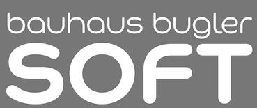 Foundry created in 2006 by Virginia Beach, VA-based
  Creator of typefaces at VGC, such as the multilined paperclip typeface family Elektrik (1977). [
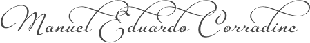 Manuel Eduardo Corradine Mora was born in Bogotá in 1973. He graduated from the School of Graphic Design of the National University of Colombia in 1996, and became a graphic designer. He started by custom-designing fonts and by making typefaces for his own company, Casa Papelera El Cedro (The Cedar Papermaking House), for printing invitation cards. With other designers like Carlos Fabián Camargo, John Vargas and César Puertas he formed Tipográfico in 2007 to strengthen the type discipline in Colombia.
  Great fonts for astrology, hieroglyphics, alchemy and the occult, by Toronto's Jan and Denise Koehler, mostly designed between 1993 and 1995. They moved to Litomerice and then Teplice, the Czech Republic, recently.
  [
[ In February 2013, Dick Pape published a number of typefaces grouped together here.
  Istanbul-based designer of Ch. Vladica (2014), which was inspired by the name plate of architect Ch. Vladica from İstanbl---it was created during Dilara's studies. Dikara also designed the cury paperclip typeface Naturel (2014).
  Yogyakarta, Indonesia-based designer (b. 1990) of these script typefaces in 2018: Radicalis (script), Blacktail (layered, spurred, Western), Aniyah (formal calligraphic script),
  [
[ [
[ Designer with Ian Lynam of the heavy stencil typeface
  [
[ London-based designer who created
  [
[
 Paul Bokslag is a Kilkenny, Ireland-based type designer.
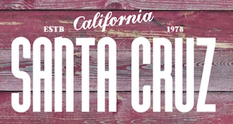 During his studies, Schaffhausen, Switzerland-based Fabian Korn (b. Zurich) designed the
  Los Angeles-based company that distributed a 5000+ library of two-inch film fonts for display typefaces, some of which were original, such as Yagi Double (the CNN logo font) and Yagi Link Double. It ceased operations in 1985. Trogman maintains a design studio in Palm Springs, California.
  Dnipropetrovsk, Ukraine-based designer of these typefaces in 2015: Odd Times (a vintage blackletter typeface), Brandy Label (a layered Victorian signage font), Smoking (a great Western layered poster font), Traveller, Letterhead (steampunk, vintage, Victorian), Age, Nataly Temper, Vintage Auto (a retro chrome automobile font), Golden Dust (a lava lamp font), Rusty Phoenix, Phoenix, the Victorian signage typeface Whiskey, Spirals, Biker (spurred inline font), the oily signage font Pin Up.
  Company (aka HFF) that offers free revival fonts.
  Kastoun (b. 1977) lives in Melbourne and runs
 German designer (b. Köln, 1988) of the wonderful free paperclip typeface
  British foundry started in 2009 in Sheffield, but now located in Dronfield. Their fonts include
  [
[ Identikal is a UK foundry run by identical twins
  Design group associated with
  [
[ Creator of the paperclip typeface
  [
[ Czech designer of the paperclip typeface Spinka (2014). [
 [
[ [
[ This is a
 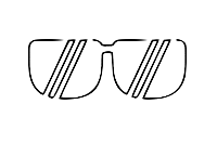 Graphic designer in Eindhoven, The Netherlands, b. 1985. He created a scriptish typeface called
  [
[
 [
[ Leftloft is a visual communications studio in Milan, founded in 1997 by graphic designer Andrea Braccaloni (b. Bologna, 1973), Francesco Cavalli, Bruno Genovese and David Pasquali. The studio is mainly engaged in corporate identity, and now also has an office in New York. Andrea Braccaloni teaches visual communication at the III Faculty of Architecture/Design at the Politecnico di Milano. At
  Little Fonts is a type foundry in Norwich, UK, run by Max Little (b. London, 1986). Max Little studied graphic communication at Norwich University.
  Designer who used FontStruct in 2009 to create Noon (condensed pixel face), Parallea (similar), Mazey, Letterpress (3d face), i-Ching (horizontal stripes), Broaden, Dot Screen, Mazey,
  Graphic designer in Bandung, Indonesia. Creator of the beautiful logo typeface Mametosca 026 (2014). Mametosca 026 is an experimental caps only font family of Hefenstrasse Lab. It is free for personal use. In 2015, he made the rounded bilined paperclip typeface Synthosca026. In 2016, he added Hellotosca 026.
  [
[ [
[ Dutch type designer who published the experimental typeface
  Munich-based designer who created the neon light / paperclip font
  [
[ [
[ Graphics cooperative in Philadelphia that sells some fonts. These include:
  [
[ MM fonts, and before that,
  [
[ [
[ Malang, Indonesia-based designer of the serif typeface Lorena (2019: for fashion mags featuring skinny models), Orlando Sign (2019), Banana Caroline (2019: font duo), Salvages Bold (2019), Davinci (2019), the loud typeface Dogtown (2019), the blackletter typeface Tribal (2019), the black metal blackletter font Southside (2019), the brush script fonts
  [
[ Typefaces made by Nick Curtis from 2009, not listed elsewhere on these pages:
  Fontshop calls him Oeltjen, and MyFonts Oeltien. Whatever. Australian designer at the Letterbox of the curly monoline upright script typeface
  Nippa Downey (DJ Nippa) is the creator in 2008 at FontStruct of these typefaces: NCD Paperclip (2008), NCD Paperclip Closed, the NCD Black Square family (2008, he writes: The Black Square of Kazimir Malevich is one of the most famous creations of Russian art in the last century. The first Black Square was painted in 1915 to become the turning point in the development of Russian avant-garde.), Snake, Snake Rebel, Mooch Rounded II and Mooch Squared II.
  Californian FontStructor (aka winty5, b. 2002) who made these typefaces in 2012: 5Stenserif, 5Stencipix,
  [
[ Singapore-based creator of the
  [
[ Born in Prague in 1949, Jan Schmoeger emigrated to Australia in 1980/1981, and is a book designer in Mentone, Victoria. For most of his career here he worked as a graphic designer, mainly in book publishing. He was also a sessional lecturer at the School of Art and Design, Monash University, Caulfield, Melbourne (formerly Chisholm Institute of Technology) in 1986-1994 and 2004-2008. His typefaces:
  [
[ Designer of the free paperclip style typeface Bent Wire (2015). [
 Designer at
  Based in Shanghai, Pop Chang is an original and creative designer, illustrator and photographer. His typographic work includes
  [
[ Based in Male, The Maldives, Samah Mausoof created the condensed sans paperclip typeface
  [
[ Samara, Russia-based designer of several experimental typefaces, mostly, but not exclusively from 2009 until 2013. These include
  Sao Paulo-based designer of the ultra-fat hookish
  Belize City, Belize and now New York City-based designer who specializes in high tech and futuristic type designs. He created Borgita (2021: a plump rounded display typeface), Cyberpunk (2021), Cyberto (2021: cyberpunk), Cyberia 3D (2021: a 3d customizable font), Spacegate (2020), the puffy or bubblegum font Funfood (2020), the calligraphic font Wayout (2020), the techno family Vortex (2020), the techno / paperclip font family Mazeline (2018), the signage script Lettercraft (2017), the robot and drone-inspired Robodron (2017), Gempire (2017), the rounded organic typeface Airy (2017), Radon (2017), the outline typeface Ply (2017), the paperclip typeface Garde (2017), the blackboard bold typeface Aberration (2016), the striped typeface Karma (2016), the logotype font Advio (2016), the ribbon or monogram font RibOne (2016), the tech font Line Tech (2016), the curly Wonderscript (2016), the prismatic typeface Lineat (2016, +Lineat III), the plump logotype Airy (2016), the bi-lined typeface Freeline (2016), the robot-inspired Stingo (2016), the display typeface Food Craft (2016), the bilined logo and monogram font Sentaline (2016), the script typefaces Curline (2016) and Article (2016), the children's font Happy Kids (2016), the futuristic font Digitalium (2016, +Condensed), the multiline titling typeface Sentagram (2015), Forest Line (2015, thin squarish headline sans), Sweet Ink (2015), and the ribbon typeface Sentaband (2015).
  Bratislava-based type and graphic designer (b. 1984, Czechoslovakia). He graduated from AFAD Bratislava, and in 2009 from the
  Solidarité 77 is an intertwined paperclip-style typeface created in 2016 by Fabien and Vincent Roché for the Association Solidarité Femmes Le Relais 77 which helps women that were victims of domestic violence.
  Or Sisa Doenya. Bandaraya, Aceh, Indonesia-based designer, b. 1986, of the bilined typeface
  Creative designer from Milan, who co-founded
  Designer who used FontStruct to make Bouldo (2010, dotted face), TNR Bold (2009), Balltype (2009), Octastruct (2009), Weejie (2009), Times Neue Roman (2009, called the illegitimate child of Times New Roman and Helvetica Neue (Condensed)), Elion (2009, dor matrix pixel script), Tweed (2009, squarish), Akia (2009, experimental slab serif), Tesla (2009, dotted font based on Superpois), Pressure (2009, severe octagonal family; +Compressed, +Extended), Simplest (2009), Agora, Agora3D and Agora Dots (2009), Simplest (2009), Billboard (2009), Avant (2009), Imprinted (2009, dotted lines), Pivot Fill (2009), Pivot (2009), Handgloves Neue (2009), Paperclipped (2009), Handgloves (2009), Heart (2009), Foldstruct Pix (2009), Foldstruct (2009), Lino (2009), Linea (2009), Eurotype (2009), Stack (2009), Bloc Stripe (2009), Bloc (2009), Stencileaf (2009), Paul Was Here (2009), Sweetness (2009), Squidlike (2009), Rokice (2009), Current (2008), Theory (2008), Apatype (2008), Dot Script (2008), Dotize (2008), Poiis (2008), Poiis Wide (2008), Wired (2008, white on black), Bloct (2008, pixel shadow font), Construct (2008, like Bloct with a crane effect), Mazal (a great rectangular white on black idea), Keyal (Indic simulation with multilines), Squarial (pixelish), Classico, Unireal, Yoko (simple stencil), Splice (squarish condensed), Goodmorning Tokyo (labyrinth-like glyphs), Poii (pixel face), Gogic, Giant, Wikial (diner script simulation), Futoni (squarish letters). [
 Sveinbjörn Pálsson (Reykjavik, Iceland) studied graphic design at the Iceland Academy of The Arts in Reykjavík. He has had a varied career in design, with work in magazine design, interaction design, art direction, tomb-stone lettering, custom type design and other fields. He graduated in 2012 from the
  [
[ Adrian Talbot (b. 1964, Worthing, Sussex, England) heads the type foundry Talbot Type in London. He made the Bauhaus-style Bremner family in 2000 for the visual identity of Mute Records.
  The Northern Block (TNB) is Jonathan Hill's foundry based in Leeds and/or Sheffield and/or Newcastle, UK, est. 2006. The designer and funder is
  Typefaces from 2011:
  Graphic and identity design company founded by
  Dri Zy, or Drizy, is Faqih Sandri, aka Faqih Fawaji. Bandung, Indonesia-based designer (b. 1991) of the layered techno typeface Trixie (2016), the brush typefaces Syelma Script (2016) and Syemox (2016), the gothic typeface Dark Widow (2016), the vintage lettering typefaces Overjoyed (2016, Western style) and Beatrixe (2016), the paperclip typeface Kuxu (2016), Dark Widow (2016), Brain Melt (2016: the ultimate Halloween / horror font), Mama Lian (2016), Copper (2016), Dust (2016), the brush script fonts Aeros (2016) and Rostoh (2016, brushy), the children's script typeface Roast (2016), the handcrafted Eastpine (2016), Nyam (2016, layered) and Monstahh (2016), the slimy Halloween typeface Brain Melt (2016), and the poster typeface family Ayuenda (2016).
  Marcus McCallion (Undt Typefaces) is a one-man British commercial foundry located in Brighton (and now, London). He is affiliated with
  Experimental fonts developed by
  Designer from Kiev, Ukraine.
  Athens, Greece-based designer of the Latin / Greek art deco typeface DAP (2014) and the Latin-Greek paperclip font Nevolution (2015). [
 Indonesian designer of script, calligraphic, brush, dry brush, Halloween and children's book typefaces. Typefaces made in 2019: Alkilri, Anggita, Arzeta, Atalintar, Baladewa, Balistik, Beliau, Blackout, Blooqe Stages, Brand Hole, Braser, Delphina, Diana Rough, Doglas, Ecustic, Emerland, Enigma, Famous, Goteru, Harbala, Hastron, Helegra, Himaliya, Hollims, Jagalana, Magdalena, Monalisa, Ollson, Orlandia, Queny, Rekyoto, Reysha, River Young, Santoy, Seventy, Silloute, Staryl, State Moques, Vintage Legends, Zaskia, ZeBrush, Zillion.
  Designer (aka Funk King, b. Fort Knox, KY) who lives in Orlando, FL, and/or Apopka, FL. He used FontStruct in 2008-2009 to make over 550 decorative fonts, and became one of the world's top experts on FontStruct, FontShop's on-line font editor. Most of his fonts were withdrawn in 2012. He did a few commercial typefaces at his commercial foundry, Funk King. His creations include
  Commercial fonts at this boutique type foundry and publisher operating in Tokyo, jointly run by Ian Lynam and Thien Huynh.
  Yi Zhu (Yi Design Studio, Buderim, Australia) created the great poster stencil typeface Scrap (2014) and the paperclip typeface SZ (2015). I am not 100% certain that the Yi Zhu who made SZ and runs Sauries Studio in Shanghai, China, is the same Yi Zhu who made Scrap.
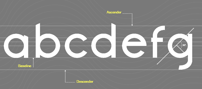
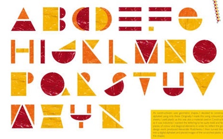
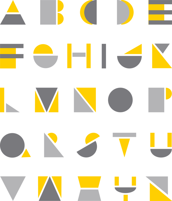
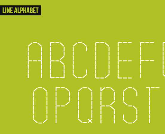
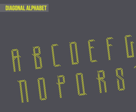
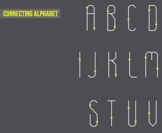
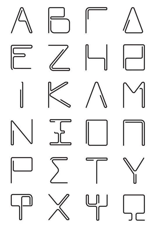
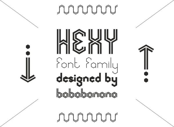
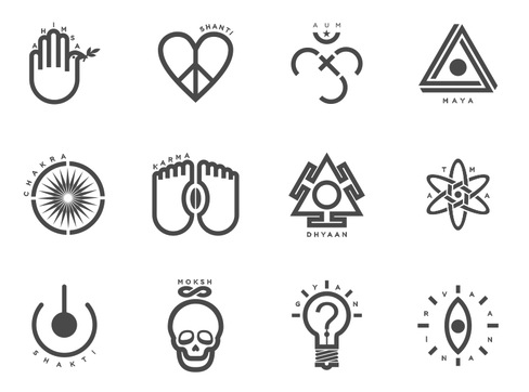
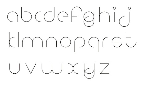
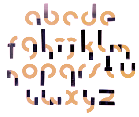
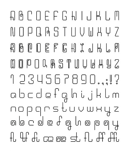
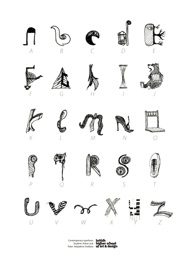
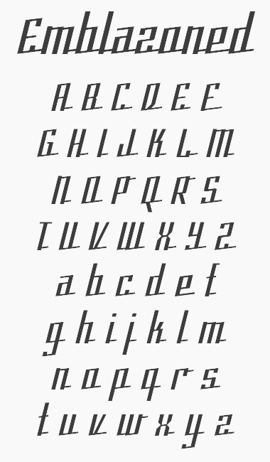
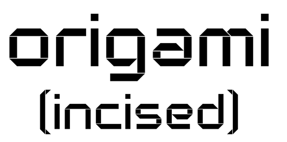
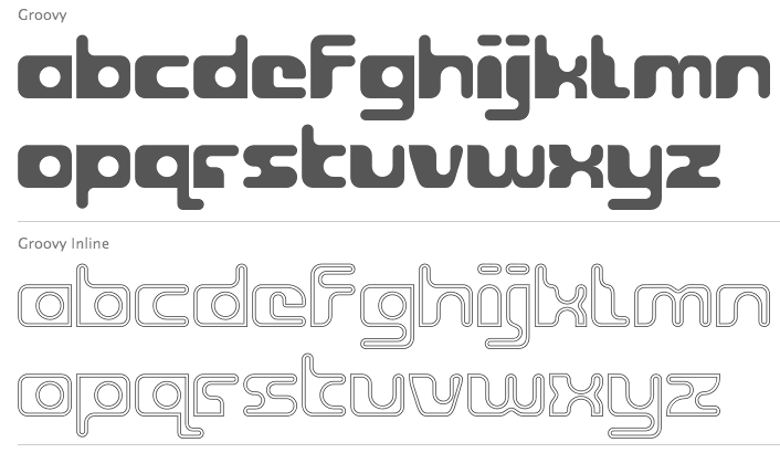
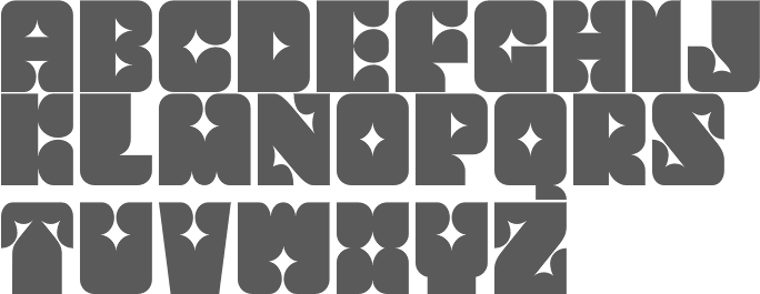
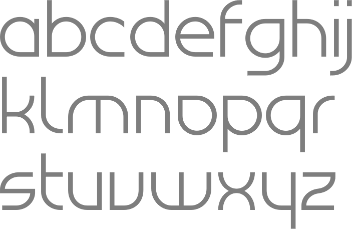
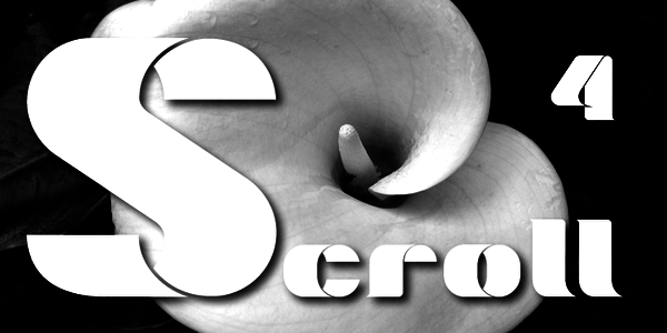
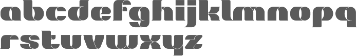
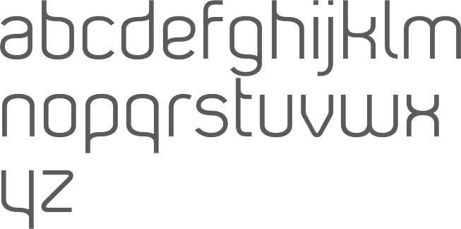
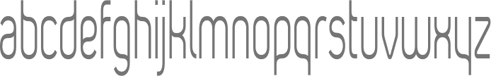
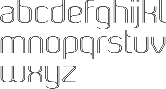
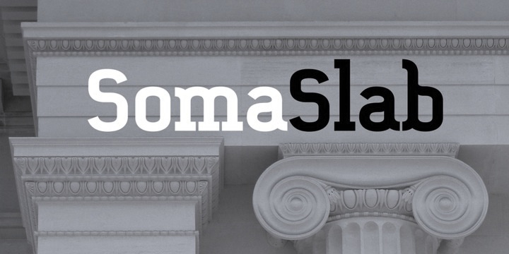
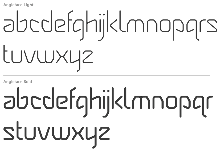
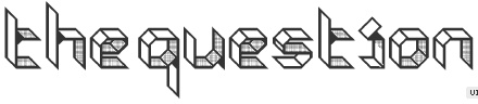
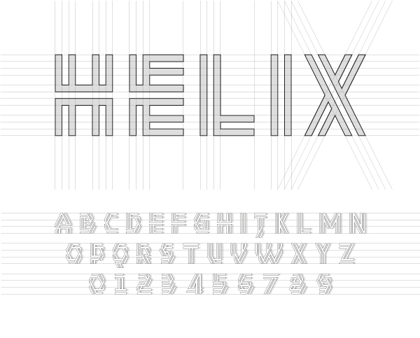
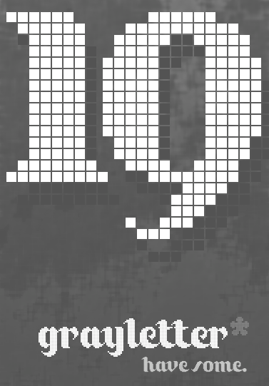
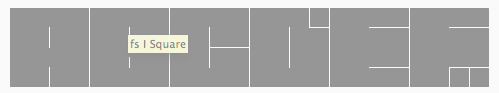
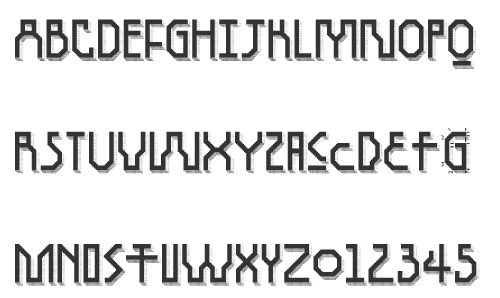
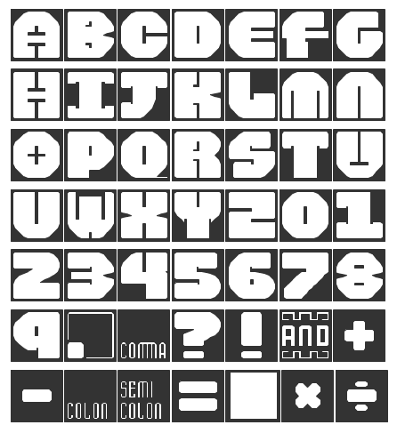
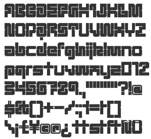
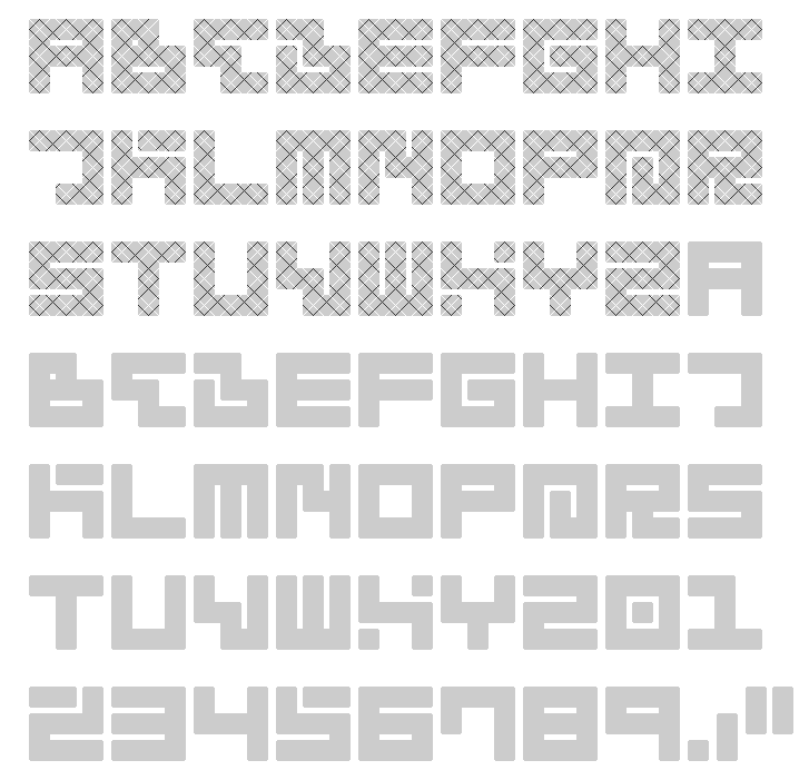
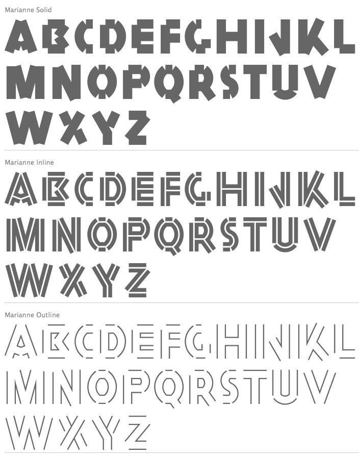
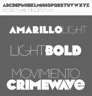
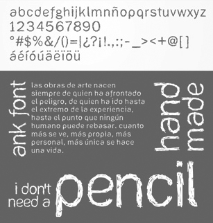
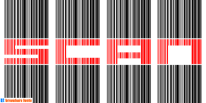
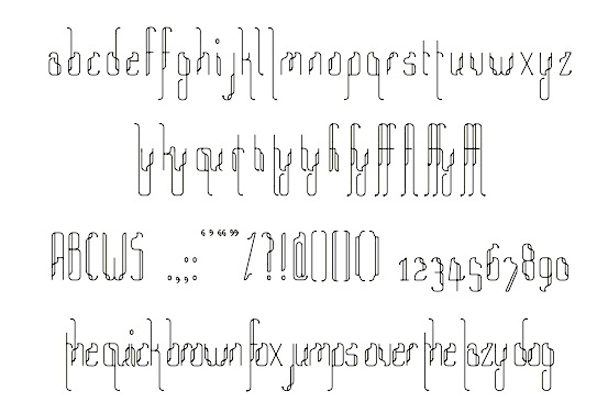
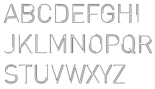
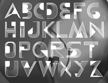
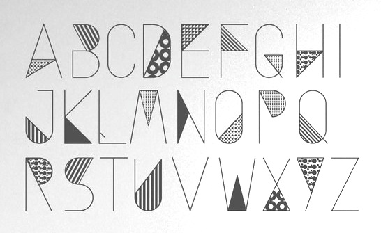
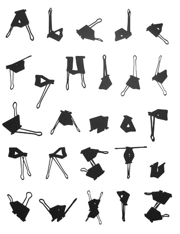
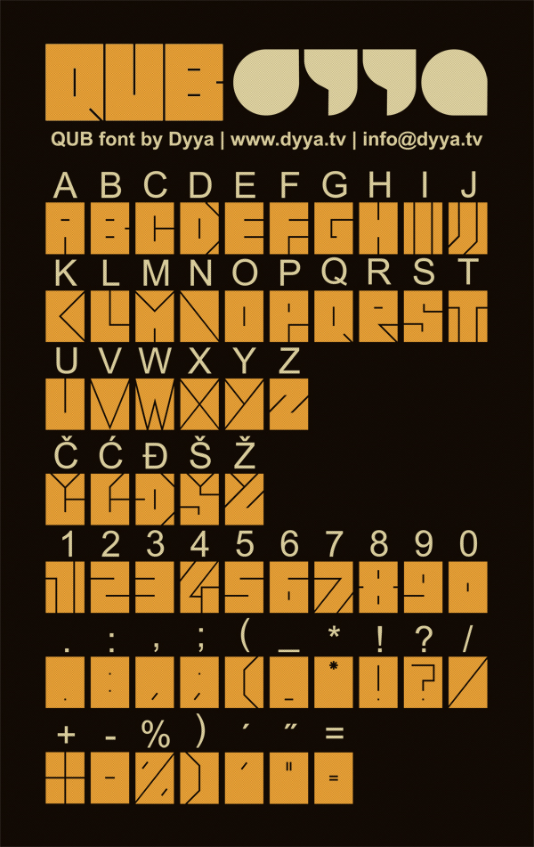
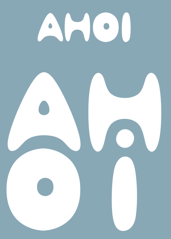
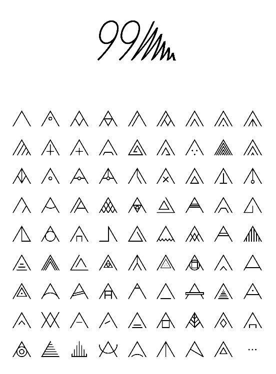
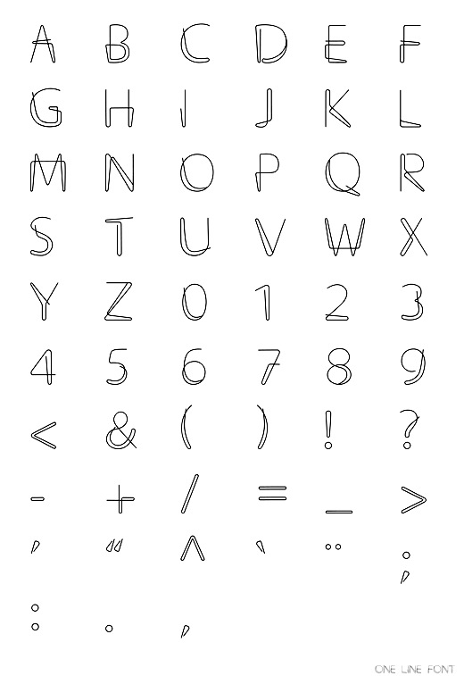
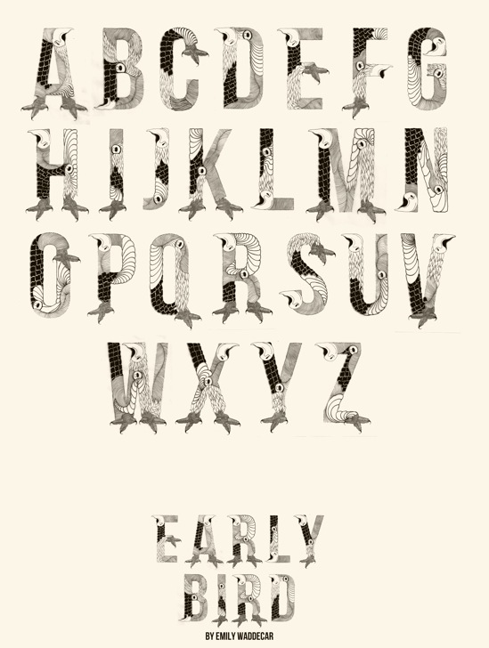
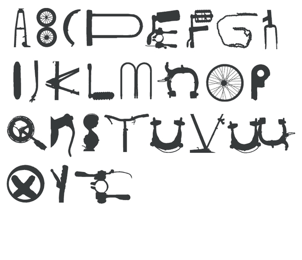
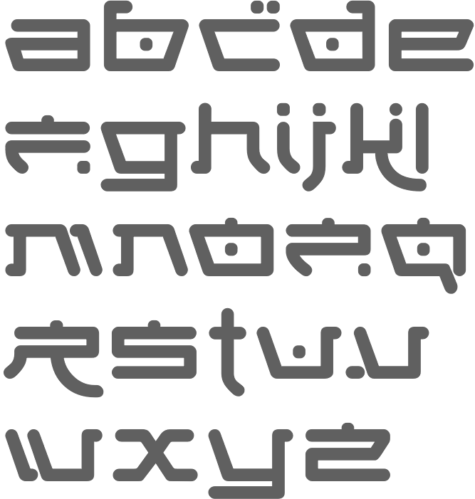
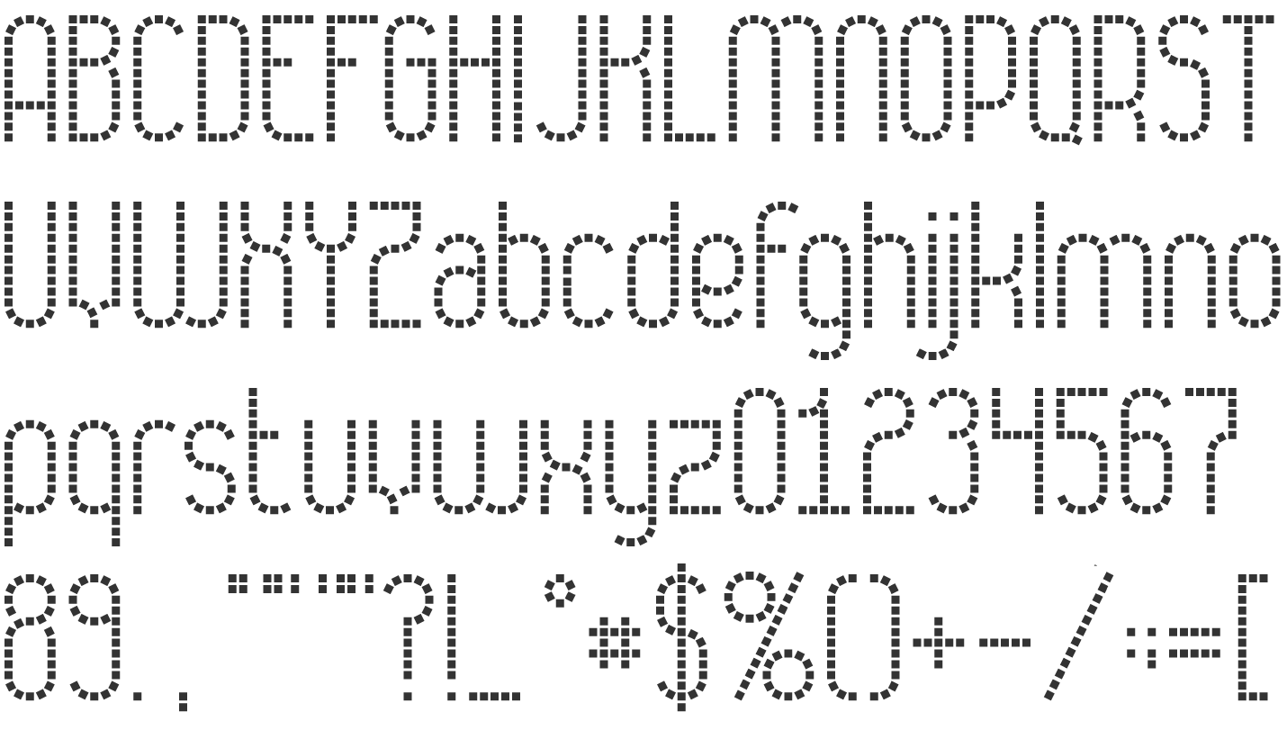
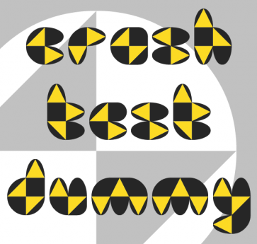
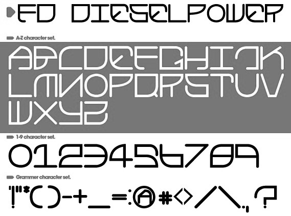
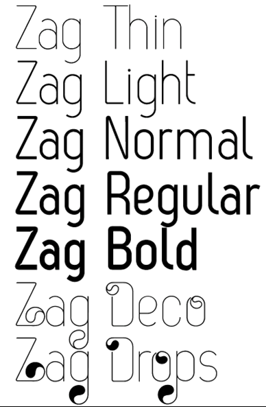
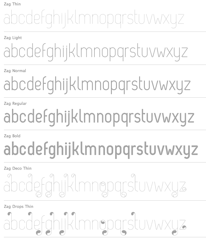
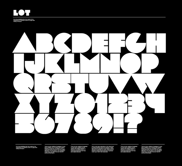
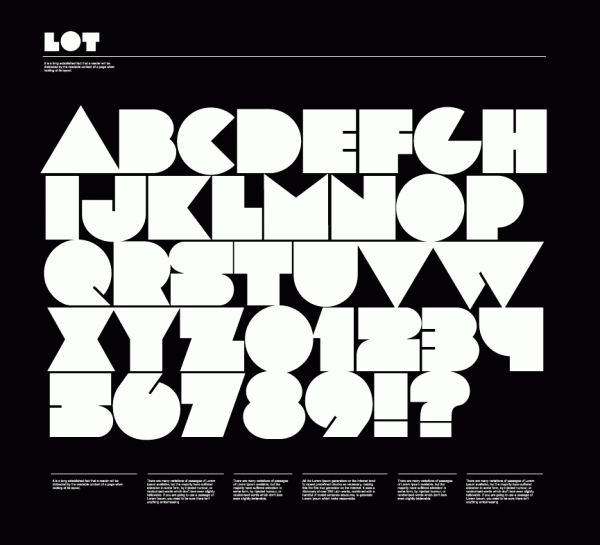
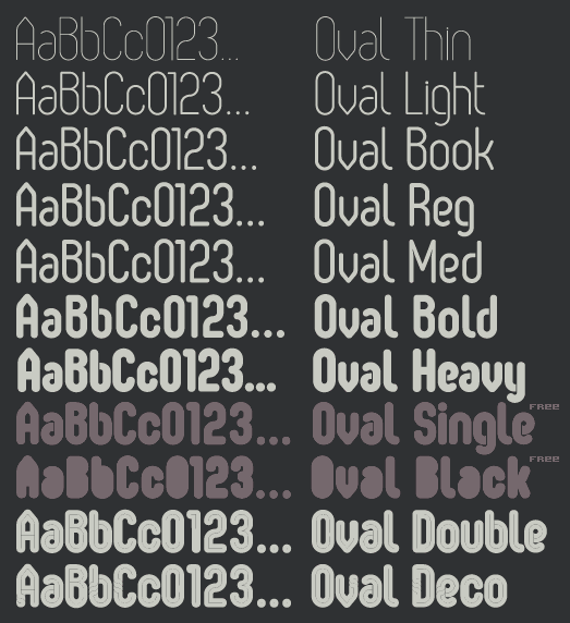
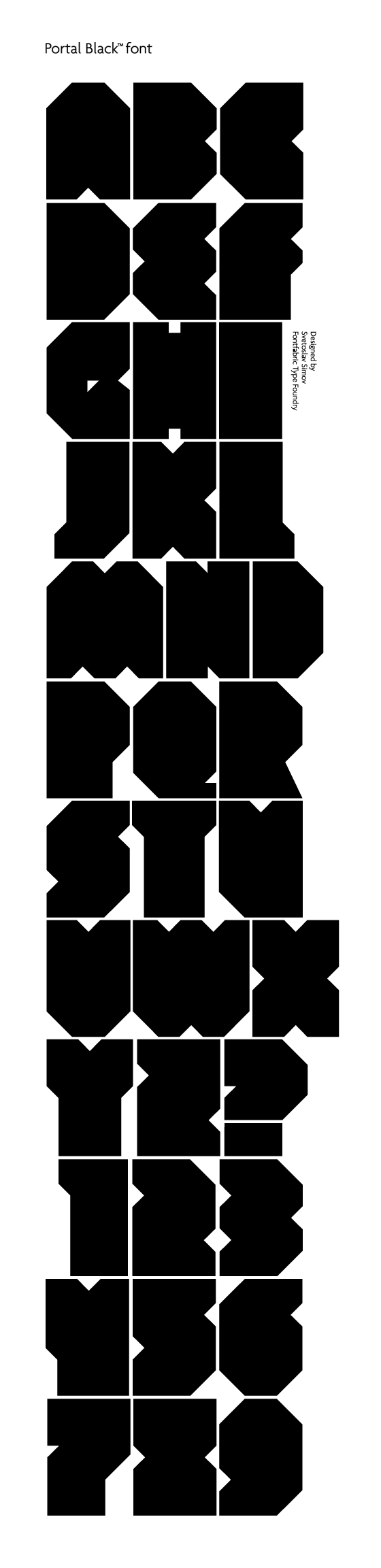
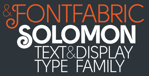
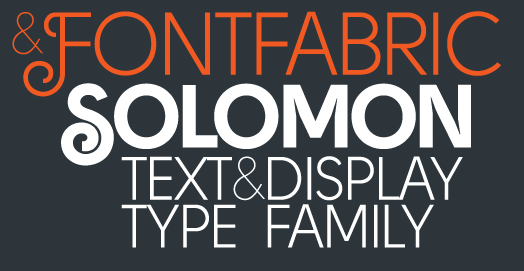
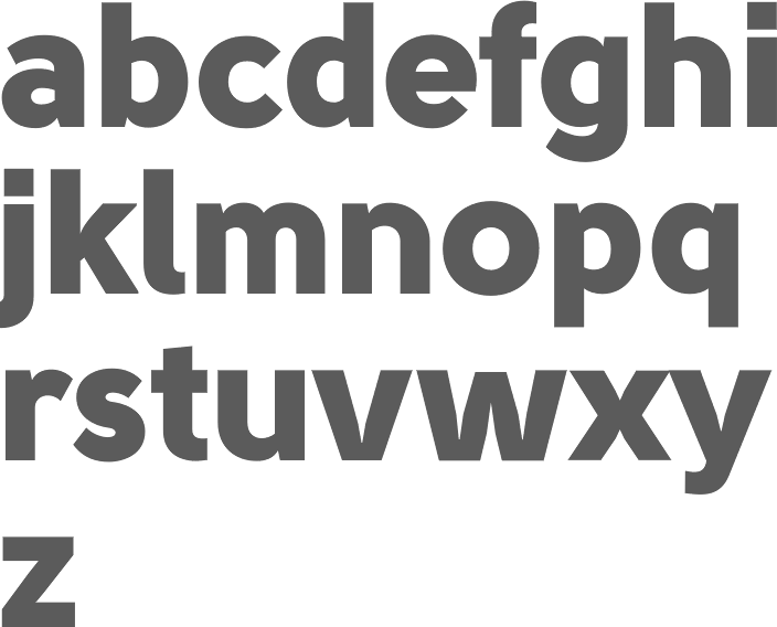
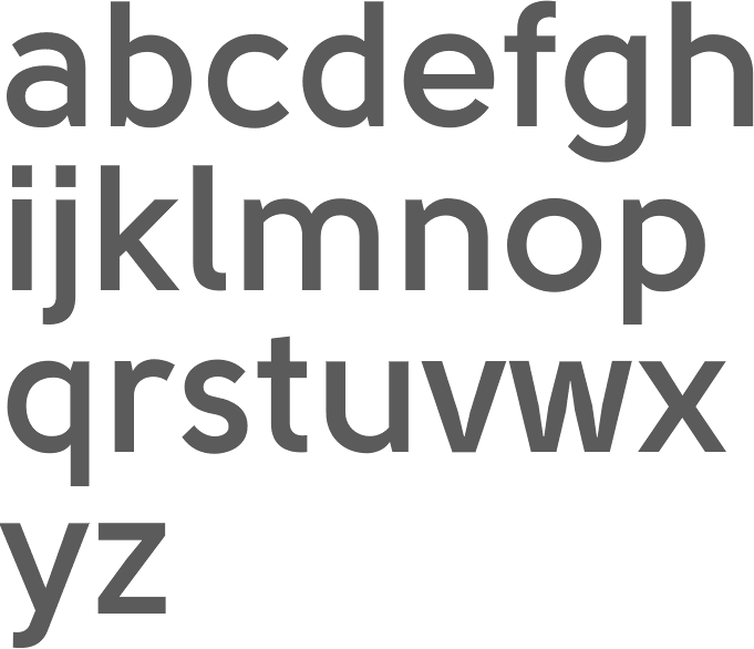
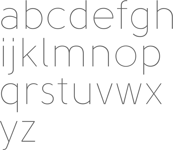
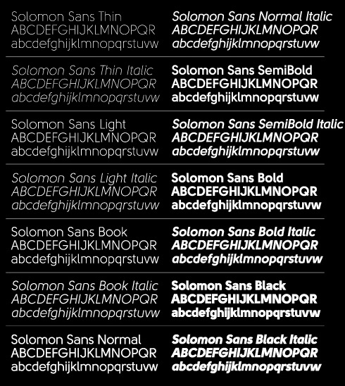
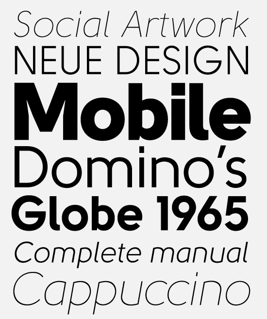
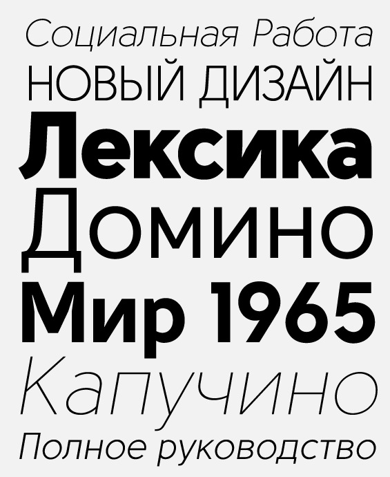
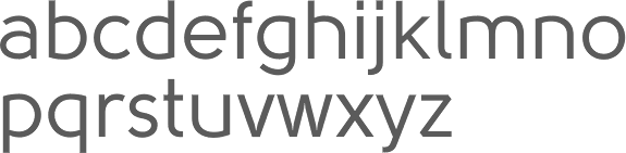
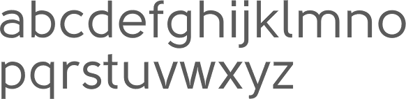
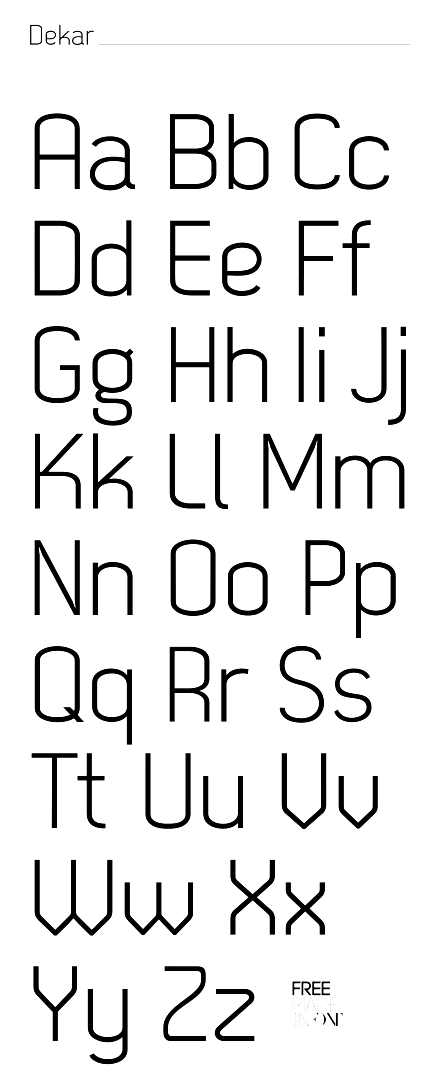
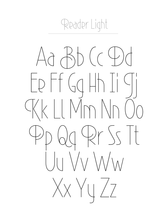
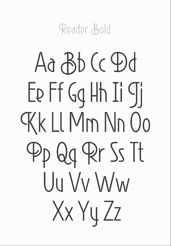
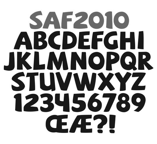
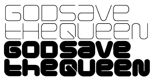
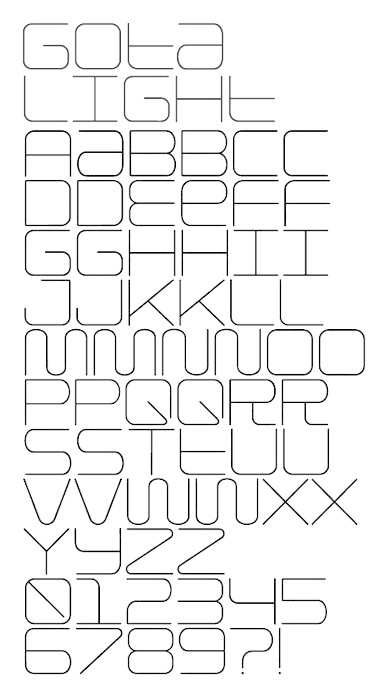
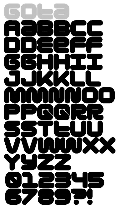
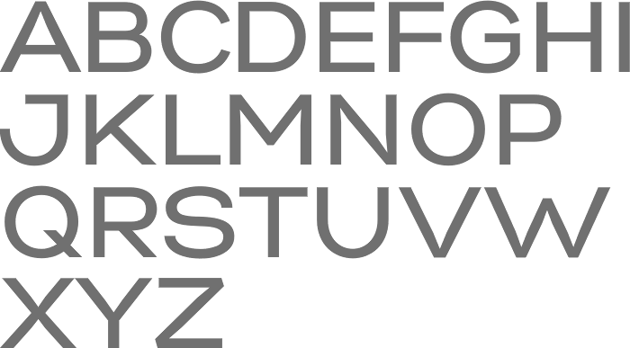
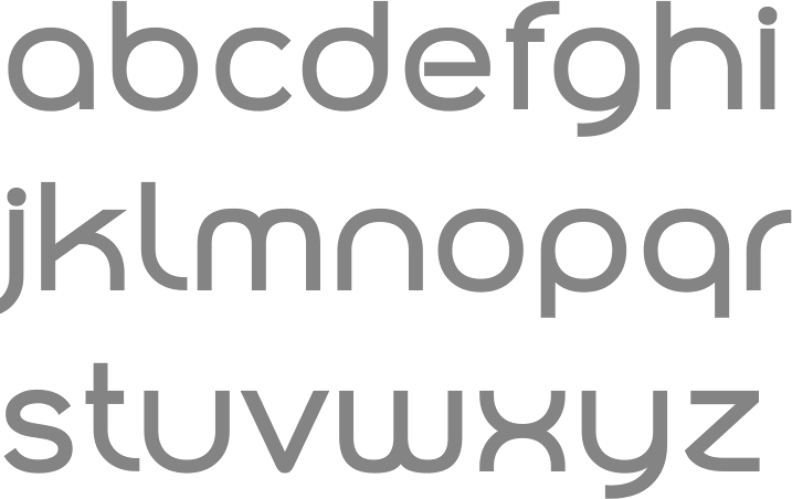
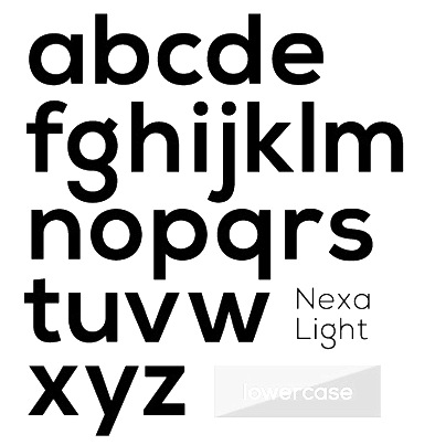
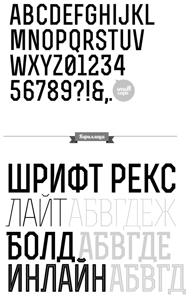
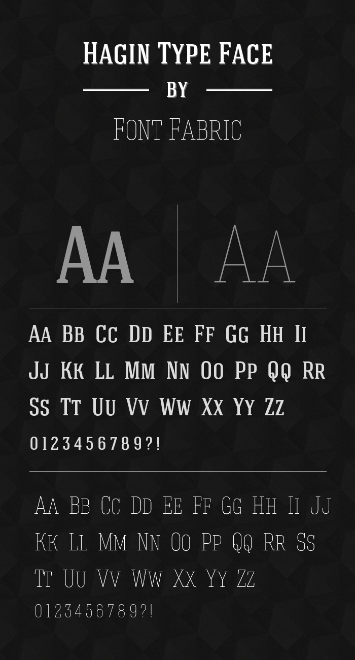
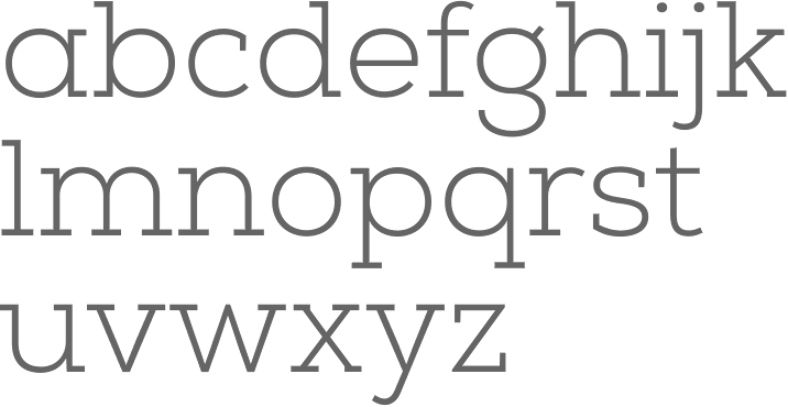
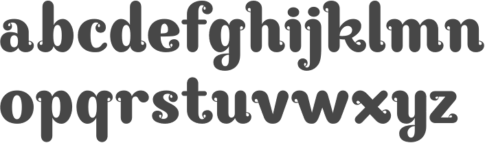
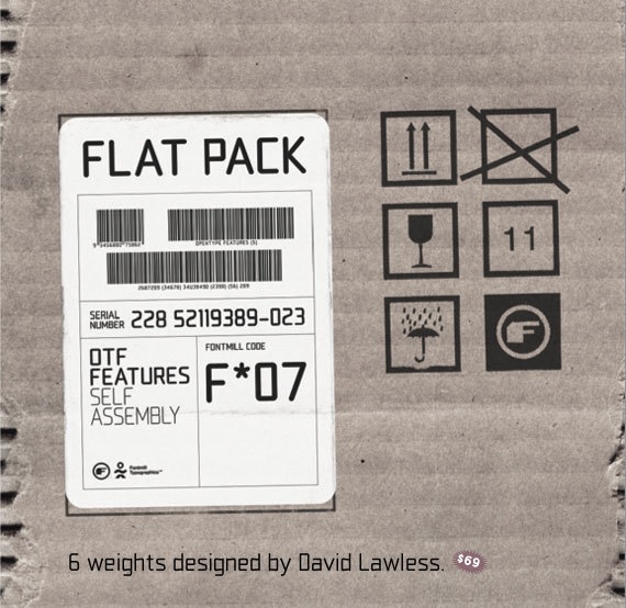
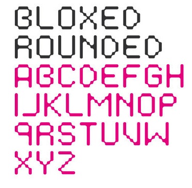
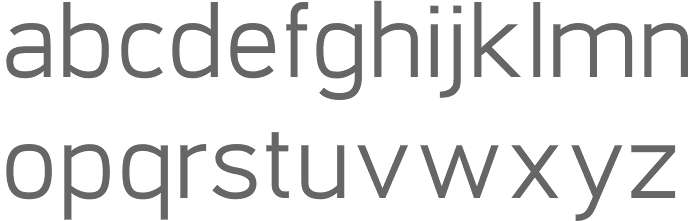
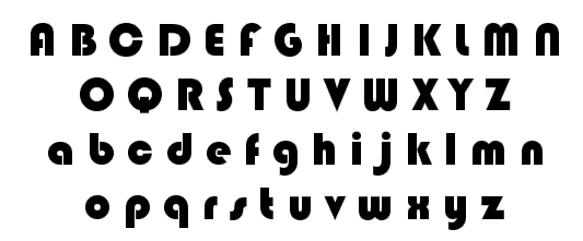
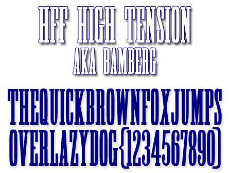
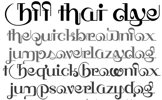
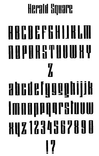
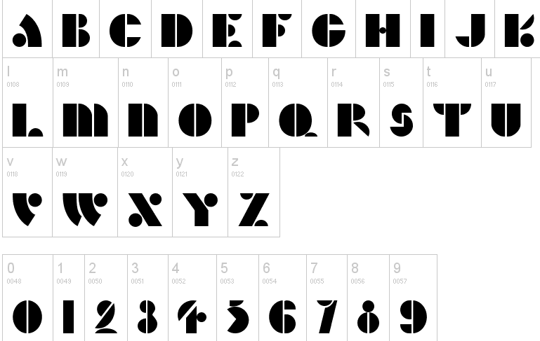
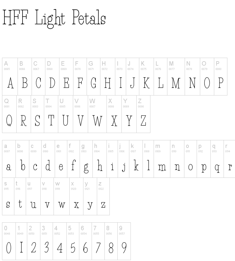
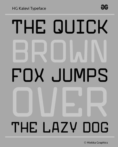
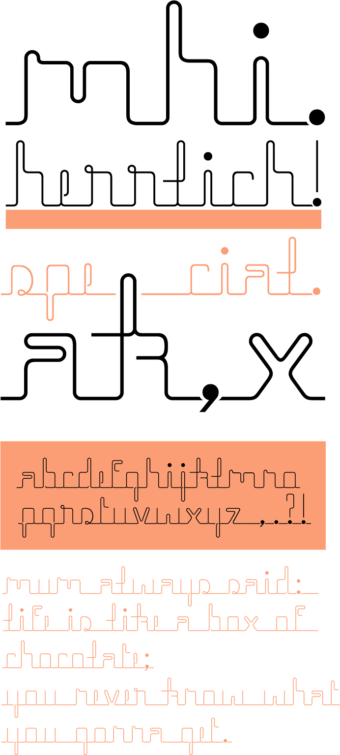
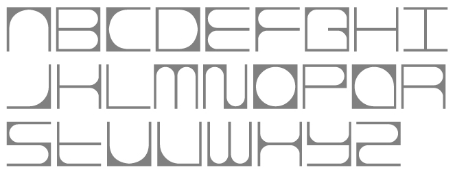
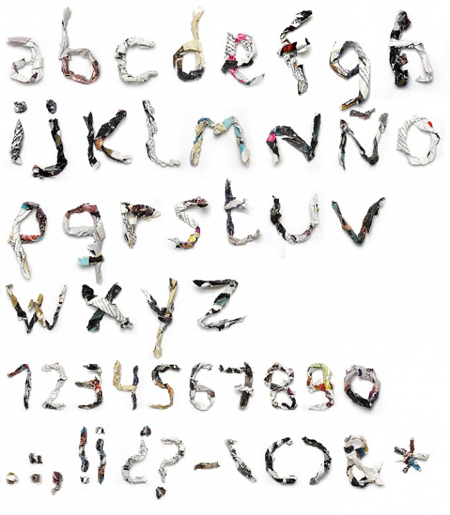
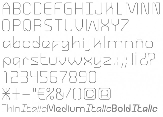
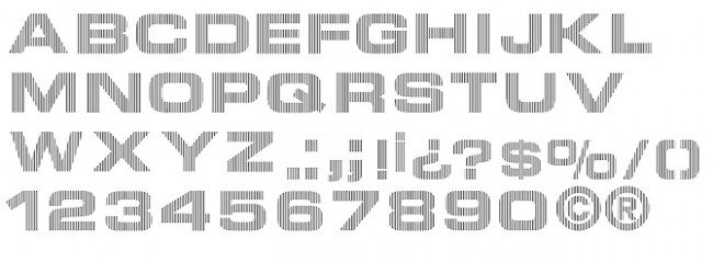
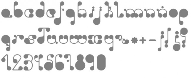
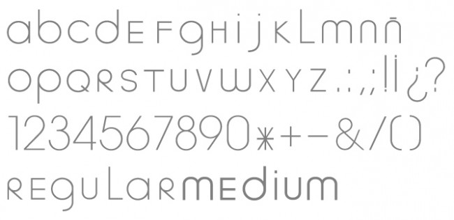
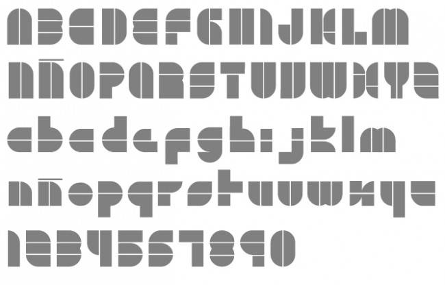
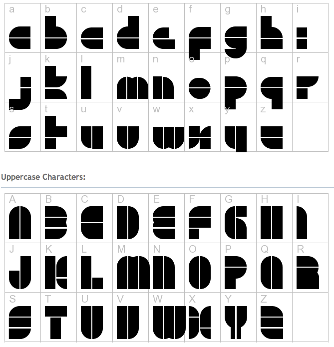
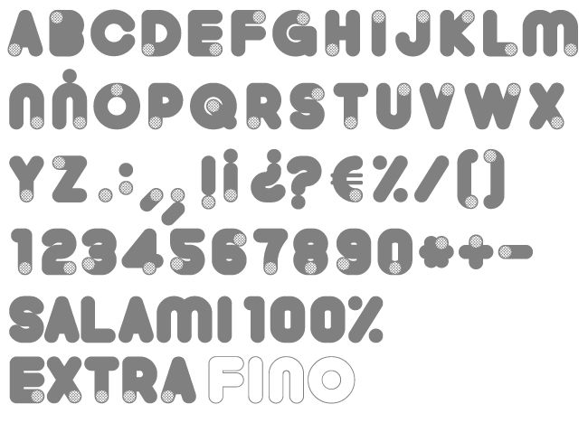
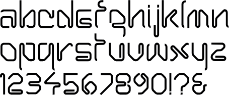
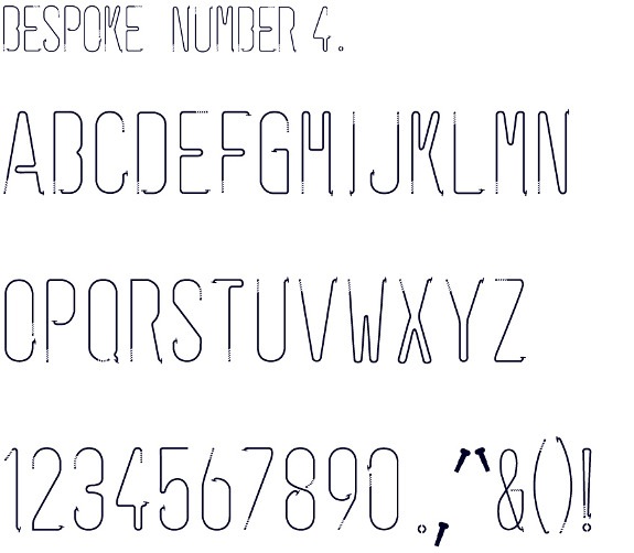
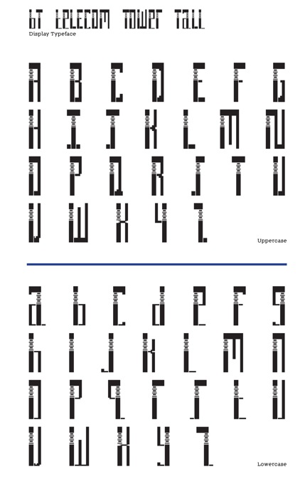
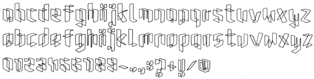
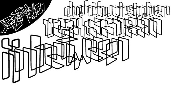
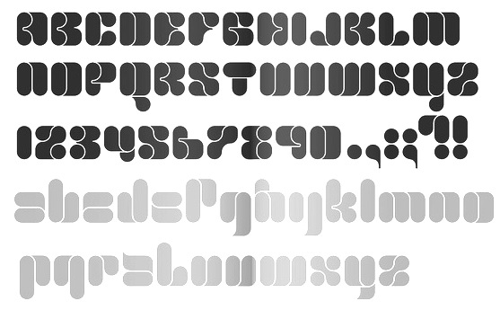
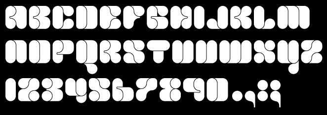
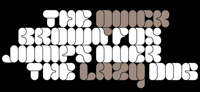
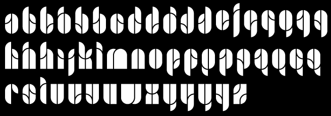
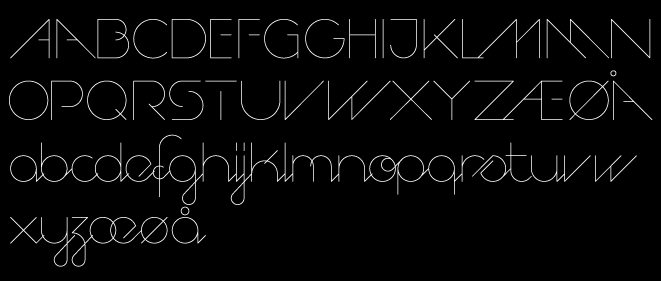
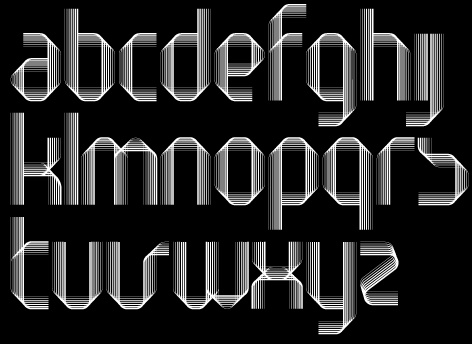
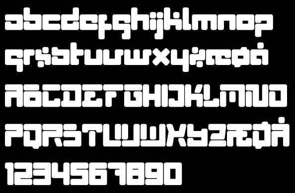
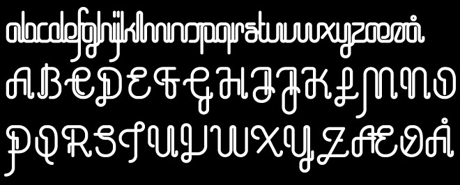
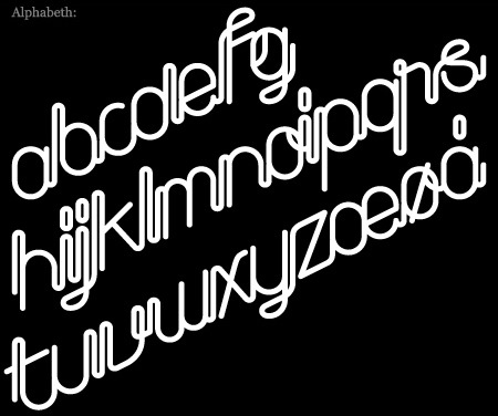
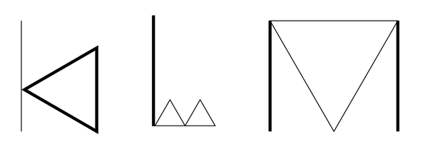
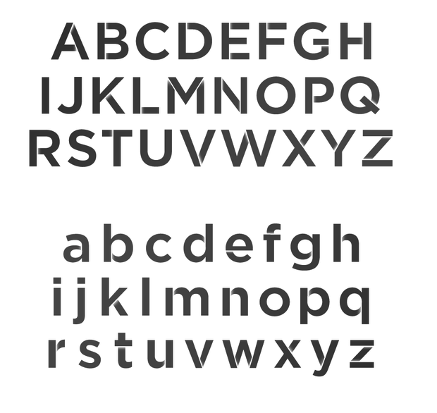
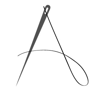
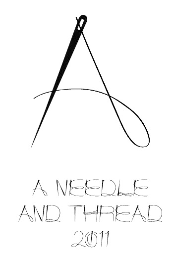
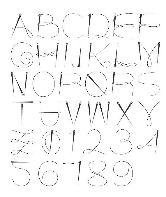
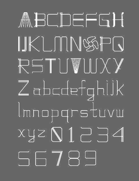
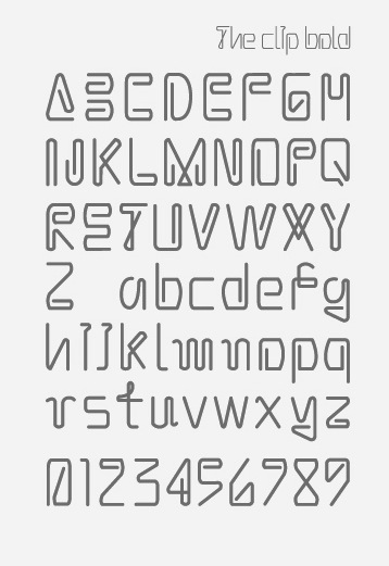
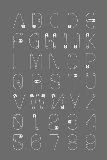
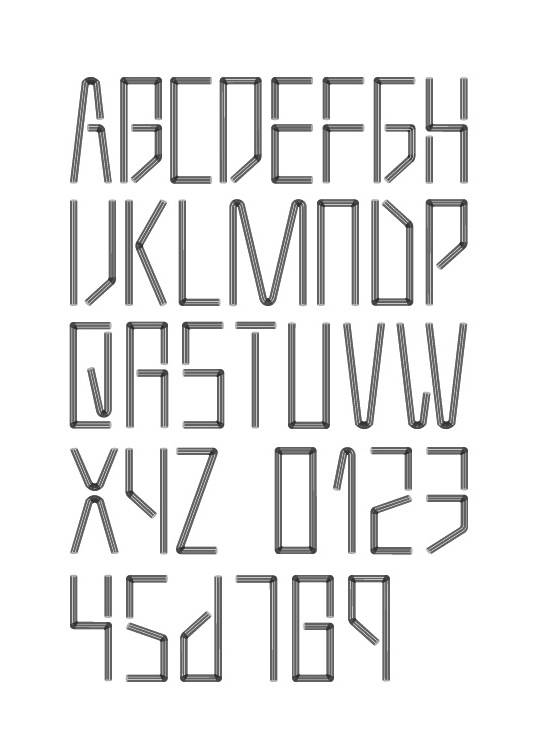
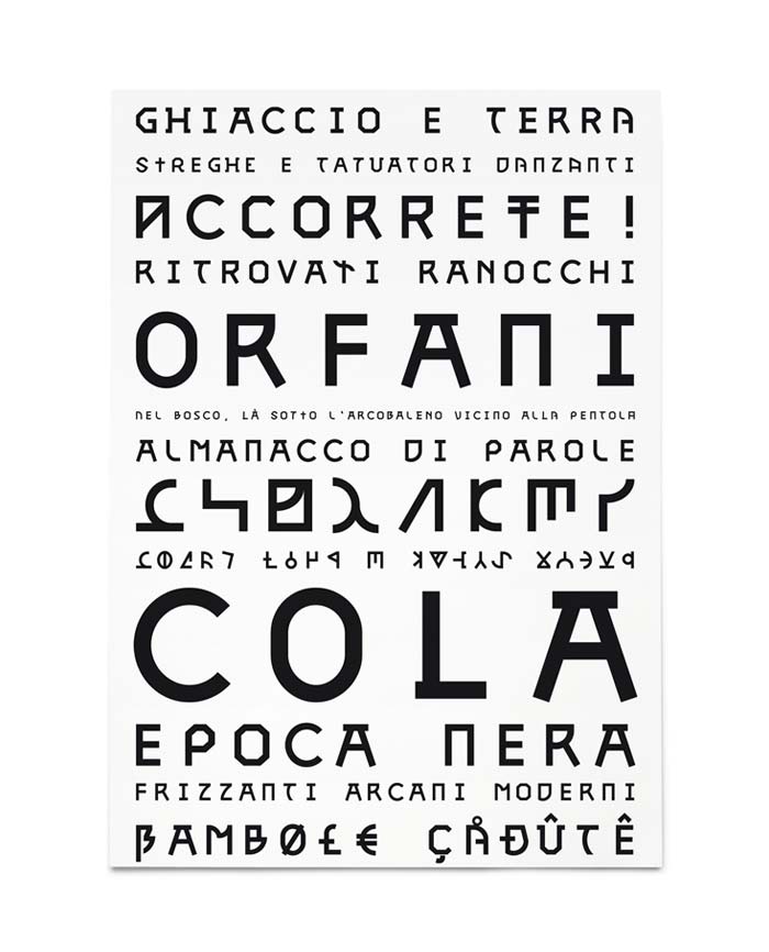
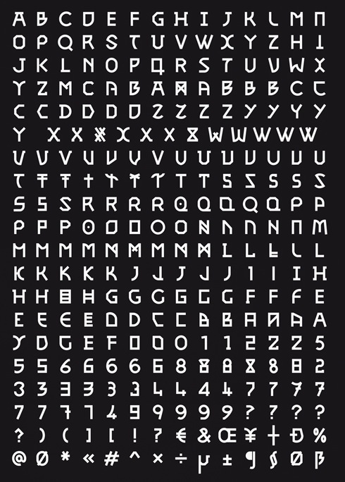
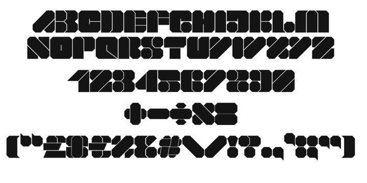
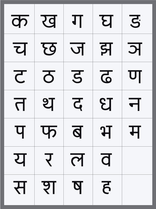
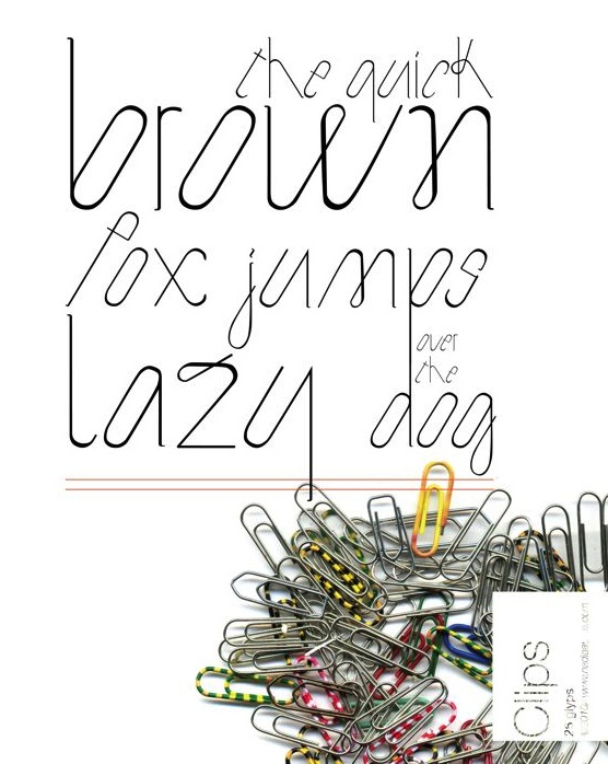
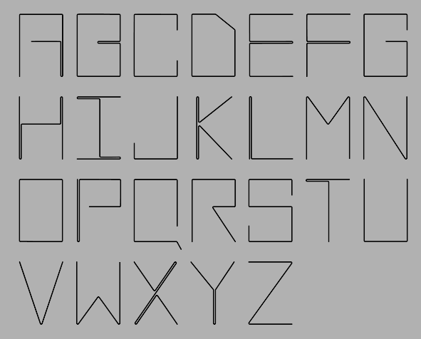
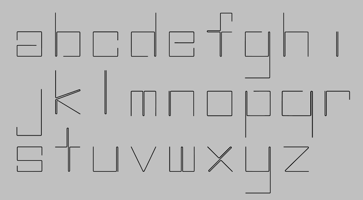
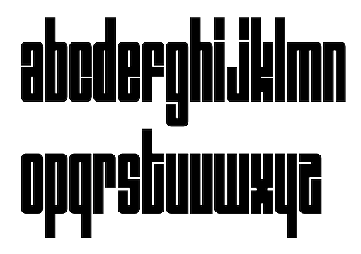
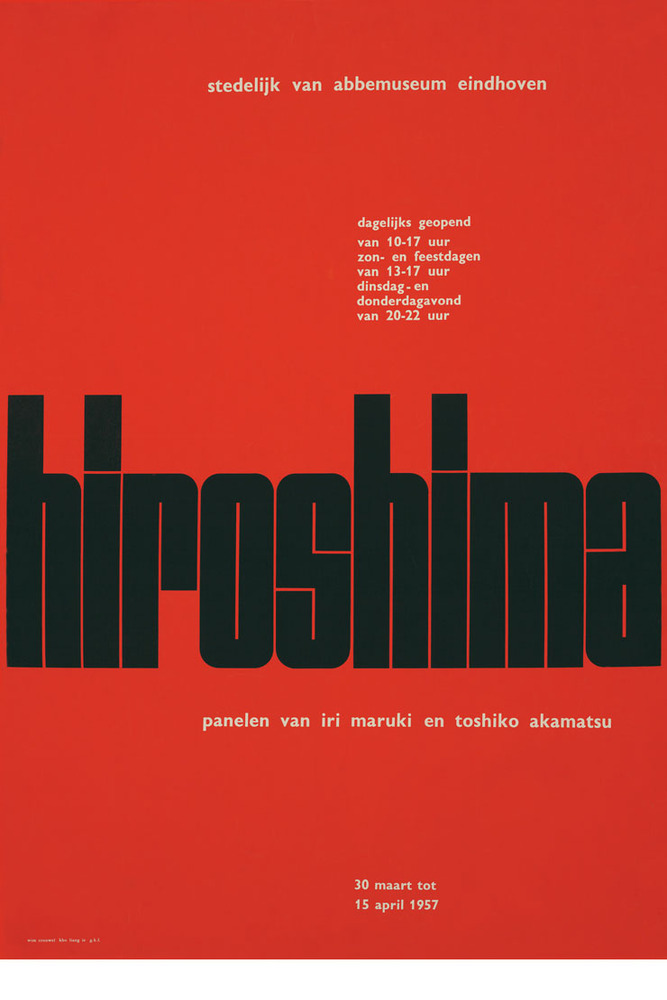
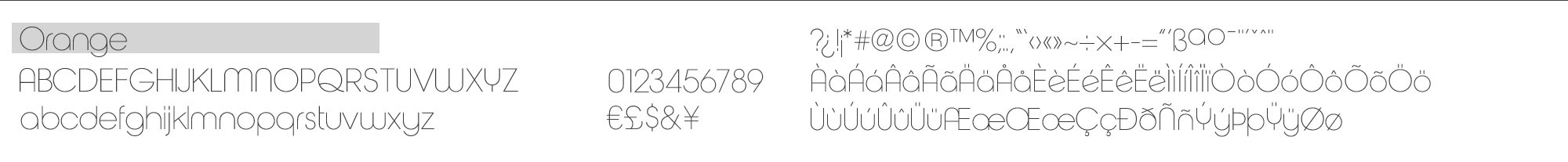
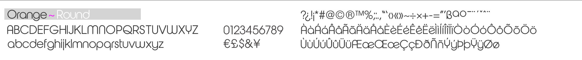
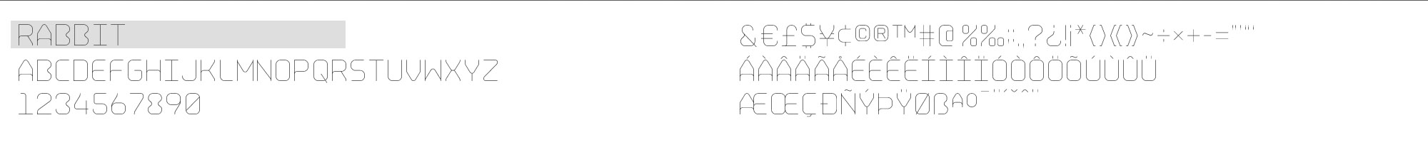
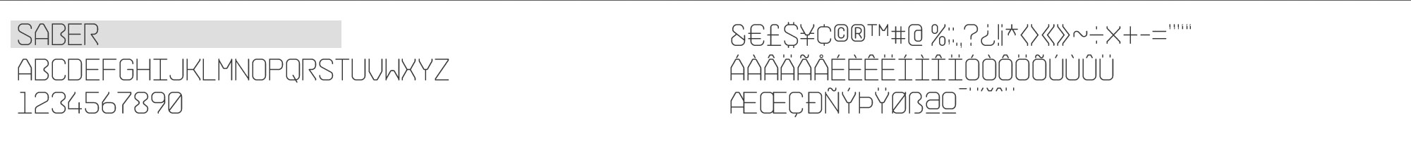
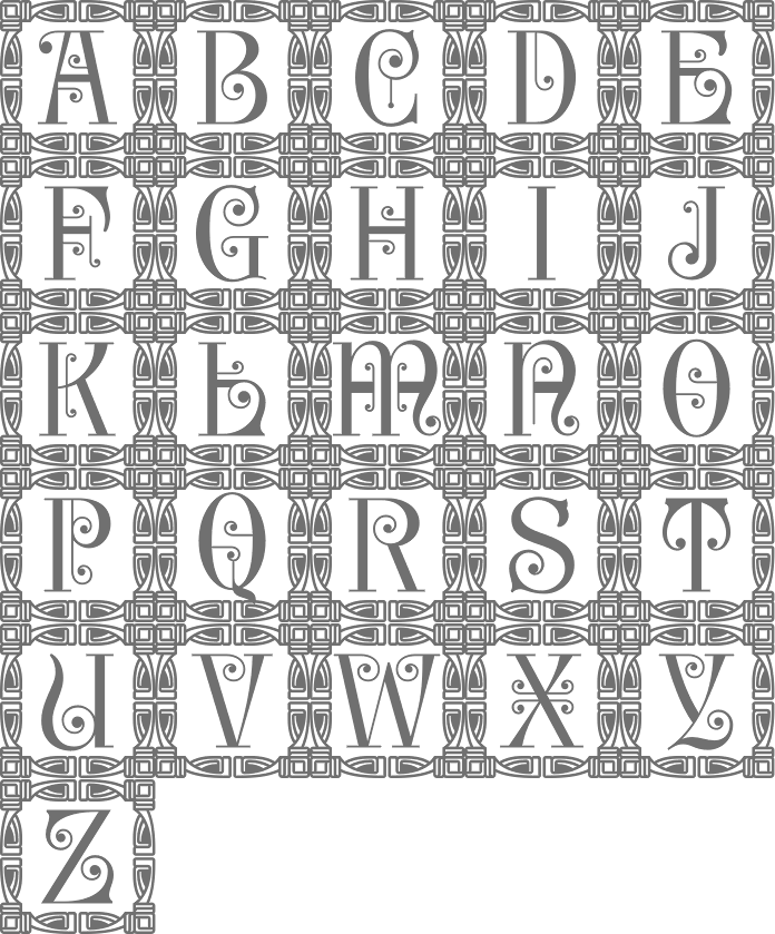
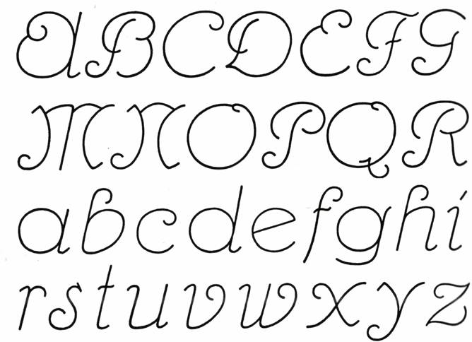
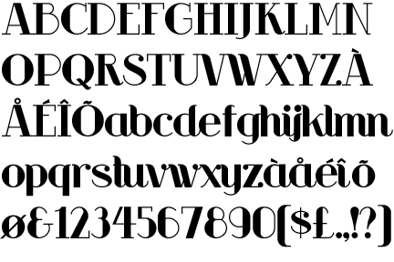
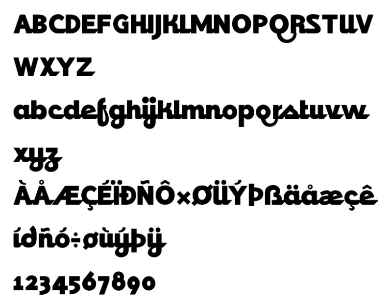
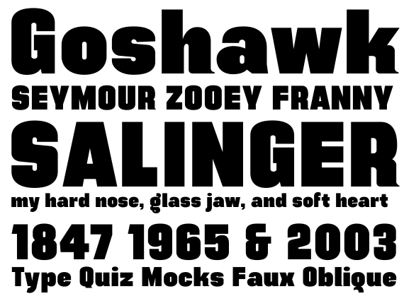
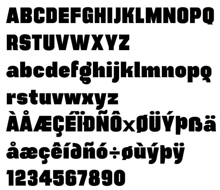
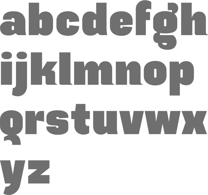
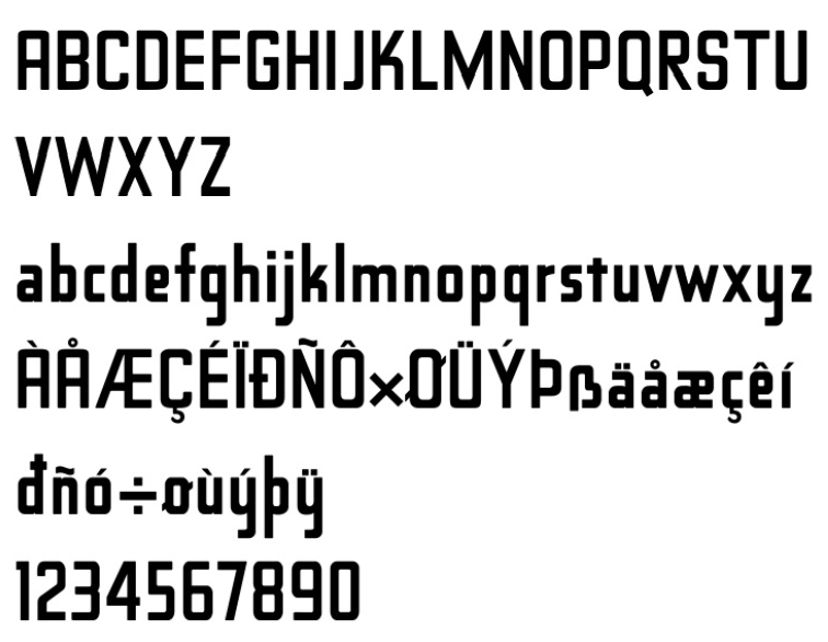
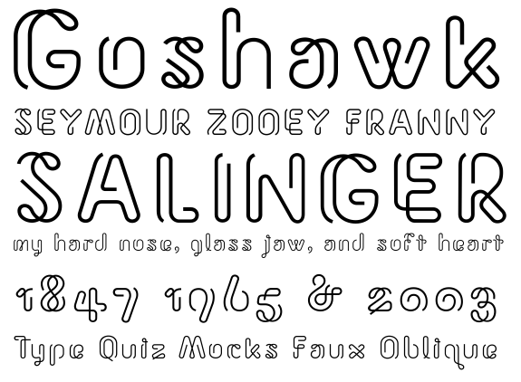
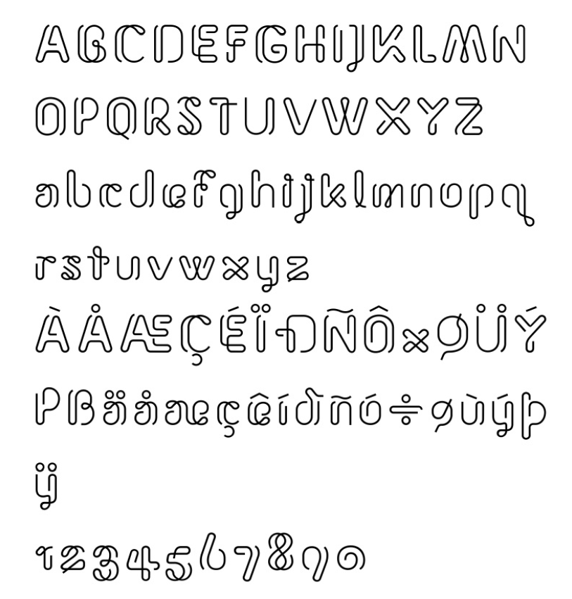
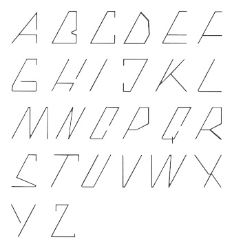
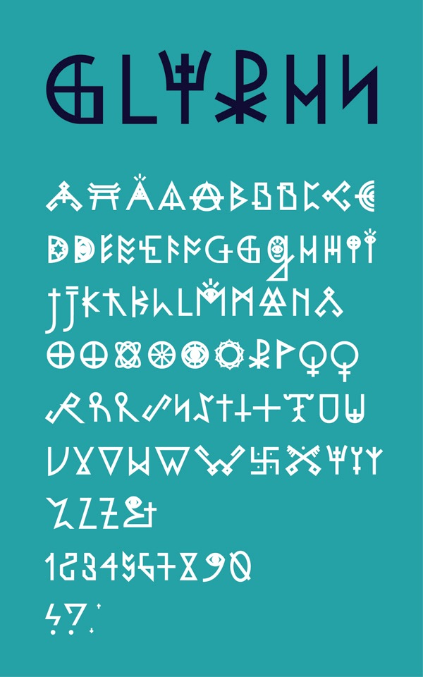
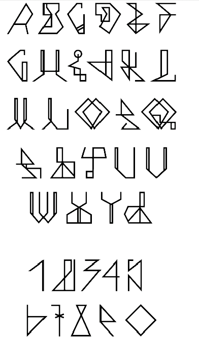
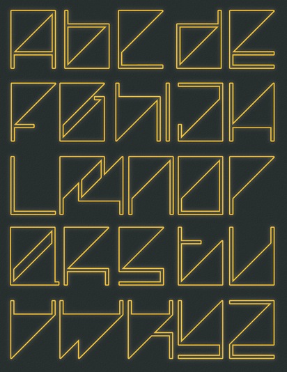
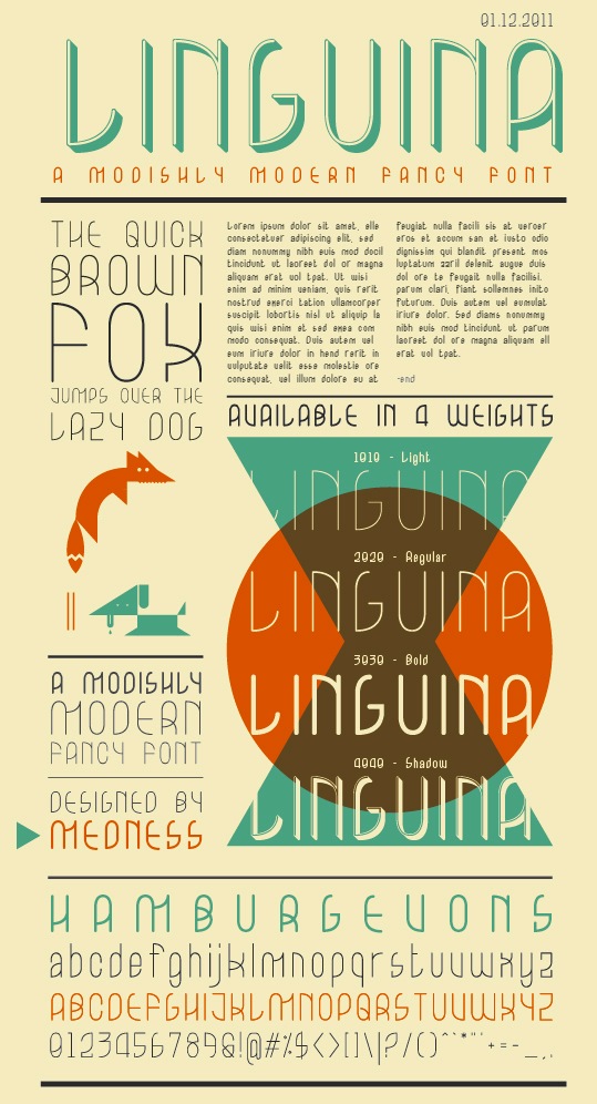
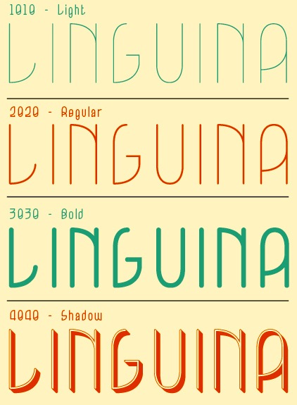
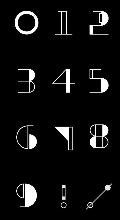
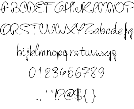
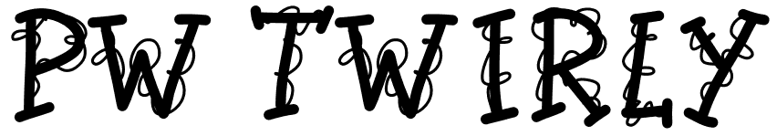
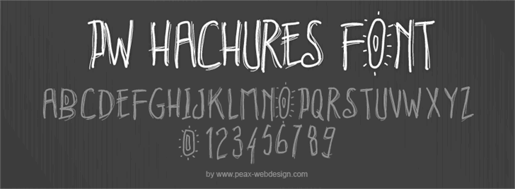
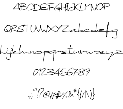
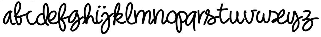
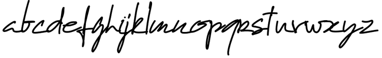
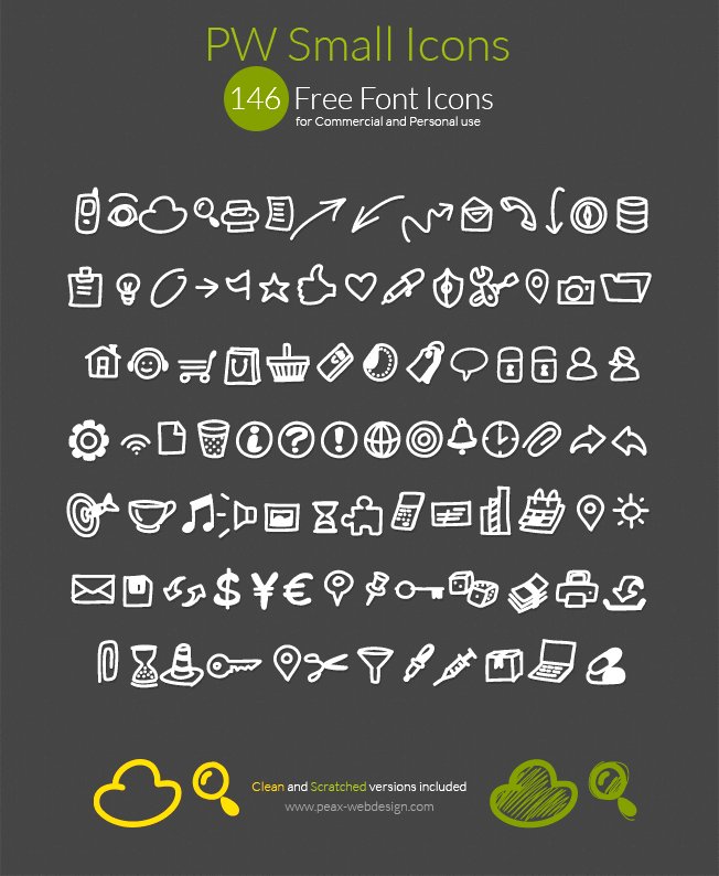
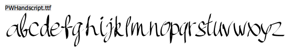
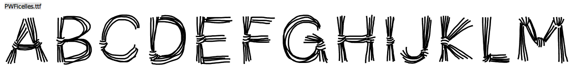
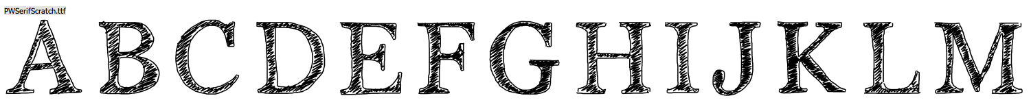
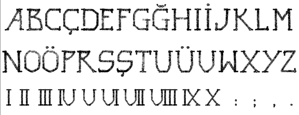
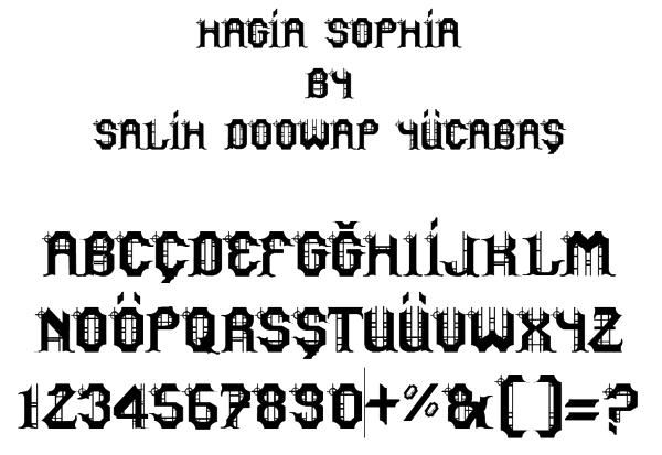
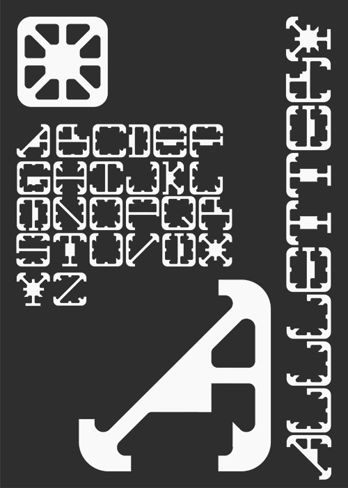
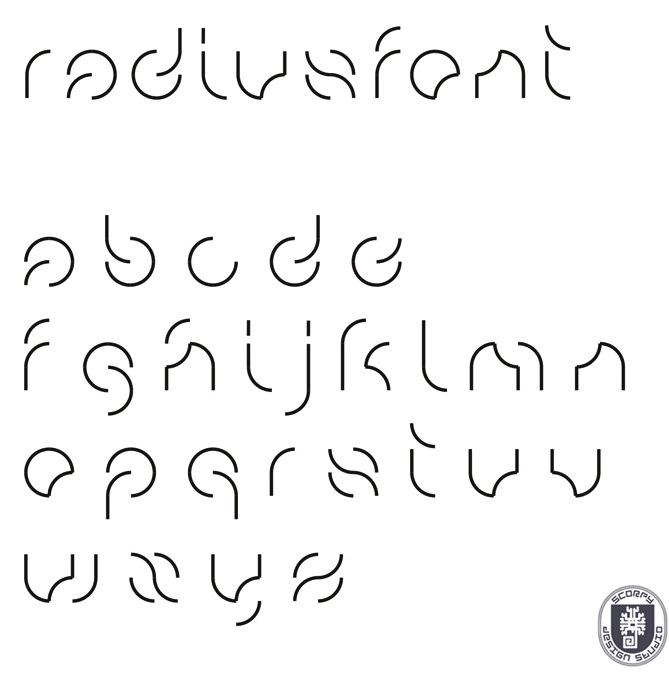
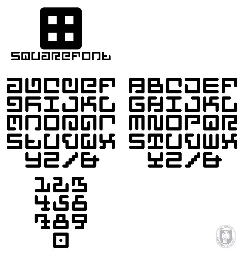
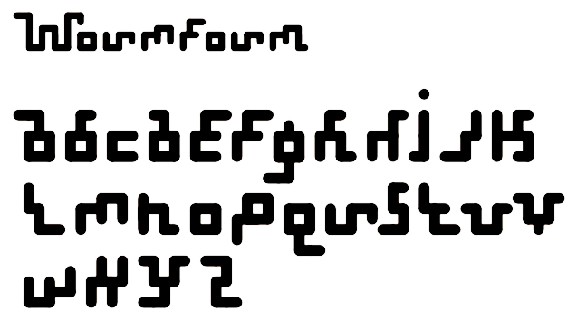
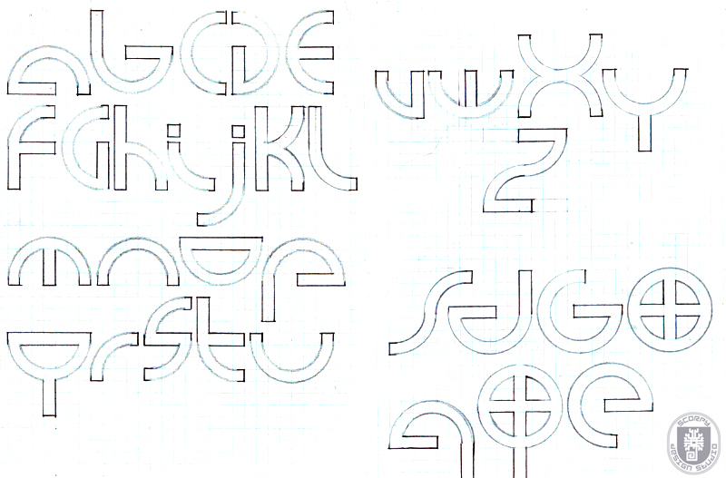
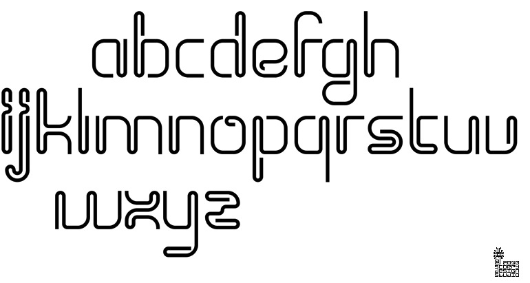
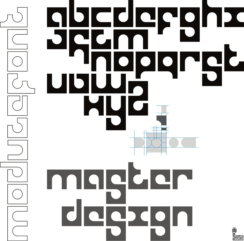
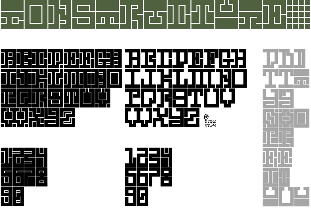
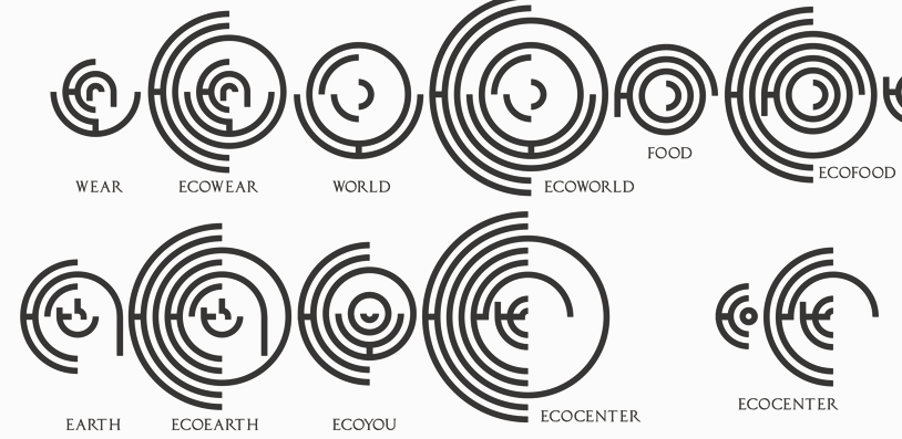
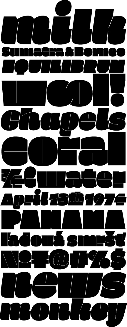
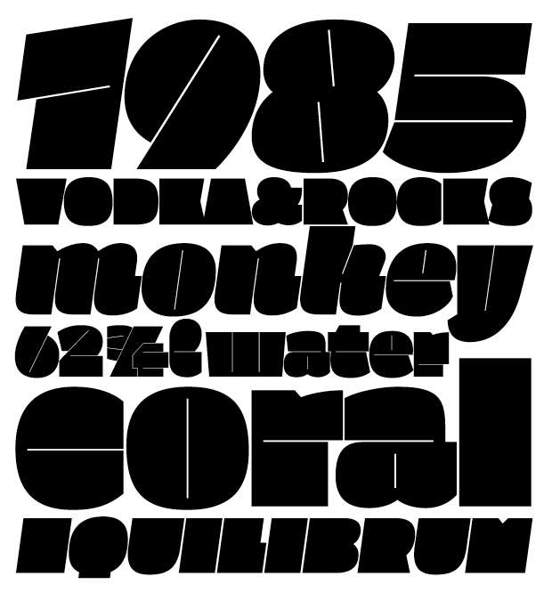
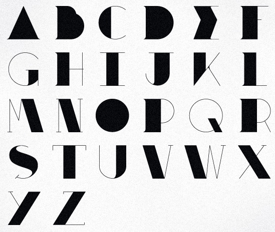
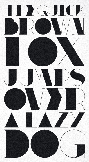
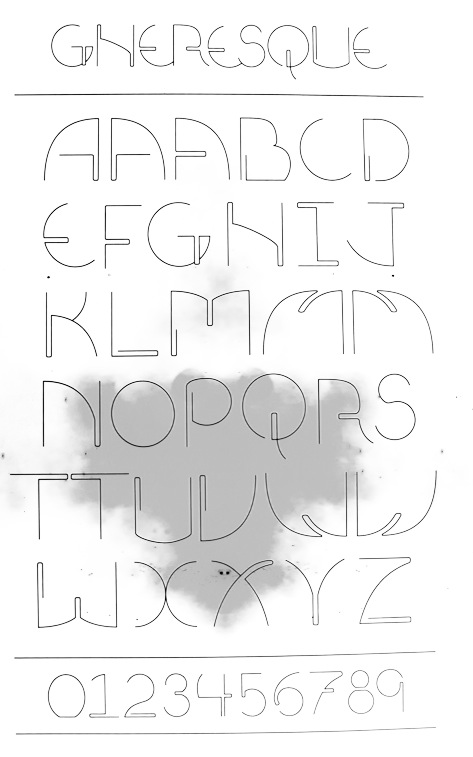
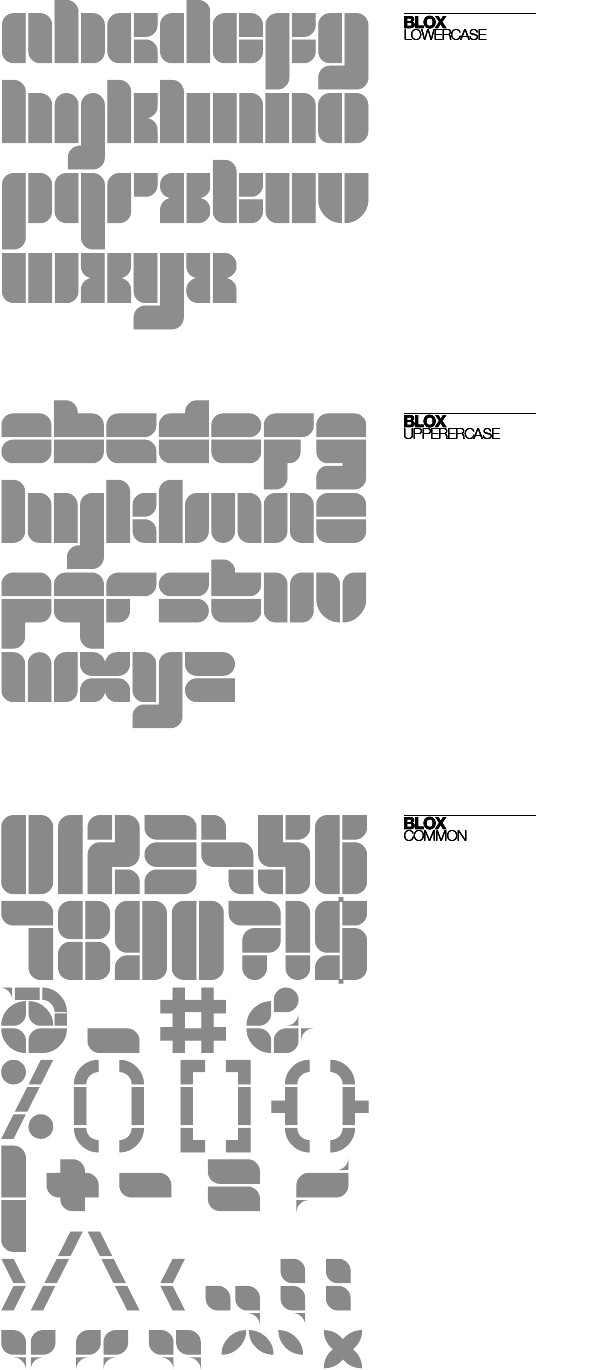
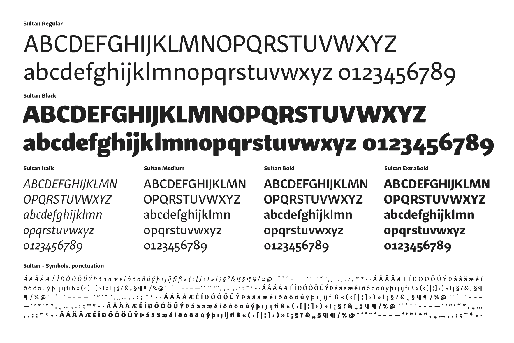
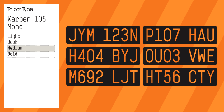
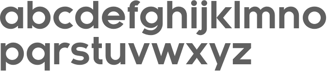
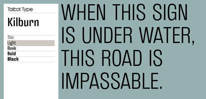
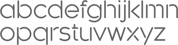
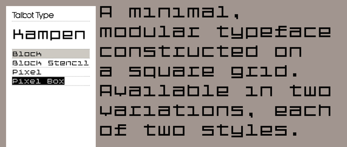
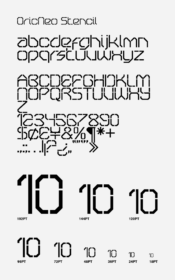
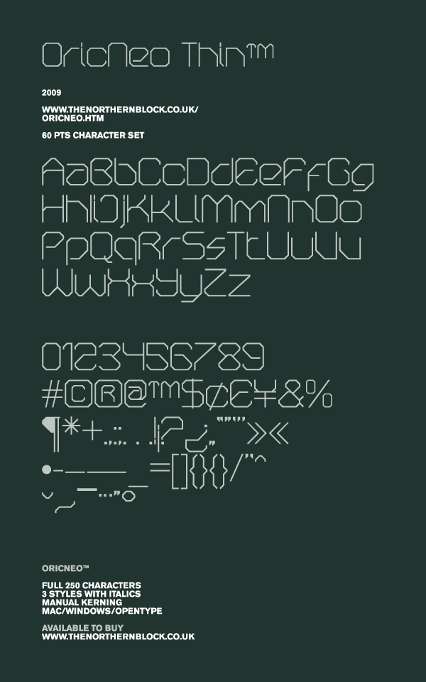
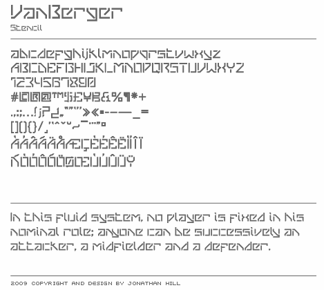
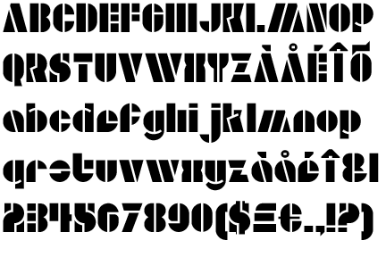
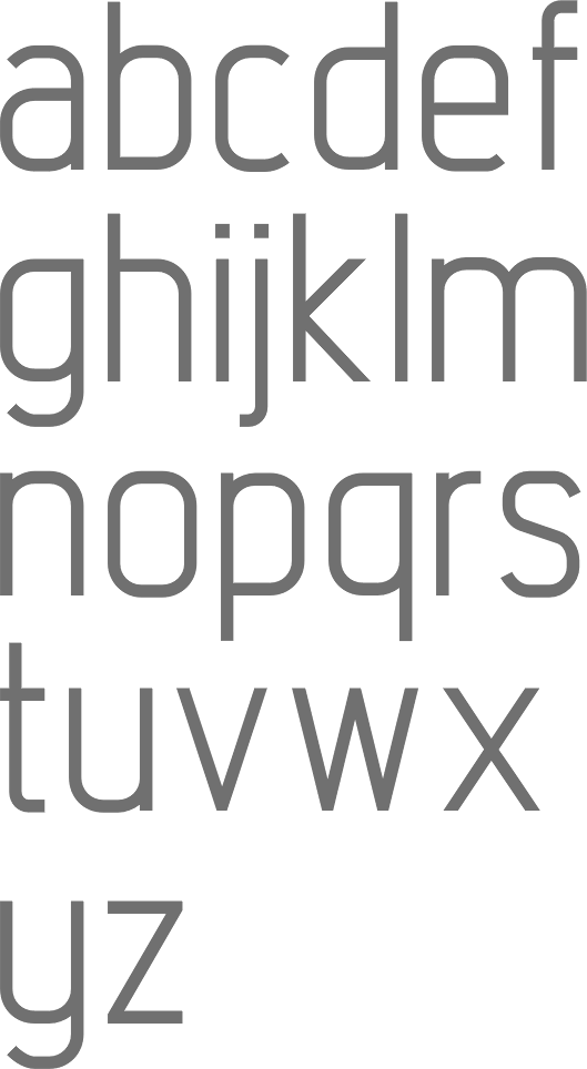
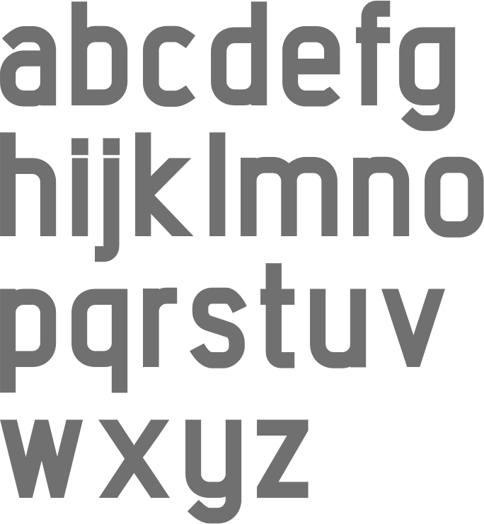
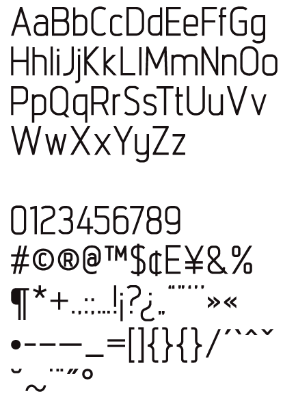
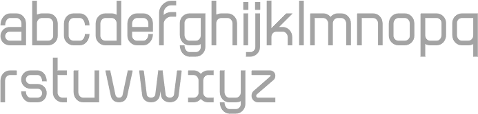
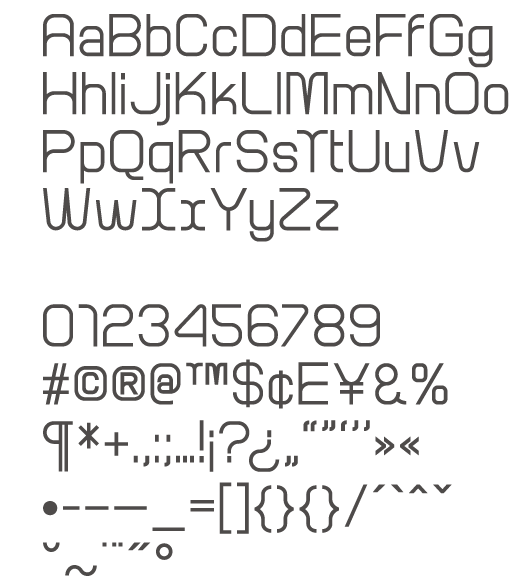
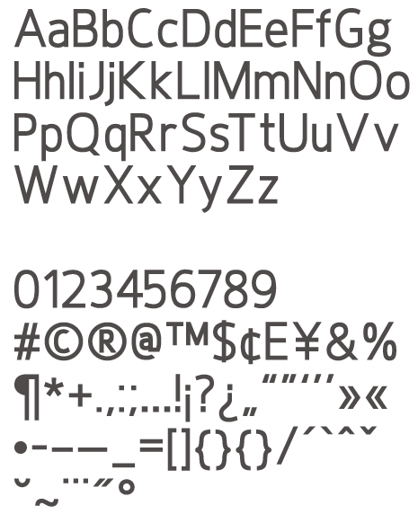
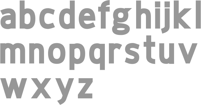
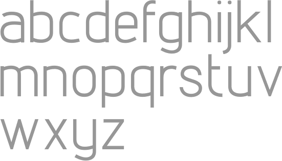
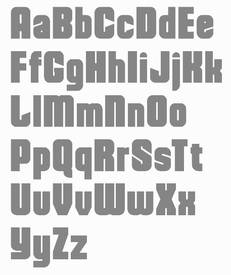
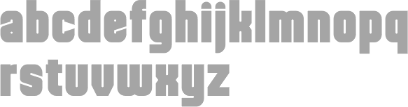
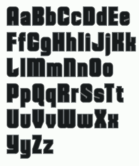
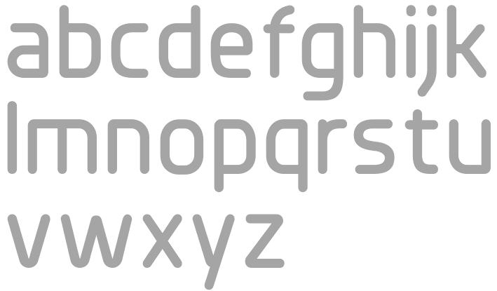
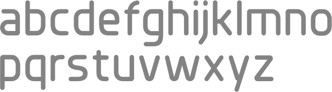
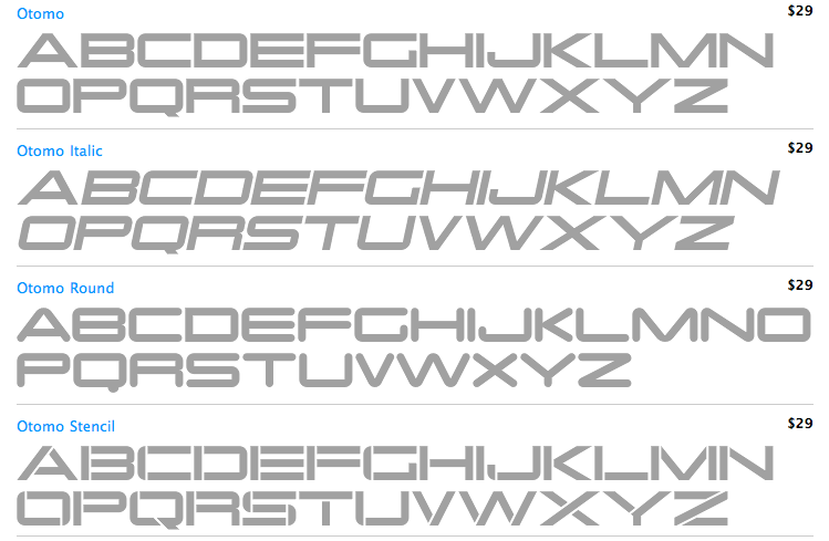
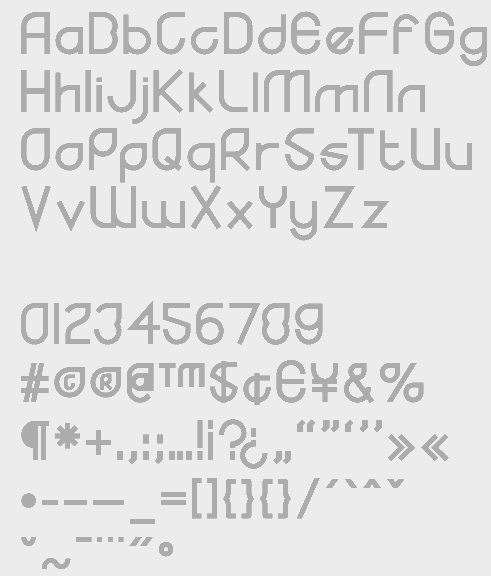
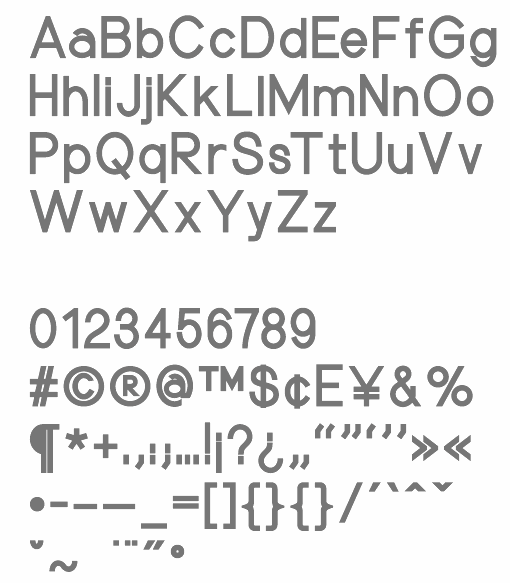
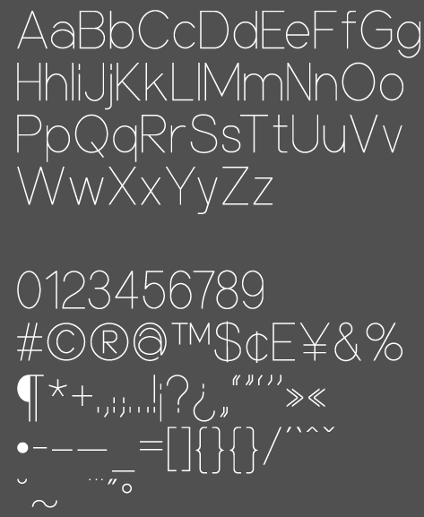
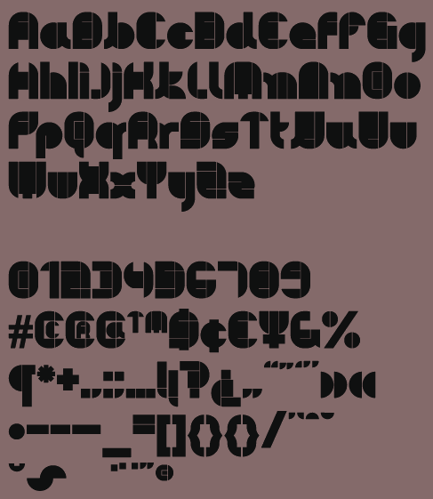
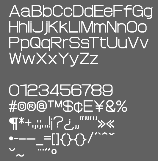
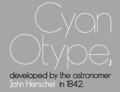
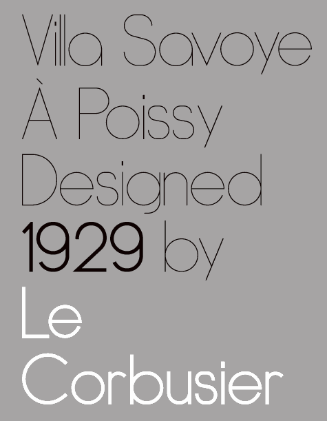
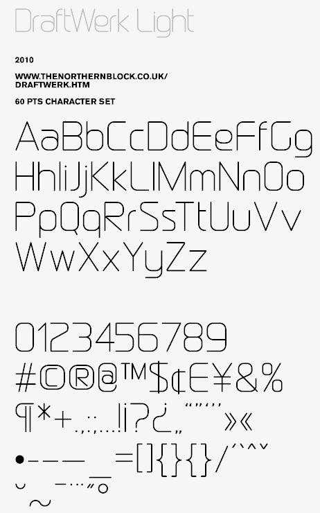
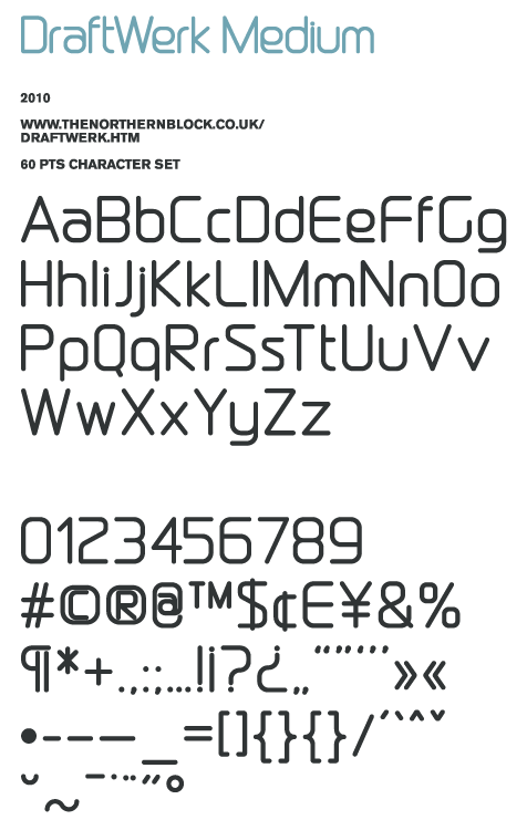
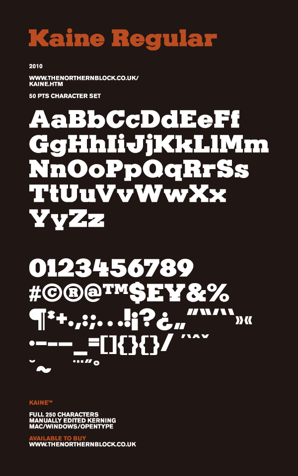
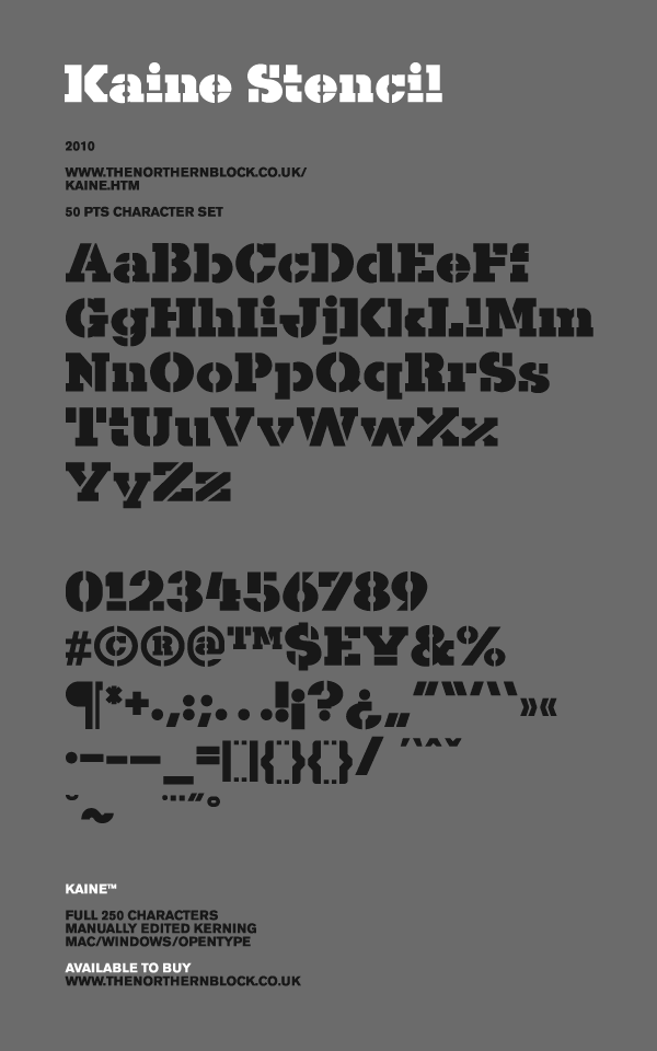
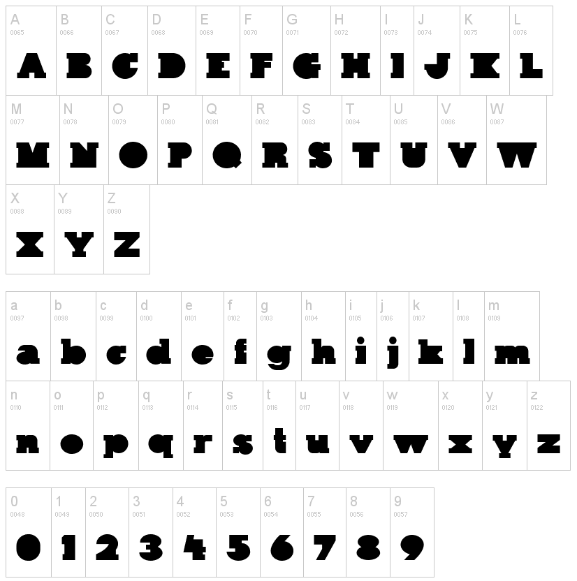
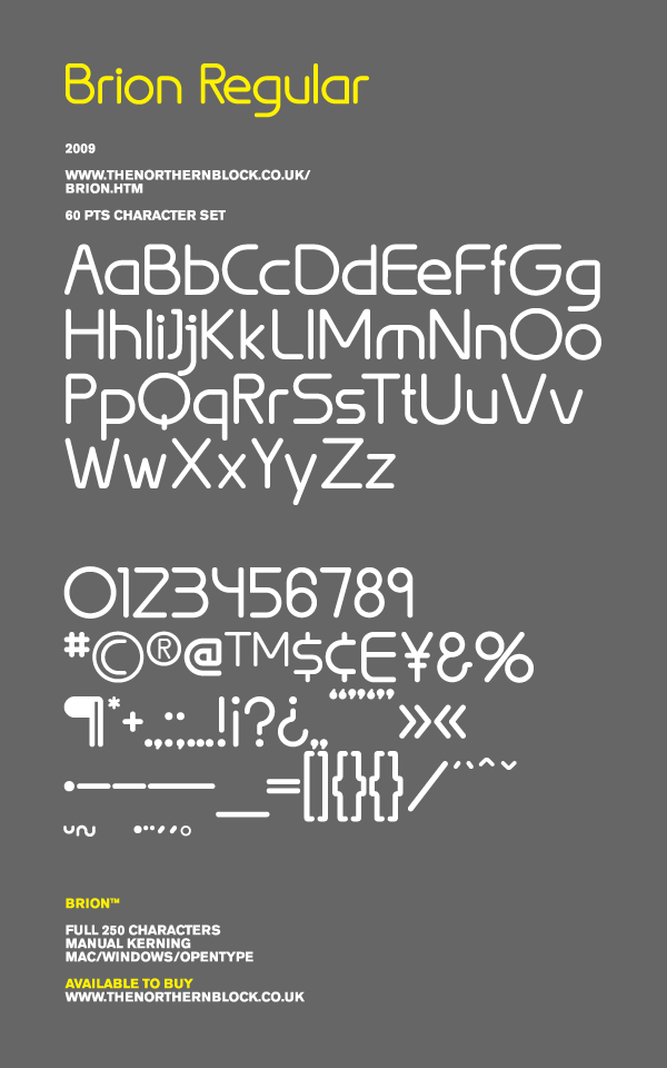
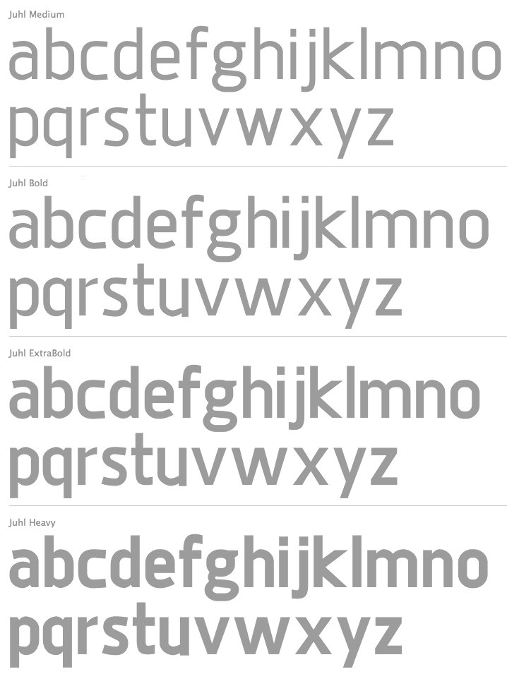
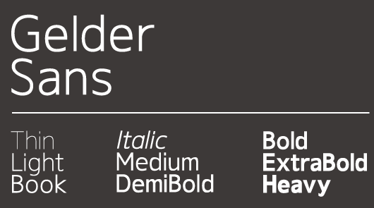
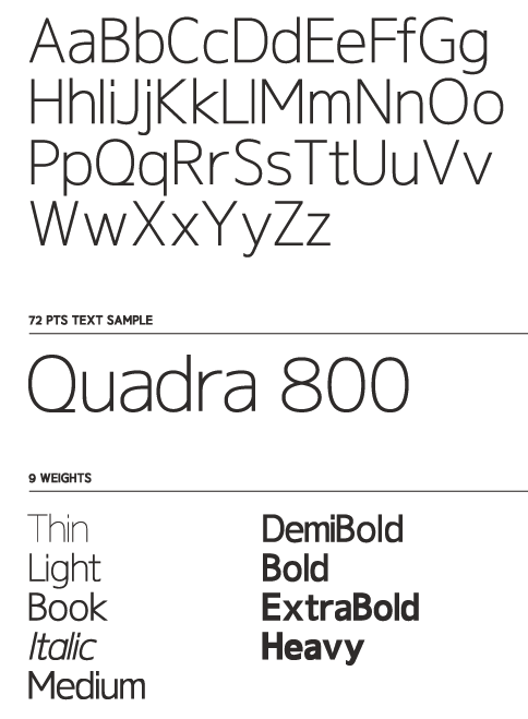
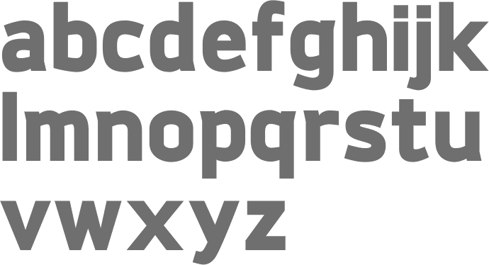
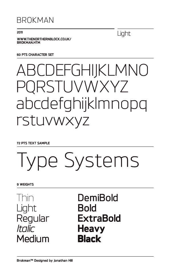
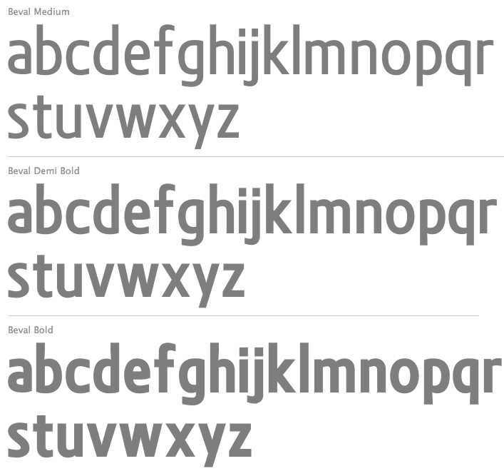
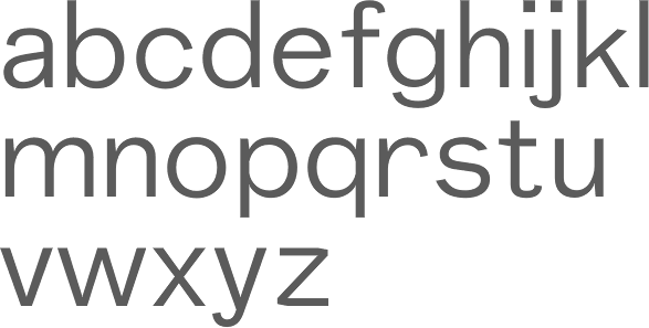
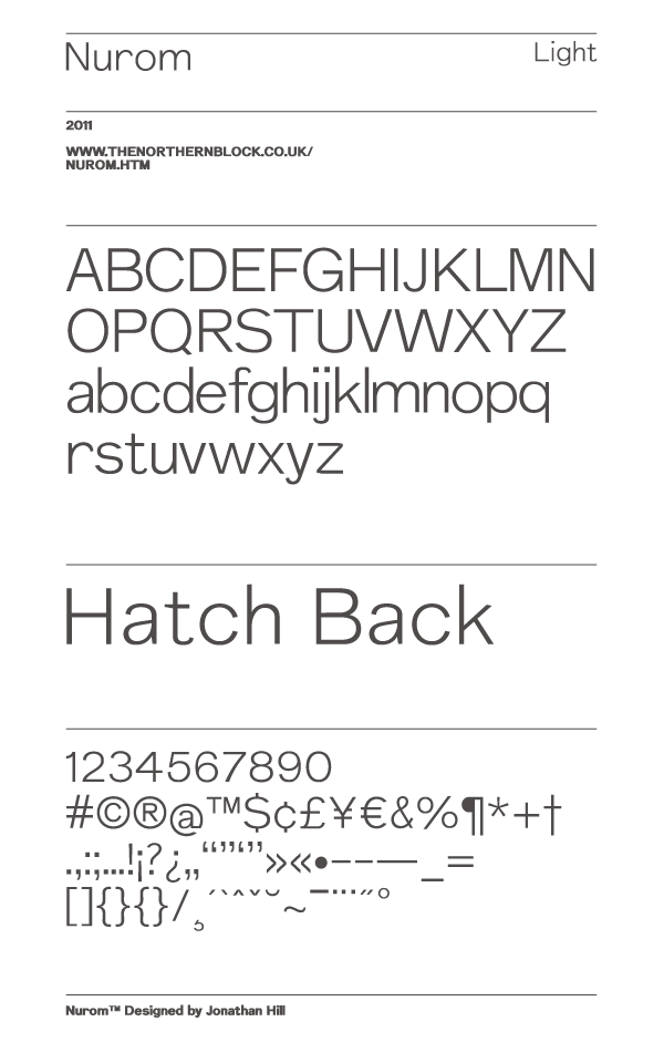
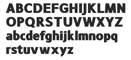
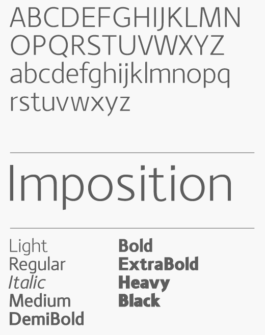
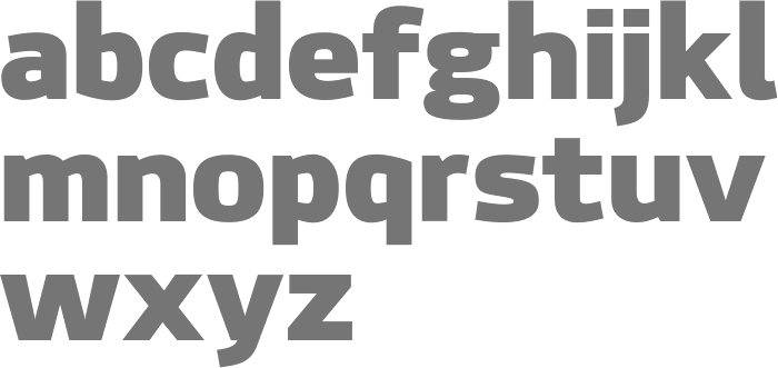
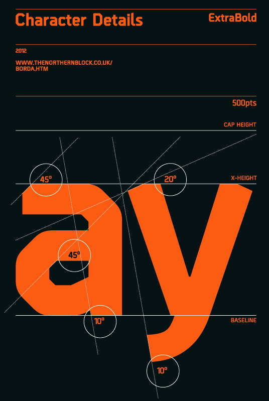
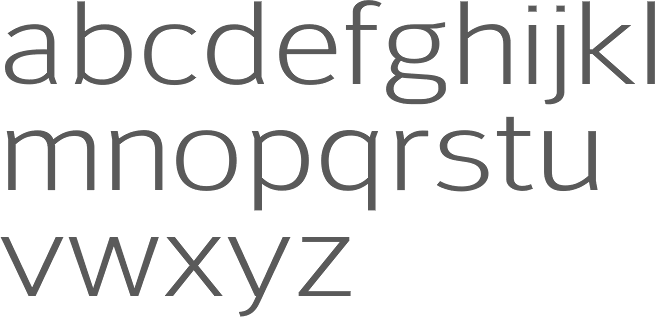
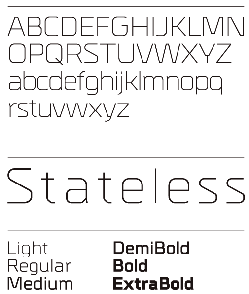
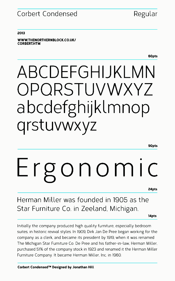
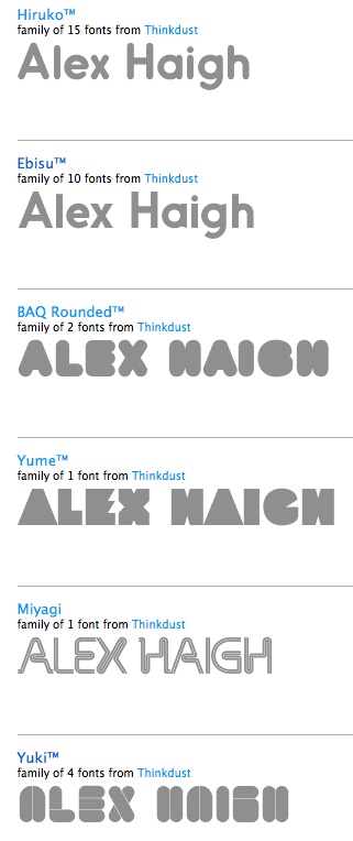
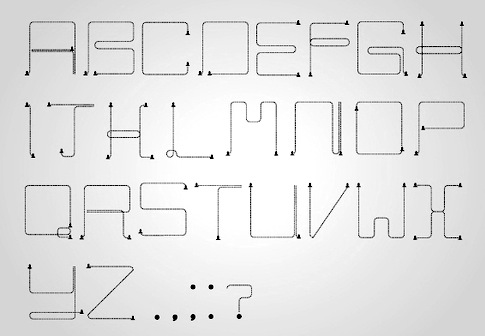
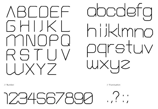
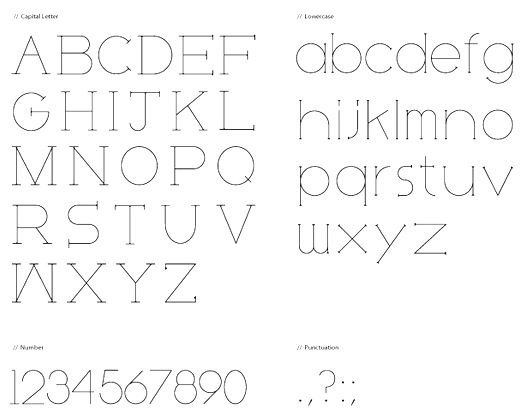
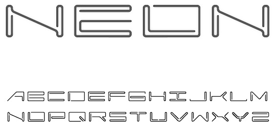
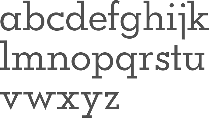
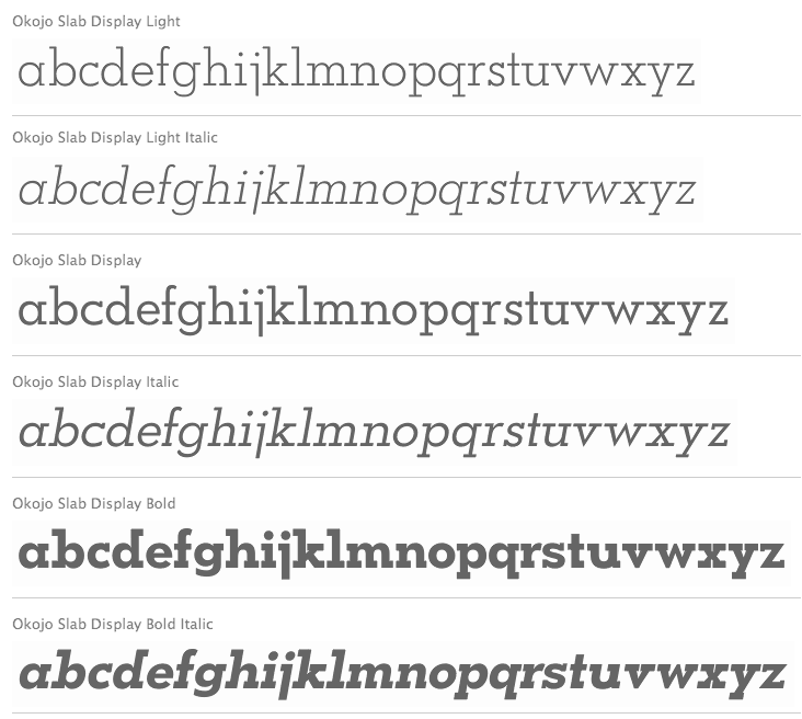
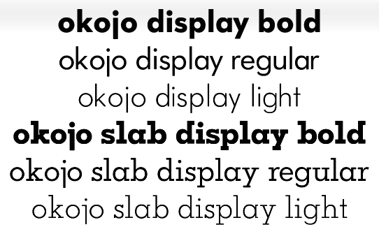
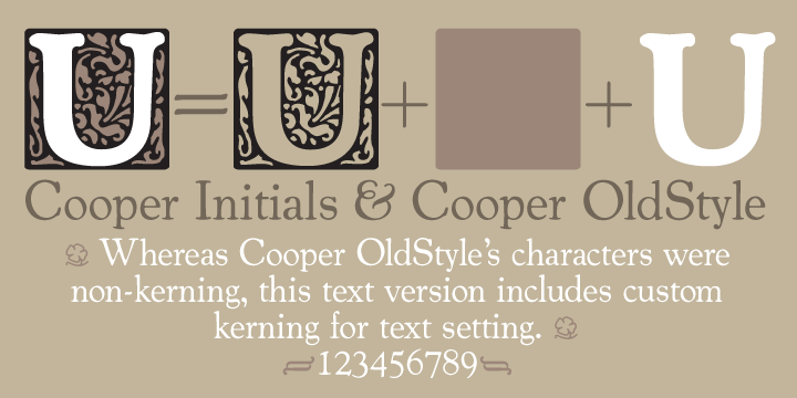
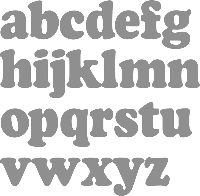
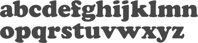
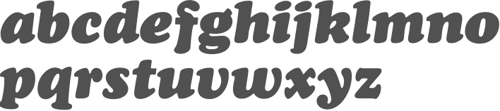
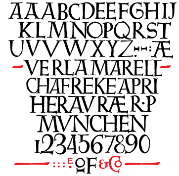
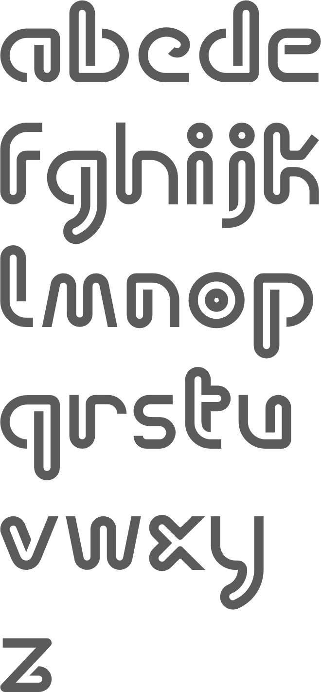
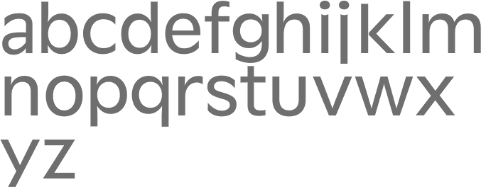
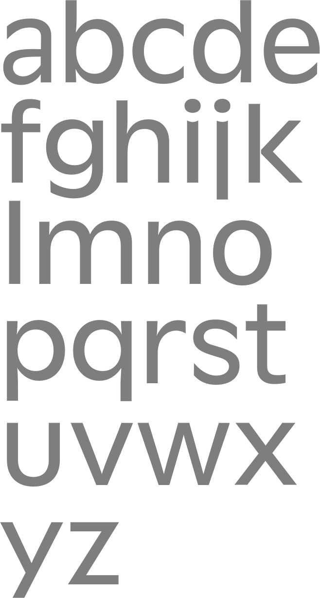
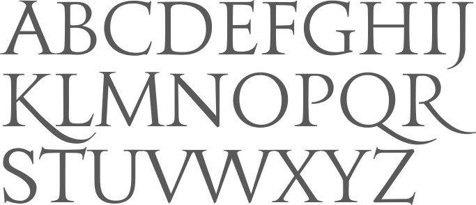
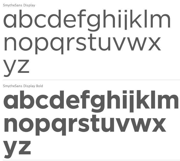
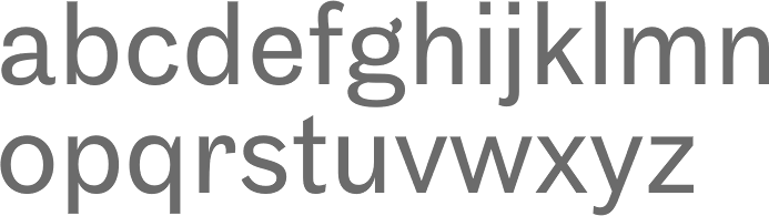
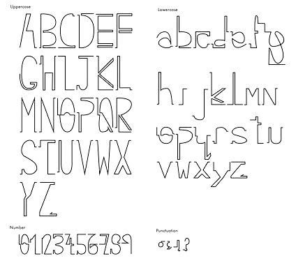
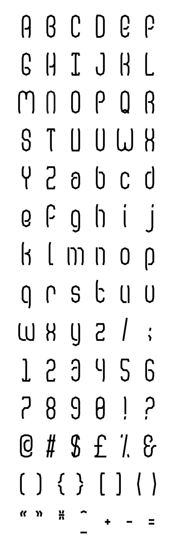
|
|
|
|