TYPE DESIGN INFORMATION PAGE last updated on Wed May 6 15:48:05 EDT 2026
FONT RECOGNITION VIA FONT MOOSE

|
|
|
|
|
Type scene in Florida | ||
|
|
|
|
SWITCH TO INDEX FILE
Miami, FL-based commercial barcode vendor. For example, they have a 32Tech EAN UPC Barcode Font Pack that includes 16 truetype barcode fonts for UCC-12 (UPC-A and UPC-E), EAN-13, EAN-8, ISSN, Bookland and ISBN. [Google] [More] ⦿ | |
Free and commercial fonts by Andrew Galara (Miami, FL). Free fonts: FaneSerane (Andrew Galarza, 2001), IJ19 (Milan Zrnic, 2000), LikeWindInTheSummer (Andrew Galarza, 2000), Superchalmers (Andrew Galarza, 2001), TransitBullets9mmHollowedShells (Andrew Galarza, 2000). Commercial: 710 west 02, Bohemian Transit, Reset, Time Gate, Western Eyes. [Google] [More] ⦿ | |
Aaron Burns, designer/typographer, was President of Lubalin, Burns & Co., Inc., New York City. In 1970, Aaron Burns, Herb Lubalin and Edward Rondthaler (from Photo-Lettering Inc.) founded the International Typeface Corporation (ITC), and Aaron Burns became its President. In 1959 he founded the International Center for the Typographic Arts (ICTA), and was a founding member of the International Center for the Communication Arts and Sciences (ICCAS). He is the author of "Typography," published in 1961 by Reinhold Publishers, Inc. From 1955 to 1960 he taught Advanced and Experimental Typographic Design at Pratt Institute, New York. He set up a type division at Rapid Typographers. There he helped promote the Typositor, or Photo Typositor (invented in Miami by Murray Friedel in 1959), which improved over the first photo type machine, the Rutherford. Rapid Typographers organized the Visual Graphics Corporation (or VGC) to make the best use of this new technology. Peter Bain writes: The owners of Rapid Typographers were impressed enough by Friedels invention to organize the new Visual Graphics Corporation. Initially the endeavor split its headquarters between the existing typographers address in midtown Manhattan and sunny South Florida. The Photo Typositor allowed an operator to see composition letter-by-letter as it was exposed, unlike the Rutherford. It also offered many of Photo-Letterings capabilities at a reduced price. The Typositor, as it became known, ingeniously used the same 2-inch film font format as the Filmotype. It speeded fashionably tight letter and word spacing, achievable in metal only with a razor blade after proofing, and had none of the size limitations of foundry type. VGC and its backers proceeded to convert metal typefaces to film, and pursued licensing with typefounders. [Google] [MyFonts] [More] ⦿ | |
American designer in Saint Augustine, b. 1986. She created Giraf Solid in 2010 using FontStruct. Home page. [Google] [More] ⦿ | |
About Letters
| Floridian American graphic designer and painter Darim Kim (DK), who runs About Letters, made the geometric sans typefaces Nemade (2011) and avant-garde face Quadranta (2010). She also made My Fair Cody (2010). Dafont page. Klingspor link. Abstract Fonts link. [Google] [More] ⦿ |
| |
Adam Grason (aka Zadok44) is an Orlando, FL (and before that, Kansas City, MO)-based illustrator at Disney. He designed the Victorian ornamental families Blair (2012) and Patmos (2011). It is unclear whether Grey Sans (2014) and Quire (2014) are typefaces. Behance link. [Google] [More] ⦿ | |
Adriana Esteve Hernandez
| |
Adriprints
|
Her fonts include Kicks (2012, a fun hand-printed typeface for children's books), Stitching Kit (2010, dings), Fiddleshticks (2009, linocut), Sorbet and Sorbet Wide (2009, like architectural letters), Fancypants (2010, curly lettering), Stitchin Crochet (2009, dingbats), Trellis (2009, hand-printed), and Draft Punk (2009, comic book style). Font Squirrel link. Klingspor link. [Google] [MyFonts] [More] ⦿ |
Alan Parker
| |
Saint Augustine, FL-based designer of the modular typeface Native Dancer (2014). Dafont link. Behance link. [Google] [More] ⦿ | |
Alberto Cairo is a journalist and designer, and the Knight Chair in Visual Journalism at the School of Communication of the University of Miami (UM). He is also the director of the visualization program at UM's Center for Computational Science. He has been head of information graphics at media publications in Spain and Brazil. The author of several textbooks, Cairo currently consults with companies and institutions like Google and the Congressional Budget Office, and has provided visualization training. His books include How Charts Lie, The Truthful Art, The Functional Art, and Nerd Journalism. In 2018, Alberto Cairo and Scott Klein (Pro Publica) co-designed the free silhouette font Wee People. [Google] [More] ⦿ | |
Art director in Miami, FL, who designed the Millennial Dream Font in 2016. Behance link. [Google] [More] ⦿ | |
Behance link. [Google] [More] ⦿ | |
During his studies at Flagler College, Florida, Alex Westcott (b. 1994) created the modular typeface Notch Eight (2015), which was inspired by railroad car boogies. Dafont link. [Google] [More] ⦿ | |
| |
As a graphic design student at Ringling College of Art and Design (class of 2015) in Sarasota, FL, Alexa Schara created the hybrid typeface Klaus (2012), a mixture of Century Gothic and Fette Fraktur. [Google] [More] ⦿ | |
| |
Author, educator, historian and type personality who taught at Rochester Institute of Technology from 1947-1977. He wrote Anatomy of a Typeface (1990, David R. Godine). He died in 2002 in Sun City, FL. Obituary. [Google] [MyFonts] [More] ⦿ | |
Photographer in Ormond Beach, FL, who designed the ornamental caps alphabet Merci Pour Rien (2013). Her home page. [Google] [More] ⦿ | |
Alf Becker (b. St. Louis, IL, d. 1959, St. Petersburg, FL) was a sign artist in the 1930's and 40's. Beginning in January 1932, at the request of editor E. Thomas Kelly, Becker supplied the Signs of the Times (The National Journal of Display Advertising) magazine's new Art and Design section with an alphabet a month, a project initially predicted to last only two years. Misjudging the popularity of the series, it instead ran for 27 years, ending finally two months before Becker's death in 1959, for a total of 320 alphabets. In late 1941, just ten years after the first alphabet was published, 100 of those alphabets were compiled and published in book form under the title 100 Alphabets, by Alf R. Becker. The American Sign Museum shows the following death notice, taken from the April 1959 issue of Signs of the Times: A chapter of almost 27 years of extensive influence upon the development of sign and outdoor advertising lettering came to a close March 10 in the passing of Alf R. Becker, whose alphabets had been presented consistently in Signs of the Times since January, 1932. Death came in St. Petersburg, FL, where he had been hospitalized since last November. The funeral services were in St. Louis, March 16. Mr. Becker had operated a commercial sign business in East St. Louis, IL., and was widely known for his lettering ability when requested 27 years ago by the late E. Thomas Kelley, then editor of Signs of the Times, to do a series of alphabets for the magazine. They had estimated that 24 alphabets which would be presented in a period of two years would serve the purpose. The series was so enthusiastically received and so many readers urged continuation that it was projected indefinitely to eventually each a total of 320 before failing health of Mr. Becker forced him to give up that creative work. His last alphabet for ST appeared in the January issue this year. Countless are the signmen and women who broadened the horizons of their lettering ability by thorough study of Mr. Becker's alphabet. In 1941, his book, "100 Alphabets" was published by Signs of the Times, and all 3,000 copies that were printed were sold out long ago. Numerous requests have been received for a reprinting, but in view of the changes of time in lettering styles, it has not been considered advisable. Mr. Becker's failing health in 1957 influenced him and Mrs. Becker moving to St. Petersburg, where they bought a home, and where he went into semi-retirement. His love of the sign business was such that he continued his alphabets in spite of the problems of his illness. Many of his typefaces have art deco influences. LHF Monogram at Letterhead is a digital version of one of his fonts. Other digitizations include Whomp (2006) and Buffet Script (2006) by Alejandro Paul (Sudtipos) and Daffadowndilly (2007) and Stony Island NF (after Becker's art deco typeface Chicago Modern), Quaint Notions (2003), and Shaq Attack NF (2011, a wood plank font) by Nick Curtis. The Fontry (James Stirling and/or Adkins) is undertaking a grand digitization project, and releases free and pay fonts with names that start with ARB, followed by the font number, the font name, and the month and year of issue. In The Fontry's ARB series, we find ARB-187 Moderne Caps AUG-47 (2013, didone), ARB-85 Poster Script (2011, after a 1939 typeface by Becker), ARB 70 Modern Poster, ARB 93 Steel Moderne, ARB 44 Chicago Modern, ARB 66 Neon (2010, after a 1937 font, +Block, +Line), ARB 85 Modern Poster JAN-39 (2011, after Modern Poster Script, 1939), and ARB 67 Modern Roman, and ARB08ExtremeRomanAUG-32CASNormal (2009; the original is from 1932). Jeff Levine created a number of typefaces based on Becker's work as well: Show Card Casual JNL (2018: based on a single stroke brush alphabet by Alf Becker), Casual Signage JNL (2018), Modern English JNL (2018), Kanona JNL (2010), Karaoke JNL (2010), Mocombo JNL (2010). John Davis created LHF Pipeline (2012) based on Becker's designs. Kaitlin Sims designed LHF Becker No. 45 (2015). Various of Becker's alphabets were at the basis of some digital fonts by Noah Johnson at Practical Lettering Studio, designed ca. 2026. These have numbered names such as No. 37 Alf Becker, No. 41 Alf Becker, No. 55 Alf Becker, No. 137 Alf Becker and No. 210 Alf Becker. Catalog of some of his digitized typefaces. View the digital typefaces that are based on Becker's work. Showcase of Alf R. Becker's fonts. [Google] [MyFonts] [More] ⦿ | |
Ponte Vedra, FL-based designer of Tessara (2015, FontStruct). [Google] [More] ⦿ | |
Graphic designer in Pensacola, FL, who created the circle-based typeface Adorn in 2016. [Google] [More] ⦿ | |
Alphabet: An Exhibition of Hand-Drawn Lettering and Experimental Typography | An exhibition held in Orlando, FL, during the AIGA Orlando, July 15-30, 2007, and elsewhere in the USA between 2005 and 2008. [Google] [More] ⦿ |
Alphabet Innovations International -- TypeSpectra (Was: MM2000)
|
Phil established Alphabet Innovations International in 1969 and TypeSpectra in 1974, and designed most of his 400 typefaces (read: film fonts for use in the VGC Photo Typositor) there: Agenda (1976), Americana (1972), Arthur (1970, by Roc Mitchell), Aurora Snug (1969), Avalon (1972), Baskerville (1969), Beacon (1987), Bluejack (1974), Borealis (1970, by Roc Mitchell), Britannic (1973), Bulletin (1971), Celebration (1969, by Roc Mitchell), Century S (1975), Cheltenham (1971), Clearface (1973), Cloister (1975), Corporate (1971, by Roc Mitchell), Corporate Image (1971, by Roc Mitchell), Courier B EF (2004, originally done at Scangraphic), Didoni (1969, a knock-off of Pistilli Roman with swashes added), Dimensia and Dimensia Light (1971, by Roc Mitchell), Dominance (1971), Egyptian (1970), Eightball (1971, some report this incorrectly as a VGC face, which has a different typeface also called Eightball: it was digitized by FontBank as Egbert. Alphabet Innovations' Eightball had other versions called Cueball and Highball, and all three were designed by George Thomas who licensed them to AI), Fat Chance (Rolling Stone) (1971), Fotura Biform (1969), Franklin (1981), Garamond (1975), Globe (1975), Goudy (1969), Harem (1969, aka Margit; digitized and revived in 2006 by Patrick Griffin and Rebecca Alaccari as Johnny), Helserif (1976---I thought this was created by Ed Kelton; anyway, this typeface is just Helvetica with slabs), Helvetica (1969), Introspect (1971, revived in 2012 by SoftMaker as Looking Glass, and by Castcraft as OPTI Looking Glass), Jolly Roger (1970, digitized in 2003 by Steve Jackaman at Red Rooster; Martin says that Jolly Roger and Introspect are his two most original designs), Journal (1987), Kabell (1971), Kabello (1970), King Arthur [+Light, Outline] with Guinevere Alternates (1971, by Roc Mitchell), Legothic (1973), Martinique (1970), Mountie (1970), News (1975), Palateno (1969), Pandora (1969), Pazazzma (1980), Perpetua (1969), Plantin (1973), Polonaise (1977; digital version by Claude Pelletier in 2010, called Chopin Script), Primus Malleable (1972), Quaff (1977), Quixotic (1970), Report (1971), Romana (1972), Scenario (1974), Sledge Hammer (1971), Son of Windsor (1970), Stanza (1971, by Roc Mitchell; this angular typeface was later published by URW), Stark (1970), Supercooper (1970), Swath (1979), Threadgil (1972), Thrust (1971), Timbre (1970), Times (1970), Times Text (1973), Trump (1973), Tuck Roman (1981), Viant (1977), Vixen (1970), Weiss (1973), Wordsworth (1973). In 1974, he set up TypeSpectra, and created these type families: Adroit (1981), Albert (1974), Analog (1976), Bagatelle (1979), Cartel (1975), Caslon (1979), Criterion (1982), DeVille (1974), Embargo (1975), Heldustry (1978, designed for the video news at the fledgling ABC-Westinghouse 24-hour cable news network in 1978; incorrectly attributed by many to Martin's ex-employee Ed Kelton: download here), Innsbruck (1975: revived in 2018 by Olexa Volochay as Tyrol), Limelight (1977), Oliver (1981), Opulent [Light and Bold] (1975, by George Brian, an amployee at Alphabet Innovations), Quint (1984), Sequel (1979), Spectral (1974), Welby (1982). His fonts can be bought at MyFonts.com and at Precisiontype. He warns visitors not to mess with his intellectual property rights, but I wonder how he can have escaped the ire of Linotype by using the name Helvetica. In any case, the fonts were originally made for use on photo display devices and phototypesetters. Some are now available in digital format. Near the end of his life, Phil's web presence was called MM2000 (dead link). Check his comments on his own typefaces. URW sells these typefaces: URW Adroit, URW Agenda, URW Avernus (after Martin's design from 1972), URW Baskerville AI, URW Beacon, URW Bluejack, URW Cartel, URW Cloister, URW Corporate, URW Criterion, URW Didoni, URW Fat Face, URW Globe, URW Goudy AI, URW Heldustry, URW Helserif, URW Introspect, URW Legothic, URW Martin Gothic, URW Martinique, URW Pandora, URW Polonaise, URW Quint, URW Scenario, URW Souvenir Gothic, Souvenir Gothic Antique (the Souvenit Gothic family was designed by George Brian, an employee of Alphabet Innovations at the time: it was AI's first text family), URW Stanza, URW Stark, URW Timbre, URW Viant, URW Wordsworth. Interview. Bye Bye Blackbird performed by Phil Martin in Largo, Florida. The final message on his last web page, posted posthumously read: MARTIN, PHIL, 82, of Largo, died Tuesday (Oct. 4, 2005) at Largo Medical Center. He was born in Dallas and came here after retiring as a writer, singer-songwriter, commercial artist, and comedian. As a high school student, he worked as an assistant artist on the nationally syndicated Ella Cinders, and at 18 wrote and drew Swing Sisson, the Battling Band Leader, for Feature Comics. He was an Army Air Forces veteran of World War II, where he served as a bombardier in Lintz, Austria. On his 28th mission shelling the yards in Lintz, his B-24 was hit and he was listed as missing in action until the war in Europe ended. He was a comedian on The Early Birds Show on WFAA in Dallas. As a commercial artist, he founded two multinational corporations to market typeface designs and is credited for designing 4 percent of all typefaces now used. He also wrote columns and articles for typographic publications. Locally, he sang original lyrics to old pop standards in area piano bars, and in 1999 produced 59 issues of the Web book Millennium Memorandum, changing the title to MM2000 when he issued the first edition of the new Millennium on Jan. 3, 2000. Survivors include his wife, Ann Jones Martin; and a cousin, Lorrie Hankins, Casper, Wyo. National Cremation Society, Largo. Phil Martin's digital typefaces. FontShop link. Klingspor link. [Google] [MyFonts] [More] ⦿ |
A page that showcases the work of some of the finest calligraphers. [Google] [More] ⦿ | |
During her studies at Flagler College in St. Augustine, FL, Alyssa Barella designed the dot matrix typeface Conbria (2018). [Google] [More] ⦿ | |
For a type design project at Full Sail University, Alyssa Gruhler (Orlando, FL) designed a decorative typeface (2016). [Google] [More] ⦿ | |
Kindergarten teacher in Florida. Creator of the free hand-printed typefaces manders and Manders Tick Tock (2012). In 2013, she added Homegirl Stuffed, HomegirlSharpie, HomegirlHolidaze, HomegirlHarvest, HomegirlGetLow, HomegirlBelieves, HomegirlSweetBarista, HomegirlQuirks, HomegirlParkCloser, HomegirlFalsies, HomegirlBaristaWroteIt, Homegirl Check You Out, Homegirl Shape Up, Homegirl Get On My Level, Homegirl Get At Me, Homegirl Freshly Squeezed, Homegirl Fiesta, Homegirl Curl Up, Homegirl Wrote It, Homegirl Frap, Homegirl Chai Tea, Homegirl Cake Poppin, Homegirl Secure, Homegirl Mia, Homegirl Kneed Stitches, Homegirl Green Tea, Homegirl Dot, Homegirl Quick Note, Homegirl Mosquito, Homegirl Fifty Shades, Homegirl Whut, Homegirl Unfinished, Homegirl Pinched Me, Homegirl Bouncy, Homegirl Jailbird, Homegirl Leveled Reader, Homegirl Open Minded, Homegirl Beginnings, Homegirl Whoa, Homegirl Stix N Stonez, Homegirl Totally Schooled, Homegirl Schooled, Homegirl Kiddo Print, Homegirl Kiddo, Homegirl Hug It Out, Homegirl Heartbeat, Homegirl Marnie Homegirl Jessa, Homegirl Shoshanna, Homegirl Hannah, and Homegirl Fool To Cry, some of which based, I assume, on the handwriting of her pupils or children. [Google] [More] ⦿ | |
Mandie Rush (Orlando, FL) designed the textured typeface White Out (2014). [Google] [More] ⦿ | |
Illustrator Amber June Cross (Sarasota, FL) designed the brushy The Scream-style typeface Sorry For The Pentagram (2015) during her studies at Ringling College of Art & Design. In 2017, she designed the runic emulation typeface Runic, and the curly Heffner. Behance link. [Google] [More] ⦿ | |
Tallahassee, FL-based creator (b. 1987) of the fun free font Aquanaut (2008), which can be downloaded here and here. [Google] [More] ⦿ | |
Graphic designer in Miami, FL, who created the painted typeface Oh The Places You'll Go (2015), which was inspired by the Dr. Seuss books. [Google] [More] ⦿ | |
Ana Garcia
| |
During her studies at the University of Central Florida in Orlando, Ana Gomez designed the custom cabled typeface Dear Night (2015). [Google] [More] ⦿ | |
During her studies at Flagler College, Saint Augustine, FL, Anabel Anderson created the ornamental caps typeface Empress (2014). [Google] [More] ⦿ | |
Andrew Galarza
| |
Andrew Galarza Foundry (was: Chance Type Co, and Krayon Ink, and before that, Jedi Serpent Fonts)
| Chance Type Co evolved out of Krayon Ink (ex- Jedi Serpent). It has commercial fonts by American designer Andrew Galarza who lives in Miami, who started making type in 2001. These used to be shareware when the place was called Jedi Serpent Fonts. Galarza's early typefaces: Jeannette (2002), Display Swash, KY and an Urge, 65 Swash, Melfina, Redheads in Transit (beautiful handwriting), Butterfly Collection (dingbats), 5 Am Summer, Transit One, Superchalmers, Like Wind in The Summer, Delithium, Fane Serane, 5am Andrew (2005, handwriting), 5am Chance No 01, 5am Transit (handwriting), 5am Gender, Grey (2005), Melfina (2002, inspired by Emigre's Council), 5 AM Chance No. 1 (which used to be called Vespers), Vespers (2001, based on lettering for a Bjork album), NewTimesRomanHyper and CourierStrange (reworked Monotype fonts: the latter one has letters in brackets), 90Days, Blistel, Cancer, Freeware, Futura, Lode, Love-Quickie, Image Times, Stylus (modified Monotype font), Jenice, Element, Prozac Child, Codeca, Ginger, Ginger2, Boredom, Awitched, Mastillo, Mastillo2, PaperChase2blockedinside (reworked BadFilms by Ray Larabie), Screwupsuprock, Arialbullets39mmwideclear and Arialbullets4VerbRicochet (reworked Monotype Arial-Plain: letters in and on balls), Dots, VanishingBoy (modified Ray Larabie font; the best in the series I think), 1979 (fantastic avant-garde font), Agent 508 (equally great display font), Aloin, Bionic, Backspace, ChemicalTest, Click, Dragon, Eggman, Feelings, Flowery Text, Gallows, Gigayoda, Impression, Lavero, Lorent Roman, LoveJoy, Melody Metrics, Never, Noose, Numbers (hacker font), Opagan, Opus-sc, Panama, Poison Pill, Potheads, Rainy, RoamJapan, Room, Butterfly, Thinker, Veronica, Western Flick, Reterik, MisbehaviorTake23, Thinker, Paperchase2blockedinside, Children's Television Workshop (letters based on the Sesame Street TV show, 2002), KY and Urge, 65 Swash, Redheads in Transit, and I Love My Momma. On my last visit, there were just a few shareware fonts left (in OpenType format): 5AMButtercup, 5AMButterflyCollection, 5AMDelithium, 5AMLikeWindInTheSummer, 5AMSuperchalmersItalic, 5AMSuperchalmers. MyFonts sells some of his fonts: 5 AM Buttercup (Andrew Galarza), Grey (Andrew Galarza), 5 AM Gender (Andrew Galarza), 5 AM Chance No 01 (Andrew Galarza), 5 AM Andrew (Andrew Galarza), 5 AM Transit (Andrew Galarza), 5 AM Summer (Andrew Galarza), Melfina (Andrew Galarza), Childrens Television Workshop (Andrew Galarza), Vespers (Andrew Galarza). Jedi Serpent evolved into 510 ink and then Krayon Ink. In 2005, Krayon Ink was renamed Chance Type Co. Home page. Old MyFonts link. [Google] [MyFonts] [More] ⦿ |
Originally from Lawrence, KS, Andrew designed an unnamed lachrymal typeface in 2012 with Paul Gonzalez during his studies at Ringling College of Art and Design in Sarasota, FL. [Google] [More] ⦿ | |
Web developer and designer. Graduate of Ringling College of Art&Design (Sarasota, FL), now active as a graphic designer in St. Petersburg, FL. Blog. FontStructor of Printed (2010, horizontal stencil face). In 2016, she designed the display typeface Querk. Behance link. [Google] [More] ⦿ | |
In 2017, Tatiana Gancedo and Angelica Baini co-designed the free modular typeface Renasci. Behance link. Cargo Collective link. You Work For Them link. [Google] [More] ⦿ | |
| |
Saint Petersburg, FL-based designer of Vert Display (2016). Creative Market link. [Google] [More] ⦿ | |
Student at Flagler College in Tallahassee, FL. She created the futuristic rounded typeface Discoid (2011). [Google] [More] ⦿ | |
Student at Florida Southern College in 2014. Lakeland, FL-based designer of an untitled display typeface in 2014. [Google] [More] ⦿ | |
During her studies at Flagler College, Saint Augustine, FL, Arielle Ebenholtz designed the curvy lower case typeface Curvation (2013). [Google] [More] ⦿ | |
Aka Vector Chameleon. Ormond Beach, FL-based designer of the watercolor brush typeface Summer Breeze (2015). [Google] [More] ⦿ | |
During her studies at Flagler College, Saint Augustine, FL, Ashley Bielecki created Ecliptica (2015). [Google] [More] ⦿ | |
During her studies, Ashley Lemire (Fort Pierce, FL) designed a decorative caps typeface (2015). [Google] [More] ⦿ | |
Saint Augustine, FL-based creator (b. 1992) of Nouveau (2013), an art nouveau caps typeface. Linkedin link. [Google] [More] ⦿ | |
Floridian creator of the rope font Bomdiggity (2013). [Google] [More] ⦿ | |
Floridian graphic designer who made the gridded pixel typeface Align (2011). [Google] [More] ⦿ | |
Fort Lauderdale, FL-based designer of Twenty-six Balloons (2017). [Google] [More] ⦿ | |
During her studies at the University of North Florida, Ashley Shepard (Jacksonville, FL) created the multilined deco typeface Metro Deco (2014). Behance link. [Google] [More] ⦿ | |
Florida-based creator of the eroded typeface Clipped (2010). [Google] [More] ⦿ | |
Ashley Wells is the Orlando-based designer of the RussMusic music font. [Google] [More] ⦿ | |
Vendor of Korean, Japanese and Chinese software, including font packs for Mac and PC. AsiaSoft Inc./AsiaTech Inc. is located in Vero Beach, FL. Their font Urdu Naskh Asiatype (2001) for Urdu can be found here and here. Pashto Kror Asiatype (1994-2002) is here. [Google] [More] ⦿ | |
Orlando, FL-based designer of the paper-fold typeface Gefaltet (2012), which was created during her graphic design studies. [Google] [More] ⦿ | |
B-Type Design is a multi-disciplinary, full service design and art studio concentrating on innovative visual communications, est. 2010 in Coral Gables, FL, and now located in Miami. Behance link. In 2012, they made the multiline typeface Spago. [Google] [More] ⦿ | |
Art director in Miami, FL, who designed the squarish typeface Puneta (2018). [Google] [More] ⦿ | |
Barry Stock
| |
St. Augustine, FL-based designer of Agility (2015), a modular typeface designed for the Nastia Liukin Cup. [Google] [More] ⦿ | |
Belleek fonts
| Richard Kinch's public domain fonts in type 1 and Truetype that may replace the proprietary fonts needed for Latex Mathtime. Names: blex, blsy, rblmi. Created in 1998. CTAN download site. [Google] [More] ⦿ |
| |
Palm Coast, FL-based student-designer of Space City (2015, sci-fi font), Milch (2015), and Dhahab (2015). [Google] [More] ⦿ | |
Berthold Types Limited
| The link recalls the history of this new company owned by the Hunts in Chicago. They bought the trademarks and some outlines from the bankrupt Berthold Types GmbH, but are not the successors of that famous German company. Since its creation, Berthold Types Limited has been sending (frivolous) legal letters usually related to alleged trademark violations. The typophiles discuss the situation, which turns a lot around the issue of Berthold not paying the original designers, such as Albert Boton. Erik Spiekermann is particularly (and rightfully) upset about the situation. A partial list of the "victims":
Things unraveled in 2008: Berthold fonts were possibly going to be sold by Linotype, which turned out not be the case. The news of Melissa's possible departure from the font scene in 2008 prompted this response from Erik Spiekermann: As quite a few people here could testify, Melissa Hunt was very much a part of this business. I certainly have been at the receiving end of many documents written on behalf of her husband. I certainly hope she has quit the type business for good, as that may put an end to a lot of arbitrary legal actions that have cost a lot of us time, money and sleep. Harvey Hunt was born in 1949 in Lincoln, UK. He died in Jacksonville, FL, in 2022. His wife Melissa, an attorney, is still involved in type. Ironically, Hunt's obituary mentions that Harvey will be remembered in the type industry as a maverick who fought to build a market for independent digital type, despite stiff competition and rampant online piracy. [Google] [More] ⦿ |
Bethany Pevy (b. 1988) is graduate from The Savannah College of Art and Design who holds a BFA in graphic design. She is from Jacksonville, FL. Behance link. She made the stylish curly serif typeface Air Quill (2010). [Google] [More] ⦿ | |
Miami, FL-based designer of the exprimental school project font Interlaced Alphabet (2015). Behance link. [Google] [More] ⦿ | |
Bill Bogusky
| |
For Lauderdale, FL-based designer of the handcrafted typefaces Master Block (2018) and Irate Ninja (2018). [Google] [More] ⦿ | |
Blu Yeti Media
| Sarasota, FL-based designer of Weaponized (2017). Behance link. [Google] [More] ⦿ |
Bogusky2
| Bill Bogusky runs the design studio Bogusky 2 in Miami, together with his brother. He created Gonzo Bruno, Gonzo Monza and Gonzo Grosso (2007), Sundial (2006, Trajan lettering), Condo (2006, condensed), Ar Deco 1, 2, 3 and Deep (2006), Technia 1 and 2 (2006, athletic lettering or MICR applications), Sport (2006, dingbats), Macarena (2005: art deco), Zanzibar (2006: decorative), 42nd Street (2005: Broadway style lettering), Boffo (2005), Bronco Rose (2005, Wild West style), Decora (2005), Switchback (2005, a computerish face), Capzule (2005, a condensed black face), Tulip (2005, a decorated stencil face), Kondor (2005), Mah Jongg (2005, with many ornaments), Metro (2005, LCD face), Squircle (2005), Zeke (2005, artsy display font), Baby Blox (2005), Kurly (2005), Pipeline (2005), Dealer's Choice (2005), Stencille (2005), Terra, GogoBig and GogoSquat (were free at FontFreak site), Nouville (2006, art deco sans), Back Fence (2005, comic book face), Gogo Latin (2005, condensed), Zandakas (2006), Ameche Pisa (2005), Gogo Serif (2005), Bolo (2005), Hyline (2005), Compado (2005), Ameche Padua (2005), Tera (2005), Xtera (2005), Tudor New (2005), Boffo (2005), Byline (2005), Quazar (2005), Grafo Graffiti (2005), Acid Bath (2005), Benz (2005), Hulk (2005). These fonts are now commercial and can be obtained at MyFonts.com. A graduate of the School of Industrial Arts in New York City, he worked as an industrial designer in New York before moving to Miami, FL, where he opened Studio Bogusky 2. Dixie Bogusky designed Esquimaux Graphics (2006). [Google] [MyFonts] [More] ⦿ |
| |
Born in 1951 in Kyrgyzstan, but now located in the boring safety of midwest Florida, Brian Wofford created the gothic/metal typeface TransMutation in 2009. [Google] [More] ⦿ | |
Sarasota, FL-based student-designer of the modular typeface Salem (2016). [Google] [More] ⦿ | |
Graphic designer in Orlando, FL, who created the striped display typeface Notches (2015). [Google] [More] ⦿ | |
During her studies at Flagler College in St. Augustine, FL, Brittany Farley designed Drizzle (2018). [Google] [More] ⦿ | |
Davie, FL-based designer of the display typeface Swirly Twirly (2014). [Google] [More] ⦿ | |
Graphic designer in Boca Raton. FL. Creator of the squarish typeface family Ergo (2012). Behance link. [Google] [More] ⦿ | |
Jacksonville, FL-based designer of Oops (2014), a typeface designed for all the klutzes. Brittney is a graphic design assistant at Jacksonville State University. Behance link. [Google] [More] ⦿ | |
Jacksonville, FL-based designer of the modular striped typeface Saguaro (2018). [Google] [More] ⦿ | |
During her studies at Flagler College in Saint Augustine, FL, Brooke Bauer designed the free diamond-themed display typeface Diams (2015). Dafont link. [Google] [More] ⦿ | |
During his studies at Valencia in Orlando, FL, Bryant Taylor designed the Zombie Letters alphabet (2013). [Google] [More] ⦿ | |
Ponte Vedra Beach, FL-based designer of the thin display typeface Spoolwound (2015). [Google] [More] ⦿ | |
Miami, FL-based designer of Axana (2019), a didone typeface with modified horizontal terminals. [Google] [More] ⦿ | |
Born in 1956 in Santiago, Cuba, Segura founded the design firm Segura Inc in 1991 and the type foundry [T-26] in 1994 in Chicago. He made Square 40 and Square 45 (2006, athletic lettering, octagonal), 26FacesA, Peepod (2000, great ornaments), Boxspring (1995, dadaist), Dingura, FaxfontFine (1997), FaxfontStandard (1997), FaxfontTone, FlacoSolid, FreeBeCaps, FreeDom-Normal, Mattress, Neo-Bold, Pintor (2006, wallpainting face), RPM (decals and logos), Sport IT (dingbats), Time In Hell (deconstructed Times). Interview at typographer.com. Emodigi site. Interview. Another interview. CV. Klingspor link. Catalog of Carlos Segura's typefaces. [Google] [MyFonts] [More] ⦿ | |
Graphic designer and illustrator in Tallahassee, FL, who created the illustrated set of letters spelling Resist (2017). Also noteworthy is her Trumpian Lord of the Puss Illustration (2017). Behance link. [Google] [More] ⦿ | |
Orlando, FL-based designer of Steampunk (2013). [Google] [More] ⦿ | |
Carly Romano (Carly Romano Designs, Orlando, FL) created the decorative caps typeface Machine in 2016. Behance link. [Google] [More] ⦿ | |
American art student (b. 1983) who lives in Tampa, FL. Creator of Lion King Dings (2006). Direct download. Its characters are discussed here. [Google] [More] ⦿ | |
During her studies at Flagler College in St. Augustine, FL, Cassandra Harger designed Charger (2018: an electrical circuit font). [Google] [More] ⦿ | |
At Flagler College in St. Augustine, FL, Cassie Fernandez designed the modular display typeface Second Wind (2015). Behance link. [Google] [More] ⦿ | |
Graduate of Portfolio Center in Atlanta, GA. Graphic designer in Orlando, FL, who played with contrast and stress in her Aragoia typeface (2012). [Google] [More] ⦿ | |
Celiolith Vento
| Loni Dennis (Celiolith Vento) is the Branford, FL-based designer (b. 1987) of Celiolith Hand (2005). Alternate URL. [Google] [More] ⦿ |
| |
Chaz Russo
| |
American designer of the free decorative typeface Palace (2014), which was developed during her studies at Flagler College in St. Augustine, FL. Palace is a modular typeface inspired by luxury tour company, Wild China. Dafont link. Behance link. [Google] [More] ⦿ | |
Sarasota, FL-based designer of Font In An Hour (2013, hand-printed). [Google] [More] ⦿ | |
Choly Knight
| |
During his studies at the University of Central Florida, Chris Robinson (Orlando, FL) created the display typeface Lucky Break (2013). [Google] [More] ⦿ | |
Chris Simpkins
| |
Christian Perez (Kissimmee, FL) wrote a research paper on Franklin Gothic in 2011. [Google] [More] ⦿ | |
Orlando, FL-based designer of the organic sans typeface Keenton (2011). [Google] [More] ⦿ | |
Christopher Ellis Miller
| |
Originally from Brooklyn, Christopher K. Wright now teaches graphic design, web design and typography at Indian River State College in Florida. He created the commercial curly Victorian typeface family Exposition (2014). Creative Market link. [Google] [More] ⦿ | |
As a principal of Sourve Foundry in Baltimore, MD, he designed the free (open source) monospaced typeface Hack (2015) specifically for writing source code. Dafont link. Open Font Library link. Behance link. Sourcefoundry link. Official obituary. [Google] [More] ⦿ | |
Florida-based designer of Skinny Sharpie (2017). Creative Market link. [Google] [More] ⦿ | |
During her studies at Florida State University, Claudia de Castro designed the decorative architectiral caps alphabet Helvedeco (1988). See U&LC Vol. 15, No. 3, 1988. [Google] [More] ⦿ | |
cm5dzyne
| Christopher Miller (Miami, FL) started out as a free font designer at Dafont, where one can find his Myndraine (2007, sans). Alternate URL. In 2008, he turned to MyFonts and set up cm5dzyne in Lakeland, FL. His first commercial fonts there are Edgewater (2008), Edgewater Small (2008), Edgewater Serif (2008), Edgewater Square (2008), Ellisea (2008), Morning Sans (2008), Evening Sans (2008) and Comment (2008). View Christopher Miller's typefaces. [Google] [MyFonts] [More] ⦿ |
American designer of Off The Hook (2017), a modular connect-the-dots typeface. [Google] [More] ⦿ | |
Jacksonville, FL-based creator of a wooden typographic sculpture (2012). [Google] [More] ⦿ | |
During his studies at Flagler College, Florida, Connor Bouchard (b. 1994) created the display typeface Aqueous (2015). Behance link. [Google] [More] ⦿ | |
Conrad Garner
| |
Orlando, FL-based graphic designer who made the ultra fat typeface Blockhead (2008, FontStruct). [Google] [More] ⦿ | |
Student at Flagler College in Tallahassee, FL. Creator of Slice and Dice (2012). [Google] [More] ⦿ | |
Coral Springs, FL (formerly Rapid City, SD)-based designer of Jiri Monospaced, Ozme, Maku, Ethne Tribal Font and watc Monospaced Font, all created in 2004. In 2005, he created Bele, Eala, Njallur, Ressl, Rose (a curly upright script updated in 2008), Sante, Santina and Xeto. In 2006, he added Adam and Geu 1.2. In 2008, the Celtic font Santina became Albina. [Google] [More] ⦿ | |
During her studies at Flagler College in Saint Augustine, FL, Courtney Brown designed the human eye-themed typeface Insight (2015). [Google] [More] ⦿ | |
During her graphic design studies at Digital Media Arts College, Courtney Damers (Hollywood, FL) created Power Cored (sic) Typeface (2013). [Google] [More] ⦿ | |
Creative Visions
| Wesley E. Warren (St. Pete, Florida) is the creator in 1996 of the fun shareware font AajaxSurrealFreak. Not bad! See also here. Alternate URL. Dafont link. [Google] [More] ⦿ |
Designer (also called D-Ko, b. 1974) in Miami, FL. She created the Squeako Comic Book Font (2004). [Google] [More] ⦿ | |
Gainesville, FL-based creator of the handcrafted typefaces Parsnip Time (2015), Eugo (2015), Menlotus (2015), Hum Swu (2015), Bkobili (2015) and Limetart (2015), all made with iFontmaker. In 2016, she designed Nuka Mono. [Google] [More] ⦿ | |
| |
Illustrator in Tallahassee, FL., who made an ornamental caps typeface called A is for Apple (2010). Home page. [Google] [More] ⦿ | |
During her studies at Flagler College in Saint Augustine, FL, Dane Nugent designed the multiline typeface Linecap (2015). Dafont link. [Google] [More] ⦿ | |
Miami, Fl-based programmer who designed the comic book typeface DFeeko Comic regular (2005). [Google] [More] ⦿ | |
During his studies at Ringling College of Art and Design, Fort Lauderdale, FL-based Daniel Cantelm designed the high contrast typeface Exposure (2017). Behance link. [Google] [More] ⦿ | |
Union City, NJ-based creator of the multilined caps typeface Nu Alpha (2012) and the experimental multiline typeface November (2012). He moved to Orlando, FL, to study at Full Sail University. [Google] [More] ⦿ | |
| |
A graduate from Savannah College of Art and Design, Daniel Rebman is a designer in Orlando, FL. Creator of the monoline monowidth geometric caps typeface Integral (2012). [Google] [More] ⦿ | |
During her studies at Flagler College, and exactly obn the day hurricane Irma hit Florida in 2017, Orlando, FL-based Daniela Acevedo designed the decorative caps typeface Interlace. [Google] [More] ⦿ | |
Florida-based Danielle Irwin (b. 1991) created the lower-case-only display typeface Terra Firma (2013). [Google] [More] ⦿ | |
Graphic designer in Saint Petersburg, FL. Creator of Geometric Typeface (2012) and of Burgle (2013, FontStruct, a neurotic typeface). [Google] [More] ⦿ | |
Brazilian brand designer, who lives in Miami, FL. Behance link. Creator of the rounded monoline custom typeface Plural (2012). [Google] [More] ⦿ | |
West Palm Beach, FL-based FontStructor who designed Zenway (2010). Home page. [Google] [More] ⦿ | |
Darim Kim
| |
Florida-based designer (b. 1988) of Darks Skyrim (2014), Darks CF Machine (2017, grungy), and Darks Calibri Remix (2017). [Google] [More] ⦿ | |
Daughters of the Nile
| Melinda Windsor from Ocala, FL (b. 1960) (but maybe also from Lincoln, NE), designed the occult dingbats font OccultDiary02 in 2001. Free Tamil fonts designed by her: KoothuCapsPlain, KoothuTamelTee, KoothuTamilFont, KoothuTamilFontBold, ThinaKoothuPowderCakes. Frigate (2001, Apostrophic Labs) is a display font family that includes kana characters as well. She is making a new font set, Plastic, at Apostrophic Labs. The Cyrillic/Latin version of Plastic No. 28 (2001). [Google] [More] ⦿ |
Graphic design student at Ringling College of Art + Design in Sarasota, FL, who created the modular typeface Xavier in 2014. [Google] [More] ⦿ | |
David Mora
| Miami, FL-based designer (b. 2000) of the handcrafted typeface Sweemone (2020). [Google] [More] ⦿ |
Milton, FL-based designer of Sans Serifos (2014), a typeface in the style of Lithos (2014). [Google] [More] ⦿ | |
His typefaces: Dancin' (1995), the dingbat ITC Dave's Raves One (1994), Expressions (1995), Faithful Fly (1994), ITC Juice (1995), Bang (1993), Mo Funky Fresh (1993, now at Linotype), Moderns (1994, influenced by masters such as Picasso and Kandinsky), ITC Snap (1995), Tag (1994), Bluntz (1994), DF Wildlife LET Plain (1994), and Kool Beans (2008, Umbrella Type). Linotype link. FontShop link. Klingspor link. View david sagorski's typefaces. [Google] [MyFonts] [More] ⦿ | |
St. Petersburg, FL-based designer of the humanist sans typeface Smithers (2011). [Google] [More] ⦿ | |
De Nada Industries
| Mike Allard (DeNada Industries, Gainesville, FL) is the designer in 1992 of many early shareware fonts. The text provided by DeNada: Founded by a grumpy fellow when some software installation actually required a company name in the registration line. DeNada Industries has grown to include one employee (aka Mike Allard). A producer of typefaces in their early years, De Nada has slowly undeveloped over the years to include the odd Theatre Flyer design for out-rageous amounts of money. Their advertising budget is so severely limited as to preclude your being aware of their existence except by sheer accident. DeNada Industries is one of the slowest growing non-corporate entities in all of North America encompassing a wide variety of activities including: Typeface creation, flyer design, theatrical scenic and lighting design (in conjunction with The Shumway Brothers Moving Company) and a wide variety of other activities that defy specific categorization despite the heroic efforts of our staff. Dafont link. His typefaces:
Klingspor link. Fontspace link. [Google] [More] ⦿ |
With James Hale in Miami, Debra Reznik sells her designs at 29USD per face. Their company is called hale&co. [Google] [More] ⦿ | |
Deneba's Canvas 5 drawing package for the Apple Macintosh and IBM PC Microsoft Windows (95, 98, NT) platforms includes a large number of fonts designed by, and licensed, from URW. The 2000 fonts are listed here. Daniel MacGregor pointed out that only Canvas 8 is there now, and that "the 15 day demo version of Canvas 8 does not include the URW Font Library." [Google] [More] ⦿ | |
During her studies at Flagler College in St. Augustine, FL, Diane McCloskey designed the coffee bean font Grounded Modular (2018). [Google] [More] ⦿ | |
Dick Pape
| |
Dick Pape: University of South Florida Decorative Letters
|
Download here. [Google] [More] ⦿ |
Digital Empires
| Original display fonts by Orlando-based ex-Montrealer and ex-McGiller Stephen Tune: Men In Blue (1998), IronCladBolted (1997), IronClad (1997), Odishi (oriental simulation) (1997), Fantique Four (1997), Seafaring (1997), Spawned (1997) and Draft Gothic (1997). Type based on the logos of popular comic books and movies. Free demo samples only. Dead link. The web site closed its doors in 2003. |
District 62 Studio
|
In 2018, she published the connected script typeface Musette and Hanley Block Pro. According to MyFonts, Hanley Pro was co-designed with Aleksandar Veljasevic. Typefaces from 2019: Sonneta (a flowing script). Typefaces from 2021: Lincoln Road (a 9-style sans that includes some blackboard bold fonts; by Megan Tamaccio and Aleksandar Veljasevic>). Fontsquirrel link. [Google] [MyFonts] [More] ⦿ |
Miami, FL-based designer of the dingbat fonts Papillon (2006, butterflies) and Esquimaux Graphics (2006). Bill and Dixie Bogusky together run Bogusky 2. [Google] [MyFonts] [More] ⦿ | |
| |
Jacksonville, FL-based winner in the Chartpak Designer Velvet Touch Transfer Lettering Typeface Competition in 1988 for Freidan. [Google] [More] ⦿ | |
Game developer at Technoir Productions in Tampa, FL. Behance link. He created some typefaces for his computer games in 2012. [Google] [More] ⦿ | |
Florida-based designer of the handcrafted typeface Broadway And Seventh (2017), and the brush script font Blue Mountain Espresso (2017). [Google] [More] ⦿ | |
| |
Winter-Garden, FL-based designer who studied at the Art Institute of Fort Lauderdale. Creator of the tall handcrafted typeface Procerus (2020). [Google] [More] ⦿ | |
Dylan Roscover (Aloma, FL) made an incredible portrait of Steve Jobs based on the "Here's to the crazy ones" ad campaign from Apple in the 90s, using Motter Tektura, Apple Garamond, Myriad, Univers, Gill Sans, and Volkswagen AG Rounded, fonts present in Apple branding and products. [Google] [More] ⦿ | |
E A Behl technologies
| E A Behl Technologies in Clearwater, FL, (old defunct website) made (still makes?) fonts for the production of high-quality technical manuals and documentation. I guess, but am not very sure, that the designer's name is E.A. Behl. Typically, 5 to 10 USD per font: Video Screen family, Video Enhanced, Alphanumeric, Seven Segment, Dialtone, Plasma 16. See also here or here, here or here. [Google] [More] ⦿ |
E.A. Behl
| |
Eddie Colton
| |
Art director in Chicago, who created the avant-garde typeface Caracas Sans Serif in 2013. He studied in 2012 at University of the Sacred Heart, San Juan, Puerto Rico, and has a BFA from Florida International University, Miami, FL. [Google] [More] ⦿ | |
Sarasota, FL-based designer with a difficult home page. A 1991 Cal Arts graduate, he created the sans typefaces Big Ed (1995, American Type Corporation; this font is often incorrectly credited to David Carson) and Hey Stupid (American Type Corporation). The latter family includes some grunge styles as well. [Google] [More] ⦿ | |
During his studies in St. Peteravurg, FL, Elio Marini designed the Western typeface Frontier Modular (2016). [Google] [More] ⦿ | |
At Flagler College in St. Augustine, FL, Elisabeth Manetta designed the modular typeface Perspective in 2016. [Google] [More] ⦿ | |
Elizabeth Kate Hartley
| |
Ellis Design
| Saint Petersburg, FL-based designer of the font duo Garden Fancy (2018). [Google] [More] ⦿ |
During her studies at Flagler College, Florida, Emilie Derbins created the display typeface Obscura (2015). [Google] [More] ⦿ | |
Jacksonville, FL-based designer. During her studies, she created the grid-designed typeface Joist (2014). Emily writes: Joist is a typeface designed for the American Cancer Society. It is majorly influenced by the support a chair offers and its simile to a cancer patient. Though it has fragile legs, it stands straight, and though its legs are narrow, it is thick at the core. [Google] [More] ⦿ | |
Industrial designer in Wellington, FL. In 2015, he created the angular almost-blackletter typeface Catalina Gotic. Behance link. [Google] [More] ⦿ | |
| |
E.R. Wyatt
| |
Eric Tirado
| |
During her studies at Flagler College in Saint Augustine, FL, Erica Faith Lewis created the futuristic typeface Automaton (2015). [Google] [More] ⦿ | |
During her studies in St. Augustine, FL, Erin Browning Paine designed the script typeface Feline Dreams (2017). [Google] [More] ⦿ | |
At the University of Miami, Erin Meagher created the display typeface Moonrok in 2014. Behance link. [Google] [More] ⦿ | |
Miami, FL-based designer of the 3d shadow typeface Forever Young (2011). Behance link. [Google] [More] ⦿ | |
| |
Ethan Paul Dunham
| |
Evelyn Lane Design
| During her studies at Flagler College in St. Augustine, FL, Lane Weinheimer designed the rope font Can You Knot (2017). Later, from Charleston, SC, she published the modular rope font CC Regatta (2019). [Google] [More] ⦿ |
Express Music Publishing
| Commercial music fonts AshMusic (by Ashley Wells), LeeMusic (by Lee Monroe) and RussMusic (by Russ Ward). EMP is headed by Lee Monroe out of Orlando, FL. [Google] [More] ⦿ |
Creator of fat counterless typefaces such as Zerotonin (2010), Continnental (2009) and Portent (2009). His art and illustration company is called Ample. Born in Lima, Peru, he currently lives in Miami, FL, where he obtained a BFA from Miami International University. | |
Fonthead Design
|
Fonts created in 1999: AppleSeed, Caterpillar, Chinchilla, ChinchillaBlack, ChinchillaDots, CrowBeak, CrowBeakLight, CyberMonkey, DanceParty, DingleHopper, FourScore, FourScoreTitling, Hopscotch, HopscotchPlain, Ladybug, Leaflet-Regular, LeafletBold, LeafletLight, ReadOut, ReadOutSuper, Smoothie, Swizzle, TwoByFour, VeryMerry. Made in 2001: ButterFinger, ButterFingerSerif, CatScratch, Catnip, FighterPilot, FrenchRoast, Handheld, HandheldItalic, HandheldRaised, HandheldRaisedItalic, HandheldRound, HandheldRoundItalic, Kingdom, OldGlory, Quadric, QuadricSlant. MyFonts page. In 2006, several dingbats fonts were added, such as the ClickBits Arrow series and the ClickBits Icon series. In 2008, he created InfoBits Things and InfoBits Symbols, Abigail, Assembler, Click Clack, Drawzing (children's font, crayon or chalk style), El Franco (grunge), Good Dog New (hand-printed), Helion (futuristic), Lead Paint (brush), Schema (architectural lettering), Skizzors (paper cut font), Tachyon (2008, techno, futuristic). Free font download. This place has Allise, Americratika, AppleSeed, AsimovSans, Asterix-Blink-Italic, Asterix-Blink, Asterix-Italic, Asterix-Light-Italic, Asterix-Light, Asterix, BadDog, BattleStation, Beckett, Bessie, BlackBeard, Blearex, BlueMoon, Bonkers, BraveWorld, Brolga, BrownCow, Carnation, CatScratch, Caterpillar, Chinchilla, ChinchillaBlack, ChinchillaDots, CircusDog, CornDog (2004), Croissant, CrowBeak, CrowBeakLight, CyberMonkey, DanceParty, Dandelion, Dannette-Outline, Dannette, DayDream, Democratika, Diesel, DingleHopper, DoomsDay, DraftHand, Flowerpot, Font-Heads, FourScore, FourScoreTitling, FunkyWestern, Goliath, GoodDog-Bones, GoodDog-Cool, GoodKitty, Greyhound, Grimmy, Gritzpop, GritzpopGrunge, Gurnsey20, HandskriptOne, Holstein-Bold, Holstein, HolyCow, Hopscotch, HopscotchPlain, HotCoffeeFont, HotTamale, Isepik, JohnDoe, JollyJack, Keener, Klondike-Bold, Klondike, Ladybug, Leaflet-Regular, LeafletBold, LeafletLight, LillaFunk, Log Jam (+Inline), MargoGothic, MarvelScript, MatrixDot-Condensed, MatrixDot, Mekanek, Merlin, Millennia, Mondo-Loose, MotherGoose, Navel, Network, Noel, NoelBlack, Oatmeal, Orion, Pesto, Randisious, ReadOut, ReadOutSuper, RedFive, Rochester, Samurai, Scarecrow, Scrawl, ShoeString, ShoeStringRound, SlackScript, SloppyJoe, SmithPremier, Smock, Smoothie, SororityHack, SpaceCowboy, SpillMilk, Sputnikk, StanLee-Bold, StanLee-BoldItalic, StanLee-Regular, Stiltskin, Submarine, Swizzle, TekStencil, Teknobe, Torcho, ToucanGrunge, TwoByFour, Tycho, Typewriter2, TypewriterOldstyle, VeryMerry, Vladimir, WashMe, Watertown-Alternate, Watertown-Black, Watertown-Bold, Watertown, ZipSonik-Italic, ZipSonik, ZipSonikSketch-Italic, ZipSonikSketch. Font Squirrel carries ElliotSix (simple handwriting), GoodDog (children's hand) and Millennia (squarish). In fact, in 2009-2010, Ethan Dunham became a very active web font persona, offering a commercial web font service, Fontspring, and a free font service, Fontsquirrel. Klingspor link. Creative Market link. [Google] [MyFonts] [More] ⦿ |
Footnote Fonts (FNF)
| Florida-based Eddie Colton's creations: The Young Ones (2003-2007, a ranom note font based on the second season credits from The Young Ones TV series, which in turn was based on a Sex Pistols cover), Nebulus (2001, handwriting), Thorne (2000), Future Rot (2000), Metron (great geometric font), GoCrazy, Manglo (Asian simulation font), Protract, Don't Panic, Nightlife, Rocky Horror Picture Show, Werner, Killing Joke (hacker font), Electronic, Bjorkfont (see also here), NewOrder-Movement, NewOrder-Village 586, WildMoodSwings, Wishbats, Curiosity, Whispers (changed Hansa), TheTop. And a number of band fonts by other designers. Cure--Curiosity, Cure--Picture-Show, Cure--Wild-Mood-Swings, Cure--Wish and cure-play-out, all dated 1999-2002, can be downloaded here. Home page. Dafont link. [Google] [More] ⦿ |
Kissimmee, FL-based Dafont link. Behance link. Old URL. [Google] [More] ⦿ | |
During her studies at the University of Florida in Gainesville, Fuer Liu created the decorative caps typefaces Morning Exercise (2014) and After School Life (2014). [Google] [More] ⦿ | |
Graphic designer in Hollywood, FL, who made the hand-printed typeface Bail Regular (2013) based on the handwriting of a bail bondsman. Behance link. [Google] [More] ⦿ | |
Miami, FL-based graphic designer, illustrator and photographer. She created the rounded sans font Rebondi (2009). [Google] [More] ⦿ | |
Behance link. [Google] [More] ⦿ | |
During her studies at Flagler College in St. Augustine, FL, Gabrielle Galban designed Boba Modular (2018). [Google] [More] ⦿ | |
GARM Company (or: Graphic Artist Resource Merchant Company)
| GARM Company (or: Graphic Artist Resource Merchant Company) is Kendrick Kidd's Jacksonville, FL-based graphic design outfit. Kendrick has worked in the advertising industry, freelancing since 2000 for companies like, Target, Nickelodeon, Fitbit, and Nike. Kidd released these typefaces in 2021: Cigarro (a Victorian display typeface), Snips (a monolinear single weight modular sans). |
At SignDNA, he published the script typeface Monika. At Carmel Type Co in 2015, he published the decorative Victorian typefaces Calliope [not to be confused with the 2005 font MVB Calliope], Bronwyn, and Vintage Design Elements in 2015. Letterhead had this bio: Gary Godby's career as a sign artist has spanned nearly 28 years. He has worked in commercial sign shops in Virginia and Florida. While in Florida he spent thirteen years at Disney's in-house sign shop. In 1995 he returned to his native Virginia to work for Graphic Services, Inc., a large commercial shop in Manassas. Graphic Services is a full service sign and display company that primarily works for builders and developers. The shop employs 42 people with Gary's primary role as designer. "When you're designing," Gary says, "you see a project go from concept to reality, and I get alot of gratification out of that." Klingspor link. Behance link. [Google] [More] ⦿ | |
Floridian designer of Ancient G written and Ancient G Modern. These runic style typefaces are based on Anquietas, Alteran, and Anc Hand. [Google] [More] ⦿ | |
During her studies at Flagler College, Saint Augustine, FL, Genavieve Charette (b. 1991) created the all caps typeface Blanket Type (2013). [Google] [More] ⦿ | |
Gene Gilmore
| |
Miami, FL-based graphic designer who created the deco typeface Rabbit Bastard (2014). [Google] [More] ⦿ | |
Behance link. [Google] [More] ⦿ | |
Gilbert Powderly Farrar
| |
Siplon runs Work For Higher in Jacksonville, FL. He designed the free twisted rope font Twisted (2009). [Google] [More] ⦿ | |
Gilmore Gallery
| Oil painter and wall muralist Gene Gilmore (b. 1955), who lives in Spring Hill, FL, created the free display typeface Ampad (2013), which comes in Script, Brush, 3D, Solid, 3D2 and Regular. The web page seems to be hijacked by some adult entertainment interest group. Fontspace link. Dafont link. [Google] [More] ⦿ |
Gladys Jose (Creative Hummingbird, Orlando, FL) is a student at the University of Central Florida. She created some great examples of applied typography. [Google] [More] ⦿ | |
Good Gravy Type
|
In 2018, he designed the signage typeface Koozie Script (+Icons), the condensed grotesque Dabronx, and the squarish all caps sans typeface family Cold Cuts (the latter with Dathen Boardman). Typefaces from 2019: Da Bronx Sans (a 12-style condensed grotesque family by Dathan Boardman and Conrad Garner). Home page of Good Gravy Co (not secure). [Google] [MyFonts] [More] ⦿ |
Miami, FL-based designer of the condensed typeface Abraham Lincoln (2015) and the handcrafted Atomica (2015), which was inspired by the atomic age. [Google] [More] ⦿ | |
Ft. Lauderdale, FL-based designer of the psycho font GFSinsation (1998) at GarageFonts. He has also designed the artsy serif typeface Greetham (2003). Klingspor link. [Google] [MyFonts] [More] ⦿ | |
Creator of the wall paint typeface Piracy (2013), which was designed during his graphic design studies in Orlando, FL. [Google] [More] ⦿ | |
List of graphic design schools compiled by Brian Slawson at the University of Florida's School of Art&Art History. [Google] [More] ⦿ | |
Lisa Johns from Orlando, FL, runs Graphx Edge Fonts, a foundry in Altamonte Springs, FL, offering "high quality pictorial fonts". Their 250-odd collection is surely not made from scratch, especially not their body, script and display fonts. One used to be able to find four great free dingbats here: GE Nautica, GE Zoom, GE Zodiac, GE Holiday Sampler. In the Font Services section, they will make custom pictorial, signature (10USD), or logo (20USD) truetype fonts. For 20 USD, get also packages of 20 fonts such as Absolute Fun Fonts, Absolute Dingbats (60 dingbats, 129USD) or Absolute Script Fonts. Now also called ScriptFonts.Com. Alternate site. Deco fonts, a collection of 4 dingbat fonts for 30 USD. Alternate URL. At this archive, you can find the following fonts: GEBanners, GEClipz, GEComedy, GECurviture, GEElegantScript, GEFiestaMarquee, GEFleet, GEFreeForm, GEFrills, GEGlob, GEHandyScript, GEMontage, GENervousTwitch, GERomanesse, GESheerScript. Partial list of dingbats: GEAngels (I to III), GECarouselHorses, GECelticArt, GEChineseArt, GEChristmasJoy, GEComicalChristmas, GECurviture, GEEdibles, GEEgyptianArt, GEElementsofNature (I and II), GEFloralStencils, GEHolidaySampler, GEIttyBittys, GEJapaneseArt, GEMerryChristmas, GENativeAmericanArt, GENautica, GEOutToSea, GEPennsylvaniaDutch (I and II), GESheerScript, GESnowmen, GESpringtime, GEStorybookTales, GEWhimsicalAnimals (I to IV), GEWildKingdom, GEZodiac, GEZoom. Another alias: Megadownloads. Another list of fonts: Fleet, Romanesse, Frills, Free Form and Comedy, Curviture, Elegant Script, Handy Script, Montage and Sheer Script, Fiesta Marquee, Nervous Twitch, Banners, Clipz and Glob. The list of fonts is long:
| |
During his studies at the Ringling College of Art and Design in sarasota, FL, Greg Mako experimented with font blending designs: Hardgrove (Futura Medium + Georgia), Rivera (Baskerville + Bell Gothic), Cesta (Helvetica Light + Bodoni), Irizarry (Gill Sans + Adobe Jenson MM Swash), Kravette (Frutiger + Garamond), Mako (Helvetica Neue Ultralight + Stone Sans Semi), Poppe (Bellevue + Apex New Light), Parilla (Helvetica Neue + Harrington). Behance link. [Google] [More] ⦿ | |
Greg Thompson
| |
Greg Thompson Type
| Born in Nebraska, 1958, and resident of Mount Dora, FL. He graduated in 1985 from the Art Center College of Design in Los Angeles, California. In 1989 he began using Fontographer to make PostScript versions of existing typefaces for Chicago area design firms. At the invitation of Roger Black and David Berlow he became the first independent designer to contribute to the Font Bureau library. After Font Bureau, he joined Type Network. In 2021, he followed Sam Berlow to The Type Founders. Greg Thompson designed these typefaces:
FontShop link. View Greg Thompson's typefaces. Article about Greg Thompson at Type Network. [Google] [MyFonts] [More] ⦿ |
West Palm Beach, FL-based designer of Guifx v2 Transports Font (2009, a free symbol font for video and audio). [Google] [More] ⦿ | |
Florida-based designer of the GFConectdadots family (1997) at GarageFonts. [Google] [More] ⦿ | |
During his/her studies Ringling College of Art and Design in Sarasota, FL, Haeri Cho designed the modular typeface Pen Point (2017). [Google] [More] ⦿ | |
hale+co
| James Hale and Debra Reznik from Miami, FL, sell their designs at 29USD per face. Slow page. Some designs are very nice, such as the coffeeshop lettering of Rustiko. All formats offered. Other typefaces by James Hale: Tosca, Ganymede, Deth Imperial, Grand Torino, Beyond Machines, Kineto. [Google] [More] ⦿ |
Originally from Brooklyn, NY, graphic designer Haleema Nur is now located in West Palm Beach, Florida. In 2018, she designed the script typeface Georgia Roads. [Google] [More] ⦿ | |
During her studies at Flagler College, Saint Augustine, FL, Haley Powers (b. 1991) designed the lower-case-only typeface Skinny Minnie (2013). [Google] [More] ⦿ | |
During her studies at Ringling College of Art and Design. Hannah Bridgham (Sarasota, FL) created an untitled display typeface (2015). Behance link. [Google] [More] ⦿ | |
Company in Melbourne, FL, which seems no longer interested in making fonts. This page tells its history: Alfred and Charles G. Harris set up the Harris Automatic Press Company in 1895 in Niles, OH. The Harris Automatic Press Company was responsible for many printing innovations during the early 1900s including the first commercially successful offset lithographic press and the first two-color offset press. In 1957 Harris-Seybold merged with Intertype Corporation (and thus Harris inherited the Harris-Intertype library!), a world leader in typesetting equipment. The resulting Harris-Intertype Corporation would be responsible for many subsequent innovations in the typesetting industry. In 1974 the name of the company was changed to Harris Corporation, and four years later Harris moved its headquarters from Cleveland to Melbourne, FL. Harris sold its printing equipment business in 1983, and today is a large high tech and communications firm. [Google] [More] ⦿ | |
| |
Harvey Hunt
| |
Designer, b. 1979, Daytona Beach, FL, who lives in Tucson, AZ, where he studies at the University of Arizona, class of 2013. Creator of Hair Styler (2013). Behance link. [Google] [More] ⦿ | |
Design student in Sarasota, FL, who created Driftwood (2012), a free typeface based on driftwood. Behance link. [Google] [More] ⦿ | |
| |
Original fonts by Florida-based Heather Loeb (aka Heather Daniels or as Gyrl Friday): 21Heads, ArmyBoy, BadBlackCat, CaveGyrl, Denigrated, Dragoon, FitofTears, GyrlFriday, GyrlLovesBoy, Hubbly, LittleCity2000, Luftwanker, MmmmCoffee, PsychedelicSauce, Pukisaka, ScrapedKnee, ScrewyMeltedWax, ShowerFlower, SingleGyrl, TinyTube, VineyTimes, WaterToy, WebDotDing, Wilhomena, WiquedT, ZebraParade. Time Digital piece on her: When Heather Loeb started college in Florida two years ago, she had never even been on the Internet, let alone made a font. She was planning to be a nursing student. That changed when she got her first computer. "It was just a progression," she says. "I liked making websites and playing with graphics, and eventually I couldn't find fonts I wanted, and I started to make my own. I saw other people were doing it, so I thought, why not?" Loeb's fonts are witty and fanciful: letters appear silhouetted against the side of a long, snaky dragon, or inside tiny cartoon television sets. At first she found the learning curve steep, but the font community came to the rescue. "People are pretty friendly. When they make fonts, it's because they love fonts, and they'll help you out." Now Loeb has a Web-design business on the side, for which she designs her own alphabets under the nom de font Gyrl Friday. [Google] [More] ⦿ | |
For a project at Flagler College (St. Augustine, Florida) in 2017, Heather Snyder designed Elavate (2017). [Google] [More] ⦿ | |
Creator of the school project font Arcade (2014) at Flagler College, Saint Augustine, FL. Home page. [Google] [More] ⦿ | |
Hello Creative (or Hello Mart, or Hello Media)
| Saint Petersburg, FL-based web designer. Creator of the following commercial typefaces:
Her companies are called Hellomart and Hello Creative Co. You Work For Them link. [Google] [More] ⦿ |
Intertype vice president for engineering in the 1930s and 1940s, who lived from 1886-1956. His creations include Ideal News&Italic (1926), Regal&Italic (1935), and Regal Bold (1937). He supervised the design of bold typefaces to accompany Morris F. Benton's News Gothic (1908, ATF) for Intertype. The newspaper type Ideal (Amsterdam; Intertype) is of the ionic genre. Ideal News is called Pressa in some European countries. Mac McGrew: Ideal (originally called Ideal News) was designed by Herman R. Freund for Intertype in 1926, for the New York Times. It has much the appearance of Century Schoolbook, but with shorter ascenders and squattier capitals. The italic is a little closer to Century Expanded Italic, providing more contrast with the roman. Sturdy serifs, substantial hairlines, and open loops make it a practical typeface for the demanding production requirements of high-speed newspaper use. Ideal Bold is heavier than the Century bold typefaces. Mac McGrew: Regal was created for the Chicago Tribune, designed by Herman R. Freund and introduced by Intertype in 1935, with Regal Bold following in 1937. This is primarily a newspaper face, rather wide, with large x-height and short ascenders and descenders, similar to Ideal but a little lighter. Also compare Paragon. [Google] [MyFonts] [More] ⦿ | |
History of mathematical symbols
| Jeff Miller has researched the origins of all mathematical symbols. Jeff Miller is a teacher at Gulf High School in New Port Richey, Florida. [Google] [More] ⦿ |
Graphic designer in Pensacola, FL, who created Gill Sans Icons (2013). [Google] [More] ⦿ | |
During her studies at Ringling College of Art and Design, Sarasota, FL-based Hope Cunniff designed the squarish typeface Celco (2017). [Google] [More] ⦿ | |
Hydro 74
|
His typefaces: Gestapo Dirty, Gestapo Tech, Terra Firma, Rehab, MissionUK, Messiahcom, Kogji, New York Corp, Texan, Grace For The Fallen. Free fonts include Beast, Broken74, Gatecrashertexan, Heresy, MeaniesThick, MegalomaniaItalic, MegalomaniaNormal, MilitarizeConform, MoogwaiItalic, MoogwaiNormal, MoogwaiThinOblique, OmnipotenceBlack, PietyBlack, Platipus, Proclivitydark, Proven, Resurrection, Revolution, Sacrafical, SailorJerry, Spitfire (2010, tattoo face), Submit, SubmitItalic, SubmitThinItalic, TripleXXX, Conform, Meanies, Megalomania, Moogwai, Platipus, Resurection, Revolution, Proven, Gate Crasher, Agnostic, Working Class hero (Western), Blasphemy, Disestarlishmentarianism, Napalm Vertigo, Black Mass (2005, blackletter / tattoo face). In 2009, he fired up his creative mind, and started working on a new batch of display typefaces: Muerte Black, West Coast Soul, Iron Fist, Nue Black, Uber Black (+Caps, blackletter), Le Venom (a phenomenal high-contrast art deco face), Avante (art deco, counterless), Nue Goth (blackletter), The Thickness (ultra fat), Script, Razor Black, Martyr Black, Sentry Black, Imperial Black, Thai Black, Dayton Black (racecar lettering), Slash Black (blood and guts font), Burial Black (blackletter), Cadaver Ink (gothic), Czar (hairline sans), Tramp Stamp, Wolfstien Electro (in the spirit of Sinaloa), Viper Black (scary), Catalyst Solid (ulta fat), Calypso (sans), Suture Slab (gothic), Venice Black (gothic), Black Mamba (metal rock band lettering, Cyrillic influences), Tyranny Gothic (blackletter), Blackmail Sect (more blackletter), Sailor Jerry (bilined), Napalm Vertigo (army stencil), Heresy Gothic (blackletter grunge), Working Class Hero (Western grunge), Golden Age, La Santisma Muerte (scary). Free typefaces at Legacy of Defeat, as of 2011: H74Cairissian, H74DemonRacer, H74EastZombieHigh, H74Federation, H74GhettoWolves (scary), H74InfectedZombies, H74Pistola, H74SnakeOilEmbossed, H74SnakeOilSolid (2011, constructivist), H74Spitfire, H74TheBlackBureau, H74TheGoldenDawn, H74TheGoldenDawnItalic, H74ThunderScript, H74ZombieAttack, Black Label Whiskey, H74 Cadaver Ink (2011, tattoo face), Cortez, Damn Hippies, H74 False Idols (2011), Heathen, Kremlin Ink, H74 Kustom Style (2011, a tattoo/graffiti font), Moscow Moonshine, San Loscisco (2011), Blood Tonic (2011), Snake Whiskey (2011), Time Is Money (2011), Valkyrie (2011), Viva Los Vatos (2011), Warriors (2011), West Coast Soul (2011), Yo Santos (2011). Commercial typefaces done in 2011: H74 Warriors (2011), H74 Viva Los Vatos (2011, cholo graffiti), H74 Snake Whiskey (2011, spurred Western face), H74 Norway Black (2011), H74 Her Majesty (2011, spurred face), H74 Muerte (2011), H74 Hellfire (2011, spurred family), H74 Luckys Flash (2011), H74 Le Venom (2011, art deco), H74 Dishonor, H74 Cobra (tattoo face), H74 Pistola (2011, a tattoo font), H74 San Loscisco, H74 Wizard Nip (brush), H74 Wizard Staff, H74 The Black Bureau (black slab serif headline face), H74 Zombie Allegiance, H74 Monniker, H74 El Librador, H74 Eastern Star, H74 Dead Empire, H74 Black Diamond, H74 Alcazar, H74 Corpse Black, H74 Corpse Paint. Production in 2012: Achilles, Bootleggers, Chingon, Hernandez, Kuso, Malice, Muerte Wolf, Pendejo, Pinche Muerte, The Order, Witness. Typefaces from 2013: The Pricks, Ocelot Piss, The Witches, Wizard Tit, Conquest, Wizard Dick, Riverside, Dirty Sanchez, Corpus Delicti, Warlock Ghetto Wolves, Spitfire. Typefaces from 2014: Thunder Pussy, The Kült, The Clap, Shit Script, Prison Bitch, Hëavy Mëtal, Fucktura Heavy, Fucktura Thin, Go Fuck YerSelf, Drop Anchor, Camp Cooter, Born to Lose. Typefaces from 2015: The Dirty Collection (Fucktura Thin, Brothel, Caracas, The Clap, Scalliwag, Cholo Fett, Camp Cooter, Drop Anchor, Born to Lose, Pillow Biter, Prison Bitch, Salty Sailor, Go Fuck Yerself, Heavy Metal, Fucktura Heavy, Fancy Fuck), Forty Thieves, Zombie Headshot, Fancy Fuck (a tattoo script), Emancipator. Typefaces from 2016: BloodCloth, Brothel, Dreamwave, GoldenDawn, HCholobakka, Mystic, Nomad, RazorBlack, RoyalBaron, Vahalla, Warlock. Typefaces from 2018, mostly military stencils, war game fonts and sci-fi typefaces: Bioroid, BlackOps, Cipher, Complx, CounterStrike, Crux, Crypto, DeathStrike, Destroid, Division, Epitaph, FirstAssault, Frontline, HouseHarkonne, Kuso, Merc, Protocol, Psyops, ReconDelta, RoboticSystem, SaintAnn, Section9, Shogun, Surrogate, System, Tachikomo, Tactical, Warmech. Typefaces from 2019: Recita (a solid oldstyle text typeface), Recita Sans, Interceptor, Mecha Unit 01 (octagonal), Ghost, Cataclysm, Protagonist (a tech / stencil font), Executioner, Kingslayer, Epitaph (stencil), Black Ops (a rough military stencil), Bioroid, Miami Viced. Dafont link. Legacy of Defeat is a related site with their free fonts. Behance link. Creative Market link. Klingspor link. [Google] [MyFonts] [More] ⦿ |
Intertype
|
MyFonts writes: Harris inherited the Harris-Intertype library, made up of the typefaces cut by Intertype to compete with Mergenthaler from the First World War. A small group of original typefaces centers on newspaper typefaces and scripts. In the thirties C.H. Griffith at Mergenthaler believed the linecaster to be unsuitable for the development of scripts, which led Ed Schaar at Intertype to claim this market as their own. Intertype became Harris-Intertype ca. 1960, and Harris ca. 1975. Cyrillic typefaces in their library, ca. 1930. The firm still exists as Harris Corporations in Melbourne, FL, but is no longer producing fonts. Leonard Spencer, in his article Linotype / Intertype Linecasting Machines How They Differ writes: Intertype started as International Typesetting Machine Company in 1911. Many of first machines were rebuilt Linotype bases with improvements patented by the new company. When World War I broke out, International Typesetting Machine Company was reorganized as the Intertype Corporation, and by 1917 had three machines for sale: Model A one magazine, Model B two magazine, Model C three magazine. Intertype was first in cold type with its Fotosetter in 1950. This machine continued the circulating matrix principle but had film image instead of the punched character. Stuart Sandler adds this piece of information: The Harris-Intertype Fotosetter was the first photo typesetting machine invented. It marks the beginning of the Cold Type era and is the machine responsible for it . . . Incidentally this is the machine that inspired the creation of the Filmotype by its inventor Allan Friedman when he saw it unveiled to US audiences in 1948. Instead of lead slugs, the Intertype which was a Linotype machine had replaced them with small film negatives and proceeded to set type as you would imagine the bastardization of a lead type and photo type machine only could. There are many reasons Cold Type caught on and it became the standard some time after that period till digital typesetting machines like the Alphatype came into their own. It wasn't until the release of the first MacIntosh in 1984 when Cold Type was eclipsed by desktop publishing. Mac McGrew: Ideal (originally called Ideal News) was designed by Herman R. Freund for Intertype in 1926, for the New York Times. It has much the appearance of Century Schoolbook, but with shorter ascenders and squattier capitals. The italic is a little closer to Century Expanded Italic, providing more contrast with the roman. Sturdy serifs, substantial hairlines, and open loops make it a practical typeface for the demanding production requirements of high-speed newspaper use. Ideal Bold is heavier than the Century bold typefaces. View a few digital typefaces with roots in the Intertype collection. Another famous type is Cairo. Mac McGrew: Cairo is Intertype's adaptation of Memphis, originally designed by Rudolf Weiss for Stempel in Germany about 1929, and first imported into the United States as Girder. Except for Litho Antique, this was the first of the modern square-serif typefaces, which are revivals of older typefaces known as Egyptians. The Intertype typefaces appeared in 1933 to 1940. Lining Cairo features several sizes of caps on 6- and 12-point bodies in the manner of Copperplate Gothic. Compare Memphis, Stymie, Karnak. Farrar is also the author of The Typography of Advertisements That Pay (1917, D. Appleton and Co., New York). Local download. [Google] [MyFonts] [More] ⦿ |
| |
Sarasota, FL-based designer who created the modular display typeface Quirked. [Google] [More] ⦿ | |
During her studies at Flagler College in St. Augustine, FL, Jaclyn Kremposky designed Lock N Key (2018). [Google] [More] ⦿ | |
Saint Augustine, FL-based designer of a multicolor geometric solid alphabet called Back to the Basics (2015). [Google] [More] ⦿ | |
Jacob Shank (Ponte Vedra, FL) designed the paperclip typeface Silvent in 2015. Dafont link. [Google] [More] ⦿ | |
James Blevins (Florida) is a graphic designer who specializes in font creation and illustration. For his blackletter typeface Crumby, he drew upon old blackletter motifs and hand-drawn characters found in the work of Robert Crumb. [Google] [More] ⦿ | |
| |
James Hale
| |
| |
James Whelan (Deerfield Beach, FL) set up his own foundry in 2012. [Google] [MyFonts] [More] ⦿ | |
Designer of Landshark (2013), a shark poster based on groovy lettering. Jamie is based in Jacksonville Beach, FL. [Google] [More] ⦿ | |
Graphic and Interactive Communications student at Ringling College of Art and Design. Weston, FL-based designer of Carly (2012). Carly was created by mixing elemens of Elega Light and Futura Condensed Medium. Behance link. Web page. [Google] [More] ⦿ | |
Pensacola, FL-based creator of the hand-printed caps typefaces 003 Engineer's Hand (2012), 003 Mikey (2013, a fun script face), 003 Anna Caps (2012) and 003 Katie Caps (2012), and of Block Code (2012). [Google] [More] ⦿ | |
Graphic designer and wayfinding system pioneer, b. Nashville, TN, 1929, who lives in Jupiter Beach, FL. At Yale University, she obtained an MFA in architecture and design, studying with two influential professors, architect Louis Kahn and Bauhaus guru Josef Albers. Albers had a profound effect on Doggett and her use of color, which she would apply in her wayfinding solutions for about 40 airports. For some of them, she designed special typefaces. For example, for Tampa's airport, she modified Helvetica in her Alphabet A in the early 1970s. Interview by Lennie Bennett, Tampa Bay Times. [Google] [More] ⦿ | |
Jason Biggs (Kurai Studios, Florida) is the designer (b. 1985) of 3Dot (2004) and Anchrish Runes (2004). [Google] [More] ⦿ | |
Design director in Miami, FL. Creator of these free typefaces: Printvetica (2021), Post (2021: a crayon font). [Google] [More] ⦿ | |
Jeff Bleitz (Sarasota, FL) created the blacklewtter logotype Beauxnero in 2012. [Google] [More] ⦿ | |
Jacksonville, FL-based designer of the constructivist Latin / Cyrillic typeface Amaze (2016). Behance link. [Google] [More] ⦿ | |
Clearwater, FL-based designer of Chuck Wagon (2017), a hand-drawn slab serif font reminiscent of letterpress typefaces and the wild west. [Google] [More] ⦿ | |
An interview. Alternate URL. Yet another URL with his early free fonts. My pages on him. Dafont link. Abstract Fonts link. MyFonts link. Klingspor link. [Google] [MyFonts] [More] ⦿ | |
Jeff Miller
| |
Jenna Diermann
| |
Jenna Sue Design Co.
| Jenna Diermann (or Jenna LeBlanc; Jenna Sue Design Co, Florida, b. 1985) created the handwriting typefaces Nella Sue (2014) and Jenna Sue Pro (a scrapbook script) (2011). Fontsquirrel link Blogspot link. [Google] [MyFonts] [More] ⦿ |
| |
During her studies at Flagler College, Florida, Jennifer Dryman (b. 1995) created the hipster display typeface The Valley (2015). [Google] [More] ⦿ | |
Digital artist from Orlando, FL. Creator of a nice art deco logo called Domo (2009). [Google] [More] ⦿ | |
Florida-based designer of Queen Typeface (2015). [Google] [More] ⦿ | |
Miami, FL-based graphic designer. She mixed Rockwell in Futura in the creation of Solariega (2014). [Google] [More] ⦿ | |
Jillian Rhein (Orlando, FL) designed ABC Tango (2013), a typeface that uses arrows and footprints typical of dance instruction charts. [Google] [More] ⦿ | |
Designer and illustrator in Saint Petersburg, FL. In 2015, he designed the handcrafted typeface Magliore (2015). Creative Market link. [Google] [More] ⦿ | |
Jimmy Kalman
| |
Joe Finocchiaro
| |
Joe Finocchiaro Design
| Joe Finocchiaro runs a corporate identity studio in New York, and specializes in custom typeface, symbol and logo design. His corporate font families include Roma 2002, the sans serif Ernst and Young family (1999), Air Canada (1994), the sans serif font Etna (2002), the sans serif family Largo (2002), a stencil font for the Performing Arts Center of Greater Miami (1999, based on Futura), the CHW font (1997) for Catholic Healthcare West (serif), Cargill (1994), the beautiful flared sans serif Wunderman Cato Johnson (1997), the PNC font (1993, for the PNC Bank, based on Fry's Baskerville, 1768), the Lincoln Life font (1994, in all-caps style like Bank Gothic), the Scotiabank corporate alphabet, the serifed Clinique (1997) for Clinique Laboratories Inc, Colgate (1993, based on Eras), the didone font Formica (1996), the didone family Tiffany, Tiffany Numerals, Tiffany SmallCaps (2000) for Tiffany&Co, the condensed sans family Schlumberger (1998), the sans family Orazio (2002), a logotype for Iberia (1997) and Univers AirService (1997), The NewYorkTimes (2000, a logo-matching typeface), some type for Avis (1999). He cleaned up the Cunard typeface (by Eric Gill), the Arthur Andersen typeface (1999) and the Deloitte Touche corporate typeface. Joe accepted money from the unscrupulous polluter Monsanto, the questionable Sultan Bin Abdulaziz Al-Saud Foundation and the crooks at Arthur Andersen. [Google] [More] ⦿ |
Linotype link. FontShop link. [Google] [MyFonts] [More] ⦿ | |
Lakewood, FL-based designer of a curly typeface for a book cover (2015). [Google] [More] ⦿ | |
| |
At the Ringling College of Art and Design, Sarasota, FL-based John Gnieski designed Geo Gothic (2017). [Google] [More] ⦿ | |
Tattoo artist in Florida, b. 1969, whose business is Vicious Ink. He posted 21 free fonts in 2011 at Dafont all at once. Many of these have calligraphic or Celtic influences. There are of course several blackletter and illuminated caps typefaces, as one would expect in a tattoo parlor. The fonts were all made in 2010: Pauls3-DTribal, PaulsBloodSweat&Tears, PaulsCelticFont1, PaulsCelticFont2, PaulsCelticFont3, PaulsCircusFont (Lombardic), PaulsEstherFont (tattoo style), PaulsFancyScript, PaulsGothicCurls, PaulsGraffitti, PaulsHeartlessFont, PaulsIlluminatedCelticFont, PaulsKanjiFont-Bold (oriental simulation), PaulsPoisonFont-Italic, PaulsRansomNoteFont, PaulsRealCelticRuneFont, PaulsSUPERFont, PaulsSinnerFont, PaulsSouthPacific, PaulsSwirlyGothicFont, PaulsWhimsyFont, Paul's Bloody, Paul's Weight, Paul's California (a fun script). Klingspor link. [Google] [More] ⦿ | |
South Florida-based designer of the dingbat font Faces (2004), created via Fontifier. [Google] [More] ⦿ | |
John Sullivan
| |
Gainesville, FL-based winner in the Chartpak Designer Velvet Touch Transfer Lettering Typeface Competition in 1988 for his pixelized typeface Abigail. [Google] [More] ⦿ | |
Bachelor's student in the Digital Arts & Design program at Full Sail University in Orlando, FL. Creator of the hexagonal paper-fold typeface JOVI (2012). [Google] [More] ⦿ | |
Jorge G. Chevere (Exvox Designs, Orlando, FL) is the FontStructor (b. 1985) who made the rounded typefaces Esthetic Regular and Esthetic Stripes in 2011. Other typefaces by him include Red Mamba (2011, pixel), Red Mamba Stripes (2011), Quadratum (heavy pixelish face), Creatica Black, Creatica Stripes (2011), and Creatica (2011). Exvox Designs offers graphic design, logo design, concepting, typography, product and print services in Orlando, Florida. Dafont link. [Google] [More] ⦿ | |
Located in Jacksonville FL, Jose Cruz-Figueroa designed the computer simulation typeface Dalek (2013), which is named after a villain in the Doctor Who series. [Google] [More] ⦿ | |
Dr. Jose V. Lopez studies molecular evolutionary biology at the Nova Southeastern University Oceanographic Center in Fort Lauderdale, FL. At Parquillium Design, he published Futurum Parqez (2014). The idea for this typeface came to him ca. 1975, but it was not until he met with Martin Parker of Parquillian Design (Washington, DC) that his idea would be implemented in a digital typeface.Futurm Parqez employs a square-shaped frame out of which the letters are cut using the fewest strokes possible while maintaining legibility. [Google] [MyFonts] [More] ⦿ | |
Designer (b. Fort Lauderdale, FL, 1965) of a few metafonts such as old uncial and cirth (Tolkien runes), to be found here, and Celtic Knotwork Font. Designer of the metafont Cun (runes, cuneiform). Now software engineer for IBM/Lotus in Ireland. [Google] [More] ⦿ | |
During his studies at Flagler College in Saint Augustine, FL, Josh Manning created the display typeface Thayer (2015), which is based on the shapes in baseball catchers' masks. The typeface is named after Frederick Thayer, who developed the first catcher's mask in 1876. [Google] [More] ⦿ | |
Student at Ringling College of Art + Design in Sarasota, FL. He merged Memoriam Pro and Didot HTF to obtain the curly didone poster typeface Lush Script (2011). [Google] [More] ⦿ | |
St. Petersburg, FL-based designer of the poster typeface tower (2017). [Google] [More] ⦿ | |
Josh Wilhelm
| |
Saint Petersburg, FL-based designer, with Petros Afshar, of the hipster typeface Avion (2018). [Google] [More] ⦿ | |
During his studies at Ringling College of Art and Design in Sarasota, FL, Joshua Galindo designed the heavy display / poster typeface Europa (2017). It is modular, very much like the tribal mosaic Europe is reverting back to after Brexit. Behance link. [Google] [More] ⦿ | |
Joshua M. Smith
| |
Joshua M. Smith
| |
At Flagler College in St. Augustine, Florida, Julia Kennedy designed the pixelish typeface Blocked (2017). [Google] [More] ⦿ | |
Junli Kato (Miami, FL) designed the alchemic display typeface Avian in 2013 during her studies at New World School of the Arts. [Google] [More] ⦿ | |
Justin Callaghan
| |
Justin Rotkowitz
| |
His homepage is called The Skywatcher. He writes: I work for the jawesome Sprout Social at their headquarters in Chicago. We design and build the most innovative social media engagement platform. I also founded and operate a clothing company called Shycog out of my basement. Fueled by my love for my city and my bicycle, this venture is just getting started. Dribble link. [Google] [More] ⦿ | |
Florida-based graphic designer who made the neon light font Electric Ship (2010). [Google] [More] ⦿ | |
Kaly McKibben, aka ncfwhitetigress, is a student at Ringling College of Art + Design in Sarasota, FL, class of 2015. She blended Andale Mono and Baskerville to get Andille (2012). [Google] [More] ⦿ | |
Karl Nayeri
| |
During her studies at Flagler College, Saint Augustine, FL, Kasha Fahy designed the free curly lower-case-only typeface Femme Fatal (sic) (2013). [Google] [More] ⦿ | |
Graphic designer in Miami, FL. Behance link. Creator of a very detailed caps alphabet with letters in the shape of elephant trunks, called Trunkalump (2011). [Google] [More] ⦿ | |
During her studies in Gainesville, FL, Kassidy Wallace designed the brush typeface Lipstick (2016). [Google] [More] ⦿ | |
Saint Augustine, FL-based designer of the display sans typeface Jellyfish (2015). Behance link. [Google] [More] ⦿ | |
For a study project at the University of Central Florida, Katherine Cheng created the grunge typeface Awry (2013). [Google] [More] ⦿ | |
Miami, FL-based designer of the modular (FontStruct?) typeface Spear (2016). [Google] [More] ⦿ | |
During her studies in Winter Park, FL, Kayla Post designed the display typeface Cobweb (2016). Behance link. [Google] [More] ⦿ | |
During her studies at Flagler College, Saint Augustine, FL, Kayla Zappone created the curvy modular typeface Interact (2014). [Google] [More] ⦿ | |
During her studies at Flagler College, Saint Augustine, FL, Kaytlin Bremmer created the display typeface Breath (2014). [Google] [More] ⦿ | |
Saint Augustine Beach, FL-based creator of the hairline typeface Vue (2012, deasigned during a typography course), and of Collected (2013) and Collected Decorative (2013). Fontspace link. Behance link. [Google] [More] ⦿ | |
Kelsey Gates (Sarasota, FL) combined Harrington and Lucinda when she developed the blackletter typeface Hybrid Font (2014) during her graphic design studies. [Google] [More] ⦿ | |
Tallahassee, FL-based creator of a psychedelic music festival poster in 2013. [Google] [More] ⦿ | |
Kendrick Kidd
| |
During his studies Ringling College of Art and Design in Sarasota, FL, Kenyon Bertelsen designed the squarish display typeface Lumber (2017). [Google] [More] ⦿ | |
Kerry O'Connor
| |
Kevin studied at the Ringling College of Art in Design. Behance link. He created the techno typeface Overwhelm (2011). [Google] [More] ⦿ | |
Graphic designer and illustrator in Tampa, FL, who created the script typeface Just Peachy (2016). Stalwart (2016) was inspired by elements found in architecture, woodwork and tattoo lettering. Behance link. Creative Market link. [Google] [More] ⦿ | |
During his studies at Flagler College, Saint Augustine, FL, Kevin McDonald created the lower-case-only art nouveau typeface Fluid Groove (2013). [Google] [More] ⦿ | |
Aka Khrys Kreations. Kindergarten teacher (b. 1988) in Florida, who made many hand-printed typefaces that appeal to children. Her typeface list as of 2012: KBBlockParty, KBChubby, KBDabble, KBDinoMite, KBDottyDot, KBFancyMe, KBKinderWrite, KBNeat, KBPeppy, KBRoundUp, KBSketch, KBSpacingOut, KBStripedPajamas, KBSubtle, KBSunshine. Many of these fonts were made with FontMaker and/or MyScriptFont. Typefaces from 2013: KB Up In Smoke, KB True Believer, KB Sneaky Walrus, KB Radio Wizard, KB Jumping Jellybeans, KB Fun House, KB Brght and Merry, KB Tiny Red Whale, KB The End Is Broken, KB Pancake Party, KB Googley Eyes, KB Funky Glasses, KB Brainy Skeleton, KBanAvoxlost, KB Zipa Dee Doo Dah, KB Seriously Into Her, KB Miso Soup, KB Hear Me Play, KB Earthquake, KB Camera Shy, KB And It Slips My Mind, KB Witching Hour, KB Pay The Lady, KB Reindeer Games, KB Gobble Day, KB Stick, KB Lucky Clover, KB Dunk Tank, KB Dark Hour, KB Planet Earth, KB Lace Nightgown, KB The Silent Night, KB Nosy Neighbor, KB Bubblegum, KB Freezer Burn, KB Hold the Phone, KB Jellybean, KB Jukebox, KB Starlight, KB Broken Apart, KB Push Over, KB Sandy Shorts, KB Love It Down, KB Pink Lipgloss, KB When Pigs Fly, KB Crazy Town, KB Her Highness, KB Lola Loves Me, KB Scared Straight, KB Write It On A Post It, KB Wiggle Worm, KB Saucey Lady, KB RiceaRoni, KB Pasta For Two, KB Ninja Power, KB Moonlight Falls, KB Maker Factory, KB Hot Tamale, KB Fancy Footwork, KB Cheetah Rita, KB Stylographic, KB Snowballin, KB Shot In The Dark, KB All Aboard, KB Troubled Soul, KB Delicate Soul, KB ABC Doodles, KB Grandeur, KB Turning Gears, KB Queeny Me, KB A Stitchin Time, KB Pop The Bubbly, KB Quipster, KB Cloudy Day, KB Noodle Monster, KB Out Of Towner, KB Ribbons and Bows, KB Skittled, KB You've Been Spotted, KB You're Just My Type, KB Bonjour Sweetheart, KB Curious Soul, KB Framework, KB Push, KB Washi, KB Camp Out, KB Chatter Box, KB Lime Light, KB Kinder Write Bold, KB Ruffled Feathers, KB So Thinteresting (+Bold), KB Sunshine Bold, KB Swirl N Twirl. Typefaces from 2014: KBCallMe, KBNeiledIt, KBNowWalkItOut, KBRacecars, KBReallyDnealie, KBTheFlowerFarm, KBTwoLovers, KBHabitsCanBeBroken, KBInterestingZebra, KBLikePinkStars, KBOneBigScrape, KBQuietStories, KBRadioWatcher, KBSecretPassage, KBSourdoughBread, KBSquishyBlanket, KBStickToThePlan, KBTropicalVACATION, KBWalkingontheTable, KBWanderAround, KGSummerSunshineBlackout, KGSummerSunshineShadow, KGSummerSunshine. Typefaces from 2016: KB Balloon Animal, KB Bus Stop, KB Caterpillar, KB Darling MG, KB Expansive, KB Mommy Dearest, KB Mosaic, KB Play Date, KB Swifty, KB The Little Fella, KB Warm Her Up. Dafont link. [Google] [More] ⦿ | |
During her studies at Flagler College, Saint Augustine, FL, Kiara Sanchez created the display typeface Flaming June (2014). [Google] [More] ⦿ | |
Born in a refugee camp in Hong Kong, but raised in Califiernia, Pennsylvania and Florida, Kim Nguyen attended Attended Douglas Anderson School of the Arts and Ringling College of Art and Design. She is currently based in Jacksonville, FL. Creator of the display typeface Whimsy (2017). Behance link. [Google] [More] ⦿ | |
| |
During her graphic design studies at Ringling College of Art and Design in Sarasota, FL, Kimberly Janelle created Chiffon (2012), a crossing of Futura Condensed and Kuenstler Script. Behance link. [Google] [More] ⦿ | |
King Star
| |
At Flagler College in St. Augustine, Florida, Kensey Cox designed the poster typeface Primary (2016) for the 41st Annual Childrens Literature Association Conferece. [Google] [More] ⦿ | |
Graduate of Rogier College in St. Augustine, FL. Florida-based creator of Traffix (2011, pixelized). Behance link. Dafont link. [Google] [More] ⦿ | |
During her studies in Orlando, FL, in 2013, Kristen Hicks created a curly all-caps display typeface. [Google] [More] ⦿ | |
Kristen Pauline (Bonekey Studio, Orlando, FL) created the ornamental typeface Little Monsters (2013). [Google] [More] ⦿ | |
During her studies in Orlando, FL, Kristin Bencomo designed Torch (2013), a hand-drawn typeface. [Google] [More] ⦿ | |
During her studies at Flagler College in St. Augustine, FL, Kristin Busitzky designed Bubble Drive (2018). [Google] [More] ⦿ | |
During her studies at Flagler College, Saint Augustine, FL, Kristin Duke created the decorative typeface Tsalagi (2014) which uses a lot of native American symbols. [Google] [More] ⦿ | |
Student at Ringling College of Art and Design in Sarasota, FL, class of 2015. She created the hand-printed outline typeface Hybrid (2013). [Google] [More] ⦿ | |
Designer in Tallahassee, FL. In 2017, he created the squarish typeface family Quest and the monoline sans typeface Austere (2017). Creative Market link. Behance link. Creative Market link. [Google] [More] ⦿ | |
Lane Weinheimer
| |
During his studies at Miami International University of Art & Design, Larry Rodriguez created a decorative caps typeface for the Museum of Outsider Art (2015). Behance link. [Google] [More] ⦿ | |
Student at Ringling College of Art and Design in Florida. She created a pen-drawn alphabet in 2012. [Google] [More] ⦿ | |
Creator of a photo-play font called Fingerhot Pepper (2012). Born and raised in Miami, she is presently in New York City. Behance link. [Google] [More] ⦿ | |
Laura Pol
| |
During her studies at Ringling College of Art and Design, Sarasota, FL-based Lauren Cash designed the modular typeface Nordic (2017). [Google] [More] ⦿ | |
American designer of Pipeline (2017), a modular plumbing-inspired typeface. [Google] [More] ⦿ | |
During her studies, Lauren Schoepfer (Orlando, FL) designed a stylish handcrafted typeface (2016). Behance link. [Google] [More] ⦿ | |
LCR Fonts (or: Le Chef René)
| Alphadings and dingbats by René Miller, aka LeChefRene, from St. Petersburg, FL: AlphaBizzyBee, AlphaPencils, GardeningWithSue, LCRAmericaPraysLSF, LCRAmericanPresidents, LCRAmericasAngelLSF, LCRAmericasHeartLSF, LCRAngelicHearts, LCRAngelsWatching, LCRAutumn, LCRAutumnHarvest, LCRAutumnHarvestDings, LCRAutumnSunflowers, LCRAwwwLexy, LCRBorderDesignz, LCRBunnyBrunch, LCRCatNap, LCRCatsMeow, LCRChefTools, LCRCowboysRest, LCRCreateAFace, LCRCroakerKing, LCRCroakerQueen, LCRCupidsHeart, LCRCutesyCupid, LCRFirghtfulTree, LCRFlowersFromMyHeart, LCRFootballFanatic, LCRFrankenFright, LCRFrightfulFrames, LCRFrogiisAngel, LCRFunFrames, LCRFunFramesII, LCRHeartfulRose, LCRHeartsAfire, LCRItzPartyTyme, LCRItzSnowflakes, LCRJoyfulNoise, LCRJustDuckie, LCRKatsCattitude, LCRKitchenDings, LCRKylezNazcar, LCRLeChef, LCRLesleysCrafts, LCRLisasPumps, LCRLuvToPaint, LCRMayasLetters, LCRMeeses, LCRMomsRoseBasket, LCROlympicPride, LCROnlyAMemory, LCROntheFarm, LCRPansyPeepers, LCRParrotTalk, LCRPartyDings, LCRPartyHardy, LCRPeekABoo, LCRPlayfulDolphin, LCRPresidentialPen, LCRPrestigiousTeddies, LCRPrissyPig, LCRPumpkinFace, LCRRainyDaze, LCRSchoolDaze, LCRSheProudlyWavesLSF, LCRShelbysFlower, LCRSpaceWalk, LCRSpencersKarateKick, LCRStitchedbyanAngel, LCRSueNPaul, LCRTeachersPet, LCRTeddyTyme, LCRTigerCat, LCRTulipz, LCRUnitedWeStandLSF, LCRWeRememberLSF, LCRWhenElephantsFly, LCRWorksofHeart. Interview. Direct access. More direct access. Dafont link. [Google] [More] ⦿ |
Gainesville, FL-based designer of The Make-Up Alphabet (2014, crayon style). [Google] [More] ⦿ | |
Lee Monroe
| |
Orlando, FL-based graphic designer who created the Slutvetica poster in 2009. He also produced a typography booklet in 2009. [Google] [More] ⦿ | |
Legacy of Defeat
|
Free and commercial typefaces from 2013: Pricks, Ocelot Piss, The Witches, Wizard Tit, Wizard Dick, Riverside, Dirty Sanchez, Corpus Delicti, Warlock, Ghetto Wolves, Spitfire, Cheap Deal, Shwarma (Arabic simulation), Alderaan (alchemic), Surplus (spurred), Goth Bitch (blackletter), Siberian Vodka (alchemic), Scalliwag (2015, a fat brush), Zombie Headshot (2015), Counter Strike (2015), Bitch Please, Dirty Whore (brush script), Skeleton Key (EPS), Old School (EPS), Forty Thieves (EPS; Arabic simulation), Conquest (EPS), The Sailors Creed (EPS), Achilles (constructivist), Gold Chain (EPS), Bootleggers (Western), Blood Clot (dripping blood face), Hernandez (Latino style), The Order (spurred), Kuso, Pinche Muerte, Chingon, Nomad, Major Jackov, Sinner, Mayhem, Outlaw (Western), Absinthe, Zombie Headshot, Black Diamond, Alcazar, Eastern Star, El Librador (Cuban colonial style), Monniker, Her Majesty, Kobra, Dishonor, Ghetto Hawk, Kings Wrath, Fraternal, Wizard Taint, Rinzler (inspired by TRON), Dream Weave. |
LElliott@flagler.edu
| |
Leo Cepeda (Sunrise, FL) designed a beautifully expressive logo for a restaurant called Saluté (Cayman Islands) in 2012. Behance link. [Google] [More] ⦿ | |
Type designer from Punta Gorda, FL, who designed an ornamental outline typeface in 1990. In 1989, he patented a squarish outline typeface. [Google] [More] ⦿ | |
Miami, FL-based designer of the display typeface saint Sylvestre (2016). Creative Market link. [Google] [More] ⦿ | |
Tallahassee, FL-based designer of Dragonrune (2017). [Google] [More] ⦿ | |
| |
Lianne Elliott
| Student at Flagler College in Tallahassee, FL, b. 1991. Creator of Labour (2012, a free horizontally-textured typeface). [Google] [More] ⦿ |
Life Without Taffy (was: Spork Thug Typography)
| Josh Wilhelm is an artist, musician and comedian who lives in Florida. It is possible that he also is a reverend. His original type designs were presented at Spork Thug Typography. Some time before 2010, he moved to Life Without Taffy. The fonts: A-Damn-Mess, Adrenochrome, Airwalker, AirwalkerOutline, Aneurysm, AnotherMorningStoner, Antioch, AntiochBitchslap, AphidManureHeist, Apocalypshit, AshleysWriting, Askew, AssholeBasicSansSerif, AstroCreep2, Atomic-Toothpaste, BackSplatter-DrippyPS, BallTongue, BallTonguePreview, Bandnames, Bandnames2, BeerGoggles, Belching-Up-Salisbury-Steak, Betsy, BilBurr, Black-Sunshine, BloodyShrapnel, Bogusflow, BollWeevil, Bootyneck, BotchedVasectomy, Bowel-Trouble, Brackish, Bunfuzzled, Bunker, Buscemi, Cactus-Love (Mexican simulation face), CaffeineFreeDietPorkSoda, CamelWalk, Captain-Shiner, Cardboard-Love-2, Cardboard-Love, CardboardLove, CarsickTimes, Cheap-Ass-Phaser, Clunk, Configuration9, Corinne, Cracked-Dendrite, Craptacular, CrystalGypsy, Cut-It-Out, Cyanide-Breathmint, DawnOfTheDead, Dead-Ewoks-Everywhere, DeadAlive, Denrito (2001), Derelict, DietPorkSoda, Dispepsi, Divine, Dollar-Store-Stencil, Donald, Downer, Drew, Dumpster-Diver, EatMoreGravel, Eeviac, EeviacBold, EeviacOutline, ElScorcho, Electronic-Cobbler, Elser, Eulogy, Evil-Dead, Fifty, Fildnik, Fingered, Fisticuffs, Flamer, FlutingOnTheHump, FrailLimbNursery, FreakingStars, Fridge-Magnets, FrostbittenWanker, Future-Boxes, FuturexSchizmatic, GeorgeWBushIsACokehead, GlassSandwich, GoldenShowers, Gubernaculum, Hallisey, Handyman's-Special, HappyHero, Hellacious-Migraine, Hendershot, HotwaxResidue, Human-Brown-Eye, Humpbunny, InterstellarHarddrive, Invaders, InvadersPartTwo, InvadersPartTwoOutline, Johnny-Bracket, Josh-Is-Tipsy, JoshIsStoned, JoshSober, Juggalo, JuggaloWarped, Kagan, Kalamazoo, Lacquerhead, Lanky-Bastard, Lebowski, Lego-Maniac, Lhyrma, Lickspittle, Lithium, Little-Tubby-Jesus, LoungeAct, LoungeActOutline, MagnaCumNada, MaximumRadiationLevel, MaximumRadiationLevelOutline, Miasma, Minus, MirandaWrites, MissKatie, Mister-Haddaris, MoFo, MollyRingworm, Mope, MopeOutline, Mrnikas, Mudshovel, Muffy, Mump, MusickThief, MusickThiefTwo, Mustachio, MustyPrivates, MyPromiscuousDaughter, MyPromiscuousDaughterOutline, MyPromiscuousDaughterSquat, Necrosis, Nerdball, Nobody-Loves-Me, Nonsense, NovaCane, One-Lousy-Bottom, OneLeggedDonkey, Overactive-Bladder, Oxalic, Paralacrimation, Pink-Noise, Pio, Pio, Poltergeist, PoltergeistHollow, PoltergeistShuffled, PoltergeistThick, Poop, Pork-Soda, Praise-'Bob', Praise-'Bob', Protonic-Feelers, Pudmonkey-RegularPS, PudmonkeyShrapnelFree, PudmonkeyTwo, Punched-Stub, QuarterOzToFreedom, Queasy, Quite-Blunt, REVEREND-JOSH, Rachel, RangDang, RedneckZombies, Rhoda-Dendron, SassmouthSkinny, SassmouthThick, SelfMutilation, ShotgunBlast, ShotgunBlastMadThick, ShotgunBlastThick, Single-Stroke, Sissyneck, SissyneckOutline, SixtyPercentLessSassmouth, Sloopy, Snafu, SnootchieBootchies, SnootchieBootchiesBold, SnootchieBootchiesItalic, SnootchieBootchiesOutline, Some-Boxes, SonofX51, SoulManure-NormaLPS, SoulManure2, SoulManureOutline, SpaceLord, SpaceLordOutline, SpankThru, SpankThruBold, SporkThug, Sporkbats-Two, Sporkbats, Sporkbats3, Stamper, Stickons-Two, Stitch, StunOperator, SuckyDigital, SuitePee, Takeout, Tanklason, Target-Practice, Teardrop, Terminus, TexasJigsawMassacre, Thirty-Seven, TongueOfColicab, Turnaround, Ubiqita_Europa, Undertow, Uppity, Uppity2, Uppity3, Uppity4, VenerealStrobeEffect, VenerealStrobeEffectItalic, VenerealStrobeEffectStroked, VeryAssy, Vibrato, VibratoHollow, Vic-Twenty, Vinyl-Stickons, Wadlow, WadlowsSon, WaitAndBleed, Wireframe-Davenport, X51Outline, Xanthisma, Xanthisma, XitRAM!, Yonkerismo, Zaboodla, ZaboodlaThin. Dafont link. Abstract Fonts link. Fontspace link. [Google] [More] ⦿ |
Miami, FL-based graphic designer who created Rede Black (modular display face) in 2013. Behance link. [Google] [More] ⦿ | |
Fort Lauderdale, FL-based designer of the prismatic Far Out Alphabet (2014) and the circle-based experimental typeface Circle Back (2015). Behance link. [Google] [More] ⦿ | |
Student at Flagler College in Tallahassee, FL. Creator of the stiletto-themed typeface Skeleton Key (2012). [Google] [More] ⦿ | |
Based in Orlando, FL, Lindesy Desrosiers designed the ribbon typeface Striscia (2013). [Google] [More] ⦿ | |
During her studies at Flagler College in St. Augustine, FL, Lindsey Hatch designed Pixelate (2018). [Google] [More] ⦿ | |
During her studies at Flagler College, Saint Augustine, FL, Lindsey Manley designed Marinade (2013), a lower-case-only typeface with tall ascenders. [Google] [More] ⦿ | |
Graduate of the University of Central Florida, who works as graphic designer and illustrator in Orlando, FL. Creator of Under The Sea (2013), a slightly grungy typeface. Behance link. [Google] [More] ⦿ | |
Creator of the art deco typeface Ryder (2013), which she calls a hybrid of Braggadocio and Britannic Bold. Ryder was developed during her studies in Sarasota, FL. She also made a condensed sans typeface called Camus (2013), which is named after the existentialist philosopher Albert Camus. [Google] [More] ⦿ | |
Sarasota, FL-based designer of the display typeface Order (2017). This typeface was develope d during her studies at Ringling College of Art and Design. [Google] [More] ⦿ | |
Graphic designer in Miami, FL, who created the free 3-weight sans typeface family Cicero Sans in 2012 together with Ernesto Anton Peña. Cicero was custom designed for the identity of The Higher Institute of Design (ISDI), which is the only institution of higher education in Cuba dedicated to the training of professionals in the fields of Graphic Design, Industrial Design and Fashion Design. [Google] [More] ⦿ | |
Jewelry designer and student in Jacksonville, FL, who created the rope font Frayed Knot (2014). Behance link. [Google] [More] ⦿ | |
Lizzy Hartley Design
| Lizzy Hartley Design (Hamilton, MA) is Elizabeth Hartley's foundry. Elizabeth was a student at Flagler College in Tallahassee, FL. She created the hairline sans typeface Satin (2011). Dafont link. [Google] [MyFonts] [More] ⦿ |
Student at Flagler College in Tallahassee, FL. Creator of the Cyrillic simulation typeface Menhir (2011). [Google] [More] ⦿ | |
Loni Dennis
| |
| |
Designer from Tampa, FL, who is studying at Flagler College. Behance link. He created the display typeface Numetrica (2011). [Google] [More] ⦿ | |
Luis Palencia
| |
During her studies at Full Sail University, Madeleine Hogue (Orlando, FL) designed the pointed all caps typeface Point Blank (2018). [Google] [More] ⦿ | |
During her studies in Sarasota, FL, Madhuri Subbarao designed the circular geometric typeface Orbit (2017). Behance link. [Google] [More] ⦿ | |
During her studies at Flagler College in St. Augustine, FL, Maggie Brekka designed Derailed (2018). [Google] [More] ⦿ | |
Sarasota, FL-based designer who created the teardrop script typeface Unicorn Penmanship in 2012 for a typography course. [Google] [More] ⦿ | |
Fort Lauderdale, FL-based designer of the modular techno typeface Omicron (2014). [Google] [More] ⦿ | |
Jupiter, FL-based designer of the free all caps sans typeface F*ck It (2017). [Google] [More] ⦿ | |
Located in Orlando, FL, Burnette (b. 1984) created the hand-printed typefaces MB Chicken Scratch (2010) and MB Burnette (2008). In 2012, he added MB Fun Script, MB Scribbles and MB Hatch (a sketch font). In 2013, he designed MB Block Type. Dafont link. [Google] [More] ⦿ | |
Margaret Harding Penney
| |
Miami, FL and Athens, Greece-based designer of these free Greek fonts: AF Kypseli Caps, AF Patisia Caps, AF Aphrodite Caps (2018), AF Futurismo GR Caps (2018), AF Greka Fat (2016), AF Patsi Marathon (2016), AF Patsi Cap (2016), AF Creta Fat (2016). [Google] [More] ⦿ | |
| |
Graphic designer in Orlando, FL, who created Baby's First Alphabet (2013). [Google] [More] ⦿ | |
Marica
| |
Student in the BFA program in Graphic Design and in the MS program in Management at the University of Florida. At Type Cooper 2021, she designed Kiko Display, a reverse contrast soft-edged typeface with curves that are influeb=nced by her favorite rooster. [Google] [More] ⦿ | |
Mark Friesen
| |
At Flagler College in St. Augustine, Florida, Matthew Conner designed the display typeface Metaverse (2017). Behance link. [Google] [More] ⦿ | |
Orlando, FL-based designer of Deadly Pancake Block Font (2006) and Marker Type Font (2006). [Google] [More] ⦿ | |
Matthew Krupitsky (Brooklyn, NY) created the hand-printed Process Display Typeface (2013) at the Pratt Institute. Mathhew hails from Orlando, FL. Behance link. [Google] [More] ⦿ | |
Maxwell Rasche, an art director in Miami, FL, created Komik Sans (2013). Behance link. [Google] [More] ⦿ | |
West Bradenton, FL-based designer of Dinosaurus Text (2018), which includes a set of dinsaur doodles for children. She also created an icon set called Under The Sea (2018). [Google] [More] ⦿ | |
Behance link. [Google] [More] ⦿ | |
Megan Tamaccio
| |
During her studies in Saint Augustine, FL, Meghan Johnson created Nadir (2015), a modular typeface designed for DMC (Diverse Masonry Contractors). [Google] [More] ⦿ | |
St. Augustine, FL-based designer of the brush script typeface Summer Palms (2018), the script typefaces Lunar Alchemy (2018) and Peach Babe (2018), and the text typeface When Night Comes (2018). In 2019, she added the brush typeface Halcyon. [Google] [More] ⦿ | |
Melinda Windsor
| |
In 2012, Melisa Siedow graduated from Flagler College, Saint Augustine, FL. Her typefaces include Cherokee (2012) and Dashes (2012, dot matrix font). [Google] [More] ⦿ | |
During her students in St. Augustine, FL, Melissa Yearwood designed the children's typeface Triggered (2016), which is inspired by The Goldieblox toy company. [Google] [More] ⦿ | |
Miami Beach, FL-based designer in 1905 of a monogram typeface in 1946. [Google] [More] ⦿ | |
"The Mesa Polyglot alphabet was invented by Juan Mesa (b. 1928), a Cuban-American living in Miami. It was designed as an easy-to-learn and simple-to-use alternative international alphabet." A Mesa font by Nicholas Fabian is included. See also here for MesaAnalogMedium (2001). [Google] [More] ⦿ | |
Florida-based designer at ITC of the great and refreshing brushy typeface ITC Wisteria (1995). He also made ITC True Grit (1995), a revival of Solo's Personality Script. ITC Wisteria is an exact reproduction of an alphabet design copyrighted in multiple 1938 through 1952 popular publications by Ross F. George, co-inventor of the Speedball pen. FontShop link. Klingspor link. [Google] [MyFonts] [More] ⦿ | |
Saint Augustine, FL-based designer (b. 1994) of the display typeface Herban Flux (2014). [Google] [More] ⦿ | |
Graduate of Flagler College in Saint Augustine, FL, in 2012. She created Pratt Slab in 2012, a slab serif with a wood style. [Google] [More] ⦿ | |
During her studies at Flagler College in St. Augustine, FL, Michelle Mallard designed the camera aperture-themed typeface Capture (2018). [Google] [More] ⦿ | |
Student at Flagler College in Tallahassee, FL. Creator of the great experimental octagonal typeface Mobio (2011). [Google] [More] ⦿ | |
During her studies at Flagler College in Saint Augustine, FL, Michelle Pate designed the free horizpntally-striped typeface Kanizsa (2015). Dafont link. [Google] [More] ⦿ | |
| |
Mickey Avenue
| Movie font archive site run by James Callaghan from Florida who made the free Walt Disney Script font WDScript (2000), the exquisite display family Seized (2001), Bradley (2005, a revival of a blackletter typeface, Bradley, an 1895 typeface credited to Joseph Warren Phinney, which was based on lettering by Henry William Bradley for a Christmas cover of Harper's Bazaar magazine), Prototype, Prototype Community, Prototype Pavilion (EPCOT font, 2001), Waltograph (2000-2004; free at Open Font Library), Decotech (2001, based on designs by Daniel Pelavin and Neville Brody), SpaceAge, Ravenscroft (copyright TombSweetTomb.com, 2001), and Seized v2 (2002). His Florida Project (2003, with Spencer Parks), is an original font family based on the logotype for Walt Disney World circa 1971-1995. List of fonts seen at Disney. Subpage on pirate fonts. Dafont link. Alternate URL. Abstract Fonts link. [Google] [More] ⦿ |
Graphic designer in Orlando, FL, who created the water droplet alphabet Liquid Typeface (2013). [Google] [More] ⦿ | |
Mike Allard
| |
Mike Sobel
| |
Milan Zrnic (b. 1984) is a self-taught graphic designer who now lives in New York. In 2002, Milan created Idyll (2002, commercial sans serif font) while in the Chank Army. In 2003, Milan created and released the free typeface Raedr. [Google] [More] ⦿ | |
Student in Miami Beach who crossed Didot with Hera Big in the creation of Wanderlust (2012). [Google] [More] ⦿ | |
Minzhe Chen, aka Yuan, is a designer and illustrator from Vigo (Galicia, Spain). He has lived in Hong Kong, Barcelona, and currently he is studying Graphic and Interactive Communications at Ringling College of Art and Design in Sarasota, Florida. Creator of the thin monoline sans typeface Hilo (2012), which was designed by merging Apex Sans and Museo. [Google] [More] ⦿ | |
Miphol Studio
| ShenZhen/Hong Kong-based photographer, b. 1989, who currently lives in Miami, FL. Alternate URL. Miphol Studio is related to Marica Typographic Design Studio, run by Marica. Creator of the elegant hairline sans family ULT Sans (2007). She says that, inspired by FF Milo and Stainless, it took her over two weeks of straight work just to get the beta out. She also made the squarish stencil typeface SquareX (2008), the mechanical typeface Incognita (2008), and the semi-serif typeface ChanorSans (2008). Her latest: the gorgeous constructivist-marries-didone headline typeface Modern 9, and Melor (2008, a simple sans family in two styles done for Miphol Studio). [Google] [More] ⦿ |
Cut and paste letters in EPS format, by "Jeanie" from st Petersburg, FL. [Google] [More] ⦿ | |
Orlando, FL-based designer of View (2021), a curvy bold typeface to celebrate black graphic designers in history. Interview and discussion by Ayla Angelos. [Google] [More] ⦿ | |
Aka mitch81093. During his studies at Flagler College, Saint Augustine, FL, Mitch Oliveira created the experimental typeface Screech (2014). [Google] [More] ⦿ | |
MusiQwik Fonts
| Robert Allgeyer's MusiQwik series of music fonts (2001-2008) is now hosted by me. In 2009, Allgeyer wrote: Welcome to my now-obsolete home page. In early 2009, I removed my web site from the Internet. I have done enough of it, and reached the stage in my life where I want to spend time doing other things. I have left this page for a couple of extra months, so that occasional visitors can find it, before I finally remove everything. I now live in Ormond Beach, Florida USA. Formerly, I was in Aptos, California USA. My name is prominent on the Internet due to my music fonts, fiction, essays, and travel comments. However, do not confuse me with the Midwestern jazz musician, the artist, the dancer, or any number of others with my same name. His free fonts besides MusiQwik and MusiSync, include Bongos, FretQwik, and MusiTone, all made in 2001. NWC Scriptorium has further fonts by him: NWslur (2002), Romital (2002, text font). In 2005, he added NoteHedz. Fontspace link. [Google] [More] ⦿ |
During her graphic design studies at Ringling College of Art and Design in Sarasota, FL, Nancy Nystrom created Hybrid (2012), a lava lamp typeface based on a crossing of Universe and Cooper Black. [Google] [More] ⦿ | |
Designer of Cute Font (2021), which was finished during her studies at Florida International University. [Google] [More] ⦿ | |
During her studies in Warsaw, Natalia Olczak designed the saw-themed typeface SharkAttact (2016). [Google] [More] ⦿ | |
Natalia is a Colombian designer based in Miami. At Type Cooper 2020, Natalia S´lomon developed Campo, a display typeface made for cutting floating letterforms for signage in a garden. [Google] [More] ⦿ | |
At Flagler College in St. Augustine, Florida, Natalie Harris designed the multiline typeface Dames Point (2017). [Google] [More] ⦿ | |
Floridian web and graphic type designer. She created the leafy caps typeface Pavo STD (2011). [Google] [More] ⦿ | |
Natasha Maria Fernandez-Fountain
| |
During his studies at Florida Southern College, Nate Garrido created a grungy poster typeface (2014). [Google] [More] ⦿ | |
Neil Summerour
| |
Newsdesigner.com
| This was a news design blog run by Friesen, a news designer at The Oregonian in Portland, OR, who has dabbled in daily newspapers for nearly 20 years. He has also worked for the Columbia Missourian, the Gazette-Times in Corvallis, OR, and The Ledger in Lakeland, FL, as a reporter, copy editor, designer and design editor. |
Designer in Jacksonville Beach, FL. Her work includes the decorative oblong typeface Petulia (2013). [Google] [More] ⦿ | |
Originally from the greater Boston area, Nicole Bogochow graduated with a BFA in Graphic and Interactive Communications from Ringling College of Art and Design. She is currently a freelance graphic designer residing in Sarasota, FL. Nicole experimented with hybrid typefaces. Her Industrial Sans (2014) blends Industria Std LT and Cottonwood, while Haiku combines Fette Fraktur with Ex Ponto in the strangest of marriages. [Google] [More] ⦿ | |
Boston-based photographer and typographer who is studying at Ringling College of Art and Design. The letter Y inspired her to create the experimental family Weye (2011). Behance link. [Google] [More] ⦿ | |
At the University of North Florida in Jacksonville, Nicole Worzel created the sheared typeface Separation (2014). [Google] [More] ⦿ | |
Ninth North is a new design studio located in St. Petersburg, Florida. [Google] [More] ⦿ | |
Florida-based designer of the techno fonts Eva 35 (2020) and Outsider (2019). [Google] [More] ⦿ | |
On the day the Tampa Bay Lightning were eliminated from the Stanley Cup playoffs by the mighty Montreal Canadiens, Nolan Perkins created the sans titling typeface Jibidy (2014). [Google] [More] ⦿ | |
Type and graphic designer in New York City. In 2017, he created Grail Grotesque. Behance link. [Google] [More] ⦿ | |
Olberg Design
| Orlando, FL-based designer (b. 1989) of the free display typeface Glasberg (2021). [Google] [More] ⦿ |
Olduvai Corp
| Olduvai is Mike Sobel's Miami, FL-based company. Free font Akira (Mac). The other fonts are commercial. Sells Art Fonts, Brush Fonts and Cool Fonts packages: 12 font sets for 29 USD per set. Mac only. Not top quality. Some font names: Caesar, Dixieland, Expose, Freak, Lafitte, Maria, Metropolis, Personal, Phobos, Psycho, Safari, Tools, World, Privacy, Aventura, Blast, Blockbuster, Dynamite, Dynomite, Elegant, Energy, Exclusive, Exquisite, Extravaganza, Glasnost, Illusion, Legend, Magical, Moonlight, Mystical, Olduvai, Persuasive, Privacy, Stylish, Thriller, Bamboo, Cartoon, Delight, Kudasai, Memorandum, Project, Sketchy, Strokes, Valentine, Zen. [Google] [More] ⦿ |
Fort Lauderdale, FL-based designer of y Ole Handscript (2010). [Google] [More] ⦿ | |
Olio Studio (was: Pol Designs)
| Graphic designer in Venice, CA, and before that, in Miami, FL. During her studies, Laura Pol (Pol Designs) created the free blackboard bold display typeface Wamed001 (2013) and the modular typeface Aroma Bold and Light (2013, free). In 2014, she designed the alchemic typeface Tyde, the sans typeface Kohmar, and the free geometric sans typeface Aqua Grotesque that reminds us of the 1940s. In 2015, she designed the free squarish typeface Novu-M. In 2019, she designed the sci-fi typeface Brutux OL at Olio Studio. In 2021, she published Poster West and the monospaced pixel fonts Digi A and Mono B at Olio Studio.. Personal home page. Behance link for Pol Fesigns. [Google] [More] ⦿ |
Designer at Full Sail University in Winter park, FL, of the multiline art deco typeface FS Radial(2018). [Google] [More] ⦿ | |
| |
One by Four
|
Font Squirrel link where one can download Matchbook. Dafont link. Natasha Maria Fernandez-Fountain's home page. [Google] [MyFonts] [More] ⦿ |
Graphic design student at Flagler College in Saint Augustine Beach, FL. He made the experimental typeface Molecule (2011). [Google] [More] ⦿ | |
During her studies at Ringling College of Art and Design in Sarasota, FL, Orianna Flores created the connect-the-dots typeface Lumen (2017). [Google] [More] ⦿ | |
OX Lab
|
|
Tampa, FL-based designer of the tall condensed all caps grotesk typeface Monos (2020). [Google] [More] ⦿ | |
Student at the University of Tampa, FL, who created a decorative sans serif typeface in 2014. [Google] [More] ⦿ | |
Parker Creative
|
Typefaces from 2019: Expat, Monarch North (wide, with hatching as in money fonts), Vitala (a workhorse sans). Typefaces from 2020: Robonix, Portsmith (blocky; +Inline), Technology UI Line Icons, Retro-86 (an octagonal video game font), Jensen (script), Airwings, Mayaglyph, Ardin (a rugged wedge serif). Typefaces from 2021: Kuloko (a tropical / tiki inline typeface), Riverwest, Cozee (hand-printed), Docket (emulating a weathered typewriter), Greenstyle, Street Cred (font duo), New Adventures (font duo). Typefaces from 2022: Bayfront (textured and speckled). [Google] [MyFonts] [More] ⦿ |
Paul Thompson (Tampa, FL) created a Smart Night poster in 2014 that seems to use an original decorative caps typeface created by him. [Google] [More] ⦿ | |
| |
Illustrator and designer in Stuart, FL. He drew a stylized Braille alphabet (2011). [Google] [More] ⦿ | |
Phacial
| The oily typeface Tomstaint (2013) was created by S. Kaltenbach at Flagler College in Florida. [Google] [More] ⦿ |
Phil Martin
| |
Aka Phipman, Philip Schlenoff (b. 1992, resident of Tallhassee, FL) created the chiseled-look handwriting typeface PhillyFont (2007). [Google] [More] ⦿ | |
| |
Pixel Moshpit
|
Typefaces from 2017: Gutterpunk (spiky brush), Soudern (Tuscan style), Ole Ingrish (blackletter), Scurd (dripping blood font), Ironpunch, Nostalgik (inky script), Xign Painter. Typefaces from 2018: Night Wryter, Meduza (blackletter). [Google] [More] ⦿ |
Postmark Type
|
Behance link. Dafont link. Aka melita4832. [Google] [More] ⦿ |
Signage business involved in truck lettering, truck decals, custom signs, vinyl lettering, pinstriping and font design. Located in Lee County in Florida. Their free fonts: Armament (2007), Blackchalk Down (2007), Bumrush (2007, brush face), Dispatch Black (2007), reminiscent of wood type, and Bajenna (2007, simulated brush face). At Dafont, they use the name phallicymbal. [Google] [More] ⦿ | |
Prime Graphics (was: PolyType)
| Sports glyphs, dingbats, ornaments, by Karl Nayeri, made in 1993 at PolyType, now Prime Graphics. Nayeri studied at University of Paris I (Panthéon-Sorbonne) and Institute of Technology of Tehran. He now lives in West Palm Beach, FL. His fonts: Polytype-Optix, PolytypeAllure, PolytypeAnimals, PolytypeArrowtek, PolytypeArtdeco, PolytypeBirds, PolytypeBusIcon, PolytypeCorners, PolytypeCorners, PolytypeFruits, PolytypeHolidays, PolytypeImages, Polytype Leisure (2004), PolytypeOptyx, PolytypeOrnaments, PolytypePatterns, PolytypeVegetables. MyFonts sells these typefaces by Nayeri: Achiva, Arius, Aviana, Balboa, Betique, Bohemian, Boracho, Bristol, Exvoto, Fouras, Fulton, Janus, Kaptiva, Montique, Polyma, Polytype Animals, Polytype Images, Polytype Birds, Polytype Ornaments, Polytype Sports, Polytype Fruits, Polytype Arrowtek, Polytype Leisure, Polytype Business Icons, Polytype Vegetables, Polytype Allure, Polytype Holidays, Polytype Art Deco, Polytype Optyx, Polytype Corners, Polytype Artimus I Frames, Polytype Artimus II Frames, Polytype Brutus I Frames, Polytype Brutus II Frames, Polytype Dumas I Frames, Polytype Dumas II Frames, Polytype Medoc I Frames, Polytype Medoc II Frames, Polytype Numa Frames, Polytype Patterns, Shiraz, Signum, Sombrero, Soraya (2004, avant garde), Vasco, Vitalique, Wichita, Woko, Xerxes, Yakima, Zealous. For a period of time, he permitted distribution of his library to International Type Fonders, but now his fonts can be bought from MyFonts. The typophiles raised an argument about Soraya (2004), which seemed very close to Cirkulus (Michael Neugebauer, Letraset). Images of some of Nayeri's typefaces. Catalog. The Prime Graphics typeface library. [Google] [MyFonts] [More] ⦿ |
QJS Graphics is a design company, est. 2007 in Atlanta, GA. Founder and Art Director Quintavious Shephard, hails from Atlanta, Georgia, and currently attends Florida A&M University in pursuit of a Bachelors Degree in Graphic Design. Creator of the techno typeface Quin (2011). [Google] [More] ⦿ | |
During her studies at Flagler College, Saint Augustine, FL, Rachel Blankenship created the free display typeface Blankenship (2014). Dafont link. [Google] [More] ⦿ | |
During her studies at Flagler College, Saint Augustine, FL, Rachel Harris created the inline typeface Vitality (2014). [Google] [More] ⦿ | |
RAF Web Designs (was: ARRF Designs and RA Fonts)
| Randy Ford (Sarasota, FL) has been designing typefaces since 1997. His (free) creations: Angelized, Cool Dots (this face, also called Desiree's-CoolDots, was inspired by randy's niece, Desiree Chubb), Digital Surf, Flakes, Showtime (1998, art deco), CreepyGraves, Tilez (for scrabble), Lizzard (2008, inspired by his son, Ryan), Squaresville, the magnificently beautiful HypnOtik, YearbookMess, Molecular (2008), Barcoding, Futured, Christmas. In 2012, he created Sporedom. Fontspace link. Fontsy link. Dafont link. Abstract Fonts link. MyFonts link. Fontm link. Old URL. [Google] [MyFonts] [More] ⦿ |
Designer in Miami, FL, who created the Sweet Mint typeface in 2016. Behance link. [Google] [More] ⦿ | |
Hialeah, FL-based designer of the hipster typeface Arqsquare (2014). [Google] [More] ⦿ | |
Randy Ford
| |
Weston, FL-based designer of an experimental alphabet based on the emulation of letters on a CRT screen. Behance link. [Google] [More] ⦿ | |
During her studies at Flagler College, Saint Augustine, FL, Rebecca Pantin designed the caps-only headline typeface Herbaceous (2013). [Google] [More] ⦿ | |
The Canvas Acrylic Megafamily (2016) by Yellow Design Studio consists of nine sub-families (39 fonts in all) designed by Ryan and Rena Martinson: Canvas Script (acrylic brush fonts with regular, heavy, and layered versions), Canvas 3D (a textured dimensional family), Canvas Curly (playfully sincere letterforms with unique layers), Canvas Inline (an eccentric unicase family), Canvas Text (casual sans and serif with accent layers), Canvas Basic Sans (all-caps acrylic geometric sans), Canvas Tiny (designed for very small typesettings), Canvas Icons (340 tasty shapes, icons and, seasonal elements), and Canvas Rena's Flowers (unique floral icons & patterns designed by Rena Martinson). Rena's main contribution is to the icons and floral elements in Canvas Rena's Flowers. [Google] [MyFonts] [More] ⦿ | |
René Miller
| |
Honduras-born graphic designer and illustrator who is based in Miami. He created DMesh (2012), an octagonal or paper-fold typeface, about which he writes: In 2011 I came across a beautiful app called DMesh. The program itself used Delaunay triangles along with a complicated algorithm to turn any image into a beautifully stylish work of art. I got in touch with the creator of the app, Dofl Yun, and told him that I was interested in fleshing out a typeface inspired by D in the DMesh logo. He was excited about the prospect of there being a proper typeface related to his app. Dofl gave me his blessing and the result was the project you see here. In 2013, he published Sans Comedy (or Sans Comic), in which he gave Comic Sans the hipster treatment. Behance link. [Google] [More] ⦿ | |
Richard Diaz Granados
| |
This information is copied from Richard's own site. Richard Fink is a consulting font technologist and developer focused on web fonts for multiple languages that look good on any screen and any device. His technical skill with fonts evolved out of his interest in screen readability and the revolution in human expression summed up in the title and tag line of his original blog - in what may have been the first time a web font - scalable, selectable, and search engine friendly - was used to brand a site: Encouraged by Microsoft's screen font innovator, the late Bill Hill, and also Thomas Phinney, at one time a key member of the Adobe Type team but who is, today, President of Fontlab, the industry leader in font design and production software, Rich began blogging at Readable Web where, almost immediately, his insightful analysis of Microsoft's proprietary Embedded OpenType (EOT) web font format earned him a mention in web standards evangelist Jeffrey Zeldman's iconic book Designing With Web Standards. Rich was also invited, along with other web typography visionaries like Dave Crossland, who would soon become the driving force behind Google Web Fonts, to speak at Kernest.com founder Garrick Van Buren's FontConf - The Unconference for Web Fonts & @Font-Face - in St. Paul, Minnesota. Rich was also invited to Dublin, Ireland to speak before the annual conference of the Association Typographique Internationale (ATYPI). Rich is also a frequent contributor to font-related online forums such as Typedrawers, and the Google Web Fonts Forum. Rich has written full-length articles for the long-running web design publication AListApart. First with the seminal Web Fonts At The Crossing - key parts of which made their way into a book by the brilliant Zoe Mickley Gillenwater, now Senior Designer at Booking.com, titled Stunning CSS3. This was soon followed by The Look That Says Book – an article about the various techniques for achieving Hyphenation & Justification in web typography using HTML, CSS, and JavaScript. As an activist, Rich helped push the adoption of web fonts early on in a number of ways. First, with his development of EOTFAST, a Windows command-line tool for converting TrueType fonts into fully compressed Embedded OpenType (EOT) fonts in a way that avoided copyright or patent infringement of the Monotype Corporation's MicroType compression algorithm – a barrier that most in the industry at the time wrongly assumed was insurmountable. Even today, with many other TTF-to-EOT conversion options available, the carefully researched documentation that shipped with EOTFAST - remains the best literature available on the subject and is still being referenced and recommended by font makers today - 6 years and counting after it was published! Simultaneously, Rich collaborated with Google's Paul Irish and Ethan Dunham, founder of the highly influential web font distribution and sales sites Font Squirrel and Fontspring to develop the backward-compatible “?#iefix” CSS @font-face syntax that solved the parsing problem in versions of Internet Explorer prior to IE9 as first reported by Mozilla's John Daggett in the W3C's WWW-Font mailing list. This syntax was documented and flagged as best practice by CSS expert Eric A Meyer in his reference books CSS Fonts and CSS: The Definitive Guide and it can be found "under the hood" in the style sheets of hundreds of millions of web pages viewed by internet users every day. Then, in collaboration with designer Garrick Van Buren founder of Kernest.com, the web's first open-source web font service and, in that sense, direct ancestor and proof-of-concept for Google Web Fonts, Rich became Font Director of Kernest.com's next incarnation Kernest Konstellations, a project that pioneered the extensive use of open-source web fonts within working HTML5 design templates. More recently, Rich has been involved with quality control efforts at Google Web Fonts with a focus on best practices for font construction, the development of advanced multilingual HTML web font test pages, Python-based font testing tools, and a new taxonomy for font character sets. In keeping with the general move away from dedicated blogging sites, Readable Web is now static. Instead, Rich aggregates links and posts comments at his managed Facebook Page FontFriday. He also writes an occasional analysis or essay as FontFriday on Medium.com. You can follow Rich as FontFriday on Twitter at @FontFridayTweet. [Google] [More] ⦿ | |
Richard Kinch
| |
Richard Kinch
| |
St. Augustine, FL-based designer of the arrowed typeface Sharp Turns (2019). [Google] [More] ⦿ | |
Rinaldo Olberg
| |
Renowned calligrapher, carver, designer and sign painter who has been involved in the sign industry over twenty years. A frequent contributor to SignCraft magazine, he is probably best known for his slate carving techniques. In 2002, Rob relocated from Miami, Florida to Koh Tao, Thailand. His alphabets have been recreated at Letterhead: Alarm Block, Chunky Block, Claretian, David Design, Farango, Fine Line Roman, Gypsy, Seranoa, Signature (calligraphic), Utopia (informal slab serif). [Google] [More] ⦿ | |
Robert Allgeyer
| |
For a school project at the University of South Florida in Saint Petersurg, FL, Rodrick Coleman created the stencil typeface Equal (2015). [Google] [More] ⦿ | |
In 2013, David Jonathan Ross and Roger Black revived Nebiolo's Forma for the redesign of Hong Kong Tatler, a fashion mag, supervised and commissioned by Roger Black, who was then based in Hong Kong. Read about the whole process in this piece by Indra Kupferschmid. Page specially dedicated to DJR Forma. Frequent speaker at type meetings, including, for example, ATypI 2006 in Lisbon, ATypI 2009 in Mexico City (as co-organizer and session chair) and ATypI 2017 Montreal (keynote). Home page. His current interests include web typography, typeface delivery for the web and small portable devices, newspaper design, and newspaper web design. [Google] [MyFonts] [More] ⦿ | |
Later versions of the font: Letter Gothic (Agfa), Letter Gothic (Linotype), Letter Gothic 12 Pitch (Bitstream), Letter Gothic L (URW++, 1993). The non-monospaced version of Letter Gothic is called New Letter Gothic, which was digitized and Cyrillized by Gayaneh Bagdasaryan in 1999 at Paratype. In fact, at Paratype, LetterGothic Baltic, LetterGothic Central European, LetterGothic Cyrillic Asian, LetterGothic Cyrillic International, LetterGothic Cyrillic Old Russian, LetterGothic Multi Lingual, LetterGothic Turkish and LetterGothic Western were digitized based on Roberson's work by Gayaneh Bagdasaryan. Same goes for New Letter Gothic Baltic, New Letter Gothic Central European, New Letter Gothic Cyrillic Accented, New Letter Gothic Cyrillic Asian, New Letter Gothic Cyrillic International, New Letter Gothic Cyrillic Old Russian, New Letter Gothic Multi Lingual, New Letter Gothic Turkish, New Letter Gothic Western. [Google] [MyFonts] [More] ⦿ | |
Typographer, designer and journalist educated at Indiana University, where he has been teaching typography since 1995. He has been graphic design consultant since 1981. Author of two books: Typography and Newspaper Design and Typography: How make it clear. His company Design Research International has offices in Vienna (Austria) and Florida (USA). At ATypI 2004 in Prague, he spoke about Newspaper type. [Google] [More] ⦿ | |
During her visual communication studies at ECV Provence, France, 2008-2012, Rosalie Begalla and Clara Lapprand designed the display typeface Medley. In 2015, now based in Miami Beach, FL, Roslaie created Incisive, which serves as a revival of the font used in the opening sequence of Erich Maria Remarque's movie All Quiet on the Western Front. Behance link. Cargo Collective link. [Google] [More] ⦿ | |
Russ Ward is the Orlando-based designer of the RussMusic music font. [Google] [More] ⦿ | |
Student at Ringling College of Art and Design, Sarasota, FL, class of 2015. His typeface Augustus (2012) is a cross of Baskerville and Futura Condensed Medium. [Google] [More] ⦿ | |
PC Beach, FL-based designer (b. 1993) of Twitch (2012, FontStruct). Other fontstructions from 2012 include Cinematix RC (art deco), Isaac RC, Coden (pixel face), 8Fraktura RC, Fontstruct RC, Diner RC, Binder RC, Operation Uno (stencil), Pialatzo, Eine Nette Schriftart, A La Difference, Dr. Pepper, If Cinemas Werent Invented, Atarian Age, Pine RC (octagonal), Ralda RC, National Educational Television. In 2015, he made the Western style slab serif typeface Bottoms. In 2017, he designed Grunge and explains: Grunge Bold is based on the distorted font used by MTV (mainly on 120 Minutes) from approximately 1993-1995. I've spent a long time piecing together multiple sources (recordings of 120 Minutes, etc.) in order to achieve the most accurate effect.. FontStruct link. [Google] [More] ⦿ | |
Graphic designer in Lake Worth, FL. Creator of Pretentious Hipster (2012, a rhomboid typeface). [Google] [More] ⦿ | |
Ryan Martinson
| |
American designer of Blocks (2006). As a student in Odessa, FL, he created the display typeface Vicey (2013). [Google] [More] ⦿ | |
While studying at Flagler College in Saint Augustine, FL, in 2012, Ryan Palm (b. 1989) created the squarish caps typeface Sweeping It Up. [Google] [More] ⦿ | |
Born in 1991, Ryan Tempro (St. Augustine, FL) created the experimental shadow and light typeface Fragment (2012). [Google] [More] ⦿ | |
Young man (b. 1980) from Tampa, FL, who used to make type in a foundry called Betabetics. In 2001, he created BA Wet Paint, which can be downloaded at Dafont. [Google] [More] ⦿ | |
S. Kaltenbach
| |
Sabrina Mariela Lopez
| |
American designer of the modular futuristic typeface Above Earth (2017). [Google] [More] ⦿ | |
Miami, FL-based creator of the display typeface Bloom (2015). [Google] [More] ⦿ | |
During her studies at Flagler College, Saint Augustine, FL, Samantha Marino designed the high-contrast lachrymal typeface Marguerite (2014). Behance link. [Google] [More] ⦿ | |
As a student, Delray Beach, FL-based Samantha Nicolo created the free typeface CO2 (2015, FontStruct). [Google] [More] ⦿ | |
Student at Digital Media Arts College in Boca Raton, FL. He made the ornamental typeface Chronograph (2011). [Google] [More] ⦿ | |
During her studies at Flagler College in Saint Augustine, FL, Sarah Horgan (b. 1995) created the free modular hipster typeface Gardyn (2015). Dafont link. [Google] [More] ⦿ | |
Originally from Seattle WA, Sarah Paulhus is currently attending Ringling College of Art and Design in Sarasota, Florida. Sarah mixed Aspect and Neutraface Slab and created a mutation called Primavera (2011). [Google] [More] ⦿ | |
During her studies in St. Augustine, FL, Sarah Weisman designed the decorative typeface Bling (2017). [Google] [More] ⦿ | |
Coral Gables, FL-based designer of the paint drop alphabet Drip Drop (2013), and of Bitmap Alphabet. [Google] [More] ⦿ | |
Behance link. [Google] [More] ⦿ | |
Scott Speed Hall
| |
During his studies at Ringling College of Art and Design in Sarasota, FL, Sean Harman designed the avant garde typeface Crescent (2017). [Google] [More] ⦿ | |
Graphic and web designer in Orlando, FL, b. 1995, who created an untitled shadow typeface in 2012 during his studies at Valencia College. He seems to be located in Cali, Colombia. At least, the Sebastian Mejia in Cali designed the decorative typeface Inspira (2014). Dafont link. [Google] [More] ⦿ | |
Aka Serena Kittehpawz. Floridian designer (b. 1990) who made the cute hand-printed typeface Buttons&Patches (2009). [Google] [More] ⦿ | |
Originally from Moscowm Sergey Serebrennikov now works as an art director in Miami, FL. In 2015, he won a contest for the best typographic poster for South Miami Beach's Art Deco Weekend. [Google] [More] ⦿ | |
During her studies at Flagler College, Saint Augustine, FL, Shannon Frye created the display typeface Architype (2014). [Google] [More] ⦿ | |
Tampa, FL-based designer of Aussie Grill Type (2019), Retroactive (2019: a hand-drawn retro grunge font) and Slimey (2016: slimy social media icons). [Google] [More] ⦿ | |
| |
Tampa, FL-based designer of the frilly display typeface Prida (2018). [Google] [More] ⦿ | |
Illustrator in Orlando, FL, who designed the hand-lettered typefaces Cold Press (2017), Merlot (2016) and Pina Colada (2016). Creative Market link. [Google] [More] ⦿ | |
Sarasota, FL-based designer of Neverland (2013, display typeface). [Google] [More] ⦿ | |
Shori Ameshiko
| Orlando, FL-based designer, artist, writer and seamstress (b. 1985). Creator of Hello Kitty (2007, curly handwriting) and Little Twin Stars (2006, a free artsy font). Home page. [Google] [More] ⦿ |
During her studies in St. Augustine, FL, Sierra Thomas designed a modular hexagonal typeface (2017). [Google] [More] ⦿ | |
During her studies at Flagler College, Saint Augustine, FL, Sophie Meyer created the unicase typeface Chipchap (2013). [Google] [More] ⦿ | |
Floridian designer of Neo-Punk Handwriting (2010). [Google] [More] ⦿ | |
Florifian designer of Neo Punk Handwrite (2011). [Google] [More] ⦿ | |
Source Foundry
|
As the principal of Source Foundry in Baltimore, MD, he wrote these free font tools:
In addition, Chris designed the free programming font Hack (2018). Github link. Use Modify link. Official obituary. [Google] [More] ⦿ |
Port Charlotte, FL-based company owned by the infamous Paul Eric King (pastor of Harborview Christian Church in the same city, b. Stormlaks, IA, 1954), who has reengineered most of Monotype's and Adobe's fonts in the 1990s. For example, their Just My Type CD ($29.95) had 3360 fonts. It was not a foundry, but copied fonts. The Key Fonts Pro 3003 for Macintosh has the same old rip-off fonts found on the older 1555 Key Fonts Pro CD, plus a few new fonts ripped off from new victims. Incredibly, the Postscript versions came without AFM files and were thus useless. Apparently, the kerning present in the TrueType versions or the IBM PostScript versions is the pits, so the whole set is worthless, and proves that King, who is being sued by Adobe, knows nothing about fonts and does not care about quality. Paul King ignored my email regarding the kerning/AFM matter. The kerning pairs on the 1555 Key Fonts Pro CD in contrast were much better. Also, all his fonts can be extracted from the PDF files if you convert these files to PS. Paul King was condemned in court in February 1998 for violation of copyright. King's legal troubles continued on another front: he was arrested on July 2, 2001, for allegedly paddling a child so hard he left bruises. In all, he faced eight accusations of alleged child abuse. The trial started in August 2002. He was convicted in November 2002 and was sentenced on December 30, 2002. Relevant web sites: crime record, Sun Herald (select "Search News Archives", respond "YES" that you are a subscriber, enter "Paul King" for the search keywords (don't use quotes), click Begin Search), Herald Tribune (select Archives (in the left column under Services), enter keywords "paul king" (you must use quotation marks)), NBC, ABC, Booking document (click on Case Number, enter "01000534F", click on Documents). On December 31, 2002, Paul King was sentenced to three months of jail term (see also here). | |
Squaresville
| Original fonts and dingbats at this outfit in Gainesville, FL: Depot (old typewriter), Reckoning, Moonie, Lucyville (comic book lettering), and Mr. Larry Tate (retro). Dafont link. [Google] [More] ⦿ |
Florida-based designer of Paint Pen (2019), the art deco typeface family Multiplicity (2019), the monoline typefaces Crispy Bacon (2019), Toasted Marshmallow (2019) and Cozy Caps (2019), Shadow Lines (2019), the display typefaces Buttered Popcorn (2019), Love You Lots (2019: for Valentine's Day) and Elementary School (2019), the monogram typeface Patterngram (2019), the upright script Indulgence (2019), the script typeface carefree (2019), the display typefaces Georgia Bound (2019) and Dessert First (2019), and the bilined typeface Double Vision (2019). [Google] [More] ⦿ | |
Stella Roberts
| |
Stella Roberts Foundry
|
View the typefaces at Stella Roberts Foundry. [Google] [MyFonts] [More] ⦿ |
Orlando, FL-based designer (b. Venezuela) of the vernacular brush typeface Splatacular (2013). This typeface was created during her graphic and web design studies. [Google] [More] ⦿ | |
Stephanie Peay
| |
At Ringling College of Art and Design, Naples, FL-based Stephen Moore designed the sci-fi typeface Orbital in 2017. [Google] [More] ⦿ | |
Stephen Tune
| |
Stereo Type Haus
|
At FontStruct in 2009, he made the Victorian family Cartelle (+Inline), the pixel family Microdot, and Chico. Granados spends his time between New York City and Austin, Texas. View Richard Granados's typefaces. [Google] [MyFonts] [More] ⦿ |
Stock Graphics
|
Pandemic comes with the following chilling story: On Vozrozhdeniya Island in the Aral Sea, the strongest recipes of smallpox were tested. Suddenly I was informed that there were mysterious cases of mortalities in Aralsk. A research ship of the Aral fleet came to within 15 km of the island (it was forbidden to come any closer than 40 km). The lab technician of this ship took samples of plankton twice a day from the top deck. The smallpox formulation---400 gr. of which was exploded on the island---"got her" and she became infected. After returning home to Aralsk, she infected several people including children. All of them died. I suspected the reason for this and called the Chief of General Staff of Ministry of Defense and requested to forbid the stop of the Alma-Ata Moscow train in Aralsk. As a result, the epidemic around the country was prevented. I called Andropov, who at that time was Chief of KGB, and informed him of the exclusive recipe of smallpox obtained on Vozrazhdenie Island. In 2018, Barry designed the free sans display typeface family Byway. [Google] [More] ⦿ |
Stone Type Foundry
|
At ATypI 2007 in Brighton, he spoke about The foundation of the humanist sans serif. As of 2008, his entire collection can be licensed for 20 computers in an educational lab for just 300 dollars. Scripps College pages. CV at Agfa. Bio at Linotype. Page at Emodigi. His lecture in 2007 on W.A. Dwiggins. PDF file of his work. Signature. 2012 Newyear's card. Interview by MyFonts in 2014. FontShop link. Klingspor link. View Sumner Stone's typefaces. Summary overview of Sumner Stone's typefaces. [Google] [MyFonts] [More] ⦿ |
Stoned Handmade
| In 2017, Stoned Handmade (St. Augustine, Florida) designed the decorative hipster typeface Diatomic for Airbnb, and published the brushy font Oh The Places You'll Go. [Google] [More] ⦿ |
During her studies at Flagler College in St. Augustine, FL, Summer Hartenstine designed the pizza slice typeface Sliced (2018). [Google] [More] ⦿ | |
Sumner Stone
| |
Orlando, FL-based designer of the floriated caps typeface Fleurnacular (2014), which uses a Times New Roman outline. [Google] [More] ⦿ | |
American designer of Mount Ida (2017), an outline font that is inspired by Greek architecture and ionic columns. [Google] [More] ⦿ | |
Synergy Digital Media
| Fort Lauderdale, FL-based graphic designer Justin Rotkowitz (aka Justin Scott over at Deviantart, b. 1980) started Synergy Digital Media. Dafont link. Free and commercial fonts: SD Cammello (2011, a grunge typeface inspired by recent Camel Cigarette branding seen in United States gas stations), SD Helveticons (2011), SD Georgia (2011, 4 styles), SD Georgia Book (2011), SD Top Unit (2011), SD Akzidental Spill (2011), SD Eurostile Elite (2011), Grunge Serifia (sic) Black (2008, based on Serifa Black), SD Fresh (2008). Fontspace link. Behance link. [Google] [More] ⦿ |
Graphic designer in Orlando, FL, whon is from Tannersville, PA. He created the alchemic typeface Fornix (2012). [Google] [More] ⦿ | |
In 2017, Tatiana Gancedo and Angelica Baini co-designed the free modular typeface Renasci. | |
During her studies at Flagler College, Saint Augustine, FL, Taylor adkins (b. 1992) designed the angular bas de casse typeface Salt of the Earth (2013). [Google] [More] ⦿ | |
During her studies at SCAD, Taylor Benvenutti (Boca Raton, FL) created the unicase display typeface Dailey (2013). Behance link. [Google] [More] ⦿ | |
Graphic designer in Sarasota, FL. Behance link. He used a bamboo calligraphy pen to create the hand-drawn typeface Steep (2012). [Google] [More] ⦿ | |
Technical clip-art: has some dingbat fonts. Commercial. Located in St. Petersburg, FL. Typoglyphic: a font with a few dozen hieroglyphs. Hoboglyphic: more hieroglyph-lookalike dingbats. Each font 24USD. [Google] [More] ⦿ | |
During her studies at Flagler College, Saint Augustine, FL, Tess Guidi (Jacksonville, FL) designed the lower-case-only high-contrast display typeface Maera (2013). [Google] [More] ⦿ | |
Sunrise, FL-based designer of the art deco / Bauhaus sans typeface Rubber Nipple Factory (2019). It is based on lettering used in the signage and ads for a 1930s US company that produced rubber nipples before the invention of latex. In 2019, he designed the fun geometric sans typeface Taxi Driver. [Google] [More] ⦿ | |
Golden Bones (2011) is free. Typefaces from 2013: GB Shinto (oriental simulation), Berzerk (angular and spurred). Behance link. Dafont link. Another Behance link. [Google] [More] ⦿ | |
Formerly SoftKey Software Products Inc, this is Paul King's Boca Raton-based font vendor company. Mostly in the business of renaming and modifying fonts. [Google] [More] ⦿ | |
Student at the Ringling College of Art and Design who will receive a BFA in graphic and interactive communications in 2011. He lives in Sarasota, FL. Behance link. Creator of Futura Gothic (2011). [Google] [More] ⦿ | |
Threz
|
|
Tickling Beziers Workshop
| Neil Summerour gave a two-day type design workshop at Full Sail University in Winter Park, FL, on November 9 and 10, 2013. [Google] [More] ⦿ |
Tim Degner (Fort Myers, FL) lists his interests as fashion illustration, CAD and type design, specializing in hand-drawn alphabets (not digital fonts) such as Hipster (2010). Decopolitan (art deco face) and Tartan Cabaret (fontified by Carla Zetina-Yglesias of carlazetina.com) are at Chank's. Behance link. He is a graphic designer now in Seattle. [Google] [More] ⦿ | |
During his studies at Flagler College, Saint Augustine, FL, Tim Webster (Palm City, FL) created the ball terminal typeface Sixth Sense (2014). It was inspired by the sculptures of Richard Serra. Other typefaces from 2014 include Phoenix (hand-printed). Behance link. [Google] [More] ⦿ | |
Tirado Supply
| Orlando, FL-based designer of the free vintage typeface family Northwest (2016-2017) that was inspired by the rugged beauty of the American Pacific Northwest. Behance link. Creative Market link. [Google] [More] ⦿ |
Sarasota, FL-based designer of the connect-the-dots typeface TrendTom (2017). Behance link. [Google] [More] ⦿ | |
Providence, RI-based type and graphic designer, b. Florida. Under the supervision of Cyrus Highsmith at RISD, she designed Clarence in 2013: Clarence is a calligraphic typeface derived from the hand-lettering forms found in Christmas cards of the 1920s. It is inspired by the film, "It's a Wonderful Life". | |
During his studies at Ringling College of Art and Design, Trey Thompson (Sarasota, FL) created a hybrid typeface from Helvetica Neue Condensed Bold and Georgia Bold in 2013. [Google] [More] ⦿ | |
Student at Flagler College in Tallahassee, FL. Tristan created the experimental shadow-and-light typeface Imprint (2012). [Google] [More] ⦿ | |
ttf_edit
| A TrueType font table editor (remove glyphs, change names, etc.), part of TrueTeX, Richard Kinch's a professional implementation of the TeX typesetting system for Windows. For a while, ttf_edit was available for free to persons willing to serve as beta testers. Based in Lake Worth, FL, Richard is one of the most helpful, thoughtful and informed people in the font software business. You'll like working with him on your problem(s). [Google] [More] ⦿ |
Sarasota, FL-based student. Designer of this experimental hairline face (2005). [Google] [More] ⦿ | |
St. Augustine Beach, FL-based designer of the modular typeface Momentous (2016). [Google] [More] ⦿ | |
Typesenses
|
|
Vilnius, Lithiania-based designer of the handcrafted typeface Breaking Bad (2016). [Google] [More] ⦿ | |
Union Type Co
| Chaz Russo (Union Type Co, Orlando, FL) designed these display typefaces in 2018: UTC Spacer, UTC Scout (inline), UTC Nomad, UTC Bravo Script (retro diner script), UTC Lander (all caps sci-fi font), UTC Medici (outlined), UTC Bruges (a sci-fi modular titling font). [Google] [More] ⦿ |
At the Department of Fine arts, check out Brian Slawson's Typography class. [Google] [More] ⦿ | |
Connie Cheng's corporation in Naples, FL, that produced fonts in the early nineties such as GreekSenatorUS, MysticalUS, TolouseUS, ZalenskiCapsUS. Probably no longer in business. [Google] [More] ⦿ | |
During her graphic design studies at FAU, Margate, FL-based Valeria Franco created the handcrafted Val's Typeface (2014). [Google] [More] ⦿ | |
Student at Flagler College in Tallahassee, FL. Creator of the shadow outline typeface Childlike Wonder (2012). [Google] [More] ⦿ | |
Graphic designer in Crestview, FL, who graduated from the University of North West Florida. In 2013, she created the floriated and teardropped typeface Dreia Elegante. [Google] [More] ⦿ | |
During her studies at Flagler College, Saint Augustine, FL, Victoria Dexter created the display typeface Drift (2014). Behance link. [Google] [More] ⦿ | |
Victoria "Tori" Ray studied at Flahler College in Florida. For a school project in 2015, she created the modular wind turbine-inspired typeface Rotor. Dafont link. [Google] [More] ⦿ | |
Foundry from the phototypesetting era, located on 138 NE 125th Street in North Miami, FL, and also at 5701 NW 94th Avenue in Tamarac, FL, with designers such as Ron Arnholm, Arthur Baker, Ray Baker, Stan Biggenden, Stan Davis, Ernst Friz, Louis Minott, John Russell, L. Scolnik, Dave Trooper and Ernst Volker. The company changed its name to VGC Corp. and became a subsidiary of VRG Group N.V. Inventors of the Photo Typositor. List of typefaces and designers as compiled by Tim Ryan. This list has errors, as pointed out in this discussion on typophile. My own list of typefaces. Typefaces in our list whose creators still need to be identified include Bubble (1982: Bubble Light, Bubble, and Double Bubble) and Rodin (ca. 1974). The 450-page book Visual Graphics Alphabet Library (1985) shows all of its typefaces. PDF version of their 1972 catalog. There are two components to the VGC collection, one is the standard collection of typefaces everyone must have (knockoffs, really), and the other one is the collection of originals. Freddy Nader explains: The reason for the VGC/Typositor catalog showing so many standards is this: in photo type days, every type house had to have a basic set of what was known as the "foundry types". These were your basic Garamonds, Baskervilles, Clarendons, etc. They simply did that in order to compete. Back then, the type house worked closely with the person designing the artwork (who usually worked for the publisher or the ad agency), and they were charging per word for display, and per page for text. So the type houses wanted to maintain a kind of continuity with their clients, and tried their hardest to be the exclusive supplier for a number of agencies. The very first photo type house, Photo-Lettering Inc, survived for the longest time on one client (J. Walter Thompson in NYC). As a side note, book publishers tried their best to stay away from photo type because of its very expensive prices. It was a hell of a lot cheaper to stick to metal type than pay the type house per page of layout. So if you look back at the mass paperback industry, it was still using metal type until late into the 1970s. They only switched to film type when competition between type houses became so fierce that the type prices dropped considerably. But film type was used in book for only a short time, then desktop publishing as we know it made it all obsolete. View some digital typefaces that are derived from the VGC library. Another digital catalog. [Google] [MyFonts] [More] ⦿ | |
Wesley E. Warren
| |
Graphic designer in Jacksonville, Florida. In 2020, she designed the display typeface Mystic. At Type Cooper 2020, Whitney Wellmaker developed the typeface Honey, which is inspired by the black and woman experience. [Google] [More] ⦿ | |
During her studies, Delray Beach, FL-based Willanda Vixama designed the molecular typeface Kanek (2019). [Google] [More] ⦿ | |
In 2012, he added these fonts at MyFonts: Architect, Black Tie, Carousel, Check Mate, Cobblestones, Cruise, Dog Tag, Edgar Fernhout (2012), Fifty Famous Fairy Tales, Fratturato Digitale (pixelish blackletter face), Ghost Town, Jackpot, Jelly Bean, Keyboard, Kingdom (a castle font), Lagniappe (Victorian), Lyrical, Madie, Matchstick, Menagerie, Q Typ, Scaffo, Sprinkle, Stained Glass, Stencillated, Stensei (stencil), Sweet Valley, Toothpaste, Vibration MF, Yoyo, Zephyrelli. Typefaces from 2013 (no longer freely downloadable!): Pome (dot matrix), Cow Poke (dot matrix), Sausalito Nautica, Cut Here (stitching typeface), Belly Button (dot matrix face), Rouletto (bejeweled typeface), Picnic Basket (alphadings), Fandangle (dot matrix), Trace Remains (dot matrix), Billiards (dot matrix), Cross Worded, Script Town, Schematode (connect-the-dots), Electrifunkified, Aloha, Signal Strength, Ink Well, Satellite, Supper Time (alphadings), Mike (alphadings), Licorice, Conga Lounge OF, Monkey Bars, Daisies, Fractal OF (textured face), Saloon OF, Ball and Chain, Say What. Typefaces from 2014: the multilined or inline typefaces Ozmosis, Ozian, Cardinal, Hollow Branch, Emblem, and Oblio. The alphading typefaces Rat Race and Picnic Basket. The pearly dot matrix typeface Rouletto and Crawler. The video game typefaces Pod Invasion and Zogg Domination. The stitching typeface Cut Here. The pixelized typeface Code Hijack. Klingspor link. Dafont link. Fontspace link. Additional URL. Myfonts link. MyFonts foundry link. View Wilson Thomas's commercial typefaces. [Google] [MyFonts] [More] ⦿ | |
During her studies at Flagler College, Saint Augustine, FL, Yaqi Huang designed the lower-case-only typeface Water Script (2013). [Google] [More] ⦿ | |
Type foundry in Florida, est. 2013. Creator of the curly typeface Joy (2013). [Google] [MyFonts] [More] ⦿ | |
Yellow Design Studio
|
Via MyFonts, they sell fonts such as Cardium (2021: an almost geometric font family in 54 styles), Draft Natural (2019), Draft (2018: a 144-style sans superfamily, followed by Draft B later in 2018), Lullabies (2016, watercolor brush script), Kiln (2016, an eroded caps only letterpress typeface), Canvas Acrylic Megafamily (2016, by Ryan and Rena Martinson), Sucrose (2015, a letterpress emulation family with eight levels of textured distress), Sant Elia Script (2015), Lulo (2014, a stackable chromatic typeface family), Lulo Clean (2014), Thirsty Soft (2014, a vintage signage script family), Eveleth (2014, a detailed vintage letterpress emulation family), Gist (2014, an inline slab serif; one weight is free), Gist Rough (2014, rough letterpress), Verb (2012, a very open sans family; +Verb Condensed, 2013, +Verb Compressed, 2013 +Verb Extra Condensed, 2013), Thirsty Script (2012, a retro connected signage script, which by his own admission, is based on Jack Edmondson's Wisdom Script, a fact he did not originally mention in the typeface description), Thirsty Script Shadow (2012), Thirsty Rough (2012), Thirst Script Extrabold (2014), Anodyne (2012, grungy caps), Veneer (2012, letterpress style), Veneer Clean (2016), and Veneer Extras (2012, dingbats), Melany Lane (2011, a connected school script), Skitch (2011, sketch / blackboard bold face); +Skitch Shaded, Magesta Script (2010, a grungy calligraphic script), and Wausau (2010, an all caps grunge face). Klingspor link. Creative Market link, Dafont link. [Google] [MyFonts] [More] ⦿ |
Florida-based designer of the geometric / architectural typeface CS (2015). [Google] [More] ⦿ | |
During his studies at Flagler College in St. Augustine, FL, Zachary Jacques designed Film Noir (2018). [Google] [More] ⦿ | |
Designer in Tampa Bay, FL. At Graphic River, one can buy his computer game dingbat pixel fonts Pixeldings Z1 and Z2 (2008). [Google] [More] ⦿ | |
| |
Saint Augustine, FL-based creator (b. 1992) of Reliquary (2013). |

 Orlando, FL-based designer of several vintage textured all caps typefaces in 2017. This includes an engraved money font.
  [
[
 During his studies at Ringling College of art and Design in Sarasota, FL, Alex created the beveled multilayered typeface
  During her studies at Flagler College in Saint Augustine, FL, Alexa Poscic designed the very original jewelry-inspired typeface Masterpiece (2015), which only uses four modules. [
 Graphic designer in Florida. He created the custom rounded sans typeface
  Born in Dallas in 1923, and retired in Florida, Phil Martin had an
  Angelica Baini was born in Castiglion Fiorentino, Italy in 1990. During her studies at the New World School of the Arts in Miami, FL, she designed the blackletter typeface
  During her studies at the Ringling College of Art & Design in Sarasota, FL, Anna Babayeva created the text typeface
  Creator of Messy Ben (2012, hand-printed) and
  Break Maiden (St. Petersburg, FL) is creatively led by Kenny Coil and Marc Berenguer, who, separately and together, have worked with a number of brands. In 2021, they designed these typefaces:
  While studying at Flagler College in Saint Augustine, FL, in 2012, Chantell Williams (b. 1989) created the delicately contrasted display typeface
  Christopher Eric Simpkins (1974-2025), of Hanover, NH, grew up in Gainesville, Florida, and attended the University of Florida. He earned his medical degree from the Johns Hopkins University School of Medicine. Quoting from his
 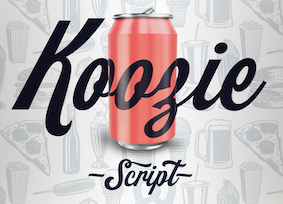 [
[ Designer born in Miami in 1967. Dan Hardie designed the Avant Garde-inspired Miami Citype (2016). Free download at
  Miami Beach, FL-based creator of the experimental typeface Schnell Tiger (2014). [
 Born in Kansas, David Sagorski moved to southern Florida to study at the Art Institute of Fort Lauderdale. He then moved to New York City and created several display typefaces and picture fonts for ITC and Letraset. David worked on oil rigs and pipelines in the bayous of Louisiana. He was encouraged to peruse type design based on the suggestions of friends and associates who admired his handlettering and other works of art.
  In 2012, Dick Pape made 26 fonts, one for each letter of the alphabet, called
  Megan Tamaccio (District 62, Miami, FL) designed the Jack & Zoe Font Collection and the LilRebel and
  During his studies at Flagler College, Saint Augustine, FL, Dominic Whitaker created the circuit font Neo Drive (2014).
  Graphic designer in Sarasota, FL.
  Digital agency in West Palm Beach, FL, est. 2016. In 2016, they designed the hand-painted typeface Jericho.
  During his studies at Full Sail University, Winter Park, FL-based Ethan Barber created Regal Triumph Sans (2015, avant garde), Rubber Flex Sans (2015) and Cacti (2015, decorative caps). [
 Saratoga, FL-based designer of Armature (2014, experimental typeface) and Arqueado (2012, a combination of Baskerville and Arcus, a display typeface inspired by arches). The Armature typeface was finished during her studies at Ringling College of Art and Design in Florida. Gabriella was born in Panama and raised in Kansas City.
 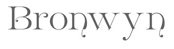 Sign painter and gilder now located in Blue Ridge, GA. He made the Victorian signage font families Tyler (2003, inspired by a typeface by E.L. Brown from the late 1800's),
  Based in Miami, FL, German Blanco created the fun figurines typeface
  [
[ BFA Graphic Design, Boise State University, ID, 2011. Now located in Tampa, FL, Conrad Garner created of the free heavy copperplate sans typeface
  Harris inherited the
  Florida-based graphic designer and wildlife photographer. Creator of the handcrafted typefaces Lucasta (2015, thick brush script), Thinsweet (2015) and Threadbear (2015), and the decorative caps typeface Zennadoo (2015).
 During his studies at Full Sail University, Jack Maschka (Orlando, FL) created the mechanical line exploration typeface Mantis (2014), which is inspired by designer Petros Afshar.
  Tampa, FL-based creator (b. 1972) of the slab serif typeface Icebreaker (2016), the heavy poster typeface Gordoni (2016, based on an old sketch from William Hugh Gordon), Fungus (2016), the cartoon typeface Murder Block (2016), the ink splatter typeface Ram Rod (2006), the art nouveau typeface Nouveau Uncial Caps (2015), the ultra-fat display and scanbat typeface Tough Guyz (2008, tough guys in Hollywood), and the paint brush script Greenwood RS (2008). [
 Miami, FL-based graphic designer, who created a rounded slab serif typeface called
  Prolific type designer in Florida, b. New York, 1952. His fonts were originally free and consisted largely of dingbats. Around 2005 he went commercial, and now sells his work (over 350 fonts as of 2009) via
  During her graphic design studies in Miami, FL, Jennifer Cuenca created the splendid stroke-based oriental simulation typeface Nishirinku (2014), which tries to emulate katakana. [
 American designer (b. 1914, New York, d. 2003, Orlando, FL) of ITC American Typewriter (1974). Joel Kaden designed the light and medium styles. Tony Stan made the bold weight. Ed Benguiat finished the italic in 1989. Other digital fonts that mimic ITC American Typewriter: Typewriter (Softmaker), Modern Typewriter (Softmaker), Typewriter 911 (Bitstream), Memorandum (Corel). Posters of ITC American Typewriter by Sophia Dragoudi (2011):
  During his studies in Miami, FL, John Andrew Spinnenweber created the connect-the-dots font Connect (2014), which was inspired by circuit boards. [
 [
[ [
[ Designer (b. Florida) in the greater Chicago area who graduated from Columbia College Chicago. Creator of the spurred black death and wrought iron fence typeface family
  Born in Missouri in 1979, Kimberly moved first to Texas and later (in 2007) to China, and most recently, to Orlando, FL. She made some free fonts (often handwriting styles), and also ran a personal handwriting font service [those fonts have names that start with KGD].
  This web site, related to Joshua Smith's Hydro 74 foundry in Orlando, FL, offers original creations, both free and commercial. They specialize in vintage signage type, display type, the Western look, scary typefaces, art nouveau, tattoo type, psychedelic and Victorian styles. The catalog as of 2011: Anarchy Script, Aphex Script, Apocalypse, Avante, Black Mail Sect, Black Mamba, Black Plague (blackletter), Burial Black, Cadaver Ink (tattoo font), Cadaver Script, Calypso, Catalyst, Cortez, Dayton Black, False Idols, Golden Age, Heresy, Hood Black, Hydro Script, Imperial Black, Iron Fist, Kremlin Ink, Kustom Style, La Calavera Catrina, La Santsima Muerte, Le Venom, Lucky's Flash, Martyr Black, Muerte Black, Napalm Vertigo, Nue Black, Nue Goth, Norway Black, Razor Black, Royal Baron, Sacred Black, Sailor Jerry, Salem Witch Hunt, Sentry Black, Spitfire, Skid Row, Thai Black, The Clique, The Thickness, Thunder Script, Tramp Stamp, Tyranny Gothic, Uber Black, Vahalla, Venice Black, Viper Black, War Machine, West Coast Soul, Wolfstien Electro, Working Class Hero, Zombie Allegiance, Zombie Attack, Slash Black, Suture Set, Corpse, Czar, Proclivity, Uber Black Caps.
  During her graphic design studies att the University of Central Florida in Orlando, FL, Liana Anjuli created the watch-themed display typeface
  Jacksonville, FL-based graphic designer. He created the
  Miami, FL-based designer of Vela (2014, a display typeface inspired by sailboats). [
 Graduate of Savannah College of Art and Design who now freelances in Orlando, FL. Creator of the Victorian typeface
 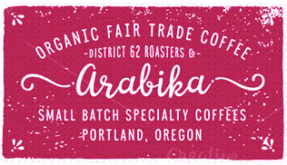 [
[ Floridian designer, b. 1987. Student at Flagler College in Tallahassee, FL. Creator of the flared display typeface
  Miami, FL-based creator of the
  One by Four is a four-person design studio in South Florida, and later in Brooklyn, NY. The main type designer in the group is South Florida-based Natasha Maria Fernandez-Fountain (b. 1985). The others are Alejandra Abad, Brian Haines and Bruno Torquato. Typefaces by Natasha include Geomancy (2010, +ExtraBold, +Hairline; a
 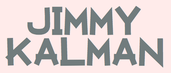 During his studies in Miami, FL, Jimmy Kalman (OX Lab) designed the
  Lake Mary and/or Orlando, FL-based designer of Logico Sans (2017) and Nova Classic (2017). In 2018, he published the headline sans typeface PC Navita, Versa Block (elliptical sans), Darla Script, Quantik, Provoke (an inline family), the
  Graphic designer and typographer in Miami, FL.
  [
[ Graphic designer in Miami, FL, who created a wonderful connect-the-dots typographic poster entitled
  Floridian designer of the modern Tuscan typeface Monoslam (2016), which is inspired by The old Boston Redsox's Circus style serif font as well as Luis Hernandez's work.
  Postmark Type is the portfolio site of Kerry O'Connor, a graduate from Flagler College in Tallahassee, FL, who lives now in Saint Augustine, FL and/or Brooksville, FL. Designer of the free outline typeface
  Rena and Ryan Martinson have created Yellow Design Studio, a type design and fine arts studio based in Sanibel, Florida.
 American designer, b. 1939, Saint Louis, MO, d. 2013, Lexington, KY. He also lived in Wildwood, Florida and Rushville, Indiana. Creator of the typewriter typeface
  [
[ [
[ While studying at Flagler College, Saint Augustine, FL, Scott Jackson (Jacksonville, FL) designed Soroban (2014), a typeface that was inspired by the Japanese abacus.
  Gainesville, FL-based designer of Agency (2014, a high-contrast all caps sans typeface family) and Diamond Type (2014, decorative caps). [
 Type designer in Sunrise, FL, who created a coop style foundry for a charity that pays for the medical bills of her siblings. Some typefaces are made by guest designers such as Jeff Levine, Ray Larabie, Matt Yow, and Brad O. Nelson. The list of typefaces:
 Barry Stock (Hollywood, FL) at Stock Graphics made
  The
The  [
[ New York-City (and before that, Miami, FL)-based dillustrator and graphic designer. Creator of the octagonal typeface
  Commercial display type foundry in Saint Petersburg, Florida, est. 2009. Their selection includes
  Miami, FL-based designer, originally from Maracaibo, Venezuela, who created the multiline numbers font 0261 (2015) and the
  Typesenses was founded in 2009 by Sabrina Lopez in Ramos Mejìa, near Buenos Aires. Since 2021, its fonts can be licensed via
  Designer (aka Funk King, b. Fort Knox, KY) who lives in Orlando, FL, and/or Apopka, FL. He used FontStruct in 2008-2009 to make over 550 decorative fonts, and became one of the world's top experts on FontStruct, FontShop's on-line font editor. Most of his fonts were withdrawn in 2012. He did a few commercial typefaces at his commercial foundry, Funk King. His creations include
  Yellow Design Studio is a fine art, graphic design and typography studio based in Sanibel, FL, and before that, in Madison, Wisconsin. The font designer is
  St. Augustine, FL-based designer of a swashy calligraphic initials alphabet in 2018. [
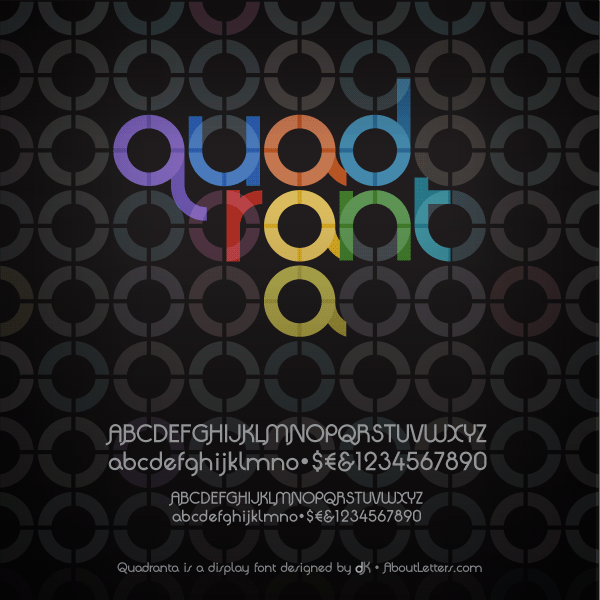
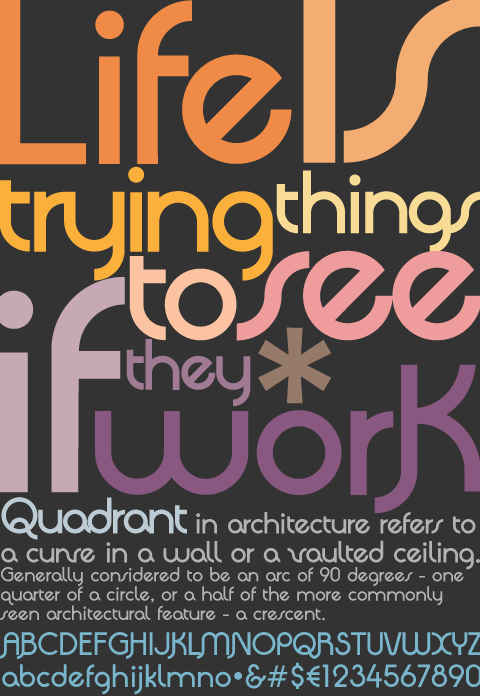
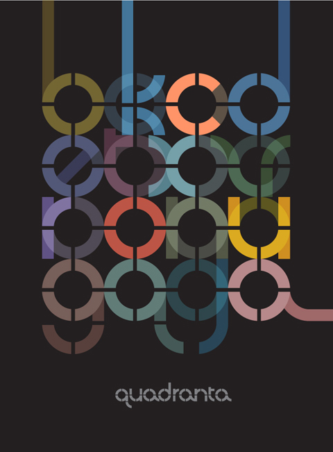
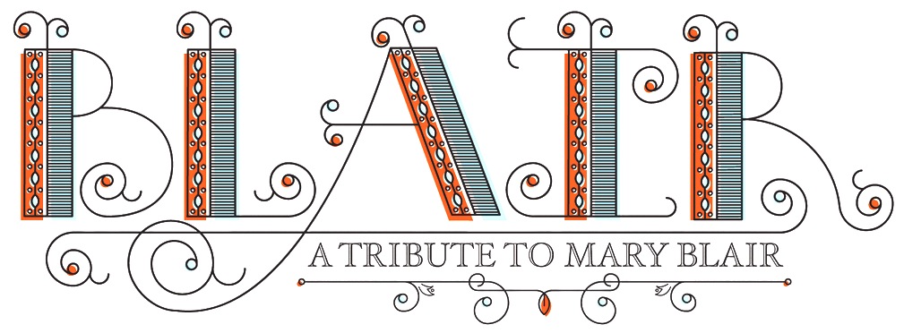
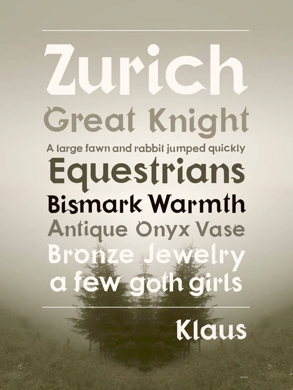
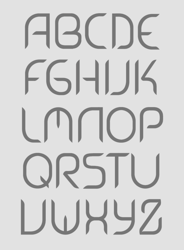
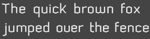
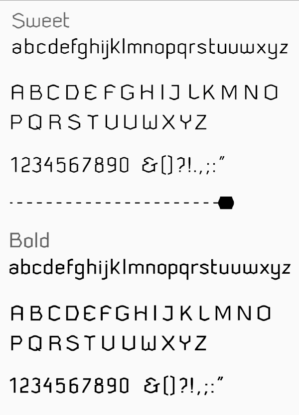
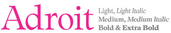
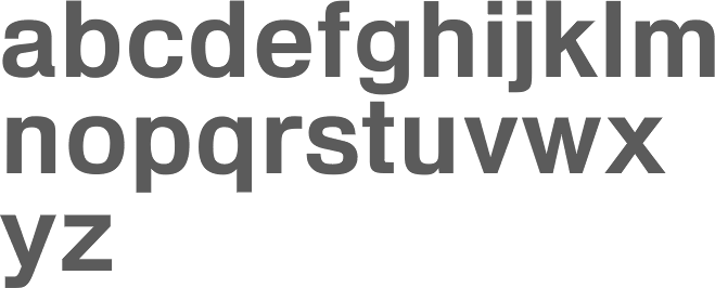
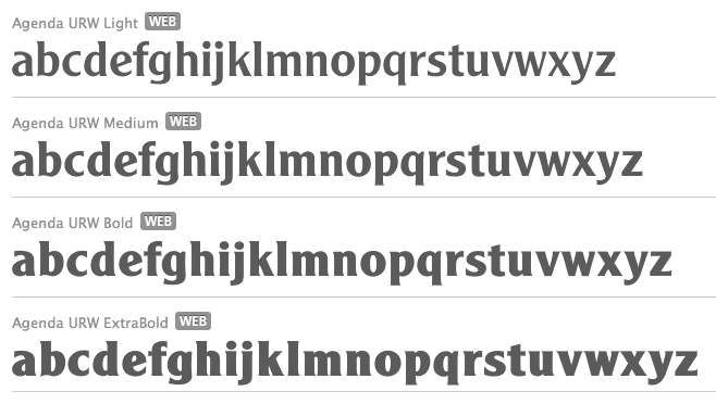
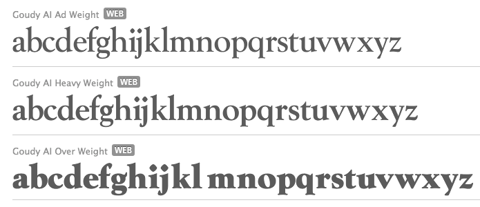
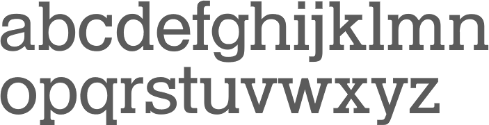
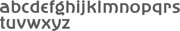
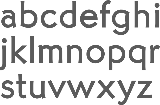
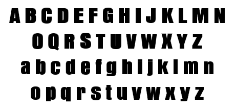
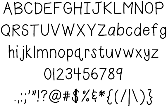
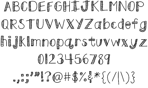
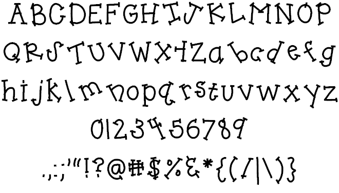
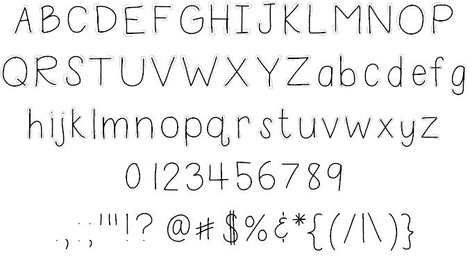
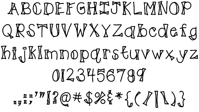
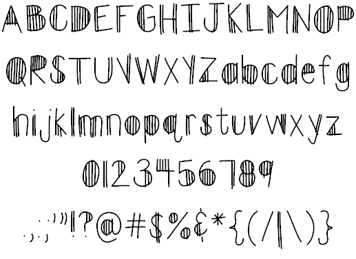
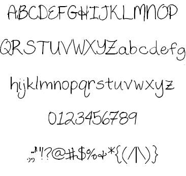
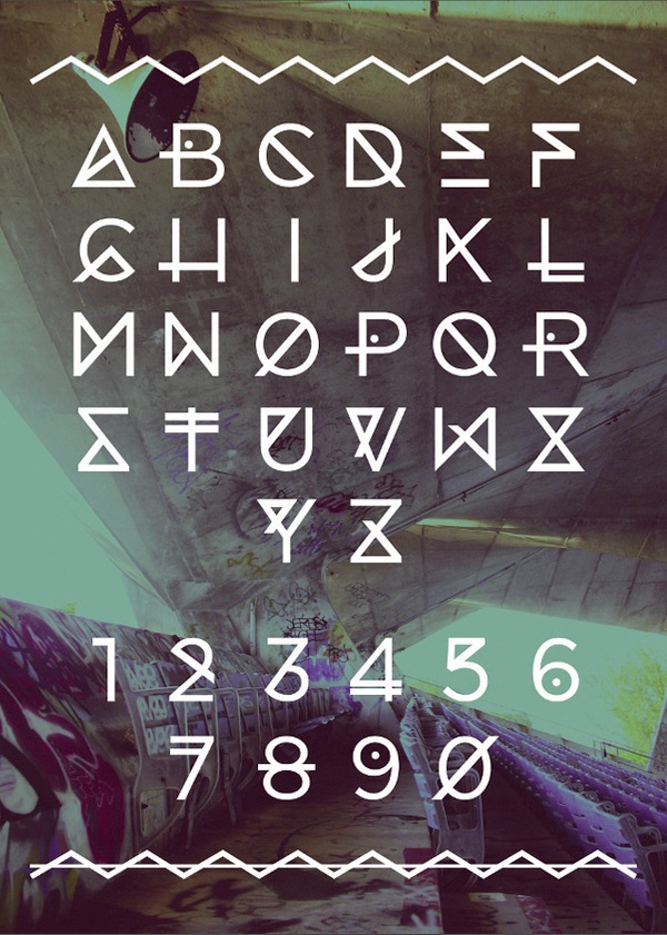
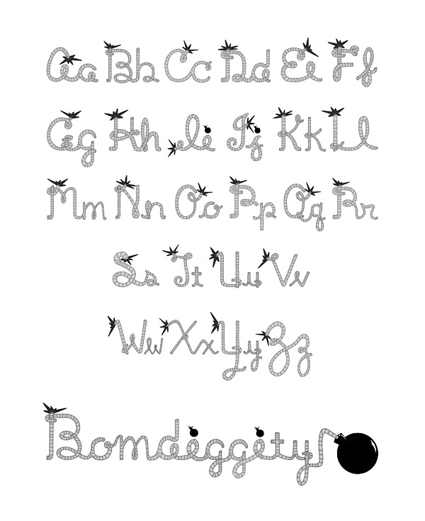
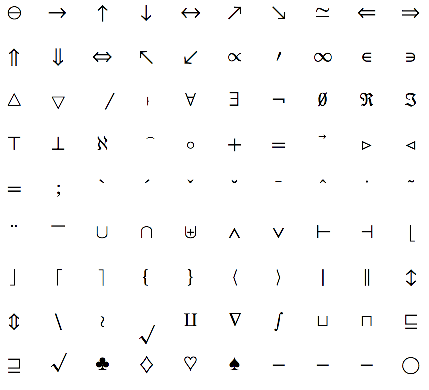
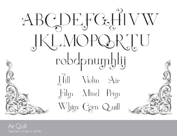
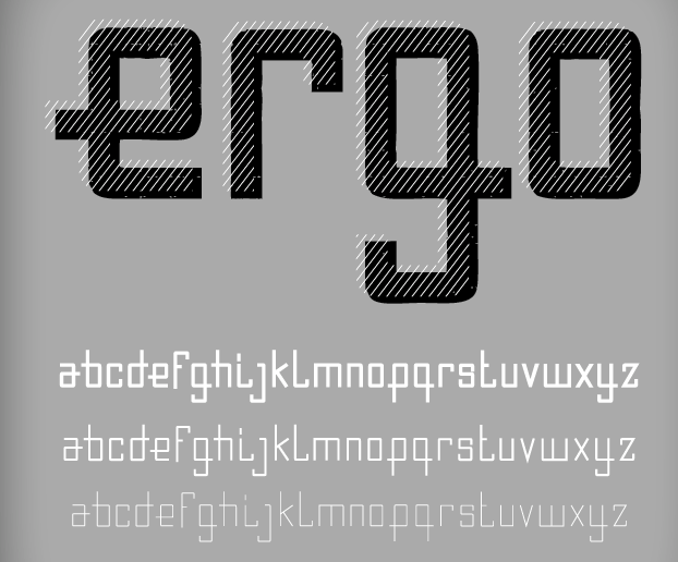
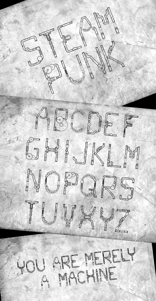
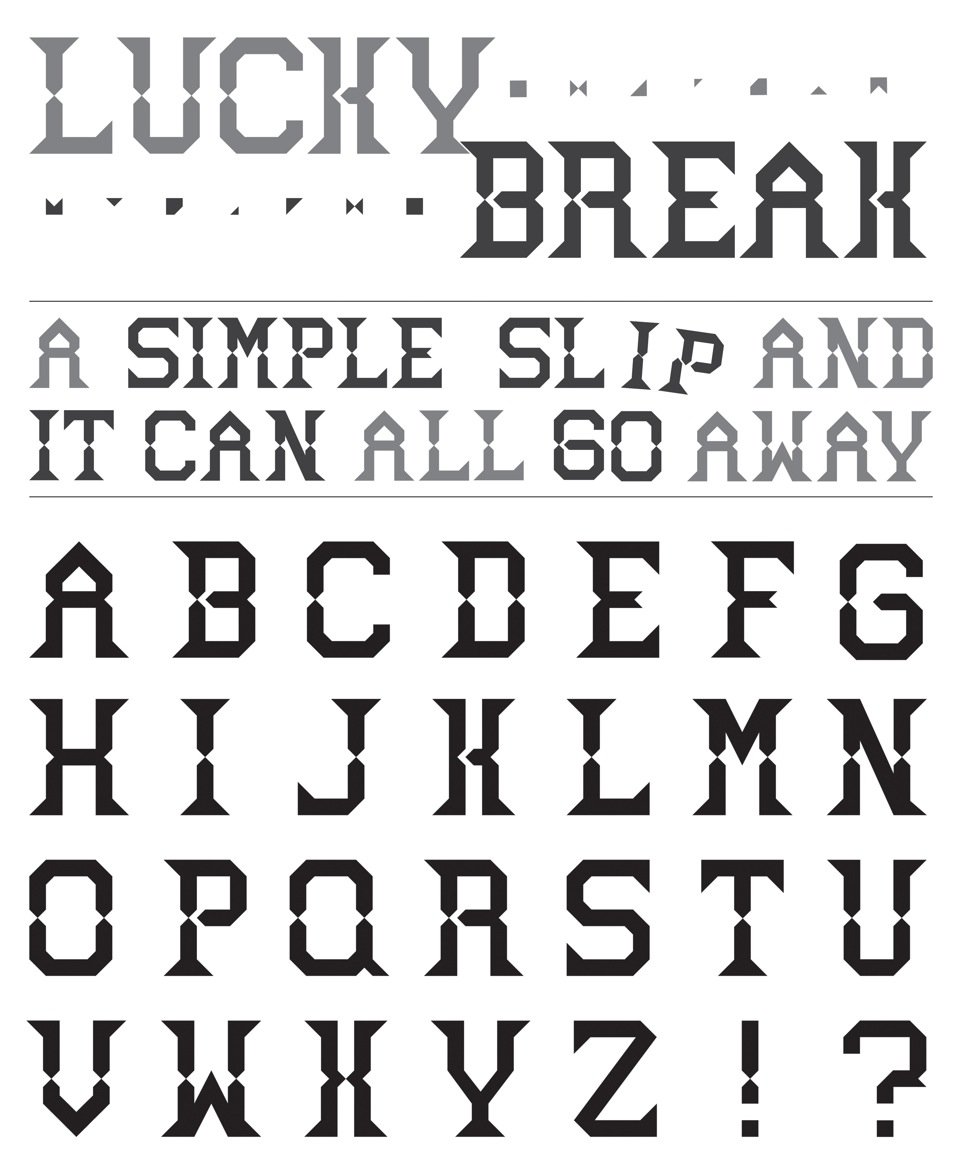
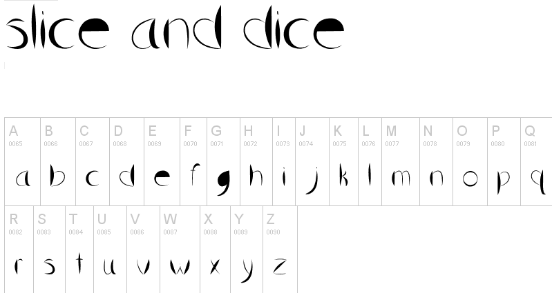
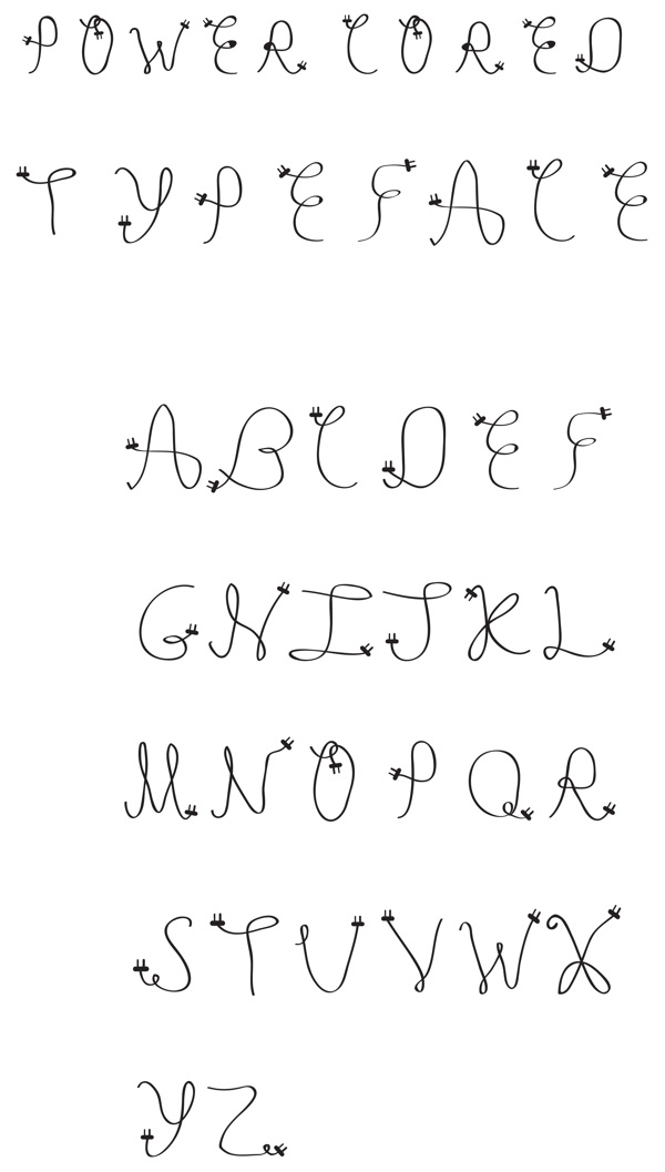
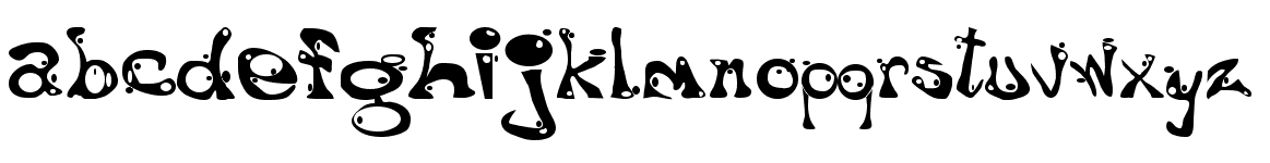
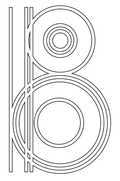
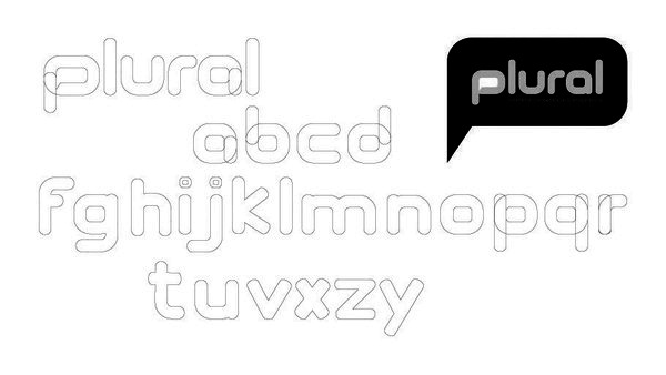
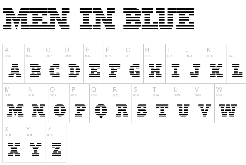
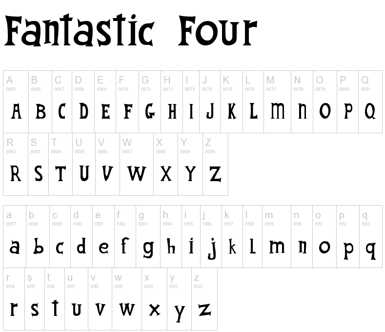
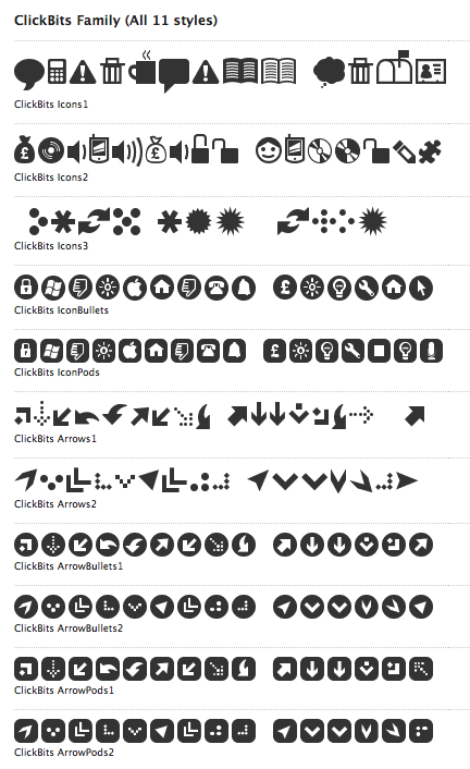
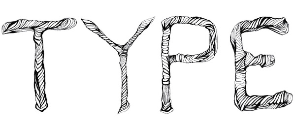
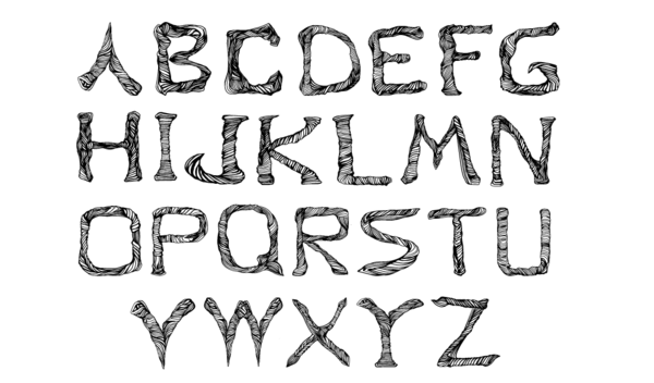
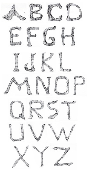
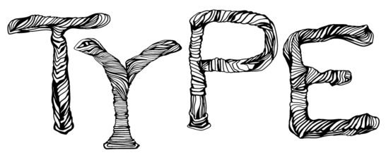
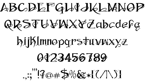
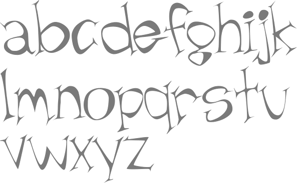
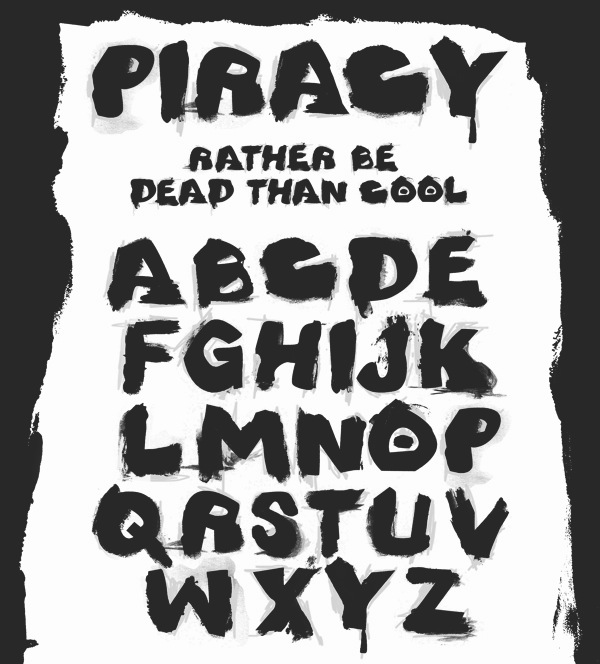
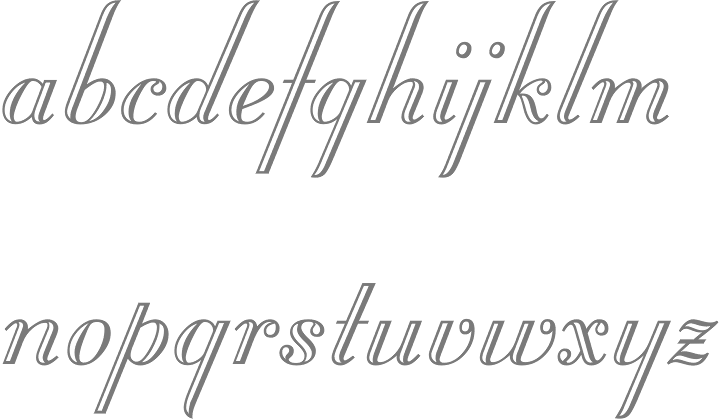
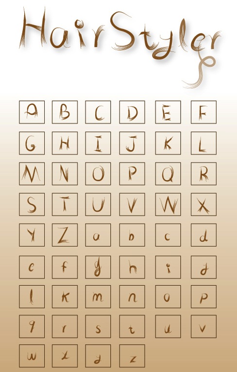
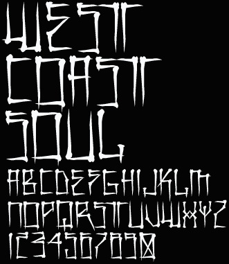
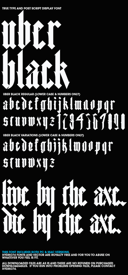
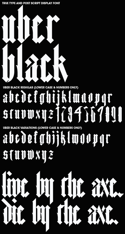
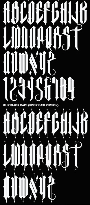
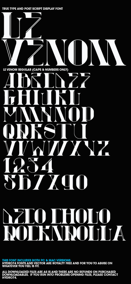
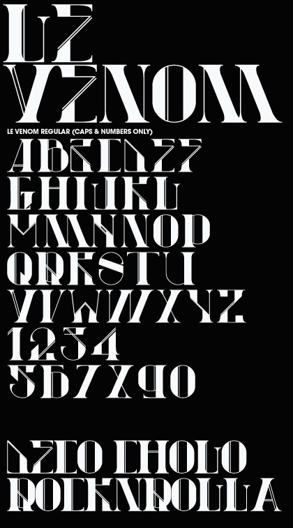
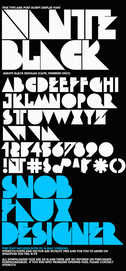
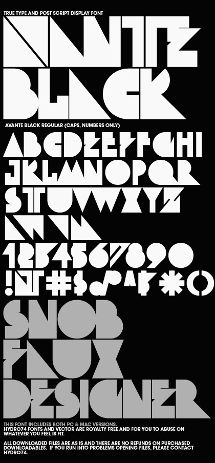
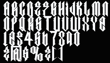
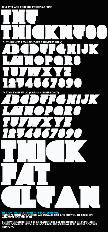
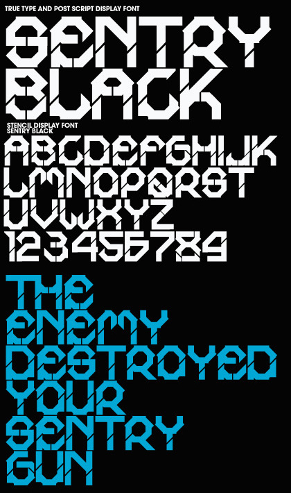
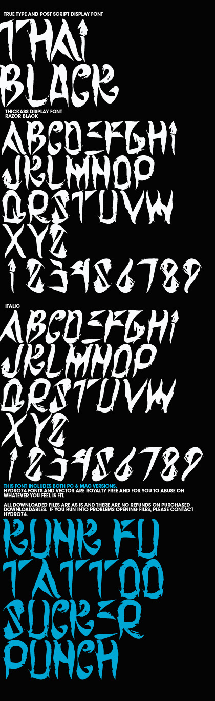
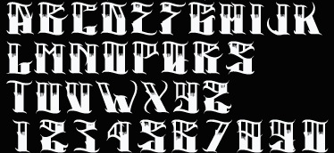
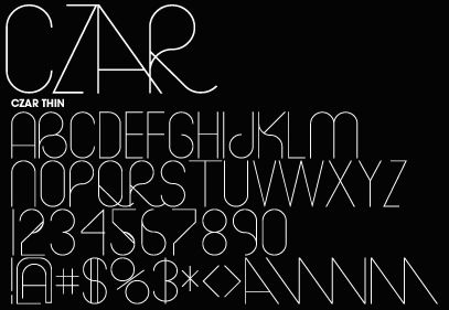
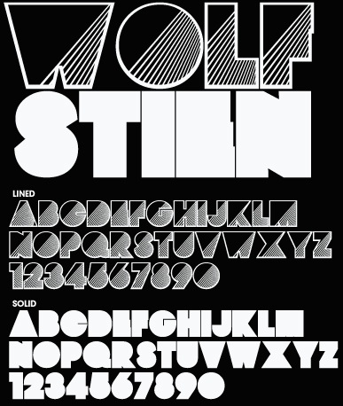
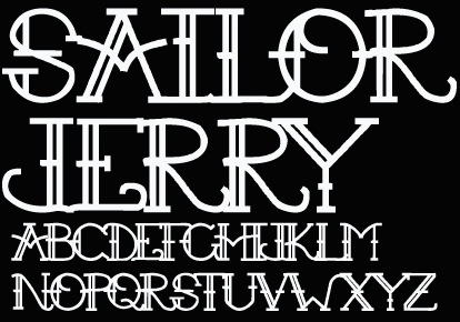
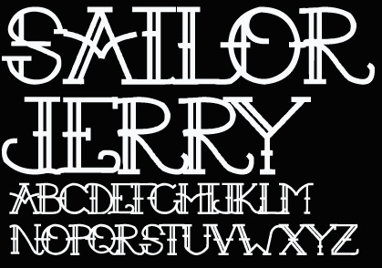
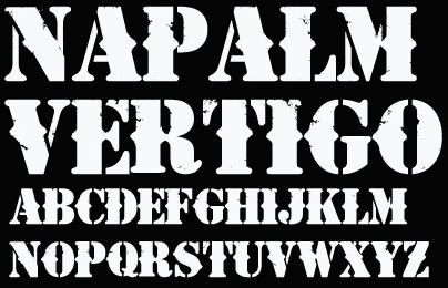
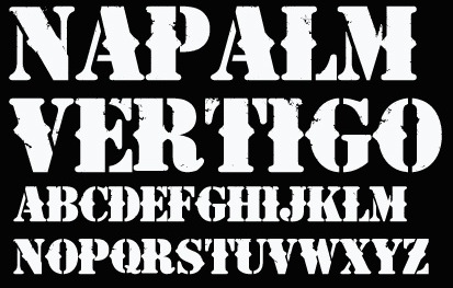
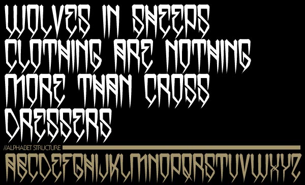
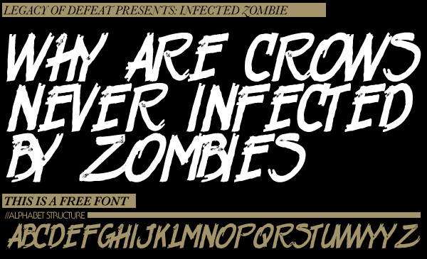
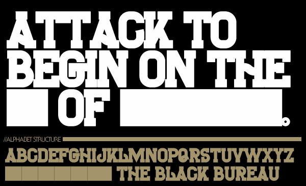
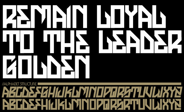
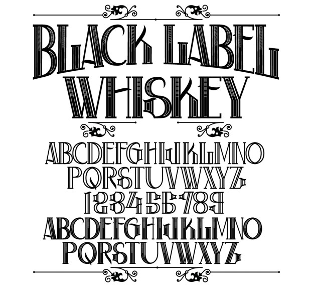
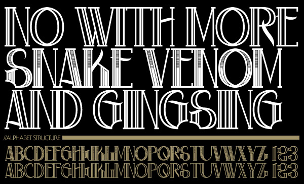
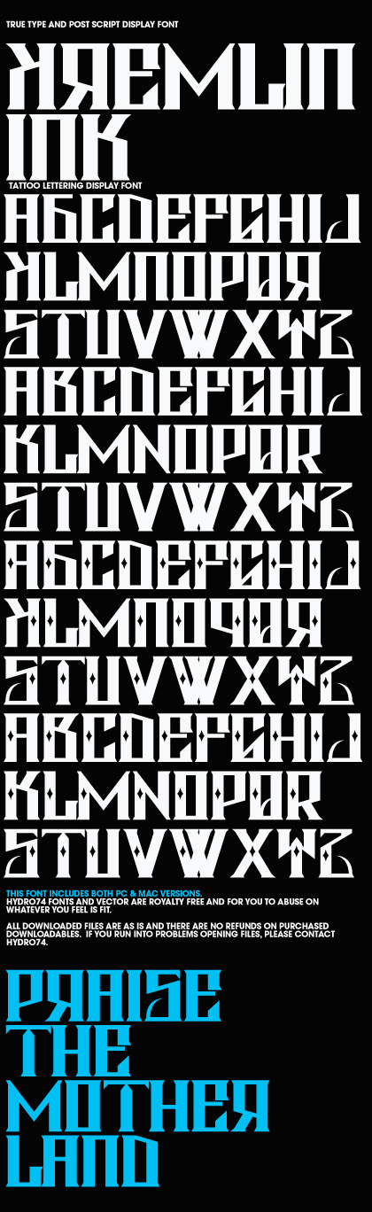
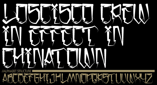
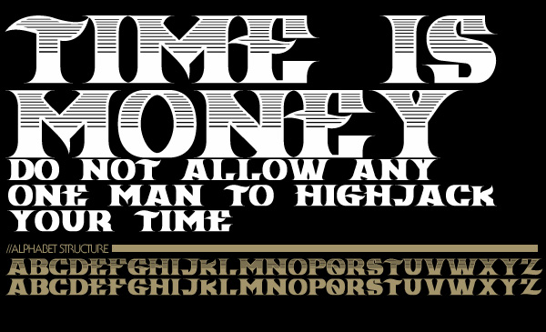
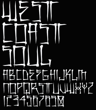
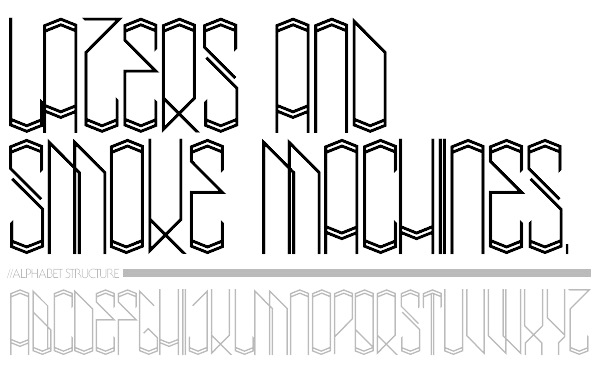
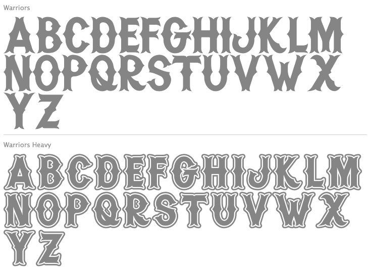
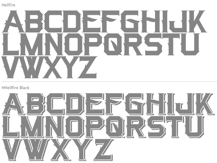
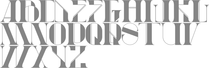
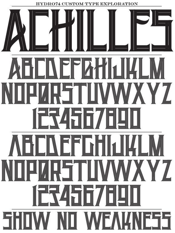
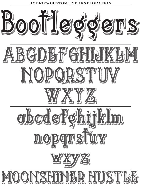
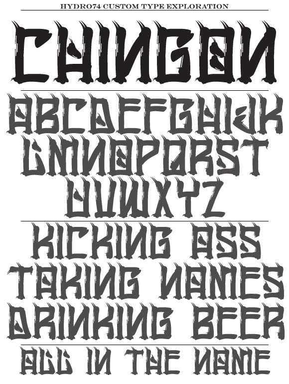
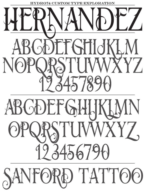
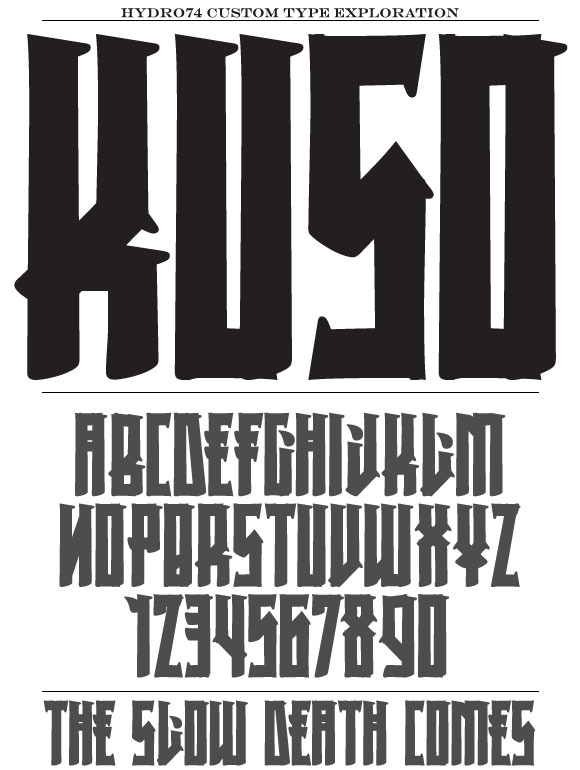
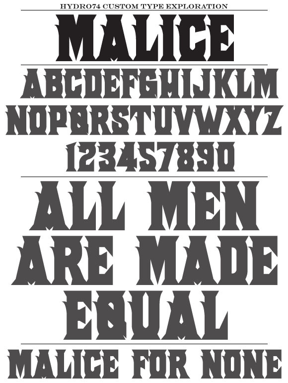
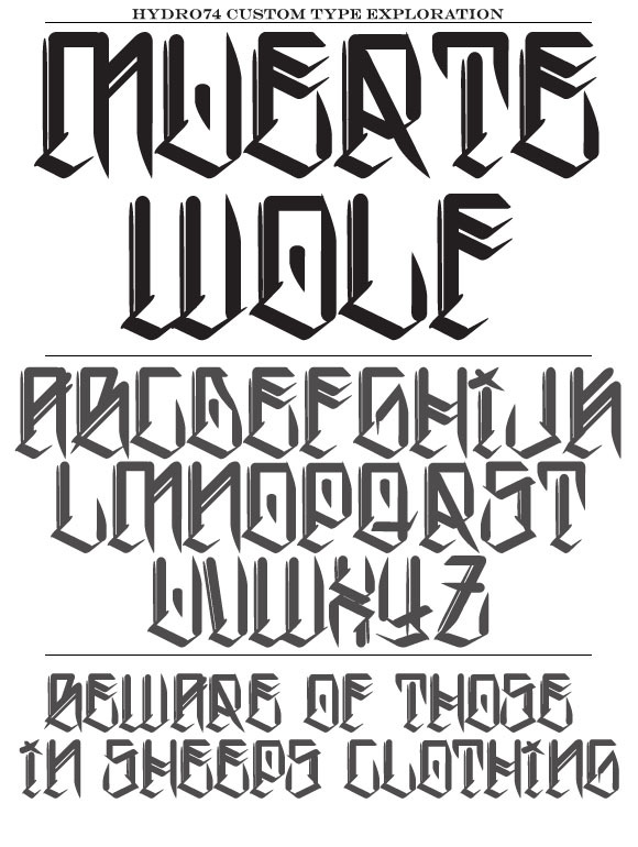
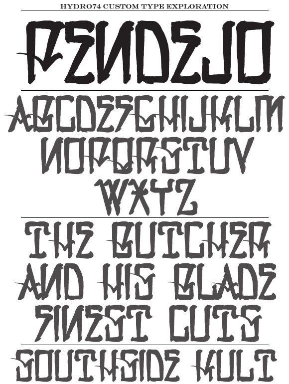
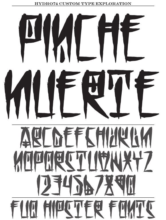
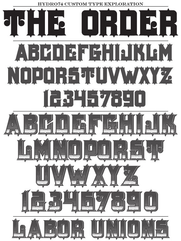
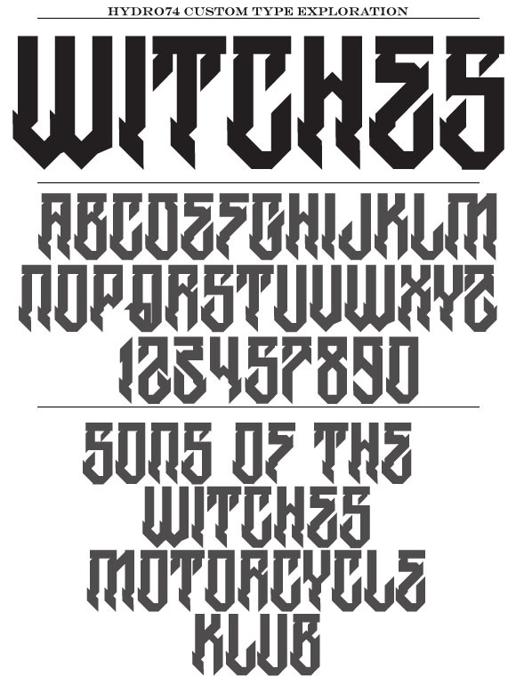
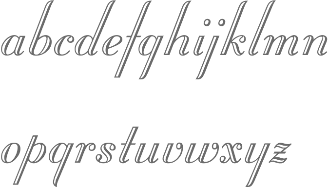
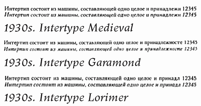
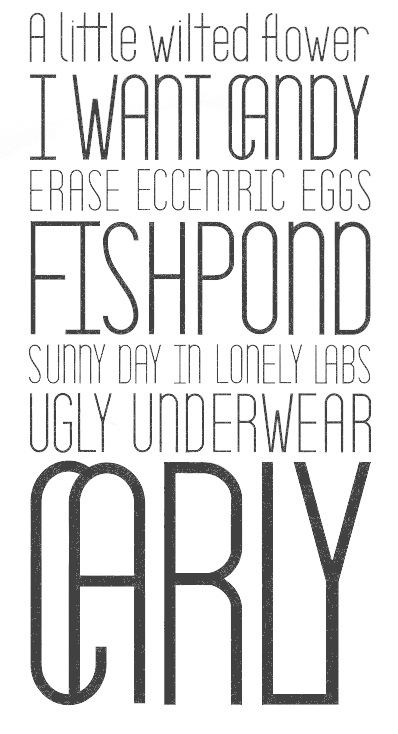
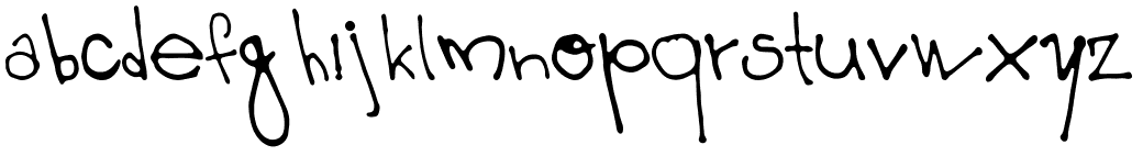
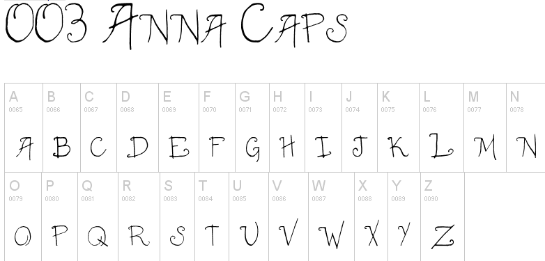
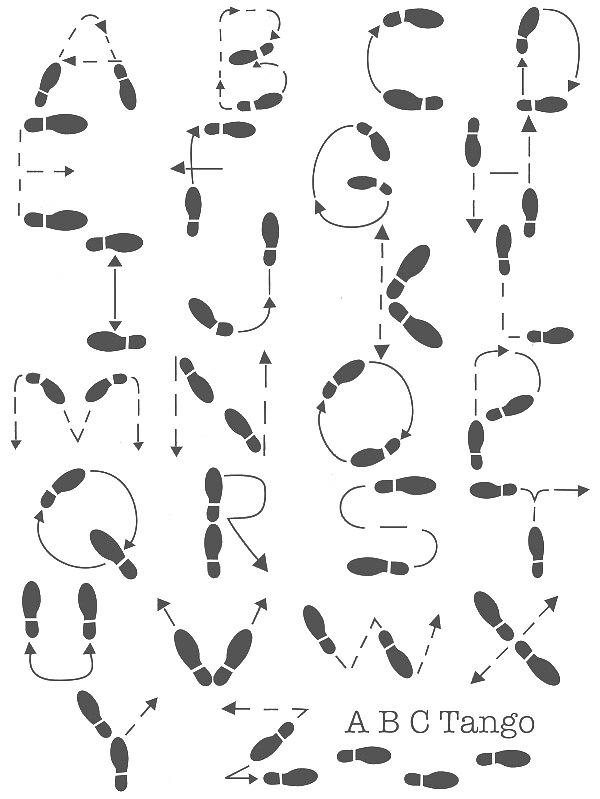
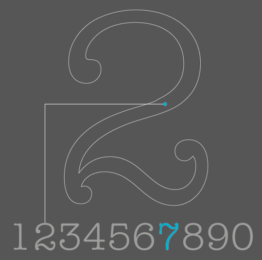
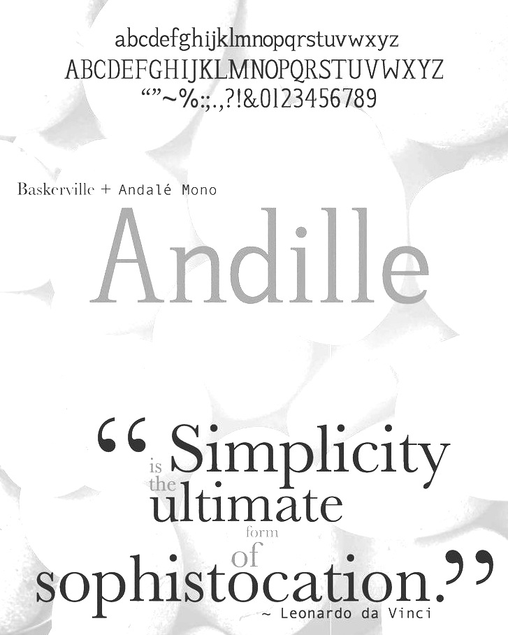
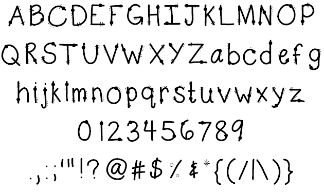
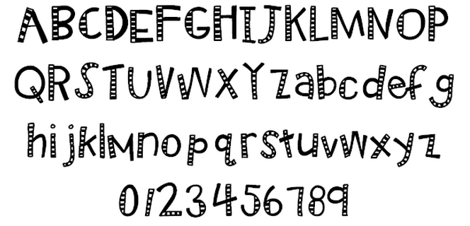
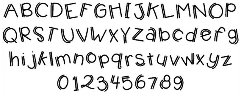
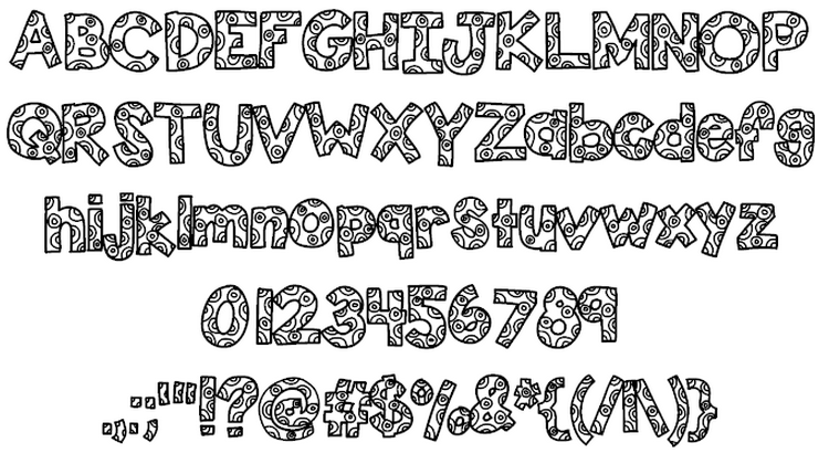
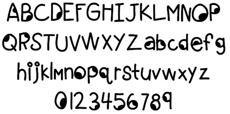
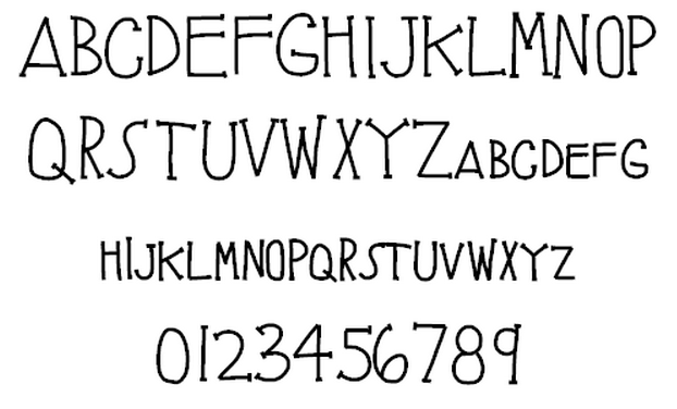
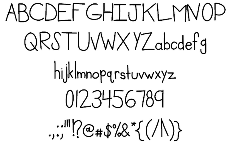
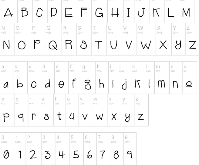
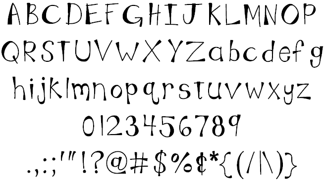
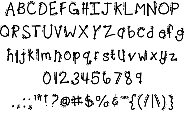
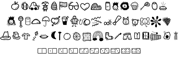
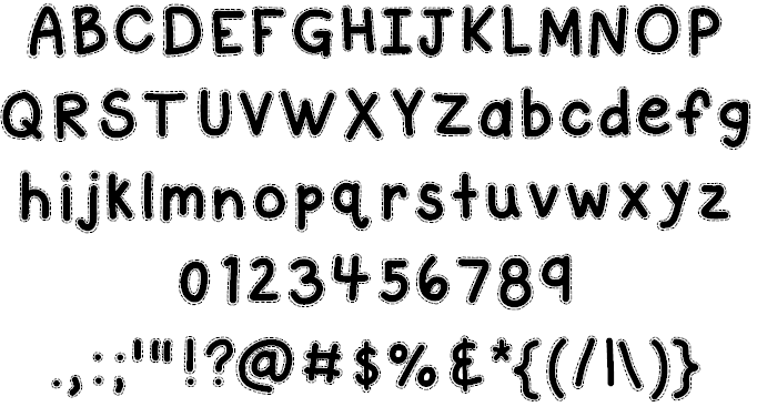
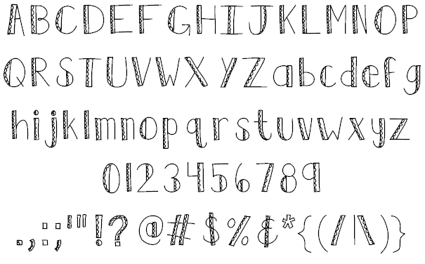
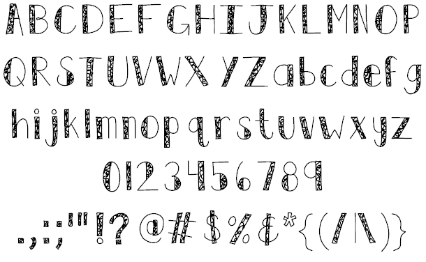
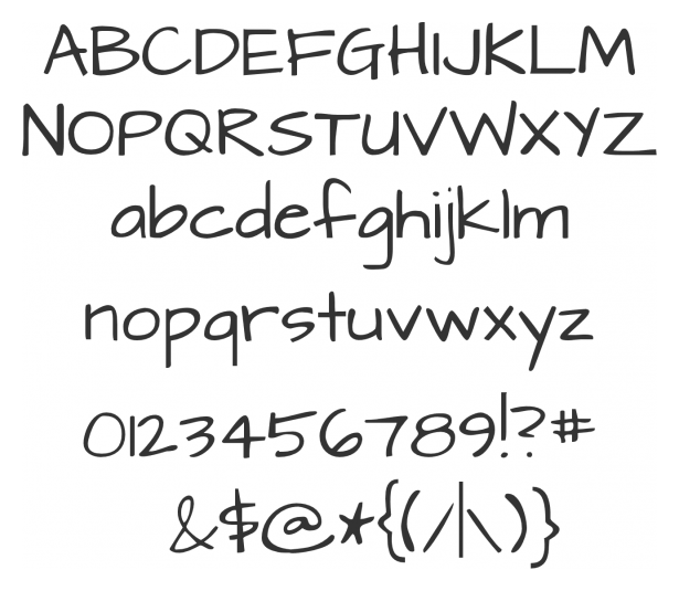
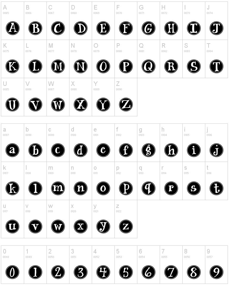
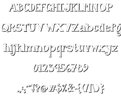
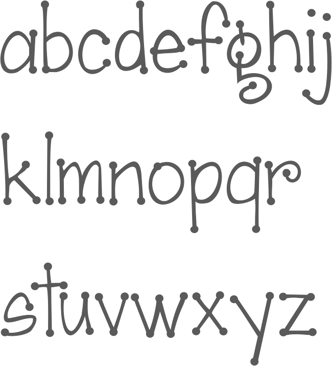
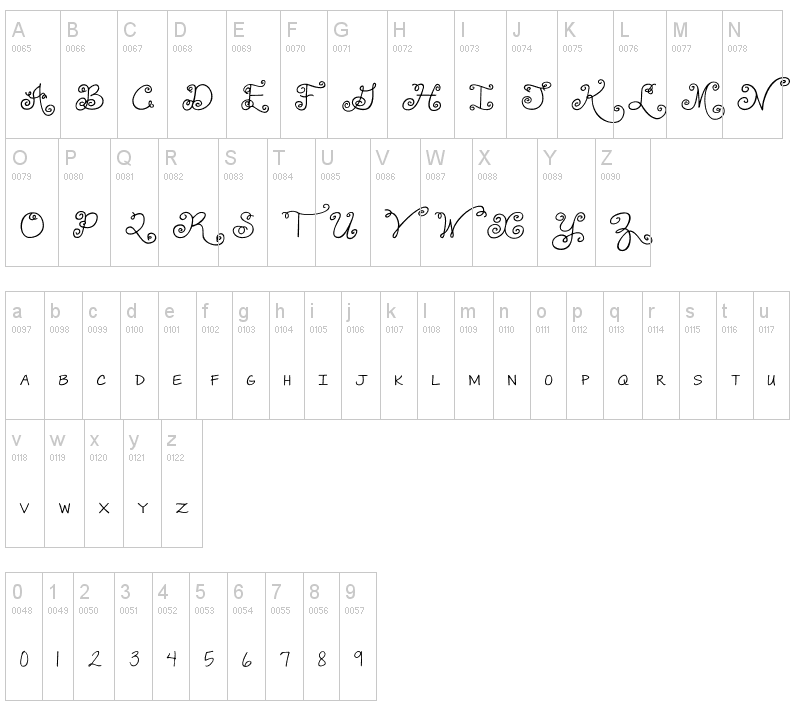
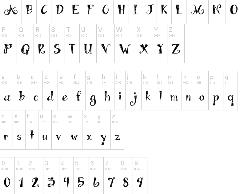
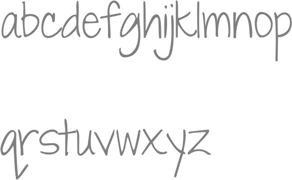
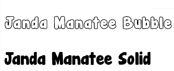
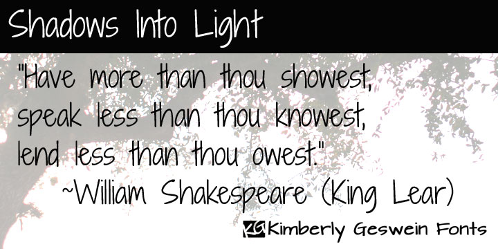
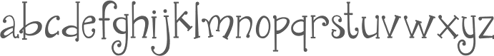
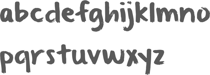
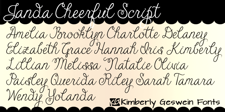
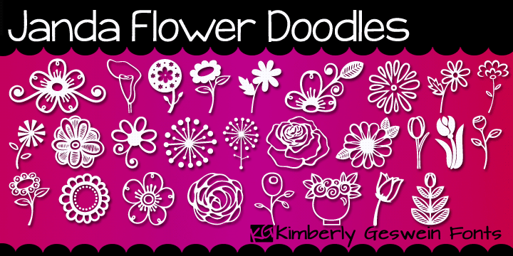
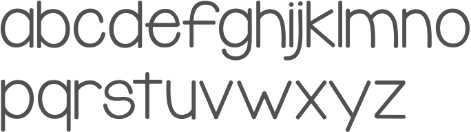
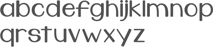
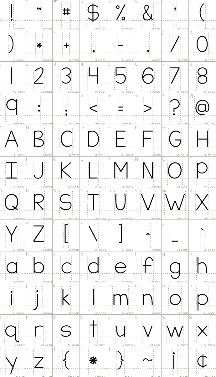
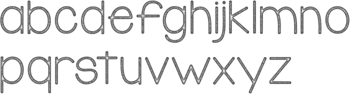
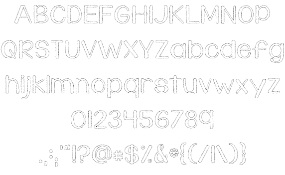
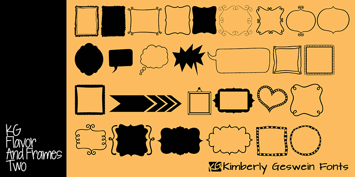
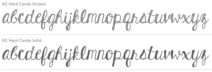
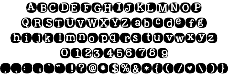
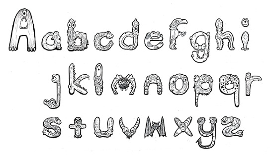
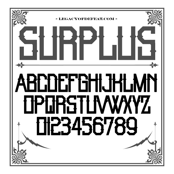
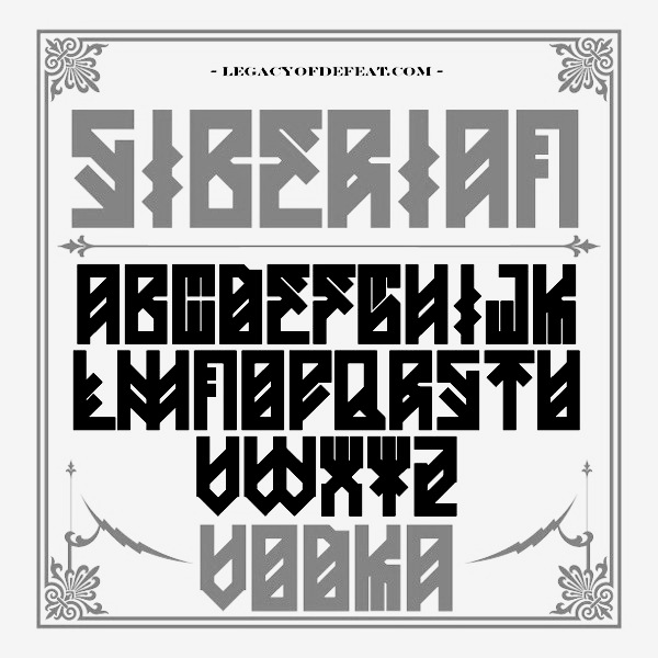
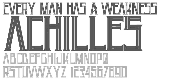
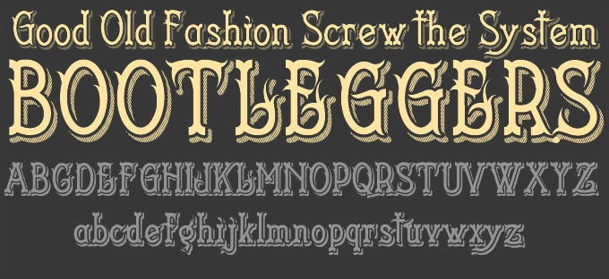
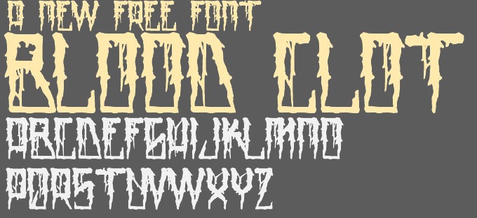
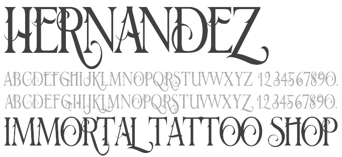
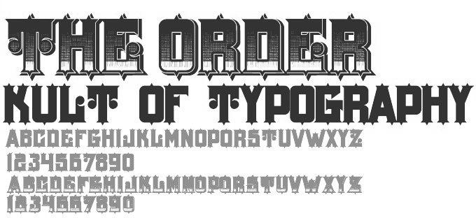
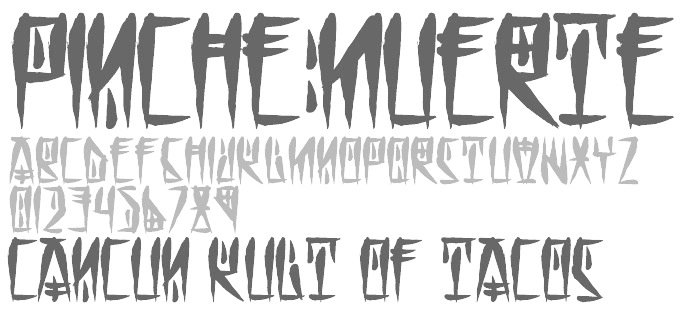
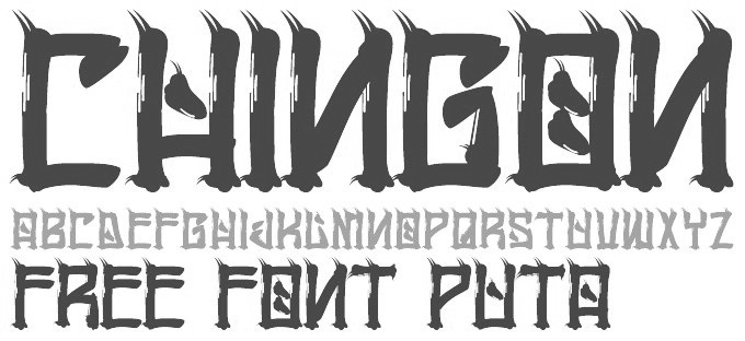
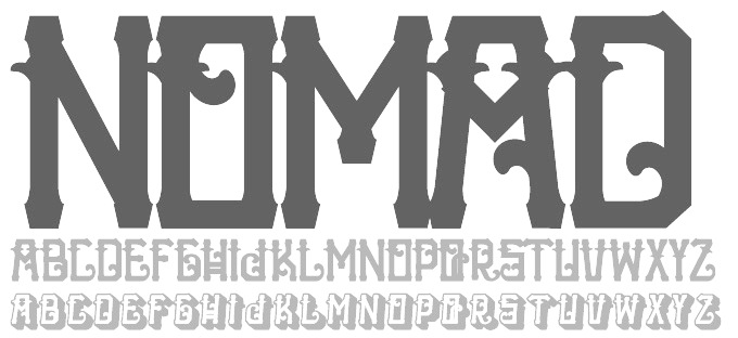
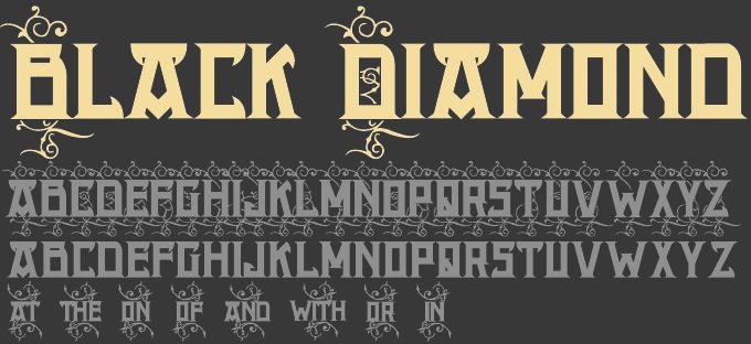
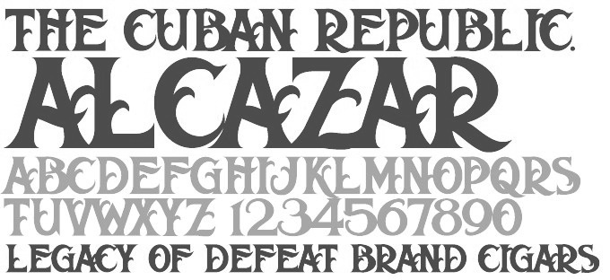
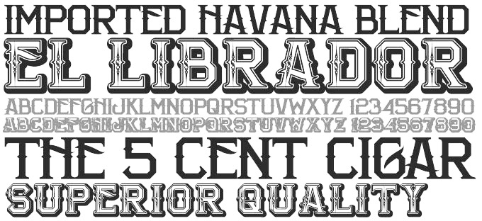
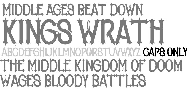
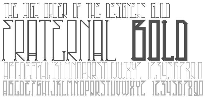
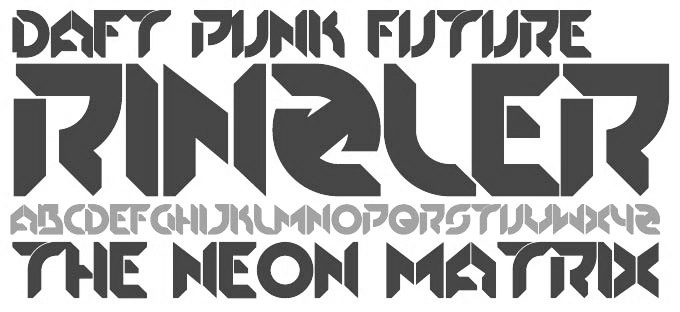
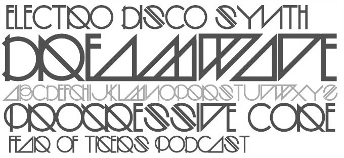
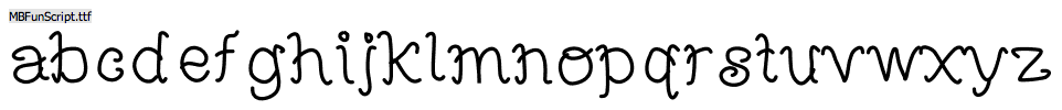
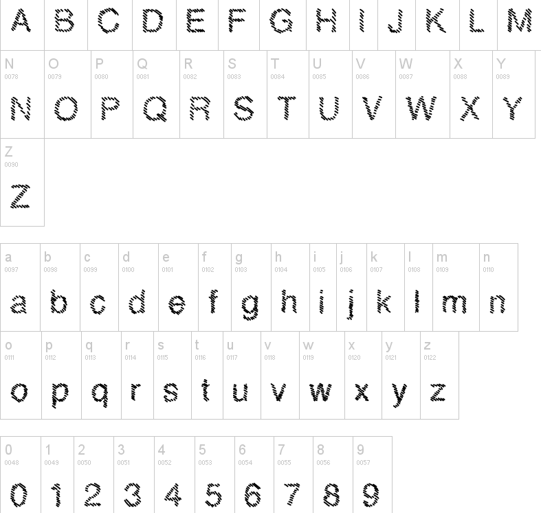
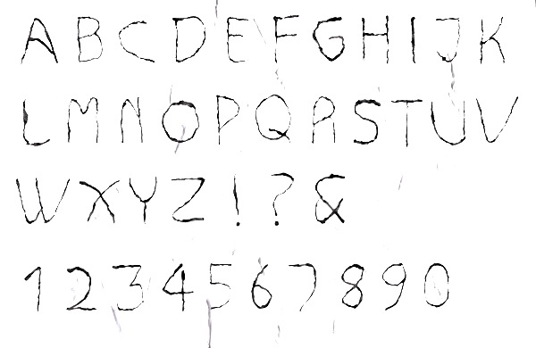
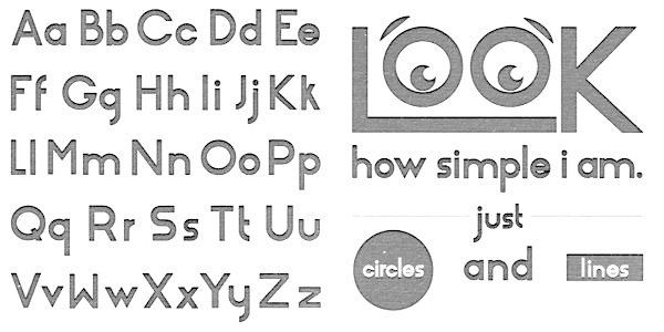
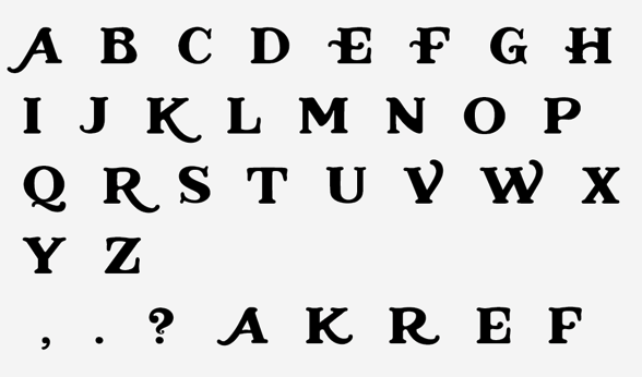
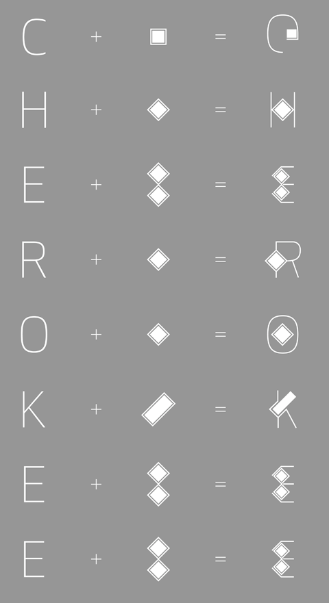
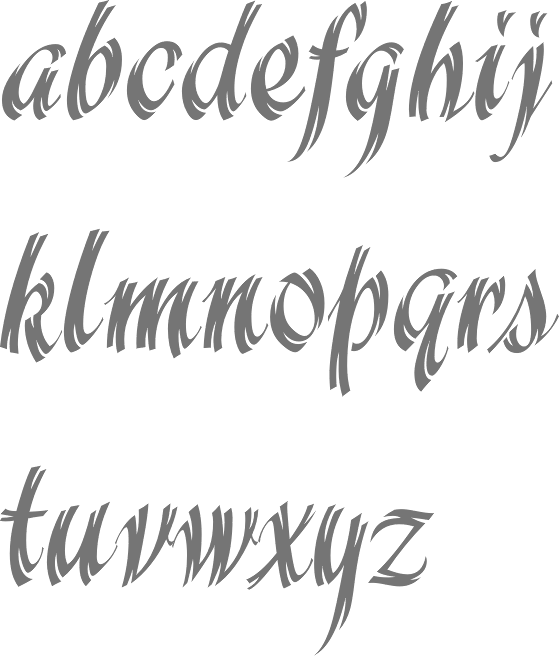
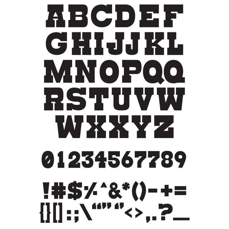
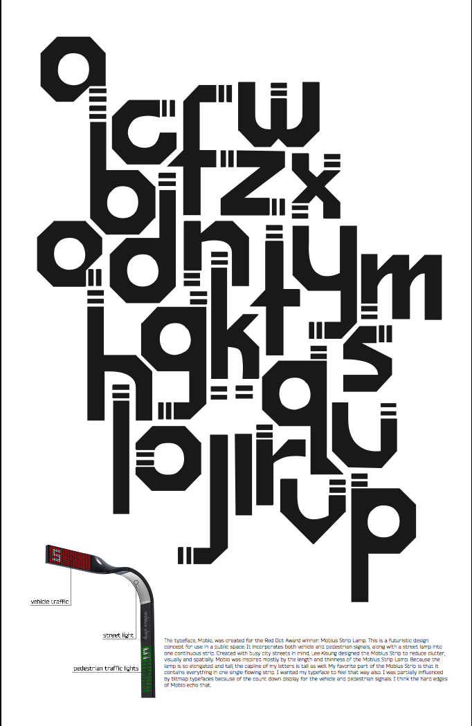
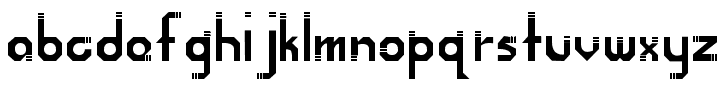
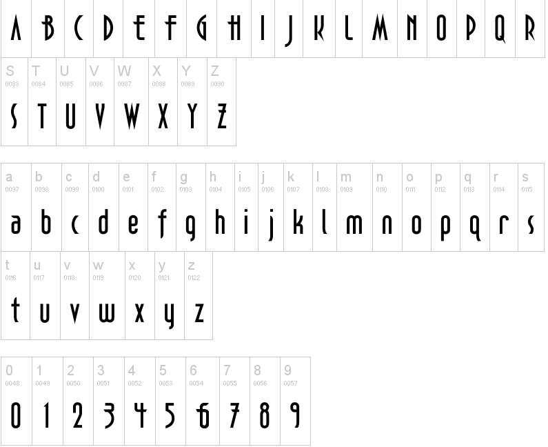
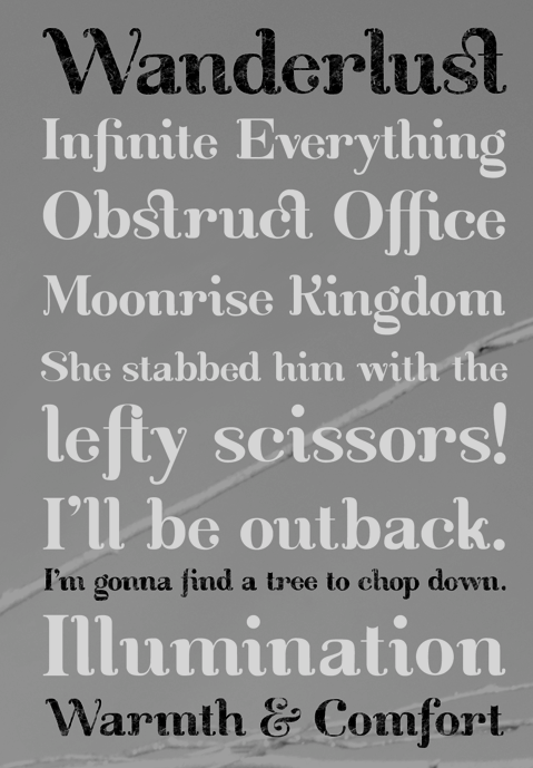
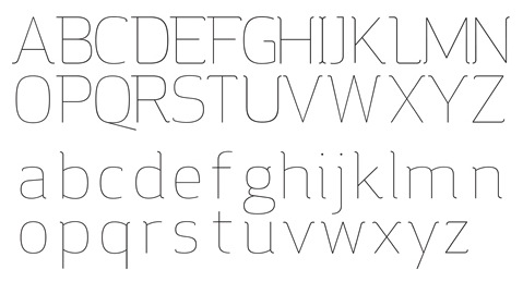
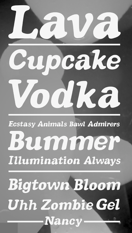
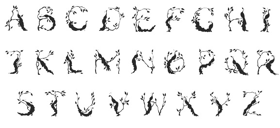
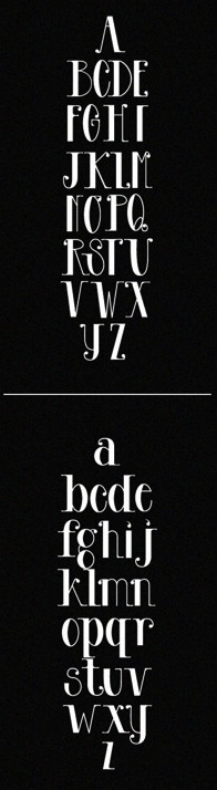
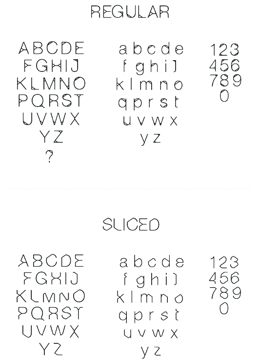
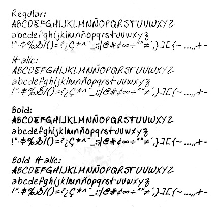
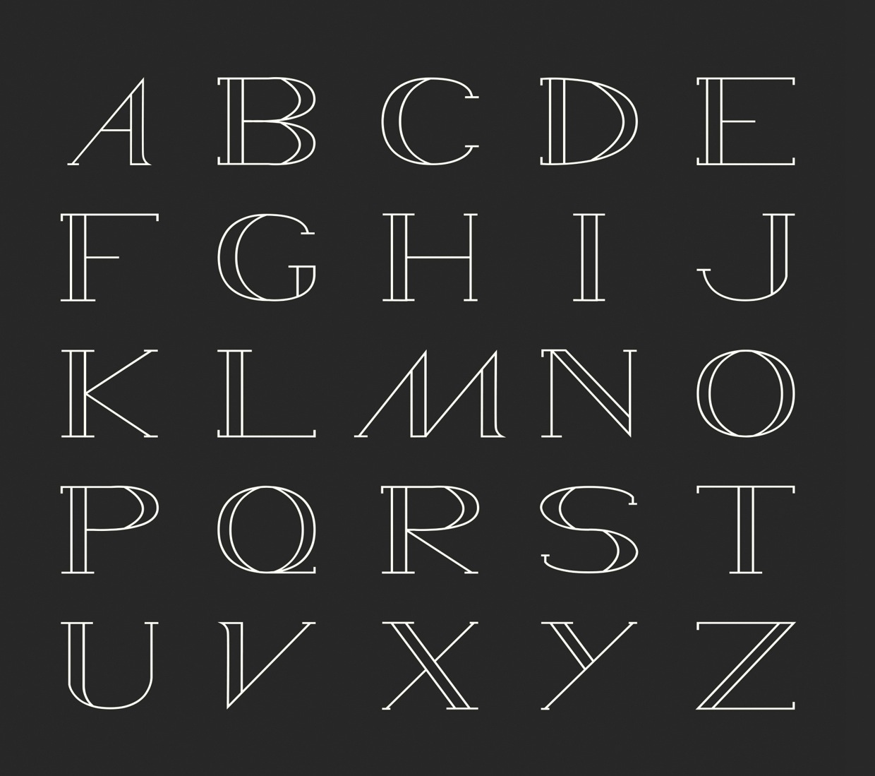
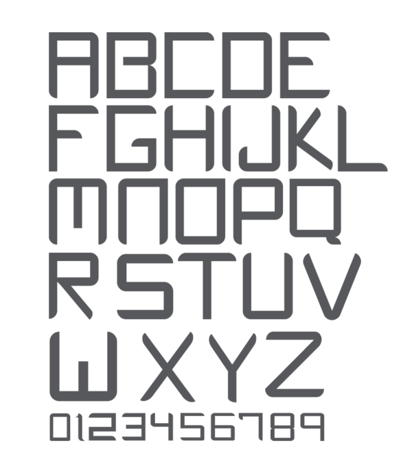
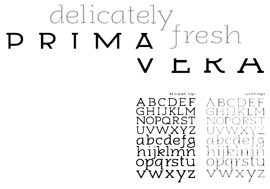
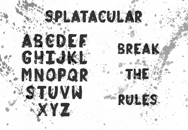
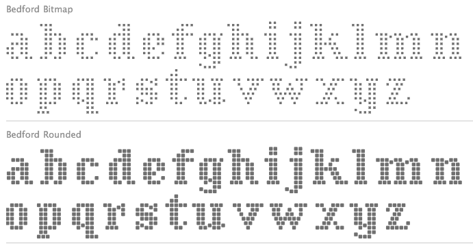
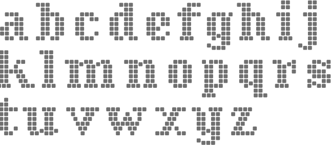
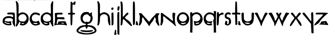
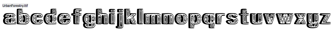
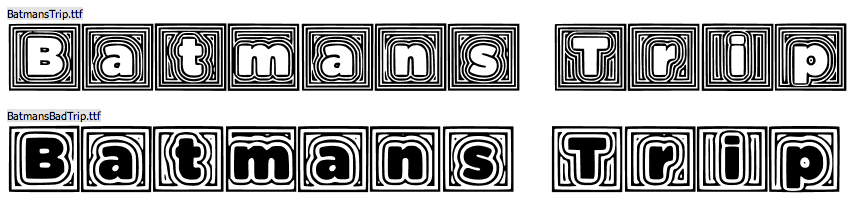
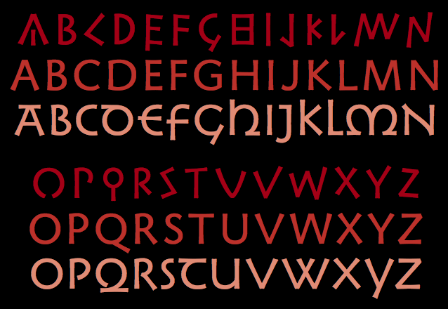
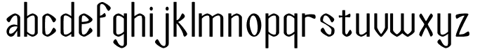
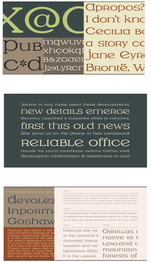
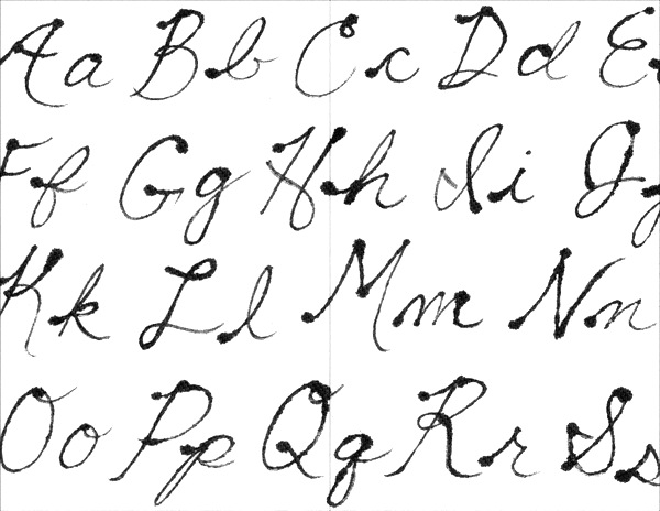
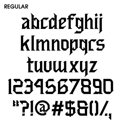
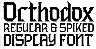
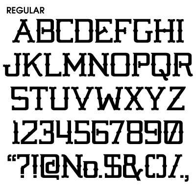
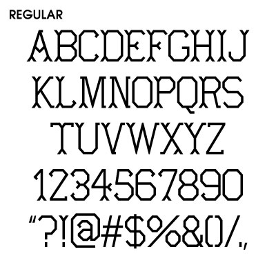
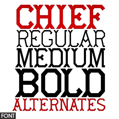
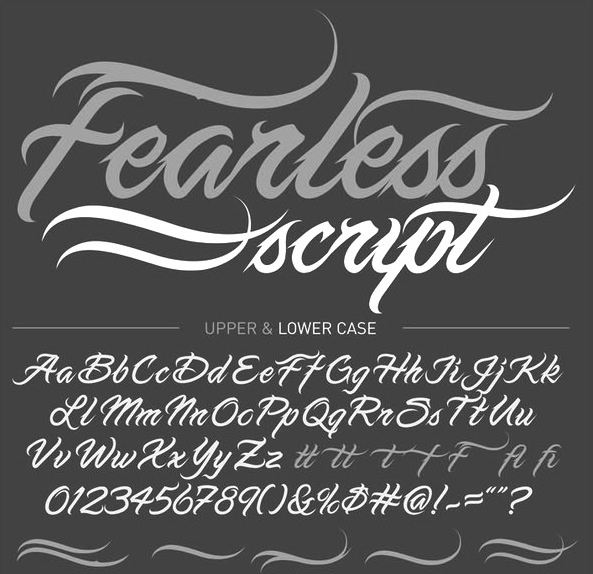
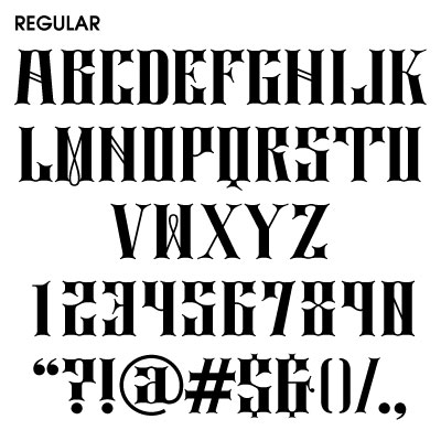
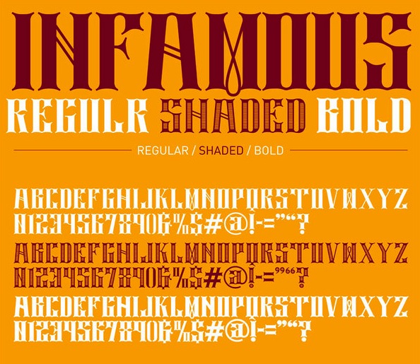
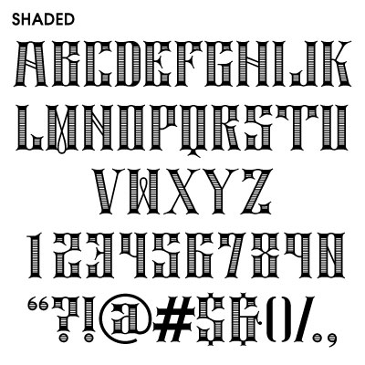
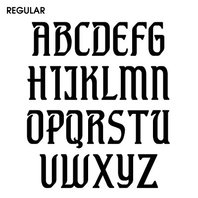
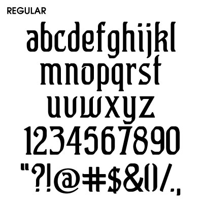
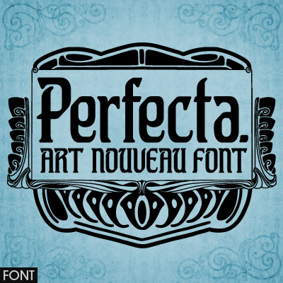
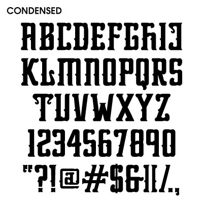
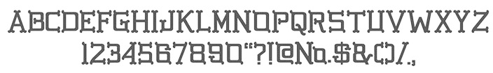
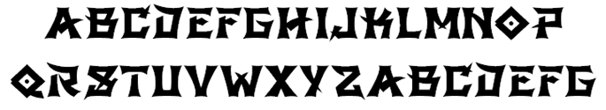
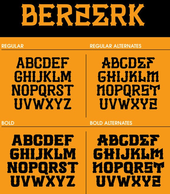
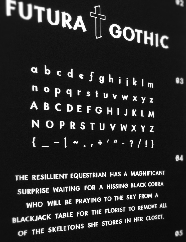
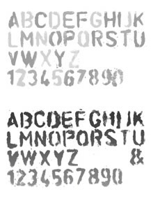
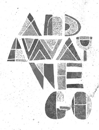
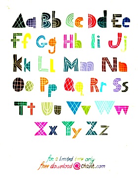
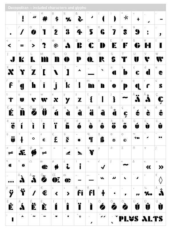
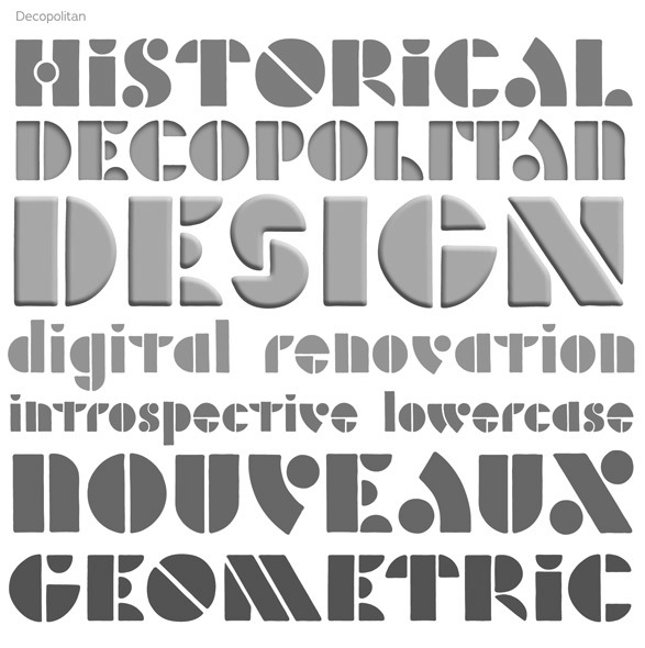
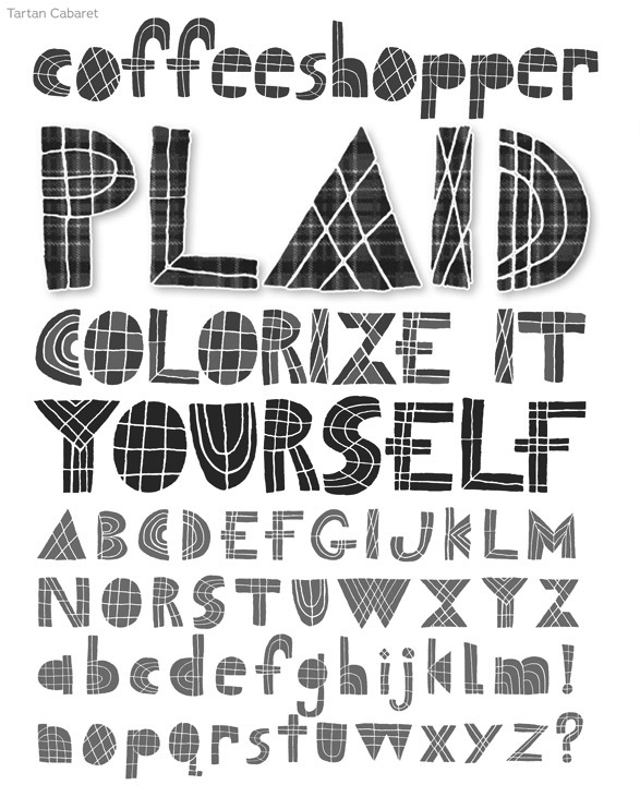
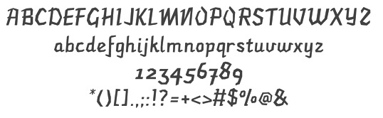
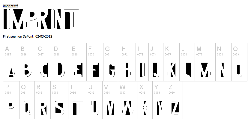
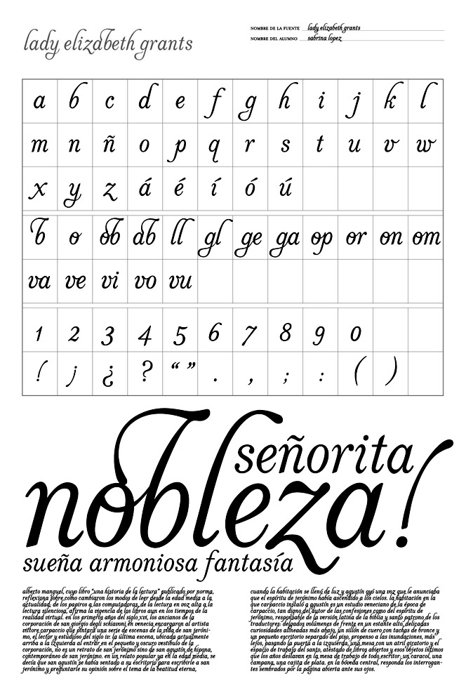
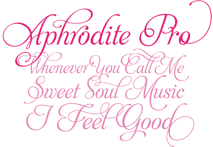
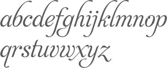
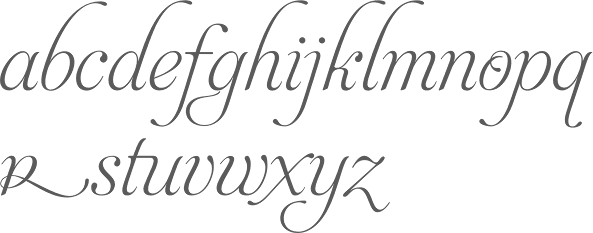
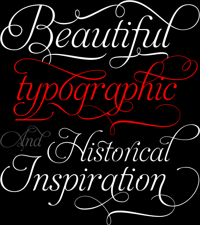
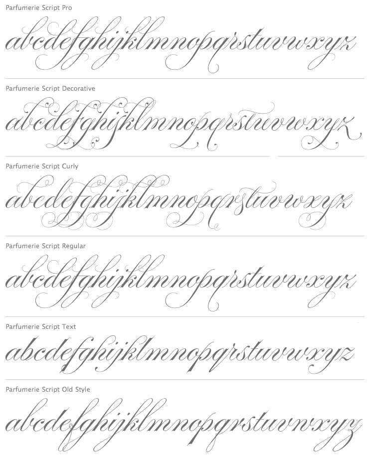
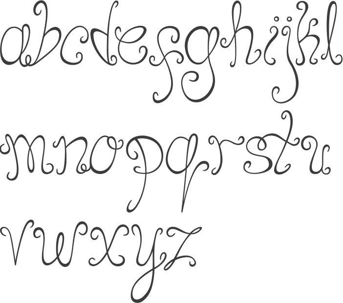
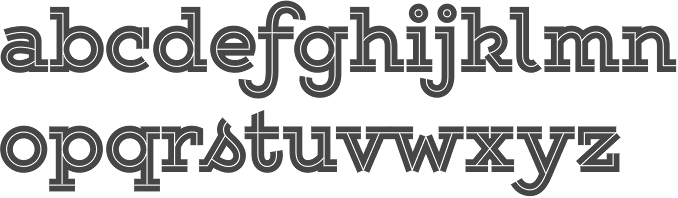
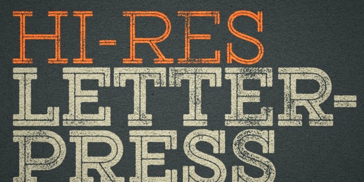
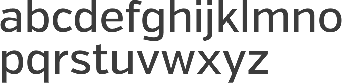
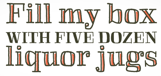
|
|
|
|