TYPE DESIGN INFORMATION PAGE last updated on Mon Jul 20 20:38:15 EDT 2026
FONT RECOGNITION VIA FONT MOOSE

|
|
|
|
|
Type scene in Washington | ||
|
|
|
|

SWITCH TO INDEX FILE
Aaron Bell
| |
Aartvark Graphics
| Jim O'Bryan (Aartvark Graphics, Vancouver, WA) designed CarolesChunk (1993) and Patriot (1999). Designer of Slabface. Fontspace link. [Google] [More] ⦿ |
Pullman, WA-based designer of the slimy scary typeface Poison (2019). [Google] [More] ⦿ | |
AEP (or: An Elektrum Press)
| Now located in Seattle, WA, and before that in El Prado, NM, Pond is a freelance software specialist who did some great work at Amazon.com. Ashley Evan Pond (who also used the company names AEP and An Elektrum Press) designed the IBM logo imitation typeface Element (1996), as well as Vampire Winter, Kismet Demibold, Atrium Initials, Atrium Deco, Abraxis, Seraphim Freaky, Acrylic, Aradia Heavy, Blocks, Evil Egg (based on psychedelic lettering by Chipper Thompson), International, Zebra, Daisy, Inverno, American Light, Santa Fe, Karma, Romanette, and American. Dafont link. Home page. [Google] [More] ⦿ |
Seattle, WA-based graphic designer. Creator of a beautifully lettered mural design for Killer Infographics' new office in 2013. Behance link. [Google] [More] ⦿ | |
Alden Verdan (Seattle, WA) made several experimental typefaces in 2012 and 2018. Particular typefaces by him include Blackline (a neon tube typeface). [Google] [More] ⦿ | |
Graphic designer in Seattle, who created the blocky typeface AC Finy (2014). Behance link. [Google] [More] ⦿ | |
Seattle, WA-based designer (b. 1998) of the outline font Jig Saw (2020). [Google] [More] ⦿ | |
Alex Jones is a visual designer from Seattle who specializes in brand identity, UI design, and website design. In 2020, he released the techno typeface PDX, in which each letter is derived from a square box with very few edits. In 2022, he released Turaco Typeface (a 6-style monolinear sans), Rocano Display (an 8-style geometric sans by Alex Jones and Shajana Shaju), Carbido Typeface (a 5-style geometric sans based on perfect arcs circles; by Alex Jones and Shajana Shaju) and Claudino Display (a wide 7-style sans for stylish displays; by Alex Jones and Shajana Shaju) at Bee Type. [Google] [MyFonts] [More] ⦿ | |
Alicia Yeargin (Redmond, WA) is a computer game designer. Devian Tart link. She created the free brush typeface Explosive Dawn (2011). Klingspor link. [Google] [More] ⦿ | |
Calligrapher and type designer in Seattle, WA, who is associated with Great Lakes Lettering. Feast (2014) is a calligraphic typeface designed by Alissa Mazzenga and produced by Dathan Boardman at Great Lakes Lettering. In 2015, she and Dathan Boardman published the calligraphic hairline typeface Marguerite. In 2017, again with Dathan Boardman, she designed the calligraphic typeface Queen Anne Hill. [Google] [MyFonts] [More] ⦿ | |
Iranian graphic designer who lived in Turkey and after a stint in Washington Park, WA, he is now based in Germany. He graduated from B.A Hacettepe University in Ankara in 2012, and from the Mirak Fine Art School in Tabriz, Iran, in 2005. His typefaces: [Google] [MyFonts] [More] ⦿ | |
Bellevue, WA-based graduate of the TDi program at the University of Reading, UK, 2017. [Google] [More] ⦿ | |
Andrea Leksen
| |
Illustrator in Seattle. At Dafont one can download the comic book family TF2 (2009). Her logo. [Google] [More] ⦿ | |
Andrew Glass is a paleography expert who obtained his Ph.D. at the University of Washington in 2006. His links and downloadable fonts for various Indic languages included Gandhari Unicode, Devanagari Unicode, Bengali Unicode, Kharoshti Unicode, Rhino Kharoshti, and Times Gandhari CSX. The Gandhari Unicode fonts are based on an original Postscript font called "Nimbus Roman No9 L" created by URW++ Design and Development Incorporated and donated to the free software community under the GNU General Public License. The Nimbus Roman No9 L font is itself based on the design for Times New Roman by Stanley Morison. Defunct link. [Google] [More] ⦿ | |
Bremerton, WA-based designer of the Indic simulation typeface Aniya (2013). [Google] [More] ⦿ | |
Anshuman Pandey (University of Washington, Seattle) made a Bengali METAFONT. He also created wnri, a METAFONT set of fonts for Old English, Indic languages in transcription, and American Indian languages. The Washington Romanized (WNRI) Indic package enables texts encoded in the 8-bit Classical Sanskrit/Classical Sanskrit eXtended (CS/CSX) encoding to be typeset in \TeX{} without modification of the input scheme. Pandey also developed a LaTeX package for Gurmukhi/Punjabi, which uses a metafont he generated (with permission) from Hardip Singh Pannu's Punjabi truetype font. Frans Velthuis (Groningen University) developed a Devanagari Metafont in 1991, which is on the CTAN archive. Later, Anshuman Pandey took over the maintenance of font. Primoz Peterlin made type 1 outlines based on this. These outline renderings (Type 1) were automatically converted from METAFONT by Peter Szabo's TeXtrace, and subsequently edited using George Williams' PfaEdit PostScript font editor by Anshuman Pandey (University of Washington). In 2003-2004, additional updates in the set of 22 Metafont files are due to Kevin Carmody, who presently maintains the package. The font names: TeX-dvng10, TeX-dvng9, TeX-dvng8. These were later changed to VelthuisDevanagari8-Regular, VelthuisDevanagari9-Regular and VelthuisDevanagari10-Regular. This font was used in the GNU freefont project for the Devanagari range (U+0900-U+097F). [Google] [More] ⦿ | |
Graphic and motion graphics designer in Johannesburg, South Africa, where he worked as Ontwerp.tv (Idea currency) Pty Ltd. He is now located in Seattle, WA. He created several experimental alphabets, often of a geometric nature, such as Geometric Chic (2008-2009) and Beauty (2009). The Bends (2011) is a hairline curly-yet-straight display face. SansGoma (2011) is a hairline slab poster face. Nu Gothic (2011), Nu Modern (2011) and especially Vironica (2011) are fashion mag display typefaces. Neu Nouveau (2011) is a curly art nouveau face. Numera (2011) is an organic fashion mag face. Killoton (2011) is super-fat and beautiful. Creations in 2012: An art deco example in his Janelle 1945 work. Vorm Type, inspired by the work of Wim Crouwel, is a rounded blocky typeface that is monospaced in the x and y directions. Typefaces from 2013: Canada (alchemic). In 2015, he created a series of posters called Vignelliisms illustrating one-liners by Massimo Vignelli. Typefaces from 2017: Canada (I can't believe that he has trademarked the name Canada). Home page. Behance link. Ontwerp link. [Google] [More] ⦿ | |
archaic
| Peter R. Wilson's metafont code (2000-2005) for many archaic languages: Proto-Semitic (16bc), Phoenician (10bc), Greek (6bc), Greek (4bc), Etruscan (8bc), Futharc (Anglo-Saxon, 6ad), Hieroglyphics (30bc: the hieroglf provides a Metafont version of about 80 Egyptian hieroglyphs from Serge Rosmorduc's comprehensive hieroglyph package, see here for a type 1 version called Archaic-Poor-Mans-Hieroglyphs (2005)), Cypriot (9bc). Peter also developed metafont fonts for bookhands. The Archaic ollection contains fonts to represent Aramaic, Cypriot, Etruscan, Greek of the 6th and 4th centuries BCE, Egyptian hieroglyphics, Linear A, Linear B, Nabatean old Persian, the Phaistos disc, Phoenician, proto-Semitic, runic, South Arabian Ugaritic and Viking scripts. The bundle also includes a small font for use in phonetic transcription of the archaic writings. The bundle's own directory includes a font installation map file for the whole collection. The authors are Peter R. Wilson, Uwe Zimmermann and Apostolos Syropoulos. See here for the type 1 fonts Archaic-OandS (2005) and Archaic-OandS-Italic (2005). Here we find type 1 versions called Square-Capitals (2005) and Square-Capitals-Bold (2005). He also made the type 1 typefaces Archaic-Etruscan (2005), Archaic-Runic (2005) and Archaic-ProtoSemitic (2005). Further packages of type 1 and metafont fonts: Archaic-Aramaic (2005), South Arabian (2005, for the South Arabian script, in use for about 1000 years from roughly 600 BC; based on a metafont by Alan Stanier), Archaic-Linear-B (2005: a syllabary used in the Bronze Age (15bc) for writing Mycenaean Greek), Archaic-Nabatean (2005: the Nabatean script used in the Middle East between the fourth centuries BC and AD), Archaic-Old-Persian (2005: the Old Persian Cuneiform script in use between about 500 to 350 BC.), Archaic-Ugaritic-Cuneiform (2005: the Ugaritic Cuniform script in use about 1300 BC), Archaic-Cypriot (1999-2005). [Google] [More] ⦿ |
Seattle, WA-based designer of the text typeface Theophilus (2018) and Arctic Animal Alphabet (2018). Both were finished during her studies at the University of Washington. [Google] [More] ⦿ | |
| |
Quoting the wikipedia entry: Arthur S.W. Chantry II (born April 9, 1954 in Seattle) is a graphic designer often associated with the posters and album covers he did for bands from the Pacific Northwest, such as Nirvana, Hole and The Sonics. He is also notable for his work in logo design. Chantry designed the cover for Some People Can't Surf, which was written by Julie Lasky. Chantry advocates a low-tech approach to design that is informed by the history of the field. His work has been exhibited at the Rock and Roll Hall of Fame Museum of Modern Art, Seattle Art Museum, the Smithsonian and the Louvre. Chantry received a bachelor's degree from Western Washington University in 1978. [Google] [More] ⦿ | |
At Northwest College of Art and Design, Ashleigh Darby (Seattle, WA) created a heavy all caps poster typeface in 2017. Behance link. [Google] [More] ⦿ | |
Ashley Evan Pond
| |
Student in Visual Communications at Cornish College of the Arts in Seattle, Washington. Behance link. Creator of OB Typeface (2010, geometric)----OB stands for Ocean Barefoot. [Google] [More] ⦿ | |
During her studies, Ashley Jhaveri (Cheney, WA) created the circle-based Abstract Alphabet (2014). [Google] [More] ⦿ | |
Aure Font Design
|
Typefaces from 2018: Aure Brash (an outline font that speaks with the cheeky inuendo of a sassy parrot), Aure Nox (semi-haunted; with modulated stems), Aure Teddy (art nouveau style), Aure Declare (a text typeface family accompanied by several sets of extraordinary and quite complete astrological symbols), Aure Sable (also with astrological symbols), Aure Wye, Aure Jane. Typefaces from 2019: Aure Zeritha. [Google] [MyFonts] [More] ⦿ |
Aurora Isaac
| |
Bothwell, WA-based designer, at Northwest College of Art and Design, of a condensed sans serif typeface in 2017. [Google] [More] ⦿ | |
Azalea Software
| Makers of Bar code fonts and software utilities and keepers of the Bar Code FAQ and many interesting white papers regarding barcodes. Their software can make UPC, Code 39, Code 128, Interleaved 2 of 5, EAN, JAN, POSTnet, PDF 417, Data Matrix, Maxicode and more. Company president is Jerry Whiting. Each barcode is implemented as a TrueType or Type 1 font. Prices start at $199. In 2012, we find Code 39 Azalea for free at Open Font Library. Fontspace link. [Google] [MyFonts] [More] ⦿ |
Ben Bauermeister
| |
Graphic designer in Everett, WA, who designed the octagonal typeface Mass Effect in 2016. [Google] [More] ⦿ | |
Seattle-based designer of Pseudo-Black (2013) and Bebas (2013, sans). [Google] [More] ⦿ | |
During his studies in seattle, Benny Mamani created the decorative typeface Nabs (2013). [Google] [More] ⦿ | |
Bill Duncan
| |
Bill Tchakirides
| |
Seattle, WA-based designer of Mobius (2014). [Google] [More] ⦿ | |
Bookhands
|
|
Borges Lettering (was: CBdO Fonts Foundry)
|
He also sells through Font Bros and Letterhead. Klingspor link. View the typeface library of Charles Borges. Fontspring link. Interview in 2013. View Charles Borges's typefaces. Adobe link. [Google] [MyFonts] [More] ⦿ |
Bowfin Printworks
| Links to commercial foundries. Site done by Michael Yanega, who now lives in Washington State. Has an interesting script font identification guide. It also has a bibliography on type. [Google] [More] ⦿ |
| |
Pullman Junction, WA-based designer of the neon typeface Neon90s (2017). [Google] [More] ⦿ | |
Designer in Silverdale, WA, who created the Harmon Building typeface in 2017. [Google] [More] ⦿ | |
During his studies at the University of Washington, Bronson Folz-Edwards created the squarish sans typeface Expo 22 (2014). Behance link. [Google] [More] ⦿ | |
Seattle-based typographer and calligrapher at Typeguy Font Studio. [Google] [More] ⦿ | |
Cale Burr
| |
As a student at Seattle Pacific University, Carlie Penning designed the creamy cursive typeface Glissando (2015). [Google] [More] ⦿ | |
| |
At Cornish College of the Arts, Carolyn Wassmer (Seattle, WA) designed the didone caps typeface Flourish (2017). Behance link. [Google] [More] ⦿ | |
Seattle-based creator of the experimental typeface Retro Loops (2013). [Google] [More] ⦿ | |
Cartoon Link
|
Klingspor link. T [Google] [MyFonts] [More] ⦿ |
Seattle, WA-based designer of the children's script font Cassidy Loves You (2013). [Google] [More] ⦿ | |
Cassie Thomsen (Tacoma, WA) created the wide techno sans typeface Flatten (2014). [Google] [More] ⦿ | |
Cerebral Art Lab
| Cale Burr (b. 1970, Longview, WA) is a graphic artist from Bellingham, WA, who runs Cerebral Art Lab there since 1994. Ten dollars a shot for mostly handwriting fonts. Stevesto is a free Mac font. Other fonts: Beloved Anne, Blackie Stan, Devin Strap, Fresh Retread, Initial Expression, Prosser Dot Com, Rough Night, Steve's World, Foam Protection, Stress Related, Zoink (comic book face). [Google] [More] ⦿ |
Charles Borges de Oliveira
| |
Charles Ramsey (Seattle, WA) created Folding (2012, an octagonal typeface). Charles was raised in New Orleans. Behance link. [Google] [More] ⦿ | |
Seattle-based creator (b. 1976) of the hand-printed UCU Charles Script (2011). Dafont link. Portrait. [Google] [More] ⦿ | |
| |
Chris Ballasiotes
| |
Seattle-based designers of Armanic Runes (2000), a font with rune symbols used by some people that are into the occult. [Google] [More] ⦿ | |
Connie Scoble made ornamental dingbat typefaces in 2007, often around the theme of native Americans: ccdiv, ccdiv2, Corners, Corners2, Native Motifs, Southwest Motif (1 and 2). [Google] [More] ⦿ | |
Craig Watjen, the first head of the Microsoft accounting department beginning in 1981, died in Seattle in 2010 at the age of 74. He retired from the company in 1990, and used much of his stockholder fortune to become a minority owner of the Seattle Mariners. [Google] [More] ⦿ | |
Creative Toucan (was: Leo Supply Co)
|
Typefaces from 2014: Dabre, Handeer, Bad Land, Thron, 806 Typography (wood style didone), Rypote. Typefaces from 2015: Debeli Bridge (faded, grungy and gorgeous), Rustal, Madalen, Stiquez, Vallyns (grungy, stamped typeface), Falsthan (brush face), Areson, Summeron (brush script), Surpal Lovely (Victorian kitsch), Summer 2, Megeon (+Grunge), Dabre Grunge (textured caps). Typefaces from 2016: Taramda, Endless Script, Riot Ton, Dabre (grungy stamped style), La Tequila (Western font), Originals (painted letters), Originals is out, Avenue Drift, Amoky (sketched), Bastielle Script, Ipsum Script, Baroquey Script, Pomah Type (brush script), Vrown Fox (dry brush), Time Machino (dry brush), The Gohe Go, My Boquet Script, The Sellen, Baley Sun, Brushed Traveler, Salone Strand, Aple Time (brush), Bert Loch (brush), Brushed Car, Last and Chaos (brush), Thin Zeus (brush), Top Light (fat brush typeface), Summer Soul Script, Summter (connected script), Summdraw, Planine Script, Samtak Script, Astel Script, Rostek Old, Megiline, Sally Script, Rolley, Naila Script, Amoky (textured letterpress emulation typeface family), Reeld (dry brush typeface), Stamped Navy (textured). Typefaces from 2017: Musterion (brush script), Wolvos (rough brush), Xenos, Descolorido, Mushroom (an angulara children's book font), California Jackpot, Zondas, Codiac (rough brush), Gullias (signage script), California or California Jackpot (brush font), Rhinos Rocks (brushy), Quick Toy (inky brush script), Italiano (dry brush), Gode (thick brush), Ananas Lips, Kiwano Apple, Cup of Sea, Fly N Walk, Sign 45 (vintage grungy poster style), Jaoy, Gas Rock, Acids. Typefaces from 2018: Storehouse (a vintage all caps copperplate family with small wedge serifs; by Nicolas Massi and Leonard Posavec; it includes a stencil style), San Francisco, Quick Pick (brush), Mick's, Jumper, Alask (brush), Royal Twins, Clas (brush script), Yolloy, Scolarship (sketched). Typefaces from 2019: Planina, Athletica (letterpress style), Costa La Vista (font duo), Springs, Originals 2 (dry brush), Astana. Typefaces from 2020: Myla (a display typeface). Typefaces from 2021: Surfbars (a dry brush font for outdoors usage; also supports Cyrillic). Fontspace link. Creative Market link. Old URL. Another Creative Market link. Dafont link. Fontplanet link. [Google] [MyFonts] [More] ⦿ |
In 2018, Dana Pride (Yakima, WA) published a collaborative all caps typeface created via Adobe Live. [Google] [More] ⦿ | |
Behance link. [Google] [More] ⦿ | |
Master of Fine Arts in Graphic Design, Yale University, 2009. Freelance designer in Seattle, from 2006 until the present. She made Folded Paper (2007, experimental) and did a revival of Dick Dooijes' 1959 Mercator, called Mercator Roman (2007). [Google] [More] ⦿ | |
His early typefaces: Mushman (2012) is a techno-sans typeface inspired by the adventurous spirit of actor Steve McQueen, who raced motorcycles under the false name "Harvey Mushman." His second typeface, Bronson (2012, free if you ask), is a display type inspired by Danny "Tunnel King" Lewinski, Charles Bronson's character in The Great Escape. In 2013, he created the elegant (free) futuristic typeface Astroman. In 2014, Darren designed the free hipster typeface Skandi, which was inspired by Nordic runes. Behance link. [Google] [More] ⦿ | |
Seattle-based creator of Magic Medieval (1996, based on Goudy Medieval, modified by Dave Howell for use on Magic: The Gathering cards). Fontspace link. [Google] [More] ⦿ | |
Creator of NES Controller (2009), a square gothic face. Resident of Washington. [Google] [More] ⦿ | |
David Phillips
| |
David Phillips
| |
He heads Studio Verso, a site-design consultancy in San Francisco. Author of The Euler project at Stanford Stanford, CA (1985, Stanford University, Department of Computer Science). CV at FontBureau. Interview. FontShop link. Klingspor link. MyFonts link. [Google] [MyFonts] [More] ⦿ | |
David Thometz
| |
David Thometz Design
|
In 2004, David Thometz Design made its debut at MyFonts with Seriatim (dingbats), Silvertone Woodtype and Hefeweizen. |
Free Thai TrueType font on Glenn Slayden's Thai Language Pages. An American jazz player, Thai traveler and IT consultant, Glenn Slayden had superb pages on anything related to Thai. The pages disappeared after Glenn pleaded guilty to owning and attempting to make an LSD lab in Seattle, WA. Our thoughts are with you, Glenn. For my part, I will keep fighting to legalize all drugs. [Google] [More] ⦿ | |
Derrick Jackson is a graphic designer and artist from Spokane, Washington, with a BFA in visual communication design from Eastern Washington University. Creator of the free typeface Hereabous Bold (2012). Fontspace link. [Google] [More] ⦿ | |
Graduate of the University of Washington, b. Los Angeles. In 2005, he founded DeLapp Design. Designer of the display typeface Gaq. [Google] [More] ⦿ | |
Digital Type Foundry
| Digital Type Foundry is James Banner's (extinct) Seattle-based foundry that produced typefaces such as Angelic, Bamberg-Initials, Bamberg, Burton, Caxton-Initials, Daggers, Enochian, FetteFraktur, Fraktur, Futhark-Gothic, Futhark, Hebrew, Hermetica, Titling-Ornaments-1 and Turkish, around 1991-1992. Some fonts can be downloaded for free at Fontspace. He wrote: I started making fonts in 1988 and still produce work, although as it became more difficult to upload my work or share it using the University of Michigan FTP server, I haven't released much. Most recently, I issued the Geoffroy Tory initial letters as a Type 1 font and separately as EPS files as Freeware. I've produced 20-30 fonts since the DTF Volume Three bundle package came out. The foundry disappeared. The licensing today is unclear. Fontspace link. Old URL. Defunct URL. [Google] [More] ⦿ |
| |
Illustrator and designer. Seattle-based creator of Elfabet (1981), an ornamental caps face. This typeface, consisting of elves in various positions, was digitized by "Fontfan" in 1999 and can be freely downloaded here. He has several other illustrated alphabets. [Google] [More] ⦿ | |
Washington-based graphic designer who specializes in retro styles andc revivals. His (commercial) typefaces include Pepperoni Slab (2014, it's nota typeface. It's an all-you-can-eat buffet) and Spokane Regular (2014, inspired by a very old matchbook advertising a Washington coffee shop). Creative Market link. [Google] [More] ⦿ | |
Doug Sheets (b. 1989) lives in Seattle, WA. He created these typefaces in 2010: the Auctoritas family, Sheets Braille, Humberg, RADARbyDougSheets, Construct (counterless, mechanical), Standard Nib Handwritten (the only free font), Old Letterpress Type, Evie's Hand, and Radius. In 2012, he created Coffee Shop. Dafont link. [Google] [More] ⦿ | |
Poulsbo, WA-based designer of a vintage typeface in 2017. [Google] [More] ⦿ | |
Washington-based creator (b. 1996) of Ninjy's Handwriting (2013). [Google] [More] ⦿ | |
Sells handwriting-fonts designed to exactly replicate many educational handwriting styles. In particular, they have these:
| |
Designer (b. 1967) of Thor (1997) at GarageFonts. He graduated in graphic design from The Icelandic Academy of the Arts, Reykjavik, Iceland in 1991. Klingspor link. [Google] [More] ⦿ | |
Ekloff Design (was: Liquid Parallax)
| Ekloff Design by Joseph Ekloff (aka F. Folke) grew out of Liquid Parallax. It has free and commercial fonts created by Joey, who has a BFA in Visual Communications with a Marketing minor from the University of Arizona. He is based in Seattle. His fonts: Times New Rhombus (2005, handwriting), Jupiter Jellypop and Jupiter Jellyrock (2005, grunge), Dinosaur Skin (2005), Abdomentality, Cactus Milk, Derivia (based on a public domain serif font called Livia Medium by S.G. Moye, 1992), Remodula (gridded, kitchen tile face, FontStruct), Electric Pencil (hand), Lower Optic Fibercase, Qualymer Beanpole, Qualymer Husky, Hopskotch (monoline sans with long swashes), Prevek, Rooty Voutee. In 2013, he designed the commercial typeface Fervent Sans. In 2014, he created White Label (hand-printed) and Remejug (hand-printed). Typefaces from 2015: Hudso (handcrafted multiline typeface), Haywire, Baystyle. Typefaces from 2016: Fullford (a warm handcrafted poster typeface family), Aweswell (handcrafted). Dafont link. Fontspace link. Behance link. Creative Market link. [Google] [More] ⦿ |
Elchin Panahov
| |
Font engineer and open source software advocate located in Seattle, WA. Before that, he studied mathematics at CUNY in New York. His typefaces:
Interview. Use Modify link. Github link. [Google] [More] ⦿ | |
Eli T. Evans
| |
ElseWare Corporation
| Founded by Ben Bauermeister and Clyde McQueen in 1990, former employees of Aldus. Based in Seattle, it created for Hewlett-Packard FontSmart (a product that gives users 110 fonts and a font-management technology for HP's LaserJet 5L, 5P and 5Si printers in an innovative and compressed format). It also made FontWorks (a truetype font generation engine for Windows), Infinifont (a parametric font generation system), and PANOSE (a fonty classification system). On December 21, 1995, HP bought the company and that was the end of it. The in-house type designer was Karl Leuthold. They produced about 340 "clones" of the major typeface styles, including Albertus, AntiqueOlive, Arial, AugustaEC, BistroEC, BodoniEC, BookAntiqua, BookmanEC, BookmanOldStyle, CGOmega, CGTimes, CafeEC, CenturyGothic, CenturySchoolbook, Clarendon, CourierEC, EtnaEC, GaramondEC, GeneraEC, GillSans, Goudy-Old-Style-EW, GraphosEC, InformaEC, LetterGothic, LetterSansEC, MentorEC, MetrostyleEC, ModalEC, NewTributeEC, OperinaEC, Ozzie, SchoolbookEC, StationEC, StriderEC, StylusEC, TerasEC, TerasMonospaceEC, Univers, VillageOldstyleEC, WilmingtonEC. MyFonts link. [Google] [MyFonts] [More] ⦿ |
Emerald City Fontworks
| Run by Steven Lundeen from Seattle, ECF does customized handwriting / signature / company logo fonts, for 39 dollars per font. Shareware and freeware fonts, such as Augie, Codex, Decadence, Intimacy, Intimacy Deux, JD (1997, handwriting font), Movieola, Spanky's Bungalow (1997), Syriac, the beautiful handwriting typeface TallPaul (1997), Teen Spirit, Curtain Call, Stillframes, Birds A, Webster. ECF also makes your handwriting into a font. They offer some clipart fonts of the first quality. There are three mollusk fonts, three musical instrument fonts, three insect fonts, three reptile fonts and four mythology fonts, for example! Some of the clipart fonts are free. Handwriting fonts like j.d., Augie, Skeetch and TallPaul are well worth a try. Display freeware fonts include Crowns and Coronets (dingbats), Decadence, Intimacy, Codex and the Spanky family. Many fonts have both T1 and TT versions for both Mac and Windows. The shareware fonts are of the display type, like Moonpie, Puzzleface, Thump, Sputnyk, KingsCourt, Festus, Daddio, Chester Shag, King's Court, the Pookie family, and a knot font. Dafont link. Abstract Fonts link. Fontspace link. [Google] [MyFonts] [More] ⦿ |
Portland, OR-based creator of the Victorian typeface Wishbone (2012). PDF file. Emilee is a graduate of the Art Institute of Portland with an BA in Graphic Design. [Google] [More] ⦿ | |
Eric Stevens
| |
| |
Visual communication design student at the University of Washington in Seattle. During a workshop with J.-F. Porchez, Fanny Luor designed the copperplate typeface Caswell (2012). [Google] [More] ⦿ | |
Fontdue is a simple, no_std (does not use the standard library for portability), pure Rust, TrueType (.ttf/.ttc) & OpenType (.otf) font rasterizer and layout tool. It strives to make interacting with fonts as fast as possible, and currently has the lowest end to end latency for a font rasterizer, beating Freetype, rusttype and all the others. By Seattle-based Joe C (or Mooman219). [Google] [More] ⦿ | |
Fonteca
|
Linkedin link. Fontriver link. [Google] [MyFonts] [More] ⦿ |
Company located in Washington State. Scrapbooking font style company with commercial curly handwriting and doodling fonts by Bannerwoman, Blushbutter, Carrie Stephens, Dianne Rigdon, Meredith Fenwick, Mindy Terasawa, Miss Tiina, Sara Carling, Sausan Designs, Scrappy Cats Designs, and Shabby Princess. Free Fontologie fonts: mtf_sketchie (2007, Miss Tiina), Taylor_Mackenzie (2007, Kristie Matthews), SVD_WilderThings (2007, Stephanie Victoria Designs), SVD JoyFilled (2007, Stephanie Victoria Designs), Doodle Dance (2008), Messy Bessy (2008), Free Refill (2008), Printing Primer (2008), Wiggle Worm (2008), Weathered (2008), Vintage Press (2008), Uptown Girl (2008), Textura (2008), PS I Love You (2008), Howie's Stamps (2008), Giggles and Giggles Small Caps (2008), Empty Wrapper (2008), Dippity Dots (2008), YS Frakleberry (2008), TS Traci (2008), TS Webchyk (2008), TS Wendy (2008), Antique (2008), MF Funkalicious (2008), Hallway Graffiti (2008), Journal Away (2008) and Jacki's Hand (2007, Jacki Steinkamp). All are hand-printed. Font making service: 35 dollars for a full font. All fonts sold since November 2007 at The Shabby Shoppe. These include the grunge typefaces Howie's Stamps, Wiggle Worm, Empty Wrapper and Vintage Press. Another URL. [Google] [More] ⦿ | |
Fontroduction
| Ian Obermuller's introduction to typefaces, with a visual glossary, and wonderfully instructive pages on type classification and type recognition. Ian is a 2010 graduate of the Seattle Central Creative Academy. [Google] [More] ⦿ |
FontSite
| Online font site run by Sean Cavanaugh (b. Cape May, NJ, 1962) out of Camano Island, WA. This used to be called Title Wave Studios. Since 1996, Sean Cavanaugh is the head of FontSite. In the archives, one can/could find essays on writing style, rules of typography, and a comparison by Thomas Phinney (program manager of Latin Fonts at Adobe) of T1 and TTF. The Fontsite 500 CD (30 USD) offers 500 classical fonts with the original names, plus a few names I have not seen before, such as Bergamo (=Bembo by Francesco Griffo), Chantilly (=Gill Sans), Gareth (=Galliard), Noveo sans (=Neuzeit Grotesk), Palladio (=Palatino), Savoy (=Sabon), URWLatino, Unitus, Toxica, Publicity, Plakette, Pericles, Opus (=Optima), Melville, Function, Flanders, Cori Sans, Binner. Uli Stiehl provides proof that many of the fonts at FontSite are rip-offs (identical to) of fonts in Martin Kotulla's (SoftMaker) collection. This is perhaps best explained that Sean Cavanaugh's last real job was director of typography for SoftMaker, Inc., where he oversaw the development and release of SoftMaker's definiType typeface library and associated products [blurb taken from Digital Type Design Guide: The Page Designer's Guide to Working With Type, published in 1995 by Hayden Books]. Free fonts: Bergamo, CartoGothic (1996-2009), CombiNumerals. At MyFonts, the CombiNumerals Pro and CombiSymbols dingbat families are available since 2010. The site has a number of fonts with the acronym FS in the name, so I guess these are relatively original (but I won't swear on it): Allegro FS, Beton FS, Bodoni Display FS (+ Bold, Demibold), Bodoni No 2 FS (+ Ultra, Bodoni Recut FS (+Bold, Demibold), and so forth. His 500 Font CD has these fonts:
|
Fort Foundry
|
Adobe link. [Google] [MyFonts] [More] ⦿ |
Northwest Web Works sells HeFractions and TiFractions, which are Helvetica and Times with fractions added in. MyFonts site. Located in Vancouver, WA. [Google] [MyFonts] [More] ⦿ | |
Graphic designer who creates custom fonts. Located in Seattle, WA. Behance link. [Google] [More] ⦿ | |
Lynnwood, WA-based designer of a truetype font, Morrissey (1997), based on Morrissey's handwriting. Alternate URL. See also here and here. [Google] [More] ⦿ | |
Primoz Peterlin made type 1 outlines based on this. These outline renderings (Type 1) were automatically converted from METAFONT by Peter Szabo's TeXtrace, and subsequently edited using George Williams' PfaEdit PostScript font editor by Anshuman Pandey (University of Washington). In 2003-2004, additional updates in the set of 22 Metafont files are due to Kevin Carmody, who presently maintains the package. The font names: TeX-dvng10, TeX-dvng9, TeX-dvng8. These were later changed to VelthuisDevanagari8-Regular, VelthuisDevanagari9-Regular and VelthuisDevanagari10-Regular. This font was used in the GNU freefont project for the Devanagari range (U+0900-U+097F). Karel Piska's type 1 fonts in the Indic1 package include these Devanagari typefaces based on Velthuis's Metafont sources from 1991-2005: Velthuis-dvng10, Velthuis-dvng8, Velthuis-dvng9, Velthuis-dvngb10, Velthuis-dvngb8, Velthuis-dvngb9, Velthuis-dvngbi10, Velthuis-dvngbi8, Velthuis-dvngbi9, Velthuis-dvngi10, Velthuis-dvngi8, Velthuis-dvngi9, Velthuis-dvpn10, Velthuis-dvpn8, Velthuis-dvpn9, VelthuisBombay-dvnb10, VelthuisBombay-dvnb8, VelthuisBombay-dvnb9, VelthuisBombay-dvnbb10, VelthuisBombay-dvnbb8, VelthuisBombay-dvnbb9, VelthuisBombay-dvnbbi10, VelthuisBombay-dvnbbi8, VelthuisBombay-dvnbbi9, VelthuisBombay-dvnbi10, VelthuisBombay-dvnbi8, VelthuisBombay-dvnbi9, VelthuisBombay-dvpb10, VelthuisBombay-dvpb8, VelthuisBombay-dvpb9, VelthuisCalcutta-dvnc10, VelthuisCalcutta-dvnc8, VelthuisCalcutta-dvnc9, VelthuisCalcutta-dvncb10, VelthuisCalcutta-dvncb8, VelthuisCalcutta-dvncb9, VelthuisCalcutta-dvncbi10, VelthuisCalcutta-dvncbi8, VelthuisCalcutta-dvncbi9, VelthuisCalcutta-dvnci10, VelthuisCalcutta-dvnci8, VelthuisCalcutta-dvnci9, VelthuisCalcutta-dvpc10, VelthuisCalcutta-dvpc8, VelthuisCalcutta-dvpc9, VelthuisNepali-dvnn10, VelthuisNepali-dvnn8, VelthuisNepali-dvnn9, VelthuisNepali-dvnnb10, VelthuisNepali-dvnnb8, VelthuisNepali-dvnnb9, VelthuisNepali-dvnnbi10, VelthuisNepali-dvnnbi8, VelthuisNepali-dvnnbi9, VelthuisNepali-dvnni10, VelthuisNepali-dvnni8, VelthuisNepali-dvnni9, VelthuisNepali-dvpnn10, VelthuisNepali-dvpnn8, VelthuisNepali-dvpnn9. A complete package for Velthuis Devanagari (Hindi) with both fonts and TeX support is at CTAN. It is maintained by Anshuman Pandey. [Google] [More] ⦿ | |
Free Movie Themed Fonts
| Tober Welsh (a freelancer in Tacoma, WA) rounds up 50 free movie-themed fonts: 007 GoldenEye, 28 Days Later, Wolf's Bane (Wolverine Font), Squealer (AC DC Font, by Ray Larabie), Blade Runner Movie Font, Aurabesh (Star Wars Symbols Font), Han Solo (Star Wars Font), SF Fedora (Indiana Jones Font), Back To The Future 2002, Batman Forever, Due Date (COPS Font), CNN, Fight This (Fight Club Font), Friday13 (Friday the 13th Font), Grinched (How the Grinch Stole Christmas Font), Ringbearer (Lord of the Rings Font), Elvish Ring NFI (Lord of the Rings - Elvish), Aniron (Lord of the Rings - Alternative Font), Matrix, Nightmare Before Christmas, Planet of the Apes, The Ring, Sin City, Trek (Star Trek Font), Harry P (Harry Potter Font), Lumos (Harry Potter Book Font), SF TransRobotics (Transformers Font), Waltograph (Walt Disney Font), Final Fantasy, Halo3, Army of Darkness, Blade 2, Beynkales Demo (Corpse Bride Font), Trajan-Regular (The Movie Font), Red Right Hand (Hellboy Font), Homoarakhn (Spiderman and PS3 Font), Scream Real (Scream Font), An Unfortunate Event (Lemony Snicket's Font), Fiddums Family (Addams Family Font), Battlestar Galactica, Alien League (Alien Font), Adam Warren 0.2 (300 Font), AVP (Alien VS Predator Font), Timepiece (A Clockwork Orange Font), Metrolox (Enemy of the State Font), The Godfather, Impossible (Mission: Impossible Font), InvisibleKiller (Predator Font), Resident Evil, Terminator Real NFI (Terminator Font). [Google] [More] ⦿ |
G. William Music Production
| Bill Duncan sells music fonts she made for use with Finale. These include: BDNotes, Brackets, BracketsBold, ChordSuffix, ChordSymbol, EnclosureSans, EnclosureSerif, EngraverTime (not for sale), Hairpins, Salzedo, Loops&Squiggles, Rehearsal, RehearsalSans, RehearsalDbl, RehearsalSansDbl, Rolls, RollsBig, TempoTime, TempoTimeSans. Now located in Seattle, GWMP was founded in 1984 by Bill Duncan as a commercial music production company. [Google] [More] ⦿ |
Digital artist in Bothell, WA. Creator of the curly display typeface Inplaco (2013) and of some experimental alphabets. Behance link. [Google] [More] ⦿ | |
During his studies, Ellensburg, WA-based Gabriel Santos Salvador designed the handcrafted outline typeface Salvador (2016). [Google] [More] ⦿ | |
After a fontmaking hiatus, he released these fonts in 2020:
FontShop link. Bestselling typefaces at MyFonts. Klingspor link. | |
Garrett Boge
| |
Tacoma, WA-based designer of the vintage typeface Tacoma Serif (2018). [Google] [More] ⦿ | |
Gilbert Van Citters (Seattle, WA) an illustrator, printer and graphic designer who is curreently working in the UK. He has a BA in graphic design from Western Washington (2011). Behance link. His work includes the ball-themed geometrically constructed display typeface Nexus (2011). [Google] [More] ⦿ | |
Seattle and Tacoma, WA-based design group. Creators of some commercial typefaces that are often weathered, vernacular or emulating letterpress. Typefaces from 2015: Producer. Typefaces from 2014: Legends. Typefaces from 2013: Absolution, Zombie Gothic FS, Foreman. Creative Market link. [Google] [More] ⦿ | |
Born in Seattle, raised in San Diego, and working in NYC, Glenn Pajarito currently is Senior Art Director at Saatchi & Saatchi X. Creator of a corporate hand-printed typeface family for Wendy's called Wendy's Breakfast (2012). [Google] [More] ⦿ | |
Graticle
|
Typefaces from 2016: TwentyFive Hill, Dustin Acres (handcrafted), Ford City (cartoon font), Folsom Prison (comic book font), Nation (heavy octagonal propaganda typeface), Cousin Bob (hand-printed). Typefaces from 2017: Fear Nothing (dry brush). Creative Market link. [Google] [More] ⦿ |
Grey Fortress Ent
| Designer in Shoreline, WA, who founded Grey Fortress Ent in 2011. Creator of the spooky Gothic typeface Grotto Goth (2020). [Google] [MyFonts] [More] ⦿ |
Han-Yi Shaw
| |
Foundry in Snohomish, WA, est. 2013. Creators of the curly hand-printed typeface Rollicking Polly (2011) and the feminine script typeface Rita Anne (2013). [Google] [MyFonts] [More] ⦿ | |
Harvey Tonkin
| |
Harvey&Karen Tonkin
| Aussies Harvey&Karen Tonkin have created Victorian cursive fonts that might also be used for primary schools. Address: 31 Deschamp Road, Noranda, WA 6062. URL that mentions their work. Fonts by Harvey Tonkin: DottedVicModCursive (1998), VicModCurJoinedNormal (1998), VicModCursiveNormal (1993). [Google] [More] ⦿ |
Hold Fast Foundry
|
Creative Market link. [Google] [MyFonts] [More] ⦿ |
During her graphic design studies at Seattle Pacific University in 2013, Honnah weber designed an unnamed grotesk caps typeface. [Google] [More] ⦿ | |
HYS Design
| Redmond, WA-based type designer whose Chinese typeface Qingyu Lishu won an award in the TDC Typeface Design competition in 2017. Award winner at 25 TDC in 2022 for these two Chinese / Japanese typefaces:
|
Ian Obermuller
| |
Ibycus
| Pierre A. MacKay (Dept of Classics, University of Washington) has a Greek Latex package, which has metafonts that extend the Greek metafonts by Silvio Levy. It features the necessary breathing marks and accents for use with ancient Greek text. It also includes the digamma character and the numerals qoppa and sampi (the numerals appear in lowercase type only). Ibycus4 is a Greek typeface, based on Silvio Levy's realization of a classic Didot cut of Greek type from around 1800. Since 2004, this package includes type 1 fonts as well. The project is supported by Walter Schmidt and Harald Harders (who did some metafont to type 1 conversions). [Google] [More] ⦿ |
Indestructible Type
|
Aka Ewon Rael. Github link. Another Github link. FontSpring link. Facebook page. Fontsquirrel link. [Google] [More] ⦿ |
Graphic designer in Forest, WA, who created the hand-drawn typeface family Absently (2014). Behance link. [Google] [More] ⦿ | |
Old link. Behance link. [Google] [More] ⦿ | |
Jack A. Gardner
| |
Seattle, WA-based designer of STFU (2019: a modern blackletter typeface). [Google] [More] ⦿ | |
Jackson's Lettering
| Jack Gardner (b. 1938, West Seattle, WA) is a graphic and type designer. He created the signage typeface Butter Bold (2009). [Google] [MyFonts] [More] ⦿ |
Aka Urbanautical Creative. Behance link. [Google] [More] ⦿ | |
James Banner
| |
Typefaces from 2016 include the handcrafted Kindling. In 2017, he made 56th Street (free at Pixel Surplus). Typefaces from 2019: Ignite (a condensed squarish all caps typeface). [Google] [More] ⦿ | |
Poulsbo, WA-based designer of the avant garde sans typeface Suave (2015). [Google] [More] ⦿ | |
Illustrator and graphic designer in Gig Harbor, WA. In 2018, he published a sharp rhythmic typeface called Killing It. [Google] [More] ⦿ | |
Jayme Yen runs Schema Design with Christian Marc Schmidt. In 2016, Schema Design and Village started cooperating on a commissioned typeface for the city of Seattle. [Google] [More] ⦿ | |
| |
Illustrator, painter and digital artist Jeffrey Allan Woodley (Bremerton, WA) designed Woodley Gothic in 2013. [Google] [More] ⦿ | |
Jennifer Kennard runs the Letterology blog. She teaches book design and experimental typography at Seattle Central Community College. In 2010, Sarah Palin inspired one of her students, Ryan Ogborn, to design Going Rogue. [Google] [More] ⦿ | |
Jeremy Bowen
| |
Jerry Whiting
| |
Jesse J. Anderson (b. 1980) lives Puyallup, WA. At Devian Tart, he designed BoldnBugly (2002), and AlienBud (2002). He also made Fikle Skratch (2001), Boxer-Pants (2001), Inky-News (2001). [Google] [More] ⦿ | |
Graphic and game designer in Spokane, WA who created the rounde square-letter typeface Bodacious in 2014. [Google] [More] ⦿ | |
Bothell, WA-based desigigner of the decorative caps typeface Animal Letters (2019). [Google] [More] ⦿ | |
Graduate of the University of Washington, class of 2013. Seattle-based creator of the didone typeface Violet (2014). At the Seattle Typeface Workshop in 2012, Alison Atwell, Ryan Byarlay, Jessica Gordon and Fanny Luor created Caswell, a copperplate face. Behance link. [Google] [More] ⦿ | |
Jessica McCarty
| |
Jim O'Bryan
| |
During his studies at Chapman University, Seattle, WA-based Joe Dolack designed the display typeface Replicant (2015). [Google] [More] ⦿ | |
Californian (b. San Jose, 1970) who studied philosophy, science and literature at San Diego State University before he attended California Institute of Art where he received a B. F. A. in Graphic Design. He started his freelancing career in San Diego and worked his way up the Coast to Seattle where he has worked for an architecture firm. He designed FF Inkling (1997, a rabbit-eared upright script). FontShop link. Klingspor link. [Google] [MyFonts] [More] ⦿ | |
Ex-developer of U&lc, the well-known type magazine at ITC in New York. After ITC's demise, he moved to San Francisco, and is best known nowadays for his excellent articles on typography at CreativePro.com. He is the author and designer of Dot-font: Talking About Fonts and Dot-font: Talking About Design (Mark Batty Publisher, 2006), and the editor of Language Culture Type (ATypI/Graphis, 2002), Contemporary Newspaper Design, and U&lc: influencing design&typography. He also wrote Now Read This (Microsoft, 2004), a book about Microsoft's ClearType project. He writes and consults extensively on typography, and he has won numerous awards for his book designs. He lives in Seattle with the writer Eileen Gunn. John Berry was on the board of the Type Directors Club from 1999 to 2003, and was President of ATypI from 2007 until 2013. In 2008, he joined Microsoft as a Program Manager in the typography team. He is the founder and director of Scripta Typography Institute. At ATypI in Rome in 2002, he spoke about the Bukvaraz type competition. At ATypI 2004 in Prague, he spoke about newspaper type. John was the closing plenary speaker at ATypI 2007 in Brighton. Speaker at ATypI 2013 in Amsterdam and at ATypI 2019 in Tokyo. [Google] [MyFonts] [More] ⦿ | |
Mug shot. Klingspor link. Brief bio. MyFonts page. FontShop link. John Downer, a master water polo player (2006). Bitstream bio. Showcase of John Downer's typefaces at MyFonts. [Google] [MyFonts] [More] ⦿ | |
John Merrifield
| |
Typefaces from 2019: Musubi (a tiki-inspired cocktail lounge typeface). Typefaces from 2021: Alkaline (Jonathan Ball, Mattox Shuler and Brian Brubaker at Fort Foundry: This typeface family at an 18 degree slope was inspired by 1950s lettering and logos on kitchen appliances). [Google] [MyFonts] [More] ⦿ | |
Designer and illustrator in Seattle, WA. She made several ornamental caps typefaces such as Softwonder and Wingrose (2010). She also drew a sketchy alphabet, and alphabets called Violettdrakt (2010) and Double Dog (2010). [Google] [More] ⦿ | |
Joseph Ekloff
| |
Joseph Steck
| |
Seattle, WA-based student. Creator of this lively sans face (2006). [Google] [More] ⦿ | |
Juliet Shen
| |
Graphic designer and professor in the visual communications program at the University of Washington, Seattle. Author of Designing Type (2005, Yale University Press). Karen Cheng is Associate Professor in the Visual Communication Design program at the University of Washington in Seattle, where she teaches type design and typography. She was previously an instructor at the School of Design at the University of Cincinnati, where she received her Masters degree in Graphic Design. Speaker at ATypI 2007 in Brighton on Teaching type in the city. Speaker at ATypI 2018 in Antwerp. [Google] [More] ⦿ | |
In-house type designer at ElseWare Corporation in Seattle, which existed from 1990-1995. Codesigner of the hand-printed typeface Segoe Print (2006, Ascender), part of the Segoe font family at Microsoft. The other designers are Brian Allen, Carl Crossgrove, and James Grieshaber. In 2017, Karl Leuthold, Juan Villanueva and Carl Crossgrove co-designed the breezy script typeface Sagrantino (Monotype) in Regular, Highlight and Shadow substyles. [Google] [MyFonts] [More] ⦿ | |
Olympia, WA-based designer of Project XV (2007). [Google] [More] ⦿ | |
Seattle, WA-based designer of the OM typeface (2014), which was inspired by musician Yo-yo Ma. [Google] [More] ⦿ | |
Kelly Hobkirk
| |
| |
Kerrie Carbary
| |
| |
Kevin Larson received his PhD in cognitive psychology in 2000 from the University of Texas at Austin. His academic research was on word recognition and reading acquisition. He currently works for Microsoft's Advanced Reading Technology team in Redmond, WA, and is working on the scientific understanding of ClearType and other reading technologies. At ATypI 2003, he spoke about the recognition of words. He provided evidence to support the following theory: "The reader recognizes each of the letters at the same time (in parallel) and assembles a word." (As opposed to sequential recognition and assembly, or word shape recognition.) Speaker at ATypI 2007 in Brighton. At ATypI 2009 in Mexico City, his talk was entitled Don't we have enough fonts? A summary: Few can distinguish differences between typefaces beyond a serif / sans-serif difference, particularly with text typefaces. If readers can't detect these differences, then we are wasting a lot of time and effort. Many researchers now believe that that people have two evaluative systems - one that involves slow, effortful, deliberative thinking - and one that is automatic, fast, and pre-attentive. The second, called rapid cognition, allows people to make rapid judgments with relatively little information. For example, it only takes 50ms (1/20th of a second) to make a judgment about the aesthetics of a website that is similar to a judgment made after a long exposure. Our studies demonstrate that the personality of a typeface is identified with rapid cognition and that it impacts our recognition of the words written with the typeface. At ATypI 2013 in Amsterdam, he speaks about Designing with Science (jointly with Matthew Carter). An excerpt: Matthew Carter and Kevin Larson have developed a type design process where they iteratively conduct scientific letter recognition tests and use the results from the tests to inform design decisions. Speaker at ATypI 2017 Montreal: Typography for Children. Speaker at ATypI 2018 in Antwerp. [Google] [More] ⦿ | |
In 2012, he published Mr and Mrs Peter, Garamono (a pattern font). Behance link. Klingspor link. [Google] [MyFonts] [More] ⦿ | |
Edmonds, WA-based designer and illustrator at Miller Carney. Kim Carney's blog occasionally discusses typefaces. Home page. Flickr page. In 2010, she proposed the wiry viny typeface Tender Tendril. [Google] [More] ⦿ | |
Kimmy Design
|
Kimmy created a gracious curly calligraphic script face, Madeleine (2010), which is based on a logo she designed for Hotel Le Sirenuse. At Dafont, one can download Kuppel (a hairline display sans) and Hammer Head, both done in 2010 as well. Phase two of Kimmy's career started late in 2010 as Kimmy Design, where one now has to pay for Madeleine (2010) and Katelyn (2011). Addison (2011) is a wood type Western circus poster font in two styles, West and Circus. In 2012, Kimmy created the counterless art deco typeface Chelsnuts, the worn wood type typeface Cpl Kirkwood, Elizabeth Script, and Paper Cutout Pro. In 2013, Kimmy published Lunchbox Slab, the grungy Appareo, the condensed minimalist sans family Maxwell Sans, its companion Maxwell Slab, the scriptish typeface Lunch Box, and the bold headline family Station (inspired by old train station typography). Typefaces from 2014: Catalina (hand-drawn typeface family with sub-styles called Anacapa, Avalon, Clemente Script, Typewriter and Extras, ideal for hand-drawn menus, table cards, chalkboards, and wall quotes), Amorie (a skinny hand-drawn family, with styles called Modella, Nova, SC and Extras). Typefaces from 2015: Avaline Script, Baker Street (vintage hand-drawn typeface family), Burford (a 16-style vintage layered family), Burford Rustic (layered font family). Typefaces from 2016: Bourton (a layered font for vintage yacht club or whiskey bar logos; it is the sans version of Burford; sufamilies include Drop, Lines and Outlines), Rainier (handcrafted). Typefaces from 2017: Evanston Alehouse (octagonal, beer bottle style, slightly copperplate), Bourton Hand. Typefaces from 2018: Clifton (his MATD graduation typeface): Clifton is a modern type family with many weights and contrast styles. It supports Latin scripts as well as Greek, Cyrillic and Arabic. Originally intended as a book typeface, it was designed so that all the weights and styles would work together as a cohesive family. Typefaces from 2019: Refinery (an 85-style octagonal family based in early 20th century signage), Evanston Tavern (Evanston Tavern is a square typeface and the sans-serif version to Evanston Alehouse. Inspired by the years that prefaced the ratification of the American Prohibition, this typeface mimics the signage commonly seen outside of saloons, taverns and alehouses during that time.), Winslow Book (a playful modern Scotch). Typefaces from 2020: Roadhouse (a layering typeface family that is part of the greater Evanston type collection, which is inspired by American typefaces commonly used at the turn of the century leading up to prohibition), Winslow Title (a decorative didone family), Winslow Title Script (monoline), Hawkes (Sans, Script, Variable Width Sans). Typefaces from 2021: Madley (a 12-style soft slab serif). Typefaces from 2022: Bourton Text (an elliptical sans in 42 styles). [Google] [MyFonts] [More] ⦿ |
Kimmy Kirkwood
| |
Kitabat Arabic Calligraphy and Typography Conference was the first major conference dealing solely with Arabic calligraphy and type design. Held from April 5-8, 2006, in Dubai. Speakers included Nabil Safwat (keynote speaker), Ugur Derman (Istanbul, Turkey), Mohamed Zakariya (Virginia, USA), Dr Goeffrey Roper (London, UK), Mamoun Sakkal (Seattle, USA), Johannes Bergerhausen (Germany), Adil Allawi (Diwan, UK), Kamal Mansour (Monotype, USA), Bruno Steinert (Linotype, Germany), Mounir Al-Shaarani (Cairo, Egypt), Huda Smitshuijzen AbiFares (AUD, UAE / Khatt, Holland), Nadine Chahine (Linotype, Germany), Gerard Unger (Bussum, Holland), Tajelssir Hassan (Sharjah, UAE), Reza Abedini (Teheran, Iran), Tarek Atrissi (Utrecht, Holland), Ihsan Hammouri (Jordan/USA), Obeida Sidani (Dubai, UAE), Yasmine Taan (LAU, Lebanon), Aida Sakkal (Seattle, USA), Antonia Carver (Dubai, UAE), Zeina Maasri (AUB, Lebanon), Fawzi Rahal (Dubai, UAE), Nadine Touma (Beirut, Lebanon), Leland Hill (VCU, Qatar), and Petr Van Blokland (Holland). [Google] [More] ⦿ | |
Komet & Flicker (was: StockBucket)
| StockBucket was founded in May of 2004 by graphic designers David Phillips and Traci Daberko in Bellevue / Seattle, WA. It was renamed Komet & Flicker in 2021. David Phillips had earlier run Radar Design (est. 1995), also in Seattle. One can purchase these creations at MyFonts:
|
Freelance designer in Seattle. Creator of the thinly serifed typeface Dalai Lama (2012). Behance link. [Google] [More] ⦿ | |
Illustrator in Seattle, WA, who created the hipster typeface Mechanism (2015). [Google] [More] ⦿ | |
| |
Larry Anderson (Seattle) was winner at TDC 27 in 2006 in the logotype category with a nice piece called Bliscotti. [Google] [More] ⦿ | |
Expensive Tamil font set called LaserTamil, sold by Linguist's Software. Based in Edmonds, WA. [Google] [More] ⦿ | |
Laura Worthington
| |
Laura Worthington Design
|
Her typefaces:
Interview by MyFonts in 2010. I Love Typography link. FontBros link. Creative Market link. Klingspor link. Behance link. Fontspring link. Picture. View Laura Worthington's typefaces. Images of her typefaces. [Google] [MyFonts] [More] ⦿ |
Graphic designer in Seattle, WA, who created the vampire script typeface New Ledger (2016). [Google] [More] ⦿ | |
Seattle, WA-based designer of a pixel typeface in 2017. [Google] [More] ⦿ | |
Leksen Design
|
|
Leonard Posavec
| |
Lesley McGrew
| |
Leslie Badani (Washington, DC) is a graphic designer and art director with a focus on publication design, branding, and typography. She is currently an Associate Creative Director at Weber Shandwick and studying typeface design in the Type@Cooper Extended Program at The Cooper Union. At Type Cooper 2020, Leslie Badani designed the angular display typeface Phyla. [Google] [More] ⦿ | |
LetterPerfect
| Established in Seattle in 1986 by Garrett Boge: Since 1986, LetterPerfect has supplied carefully-crafted, original display fonts to designers and desktop publishers. We now offer over 50 unique designs in 2 distinctive lines: Viva la Fonts&Legacy of Letters. Many fonts were inspired by Trajan roman lettering and by the great Italian renaissance artists. Letter Perfect's typefaces include Catacomb, Philocalus, Sabina, Beata, Donatello, Ghiberti, Cresci, Pietra, Pontif, Stockholm, Göteborg, Uppsala, Didot LP, Kolo, Visage, Bermuda, Old Claude, Wendy, Tomboy, Spumoni, Spring, Silhouette, Roslyn, Longhand, Manito, Kryptic, Koch, Hardwood, Hadrian Bold, Florens, DeStijl, Chevalier Light, Binney. |
"Linguist's Software, the world's leading foreign language font foundry since 1984, produces TrueType and Type 1 fonts for over 630 languages for Windows and Macintosh computers. Our fonts may also be used, with some restrictions, in the NT, DOS, OS/2, NeXT, and UNIX operating systems. You may order directly from us. Doing so assures that you always get the latest version, automatic registration, free technical support, and upgrade notification." About 100 dollars per family. Custom fonts made at about 50 dollars per character. Run by Philip Barton Payne. Web contact: Gene Sorensen. The font licenses mention Linguist Software and Payne Loving Trust. Based in Edmonds, WA. [Google] [More] ⦿ | |
LaserArabic and Farsi commercial fonts. Gene Sorensen: P.O.Box 580, Edmonds, WA 98020-0580, USA. Four fonts: Lateefi, Kitabi, Nargisi, Sarmast. [Google] [More] ⦿ | |
American penman (1862, Light Street, PA-1948, Seattle, WA). Author of Complete Compendium of Plain Practical Penmanship (1901). He studied at G.W. Michael's Pen Art Hall in Oberlin, OH, in the early 1880s. In 1883 he met C.P. Zaner and E.W. Bloser. Bloser and Kelchner taught in Delaware, OH, and in Cleveland, OH. In 1889, Kelchner purchased a half interest in the Zanerian College of Penmanship in Columbus, OH. He sold his interest in 1892 and left for teaching positions in Dixon, IL, and later in Des Moines, IA. In 1909, he moved to Seattle to teach at Seattle Business College. [Google] [More] ⦿ | |
Logos Bible Software
| Company located in Bellingham, WA, which is involved in ancient languages. Eli Evans developed some fonts for Ugaritic, a Semitic language written in cuneiform, in use around 1300 bc in the city of Ugarit in modern Syria. The fonts, called Zebel Open, are part of a commercial Ugaritic package. Here we learn that he designed Gotisch (2003) with letters representing the Gothic alphabet, as written by Wulfila and presumably as used by the Goths (pre-uncial). This was followed by a bold version, Gothic 1. He also created the runes font Futhorc. [Google] [More] ⦿ |
Lost Type
|
|
Graduate of San Jose State University, class of 2013. Vancouver, WA-based designer of Coisla (2017), a decorative techno font named after Nikola Tesla. Behance link. [Google] [More] ⦿ | |
Lyle Zapato
| |
Kirkland. WA-based designer of the free handcrafted typeface Kindle (2016) and the octopus-themed decorative typeface Sucker (2016). Behance link. [Google] [More] ⦿ | |
Kirkland, WA-based designer of the display typeface GuGu (2013). | |
Mamoun Sakkal
| |
Seattle, WA-based designer of the ornamental caps typeface Veil tails (2015), which is named after the Veil Tail Goldfish. [Google] [More] ⦿ | |
Designer and illustrator living in Seattle, WA, who created a linocut alphabet in 2016. [Google] [More] ⦿ | |
Seattle-based designers who came up with Olde Smokey, letters made from cigarette butts, at FUSE95. [Google] [More] ⦿ | |
Martin P. Pfeiffer
| |
Mattox Shuler
| |
Mattox Shuler
| |
During his graphic design studies in Poulsbo, WA, Megan Mudge designed a 3d blocky headline typeface (2013). [Google] [More] ⦿ | |
Melinda Boyle
| |
Ellensburg, WA-based designer of the art nouveau typeface Bonzai (2012). [Google] [More] ⦿ | |
Belfair, WA-based designer of a display typeface in 2017. [Google] [More] ⦿ | |
A graduate of the University of Washington. He created the Victorian / Jules Verne look font called Difference Engine for Forever London. [Google] [More] ⦿ | |
Seattle-based company involved to some extent in typography. Until 2002, the fonts developed by them were free. That is no longer the case. They are major players in multilingual typeface development, type for on-screen use, and type formats such as OpenType. A listing of their typefaces:
The information below was written by Microsoft itself. The Typography Group at Microsoft is responsible for both fonts and the font rendering systems in Windows. Since version 3.1 the primary font system built into Windows has been the TrueType system, licensed from Apple in a deal (with hindsight) remarkably beneficial to Microsoft. Working with Monotype, the Microsoft Typography Group produced fine TrueType versions of Arial, Times New Roman and Courier New, tuned to be extremely legible on the screen; these were all ready for the launch of Windows 3.1. Since then these core fonts have been developed to cover more and more of the world's languages. In the mid-1990s under Robert Norton a program of truly new type designs was begun, using TrueType technology to render faithfully the bitmaps and outlines designed by Matthew Carter (Verdana, Georgia, Tahoma) and by in-house designer Vincent Connare (Trebuchet, Comic Sans). Until August 2002 these core fonts were offered freely over the Web, where they made an undoubtedly positive contribution in terms of legibility and font choice. In 1996 the OpenType initiative with Adobe was announced; this is touted as "the end of the font wars", whereby advanced multilingual text layout becomes available, native rendering of PostScript fonts becomes part of Windows 2000, and unwieldy font formats are rationalized. In 1998 the group announced ClearType. This is a very ingenious method to increase legibility on color LCD screens, individually targeting the 3 subpixels (red, green and blue) that make up each pixel. Such a leap forward in readability on these screens is a crucial element to the success of nascent eBook technology. Simon Daniels at the Group's website keeps font fans and font developers up to date with most aspects of the digital typography scene, and communicates the technicalities of how fonts work in Windows. Updating us about the current (October 2000) activity of the Group, Simon notes: 1999 saw several members of the group leave to join Microsoft's eBooks group. These included technical lead Greg Hitchcock, developers Beat Stamm and Paul Linerud as well as former Monotype hinters Michael Duggan and Geraldine Wade. On August 12, 2002 Microsoft discontinued the free availability of the core fonts, noting that the downloads were being abused in terms of their end-user license agreements. Most commentators took this to mean the company objected to the fact that the fonts were being installed with Linux distributions. View Microsoft's typefaces. [Google] [MyFonts] [More] ⦿ | |
Graduate student at the University of Washington in Seattle. His Auggie Sans typeface (2012) was inspired by hand-painted signage from citrus stands in St. Augustine, Florida. Cargocollective link. [Google] [More] ⦿ | |
Mike Yanega
| |
Seattle-basaed illustrator and studio artist from the state of Washington, who has illustrated for corporations, advertising, design, publishing, and editorial clients doing collateral, direct mail, point of purchase, brochures, maps, billboards, bus boards, stickers, table tents, postcards, packaging, and book illustrations. Corporate clients include: Boeing, Microsoft, Heidelberg beer, Safeco, Washington Mutual, Jamba Juice, Weyerhaeuser, King County, Providence Hospital, and many nonprofit organizations. Self-portrait. [Google] [More] ⦿ | |
| |
| |
Cheney, WA-based designer of these typefaces: Arthuriel (medieval), Berkyspex (techno), BeviaGrowth (experimental), Brenin (unicase uncial), Brickfun (pixel), Bywater (uncial), Cheetah (fat display), Cipher (octagonal), Crown (uncial), Delivar, Drive, Drumsage, Efficient, Fanghorne (uncial), Figbead, Gaelothic (celtic), Galiden, Handshake (lego style), Havinoth (uncial), Humolion (experimental), Knowledge (indic simulation), Lancaster (indic simulation), Neoxidan, Nightime (uncial), Ockiahex (hexagonal), Paradox, Parfiche, Piecemeal, Pickel (pixel), Providian (uncial), Realight (fun experimental), Reliner (indic simulation), Rhubarb, Ribbon, Rimvet, Runestick (runes), Sageight, Skipfrog, Subrail, Toystack (pixel), Umbrella (clean geometric face), Valifas (uncial), Webgura, Westmarch. I assume that most typefaces were done in 2004-2005. [Google] [More] ⦿ | |
Seattle, WA-based designer of the free modular typeface Manufraktur (2015). Behance link. [Google] [More] ⦿ | |
Nerd Fonts (or: Ryanoasis)
| Seattle, WA-based application developer who set up Nerd Fonts. Github link. As far as i understand, Ryan patched and fixed many public domain and open source fonts and included hundreds of icons in each of them. The patched fonts as of 2019 include 3270, AnonymousPro, Arimo, AurulentSansMono, BigBlueTerminal, BitstreamVeraSansMono, Blex (a renamed version of IBM Plex), CodeNewRoman, Cousine, DejaVuSansMono, DroidSansMono, FantasqueSansMono, FiraCode, FiraMono, Go-Mono, Gohu, Hack, Hasklig, HeavyData, Hermit, Inconsolata, InconsolataGo, InconsolataLGC, Iosevka, Lekton, LiberationMono, MPlus, Meslo, Monofur, Monoid, Mononoki, Noto, OpenDyslexic, Overpass, ProFont, ProggyClean, RobotoMono, ShareTechMono (which he had to rename Shure Tech Mono Nerd), SourceCodePro, SpaceMono, Terminus, Tinos, Ubuntu, UbuntuMono. Big Blue Terminal is a monospaced pixel font, designed for use in fixed- width textual environments (consoles/terminals, text/code/hex editors and so on) and based on the Px437 and PxPlus fonts of VileR (2015). It follows the metrics and dimensions of Windows' old Terminal font (at the 9pt/12px size), but the appearance is closer to the classic IBM PC text mode character sets. Home page. [Google] [More] ⦿ |
Graphic designer from Selah, WA, who studied in Portland, OR, at the Pacific Northwest College of Art.. Behance link. Creator of Nordzig (2011, a tall rectangular face). [Google] [More] ⦿ | |
Behance link. Devian Tart link. [Google] [More] ⦿ | |
Nick Stewart
| |
During her studies at the University of Washington (where she is in the class of 2017), Seattle, WA-based Nicola Scutt designed the quarter circle typeface Petris (2016). Behance link. [Google] [More] ⦿ | |
Pullman Junction, WA-based designer of the vampire script typeface Spoopy (2016). [Google] [More] ⦿ | |
Gig Harbor, WA-based designer, at Northwest College of Art and Design, of the condensed sans serif typeface Nikalas Type in 2017. [Google] [More] ⦿ | |
Owen Earl
| |
Owen Earl
| |
Graphic design student at Western Washington University. Designer of the informal font Leonor (2000). [Google] [More] ⦿ | |
Seattle, WA-based designer of the sans typeface Pacific (2015) designed for readability. Behance link. [Google] [More] ⦿ | |
Paula Lavalle (Seattle, WA) created Italic Capitals Bit Font (2013). Behance link. [Google] [More] ⦿ | |
Everett, WA-based designer, b. 1951, of Eremite (2018). [Google] [More] ⦿ | |
Peter R. Wilson
| |
Peter R. Wilson
| |
President of The Payne Loving Trust, which owns Linguist's Software (Edmonds, WA). A selection of the fonts of "Payne Loving Trust" that are floating around in cyberspace includes AradLevelVI, CityBlueprint, CountryBlueprint, EuroRoman, EuroRomanOblique, Graeca, PanRoman, Romantic, RomanticBold, RomanticItalic, SansSerif, SansSerifBold, SansSerifBoldOblique, SansSerifOblique, SuperFrench, Supergreek, TbilisiCaps, TbilisiText, TbilisiText13215, Technic, TechnicBold, TechnicLite. Apparently, Linguist's Software calls upon a battery of nameless typographers for font design. They also sell LaserIPA fonts (IPARoman, IPAKiel, IPAKielSeven and IPAExtras). [Google] [More] ⦿ | |
Graphic designer in Spokane, WA. Creator of How To Font (2013, alchemic style). [Google] [More] ⦿ | |
Pictifont
| Pictifont is the foundry (est. 2011) of Seattle, WA-based type designer Melinda Boyle, who grew up in Colorado. She created PictiFont (2011, + On The Beach), a 16-glyph set of symbols to personalize one's calendar containing a star, a snowflake, an apple, and so forth. This dingbat typeface accompanies a set of four monolined sans titling typefaces called PictiFont Thin (2011). Klingspor link. [Google] [MyFonts] [More] ⦿ |
Pierre A. MacKay presents some Turkish metafonts. [Google] [More] ⦿ | |
Pierre MacKay
| |
Radar Design
| Radar Design of Seattle, WA, was founded in the fall of 1995 by David Phillips. It is mainly a graphic and web design company (with a web site that does not show on my Netscape browser!). David Phillips's fonts include B52 (2001, US military and athletic lettering font), Konstruct (2000, a type family inspired by the hand-drawn typography used in posters by Russian, German and Dutch graphic designers of the 1920's and 1930's), and the quirky Kut Out (2002). More recent typefaces by Radar Design, mostly created by Jens Gehlhaar: Amoebia (organic family), Cornwall (sans), Gagamond (mini-serifed), Blindfish (almost grunge). In 2004, David Phillips and Traci Daberko went on to set up StockBucket, still in Seattle. MyFonts link for StockBucket. In 2021, David Phillips founded Komet & Flicker. [Google] [MyFonts] [More] ⦿ |
Senior visual communications designer at TEAGUE in Seattle, WA. He created some experimental typefaces called Propagation (2010). [Google] [More] ⦿ | |
Great handletterer (b. 1929 in Far Rockaway, Long Island of Russian parents) who grew up in New York City. He studied lettering with Paul Standard, Georg Salter and Leo Manso at The Cooper Union and graduated from The Cooper Union in 1951. He worked at the same studio as Milton Glaser for the next three years. Rahael become a designer and worked for some time for Lippincott and Margulies in New York. Raphael lived in Colorado for a long time, but is now based in Bellingham, WA. In 1969 he patented a squarish typeface for Tyco Laboratories in Waltham, MA. In 1972, he moved to Newport, RI and resumed his career in lettering, calligraphy and graphic design. His typeface Avia (VGC) was an expansion of a logofont he did for Abex Corporation, almost like a stencil. It is now at Font Bureau, where Jill Pichotta has added the Light and Bold in 2000. His typeface Visa (1966, VGC) won the Second Prize in the 1966 VGC National Type Face Design Competition. Others (thanks, Alexander Tochilovsky) confirm what I thought---that Visa and Avia are the same thing. Finally, Sloop Script Pro (1994, Richard Lipton, Font Bureau) is based on Boguslav's designs. FontShop link. MyFonts link. [Google] [MyFonts] [More] ⦿ | |
Rare Bird Font Foundry
| Seattle, WA-based foundry, est. 2017, that is dedicated to releasing only the highest quality hand-lettered fonts on the market. The co-founders are Jessica McCarty (of Magpie Paper Works) and "Tristan and Michelle" of Besotted Co. Their typefaces are calligraphic and hand-lettered based on samples of well-known calligraphers. The list:
|
In 2015, he designed the muscular sans typeface Moriston (Lost Type), which builds on Miller & Richard's Grotesque #7. The typeface is named after Riley's grandfather, Glenn Morison Chronister. In 2016, Riley Cran published the super-charged upright connected script typeface Escafina. In 2017, Aaron James Draplin and Riley Cran co-designed the industrial typeface DDC Hardware at Lost Type. Still in 2017, Riley Cran and Neil Secretario co-designed Calafia Casual Script. Riley Cran strted off 2018 with a phenomenal contribution, a 56-style didone typeface family, Mort Modern, which was inspired by the lettering of Mortimer Leach. Another URL. Klingspor link. [Google] [More] ⦿ | |
Robert Keding
| |
Rocketroom
| Bainbridge Island, WA-based designer of the free serif typeface family Klei (2015-2020). He writes: Klei began as a Valentines card for my beloved wife Alisa. I had hand drawn the letters in her name, and three years later, from those rough glyphs, this font was born. Her childhood nickname growing up was Clay, and being that this font is so influenced by the dutch masters, of course it had do be called Klei; the Dutch word for Clay. My hope is that this font will fill a very real need for well drawn and complete SIL licensed serif typeface. Github link. [Google] [More] ⦿ |
Ross F. George
| |
Examples of his Speedball Text Book alphabets: Speedball Title Display 1 (1927), SpeedballTitle Display 2 (1927), Easter Suggestion (1935), Speedball Title 1 (1938), Speedball Title 2 (1938), untitled lettering (1941), Poster Gothic 5 (1935), Postrie Caps (1938), Roman 2 (1935), Roman 3 (1935), Roman 4 (1935), Roman 7 (1935), Roman 7 (1938), Symphony 1 (1935), Symphony 1 (1952), Symphony 2 (1938), Symphony 2 (1948), Modern 1 (1938), Modern 2 (1941), Modern 2 (1948), Line Gothic (1938), Tri-Line Gothic (1956). [Google] [MyFonts] [More] ⦿ | |
Ross F. George: Speedball 10 (1927)
|
|
Ryan L. McIntyre
| |
Student of Jennifer Kennard at Seattle Central Community College. Gun-toting Sarah Palin inspired him to make the target practice experimental typeface Going Rogue (2010). The site has a production video to boot. [Google] [More] ⦿ | |
| |
Saja TypeWorks
|
In 2015, at Microsoft, he designed the free sans typeface Selawik, which is metrically compatible with the infamous Segoe UI. Selawik now also exists as a variable font. In 2016, het up his own type foundry in Seattle, Saja TypeWorks. At Saja TypeWorks, he published the sans-serif typeface Salish, which is inspired by the art of the Salishan tribes in the Northwest Americas: It draws heavily on the concept of the ovoid, a wide ovular shape that is flat on the bottom and top heavy, that is central to the art style known as Formline. Language support includes some 200 Latin-based languages as well as the necessary orthographies for all Salishan languages, including: Comox, Sliammon, Klahoose, Pentlach, Sechelt, Squamish, Halkomelem, Nooksack, Straights Salish (Saanich), Lushootseed, S'Klallam, Quinault, Upper Chehalis, Lower Chehalis, Cowlitz, Bella Coola, Ditidaht, Tseshaht, Nuu-chah-nulth, Ehattesaht-Nuchatlaht, Kwak'wala, Shuswap, Lillooet, Thompson River Salish, Coeur d'Alene, Columbia-Moses, Colville, Okanagan, and Montana Salish. Haida (a non-Salishan language) is also supported. At FontStruct, he designed Syzygy. In 2017, he published HWT Aetna at P22. Aetna is a sturdy roman wood type first see in William H. Page's 1870 specimens. Aaron Bell digitized the free logo font Air America in 2018. He writes: This font was produced for William G. Sherman who recreated this alphabet from samples of the logo and other sources from the airline company Air America. In 2018, he published the free DIN-based sans typeface Bahnschrift for Microsoft at Open Type Library. The font posted at Open Font Library is flawed (look at the capital A), so I wonder if that post was done by an impostor. Bahnschrift was the basis of his 2021 typeface, Grandview, which could be tipped by Microsoft to replace Calibri---in use since 2007--in its Microsoft 365 apps and Office products. Typefaces from 2019: Industrial Spill (with Dave Savage), Tipsy Waitress (beatnik, cartoonish; with Dave Savage), Super Chill MC (with Dave Savage). For Microsoft's Windows 10, he designed the open source monospaced font Cascadia Code. The plan is to add support for Greek, Cyrillic, Vietnamese, Arabic and Hebrew during 2020. TeX support for Cascadia Code. Speaker at ATypI 2012 in Hong Kong: Seeking the Korean true italic. Speaker at ATypI 2013 in Amsterdam: Directionality in Korean type design. Fontsquirrel link. [Google] [MyFonts] [More] ⦿ |
Sakkal Design
|
He designed the beautiful Sakkal Sameh Calligraphic font family, Sakkal Shilia (Linotype: an elaborate type system created to match Univers), Sakkal Maya, Sakkal Seta, Sakkal Kufi, Al-Futtaim, Arabtek, Sakkal Majalla (2005), Hasan Alquds (2004, with Hasan Abu Afash), MS Uighur (for Microsoft), and Baseet. Winner with Paul Nelson and John Hudson at the TDC2 2003 competition for Arabictype. He was also awarded there for the Arabic display font Sakkal Seta Pro. In 2004, his MS Uighur (Sakkal Design&Microsoft) won an award at TDC2 2004. In 2006, he won First Prize in the Letter Arts Review Annual International Competition: The winning artwork Rich and Poor, No. 8 is a computer-manipulated image of Square Kufi calligraphy, produced by the artist as a limited edition print in 2005. Square Kufi is a style of Arabic calligraphy that developed in the thirteenth century. AwanZaman (2016, Type Together) by Mammoul Sakkal (Arabic part) and Juliet Shen (Latin part) grew out of the Arabic newspaper type Awan Sakkal had designed on commission for a Kuwaiti newspaper in 2007. In 2014, Mamoun Sakkal published the Arabic typeface Bustan (done with Syrian calligrapher Jamal Bustan), which was inspired by Kairawani Kufic and cursive Sunbuli. Calibri Arabic (by Mamoun Sakkal and Aida Sakkal) won an award at Granshan 2016. [Google] [MyFonts] [More] ⦿ |
Arabic calligraphy pages by Mamoun Sakkal, an award winning architect and designer, born in Aleppo, Syria, who lectures on Islamic art and architecture at the University of Washington. Recommended visit. The site has a particularly nice description of the cursive styles like Naskh, Thuluth, Muhaqqaq, Nastaliq, and riq'a. Mamoun Sakkal's company touches on every aspect of Arab calligraphy and design. Calligraphy and font services. DecoType Professional Naskh (31 truetupe fonts, available in Word 6.0 for Windows). [Google] [MyFonts] [More] ⦿ | |
Illustrator in Seattle, WA, who designed a headline typeface in 2017. [Google] [More] ⦿ | |
Originally from Seattle WA, Sarah Paulhus is currently attending Ringling College of Art and Design in Sarasota, Florida. Sarah mixed Aspect and Neutraface Slab and created a mutation called Primavera (2011). [Google] [More] ⦿ | |
Scooter Graphics (Fonts by Marty Pfeiffer)
| Public domain fonts designed by Marty Pfeiffer (Vancouver) include some gorgeous fonts such as the experimental font Simga or Moris Script. The full list includes Epsy Serif, Epps Evans, Nu Sans, Epsy Sans-Tight, Midnight, Pfeiffer Tall, Jubal Sans, Virtue (based on Apple's Chicago and Charcoal fonts), Especial Kay, Marty Bold, Moris Script, Nu Casual, Calypso Boy (1996, after Excoffon's Calypso, 1958), Electrode, Freak, Ground Slither, Scooter Boy, Simga, Nu Sans Monospaced, Lower, Nu Serif. Also commercial fonts such as the cash-register lookalike font Receipt 1.0. Dafont link. [Google] [More] ⦿ |
Sean Cavanaugh
| |
Author (b. Cape May, USA, 1962) of Digital Type Design Guide (Hayden Books, ISBN 1-56830-190-1, 1995), which for 45 US dollars comes with a CD with 220 useful PostScript and TrueType fonts (not designed by Sean though). A second 260-font CD for 30USD. He runs The Fontsite, where you can download free versions of CombiNumerals 4.0 (circled numbers), ATF Antique (ATF Antique was first released by the Barnhardt Bros.&Spindler type foundry in 1842. It was designed for sign cutting, and saw much use throughout the latter 19th century. Its popularity led to its re-introduction by ATF in 1905 under the name Antique 1. It is the precursor to the typefaces Bookman and Rockwell.), Goudy Sans, US Flag Font, Mini 7 and Mini 7 Tight (pixel fonts). Earlier, there were also Dynamo and Rosie. Commercial typefaces of his include the CombiSymbols family. Free fonts at FontSite: Bergamo, CartoGothic, CombiNumerals. Font Squirrel link. [Google] [MyFonts] [More] ⦿ | |
Seattle, WA-based designer of two op-art fonts, Generative Type 1 and 2 (2014). [Google] [More] ⦿ | |
seven eight
|
Gaslight (2014) is described by Jeremy as a sans-serif rich with humanist charm and lyrical curves. Creative Market link. [Google] [MyFonts] [More] ⦿ |
| |
Kelso, WA-based type designer. He created E-Lie in 2004, and writes this: "E-Lie is based on the logo for the Portland band E-Lie. Jon Lincicum designed the logo, and then the basic shapes of the principal letters and numbers. He then gave these designs to Shaun Kennedy, who expanded the design, adding punctuation, accented letters, and math symbols." Klingspor link. [Google] [MyFonts] [More] ⦿ | |
Shawn Hooghkirk
| |
Shen Design
| Born in New York where her father was a translator for the United Nations, Juliet Shen (Shen Design) graduated from the University of Reading in 2006. Creator of Bullen (2006), named after Henry Lewis Bullen of ATF fame. It was inspired by typefaces found in the ATF catalogs. This quirky typeface was added to the Font Bureau catalog in 2011. Juliet was a speaker at ATypI 2007 in Brighton on Searching for Morris Fuller Benton. She currently is the principal of Shen Design, a graphic design studio she founded in 1989, and has taught design and typography at School of Visual Concepts, Cornish College of the Arts and Art Institute of Seattle. Current projects include type design for the University of Oxford Press children's division: in 2007, she made the Earlybird type family for Oxford University Press's educational division. In 2009, she made Lushootseed School and Lushootseed Sulad fonts for the Tulalip Tribes, Washington State. AwanZaman (2016, Type Together) by Mammoul Sakkal (Arabic part) and Juliet Shen (Latin part) grew out of the Arabic newspaper type Awan Sakkal had designed on commission for a Kuwaiti newspaper in 2007. Speaker at TypeCon in 2007 and 2008 and at ATypI 2009 in Mexico City. Speaker at ATypI 2013 in Amsterdam. Her Font Bureau bio mentions that she started out as a painter and became a graphic designer later. MyFonts link. Klingspor link. Typecache link. [Google] [MyFonts] [More] ⦿ |
Poulsbo, WA-based creator of the thin fashion mag sans typeface Gray Sans (2015). This typeface was developed during her studies at NCAD in Poulsbo. [Google] [More] ⦿ | |
Lead Program Manager in Microsoft's typography group in Seattle. A graduate of the typography and graphic communication program at The University of Reading, Si is responsible for most of Microsoft's western and middle-eastern typefaces, the Microsoft typography web site, and works with Microsoft's diverse software, hardware and marketing groups on font-related issues. He has been working on web fonts, font embedding, font packaging and font redistribution issues since 1996. He spoke on the business of type, and about typography at Microsoft, such as, e.g., at ATypI 2008 in St. Petersburg. At ATypI 2009 in Mexico City, he was on the panel of the web fonts discussion group. [Google] [More] ⦿ | |
Bellingham, WA-based designer (b. 1984) of the bitmap font First Fontasy (2020). [Google] [More] ⦿ | |
Steven J. Lundeen
| |
Stiff Upper Glyph
|
Tumblr link. [Google] [More] ⦿ |
Spokane, WA-based designer of the rounded sans typeface Neutrois (2017). [Google] [More] ⦿ | |
Stu Heinecke
| |
Studio De Luz
| Seattle, WA-based designer of the hand-drawn typeface Estadio (2015, vernacular style) and Ojos Sans Serif (2015). In 2017, he designed the soft-cornered wedge serif typeface Berbati. Creative Market link. Behance link. Home page. [Google] [More] ⦿ |
Sue Lang ("Zillah", "Moon in Aquarius") died on December 28, 2008. Under the alias Zillah, she made many free fonts at her now defunct Moon in Aquarius site, mostly made between 2001 and 2003: Zahstro Two, Zahstrology (handwriting; with astrological symbols), Zill O Wisp, Zill-O-Zynth, Zill Spills, ZillahModern (+Thin, Outline, Narrow, Expanded), Zillah Zoodles, Zillaroonies (runes and polyhedra), Zillgothex, Zilluncial. Her dingbat fonts were based on drawings by Last Horse (2003): Z-Most Critter, Z-Most Critter 2, Z-Most Devil, Z-Most Diva, Z-Most Eye 1, Z-Most Eye 2, Z-Most Foot, Z-Most Kachina 1, Z-Most Kachina 2, Z-Most Kachina 3, Z-Most Trickster, Z-Most Zimple. Postscriptum: I found a Sue Lang at the Zillah Library in Zillah, WA. Could that have been her? Can anyone help? Fontspace link. [Google] [More] ⦿ | |
Seattle, WA-based designer of the pixelish typeface Incision (2015)/ [Google] [More] ⦿ | |
Graphic designer in Seattle, WA, who created the elegant bilined monospaced Two Pencils typeface in 2012. [Google] [More] ⦿ | |
Type designer from Seattle, WA, who created an ornamental outline font in 2009. [Google] [More] ⦿ | |
The Cowboy Collective
|
|
The TypeGuy Font Studio
| Type studio in Seattle run by Robert Keding. Bruce Hale is the resident typographer/calligrapher. Custom font design (fonts include Kenton, Bartons Creek, Pacific First Center, Alphabet, The Bon Marché, Pyramid Ales, Hale Gothic). Font alterations (Chateau Ste Michelle is fantastic! See also Opti-Caesar, Brooks). Logos. Font kerning. [Google] [More] ⦿ |
Font technology expert who runs his own type tech blog. Thomas Phinney (Portland, OR) has MS in printing from the Rochester (NY) Institute of Technology, and an MBA from UC Berkeley. He is freelance type consultant, font detective and type designer. Thomas Phinney was in Adobe's type group from 1997 until December 2008, mostly as Product Manager for Fonts&Global Typography, based in Seattle. At Adobe, he was involved in the technical, design, historical and business aspects of type, and worked closely with other font developers and customers. In 2008, he joined Extensis, where he was senior product manager for font solutions. In 2014, he joined the FontLab team, where he became Vice President and then CEO. In 2019, he left FontLab to become a full-time font detective. Phinney created Geode (2004, Adobe) and Hypatia Sans (2005-2007, Adobe, an elegant geometric sans family, complete with coverage of East European languages, Greek and Cyrillic). Hypatia Sans Pro (2009) is a more complete family that was finished with the help of Paul Hunt. In 2012, he started work on Cristoforo, a revival of Hermann Ihlenburg's Victorian typeface Columbus (1890, ATF) and its accompanying American Italic, also by Ihlenburg. Kickstarter project. Phinney notes that it is known as the typeface of Call of Cthulhu, the H.P. Lovecraft roleplaying game, and as the original logo for Cracker Jack. In 2013, Cristoforo Italic, a cooperation with Andrea Leksen, was shown at Leksen Design. In 2019, he worked on Science Gothic At ATypI 2004 in Prague, he spoke about the demise of multiple masters, and the future of OpenType and type 1. At ATypI 2005 in Helsinki, he announced the phasing out of type 1 at Adobe. He has spoken at nearly all of the TypeTech parts of the annual ATypI meetings, and has been on the ATypI board since 2006. At ATypI 2008 in St. Petersburg, he spoke about web fonts and on OpenType. Speaker at ATypI 2010 in Dublin. His talk at ATypI 2011 in Reykjavik was entitled TSI: Type Scene Investigations. The title of his talk at ATypI 2013 in Amsterdam was Free Fonts: Threat, or Menace? Speaker at ATypI 2016 in Warsaw. Klingspor link. [Google] [MyFonts] [More] ⦿ | |
Thomas Ridgeway (d. 2005) held a Ph.D. in Asian linguistics. He was Director of the Humanities and Arts Computing Center, University of Washington, Seattle WA, where he worked until around 2002. He is the author of
| |
Seattle, WA-baseddesigner of the free beveled typeface Linego (2020). [Google] [More] ⦿ | |
Tim Degner (Fort Myers, FL) lists his interests as fashion illustration, CAD and type design, specializing in hand-drawn alphabets (not digital fonts) such as Hipster (2010). Decopolitan (art deco face) and Tartan Cabaret (fontified by Carla Zetina-Yglesias of carlazetina.com) are at Chank's. Behance link. He is a graphic designer now in Seattle. [Google] [More] ⦿ | |
Principal of GIRVIN / Strategic Branding&Design, Seattle, involved in branding for the entertainment industry (e.g., the movie The Matrix). He studied calligraphy with Lloyd Reynolds at Reed College in Portland, Oregon. Speaker at ATypI in Rome in 2002. He designed many custom typefaces, some of which with the creative director at Girvin Seattle, Chie Sharp Masuyama. A partial list of Girvin's commissioned typefaces:
| |
Tober Welsh
| |
| |
Tower of Babel
|
Designer of the following typefaces:
View the typefaces of Eric Stevens. [Google] [MyFonts] [More] ⦿ |
Tracey Coon (Noonday Design, Seattle, WA) designed the fun textured children's book font Quirkitype (2017). Creative Market link. [Google] [More] ⦿ | |
Australian designer of Princess (curly script), RV Park, Sunset (anthropomorphic face), all made in 2003-2004 at StockBucket, a company she founded in 2004 with David Phillips. [Google] [MyFonts] [More] ⦿ | |
Turtle Arts Fonts
|
View the Turtle Arts typeface collection. [Google] [MyFonts] [More] ⦿ |
Tyler Galpin
| |
American type history conference in Seattle, May 4, 2012, followed by workshops on May 5-6. Speakers included Paul Shaw (Oswald Cooper: Attacked by an itch to work with type), Cathleen Baker (Roycrofters to Renaissance: The progression of Dard Hunter's letterforms from arts and crafts to classical), Paul F. Gehl (Ludlow's Mutt and Jeff: Douglas McMurtrie and R. Hunter Middleton), Nancy Sharon Collins (Engraving: The curiously shy stepchild in American type genealogy), Thomas Phinney, Steve Matteson, and Richard Kegler (A second life for vintage American typefaces), and Frank Brannon (Print Your Own Language: The role of letterpress in Cherokee language revitalizationC). [Google] [More] ⦿ | |
TypeCon 2007 was held in Seattle from August 1-7. The speakers are Christine Ahonen, Marian Bantjes, Ali Basit, Jared Benson, David Berlow, John D. Berry, Roger Black, Robert Bringhurst, Jorge de Buen, Veronika Burian, Emilie Burnham, Andrew Byrom, Leslie Cabarga, Matthew Carter, Nadine Chahine, Art Chantry, Karen Cheng, Nancy Sharon Collins, Leonardo Vázquez Conde, Carl Crossgrove, Simon Daniels, John Downer, Mike Duggan, Rodney Shelden Fehsenfeld, Laura Franz, Jimmy Gallagher, Tim Girvin, Shelley Gruendler, Bruce Hale, Allan Haley, Chris Han, Bill Hill, Cyrus Highsmith, Gary Hustwit, Grant Hutchinson, Mark Jamra, Richard Kegler, Akira Kobayashi, Kevin Larson, Mikhail Leonov, Karl Leuthold, Peter Lofting, Emily Luce, Pete McCracken, Karen Madsen, Sergey Malkin, Anastasios Maragiannis, Frank J. Martinez, Steve Matteson, Gabriel Martínez Meave, Jeremy Mende, Edward Mendelson, Eric Menninga, Susan Merritt, James Montalbano, Carl Montford, Paul Nini, Amy Papaelias, Jon Parker, Mike Parker, Carolyn Parsons, Joseph Pemberton, Thomas Phinney, Pamela Pfiffner, Will Powers, Robynne Raye, Amy Redmond, Jay Rutherford, Judy Safran-Aasen, Aida Sakkal, Mamoun Sakkal, Murray Sargent, Dan Shafer, Juliet Shen, Nick Sherman, Nick Shinn, Miguel Sousa, Jessica Spring, Cary Staples, Michael Strassburger, Ilene Strizver, Adam Twardoch, Jim Wasco, Jenny Wilkson, Spyros Zevelakis, and Chris Zodrow. Photos. Discussions by Michael Kaplan, Joe Pemberton and Brian Crick. Poster by Mark Lanham. [Google] [More] ⦿ | |
| |
TypeCon is SOTA's conference. TypeCon Wikipedia link. TypeCon venues:
| |
Typekirk
|
|
CD ROM with lectures on typography, by Don Barnett and Lynda Weinman. Don Barnett is an illustrator and type designer who lives just outside the Seattle, Washington area. [Google] [More] ⦿ | |
UTF Type Foundry
| Fonts designed by Bill Tchakirides (b. 1946) out of Shepherdstown, WV (was Hartford, CT), who writes about himself: Would you believe that this old man in West Virginia was once a Broadway Producer, or a Commercial Food Photographer, or a Justice of the Peace, or a Font Designer, or even a Director of a major non-profit Arts Program on Cape Cod? Well, he was. Now he spends most of his time posting in the blogosphere and looking for things to do (retirement is a bitch). This company (UTF=U-Design Type Foundry) sells display and picture fonts at 45 dollars a shot (30+15 handling): Bill's Hand Chiseled, Bill's Blasting Caps, Bill's Fat Freddy Caps, Bill's Olde Foundry, Bill's 1935 Caps, Bill's Printer Pals (2003), Bill's Light Deco, Bill's DECOrations, Bill's Tropical DECOrations, Bill's Modern Diner, Bill's Barnhart Ornaments (1989), Bill's Victorian Ornaments, Bill's Broadway DECOrations, Bill's Dingbats (1988---his first font), Bill's Universal Symbols, Bill's Century Marks, Bill's Cast O Characters (2003), Bill's New Elzevir (1993), Bill's School Letters (1993), Bill's School Daze (1993), Bill's American Ornaments (1993), Bill's Bertham (after Goudy), Bill's Brushed Broadway (1993, fat art deco face), Bill's Metropolitan (1993, art nouveau), Bill's Peculiars, Bill's Real Rubber Stamps, Bill's Asterisks and Bullets (1993), Bill's FISTory (1993), Bill's Brackets, Bill's Ampersands, Bill's Box Specials. Klingspor link. [Google] [More] ⦿ |
AmeriCorps volunteer math tutor from Packwood, WA, who designed Oregon (2004), a serif face. [Google] [More] ⦿ | |
Vanguard Design Co
| Bellingham, Washington-based designer of these typefaces in 2020: Glacier (a cold display sans), Chungus (chunky, rounded), Embark (a squarish wide sans). [Google] [More] ⦿ |
Videogame Text
| This site is a blog about a book proposal by Zach Whalen on the typography and types used in videogame text. It is immensely useful for type historians, and highly recommended. It is based on Zach's 2008 dissertation at the University of Washington entitled The Videogame Text: Typography and Textuality. Interesting subpages: [Google] [More] ⦿ |
Vince Connare
|
At Connare.com (Seattle), he designed the transitional book text typeface Magpie in 2000. Vincent Connare joined Dalton Maag in the spring of 2001 as production manager. At Dalton Maag he was part of the team that developed Ubuntu and Nokia Pure. His own Magpie typeface was published in 2008 at Dalton Maag as Magpie Typo. Lesser known fonts by Connare include WildStyle (done for the Agfa Creative Alliance), Fabula (a font for children's texts in Basque, Catalan, Dutch, English, French, Frisian, Irish, Spanish and Welsh), Amaze (for mazes), and Vixar ASCII (1995, for Microsoft). Connare also enjoys a reputation as an expert font hinter. There is a movement by Isaac Stanfield to ban Comic Sans, discussed at Typographica and Typophile. Interview by Karen Huang. Piece by Emily Steel. Can Comic Sans look good in design? Check Markku Ylisirniö's Comic Sans poster. At Ampersand in 2011, he concluded "I just wanted to let it go; it just looks ridiculous" explaining why he was not involved with Ascender's Comic Sans Pro. Video: Influencers and Innovation: Comic Sans (2013). [Google] [More] ⦿ |
Vincent Connare
| |
Seattle, WA-based designer of the outlined comic book typeface 007 (2019). [Google] [More] ⦿ | |
Designer in Seattle who created the condensed blackletter typeface Axshaft in 2012. [Google] [More] ⦿ | |
Seattle, WA-based designer of the octagonal origami typeface Lucent (2015). Behance link. [Google] [More] ⦿ | |
| |
Zach Whalen
| |
Zoraida Ingles is a graphic designer and illustrator at Pandazu in Seattle, WA. Creator of the monoline script typeface Fibre (2012). Tumblr link. [Google] [More] ⦿ | |
ZPi Fonts (or: Zapato Productions)
| ZPi Fonts (Zapato Productions Intradimensional) publishes the very interesting (often poster style) fonts by Seattle-based Lyle Zapato: DuarteCentenario (2005), DuarteJuramento (2005, based on hand lettering from a 1938 Dominican Republic stamp---a comic book style face), SubmarinesWhale (2005, art deco), Clean Your Neighborhood (based on the main text from a WPA poster issued in 1937 by the NYC Tenement House Dept), Slow Down Girls (based on title text used through most of 1934 in the Lincoln Star's illustrated Sunday Magazine), Greensboro, Enemy Sub (based on the text from a WWII poster), Halloween Roller (based on the title text of a WPA poster for a roller-skating carnival held in NYC's Central Park on Halloween, 1936). Klingspor link. [Google] [More] ⦿ |

 [
[ Visual designer in Seattle, WA, who created Tenso Type in 2014. Tenso Type is based on a mesh design.
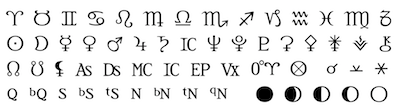 [
[ Renton, WA-based Peter R. Wilson's metafont code (2000-2003) for the "bookhands" series of fonts. It was his intention to provide the main examples of manuscript hands from the first century until the invention of printing. Included are the following:
  The
The  Graphic designer in Yakima, WA, who created Mosaics in 2015. [
 Pasco WA-based designer of Papaya Caps (2017), a technical writing font in the Tekton genre.
  Foundry in Seattle, WA. was Stu Heinecke Creative Systems. Stu Heinecke is a famous cartoonist and direct marketer. The Stu Heinecke handwriting font family is credited to him. In 2011, they published the handwriting and dingbat family
  [
[ Student in 2010 of Jennifer Kennard at Seattle Central Community College. In her class, she designed a beautiful typographic
 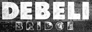 Cakovec, Croatia and Washington Park, WA-based designer (b. 1995) of preponderantly grunge typefaces. In 2013, he created Funny Classic, Lion Pro, Lover, War is in the Air (military stencil), Aussen (squarish), Ensione (outlined), Rangle, Gaon, Momgers, Escapea (athletic lettering),
  Graphic design student at the University of Kansas, who is based in Seattle, WA. During his studies, he created
  Graphic designer who started in Los Angeles, where he ran
  Educated at Stanford (M.Sc. in digital typography in 1985 under the supervision of Donald Knuth and Charles Bigelow) and before that at the University of Colorado at Boulder (undergraduate math degree in algorithms under Hal Gabow). Type designer. Creator of these architecturally-inspired type families:
 Designer from the state of Washington. Doug Fast started the trend of revitalizing Victorian lettering and signs. As an advertising designer, he created the K2, New Balance and
  Seattle, WA-based designer of the free font family Blueberry Sans (2021), intended to provide competition for Julieta Ulanovsky's Montserrat (2011), which in turn vies with Tobias Frere-Jones's commercial juggernaut, Gotham (2000) and to some extent with Mark Simonson's Proxima Nova.
  Graduate of Baku State University, class of 2015. Seattle, WA-based designer of script and handcrafted typefaces. By 2021, his typefaces included: Abridge, Dynamic, Bodacious, Lemon Yoga, Fabulous, Rose, Ocean and Tine, Ancient Tulip, Factory, Anxiety, Gumption, Fugacious, Fluidity, Witness, Bulletin, Delicacy, Love and Hate, December, Cuties, Beguile, Mystery, Paisley, Billion, Brigitte, Adoration, Felicity, Dulcet, Paradox, Sublime, Languid, Lithe, Panoply, Florence, Honey, Silhouete, Risotto, Quarto, Attitude, Lyrical, Tryst, Sophia, Pristine, The signature, Absolute, Sanguine, Barrier, Youth, Wriggle, Welcome, Sunshine, Storytell, Station, Shallow, Revival, Rebela, Rainbow, Portion, Perplex, Mixture, Me Gusta, Milkyway, Kinship, Keep Calm, Junior, Genetic, DonutMania, Dapper, Balance, Avenue, Adroit, Vertical, outine, Quaint, Orenda, Vestige, Tolerant, Scintilla, Remember, Redolent, Reckless, Pursuit, Pelagic, Majestic, Lovish, Jaimps, Jealous, Harmony, Glamour, Filament, Querencia, Emotion, Distant, Digress, Demure, Darya, Cherish, Bobolink, Absense, Amelia, Tolerant, Bobolink, Cherish, Absense, Fabulous, Felicity, Adoration, Billion, Love and Hate, Majestic, Yogalemon, Ancient Tulip.
  Type foundry in Washington state, est. 2014 by Mattox Shuler. Typefaces:
  Frans Velthuis (Groningen University) developed a Devanagari Metafont in 1991, which is available from the
  Seattle-based type designer (b. 1951, Spokane, WA) who founded
  Shawn Hooghkirk (Graticle, located in Longview, WA) created the handcrafted typefaces Quarterback Keeper (2015), Rough & Ready (2015), Gorilla Girl, Dog Faced Man and Alligator Man in 2015.
  Hold Fast Foundry (State of Washington) was founded in 2013 by Mattox Shuler. Its typefaces:
  Owen Earl (Indestructible Type, Seattle, WA) takes a new look at old classics. He reinvents them from scratch, and redesigns each glyph very carefully. Some of his work is completely free, and other typefaces are commercial. His fonts:
  Seattle-based lettering artist who runs
  Puyallup, WA-based designer of the
  Graphic designer in Seattle, WA (was: San Jose, CA), who created the
  Aka Loudifier. In 2013, Jeff Davis (Seattle, WA) published the
  Celebrated American sign painter and type designer (b. Tacoma, WA, 1951), who lives in Iowa City, IA. Downer earned a BA degree in Fine Art from Washington State University, and both an MA degree and an MFA degree in painting from the University of Iowa. John Downer has been a journeyman sign painter since 1973, and a type designer since 1983. He is known as a type critic and type historian. He teaches hand lettering and lectures widely at educational institutions and professional conferences. Downer's professional activities include sign painting, lettering, glass gilding, type design, typography, and logo design. His typefaces:
  Jonathan Ball is a lettering and typographic designer based in Seattle, WA. In 2015, he founded his own commercial type foundry. His typeface
  [
[ Based in Bellingham, WA, Kendra Aldrich made the
  Kevin Chang, a graphic designer in Seattle, WA, created the
  Khaito Gengo (Des Moines, WA, and Seattle, WA) graduated from High School in Australia. From 2005 to 2008, he worked as a graphic designer at his father's interior design company, Gengo Space Design Institute, in Japan. After that, he graduated from Highline Community College, WA, and was mentored by Laura Worthington.
 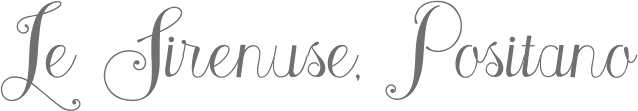 Kimmy Kirkwood (b. 1988, Seattle, WA) (Kimmy Design) studied at Chapman University, and lives in Santa Monica, Orange County. He graduated in 2018 from
  [
[ Together with Natalie Siderius, Lacey Verhalen (Seattle, WA) created the didone typeface Bardot (2014). They write hat they wanted to make chic and cheeky.
  [
[
 Andrea Leksen (Leksen Design, Seattle, WA) has a Master of Design degree from Duncan of Jordanstone College of Art & Design, Dundee, Scotland, and a BA in Music Arts Administration from Whitworth University, Spokane, WA. She has been a freelance designer since 2003. She teaches at Seattle Pacific University. Her typefaces include:
  [
[ [
[ [
[ Born and raised in Seattle, WA, Molly Boyd created a proposal replacement typeface for Esso's pre-1911 logo font in 2013 while studying at the University of Washington. [
 Spokane, WA-based designer of the hand-drawn poster typeface Eclipse (2014). [
 Graduate of the College for Creative Studies, who works in Seattle, WA (and before that, in Brooklyn, NY). He created
  [
[ Graphic designer in Seattle, WA. He cofounded
  [
[ Inventor and patent holder (with W.H. Gordon) of the speedball pen. Lettering artist from Seattle, influenced by W.H. Gordon. W.H. Gordon and Ross F. George wrote
  Ross F. George's book Speedball 10, published by C. Howard Hunt Pen Co. in Camden, NJ in 1927, was scanned in 2014 by Lee Littlewood, a signpainter in Portland, OR, who runs Lee's Better Letters [2915 NE 21st A, Portland, OR 97212]. The
  Visual Communication Design student at the University of Washington, expected to graduate in the spring of 2013. In 2012, Katarina Batina, Elly Chao, Nick Simmons and Ryan Smith co-designed the didone stencil family Rille during the
  Aaron earned a Bachelor's degree in Asian Studies, with a minor in Japanese, at Whitman College in Walla Walla, WA. Aaron is a
  Born in Aleppo, Syria,
  Jeremy Bowen is a graphic designer from Seattle, WA. He set up the foundry seven eight in Renton, WA. His first typeface is the basic monoline sans
  Seattle, WA-based designer of an art deco typeface in 2015. [
 [
[ Stiff Upper Glyph is John Merrifield's type foundry in Seattle, WA (and before that, Los Angeles, CA), est. 2012. Their typefaces:
  The Cowboy Collective is a cowboy art initiative by Owen Earl, the Washington-based founder of Indestructible Type. Designer of these revival fonts:
  Toto Ng (b. 1993, Hong Kong) studied in Seattle in 2014.
 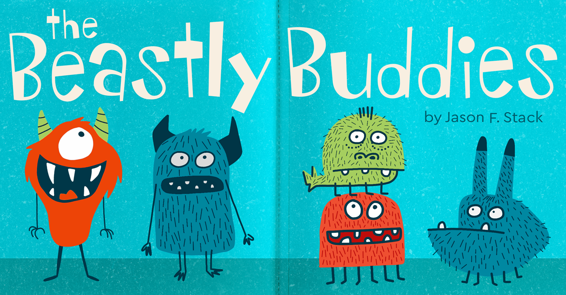 Eric Scott Stevens has a BFA in graphic design from Winthrop University, Rock Hill, SC. Eric Scott specializes in display fonts that have a unique character. He is presently based in Tacoma, WA, where he set up the type foundry tower of Babel.
  Turtle Arts Fonts is the Seattle, WA-based foundry of Kerrie Carbary (b. 1970), est. 2000.
  Kelly Hobkirk (Typekirk, Seattle, WA) is a type and graphic designer. He created the modular typeface Ribbed and the pair of jazz-inspired fonts Coleman and Coleman Duo in 2015. In 2016, he published the contrasted all caps sans poster typeface Whim, and in 2017
  Vincent Connare (b. 1960, Boston) is an ex-painter turned type designer, who holds an MA in typeface design from the University of Reading in 1999. In the late eighties/early nineties Connare worked in the Ikarus, Intellifont and TrueType teams for Agfa/Compugraphic, and was one of the first type designers to learn TrueType hinting. Then he joined Microsoft, where he designed
  Seattle, WA-based creator of a number of experimental Kufi examples for Arabic (2015). In 2016, he designed the
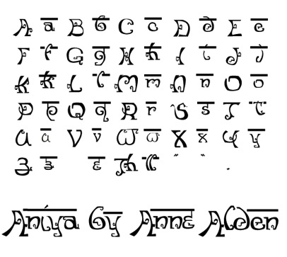
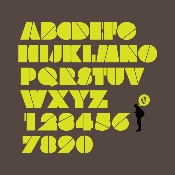
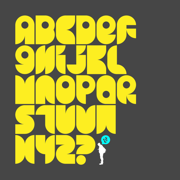
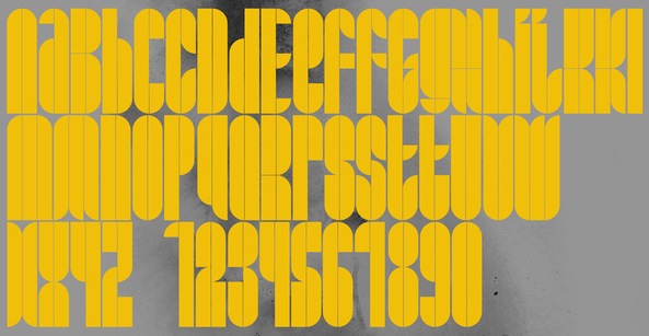
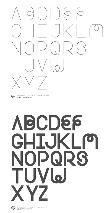
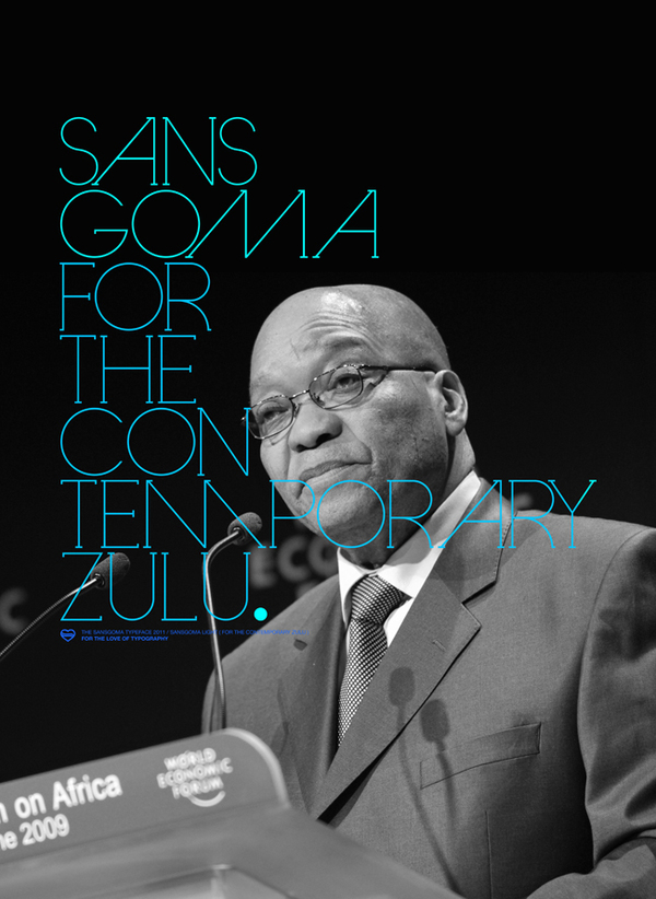
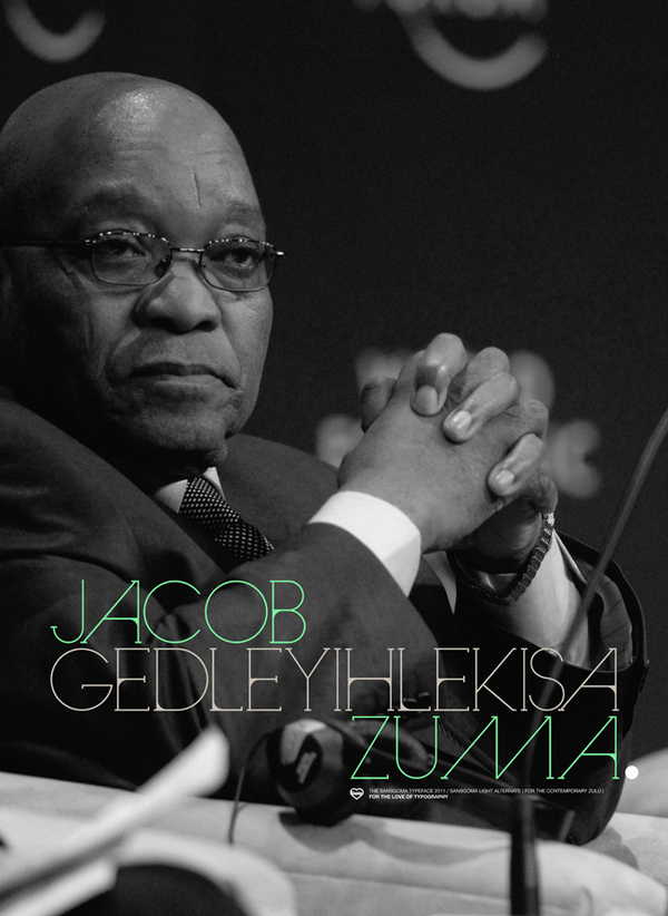
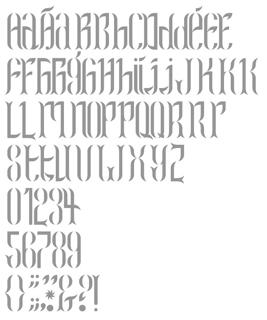
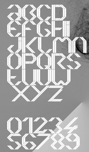
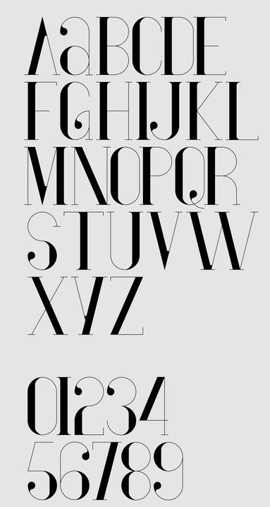
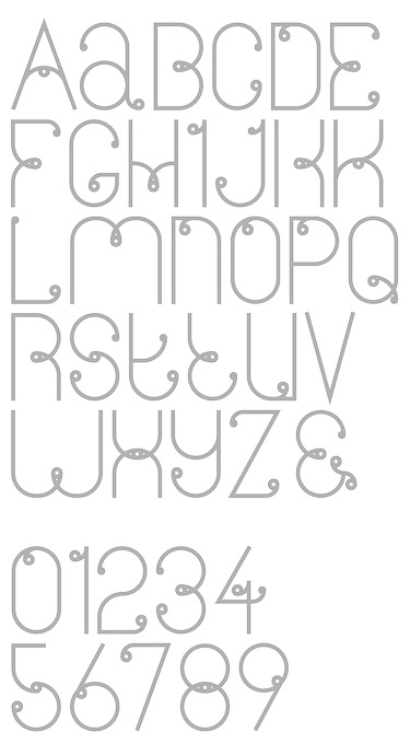
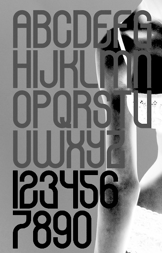
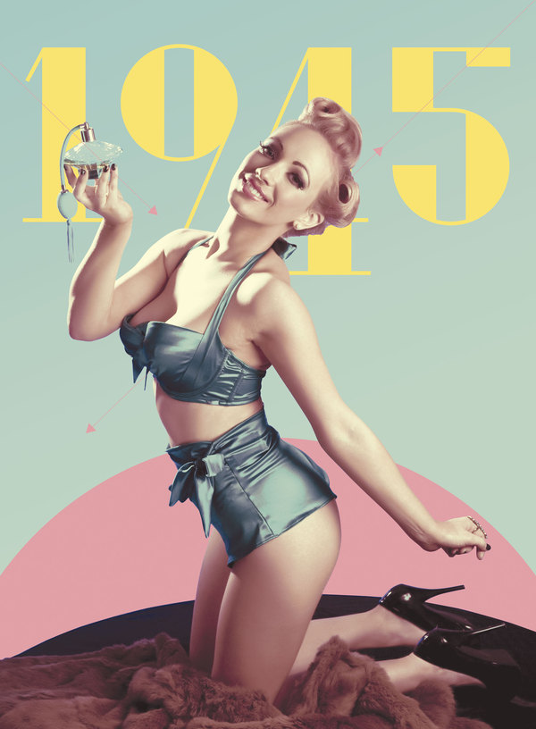
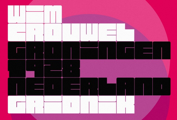
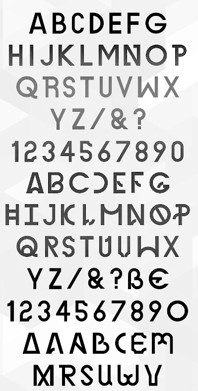
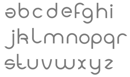
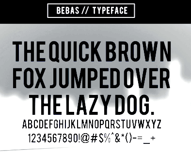
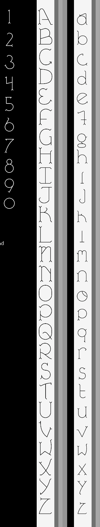
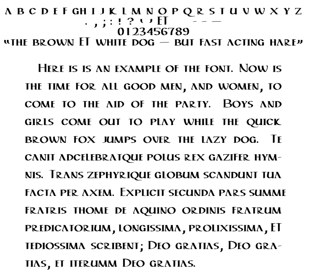
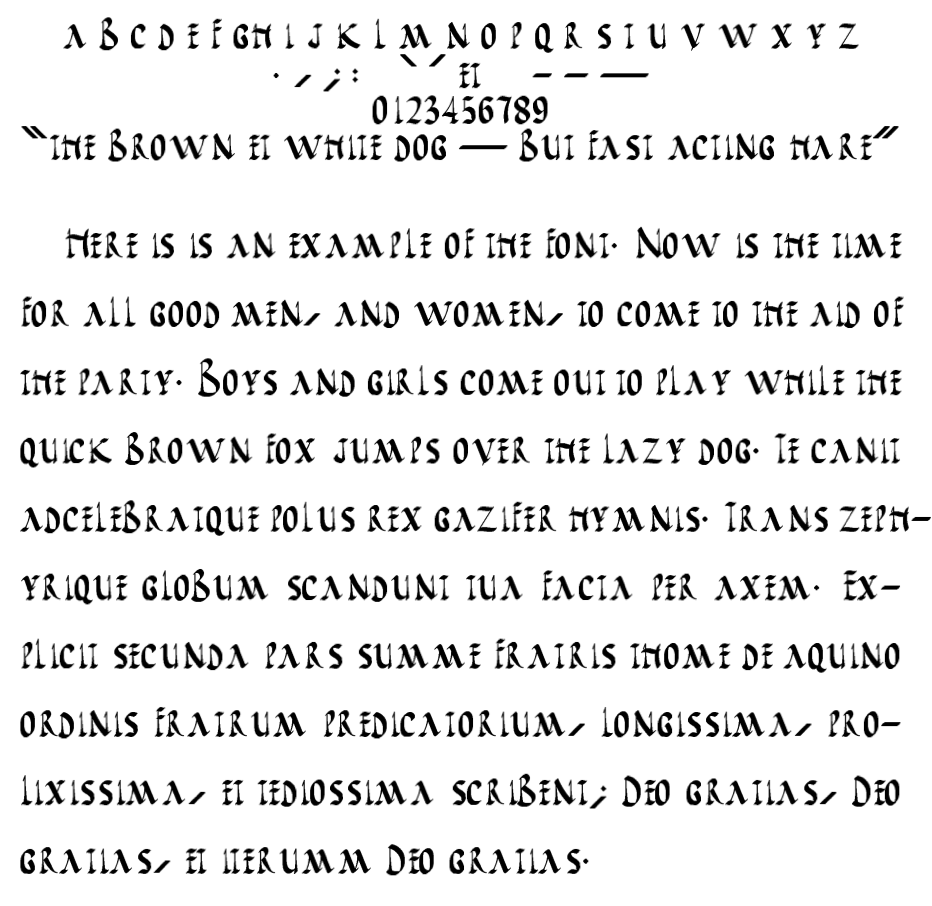
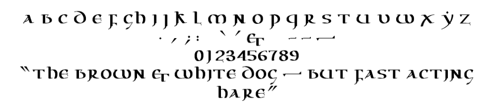
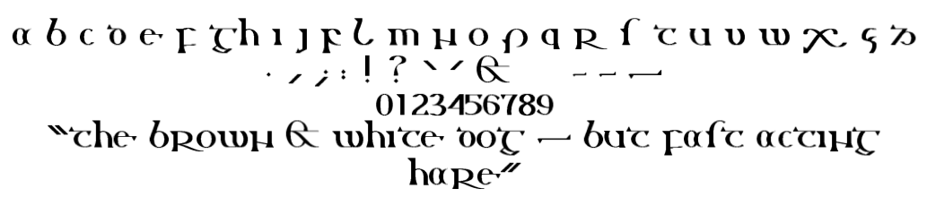
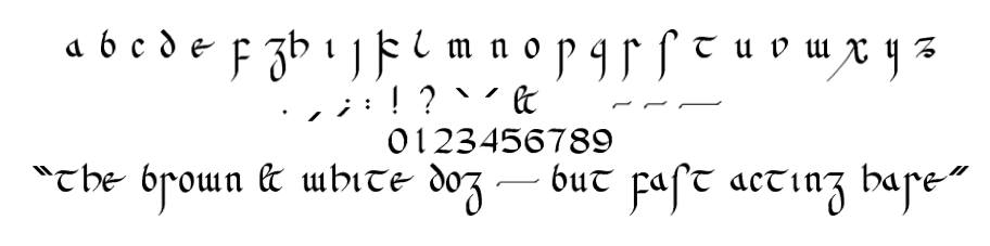
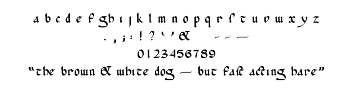
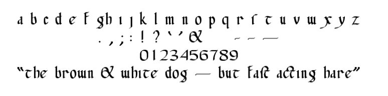
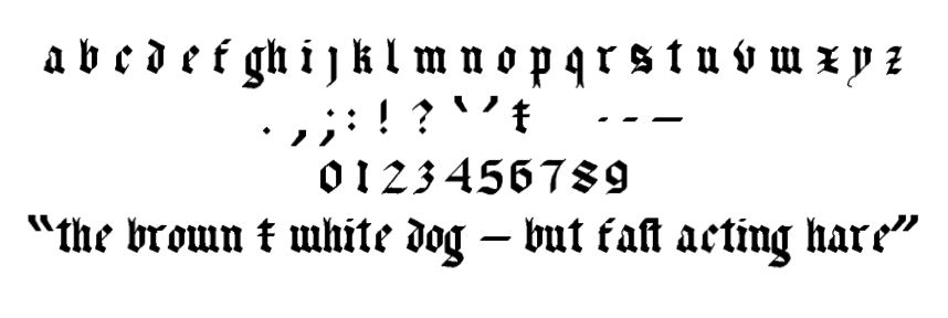
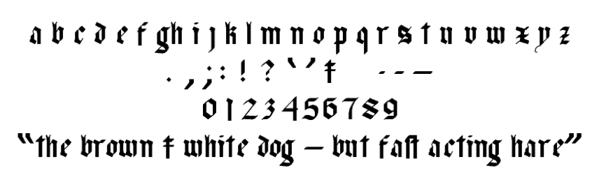
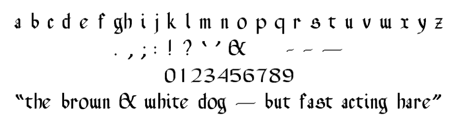
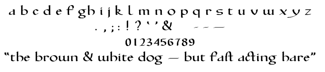
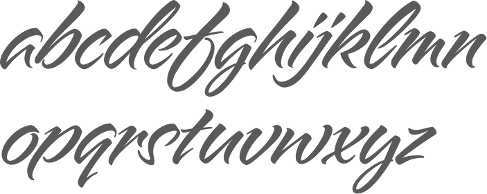
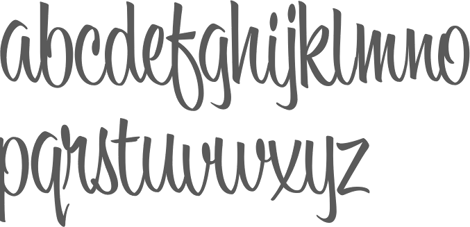
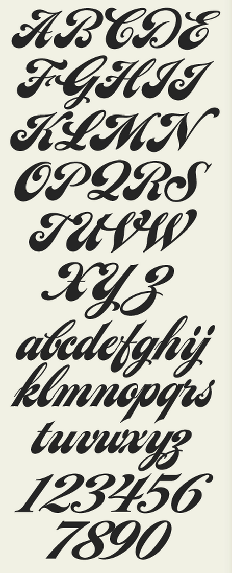
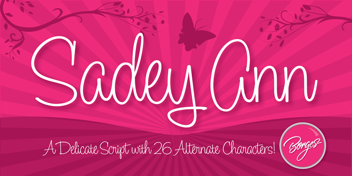
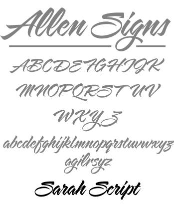
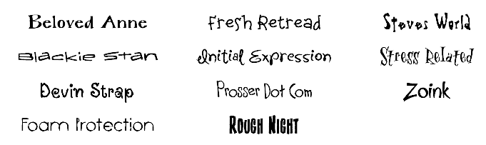
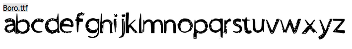
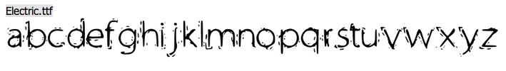
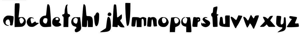
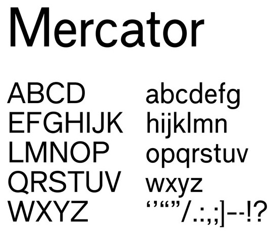
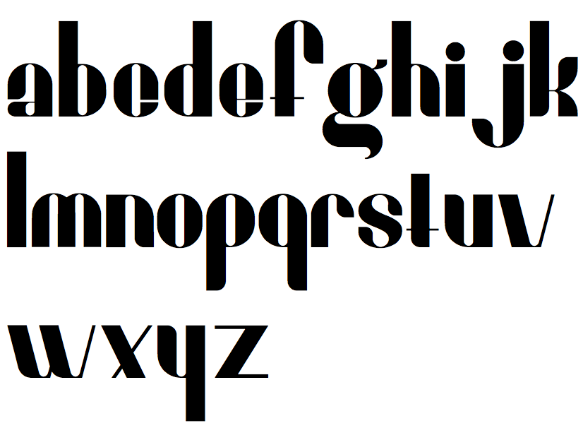
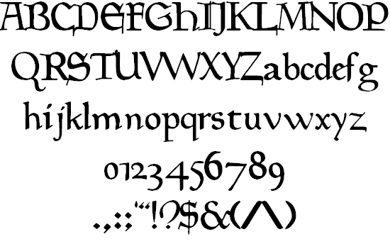
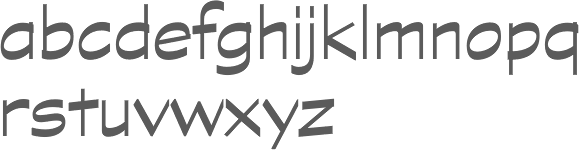
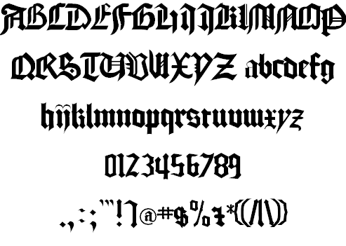
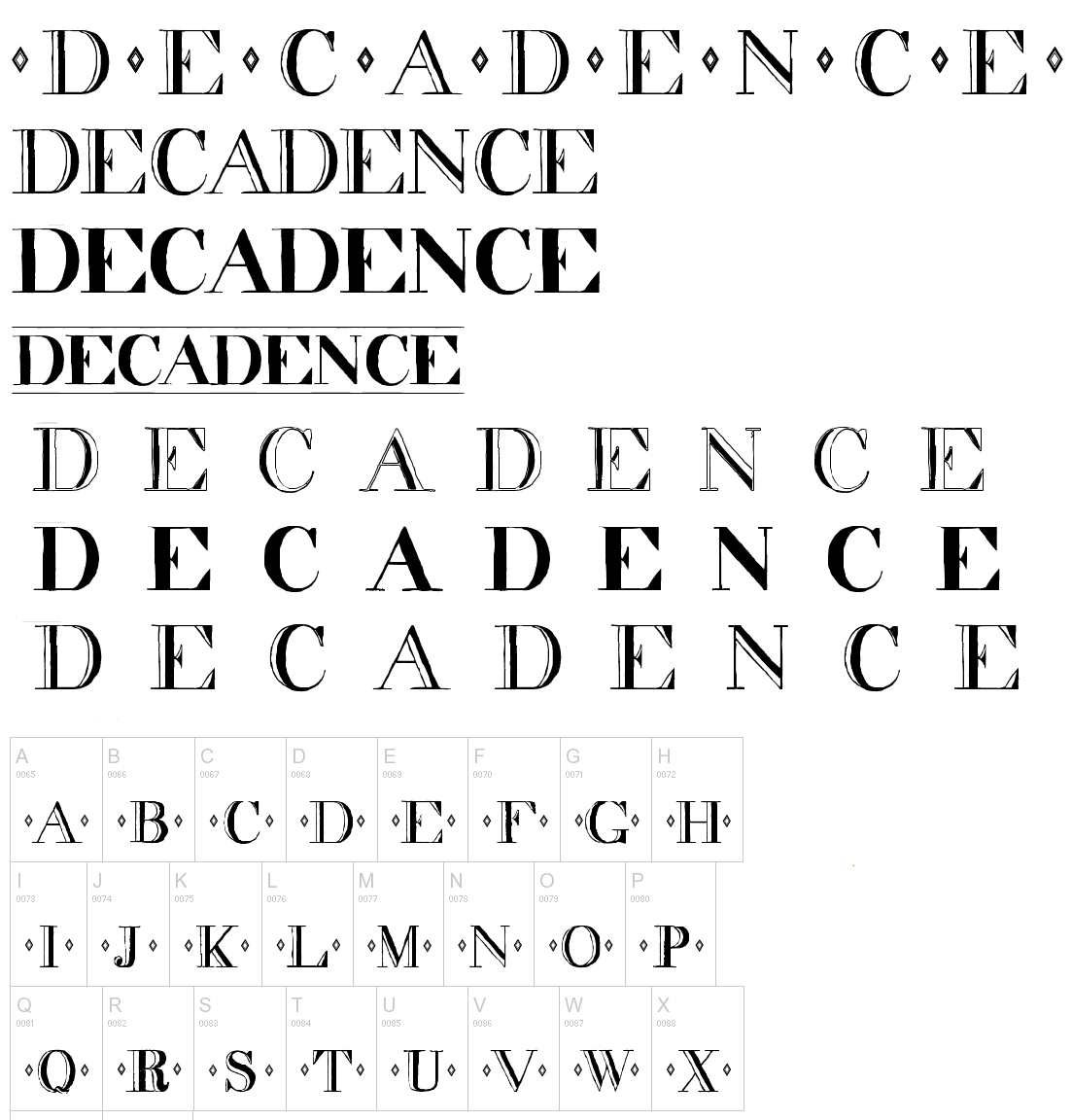
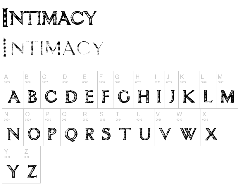
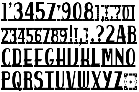
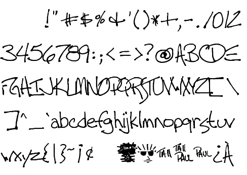
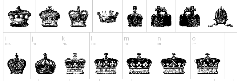
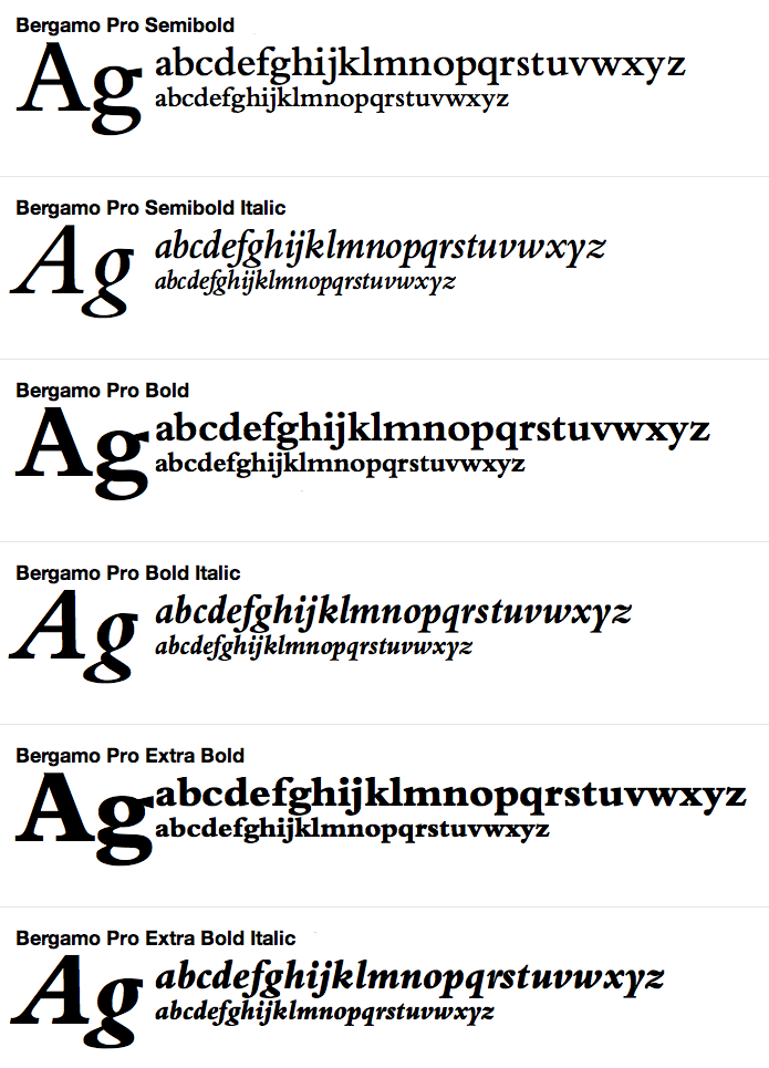
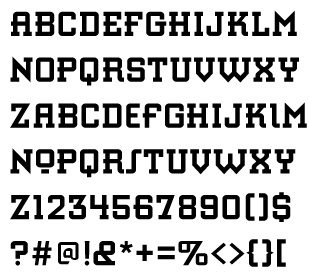
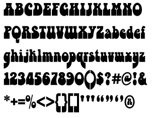
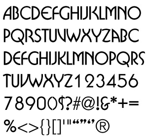
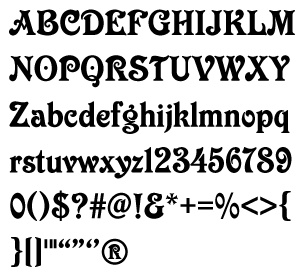
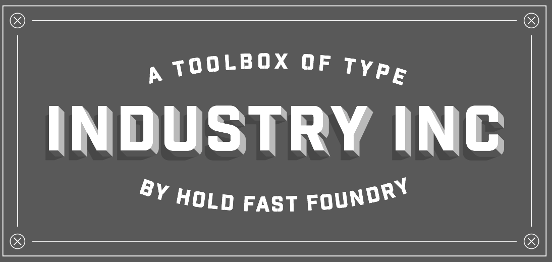
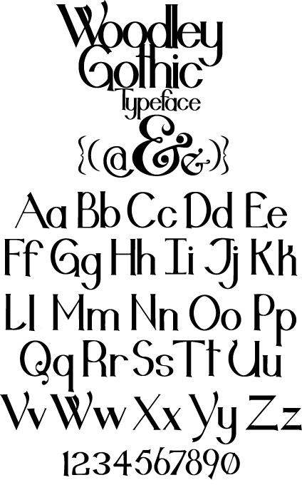
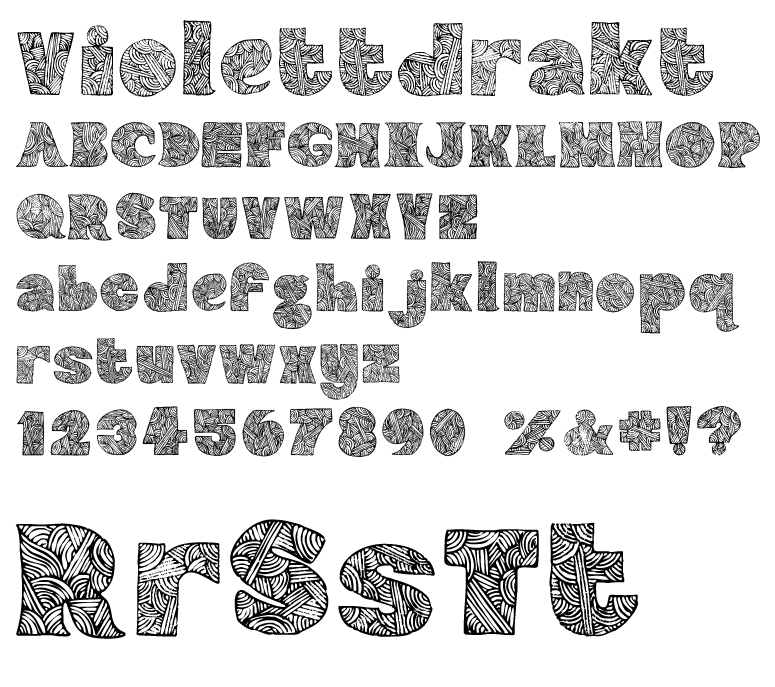
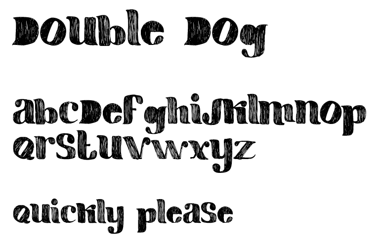
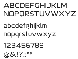
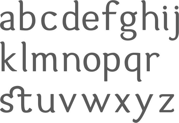
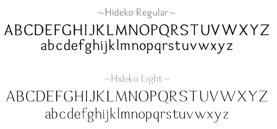
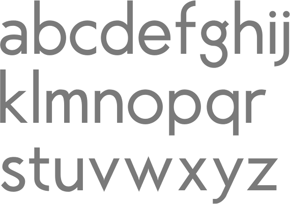
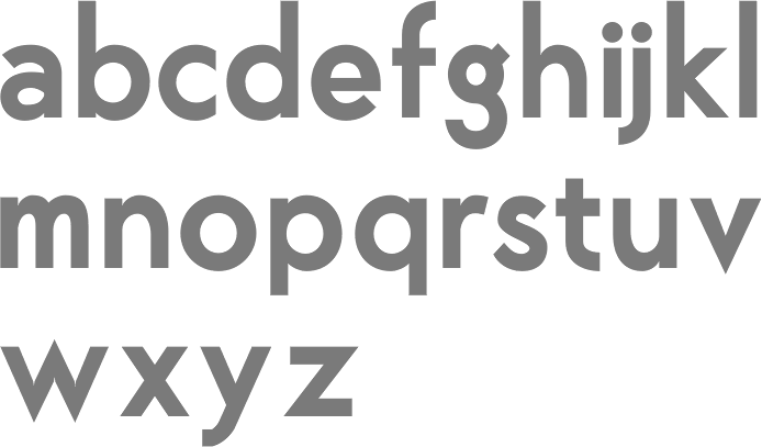
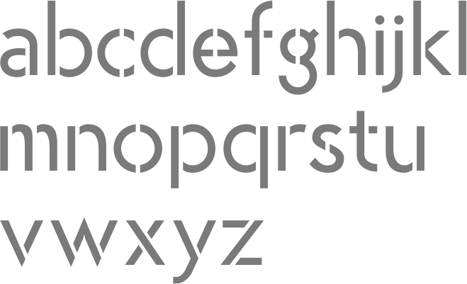
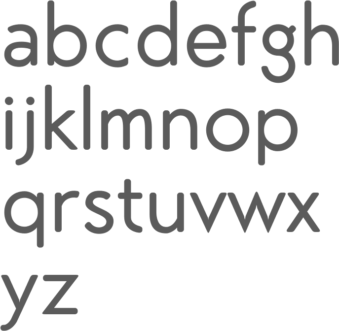
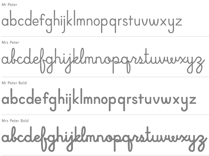
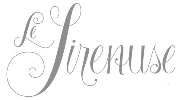
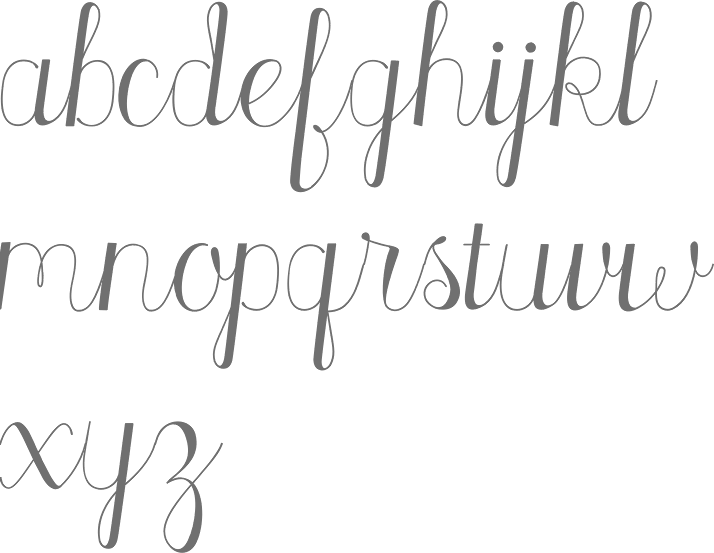
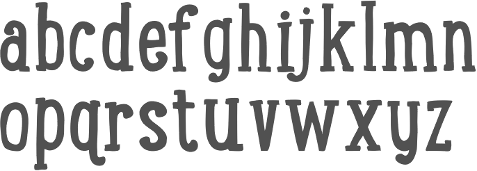
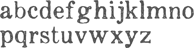
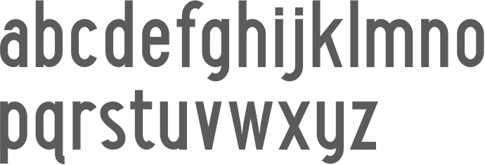
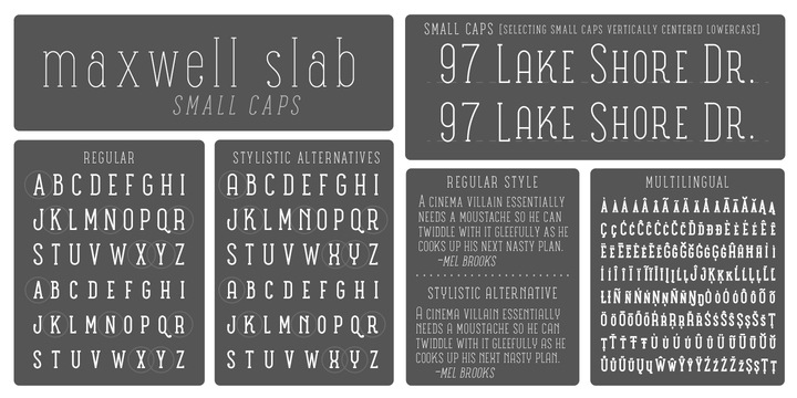
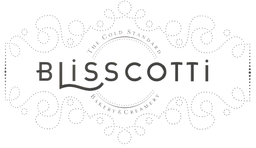
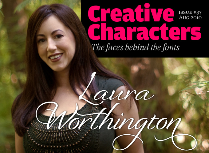
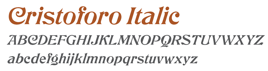
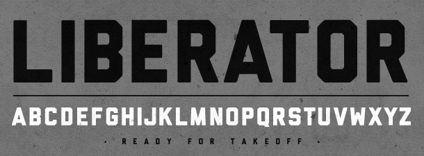
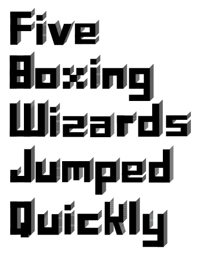
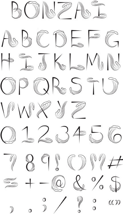
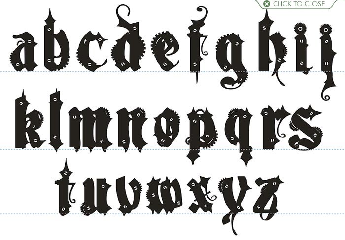
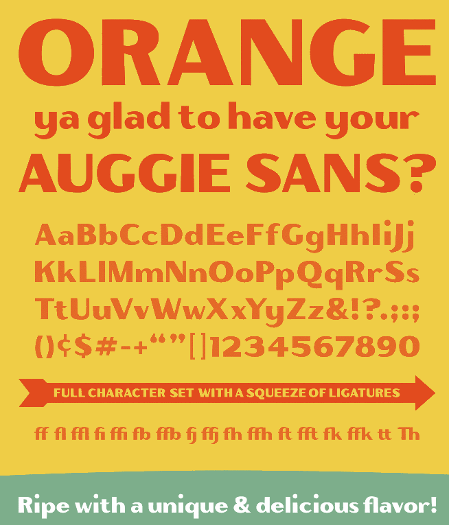
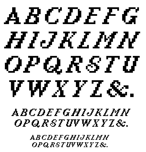
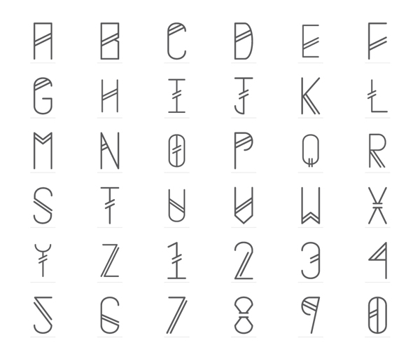
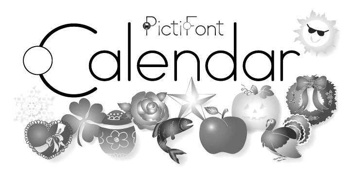
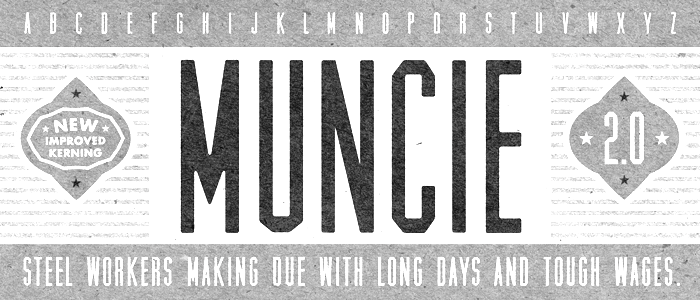
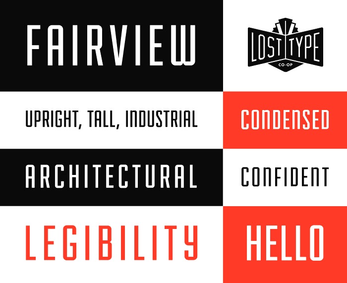
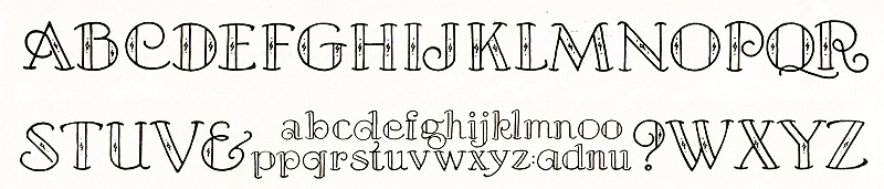
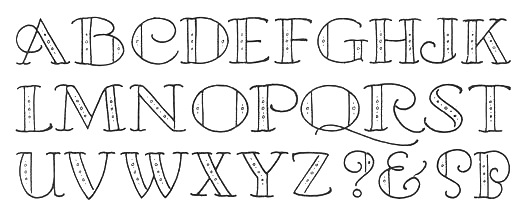
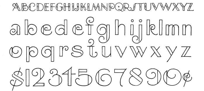
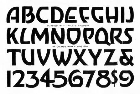
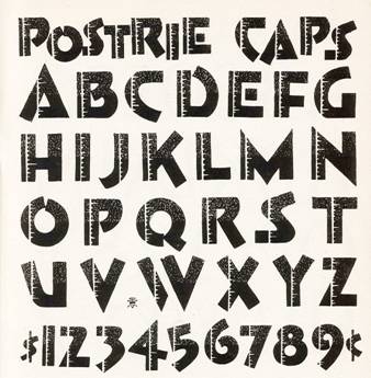
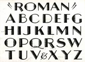
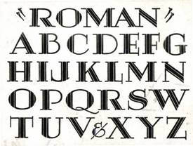
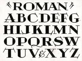
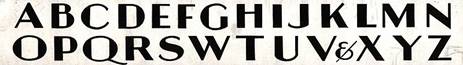
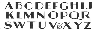
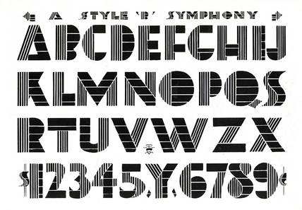
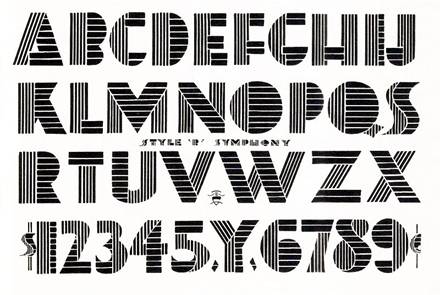
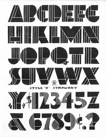
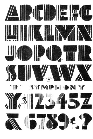
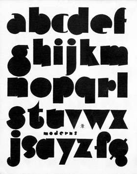
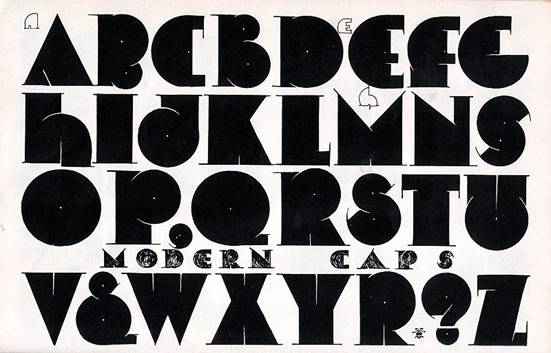
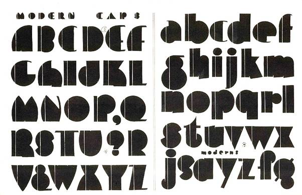
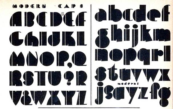
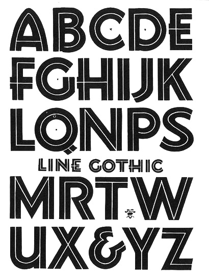
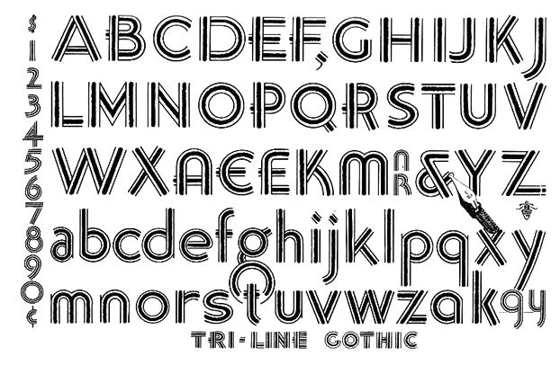
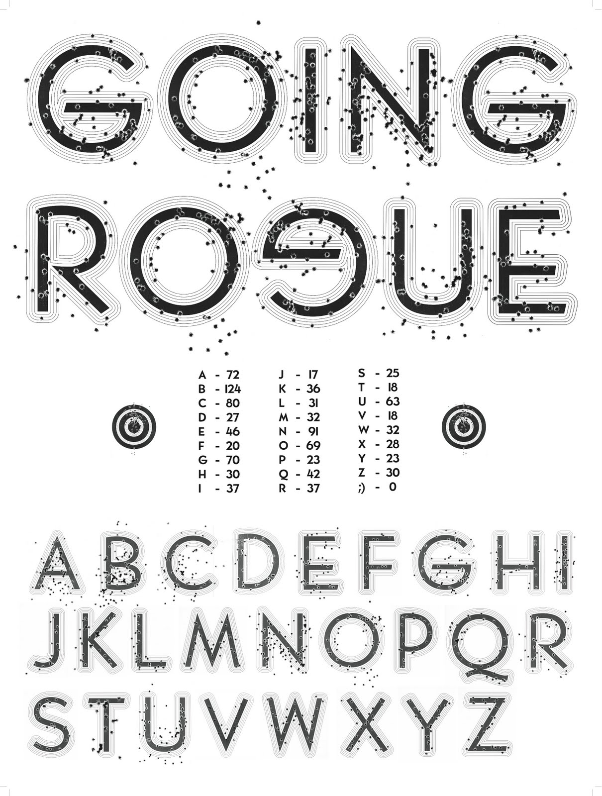
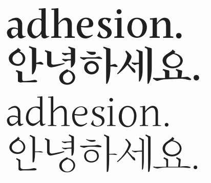
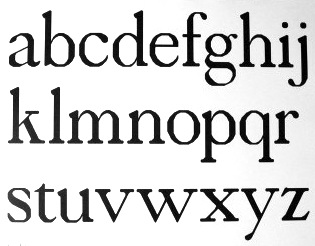
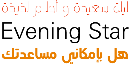
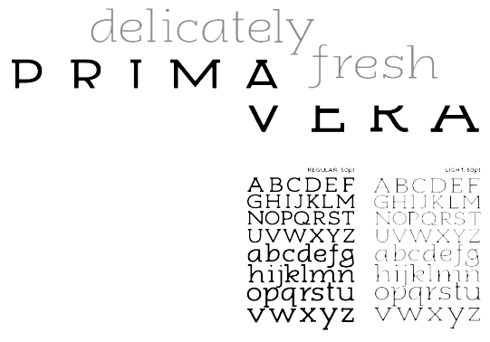
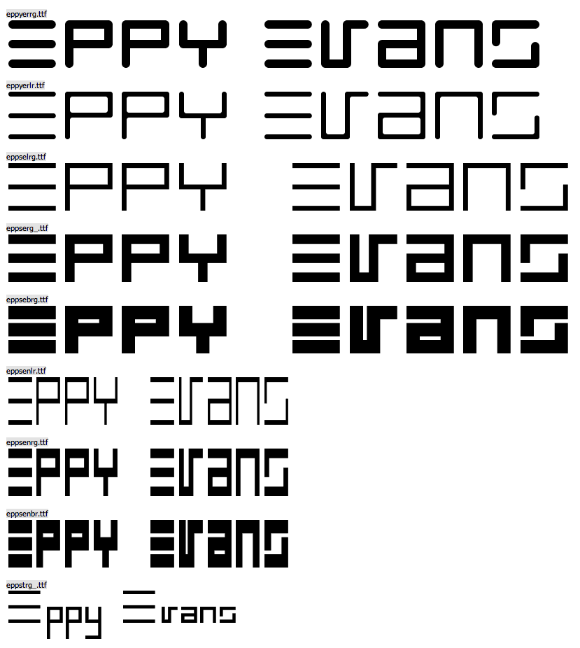
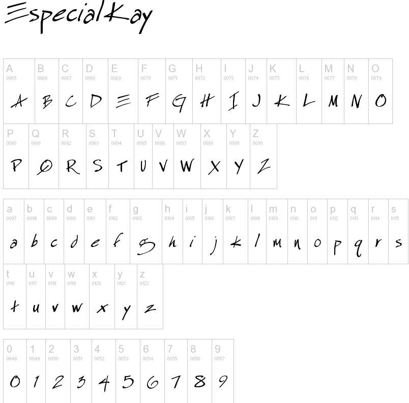
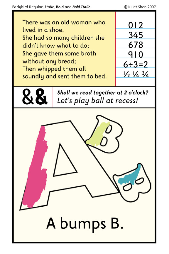
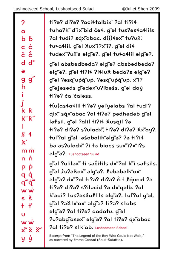
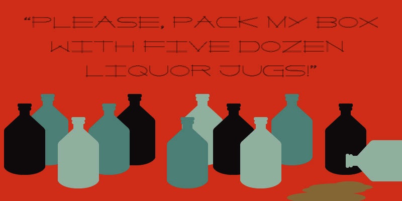
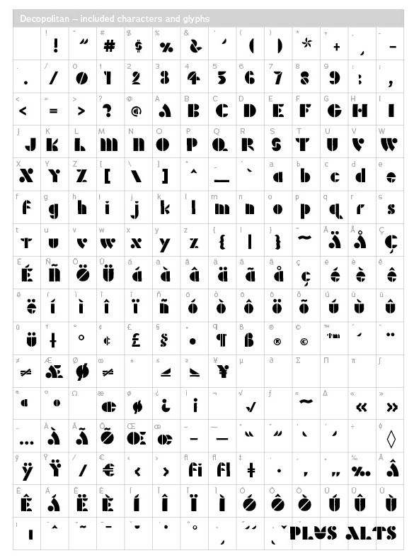
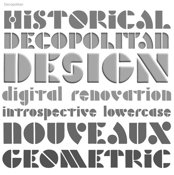
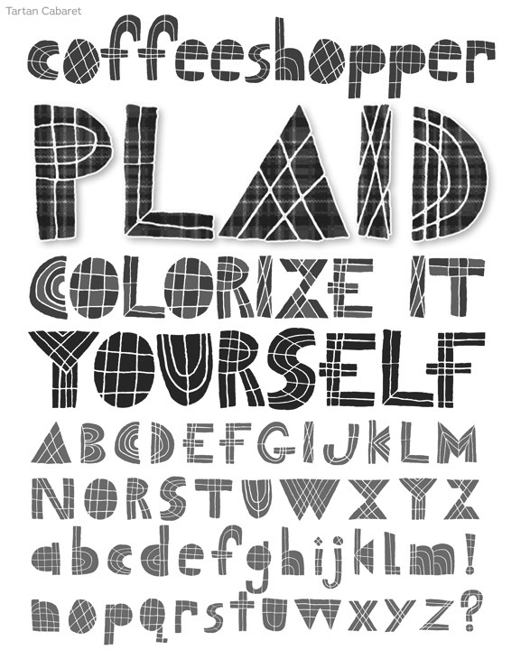
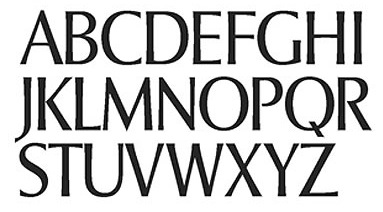
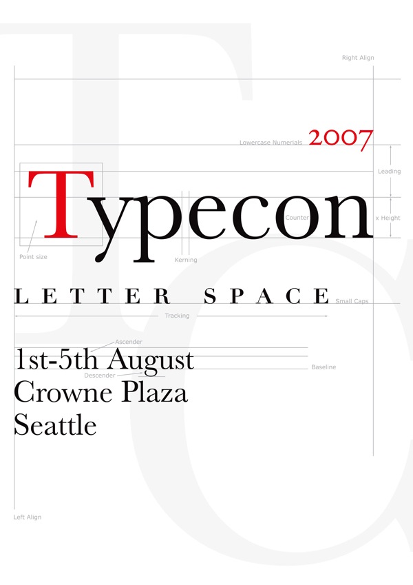
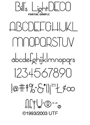
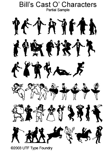
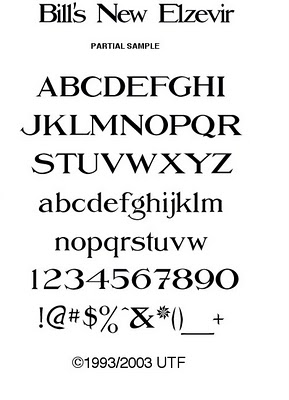
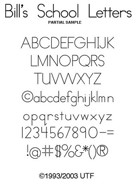
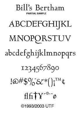
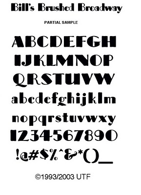
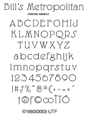
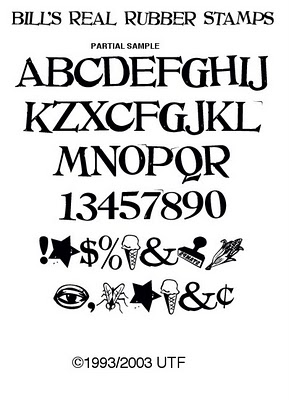
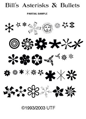
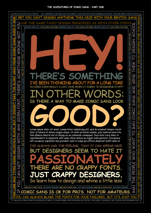
|
|
|
|