| | |
100 Beste Schriften aller Zeiten
|
 German FontShop-sponsored site listing the hundred best fonts of all times, compiled by a jury in 2007. There is a lot of good information about each of the fonts mentioned. PDF file compiled by the jury: Stephen Coles, Jan Middendorp, Veronika Elsner, Roger Black, Ralf Herrmann, Claudia Guminski (FontShop) and Bernard Schmidt-Friderichs. Visualization of the list. The list:
 - (1) Helvetica
- Garamond
- Frutiger
- Bodoni
- Futura
- Times
- Akzidenz Grotesk
- Officina
- Gill Sans
- Univers
- (11) Optima
- Franklin Gothic
- Bembo
- Interstate (1993, Tobias Frere-Jones)
- Thesis
- Rockwell
- Walbaum
- Meta
- Trinité
- DIN
- (21) Matrix
- OCR A und B
- Avant Garde
- Lucida
- Sabon
- Zapfino
- Letter Gothic
- Stone
- Arnhem
- Minion
| | - (61) Blur
- Base
- Bell Centennial
- News Gothic
- Avenir
- Bernhard Modern
- Amplitude
- Trixie
- Quadraat
- Neutraface
- (71) Nobel
- Industria, Insignia, Arcadia
- Bickham Script
- Bank Gothic
- Corporate ASE
- Fago
- Trajan
- Kabel
- House Gothic 23
- Kosmik
- (81) Caecilia
- Mrs Eaves
- Corpid
- Miller
- Souvenir
- Instant Types
- Clarendon
- Triplex
- Benguiat
- Zapf Renaissance
| - (91) Filosofia
- Chalet
- Quay Sans
- Cézanne
- Reporter
- Legacy
- Agenda
- Bello
- Dalliance
- Mistral
| Follow-up in English. Credit for some images below: Danielle West. [Google]
[More] ⦿
|
1930s American midwestern typography
|
Jonathan recommends these fonts as representatve of 1930s American midwestern typography: "If you're going for museum-piece accuracy, look for typefaces issued by the Ludlow or Barnhart Brothers&Spindler type foundries--- you can probably do some sleuthing at myfonts.com. But to get you started, try Tempo, Cheltenham, Franklin Gothic (not ITC), Cooper Black, Alternate Gothic, Post Roman, Copperplate, Radiant, Agency Gothic, Poster Gothic, Bank Gothic, or the ineluctable Goudy Old Style." [Google]
[More] ⦿
|
Adam Fathony
[AF Studio]

|
 [MyFonts]
[More] ⦿
[MyFonts]
[More] ⦿
|
Adobe + TypeKit
|
In 2010, Adobe started offering web fonts via TypeKit for a fee---only Adobe Garamond was free. The fifteen remaining families are Adobe TextGaramond Premier, Hypatia Sans, Minion, Myriad, Myriad Condensed, News Gothic, Poplar, Rosewood, Rosewood Fill, Trajan, and Voluta Script. Mike Duggan : based on what I have seen so far at the Typekit site, the hinting does not appear to be as good as in the Adobe Web fonts of old. [Google]
[More] ⦿
|
AF Studio
[Adam Fathony]
|
 Adam Fathony (or Adam Fathoni Haris; AF Studio, Bandung, Indonesia) created the vintage typeface Grandesa (2014), the signage typeface Magnifika (2014) and the Victorian typeface Marema (2014).
 In 2015, he published the connected swashy script typeface Octavia Script, the brush scripts Carbonera and Shallom, the hand-lettered Vanilla Daisy Script and Mightype, the watercolor script Hollycakes, and the connected Brayden Script (and Sans). Typefaces from 2016: Drustic Daily, Karlberg Script, Ecosmith Script, Halosense Script (calligraphic), Lunar Cone (connected layered script), Clarkson Script, Salvador Script, Salvador Serif, Salvador Condensed, La Venice Script (retro signage lettering). Typefaces from 2017: Clarkson Script (brush lettering), Bignord Vintage (with Fauzan Rafhy), Douglas Collection (12 fonts: Aaronade Script, Ancaster Script, Burlington, Calgury, Montreal Rounded, Morphic 60s, Norwood Old, Ogdensburgh, Palmeira, Rutland Extended, Wolves Sans, Wolves Serif), Almost Lover, Rhythmic Dances (rough script), Sevastian (layered font set), Rustling Trees (dry brush), Little Karla Script. Typefaces from 2018: Figuera Variable (a late Victorian, early art nouveau typeface family; variable font format), Brignola (a calligraphic penmanship script), Eastside Brush (a brush signage script done with Angga Kristiandri), Marshfield (a retro cursive typeface by Adam Fathoni Haris and Renov Olivian), C'est La Vie (font duo), Chivels (a vintage typeface done with Angga Kristiandri at Abbassy Studio), Sevastian (a layered font family), Drustic Dialy (weathered; with Angga Kristiandri), Elli Bellie (calligraphic). Typefaces from 2019: Scottsdale Serif (at Typeverything), Scottsdale Desert (an opentype feature-laden display serif), Norfolk (Narrow, serif), Tiverton (Sans, Serif, Script: by Adam Fathony Haris and Angga Kristiandri), Havard (a layerable athletic lettering set of 12 fonts), Gorga Grotesque. Typefaces from 2020: Auvelle (a hairline sans), Windsore (a font trio), Howli (layerable, rounded; sans, serif and script), Genty (a creamy retro signage script typeface by Ilham Herry and Adam Fathoni Haris), Burnest (a vintage typeface by Adam Fathoni Haris and Renov Olivian), Glaw (a psychedelic font by Ilham Herry and Adam Fathoni Haris), Oliviar Sans (28 styles and a variable font), Budge (a layerable retro signage script by Ilham Herry and Adam Fathoni Haris), Stanlow, Muray House (a bold swashy bathroom towel typeface by Ilham Herry and Adam Fathoni Haris), Esteric (a playful tapered font by Ilham Herry and Adam Fathony). Typefaces from 2021: Alstera (an oblique serif), Monvar (a layerable Cooper Black style typeface by Ilham Herry and Adam Fathoni Haris), Rische (a 6-style display serif with huge counters and an enormous x-height; by Ilham Herry and Adam Fathoni Haris), Ottenthic (script and serif), Mionic (a reverse contrast slab serif by Adam Fathoni Haris and Angga Kristiandri), Matchbox Font Collections (a set of vintage fonts based on lettering on matchboxes; it includes substyles called Linea, Lettre, Deco, Scriptura, Ornato, and Graso). Typefaces from 2022: Balide (a 70s style display typeface), Norsy (a 21-style and variable flared font family). [Google]
[MyFonts]
[More] ⦿
|
Akira Kobayashi
|
 Born in 1960 in Niigata, Japan. Studied at the Musashino Art University in Tokyo. He also studied calligraphy at the London College of Printing. He became a freelance designer in 1997. Akira Kobayashi, who was based in Tokyo prior to his move to the Franfurt area, is an accomplished type designer who has created numerous typefaces for Sha-Ken, Dainippon Screen (where he made the kanji font Hiragino Mincho), TypeBank (from 1993-1997), ITC and Linotype, where he is Type Director since 2001. Interview. His numerous awards include the Type Directors Club awards in 1998 (ITC Woodland), 1999 (the art deco styled ITC Silvermoon, and ITC Japanese Garden), and 2000 (FF Clifford), the 1999 Kyrillitsa award for ITC Japanese Garden, the 3rd International Digital Type Design Contest by Linotype Library (for the informal and quirky 4-style Linotype Conrad (1999): Linotype states that Kobayashi took his inspiration from a print typeface of the 15th century created by two German printers named Konrad Sweynheim and Arnold Pannartz), and the 5th Morisawa International Typeface Competition (in which he received an Honourable Mention for his typeface Socia Oldstyle). CV at bukvaraz. Interview in 2006. His typefaces:
 - Helvetica Neue eText Pro (2013).
- Dainippon Screen: the kanji font Hiragino Mincho.
- ITC: ITC Scarborough (1998), ITC Luna, ITC Silvermoon, ITC Japanese Garden, ITC Seven Treasures (1998), ITC Magnifico Daytime and Nighttime (1999), ITC Vineyard (1999), ITC Woodland Demi (1997).
- Adobe: Calcite Pro (sans-serif italic at Adobe, in OpenType format).
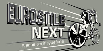
- Linotype: Akko Sans and Akko Rounded (2011; Akko Rounded is situated between DIN, Isonorm and Cooper Black, while Akko Sans is an elliptical organic sans related to both DIN and Neue Helvetica), Akko Condensed (2015), Akko Pro Condensed (2015), Akko Pan-European (2015), Eurostile Next (2008, after Aldo Novarese's original), Eurostile Candy and Eurostile Unicase, Cosmiqua (2007, a lively didone serif family based on 19th century English advertising types, and in particular Miller&Richard's Caledonian Italic), Metro Office (2006, a severe sans after a family of Dwiggins from the 20s), Neuzeit Office (2006, modeled after the original sans serif family Neuzeit S, which was produced by D. Stempel AG and the Linotypes design studio in 1966. Neuzeit S itself was a redesign of D. Stempel AG's DIN Neuzeit, created by Wilhelm Pischner between 1928 and 1939), DIN Next (2009, based on the classic DIN 1451), Times Europa Office (2006, modeled after the original serif family produced by Walter Tracy and the Linotypes design studio in 1974. A redesign of the classic Times New Roman typeface, Times Europa was created as its replacement for the Times of London newspaper. In contrast to Times New Roman, Times Europa has sturdier characters and more open counter spaces, which help maintain readability in rougher printing conditions. Times Europa drastically improved on the legibility of the bold and italic styles of Times New Roman.), Trump Mediaeval Office (2006), Linotype Conrad (1999), Optima Nova (2002, a new version of Optima that includes 40 weights, half of them italic), Linotype Avenir Next (2003, 48 weights developed with its original creator, Adrian Frutiger, and to be used also by the city of Amsterdam from 2003 onwards), Avenir Next Rounded (2012, in conjunction with Sandra Winter), Avenir Next Paneuropean (2021: 56 styles), Zapfino Extra, Palatino Sans and Palation Sans Informal (2006, with Hermann Zapf; won an award at TDC2 2007). Frutiger Serif (2008) is based on Frutiger's Meridien and the Frutiger (sans) family. Diotima Classic (2008, with Gudrun Zapf von Hesse) revives Gudrun's Diotima from 1951. In 2008-2009, Akira Kobayashi and Tom Grace unified and extended Trade Gothic to Trade Gothic Next (17 styles). Neue Frutiger (2009, with Adrian Frutiger) has twice as many weights as the orifinal Frutiger family. Later in 2009, the extensive DIN Next Pro, co-designed with Sandra Winter, saw the light. I assume that this was mainly done so as to meet the competition of FontShop's FF DIN (by Albert-Jan Pool).
- Fontshop: Acanthus (2000, large Fontfont family), FF Clifford (gorgeous text face!). In 2009, he and Hermann Zapf cooperated on Virtuosa Classic, a calligraphic script that updates and revives Zapf's own 1952-1953 creation, Virtuosa.
- Typebox: TX Lithium (2001, The Typebox).
- Oddities: Skid Row (1990), Socia Oldstyle.
- Suntory corporate types (2003-2005), developed with the help of Matthew Carter and Linotype from Linotype originals: Suntory Syntax, Suntory Sabon, Suntory Gothic, Suntory Mincho.
- In 2014, Akira Kobayashi, Sandra Winter and Tom Grace joined forces to publish DIN Next Slab at Linotype.
- Alexey Chekulaev and Akira Kobayashi (Monotype) won a Granshan 2014 award for the Cyrillic typeface SST.
- In 2016, Akira Kobayashi and Sandra Winter co-designed Applied Sans (32 styles) at Monotype. It is in the tradition of vintage sans typeface such as Venus and Ideal Grotesk and competes with Rod McDonald's splendid Classic Grotesque (2011-2016)..
- Member of a type design team at Monotype that created the Tazugane Gothic typeface in 2017. Designed by Akira Kobayashi, Kazuhiro Yamada and Ryota Doi of the Monotype Studio, the Tazugane Gothic typeface offers ten weights and was developed to complement Neue Frutiger. It is the first original Japanese typeface in Monotype's history. Followed in 2018 by the more restrained Tazugane Info. Variable fonts published in 2022: Tazugane Gothic Variable, Tazugane Info Variable.
- SST (2017). A set of fonts for Latin, Cyrillic, Thai, Vietnamese, Arabic and Japanese.
- DIN Next Stencil (2017). Developed together with Sabina Chipara.
- DIN Next Decorative (mostly textured styles such as Rust, Slab Rust, Stencil Rust and Shadow).
- Univers Next Cyrillic and Univers Next Paneuropean, both released in 2020, extending Adrian Frutiger's Univers.
- Shorai Sans (2022) and Shorai Sans Variable (2022). A 10-style Latin / Japanese sans by Akira Kobayashi, Monotype Studio and Ryota Doi, designed as a companion typeface to Avenir Next.
At ATypI 2008 in St. Petersburg, he ran a Linotype student type design workshop. Speaker at ATypI 2012 in Hong Kong: Rounded sans in Japan. View Akiro Kobayashi's typefaces. Klingspor link. FontShop link. Eurostile Next review. Linotype link. Monotype link. MyFonts interview in 2017. [Google]
[MyFonts]
[More] ⦿
|
Alex Jacque
|
 Alex Jacque (b. 1986, Virginia) is a designer and developer based in Oakland, CA (was: Baltimore, MD). He studied at the University of Michigan School of Art&Design and was located at that time in Ann Arbour, MI. He obtained an MFA from the Maryland Institute College of Art.
 Creator of Coop Blackletter (2016, a soft blackletter version of Cooper Black), Dequindre (2015, based on the capitals of Fette Buhe Fraktur by Walter Buhe, 1914-1915), Teip (2014, a multiline layerable all caps typeface), Pila (2014, techno stencil), Handu (2012, hand-drawn sans-serif inspired by the hand-painted type and signage on the streets of Kolkata, India), Atrium (2012, a squarish sans family based on the pen art of W.E. Dennis), Saugatuck (2011, grunge) and Sello (2011, a unicase hand-drawn, geometric sans-serif with a touch of retro). Behance link. Klingspor link. MyFonts foundry link. Home page. [Google]
[MyFonts]
[More] ⦿
|
Alice Deep
|
Alice Deep is an illustrator and graphic designer who lives in South Sydney, Australia. In 2015, she created the hybrid display typeface Western Gumboots by combining Cooper Black and Futura. [Google]
[More] ⦿
|
Barnhart Brothers&Spindler (or: BB&S)
|
 Chicago-based foundry, which grew out of The Great Western Type Foundry in 1868 when the Barnhart brothers (newspaper publishers in Iowa who came to Chicago as advertising agents) bought out the Toepfer family in 1868. They retained Herman Spindler as the foreman, since he was the only typefounder in the group. Aggressive in business, BB&S became the largest foundry in Chicago. Book of type specimens. Comprising a large variety of superior copper-mixed types, rules, borders, galleys, printing presses, electric-welded chases, paper and card cutters, wood goods, book binding machinery etc., together with valuable information to the craft. Specimen book no.9 (1907) is a 1048-page monster catalog (see also here and here and here). Some pictures from Type Barnhart Type Foundry Co. New York City: Superior Copper-Mixed Type (1908). In 1913, they published Preferred Type Faces.
 BB&S was purchased by ATF about 1911 and it operated independently until about 1930. Typophile page on them. Text file with a list of the typefaces in their Catalog 25 (1925). Discussion of some of their typefaces and digitizations: - Engravers Upright Script, a ronde style alphabet, was revived in 2006 by Nick Curtis as Bon Mot NF.
- Hazel Script, a primary school didactic connected script, digitized in 2006 by Paul Hunt as P22 Allyson (discussed here).
- They made the (sloppy) old-look garalde typeface Fifteenth Century in 1897, which turned into Caslon Antique (American Type Founders). A digital version can be had at MyFonts, but who made it? MyFonts also offers Caslon Open Face (originally, 1915).
- One of their best known designers was Oswald B. Cooper who made Cooper Black (1921) and Cooper Old Style (1919-1924), with characteristically blurred rounded serifs. He also made Cooper Hilite (shaded), Cooper 570 (fat), Cooper 579 (outline), Cooper Tooled Italic (shaded) and Cooper Black Italic 571.
- Delysian NF (2004, Nick Curtis) revives their Greeting Card typeface from the BBS catalog of 1923.
- Lining Gothic No. 71 (1907) is a grotesque typeface with panache. It was digitized by Nick Curtis as Cerulean NF (2007).
- Mazurka NF (2004, Nick Curtis) is a combination of two typefaces from the same catalog, Swagger Capitals, designed by Carl S. Junge, for the uppercase and Gothic Novelty Title for the lowercase.
- Racine (1903) was revived by Nick Curtis as Kenosha Antique (2004).
- Archer (1905) was revived by Nick Curtis as Grand Rapids (2005).
- Umbra (1907) was revived by Nick Curtis as Shady Lady NF (2005). Monotype's Umbra is based on a later metal version by Ludlow though.
- One of their blackletter typefaces is Waldorf Text (1914).
- Steelplate, a monocase engraved US dollar bill-style face, ca. 1900 at BBS, was revived by Nick Curtis as Smackeroo NF (2005).
- Ernst Lauschke designed the oriental look typeface Dormer in 1888 at the Great Western Foundry. BB&S renamed it Pekin. HiH digitized it in 2005. Pekin also is the name of Dan Solo's revival.
- Freak (1889, The Great Western Type Foundry) was renamed Bamboo by BB&S. A digital version by Tom Wallace is also called Freak (2005).
- Parsons (1918, Will Ransom) was digitized by Jess Latham.
- Wedge Gothic ML (1893). An oriental simulation font. It was not in the 1907 catalog but reappeared in 1925 as Japanette. According to McGrew, Wedge Gothic was originally created for the Chicago Herald newspaper. Digital versions: Japanette (Infinitype), OPTI Japanette 5 (CastCraft), Wedge Gothic (2010, Tom Wallace), Japanette (2012, SoftMaker).
- Clearcut Shaded Capitals (1920s, Will Ransom). Extended to a full font by Nick Curtis in 2005 as Ransom Clearcut NF).
- Dotted Roman (1897, a Victorian typeface) was revived as Miss Dottie NF by Nick Curtis in 2014.
- The decorative wood type typeface French Antique, featured in the 1905 catalog, and originally due to William H. Page. Digital versions by Woodentype (Jordan Davies) and Nick Curtis (whose version of French Antique Extended is called Fran Tique NF (2008)).
- The wedge-serifed typeface Vulcan (1884) was revived by Nick Curtis in 2014 as Vulkan NF.
- Jeff Levine's Millinery JNL (2022) is based on the art nouveau font Sterling showcased in the 1907 Barnhart Brothers & Spindler specimen book.
Wiki page. List of all BB&S typefaces compiled by the American Amateur Press Association in 2009. This includes a PDF file and an Excel spreadsheet. Digital typefaces that descend from Barnhart / BBS. [Google]
[MyFonts]
[More] ⦿
|
Ben Balvanz
[Fontalicious]
|
[MyFonts]
[More] ⦿
|
Boris Petrovitch Njegosh
|
 Parisian designer of these fonts:
 Behance link. [Google]
[More] ⦿
|
Character
[Herbert F. Van Brink]
|
 Prolific Woodland Hills, CA-based typophile and type designer (1937-2013) whose portfolio consisted largely of revivals and who used the alias Character for his typographic work. The Los Angeles Times posted this obituary: Herb passed away after a brief fight against esophageal cancer. He was a 42 year resident of Woodland Hills CA. Son of the late Jean and Mary Van Brink, he was born in Manhattan, graduated from Stuyvesant High School (1952) and Queens College (1956) and always considered himself a New Yorker. He had a long career in Information Technology and retired from Arco. He loved traveling, bowling, genealogy, and was a bridge Life Master among his many interests. He was a trickster and a perfectionist. He leaves his wife, Paula, his son, David Van Brink and DIL Deb Culmer of Santa Cruz CA, his daughter Qarin Van Brink and SIL James Ray of Burien WA, grandchildren Amelia and Wilhelmina Ray Van Brink, brother and sister-in-law Jeffrey and Louise Van Brink of E. Northport NY and nephews Matthew and Jordan Van Brink.
 His typefaces: - Animal dingbat fonts: AbecedarianZoo (2003, created from an alphabet in Art Explosion 200,000), Turf&surf (2005).
- Alphadings: Jennifer's train (2011), ABCPlay (2005), DiddleTheMouse (2005), Silly Set (2005), Stone Carving (2005), Snow Persons (2005), Alaskan Ice (2005), Peppermin Canes (2005), USStarsNStripes (2003, first called USFlags), XmasTree (2002), XmasTree II (2004), Xmas Alpha (2005).
- Erotic alphabets: Flotner (2002, based on a scan of the human character alphabet by Peter Flötner (1534)), SilvestreBodies (2006, based on a figurative alphabet designed by Joseph Balthazar Silvestre in 1834, with engravings made by Girault), ErotiCaps Outline (2007), ErotiCaps Solid (2007), WeygelBodies (2006, adapted from Martin Weygel's 1560 interpretation of Peter Flotner's 1534 figurative alphabet).
- Stained glass themed fonts: ModernStainedGlass (2007), ModernStainedGlass2Tone (2007).
- Capital alphabets: Cameo Antique (2011, after Cameo Antique on page 17 of The Solotype Catalog of 4,147 Display Typefaces---a shaded outline version of the typeface called NightShade, on the same page of Dan Solo's book; the only known digitized fonts of NightShade are "Shadowed Serif" by James Fordyce (1994) and NigelSadeSH, from Soft Horizons (1993)), Modern French Capitals (2010, after a set of capitals drawn by Alphonse Mucha), Mucha French Capitals (2010, similar?), Marcel Caps (2007; based on "Crossroads" by August Will (1891)), WoodLook (2007, an improvement of 101's Wooden Alpha BlockZ), 3DAlphabet (2008, based on an alphabet coloring book designed by Jean Larcher, 1978), RomantiqueInitials (2007, based on work by Aridi), Blistered, BlisteredFramed, BlisteredReverse (2005, based on Marwan Aridi's Blister from the Initial Caps Vol I), ChiseledRound, Contemporary CH (2010), CourierInitials (2005, based on an alphabet by Johan)), Eclectica (2003, party-theme), FeathersInYourCaps (2002), FlowerSketches (2002), LACETRIM (2002), LeafyStencil (2003), QuiltedStippled (2004, based on an embroidery alphabet created by DesignsInStitches), RetroCapsBW (2004), RetroCapsWB (2004), Rope5 (2004, rope font), Rustic Black Shadow (2011. He explains: In the Solotype Catalog of 4,147 typefaces, RUSTIC is shown with a black shadow. RUSTIC WHITESHADOW has a white shadow. However, the Solotype digital font named RUSTIC has no shadow. Similar no-shadow fonts are also available as Pinewood (by Rick Mueller and one by Dieter Steffmann) and as Woody (by DincType). As of October, 2011, no digitized version of Rustic Whiteshadow is known. Character has produced a font named RusticBlackShadow, which matches the font named Rustic in the Solotype Catalog. Dick Pape had created an earlier version named Pepin Press Caps FA204, based on fonts contained in the Pepin Press book Fancy Alphabets. ), THINROPE (2002), VALENTINEHEARTS (2002), Printed Circuit (2005), SportsABC (2005), Feathered Flight (2005), Joe Clement (2007, Western pixel face), Ribbon Shadow (2007).
- Fonts based on scans from Awesome Alphabets (Mike Artell, 1999, Good Year): SketchBoards, SketchBones, SketchClothes, SketchLogs (2005), SketchPencils, SketchPipes, SketchTools, all done in 2005.
- Athletic lettering: Collegiate Heavy Outline (2006), Real Madrid 2011-2012 (2011, an expansion of a font by "Adriano"), The Football League (2011), Adidas Euro 2008 (2011), Puma World Cup 2010 (2010: based on Crepello, a custom-made font by Paul Barnes for Puma, that was used on the jersey of Italy, Switzerland and Uruguay during the 2010 FIFA World Cup), Adidas Unity (2010), LINKEB+Regular (2008) uses the lettering of the Geaux font used by LSU.
- Pixel or dot matrix style fonts: Dash It All (2007, based on Cooper Black), Even Hearted (2007, an improvement of CK More Hearts), Square 9x9 (2007).
- Brush typefaces: Skippingbrush (2006), GraffitiPaintBrush (2008).
- Dingbats: Being Sport Pictograms (2008).
- Scanbats: PilobusSilhouettes (2010) is based upon a human alphabet photographed by John Kane.
- Techno: BultacoDual (2010), Dr Who 42 (2007), London MMXII (2008), ArrowheadLake (2009, +Shadows, +Sunlit; based on the nearly blackletter typeface Arrowhead from the Solotype Catalog and alphabet books).
- Historic typefaces: Driftwood 67 (2011, Driftwood on page 67 of The Solotype Catalog of 4,147 Display Typefaces), ArrowheadLake and ArrowheadLakeShadows (2011, based on Solotype Catalog p.74), Cutin (2011, a simple rounded monoline sans called Cut-in Medium on page 163 of The Solotype Catalog of 4,147 Display Typefaces),Cutin (2011, a simple rounded monoline sans called Cut-in Medium on page 163 of The Solotype Catalog of 4,147 Display Typefaces), Pepin FA288 (2011, based on Matra, or Bifur, on page 54 of The Solotype Catalog of 4,147 Display Typefaces by Dan X. Solo), Varicka (2010, from "Decorative Condensed Alphabets", by Dan Solo, p. 94. It is similar to Red Rooster's Triple Gothic Condensed, but the Solo's font has different features), MaxfieldParrish140 (2007: From an incomplete (no "N") hand-drawn alphabet by Maxfield Parrish. See figure 140 of "Letters&Lettering" by Frank C. Brown, 1921. This is a different source than the P22 Parrish font family.), Ronde Antique (2009, based on page 110 of the Verlag Gerlach 1881 catalog).
- Other: Scramble Mixed (2006, scrabble face), Happy Fourth, Emperor AN (2009: this semi-art nouveau typeface is Emperor on page 42 of The Solotype Catalog of 4,147 Display Typefaces---not the same as Dan Solo's Emperor at MyFonts), Wood Gothic Caps (2011, blackletter), WoodWud (2011), Gallia Two (2010, based on a font found on page 55 of The Solotype Catalog of 4,147 Display Typefaces as Gallia No. 2), Charleston (2010, based on page 46 of The Solotype Catalog of 4,147 Display Typefaces), Azteca Regular (2010: based on Azteca Condensed by Dan X. Solo, page 74 of The Solotype Catalog of 4,147 Display Typefaces), Othello Fill and Solid (2011, derived from Othello on page 155 of The Solotype Catalog of 4,147 Display Typefaces), Sharons Shadows (2010, +Bold), Masked Menace (2012, based on Bodoni Poster).
Fontspace link. Dafont link. Fontspace link. And another one. See also at abfonts. Dafont link. [Google]
[More] ⦿
|
Cheshire Dave
|
San Francisco-based commentator and artist. Writer and director of the video clip Behind the Typeface in which he showcases Cooper Black (1922) and Goudy Heavyface (1925), its Monotype rip-off by Goudy himself. Interview by Karen Huang. [Google]
[More] ⦿
|
Chocolate Chunk Serifs: Stephen Coles's List
|
 Stephen Coles points out the jewels in the FontShop store: The soft, goopy serifs that often grace candy wrappers or vintage tee shirts.
 [Google]
[More] ⦿
|
Christian Schwartz
|
 Christian Schwartz was born in 1977 in East Washington, NH, and grew up in a small town in New Hampshire. He attended Carnegie Mellon University in Pittsburgh, Pennsylvania, where he graduated in 1999 with a degree in Communication Design. After graduation, he spent three months as the in-house type designer at MetaDesign Berlin, under the supervision of Erik Spiekermann. In January 2000, he joined Font Bureau. Near the end of 2000, he founded Orange Italic with Chicago-based designer Dino Sanchez, and left Font Bureau in August 2001 to concentrate full-time on developing this company. Orange Italic published the first issue of their online magazine at the end of 2001 and released their first set of typefaces in the beginning of 2002. Presently, he is an independent type designer in New York City, and has operated foundries like Christian Schwartz Design and Commercial Type (the latter since 2009). He has designed commercial fonts for Emigre, FontShop, House Industries and Font Bureau as well as proprietary designs for corporations and publications. In 2005, Orange Italic joined the type coop Village.
 His presentations. At ATypI 2004 in Prague, he spoke about "The accidental text face". At ATypI 2006 in Lisbon, he and Paul Barnes explained the development of a 200-style font family for the Guardian which includes Guardian Egyptian and Guardian Sans. FontShop's page on his work. Bio at Emigre. At ATypI 2007 in Brighton, he was awarded the Prix Charles Peignot. Jan Middendorp's interview in October 2007. Speaker at ATypI 2009 in Mexico City, where he announced his new type foundry, simply called Commercial. FontShop link. Font selection at MyFonts. A partial list of his creations: - FF Bau (2001-2004): Art direction by Erik Spiekermann. Released by FontShop International. He says: Bau is based on Grotesk, a typeface released by the Schelter&Giesecke type foundry in Leipzig, Germany at the end of the 19th century and used prominently by the designers at the Bauhaus. Each weight was drawn separately, to give the family the irregularity of the original, and the Super is new.
- Neutraface (2002, House Industries) and Neutraface Condensed (2004). Art directed by Ken Barber and Andy Cruz. MyFonts offers Neutraface Slab Text, Neutraface Slab Display, Neutraface Display and Neutraface Text. Schwartz states: Neutraface was an ambitious project to design the most typographically complete geometric sans serif family ever. We didn't have many actual samples of the lettering that the Neutras used on their buildings, so it ended up taking a lot of interpretation. There was no reference for the lowercase, so it's drawn from scratch, looking at Futura, Nobel, and Tempo for reference. Stephen Coles reports: Reminiscent of the recent FB Relay and HTF Gotham, Neutraface is an exaggerated Nobel with nods to Bauhaus and architectural lettering. Yes, and maybe Futura? Maggie Winters, Ioana Dumitrescu, Nico Köckritz, Nico Kockritz and Michelle Regna made great Neutraface posters.
- Neutraface No. 2 (2007), discussed by Stephen Coles: By simply raising Neutrafaces low waist, most of that quaintness is removed in No. 2, moving the whole family (which is completely mixable) toward more versatile, workhorse territory. This release is surely Houses response to seeing so many examples of Neutraface standardized by its users. Also new is an inline version. Who doesn't love inline type? It so vividly recalls WPA posters and other pre-war hand lettering. There are other heavy, inlined sans serifs like Phosphate, but one with a full family of weights and text cuts to back it up is very appealing. A typophile states: Designed by Christian Schwartz for House Industries, Neutraface captures the 1950s stylings of architect Richard Neutra in a beautiful typeface meant for application on the screen, in print, and in metalwork. If you are ever in need of a classy retro face, they don't get any more polished than this.
- At House Industries, Christian Schwartz, Mitja Miklavcic and Ben Kiel co-developed Yorklyn Stencil.
- Farnham (2004, Font Bureau) and Farnham Headline (2006, Schwartzco). Commissioned by Esterson Associates and de Luxe Associates. Winner of an award at TDC2 2004. Based on work by Johannes Fleischman, a German punchcutter who worked for the Enschedé Foundry in Haarlem in the mid-to-late 1700s. Schwartz: Truly part of the transistion from oldstyle (i.e. Garamond) to modern (i.e. Bodoni) Fleischman's romans are remarkable for their energy and "sparkle" on the page, as he took advantage of better tools and harder steel to push the limits of how thin strokes could get. In the 1800s, Fleischman's work fell into obscurity as tastes changed, but interest was renewed in the 1990s as digital revivals were designed by Matthew Carter, the Hoefler Type Foundry, and the Dutch Type Library, each focusing on a different aspect of the source material. I think the DTL version is the most faithful to the source, leaving the bumps and quirks inherent to metal type untouched. I've taken the opposite approach, using the source material as a starting point and trying to design a very contemporary text typeface that uses the basic structure and character of Fleischman without duplicating features that I found outdated, distracting, or unttatractive (i.e., the extra "spikes" on the capital E and F, or the form of the y).
- FF Unit (2003-2004, Fontshop, designed with Erik Spiekermann). A clean and blocky evolution of FF Meta intended as a corporate typeface for the Deutsche Bahn (but subsequently not used).
- Amplitude (2001-2003, Font Bureau), Amplitude Classified and Amplitude Headline. A newspaper-style ink-trapped sans family, unfortunately given the same name as a 2001 font by Aenigma. Winner of an award at TDC2 2004. The typeface selected by the St Louis Post Dispatch in 2005. One of many agates (type for small text) successfully developed by him. This page explains that they've dumped Dutch 811 and Bodoni and Helvetica and Franklin Gothic and News Gothic (whew!) for various weights of Amplitude, Poynter Old Style Display and Poynter Old Style Text. AmplitudeAubi was designed in 2002-2003 by Schwartz and Font Bureau for the German mag AutoBild.
- Simian (2001, House Industries): SimianDisplay-Chimpanzee, SimianDisplay-Gorilla, SimianDisplay-Orangutan, SimianText-Chimpanzee, SimianText-Gorilla, SimianText-Orangutan. Designed at Font Bureau. Art Direction by Ken Barber and Andy Cruz. Schwartz: "Although Simian's roots are in Ed Benguiat's logos for the Planet of the Apes movies, Simian wound up veering off in its own direction. The display styles look very techno, and we really went nuts with the ligatures, since this was one of House's first Opentype releases."
- Publico (2007): A predecessor of Guradian Egyptian. Schwartz writes: During the two year process of designing the typeface that would eventually become Guardian Egyptian, Paul Barnes and I ended up discarding many ideas along the way. Some of them were decent, just not right for the Guardian, including a serif family first called Stockholm, then renamed Hacienda after the legendary club in the Guardian's original home city of Manchester. Everyone involved liked the family well enough, but it didn't fit the paper as the design evolved, and several rounds of reworking left us more and more unsure of what it was supposed to look like. In the summer of 2006, Mark Porter and Esterson Associates were hired to redesign Publico, a major Portuguese daily newspaper, for an early 2007 launch. He asked us to take another look at Hacienda, to see if we might be able to untangle our many rounds of changes, figure out what it was supposed to look like in the first place, and finish it in a very short amount of time. Spending some time away from the typeface did our eyes a world of good. When we looked at it again, it was obvious that it really needed its "sparkle" played up, so we increased the sharpness of the serifs, to play against softer ball terminals, and kept the contrast high as the weight increased, ending up with an elegant and serious family with some humor at its extreme weights. As a Spanish name is not suitable for a typeface for a Portuguese newspaper, Hacienda was renamed once more, finally ending up as Publico. Production and design assistance by Kai Bernau. Commissioned by Mark Porter and Esterson Associates for Publico
- Austin (2003): Designed by Paul Barnes at Schwartzco. Commissioned by Sheila Jack at Harper's&Queen.
- Giorgio (2007): Commissioned by Chris Martinez at T, the New York Times Sunday style magazine. Small size versions produced with Kris Sowersby. Not available for relicensing. A high contrast condensed "modern" display typeface related to Imre Reiner's Corvinus. Ben Kiel raves: Giorgio, like the fashion models that it shares space with in T, the New York Times fashion magazine, is brutal in its demands. It is a shockingly beautiful typeface, one so arresting that I stopped turning the page when I first saw it a Sunday morning about a year ago. [...] Giorgio exudes pure sex and competes with the photographs beside it. The designers at T were clearly unafraid of what it demands from the typographer and, over the past year, kept on finding ways to push Giorgio to its limit. Extremely well drawn in its details, full of tension between contrast and grace, it is a typeface that demands to be given space, to be used with wit and courage, and for the typographer to be unafraid in making it the page.
- Empire State Building (2007): An art deco titling typeface designed with Paul Barnes for Laura Varacchi at Two Twelve Associates. Icons designed by Kevin Dresser at Dresser Johnson. Exclusive to the Empire State Building.
- Guardian (2004-2005): Commissioned by Mark Porter at The Guardian. Designed with Paul Barnes. Not available for relicensing until 2008. Based on an Egyptian, this 200-style family consists of Guardian Egyptian (the main text face), Guardian Sans, Guardian Text Egyptian, Guardian Text Sans and Guardian Agate.
- Houston (2003): Commissioned by Roger Black at Danilo Black, Inc., for the Houston Chronicle. Schwartz: As far as I know, this typeface is the first Venetian Oldstyle ever drawn for newspaper text, and only Roger Black could come up with such a brilliant and bizarre idea. The basic structures are based on British Monotype's Italian Old Style, which was based on William Morris's Golden Type. The italic (particularly the alternate italic used in feature sections) also borrows from Nebiolo Jenson Oldstyle, and there is a hint of ATF Jenson Oldstyle in places as well.
- Popular (2004): Commissioned by Robb Rice at Danilo Black, Inc., for Popular Mechanics. An Egyptian on testosterone.
- Stag (2005): Commissioned by David Curcurito and Darhil Crooks at Esquire. Yet another very masculine slab serif family. Schwartz writes I showed them a range of slab serifs produced by French and German foundries around 1900-1940, and synthesized elements from several of them (notably Beton, Peignot's Egyptienne Noir, Georg Trump's Schadow, and Scarab) into a new typeface with a very large x-height, extremely short ascenders and descenders, and tight spacing. Also, we find Stag Sans (2007, Village) and Stag Dot (2008, Village).
- Plinc Hanover (2009, House Industries). A digitization of a blackletter font by Photo Lettering Inc.
- Fritz (1997, Font Bureau). Schwartz: "Fritz is based on various pieces of handlettering done in the early 20th century by Ozwald Cooper, a type designer and lettering artist best known for the ubiquitous Cooper Black. Galapagos Type foundry's Maiandra and Robusto are based on the same pieces of lettering."
- Latino-Rumba, Latino-Samba (2000, House Industries). Art Direction by Andy Cruz. Designed with Ken Barber. Jazzy letters based on an earlier design of Schwartz, called Atlas (1993).
- Pennsylvania (2000, FontBureau). A monospaed family inspired by Pennsylvanian license plates. Schwartz: "Thai type designer Anuthin Wongsunkakon's Keystone State (1999, T26) is based on the exact same source."
- Plinc Swiss Interlock (by Christian Schwartz and Adam Cruz for House Industries). Based on originals by PhotoLetteringInc.
- Luxury (2002, Orange Italic, co-designed with Dino Sanchez). Gold, Platinum and Diamond are the names of the 1930s headline typefaces made (jokingly) for use with luxury items. The six-weight Luxury family at House Industries in 2006, contains three serif text weights called Luxury Text, as well as three display typefaces, called Platinum (art deco), Gold, and Diamond (all caps with triangular serifs).
- Los Feliz (2002, Emigre). Based on handlettered signs found in LA.
- Unfinished typefaces: Masthead, Reform, Bitmaps, Bilbao, Boyband, Addison, Elektro, Sandbox, Vendôme, Bailey.
- Fonts drawn in high school: Flywheel (1992, FontHaus), Atlas (1993, FontHaus, a "a fairly faithful revival of Potomac Latin, designed in the late 1950s for PhotoLettering, Inc"), Elroy (1993, FontHaus), ElroyExtrasOrnaments, Hairspray (1993, "a revival of Steinweiss Scrawl, designed in the mid-1950s by Alex Steinweiss, best known for his handlettered record covers": HairsprayBlonde, HairsprayBrunette, HairsprayPix, HairsprayRedhead), Twist (1994, Precision Type and Agfa), Zombie (1995, Precision Type and Agfa), Morticia (1995, Agfa/Monotype), Gladys (1996, an unreleased revival of ATF's turn-of-the-century Master Script).
- Ant&Bee&Art Fonts (1994-1995): three dingbat fonts, Baby Boom, C'est la vie, and Raining Cats&Dogs, based on drawings by Christian's aunt, Jill Weber. Released by FontHaus.
- Digitizations done between 1993-1995: Dolmen (Letraset), Latino Elongated (Letraset), Regatta Condensed (Letraset), Fashion Compressed (Letraset), Jack Regular (Jack Tom), Tempto Openface (Tintin Timen).
- Hand-tuned bitmap fonts: Syssy, Zimmer's Egyptian, Elizzzabeth, Newt Gothic, Trags X, Tibia, Fibula, Tino, Digest Cyrillic (based on Tal Leming's Digest). Free downloads of the pixel typefaces Newt Gothic, Tibula and Fibia here.
- At Village and Orange Italic, one can get Local Gothic (2005), now in OpenType, a crazy mix of Helvetica Bold, Futura Extra Bold, Franklin Gothic Condensed and Alternate Gothic No. 2. It is a collection of alternates one can cycle through---thus a for of randomization.
- FF Oxide (2005), a Bank Gothic style stencil family. FF Oxide Light is free!
- Graphik (2008), a sans between geometric and grotesk made for thew Wallpaper mag. Kris sSwersby writes: In a sweltering typographic climate that favours organic look-at-me typefaces bursting with a thousand OpenType tricks, Graphik is a refreshing splash of cool rationality. Its serious, pared-back forms reference classic sans serifs but remain thoroughly modern and never get frigid. Any designer worth their salt needs to turn away from the screen&pick up the latest copy of Wallpaper magazine. There you will find one of the most beautiful, restrained sans serifs designed in a very long time. See also Graphik Wide (2018).
- In 2011, he created a 22-style revival of Helvetica called Neue Haas Grotesk (Linotype), which offers alternates such as a straigt-legged R and a differently-seriffed a. It is based on the original drawings of Miedinger in 1957.
Schwartz also made numerous custom fonts: [Google]
[MyFonts]
[More] ⦿
|
Claire Ghyzel
|
French type designer. Lan Huang and Claire Ghyzel co-designed Brunswick Black (2011, Letterbox). Brunswick has upside down serifs and is rounded to avoid injuries, a bit in the Cooper Black style. [Google]
[MyFonts]
[More] ⦿
|
Cooper Black versus Robur
[Patrick Griffin]
|
 An excellent piece written by Patrick Griffin in 2010 when he and Kevin King published Robur at Canada Type, in which they explain the chronology of the machine age ad typefaces starting with Peignot. Reproduced here without Patrick's permission.
 It shouldn't be a surprise to anyone that these letter shapes are familiar. They have the unmistakable color and weight of Cooper Black, Oswald Cooper's most famous typeface from 1921. What should be a surprise is that these letters are actually from Georges Auriol's Robur Noir (or Robur Black), published in France circa 1909 by the Peignot foundry as a bolder, solid counterpart to its popular Auriol typeface (1901). This typeface precedes Cooper Black by a dozen of years and a whole Great War. Cooper Black has always been a bit of a strange typographical apparition to anyone who tried to explain its original purpose, instant popularity in the 1920s, and major revival in the late 1960s. BB&S and Oswald Cooper PR aside, it is quite evident that the majority of Cooper Black's forms did not evolve from Cooper Old Style, as its originators claimed. And the claim that it collected various Art Nouveau elements is of course too ambiguous to be questioned. But when compared with Robur Noir, the "elements" in question can hardly be debated. The chronology of this "machine age" ad typeface in metal is amusing and stands as somewhat of a general index of post-Great War global industrial competition: - 1901: Peignot releases Auriol, based on the handwriting of Georges Auriol (the "quintessential Art Nouveau designer," according to Steven Heller and Louise Fili), and it becomes very popular.
- 1909-1912: Peignot releases the Robur family of typefaces. The eight styles released are Robur Noir and its italic, a condensed version called Robur Noir Allongée (Elongated) and its italic, an outline version called Clair De Lune and its condensed/elongated, a lined/striped version called Robur Tigre, and its condensed/elongated counterpart.
- 1914 to 1918: World War One uses up economies on both sides of the Atlantic, claims Georges Peignot with a bullet to the forehead, and non-war industry stalls for 4 years.
- 1921: BB&S releases Cooper Black with a lot of hype to hungry publishing, manufacturing and advertising industries.
- 1924: Robert Middleton releases Ludlow Black.
- 1924: The Stevens Shanks foundry, the British successor to the Figgins legacy, releases its own exact copies of Robur Noir and Robur Noir Allongée, alongside a lined version called Royal Lining.
- 1925: Oswald Cooper releases his Cooper Black Condensed, with similar math to Robur Noir Allongé (20% reduction in width and vectical stroke).
- 1925: Monotype releases Frederick Goudy's Goudy Heavy, an "answer to Cooper Black". Type historians gravely note it as the "teacher steals from his student" scandal. Goudy Heavy Condensed follows a few years later.
- 1928: Linotype releases Chauncey Griffith's Pabst Extra Bold. The condensed counterpart is released in 1931.
When type production technologies changed and it was time to retool the old typefaces for the Typositor age, Cooper Black was a frontrunning candidate, while Robur Noir was all but erased from history. This was mostly due to its commercial revival by flourishing and media-driven music and advertising industries. By the late 1960s variations and spinoffs of Cooper Black were in every typesetting catalog. In the early- to mid-1970s, VGC, wanting to capitalize on the Art Nouveau onslaught, published an uncredited exact copy of Robur Black under the name Skylark. But that also went with the dust of history and PR when digital tech came around, and Cooper Black was once again a prime retooling candidate. The "old fellows stole all of our best ideas" indeed. So almost a hundred years after its initial fizz, Robur is here in digital form, to reclaim its rightful position as the inspiration for, and the best alternative to, Cooper Black. Given that its forms date back to the turn of the century, a time when foundry output had a closer relationship to calligraphic and humanist craft, its shapes are truer to brush strokes and much more idiosyncratic than Cooper Black in their totality's construct. [Google]
[More] ⦿
|
Dave Rowland
[Dave Rowland Type (was: Eclectotype, Schizotype)]
|
 [MyFonts]
[More] ⦿
[MyFonts]
[More] ⦿
|
Dave Rowland Type (was: Eclectotype, Schizotype)
[Dave Rowland]
|
 Type foundry in Sheffield, UK, first called Schizotype, and in 2021 renamed Eclectotype because this is not a foundry that likes to stick to trends or expectations. Its designer, Dave Rowland (b. 1982, Chesterfield) grew up in Sheffield, UK, but was based in Japan, the Philippines, Liverpool, Surat Thani, Thailand, and Koh Samui, Thailand. MyFonts Interview. In 2021, he joined The Type Founders.
 He created these fonts in 2009: Quesadilla (signage type, Mexican simulation face), Quesadilla Shadow, Schizotype Scrolls, Quiff, Toothpaste, Astroboy (connected script), Decolletage (art deco), Kazumi Sans, Acid Haus, Dr. Black, Dr. Eric, Soyo Gogo, BMX radical (brush), Team, Miami Hopper, and Tubularis (multiline face), Sickle, Klique (futuristic display face), Uncle Eric (a cartoon face), Praline Smooth (connected script in the style of Mistral), Kwaktur, (blackletter typeface based on the logo of Belgium's Kwak beer), Blackball (another blackletter) and Modulogue (a modular display family). Additions in 2010: Christmas Tuscan (a modular Tuscan), Masonic Lodge, Mook (a retro, unicase, bubble font), Toothpaste 2, Gaden Sans (organic monoline typeface that includes a hairline weight), Sizemore (all caps slab headline face), Quickscript (signage face), New Wave. Fonts designed in 2011: Brag Pro (like Brag, a Cooper Black alternative), Brag Stencil Pro, Chestnut (curly, hand-printed), Brag (a fat round face in Cooper Black style), Gelato Script (a connected signage face), Brag Stencil (2011), Streetscript (2011, brushy signage face). In 2011, he created a quaint text family, Vulpa, with quirky foxtail terminals. Typefaces from 2012: Margot (a rounded slab serif described as a lovechild of American Typewriter and Cooper Black), Range Serif (an angular typeface), Pastiche Brush (a brushy connected script inspired by the titles of the 1959 movie Imitation of Life (Wayne Fitzgerald)), Quayside (a bulbous baseball or signage script). Typefaces from 2013: Alight Slab (hairline slab), Anultra Slab (a heavy bold slab serif), Ollie (a connected baseball or signage script), Urge Text (an extensive modern text family with ample language support and plenty of mathematical symbols, and large ball terminals). Typefaces from 2014: Range Sans (a grotesque sans family with the quirky angular cutouts inherited from Range Serif), Samui Script (upright connected script), Streetscript Redux (signage script), Price Didone (created for setting elegant price tags). Typefaces from 2015: Oldskool Script (a connected signage script; one of many quite different commercial fonts with the same name), Hazel Script (a great flowing calligraphic script designed around the time of the birth of his first child, Hazel; the name may create confusion as there is a famous BB&S metal font with the same name), Mastadoni (a fat didone for headlines and fashion mags), Kake (a great creamy sign-painting font), Bali Script (creamy signage script), Flat Sans. Typefaces from 2016: Cinema Script (retro movie script), Chill Script (a retro non-brush signage script), Blanket (a soft cursive font, ideal for children's books), Schizotype Grotesk (a very original angry geometric grotesk, with bucketloads of pizzazz), Astrid Grotesk, Asterisk Sans Pro (a versatile humanist sans family for Latin, Greek, and Cyrillic), Strelka Ultra (a retro space age typeface), Revla Serif (beatnik style, emulating randomly positioned handlettering). Typefaces from 2017: Duckie (a bubblegum or creamy signage script), Tusque (a layered decorative Tuscan typeface), Ekamai (a tight non-connected creamy signage script), Quinella (seventies script), Delfino Script (retro signage script), Tchig Mono (a special, almost hipster monospace typeface family), Revla Sans (beatnik style), Revla Sans Text, Eroika Slab (a robust wedge serif family). Typefaces from 2018: Aziga (descrived by Dave as a high (occasionally reversed) contrast, postmodern, deconstructed-reconstructed, serifless (mostly), fashion didone), Revla Slab (bouncy, beatnik), Galix (subdue futuristic sans family), Gelato Luxe (an update of his earlier Gelato Script), Engria (an angular brush-inspired text typeface). Typefaces from 2019: Gelato Fresco (a warm flowing script), Amica Pro (a stocky part humanist part geometric workhorse sans), Galix Mono, Backstroke, Gigantic (an exercise in ultra-fatness). Typefaces from 2020: Gelica (a 14-style retro soft serif family influenced by Cooper Black, Goudy Heavyface and Ludlow Black), Capsule (a reverse-stress high-contrast rounded sans-serif), Sausage (a friendly fat rounded typeface that is is unapologetically bold and bulbous. Influenced by magnetic fridge letters, hot dogs and 70s phototype fonts, it is retro, but not cloyingly so). Typefaces from 2021: Revla Round (a child-friendly version of Revla Sans), Megumi (a formal hairline fashion mag script), Yink (a bulbous psychedelic experiment). Klingspor link. Behance link. Showcase of Schizotype's typefaces at MyFonts. Fontspring link. MyFonts interview. [Google]
[MyFonts]
[More] ⦿
|
David M. Foster
[Foster Type]
|
 [More] ⦿
|
Edward Benguiat
|
 Born in New York in 1927, Ed grew up in Brooklyn. He died in 2020. Ed was once a very prominent jazz percussionist playing in several big bands with Stan Kenton and Woody Herman, among others. He has created a large number of typefaces between 1970 and 1995. About his career, he once said: I'm really a musician, a jazz percussionist. One day I went to the musician's union to pay dues and I saw all these old people who were playing bar mitzvahs and Greek weddings. It occurred to me that one day that's going to be me, so I decided to become an illustrator. He designed more than 400 typefaces for PhotoLettering. He played a critical role in establishing The International Typeface Corporation (or ITC) in the late '60s and early '70s. Founded in 1971 by designers Herb Lubalin, Aaron Burns, and Ed Ronthaler, ITC was formed to market type to the industry. Lubalin and Burns contacted Benguiat, whose first ITC project was working on Souvenir. Ed became a partner with Lubalin in the development of U&lc, ITC's famous magazine, and the creation of new typefaces such as Tiffany, Benguiat, Benguiat Gothic, Korinna, Panache, Modern No. 216, Bookman, Caslon No. 225, Barcelona, Avant Garde Condensed, and many more. With Herb Lubalin, Ed eventually became vice-president of ITC until its sale to Esselte Ltd.
 Ed Benguiat taught at SVA in New York for more than fifty years. Ed is a popular keynote speaker at major type meetings, including, e.g., at TypeCon 2011, where he entertained the crowd with quotes such as I do not think of type as something that should be readable. It should be beautiful. Screw readable. His typefaces---those from PhotoLettering excepted: - ITC Avant Garde Gothic (1971-1977, with Andre Gurtler, Tom Carnase, Christian Mengelt, and Erich Gschwind).
- ITC Modern No. 216 (1982: a didone text family). The Softmaker versions are called M791 Modern and Montpellier. Ed writes: It's a revival of the classic British Modern design. I tried to capture the dignity and grace of the original designs, but not make it look stuffy. Moderns were often numbered to distinguish different versions. 216 East 45th street was where I worked when I drew the ITC Modern No. 216 font.
- Modern No. 20, after the Stephenson Blake original from 1905. [Image by Kristen Cleghorn]
- ITC Barcelona (1981). Ed writes: I was one of the design consultants for the 1992 Olympics in Barcelona, Spain. What could be more appropriate then to design a typeface for the event? The design of the ITC Barcelona font family, with its soft triangular serifs set the mood for the soft-spoken Catalan people.
- ITC Bauhaus (1974-1975). ITC Bauhaus was co-designed with Victor Caruso. The Softmaker versions are called R790 Sans and Dessau. The Infinitype version is Dessau. The Bitstream version is Geometric 752.
- ITC Benguiat (1977) and ITC Benguiat Gothic (1977-1979). This eponymous comic book (or art nouveau style) typeface family appeared in the 1980s on the covers of Stephen King novels and Choose Your Own Adventure books, in the copyright notice at the beginning of all Paramount Pictures' VHS tapes and in title sequences for Quentin Tarantino's films, the Next Generation series of Star Trek films in the mid-to-late '90s, and the recent Netflix series Stranger Things. It was revived as Benjamin and Benjamin Gothic on the SoftMaker MegaFont XXL CD (2002). Softmaker also has fonts called B693 Roman and B691 Sans that are identical. Benguiat Pro ITC was published in 2008.
- Benguiat Roman (1960s).
- PL Bernhardt (Photo-Lettering, 1970), modeled after a 1930-1931 design by Lucian Bernhard.
- ITC Bookman (1975). See B791 Roman on the SoftMaker MegaFont XXL CD (2002).
- Calendar (1960s).
- ITC Caslon 224 (1983). In 1960, he added Benguiat Caslon Swash, and in 1970, Caslon 223 followed. See C790 Roman on the SoftMaker MegaFont XXL CD (2002), and Caslon CP (2012, Claude Pelletier). Christian Schwartz and Bas Smidt at House Industries digitized Benguiat Caslon.
- ITC Century Handtooled (1993).
- ITC Cheltenham Handtooled (1993).
- ITC Edwardian Script (1994).
- ITC Garamond Handtooled.
- ITC Korinna (1974): after a 1904 typeface called Korinna by Berthold. Michael Brady thinks it is very close to the Berthold original.
- Laurent (1960s).
- Lubalin Graph (1974, ITC). By Herb Lubalin, Ed Benguiat, Joe Sundwall, and Tony DiSpigna.
- ITC Panache (1987-1988). Ed writes: I put my heart, soul, sweat and tears into the design of the ITC Panache font family. I was striving to create an easy to read, legible typeface. I know in my heart that I accomplished what I set out to do. Not only is it easy to read, it's also sophisticated.
- Scorpio (1960s).
- ITC Souvenir. Kent Lew: Benguiat revived Benton's Souvenir for ITC in the '70s and that was well-received for a while. On the other hand, look what happened after that. Souvenir in the ATF 1923 catalog looks really nice, IMO. Souvenir in the '70s seems cliché now. Souvenir these days would be downright dorky. Souvenir was done by Benguiat in 1967 at PhotoLettering. Morris Fuller Benton's original model was from 1914. It was described by Simon Loxley as follows: Souvenir is a typeface that is intractably rooted in style to a particular era, although one a half-century after its creation. It is a quintessential late 1960s and 1970s typeface, informal, with full rounded character shapes and rounded serifs, a laid-back Cheltenham. The Bitstream version of ITC Souvenir was called Sovran.
- ITC Tiffany (1974), a fashion mag typeface family. Adobe says that it is a blend of Ronaldson, released in 1884 by the MacKellar Smiths&Jordan foundry, and Caxton, released in 1904 by American Type Founders.
- PL Torino (1960, Photo-Lettering), a blackboard bold didone-inspired typeface.
- In 2004, House Industries released five typefaces based on the lettering of Ed Benguiat: Ed Interlock (1400 ligatures---based on Ed's Interlock, Photolettering, 1960s), Ed Roman (animated bounce), Ed Script, Ed Gothic and Bengbats.
- He did logotypes for many companies, including Esquire, New York Times, Playboy, Reader's Digesn, Sports Illustrated, Look, Estée Lauder, AT&T, A&E, Planet of the Apes, Super Fly.
- Lesser known Photolettering typefaces include Benguiat Bounce, Benguiat Boutique, Benguiat Bravado, Benguiat Brush, Benguiat Buffalo (+Ornaments: a western wood type font), Benguiat Century, Benguiat Cinema, Benguiat Congressional, Benguiat Cooper Black, Benguiat Cracle, Benguiat Crisp, Benguiat Debbie, (Benguiat) Montage (a fat face didone revived in 2018 at House Industries by Jess Collins and Mitja Miklavic), Benguiat Roman. Scorpio, Laurent and Charisma, all done in the 1960s, are psychedelic types. In 2021, Donald Roos digitized Plinc Buffalo for House Industries.
Links: Linotype, CV by Elisa Halperin. Daylight Fonts link (in Japanese). Catalog by Daylight, part I, part II. Pics harvested from the web: Portrait With Ilene Strivzer at ATypI 1999. One more with Strivzer. With Jill Bell at ATypI 1999. In action. At TypeCon 2011 with Matthew Carter and Alejandro Paul. At the same meeting with Carole Wahler and with Roger Black. FontShop link. Klingspor link. View Ed Benguiat's typefaces. Ed Benguiat's fonts. [Google]
[MyFonts]
[More] ⦿
|
Edward Detyna
[Electronic Font Foundry]
|
[More] ⦿
|
Electronic Font Foundry
[Edward Detyna]
|
The Electronic Font Foundry (EFF) in Ascot, Berkshire, UK, sold most classical fonts at about 15 dollars per weight, and made custom fonts. Established in 1984, the foundry had 1300 fonts by 2012. The font designer and owner was Edward Detyna, who died in March 2014. People are reporting to me that the fonts are in limbo, and that Detyna's family is not replying to requests for information. On July 4, 2002, Apostrophe wrote this: I'm currently having a difficult time trying to predict the past of EFF LondonA, EFF Liz, EFF Eric and EFF Formal, to name a few. I have a feeling that these folks just happen to be twins with entities that are currently across the Atlantic from them, namely Adobe Garamond, Cooper Black, Gill Sans and Copperplate Gothic. A friend of Detyna's writes this: When I met him at least twenty years ago, Edward and his associates had a font design studio based in Ascot, near London. He is a mathematician/statistician turned typographer, and was really on top of type design at the time. There are academic articles published on mathematical subjects on the internet. He's an old man now, but still a very smart guy. When he started, with fonts for Acorn RISC-OS (now defunct, but leading-edge British computer of mid-eighties to -nineties), he had very advanced and sophisticated algorithms for anti-aliasing and hinting, and his hand-hinting is still better than almost any other fonts I have used for screen work. He still sells fonts and adapts to user requirements promptly. I recently asked him to adjust the hinting on a font and he turns it around in a day. Jason Koxvold wrote to me in 2017: I knew Edward back in 1990 or so, when I was 13, and he mentored me to a great degree. For a while I worked an internship of sorts at EFF, and then one day, my mother came to see what I was up to---he gave her the job of office manager. He was a tremendously helpful and meaningful person to me then as a very young man with a passion for typography. Closed captioning fonts for TV, made according to the EIA 708-B specifications, include EFF Sans Serif CC, EFF Serif CC, EFF Sans Serif Mono CC, EFF Serif Mono CC, EFF Casual CC, EFF Script CC, EFF Small Caps CC. EFF also has fonts for Vietnamese, Greek, Hebrew, and Cyrillic. EFF Primary is a large family of educational fonts. EFF Utamaru is an oriental simulation font. [Google]
[More] ⦿
|
Elena Genova
[My Creative Land (was: Mosquito Place)]
|
 [MyFonts]
[More] ⦿
[MyFonts]
[More] ⦿
|
ENSAD
|
 This is a gallery and a discussion of the fonts created by the students at ENSAD since 1997. A partial list with the original (now defunct) links:
 - Bitmap (2003): a pixel typeface by Isabelle Guizard, Vladimir Mavounia Kouka, Grégoire Pierre, Gaëlle Richard.
- Caffeine (2003): an experimental typeface by Benjamin Raimbault, Eric Bricka, Stéphane Elbaz.
- Zinzolin (2003), a stencil typeface by Brieuc Dupont, Zai Jia Huang, William Hessel, and Cyrille de Jenken.
- Cooker Black (2004): a take on Cooper Black, by Isabelle Guizard, Adrien Portehaut, Grégoire Pierre, Zai Jia Huang, Brieuc Dupont, Odile Delaporte, Boris Petrovitch-Njegosh, Vladimir Mavounia Kouka, William Hessel, Eric Bricka, Stéphane Elbaz, Gaëlle Richard
- Bertrand (2003): A typeface by Grégory Bantzé, Étienne Chaillou, Vincent Défossé, Anne Denastas, Marielle Durand, Alicia Garcia Garcia, Anja Linke and Gabriel Pistre, based on work at the Fonderie bertrand in the late 19th century.
- Rosart (2002): A font by Aiko Oshima, Vincent Ciccone, Franck Kauffman and Delphine Cordier, based on lettering by the famous 18-th century Belgian typographer.
- Scripte (2002): By Sarah Fouquet, based on her own handwriting.
- Cargoth (2001): By Amélie Boutry.
- Jannet (2001): By Sandrine Auvray, Julia Cochonet, Sarah Fouquet, Boris Igelman, Jérôme Vogel, Yu Sou Yeon, based on Jannet's garalde revivals, ca. 1860.
- Recréation (2000): A Garamond typeface recreated by Amélié Boutry, Germain Caminade, Laurence Cordellier, Boroka Gergely, Paule Palacios Dalens, Gilles Vacheret.
- Poinçons (1999): Based on a Fournier font, implemented at ENSAD by Caroline Laguerre, Virginie Aiguillon, Maureen Valfort, Johanne Blain, Pierre Schnebelen, Cédric Murac, Alexandre Le Saulnier de Saint Jouan, Laurent Mészaros, Thibault Laurent.
- Métis (1998): By Anne-Mari Ahonen, Dorothé Billard, Yolanda Gil, Maria Körkel, Isabelle Maugin, Juliette Poirot, Jennifer Ward.
This is a successor of the Collectif ENSAD, which was energized by Jennifer Ward, Maria Körkel, Dorothée Billard, Isabelle Maugin, Anne-Mari Ahonen, Natalia Suarez, Yolanda Gil and Juliette Poirot. [Google]
[More] ⦿
|
FactoryType Studio (was: One Dollar Font, Factory 738, Today Pixels)
[Wahyu Setiya Rahmawan]
|
 Bali, Indonesia-based designer of the geometric sans typeface family Cleon (2015: a geometric monoline sans), the handcrafted Brook (2015), and the brush script typefaces Kinemon (2015) and Aurora (2015). In 2016, he designed the rounded sans typefaces Reiju, Ichiji and Tony Tony, the handcrafted Jacks Script, Jacks Sans, Buho, Buho Sans, and the pixel family Abeja Tribe.
 Typefaces from 2017: Lovely Pudding (script), Phephe (a modernist arts-and-crafts font), Rouge Sans (rounded sans), Franky, Roger Serif (slab serif), Roger Sans, Moscato Script, Brulee Sans and Brulee Script, Big Mom Sans and Big Mom Script (round printed script). Typefaces from 2018: Opera (a 10-font all caps family that includes an inline and a stencil), Smoothie (font duo), Brownie (font duo), Ace Sans (caps only), Ace Serif (slab serif), The Dalmation (textured octagonal caps family), Robin, Bastille (a techno stencil), Django. Typefaces from 2019: Michelangelo (semi-stencil), Mike Sans (an 8-style squarish sans), Maya (signature script), Maya Sans, Leonardo Rounded, Leo Sans, Leo SemiRounded, Leonardo. Typefaces from 2020: Kinemon, Tony Tony (a condensed sans), Cream Opera (a sans family, including a stencil), Leonardo Sans (geometric, all caps), Benn (a bold squarish typeface family), Beckman (a geometric sans family). Typefaces from 2021: Lethbridge Script, Roseau Slab (five weights), Vaughan Pro (a 21-font stylized sans), Tombstone, Castlegar Script, Dubbo (like Cooper Black), Campbell, Brant (a swashy bold serif), Nova Scotia (script), Trail (incised), Ontario Script, Manitoba Script (inky), Alberta Signature Script, Gosford, Redland (a 5-style creamy display typeface), Rockdale (a 5-style luxury serif in the didone genre), Edensor (an 11-style stylish display serif), Alexandria Eschate (a sophisticated display serif), Welland (an 11-style decorative didone), Koldby (11 styles; a descendant of Didot), Maya Duo (a monolinear script), Benn Beckman (an all caps sans family), Trio Smoothie (a sans and script trio). Typefaces from 2022: Buche (a 12-style display serif), FTMilky (a vintage display serif; ten styles), King Sans (a 10-style Peignotian sans), Buche (a 12-style display serif), Newgate (a 10-style elephant foot serif). Creative Fabrica link. Old URL for Today Pixels. [Google]
[MyFonts]
[More] ⦿
|
Fontalicious
[Ben Balvanz]
|
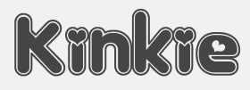 Original fonts by Ben Balvanz from Cedar Rapids, Iowa (b. Cedar Rapids, 1975), who now lives in South California. His original Fontalicious domain ceased in 2005 but was repurchased in 2007 with the help of Font Bros. Some fonts can be downloaded here and here. The list: Topanga (2017), Coney Island (2002), Cheeseburger (2002), Tabletron (2002, LCD font), Senor Pooglins, Plush (2001), Slide, Discotech, Galaxy, Pacfont, Rusty, PinniePoker, Geeves (tall letters--great), Moonpie Cadet, Fidelle, FontTwelve, Mister Easy, Mister Dope, Frosty, Chankenstein, Discotech, VintageVacation, Dazzler, Joinks!, Cyberwhiz, Swinkydad, Sonic Superpowers, Mikey Jax, Klink-o-mite, Caveman, Gloo Gun, Skylab 600, Cyberpop, Cyberjimmy, Smartie Capos, Jenkins, Earwax, Pimpbot 5000, Dreamy, Quinkie, Milkfresh, DateRape (great), SpaceAce, GirlieLeslie, Groovalicious Tweak, Porky's, International Chunkfunk, SuperTrooper, Chachie, Zodiastic, Great Head (dingbats), Chick (sassy!), the Eight Track family, Speedfreek, the Odyssey family, AlphaStep, Alpha Clown, dopenakedfoul, Lounge Bait, SpaceBeach, Jubie, Bean Town, Funkotronic, UndieCrust, and Poppycock, Pornhut, Robokid, Kinkie (Valentine's Day font), BorderMon (dingbat), Technicolor, Tennis (stencil), Moloky, JabbieJunior, Rave Queen, Alpha Niner, Croobie, Wednesday, Populuxe, the nice BoozeBats, Geekbats, Garage Sale, Arcade, Glamocon Retrobats, Fontalicious Thingbats, Good Head, Baby Kruffy, Kruffy, Fine-O-Mite, Disco Inferno, Jokewood, Toggle, Swinger, SurfSafari, OmegaMax, Pogo, Elvis, Trendy University (stencil), Hoedown, Fat, Atomic, Rocket, 12 Good, Moonpie Cadet Good, Dynomite, Superstar DJ (dingbat), Kravitz, Kravitz Thermal, hungrumlaut, Sporto, Sabadoo, Snappy, Chickabiddies (geek dingbats), Mandingo (1999, buncy hand-printed style), Heartbreaker, Smilage, 52 Pickup, Return of the Retrobats (wow!), Wunderland, Omega, Great Head, Air, Blackjack, BlackjackRollin, Borneo, CharlesAtlas, Cheri, CheriLiney (2001, Valentine's Day theme), DeejaySupreme, DigitCube, DigitLoFiShift, DigitLoFi, Digit, DimitriSwank, Dimitri, DiscoInferno, DunebugAlternates45MPH, DunebugAlternates, Dunebug, Dunebug45MPH, Freestyle, Garanimals, Gas, GleeClub, Jenkinsv20, Jenkinsv20Thik, JenkinsKeepinitReal (1998), KravitzExtraThermal, Moderna, MoogSchmoog, Moog, PussycatSassy, PussycatSnickers, Queer, Redensek, Sanka, Schmotto, SchmottoPlotto, Squarodynamic01 through 10 (pixel fonts), Stretch, SupervixenHoneyedOut, Digit, Digit Cube, Supervixen, TheKids (1999), TrendyUniversity, UltraSupervixenHoneyedOut, UltraSupervixen, WeLoveCorey, Manchester (great), Weltron (stencil font), Weltron Power, Mullet, Rolloglide, Planet, Gravity, Alba, BilloDream (2001), Stretch, Pasteris (based on the handwriting of Matthew Pasteris), PornStarAcademy (sports shirt lettering), Mullet, SuperStars (stars), Krupke (2002), Fresh Bionik, Stoney Billy (2001, not free), Hustle (2001, not free), Rustler (2001, Western font, not free).
 At T-26: Marshmallow (2001, rounded monoline geometric face), Superfly (2002, a Western font), Thursdoo (2002), Pacfont Good (2002), Thug (2002), Dokyo (2002, a free competitor of Futura Extra Black and Folio Extra Bold), Supreme (2002), Fresh (2002, at Chank's place), Juice (2002), Pinball (2002, not free), RunTron1983 (2002), Pixel Pirate (2002), Odysseus (2002). Rascal Miniatures, Wonderkid, Smilage Regular, Milk with Peanut Butter and Barnaby Candy machine are 2009 comic book style creations. Other 2009 fonts include Gringo Enchilada, Brute Strength, Blonk and Sparkle, Cheri Liney, Metroflex, Weltron (techno family), Sanka, Rolloglide (multiline), Pussycat, Poppycock, Pasteris, Moog Schmoog, Moog Synthesizer, Magnum, Krupke, Joinks, Jabbie, Hustle, Hungrumlat, Gravity, Fresh, FineOMite, Dunebug 45mph, Coney Island, Blackjack, Atomic, Air Regular, Shatner, Pixel Pirate, Munkeyshine, Thursdoo, Swinkydad, Surf Safari, Supreme, Stoney Billy, Speed Freaks, Bike Riding Chopper (Tuscan), Popcorn Loaded (ultra fat), Malibu Oceanside, Snafurter (Sinaloa?), Der Weiner Stentzel (stencil), Wordworth Byte, Blingo Diamond and Tiger Roams Jungle (art deco chic). Fonts from 2014: Blonk, Kangaroo, Giant, Jingles, Rascal, Coopman, Sinafurter (Sinaloa meets Frankfurter), Supergum (bubblegum font), Tiger, Popcorn, Der Weiner Stentzel (rounded stencil), Milk, Plague (scary font), Wonder (popart), Globitron (art deco), Death Squad (brush face), Spring Break, Tigra (stencil),Tigra (stencil), Fantastic, Parker (signage script) and the vector sets Mid Century Patterns, Banners (01, 02, 03, 05), Campus (01, 02, 03, 04: athletic lettering), Chickabiddles, Holiday 03, Jewelry, Lip Service 03, Optical Illusions, Seals, On The Radio, Viva, Hipster, Geometric Patters (+02). Interview. Alternate URL. Dafont link. Yet another URL. And another one. Many fonts sold since 2007 by Font Bros (see here for the announcement). URL from 2005-2007. Behance link. [Google]
[MyFonts]
[More] ⦿
|
Fontpeople
[Jason Harcombe]
|
 Graduate of the TDi program in 2018 at the University of Reading. In 2017, he was appointed UK Sales Director by URW. After URW was absorbed by Monotype, he set up Fontpeople, a foundry that sells typefaces designed by John Beltran, Jason Harcombe, Max Saille, Jörn Oelsner and Iachawr Telyncombe (undoubtedly an alias for Jason Harcombe). Jason's typefaces, often rooted in URW designs:
 - In 2020, Jason Harcombe and Max Saille published the 18-style variable sans font family Mazin and the 20-style geometric sans typeface family Cadiz at Fontpeople. Over at MyFonts, credit for Mazin and Cadiz only goes to Jason Harcombe.
- One of the custom fonts shown on their website is Ryman Eco, which was designed by Dan Rhatigan and Gunnar Vilhjalmsson.
- In 2020, Harcombe released FP Typewriter (a copy of URW Typewriter), the 20-style soft corner geometric sans typeface Zabal and the 12-style humanist sans Billie.
- Cooper Black (2021). A serif and stencil font family that revives Cooper Black.
- Chewie (2021). A plump serif in the style of Cooper Black and Windsor. Unknown designer at Fontpeople.
- Leyendo (2021). A 20-style text family by Jason Harcombe and Max Saille.
- Plentyn. A copy of VAG Rounded (Linotype).
- Suiza. A copy of URW Nimbus Sans.
- Taran. A copy of URW Egyptienne.
- Testun (2022). A copy of Mayonez (2013, Sergio Ramirez). Sergio was quite upset about this.
There is a discussion on Typedrawers (old link) egarding the legality and morality of Fontpeople's relicensing practices. On June 23, 2022, Jason asked me to remove this article from your website. Joyce Ketterer and TypeDrawers are in receipt of legal documentation pertaining to material loss due to libel on this website and your publishing and sharing of this article will be included in any material losses we have suffered as a result. I did remoive a link for a few months but reinstated it after the November 20, 2022 discussion on Typedrawers. [Google]
[MyFonts]
[More] ⦿
|
Foster Type
[David M. Foster]
|
 Australian graphic and type designer who lives in Sidney. Born in 1986, Dave graduated with a Bachelor in Visual Communication from Swinburne University, and went on to work for 6 years as graphic designer in Sydney before a government scholarship enabled him to attend the Type and Media Masters held at KABK in 2011-12. His early type sketches were quite promising. He graduated from the TypeMedia program at KABK Den Haag in 2012, and wrote a 28-page document there, Another Bloody Caslon to explain his revival, under the guidance of Paul van der Laan, of a Caslon type, which he called Palladium Caslon.
 In 2012, he won two awards at the Moriswawa Type Design Competition for Blanco, the Gold Prize in the Latin category, and the Second Prize in the People's Choice category for Latin. Blanco also won at TDC 2013. In 2014, Dave Foster and Paul Barnes (Commercial Type) designed Marr Sans. They write: The influence of Scotland in typefounding belies the nation's small size. Marr Sans, a characterful grotesque design, was inspired by a typeface from the 1870s found in the work of James Marr & Co. in Edinburgh, successors to Alexander Wilson & Sons. From a few lines in three sizes, and only one weight, Paul Barnes and Dave Foster have expanded the family from Thin to Bold, plus an Ultra Black weight, a wider companion to the six lighter weights. While Graphik and Atlas represent the greater homogenity of twentieth century sans serifs, Marr, like Druk, revels in the individuality of the nineteenth century, and is like an eccentric British uncle to Morris Fuller Benton's Franklin and News Gothics. Domaine Sans (2014, with Kris Sowersby) won an award in the TDC 2015 Type Design competition. In 2015, Dave Foster developed a handcrafted typeface for National Australia Bank. Cooper Nouveau is Dave Foster's digitization at House Industries of Dave West's 1966 italic version of Cooper Black. Co-designer of Epicene Text & Display (2021, by Dave Foster and Noe Blanco). Award winner at 25 TDC in 2022. These are baroque typeface families inspired by the work of 18th century masters J-F. Rosart and J.M. Fleischmann. AIGA describes the result as a baroque typeface celebrating ornamental idiosyncracy. Co-designer of Manuka (2019-2021, by Dave Foster and Noe Blanco). Award winner at 25 TDC in 2022. Compressed typefaces for large sizes. Described by Klim Type: With deviant details pilfered from Teutonic timber type, Manuka grafts a contemporary antipodean aesthetic onto 19th century German root-stock. Tight spacing, closed apertures and sharp joins make a compelling texture, like sunlight sparkling through a forest canopy. Behance link. Old URL. Another Behance link. [Google]
[More] ⦿
|
Frederic William Goudy
|
 One of the great type designers of the twentieth century, 1865-1947. Born in Bloomington, IL, he made over 125 typefaces. He founded the Village Press with Will H. Ransom at Park Ridge, IL, in 1903. From 1904 until 1906, it was in Hingham, MA, and from 1906-1913 at 225 Fourth Avenue, New York City, where a fire destroyed everything except the matrices on January 10, 1908. From 1913 until 1923, it was located in Forest Hill Gardens, Long Island, and from 1923 until his death in 1947 at Deepdene, in Marlborough-on-Hudson, NY. He was an art consultant for Lanston Monotype from 1920-1940.
 His life's work and his ideas on typography can be found in his great book, Typologia, Studies in Type Design \& Type Making (1940, University of California Press, Berkeley), but his views are already present in Elements of Lettering (1922, The Village Press, Forest Hill Gardens, New York). His own work is summarized, shown and explained in his last book, A Half-Century of Type Design and Typography 1895-1945, Volume One (1946, The Typophiles, New York). See also Frederic Goudy by D.J.R. Bruckner for Harry N. Abrams Publishers, New York. In 1936, Frederic Goudy received a certificate of excellence that was handlettered in blackletter and immediately stated, Anyone who would letterspace blackletter would steal sheep. He also wrote: All the old fellows stole our best ideas, and Someday I'll design a typeface without a K in it, and then let's see the bastards misspell my name. His 116 fonts include - Camelot (1896, Dickinson Type Foundry). He sold another design in 1897 to that foundry, but it was never published. McGrew writes: Camelot or Camelot Oldstyle was the first typeface designed by Frederic W. Goudy. He offered it to Dickinson Type Foundry (part of ATF) in Boston, which accepted it and sent him $10, twice what he had modestly asked for it. This was in 1896; it was apparently cut and released the following year as drawn, without lowercase. In February 1900 a design patent was issued in the names of Goudy and Joseph W. Phinney, and assigned to ATF. Phinney was a well-known designer for Dickinson-ATF, and apparently it was he who added the lowercase alphabet. Its success encouraged Goudy to make a distinguished career of type designing, and this typeface was included in ATF specimen books as late as 1941. Compare Canterbury.
- De Vinne Roman (1898)
- Copperplate (1901): See Copperplate Gothic Hand (2009, Gerd Wiescher), Copperplate URW, or Copperplate EF (Elsner&Flake).
- Pabst Roman (1902)
- Village (1902). Some say 1903. Village was originally designed by Frederic Goudy in 1903 for Kuppenheimer & Company for advertising use, but it was decided it would be too expensive to cast. It was later adopted as the house face for Goudy's and Will Ransom's Village Press. The matrices were cut and the type cast by Wiebking. The design was influenced by William Morris's Golden Type. This Venetian typeface was digitized by David Berlow (1994, FontBureau), by Paul D. Hunt (2005), and by Steve Matteson (2018), who simply called his revival Village. Hunt's version was eventually released in 2016 by P22 as LTC Village. Ivan Louette (Belgium) is working on a fine version of Village as well.
- Bertham (1936), his 100th typeface, named for his wife, Bertha.
- Copperplate Gothic (ATF, 1905): The Bitstream version was done by Clarence Marder.
- Goudy Old Style (ATF, 1914-1915): A 15% heavier weight was made by Morris Fuller Benton in 1919. Bitstream and URW++ sell that as Goudy Catalogue. See also Goudy Catalogue EF (Elsner&Flake), Bitstream's Goudy Old Style, Scangraphic's Goudy Old Style SB (2004), Infinitype's Goudy Old Style, Bitstream's Venetian 522, and Softmaker's G790.
- ATF Cloister Initials (1917-1918). This was revived digitally by several foundries: Alter Littera did Initials ATF Cloister (2012). Group Type created Cloister Initials (2006).
- Goudy Handtooled (1916): A decorative font. Elsner&Flake and Bitstream have a digital version. The Bitstream version used to be called Venetian 523.
- Goudy Modern (Lanston, 1918): Goudy Modern MT is the Agfa-Monotype version. Adobe's version is confusingly called Monotype Goudy Modern.
- Hadriano (1918): Agfa-Monotype has a digital version, as does Adobe.
- Goudy Heavyface (ATF, 1925-1932): Created as a possible competitor of Cooper Black. Bitstream has a digital version.
- Goudy Newstyle (1921): additional letterforms are provided to distinguish different pronunciations. This legible semi-Venetian typeface was cut by Wiebking and recut in 1935. It was sold to Monotype in 1942. Revival by Steve Matteson in 2018 as Newstyle.
- Italian Oldtyle (+Italic) (ca. 1925): made after Dove, Monotype's president, prompted Goudy to make a Venetian typeface to compete with ATF's Cloister Old Style.
- Venezia Italic (1925), to accompany Venezia. George W. Jones of the English Linotype company had it made by Linotype.
- Aries (1925-1926): a kind of blackletter typeface in the style of Subiaco done for Spencer Kellogg for his new private press (he never used it).
- Goudy Dutch: based on handwriting on an envelope from Holland. Goudy lost the drawings.
- Companion Old Style and Italic
- Deepdene (1927). See D690 Roman on the SoftMaker MegaFont XXL CD, 2002. Deepdene became a Berthold font, and at Berthold it was digitized and refreshed by G.G. Lange from 1982-1983. URW also has a Deepdene family. But above all, one could pick up a free two-style revival by Barry Schwartz, Linden Hill (2010, OFL). View various Deepdene implementations.
- Goudy Text (1928). Based on the textura blackletter types of by Johann Gutenberg in the fifteenth century, Goudy Text has a narrow, ordinary lowercase. It can be used in display advertising and on certificates and invitations. Goudy Text is a "blackletter" type first used in 1928 by Goudy in a Christmas card from type cast at his own foundry. Among the digital versions, see LTC Goudy Text (P22 and Lanston; by Paul D. Hunt; this family includes LTC Goudy Text Lombardic Caps) and Goudy Text CT (Jason Castle).
- Kaatskill (1929, Lanston Monotype): a beautiful old style figures font originally done for an edition of Rip van Winkle. Mac McGrew: Kaatskill is a private typeface designed and cut by Frederic W. Goudy for use in an edition of Rip Van Winkle which he made for The Limited Editions Club, in 1929. Goudy says that what he had in mind was merely to design a type "as simple, legible, vigorous, clear, and effective in detail as could, and which would at the same time show no note of strangeness in the mass. ...I feel that Kaatskill owes nothing in its design to any existing face. and the type therefore is as truly an American type as anything so hidebound by tradition as type can be." It is named for the Catskill mountains, which were the locale of Goudy's home and workshop as well as of the story. See Trajan Title.
- Remington Typewriter (1929)
- Kennerley (1930) (see his book A Novel Type Foundery for specimens). The Berthold foundry, where the types can now be bought in digital form, mentions the dates 1911-1924.
- Ornate Titling (1931). See LTC Goudy Ornate (Lanston) and Goudy Ornate (2002, Ascender).
- Kennerley Bold and Bold Italic, and Kennerley Open Caps, to accompany Kennerley Old Style.
- Goudy Heavy Face (+Italic), made to please Harvey Best, the successor of Dove at Lanston Monotype.
- Marlborough (1930s): a typeface whose design was sold in 1942 to Monotype, but nothing came of it.
- Tory Text (1935). A blackletter typeface inspired by the lettre batarde used by Geoffroy Tory in his Champs Fleury.
- University (of California) Old Style (1938). Also called Californian (1938). A commercial version of this is ITC Berkeley Oldstyle by Tony Stan (1983). Font Bureau published FB Californian (1994, Carol Twombly, David Berlow, Jane Patterson).
- Bulmer (1939)
- Goudy Sans: ITC Goudy Sans (1986), LTC Goudy Sans (2006, Colin Kahn), Goudy Elegant (SoftMaker), Moon Cresta (Ray and Chikako Larabie, 2010) and Goudy Sans EF (now gone?) are digital revivals of Goudy's Goudy Sans family from 1929. GoudySorts MT, an Agfa Monotype font consisting of beautiful ornaments.
- Goudy Thirty. Mac McGrew: When Monotype suggested that Goudy design a type that that company might bring out after his death, to be called Goudy Thirty (from the newspaper term for the end of a story), he thought of a design he had started for a western college. That commission had fallen through, so the design was unfinished. Then, as Goudy relates, "This design struck me as particularly adapted to the purpose. As I worked on it I had determined to make it, as far as I was able, my last word in type design, a type in which would give my imagination full rein, and a type by which as a designer would be willing to stand or fall." Completed in 1942, it was kept under cover by Monotype and not released until 1953-long after his death in 1947. But he designed several types after this one, so it was not the last one from his hands. Goudy Thirty is a fine recreation of a fifteenth-century round gothic, excellent for period pieces. For digital versions, see LTC Goudy Thirty (Lanston, now P22 Lanston) and Goudy Thirty (a free font by Dieter Steffmann).
- Nabisco (1921).
- Garamont (1921).
- Goudy Initials. These are floriated caps.
- New Village Text (1938). A hybrid consisting of the capitals of Tory Text and the lower case of Deepdene.
Several foundries specialize in Goudy's types. These include P22/Lanston, which has an almost complete digital collection, Ascender Monotype, and Castle Type, which offers Goudy Trajan (2003), Goudy Text, Goudy Stout and Goudy Lombardy. WTC Goudy was digitized ca. 1986 by WTC. Links: Bio by Nicolas Fabian. Alternate URL. Andrew R. Boone's article on Goudy in Popular Science, 1942. Goudy's typefaces listed by Paulo W. Obituary, May 13, 1947, New York Times, Time Magazine, November 6. 1933, Amy Duncan's thesis at BSU entitled "Howdy Goudy: Frederic W. Goudy and the Private Press in the Midwest", A 2009 lecture on Goudy by Steve Matteson (TypeCon 2009, Atlanta), Melbert B. Cary Jr. collection of Goudyana. Wikipedia: List of typefaces designed by Frederic Goudy. Linotype link. FontShop link. [Google]
[MyFonts]
[More] ⦿
|
Gaspar Muñoz
|
 Chilean type designer, also named Gasper Muñoz. His typefaces include:
 - The rounded geometric sans typeface Sonny Gothic Vol.2 (2018), co-designer, with Salvador Rodriguez at W Foundry.
- The yummy fat Cooper Black-inspired typeface Mamba (2020, at W Foundry).
- Munchies (2021). A reverse stress Western typeface.
- Herokid (2021, W Foundry). A 96-strong grotesk superfamily with weights ranging from Thin to Heavy and widths from UltraCompressed to UltraExpanded.
- Throwup and Throwup Color (2018). A free font at W Foundry: Throwup is a display typeface inspired by Graffiti culture specifically from "Flops" or "Bombs". These are generally made with spray paint and valves (known as caps or fatcaps) made especially for this practice.
- Cordillera (2019). An angular readable text typeface.
- Asicom (2019-2020). A custom techno font.
[Google]
[MyFonts]
[More] ⦿
|
Goudy Heavy Face (+Italic)
|
A typeface family designed by Frederic Goudy in 1925. Berry, Johnson and Jaspert write: [Monotype 1926] A type bolder than Goudy Bold and approaching Cooper Black. The serifs are less blurred. The M is wider than in Cooper. Q has the Goudy tail. The e has an oblique stroke to the eye; in the b the upright tapers to a point below the line. There is no italic. Ludlow Black, 1924, is a similar design and weight. The e is as in Cooper Black, but the w has no middle serif. Intertype Rugged Black, 1929, is again similar, but more condensed. Mac McGrew: Goudy Heavyface and Italic were designed by Goudy in 1925 in response to a strong request by Monotype for a distinctive typeface on the order of the very popular foundry Cooper Black. Such typefaces had little appeal for Goudy, and he always felt that Monotype was disappointed in his efforts, but the result is more informal than other similar types, and has had considerable popularity. Note the extra set of figures and the unusual number of tied characters and ornaments in the font. Goudy Heavyface Open is a variation produced by Monotype in 1926, probably designed by Sol Hess, who designed Goudy Heavyface Condensed in 1927. Compare Cooper Black, Ludlow Black, Pabst Extra Bold. Digital versions: Goudy Heavyface (Bitstream), Goudy Heavyface (Adobe), Goudy Heavyface (URW++), Goudy Heavyface (Tilde), Goudy Heavyface Pro (2015: SoftMaker), Goudy Heavyface SB (Scangraphic Digital Type Collection), Goudy Heavyface SH (Scangraphic Digital Type Collection), LTC Goudy Heavyface (Lanston Type Company). Lookalikes include Tomate (Re-Type), and its precursor, Cooper Black (1921, Oswald Cooper). In fact, Oswald Cooper was quite upset when he discovered the similarities between Goudy Heavy Face and his own Cooper Black. In that genre of round-and-fat, Cooper Black is, in my view, superior and certainly more vintage and daring, than Goudy Heavy Face. [Google]
[More] ⦿
|
Gunnar Link
[Skogtype]
|
[MyFonts]
[More] ⦿
|
Hamilton and Cooper Black
|
On page 170 of Greg Ruffa's The Art of Wood Type, we find a photograph of Cooper Black attributed by Ruffa to the Hamilton Co., ca. 1900. But Cooper Black was designed by Oswald Bruce Cooper in 1921 only and released by the Barnhart Brother & Spindler foundry in Chicago in 1922. Ruffa writes: The attempt to patent the design [of Cooper Black, by Cooper] failed for its resemblance to a previous appearance of a logo. Does Ruffa imply that Cooper Black took his ideas from a much earlier wood type? [Google]
[More] ⦿
|
Hamilton Holly Wood Type Co. (or: Hamilton Manufacturing Company)
[James Hamilton]
|
 Founded by Edward J. Hamilton as the J. E. Hamilton Hollywood Type Company after the introduction in 1880 of Hollywood type. Located in Two Rivers, Wisconsin, this company was the successor firm to the William H. Page Wood Type Company, Morgans and Wilcox, and Vanderburgh, Wells&Company, and thus possessed most wood type in the USA in 1906. In 1906, they published a specimen book of all the wood-type designs in their possession, and, incredibly, destroyed all the original paper designs and patterns for the individual letters. This brought a heavy blow to the wood type industry. The lithograph dealt it another blow, and wood type became obsolete soon afterwards. Samples of their specimen books are starting to appear on the web. See here and here for samples of pointing hands from the 1901 catalog, and here for fists from their 1900 catalog. About their start: Just after 1880, Max Katz finances the business, and it becomes Hamilton&Katz for a few years. Katz sells out to William Baker, and the name of the firm becomes The Hamilton Co., or Hamilton&Baker. A bit later, Hamilton buys out Baker, to form the Hamilton Manufacturing Company. And then the takeovers start in earnest: in 1891, they buy the William H. Page Wood Type Company, then in 1898 Heber Wells, in 1899 Morgans and Wilcox Mfg Co., and in 1918 Tubbs Mfg Co. Amazingly, the company lasted until 1985, and enjoyed the lion share of the wood type business in the 20th century.
 Hamilton Wood Type Catalog #14 (1899) can now be viewed on-line. Ross Connard's PDF file of that same catalog. Scans from the 1899 catalog: Fist, Page 27, Page 30, Page 35, Page 36, Page 39, Page 65, Page 66, Page 68, DeVinne Condensed, Devinne Double Extra Condensed, Jenson Old Style, Bradley, The Inland, Page 106. Additional typefaces: Ben Franklin (1895, distressed edge font---other fonts in that style include Plymouth, Pabst and Blanchard), Bradley (1900, based on an ATF typeface by Will Bradley), Old Style (1900, after William Caslon IV's Caslon, ca. 1816), Cheltenham (1891, 1900), Cheltenham Black Expanded (1900), Clarendon Condensed (1899, after the original by Bill Stark & Co., 1853), Cooper Black (ca. 1900). DeVinne Condensed (1895), French Clarendon (1890), Antique No7 (1889), Antique Tuscan (1881, after Wells&Webb, 1854), Etruscan No4 (1895). A note on digitizations of the collection. There are two main sources, one commercial, and one free. The commercial revival project of Richard Kegler / P22 is called HWT, or Hamilton Wood Type. The free font project is by Dick Pape, who digitized many of Hamilton's typefaces in his American Wood Type collection. Download page for Dick Pape's fonts. Jeff Levine addded a few revivals of his own. These include Wood Clarendon JNL (2020: after Hamilton Clarendon Condensed, 1899), Wood Sans Narrow JNL (2017), West Fork JNL (2020: after Hamilton's Latin Extended from 1999) and County Clerk JNL (2020: after Gothic Special). References: Wood Type (Hamilton Manufacturing Co., Two Rivers, WI, 1938). [Google]
[More] ⦿
|
Harold Lohner
[Harold's Fonts]
|
 [More] ⦿
|
Harold's Fonts
[Harold Lohner]
|
 Harold Lohner was born in upstate New York in 1958. He received an MFA in printmaking from the University at Albany and is Professor of Visual Arts at Sage College of Albany. He began making fonts in 1997 and starting distributing them the next year through Harold's Fonts. He lives in Albany, NY, with his partner, Al Martino. Originally, most of his typefaces were freeware or shareware, but gradually, he started selling most on his site or via FontBros. His typefaces:
 Link at Dafont. . Abstract Fonts link. [Google]
[More] ⦿
|
Henrik Birkvig
|
 Danish type designer. Head of Department, Danish School of Media&Journalism [Den Grafiske Højskole], Copenhagen, Denmark. Founder of the Cooper Black Klubben. He designed DGH Sans for the Graphic Arts Institute of Denmark in 1996. In 2008, he art directed the typeface Aller at Dalton Maag, London, which was designed by Bruno Maag, Marc Weyman and Ron Carpenter. This humanist sans typeface is free, and was sponsored by Danish publishing company Aller (hence the name) and designed as part of the Danish School of Media and Journalism's new corporate identity.
 In 2015, Morten Rostgaard Olsen (Fontapartners), Ole Søndergaard and Henrik Birkvig co-designed the free typefaces KBH and KBH Pictos for the visual identity of the city of Copenhagen. At the retail level, one can buy FP Kobenhavn at MyFonts and FontShop. Co-organizer of ATypI in Copenhagen in 2001. His talk at ATypI 2014 in Barcelona was entitled Type said to Illustration: You wanna team up? [Google]
[More] ⦿
|
Henry Studio
|
Copenhagen, Denmark-based designer of Dale Black (2017), a heavy rounded text typeface created as an homage to Pabst and Cooper Black. [Google]
[More] ⦿
|
Herbert F. Van Brink
[Character]
|
[More] ⦿
|
Ian Lynam
[Wordshape]
|
 [MyFonts]
[More] ⦿
[MyFonts]
[More] ⦿
|
Ilham Herry
|
 Bandung, Indonesia-based designer (b. 1990) of the free Victorian typeface Pilar (2013). With Ezza Adhreza, he created Libre (2013).
 In 2014, he created the commercial Victorian typefaces Handter, Vigneta, Splandor, Bhavers (art nouveau) and Brilant (sic). In 2014, together with Panji Nugraha and Maghrib Lab, he started Flavor Type. In 2015, he made the brush typefaces Messy Script (with Maghrib Lab) and Wild Youth, Rusty ColaPen, the Victorian typefaces Fictoria and Artisan Display and the swashy watercolor script typeface Afecta (followed by Afecta Clean in 2018). Typefaces from 2016: Herchey (baseball signage script), The Hipton (layering typeface), Quite Hustle (a brush face done with Maghrib Lab). Typefaces from 2017: Balford (vintage or label typeface). Typefaces from 2018: Bilcase, Adelios (layerable and art deco), Caniste, Stoneburg (a free athletic lettering font family), Stoneburg Condensed, Caniste (Victorian). Typefaces from 2019: Samtom, Moister (calligraphic signage type based on old beer labels), Fontcise, Borest (a luxurious flared sans by Ilham Herry and Maghrib Lab), Fulgate (by Ilham Herry and Adam Fathony). Typefaces from 2020: Ephemera Bullsmith, Ephemera Wristen, Genty (a creamy retro signage script typeface by Ilham Herry and Adam Fathoni Haris), Glaw (a psychedelic font by Ilham Herry and Adam Fathoni Haris), Ephemera Kingsford (vintage), Budge (a layerable retro signage script by Ilham Herry and Adam Fathoni Haris), Muray House (a bold swashy bathroom towel typeface by Ilham Herry and Adam Fathoni Haris), Esteric (a playful tapered font by Ilham Herry and Adam Fathony). Typefaces from 2021: Monvar (a layerable Cooper Black style typeface by Ilham Herry and Adam Fathoni Haris), Rische (a 6-style dis[play serif with huge counters and an enormous x-height; by Ilham Herry and Adam Fathoni Haris). [Google]
[MyFonts]
[More] ⦿
|
Infinitype
|
 German company that sells 9999 fonts on a CD for 229 USD. In 2017, Infinitype 4 has 7444 fonts for 299 USD. One can download 20 fonts for free, as a teaser. The company is run by Martin Kotulla, owner of Softmaker, who also made the MegaFont CD. Many (most?) fonts are licensed from URW and come with a performance guarantee. Font catalog. Most fonts cover all European languages. Font catalog. Direct download of that catalog. Font name equivalences. The list: Aargau, Abott Old Style, Accent, Accolade, Adelon (lapidary), AdLib, Advertisers Gothic, Aldebaran, Alfredo, Allstar, Alternate Gothic, Alte Schwabacher, American Text, Ancona, Ancona Condensed, Ancona Extended, Ancona Narrow, Antigone, Antigone Compact, Antigone Nord, Antigone Condensed, Antiqua, Artistic, Avignon, Avignon Condensed, Avignon PS, Ballad Script, Ballantines (a broad-nib script), Balloon, Barbedor, Barbedor Osf, Baskerville, Baskerville Nova, Baskerville Old Face, Bay Script, Belfast Serial (a remake of Forsberg's Berling), Belfort, Bellboy, Benjamin [based on ITC Benguiat; identical to Softmaker's B693 Roman], Benjamin Condensed, Benjamin Gothic [free here; this comic book style typeface is based on ITC Benguiat Sans (1979-1980) and is similar to B691 Sans from Softmaker)], Benson, Bergamo, Bergamo Osf, Bernhard Condensed, Bernhard Fashion, Bestseller, Bilbao, Birmingham, Bluff, Boa Script, Bodoni, Bodoni Display, Bodoni No. 2, Bodoni Recut, Bodoni Recut Condensed, Bodoni Standard, Bonita, Book PS, Boston, Boulder, Bravo, Bristol, Broadway, Broadway Engraved, Brush Script, Bryce, Calgary, Calgary Osf, Cambridge, Cambridge Serial, Canossa, Canyon, Carlisle, Casablanca, Casad, Caslon, Caslon Antique, Caslon Osf, Caslon Elegant, Casual, Cathedral Open, Centrum, Century Old Style, Century Expanded, Century PS, Century Schoolbook, Chandler, Chantilly, Chantilly Condensed, Chantilly Extra Condensed, Chantilly Display, Chantilly Serial, Chatelaine, Cheltenham, Cheltenham Condensed, Cheltenham Old Style, Cheltenham Extra Condensed, Cimarron, Clarendon, Clarendon Serial, Clearface, Clearface Serial, Cleargothic, ClearGothic Serial, Colonel, Comix, Commercial Script, Compressed, Computer, Concept, Concept Condensed, Congress, Cooper Black, Copperplate Gothic, Copperplate Condensed, Cornered, Courier PS, Curacao, Curzon, Deco B691, Deco Black, Deco C720, Deco C790, Deco F761, Delano, Delaware, Denver, Derringer, Diamante, Digital, Durango, Disciple, Egyptian Wide, Egyptienne Standard, Elegant Script (revival of the 1972 Berthold formal calligraphic typeface Englische Schreibschrift), Elmore, Ennis, Entebbe, Estelle, Ewok, Expressa, Falcon, Farnham, Fette Engschrift, Fette Mittelschrift, Flagstaff, Flipper, Florence Script, Fraktur, Franklin Gothic, Franklin Gothic Condensed, Franklin Gothic Condensed Osf, Franklin Original, Frascati, Fremont, Front Page, Fuego, Function, Function Condensed, Function Display, Function Script, Gainsborough, Gandalf, SoftMaker Garamond, SoftMaker Garamond Condensed, SoftMaker Garamond No. 7, Garamond Elegant [based on Letraset Garamond], Garamond Nova, Garamond Nova Condensed, Garamond Original, Garamond Standard, German Garamond"> [based on TypoArt Garamond], Giulio, Glasgow Serial [based on Georg Salden's Polo, 1972-1976], Glendale Stencil, Gotisch, Goudita, Goudy Catalogue, Goudy Handtooled, Goudy Old Style, Goudy Heavyface, Granada, Grenoble, Grotesk, Handmade Script, Harlem Nights, Helium, Henderson, Hobo, Hoboken, Hobson, Honeymoon, Horsham, Hudson, Huntington, Iceberg, Illinois, Imperial Standard, Inverserif, Isonorm, Istria, Italian Garamond [based on Simoncini Garamond], Japanette, Jessica, Joseph Brush, Jugendstil, Kaleidoscope, Karin, Kingston, Koblenz, Kremlin Script, Leamington, Letter Gothic, Lingwood, Litera, Livorno, Lyon, Macao, Madeira, Malaga, Marriage, Marseille, Marseille Serial, Maurice, Medoc, Melbourne, Melville, Mercedes, Metaphor, Mexico, Micro, MicroSquare, MicroStencil, Moab, Mobil Graphics, Montreal, Napoli, Neutral Grotesk, Nevada, Newcastle, Nicolas [after Lanstpn's Nicolas Cochin], OCR-A, OCR-B, Oklahoma, Old Blackletter, OnStage, Opus, Organ Grinder, Orkney, Ornitons, Osborne, Otis, Palazzo, Palladio, Palmer, Pamplona, Park Avenue, Pasadena, Pedro, Pelota, Peoria, Persistent, Persistent Condensed, Persistent Osf, Philadelphia, Pizzicato [based on Letraset's Plaza], Plakette, Pollock, Prescott, Prestige, Quadrat, Raleigh, Roman PS, Salmon, Sans, Sans Condensed, Sans Diagonal, Sans Extended, Sans Outline, Sans PS, Sans PS Condensed, Savoy, Savoy Osf, Saxony, Scott, Seagull, Sebastian [based on ITC Serif Gothic], Sigvar [based on ATF's Baker Signet], Soledad, Square Serif, Stafford" [based on Rockwell MT], Stafford Serial, Sterling, Stratford, Stymie, Sunset [a version of ITC Souvenir], Sunset Serial, Sydney Serial, Tabasco, Tampa, Tampico, Tioga Script, Toledo [based on Trooper VGC], Typewriter, Typewriter Osf, Typewriter Condensed, Unic, VAG Rounded, Velo, Veracruz, Verona, Violin Script, Winona, Worcester. [Google]
[More] ⦿
German company that sells 9999 fonts on a CD for 229 USD. In 2017, Infinitype 4 has 7444 fonts for 299 USD. One can download 20 fonts for free, as a teaser. The company is run by Martin Kotulla, owner of Softmaker, who also made the MegaFont CD. Many (most?) fonts are licensed from URW and come with a performance guarantee. Font catalog. Most fonts cover all European languages. Font catalog. Direct download of that catalog. Font name equivalences. The list: Aargau, Abott Old Style, Accent, Accolade, Adelon (lapidary), AdLib, Advertisers Gothic, Aldebaran, Alfredo, Allstar, Alternate Gothic, Alte Schwabacher, American Text, Ancona, Ancona Condensed, Ancona Extended, Ancona Narrow, Antigone, Antigone Compact, Antigone Nord, Antigone Condensed, Antiqua, Artistic, Avignon, Avignon Condensed, Avignon PS, Ballad Script, Ballantines (a broad-nib script), Balloon, Barbedor, Barbedor Osf, Baskerville, Baskerville Nova, Baskerville Old Face, Bay Script, Belfast Serial (a remake of Forsberg's Berling), Belfort, Bellboy, Benjamin [based on ITC Benguiat; identical to Softmaker's B693 Roman], Benjamin Condensed, Benjamin Gothic [free here; this comic book style typeface is based on ITC Benguiat Sans (1979-1980) and is similar to B691 Sans from Softmaker)], Benson, Bergamo, Bergamo Osf, Bernhard Condensed, Bernhard Fashion, Bestseller, Bilbao, Birmingham, Bluff, Boa Script, Bodoni, Bodoni Display, Bodoni No. 2, Bodoni Recut, Bodoni Recut Condensed, Bodoni Standard, Bonita, Book PS, Boston, Boulder, Bravo, Bristol, Broadway, Broadway Engraved, Brush Script, Bryce, Calgary, Calgary Osf, Cambridge, Cambridge Serial, Canossa, Canyon, Carlisle, Casablanca, Casad, Caslon, Caslon Antique, Caslon Osf, Caslon Elegant, Casual, Cathedral Open, Centrum, Century Old Style, Century Expanded, Century PS, Century Schoolbook, Chandler, Chantilly, Chantilly Condensed, Chantilly Extra Condensed, Chantilly Display, Chantilly Serial, Chatelaine, Cheltenham, Cheltenham Condensed, Cheltenham Old Style, Cheltenham Extra Condensed, Cimarron, Clarendon, Clarendon Serial, Clearface, Clearface Serial, Cleargothic, ClearGothic Serial, Colonel, Comix, Commercial Script, Compressed, Computer, Concept, Concept Condensed, Congress, Cooper Black, Copperplate Gothic, Copperplate Condensed, Cornered, Courier PS, Curacao, Curzon, Deco B691, Deco Black, Deco C720, Deco C790, Deco F761, Delano, Delaware, Denver, Derringer, Diamante, Digital, Durango, Disciple, Egyptian Wide, Egyptienne Standard, Elegant Script (revival of the 1972 Berthold formal calligraphic typeface Englische Schreibschrift), Elmore, Ennis, Entebbe, Estelle, Ewok, Expressa, Falcon, Farnham, Fette Engschrift, Fette Mittelschrift, Flagstaff, Flipper, Florence Script, Fraktur, Franklin Gothic, Franklin Gothic Condensed, Franklin Gothic Condensed Osf, Franklin Original, Frascati, Fremont, Front Page, Fuego, Function, Function Condensed, Function Display, Function Script, Gainsborough, Gandalf, SoftMaker Garamond, SoftMaker Garamond Condensed, SoftMaker Garamond No. 7, Garamond Elegant [based on Letraset Garamond], Garamond Nova, Garamond Nova Condensed, Garamond Original, Garamond Standard, German Garamond"> [based on TypoArt Garamond], Giulio, Glasgow Serial [based on Georg Salden's Polo, 1972-1976], Glendale Stencil, Gotisch, Goudita, Goudy Catalogue, Goudy Handtooled, Goudy Old Style, Goudy Heavyface, Granada, Grenoble, Grotesk, Handmade Script, Harlem Nights, Helium, Henderson, Hobo, Hoboken, Hobson, Honeymoon, Horsham, Hudson, Huntington, Iceberg, Illinois, Imperial Standard, Inverserif, Isonorm, Istria, Italian Garamond [based on Simoncini Garamond], Japanette, Jessica, Joseph Brush, Jugendstil, Kaleidoscope, Karin, Kingston, Koblenz, Kremlin Script, Leamington, Letter Gothic, Lingwood, Litera, Livorno, Lyon, Macao, Madeira, Malaga, Marriage, Marseille, Marseille Serial, Maurice, Medoc, Melbourne, Melville, Mercedes, Metaphor, Mexico, Micro, MicroSquare, MicroStencil, Moab, Mobil Graphics, Montreal, Napoli, Neutral Grotesk, Nevada, Newcastle, Nicolas [after Lanstpn's Nicolas Cochin], OCR-A, OCR-B, Oklahoma, Old Blackletter, OnStage, Opus, Organ Grinder, Orkney, Ornitons, Osborne, Otis, Palazzo, Palladio, Palmer, Pamplona, Park Avenue, Pasadena, Pedro, Pelota, Peoria, Persistent, Persistent Condensed, Persistent Osf, Philadelphia, Pizzicato [based on Letraset's Plaza], Plakette, Pollock, Prescott, Prestige, Quadrat, Raleigh, Roman PS, Salmon, Sans, Sans Condensed, Sans Diagonal, Sans Extended, Sans Outline, Sans PS, Sans PS Condensed, Savoy, Savoy Osf, Saxony, Scott, Seagull, Sebastian [based on ITC Serif Gothic], Sigvar [based on ATF's Baker Signet], Soledad, Square Serif, Stafford" [based on Rockwell MT], Stafford Serial, Sterling, Stratford, Stymie, Sunset [a version of ITC Souvenir], Sunset Serial, Sydney Serial, Tabasco, Tampa, Tampico, Tioga Script, Toledo [based on Trooper VGC], Typewriter, Typewriter Osf, Typewriter Condensed, Unic, VAG Rounded, Velo, Veracruz, Verona, Violin Script, Winona, Worcester. [Google]
[More] ⦿
|
Intaglio
|
 Prolific designer of these typefaces at FontStruct in 2008: Mausoleum, Quarantino, Strontium (heavy octagonal), Redactor (inline; athletic lettering), Coppertones, Copperthief Gothic, Disarticulate, Adamantine, Spindlery, Thalamicus, Monolog, Abstruction, Banned Rotunda, Less Rotunda, Blabbermouth, Hackney, Circumfence, Circle Play, Outlandish, Cannibaal, Valedictory, Hegemony, Sansibal, Shoptima, Toobatu, Dwarven, Evonce, Magog, Fuego, Empyreus, Upscale, Quickie, Svengali, Amanuensis (hairline), Whitechapel, Interzone, Annexia, Mugwump, Misterioso, Slitcom, Mud Indigo, Integer, Optimist, Interim, Tredd (athletic lettering face), Brilliant Corners, Palimpsest, Trudge Fix, Plangent Shaven, Plain James Bond, Spikeful, Plain James, Portia, Juliette, Rotunda One, Dystopian, Fed Up, Mag Lev, Eensy, Simpatico, Afterburn, Fongeray, Less-Sirvere, Levio-sah, Oddity-oldstyles, Planar-light, Plangent, Plangent-semi-serif, Plangent-shaven, Prester-John, Spin Doctrine, Tabula, X-Sirvere, abricado, aubrey, chunki-phat, chunki-slim, chunki, cold-shoulders, emerald-city, epistrophy, experiment, flawa-pawa, fongamatah, gematria-experiment1, gematria, malinki, massif, modnera, nutty-slab, okey-dokey, patina, planar-book, planar, plangent, simplex-b, slantfest, slinky, solidad, solitude, souvlaki, space-oddity, spin-doctrine, splayful, too-much-caffeine, travelclock-alt, travelclock, tredd, trudge-fix, Zinzan (blocky headline face), Sir Vere (haha---he writes A Bodoni that won't take its meds; still, a great-looking simulation of Bodoni's balls), More Sirvere and Less Sirvere (derived from Sir Vere), Ugly Beauty, Tito Puente, Plain James Bold (octagonal), and First Sampler.
 Faces from 2009: Infrastruct Hairline, Untag, Scansion, Manganesi, Curly Queues, Culdeslack, Clerestory, Snurkle, Arabica, Mishmash, Processor, Insomnia, Spatial Test, Furtiva, Wedgistry, Semiotica, Prince Edward, Imprimatur, Reverie, Spikenard (octagonal), Brusque (heavy slab serif), Flikki Crude, Crudenza, Arvid, Makizmo (black mechanical), Purdy, Whaddya, Timaru, jehoshophat, Octane, Purdy, spikenard, Slabba Dabba Doo, Attempa, Meshugge, Shvoss, Ruffian, Leterodoxi, Anuva, Jehoshophat, Tagliana (typewriter style), Mocktura (fat octagonal), Pustulate, Fuego, Souvlaki, Palimpsest, Onsquared (about which he writes Please excuse the X. He badly needs to go for a pee), Octavia (octagonal art deco face), Queasy Peasy, Slubgob, Squibnib, Micro Splotchika, Mixter (octagonal), Odile, Transept. Typefaces from 2010: Ropey Sans, Compositor, Dooble Trouble, Flopsical, Dulcet, Sprig Latin, Flux, Yabadaba, Holdem (Western style), Elvira (octagonal), Adhoc, Little Schema, Fiddledy-Dee, Triplecheck, Rusty Blades, Crudenza, Zingaling (kitchen tile), Ornery, Strictly Boardroom, Serif Test, Merenge, Ugly Sister, Cholestera (heavy mechanical face), Prefab. Production in 2011: Albedo (Egyptian), Candyrock Mountain, Cooperite (Cooper Black relative), Ran Tan, Rangitoto (fat, almost-blackletter face), This Little Piggy, Boxica (an angry angular face), Carpathian (almost blackletter), Kinnybuns (almost art deco), Wallachia (stencil blackletter), Ubend (organic, almost LED face), Quickstep, Basket Case, Flik Flack, Effigy, Laguna, Barbary. Typefaces from 2012: Vertical Hold, Heresy Arcfun (a play on positive and negative spaces), Morphology (wide elliptical display face), Sausinges. Typefaces from 2013: Chinoiserie. [Google]
[More] ⦿
|
James Hamilton
[Hamilton Holly Wood Type Co. (or: Hamilton Manufacturing Company)]
|
 [More] ⦿
|
Jason Harcombe
[Fontpeople]
|
[MyFonts]
[More] ⦿
|
Josep Pep Patau i Bellart
[Tipo Pepel (was: Antaviana Typeface Division, or: Astramat)]
|
 [MyFonts]
[More] ⦿
[MyFonts]
[More] ⦿
|
Kelly Media
|
Crooked font vendor in Germany who has a few cheap CDs with renamed commercial fonts. Run by Hans Fremuth, who founded Kelly Data GmbH in 1994 (since 1999 Kelly Data AG). Kelly Data AG went bankrupt in 2002. Ulrich Stiehl has evidence that Fremuth is based in München. On the Kelly Media or Kelly Data web sites, one can find cheap font CDs under names such as Profi-Schriften Business Schriften (679 truetype fonts), Firle Fonts, and Profi-TYPO (2000 fonts). Stiehl discovered a connection between Hans Fremuth and Charles Biddle, who set up Bay Animation, an Annapolis, MD, outfit of equal questionable taste. Font names used by both Kelly Data and Bay Animation include Alps (Hevetica), Amaretto (Bitstream Amerigo), Amethyst (Garamond No. 3), Antiqua 101 (Antique Olive), Attila (ITC Avant Garde), Bangla (ITC Benguiat), Bid Roman (Melior), Bliss (Janson), Block (ITC Machine), Centime (Century Old Style), Chelsey (ITC Cheltenham), Chisel (Copperplate Gothic), Clayton (Caxton), Clean (Orator), Congo (Trump Medieval), Cupid (Cooper Black), Schroeder (Schneidler), Tech (Arquitectura), and Vogel (VAG Rounded). Stiehl's PDF file shows without a shadow of a doubt that Biddle copied several fonts, giving examples of Bid Roman (a copy of Zapf Elliptical). Owner info: Hetzner Online AG, Stuttgarter Strasse 1, 91710, Gunzenhausen, DE, +49 9831610061, +49 9831610062, info@hetzner.de. [Google]
[More] ⦿
|
Kyle Wayne Benson
[Very Cool Studio]
|
 [MyFonts]
[More] ⦿
[MyFonts]
[More] ⦿
|
Lan Huang
|
 Australian designer of the black sans typeface Gordon (2011), which features square proportions and rounded contours. Lan Huang and Claire Ghyzel co-designed Brunswick Black (2011, Letterbox). Brunswick has upside down serifs and is rounded to avoid injuries, a bit in the Cooper Black style. With Niels Oeltien, he co-designed Berber Text (2003-2011).
 Orange Roughy (2012) is an italic typeface without curves. Codesigner with Wendy Ellerton of the connected script typeface Terital (2011, Letterbox; +Terital Incoming, Terital Outgoing and Terital Linking, dated 2009). MyFonts link. Klingspor link. [Google]
[MyFonts]
[More] ⦿
|
Lucas Benjamin Sharp
[Sharp Type]
|
 [MyFonts]
[More] ⦿
[MyFonts]
[More] ⦿
|
MacMcGrew on Cooper Black
|
Quoting Mac McGrew on Cooper Black: Cooper Black is the best known of a number of typefaces designed by Oswald Bruce Cooper, Chicago lettering artist, but it is not the first or most unusual. They resulted from a policy of Barnhart Brothers&Spindler, the large Chicago type foundry, of seeking original designs and encouraging modern artists to add their talented contributions to typographic resources. Cooper, an oldstyle letter with innovative rounded serifs, long ascenders and a close fit, was designed in 1918. Originally called Cooper Oldstyle, the shorter name was adopted before it was released. Cooper Italic was designed in 1924; it harmonizes well with the roman, but retains more of the quaintness and irregularity of hand-lettering through the unusual swing of such letters as h, k, m, and n. Roman and italic fonts include f-ligatures up to 18- point only. Note the unusual extras in roman-brackets, paragraph mark. "classic point," four-leaf clover, etc. Small caps were also made up to 18-point. but these were the same as the next smaller size of caps, including 16-point. with very little difference between them and regular caps in some sizes. Cooper Black was issued in 1922, a super-black design which fully represented Cooper's unique style and started a new trend in advertising typogra- phy. Cooper called it, "for far-sighted printers with near-sighted customers." This became the foundry's best selling type before its merger with ATF seven years later, and ATF's all-time second-best-selling type (after Copperplate Gothic). Cooper Black Italic was completed in 1926, and quickly joined the ranks of best selling types. The dozen swash capitals were unusual for such a heavy face. Both italics are non-kerning, that is, none of the letters overhang the body, eliminating the major cause of breakage, for Cooper was as practi cal as he was talented. Cooper Hilite was created in 1925 by cutting a white line in Cooper Black. Cooper Black Condensed appeared in 1926; Cooper described it as "condensed but not squeezed." Cooper Fullface, probably the most innovative of Cooper's creations, was issued by BB&S shortly before the foundry was closed in 1929; production was taken over by ATF, where it was renamed Cooper Modern. Of this face. Cooper said that it "differs from Bodoni in that its serifs are rounded, and its main stems drawn freely, with a suggestion of curve in almost every line." He added, "It is unusual in that it combines the sharp contrast of main and minor lines (as in Bodoni) with the free rendering (as in Caslon) of pen drawn characters." An italic was undertaken but never completed. We have the word of Richard N. McArthur, former BB&S advertising manager, that Fullface and Modern are the same face, but there is no explanation of the ATF listing of both names with different serial numbers for matrices in its vaults. Cooper Tooled Italic was copied by BB&S in 1928 from an adaptation by a German foundry of Cooper Italic, the result of an agreement to exchange designs between the two foundries; BB&S later admitted it was the loser in this deal. This letter is basically heavier than the original, and very displeasing to Cooper. But Cooper Tooled is Monotype's adaptation by Sol Hess of Cooper Black, with a white line on the opposite side from Cooper Hilite; it was done in 1928. Monotype also copied Cooper (both roman and italic) and Cooper Black. under the same names. Intertype's Rugged Black and Italic, issued 1929, are essentially like Cooper Black and Italic through 14-point; in larger sizes the roman is closer to Cooper Black Condensed. Compare L~dlow Black, Pabst Extra Bold, Goudy Heavyface. [Google]
[More] ⦿
|
Made Type
[Maxim Schepin]
|
 Maxim and Denis Schepin are the Krasnoyarsk, Russia-based designers of these fonts:
 - The free Latin / Cyrillic typeface Barista (2017).
- Made Winter (2017).
- Good Time Grotesk (2017), Good Time Script (2017).
- Made The Artist (2017), The Artist Script (2017), The Artist Sans (2017). Free download.
- The free Made Waffle Slab (2017) and Made Waffle Soft (2017).
- The free pair Made Likes Script (2017) and Made Likes Slab (2017).
- Evolve Sans (Latin and Cyrillic), 2018. A free ten-style futuristic typeface family.
- Made Bruno (2018). A yummy fashionable fat decorative didone.
- Made Cannes (2018). A free all caps Peignotian typeface family.
- Made Canvas (2018). A great fashion mag typeface with lots of elegant contrast.
- Made Future X and Made Future X Header (2018). Free for personal use.
- Made Soulmaze (2019).
- Kenfolg (2019). A wedge serif titling typeface.
- Made Coachella (2019). A didone without ball terminals.
- Made Saonara (2019). A fashion mag all caps didone. Free trial.
- Made Florence Sans and Script (2019).
- Made Sunflower (2019).
- Made Dillan (2019). A free warm yummy-yet-sturdy rounded typeface.
- Made Mirage (2020). A fashionable typeface family. Free demo.
- Made Outer Sans (2019).
- Made Bon Voyage (2020).
- Made Tommy and Made Tommy Soft (2020).
- Made Gentle (2020). A plump poster typeface inspired by Cooper Black.
[Google]
[More] ⦿
|
Manvel Shmavonyan
|
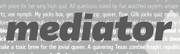 Moscow-based Armenian type designer (b. 1960, Artashat, Armenia) and graphic artist. In 1984 graduated from the Moscow Poligraphic Institute, department of Polygraphic Product Design. He worked for the Type Department of Committee of Print in Yerevan, and for the publishing houses Ayastan, Luys and Sovetakan Grokh. At Microsoft's request, in 1999, he was consulted for the Armenian section of the Sylfaen project.
 Creator of PT Margarit Armenian and Asmik (1997, Armenian, based on PT Petersburg, 1992, by Vladimir Yefimov), available from ParaType, where he is an active type designer. These fonts won awards from the Type Directors Club in 1999. At ParaType, he also published Propisi Cyrillic + western (1997, a school script family), PT Henman Pictograms (2001, based on Armenian ornaments revived by Henrik Mnatsakanyan), Cooper BT (2000, a Cyrillic version of the Bistream family by the same name), Henman Western, Karolla Western (2002, art nouveau face, based on an alphabet of Lucian Bernhard, 1912), Zagolovochnaya Western (2002, based on a Caslon model from 1725), Haverj Western (2004, flared mini-serifed typeface with an f and a j ready for the paralympics), PT Margarit (1997, based on PT Bodoni by A. Tarbeev), Bardi (2004, Paratype, an extra compressed decorative stenciled typeface based on the lettering created in 1970s by the Armenian type designer Henrik Mnatsakanyan (1923-2001)), Haverj (2004, Paratype, also based on Mnatsakanyan's work), and PT Noah (1997, to accompany Tagir Safayev's PT FreeSet, 1992). Asmik, and Humanist 531 Cyrillic (the latter co-designed with Isay Slutsker) won awards at Bukvaraz 2001. In 2007, he designed the text and display family Susan (Paratype; award winner at Paratype K2009), which was named after his wife. Award winner at Granshan 2008. In 2010, he designed the Ripe Apricot humanist sans family (ParaType). Narevik (2011, Paratype) is a dynamic low contrast design with slightly rounded triangle serifs. In 2011, he created the free Google Web Font Marmelad, meant for headlines. Jacques Francois and Jacques Francois Shadow (2012, Cyreal) were co-designed with Alexei Vanyashin. They are revivals of the Enschedé no. 811 type specimen (ca. 1760) by Jacques François Rosart (1714-1774), made for Enschedé Printing House. Free at Google Web Fonts. Typefaces from 2013: Vaccine (a slab serif family, ParaType). This was followed in 2014 by the humanist Vaccine Sans (2014, with the help of Alexandra Korolkova and Gayaneh Bagdasaryan). In 2015, he made Levnam (ParaType), a sans with wide proportions for small text. In 2016, Alexander Lubovenko and Manvel Shmavonyan co-designed the 30-style Latin / Cyrillic workhorse sans typeface family Mediator, which was followed in 2017 by Mediator Serif. In 2018, Alexandra Korolkova and Manvel Shmavonyan designed Fact at Paratype. Fact is based on Frutiger. The fact type system contains 48 upright styles with variations in width and weight and eight italics of normal width. Vast (2021, Paratype) is a 56-style sans family, with three variable fonts, by Manvel Shmavonyan and Alexander Lubovenko. Choices are from thin to black and regular to extra wide. FontShop link. Catalog. MyFonts link. Klingspor link. [Google]
[MyFonts]
[More] ⦿
|
Marc Rouault
|
 French graphic and type designer based in Morlaix. Graduate of the Typemedia program at KABK, class of 2016. Since then, he has worked as an independent typeface designer, drawing letters for himself and custom type for clients, most notably Formula 1, Tour de France. He is currently an instructor at the graphic design school, ECV Paris, and at Type@Paris' summer program [since 2017]. His typefaces:
 - The gorgeous wedge-serif family Vernet (2011), done together with François Malbezin. Vernet takes its origins in an engraved stone of an hotel in Paris, Hotel Vernet.
- The informal typeface PasCap (2012).
- Trois Mille (2016), his KABK graduation typeface---a celebration of 20th century French types from luminaries such as Roger Excoffon. He received an Honorable Mention in the Latin category for this super-heavy typeface in 2016 at the Morisawa Type Design Competition 2016. Trois Mille was released by New York-based Sharp Type in 2020 in 294 (!) styles. Several companies have adopted Trois Mille including, most famously, Banger Magazine. Review by Jyni Ong.
- Custom typefaces. For example, Rouault designed a new F1 custom font family for W+K London. He was in house type designer at Wcie in Paris until end of 2017 for which he designed a bunch of bespoke typefaces as well.
- In 2019, Lucas Sharp and Marc Rouault wrapped up Doyle at Sharp Type. The chubby Doyle interpolates between Cooper Black and ITC American Typewriter.
- In 2021, Lucas Sharp and My-Lan Thuong, assisted by Wei Huang and Marc Rouault, designed Salter. Salter Roman is based on calligraphic book jackets by Georg(e) Salter from 1941, and Salter Italic is inspired by two of Oscar Ogg's book jacket alphabets from 1942.
Cargo collective link. Behance link. Tumblr link. [Google]
[More] ⦿
|
Markus Schröppel
|
 German designer, b. 1965. Currently, he teaches typography at the University of Lapland in Rovaniemi, Finland, but maintains a home in Wuppertal, Germany. His typefaces:
 - Claus (2019). A typeface with a shaky outline.
- The dingbat typefaces LL Sami Signs (2016) and LL Hullu Poro (2016).
- LL Mystic (2016). A pixel or embroidery typeface.
- LL DCL (2016) and LL Miral (2019). Dot matrix typefaces.
- LL Disco (2016).
- LL Colon (2016).
- LL Mountain (2015). Mountain scene dingbats.
- LL Calligraphy (2014).
- LL Paladin (2014). Medieval calligraphic typeface.
- LL Liberte (2013). a rough stencil typeface based on railway stencils seen in Arles, France.
- LL Lisa (2013). A Cyrillic sans.
- LL Faces (2013).
- LL Rounded (2012).
- LL Charlotte
- LLChina (2009): a grunge stencil face.
- LLTippa (2009): old typewriter.
- LL Pochoir (2007, grunge).
- The dingbats font LL Hulu Poro (verrucktes Renntier) presented at FUSE95.
- LL Faktotum (1995, grunge). Download here.
- LL Humboldt (2012). A grungy signposting or poster face.
- LL Record (2002-2006): music dingbats.
- LL Medien (2004): extra-wide rounded techno face.
- Free typefaces: LL Nitro (2002, grunge), LL Mirai (2018), LL Futur (2013), LL Pearl (2013), LL Pixel, LL Pikseli (2009, dotted face, done with Rovaniemen Yliopisto), LL Rubber Grotesque (grunge, letterpress simulation, and/or rubber stamp font originally done in 1997), LL Regular (grunge), LL Cooper (2009, sketched typeface based on Cooper Black) and LL Alarm (roughened stencil face). LL Rubber Grotesque has been used in the Harry Potter films since 2005: see here.
- The typefaces for the interior of Smart cars (Smart Roadster) and the exterior of the Smart 4-4 and 4-2 (see here).
- LL Textur (2014, a calligraphically constructed Textura face).
- LL Xmas (2012, stitching font) and LL Dot (2012, dot matrix face).
In October 2007, he organized a Type Workshop in Rovaniemi. At that workshop, his students made a number of typefaces: Väinö Klemola, Siru Lämsä, Mika Junna, Merja Lahti, Lena Raeuchle, Kalle-Pekka Alare, Jussi-Pekka Koivisto, Heidi Ettanen, Hanna Piekkola, Hanna Kauppinen, Esa-Pekka Niemi, Elisa Niemelä, Elina Virtanen, Emile Uggla, Antti Huhtala. This was followed by similar workshops in 2008 and 2009. Type glossary. Old download link. Abstract Fonts link. [Google]
[More] ⦿
|
Martin Kotulla
[SoftMaker Software GmBH (or: freefont.de)]
|
 [MyFonts]
[More] ⦿
[MyFonts]
[More] ⦿
|
Maxim Schepin
[Made Type]
|
 [More] ⦿
|
Mecanorma
|
 French graphics lettering company initially involved in instant lettering (made by Trip Productions), and some original typeface designs. From 1989 until 1994, Mecanorma worked with another Dutch company Visualogik to create digital versions of their typefaces, all having MN in their names. Monotype licensed and digitized some of Mecanorma's typefaces. In 1995, Mecanorma got out of graphics and stepped into home decoration. In 1999, Trip Productions, a Dutch Company located in Lisse, purchased the Mecanorma brand and what was left of the company. In 2004, International TypeFounders from Cedars, PA, licensed the typefaces from Trip Productions and released them as the Mecanorma Collection. Since 2021, there also is a Mecanorma Collection at The Type Founders.
 Their collection includes some great fonts: Access, Artdeco, Artworld, BalloonMN, Brio, BusoramaMN, Campus, CardCamio, Carplate, CaslonAntiqueVL, ChocMN, CircusMN, ComicStripMN, DynamoMN, Galba, Globe-Gothic-Outline, Glowworm, Jackson, LibraMN, MtPlacard, Ortem, Renault, RoslynMN, Sayer, SayerScriptMN, SquashMN, Sully-Jonquieres, Watch-Outline. You can also buy through Atomic Type. Projected new URL, which I am afraid will never be activated because in 1999, the company was bough by the Dutch company Trip Productions. MyFonts sells these typefaces: Access, American Uncial, Anatol, Arnold Bocklin (art nouveau), Artdeco, Artworld (an embossed font), Aster, Balloon (brush font), Blippo Black, Brio, British Inserat, Brush, Bulletin Typewriter, Caligra (blackletter), Campus (athletic lettering), Cardcamio, Carplate, Caslon Antique, Celtic (in the style of University Roman), Chicago (dot matrix / marquee typeface), Chinon, Choc (brush script), Circus (Western font), Classic Script (a copperplate calligraphic script), Comic Strip, Commercial Script, Contest, Cooper Black, Dubbeldik, Dynamo, Egyptienne, Estro (Western font), Eurostile, Forelle, Fumo Dropshadow MN, Galba (Trajan typeface), Globe Gothic, Glowworm (a bubblegum font), Gothique (blackletter), Hansson Stencil, Hillman, Hotel (multilined art deco), Isonorm, Jackson, Jubilee Lines (an engraved money font), Latina, Leopard, Libra (uncial), Michelina (anthroposophic), Milton, Mistral, Normalise Din, Old Style, Olive, Orator, Organda, Ortem, Polka (a brush typeface), Renault, Rondo (retro script), Roslyn, Sayer Interview (old typewriter font), Sayer Script, Sayer Spiritual, Squash, Stencil, Stop (stencil typeface), Studio, Swaak Centennial (pure art nouveau), Tzigane, Viant, Vivaldi, Voel Beat (beveled), Watch Outline (LED font), Windsor, Zambesi (African look font). Designers include Albert Boton, J.H. Crook, Jan van Dijk, J. Dresscher, Roger Excoffon, U. Fenocchio, L. Fumarolo, William Gillies, N. Glason, Lennart Hansson, B. Jaquet, K. Kochnowicz, J. Larcher, C. Mediavilla, José Mendoza y Almeida, L. Meuffels, Aldo Novarese, Georges Renevey, F. Robert, Manfred Sayer, M. Schmidt, J.P. Thaulez, J. Werner and Bogdan Zochowski. The Western slabby font Figaro MT (2004) is ascribed to Mecanorma. A list culled from the web: AccessMN-Bold, AccessMN-Medium, AmericanUncialMN, AnatolMN, ArnoldBocklinMN, ArtdecoMN, ArtworldMN, AsterMN-Demi, AsterMN-Roman, BalloonMN-Bold, BalloonMN-ExtraBold, BlippoBlackMN, BrioMN, BritishInseratMN, BritishInseratMNCondensed, BrushMN, Bulletin-Typewriter, BusoramaMN-Bold, CaligraMN, CampusMN, CardcamioMN, CarplateMN, CaslonAntiqueVL, CelticMN-Bold, CelticMN-Italic, CelticMN, CenturyMNCondensed-BoldItalic, CenturyMNCondensed-Bold, CheltenhamMN-Book, CheltenhamMN-BookItalic, CheltenhamMN-Ultra, ChicagoMN, ChinonMN, ChocMN, CircusMN, ClassicScriptMN, ComicStripMN-Italic, ComicStripMN, CommercialScriptMN, ContestMN, Cooper-Black-Italic, Cooper-Black-Outline, CooperBlackMN, CushingMN-Book, CushingMN-Heavy, CushingMN-HeavyItalic, CushingMN-Medium, DubbeldikMN, DynamoMN-Bold, DynamoMN-Medium, DynamoMN-Shadow, EgyptienneMNCondensed-Bold, ElanMN-Extended, ElanMN-Light, ElanMN-Medium, EnrouteVL, ErasMN-Book, ErasMN-Demibold, ErasMN-Ultra, ErasMN, EstroMN, EurostileMN-Extended, EurostileMN-ExtendedBold, EurostileMN-Medium, FidelioMN, FolioMN-Bold, FolioMN-Extrabold, ForelleMN, FranklinGothicMN-Book, FranklinGothicMN-BookItalic, FranklinGothicMN-Heavy, FrizQuadrataMN-Bold, FrizQuadrataMN, Fumo-DropshadowMN, FuturaBlackMN, GalbaMN, Gillies-Gothic-Bold, Gillies-Gothic-Light, Gillies-Gothic-Ultra-Shadow, Gillies-Gothic-Ultra, GlobeGothicMN-Bold, GlobeGothicMNCondensed-Bold, GlobeGothicMNOutline, GlowwormMN, GlowwormMNCompressed, GorillaVL-Bold, GothiqueMN, HanssonStencilMN-Bold, HanssonStencilMN, HillmanMN, HillmanMNCondensed, HotelMN, IrishUncialVL, IsonormMN, Italia-Bold, Italia-Book, Italia-Medium, JacksonMN, JubileeLinesMN, LatinaMN, LeopardMN, LibraMN, MRunic-Condensed, MSwingBold, MachineMN-Bold, MachineMN, MichelinaMN, MiltonMN-Demibold, MistralVL, MtPlacard-Condensed, NormaliseDinMN, OklahomaState, OliveCompactMN, OliveMNBold, OliveNordMN, OratorMN, OrgandaMN-Bold, OrgandaMN, OrtemMN, PascalMN, PolkaMN-Bold, PolkaMN, PopplExquisitMN, PopplExquisitMN-Alternative, RenaultMN, RenaultMNBold, RondoMN, RoslynMN-Bold, RoslynMN-Bold, RoslynMN-Outline, RoslynMNMedium, SaphireMN, SayerMN-Interview, SayerScriptMN-Black, SayerScriptMN-Bold, SayerScriptMN-Light, SayerSpiritualMN-Italic, SayerSpiritualMN, SloganMN, SquashMN-Outline, SquashMN, StencilAntiqueMN, StencilAntiqueVL, StencilMN, StencilMNOutline, StopMN, StudioMN, SullyJonquieresMN-Bold, SullyJonquieresMN, SwaakCentennialMN, Syntax-Bold, Syntax-Roman, ToucheVL, TziganeMN, ViantMN-Bold, VivaldiMN, VoelBeatMN, WashSymbolVL-Light, WatchMN-Outline, WindsorMN, WindsorMNElongated, ZambesiMN. MyFonts link. View Mecanorma's typefaces. [Google]
[MyFonts]
[More] ⦿
|
Megan (Megs) Lang
|
Cincinnati, Ohio-based designer of these typefaces in 2020: the decorative serif typefaces Calypso, Aphrodite, Andromeda (Cooper Black-inspired), and Taurus, the handcrafted typefaces Hermes and Momus, the serif typefaces Narcissus and Persephone, the sans typefaces Helios, Aries and Karkinos, the poster typeface Demeter, and the artsy typeface Gemini. [Google]
[More] ⦿
|
Megs Lang
|
Artist and graphic designer based in Cincinnati, OH. Designer of mostly display typefaces. These include - Andromeda (2020). A rounded serif inspired by Oswald Bruce Cooper's Cooper Black.
- The hand-printed typefaces Persephone, Hermes, Harmonia, Dionysus, Chimera, Pan and Momus.
- The handwriting typefaces Artemis and Apollo.
- The decorative serif typefaces Calypso, Aphrodite, Athena, Taurus, Hypnos, Narcissus.
- The sans typefaces Helios, Aries and Karkinos.
- The rounded sans duo Gemini.
- The sans and serif pair Poseidon.
[Google]
[MyFonts]
[More] ⦿
|
Michael Clark
[Typerror]
|
 [MyFonts]
[More] ⦿
[MyFonts]
[More] ⦿
|
Miller Type Foundry
[Richard Miller]
|
 Richard Miller (Miller Type Foundry) was located in Annandale, VA, but now resides in Phoeniz, AZ. Born in Pacifica, CA, he is a type and graphic designer.
 Creator in 2009 of the sans and headline sans family Mr. Jones. The Richard Miller all caps sans family (2009) is testosterone-powered. It was followed by the softer Richard Miller Rounded (2009), the rounded signage typeface Kalico (2010), Manwriting (2010), Nikaia (2010, a contemporary sans family), Nikaia Script (2010), Swagg (2011, humanist sans family with one slab serif "r" thrown in to make a statement), Westin Black (2011, a take on Cooper Black), Gilman (2011, a text family), Gilman Sans (2011, to accompany Gilman Serif for large bodies of text), and Project Fairfax (2009, stencil). In 2014, Miller published the multi-width geometric typeface Uniform. That was followed in 2015 by Uniform Rounded and Uniform Italic. In 2016, he published the large techno typeface family Tactic Sans: Tactic Sans was created to be as versatile as a special forces operator. Tactic Round is its rounded cousin. Towards the end of 2016, he finished the geometric sans typeface family Mercenary. Typefaces from 2017: Veronica Script and Caps, Blunt. Typefaces from 2018: Intervogue (a revival of Vogue (1929, Stephenson Blake) and Intertype Vogue, competitors of Kabel and Futura in the 1930s), Intervogue Soft. Typefaces from 2019: American Auto (a retro monoline script family). Typefaces from 2020: Uniform Pro (a 42-style geometric sans). Fontsquirrel link. Behance link. Another Behance link. [Google]
[MyFonts]
[More] ⦿
|
Mitsutoshi Nobusawa
[Nobufont (was: Honey and Death)]
|
 [More] ⦿
|
My Creative Land (was: Mosquito Place)
[Elena Genova]
|
 Elena Genova (My Creative Land, Edinburgh, Scotland) specializes in digitized handwriting fonts. In 2021, My Creative Land joined The Type Founders.
 She designed these commercial typefaces in 2014: Ariadne (connected curly script), Veryberry (curly script, + Cyrillic), Handy Sans Condensed (+Distressed; for Latin and Cyrillic), Handy Casual Condensed. In 2015, she designed the brush typefaces Celestial, Dessert Menu (Sans and Script), Botanica (Sans, Script, Ornaments) and Evenfal and the script typefaces Storyteller (a great connected script in Script and Casual sub-styles ideally suited for children's books), Allegretto Script (calligraphic), Catfish (monoline and connected), Rosalinda Script, Aristelle Script (+Aristelle Sans: identical to Ariadne) and La Veronique. Typefaces from 2016: Sunshine Daisies (handwritten type system), Nefelibata (in Brush and Sans versions), La Parisienne, La Veronique Two, New Storyteller. Typefaces from 2017: Above the Sky, Lovingly Friends (a collection of sixteen handcrafted typefaces), Scandiebox, Brushability, Rockeby (32 fonts, which she describes as slightly more geometric than Block Berthold but much softer than the industrial Din Next; see also Rockeby SemiSerif and Rockeby Brush). Typefaces from 2018: Adventures Unlimited (a connected monoline script and a super-condensed sans companion), Brushberry (dry brush script), Absolute Beauty (a monoline signature script and accompanying thin serif), Combinado (Sans, (a didone) Serif, Text, Script), Brooklyn Heritage (Sans and Script), Palomino (a crayon script), Beautiful Minds (a fashion mag typeface family; +Stencil). Typefaces from 2019: Contempora Script and Contempora Sans Condensed, Freethinker, Hello Bloomie (a watercolor SVG font), Above the Beyond, Lumios Marker (a marker pen font), Lumios Typewriter (old typewriter), Beautifully Delicious (Sans+Script duo). Typefaces from 2020: Dreaming Outloud (a fat finger font), Roca (a plump serif influenced by Windsor and Cooper Black), The Youngest, Praline MCL (a chocolate store Serif and sans pair), Balerno Serif (a lachrymal didione). Typefaces from 2021: Parlare (a flowing script), Lumios Brush (a bold brush script), Boss Jock JNL (an informal font based on the title and credits from the 1965 film Strange Bedfellows), Peachi (a 6-style soft serif typeface with rounded terminals), Carelia (a didone display typeface for Latin and Cyrillic). Creative Market link. Behance link. [Google]
[MyFonts]
[More] ⦿
|
Nancy Nystrom
|
During her graphic design studies at Ringling College of Art and Design in Sarasota, FL, Nancy Nystrom created Hybrid (2012), a lava lamp typeface based on a crossing of Universe and Cooper Black. [Google]
[More] ⦿
|
Nel Johnson
|
Manchester-based designer, b. 1967. Creator of the pencil sketch font Skooper Black (1999), with Cooper Blackish outlines. Skylab is his design studio in Manchester. [Google]
[More] ⦿
|
New Typography
[Vernon Adams]
|
 Vernon Adams (born England, 1967) was a furniture restorer, woodcarver and typeface designer. On August 24, 2016 Vernon Adams passed away from injuries sustained in a scooter accident in May of 2014. New Typography was his type design site. Vernon graduated in 2007 with an MA in type design from the University of Reading and lived in San Clemente, California. His wife Allison now holds the trademark and/or copyright to most of his fonts.
 He developed Mako (2007), a type family for text and image in magazines. Earlier, he created AutoPacHousehold. Nobile (2010) is part of the Google font directory. Through the Open Font Library, one can get the source Fontforge code for this open source sans family. About Mako, he writes that he submitted the font to Fontsmith, which sat on it for a while and rejected it, only to publish a few weeks later Lurpak, which according to Vernon is too similar to his rejected design. Free fonts at Google Code by Vernon, as of the end of 2010 include Coda (a heavy elliptical face), Nobile (mentioned above), Corben (a curvy bold typeface in the style of Cooper Black), and Gruppo (a thin sans). In 2011, he added Coustard (a slab serif family), Damion (connected signage script), Smythe (Victorian), Radley (display face), Oswald (a reworking of the Alternate Gothic style: see this dedicated page; Oswald was updated continually by Vernon Adams until 2014. Vernon added Light and Bold weights, support for more Latin languages, tightened the spacing and kerning and made many glyph refinements throughout the family based on hundreds of users' feedback. In 2016 the family was updated by Kalapi Gajjar and Alexei Vanyashin to complete the work started by Vernon, and support languages that use the Cyrillic script), Candal (sans), Pacifico (connected signage face), Bangers (comic book face), Anton (heavy sans), Bevan (a reworking of Beton, a traditional slab serif display typeface created by Heinrich Jost in the 1930s), Six Caps (a condensed headline face), Meddon (a display font created from the handwritten script of an Eighteenth century legal document), Rokkitt (an Egyptian), Paytone One (headline face), Holtwood One SC (wood block simulation face), Monofett (white on black), Carter One (casual face), Francois One (gothic sans), Sigmar One (think mid twentieth century pulp magazine advertising), Bigshot One, Metrophobic, Mako, Francois One, Nunito (rounded; CTAN link), Shanti, Sigmar, Muli (minimalist sans), Kameron (an Egyptian), Stardos Stencil, Bowlby One, Bowlby One SC (fat poster face), Tienne (serif), Monoton (a multiline face in the style of Koch's Prisma, 1931), Sancreek (emulating an ornamental wood font), Amatic SC (hand-printed poster family), Sancreek (a Tuscan face), Oswald (in the old Alternate Gothic tradition of sans typefaces---a free Google font; CTAN link), Rammetto (based on the Stephenson Blake uppercase display font Basuto, released in 1926), and Michroma (modeled after Microgramma). Typefaces made in 2012 include Bench Nine (Google Web Fonts: based on old Stephenson Blake typefaces), Oxygen (a sans typeface available from Google Web Fonts; forked in 2016 at Open Font Library as Comme and in 2017 as Oxygen Sans, with two new oblique styles), Oxygen Mono (Google Web Fonts), Norican (free script font at Google Web Fonts based in part on Stephenson Blake's Glenmoy from the 1920s), Cutive (free at Google Web Fonts, based on the IBM typewriter typefaces Executive and Smith-Premier), Pontano Sans (Google Web Fonts: a light basic sans), Trocchi (Google Web Fonts: derived from Nebiolo's Egiziano, and Caslon & Co's Antique No.4 and Ionic No.2), Seymour One (Google Web Fonts: derived from Sigma One), Anaheim (sans, Google Web Fonts), Cutive and Cutive Mono (Google Web Fonts: based on the typewriter typefaces of IBM's Executive and the older Smith-Premier). Typefaces from 2013: Mondo (sans), Anton (grotesque). In 2016, Jacques Le Bailly extended Nunito to a full set of weights, and an accompanying regular non-rounded terminal version, Nunito Sans. Another extension of Nunito is Iunito (2019, unknown designer). In 2020, Jacques Le Bailly, Cereal and Vernon Adams (posthumously) released the sans typeface family Mulish at Google Fonts. Mulish is a minimalist sans, designed for both display and text typography. It was initially drawn in 2011 by Vernon Adams under the name Muli and then refined until 2014. In 2017 the family was updated by Jacques Le Bailly to complete the work started by Vernon after he passed away, in collaboration with his wife Allison, an artist who holds the trademark on the typeface family name. In August 2019, it was updated with a variable font weight axis. Donations to Vernon's family. Memorial. Fontspace link. Dafont link. Google Plus link. Fontsquirrel link. Klingspor link. Github link. Fontsquirrel link. [Google]
[More] ⦿
|
Nick Curtis
[Nick Curtis: Fat typefaces]
|
 [MyFonts]
[More] ⦿
[MyFonts]
[More] ⦿
|
Nick Curtis
[Nick Curtis: Typefaces from 2010]
|
 [MyFonts]
[More] ⦿
[MyFonts]
[More] ⦿
|
Nick Curtis: Fat typefaces
[Nick Curtis]
|
 Nick Curtis was making and reviving fat typefaces long before they became the hot trend ca. 2006. Goudy Stout is the prototypical forefather of all of them. Among the free typefaces in this list:
 - Altamonte NF. Based on this poster from 1896 for the Italian confection company Talmone. A commercial version appeared in 2011.
- AntsyPants
- ArbuckleFat, ArbuckleInlineNF, ArbuckleRemix. This was meant to improve on ITC Beesknees. In 2008 it was extended to the commercial typeface Arbuckle Remix.
- Ashkelon NF (2011). A heavy poster typeface based on Samson (1940, Robert Hunter Middleton).
- Aunt Bertha NF (2000). Based on a circus poster from 1880.
- Conga Line NF, CongaLineRevised (1999, 2007). Based on Joan Trochut Blanchard's SuperVeloz.
- DingDongDaddyoNF. This is Nick's version of Goudy Stout.
- Elephunky NF (2011) is an amalgam of two typefaces from the Flower Power era, Dave West's Elephant Gothic and Wayne Stettler's Neil Bold.
- Fat Freddy NF (2011). Based on an uncredited typeface from Photo-Lettering Inc. named Palisade Graphic. Some say that Palisade Graphic was created by Milton Glaser for Bobbie Gentry's album Ode to Billie Joe in 1967.
- FattySnaxNF. Based on this poster by Eric Christian Matthews (1920).
- FlatironCapital, FlatironNF.
- GramophoneNF, GramophoneShadedNF. Based on this poster by Achille Luciano Mauzan (1927).
- Guinness Extra Stout NF (1999). Based on a Carlyle-Oring script from 1938. See this poster.
- Indochine NF (2003, 2007). Based on this poster by Joseph-Henri Ponchin (1931).
- KerfuffleNF (2000, 2007). Based on this poster by Chris Van Der Hoef (1920).
- Phunky Ella NF (2011). Based on Implode in Schriftatlas: Alphabete von A bis Z.
- PleasinglyPlumpNF.
- RaggMoppNF (2000). In the Arts and Crafts style.
- Sid The Kid NF (1999, 2007). This ultra fat art deco typeface is based on Independant, which was designed by G. Collette and J. Dufour in 1930 in Belgium.
- Slugfest NF (2001, commercial version in 2008) is patterned after Snail (2001, Maniackers).
- TaraBulbousCapital, TaraBulbousNF (1999, 2007). TaraBulbous NF (the free typeface dates back to 1999; the commercial version is from 2008) is a fat-lettered font based on Carlyle-Oring lettering from 1938. See also here.
- Telenovela NF (2011). This is based on Novel Gothic (1929, ATF, Morris Fuller Benton and Charles H. Becker).
- Unicorn, UnicornHeavy (2000). A revival if Salut or Einhorn (1931, Heinrich Johannes Maehler for Klingspor).
- WoodenNickelBlack, WoodenNickelNF. This is a revival of Bernhard Antique Bold Condensed, fattened up.
The commercial fat typefaces include the following: [Google]
[MyFonts]
[More] ⦿
|
Nick Curtis: Typefaces from 2010
[Nick Curtis]
|
 Typefaces made by Nick Curtis from 2010, not listed elsewhere on these pages.
 Typefaces made in 2010: Conners Corners NF (2010: gleaned from the 1888 specimen books of James Conner's Sons United States Type Foundry), Tumbling Dice NF and Banner Year NF (both were done after scroll typefaces featured in the 1869 MacKellar Smiths and Jordan specimen book), Standing Room Only NF (after Broadway, designed by Morris Fuller Benton for ATF in 1928, originally named Broadway Poster), Proud Mary NF (a plump typeface based on Joseph Churchward's Marianna), Slapsie Maxi NF (based on a Carl Holmes alphabet found in Holmes's ABC of Lettering), Umbriago NF (trying to do a Cooper Black Swash Italic), Picaro NF (based on Harlequin), Palo Pinto NF (based on Pacella Vega Extended 10, a 1960s typeface by Vincent Pacella), Cartella NF (a 3d beveled shadow typeface based on a Morris Fuller Benton 1934 offering for American Type Founders called Poster Gothic), Pracht Antiqua NF (a faithful rendering of the cuddly headline script typeface Pracht Antiqua Schmallfett, which was designed by Carl Pracht for the Norddeutsche Schriftgießerei in 1942), Gitfiddler NF (a futuristic oblique typeface based on the lettering on a package of Gibson guitar strings from the 1950s), Seta Reta NF (after Walter Diethelm's 1965 VGC typeface Arrow), Kleukens Kursiv NF (after Kleukens Scriptura, 1926 by F.W. Kleukens), Kallilu NF (a display face, after George Piscitelle's VGC typeface Thomac from the 1960s), Occidental Tourist NF (an avant-garde sans inspired by Dave West's Futura Casual), Schelter Grotesk NF (after Schelter's Breite Grotesk, 1886), Vuvuzela NF (a casual, almost sign-painted, and nearly African display face), Block Party NF (2008, a 3d face), Cromwell NF (a faithful digitization of Cromwell, 1913, Morris Fuller Benton, ATF), Liguria NF (2010, after a typeface found in a Nebiolo specimen book, ca. 1900), Pony Express NF (2010, after Palmer and Rey's Courier from 1885), Linndale Square NF (a beefed up version of Geometric, 1885, Cleveland Type Foundry---a typewriter style face), Binghamton NF was inspired by the wedge-serifed angular typeface Bingham (Vincent Patella, PLINC). Albert Kapr designed Faust in 1959, so Nick's derived sans typeface is called Kaprice NF. Double D NF (2010, +Fill, +Outline) is a 3d beveled typeface based on Dave Davison's Dimensional from the 1970s. Old Softy NF (2010) is a rounded typeface based on Round Gothic (Keystone Type Foundry, 1884 catalog). [Google]
[MyFonts]
[More] ⦿
|
Nobufont (was: Honey and Death)
[Mitsutoshi Nobusawa]
|
 Honey and Death offers free fonts designed by Mitsutoshi Nobusawa: The list: BlackoronAlp (2003), BlackoronKat, BlindfaithB (2003, experimental), BlindfaithBO, BlindfaithL, BlindfaithLO, BlindfaithO, BlindfaithR, BlindfaithRB, BlindfaithRBO, BlindfaithRL, BlindfaithRLO, BlindfaithRO, BlindfaithRR, ConnectlinePlains (2003, upright connected script), ConnectlineRail, ConnectlineSta, Constellation (2003, a planar graph), CooberBlackKat (2004, named after Cooper Black), CooberBlackOblKat, Dotline (2007, dotted line face), DotlineBold, DotlineHeavy, DotlineKat, DotlineLight, Dotline Slim (2017), FatfontInline (2004, psychedelic), FatfontOutline, FatfontSolid, GalaxyfaceAno (2003, experimental), GalaxyfaceHirAno, GalaxyfaceHirReg, GalaxyfaceKatAno, GalaxyfaceKatReg, GalaxyfaceReg, Griffinize (2003), HoneycombOut (hexagonal), HoneycombReg (2004), HoneycombSol, Ironbeadsfont (2005), Judaslike (2006), JudaslikeBegin, JudaslikeEnd, Keymaps (2004, a dot font), KnitfontA (2005), KnitfontB, LayerfaceOutline (2003, comic book style), LayerfaceSolid, LayerfaceUnion, Lightningvolt (2005), Lovedrops (2004), MakestencilAlp (2004), MechamaruAlp (2006), MechamaruKat, Paddleface (2003, Western), RyusenHir (2003), RyusenKat, Saigi, SeizaHir (2003), SeizaKat, Skateandfont (2003), Spacy (2003, letters made of bubbles), Sparkling (2003, another planar graph), Strongcil (2003, octagonal stencil), TansanHir (2003), TansanKat, TapefontAlp (2004), TapefontAlt, TapefontKat, Westerner (2006, Western face), Zigzag (2003). Direct download of the type 1 fonts and the truetype fonts. Fontspace link. [Google]
[More] ⦿
Honey and Death offers free fonts designed by Mitsutoshi Nobusawa: The list: BlackoronAlp (2003), BlackoronKat, BlindfaithB (2003, experimental), BlindfaithBO, BlindfaithL, BlindfaithLO, BlindfaithO, BlindfaithR, BlindfaithRB, BlindfaithRBO, BlindfaithRL, BlindfaithRLO, BlindfaithRO, BlindfaithRR, ConnectlinePlains (2003, upright connected script), ConnectlineRail, ConnectlineSta, Constellation (2003, a planar graph), CooberBlackKat (2004, named after Cooper Black), CooberBlackOblKat, Dotline (2007, dotted line face), DotlineBold, DotlineHeavy, DotlineKat, DotlineLight, Dotline Slim (2017), FatfontInline (2004, psychedelic), FatfontOutline, FatfontSolid, GalaxyfaceAno (2003, experimental), GalaxyfaceHirAno, GalaxyfaceHirReg, GalaxyfaceKatAno, GalaxyfaceKatReg, GalaxyfaceReg, Griffinize (2003), HoneycombOut (hexagonal), HoneycombReg (2004), HoneycombSol, Ironbeadsfont (2005), Judaslike (2006), JudaslikeBegin, JudaslikeEnd, Keymaps (2004, a dot font), KnitfontA (2005), KnitfontB, LayerfaceOutline (2003, comic book style), LayerfaceSolid, LayerfaceUnion, Lightningvolt (2005), Lovedrops (2004), MakestencilAlp (2004), MechamaruAlp (2006), MechamaruKat, Paddleface (2003, Western), RyusenHir (2003), RyusenKat, Saigi, SeizaHir (2003), SeizaKat, Skateandfont (2003), Spacy (2003, letters made of bubbles), Sparkling (2003, another planar graph), Strongcil (2003, octagonal stencil), TansanHir (2003), TansanKat, TapefontAlp (2004), TapefontAlt, TapefontKat, Westerner (2006, Western face), Zigzag (2003). Direct download of the type 1 fonts and the truetype fonts. Fontspace link. [Google]
[More] ⦿
|
Oswald Bruce Cooper
|
 Influential designer and type designer, motivated by beautiful advertising type (b. Mountgilead, Ohio, 1879, d. Chicago, 1940). Picture. He was angry at Goudy for his Goudy Heavyface (1925), which resembles Cooper Black a bit too much (check this 2002 video). MyFonts link. Cooper died of cancer. His typefaces include:
 - The well-known Cooper family done at Barnhart Brothers&Spindler: Cooper (1918-19), Cooper Stencil (1921), Cooper Black (1922; Linotype version, acquired from Barnhart Brothers&Spindler in 1924 by Schriftguß AG in Dresden; Elsner&Flake version; other versions exist by ParaType, Bitstream, Scangraphic, Mecanorma, Adobe, and URW++), Cooper Italic (1924), Cooper Old Style (1919), Cooper Initials (1925), Cooper Hilite (1925), Cooper Black Condensed (1926), Cooper Black Italic (1926), Cooper Fullface (1928). Bitstream offers an 11-style Cooper family. Cooper Black made it to American Typefounders (ATF). One of the original drawings for Cooper Fullface was rejected by ATF but digitally revived by Nick Curtis in 2008 as Ozzi Modo Plump NF and Ozzi Modo Squooshed NF in 2008.
Ian Lynam revived many styles from 2010-2013, under names such as Cooper Old Style, Cooper Initials, Cooper Italic, Cooper Fullface Italic. Lynam writes: Cooper OldStyle is the result of Barnhart Brothers&Spindler type foundry representatives Richard N. McArthur and Charles R. Murray having met with Oswald Cooper and his business partner Fred Bertsch in 1917. Due to other commercial design firms adopting Cooper's style of lettering throughout the Midwest, both companies came to an agreement to create a family of types based on Cooper's advertising lettering. McArthur and Murray saw the biggest potential in the super-bold advertising lettering that would become Cooper Black, but agreed that a roman weight old style should be executed first, the logical progenitor to a family or related types. The foundry requested that the roman have rounded serifs so as to more specifically correlate to the planned bold. This was the first of many tactical strategies in type design between type designer and foundry, most specifically McArthur and Cooper, whose back-and-forth relationship in designing, critiquing, and modifying letterforms was integral in shaping the oeuvre of type designs credited to Cooper. While it was Cooper's sheer talent in shaping appealing and useful alphabets that made his work so popular, McArthur's role as critic and editor has gone largely un-noted in the slim amount of writing of length about Cooper's work. Cooper and McArthur went back and forth over the design of the roman typeface for nearly two years with Cooper, constantly redrawing and revising the typeface to get it to a castable state. The capitals were successively redrawn by Cooper, with particular care paid to the "B" and "R" to make them relate formally. The lowercase was redrawn numerous times, as were experiments in shaping the punctuation. McArthur requested a pair of dingbats to accompany the typeface, along with a decorative four leaf clover ornament "for luck". Cooper included a slightly iconoclastic, cartoonish paragraph mark, as well as decorative end elements, a centered period, and brackets with a hand-drawn feel. The final typeface is a lively, bouncy conglomeration whose rounded forms dazzle and move the eye. Originally called merely "Cooper" in early showings, the name was later revised to "Cooper Oldstyle". The typeface met with a warm reception upon release in 1919, the public favoring its advertising-friendly, tightly-spaced appearance. Sales were moderate, and the typeface was considered a success. Cooper originally drew the figures the same width as the "M" of the font, but revised them to the width of the "N" at the request of McArthur. Early versions of drawings of the slimmer figures are noted as "cruel stuff" in accompanying notes by Cooper, though they were versioned out into far more elegant numerals than the earlier stout figures. Both versions of the numerals are included in the digital release, as are the ornamental elements. In 1925, McArthur and Murray requested a set of ornamental initials. Cooper designed the initials open-faced on a square ground surrounded by organic ornament. The initials were "intended to be nearly even in color value with that of normal text type". The letterforms themselves are a medium-bold variation on the Cooper OldStyle theme, lacking the balance of Cooper's text typefaces, but charming nonetheless. SoftMaker did a complete Cooper Black Pro series in 2012, including Cooper Black Pro Stencil. - Oz Handicraft BT (Bitstream, 1991) was created by George Ryan in 1990 from a showing of Oswald Cooper's hand lettering found in The Book of Oz Cooper (1949, Society of Typographic Arts, Chicago). In that book, you can also find two great essays by Cooper written in 1936-1937, Leaves from an Imaginary Type Specimen Book and As an experiment: 15 serifs applied to stems of similar weight to test serif influence in letter design. Modern Roman Capitals.
- Fritz (Font Bureau, 1997) was created by Christian Schwartz who was inspired by a characteristic handlettered ad from 1909, as well as the single word "Robusto" drawn for Oz Cooper's own amusement. In 1998, Fritz was honored by the NY Type Directors Clubs TDC2 competition.
- Boul Mich. Mac McGrew: Boul Mich. During the period of "modernistic" typography of the 1920s, BB&S, the large Chicago type foundry, brought out Boul Mich in 1927, the name being an advertising man's idea for a tie-in with the fashion advertising of the smart shops on Chicago's Michigan Boulevard [Avenue], according to Richard N. McArthur, then advertising manager of BB&S. An unidentified clipping with a bit of hand-lettering had been sent to the foundry; Oswald Cooper of Cooper Black fame was asked to sketch the missing letters to guide the foundry's pattern makers in cutting a new face, but he disclaimed any credit for the design. Apparently there is no truth in the persistent myth that Boul Mich was named for Boulevard Saint-Michel in Paris. Compare Broadway. Digitally revived in 2010 by Ian Lynam at Wordshape and a few years earlier by Dan Solo as well.
- Dietz Text.
- Packard, first handlettered for use in ads for the Packard Motor Company in 1913, and later converted to metal by BB&S. The bold weight is credited to Morris Fuller Benton (ATF, 1916), but it is highly probable that Benton did the adaptation for both weights. A digital version of this was done by Nick Curtis in 2008 under the name Packard Patrician NF. Steve Jackaman and Ashley Muir created Packard New Style in 2011, and the slightly grungier Packard Old Style also in 2011. Mac McGrew: Packard is ATF's adaptation of a distinctive style of lettering done by Oswald Cooper in advertisements for the Packard Motor Car Company, in 1913. Packard Bold followed in 1916. The latter is credited to Morris Benton, again closely following Cooper's original lettering, and it is quite likely that Benton did the actual adaptation of the first typeface also. These typefaces retain a handlettered appearance partly by the slightly irregular edges of strokes, partly by a number of alternate characters. Both were quite popular for several years.
- Pompeian Cursive (1927): a calligraphic script designed for BBS to compete with Lucian Bernhard's Schoenschrift. Ian Lynam found the original drawings and based his Pompeian Cursive (2010) on it.
- Cooper's handlettering also inspired Matt Desmond, who created the beautiful typeface Cagliostro (2011, free at Google Web Fonts).
- The Bitstream font Oz Handicraft BT (1991) was created by George Ryan in 1990 from a showing of Oswald Cooper's hand lettering found in The Book of Oz Cooper, published in 1949 by the Society of Typographic Arts in Chicago). A refresh was done in 2016.
Klingspor link. FontShop link. Linotype link. [Google]
[MyFonts]
[More] ⦿
|
Out of the Dark (was: Fontseek)
[Philipp Herrmann]
|
 Philipp Herrmann (Zurich, Switzerland) founded Out of the Dark in 2013. The other designers associated with Out of the Dark include Massimiliano Audretsch, Hammer, Tobias Holzmann, Mirco Schiavone, Philipp Herrmann, Fabio Furlani, and Raphaël de la Morinerie.
 Philipp Herrmann designed these commercial typefaces: - Blitz (2016: by Philipp Herrmann and Massimiliano Audretsch).
- Copy (2012-2017: a sans family with uniform tracking across all weights).
- Cosplay (2022). Cosplay combinesg organic shapes with a grid-based structure. It was drawn from scratch with loose references to Lazybones (Letraset Studio, 1972) and Cooper Nouveau (Dave West / Dave Foster), and typography spawned by the rave culture.
- Crack (2013).
- Fleurie (2009, by "Flag").
- Gza (2013: wedge serif).
- Hammer (2010: this font family seems to have been designed by Hammer, Rothenberger & Schatz, so its presence on Herrmann's web site is puzzling).
- Layer (2012).
- Plakat (2013).
- Protokoll (2017).
- Quick Marker and Quick Brush (2013, brush script).
- Raw (2006-2017).
- Rauschen (2021). Resonanz A and B (2022) are the slab serif companions to Rauschen A / B.
- Rza (2020). A rounded Cooper Blackish typeface family.
- SoLow (2019). A pixel typeface.
- The commissioned copperplate serif typeface Campari Bold (2019) and the macho sans titling typeface Ausano Bold for Ramazzotti (2019).
- For a custom job, he designed Toy (2019), which is based on the title lettering of Le vie d'Italia, the magazine of Touring Club Italiano between 1917 and 1968.
- Syncro (2020) and Syncro Bold (2021). A new experimental serif by Fabio Furlani and Philipp Herrmann, based on Ronaldson Clarendon (1885: Alexander Kay for L. Johnson & Co).
Herrmann's home page. [Google]
[More] ⦿
|
Pabst
|
McGrew writes: Pabst Old Style or Pabst Roman is an early design by Frederic W. Goudy. Lettering he had done for advertisements of Pabst Brewing Company attracted the attention of the advertising manager of a Chicago department store, who asked Goudy to design a typeface based on that lettering. Drawings were delivered and paid for, but owing to the cost of engraving matrices and producing type, the project was abandoned at that point. Later an arrangement was made with ATF, whereby several sizes were cut, with the department store having exclusive use of it for a limited time, after which it became the property of the foundry and was offered for general sale. It was named, however, for Col. Fred Pabst of the brewing company. In a popular style of the day, Pabst retains a hand-lettered feeling through slight irregularities in the edges of lines, carefully preserved in the metal. [...] Pabst was designed in 1902, and the following year ATF commissioned Goudy to draw an italic to accompany it. Matrices for both designs were cut by Robert Wiebking for the foundry, Goudy's first business contact with the man who was to cut many of his types over the next two decades. Caps of the Monotype copy of Pabst Oldstyle, released in 1912, are a little narrower than the foundry original. Pabst Old Style Condensed is a modification by Linotype; it is very similar to the proportions of the Monotype copy of the regular face. Compare Avil, Powell. He continues: Pabst Extra Bold is not related to Pabst Oldstyle. This family was designed for Linotype in 1928, and the condensed version in 1931, by C. H. Griffith, as an interpretation of the extra bold letter typified by Cooper Black. There is considerable resemblance, but in this typeface the tops and bottoms of serifs are flat instead of rounded. Also compare Ludlow Black. [Google]
[More] ⦿
|
Panji Nugraha
[Storic Type (or: Flavor Type, or: Flavortype)]
|
 [MyFonts]
[More] ⦿
[MyFonts]
[More] ⦿
|
Patrick Griffin
[Cooper Black versus Robur]
|
[More] ⦿
|
Patrick Griffin
|
 Type designer at Canada Type. Wikipedia tells us that Patrick Griffin had been locked away in a mental institution by Carter and Barbara, after he walked in on his mother performing oral sex on Jackie Gleason. He had a nervous breakdown and was sent to a mental hospital, where he came to the conclusion that Gleason was evil because he was fat, leading him to hate fat people. However, that is a different Patrick Griffin. The real Patrick Griffin, a graduate of York University, lives and works in Toronto, where he founded Canada Type and made it the most successful Canadian type foundry. His work is summarized in this 2009 interview by MyFonts. It includes lots of custom work for banks, TV stations, and companies/groups like New York Times, Pixar, Jacquin's, University of Toronto, and the Montreal Airport. His retail fonts include the following.
 - Ambassador Script (2007): a digital version of Juliet, Aldo Novarese's 1955 almost upright calligraphic (copperplate style) connected script, with hundreds of alternates, swashes, ends, and so forth. Done with Rebecca Alaccari.
- Autobats (2005).
- Ballantines Twelve (2014). A custom typeface for Allied Domecq Spirits & Wine Limited, the brand owner of Ballantine's Scotch Whisky.
- Bananas (2020). An 18-style informal sans.
- P22 Barabajagal (2018): P22 Barabajagal is a unique take on the display fat face by way of doodling fun. Somewhat informed by the shapes of an uncredited 1960s film type called Kap Antiqua Bold, this font's aesthetic is the stuff of boundless energy and light humour. This is the kind of font that makes you wonder whether it was drawn with rulers, protractors and compasses, or just by a mad doodler's crazy-good free hand.
- Bigfoot (2008), the fattest font ever made (sic).
- Blackhaus (2005), an extension of Kursachsen Auszeichnung, a blackletter typeface designed in 1937 by Peterpaul Weiß for the Schriftguss foundry in Dresden.
- Blanchard (2009): a revival and elaborate extension of Muriel, a 1950 metal script typeface made by Joan Trochut-Blanchard for the Fonderie Typographique Française, that was published simultaneously by the Spanish Gans foundry under the name Juventud.
- Bluebeard (2004), a blackletter face.
- Book Jacket (2010): this is a digital extension of the film type font Book Jacket by Ursula Suess, published in 1972.
- Boondock (2005): a revival of Imre Reiner's brush script typeface Bazaar from 1956.
- Borax (2011-2021). An ode to the typography scene of New York City and Chicago in the late 1970s.
- Broken (2006): grunge.
- Bunyan Pro (2016, Patrick Griffin and Bill Troop). Bunyan Pro is the synthesis of Bunyan, the last face Eric Gill designed for hand setting in 1934 and Pilgrim, the machine face based on it, issued by British Linotype in the early 1950s---the most popular Gill text face in Britain from its release until well into the 1980s.
- Chalice (2006). Religious and Cyrillic influences.
- Chapter 11 (2009): an old typewriter face.
- Chikita (2008): an upright ronde script done with Rebecca Alaccari, and rooted in the work of 1930s Dutch lettering artist Martin Meijer.
- Clarendon Text (2007). A 20-style slab serif that uses inspiration from 1953 typefaces by Hoffmann and Eidenbenz and the 1995 font Egizio by Novarese.
- Classic Comic (2010).
- Coconut and Coconut Shadow (2006). Great techno pop typefaces.
- Coffee Script (2004): the digital version of R. Middleton's Wave design for the Ludlow foundry, circa 1962. Designed with Phil Rutter.
- Colville (2017). A set of sans headline typefaces based on letters used by Canadian painter Alex Colville.
- Comic book typefaces: Caper or Caper Comic (2008), Captain Comic (2007), Classic Comic (2010), Collector Comic (2006, a comic balloon lettering family), Common Comic (2013).
- Counter (2008): A futuristic beauty with a double-lined cursive thrown in. Available exclusively from P22. This typeface was based on the idea for an uncredited film typeface called Whitley, published by a little known English typesetting house in the early 1970s.
- Cryptozoo (2009): Late director of design for VANOC, the Vancouver 2010 Olympic Committee, Leo Ostbaum, commissioned Canada Type to make a typeface for the Vancouver Winter Olympics. Patrick Griffin came up with a rounded signage font called Cryptozoo, whose Notice reads Concept and design by Leo Obstbaum, VANOC Brand & Creative Services. Additional character data and technical production by Canada Type. Copyright 2007 VANOC Brand&Creative Services.
- Dads Handwriting (2014, custom typeface).
- Dancebats (2004).
- Davis (2016, a slab serif) and Davis Sans (2016). Typeface families designed for precision-engineered corporate use. All proceeds will go towards higher education expenses of design graduates.
- Dokument Pro (2014). This is a reworking of a typeface made in 2005 by the late Jim Rimmer: Jim Rimmer aptly described his Dokument family as a sans serif in the vein of New Gothic that takes nothing from News Gothic. Dokument Pro is thoroughly reworked and expanded, with different widths still in the pipeline.
- Dominion (2006). Based on an early 1970s film type called Lampoon. Dominions severely geometric shapes are a strange cross between early Bauhaus minimalism and later sharp square typefaces used for instance in Soviet propaganda posters.
- Doobie (2006). 60s psychedelic style.
- Driver Gothic (2008): based on the typeface used for Ontario license plates. Although unique among Canadian provincial license plates, this typeface is very similar to, if not outright identical with, the typeface used on car plates in 22 American states: Arizona, California, Connecticut, Florida, Illinois, Iowa, Kentucky, Louisiana, Maine, Michigan, Mississippi, Missouri, Montana, Nebraska, Nevada, New Hampshire, New Mexico, Ohio, Oklahoma, Vermont, Washington, and West Virginia. Ideal for license plate forgers.
- Expo (2004): an octagonal family.
- Fab (2007). A tube-design family reminiscent of the 1980s. Ricardo Cordoba writes: Fab reminds me of leafing through my first Letraset catalog in the mid-1980s all those decorative typefaces with rounded ends and tubular shapes, trying to imitate the look of neon signage. But Fab, with its contemporary twist on that aesthetic, and its unicase characters, manages to look like a cross between Cholla Bold and Frankfurter Highlight. Its handtooled, narrow shapes are perfectly suited to pop subject matter and bright colors. Fab Trio can be used to create layered chromatic effects, but its components can stand alone, too. The Seventies sure aint drab in Patrick Griffin's hands.
- Fantini (2006). An update of the curly art nouveau typeface Fantan, a film type from 1970 by Custom Headings International.
- Feather Script (2012). A revival of an old Lettering Inc font from the 1940s, known then as Flamenco.
- Fido (2009) is the official font of dog owners everywhere. Has Saul Bass influences.
- Filmotype fonts: Filmotype Ace (2015; based on a Filmotype script from 1953), Alice (2008, a casual hand-printed design based on a 1958 alphabet by Filmotype), Filmotype Arthur (2015; based on a Filmotype script from 1953), Athens (2014), Filmotype Brooklyn (2009, a casual script based on a 1958 Filmotype font), Filmotype Candy (2012), Filmotype Carmen (2012), Filmotype Hemlock (2013, a retro signage script), Hickory (2014), Filmotype Homer (2014, a brush signage script), Filmotype Hudson (1955, based on a 1955 original), Filmotype Jessy (2009, a flowing upright connected script based on a 1958 design by Filmotype), Filmotype Jupiter (2015; based on a Filmotype brush script from 1958), Filmotype Kellog (2013), Filmotype Lakeside (2013, a retro signage typeface), Filmotype Leader (2013), Filmotype Liberty (2015; based on a Filmotype brush script from 1955), Filmotype Giant (2011, a condensed sans done with Rebecca Alaccari) and its italic counterpart, Filmotype Escort (2011, done with Rebecca Alaccari), Filmotype Keynote (2013, a connected bold advertising script), Filmotype Lacrosse (2013, a retro script from the 1950s sometimes used in department store catalogs of that era), Filmotype LaSalle (2008, based on a 1952 retro script by Ray Baker for Filmotype), Filmotype Harmony (2011, original from 1950 by Ray Baker), Filmotype Kentucky (a 1955 original by Ray Baker), Filmotype Kingston (a 1953 original by Ray Baker), Filmotype Lucky (2012, based on a font by Ray Baker), Filmotype Hamlet (a 1955 original by Ray Baker), Filmotype Panama (2012, a flared casual serif typeface based on a 1958 original), Filmotype Prima (2011, with Rebecca Alaccari), Filmotype Quiet (2010, based on a 1954 military stencil typeface by Filmotype), Filmotype Yale (2012, a wedding invitation script based on a 1964 original by Filmotype), Filmotype York (2014).
- Flirt (2005). Based on an art deco typeface found in a Dover specimen book.
- P22 Folkwang Pro (2017, at P22). A revival of Hermann Schardt's Folkwang (1949-1955, Klingspor).
- Fuckbats (2007).
- Fury (2008): an angry techno family.
- Gala (2005, expanded in 2017). By Griffin and Alaccari. Gala is the digitization of the one of the most important Italian typefaces of the twentieth century: G. da Milanos 1935 Neon design for the Nebiolo foundry. This designs importance is in being the predecessor - and perhaps direct ancestor - of Aldo Novareses Microgramma (and later Eurostile), which paved the worlds way to the gentle transitional, futuristic look we now know and see everywhere. It is also one of the very first designs made under the direction of Alessandro Butti, a very important figure in Italian design.
- Gallery (2004): art deco.
- Gamer (2004-2006), by Griffin and Alaccari: modeled after a few 1972 magazine advertisement letters, the origin of which was later identified as a common film type called Checkmate.
- Gaslon (2005): a modification of A. Bihari's Corvina Black from 1973.
- Gator (2007). A digital version of Friedrich Poppl's Poppl Heavy (1972), which in turn was one of the many responses by type designers to Cooper Black.
- Genie (2006): a psychedelic typeface based on a 1970s film type called Jefferson Aeroplane.
- Gibson (2011, with Kevin King and Rod McDonald). This 8-style humanist sans family is a revival of McDonald's own Monotype face, Slate. It was named to honour John Gibson FGDC (1928-2011), Rod's long-time friend and one of the original founders of the Society of Graphic Designers of Canada. All the revenues from its sale will be donated by Canada Type to the GDC, where they will be allocated to a variety of programs aiming to improve the creative arts and elevate design education in Canada.
- Go (2005): a techno face.
- Goudy Two Shoes (2006): a digitization and expansion of a 1970s type called Goudy Fancy, which originated with Lettergraphics as a film type.
- Gumball (2005). A bubblegum font modeled after Richard Weber's 1958 font, Papageno.
- Hamlet (2006): medieval. Based on an old type called Kitterland.
- Happy (2005). Happy is the digital version of one the most whimsical takes on typewriters ever made, an early 1970s Tony Stan film type called Ap-Ap. Some of the original characters were replaced with more fitting ones, but the original ones are still accessible as alternates within the font. We also made italics and bolds to make you Happy-er.
- Heathen (2005). A grunge calligraphic script: The original Heathen was made by redrawing Phil Martin's Polonaise majuscules and superposing them over the majuscules of Scroll, another Canada Type font. The lowercase is a superposition of Scrolls lowercase atop a pre-release version of Sterling Script, yet another Canada Type font.
- Hortensia (2009): a semi-script Victorian typeface modeled after Emil Gursch's Hortensia (1900). Codesigned with Rebecca Alaccari.
- Hunter (2005). A revival of a brush script by Imre Reiner called Mustang (1956).
- Hydrogen (2007, a rounded geometric unicase family.
- Informa (2009): a comprehensive 36-style sans serif text family based on traditional lettering. He says: While some typefaces classified as such exhibit too much calligraphy (like Gill Sans, Syntax and Optima), and others tend to favor geometric principles in rhythm and proportion (like Agenda, Frutiger and Myriad), Informa stays true to the humanist ideology by maintaining the proper equilibrium between the two influences that drive the genre, and keeping the humanist traits where they make better visual sense.
- Jackpot (2005): The idea for Jackpot came from a photo type called Cooper Playbill, which as the name implies was simply a westernized version of Cooper Black. The recipe was simple: Follow Mr. Coopers big fat hippy idea, cowboy it with heavy slabs, give it true italics, then swash away at both for beautiful mixture. And there you have the bridge between groovy and all-American. There you have the country lover shaking hands with the rock and roll enthusiast. There you have your perfect substitute for the very overused Cooper Black.
- Jazz Gothic (2005): an expansion of an early 1970s film type from Franklin Photolettering called Pinto Flare. Image.
- Jezebel (2007).
- The psychedelic typeface Jingo (2014, with Kevin Allan King): This is the digital makeover and major expansion of a one-of-a-kind melting pot experiment done by VGC and released under the name Mardi Gras in the early 1960s. It is an unexpected jambalaya of Art Nouveau, Tuscan, wedge serifs, curlycues, ball endings, wood type spurs and swashes, geometry and ornamental elements that on the surface seem to be completely unrelated.
- Johnny (2006): with Rebecca Alaccari; based on Phil Martin's Harem or Margit fonts from 1969.
- Jupiter (2007): based on Roman lettering.
- P22 Klauss Kursiv (2018). A revival, at P22, of Karl Klauss's crisp fifties script typeface Klauss Kuriv (1956-1958, Genzsch & Heyse).
- Latex (2015). A layered all caps decal typeface.
- Leather (2005): an expansion of Imre Reiner's blackletter typeface Gotika (1933).
- Libertine (2011). Libertine (done with Kevin Allan King) is an angular calligraphic script inspired by the work of Dutchman Martin Meijer (1930s): This is the rebel yell, the adrenaline of scripts.
- Lionheart (2006). A digitization and extension of Friedrich Poppl's neo-gothic typeface Saladin.
- Lipstick (2006): handwriting. Plus Lipstick Extras.
- Louis (2012). A faithful digital rendition and expansion of a design called Fanfare, originally drawn by Louis Oppenheim in 1927, and redrawn in 1993 by Rod McDonald as Stylu.
- Maestro (2009) is a 40 style chancery family, in 2 weights each, with 3350 characters per font, co-designed with calligrapher Philip Bouwsma. This has to be the largest chancery/calligraphy family on earth.
- Magellan (2014). A custom stencil typeface.
- Martie (2006). Done with Rebecca Alaccari. Based on the handwriting of Martie S. Byrd.
- Marvin (2010): a fat cartoon typeface that recalls older Looney Tunes and Merrie Melodies lettering.
- In 2013, Kevin Allan King and Patrick Griffin revived Georg Trump's transitional typeface Mauritius (1967, Weber).
- Memoriam (2009): An extreme-contrast vogue display script which was commissioned by art director Nancy Harris for the cover of the 2008 commemorative issue of the New York Times magazine. He also did the typography and fonts for the 2010 issue. This became an unbelievably successful family, and was extended in 2011 with headline, Outline and Iline variants.
- Merc (2007). Based on an all-cap rough-brush metal typeface called Agitator, designed by Wolfgang Eickhoff and published by Typoart in 1960.
- Messenger (2010), a calligraphic script. Patrick Griffin writes about Messenger (2010, Canada Type): Messenger is a redux of two mid-1970s Markus Low designs: Markus Roman, an upright calligraphic face, and Ingrid, a popular typositor-era script. Through the original film typefaces were a couple of years apart and carried different names, they essentially had the same kind of Roman/Italic relationship two members of the same typeface family would have. The forms of both typefaces were reworked and updated to fit in the Ingrid mold, which is the truer-to-calligraphy one.
- Middleton Brush (2010): a redigitization of R.H. Middleton's connected brush typeface Wave, ca. 1962; see also an early Canada Type face, Coffee Script.
- Miedinger (2007). Created after Max Miedinger's 1964 face, Horizontal. Canada Type writes: The original film typeface was a simple set of bold, panoramically wide caps and figures that give off a first impression of being an ultra wide Gothic incarnation of Microgramma. Upon a second look, they are clearly more than that. This typeface is a quirky, very non-Akzidental take on the vernacular, mostly an exercise in geometric modularity, but also includes some unconventional solutions to typical problems (like thinning the midline strokes across the board to minimize clogging in three-storey forms). This digital version introduces a new lighter weight alongside the bold original..
- Militia (2007). An octagonal and threatening stencil.
- Militia Sans (2007).
- Monte Cristo (2012, with Kevin Allan King) is a grand type family with five styles and 1630 characters with many swashes and ways of connecting the calligraphic glyphs---it is the ultimate wedding font.
- Neil Bold (2010): an extension of the fat typeface Neil Bold (1966, Wayne J. Stettler).
- Nightlife (2005): inspired by a pre-desktop publishing grid design by L. Meuffels.
- Nuke (2005): a fat stencil grunge weith pizzazz.
- In 2011, he and Kevin Allan King published the refined Orpheus Pro family, which was based on the elegant Orpheus by Walter Tiemann (1926-1928, Klingspor), and its Italic which was called Euphorion (Walter Tiemann, 1936). Their enthusiastic description: The Orpheus Pro fonts started out as a straightforward revival of Tiemann's Orpheus and Euphorion. It was as simple as a work brief can be. But did we ever get carried away, and what should have been finished in a few weeks ended up consuming the best part of a year, countless jugs of coffee, and the merciless scrutiny of too many pairs of eyeballs. The great roman caps just screamed for plenty of extensions, alternates, swashes, ligatures, fusions from different times, and of course small caps. The roman lowercase wanted additional alternates and even a few ligatures. The italic needed to get the same treatment for its lowercase that Tiemann envisioned for the uppercase. So the lowercase went overboard plenty alternates and swashes and ligatures. Even the italic uppercase was augmented by maybe too many extra letters. Orpheus Pro has been a real ride. Images of Orpheus: i, ii, iii, iv, v.
- Outcast (2010): a grunge family.
- Oxygen (2006): a great grid-based design.
- Paganini (2011,(with Kevin Allan King) is another jewel in Canada Type's drawers: Designed in 1928 by Alessandro Butti under the direction of Raffaello Bertieri for the Nebiolo foundry, Paganini defies standard categorization. While it definitely is a classic foundry text typeface with obvious roots in the oldstyle of the Italian renaissance, its contrast reveals a clear underlying modern influence.
- The last joint project of King and Griffin in 2012 was Pipa, a pseudo-psychedelic groovy bellydancing font: Originally made for a health food store chain we cannot name, Pipa is the embodiment of organic display typography.
- Player (2007). An 11-style athletic lettering family.
- Plywood (2007): a retro typeface based on Franklin Typefounders's Barker Flare from the early 1970s.
- Press Gothic (2007). A revival of Aldo Novarese's Metropol typeface, released by Nebiolo in 1967 as a competitor to Stephenson Blakes Impact.
- Quanta (2005, stencil). Two weights, East and West.
- In 2011, Kevin Allan King and Patrick Griffin completed work on an exceptionally beautiful revival, Ratio Modern (the original by F.W. Kleukens is from 1923). This is a didone family with a refined humanist trait.
- Rawhide (2006): a bouncy Western saloon font based on cover page lettering of the Belgian comic book series Lucky Luke.
- Recta (2011, with Kevin King). This is eighteen-stye sans family that extends Novarese's Recta.
- Rhino (2005): a revival of the informal typeface Mobil (1960, Helmut Matheis, Ludwig&Mayer).
- Normandia (2021, by Patrick Griffin and Hans van Maanen). A digital revival of the fatface typeface Normandia by Alessandro Butti at Nebiolo (1946-1949).
- Noteworthy (2009). A font commissioned for the Apple iPad. It is based on Griffin's earlier revival typeface Filmotype Brooklyn.
- Ronaldson Regular (2008, with Rebecca Alaccari), a 17-style oldstyle family based on the 1884 classic by Alexander Kay, Ronaldson Old style (MacKellar, Smith&Jordan). Griffin reconstructed this family from the metal typeface and from many scans from rare documents provided by Stephen O. Saxe, Philippe Chaurize and Rebecca Davis.
- Roos (2009): A 10-style revival of Sjoerd Hendrik de Roos's De Roos Romein (1948), created in cooperation with Hans van Maanen.
- Robur (2010): Done with Kevin King, this set of two fonts revives Georges Auriol's Robur Noir from 1909.
- Runway (2004): racetrack lettering.
- Rush (2005): futuristic.
- Sailor (2005): digital rendition of West Futura Casual (late 1970s film type).
- Salden (2019, by Hans van Maanen and Patrick Griffin). A grand effort to collect the lettering of Dutch book and book cover designer Helmut Salden in a series of typefaces.
- Salome (2008). Done with Rebecca Alaccari, this is a revival and expansion of a photolettering era typeface called Cantini (1972, Letter Graphics).
- Santini (2004): Bauhaus-inspired architectural lettering.
- One of Heinz Schumann's unpublished typefaces from the early 1960s was revived in 2017 by Patrick Griffin and Richard Kegler at P22 as P22 Schumann Pro.
- Screener (2006): an extensive octagonal family, including Screener Symbols.
- Sears Social (2014). A custom typeface family that includes Sears Social Monocase.
- Secret Scrypt (2004): four shaky script styles done for a New York restaurant. With Alaccari.
- Semplicita Pro (2011). A grand revival of Alessandro Butti's Futura-like Semplicità, executed between 2009 and 2011 by Patrick Griffin and Bill Troop. Image of the Medium weight.
- Shred (2010): an octagonal heavy metal face.
- Siren Script (2009-2010): Done with Rebecca Alaccari, this six-style script family is based on the metal typeface Stationers Semiscript (BBS, 1899).
- Skullbats (2005).
- Serial Killer (2005): bloody.
- Slang (2004): a blood scratch face.
- Slinger (2010): a flared art nouveau face.
- Social Gothic (2007). After Tom Hollingsworth's Informal Gothic, a squarish unicase grotesk done in 1965. Followed by Social Stencil (2011-2012) and Social Gothic 2 (2014).
- Soft Press (2012). A rounded version of Canada Type's Press Gothic.
- Sol Pro (2010): a 20-style revival and extension of the monoline sans typeface Sol by Marty Goldstein and C.B. Smith (1973, VGC), done with Kevin Allan King. Griffin writes: This is not your grandfather's Eurostile. This is your offspring's global hope, optimism, and total awareness.
- Spade (2012). A super-heavy slab face, done with Kevin King.
- Spadina (2010): a psychedelic / art nouveau revival with Kevin Allan King of Karlo Wagner's Fortunata (1971, Berthold).
- Sterling Script (2005): done with Rebecca Alaccari. Sterling Script was initially meant to a be digitization/reinterpretation of a copperplate script widely used during what effectively became the last decade of metal type: Stephenson Blake's Youthline, from 1952. Many alternates were added, so this is a virtually new type family.
- Sultan: a Celtic-Arabic simulation typeface after "Mosaik" (1954) by Martin Kausche.
- Stretto (2008) is a revival and expansion of the reverse stress font Sintex 1 (Aldo Novarese, Nebiolo and VGC, 1973), a funky nightclub face. It was used as the basis of Cowboy Hippie (2010, CheapProFonts). Similar typefaces include ITC Zipper (1970) and Berthold Beat Star (1972).
- Symposium Pro (2011). This Carolingian family was drawn by Philip Bouwsma. Patrick helped with the production.
- Tabarnak (2012) and its shaded version, Tabarnouche (2012). Lovingly named to attract business from Quebec, this is a packaging or signage pair of fonts.
- Taboo (2009) is a geometric display typeface that was inspired by lettering by Armenian artist Fred Africkian in 1984.
- Testament (2010): a calligraphic uncial family done with Philip Bouwsma.
- Tomato (2005): done with Rebecca Alaccari, this is the digitization and quite elaborate expansion of an early 1970s Franklin Photolettering film type called Viola Flare.
- Treasury (2006): a huge type family based on a calligraphic script by Hermann Ihlenburg from the late 19th century. Canada Type writes: The Treasury script waited over 130 years to be digitized, and the Canada Type crew is very proud to have done the honors. And then some. After seven months of meticulous work on some of the most fascinating letter forms ever made, we can easily say that Treasury is the most ambitious, educational and enjoyable type journey we've embarked upon, and we're certain you will be quite happy with the results. Treasury goes beyond being a mere revival of a typeface. Though the original Treasury script is quite breathtaking in its own right, we decided to bring it into the computer age with much more style and functionality than just another lost script becoming digital. The Treasury System is an intuitive set of fonts that takes advantage of the most commonly used feature of todays design software: Layering.
- Trump Gothic (2005): a revival and expansion of two different takes on Signum (1955, Weber), Georg Trumps popular mid-twentieth-century condensed gothic: Less than one year after Signum, the Czech foundry Grafotechna released Stanislav Marso's Kamene, a reinterpretation of Signum. The differences between the two were quite subtle in most forms, but functionally proved to offer different levels of visual flexibility. Marso changed a few letters, most notably the wonderful a and g he added, and also made a bold weight. Trump Gothic West is a revival of Trump's original Signum, but in three weights and italics for each. Trump Gothic East is a revival of Marso's Kamene, but also in three weights and corresponding italics.. In 2013, Patrick Griffin redrew and optimized these condensed and ultra-economical typefaces in his Trump Gothic Pro and the rounded version, Trump Soft Pro.
- Trump Script (2010) revives the African look script by Georg Trump called Jaguar (1962). An improvement on an earlier Canada type family called Tiger Script.
- Tuba (2010).
- Valet (2006): inspired by an uncredited early 1970s all-cap film type called Expression.
- Veronica Polly (2005).
- Vintage Deco (2017).
- Vox (2007): a 24-style monoline sans family done with Rebecca Alaccari. This was followed in 2013 by a softer version, Vox Round.
- Wagner Grotesk (2010): a sturdy grotesk, after a typeface from the Johannes Wagner foundry. Kevin King is also credited.
- Wagner Script Pro (2011). Done together with Kevin King, this is a revival of Troubadour (1926, Wagner&Schmidt).
- King and Patrick Griffin published Wonder Brush in 2012. This is partly based on a signage brush script called Poppl Stretto (1969) by Friedrich Poppl.
- Opentype programming help for several fonts by Michael Doret, such as Deliscript (2009), Dynascript (2011) and Steinweiss Script (2010). Deliscript (a winner at TDC2 2010) is an upright connected script with accompanying slanted version. Steinweiss Script is a 2200-glyph curly script typeface called Steinweiss Script (2010), which captures a lot of the spirit of Steinweiss's album covers from the late 1930s and 1940s.
- HWT Tangent (2021, at P22). This revives a Morgans & Wilcox wood typeface known as Tangent in the Hamilton Manufacturing collection (after Hamilton took over Morgans & Wilcox).
- Patrick Griffin did the final mastering in 2021 for P22 Underground Pro, which was developed over the years by Richard Kegler (1997), Paul D. Hunt (2007) and finally, Dave Farey (2021) and James Todd (2021). This comes close to being thee ultimate implementation of Johnston's Underground.
- Filmotype Andrew (2021). A bold and wide extension of the retro casual script font Filmotype Athens.
- Ronaldson Pro (2021). A revision and extension of Griffin's 2006 font, Ronaldson Old Style. It now has four weights and two variable fonts.
Klingspor link. [Google]
[MyFonts]
[More] ⦿
|
Paulo Goode
|
 English designer in West Cork, Ireland. In 2014, he designed the classical roman caps typeface Carrig---not Trajan, but still influenced by stone carving. He also created the similar typefaces Carrig Roman (2015), Carrig Italic (2015), Carrig Refined (2015), Carrig Rough (2016), Carrigeen (2014), and Carrig Pro (2017). Woodford Bourne (2015, 8 weights for 16 fonts in all, from Hairline to Black) is a 19th century grotesque typeface that pays homage to the historic stone cast type in the building façades of the former Woodford, Bourne & Co. in Cork City, Ireland. It was imprioved and extended in 2016 as Woodford Bourne Pro. Arundel (2015) is a beveled medieval typeface.
 Typefaces from 2016: Didonesque (didone headline typeface characterized by a large x-height and slightly curved v, w and y), Fnord (a serif family designed with a mischievous streak), Fnord Display (in Engraved, Inline and Woodcut styles), Eponymous (an experiment with chunky serifs), Pseudonym (a subtly falred sans with interlocking and unicase features). Typefaces from 2017: Didonesque Ghost (a stylish very contrasted didone typeface family), Banjax (humanist sans, followed in 2018 by Banjax Notched), Faded Grandeur (inspired by stone engravings that have withered and decayed over time), Torus (a rounded monoline organic sans; see also Torus Variations (2018): Torus Notched, Torus Inline, Torus Outline and Torus Biline), Meccanica (an intoxicating nuts and bolts-style engineering typeface). Typefaces from 2018: Eurocine (this is in the wide elliptical sans genre: This typeface attempts to capture the mood of movie credits from European Cinema in the 1970s, with a focus on Giallo films in particular. In terms of style, Eurocine sits somewhere between Walter Baum and Konrad Friedrich Bauer's Folio, and Aldo Novarese's Eurostile), Polyphonic (a 60-font slab serif family), Majesty (flared, incised), Verbatim (a 60-font sans family that was inspired by the best (and worst) of 1970s science fiction TV shows and movies, and aims to extract the essence of futuristic type from that era). Typefaces from 2019: Didonesque Script, Modica (an 18-style geometric sans that came from Technica), Technica (a more conservative rounded geometric sans / techno family than his earlier Meccanica), Rhetoric (a semi-cursive typeface), Quorthon (blackletter, in Black, Dark and Grey substyles), Yolk (a sans family based on the shape of an egg yolk), Transcend (an all caps titling typeface), Ergonomique (a humanist sans in 18 styles), Eloquence (a renaissance font family), Didonesque Stencil. Typefaces from 2020: Rodia (an 18-style oddball (sic) geometric typeface inspired by the iconic RADIO signage that was once in place at 5041, Pico Boulevard, Los Angeles in 1985), Arise (an 18-style text typeface family characterized by hooked terminals), Slabber (a slab serif inspired by 19th century wood type), Audacious (a 20-style decorative serif), Cream (a warm text family, with the heavier weights leaning towards Cooper Black), Sqwared, Logik (sci-fi). Typefaces from 2021: Evoque (a 36-style contrast-rich text typeface; followed in 2022 by the 16-style family Evoque Text which includes two variable fonts), Sienna (14 styles and two variable fonts; a warm soft serif with some angular design elements that make it a great choice as a text typeface), Torus Pro, Harmonique (a 32-style incised serif). Creative Market link. MyFonts link. Fontsquirrel link. [Google]
[MyFonts]
[More] ⦿
|
Phaedra Charles
[Undercase Type]
|
 [More] ⦿
|
Phil Bracco
[Pink Broccoli]
|
 [MyFonts]
[More] ⦿
[MyFonts]
[More] ⦿
|
Philipp Herrmann
[Out of the Dark (was: Fontseek)]
|
 [More] ⦿
|
Pink Broccoli
[Phil Bracco]
|
 Foundry located in Westbury, NY, and run by Phil Bracco (b. 1981, Big Horn, MT), a graduate of the Pratt Institute. Creator of the festive signage fonts Charming Charlie PB (2009), Hip Hopper PB (2008, inspired by the lettering on an art poster by Patrick Owsley for the cartoon character Hoppity Hooper), Fat Rhino PB (2008) and Pink Broccoli PB (2008). Hideaway (2008) is a light-hearted comic flare serif typeface inspired by a 1964 Speedy Gonzalez cartoon title. More comedy in Chop Phooey (2008), Astronaut Jones (2008), Lil Rhino PB (2008), Houseguest PB (2008), Spidertoes PB (2009) and Tiny Butler (2008). Chorizo PB (2008) is inspired by some of the wild lettering of comic creator Paul Coker, Jr. Houndcats PB (2008) is a comic book sans based on a 1972 cartoon called Houndcats. Manic Mood PB (2008), Kid Captain PB (2009), Bear Club PB (2009), Hot Streak PB (2009) and Suited Horse PB (2008) have more comic book lettering. Suited Horse PB (2009) is a chalkboard font inspired by the title screen of a 1968 Walt Disney film titled, The Horse in the Gray Flannel Suit. Monster Fiesta PB (2009) is a curly display typeface. Chop Chop PB (2009) is an oriental brush simulation face. Fathoms BB (2009) is a crazy sans serif font based on the titling from one of ABC's Movie of the Week series from 1969 called Daughter of the Mind. Dead Rite PB (2011) and Whipsnapper (2013) are oddball cartoon typefaces.
 In 2012, Bracco published Mister Rii PB. In 2013, Phil Bracco designed Screwby (offbeat retro style that started out as a digitization of the film typeface Surf by Lettergraphics) and Contraption (an octagonal typeface family that started out as a digitization of a film typeface called Intrigue by Lettergraphics). Typefaces from 2014: Wonderbear PB (a cartoon typeface based on the title screens and comic books of the Hair Bear Bunch), Sackem PB (Bracco explains: Sackem started as a digitization of a singular film typeface called Benman Jumbo by Lettergraphics. From there, this mechanical typeface was expanded into a giant family of playful widths and obliques: from the condensed Slim style to the original Jumbo style). Typefaces from 2015: Beaucoup PB (Beaucoup started as a digitization of a film typeface called Bippie by Facsimile Fonts), Luckmeister PB (offbeat, retro and cartoonish, from the vintage record cover, Music from MR. Lucky, composed and conducted by Henry Mancini), Good Grief PB (which started out as a digitization of a film typeface called Carmel by Letter Graphics), MardiKrewe PB (funky psychedelic letters, described by Phil as delightfully insane; it started as a digitization of a film typeface called MardiGras by Lettergraphics). Typefaces from 2016: Cat Burglar PB (inspired by the titling of a 1961 Looney Tunes cartoon called "The Pied Piper of Guadalupe"), Birthday Wish PB (beatnik style), Flawless Flygirl PB (beatnik style), Jus Hangin PB (children's script inspired by the lettering on the cover of the 1999 Counting Crows album "This Desert Life"). Typefaces from 2017: Roadie PB. Typefaces from 2018: Roadie PB, Chilidog PB, Cattleprod PB, Varmint PB (an offbeat flared serif font inspired by the titling of the early 1970s Yosemite Sam & Bugs Bunny comics from Gold Key), Nudity PB (a revivo the film font Ad Shadow by LetterGraphics as a layerable font), Wintermint (a revival and extension of the flared almost psychedelic typeface Lori by LetterGraphics). Nudity PB, Wintermint, Patsy PB (beatnik style). Typefaces from 2019: Ridiculous PB (beatnik), Troubled PB, Blackhole PB (a digitization of a bullethole psycjedelic film typeface known as Circue Solid by LetterGraphics), Stacked Deck PB (a retro font), Mushmouth PB (based on Lettergraphics' cartoon font Albert), Rackem PB (a beatnik font that started as a digitization of a film typeface known as Eightball by LetterGraphics). Typefaces from 2020: Jughead PB (inspired by Cooper Black and Archie Comics). Typefaces from 2021: Uncanny Cat PB (a beatnik font), Goondocks PB (octagonal; a faithful recreation of the titling font from 1985 film, The Goonies), Friday Freak PB (a beatnik all caps typeface inspired by the 1976 Disney movie Freaky Friday), Soulfinger PB (a psychedelic and beatnik hybrid). View Phil Bracco's typefaces. [Google]
[MyFonts]
[More] ⦿
|
Pravin Ahir
|
Creative designer in Mumbai who designed the prismatic op-art Latin typeface Squoil (2014), the Buds typeface (2014, a modification of Cooper Black), and the decorative dot matrix typeface Bandhani (2014). [Google]
[More] ⦿
|
Ray Larabie
[Typodermic]
|
 [MyFonts]
[More] ⦿
[MyFonts]
[More] ⦿
|
Richard Miller
[Miller Type Foundry]
|
 [MyFonts]
[More] ⦿
[MyFonts]
[More] ⦿
|
Robert Hunter Middleton
|
 American designer (b. Glasgow, 1898, d. Chicago, 1985), who spent his entire life at Ludlow Typograph Company (retiring in 1971) and built an impressive type library, creating over 100 typefaces. He received a doctorate in Fine Arts from Transylvania University. Ludlow hired him in 1923, where he became type director in 1993. He retired from the Ludlow Typograph Company in 1971. At Ludlow, he had to create solid commercial variations of existing typefaces for the Ludlow machine and come up with practical new designs. Bio by Nicholas Fabian. One can also consult the M.A. dissertation of Stephen Glenn Crook at the University of Chicago, entitled "The contribution of R. Runter Middleton to typeface design and printing in America" (1980), which lists his 98 typefaces of his 24 type familes. His oeuvre:
 - Eusebius (1924). This page explains that Ernst Detterer started work for Ludlow on Nicolas Jenson in 1924. Middleton drew Nicolas Jenson Italic at Ludlow in 1929, followed by Bold, Bold Italic, and Roman Open series in later years. In 1937 the family was renamed Eusebius. Nicolas Jenson SG is a revival at Spiece Graphics in 1995 by Jim Spiece.
- Ludlow Black (1924). Mac McGrew: Ludlow Black was designed by Robert H. Middleton for Ludlow in 1924. It is very similar to Cooper Black, the most apparent differences being the concave serifs and the greater slant of the italic. Also compare Pabst Extra Bold.
- Cameo (1927, a chiselled font). Mac McGrew: Cameo was designed by R. Hunter Middleton for Ludlow in 1926. It is derived from a heavy version of Caslon, with a thin white line within the left side of each heavy stroke, giving a very pleasing appearance. A 1926 Ludlow ad says of it, "Designed and punches produced in our own plant". Apparently it was the first, or one of the first, so produced. Compare Caslon Shaded, Caslon Openface, Caslon Shadow Title, Gravure, Narciss.
- Caslon Extra Condensed. See Caslon RR Extra Condensed by Steve Jackaman.
- Delphian Open Titling (1928).
- Stellar (1929, a serifless roman done 29 years before Zapf's Optima!). Mac McGrew: Stellar and Stellar Bold were designed by R. Hunter Middleton for Ludlow in 1929 as a less severe alternative to the monotone sans-serifs which were coming into great popularity. There is moderate thick-and-thin contrast, and strokes flare slightly toward the ends, while ascenders and descenders are fairly long; all this gives a feeling of warmth and pleasantness. Cap M is widely splayed, and sloping strokes are cut off at an angle. An alternate A, E, and H in both weights have the crossbar extended beyond the left upright, and there is an alternate U without the extended vertical stroke. Compare Optima, Lydian, Radiant.
- Garamond (1929-1930, see the Font Bureau revival FB Garamond, and Steve Jackaman's Garamond RR Light).
- Tempo (1930-42, a sans family) and Tempo Heavy Inline (1935). Mac McGrew: Tempo is Ludlow's answer to the sans serifs which gained popularity in the late 1920s. The entire series was designed by R. Hunter Middleton, director of Ludlow's department of typeface design. The Light, Medium, and Bold weights were introduced in 1930, Heavy and several variations in 1931, and other variations over the next decade or more. They are generally a little different from other sans serifs, and include some innovations not found elsewhere. The most distinctive characteristics are found in the Light Italic and Medium Italic, which have a somewhat more calligraphic feeling and less stiff formality than other such typefaces, and which also offer alternate cursive capitals, rare in sans serifs. But there are more inconsistencies in Tempo than most other families. For instance, the Light, Medium, Bold, and Heavy Italics are designed with a moderate slope of 10 degrees to fit straight matrices without too much gap between letters; this works well enough in the lighter weights, but produces a loose effect in the more rigid heavier weights. But the two largest sizes of Tempo Bold Italic and some of the other italics are designed to fit italic matrices with a slant of 17 degrees, which is rather excessive for sans serifs, especially the condensed versions, although it is handled well. Variant Oblique characters are available for Medium Italic which get away from the calligraphic feeling; only these and none of the cursive characters are made in (Tempo continues) the largest sizes. Tempo Bold Extended and Black Extended show the influ- ence of other European grotesques, with much greater x-height and some characters unlike those in the normal and condensed widths. There are a number of alternate characters for many of the Tempos. especially in the Medium, Bold, and Heavy weights; their use converts Tempo to an approximation of Kabel or other series. But a few alternates are not enough to create the effect of Futura, apparently demanded by some users, so Tempo Alternate was created in several weights, and introduced about 1960. This is close to Futura, except that the italic has Ludlow's 17-degree slant, much greater than Futura's usual 8 degrees. This family-within-a-family also has some alternate characters in some weights, to further convert the typeface into an approximation of other European grotesques. Tempo has been quite popular with newspapers, and to a lesser extent for general commercial printing. Compare Futura, Sans Serif, Erbar, etc. Also see Umbra.
- Karnak (1931-42, a slab serif family). Mac McGrew: Karnak is a family of square-serif types designed by Robert H. Middleton for Ludlow, beginning in 1931, when the light and medium weights were introduced, with other weights and widths announced as late as 1942. Like Stymie, the other extensive American square-serif series, it is derived from Memphis, and all three series are very similar. Most members of the Karnak family are most easily distinguished by the cap G. Karnak italics are also distinguished by a greater slant to fit Ludlow's 17-degree matrices, except 14-point and smaller in Karnak Intermediate Italic and Medium Italic, which are made on straight matrices and slant about 10 degrees. Light and medium weights have several alternate round capitals as shown; the very narrow Karnak Obelisk also has comparable alternate round AEMNW. Compare Cairo, Memphis, Stymie. One magazine article speaks of Karnak Open, but this has not been found in any Ludlow literature.
- Lafayette (1932).
- Mayfair Cursive (1932). Revived as Mayfair (2006, Rebecca Alaccari, Canada Type).
- Umbra (1932). Mac McGrew: Umbra was designed by Robert H. Middleton for Ludlow in 1932. It is essentially a shadow version of Tempo Light, in which the basic letter is "invisible" but there is a strong shadow to the lower right of each stroke. Compare Shadow. Images: URW Umbra.
- Eden (1934, a squarish didone). See digital revivals by Jason Castle called Eden Light and Eden Bold, 1990, and by Steve Jackaman and Ashley Muir at Red Rooster called Eden Pro (2010).
- Mandate (1934).
- Ludlow Bodoni (1936; see Bodoni Black Condensed by Steve Jackaman, and Modern 735 (Bitstream's version of Middleton's Bodoni)). Bodoni Campanile (1930; see Bodoni Campanile Pro (1998 and 2017) by Steve Jackaman). Bodoni Modern (1930). See a digital revival called PL Modern Heavy Condensed.
- Coronet (1937). This is Ribbon 131 in the Bitstream collection and Coronet by Steve Jackaman.
- Flair (1941).
- Admiral Script (1953).
- Condensed Gothic Outline (1953).
- Cloister Open Face (1920).
- Florentine Cursive (1956). See Florentine Cursive by Steve Jackaman.
- Formal Script (1956).
- Radiant (1938, see EF Radiant at Elsner+Flake, and Radiant RR at the Red Rooster foundry). McGrew: Radiant was designed by Robert H. Middleton for Ludlow, and introduced in 1938, with additional members of the family being added over the following two or three years. It is a precise, thick-and-thin, serifless style, express- ing the modem spirit of the forties while breaking away from the ubiquitous monotone sans-serifs. Radiant Medium is actually about as light as possible to maintain thick-and-thin contrast, but bold and heavy weights offer substantial contrast. All upright versions have as alternates the round forms of AKMNRW, as shown with some of the specimens. Italics have the standard 17-degree slant of Ludlow italic mats, which is rather extreme for serifless typefaces, except for small sizes of Medium Italic, which are made on straight mats and are redesigned with about 10-degree slope. Like most Ludlow typefaces, all versions of this typeface have fractions and percent marks available as extras. Thick-and-thin serifless typefaces are rare in this country. Compare the older Globe Gothic; also Empire, Stellar, Lydian, Optima, and Czarin, which aren't really in the same category.
- Record Gothic (1927-61).
- Samson (1940). Mac McGrew: Samson is a very bold, sturdy typeface designed by R. Hunter Middleton in 1940 for Ludlow. It is derived from lettering done with a broad pen, and retains much of that feeling. The name was chosen to denote power and strength. It has been popular for newspaper advertising in particular. Compare Lydian, Valiant. An interpolation between a signage typeface and a poster face, it was revived as Ashkelon NF (2011, Nick Curtis).
- Square Gothic.
- Stencil (1937-1938). A Cyrillic was made by Victor Kharyk.
- Wave (1962), a connected brush script. Digitizations include Coffee Script (2006) and Middleton Brush (2010), both by Patrick Griffin at Canada Type. Mac McGrew: Wave was designed for Ludlow in 1962 by Robert H. Middleton. It is a 1 medium-weight script, not quite joining, with a brush-drawn appearance and thick-and-thin contrast. The apparent angle is quite a bit more than the 17-degree slope of Ludlow matrices, but letters fit together compactly without noticeable looseness, and form smoothly flowing words. Compare Brush. Mandate, Kaufmann Bold.
- Andromaque. Mac McGrew explains Andromaque's genesis: Andromaque is a cursive form of uncial letter, mixing Greek forms of aeklmnstz with Roman forms of the other letters, yet retaining legibility and harmony. The original size was cut by Victor Hammer and cast in France. The 14-point size was begun by Hammer, but left unfinished at his death. The font was completed by his long-time friend, R. Hunter Middleton, in the early 1980s, and cast by Paul H. Duensing. Paul Baker did a digital version of Andromaque in 1995.
Among his books: - "Making Printer's Typefaces" (1938, The Black Cat press, Chicago, IL). In this book, he shows his own creations for Ludlow matrices, and talks about typography in general.
- Chicago Letter Founding (1937, The Black Cat Press, Chicago, IL). Middleton calls Chicago the printing center of the nation, and goes on in this small booklet about the lives and contributions of people like Robert Wiebking, Frederic Goudy, Bruce Rogers, Oswald Cooper, and himself.
Linotype link. Drawing. View the typefaces made by Robert Hunter Middleton. [Google]
[MyFonts]
[More] ⦿
|
Roch Modrzejewski
[ROHH]
|
 [MyFonts]
[More] ⦿
[MyFonts]
[More] ⦿
|
ROHH
[Roch Modrzejewski]
|
 Roch Modrzejewski (ROHH, Krakow, Poland) established ROHH in 2015. That same year, he published the organic script typeface Rumi, the 22-font sans workhorse typeface Xyngia, the squarish typeface Bietka and the creamy italic titling typeface Aloe, which was inspired by headlines from 1930s newspapers.
 In 2016, he published the 27-style vintage condensed sans typeface family Ganges (sans), the 27-style Ganges Slab, the script typeface Rumi (based on handwriting discovered at Jagiellonian University Library in Krakow), the curvy sans serif family Kasia, Pusia (a rounded organic sans family) and the clean geometrc sans typeface family Tosia. Typefaces from 2017: Akwe Pro (a 164-style grotesk typeface characterized by a tapered italic f, large x-height and stroke endings cut at a 10 degree angle), Paneuropa Nova (a minimalist geometric sans that revives Paneuropa (1931, Idzikowski Foundry), itself a take on Futura), Paneuropa Retro (closer to the original than Nova). Typefaces from 2018: Karibu (a 100-strong sans family), Bozon (a minimalist geometric grotesk), Qualion (a 30-style modern geometric grotesk), and Qualion Text. Qualion Round was added in 2020. Typefaces from 2019: Montreux Grotesk (132 fonts: advertized as a universal sans, it is a slightly more geometric approach to Helvetica and Swiss design in general), Amfibia, Eckhart (a 74-font family of modernized didones in Poster, Text, Display, Headline and Color subfamilies). Typefaces from 2020: Conthey (a unicase sans), Teramo (56 fonts in for optical sizes, and two variable fonts; an angular serif with design proportions of 15th and 16th century masters such as Francesco Griffo or Claude Garamond). Typefaces from 2021: Conthey Inline (42 styles, a layerable retro look; includes three variable fonts), Rothorn (a 20-style geometric sans; includes a variable font), Kefir (an eight-style typeface with the plumpness of Cooper Black and Windsor; +a variable font). Typefaces from 2022: Paneuropa 1931 (an 18-style revival of Paneuropa, a Polish Futura relative made by Idzikowski Foundry in 1931). [Google]
[MyFonts]
[More] ⦿
|
Scangraphic
|
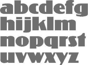 This company evolved in 1983 from Dr Boeger Photosatz GmbH (est. ca. 1934). The timeline:
 - 1934: Marius Böger founded the first company to manufacture and market photocopying machines and reprographic devices.
- 1950: Dr. Böger Duplomat Apparate GmbH was founded. Its objective is the production of diazo (blue-printing) machines, equipment for diffusion transfer processing and photographic reproduction.
- 1955: One of the company's first innovative products comes onto the market, the first vertical reproduction camera.
- 1958: Intercop, a Dr. Böger subsidiary, started marketing a range of rapid processing machines, vertical repro cameras and processors for proofs and offset plates.
- 1969: Dr. Böger Photosatz was founded.
- 1976-81: Dr. Böger Photosatz develops its Copytronic phototypesetter. This machine worked on the basis of an opto-mechanical principle, and was set out to compete with Berthold's Diatronic. Hundreds of fonts from the headline library were reworked to meet the needs of the new machines. Although a small number of around 10 machines could be built and sold in Germany and Switzerland, many technical problems with the new equipment drained the financial resources. Thus the Copytronic machine is withdrawn from the market. The company survives by producing its succesful reproduction cameras for Agfa Gevaert. After a few difficult years, Dr. Böger Photosatz sets out to develop its digital typesetting system called Scantext. The output device is a CRT-machine with a resolution of 1000 lines per cm. The Copytronic type library is digitized using a video camera with a typical resolution of 512 x 512 pixels to the em quad. Bernd Holthusen proudly describes it as the fastest type digitizing system in the world. From 1971 until the mid 1980s, it designed and manufactured a family of photolettering machines for headline typesetting and offered a library of more that 1000 film fonts for that application. These were popular under the brand name VISUTEK in the UK (In the rest of Europe they were labelled and sold as Copytype, a trademark by Dr. Böger Photosatz GmbH). Additionally they were the creators and makers of a wide range of process cameras and film processing systems marketed worldwide under the Agfa brand
- 1981: The company produces the phototypesetting system Scantext 1000. By the beginning of 1985 around 750 Bodytypes were available for the Scantext system.
- 1983: The company evolves into Scangraphic. More than 2000 fonts were digitised by the Scangraphic company under the personal supervision of Bernd Holthusen, principally by Volker Küster (1984-1989), Jelle Bosma (1988-1991) and Albert-Jan Pool (1987-1991). These fonts were produced originally for the proprietary "Scantext" CRT digital output device and subsequently for the Scangraphic family of laser imagesetters. Quoting Pool: By the time we had completed the Ikarus Database in order to be able to convert our headline fonts to Postscript, URW had finished its Type1 converter. Our first PostScript product was a Macintosh-CD Rom with the complete library of headline fonts (those with Sh in the name) on it. The fonts were released in Type1 format for the Macintosh environment starting in 1991.
- 1984: Scangraphic starts working on its library of headline fonts, using a proprietary high resulution short vector format which enables output sizes up to 90 mm cap height. After developing its own digital outline font format, Scangraphic starts making use of URW's Ikarus technology to produce a library of headline fonts. As from 1989, Ikarus outlines were made to fit the metrics of the Scangraphic library of bodytype fonts in order to replace the proprietary pixel based font format by digital outlines. Thus the basis was laid for converting the complete library of headline and bodytype fonts into the PostScript Type1 format.
- 1989: The owner/partners sold the business to the large German company Mannesmann AG (and the font collection is sometimes referred to as the Mannesmann-Scangraphic collection), becoming Mannesmann Scangraphic GmbH in Wedel near Hamburg.
- 1994: Mannesmann breaks the umbilical chord and the company becomes Scangraphic Prepress Technology GmbH.
- 2004: the company moves from Wedel/Hamburg to Seligenstadt, Germany. The company still operates on the European mainland making and selling high resolution film and plate imaging systems. The font department is no longer in operation.
- End of 2004: Elsner&Flake buy the font collection, and start selling the fonts under the Elsner&Flake umbrella. The 2500-strong font collection has names that either have a suffix SB (for body types) or SH (for headline types, also called supertypes). Among the tens of examples, we find classics such as Jakob Erbar's Koloss SB.
- 2006: Ulrich Stiehl publishes a document in which he discusses the collection of fonts. He reports clear correspondences with known font families, examples including Ad Grotesk (=Akzidenz-Grotesk by Berthold), Artscript No 1 (=Künstlerschreibschrift fett by Stempel/Linotype), Black (=Block by Berthold), Chinchilla (=Concorde by Berthold), Cyklop (=City by Berthold), Esquire (=Excelsior by Linotype), Europa Grotesk (=Helvetica by Linotype), Europa Grotesk No. 2 (=Neue Helvetica by Linotype), Flash (=Okay by Berthold), Freeborn (=Frutiger by Linotype), Gentleman (=Glypha by Linotype), Grotesk S (=Neuzeit Buch by Stempel), Madame (=Madison by Stempel), Matrix (=Melior by Linotype), October (=Optima by Linotype), Parlament (=Palatino by Linotype), Paxim (=Palatino by Linotype), September (=Sabon by Linotype), Synchron (=Syntax by Stempel), Vega (=Volkswagen VAG Rundschrift). There are also originals like Volker Küster's Today Sans Serif and Neue Luthersche Fraktur, Zapf Renaissance by Hermann Zapf, and Forlane by Jelle Bosma. Küster, Pool, Zapf and Bosma have nothing to do with the non-original fonts in the collection. The typophile community shrugs Stiehl's complaints off.
- 2008: The Scangraphic collection can be bought at Elsner&Flake.
Examples of Scangraphic fonts: Pi Travel+Transportation, Pi Greek Maths, Pi Communication, Pi Signs+Symbols, Futura Round SB, Futura Round SH. A technical discussion by Yves Peeters. MyFonts link. Link to Scangraphic PrePress Technology GmbH in Seligenstadt. Elsner&Flake shop. Home page. View the Scangraphic typeface library. Another link to the Scangraphic typeface library. [Google]
[MyFonts]
[More] ⦿
|
Schriftklassifikation nach DIN 16 518
|
 Type classification (in German) according to the DIN 16 518 system invented in 1964. Pages by Bernhard Schnelle. I will use his German nomenclature, and quote his examples of each style.
 - I. Venezianische Renaissance-Antiqua: Amalthea, Ascot, Berkeley Old Style, Centaur, Concorde, Deepdene, Eusebius, Goudy Italian, Guardi, Horley Old Style, Jersey, Lutetia, Menhart-Antiqua, Normandy, Seneca, Schneidler-Mediaeval, Trajanus, Verona, Weidemann, Worcester Round.
- II. Französische Renaissance-Antiqua [garalde types]: Aeterna, Aldus-Buchschrift, Bembo, Berling, Charter, Comenius-Antiqua, Garamond, Granjon, Leipziger Antiqua, Meridien, Michelangelo, Octavian, Palatino, Perpetua, Plantin, Sabon-Antiqua, Trump-Mediaeval, Van Dijck, Vendome, Weiß-Antiqua.
- III. Barock-Antiqua [transitional types]: Baskerville, Bernhard Modern, Bookman, Caledonia, Caslon, Century, Century Schoolbook, Cheltenham, Cochin, Diotima, Ehrhardt, Imprimatur, Janson, Life, Nicolas Cochin, Poppl-Antiqua, Raleigh, Schoolbook, Scotch, Tiffany, Times.
- IV. Klassizistische Antiqua [modern or didone types]: Bauer Bodoni, Bodoni-Antiqua, Linotype Centennial, Corvinus, De Vinne, Linotype Didot, Ellington, Falstaff, Fat Face, Fenice, Madison-Antiqua (Amts-Antiqua), Normande, Tiemann-Antiqua, Torino, Walbaum-Antiqua.
- V. Serifenbetonte Linear-Antiqua [slab serif]: Aachen, Clarendon, Memphis, Old Towne, Pro Arte Schadow-Antiqua, Serifa, Volta.
- VI. Serifenlose Linear-Antiqua [sans]: Akzidenz-Grotesk, Antique Olive, Avant Garde Gothic, Cosmos, Delta, Erbar-Grotesk, Eurostile, Folio, Franklin Gothic, Frutiger, Futura, Gill, Helvetica, Univers.
- VII. Antiqua-Varianten: Abbot Old Style, Amelia, Americana, Arnold Böcklin, Banco, Calypso, Churchward, Cooper Black, Dynamo, Eckmann, Glaser Stencil, Hobo, Lasso, Mexico Olympic, Plastica, Profil, Souvenir, Stop, Superstar, Tintoretto, Traffic, Washington, Windsor, Zipper.
- VIII. Schreibschriften [scripts]: Arkona, Amazone, Bison, Boulevard, Brush Script, Caprice, Charme, Choc, Diskus, Englische Schreibschrift, Künstler-Schreibschrift, Lithographia, Mistral, Reiner Script, Rondo, Signal, Swing, Vivaldi.
- IX. Handschriftliche Antiqua: American Uncial, Antikva Margaret, Arcade, Codex, Delphin Dom Casual, Hadfield, Klang, Koch-Antiqua, Libra, Lydian, Ondine, Poetica, Post-Antiqua, Prima, Ritmo, Solemnis, Studio, Time Script.
- X. Gebrochene [Fraktur, blackletter], subdivided into Xa Gotisch, Xb Rundgotisch, Xc Schwabacher, Xd Fraktur, Xe Fraktur-Varianten.
- XI. Fremde Schriften [foreign types]: all non-Latin typefaces.
[Google]
[More] ⦿
|
Sharp Type
[Lucas Benjamin Sharp]
|
 Lucas Sharp is a designer (b. 1986, San Francisco) set up Sharp Type in Brooklyn, NY, and later in New York City proper. Before that, Lucas Sharp was involved with Typeslashcode in New York. In 2011, he and Juan Carlos Pagan set up Pagan&Sharp in Brooklyn, NY, but they split a few years later. In 2015, Lucas Sharp and Chantra Malee [at Sharp Type, Malee handles business, brand management, marketing, graphic design and sales] started Sharp Type in New York City. In 2020, the collaborators and type designers included Josh Finklea, Connor Davenport, Marc Rouault, My-Lan Thuong, Calvin Kwok, and Justin Sloane. Lucas Sharp's typefaces:
 Type catalog, 2010. [Google]
[MyFonts]
[More] ⦿
|
Skogtype
[Gunnar Link]
|
 Type designer born 1983 in Schramberg, Germany. He studied Kommunikationsdesign at Fachhochschule Mainz from 2007 to 2011, and founded Skogtype.
 Creator of Royal Oak Decor (Victorian ornaments), Royal Oak Sans (2009, Edwardian headline sans) and Royal Oak Serif (Western headline face). All were done in 2009 at Die Typonauten and were joint work with Ingo Krepinsky and Stefan Kroemer. In 2011, he designed the Cooper Black-style typeface Frido Black at 26 plus zeichen. See also Frido Narrow (2011). Ingo Krepinsky and Gunnar Link made the fun hand-drawn Western family Oklahoma Pro (2012) in styles called Deputy, Sheriff, Marshal and Scrawls (dingbats), and In 2012, he published Selva, a modern take on the textura style, at Die Typonauten. Riga (2012) is a lively fat signage typeface. Typefaces from 2014: Donki (fat signage script, extended to Donki Pro and Donki Pro Stencil in 2015). Typefaces from 2017: Skog Sans. Typedia page. MyFonts foundry page. Klingspor link. Behance link. [Google]
[MyFonts]
[More] ⦿
|
SoftMaker Software GmBH (or: freefont.de)
[Martin Kotulla]
|
 SoftMaker, Martin Kotulla's German foundry in Nürnberg, is selling the 10,000-TrueType font Megafont XXL CD (50 USD, www.megafont.de). Every month, a different font or font family (TT and T1) is given away for free. The MegaFont XXL has most standard Monotype/Adobe/Linotype families (up to 1995/1996). They say that most fonts are licensed from URW++ and Brendel Informatik (Cologne). Contents of MegaFont XXL's predecessor, MegaFont Profi CD, here. Since early 2001, you can download one font family from the CD MegaFont XXL here. Martin Kotulla also started infiniType, a collection of 5050 fonts at a good price (Mac and PC). That collection grew to 7444 fonts in InfiniType 4 in 2016. The XXL series has character sets for Western and Central European languages, Turkish, and Celtic, and comes with many expert sets. For historical accuracy: older packages by Softmaker include the 3333-font (TT and T1) MegaFont Profi CD-2.0 (99DM), the 5000-font MegaFont Euro (50 Euro), the Truepack Profi-CD and the 500-font TypeMaker 5.0 Profi-Pack (10DM).
  Their early fonts were renamed and had the attribute Serial in the name. Samples of some of these fonts/families: Adelon Serial (1996, after Albertus MT), Melbourne Serial, Nashville Serial (+Heavy), Nevada Serial, On Stage Serial, Ornitons Serial, Penthouse Serial, Plakette Serial, Priamos Serial, Quadrat Serial, Quebec Serial, Riccione Serial, Rochester Serial, Salzburg Serial, Stafford Serial, Sunset Serial, Sydney Serial, Thames Serial, Toledo Serial, Valencia Serial (Heavy), Valencia Serial (Xlight), Verona Serial, Volkswagen Serial, Wichita Serial. Their early fonts were renamed and had the attribute Serial in the name. Samples of some of these fonts/families: Adelon Serial (1996, after Albertus MT), Melbourne Serial, Nashville Serial (+Heavy), Nevada Serial, On Stage Serial, Ornitons Serial, Penthouse Serial, Plakette Serial, Priamos Serial, Quadrat Serial, Quebec Serial, Riccione Serial, Rochester Serial, Salzburg Serial, Stafford Serial, Sunset Serial, Sydney Serial, Thames Serial, Toledo Serial, Valencia Serial (Heavy), Valencia Serial (Xlight), Verona Serial, Volkswagen Serial, Wichita Serial.
In 2008, SoftMaker started selling fonts on MyFonts: fonts there include the 28-style Suetterlin family (2008), based on the handwriting taught in German schools in the first half of the 20th century, Harald Handwriting (2009), Agilo Handwriting (2009), Wally Handwriting (2009), Vittorio Handwriting (2009), Turandot Handwriting (2009), Tommi Handwriting (2009), Veneto Handwriting (2009), Tolomeo Handwriting (2009), Sarx Handwriting (2009), Salew Handwriting (2009), Roxana Handwriting (2009), Renate Handwriting (2009), PizPaz Handwriting (2009, Mexican style), Schneid Handwriting (2009), Pietro Handwriting, Phil Handwriting, Nadine Handwriting, Kuno Handwriting, Larissa Handwriting, Lizzy Handwriting, Juri Handwriting, Jeff Handwriting (2009), Josh Handwriting (2009), Jelena Handwriting (2009), Jaro Handwriting (2009), Jacques Handwriting (2009), Hilly Handwriting (2009), Harico Handwriting (2009), Hakon Handwriting (2009), Stone Handwriting (2009), Federico Handwriting (2009), Fabio Handwriting (2009), Emmi Handwriting (2009), Davio Handwriting (2009), Alec Handwriting (2009), Brian Handwriting (2009), Armand Handwriting (2009), Claude Handwriting (2010), Cathy Handwriting (2010), Clay Handwriting (2010), Danielle Handwriting (2010), Feliks Handwriting (2010), Foster Handwriting (2010), Giorgio Handwriting (2010), Giovanna Handwriting (2010), Guga Handwriting (2010), Giuliano Hanriting (2010), Carlo Handwriting (2009), Brouet Handwriting (2010), Bjarne Handwriting (2009), Fuego (2015: a retro script, after Letraset's Flamenco), Agnieszka Handwriting (2009) and Thery Handwriting (2009).  Additions in 2010: Tabasco (a geometric based on the phototype font by John Schaedler), Tabasco Twin (a bilined typeface after John Schaedler's Paprika), Advertisers Gothic (a revival of a 1917 typeface by Robert Wiebking), Ad Lib (a revival of a quirky 1961 typeface by Freeman Craw for ATF), Accent (brush face), Flagstaff (oblique techno face), Cornered (with angular pieces), Abilene (Western; caps only), Comix, Cathedral Open (nice open face), Boa Script (2010), Bryce (2010, brush script), Brush Script (2010, after the original ATF font by Robert E. Smith from 1942), Bernhard Fashion (2010), Abbott Old Style (2010, after a 1901 semi-Victorian font by Joseph W. Phinney), Artistic (2010, after Ariston, a 1933 typeface by Martin Wilke), Elegant Script (2010, a revival of Berthold's Englische Schreibschrift), Garamond Serial (2011), the Suetterlin family. Additions in 2010: Tabasco (a geometric based on the phototype font by John Schaedler), Tabasco Twin (a bilined typeface after John Schaedler's Paprika), Advertisers Gothic (a revival of a 1917 typeface by Robert Wiebking), Ad Lib (a revival of a quirky 1961 typeface by Freeman Craw for ATF), Accent (brush face), Flagstaff (oblique techno face), Cornered (with angular pieces), Abilene (Western; caps only), Comix, Cathedral Open (nice open face), Boa Script (2010), Bryce (2010, brush script), Brush Script (2010, after the original ATF font by Robert E. Smith from 1942), Bernhard Fashion (2010), Abbott Old Style (2010, after a 1901 semi-Victorian font by Joseph W. Phinney), Artistic (2010, after Ariston, a 1933 typeface by Martin Wilke), Elegant Script (2010, a revival of Berthold's Englische Schreibschrift), Garamond Serial (2011), the Suetterlin family.
The typefaces remastered in 2012 include Chandler Pro (this is Rofer Excoffon's 1955 brush typeface Choc; see also Staccato 555 by Bitstream and Chalk by Corel), Cheltenham Pro, Cleargothic Pro (after Morris Fuller Benton's flared version of Clearface, Clearface Gothic, 1907), Cooper Black Pro (+Stencil), Bristol Pro, Tioga Script Pro (after Georg Trump's 1956 script by that name, but aka Time Script). Free download: Huntington-Bold [-> Handel Gothic], Huntington-Light, ImperialStd-Bold [-> URW Imperial] ImperialStd-BoldItalic, ImperialStd-Heavy, ImperialStd-HeavyItalic, ImperialStd-Italic, ImperialStd-Medium, ImperialStd-MediumItalic, ImperialStd-Regular, ImperialStd-Xbold, ImperialStd-XboldItalic, KremlinScript-Bold [-> Kuenstler Script], RaleighSerial-Bold, RaleighSerial-Heavy, RaleighSerial-Regular, Scott [-> Stop], TiogaScript-Bold [-> Time Script], TiogaScript-Light, TiogaScript-Medium. Handwriting fonts shown at MyFonts in 2013: Allan Handwriting, Andrew Handwriting, Eleanor Handwriting, Enrico Handwriting, Estelle Handwriting, Jay Handwriting, Jaz Handwriting, Jesco Handwriting, Justine Handwriting, Kris Handwriting, Laszlo Handwriting, Lennart Handwriting, Luitpold Handwriting, Manolo Handwriting, Marbo Handwriting, Marcello Handwriting, Murielle Handwriting, Pablo Handwriting, Paolo Handwriting, Pascal Handwriting, Picto Handwriting, Rainer Handwriting, Reyno Handwriting, Ronaldo Handwriting, Teje Handwriting, Theo Handwriting, Valerian Handwriting, Vincent Handwriting, Vogel Handwriting, Volker Handwriting, Wilma Handwriting. The blackletter collection published in 2016 by SoftMaker includes these typefaces: Albrecht Duerer Fraktur Pro, Barock 1720, Breitkopf Fraktur Pro, Coburg No1, Coburg No2, Coelnische Current Pro, Diamant Gotisch Pro, Fleischmann Gotisch Pro, Fraktur No2 Pro, Fraktur No3 Pro. Later in 2016, SoftMaker published its revival collection, which includes Alternate Gothic Pro, Amsterdamer Garamont Pro, Antiqua Pro, Balloon Pro (brush), Caslon Antique Pro, Century Old Style Pro, Elmore Pro (architectural hand), Falcon Pro (retro brush), Cheltenham ExtraCondensed Pro Bold, Casual Pro (a copy of Thomas Nevison's Casual Pro from 1935), Garamond Nova Pro, Giulio Pro (a copy of Gillies Gothic), Josephs Brush Pro (a copy of Joseph Churchward's Churchward Brush), Malaga Pro (a copy of Roger Excoffon's Mistral), Melville Pro (after Murray Hill), Pedro Pro (a revival of the brush script Dom Casual by Peter Dombrezian, 1950-1953, at ATF), Salmon Pro (a revival of François Boltana's Stilla from 1973), Soledad Pro (based on Helmut Matheis's Slogan (1959, Ludwig & Mayer)), Somerset Pro (a revival of the Letraset font Shamrock designed in 1978 by Alan Withers), Sterling Pro (based on Stentor, designed in 1964 by Heinz Schumann at Typoart), Violin Script Pro (based on Vladimir Script by Vladimir Andrich, 1978). Typefaces from 2019: American Text (after an original condensed textura by Morris Fuller Benton), Angelo (after a Victorian typeface called Anglo by Barnhart Brothers ans Spindler, ca. 1895), Balloon No2 (just like SoftMaker's Balloon, based on Max Kaufmann's Balloon from 1939 at ATF), Balzac (after Johannes Boehland's Balzac from 1951), Amber (after Amelia by Stanley Davis, 1964), Karin Pro (a revival of OttoWeisert's art nouveau script Kalligraphia), Beale Charming (2019, after an art deco typeface by Collis Clements, ca. 1974), Bernhard Condensed No2, Bluff No2 (2012-2019, after Julius Kirn's brush script Bison, 1938), Boss (2012, after the sci-fi typeface ITC Bolt (1970, Tom Carnase and Ronne Bonder)), Broadway No2 (2012), Cavalier (2012), Century Schoolbook Pro (2019: after Morris Fuller Benton's typeface from 1919), Century PS Pro (2019: after New Century Schoolbook), Commercial Script No2 (2012, after Morris Fuller Benton's Spencerian script), Cristoforo (2012: after Columbus, a Victorian typeface by Hermann Ihlenburg), Dillon No2 (2012, after Jan Van Dijk's Demian), Disco (2012), Dom (2012; after Peter Dombrezian's Dom, 1952), Durango No2 (2012; after K. Sommer's Dynamo, 1930), Egyptian Wide (2012, after walter H. McKay's Egyptienne from 1952), Eller Initials (2012), Entebbe (2012: after F. Scott Garland's Enviro, 1982), Estelle (2012, based on Vince Whitlock's Equinox from 1988), Florentine (2012, after Ludvig S. Ipsen's ATF Florentine Old Style (1896)), Fraktur No2 (2012, after Johann Christian Bauer's Fette Fraktur, 1850), Frenzy (2012), Giulio No2 (2012, after William S. Gillies's Gillies Gothic, 1935), Greyhound (2012), Harlekin (2012, after Colin Brignall's retro script Harlow Solid (1977)), Hobo No2 (2012, after Morris Fuller Benton's Hobo, 1910), Hubert (2012, after Jan van Dijk's Van Dijk from 1982), Hudson (2012, a brush script), Ingrid (2012), Inverserif (2012), Japanette (2012, an oriental simulation face modeled after Barnhart Brothers and Spindler's 1893 font, Wedge Gothic ML, aka Japanet), Kalligraphia (2012, after Otto Weisert's art nouveau script, Kalligraphia, from 1902), Legend Script (2012, after F.H. Ernst Schneidler's faux Arabic simulation font Legende from 1937), Looking Glass (2012, after Phil Martin's Introspect, 1971), Messing (2012, after W. Schwerdtner's Metropolis from 1928), Metallic Sky (2012, after Mekanik, a Letraset typeface from 1988 by David Quay), Mister Big (2012, after Juergen Riebling's Mr. Big from 1972), Openface No2 (2012, after Augustea Open done in 1951 by Alessandro Butti and Aldo Novarese), Organ Grinder (2019, based on Franz Heigemeir's Organda from 1972), Paladin (2012, a blackletter, also called P650 Blackletter and Excalibur), Pergamon (2012, a deco hairline sans modeled after Premier Lightline (1969, Colin Brignall for Letraset)), Pinocchio (2012, based on a psychedelic typeface by Gustav Jaeger from 1973; earlier called P732 Deco by SoftMaker), Pretoria (2012, earlier called P820 deco by SoftMaker; a revival of the Edwardian typeface Pretorian by P.M. Shanks and Sons, ca. 1880s), Publicity Gothic (2012, based on Sidney Gaun's 1916 typeface for BBS), Quartz (2012, after Alan Birch's LCD from 1981), Reflex (2012, based on Refracta, made in 1988 by Martin Wait), Regency Script (2012: was R690 Script), Rosa (2019, after Herb Lubalin's ITC Ronda, 1970), Rough Script (2012, based on Imre Reiner's Reiner Black, 1955), Rovinj (2012, after a font by Phil Martin), Shotgun (2019, based on a film font from 972 by J. Looney for VGC), Siegfried (2012, art nouveau style), Slager (2012, based on Flash by Edwin Shaar, 1937), Sprint (2012, after Aldo Novarese's Sprint from 1974), Station Script (2012, after a 1946 typeface pair, Studio and Flambard, by Adolf Overbeek), Status (2012, after Michael Neugebauer's Squire from 1980-1987), Tico (2019), Unziale (2012), Yorkshire (2019, formal calligraphy), Zanzibar (2019, after a 1950s Filmotype font), Zephyr (2019; after Rofger Excoffon's Mistral, 1953). View the Softmaker library of typefaces. See also here. [Google]
[MyFonts]
[More] ⦿
|
Sol Hess
|
 American typographer and type designer, b. 1886, Philadelphia, d. 1953. He was a man with class and style, who influenced many through his work. He managed the Lanston library from early in the 20th century (he joined Lanston in 1902) until the second World War. He created many of its typefaces himself, and commissioned many from Frederic W. Goudy. His typefaces (LTC stands for Lanston Type Company):
 - Alternate Gothic Modernized.
- LTC Artscript (Lanston Monotype, 1940; digital version in 2005 at P22/Lanston). McGrew: Artscript is a delicate calligraphic letter designed by Sol Hess for Monotype, which calls it "an attempt to convert into rigid metal the graceful penmanship of the ancient scribe. ..based on the writing of Servidori of Madrid (1798)." It was designed in 1939 but not released until 1948, because of wartime restrictions. It is a pleasing design for limited use, but its delicacy requires special care in handling. Compare Heritage, Lydian Cursive, and Thompson Quillscript.
- In 1928, he created the now famous Broadway Engraved. P22 writes: LTC Broadway was originally designed by Morris Benton. Sol Hess added a lower case in 1929 and also drew Broadway Engraved for Lanston Monotype. That font is now available in digital format from LTC/P22. Other digital fonts include OPTI Broadway Engraved from Castcraft, Broadway Inline (Softmaker), B820 Deco (Softmaker), B821 Deco (Softmaker), Deco 901 (Bitstream) and Bravo (Corel).
- Bodoni 26: a unicase interpretation of Bodoni by Hess at Lanston, designed by Giampa; digital version at P22/Lanston in 2005.
- Bodoni No. 175 (remastered in 2006 by Paul Hunt).
- LTC Bodoni Bold.
- Bruce Old Style No. 31: a transitional font at Lanston Monotype in 1909. Now a Bitstream face. Based on Bruce Old Style No. 20 from Bruce Foundry (1869).
- Linotype states that Sol Hess is responsible for a version of Cochin Bold (1921): Georges Peignot designed Cochin based on copper engravings of the 18th century and Charles Malin cut the typeface in 1912 for the Paris foundry Deberny&Peignot. The font is named after the French engraver Charles Nicolas Cochin (1715-1790) although its style had little to do with that of the copper artist's. The font displays a curious mix of style elements and could be placed as a part of the typographical Neorenaissance movement. Cochin is especially large and wide and was very popular at the beginning of the 20th century. Note: Cochin is now sold by Linotype, Adobe, Monotype, URW++ and Bitstream (as Engravers' Oldstyle 205).
- English Caslon no 37.
- Flash.
- Goudy Bible (1948). Mac McGrew: Goudy Bible is a modification of Goudy Newstyle (q.v.), adapted by Bruce Rogers with the assistance of Sol Hess for use in the Lectern Bible Rogers designed for World Publishing Company in 1948.
- Goudy Bold Swash.
- Goudy Heavyface Open (1926) and Condensed (1927). Mac McGrew: Goudy Heavface and Italic were designed by Goudy in 1925 in response to a strong request by Monotype for a distinctive typeface on the order of the very popular foundry Cooper Black. Such typefaces had little appeal for Goudy, and he always felt that Monotype was disappointed in his efforts, but the result is more informal than other similar types, and has had considerable popularity. Note the extra set of figures and the unusual number of tied characters and ornaments in the font. Goudy Heavyface Open is a variation produced by Monotype in 1926, probably designed by Sol Hess, who designed Goudy Heavyface Condensed in 1927. Compare Cooper Black, Ludlow Black, Pabst Extra Bold. See LTC Goudy Heavyface, or Goudy Heavyface (Bitstream).
- Hadriano Stone-Cut.
- Hess, Hess Bold (1910). Mac McGrew: Hess Bold was designed by Sol Hess for Monotype about 1910, as a companion typeface for Goudy Light, drawn earlier by Frederic W. Goudy. Of medium weight, it accurately reflects the characteristics of the lighter face with a high degree of legibility, but neither typeface is distinguished. There is also an italic by Hess.
- Hess Monoblack. A great display poster typeface that looks like a hand-drawn version of Nicolas Cochin. Mac McGrew: Hess Monoblack is a Monotype typeface that no doubt was drawn by Sol Hess, but it has not been found in any accounts of his work nor in the regular specimen books. The showing here is reproduced from Monotype's "specimen on request" sheet; no other information has been found except that there are only two sizes with seventy-seven characters each, a practical minimum for cap-and-lowercase fonts. Compare Greco Bold. See P22/Lanston for a digital version called LTC Hess Monoblack done by Paul Hunt in 2005.
- Hess New Bookbold (1946). Mac McGrew: Hess New Bookbold was designed for Monotype in 1946 by Sol Hess. with italic the following year; both were released in 1948. An adaptation of Garamond Bold, the typeface was reproportioned to fit a new standard arrangement which was intended to make it readily available for use with several standard oldstyle typefaces still in common use at the time, but little use seems to have been made of it. Ascenders and descenders are shorter than in Garamond, anticipating later phototype trends, weight is slightly greater, and letters are more tightly fitted.
- Hess Old Style (1920-1923). Mac McGrew: Hess Old Style was designed about 1920 (one source says 1912) by Sol Hess for Monotype, which says it was modeled after a typeface shown by Nicolas Jenson about 1479. It is neat, but does not have much in common with Centaur, Cloister, and other typefaces based on Jenson's work. However, it is a little heavier than most of them and so works to good advantage on smooth papers. The italic followed in 1922. Revived by Steve Jackaman in 1993 as Hess Old Style RR.
- Hess Neobold (1933-1934). Mac McGrew: Hess Neobold was designed by Sol Hess for Monotype in 1934. It is a narrow, bold, and very squarish gothic with small serifs, designed for attention-getting display in a style of the day, but never made in more than one size. Compare Airport Tourist (Futura Display), Othello.
- Hess Title (+Italic, 1910). Mac McGrew: Hess Title and Italic were the first type designs drawn by Sol Hess. Produced in 1910 as advertising types, they were designed for and first used by a prominent New York department store. Only the roman was made in display sizes.
- Italian Old Style Wide.
- Janson.
- LTC Jefferson Gothic: an adaptation of News Gothic Extra Condensed drawn by Sol Hess in 1916; digital version at P22/Lanston in 2005. Mac McGrew: Jefferson Gothic was originally Monotype's copy of News Gothic J Extra Condensed, using the same foundry name. In 1916 Sol Hess designed several alternate round capitals; matrix fonts include both styles of these letters, but no lowercase. Baltimore Type called it Tourist Extra Condensed. Compare Phenix.
- Kennerley Open Caps.
- Laurentian.
- Martin (+Italic). Mac McGrew: Martin and Italic are listed as a Monotype production of 1945, adapted by Sol Hess from old sources, but no specimen or further information has been found.
- New Bookman.
- Onyx Italic (1939, for Monotype). The italic version of Gerry Powell's 1937 ATF typeface Onyx, a condensed version of Poster Bodoni.
- Pendrawn (1934). Mac McGrew: Pendrawn was designed for Monotype about 1933 by Sol Hess. It retains much of the quality of sixteenth-century hand-lettering, and is generally modem in character without the severity typical of most modem types. Serifs are long and thin, slightly concave, but those at the top of lowercase stems are slanted as in oldstyle types. Stems taper slightly toward the ends, and figures are hanging. Round letters tend toward an egg shape, with the small end down. It has been made only in two sizes: regular 36-point as a complete font and 36H4 as oversize capitals only.
- Postblack Italic.
- Post-Stout Italic.
- Poster or Hess Poster. Mac McGrew: Poster or Hess Poster is a heavy, narrow, very compact gothic designed by Sol Hess for Monotype. Its general appearance suggests a contemporary serifless design but in fact there is a slight hint of serifs. The slightly splayed M and the single-bowl g are suggestive of British grotesques. Ascenders and descenders are short, giving a large x-height, and the typeface is closely fitted.
- Slimline (1939). Mac McGrew: Slimline was designed by Sol Hess in 1939 for Monotype. It is a lightweight, very narrow, monotone typeface with tiny serifs and a number of alternate round characters. It has had some use for stationery. Compare Huxley Vertical.
- Spire (1937): a condensed didone, see the digital LTC Spire in the Lanston collection. Mac McGrew: Spire is a modernization of the old modern roman extra-condensed style. drawn by Sol Hess for Monotype in 1937. There is no lowercase, but there are several alternate round characters. Compare Greenwich, Modern Roman Extra Condensed, also Empire, Slimline. Spire is also the name of a dissimilar BB&S face, cut in 1898 or earlier and shown as late as 1927. Spire has been digitized/revived by Ann Pomeroy under the same name for FontHaus and then Group Type. LTC Obelysk Grotesk was designed by the Lanston Drawing Office in the late 1980s. This typeface is a reconstruction of Spire. The skeleton of Spire Roman stands with the serifs removed. Like Spire, this font has no lower case, but does offer alternate cap styles in some of the lower case positions.
- Squareface (1940). Now available digitally as LTC Squareface from LTC/P22. Mac McGrew: Squareface was designed by Sol Hess in 1940 as a variation of Stymie Extrabold. A number of characters are the same for both typefaces, but normally round letters have been squared considerably, with only slightly rounded corners. It makes a vigorous display face, and harmonizes well with other square-serif designs.
- Stationers Gothic (1942-1948). Mac McGrew: Stationers Gothic Light and Bold were designed by Sol Hess for Monotype in 1942, and Medium in 1944, but wartime and post-war conditions delayed their release until 1948. They are similar to the Bank Gothics. following a style of squared letter popular for copperplate engraved stationery and announcements, and in effect constitute a more contemporary form of the style typified by Copperplate Gothics. Like the others, there are several sizes on each of several different bodies, making various cap-and-small-cap combinations easily practical.
- Style Script (1940). Mac McGrew: Style Script was designed by Sol Hess for Monotype in 1940. It is a popular bold thick-and-thin cursive style, which has had considerable use in advertising. It is somewhat like the earlier Coronet Bold of Ludlow, but heavier and with a greater x-height; some characters seem to make a conscious effort to differ.
- Stymie.
- Tourist Gothic (Lanston, 1909; now available digitally as LTC Tourist Gothic from LTC/P22). Mac McGrew: Tourist Gothic is a Monotype copy of Modern Condensed Gothic with a set of several round alternate caps designed by Sol Hess in 1928. (Sizes under 14-point continued under the Modern Condensed Gothic name, without the alternates.) In 1938 Hess drew a matching Tourist Gothic Italic, which added to the popularity of the face, although it lacks the round characters. The Outline Gothic Medium Condensed (or Franklin Gothic Condensed Outline) from some sources is actually an open version of Tourist Gothic. Tourist Extra Condensed of Baltimore Type is a copy of Phenix (q.v.) in 24- to 48-point sizes, and is Jefferson Gothic (q.v.) in larger sizes.
- Twentieth Century was designed by Hess between 1936 and 1947 as a monoline version of Paul Renner's Futura. Mac McGrew: Twentieth Century is Monotype's copy of Futura (q.v.), and in display sizes is essentially an exact copy, while composition sizes are only slightly modified. Several additional versions were drawn for Monotype by Sol Hess, including Twentieth Century Bold Italic and Extrabold Italic in 1937, Extrabold Condensed Italic in 1938, Ultrabold in 1941, Ultra bold Condensed in 1944, and Medium Condensed Italic and Ultra bold Italic in 1947. Some of these weights have different names than their counterparts in the original Futura series or other copies; see the list under Futura for comparison of these names as well as technical data. The main version is sold by Monotype as Twentieth Century MT. The digital type foundry Lanston, or LTC, sells LTC Twentieth Century. Hess Gothic Round NF (2008, Nick Curtis) is based on Twentieth Century. The design was reinterpreted by Herb Lubalin as Avant Garde in the 1970s. Curtis' version softens the harsh geometry of the original designs with rounded line endings. Revivals and derivations of Twentieth Century Poster include Renard Moderne NF (2010, Nick Curtis).
- Ward (1942). McGrew: ard or Montgomery Ward is an adaptation by Sol Hess in 1942 of Memphis Light, specially redesigned for use in the large catalogs of that mail-order company. Strokes are lightened a bit, and the x-height is increased slightly. It was cut by Monotype for private use. One reference says there were light and medium weights; another says there were roman and italic in normal width and also an extended version. The latter account seems more authentic.
Digital descendants of Sol Hess: LTC Hess Monoblack (Lanston Type Company), Hess Old Style (Red Rooster Collection), Hess Gothic Round NF (Nicks Fonts), Twentieth Century (Monotype), LTC Squareface (Lanston Type Company), Broadway Engraved SH (Scangraphic Digital Type Collection), Bruce Old Style (Bitstream), LTC Jefferson Gothic (Lanston Type Company), LTC Spire (Lanston Type Company), LTC Swing Bold (Lanston Type Company), LTC Artscript (Lanston Type Company), LTC Twentieth Century (Lanston Type Company), LTC Tourist Gothic (Lanston Type Company), Renard Moderne NF (Nicks Fonts), Goudy Heavyface (Bitstream), Broadway (Monotype), LTC Broadway (Lanston Type Company), Broadway (Linotype), LTC Hadriano (Lanston Type Company), Cochin (Linotype), LTC Bodoni 175 (Lanston Type Company), Stymie (Bitstream), Engravers Oldstyle 205 (Bitstream), LTC Bodoni 26 (Lanston Type Company), LTC Obelysk Grotesk (Lanston Type Company), Century Gothic (Monotype), Spire (GroupType), Havel (T4), Alternate Gothic Pro Antique (Elsner+Flake). Klingspor link. FontShop link. Linotype link. [Google]
[MyFonts]
[More] ⦿
|
Storic Type (or: Flavor Type, or: Flavortype)
[Panji Nugraha]
|
 Flavor Type was an Indonesian design studio located in Bandung in which Panji Nugraha, Ilham Herry and Maghrib Lab were involved. In 2017, Panji Nugraha set up Storic Type.
 Panji Nugraha is the Bandung, Indonesia-based designer of Caferus (2014), Murmers (2014, Victorian), Bonerica (2014, a Victorian typeface), Vanderchalk (2014) and Glowist (codesigned in 2014 with Ilham Herry and Maghrib Lab at Flavor Type). In 2015, he made My Dear Script (penmanship script), Hava Shine (Victorian signage face), Lovile, La Chalk (chalk writing emulation), Carneval (a fun hand-drawn typeface family with a possibility of layering), To Dear (brush script typeface), Allic (brush typeface), Vidiz (a swashy slab serif poster typeface), Levitte Script, Leila, Holisun (brush face), Vacamous, Summerica, Callalily, Vicent (watercolor brush), Morning Sugar (brush script), Blacky, Lonssa (hand-drawn type, with ornaments), Heartwell (a wonderful brushy poster script), Noside (a splashy brush), Toxine and Fruty. Typefaces from 2016: Enlighten (bouncy sans), Bite Chalk, Stay Alive (Victorian), Dafodil (Western), Vercha, De Arloy (art nouveau), Herald Bouncy, Mon Cheri (signage script). Typefaces from 2017: Relove (Victorian), Floresh, Chester (a layered spurred vintage typeface), Recipe Daily (free), Glandish, Moody Blue (a curly Victorian typeface), Reborn (ornamental Victorian typeface), Recipe Diary. Typefaces from 2018: Limit Corner (Victorian), Bride Chalk (sans and serif). Typefaces from 2019: Borest (a luxurious flared sans by Ilham Herry and Maghrib Lab), Fulgate (by Ilham Herry and Adam Fathony). Typefaces from 2020: Muray House (a bold swashy bathroom towel typeface by Ilham Herry and Adam Fathoni Haris), Esteric (a playful retro jazz typeface). Flavortype's catalog in 2022 showed these typeface families: - Barlon (2022). Art nouveau, modernized. By Ilham Herry and Adam Fathony Haris.
- Borest (2019). A luxurious flared sans by Ilham Herry, Adam Fathony Haris and Maghrib Lab.
- Budge (2020). A layerable retro signage script.
- Bumsy (2021). A bold display serif by Ilham Herry and Adam Fathoni Haris.
- Esteric (2020). A playful tapered retro jazz font. By Ilham Herry and Adam Fathony Haris.
- Fulgate (2019). A luxury display family by Ilham Herry and Adam Fathony Haris.
- Genty (2020). A creamy retro signage script typeface by Ilham Herry and Adam Fathoni Haris.
- Glaw (2020). A psychedelic font by Ilham Herry and Adam Fathoni Haris.
- Monvar (2021). A layerable Cooper Black style typeface. By Ilham Herry and Adam Fathony Haris.
- Muray House (2020). A bold swashy bathroom towel typeface. By Ilham Herry and Adam Fathony Haris.
- Rische (2021). A 6-style display serif with huge counters and an enormous x-height. By Ilham Herry and Adam Fathony Haris.
Creative Market link for Flavor Type. Another Behance link. Behance link. Another Behance link. Another Creative Market link. [Google]
[MyFonts]
[More] ⦿
|
Suomi Type Foundry
[Tomi Haaparanta]
|
 Tomi Haaparanta (b. Vaasa, Finland, 1967) is a Finnish type designer and art director. He created many great fonts, and founded Suomi Type Foundry in 2005. Speaker at ATypI 2005 in Helsinki. MyFonts link. FontShop link. Klingspor link. His typefaces, suboptimally grouped:
 - Typefaces from 2016: Suomi Hand Script.
- Typefaces from 2015: Tool (a classic, narrow and clean sans serif family with seven weights), Triangle (wedge serif typeface), Tip (a modulated sans).
- Typefaces from 2013: Abandon (a basic sans family), This (a rounded family), Abiding (slab serif).
- Typefaces from 2012: SciFly (a free rounded sans commissioned by Flyerzone).
- Typefaces from 2011: Tow (a headline font family), Grumpy Black (Black 24 is based on the headline typeface ITC Grouch (1970, Ronne Bonder and Tom Carnase), and the other styles are increasingly of higher contrast).
- Creations in 2010: Tenner (very plump and round, good for signage), Tart Heavy (fat slabs to drool over), That (a display family, +Open, +Irregular, +Bold), Thud (an industrial belt octagonal/mechanical family), Steelworks (a sturdy mechanical sans), Taste This (sans family), Telltale, Titillation (rounded), Tide (connected script emulating ink flow), Taffee (narrow sans), Televisio, Tournedot (a very cute and lively semi-serif headline face), Tempest, Tristan (hand-printed), Cider Script, Toffee Script (after an art nouveau typeface called Regina Cursive, which was published by H. Berthold Messinglinienfabrik und Schriftgiesserei around 1895). Tonsure Script (a high-contrast connected script), Ticketbook (for movie posters), Suomi Sans (a family with special counters).
- Creations in 2009: Tar (rounded sans family), Marimekko (a slab family for a Finnish clothing company, adapted from its 1954 Olivetti typewriter roots), Vektori (monoline octagonal), Kaapeli (Tomi's take on Kabel), Suomi Slab Serif (related to American Typewriter), Marimekko Sans, Tee Franklin (gothic sans family, made for The British Vogue---check out the light weight; done with Brian Kaszonyi), Tobacco (octagonal, based on drawing program emulation), Pannartz (based on a scan of a 1476 text by Sweynheim&Pannartz), Suomi Hand (FontShop), That (4-weight serif family), Talbot (connected script patterned after the Talbot car logo), Taint (modular ink trap face), Tailor (slab serif), Tink, Tale 40, Tale 20, Story 40, Story 20 (all pixel fonts), Tictac (a 3D face), Giro (done on purpose to mimic the ugly Giro d'Italia geometric logo font), Tame (rounded sans), Suomi Script, Explosion (grunge).
- Creations in 2007: Caxton Script (blackletter).
- At ITC: ITC Tetra (2005, squarish face), ITC Tomism (2005, modeled after Church Slavonic), ITC Tyke (2004, a take on Cooper Black).
- At Psy-Ops: Temporal, Torus.
- At T-26: Talmud (1998, faux Hebrew), TyrantRoman (1998, an Exocet-style face, T-26), Tumbler, Torino-Book, Tonic, Terylene, Tension, Teebone, Task-Toobig, Target (2004), Tantalus, Aged (1999), and Taper (2009, slab serif), the experimental sans families Target Recut (2004).
- At FUSE: FutuRoman (FUSE95).
- Tang (2004, an anti-inkbleed sans family done for very small point sizes).
- At Agfa Creative Alliance: Tangerine, Teethreedee, Twinkle.
- With Klaus Haapaniemi and Brian Kaszonyi: the 15-font War family in 1999-2000.
- At Linotype: TeebrushPaint LT Std (2003).
- Game (family).
- Tubby.
Dafont link. View Tomi Haaparanta's typefaces. [Google]
[MyFonts]
[More] ⦿
|
Tipo Pepel (was: Antaviana Typeface Division, or: Astramat)
[Josep Pep Patau i Bellart]
|
 Antaviana Typeface Division is a Catalan foundry, est. ca. 2002. It went also under the name Astramat and was also known as ANTAVIANA SERVEIS INTERACTIUS, SCCL. Located in Lleida, it is run by Josep Patau i Bellart (b. 1971, Les Borges Blanques, Lleida). Patau i Bellart offered free fonts, as well as commercial fonts. He has emerged as one of the most talented contemporary Spanish type designers. In 2011, he started Tipo Pepel [MyFonts link] in Les Borges Blanques. Josep Patau's typefaces:
 - Free typefaces: Lletraferida (2011, a didone), Negrona (2011, a revival of Lucian Bernhard's Bernhard Negro, 1930), Perolet, Lango, Gimenells, Arbeka, Rosango, Antaviana, FoxScript (1996, old typewriter), Unregistered, and FistroRatted (grunge).
- At Astramat, one could download these fonts: Anmari (2002), Antaviana (1996), Arbeka (2002), FAXADA (2001, by Cel Tico Petit), FoxScriptNormal (1996, old typewriter), Gastada (2001, another grunge font by Cel Tico Petit), Gimenells (2001, pixel font), Gorchs (2007, script font), Klander (1999, pixel font), Lang (2001, pixel font family), Masterfly (2007, T-26), Omellons (2001, pixel font family), Perolet (2001, Bauhaus style), Pixelade (2001, pixel font), Rosango (1996), Tiquet (2001, grunge font by Cel Tico Petit), Ultrafat (2007, T-26), Fistro Ratted. Fontspace link for Astramat.
- T-26 fonts: the screen typeface PixScript (2004), the screen icon dingbat font Pixelade Icons (2003), the art nouveau headline font Gisele (2003, angular art deco titling face), Masterfly (2007), Gopal (2004), Gourmet (2004, based on a type from the 1923 ATF catalog), Confetti (2006, connected fifties style face based on a 1930 type called Escritura Maravilla and Escritura Energica by the José Iranzo foundry in Barcelona), the pixel family Bit Kit (2003), Houdini Icons (20 pixel web icon dingbat typefaces, 2004).
- At ATypI 2009 in Mexico City, he explained the typographic work of the goldsmith Manuel Peleguer: The aim of this paper is to give an account of the project Peleguer, the recovering and digitialization of the work of the goldsmiths Manuel Peleguer, both father and son, who cut some printing characters between 1780 and 1784 in response to an order of the "Real Sociedad Económica Valenciana de Amigos del Pais". The result was a modern transitional typeface, with good legibility and neoclasical forms, equal in quality to those made by the Real Press (Imprenta Real) in Madrid by Pradell, Espinosa or Gerónimo Gil. Peleguer founded a press and a font foundry in 1784. Patau Bellart created a type family based on Peleguer's work called Peleguer (2009, + Ornaments).
- Anduaga, a calligraphic typeface from the 18th century, won the Laus Prize (said to be the Spanish equivalent of the type Oscars). Anduaga is the interpretation of the script that Joseph of Anduaga proposed for teaching the first letters in the 1780 book Arte de escribir por reglas y sin Muestras ...
- Valliciergo (2011) is a 100+-glyph calligraphic / copperplate script font that is inspired by samples from Caligrafía inglesa published in Madrid in the late nineteenth century by Spanish calligrapher Vicente Fernández Valliciergo.
- Dafont page, where one can download Ventura Edding (2008, hand-printed).
- Kids Script (2011). An upright connected school script.
- Trajana Sans (2011) is a sans-serif typeface family based on the shapes and proportions of the characters on the Trajan Column in Rome.
- Farrerons Serif (2011) is a very readable family with angular and humanist underpinnings.
- Chupada (2012) is an ultra-condensed font family noted for their exaggerated x-height, which consists of five different weights.
- Chopped Black (2012) was inspired by the font Pabst Heavy, designed by Chauncey Hawley Griffith in 1928 for Linotype. It was Linotype's version of ATF's popular Cooper Black.
- Paralex (2012) is a 12-style geometric slab typeface family.
- Boxed (2013) is an 18-weight squarish sans family. Followed in 2017 by Boxed Round.
- Cinta (2013). A large humanist sans family with a full range of weights starting with hairline. It also has Cyrillic.
- Bridone (2013), for British didone. A didone family that inherits some features from Victorian era British slab serif typefaces. Fashionable, beautiful, and useful.
- Sisco (2014) is an 18-style elliptical techno family with large x-height.
- Book Cover (2014) is a fat headline typeface.
- Tiquet (2014). A dot matrix typeface.
- Milio (2014). A ten-style wedge-serif transitional typeface family for newsprint and magazines.
- Naste (2014). A sixteen-style geometric sans family that adds details and character to the classical geometric sans typefaces such as Futura. It is a bit wider than usual and covers Cyrillic.
- Pobla (2015). A text serif with angular, almost fractured.
- Dupla. A large multilingual sans family.
- Trepa (2015). A stencil family with various choices of textures, which was inspired by commercial signs and the 1960s French art movement Graphie Latine.
- Itaca (2016). A 48-style sans family with very open counters.
- Mario (2017). A typeface family for arcade games and children.
- Werdet Script (2017). A calligraphic penmanship script which is named after calligrapher Jean-Baptiste Werdet who was a penman in Bordeaux in 1809 and later a professor at Ecole Normale Superieure in Paris.
- Geo Deco (2019). A geometric art deco sans family.
- Frontis (2019). A transitionl roman typeface family inspired by the roman lettershapes that Asensio y Mejorada drew in 1780.
- Kongress (2019). An elliptical sans family for corporate identities.
- Labernia (2019). A large didone family based on the font used in Diccionari de la Llengua Catalana (1864, by Pere Labernia, Barcelona): Labernia and Labernia Titling are characterized by ball terminals that are turned inwards.
- Indecise (2020). A nostalgic 50-style sans family that reminds us of type designs by Enric Crous-Vidal and José Mendoza y Almeida.
- Frenchute (2020). A great 36-style garalde family inspired by the type used in the 1727 text Le Chemin Royal de la Croix.
- Gina (2020). A great readable 16-style humanist sans family. Sixteen styles including a hairline.
- Samplex (2020). Bellart's take on the neutral Swiss sans genre.
- Bauen (2020). A Bauhaus-inspired geometric sans typeface family.
- Bazinga (2020). A display typeface family characterized by square counters. Perhaps a children's book font.
- Romulo (2020). A 12-style transitional roman typeface.
- Kheops (2020). A 14-style slab serif.
Additional links: Dafont. MyFonts page. Alternate URL. Fontspace link. Fontfreak page. Patau Bellart is also involved in the type information site Unos Tipos Duros. Klingspor link. Abstract Fonts link. Interview by Unostiposduros. Fontspring link. [Google]
[MyFonts]
[More] ⦿
|
Tomi Haaparanta
[Suomi Type Foundry]
|
 [MyFonts]
[More] ⦿
[MyFonts]
[More] ⦿
|
Type Americana 2
|
American type history conference in Seattle, May 4, 2012, followed by workshops on May 5-6. Speakers included Paul Shaw (Oswald Cooper: Attacked by an itch to work with type), Cathleen Baker (Roycrofters to Renaissance: The progression of Dard Hunter's letterforms from arts and crafts to classical), Paul F. Gehl (Ludlow's Mutt and Jeff: Douglas McMurtrie and R. Hunter Middleton), Nancy Sharon Collins (Engraving: The curiously shy stepchild in American type genealogy), Thomas Phinney, Steve Matteson, and Richard Kegler (A second life for vintage American typefaces), and Frank Brannon (Print Your Own Language: The role of letterpress in Cherokee language revitalizationC). [Google]
[More] ⦿
|
Typerror
[Michael Clark]
|
 Michael Clark (b. 1952) set up Typerror in 2011. His calligraphy is showcased at Michael Clark Design. Richmond, VA-based Clark does book covers, CD covers and greeting cards. His typefaces:
 - At Typerror: Lucilee (2011, connected script).
- At Font Bureau: Pouty (2001, calligraphic). It was reintroduced at P22 in 2017 as P22 Pouty Pro.
- At P22, where he did and does most of his work: P22 Sting (2005, a blackletter with roman capitals), Peanut (2006, a bouncy rough-edged display typeface that won an award for display type at TDC2 2007), P22 Peanut Sans, P22 Sweepy (2005, connected script which won an award at TDC2 2006), P22 Pooper Black (2003, connected script), P22 Frenzy-Marks (2003), P22 Frenzy-Regular (2003), P22 Frenzy-Sans (2003), P22 Shibumi (2003, brush face), P22 Monumental Titling (2005), P22 Sneaky (2008, the connected version of Pooper Black), P22 Lucilee (2011), P22 Lucilee Pro (2017), P22 FleurCross (2020: 76 stylized crosses).
- At Stereo Typehaus: the condensed font Paris.
- At Letraset: Katytude.
- Proprietary: Colonial Williamsburg Script (calligraphic, connected), Icons Sisters of St. Clare (crosses and religious symbols), Michael Podesta Design.
Gofundme page in 2021 to help Michael with his medical bill to treat his Parkinson's disease. More examples of his work. MyFonts page. An old URL. Klingspor link. FontShop link. [Google]
[MyFonts]
[More] ⦿
|
Typodermic
[Ray Larabie]
|
 Ray Larabie (b. 1970, Ottawa, Canada) ran Typodermic in Mississauga, ON, which opened in the Fall of 2001. In 2006, it moved to Vancouver, BC, and in 2009 it moved on to Nagoya, Japan. Dafont page. Ray Larabie has been making fonts since 1996, but those early fonts were freeware. His pre 2001 fonts are grouped under the label Larabie Fonts. In 2001, he set up Typodermic. Latest additions.
 The Typodermic fonts: - 2022: Biphoton (a monospaced sans with the same proporions as Letter Gothic 12), Valve (an industrial muffler shop font), Deception (a sub-pixel typeface with ten captivating effects---Deception Array (wide blocks), Deception Bars (text viewed through lenticular glass), Deception Blocks (as in heavy JPEG degradation), Deception Diamonds, Deception Lines (for a grayscale effect), Deception Particles, Deception Plusses, Deception Process (simulates grayscale LCD text or a thermal printer on the fritz), Deception Scanline (television picture tube text rendering), Deception System (1-bit dithering gone haywire)), Monofonto (a monospaced sans), Encercle Draft (permitting users to create numbers in borders), Encercle Sans, Heavy Heap (a groovy psychedelic typeface with a scorching look, reminiscent of 1960s hot-rod culture and die-cast toy vehicles), Ggx89 (a 48-style tightly spaced Swiss style sans family).
- 2021: Quadrillion (a 12-style rounded monoline sci-fi family), Mochon (a wall writing or chalk font based on the lettering of Donald Mochon, dean of the RPI School of Architecture until 1966; the Mochon samples were provided by an ex-student of Mochon, Karl A. Petersen), Steelfish Hammer (a subtly rustic version of Larabie's most popular typeface, Steelfish), Wavetable (sci-fi), Xyzai (an LED emulation font, described by Ray Larabie as a hardcore, Y2K-style techno typeface), Geoparody (a 12-style squarish typeface inspired by a late 1960s font called Anonymous), Typewriter Spool (122 fonts, modeled after the Underwood No. 5 typewriter font).
- 2020: Gravtrac (a 56-style condensed to crushed slab serif family inspired by mid-twentieth century classics like Univers 59 Ultra-Condensed, Helvetica Inserat and Compacta; +Greek, +Cyrillic), Vinque Antique (a rustic handcrafted blackletter in eight styles).
- 2019: Dealerplate (17 license plate styles for various states and provinces in the USA and Canada, current as of 2019; included are California, New York, New Jersey, Ohio, Illinois, Pennsylvania, Florida, Maryland, Michigan, Wisconsin, Massachusetts, Missouri, Washington, North Carolina, Virginia, Quebec, and Ontario), Kenyan Coffee Stencil, Good Timing, Steelfish Rounded, Bitcrusher (a consumer electronics / techno font), Galderglynn 1884 (a nineteenth-century style sans-serif typeface that exp[ands his Galderglynn Esquire).
- 2018: Cybermontage, Crack Man (a pac man font), Propaniac (a 1980s-style postmodern typeface inspired by a Pointer Sisters record sleeve which was designed by Shoot That Tiger Creative Services), Zelega Zenega, Spectrashell.
- 2017: Minicomputer (MICR style), Squirty, PCTL9600, PCTL4800 (retro techno), Ultraproxi (semi-monospaced and influenced by the high speed computer printers from the 1950s to 1970s), Toxigenesis (techno sans), Venus Rising, Vanchrome (a compact sans-serif headliner with chromatic layers), Krait (a layered geometric typeface designed for architectural display), Xylito (a layered font for chromatic or 3d effects).
- 2016: Refuel (octagonal, based on military aircraft markings), Expressway Soft (a sans-serif font family inspired by the U.S. Department of Transportation's FHWA Series of Standard Alphabets, also known as Highway Gothic), Conthrax (squarish, techno), Cornpile (cartoonish), Electric, Evensong (art deco), Fledgling (a very tall typeface), Gymkhana (sans), Remissis (sans), Sunday Evening (a reverse contrast typeface), Meloche (Meloche is a unique grotesque sans-serif typeface influenced by hand-painted French signs of the late nineteenth century. It's available in 7 weights and obliques).
- 2015: Canada 150 (a custom font for the Canadian government; see here, here, this coverage regarding the Inuktitut part of the font, and this reaction by the curmudgeons in Toronto who complain that Ray did this work for free), Autoradiographic (sans family), Built Titling (for compact headlines), Chickweed Titling (cartoon titling font), Cardigan Titling (flared headline face), Bench Grinder Titling, Kleptocracy Titling, Palamecia Titling (rounded black comic book typeface), Quasix Titling, Galderglynn Titling (all caps sans family from hairline to black), Mixolydian Titling, Stormfaze (a sci-fi font started in 1996 and finished in 2015), NK57 Monospace (a 60-style programmer typeface), Gargle, Athabasca (a sans family designed for the rugged Canadian oil patch).
- 2014: Mesmerize (a large free sans family), Kingsbridge (a large slab serif family with sharp points on the A, M, N, V and W), Manbow (a layered geometric art deco display font which includes solid, clear, stripe, polka-dot and screen patterns), Breamcatcher (an all caps art deco font inspired by the piano sheet music for With Every Breath I Take which was featured in the Bing Crosby/Kitty Carlisle musical comedy film, Here is my Heart), Kilsonburg (Dutch deco based on an old Vogue magazine cover), Uchiyama (poster typeface), Goldsaber (art deco design), Vexler Slip (unicase), Rakesly, Dacquoise, Pretender, Rimouski (a rounded geometric font family), Nulshock (techno), Recharge (techno/industrial font), Interrogator Stencil, Strange Alphabets (arts and cratfs font), Angerpoise Lampshade (free).
- 2013: Numbers With Rings, Shookup (funky cartoon font), Pastrami on Rye (cutout comic book style), Chickweed, Built (a condensed headline sans), Fluctuation (a softly rounded elliptical sans family), Astrochemistry (sci-fi, techno with rounded edges), Snasm (sci-fi).
- 2012: Engebrechtre (2000-2012), Die Nasty (1999-2012: free), Strasua (1999-2012), Planet Benson (1997-2012), Husky Stash (1998-2012), Barbatrick (1999-2012: a speed emulation font), Zero Hour (1997-2012), Urkelian (1998-2012: very condensed), Zolasixx (inspired by the video game Zaxxon), Ampacity (neon font), Chromakey (a space deco headline font inspired by box art classic video games including Matrix Marauders and Magical Chase), Disassembler (1980s style bitmap font), Zerbydoo (a dot matrix family), Superego (a geometric-techno font inspired by the cabinet graphics for the 1981 Stargate arcade game), Rukyltronic (a set of dot matrix typefaces), Nerdropol (pixel family), Gulkave (rounded pixel font), Cyclopentane, Palamecia (a fat finger poster face), Gameness (a 1990 retro industrial deco font), Camulogen (headline face), Color Basic (a pixel typeface inspired the by TRS-80 Color Computer), Triac Seventy One (a funky face), Acroyear (retro all-caps headline font), Troll Bait, Strenuous (unicase), Permanence (a retro=futuristic font based on Alvin Toffler's cover of Future Shok, 1970), Clockpunk (octagonal and quaint), Battlemaze (trekkie face), Mixolydian (industrial sans).
- 2011: Ugocranis (a brutalist typeface), Clipwave, Wheaton (MICR-inspired), Mango Scribble, TRS Million (dot matrix face), Ugogranis (constructivist), Gomoku (paper cut face), From The Internet.
- 2010: Cranberry Gin (2010, octagonal), Restore (all caps, geometric sans), From The Stars (an elliptical techno family done with Chikako Larabie), Thrusters (space age face), Dream Orphanage, Dream Orphans (2000-2012), Kengwin (rounded slab serif), Gleaming The Cube (Greek simulation face), Vectipede (a slab serif family), Great Escape (an elliptical sans family), Subrocs (connected script), Hackensack (with Chikako Larabie), Polarband (bilined stackable headline face), Naked Power, Special Forces (a great macho slab serif headline face---watch for awards to roll in), Warugaki (handpainted), Warmer, Honfleur (art deco; with Chikako Larabi), Voivode (a headline typeface done with Chikako Larabie), Hachimitsu (Asian look face, done with Chikako Larabie), Kadeworth (rounded retro look sans, done with Chikako Larabie), Gnuolane Jump (2010, with Chikako Larabie), Markerfield (brush), Board of Directors (Bank Gothic style family, done with Chikako Larabie), GGX88 (a Swiss sans family), Body Goat, Reversal, Gord (techno), Computechnodigitronic (LED, LCD geek-look font), Bench Grinder, Inklea (a bubbly face), Skygirls (retro brush script), Gloss (a paint brush typeface based on Champion, 1957, G.G. Lange), Galderglynn Esquire.
- 2009: Maqui (an industrial headline sans family), Zingende (art deco family: caps only), Misadventures, Gaz (large retro sans family), Acrylic Brush, Enamel Brush (a digitization of Catalina, 1955, Emil J. Klumpp), DDT (neutral sans), Thump (fat, casual), Desperate Glamour, Pricedown (an update of his free 1990s font, patterned after the lettering on The Price Is Right show), Mitigate (monoline and slabbed; has some typewriter styles), Catwing, Walken (slab serif stencil), Silicone (soft rounded sans family), Movatif (sans), Gunplay (a stencil family inspired by the poster for the 1972 Steve McQueen/Ali MacGraw film The Getaway), Fragile Bombers (octagonal), Forgotten Futurist (techno sans, 19 styles), Bullpen (slab serif), Coolvetica (35 styles), Duality, Good Times, Strenuous, Shlop (paint-drip style), Dirty Baker's Dozen (stencil), Junequil (VAG Rounded style), Owned (graffiti), Domyouji, Threefourtysixbvarrel (stencil), Enacti, Uniwars (futuristic, 16 styles).
- 2008: Madawaska (a rugged slab serif), Ebenezer (grunge), Gnuolane Stencil, Raincoat, Report School (avant garde sans), Jesaya, Carouselambra (art nouveau), Debusen (rounded), Barge (military font), Renju (2008, potato or rubber stamp print face), Otoboke (handlettered), Hit (informal hand), R6 D8 (futuristic sans family), Rexlia (an octagonal machinistic family), Hybrea (a display sans with TV screen rounding), Sweater School, Tussilago (2008, a neutral sans family), Presicav (extended sans), Hover Unit, Addlethorpe (grunge), Scheme (rounded sans), Usurp (bouncy poster lettering), Negotiate (technical sans family), Divulge, Sewn, Gnoulane (condensed sans), Moja, Teeshirt (old typewriter face), Pound (art deco marries grunge), Graveblade (heavy metal font), Synthemesc (psychedelic anti-Starbucks font), Chysotile (white on black grunge), Cardigan (sans), Gurkner (balloon style), Reagan (grunge).
- 2007: Tight (a copy of Dean Morris's 1976 Letraset chrome font Quicksilver), Headlight, Meloche (a 3-style grotesk), Octin Spraypaint (grunge stencil), Octin Vintage (grunge), Bouffant (script), Octin Prison (stencil), Octin Sports (octagonal), Octin College (octagonal, for sports jerseys), Octin Stencil (free octagonal font family), Burnaby Stencil (stencil), Superclarendon, Conceal, Ohitashi, Stud (grunge), Bristles (grunge), Skirt, Cotton (grunge), Kelvingrove (a bit of copperplate gothic, rounded and shaved), Augustine, Containment, Snowa, Veriox, Scrubby, Transmute, Sheaff, Injekuta (techno), Rinse (grunge), Polyflec, Domyouji (square sans), Winthorpe (old style), Cutiful (script), Flyswim (grunge), Dirtstorm (spray-painted stencil), Shnixgun (grunge), Neuzon (grunge), Oxeran (old typewriter), PRINTF (grunge all caps monospaced), Akazan (sans), Nyxali (a metal tag face), Nesobrite (25 styles of Bank Gothic lookalikes), Meloriac (a heavy headline sans inspired by Futura), Walnut (graffiti face), Gnuolane (a narrow superelliptical sans), Edifact (a damaged computer font), Darkheart, Stampoo (squarish), Raymond (rough script), Hayate (oriental look), Telephoto. The entire Octin series is free at DaFont.
- 2006: Octynaz (grunge), Paltime (ornamented), Jolie Ecriture Desard (children's hand), Mango (comic book face), Desard (child's hand), Bulltoad, Lerku (eroded serif), Charbroiled (also eroded), Ceroxa (eroded stencil), Nagomi (a chiseled-look Asian font based on calligraphy of Chikako Suzuki from Nagoya), Whiterock, Yellande, Chilopod (a futuristic typeface inspired by the logo from the 1980s videogame, Atari Centipede), Order, Goldburg (based on a typeface by George Bowditch, 1957), Laserjerks (2006, brutalist), Milibus (futuristic), Bonobo (serifed), Ohitashi, Sarasori (TV-tube shaped typeface in the style of Oban), Structia (an octagonal family), Betaphid (octagonal), Gendouki (futuristic stencil), Slugger (athletic lettering), Marianas (a gorgeous art deco face), Lineavec (octagonal), Corzinair (serif family), Buxotic (a great caps face), Cinecav X (for closed caption TV and DVD), Salsbury (comic book face), Lonsdale (loosely based on a font called Parkway Script, which was designed by Emil Hirt in 1964), Alepholon (futuristic), Kwokwi, Mikadan (a tribute to Stephenson Blake's Verona from 1948, which was in turn based on William Dana Orcutt's Humanistic from 1904), Marion (2012: a beautiful transitional family adopted as a standard Mac OS X font), Quasix (hookish), Skraype (grunge stencil), Bleeker (casual lettering), Linefeed (monospaced line printer font), Draculon (a casual typeface inspired by the letterforms of William Orcutt's humanist font from 1904 which was in turn based on an Italian manuscript from 1485), Mahavishnu (a mix between 1970s psychedelics and art nouveau), Doradani (a corporate identity sans family), Korotaki (futuristic).
- 2005: Beat My Guest, Kadonk (a Halloween face), Report (a VAG-Rounded style face), Croteau (a poster face), Heroid (ook face), Barrista (informal script), Wyvern (sans serif), Wubble (like puddles of water), Caryn (casual script), Folder (a rigid sans family), Venacti (a futuristic family), Xenara (a keyboard lettering family), Emory (a destructionist sans family), Ligurino (neat sans&serif family), Biondi (update of Copperplate Gothic; followed in 2010 by Biondi Sans; these copperplate style typefaces are in the style of AT Sackers), Byington (Trajan column lettering), Sayso Chic, Expressway (28 weights, a highway signage family), Algol (pixel type), Meposa (fat display face), Tandelle (condensed), Vigo, Maychurch, Mecheria, Vactic (dot matrix), Zosma, Topstitch, Windpower, Llandru, Soap (a creative extension of Cooper Black, with dingbats), Kleptocracy (1999-2005), Owned, Rimouski (sans), Burnstown Dam (2005, a wooden plank font), Sinzano (sans with opentype ligatures galore; compare, e.g., House Ed Interlock), Zamora.
- 2004: Affluent, Threefortysixbarrel (stencil face), Tank, Telidon (dot matrix face), Funboy, Neuropol X, Neuropol Nova, Mufferaw (comic book face), Larabiefont, Zekton (techno), Strenuous 3D, Silentina (advertised as "a silent movie font"), Amienne (brush script), Fenwick Outline (free), Betsy Flanagan (1998, a keyboard face), Boopee (children's handwriting), Pirulen (in the general Bank Gothic style), Zalderdash.
- 2003: Zupiter, Blue Highway.
- Before 2002: the dot matrix family Telidon, Telidon Ink, Butter Belly, Almonte (1999), the architectural font Jillican (octagonal), Snowgoose, Bomr, Pakenham, Neuropol, Nasalization, Fenwick, Kleptocracy DLX, Sui Generis, Dirty Bakers Dozen (faded stencil), Minya Nouvelle, Asterisp, Chinese Rocks, Jillsville (great artsy Courier), Ulian, Wevli (including Wevli Dingbats), Sappy Mugs (funny mugshots), Sofachrome (1999, inspired by Pontiac car emblems), Eden Mills (1999).
MyFonts interview. Fontspace link. Fontspring link. Catalog of the typefaces in the Larabie Fonts collection. Klingspor link. Catalog of the Typodermic library in decreasing order of popularity. Extensive (large page warning) Typodermic catalog. Font Squirrel link. Creative Fabrica link. Fontsquirrel link. Fontdaily link. [Google]
[MyFonts]
[More] ⦿
|
Undercase Type
[Phaedra Charles]
|
 Undercase Type is based in Boulder, CO (and before that, in Brooklyn, NY). It is the independent type foundry of Phaedra Charles and Flavia Zimbardi, who met while attending the Type@Cooper Extended Program at the Cooper Union. Phaedra Charles is a Brooklyn-based typeface designer and lettering artist. From 2011-2014, she was Senior Designer at Louise Fili Ltd, and was a partner at Charles&Thorn, a boutique typographic and illustration studio. She has taught at the School of Visual Arts in New York City, is a graduate of the Type@Cooper Extended Program at the Cooper Union. Flavia Zimbardi is a typeface designer and visual artist. Native from Rio de Janeiro, she is currently based in New York and has collaborated with foundries such as Frere-Jones, Commercial Type, and Adobe Fonts. Flavia was the first Brazilian woman to have a typeface awarded by the Type Directors Club in 2018.
 In 2020, Phaedra Charles and Flavia Zimbardi co-designed the free decorative text typeface Fraunces at Undercase Type. Commissioned by Google Fonts, Fraunces is huge--it has over one hundred styles and covers four design axes: optical size (9pt to 144pt), weight, softness, and wonk. Fraunces is a display "Old Style" soft-serif typeface inspired by the mannerisms of early 20th century typefaces such as Windsor, Souvenir, and the Cooper Series. Google Fonts link for Fraunces. At Lost Type and Undercase Type, Phaedra Charles, Kelly Thorn, and Flavia Zimbardi published the chunky art nouveau typeface Regina Black (2020; +a variable font). In 2018, Charles&Thorn published Phaedra Charles's (variable) back-slanted Mollydooker at Future Fonts. It was republished in 2020 at Undercase. In 2022, Phaedra Charles released the monumental flared serif typeface Mausoleum, which updates her earlier design, Whittington (2013), which as inspired by a plaque in Boston College. Future Fonts link. Fontsquirrel link. [Google]
[More] ⦿
|
Vernon Adams
[New Typography]
|
 [More] ⦿
|
Very Cool Studio
[Kyle Wayne Benson]
|
 Kyle Wayne Benson (b. 1988, Texas) describes himself as an affable graphic and type designer. He has his own commercial foundry, also called Kyle Wayne Benson, which specializes in signage type. Very Cool Studio was located in Orem, UT, and more recently in Oakland, CA. Future Fonts link.
 Creator in 2013 of Benson Script (with three contrast levels, from didone to monoline), the octagonal angular typefaces Millie and Truth, and of Clayton, Red Benny, Tide's In, Tide Sans (the surf-inspired humanist with a humorous selection of weight names ranging from Lil Bunny, to Dudette, Bunny, Mondo, Kahuna and Dude), Tide Sans Condensed, and Farmer's Co-Op (a vernacular sans with wood type influences). Typefaces from 2014: Jeames (a high-contrast decorative typeface with vintage serifs), Maritime Champion, Maritime Champion Stencil, Good News Sans (a set of 18 display sans typefaces, mostly for titling or short pieces), Kansas Casual (a sign painting font), Maritime Champion (inline typeface), National Champion (octagonal athletic lettering family). Typefaces from 2015: Qualtrics. Typefaces from 2018: Gooper (a take on Cooper Black; at Future Fonts). Typefaces from 2019: Bruphy (a variable font modeled after hand-painted brush lettering and released at Future Fonts). Typefaces from 2020: Gooper Text, Bruphy Text. Typefaces from 2021: Nudge (a condensed gothic sans based on a dog defecation sign composed of letters hand cut out of vinyl at Silver Lake Reservoir in LA), Gooper Deck. Typefaces from 2022: Henrietta (a revival of a 1980s font that ripped off Souvenir; I would like to have a good definition of the difference between revival and ripoff). [Google]
[MyFonts]
[More] ⦿
|
Viktoria Grigorenko
|
Designer at Type Market (Moscow) of the Cyrillic font family Osvald (1996, TypeMarket), which is a Cyrillic version of Cooper Black. FontShop link. [Google]
[More] ⦿
|
Wahyu Setiya Rahmawan
[FactoryType Studio (was: One Dollar Font, Factory 738, Today Pixels)]
|
 [MyFonts]
[More] ⦿
[MyFonts]
[More] ⦿
|
Wordshape
[Ian Lynam]
|
 Commercial fonts at this boutique type foundry and publisher operating in Tokyo, jointly run by Ian Lynam and Thien Huynh. Ian Lynam is a New Yorker who studied Graphic Design at Portland State University (B.S.) and California Institute of the Arts (M.F.A.). He is professor at Temple University Japan, as well as at Vermont College of Fine Arts. He operates the Tokyo design studio Ian Lynam Design and the hybrid publishing imprint and type foundry Wordshape. MyFonts link. Images of most of Ian Lynam's typefaces.
 - Cern (2013). A sans family based on Helvetica, Akzidenz Grotesk and Univers, with large x-heights.
- Vaud (2013). Ian writes: Vaud is a family of 40 weights of neutral, yet formally nuanced grotesk typefaces that takes inspiration from Helvetica, Akzidenz Grotesk, Univers and the original metal types from Switzerland, yet had a slightly larger x-height for more pronounced legibility.
- Plural (2013). A futuristic sans family.
- Sketch Caslon Italic (2013).
- Raffish (2013). This is an ornamental caps typeface based on Henk Krijger's Raffia typeface.
- Entity (2012). A basic sans family with slightly rounded corners.
- Okojo (2012), Okojo Slab (2012) are geometric sans and slab serif typefaces influenced by the type designs of Paul Renner and Herb Lubalin. They were followed by Okojo Slab Display (2012) and Okojo Display (2012). In 2016, he rebundled everything as Okojo Pro and Okojo Slab Pro, Okojo Pro Stack and Okojo Slab Pro Stack.
- Pompeian Cursive (2010). An elegant calligraphic script based on the original drawings by Oswald Cooper for BBS in 1927.
- His Cooper series. Cooper Swash Italic Traditional & Cooper Swash Italic Custom, Cooper Italic (2010, after Cooper's original from 1924), Boul Mich (2010, after Oswald Cooper's 1927 art deco typeface), Cooper Initials (2010), Cooper Old Style (2010), Cooper Capitals (2010), Cooper Text (2010), Cooper Black Condensed (2010), Cooper Black Swash (2010), Cooper Screamers (2010, oversized exclamation points), Cooper Black Italic Pro (2013), Cooper Italic Pro (2013), Cooper Fullface Italic Pro (2013).
- Cruller (2010). A spidery display typeface that is based on lettering from a 1910 German lettering book.
- Hanger (2004).
- Rubber Vloeren. A geometric display typeface adapted from an alphabet used by Piet Zwart in the Netherlands for a series of advertisements for rubber flooring.
- Ensenada is a typeface designed based on hand-cut lettering that adorns businesses throughout the city of Ensenada in Baja California in Mexico.
- Clobber Grotesk (2010) is a grotesk typeface designed for readability at very small sizes. It is accompanied by a nice stencil style.
- International Blackletter (2010) is a collaborative display typeface designed for fun, together with Simon Gane and Selena Hoy.
- Devil's Advocate is a digital version of the heavy blackletter typeface Cathedral Text found in the 1934 ATF typeface from the American Specimen Book of Type Styles (by ATF).
- Sandberg Honorarium (2003) is inspired by the work of Dutch typographer Willem Sandberg.
- Inversion (2010) is an uncial face.
- Designer with Eli Carrico of the heavy stencil typeface Black-Out (2010, Wordshape) and the paperclip family Interno (2004), which was based on Walter Ballmer's logo for Olivetti in 1960.
- Neuerland (2010) is an update of Rudolf Koch's Neuland.
- Dorsal (2011) is a splendid versal lettering typeface that cries Absinthe Overload.
- Off Broadway (2011) is a casual art deco face related to Oz Cooper's Boul Mich and to Nubian (ATF).
- Cinta Adhesiva (2011, done with Mexican designer One Eye) began as a typeface designed for the masthead of a graffiti fanzine called Free Copy---the monumental letters painted by L.A.-based graffiti writers Crae and Hael greatly influenced the feel of the typeface.
- Maat (2011) is a modular geometric stencil piano key face. It is a loose interpretation of a handlettered alphabet by the late Dutch designer Jurrian Schrofer called Sans Serious which was included in Wim Crouwel's publication Letters of Maat. It is inflected with a bit of influence from British designer Ken Garland's similar lettering form the cover of his textbook, The Graphics Handbook.
- Effete (2011) is a tall stylish typeface similar in weight and proportion to fonts like Imre Reiner's skyline typeface Corvinus.
- Adora (2011) is a typeface similar to Walter Tracy's AdSans.
- Kihachiro Swash Italic (2011) has garalde forms but Caslonian curved terminals and weighty serifs. Kihachiro Geometric (2011) recalls Antique Olive and Futura.
- Kirimomi Swash (2011) is a pair of garalde typefaces. Kirimomi Geometric (2011) is a humanist sans.
- Kommisar (2012) is Lynam's version of the Trajan capitals alphabet.
- Smythe Sans (2012) is a contemporary geometric sans serif family that is quite readable on-screen and in print.
- Stebl Grotesk (2012) and Stebl Slab (2012) are workhorse typefaces for sturdy jobs.
- Raker (+Stencil) and Raker Display (+Stencil) is a 40-style octagonal typeface family published in 2015. It was inspired by science fiction and space travel.
- Iggy (2015) is based on the lettering of Australia-based Oklahoman artist, animator and lifelong skater Darin Bendall.
- Stamen (2016). A 12-style sans typeface lost in time.
- Smythe Sans Pro (2016) and Smythe Soft Pro (2016).
- Biwa and Biwa Display (2017). A grotesk family by Ian Lynam and James Todd.
- Glot (2019). A 10-style flared terminal sans family by James Todd and Ian Lynam. See also Glot Round from 2020.
Speaker at ATypI 2019 in Tokyo on the topic of From Bijin-ga to Brutus, in which he explains the work of graphic designers Hokuu Tada (1889-1948) and Seiichi Horiuchi (1933-1987). [Google]
[MyFonts]
[More] ⦿
|

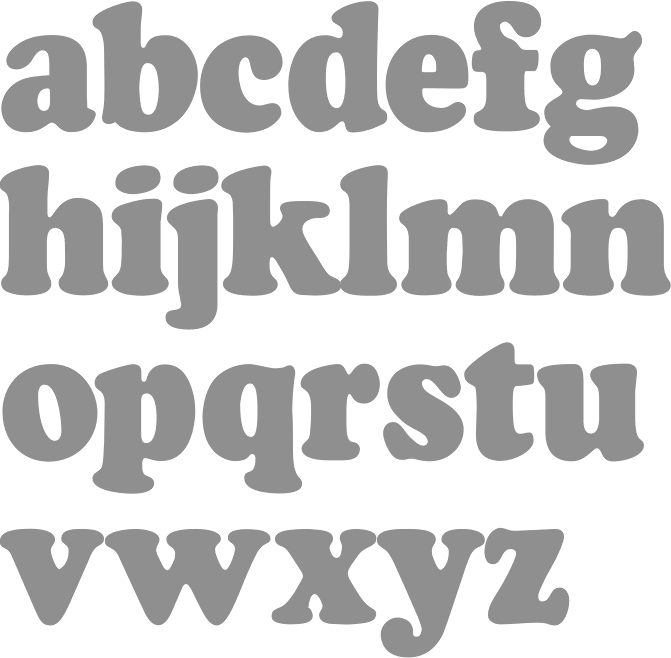
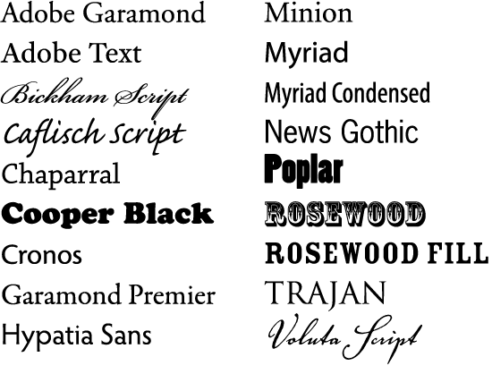
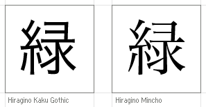
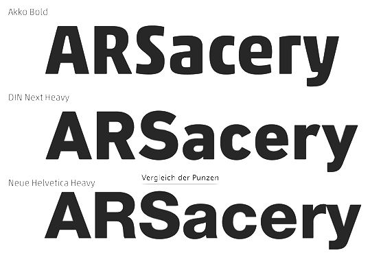
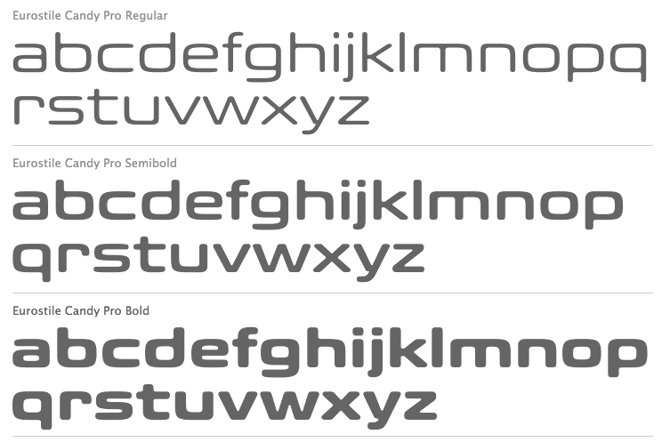
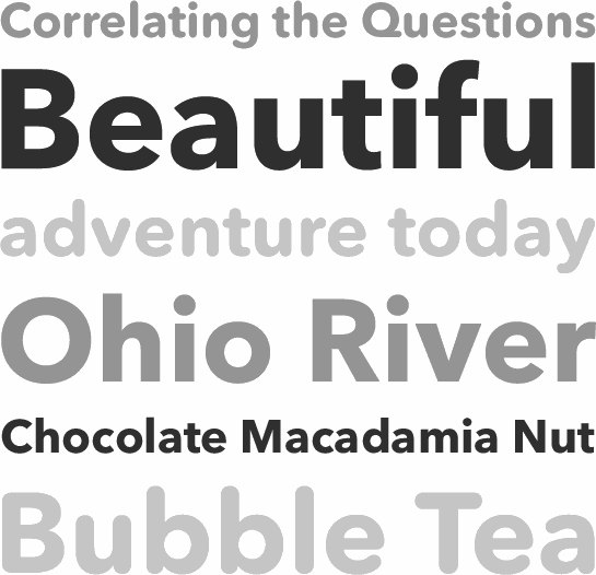
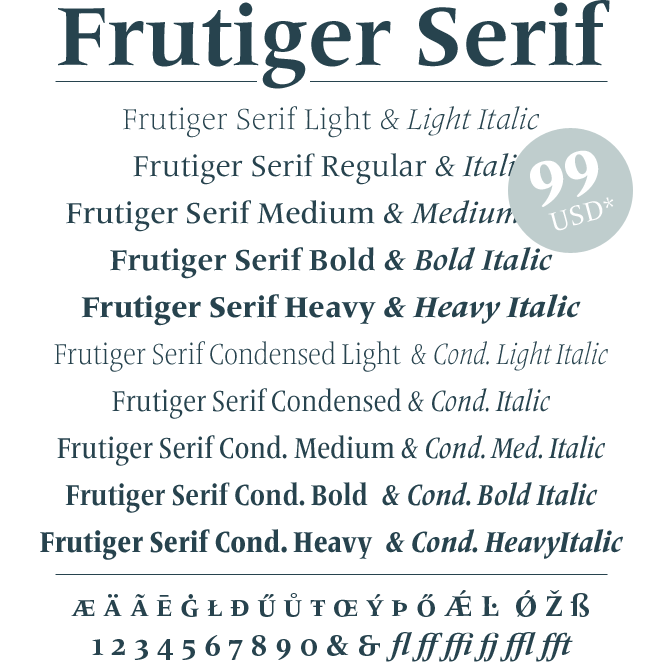
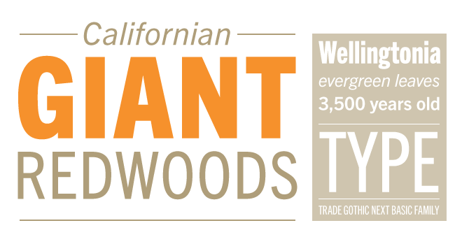
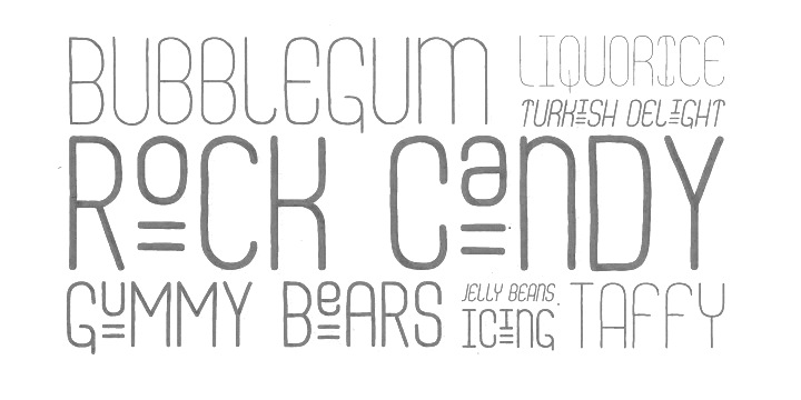
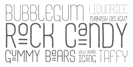
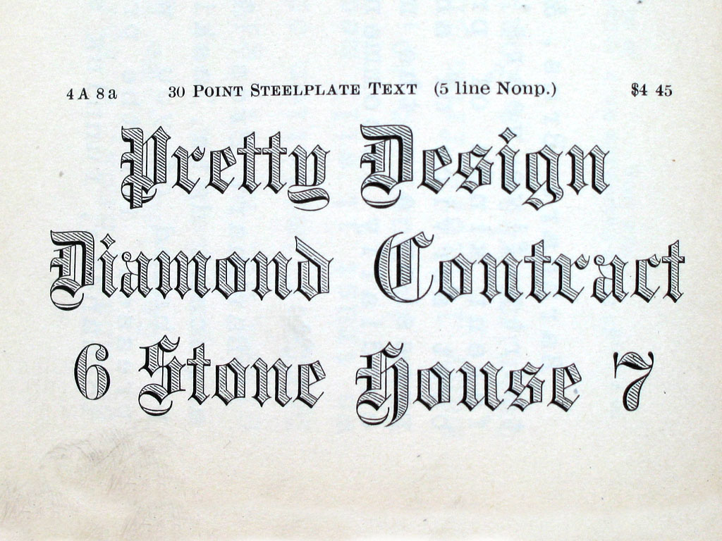
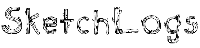
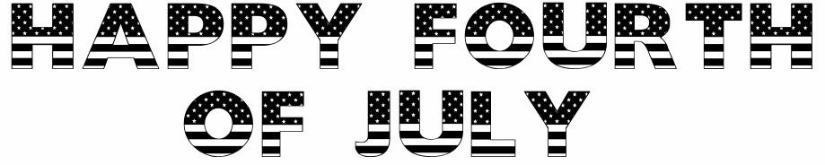
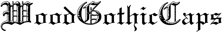
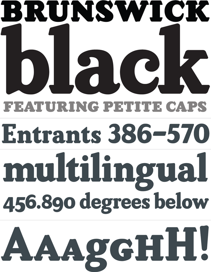
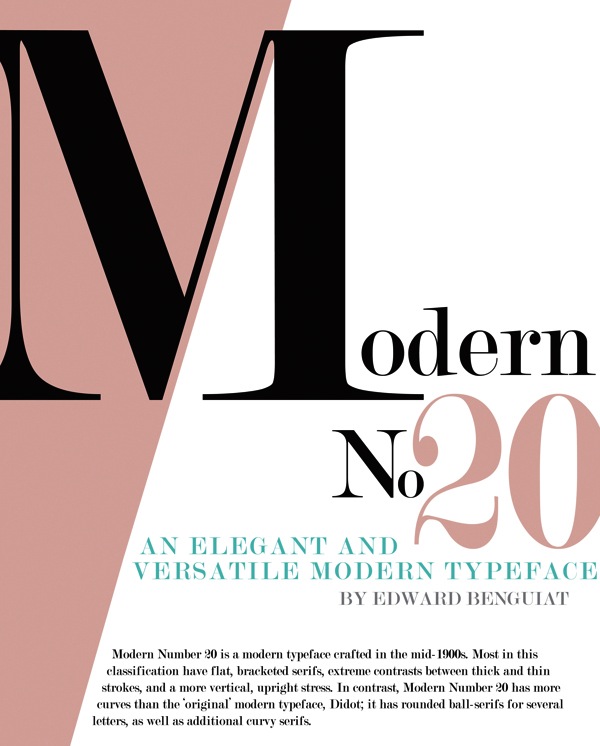
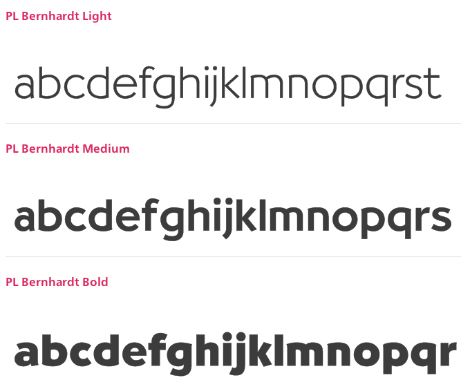
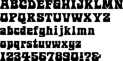
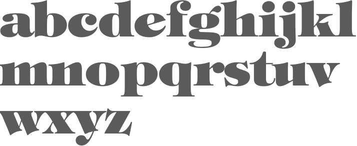
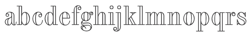
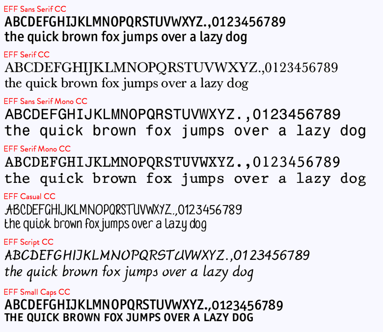
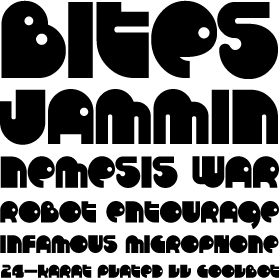
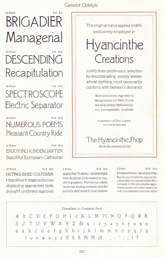
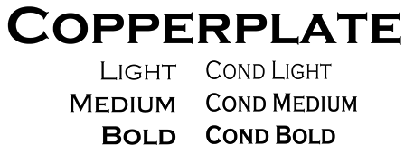
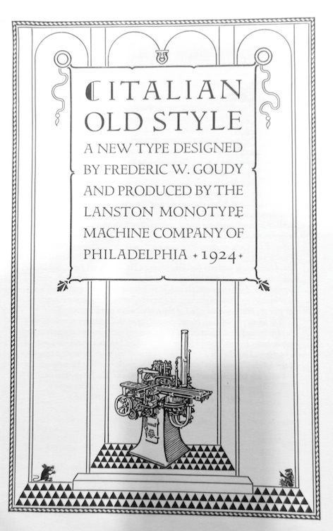
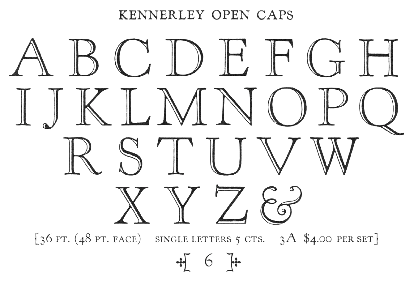
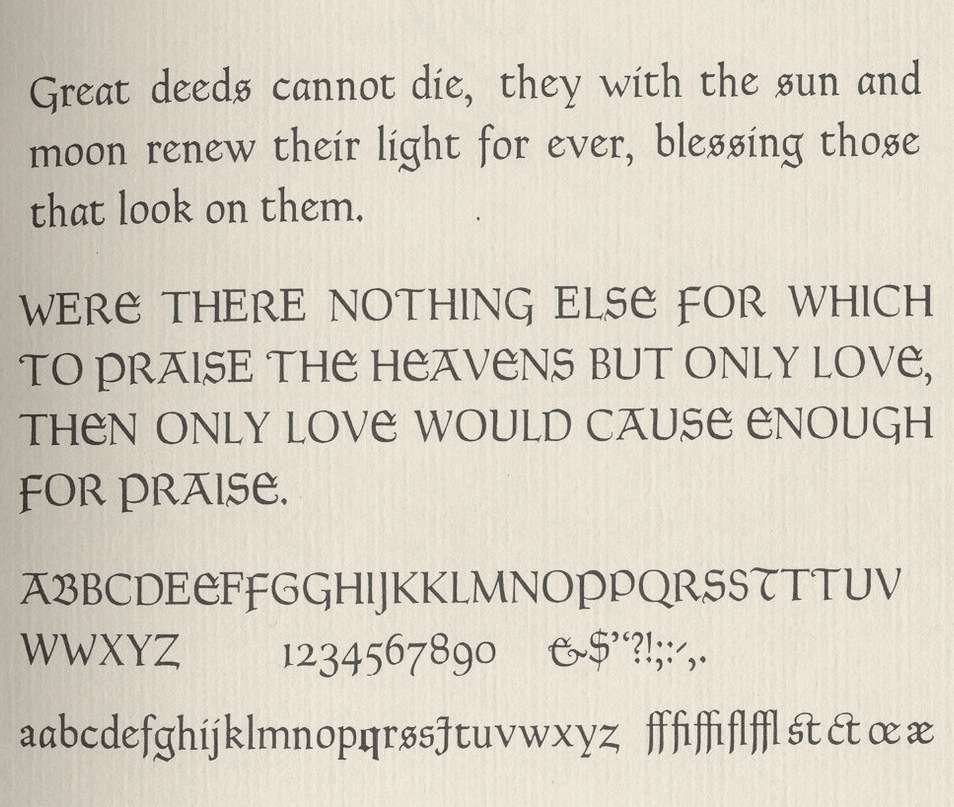
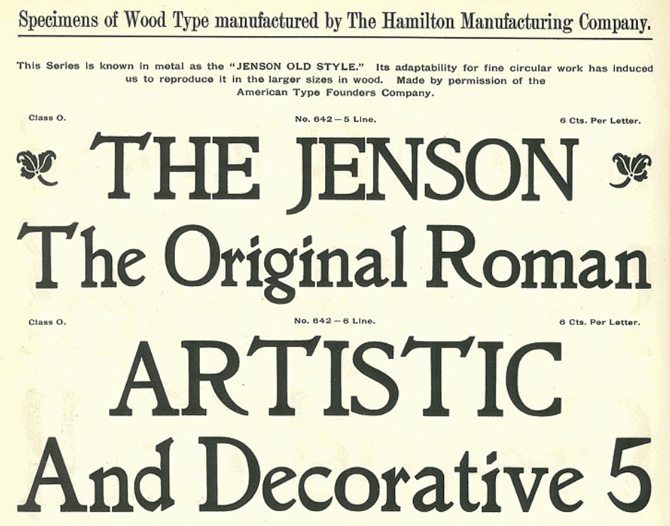
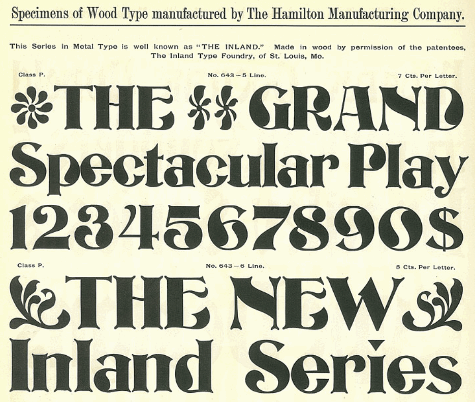
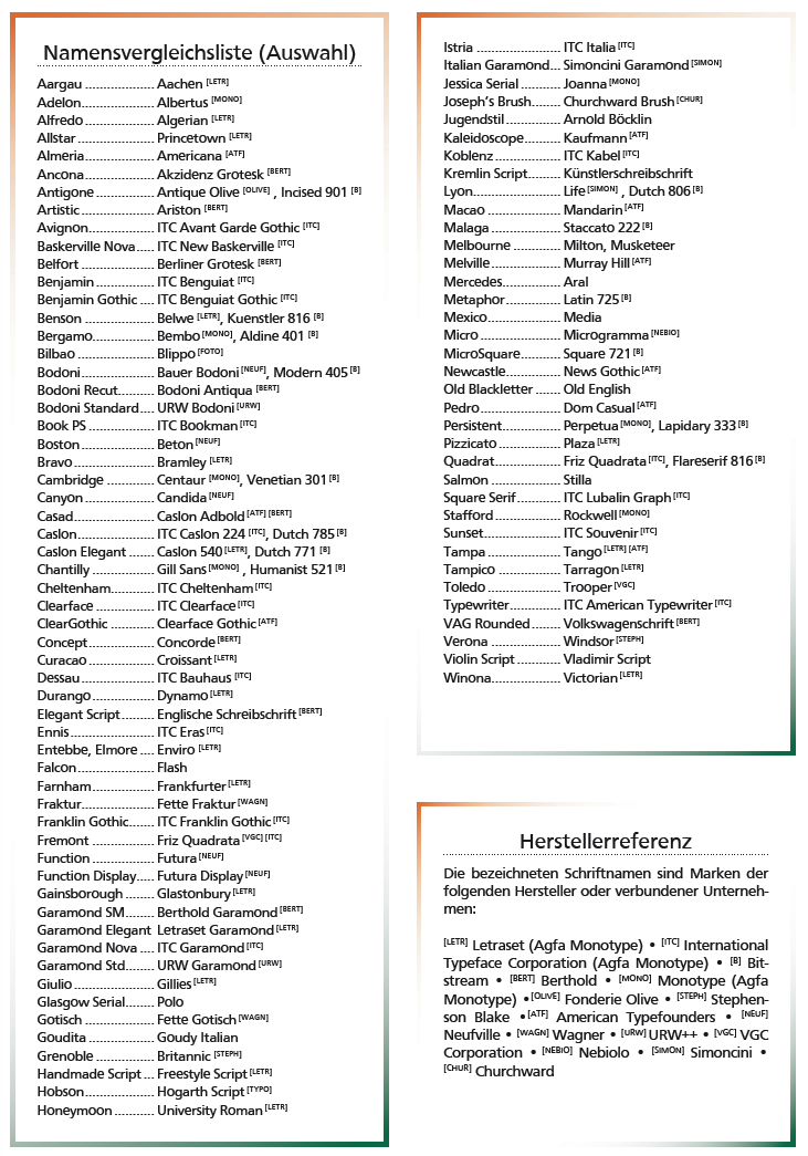
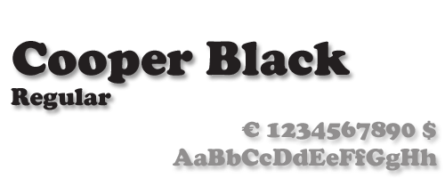
![German Garamond"> [based on TypoArt Garamond], Giulio,](Infinitype--GermanGaramond--basedonTypoartGaramond.png)
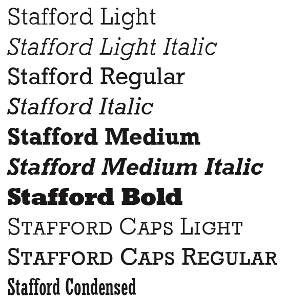
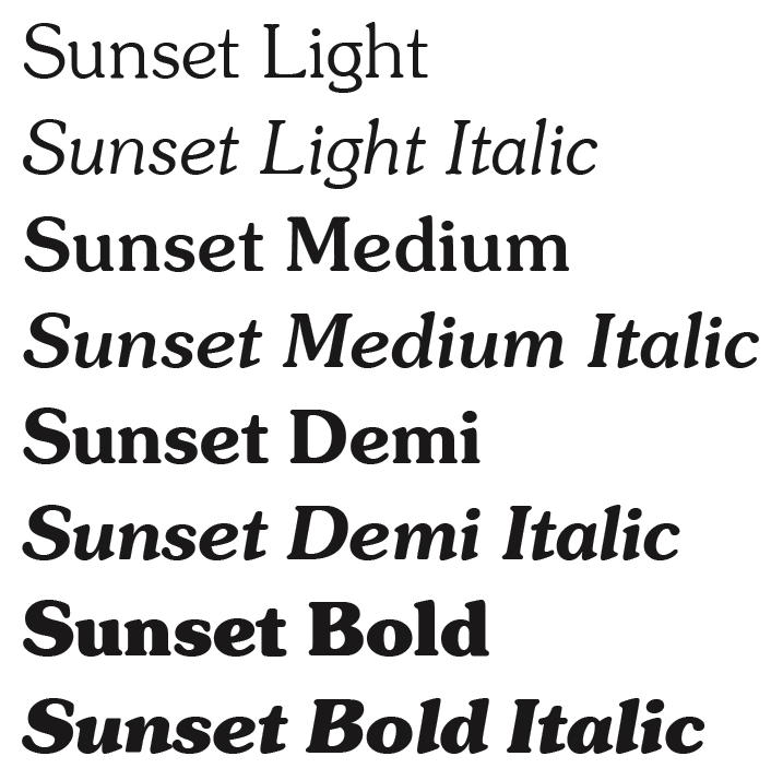
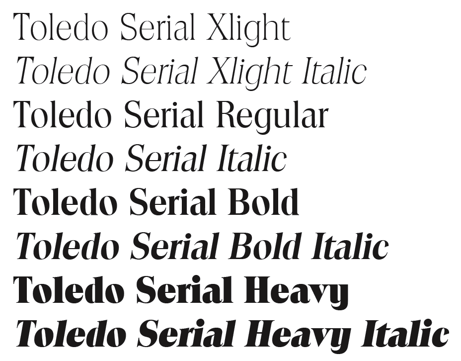
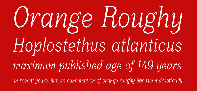
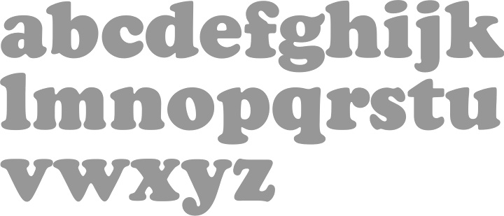
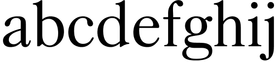
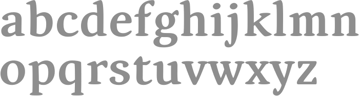
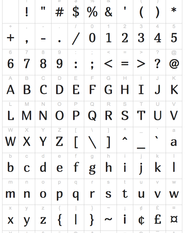
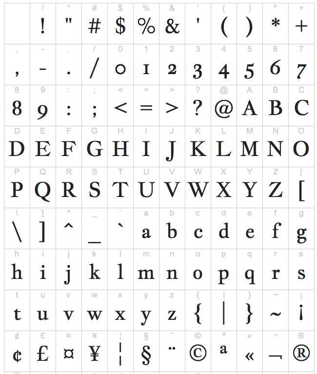
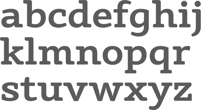
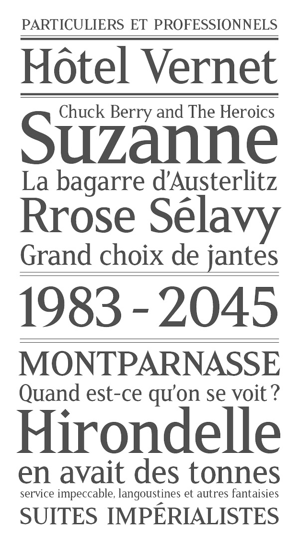
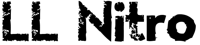
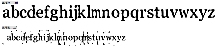
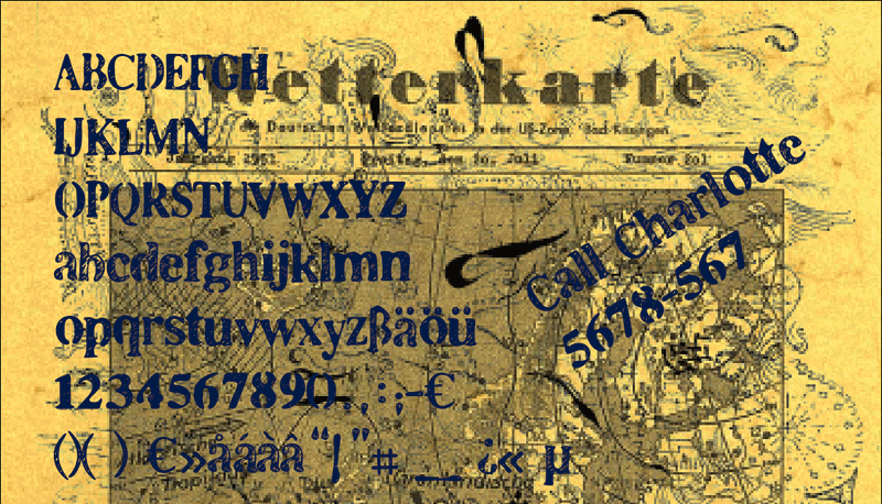
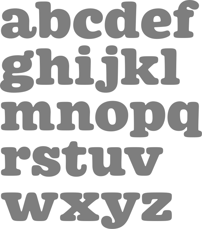
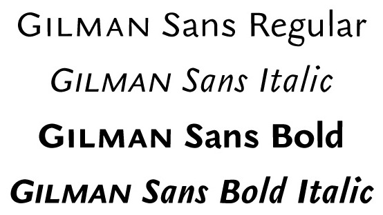
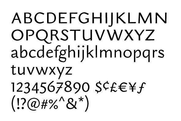
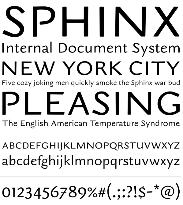
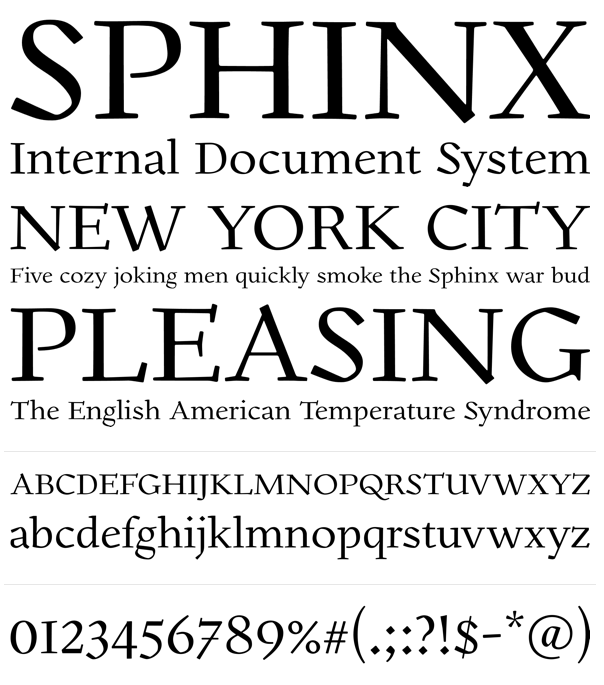
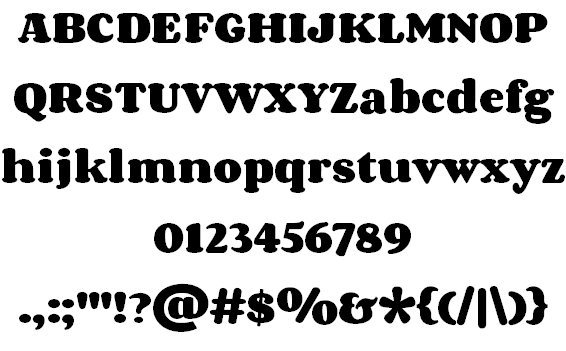
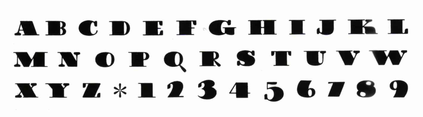
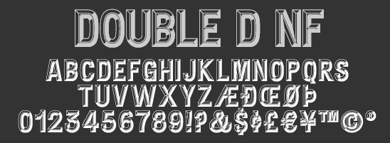
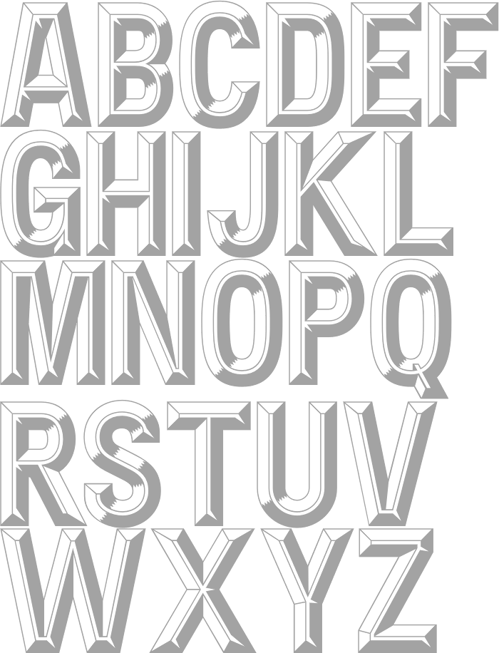
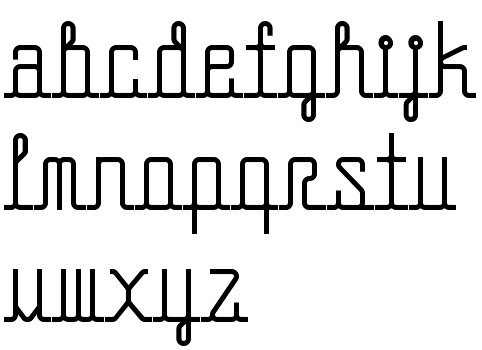
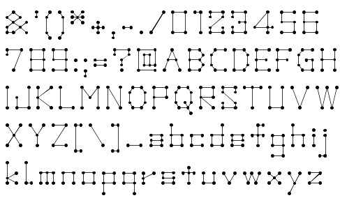
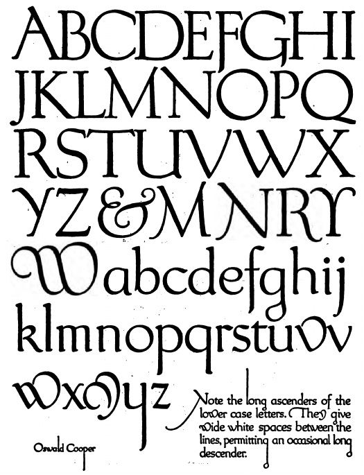
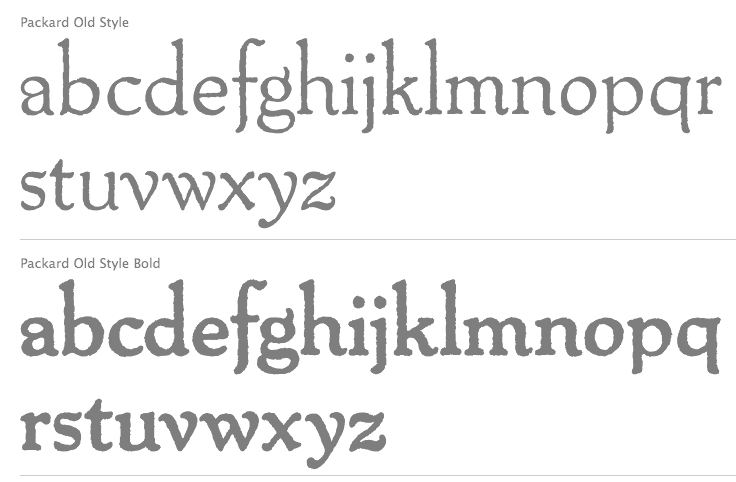
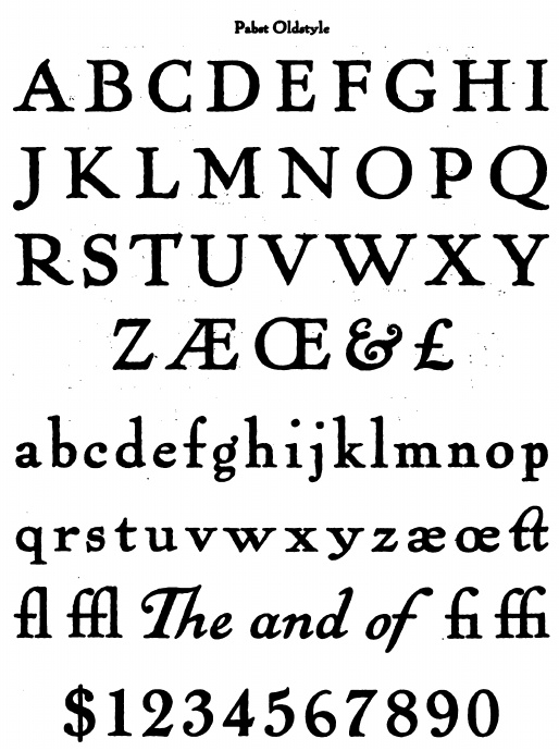
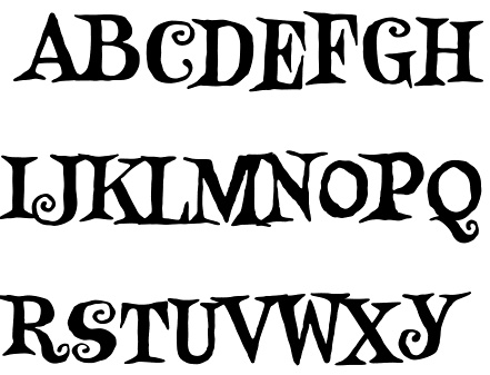
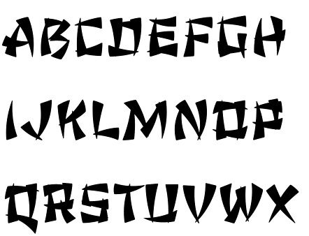
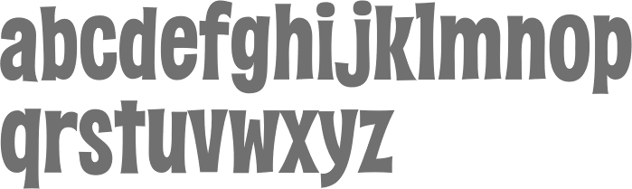
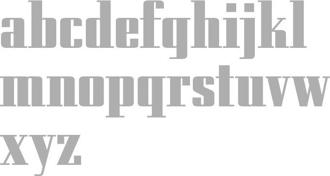
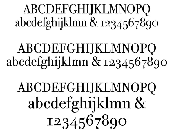
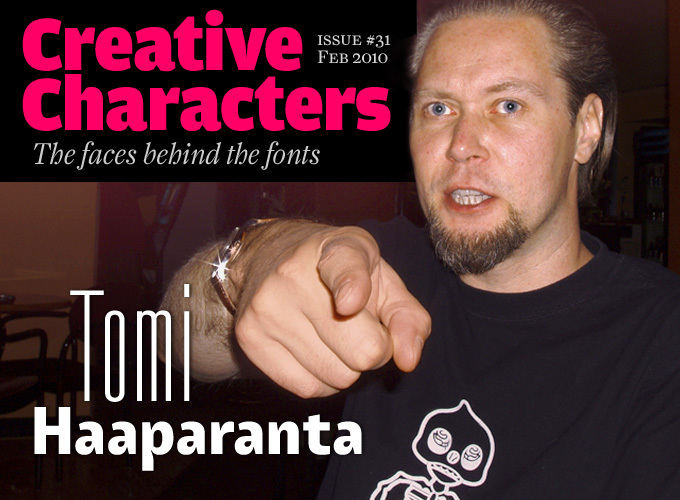
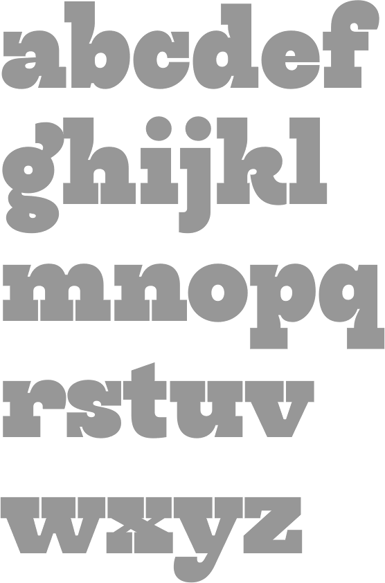
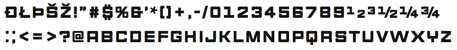
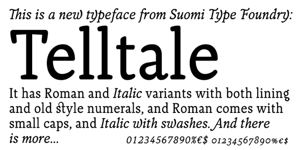
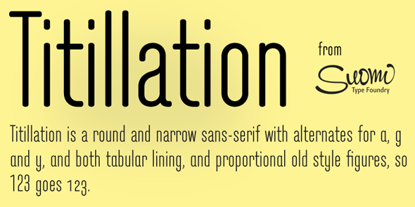
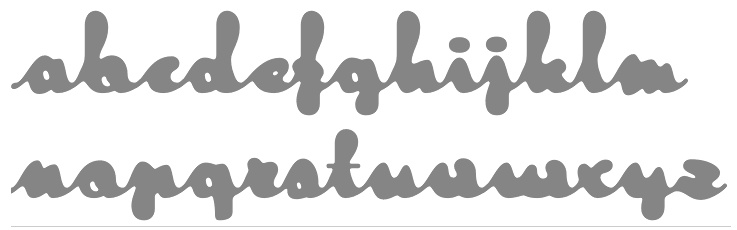
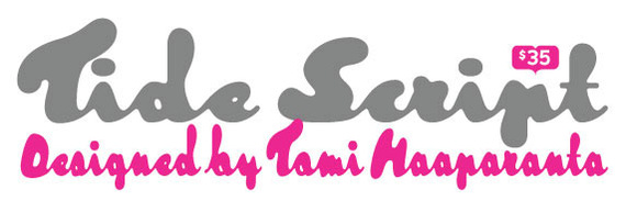
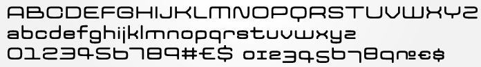
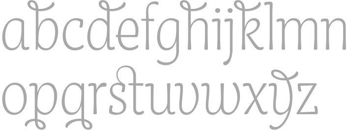
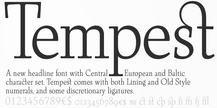
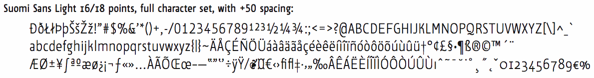
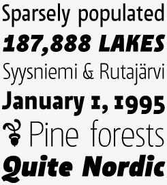
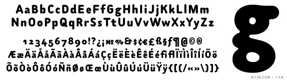
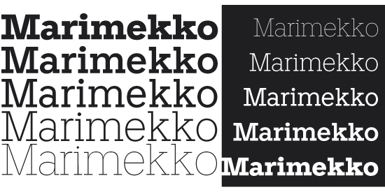
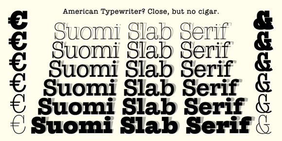
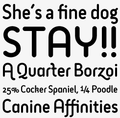
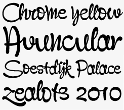
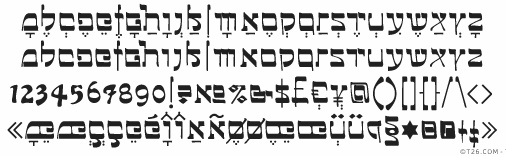
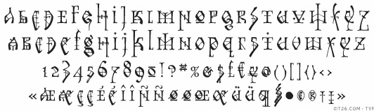
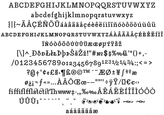
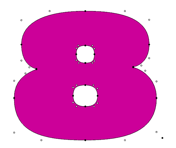
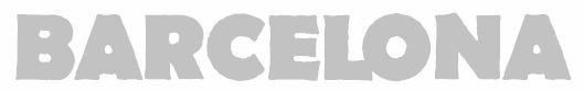
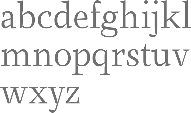
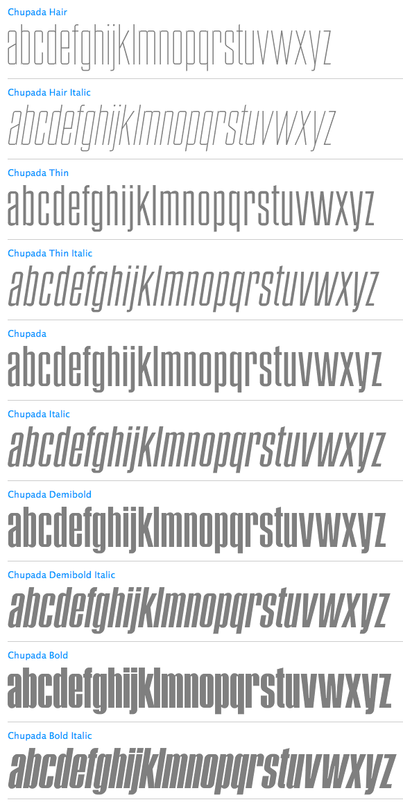
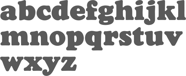
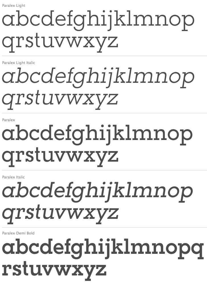
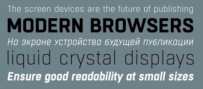
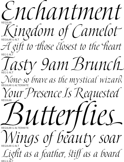
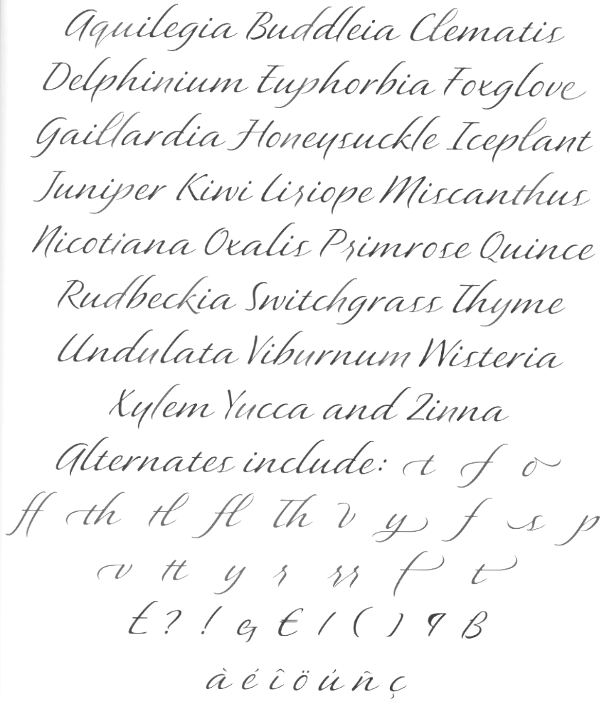
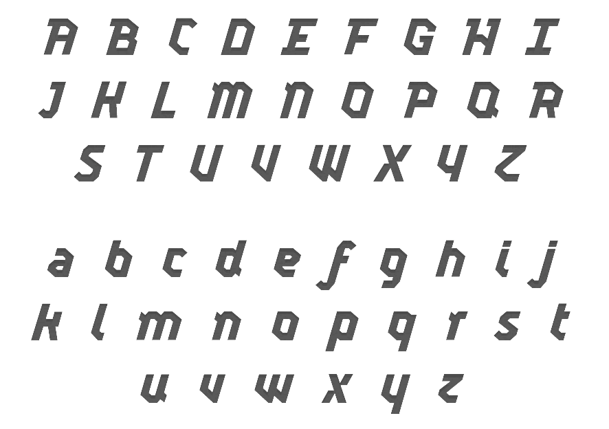
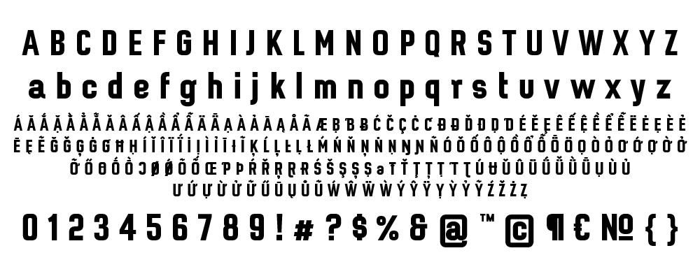
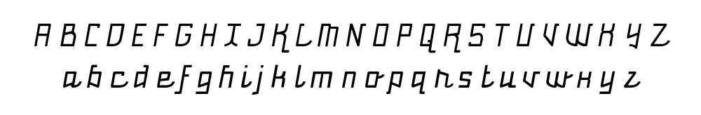
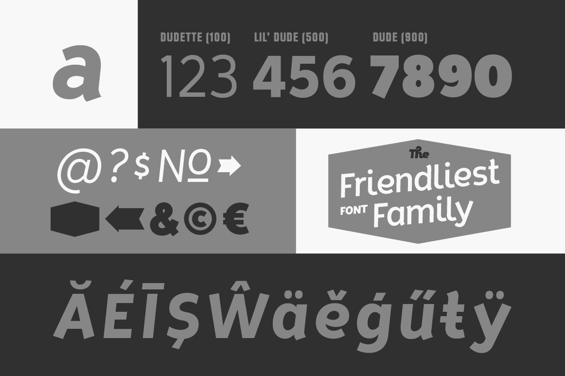
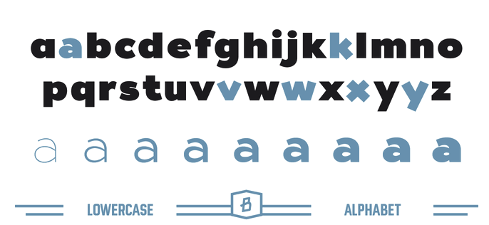
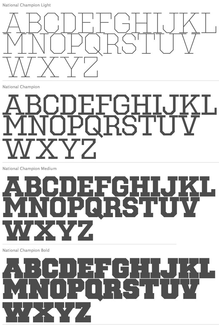
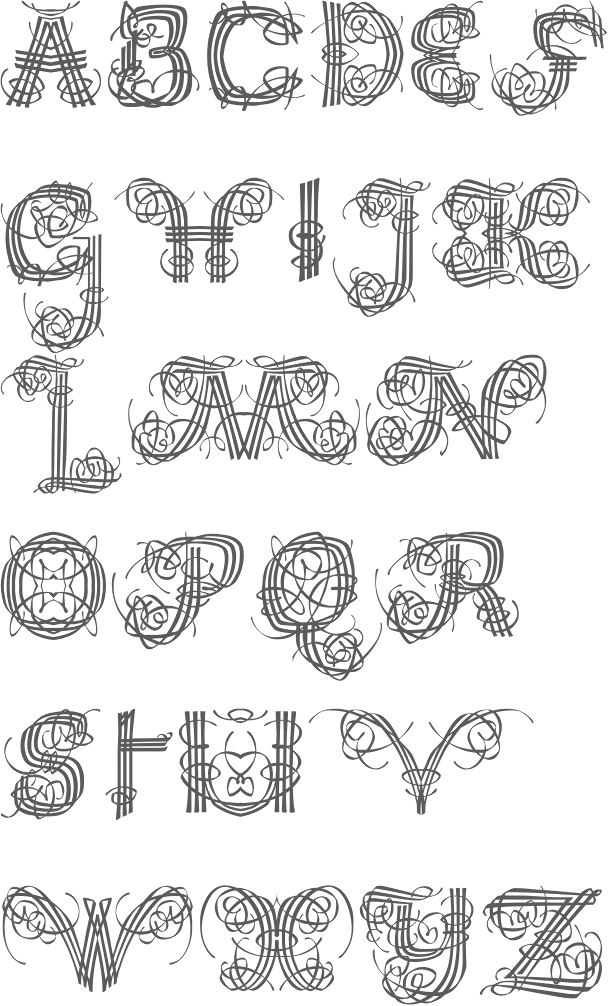
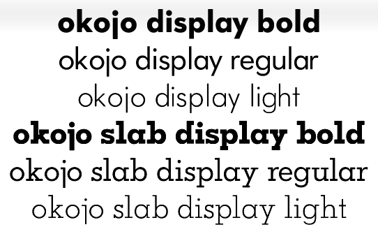
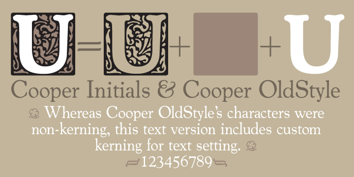
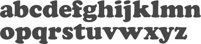
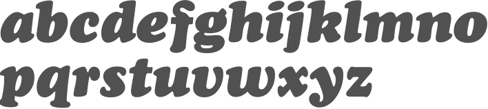
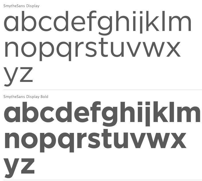
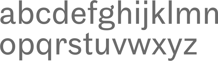