| | |
100types
[Ben Archer]
|
Educational and reference site run by Ben Archer, a designer, educator and type enthusiast located in England (who was in Auckland, New Zealand, before that). Glossary. Timeline. Type categories. Paul Shaw's list of the 100 most significant typefaces of all times were recategorized by Archer: - Religious/Devotional: Gutenbergs B-42 type, Gebetbuch type, Wolfgang Hoppyl's Textura, Breitkopf Fraktur, Ehrhard Ratdolt's Rotunda, Hammer Uncial, Zapf Chancery, Peter Jessenschrift, Cancellaresca Bastarda, Poetica.
- Book Publishing&General Purpose Text Setting: Nicolas Jenson's roman, Francesco Griffo's italic, Claude Garamond's roman, Firmin Didot's roman, Cheltenham family, Aldus Manutius' roman, William Caslon's roman, Pierre-Simon Fournier's italic, Ludovico Arrighi da Vicenza's italic, Johann Michael Fleischmann's roman, ATF Garamond, Giambattista Bodoni's roman, Nicolas Kis' roman, Minion multiple master, Unger Fraktur, John Baskerville's roman, Lucida, Optima, Bauer Bodoni, Adobe Garamond, Scotch Roman, Romanée, ITC Stone family, Trinité, ITC Garamond, Sabon, ITC Novarese, Charter, Joanna, Marconi, PMN Caecilia, Souvenir, Apollo, Melior, ITC Flora, Digi-Grotesk Series S.
- Business/Corporate: Akzidenz Grotesk, Helvetica, Univers, Syntax, Courier, Meta, Rotis, Thesis, Antique Olive.
- Newspaper Publishing: Times Roman, Bell, Clarendon, Century Old Style, Ionic, Imprint.
- Advertising and Display: Futura, Robert Thorne's fat typeface roman, Vincent Figgins' antique roman (Egyptian), Memphis, Fette Fraktur, Avant-Garde Gothic, Deutschschrift, Peignot, Erbar, Stadia/Insignia, Penumbra, Compacta, Bodoni 26, WTC Our Bodoni.
- Prestige and Private Press: Romain du Roi, Golden Type, Johnston's Railway Sans, Doves Type, Walker.
- Signage: William Caslon IV's sans serif, Trajan.
- Historical Script: Snell Roundhand, Robert Granjon's civilité, Excelsior Script.
- Experimental/expressive: Mistral, Beowolf, Dead History, Behrensschrift, Eckmannschrift, Neuland, Element, Remedy, Template Gothic.
- Onscreen/multimedia: Chicago, Oakland, OCR-A, Base Nine and Base Twelve, Evans and Epps Alphabet.
- Telephone Directory publishing: Bell Gothic.
Link to Archer Design Work. [Google]
[More] ⦿
|
A Comparison of Popular Online Fonts: Which is Best and When?
|
A study in 2007 at Wichita State University (Kansas) by Michael Bernard, Melissa Mills, Michelle Peterson and Kelsey Storrer compared these font types: Agency FB (Agency), Arial, Comic Sans, Tahoma, Verdana, Courier New (Courier), Georgia, Goudy Old Style (Goudy), Century Schoolbook (Schoolbook), Times New Roman (Times), Bradley Hand ITC (Bradley), Monotype Corsiva (Corsiva). They conclude: First, no significant difference in actual legibility between the font types were detected. There were, however, significant differences in reading time, but these differences may not be that meaningful for most online text because these differences were not substantial. It may, on the other hand, be helpful to consider using font types that are perceived as being legible. In this study, the font types that were perceived as being most legible were Courier, Comic, Verdana, Georgia, and Times. Courier and Times were perceived as being the most business-like, whereas Comic was perceived as being the most fun and youthful. [Google]
[More] ⦿
|
A. Diana
|
During her studies in Lisbon, A. Diana created the display typeface Prata (2014), which is based on Courier. [Google]
[More] ⦿
|
Adrian Frutiger

|
 Famous type designer born in 1928 in Unterseen, Switzerland, who died in September 2015. He closely cooperated with Linotype-Hell AG, after having been artistic director at Deberny-Peignot in Paris since 1952. He established his own studio in 1962 with André Gürtler and Bruno Pfaftli. Art director for Editions Hermann, Paris 1957 to 1967. Frutiger lived near Bern, Switzerland, and was very interested in woodcuts. In 2009, Heidrun Osterer and Philipp Stamm coedited Adrian Frutiger Typefaces The Complete Works (Birkhäuser Verlag), a 460-page opus based on conversations with Frutiger himself and on extensive research in France, England, Germany, and Switzerland. Quote: Helvetica is the jeans, and Univers the dinner jacket. Helvetica is here to stay. He designed over 100 fonts. Here is a partial list:
 - Président (Deberny&Peignot, 1954). Digitized by Linotype in 2003.
- Delta.
- Phoebus (Deberny&Peignot, 1953).
- Element-Grotesk.
- Federduktus.
- Ondine (Deberny&Peignot, 1953-1954). The Bitstream version of this font is Formal Script 421. Adobe, Linotype and URW++ each have digital versions called Ondine. Bitstream's Calligraphic 421 is slightly different.
- Méridien (Deberny&Peignot, 1955-1957). Digitized by Adobe/Linotype in 1989.
- Caractères Lumitype.
- Univers (Deberny&Peignot, 1957). About the name, Frutiger wrote I liked the name Monde because of the simplicity of the sequence of letters. The name Europe was also discussed; but Charles Peignot had international sales plans for the typeface and had to consider the effect of the name in other languages. Monde was unsuitable for German, in which der Mond means "the moon". I suggested "Universal", whereupon Peignot decided, in all modesty, that "Univers" was the most all-embracing name!. Univers IBM Composer followed. In 2010, Linotype published Univers Next, which includes 59 Linotype Univers weights and 4 monospaced Linotype Univers Typewriter weights, and can be rented for a mere 2675 Euros. In 2018, Linotype added Univers Next Typewriter. In 2020, Linotype's Akira Kobayashi dusted off Univers Next Cyrillic and Univers Next Paneuropean.
- Egyptienne F (1955, Fonderie Deberny&Peignot; 1960, for the Photon/Lumitype machine).
- Opéra (1959-1961, Sofratype).
- Alphabet Orly (1959, Aéroport d'Orly).
- Apollo (1962-1964, Monotype): the first type designed for the new Monotype photosetting equipment.
- Alphabet Entreprise Francis Bouygues.
- Concorde (1959, Sofratype, with André Gürtler).
- Serifen-Grotesk/Gespannte Grotesk.
- Alphabet Algol.
- Astra Frutiger. A typeface variant of Frutiger licensed under Linotype. It is the font used on the highways in Switzerland.
- Serifa (1967-1968, Bauersche Giesserei). URW++ lists the serif family in its 2008 on-line catalog. Other names include OPTI Silver (Castcraft), Ares Serif 94, and Sierra. Bitstream published the digital typeface Serifa BT. But it is also sold by Adobe, Tilde, Linotype, URW++, Scangraphic, and Elsner & Flake. The slab serif is robust and is based on the letterforms of Univers.
- OCR-B (1966-1968, European Computer Manufacturers Association).
- Alphabet EDF-GDF (1959, Électricité de France, Gaz de France).
- Katalog.
- Devanagari (1967) and Tamil (1970), both done for Monotype Corporation.
- Alpha BP (1965, British Petroleum&Co.).
- Dokumenta (1969, Journal National Zeitung Suisse).
- Alphabet Facom (1971).
- Alphabet Roissy (1970, Aéroport de Roissy Charles de Gaulle).
- Alphabet Brancher (1972, Brancher).
- Iridium (1972, Stempel). A didone with slight flaring.
- Alphabet Métro (1973, RATP): for the subway in Paris.
- Alphabet Centre Georges Pompidou. The CGP typeface (first called Beaubourg) used in the Centre Georges Pompidou from 1976-1994 is by Hans-Jörg Hunziker and Adrian Frutiger, and was developed as part of the visual identity program of Jean Widmer. It is said that André Baldinger digitized it in 1997.
- Frutiger (1975-1976, Stempel, with Hans-Jörg Hunziker). In 1999, Frutiger Next was published by Linotype. In 2009, that was followed by Neue Frutiger (a cooperation between Frutiger and Linotype's Akira Kobayashi). In fact, Frutiger, the typeface was made for the Charles De Gaulle Airport in 1968 for signage---it was originally called Roissy, and had to be similar to Univers. It was released publically as Frutiger in 1976. The modern Bitstream version is called Humanist 777. Frutiger Next Greek (with Eva Masoura) won an award at TDC 2006. Other digital implementations of Frutiger: M690 (SoftMaker), Quebec Serial (SoftMaker), Frutus (URW), Provencale (Autologic), Frontiere (Compugraphic), Freeborn (Scangraphic), Siegfried (Varityper). In 2018, under the aegis of Akira Kobayashi, the Monotype Design studio published the 150-language superfamily Neue Frutiger World (including coverage for Latin, Greek, Cyrillic, Georgian, Armenian, Hebrew, Arabic, Thai and Vietnamese).
- Glypha (1979, Stempel). See Gentleman in the Scangraphic collection).
- Icône (1980-1982, Stempel, Linotype). Digitized by Linotype in 2003.
- Breughel (1982, Stempel; 1988, Linotype).
- Dolmen.
- Tiemann.
- Versailles (1983, Stempel).
- Linotype Centennial (1986). Based on Morris Fuller Benton's Clarendon typeface Century, Linotype Centennial was designed for Linotype's 100th birthday.
- Avenir (1988, Linotype). In 2004, Linotype Avenir Next was published, under the supervision of Akira Kobayashi, and with the help of a few others. In 2021, the Monotype team released Avenir Next Paneuropean (56 styles, by Akira Kobayashi). Avenir Next World, released by Linotype in 2021, is an expansive family of fonts that offers support for more than 150 languages and scripts. The subfamilies include Avenir Next Hebrew, Avenir Next Thai, Avenir Next Cyrillic, Avenir Next Arabic and Avenir Next Georgian. Avenir Next World contains 10 weights, from UltraLight to Heavy.
Contributors besides Adrian Frutiger and Akira Kobayashi: Anuthin Wongsunkakon (Thai), Yanek Iontef (Hebrew), Akaki Razmadze (Georgian), Nadine Chahine (Arabic), Toshi Omagari (Arabic) and Elena Papassissa (Greek, Armenian). Lovely poster by Ines Vital (2011). - Westside.
- Vectora (1991, Linotype).
- Linotype Didot (1991). See also Linotype Didot eText Pro (2013), which was optimized by Linotype for use on screens and small devices.
- Herculanum (1989, Linotype): a stone age font.
- Shiseido (1992).
- Frutiger Capitalis (2006, Linotype): a further exploration in the style of Herculanum, Pompeijana and Rusticana. Linotype trademarked that name even though at least five fonts by the name Capitalis already exist.
- Pompeijana (1993, Linotype).
- Rusticana (1993, Linotype).
- Frutiger Stones (1998, Linotype) and Frutiger Symbols.
- Frutiger Neonscript.
- Courier New, based on Howard Kettler's Courier, was one of Frutiger's projects he was involved in ca. 2000.
- AstraFrutiger (2002): a new signage typeface for the Swiss roads. Erich Alb comments: With a Frutiger condensed Type and illuminated signs during night it is mutch better readable.
- Nami (2008) is a chiseled-stone sans family, made with the help of Linotype's Akira Kobayashi.
- Neue Frutiger (2009, with Akira Kobayashi) has twice as many weights as the original Frutiger family.
- In 2019, the Linotype team released variable fonts for Frutiger's main typeface families, Avenir Next Variable, Neue Frutiger Variable, and Univers Next Variable.
Bio by Nicholas Fabian. Erich Alb wrote a book about his work: Adrian Frutiger Formen und Gegenformen/Forms and Counterforms (Cham, 1998). Winner of the Gutenberg Prize in 1986 and the 006 Typography Award from The Society for Typographic Aficionados (SOTA). Famous quote (from a conversation in 1990 between Frutiger and Maxim Zhukov about Hermann Zapf's URW Grotesk): Hermann ist nicht ein Groteskermann. A quote from his keynote speech at ATypI1990: If you remember the shape of your spoon at lunch, it has to be the wrong shape. The spoon and the letter are tools; one to take food from the bowl, the other to take information off the page... When it is a good design, the reader has to feel comfortable because the letter is both banal and beautiful. Frutiger's books include Type Sign Symbol and Signs and Symbols. Their Design and Meaning (1989, with Andrew Bluhm, published by Studio Editions, London; Amazon link). Linotype link. FontShop link. Adrian Frutiger, sa carrière française (2008) is Adèle Houssin's graduation thesis at Estienne. Klingspor link. Wikipedia link. View Adrian Frutiger's typefaces. View some digital versions of Avenir. Vimeo movie on Frutiger by Christine Kopp and Christoph Frutiger entitled "Der Mann von Schwarz und weiss: Adrian Frutiger". More Vimeo movies. [Google]
[MyFonts]
[More] ⦿
|
Adrian Smith
|
When you click on "download", you get Adrian Smith's APL2741 font (1994-1999) in truetype format. It looks like a slanted Courier. Adrian Smith resides in York, UK. He also made Dyalog Std TT, a Courier-like truetype font (1996) for use as a system screen font. Another typewriter font is KAPL (2001). [Google]
[More] ⦿
|
Alan Dague-Greene
|
 Type designer (formerly Alan Greene) who is presently at MvB Design in charge of font production. Before that, he was head of custom font creation at FontShop San Francisco, and was also briefly at T26.
 His typefaces: - The huge serifed family FF Atma (2001).
- Indispose (T26).
- MVB Peccadillo (2002, MVB). Done with Holly Goldsmith.
- MVB Sirenne family (2002). Done with Mark van Bronkhorst, this large family is based on an 18th century design, with optical sizes.
- The free font family Courier Prime (2013), created for John August and Quote Unquote Apps, made for screenwriters: Courier Prime is optimized for 12 point size, and matches the metrics of Courier and Courier Final Draft, so you can often swap it out one-for-one. Other Couriers just slant the letters to create faux italics. We give you a whole new typeface [with true italics], modeled off the script of vintage typewriters. The competition was Mac Courier [the 1990 Apple system font made by Bitstream] and Courier Final Draft [used in the Final Drafdt screenwriter software]. At Open Font Library, we find Courier Prime Code (for programmers) and Courier Prime Sans, both designed in 2015. Finally Courier Prime was added to Courier Prime in 2019. Github link.
- Codesigner at American Type Founders Collection of ATF Alternate Gothic (2015, Mark van Bronkhorst, Alan Dague-Greene, David Sudweeks, Igino Marini, & Ben Kiel). ATF Alternate Gothic is a new, significant digital expansion to 40 fonts of Morris Fuller Benton's classic 1903 design.
- MVB Salis. A 16-style corporate sans family.
[Google]
[MyFonts]
[More] ⦿
|
Alan Wood
[Large Unicode fonts]
|
[More] ⦿
|
Albert Folch
[Folch Studio]
|
[More] ⦿
|
Alejandro López-Valencia
|
Designer of the free font Courier 15 CPI (2005), derived from Courier 10 Pitch by this supporter of the Free Software Foundation. Type 1 and OpenType, four weights. [Google]
[More] ⦿
|
Alex Elnaugh
[Little A]
|
[More] ⦿
|
Alexander Tarbeev
[TFaces]
|
 [MyFonts]
[More] ⦿
[MyFonts]
[More] ⦿
|
Alphabet Innovations International -- TypeSpectra (Was: MM2000)
[Phil Martin]
|
 Born in Dallas in 1923, and retired in Florida, Phil Martin had an exciting life, which started as a bombardier in WWII, and went on as a piano bar singer, publisher, cartoonist, comedian and typographer. He died in October 2005.
 Phil established Alphabet Innovations International in 1969 and TypeSpectra in 1974, and designed most of his 400 typefaces (read: film fonts for use in the VGC Photo Typositor) there: Agenda (1976), Americana (1972), Arthur (1970, by Roc Mitchell), Aurora Snug (1969), Avalon (1972), Baskerville (1969), Beacon (1987), Bluejack (1974), Borealis (1970, by Roc Mitchell), Britannic (1973), Bulletin (1971), Celebration (1969, by Roc Mitchell), Century S (1975), Cheltenham (1971), Clearface (1973), Cloister (1975), Corporate (1971, by Roc Mitchell), Corporate Image (1971, by Roc Mitchell), Courier B EF (2004, originally done at Scangraphic), Didoni (1969, a knock-off of Pistilli Roman with swashes added), Dimensia and Dimensia Light (1971, by Roc Mitchell), Dominance (1971), Egyptian (1970), Eightball (1971, some report this incorrectly as a VGC face, which has a different typeface also called Eightball: it was digitized by FontBank as Egbert. Alphabet Innovations' Eightball had other versions called Cueball and Highball, and all three were designed by George Thomas who licensed them to AI), Fat Chance (Rolling Stone) (1971), Fotura Biform (1969), Franklin (1981), Garamond (1975), Globe (1975), Goudy (1969), Harem (1969, aka Margit; digitized and revived in 2006 by Patrick Griffin and Rebecca Alaccari as Johnny), Helserif (1976---I thought this was created by Ed Kelton; anyway, this typeface is just Helvetica with slabs), Helvetica (1969), Introspect (1971, revived in 2012 by SoftMaker as Looking Glass, and by Castcraft as OPTI Looking Glass), Jolly Roger (1970, digitized in 2003 by Steve Jackaman at Red Rooster; Martin says that Jolly Roger and Introspect are his two most original designs), Journal (1987), Kabell (1971), Kabello (1970), King Arthur [+Light, Outline] with Guinevere Alternates (1971, by Roc Mitchell), Legothic (1973), Martinique (1970), Mountie (1970), News (1975), Palateno (1969), Pandora (1969), Pazazzma (1980), Perpetua (1969), Plantin (1973), Polonaise (1977; digital version by Claude Pelletier in 2010, called Chopin Script), Primus Malleable (1972), Quaff (1977), Quixotic (1970), Report (1971), Romana (1972), Scenario (1974), Sledge Hammer (1971), Son of Windsor (1970), Stanza (1971, by Roc Mitchell; this angular typeface was later published by URW), Stark (1970), Supercooper (1970), Swath (1979), Threadgil (1972), Thrust (1971), Timbre (1970), Times (1970), Times Text (1973), Trump (1973), Tuck Roman (1981), Viant (1977), Vixen (1970), Weiss (1973), Wordsworth (1973). In 1974, he set up TypeSpectra, and created these type families: Adroit (1981), Albert (1974), Analog (1976), Bagatelle (1979), Cartel (1975), Caslon (1979), Criterion (1982), DeVille (1974), Embargo (1975), Heldustry (1978, designed for the video news at the fledgling ABC-Westinghouse 24-hour cable news network in 1978; incorrectly attributed by many to Martin's ex-employee Ed Kelton: download here), Innsbruck (1975: revived in 2018 by Olexa Volochay as Tyrol), Limelight (1977), Oliver (1981), Opulent [Light and Bold] (1975, by George Brian, an amployee at Alphabet Innovations), Quint (1984), Sequel (1979), Spectral (1974), Welby (1982). His fonts can be bought at MyFonts.com and at Precisiontype. He warns visitors not to mess with his intellectual property rights, but I wonder how he can have escaped the ire of Linotype by using the name Helvetica. In any case, the fonts were originally made for use on photo display devices and phototypesetters. Some are now available in digital format. Near the end of his life, Phil's web presence was called MM2000 (dead link). Check his comments on his own typefaces. URW sells these typefaces: URW Adroit, URW Agenda, URW Avernus (after Martin's design from 1972), URW Baskerville AI, URW Beacon, URW Bluejack, URW Cartel, URW Cloister, URW Corporate, URW Criterion, URW Didoni, URW Fat Face, URW Globe, URW Goudy AI, URW Heldustry, URW Helserif, URW Introspect, URW Legothic, URW Martin Gothic, URW Martinique, URW Pandora, URW Polonaise, URW Quint, URW Scenario, URW Souvenir Gothic, Souvenir Gothic Antique (the Souvenit Gothic family was designed by George Brian, an employee of Alphabet Innovations at the time: it was AI's first text family), URW Stanza, URW Stark, URW Timbre, URW Viant, URW Wordsworth. Interview. Bye Bye Blackbird performed by Phil Martin in Largo, Florida. The final message on his last web page, posted posthumously read: MARTIN, PHIL, 82, of Largo, died Tuesday (Oct. 4, 2005) at Largo Medical Center. He was born in Dallas and came here after retiring as a writer, singer-songwriter, commercial artist, and comedian. As a high school student, he worked as an assistant artist on the nationally syndicated Ella Cinders, and at 18 wrote and drew Swing Sisson, the Battling Band Leader, for Feature Comics. He was an Army Air Forces veteran of World War II, where he served as a bombardier in Lintz, Austria. On his 28th mission shelling the yards in Lintz, his B-24 was hit and he was listed as missing in action until the war in Europe ended. He was a comedian on The Early Birds Show on WFAA in Dallas. As a commercial artist, he founded two multinational corporations to market typeface designs and is credited for designing 4 percent of all typefaces now used. He also wrote columns and articles for typographic publications. Locally, he sang original lyrics to old pop standards in area piano bars, and in 1999 produced 59 issues of the Web book Millennium Memorandum, changing the title to MM2000 when he issued the first edition of the new Millennium on Jan. 3, 2000. Survivors include his wife, Ann Jones Martin; and a cousin, Lorrie Hankins, Casper, Wyo. National Cremation Society, Largo. Phil Martin's digital typefaces. FontShop link. Klingspor link. [Google]
[MyFonts]
[More] ⦿
|
Amadeus Information Systems
[Phil Chastney]
|
Amadeus Information Systems Limited / Phil Chastney are the designers of SImPL (1999-2001) and Sixpack Medium (2009), great Courier-like monospace fonts with many diacritics and symbols, filling many of the Unicode pages. The designer is Phil Chastney, who writes One of the design aims of the font was to provide a complete set of all known APL symbols, plus sufficient characters to allow prompts, comments, etc., to be expressed in every European language known to be in current use. Basically, that means the Latin, Greek and Cyrillic alphabets, plus accented and variant letter forms as required for other European languages using these alphabets.. Incidentally, Armenian and Cyrillic are also covered, and the number of mathematical symbols is staggering. [Google]
[More] ⦿
|
Andreas Lehmann
[Katwin-Schriften]
|
[More] ⦿
|
Andrew Galarza
[Andrew Galarza Foundry (was: Chance Type Co, and Krayon Ink, and before that, Jedi Serpent Fonts)]
|
[MyFonts]
[More] ⦿
|
Andrew Galarza Foundry (was: Chance Type Co, and Krayon Ink, and before that, Jedi Serpent Fonts)
[Andrew Galarza]
|
Chance Type Co evolved out of Krayon Ink (ex- Jedi Serpent). It has commercial fonts by American designer Andrew Galarza who lives in Miami, who started making type in 2001. These used to be shareware when the place was called Jedi Serpent Fonts. Galarza's early typefaces: Jeannette (2002), Display Swash, KY and an Urge, 65 Swash, Melfina, Redheads in Transit (beautiful handwriting), Butterfly Collection (dingbats), 5 Am Summer, Transit One, Superchalmers, Like Wind in The Summer, Delithium, Fane Serane, 5am Andrew (2005, handwriting), 5am Chance No 01, 5am Transit (handwriting), 5am Gender, Grey (2005), Melfina (2002, inspired by Emigre's Council), 5 AM Chance No. 1 (which used to be called Vespers), Vespers (2001, based on lettering for a Bjork album), NewTimesRomanHyper and CourierStrange (reworked Monotype fonts: the latter one has letters in brackets), 90Days, Blistel, Cancer, Freeware, Futura, Lode, Love-Quickie, Image Times, Stylus (modified Monotype font), Jenice, Element, Prozac Child, Codeca, Ginger, Ginger2, Boredom, Awitched, Mastillo, Mastillo2, PaperChase2blockedinside (reworked BadFilms by Ray Larabie), Screwupsuprock, Arialbullets39mmwideclear and Arialbullets4VerbRicochet (reworked Monotype Arial-Plain: letters in and on balls), Dots, VanishingBoy (modified Ray Larabie font; the best in the series I think), 1979 (fantastic avant-garde font), Agent 508 (equally great display font), Aloin, Bionic, Backspace, ChemicalTest, Click, Dragon, Eggman, Feelings, Flowery Text, Gallows, Gigayoda, Impression, Lavero, Lorent Roman, LoveJoy, Melody Metrics, Never, Noose, Numbers (hacker font), Opagan, Opus-sc, Panama, Poison Pill, Potheads, Rainy, RoamJapan, Room, Butterfly, Thinker, Veronica, Western Flick, Reterik, MisbehaviorTake23, Thinker, Paperchase2blockedinside, Children's Television Workshop (letters based on the Sesame Street TV show, 2002), KY and Urge, 65 Swash, Redheads in Transit, and I Love My Momma. On my last visit, there were just a few shareware fonts left (in OpenType format): 5AMButtercup, 5AMButterflyCollection, 5AMDelithium, 5AMLikeWindInTheSummer, 5AMSuperchalmersItalic, 5AMSuperchalmers. MyFonts sells some of his fonts: 5 AM Buttercup (Andrew Galarza), Grey (Andrew Galarza), 5 AM Gender (Andrew Galarza), 5 AM Chance No 01 (Andrew Galarza), 5 AM Andrew (Andrew Galarza), 5 AM Transit (Andrew Galarza), 5 AM Summer (Andrew Galarza), Melfina (Andrew Galarza), Childrens Television Workshop (Andrew Galarza), Vespers (Andrew Galarza). Jedi Serpent evolved into 510 ink and then Krayon Ink. In 2005, Krayon Ink was renamed Chance Type Co. Home page. Old MyFonts link. [Google]
[MyFonts]
[More] ⦿
|
Angelo Haritsis
[EelVex]
|
[More] ⦿
|
Antioch
[Ralph Hancock]
|
For Unicode classical Greek in Word 97 and Word 2000, Antioch gives you Greek, Coptic and Hebrew with programmable keyboards. Win 95 or 98. 50 USD shareware. fee $50. Page by Ralph Hancock. Antioch package by Ralph Hancock and Denis Liegois. Ralph Hancock also designed the Courier-like font Angaros in 1997. The Antioch package contains the Greek unicode font Vusillus Old Face (2002), which was digitized by Ralph Hancock based on English typefaces from the 18th century. Hancock also designed Mediolanum, one of the first Greek typefaces, developed in Northern Italy at the end of the 15th century. [Google]
[More] ⦿
|
Anton Teofilovich Dumbadze
|
Georgian typographer, 1933-1998. He designed many Georgian fonts, such as Gruzinskaya obyknovennaya ("Standard Georgian"), a photocomposition typeface of Polygraphmash [this typeface was digitized in 1994 by Paratype]. Paratype also published Dumbadze Display (1994) Dede Ena (1994), Shemokmedi (1994, based on a metal design of Dumbadze), Muki Groteski (1994, based on a metal design of Dumbadze), Geo Courier (1997), PT Kolheti (1994) and Literaturuli (1994). [Google]
[MyFonts]
[More] ⦿
|
APL fonts
[Christopher H. Lee]
|
Original APL-related fonts: APL2-Italic (IBM, 1994), APL2741Light (Adrian Smith, 1994), APLHELP-Regular (Christopher H. Lee, 1994 at Manugistics Inc; modified by Bill Welch), APLMATHS-Semi-italic (APL2000 Inc, 1999), APLNet (Adrian Smith, 1997), APLPLUS-Regular (Christopher H. Lee, 1994 at Manugistics Inc; modified by Bill Welch), APLPLUSI-Semi-Italic (APL2000 Inc, 1999), Courier-APL2-Bold (IBM, 1995), Courier-APL2 (IBM, 1995), CourierNewPS-ItalicMT (Monotype, 1992), CourierNewPSMT (Monotype, 1994), DyalogStdTT (Adrian Smith, 1996), ISIJRoman (J.K. Tuttle, 1992), LucidaSansUnicode (Bigelow&Holmes, 1993), QTCaligulatype (Qualitype, 1992). Except for the last two fonts, nearly all other fonts are monospaced and Courier-lookalikes. Click on "nouvpolices.zip ancpolices.zip". [Google]
[More] ⦿
|
Arnildo Junior Gehring
|
Graphic designer in Balneario de Camboriu, Brazil. He reduced the serifs in Courier New and created Courrier Digital (2012). Spacender (2012) is another experimental typeface. Behance link. [Google]
[More] ⦿
|
Artoftype
[Markus Ernst]
|
Artoftype in Zürich is run by Swiss typographer Markus Ernst, b. 1966. Designer at URW of Deepspace (2002, writing that aliens would use?), Sepultura (2003, gravestone writing?), Courier-Variationen. Free fonts for Mac and PC: Screenhorn (pixel font), 1873 (erosion font, 2000). [Google]
[More] ⦿
|
Ascender Corporation
|
Elk Grove Village, IL-based company established in 2004, which specializes in font development, licensing and IP protection. It rose from the ashes of a major fire at Agfa/Monotype at the end of 2003. Its founders are Steve Matteson (type designer, formerly with Agfa/Monotype), Thomas Rickner (of Microsoft fame, where he hinted many Microsoft families), Ira Mirochnick (founder and President of Monotype Typography Inc in 1989 (where he was until 2000) and a Senior Vice President and director of Agfa Monotype Corporation (2000-2003), a self-proclaimed expert in font licensing issues and IP protection), and Bill Davis (most recently the Vice President of Marketing for Agfa Monotype). Also included in this group are Josh Hadley, Brian Kraimer, Jim Ford (since 2005), and Jeff Finger (as Chief Research Scientist, since 2006). On December 8, 2010, Ascender was acquired by Monotype for 10.2 million dollars. Their typefaces include Endurance (2004, Steve Matteson, an "industrial strength" Grotesk designed to compete with Helvetica and Arial; it supports Greek, Cyrillic and East European languages). In April 2005, Ascender announced that it would start selling the Microsoft font collection, which is possibly their most popular collection to date. They also started selling and licensing IBM's Heisei family of Japanese fonts in April 2005: Heisei Kaku Gothic, Heisei Maru Gothic and Heisei Mincho. Ascender's version of the CJK font Heiti is called ASC Heiti. Also in 2005, they started distributing Y&Y's Lucida family. In October 2005, Ascender announced the development of Convection, a font used for Xbox 360 video games. Their South Asian fonts cover Bengali, Devanagari, Gujarati, Gurmukhi, Kannada, Malayalam, Tamil and Telugu, and include Ascender Uni, Ascender UniDuo and Arial Unicode for general use across all Indic languages, and, in particular, the Microsoft fonts Vrinda (Bengali), Mangal (Devanagari), Shruti (Gujarati), Raavi (Gurmukhi), Tunga (Kannada), Kartika (Malayalam), Latha (Tamil) and Gautami (Telugu). Khmer SBBIC (2011) is a Khmer font at Open Font Library. It does more type trading and licensing than type creation, although Steve Matteson has contributed fairly well to their new typefaces. Their brand value took a hit when they started selling scrapbook, handwriting and wedding fonts under the name FontMarketplace.com. Recent contributions: Crestwood (2006, a house face, possibly by Steve Matteson) is an updated version of an elegant semi-formal script typeface originally released by the Ludlow Type Foundry in 1937. In 2009, they started a subpage called GoudyFonts.Com to sell their Goudy revivals. In 2010, they announced a new collection of OpenType fonts created specifically for use in Microsoft Office 2010: Comic Sans 2010 (including new italic and bold italic fonts), Trebuchet 2010 (including new black&black italic fonts), Impact 2010, Pokerface 2010, Rebekah 2010 and Rebus Script 2010. Ligatures in Comic Sans? New releases. View Ascender's typefaces. [Google]
[MyFonts]
[More] ⦿
|
ascii metafont
[R.W.D. Nickalls]
|
Metafont created by R. Ramasubramanian, R. W. D. Nickalls and M. A. Reed, and based on IBM's Courier. [Google]
[More] ⦿
|
Astronaut Design
[Slava Kirilenko]
|
 Astronaut Design is located in Almaty, Kazakhstan. It is run by Slava (Vyacheslav) Kirilenko. A graduate of Kazakh National Pedagogical University Abai, Vyacheslav has worked as a graphic designer for Forty Studio, Why Smart Branding Agency, and USP Advertising Agency. In 2013, he won an award in the Granshan competition. He also designs typefaces at the Brownfox type foundry run by Gayaneh Bagdasaryan.
 His typefaces from 2012 include the free rounded sans family Static (Fontfabric), 1204 Grotesque, Neue Standart Grotesk, the free font Archive (a rounded sans headline typeface that is also also at Fontfabric: both Latin and Cyrillic), Svalbard Chrome, Cosmographia (sans headline face), Geometria (done with Gayaneh Bagdasaryan, followed by Geometria Narrow in 2016), Terminal Regular (like Courier), and Weimar. Institut (2013, Brownfox) is an industrial-strength sans typeface designed by Vyacheslav Kirilenko and Gayaneh Bagdasaryan. Typefaces from 2014: Formular (with Gayaneh Bagdasaryan at Brownfox: a Swiss sans family for Latin and Cyrillic; includes a Mono style), Gerbera (with Gayaneh Bagdasaryan at Brownfox). Typefaces from 2015: Nolde (a Latin / Cyrillic titling typeface named after german-Danish printer Emil Nolde; by Vyacheslav Kirilenko and Gayaneh Bagdasaryan). Typefaces from 2016: Wermut (a transitional dagger-serifed Latin / Cyrillic text typeface family by Gayaneh Bagdasaryan and Vyacheslav Kirilenko, published at Brownfox). Typefaces from 2022: Jet (the authors, Gayaneh Bagdasaryan and Vyacheslav Kirilenko, write: Jet is an assertive italic sans that anticipates the return of the simpler, optimistic times when progress was considered positive and forward seemed to be the only way to go). Behance link. [Google]
[MyFonts]
[More] ⦿
|
Baraqa
|
A set of Georgian truetype fonts: the 4-weight GeoWWWTimes family by Gia Shervashidze, and the GeoCourier family by Anton Dumbadze, George Bagrationi, Gia Shervashidze. Alternate URL. [Google]
[More] ⦿
|
BARR-Courier
|
BARR-Courier (1990) is a rather complete Courier clone. The copyright says IBM, but I have no idea if that is true in this case. [Google]
[More] ⦿
|
Bartek Nowak
[GRIN3]
|
 [MyFonts]
[More] ⦿
[MyFonts]
[More] ⦿
|
Basic Hebrew Font for Microsoft Windows 95--NT
|
Free fonts wehad.ttf (Helvetica-David), wehm.ttf (Courier-Shalom Stick). [Google]
[More] ⦿
|
Bastien Aubry
[flag.cc]
|
[More] ⦿
|
Bayer Corp
|
A collection of fonts from Bayer Corp (1995): AlbertusExtraBoldW1, AlbertusMediumW1, AntiqueOliveW1, AntiqueOliveW1Bold, AntiqueOliveW1Italic, AvantGardeBook, AvantGardeBookOblique, AvantGardeDemi, AvantGardeDemiOblique, Bookman, BookmanDemi, BookmanDemiItalic, BookmanItalic, CGOmegaW1, CGOmegaW1Bold, CGOmegaW1BoldItalic, CGOmegaW1Italic, CGTimesW1, CGTimesW1Bold, CGTimesW1BoldItalic, CGTimesW1Italic, CenturySchlbkBold, CenturySchlbkBoldItalic, CenturySchlbkItalic, CenturySchlbkRoman, ClarendonCondensedW1Bold, CoronetW1Italic, GaramondW1Antiqua, GaramondW1Halbfett, GaramondW1Kursiv, GaramondW1KursivHalbfett, Helvetica-Narrow, Helvetica-NarrowBold, Helvetica-NarrowBoldItalic, Helvetica-NarrowItalic, Helvetica, HelveticaBlack, HelveticaBlackOblique, HelveticaBold, HelveticaBoldItalic, HelveticaItalic, HelveticaLight, HelveticaLightOblique, LetterGothicW1, LetterGothicW1Bold, LetterGothicW1Italic, MarigoldW1, PalatinoBold, PalatinoBoldItalic, PalatinoItalic, PalatinoRoman, UniversCondensedW1Bold, UniversCondensedW1BoldItalic, UniversCondensedW1Medium, UniversCondensedW1MediumItalic, UniversW1Bold, UniversW1BoldItalic, UniversW1Medium, UniversW1MediumItalic, ZapfChanceryMediumItalic, ZapfDingbats. See also here. Further fonts are here. Bayer's Courier families for Greek, East-European, Cyrillic, Turkish and Latin. Type 1 collection. All these fonts are in fact part of an old Lexmark printer package. [Google]
[More] ⦿
|
Ben Archer
[100types]
|
[More] ⦿
|
Ben Bauermeister
[ElseWare Corporation]
|
[MyFonts]
[More] ⦿
|
Bidi
|
Typing Arabic for PCOM GDI printing (1997, Latin/Arabic font based on IBM Courier) and Cumberland Heb (Agfa/Monotype version of Courier for Latin and Hebrew). [Google]
[More] ⦿
|
Bitstream font analogue
|
 Bitstream font name equivalences. The original file, dated 2007, was at Fontinfo.net, but dispappeared some time ago. Here is that list in text format:
 Aachen == Charlemagne; Ruhr; Vanadium; Westlake Ad Lib == Alibi Adsans == Ad Gothic; Angro; Humanist 970; News Ad Akzidenz Grotesk == Ad Grotesk; Gothic 725; Grigat; Standard; Wayland Albertus == Adelon; Alburt; Flareserif 821 Aldus == Breklum; Luce; Mannucci Roman Alternate Gothic No.2 == Alpin Gothic; Gothic Amazone == Amazonia; Fredrika Amelia == Computer 651; Orbit; Orea American Text == Blackletter 851; National Text Americana == AM; American Classic; Aston; Colonial; Concord; Flairserif 721; Freedom; Independence Antique No. 3 == Egyptian 710 Antique Olive == Alphavanti; AO; Berry Roman; Gibson Antique; Incised 901; Oliva; Olivanti; Olive; Olive Antique; Oliver; Olivette; Olivette Antique; Olivia; Provence Antique Roman Open == Roman Stylus Antique Roman Shaded == Roman Shaded Arnold Bocklin; Auckland == Bock; Expo; Medusa; Nouveau; Youth; Freeform 715 Asta == Albany; AS; Astro; Aztec; Corolla; Dutch 823 Auriol == Freeform 721; Robur; Skylark Aurora Bold Condensed == Anzeigen Grotesk; Aura; Aurora; Grotesque Condensed Aurora == Empira; News 706; News No.12; News No.2; Polaris; Regal Baker Signet == Keene; Signature; Signatur Vario; Signete Balloon == BL; Freehand 041; Lasso Bank Gothic == Bond Gothic; Commerce Gothic; Deluxe Gothic; Magnum Gothic; Square 021; Stationer's Gothic Baskerville == Baskenland; Baskerline; Basque; Beaumont; BK; Transitional 401 Baskerville No.2 == Euro Baskerville; Transitional 404 Bauer Bodoni == Bodoni B; Euro Bodoni; Headline Bodoni; Modern 405 Bell Centennial == Gothic 762 Bell Gothic == Directory Gothic; Furlong; Gothic 761; Paddock Belwe == Belter; Welby Bembo == Aldine 401; Aldine Roman; Ambo; BE; Bem; Bernstein vario; Bingo; Griffo; Latinesque Berling == Carmichel; Revival 565 Bernhard Modern == Beacon; Bernie; BN; Duchess; Engravers Oldstyle Bernhard Tango == Aigrette; Carmine Tango Bingham Script == Freehand 591 Bison == Bison; Blizzard; Brush 738 Bitstream Alisal == Calligraphic 456 Bitstream Amerigo == Flareserif 831 Bitstream Arrus == Lapidary 721 Bitstream Carmina == Calligraphic 811 Bitstream Charter == Transitional 801 Bitstream Cooper == Freeform 741 Bitstream Fournier == Transitional 601 Bitstream Iowan Old Style == Venetian 801 Bitstream Oz Handicraft == Freehand 701 Bitstream Ventana == Humanist 800 Blippo == Geometric 755 Block == Black; Block; Gothic 821; Hobble Bloc == Geometric 885 Bodoni == BO; Bodoni No. 2; Brunswick; Empiriana; Gorvind; Modern 421 Bodoni Campanile == Modern 735; Palisade Bookman == Bookface; Bookman Antique; Bookprint; Revival 710 Bremen == Exotic 011 Britannic == Gallery; Grenoble Broadway == Big City; BW; Deco; Hudson; Moderne; Modernistic; Ritz; Showtime Brody == Brophy Script Bruce Old Style == Bruce; No. 31; Old Style No.3; Old Style No.7; Revival 704 Brush Script == Bombay; BR; Brush; Brilliant Bold Script; Brush 451; Punch Cable == Geometric 231; Kabel; Kabello; Kobel Caledonia == Calderon; Caledo; California; Cornelia; Edinburgh; Gael; Gemini; Highland; Laurel; Transitional 511 Candida == Candide Cascade == Freehand 471; Kascade Script Caslon 540 == Caslon 74; CL; Caslon 2; Caslon 484; Caslon 485 Caslon Bold == Caslon No. 3; New Caslon; Caslon 74 Bold Caslon Old Face == Caslon Old Style; Caslon; Caslon 128; Caslon 471; Caslon 76 Cataneo == Chancery 731 Centaur == Arrighi; Centaurus; Venetian 301 Century Expanded == Century Light/II; Century X; Cambridge Expanded; CE; Century; Century Bold Century Oldstyle == Cambridge Oldstyle Century Schoolbook == Century Text; Century Textbook; CS; Schoolbook; Cambridge Schoolbook; Century Medium; Century Modern Chapel Script == Mahogany Script; Monterey Cheltenham Old Style == Cheltonian; Chesterfield; Gloucester; Kenilworth; Nordhoff; Sorbonne; Winchester Choc == Staccato 555 City == Square Slabserif 711; Town Clarendon == Clarique; Clarion; Cerebral Cloister Black == Abbey; Cloister Black Codex == Calligraphic 421 Concorde == Dutch 809; Chinchilla; Concert Cooper Black == Bitstream Cooper; Burlesque; Coop; CP; Ludlow Black; Pabst; Plymouth; Rugged Black Copperplate Gothic == Atalante; Copperplate; Formal Gothic; Gothic No.29; Gothic No.30; Gothic No.31; Gothic No.32; Gothic No.33; Lining Plate Gothic; Mimosa; Spartan Corona == Aquarius; Cardinal; CR; Crown; Elmora; Ideal; Koronna; News 705 BT; News No.3; News No.5; News No.6; Nimbus; Quincy; Royal; Scotsman Royal; StarNews; Vela Coronet == Pageant; Ribbon 131 Courier == Messenger Davida == DaVinci De Vinne == Congressional; Industrial 731 Della Robbia == Cantoria; Canterbury; Dahila; Firenze; Westminster Old Style Diotima == Calligraphic 810; Diotima Dom Casual == Ad Bold; Brush 431; Brush Roman; Dom Casual; Polka Eckmann == Freeform 710 Egyptian 505 == Egyptios; Egypt 55 Egyptienne == Humanist Slabserif 712; Egyptien Electra == Avanta; Elante; Illumna; Selectra; Transitional 521 Embassy == Boston Script; Florentine Script; Hellana Script; Script No.1; Script No.2 Englische Schreibschrift == English 157; English Script Engravers' Old English == Old English; Old English Text Engravers' Roman == Lining Litho Engravers Roundhand == Roundhand No. 1; Signet Roundhand; Snell; Snell Roundhand Eurostile == Aldostyle; Astron; ES; Eurogothic; Europa; Gamma; Micro; Microstyle; Square 721; Waltham Excelsior == Angeles; Berlin; Camelot; Commerce No.1; Commerce No.2; Digi-Antique; Esquire; EX; Excel; Excella; League Text; News 702; News No.10; News No.14; Opticon; Paragon; Primus; Victoria Fairefax; Fairfield == Fairmont; Savant; Transitional 551 Financial == Letter Gothic Folio == Haverhill Fraktur == German Gothic Franklin Gothic == Gothic No.16; Pittsburgh Frutiger == CG Frontiera; Concorde; Freeborn; Humanist 777; Provencale; Roissy; Siegfried Fry's Baskerville == Baskerville Display; Baskerville F; Baskerville Old Face; Transitional 409 Futura == Alphatura; Atlantis; FU; Future; Photura; Sirius; Utica Gando == Gando Ronde Garamond == Aldine 511; American Garamond; Canberra; Carrera; Garamond No.2; Garamond No.3; Garamond No.49; Garamont; GD; Grenada Gill Sans == Eric; Gillies; Glib; Graphic Gothic; Hammersmith; Humanist 521; Sans Serif 2 Gothic No.13 == Gothic No.4 Goudy Old Style == Grecian; Number 11; Goudy; Goudy Bold; Goudy Extra Bold Granjon == Elegant Garamond; Garamont Premier; Grandeur Grotesque 126 == Gothic 720 Hanseatic == Swiss 924; Geneva 2 Hanoverian; Helvetica Compressed == Helvetica Pressed; Spectra Compressed; Swiss 911; Claro Compressed; Geneva 2 Compressed; Helios Compressed Helvetica Inserat == Swiss 921; Geneva 2 Sera; Geneva Inserat; Helios Inserat Helvetica Monospaced == Monospace 821 Helvetica == Aristocrat; CG Triumvirate; Claro; Corvus; Europa Grotesk; Geneva/2; Hamilton; HE; Helios/II; Helv; Helvette; Holsatia; Megaron/II; Newton; Spectra; Swiss 721; Vega; Video Spectra Hobo == Hobnob; Tramp Imperial == Bedford; Emperor; Gazette; New Bedford; News No.4; Taurus Imprint == Period Old Style; Dutch 766 Impuls == Impuls; Brush 439 Ionic No. 5 == Ionic-326; Ionic/2; News 701; News Text Medium; Rex; Windsor; Zar; Corinth; Doric; Ionic 342; Dow News; Ideal; Regal Italian Script == Lorraine Script; Lucia ITC American Typewriter == Amertype; AT; Newriter; Typewriter 911 ITC Avant Garde Gothic == AG; Avanti; Cadence; Geometric 711; Suave; Vanguard ITC Bauhaus == BH Geometric 752 ITC Benguiat Gothic == BT; Informal 851 ITC Benguiat == Beget; BG; Revival 832 ITC Berkeley Oldstyle == Venetian 519 ITC Bolt Bold == Square 821 ITC Bookman == Revival 711; Bookman; BM ITC Busorama == Geometric 075; Omnibus; Panorama; ITC Century == Centrum ITC Galliard == Seville ITC Garamond == Garamet ITC Kabel == Kabot ITC Korinna == Kordova ITC New Baskerville == Transitional 402 ITC Serif Gothic == Line Gothic ITC Souvenir == Sovran; SV ITC Tiffany == Jewel ITC Zapf Chancery == Chancelor Janson == Jason; Journal; Kis; Kis-Janson; Nikis; Dayton; Jan/Dutch Jefferson == Freehand 575 Kaufmann == Swing Bold; Tropez Liberty == Bernhard Cursive; Bernhard Schonschrift; Lotus; Viant Libra == Libretto; Libby Uncial Life == Fredonia Linotype Modern == Modern 880; Telegraph Modern London Text == Belvedere; Blackletter 686 Lydian Cursive == Granite Cursive; Lisbon Cursive Lydian == Granite; Lisbon Madison == Century 725 Mandate == Command; Freehand 521 Matt Antique == Garth Graphic Melior == Ballardvale/2; CG Melliza; Hanover/II; Lyra; Mallard; Matrix; ME; Medallion; Metrion; Uranus; Ventura; Vermilion; Zapf Elliptical Memphis == Alexandria; Cairo; Geometric Slabserif 703; Nashville; Pyramid Meridien == Zenith; Equator; Latin 725; Latine; Maximal Metro == Chelsea; Geometric 415; Gothic No.2; Gothic No.3; Megamedium; Meteor Mirarae == Calligraphic 808 Mister Earl == Freehand 651 Mistral == Aeolus; Missive; Staccato 222; Zephyr Script Neuland == Othello; Informal 011 Neuzeit Grotesk == Genneken; Geometric 706; Grotesk S News Gothic == Alpha Gothic; CG Trade; Classified News; Gothic Bold-131; Gothic No.17; Gothic No.18; Gothic No.19; Gothic No.20; Gothic-130; Lightline Gothic; Record Gothic; Toledo; Trade Gothic Nuptial Script == Bridal Script; Floridian Olympian == Olympus; Dutch 811 Ondine == Formal Script 421; Mermaid Onyx == Arsis; Onyx; Poster Bodoni Compressed Optima == Athena; CG Omega; Chelmsford/II; Musica; October; OP; Optimis; Optimist; Oracle/II; Orleans; Roma; Ursa; Zapf Humanist; Zenith Oscar == Formal 436 Palatino == Andover/II; CG Palacio; Compano; Elegante; Malibu/2; Paladium; Palatine; Palermo; Parlament; Patina; Pontiac; Zapf Calligraphic Palette == Brush 445; Palette Park Avenue == Parkway; PA Peignot == Exotic 350; Monterey; Penyoe Perpetua == Felicity; Lapidary 333; Percepta; Perpetual Piranesi Italic == Minuet Plantin == Aldine 721; Atlantic; PL; Planet; Plantin Poster Bodoni == Bodoni Extrabold/No. 2; Modern 721 Prestige == Prestige Elite Primer == Rector; Scholasta; Century 751; Premier; Bancroft Profil == Decorated 035 Raleigh == Cartier Rockwell == Slate; Geometric Slabserif 712; Rockland Romana == Romanisch; De Vinne; De Vinne Ornamental; French Old Style; Lorimer; Romaans Sabon == Berner; Classical Garamond; September; Sybil/2; Symposia Serifa == Seriverse; Sierra; Monty; Seraphim Shelley == Operinia Simoncini Garamond == Garamond Simoncini; Garamondus; Italian Garamond; Spartan == Technica; Techno; Times Gothic; Twentieth Century; Geometric 212; Sans; Sparta Star Trek == Square 051 Stempel Garamond == Euro Garamond; Garamond; Garamond Antiqua; Garamond Royale; Original Garamond Stempel Schneidler == Amalthea; Bauen Schrift; Bauer Text; Brewer Text; Kohinoor; Schneidler; Schneidler Old Style Stuyvesant == Wintergreen Stymie == ST Syntax == Synthesis; Cintal; Humanist 531; Symphony; Synchron Textype == Century 731 Times Roman == TmsRmn; TR; Varitimes; Claritas; Dutch 801; English; English 49; English Times; Euro Times; London Roman; Pegasus; Press Roman; Sonoran Serif; Tempora; Tiempo; Timeless; Times New Roman Torino == Contessa; Galileo; Industrial 736; Loren Trump Mediaeval == Activa; Ascot; Continental; Knight; Kuenstler 480; Mediaeval; Olympus; Renaissance; Saul Typo Upright == French Script; Interscript; Kaylin Script; Linoscript; Parisian Ronde Umbra == Durante; Meandme; Plastica Univers == Alphavers; Aries; Boston; Eterna; Galaxy; Kosmos; Swiss 742; UN; Versatile; Zurich University Roman == Ace; Celtic; Collegette; Forum Flair; Opera; Orna; Stunt Roman Wedding Text == Linotext; Marriage Windsor == Winslow [Google]
[More] ⦿
|
Boguslaw Jackowski
[qfonts]
|
[More] ⦿
|
Bogusław Jacko Jackowski
|
Polish type designer involved in GUST.org fonts for Polish such as QuasiTimes, QuasiPalladio, QuasiHelvetica, QuasiCourier, QuasiChancery, QuasiBookman, Antykwa Półtawskiego (based on work by Adam Półtawskiego (1923-1928), constructed by Bogusław Jackowski, Janusz M. Nowacki and Piotr Strzelczyk). He developed the Latin Modern fonts (2003, type 1) based on Knuth's Computer Modern fonts. In 2006, Nowacki and Jackowski published free extensions of the Ghostscript fonts in their TeX Gyre Project: Adventor, Bonum, Cursor, Heros, Pagella, Termes, Schola, Chorus. [Google]
[More] ⦿
|
BOODAS.DE
[Boris Schandert]
|
Sankt Augustin, Germany-based creator (b. 1981) of the pixel typeface BOODASDREIECKE (2007): all the pixels are in fact small triangles. He also designed BOODAS.DE|Subtract (2007, negative octagonal), My (2007), Boodas.de|My|Regular (2007, octagonal, free), Redhead (2007, geometric, experimental), Bourier (2007, like Courier with bowls filled in and frills added), Slimbo (2008, hairline geometric). All his fonts are free. [Google]
[More] ⦿
|
Boris Schandert
[BOODAS.DE]
|
[More] ⦿
|
Bulgarian--Russian Cyrillic Fonts for MS-Windows
[Ilya Talev]
|
Ilya Talev's free original Bulgarian Cyrillic fonts: BookvarBold, BookvarItalic, BookvarNormal, Bulgarian-Ariel, Bulgarian-Courier, Bulgarian-DutchRomanItalic, Bulgarian-DutchRoman, Bulgarian-GaramondItalic, Bulgarian-Garamond, Bulgarian-Italic, Bulgarian-Kursiv, Palatia-Regular, Bulgarian-Roman, Bulgarian-RomanItalic, Bulgarian-Times, Bulgarian-TimesItalic, TimokBold, TimokBoldItalic, TimokItalic, TimokPlain. The fonts with names that start with Bulgarian are due to Talev, and were made in 1995. An older page of his also had Church, NewsPrint Fonts, Garamond, Courier, Roman, Stamp (kinda arty), Times, Tribune, Zora, fonts that were shareware from Galt Technology, accompanied by the notice The fonts are in Unicode ttf format and are suitable for MS-Word 97 and the new MS-Word 2000 for Windows NT, 95/98. [Google]
[More] ⦿
|
Caffeen Fonts (was: Chlorine)
[Jesse Wilson]
|
Canadian archive where you can download 19 fonts by Regina's Jesse Wilson: Chlorinez, Chlorix, Chlorinov, Chlorinut, Chlorinar, Chlorinap, Chloriin, Chloreal, Chlorinej, Chlorinuh, Chlorenuf, Chlod, Chlub, Hyper3, JesseScript, Morevil, Circle6, Caffeen, Star Five. Mac and Windows. Plus Math Donuts, Hawaiiah, Clawless, Alcohol Licks, Ostro 868, Megapixel, Fack, Courier Now, Disco2000, Jim Teacher, Edcom, Kitchener, Alterna. Some of his fonts are also available in sIFR format. Dafont link. MyFonts link. [Google]
[MyFonts]
[More] ⦿
|
Character
[Herbert F. Van Brink]
|
 Prolific Woodland Hills, CA-based typophile and type designer (1937-2013) whose portfolio consisted largely of revivals and who used the alias Character for his typographic work. The Los Angeles Times posted this obituary: Herb passed away after a brief fight against esophageal cancer. He was a 42 year resident of Woodland Hills CA. Son of the late Jean and Mary Van Brink, he was born in Manhattan, graduated from Stuyvesant High School (1952) and Queens College (1956) and always considered himself a New Yorker. He had a long career in Information Technology and retired from Arco. He loved traveling, bowling, genealogy, and was a bridge Life Master among his many interests. He was a trickster and a perfectionist. He leaves his wife, Paula, his son, David Van Brink and DIL Deb Culmer of Santa Cruz CA, his daughter Qarin Van Brink and SIL James Ray of Burien WA, grandchildren Amelia and Wilhelmina Ray Van Brink, brother and sister-in-law Jeffrey and Louise Van Brink of E. Northport NY and nephews Matthew and Jordan Van Brink.
 His typefaces: - Animal dingbat fonts: AbecedarianZoo (2003, created from an alphabet in Art Explosion 200,000), Turf&surf (2005).
- Alphadings: Jennifer's train (2011), ABCPlay (2005), DiddleTheMouse (2005), Silly Set (2005), Stone Carving (2005), Snow Persons (2005), Alaskan Ice (2005), Peppermin Canes (2005), USStarsNStripes (2003, first called USFlags), XmasTree (2002), XmasTree II (2004), Xmas Alpha (2005).
- Erotic alphabets: Flotner (2002, based on a scan of the human character alphabet by Peter Flötner (1534)), SilvestreBodies (2006, based on a figurative alphabet designed by Joseph Balthazar Silvestre in 1834, with engravings made by Girault), ErotiCaps Outline (2007), ErotiCaps Solid (2007), WeygelBodies (2006, adapted from Martin Weygel's 1560 interpretation of Peter Flotner's 1534 figurative alphabet).
- Stained glass themed fonts: ModernStainedGlass (2007), ModernStainedGlass2Tone (2007).
- Capital alphabets: Cameo Antique (2011, after Cameo Antique on page 17 of The Solotype Catalog of 4,147 Display Typefaces---a shaded outline version of the typeface called NightShade, on the same page of Dan Solo's book; the only known digitized fonts of NightShade are "Shadowed Serif" by James Fordyce (1994) and NigelSadeSH, from Soft Horizons (1993)), Modern French Capitals (2010, after a set of capitals drawn by Alphonse Mucha), Mucha French Capitals (2010, similar?), Marcel Caps (2007; based on "Crossroads" by August Will (1891)), WoodLook (2007, an improvement of 101's Wooden Alpha BlockZ), 3DAlphabet (2008, based on an alphabet coloring book designed by Jean Larcher, 1978), RomantiqueInitials (2007, based on work by Aridi), Blistered, BlisteredFramed, BlisteredReverse (2005, based on Marwan Aridi's Blister from the Initial Caps Vol I), ChiseledRound, Contemporary CH (2010), CourierInitials (2005, based on an alphabet by Johan)), Eclectica (2003, party-theme), FeathersInYourCaps (2002), FlowerSketches (2002), LACETRIM (2002), LeafyStencil (2003), QuiltedStippled (2004, based on an embroidery alphabet created by DesignsInStitches), RetroCapsBW (2004), RetroCapsWB (2004), Rope5 (2004, rope font), Rustic Black Shadow (2011. He explains: In the Solotype Catalog of 4,147 typefaces, RUSTIC is shown with a black shadow. RUSTIC WHITESHADOW has a white shadow. However, the Solotype digital font named RUSTIC has no shadow. Similar no-shadow fonts are also available as Pinewood (by Rick Mueller and one by Dieter Steffmann) and as Woody (by DincType). As of October, 2011, no digitized version of Rustic Whiteshadow is known. Character has produced a font named RusticBlackShadow, which matches the font named Rustic in the Solotype Catalog. Dick Pape had created an earlier version named Pepin Press Caps FA204, based on fonts contained in the Pepin Press book Fancy Alphabets. ), THINROPE (2002), VALENTINEHEARTS (2002), Printed Circuit (2005), SportsABC (2005), Feathered Flight (2005), Joe Clement (2007, Western pixel face), Ribbon Shadow (2007).
- Fonts based on scans from Awesome Alphabets (Mike Artell, 1999, Good Year): SketchBoards, SketchBones, SketchClothes, SketchLogs (2005), SketchPencils, SketchPipes, SketchTools, all done in 2005.
- Athletic lettering: Collegiate Heavy Outline (2006), Real Madrid 2011-2012 (2011, an expansion of a font by "Adriano"), The Football League (2011), Adidas Euro 2008 (2011), Puma World Cup 2010 (2010: based on Crepello, a custom-made font by Paul Barnes for Puma, that was used on the jersey of Italy, Switzerland and Uruguay during the 2010 FIFA World Cup), Adidas Unity (2010), LINKEB+Regular (2008) uses the lettering of the Geaux font used by LSU.
- Pixel or dot matrix style fonts: Dash It All (2007, based on Cooper Black), Even Hearted (2007, an improvement of CK More Hearts), Square 9x9 (2007).
- Brush typefaces: Skippingbrush (2006), GraffitiPaintBrush (2008).
- Dingbats: Being Sport Pictograms (2008).
- Scanbats: PilobusSilhouettes (2010) is based upon a human alphabet photographed by John Kane.
- Techno: BultacoDual (2010), Dr Who 42 (2007), London MMXII (2008), ArrowheadLake (2009, +Shadows, +Sunlit; based on the nearly blackletter typeface Arrowhead from the Solotype Catalog and alphabet books).
- Historic typefaces: Driftwood 67 (2011, Driftwood on page 67 of The Solotype Catalog of 4,147 Display Typefaces), ArrowheadLake and ArrowheadLakeShadows (2011, based on Solotype Catalog p.74), Cutin (2011, a simple rounded monoline sans called Cut-in Medium on page 163 of The Solotype Catalog of 4,147 Display Typefaces),Cutin (2011, a simple rounded monoline sans called Cut-in Medium on page 163 of The Solotype Catalog of 4,147 Display Typefaces), Pepin FA288 (2011, based on Matra, or Bifur, on page 54 of The Solotype Catalog of 4,147 Display Typefaces by Dan X. Solo), Varicka (2010, from "Decorative Condensed Alphabets", by Dan Solo, p. 94. It is similar to Red Rooster's Triple Gothic Condensed, but the Solo's font has different features), MaxfieldParrish140 (2007: From an incomplete (no "N") hand-drawn alphabet by Maxfield Parrish. See figure 140 of "Letters&Lettering" by Frank C. Brown, 1921. This is a different source than the P22 Parrish font family.), Ronde Antique (2009, based on page 110 of the Verlag Gerlach 1881 catalog).
- Other: Scramble Mixed (2006, scrabble face), Happy Fourth, Emperor AN (2009: this semi-art nouveau typeface is Emperor on page 42 of The Solotype Catalog of 4,147 Display Typefaces---not the same as Dan Solo's Emperor at MyFonts), Wood Gothic Caps (2011, blackletter), WoodWud (2011), Gallia Two (2010, based on a font found on page 55 of The Solotype Catalog of 4,147 Display Typefaces as Gallia No. 2), Charleston (2010, based on page 46 of The Solotype Catalog of 4,147 Display Typefaces), Azteca Regular (2010: based on Azteca Condensed by Dan X. Solo, page 74 of The Solotype Catalog of 4,147 Display Typefaces), Othello Fill and Solid (2011, derived from Othello on page 155 of The Solotype Catalog of 4,147 Display Typefaces), Sharons Shadows (2010, +Bold), Masked Menace (2012, based on Bodoni Poster).
Fontspace link. Dafont link. Fontspace link. And another one. See also at abfonts. Dafont link. [Google]
[More] ⦿
|
Christopher H. Lee
[APL fonts]
|
[More] ⦿
|
Christopher Widdowson
[Monospace fonts: Christopher Widdowson]
|
[More] ⦿
|
Cilicia.com
[Raffi Kojian]
|
This is Raffi Kojian's site. Armenian font links and downloads. Included are fonts by - Arutyun Kiremidzhyan: ARAGATZ (1992), ARARAT (1992).
- Ruben Tarumian: ArTarumianAfrickian, ArTarumianAnpuit, ArTarumianBakhum, ArTarumianBarak, ArTarumianErevan, ArTarumianGovazdItalic, ArTarumianGrig, ArTarumianGrqiNor, ArTarumianGrqiNorBold, ArTarumianGrqiNorBoldItalik, ArTarumianGrqiNorItalic, ArTarumianHamagumar, ArTarumianHeghnar, ArTarumianKamar, ArTarumianMHarvats, ArTarumianMatenagir, ArTarumianMatenagirBold, ArTarumianMatenagirBoldItalic, ArTarumianMatenagirItalic, ArTarumianNorMatenagir, ArTarumianPastar, ArTarumianIshxan, ArTarumianBarak (made from BernhardFashionBT). All fonts from 1994-1996.
- Raffi Kojian: Arax-AM, AraxBarab-AM, SassounAM (1994), BorderPics (1995), Masis-AM (1995), Tamar (2000). At Armeniapedia, you can find a Unicode version of Arax.
Other fonts here: ANAHID, ARMENTTNormal, ArmNetCourier, SHIRAZNormal. [Google]
[More] ⦿
|
Colophon
[David Bennewith]
|
David Bennewith runs Colophon in Auckland, New Zealand. He created a few experimental typefaces in 2003-2004: Concorde (a diamond shape pattern font), Mobile Carrion (Courier-style face) and Pukeko. In 2016, he produced Lincoln Mitre, a free font with a military history. He writes: In the early 1950s the US NAVY and Air Force commissioned MIT Lincoln Laboratory (Massachusetts Institute of Technology, Lexington) to begin Research & Development for what was to eventually become SAGE (Semi Automatic Ground Environment)---a computer network designed for strategic, early warning air defence---in retort to a new technology-enabled reality of long range attack from the sky [and weapons of mass destruction], and new forms of Super Power paranoia that would lead to the Cold War. The SAGE network---capable of real-time mass data processing---worked with large computers, networking equipment and radar sites to produce an image of the protected airspace over the U.S. continent. One element of the computer network was the AN/FSQ-7 Combat Direction Central, a computerised command and control system, produced by IBM military Products Division. The AN/FSQ-7 was equipped with command post digital display desks operated by a soldier, using a light gun, push buttons and voice communication to identify and track targets, and if necessary plot an intercept course to them. Work on computer display systems began almost simultaneously with the computers operational design, leading to the design of a new typography for the console's displays, designed to mitigate human error in reading and reporting of data displayed on the screen. Taking into account that the type system would be used in situations of pressure and stress, the MIT Lincoln Laboratory and Mitre Corporation commissioned large studies into type legibility, as well as undertaking their own legibility tests. The goal being to create a type design that would work both technically, over various display systems [Cathode Ray Tube and Dot-Matrix displays], and visually (as a whole) while creating maximum visible differentiation between individual glyphs within its alphanumeric and graphic system, therefore reducing mistakes in recognition between signs that are commonly mistaken for one another: for example I, L and 1, or 0 and O. The outcome of the L/M type system is a programme for creating a typeface that doesn't necessarily aid legibility---which is arguably a context based phenomenon---but presents a solution to the problem of producing maximum letter differentiation in a given type design system – which aids character recognition and acquisition. The L/M types were never developed to render continuous text but call signs (the designation of the aircraft followed by an identification number), more visual signals, or data, than lexical semantics. Yet, these call signs find their way back into civil society via air disasters reported through media, like the disappearance of MH370 or the shooting down of MH17. The resources dedicated to the research and development of the L/M typefaces alone are remarkable, for example, declassified reports reference what appears to be all published studies in legibility available up to the time. We can see what is possible, and also what is impossible, with seemingly infinite resources. For example, it is impossible to define any particular author of the font, or ascertain how many people worked on its development. its design being part of a contingent and iterative process, over what appears to take place over many years. Curiously, to this day, the original drawings of the type system remain classified in The MITRE Corporation archives. These fonts are digitisations of the alphanumerics I found in many military and research reports connected to the L/M type system. Each font is connected to a particular visual display on which the letters, digits and symbols would be rendered. Punctuation and accents have been added for convenience in use. Library Stack link. [Google]
[More] ⦿
|
Cornel Windlin
[Lineto]
|
[MyFonts]
[More] ⦿
|
Courier
|
The typophiles started a page listing various implementations and variants of Courier. That list, expanded and reorganized: - Courier. Implementations by Adobe, ParaType, E+F, and more.
- Hellschreiber Serif.
- Courier Ragged.
- Courier Std.
- Courier Old.
- IBM Selectric.
- Monospace.
- Courier Final Draft.
- Courier MMS ("Movie Magic Screenwriter").
- Courier New.
- Courier Screenplay (FadeIn Software).
- American Typewriter. Really?
- Nimbus Mono URW
- Courier 10 Pitch/aka Courier 10 BT (Bitstream).
- Dark Courier
- GNU freefonts/FreeMono
- Courier Ten. This is Courier 10 Pitch BT, made available by Bitstream, offered in OpenType format as well as Type 1 for use with LaTeX. Package maintained by Daniel Benjamin Miller starting in 2020.
- TeXGyre Cursor, a derivation of Nimbus Mono URW.
- TeX psfonts/Courier, Adobe Type 1/IBM/MIT X Consortium. Link.
- TeX psfonts/Courier, Bitstream (1994). Link.
- txtt. Link.
- Luxi Mono. Link.
- Courier Prime (Alan Dague-Greene).
[Google]
[More] ⦿
|
Courier Code
|
A free typewriter typeface family published in 2014 at the Open Font Library: Bitstream's Courier 10 Pitch v. 2.0 was donated to the X Consortium under the MIT license in 1990. The license permits modifying and distributing the font. Courier Code is Bitstream's Courier 10 Pitch with two minor modification. The lowercase "L" has been altered to distinguish it more clearly from the number one. The zero has been modified to more clearly distinguish it from the uppercase "O". These changes make it more suitable for use in programming. [Google]
[More] ⦿
|
Courier New KOI
|
Cyrillic/Roman/Greek/East-European version of Courier. In truetype. [Google]
[More] ⦿
|
Courier Thai
|
Courier Monothai, Courier Proportional Thai, and EBCDIC Monothai. All free. [Google]
[More] ⦿
|
CSDN
|
 This Chinese page compares fonts for coding and for small screens: Courier New, Andale Mono, Monaco, Profont, Monofur, Proggy, Droid Sans Mono, Deja Vu Sans Mono, Consolas and Inconsolata. [Google]
[More] ⦿
This Chinese page compares fonts for coding and for small screens: Courier New, Andale Mono, Monaco, Profont, Monofur, Proggy, Droid Sans Mono, Deja Vu Sans Mono, Consolas and Inconsolata. [Google]
[More] ⦿
|
Cyrillic Fonts Plus
|
Belarussian site. Arial, Courier and Times in Cyrillic versions. They have the Cyrillic vowels (a,o,u,e,y,ja,jo,ju,je,i) with accents, the Belarussian Latin "u short" and the letter "Jat" added on. [Google]
[More] ⦿
|
Dan Schechner
|
 Designer from Richmond, VA (aka fontcollector) on whom I bestowed the title King of octagonal typefaces. Daniel Herbert Schechner was born in 1946 in Norfolk, VA, and died in 2016 in Richmond, VA.
 - He used FontStruct in 2008 to create the ultra fat octagonal typefaces ShortFatStrangerMono and TallDarkStrangerMono after his Bank Gothic-themed series called EZMonoA through EZMonoG. Other creations: MaxiFiveMono, MaxiFiveTallMono, MaxiFiveTooTallMono, CurvedFiveMono, SkinnyMinnieMono (think skinny and octagonal), KaleidoscopeMono (dingbats), NervosaMono (thin, angular and jittery). CourieresqueMono, HeavyMono, SuperHeavyMono, SkinnierMinnierMono, SkinniestMinniestMono, DiamondsMono, and LucDevroyeMono1 (based on my own Yonkaku fonts), PortraitMono (each character on an easel), PortraitText Mono, RollingStockInverseMono (characters on wheels), OctagonoMonoA, OctagonoMonoB, AmazonoMono (a macho octagonal face), BlackboardTallMono (white on black), ScoreBoardInverseMono, VarionoMono, TeflonoMono, SymmetronoMono (geometric patterns), VerticalSlatsMono, VerticalSlatsTallMono, BlackboardMono, BlackboardTallMono, SteepFifteenStretchMono, SteepFifteenSuperStretchMono, SteepFifteenMono, RockSolidMono, RockSolidStretchMono, RockSolidSuperStretchMono, YugoFiveUltraTallMono, KitchenTilesMono, PrimoMono, OctagonoMonoC (+Tall, +ExtraBold), LotsaDotsMono, OvaltinoMono, OctagonoPropC (+Tall).
- Fonts made in 2009: Bevel's Advocate Mono, Mammoth Mono, NovaMono (+Inverse), OctoMono, PortraitMono, GravitonoMono, PortraitTextSteepMono, XLMono, XLProportional, ScallopiniMonoInverse, BrickbatsMono (dingbats), IconoMono (white on black dings), KaleidoscopeMono, DiamondsMono, ShortFatStrangerMono, QuattroMono (+SC), OvaltinoMono, GargantuaMono, EdgeMono, FacetedSuperFiveStretchMono, MegaloMonoGrande, OctagonoMonoExtraBold (+SuperSteep), MegaloMono, KitchenTilesMono (#1, #2, #3), PrimoMonoTall, StereophoneMono (+Inverse), GrecoRomanoMono (+Ultimo), FacetedFiveMono, YugoFiveMono, TopsyCurvy, DiamondLinkMono, RunningOnEmpty.
- Fonts made in 2010-2011: BAP Solid (sturdy octagonal typeface), XLMonoAlt, XLProportionalAlt, Octagonico (octagonal inline face; +Dark), White Elephant 3 (2011, a 3d shadow face), White Rhino (outlined athletic lettering, Black Rhino), Albino Rhino (2011, black on white), Striped Rhino (2011), Curvilino (ultra-condensed), Rondino (2011, similar), BAPSolid (2011, octagonal).
- Fonts from 2012: BAP Outline, Big Hairline (octagonal hairline caps face).
- Fonts from 2013: Rondino Junior, Legibus Rex Mono (octagonal), Little Black Font (octagonal), Legibus Maximus (octagonal), Bevel's Advocate Proportional (prismatic typeface).
- Fonts from 2014: BAP Outline Stencil, BAP Solid Stencil, Curvilno Grande.
[Google]
[More] ⦿
|
Daniel Benjamin Miller
|
 Daniel Benjamin Miller (b. 2000, New York) is an undergraduate student in philosophy at McGill University. His type design work:
 - BMucicFont (2020). Based on the Steinberg Media music fonts for LilyPond music software.
- Salieri (2020). A revival of Jan Tschichold's Sabon (1964-1967).
- GFS Heraklit. This started out from Zapf's Heraklit Greek (1954). A digital revival was first done by George Matthiopoulos. Later improvements by Antonis Tsolomitis and in 2020 by Daniel Benjamin Miller.
- NX Baskerville Bold Italic (2020). An addition to Libre Baskerville (2012, Rodrigo Fuenzalida and Pablo Impallari).
- He added OpenType support and made some minor adjustments to ET Bembo (2002, Dmitry Krasny / Deka Design), releasing the result as XETBook (2019). In 2020, that font family was extended by Michael Sharpe as ETbb.
- In 2019, he started working on Regis, an original face inspired by the work of Pierre-Simon Fournier and Monotype 178 Barbou.
- RW Garamond (2019) is a freeware Garamond font in OpenType format. RW stands for Rudolf Wolf, the designer who created Stempel's version of Garamond from the Egenolff-Berner specimen. RW Garamond is a modified version of URW Garamond No. 8. and GaramondX, with changes being made to support OpenType (better vertical metrics, added diacritics, better kerning, more mathematical symbols, Greek for mathematics, character variants). Copyrights: 2000, URW++; 2005, Ralf Stubner; 2009, Gaël Varoquaux; 2012-2017, Michael Sharpe; 2019, Daniel Benjamin Miller.
- Domitian (2019). Based on URW's Palladio which in turn is based on Hermann Zapf's Palatino. Domitian is a project to develop a full-featured, free and open-source implementation of Palatino design. "Domitian" refers to the builder of the Flavian Palace, which is located on the Palatine Hill. Miller added true small caps and old style figures to URW's Palladio. The metrics have been adjusted to more closely match Adobe Palatino, and hinting has been improved.
- Garamond Libre (2019). Based on Unicode Fonts for Ancient Scripts (George Douros, 2017). CTAN link. Miller writes: Garamond Libre is a free and open-source old-style font family. It is a "true Garamond," i.e., it is based on the designs of 16th-century French engraver Claude Garamond. The roman design is Garamond's; the italics are from a design by Robert Granjon. The upright Greek font is after a design by Firmin Didot; the "italic" Greek font is after a design by Alexander Wilson. The font family includes support for Latin, Greek (monotonic and polytonic) and Cyrillic scripts, as well as small capitals, old-style figures, superior and inferior figures, historical ligatures, Byzantine musical symbols, the IPA and swash capitals. Miller added a bold italic.
- The STEP fonts (2019), free at CTAN and Github, created to be metrically compatible with Adobe's digitization of Linotype Times. STEP is based on the STIX and XITS fonts, and includes support for OpenType mathematical typesetting, usable with LuaTeX, XeTeX and Microsoft Office. It contains an original STEP Greek (2020) in Elzevir style.
- Courier Ten (2020). This is Courier 10 Pitch BT, made available by Bitstream, offered here in OpenType format as well as Type 1 for use with LaTeX. Package maintained by Daniel Benjamin Miller starting in 2020.
- MLModern (2021). He explains: MLModern is a text and math font family with (LA)TEX support, based on the design of Donald Knuth's Computer Modern and the Latin Modern project [note: 2003-2009, by B. Jackowski and J. M. Nowacki]. Some find the default vector version of Computer Modern used by default in most TEX distributions to be spindly, sometimes making it hard to read on screen as well as on paper; this is in contrast with the older bitmap versions of Computer Modern. MLModern provides a sturdy rendition of the Computer Modern design. [...] A script by Chuanren Wu was used to blacken the fonts before manual adjustment.
- MFB Oldstyle (2024). A public domain font based on Morris Fuller Benton's classic serif font, Century Oldstyle.
Miller is a supporter of free and open-source fonts, as well as free and open-source software. He uses FontForge for design, and releases all his work under free licenses: I really just want people to be able to use my designs, improve them and share them. First, on a pragmatic level, I know that my work will be imperfect, and I'd like others to be able to use their judgment to make adjustments (which I hope they'll also release under a free license). Second, I think that too much material (and not just fonts) is behind barriers of restricted access and artificial scarcity. This kind of thing---useful tools and information---wants to be free, so let it out for everybody to use. Github link. [Google]
[More] ⦿
|
David Bennewith
[Colophon]
|
[More] ⦿
|
Dimitra ITD
|
Greek versions: arial Greek, Courier New Greek, Times New Roman Greek, all TrueType. See also here. [Google]
[More] ⦿
|
Diogene's monospace list
|
As posted on abf by Diogene: - Arial Monospaced (Monotype)
- Base Monospace (Emigre)
- Bitstream Typewriter (Bitstream)
- Cash Monospace (Elsner&Flake)
- Courier 10 Pitch (Bitstream)
- courier 12 Pitch (Monotype)
- Courier Line Drawn (Monotype)
- FF Airport (FontFont)
- FF Burokrat (FontFont)
- FF Elementa (FontFont)
- FF Letter Gothic / FF Letter Gothic Italic (FontFont)
- FF TheSans Mono (FontFont)
- ITC Avant Garde Monospace (ITC)
- Letter Gothic (Adobe/Linotype-Library)
- Letter Gothic 12 Pitch (Bitstream)
- Matricia (Type-ø-Tones)
- Monanti (Elsner&Flake)
- Monkey Mono (Nick Shinn)
- Monospace 821 (Bitstreams' version of Helvetica Monospaced) Bitstream
- OCR A (Adobe/Linotype-Library)
- OCR B (Adobe/Linotype-Library)
- Old Typewriter (Apply Design)
- Orator (Adobe/Linotype-Library)
- Orator (Bitstream)
- Prestige 12 Pitch (Bitstream)
- Prestige Elite (Adobe/Linotype-Library)
- Sjablony (TakeType)
- Typewriter (Monotype)
Others have suggested to add Cinncinatus and Angelus, both by Scriptorium. [Google]
[More] ⦿
|
Dominik Hruza
|
Hruza runs Dominik Hruza studio in Vienna, Austria. Designer of the old typewriter font Lettera32 (2002), a simulation of Olivetti Pica. He also made Behrens Neue Capitals (2004), the graffiti font Tag.Do (2003), Courier Sans Stencil (2007) and Miinnora (2003), a font in the style of Amelia. Dafont link. [Google]
[More] ⦿
|
Download Greek Fonts
|
Greek language page by Hatzikokolakis Kostas and Tsichlis Labros. Has Arial and Courier truetype fonts for Greek. [Google]
[More] ⦿
|
Easytone Fonts
[James E. Dew]
|
Pinyin fonts: Freeware fonts for writing romanized Mandarin Chinese using the standard four tone marks. EasyTone fonts are prepared by James E. Dew who works in Beijing's Tsinghua University. Included are 4KeyCourier and 4KeyTimesRoman. [Google]
[More] ⦿
|
Edward Detyna
[Electronic Font Foundry]
|
[More] ⦿
|
EelVex
[Angelo Haritsis]
|
Creator of free Greek versions of the Times, Helvetica and Courier typefaces, downloadable from Github. The glyphs from this source were used to compose Greek glyphs in FreeSans and FreeMono in the GNU Freefont project [range Greek (U+0370-U+03FF)]. EelVex home page. [Google]
[More] ⦿
|
e-foundry (was: GUST)
|
The Polish TEX users group evolved into GUST and then e-foundry. Here you can find goodies in truetype and type 1 such as - QuasiHelvetica: based on NimbusSans, modified by Bogusław Jackowski, Janusz M. Nowacki and Piotr Strzelczyk.
- QuasiCourier: based on Nimbus Mono, modified by Bogusław Jackowski, Janusz M. Nowacki and Piotr Strzelczyk.
- QuasiChancery: based on URW Chancery L, modified by Bogusław Jackowski, Janusz M. Nowacki and Piotr Strzelczyk.
- QuasiBookman: based on URW Bookman L, modified by Bogusław Jackowski, Janusz M. Nowacki and Piotr Strzelczyk.
- QuasiTimes: based on Nimbus Roman No9, modified by Bogusław Jackowski.
- QuasiPalladio: based on URW Palladio, modified by Bogusław Jackowski.
- Antykwa Półtawskiego: based on work by Adam Półtawski (1923-1928), constructed by Bogusław Jackowski, Janusz M. Nowacki and Piotr Strzelczyk.
- Antykwa Toruńska: based on work by Zygfryd Gardzielewski, electronic version by Janusz M. Nowacki.
- The Latin Modern (LM) family of fonts is expected to eventually replace Computer Modern, the first family of fonts designed by Donald E. Knuth for TeX. By Jackowski and Nowacki, this is a major undertaking.
- The TeX Gyre (TG) collection aims at remaking of the freely available fonts distributed with Ghostscript. Included in this set is the Courier and URW Nimbus Mono revival TeX Gyre Cursor (2008): Cyrillic glyphs were added by Valek Filippov, Vietnamese characters were added by Han The Thanh, and the general work was done by B. Jackowski and J.M. Nowacki. Other styles include TeX Gyre Adventor, TeX Gyre Heros, TeX Gyre Chorus, TeX Gyre Bonum, TeX Gyre Schola, TeX Gyre Termes, TeX Gyre Pagella.
- Kurier and Iwona. Kurier was designed in pre-computing times by Malgorzata Budyta, digitized and extended by Janusz M. Nowacki. He went on to design Iwona, which is based on Kurier. Iwona is named after Janusz's daughter.
- Cyklop (2008), a two-style sans headline typeface by Nowacki based on a 1920s type by the "Odlewnia Czcionek J. Idzkowski i S-ka" type foundry in Warsaw.
Fontspace link. [Google]
[More] ⦿
|
Electronic Font Foundry
[Edward Detyna]
|
The Electronic Font Foundry (EFF) in Ascot, Berkshire, UK, sold most classical fonts at about 15 dollars per weight, and made custom fonts. Established in 1984, the foundry had 1300 fonts by 2012. The font designer and owner was Edward Detyna, who died in March 2014. People are reporting to me that the fonts are in limbo, and that Detyna's family is not replying to requests for information. On July 4, 2002, Apostrophe wrote this: I'm currently having a difficult time trying to predict the past of EFF LondonA, EFF Liz, EFF Eric and EFF Formal, to name a few. I have a feeling that these folks just happen to be twins with entities that are currently across the Atlantic from them, namely Adobe Garamond, Cooper Black, Gill Sans and Copperplate Gothic. A friend of Detyna's writes this: When I met him at least twenty years ago, Edward and his associates had a font design studio based in Ascot, near London. He is a mathematician/statistician turned typographer, and was really on top of type design at the time. There are academic articles published on mathematical subjects on the internet. He's an old man now, but still a very smart guy. When he started, with fonts for Acorn RISC-OS (now defunct, but leading-edge British computer of mid-eighties to -nineties), he had very advanced and sophisticated algorithms for anti-aliasing and hinting, and his hand-hinting is still better than almost any other fonts I have used for screen work. He still sells fonts and adapts to user requirements promptly. I recently asked him to adjust the hinting on a font and he turns it around in a day. Jason Koxvold wrote to me in 2017: I knew Edward back in 1990 or so, when I was 13, and he mentored me to a great degree. For a while I worked an internship of sorts at EFF, and then one day, my mother came to see what I was up to---he gave her the job of office manager. He was a tremendously helpful and meaningful person to me then as a very young man with a passion for typography. Closed captioning fonts for TV, made according to the EIA 708-B specifications, include EFF Sans Serif CC, EFF Serif CC, EFF Sans Serif Mono CC, EFF Serif Mono CC, EFF Casual CC, EFF Script CC, EFF Small Caps CC. EFF also has fonts for Vietnamese, Greek, Hebrew, and Cyrillic. EFF Primary is a large family of educational fonts. EFF Utamaru is an oriental simulation font. [Google]
[More] ⦿
|
ElseWare Corporation
[Ben Bauermeister]
|
Founded by Ben Bauermeister and Clyde McQueen in 1990, former employees of Aldus. Based in Seattle, it created for Hewlett-Packard FontSmart (a product that gives users 110 fonts and a font-management technology for HP's LaserJet 5L, 5P and 5Si printers in an innovative and compressed format). It also made FontWorks (a truetype font generation engine for Windows), Infinifont (a parametric font generation system), and PANOSE (a fonty classification system). On December 21, 1995, HP bought the company and that was the end of it. The in-house type designer was Karl Leuthold. They produced about 340 "clones" of the major typeface styles, including Albertus, AntiqueOlive, Arial, AugustaEC, BistroEC, BodoniEC, BookAntiqua, BookmanEC, BookmanOldStyle, CGOmega, CGTimes, CafeEC, CenturyGothic, CenturySchoolbook, Clarendon, CourierEC, EtnaEC, GaramondEC, GeneraEC, GillSans, Goudy-Old-Style-EW, GraphosEC, InformaEC, LetterGothic, LetterSansEC, MentorEC, MetrostyleEC, ModalEC, NewTributeEC, OperinaEC, Ozzie, SchoolbookEC, StationEC, StriderEC, StylusEC, TerasEC, TerasMonospaceEC, Univers, VillageOldstyleEC, WilmingtonEC. MyFonts link. [Google]
[MyFonts]
[More] ⦿
|
Eric Olson
[Process Type Foundry]
|
 [MyFonts]
[More] ⦿
[MyFonts]
[More] ⦿
|
ErlerSkibbeTönsmann (and: Character Type)
[Henning Hartmut Skibbe]
|
 ErlerSkibbeTönsmann is an agency for corporate, editorial and typeface design in Hamburg, Germany. Its main type designer is Henning Hartmut Skibbe, a German communications designer located in Potsdam and/or or Hamburg, b. 1979. He studied graphic design at the University of Applied Science Potsdam and was a typeface design student of Luc(as) de Groot. Some time around 2019, Henning Skibbe set up Character Type and joined The Type Department. Skibbe's typefaces:
 - Arctic (2006). A headline font family. Arctic Black Basic is free.
- Haptic (2008): a sans logotype that won an award at TDC2 2009). In 2015, Skibbe followed this up with the connected brush signage family Haptic Script. In 2019, HapticScript and Haptic Pro were rereleased at his own type foundry, Character Type.
- Nautik (2004-2006). A free calligraphic take on Courier. Image by Francisco Baudizzone.
- News Sans (2019). Ninety styles of pure newspaper and information design type.
- Skibfont (2002-2003). A free calligraphic font.
- Codesigner with Johannes Erler in 2009 of FF Dingbats 2.0, a redesign and update of FF Dingbats (1993). This was followed in 2014 by FF Dingbats 2.0 UI and FF Dingbats 2.0 Inverted UI.
- The agency did the typeface design for Sueddeutsche Zeiting in 2011-2012. Its new corporate typeface, SZ (Serif, Sans, Sans Condensed, Text, 40 fonts in all), is described as follows by Henning's codesigner, Nils Thomsen: In 2011 and 2012 I participated on the corporate typeface for the German daily, "Süddeutsche Zeitung", at the office "Bureau ErlerSkibbeToensmann". Hand in hand with type designer Henning Skibbe and art director Christian Tönsmann the different styles and weights were carefully designed. The technical part was edited by fontshop.com. SZ Text is based on Excelsior (Chauncey H. Griffith, 1931). The new typeface got narrower and the capitals smaller and lighter. To this we added lots of new details, which worked better and made it overall more efficient in tight columns and line spacing. SZ Serif is based on SZ Text and replaced the "Times" (Stanley Morison, 1931). Higher contrast and slightly narrower letter shapes makes it more useful for headline typography. SZ Sans is designed for strong headlines and replaces "Helvetica" (Max Miedinger, 1957). Simple and silent shapes gives the right touch to the neutral character of "Süddeutsche Zeitung". SZ Sans Condensed is made for tables in the sport or economy segment. It replaces FF Unit (Erik Spiekermann & Christian Schwartz, 2003-2011).
- In 2019, Skibbe published these four editorial design font families at Character Type: News Sans Compressed, News Sans Condensed, News Sans Extended, News Sans Wide. He writes: The News Sans family was designed to allow for a maximum range of visual shades when creating a typographic look, effortlessly ranging from loud and expressive, to subtle and reserved. The large x-height combined with low ascenders and descenders allows for tight and efficient designs. All sharp corners were trimmed off to add character and a nuance of extra space. NewsSans' strokes link humanist curves with American Grotesque details and solid square stems. Make no mistake, the w and other glyphs reveal fashionista hipster ideas from the 2010s, thus moving these families a bit away from old school American grotesques. In 2020, at The Type Department, News Sans was released under the new name New Sans (Compressed, Extended). Later in 2020, Skibbe released News Serif (20 styles, three optical sizes).
MyFonts page. Linotype page. FontHaus page. Behance link. URL for Skibbe. Klingspor link. [Google]
[MyFonts]
[More] ⦿
|
Erwin Koch
|
Type designer who worked for Rudolf Hell. His typefaces: - Angro (1989). A straightforward sans-serif family.
- Dalcora (1989). A black italic display typeface made in 1989 at Hell.
- Monanti (1989). A monospaced Courier style typeface.
- Monti and Monti Semi Bold (1989). Done for R. Hell.
Linotype link. FontShop link. Klingspor link. [Google]
[MyFonts]
[More] ⦿
|
Far PluGRinG Site
|
Russian page. Download various Latin/Cyrillic bitmap files, typically in ".fon" format. These include families by Vladislav Kornienko (Terminal Font Cyr, 2001), Oleg Melnikov (OS-2 warp Font 8x18, 2003), Alexander Abrosov (Terminal Fonts, 2003), Sergey Dindikov (Console Font, 2002), Igor Palkin (Terminal Fonts Belarus, 2001), and Alex Pakhotin (DOS Terminal Font, 1999). It has one Latin/Cyrillic truetype typewriter face, Sourier New (based on, or identical to Courier New). [Google]
[More] ⦿
|
Fingertip Software
|
A PO Box company company in Universal City, TX, involved in multilingual computing. It offers some Cyrillic fonts in a decorative pack (Artisan, Brush Stroke, Graceful Script, Kids Hand, Mechanical Pen, Mechanical Pen Wide, Old Cyrillic, Showtime). Other fonts can be found on various archives: for example, see Timesse CE (1999). Here is a partial list: - 3-D Key Caps (ANSI)---packaged with 3-D Keyboard (.FON format)
- Central European Key Caps---packaged with Central European Starter Kit (.FON format)
- Couriere 8859_2---packaged with Central European Starter Kit (.TTF format).
- Couriere CE---packaged with Central European Starter Kit (.TTF format)
- Couriere Cyr---packaged with Cyrillic Starter Kit (.TTF format)
- Couriere KOI8---packaged with Cyrillic Starter Kit (.TTF format)
- Couriere Russ---packaged with Academic Russian Starter Kit (.TTF format)
- Cyrillic Key Caps---packaged with Cyrillic Starter Kit (.FON format)
- Leed Courier---packaged with Cyrillic Support 3.0 (.TTF format)
- Leed Cyrillic---packaged with Cyrillic Support 3.0 (.FON format)
- Leed Sans---packaged with Cyrillic Support 3.0 (.TTF format)
- Leed Serif---packaged with Cyrillic Support 3.0 (.TTF format)
- Russian Key Caps---packaged with Academic Russian Starter Kit (.FON format)
- Timesse 8859_2---packaged with Central European Starter Kit (.TTF format).
- Timesse CE---packaged with Central European Starter Kit (.TTF format)
- Timesse Cyr---packaged with Cyrillic Starter Kit (.TTF format)
- Timesse KOI8---packaged with Cyrillic Starter Kit (.TTF format)
- Timesse Russ---packaged with Academic Russian Starter Kit (.TTF format)
[Google]
[More] ⦿
|
Fixed width fonts
|
Vicki Brown compares a number of fixed width fonts: Courier, Courier New, Monaco, ProFont, Andale Mono, Angelus III, Anonymous, Base Monospace, Bitstream Vera, Doire, Everson Mono, Excalibur Monospace, Feggolite Mono, Felt Pen, Galexica Mono, JetJaneMono, Larabiefont, Normafixed, NuSansMono, OCR-A, OCRB, Onuava, Osaka Regular-Mono, Platelet, QuickType mono, Script 12 pitch, Teamhair, Ti92Pluspc, Triskweline, Unotype, Vidilex. [Google]
[More] ⦿
|
flag.cc
[Bastien Aubry]
|
Zürich-based design firm of Bastien Aubry (a graduate of Schule für Gestaltung, Biel, Switzerland) and Dimitri Broquard, who designed interesting fonts (no sales or downloads though): Bundesrat (2006, octagonal), Macaroni (2006: letters from circles), Courier Fleurie (2006), Flop (2006), Fleurie (2009, by Aurele Sack, Bastien Aubry and Dimitri Broquard). Both graduated from HGK Zürich in 2002. Klingspor link. [Google]
[More] ⦿
|
Folch Studio
[Albert Folch]
|
Albert Folch established Folch Studio in Barcelona in 2004. Folch Studio's typefaces: Typecache link. [Google]
[More] ⦿
|
Fonts Nomina Nominata
|
Carefully crafted page by Stefan Unterstein who lists and discusses high quality free fonts. His list: - Adobe Utopia
- Charter
- Bitstream Vera Sans/Mono/Serif [Gnome Desk+Webfont]
- IBM Courier
- URW Antiqua/Grotesk
- URW Ghostscript/PS Core-Fonts
- Microsoft WebFonts (Georgia, Verdana, Trebuchet)
- Monotype Arial & Andale Mono
- Linotype Digi-Antiqua/Grotesk (2)
- Gentium RU Serif Roman/Italic Unicode (by Victor Gaultney)
- Linux Libertine Serif Roman/Italic Unicode (by Philipp H. Poll).
[Google]
[More] ⦿
|
Fonts.ge
|
Huge Georgian font archive: AALiteraturulibold, ACADEMIURYAV-Bold, ACADEMIURYAV, ACADEMIURYAV, ACADEMIURYP, AGogeb, AGorda, AGrigoliaH, AGrigoliaL, AGroteskN, AMerabgecadzeh, ANusxuri, AParisuli, ARTANUJI, ASakartvelo, AShesha, ATtbilH, AZacademiury, AZacademiuryBold, AZacademiuryBoldItalic, AZacademiuryItalic, AacadHN, AacadLN, AcadMtavr, AcadNusx, AcadNusxGeo, AcadNusxWd, AcademicNormal, Academiury-ITV, Academiury-ITVBold, Academiury-ITVItalic, Academiury, AchveulBold, AchveulH, AchveulL, AdamianiERI, AdumbadzeHN, Adumbadzel, Akademiuri-mtavruli, Akademiuri, Akademiuri, AkademiuriBJG, Aladini, AmartveNormal, AmicoGeo, Amiran, AmiranSP, ApakizH, ArachveulebriviThin, ArachveulebriviThinSP, ArialCyrMT, ArialCyrMT, ArialGEO, ArialMT, Ashemok, AsoMtavruly-ITV, AsoMtavruly, AtbilisiL, Avaza, AvazaMtavruli, AvazaMtavruliSP, BPGAlgeti, BPGAlgeti, BPGAlgetiCompact, BPGAlgetiCompact, BPGBoxo-Boxo, BPGBoxo, BPGClassicMedium, BPGDedaEna, BPGDedaEnaBlock, BPGDedaEnaNonblock, BPGGlaho-Bold, BPGGlaho, BPGGlaho2008, BPGGlaho2008, BPGGlahoArial, BPGGlahoArial2008, BPGGlahoArial2008, BPGGlahoArialV5, BPGGlahoMix, BPGGlahoSP, BPGGlahoTraditional, BPGGlahoTraditionalArial, BPGIngiri2008, BPGIngiriArial, BPGIngiriArial2008, BPGIngiriBArial, BPGIrubaqidze, BPGIrubaqidze, BPGMikheilStefane, BPGNinoElite, BPGNinoEliteCaps, BPGNinoEliteCond, BPGNinoEliteCondCaps, BPGNinoEliteExp, BPGNinoEliteExpCaps, BPGNinoEliteRound, BPGNinoEliteRoundCond, BPGNinoEliteUltra, BPGNinoEliteUltraCaps, BPGNinoMedium, BPGNinoMediumCaps, BPGNinoMediumCondenced, BPGNinoMkhedruli-Bold, BPGNinoMkhedruli-Bold, BPGNinoMkhedruli, BPGNinoMkhedruli, BPGNinoMkhedruliBook, BPGNinoMkhedruliBook, BPGNinoMtavruli-Bold, BPGNinoMtavruli-Bold, BPGNinoMtavruli, BPGNinoMtavruliBook, BPGNostalgia-Bold, BPGNostalgia-Bold, BPGNostalgia, BPGNostalgia, BPGNuskhaModern, BPGPaata, BPGPaataCaps, BPGPaataCond, BPGPaataCondCaps, BPGPaataExp, BPGPaataExpCaps, BPGPaataUltra, BPGPaataUltraCaps, BPGParaGraphChveulebrivi, BPGParaGraphChveulebrivi, BPGPhoneSansMini-Bold, BPGPhoneSansMini-BoldItalic, BPGPhoneSansMini-Italic, BPGPhoneSansMini, BPGRioni, BPGRioniArial, BPGRioniContrast, BPGRioniVera-CondensedLight, BPGRioniVera, BPGRioniVeraLight, BPGSans, BPGSerif, BPGTahomaGlaho, Babuka, BabukaMtavruli, BalavMtavr, Balaveri, Barnaba, Beka, Bolnisi, BolnisiMtavruli, Bondo, BordeauxGeorgian, BrushScriptGeorgian, Calligraphy, Chveul, ChveulebriviTT, ChveulebriviTTOki, Chveulebrivy-ITV, Chveulebrivy-ITV, Chveulebrivy-ITVBold, Chveulebrivy-ITVBoldItalic, Chveulebrivy-ITVItalic, Chweulebrivi-Book, Constitution, Daviti, DejaVuSans, DejaVuSans, DumbaMtavr, DumbaNusx, Dumbadze-ITV, Dumbadze-ITVBold, Dumbadze-ITVBoldItalic, Dumbadze-ITVItalic, DumbadzeCapsGGE, DumbadzeCondGGE, DumbadzeGGE, DumbadzeItalicGGE, DumbadzeNormal, DumbadzeSmallGGE, DumbadzeTD, DumbadzeTFNormal, Eka, EkaHor, Elguja, Fido, G&G_Ilia-Bold, G&G_Ilia-Normal, G&G_Ilia-Normal, G&G_IliaM, G&G_IliaMBold, G&G_IllliaM-Normal, G&G_Shirim-Normal, GEODumbaMtavr, GEOGrigolia, GEOKolkhetmtav, GEOKolkhetmtav, GEOKolkhetnusx, GEOKolkhetnusx, GEOKolkhety, GEOKolkhetyBold, GEOKolkhetyMtavBold, GEOLitMtavr, GEOLitNusx, GEOLortkipanidzeNormal, GEOLortkipanidzeNormal, GEOZaza, GEOZhorzholadze, GEO_AKADEMIURI, GEO_DUMBADZE_MT, GEO_KOLHETI, GEO_KOLHETI_MT, GF-Satellite-17-Mt-Bold-Italic, GF-Satellite-17-Mt-Bold, GF-Satellite-2-Mt-Italic, GF-Satellite-2-Mt, GF-Satellite-3-Mt-Bold, GF-Satellite-6-Mt-Bold-Italic, GF-Satellite-6-Mt-Bold, GF-Satellite-6-Mt, GFSatellite28Mt-Italic, GFSatellite28Mt, GFSatellite2MtBold, GFSatellite2MtBoldItalic, GFSatellite3Mt-BoldItalic, GGogebashviliNormal, GNMmamuk, Gancxadebebi, Gancxadebebi, Geo-Gza, Geo-TabidzeNusx-ASTER, GeoABC, GeoABC, GeoAcadMtavr, GeoAcadMtavrBold, GeoAcadNusxBold, GeoAcadNusxNormal, GeoAcademiuri, GeoAcademiuriItalic, GeoAladdin, GeoAlami, GeoAmiran, GeoArial, GeoArialBold, GeoArialBoldItalic, GeoArialItalic, GeoAvazaMtavr, GeoAvazaNusx, GeoBalaveri, GeoBauhausMtavr, GeoBauhausNusx, GeoBecker, GeoBernhardFashion, GeoBodoni, GeoBombay, GeoBordeauxMtavr, GeoBordeauxNusx, GeoBrushScript, GeoCalligraphy, GeoChveuMtavrBold, GeoChveuMtavrNormal, GeoChveuNusxBold, GeoChveuNusxNormal, GeoCourier, GeoCourier, GeoCourierBold, GeoCourierBold, GeoCourierBoldItalic, GeoCourierBoldItalic, GeoCourierItalic, GeoCourierItalic, GeoDabali, GeoDedaena, GeoDevi, GeoDochanashviliMtavr, GeoDochanashviliNusx, GeoDumba-Bold, GeoDumba-BoldItalic, GeoDumba-Italic, GeoDumba, GeoDumbadze-Regular, GeoDumbadze, GeoDumbadzeItalic, GeoDumbadzeMtavr, GeoDumbadzeMtavrBold, GeoDumbadzeMtavrBoldItalic, GeoDumbadzeMtavrItalic, GeoDumbadzeNusx, GeoDumbadzeNusxBold, GeoDumbadzeNusxBoldItalic, GeoDumbadzeNusxItalic, GeoEka, GeoEklesia, GeoElguja, GeoGediMze, GeoGeorge, GeoGogebashvili, GeoGorda, GeoGordeladze, GeoGothic, GeoGraniti, GeoGremi, GeoGrigoliaMtavr, GeoGrigoliaMtavrBold, GeoGrigoliaNusx, GeoGrigoliaNusxBold, GeoGrigoliaPolygraph, GeoGrigoliaPolygraphBold, GeoGrotesk, GeoIliaMtavrBold, GeoIliaMtavrNormal, GeoIliaNusxBold, GeoIliaNusxNormal, GeoInstitution, GeoKalamiMtavr, GeoKalamiNusx, GeoKaterina, GeoKiknadze, GeoKokhodze, GeoKolkheti, GeoKolkhetiBold, GeoKolkhetiBoldItalic, GeoKolkhetiItalic, GeoKolkhetiMtavrBold, GeoKolkhetiMtavrNormal, GeoKolkhetiNusxBold, GeoKolkhetiNusxNormal, GeoKvamli, GeoKvebliani, GeoLadoGrigolia, GeoLiterMtavrBold, GeoLiterMtavrNormal, GeoLiterNusxBold, GeoLiterNusxNormal, GeoLiterSmall, GeoLiteraturuli, GeoLiteraturuliBold, GeoLiteraturuliBoldItalic, GeoLiteraturuliItalic, GeoLiteraturulyN, GeoLiteraturulyNBold, GeoLiteraturulyNBoldItalic, GeoLiteraturulyNItalic, GeoLordkipanidzeTT, GeoLortkipanidzeBold, GeoLortkipanidzeMtavrBold, GeoLortkipanidzeMtavrNormal, GeoLortkipanidzeNormal, GeoMaghali, GeoMartve, GeoMdzimiseburiNormal, GeoMistral, GeoMrgvlovaniNormal, GeoMrudeNormal, GeoMziuriMtavr, GeoMziuriNusx, GeoNanaZhorzholadze, GeoNaniko, GeoNapraliani, GeoOrqidea, GeoPakizi, GeoParagraphic, GeoPhunjiMtavr, GeoPhunjiNusx, GeoPicasso, GeoPixel, GeoPreston, GeoRustaveli, GeoSabechdiMtavr, GeoSabechdiMtavrASTER, GeoSabechdiNusx, GeoSabechdiNusxASTER, GeoSakarMtavr, GeoSalkhino, GeoScript, GeoShemoqmedi, GeoShesha, GeoShirim, GeoSiradze, GeoSlim, GeoSoftLiter, GeoTabidze, GeoTbilisiMtavr, GeoTbilisiNusx, GeoTiko, GeoTimes, GeoTimesBold, GeoTimesBoldItalic, GeoTimesGeorgian, GeoTimesItalic, GeoTimesMtavr, GeoTimesNusx, GeoVenuri, GeoVenuriBold, GeoVenuriBoldItalic, GeoVenuriItalic, GeoVeziriMtavr, GeoVeziriNusx, GeoVicroASTER, GeoVictoriaNormal, GeoWWWTimes, GeoWWWTimesBold, GeoWWWTimesBoldItalic, GeoWWWTimesItalic, GeoXelnaceri, GeoXibli, GeoXucurNusx, GeoZaza, GeoZghapariMtavr, GeoZghapariMtavrASTER, GeoZghapariNusx, GeoZghapariNusxASTER, Geodum, GeorgiaNET, GeorgianTimesBold, GeorgianTimesNormal, GigaMsxviliMtav, GigaMsxviliNusx, GigaNewMtav, GigaPirveliMtav, GigaPirveliNusx, GigaTxeliMtav, GigaTxeliNusx, Gogebashvili-ITV, Gogebashvili-ITVBold, Gogebashvili-ITVBoldItalic, Gogebashvili-ITVItalic, GogebashviliNormal, GogebashviliTFNormal, GoturiGoturi, GremiMtavr, GremyCond, Grigolia, Grigolia, GrigoliaMta, GrigoliaMtavr, GrigoliaPolygraph, GrigoliaPolygraphBold, Grotesk, Grotesk, Ia, Imedi, Ioane, IoaneOqropiri, KA_KOLHETI, KA_LITERATURULI, KA_LORTKIPANIDZE, KGDCourierCyrPSzura, Kolkhety-ITV, Kolkhety-ITV, Kolkhety-ITVBold, KolkhetyTeleTypeNormal, KvadroMt, LadoGrigolia, Lali, LitMtavrPS, LitNusx, Literaturuli-Book, LiteraturuliITV, LiteraturuliTD, LiteraturuliTDBold-Italic, LiteraturuliTDBold, LiteraturuliTDItalic, Literaturuly-ITV, Literaturuly-ITVBold, Literaturuly-ITVBoldItalic, Literaturuly-ITVItalic, Literaturuly, Liziko, LortkipanidzeNormal, MTMchedlidze1, MTMchedlidzeHelnatceri1, MTMchedlidzeNushuri, MZIURI1Light, Margo, Migdebuli, MistGeorgian, Muqara, NTHarmonicaPS-Normal, Naniko, New_2, PakizyITV, PataraNino, Peikari, Phatima, Phunji, PhunjiMtavruli, SPAcademi, SPAcademiBold, SPAcademiMTBold, SPBalavari, SPChveulebriviBold, SPChveulebriviMTBold, SPChveulebriviMTMedium, SPChveulebriviMedium, SPDumbadzeBold, SPDumbadzeMTBold, SPFebos, SPGogebashvily, SPGorda, SPGremi, SPGrigolia, SPGrigoliaBold, SPGrigoliaMT, SPGrigoliaMTBold, SPGrotesk, SPKolhetiBold, SPKolhetiMTBold, SPKolhetiMTMedium, SPKolhetiMedium, SPLiteraturuly, SPLiteraturulyBold, SPLiteraturulyMT, SPMdzime, SPPakizi, SPParliamentBold, SPParliamentMTBold, SPParliamentMTMedium, SPParliamentMedium, SPRustavely, SPSakartvelo, SPShemokmedi, SPSiradze, SPSiradzeBold, SPVenaBold, SPVenaMedium, Saba, SakarMtavr, SanHelBold, Sanet, Sggg1, Shalva, ShemoMtavr, Sylfaen, Sylfaen, TalguriRS, Tamaz, Tamta, Targamos, TbilisiCaps, TeoHeavy, TimesNRCyrMT, TimesNewRomanPSMT, Tinano, UCNOBICOMThin, Zaza, ZazaDU, ZazaSP, Kolkhety-ITV, literaturuli_BJG_2000-Bold, misha.nd-cristal, misha.nd, sb_ge. [Google]
[More] ⦿
|
Fotonija
|
Lithuanian foundry which markets the Aistika family for Latin, Lithuanian and Cyrillic. They used to (bit no longer) sell the Lithuanian fonts CourierLT, TimesLT, HelveticaLT, ArialLT. Older Fotonija fonts can still be found on archives such as this one: BrushScriptLT, CourierLT, CourierLTBold, CourierLTBoldItalic, CourierLTItalic, HelveticaLT, HelveticaLTBold, HelveticaLTBoldItalic, HelveticaLTItalic, HelveticaRS, MonospaceLT, TimesLT, TimesLTBold, TimesLTBoldItalic, TimesLTItalic, TimesRS. [Google]
[More] ⦿
|
Frank Giessler
|
The 8MB file contains many X-Windows bitmap fonts, but also the LuxiMono, LuxiSans and LuxiSerif truetype and type 1 font families (Bigelow and Holmes, 2001), the Courier family (IBM, 1991), the Charter family (1990), the Courier10PitchBT family (1990), Cursor (XFree86, Inc, 2000), and the Utopia family (Adobe). [Google]
[More] ⦿
|
Free Mongolian truetype fonts
|
An old list from 2000 taken from a defunct site calle Monkhtor had these Mongol/Cyrillic truetype fonts: AcadHoCTT (SoftCom Co), Arial family, CourierNew family (Free Programmers Software), CrrCTT (SoftCom Co), DTAntiqua family, DTFuturaEugeniaBold, DTFuturis, DTInform, DTJournalSans family, ChOpus (Tilde), DTTimesType family, DTZhikharevItalic, ChancellerieModerneDemo, InformCTT (SoftCom Co), NewtonCTT (SoftCom Co), PragmaticaCTT (SoftCom Co), Map-Symbols, Symusic (music font by Autodesk). The "DT" fonts all by D. Tamir, 1993. [Google]
[More] ⦿
|
Free Typewriter Fonts
[Johan Holmdahl]
|
Johan Holmdahl's magnificent list of free typewriter fonts: 3000, Adler, AmericanTW, AmerTypeCnd, Another, BatikR, Border, BrentonscrawlType (by B.W.P. Inc), Broken, Buttzilla, Carbonated, Correo, Crud, Dead, Detective, Dislexie, Disrowt, Electric, Facelift (Boaz Arad, FunkyType), Fifth Copy, Floopi (by Jason Fasi, a modification of Courier), Foxscript (by Josep Patau Bellart: Antaviana Serveis Interactius, SCCL Typeface Division), Garbageschrift (S. Ulrich), GFHalda, GFHaldaS, Gutter Vomit, Hammered, Hammer Keys, Harting, Hartin2, Honeybomb, Hootie, Iceaged, Isotype, Linenstroke, Loveletter, Mailbomb, McGarey, Metalic, Monitor, Moms, Myold, Oldtype, Pookie, Really, Roger, Royal, Smash, Stalker1, Stalker2, Stock, Teletype, Teleprinter, Thin, Toxica, Trash, Twold, Twrough, Typesimple, Typewise, Typewriter2, Typist, Typeright, VTBulletin, VTCorona, VTSmith, Xfiles. Johan himself made the typewriter fonts MyOldRemington, SilfvensSkrivmaskin, Splendid66 (2001), 1942 Report (2005), Type Wheel, Another Type, and TypeRight. He designed My Old Remington (1999), which can be found here. Dafont link. Font Squirrel link. [Google]
[More] ⦿
|
George Rogers
|
Designer from Minneapolis, MN. He is working on this monospaced programmers font. Designer of the monowidth Courier-inspired typeface Baka-mono (2003). [Google]
[More] ⦿
|
Gia Shervashidze
|
Designer of many Georgian fonts (Unicode compliant): GeoTimes (1992, Monotype), Times New Roman Georgian, Arial Georgian (or Geo Arial, 1997), Courier New Georgian. Participant in the GNU Freefont project. [Google]
[More] ⦿
|
GlasNet
|
Cyrillic fonts by GlasNet made in 1997: Courier-Glas, Times-Glas (family). [Google]
[More] ⦿
|
GNU Freefont (or: Free UCS Outline Fonts)
[Steve White]
|
 The GNU Freefont is continuously being updated to become a large useful Unicode monster. GNU FreeFont is a free family of scalable outline fonts, suitable for general use on computers and for desktop publishing. It is Unicode-encoded for compatability with all modern operating systems. There are serif, Sans and Mono subfamilies. Also called the "Free UCS Outline Fonts", this project is part of the larger Free Software Foundation. The original head honcho was Primoz Peterlin, the coordinator at the Institute of Biophysics of the University of Ljubljana, Slovenia. In 2008, Steve White (aka Stevan White) took over. URW++ Design&Development GmbH. URW++ donated a set of 35 core PostScript Type 1 fonts to the Ghostscript project.
 - Basic Latin (U+0041-U+007A)
- Latin-1 Supplement (U+00C0-U+00FF)
- Latin Extended-A (U+0100-U+017F)
- Spacing Modifier Letters (U+02B0-U+02FF)
- Mathematical Operators (U+2200-U+22FF)
- Block Elements (U+2580-U+259F)
- Dingbats (U+2700-U+27BF)
Yannis Haralambous and John Plaice. Yannis Haralambous and John Plaice are the authors of Omega typesetting system, which is an extension of TeX. Its first release, aims primarily at improving TeX's multilingual abilities. In Omega all characters and pointers into data-structures are 16-bit wide, instead of 8-bit, thereby eliminating many of the trivial limitations of TeX. Omega also allows multiple input and output character sets, and uses programmable filters to translate from one encoding to another, to perform contextual analysis, etc. Internally, Omega uses the universal 16-bit Unicode standard character set, based on ISO-10646. These improvements not only make it a lot easier for TeX users to cope with multiple or complex languages, like Arabic, Indic, Khmer, Chinese, Japanese or Korean, in one document, but will also form the basis for future developments in other areas, such as native color support and hypertext features. ... Fonts for UT1 (omlgc family) and UT2 (omah family) are under development: these fonts are in PostScript format and visually close to Times and Helvetica font families. - Latin Extended-B (U+0180-U+024F)
- IPA Extensions (U+0250-U+02AF)
- Greek (U+0370-U+03FF)
- Armenian (U+0530-U+058F)
- Hebrew (U+0590-U+05FF)
- Arabic (U+0600-U+06FF)
- Currency Symbols (U+20A0-U+20CF)
- Arabic Presentation Forms-A (U+FB50-U+FDFF)
- Arabic Presentation Forms-B (U+FE70-U+FEFF)
Yannis Haralambous and Wellcome Institute. In 1994, The Wellcome Library The Wellcome Institute for the History of Medicine 183 Euston Road, London NW1 2BE, England, commissioned Mr. Haralambous to produce a Sinhalese font for them. We have received 03/09 official notice from Robert Kiley, Head of e-Strategy for the Wellcome Library, that Yannis' font could be included in GNU FreeFont under its GNU license: Sinhala (U+0D80-U+0DFF). Young U. Ryu at the University of Texas at Dallas is the author of Txfonts, a set of mathematical symbols designed to accompany text typeset in Times or its variants. In the documentation, Young adresses the design of mathematical symbols: "The Adobe Times fonts are thicker than the CM fonts. Designing math fonts for Times based on the rule thickness of Times =,, +, /, <, etc. would result in too thick math symbols, in my opinion. In the TX fonts, these glyphs are thinner than those of original Times fonts. That is, the rule thickness of these glyphs is around 85% of that of the Times fonts, but still thicker than that of the CM fonts." Ranges: Arrows (U+2190-U+21FF), Mathematical Symbols (U+2200-U+22FF). Valek Filippov added Cyrillic glyphs and composite Latin Extended A to the whole set of the abovementioned URW set of 35 PostScript core fonts, Ranges: Latin Extended-A (U+0100-U+017F), Cyrillic (U+0400-U+04FF). Wadalab Kanji Comittee. Between April 1990 and March 1992, Wadalab Kanji Comittee put together a series of scalable font files with Japanese scripts, in four forms: Sai Micho, Chu Mincho, Cho Kaku and Saimaru. The font files were written in custom file format, while tools for conversion into Metafont and PostScript Type 1 were also supplied. The Wadalab Kanji Comittee has later been dismissed, and the resulting files can be now found on the FTP server of the Depertment of Mathematical Engineering and Information Physics, Faculty of Engineering, University of Tokyo: Hiragana (U+3040-U+309F), Katakana (U+30A0-U+30FF). Note that some time around 2009, the hiragana and katakana ranges were deleted. Angelo Haritsis has compiled a set of Greek type 1 fonts. The glyphs from this source has been used to compose Greek glyphs in FreeSans and FreeMono. Greek (U+0370-U+03FF). Yannis Haralambous and Virach Sornlertlamvanich. In 1999, Yannis Haralambous and Virach Sornlertlamvanich made a set of glyphs covering the Thai national standard Nf3, in both upright and slanted shape. Range: Thai (U+0E00-U+0E7F). Shaheed Haque has developed a basic set of basic Bengali glyphs (without ligatures), using ISO10646 encoding. Range: Bengali (U+0980-U+09FF). Sam Stepanyan created a set of Armenian sans serif glyphs visually compatible with Helvetica or Arial. Range: Armenian (U+0530-U+058F). Mohamed Ishan has started a Thaana Unicode Project. Range: Thaana (U+0780-U+07BF). Sushant Kumar Dash has created a font in his mother tongue, Oriya: Oriya (U+0B00-U+0B7F). But Freefont has dropped Oriya because of the absence of font features neccessary for display of text in Oriya. Harsh Kumar has started BharatBhasha for these ranges: - Devanagari (U+0900-U+097F)
- Bengali (U+0980-U+09FF)
- Gurmukhi (U+0A00-U+0A7F)
- Gujarati (U+0A80-U+0AFF)
Prasad A. Chodavarapu created Tikkana, a Telugu font family: Telugu (U+0C00-U+0C7F). It was originally included in GNU Freefont, but supoort for Telugu was later dropped altogether from the GNU Freefont project. Frans Velthuis and Anshuman Pandey. In 1991, Frans Velthuis from the Groningen University, The Netherlands, released a Devanagari font as Metafont source, available under the terms of GNU GPL. Later, Anshuman Pandey from Washington University in Seattle, took over the maintenance of font. Fonts can be found on CTAN. This font was converted the font to Type 1 format using Peter Szabo's TeXtrace and removed some redundant control points with PfaEdit. Range: Devanagari (U+0900-U+097F). Hardip Singh Pannu. In 1991, Hardip Singh Pannu has created a free Gurmukhi TrueType font, available as regular, bold, oblique and bold oblique form. Range: Gurmukhi (U+0A00-U+0A7F). Jeroen Hellingman (The Netherlands) created a set of Malayalam metafonts in 1994, and a set of Oriya metafonts in 1996. Malayalam fonts were created as uniform stroke only, while Oriya metafonts exist in both uniform and modulated stroke. From private communication: "It is my intention to release the fonts under GPL, but not all copies around have this notice on them." Metafonts can be found here and here. Ranges: Oriya (U+0B00-U+0B7F), Malayalam (U+0D00-U+0D7F). Oriya was subsequently dropped from the Freefont project. Thomas Ridgeway, then at the Humanities And Arts Computing Center, Washington University, Seattle, USA, (now defunct), created a Tamil metafont in 1990. Anshuman Pandey from the same university took over the maintenance of font. Fonts can be found at CTAN and cover Tamil (U+0B80-U+0BFF). Berhanu Beyene, Prof. Dr. Manfred Kudlek, Olaf Kummer, and Jochen Metzinger from the Theoretical Foundations of Computer Science, University of Hamburg, prepared a set of Ethiopic metafonts. They also maintain the home page on the Ethiopic font project. Someone converted the fonts to Type 1 format using TeXtrace, and removed some redundant control points with PfaEdit. Range: Ethiopic (U+1200-U+137F). Maxim Iorsh. In 2002, Maxim Iorsh started the Culmus project, aiming at providing Hebrew-speaking Linux and Unix community with a basic collection of Hebrew fonts for X Windows. The fonts are visually compatible with URW++ Century Schoolbook L, URW++ Nimbus Sans L and URW++ Nimbus Mono L families, respectively. Range: Hebrew (U+0590-U+05FF). Vyacheslav Dikonov made a Braille unicode font that could be merged with the UCS fonts to fill the 2800-28FF range completely (uniform scaling is possible to adapt it to any cell size). He also contributed a free Syriac font, whose glyphs (about half of them) are borrowed from the free Carlo Ator font. Vyacheslav also filled in a few missing spots in the U+2000-U+27FF area, e.g., the box drawing section, sets of subscript and superscript digits and capital Roman numbers. Ranges: Syriac (U+0700-U+074A), Box Drawing (U+2500-U+257F), Braille (U+2800-U+28FF). Panayotis Katsaloulis helped fixing Greek accents in the Greek Extended area: (U+1F00-U+1FFF). M.S. Sridhar. M/S Cyberscape Multimedia Limited, Mumbai, developers of Akruti Software for Indian Languages (http://www.akruti.com/), have released a set of TTF fonts for nine Indian scripts (Devanagari, Gujarati, Telugu, Tamil, Malayalam, Kannada, Bengali, Oriya, and Gurumukhi) under the GNU General Public License (GPL). You can download the fonts from the Free Software Foundation of India WWW site. Their original contributions to Freefont were - Devanagari (U+0900-U+097F)
- Bengali (U+0980-U+09FF)
- Gurmukhi (U+0A00-U+0A7F)
- Gujarati (U+0A80-U+0AFF)
- Oriya (U+0B00-U+0B7F)
- Tamil (U+0B80-U+0BFF)
- Telugu (U+0C00-U+0C7F)
- Kannada (U+0C80-U+0CFF)
- Malayalam (U+0D00-U+0D7F)
Oriya, Kannada and Telugu were dropped from the GNU Freefont project. DMS Electronics, The Sri Lanka Tipitaka Project, and Noah Levitt. Noah Levitt found out that the Sinhalese fonts available on the site metta.lk are released under GNU GPL. These glyphs were later replaced by those from the LKLUG font. Finally the range was completely replaced by glyphs from the sinh TeX font, with much help and advice from Harshula Jayasuriya. Range: Sinhala (U+0D80-U+0DFF). Daniel Shurovich Chirkov. Dan Chirkov updated the FreeSerif font with the missing Cyrillic glyphs needed for conformance to Unicode 3.2. The effort is part of the Slavjanskij package for Mac OS X. range: Cyrillic (U+0400-U+04FF). Abbas Izad. Responsible for Arabic (U+0600-U+06FF), Arabic Presentation Forms-A, (U+FB50-U+FDFF), Arabic Presentation Forms-B (U+FE70-U+FEFF). Denis Jacquerye added new glyphs and corrected existing ones in the Latin Extended-B (U+0180-U+024F) and IPA Extensions (U+0250-U+02AF) ranges. K.H. Hussain and R. Chitrajan. Rachana in Malayalam means to write, to create. Rachana Akshara Vedi, a team of socially committed information technology professionals and philologists, has applied developments in computer technology and desktop publishing to resurrect the Malayalam language from the disorder, fragmentation and degeneration it had suffered since the attempt to adapt the Malayalam script for using with a regular mechanical typewriter, which took place in 1967-69. K.H. Hussein at the Kerala Forest Research Institute has released "Rachana Normal" fonts with approximately 900 glyphs required to typeset traditional Malayalam. R. Chitrajan apparently encoded the glyphs in the OpenType table. In 2008, the Malayalam ranges in FreeSerif were updated under the advise and supervision of Hiran Venugopalan of Swathanthra Malayalam Computing, to reflect the revised edition Rachana_04. Range: Malayalam (U+0D00-U+0D7F). Solaiman Karim filled in Bengali (U+0980-U+09FF). Solaiman Karim has developed several OpenType Bangla fonts and released them under GNU GPL. Sonali Sonania and Monika Shah covered Devanagari (U+0900-U+097F) and Gujarati (U+0A80-U+0AFF). Glyphs were drawn by Cyberscape Multimedia Ltd., #101, Mahalakshmi Mansion 21st Main 22nd "A" Cross Banashankari 2nd stage Banglore 560070, India. Converted to OTF by IndicTrans Team, Powai, Mumbai, lead by Prof. Jitendra Shah. Maintained by Monika Shah and Sonali Sonania of janabhaaratii Team, C-DAC, Mumbai. This font is released under GPL by Dr. Alka Irani and Prof Jitendra Shah, janabhaaratii Team, C-DAC, Mumabi. janabhaaratii is localisation project at C-DAC Mumbai (formerly National Centre for Software Technology); funded by TDIL, Govt. of India. Pravin Satpute, Bageshri Salvi, Rahul Bhalerao and Sandeep Shedmake added these Indic language cranges: - Devanagari (U+0900-U+097F)
- Gujarati (U+0A80-U+0AFF)
- Oriya (U+0B00-U+0B7F)
- Malayalam (U+0D00-U+0D7F)
- Tamil (U+0B80-U+0BFF)
In December 2005 the team at www.gnowledge.org released a set of two Unicode pan-Indic fonts: "Samyak" and "Samyak Sans". "Samyak" font belongs to serif style and is an original work of the team; "Samyak Sans" font belongs to sans serif style and is actually a compilation of already released Indic fonts (Gargi, Padma, Mukti, Utkal, Akruti and ThendralUni). Both fonts are based on Unicode standard. You can download the font files separately. Note that Oriya was dropped from the Freefont project. Kulbir Singh Thind added Gurmukhi (U+0A00-U+0A7F). Dr. Kulbir Singh Thind designed a set of Gurmukhi Unicode fonts, AnmolUni and AnmolUni-Bold, which are available under the terms of GNU license from the Punjabu Computing Resource Center. Gia Shervashidze added Georgian (U+10A0-U+10FF). Starting in mid-1990s, Gia Shervashidze designed many Unicode-compliant Georgian fonts: Times New Roman Georgian, Arial Georgian, Courier New Georgian. Daniel Johnson. Created by hand a Cherokee range specially for FreeFont to be "in line with the classic Cherokee typefaces used in 19th century printing", but also to fit well with ranges previously in FreeFont. Then he made Unified Canadian Syllabics in Sans, and a Cherokee and Kayah Li in Mono! And never to be outdone by himself, then did UCAS Extended and Osmanya.... What next? - Armenian (serif) (U+0530-U+058F)
- Cherokee (U+13A0-U+13FF)
- Unified Canadian Aboriginal Syllabics (U+1400-U+167F)
- UCAS Extended (U+18B0-U+18F5)
- Kayah Li (U+A900-U+A92F)
- Tifinagh (U+2D30-U+2D7F)
- Vai (U+A500-U+A62B)
- Latin Extended-D (Mayanist letters) (U+A720-U+A7FF)
- Osmanya (U+10480-U+104a7)
George Douros, the creator of several fonts focusing on ancient scripts and symbols. Many of the glyphs are created by making outlines from scanned images of ancient sources. - Aegean: Phoenecian (U+10900-U+1091F).
- Analecta: Gothic (U+10330-U+1034F)
- Musical: Byzantine (U+1D000-U+1D0FF)&Western (U+1D100-U+1D1DF)
- Unicode: many miscellaneous symbols, miscellaneous technical, supplemental symbols, and mathematical alphanumeric symbols (U+1D400-U+1D7FF), Mah Jong (U+1F000-U+1F02B), and the outline of the domino (U+1F030-U+1F093).
Steve White filled in a lot of missing characters, got some font features working, left fingerprints almost everywhere, and is responsible for these blocks: Glagolitic (U+2C00-U+2C5F), Coptic (U+2C80-U+2CFF). Pavel Skrylev is responsible for Cyrillic Extended-A (U+2DEO-U+2DFF) as well as many of the additions to Cyrillic Extended-B (U+A640-U+A65F). Mark Williamson made the MPH 2 Damase font, from which these ranges were taken: - Hanunóo (U+1720-U+173F)
- Buginese (U+1A00-U+1A1F)
- Tai Le (U+1950-U+197F)
- Ugaritic (U+10380-U+1039F)
- Old Persian (U+103A0-U+103DF)
Primoz Peterlin filled in missing glyphs here and there (e.g., Latin Extended-B and IPA Extensions ranges in the FreeMono family), and created the following UCS blocks: - Latin Extended-B (U+0180-U+024F)
- IPA Extensions (U+0250-U+02AF)
- Arrows (U+2190-U+21FF)
- Box Drawing (U+2500-U+257F)
- Block Elements (U+2580-U+259F)
- Geometrical Shapes (U+25A0-U+25FF)
Jacob Poon submitted a very thorough survey of glyph problems and other suggestions. Alexey Kryukov made the TemporaLCGUni fonts, based on the URW++ fonts, from which at one point FreeSerif Cyrillic, and some of the Greek, was drawn. He also provided valuable direction about Cyrillic and Greek typesetting. The Sinhala font project has taken the glyphs from Yannis Haralambous' Sinhala font, to produce a Unicode TrueType font, LKLUG. These glyphs were for a while included in FreeFont: Sinhala (U+0D80-U+0DFF). Fontspace link. Crosswire link for Free Monospaced, Free Serif and Free Sans. Download link. [Google]
[More] ⦿
|
Gosset versus Levé
|
Damien Gosset runs a small type foundry in Paris. He created Bnko (2005) as a derivative of Excoffon's Banco. In addition, he drew the characters of Courier by hand, and used that to make a typeface called Sweeep. This led to a heated discussion between Jean-Baptiste Levée and Damien Gosset regarding what constitutes a derivative. Gosset argued that in both cases, the "distance" between his creations and the originals was sufficient. Nevertheless, some time after the discussion, Bnko was removed from the site when a famous French type designer contacted Linotype to put pressure on Gosset. [Google]
[More] ⦿
|
Graham Meade
[Typotheticals (was: F.O.N.Type)]
|
 [MyFonts]
[More] ⦿
[MyFonts]
[More] ⦿
|
Greek unicode
|
Greek UNICODE compliant (8859-7) Helvetica and Courier fonts. [Google]
[More] ⦿
|
GRIN3
[Bartek Nowak]
|
 A group of independent designers from Poland, heade by Bartek Nowak, and located in Staromiejska. Nowak has been designing typefaces since ca. 2000. Typefaces:
 Aka Leitmotif. Dafont link. Klingspor link. Fontspace link. GRIN3 link. Old free font URL. Creative Market link. Home page. Showcase of Bartek Nowak's commercial fonts. [Google]
[MyFonts]
[More] ⦿
|
Hale Kuamo
|
Designer of these free Hawaiian font families: HI Kakuhihewa (Courier), HI Manokalanipo (Times), HI Pi'ilani (Palatino), HI Keawe (Helvetica). [Google]
[More] ⦿
|
Hamish Macpherson
[The typography of code]
|
[More] ⦿
|
Hans J. Simon Verlag
|
Commercial font vendor offering fonts such as Kyrillisch Romance, Polnisch Alpina, Lautschrift Metrik, Altgriechisch, Neugriechisch, Hebraisch, Turkisch Courier, Tschechisch/Slowakisch Romance, Kroatisch Romance, Mergensymbole. Between 90 and 390DM per font. [Google]
[More] ⦿
|
Harrisson
[Open Source Publishing (or: OSP)]
|
 [More] ⦿
|
Hausschriften
|
 A list (in German) of typefaces used by companies (often specially designed). Translated and partially reprodused here. We also took info from this subpage.
 | Company | Type | Alternate type | Yet another type | Still another type | | | | | | | ARD | The Sans | The Serif | | | | AirBerlin | Meta | | | | | Airbus | Helvetica Neue | Times New Roman | Arial | | | Akzo Nobel | Symbol | | | | | Aral | Aral V2 Medium | Baskerville BQ | | | | Audi | Audi Antiqua | Audi Sans | | | | BMW | BMW Helvetica | | | | | Bonnfinanz | Frutiger | Adobe Garamond | Bodoni Book | | | Bosch | Bosch Sans/Serif | | | | | Bundesregierung | Demos | | | | | CDU | FF Kievit | | | | | Credit Suisse | Credit Suisse Type | | | | | DHL | Frutiger | Minion | | | | DRK | Gill Sans | Rockwell | | | | DSK | The Sans5 | | | | | DaimlerChrysler | Corporate ASE | | | | | Deutsche Bahn | Helvetica | | | | | Deutsche Bank | DeuBa Univers | | | | | Deutsche Post | Frutiger | Helvetica | | | | E.ON | Polo | | | | | Ford | Ford Light/Bold | | | | | Heineken | Heineken Sans/Serif | | | | | Henkel | Helvetica Neue | Swift EF | Arial | Times New Roman | | IKEA | Ikea | | | | | Langenscheidt | Trade Gothic | | | | | Linde AG | Linde Dax | | | | | Lufthansa | Helvetica | | | | | Mephisto | Futura Book | | | | | Mercedes | Corporate A/E/S | | | | | Mitsubishi | Alpha Headline | | | | | Nissan | NissanAG | | | | | Nivea | Nivea Sans | | | | | Nokia | Nokia Sans/Serif | | | | | Opel | Opel Sans | | | | | Pioneer | Meta | | | | | Porsche | Franklin Gothic | | | | | Roche | Minion | Imago | | | | School | Chevin | | | | | Shell | Futura LT Bold | | | | | Siemens | Siemens Sans/Serif/Slab Serif | | | | | Sparkass | Sparkasse Lt/Rg | | | | | TUI | Tui | | | | | Tengelmann | Syntax | | | | | UBS | UBS Headline | Frutiger 45 | | | | UPS | Dax | | | | | VW | VW Headline | Utopia | | | | Velux | Futura | | | | | Volvo | Volvo Broard | | | | | WDR | Meta | Minion | | | | Zeche Zollverein | Chevin | | | | | Company | Typeface | Foundry | Designer | Basis | Application | | | | | | | | Škoda | Skoda Sans | Dalton Magg | | | | | 3Sat | Gill Sans | Monotype | Eric Gill | | | | ADAC | Franklin Gothic | Linotype | Morris Fuller Benton | | | | AEG | Rotis | Agfa | Otl Aicher | | | | AMD | Gill Sans | Monotype | Eric Gill | | | | ARD | The Sans | LucasFonts | Lucas de Groot | | | | ARD | The Serif | LucasFonts | Lucas de Groot | | | | AVM | Info | FontFont | Erik Spiekermann, Ole Schäfer | | | | AVM | Meta | FontFont | Erik Spiekermann | | | | AWD | AWD | | | Interstate | | | AXA | Eras | ITC | | | | | Adidas | AdiHaus | | | DIN | | | Adobe | Myriad | Monotype | | | | | Adobe | Minion | Agfa | Robert Slimbach | | | | AirBerlin | Meta | FontFont | Erik Spiekermann | | | | Airbus | Times New Roman | Monotype | | | | | Airbus | Arial | Monotype | Patricia Saunders, Robin Nichols | | | | Airbus | Neue Helvetica | Linotype | | | | | Akzo Nobel | Symbol | | | | | | Aldi | Futura | Elsner+Flake | Paul Renner | | | | Allianz | Formata Condensed | | | | Headlines | | Apple | Apple Myriad | | | | | | Aral | Baskerville BQ | | | | | | Aral | Aral V2 Medium | | | | | | Arcor | Memphis | Linotype | Chauncey H. Griffith | | | | Arvato | Bliss | | | | | | Audi | Audi Antiqua | | | | | | Audi | Audi Sans | | | Univers | | | B.Braun Melsungen AG | Rotis | Agfa | Otl Aicher | | | | BMW | BMW Type | | | Helvetica | | | Beck's | Syntax | Linotype | Hans Eduard Meier | | | | Berliner Zeitung | Walbaum | Linotype | J. E. Walbaum | | Headlines | | Berliner Zeitung | Utopia | Monotype | | | Text | | Bertelsmann | Utopia | Monotype | | | | | Bertelsmann | Univers | Linotype | Adrian Frutiger | | | | Bonnfinanz | Bodoni Book | Bitstream | Giambattista Bodoni | | | | Bonnfinanz | Adobe Garamond | Agfa | Claude Garamond, Robert Slimbach | | | | Bonnfinanz | Frutiger | Linotype | Adrian Frutiger | | | | Bosch | Bosch Serif | | | | | | Bosch | Bosch Sans | | | | | | Bulthaup | Rotis | Agfa | Otl Aicher | | | | Bundesagentur für Arbeit | Corporate S | URW++ | Kurt Weidemann | | | | Bundesregierung | Neue Demos | | | | | | Bundesregierung | Neue Praxis | | | | | | C&A | CA Info Type | | | | | | C&A | CA Corporate Type | | | | | | CDU | CDU Kievit | | | Kievit | | | Canon | DendaNew | | | | | | Commerzbank AG | Commerzbank Headline | | | Stymie Black | | | CosmosDirekt | Geometric Slabserif 703 | Bitstream | | | Logo | | CosmosDirekt | Univers Condensed | Linotype | Adrian Frutiger | | | | Credit Suisse | Credit Suisse Type | | | | | | DA direkt | Frutiger | Linotype | Adrian Frutiger | | Fliesstext | | DA direkt | Linotype Ergo | Linotype | | | Logo | | DAB Bank | DAB Bank Officina | | | Officina | | | DHL | Frutiger | Linotype | Adrian Frutiger | | | | DHL | Minion | Agfa | Robert Slimbach | | | | DRK | Helvetica | Linotype | Max Miedinger | | | | DRK | Arial | Monotype | Patricia Saunders, Robin Nichols | | | | DSK | The Sans | LucasFonts | Lucas de Groot | | | | Delta Airlines | Delta | Dalton Magg | | | | | Der Spiegel | Spiegel Sans (a 32 style American gothic family) | LucasFonts | Lucas de Groot | Franklin Gothic | | | Der Spiegel | Spiegel Serif | LucasFonts | Lucas de Groot | Linotype Rotation | | | Detax | Frutiger | Linotype | Adrian Frutiger | | | | Deutsche Bahn AG | DB Sans Condensed | URW++ | | | | | Deutsche Bahn AG | DB Sans | URW++ | | | | | Deutsche Bahn AG | DB Head | URW++ | | | | | Deutsche Bahn AG | DB News | URW++ | | | | | Deutsche Bahn AG | DB Serif | URW++ | | | | | Deutsche Bank | Deutsche Bank Univers | | | Univers | | | Deutsche Post AG | Frutiger Condensed | Linotype | Adrian Frutiger | | Headlines | | Deutsche Post AG | Minion | Agfa | Robert Slimbach | | Fliesstext | | Deutsche Telekom | TeleAntiqua | URW++ | | | | | Deutsche Telekom | TeleGrotesk | URW++ | | | | | Deutsche Telekom | TeleLogo | URW++ | | | | | Deutsche Welle | Bembo | Agfa | Francesco Griffo, A. Tagliente | | Fliesstext | | Deutsche Welle | DW Interstate | | | Interstate | | | Die Grünen | Corpus Gothic | Fountain | Peter Bruhn | | | | Die Linke/PDS | Meta | FontFont | Erik Spiekermann | | Fliesstext | | Die Welt | Franklin Gothic | Linotype | Morris Fuller Benton | | | | Die Welt | Excelsior | Linotype | Chauncery H. Griffith | | Text | | Die Welt | TimesBQ | | | | Headlines | | Direct Line | Gill Sans | Monotype | Eric Gill | | | | Dr. Oetker | Dr. Oetker Tiffany | | | Tiffany | | | Dänisches Bettenlager | Futura | Elsner+Flake | Paul Renner | | | | E-Plus | Frutiger | Linotype | Adrian Frutiger | | | | E-Plus | OCR Plus | Linotype | Adrian Frutiger | OCR F | | | EnBW AG | DIN | FontFont | | | | | Erco | Univers | Linotype | Adrian Frutiger | | | | Erco | Rotis | Agfa | Otl Aicher | | | | Eurex (Deutsche Börse AG) | Syntax | Linotype | Hans Eduard Meier | | | | Ev. Johanneswerk | Arial | Monotype | Patricia Saunders, Robin Nichols | | | | Ev. Johanneswerk | Helvetica | Linotype | Max Miedinger | | | | FC Bayern München AG | FCB Interstate | | | Interstate | | | FSB | News Gothic | Linotype | Morris Fuller Benton | | | | FSB | Univers | Linotype | Adrian Frutiger | | | | Festo AG | Meta | FontFont | Erik Spiekermann | | | | Financial Times | Utopia | Monotype | | | | | Financial Times | Walbaum | Linotype | J. E. Walbaum | | | | Ford | Ford Extended | | | Helvetica | | | Frankfurter Allgemeine Zeitung | Eighteen | | | | | | Frankfurter Allgemeine Zeitung | Times Ten | | | | | | Frankfurter Allgemeine Zeitung | FAZ Fraktur | URW++ | | Fette Gotisch | | | Fraunhofer-Gesellschaft | Frutiger | Linotype | Adrian Frutiger | | | | Fujitsu Siemens Computer | Rotis | Agfa | Otl Aicher | | | | GE (General Electric Company) | GE Inspira | | | | | | Germanwings | Bliss | | | | | | Gothaer (Versicherung) | Meta | FontFont | Erik Spiekermann | | | | Heidelberg Gruppe | Heidelberg Gothic | | | News Gothic | | | Heidelberg Gruppe | Heidelberg Antiqua | | | Swift | | | Heineken | Heineken Sans | | | | | | Heineken | Heineken Serif | | | | | | Henkel | Swift | | | | | | Henkel | Neue Helvetica | Linotype | | | | | Henkel | Arial | Monotype | Patricia Saunders, Robin Nichols | | | | Henkel | Times New Roman | Monotype | | | | | IGEPA | IGEPA Raldo | URW++ | | | | | ING DiBa | Stone Sans | | | | | | Ikea | Ikea Sans | | | Futura | | | Ikea | Ikea Serif | | | New Century Schoolbook | | | Industrie- und Handelskammer | Rotis Sans | Agfa | Otl Aicher | | | | Industrie- und Handelskammer | Rotis Serif | Agfa | Otl Aicher | | | | J.M. Voith AG | Voith Helvetica | | | Helvetica | | | Jaguar | DIN | FontFont | | | | | Jet (Tankstelle) | JetSans | | | | | | Kabel Deutschland | Kabel Unit | | | FF Unit | | | LBS | LBS The Sans | | | The Sans | | | Langenscheidt | Trade Gothic | Linotype | Jackson Burke | | | | Lekkerland | LL Sari | | | FF Sari | | | Linde AG | Linde Dax | | | FF Dax | | | Linotype Library GmbH | Univers | Linotype | Adrian Frutiger | | | | Lufthansa | Helvetica | Linotype | Max Miedinger | | | | MINI | MINITypeRegular | Dalton Maag | | | Fliesstext | | MINI | MINITypeHeadline | Dalton Magg | | | Headlines | | Mazda | BaseTwelve Sans | | | | Headlines | | Mazda | Frutiger | Linotype | Adrian Frutiger | | Text | | McDonald's | Akzidenz Grotesk | | | | | | Mecklenburg Vorpommern | Myriad Pro | | | | | | Mecklenburg Vorpommern | Lithograph | | | | | | MediaMarkt | Franklin Gothic | Linotype | Morris Fuller Benton | | | | Mephisto | Futura Book | Elsner+Flake | Paul Renner | | | | Mercedes | Corporate E | URW++ | Kurt Weidemann | | | | Mercedes | Corporate A | URW++ | Kurt Weidemann | | | | Mercedes | Corporate S | URW++ | Kurt Weidemann | | | | Mitsubishi | Alpha Headline | | | | | | Mobilcom | Neue Helvetica Extended | Linotype | | | | | Müller (Drogerie) | MuellerSchrift | | | Gill Sans | | | Münchner Rück | Univers | Linotype | Adrian Frutiger | | | | N-TV | Info Office | FontFont | Erik Spiekermann, Ole Schäfer | | Laufbänder | | NDR | NDR Sans | | | | | | Nissan | NissanAG | | | | | | Nissan | Nissan Standard | URW++ | | | | | Nivea | Nivea Sans | | | | | | Nokia | Nokia Sans | | Erik Spiekermann | | | | Nokia | Nokia Serif | | Erik Spiekermann | | | | OBI | Obi Sans | Elsner+Flake | | | | | Opel | Opel Sans | | | Futura | | | PAGE (Magazin) | GST Polo | TypeManufactur | Georg Salden | | | | Paul Hartmann AG | Frutiger Next | Linotype | Adrian Frutiger | | | | Peugeot | Gill Sans | Monotype | Eric Gill | | | | Pioneer | Meta | FontFont | Erik Spiekermann | | | | Plus (Supermarkt) | The Sans | LucasFonts | Lucas de Groot | | | | Porsche | News Gothic | Linotype | Morris Fuller Benton | | | | Porsche | Franklin Gothic | Linotype | Morris Fuller Benton | | | | Postbank AG | Frutiger | Linotype | Adrian Frutiger | | | | Premiere World | Premiere Gothic | | | Franklin Gothic | | | Puma | Puma Pace | Dalton Magg | | | | | Quelle (Versandhaus) | Quelle Interstate | | | Interstate (1993, Tobias Frere-Jones) | | | RBB | Interstate (1993, Tobias Frere-Jones) | Font Bureau | Tobias Frere-Jones | | | | RTL aktuell | Bank Gothic | Bitstream | Morris Fuller Benton | | | | RWE | RWE Corporate | | | | | | Rama | Rama Typo | | | | | | Ravensburger | The Sans | LucasFonts | Lucas de Groot | | | | Roche | Minion | Agfa | Robert Slimbach | | | | Roche | Imago | | | | | | Roche | Minion | Agfa | Robert Slimbach | | | | Roche | Imago | | | | | | SPD | The Sans | LucasFonts | Lucas de Groot | | | | Saab | Gill Sans | Monotype | Eric Gill | | | | Sat.1 | SAT1DigitalSans | | | Digital Sans | | | School | Chevin | | | | | | Schwäbisch Hall AG | Charlotte Sans | | | The Sans | | | Shell | Futura LT Bold | Elsner+Flake | Paul Renner | | | | Siemens | Siemens Serif | URW++ | | | | | Siemens | Siemens Sans | URW++ | | | | | Siemens | Siemens Slab | URW++ | | | | | Smart | Smart Courier | | | Courier | | | Sparda Bank | Clarendon | Linotype | H. Eidenbenz | | Headlines | | Sparda Bank | ITC Officina Sans | Agfa | Erik Spiekermann | | Fliesstext | | Sparkasse | Sparkasse Light | Dalton Magg | | | | | Sparkasse | Sparkasse Regular | Dalton Magg | | | | | Stuttgarter Zeitung | DTL Argo | | | | | | Stuttgarter Zeitung | Gulliver | | | | | | Süddeutsche Zeitung | Excelsior | Linotype | Chauncery H. Griffith | | Text | | Süddeutsche Zeitung | Helvetica | Linotype | Max Miedinger | | Headlines | | TU Dresden | DIN Bold | FontFont | | | | | TU Dresden | Univers 45 | Linotype | Adrian Frutiger | | | | TUI | Tui | Dalton Magg | | | | | Tagesspiegel (Berlin) | Franklin Gothic | Linotype | Morris Fuller Benton | | | | Tagesspiegel (Berlin) | Poynter | Font Bureau | | | Fliesstext | | Tagesspiegel (Berlin) | Californian | Font Bureau | Frederic W. Goudy, David Berlow | | Headlines | | Talkline | Neue Helvetica | Linotype | | | Text | | Talkline | Rockwell | Monotype | F. H. Pierpoint | | Headlines | | Taz (Berlin) | Taz III | LucasFonts | Lucas de Groot | | | | Taz (Berlin) | LF Taz | LucasFonts | Lucas de Groot | | | | Taz (Berlin) | The AntiquaE | LucasFonts | Lucas de Groot | | | | Taz (Berlin) | TazText | LucasFonts | Lucas de Groot | | | | Tchibo | Interstate (1993, Tobias Frere-Jones) | Font Bureau | Tobias Frere-Jones | | | | Tengelmann | Syntax | Linotype | Hans Eduard Meier | | | | UBS | Frutiger 45 | Linotype | Adrian Frutiger | | | | UBS | UBS Headline | | | | | | UPS | UPS Sans | | | | | | VW | Utopia | Monotype | | | | | VW | VW Headline | | | | | | Vattenfall | Interstate | Font Bureau | Tobias Frere-Jones | | | | Velux | Futura | Elsner+Flake | Paul Renner | | | | Vobis | Interstate (1993, Tobias Frere-Jones) | Font Bureau | Tobias Frere-Jones | | | | Vodafone | Vodafone Font Family | Dalton Magg | | InterFace | | | Volvo | Volvo Broard | | | | | | WDR | Minion | Agfa | Robert Slimbach | | | | WDR | Meta | FontFont | Erik Spiekermann | | | | Wilo AG | Wilo Plus | | | FF Plus | | | Xbox 360 | Convection | | | | | | Xerox | Walbaum | Linotype | J. E. Walbaum | | | | Yello Strom | Yello DIN | | | FF DIN | | | ZDF | Handel Gothic | URW++ | | | Logo | | ZDF | Swiss 721 | | | Helvetica | | | ZF Friedrichshafen | ZF Serif | URW++ | | | | | ZF Friedrichshafen | ZF Sans | URW++ | | | | | Zeche Zollverein | Chevin | | | | | | comdirect | Dax | FontFont | Hans Reichel | | | | dm Drogeriemarkt | DM Cochin | | | Cochin | | | dm Drogeriemarkt | DM The Sans | | | The Sans | | | e·on | GST Polo | TypeManufactur | Georg Salden | | | | kabel eins | DIN 1451 | FontFont | | | | | mdr (Mitteldeutscher Rundfunk) | can you (read me?) | | | | | | tegut... | tegut-Sans | | | Officina Sans | | Credit for some images below: Danielle West. [Google]
[More] ⦿
|
Henning Hartmut Skibbe
[ErlerSkibbeTönsmann (and: Character Type)]
|
 [MyFonts]
[More] ⦿
[MyFonts]
[More] ⦿
|
Henning Koch
|
Triskweline is a monowidth Courier replacement for screen and for program output, developed in 2003 by Henning Koch. The truetype conversion is due to Vicki Brown. Alternate URL. Dafont link. [Google]
[More] ⦿
|
Herbert F. Van Brink
[Character]
|
[More] ⦿
|
Herbert Schulz
|
German author of Courier-Scaled, a font available via CTAN. [Google]
[More] ⦿
|
Hewlett-Packard printer fonts
|
Download the printer driver from Hewlett-Packard, e.g., HP 6L. When installing, choose "Custom installation" and select only to install the Hewlett-Packard printer fonts. See also here for these fonts licensed from Bayer (1995): AlbertusExtraBold, AlbertusMedium, AntiqueOlive-Bold, AntiqueOlive-Italic, AntiqueOlive, Arial-Bold, Arial-BoldItalic, Arial-Italic, Arial-Roman, CGOmega-Bold, CGOmega-BoldItalic, CGOmega-Italic, CGOmega, CGTimes-Bold, CGTimes-BoldItalic, CGTimes-Italic, CGTimes, ClarendonCondensed, Coronet, Courier-Bold, Courier-BoldItalic, Courier-Italic, Courier, Garamond-Bold, Garamond-BoldItalic, Garamond-Italic, Garamond, LetterGothic-Bold, LetterGothic-Italic, LetterGothic, Marigold, Symbol, Tidbits [a useful dingbat font!], TimesNewRoman-Bold, TimesNewRoman-BoldItalic, TimesNewRoman-Italic, TimesNewRoman, Univers-Bold, Univers-BoldItalic, Univers-Italic, Univers, UniversCondensed-Bold, UniversCondensed-BoldItalic, UniversCondensed-Italic, UniversCondensed. [Google]
[More] ⦿
|
Howard G. Bud Kettler
|
 Designer from Lexington, KY, b. 1919, d. 1999. He was most famous for creating Courier for IBM in 1955. Some sources claim that he created the monospaced Prestige Elite (1953; see here) for the IBM Selectric typewriters. But evidence points more in the direction of Clayton Smith. URW has a digital version of Prestige Elite.
 Courier has seen many digital implementations: - URW Nimbus Mono L (free).
- TeXGyre Cursor (2007). Also free.
- Courier 10 Pitch. A digital family by Bitstream. See also Courier Ten, which is Courier 10 Pitch BT, offered in OpenType format as well as Type 1 for use with LaTeX. Package maintained by Daniel Benjamin Miller starting in 2020.
- The Apple system font Courier is a 1990 typeface by Bitstream.
- Kettler (2002). By Eric Olson, Priocess Type Foundry.
- Courier New (2000). Published by Microsoft, with the help of Adrian Frutiger.
- The free Courier Prime family by Alan Dague Greene (2013) was specially designed for screenwriters.
A student in Uberlandia, Brazil, Patrick Gouvea, created a great letter-based poster of a typewriter, and dedicated it to Kettler. FontShop link. Klingspor link. View some digital typefaces created by or related to Howard Kettler. [Google]
[MyFonts]
[More] ⦿
|
IBM Selectric and Selectric II Type Fonts
|
Gifs of the fonts used on the old IBM Selectric type balls: - 10 Pitch Type Styles: Advocate, Bookface Academic 72, Delegate, Orator, Courier 72, Pica 72, Prestige Pica 72
- 12 Pitch Type Styles: Adjutant, Artisan 12, Courier 12 Italic, Scribe, Prestige Elite, Courier 12, Elite 72, Letter Gothic
- Special Typing Applications: Light Italic, Script, Printing ANSI-OCR, Symbol 10, 108 OCR, Manifold 72, Symbol 12
[Google]
[More] ⦿
|
Ilya Talev
[Bulgarian--Russian Cyrillic Fonts for MS-Windows]
|
[More] ⦿
|
IndUni Fonts
[John D. Smith]
|
Free Indic/Latin fonts by John D. Smith, which used to have names like NCS IndUni or Courier IndUni, and resemble Courier, New Century Schoolbook, Times-Roman, Helvetica and Palatino. The fonts are based on fonts originally designed by URW++. The last update took place in 2009 and includes IndUni-C-Bold, IndUni-C-BoldOblique, IndUni-C-Oblique, IndUni-C-Regular, IndUni-CMono-Bold, IndUni-CMono-BoldOblique, IndUni-CMono-Oblique, IndUni-CMono-Regular, IndUni-H-Bold, IndUni-H-BoldOblique, IndUni-H-Oblique, IndUni-H-Regular, IndUni-N-Bold, IndUni-N-BoldItalic, IndUni-N-Italic, IndUni-N-Roman, IndUni-P-Bold, IndUni-P-BoldItalic, IndUni-P-Italic, IndUni-P-Roman, IndUni-T-Bold, IndUni-T-BoldItalic, IndUni-T-Italic, IndUni-T-Roman. The letters C, H, N, P and T stand for lookalikes of Courier, Helvetica, New Century Schoolbook, Palatino and Times, respectively. Cyrillic glyphs added by Valek Filippov. As well as a comprehensive set of "Indian" characters, all the letter forms required for Avestan and for the Pinyin representation of Chinese, a set of Cyrillic characters and a basic set of Greek letters, the fonts implement almost the whole of the Multilingual European Subset 1 of Unicode. The IndUni-T fonts also contain versions of j-underdot, used for some Dardic languages. [Google]
[More] ⦿
|
Infinitype
|
 German company that sells 9999 fonts on a CD for 229 USD. In 2017, Infinitype 4 has 7444 fonts for 299 USD. One can download 20 fonts for free, as a teaser. The company is run by Martin Kotulla, owner of Softmaker, who also made the MegaFont CD. Many (most?) fonts are licensed from URW and come with a performance guarantee. Font catalog. Most fonts cover all European languages. Font catalog. Direct download of that catalog. Font name equivalences. The list: Aargau, Abott Old Style, Accent, Accolade, Adelon (lapidary), AdLib, Advertisers Gothic, Aldebaran, Alfredo, Allstar, Alternate Gothic, Alte Schwabacher, American Text, Ancona, Ancona Condensed, Ancona Extended, Ancona Narrow, Antigone, Antigone Compact, Antigone Nord, Antigone Condensed, Antiqua, Artistic, Avignon, Avignon Condensed, Avignon PS, Ballad Script, Ballantines (a broad-nib script), Balloon, Barbedor, Barbedor Osf, Baskerville, Baskerville Nova, Baskerville Old Face, Bay Script, Belfast Serial (a remake of Forsberg's Berling), Belfort, Bellboy, Benjamin [based on ITC Benguiat; identical to Softmaker's B693 Roman], Benjamin Condensed, Benjamin Gothic [free here; this comic book style typeface is based on ITC Benguiat Sans (1979-1980) and is similar to B691 Sans from Softmaker)], Benson, Bergamo, Bergamo Osf, Bernhard Condensed, Bernhard Fashion, Bestseller, Bilbao, Birmingham, Bluff, Boa Script, Bodoni, Bodoni Display, Bodoni No. 2, Bodoni Recut, Bodoni Recut Condensed, Bodoni Standard, Bonita, Book PS, Boston, Boulder, Bravo, Bristol, Broadway, Broadway Engraved, Brush Script, Bryce, Calgary, Calgary Osf, Cambridge, Cambridge Serial, Canossa, Canyon, Carlisle, Casablanca, Casad, Caslon, Caslon Antique, Caslon Osf, Caslon Elegant, Casual, Cathedral Open, Centrum, Century Old Style, Century Expanded, Century PS, Century Schoolbook, Chandler, Chantilly, Chantilly Condensed, Chantilly Extra Condensed, Chantilly Display, Chantilly Serial, Chatelaine, Cheltenham, Cheltenham Condensed, Cheltenham Old Style, Cheltenham Extra Condensed, Cimarron, Clarendon, Clarendon Serial, Clearface, Clearface Serial, Cleargothic, ClearGothic Serial, Colonel, Comix, Commercial Script, Compressed, Computer, Concept, Concept Condensed, Congress, Cooper Black, Copperplate Gothic, Copperplate Condensed, Cornered, Courier PS, Curacao, Curzon, Deco B691, Deco Black, Deco C720, Deco C790, Deco F761, Delano, Delaware, Denver, Derringer, Diamante, Digital, Durango, Disciple, Egyptian Wide, Egyptienne Standard, Elegant Script (revival of the 1972 Berthold formal calligraphic typeface Englische Schreibschrift), Elmore, Ennis, Entebbe, Estelle, Ewok, Expressa, Falcon, Farnham, Fette Engschrift, Fette Mittelschrift, Flagstaff, Flipper, Florence Script, Fraktur, Franklin Gothic, Franklin Gothic Condensed, Franklin Gothic Condensed Osf, Franklin Original, Frascati, Fremont, Front Page, Fuego, Function, Function Condensed, Function Display, Function Script, Gainsborough, Gandalf, SoftMaker Garamond, SoftMaker Garamond Condensed, SoftMaker Garamond No. 7, Garamond Elegant [based on Letraset Garamond], Garamond Nova, Garamond Nova Condensed, Garamond Original, Garamond Standard, German Garamond"> [based on TypoArt Garamond], Giulio, Glasgow Serial [based on Georg Salden's Polo, 1972-1976], Glendale Stencil, Gotisch, Goudita, Goudy Catalogue, Goudy Handtooled, Goudy Old Style, Goudy Heavyface, Granada, Grenoble, Grotesk, Handmade Script, Harlem Nights, Helium, Henderson, Hobo, Hoboken, Hobson, Honeymoon, Horsham, Hudson, Huntington, Iceberg, Illinois, Imperial Standard, Inverserif, Isonorm, Istria, Italian Garamond [based on Simoncini Garamond], Japanette, Jessica, Joseph Brush, Jugendstil, Kaleidoscope, Karin, Kingston, Koblenz, Kremlin Script, Leamington, Letter Gothic, Lingwood, Litera, Livorno, Lyon, Macao, Madeira, Malaga, Marriage, Marseille, Marseille Serial, Maurice, Medoc, Melbourne, Melville, Mercedes, Metaphor, Mexico, Micro, MicroSquare, MicroStencil, Moab, Mobil Graphics, Montreal, Napoli, Neutral Grotesk, Nevada, Newcastle, Nicolas [after Lanstpn's Nicolas Cochin], OCR-A, OCR-B, Oklahoma, Old Blackletter, OnStage, Opus, Organ Grinder, Orkney, Ornitons, Osborne, Otis, Palazzo, Palladio, Palmer, Pamplona, Park Avenue, Pasadena, Pedro, Pelota, Peoria, Persistent, Persistent Condensed, Persistent Osf, Philadelphia, Pizzicato [based on Letraset's Plaza], Plakette, Pollock, Prescott, Prestige, Quadrat, Raleigh, Roman PS, Salmon, Sans, Sans Condensed, Sans Diagonal, Sans Extended, Sans Outline, Sans PS, Sans PS Condensed, Savoy, Savoy Osf, Saxony, Scott, Seagull, Sebastian [based on ITC Serif Gothic], Sigvar [based on ATF's Baker Signet], Soledad, Square Serif, Stafford" [based on Rockwell MT], Stafford Serial, Sterling, Stratford, Stymie, Sunset [a version of ITC Souvenir], Sunset Serial, Sydney Serial, Tabasco, Tampa, Tampico, Tioga Script, Toledo [based on Trooper VGC], Typewriter, Typewriter Osf, Typewriter Condensed, Unic, VAG Rounded, Velo, Veracruz, Verona, Violin Script, Winona, Worcester. [Google]
[More] ⦿
German company that sells 9999 fonts on a CD for 229 USD. In 2017, Infinitype 4 has 7444 fonts for 299 USD. One can download 20 fonts for free, as a teaser. The company is run by Martin Kotulla, owner of Softmaker, who also made the MegaFont CD. Many (most?) fonts are licensed from URW and come with a performance guarantee. Font catalog. Most fonts cover all European languages. Font catalog. Direct download of that catalog. Font name equivalences. The list: Aargau, Abott Old Style, Accent, Accolade, Adelon (lapidary), AdLib, Advertisers Gothic, Aldebaran, Alfredo, Allstar, Alternate Gothic, Alte Schwabacher, American Text, Ancona, Ancona Condensed, Ancona Extended, Ancona Narrow, Antigone, Antigone Compact, Antigone Nord, Antigone Condensed, Antiqua, Artistic, Avignon, Avignon Condensed, Avignon PS, Ballad Script, Ballantines (a broad-nib script), Balloon, Barbedor, Barbedor Osf, Baskerville, Baskerville Nova, Baskerville Old Face, Bay Script, Belfast Serial (a remake of Forsberg's Berling), Belfort, Bellboy, Benjamin [based on ITC Benguiat; identical to Softmaker's B693 Roman], Benjamin Condensed, Benjamin Gothic [free here; this comic book style typeface is based on ITC Benguiat Sans (1979-1980) and is similar to B691 Sans from Softmaker)], Benson, Bergamo, Bergamo Osf, Bernhard Condensed, Bernhard Fashion, Bestseller, Bilbao, Birmingham, Bluff, Boa Script, Bodoni, Bodoni Display, Bodoni No. 2, Bodoni Recut, Bodoni Recut Condensed, Bodoni Standard, Bonita, Book PS, Boston, Boulder, Bravo, Bristol, Broadway, Broadway Engraved, Brush Script, Bryce, Calgary, Calgary Osf, Cambridge, Cambridge Serial, Canossa, Canyon, Carlisle, Casablanca, Casad, Caslon, Caslon Antique, Caslon Osf, Caslon Elegant, Casual, Cathedral Open, Centrum, Century Old Style, Century Expanded, Century PS, Century Schoolbook, Chandler, Chantilly, Chantilly Condensed, Chantilly Extra Condensed, Chantilly Display, Chantilly Serial, Chatelaine, Cheltenham, Cheltenham Condensed, Cheltenham Old Style, Cheltenham Extra Condensed, Cimarron, Clarendon, Clarendon Serial, Clearface, Clearface Serial, Cleargothic, ClearGothic Serial, Colonel, Comix, Commercial Script, Compressed, Computer, Concept, Concept Condensed, Congress, Cooper Black, Copperplate Gothic, Copperplate Condensed, Cornered, Courier PS, Curacao, Curzon, Deco B691, Deco Black, Deco C720, Deco C790, Deco F761, Delano, Delaware, Denver, Derringer, Diamante, Digital, Durango, Disciple, Egyptian Wide, Egyptienne Standard, Elegant Script (revival of the 1972 Berthold formal calligraphic typeface Englische Schreibschrift), Elmore, Ennis, Entebbe, Estelle, Ewok, Expressa, Falcon, Farnham, Fette Engschrift, Fette Mittelschrift, Flagstaff, Flipper, Florence Script, Fraktur, Franklin Gothic, Franklin Gothic Condensed, Franklin Gothic Condensed Osf, Franklin Original, Frascati, Fremont, Front Page, Fuego, Function, Function Condensed, Function Display, Function Script, Gainsborough, Gandalf, SoftMaker Garamond, SoftMaker Garamond Condensed, SoftMaker Garamond No. 7, Garamond Elegant [based on Letraset Garamond], Garamond Nova, Garamond Nova Condensed, Garamond Original, Garamond Standard, German Garamond"> [based on TypoArt Garamond], Giulio, Glasgow Serial [based on Georg Salden's Polo, 1972-1976], Glendale Stencil, Gotisch, Goudita, Goudy Catalogue, Goudy Handtooled, Goudy Old Style, Goudy Heavyface, Granada, Grenoble, Grotesk, Handmade Script, Harlem Nights, Helium, Henderson, Hobo, Hoboken, Hobson, Honeymoon, Horsham, Hudson, Huntington, Iceberg, Illinois, Imperial Standard, Inverserif, Isonorm, Istria, Italian Garamond [based on Simoncini Garamond], Japanette, Jessica, Joseph Brush, Jugendstil, Kaleidoscope, Karin, Kingston, Koblenz, Kremlin Script, Leamington, Letter Gothic, Lingwood, Litera, Livorno, Lyon, Macao, Madeira, Malaga, Marriage, Marseille, Marseille Serial, Maurice, Medoc, Melbourne, Melville, Mercedes, Metaphor, Mexico, Micro, MicroSquare, MicroStencil, Moab, Mobil Graphics, Montreal, Napoli, Neutral Grotesk, Nevada, Newcastle, Nicolas [after Lanstpn's Nicolas Cochin], OCR-A, OCR-B, Oklahoma, Old Blackletter, OnStage, Opus, Organ Grinder, Orkney, Ornitons, Osborne, Otis, Palazzo, Palladio, Palmer, Pamplona, Park Avenue, Pasadena, Pedro, Pelota, Peoria, Persistent, Persistent Condensed, Persistent Osf, Philadelphia, Pizzicato [based on Letraset's Plaza], Plakette, Pollock, Prescott, Prestige, Quadrat, Raleigh, Roman PS, Salmon, Sans, Sans Condensed, Sans Diagonal, Sans Extended, Sans Outline, Sans PS, Sans PS Condensed, Savoy, Savoy Osf, Saxony, Scott, Seagull, Sebastian [based on ITC Serif Gothic], Sigvar [based on ATF's Baker Signet], Soledad, Square Serif, Stafford" [based on Rockwell MT], Stafford Serial, Sterling, Stratford, Stymie, Sunset [a version of ITC Souvenir], Sunset Serial, Sydney Serial, Tabasco, Tampa, Tampico, Tioga Script, Toledo [based on Trooper VGC], Typewriter, Typewriter Osf, Typewriter Condensed, Unic, VAG Rounded, Velo, Veracruz, Verona, Violin Script, Winona, Worcester. [Google]
[More] ⦿
|
Ingrimayne Type (was: The Bovine Rebellion)
[Robert Schenk]
|
 Ingrimayne Type was established in 1988 by Robert Schenk to sell his fonts via the web and via CDs such as the No-Hype Type CD (2500 typefaces in trueType and PostScript, with mostly original typefaces). Robert Schenk (b. 1946, Minnesota) lives in Rensselaer, IN. Before Ingrimayne, Schenk's type was distributed by Wayzata Technology. Free fonts at his site included Red Letter, Zirkle, Sallonext, Zarrow, Serpent.
 Specimen book. Alternate URL. Dingbat fonts: XPhyngern (1990, pointing fingers), XPointedDesert and XSimpleHands (1994, more fists), Schneeflaken (two snow fonts, now available as XSchneeFlaken), ComputerBugz (nice butterflies, now available as XCompuTerBuggz), Galaxies (around the theme of the sun and stars), GlitzyFlash (1990), Grandecort (1994), LeakOrLeach (1995), Baumfuss (1990), LeafMeAlone (leaves), StarsAndStripes, StarPieces, Fingers, SimpleHands, PointedDesert, IngyDing (1996, 3 dingbat fonts in the style of Zapf Dingbats; in 2010 overhauled into one 1400-ornament monster face, Ingy Ding MCD, containing smilies, arrows, Zapfian ornaments, dice, chess pieces, fists, weather dingbats, and so forth), IngyDingLeftovers. A list of fonts: - A: Aabced-Bold-Italic, Aabced-Bold, Aabced-Italic, Aabced-Regular, Aabced, AabcedBold, AabcedBoldItalic, AabcedExtraBold, AabcedItalic, AabcedRoman, AabcedXBold-Bold, AabcedXBold, Abagail-Regular, AbagailJackson, AccruedInterest, AcornSwash-Regular, AcornSwash, AcornSwashAltern-Regular, AcornSwashAltern, AcornSwashRoman, Accrued Interest, Albert Betenbuch (blackletter), AlbertBetenbuchExtrude, AllSmiles, AmericanMorseCodeIT, AnarckWarp, Anarckhie, AnarckhieBold, AnarckhieBoldItalic, AnarckhieDecayed, AnarckhieItalic, AnarckhieJiggled, AnarckhieRagged, AnarckhieShadow, AndrewAndreasBold, AndrewAndreasPlain, AndrewAndreasXBold, Andrew Andy College (athletic lettering), AndrewAndyStencil, AndrewAndyStencilBold, AndyEight, AntsyPantsy, ArgentBobSquish, Argenta, ArgentaBobbWig, ArgentaBobbed, ArgentaBold, ArgentabObbed, Asterx-Regular, Asterx, Auldroon-Regular, Auldroon (blackletter), AndrewAndyKactus, AntsyPantsy.
- B: Baker Half (2004, an experimental hexagonally designed family), Balboat-Regular, BalboatBold, BalboatPlain, Bannetters (2021: letters for tilted banners), Barefoot, BaumSquiggle, Baumfuss-Regular, Baumfuss, BaumfussTwo-Regular, BaumfussTwo, Bear Anark (2021: a 10-style slab serif), BearButteTBold, BearButteTBoldItalic, BearButteTItalic, BearButteTPlain, BearButteTSpecial, BeastlyFont, Bene, BeneCryptExtrude, BeneCryptine-Regular, BeneCryptine (blackletter), BeneCryptineDistorted, BeneScriptine-Regular, BeneScriptine (blackletter), BetterEuroika, BetterEuroikaBold, BetterEuroikaBoldItalic, BetterEuroikaHybrid, BetterEuroikaHybridBold, BetterEuroikaItalic, BetterIngriana, BetterIngrianaBold, BetterIngrianaBoldItalic, BetterIngrianaHybrid, BetterIngrianaHybridBold, BetterIngrianaItalic, BetterKamp, BetterKampBold, BetterKampBoldItalic, BetterKampItalic, BetterTypeRightBold, BetterTypeRightBoldItalic, BetterTypeRightItalic, BetterTypeRightMedium, BetterTypeRightPlain, BetterTypeRightThin, BetterTypeRightThinItalic, BetterTypeRiteSpec, BetterTypeRiteSpecBold, Big-Regular, BigBottom, Big Stripes Mono (2021), Bigtop-Regular, Bigtop, Bilevel, Billowed (2022), BiteOfApple, Bizaro, BizaroRES, Blockboys, Bluster Left, BobsExtraPictures, BobsStandardChess, Bouncer (2019), Bowling, Bright Ideas (2020: lightbulb alphadings), BringInTheFrowns, Brrrrr-Regular, Brrrrr, BuggyFont, BumberShoot.
- C: Caltic (2020), CemeteryWalk (2018), Cennerik-Bold, Cennerik-Regular, Cennerik, CennerikBold, CennerikEBold, CennerikExtraBold, CennerikPlain, CennerikSpiked, CennerikXBold-Bold, ChainLetterOne, ChainLetterTwo, CheckMateRES, ChessNut, ChessNutTwo, Chessterton, ChesstertonTwo, Circlet, Ckornoments (2020), Close Together (2020), CoffeeMug, Coffinated (2020: letters boxed into coffins), CompassOne, CompuTerBuggz, ConcavWarp, ConcavexCaps, ConcavexCapsWave, ConcavexStepper, CoughingNails, Court-Regular, CourtGesture, CourtJesterFrizzy, CrippledFont, CuthbMangle, CuthbeNick, Cuthbert.
- D: DavidBurry, DavidFarewell, DavidFarewellBold, David Farewell Stencil, Dear John, Demotte-Bold, Demotte-Regular, Demotte, DemotteBold, DemotteWarp, Dinner-Regular, Dinner, DinoTracks (2021), Dottie, DrivEddie, Dschoyphul.
- E: EdsDream, EdwardEdwinBold, EdwardEdwinPlain (1994, copperplate script), Eggad (2020), Eldroon, Erkball, ErkballBold, Euroika-Bold-Italic, Euroika-Bold, Euroika-Italic, Euroika-Regular, EuroikaBold, EuroikaBoldItalic, EuroikaItalic, EuroikaKamp, EuroikaKampBold, EuroikaKampBoldItalic, EuroikaKampItalic, EuroikaRoman, Euroika, Eyebel, EyebelBold, EyebelRuff.
- F: FabFours (2015, patterned typeface), Fangs ALot (2022), FansiPensle (1990, connected signage script), FansiPensleBold, FansiPenslePlain, FansiPensleTwo, FansiPensleTwoBold (1990), FansiPensleTwoPlain, Febdrei, FebdreiBold, Federhozen-Bold-Italic, Federhozen-Italic, Federhozen-Regular, Federhozen, FederhozenBold, FederhozenBoldItalic, FederhozenItalic, FederhozenPlain, FeggoliteDancing, FeggoliteDancingItalic, FeggoliteHatched, FeggoliteKeyed, FeggoliteMonoBold, FeggoliteMonoPlain, FeggoliteRuffled, Fezdaz, Fishhook, FiveOhOne, FiveOhTwo, FlagDayFour, FlagDayOne, FlagDayThree, FlagDayTwo, Fly High, FlyHighBold, FlyHighBoldItalic, FlyHighItalic, ForTheBirds, FourJuly, FourJulyG, FourJulyH, Framo-Regular.
- G: GLitzy, GLitzyBarbed, GLitzyPlain-Regular, GLitzyStripe, GLitzyVStriped, Galexica-Bold-Italic, Galexica-Bold, Galexica-Italic, Galexica-Regular, Galexica, GalexicaBold, GalexicaBoldItalic, GalexicaExtraBold, GalexicaItalic, GalexicaMono-Bold, GalexicaMono-Regular, GalexicaMono, GalexicaMonoBold, GalexicaMonoPlain, GalexicaPlain, GalexicaXBold-Bold, GlitzyCurl-Regular, GlitzyCurl, GlitzyFlash-Regular, GlitzyFlash, GlitzyJewel-Regular, GlitzyJewel, Gothamburg (blackletter), GothamburgBold, GothamburgShadowed, GothicHorror, GothicRock, GranCanaries, GrancMitSripes, GrandecortBold, GrandecortHoly, GrandecortMedium, GrandecortShadow, GretchenHelloBold, GretchenHelloPlain, Grundee.
- H: Hammered, HandanaBold, HandanaPlain, HandmadeFont, HeartMatrixed, Hermainita, HermainitaBold, HermainitaPlain, Hexonu (2020: hexagonal), HeyPumkin, HippityDippityBold, HippityDippityInline, HippityDippityPlain.
- I: IanSegoe, IggoliteMono, IngBurried, IngDingLeftover, Ingone, IngoneSaw, IngoneShadow, IngrianEuroikHybrid, IngrianEuroikHybridBold, IngrianEuroikaH, IngrianEuroikaHBold, IngrianEuroikaHBoldItalic, IngrianEuroikaHItalic, Ingriana, IngrianaBold, IngrianaBoldItalic, IngrianaCasual, IngrianaCasualBold, IngrianaCasualBoldItalic, IngrianaCasualItalic, IngrianaCasualPlain, IngrianaExtraBold, IngrianaItalic, IngrianaPlain, IngyArrows, IngyArrowsTwo, IngyDingThree, IngyDings, Ingy Star Tilings (2019), InsideLetters, InternationalMorseCodeIT, IrritationOne, IrritationTwo.
- J: JabcedHy, JabcedHyBold, JabcedHyBoldItalic, JabcedHyItalic, JasperSqueeze, JasperSqueezeBold, JasperSqueezeBoldItalic, JasperSqueezeEB, JasperSqueezeEBItalic, JasperSqueezeItalic, JenneriCurved, Jennerik, JennerikBold, JennerikExtraBold, JennerikInfml-Bold, JennerikInfml, JennerikInfmlBold, JennerikInfmlExtraBold, JennerikInfmlPlain, JennerikInfmlXBold, JennerikRoman, Jester, JesterRES (Tuscan), JesterTwo (Tuscan), Jestres, JetJanBoldItalicGray, the Jet Jane family [JetJaneButton, JetJaneMonoBold, JetJaneMonoBoldItalic, JetJaneMonoCapsBold, JetJaneMonoCapsPlain, JetJaneMonoCapsThin, JetJaneMonoItalic, JetJaneMonoPlain, JetJaneMonoThinBook, JetJaneMonoThinItalic].
- K: KampFriendshipBold, KampFriendshipBoldItalic, KampFriendshipItalic, KampFriendshipPlain, KampIngrianaH, KampIngrianaHBold, KampIngrianaHBoldItalic, KampIngrianaHItalic, KampIngrianaHybrid, KampIngrianaHybridBold, KampRipple, Karlisbad, KiddyChessFont, KlipJoint, Knaudens-Regular, Knaudens, Kneebls, KneeblsBold, KneeblsExtruded, KneeblsPlain, KneeblsRuffled, KneeblsThin, KnewFont, KnewFontBold, KnewFontJagged, KnewFontPlain, KnewFontWaisted, KnewFontWaistedBold, KnightMares, KolSpotted, KolStriped, KolkFizzy, Kolkman-Bold, KolkmanDimly, KolkmanGray, KolkmanShatter, KolkmanStriped, Kwalett (2020), Kwersity, KwersityBold, KwersityWider, KwersityWiderBold, Kwodsity, KyhotaBarbed, KyhotaOne, KyhotaTwo.
- L: LaserTrain, LaserTrainBold, LastBigFling, LastBigFlingBold, LastMinuteChess, Laudens, LeakorLeach, LeakorLeachLeft, LeefMeAlone, LeefMeAloneHoles, LeekorLeech, Lentzers (2020), Letrinth, LetterTrain-Regular, LetterTrain, LetterTrainBold, LetterTrainBoldItalic, LetterTrainItalic, LetterTrainPlain, Lettergical (1994, blackletter with Lombardic capitals), LettergicalWave, LetunicalBold, LetunicalInline, LetunicalNormal, LetunicalShadow, LetunicalWarp, Library-Italic, Library-Regular, Life After College (2008, athletic lettering family), LineDrive, LineDriveBold, LineDriveOutlined, LineDrivePlain, LineDriveShadow, Lopsickles (a Hobo-style top-heavy font) (2021).
- M: MITuscan, MMCheckered, MMDrawings, MMPattern, Mangaled, Masheen (1990, octagonal font), MasheenBold, MasheenConvicted, MasheenFlag, MasheenIIID, MasheenOutlined, MatthewTwo, MattsFastFont, MedicineShelf, MedievalGunslinger, MedievalGunslingerShadow, Metavoria (2021: playful), Minimalist-Regular, Minimalist, Minniesoda, MinniesodaBold, Modsten-Bold, Modsten-Regular, Modsten (stencil, 1990), ModstenBold, ModstenRoman, MoreTexture, MousyFont, MushmellowBold, MushmellowCactus, MushmellowOutline, MushmellowPlain, MuskitosCaps, MuskitosCapsShadDown, Myhota, MyhotaBarbed, MyhotaBold, MyhotaHatched, MyhotaHatchedBold, MyhotaPlain, MyhotaWithSpikes.
- N: NailsNStaples, NairobiNormal, NeedALilly, NerdishHex, NerdishHexBold, Neu Altisch (blackletter), NeuAltischBold, NeuAltischGray, NeuAltischPlain, NeuAltischShadLeft, NeuAltischShadow, NeuAltischWormEaten, NeuropolMedium, NewLaudens, NewLibrary, NewLibraryItalic, NewNerdShadowed, NewNerdishBold, NewNerdishPlain, NewNerdishThin, NoPainRight, NoPainRightBold, NopainLeft, NopainLeftBold.
- O: OakParkAve, OakParkAvePlain, OakParkBlvdPlain, OakParkExtruded, OakParkSpeckled, OakParkSquaRe, OakParkZiggy, OakParksTripped, Old Harold Ree (1992, a modification of PhederFract, which was a calligraphic fraktur typeface also by Schenk), OldHaroldReeBold, OldHaroldReePlain, Onyon (1997).
- P: PastedWarp, PattyDay, PawnShop, Pedestrian, PencilFat, PencilIn, PencilOut, PensleCaligraf-Bold, PensleCaligraf-Regular, PensleCaligraf, PensleCaligrafBold, PensleCaligrafPlain, PeterPierreBold, PeterPierreCondensed, PeterPierrePlain, PeterPierreXBold, Pheder Frack (blackletter), PhederFrackBold, PhederFrackDtsh, PhederFrackDtshBold, PhederFrackDtshThin, PhederFrackPlain, PhederFrackShadowed, PhederFrackThin, PhrackCack, PhrackSle, PhrackSleBold, PhrackSlePlain, Phraxtured (blackletter), PhraxturedDeutsch, PhraxturedPlain, PhraxturedShadowed, Phyngern, Pigknot, PigknotBold, PlainPensle, PlainPensleBold, PlainPensleBoldItalic, PlainPensleItalic, PlainPenslePlain, PlainPensleXBold, PlainPensleXBoldItalic, Porker, PorkerGrey, Poultry Sign (2020), PutMyFootDown, Pzytupid.
- Q: Qualettee, QualetteeBold, QualetteeMedium, Quatsity (2020), Quidic, QuidicHatched, QuidicHoley, QuidicItalic, QuidicRoman, QuidicShotUp, Quirtly, Qwatick (1992), QwatickBold, QwatickPlacard.
- R: Ranger (1996, octagonal), RangerWider, Rankensteen, Rataczak-Regular, RataczakBold, RataczakBoldItalic, RataczakCandied, RataczakCondItalic, RataczakCondPlain, RataczakExtraBold, RataczakItalic, RataczakRoman, RataczakSwash, Rauchens, Razephu, Red-Regular, RedLetter, Renslaer, RoomingHouse, Rosary, RosaryBold, RoundUp, RoundUpBold, RoundUpShadow, RoundWhy (2019: Western), RoundWhyBold, RummageSaleOne, Rumpled, RundigPencilBold, RundigPencilMedium, RundigPencilNormal, Rundigsburg (1994), RundigsburgBold, RundigsburgMedium, RundigsburgPlain, RundigsburgShadowLeft, RundigsburgShadowRight.
- S: SafetyPinned, Salloon, SalloonAStripe, SalloonCracked, SalloonHStripe, SalloonStripeBottom, SalloonStripeEnds, SalloonStripeMiddle, SalloonStriped, Saloon-Regular, SaloonExt, SaloonFrilled, Samsheriff (2020), Sansduski Mono (2022), Sansduski (squarish) (2022), Sansville, SansvilleBold, SarahfSlob, SarahfSlobItalic, SchneeFlaken, SchneeFlakenTwo, Screwged, Sdrawkcab-Regular, Sdrawkcab, Seasick, SeasickBold, SeasickMirror, SeasickMirrorBold, SeasonsGreetings, SeederChess, SeederChessSmall, Sergury, Serpent-Regular, ShadyCharacters, Sihmittree (2019), ShirlyUJest, SimpleChessFont, Sirpent, SJURecord (2019: blackletter), Skagwae, SkagwaeMono, Skigway, SkwareDots, SlimpiSquares, Slippery Fishes (2022), SmokeHausShadow, SmokeHaus (1998), SmokeHouseRough, SmokeHouseShatter, SmokeHouseWave, Snuggels (2020; hexagonal), Spicandspan, SquiggleRES, SquiggleRESBold, Stamper, Substance, SusiScript, SusiScriptBold, SusiScriptPlain, Swanville-Regular, Swanville, Swirlity, SwirlityBold, SwirlityScript, SwirlityText.
- T: Tape Up (2022: a tape font), Tescellations (2012), Tessie Letters (2019), Tessie Some More (2020), Tessie Dingies (2012), TOCinRings, TRGrunge, Tacky (2005), Talloween, TapedUp, Teapot (1999), Teethee, TessieSpinners, TessieMiscellaneous (2018), TessieMoreStuff (2018), TessieXtraBirds (2018), TessieMoreBirds, TessieAnimals, TessieBugs (2019), TessieOddsNends (2019), TessieStandingBirds (2018), TessieFlyingBirds (2018), TessiePuzzlePieces (2018), TexturesOne, TiedUp, Tieroh, TierohBold, TierohSans, TierohSansBold, Tinkerer, TiredOfCourier (1992, + Bold, +BoldItalic, +Italic, +Plain, +Thin, +ThinItalic), ToothBrush, TootsieBold, TuskcandyBold, TuskcandyInline, TuskcandyPlain, Twigglee-Regular, Twigglee (1990, inspired by the hand lettering on the plates in a 19th century book on ornaments by Owen Jones), TwiggleeBold, TwiggleePlain, TwiggleeWarped, TwoTonedStoned.
- U: UUeirdieBold, UUeirdieRoman, UUeirdieWarp, Undulate (a wavy typeface) (2021), Undulated (2021), Unikled, UnikledBold, UnikledPlain, UnikledSpotted, UnivoxAtomLight, UpsideDown, UrbanScrawl.
- V: ValManGal, Valenteena, ValenteenaBroken, ValentinaContour, Valentine-Regular, Valgal, ValgalBold, Vglee, Vinetters (2020), VunderScriptBold, VunderScriptPlain.
- W: WalcomeOne, WalcomeOneBold, Watchmaker, WatchmakerBold, WaterCloset, WaterWorksCaps (1992), WaterWorksCaps-Bold, WaterWorksCaps-Regular, WaterWorksCapsBold, WaterWorksCapsPlain, Weaving (2022), WeirdChessFont, Wetetque (1991, an all caps multiline family), WetetqueBold, WetetquePlain (1991), Whichit, WhichitBold, WhichitTwo, WhichitTwoBold, Woven (2022), WrenchedLetters, WurstCactus, WurstHassen, WurstchenDotted, WurstchenOutlined, WurstchenSplatted, WyomingMacroni, WyomingMacroniPegged, WyomingMacroniShadRight, WyomingMacroniShadowed, Wyoming Pastad (1994, Western slab face), WyomingPastadShadLeft, WyomingPastadShadowed, WyomingSpaghettiBold, WyomingSpaghettiPlain, Wyoming Strudel (Far West type).
- X: XBobsExtraPictures, XBobsStandardChess, XChessNut, XChessNutTwo, XChesstertonTwo, XCompuTerBuggz, XGalaxies, XGalaxyOne, XIngDingLeftover, XIngyArrows, XIngyArrowsBetween, XIngyArrowsTwo, XIngyDingIII, XIngyDingTwo, XIngyDings, XInterntnlMorseCodeIT, XKiddyChessFont, XKnightMares, XLaserTrainBold, XLaserTrainPlain, XLastMinuteChess, XLeef Me Alone (leaf dingbats), XMMCheckered, XMMDrawings, XMMPattern, XMattsAnimalsOne, XMoreTexture, XPatColumRow, XPatCzeckerz, XPawnShop, XPhyngern (fists), XPointedDesert, XRoomingHouse, XSchneeFlaken (1995), XSchneeFlaken, XSchneeFlakenTwo, XSeederChess, XSeederChessSmall, XSimpleHands, XStarPieces, XStarsAndStripesOne, XStarsAndStripesTwo, XStellaStern, XStellaSternBright, XSternStellaNight, XTexturesOne, Xahosch, Xaltid, XaltidBold, XaltidPlain. The X fonts are predominantly dingbats.
- Y: YahoschBold, YahoschMedium, YahoschPlain, YahoschWormy, Yassitf (2019: a sans), YngreEBStripe, Yngreena, YngreenaBold, YngreenaBoldItalic, YngreenaExtraBold, YngreenaItalic, YngreenaPlain, Youbee, YoubeeBold, YoubeeBoldItalic, YoubeeItalic, YoubeeShadow.
- Z: Zarrow-Regular, Zarrow, ZcriptBold, ZcriptPlain, Zebraw, ZebrawOS, Zigzaggy (2021), ZimpleBlack, Zimric (2020), ZirkStressed, ZirkleOne-Bold, ZirkleOne-Regular, ZirkleOne, ZirkleOneBold, ZirkleOneRoman, ZumbelsburgBold, Zumbelsburg (blackletter, 1996).
Klingspor link. Dafont link. Abstract Fonts link. View Robert Schenk's typefaces. View Ingrimayne's typeface library. [Google]
[MyFonts]
[More] ⦿
|
J. K. Tuttle
|
Designer of the Courier-like font ISIJRoman (1992). Click on "nouvpolices.zip ancpolices.zip". [Google]
[More] ⦿
|
Jake Luedecke
[Luedecke Design Font Co (was: LDF Fonts)]
|
 [More] ⦿
|
James E. Dew
[Easytone Fonts]
|
[More] ⦿
|
James Goggin
[Practise]
|
 [More] ⦿
|
James Redekop
|
James Redekop is a University of Waterloo-based designer of some free math fonts: MVDecorations, MVMathA, MVMathB, MVMathC, MVRoman (this is Times New Roman), MVSansSerif (Verdana, really), MVTypewriter (Courier New in fact). Made in 2003, some of these fonts have references to HK Software. [Google]
[More] ⦿
|
Janusz Marian Nowacki
|
Polish type designer in Grudziadz (Stycznia) involved in the restauration of historical Polish type designs. At GUST.org, he created fonts for Polish such as QuasiHelvetica, QuasiCourier, QuasiChancery, QuasiBookman, Antykwa Półtawskiego (based on work by Adam Półtawskiego (1923-1928), constructed by Bogusław Jackowski, Janusz M. Nowacki and Piotr Strzelczyk), Antykwa Toruńska (1995, based on work by Zygfryd Gardzielewski, electronic version by Janusz M. Nowacki). Alternate URL for the latter face. He runs FOTO ALFA. At the latter page, you can find these fonts in which Nowacki participated: Antykwa Torunska, Antykwa Pótawskiego, Rodzina krojów PL, Rodzina fontów LM (Latin Modern), Quasi Palatino, Quasi Times, Quasi Bookman, Quasi Courier, Quasi Swiss, Quasi Chancery. The Quasi series are Polish versions of standard URW and Ghostscript fonts. The Rodzina series are Polish versions of the Computer Modern families. In 2005, he placed these fonts on CTAN: Kurier and Iwona. Kurier is a two-element sans-serif typeface. It was designed for a diploma in typeface design by Malgorzata Budyta (1975) at the Warsaw Academy of Fine Arts under the supervision of Roman Tomaszewski. The result was presented with other Polish typefaces at the ATypI conference in Warsaw in 1975. Kurier was intended for Linotype typesetting of newspapers and similar periodicals. The design goals included resistance to technological processes destructive to the letter shapes. As a result, amongst others, the typeface distinguishes itself through intra- and extra-letter white spaces as well as ink traps at cross-sections of some elements constituting the characters. The PostScript and OpenType family covers Latin, East-European languages, Cyrillic and Vietnamese. Iwona covers all of these too and is Nowacki's alternative to Kurier. Both sans font families have many useful mathematical symbols as well. In 2006, Nowacki and Jackowski published free extensions of the Ghostscript fonts in their TeX Gyre Project: Adventor, Bonum, Cursor, Heros, Pagella, Termes, Schola, Chorus. In 2008, two styles of Cyklop were published. This was a generalization and extension of a historical type. He writes: The Cyclop typeface was designed in the 1920s at the workshop of Warsaw type foundry "Odlewnia Czcionek J. Idzkowski i S-ka". This sans serif typeface has a highly modulated stroke so it has high typographic contrast. The vertical stems are much heavier then horizontal ones. Most characters have thin rectangles as additional counters giving the unique shape of the characters. The lead types of Cyclop typeface were produced in slanted variant at sizes 8-48 pt. It was heavily used for heads in newspapers and accidents prints. Typesetters used Cyclop in the inter-war period, during the occupation in the w underground press. The typeface was used until the beginnings of the offset print and computer typesetting era. Nowadays it is hard to find the metal types of this typeface. Boguslaw Jackowski and Janusz Marian Nowacki created Latin Modern using Metatype1 based on Computer Modern, but extended with many diacritics. The list: lmb10, lmbo10, lmbx10, lmbx12, lmbx5, lmbx6, lmbx7, lmbx8, lmbx9, lmbxi10, lmbxo10, lmcsc10, lmcsco10, lmr10, lmr12, lmr17, lmr5, lmr6, lmr7, lmr8, lmr9, lmri10, lmri12, lmri7, lmri8, lmri9, lmro10, lmro12, lmro8, lmro9, lmss10, lmss12, lmss17, lmss8, lmss9, lmssbo10, lmssbx10, lmssdc10, lmssdo10, lmsso10, lmsso12, lmsso17, lmsso8, lmsso9, lmssq8, lmssqbo8, lmssqbx8, lmssqo8, lmtcsc10, lmtt10, lmtt12, lmtt8, lmtt9, lmtti10, lmtto10, lmvtt10, lmvtto10. [Google]
[More] ⦿
|
Jason Mevius
[Superfly Fonts]
|
[More] ⦿
|
Jesse Wilson
[Caffeen Fonts (was: Chlorine)]
|
[MyFonts]
[More] ⦿
|
Johan Holmdahl
[Free Typewriter Fonts]
|
[More] ⦿
|
John August
|
John August is a movie director, author and screenwriter. His company is called Quote Unquote Apps. In 2012, he contacted type designer Alan Dague-Greene to come up with a new typeface that matched the metrics of Courier [thus protecting line breaks and page counts in screenplays] while addressing some of its weak spots. The result, Courier Prime, is crisper and a bit heavier, and has true italics. It was tested and retested on a gaggle of active screenwriters until they finally agreed that it was better than the standard Mac Courier and than Courier Final Draft [named after the Courier used in the Final Draft screenwriter software]. It is free and has a generous license. Radio interview. [Google]
[More] ⦿
|
John D. Smith
[IndUni Fonts]
|
[More] ⦿
|
John D. Smith
|
John D. Smith works at the University of Cambridge. His site offers a wide selection of roman fonts with added accents for Sanskrit and Pali. For both PCs and Macs, TrueType and PostScript type 1, and both CSX and Norman encodings. The free fonts include the csx+ family of Sanskrit fonts, and fonts implementing the character set designed by Professor K. R. Norman for Romanised text in Indian languages. Of interest also are two utilities, mkt1font and vpl2vpl, to generate accented type 1 fonts from existing type 1 fonts. A partial list of fonts: Courier_CSX+-Bold, Courier_CSX+-BoldItalic, Courier_CSX+-Italic, Courier_CSX+, Courier_CARB-Bold, Courier_CARB-BoldItalic, Courier_CARB-Italic, Courier_CARB, Helvetica_CSX+-Bold, Helvetica_CSX+-BoldItalic, Helvetica_CSX+-Italic, Helvetica_CSX+, Helvetica_CARB-Bold, Helvetica_CARB-BoldItalic, Helvetica_CARB-Italic, Helvetica_CARB, NCS_CSX+-Bold, NCS_CSX+-BoldItalic, NCS_CSX+-Italic, NCS_CSX+, NCS_CARB-Bold, NCS_CARB-BoldItalic, NCS_CARB-Italic, NCS_CARB, Palatino_CSX+-Bold, Palatino_CSX+-BoldItalic, Palatino_CSX+-Italic, Palatino_CSX+, Palatino_CARB-Bold, Palatino_CARB-BoldItalic, Palatino_CARB-Italic, Palatino_CARB, Times_CSX-Bold, Times_CSX-BoldItalic, Times_CSX-Italic, Times_CSX+-Bold, Times_CSX+-BoldItalic, Times_CSX+-Italic, Times_CSX+, Times_CSX-Roman, Times_CARB-Bold, Times_CARB-BoldItalic, Times_CARB-Italic, Times_CARB, TimesNormanBold, TimesNormanBoldItalic, TimesNormanItalic, TimesNormanRoman. [Google]
[More] ⦿
|
John J. Palmer
[Palmer and Rey]
|
 [MyFonts]
[More] ⦿
[MyFonts]
[More] ⦿
|
Jonathan Christopher
[Linux Font Equivalents to Popular Web Typefaces]
|
[More] ⦿
|
Jörg Schmitt
|
 Designer (b. 1985, Marburg) at 26-plus Zeichen in Germany, who is based in Köln. He graduated from the University of Applied Sciences in Trier in 2010.
 In 2010, he designed Telegraph Sans and Telegraph Serif and Hellschreiber (2011, Sans and Serif), the latter at Die Gestalten. The name Hellschreiber originates from an old Siemens telegraph system (or Hell-Schreiber, named after Dr. Rudolf Hell). Both fonts have the look of typewriter type and were inspired by Courier. In 2012, Joerg started the Joerg Schmitt Foundry. His first typeface there is the pleasing rounded monospaced typewriter style sans family Ingrid Mono (from Hairline to Bold). Fansy (2013) is a prismatic typeface. In 2014, he created the (curly) ironwork typeface Snappy. In 2017, he published the very readable soft sans typeface Oblivian Grotesque and the sharp-edged Oblivian Text, which is characterized by a kneeling italic f. Klingspor link. Behance link. 36plus Zeichen link. [Google]
[MyFonts]
[More] ⦿
|
Karsten
|
SmartFont, and UWCXXX, both Courier-like truetype fonts made by UnionWay. [Google]
[More] ⦿
|
Katwin Schriften
|
Sabine Heider offers these free fonts: Courier-New-fuer-Ansinet-1, Courier-New-fuer-Ansinet-2, Courier-New-fuer-Ansinet-3. They look like ordinary Courier to me, but maybe I did not look close enough. [Google]
[More] ⦿
|
Katwin-Schriften
[Andreas Lehmann]
|
The monospaced typewriter fonts Courier-New-fuer-Ansinet-1 through 3 were designed specially for the "Katwin" software package by Andreas Lehmann and Andreas Schnell, who were at the Bibliotheksservice-Zentrum Baden-Wuerttemberg (Service Center for Libraries). [Google]
[More] ⦿
|
Ksyberspace
|
Page by Arjuna Krishna-Das. A number of free Sanskrit TTF and type 1 fonts. The following families are here: SanskritAvanteGardeNormal, SanskritBenguiat, SanskritBerkeleyOldstyle, SanskritNewCaledonia (Govinda Dasa, 1993), Tamal (Madhava Dasa aka Michael Best, 1993), Avanti, Balaram, Garam, Hari-Garamond, Krishna-Arial, Krishna-Times, SanskritComicSans, Sanskrit-Courier (Ramakanta Dasa, 2000), Sanskrit-Garamond (Ramakanta Dasa, 2000), Sanskrit-Helvetica (Ramakanta Dasa, 2000), Sanskrit-Palatino (Ramakanta Dasa, 2000), Sanskrit-Times (Ramakanta Dasa, 2000), Sanskrit-ZapfChanceryItalic (Ramakanta Dasa, 2000), Timingala. The type 1 series also has fonts called Rama-Courier, Rama-Garamond, Rama-Helvetica, Rama-Palatino, Rama-Times, and Rama-ZapfChancery, all with a 1993 copyright notice by Ramakanta Dasa. Also, Palaka, Timingala, Sanskrit-Courier, Sanskrit-Garamond, SanskritAvanteGarde, SanskritBenguiat, SanskritBerkeleyOldstyle, SanskritComicSans. The Sanskrit series has a 1999 copyright by Ramakanta Dasa, except Sanskrit-Avante-Garde (1993, Govinda Dasa), Sanskrit-Benguiat (1994, Govinda Dasa), and Sanskrit-Berkeley Oldstyle (1994, Sri Mayapur Fund). Direct access. [Google]
[More] ⦿
|
Large Unicode fonts
[Alan Wood]
|
Alan Wood lists and discusses the main free Unicode fonts. As of 2010, these include: - AbRomanSerif (3805 glyphs, Language Geek).
- Alphabetum (5444 glyphs, by Juan José Marcos). For classical and mediaeval Latin, classical Greek, Coptic, Old and Middle English, and Sanskrit, but also includes characters for most Latin-based European languages and Esperanto.
- Andika Basic (838 glyphs, SIL).
- Andron Scriptor Web (1600 glyphs, Medieval Unicode Fiont Initiative).
- Arev Sans (2851 glyphs, arev Fonts): based on Bitstream Vera Sans.
- Arial (3381 glyphs, Microsoft).
- Arial Unicode MS (50377 glyphs, Microsoft). Supplied with Microsoft Office 2002 (XP) and Microsoft Office 2003.
- Berling Antiqua (842 glyphs).
- Caslon (3551 glyphs, George Williams).
- Charis SIL (4661 glyphs, SIL).
- Chrysanthi Unicode (4383 glyphs) .
- CN-Arial (3069 glyphs, Chan-Nguyen).
- CN-Times (2866 glyphs, Chan-Nguyen).
- Code2000 (63546 glyphs, James Kass).
- Courier New (3151 glyphs). Supplied with Microsoft Windows Vista.
- DejaVu Sans (5466 glyphs). Based on Bitstream Vera Sans.
- DejaVu Sans Condensed (5466 glyphs).
- DejaVu Sans Mono (3169 glyphs). Based on Bitstream Vera Sans Mono.
- DejaVu Serif (3064 glyphs). Based on Bitstream Vera Serif.
- DejaVu Serif Condensed (3064 glyphs).
- Dialekt Uni (1400 glyphs). Mainly for phoentics.
- Doulos SIL (4661 glyphs, SIL).
- e-PhonTranslit UNI (684 glyphs). Supplied withthe Indolipi package.
- EversonMono (6396 glyphs, Michael Everson).
- Fixedsys Excelsior 3.01 (5993 glyphs).
- Free Idg Serif (6256 glyphs).
- Free Monospaced (2560 glyphs).
- Free Sans (3999 glyphs).
- Free Serif (7971 glyphs).
- Frutiger Linotype (840 glyphs, Linotype). Supplied with Microsoft Reader.
- Gandhari Unicode (2265 glyphs, Andrew Glass). Designed for romanisation of Sanskrit and Gandhari.
- Garava (1319 glyphs, Michael Best).
- Gentium (1699 glyphs, Victor Gaultney, SIL).
- GentiumAlt (1699 glyphs, Victor Gaultney, SIL).
- Hindsight Unicode (2894 glyphs, Darren Rigby).
- jGaramond (1849 glyphs).
- Junicode (3096 glyphs, Peter S. Baker). Intended for mediaevalists.
- Kliment Std (2849 glyphs, Kodeks).
- Kurdish AllAlphabets (694 glyphs, Ernst Tremel). Intended for Kurdish.
- LeedsUni (2976 glyphs, Alec McAllister).
- Legendum (1151 glyphs).
- Linux Biolinum O (2418 glyphs, Libertine Open Fonts Project).
- Linux Libertine O (2432 glyphs, Libertine Open Fonts Project).
- Lucida Bright (1402 glyphs). Supplied with Java Runtime 1.4.2.
- Lucida Grande (2826 glyphs). Supplied with Apple - Safari 3 Public Beta.
- Lucida Sans (Java) (2929 glyphs). Supplied with Java Runtime 1.4.2.
- Lucida Sans (Star Office) (2094 glyphs). Supplied with Sun’s StarOffice 5.2 for Windows.
- Lucida Sans Typewriter (Java) (1376 glyphs). Supplied with Java Runtime 1.4.2.
- Lucida Sans Typewriter (Star Office) (1142 glyphs). Supplied with Sun's StarOffice 5.2 for Windows.
- Lucida Sans Unicode (1779 glyphs). Supplied with Microsoft Windows Vista
- Marin (3566 glyphs).
- MD King KhammuRabi (1296 glyphs, Michael Davodian). Mainly for Assyrian, Aramaic, Caldean, Soryoyo, Ashoraya.
- Microsoft Sans Serif (1997) (3053 glyphs, Microsoft). Supplied with Windows Vista. Version 1.41 (2301 characters, 2257 glyphs) was supplied with Windows XP SP2. Version 1.02 (1090 glyphs) was supplied with Microsoft Windows 2000 and Windows XP.
- Minion Pro (1663 glyphs, Adobe). Supplied with Adobe Reader 7.
- Monospace (2862 glyphs, George Williams).
- MPH 2B Damase (2895 glyphs, Mark Williamson).
- MS Reference Sans Serif (1193 glyphs). Supplied with Microsoft Encarta.
- MS Reference Serif (1135 glyphs). Supplied with Microsoft Encarta.
- Myriad Pro (834 glyphs, Adobe). Supplied with Adobe Reader 7.
- Quivira (7742 glyphs, Alexander Lange).
- Reader Sans (1291 glyphs).
- RomanCyrillic Std (3450 glyphs, Kodeks). Also known as CampusRoman Std.
- Roman Unicode (3923 glyphs).
- Rupakara (394 glyphs, Michael Everson).
- Summersby (1010 glyphs).
- Tahoma (3301 glyphs, Microsoft). Supplied with Microsoft Windows Vista.
- Thryomanes (1472 glyphs, Herman Miller). Mainly for old Greek.
- Times New Roman (3380 glyphs). Supplied with Microsoft Windows Vista. Version 2.82 (1170 characters) was supplied with Windows 2000 and Windows XP.
- TITUS Cyberbit Basic (10044 glyphs).
- Verajja (1264 glyphs, Michael Best).
- Verdana (911 glyphs, Microsoft). Supplied with Microsoft Windows Vista. Version 2.35 (680 characters) was supplied with Windows 2000 and Windows XP.
Suppliers of commercial Unicode fonts: [Google]
[More] ⦿
|
Liberation Fonts
|
A set of free fonts developed by Ascender Corp for Red Hat Linux. They state: On May 9, 2007, Red Hat announced the public release of these fonts under the trademark LIBERATION at the Red Hat Summit. There are three sets: Sans (a substitute for Arial, Albany, Helvetica, Nimbus Sans L, and Bitstream Vera Sans), Serif (a substitute for Times New Roman, Thorndale, Nimbus Roman, and Bitstream Vera Serif) and Mono (a substitute for Courier New, Cumberland, Courier, Nimbus Mono L, and Bitstream Vera Sans Mono). The list: Liberation-Mono-Bold, Liberation-Mono-Bold-Italic, Liberation-Mono-Italic, Liberation-Mono, Liberation-Sans-Bold, Liberation-Sans-Bold-Italic, Liberation-Sans-Italic, Liberation-Sans, Liberation-Serif-Bold, Liberation-Serif-Bold-Italic, Liberation-Serif-Italic, Liberation-Serif. Kernest states that these fonts were designed by Steve Matteson and Caius Chance. But I believe that they were all derived from public fonts like the Bitstream Vera series and some public URW fonts. Contributors include Herbert Duerr (who added Sans Narrow) and Pravin Satpute, who is now the main maintainer, after Caius Chance quit the project. Another URL. Direct download. Dafont link. Fontspace link. [Google]
[More] ⦿
|
Lineto
[Cornel Windlin]
|
 Since 1993, Swiss type designer Cornel Windlin (b. 1964, Küssnacht am Rigi) heads "lineto" in Zürich, with Stephan "Pronto" Mueller. Lineto is based in Zürich, Switzerland. The foundry has grown in size and influence and includes work by many type designers. Windlin himself made these typefaces:
 - The old typewriter family FF Magda (1995) and its smooth versions, FF Magda Clean (1995) and FF Magda Clean Mono (1995). Noteworthy is the white-on-black FF Magda Cameo. See also Mono (2003, Lineto).
- Airport (FontFont).
- Dot Matrix (FontFont).
- Experimental typefaces: In FUSE 10, Windlin designed the symbol font Robotnik, and at FUSE 7, he made Mogadishu. He alsi created FUSE Classic 1.
- FF Watertower (1998-1999, stencil font).
- Screen Matrix (1995, with Stephan Mueller, FontFont).
- ThermoNuclear (1999).
- Mono-book (1998).
- Autoscape-Regular (1998).
- LL Alpha Headline (1997, based on the British license plates). This initial caps-only headline font in a Bold cut was redrawn and extended to a full character set in 2002, also adding an italic style, and additional Regular and Italic weights. The resulting fonts as exclusively licensed as corporate typeface for Mitsubishi Motors across Europe between 2002 and 2012. Since then, Alpha Headline was extended to Cyrillic, and two Stencil cuts were introduced. A new, revised and entirely redrawn version of Alpha Headline will be published by Lineto in 2019.
- LL Lutz Headline (1997, derived from the lettering on British license plates).
- Luggage Tag.
- LL Gravur Condensed (1999, with Gilles Gavillet). This initial version of LL Gravur Condensed has been replaced by an entirely redrawn version, with additional Italic cuts (2010–2012, in collaboration with Radek Sidun).
- Cobra: a phenomenal geometric font combining ideas of kitchen tile and stencil fonts, made in 1996.
- FF Moonbase Alpha (1991, part of FUSE 3).
- With Gilles Gavillet, dated 1999: Pixel Crude, Pixel World, Vectrex (1999), Vectrex World (skyline dingbats), Liquid Crystal (1999), Supermax (1999). Pixel World and Vectrex World are free.
- VFutura (2004). Used as a corporate typeface by, e.g., Vitra Internatonal AG.
FontFont write-up. Fonts by designers. The Lineto collection has many beautiful trend-setting digital-look typewriter typefaces. From other designers: - Stephan Mueller: Regular (typewriter family), Valentine (typewriter family), Aveugle (Braille font, 1995), Parking, FF Gateway (1997), Grid (1996), Paragon, Batarde Coulee, Shuttle, FE Mittelschrift and FE Engschrift (1997), 104 (nice geometric font), FF Chernobyl (1998, from stenciled letters on the Chernobyl plant), FF Container, Bitmap-Condensed and Bitmap-Regular (1998), Office (Eurostile-like monospace, 1999).
- Norm: Normetica (1999, now retired), Prima (1999, now retired), LL Simple (1999-2000), LL Replica and LL Replica Mono (2008), LL Riforma (2012-2017).
- James Goggin, Rafael Koch, Mauro Paolozzi, Alex Rich and Arve Båtevik: LL Prismaset (2003-2014).
- Elektrosmog/Pierre Miedinger: LL Storno (1999, an interpretation of the numerals of an old Sharp cash register; by Marco Walser & Valentin Hindermann), LL Brauer. Brauer was Marco Walser's digital revival of Pierre Miedinger's original design for a mid-1970s corporate typeface for the Zurich-based Hürlimann brewery. This was later developed into the six weights of LL Brauer Neue (1999-2006) by Marco Walser and Philippe Desarzens, and has since been extended further (publication pending, scheduled for early 2019). The copyright for LL Brauer Neue is held by Lineto, the author's rights are held by Marco Walser/Elektrosmog.
- Marco Walser and Philippe Desarzens: Le Corbusier Oldface (2004).
- Nico Schweizer: Albroni (1992), Hoboken-High (1998, a US sports jersey font), LeCorbusier (great stencil font, 1999), Le Corbusier Condensed (1999), Typ1451 (1999, sans family), Gigaflop (1999), Ultrateens (1999).
- Martha Stutteregger: Number Two (1996), Lord (1996).
- Jonas Williamsson: Biff (1999).
- Urs and Juerg Lehni and Rafael Koch: Lego (1999).
- Laurent Benner: Pez (1999), renamed Tablettenschrift.
- Hansjakob Fehr: Deadtype (dingbats consisting of metal parts of a typewriter, 1999).
- Masahiko Nakamura: Terminal One (1999).
- James Goggin: Courier Sans (2001).
- Laurenz Brunner: LL Akkurat and LL Akkurat Mono (2004), LL Circular (2011), LL Bradford and LL Bradford Mono (2018).
- Aurèle Sack: LL Purple (2006, together with NORM), LL Brown (2011), LL Grey (2004-2016).
- Christian Mengelt/Team77: LL Unica77 (2012-2014).
- Kobi Benezri: LL Lettera (2008), LL Lettera Text (2012).
- Robert Huber: LL Moderne (2017).
- Nazareno Crea: LL Gulliver (2008-2018), renamed LL Catalogue in 2019.
[Google]
[MyFonts]
[More] ⦿
|
Linux Font Equivalents to Popular Web Typefaces
[Jonathan Christopher]
|
A useful guide to free font replacements for Linux users. A quick overview: - Arial: Garuda, Utkal, Nimbus Sans l, FreeSans, Malayalam, Phetsarath OT.
- Charcoal: Rekha, aakar, FreeSerif, Gentium.
- Comic Sans MS: TSCu_Comic.
- Courier New: FreeMono, Nimbus Mono L.
- Georgia: Nimbus Roman No9 L, Century Schoolbook L, Norasi, Rekha.
- Helvetica: freeSans, Gargi_1.7, Jamrul, Malayalam, Mukti Narrow, Nimbus Sans L, Phetsarath OT.
- Lucida Grande: Gargi_1.7, Garuda, Jamrul, Loma, Malayalam, Mukti Narrow.
- New York: Bitstream Vera Serif, DejaVu Serif.
- Tahoma: Kalimati.
- Times New Roman: freeSerif.
- Palatino Linotype: FreeSerif, Likhan, Norasi, Rekha.
- Verdana: Kalimati.
Brought by albany, NY-based Jonathan Christopher. [Google]
[More] ⦿
|
Little A
[Alex Elnaugh]
|
London-based designer. Using the typeface Courier he developed a symbol-based alphabet by blending the uppercase and lowercase of each letter. [Google]
[More] ⦿
|
Lloyd Springer
[TypeArt Foundry (or: Digiteyes Multimedia TypeArt Foundry)]
|
 [MyFonts]
[More] ⦿
[MyFonts]
[More] ⦿
|
Ludivine Loiseau
|
Born in Besançon, France, in 1983, Ludivine graduated from Ecole Estienne in Paris in 2006 and now lives and works in Brussels as a freelance graphic artist and illustrator for the Speculoos agency. Font creations include the handwritten Alphajet (2005) and the Ethiopian/Latin/Turkish/Hebrew mixed experimental font Kassidy. In 2008, she made NotCourier Sans (Open Font Library, a free typewriter family based on Nimbus Mono; Cyrillic glyphs added by Valek Filippov). Kernest link. [Google]
[More] ⦿
|
Luedecke Design Font Co (was: LDF Fonts)
[Jake Luedecke]
|
 Jake Luedecke (LDF Fonts, or Luedecke Design Font Co) (b. 1999) is the Dallas, TX-based creator of preponderantly hand-printed and pixel typefaces. These include:
 - Typefaces from 2012: Boston Regular, University, Historian (hand-printed), Helveticamazing, TM Tonite (an art deco poster font), Cozumix, Swagger Capitals, Flovio and Dotty (hand-printed).
- Typefaces from 2013: Mild East (sketched typeface), Knew It All, Five Dollar Font, Output (outlined face), Take Two (outline face), DayLight (outline face), Nineteen Oh Five (3d poster face), Licensepl8 (sketched typeface), Always Here (Victorian), Stereoscope, Villa (a 3d outline face), Plateaux (a sketch font), Slab Thing (a sketched font), Electronica (hand-printed), Red Wood, Waking Up, Earthy, Rekles, Figurativative (sic) (sketched font), TeleVision, Dynasty (a beautiful 3d sketched outlined typeface), Mom's Diner (sketched didone font), Flatbread (+Inline), LDF Comic Sans, Splinterwood (Kafkaesque), Best Day Ever, Kibby Sans, Kibby Slab (an extra-condensed FontStruct typeface), Variety (textured caps), Spring Time, Blue Printed, Exposition (fat finger face, +Shadow), Okay (outlined face), Anthro, Vintage One (an outlined and shaded face), (a minimalist sans), Barua, Vibe (a multiline typeface), University Two, Ovrlap (outlined), Swirlvetica (sketch font), Futurr (textured typeface based on Futura Bold Condensed), Maximum, Carrier Hand (a hand-printed Courier), Stroke (a scratchy typeface), Three Dee, Blue Noon (textured typeface), Cordova (pixel font), Komik (comic book face), Eggs, Eggs Extra Yolk, CymoPxl (pixel face), Pxlvetrica (pixel face), Cymo, Promoleus.
- Typefaces from 2014: Apparitions, Peach, Folktale (a sketched font), Influence (a beveled typeface), Reckoning (a shaded typeface based on Clarendon), Apparitions (2014).
- Typefaces from 2015: Moose, Parcel (sketched), Wooden Cabin, Lindy's Diner (a great handcrafted didone), Libro Showtime (sketched).
- Typefaces from 2019: Folktale (sketched).
Fontspace link. Dafont link. Old URL. Behance link. Old URL. Creative Market link. Another Fontspace link. [Google]
[More] ⦿
|
Lust (was: SML Designs)
|
Lust (Amsterdam, The Netherlands), or SML Designs, designed SimLLHP (2003), Simbats (2003), Inverted-ArialMT, Inverted-Courier, Inverted-Times, Jason's-Inverted-Tahoma, Jason's-Reversed-Arial, Jason's-Reversed-Courier, Jason's-Reversed-Tahoma, Jason's-Reversed-Times, and the free brush font Fat Marker (2007). Dafont link. [Google]
[More] ⦿
|
Macrostone Workshop
|
Creators of Diacritical Mark Courier (1997). [Google]
[More] ⦿
|
Magyar Elektronikus Könyvtár
|
East-European versions of the Monotype fonts Times New Roman, H-Times New Roman, HCourierNew, HArial, and CourierNew. Plus HTimes and HHelvetica by Kim-Soft (1992) and TitanSoft (1991), respectively, and ArialL2 by Peter Soos. [Google]
[More] ⦿
|
Markus Ernst
[Artoftype]
|
[More] ⦿
|
Markus Ernst
[Markus Ernst Typografischer Gestalter]
|
[More] ⦿
|
Markus Ernst Typografischer Gestalter
[Markus Ernst]
|
Swiss graphic and type designer Markus Ernst did an internship with Bruno Maag in London in 2003, and set up Artoftype, where he created Screenhorn (free pixel face), 1873 (free eroded face), Deep Space (2002, URW, writing that aliens would use?), Sepultura ((2003, URW, gravestone writing?), and Courier-Variationen. He also made corporate type for K-Tipp and Blick. Ernst is based in Zürich. URW++ link. [Google]
[More] ⦿
|
Martin Lorenz
[TwoPoints.net]
|
[MyFonts]
[More] ⦿
|
Michael Best
|
Many free Sanskrit-diacritic typefaces here, all designed by Murari Dasa (was Madhava Dasa), aka Michael Best, who is the oldest son of Pratyatosa Dasa. The fonts: Tamal (1993, based on Times Ten), Bhaskar (NewBaskerville), Devanagari (well, this is a true Devanagari font done in 1995), Drona (Dutch), Garuda (FuturaCondensed), Gaudiya (Goudy), Hladini (Helvetica), Karuna (Courier), Shanti (Sabon), Avatar (Avenir), Bhimasena (Benguiat), Gauranga (FormalScript), Kunti (KuenstlerScript), Kurma (Cooper), Uttama (University Roman), Yama (TempHeavyCondensed). In 1996-1997, Best designed the Tamil font Indevr20, with copyright to The Bhaktivedanta Book Trust. All his fonts on one zip file. [Google]
[More] ⦿
|
Michael Sharpe
[Nimbus 15]
|
[More] ⦿
|
Michal Kosmulski
|
Designer of Dark Garden, a free thorn-like font with Polish and German characters, 1999-2004. It The typeface is based on author's original hand drawings. The letterform is complex, with all characters decorated with spikes resembling thorns or flames. Access via NONAGS. Polish fonts at this site include Arial CE, Times New Roman CE, Courier New CE, Strony US. OFL link. Dafont link. Abstract Fonts link. Sourceforge link. Alternate site. [Google]
[More] ⦿
|
Michele Vannucchi
|
Creator of the children's scripts Pennarelo (2010) and Jembo Hands (2010). He also did the outline typefaces My Eyes Are Twice (2010) and Just Another Courier (2010). [Google]
[More] ⦿
|
Microsoft
|
Seattle-based company involved to some extent in typography. Until 2002, the fonts developed by them were free. That is no longer the case. They are major players in multilingual typeface development, type for on-screen use, and type formats such as OpenType. A listing of their typefaces: - Andale: a monospaced TrueType font by Microsoft developed specially for Web applications by Steve Matteson. Formerly known as Monotype.com from Monotype.
- Impact: designed by Geoffrey Lee, based on an issue by the Sheffield foundry, Stephenson Blake.
- Arial: a sans serif family. Functional, but ugly.
- Times-New Roman and Courier are the bread and water.
- Comic Sans: designed by Vincent Connare.
- Verdana (sans serif) and Georgia (serif): font families by by Matthew Carter.
- Trebuchet: a humanist sans serif by Vincent Connare.
- Webdings: designed in 1997 as a collaborative work between Microsoft's Vincent Connare and top Monotype designers Sue Lightfoot, Ian Patterson and Geraldine Wade. The images are intended for web designers who wish to include live fonts as a fast way of rendering graphics.
- Nina: the latest typeface (2000), a pixel font signed by Matthew Carter. Hinted by Tom Rickner, it is designed to show well on screen at small point sizes.
- Calibri and Consolas (2004): a sans and a monospaced/typewriter font family by Luc(as) de Groot developed as part of the ClearType project. Calibri received a TypeArt 05 award.
- Candara (2004): a playful sans font family by Gary Munch developed as part of the ClearType project. Candara received a TypeArt 05 award.
- Cambria (2004): a font family by Jelle Bosma developed as part of the ClearType project.
- Corbel (2004): a simple sans font family by Jeremy Tankard developed as part of the ClearType project.
- Constantia (2004): a beautiful serifed text font family by John Hudson developed as part of the ClearType project. [Personal note: the name Constantia is already used for over a decade by Foster and Horton.]
- Meiryo UI, Meiryo UI Bold, Meiryo UI Bold Italic, Meiryo UI Italic (2004). Meiryo is a modern sans serif Japanese typeface developed by Microsoft to offer an optimal on screen reading experience and exceptional quality in print, as part of the Cleartype project. The Japanese letterforms are generously open and well-proportioned; legible and clear at smaller sizes, and dynamic at larger display sizes. The beauty of Meiryo is that it sets text lines in Japanese with Roman seamlessly and harmoniously. Meiryo was designed by a team including C&G Inc., Eiichi Kono, Matthew Carter and Thomas Rickner. It won a 2007 type design prize from the Tokyo Type Directors.
Download the Microsoft core fonts in one file from a German site maintained by Dirk Burghardt. See also here and here. Consolas download. And from this Russian archive. Download the Meiryo family here or here. The information below was written by Microsoft itself. The Typography Group at Microsoft is responsible for both fonts and the font rendering systems in Windows. Since version 3.1 the primary font system built into Windows has been the TrueType system, licensed from Apple in a deal (with hindsight) remarkably beneficial to Microsoft. Working with Monotype, the Microsoft Typography Group produced fine TrueType versions of Arial, Times New Roman and Courier New, tuned to be extremely legible on the screen; these were all ready for the launch of Windows 3.1. Since then these core fonts have been developed to cover more and more of the world's languages. In the mid-1990s under Robert Norton a program of truly new type designs was begun, using TrueType technology to render faithfully the bitmaps and outlines designed by Matthew Carter (Verdana, Georgia, Tahoma) and by in-house designer Vincent Connare (Trebuchet, Comic Sans). Until August 2002 these core fonts were offered freely over the Web, where they made an undoubtedly positive contribution in terms of legibility and font choice. In 1996 the OpenType initiative with Adobe was announced; this is touted as "the end of the font wars", whereby advanced multilingual text layout becomes available, native rendering of PostScript fonts becomes part of Windows 2000, and unwieldy font formats are rationalized. In 1998 the group announced ClearType. This is a very ingenious method to increase legibility on color LCD screens, individually targeting the 3 subpixels (red, green and blue) that make up each pixel. Such a leap forward in readability on these screens is a crucial element to the success of nascent eBook technology. Simon Daniels at the Group's website keeps font fans and font developers up to date with most aspects of the digital typography scene, and communicates the technicalities of how fonts work in Windows. Updating us about the current (October 2000) activity of the Group, Simon notes: 1999 saw several members of the group leave to join Microsoft's eBooks group. These included technical lead Greg Hitchcock, developers Beat Stamm and Paul Linerud as well as former Monotype hinters Michael Duggan and Geraldine Wade. On August 12, 2002 Microsoft discontinued the free availability of the core fonts, noting that the downloads were being abused in terms of their end-user license agreements. Most commentators took this to mean the company objected to the fact that the fonts were being installed with Linux distributions. View Microsoft's typefaces. [Google]
[MyFonts]
[More] ⦿
|
Miguel Avila
|
Guadalajara, Mexico-based designer who created the bilined typefaces B Side of Courier (2012) and Ossom (2012). [Google]
[More] ⦿
|
Mindaugas Strockis
|
 Vilnius-born typeface designer (b. 1969) of the FF Elementa family (Courier-like) at FontFont. Also made the Greek font Korinthus and Grecs du Roi WG (2001), a wonderful fully accented Greek font named after Claude Garamond's 16th century cut for the French royal printers. For Linguist's Software, he has made several Greek fonts. In 2002, he designed Elementa Rough (an old typewriter font), FF Elementa Greek and FF Elementa Cyrillic. His Grecs du roi WG (2001) is here. Fontshop link. [Google]
[MyFonts]
[More] ⦿
Vilnius-born typeface designer (b. 1969) of the FF Elementa family (Courier-like) at FontFont. Also made the Greek font Korinthus and Grecs du Roi WG (2001), a wonderful fully accented Greek font named after Claude Garamond's 16th century cut for the French royal printers. For Linguist's Software, he has made several Greek fonts. In 2002, he designed Elementa Rough (an old typewriter font), FF Elementa Greek and FF Elementa Cyrillic. His Grecs du roi WG (2001) is here. Fontshop link. [Google]
[MyFonts]
[More] ⦿
|
Monospace
|
Free Courier-like set of type 1 typefaces by George Williams that cover Latin, Cyrillic and Greek. Unicode and ISO-8859 versions. [Google]
[More] ⦿
|
Monospace fonts: Christopher Widdowson
[Christopher Widdowson]
|
Christopher Widdowson (Quiji, Australia) listed, showed, and compared these monospaced fonts for showing computer code, but that page disappeared. Here is that list. - Andale Mono - Version 2.00 (Agfa, Microschoft, Ascender)
- Bitstream Vera Sans Mono (Bitstream, Gnome)
- Consolas (Microschoft)
- Courier New (Microschoft)
- Crisp (Proggy Fonts)
- DIN Schablonierschrift (sendung.de)
- DPCustomMono2 (Distributed Proofreaders)
- FigurineCrrCB (comes with ChessBase)
- Futurist Fixed-width (WSI)
- HellasCour (Pouliadis Associates)
- HyperFont (Hilgraeve Inc)
- Publisher Hilgraeve Inc
- TR Larabiefont Bold (FontShop Sherlock)
- Letter Gothic (WSI)
- Letter Gothic MT (Monotype)
- Lucida Console (Bigelow&Holmes)
- Lucida Sans Typewriter (Bigelow&Holmes)
- Monospac821 BT (Bitstream)
- MS Mincho (Ricoh, Microsoft)
- OCR A Extended (WSI)
- Orator10 BT (Bitstream)
- Prestige (IBM)
- SImPL (Amadeus Information Systems)
- Ti92Pluspc (Texas Instruments)
- VerdanaMono
[Google]
[More] ⦿
|
Monospaced Fonts
|
Monospaced fonts have glyphs that take equal amounts of space. They were invented because of the limitations of mechanical typewriters. They are harder to read than proportionally spaced fonts. In addition, text set in monospaced fonts takes up more space. In short, there is no good reason to use them in most situations. Examples include system fonts like Courier, Monaco and Consolas. Not convinced? Read Matthew Buttericks's book Typography for Lawyers. [Google]
[More] ⦿
|
Monospaced typefaces: Wikipedia
|
The list of monospaced typefaces gatheed at Wikipedia, in 2009, includes Andale Mono, Consolas, Courier, DejaVu Sans Mono, Drois Sans Mono, Everson Mono, Fixedsys, Lucida Console, Monaco, Prestige, Tex Gyre Cursor, Williams Monospace and UM Typewriter. [Google]
[More] ⦿
|
Mouvement culturel Berbère
|
French site with Tifinagh (Berber) derived fonts: Amazigh-Algerian Amazigh-AuntJudy, Amazigh-Civitype, Amazigh-GoodCityModern, Amazigh-GraphicLight, Amazigh-Treacyfaces, Amazigh-Arial-Bold-Italic, Amazigh-Arial-Bold, Amazigh-Arial-Italic, Amazigh-Arial, Amazigh-Courier-New-Italic, Amazigh-Arial-Rounded-MT-Bold, Amazigh-Book-Antiqua, Amazigh-Bookman-Old-Style-Bold, Amazigh-Braggadocio, Amazigh-Britannic-Bold, Amazigh-Brush-Script-MT-Italic, Amazigh-Century-Gothic, Amazigh-Colonna-MT, Amazigh-Desdemona, Amazigh-Footlight-MT-Light, Amazigh-Impact, Amazigh-Kino-MT, Amazigh-Wide-Latin, Amazigh-Matura-MT-Script-Capitals, Amazigh-Monotype-Corsiva, Amazigh-Times-New-Roman-Bold-Italic, Amazigh-Times-New-Roman-Bold, Amazigh-Times-New-Roman-Italic, Amazigh-Times-New-Roman, Amazigh-tifinagh-Masensen, Amazigh-tifinagh-Yugurten. [Google]
[More] ⦿
|
MyFonts: Courier
|
MyFonts selection for Courier. [Google]
[More] ⦿
|
MyFonts: IBM
|
Typefaces related to IBM, such as Courier and IBM Bodoni. [Google]
[More] ⦿
|
Natsuko Hayashida
|
 Born in Takamatsu, Kagawa-ken, Japan, in 1984, Natsuko is a Canadian-educated graphic designer who publishes most of her typefaces at Okaycat.
 She created the high school handwriting fonts Geisha Holiday (2008) and Exchange Student (2008, Okaycat), and the dingbat fonts Little Japan (2008, exquisite Japanese dingbats) and Trees of Africa (2008, Okaycat). Hand Cursive and Stitch Cursive (2009) are upright connected scripts. Ribbon Cursive (2009) was developed from Mercator's Italic Hand. 3D Blocky (2009) is a hand-drawn 3-D font done with Luke William Turvey at Okaycat. Art of Japanese Calligraphy (2009, Okaycat) is a kanji font with calligraphic glyphs developed in cooperation with calligrapher Shigeru Nomura. With Luke William Turvey, she did Rustic Stamp (2009, grungy). List of fonts as of the end of 2009: 3D Blocky, Art Of Japanese Calligraphy, Brush Writing OC, Courier Coco, Exchange Student, Geisha Holiday, Grunge Decay, Hand Cursive, Hand Writing OC, Japanese Brush Master, Japoneh, Little Japan (2008, dingbats), Porto, Ribbon Cursive, Rustic Stamp, Stitch Cursive, Trees Of Africa. Fonts made in 2010: Flower Sketch (dingbats; see Flower Sketch Neue in 2014), The Inlines, The Inlines No Inlines, Kanji OC (a Latin font with a brushed Kanji character in place of each letter), Super Hand, Country Charm (dingbats), Rocktopus, Asian Scroll (kanji face). Fonts from 2011: Okay Marker, Script Love (connected script), Muju (Asian brush script), Joopica (a grungy casual typeface done with Luke William Turvey), Okay Berry (connected script), Orchids (flower dingbats), Seashells (dingbats), Sumi (2011, a beautifully raw brush face), Mushrooms (2011), Azsitra (2011, handwriting), Right Hand (2011). Fonts made in 2012: Ferns (dingbats), Arco Web (hand-printed, with Luke William Turvey), Oracle Bone (based on ancient Chinese glyphs), Arco Dot (think "Dalmatian"), Azola (hand-lettered caps), Azsion (a sketch font), Flowertype (a pair of floriated typefaces), Azoe (hand-drawn all caps poster face), Christmas Cards (greetings and ornaments). Fonts from 2013: Swallowtail Butterflies, Flows, Flows Stencil, Komela (a curvy thin poster font), Arco Star (done with Luke William Turvey), Star Cursive, Cosmos Cursive, 3D Cocoro, Cocoro (a sketched handlettered display typeface done with Luke William Turvey), Anika (curly, scratchy hand-printed typeface), Birds (hairline drawings of birds), Azebra (textured script), 3D Cursive. Typefaces from 2014: Macchiato, Maple Lane Cursive, Forest Cursive (connected script), Azola (an elegant connected letter cursive script), Cat Talk (outlined font), Maple Lane, Maple Street (with Luke William Turvey), Shaqa (inline), Hiew (ball terminal-laden display typeface). Typefaces from 2015: Flaticons, Lawson (retro script). Typefaces from 2016: Cosmic Pattern (a connect-the-dots typeface), Canadian Animals, Lawson Vintage. Typefaces from 2017: Easy Hand. Klingspor link. [Google]
[MyFonts]
[More] ⦿
|
Net Arménie
|
Armenian font archive. Direct access. Included are: 1Arzo-Ani, 1Arzo-Ararat, ANAHID, ARAGATZ, ARMEN_-TT-Normal, Anguin-Regular, AprilArmenian, ArTarumianAfrickian, ArTarumianAnpuit, ArTarumianAnpuit, ArTarumianBakhum, ArTarumianBarak-Bold, ArTarumianErevan, ArTarumianGortsavar1-Bold, ArTarumianGovazd-Italic, ArTarumianGrig, ArTarumianGrqiNor, ArTarumianGrqiNor-Bold, ArTarumianGrqiNor-Bold-Italik, ArTarumianGrqiNor-Italic, ArTarumianHamagumar, ArTarumianHandes, ArTarumianHeghnar, ArTarumianIshxan, ArTarumianKamar, ArTarumianMHarvats, ArTarumianMatenagir, ArTarumianMatenagir-Bold, ArTarumianMatenagir-Bold-Italic, ArTarumianMatenagir-Italic, ArTarumianNorMatenagir, ArTarumianPastar, ArTarumianTimes-Bold-Italic, ArTarumianTimes-Bold, ArTarumianTimes-Italic, ArTarumianTimes, Dallak-Bold, Ararat, Arasan, Arax-Barab, Arax, Ardahan, Arial-Armenian, Arial-AM, Arial-AM-Bold, Arm-Times, ArmFixed, ArmModern, ArmNet-Courier, Arm-Scool, Arm-Scool-Bold, Arm-Scool-Bold-Italic, Arm-Scool-Italic, Armfrankenstein, Armmarigold, Armmatura, Armold, Armomega, Armumbrella, ArTarumianBarak, Courier-AM, Courier-AM-Bold, Dallak-Helv, Dallak-Title-Normal, Dallak-Helv, Dallak-Helv-Bold, Dallak-Time, Dallak-Time-Bold, Dallak-Time-Bold-Italic, Dallak-Time-Italic, Dallak-Title, Dallak-Title-Bold, HAYKNET-Bold-Italic, HAYKNET-Bold, HAYKNET-Italic, HAYKNET, HF-Barz-Normal, Hay-Helv, Hay-Helv-Bold, Hay-Times, Hay-Times-Bold, Hay-Times-Bold-Italic, Hay-Times-Italic, Hay-Title, Hay-Title-Bold, KAJAJ-NORMAL, Lucine-Italic, Lucine-Roman, MK-Goud-Armenian, MK-Ani-italic, MK-Helv-Armenian, MK-Helv-Armenian-Bold, MK-Times-Armenian, Maral-Regular, Masis, MasisNihar, MkCour, Mk_parzi, Mk_Parz, Nairi-Normal, Nork, Nork-New-Bold, Nork-New-Bold-Italic, Nork-New-Italic, Roupen, SHIRAZ-Normal, Sipan-Normal, Sovorakan-Italic, Tasagan-Italic, Times-Armenian, Times-Armenian, Arial-LatArm, Sassoun. [Google]
[More] ⦿
|
Nick Curtis
[Nick Curtis: Typefaces from 2010]
|
 [MyFonts]
[More] ⦿
[MyFonts]
[More] ⦿
|
Nick Curtis: Typefaces from 2010
[Nick Curtis]
|
 Typefaces made by Nick Curtis from 2010, not listed elsewhere on these pages.
 Typefaces made in 2010: Conners Corners NF (2010: gleaned from the 1888 specimen books of James Conner's Sons United States Type Foundry), Tumbling Dice NF and Banner Year NF (both were done after scroll typefaces featured in the 1869 MacKellar Smiths and Jordan specimen book), Standing Room Only NF (after Broadway, designed by Morris Fuller Benton for ATF in 1928, originally named Broadway Poster), Proud Mary NF (a plump typeface based on Joseph Churchward's Marianna), Slapsie Maxi NF (based on a Carl Holmes alphabet found in Holmes's ABC of Lettering), Umbriago NF (trying to do a Cooper Black Swash Italic), Picaro NF (based on Harlequin), Palo Pinto NF (based on Pacella Vega Extended 10, a 1960s typeface by Vincent Pacella), Cartella NF (a 3d beveled shadow typeface based on a Morris Fuller Benton 1934 offering for American Type Founders called Poster Gothic), Pracht Antiqua NF (a faithful rendering of the cuddly headline script typeface Pracht Antiqua Schmallfett, which was designed by Carl Pracht for the Norddeutsche Schriftgießerei in 1942), Gitfiddler NF (a futuristic oblique typeface based on the lettering on a package of Gibson guitar strings from the 1950s), Seta Reta NF (after Walter Diethelm's 1965 VGC typeface Arrow), Kleukens Kursiv NF (after Kleukens Scriptura, 1926 by F.W. Kleukens), Kallilu NF (a display face, after George Piscitelle's VGC typeface Thomac from the 1960s), Occidental Tourist NF (an avant-garde sans inspired by Dave West's Futura Casual), Schelter Grotesk NF (after Schelter's Breite Grotesk, 1886), Vuvuzela NF (a casual, almost sign-painted, and nearly African display face), Block Party NF (2008, a 3d face), Cromwell NF (a faithful digitization of Cromwell, 1913, Morris Fuller Benton, ATF), Liguria NF (2010, after a typeface found in a Nebiolo specimen book, ca. 1900), Pony Express NF (2010, after Palmer and Rey's Courier from 1885), Linndale Square NF (a beefed up version of Geometric, 1885, Cleveland Type Foundry---a typewriter style face), Binghamton NF was inspired by the wedge-serifed angular typeface Bingham (Vincent Patella, PLINC). Albert Kapr designed Faust in 1959, so Nick's derived sans typeface is called Kaprice NF. Double D NF (2010, +Fill, +Outline) is a 3d beveled typeface based on Dave Davison's Dimensional from the 1970s. Old Softy NF (2010) is a rounded typeface based on Round Gothic (Keystone Type Foundry, 1884 catalog). [Google]
[MyFonts]
[More] ⦿
|
Nimbus 15
[Michael Sharpe]
|
 Nimbus 15 (2015-2016) is a free font package developed and maintained by UCSD's Michael Sharpe. The package is intended to provide a set of basic Latin (OT1, T1 and TS1), Greek and Cyrillic based on the Nimbus Core 2015 released by Artifex in October 2015. That core contains the URW++ clones of Courier, Helvetica and Times. The individual fonts in this package, with prefixes zco (Courier, 3 weights), zhv (Helvetica, 2 weights) and ztm (Times, 2 weights), are provided in both otf and pfb format. The font named zcoN-Regular is a narrow version of zco-Regular, and is much better suited to rendering code than the latter. [Google]
[More] ⦿
Nimbus 15 (2015-2016) is a free font package developed and maintained by UCSD's Michael Sharpe. The package is intended to provide a set of basic Latin (OT1, T1 and TS1), Greek and Cyrillic based on the Nimbus Core 2015 released by Artifex in October 2015. That core contains the URW++ clones of Courier, Helvetica and Times. The individual fonts in this package, with prefixes zco (Courier, 3 weights), zhv (Helvetica, 2 weights) and ztm (Times, 2 weights), are provided in both otf and pfb format. The font named zcoN-Regular is a narrow version of zco-Regular, and is much better suited to rendering code than the latter. [Google]
[More] ⦿
|
Olthuis
[Samisk Datautvalg]
|
This Dutch site contains phonetic fonts such as Cyrillic-1, PhoneticaItalic, SKTimesDictionaryItalic, STimesDictionary, SamCourierW2Normal, SamHelveticaW2Bold, SamHelveticaW2BoldItalic, SamHelveticaW2Italic, SamHelveticaW2Normal, SamTimesW2Bold, SamTimesW2BoldItalic, SamTimesW2Italic, SamTimesW2Normal [the Sam series are by Samisk Datautvalg], SkTimesDictionaryBold, TimesNewRomanPS-ItalicMT. In addition, we find Corel's WordPerfect font package: WP-ArabicScriptSihafa, WP-ArabicSihafa, WP-BoxDrawing, WP-CyrillicA, WP-CyrillicB, WP-GreekCentury, WP-GreekCourier, WP-GreekHelve, WP-HebrewDavid, WP-IconicSymbolsA, WP-IconicSymbolsB, WP-Japanese, WP-MathA, WP-MathB, WP-MathExtendedA, WP-MathExtendedB, WP-MultinationalAHelve, WP-MultinationalARoman, WP-MultinationalBCourier, WP-MultinationalBHelve, WP-MultinationalBRoman, WP-MultinationalCourier, WP-Phonetic, WPTypographicSymbols. [Google]
[More] ⦿
|
Omar Sosa
|
Spanish designer of several typefaces at Folch Studio. These include the typewriter family A80241736 (2006), FS Schoolbook Mono Italic (2006), and FS Courier (2006). [Google]
[More] ⦿
|
Open Source Publishing (or: OSP)
[Harrisson]
|
 Free software project based in Belgium and run by four people (and I quote from their web page):
 - Harrisson: Graphic designer and typographer, based in Liege and Brussels. Started to use as much Open Source software as possible on his Macintosh, as part of a research project The Tomorrow Book at the Jan van Eyck Academy in Maastricht.
- Pierre Huyghebaert: Exploring for eighteen years several practices around graphic design, he currently drives his own studio Speculoos. Interested to use free sofware to re-learn to work in others way and collaboratively on cartography, type design, web interface, schematic illustration, teaching and book design.
- Nicolas Malevé: Systems- and software developer from Brussels with a long interest in the politics and practice of software. Uses Linux since 1998 and makes publishing- and distribution systems for collaborative work.
- Femke Snelting: Graphic designer and artist based in Brussels. Most of her current work is for the web. Recently switched to Linux after using Apple Macintosh for more than ten years.
Alternate URL. They also describe interesting autotrace software included in Inkscape and UNIX batch tools for good autotracing of images. Designers of free fonts: - Alfphabet (2009). Based on the Belgian road signage system in use from 1945 until 1975. It came from Minneapolis to Brussels with 3M.
- Broodthaers.
- Cimatics (2009). Totally experimental. This font was designed in July 2009, for the graphic identity of Cimatics A\V Platform. It gathers glyphs from FreeSerif, FreeSerifItalic, DejaVuSans, DejaVuSerif, the OSP_frog mascot, the Cimatics two piece heart, a baronchon_palm_tree from Open Clip Art Library and private use dingbats drawn for Cimatics (Cimatics_scare_eye, white_pentagon).
- Crickx. A digital reinterpretation of a set of adhesive letters.
- Distilled Spirit and Whisky Jazz. In September 2009, Harrisson and Jean Baptiste Parre from LPDME remixed URW Gothic (Avant Garde) and published the free fonts Distilled Spirit and Whisky Jazz.
- DLF. DLF stands for Dingbats Liberation Fest.
- Libertinage. In August 2008, Harrisson designed 26 variations on Philipp H. Poll's 2006 font Libertine, and called the new family Libertinage. It covers Greek, Latin and Cyrillic.
- Limousine. This font was made for a poster to support nine people accused of "criminal association for the purposes of terrorist activity". They were arrested the 11th of November 2008, in France. They and others are the victims of a witch-hunt where the word "terrorism" was applied to any idea or practice which challenges the status quo. An international movement is emerging in their support. For the poster, we re-mixed an open font, the Free Sans from Free UCS Outline Fonts. Open Font Library link.
- Logisoso. Logisoso is a reinterpretation of the Delhaize logo lettering.
- NotCourierSans. NotCourierSans is a reinterpretation of Nimbus Mono and was designed in Wroclaw at the occasion of Linux Graphics Meeting (LGM 2008). We took Nimbus as the base of the design. We proceeded to remove the serifs with raw cuts. We did not soften the edges. We are not here to be polite.
- OSP-DIN (2009). The first cut of OSP-DIN was drawn for the festival Cinema du réel.
- Polsku Regula (2010). Polsku Regula is inspired by polish signage, street signs and shop windows lettering.
- Reglo (2011) was used for the new identity of Radio Panik.
- Sans Guilt (2011). The three Sans Guilt fonts have been produced during "Read The Fucking Manual", an OSP workshop at Deparment 21 (Royal College of Art), using Gimp, Fonzie and Fontforge. They are different versions of Gill Sans based on three different sources. Sans Guilt MB: based on a rasterized pdf made with the Monotype Gill Sans delivered with Mac OSX. Sans Guilt DB: Based on early sketches by Eric Gill Sans Guilt LB: Based on lead type from Royal College of Arts letterpress workshop. Open Font Library link.
- Univers Else (2010-2012). A geometric sans, about which they write: Univers Else is an experiment, a first attempt to escape the post ’80 era of geometrical purity that is so typical of Postscript vector based font drawing. The shapes of Univers Else were obtained from scanning printed textpages that were optically composed by cheap phototypesetting machines in the sixties and seventies. Some of Univers Else beautiful features are: round angles, floating baselines, erratic kerning. More precisely in this case, George Maciunas of the Fluxus group used an IBM composer (probably a Selectric typewriter) for most of his own work, and as a former designer, for all Fluxus work. In the 1988 book Fluxus Codex, kindly given to Pierre Huyghebaert by Sylvie Eyberg, the body text is typeset in a charmingly rounded and dancing Univers that seems to smile playfully at its dry swiss creator. Different scans were assembled by Grégoire Vigneron following different grids. These huge bitmaps were processed with appropriate potrace settings by the Fonzie software* through a .ufo font format as a working format, and an OpenType as output. Some testing and fine-tuning was done by Pierre Marchand, Delphine Platteeuw and Pierre Huyghebaert in FontForge and the font was ready, in a finished state enough to typeset the book. The oblique versions was simply slanted on the fly.
- VJ12 (2009).
- W Droge. In 2008, they ran a workshop in Wroclaw, Poland, to design a font in a day with the free tools Inkscape, Gimp and FontForge---called W Droge. It was based on Polish traffic signs. Cooperation with Dave Crossland, Alexandre Prokoudine and Nicolas Spalinger. The designers were Malwina Pukaluk, Marcin Wajda, Anna Bartoszek, Kacper Lenczuk, and Ludivine Loiseau.
- Le Patin Helvète (2011) is a slab typeface derived from Nimbus L. It covers Latin, Greek, Cyrillic and Hebrew: Patin Helvete is a attempt to turn the slick propergol purity of the modernist lines back to the coal dirt of the iron horse by going backward in time and space through little pieces of rail. Designed by Harrisson, Ludi Loiseau and Sebastien Sanfilippo.
- Mill (2012) is an architectural style typeface that has been created for engraving building instructions into the wood of a bench.
- Sans Guilt Wafer (2012) is described by OSP as follows: Gill Sans eats a Gaufrette.
[Google]
[More] ⦿
|
Palmer and Rey
[John J. Palmer]
|
 Typefounders and printing press in San Francisco. The Miller&Richard Type Foundry of Scotland opened a branch in San Francisco in 1878, headed by John J. Palmer. This branch was sold to Palmer and Valentine J. A. Rey in 1882. In 1884, Palmer&Rey acquired the assets of the Pacific Type Foundry. The company then merged into American Type Founders in 1892. They published New specimen book (1884, San Francisco), in which we find several original typefaces, such as the Octic series (athletic lettering, octagonal) and the very Victorian typeface Oxford.
 Digitizations: In 2010, Nick Curtis created a digital version of their Courier, and called it Pony Xpress NF. Rightly So NF (2011, Nick Curtis) is a squarish typeface based on Geometric Gothic from the 1884 specimen book of Palmer and Rey---it is hard to imagine that this almost pixelish style was around at that epoch. Oxford was revived by Nick Curtis as Palmer Oxonian NF (2011). Octic was revived in 2012 by Nick Curtis as Easy Eights NF. Alto Rey NF (2014, Nick Curtis) revives an 1884 wedge serif design. [Google]
[MyFonts]
[More] ⦿
|
ParaType
|
The main digital type foundry in Russia. ParaType was established as a font department of ParaGraph International in 1989 in Moscow, Russia. At that time in the Soviet Union, all typeface development was concentrated in a state research institute, Polygraphmash. It had the most complete collection of Cyrillic typefaces, which included revivals of Cyrillic typefaces developed by the Berthold and Lehmann type foundries established at the end of 19th century in St. Petersburg, and artwork from Vadim Lazurski, Galina Bannikova, Nikolay Kudryashov and other masters of type and graphic design of Soviet time. ParaType became the first privately-owned type foundry in many years. A license agreement with Polygraphmash allows ParaType to manufacture and distribute their typefaces. Most of Polygraphmash staff designers soon moved to ParaType. In the beginning of 1998, ParaType was separated from the parent company and inherited typefaces and font software from ParaGraph. The company was directed by Emil Yakupov until February 2014. After Yakupov's death, Irina Petrova took over the reins. Products include FastFont, a simple TrueType builder, ParaNoise, a builder for PostScript fonts with random contours, FontLab, a universal font editor and ScanFont, a font editor with scanning module. Random, customized fonts. Multilingual fonts including, Latin, Cyrillic, Arabic, Greek, Georgian and Hebrew fonts for Macintosh and Windows. Catalog. Designers. Alternate URL. Famous typefaces by Paratype include Academy, Pragmatica, Newton, Courier, Futura, Petersburg, Jakob, Kuenstler 480, ITC Studio Script, ITC Zapf Chancery, Amore CTT (2004, Fridman), Karolla, Inform, Hafiz (Arabic), Kolheti (Georgian), Benzion (Hebrew). The PT Sans (Open Font Library link), PT Serif and PT Mono families (2009-2012) are free. PT stands for Public Type. Another download site. PT Sans, for example, consists of PTSans-Bold, PTSans-BoldItalic, PTSans-Caption, PTSans-CaptionBold, PTSans-Italic, PTSans-Narrow, PTSans-NarrowBold, PTSans-Regular. Other free ParaType fonts include Courier Cyrillic, Pushkin (2005, handwriting font), and a complete font set for Cyrillic. Type designers include Vladimir Yefimov, Tagir Safayev, Lyubov Kuznetsova, Manvel Schmavonyan and Alexander Tarbeev. They give this description of the 370+ library: The Russian constructivist and avant garde movements of the early 20th century inspired many ParaType typefaces, including Rodchenko, Quadrat Grotesk, Ariergard, Unovis, Tauern, Dublon and Stroganov. The ParaType library also includes many excellent book and newspaper typefaces such as Octava, Lazurski, Bannikova, Neva or Petersburg. On the other hand, if you need a pretty typeface to knock your clients dead, meet the ParaType girls: Tatiana, Betina, Hortensia, Irina, Liana, Nataliscript, Nina, Olga and Vesna (also check Zhikharev who is not a girl but still very pretty). ParaType also excels in adding Cyrillic characters to existing Latin typefaces -- if your company is ever going to do business with Eastern Europe, you should make them part of your corporate identity! ParaType created CE and Cyrillic versions of popular typefaces licensed from other foundries, including Bell Gothic, Caslon, English 157, Futura, Original Garamond, Gothic 725, Humanist 531, Kis, Raleigh, and Zapf Elliptical 711. Finally, ParaType offers a handwriting font service out of its office in Saratoga, CA: 120 dollars a shot. View the ParaType typeface library. Another view of the ParaType typeface collection. [Google]
[MyFonts]
[More] ⦿
|
Patrick Gouvea
|
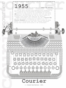 Design student in Uberlandia, Brazil. In 2011, he created a great letter-based poster of a typewriter, and dedicated it to the inventor of Courier (1955), Howard Bud Kettler. His Dia de Sexo poster (2011) shows icons with various sexual positions---waiting to be fonted. [Google]
[More] ⦿
Design student in Uberlandia, Brazil. In 2011, he created a great letter-based poster of a typewriter, and dedicated it to the inventor of Courier (1955), Howard Bud Kettler. His Dia de Sexo poster (2011) shows icons with various sexual positions---waiting to be fonted. [Google]
[More] ⦿
|
Paul Shaw
|
Paul Shaw's choice of 100 best typefaces of all times: - 1-10: Gutenberg's B-42 type, Nicolas Jenson's roman, Francesco Griffo's italic, Claude Garamond's roman, Firmin Didot's roman, Akzidenz Grotesk, Gebetbuch type, Cheltenham family, Helvetica, Aldus Manutius' roman.
- 11-20: William Caslon IV's sans serif, William Caslon's roman, Pierre-Simon Fournier's italic, Futura, Times Roman, Chicago, Bell, Ludovico Arrighi da Vicenza's italic, Univers, Romain du Roi.
- 21-30: Johann Michael Fleischmann's roman, Clarendon, ATF Garamond, Giambattista Bodoni's roman, Century Roman, Nicolas Kis' roman, Minion multiple master, Unger Fraktur, John Baskerville's roman, Lucida.
- 31-40: Ionic, Golden Type, Robert Thorne's fat typeface roman, Wolfgang Hopyl's textura, Vincent Figgins' antique roman (Egyptian), Johnston's Railway Sans, Optima, Bauer Bodoni, Adobe Garamond, Breitkopf Fraktur.
- 41-50: Bell Gothic, Courier, Trajan, Mistral, Doves Type, Scotch Roman, Syntax, Snell Roundhand, Memphis, Robert Granjon's civilité.
- 51-60: Fette Fraktur, Ehrhard Ratdolt's rotunda, Romanee, ITC Stone family, Trinité, ITC Garamond, Avant-Garde Gothic, Oakland, Deutschschrift, Hammer Uncial.
- 61-70: Beowolf, Meta, OCR-A, Sabon, ITC Novarese, Zapf Chancery, Rotis, Base Nine and Base Twelve, Peter Jessenschrift, Excelsior Script.
- 71-80: Bitstream Charter, Peignot, Erbar, Cancellaresca Bastarda, Joanna, Dead History, Behrensschrift, Eckmannschrift, Poetica, Marconi.
- 81-90: PMN Caecilia, Stadia, Imprint, Souvenir, Thesis, Apollo, Penumbra, Melior, Neuland, Flora.
- 91-100: Element, Walker, Remedy, Template Gothic, Digi-Grotesk Series S, Compacta, Antique Olive, Bodoni 26, Evans and Epps Alphabet, WTC Our Bodoni.
[Google]
[More] ⦿
|
Paulo Silva
|
Portuguese type designer in Porto, b. 1972, who created NewBodonesque (2004-2005) as part of Pedro Amado's Typeforge open source font project. Creator of Gentesque (2009), an Open Font Library family based on a scan of the Gentium family. Aka Nitrofurano. In 2009, he and others started work on OpenDinSchriftenEngshrift, an open source typeface that is as close as possible to the original DIN font done for the Prussian Railways. It was made with open source tools such as Inkscape and FontForge. In 2014, he published Cyrillic versions of Not Courier Sans (2008, Ludivine Loiseau). One download site. And another one. Kernest link. Behance link. Old Typeforge link. [Google]
[More] ⦿
|
Peter Fischer
|
Free Courier extensions: Courier New fuer Ansinet 1, 2 and 3, in truetype. [Google]
[More] ⦿
|
Peter Soos
[Sergio Franzese]
|
[More] ⦿
|
Phil Chastney
[Amadeus Information Systems]
|
[More] ⦿
|
Phil Martin
[Alphabet Innovations International -- TypeSpectra (Was: MM2000)]
|
 [MyFonts]
[More] ⦿
[MyFonts]
[More] ⦿
|
Philip Krayna
|
Creator of Prisonnier and CrashNumbering (1998, PsyOps), and of the large Courier-like family Deadwood (2000, PsyOps). FontShop link. [Google]
[More] ⦿
|
Piotr Strzelczyk
|
Polish typographer involved in GUST.org fonts for Polish such as QuasiHelvetica, QuasiCourier, QuasiChancery, QuasiBookman, Antykwa Półtawskiego (based on work by Adam Półtawskiego (1923-1928), constructed by Bogusław Jackowski, Janusz M. Nowacki and Piotr Strzelczyk). Read about that last project here in their 1999 EuroTeX article Antykwa Półtawskiego: a parameterized outline font. [Google]
[More] ⦿
|
Polar Font Series
|
Polar Font series: Mac fonts at MacCampus for Icelandic and Faroese: Nimbus IC family, Courier IC, Magister IC, Paltus IC family, Schoolbook IC, and Campus Sans. All formats. [Google]
[More] ⦿
|
Practise
[James Goggin]
|
 Graduate of London's Royal College of Art in 1999, James Goggin (b. 1975) founded graphic design studio Practise in 1999 in London with his partner Shan James. James was art director of The Wire (2005-2008). In August 2010, Goggin moved to Chicago where he was Design Director at the Museum of Contemporary Art Chicago (2010-2013). Previously he was based in Arnhem, the Netherlands, working as course director and teacher at Werkplaats Typografie (2009-2010) and visiting lecturer at ECAL (Ecole cantonale d'art de Lausanne) (2009-2010). The studio Practise has been based in Providence, RI, since 2016 where James also teaches BFA and MFA Graphic Design at Rhode Island School of Design (RISD). Aka Jacques Gauguin and "Practise", he has worked in London, Auckland and Sri Lanka.
 His typefaces: - In 2001, he made the three-weight LL Courier Sans (+Mono) at Lineto.
- Between 2003 and 2014, James Goggin, Rafael Koch, Mauro Paolozzi, and Arve B%aring;tevik developed LL Prismaset A at Lineto, a redesign and extension of Rudolf Koch's Prisma (1930).
[Google]
[More] ⦿
|
Process Type Foundry
[Eric Olson]
|
 Located in Minneapolis and/or Golden Valley, MN, Process Type Foundry is Eric Olson's foundry created in 2002. Its team grew withe additions of Alice Savoie, Nicole Dotin and Doug WilsonIts fonts:
 - Anchor.
- Bryant (2002, sans serif with simple forms). Bryant 2.0 (2005, Standard&Pro), Bryant Compressed, Bryant Condensed (all three form a neat geometric sans family), Bryant Pro.
- Chrono (2012). Olson writes: Chrono: The nearly geometric sans serif. Chrono is a refined oval sans serif of 20th century origins and 21st century sensibilities. Influences ranging from the gruff Aurora Grotesk series to the elegant Neuzeit are paired with a subtle geometry and typographic utility to inform this family of sans serifs. Chrono was renamed Colfax later in 2012.
- Colfax (2012). The blurb: Colfax is a refined oval sans serif of 20th century origins and 21st century sensibilities. Influences ranging from the gruff Aurora Grotesk series to the elegant Neuzeit are paired with a subtle geometry and typographic utility to inform this family of sans serifs. It was formerly called Chrono. A complaint from another foundry with a similarly named font led to the name change. The only one I can think of is Cronos (Robert Slimbach, Adobe).
- Coordinates (2018). A monospaced almost typewriter typeface.
- Elderkin (2005). Eric Olson; A few of my typefaces were made for very specific projects (Process Grotesque + Elderkin) and really have no contribution to make beyond that. Sure they look fine, but who cares? I'm not thrilled with them and plan on removing them this spring.
- Entovo (2006, rectangular).
- FIG-Sans, FIG-Script, FIG-Serif (2002, as in needlepoint lettering, in imitation of the figlet ascii-to-letter program).
- FindReplace (2004).
- A free monospaced font, Indivisible (2002). This became a variable font in 2019.
- Kettler (2002). A Courier-like font named after Courier's designer, Howard Kettler.
- Klavika (2004, an extensive sans family). Followed in 2005 by Klavika Condensed, in 2008 by Klavika Basic and in 2012 by Klavika Display. Klavika poster by Mary Stratton and Michele Wong Kung Fong.
- Lingua (2003, an octagonal typeface with about 200 ligatures).
- Locator (2003), Locator Display: an information design sans family.
- Maple (2005, a grotesque family that includes a beautiful Black).
- Moniker (2017, Process Type Foundry). A large rounded sans typeface family.
- Process Grotesque (or: Process Grot).
- Recent Grotesk (2020, in six weights). He writes: Recent Grotesk is a contemporary family of typefaces with influences that start in the 19th century and travel through into present day. It's a nod to the improvised weight and width strategies of wood type, the high x-heights of 20th century phototype and the puffed out Antique Olive Nord of Roger Excoffon.
- Recipient (2022). A monospaced typewriter font family that descends from the IBM Selectric and Olivetti typewriter faces.
- Scandia Line (2015). Drawn without curves, this four style+stencil variant is purely polygonal, for a special Neanderthal computer effect. Scandia (2015) on the other hand is a classic geometric sans.
- Sculpin (2021). A sharp-edged sans typeface inspired by the finishing details of square-edged tools like the chisel and brush.
- Seravek (2007, a linear and simple sans created for information design).
- Stratum 1 and 2 (2004, contemporary geometric typefaces genetically linked to Bank Gothic).
Before Process Type Foundry, Eric used to run Information Repair, where he did "typeface design and print design for clients within the cultural sector including the Walker Art Center, Minneapolis College of Art and Design (MCAD), Intermedia Arts and the Design Institute at the University of Minnesota" and made the fonts Novo Grotesk, Necrophones, Fibo001. Fonts sold by MyFonts. Behance link. View the Process Type Foundry typeface library. View Eric Olson's typefaces. [Google]
[MyFonts]
[More] ⦿
|
qfonts
[Boguslaw Jackowski]
|
Public domain type 1 fonts by Boguslaw Jackowski. Included are QuasiPalladio, QuasiTimes, QuasiBookman, QuasiChancery, QuasiCourier, QuasiHelvetica, QuasiHelveticaCondensed. See also here for the truetype versions as well. Other URLs: here, here and here. [Google]
[More] ⦿
|
Raffi Kojian
[Cilicia.com]
|
[More] ⦿
|
Ralph Hancock
[Antioch]
|
[More] ⦿
|
Richard Alexander Hall
|
Application of a 50/50 blend of Ubuntu Bold and Mr. Giacco Bold led Alex Hall (Provo, UT) to the development of Earthbound (2013), Earthbound Bold (2013) and Earthbound Extra Bold (2013). AverageMono (2013) is an average of thirteen different fonts which are all derivatives of the public domain "Courier" typeface. [Google]
[More] ⦿
|
Robert Morris
|
In 2000, he updated the music font NWC15 font and called it NWCJazz. He also made Nucour3-tr (2002), a Courier-like text font. [Google]
[More] ⦿
|
Robert Schenk
[Ingrimayne Type (was: The Bovine Rebellion)]
|
 [MyFonts]
[More] ⦿
[MyFonts]
[More] ⦿
|
Roberta Donatini
|
Graphic designer in Bergamo, Italy. In 2010, she designed Nervo Ottico 2, a typewriter typeface that was inspired by Courier New. It was part of Roberta's type design course project at Politecnico di Milano, done under the guidance of Andrea Braccaloni. Nervo Ottico 1 was made by co-sdtudent Yuri Ferrari. [Google]
[More] ⦿
|
Robertson Blums
|
Full accented Latin/Cyrillic/Greek versions of Arial, CourierNew and TimesNewRoman. [Google]
[More] ⦿
|
roko
|
CourierHP, CourierHP-Italic, CourierHP-Bold, CourierHP-BoldItalic. [Google]
[More] ⦿
|
R.W.D. Nickalls
[ascii metafont]
|
[More] ⦿
|
Sabata
|
Fontstructor who made these typefaces in 2011: Pilgrimage (pixelish), Blocked, Courier Noir (pixelized version of Courier New). [Google]
[More] ⦿
|
Samisk Datautvalg
[Olthuis]
|
[More] ⦿
|
Scangraphic
|
 This company evolved in 1983 from Dr Boeger Photosatz GmbH (est. ca. 1934). The timeline:
 - 1934: Marius Böger founded the first company to manufacture and market photocopying machines and reprographic devices.
- 1950: Dr. Böger Duplomat Apparate GmbH was founded. Its objective is the production of diazo (blue-printing) machines, equipment for diffusion transfer processing and photographic reproduction.
- 1955: One of the company's first innovative products comes onto the market, the first vertical reproduction camera.
- 1958: Intercop, a Dr. Böger subsidiary, started marketing a range of rapid processing machines, vertical repro cameras and processors for proofs and offset plates.
- 1969: Dr. Böger Photosatz was founded.
- 1976-81: Dr. Böger Photosatz develops its Copytronic phototypesetter. This machine worked on the basis of an opto-mechanical principle, and was set out to compete with Berthold's Diatronic. Hundreds of fonts from the headline library were reworked to meet the needs of the new machines. Although a small number of around 10 machines could be built and sold in Germany and Switzerland, many technical problems with the new equipment drained the financial resources. Thus the Copytronic machine is withdrawn from the market. The company survives by producing its succesful reproduction cameras for Agfa Gevaert. After a few difficult years, Dr. Böger Photosatz sets out to develop its digital typesetting system called Scantext. The output device is a CRT-machine with a resolution of 1000 lines per cm. The Copytronic type library is digitized using a video camera with a typical resolution of 512 x 512 pixels to the em quad. Bernd Holthusen proudly describes it as the fastest type digitizing system in the world. From 1971 until the mid 1980s, it designed and manufactured a family of photolettering machines for headline typesetting and offered a library of more that 1000 film fonts for that application. These were popular under the brand name VISUTEK in the UK (In the rest of Europe they were labelled and sold as Copytype, a trademark by Dr. Böger Photosatz GmbH). Additionally they were the creators and makers of a wide range of process cameras and film processing systems marketed worldwide under the Agfa brand
- 1981: The company produces the phototypesetting system Scantext 1000. By the beginning of 1985 around 750 Bodytypes were available for the Scantext system.
- 1983: The company evolves into Scangraphic. More than 2000 fonts were digitised by the Scangraphic company under the personal supervision of Bernd Holthusen, principally by Volker Küster (1984-1989), Jelle Bosma (1988-1991) and Albert-Jan Pool (1987-1991). These fonts were produced originally for the proprietary "Scantext" CRT digital output device and subsequently for the Scangraphic family of laser imagesetters. Quoting Pool: By the time we had completed the Ikarus Database in order to be able to convert our headline fonts to Postscript, URW had finished its Type1 converter. Our first PostScript product was a Macintosh-CD Rom with the complete library of headline fonts (those with Sh in the name) on it. The fonts were released in Type1 format for the Macintosh environment starting in 1991.
- 1984: Scangraphic starts working on its library of headline fonts, using a proprietary high resulution short vector format which enables output sizes up to 90 mm cap height. After developing its own digital outline font format, Scangraphic starts making use of URW's Ikarus technology to produce a library of headline fonts. As from 1989, Ikarus outlines were made to fit the metrics of the Scangraphic library of bodytype fonts in order to replace the proprietary pixel based font format by digital outlines. Thus the basis was laid for converting the complete library of headline and bodytype fonts into the PostScript Type1 format.
- 1989: The owner/partners sold the business to the large German company Mannesmann AG (and the font collection is sometimes referred to as the Mannesmann-Scangraphic collection), becoming Mannesmann Scangraphic GmbH in Wedel near Hamburg.
- 1994: Mannesmann breaks the umbilical chord and the company becomes Scangraphic Prepress Technology GmbH.
- 2004: the company moves from Wedel/Hamburg to Seligenstadt, Germany. The company still operates on the European mainland making and selling high resolution film and plate imaging systems. The font department is no longer in operation.
- End of 2004: Elsner&Flake buy the font collection, and start selling the fonts under the Elsner&Flake umbrella. The 2500-strong font collection has names that either have a suffix SB (for body types) or SH (for headline types, also called supertypes). Among the tens of examples, we find classics such as Jakob Erbar's Koloss SB.
- 2006: Ulrich Stiehl publishes a document in which he discusses the collection of fonts. He reports clear correspondences with known font families, examples including Ad Grotesk (=Akzidenz-Grotesk by Berthold), Artscript No 1 (=Künstlerschreibschrift fett by Stempel/Linotype), Black (=Block by Berthold), Chinchilla (=Concorde by Berthold), Cyklop (=City by Berthold), Esquire (=Excelsior by Linotype), Europa Grotesk (=Helvetica by Linotype), Europa Grotesk No. 2 (=Neue Helvetica by Linotype), Flash (=Okay by Berthold), Freeborn (=Frutiger by Linotype), Gentleman (=Glypha by Linotype), Grotesk S (=Neuzeit Buch by Stempel), Madame (=Madison by Stempel), Matrix (=Melior by Linotype), October (=Optima by Linotype), Parlament (=Palatino by Linotype), Paxim (=Palatino by Linotype), September (=Sabon by Linotype), Synchron (=Syntax by Stempel), Vega (=Volkswagen VAG Rundschrift). There are also originals like Volker Küster's Today Sans Serif and Neue Luthersche Fraktur, Zapf Renaissance by Hermann Zapf, and Forlane by Jelle Bosma. Küster, Pool, Zapf and Bosma have nothing to do with the non-original fonts in the collection. The typophile community shrugs Stiehl's complaints off.
- 2008: The Scangraphic collection can be bought at Elsner&Flake.
Examples of Scangraphic fonts: Pi Travel+Transportation, Pi Greek Maths, Pi Communication, Pi Signs+Symbols, Futura Round SB, Futura Round SH. A technical discussion by Yves Peeters. MyFonts link. Link to Scangraphic PrePress Technology GmbH in Seligenstadt. Elsner&Flake shop. Home page. View the Scangraphic typeface library. Another link to the Scangraphic typeface library. [Google]
[MyFonts]
[More] ⦿
|
Schriftenpaket Osteuropa and the Hemming murder
|
Schriftenpaket Osteuropa is a CD of 245 fonts sold mainly in Germany. Each font is a renamed Adobe Font Folio font. The fonts were "made" by the Hemming company, that is, the copyright notices were all changed to Mon Ami 1994, and the fonts were renamed in a predictable manner: Arial became Adorea, Courier is Cora, Futura is Fulv, Eurostile became Europa, Gill Sans is Gisela, and so forth. Thirdly, Hemming insured that all diacritics for East-European languages were available. Ulrich Stiehl, the consummate font detective, collected all Adobe name equivalences in this PDF file. The "Firma Hemming" (later renamed Hemming AG) was founded in 1989 by Olaf Hemming in Landau (Pfalz, Germany). The Schriftenpaket Osteuropa CD went to market in 1994. Olaf Hemming (b. 1967 or 1968) was murdered in May 2001. His handcuffed body was found near Andenne in Belgium. His Audi was found on highway A27 in Polleur, Belgium. Hans-Joachim Ulrich and Ralf Wetzel took over the company. In 2002, his company went bankrupt and was officially liquidated in 2003. The public prosecutor in Landau may have placed copyright charges against the two men (but the internet source for this is not 100% reliable). In 2003, the murder trial of Olaf Hemming took place. We learned that he was killed by a 22-year old German woman who was born in Madagascar. She had been influenced by a 48-year old sectarian (Indian/Islamic) partner who forced her into drugs and prostitution. She also murdered someone else and was accused of two attempted murders as well. The following stores (and probably others too) still sell the CD: Pearl, Multi-Media-Schnäppchen (owned by Daniel Grigat, 51588 Nuembrecht), and Schütz Neue Medien GmbH. [Google]
[More] ⦿
|
Sergio Franzese
[Peter Soos]
|
Peter Soos's truetype versions of Arial, Courier and Times-Roman with Latin-2 (ISO 8859-2) layout. FTP source. See also here. Font list: ArialL2-Bold, ArialL2-BoldItalic, ArialL2-Italic, ArialL2, CourierNewL2-Bold, CourierNewL2-BoldItalic, CourierNewL2-Italic, CourierNewL2, TimesNewRomanL2-Bold, TimesNewRomanL2-BoldItalic, TimesNewRomanL2-Italic, TimesNewRomanL2. [Google]
[More] ⦿
|
SIAMweb
|
Settapol Linprachya's free Thai fonts, including the unicode-compliant Courier-Monothai, EBCDIC-FixedMonoThai and Courier-ProportionalThai. Alternate URL. [Google]
[More] ⦿
|
Skautai
|
At this Lithuanian site, two Lithuanian fonts: BalticHelvet (1992, VNLabs) and CourierLT (1994, Fotonija). [Google]
[More] ⦿
|
Slava Kirilenko
[Astronaut Design]
|
 [MyFonts]
[More] ⦿
[MyFonts]
[More] ⦿
|
Smart Courier
|
The 2001 house font of the company Smart, based on Courier. The copyright string mentions both Linotype and MCC Smart GmbH. [Google]
[More] ⦿
|
Software Ignegneria
|
Italian site which offers a free Courier face: CourNewIngeSoft. This has Greek, Arabic, Cyrillic and East-European blocks of glyphs. [Google]
[More] ⦿
|
Srpski fontovi (Serbian fonts)
|
About 60 Yugoslav/Serbian fonts, some Latin, and some Cyrillic. Direct access. Included: CSwiss, CirilicaBodoni, Cir_tms-Normal, CistanTimes, CirilicaTMBPN, CirilicaTimes, CTimes, CYBlippoR, CYDutchR, CYUniversityR, Mirosavljevo-Normal, Miroslav, CourierYU, HelvCiril, Miroslav, TimesYU, TimesCiril, YUArnoldBckln, YUBitsAmerigoR, YUBaskervilB, Helvetica, MiroslavljevaCirilica, MiroslavCirilica, MiroslavNewCirilica. Many of the fonts are copyright MiMac, Belgrade. [Google]
[More] ⦿
|
Stegemann
|
So Zei Medium (an Adobe math font), and DOSCour2 (a version of Courier). [Google]
[More] ⦿
|
Stephanie Briones
|
Creator of the hand-printed Courier typeface Take Note (2011, iFontMaker). [Google]
[More] ⦿
|
Steve Matteson
|
 Rochester Institute of Technology's School of Printing graduate who lived in California and in Holland, MI, and now resides in Louisville, Colorado. He was a disciple of Chuck Bigelow and Kris Holmes. MyFonts page on him. In 1990, he started work at Monotype in Palo Alto to create the Windows truetype core fonts Arial, Times New Roman and Courier New. He stayed with Monotype and then Agfa/Monotype until 2003 (when he was probably fired, but that is only an unreliable guess), directing type development from the design office in Palo Alto, CA. Bio at Agfa/Monotype. He has directed branding projects such as Agilent Technology's corporate sans serif and Microsoft's corporate font family 'Segoe'. At the same time, he was involved in producing bitmaps and outline fonts for cell phones and TV set top environments. He has worked extensively designing Greek, Cyrllic, Thai, Hebrew and Arabic alphabets to satisfy the requirements of customers such as IBM, Microsoft, Nokia, Sun and Sybase. In 2004, he co-founded Ascender Corporation in Northbrook, IL, where he remained Type Design Director until Ascender was bought by Monotype, where he now heads the type design team (12 people in all, as of 2013).
 CBC interview in 2012. Fontspace link. FontShop link. At ATypI 2011 in Reykjavik, he spoke on typefaces for Android OS. His typefaces: - Amanda.
- Andale Mono (Monotype), Andale Mono (Ascender). This is a monospace sans-serif typeface designed for terminal emulation and software development environments. It was originally created by Monotype. Andalé Mono was first distributed as an Internet Explorer 4.0 add-on under the name Monotype.com. In version 1.25 of the font, it was renamed to Andale Mono, distributed with Internet Explorer 5. It is often used by programmers, and is bundled with Mac OS X.
- Andy (Monotype), his first face, a design based on a friend's lefty handwriting. Published at Agfa's Creative Alliance.
- Arimo (2010). A free sans family at Google Web Fonts that is metrically compatible with Arial. TeX support and further downloads on CTAN.
- Ascender Sans Mono (2004-2008, Ascender). Metrically compatible with Courier New. Ascender Serif (2005, 4 styles) is metrically compatible with Times New Roman.
- Ascender Uni Duo is a fixed-width comprehensive Unicode-compatible font available with support for the Unicode Standard. Ascender Uni Duo is a 39MB TrueType font with approximately 53,000 glyphs. The Latin and related glyphs (designed by Steve Matteson) are Sans Serif, with Gothic ideographs drawn in Japanese style, and complementary styles for other scripts. There are also versions of Ascender Uni that provide localized support for Korean, Simplified Chinese and Traditional Chinese. OpenType layout support is included for Arabic (initial, medial, final, isolate, and required ligature forms, as well as basic mark positioning), and vertical writing for CJK locales (consisting mostly of Latin, symbol, punctuation, and kana glyph variants). Character Set: Latin-1, WGL Pan-European (Eastern Europe, Cyrillic, Greek and Turkish), Chinese, Japanese, Korean, Thai, Vietnamese, Hebrew, Arabic. Ashley Crawford.
- Ascender Sans (Ascender).
- Ascender Serif (Ascender).
- Ayita (2006, Ascender), a decorative sans family co-designed with Jim Ford.
- Bertham Pro (2009, Ascender). Four styles including Open, after Goudy's Bertham.
- Bierstdat (2021). A sans typeface that could replace Calibri later in 2021 as Microdoft's go-to font in Microsoft 365 apps.
- Blueprint (1993).
- Binner Gothic (Monotype).
- Blueprint (Monotype).
- Cambria (Ascender).
- Carnero (2019, Monotype). Steve describes this sans family as a feisty hybrid of precise geometry and calligraphic flair.
- Chicory (2006, Ascender). A calligraphic script face.
- (2010). A free family at Google Code that is metrically compatible with Courier New. See also OFL.
- Creepy (Ascender Corporation): a Halloween font designed with Carl Crossgrove.
- Curlz (1995, Monotype). Done with Carl Crossgrove, based on wrought iron on chairs.
- Dempster (2016, with Jim Ford at Ascender). The original iangular industrial design, by Jim Ford, goes back to 2010.
- Droid Sans Mono Pro (Ascender), Droid Sans Pro (Ascender), Droid Serif Pro (Ascender). and Droid Sans Mono: a font family designed in 2006-2007 by Steve Matteson at Ascender for Google's Android project, mobile phone software for handsets. Free download at CTAN.
- Dujour (2005, Ascender): an art deco revival of the 1930's typeface Independant by Joan Collette and Jos Dufour for Plantin. Compare with the free Independant by Apostrophic Labs.
- Endurance Pro (2009, Ascender): neo-grotesque sans. Endurance Pro Cond (Ascender).
- Facade (Monotype).
- Fineprint (Monotype). A design loosely based on his own penmanship ("on a good day"). Another Creative Alliance face.
- Friar Pro (2009, Ascender): Friar Pro is a revival of Frederic W. Goudy's "Friar" typeface. Goudy described this typeface design as a 'typographic solecism' as it combines a lowercase of half-uncial forms from the 4th through 7th centuries with an uppercase of square capitals from the 4th century. Friar was originally designed in 1937 and used to print a Christmas keepsake produced by Goudy and printer Howard Coggeshall. The fire that burned Goudy's studio in 1939 destroyed the drawings and matrices before many metal fonts were cast. Of all that was lost in the fire, Goudy once said he missed Friar the most.
- Futura Now (2020: a 107-style family by Steve Matteson, Terrance Weinzierl, Monotype Studio and Juan Villanueva, that includes variable fonts as well as subfamilies called Text, Display, Headline, Inline, Outline, Shadow and Script).
- Georgia Pro (Ascender).
- Gill Floriated Caps.
- Goudy Fleurons (2010, Ascender).
- Goudy Modern MT (Monotype).
- Goudy Ornate (2002). Unsure if Matteson made this or Carl Crossgrove.
- Kennerley. Based on Goudy's Kennerley family.
- Kidprint (Monotype).
- Kootenay (2006, Ascender), a sans family.
- LeBeau (Ascender): a signage font.
- Liberation Mono, Sans and Serif (2007-2009, Ascender). A set of free open source fonts done for Red Hat Inc.
- Lindsey Pro (2006, Ascender): a cursive script based on his niece's hand.
- Louisville Script (2008, Ascender): ordinary handwriting.
- Massif (2006-2011, Monotype). Odd name, since Jean Joveneaux made a font called Massif in 1957. How can Monotype get away with a trademark for this is beyond me.
- Mayberry (2008, Ascender): a 14-font sans family with extremely large x-height and strange proportions. Mayberry semibold is free. Mayberry Pro (Ascender).
- McZee, a Microsoft symbols font.
- Miramonte Pro (2006, Ascender). A geometric-meets-humanist sans after the typeface Marsuv Grotesk by Stanislav Marso at Grafotechna, 1960.
- Open Sans (2010, Ascender). A free family by Steve Matteson. See also at Google Fonts. In 2021, he added the rounded companion, Open Sans Soft (20 styles).
- Overpass and Overpass Mono (2011-2019), designed by Delve Withrington, Dave Bailey, and Thomas Jockin. A free open source sans font. The design of Overpass is an interpretation of the well-known Highway Gothic letterforms from the Standard Alphabets for Traffic Control Devices published by the U.S. Federal Highway Administration in 1948. It was created for Red Hat Inc. Dedicated web page. Link at Delve Fonts.
- Newstyle. Based on Goudy's 1921 typeface, Newstyle. See also Newstyle (2018, Steve Matteson).
- Pericles Pro (2005, Ascender): an Ascender typeface based on the work of Robert Foster who created the original for American Type Founders in 1934), a 433-glyph OpenType font for Greek simulation or stone cut looks.
- Pescadero Pro (2005, Ascender),
- Pescadero Pro: a serif face.
- Rockwell Team (Ascender): an athletic lettering face.
- Rebus Script (2009, Ascender): done with Terry Weinzierl.
- Scooter Script (2009, Ascender): comic book style face.
- Segoe Chess (Ascender), Segoe Mono (Ascender), Segoe TV (1997-2004, Ascender: done for MSNTV).
- Tinos (2010). A free serif family at Google Fonts that is metrically compatible with Times New Roman. Download at CTAN, where one also finds TeX support maintained by Bob Tennent. Nerd Fonts patch.
- Tipperary eText (2012-2013), Monotype.
- Titanium Motors (2012, Monotype), Titanium (2006, Ascender): techno typefaces.
- Truesdell (1994, Monotype): a revival and extension of the "lost" Goudy types cut in 1931. Also at Creative Alliance. Also includes Truesdell Sorts.
- Tucker Script (2009, Ascender): ordinary handwriting face.
- Twentieth Century Poster (2002), an art deco display font straight from the late 1920s.
- VAG Rounded Next (2018, Monotype). Developed under the direction of Steve Matteson, this revival of the 1979 classic corporate font of Volkswagen AG has new weights and adds support for Greek and Cyrillic. The MyFonts site co-lists Tom Grace as designer.
- Verdorgia (2010): an ugly duckling.
Klingspor link. Fontspace link. View Steve Matteson's typefaces. [Google]
[MyFonts]
[More] ⦿
|
Steve White
[GNU Freefont (or: Free UCS Outline Fonts)]
|
[More] ⦿
|
Superfly Fonts
[Jason Mevius]
|
Inverted letter fonts by Jason Mevius: Jason's-Inverted-Tahoma, Jason's-Reversed-Courier, Jason's-Reversed-Tahoma, Jason's-Reversed-Times. [Google]
[More] ⦿
|
SynthesisSoft
|
Russian foundry active in the early 1990s. Fonts are shattered over the web. They include Cyrillica Bulgarian (1994), Glagolica Bulgarian (1993), OldCyr Bold (1992), TmsCyr (1993), UnvEe UnvCyr, CourierCyr, CourierEe, CyrillicaBgEpigraph, CyrillicaOchrid1, CyrillicaOchridEpigraph, CyrillicaShafarik, CyrillicaShafarikEpigraph, Etymolog1, Etymolog3, OldCyr. [Google]
[More] ⦿
|
Tagir Safayev
|
 Tagir Safayev is a Russian type and graphic designer. He created more than one hundred fonts, among which ITC Stenberg (1997, Cyrillic simulation face), which was originally called Rodchenko (a stencil font). Tagir Safayev is also active in book design and advertising. From 1991 until 2003 he worked as a type developer for ParaType. In 1995 he received the Rodchenko Award of the Society of Designers of Russia for Rodchenko typeface [look for Rodchenko here (italic version) and here, or for the ParaType family (1996-2002)]. He is a member of the Moscow Artists Union and of the Association Typographique Internationale (ATypI), and a co-founder of the Type Designers Association, Moscow. He won an award at Bukvaraz 2001 for Serp'n'Molot (2001, meaning hammer and sickle; forms inspired by lettering of Sergey Chekhonin (1878-1936)). Professor of the National Design Institute of the Designers Union of Russia. Teacher at the Higher Academic School of Graphic Design in Moscow. Currently staff designer at ParaType in Moscow. Faces: Bloc (designed at ParaType in 1997 by Tagir Safayev for advertising and display typography; based on Block of H. Berthold, 1908 by Heinz Hoffmann), Black Grotesk (1997, based on Gasetny Chorny ("Newspaper Black"), of the O.I. Lehmann foundry, St.Petersburg, 1874, and Kompakte Grotesk (Haas)), PT Courier (1990, ParaGraph), PT Courier Monotonic Greek (1990), PT Courier Polytonic Greek (1990), PT DIN Condensed (1997), Birch (1995, handwriting, ParaGraph), PT FreeSet (1991-2000, based on the Frutiger typeface family), LEF Grotesque (1999), PT Epsilon (1995, handprinting), Etienne (Kremlin Pro (2010, Paratype), PT Hermes (1993; Based on Placard MT Condensed typeface (Hermes Grotesk by Wilhelm Woellmer, 1911) of the Lange type foundry (St.-Petersburg), an adaptation of Hermes Grotesk, of the Woellmer type foundry (Berlin, 1911). This sans serif with its old-fashion stability looks well in advertising and display typography), Bitstream Humanist Cyrillic 521 (1999), PT Plain Script (1995, comic book lettering), PT Irina (1995, caps-only comic book face), ITC Kabel Cyrillic (1993, after the Original Kabel, 1976, Vic Caruso), Frutiger (1992, after the 1976 original), Meta+ Cyrillic (2000), Mirra (1999), ITC New Baskerville Cyrillic (1993, ParaGraph), ITC Banco (2000: the Cyrillic version of the font by Phill Grimshaw, 1997, which in turn was based on Roger Excoffon's Banco at Fonderie Olive in 1952), Bank Gothic (1997: a Cyrillic version of the 1930-1933 original by Morris Fuller Benton at ATF), ITC Officina Sans Cyrillic (1995), PT Proun (1993, a Cyrillic version of Choose One/Ten), PT Rodchenko (1996), ITC Stenberg (1997), ITC Stenberg Inline (1997), Swift Cyrillic (2002), PT Yanus (1999, originally created as a corporate identity for Aeroflot), PT Unovis (2001, inspired by the Russian avant garde of the 1920s), this unfinished Cyrillic version of Trajan (1994-1996), and Serp n'Molot (2001). At ATypI 2008 in St. Petersburg, he spoke about the various Cyrillic adaptations of Cheltenham done in the last century, prior to his own Cyrillic extension for NYTimes Cheltenham, done in 2008.
 View Tagir Safayev's typefaces. [Google]
[MyFonts]
[More] ⦿
|
Teleserviss un Telebusiness
|
Latvian page with about ten mixed Latin/Cyrillic TrueType fonts: the Atunt family, and CNtunt, a Courier New family. [Google]
[More] ⦿
|
Teletext New PL
|
A Courier-like font with all Polish diacritics. [Google]
[More] ⦿
|
TeX Gyre Project
|
The TeX Gyre Project was started in 2006 as the brainchild of Hans Hagen (NTG). It is described in The New Font Project (Hans Hagen (NTG), Jerzy Ludwichowski (GUST) and Volker RW Schaa (DANTE e.V.), presented at BachoTeX2, 2006). From the project, which is being implemented by GUST's e-foundry guys, Boguslaw Jacko Jackowski and Janusz M. Nowacki aka Ulan: All of the Ghostscript font families will eventually become gyrefied as the result of the project. Gyrefication, also called LM-ization, was first applied to the Computer Modern Fonts and their various generalizations with the result known as the Latin Modern (LM) Fonts. The Gyre fonts each have 1200 glyphs that cover basically all European scripts (including Latin, Cyrillic and Greek), and have Vietnamese characters added by Han The Thanh, and Cyrillic glyphs by Valek Filippov. Available in Type 1 and OpenType, they come under a very liberal license (free, modifiable, unlimited use, and a request to rename altered fonts). The TeX Gyre fonts are - Adventor: family of four sansserif fonts, based on the URW Gothic L family, which in turn is based on ITC Avant Garde Gothic, designed by Herb Lubalin and Tom Carnase in 1970. Open Font Library link.
- Bonum (2006), based on the URW Bookman L family: TeXGyreBonum-Bold, TeXGyreBonum-BoldItalic, TeXGyreBonum-Italic, TeXGyreBonum-Regular.
- Cursor: based on URW Nimbus Mono L, which itself mimics Bud Kettler's Courier.
- Heros (2007): based on the URW Nimbus Sans L family, but heavily extended---eight typefaces of 1200 glyphs each. With the release of Heros, their QuasiSwiss fonts becomes obsolete. This is, in fact, the Gyre version of Miedinger's Helvetica. .
- Pagella (2006), based on the URW Palladio L family (and thus, indirectly, Zapf's Palatino): TeXGyrePagella-Bold, TeXGyrePagella-BoldItalic, TeXGyrePagella-Italic, TeXGyrePagella-Regular. In 2013, we find Tex Gyre Pagella Math in opentype format, by Boguslaw Jackowski, Piotr Strzelczyk and Piotr Pianowski. Greek symbols were taken from the Math Pazo font by Diego Puga. The calligraphic alphabet was taken from the Odstemplik font. The Fraktur is based on Euler. The sans part is DejaVu Sans, and the monospaced alphabet is taken from Latin Modern Mono Light Condensed.
- Termes (2006), based on the Nimbus Roman No9 L family (and thus, by transitivity, Stanley Morison's Times-Roman): TeXGyreTermes-Bold, TeXGyreTermes-BoldItalic, TeXGyreTermes-Italic, TeXGyreTermes-Regular. In 2013, we find Tex Gyre Termes Math in opentype format, by Boguslaw Jackowski, Piotr Strzelczyk and Piotr Pianowski. The Fraktur part is based on Peter Wiegel's Leipziger Fraktur. The sans serif part uses TeX Gyre Heros. The monospaced part is based on TeX Gyre Cursor. In 2017, the Open Font Library published a slightly updated and darker TG Roman.
- Schola (2006, based on the URW Century Schoolbook L family, designed by Morris Fuller Benton in 1919: TeXGyreSchola-Bold, TeXGyreSchola-BoldItalic, TeXGyreSchola-Italic, TeXGyreSchola-Regular.
- Chorus (2007): derived from handwritten letterforms of the Italian Renaissance as used by Hermann Zapf in ITC Zapf Chancery (1979). TeX Gyre Chorus is based on the URW Chancery L Medium Italic font, but heavily extended. The Vietnamese and Cyrillic characters were added by Han The Thanh and Valek Filippov, respectively.
Articles: The New Font Project (BachoTeX 2006 article by Hans Hagen (NTG), Jerzy Ludwichowski (GUST) and Volker RW Schaa (DANTE e.V.), TeX Gyre Project (2006) by Bogusaw Jackowski, Janusz M. Nowacki and Jerzy Ludwichowski, and TeX Gyre Project II (2007) by the same three authors. Fontspace link. [Google]
[More] ⦿
|
TFaces
[Alexander Tarbeev]
|
 Alexander Tarbeev is Russian type designer, graphic artist and tutor. He graduated from Moscow Electrotechnical Institute of Communication in 1979 and Moscow Polygraphic Institute in 1988, and worke in the type department of NII Polygrafmash (Institute for Scientific Research of Printing Machinery, Moscow). Between 1989 and 1997, Tarbeev worked as type designer at ParaGraph. He set up the type studio TFaces in Moscow.
 Designer of Cyrillic versions of ITC typefaces like ITC Garamond, ITC Benguiat Gothic, Friz Quadrata and other Cyrillic typefaces. Other typefaces by Alexander Tarbeev include BetinaScript, BigCity, Dagger, DenHaag, Diderot, Gauge, Jakob, Lissitzky, Montblanc, Matterhorn, Pankov, Pollock, Smarty and Tauern. He also designed typefaces for Russian magazines such as Afisha, Bolshoi Gorod, Kak, Smart Money, Ezhenedelny Zhurnal, and (the Russian version of) L'Officiel, and for newspapers such as Vedomosti and Noviye Izvestiya. Alexander Tarbeev is professor and head of type design department at Moscow State University for Printing Arts (currently a branch of Moscow Polytechnic University). He also taught at British Higher School of Art and Design (Moscow), and Moscow State University, Faculty of Journalism.. Showcase of Alexander Tarbeev's typefaces at MyFonts. List of the new designs and the old typefaces designed since 1988 for NPO Poligraphmash, ParaGraph/ParaType and TFaces: Academy, AdverGothic, ITC Anna, ITC Baltica, ITC Benguiat Gothic (1994-1997, ParaGraph; he made the Hebrew typeface Benzion in 1991 based on Benguiat Gothic as well), ITC PT Benzion, FF Beowolf, PT Bernhard, PT BetinaScript (1992, based on the handwriting of the German graphic artist Betina Kuntzsch), PT Bodoni (1989-1997), MathFont 1 (1987, Polygraphmash, based on the math font of Kudryashevskaya Encyclopedicheskaya, 1960-74, a typeface by Nikolai Kudryashev and Zinaida Maslennikova), PT Compact, PT Courier (1997; the original Cyrillic weights were done by Tagir Safayev), PT Crash (1995), PT Dagger (1996), Den Haag, Dots, DoubleClick, PT Drunk (1997), Exposure, PT FixSys (1995, pixel font), ITC Friz Quadrata (1997, ParaGraph, based on the typeface by Ernst Friz for Visual Graphic Corp. in 1965), PT Futuris, ITC Garamond (1993-1995, based on Tony Stan's 1975 version), PT Graffiti (1996, ParaGraph), PT Hermes (1993, ParaGraph), Inform, Izhitsa (1994: he added a shadow syle to Svetlana Yermolaeva's 1988 original), PT Jakob (1994), [kAk), Lazurski, PT Matterhorn (1993), PT MonoCondensed (1990), PT Montblanc (1993), PT Newton (1994, ParaGraph, a phonetic font), PT Pollock (1995), PT Pragmatica (1989), Sketch, PT Star (1995), PT Tauern (1993, extra compressed), Titanic, PT Wind (1995, based on TextBook, 1987, by Emma Zakharova). Honorable Mention at the 3rd International Digital Type Design Contest by Linotype Library for Linotype Den Haag. Free fonts made for fun at FontStruct in 2008: giammba, schlange, squaresans, squaresans_heavy, TFa BCode (extremely condensed), TFa KnightRider. In 2019-2020, he designed the large text, headline and letterpress family Gauge (Type Today). [Google]
[MyFonts]
[More] ⦿
|
The Mashtots Project
|
Run by Hagop Gulludjian, this project/site offers free Armenian fonts for Mac, PC and UNIX: 23 typefaces by Ruben Tarumian (Anpuit, Bakhum, Barak, Erevan, Africkian, Govazd, Grig, Grqi Nor, Hamagumar, Harvats, heghnar, Nor Matenagir, Ishxan, Kamar, Matenagir, Pastar), Pavel Dallakian's fonts (Dallak Times and Helvetica), ArmNetCourier, ArmHelvetica, Sovorakan by A.&P.Topouzkhanian, converted by A. Asatoo, Arackel Ketchian's fonts (Hay Times and Helvetica), Mkrtich Karapetian's fonts (Ani, Courier, GoudyArm, Helv and Barz), Times Armenian and Arial Armenian by Monotype. Direct access. [Google]
[More] ⦿
|
The typography of code
[Hamish Macpherson]
|
Hamish Macpherson discussed and illustrated his five favorite fonts for showing programs, after discussing the pioneering code font, Courier (1956, Howard Kettler for IBM). Blog readers also suggested Osaka Mono 13pt, Deja Vu Mono (an update of Bitstream Vera Mono), Kyle, Panic Sans (rehinted version of Deja Vu Mono), Proggy Clean 11pt, Droid Sans Mono, Akkurat, Inconsolata, Terminus (bitmapped), Rockwell, Verdana, ProFont, Monaco, Dina. [Google]
[More] ⦿
|
TheEmerald
|
American designer of L33T Courier New (2005). [Google]
[More] ⦿
|
Thomas Canale
|
 Michigan-based designer of the grunge typefaces tommytxtey#4 (2011), Couriertxt (2011), and Uknowjack (2011), and of Stickfig (2011) and Buttlint (2011, old typewriter face). Zooky Zooky (2011) and Heatstroke (2011) are grunge dymo label typefaces. Twriter and Writers Block (2011) are more old typewriter typefaces. Writer Line (2011), No Sense (2011), Alpha Teen (2011) and SqSerif (2011) are grungy dymo label typefaces.
 In 2012, we discover Thomas Canale The Sequel at Saginaw Valley State University [what is the relation with Thomas Canale?]. And also this second Dafont link. The "Sequel" created the spiky hand-printed typeface Outback (2012). Canale designed Chunky Munky (2012, angular almost dadaist style), Chunky Munky Serif, Slug Bug (2012), Noir (2012), Baby Moons (2012, old typewriter font), Cropfont (2012, +Serif, +Xtra, +Expanded), Boxey Moron (2012, white on black), Funky Dunky (2013), HoDad (2013), Bitchen Nord (2013), Bitchen (2013), Hodad Warped One (2013), Dibble Nibble (2013, sketch font), and Dubble Trubble (2013, old typewriter face). [Google]
[More] ⦿
|
Tomasz Skowroński
|
Zakopane, Poland-based designer (b. 1975) who created these typefaces: - 2004: the faded typeface Wydzieranki, and the handwriting typefaces Bazgroly, Bartlomiej Gil and Jacek Zieba-Jasinski.
- 2011: The handwriting typefaces zai_NicolasSloppyPen (was Bartlomiej Gil), Tomasz Skowronski, Bazgroly, the grungy Stempel, the 18th century hand-printed Konstitucja Polska (based on the text of the Polish Constitution of 1791), the grungy Kornik, the grungy zai Shaken (was called Halny), and the grungy Dukarnia Polska.
- 2012: The distressed script typeface US Declaration.
- 2013: Courier Polski 1941, Konstitucja Polska Cleaned.
- 2017: zai Royal Vogue Typewriter 1929, zai Kinematografia Polska 1908, the sketched font zai Seagull Felt-Tip Pen, zai Drukarnia Wydawnicza 1870, zai Urania Piccola typewriter, zai Smith-Corona Galaxie typewriter, zai Olivetti Underwood Studio 21 Typewriter, the old typewriter font Triumph Typewriter, the revival font zai Drukarnia Akademii Krakowskiej 1674, the grungy Zai Torn Paper (renamed from Wydzieranki), zai Wacky Bruce, zai Nicolas Sloppy Pen, Zai Ed Sloppy Simple (a renaming of his 2011 font, Wojcieh Pochrzest), zai Crumpled Paper (renamed from Zmiety Papier / Polska OnLine, a fat poster typeface from 2011), and Zai Calligraphy Pen Handwritten.
- Typefaces from 2018: zai Brushy Freshy, zai Elevator Out of Order, zai Pencil Typewriter, zai Thin Handwritten Lettering, zai Consul Polish Typewriter, zai Lava (a lava lamp typeface), zai Italic Hand Calligraohy.
- Typefaces from 2019: zai Soft Italic Typewriter, zai Cryptologist's Handwriting 1905.
- Typefaces from 2020: zai I Love COVID 19 (dripping blood font).
[Google]
[More] ⦿
|
TwoPoints.net
[Martin Lorenz]
|
 Design bureau in Barcelona, Hamburg and Berlin, est. 2007, with fonts that are mainly due to German type designer Martin Lorenz. The list of typefaces:
 - TpFloral (2006) is a modular typeface inspired by Kombinationsschrift (1926, Josef Albers). It is based upon two basic elements, a quarter circle and a square.
- TpStretch (2002).
- TpKurier Sans and Serif (2006). A redesign of Courier. Followed by TpKurier-Contrast (2008), TpKurier-Filled (2009) and TpKurier-Calligraphic (2010). In 2013, Vette Letters published VLNL Tp Kurier (2013, a monospaced typewriter face; + Serif, + Callig Regular).
- TpMartini (2008) is a didone family that was used for the identity of Bambi Mint. It was published in 2013 by Vette Letters as VLNL Tp Martini.
- TpLlum (2008) is a typeface that was designed for the festival Montjuïc de Nit. It was published in 2012 by Vette Letters.
- TpDuro (2010) is a blackletter typeface.
- In 2017, TwoPoints was commissioned to design a typeface for ESPN The Magazine's NBA Preview issue.
- At Vette Letters, he published VLNL TpDuro (2019: a blackletter inspired by an Albrecht Dürer design from 1525; with Juanra Pastor).
- VLNL Tp Bar Paco (2014, inspired by the vernacular type found in traditional Spanish bars in Barcelona).
- Tp Rawkost (2019), Tp Marte (2019), Tp Luna (2019).
- In 2019, they were commissioned by ESPN to make a special display font, ESPN Next. In 2018, they designed the arc-and-circle typeface Gold Rush for an ESPN Magazine issue about the female athletes participating in the Winter Olympics in Pyeong Yang.
In 2019, TwoPoints published On The Road To Variable (Victionary). [Google]
[MyFonts]
[More] ⦿
|
TypeArt Foundry (or: Digiteyes Multimedia TypeArt Foundry)
[Lloyd Springer]
|
 TypeArt is the commercial foundry of Lloyd Springer (Vancouver), est. 1992. His typefaces from before 2003:
 - Bitmap fonts: CitymapRounded, LoveBytes, Letterstitch.
- Comic book: Disorder, Scratchpad, Sideshow, Superhero, Verbal Cues, Balloons, Buffalo Joe, Frontline.
- Western: Outlaw, Eastside.
- Typewriter: Courier Ragged, Double Hitter, Firenza, Keystoned, Romanstone, Streetwise, Writing Machine, Firenza Text, Dear John.
- Stencil: Mediocre, Boxcar.
- Serif: Burlington (1997, roman caps only), Miracolo (2002, art nouveau), Saltzburg (1999, a bit art nouveau), Steinburg Modern, Sundance.
- Script: Prints Charming, Sideshow, Dream Lover, Falcon Casual, Falcon Brushscript.
- Fifties: Golden Age, Golden Day, Flingaling.
- Monster: Braindead, Horror Show, Junglemania, Newman, Frankenstein, Frontline, Mixed Breed.
- Label type: Dimeotype, Label Gun, Liteweit, Silverscreen (1998, a condensed sans ideal for movie credits), Total Disorder, Letterstitch.
- Inline: Puzzler, Scratchpad, Steelyard.
- Grunge: Amnesia, Bellamie, Bighead, Braindead, DeviantStrain, DoubleHitter, DoubleVision, Fi ngerprint, LabelGun, Meanstreak, Phantom, Poorsport, Social Menace, Streetwise, TotalDisorder, Mixed Breed, Tapeworm, Typochondriac.
- Display and decorative fonts: Niteweit, PostIndustrial, Tolstoy (1996, art deco), WhatTheHell, Xheighter, Bossman, Eucaliptus (art deco), Fishboners, Strangelove (1999), Charbonne (art deco), Reerspeer (2002), Freakshow, Underground, Tipemite, Spaced Out, Sunday Best, Eye Doctor, Foreign Language, Hammerhead, Sidewalker, Wendy Woo, Post Industrial, Starship Command, Venus Envy.
The 2003 collection includes Natalian, Amusement, and Finders. MyFonts link. In 2007, MyFonts started selling his fonts: Amnesia, Bellamie, Bighead, Bossman, Boxcar, Buffalo Joe, Charbonne, Courier Ragged, Dead Zone, Dear John, Deviant Plain, Deviant Strain, DimeOtype, Disorder, Double Hitter, Double Vision, Dream Lover, Eastside, Eucaliptus, Eye Doctor, Falcon Brushscript, Falcon Casual, Frankenstein, Frontline, Golden Age, Golden Days, Horror Show, Junglemania, Keystoned, Label Gun, Letterstitch, Letterstitch Plain, Letterstitch Script, Liteweit, Miracolo, Outlaw, Prints Charming, Reerspeer, Romanstone, Saltzburg, Sidewalker, Silverscreen, Spaced Out, Starship Command, Steelyard, Strangelove, Sundance, Superhero, Tapeworm, Time Machine, Tolstoy, Typochondriac, Venus Envy, Verbal Cues, Writing Machine, Xheighter Condensed. View the TypeArt typeface library. [Google]
[MyFonts]
[More] ⦿
|
Typewriter fonts: FontShop selection 2010
|
FontShop compiled its list of typewriter typefaces from its stable of fonts: ITC American typewriter, Courier, Kettler OT (Process Type Foundry), FF Elementa, LTC Remington Typewriter Pro, FF Magda Clean. [Google]
[More] ⦿
|
Typotheticals (was: F.O.N.Type)
[Graham Meade]
|
 Typotheticals (F.O.N.Type) (est. 2002) is a supplier of fonts from a number of independent amateur foundries that make up the C.O.I.F.F (Collective of Independent Font Foundries) group. Originally free fonts, the fonts are now commercial and can be bought at MyFonts. It is run by Graham Meade in Melbourne, Australia. Font families for now:
 - From Three Mile Island (Graham Meade): RaveParty, Nightmare in Blend Mode.
- From Tomcat Type: Why Damn It, Deedaceous, Cortilic (nice austere Courier-style letters).
- From Fontological Foundry: Where U @ (a comic book style).
Also: Chyletoon (2021; a cartoon font family in 24 styles), Umerica (2019), Lemonite (2019: sans), Ipscus (2009, after an earlier free font by him, Brassiere), Skuair (2009), Xeilo (2008), Damure (2006), Sweetmix (2006), Norlik (2006, 6 styles), Nok (2006, 18 style sans family; with Daniel Athburton), Koster (2006, swashbuckler family), Whinter (a simple sans family), Carnova, Metasyntal, TN Caluminy, Modcon and Modcon Outline (2007, futuristic family), Tsudoman, Tsudotin, Tsudovac, Delechol, Etched Fractals (Bank Gothical style), Binary Snafu, Meichic, Phollick, Italican Oblique, Czaristane, Hulbert, Frogster, Typothetical 1, Stripwriter, Eutheric, Gyant, Gurnee, Quoral, Freekenfont, Kylemott, Elspeth GM, Worstveld Sling, Cordin (2005), Jains (2005), V-Hand (2005, informal script). This site offers Cordin Freebie (2005). In 2006, Thomas Phinney from Adobe insulted Graham on Typophiles by stating: You make somewhat lower quality and much less expensive retail fonts, and I sought out my job at a company that makes relatively high quality and expensive (when not bundled) fonts. For completeness, Graham Meade's fonts at MyFonts: Alum, Aunchanted Elite, Blound, Caluminy, Capitalus Diabolus (2014, a beveled neon-look typeface based on Lucifer No. 10), Carnova, Cordin, Cyne (2004), Czaristane, Dbased Material, Elspeth GM, Etched Fractals, Etho (2013, +Etho Wide), Eutheric, Flute, Frangle (2013, octagonal), Freekenfont, Frogster, FrownTown, Gurnee, Gyant, Houral Etched, Hulbert, Humper, (2005), Ilbit, Italican Oblique, Italican Script (2004), Jains, Jointed (2008), Koster, Kylemott, Laural Hardy (2011, piano key family), Marjoram (2008), Meichic, Modcon, Nacissism (sic) (2013), Neu Phollick Alpha, Nok (2006, with Daniel Athburton), Norlik, Phollick, Physe (an organic display sans in 16 styles) (2020), Quiffed, Quoral (2003), Ramadesh, Reluxed, Rhomus Omnilots (geometric dingbats), Simiate, Stripwriter, Sweetmix, Thyne (2020: a lachrymal serif in 14 styles), Typothetical 1, Tzaristane (2005), V-Hand (2005), Wastrel (2004), Whinter, Whyst (2020: squarish and monolinear in 28 styles---almost a gas pipe font), Wiki, Worstveld Hand, Worstveld Sling (2005, with ), Worstveld Sting. Klingspor link. Fontspace link. Dafont link. View Graham Meade's typefaces.) [Google]
[MyFonts]
[More] ⦿
|
Unicode Thai
|
CourierThai (1999) in truetype unicode version. [Google]
[More] ⦿
|
Unicode-fonts with Cyrillic letters
|
Esa Anttikoski's list of Unicode-fonts with Cyrillic letters: - Arial Unicode MS (13,7 MB) A full Unicode version 2.0 font with more than 51 thousand glyphs. Due to its large size, it may not work in your computer.
- Arial, Courier New for Windows (second, third address; 631 KB), Times New Roman for Windows (second, third address; 646 KB) The latest versions of these Microsoft fonts include Cyrillic Unicode characters used in Azeri, Buryat, Dungan, Kalmyk, Karakalpak, Kazakh, Kirghiz, Tatar, Turkmen, Tuvan, Uighur and Uzbek.
- Bukvica Unicode version 3.2 font for Macintosh OS X 10.2
- Code2000 shareware demo Unicode font Includes all Cyrillic letters of the standard 3.0. .
- Palatino Linotype (second, third address; 0,99 MB) Includes Cyrillic Unicode characters used in Azeri, Bashkir, Buryat, Dungan, Kalmyk, Karakalpak, Kazakh, Kirghiz, Tatar, Turkmen, Tuvan, Uighur and Uzbek.
- Thryomanes 1.1. Includes all Cyrillic characters of the Unicode 3.2 standard. Check this page for more information.
[Google]
[More] ⦿
|
US bans Courier New 12
|
Starting February 1, 2004, the US State Department replaced Courier New 12, the official document font before then, by Times New Roman 14. [Google]
[More] ⦿
|
Vartiklis
|
Five Lithuanian fonts, extending for example Times and Courier. Site of Jonas Skendelis. [Google]
[More] ⦿
|
Welsh Fonts
|
MEU Cymru, located in Cardiff, Wales, sells four Welsh fonts with full sets of diacritics, in conformity with established ISO standards. Their standard "Ffontiau Cymraeg" pack contains the following fonts which substitute four commonly used standard fonts: Afallon (Avante Garde), Cwrwgl (Courier), Heledd (Helvetica/Ariel), Padarn (Palatino), and Teifryn (Times). [Google]
[More] ⦿
|
Wesley A. Bomar
|
Wesley A. Bomar (yi3artist) is the American designer of the artificial language script typefaces PhonnishBrushed, PhonnishCourier, PhonnishThick (2003). This page explains the coding scheme of Phonnish. [Google]
[More] ⦿
|
William I. Johnston
|
Designer based in Watertown, MA USA. He made CourierX, CourierOE and CourierWeb for use in web pages. A beautiful home page as well! [Google]
[More] ⦿
|
Zsofia Banyai
|
During her studies at the Visual Arts Institute in Eger, Hungary, Zsofia Banyai (Budapest, Hungary) designed the blackboard bold typeface Personopathia (2019) by altering Courier New. [Google]
[More] ⦿
|


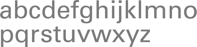
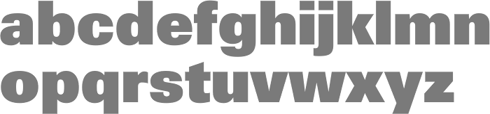
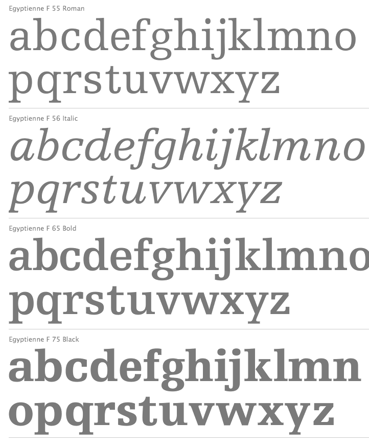
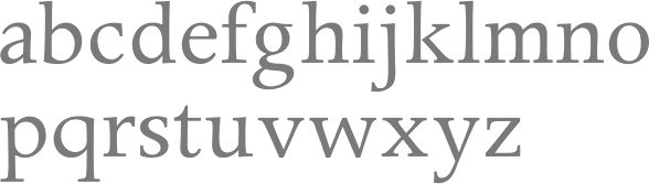
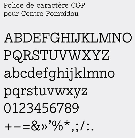
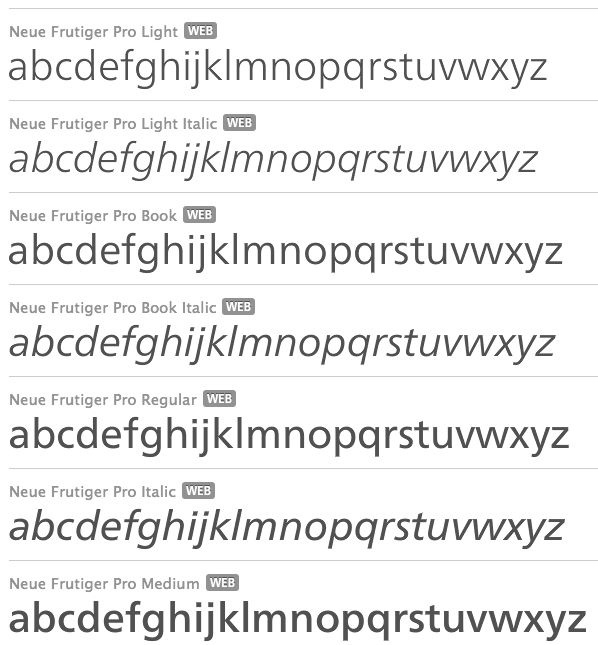
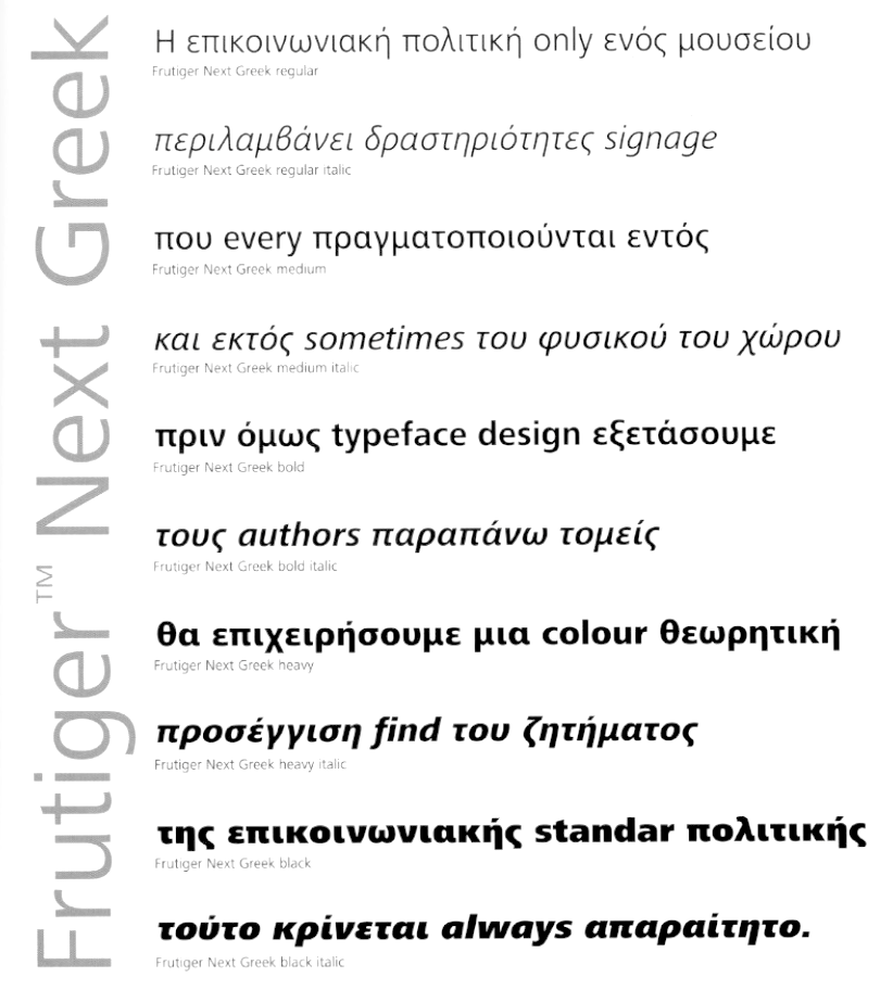
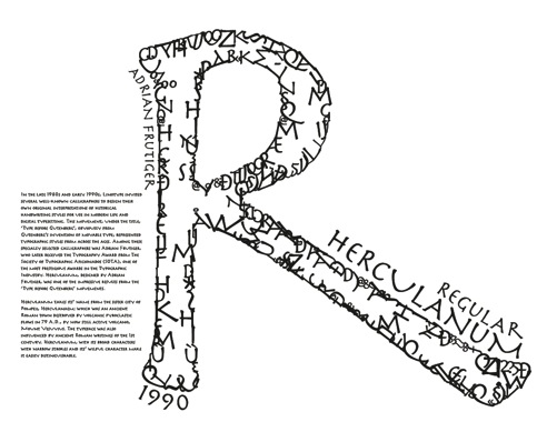
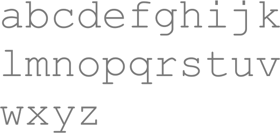
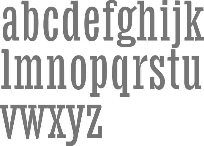
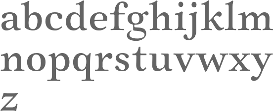
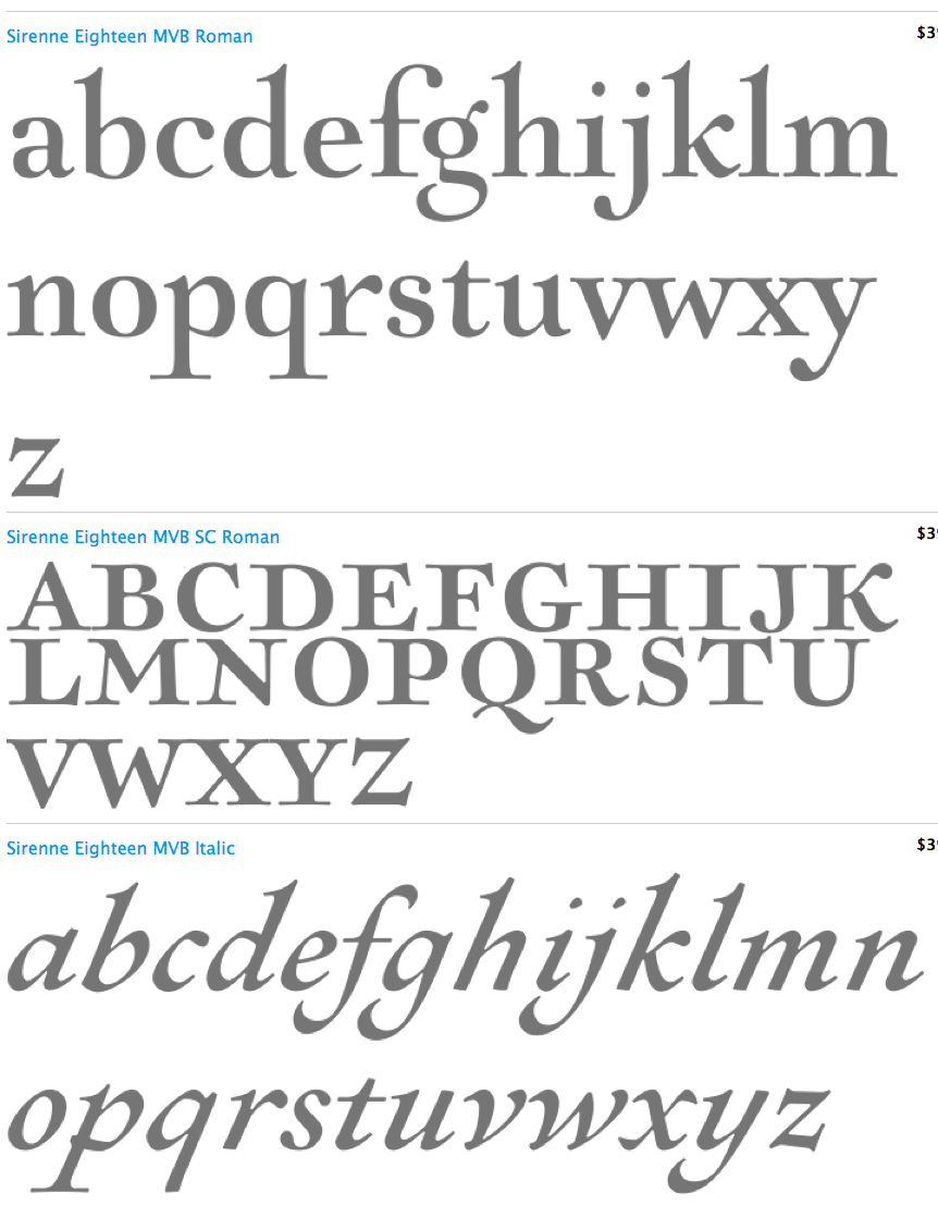
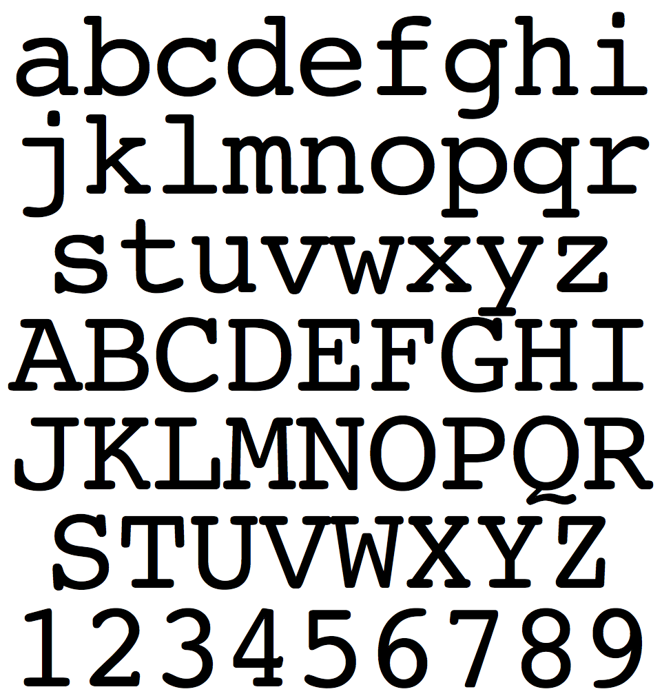
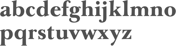
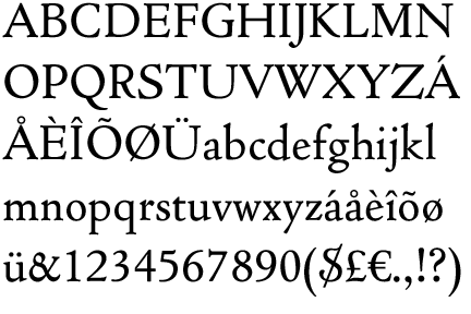
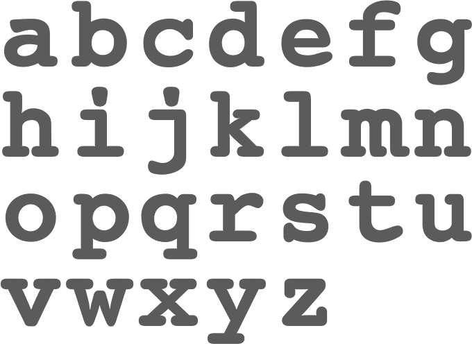
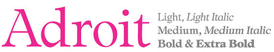
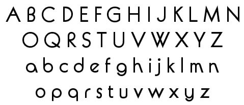
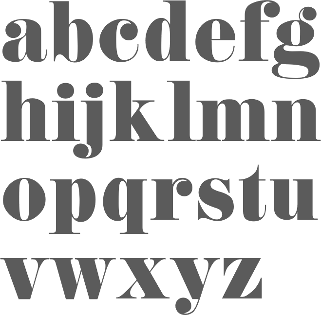
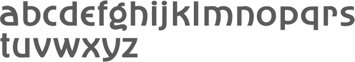
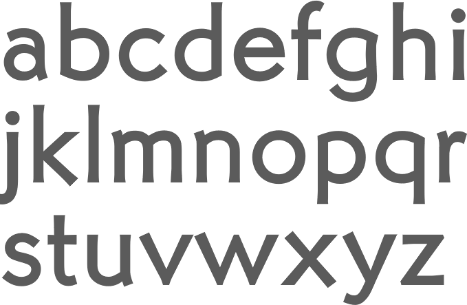
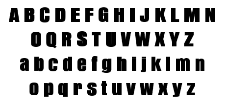
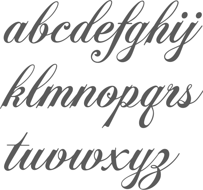
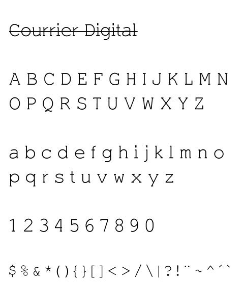
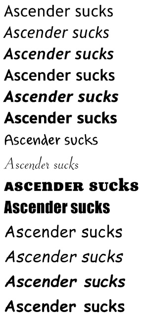
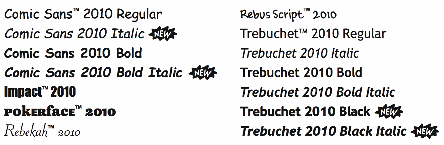
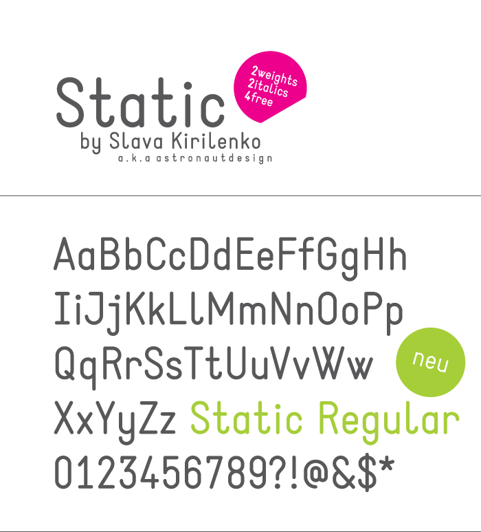
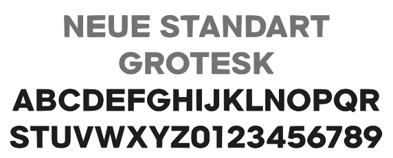
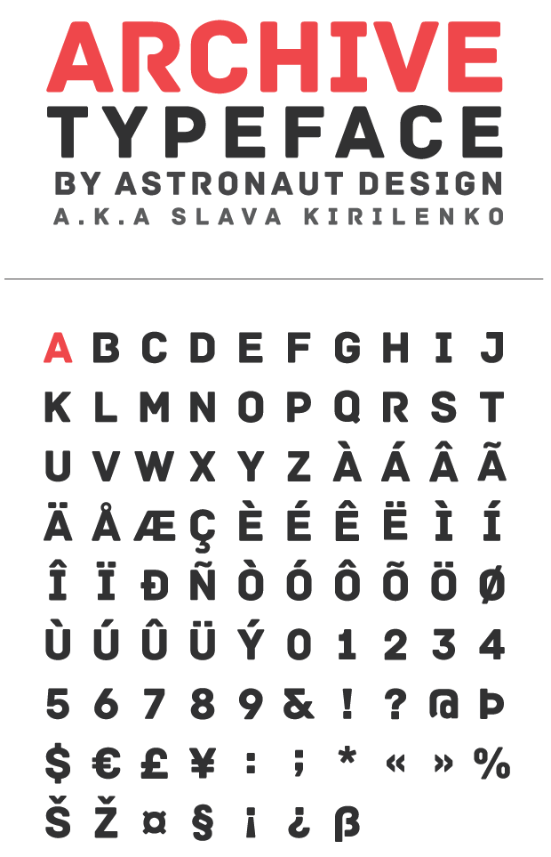
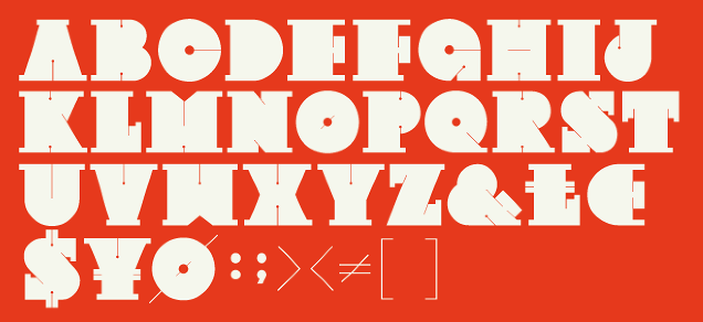
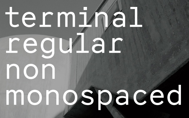
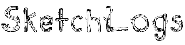
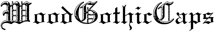
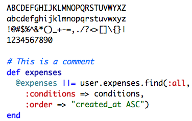
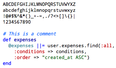
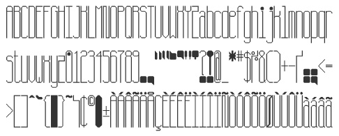
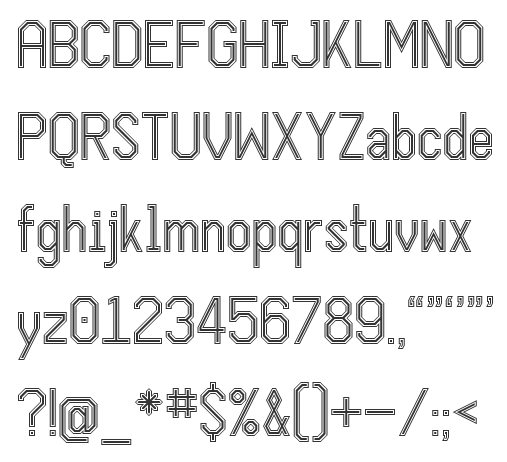
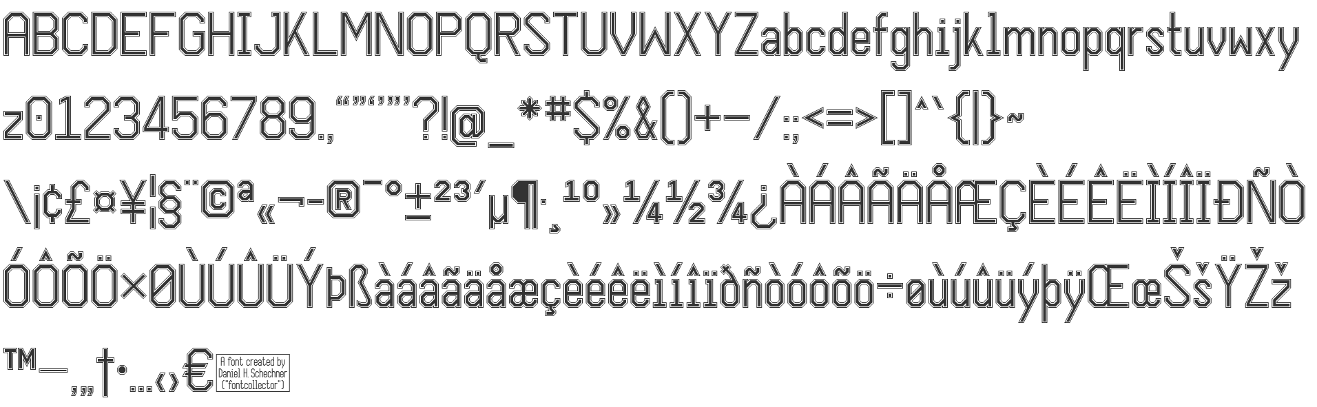
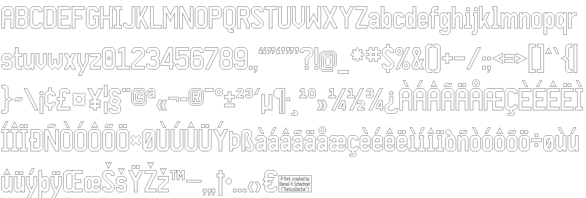
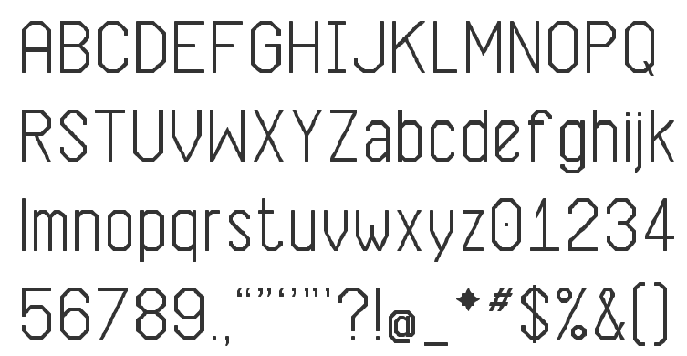
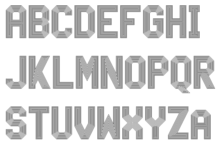
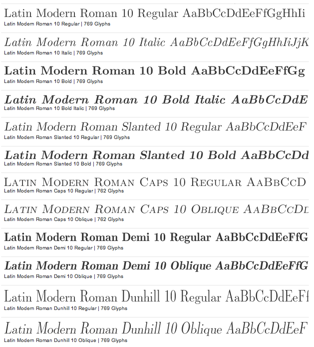
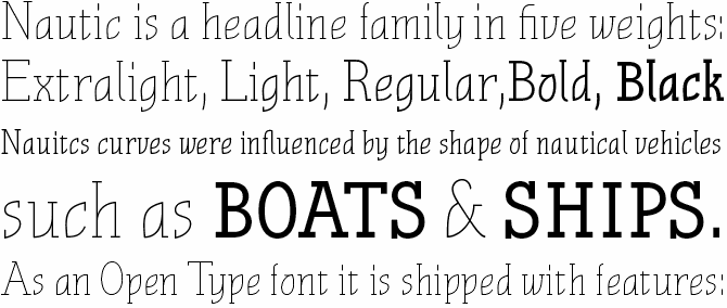
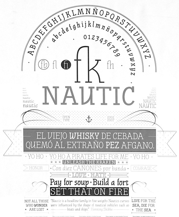
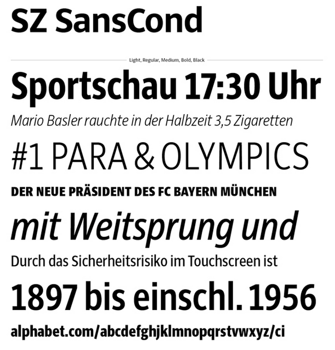
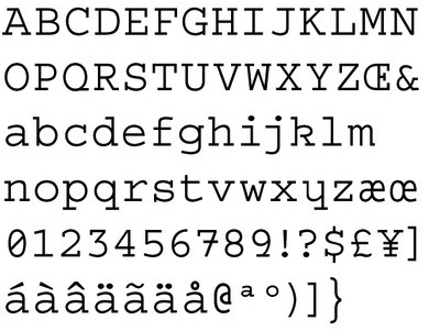
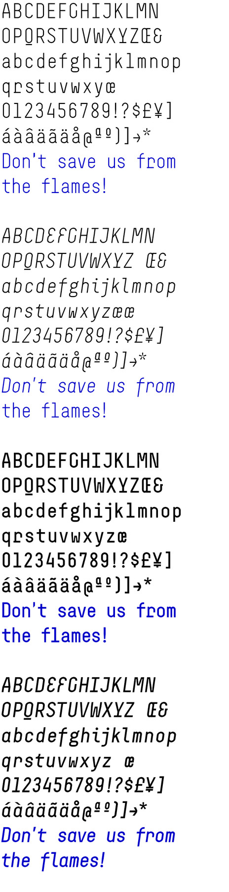
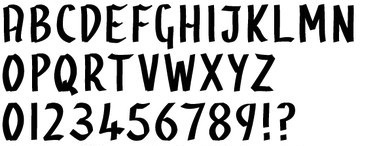
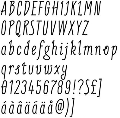
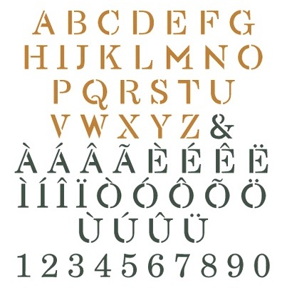
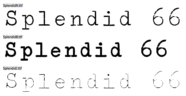
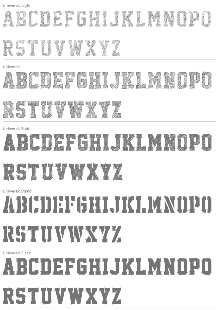
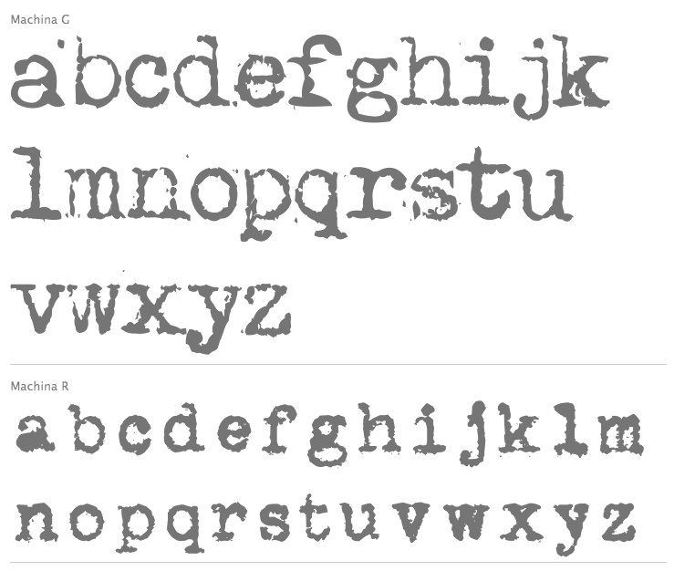
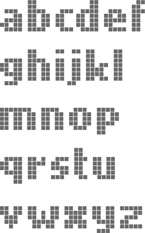
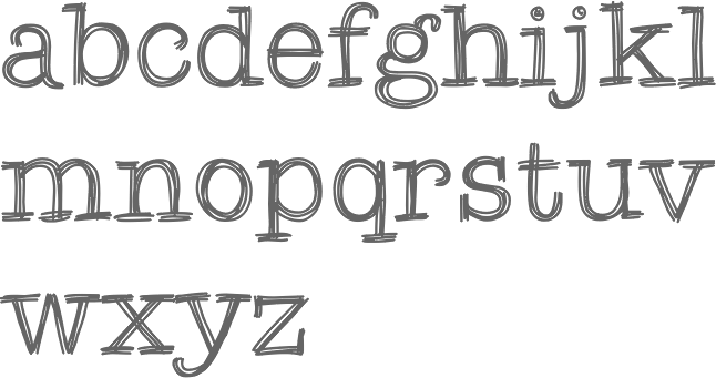
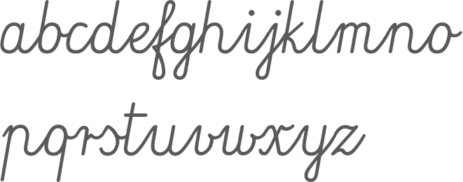
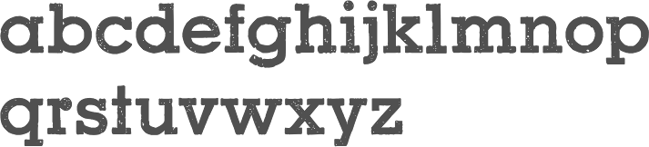
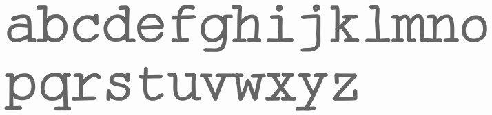
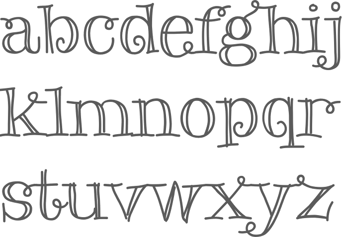
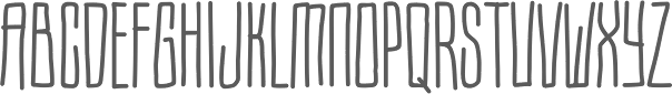
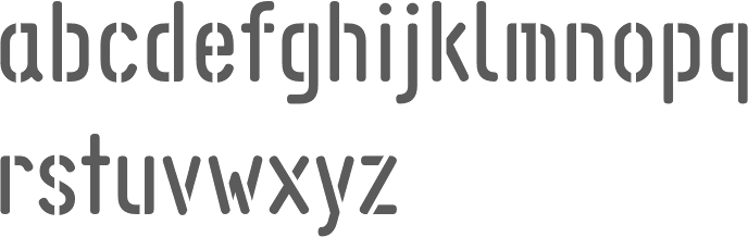
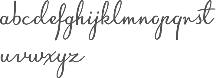
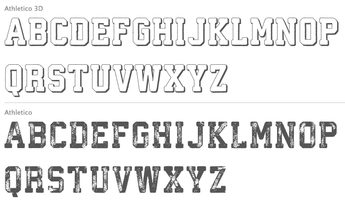
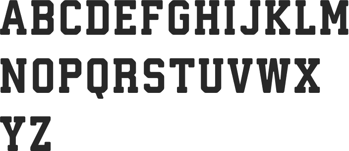
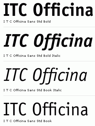
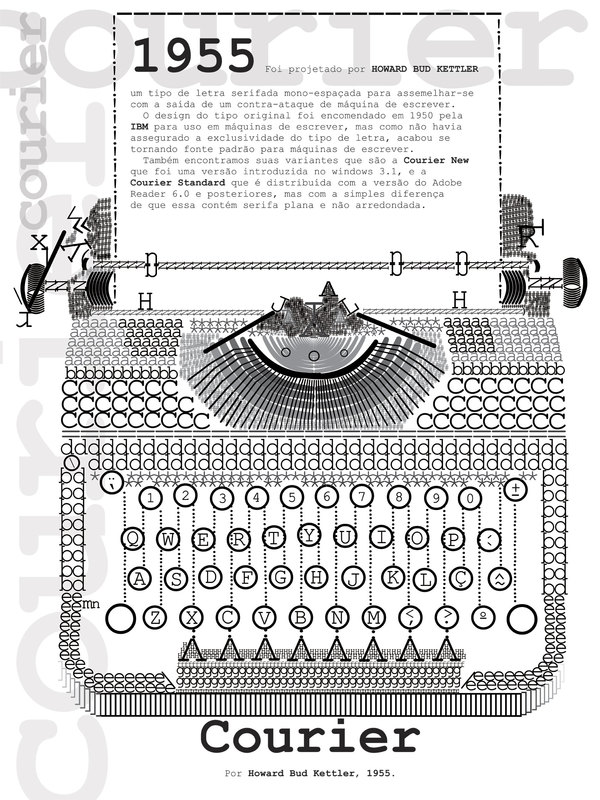
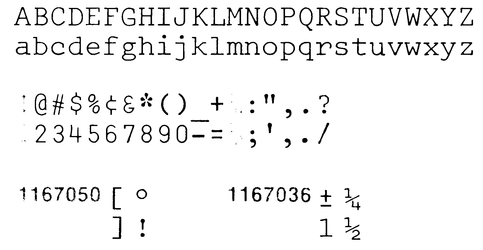
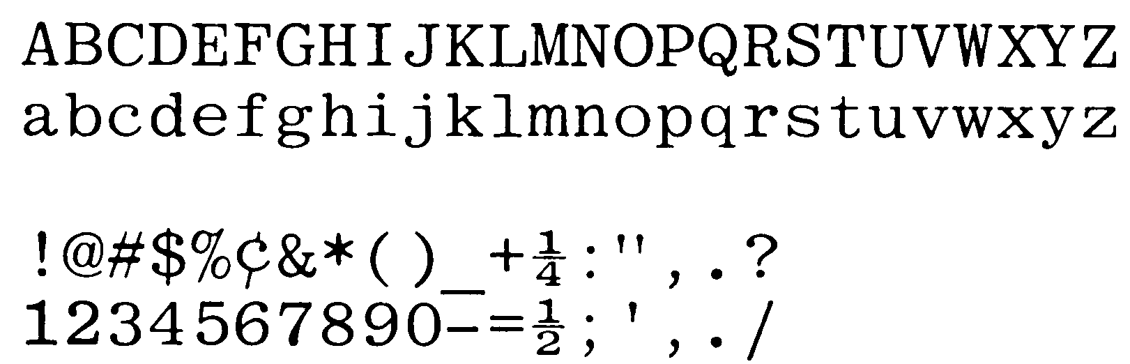
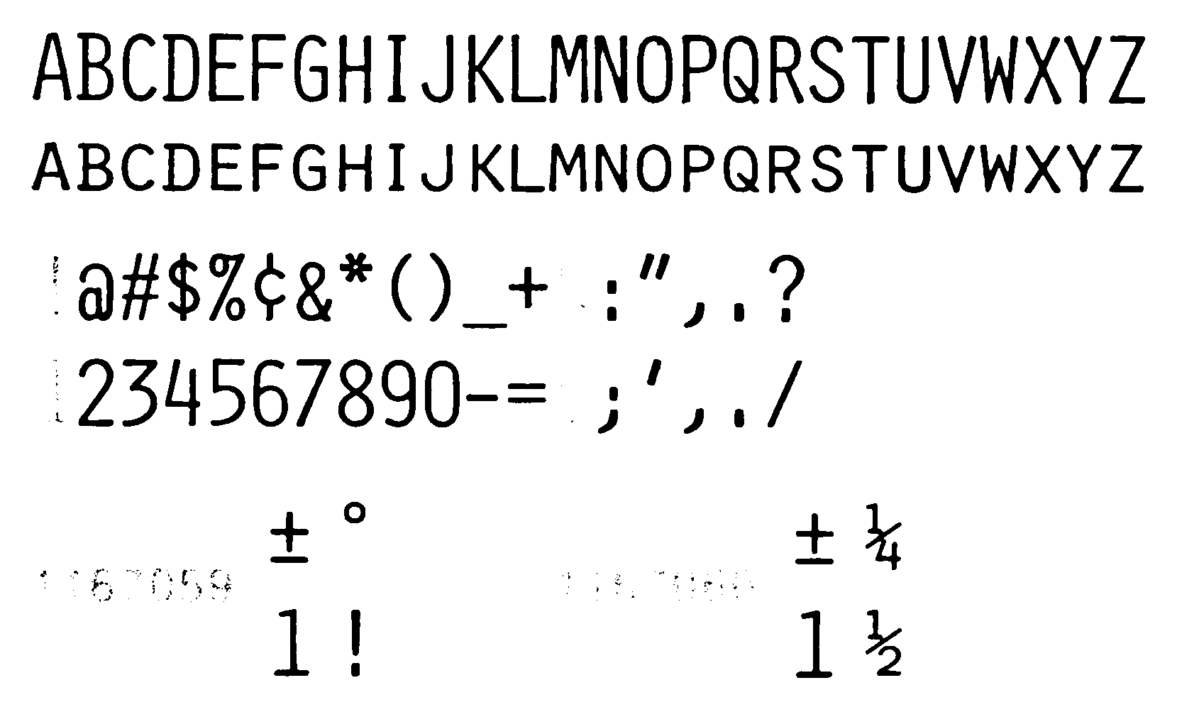
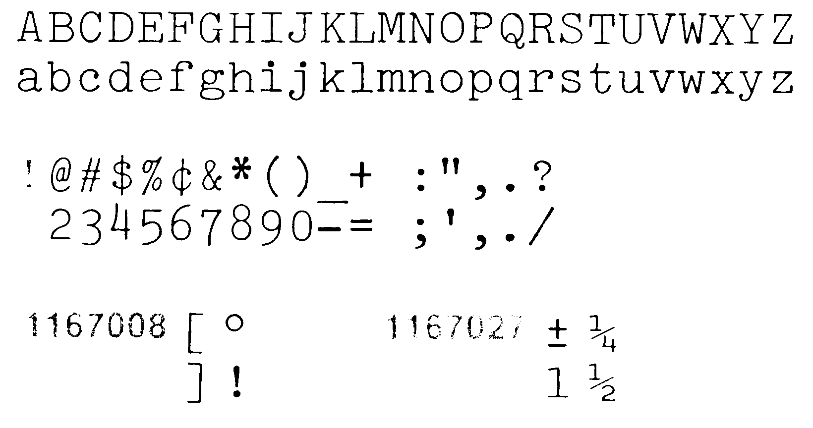
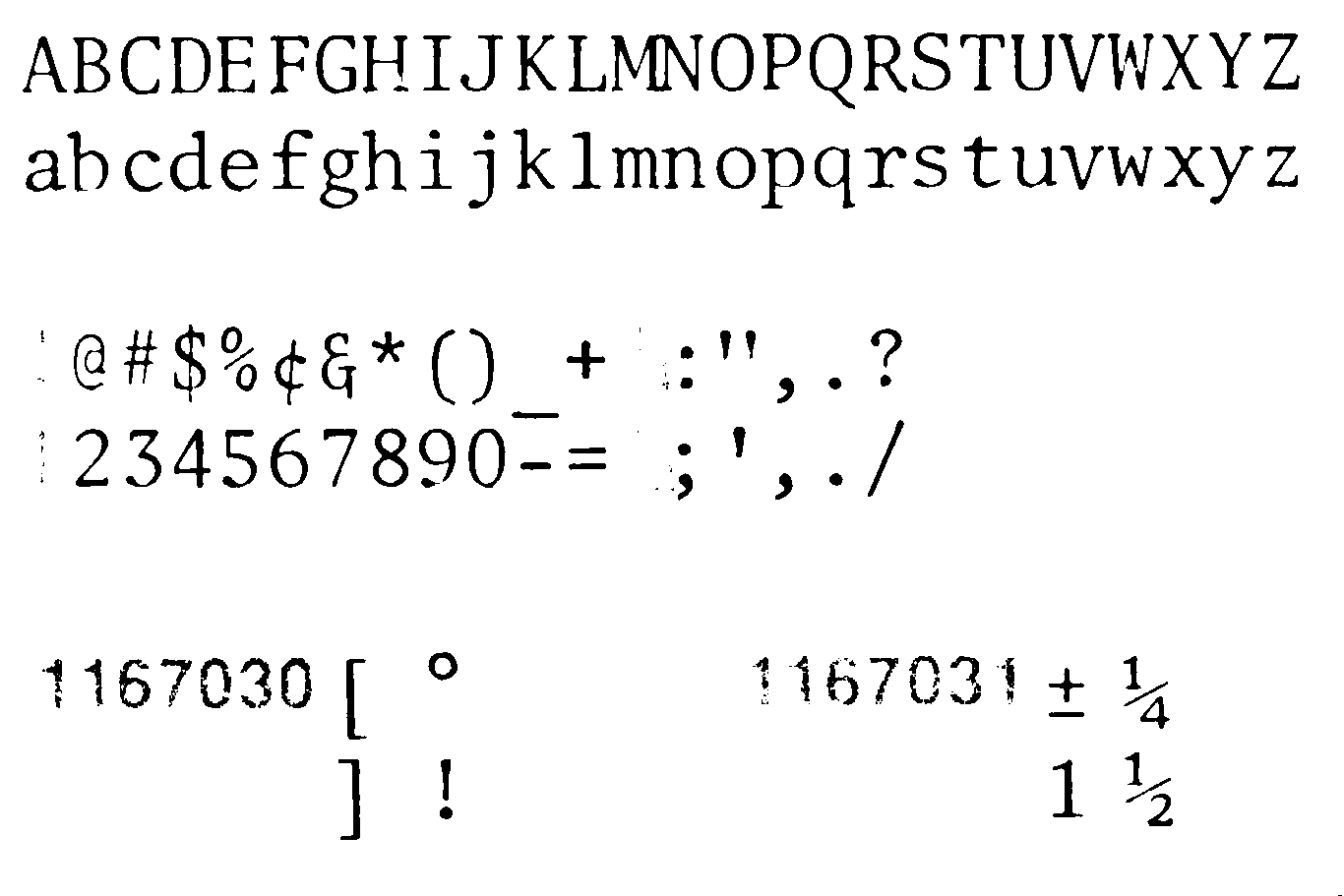
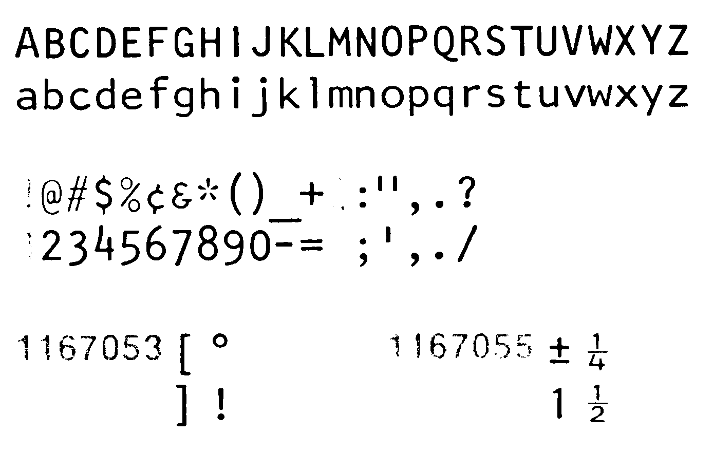
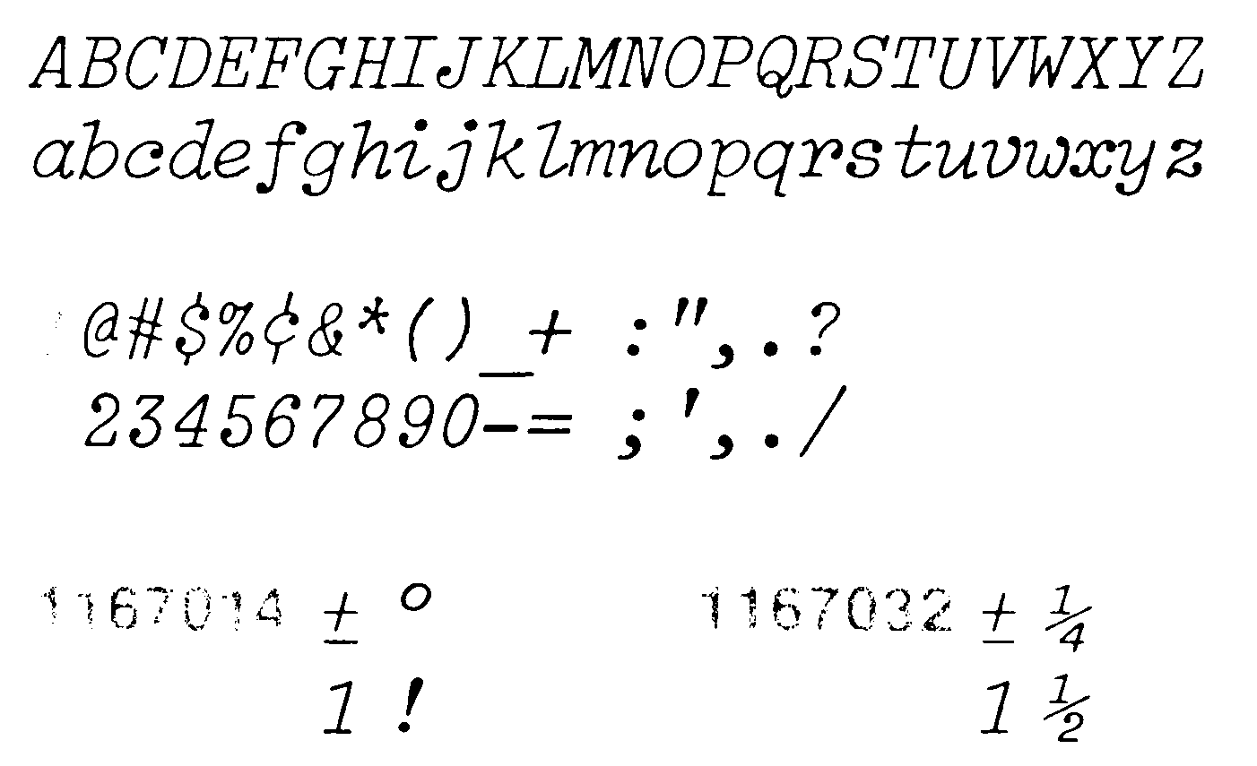
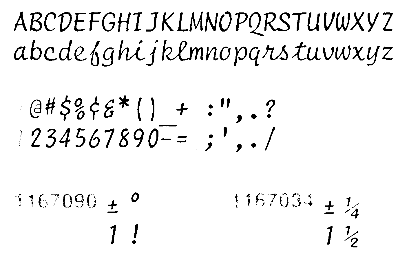
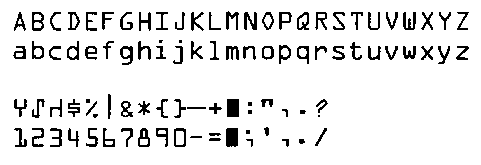
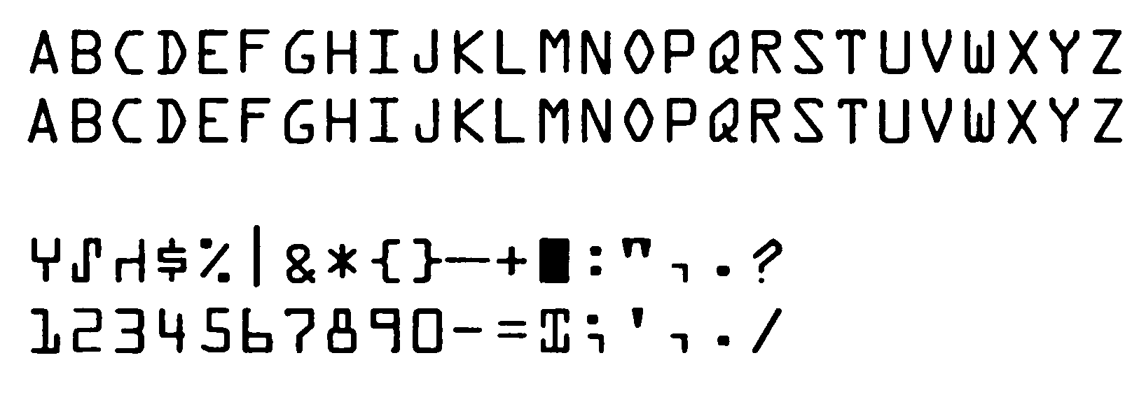
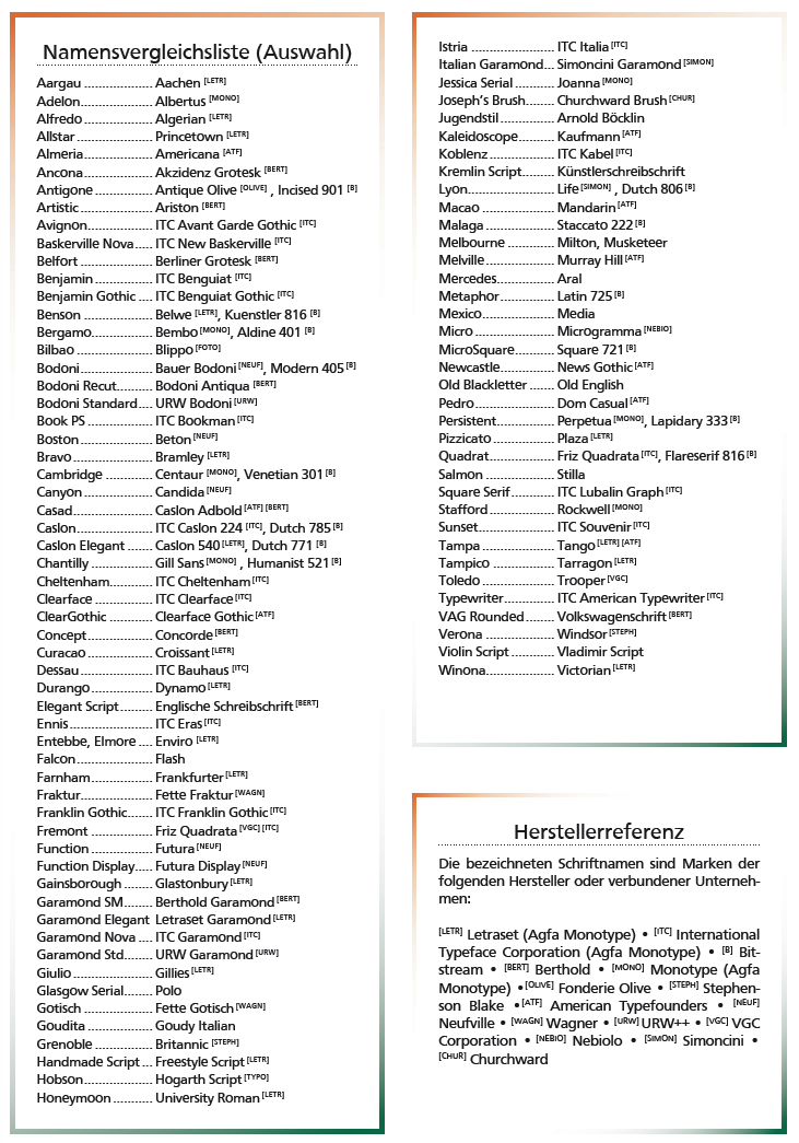
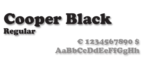
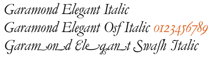
![German Garamond"> [based on TypoArt Garamond], Giulio,](Infinitype--GermanGaramond--basedonTypoartGaramond.png)
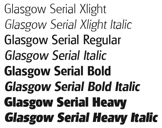
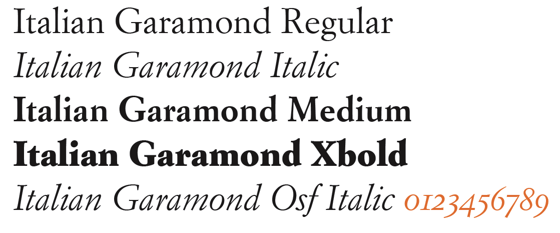
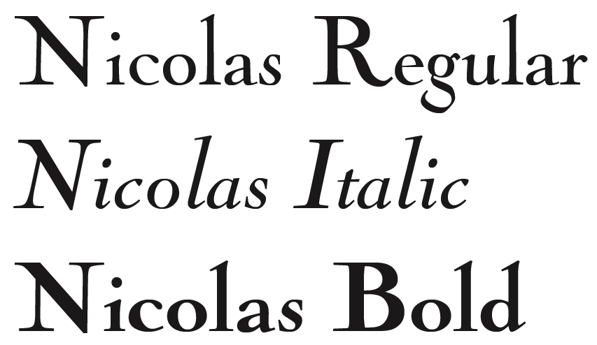
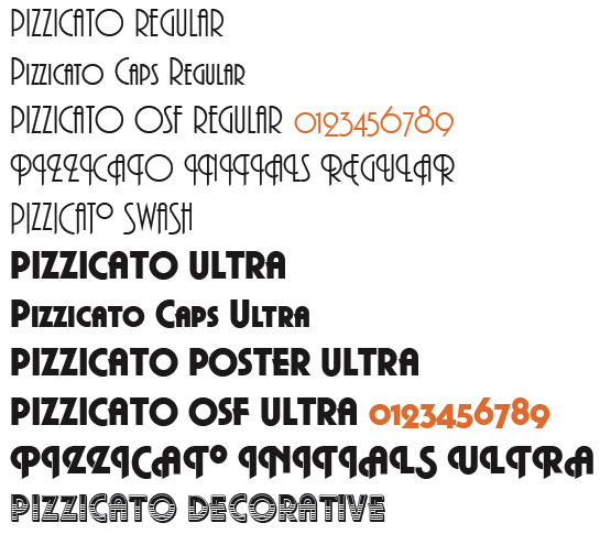
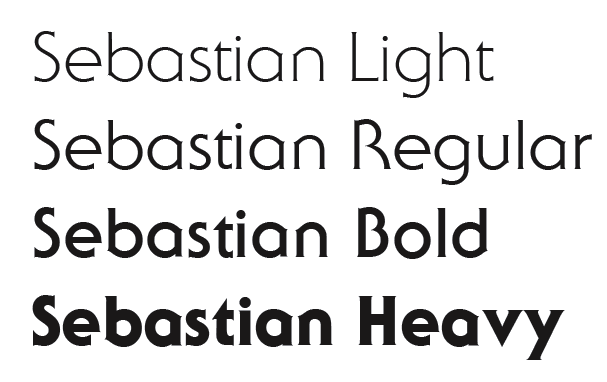
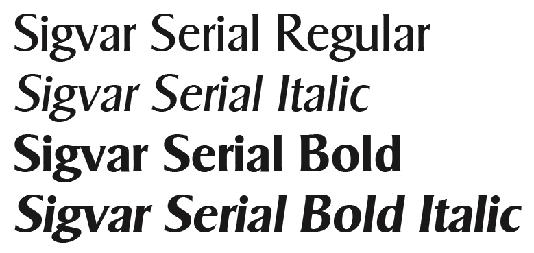
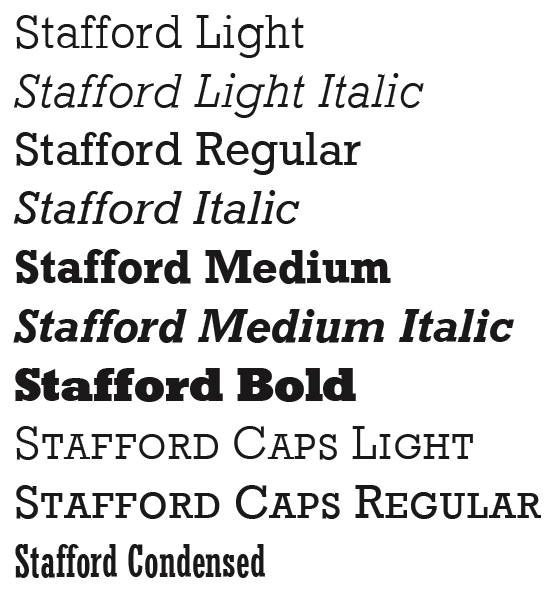
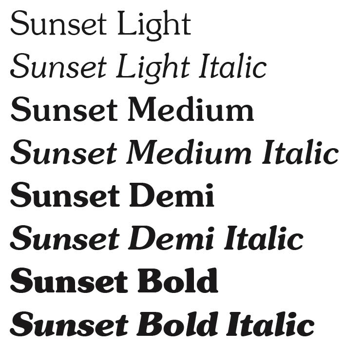
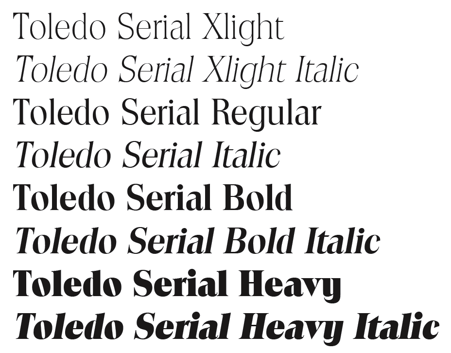
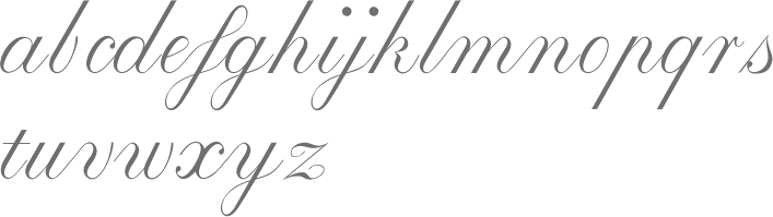
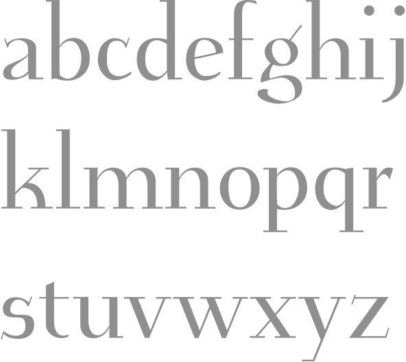
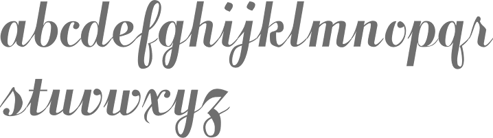
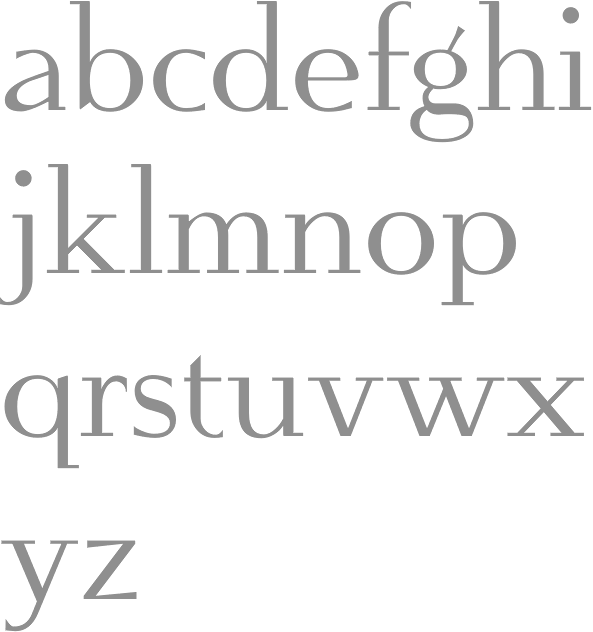
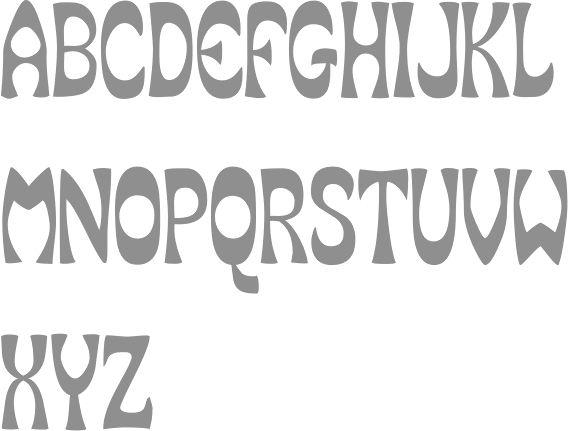
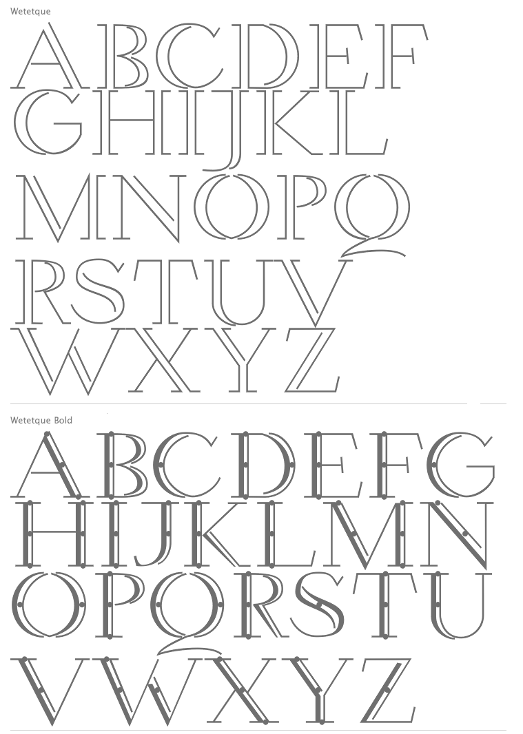
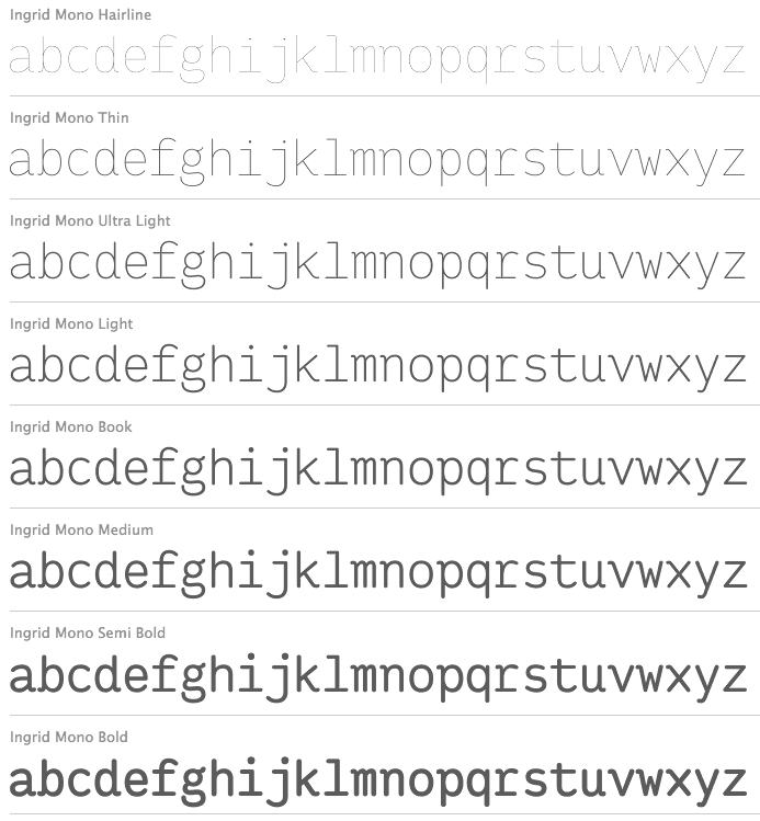
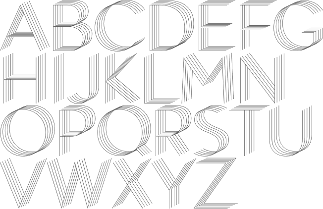
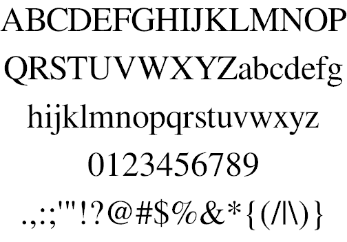
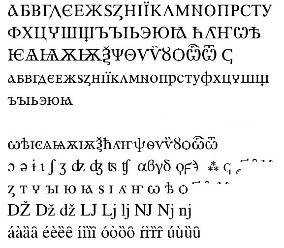
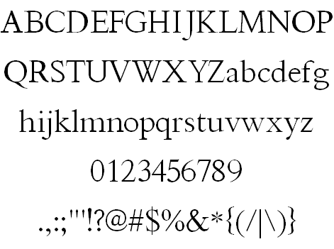
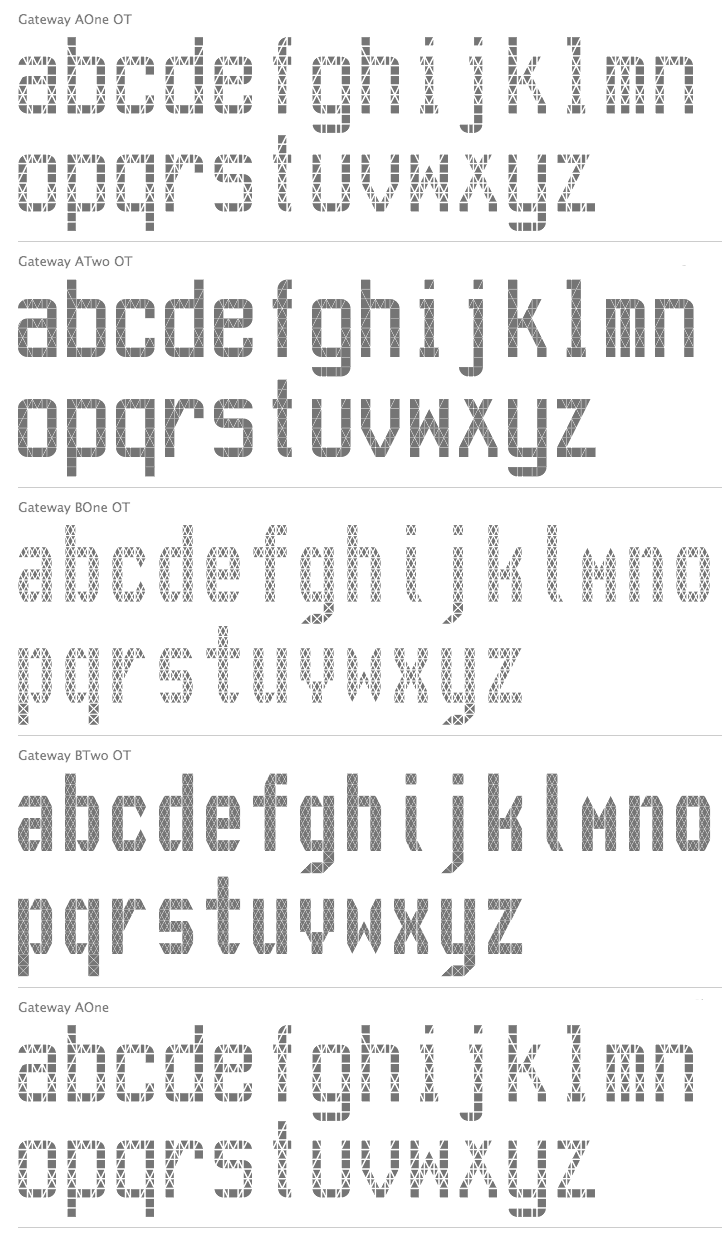
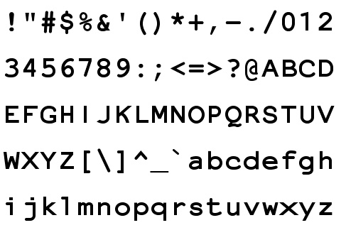
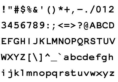
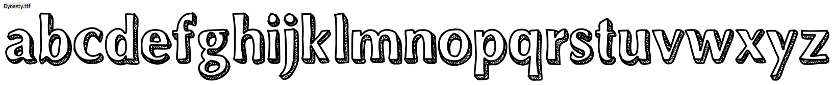
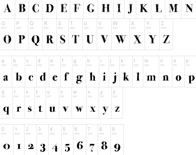
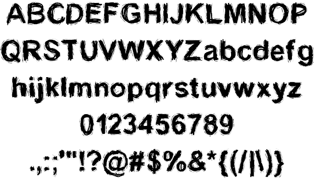
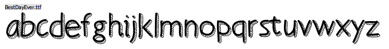
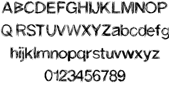
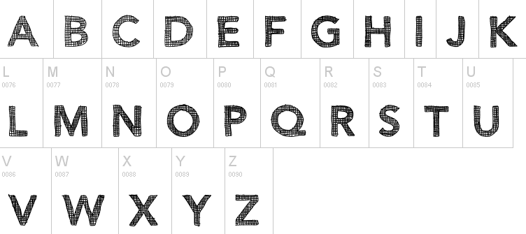
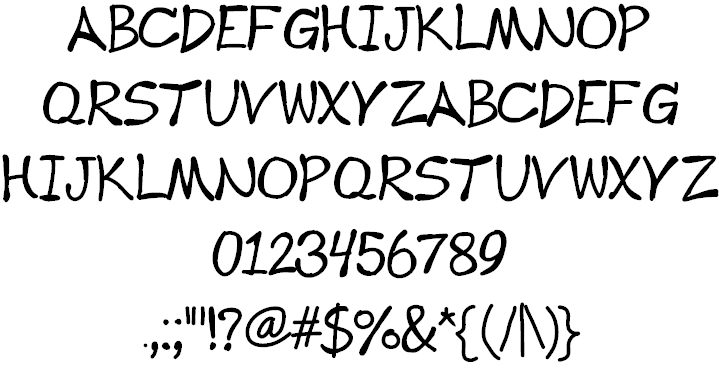
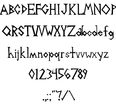
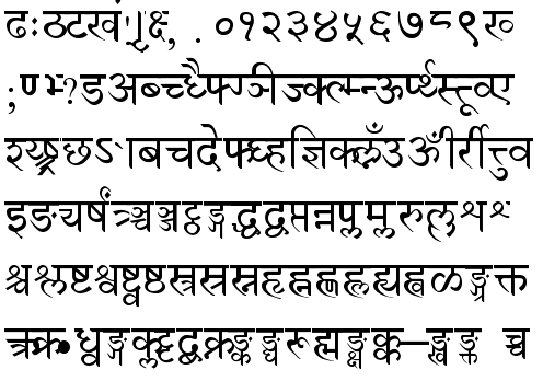
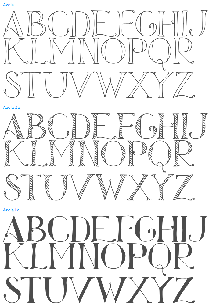
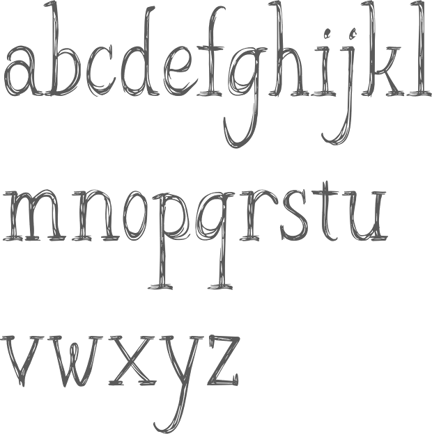
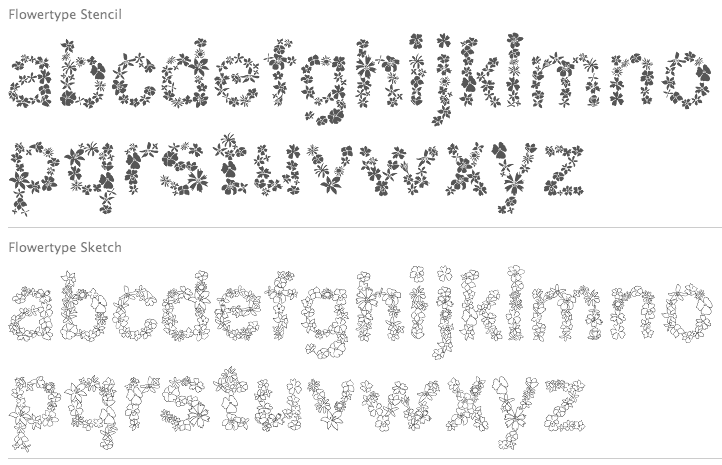
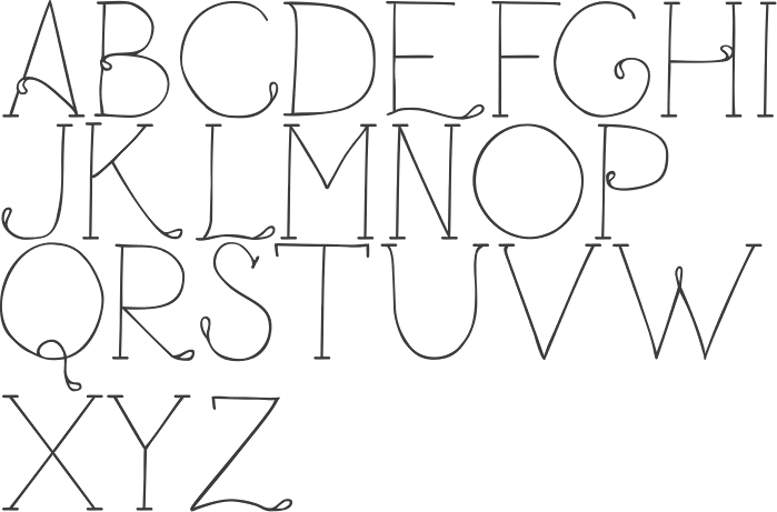
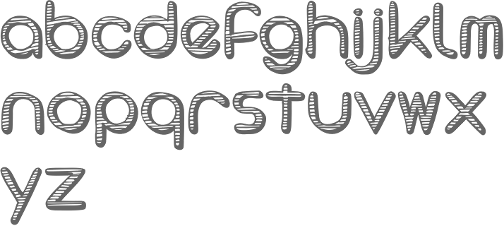
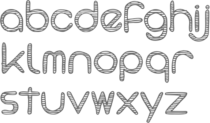
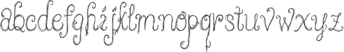
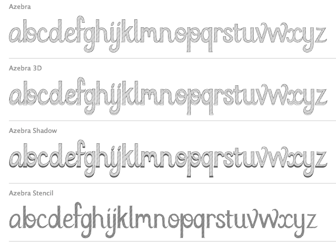
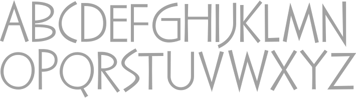
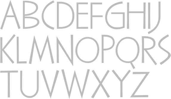
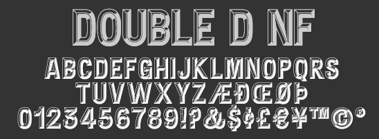
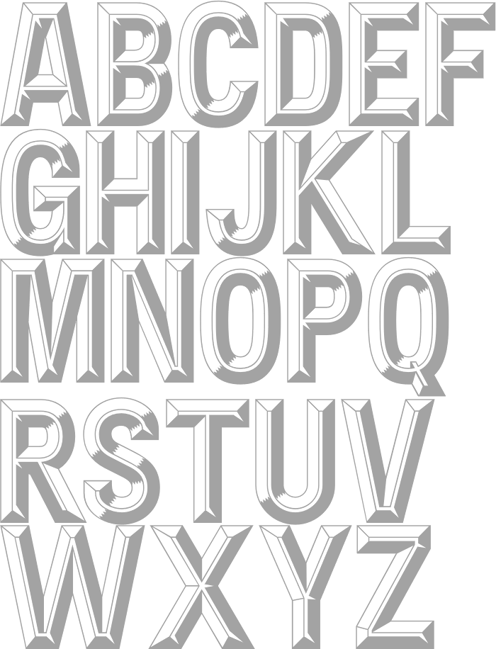
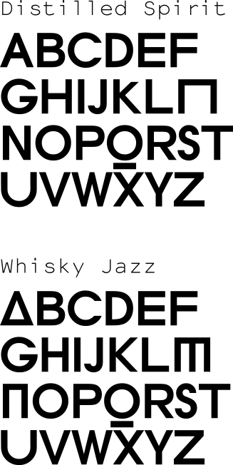
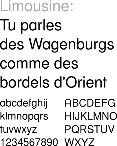
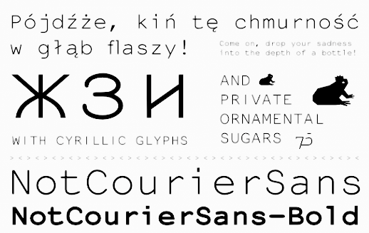
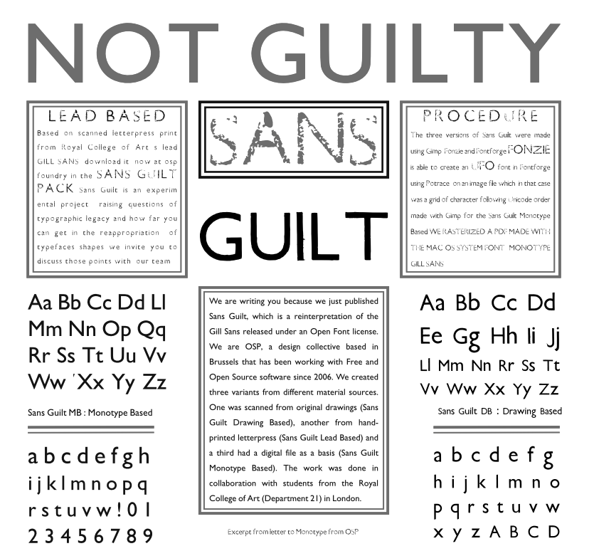
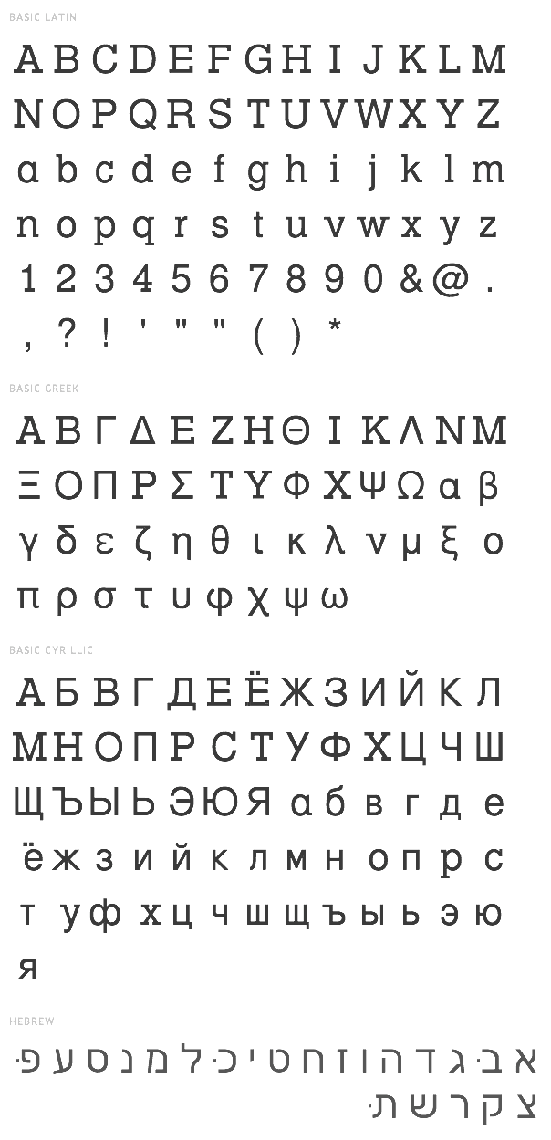
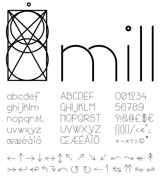
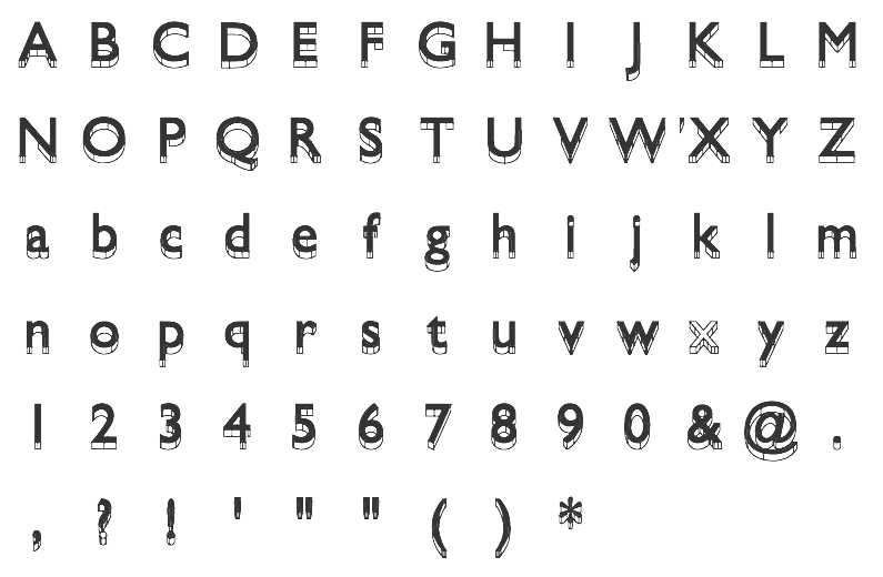
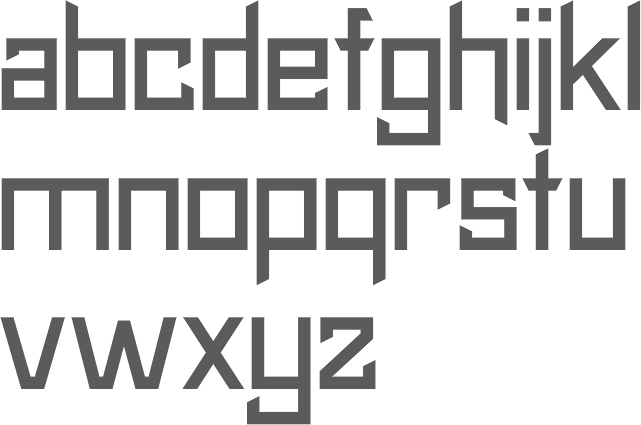
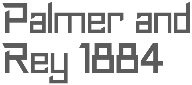
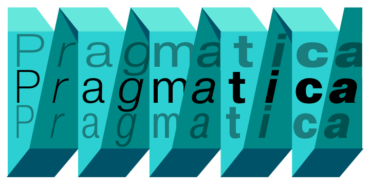
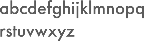
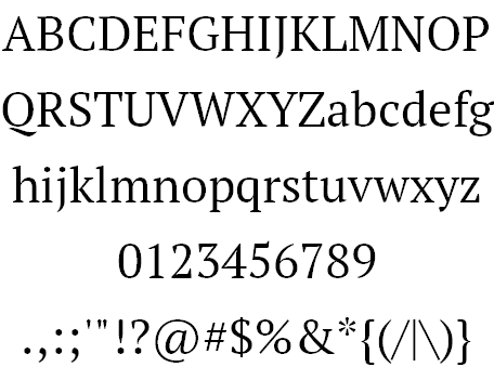
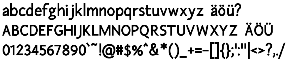
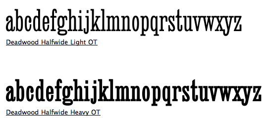
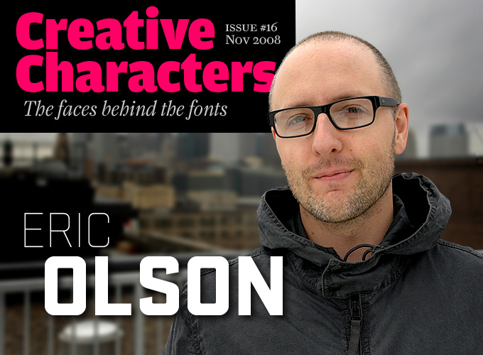
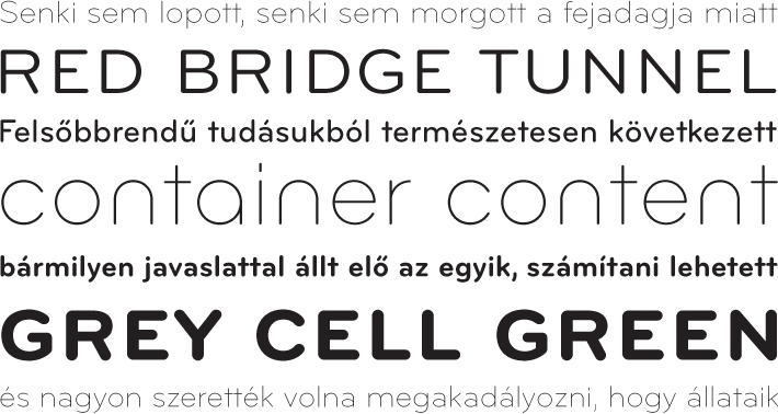
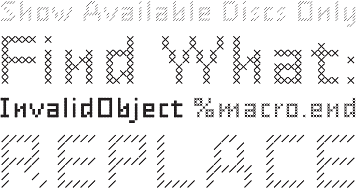
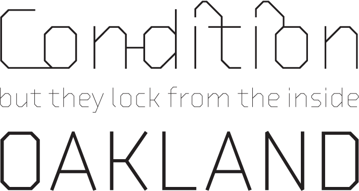
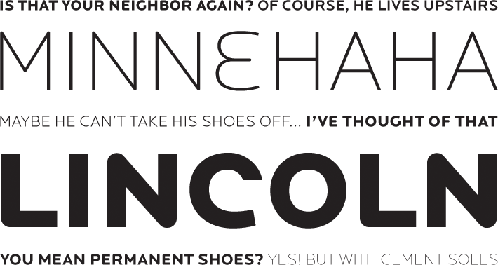
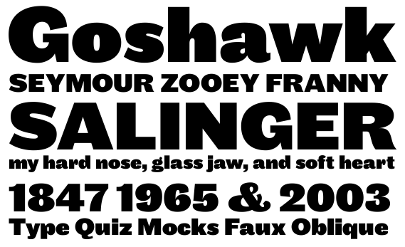
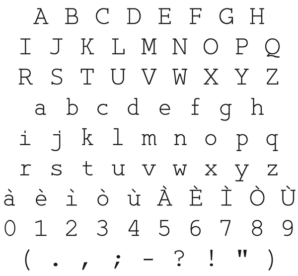
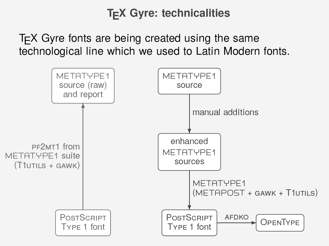
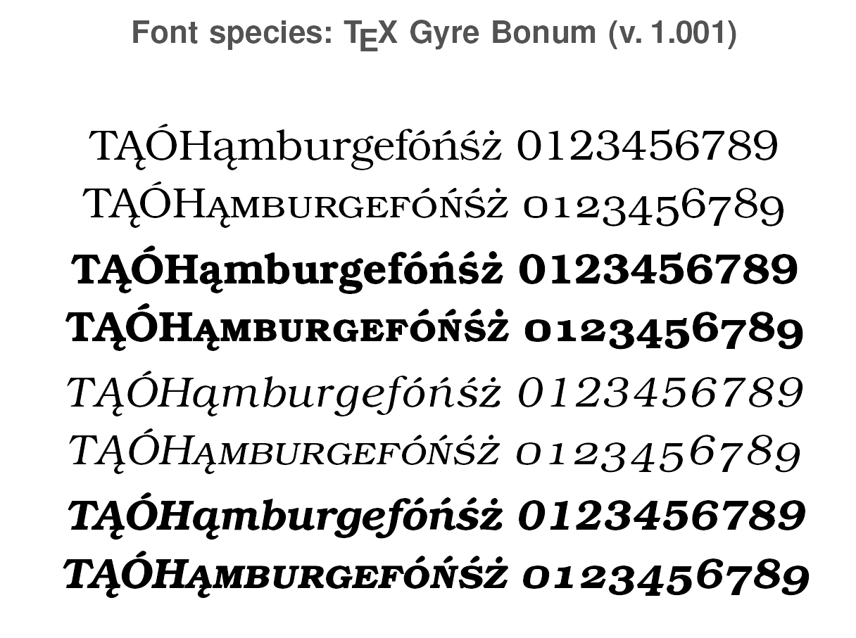
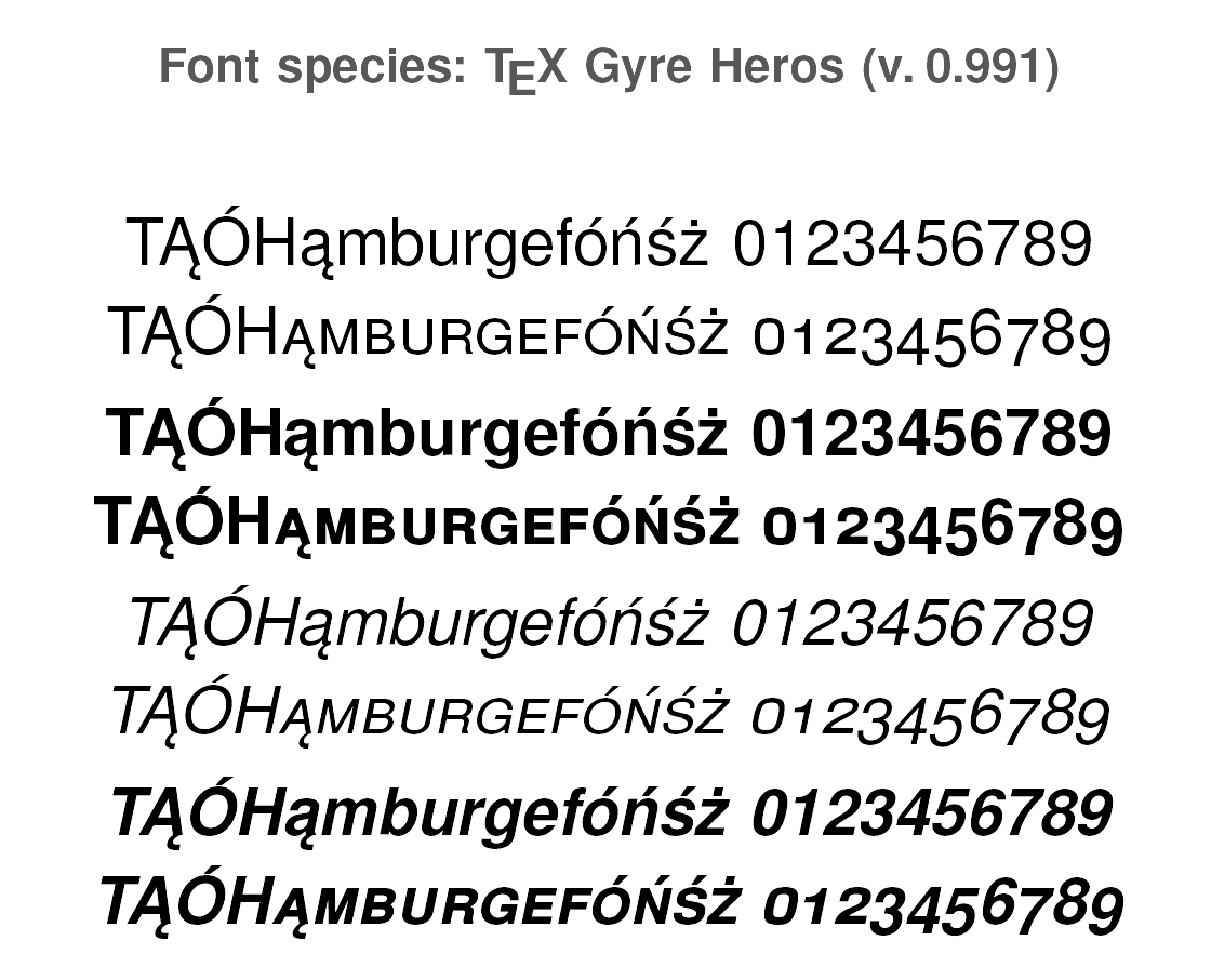
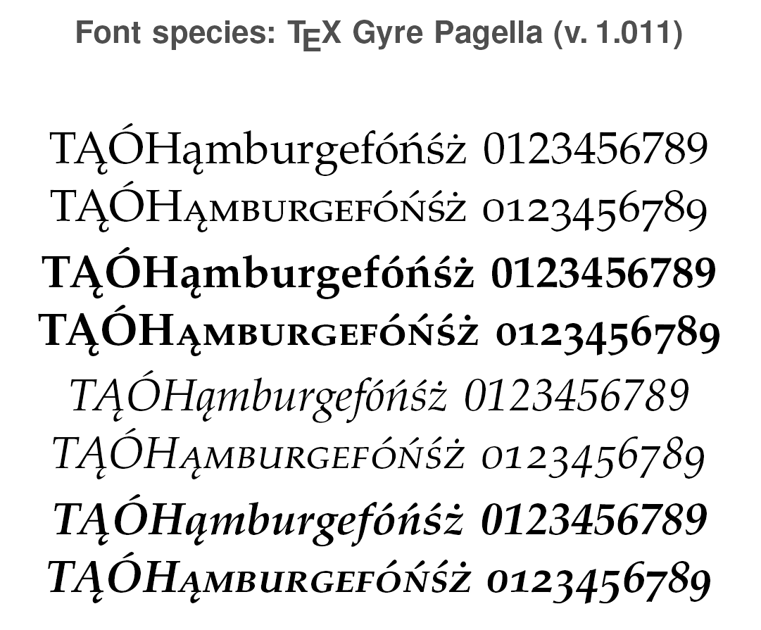
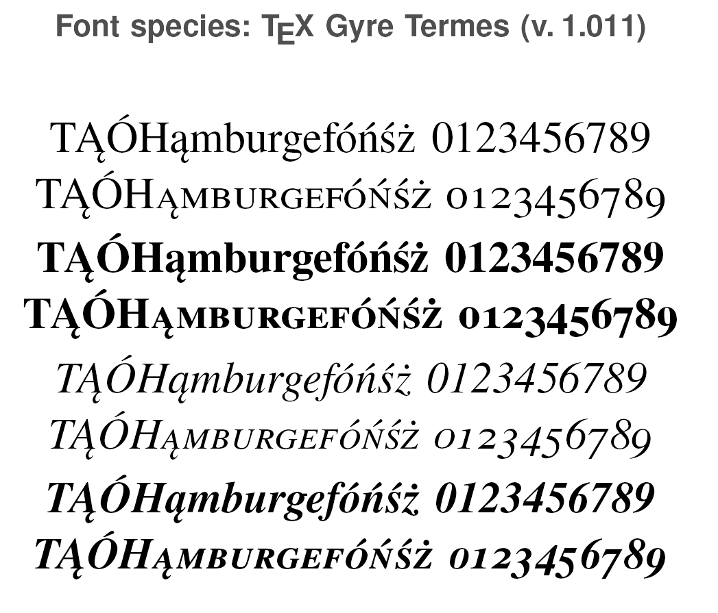
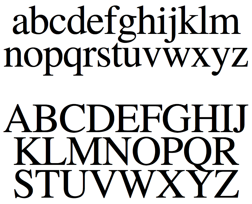
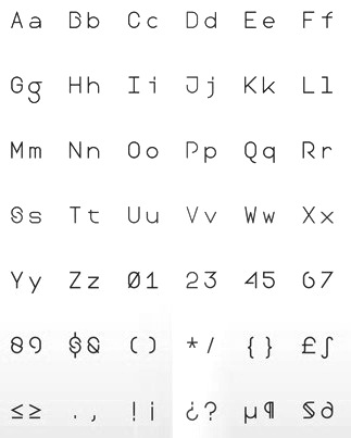
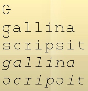
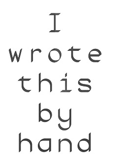
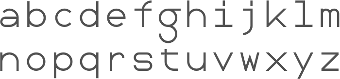
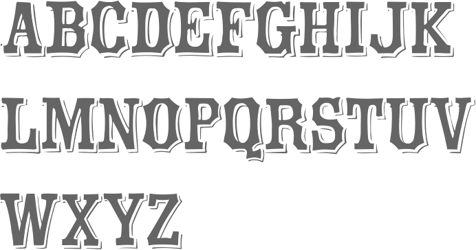
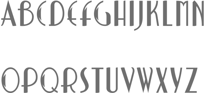
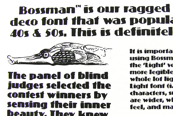
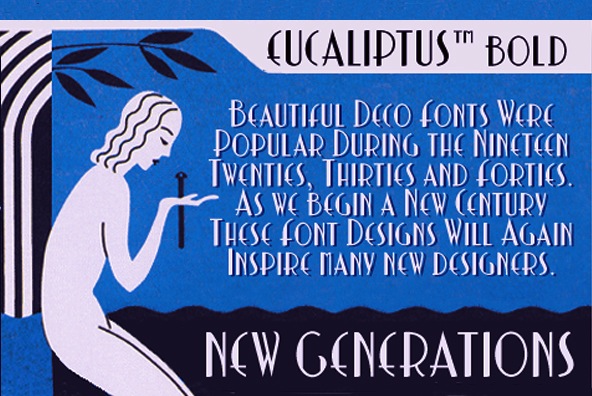
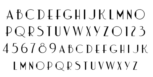
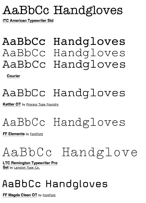
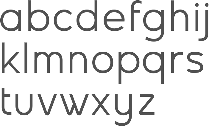
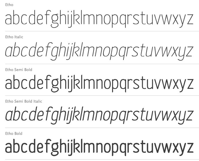
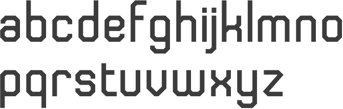
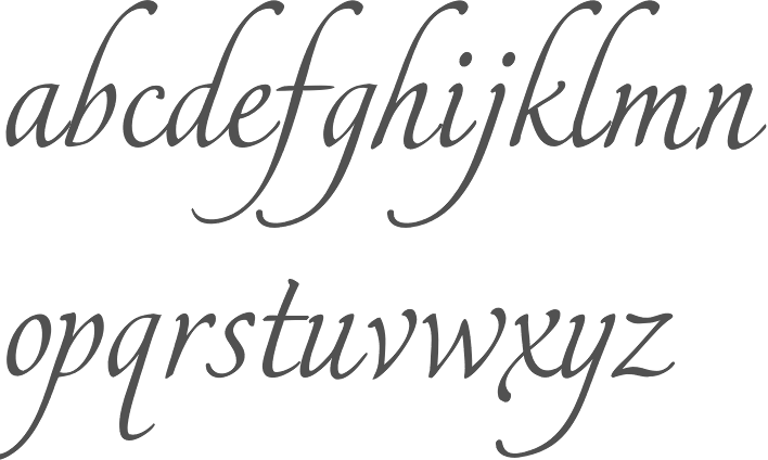
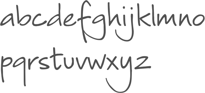
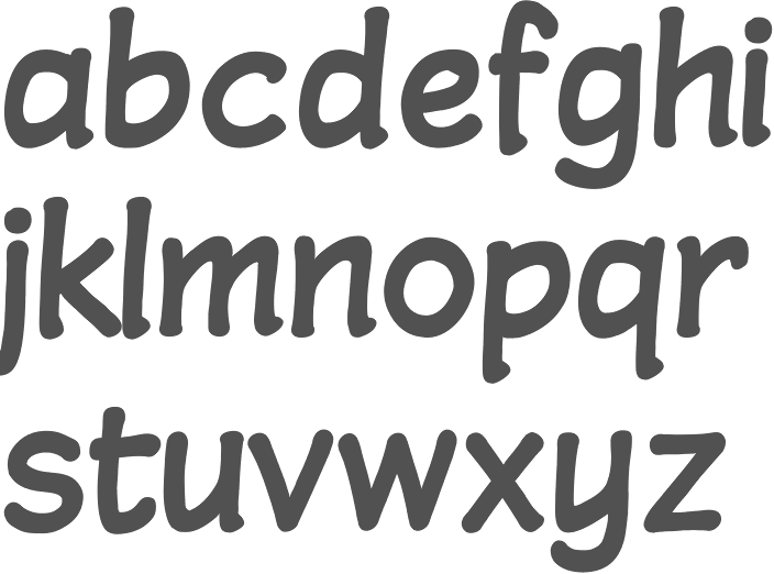
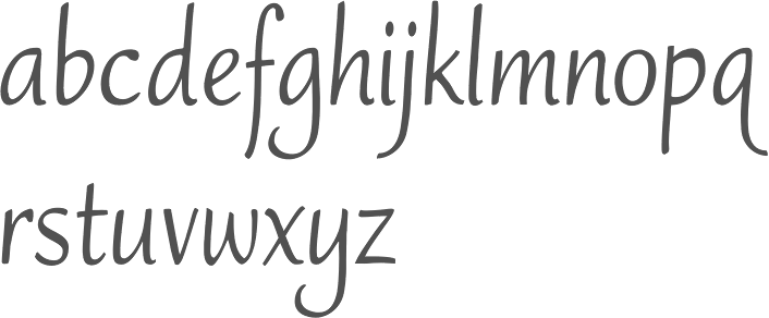