| | |
Achaz Reuss

|
 In house type designer at Elsner&Flake. He designed an elegant high-contrast art deco display typeface Miami EF in 1994, the broken black lettering typeface EF Splitter, the horizon lettering typeface EF Eastside in 1995, and Nivea in 2000 (for Beiersdorf).
 Designer of the Bank Gothic style gaspipe sans family FF QType (2004, FontFont) in Condensed, Compressed, Extended, SemiExtended and Square versions. In 2007, he created Bodoni Stencil (URW++). Other URW creations include Latin, Nimbus Roman Modern Compress, URW Compress and URW Oklahoma (art deco). In 2022, FontFont released FF DIN Stencil (by Albert-Jan Pool, Achaz Reuss and Antonia Cornelius) and its variable sidekick, FF DIN Stencil Variable. FontShop link. Klingspor link. Linotype link. Catalog of his typefaces. [Google]
[MyFonts]
[More] ⦿
|
Aidan Fox-Tierney
|
Designer of the MICR-style typeface Printable (2019), which was is intended for use with 3d printers. [Google]
[More] ⦿
|
Alexey Kustov
[Type Market]
|
[More] ⦿
|
Allen R. Walden
|
 Type designer. Not to be confused with "Walden Font", a commercial foundry run by Oliver Weiss. Dafont link. Full list of his work: African (1993, a jungle font), Amelia, Asimov, Beveled, CalculatorItalic, Checkbook (MICR-like font), CrystalItalic, FinalFrontier (1993), FinalFrontierOldStyle, FinalFrontierShipside, Goethe, Japan, Jurassic, Lansbury (1993), Neon Lights (1993, based on Quantum), NewYorker (after Rea Irvin's irvin Font for tThe NewYorker), OliviaBrush, StencilExport (1993: based on Gerhard Schwekendiek's Gesh Export, 1972), Terminator (techno).
 Lansbury is a free art nouveau typeface that mimics the font used in the TV series Murder She Wrote. The actual font used for the title of that series was URW's Art Gothic (specimen). Fletcher Gothic (1992, Casady&Greene) is another free version of it. [Google]
[More] ⦿
|
Andrew Young
[Disaster Fonts]
|
[More] ⦿
|
Architext Inc
|
Bar codes, MICR, signatures, logos. Located in San Antonio, TX. [Google]
[More] ⦿
|
Bank Software
|
Commercial MICR and barcode software. Part of ID Automation. [Google]
[More] ⦿
|
Bill Bogusky
[Bogusky2]
|
[MyFonts]
[More] ⦿
|
Bizfonts.com
|
Developer and distributor of business fonts and barcodes including MICR E13B, OCR-A and OCR-B, CMC-7, POSTNET, RM4SCC, Interleaved 2 of 5, Codabar, PLANET bar code (for the U.S. postal service), Code 128 and Code 39. Very expensive. All their free sample fonts are useless (most letters are missing). [Google]
[More] ⦿
|
Bob Newman
|
 British graphic and type designer, most famous for his Data Seventy (1970, Esselte/Letraset), a display typeface that emulates the shapes of the early computer types [see Data EF at Elsner and Flake, and for a free knock-off, Westminster]. A cyrillization of Data70 was done in 1976 by Victor Kharyk.
 Other designs by Newman include Penny Farthing (1974, Letraset), Odin (1972), Frankfurter (1970, Letraset, with Alan Meeks and Nick Belshaw), Linotype Horatio, the psychedelic typeface Turtle (1971, Letraset), and Pump (EF and Linotype versions). On Frankfurter: a lowercase was done by Alan Meeks in 1978. FrankfurterHighlight (by Nick Belshaw) followed in 1978. An inline was added in 1981. Among the revivals, we mention Rafael Nascimento's Choripan (2020), Yorlmar Campos's RNS Baruta Black (2004), Scangraphic's Frankfurter, Linotype's Frankfurter, Infinitype's Farnham, SoftMaker's F821 Deco, and Castcraft's OPTI Frankfurter. See also the film type Frankfurter by Robert Trogman at Fotostar. Turtle saw a contemporary interpretations in 2011 by Nick Curtis as Turtellini NF, and in 2025 by Raphaël de la Morinerie and Ethan Nakache at Written Shape Type Foundry, called Reptil. Zach Whalen analyzes Data Seventy in his 2008 thesis and states that Data Seventy is the first full alphabet based on the MICR font E-13B, since it includes both upper and lower case letters. [Google]
[MyFonts]
[More] ⦿
|
Bogusky2
[Bill Bogusky]
|
Bill Bogusky runs the design studio Bogusky 2 in Miami, together with his brother. He created Gonzo Bruno, Gonzo Monza and Gonzo Grosso (2007), Sundial (2006, Trajan lettering), Condo (2006, condensed), Ar Deco 1, 2, 3 and Deep (2006), Technia 1 and 2 (2006, athletic lettering or MICR applications), Sport (2006, dingbats), Macarena (2005: art deco), Zanzibar (2006: decorative), 42nd Street (2005: Broadway style lettering), Boffo (2005), Bronco Rose (2005, Wild West style), Decora (2005), Switchback (2005, a computerish face), Capzule (2005, a condensed black face), Tulip (2005, a decorated stencil face), Kondor (2005), Mah Jongg (2005, with many ornaments), Metro (2005, LCD face), Squircle (2005), Zeke (2005, artsy display font), Baby Blox (2005), Kurly (2005), Pipeline (2005), Dealer's Choice (2005), Stencille (2005), Terra, GogoBig and GogoSquat (were free at FontFreak site), Nouville (2006, art deco sans), Back Fence (2005, comic book face), Gogo Latin (2005, condensed), Zandakas (2006), Ameche Pisa (2005), Gogo Serif (2005), Bolo (2005), Hyline (2005), Compado (2005), Ameche Padua (2005), Tera (2005), Xtera (2005), Tudor New (2005), Boffo (2005), Byline (2005), Quazar (2005), Grafo Graffiti (2005), Acid Bath (2005), Benz (2005), Hulk (2005). These fonts are now commercial and can be obtained at MyFonts.com. A graduate of the School of Industrial Arts in New York City, he worked as an industrial designer in New York before moving to Miami, FL, where he opened Studio Bogusky 2. Dixie Bogusky designed Esquimaux Graphics (2006). [Google]
[MyFonts]
[More] ⦿
|
Brandon Schoepf
[Tepid Monkey Fonts]
|
[More] ⦿
|
Brenden C. Roemich
[Digital Graphic Labs]
|
[More] ⦿
|
Checkmaster
|
This company develops high quality MICR fonts for cheques and banks. [Google]
[More] ⦿
|
CMC-7 MICR (Magnetic Ink Character Recognition)
|
Commercial fonts: "The MICR CMC-7 font is a special font that is used in Mexico, France, Spain and most Spanish speaking countries to print characters for magnetic recognition and optical character recognition systems." There is also a page on MICR E13B. [Google]
[More] ⦿
|
Corey Peace
|
Designer of Peggy Hill (2008, FontStruct), a rounded fat piano key face, Acts (2008, MICR face), L337 (2008, Cyrillic simulation face). [Google]
[More] ⦿
|
Cox, Smith&Associates
|
Designers of these MICR fonts in 2007: CS-MICR-E13B, CS-MICR-E13B-B1, CS-MICR-E13B-B1N1, CS-MICR-E13B-B1N2, CS-MICR-E13B-B1W1, CS-MICR-E13B-B1W2, CS-MICR-E13B-B2, CS-MICR-E13B-B2N1, CS-MICR-E13B-B2N2, CS-MICR-E13B-B2W1, CS-MICR-E13B-B2W2, CS-MICR-E13B-L1, CS-MICR-E13B-L1N1, CS-MICR-E13B-L1N2, CS-MICR-E13B-L1W1, CS-MICR-E13B-L1W2, CS-MICR-E13B-L2, CS-MICR-E13B-L2N1, CS-MICR-E13B-L2N2, CS-MICR-E13B-L2W1, CS-MICR-E13B-L2W2, CS-MICR-E13B-N1, CS-MICR-E13B-N2, CS-MICR-E13B-W1, CS-MICR-E13B-W2. Download them here. [Google]
[More] ⦿
|
Cubic Type
[David Jones]
|
 Sheffield, UK-based designer of the MICR font Atwin (2021). In 2022, he released the all caps futuristic typeface Avimode. [Google]
[MyFonts]
[More] ⦿
Sheffield, UK-based designer of the MICR font Atwin (2021). In 2022, he released the all caps futuristic typeface Avimode. [Google]
[MyFonts]
[More] ⦿
|
David Bergsland
[Hackberry Font Foundry (Was: NuevoDeco Typography, or: Bergsland Design)]
|
 [MyFonts]
[More] ⦿
[MyFonts]
[More] ⦿
|
David Jones
[Cubic Type]
|
[MyFonts]
[More] ⦿
|
David Moore
[Typehouse]
|
[More] ⦿
|
Digital Graphic Labs
[Brenden C. Roemich]
|
Brenden C. Roemich's Winnipeg-based foundry. They sold fonts at 10 to 20 USD a shot, but made them free starting in 2003, when they quit the font foundry business. The entire collection, mostly dated 1998: ALSScript (knock-off of Shelley Script Andante by Matthew Carter), Aberration, AngleterreBook, Aramis, AramisItalic, ChanceryCursive, Dichotomy, Eddie, EnterSansmanBold (heavy serious sans), EnterSansmanBoldItalic, FLWScript, Fanzine (ransom note face), GlassHouses, Gunmetal, ILSScript, Incite, KellsUncialBold, KellsUncialBold, LDSScriptItalic, MICREncoding, Misbehavin', NinePin, NobilityCasual, Overmuch (fat rounded), PinchDrunk, Protestant, PunchDrunk, RamseyFoundationalBold, RocketPropelled, SNCScriptItalic (a knock-off of Nuptial Script), ShagadelicBold (psychedelic), Spirit, StaticAgeFineTuning, StaticAgeHorizontalHold (textured like a bad TV signal), Symbolix, TempsNouveau, TitleWave, TypeWrong-Smudged-Bold, VinylTile, VulgarDisplay, Whimzee, WhizKid, alsscripttrial, bitwise (LED face), holyunion, overmuchtrial. Direct download. Dafont link. Fontspace link. Local download. [Google]
[More] ⦿
|
Disaster Fonts
[Andrew Young]
|
Manchester, UK-based designer of the game or computer console emulation fonts Mainframe (2017), Multivac (2017), Antar (2012) and Gamma 1500 (2006), and the futuristic typefaces Blazium (2003, MICR style), Futurespore, Supercomputer, Transistyr, Unicephalon, Lazenby Computer, Cilica and Membra (2007, circuit font). Even though they are free, these are some of the best fonts around in this genre. Dafont link. [Google]
[More] ⦿
|
Divinos
|
FontStructor who made the Bank Gothic style typeface BEST (2011), and Divinos (2011). [Google]
[More] ⦿
|
Down10
[Jesse Burgheimer]
|
Down10 is San Francisco-based Jesse Burgheimer, the designer of the wormy font Munificent (1997) based on the logo of the Muni (San Francisci Municipal Railway) designed by Walter Landor, of Swerve (2000, octagonal), of Jamtoaster (2000, based on the logo of Adaptec), and of McLawsuit (2000, based on McDonald's lettering for the arches). Spokes (2004) is a heavy geometric typeface based on the English IDM recording artists Plaid, from the cover of their album Spokes. The original typeface design was made in The Designers Republic for Warp Records. There is also a Down10---probably Jesse Burgheimer---at FontStruct, where several modular typefaces made in 2015 can be downloaded: Billing-Black, Billing-Bold, Billing-Heavy, Billing, Bitties, Changeup, Enforcement-Bold, Enforcement-Light, Enforcement, Fipi-Lele, Fipi-Lele-Shadow, Foilness (a textured halftone typeface), Grateful (Western font), MICRal (a MICR font), Munificence (an inline typeface), Ordinance-Bold, Ordinance-Light, Ordinance (stencil font), Scanlord, Stripelane, Tracking-Blur, Tracking-Outline, Tracking (pixel typeface). Fontspace link. Dafont link. FontStruct link. Home handwriting (or: Android Fonts) at Dafont offers Foilnes. [Google]
[More] ⦿
|
Elfring Soft Fonts
[Gary Elfring]
|
Gary Elfring's company in Wasco, IL, which was founded in 1979, sold many fonts in the early 1990s, often adaptations of well-known fonts. It is presently based in St. Charle, IL. Some subcategories of fonts: - Art Deco fonts: Baha (1992), Broad Avenue, Hafnium, Haman Bold, Narcosis Oblique, Neaten, Orange Oblique, Ramose Oblique, Totem, Zyme Oblique.
- Bar Code fonts (Code 128, Code 39, UPC, 2/5 Inter, PostNet, EAN 8/13).
- Script fonts: Aristocrat, Blush, ESF Elite Light, Grandam, Hotpress, Jessica, Old English, Saffron, Tech Bold, Zap Charles
- MICR or check printing fonts, including Mic-EarthNormal (1992).
- Display typefaces: AdrianneNormal, ApexCondensed-Oblique, BlackChanceryNormal, CoronetNormal, Dalith, ESFEliteNormal, Emir, Expiry-Oblique, Expiry, GrangeCaps-Oblique, GrangeCaps, Hafnium-Oblique, Hafnium, Harbor-Oblique, Hartebeest, Hasp, Hesitate, Jayhawk, JayhawkExpand-Oblique, JayhawkExpand, Jetty-Oblique, Jetty, Jevons-Oblique, Jevons, Jocund-Oblique, Jocund, Josephine-Oblique, Josephine, Josiah-Oblique, Josiah, Kansas-Oblique, Kansas, Kaufman, Kermis-Oblique, Kilung-Oblique, Lackey-Oblique, Lackey, Lactam-Oblique, Lactam, Langur, Lazar-Oblique, Lazar, Ligand, Liquid-Crystal, Liquid-CrystalOblique, Lunatic-Oblique, Narcosis, Nonage, OldEnglishNormal, Orange-Oblique, Orange, Pavis-Oblique, Pavis, Quintly, Rankle-Oblique, Rankle, Saccule-Oblique, Saccule, Tarunda, Totem, ZapChanceNormal, Zwieback-Oblique, Zwieback, Zyme-Oblique, Zyme. An oriental simulation face, EchoCaps (1995), is here.
- A partial list: 226-CAI978, Aacho, Aapex, Aaron Heavy, Adrianne, Advance, Advertiser, Agency, Alien-Tongue, Alonse, Amber, Antiquarian, Antique, Antique Olive, Aristocrat, Avante, BC93Circle, Baha, Bahase, Bar Code 25, Bar Code 25 Interleaved, Bar Code 39, Bar, Bearer 25i, Big City, Black Chance, Black Chancery, Blippo, Bodoni, Broad Avenue, Broad Street, Brush, Bullet, Cal Zap Chance, Carefree, Cas Open Face, Century, Century School, Chicago, Circled Letters, CircledNumbers, Coach, Codabar, Code 128, Code 93, College, Commercial Script, Computer, Cookies, Cooper Italic, CooperBlack, CopperPlate, Coronet, Cursive Elegant, Dalith, Danley, DateLine, Deloise, Devotion, Dodge, DomCasual, Dot Matrix, EAN, ESF Deco, ESF Dingbats, ESF Elite, ESF Rounded, ESF-Elite, Earth, EchoCaps, Elegant Script, Elfring Elite, Elite, Emir, Engrave, Engraved, Expert Dingbats, Expert Elite, Expert Rounded, Expiry, Fashion, Flourish, Franzquo, Frit Qat, Fritz Quad, Friz Kat, Futena, Futura Black, Future, Garamond, Geometric Medium, Gillies, Gin and Tonic, Goudy Old Style, Grandam, GrangeCaps, Greece, Hafnium, Haman Bold, Hand Brush, Handel, Handsome, Hartebeest, Hasp, Heidelstein, Hellenic, Helv, Hesitate, Hobo, Hotpress, Illusion, Impact, Initial, Jayhawk, Jessica, Jetty, Jevons, Jocund, Josephine, Josiah, Jurassic, Kansas, Kaufman, Keys, Klefmon, LCD, Lackey, Lactam, Laguna, Langur, Lazar, Lenswith, Letter, Ligand, Liquid Crystal, Listium, MICR, Madison, MarriageScript, Micro, Microstile, Montana, Mossman, Mossy, Narcosis, Neaten, Next Trek, Nonage, OCR A, OCR B, Old English, Orange, Park Place, Park Street, Pavis, Pelicent, Penoir, PlanetEarth, Playful Print, Postal, Precidio, Prestige Elite, Query, Quintly, Ramose, Ranch, Rankle, Ransom, Revenue, Revue, Risky, Rockford, Roman, Saccule, Saffron, Salamander, Sans, Sci Fi, Script-Roundhand, Secure, Shaundow, Stensil, Tarunda, Technical, TiffBlack, Titanic, Totem, Toto, Trumpet, UPC, Umbles, Umpa, Un Gard, University, Vantrel, Vingy, Wolton, Yarnell, Zanders, Zap Chancery, Zap Dingbats, Zodiac, Zwieback, Zyme.
Dafont carries some of their free fonts, including the futuristic typeface Earth (1992). [Google]
[More] ⦿
|
Eraman
|
In 1993, Eraman Inc made an LCD font called Westminster. [Google]
[More] ⦿
|
Eric Sandeen
[GnuMICR]
|
[More] ⦿
|
F25 Digital Typeface Design
[Volker Busse]
|
Volker Busse (F25 Digital Typeface Design) is a graphic designer at Grafikkontor in Berlin. Designer of the old typewriter simulation fonts F25 Executive (2008), F25 BlackletterTypewriter (2006), Typewriter Condensed (2007), Telegraphem (2004), Cella (2007) and Daisy Wheel (2007). He also made Am Sans (2005), which he derived from a 1960s sample of Intertype Vogue (itself a geometric and clean-lined sans, ca. 1930), and F25 Bank Printer (a MICR family, 2005). At FontStruct, he made F25 Borderfont (2009, a multiline family including styles called Alita and Kapata), F25 Fontstruction 157 (2009, experimental), and Hidden Text 01 (2009). Klingspor link. Dafont link. Abstract Fonts link. [Google]
[More] ⦿
|
Federico Landini
|
 Designer in Pistoia and Firenze (and before that, Barcelona) who was born in 1982 in Pistoia, Italy. He created the ultra fat counterless typeface Virgola Mobile (2010) and the elegant art eco fashion mag typeface Fabrizio (2011). In 2011, he created an original octagonal typeface called Excellens: Excellens is the first font totally created using Microsoft EXCEL 97. The glyph design was done using a standard EXCEL 97 worksheet, adding some border and diagonal color to draw the letters shape. The final result is something that reminds one of the Cholo Graffiti Calligraphy used by Mexican gangs in Los Angeles, but in a new digital and elegant way. Anunnaki (2011) is an artificial language font.
 Federico Landini and Jonathan Calugo cooperated on Chinotto Regular (2012), a sans typeface custom designed for the Pistoia Underground Festival. In 2018, he designed the MICR font Code 2020. [Google]
[MyFonts]
[More] ⦿
|
Ferrets N Fonts
[Perry Mason]
|
Perry Mason is the prolific ozzie creator (based in Newcastle) of Nato, a truetype font apparently made for NATO military vehicle lettering (2001). Since that first font, he has made well over 1000 fonts, mostly in 2001, but some as late as 2003. Back-up of his fonts at Just Us Now, now defunct. Alternate URL for Just Us Now (also defunct). Yet another URL. List of his fonts, by date, and alphabetical list. Perry Mason's dingbats. [Google]
[More] ⦿
|
Fine Display Type
[Jeffrey Visser]
|
 Dutch FontStructor known as jffry101 who is mostly interested in recreating typefaces based on different display technologies, like LED, flipdot and segment displays and pixel or dotted matrix typefaces seen on trams, buses and trains.
 Typefaces from 2020: Geos (a textured typeface based on old airport and train station signage). Typefaces from 2015: Parisienne (dot matrix style). Creations from 2011: GVB Bus PID (a vertically striped family) in versions 7x4, 13x8, 13x6, 5x3, 7x3, 10x7. He made these fonts in 2010: Combino Klein and Combino Groot, both based on the font used on the front displays of the GVB Siemens Combino trams. In 2009, he fontstructed Citaro Voor DM II, Citaro voor DB (dot matrix typefaces), Citaro voor DS, Citaro Zij DS, Citaro Voor EB, Flappen Regular (white on black), GVB Metro PID, Sevebyseven (+Monospaced, +Bold Monospaced, +Proportional: dotted pixel typefaces), Bus Destinations, Aeroport (MICR font), GVB Bus PID, Arriva 9x6, Arriva 7x3, 7 segments (LED simulation face), 9 Hoog Arriva, Dice. In 2008, he made Binnen Display 5, 6 and 7 (all for the RIS displays in GVB trams and buses), and 15x5 and 07x5. In 2007, before FontStruct existed, he made the kitchen tile font Metro (2007). Dafont link. Abstract Fonts link. [Google]
[MyFonts]
[More] ⦿
|
Fly Fonts
[Lee Henry]
|
Foundry based in Loughton, UK, set up by Lee Henry (b. 1982, Gateshead, UK). Lee studied Graphic Design in Newcastle and first got involved in font design when he designed Gothfest for a magazine project. He now works in London as a newspaper designer and continues to produce new and original font designs. Creations include Modernist (2006, a MICR style family), Arctic Chunky (2006), Gothfest (2006), Bogus (2006, in the style of Toolego), Bad Azz (2006, grid-based), Cubist (2006, thin octagonal family), and React (2006, also grid-based), Modernist (2006, monoline sans), 1up (pixel face), Allstar (2009, constructivist), Ole (2009, fat and squarish). [Google]
[MyFonts]
[More] ⦿
|
Fontmenu.com
[Michel Bujardet]
|
Michel Bujardet (a Frenchman living in West Hollywood, CA) runs Matchfonts, and started Fontmenu.com in August 2001. Commercial fonts, and free demos in all formats. A partial list of fonts: - Square Text (old English).
- Block Letters (orthography for kids), Skryptaag (2001, educational).
- Boulons (letters made from nuts and bolts).
- Kindergarten (funny typefaces), Learning Handwriting (K2), Learning Cursive Handwriting (Grade 2-4), Japanese Hiragana-Katakana (Year 1).
- Morse code.
- Dictionary phonetic notation for pronunciation.
- The calligraphic fonts Chancellerie Moderne (1998, chancery hand), Oncial, Rodolphe, Willegha.
- The dingbat fonts Dinosotype, Matched Potato, Nahkt hieroglyphs, SilBooettes, Angelots, Sceaux, Seraphiques, Talismans.
- The monospaced fonts Bordofixed, Dactylographe (1997), Normafixed, Oloron fixed width screen font).
- The mathy fonts Oloron program, Hexalist and Numberslist.
- The handwriting fonts Charlotte, Louise, Mariette, Milko, Pierre, Quinze, Raoul, and Thibault.
- The pixel font 8-PinMatrix.
- The Bauhaus font BabyFace.
- The Chinese simulation font Chinoiseries.
- The LED fonts Diode, Cristolikid and Display.
- The Greek simulation font Grecques.
- The display fonts Zébrures (striped letters), Venitiennes, Ruban Dis-Moi, Parador, Osselets, Octogone, Metropolitain (art nouveau), Malabars, Halloween Match, Coulures, Chapou Relief, Candy Kane, Calebasse, Bujardet Freres and Big Bacon.
- The MICR font MICR E13B.
- The serif typefaces Baguad, Chap Clerk, Parlante, Presse, TSF&Co (art deco; +Heavy).
- The sans serif typefaces Bordini, Boum-Boum, Halotique (a sans family), Junien, and Normographe.
Alternate URL for his shareware typefaces. MyFonts link for his commercial typefaces. Alternate MyFonts link. Fontspace link. Dafont link. [Google]
[MyFonts]
[More] ⦿
|
Gaia Production
|
Free fonts by the Japanese group called Gaia: Teigay, DaiChalk (handwriting), TimeTrek (blocky MICR font), the handwriting Gaiasian (2001), FudenM, Floydian (scratchy, Treefrog style), the hiragana font REO, the display fonts Daipop, Daiblur, DaiheadB, and the geometric experiment Kackin-01. Virtually no punctuation. Unclear who the designers are: Masako Ibayashi, Daisuke Katayama, Masako Tsuda or Naoki Matsui. Site not updated since 2001. Dafont link. [Google]
[More] ⦿
|
Games-Stuff
|
Ten font archive that includes Esselte's Jokerman (1997), and Allen R. Walden's Checkbook (1993), which was based on MICR. [Google]
[More] ⦿
|
Gary Elfring
[Elfring Soft Fonts]
|
[More] ⦿
|
Genshichi Yasui
|
Genshichi Yasui's free truetype fonts that emulate screen pixels. Direct access to all Techno fonts. List of fonts: G7-Gradius3-TTS, G7-Genshichi-Kana-1, G7-Check-writer-(TT), G7-Copic-TTF, G7-cute-pop, G7Tani-6-Medium, G7Tile(Katakana), G7Tile(ver2), G7Teishi(FL), G7-Genshichi-Tani-4-L-TTE-ver, G7CoconaworldDIGITAL, G7CoconaworldTTF, SpellofMagic, SpellofMagicDigital. Some katakana and kanji fonts, such as RsbNVhE. Game fonts: G7_1943-TTF, G7-Mr.Do!,-vs-unicorns,-wild~, Solomon's-Key-True-Type, Solomon's-Key-True-Type-Smoose, G7-After-Burner-TTF, G7-A-Jax-TTF, G7-Walt-Disney's-Aladdin-TTF, G7-Assault-TTF, G7-Atomic-Robo-kid-TTF, atari_rounded, G7-Athena-TTF, G7-Butasan-TTF, G7-Chelnov,-Trio-the-punch-TTF, G7-Cho-Makaimura-TTF, G7-Cocona-world-TTF, G7-Command-TTF, G7-Dragon-Spirit-TTF, G7-Exed-Exes-TTF, G7-Family-stasium-TTF, G7-Final-Fantasy-Font-TTF, G7-Flicky-TTF, G7-Gemini-Wing-TTF, Gradius,-Gradius-2-TTF, G7-Gradius3-TTF, G7-Gradius3-TTS, G7-Hydlide2-for-MSX-TTF, G7-Image-Fight-TTF, G7-Kiki-Kaikai-TTF, G7-Adventures-of-Lolo-2-TTF, G7-Mahou-Daisakusen-TTF, G7-Makaimura-TTF, G7-Meikyujima-TTF, G7-Moero-!!-Pro-Yakyu-TTF, G7-Nakayoshi-to-issyo-TTF, G7-Newzealand,-Dondokodon-TTF, G7-Parodius-TTF, G7-PuLiRuLa-TTF, G7-R-Type-TTF, G7-Ryger-TTF, G7-Same!-Same!-Same!-TTF, G7-Shalom-MSX-TTF, G7-Silkworm-TTF, G7-Chee_chai-Alien, G7-Spelunker-TTF, G7-Family-Tantei-Club-1-TTF, G7-Tashiro-Masashi-no-princess, G7-Twinbee-for-arcade-TTF, G7Wakuwaku7, G7-Wizardly-for-famicom-TTF, G7-Xevious-TTF. Fontspace link. [Google]
[More] ⦿
|
GnuMICR
[Eric Sandeen]
|
Eric Sandeen's free type 1 font for MICR E13-B. Alternate URL. [Google]
[More] ⦿
|
Goatmeal
|
 Creator at FontStruct in 2009 of mostly pixel font families such as IMSureItSBeenDoneBefore (in many styles). He also made Material Electrons, as well as The Video Game Arcade Font, CASIOpeia ((+Menus), based on the CASIO fx-7700G Power Graphic Scientific Calculator) and Data Entry (inspired by TechnoDisplayCapsSSK, (C) 1992 Southern Software, Inc. [and 4 glyphs from the MICR font E-13B]). Other fonts: Futuristic Terminal Display (2009, great!), Mag Not Mad Solid (2009, pixel face), Mag Not Max (2009, horizontally striped pixel face), Son of Zaxxon (2009, horizontally striped, +Solid; both based on the 1984 Sega game Future Spy), Goin'Commando (2009, based on a 1985 Capcom game called Commando), Zenny Coins (2009, based on a 1987 Capcom game called Black Tiger), Smoking Gun (2009, based on the game Gun.Smoke (1985, Capcom; used again for 1943: Battle Of Midway, 1987, Capcom)), Bentley Bear (2009, based on 1983 Atari game called Crystal Castles), Temporal Aviator 84 (based on the 1984 Konami game Time Pilot 84), Reindeer Flotilla, Jet Bradley (inspired by the video game logo for "TRON 2.0", 2003 Buena Vista Interactive / Monolith Productions), Alan One (Font from TRON, 1982 Bally Midway Mfg Co), Buzzard Bait (font from Joust, 1982 Williams Electronics Inc., and its sequel, Joust 2: Survival of the Fittest, 1986 Williams Electronics Games, Inc), Genetic Engineering Error (from Robotron: 2084, (C) 1982 Williams Electronics Inc., and its sequel, Blaster, (C) 1983 Williams Electronics Inc), Mutant Bender (from Defender, (C) 1980 Williams Electronics Inc), Stargate Immortals (from Stargate, (C) 1981 Williams Electronics Inc), Separate Ways (from Journey, (C) 1983 Bally Midway Mfg), Deadly Disks (from Discs Of TRON, (C) 1983 Bally Midway Mfg Co), Jerry Belvedere (from Satan's Hollow, (C) 1981 Bally Midway Mfg Co, and from Satan's Hollow, (C) 1981 Bally Midway Mfg Co), Tortuga (from 600, (C) Konami 1981; Turtles, (C) 1981 Stern Electroncs/Konami; and Turpin, (C) 1981 Sega/Konami), OCRA Pixel 15x10, Intelligent Television Dings (Right, Left), Hand Aviator (Palm pilot font family), Intelligent Television (based on typeface used in Intellivision games by Mattel Electronics, and the True Type Font "Intellect"), DMP-200RS (based on the output of the Radio Shack DMP-200 printer), Bubbles (based on Bubbles, (C) 1982 Williams Electronics Inc), Mukor Rules All Galaxies (from Blasteroids, (C) 1987 Atari Games), Futuristic Terminal Display, Winky and the Hallmonsters (from Venture, (C) 1981 Exidy), Bubble City (from Road Blasters, (C) 1987 Atari Games), Mag Not Mad (from Mag Max, (C) 1985 Nichibutsu / Nihonbussan Co., Ltd), The Bacterian Empire (from Thunder Cross, (C) 1988 Konami, and its sequel, Thunder Cross II, (C) 1991 Konami), Solvalou Combat Aircraft (from Xevious, (C) 1982 Namco Ltd / Atari, and its sequel, Super Xevious, (C) 1984 Namco), Red Falcon Organization (from Super Contra, (C) 1988 Konami), Lucas Readies The Lawyers (from Star Fire, (C) 1979 Exidy), Cheese Was The Bait (from Mousetrap, (C) 1981 Exidy), Thunder and Lightning (from Raiden, (C) 1990 Seibu Kaihatsu Inc), Pepper The Zippering Angel (from Pepper II, (C) 1982 Exidy Incorporated), Beware I Live (from Sinistar, (C) 1982 Williams Electronics Inc), Goin Commando (from Commando, (C) 1985 Capcom), The Monkey Biz Gang (from Kangaroo, (C) 1982 Sun Electronics Corp. / Atari), Vic Viper (from Gradius / Nemesis, (C) 1985 Konami), Diskarmor Attack (from Rygar, (C) 1986 Tecmo), Benkin The Jogging Elf (from Mystic Marathon, (C) 1984 Williams Electronics Inc), Qix Are For Kids (from Qix, (C) 1981 Taito America Corporation), Omni Consumer Products (from ROBOCOP, (C) 1987 Data East Corporation), Mister Not Undo (from the Mr. Do series, Lady Bug and Jumping Jack: Lady Bug, (C) 1981 Universal; Mr. Do, (C) 1982 Universal; Mr. Do's Castle, (C) 1983 Universal; Mr. Do's Wild Ride, (C) 1984 Universal; and Jumping Jack, (C) 1984 Universal), Micro Police Pgo Stick Division (from Hopping Mappy, (C) 1983, 1986 Namco), Great Demon World Village (from Ghouls 'N Ghosts, (C) 1988 Capcom), Demon World Village (from Ghosts 'N Goblins, (C) 1985 Capcom), Secret Agent Dabney Coleman (from Cloak&Dagger, (C) 1983 Atari), Getting Away With It (from Electronic's 1991 self-titled album; a variation of Wim Crouwel's "Stedelijk" alphabet, used on his 1966 Vomgevers poster for the Stedelijk Museum in Amsterdam), Galden Tribe Attacks Mu (from Last Duel, (C) 1988 Capcom), Superior Scientists (from Vastar, (C) 1983 Sesame Japan Corp), Keeper of the Zoo (from Zookeeper, (C) 1982 Taito America Corp), Taito 1982 (Font used in the following Taito games: Elevator Action, (C) 1982 Taito Corp; Front Line, (C) 1982 Taito Corp; Jungle Hunt, (C) Taito America Corp / Jungle King, (C)1982 Taito Corp; and Wild Western, (C) 1982 Taito Corporation), Howard Fine&Howard (from The Three Stooges, (C) 1984 Mylstar Electronics), TwinBee And WinBee (from TwinBee, (C) 1985 Konami), Quest For Honor (from Last Mission, (C) 1986 Data East USA, Inc), Street Justice (from Vigilante, (C) 1988 Irem Corp), Colwyn's Glaive (from Krull, (C) 1983 D. Gottlieb And Co.), Command Prompt (a family based on Microsoft system fonts), Temporal Aviator 84 (from Time Pilot '84, (C) 1984 Konami; used again for Contra, (C) 1987 Konami), Helicopter and Jeep (from Silkworm, (C) 1988 Tecmo Ltd), A Different Space Odyssey (from Space Odyssey, (C) 1981 Sega Enterprises Ltd), Cosmic Cruiser (from Kozmik Krooz'r, (C) 1982 Bally Midway Mfg Co), Kaptn Kroozr Goes Wacko (from Wacko, (C) 1982/1983 Bally Midway Mfg Co), Rescuing Astronauts (from S.R.D. Mission, (C) 1986 Taito Corp), Super Joe (from The Speed Rumbler, (C) 1986 Capcom), Alex Murphy (inspired by the RoboCop movie logos), Blazer of Trails (Chevy logo font), Second Vanguard (2010, from Vanguard II, 18=984 SNK Electronics; +Sold). Arthur Decorates (2010) is a kitchen tile/stencil face. Shinobi Child (2010) is based on a type in Nova 2001, (C) 1983 UPL Company Limited / Universal USA Inc; used again for Rad Action, (C) 1987 UPL Company Limited and Ninja Kid II (C) 1987 UPL Company Limited. Dingbats from Rad Action / Ninja Kid II. Smokey and the Dukes (2010) is based on Stocker, (C) 1984 Bally Sente; used again for Rescue Raider, (C) 1987 Bally Sente. Space Patroller Final Star (2010) is based upon from Star Force, (C) 1984 Tehkan Ltd (Tecmo) and Mega Force, (C) 1984 Tehkan Ltd (Tecmo) / Video Ware. Common People (2010) is based on Vulgus, (C) 1984 Capcom. Bongo Defense Method (2010) is based on a game from Stinger, (C) 1983 Seibu Denshi. Common People (2010) is based on the game Vulgus, (C) 1984 Capcom. Data Man (2010) is inspired by the "M" and horizontal "V" behind Yori in the 1982 movie "TRON" (0:58:08-0:58:54); shares similarities to Ray Larabie's "Para Aminobenzoic" font with just a hint of "Otto Mason SH".
 Creations in 2011: Generic Video Game Font 01 and 02, Take A Walk Man (based on the original logo for the Sony Walkman Cassette Tape Players from the 1980s), 21st Century Dot Matrix, Diamond Plate (texture face), Extrude (an experimental 3-D/geometric font, inspired by Mynameiscapo's "Metal Hammer [beta]"), Backtrude, OneQuarterTrude, OneQuarterTrude Inverse, MidTrude, ThreeQuarterTrude, ThreeQuarterTrude Inverse, InTrude, FrontTrude, Diamond Plate, Qbet, Fun With Curves. Creations in 2012: Titanium Mines (an octagonal typeface based on the logo of Outland, 1981). Creations from 2014: Medieval Pixel (for use in the graphic adventure game "Quest For Infamy" by Infamous Quests), New Dot City, Getting Away With It 2 (a variation of Wim Crouwel's "Stedelijk" alphabet, used on his 1966 Vormgevers poster for the Stedelijk Museum in Amsterdam). [Google]
[More] ⦿
|
Graham Meade
[Typotheticals (was: F.O.N.Type)]
|
 [MyFonts]
[More] ⦿
[MyFonts]
[More] ⦿
|
Hackberry Font Foundry (Was: NuevoDeco Typography, or: Bergsland Design)
[David Bergsland]
|
 In 2009, Hackberry Font Foundry grew out of NuevoDeco Typography, which in turn was a commercial foundry that formed part of Bergsland Design located in Mankato, MN, and before that, Las Lunas, NM, and run by David Bergsland (b. 1944, Buffalo, NY), a 1971 graduate of the University of Minnesota. Author of Practical Font Design: 2nd Edition: Rewritten for FontLab 5. Klingspor link. Creative Market link, as Radiqx Press. His fonts:
 - Aargh!- Light and Heavy.
- Abiquiu Black.
- Ablati (2009)
- Out of Nuevo Litho (1993) appeared Abrect (2009).
- Abwyn.
- Academi (2010).
- Adieu (1998). Adieu Two (2006, an almost blackletter script).
- The high-ascendered and bouncy sans typeface Aerle (2009).
- Aero Script (2001, and its extension, JargonPro, 2004)
- Aggressian (2012). An angular and angry typeface.
- Akme Pro (2002). Akme (2002, an industrial sans family).
- Albe Sans (2000).
- Allektra (2002).
- AllSpeed.
- Altra (2006).
- AmeriDistort (old typewriter, Seamus Mills).
- Amico (2008, a sans family).
- Amitale (2008). Amitale (2008) has eight styles in each of AmitaleBook and AmitaleWide.
- Araldo (2021). A comic book sans.
- Aramus (2008). Aramus is an old style text face.
- Archaic Penpoint Pro (2004, stylish blackletter).
- Ardone Book (2007, garalde, a close relative of his own Diaconia Old Style, which in turn was influenced by the 19th century Dutch bible font, Minister (Linotype)). Ardone Book (+ Italic) is accompanyied by a sans called Arinar, and a slab serif called Alexandrya.
- Artichoke (2007). A calligraphic printed script typeface with rough outlines, which according to the typophiles is a shameful clone of Chris Costello's Papyrus.
- Out of Aramus grew Artimas (2009), a "book" family with tall ascenders.
- Arturo (2008). A flared sans serif based on an alphabet found in Dan Solo book.
- Artz (2002).
- Astaire Pro (2004). He writes: This is a deco-style text OpenType Pro font loosely based on Koch's Locarno as seen in KochAltschrift a recent free German tribute to Koch's work. I was familiar with Meeks' Letraset presstype version called Locarno, but I never liked the proportions used by either Meeks or Koch. So I radically revised ascender, descender, and x-height to make them more usable.
- Attend.
- Auntie Pat (2008). A decorative script face.
- Avenue (2002)
- Beatz (by or with Seamus Mills).
- Biblia, Biblia Serif (2017-2021) and Biblia Display (2022). Biblia is a lapidary outgrowth of Carl Albert Fahrenwaldt's typeface Minister from 1929.
- Bergsland Engravers Pro (2005).
- Bergsland Display (2005).
- In 2005, he created Bergsland Fashion and Bergsland Round
- Bergsland Pro.
- Bilbo Black.
- Bilbo Pro Fiesta.
- Bjorgi Pro (2004).
- Bling (2009).
- Boxy (2018).
- Brinar (2006). A Koch-inspired slightly playful humanist sans text family.
- Briskly (2016).Handwriting style.
- Buddy (2010). Buddy Slender (2011) is an informal display sans family.
- Bulkr (2017). Bergsland's replacement of heavy titling faces like Impact.
- Bushing (2010). An interpretation of Cushing No. 2 by ATF.
- Caesar.
- Chivalry.
- Chunkie (2010).
- Contenu (2010). A text book family. Followed by Contenu EBook (2012).
- Cushing Two (2011).
- Cutlass (2010). Uncial, created in a swashbuckling style.
- Diaconia Old Style (1994-2001).
- Draetha (2017). A monoline sans.
- In 2006, he added Fiscal, a squarish sans typeface
- For his book Practical Font Design With FontLab 5, David Bergsland designed a set of text typefaces in 2016, Librum, Librum Sans, Librum E, Bookish, and Bream (the display version of Librum).
- Nordstrom.
- NuevoLitho (1993).
- Poniard (2011). A medieval script.
- Sturdy (2006, heavy sans).
View David Bergsland's typefaces. Behance link. Creative Market link. [Google]
[MyFonts]
[More] ⦿
|
Harold Lohner
[Harold's Fonts]
|
 [More] ⦿
|
Harold's Fonts
[Harold Lohner]
|
 Harold Lohner was born in upstate New York in 1958. He received an MFA in printmaking from the University at Albany and is Professor of Visual Arts at Sage College of Albany. He began making fonts in 1997 and starting distributing them the next year through Harold's Fonts. He lives in Albany, NY, with his partner, Al Martino. Originally, most of his typefaces were freeware or shareware, but gradually, he started selling most on his site or via FontBros. His typefaces:
 Link at Dafont. . Abstract Fonts link. [Google]
[More] ⦿
|
Harried Type
[Harry G. Blakeman]
|
Portland, OR-based designer of the hand-printed typeface Granite Letter (2013), the experimental typeface Moonblock (2015), the pixel typeface Protovision (2015), the techno typeface Anchorage (2015), the crayon typeface Autumn Pixels (2015), Barcode Decol (2015), and the hairline squarish typeface Granite Mode (2015). Typefaces from 2016 include Granite Postmodern and the squarish Turntable Aux (2016). Typefaces from 2017: Fuzzface, Graytype, Ventures. Typefaces from 2018: Microchip (an LED or MICR font), Aroundabout (circle-themed), Blakeman Hand, June 5. Dafont link. Old personal URL. [Google]
[More] ⦿
|
Harry G. Blakeman
[Harried Type]
|
[More] ⦿
|
HTM va Lerio
|
Designer of the checkbook font Campo (1999). [Google]
[More] ⦿
|
IDAutomation.com
|
Commercial barcode vendor since 2000 that wove an intyricate web of various web sites and company names. It seems to be run by Brant Anderson from AdvanceMeants. Other business names: BizFonts.com, AdvanceMeants.com, MicrEncodingFonts.com, PostnetFonts.com. In any case, they sell almost all imaginable barcode fonts, including PDF417, Code 39, Interleaved 2 of 5, Code 128, POSTNET (POSTal Numeric Encoding Technique: used for US zip codes by the US Postal Service), PLANET (a new US Postal Service barcode), FIM (Facing Identification Mark: US Postal barcode for classifying mail), 4-State, RM4SCC (Royal Mail 4 State Customer Code: British barcode), and Australia Post Address bar code fonts. The demo fonts IDAutomationSC128L, IDAutomationSI25L, IDAutomationSOCRa, IDAutomationSPLANET, IDAutomationSPLANETn, IDAutomationSPOSTNET, IDAutomationSPOSTNETn can be found here. IDAutomationHC39M Code 39 Barcode (2014) is free. They also sell other things such as MICR and OCR fonts. The PDF417 font costs 300USD per user for one computer. Postnet, Planet, OCR fonts evaluation package. There is a free Code 39 font, but the same page issues the following incredible warning: In many cases, other barcode fonts distributed as "freeware" or fonts that are sold very cheap are illegal counterfeits. You and your organization may be held liable for using and/or distributing these illegal software products. Beware of companies that distribute "free" fonts from unverifiable sources with copyright notices from companies that do not exist. Learn more about how to identify and report illegal counterfeit barcode fonts. Fear tactics are well known to politicians. To see them used by a company is particularly disturbing. First of all, barcode fonts are the easiest thing on earth to make. There are totally free barcode packages that cover *all* barcode schemes, and they were built from the ground up. Their campaign asks readers to report suspicious barcodes - huh? ID Automation's definition of "suspicious" is "different from ID Automation fonts". This is bottom of the gutter stuff, and if I were in the market, I would say no to ID Automation. Fontspace link. Dafont link where one can find IDAutomationHC39M [Google]
[More] ⦿
|
Jeffrey Visser
[Fine Display Type]
|
[MyFonts]
[More] ⦿
|
Jesse Burgheimer
[Down10]
|
[More] ⦿
|
Joe Baldwin
[RoastHorse Type Foundry]
|
[MyFonts]
[More] ⦿
|
John Tetreault
|
Creator of the lined cheque typeface High Security (2008). [Google]
[More] ⦿
|
K22 Fonts
[Toto]
|
 Quezon City or Kyusi (Philippines)-based designer of revivals and opportunistic typefaces, who is quite active on newsgroups like alt.binaries.fonts. His production is impressive:
 - Typefaces from Dan Solo's books: Pluto Outline (2012), a 3d beveled typeface from page 82 of Solo's Outline Alphabets. K22 Angular Text (2012, an interpretation of Herman Ihlenburg's 1884 Victorian typeface Angular Text at MacKellar, Smiths and Jordan), K22 Helve Cursive (based on Helvetica Serif by Dan Solo; other digitizations include Pen Tip (WSI) and Renania (Intellcta)), K22 Spiral Swash (Victorian), K22 Athenian Wide (2011: K22 Athenian Wide is Athenian Wide on page 5 of Circus Alphabets: 100 Complete Fonts by Dan X. Solo; see also Tobias SSK), K22 TriLine Gothic (2011, a multiline art deco typeface based on Ross F. George's TriLine Gothic from 1956), K22 Timbuctu (2011: this is the Arabic simulation typeface Timbuctu on page 73 of The Solotype Catalog of 4,147 Display Typefaces and on page 95 of Special Effects and Topical Alphabets: 100 Complete Fonts by Dan X. Solo), K22 Didoni (2011, + Swash: a fat typeface based on Didoni from page 33 of Swash Letter Alphabets: 100 Complete Fonts by Dan X. Solo and also on page 140 of The Solotype Catalog of 4,147 Display Typefaces), K22 K22 Eureka (2010, based on Eureka from Dan X. Solo's book "Circus Alphabets, 100 Complete Fonts"), K22 Monastic (2010, based on Monastic from Victorian Display Alphabets by Dan X. Solo), Solo Ornaments (2003, based on Solo's books), K22 Eclair (2010, a decorative Western typeface Toto found in Dan X. Solo's book on Victorian alphabets, but which in fact dates back to Hans Brehmer in 1868), K22 Karnak Deco (2009, a slab serif based on Karnak Deco from the Moderne Alphabets by Dan X. Solo and published by Dover Publications in 1999).
- Revivals of Letraset phototypes: K22 Lucifer No. 1 (2012, a beveled neon-look face).
- Typefaces from 101 Alphabets (W. Ben. Hunt and Ed. C. Hunt, The Bruce Publishing Company, New York, 1958): Saisa (2011, art deco face), K22 Amihan (2011, an art deco face, after this original).
- MICR fonts: K22 GKW Computer (2011, a MICR font which is based on KW Computer from ATF, and looks very similar to Moore Computer), Auto Mission (2011, after Auto Mission was derived from the MICR font Automation Shaded on page 3 of Solo's Special Effects and Topical Alphabets, and is more complete than Otto Mason SH, the Soft Horizon digitization of Automation).
- Fonts based on work by Ross F. George: K22 TriLine Gothic (2011) is based on Tri-Line Gothic by Ross F. George in Speedball Text Book, 17th Edition, 1956.
- K22 Xanthus (2012, based on Xanthus Computer, a dry transfer (or rub-on) font from Mecanorma).
- K22 Stile Ballmer (2011, after an art deco typeface made by Walter Ballmer for Olivetti), Mallary (2011, based on Mallary from page 43 of Dan X. Solo's Moderne Alphabets).
- K22 Landi Linear (2011, after Nebiolo's Landi Linear).
- Le Pochoir (2011, an art deco stencil typeface (à la Futura Stencil) based on an alphabet from Plate 40 of La Lettre dans la Peinture et la Publicité by Jean Joveneaux, Paris, 1987), Le Pochoir Creux (2011), Lettre dans le decor (2011, based on an alphabet from "La Lettre dans le Decor et la Publicité Modernes").
- Splash Gordon (2011, +Inline; after the title of Flash Gordon, the movie).
- Soccer shirt fonts: Brooks Chile (2011, used by Chile in the 2010 world cup), SwitchImage FC Copenhagen (2011, used by FC Kopenhagen), Azmie WC2010 South Korea (2010), SwitchimageACMilan (2010), FCBarcelona (2010), Azmie WC2010 United States (2010), Azmie WC2010 England (2010), Azmie WC2010 Australia (2010), Azmie WC2010Brazil (2010, based on a vector image by Kuala Lumpur-based Azmie for the Brazilian World Cup team), Azmie WC2010Portugal, Azmie WC2010Netherlands, Azmie2Slovenija-2010, Real Madrid 2011 (2010), ABFonts RCD Mallorca 2012 (based on the shirts of Real Club Deportivo Mallorca, for the 2012-2013 season).
- K22 EricGill Shadow (2011, after Gill's 1929 face, Gill Sans Shadow 338; and K22 EricGill Shadow Line, an inline version).
- Sajou Fancy Gothic (2011, based on pages 3 and 4 of Sajou No. 236, a late 19th century French embroidery booklet).
- RAWB (2010, ultra fat family).
- Linyat Bilog (2010). A geometric monoline typeface.
- K22 Ambelyn Condensed (2010, based on Ambelyn Condensed, page 2 of Condensed Alphabets: 100 Complete Fonts by Dan X. Solo and also page 21 of The Solotype Catalog of 4,147 Display Typefaces where it is called Ambelyn), K22 Spiral Swash (2010, based on Spiral Swash from Dan X. Solo's Swash Letter Alphabets (p79)).
- Art Jam MakingFaces (2003, a great dingbat font based on designs found in Image Club Graphics' volume 30, called Art Jam).
- Town Sketches Bandstand (2003, based on volume 35 (Sketches On The Town)).
- Fonts based on Aridi's designs: Nabel Initials (2005, based on Marwan Aridi's Nabel from the Initial Caps Vol I), Anabel (2005, a simpler version of Nabel Initials), Blister Caps (2005, based on the Blister set from the Aridi Initial Caps Vol. 1), RegalAlt, RegalInitials (2005, based on the Regal set from the Aridi Initial Caps Vol. I), SpringAlt, SpringInitials (2005, based on the Spring set from the Aridi Initial Caps Vol. I), VictorianaAlt, VictorianaInitials (2005, based on the Victoriana set from the Aridi Initial Caps Vol. III), Tuscan Initials (2005, based on more of Marwan Aridi's alphabets), Napoli Initials (2009, more Aridi capitals), Gothic Initials (2009, Aridi-based), Romant Initials (2009, Aridi-based), Royal Initials (2009, Aridi-based), Stone Initials (2009, also based on Aridi).
- K22 You Know Who (2004, dingbats based on Dark Mark from the Harry Potter books).
- Gidget Cameo (2004).
- K22 Xerxes (2003, a stone carving typeface).
- Dover Birds (2012, based on the Birds Alphabet Coloring Book by Ruth Soffer, Dover Publications).
- K22 Spotty Face (2012, +Cyrillic) is a dot matrix font based on Tony Huggett's Spotty (Zipatone).
- K22 Gadget Lined (2012) is an art deco typeface based on Gadget Lined by Peter Bennett at Zipatone. See also K22 Gadget (2014).
- K22 Lawenta (2012). A teepee-styled typeface (check also Nick Curtis's Wigwam NF). He says: The font is based on the alphabet on page 63 of 101 Alphabets by W. Ben. Hunt and Ed. C. Hunt (The Bruce Publishing Company, New York, 1958).
- K22 My Didot (2012). This is one of three known digitizations of CBS Didot.
- K22 Aking Didot (2012). free.
- K22 Plural (2013) is a revival of the op-art font Plural made in 1971 by Vicente Rojo for the Mexican magazine Plural.
- Sabbath Paranoid (2018). It is based on the letters used in Paranoid, the 1970 album of Black Sabbath.
- UP Fighting Maroons (2018). An unreleased custom font based on the sports font on the shirts of the Fighting Maroons at the University of the Philippines. The original Fighting Maroons font, called Maroons (Sharp Strong, Wide) is an octagonal family by AJ Dimarucot, Joanna Malinis of Plus63 Design Co., and Dan Matutina of Plus63 Design Co.
Alternate URL. Fontspace link. Partial catalog from 2010. Dafont link. Abstract Fonts link. [Google]
[More] ⦿
|
Kae Yoshida
|
Kae Yoshida's fonts are sold through Font Pavilion: Black is a distorted checkbook font. [Google]
[More] ⦿
|
Kummaeno
|
 Kummaeno calls himself an art director, graphic stuntman and fontstructor. He lives in Sweden where he works at Infobahn Reklambyra. He "fontstructed" the pixel/stencil family Soft Cell (2010), and the squarish typefaces Samizdat (2010, his remix of the constructivist T-26 font "Revolution" by Douglas Carter, 1994), Gearbox (2010), FS Crude (2010, a heavy typeface inspired by 224MKSD Black by Masayuki Sato), Manifesto (2010, influenced by Donald Beekman's FF Tsunami) and Aegis (2010; think ITC Bolt Bold). Modicum (2010) is a pointy severely angled black sans. Bonfire (2011) is a semi-blackletter face. Soft Cell (2010) is an LED font. About the MICR font MegaSpacer (2010), he says: Inspired by the fantastic "MICR" font set. And the Solaris font design from the nineties by Büro Destruct (ah, those were the days). Old but good ideas brought to Fonstruct. Fun and easy as pie. Basking (2010) looks like Martin Wenzel's FF Marten. Aerostyle (2010) is a techno / Eurostile typeface inspired by Masayuki Sato&Tsuyoshi Nagae at Maniackers Design. Kuiper (2010) is a remix of the techno typeface Straker by Rian Hughes. Gamepad (2010) is an angry fat display face. Piquance (2010) and Quanted (2010) are ultra-fat decorative typefaces. Jacobine (2010) is a bellbottom face. Bitrate (2010) is a carbon copy (in his words) of Data 90 (Rian Hughes).
 FontStructions from 2011: Bayonet is a high-contrast art deco display face. Arbour is a piano key face. Pugilista is a fat boxy face. Pistolera is where the West meets psychedelia. About Syncope he says: You have seen the likes before ("FF HardSoul Ultra" by Donald Beekman or "Loudine" at pintassilgoprints.com). Constructivism with extreme bulk. Ultra-fat retro letter shapes. Ubangi is a hip "remix" of Rian Hughes's Darkside. FS Space Opera is party art deco. FS Rasterbator is a dotty raster halftone exercise. [Google]
[More] ⦿
|
Lee Henry
[Fly Fonts]
|
[MyFonts]
[More] ⦿
|
Leo Maggs
|
 Designer of Westminster (1973, Berthold), related to VGC's Amelia (1967) and based in the look of the magnetic ink bank cheque font MICR E-13B that was developed in the mid 1950s and is used by banks from the 1960s onwards. Klingspor's site says that he is German, but that is wrong---he is British. In an interview, the writer says: There is one space age one called One Up, a ghastly 60s thing, and the guy who designed that, Leo Maggs, talks about how he wished he hadn't designed it. "Way back in the swinging 60s," he says, "when my youthful soul was consumed with enthusiasm, if not naked ambition, I was surprised and delighted to have my first typeface, Westminster, accepted by Robert Norton. I produced several further designs, most of which were properly strangled at birth. One Up unfortunately survived... Looking at it now I feel much as I imagine a mature film star must feel when, 30 years after the event, she comes across photographs of herself as a struggling starlet revealing all for the readers of popular girly magazines, and I wish I hadn't done it." [Google]
[More] ⦿
Designer of Westminster (1973, Berthold), related to VGC's Amelia (1967) and based in the look of the magnetic ink bank cheque font MICR E-13B that was developed in the mid 1950s and is used by banks from the 1960s onwards. Klingspor's site says that he is German, but that is wrong---he is British. In an interview, the writer says: There is one space age one called One Up, a ghastly 60s thing, and the guy who designed that, Leo Maggs, talks about how he wished he hadn't designed it. "Way back in the swinging 60s," he says, "when my youthful soul was consumed with enthusiasm, if not naked ambition, I was surprised and delighted to have my first typeface, Westminster, accepted by Robert Norton. I produced several further designs, most of which were properly strangled at birth. One Up unfortunately survived... Looking at it now I feel much as I imagine a mature film star must feel when, 30 years after the event, she comes across photographs of herself as a struggling starlet revealing all for the readers of popular girly magazines, and I wish I hadn't done it." [Google]
[More] ⦿
|
Letterhead Studio VG Fonts
[Valery Golyzhenkov]
|
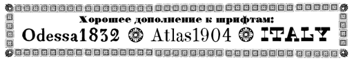 Letterhead Studio is located in Moscow. One of its designers, Valery (or Valerio) Golyzhenkov (b. 1965, Moscow) cofounded Letterhead Studio in 1998 with Yury Gordon and Olga Vasilkova, and has since designed over 100 typefaces. Still based in Moscow, he published the following Cyrillic fonts at Letterhead: 04.07 (1998), 532 Antique (2020), Accademico (2020), AeroBonus (2010-2014: for Aeroflot), Aeronautic (2020), Alfavita (awarded at Paratype K2009), ArtChronika, Artificio (2020), Atlas 1904 (2010), Atmosferico (2019), Barrytone (2005), Basalino (2020), Bort#1 (2000), Bramb (2019), Capitul (2015), CardHolder (1997), Channel (2004-2007: 24-style rectangular family), Chellebrity (2004, screen), DBL Cheque (2009, 22 styles), Cracker (1997), Cubes (2000), DBL Check, Dead Metro (1997, a constructivist family renamed Dead Mementro in 2017), Dicesimo (2019), Do Not Touch (1997), Dotlandino (2020: a dot matrix family), Dream Team (2000), Edgipto (2020), Edicolta (2020), Fabiola (2020), Feidi (2020), First Prize (2016, techno style inspired by Futura Display), Florisel (2020), Formalista (2001, squarish), Gamering (+Sans, 2009: a game font), Garbage (1997), GarbEdge (1997), Garmony (1997), Gibra (2020), Grammatik or Grammatika (1997), Haarddy (2020), HandsOn (1997, children's book font), Hole Down (1997), Ice Cola (2000), Interchargeable (2020: an all caps sans), Kabotage (1998, octagonal), Karkas, Kassa (2002, octagonal), Kren (1998), Laborant (2000), Lavert Noise (1997), Lexica (2010), Libellula (2018: a monoline display sans), Local Xellebrity (2010), Magrit (2020), Matrrolla (2001, octagonal), Medved (2010, angular), Method Two (2016: organic sans), Mnickers, Mono (2000), Monomania (2017), Musor (1997), Odessa 1832, OneCode (1998), Panetteria (2019), Pecorino (2019), Pricelist (2017), Primitiv (1998), Principal (1998-1999), PsyType (2013, an organic sans family done at Letterhead), Quando (2019: deco), Recruit (2004, octagonal), Remont (2000), Romb (2010, a Latin / Cyrillic poster typeface family), Rounded Slab (2009), Rounds (basic dingbats), Samizdat (2019), Silver Winner (2000), Sklad (2000), Soyombo Serif (2020), Soyombo Sans (2020), Stampit (2000), Svyaznoy, Uglaya (2019), Ugloed (2019), Upadok (1997, futuristic), Vestimentarno (2019: rounded sans), WTF Didot (2016, by Valery Golyzhenkov and Letterhead for WTFashion Magazine), WTF Special (2015), YE Stencil (2009), Zanoza (2005), Zaplyv (1997), Zeppelino (2020: a sharp-edged slab serif).
 Paratype link. Dailytype link. Klingspor link. Behance link. Type Tomorrow link. [Google]
[MyFonts]
[More] ⦿
|
Lex Kominek
|
 Calgary-based designer of Naranja (2005), an experimental typeface built up of quarter circles and L-brackets. Its dingbats are inspired by Clockwork Orange. Faces made with FontStruct in 2008: Robot Builder (Solid, Shaded and Open: squarish typefaces), Polygonal Lasso (Far West type: 938 glyphs for Latin, Latin Extended A & B, Greek, Cyrillic, and Katakana), Marshmallow Script (based on Einhorn, Eclat, Deftone Stylus, and Magneto, all connected diner scripts), Crazy Eights (deck of cards), Ficus Stencil (+Compressed, +Condensed, +Extended, +Regular, +Zebra, +StencilOpen), Big Fat (+Vibrate, +Solid, +Shaded), Negatron (Regular, Solid and Fill), Tuscan Radar, Nuclear Depot Americum (495 glyphs consisting of stars), Nuclear Depot (Radioum, Neptunium, Plutonium, Uranium: a futuristic family that covers Cyrillic), Am I see are you pee see, eh? (a font that combines MICR with UPC-A). The links: big_fat_shaded, crazy_eights, ficus_stencil_compressed, ficus_stencil_condensed, marshmallow_script, negatron_fill, negatron_regular, negatron_solid, serpent_like_bold, tuscan_radar.
 2009 creations: Haemophobe (pixel), Star Wreck, Mouthcaster (a bilined typeface based on the lettering on the front of the 1978 edition of the Scoutmaster's Handbook), Pasta (white on black), Medical Station Alpha (techno), Disco Stud (Chrome, Solid, Chrome Oblique, Solid Oblique), Affix, Infix (experimental and minimalist), Pinball Blizzard, Tears in Rain (a simplistic textura), Five Minute Hair Colour (slab serif), Seg Sixteen (LED face), Trajedy (pixel), Nobody 8 Italic (pixel), Home Sweet Home (a cross-stitch font), Wotan, Tiki Deaky, Writetyper, Chromatose (shadow family), Chocobot (an octagonal family containing Dark, Stacked (multilined), Milk, White), Big Fat (Shaded, Vibrate, Solid). 2010 creations: Fungal Sharp, Fungal Rounded (described by himself as a unicase stovepipe sans), Elliptical Lasso (Western ornamental caps), Astral Projection (a dot matrix typeface that updates Astra, a Letraset font designed by François Robert and Natacha Falda in 1973), Brick-block tops (3d effect), Knots, Spacerock (an extensive arc-based geometric family), Telephone (counterless), Pixular, StarWreck the Next Generation, Hockey Club, Brick-Block Tops, Bubblemania, Ziabelle Remix (outline, 3d, shaded), Hextone, Falcone (robotic face), but I didn't Trap the Deputy (Egyptian), Dinosaur Gothic. Fonts from 2011: Apé'ritif (bilined), Csillagok (a futuristic face based on a Hungarian Star Wars poster), Valhalla (faux runic), Birodalom, Haboruja, Piezo, Felix (black art deco face). Typefaces from 2013: Portafina, Portofino. Typefaces from 2014: Hanz and Franz, McRasky (a MICR font), Apricpt, Classic Spacerock, Five Minute Hair Colour. Typefaces from 2015: Big Fat Shaded Neue, Rampy, Managrom (monogram font), Spagett (connected cursive script). [Google]
[More] ⦿
|
Magic Fonts
[Marvin Wong]
|
This used to be be a great kiwi professional font service site run by Marvin Wong out of Auckland. Our professional services feature a wide range of expertise in Image Fonts, Picture Fonts, Logo Fonts, Signature Fonts, Symbol Fonts, Handwriting Fonts, and Multiple Language Fonts. Several truetype sample fonts could be downloaded. Prices varied from 10USD (one signature) to 120USD (full connected handwriting font). Fonts: MFpad4, MFpatent, MFrings2, MF-hint, MF-pic, MF_bankcheck (MICR font), MF_boats, MF_sig, MFbmw5b, MFbmwZ8, MFcareCA, MFcareJP, MFrings, MFrky6. It disappeared ca. 2004 after only a handful of years. [Google]
[More] ⦿
|
Markus Wäger
[Markus Wäger Designwerke]
|
[More] ⦿
|
Markus Wäger Designwerke
[Markus Wäger]
|
Austrian photographer and digital artist. Markus Wäger designed the following fonts in 1999: MXCascade, MXJemalCaps, MXJemalItalic, MXJemal, MXOnyx (a MICR font?). DWBeispiel A (1998) is a corporate font. He also created the free fonts Deck Type (2006, unicase) and Lindau (2003), a minimalist severe rounded sans family, apparently (to me, at least) based on German car license plates. On his web site, we also find broken links to fonts called Twelve Bricks and Hasenfuss. Designer od DW Dornbirn (2002, pixelish), DW Egger Heavy (2006) and DW Emser Medium (2006). See also here. Old URL. Dafont link. Kernest link. [Google]
[More] ⦿
|
Maru Jimenez
[Maryann Jiménez]
|
Maryann Jiménez is a graphic designer in New York City and North Bergen, NJ. She began her studies at Altos de Chavón School of Design and obtained a BFA in Communication Design at Parsons The New School, NYC. While living in New York City, she worked as Creative Coordinator for renowned British fashion label, Ben Sherman Clothing Inc. and currently is working freelance, specializing in Communication Design, Visual Identity, Branding, Print and Editorial. Creator of the MICR font Numbers (2012). [Google]
[More] ⦿
|
Marvin Wong
[Magic Fonts]
|
[More] ⦿
|
Maryann Jiménez
[Maru Jimenez]
|
[More] ⦿
|
Match Fonts
[Michel Bujardet]
|
 Match Fonts is the West Hollywood, CA-based foundry led by Michel Bujardet (b. Bordeaux, France, 1951), who is Mike Budge on alt.binaries.fonts. They make and sell interesting font paks. A particular favorite of mine is the Calligraphic Fonts Pack 2, which has the beautiful medieval-look typeface Rodolphe (2001), together with the Chancellerie family, the blackletter font SquareText, and a few Uncial fonts called Oncial. Free demos. Cursive Handwriting is a 6-font pak for teaching handwriting. Also offering a handwriting and signature font service. Among free offerings, check Le Blackmail (ransom font). Also, commercial fonts for these languages: Armenian, Bulgarian, Croatian, Czech, Estonian, Greek, Hawaian, International Phonetic (IPA), Hebrew, Hieroglyphs, Hungarian, Japanese, Latvian, Lithuanian, Macedonian, Marshallese, Polynesian, Polish, Romanian, Russian, Serbian, Slovak, Turkish, Ukrainian, Yiddish.
 Interesting typefaces: Boulon (letters with bolts), Bujardet Freres (French restaurant type), Calebasse (1997, semi-psychedelic), Chinoiseries (Chinese look-alike), Cristolikid (LCD), Diodes Light, Grecques, Halloween, Malabars, Metroplitain (art nouveau), Monogram, Octogone, Osselets (bones), Parador, Ruban Dis-Moi, SilBooettes, TSF et Compagnie, Venitienne, Yiddilatin, Zebrues, and the dingbats Dinosotype, Alphabetzier, Nahkt Hieroglyphics, Norman Prince (children's handwriting), Angelots, Sceaux, Seraphiques, Talismans, La Main Guided, La Main Solid (both children's tracing fonts), Bordini, Bordofixed, BoumBoum, ChapClerk, Dactylographe (nice!), Halotique (sans serif), Tortillon (2001, art deco), Normographe (great too!), Normafixed, Oloron, Parlante (serif family), Presse (typewriter), Technicien. Plus handwriting fonts Skrypta, Skryptaag (upright and connected), Willegha. a Morse Code font. The Halloween pack includes Coulures, Halloween, Osselets and SilBooettes. Fixed width fonts include Dactylographe, Oloron, Bordo, Norma. Direct access. Interview and photo. Alternate URL (in French), with many more fonts, such as the handwritten Pierre, Mariette. MICR E13 B font. Fontspace link. [Google]
[MyFonts]
[More] ⦿
|
Mic-Earth
|
Mic-Earth (Elfring, 1992), a MICR font. [Google]
[More] ⦿
|
Michel Bujardet
[Fontmenu.com]
|
[MyFonts]
[More] ⦿
|
Michel Bujardet
[Match Fonts]
|
[MyFonts]
[More] ⦿
|
MICR
[Thomas D. Hayosh]
|
MICR stands for Magnetic Ink Character Recognition. This PDF file by Thomas D. Hayosh (1995) retraces the history of the cheque. The American Bankers Association had a Technical Committee, about which we read: In July 1956, the Technical Committee published Document 138, Magnetic Ink Character Recognition: The Common Machine Language for Check Handling where the committee recommended magnetic ink character recognition (MICR) based on the advantages of having a machine readable language which is also easily readable by humans; on the relative insensitivity of the magnetic ink signals to mutilation by most overstamping, endorsing and writing instruments; and on a demonstration of the feasibility of this approach. Following this, all the major machine manufacturers involved, representatives of the printing industry, and the Federal Reserve System unanimously indicated their concurrence of MICR as the common machine language for mechanized check handling. Of note, during the first OEM Committee meeting, in September 1956, Dr. Kenneth R. Eldredge of the Stanford Research Institute presented his work on magnetic character recognition on behalf of the General Electric Co. Dr. Eldredge filed for a patent on Automatic Reading System on May 6, 1955 and was granted U.S. Patent 3,000,000 on September 12, 1961. The U.S. Patent Office was reported to have held the number 3,000,000 to be assigned to a significant invention. Indeed, MICR as applied to banking automation, in retrospect, was truly significant. Stanford Research Institute, Bank of America, and GE because of their early state of the art work in magnetic ink recognition were heavily involved in submitting and evaluating many of the fonts which were submitted to the Type Design Committee. It continues about the E-13A font: Publication 146, released in July 1958, entitled A Progress Report: Mechanization of Check Handling, specified the clear printing areas on the check and announced the field evaluation test for the E-13A type font. Some 50 printers were involved in a trial printing of the font. The Type Design Committee engaged Batelle Memorial Institute to administer the details of the trial printing and machine readability of the font. The Institute acted as a clearing house for instructions and to receive unidentified printing batches and forward them to the 5 machine companies for evaluation. The readability results were compiled by Battelle and presented in a report. Finally, in November 1958, the Type Design Committee agreed on a change in the Transit symbol and a relaxation of the void specification. Finally, E-13B was born: Many often wonder what does the designation E-13B stand for? E is the 5th letter of the alphabet which signifies 5 numerical type fonts or styles of type that were studied starting with the letter A. The 13 means the 0.013 inch grid that constitutes the matrix of the font. Each character has segments which are multiples of the 0.013 inch grid. The B stands for a modification of the 5th type font. In this case, with the E-13A font, a problem was noted as the transit symbol was sometimes misread as a character 8. Subsequently, the transit symbol was changed to what we have today and the type font was then designated as E-13B. And CMC-7 saw the light in 1965: The Standards Committee on Computers and Information Processing, X3, with the Business Equipment Manufacturers Association as Secretariat, recognized the desirability of issuing the E-13B work as an American National Standard. It formed the X3-7 Subcommittee on MICR and with the assistance of the X3-7-1 technical group issued 2 related standards on MICR in 1963 as ANSI X3.2-1963, American National Standard: Print Specifications for Magnetic Character Ink Character Recognition and ANSI X3.3-1963, American National Standard: Bank Check Specifications for Magnetic Ink Character Recognition. Much of the information presented in those first Standards were taken from Publication 147. Meanwhile, the X3 committee kept X3-7 active and endorsed X3-7's participation in the International Organization for Standardization, Technical Committee 97, Subcommittee 3 (ISO/TC 97/SC3) on Character Recognition. After a series of international meetings which terminated in 1965, the ISO Recommendation R 1004-1969, Print Specification for Magnetic Character Recognition, was published. This recommendation contained the E-13B specifications in addition to another MICR character set known internationally as CMC-7. [Google]
[More] ⦿
|
MICR
|
MICR stands for Magnetic Ink Character Recognition (also known as E13-B). Some countries use CMC-7 MICR. You can't just print this. MICR requires either specially designed printers and/or MICR Toner. Standard ink does not have the appropriate magnetic qualities. Anyway, for the glyphs, see the other sites on this page. [Google]
[More] ⦿
|
MICR E13B Match Font set
|
A 29-font MICR font set for 90USD, developed by Michel Bujardet. For Windows and Macintosh, Linux and OS/2.. Demo version available. He writes: " Micr-fonts.com is created especially for the new MICR font suite. This product is not available from matchfonts.com, where the regular MICR font I had for years will remain available. The MICR font suite contains 15 different MICR fonts, to address all printing chains. Mac and PC versions. Additional MICR fonts are provided for other printing systems, such as offset printing and typesetting, which require different weights. To increase check security, the suite also contains 14 different SecureAmounts fonts, with anti-fraud features found in latest bank notes, such as waves of fine-line printing. Shareware download package for Windows and Macintosh." Later, the MICR Calibration Wizard and SecureAmounts fonts were added to the site. [Google]
[More] ⦿
|
MICR Encoding Fonts
|
MICR encoding fonts MICR E13B&CMC-7 at AdvanceMeants. Commercial, type 1 and truetype. Sample downloads. This site is by ID Automation as part of their multi-URL strategy. Equivalent site where the expensive font package (2370 dollars for an unlimited developer license) can be had. [Google]
[More] ⦿
|
MICR specs
|
MICR font specs. [Google]
[More] ⦿
|
MICR--E13B TrueType or Laserjet fonts for check printing
|
Part of Elfring Fonts. Commercial outfit. [Google]
[More] ⦿
|
MICResque Type Design
[Zach Whalen]
|
A part of Zach Whalen's 2008 thesis at the University of Washington touches upon the history of MICR. Excerpts: The technology necessary for MICR developed roughly parallel with OCR and addressed a similar need: inputting large amounts of information into a computer system using characters which could be read and verified by humans. In the 1950s, the growing demand of check processing demanded that a mechanized, automated solution replace the tedious methods of hand sorting, routing, and processing all personal checks. A Technical Subcommittee of the American Banker's Association convened in 1954 to address the problem, and after a series of consultations with banks, manufacturers and the Federal Reserve Bank, the committee developed a recommendation and standard for a common machine language for check processing, which was published in its final form as Document 147 of the Bank Management Commission, first published in 1959 and still in use today. The committee's use of the term language here is significant because the standards and specifications set forth in their recommendations encompass the numeric font itself, the location of MICR information on the check face, the ink quality, the system for encoding routing, transit, and account numbers, and the equipment required to process it. James McKenney's detailed narrative of the technical subcommittee is careful to note that the use of language in this context is strictly metaphorical, but the sense in which it describes the entire system strongly resembles Ferdinand de Saussure's use of langue (the complete semiologic system of any language) as a field that is distinct from parole (the singular expression of a specific language act). This analogy between langue and MICR as a "common machine language" also will help explain the means by which re-appropriated MICR fonts express associations similar to those identified with OCR-A. [...] MICR works by a recognition process similar to OCR, except that in MICR, the ink is magnetized and it is read by a magnetic tape head rather than an optical scanner. This prevents stray marks and paper degradation from interfering with reading, both of which were important problems the Technical Subcommittee had to solve. The typeface ultimately selected by the committee, E-13B, consists of simple, geometric forms adorned with asymmetrical rectangular slabs. This design conforms to the technical requirements of the MICR input devices, and the variability of the slab location among individual letterforms ensures that even degraded type will yield a sufficiently distinct magnetic waveform in order to be properly read. [Google]
[More] ⦿
|
Mike Charness
[WSI: Weatherly Systems Inc]
|
[More] ⦿
|
Monotype's Monospaced Fonts
|
 Monotype's monospaced font families: Andalé Monospace, Arial Monospace, Courier, Letter Gothic, Lucida Console, OCR-A, OCR-B, MICR, Typewriter, Typewriter Elite, Typewriter Gothic.
 View some of Monotype's typewriter typefaces. [Google]
[More] ⦿
|
MyFonts: Cheques
|
MyFonts selection of typefaces appropriate for cheques. These are also called MICR typefaces. [Google]
[More] ⦿
|
MyFonts: MICR
|
MyFonts selection of MICR typefaces. [Google]
[More] ⦿
|
Nathan Heins
|
Nathan Heins (Romford, UK) created Microchip as a student project in 2012. The glyphs were inspired by an electrical circuit. [Google]
[More] ⦿
|
Page Technology Marketing
|
Also called Page Tech Inc. San Diego-based outfit that produced a package of (renamed?) fonts in 1991-1994: Alamo (Western font), Announce, Articulate, Aurora, Baxter, Bethel, Bockloo, Calculator, Calico (stencil font, +Cyrillic), Campfire, Centurion, CheckStub (MICR font), Excellence, Freedom, Graduate, Indio, LaCosta, Maryland-Italic, Maryland, Merced, Mettler, Miami (Broadway?), NovaScript, Oakland, Oxford, Palomar, Parker, Parsec, Quincy, SanDiego, Shadow, Silicon, Springer, Sunnyvale, TopHat. Typefaces from 2019: Bills Mafia. [Google]
[More] ⦿
|
Perry Mason
[Ferrets N Fonts]
|
[More] ⦿
|
Potts
|
Potts is the designer of the cheque writing sans serif font Mic. [Google]
[More] ⦿
|
PrecisionID
|
Waxham, NC-based vendor of barcode fonts and software. These cover Code 128, Code 3 of 9 (Code 39), EAN, UPC, Postnet, Interleaved 2 of 5, PDF417, ASP Barcodes, PDF417, OCR-A, OCR-B, MICR, and Data Matrix barcodes, and cost between 75 and 129 dollars per barcode style. [Google]
[More] ⦿
|
Ray Larabie
[Typodermic]
|
 [MyFonts]
[More] ⦿
[MyFonts]
[More] ⦿
|
RoastHorse Type Foundry
[Joe Baldwin]
|
Joe Baldwin (b. UK, 1973) runs RoastHorse Type Foundry. He is the designer of the pixel font Flash Script (2002, italic), the sarcastic RHBertholdRegularIndustryofTyrany RHBurroughs, RHCarrierStencil (2004, a free font created because of Berthold's "abuse of copyright"; it is an octagonal stencil font), Linx Pro (a MICR and dot matrix family), the pixel typeface RHBurroughs, the fat Western style typeface Hubbard Hand Lettered (2003, available at T-26), and the flash-optimized Kerouac (2002, T-26). His defunct home page. [Google]
[MyFonts]
[More] ⦿
|
Stan Biggenden
|
American letter designer who created Orbit-B (1972, VGC), an LED font, now digitized by Bitstream as Orbit-B BT. Zach Whalen on Orbit-B: Orbit-B is less common than either Moore Computer or Data 70, possibly because its MICR influence is more subtle and less arbitrarily intrusive, but it still appears frequently in and around videogames and in contexts where some intimacy is suggested between humans and computers. Klingspor link. FontShop link. [Google]
[MyFonts]
[More] ⦿
|
Stanley Davis
|
 Graduate of The Cooper Union, who was born in Brooklyn in 1938. He taught at The Newark School of Fine Arts and was art director at L. W. Frohlich in New York. Stan lives in Saugerties, NY.
 Designer of Stan Free (VGC, 1973) and the liquid font Amelia (1965, Visual Graphics Corporation). Amelia was later "stolen" by Bitstream and Linotype. Here is what Stan wrote: Bitstream and Linotype have stolen my "Amelia" font (their renditions of it are pathetic). My digitized version of Amelia and other fonts I designed are available at: highwoods@hvc.rr.com. Bio at Linotype. MyFonts site. FontShop link. Klingspor link. [Google]
[MyFonts]
[More] ⦿
|
Tepid Monkey Fonts
[Brandon Schoepf]
|
Free original fonts by Brandon Schoepf at Tepid Monkey. The foundry closed its doors in July 2002, to be continued by The Typover Foundry, starting July 15, 2002. That site too seemed to have problems, so Typoasis took over in 2005. The list of typefaces: Abscissa, AbscissaBold, AbscissaBoldItalic, AbscissaItalic, AccidentalPresidency, Bedizen, Benegraphic (a handwritten Fraktur, 2001), CadmiumEgg, Caduceus, Charybdis, Dadhand, Discognate, DiscognateLight, Dotimatrix3, Dotimatrix5, Dotimatrix7, Dulethia (Greek simulation face), EagerNaturalist, EightyPercent, EightyPercentCaps, EightyPercentCapsOutline, EightyPercentOutline, ElectedOffice, ElectedOfficeOutline, ElectedOfficeOutline18118, FifteenOkay, FifteenOkaySlanted, Galaxy Monkey, Hipchick, Hoffmanhand, Jrhand, KetchupSpaghetti, LockedWindow, Medrano, Monoglyceride, MonoglycerideBold, MonoglycerideDemiBold, MonoglycerideExtraBold, Nauvoo, NegativeTuning, November (2001, pixel font), Opossum, Origami Mommy (2002, square outline font), Ponderosa, Ptarmigan, PtarmiganCondensed, PtarmiganCondensedItalic, PtarmiganItalic, Qhytsdakx (2001), RationalInteger (checkbook font), RepetitionScrolling, Scott, Stockstill (stencil font), Sujeta, Sujeta3D, SujetaBold, SujetaBoldItalic, SujetaItalic, SujetaOutline, Survivant, Transuranium (2001), Updike, VerticalTuning, Zig. Dafont link. Kernest mentions the name Brandon Schoech. [Google]
[More] ⦿
|
Thomas D. Hayosh
[MICR]
|
[More] ⦿
|
Toto
[K22 Fonts]
|
 [More] ⦿
|
Type Market
[Alexey Kustov]
|
 Type Market is a Russian type foundry. Alexey Kustov made most fonts at Type Market (Moscow) between 1993-1995. Many of these are cyrillizations of Western typefaces: Aksent (futuristic, based on a design by Yevgeny Dobrovinsky), Bebit (similar to Baby Teeth by Milton Glaser, Photo Lettering), Countdown [based on a 1965 original by Colin Brignall], Cricket, Crystal, Europe, Everest, Gals, Gill Sans (1993), Glasten, Helios, Luxor [1993; based on Colin Brignall's Aachen, 1967], Micra, Micogramma (1952, Aldo Novarese and A. Butti, digitized in 1993), Miniature, Mistral, New Zelek [1993, inspired by the typeface of G. Klikushin, 1987, which in turn was based on the typeface of Bronislav Zelek of Mecanorma], Oliver, Peignot (A.M. Cassandre, 1937, done in 1993), Penta, Plain [after an art deco typeface by A. Grachev], Rodeo (F. Pierpont, 1934, cyrillicized in 1993), Start [1993, like Aldo Novarese's Stop from 1971], Stencil Bold Cyrillic (1993, based on Milton Glaser's Stencil Bold (1973)), Techno28 [1993, a MICR font based on Letraset's Data 70 by R. Newman, 1970], Trafaret [1993, a stencil font based on Tom Hultgren's Traffic, Letraset, 1973], Traktir [1993, based on Elsner&Flake's Old Town], Viola [1996, based on Adobe's Willow]. These are Cyrillic fonts that are typically extensions of well-known Roman fonts. Other designers at Type Market include A. Shevtsov, Anton Bisiajew, Oxana Doubovic, A. Babaljan, S. Shanovich, D. Gulinoff, Viktoria Grigorenko, Anna Terentieva. Fonts not by Kustov: Anastasia Script, Arthur, Dikovina, Dikovina Bildchen, Fita Church, Fita Poluustav, Fita Vjaz, Funny, HeinrichScript, Industry, Jatran, Keyboard, Magic, Morris, Office Type Sans, Oliver New, OpiumNew, OrnamentTM, OrnamentTM2, Palladium, Regata, Roger Script, Romul, Secretary, Sonet Serif, Unicum Condensed, Zodiac1, Zodiac2.
 Klingspor link. [Google]
[More] ⦿
|
Typehouse
[David Moore]
|
Type foundry that was active during the photo composition era. Creators of typefaces at VGC, such as Moore Computer (1968, an LED face) and TH Alphabet Soup (1975, a VAG Rounded style face). Moore Computer and Moore Swash are both attributed to David Moore. Zach Whalen on Moore Computer: The minimal aesthetic properties of E-13B saw extended influence in a number of type designs created in the late sixties and early seventies, and many of these MICR-based typefaces saw extensive use in relation to videogames. The typesetting and printing industries were undergoing rapid and dramatic changes during this period, adapting to new technologies like photo- and CRT-based compositors, so a number of companies and design studies were going out of business or changing hands. In addition, the decorative typefaces echoing the style of E-13B were often seen as novelty products, so records about several of these typefaces and fonts are cursory may be unreliable. Nevertheless, the evidence indicates that the first full alphabet based on E-13B was a font called Moore Computer, published by the Visual Graphics Corporation (VGC), possibly as early as 1968. [Google]
[More] ⦿
|
Typodermic
[Ray Larabie]
|
 Ray Larabie (b. 1970, Ottawa, Canada) ran Typodermic in Mississauga, ON, which opened in the Fall of 2001. In 2006, it moved to Vancouver, BC, and in 2009 it moved on to Nagoya, Japan. Dafont page. Ray Larabie has been making fonts since 1996, but those early fonts were freeware. His pre 2001 fonts are grouped under the label Larabie Fonts. In 2001, he set up Typodermic. Latest additions.
 The Typodermic fonts: - 2022: Biphoton (a monospaced sans with the same proporions as Letter Gothic 12), Valve (an industrial muffler shop font), Deception (a sub-pixel typeface with ten captivating effects---Deception Array (wide blocks), Deception Bars (text viewed through lenticular glass), Deception Blocks (as in heavy JPEG degradation), Deception Diamonds, Deception Lines (for a grayscale effect), Deception Particles, Deception Plusses, Deception Process (simulates grayscale LCD text or a thermal printer on the fritz), Deception Scanline (television picture tube text rendering), Deception System (1-bit dithering gone haywire)), Monofonto (a monospaced sans), Encercle Draft (permitting users to create numbers in borders), Encercle Sans, Heavy Heap (a groovy psychedelic typeface with a scorching look, reminiscent of 1960s hot-rod culture and die-cast toy vehicles), Ggx89 (a 48-style tightly spaced Swiss style sans family).
- 2021: Quadrillion (a 12-style rounded monoline sci-fi family), Mochon (a wall writing or chalk font based on the lettering of Donald Mochon, dean of the RPI School of Architecture until 1966; the Mochon samples were provided by an ex-student of Mochon, Karl A. Petersen), Steelfish Hammer (a subtly rustic version of Larabie's most popular typeface, Steelfish), Wavetable (sci-fi), Xyzai (an LED emulation font, described by Ray Larabie as a hardcore, Y2K-style techno typeface), Geoparody (a 12-style squarish typeface inspired by a late 1960s font called Anonymous), Typewriter Spool (122 fonts, modeled after the Underwood No. 5 typewriter font).
- 2020: Gravtrac (a 56-style condensed to crushed slab serif family inspired by mid-twentieth century classics like Univers 59 Ultra-Condensed, Helvetica Inserat and Compacta; +Greek, +Cyrillic), Vinque Antique (a rustic handcrafted blackletter in eight styles).
- 2019: Dealerplate (17 license plate styles for various states and provinces in the USA and Canada, current as of 2019; included are California, New York, New Jersey, Ohio, Illinois, Pennsylvania, Florida, Maryland, Michigan, Wisconsin, Massachusetts, Missouri, Washington, North Carolina, Virginia, Quebec, and Ontario), Kenyan Coffee Stencil, Good Timing, Steelfish Rounded, Bitcrusher (a consumer electronics / techno font), Galderglynn 1884 (a nineteenth-century style sans-serif typeface that exp[ands his Galderglynn Esquire).
- 2018: Cybermontage, Crack Man (a pac man font), Propaniac (a 1980s-style postmodern typeface inspired by a Pointer Sisters record sleeve which was designed by Shoot That Tiger Creative Services), Zelega Zenega, Spectrashell.
- 2017: Minicomputer (MICR style), Squirty, PCTL9600, PCTL4800 (retro techno), Ultraproxi (semi-monospaced and influenced by the high speed computer printers from the 1950s to 1970s), Toxigenesis (techno sans), Venus Rising, Vanchrome (a compact sans-serif headliner with chromatic layers), Krait (a layered geometric typeface designed for architectural display), Xylito (a layered font for chromatic or 3d effects).
- 2016: Refuel (octagonal, based on military aircraft markings), Expressway Soft (a sans-serif font family inspired by the U.S. Department of Transportation's FHWA Series of Standard Alphabets, also known as Highway Gothic), Conthrax (squarish, techno), Cornpile (cartoonish), Electric, Evensong (art deco), Fledgling (a very tall typeface), Gymkhana (sans), Remissis (sans), Sunday Evening (a reverse contrast typeface), Meloche (Meloche is a unique grotesque sans-serif typeface influenced by hand-painted French signs of the late nineteenth century. It's available in 7 weights and obliques).
- 2015: Canada 150 (a custom font for the Canadian government; see here, here, this coverage regarding the Inuktitut part of the font, and this reaction by the curmudgeons in Toronto who complain that Ray did this work for free), Autoradiographic (sans family), Built Titling (for compact headlines), Chickweed Titling (cartoon titling font), Cardigan Titling (flared headline face), Bench Grinder Titling, Kleptocracy Titling, Palamecia Titling (rounded black comic book typeface), Quasix Titling, Galderglynn Titling (all caps sans family from hairline to black), Mixolydian Titling, Stormfaze (a sci-fi font started in 1996 and finished in 2015), NK57 Monospace (a 60-style programmer typeface), Gargle, Athabasca (a sans family designed for the rugged Canadian oil patch).
- 2014: Mesmerize (a large free sans family), Kingsbridge (a large slab serif family with sharp points on the A, M, N, V and W), Manbow (a layered geometric art deco display font which includes solid, clear, stripe, polka-dot and screen patterns), Breamcatcher (an all caps art deco font inspired by the piano sheet music for With Every Breath I Take which was featured in the Bing Crosby/Kitty Carlisle musical comedy film, Here is my Heart), Kilsonburg (Dutch deco based on an old Vogue magazine cover), Uchiyama (poster typeface), Goldsaber (art deco design), Vexler Slip (unicase), Rakesly, Dacquoise, Pretender, Rimouski (a rounded geometric font family), Nulshock (techno), Recharge (techno/industrial font), Interrogator Stencil, Strange Alphabets (arts and cratfs font), Angerpoise Lampshade (free).
- 2013: Numbers With Rings, Shookup (funky cartoon font), Pastrami on Rye (cutout comic book style), Chickweed, Built (a condensed headline sans), Fluctuation (a softly rounded elliptical sans family), Astrochemistry (sci-fi, techno with rounded edges), Snasm (sci-fi).
- 2012: Engebrechtre (2000-2012), Die Nasty (1999-2012: free), Strasua (1999-2012), Planet Benson (1997-2012), Husky Stash (1998-2012), Barbatrick (1999-2012: a speed emulation font), Zero Hour (1997-2012), Urkelian (1998-2012: very condensed), Zolasixx (inspired by the video game Zaxxon), Ampacity (neon font), Chromakey (a space deco headline font inspired by box art classic video games including Matrix Marauders and Magical Chase), Disassembler (1980s style bitmap font), Zerbydoo (a dot matrix family), Superego (a geometric-techno font inspired by the cabinet graphics for the 1981 Stargate arcade game), Rukyltronic (a set of dot matrix typefaces), Nerdropol (pixel family), Gulkave (rounded pixel font), Cyclopentane, Palamecia (a fat finger poster face), Gameness (a 1990 retro industrial deco font), Camulogen (headline face), Color Basic (a pixel typeface inspired the by TRS-80 Color Computer), Triac Seventy One (a funky face), Acroyear (retro all-caps headline font), Troll Bait, Strenuous (unicase), Permanence (a retro=futuristic font based on Alvin Toffler's cover of Future Shok, 1970), Clockpunk (octagonal and quaint), Battlemaze (trekkie face), Mixolydian (industrial sans).
- 2011: Ugocranis (a brutalist typeface), Clipwave, Wheaton (MICR-inspired), Mango Scribble, TRS Million (dot matrix face), Ugogranis (constructivist), Gomoku (paper cut face), From The Internet.
- 2010: Cranberry Gin (2010, octagonal), Restore (all caps, geometric sans), From The Stars (an elliptical techno family done with Chikako Larabie), Thrusters (space age face), Dream Orphanage, Dream Orphans (2000-2012), Kengwin (rounded slab serif), Gleaming The Cube (Greek simulation face), Vectipede (a slab serif family), Great Escape (an elliptical sans family), Subrocs (connected script), Hackensack (with Chikako Larabie), Polarband (bilined stackable headline face), Naked Power, Special Forces (a great macho slab serif headline face---watch for awards to roll in), Warugaki (handpainted), Warmer, Honfleur (art deco; with Chikako Larabi), Voivode (a headline typeface done with Chikako Larabie), Hachimitsu (Asian look face, done with Chikako Larabie), Kadeworth (rounded retro look sans, done with Chikako Larabie), Gnuolane Jump (2010, with Chikako Larabie), Markerfield (brush), Board of Directors (Bank Gothic style family, done with Chikako Larabie), GGX88 (a Swiss sans family), Body Goat, Reversal, Gord (techno), Computechnodigitronic (LED, LCD geek-look font), Bench Grinder, Inklea (a bubbly face), Skygirls (retro brush script), Gloss (a paint brush typeface based on Champion, 1957, G.G. Lange), Galderglynn Esquire.
- 2009: Maqui (an industrial headline sans family), Zingende (art deco family: caps only), Misadventures, Gaz (large retro sans family), Acrylic Brush, Enamel Brush (a digitization of Catalina, 1955, Emil J. Klumpp), DDT (neutral sans), Thump (fat, casual), Desperate Glamour, Pricedown (an update of his free 1990s font, patterned after the lettering on The Price Is Right show), Mitigate (monoline and slabbed; has some typewriter styles), Catwing, Walken (slab serif stencil), Silicone (soft rounded sans family), Movatif (sans), Gunplay (a stencil family inspired by the poster for the 1972 Steve McQueen/Ali MacGraw film The Getaway), Fragile Bombers (octagonal), Forgotten Futurist (techno sans, 19 styles), Bullpen (slab serif), Coolvetica (35 styles), Duality, Good Times, Strenuous, Shlop (paint-drip style), Dirty Baker's Dozen (stencil), Junequil (VAG Rounded style), Owned (graffiti), Domyouji, Threefourtysixbvarrel (stencil), Enacti, Uniwars (futuristic, 16 styles).
- 2008: Madawaska (a rugged slab serif), Ebenezer (grunge), Gnuolane Stencil, Raincoat, Report School (avant garde sans), Jesaya, Carouselambra (art nouveau), Debusen (rounded), Barge (military font), Renju (2008, potato or rubber stamp print face), Otoboke (handlettered), Hit (informal hand), R6 D8 (futuristic sans family), Rexlia (an octagonal machinistic family), Hybrea (a display sans with TV screen rounding), Sweater School, Tussilago (2008, a neutral sans family), Presicav (extended sans), Hover Unit, Addlethorpe (grunge), Scheme (rounded sans), Usurp (bouncy poster lettering), Negotiate (technical sans family), Divulge, Sewn, Gnoulane (condensed sans), Moja, Teeshirt (old typewriter face), Pound (art deco marries grunge), Graveblade (heavy metal font), Synthemesc (psychedelic anti-Starbucks font), Chysotile (white on black grunge), Cardigan (sans), Gurkner (balloon style), Reagan (grunge).
- 2007: Tight (a copy of Dean Morris's 1976 Letraset chrome font Quicksilver), Headlight, Meloche (a 3-style grotesk), Octin Spraypaint (grunge stencil), Octin Vintage (grunge), Bouffant (script), Octin Prison (stencil), Octin Sports (octagonal), Octin College (octagonal, for sports jerseys), Octin Stencil (free octagonal font family), Burnaby Stencil (stencil), Superclarendon, Conceal, Ohitashi, Stud (grunge), Bristles (grunge), Skirt, Cotton (grunge), Kelvingrove (a bit of copperplate gothic, rounded and shaved), Augustine, Containment, Snowa, Veriox, Scrubby, Transmute, Sheaff, Injekuta (techno), Rinse (grunge), Polyflec, Domyouji (square sans), Winthorpe (old style), Cutiful (script), Flyswim (grunge), Dirtstorm (spray-painted stencil), Shnixgun (grunge), Neuzon (grunge), Oxeran (old typewriter), PRINTF (grunge all caps monospaced), Akazan (sans), Nyxali (a metal tag face), Nesobrite (25 styles of Bank Gothic lookalikes), Meloriac (a heavy headline sans inspired by Futura), Walnut (graffiti face), Gnuolane (a narrow superelliptical sans), Edifact (a damaged computer font), Darkheart, Stampoo (squarish), Raymond (rough script), Hayate (oriental look), Telephoto. The entire Octin series is free at DaFont.
- 2006: Octynaz (grunge), Paltime (ornamented), Jolie Ecriture Desard (children's hand), Mango (comic book face), Desard (child's hand), Bulltoad, Lerku (eroded serif), Charbroiled (also eroded), Ceroxa (eroded stencil), Nagomi (a chiseled-look Asian font based on calligraphy of Chikako Suzuki from Nagoya), Whiterock, Yellande, Chilopod (a futuristic typeface inspired by the logo from the 1980s videogame, Atari Centipede), Order, Goldburg (based on a typeface by George Bowditch, 1957), Laserjerks (2006, brutalist), Milibus (futuristic), Bonobo (serifed), Ohitashi, Sarasori (TV-tube shaped typeface in the style of Oban), Structia (an octagonal family), Betaphid (octagonal), Gendouki (futuristic stencil), Slugger (athletic lettering), Marianas (a gorgeous art deco face), Lineavec (octagonal), Corzinair (serif family), Buxotic (a great caps face), Cinecav X (for closed caption TV and DVD), Salsbury (comic book face), Lonsdale (loosely based on a font called Parkway Script, which was designed by Emil Hirt in 1964), Alepholon (futuristic), Kwokwi, Mikadan (a tribute to Stephenson Blake's Verona from 1948, which was in turn based on William Dana Orcutt's Humanistic from 1904), Marion (2012: a beautiful transitional family adopted as a standard Mac OS X font), Quasix (hookish), Skraype (grunge stencil), Bleeker (casual lettering), Linefeed (monospaced line printer font), Draculon (a casual typeface inspired by the letterforms of William Orcutt's humanist font from 1904 which was in turn based on an Italian manuscript from 1485), Mahavishnu (a mix between 1970s psychedelics and art nouveau), Doradani (a corporate identity sans family), Korotaki (futuristic).
- 2005: Beat My Guest, Kadonk (a Halloween face), Report (a VAG-Rounded style face), Croteau (a poster face), Heroid (ook face), Barrista (informal script), Wyvern (sans serif), Wubble (like puddles of water), Caryn (casual script), Folder (a rigid sans family), Venacti (a futuristic family), Xenara (a keyboard lettering family), Emory (a destructionist sans family), Ligurino (neat sans&serif family), Biondi (update of Copperplate Gothic; followed in 2010 by Biondi Sans; these copperplate style typefaces are in the style of AT Sackers), Byington (Trajan column lettering), Sayso Chic, Expressway (28 weights, a highway signage family), Algol (pixel type), Meposa (fat display face), Tandelle (condensed), Vigo, Maychurch, Mecheria, Vactic (dot matrix), Zosma, Topstitch, Windpower, Llandru, Soap (a creative extension of Cooper Black, with dingbats), Kleptocracy (1999-2005), Owned, Rimouski (sans), Burnstown Dam (2005, a wooden plank font), Sinzano (sans with opentype ligatures galore; compare, e.g., House Ed Interlock), Zamora.
- 2004: Affluent, Threefortysixbarrel (stencil face), Tank, Telidon (dot matrix face), Funboy, Neuropol X, Neuropol Nova, Mufferaw (comic book face), Larabiefont, Zekton (techno), Strenuous 3D, Silentina (advertised as "a silent movie font"), Amienne (brush script), Fenwick Outline (free), Betsy Flanagan (1998, a keyboard face), Boopee (children's handwriting), Pirulen (in the general Bank Gothic style), Zalderdash.
- 2003: Zupiter, Blue Highway.
- Before 2002: the dot matrix family Telidon, Telidon Ink, Butter Belly, Almonte (1999), the architectural font Jillican (octagonal), Snowgoose, Bomr, Pakenham, Neuropol, Nasalization, Fenwick, Kleptocracy DLX, Sui Generis, Dirty Bakers Dozen (faded stencil), Minya Nouvelle, Asterisp, Chinese Rocks, Jillsville (great artsy Courier), Ulian, Wevli (including Wevli Dingbats), Sappy Mugs (funny mugshots), Sofachrome (1999, inspired by Pontiac car emblems), Eden Mills (1999).
MyFonts interview. Fontspace link. Fontspring link. Catalog of the typefaces in the Larabie Fonts collection. Klingspor link. Catalog of the Typodermic library in decreasing order of popularity. Extensive (large page warning) Typodermic catalog. Font Squirrel link. Creative Fabrica link. Fontsquirrel link. Fontdaily link. [Google]
[MyFonts]
[More] ⦿
|
Typotheticals (was: F.O.N.Type)
[Graham Meade]
|
 Typotheticals (F.O.N.Type) (est. 2002) is a supplier of fonts from a number of independent amateur foundries that make up the C.O.I.F.F (Collective of Independent Font Foundries) group. Originally free fonts, the fonts are now commercial and can be bought at MyFonts. It is run by Graham Meade in Melbourne, Australia. Font families for now:
 - From Three Mile Island (Graham Meade): RaveParty, Nightmare in Blend Mode.
- From Tomcat Type: Why Damn It, Deedaceous, Cortilic (nice austere Courier-style letters).
- From Fontological Foundry: Where U @ (a comic book style).
Also: Chyletoon (2021; a cartoon font family in 24 styles), Umerica (2019), Lemonite (2019: sans), Ipscus (2009, after an earlier free font by him, Brassiere), Skuair (2009), Xeilo (2008), Damure (2006), Sweetmix (2006), Norlik (2006, 6 styles), Nok (2006, 18 style sans family; with Daniel Athburton), Koster (2006, swashbuckler family), Whinter (a simple sans family), Carnova, Metasyntal, TN Caluminy, Modcon and Modcon Outline (2007, futuristic family), Tsudoman, Tsudotin, Tsudovac, Delechol, Etched Fractals (Bank Gothical style), Binary Snafu, Meichic, Phollick, Italican Oblique, Czaristane, Hulbert, Frogster, Typothetical 1, Stripwriter, Eutheric, Gyant, Gurnee, Quoral, Freekenfont, Kylemott, Elspeth GM, Worstveld Sling, Cordin (2005), Jains (2005), V-Hand (2005, informal script). This site offers Cordin Freebie (2005). In 2006, Thomas Phinney from Adobe insulted Graham on Typophiles by stating: You make somewhat lower quality and much less expensive retail fonts, and I sought out my job at a company that makes relatively high quality and expensive (when not bundled) fonts. For completeness, Graham Meade's fonts at MyFonts: Alum, Aunchanted Elite, Blound, Caluminy, Capitalus Diabolus (2014, a beveled neon-look typeface based on Lucifer No. 10), Carnova, Cordin, Cyne (2004), Czaristane, Dbased Material, Elspeth GM, Etched Fractals, Etho (2013, +Etho Wide), Eutheric, Flute, Frangle (2013, octagonal), Freekenfont, Frogster, FrownTown, Gurnee, Gyant, Houral Etched, Hulbert, Humper, (2005), Ilbit, Italican Oblique, Italican Script (2004), Jains, Jointed (2008), Koster, Kylemott, Laural Hardy (2011, piano key family), Marjoram (2008), Meichic, Modcon, Nacissism (sic) (2013), Neu Phollick Alpha, Nok (2006, with Daniel Athburton), Norlik, Phollick, Physe (an organic display sans in 16 styles) (2020), Quiffed, Quoral (2003), Ramadesh, Reluxed, Rhomus Omnilots (geometric dingbats), Simiate, Stripwriter, Sweetmix, Thyne (2020: a lachrymal serif in 14 styles), Typothetical 1, Tzaristane (2005), V-Hand (2005), Wastrel (2004), Whinter, Whyst (2020: squarish and monolinear in 28 styles---almost a gas pipe font), Wiki, Worstveld Hand, Worstveld Sling (2005, with ), Worstveld Sting. Klingspor link. Fontspace link. Dafont link. View Graham Meade's typefaces.) [Google]
[MyFonts]
[More] ⦿
|
Valery Golyzhenkov
[Letterhead Studio VG Fonts]
|
 [MyFonts]
[More] ⦿
[MyFonts]
[More] ⦿
|
Videogame Text
[Zach Whalen]
|
This site is a blog about a book proposal by Zach Whalen on the typography and types used in videogame text. It is immensely useful for type historians, and highly recommended. It is based on Zach's 2008 dissertation at the University of Washington entitled The Videogame Text: Typography and Textuality. Interesting subpages: [Google]
[More] ⦿
|
Virtual Check Solution
|
Check writing software (50USD) that includes a special check printing font of the MICR family, vcsmicr. [Google]
[More] ⦿
|
Volker Busse
[F25 Digital Typeface Design]
|
[More] ⦿
|
VS Software
|
VS Software in Little Rock, AR, offers these products and services: signature/logo font making, Jet True (TrueType to PCL font converter for 325 USD), barcode and MICR fonts, FontGen v1 (300 USD: bitmap font editor, 7 formats). About FontGen: FontGen's most common format is a 300 or 600 dpi PCL 5 bitmap font for use with the PCL driver of an HP or compatible laser printer. [Google]
[More] ⦿
|
Westminster
|
 Westminster is the ultimate cybernetic font from the early seventies. It was created by Leo Maggs (1973, Berthold) as a photo type. Eraman Inc made a Westminster typeface in 1993. Zach Wahlen wrote in his 2008 thesis: The origins of Westminster are somewhat unclear, but it emerged at least as early as 1971. It is also the most pervasive and common of the MICR fonts because it has been distributed freely with Windows operating systems since Windows 98. [..] Simon Daniels of Microsoft believes it is possible that Robert Norton (head of Microsoft Typography during the mid-1990s) originally designed Westminster himself, and the little available evidence does support this possibility. The font description mentions Photoscript, a phototypesetting company Norton founded in 1970; the unnamed designer is identified as British, as was Norton; and the choice to focus the font's description on the story of a willful designer who is ultimately vindicated seems consistent with Norton's sense of humor and habit of self-deprecation.
 I think Simon Daniels and Zach Whalen are both wrong, as this interview of Leo Maggs demonstrates: There is one space age one called One Up, a ghastly 60s thing, and the guy who designed that, Leo Maggs, talks about how he wished he hadn't designed it. "Way back in the swinging 60s," he says, "when my youthful soul was consumed with enthusiasm, if not naked ambition, I was surprised and delighted to have my first typeface, Westminster, accepted by Robert Norton. I produced several further designs, most of which were properly strangled at birth. One Up unfortunately survived... Looking at it now I feel much as I imagine a mature film star must feel when, 30 years after the event, she comes across photographs of herself as a struggling starlet revealing all for the readers of popular girly magazines, and I wish I hadn't done it." Quite incredible, since I had the Leo Maggs info on my site long before Whalen's thesis---sigh, why am I even bothering? [Google]
[More] ⦿
|
Wilson Thomas
|
 Designer (aka Funk King, b. Fort Knox, KY) who lives in Orlando, FL, and/or Apopka, FL. He used FontStruct in 2008-2009 to make over 550 decorative fonts, and became one of the world's top experts on FontStruct, FontShop's on-line font editor. Most of his fonts were withdrawn in 2012. He did a few commercial typefaces at his commercial foundry, Funk King. His creations include
 - A Bit Eccentric.
- Alphabots
- Alphadings: Picnic Basket (2014), Rat Race (2014), Pod Invasion (2014), On Hangers (2012, a commercial series that includes Pants on Hangers, etc), Dog Tag, Black Bird, Easter Egg Dots, Ser Egghead T. handlebar, Ovoidotta (now called Sniff), Play Book, BuddhaBuddha, Swizzle Sticks, Computer Backplate, Milky Way, Sprout, Football, Clapboard (for movie makers), Teed Off, Book Stack, Speaker Box, Ant Farm, Sound and Vision, Speaker Grill, Tom Tom, Caged Type, Conga Lounge, Spinal, Add Van, Frostruct, Picket Fence, Regatta, Cranestruct, Impossible Alphabet, Igloo Village, Mortar Board, Jack, Marionette, Golden Gate (+Short, +Solid), Crossed, Eff U ("the finger"!), Tall Big Top, Jackpot, Skulls&Cross Bones Redux, Crosshairs, Drama Club, Good Day Sunshine, Butterfly, Steps and Windows, Heartbroken, O Christmas Tree, Christmas Lights, Candle, Supper Time (alphadings of plates), Sands of Time (alphadings of hour glasses), Fishbones (commercial since 2012), Handy (alphading with hands), Hang Ten (feet alphadings) and High Five (hand alphadings), Armade and Ghost Ship Armada (ship alphadings), Cut Here (stitching alphadings), Schematic (electric circuit alphading), Masquerade, Mortar Board, Gear Bits, Gearswork, Hi-Lo Gears, Gears, Resistor, Gear Shift, Castle, Castle with Flags, Antique Keys, Rounded Keys, Pods, Piano Keys (+Alt, +Correct), Framework, Dixieland Jazz, Spats, and City of New Orleans (the last three are alphdings based on the same Victorian alphabet), Saturn, Piggy Bank, Voodoo Doll, Dice, Fist Bump.
- Antennas, Antennas Outline
- Antiquity
- Arcostellati, Arcostellato, Arcangolo, Arcontorno (2011): a blackletter family.
- Architect, Ruled, Gridworks, Blueprint (Solid, Dashed), Quadular (+Serif), Isometric Modified (+Light, +Bold Outline), Isometric (a 3d gridded family: +Basic Latin, +Basic Latin Lite, +More Latin, +Bold, +Black).
- Art deco: Arc Neuvo (rounded letters), Arc Nuevo (2012, commercial), Toneelschuur (based on the letterhead created for the Theatre Toneelschuur Haarlem), Shift (bold), Eye Spy (this says Peter Sellers), Mod Squad.
- Atomic.
- Avenue, Avenue Alphabet (white on black).
- Badge
- Ball And Chain (neat), Ball Bearings.
- Balls and Bats
- Banjo (2012).
- Barber Shop
- Barcoded
- Basket
- Beachwear (horizontally striped)
- Beat Block, Beat Box.
- Beatnik.
- Beltway.
- Birdseye
- Birdsteps
- Bitten
- Blackletter: Abbey
- Blanket Serif Caps, Blanket Sans Serif
- Block Inline Block
- Block Mosaic (great gridded letters)
- Blockheads
- Blood Sweat&Tears
- Bolla Fratturato (2011): outlined blackletter face.
- Bolt, Bolted
- Bon Mots.
- Break, Balance Beam, After Party (2010).
- Bubble Zwrap (2010).
- Build A Bridge
- Buzz Kill
- Cafe Fumante.
- Carp Black, Carp Blanc
- Caterpillar, Tall Caterpillar.
- Cattails
- Chain Gang, Krazy King
- Channel
- Check Mate (checkered flag font).
- Cherry Bomb.
- Chubby
- Cinder Block (2010): a 3d typeface with texture thrown in.
- Circuit Board Solid, Circuit Board Outline, Circuit Board Outline Numbers, Circuit Board Simple, Micro Clean, Microcircuitz, Circuit Board Simple, Schematode (2013).
- Circus Maximus Outline
- Cirquela (2012). a non-FontStruct font, this is his first hand-printed typeface.
- Clean
- Cobblestones
- Code Hijack (2014).
- Compass (+Plain)
- Connected scripts: Cruise, Jet Cruise (2009), Notched Script (upright, connected), Rough Script (italic, connected), square Script (pixelish, connected).
- Computer Backplate, Milky Way.
- Contempole
- Crimped Pincushion (2010).
- Crispy Inline (classy)
- Crooked Marker, Marker
- Crop Circles
- Crownbar.
- Curls And Twirls
- Cut Here
- Daisies (nice rounded square letters with painted daisies)
- Decoscriptic, Decoish.
- Diamonds Are Forever, Liberty (dot amtrix fonts)
- Didactic fonts: Back to School.
- Digital, Digital Whimsy (gorgeous fonts in which the meat of the glyphs is made up of 0's and 1's), Digital Italics, Digital Non-italics.
- Dingbats: Digital Biz Bitz (2012), Capitalist Pictograms (2012), Kapitalist Kit (2011), Weather System (2011), Twelve Days of Christmas (2010), Learning For Business (2010), Calder Symbols (2010), Mad Aliens (2010), FSEmoticons, Maven Pictograms, Temp (weather dings), Sports Wave, Bullet Arrows
- Dinner at 8
- Diode
- Directional
- Ditier Cycles (2010): a grunge version of J. Hughes's Dirt Cycles.
- Disco Ball, Disco Salvation.
- Doggie Tracks (2010).
- Dollars and Cents.
- Domestic Bliss (+Solid), Blissful Hearts (Valentine's Day alphadings).
- Domino, Dominodot
- Dot matrix fonts: Belly Button (2013), Fandangle (2013), Trace Remains (2013), Billiards (2013), Pome (2013), Cow Poke (2013), Rouletto (2014), Crawler (2014), Zephyrelli (2012), Yoyo (2012), Carousel (2011), Corsivo Punti (2011), Wisp (2011), Amusement (2011), Menagerie (2011), Junk (2011), Iphont (white on black dot matrix face), Lyrical (dot matrix script), Petits Pois, Elli, Industrial Magic, Wind Chime, Domestic Bliss (2010, +Serif, +Sans Serif), Ying Yang (2009)
- Double Decker
- Eau de Kerning.
- Efficiency (2010).
- Eiffel family: mechanical.
- Electrifunkified (2013).
- Emergency
- eq Regular, eq Radio Waves, eq Tight.
- Erector Set (2010).
- Extension Cord
- Fairy Tale (curly)
- Fantastic
- Fast Cars, Fast Lane, Fast Forward
- Fifty Famous Fairy Tales (bi-lined and bejeweled)
- Flair Ornate, Flaired Script, Flair, Flaired
- Floor Plan
- Flash (gridded face)
- Folk Art (wooden plank simulation)
- Font Troll
- Fractal, Wireframe, Hemisphere, Origami (now Mummification): experiments in glyph partitioning.
- Funk, Funky palms
- Gancio (2014). Hand-drawn.
- Gemstone (letters in a mosaic)
- Glyphs made from broken objects: Broken Combs, Broken Glasses
- GI Joe
- Grain
- Graphont
- Grid1, Grid2, Pas De Grille Pli Isométrique (+Plombé), Grille Noir Pli Isométrique (+Plombé), Grille Intrépide Pli Isométrique (+Plombé), Grille Facile Pli Isométrique (+Plombé).
- Grunge typefaces: Feather (2010).
- Gummy (2010).
- Happily Ever After (2010).
- Heath Robinson (gorgeous mechanical font).
- Hexcavated (2010).
- High Anxiety.
- High Wire (dotted).
- Honeycomb Black (hexagonal).
- Horizontally Phased (like IBM logo from afar), Vertically Phased, Field Goal.
- Hot Diggity Dog (2010): a monoline rounded sans.
- Void.
- Inline: Hi-Fi Deco, Track (+Filled), Crispy Inline
- Imperfect Optical Experiment.
- Ironside, Ironworks.
- Isomixed (+Inline, +Inverted, +Light, +Inline Light), Isomixerd Moire (nine textured styles).
- Jacks (2010): a stitching font.
- Jeannie
- Jelly Bean series: I's, Wide, O's, Split
- Jetsons (futuristic).
- Jolly Swash 9+Tall, +Tall Wide Tail).
- Kaleidoscope, Kaleidoscope Solid
- Kitchen tile typefaces: MadisonAveAvenue (2010), Edgar Fernhout (2012).
- Lace
- Ladder
- Last Days Of Summer, Endless Summer, Beach.
- Lattice, Lattice Black
- Lean
- Leaves
- l-e-display
- Little Miss Muffet.
- Loom.
- Love, Love Letters
- Martini
- Metroliner and Metroliner Deluxe.
- MICR fonts: Wedge Solid.
- Mike
- Mitered, Zietgeist: striped 3d typefaces.
- Modal.
- Modern Ancient (chiseled font imitation)
- Molecular (+Complex, +Complex 1), Dense Molecular Complex (1 through 5), Molecular Architecture, Tessellation 1 (+Continuous), Tessellation 2.
- Monkey Bars.
- Montreal (+Italics)
- Monumental, Less Monumental,
- Mortar Booted (+Thick, Separated, Mission, Booted Mission).
- Mouthy
- Music fonts: Fret Full (2010), Fret Station (2010).
- MyBlock
- Mystere (2012, grunge).
- Necklace
- Ninja.
- Oblique
- Octovision Remix
- Open&Shuttered Day, Open&Shuttered Night
- Oriental simulation/look: Shoji Pixel, Shoji Stage&Screen Soapbox, Chinese Democracy, Asian Influence.
- Origami City (2010): formerly Simply Elevated Black. Simple Elevation (2012) is in the same family.
- Outline Habitat
- Ozmosis (2014), Ozian (2014), Cardinal (2014), Emblem (2014), Oblio (2014), Hollow Branch (2014)
- Pallina (2010, + Stampino, +Diluente).
- Palm, Tall Palm
- Paperclip typefaces: Neue Werner Paperclip (2012).
- Patterns
- Pavers
- Piccadilly (2010).
- Pipes
- Pisa.
- Pixel Dust, Pixels Dusted, Zogg Domination (video game font)
- Plaid
- Pop Arc (2010). In the same style: Conveyor Belt, Milk Bottle, Cookie Cutter, Erector Set (2010).
- Popsicle Sticks (nice vertically striped glyphs).
- Playbook (2010).
- Power Grid, Power Gridlocked
- Process This (2010) and Flowcahrt (2010): based on graphs of computer programs.
- Pump Boys (2010).
- Puzzle
- Quagmire (2010)
- Radio Waves
- Razorback Block
- Receipt (2012): a dot matrix face.
- Regular Habitat
- Relativity
- Remixintag (2011, a clone of Wallachia by Intaglio).
- Repeat
- Ribbodini (2010, ribbon font).
- Riveted
- Road Trip
- Sausalito Nautica (2011).
- Say What? (Exaggerated ink trap face)
- Scaffoldini (2010): a 3d gridded face. Followed by Scaffo (2012), Scaffoldini Senza Griglia (2010), Scaffoldini Ascendente Contrario SG, Scaffoldini Ascendente Senza Griglia, Scaffoldini Contrario Senza Griglia, Scaffoldini Ascendente, Scaffoldini Contrario, and Scaffoldini Ascendente Contrario, Scaffoldini Prospettico (+Contrario, +SG).
- Scichosis.
- Scripts: Diode (+Dioded, Diodoubled, Diodocked, Diodedocked, Diodiced), Scherzando, Fontstitution, Rough Script, Scriptilicious, Whipped Cream, 45 Degrees, Script Town (2013), Aloha (2013), Sinal Strength (2013), Ink Well (2013).
- Skulls, Skully
- Slice N dice
- Skyscraper.
- Small Wonder, Small World
- Snowflake (2010).
- Soap.
- Sole
- Soma (2009): 3d letters mades from cubes.
- Spooky Eyeballs (2009).
- Squiggles
- Stained Glass, Stained with Cross
- Starburst
- Stencil fonts: GI Joe (2012, military), Kid's Stencil (white on black), Black Tie, Matchstick, Stensei, Stencillated, Tri-Fold, Tri-Fold Cut, Tri-Fold Rounded, Stencil, Stencil Plate, Stencil Face, Semi Stencil, Psuedo Stencil, Psychedelic Stencil.
- Stitching fonts: Cross Worded (2013), Cut Here (2014), Sampler
- T-Shirts on a Clothesline
- Swamp Frog and Tadpole: artsy fat letters
- Swamp Funk, Mojo (curly letters)
- Swatches.
- Tabular
- Tall Habitat
- Techno look: Technified, Slick, Tangential (2010).
- Tanqueray (2010): octagonal face.
- Teepee (wood look)
- Tennis themed: Racket, Net Ball, World Cup.
- Tetrominoes Black (2010): a 3d typeface cloned from TP2 Marriott's Tetrominoes.
- Textile
- Texture fonts: Global (2011, globes), SS Half Tone (One, Two, Three), SS Watermark, SS Silk Screen (2010). These brush texture typefaces were cloned from Swifted Strokes by Mike Lee. Tramarada (2011) has a stunning woven look.
- Thalistic.
- The Adventure of the Dancing Men (2011, dingbats).
- The Big Top
- The Real McCoy
- Tiki.
- Time
- Timpani, Timpaniless, Timpaniblok, Alien Crop Circles (outer space face).
- Toothpaste (2011): imitating oozing toothpaste.
- Trapezoidot, Zoidot, Dotz (dotted typefaces).
- Upright connected scripts: Madie (2009)
- Valentine's fonts: Hearts and Flowers, Hearts and Arrows, Keys to your Heart, Bed of Hearts
- Vapors and Mirage: evaporating glyphs.
- Vibration (2010). This multiline typeface was followed by Echo (2010).
- Victorian fonts: Alouette, Swamp Funk
- Void.
- Waveform
- WPA Household Arts Stripes, WPA Household Arts Chex, WPA Household Arts (poster stencil face)
- Wee The People, Small World.
- Werner Paperclip (2009), Paperclip (2010): paperclip typefaces after a 1974 original by Ad Werner.
- Western fonts: Bolo (2010), Bow Tie (2010), Bowl (2010), Western Doodle, Sparky, Buckaroo, Diamond Buckaroo, Saloon and Desert Rose. Western style alphadings: Cart Before The Horse, Wagon Train
- Weird
- White on black typefaces: Tabs, Dot Keys, Rounded Keys, Block Keys, Keys.
- Wiggles
- Wim Crouwel-related fonts: Unknown Crouwel #1, Edgar Fernhout (2012: a Wim Crouwel tribute font in kitchen tile style taken from a 1963 poster), Kalender 1976 Letters (octagonal based on a Wim Crouwel calendar from 1976), Kalender 1976, Brusselmans (based on a Wim Crouwel poster), Rabobank (based on a Wim Crouwel poster), Brabant (based on a Wim Crouwel poster)
- Woodcut, Woodcut Recut, Woodcut Banjo.
- Woven.
- Wrenched
- Yay Team
- Zebeast (Zebra-striped letters)
- Zodiac Block
In 2012, he added these fonts at MyFonts: Architect, Black Tie, Carousel, Check Mate, Cobblestones, Cruise, Dog Tag, Edgar Fernhout (2012), Fifty Famous Fairy Tales, Fratturato Digitale (pixelish blackletter face), Ghost Town, Jackpot, Jelly Bean, Keyboard, Kingdom (a castle font), Lagniappe (Victorian), Lyrical, Madie, Matchstick, Menagerie, Q Typ, Scaffo, Sprinkle, Stained Glass, Stencillated, Stensei (stencil), Sweet Valley, Toothpaste, Vibration MF, Yoyo, Zephyrelli. Typefaces from 2013 (no longer freely downloadable!): Pome (dot matrix), Cow Poke (dot matrix), Sausalito Nautica, Cut Here (stitching typeface), Belly Button (dot matrix face), Rouletto (bejeweled typeface), Picnic Basket (alphadings), Fandangle (dot matrix), Trace Remains (dot matrix), Billiards (dot matrix), Cross Worded, Script Town, Schematode (connect-the-dots), Electrifunkified, Aloha, Signal Strength, Ink Well, Satellite, Supper Time (alphadings), Mike (alphadings), Licorice, Conga Lounge OF, Monkey Bars, Daisies, Fractal OF (textured face), Saloon OF, Ball and Chain, Say What. Typefaces from 2014: the multilined or inline typefaces Ozmosis, Ozian, Cardinal, Hollow Branch, Emblem, and Oblio. The alphading typefaces Rat Race and Picnic Basket. The pearly dot matrix typeface Rouletto and Crawler. The video game typefaces Pod Invasion and Zogg Domination. The stitching typeface Cut Here. The pixelized typeface Code Hijack. Klingspor link. Dafont link. Fontspace link. Additional URL. Myfonts link. MyFonts foundry link. View Wilson Thomas's commercial typefaces. [Google]
[MyFonts]
[More] ⦿
|
WSI: Weatherly Systems Inc
[Mike Charness]
|
Mike Charness's Huntsville, AL-based foundry used to offer a huge number of handwriting fonts, and thousands of other fonts at rock bottom prices, in all font formats. It stopped selling fonts to end users or licensing fonts for redistribution in 2003, but continues OEM work. Lists of font names: - Robert Long discussed the fonts, and mentioned in some cases the original fonts they were modeled after (read: copied, tweaked and renamed).
- A partial list found in internet archives and corrected by Herbert Van Brink is here. A list annotated by Robert Long and kindly sent to me by Richard George, is here.
- Michael Yanega published a list of the WSI Hand names and their equivalences on the ClickArt Handwritten Fonts CD.
- Ulrich Stiehl provides a further list and explanations: Anastasia is Anna, Avian is Avant Garde, Basset is Baskerville, Bastian is Buster, Boston is Bodoni, Bulletin is Flyer, Aladdin is Legende, Palisade is Palatino, and so forth.
WSI had barcode fonts, MICR fonts (such as CheckNums-MICR), some foreign language fonts, and many dingbats. The full collection could at one point be downloaded here. The handwriting font collection (known as WSI Hand) was downloadable from here, here and here. Apparently, these handwriting fonts were obtained by first selling a handwriting font service, and then selling a CD with the created fonts. WSI is no longer selling fonts and has this ironic line: WSI's fonts are not freeware, but are commercial software protected by copyright. Now, how did WSI start up its business? I quote from this archived page: We don't sell directly to end users, but rather provide fonts to software publishers who sell our fonts under their own labels. Current and past licensees include PowerUp, Spinnaker, SoftKey, Wayzata, Canon, Fuji, Epson, Serif, Borland, Novell, Maxis, Cosmi, Xoom, Dynamix/Sierra Online, Synergistic Software, Expert Software, IMSI, Parsons Technology, MySoftware, Abstract Software, Dunlop Corp., Case Inc., GraphicCorp, CAI, Creative Wonders, The Learning Company, Current Inc., Pierian Springs Software, Lookout World, Palladium Interactive, Philips Publishing, AIG, Asymetrix, Media Graphics, Knowledge Adventure, WIZ Technology, Paper Direct, Sanctuary Woods Multimedia, GST/GSP, Baudville, Zedcor, and many others. [Google]
[More] ⦿
|
Zach Whalen
[MICResque Type Design]
|
[More] ⦿
|
Zach Whalen
[Videogame Text]
|
[More] ⦿
|


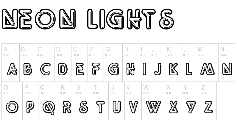
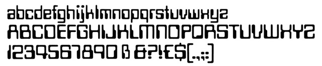
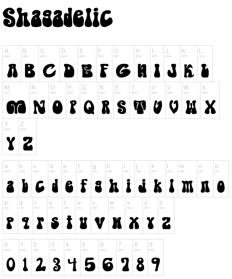
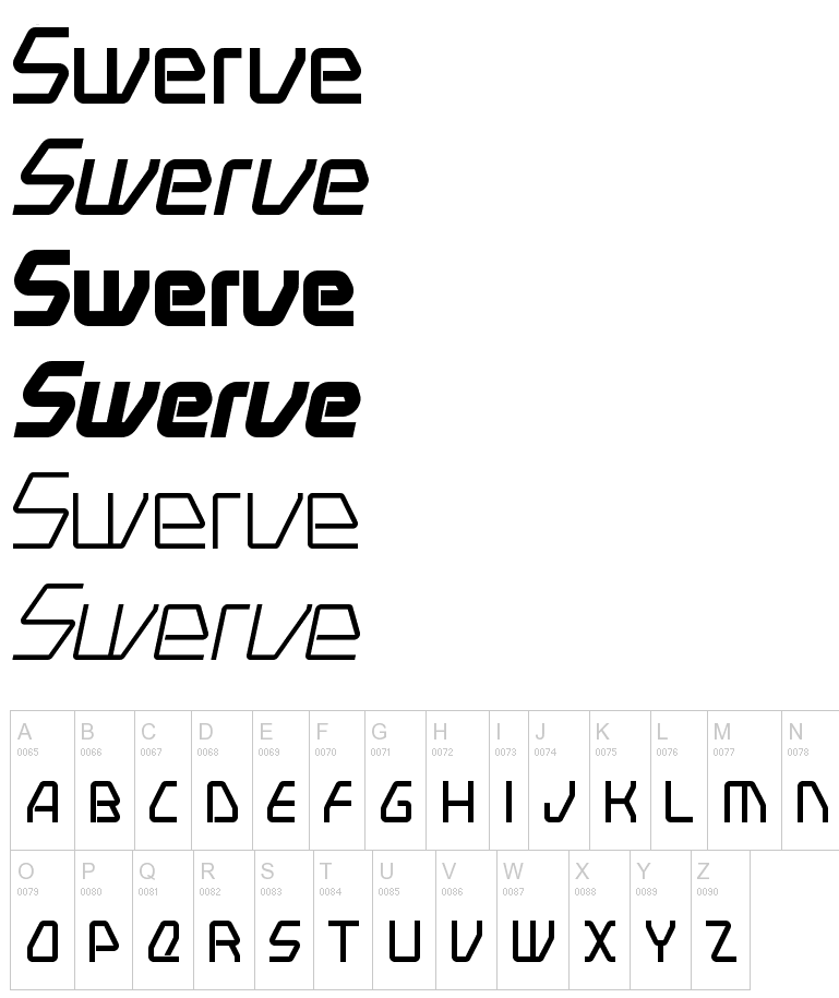
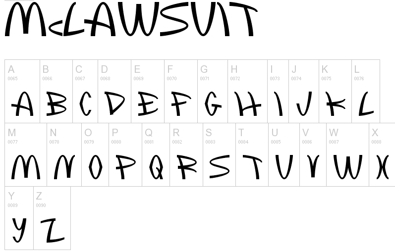
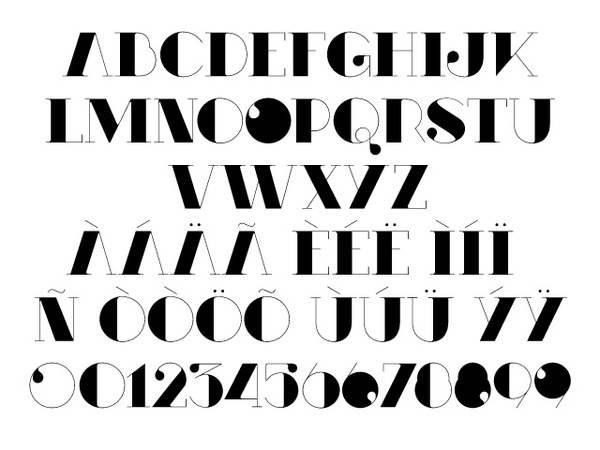
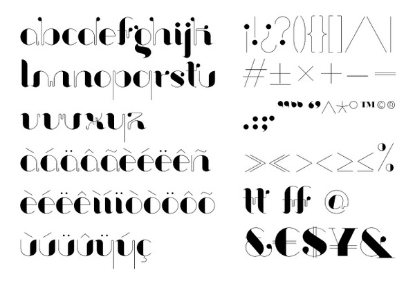
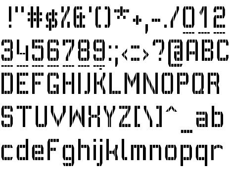
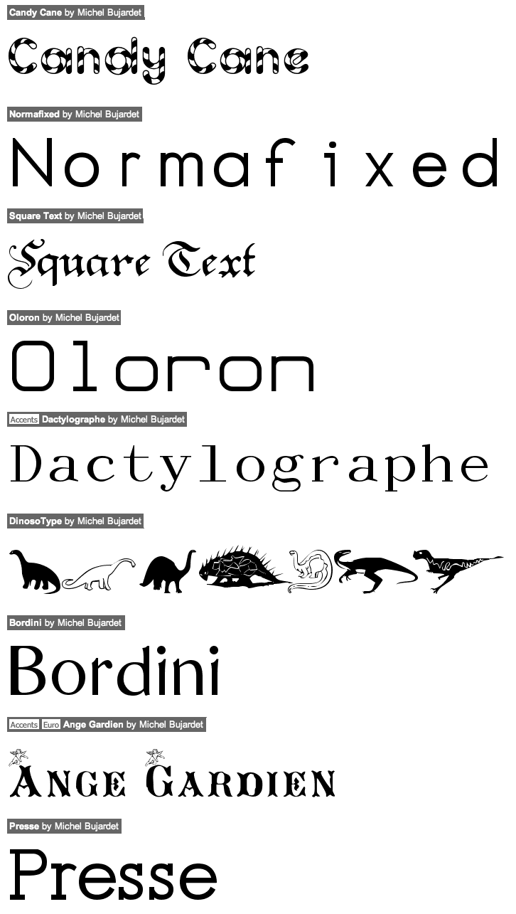
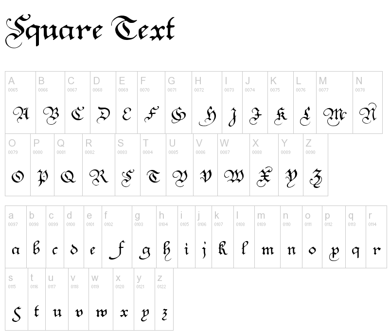
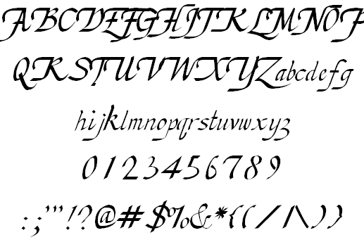
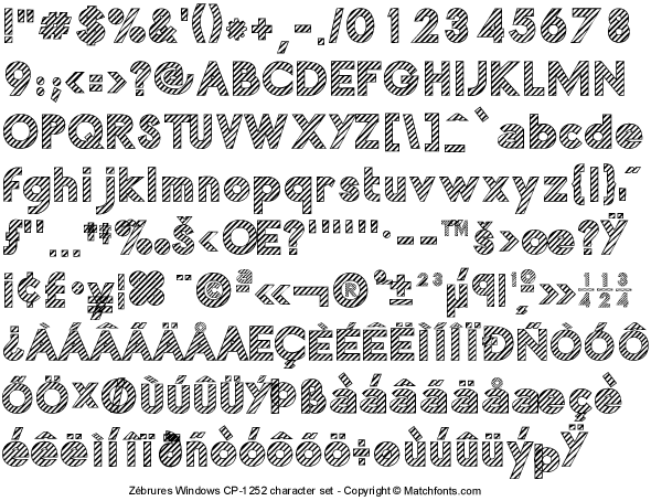
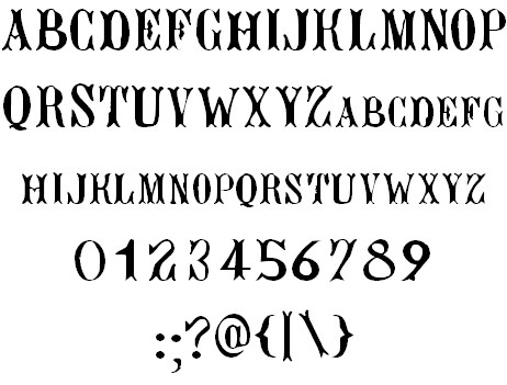
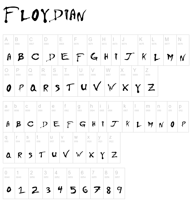
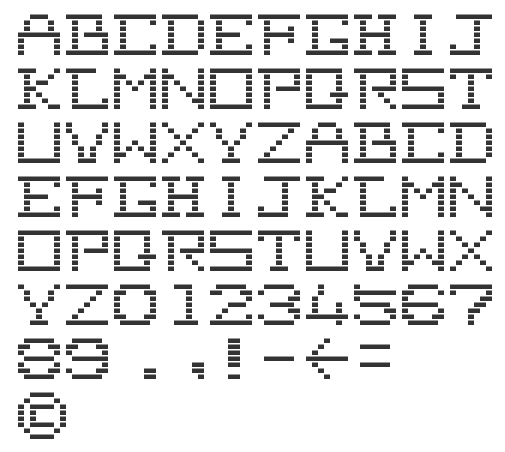
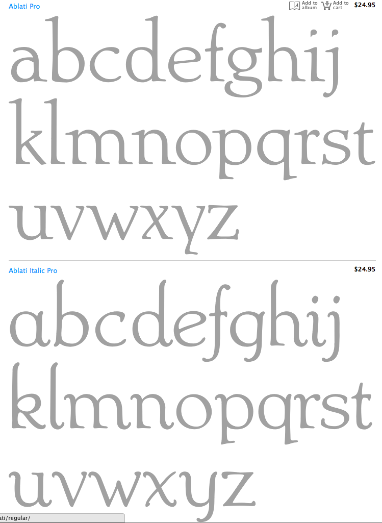
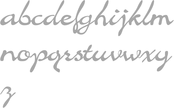
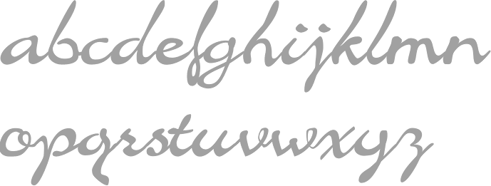
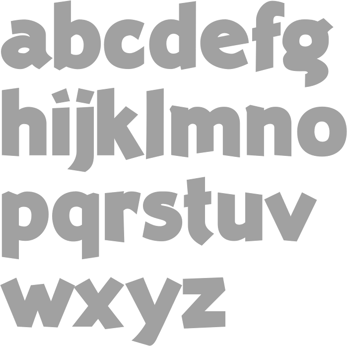
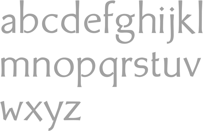
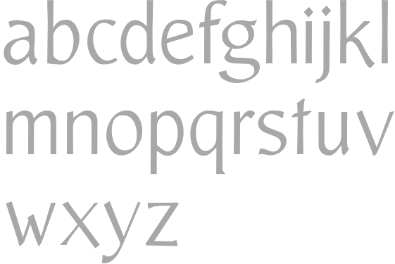
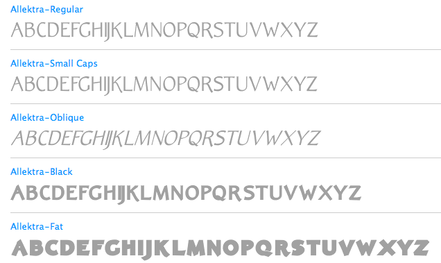
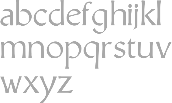
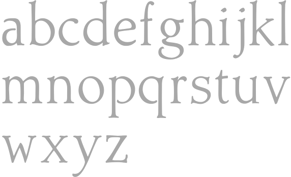
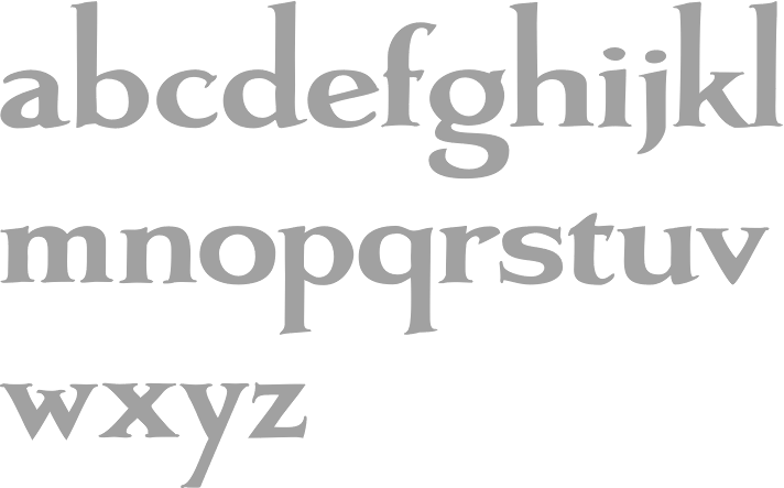
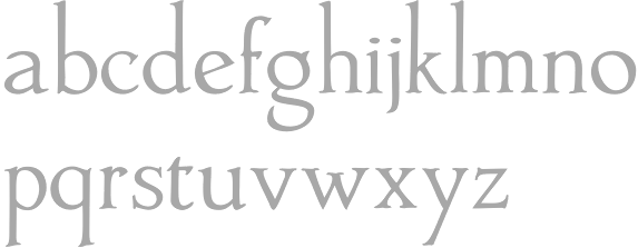
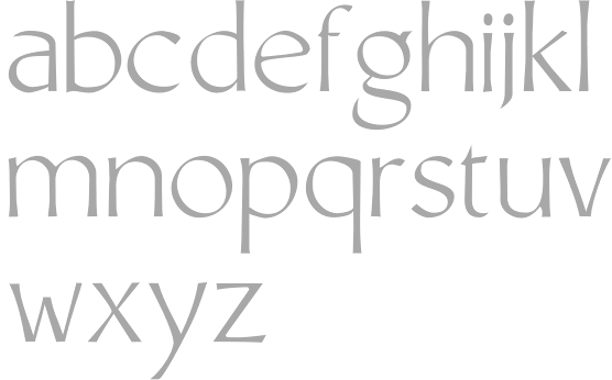
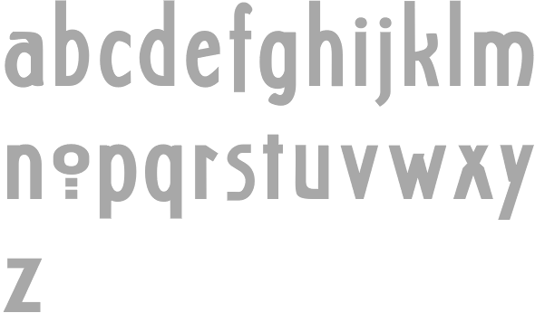
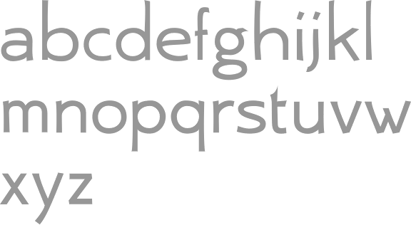
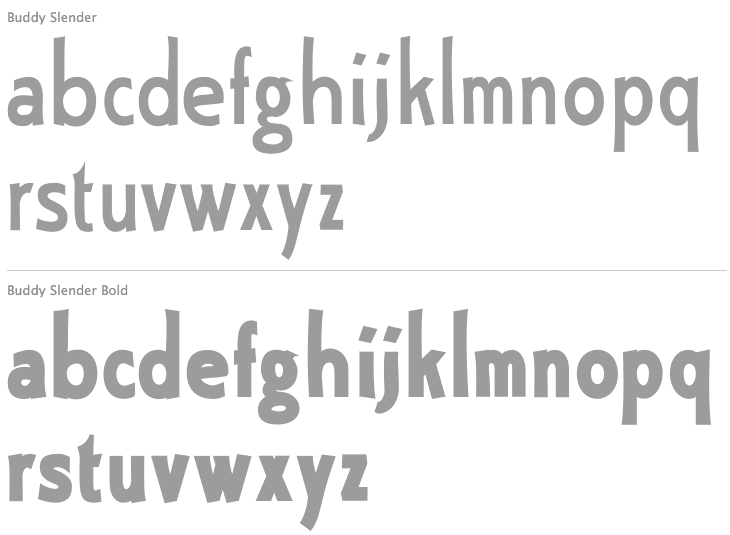
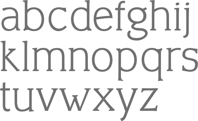
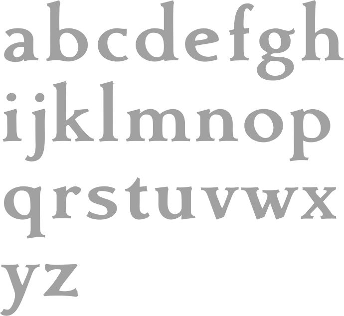
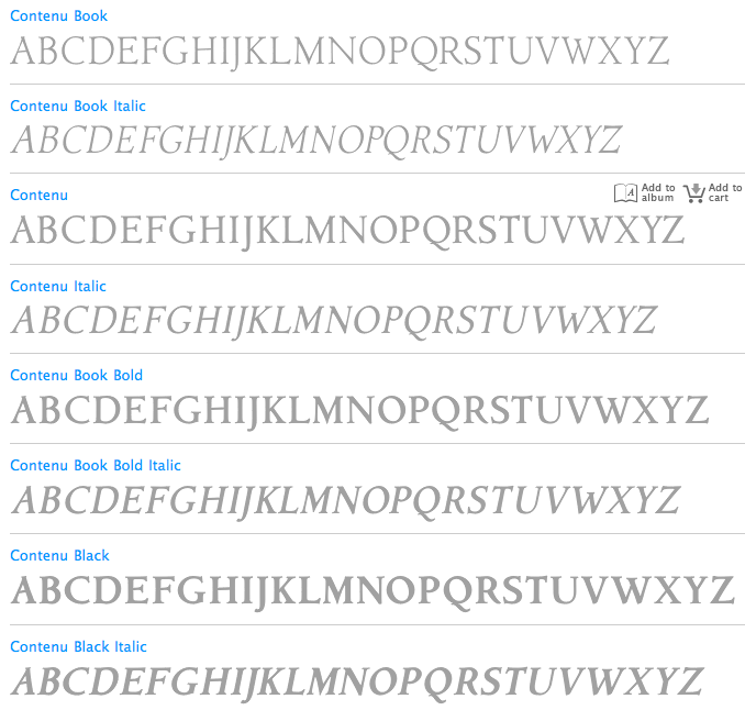
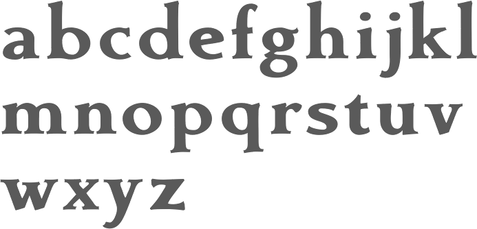
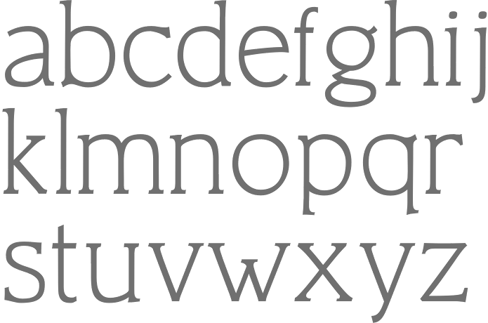
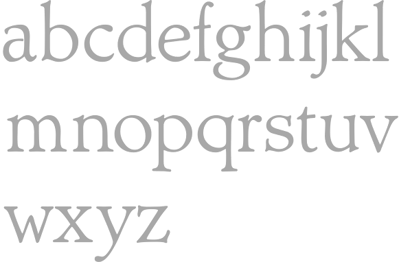
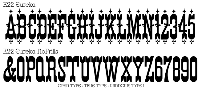
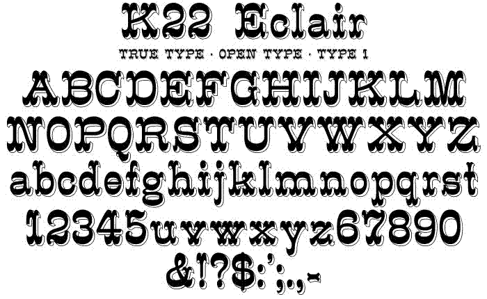
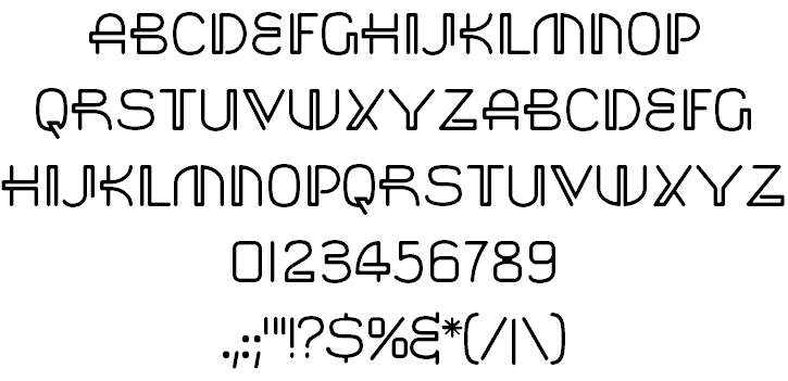
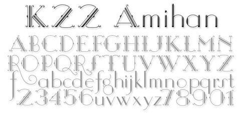
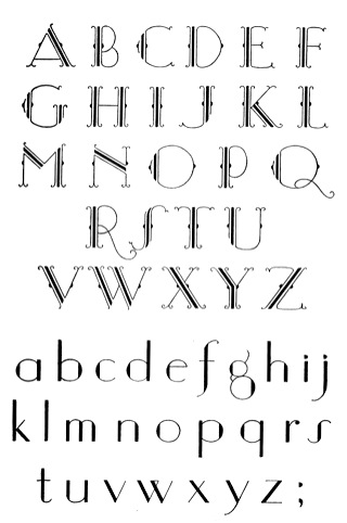
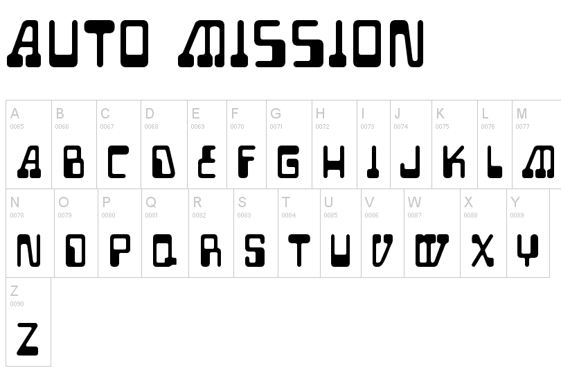
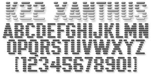
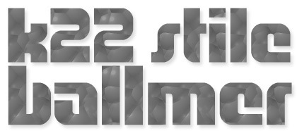
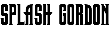
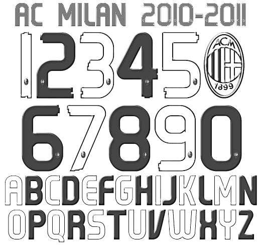
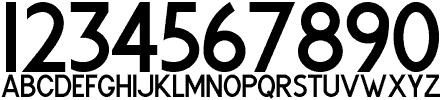
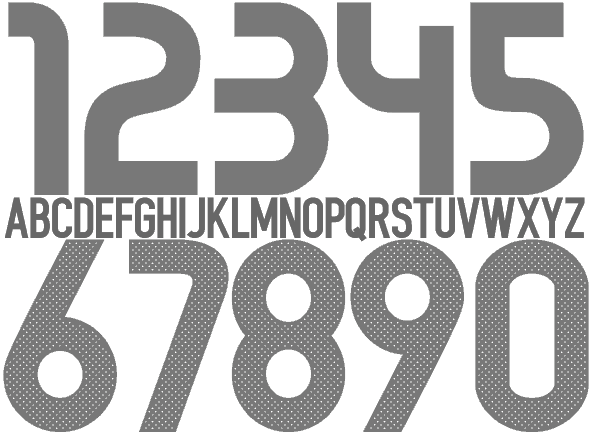
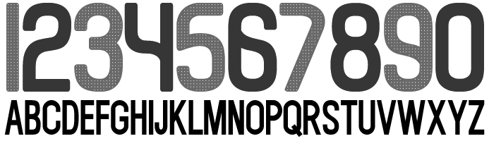
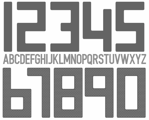
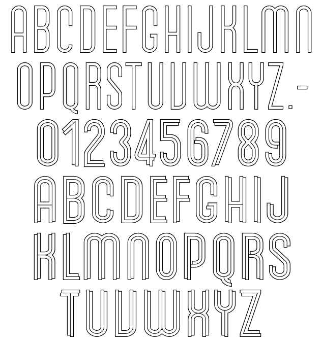
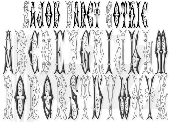
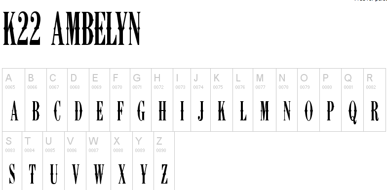
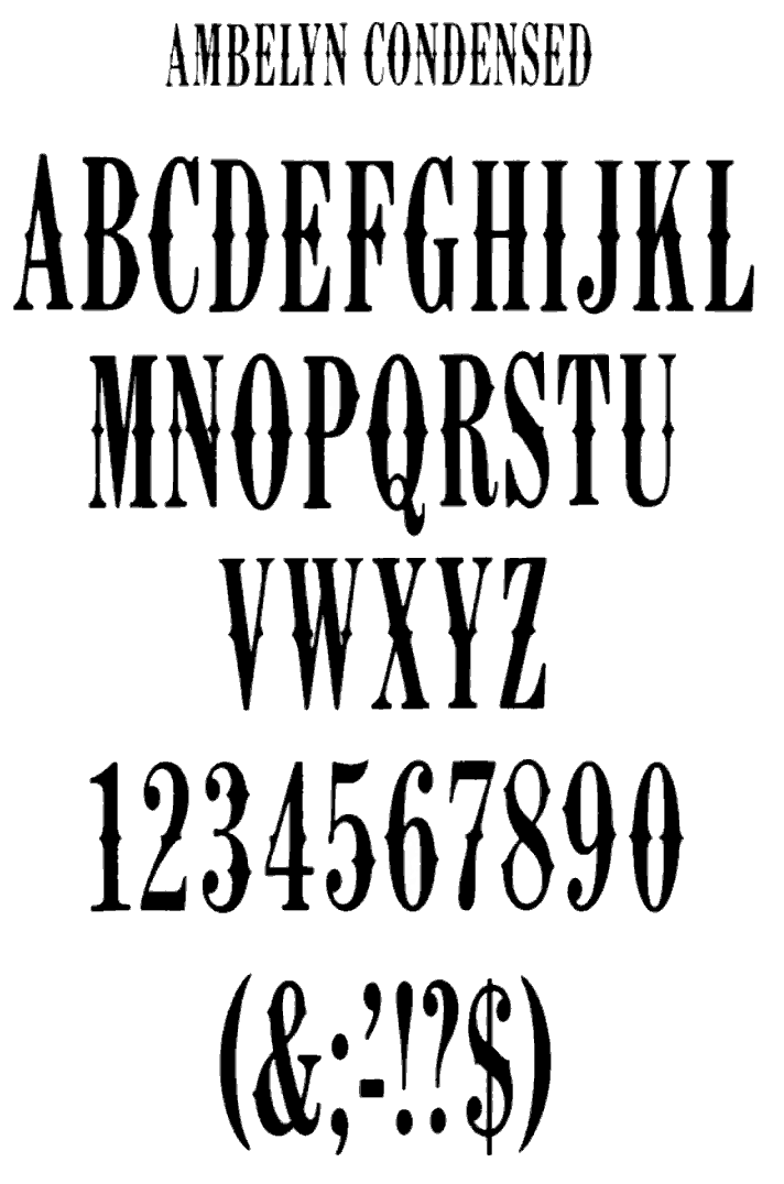
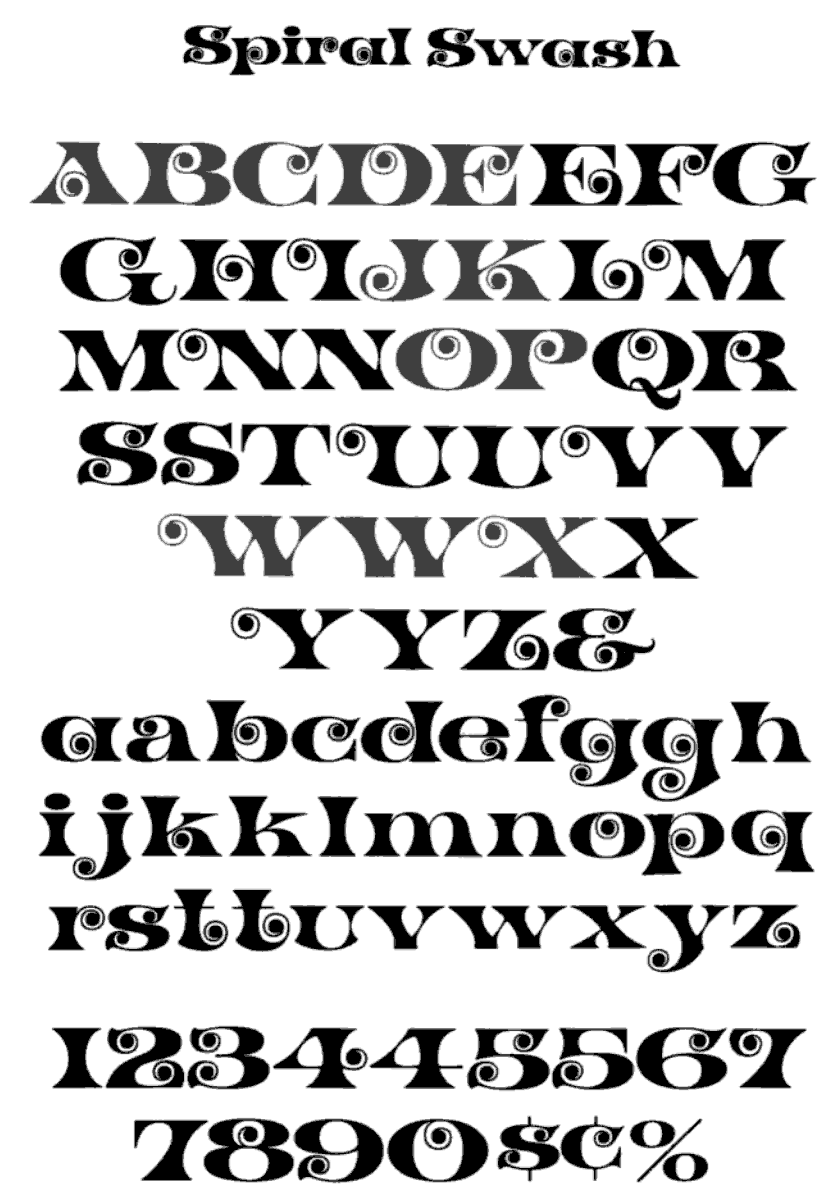
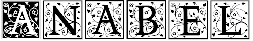
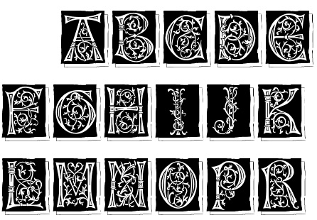
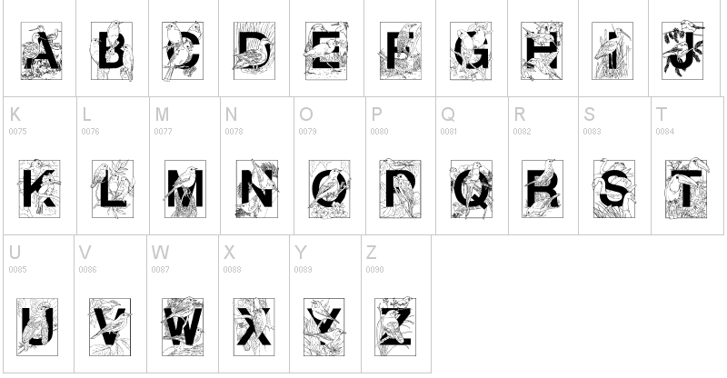
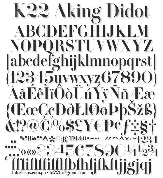
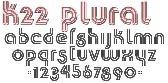
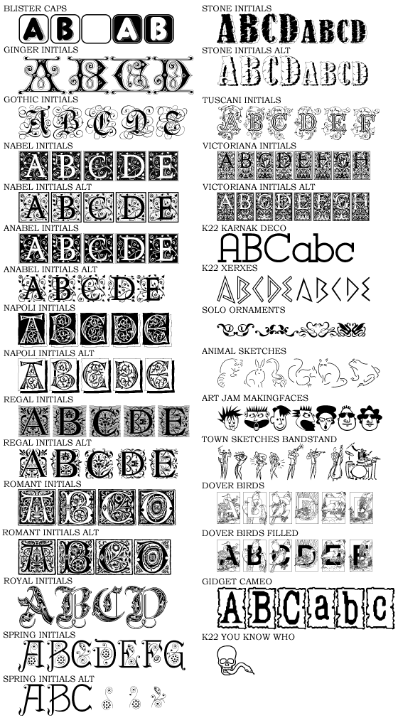
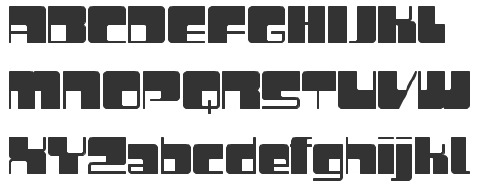
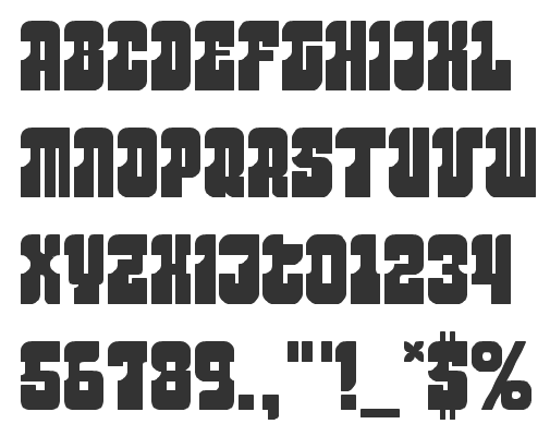
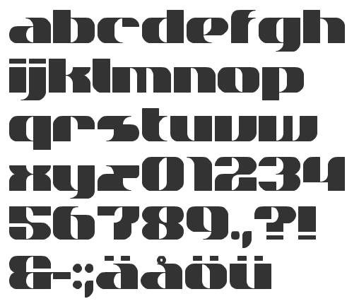
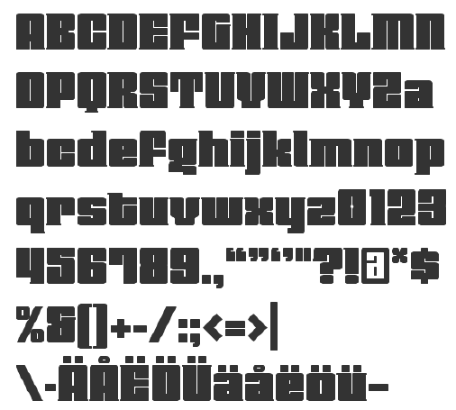
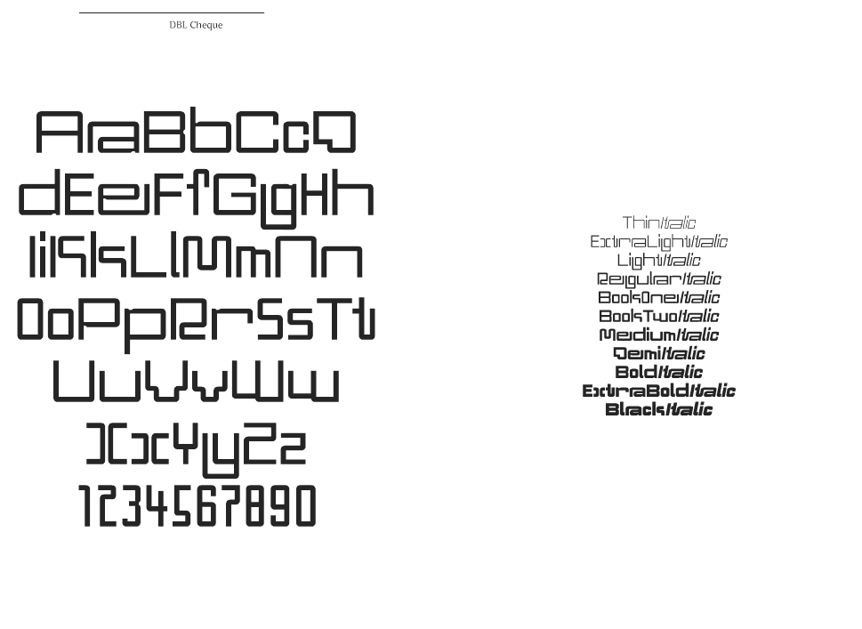
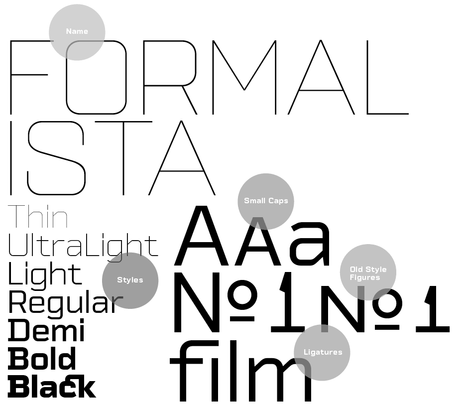
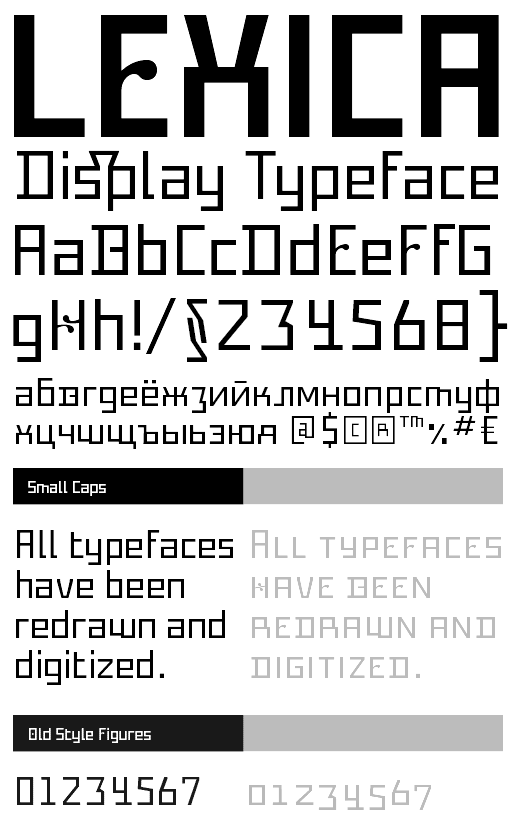
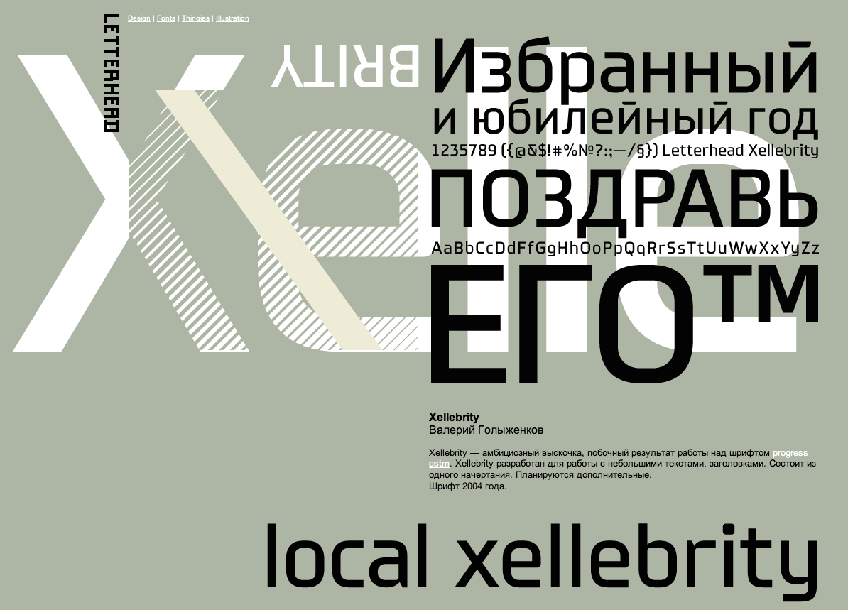
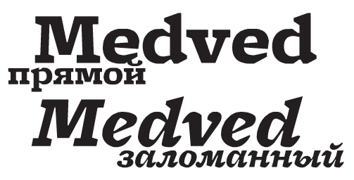
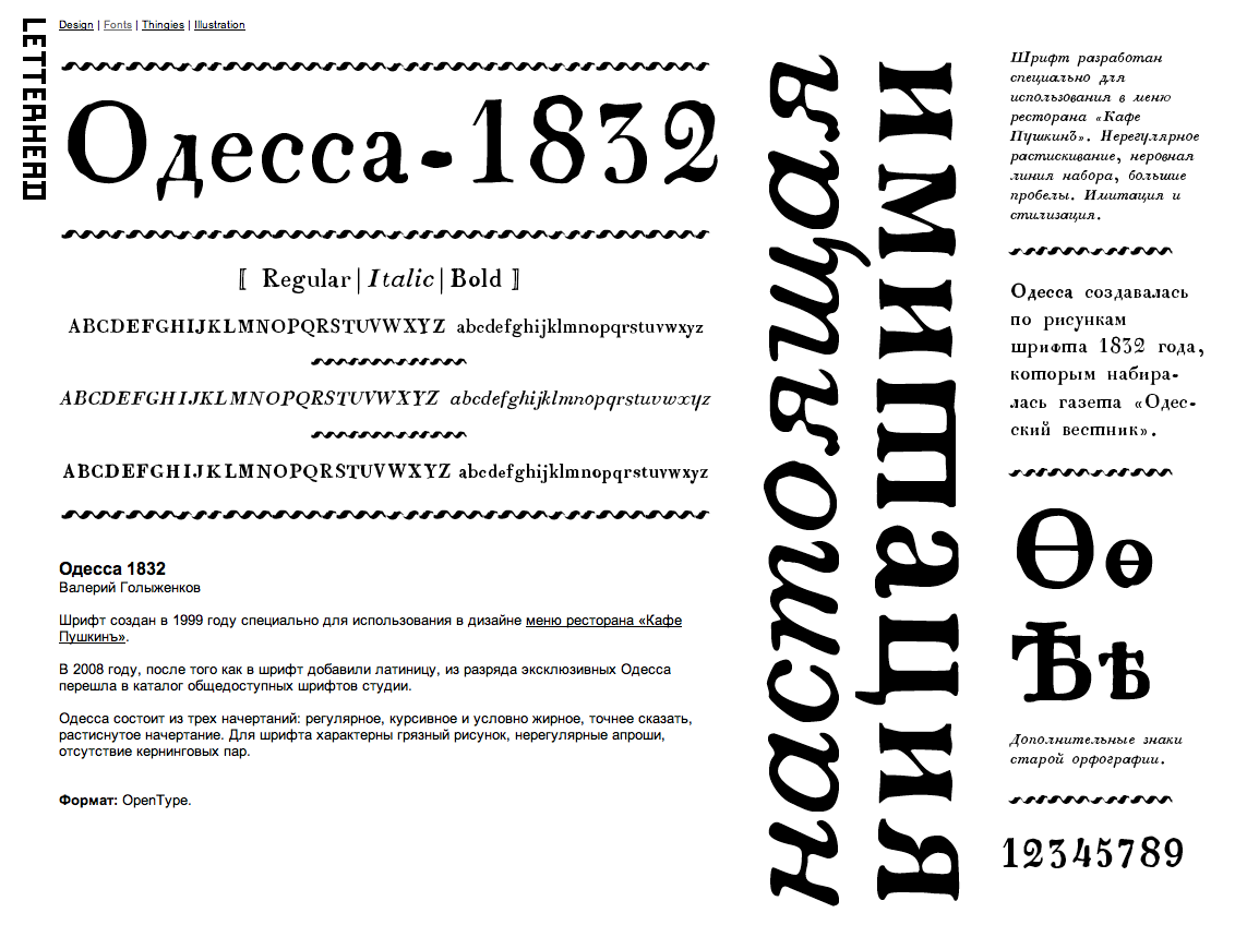
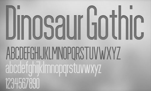
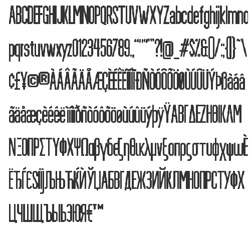
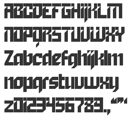
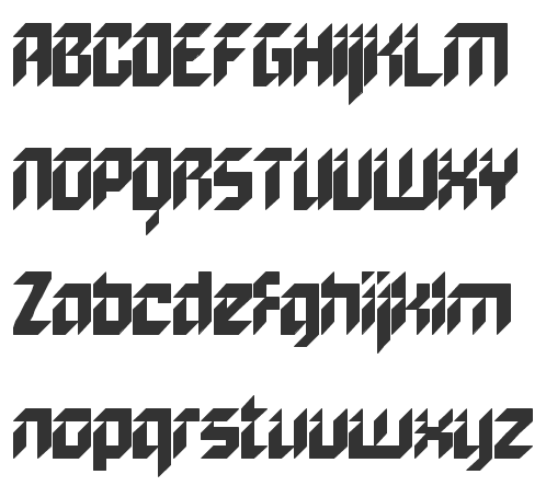
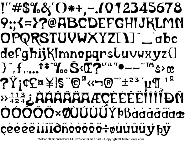
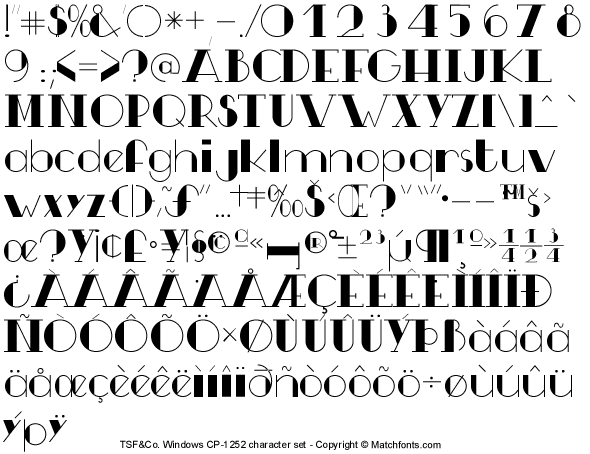
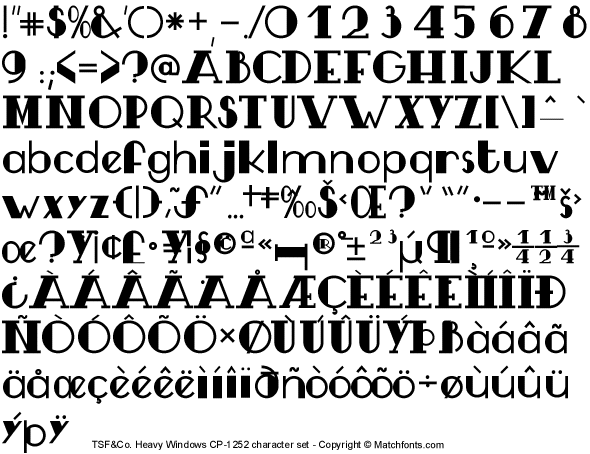
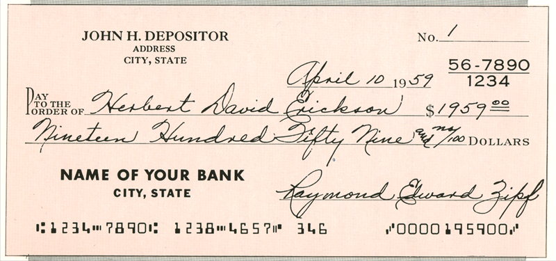
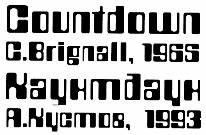
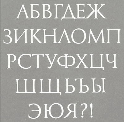
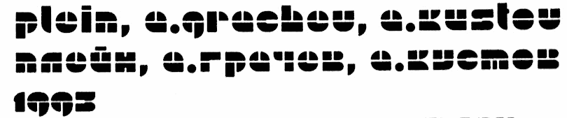
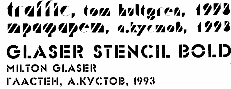
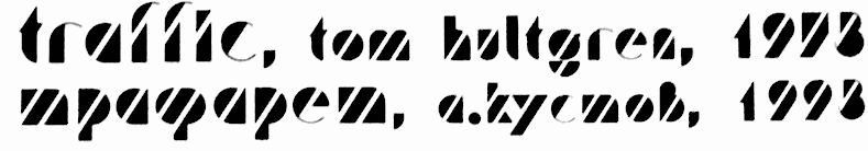
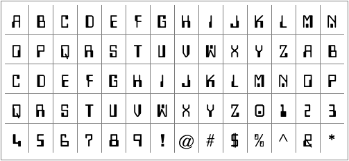
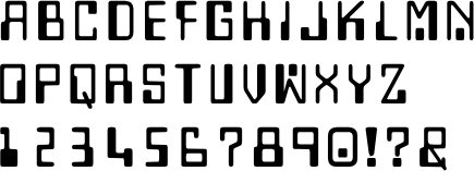
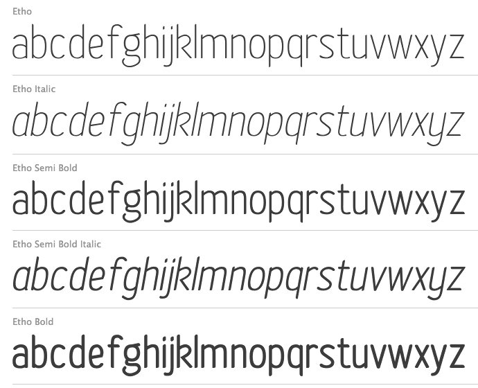
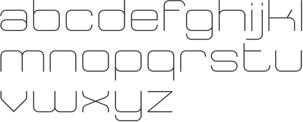
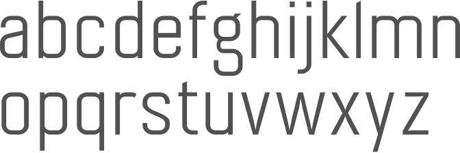
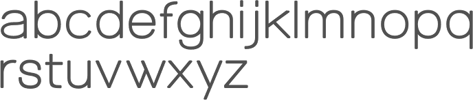
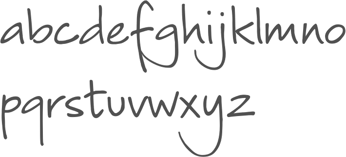