| | |
21st Annual TDC Type Design Competition (2018)
|
 International typeface competition in 2018 organized by the Type Directors Club in New York. The chair of the competition was Elizabeth Carey Smith. The judges: Sahar Afshar, Verena Gerlach, YuJune Park, Dyana Weissman. The winners:
 - Mirza (Amir Mahdi Moslehi, Tehran, Iran). Foundry: Bagh-e Tafarroj Studio. Client: Maryam Soft. Website: https://twitter.com/AMMoslehi.
- Lamon (Artemy Lebedev, Moscow). Foundry: Art Lebedev Studio.
- Plex (Mike Abbink, Paul van der Laan, and Pieter van Rosmalen). Client: IBM. Website: https://www.ibm.com/plex/.
- Source Han Serif (Ryoko Nishizuka, Frank Griesshammer, Wenlong Zhang, Soohyun Park, Yejin We & Donghoon Han). Client: Adobe Systems, Inc. and Google, San Jose, California. Web site: https://typekit.com/foundries/adobe.
- Noort (Juan Bruce, Paine, Chile). Foundry: TypeTogether.
- Origen (Alex Camacho, London). Foundry: Alex Camacho Studio.
- Teddy (Minjoo Ham, Berlin). Foundry: Fust & Friends. Website: http://www.fustandfriends.com.
- Pelago (Robert Slimbach, San Jose, California). Foundry: Adobe Systems.
- Harrison Serif Pro (Lisa Fischbach, Hamburg). Foundry: TypeMates.
- Read Greek Condensed (Elliott Amblard and Théo Guillard, Paris). Client: Groupe Renault. Website: https://black-foundry.com.
- Koning (Luc(as) de Groot, Martina Flor, Jan Fromm, Phillipp Neumeyer, Daria Petrova, Berlin). Foundry: LucasFonts. Website: http://www.lucasfonts.com.
- Vazeh (Reza Bakhtiarifard and Omid Emamian, Tehran). Client: Ofogh Rooydad. Website: http://twitter.com/rbakhtiarifard.
- Ray (Reza Bakhtiarifard and Omid Emamian, Tehran).
- Artigo Display (Joana Maria Correia da Silva, Porto, Portugal). Foundry: Nova Type Foundry. Website: http://www.novatypefoundry.com.
- Guyot (Ramiro Espinoza, The Hague). Foundry: Retype Foundry.
- Oi (Kostas Bartsokas, Reading, UK). Website: https://kostasbartsokas.com/oi-you-mate/.
- Kinetic (Noel Pretorius and Maria Ramos, Stockholm and Santiago de Compostela, Spain). Foundry: NM type. Web site: http://www.kinetictypeface.com.
- Greta Text Hebrew (Michal Sahar, Tel Aviv, and Peter Bilak, The Hague). Foundry: Typotheque.
[Google]
[More] ⦿
|
22nd Annual TDC Type Design Competition (2019)
|
International typeface competition in 2019 organized by the Type Directors Club in New York. The judges were Tobias Frere-Jones, Nicole Dotin, Kristyan Sarkis and Erin McLaughlin. The deadline is past. [Google]
[More] ⦿
|
AIGA Annual Design Competition 2003
|
The typography awards in the AIGA competition [which are mostly but not exclusively for the creative use of type] in 2003 were: Archer (Hoefler), Retina (Frere-Jones at HTF), Interiors 3D type (Northern Illinois University, DeKalb, IL), Bjork Cocoon (Radical Media, NY), Copy magazine (Sagmeister, NY), AIGA "Voice" animation (Chermayeff&Geismar Inc, NY). [Google]
[More] ⦿
|
AIGA medalists
|
 The medal of the AIGA is awarded to individuals in recognition of their exceptional achievements, services or other contributions to the field of graphic design and visual communication. On numerous occasion since its inception in 1920, the medal went to famous typographers or influential type personalities. Included are Daniel Berkeley Updike (1922), Bruce Rogers (1925), Frederic W. Goudy (1927), William A. Dwiggins (1929), Henry Lewis Bullen (1934), Rudolph Ruzicka (1935), Thomas M. Cleland (1940), Stanley Morison (1946), Jan Tschichold (1954), Josef Albers (1964), Paul Rand (1966), Giovanni Mardersteig (1968), Herbert Bayer (1970), Milton Glaser (1972), Herb Lubalin (198), Saul Bass (1981), Massimo Vignelli (1982), Matthew Carter (1995), Zuzana Licko and Rudy VanderLans (1997), Lucian Bernhard (1997), Steven Heller (1999), and P. Scott Makela (2000). [Logo designed by Jimmy La (2010).] [Google]
[More] ⦿
The medal of the AIGA is awarded to individuals in recognition of their exceptional achievements, services or other contributions to the field of graphic design and visual communication. On numerous occasion since its inception in 1920, the medal went to famous typographers or influential type personalities. Included are Daniel Berkeley Updike (1922), Bruce Rogers (1925), Frederic W. Goudy (1927), William A. Dwiggins (1929), Henry Lewis Bullen (1934), Rudolph Ruzicka (1935), Thomas M. Cleland (1940), Stanley Morison (1946), Jan Tschichold (1954), Josef Albers (1964), Paul Rand (1966), Giovanni Mardersteig (1968), Herbert Bayer (1970), Milton Glaser (1972), Herb Lubalin (198), Saul Bass (1981), Massimo Vignelli (1982), Matthew Carter (1995), Zuzana Licko and Rudy VanderLans (1997), Lucian Bernhard (1997), Steven Heller (1999), and P. Scott Makela (2000). [Logo designed by Jimmy La (2010).] [Google]
[More] ⦿
|
Berliner Type
|
Type and graphic design competition, open to typefaces designed in Germany, Austria and Switzerland. Past winners were often selected for certain corporate projects, not for type design per se. The type awards since 2006 are on-line. The competitions are numbered. For example, 2013 is the 45th competition. [Google]
[More] ⦿
|
Bienal Letras Latinas 2006
|
 Exposition on type held from 2-3 April 2006 in Sao Paulo. It included a type competition with as jury Francisco Calles Trejo, Luciano Cardinali, Juan Carlos Darias, Priscila Farias, Rubén Fontana, Vicente Lamónaca, Candelaria Moreno, César Puertas, and Rodrigo Ramírez. There were 70 laureates from over 400 submissions. Pictures.
 - Tipografías para texto: Cheché Sans (Alfredo Parada Larrosa), Política (Alejandro Paul), UnePipe (Félix Lentino), MelloSans (Fernando de Mello Vargas / Vicente Gil Filho), Average (Eduardo Rodríguez Tunni), Botija Sans (Juan Montoreano), Ema (Juan Montoreano), Loreto (Eduardo Tunni / Pablo Cosgaya), Special Type (Silvana Caruso), Matutina Serif (Aldo de Losa), Prima Sans (Ariel Katena / Alejandro Lazos), Tauran Regular (Raúl García Plancarte), Darka (Gabriel Martinez Meave), Romance (Nicolás Pisano), TT Carmina (Verónika Burian / José Scaglione), Athelas (José Scaglione), Den Dekker (Yomar Augusto), Siquot Antigua (Luis Siquot), Tuhun (Diego Mier y Terán).
- Tipografías para título: Botota (Javier Quintana), Inconexa (John Moore), Makiritare (John Moore), Palaima (John Moore), Robin Bienal II (John Moore), Affair (Alejandro Paul), Ministry Script (Alejandro Paul), Suave Script (Alejandro Paul), Buffet Script (Alejandro Paul), Whomp (Alejandro Paul), Oxida (Angel Koziupa / Alejandro Paul), Cenizas (Angel Koziupa / Alejandro Paul), Chocolate (Koziupa / Alejandro Paul), Alma (Angel Koziupa / Alejandro Paul), Malambo (Angel Koziupa / Alejandro Paul), Koziupack (Angel Koziupa / Alejandro Paul), Candy Script (Alejandro Paul), Overlock (Daría Manuel Muhafara), Herencia (Diego Giaccone / Alejandro Paul), Sudestada (Diego Giaccone / Alejandro Paul), Boqueta (Gustavo Lassala), Póstuma (Roberto Raúl Janz), Moho (John Moore), BEC (Eduardo Castillo), Tosca (Cristián González Sáiz), Imperio (Juan Ignacio Siwak), Rotman (Oscar Salinas Losada), Non nova, sed nove (Javier Gómez), Minotax (Milagros Santini), Revolver (Octavio Alonso López), Revolución (Luciano Vergara), Mixa (José De Los Santos), FH After (Fabio Luiz Haag / Foco Design by Type), Chile Sans (Miguel Hernández).
- Tipografías para pantalla: stgotic (Daniel Hernández), Rexel (Alejandro Posada / Carlos J. Roldán), cp_cursi (Carlos J. Roldán), Escrin (Martín Gonzalez).
- Tipografías experimentales: Clave de Fá (Dimitre Lima), Sinestesia (María Victoria Lamas), HH Pólvora (Quique Ollervides Uribe), Goteira (Rogerio Lionzo), Cubius Concretius (Marcel Pereira Ursini), PD Boquerón (Johanny Franchi / Prodiseño), Beautiful Pixel (Guillermo Vizzari).
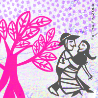
- Tipografías de misceláneas: Desprecio (Carlos Carpintero), Bangalo vive (Carlos Carpintero), Olé Flamenco / Olé Torero (Víctor García), Orlas (Juan Luis Carrera), Minsap Liván (Padilla Sigler), Zabumba City (Fátima Finizola).
[Google]
[More] ⦿
|
Bienale Brno
|
Graphic design and type competition in Brno held at regular intervals. In 2000, theinners included Stefan Sagmeister (Grand Prix), Peter Bilak (best design in the type category), and Josef Týfa (special award for life-long contribution to Czech type design and typography). Normally, this is a graphic design competition, but every fourth year, a type competition is added. In 2004, the jury included Frantisek Storm, Stefan Sagmeister and Peter Bilak. [Google]
[More] ⦿
|
bukva:raz!
|
 bukva:raz! was an international competition of type design, sponsored by the Association Typographique Internationale (ATypI). It covered Latin, Greek, Cyrillic, Arabic, Hebrew, and other scripts. The judging of bukva:raz! took place in Moscow, Russia, on 1 and 2 December 2001, and was chaired by Maxim Zhukov. The jury consisted of Matthew Carter, Yuri Gherchuk, Akira Kobayashi, Lyubov Kuznetsova, Gerry Leonidas, Fiona Ross, Vladimir Yefimov. From the 600 entries, 99 winners were selected. John Berry's report. An alphabetic list:
 - Absolut type: Lars Bergquist (Sweden)
- Alinea: Thierry Puifoulhoux (USA)
- Alphatier: Mark Jamra (USA)
- Ambroise, Ambroise François: Jean-François Porchez (France)
- Anisette, Anisette Petite: Jean-François Porchez (France)
- Arcana: Gabriel Martinez Meave (Mexico)
- Asmik: Manvel Shmavonyan (Armenia)
- Atzmaut (Independence): Yanek Iontef (Israel)
- Bartholeme open: Dennis Pasternak (USA)
- Basalt: Sumner Stone (USA)
- Biot: Julien Janiszewski (France)
- Caflisch Script Pro: Robert Slimbach (USA)
- Calbee: Karen Lau (USA)
- Calligraphic: Yuri Gulitov (Russia)
- Charente: Jean-François Porchez (France)
- Cholla: Sibylle Hagmann (USA)
- Cursiv Bogdesko: Ilya Trofimovich Bogdesko (Russia)
- Dolly: Lars de Beer, Akiem Helmling, Bas Jacobs, Sami Kortemäki (The Netherlands)
- DTL Dorian: Elmo van Slingerland (The Netherlands)
- DTL Haarlemmer Sans: Frank E. Blokland (The Netherlands)
- DTL Paradox: Gerard Unger (The Netherlands)
- DTL Unico: Michael Harvey (The Netherlands)
- Economy: Vasily Shishkin (Russia)
- Enigma: Jeremy Tankard (United Kingdom)
- Ergo Sketch: Gary Munch (Germany)
- FF Kievit: Michael Abbink (USA)
- Fontana ND: Ruben Fontana (Argentina)
- Founder's Caslon: Justin Howes (United Kingdom)
- Frothy: Julien Janiszewski (France) (this font was later disqualified by the jury because it was derived from ITC Stone Sans).
- Geisha: Yelena Liqutina (Ukraine)
- Giacometti Pi: Sine Bergmann (Germany)
- Gotham: Tobias Frere-Jones, Jesse M. Ragan (USA)
- Guggenheim: Jonathan Hoefler (USA)
- Den Haag (Latin, Cyrillic): Alexandr Tarbeev (Russia)
- Handmade: Andrey Belonogov (Russia)
- Harmony Greek: Jeremy Tankard (United Kingdom)
- Hothouse: Jörgen Huber (Germany)
- Humanist 531 Cyrillic: Isay Slutsker, Manvel Shmavonyan (Russia)
- ITC Biblon: Frantisek Storm (USA)
- Kinesis: Mark Jamra (USA)
- Knockout: Jonathan Hoefler (USA)
- Lagarto: Gabriel Martinez Meave (Mexico)
- Latina : Inigo Jerez Quintana (Spain)
- Le Monde Courrier: Jean-François Porchez (France)
- Le Monde Journal: Jean-François Porchez (France)
- Lechaufferie: Damien Gautier (France)
- Letopis: Innokenty Keleinikov (Russia)
- Linotype Finnegan : Jürgen Weltin (Germany)
- Linotype Frutiger Next: Adrian Frutiger (Germany)
- Linotype Syntax: Hans-Eduard Meier (Germany)
- LTR Federal: Erik van Blokland (The Netherlands)
- made in China: Yelena Zotikova (Ukraine)
- Maqsaf: Habib Khoury (Israel)
- Maya: Oded Ezer (Israel)
- Mercury: Jonathan Hoefler & Tobias Frere-Jones (USA)
- Minion Pro: Robert Slimbach (USA)
- Myriad Pro: Robert Slimbach (USA)
- Nathan: Sylvie Chokroun (France)
- Newspaper: Luc[as] de Groot (Germany)
- Next Exit: Yanek Iontef (Israel)
- Nichiyou Daiku: Joachim Müller-Lancé (USA)
- No name: Tim Holloway (United Kingdom)
- Nyx: Rick Cusick (USA)
- Onserif & Onsans: Inigo Jerez Quintana (Spain)
- P22 Daddy-O Beatsville: Richard Kegler & Peter Reiling (USA)
- P22 Gothic Gothic: James Grieshaber (USA)
- Papaya: Zvika Rosenberg (Israel)
- Parmenides: Dan Carr (USA)
- Pesaro: Joachim Müller-Lancé (USA)
- Pigiarniq: Ross Mills (Canada)
- Policy: Julian Bittiner (USA)
- Pradell: Andreu Balius (Spain)
- Prensa: Cyrus Highsmith (USA)
- Quadrat Grotesk: Vladimir Pavlikov (Russia)
- Raghu: R.K. Joshi (India)
- Rayuela: Alejandro Lo Celso / Pampa Type (Argentina)
- Really: Gary Munch (USA)
- Reguiem: Jonathan Hoefler (USA)
- Reguiem Ornaments: Jonathan Hoefler (USA)
- Relay: Cyrus Highsmith (USA)
- Retina Agate: Tobias Frere-Jones (USA)
- Rouble: Andrey Belonogov (Russia)
- Seria & Seria Sans: Martin Majoor (The Netherlands)
- Serp'n'Molot: Tagir Safayev (Russia)
- Shaker: Jeremy Tankard (United Kingdom)
- Shirokuro: Joachim Müller-Lancé (USA)
- Shuriken: Joachim Müller-Lancé (USA)
- Sketchley: Ronna Penner (USA)
- Stancia: Jean-Renaud Cuaz (USA)
- Sun: Luc[as] de Groot (Germany)
- Tanya: Olga Overchun (Ukraine)
- The AntiquaB: Luc[as] de Groot (Germany)
- The Shire Types: Jeremy Tankard (United Kingdom)
- Vesta: Gerard Unger (The Netherlands)
- Waters Titling Pro: Julian Waters (USA)
- Yellow: Jürgen Weltin (Germany)
- Yisana: Olivier Umecker (France)
- Zentra: Vladimir Pavlikov (Russia)
- Zigzag: Yurij Lila (Ukraine)
- Zubizarreta: Joan Barjau (Spain)
[Google]
[More] ⦿
|
Canberra Centenary Typeface Design Competition
|
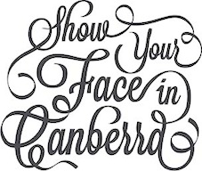 To celebrate the 100th anniversary of Canberra, the city organized a typeface design competition with a 10000 Australian dollar first prize. The home of the competition is the University of Canberra.
 The design brief: Create a versatile and usable new typeface, to be employed primarily in headlines and sub-heads that reflects the style, spirit, prestige and character of the city of Canberra. At the end of 2013, the winners were announced. Grand prize winner was James Raftopoulos for a thin slab serif. Second place went to Alex Kaczun for Directors Cut. The full list of winning entrants. [Google]
[More] ⦿
|
Chartpak Designer Typeface Competition
|
Typeface competitions held in the 1980s. Its Second Annual Competition, in 1988, saw these winners: - Jon Henry for Abigail.
- Russell Naylor for Architect.
- Chris Costello for Blackstone.
- Joye Divine for Divine.
- Douglas Tocco for Tocco Bold.
- Mustafa Eren for Diodyma.
- Donald Warren for Freidan.
- Christine Heun for Heun Gothic.
- Mark Sellmeyer for Oops.
- Michael Beens for Muirfield Book.
[Google]
[More] ⦿
|
Communication Arts 4th Typography Competition: 2014
|
 The typeface awardees in the Communication Arts 4th Typography Competition were announced in January 2014. The list: Dark Angel (Alphabet Soup Type Founders), Calavera family (Cocijotype), FF Dora family (FontFont), Bangshu Xing (Founder Type), Amplify family (Graham Clifford Design), Minot (Jessica Hische), Erotica (Lian Types), Rolling Pen (Sudtipos), Bellissima (Sudtipos), Birds Posture (Benny Tang), Mislab (Xavier Dupré for Typofonderie), Wilber typeface (Ryan Bernis), Floral alphabet (Jill De Haan), South Rose typeface (Sydney Goldstein), Planter typeface (Lesley Johnson), Dutch Mafia font and icon set (mkn design). [Google]
[More] ⦿
The typeface awardees in the Communication Arts 4th Typography Competition were announced in January 2014. The list: Dark Angel (Alphabet Soup Type Founders), Calavera family (Cocijotype), FF Dora family (FontFont), Bangshu Xing (Founder Type), Amplify family (Graham Clifford Design), Minot (Jessica Hische), Erotica (Lian Types), Rolling Pen (Sudtipos), Bellissima (Sudtipos), Birds Posture (Benny Tang), Mislab (Xavier Dupré for Typofonderie), Wilber typeface (Ryan Bernis), Floral alphabet (Jill De Haan), South Rose typeface (Sydney Goldstein), Planter typeface (Lesley Johnson), Dutch Mafia font and icon set (mkn design). [Google]
[More] ⦿
|
Communication Arts Typography Competition
|
Communication Arts had a typography competition in 2010. Categories include collateral, packaging, media, motion, environmental typeface design, calligraphy/handlettering and unpublished/experimental. The jury included Stephen Coles (type director at the FontShop and editor of Typographica), Allan Haley (director of Words&Letters at Monotype Imaging and past president of the New York Type Directors Club), and Shelley Gruendler, who replaced Ellen Lupton (designer, curator, critic and author of Thinking with Type). The typeface design category requires a 35 dollar fee per submission. Unfortunately, to view the winning entries, readers need to pay a fee as well, despite the fact that the 2,135 competitors together gave Communication Arts a nice 70,000 dollar kitty. The winners: - Deliscript (Alphabet Soup Type Founders)
- Barrilito (Cocijotype)
- Orbe Pro (Fountain Type)
- Replay (Stefan Hattenbach)
- Espinosa Nova (Cristobal Henestrosa)
- Hobby Lobby (Kelly Hume)
- Implausible (Regan Johnson)
- Alright Sans (Okay Type&Design)
- Adios Script (Alejandro Paul)
- Brownstone (Alejandro Paul)
- Fan Script (Alejandro Paul)
- Nori (Positype)
- Suomi Hand Script (Suomi Type Foundry)
- Karmina Sans (TypeTogether)
- Edita (TypeTogether)
- Adelle (TypeTogether)
- Typo5 (Typo5)
- Liza Pro (Underware)
- Eloquent Pro (Jason Walcott)
- Carrosserie (Fabian Widmer)
- Acorde (Willerstorfer Font Foundry)
[Google]
[More] ⦿
|
Communication Arts Typography Competition: 2012 Typography Annual
|
 Communication Arts had its second annual typography competition in 2012. The jury consisted of Erik Spiekermann, Richard Kegler and Tiffany Wardle de Sousa. From 1723 entries, 150 winners were selected in many categories. Of these 150, 19 were in the type design category. The winners in that category:
 - Steinweiss Script (Alphabet Soup Type Founders).
- Socialism (FontBit).
- Be Serif (FontBit).
- FF More Family (FontFont).
- FF Sero (FontFont).
- FF Spinoza Pro (FontFont).
- Aria Pro (Fountain Type).
- Smidgen (House Industries).
- Barun Jiwon Book (Jiwon Lee).
- DIN Next Arabic (Linotype).
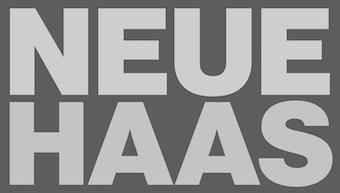
- Neue Haas Grotesk (Linotype).
- Palatino Sans Arabic (Linotype).
- Hiatus (Stephen Rapp).
- Poem Script (Sudtipos).
- Semilla (Sudtipos).
- Chartwell (TK Type).
- Regal Finesse (Panos Vassiliou).
- Samantha (Laura Worthington).
- Alana (Laura Worthington).
[Google]
[More] ⦿
|
Creative Review Type Competition 2005
|
 Creative Review in the UK organized a type competition for 2005 designs, judged by Bruno Maag of Dalton Maag, David Wakefield and Jason Smith of FontSmith. The winners:
 - Display Single: Bello (Underware). Second place: Monitor (Rian Hughes, Device), Landing Strip (Adam Graveley).
- Display Family: Plume (Bruno Maag & Ron Carpenter). Second place: Kari (Neil Summerour, Positype).
- Text Family: FF Nexus (Martin Majoor). Second place: FF Maiola (Veronika Burian), Auto (Underware), Calibri (Lucas De Groot, Fontfabrik), Ficus (Malou Verlomme), Arlt (Alejandro Lo Celso, PampaType).
- Custom Single: No winner. Second place: UOS Titling (Shelley Winters and Blast).
- Custom Family: Channel 4 (Jason Smith, Fontsmith). Second place: Sheffield (John Powner, Atelier Works and Jeremy Tankard), Deréon (Jean-François Porchez), Mencken (Jean-François Porchez), Dream (Veronika Burian), Super Veloz (Andreu Balius and Alex Trochut).
- Revival/Extension Family: Andrade (Dino dos Santos, DSType), Second place: Lapture (Tim Ahrens, Just Another Foundry).
- Non-Latin Family: Nour & Patria designed (Hrant Papazian, The Microfoundry).
- Ornamental: No Winners. Second place: Trust Me 97 (Stuart Price and Chris Jeffreys, The Chase).
The results made a big stink in the type community, with Kris Sowersby, Andreas Seidel, John Hudson and others arguing that judges should not be allowed to submit entries to competitions. Note that Bruno Maag and Jason Smith, both judges, won awards. [Google]
[More] ⦿
|
D&AD Awards: 2002
|
The typography awards in the 2002 D&AD competition are: - Roger Kennedy, for type in advertising. Client: Multiple Sclerosis Society.
- Julian Melhuish&Kevin Finn, for typography for design. Client: Spicers Paper.
[Google]
[More] ⦿
|
D&AD Awards: 2011
|
The typography awards in the 2011 D&AD competition are decided by a jury consisting of Ben Stott, Justus Oehler (Pentagram Design), Guy Featherstone (Wieden + Kennedy), Sara De Bondt, Si Scott, David Carson, and Gail Anderson (Spotco). All work that has been commercially released between 1 January 2010 and 31 December 2010 was eligible for entry to the 2011 Awards. These are awards for the professionals, and have a 100 pound entrance fee. Typefaces are eligible as entries. In the typeface design category, there were four winners: - Art Out by Carlos Rodrigo (Mucho) for Fundación Arte y Mecenazgo.
- Acorde by Stefan Willerstorfer (Willerstorfer Font Foundry).
- KyoSensha by Kyoko and Shigeru Katsumoto (Visual Design Laboratory).
- Rutz (aka Vesper Hebrew) by Oded Ezer Typography for Mota Italic.
[Google]
[More] ⦿
|
D&AD Awards: 2012
|
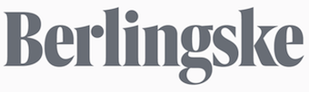 The 2012 D&AD competition had only one winner in the typefaces category: Berlingske (eTypes). [Google]
[More] ⦿
The 2012 D&AD competition had only one winner in the typefaces category: Berlingske (eTypes). [Google]
[More] ⦿
|
D&AD Awards: 2013
|
The 2013 D&AD competition had no winners in the type design category. [Google]
[More] ⦿
|
Dr. Peter Karow Award
|
 The Dr. Peter Karow Award for Font Technology&Digital Typography is an initiative of the Dutch Type Library. At the third DTL FontMaster Conference on the 18th of November 2003 in Castle Maurick in the Netherlands, the first Dr. Peter Karow Award for Font Technology&Digital Typography was presented. This prize is awarded yearly to people with extraordinary and innovative achievements in the field of font-related technology and consists of a certificate, a facsimile of the 42-line Gutenberg bible and DTL FontMaster for Mac OS and Windows.
 - The first award was given in 2003 to Dr. Peter Karow himself.
- In 2009, the second award was given to Thomas Milo for the development of the ACE layout engine (the heart of the Tasmeem plugin for InDesign ME) for Arabic text setting.
- In 2013, Don Knuth received the Peter Karow award for his development of TeX and Metafont. Large format pictures of the ceremony in Amsterdam taken by Luc Devroye: I, II, III, IV, V, VI, VII.
[Google]
[More] ⦿
|
ED Awards
|
 The European Design awards 2015 went mainly to central European type designers:
 - Gold: Alverata (Gerard Unger).
- Silver: Lipa Agate (Ermin Mededovic), Skolar Sans (David Brezina and Slava Jevcinova).
- Bronze: Kunda Book (Vojtech Riha), Grotesque 777 & 888 (Gunnar Vilhjálmsson and David Lane), NN Colroy (Marc Droz).
[Google]
[More] ⦿
|
EDAwards 2008
|
 The European Design Awards 2008 for Original Typeface:
 - Gold medal: PF Centro (Parachute Fonts).
- Merit awards: Enighet (Pangea Design AB), Skolar and Surat (both by David Brezina).
[Google]
[More] ⦿
|
EDAwards 2009
|
 The European Design Awards 2009 for Original Typeface:
 - Gold medal: Comenia (Suitcase Type Foundry)
- Silver medal: Malabar (Dan Reynolds)
- Bronze medals:
- Bree (TypeTogether)
- FC Autobahn (Autobahn)
- Planeta (Dani Klauser Graphic Design)
- Nabil (Emanuela Conidi)
- Kina (Francesca Bolognini)
- Texteron (Cape Arcona Type Foundry)
- Fedra Hindi (Typotheque)
[Google]
[More] ⦿
|
Eighth Founder Type Design Competition
|
This is the eighth competition organized (in 2016) by the Chinese type foundry Founder Type. the first one was held in 2001. Awards are given in the Latin and Chinese categories. Information file. [Google]
[More] ⦿
|
Epsilon Alpha competition
|
Epsilon Alpha (Hellenic Alphabet) is a Greek type design competition with awards in the 500 to 1000 Euro range. The winning entries were at the 3rd International Conference on Typography and Visual Communication in Thessaloniki in June 2007. The jury consisted of Dan Carr, Keith Tam, George Matthiopoulos, Michail Semoglou and Panagiotis Haratzopoulos. They gave the awards to Alice Savoiie (text type) and Thomas Grace (display type). [Google]
[More] ⦿
|
Fifth Founder Type Chinese Type Design Competition
|
The Center for Chinese Font Design and Research and Beijing Founder Electronics Co.,Ltd jointly organized this Chinese type design competition in 2009. [Google]
[More] ⦿
|
Fine Press Book Association Student Type Design Contest
|
Student type-design contest in 2012, with two first place awards of $750 each and four honorable mentions of $250 each. The winning titling typeface was engraved into matrices and issued as a new metal typeface by the Dale Guild Type Foundry. [Google]
[More] ⦿
|
Font Campaign 2000
|
Truetype Resource font contest for a patriotic/election font, held by web election voting, between November 7, 2000 and January 20, 2001. Won by Cybapee's Res Publica. [Google]
[More] ⦿
|
FontShop: Top Ten for 2007
|
 FontShop has posted its top ten fonts of 2007:
 - ARS Maquette by Angus R. Shamal of ARS Type, a neo-grotesk.
- FF Meta Serif by Erik Spiekermann, Christian Schwartz and Kris Sowersby.
- Brisa, a script typeface by Alejandro Paul and Angel Koziupa.
- Freight Big and Display (Joshua Darden) win in the "most elegant over 64pt" category.
- Taz III by Lucas de Groot.
- The connected script typeface Kinescope by Mark Simonson.
- A collection of grunge typefaces by Rian Hughes (Device): Battery Park, Chase, Roadkill Complete, Wormwood Gothic, Forge.
- Armchair Modern by Stefan Kjartansson, a futuristic face.
- Ambroise, a didone special by François Porchez.
- Softmachine by Nick Shinn.
- Anziano a delicate classic text family by Stefan Hattenbach.
[Google]
[More] ⦿
|
FontStruct: Connected Script Competition
|
 The winners of the FontStruct Connected Script Competition were announced in June 2013:
 Honorable mentions: [Google]
[More] ⦿
|
FontStruct Game Competition 2014
|
Near the end of 2014, FontStruct held a game font competition, which was judged by Shaun Inman, Stephen Coles and Goatmeal. It is understood (but every year harder to justify) that game fonts should be pixelish. The winners: - Tibor Lantos: Wrath of Mordor. He writes: This font was inspired by the works of Christophe Szpajdel (Lord of the Logos, 2010, Die Gestalten Verlag), as well as by the film trilogy and the following game titles (e.g. Middle-earth: Shadows of Mordor, Warner Bros. Interactive Entertainment, 2014) based on Tolkien's epic masterpiece, The Lord of the Rings. Given the game theme, and the 48 bricks vertical limit, I thought more or less around pixel art, or pixel fonts. This is my endeavour to make a spiky blackletter in Szpajdel's black metal style that evokes the terror of Mordor at pixel level.
- Zhalgas Kassymkulov: AT Sudoku. The individual letters are each a sudoku puzzle!
- Gene Buban: Stepwyze. It is already used in a playable prototype version of a game.
[Google]
[More] ⦿
|
FontStruct Game Competition 2016
|
Near the end of 2016, FontStruct held a game font competition on the theme of Love. The winners: [Google]
[More] ⦿
|
FontStruct: InLine Font Competition
|
 The InLine font competition held in February 2014 at FontStruct rewards the best FontStruct inline designs. It was judged by Stephen Coles, Paul Bokslag and Robert Meek. The three winners include one inline font according to the classical definition of inline:
 - ETH Productions for FS Lost. A labyrinthine typeface.
- Michel Troy (or: Upixel) for Fraline. An inline blackletter typeface. Of the three winners, this is the only free font and the only one that follows the spirit of the original FontStruct project.
- Nippa Downey (or D.J. Nippa) for NCD Deconium SC Black Serif Inlines (sic). This striped typeface has elements of art deco but its skeleton is octagonal. A great typeface, but inline, it isn't.
[Google]
[More] ⦿
|
Fourth Founder Type Chinese Type Design Competition
|
The Center for Chinese Font Design and Research and Beijing Founder Electronics Co.,Ltd jointly organized this Chinese type design competition in 2007. The jury consisted of Akira Kobayashi (Linotype), Professor Wangmin (head of the design department of the China Central Academy of Fine Arts), Zhu Zhiwei (Director of font design at Beijing Founder Electronics Co), Professor Lu Shengzhong (China Central Academy of Fine Arts), Li Shaobo (China Central Academy of Fine Arts), Professor Yu Bingnan (Academy of Fine Arts of Tsinghua University), Jin Liqiang (a designer from Hong Kong) and Xubin (a Chinese artist in the USA). [Google]
[More] ⦿
|
Fourth International Linotype Library Type Design Contest 2003
|
Type design contest. Jury: Jill Bell, Ed Benguiat, John Hudson, Erik Spiekermann, Gerard Unger and Akira Kobayashi. [Google]
[More] ⦿
|
Frankfurter Allgemeine Sonntagszeitung
|
 The Frankfurter Allgemeine Sonntagszeitung wins the International Newspaper Award 2009. The prize takes into account 130 categories, including typography. The judges: ... exudes overwhelming beauty [...] masterfully designed [...] near-perfect typography [...] Clearly aimed for an educated audience, this paper is filled with nuance. It does not shout---it illuminates. I could not agree more. With its seven-column pages and intelligently-written articles and subdued type choices, this is my personal favorite among newspapers. [Google]
[More] ⦿
The Frankfurter Allgemeine Sonntagszeitung wins the International Newspaper Award 2009. The prize takes into account 130 categories, including typography. The judges: ... exudes overwhelming beauty [...] masterfully designed [...] near-perfect typography [...] Clearly aimed for an educated audience, this paper is filled with nuance. It does not shout---it illuminates. I could not agree more. With its seven-column pages and intelligently-written articles and subdued type choices, this is my personal favorite among newspapers. [Google]
[More] ⦿
|
Frederic W. Goudy Award
|
The Frederic W. Goudy Award & Lecture were established in 1969 by funds donated to Rochester Institute of Technology (RIT) by the Mary Flagler Cary Charitable Trust in memory of Mrs. Cary's late husband, Melbert B. Cary, Jr., a typographer, type importer, fine printer, book collector, and president of AIGA (American Institute of Graphic Arts). The award was named after American type designer Frederic W. Goudy, a friend and business associate of Melbert Cary. The Goudy Award and Lecture was given annually from 1969 to 1995. It was discontinued in 1996 when the institute diverted the funding to other purposes. It was revived in 2012, discontinued again, and revived again in 2015. The winners: [Google]
[More] ⦿
|
FUSE Competition 2005
|
The FUSE 2005 competition on security saw four winners: Coil Graphics, François Moissette, Lee Hasler and Adam Gravely. Volcano Type won a bonus award. Commendations went to A-Bombe, Rory McCartney, Jose Chamorro, Keith Bates and Natalija Nikpalj Polondak. [Google]
[More] ⦿
|
Georgian Typeface Contest
|
Georgian font contest run by "Open Society - Georgia Foundation" in the following categories: 1. Classical typefaces 2. Calligraphy 3. Titular or decorative 4. Georgian font adequate to classical Latin font 5. Computer design of classical or font (Georgian State Standard and Unicode). [Google]
[More] ⦿
|
Gerrit Noordzij Prize
|
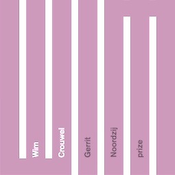 The Gerrit Noordzij Prize is given to type designers and typographers for extraordinary contributions to the fields of type design, typography and type education. The prize is awarded every three years by the KABK (Royal Academy of Art) in Den Haag (The Hague, The Netherlands) together with Museum Meermanno, under the auspices of the Dr. P.A. Tiele Trust. It is named after Gerrit Noordzij, who started the type design program at KABK and taught there.
 The winners: - 1996: Gerrit Noordzij
- 2001: Fred Smeijers
- 2003: Erik Spiekermann
- 2006: Tobias Frere-Jones
- 2009: Wim Crouwel
- 2012: Karel Martens
- 2015: Cyrus Highsmith
[Google]
[More] ⦿
|
Global Type
|
Report by John Berry in Creative Pro about a type event he organized on August 10 2000 in San Francisco. [Google]
[More] ⦿
|
Granshan 2008
|
The Ministry of Culture of the Republic of Armenia sponsored a competition for type design: Granshan 2008 (Granshan means character in Armenian). The competition judging took place in Yerevan, 21-28 June 2008. Categories: - Armenian text type serif
- Armenian text type sans serif
- Armenian traditional text type
- Latin text type
- Cyrillic text type
- Display type
The competition was open to type designers/producers internationally. Chairman of the organizing committee was Edik Ghabuzyan. The winners: - Edik Ghabuzyan (Armenia, two grand prizes, two first prizes, two second prizes).
- Manvel Shmavonyan (Armenia, one grand prize and one second prize).
- Sybille Hagmann (USA, one grand prize).
- Hrant Papazyan (USA, one grand prize).
- Veronika Burian (UK, four first prizes).
- Carolyn Puzzovio (UK, first prize).
[Google]
[More] ⦿
|
Granshan 2009
|
The Ministry of Culture of the Republic of Armenia held the type design competition Granshan 2009 (Granshan means character in Armenian). The competition judges were Miguel Sousa, Carolyn Puzzovio, Fred Afrikyan, Ara Baghdasaryan, and Garegin Martirosian. Chairman of the organizing committee was Edik Ghabuzyan. The results: - Armenian text fonts: 1. Aragast (Edik Ghabuzyan), 2. Ara Rusa (Ara Baghdasaryan), 3. Asparez (Edik Ghabuzyan).
- Armenian School textbook and children's book fonts: 1. Parmani (Edik Ghabuzyan), 2. Goga (Angella Poghosova), 3. Tpagrakan (Mariam Simonyan).
- Armenian traditional text fonts: 1. Notrgir (Edik Ghabuzyan).
- Latin text fonts: 1. Karmina Sans (Veronika Burian, José Scaglione), 2. Marat (Ludwig Übele), 3. Adelle (Veronika Burian, José Scaglione).
- Cyrillic text fonts: 1. Skolar Pro (David Brezina), 2. Aragast (Edik Ghabuzyan), 3. Luba (Hendrik Möller)
- Display fonts: 1. Vogue (Henrik Kubel, Inge Kubel), 2. Notrgir (Edik Ghabuzyan), 3. Diana (Edik Ghabuzyan).
[Google]
[More] ⦿
|
Granshan 2010
|
 The Ministry of Culture of the Republic of Armenia and the Typographic Society Munich (tgm --- Typographische Gesellschaft München) organized Granshan 2010, The 3rd International Eastern Type Design Competition, which was created especially for Armenian, Cyrillic and Greek fonts. Edik Ghabuzyan and Boris Kochan were the big bosses. The jury consisted of Gerry Leonidas, Oliver Linke, Hrant Papazian, Carolyn Puzzovio and Manvel Shmavonyan. The outcome:
 - Armenian text typefaces: 1. Arek (Khajag Apelian, Netherlands). 2. ASF Angela (Anzhella Poghosova, Armenia). 3. Fedra Sans Armenian (Peter Bilak, The Netherlands, and Tatevik Aghababyan, Germany).
- Greek text typefaces: 1. Ginnasio (Riccardo De Franceschi, Italy). 2. PF Encore Sans Pro (Panos Vassiliou, Greece). 3. Mantika Sans (Jürgen Weltin, Germany).
- Cyrillic text typefaces: 1. Florian / Geo Text (Aleksey Vanyashin, Russia). 2. ASF Angela (Anzhella Poghosova, Armenia). 3. Adamant Pro (Vedran Erakovic, Serbia).
- Display typefaces: 1. PF Regal Pro (Panos Vassiliou, Greece). 2. PF Champion Script Pro (Panos Vassiliou, Greece). 3. Zadie (Henrik Kubel, Denmark and UK).
[Google]
[More] ⦿
|
Granshan 2011
|
The Ministry of Culture of the Republic of Armenia and the Typographic Society Munich (tgm --- Typographische Gesellschaft München) organized Granshan 2011, The Fourth International Type Design Competition for Non-Latin Typefaces, which was created especially for Armenian, Cyrillic and Greek fonts. Edik Ghabuzyan and Boris Kochan are the big bosses. The jury consisted of the two big bosses, plus Veronika Burian, Thomas Phinney, Manvel Shmavonyan, Panos Vassiliou and Emil Yakupov. They were aided for Armenian text typefaces by Fred Afrikyan, Gagik Martirosyan, and Aram Megrabyan. For Cyrillic, the help came from Gayane Baghdasaryan, Dmitry Kirsanov, and Vladimir Yefimov. Finally, the Greek rescue subcommittee consisted of Konstantine Giotas, Klimis Mastoridis, and Kostas Aggeletakis. The grand prize (1000 Euors) was won by Alexandra Korolkova for Belladonna. The other results are as follows: - Armenian text typefaces category
- 1st prize - not awarded
- 2nd prize - Aregak: Hrachuhi Grigoryan, Armenia
- 3rd prize - Emrys: Ben Jones, UK
- Cyrillic text typefaces category
- 1st prize - William: Maria Doreuli, Russia
- 2nd prize - Permian: Ilya Ruderman, Russia
- 3rd prize - Circe: Alexandra Korolkova, Russia
- Greek text typefaces category
- 1st prize - Emrys: Ben Jones, UK
- 2nd prize - Artigo: Joana Maria Correia da Silva, Portugal
- 3rd prize - Foxhill: Hanna Donker, UK
- Display category
- 1st prize - Belladonna: Alexandra Korolkova, Russia
- 2nd prize - Fry: Oleg Macujev, Russia
- 3rd prize - Meteor Script: Ilya Ruderman, Russia
[Google]
[More] ⦿
|
Granshan 2012
|
The Ministry of Culture of the Republic of Armenia and the Typographic Society Munich (tgm --- Typographische Gesellschaft München) are organizing Granshan 2012, The Fifth International Type Design Competition for Non-Latin Typefaces, which was created especially for Armenian, Cyrillic, Greek, Indic (i.e., Devanagari, Bengali, and Tamil only) and Arabic fonts. Exceptionally, this year, Latin fonts designed in the last ten years can also be nominated. Edik Ghabuzyan and Boris Kochan are the big bosses. The jury consists of Timothy Donaldson, Otmar Hoefer, Ahmed Mansour, Fiona Ross, Manvel Shmavonyan, Panos Vassiliou, and Vladimir Yefimov. There are five expert panels: - Armenian text typefaces category: Ara Baghdasaryan, Gagik Martirosyan, Aram Megrabyan.
- Arabic text typefaces category: Mamoun Ahmed, Mohamed Hassan, Nehad Nadam.
- Cyrillic text typefaces category: Gayane Baghdasaryan, Dmitry Kirsanov, Tagir Safayev.
- Greek text typefaces category: Konstantine Giotas, Klimis Mastoridis, Kostas Aggeletakis.
- Indic text typefaces category: Ravi Pooviah, Mahendra Patel, Graham Shaw.
Impossible to find the list of winners. [Google]
[More] ⦿
|
Granshan 2013
|
Armenian conference and non-Latin typeface competition organized on 10 October 2013 in Amsterdam by the Ministry of Culture of Armenia and the Typographische Gesellschaft München on the topic of non-Latin type design. The chairs were Boris Kochan and Edik Ghabuzyan. [Google]
[More] ⦿
|
Granshan 2014
|
Non-Latin typeface competition. Chairmen of the jury: Edik Ghabuzyan (Head of Department of Creating and Keeping Armenian Fonts at the National Book Chamber of Armenia, consultant for Adobe Systems, Armenia) and Boris Kochan (CEO of Kochan & Partner, and Past President of tgm Typographische Gesellschaft München). The jury: Gerry Leonidas (UK), Fiona Ross (UK), Keith Tam (Hong Kong), Angela Poghosova (Armenia), Rezan Fouad Gassas (UK), Anuthin Wongsunkakong (Thailand), Chang Sik Kim (USA). The results: - Armenian: INS Gor (Nvard Iskajyan, Armenia)
- Arabic: Intel Clear (Naïma Ben Ayed, Damien Collot, Dalton Maag Ltd, UK), Omid (Omid Emamian, Iran), Novin (Hirbod Lotfian, Iran).
- Cyrillic: Intel Clear (Tom Foley, Mary Faber, Stuart Brown, Hanna Donker, Dalton Maag Ltd, UK), SST (Alexey Chekulaev, Akira Kobayashi, Monotype Design Studio, Germany), Basil (Vassil Nikolaev Kateliev, Bulgaria).
- Greek: Catalana Serif (Pilar Cano, Letterjuice, UK).
- Indic: Prakashan Regular (Alessia Mazzarella, Italy), Nokia Bengali (Amélie Bonet, Dalton Maag Ltd, UK).
- Korean: Sandoll Myeongjo Neo1 (Kyung-Seok Kwon, Soo-Hyun Park, Sandoll Communications Inc, Korea), Sandoll Gothic Neo1 (Kyung-Seok Kwon, Do-Kyung Lee, Sandoll Communications Inc, Korea), Yooungothic 700 (Pyun-Suk Hoon, Cheok Denk Young, Korea).
- Thai: HP Simplified (Pilar Cano, Spike Spondike, Dalton Maag Ltd, UK), Sarabun Mai (Suppakit Chalermlarp, Thailand), Muttayat (Thanarat Vachiruckul, Thailand).
- Display: Sandoll Tokyo (Doo-yul Kwak, Sandoll Communications Inc, Korea), Adamant Sans Pro (Vedran Erakovic, Serbia), VAZ Tatevik (Vardan Zakaryan, Armenia).
[Google]
[More] ⦿
|
Granshan 2015
|
Non-Latin typeface competition in these categories: Armenian, Arabic, Chinese, Cyrillic, Greek, Hebrew, Indic, Thai, Korean, and display typefaces. Chairmen of the jury are Edik Ghabuzyan (Head of Department of Creating and Keeping Armenian Fonts at the National Book Chamber of Armenia, consultant for Adobe Systems, Armenia) and Boris Kochan (CEO of Kochan & Partner, and Past President of tgm Typographische Gesellschaft München). The jury: Gerry Leonidas (UK), Fiona Ross (UK), Keith Tam (Hong Kong), Angela Poghosova (Armenia), Adi Stern (Israel), Haytham Nawar (Egypt), Anuthin Wongsunkakong (Thailand), Chang Sik Kim (USA). [Google]
[More] ⦿
|
Granshan 2016
|
Non-Latin typeface competition in these categories, held in 2016: Armenian, Arabic, Chinese, Cyrillic, Greek, Hebrew, Indic, Thai, Korean, and display typefaces. Chairmen of the jury are Edik Ghabuzyan (Head of Department of Creating and Keeping Armenian Fonts at the National Book Chamber of Armenia, consultant for Adobe Systems, Armenia) and Boris Kochan (CEO of Kochan & Partner, and Past President of tgm Typographische Gesellschaft München). The jury: Gerry Leonidas (UK), Fiona Ross (UK), Liu Zhao (China), Angela Poghosova (Armenia), Adi Stern (Israel), Haytham Nawar (Egypt), Aleksey Vanyashin (Russia), Anuthin Wongsunkakong (Thailand), Chang Sik Kim (USA). The results: The Grand Prize was awarded to Jamal Bustan and Mamoun Sakkal for Bustan. Special categories in which some or all of 1st, 2nd and 3rd prizes are give. Special mentions are denoted by 4, 5 and 6 below, in the order listed on the granshan page. - Armenian Typefaces: 1 MAA Mary (Marieta Arzumanyan) 2 SHK An (Syuzi Hakobyan) 6 HASH Anoush (Hrachuhi Grigoryan)
- Arabic Typefaces: 1 Symbio (Rui Abreu)
- Chinese Typefaces: 4 M Ying Hei (Robin Hui, Monotype)
- Cyrillic Typefaces: 4 Petra (Ana Prodanovic)
- Indian Typefaces: 4 Linotype Devanagari (Monotype Studio) 5 Linotype Gujarati (Monotype Studio)
- Korean Typefaces: 1 Nanum Square (Naver Corp., Sandoll Communications) 2 Sandoll LateSpring (Moa Ku, Jiin Park, Sungwoo Choi, Sandoll Communications) 4 Sandoll Gyeokdong MyeongJo (Moa Ku, Sungwoo Choi, Sandoll Communications)
- Thai Typefaces: 3 Danvivek (Knaz Uiyamathiti)
- Hebrew Typefaces: 4 Susim (Daniel Berkovitz)
- Display typefaces: 1 Bustan (Jamal Bustan, Mamoun Sakkal) 2 Lalezar (Borna Izadpanah) 3 Alef (Mehdi Ravandi) 4 MAA Sergo (Marieta Arzumanyan) 5 Let's play (Ghada Wali) 6 Cairo (Mohamed Gaber)
- Latin / Arabic Typefaces: 2 Calibri Arabic (Mamoun Sakkal, Aida Sakkal) 3 Riwaya (Katharina Seidl) 4 DIN Serif (Panos Vassiliou) 5 FF DIN Arabic (Yanone) 6 Effra (Dalton Maag: Azza Alameddine, Alex Blattmann)
- Latin / Cyrillic Typefaces: 1 Eqil (Kostas Bartsokas) 4 FS Sally Pro (Phil Garnham, Jason Smith)
- Latin / Indian Typefaces: 1 Myriad Devanagari (Vaibhav Singh) 2 Aktiv Grotesk (Dalton Maag: Selma Losch, Kalapi Gajjar-Bordawekar) 4 Amikal (Matthias Pauwels)
- Latin / Thai Typefaces: 2 Prompt (Thanarat Vachiruckul) 3 Kantaraksa (Sasikarn Vongin) 4 Intel Clear Thai (Dalton Maag: Hanna Donker, Spike Spondike)
[Google]
[More] ⦿
|
Granshan 2017
|
 Non-Latin typeface competition in these categories, held in 2017: Armenian, Arabic, Chinese, Cyrillic, Greek, Hebrew, Indic, Thai, Korean, and display typefaces. Chairmen of the jury are Edik Ghabuzyan (Head of Department of Creating and Keeping Armenian Fonts at the National Book Chamber of Armenia, consultant for Adobe Systems, Armenia) and Boris Kochan (CEO of Kochan & Partner, and Past President of tgm Typographische Gesellschaft München). The jury: Gerry Leonidas (UK), Chang Sik Kim (USA), and these specialists: (for Armenian) Vahan Balasanyan, Garegin Martirosyan, Ruben Malayan, (for Arabic) Bahia Shehab, (for Chinese) Min Wang, Curt Huang, Zhiwei Zhu, Keith Tam, (for Greek) Klimis Mastoridis, Irene Vlachou, (for Hebrew) Liron Lavi, Anat Katzir, (for South Asian scripts) Ravi Pooviah, Rathna Ramanathan, Graham Shaw, (for Korean) Joo Sung Kim, Jeong-mi Yu, Seong Jae Song.
 The results: Special categories in which some or all of 1st, 2nd and 3rd prizes are give. Special mentions are denoted by 4, 5 and 6 below, in the order listed on the Granshan page. Categories without awards are not listed. There was no grand prize this year. - Armenian Typefaces: 1 Hash Eva (Hrachuhi Grigoryan) 2 Zah Hasmik (Hasmik Zakaryan) 4 Avm Vahagn (Vahagn Minasyan)
- Arabic Typefaces: 2 Mirza (Amirmahdi Moslehi) 4 Ray (Reza Bakhtiarifard, Omid Emamian)
- Chinese Typefaces: 4 Dongxin (Xuwei Zhang) 5 ZhaoPai (Ye Tianyu, Ye Ni)
- Cyrillic Typefaces: 3 Averta CY (Kostas Bartsokas)
- Greek Typefaces: 4 Bynx (Franziska Hubmann)
- Thai Typefaces: 1 Thutija (Panuwat Usakulwattana) 4 Tatsana Chon (Knaz Uiyamathiti) 5 Satidti (Parin Rungpattarathakun)
- Display typefaces: 1 Lamon (Dmitry Lamonov) 2 SGH Sepftar (Syuzi Grigoryan) 4 Kanun (Kourosh Beigpour) 5 Fit (David Jonathan Ross and Maria Doreuli) 6 Jaini (Girish Dalvi and Maithili Shingre) 7 TheClassic (Park Yunjung, Choi Eunkyu, Kim Woori, Lee Hyunho) 8 Mudan Type (Reeji Studio)
- Latin / Arabic Typefaces: 1 Graphic Arabic (Wael Morcos, Khajag Apelian)
- Multiscript: 4 November (Peter Bilak, Irina Smirnova, Kristyan Sarkis)
- Latin / Armenian Typefaces: 4 LGSH Liana (Liana Shushanyan)
- Latin / Cyrillic Typefaces: 2 Triplet (Yana Kutyina, Andrey Belonogov, Valery Golyzhenkov) 3 Vesterbro (Jeremie Hornus, Ilya Naumoff, Alisa Nowak)
- Latin / Hebrew Typefaces: 2 Greta Text Hebrew (Michal Sahar)
[Google]
[More] ⦿
|
Horouf Design Competition
|
 The 2014 Horouf Type Design Competition saw these winners: Sultan Mohammad (gold medal for Change), Ferran Milan (silver medal for Baldufa), Ahmad Al Hindi (bronze medal for Zamalka). This bilingual (Latin / Arabic) type design competition was initiated by Nuqat and 29Letters. The results were announced in December 2014 at the Nuqat Design Conference in Kuwait. The jury consisted of Huda AbiFares (of the Khatt Foundation), Kameel Hawa (of Mohtaraf), Mouneer Shaarani (Arabic calligrapher), Peter Bilak(of Typotheque), Patrick Giasson (of Loose Atom), and Reza Abedini (Iranian graphic designer). This sentence is interesting: Whilst the jurors are all excited to take part in the very first annual Horouf design competition for typography design, they agree that this year's entries left much to be desired in terms of innovation and technical execution. This is reflected by their reluctance to award any first prizes. [Google]
[More] ⦿
The 2014 Horouf Type Design Competition saw these winners: Sultan Mohammad (gold medal for Change), Ferran Milan (silver medal for Baldufa), Ahmad Al Hindi (bronze medal for Zamalka). This bilingual (Latin / Arabic) type design competition was initiated by Nuqat and 29Letters. The results were announced in December 2014 at the Nuqat Design Conference in Kuwait. The jury consisted of Huda AbiFares (of the Khatt Foundation), Kameel Hawa (of Mohtaraf), Mouneer Shaarani (Arabic calligrapher), Peter Bilak(of Typotheque), Patrick Giasson (of Loose Atom), and Reza Abedini (Iranian graphic designer). This sentence is interesting: Whilst the jurors are all excited to take part in the very first annual Horouf design competition for typography design, they agree that this year's entries left much to be desired in terms of innovation and technical execution. This is reflected by their reluctance to award any first prizes. [Google]
[More] ⦿
|
International Type Design Competition Modern Cyrillic
|
 This competition was held by ParaType and dedicated to the Tercentenary of Russian Civil Type (Peter the Great's historic reform of Russian typography). Cyrillic typeface projects and completed typefaces created and/or released after January 1, 2006 were eligible. There was no admission fee. The jury consisted of Vladimir Yefimov (chair, ParaType), Yuri Gordon (LetterHead), Alexander Konoplev (Moscow State University of Printing Arts), Artemy Lebedev (Art. Lebedev Studio), Vladimir Muzychenko (Stroganov University), Tagir Safayev (Higher Academical School of Graphic Design), and Maxim Zhukov (ATypI). In September 2009, the winners were announced:
Display designs - P22 Allyson Pro: Paul Hunt, USA
- Beetlejuice Script: Ilya Ruderman, Russia
- Belladonna: Alexandra Korolkova, Russia
- Bender: Oleg Zhuravlev, Ivan Gladkih, Russia
- PF Champion Script Pro: Panos Vassiliou, Greece (Choice of Alexander Konoplev)
- Epiphany: Oleg Matsuev, Russia
- Fray: Oleg Matsuev, Russia
- Gosizdat New: Innokentiy Keleynikov, Russia (Choice of Maxim Zhukov)
- PF Goudy Initials Pro + PF Goudy Ornaments: Panos Vassiliou, Greece
- DR_Krokodila: Dmitry Rastvortsev, Ukraine (Choice of Yuri Gordon)
- FF Mister K: Julia Sysmäläinen, Jürgen Sanides, Germany
- Praline: Ilya Ruderman, Russia
- Tsar Saltan: Alexander Kokorin, Olga Chekina, Russia (Choice of Vladimir Muzychenko)
Text designs Text/Display type systems Type superfamilies The ParaType Selection - Display designs: Alfavita: Valery Golyzhenkov, Russia
- Text designs: Chift: Vasily Biryukov, Russia, and Kuzma: Anton Geroev, Russia
- Text/Display type systems: Apriori: Vera Evstafieva, Russia, Ladoga: Viktor Kharik, Ukraine, and Skolar Pro: David Brezina, Czech Republic
[Google]
[More] ⦿
|
ISTD TypoGraphic Awards 2001
|
ISTD stands for the International Society of Typographic Designers. At their 2001 competition, the prize for typeface design went to Michael Abbink for FF Kievit. [Google]
[More] ⦿
|
Kalligraphie Award 2000 Gallerie
|
Swiss calligraphy awards with beautiful work by Helga Ladurner, Annikki Rigendinger, Gabriella Garbognani, Annemarie Grunder, and Elisabeth Megnet. [Google]
[More] ⦿
|
Kyrillitsa '99: Type design competition
|
 1999 Type design competition in Moscow. Here is the press release: "The judging of Kyrillitsa'99, an international type design competition, took place in Moscow on Wednesday, 2nd December 1998, at the Type Designers Association. Fifty-one designers from eight countries--Belarus, Canada, Germany, Japan, Russia, Ukraine, United States, Yugoslavia--participated in the competition; 142 entries competed in three design categories: Text, Display and Pictorial typefaces. Five winning entries in each category have been adjudged Awards of Excellence in Type Design. Thirteen Cyrillic text typefaces (thirty-three styles) were submitted by ten designers. Prizes have been awarded to: New Letter Gothic (by Gayaneh Bagdasaryan, Russia), Georgia (by Matthew Carter, United States), Verdana (by Matthew Carter, United States), Sylfaen (by John Hudson and W. Ross Mills, Canada), Bitstream Humanist 531 (Syntax) Cyrillic (by Isay Slutsker, Russia). In Display category seventy-one Cyrillic typefaces (ninety-eight styles) were entered by thirty-four designers. The Awards of Excellence went to: pLatinum (by Illarion Gordon, Russia), Rahit (by Illarion Gordon, Russia), Respublicana (by Yuri Gordon, Russia), Apostol (by Innokentiy Keleynikov, Russia), Pupygi (by Kyrill Sirotin, Russia). Ten picture fonts were sent in to the competition by nine designers. The prize winners in that category were: Ger (by Lyova Alborov, Russia), Mas-d'Azil (by Dmitry Kirsanov, Russia), ITC Japanese Garden (by Akira Kobayashi, Japan), ITC Ancestor (by Serge Pichii, Canada), Rybizna (by Kyrill Sirotin, Russia). The following special prizes were awarded: The Vadim Prize, of the Academy of Graphic Design--for a lifetime contribution to the art of typography--to Matthew Carter (United States); The Galina Prize, of ParaType, Ltd.--for the creative exploration of the Russian typographic tradition--to Albert Kapitonov (Russia), for Reforma-Grotesk family; The Golden Buki Prize, of the Golden Bee Association--for the outstanding contribution to the development of Cyrillic typography and international typographic communications--to John Hudson (Canada), for Sylfaen; The Way to Go! Prize, of the Type Designers Association--for the successful debut in Cyrillic type design--to Manvel Shmavonyan (Russia), for Hybrid (Text typefaces); to Vladimir Pertsov (Russia), for Pertsov Skoropis (Display typefaces)." [Google]
[More] ⦿
1999 Type design competition in Moscow. Here is the press release: "The judging of Kyrillitsa'99, an international type design competition, took place in Moscow on Wednesday, 2nd December 1998, at the Type Designers Association. Fifty-one designers from eight countries--Belarus, Canada, Germany, Japan, Russia, Ukraine, United States, Yugoslavia--participated in the competition; 142 entries competed in three design categories: Text, Display and Pictorial typefaces. Five winning entries in each category have been adjudged Awards of Excellence in Type Design. Thirteen Cyrillic text typefaces (thirty-three styles) were submitted by ten designers. Prizes have been awarded to: New Letter Gothic (by Gayaneh Bagdasaryan, Russia), Georgia (by Matthew Carter, United States), Verdana (by Matthew Carter, United States), Sylfaen (by John Hudson and W. Ross Mills, Canada), Bitstream Humanist 531 (Syntax) Cyrillic (by Isay Slutsker, Russia). In Display category seventy-one Cyrillic typefaces (ninety-eight styles) were entered by thirty-four designers. The Awards of Excellence went to: pLatinum (by Illarion Gordon, Russia), Rahit (by Illarion Gordon, Russia), Respublicana (by Yuri Gordon, Russia), Apostol (by Innokentiy Keleynikov, Russia), Pupygi (by Kyrill Sirotin, Russia). Ten picture fonts were sent in to the competition by nine designers. The prize winners in that category were: Ger (by Lyova Alborov, Russia), Mas-d'Azil (by Dmitry Kirsanov, Russia), ITC Japanese Garden (by Akira Kobayashi, Japan), ITC Ancestor (by Serge Pichii, Canada), Rybizna (by Kyrill Sirotin, Russia). The following special prizes were awarded: The Vadim Prize, of the Academy of Graphic Design--for a lifetime contribution to the art of typography--to Matthew Carter (United States); The Galina Prize, of ParaType, Ltd.--for the creative exploration of the Russian typographic tradition--to Albert Kapitonov (Russia), for Reforma-Grotesk family; The Golden Buki Prize, of the Golden Bee Association--for the outstanding contribution to the development of Cyrillic typography and international typographic communications--to John Hudson (Canada), for Sylfaen; The Way to Go! Prize, of the Type Designers Association--for the successful debut in Cyrillic type design--to Manvel Shmavonyan (Russia), for Hybrid (Text typefaces); to Vladimir Pertsov (Russia), for Pertsov Skoropis (Display typefaces)." [Google]
[More] ⦿
|
Les Trophées d'Or du salon Intergraphic de Paris
|
One of the "Trophée d'Or" awards is a typographic award. Like the others, it is handed out at the annual Intergraphic Congress in Paris. Given under the auspices of Agfa Monotype in 2003 and Linotype in 2004 (and who knows in 2005), it rewards the creator of the best typeface for a visual identity or a special use. Faces must be less than 5 years old. Dead link. [Google]
[More] ⦿
|
Les Trophées d'Or du salon Intergraphic de Paris 2003
|
One of the "Trophée d'Or" awards is a typographic award. Given under the auspices of Agfa Monotype, it rewards the creator of the best typeface for a visual identity or a special use. Faces must be less than 5 years old. The 2003 awards were handed out at the 23rd Intergraphic Congress, held from January 15-17, 2003 in Paris. The winners: - First prize: Bo Linnemann, for Billund, the font used at the Danish airport. Linnemann heads Kontrapunkt.
- First nominee: Damien Gautier, for Salomon (the ski company). Gautier runs Typotek and Trafik.
- Second nominee: Oscar Liedgren, for Norstedts. Liedgren heads Liedgren Design.
In 2002, the winners were as follows: - First prize: Serge Cortesi, for Carrefour, the supermarket giant.
- First nominee: Grégori Vincens, for Lipton Ice Tea.
- Second nominee: Bo Linnemann, for Danske Bank.
[Google]
[More] ⦿
|
Les Trophées d'Or du salon Intergraphic de Paris 2004
|
One of the "Trophée d'Or" awards is a typographic award. Handed out at the Intergraphic Congress in Paris in January 2004, it was given to Christophe Badani for his typeface Ubisoft (2003), a sans family developed by Christophe Badani in collaboration with the Seenk agency (design&MixMedia studio) for the video game company Ubisoft. Given under the auspices of Agfa Monotype in 2003 and Linotype in 2004 (and who knows in 2005), it rewards the creator of the best typeface for a visual identity or a special use. [Google]
[More] ⦿
|
Letter Arts Review 2003
|
Letter Arts Review ran a calligraphic lettering competition. [Google]
[More] ⦿
|
Letter.2
|
 Letter.2 was the Second Type Design Competition of ATypI. All typefaces published (commercially or non-commercially) between October 2001 and August 2011 were allowed to enter the competition. The jury met in Buenos Aires in October 2011. The winning designs will be exhibited at the 2012 ATypI conference. The jury consisted of Ruben Fontana, Lucie Lacava, Akira Kobayashi, Peter Bilak, John Hudson, Fiona Ross and Gerry Leonidas. The chair was José Scaglione. Typophile page (where there are several unhappy discussants who point out that several winners had ties to or worked for the sponsors of the competition). The results:
 - Adobe Clean Serif Robert Slimbach, 2011
- Alda Berton Hasebe, 2011
- Alegreya Juan Pablo del Peral, 2011
- Arek Khajag Apelian, 2011
- Aria Rui Filipe Alves Abreu, 2011
- Arietta Abi Huynh, 2011
- Arno Robert Slimbach, 2007
- Blaktur Ken Barber, 2007
- Brioso Robert Slimbach, 2003
- Cadence Jonathan Perez, 2009
- Capitolium News 2 Gerard Unger, 2006
- Chartwell Travis Kochel, 2011
- Copte Scripte Laurent Bourcellier & Jonathan Perez, 2008
- DecoType Nastaliq Mirjam Somers, Thomas Milo & Peter Somers, 2009
- Eames Century Modern Erik van Blokland, 2010
- Ed Benguiat Interlock Ed Benguiat, Ken Barber, 2004
- Egyptian Slate Rod McDonald and Carl Crossgrove, 2009
- Expo Serif, Expo Sans, Expo Sans Condensed Mark Jamra, 2010
- FF Legato Evert Bloemsma, 2004
- FF Milo Michael Abbink, 2006
- FF Strada Albert Pinggera, 2002
- Garamond Premier Robert Slimbach, 2005
- Harir Bahman Eslami, 2010
- JAF Herb Tim Ahrens, 2010
- JAF Lapture Tim Ahrens, 2004
- Kazuraki SP2N Ryoko Nishizuka, 2010
- LogoJr Black Shigeru Katsumoto & Kyoko Katsumoto, 2007
- Maiola Veronika Burian, 2005
- Marat Ludwig Uebele, 2008
- Marlene Nikola Djurek, 2011
- Meret Nils Thomsen, 2011
- Mundo Sans Carl Crossgrove, 2003
- Myriad (Extensions) Robert Slimbach, 2011
- Nassim Titus Nemeth, 2011
- Neue Haas Grotesk Christian Schwartz, 2011
- New Rail Alphabet Henrik Kubel & Margaret Calvert, 2009
- Numa Sumner Stone, 2007
- Orbe Rui Filipe Alves Abreu, 2008
- Piel Script Alejandro Paul, 2010
- Pirouette Ryuichi Tateno, 2003
- Retiro Jean-François Porchez, 2009
- Rocky Matthew Carter & Richard Lipton, 2008
- Rooney Jan Fromm, 2010
- Rumba Laura Meseguer, 2006
- Smidgen Ken Barber, 2011
- Studio Lettering Slant Ken Barber, 2008
- Tanger Serif Jarno Lukkarila, 2008
- Tangier Richard Lipton, 2010
- Telcel Sans Gabriel Martínez Meave, 2011
- Thuraya Kristyan Sarkis, 2011
- Tiempos Kris Sowersby, 2010
- Veljovic Script Jovica Veljovic, 2009
- William Maria Doreuli, 2011
[Google]
[More] ⦿
|
Linotype First Intnl Design Contest
|
This Linotype competition in 1999 had four categories: text, headline, experimental and symbol. Winning designs were presented at the TypoMedia 2000 conference. [Google]
[More] ⦿
|
Linotype Font Technology Award
|
The Font Technology Award has been introduced by Linotype to honor extraordinary efforts in the development and support of font technology. It is usually given at Linotype's TypoTechnica meetings. Past recipients: - 2005: David Lemon (Adobe).
- 2007: Yuri Yarmola (FontLab).
[Google]
[More] ⦿
|
Linotype Second Intnl Design Contest
|
Winners of this year 2000 contest: Gary Munch (*)(GM Agora), Lucy Davies (Dot), Gabriele Laubinger (Sangue), Lutz Baar (Pisa), Stefan Pott (Konflikt), Renée Ramsey-Passmore (Renée display), Rachel Godfrey (*)(Clascon), Victor Luis Garcia (Zootype), Themina Rafique (Araby Rafique), Christian Vornehm (Seven Regular), Marcus Mc Callion (Marcusan), Andreja Brlec (Experimental Font), Georg Popp (*)(Sindbad), Peter Kin-Fan Lo (Ancient Chinese), Weselin Stojanow Rako (Tapestry Circle). The (*) indicates a first prize in its category. The others are second or third prizes. [Google]
[More] ⦿
|
Linotype Third Intnl Design Contest
|
Winners in the text category in 2001: 1. Akira Kobayashi (Linotype Conrad). 2. Andreas Koch (Linotype Projekt). 3. Gary Munch (Linotype Really). Display: 1. Franciszek Otto (Linotype Notec). 2. Paul van der Laan (Linotype Rezident). 3. Isabelle Stutz (Linotype Belle). Fun: 1. Inka Menne (Linotype Grassy). 2. Stefan Pott (Linotype Henri Dimension). 3. Stefan Pott (Linotype Henri Axsis). [Google]
[More] ⦿
|
Linotype's 1st Arabic Type Design Competition
|
This type design competition was judged by Samir Sayegh (Lebanon), Fiona Ross (UK), Mamoun Sakkal (Syria/USA), Kris Holmes (USA), and Huda Abi Fares Smitshuijzen (Lebanon/Netherlands). Winners were announced in April 2006 at the Kitabat meeting in Dubai. The outcome, with blurbs provided by Linotype: - Text 1st Prize: "Sultan Free" by Sultan Maktari (Yemen), an open, dynamic design suitable for large displays but also as a text face.
- Text 2nd Prize: "Midan" by the studio Al-Mohtaraf Assaoudi (Lebanon): the large body height and open counters make it suitable for body texts in brochures and magazines.
- Display 1st Prize: "Isra" by Almamoun Ahmed (Sudan): condensed geometric forms make it ideal for headlines or short texts.
- Display 2nd Prize: "Sultan Nahia" also by Sultan Maktari (1st Prize Text): bold, geometric design well-suited to large advertising displays.
- Calligraphy 1st Prize: "Hakim Ghazali" by Hakim Ghazali (Morocco/France): its long, fluid curves and fresh style mean it can be used both in headlines and text.
- Calligraphy 2nd Prize: Firas by Abbas Al-Baghdadi (Iraq): the contrasting, geometric design is ideal for large advertising displays.
[Google]
[More] ⦿
|
Mashrebiya Font Competition (Khatt Foundation)
|
In 2017, the Khatt Foundation launched a type design competition for fonts specifically designed to produce modern Mashrebiya architectural screens. [The Mashrebiya screen is an iconic element of Arab/Islamic architecture. Mashrebiyas are still popular as separation screens or walls, however they are often constructed from complex geometrical parts and shapes, and rarely using only letters.] Each award winner will be paid 1000 Euros. The jury consisted of Yara Khoury Nammour, Pascal Zoghbi, and Edo Smitshuijzen. [Google]
[More] ⦿
|
Milosz Type Design International Student Competition
|
 A Polish type design competition for all university students world-wide. Named after Czeslaw Milosz, the winner receives about 2500 Euros. The jury of Milosz 2011 consisted of Veronika Burian, Pilar Cano, Barbara Kesek-Bardel, Robert Oles, and Kuba Sowinski. The results:
 - First Prize: Damien Collot, France, for his Milosz famiily, developed while studying under Titus Nemeth at the &Eacutre;cole supéerieure d'art et de design in Amiens, France.
- Honorable mention: Nikola Djurek's students at the School of Design in Zagreb, Croatia: Marko Hrastovec, Andrija Mudnic and Luka Reicher. For the design of an italic typeface.
- Short list of other finalists: Renata Pokrywińska of Uniwersytet Artystyczny in Poznań, Poland (supervisor: Krzysztof Kochnowicz) and Daniel Sabino de Souza of Eina-Escuela Superior de Disseny in Spain (supervisor: Laura Meseguer).
[Google]
[More] ⦿
|
Modem 2002
|
Hindi font design competition held in 2002, won by Avneesh Shivaas and Arpit Agarwal. [Google]
[More] ⦿
|
Modern Cyrillic 2014
|
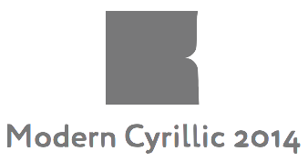 An international type design competition, Modern Cyrillic 2014, organizers by ParaType, the main Russian digital type foundry, and Type, the online typographic journal, both located in Moscow. Modern Cyrillic 2014 is a sequel to Kyrillitsa99 and Modern Cyrillic 2009, which were organised by Vladimir Yefimov (1949-2012), the art director and one of the founding fathers of ParaType, and Emil Yakupov (1957-2014), ParaType's CEO. Cyrillic single-style typefaces, multiple-style type families and type systems developed for body text and/or display composition, and created and/or released after September 15, 2009 were eligible. The judges were Dmitry Aronov (Russia), Gayaneh Bagdasaryan (Russia), Konstantin Golovchenko (Ukraine), Yuri Gordon (Russia), John Hudson (Canada), Alexandra Korolkova (Russia), Natalia Vasilyeva (Russia), Jovica Veljovic (Germany), Danila Vorobiev (Russia). The jury was chaired by Maxim Zhukov. Judging took place in Moscow on November 25, 2014.
 The Emil Yakupov prize from ParaType and a lifetime licence certificate from FontLab were awarded to Yana Kutyina and Andrey Belonogov. While it is not always easy to achieve, I would have liked a somewhat bigger distance between jury and winners---Hudson assisted Carter with Sitka, and Zhukov was consulted for Slimbach's Trajan Sans, for example. The list of 29 winners: - Adobe Hand B: Robert Slimbach
- Adobe Text: Robert Slimbach
- Amalta: Vera Evstafieva
- Artcity: Artem Yakovlev
- Bickham Script 3 Richard Lipton
- Capline: Jeremy Tankard
- Checkpoint: Michael Parson
- Chetwerg: Andrey Belonogov
- Chiavettieri: Nikola Kostic
- Delgado: Roman Shukin
- FF Meta Condensed: Erik Spiekermann
- Glober: Ivan Petrov and Svetoslav Simov
- Input: David Jonathan Ross
- Lenta: Irina Krivosheeva
- Mamontov Grotesk: Oleg Matsuev
- Manicotti: David Jonathan Ross
- Marco: Toshi Omagari
- Napoleon: Yana Kutyina
- Oktjabrskaja: Iraida Chepil (1966) and Nadezda Geringer
- Permian: Ilya Ruderman
- RIA Typeface: Yury Ostromentsky
- Sapiens: Elena Alexeeva
- Siberian: Oleg Matsuev
- Sitka: Matthew Carter
- Sloop: Richard Lipton
- Suisse Intl Condensed Cyrillic: Alexei Vanyashin
- Trajan Sans (1989): Robert Slimbach
- Wary: Valery Zaveryaev
- Woodkit: Ondrej Job
[Google]
[More] ⦿
|
Mon Pote
|
 Mon Pote stands for Most Original Nincompoop Prize Of the Trump Era. Started in November 2016, it was given annually, during Trump's early tenure, to the best new typeface related to the most intelligent president in history. The jury is presided by Luc Devroye, whose office is accepting nominations all year long. The awards are given in November of each year. The winner is expected to donate to the Canadian Narcissism Society, the Grab That Puppy Association, or Club Med Guantanamo. The list of winners:
 [Google]
[More] ⦿
|
Monotype Web Font Awards
|
Monotype Imaging Holdings Inc. is accepting entries through Nov. 7, 2010 for the first Web Font Awards, an international competition designed to recognize web sites that incorporate exceptional use of Web fonts. Prizes include two $3,000 cash awards, Apple iPad mobile digital devices and various typeface offerings from Monotype Imaging. Winning entries will be determined at a live judging event on Nov. 16, 2010, during the Future of Web Design conference, Nov. 15-17, in New York City. Winning entries of the Webfont Awards, in order: (1) The fifth issue of the German design magazine, Design Made in Germany, set in FF DIN, and designed by Martin Rack, (2) Armin Vit's Quipsologies, a division of UnderConsideration, uses Typekit fonts, (3) The German real estate database Markert Immobilien, which uses DIN Web Pro. A brief post mortem: This contest was all about web page design---it had nothing to do with type design. I will not report on similar contests in the future. [Google]
[More] ⦿
|
Morisawa Awards: Fifth International Typeface Design Competition
|
The Fifth Morisawa Awards (1996). [Google]
[More] ⦿
|
Morisawa Awards: Seventh Morisawa International Typeface Design Competition
|
The Seventh Morisawa International Typeface Design Awards competition for 2002. The Gold Prize for Latin fonts is 2 million yen, or about 20,000 dollars. In the Latin category, we have: - Gold: Francisco Galvez Pizarro.
- Silver: Timothy Donaldson.
- Bronze: Jarno Lukkarila.
- Carter Prize: Alejandro LoCelso.
- Slimbach Prize: Robinson Deschamps.
- Igarashi Prize: Chen ji shi.
In the kanji category, the winners are Lo Kin Fan (Gold), Ryoko Nishizuka (Silver), Shigeru Masaki (Bronze), Hiroaki Nagatsu (Bronze), Joachim Müller-Lanceé (Katsui Prize), Shigenao Uzuki (Kozuka Prize), Li Shaobo (Chan Prize) and Wang Feng (Morisawa Prize). [Google]
[More] ⦿
|
Morisawa Awards: Sixth International Typeface Design Competition
|
The Sixth Morisawa Awards (1999): 849 entries. In the Latin font category, Roy Preston's Prentis family won, deservedly so, the gold prize. Linnea Lundquist's Stigmata won silver, and Minoru Kamono's Logo&Script won bronze. The kanji prizes went to Yasushi Saikusa, Ling Suet Fung and Hideo Akiba. In the Latin category, the judge's prizes went to Grégori Vincens, Miki Ooba, Joachim Müller-Lancé and Wataru Fukugawa. [Google]
[More] ⦿
|
Morisawa Type Design Competition 2012
|
 Results of this biannual award, announced in October 2012:
 - Kanji category. Gold Prize Kunihiko Okano (Japan) [Waran], Silver Prize Shigenao Uzuki (Japan) [Spring Hair], Bronze Prize Aki Toyoshima (Japan) [Suzumushi].
- Latin Category. Gold Prize David Foster (Australia) [Blanco Medium / Blanco Medium Italic], Silver Prize Daniel Sabino (Brasil) [Hashar], Bronze Prize Ferran Milan Oliveras (UK) [Baldufa].
- Akashi Award Kanji Category: Aki Toyoshima (Japan) [Suzumushi].
- Akashi Award Latin Category: Timothy Donaldson (UK) [Jara].
- Peopleʼs ChoiceKanji Category. 1st Prize Aki Toyoshima (Japan) [Suzumushi], 2nd Prize Neil Summerour (USA) [Tegaki].
- Peopleʼs Choice Latin Category. 1st Prize Hao Zhang (China) [Latin Seal], 2nd Prize David Foster (Australia) [Blanco Bold].
The ceremonial picture shows, from the left, Tsunehisa Morisawa, Akihiko Morisawa, Kunihiko Okano, Masahiko Kozuka, Yasuhito Nagahara and Osamu Torinoumi. [Google]
[More] ⦿
|
Morisawa Type Design Competition 2014
|
 Font Bureau and Morosawa Bunken Inc partnered to organize the Morisawa Type Design Competition 2014. Font Bureau's Cyrus Highsmith judged in the Latin category, along with Fred Smeijers, Sara Soskolne, and Matthew Carter. In the Kanji category, the judges were Osamu Torinoumi, Yasuhito Nagahara, Kenya Hara, Taro Yamamoto, and Masahiko Kozuka.
 The results: - Kanji Category, Morisawa Award
- Gold Prize: Wakatsuki Maru Gothic by Koichi Namimoto, Japan.
- Silver Prize: Ei Ming-cho-tai by Chikao Ito, Japan.
- Bronze Prize: Cho-yo by Giichi Okazaki, Japan.
- Honorable Mention: Harmony by Tomomi Kanda, Japan.
- Honorable Mention: Geometrika by Albert Chan, Hong Kong.
- Honorable Mention: Shimanto Ming-cho Italic Kana by Yoshimasa Otsubo, Japan.
- Latin Category, Morisawa Award
- Gold Prize: Hola by Eli Castellanos, Mexico.
- Silver Prize: Chimera Text / Text Italic / Display Bold / Display Bold Italic / Display Black by Maria Doreuli, Russia.
- Bronze Prize: Kulin by Koichi Namimoto, Japan.
- Honorable Mention: Nurraq Light / Light Italic / Regular / Italic by Etienne Aubert Bonn, Canada.
- Honorable Mention: Alcedo Regular / Medium by Kunihiko Okano, Japan.
- Honorable Mention: Flipper thin / thin italic by Craig Eliason, USA.
- Kanji Category, Akashi Award: Kitahara Gyosho by Hirofumi Iguchi & Birei Kitahara, Japan.
- Latin Category, Akashi Award: Kulin by Koichi Namimoto, Japan.
- Kanji Category, People's Choice: Go-yo-tai by Sanae Harayama, Japan, and En-so-ku by Aki Toyoshima, Japan.
- Latin Category, People's Choice: Polja by Reymund Schroeder, Germany, and GHEA Narek Display by Edik Ghabuzyan, Armenia.
[Google]
[More] ⦿
|
Morisawa Type Design Competition 2016
|
 Biannual type design competition held in Japan, first started in 1984. The jury for Latin typefaces consisted of Matthew Carter, Cyrus Highsmith, Sara Soskolne, and Fred Smeijers. The kanji competition was judged by Kenya Hara, Yasuhito Nagahara, Osamu Torinoumi and Taro Yamamoto. A total of 205 kanji fonts and 534 Latin fonts were submitted. In many Morisawa competitions, the Latin category winners are relatively unknown, and a lot of attention is given to daring, even revolutionary, designs. Other type competitions are often weighed down by commercial interests, but Morisawa is a jewel. Here are the results:
 - Kanji category: Shimanami by Junko Matsumura (Gold, and Akashi award), Tsukibae by Naoko Ozawa (Silver), Natsume M / B by Aki Toyoshima (Bronze). Honorable mentions: Gan Kaisho by Miki Ooba, Tgk02 by Yokokaku, Kuretonbo by Ryotaro Tada.
- Latin category: Vonk by Bart Vollebregt (Gold, and Akashi award), Rododendron by Jitka Janeckova (Silver), Abelha by Michel Derre and Julien Priez (Bronze). Honorable mentions: Edna by Reymund Schroeder, Newline by Christian Mengelt, and TroisMille by Marc Rouault.
- Kanji category, people's choice: Madori font by Sayaka Takegami (First), Ruitai by Chung Lieh Yang (Second).
- Latin category, people's choice: Legilux by Antonia Cornelius (First), Untitled by Desmond Wong (Second).
[Google]
[More] ⦿
|
Morisawa Type Design Competition 2019
|
 International type competition organized by Morisawa for Japanese and Latin typefaces. First prize is worth about 10,000 dollars. The judges in 2019: Osamu Torinoumi, Ryoko Nishizuka, Masaaki Hiromura, Issei Kitagawa, Cyrus Highsmith, Ilya Ruderman, Indra Kupferschmid, Laura Meseguer, Matthew Carter. The winners:
 - Kanji category:
- Gold Prize: Hougetsu Kaisho by Yoko Kaku (Japan).
- Silver Prize: NibuShibu by Daisuke Fukushi (Japan).
- Bronze Prize: Ribaasu by Tien-Min Liao (Taiwan).
- Honorable Mention: tr by Uchikiba Ganta (Japan), Nijitako Tengoku by Mie Yokota (Japan), Mimizuku by Shinji Shinkai (Japan).
- People's Choice: The Big Jaw by Fang-Ping Lin (Taiwan), Kanraku Mincho by Furantsu Sumi (Japan).
- Latin category:
- Gold Prize: Areon by Noheul Lee (South Korea).
- Silver Prize: Kolektiv by Ondrej Bachor (Switzerland).
- Bronze Prize: Easy by Theo Guillard (France).
- Honorable Mention: Courbe by Olga Pankova (Russia), ER Canto Text by Eduardo Garcia Renno Pereira (Brazil, Portugal), DR Kruk by Dmitry Rastvortsev (Ukraine).
- People's Choice: Courbe by Olga Pankova (Russia), Apogee by Michael Aronson (United States of America).
[Google]
[More] ⦿
|
MyFonts: Top Ten for 2007
|
MyFonts has posted its top ten fonts of 2007 based on sales data and staff selections from ten categories. Interesting breakdown by country: Canada 4, USA 2, Portugal 1, Japan 1, Germany 1, Sweden 1. Here we go: - Dino dos Santos: With Leitura, he has created the most successful superfamily of the year. Boasting a Sans and a Serif, special News, Headline and Display versions, as well as a smart set of Symbols, Leitura is a versatile and flexible type system for use in magazines, corporate identities, books and advertising.
- Andreas Seidel: Ornament Accolades A was the most popular ornament font.
- Canada Type has two winners: Jupiter for best inscriptional roman, and Ambassador Script for best formal script. MyFonts writes regarding the latter: Canada Type wins the award for top formal script with its exemplary revival of Aldo Novarese's Juliet. Novarese's tipo inglese, a reworking of an English roundhand, became the point of departure for a remarkable labor of love, on which designers Rebecca Alaccari and Patrick Griffin spent an estimated (and mind-boggling) one thousand hours.
- Jeremy Dooley (Insigne): The top display couple was Aviano and Aviano Sans. Aviano was inspired by the stone-carved capitals of the Roman Empire.
- Ryoichi Tsunekawa (Flat-It): Nothing was 2007's most popular script.
- Subtitude: Subikto Two wins the most popular picture font category.
- Ray Larabie: Stud is Larabie's winner in the grunge category.
- Mark van Bronkhorst: His Sacre Bleu wins the best handwriting font spot.
- Tjörbjörn Olsson: designer of the top display font category with One Night Stand.
[Google]
[More] ⦿
|
New Cyrillic
|
 Cyrillic typeface competition with a December 31, 2012 deadline. Unlike many competitions in which participants and winners have to pay, this competition actually pays the winners---there is a 15,000 Euro prize fund for the top three. The top ten projects for 2012:
 - Amsterdam by Evgeny Filippov
- Argena Regular by Tomi Dzurovski
- CloneRound Regular by Tomi Dzurovski
- Flauto by Yuliya Tigina
- Kalimantan by Ana Kutina
- Mamontov Sans by Oleg Matsuyev
- Metrofont Regular by Artyom Utkin
- Napoleon by Ana Kutina
- Ringvaart by Aleksander Koltsov
- William Headline by Mariya Doryeuli
Of these, the three lucky winners were Flauto by Yuliya Tigina, Metrofont Regular by Artyom Utkin, and William Headline by Mariya Doryeuli. [Google]
[More] ⦿
|
Ninth Founder Type Design Competition
|
This is the ninth competition organized (in 2017) by the Chinese type foundry Founder Type. the first one was held in 2001. Awards are given in the Latin and Chinese categories. Information file. [Google]
[More] ⦿
|
Prix Charles Peignot
|
The Prix Charles Peignot is awarded approximately every four years to a truly deserving type designer under the age of 35. It is considered as the highest award in typography. The candidate is chosen by a committee of ATypI members who in turn are selected by the Board of Association Typographique Internationale, a society launched by Charles Peignot (1897-1984) in Lausanne in 1957. The award winners are: - Claude Mediavilla (1982).
- Jovica Veljovic (1985).
- Petr van Blokland (1988).
- Robert Slimbach (1991).
- Carol Twombly (1994).
- Jean-François Porchez (1998).
- Jonathan Hoefler (2002).
- Christian Schwartz (2007).
- Alexandra Korolkova (2013).
- David Jonathan Ross (2018).
ATypI link. [Google]
[More] ⦿
|
Prototype
|
SOTA is organizing protoType, a competition and exhibition of the most innovative ideas in type design; it aims to promote not only innovative fonts but essentially the speculative ideas behind them, in order to amplify their relevance to future design efforts, enriching the cultural landscape. Its first competition was held in 2016. Only 7% of the entries received an award. The jury: Huda Smitshuijzen AbiFares, Timothy Donaldson, Joachim Müller-Lancé, Hrant Papazian, Mariko Takagi. Results: First prize: Audree (Nikola Djurek). The main awards: Aravrit (Liron Lavi Turkenich), Babel (Juan Arturo Garcia), Bilingual Perspectives (Salem al-Qassimi), Bixa (Mark van Wageningen), Der Teufelshaufen (Nathan Matteson), Floating Typescapes (Ana Gomez Bernaus), Hangulatin EN (Anita Jürgeleit), History (Peter Bilak), Julius Roman (Jürgen Weltin), Kast (Maurice Meilleur), Lingering (Zhang WeiMin), Matmos (Aya Aburaida), Pack A (Joseph Hill, Louis Braddock Clarke, Callum Dean, and Ben McMillan), Queezoid (Jeremy Tankard), Taboo Wang Xihou (anonymous). Jury's selections: Huda Smitshuijzen AbiFares: Mothalath (Bahia Shehab). Timothy Donaldson: Hallat (Kholoud Essawy). Joachim Müller-Lancé: Amma (Pathum Egodawatta). Hrant Papazian: Neology (Nick Shinn). Mariko Takagi: Ashitano Maru Gothic Kana (Hisashi Iwai, Toshinobu Nagata). [Google]
[More] ⦿
|
TDC INTRO 012: TDC Title Design
|
International competition which recognizes excellence in movie title design. Type design for commercials and corporate videos are eligible subcategories. [Google]
[More] ⦿
|
TDC Tokyo 2008
|
 Award results for TDC Tokyo 2008 include a TDC Prize for the typeface Frida (Fernando de Mello Vargas (Brazil), and a Type Design Prize for Yu Mincho - R / Yutsuki Shogo Gothic Kana / Yutsuki Midashi Mincho / Yutsuki Shogo Kana / Yutsuki Kyokasho - M (Osamu Torinoumi, Jiyukobo). [Google]
[More] ⦿
Award results for TDC Tokyo 2008 include a TDC Prize for the typeface Frida (Fernando de Mello Vargas (Brazil), and a Type Design Prize for Yu Mincho - R / Yutsuki Shogo Gothic Kana / Yutsuki Midashi Mincho / Yutsuki Shogo Kana / Yutsuki Kyokasho - M (Osamu Torinoumi, Jiyukobo). [Google]
[More] ⦿
|
TDC Type Directors Club's Type Design Competition 2016
|
 International typeface competition in 2016 organized by the Type Directors Club in New York. The chairs of the competition were Cara DiEdwardo and Craig Ward. Judges: Veronika Burian (Type Together), Stéphane Elbaz, Petr van Blokland (Blokland + Claudia Mens), Alexander Tochilovsky (The Lubalin Center, The Cooper Union). The winners, in decreasing order:
 - BC Mikser (Filip Kraus, Prague): Briefcase Type Foundry.
- Mornic (Nur Muhammad Hasif, Singapore).
- Tremolo (Nikola Djurek, Zabok, Croatia): Typonine Ltd.
- Bressay (Tom Foley, Selma Losch, and Spike Spondike, London): Dalton Maag. Additional Credits: Design Lead and Engineering: Stuart Brown, Hinting: Michael Cunliffe and Mark Ward, Creative Direction: Ron Carpenter and Fabio Haag.
- Acanto Regia (Jonathan Cuervo Cisneros, Mexico City): Atypic Co.
- Infini (Sandrine Nugue, Paris): Centre national des arts plastiques (CNAP).
- Froben Antiqua (Ueli Kaufmann, Zürich).
- Zico (Marko Hrastovec, The Hague): Typotheque.
- Bustani (Patrick Giasson): Monotype. Additional Credits: Linguistic Typographer: Kamal Mansour.
- Greta Arabic (Peter Bilak and Kristyan Sarkis, The Hague): TPTQ Arabic. This typeface also won at TDC 2012. Can the same font (idea) win twice?
- The Spirit of Cursive Script (Zhang WeiMin, Shenzhen, China) for WESUN Brand Consultant.
- Greta Sans Hebrew (Daniel Berkovitz and Peter Bilak, The Hague): Typotheque.
- Bixa (Mark van Wageningen, Amsterdam): Novo Typo.
[Google]
[More] ⦿
|
TDC Type Directors Club's Type Design Competition 2017
|
 International typeface competition in 2017 organized by the Type Directors Club in New York. The chair of the competition was Dan Rhatigan. Judges: Berton Hasebe, Brendan Murphy, Ksenya Samarskaya, Alice Savoie. The winners, in decreasing order:
 - Salvaje (Cristian Vargas, Brooklyn, NY). At Typozon. For Type and Media, Royal Academy of Art, The Hague.
- Lingering Fonts (Zhang Weimin, Shenzhen, China). For WESUN Culture Communication.
- Nordvest (Nina Stössinger, Brooklyn). At Monokrom Type Foundry, Oslo, Norway.
- Qandus (Kristyan Sarkis, Lebanon and Amsterdam, Laura Meseguer, Barcelona, Juan Luis Blanco, Zumaia, Spain). At TPTQ Arabic and TypeOTones. Language: Arabic, Latin, Tifinagh. For Khatt Foundation
- Bely (Roxane Gataud, Paris). At TypeTogether.
- Sharp Grotesk (Lucas Sharp, New York). At Sharp Type Co.
- Eva (Petra Sucic Roje, Zagreb).
- Pilot (Aleksandra Samulenkova, Berlin and The Hague). At Bold Monday.
- Graebenbach (Wolfgang Schwärzler, Leipzig). At Camelot Typefaces.
- Lalezar (Borna Izadpanah, London). Language: Arabic, Latin. For Google Fonts.
- Laica (Alessio D'Ellena, Rome). For TypeMedia Master Program at KABK Royal Academy of Arts, The Hague.
- Rando (Maurice Göldner, Leipzig). At Camelot Typefaces.
- Renault Carname (Jean-Baptiste Levée, Paris). At Production Type.
- Stratos (Yoann Minet, Paris). At Production Type.
- Qingyu Lishu (Han-Yi Shaw, Redmond, WA). At HYS Design. Language: Chinese.
[Google]
[More] ⦿
|
TDC Type Directors Club's Type Design Competition 2019 (22TDC)
|
International typeface competition in 2019 organized by the Type Directors Club in New York. The jury included Erin McLaughlin, Kristyan Sarkis, Nicole Dotin, and Tobias Frere-Jones. The list of winners: - Student Typeface Design:
- Crochet by You Lu, Brooklyn, New York
- Sandwich by Varissara Mew Ophaswongse, San Francisco, California
- Sig by Ethan Cohen, New York
- Pyk by Erica Carras, New York
- Chek Lap Sans by Tsz Yan Kwong, Hong Kong
- Typeface Design:
- Faune by Alice Savoie, Lyon and Paris, France
- FR Kraken Slab by Bela Frank, Budapest, Hungary
- Heldane by Kris Sowersby, Wellington, New Zealand
- Hope Sans by Charles Nix, Woburn, Massachusetts
- Pilat by Stéphane Elbaz, New York
- Gustella by Thomas Thiemich, Antwerp, Belgium
- Punta Display by Hot Fonts
- Le Murmure by Julien Alirol, Jeremy Landes, and Paul Ressencourt, Caen, France
- No Molestar by Yanina Arabena and Guillermo Vizzari, Buenos Aires, Argentina
- Minérale by Thomas Huot-Marchand, Lyon, France
- Rizado Script by Nikola Kostic, Belgrade, Serbia
- New York by Apple Design Team, Cupertino, California
- Gliko Modern by Rui Abreu, Lisbon, Portugal
- Jali Arabic, Jali Greek and Jali Latin by Mohamad Dakak, Cambridge, United Kingdom
- Orientation by Sandrine Nugue, Paris
- Ribaasu by Tien-Min Liao, New York
- Adobe Telugu by Valentin Brustaux, Switzerland (Telugu) and Robert Slimbach (Latin)
[Google]
[More] ⦿
|
TDC Type Directors Club's Type Design Competition 2020 (23TDC)
|
International typeface competition in 2020 organized by the Type Directors Club in New York. The judges were Maria Doreuli, Laura Meseguer, Greg Gazdowicz and Wael Morcos. The winners: - 29LT Zaris Display (Pascal Zoghbi)
- Almost (Jerome Knebusch)
- Birra Saison (Viktoriya Grabowska)
- FF Neuwelt (Jens Gehlhaar)
- Falling Script (Masahiro Naruse)
- Flecha (Rui Abreu)
- Hudhud (Maha Akl)
- Kessler (Alaric Garnier)
- Laima (Bogidar Mascareñas)
- PF Marlet (Panos Vassiliou)
- Prelude (Ricard Garcia)
- Rector (Hrvoje Zivcic)
- Schijn (Arthur Reinders Folmer)
- Spec (Ryan Bugden)
- Y (Akiem Helmling, Bas Jacobs, Sami Kortemäki)
[Google]
[More] ⦿
|
TDC Type Directors Club's Type Design Competition 2022 (25TDC)
|
International typeface competition in 2022 organized by One Show Awards (The One Club) after its merger with the Type Directors Club in New York. In 2022, there were three competitions: TDC68, 25TDC and Young Ones TDC. The TDC68 and 25TDC typeface design jury comprised Nadine Chahine (Jury Chair), Ksenya Samarskaya (Jury Chair), Khajag Apelian, Kostas Bartsokas, Kimya Gandhi, Kara Gordon, Minjoo Ham, Lisa Huang, Borna Izadpanah, Neelakash Kshetrimayum, Martin Majoor, Anagha Narayanan, Daria Petrova, Ulrike Rausch, Mamoun Sakkal and Kazuhiro Yamada. The 29 winners: - Shinbakusai Reisho (HYS Design)
- Jinhua Mincho (Tianmeng Xue)
- FZ Guomeijindao (FounderType / Beijing + China Academy of Art)
- Damoon Khanjanzadeh (Tehran Museum of Contemporary Art)
- Mithaq (Yara Khoury Nammour)
- Hanyi Yihexianjing (Yu Liu and Xiaoyu Liu, Hanyi)
- Uwabami (Hisashi Iwai)
- Qing Mocai Lishu (HYS Design)
- FZ Qianlongxingshu (FounderType)
- Klaket (Toshi Omagari)
- Charisma (Hirbod Lotfian)
- Kristal (Eyal Holtzman and Bold Monday)
- Goldich (Jasper de Waard and Bold Monday)
- SF Arabic (Apple Design)
- Youtube Sans Arabic (YouTube Art Department and Lara Captan)
- Amaala Arabic (Bahman Eslami and Interval Type)
- Norbert (Philipp Neumeyer and TypeMates)
- Oceanic (Interval Type)
- Resonay (Andrej Dienes and TypeMates)
- Platia (Toshi Omagari)
- Epicene (Klim Type Foundry, Dave Foster and Noe Blanco)
- Englisch (Interval Type)
- Margit (Miriam Suranyi, Schriftlabor)
- Manuka (Klim Type Foundry, Dave Foster and Noe Blanco)
- RVS Basic (3Type)
- Multiscript variable Indic Type (Ek Type)
- November Tamil (Aadarsh Rajan and Peter Bilak, Typotheque)
- Lava Syllabics (Peter Bilak and Kevin King, Typotheque)
- Greta Armenian (Gor Jihanian and Khajag Apelian, Typotheque)
[Google]
[More] ⦿
|
TDC2 Type Directors Club's Type Design Competition 1998
|
Type Directors Club's annual type design competition held in 1998. [Google]
[More] ⦿
|
TDC2 Type Directors Club's Type Design Competition 1999
|
 The winners were ITC Silvermoon, ITC Japanese Gardens by Akira Kobayashi, Cutouts by Serge Pichi, Zapfino by Hermann Zapf, Asmik by ParaType, Antoinette and Salomé by Lee Schultz, Laika by Jens Gehlhaar, Arial Hebrew by Baruch Gorkin, Risso by Eric Fowles, The Sans T, Agrofont and The AntiquaB by Luc(as) de Groot. [Google]
[More] ⦿
The winners were ITC Silvermoon, ITC Japanese Gardens by Akira Kobayashi, Cutouts by Serge Pichi, Zapfino by Hermann Zapf, Asmik by ParaType, Antoinette and Salomé by Lee Schultz, Laika by Jens Gehlhaar, Arial Hebrew by Baruch Gorkin, Risso by Eric Fowles, The Sans T, Agrofont and The AntiquaB by Luc(as) de Groot. [Google]
[More] ⦿
|
TDC2 Type Directors Club's Type Design Competition 2000
|
This was the Type Directors Club's third annual type design competition. The jury included Matthew Carter, Barry Deck, John Hudson and Kathleen Tinkel. The chair was Maxim Zhukov. Among 185 entries, the winners were Gabriel Martinez Meave (Arcana Manuscript, Mexica), Frantisek Storm (Biblon), Jeremy Tankard (Blue Island), Sibylle Hagman (Cholla Slab), Akira Kobayashi (FF Clifford), Jean-François Porchez (Costa), Yanek Iontef (Erica Sans), Takaya Goto and Takashi Konuma (Homemade), Vladimir Yefimov (Bitstream Kis Cyrillic), Gayaneh Bagdasaryan (Klin), Tagir Safayev (Mirra), Hamid Al-Saadi (Diwan Mishafi), Robert Slimbach, Carol Twombly (Myriad Pro Greek), Charles Nix (Nani), Martin Wenzel (Profile), Jovica Veljovic (Silentium Pro), Hans Eduard Meier (Linotype Syntax). [Google]
[More] ⦿
|
TDC2 Type Directors Club's Type Design Competition 2001
|
A jury consisting of Twombly, Bringhurst, Frere-Jones, Keyes and John Berry selected the following winners: in the display typeface competition, ITC Aspera (Olivera Stojadinović), Basilica (Gabriel Martínez Meave), Hierarchy (Rie Amaki), Maya (Oded S. Ezer), Terminator (Michael Lee), Warhol (Pepe Gimeno). In the text typeface competition: Warnock Pro (Robert Slimbach), Really (Gary Munch), Litteratra (Karsten Lücke), Linotype Conrad (Akira Kobayashi), Eplica (Yvonne Diedrich). For text revival typefaces: Menhart Manuscript and Preissig Antikva (Alex W. White). For Pi typefaces, Zentra (Vladimir Pavlikov). [Google]
[More] ⦿
|
TDC2 Type Directors Club's Type Design Competition 2002
|
 The annual TDC2 competition. The jury was headed by Gary Munch, and consisted of Jill Bell, John Downer, Dennis Pasternak and Richard Weltz. The winners are
 - Dreamer DD: a comic book font by Robin Spehar.
- Pradell: a text font by Andreu Balius.
- Whitman: an old style figures font family by Kent Lew (KL Type Foundry).
- Alphatier: a scribbled letter font by Mark Jamra.
- Azuza: a strongly slabbed font by Jim Parkinson.
- Dearest: a lovely medieval scribe font by Christina Torre (P22).
- Globetrotter: a fine hand-printed font by James Lebbad (Lebbadesign, USA).
- ITC Jeepers: Nick Curtis's famous display font.
- Keester: a comic book titling font by Jim Parkinson.
- Media Core 3: dingbats and techno glyphs by Jens Uwe Meyer and Heinrich Paravicini (Mutabor Design, Germany).
- Woodley Park: double-stroked medieval display font by Nick Curtis.
- Brioso Pro: a Renaissance font family by Robert Slimbach (Adobe, see here).
- Federal: From Letterror, Erik van Blokland's great dollar bill lettering.
- Minion Pro Greek: Robert Slimbach.
- Myriad Pro Cyrillic & Greek: Carol Twombly, Robert Slimbach, and Fred Brady.
- Rialto: a text family by Giovani de Faccio and Lui Karner (dftype, Austria).
- Siemens: by Hans-Jörg Hunziker.
[Google]
[More] ⦿
|
TDC2 Type Directors Club's Type Design Competition 2003
|
The annual TDC2 competition. The jury was headed by James Montalbano, and consists of Dave Farey, Jim Parkinson, Fiona Ross, and Ilena Strizver. The winners, in no particular order, are: [Google]
[More] ⦿
|
TDC2 Type Directors Club's Type Design Competition 2004
|
Results of the annual TDC2 competition. The jury consists of Veronika Elsner, Josh Darden, Dmitry Krasny, Pablo A. Medina, and Charles Nix. The TDC50 competition is announced here. The TDC2 2004 award winners: - Ardbeg (Nathan Matteson)
- Argot (Eduardo Manso)
- Maiola (Veronika Burian)
- Nyala (John Hudson)
- MS Uighur (Mamoun Sakkal)
- Brunn (Catelijne van Middelkoop and Ryan Pescatore Frisk)
- Buttress (Samuel Oswick)
- Sava Pro (Jovica Veljovic)
- Amira (Cyrus Highsmith)
- Amplitude (Christian Schwartz)
- FF Angkoon (Xavier Dupré)
- Expo Sans (Mark Jamra)
- Farnham (Christian Schwartz)
- Houston (Christian Schwartz)
- Noam (Adi Stern)
- FF Unit (Erik Spiekermann and Christian Schwartz)
- Zocalo (Cyrus Highsmith)
[Google]
[More] ⦿
|
TDC2 Type Directors Club's Type Design Competition 2005
|
The jury of the TDC2 2005 competition consisted of Peter Bain (chair), Rick Cusick, Cyrus Highsmith, Kris Holmes, and Jean-François Porchez. The results, controversial by their omissions, but with some deserved choices: - Text: Fabiol (Robert Strauch), Minuscule (Thomas Huot-Marchand).
- Display: Bello (Underware), Bublik (Oleg Karpinsky), Bunker (Leonardo Vázquez), Dolce (Elena Albertoni), Ed Gothic (Ed Benguiat and Ken Barber), Ed Script (Ed Benguiat and Ken Barber), Elementis (Hans-Jürgen Ellenberger), Pirouette (Ryuichi Tateno), DB SantiPap (Prinya R. Nont), Scheck (Juergen Huber), Shipflat (Nicholas Felton), Shoutenkaku / Shoutenmaru (Yasushi Saikusa).
- Type System: FF Absara (Xavier Dupré), Auto (Underware), Calibri (Luc(as) de Groot), Rumba (Laura Meseguer).
- Ornament: Super-Veloz (Andreu Balius and Alex Trochut).
[Google]
[More] ⦿
|
TDC2 Type Directors Club's Type Design Competition 2006
|
TDC2 competition judged in January 2006. The jury consisted of Frank Blokland (DTL; substituted by James Montalbano), Yvonne Diedrich, Mark Jamra, Teri Kahan and Ilene Strivzer (The Type Studio). The awards: - Text family: Aniene (Adriane Krakowski), Adobe Arabic (Tim Holloway), Calouste (Miguel Sousa), Quixote (Inigo Jerez Quintana).
- Display: Darka (Gabriel Martinez Meave), Hogariet (Habib Khoury), Rayuela Chocolate 2.0 (Alejandro Lo Celso), P22 Sweepy (Michael Clark).
- Type System / Superfamily: Frutiger Next Greek (Adrian Frutiger and Eva Masoura), Garamond Premier Pro (Robert Slimbach), Piclig (Christina Schultz), Relato Sans (Eduardo Manso), Vista Sans :(Xavier Dupré).
- Ornament: FF Headz (Florian Zietz).
[Google]
[More] ⦿
|
TDC2 Type Directors Club's Type Design Competition 2007
|
 The TDC2 competition of January 2007 was judged by Lucas DeGroot, Boris Pasternak, Maxim Zhukov, Sumner Stone and Rod McDonald. Winning works are exhibited in six traveling shows and published in Typography 28, the hard-bound, all-color competition annual designed by Number Seventeen. Results:
 - Text
- Type System / Superfamily
- Display
- Pi & Ornament
- Judges' Choices
- Luc(as) de Groot: Fakir by Underware
- Rod McDonald: Olga by Christine Bee
- Sumner Stone: Beorcana by Carl Crossgrove
- Maxim Zhukov: Subtil by Hanno Bennert and Alexander Gialouris
- Dennis Pasternak, Chairman
[Google]
[More] ⦿
|
TDC2 Type Directors Club's Type Design Competition 2008
|
The TDC2 competition of January 2008 was judged by Lance Hidy, Larry Oppenberg, Sara Soskolne, Gerard Unger, and Christian Schwartz, with Matthew Carter as Chair. Winning works in TDC2 2008 Type Design and in TDC54 Typography will be exhibited in six traveling shows and published in Typography 29, The Annual of The Type Directors Club, a hardbound, all-color competition annual designed by Philippe Apeloig. The winning entries: - Text / Type Family: Al Rajhi (Habib Khoury), Fondo (Cristóbal Henestrosa), Marat (Ludwig Übele), Palatino Arabic (Nadine Chahine, Hermann Zapf), Tiina (Valentin Brustaux), Vodafone Hindi (Fiona Ross, Tim Holloway, John Hudson).
- Type System / Superfamily: Anselm (František Štorm), Gloriola Standard and Display (Tomáš Brousil), National (Kris Sowersby).
- Display: Blaktur (Ken Barber), Burgues Script (Alejandro Paul), Fresco Arabic (Fred Smeijers, Lara Assouad Khoury), Logo Jr Black (Shigeru Katsumoto, Kyoko Katsumoto), Mommie (Hubert Jocham), Studio Lettering Sable (Ken Barber), Studio Lettering Slant (Ken Barber), Studio Lettering Swing (Ken Barber), Ventura (Dino dos Santos).
- Pi and Ornament: Restraint (Marian Bantjes, Ross Mills).
- To Come: OTS Ethiopic (Monotype Imaging), Presidencia (Gabriel Martínez Meave).
[Google]
[More] ⦿
|
TDC2 Type Directors Club's Type Design Competition 2009
|
The TDC2 2009 competition's jury was chaired by Fiona Ross, and included Ken Barber (House Industries); Jonathan Hoefler (Hoefler&Frere-Jones); Richard Kegler (P22 Type Foundry), and Gabriel Martinez (Meave, Kimera Type Foundry, Mexico). The winners: - Display: Ondrej Jób (Klimax), Carl Crossgrove (Nebulon), Manuel Guerrero (Optica), Rui Abreu (Orbe).
- Script display: Alejandro Paul (who else?) (Adios Script), Stephen Rapp (Montague Script).
- Text: Berton Hasebe (Alda), Laurent Bourcellier and Jonathan Perez (Copte Scripte), Mark Jamra (Expo Serif), Stéphane Elbaz (Geneo), Alex Rütten (Ginkgo), Henning Skibbe (Haptic), Kris Sowersby (Hardys, Serrano), Hendrik Weber (Lirico), Dan Reynolds (Malabar), Christoph Dunst (Novel).
- Text System: Mathieu Réguer (Cassius).
Country-wise, this was a win for Europe (10; rest of the world 8), with these totals: Germany 4, USA 4, France 3, New Zealand 2, Netherlands 1, Slovakia 1, Mexico 1, Portugal 1, Argentina 1. [Google]
[More] ⦿
|
TDC2 Type Directors Club's Type Design Competition 2010
|
The TDC2 2010 competition's jury, headed by Dave Farey, consisted of Gail Anderson (Spotco, New York), Gary Munch (Munchfonts), Daniel Pelavin and Doyald Young. The winners: - Display: Michael Doret (Deliscript), Neil Summerour (Fugu), Ramiro Espinoza (Lavigne), Hubert Jocham (Narziss), J.F. Porchez (Retiro), Trine Rask (Rum), Birgit Mayer (Urbana Ltd).
- Non-Latin: Titus Nemeth (Aisha), Mirjam Somers (DecoType Nastaliq), Ryoko Nishizuka (KazurakiSPN Light).
- Text: Cristobal Henestrosa (Espinosa Nova), Laurent Bourcellier (Joos), Ronald Arnholm (ITC Legacy Square Serif), Steven Skaggs (Rieven Uncial).
- Type system: Michael Hochleitner (Ingeborg), Robin Nicholas, Alice Savoie and Delve Withrington (Ysobel).
[Google]
[More] ⦿
|
TDC2 Type Directors Club's Type Design Competition 2011
|
 The TDC2 2011 competition's jury was headed by James Montalbano. The other members are Jos Buivenga, Jessica Hische, Steve Matteson and Charles Nix. The 20 winners out of 179 participants:
 - Hannes von Döhren. He is a double winner. I had his Brandon Grotesque pegged for a win for a long time, because it is just about everywhere. It comes in 12 styles, and is, in my view, the trendiest typeface of 2010. He also won for 36-style Supria Sans and Supria Sans Condensed family.
- Ludwig Übele is another double winner. Several stylistic components can be found in the art deco fat display typeface Daisy. He also got awarded for his low-contrast text family Tundra (FontFont).
- Erik van Blokland, the third double winner. It is no surprise that Eames Century Modern (House Industries) found its way to the top of the pile---it is a balanced and very useful family. Eames Poster Numerals was also given a prize. The blurb at TDC: The Eames Poster Numerals are numerological necessities punctuated with a pulchritudinous parade of pachydermic power whose circusized woodcut-inspired shapes were drawn in three stackable weights and boast a broad range of color choices limited only by the imagination, RGB or CMYK spectra, and the availability of custom pigmented emulsions. I was about to say just that.
- Jeremy Mickel is the fourth double winner. His Shift is inspired by American slab-serifs from the late 19th century. His second award was for Eventide (House Industries), an expansion of a 1940 octagonal typeface by Paul Carlyle that had seeped into a PhotoLettering collection in 1971. In fact, he is a two-and-half-time winner, because his poster style family Aero, co-designed with Chester Jenkins at Village Type, also made it to the final list. Aero takes inspiration from Roger Excoffon's Antique Olive, particularly the heavy Nord weight.
- Chester Jenkins. Look under Jeremy Mickel's carcass.
- Nadine Chahine (Linotype) won with Palatino Sans Arabic, which was designed in consultation with Hermann Zapf.
- Lara Assouad Khoury (Dar Onboz Publishing) won with the experimental Arabic typeface Tabati.
- Kristyan Sarkis made Thuraya, the third Arabic typeface awarded this year. TDC explains: Thuraya is an Arabic display typeface that explores a contemporary context for the complex Diwani style with maximized calligraphic features.
- Neil Summerour (Positype) was awarded for his rough-edged calligraphic typeface Nori.
- Jim Wasco (Monotype) admits that Elegy was the most difficult design job I have ever done in my life. This connected formal Spencerian calligraphic typeface is based on the original ITC logo designed by Ed Benguiat in 1970.
- Alejandro Paul (Sudtipos) receives his annual TDC award for the third calligraphic typeface in the list of 20, Poem Script. It too was influenced by American pen scripts.
- Jason Mannix and Lindsay Mannix share an award for Enzian: Enzian is the product of a German research fellowship sponsored by the Alexander von Humboldt Foundation. We set out with two goals: to better understand the technical nuance and complicated history of German Blackletter and produce an original typeface inspired by our findings.
- Hubert Jocham created the fat poster typeface Matrona. Think Otero paintings and Sunday mass in Palermo.
- Alex Rütten (FontShop) received an award for his Egyptian family FF Suhmo.
- Aki Toyoshima sneaked in with the minimalist Japanese type family News (FontFont).
- Vera Evstafieva's Amalta (Infonta) is a Latin / Cyrillic typeface with calligraphic roots.
[Google]
[More] ⦿
|
TDC2 Type Directors Club's Type Design Competition 2012
|
The TDC2 2012 competition's jury was chaired by Maxim Zhukov, and included Roger Black, Matthew Carter, Paul Shaw, and Erik Spiekermann. The Non-Latin Advisory Board (NLAB) reviewed all non-Latin typefaces and advised the jury. The group included: Gayaneh Bagdasaryan, Misha Beletsky, Martin Heijdra, John Hudson, Gerry Leonidas, Ken Lunde, Klimis Mastoridis, Fiona Ross, Hyunguk Ryu, Mamoun Sakkal, Taro Yamamoto, and Vladimir Yefimov (1949-2012). Gary Munch was the coordinator. The winners: - Alejandro Paul: Hipster Script.
- Hélène Zünd: Chiavari.
- Nikola Djurek and Marija Juza: Balkan.
- Cesar Puertas: La República.
- Mirjam Somers: Decotype Ruq'ah.
- Octavio Pardo: Sutturah.
- Underware: Mr. Porter.
- Anton Studer: Rekja.
- Kristyan Sarkis: Greta Arabic.
- Jackson Cavanaugh: Harriet.
- Ken Barber: Smidgen.
- Max Phillips: Vibro.
- Julia Sysmäläinen: FF Mister K Informal.
[Google]
[More] ⦿
|
TDC2 Type Directors Club's Type Design Competition 2013
|
 The TDC2 2013 competition's jury was chaired by Graham Clifford. It consisted of David Berlow, Stephen Coles, Abbott Miller, and James Montalbano. The winners:
 - Athena Ruby (John Hudson).
- JAF Bernini Sans (Tim Ahrens).
- Karol (Daniel Sabino).
- Brill (John Hudson and Alice Savoie).
- Tegaki (Neil Summerour).
- Blanco (David Foster).
- Vinter (Frode Bo Helland).
- Days and Nights (Ben Nathan).
- FF Chartwell (Travis Kochel).
- Baldufa (Ferran Milan Oliveras and Pilar Cano).
- Iskra (Tom Grace).
- Erotica (Maximiliano Sproviero).
- Agmena (Jovica Veljovic).
- Jocham (Hubert Jocham).
[Google]
[More] ⦿
|
TDC2 Type Directors Club's Type Design Competition 2014
|
 International typeface competition in 2014 organized by the Type Directors Club in New York. The jury in 2014 consisted of Matteo Bologna (chair), Andy Clymer, Jesse Ragan, Ellen Lupton and Georg Seifert. Most typefaces in the competition were created in 2013. There are some fine typefaces in this year's list, but it is a bit surprising that René Bieder, Hannes von Döhren and a few other super-talents are not in the list---I must assume that they did not apply. The winners:
 - Sori by Sebastian Moser, Stuttgart, Germany. Additional Credits: School of Design of Pforzheim University, Professor Michael Throm and Sebastian Hackelsperger. Programmer: Alexis Luengas. Consultant: Young-Hun Jung
- Metro Nova by Toshi Omagari, London. Foundry: Linotype Originals. Purchase: Linotype
- Odesta by Ondrej Job, Bratislava, Slovakia. Foundry: Urtd. Purchase: Village
- Azer by Wael Morcos, Ian Party and Pascal Zoghbi, New York, Switzerland, and Beirut. Foundry: 29Letters. Language: Arabic
- Pizza Press by Terrance Weinzierl. Foundry: Monotype. Client: Crispin Porter + Bogusky
- Columbia Titling by Gregory Shutters, New York. Foundry: Typetanic Fonts. Purchase: MyFonts
- Amplify by Henrik Kubel, London. Foundry: A2-Type, London. Client: Amplify/News Corporation. Additional Credits: Creative Director: Graham Clifford, New York
- Chimera by Maria Doreuli, Moscow. Additional Credits: School: Type and Media, Royal Academy of Art, The Hague. Professors: Erik van Blokland, Paul van der Laan and Peter Verheul
- Mislab by Xavier Dupré, Phnom Penh, Cambodia. Foundry: Typofonderie. Purchase: Typofonderie
- Duplicate Ionic by Miguel Reyes and Christian Schwartz, New York. Foundry: Commercial Type. Purchase: Commercial Type
- FF Quixo by Frank Griesshammer, Santa Clara, California. Foundry: FontShop. Purchase: FontFont
- Argentina by Dario M. Muhafara, Buenos Aires. Foundry: tipo type foundry. Client: FutureBrands
- Ogg by Lucas Sharp, Brooklyn, New York. Foundry: Pagan & Sharp. Purchase: Village
- Lalola by Laura Meseguer, Barcelona. Foundry: Type-o-Tones. Purchase: Type-o-Tones
- DecoType Nastaleeq Press by Mirjam Somers, Amsterdam. Foundry: DecoType. Language: Arabic
- Venecia by Baruch Gorkin, Brooklyn, New York. Foundry: bgHEB. Language: Hebrew
- Medusa by Ramiro Espinoza, The Hague. Foundry: Retype. Purchase: www.re-type.com
- Flirt Script by Neil Summerour, Jefferson, Georgia. Foundry: Positype. Purchase: MyFonts
- MZhiHei Ultra Bold by Kenneth Kwok, Hong Kong. Foundry: Monotype. Language: Chinese. Purchase: Fonts.com
- Cloud Mountain Type by John Meng, Beijing. Foundry: Meng Shenhui Graphic Design Studio
- FREE by Matt Kay, Jennifer Kinon and Bobby C. Martin Jr., New York. Foundry: OCD | The Original Champions of Design. Purchase: The Original Champions of Design
- Bungee by David Jonathan Ross, Los Angeles. Foundry: Font Bureau
- Marcel Script by Carolyn Porter, St. Paul, Minnesota. Foundry: P22 Type Foundry. Purchase: P22
- Chapitre Regular by Jonathan Perez, Angoulême, France. Foundry: typographies.fr. Purchase: FontShop
[Google]
[More] ⦿
|
TDC2 Type Directors Club's Type Design Competition 2015
|
 International typeface competition in 2015 organized by the Type Directors Club in New York. The jury in 2015 consisted of Roberto de Vicq de Cumptich (chair), Claudia de Almeida (Wired), Paul Barnes, Dino Dos Santos, and Tal Leming. The winners, in decreasing order:
 - #1: GT Sectra (Dominik Huber, Marc Kappeler and Noël Leu, Zürich). Grilli Type.
- #2: Woodkit (Ondrej Jób, Den Haag, The Netherlands). Typotheque.
- #3: Brando (Mike Abbink, New York). Bold Monday.
- #4: Domaine Sans (Dave Foster and Kris Sowersby, Sydney, Australia, and Wellington, New Zealand). Klim Type Foundry.
- #5: Valter (Nikola Djurek, Den Haag, The Netherlands). Typotheque.
- #6: Inei Mincho (Chikao Ito, Tokyo). Japanese font.
- #7: Love Script (Neil Summerour, Jefferson, GA). Positype.
- #8: M Gentle Bold (Kenneth Kwok, Hong Kong). A Chinese font for Monotype.
- #9: Signo (Rui Filipe Alves Abreu, Lisbon). R Typography.
- #10: A23D (Henrik Kubel and Scott Williams, London). A2.
- #11: Bustan Bold (Jamal Bustan, Damascus, Syria). Sakkal Design. Developer: Mamoun Sakkal, programmer: Aida Sakkal. An Arabic font.
- #12: Lale (Michael Parson, Geneva). Typogama.
- #13: Mohtaraf (Kameel Hawa, Beirut). Al Mohtaraf Foundry. Kameel Hawa's site. An Arabic font.
- #14: Gibbs (Greg Shutters, New York). Typetanic Fonts.
- #15: Input (David Jonathan Ross, Los Angeles). Font Bureau. Cyrillic consultant: Maria Doreuli.
- #16: Proto Grotesk (Jean-Baptiste Levée, Paris). Production Type, assisted by Yoann Minet.
- #17: Haltrix (Daniel Sabino, Sao Paulo). Blackletra.
- #18: Hollie Script Pro (Felipe Calderon Arteaga, Cali, Colombia). Estudio Calderon.
- #19: Minotaur (Jean-Baptiste Levée, Paris). Production Type. Original art direction: Atelier Collectif (Emmanuel Labard, Julien Lelièvre, Jean-Baptiste Levée).
- #20: Big Moore (Matthew Carter, Cambridge, MA). Carter & Cone, Font Bureau.
- #21: GE Inspira Sans and Serif (Mike Abbink, Paul van der Laan, and Pieter van Rosmalen, New York; Eindhoven, Netherlands; and The Hague). Bold Monday for General Electric Company.
- #22: M Ellan Light (Kenneth Kwok, Hong Kong). A Chinese font for Monotype.
[Google]
[More] ⦿
|
TDC47
|
Type Directors Club competition in 2001. Jury chaired by Ronn Campisi. The winning works appeared in Typography 22. [Google]
[More] ⦿
|
TDC48
|
The annual Type Directors Club Typography Exhibition competition, judged by Peter Bain, Kurt Weidemann and a few others. [Google]
[More] ⦿
|
TDC49
|
The annual Type Directors Club Typography competition, judged by Alex W. White, Bob Aufuldish, Rodrigo Corral, Brian Diecks, Mark Geer, Penelope Hawkey, Guto Lacaz and Nancy Skolos. Deadline: December 20, 2002. [Google]
[More] ⦿
|
TDC52: The 52nd Annual Type Directors Club Competition
|
International competition which recognizes excellence in the use of typography, calligraphy, handlettering and other letterforms. All entries were judged by a panel of distinguished designers in January 2006. Winning entries will be published in Typography 27, published by HBI, a division of HarperCollins, and available at the end of 2006. [Google]
[More] ⦿
|
TDC53: The 53rd Annual Type Directors Club Competition
|
International competition which recognizes excellence in the use of typography, calligraphy, handlettering and other letterforms. All entries are judged by a panel of distinguished designers in January 2007, which includes Marian Bantjes (Canada). [Google]
[More] ⦿
|
TDC54: The 54th Annual Type Directors Club Competition
|
International competition which recognizes excellence in the use of typography, calligraphy, handlettering and other letterforms. All entries were judged by a panel consisting of Philippe Apeloig, Dana Arnett, Ed Fella, Julia Hastings, Jessica Helfand, Noreen Morioka, Jakob Trollbäck, and Ted Mauseth. Winning entries are published in Typography 29, designed by Philippe Apeloig and published by HBI, a division of Harper Collins (2008). [Google]
[More] ⦿
|
TDC55: The 55th Annual Type Directors Club Competition
|
International competition which recognizes excellence in the use of typography, calligraphy, handlettering and other letterforms. List of winners. [Google]
[More] ⦿
|
TDC56: The 56th Annual Type Directors Club Competition
|
International competition which recognizes excellence in the use of typography, calligraphy, handlettering and other letterforms. Poster by Pierre-Olivier Planty. [Google]
[More] ⦿
|
TDC57: The 57th Annual Type Directors Club Competition
|
International competition which recognizes excellence in communication design, including the use of typography, calligraphy, handlettering and other letterforms in advertising, books, calendars, catalogs, corporate identity, editorials, exhibits, signage, architecture, logos, packaging, posters and apparel. Results. [Google]
[More] ⦿
|
TDC58: The 58th Annual Type Directors Club Competition
|
International competition which recognizes excellence in communication design, including the use of typography, calligraphy, handlettering and other letterforms in advertising, books, calendars, catalogs, corporate identity, editorials, exhibits, signage, architecture, logos, packaging, posters and apparel. < [Google]
[More] ⦿
|
TDC59: The 59th Annual Type Directors Club Competition
|
International competition which recognizes excellence in communication design, including the use of typography, calligraphy, handlettering and other letterforms in advertising, books, calendars, catalogs, corporate identity, editorials, exhibits, signage, architecture, logos, packaging, posters and apparel. [Google]
[More] ⦿
|
TDC60: The 60th Annual Type Directors Club Competition
|
International competition which recognizes excellence in communication design, including the use of typography, calligraphy, handlettering and other letterforms in advertising, books, calendars, catalogs, corporate identity, editorials, exhibits, signage, architecture, logos, packaging, posters and apparel. [Google]
[More] ⦿
|
TDC61: The 61st Annual Type Directors Club Competition
|
International competition in 2015 which recognizes excellence in communication design, including the use of typography, calligraphy, handlettering and other letterforms in advertising, books, calendars, catalogs, corporate identity, editorials, exhibits, signage, architecture, logos, packaging, posters and apparel. [Google]
[More] ⦿
|
TDC62: The 62st Annual Type Directors Club Competition
|
International competition in 2016 which recognizes excellence in communication design, including the use of typography, calligraphy, handlettering and other letterforms in advertising, books, calendars, catalogs, corporate identity, editorials, exhibits, signage, architecture, logos, packaging, posters and apparel. [Google]
[More] ⦿
|
The 5th Hiii Typography Design Competition
|
 The Hiii Typography Design Competition is an international type design competition. Organized by Hillibrand Inc, it has been held from 2013 to 2019. The 2019 type competition's jury consisted of Hideki Nakajima, Sammy Or, Veronika Burian, Robin Hui, and Juan Villanueva. There were two type design categories, one for Latin and one for Chinese. [Google]
[More] ⦿
The Hiii Typography Design Competition is an international type design competition. Organized by Hillibrand Inc, it has been held from 2013 to 2019. The 2019 type competition's jury consisted of Hideki Nakajima, Sammy Or, Veronika Burian, Robin Hui, and Juan Villanueva. There were two type design categories, one for Latin and one for Chinese. [Google]
[More] ⦿
|
Third Type Design Contest of Hanyi Font Star
|
Chinese type competition organized by Hanyi Font with three categories: Chinese Text, Chinese Display, Latin (for use with a set of given Hanyi fonts). The fonts should be designed after March 2016 and before March 2018, the deadline for submissions. The judging will took place in April 2018. The judges: Xuefeng Bi (Professor of China Academy of Art, Associate Dean of Design Art College), Osamu Torinoumi (Japanese type designer, President of Jiyukobo Ltd), Li Qi (Chinese type designer, Chief Designer of Qihei family of Hanyi), Rong Chen (Chief of Visual Communication and Information Department, Shanghai Institute of Visual Arts (SIVA), Chief Creative Director of Qinwei Design), Min Wang (Deputy Director of the Academic Committee of the Central Academy of Fine Arts (CAFA)), Sang-soo Ahn (Korean graphic designer, Head of PaTI (Paju Typography Institute)), Zhiwei Zhu (Chinese type designer, Artistic Consultant of Hanyi Font), Yong Wu (Professor, Director of the Department of Graphic Design, Cheung Kong School of Art and Design), Yiyuan Ma (Chief Operating Officer of Hanyi Font). [Google]
[More] ⦿
|
Tipografia Brasilis
|
Awards at the Tipografia Brasilis competition in 2001 in display typography: first prize Brasilero (by Crystian Cruz), second prize Buril (by Cassiano Saldanha), third prize Pero Vaz (by Ericson Straub). In the dingbat category we have: first prize Renato Pacicco Lofti with Skate, second prize Cassiano Saldanha with Street, third prize Marcelo Martinez with Agli Feices. [Google]
[More] ⦿
|
Tipos Latinos 2008
|
 Latin American type competition judged by Alejandro Lo Celso, Luciano Cardinali, Luciano Vergara, Ignacio Martínez, Francisco Calles, Candelaria Moreno, Vicente Lamónaca and Juan Carlos Darias. Results were announced in March 2008. It is the Tercera Bienal de Tipografía Latinoamericana, a continuation of the Bienales LL2004 and LL2006, which were organized by Letras Latinas. From 27-30 May 2008, a corresponding conference took place in the Biblioteca de Santiago, Chile. The winners:
 - Text families: Queltehue Regular (Francisco Gálvez Pizarro), Señorita Book (Paula Barahona), Ronea Regular (Gonzalo Osorio), Violeta Regular (Javier Quintana), Barronegro Normal (Elí Castellanos Chávez), Basile (Darío Manuel Muhafara), Yacurmana Regular (Alfredo Parada Larrosa), Cadore Romain (David Ortiz Villegas), Galia Roman, Italic, Versalitas (Nadia Méndez García), Ellis Roman (Gloria Magdalena Vargas Limón), Kukulkan Regular (Raúl García Plancarte), Altazor (Felipe Cáceres C.), Falcony Font Romana (Nelly María Falcón Vidal), Julia (Heidi Puon), Ollin (Juan Carlos Cue Vidal), Vecchia Romana (Jesús Barrientos), Fabrica Texto, Italica, Versalita, Bold (Oscar Yañez), Quadratta Serif (Fernando Díaz), Cheché Serif (Alfredo Parada Larrosa), Chile Sans Roman, Bold (Miguel Hernández).
- Non-text typefaces: Burgues Script, Adios Script, Feel Script and Sugar Pie, all by Alejandro Paul, Khamus (Fernando Forero), Últimos Ritos (Fernando Forero), Elegance Monoline (Manuel Eduardo Corrádine), Barricada Normal (Elí Castellanos Chávez), Nova Sans Regular (Francisco Martins), Jana Thork (Ricardo Esteves Gomes), La Mancha Caps&Small Caps (Víctor Manuel Martínez Beltrán), Think (Eduardo Rodríguez Tunni), Romances (Joaquín Contreras), Epístola (Joaquín Contreras), Ninfa (Eduilson Wessler Coán), La Choly (Flora Argemi), Sister (Sergio Ramírez), Palafito (Sergio Contreras Chandia), Boldoni Gray (Jarbas Gomes), Cadena Black and Black Italic (Miguel Hernández), Maryam Regular&Alternate (Ricardo Esteves Gomes), MimoFont Regular (Francisco Toscano), Gordis (John Moore).
- Pixel typefaces: Stgotic Fraktur and Pintana (Daniel Hernández), Processual (Vicente Pessôa, Tiago Porto e Zed Martins).
- Experimental typefaces: Cazon Gris, Negra, Uno, Dos, Tres, Dingbats (Carlos Fabián Camargo Guerrero), Tepuy (John Moore), Espiral Regular, Itálica (Miguel Ángel Padriñán Alba), Pásele (Diego Negrete Olmedo), H Continua (Maria Laura Fernandez, Andrea Grossy, Andrea Montedonico, Ruth Slomovitz), Flat Pipe (Gustavo Garcia), Chumbitos (Anderson Maschio).
- Other categories: Juliet (Nicolás Pisano), Lirrot Gris, Negra, Hueca, Dingbats1, Dingbats2, Dingbats3 (Carlos Fabián Camargo Guerrero), Armoribat 1 (Buggy e Gustavo Gusmão), Armoribat 2 (Buggy e Matheus Barbosa).
- Extensive families: Lucrecia Texto, Itálica, Versalita, Bold (Oscar Yañez), Amster Regular, Itálica (Francisco Gálvez Pizarro), Chaco (Rubén Fontana, Argentina), Tauran (+Regular, Italic, Bold, Bold Italic; Raúl García Plancarte), Average (Eduardo Rodríguez Tunni), Frida Text (Itálico, Semibold, Semibold Itálico, Caption, Caption Itálico, Tamil; by Fernando de Mello Vargas), Karmina (Veronika Burian and José Scaglione), Bree (Veronika Burian and José Scaglione), Ronnia (Veronika Burian and José Scaglione), Adriane Text Regular, Italic, Small Caps, Small Caps Italic, Bold, Bold Italic, Small Caps Bold, Small Caps Bold Italic. (Marconi Gomes Lima), Presidencia (Gabriel Martínez Meave), Fondo (Cristóbal Henestrosa).
There are also awards for design with Latin-American fonts. These went to Mariana Pariani and Patricio Gatti (Argentina, with Athelas), Víctor García (Argentina, with Zootype), Eduardo Castillo (Chile, with Digna, tcl 355), Marcelo Magalhães and Marcelo Fernandes (Brazil, with Folk Regular, Folk 3D), Laura Nuñez and Germán Tórtora (Uruguay, with Mabella, Cerro Politica, SL Titanes), Valter Cacurri (Venezuela, with Inconexa, Palaima), Edgar Alejandro Reyes Ramirez (México, with PS La Morena), Diego Giaccone (Argentina, with Amorinda), Quique Ollervides (Mexico, with Mono). [Google]
[More] ⦿
|
Tipos Latinos 2010
|
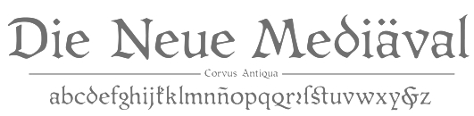 The Fourth Bienal de la Tipografía Latinoamericana comprised a type competition, Tipos Latinos 2010. The jury consisted of Paco Calles (Mexico), José de los Santos (Uruguay), Juan Heilborn (Paraguay), Fabio López (Brazil), César Puertas (Colombia), Hugo Rivera Scott (Chile) and Marcela Romero (Argentina). The awards have in each category, if applicable, a first prize (certificado de excelencia, CdE below) as well as regular awards:
 - Type families:
- CdE: Isac Correa Rodrigues (for Monarcha), Raúl Plancarte (for Kukulkan), Cristóbal Henestrosa (for Espinosa Nova).
- Ordinary: Johnatan Cuervo (for Corvus), Eduardo Manso (for Geogrotesque, and for Sunday Times Modern), Veronika Burian and José Scaglione (for Adelle and for Karmina Sans), Alejandro Lo Celso (for Perec), Fernando Mello and Jason Smith (for FS Jack), Ramiro Espinoza (for Lavigne Display and Lavigne Texto), Raúl Plancarte (for Sedna), Fernando Caro (for Arauto), Juan Pablo del Peral (for Kalidoscopio).
- Text typefaces (ordinary awards only): Ana Paula de Bragança Megda and Pablo Ugerman (for Voces), Juan Montoreano (for Kalu), Sol Matas and Juan Pablo del Peral (for Parque Chas), Carlos Zinno (for Latinité Roman), Horacio Mella (for Fedora Regular), Martín Sommaruga (for MVD Rambla), Viviana Monsalve and Gustavo J. Ibarra (for Enriqueta Book), Diana Edith Domínguez Ruiz (for Kafka Regular), Sebastián Salazar (for Sedán), Fernando de Moraes Caro (for Petra), Miguel Reyes Cabrera (for Sancho Regular), Rodrigo López Fuentes (for Amaranta Regular).
- Script / signage typefaces:
- CdE: Alejandro Paul (for Brownstone), Oscar Yáñez (for Carlota).
- Ordinary awards: Carlos Fabián Camargo Guerrero (for Modelia Black), Ramiro Espinoza (for Tomate), Darío Muhafara and Eduardo Tunni (for Lassi Display), Julio Palacio (for Todo Todo), Alejandro Paul (for Semilla, Kewl Script, Calgary Script, and for Business Penmanship), Pedrina Reis (for Boneca de Pano), Diego Negrete (for Picacho), Alejandro Valdéz Sanabria (for López), Leonidas Loyola Valenzuela (for Elolinea), Eduardo Tunni (for Changa), Mariana Pariani and Eduardo Tunni (for Club Universo), John Moore (for Victorina and for Radio Time), Marconi Gomes Lima (for Adriane Lux), Macarena Budín Acevedo (for Juanita la envidiosa), Miguel Reyes Cabrera (for Plastilina), Eli Castellanos Chávez (for Barrilito), Daniel Hernández (for Pincoya Black), Ricardo Esteves Gomes (for Force), Gabriel Martínez Meave (for Tlatoani Sans), Alejandro Lo Celso (for Margarita).
- Experimental typefaces:
- CdE: Rodrigo Fuenzalida (for Khubo), Manuel Guerrero (for Optica).
- Ordinary awards: Diego Sanz Salas (for Quincha), Rodrigo Valenzuela (for Maipo Regular), Rodrigo Fuenzalida (for Isosibilia), Luis Bolaños (for Chacana Regular), José Luis Coyotl Mixcoatl (for Zoomanic), César Rodríguez (for Masiva), Manuel Guerrero (for MiniBlock), Edgar Alejandro Reyes Ramírez (for Ps Pronts OS29).
- Screen / pixel typefaces (ordinary awards only): Roberto Robles Quiroz (for Verpix), Mauricio Vital (for Coqueta), Elí Castellanos Chávez (for Lucecita Maniac), Jorge Iván Moreno Majul (for Wixarika).
- Miscellaneous: Diego Cataldo and Sergio Rodríguez (for Uruguay 1976), Víctor García (for Garcia Toons), José Luis Coyotl Mixcoatl (for Cubomatics Icons), Rodrigo Araya Salas (for Globeface).
- Designs that use Latin-American typefaces: Several awards were given.
[Google]
[More] ⦿
|
Tipos Latinos 2012
|
 The Fifth Bienal de la Tipografía Latinoamericana comprised a type competition, Tipos Latinos 2012. The jury consisted of Dario Muhafara (AR), Fabio Lopez (BR), Miguel Hernández (CL), Viviana Monsalve (CO), Francisco Calles (MX), Gustavo Wojciechowski (UY), Juan Carlos Darias (VE). There was only one award Mención de Excelencia, which was given to Juan Pablo del Peral for his Alegreya ht Pro. The full list of awards:
 - Text typefaces: Bueh-Medium by Alfonso García (AR) and Deiverson Ribeiro (BR), Buenard Regular by Gustavo J. Ibarra (AR), Legítima Regular+Itálica by César Puertas (CO), Nassau by Paulo André Chagas (BR), Papermov by Sergio Ramírez (CO), Petrona Regular by Ringo Romei (AR), Radal Regular by Sergio Leiva Whittle (CL), Ruluko Regular by A. Sanfelippo (AR), A. Díaz (CO) and M. Hernández (CO), Unna Regular by Jorge de Buen (MX), Xallitic by José Manuel López Rocha (MX).
- Headline / display typefaces: Acme by Juan Pablo del Peral (AR), Agony by Jesús Barrientos (MX), Aire by Maximiliano Sproviero (AR), Breathe Pro by Maximiliano Sproviero (AR), Delight Script by Angel Koziupa (AR) and Alejandro Paul (AR), Dondo by Mariana Pariani (AR), Ecstasy by Jesús Barrientos (MX), Fluence by Eduilson Wessler Coan (BR), Hernández Bold by Daniel Hernández (CL), Hipster by Alejandro Paul (AR), Kiwi Extendida by Sebastián Gagin (AR), Letrista Script by Felipe Calderón (CO), Macondo by John Vargas Beltrán (CO), Needham Black by Rodrigo López Fuentes (CL), Panclasta by Carlos Fabián Guerrero (CO-VE) and Sergio Ramírez (CO-VE), Papusa Ultra by Aldo de Losa (AR), Parfumerie Script by Sabrina Mariela López (AR), Perejil by Flora Argemí (CL), Piel Script by Alejandro Paul (AR), Poem Script by Alejandro Paul (AR), Reina by Maximiliano Sproviero (AR), Rufina Regular> by Martín Sommaruga (UY), Telesforo Black by Carlos Fabián Camargo (CO-VE).
- Experimental typefaces: Antorcha by Jorge Iván Moreno Majul (MX), Alicia by Alexander Wright (VE), Articulada by Thales L. Aquino (BR).
- Miscellaneous: Dans le cuisine by Guisela Mendoza (CL), Diablos de Yare by Argenis Mejías (VE), Mayence Ornaments by Isac Correa Rodrigues (BR), SacredGeo by John Moore (VE), Sopi by Pablo Ugerman (AR), Tepu by Sergio Ramírez F. (CL), Vectorlove by Rodrigo Araya Salas (CL).
- Text families: Abril by José Scaglione (AR) and Veronika Burian (CZ), Alegreya ht Pro by Juan Pablo del Peral (AR), Almendra by Ana Sanfelippo (AR), Andada Regular and Andada Itálica by Carolina Giovagnoli (AR), Berenjena by Javier Quintana Godoy (CL), Bitter HT by Sol Matas (AR), Buendía by César Puertas (CO), Comex by Raúl Plancarte (MX), Delius by Natalia Raices (AR), Gandhi by Cristóbal Henestrosa (MX) and Raúl Plancarte (MX), Karol by Daniel Sabino (BR), La República by César Puertas (CO), Mazúrquica by Javier Quintana Godoy (CL), Mestiza Regular and Mestiza Itálica by Angelina Sánchez (AR), Ninfa Serif by Eduilson Wessler Coan (BR), FS Pimlico by Fernando Mello (BR), Rosarivo by Pablo Ugerman (AR), Telcel Sans by Gabriel Martínez Meave (MX), Winco by Ramiro Espinoza (AR).
[Google]
[More] ⦿
|
Tipos Latinos 2014
|
 Latin American typeface competetion held every two years. In the sixth competition in 2014, the jury, which consisted of Manuel Eduardo Corradine, Gustavo Soares, Fernando Diaz, David Kimura, Javier Quintana, Ruben Salinas, Domingo Villalba, and Miguel Catopodis, selected five grand prize winners: Radal, Laski, Alegreya, Wishes Script, and Cementos INKA. The full list of winners:
 Text typefaces - Radal Regular e Itálica (Sergio Leiva Whittle)
- Laski (Paula Mastrángelo and Ramiro Espinoza)
- Alegreya and Alegreya Sans (Juan Pablo del Peral)
- Pétala Pro Superfamily (Marconi Lima)
- Épica Regular, Bold, Black (Oscar Fernando Guerrero Cañizares)
- Progressiva (Ricardo Esteves Gomes)
- Soleto (Bruno Mello, Fabio Haag, Fernando Caro, Rafael Saraiva and Ron Carpenter)
- Soberana Sans (Raúl Plancarte and Cristóbal Henestrosa)
- Amster Pro (Francisco Gálvez Pizarro)
- Bree Serif (José Scaglione / Veronika Burian)
- Jauría (Pablo René Marchant Catalán)
- Mangai Regular (Daniela Hanna Ardiman)
- Serendip Latin and Serendip Sinhala (Rafael Saraiva)
- Gorgias (José Manuel López Rocha)
- Aviador Regular (Sonia García)
- Garibaldi Regular (Henrique Beier)
- Hola (Elí Castellanos)
- Canilari (Patricio González)
- Argentina (Dario Muhafara)
- Brasílica Regular (Rafael Dietzsch)
- Karol Sans (Daniel Sabino)
- Zipolite Rounded (Elí Castellanos)
- Tablet Gothic (José Scaglione / Veronika Burian)
Display and titling typefaces. - Wishes Script (Sabrina M. Lopez)
- Bird Script (Maximiliano R Sproviero)
- Seashore Script (Alejandro Paul)
- Bellissima Script (Alejandro Paul)
- Auberge (Alejandro Paul)
- Erotica (Maximiliano R Sproviero)
- Gandur (Daniel Sabino)
- Haltrix (Daniel Sabino)
- Machete & Bayoneta Set (Angel Koziupa and Alejandro Paul)
- Febrile (Jonathan Cuervo Cisneros)
- Sonora (Carlos Fabián Camargo Guerrero)
- Medusa (Ramiro Espinoza)
- Saira (Héctor Gatti)
- Bommer (Eduilson Wessler Coan)
- Festival Script (Angel Koziupa and Alejandro Paul)
- Black Moon FY-regular (Mónica Munguía)
- D Sari (Diego Aravena)
- Café Brasil Regular, Itálica (Sofia Mohr)
- Bahiana (Dani Raskovsky and Pablo Cosgaya)
- Encorpada Classic (Eduilson Wessler Coan)
- Pituca Rounded (Aldus De Losa)
- Encorpada Pro (Eduilson Wessler Coan)
- Sansita (Pablo Cosgaya)
- Maquinista (Alexander Wright)
- Calavera (Oscar Yanez)
- Duvall (John Moore)
- Esmeralda Pro (Guillermo Vizzari)
- Mona, Regular, Rock, Style (Rodrigo Araya Salas)
Miscellaneous styles - Robots ht (Carolina Giovagnoli)
- Dingbat Carroceria (Fátima Finizola & Damiâo Santana)
- Pictos Latinos (Belén La Rivera and Dominique Tetzner)
- LD Info / LD Picto (Leonidas Loyola and Daniel Berczeller)
Experimental typefaces. - Tipoglifo (César López Rivadeneira)
- Zezao.ttf (Vinicius Azisaka Maciel)
- Pájaros andinos (Luis C Bolaños)
- Ena / Ena Kuei (Ignazio Balboa / Michael Prado)
- Leon Regular (Joâo Batista Moreira Correia)
- Amaru Creador (Vanessa Zuñiga)
- Yoshimi Regular (Ana Sanfelippo)
- Waka (Omar Samamé S.) (Omar Smash)
[Google]
[More] ⦿
|
Tipos Latinos 2016
|
 The list of 66 winners in this biannual Latin American typeface design competition, of which eight obtained a Constancia de Excelencia (shown below in bold). There were additional awards (not shown here) in the type in use category.
 - Text typefaces:
- Acanto (Jonathan Cuervo Cisneros).
- Ancizar (Cesar Puertas, Julian Moncada, Viviana Monsalve)
- Archivo (Hector Gatti)
- Asap Condensed (Pablo Cosgaya)
- Astro Regular (Gen Ramirez and Manuel Lopez; helped by Rodrigo Heredia and Rodrigo Nunez)
- Biblioteca (Roberto Osses, Cesar Araya, Patricio Gonzalez, Diego Aravena)
- Capitolina (Christopher Hammerschmidt supervised by Marconi Lima)
- Chilca (Horacio Mella)
- Cuendias (Claudia Cuba, Roberto Roiz)
- Ebony (Jose Scaglione, Veronika Burian)
- Faustina Regular, Italic, Bold, Bold Italic (Alfonso Garcia)
- FS Brabo (Fernando Mello)
- Geleia Texto (Daniel Justi)
- Journalist (Sergio Alberto Rodriguez)
- Latina (Rodrigo Fuenzalida & Latinotype Team)
- Leluja (Andrea Kulpas)
- MuMono (Sergio Leiva Whittle, Horacio Mella, Magaly Salvo Solari)
- Nina Regular (Fernanda Cozzi)
- RNS Miles (Yorlmar Campos)
- Sana (Felipe Sanzana)
- Setimo (Fernando Caro Ken Gitschier, Fabio Haag, Lukas Paltram)
- Sistype (Florencia Sisti Michellod)
- Terafile (Raul Plancarte)
- Trasandina (Fernando Diaz)
- Titling typefaces:
- Abelina (Yanina Arabena & Guillermo Vizzari)
- Alexandria Script (Juan Sebastian Rincon Redondo)
- Amelia (Martin Sommaruga)
- Ayotzinapa (Raul Plancarte and Cristobal Henestrosa)
- Bataclan Heavy (Jorge Alberto Martinez Martinez)
- Bibliothek Light (Angelina Sanchez)
- Blend (Sabrina Lopez)
- Bufalino (Cesar Puertas, Juan Sebastian Cuestas)
- Carreton (Magdalena Arasanz)
- Combine Script and Combine Caps (Carlos Fabian Camargo Guerrero)
- Dream Script (Maximiliano R. Sproviero)
- Eskema (Jonathan Cuervo Cisneros)
- Galea Display (Isabel Urbina Peña)
- Gothiks (Daniel Sabino)
- Graviola (Henrique Beier)
- Grota Sans (Eli Hernandez & Daniel Hernandez)
- Horizontes (Alejandro Paul & Panco Sassano)
- Indie (Maximiliano R. Sproviero)
- Konga (Rodrigo Araya & Andrey Kudryavtsev)
- Latam Sans (Daniel Sabino)
- Libertad (Fernando Diaz)
- Nemocon (Carlos Fabian Camargo Guerrero)
- Rabar Ultra Black (Gen Ramirez)
- Revista (Paula Nazal Selaive, Marcelo Quiroz & Daniel Hernandez)
- Satira Display (Sergio Trujillo)
- Sica (Volnei Antonio Matta and Eduilson Coan)
- Sorvettero (Diego Maldonado)
- Tenez (Rodrigo Saiani)
- Trendy Script (Felipe Calderon Arteaga)
- Whisky (Manuel Eduardo Corradine Mora and Sergio Ramirez Llamas)
- Experimental typefaces.
- Exoesqueleto (Ruben Salinas Heredia)
- Kero (Luis C. Bolaños, cxmr*)
- Modular 46 (Vanessa Zuñiga)
- Proyecto Personal Carteles (Ensamble and Tipos)
- Sonotipo (Manuel Guerrero, Alfonso Alba)
- Tiwanacu (Vanessa Zuñiga)
- Miscellaneous typefaces.
- Cotorra (Miguel Angel Contreras Cruz)
- Infamy (Santiago Sancha)
- Mini Rio (Fabio Lopez)
- Notro (Sergio Ramirez Flores)
[Google]
[More] ⦿
|
Tipos Latinos 2018
|
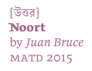 Tipos Latinos 2018 (or TL8) selected 73 winning entries from 444 nominations. There were seven categories, and four grand prize winners, Skill (Maximiliano R. Sproviero), Thesaurus (Fermin Guerrero), Atahualpa (Alejandro Lo Celso), and Otta (Paco Galvez). The full list:
 - Emerging talent:
- Aline (Julio Claudius Giraldes Junior)
- Anabella (Martin Sesto)
- Cardone (Fatima Lazaro)
- Ceibo (Juan Martin Krause)
- Chucky (Maria Candela Caudana)
- Discordia (Alvaro Franca)
- Decoupe (Maria Carla Mazzitelli)
- Franco Titling (Lucas Franco)
- Gigio (Ana Laydner)
- Lagar (Celina Mazziotti)
- Lygia (Flavia Zimbardi)
- Parranda (Ale Navarro Miranda)
- Picarona (Leo Calderon)
- Pitaya Italic (Aline Kaori Yoshimatsu)
- Shekyna (Nicolas Palominos)
- Experimental:
- Ahsurini (Luciano Cardinali)
- Isografia (Alexander Wright)
- Octothorpe (Jorge Ivan Moreno Majul)
- Scratch TTM (Felipe Sanzana)
- Tennis Set (Alejandro Paul)
- Scripts:
- Bibliophile Script (Ale Paul)
- Chepina Script (Andres Felipe Ramirez Ortiz)
- Envelove (Yanina Arabena, Guillermo Vizzari, Alejandro Paul)
- Font Anita (Soledad Fontana)
- French Bulldog (Alejandro Paul, Carolina Marando)
- La Taqueria (Alejandro Paul, Carolina Marando)
- Limon (Sabrina M. Lopez)
- Skill (Maximiliano R. Sproviero)
- Miscellaneous:
- Cosmocollita (Elizabeth Arostegui)
- Grande Vitorinha (Filipe Motta, Alex Furtado, Thais Melotti)
- Papaia (Diego Sanz Salas)
- Superfamilies:
- Elizeth (Daniel Sabino, Lucas Gini and Henrique Beier)
- Guyot (Ramiro Espinoza)
- Portada (Jose Scaglione, Veronika Burian)
- Reforma (Alejandro Lo Celso)
- Thesaurus (Fermin Guerrero)
- Victus (Gen Ramirez)
- Text typefaces:
- Atahualpa (Alejandro Lo Celso)
- Brother 1816 (Ignacio Corbo, Fernando Diaz)
- Elisetta (Lucia Ronderos)
- FS Irwin (Fernando Mello)
- Laura ht (Carolina Giovagnoli)
- Malva (Henrique Beier)
- Mosonyi (Yorlmar Campos)
- Nikola (Sergio Leiva Whittle, Rodrigo Lopez Fuentes)
- Noort (Juan Bruce)
- Otta (Francisco Galvez)
- Phonos (Manuel Lopez Rocha)
- Piazzolla (Juan Pablo del Peral)
- Telder ht Pro (Andres Torresi)
- Ticerz (Franco Jonas Hernandez)
- Violeta (Javier Quintana Godoy)
- Titling:
- Antonietta (Mauricio Astete aka Mauro Andres)
- BT Orca Display (Sebastian Castellanos, Jason Guzman)
- Clothing (Camilo Zamora, Carlos Fabian Camargo G)
- Electrica (Santiago Torres)
- Gabriela Stencil (Antonio Mejia Lechuga, Latinotype)
- Grenze (Renata Polastri)
- Joane (Ale Navarro Miranda)
- Loyola Pro (Rodrigo Araya)
- Lubaline (Maximiliano R. Sproviero)
- Mixta (Rodrigo Fuenzalida)
- Olar (Andrea Kulpas)
- Posh (Maximiliano R. Sproviero)
- Preta (Maximiliano R. Sproviero)
- Proprietor (Guillermo Vizzari, Alejandro Paul)
- Rague (Rodrigo Araya, Andrey Kudryavtsev)
- Rocher (Henrique Beier)
- Royal Charter (Cristobal Henestrosa)
- Rudolf Titling (Lucas Franco, Claudio Rocha)
- CF Santiago (Joaquin Contreras)
- Speakeasy (Ale Paul)
- Terafile (Raul Plancarte)
[Google]
[More] ⦿
|
Tokyo Type Directors Club: 2000 TDC awards
|
Tokyo Type Directors' Club TDC 2000 awards: gold to Naomi Enami and Neville Brody for the 1999 FUSE Tokyo Exhibition. And to Masumi Kobayashi for "Seeds Letters 1999". [Google]
[More] ⦿
|
Tokyo Type Directors Club: 2001 TDC awards
|
The awards included the 2001 Judges' Special Prize for Yuji Koiso's wonderfully experimental kanji font. [Google]
[More] ⦿
|
Tokyo Type Directors Club: 2002 TDC awards
|
Tokyo Type Directors' Club TDC 2002 awards. Peter Cho won an award for his interactive typography, "letterscapes". Letterscapes is a collection of twenty-six interactive typographic landscapes, encompassed within a dynamic, dimensional environment. In each landscape, a letter of the alphabet serves as the starting point for a playful, mouse-driven experience. Peter Cho is a designer and programmer based in San Francisco. He holds a masters degree from the MIT Media Laboratory. [Google]
[More] ⦿
|
Tokyo Type Directors Club: 2003 TDC awards
|
Tokyo Type Directors' Club TDC 2003 awards. The digital typography prize went to Scott Kim. [Google]
[More] ⦿
|
Tokyo Type Directors Club: 2004 TDC awards
|
Tokyo Type Directors' Club TDC 2004 awards. Deadline: November 25, 2003. [Google]
[More] ⦿
|
Tokyo Type Directors Club: 2005 TDC awards
|
Tokyo Type Directors' Club TDC 2005 awards. [Google]
[More] ⦿
|
Tokyo Type Directors Club: 2006 TDC awards
|
Tokyo Type Directors' Club TDC 2006 awards. Among these, we find Yoshiaki Kano of Zetuei. [Google]
[More] ⦿
|
Tokyo Type Directors Club: 2007 TDC awards
|
Tokyo Type Directors' Club TDC 2007 awards. [Google]
[More] ⦿
|
Tokyo Type Directors Club TDC 2016
|
Created in 1987 along the model of the New York Type Directors Club, and led by Katsumi Asaba, the Tokyo Type Directors Club organizes an annual type competition. The type design prizes in 2016 include Henrik Kubel and Scott Williams (A2) for The New York Times Magazine Custom Fonts, who were awarded the Grand Prix. Gerard Unger received the Type Design prize for Alverata. [Google]
[More] ⦿
|
Tokyo Type Directors Club TDC 2017
|
Created in 1987 along the model of the New York Type Directors Club, and led by Katsumi Asaba, the Tokyo Type Directors Club organizes an annual type competition. Archive of the outcomes of the Tokyo TDC Annual Awards. Jury for TDC 2017: Katsumi Asaba, Kazunari Hattori, Naomi Hirabayashi, Tsuguya Inoue, Taeko Isu, Kaoru Kasai, Atsuki Kikuchi, Issay Kitagawa, Akira Kobayashi, Henrik Kubel, Gento Matsumoto, Kiyonori Muroga, Hideki Nakajima, Masayoshi Nakajo, Norio Nakamura, Yugo Nakamura, Yukimasa, Okumura, Takuya Onuki, Taku Satoh, Katsuhiko Shibuya, Shin Sobue, Fumio Tachibana, Yui Takada, Yoshie Watanabe and John Warwicker. Applications are due on November 1, 2016. [Google]
[More] ⦿
|
Tokyo Type Directors Club TDC 2018
|
Created in 1987 along the model of the New York Type Directors Club, and led by Katsumi Asaba, the Tokyo Type Directors Club organizes an annual type competition. Archive of the outcomes of the Tokyo TDC Annual Awards. Jury for TDC 2018: Tatsuya Ariyama, Katsumi Asaba, Kazunari Hattori, Tsuguya Inoue, Kaoru Kasai, Atsuki Kikuchi, Issay Kitagawa, Akira Kobayashi, Satoshi Machiguchi, Gento Matsumoto, Kiyonori Muroga, Hideki Nakajima, Masayoshi Nakajo, Norio Nakamura, Yugo Nakamura, Daijiro Ohara, Yukimasa Okumura, Takuya Onuki, Taku Satoh, Katsuhiko Shibuya, Shin Sobue, Fumio Tachibana, Yui Takada, Yuri Uenishi, John Warwicker, Yuni Yoshida, Shigenobu Fujita, Osamu Torinoumi. The Tokyo TDC Annual Awards included only one typeface, which went to Shigenobi Fujita for the typeface Tsukushi. [Google]
[More] ⦿
|
Tokyo Type Directors Club TDC 2019
|
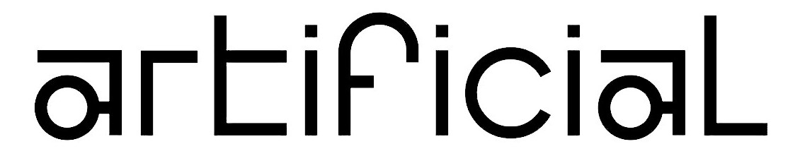 Created in 1987 along the model of the New York Type Directors Club, and led by Katsumi Asaba, the Tokyo Type Directors Club organizes an annual type competition. Archive of the outcomes of the Tokyo TDC Annual Awards. Ten prizes were given in 2019. Among these, there were three typefaces. The grand prize went to Michael Kelly for his experimental Latin typeface Virtual Reality. There was a TDC prize for Henrik Kubel and Matt Willey's typeface New York Times Magazine Olympic font. Finally, Satoshi Iwai's Japanese font Hidesu won the type design prize. [Google]
[More] ⦿
Created in 1987 along the model of the New York Type Directors Club, and led by Katsumi Asaba, the Tokyo Type Directors Club organizes an annual type competition. Archive of the outcomes of the Tokyo TDC Annual Awards. Ten prizes were given in 2019. Among these, there were three typefaces. The grand prize went to Michael Kelly for his experimental Latin typeface Virtual Reality. There was a TDC prize for Henrik Kubel and Matt Willey's typeface New York Times Magazine Olympic font. Finally, Satoshi Iwai's Japanese font Hidesu won the type design prize. [Google]
[More] ⦿
|
Tokyo Type Directors Club TDC 2020
|
Created in 1987 along the model of the New York Type Directors Club, and led by Katsumi Asaba, the Tokyo Type Directors Club organizes an annual type competition. The winners of the Tokyo TDC Annual Awards 2020: - Grand Prize: Michael Amzalag + Mathias Augustyniak, M/M(Paris), for Galeries Lafayette Champs-Elysées.
- RGB Prize: Karen Ann Donnachie + Andy Simionato.
- Type Design Prize: Pierre Pané-Farré for Affichen Schriften FSL. His Affichen Schriften FSL won the type design prize at the Tokyo Type Directors Club TDC 2020. This revival collection is based on extensive research in archives and special collections the Affichen-Schriften series is a digitally reconstructed set of four distinctive display typefaces from that era:
- Doppel-Mittel Egyptienne FSL and Schmale Egyptienne No.12 FSL: Based on types issued by Eduard Haenel (Magdeburg/Berlin), who was one of the first to introduce new display type designs to the German printing trade in the 1830s.
- Antiques FSL. An early sans-serif adaption by Tarbé & Cie. (Paris) that hints at the splendor and exprimental sans-serif forms found in French poster typefaces at the time
- Breite-Fette Antiqua FSL. A wide fat face that embodies the formal developments that occurred in the German Confederation around the late 1840s.
- Book Design Prize: Jonathan Ellery + Lawrence Weiner.
- Special Prize: Tsuguya Inoue.
- Special Prize: Fumio Tachibana.
- TDC Prize: Akiem Helmling + Sami Kortemäki + Bas Jacobs, Underware. For Grammato, a contriibution in the area of animated and automated typography.
- TDC Prize: OK-RM (Oliver Knight + Rory McGrath).
- TDC Prize: Panos Vassiliou + Manos Daskalakis. For PF Marlet.
- TDC Prize: Mei Shuzhi + Lian Jie + Li Xibin.
- TDC Prize: Yui Takada.
- TDC Prize: Li Xibin + Liu Yutong.
[Google]
[More] ⦿
|
Tokyo Type Directors Club TDC 2021
|
 Created in 1987 along the model of the New York Type Directors Club, and led by Katsumi Asaba, the Tokyo Type Directors Club organizes an annual type competition. Entry forms.
 Special judges for Type Design in 2021: Shigenobu Fujita, Akira Kobayashi, Ryoko Nishizuka, Shin Sobue, Osamu Torinoumi, John Warwicker, Qiu Yin. The main type design prize went to Chinese type designers Jia Yang, Yichao Xu and Yin Qiu for their Coca-Cola Care Font. This award leaves a stain on the reputation of the competition, as Yin Qiu is both competition judge and award winner. [Google]
[More] ⦿
|
Tokyo Type Directors Club TDC 2022
|
Created in 1987 along the model of the New York Type Directors Club, and led by Katsumi Asaba, the Tokyo Type Directors Club organizes an annual type competition. The deadine forv the 2022 awards is 10 October 2021. The type design competition judges: Shigenobu Fujita, Cyrus Highsmith, Akira Kobayashi, Ryoko Nishizuka, Shin Sobue, Osamu Torinoumi, John Warwicker, Wang Wen. In 2021, one of the judges of that competition won the grand prize in type design:( Jean-Francois Porchez won the grand prize in 2022 for Altesse. [Google]
[More] ⦿
|
Type For You Competition 2009
|
TypeForYou has teamed up with online digital type foundry HypeForType, to bring a one off competition: create a custom typeface using the phrase "TypeForYou". Results posted on September 20, 2009. Top prize to Shane Bzdok. [Google]
[More] ⦿
|
Type tart cards
|
A tart card competition at the St. Bride Library in London in 2009. They explain: We would like you to design a tart card either for a typeface or a letter of the alphabet. If you are unfamiliar with these things, tart cards are the means by which London prostitutes advertise their services. Step in to any Central London call box and you can contemplate up to eighty cards inviting you to be tied, teased, spanked or massaged either in luxury apartments, fully-equipped chambers or the privacy of your own hotel room. So pervasive are these things, and so curious is their typography, images and copy writing they are now regarded as bona fide items of accidental art and have something of a cult following. Once on the periphery of design, the cards have influenced the work of many mainstream artists including Royal Academician Tom Philips and Sex Pistols designers, Ray and Nils Stevenson. Perhaps they can inspire you too? Examples: 1, 2, 3. Exhibition at KasselsKramer, London, 22-29 June 2009. See also Wallpaper's June 2009 issue entitled Sex Issue: Type Tart Cards. [Google]
[More] ⦿
|
TypeArt Cyrillic Type Design Competition 2001
|
Organized by 'CompuArt' Magazine (Moscow) and Vedi Project (Moscow), a text, display and pi font competition held in 2001. [Google]
[More] ⦿
|
TypeArt05
|
 Russian type competition in March 2005. The jury consisted of Yuri Gordon, Vladimir Efimov, Dimitri Kirsanov, Tagir Safayev and Nikolay Dubina. The winners:
 Text designs
- Helvetica Linotype: John Hudson (Canada)
- Corbel: Jeremy Tankard (England)
- Calibri: Luc(as) de Groot (Germany)
- TheAntiqua: Luc(as) de Groot (Germany)
Display designs
- Daiga: Ekaterina Maslova (Russia)
- EZZ: Anastasija Davydchik (Russia)
- Fourty-nine face: Aleksandra Korolkova (Russia)
- Polie: Vuga Radulovic (Serbia and Montenegro)
- UniOpt: Viktor Kharik (Ukraine-Germany)
- P22 Operina: James Grieshaber (USA)
- Jedrilica: Ivana Dakic (Serbia and Montenegro)
- SPQR Caps: Sergej Egorov (USA)
- Calm Hour: Elena Kolesnikova (Russia)
- Bulrush: Tatjana Malakhova (Russia)
- DR Galushki: Dmitrij Rastvorsev (Ukraine)
- Parangon Poluustav: Anatolij Kudrjavcev (Russia)
- Parangon Ustav: Anatolij Kudrjavcev (Russia)
- Multicross Cyr: Dmitrij Greshnev (Russia)
- Cathedral and Pattern: Ivan Sharenkov (Russia)
Text / Display type systems
- Candara: Gary Munch (USA)
- Bucentoro: Sergej Egorov (USA)
Pi fonts
- Output there is: Kirill Sirotin (Russia)
- Blooming Meadow: Viktor Kharyk (Ukraine-Germany)
- Astra: Andrej Belonogov (Russia)
[Google]
[More] ⦿
|
TypeForYou Competition
|
A competition announced in September 2009 as follows: TypeForYou has teamed up with online digital type foundry HypeForType, to bring you a one off competition, and a chance to win Exclusive Faces Volume 1, worth over 150 pounds. Exclusive Faces Volume 1 includes limited edition typeface creations from the likes of Si Scott, Alex Trochut, Jon Burgerman, Luke Lucas and HelloHikimori. To be in with a chance to win this Exclusive Volume and possibly have your typeface submission taken forward and built, we're asking you to pull out your creative type skills and show us something unique. The brief is to create a custom typeface using the phrase "TypeForYou". The winner was Shane Bzdok. [Google]
[More] ⦿
|
Typographica: Best of 2006
|
Typographica's Oscars for 2006, the unofficial but highly respected list of best types of the past year. [Google]
[More] ⦿
|
Typographica: Best of 2007
|
Typographica's Oscars for 2007, the unofficial but highly respected list of best types of the past year. Double and triple winners are Tomáš Brousil, Kris Sowersby and Christian Schwartz. - Calligraphic: Burgues Script by Alejandro Paul.
- Scripts and bouncers: Kinescope by Mark Simonson, MVB Sacre Bleu by Mark van Bronkhorst, Olicana by Nick Cooke, Scriptonah and Casual Script by John Nahmias, Los Niches by Juan Pablo de Gregorio, BistroScript by Tomáš Brousil, Beorcana by Carl Crossgrove (too brushy to be labeled a sans), Burbank by Tal Leming (too bouncy to be called a sans).
- Sans family: National by Kris Sowersby, Graphik by Christian Schwartz, Taz III by Luc(as) de Groot, Gloriola by Tomáš Brousil, Urbana by César Puertas.
- Octagonal/mechanical: Purista by Tomáš Brousil.
- Serif text family: Arno Pro by Robert Slimbach, FF Meta Serif by Spiekermann, Schwartz, and Sowersby, Feijoa by Kris Sowersby, Greta by Peter Bilak.
- All purpose families: Leitura by Dino dos Santos, Anselm by František Štorm.
- Slab or heavy serif: Malaga by Xavier Dupré, Lineare Serif by Eduardo Tunni.
- Special purpose: Beowolf & BeoSans by Erik van Blokland and Just van Rossum, Fab by Patrick Griffin.
- Small sizes, pixelish: Minuscule by Thomas Huot-Marchand, Restraint by Marian Bantjes with Ross Mills.
- Blackletter: Blaktur by Ken Barber.
- Vogue: Giorgio by Christian Schwartz.
[Google]
[More] ⦿
|
Typographica: Best of 2008
|
 Typographica's Oscars for 2008, the unofficial but highly respected list of best types of the past year.
 - Orbe (Rui Abreu)
- Dolce&Dyna (Elena Albertoni)
- History (Peter Bilak)
- Carmen (Andreu Balius)
- Studio Lettering (Ken Barber, Tal Leming)
- ITC Franklin (David Berlow)
- Rocky (Matthew Carter)
- Birra Stout (Joshua Darden)
- Mary Read (Melle Diete)
- Marlene, Brioni, and Typonine Stencil (Nikola Djurek)
- Glosa (Dino dos Santos)
- Vista Slab (Xavier Dupré)
- FF Pitu (Lukasz Dziedzic)
- Givry (Tom Grace)
- Zócalo (Cyrus Highsmith)
- Archer (Jonathan Hoefler, Tobias Frere-Jones and Jesse Ragan)
- Expo Serif (Mark Jamra)
- Eurostile Next (Akira Kobayashi, Aldo Novarese, Alessandro Butti).
- Dessau (Gábor Kóthay)
- Arlt (Alejandro Lo Celso)
- FP Head Pro (Morten Olsen)
- Compendium and Calgary Script (Alejandro Paul)
- Memoir (Stephen Rapp)
- Bree (José Scaglione, Veronika Burian)
- Stag (Christian Schwartz)
- Modern Suite (Nick Shinn)
- Lakeside and Zanzibar (Mark Simonson)
- Hardys and Newzald (Kris Sowersby)
- Baskerville 10 (Frantisek Storm, John Baskerville, Otakar Karlas), Moyenage (Frantisek Storm), and Comenia (Frantisek Storm, Radana Lencová, Tomás Brousil)
- Mokka and Marat (Ludwig Übele)
- FF Trixie HD (Erik van Blokland)
- Benton Modern Display (Dyana Weissman, Richard Lipton)
[Google]
[More] ⦿
|
VGC 1966 International Typeface Design Competition
|
The winners of the 1966 International typeface Design Competition sponsored by VGC (Visual Graphics Corporation) were André Gürtler (first prize, for Egyptian 505), Raphael Boguslav (second prize, for Visa), Stanley Davis (Amelia), Barry Deutsch (Deutsch Black), Walter J. Diethelm (Arrow), Karl-Heinz Domning (Domning Antiqua), Ernst Friz (Friz Quadrata), Giorgio Giaiotto (Giorgio), Zoltan Nagy (Margaret Antikva), Aldo Novarese (third prize, for Exempla), Friedrich Peter (Vivaldi), Georg Salden (York), Jay Schechter (Jay Gothic), Wayne Stettler (Neil Bold), Hans-Jürgen Wolf (Wolf Antiqua). [Google]
[More] ⦿
|
WinSoft Arabic Typography
|
Results of a type competition held in 2010 [example: poster by Maakaron S]. [Google]
[More] ⦿
|
Year 2000 Font Contest
|
Point Central's year 2000 font contest for freeware/shareware fonts. The people were the jury. Organizer: Guillaume-Ulrich Chifflot. Free downloads of competing fonts: Bug2K (Meir Sadan), Dazey (nice: by Scott Lindberg of Minneapolis, MN, at Goatpatch Delux), Echelon (great numerals in this font by Ray Larabie), PhoenixArise (Graham Meade), StyleLiner (Brode Vosloo for Sacred Nipple), PictavesLight and StrangePhenomenaNormal (by Julien Janiszewski), Y2k-SubterranExpressKG (Kees Gajentaan), UniCase (Jacky Frossard), Virus53X (great futuristic font by Nate Bridi, Y2KFriendlyFuture (Salvo Nicolosi), Y2Kill (Dave Lovelace and Parallax), Y2KPopMuzikAOE (really great font by Brian J. Bonislawsky at Astigmatic One Eye), Y2KNeophyte and Y2KAnalogLegacy (Koen Hachmang at Glitch), Year2000Replicant (J.M. Everett of Chaos Fonts in Roeland Park, KS), YouWillDieIn2000 (Matt Dennewitz), BNYear2000 (Ben Nathan), GollanBill (Kane for Sector One), Year2000Boogie (Noah Rothschild at Victory Type), Queer Theory (Harold Lohner). [Google]
[More] ⦿
|

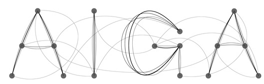
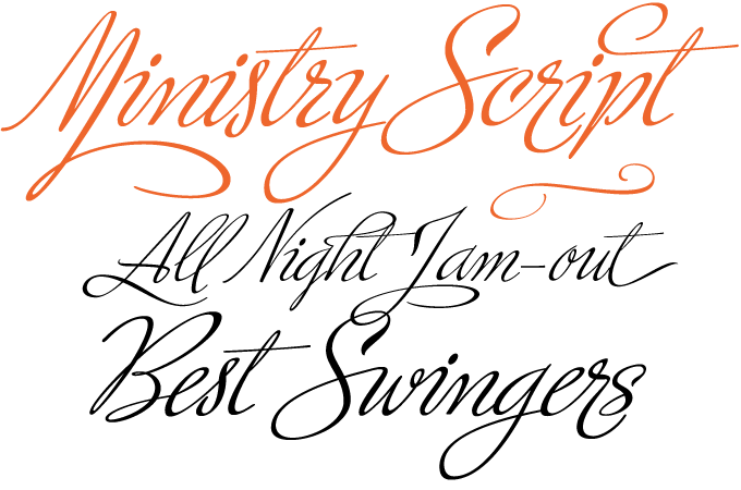
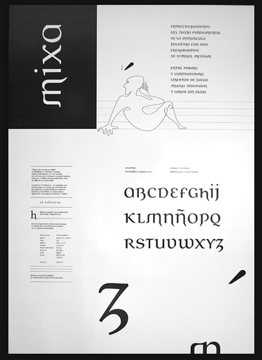
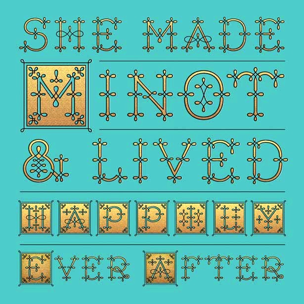
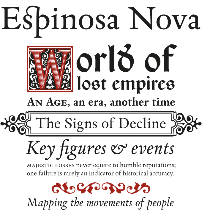
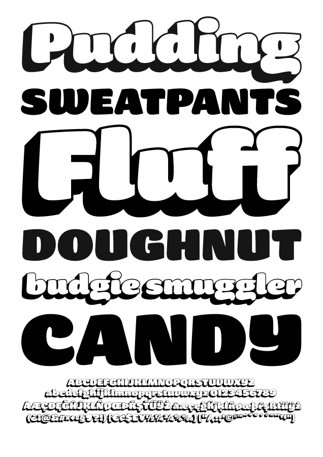
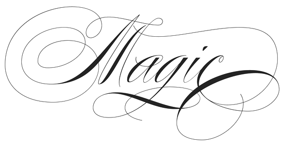
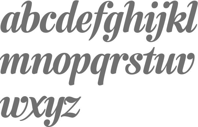
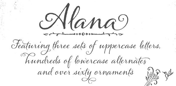
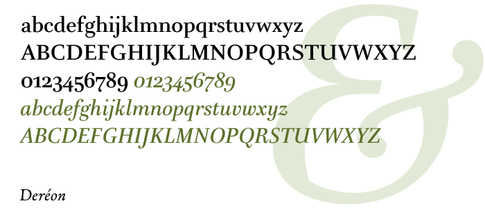
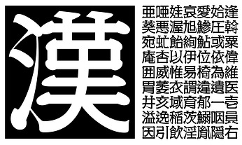
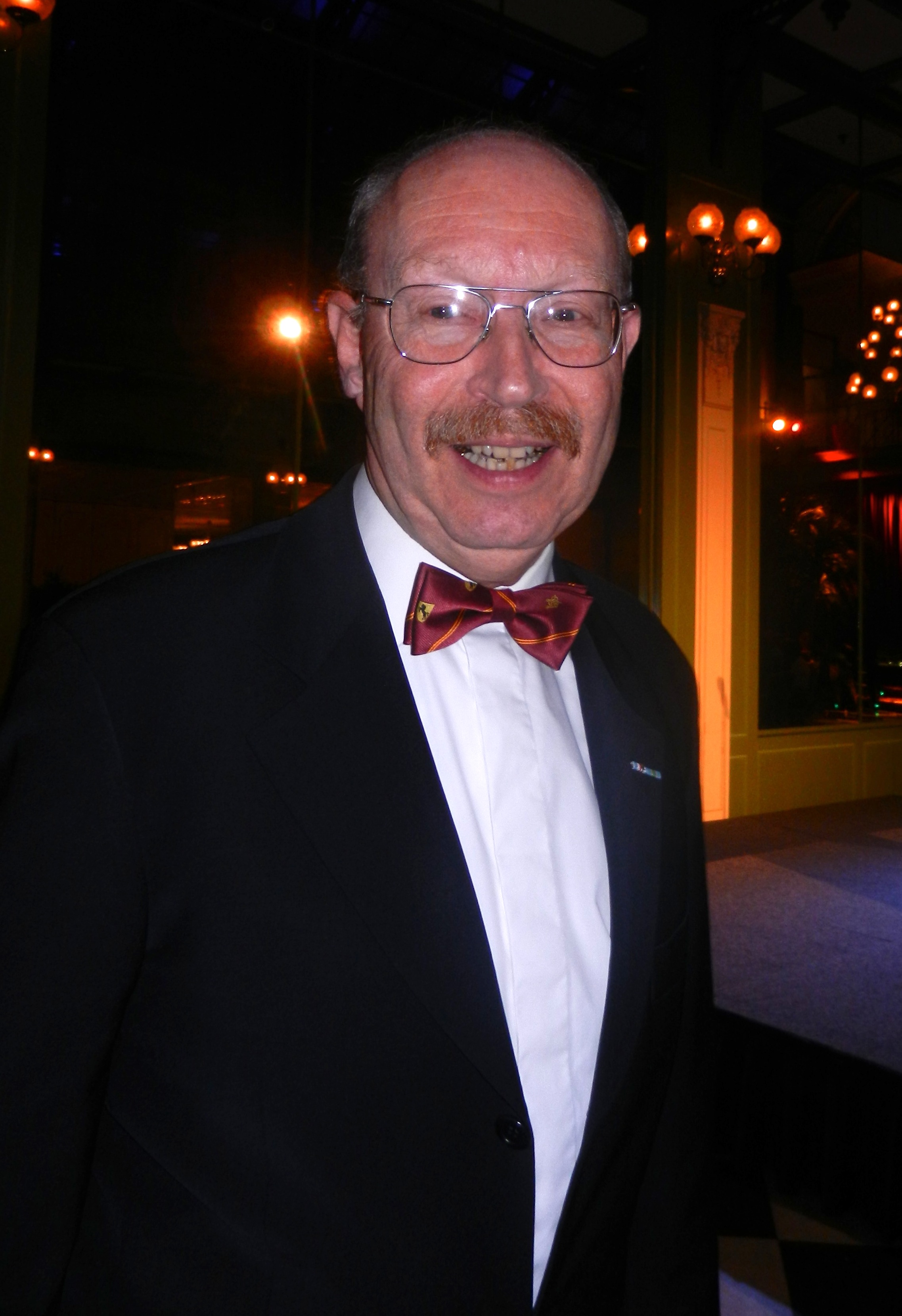
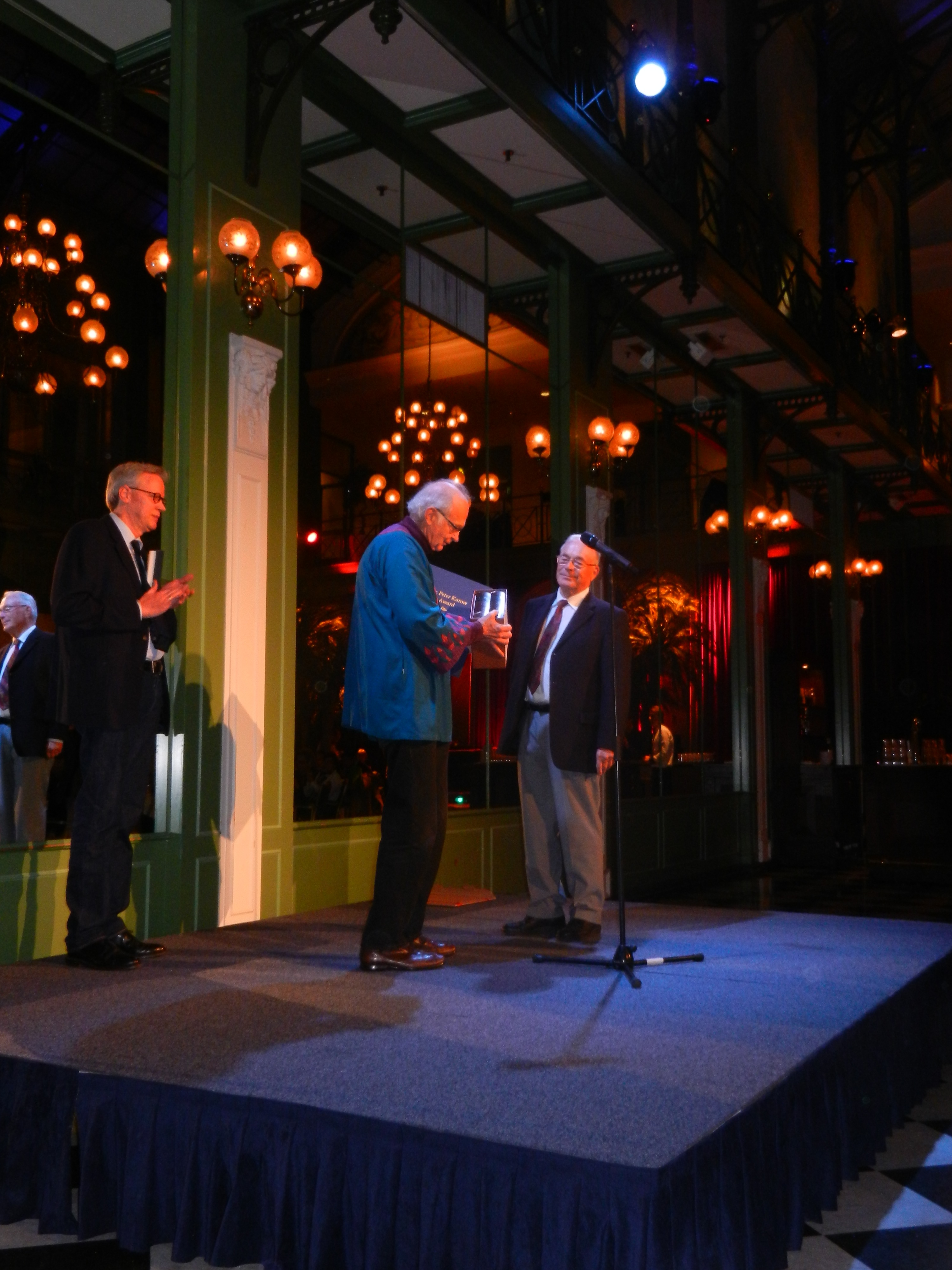
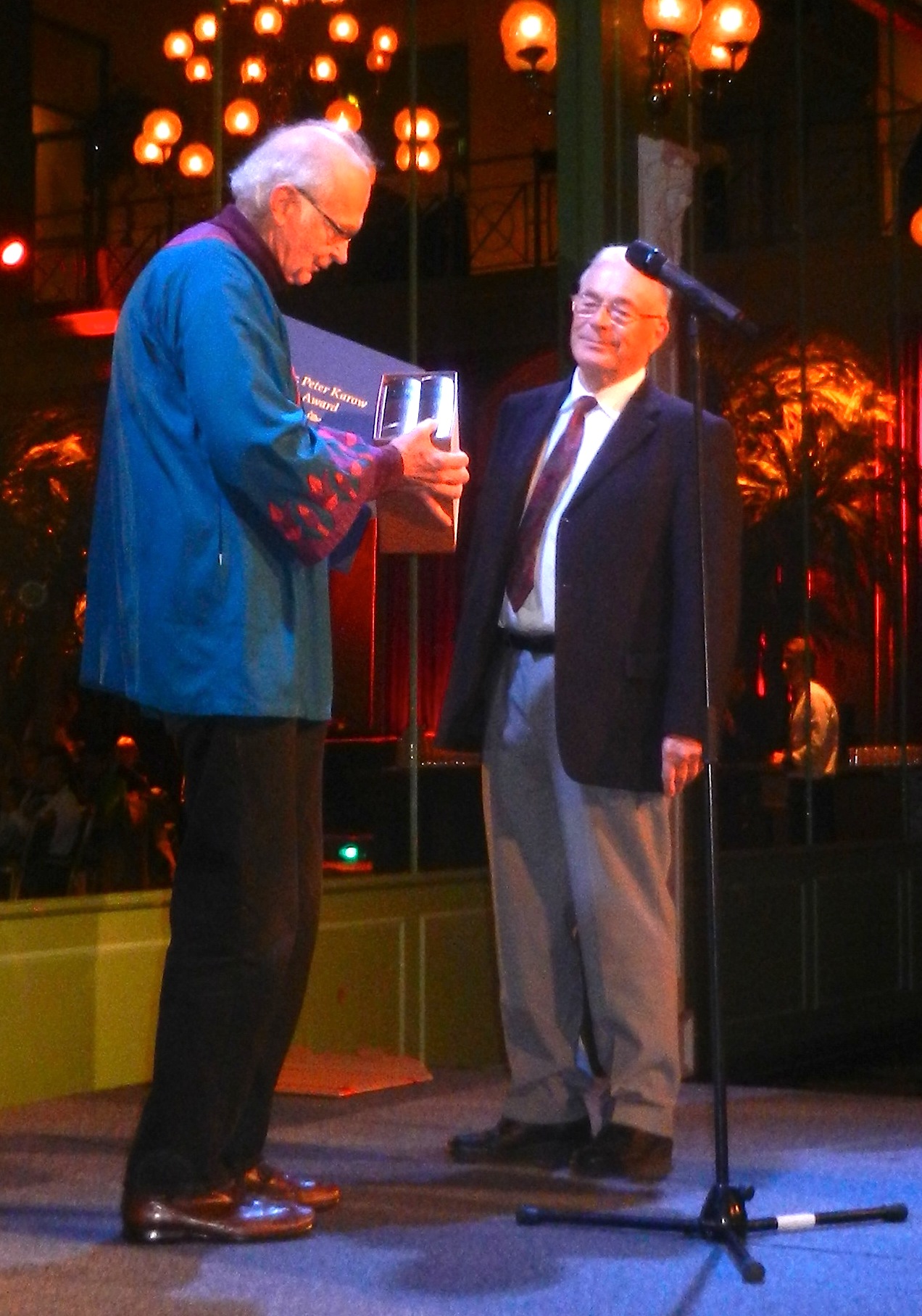
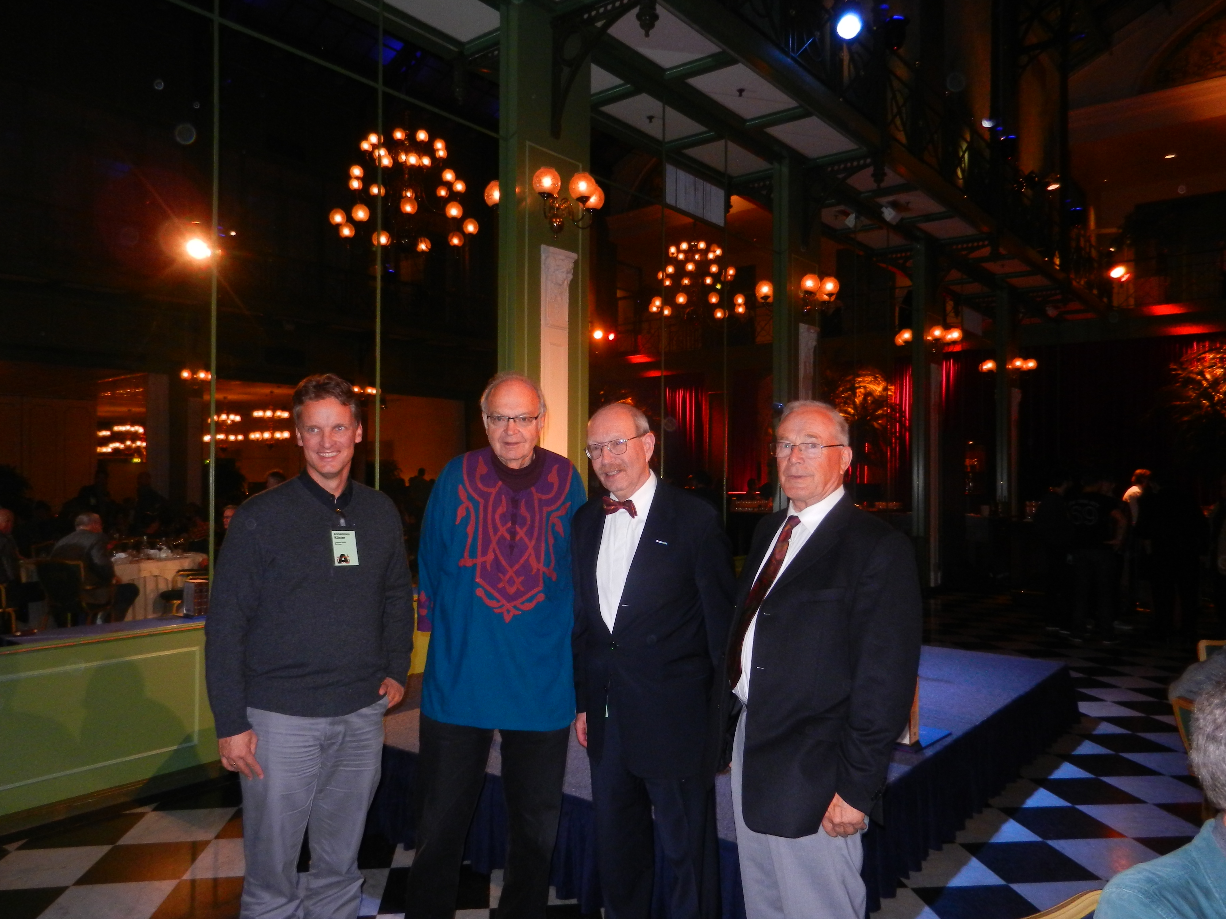
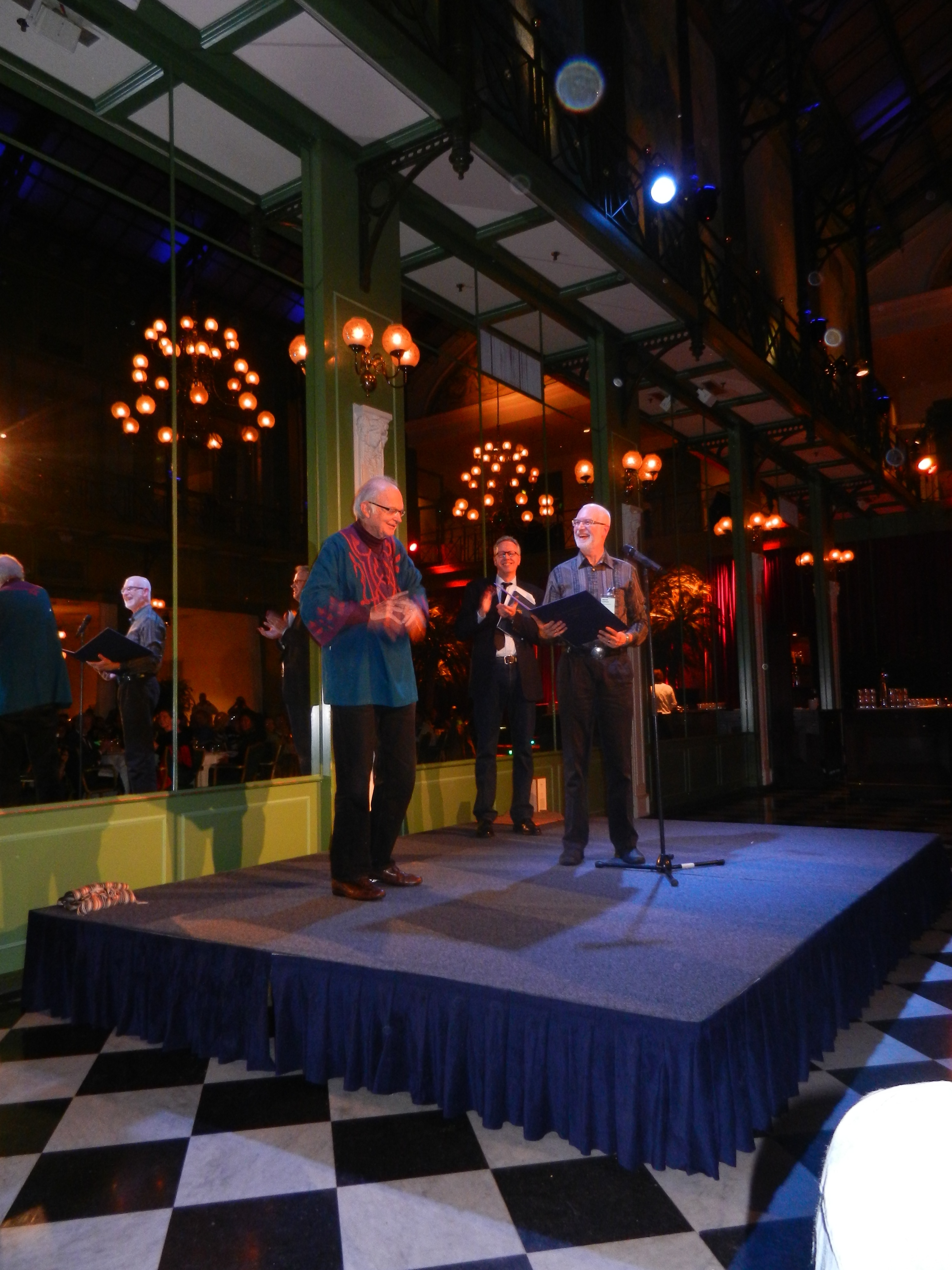
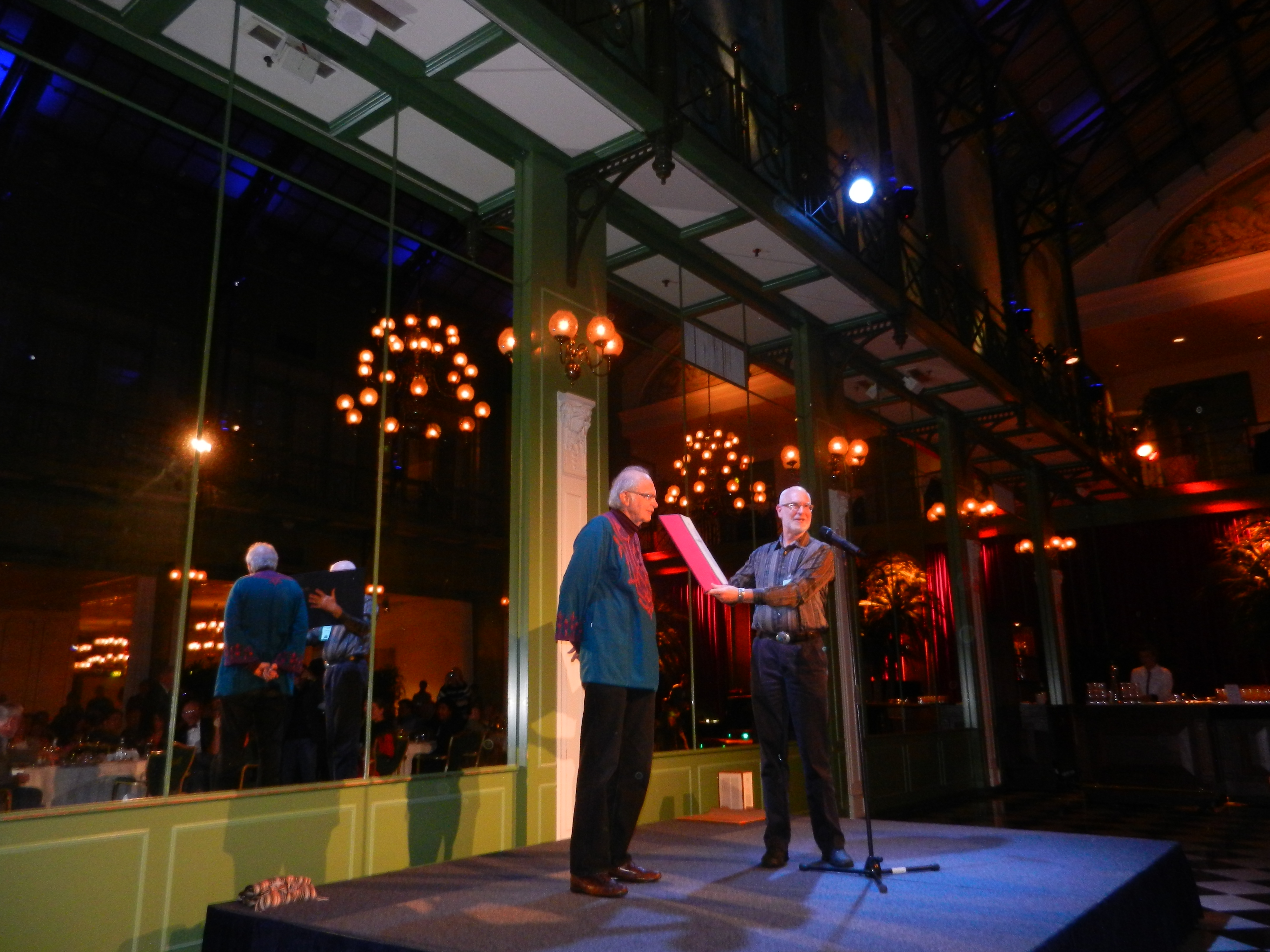
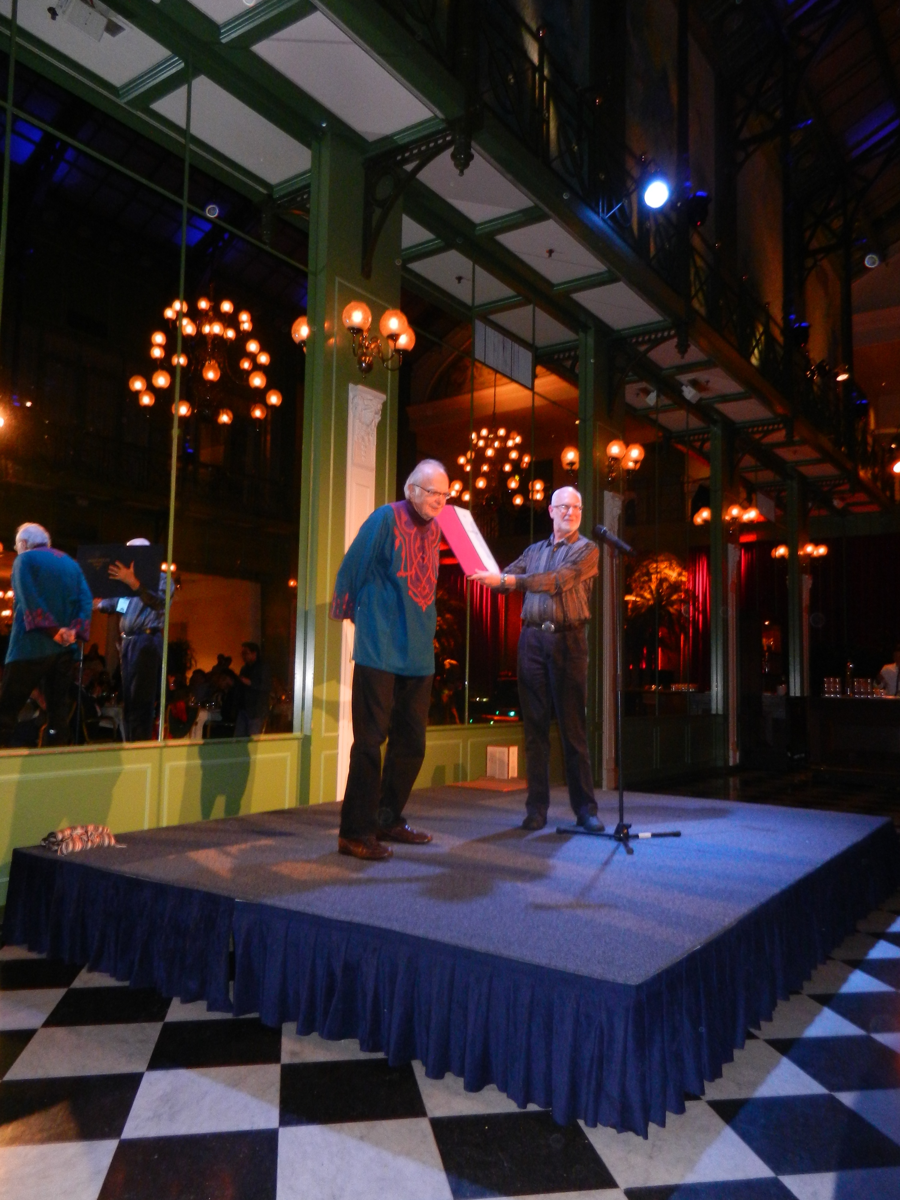
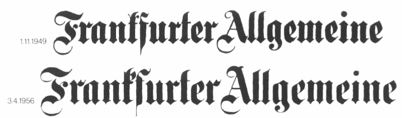
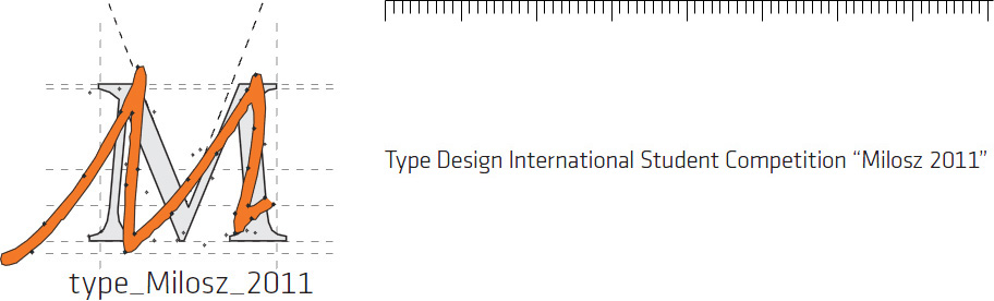
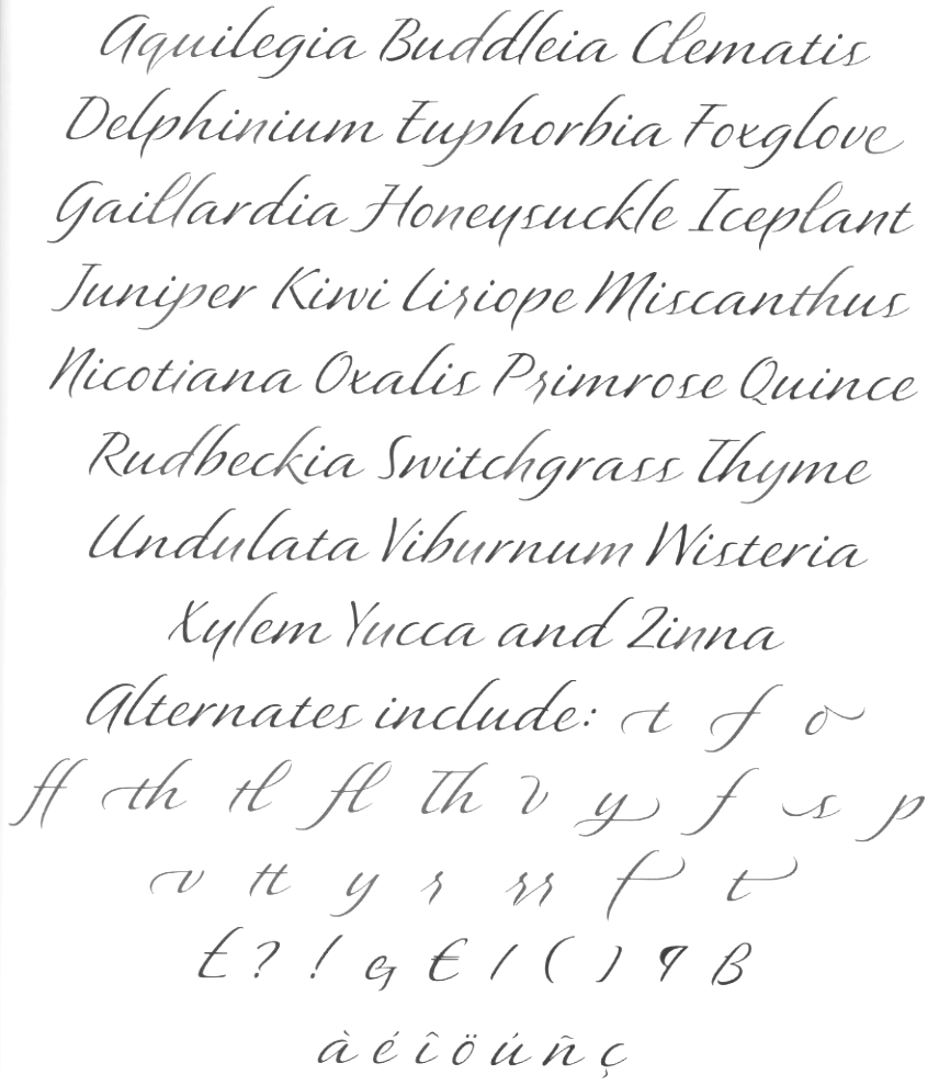
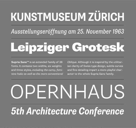
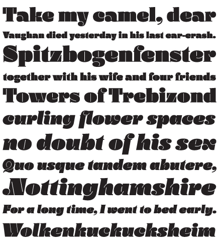
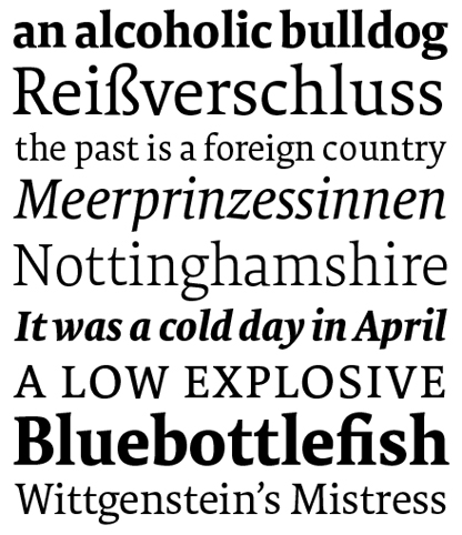
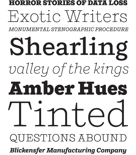
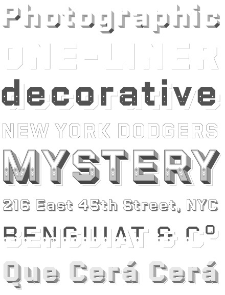
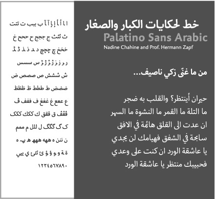
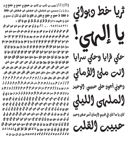
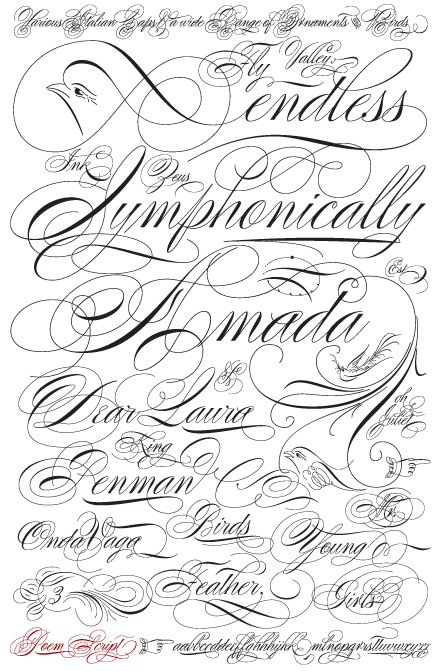
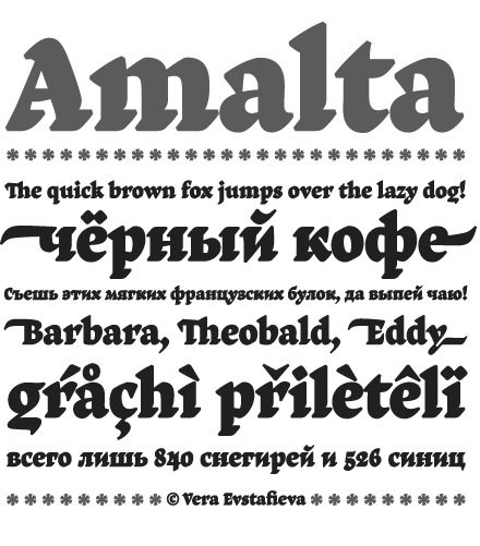
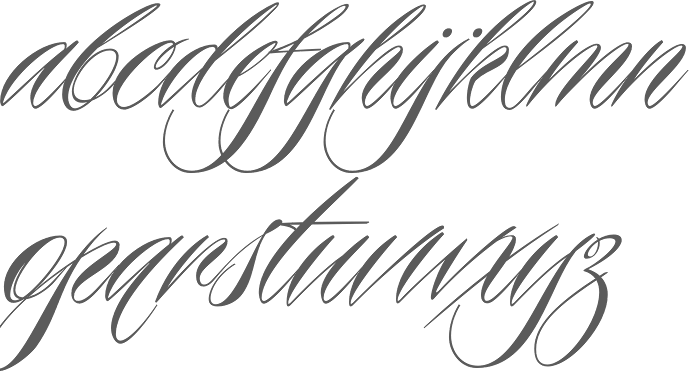