| | |
Aaron Glass
|
Aaron Glass was raised in Hamilton, NJ. Creator of the free hand-printed typeface Glass Hand (2014). Dafont link. [Google]
[More] ⦿
|
Adam Gerard Mappa
|
Rotterdam-based typefounder, b. 1754, d. Oldenbarneveld, NY, 1828. He published Proeven van Letteren die Gevonden Worden in de van Ouds Beroemde Lettergieterye van Wylen de Heeren Voskens en Clerk, Nu van A. G. Mappa (Rotterdam, 1781). I cite from that link: In 1780, the father of Adam Gerard Mappa bought a large part of the Amsterdam typefounding firm of Voskens&Clerk, and Mappa soon discovered that he had talent for typefounding. He began his own business in Rotterdam where he issued this specimen book, but moved to Delft a few years later. There he become embroiled in the Patriot movement and led a volunteer regiment in the unsuccessful revolution of 1787. He was banished from Delft, spent a few years in France, and in 1789, emigrated to America with his type foundry on the advice of the Ambassador to France Thomas Jefferson. Mappa set up his new business in New York. According to a contemporary letter, and supported by the type in this specimen, his foundry contained not only "the Western, but the Oriental languages at the value of at least [pound sign] 3,500 New York currency." There was not much call for type in exotic languages, and while Isaiah Thomas considered his Dutch and German type "handsome," his "roman were but ordinary." Mappa was not skilled enough to produce the type needed by the new nation, and the foundry was advertised for sale on 1 February 1794. At least some of Mappa's equipments was acquired by Binny&Ronaldson, although their business did not start until 1 November 1796. This specimen book came to them with Mappa's typefounding equipment. Harvard's Houghton Library has a copy of the 1781 publication which contains a handwritten note by Theo L. de Vinne (which I was not allowed to photograph by Harvard's tight-sphinctered librarians). So here is what this letter says: Dirk Voskens was a typefounder of Amsterdam, a coster of types, not a cutter of punches. In 1677 he bought the foundry of Bleau and it was kept by his heirs and successors, (1) Dirk Voskens (2) Weduwe van Dirk Voskens (3) Voskens&fils (4) Voskens + [illegible]. In 1780 the foundry was sued for 8974 francs. P[illegible] were J. Enschedé and Sons, Ploos van Amstel, Preiter, Posthmans, DeBruyn and deGroot. How Mappa acquired possession does not appear. [...] Mappa got into trouble and had to take refuge in New York, where he began business as a type founder. He did not succeed. It is not known which became of the material he had in New York. To this, Bullen added by hand: It was purchased by Binny&Ronaldson. P.M. Kernkamp kindly sent me additional information on Mappa. He points out that Mappa was typefounder in these cities: Rotterdam (1780-1782), Delft (1782-1787) and New York (1789-1792). The 1780 date is also put into question because Mappa's father died in 1779. Mappa was active in a small army of patriots in Holland, and after a defeat in 1787 against Prussia, he was banned from Holland for six years. It may explain his emigration to America in 1789. He lived in New York until 1792, then in Second River, NJ, until 1794 and finally in Oldenbarneveld (Oneida Co., NY). His foundry, then in Albany, NY, was sold in 1803 for 1200 guilders. [Google]
[More] ⦿
|
Al Zanetti
|
Renowned New Jersey-based calligrapher. [Google]
[More] ⦿
|
Alberto Lora
|
Guttenberg, NJ-based creator of a few fun typographic posters based on quotes from the main characters in the show Mad Men. I especially like Remember Don, when God closes a door, he opens a dress (2011) and I'm not a solution to your problems. I'm another problem (2011). [Google]
[More] ⦿
|
Alexander Walter
[Alexander Walter Handwriting]
|
[More] ⦿
|
Alexander Walter Handwriting
[Alexander Walter]
|
Alexander Walter (Middletwon, NJ) makes your custom handwriting font for $99. The fonts and/or signatures are slightly randomized. [Google]
[More] ⦿
|
Alexis Baran
|
Jersey City, NJ-based designer of the experimental typeface Geovetica (2015), created by deconstructing Helvetica. [Google]
[More] ⦿
|
Alfredo Gravato
[Petroglyphic Design (or: PetroFontLab, or: Petro Design)]
|
[More] ⦿
|
Alison Argento
[Dear Alison]

|
 [MyFonts]
[More] ⦿
[MyFonts]
[More] ⦿
|
Alyssa Durso
|
As a student at Monmouth University, Morganville, NJ-based Alyssa Durso designed the display typeface Calibound (2015). [Google]
[More] ⦿
|
Alyssa Garcia
|
During her studies at the Art Institute of York, PA, Alyssa Garcia (Long Valley, NJ) created the Dubset typeface (2013, display). [Google]
[More] ⦿
|
Alyssa Porchetta
|
Westfield, NJ-based designer of the sans typeface Draper (2015). Behance link. [Google]
[More] ⦿
|
Alyssia Bifano
|
Marlton, NJ-based creator of the decorative typeface Hopefully Yours (2014). [Google]
[More] ⦿
|
Amanda Weiss
|
 Amanda Weiss, who lived in Kernersville, NC, and is now based in Princeton, NJ, where she works for Princeton University Press, designed American Model Printer Typeface (2014) based upon an angled crossbar sans typeface seen in a 1880s publication called American Model Printer. Behance link. [Google]
[More] ⦿
Amanda Weiss, who lived in Kernersville, NC, and is now based in Princeton, NJ, where she works for Princeton University Press, designed American Model Printer Typeface (2014) based upon an angled crossbar sans typeface seen in a 1880s publication called American Model Printer. Behance link. [Google]
[More] ⦿
|
Amanda Wisnack
|
At Rutgers University, New Brunswick, NJ-based Amanda Wisnack designed Modular Font (2018). [Google]
[More] ⦿
|
American Type Founders (or: ATF)
|
 In 1892, twenty-three type foundries joined together to compete with the new typesetting machine, the Linotype [and later, the Monotype], to form ATF, which consolidated its type manufacturing facilities in a new plant in Jersey City in 1903. They were the dominant foundry in America until 1933, when ATF went bankrupt. Its collection remains intact at the American Type Founders Company Library&Museum at Columbia University in New York. The Smithsonian possesses most of the original type drawings and many of the matrices, and a number of other institutions and private individuals own matrices. Interestingly, despite the bankruptcy, it continued in operation until 1993, when the Elizabeth, NJ plant was finally liquidated. It was Kingsley's bankruptcy in 1993 that forced the final closure of ATF. In the early part of the 20th century, ATF was the dominant American foundry.
 Their specimen books are classics: - Pacific Coast Blue Book (1896).
- Specimens of Printing Types (1897, New York).
- Handy specimen book; specimens of type, borders and ornaments, brass rule, woodtype etc. Catalogue of printing machinery and materials, wood goods, etc (1897).
- American Type Founders. American Line Type Book. Borders, Ornaments. Price List, Printing Material and Machinery (ATF, 1906).
- American Specimen Book of Type Styles (1912, 1352 pages---see also here and here).
- Supplementary catalogue : new type typefaces, borders, ornaments, brass rule (ca. 1917).
- Specimen Book and Catalog (1923, 1148 pages). See also here. In 2013, David Marshall of Sevanti Letterpress in Toronto scanned in and put up for free download high resolution scans of the entire book. The links:
- Book of American Types (1934). Local download.
MyFonts link. A brief history of ATF by Carol Van Houten. Reference books. View the digital typefaces that are based (fully, or in part) on ATF's typefaces. See also here, here, and here. [Google]
[MyFonts]
[More] ⦿
|
Andrew Walunas
|
Raised in New Jersey, Andrew Walunas lived in Savannah, GA, while attending SCAD for his BFA in Graphic Design, and currently lives in the greater NYC area. He created the slab serif typeface Kocan (2015) during his studies. Behance link. [Google]
[More] ⦿
|
Angel David
|
Newark, NJ-based designer of the Peignotian display typeface Xclipse (2017). Behance link. [Google]
[More] ⦿
|
Angie Mason
|
Angie lives in Garfield, NJ, and sells her handwriting fonts Nooks and Coppy for 50 USD each. [Google]
[More] ⦿
|
Anthony DiVivo
|
 Anthony hails from Northern New Jersey and studied design at the School of Visual Arts in New York, where he earned an MFA in 2001. He has worked as a designer in New York (where he currently lives), San Francisco and Miami. Author of Devil Type, a headline type specimen book. He designed many custom typefaces, which are showcased at his Behance site. [Google]
[More] ⦿
Anthony hails from Northern New Jersey and studied design at the School of Visual Arts in New York, where he earned an MFA in 2001. He has worked as a designer in New York (where he currently lives), San Francisco and Miami. Author of Devil Type, a headline type specimen book. He designed many custom typefaces, which are showcased at his Behance site. [Google]
[More] ⦿
|
Anthony Ingraldi
|
Camden, NJ-based designer of Razr (2015). [Google]
[More] ⦿
|
Anthony Jaskolka
|
Sewell, NJ-based designer of the all caps typeface Haunt (2013). [Google]
[More] ⦿
|
April Macaraeg
|
New Jersey-based designer (b. 1990) of the scratchy handwriting font Ionkno (2007) and of Jaggy Fries (2007, outline French frie-shaped glyphs). Dafont link. [Google]
[More] ⦿
|
Art
|
Had Art's windsurfing dingbats and his own handwriting font. Link died. [Google]
[More] ⦿
|
Artsy Lady's Home Page
[Betty Cook]
|
Betty Cook (b. 1952) is the "Artsy Lady", a New Jersey designer who created ALBabyNewYearAH, ALCinderella (calligraphic caps), ALConscienceAH, ALCrossStitchHearts, ALPlaceSettingsDings (2001), ALPlaceSettingsLetters, ALPrincessJasmine, ALPrincessSnowWhite, ALSnowmen, BabyGeniuses, BabyGeniuses2Normal, CruiseLine, Dreidl (2000, art nouveau), KittyKatLove, LeprechaunHats, Patriot, PilgrimHats, Polywog, Tramp, Untitled2. Mostly alphadings. Fontspace link. [Google]
[More] ⦿
|
Ashley Humienny
|
Whippany, NJ-based designer of the text typeface Galaxi (2017). Behance link. [Google]
[More] ⦿
|
August Will
|
 August Will (b. Weimar, Germany, 1834, d. 1910) immigrated to the New York City/New Jersey area when he was a young man. His full name was John M. August Will. Will settled in Jersey City, NJ, where he remained until his death.
 He designed the outline ornamental caps typeface Crossroads (1891). For a digital version, see Crossroads (Solotype) and Marcel Caps (2007, Character). In 1881, he patented a fireworks-themed typeface, and another typeface with ornaments. In 1880, he patented another font with Chinese ornaments. [Google]
[MyFonts]
[More] ⦿
|
Austin Roesberg
|
Graphic designer who grep up in sewell, NJ, and graduated in 2007 from the Maryland Institute College of Art (MICA), Baltimore, MD. He lives in Brooklyn, NY. He created the modular typeface Knucklepuck (2009). Noupe link where one can download an EPS version of this font. Behance link. [Google]
[More] ⦿
|
BA Graphics
[Robert Alonso]
|
 Bob Alonso (b. Bronx, NY, 1946, d.2007), the founder of BA Graphics in 1994, was a prolific American type designer. With 33 years of experience at NewYork's Photo Lettering, he specialized in calligraphic script typefaces, but not exclusively so. BA Graphics was located in Chester, NY, and later in Toms River, NJ, and now sells its fonts through MyFonts. Many of its fonts published after Alonso's death in 2007 were completed by John Bomparte.
 John Bomparte wrote this obituary: Throughout his career at the legendary Photo-Lettering, Inc. (one that spanned four decades), Bob created original typefaces and tailored type by modifying, revising and filling out families, fashioning pieces of type for hand-lettered jobs, as well as being involved with the updating of a number of well-known logotypes. Bob was blessed with natural teaching abilities; and those in social and professional circles who had the good fortune to know him considered him not just a type designer but a mentor and a friend. As one such person close to him put it, he was a graphic technician [...] back when computers were not even in site for graphic arts, he would take on any intricate&complex graphic project that others would shy away from and come up with a solution that achieved a masterpiece. I'll always remember someone saying "this can't be done" and Bob saying let me see it and a short time later, there it was---done&perfect. I would like to think that attitude rubbed off on me. Along with this gift for teaching and explaining the complex, Bob exhibited a level of professionalism that was unsurpassed. A number of years ago when the need came to make the transition from the traditional to digital way of creating fonts, he rose to the challenge admirably. Towards the last few years of Photo-Lettering, Bob played a vital role in the conversion to digital, of many of the typefaces within the collection, notably those fonts that carry the prefix PL. More recently, Bob Alonso released several fonts through ITC, Adobe and his independent foundry, BA Graphics. Bob was on the cutting edge of his best work, and in the circumstance of his untimely passing, left a measure of unfinished designs. However, the spirit of his typographic talents and his fine sense of humor lives on through the many much-loved, and popular fonts he has left us: fonts such as Cookie Dough, Equate, Elephant Bells and Pink Mouse, to name a few. Alonso created these typefaces: FontShop link. Klingspor link. View Bob Alonso's typefaces. View the BA Graphics typeface collection. An alphabetic listing of Alonso's typefaces. [Google]
[MyFonts]
[More] ⦿
|
Badson Studio
[Kyle Read]
|
 Badson Studio is a type foundry in Buena Vista (was: Denver), CO, launched by Kyle Read in 2014. Kyle Read (b. 1987 or 1988) hails from the American Northeast and lived in Chatham, NJ. He studied graphic design and printmaking at Savannah College of Art and Design (class of 2010), and has created typefaces for Abercrombie & Fitch in Columbus, Ohio. He studied type design at the Type@Cooper Extended Type Design Program in New York. We believe, but are not sure, that Kyle started Proof&Co. In 2015, these commercial typeface families had been published by Read at Badson Studio:
 - Ermine: The Ermine Type Family is derived from one of the most illuminated eras in American History. President Franklin D. Roosevelt launched his New Deal in 1929 to get America back to work after the now infamous market crash and Great Depression. Between 1935 and 1943, the Works Progress Administration (WPA) was established by presidential order and employed more than 8 million workers. Some of the more visible projects were posters created to promote tourism in the country's National Parks. More than 2,000,000 posters were printed by the Federal Art Project's poster division. Almost all of these posters have been lost or destroyed. The Ermine Family is designed to be reminiscent of this era of public art, drawing from the wonderfully quirky lettering styles of the WPA National Parks Posters themselves.
- Bota Display: a didone typeface.
- Guilder: a multiline and outline typeface family.
Before Badson Studio, Kyle created the layered multiline typeface Pinscher (2013), the rounded sans typeface Penfield (2013), the experimental typeface Geoface (2013), the warm titling typeface Holden (2013), the multiline straight-edged typeface Countdown (2013), and the art deco family Flagpole (2013). In 2013, he received the 2013 SOTA Catalyst Award. Home page for Kyle Read. [Google]
[More] ⦿
|
Bang Chau
|
Jersey City, NJ-based designer of Degrade Typeface (2014), a minimalist experiment. [Google]
[More] ⦿
|
Barry Schwartz
[Crud Factory]
|
[More] ⦿
|
Betty Cook
[Artsy Lady's Home Page]
|
[More] ⦿
|
Blair Strain
|
Phillipsburg, NJ-based graphic designer who studied at Kutztown University of Pennsylvania. Creator of the display typeface Mary Contrary (2017). Behance link. [Google]
[More] ⦿
|
Boris Veytsman
|
Creator of the GillCM family in 2010: Unslanted italic Computer Modern fonts based on Eric Gill's ideas. He also created JAMTimes, expanded Times Roman as used in Journal d'Analyse Mathematique. He also made mdputu (2010), a package of virtual fonts with italics, upright digits, and punctuation for use with Adobe Utopia in mathematical texts. In 2011, he published pcarl, a TeX support package for Adobe Cason Open Face. In 2016, Sergei V. Znamenskii and Boris Veytsman, now with the Mathematics Department, Princeton University, published the cmtiup package. The cmtiup package can replace the cmti package in the Computer Modern fonts since it simplifies typesetting of mathematical texts. In 2016, the Computer Modern text italic (cmti) fonts were modified by unslanting all punctuation and digits and embedding the corresponding italic corrections into the kerning. [Google]
[More] ⦿
|
Boris Veytsman
[cmtiup]
|
[More] ⦿
|
Bridget McFadden
|
Sea Girt, NJ-based designer of a triangulated caps typeface at Georgian Court University. [Google]
[More] ⦿
|
Cabarga type (was: Flashfonts)
[Leslie Cabarga]
|
 Flashfonts was Zavier Leslie Cabarga's Los Angeles-based foundry. Leslie Cabarga is a baby boomer from New Jersey and author of The Lettering and Graphic Design of F.G. Cooper, the Illustrator/Fontographer/Fontlab resource book, Logo Font&Lettering Bible (2004), and Learn Fontlab Fast (2004, with Adam Twardoch). He ran Leslie Cabarga Design and Cabarga Type in Los Angeles. In 2021, Cabarga Type joined The Type Founders. His lettering prowess is apparent in this drive-in sign for "Betty Boop's Drive-In" (which inspired Nick Curtis to make Drive-Thru NF), FontShop link. MyFonts link.
 Leslie Cabarga's typefaces: - Raceway (1995), a famous retro script.
- Casey (2007), a fat-bottomed script at Font Bureau.
- Streamline. Another fifties diner or Chevrolet grille font.
- Kobalt and Kobalt Kartoon (at Font Bureau), great for displays.
- Ojaio, a beautiful art deco font.
- Central Station, an original display face.
- The retro script Magneto.
- Neon Stream (1995, Font Bureau). Connected retro nightclub letters.
- Peace: an original psychedelic 60s font based on an alphabet copyright 1997 by Wes Wilson, creator of the classic 1960s Fillmore Poster Lettering style; see here.
- Saber (2002), a mix of uncial, Fraktur, gothic and Exocet.
- Love, a psychedelic 60s font also based on Wes Wilson's lettering. In Solid, Open and Stoned styles. At Font Bureau, 1997.
- Esselte's Cabarga Cursiva. Cabarga Cursive was jointly designed in 1982 by Leslie Cabarga and his father Demetrio.
- Cocoanut, Grassy Knoll, Straight Light, Straight Medium, Rocket (1995), Progressiv, Cymbal Regular, Dotcom Medium, Generik Regular, Graffiti Regular, Angle, Badtyp, Haarlem (2000), Margarete, Primitiv, Progressiv, Rocket, Rocket Gothic, Straight, Bellbottom, Hihat, Baseball. Jo the Webmistress on Cabarga.
Abstract Fonts link. [Google]
[MyFonts]
[More] ⦿
|
Caitlin Torres
|
At Rutgers University in New Brunswick, NJ, caitlin Torres created the pixel typeface Electicity in 2015. [Google]
[More] ⦿
|
Caitlyn Senior
|
During her studies at Antonelli Institute, Mount Laurel, NJ-based Caitlyn Senior designed the dot matrix typeface Modular (2016). [Google]
[More] ⦿
|
Carlos Maximiliano Brufau Mansilla
|
Graphic designer from Glen Ridge, NJ. Creator of several fonts in 2012, including Arrow and Ants (dot matrix). [Google]
[More] ⦿
|
Casey Finn
|
During her studies at Monmouth University in 2010, Casey Finn (New Jersey) designed the free font Wishbone. Dafont link. [Google]
[More] ⦿
|
Catlvr887
|
Born in Edison, NJ, 1993. Designer of this handwriting face (2006). No downloads. [Google]
[More] ⦿
|
Cerulean Stimuli
[Kevin Pease]
|
Kevin Pease runs Cerulean Stimuli in Collingswood, NJ. He created the typefaces Cerulean (2003) and Cerulean Black (2005). Check also his pixel family Fourmat (2004) and the very original card game-inspired Pokeresque (2006). In 2016, he designed the unicase display typeface family Cerulea for Latin, Greek and Cyrillic. In 2017, he published Walklike, its name referring to the song Walk Like an Egyptian and thus to hieroglyphic influences. He ends 2017 with the balloon font family Glazed. Typefaces from 2022: Anachrony (a weirdly modular family; ten styles). [Google]
[MyFonts]
[More] ⦿
|
Charlene Pajak
|
Graphic designer in Princeton, NJ, who created the display typeface Baxen (2018). [Google]
[More] ⦿
|
Charles Creesy
[Monticello]
|
[More] ⦿
|
Chris Coffin
|
Graphic designer in Newfield, NJ. Creator of Monohoffdinger (2014), a sans typeface inspired by Century Gothic and Helvetica. [Google]
[More] ⦿
|
Chris MacFarlane
|
New York City-based graphic designer (b. New Jersey), art director and illustrator who studied at The Rhode Island School of Design. Creator of the rounded hexagonal typeface Extinction in 2015. Behance link. [Google]
[More] ⦿
|
Christina Lanzisero
|
New Jersey-based designer who created the tree branch-theme typeface Drone On (2011). [Google]
[More] ⦿
|
Christine
|
New Jersey-based designer (b. 1990) who designed Calamity (2008, an elegant display face), Christine's Handwriting (2006) and Pixie (2008, pixel face, FontStruct). [Google]
[More] ⦿
|
Christine Heun
|
Glen Ridge, NJ-based winner in the Chartpak Designer Velvet Touch Transfer Lettering Typeface Competition in 1988 for Heun Gothic. [Google]
[More] ⦿
|
Christopher Hopkins
|
During his studies at Kean University, Hackensack, NJ-based Christopher Hopkins designed Phazer sans (2017). Behance link. [Google]
[More] ⦿
|
Christopher Krolak
|
Graphic designer in Bloomfield, NJ, who created the graffiti typeface Vandal (2010). [Google]
[More] ⦿
|
cmtiup
[Boris Veytsman]
|
The cmtiup package can replace the cmti package in the Computer Modern fonts since it simplifies typesetting of mathematical texts. In 2016, the Computer Modern text italic (cmti) fonts were modified by unslanting all punctuation and digits and embedding the corresponding italic corrections into the kerning. The authors are Sergei V. Znamenskii and Boris Veytsman (Mathematics Department, Princeton University). [Google]
[More] ⦿
|
Conner Smith
|
Newark, NJ-based creator of the art deco typeface Abstract Modern (2012). [Google]
[More] ⦿
|
Coptic Orthodox Patriarchate
|
Located in New Jersey, and managed by Georges H. Guirguis. They made the following Coptic fonts, ca. 1999: AvvaBishoyNormal, AvvaKyrillosNormal, AvvaMarcosNormal, AvvaMarkosNormal, AvvaShenoudaNormal, SaintAbrahamNormal, SaintGeorgesNormal, SaintMarinaNormal. [Google]
[More] ⦿
|
Courtney Fisler
|
Cartoonist in Philadelphia and/or New Jersey (b. 1992), who created the dot matrix typeface Bokeh (2013). Dafont link. [Google]
[More] ⦿
|
Craig Eliason
[Teeline Fonts]
|
 [MyFonts]
[More] ⦿
[MyFonts]
[More] ⦿
|
Crud Factory
[Barry Schwartz]
|
 Barry Schwartz (b. 1961) is a scientist who lives in St. Paul, MN. He grew up mostly in Kendall Park, NJ, and studied electrical engineering from 1984 until 1990 at Rutgers. He is a fervent and exemplary supporter of the idea of Open Source fonts and software. He runs Crud Factory. His fonts:
 - BonvenoCF-Light (2006). A geometric OpenType format typeface for Latin scripts, having all the letters for Esperanto.
- Fanwood Text (2011, a Venetian old style typeface). This is a free version of Fairfield (1940-1947, Rudolf Ruzicka). For a commercial version, check Bitstream's Transitional 551.
- Goudy Bookletter 1911 (2008) is a revival of Goudy's Kennerley Old Style Roman from 1911.
- Goudy Old Style 14-point (2009).
- Juvelo (2009). A delicate roman serif face.
- Linden Hill (2010, OFL). A two-style (roman, italic) revival of Goudy's Deepdene.
- Prociono CF (2007). See also here.
- OFL Sorts Mill Goudy (2009). A revival of Goudy Oldstyle and Italic.
- KisStMTT (or: Sorts Mill Kis) (2010). Based a bit loosely on the early-20th-century revival of Jenson / Kis drawn by Sol Hess for Lanston Monotype.
- He adapted some glyphs of Gentium for better display with Adobe Reader, and called the new type family Temporarium (2007-2008).
- Valley (2009). A take on Walbaum.
Links: Another URL. Dafont link. OFL link. Font Squirrel link. Googlecode link. Devian tart link. The League of Moveable Type. Abstract Fonts link. Kernest link. Klingspor link. Google Plus link. [Google]
[More] ⦿
|
Cruz Fonts
[Ray Cruz]
|
 Cruz Fonts was established in Oakland, NJ, in 2004 by Ray Cruz (Ramon Cruz), who was a designer of custom lettering and custom typefaces to major ad agencies, publishers and corporate clients in the New York City area for almost 30 years. Ray Cruz (b. Ponce, Puerto Rico, 1943) died at his home in Lewes, Delaware, in 2025. His obituary read: Ray Cruz, beloved husband, father, grandfather, celebrated graphic artist, and military veteran, died peacefully at his home in Lewes, Delaware, on March 26, 2025. He was 81. Born in Ponce, Puerto Rico, on August 31, 1943, Ray was a lifelong student and teacher of design. A graduate of New York City's High School of Art & Design, he honed his craft in several of the city's top custom lettering studios before rising to prominence in the graphic arts world. His career spanned more than five decades, during which he left a lasting mark on advertising, publishing, package design, and corporate identity. In the 1980s, Ray was commissioned to create corporate typefaces and logos for the United States Postal Service—iconic designs still seen on mail trucks today. After co-founding and leading Cruz & Slowik Associates, Ray served as Type Director at the renowned Young & Rubicam advertising agency, his sharp typographic eye elevated countless national campaigns. His work earned him more than 30 awards from the Type Directors Club, AIGA, ADC, and other respected art associations. Ray was also a dedicated educator, serving as an adjunct professor at Parsons School of Design, FIT, Kean University's Robert Busch School of Design, County College of Morris, and Marywood College. He believed in a "Learn by Doing" approach, favoring hands-on exploration. His students remember him not only for his technical knowledge but for his passion, clarity, and mentorship. He was a member of several professional organizations including the Type Directors Club, Society of Typographic Aficionados (SoTA) and the Association Typographique Internationale (ATypI). Ray lived for two things: graphic arts and his family. He was also an active and energetic man who loved the gym, tennis, skiing, boating, fishing, music, and working with wood---pursuits that reflected his creativity, craftsmanship, and love for the outdoors. He is survived by his wife, Janet; his sons David and wife Jamie Lynn, Jamie and wife Hermilyn; and their sons, Daniel and wife Melany and Matthew and wife Marilyn. He is also survived by his grandchildren Avery, Hyland, Ardyn, Talyn, and Cornelia. He is reunited with two grandchildren, Reign and Parker, and his mother, Carmen, in peace.
 Cruz created many display typefaces for Agfa/Monotype, Bitstream, Phil's Fonts and Garage Fonts. Presently Ray Cruz is working as Type Director at Y&R NY, and is an adjunct professor at FIT and Kean University teaching type design. Bio at Garagefonts. His oeuvre: - Garagefonts: Cruz Grafica (1999), Cruz Grafica Inline, Troubadour.
- Agfa/Monotype: Bandolera, Bandolero, Cruz Handy (2001) and Cruz Swinger. Swinger, in fact, was produced in film type for the John Schaedler Studio in New York in the 1970s. Also, Elegante, Romantica (didone).
- Bitstream: CruzCanteraBT (2003, a stylish informal sans family), Homeland BT (2004, a text typeface with a large x-height), Vera Cruz (2003, a playful display serif), and Fat Albert (2004).
- Cruz Fonts: Satchmo (2016), Cruz Handy (2004), Troubadour (2004), Cruz Stencil (2012), Cantina, Bandolero, Cruz Swinger (fat semi-psychedelic signage face), Bandolera, Romantica Pro (2013, a condensed didone), Dot Script (2013, dot matrix face), Cruz Script Pro (2013: original from 2005), Bouncing Checks Layers (2014, octagonal and layered; includes 40 dingbats by Seymour Chwast).
- P22: P22 Cruz Ballpoint, P22 Cruz Calligraphic, P22 Cruz Brush.
- BarracudaPlain.
- Custom typefaces for Camel Cigarettes, Estee Lauder (1994), New York Life Insurance, The NFL Detroit Lions, Pella Windows, USPS, and Xerox.
Bio at Garagefonts. P22 link. FontShop link. PDF catalog. View Ray Cruz's typefaces. Klingspor link. [Google]
[MyFonts]
[More] ⦿
|
Daiji Shikama
[Gloss Black]
|
[More] ⦿
|
Dale Guild Type Foundry
[Theo Rehak]
|
Run by Theo Rehak from Howell, NJ: The Dale Guild Type Foundry has been cutting and casting true foundry-cast types, ornaments, borders and initials since 1993. We use foundry alloy made from virgin metals in Barth foundry casters obtained from American Type Founders Co. at their closing. All 16 machines along with two Benton Engraving Machines have been rebuilt and are meticulously maintained. We cast types from 6-24 points, and 72 point initials. We strive to maintain ATF's standards of production in our artwork, engraving and casting. We have made a serious attempt at reproducing Johann Gutenberg's B-42 types. In the summer& fall 2001, we will be cutting&casting Frederick Warde's original ARRIGHI, with the Vicenza variant characters. Various accented letters are also being cut. We have already cut and cast the seldom seen suite of ornaments designed by Bruce Rogers for the Arrighi font. Rehak was trained at ATF and purchased a portion of ATF when it went bankrupt in 1993. [Google]
[MyFonts]
[More] ⦿
|
Dana Bobana
|
Dana Bobana is from New Jersey. In 2010, she made the handwriting font Yourfont available for free. [Google]
[More] ⦿
|
Dana Famiglietti
|
Based in Garden City, NJ, Dana Famiglietti created the oriental simulation typeface Human Alphabet in 2014 during her design studies. Behance link. [Google]
[More] ⦿
|
Danielle Rallo
|
Mine Hill, NJ-based designer of the triangulated typeface Paper Planes (2015). [Google]
[More] ⦿
|
Darius Wells
|
 This New York printer, was the first to produce wood type commercially, in 1827, after having invented the lateral router with David Bruce. Saxe says that the preferred woods were maple, pear, and cherry, and to a lesser extent boxwood, mahogany, and holly. Maple won out by 1850. His first specimen book (1828) now resides at Columbia University. Wells, the inventor, was born in Johnstown, NY, in 1800, and died in Paterson, NJ, in 1875. His company was first called D. Wells&Co., but becomes Wells&Webb in 1839 when Wells forms a partnership with E.R. Webb, who had earlier that year bought the company of Leavenworth and Debow from George Bruce. In 1854, Wells sells his partnership to Webb, and so we have E.R. Webb&Co. Webb dies in 1864, and the company reverts to Heber Wells, the youngest son of Darius Wells, Alexander Vanderburgh and Henry Low---it is now Vanderburgh, Wells&Co. Hever Wells buys out the others, and the company becomes just Heber Wells. This last company was absorbed by Hamilton in 1898.
 Revivals of the wood types of Darius Wells include AWT Page Antique Black (2013, Dick Pape; after an 1828 typeface by Darius Wells) and AWT Wells Roman Extrabold (2013, Dick Pape; after an 1828 fat typeface typeface by Darius Wells). [Google]
[MyFonts]
[More] ⦿
|
Darnell Roberts
|
During his studies in Saddle Brook, NJ, Darnell Roberts created the straight-edged typeface Running With Scissors (2012). [Google]
[More] ⦿
|
Darshan Chokshi
|
 North Bergen, NJ-based designer of several didactic posters that illustrate the terminology used in type design. [Google]
[More] ⦿
North Bergen, NJ-based designer of several didactic posters that illustrate the terminology used in type design. [Google]
[More] ⦿
|
David Trooper
[DTrooper Foundry]
|
 [MyFonts]
[More] ⦿
[MyFonts]
[More] ⦿
|
De Biasse & Seminara Architects
|
Martinsville, NJ-based architectural studio. Their architectural alphabet from 2011 is based on floor plance by J.D. Steingruber. [Google]
[More] ⦿
|
Dear Alison
[Alison Argento]
|
 Travel writer based in Cherry Hill, NJ. Designer (b. Augusta, ME, 1977) of the children's scribble font Urly Lurnin (2008), and of Smiley (2008, comic book face), and of the informal handwriting fonts Pickled Sans (2008), Slim Pickens (2008), Smokehouse (2008) and Gladly Mailed (2008).
 Bender Script (2008) is a brush script developed from an incomplete script drawn by Charles Chas Bluemlein. Barnstormer Script (2010) is a sign painter typeface. Gonte (2013) is a sketchbook script typeface. Saskya (2015) is a rough chancery script. Glade (2015) is a formal calligraphic copperplate script in five widths. In 2016, she designed the architectural lettering typeface Robard, the brush script typeface Beckford Script and the ballpoint pen script Generous Hospitality. Typefaces from 2020: Postale (a monoline gas pipe sans). [Google]
[MyFonts]
[More] ⦿
|
Deleterious Design
[Frederick Awich]
|
Born in Dayton, OH, in 1991, Frederick Awich founded the Deleterious Design foundry in North Brunswick, New Jersey, in 2010. His first fonts were Infringe (display sans) and UndercoverLovahh (hand-printed face). Old URL. Klingspor link. [Google]
[MyFonts]
[More] ⦿
|
Design 23
[Jennifer DeAngelis]
|
Design23 is a multi-disciplinary design studio in Morristown, New Jersey, started ca. 2012 by Jennifer de Angelis Gunn. Creations from 2012: Wed Dings, Wed Dings City, the white on black tiled typeface Inthabox, Esther (art deco typeface), Nagi Tanka Regular (poster face). Creations in 2013: Harper (a sketched all caps face), Gunn (a beveled typeface), Homsley (a Tuscan typeface). Typefaces from 2014-2017: Wintery Mix (dingbats), Olive, Earhart, Matter. [Google]
[MyFonts]
[More] ⦿
|
Diana Braga
|
North Arlington, NJ-based designer of the pixelish typeface Belle (2017). Behance link. [Google]
[More] ⦿
|
Diana dos Santos
|
Newark, NJ-based designer of the handcrafted typeface Ironbound (2017). Behance link. [Google]
[More] ⦿
|
Diana Marianovsky
|
Originally from Jerusalem and based in New Jersey. During her studies in New York City, Diana Marianovsky designed the experimental Mondriaan-inspired typeface Chiaroscuro (2016). Behance link. [Google]
[More] ⦿
|
Diane DiPiazza
[Dinc Type]
|
[MyFonts]
[More] ⦿
|
Dinc Type
[Diane DiPiazza]
|
Commercial and free fonts designed by Diane DiPiazza, who lived in Hoboken, New Jersey, and was the original bass player for The Misfits. She is now in Lodi, NJ. Dinc closed its doors in January 2006 but returned some time later in 2006. Most of the fonts evoke the fifties. Wikipedia states: Diane DiPiazza was the first bass player for the The Misfits, although she does not appear on any album. She left the band, vacating the spot that was quickly filled by Jerry Only. Her name is often incorrectly spelled Diane DiPiaza. Growing up in Lodi, New Jersey, she was a friend of Glenn Danzig, the founder of the Misfits. The first lineup consisted of Glenn on vocals and electric piano, Diane on bass guitar, Jimmy Battle on guitar and Manny Martínez on drums. On the Cough/Cool single, The Misfits first release, she is the Diane who Glenn thanks on the sleeve. Diane DiPiazza is an artist. She is a type designer who distributes free fonts and vintage black and white line art at dinc! She is art director at mystifyinglyGLADdesign, who designs for the web, clothing, and packaging. She designs hand screened gig posters and many other forms of rock 'n roll art, retro art, modern art. A collector of vintage design elements, her style has been called retro/modern. Diane also creates custom hand stamped silver jewelry as well as a line of tattoo inspired pieces. She is in the process of recording a demo LP with the working title Last Year's Fab Rave, on which she plays all the instruments, including bass. Free fonts include Bobo, Dilettante, Modern-Love, Note-To-Self, Plastic-U, Post-No-Bills, Road-Crew, Saturdays-Girl, Sleeptalk, Sugaree, Mod Guitars, Woof Squared, Hatcheck, Mess Kit, Billy Dolls, Knitwits, Claim to Fame, Girlfriend, Book of Joe, Joybuzzer (2007, rough outline), Autos (2007, old typewriter), U Better, The Con, Claim to Fame, Girlfriend, Book of Joe, Ahmet. In 2006, she created Road Crew (2006, rough stencil), DINC (2006, blackletter), Post No Bills (2006, stencil), Ashtrays&Art. Typefaces from 2005: Neat Neat Neat, Shut Up, Hello Hey Joe, Wings For wheels, Trustmaker, Bad To Me, BellBottomBlues, DinkyToy, Funkhouse, Rodeoboy, SaturdaysGirl, SoWhat, Blue Monday, Betcha By Golly Wow, Nathaniel (2005, blackletter), Brillo Blue, Doctor My Eye, Guilt For Dreaming, Rhyming Bells, Bob's Your Uncle, Princess Jasmine, 45, Seven, 7-7000, Ahmet, Alexei, Boxer, Cinema Aisles, Divine Intervention, Synchronicity, Tangled Up In Blue, Tjinder, Untrue, Special Edition 6, 20,000 Roads, Big Diamonds, Charly Baltimore, Dream, Fever In The Funkhouse, Green&Blue, Ring Ring, Swoop Swoop. Typefaces from 2004: Fuzzbox (2004; not to be confused with Bragagna's pre-2004 font by the same name), Ace In The Hole, Balls, The Christmas Font, Beau Geste, ByeBye, Heart, Loverboy, Sycophant, The Comedians, Fishboy, Truth, King Me, Snapper, Blue Heaven, Oceans Eleven, Fresh Fish Seven, Trason, Your Type, Da Doo Ron Ron, Big Flirt, Dicky Dee, Boxtop, Satellites, Upsmack, Starry, Silicon Chip, Howdy, Grandpa Boy, Scarlet Letter, Capsule, Doggy, Little Eden, Frank Mills, Chewtoy, Jez, OneWitU, BrineShrimp, Joe College (2004, pixel face), stj-fro, One Inch Rock (2004, pixel face), Black Hole, Ya Ya Baby, Blondie, ShaLaLa, Lower Eastside, GeeWhiz, Sixteen, Joe Strummer, Amy Johnson, JoJo, JodiGirl, Zelda, Hipster, LaDolceVita, LittleLove, Mod, MrEarl, Noveltease, QBats, Ranger, Rhymes, BarkingDog, BFBigmouth, BooHoo, Chance, CowardSquared, Cupid, DincCorona, FiftyFive, FunkyBut, Gamble, HelloHello, IdiotWind, JimmyCap, Luck, Metropolitan, MidnightKiss, Mine (2004, letters in hearts), PerfectCouple, Resolution, Spitball, StencilMeIn, TypeToyNight, YrChickens. Typefaces designed in 2003: 11592003, 2004, BrokenPromise, DincCorona, DoublyBlessed, EchoPark, FiftyFive, Fishing, FunkyBut, HelloHello, Hoboken, InstantKarma, Integrity, KaseyMac, PeppermintLump, Resolution, StencilMeIn, ThreeCubicFeet, TypeToyNight, Crybaby, DeepDark, MajorLift, Mikes, MinorFall, Beeper, Kate, Blacktop, Def Caroline, EZ Bake, JoJo, Kima, Bait, Dreamgirl, Sugar Daddy, Friday, Birth of the True, Soul Deep, Virginia Plain, Feelin' Groovy, Sunday SF, Socks, Boy Toy and Sweet Potato, FunnyValentine, Laura, LonelyFrog, Pati, BrokenDoll, Placemats, Satori, Scout, ThousandLies, ThousandOceans, GetTheeGone, Promises, Rudeboy, YuppieFraud. Typefaces designed in 2002: Emmanuel, Strummer, Teardrops, Busterboy, Evergreen, Blulite, Respect, Pretty Baby, Hickory Wind, Chelsea Boys, Femme Fatale, Tour de Lance, Peppermint Lump, Ce La Luna! Nous, El Goodo (2002, pixel font), Big Boy, Farfallena, Life On Mars, Saturn Return, GeeWhiz, Train in Vain, Massive Blur, Lonely Planet Boy, Littlebits, Secretarial Pool, Eight Bits, Firefly, Fluff, Startone, Cupcake, Diet Dr. Creep, Dr. Creep, messaround, Pencilbox, Crush No 47, Crush No 49, and Dialtone. Mac and PC. Plus Starry F. Hope (1997) at Chank's site. Commercial fonts: Booboy, Ingigo (2001, script font), Rufus (2001: four pixel/bitmap fonts), Chinese Symbols: Good Fortune, Zen Fontkit, Boxtop Fontset, Bachelorette, Retrobats, Jailbait, Grievous Angel, Milky Way, Spyboy, Light Series: Spotlight, Cameralight, Streetlight, Firelight, Torchlight, Lovelight, Moonlight, Sunlight, YaYa, Alvin, Amplifier, BigBeatBold, BigBox, Bit-Thing, Boxboy, Chatterbox, Chinatown (oriental simulation), Chopsticks, Console, Cup O'Joe, dincBATS, dincINK, Dinette, DincINK (1998), Dixie, Dreamboat, Duojet, Esquire, Fireball, Flashlight, FourWay, Geebot, gomer, goober, Highball, Homework, jacks, Jetage, Jetage Hi-Fi, Jetage Lo-Fi, Kingbats, Light Series, Loverboy, Moondog, Mister Lee, Mr. Big Stuff, PaperTiger, Pipeline, Popstar, Pushpop, Recordhop, Rocketship, Roundup, Rubberduck, Satellite, Scripto, SquareBox, SquareCircle, Speedometer, Starlite, Sugar, Swizzle, Thinman, transistor, TwinTone, Ultramatic, Variable Videobox, W. Square, Wash&Wear, Whatnot, Winky, Yin Yang, Tight Toy Night, Funtime, OCRDINC01, 02 (OCR-like fonts), Whirlwind, Gaslight, Love, Captain, Funtime, FiFi, Fakebook, FlameJob, OCRDINC, Tight Toy Night, Swingbats, Good Fortune, Zen Fontkit, Bachelorette, Retrobats, Jailbait, Grievous Angel, Milky Way, Spyboy, YaYa, Boxtop Fontset, Light Series: Spotlight, Cameralight, Streetlight, Moonlight, Sunlight, Firelight, Torchlight, Hotrod, Iceberg, Gutterball, Homewrecker, Bubba, Starry Night, Lady Luck, Automobile, Hydromatic, Seventeen, Whirlwind, Gaslight, Love, Captain, Swingbats, FiFi, Flamejob, Fakebook, Madness, Apple Scruffs, Marmalade, Queen of Corona, Cupcake, Starry Eyes, Juice, Fivebits (2002, pixel font), Matchbox, Hot Burrito #3, Fishsticks, Eightbits (pixel font), FoolsGold, Drive, Sleepwalk, Icecube, Pruneface, Witness 2HB, Zerogirl (stencil font, 2002), Fairytale of New York, Levi Stubb's Tears, AllModCons, Babylon, BigBoy, ChampsElysees, ConcreteandClay, ElGoodo, Farfallena, Heroes&Villains, LifeOnMars, LittleRamona, MerseyBeat, MetalGuru, Missile, OnYourBike, Pinup, Reconnez, SaturdaysGirl, SaturnReturn, ShepherdsBush, Tatum, TiniestDancer, TumbinDice, VeraGemini, YesterMe, Rising, Treason, Monami Vrai, Robot Girl, Tattooed Sailor, Sunrise, Midnight, Kakadu, Ana, Ace, Yobbo (2002, dot matrix font), GoGo (2002, pixel font), Waltzing Matilda, Memorial Day 911, Good Riddance, Boys, One Tin Soldier, One After 909, Joey, Infidelities. Some of her fonts can be bought at SnapFonts. Dafont link. Klingspor link. [Google]
[MyFonts]
[More] ⦿
|
DP Fonts
[Jennifer DeAngelis]
|
DP Fonts (est. 2010) sells fonts created by two New York college friends, Jennifer DeAngelis and Amanda Pastenkos. Jennifer (b. 1985) lives in New Jersey, and runs the graphic and web design company Jennifer DeAngelis Design (est. 2008), which is also listed on MyFonts. The first DP Fonts font on MyFonts is the dingbat typeface Wintery Mix (2010). In 2011, Jennifer published the hand-printed 3d outline typeface Marquee and Mermaid NY (2011, dingbats). [Google]
[MyFonts]
[More] ⦿
|
DTrooper Foundry
[David Trooper]
|
 Dave Trooper (New Jersey) was associated with the photo type foundry VGC. Almost 40 years later, he set up his own digital type foundry, DTrooper Foundry, which publishes digital versions of his typefaces. Creator of these typefaces:
 - Trooper Roman (1974, VGC), a didone display face. [Klingspor puts the date at 1976] TypeShop made TS Toledo based on this idea, especially Toledo TS-XBold. Another digital clone is Talon (BuyFonts). Infinitype / Softmaker have a set called Toledo. And Nikita Vsesvetsky extended it cyrillically to Troover (SoftUnion, 1994). Dave's own digital font Trooper Roman Bold Display was finished in 2013. The typeface is characterized by the left-leaning "o". In 2020, Jordan Davies published Trooper Roman Black.
- Trooper Grotesque (2010). This too is based on his own VGC font from the 1970s.
- Trooper Jazzerini (2011). An elegant geometric avant-garde typeface with weights from hairline to bold.
[Google]
[MyFonts]
[More] ⦿
|
Edward Benguiat
|
 Born in New York in 1927, Ed grew up in Brooklyn. He died in 2020. Ed was once a very prominent jazz percussionist playing in several big bands with Stan Kenton and Woody Herman, among others. He has created a large number of typefaces between 1970 and 1995. About his career, he once said: I'm really a musician, a jazz percussionist. One day I went to the musician's union to pay dues and I saw all these old people who were playing bar mitzvahs and Greek weddings. It occurred to me that one day that's going to be me, so I decided to become an illustrator. He designed more than 400 typefaces for PhotoLettering. He played a critical role in establishing The International Typeface Corporation (or ITC) in the late '60s and early '70s. Founded in 1971 by designers Herb Lubalin, Aaron Burns, and Ed Ronthaler, ITC was formed to market type to the industry. Lubalin and Burns contacted Benguiat, whose first ITC project was working on Souvenir. Ed became a partner with Lubalin in the development of U&lc, ITC's famous magazine, and the creation of new typefaces such as Tiffany, Benguiat, Benguiat Gothic, Korinna, Panache, Modern No. 216, Bookman, Caslon No. 225, Barcelona, Avant Garde Condensed, and many more. With Herb Lubalin, Ed eventually became vice-president of ITC until its sale to Esselte Ltd.
 Ed Benguiat taught at SVA in New York for more than fifty years. Ed is a popular keynote speaker at major type meetings, including, e.g., at TypeCon 2011, where he entertained the crowd with quotes such as I do not think of type as something that should be readable. It should be beautiful. Screw readable. His typefaces---those from PhotoLettering excepted: - ITC Avant Garde Gothic (1971-1977, with Andre Gurtler, Tom Carnase, Christian Mengelt, and Erich Gschwind).
- ITC Modern No. 216 (1982: a didone text family). The Softmaker versions are called M791 Modern and Montpellier. Ed writes: It's a revival of the classic British Modern design. I tried to capture the dignity and grace of the original designs, but not make it look stuffy. Moderns were often numbered to distinguish different versions. 216 East 45th street was where I worked when I drew the ITC Modern No. 216 font.
- Modern No. 20, after the Stephenson Blake original from 1905. [Image by Kristen Cleghorn]
- ITC Barcelona (1981). Ed writes: I was one of the design consultants for the 1992 Olympics in Barcelona, Spain. What could be more appropriate then to design a typeface for the event? The design of the ITC Barcelona font family, with its soft triangular serifs set the mood for the soft-spoken Catalan people.
- ITC Bauhaus (1974-1975). ITC Bauhaus was co-designed with Victor Caruso. The Softmaker versions are called R790 Sans and Dessau. The Infinitype version is Dessau. The Bitstream version is Geometric 752.
- ITC Benguiat (1977) and ITC Benguiat Gothic (1977-1979). This eponymous comic book (or art nouveau style) typeface family appeared in the 1980s on the covers of Stephen King novels and Choose Your Own Adventure books, in the copyright notice at the beginning of all Paramount Pictures' VHS tapes and in title sequences for Quentin Tarantino's films, the Next Generation series of Star Trek films in the mid-to-late '90s, and the recent Netflix series Stranger Things. It was revived as Benjamin and Benjamin Gothic on the SoftMaker MegaFont XXL CD (2002). Softmaker also has fonts called B693 Roman and B691 Sans that are identical. Benguiat Pro ITC was published in 2008.
- Benguiat Roman (1960s).
- PL Bernhardt (Photo-Lettering, 1970), modeled after a 1930-1931 design by Lucian Bernhard.
- ITC Bookman (1975). See B791 Roman on the SoftMaker MegaFont XXL CD (2002).
- Calendar (1960s).
- ITC Caslon 224 (1983). In 1960, he added Benguiat Caslon Swash, and in 1970, Caslon 223 followed. See C790 Roman on the SoftMaker MegaFont XXL CD (2002), and Caslon CP (2012, Claude Pelletier). Christian Schwartz and Bas Smidt at House Industries digitized Benguiat Caslon.
- ITC Century Handtooled (1993).
- ITC Cheltenham Handtooled (1993).
- ITC Edwardian Script (1994).
- ITC Garamond Handtooled.
- ITC Korinna (1974): after a 1904 typeface called Korinna by Berthold. Michael Brady thinks it is very close to the Berthold original.
- Laurent (1960s).
- Lubalin Graph (1974, ITC). By Herb Lubalin, Ed Benguiat, Joe Sundwall, and Tony DiSpigna.
- ITC Panache (1987-1988). Ed writes: I put my heart, soul, sweat and tears into the design of the ITC Panache font family. I was striving to create an easy to read, legible typeface. I know in my heart that I accomplished what I set out to do. Not only is it easy to read, it's also sophisticated.
- Scorpio (1960s).
- ITC Souvenir. Kent Lew: Benguiat revived Benton's Souvenir for ITC in the '70s and that was well-received for a while. On the other hand, look what happened after that. Souvenir in the ATF 1923 catalog looks really nice, IMO. Souvenir in the '70s seems cliché now. Souvenir these days would be downright dorky. Souvenir was done by Benguiat in 1967 at PhotoLettering. Morris Fuller Benton's original model was from 1914. It was described by Simon Loxley as follows: Souvenir is a typeface that is intractably rooted in style to a particular era, although one a half-century after its creation. It is a quintessential late 1960s and 1970s typeface, informal, with full rounded character shapes and rounded serifs, a laid-back Cheltenham. The Bitstream version of ITC Souvenir was called Sovran.
- ITC Tiffany (1974), a fashion mag typeface family. Adobe says that it is a blend of Ronaldson, released in 1884 by the MacKellar Smiths&Jordan foundry, and Caxton, released in 1904 by American Type Founders.
- PL Torino (1960, Photo-Lettering), a blackboard bold didone-inspired typeface.
- In 2004, House Industries released five typefaces based on the lettering of Ed Benguiat: Ed Interlock (1400 ligatures---based on Ed's Interlock, Photolettering, 1960s), Ed Roman (animated bounce), Ed Script, Ed Gothic and Bengbats.
- He did logotypes for many companies, including Esquire, New York Times, Playboy, Reader's Digesn, Sports Illustrated, Look, Estée Lauder, AT&T, A&E, Planet of the Apes, Super Fly.
- Lesser known Photolettering typefaces include Benguiat Bounce, Benguiat Boutique, Benguiat Bravado, Benguiat Brush, Benguiat Buffalo (+Ornaments: a western wood type font), Benguiat Century, Benguiat Cinema, Benguiat Congressional, Benguiat Cooper Black, Benguiat Cracle, Benguiat Crisp, Benguiat Debbie, (Benguiat) Montage (a fat face didone revived in 2018 at House Industries by Jess Collins and Mitja Miklavic), Benguiat Roman. Scorpio, Laurent and Charisma, all done in the 1960s, are psychedelic types. In 2021, Donald Roos digitized Plinc Buffalo for House Industries.
Links: Linotype, CV by Elisa Halperin. Daylight Fonts link (in Japanese). Catalog by Daylight, part I, part II. Pics harvested from the web: Portrait With Ilene Strivzer at ATypI 1999. One more with Strivzer. With Jill Bell at ATypI 1999. In action. At TypeCon 2011 with Matthew Carter and Alejandro Paul. At the same meeting with Carole Wahler and with Roger Black. FontShop link. Klingspor link. View Ed Benguiat's typefaces. Ed Benguiat's fonts. [Google]
[MyFonts]
[More] ⦿
|
Elaine Lustig Cohen
|
 Modern American design pioneer in New York City, b. 1927, Jersey City, d. 2016. Wife of Alvin Lustig (1915-1955). In his book, Elaine Lustig Cohen: Biography, Steven Heller writes: Pioneering graphic designer, artist and archivist, Elaine Lustig Cohen is recognized for her body of design work integrating European avant-garde and modernist influences into a distinctly American, mid-century manner of communication. She is a living link between design's modernist past and its continually changing present. Wikipedia link. Codesigner of Lustig Elements (2016) with Craig Welsh (Lancaster, PA). Welsh and Lustig Cohen extended Alvin Lustig's 1939 geometric typeface Euclid, and named it Lustig Elements. It was cut in wood by Hamilton Wood Type & Printing Museum in 2015, and produced as a digital typeface in 2016 by P22. [Google]
[MyFonts]
[More] ⦿
Modern American design pioneer in New York City, b. 1927, Jersey City, d. 2016. Wife of Alvin Lustig (1915-1955). In his book, Elaine Lustig Cohen: Biography, Steven Heller writes: Pioneering graphic designer, artist and archivist, Elaine Lustig Cohen is recognized for her body of design work integrating European avant-garde and modernist influences into a distinctly American, mid-century manner of communication. She is a living link between design's modernist past and its continually changing present. Wikipedia link. Codesigner of Lustig Elements (2016) with Craig Welsh (Lancaster, PA). Welsh and Lustig Cohen extended Alvin Lustig's 1939 geometric typeface Euclid, and named it Lustig Elements. It was cut in wood by Hamilton Wood Type & Printing Museum in 2015, and produced as a digital typeface in 2016 by P22. [Google]
[MyFonts]
[More] ⦿
|
Ember Studio
|
Studio in New Jersey that published the hand-drawn typeface Black Aspen in 2014. Creative Market link. [Google]
[More] ⦿
|
Eutalia De La Paz
|
New Jersey-based illustrator who designed the silhouette typeface Yoncé (2019), which is based on Beyoncé's poses. [Google]
[More] ⦿
|
F.A. Saunier
|
New Jersey-based creator of the display alphabet French Thick and Thin that is featured on page 23 of John G. Ohnimus's Henderson's Sign Painter (1906). [Google]
[More] ⦿
|
FontEdit
|
Alexander Walter's shareware DOS-based program that can edit HP LaserJet bitmapped soft fonts. Free demo, full version requires 30USD registration. Walter lives in Middletown, NJ. [Google]
[More] ⦿
|
FontSite
[Sean Cavanaugh]
|
Online font site run by Sean Cavanaugh (b. Cape May, NJ, 1962) out of Camano Island, WA. This used to be called Title Wave Studios. Since 1996, Sean Cavanaugh is the head of FontSite. In the archives, one can/could find essays on writing style, rules of typography, and a comparison by Thomas Phinney (program manager of Latin Fonts at Adobe) of T1 and TTF. The Fontsite 500 CD (30 USD) offers 500 classical fonts with the original names, plus a few names I have not seen before, such as Bergamo (=Bembo by Francesco Griffo), Chantilly (=Gill Sans), Gareth (=Galliard), Noveo sans (=Neuzeit Grotesk), Palladio (=Palatino), Savoy (=Sabon), URWLatino, Unitus, Toxica, Publicity, Plakette, Pericles, Opus (=Optima), Melville, Function, Flanders, Cori Sans, Binner. Uli Stiehl provides proof that many of the fonts at FontSite are rip-offs (identical to) of fonts in Martin Kotulla's (SoftMaker) collection. This is perhaps best explained that Sean Cavanaugh's last real job was director of typography for SoftMaker, Inc., where he oversaw the development and release of SoftMaker's definiType typeface library and associated products [blurb taken from Digital Type Design Guide: The Page Designer's Guide to Working With Type, published in 1995 by Hayden Books]. Free fonts: Bergamo, CartoGothic (1996-2009), CombiNumerals. At MyFonts, the CombiNumerals Pro and CombiSymbols dingbat families are available since 2010. The site has a number of fonts with the acronym FS in the name, so I guess these are relatively original (but I won't swear on it): Allegro FS, Beton FS, Bodoni Display FS (+ Bold, Demibold), Bodoni No 2 FS (+ Ultra, Bodoni Recut FS (+Bold, Demibold), and so forth. His 500 Font CD has these fonts: - Garalde, Venetian: Bergamo, Bergamo Expert, Bergamo SC&OsF, Caslon, Caslon Expert, Gareth, Garamond, Garamond Expert, Garamond SC&OsF, Garamond Condensed, Garamond Modern, URW Palladio, URW Palladio Expert, Savoy, Savoy Expert, Savoy Small Caps&OsF, Vendôme.
- Slab Serif: Clarendon, Glytus, Typewriter, Typewriter Condensed.
- Script: Commercial Script, Deanna Script, Deanna Swash Caps, Hudson, Legend, Mistral, Park Avenue, Phyllis, Phyllis Swash Caps, Vivaldi.
- Uncial: American Uncial, Rosslaire.
- Blackletter: Fette Fraktur, Fette Gotisch, Olde English.
- Borders and symbols: Celtic Borders, Deanna Borders, Deanna Flowers, Picto, Sean's Symbols.
- Transitional: URW Antiqua, Baskerville, Baskerville Expert, New Baskerville.
- Didone, modern: Bodoni, Bodoni Expert, Bodoni Small Caps&OsF, Modern 216, Walbaum.
- Sans serif: Chantilly, Franklin Gothic, Franklin Gothic Condensed, Franklin Gothic Cnd. SC&OsF, Function, Function Small Caps&OsF, Function Condensed, Goudy Sans, Opus, Opus Small Caps&OsF, Syntax, Letter Gothic.
- Decorative: Ad Lib, Algerian, Arnold Boecklin, Binner, Caslon Antique, Chromatic, Copperplate Gothic, Davida, Delphian Open Titling, Function Display, Glaser Stencil, Goudy Handtooled, Handel Gothic, Hobo, Honeymoon, Horndon, Mercedes, Mona Lisa, OCR-A&OCR-B, Plakette, Reflex, Salut, Stop, Toxica, VAG Rounded.
Some more fonts: Alperton, Anaconda, Arizona, Bamboo, Bellhop, Bellows Book, Bernhard Modern FS (2011), Boehland (a revival of Johannes Boehland's Balzac, 1951), Le Havre. MyFonts link. Fontspace link. His art deco fonts, as always without "source" and confusing Victorian, art nouveau, and psychedelica with art deco, include Rimini, Arnold Boecklin, Eldamar, Erbar Deco, Rangpur, Pinocchio, Azucar Gothic, Boyle, Busorama FS, Winona, Abbott Old Style, Almeria (after Richard Isbell's Americana) and Adria Deco, Bernhard Modern FS (2011). FontSpring link. [Google]
[MyFonts]
[More] ⦿
|
Francesca Farrisi
|
Francesca Farrisi (Phillipsburg, NJ) created a custom copperplate typeface in 2012. Behance link. [Google]
[More] ⦿
|
Frank J. Romano
|
Author of Typencyclopedia: A User’s Guide to Better Typography. A type guru, he is Professor emeritus of Rochester Institute of Technology and founder of Electronic Publishing Magazine in 1976. He occasionally writes on early printing technology, such as here. [Google]
[More] ⦿
|
Frederick Awich
[Deleterious Design]
|
[MyFonts]
[More] ⦿
|
Gloria Mendoza
|
Englewood, NJ-based designer (b. Colombia) of a squarish Latin / Cyrillic typeface in 2017. [Google]
[More] ⦿
|
Gloss Black
[Daiji Shikama]
|
Glossblack was formed in the Fall of 2009 by two like-minded artists, Jimmy and Daiji, who were finally ready to showcase their talent and make it available to the public. Each artist has a crispy clean, original style. All logos, illustrations, and typefaces are generated from hand-drawn originals. Daiji is New Jersey's Daiji Shikama, who designed the all-caps slab serif typeface Arbuckle Condensed (2011), Slapshot Slab (2011) and the techno typeface Cleave (2011). [Google]
[More] ⦿
|
Greg Ruffa
|
 New Jersey-based author of The Art of Wood Type (2008), which is easily the most valuable---and beautiful---text on wood type ever written. Born in Raritan, NJ, in 1925, he served in the US Air Corps in 1943 and strudied at Michigan State College and the Aret Career School (New York City), class of 1949. He settled in Scotch Plains, NJ in 1964 and set up Gergory Ruffa Advertising. [Google]
[More] ⦿
New Jersey-based author of The Art of Wood Type (2008), which is easily the most valuable---and beautiful---text on wood type ever written. Born in Raritan, NJ, in 1925, he served in the US Air Corps in 1943 and strudied at Michigan State College and the Aret Career School (New York City), class of 1949. He settled in Scotch Plains, NJ in 1964 and set up Gergory Ruffa Advertising. [Google]
[More] ⦿
|
Henry Lewis Bullen
|
Type historian (b. Ballarat, Australia, 1857-1938), who worked at ATF in New Jersey, and who established the 12,000-volume Typographic Library and Museum in The American Type Founders Building, Jersey City, in 1908 (and which existed there until 1936). It thrived until ATF went bankrupt. In 1936 the Museum collection was acquired by Hellmut Lehmann-Haupt, curator of Rare Books at Columbia University's Butler Library, who was a friend of Bullen's. It is still at Columbia University today. Bullen did more than anyone in America to preserve typographic history, and for this, we have to be thankful. [Google]
[More] ⦿
|
Henry Warwick
|
New Jersey native who lives in San Francisco. He states: "Over the years I've had the good fortune to be very involved with photolettering and type design. In the 1980's I set headlines, letter by letter by letter, on a VGC Typositor at Phil's Photolettering in Washington DC. The desktop computer quickly destroyed that entire industry, and that is how I became involved with computer graphics. In the early 1990s, I designed type for FontBank, and consulted for several other type companies, including Microsoft and Galoob Toys. It's nearly impossible to make a living in type design these days, as the industry was basically done in by a combination of legal precedents and rampant piracy. Having worked on "conventional" / Wester / Roman fonts for so long, I've acquired a preference for unusual or obscure fonts or alphabets. I am always available for type design work or consulting." His designs (not downloadable) include Coptic Chelt, Fruthrak Sans, Ojibway Futurae, Cyrillic-Helv-Flash-8pt, KTR-katakana10, Celestia, Daggers, Enochian Times and Nugsoth. [Google]
[More] ⦿
|
Herbert Migdoll
|
Designer in Jersey City, NJ, of this display face (1958). [Google]
[More] ⦿
|
Howard Ott
|
Voorhees, NJ-based designer of the architectural typeface Formations (2013). [Google]
[More] ⦿
|
Hypnodesign
|
From Moorestown, New Jersey, creator of Dingles, a free Mac dingbat font with funny typefaces. [Google]
[More] ⦿
|
Hyun Kyu Seo
|
Columbus, NJ-based creator of the squarish typeface Operator (2012). He also created Hangul Neue (2012, experimental Hangul font). [Google]
[More] ⦿
|
I Can Be Your Type
[Zachariah Nelson]
|
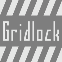 Zachariah Nelson (I Can Be Your Type) studied graphic design at Philadelphia University. Clayton, NJ-based designer of the curly flared caps typeface Void (2012). Damian (2012) is based on geometric elements of Futura and Univers. Maritote (2012) is in the style of the art deco typeface Broadway. Gridlock Light (2012) is a squarish typeface. He also designed a set of hand-printed typefaces that are meant to express moods: Fleeting, Anxious, Calm. [Google]
[MyFonts]
[More] ⦿
Zachariah Nelson (I Can Be Your Type) studied graphic design at Philadelphia University. Clayton, NJ-based designer of the curly flared caps typeface Void (2012). Damian (2012) is based on geometric elements of Futura and Univers. Maritote (2012) is in the style of the art deco typeface Broadway. Gridlock Light (2012) is a squarish typeface. He also designed a set of hand-printed typefaces that are meant to express moods: Fleeting, Anxious, Calm. [Google]
[MyFonts]
[More] ⦿
|
Ian Lord
|
Ian Lord from Princeton, NJ, designed Caligrapher (2001) [updated here (2003)], and the handwriting font The I Font (2001) at Devian Tart. He updated the latter font to Scrawl (2002) and ScrawlHeavy (2002). [Google]
[More] ⦿
|
Ian McKinnon
|
Mount Holly, NJ-based designer of the poster typeface Farias (2014). [Google]
[More] ⦿
|
InDigest Press AvantFonts
[Jeff Rentsch]
|
Jeff Wrench (Jeff Rentsch) from Denville, NJ, showcases about eight fonts, and lets you download one. His typefaces: Glitch (free), Blurrd, Anarchy Mono (a hacker font), JumpCut (nice!), StatBar-SurgeSuppression, Cannibal Times, Royal Pain (old typewriter), RoyalFadeingNormal. [Google]
[More] ⦿
|
Islam Mohamed
|
Egyptian graphic designer based in Bayonne, NJ. Creator of the grungy display typeface Gutthiuda (2016). [Google]
[More] ⦿
|
Jake Blankenship
|
During his studies at The School of Visual Arts, West New York, NJ-based Jake Blankenship designed the art deco typeface Gabo (2016) and the monoline Waterglass (2016). [Google]
[More] ⦿
|
James A. Lebbad
[Lebbadesign (or: Lebbad Design)]
|
[MyFonts]
[More] ⦿
|
James Melton
|
American designer of several handcrafted alphabets in 2017. [Google]
[More] ⦿
|
Jason Wickersty
[New Blazing Star Press]
|
[More] ⦿
|
Jeff DeSantis
|
New Jersey-based designer (b. 1980) of the handwriting typeface Jean is Dead (2006). Homepage. [Google]
[More] ⦿
|
Jeff Heller
|
Princeton, NJ-based creator of the display typeface Faust (2014). [Google]
[More] ⦿
|
Jeff Rentsch
[InDigest Press AvantFonts]
|
[More] ⦿
|
Jeffry Macpherson
|
Linwood, NJ-based designer of Blackletter 1905 (2018) and Architectural 1905 (2018). These typefaces are based on alphabets found in Architectural Lettering (American School of Correspondence, Chicago, IL, 1905). He also designed Foil Balloon Font (2018). [Google]
[More] ⦿
|
Jennifer DeAngelis
[DP Fonts]
|
[MyFonts]
[More] ⦿
|
Jennifer DeAngelis
|
 Born in New Jersey in 1985, Jennifer DeAngelis Gunn still lives in New Jersey, where she runs the graphic and web design company Jennifer DeAngelis Design (est. 2008), which is also listed on MyFonts. DP Fonts (est. 2010) sells fonts created by Jennifer and her New York college friend, Amanda Pastenkos.
 Jennifer designed the intricate wool strand-themed font Strands (2010) and the children's hand Right Height (2010). Majordomo (2010) is a pretty hand-drawn didone. The first DP Fonts font on MyFonts is the dingbat typeface Wintery Mix (2010). In 2011, Jennifer published the hand-printed 3d outline typeface Marquee, Mermaid NY (mermaid dingbats), Donald (hand-printed outline face), Bluebird (2011, a connected italic script), Quail (2011, grunge), REST BORT (2011, a hand-drawn blackboard bold family), White Rabbit (2011, a gorgeous hand-printed swashy caps face), Monocle86 (avant-garde), the grungy Snatch n Sniff, and the warped zebra typeface WEALD. Creations from 2012: the white on black tiled typeface Inthabox, the art deco typeface Esther. MyFonts link. Klingspor link. [Google]
[MyFonts]
[More] ⦿
|
Jennifer DeAngelis
[Design 23]
|
[MyFonts]
[More] ⦿
|
Jennifer Shelley
|
Freehold Township, NJ-based designer of a dot matrix typeface (2016). [Google]
[More] ⦿
|
Jerry Landers
[Mouser Fonts]
|
[More] ⦿
|
Jess Kjer
|
Jess Kjer (Cherry Hill, NJ) is a graphic and interactive designer, and a 2010 graduate of Tyler School of Art. She created some lively lettering for posters. [Google]
[More] ⦿
|
J.J. Rodo
|
J.J. Rodo (North Arlington, NJ) created Graffiti Font in 2014. [Google]
[More] ⦿
|
J.M. Debow
|
Wood type manufacturer in Allentown, NJ. Specimen of Leavenworth's Patent Wood Type Manufactured by J.M. Debow (1840s) is on-line at the NYPL. From that book: Italian type, Twelve Lines Gothic. For a digital revival of that Italian, see Chuck Mountain's Zuecos CF (2019). [Google]
[More] ⦿
|
Jo the Webmistress
[The Netstar Fresh Fonts]
|
[More] ⦿
|
Jocelyn Orante
|
Woodbridge, NJ-based designer of the pixelish typeface Squoval (2015). [Google]
[More] ⦿
|
Jon Yoskin
|
During his studies in Lawrenceville, NJ, Jon Yoskin created the display typeface Elephont (2014). [Google]
[More] ⦿
|
Jonathan Wilson
|
New Jersey-based designer of the grungy typeface No Big Fuss (2017). Creative Market link. [Google]
[More] ⦿
|
Joonho Sung
|
 Specializing in graphic design and pre-press, Joonho Sung (Clifton, NJ) created the delightfully funky cartoon typeface Coffee And Bakery in 2015. His illustrations are simultaneously funny and effective. [Google]
[More] ⦿
Specializing in graphic design and pre-press, Joonho Sung (Clifton, NJ) created the delightfully funky cartoon typeface Coffee And Bakery in 2015. His illustrations are simultaneously funny and effective. [Google]
[More] ⦿
|
Joshua Feliz
|
Joshua Feliz founded Solarnova Designs in Jersey City, NJ, and created the blackletter typeface Constellations (2015). [Google]
[More] ⦿
|
Joshua Korwin
[Three Steps Ahead]
|
[MyFonts]
[More] ⦿
|
Kabbalah Software
|
Located in Edison, NJ, this company sells Hebrew fonts. Some of the fonts: Hardar, Mirifx, Penina, Rashi, Rolit, Shlomo, Siddur, Torah, Aharon, Essex, Moses, Aryeh, Baluk, Budko, Cursiva, Grau, LCD Hebrew, Malka, Miri, Ora, Redis, Temima, Yerushalmi, Bashi, Leah. [Google]
[More] ⦿
|
Kaitlin Kall
|
Graduate of James Madison University who lives in Tuckerton, NJ. Creator of Sam Sans (2013). Behance link. [Google]
[More] ⦿
|
Kay English
|
New Jersey-based designer of the handcrafted typeface Song Bird (2015). [Google]
[More] ⦿
|
Keanu Ibarrondo
|
Pennsauken, NJ-based designer of Cadaver (2015). [Google]
[More] ⦿
|
Kelly Designs
[Kelly Fisher]
|
 Kelly Fisher (Kelly Designs, Jersey City, NJ) designed the handcrafted typeface Alice in 2015 and Cactus Flower in 2017. Creative Market link. [Google]
[More] ⦿
Kelly Fisher (Kelly Designs, Jersey City, NJ) designed the handcrafted typeface Alice in 2015 and Cactus Flower in 2017. Creative Market link. [Google]
[More] ⦿
|
Kelly Fisher
[Kelly Designs]
|
[More] ⦿
|
Kerry Dyke
|
New Brunswick, NJ-based designer of the modular bilined typeface Cav Lib Hollowbook (2017). [Google]
[More] ⦿
|
Kevin Pease
[Cerulean Stimuli]
|
[MyFonts]
[More] ⦿
|
Khiam Mincey
|
Newark, NJ-based creator (b. 1998) of the free font Universal Serif (2015), which is based on Copperplate Gothic. Dafont link. [Google]
[More] ⦿
|
Kristina Smith
|
During her studies, Kristina Smith (Rutherford, NJ) created the hand-drawn typeface Acute (2014). [Google]
[More] ⦿
|
Kyle Read
[Badson Studio]
|
[More] ⦿
|
Kyle Ward
|
Kyle Ward (Brown Mills, NJ) created the elegant Peignotian caps typeface Quinn in 2013. [Google]
[More] ⦿
|
Lance Wyman
|
 Designer who became famous because of his work on wayfinding and branding projects, and his designs for massive urban systems, airports, zoos, and museums. Over the course of his career he has created systems for the Mexico 1968 Olympics, Mexico City Metro, National Zoo, American Museum of Natural History, New York Penn Station, National Mall, Minnesota Zoo and Jeddah International Airport. Wyman taught corporate and wayfinding design at Parsons the New School for Design in New York for forty years, from 1973 until 2013. He lectures internationally and is still designing. The first compendium of his work, Lance Wyman: The Monograph, was published by Unit Editions.
 Creator of the identity, logos, fonts, and design elements for the Mexico 1968 Olympics in the op-art or prismatic style. The multilined font, called Mexico Olympic, is due to Photoscript Ltd (I think). A digital font inspired by it is Olio Inline (2012, Max Little). For a free version, see Steve Harrison's Sixty Eight and Sixty Eight Plus (2021). Wyman, who is a branding specialist based in New York City, is known for his many excellent icons and logos for companies and events. Born in Newark, NJ, he is a graduate of Pratt in Brooklyn with a degree in Industrial Design. He made the Tipo Metro font in 1969 for Mexico City's subway, an adaptation of Eurostile. That font was revived later as Metro DF by Harold Lohner. A pixel version of this (by Kemie, is called Balderas). Lance Wyman worked with Rick Banks at F37 Foundry on the design of F37 Wyman (2021), which showcases his famous lettering style that goes back to the 1968 Olympics. Bio. [Google]
[More] ⦿
|
Laura Taveras
|
Paterson, NJ-based designer of a nice threaded handwriting font in 2016. [Google]
[More] ⦿
|
Lauren Burleigh
|
 During her studies in Morristown, NJ, Lauren Burleigh created the display typeface Kontra (2014). [Google]
[More] ⦿
During her studies in Morristown, NJ, Lauren Burleigh created the display typeface Kontra (2014). [Google]
[More] ⦿
|
Lebbadesign (or: Lebbad Design)
[James A. Lebbad]
|
Lebbadesign (Stockton, NJ) is where James Lebbad (b. 1955, Newark, NJ) publishes his work, mostly logotype and lettering. Jim graduated from Kutztown University in 1977. He is a winner of an award at the TDC2 Type Directors Club's Type Design Competition 2002, with Globetrotter, a fine hand-printed font. Other fonts: Penske, Campbell Soup, Echo, Takhomasak, Lebbad Roman, Ellen, Janelle. MyFonts sells Alie (2008, a rough-edged script), Antman (2008, reto futuristic face), Bunky (2008), Ellen (2008, a display serif face), Kerb (2008, an elliptical sans), Pastina (2008, a Victorian serif), Nicole (2008, a graceful condensed face), Zoomba (2009, a script), Lebbad Script (2011, retro signage face), Juliana Joy (2012, a sharp-edged serif face), Minnie (2016, a curly upright script), Minnie Brush (2016), Leo Slab (2016), Krone (2018: a bold semi-serif), Oliver Serif (2020). View the typefaces designed by James Lebbad. [Google]
[MyFonts]
[More] ⦿
|
Lerfu
[Mark E. Shoulson]
|
Lerfu is Mark E. Shoulson's foundry located in Highland Park, NJ. Creator of a variety of fonts: - The Visible Speech Fonts in metafont and truetype cover a phonetic alphabet invented by Alexander Melville Bell (his son was Alexander Graham Bell). Bell was a teacher of the deaf (as was the younger Bell), and this alphabet was intended as an aid to teaching the deaf how to pronounce words. An example is VS MetaPlain PUA.
- Marin, MarinCaps, MarinCapsItalic, MarinItalic: four free extensive phonetic truetype fonts made in 2004. They also cover Cyrillic, Greek and Hebrew.
- Okuda: A metafont for "Okuda" orthography of pIqaD (Klingon language). This font was later modified by Olaf Kummer.
- Gill Hebrew (2004, based on Gill Sans) and Shen (2004), both sold via Shoulson's foundry at MyFonts, called Lerfu.
- Itonai (2005), a Hebrew version of Times New Roman, also sold via Lerfu.
[Google]
[MyFonts]
[More] ⦿
|
Leslie Cabarga
[Cabarga type (was: Flashfonts)]
|
 [MyFonts]
[More] ⦿
[MyFonts]
[More] ⦿
|
Lila Symons
|
Calligrapher from Princeton, NJ, who was/is type designer at Hallmark cards in Kansas City, MO (since 2013). Creator of several calligraphic alphabets in 2011. During some studies at Type@Cooper in New York in 2011-2012, she designed the quirky humanist sans typeface Daryl. Home page. Behance link. [Google]
[More] ⦿
|
Linn Boyd Benton
|
 Type designer (b. Little Falls, NJ, 1844, d. Plainfield, NJ, 1932) who lived in New Jersey. Father of Morris Fuller Benton. He cut Century Expanded (1894) based on a design of Th. L. De Vinne. This Scotch roman typeface was later redrawn by Morris Fuller Benton in 1900. Linn Boyd Benton managed manufacturing at ATF from 1892 until his death in 1932.
 Article by Patricia Cost for Printing History: Linn Boyd Benton, Morris Fuller Benton,&Typemaking at ATF. Cynthia Jacquette writes about Linn Boyd and his son. FontShop link. [Google]
[MyFonts]
[More] ⦿
|
Lisa Evanoff
|
Williamstown, NJ-based designer of the decorative Yoga Cats Font (2016). [Google]
[More] ⦿
|
Lyle C. Briggs
[SnailWorks]
|
[More] ⦿
|
Maria Remedios Tubil
|
During her studies in Clifton, NJ, Maria Remedios Tubil created the pster display typeface Simple Blox (2013) and the poster font Euro Earl (2013). [Google]
[More] ⦿
|
Marie Graboso
|
North Brunswick, NJ-based designer of Hexaface (2017). [Google]
[More] ⦿
|
Mark E. Shoulson
[Lerfu]
|
[MyFonts]
[More] ⦿
|
Martin B. Brilliant
|
Holmdel, NJ-based designer of the Open Font Library fonts Cammel (2008, bold italic) and Ridiculous (2008, an architectural drawing font). View the fonts here, and download them here. [Google]
[More] ⦿
|
Martin Sanchez
|
Garfield, New Jersey-based designer of the techno typeface Zona84 (2014). [Google]
[More] ⦿
|
Maru Jimenez
[Maryann Jiménez]
|
Maryann Jiménez is a graphic designer in New York City and North Bergen, NJ. She began her studies at Altos de Chavón School of Design and obtained a BFA in Communication Design at Parsons The New School, NYC. While living in New York City, she worked as Creative Coordinator for renowned British fashion label, Ben Sherman Clothing Inc. and currently is working freelance, specializing in Communication Design, Visual Identity, Branding, Print and Editorial. Creator of the MICR font Numbers (2012). [Google]
[More] ⦿
|
Maryann Jiménez
[Maru Jimenez]
|
[More] ⦿
|
Masiel Isaza
|
Or Masiel Fossi. South Hackensack, NJ-based designer of Block Sans, Block Serif and Block Slab (2016). [Google]
[More] ⦿
|
Matt Chansky
|
 Princeton, NJ-based designer of the fashionable geometric sans typeface Quadri (2020), the large x-height sans Neue June (2019), and the low-contrast sans typefaces Chelsey and LAdawn. [Google]
[More] ⦿
Princeton, NJ-based designer of the fashionable geometric sans typeface Quadri (2020), the large x-height sans Neue June (2019), and the low-contrast sans typefaces Chelsey and LAdawn. [Google]
[More] ⦿
|
Max Churak
|
Atlantic Highlands, NJ-based designer of Rockface (2012), a custom font based on rock formations. [Google]
[More] ⦿
|
Melissa Hebbe
|
Graphic designer in Hillsborough, NJ. Creator of the free all-caps sans typeface Komorebi (2015) and of the curly handcrafted typeface Sophrosyne (2014). Dafont link. Behance link. [Google]
[More] ⦿
|
Michael Brunken
|
Long Valley, NJ-based designer of Cat's Cradle (2013). [Google]
[More] ⦿
|
Michael Choi
|
Cherry Hill, NJ-based designer of Buckram (2013), a roman typeface that was developed during his studies at Rutgers University in Camden. [Google]
[More] ⦿
|
Michael Irwin
|
Art director in Morristown, NJ, and New York, NY, who studied at SVBA in New York. Creator of Slope (2012), the ink splatter typeface Wipe Here (2012) and the monoline rounded stencil typeface LGD (2012). Behance link. [Google]
[More] ⦿
|
Michael Jacoby
|
Riverside, NJ-based designer of the dot matrix font Kivos (2013). In 2016, he published the all caps typeface family Vitruvia titling, which is based upon the compass-and-ruler alphabet first proposed by Geoffroy Tory in Champleury (1529). In 2018, he published the sans typeface Steersman. [Google]
[More] ⦿
|
Mike Brennan
|
New Jersey-based designer of the scratchy messy typefaces Scribly (sic) (2017) and Lazy Brush (2017). Creative Market link. [Google]
[More] ⦿
|
Mike Lynch
|
New Jersey-based designer, b. 1963, who created the free fonts SilverStream, Isamu and Breakaway (a typeface not unlike Impact) in 2004. Home page. [Google]
[More] ⦿
|
Mitchell Palmer
|
Glen Gardner, NJ-based designer of the connect-the-dots typeface Rubiks (2016). [Google]
[More] ⦿
|
Monticello
[Charles Creesy]
|
A type-historical article by Charles Creesy, Director of Publishing Technologies, Princeton University Press, about the Monticello typeface. Summarizing the lifeline of this typeface from Creesy's analysis: - We start with a type by Archibald Binny and James Ronaldson at their Philadelphia-based foundry in 1796. It was different than what is known today as the Binny&Ronaldson 1812. It was in character similar to styles created by John Baine. In this handset form, it went through three iterations spanning about a century.
- In 1940, C.H. Griffith at the Mergenthaler Company with the aid of Princeton University Press's Pleasant Jefferson ("P.J.") Conkwright (a book designer and book typographer) set out to convert it to Linotype. This revival was called Monticello---it was to be used to publish The Papers of Thomas Jefferson. The first Linotype proof, labeled "10 point Monticello Experimental No. 285", dates from 1944.
- Two early unsatisfactory digital renditions were created in the 1980s. These were used to print the Jefferson Papers but the fonts were based on poor scans.
- In 2002, a digital version tailored to produce photopolymer plates for letter-press printing was created for Andrew Hoyem's Arion Press in San Francisco. It was Andrew Hoyem's and Linnea Lundquist's Aitken.
- In 2003, Matthew Carter returned to Griffith's type and made a digital family called Monticello for the Princeton University Press. In the process, he beefed up the serifs and the outlines a bit, as they had lost weight in the preceding iterations.
Quoting John Berry: {Carter's Monticello] is a comfortably readable typeface in a style that now looks old but familiar to us. [...] I can easily imagine Monticello, in its new form, becoming a very popular book typeface once again." Creesy concludes: Despite - or perhaps because of - its Scotch heritage and multifarious influences from the Old World, it can also lay claim to being our quintessentially American font. [Google]
[More] ⦿
|
Moon Choi
|
Jersey City, NJ-based designer of the display typefaces Olive (2019) and Latex (2019). [Google]
[More] ⦿
|
Morris Fuller Benton
|
 Prolific American type designer (b. 1872, Milwaukee, d. 1948, Morristown, NJ), who published over 200 alphabets at ATF. He managed the ATF type design program from 1892 until 1937. Son of Linn Boyd Benton. MyFonts page on him. Nicholas Fabian's page. Linotype's page. Klingspor page. Unos tipos duros page. His fonts include:
 - 1897: Cloister Old Style (ATF). [Stephenson Blake purchased this from ATF and called it Kensington Old Style, 1919] [Cloister (2005, P22/Lanston) is based on Jim Rimmer's digitization of Benton's Cloister.]
- 1898: Roycroft. Mac McGrew on Roycroft: Roycroft was one of the most popular of a number of rugged typefaces used around the turn of the century, when printing with an antique appearance was in vogue. It was inspired by lettering used by the Saturday Evening Post. then a popular weekly magazine, and has been credited to Lewis Buddy, a former Post artist and letterer, but ATF says it was designed "partly" by Morris Benton, about 1898. Gerry Powell, director of typographic design for ATF in the 1940s, says, "Roycroft was first known as Buddy, changed when it was adopted by Elbert Hubbard for the Roycroft Press." Henry L. Bullen, ATF librarian and historian, says, "The first font of type to be made from matrices directly engraved on the Benton machine was 24-point Roycroft. October 4, 1900." While the machine was originally designed in 1884 to cut punches rather than matrices, it is doubtful that no fonts of mats were cut before 1900. Roycroft is also said to be the first typeface for which the large size of 120-point was engraved in type metal, with matrices made by electrotyping. Many typefaces of the day had a number of alternate characters. For this face. ATF gave specific instructions for their intended use: "M with the short vertex, in words the letters of which are open; R with the long tail, as a final letter in all-cap words; the wide h, m, and n, as a final letter only; t with the swash tail, as a final letter but not too frequently; u with the descending stroke, in words having no descending letters; ct ligature, wherever possible; the long s and its combinations, in antique work." Roycroft Open was cut in 1902, probably from the same patterns as the parent face. Roycroft Tinted is a very unusual face, in which the typeface is engraved with the equivalent of a halftone screen of about 25 percent tone value, with a black shadow on the right side; this typeface was cut by the Dickinson Type Foundry branch of ATF in Boston, and includes the same special characters as Roycroft. Compare Post Oldstyle.
- 1900: Century Expanded (1900: poster by Heather Leonhardt). This was a complete redraw of Century Roman which was designed in 1894 by his father, Linn Boyd Benton, for Theodore Low DeVinne, the publisher of Century Magazine. Digitizations by Elsner&Flake, Bitstream and URW.
- 1901: Linotext (aka WedddingText).
- 1901-1910: Engravers.
- 1901: Wedding Text (some put this in 1907), Old English Text, Engravers' Old English (a blackletter font remade by Bitstream). Wedding Text has been copied so often it is sickening: Wedding Regular and Headline (HiH, 2007), Dan X. Solo's version, Comtesse, Elite Kanzlei (1905, Stempel), Meta, Lipsia, QHS Nadejda (QHS Soft), Blackletter 681, Marriage (Softmaker), Wedding Text TL (by Tomas Liubinas).
- 1902: Typoscript.
- 1902-1912: Franklin Gothic. Digital versions exist by Bitstream, Elsner&Flake (in a version called ATF Franklin Gothic), Red Rooster (called Franklin Gothic Pro, 2011), Linotype, and ITC (ITC Franklin Gothic). Discussion by Harvey Spears. Mac McGrew: Franklin Gothic might well be called the patriarch of modern American gothics. Designed in 1902 by Morris Fuller Benton, it was one of the first important modernizations of traditional nineteenth-century typefaces by that designer, after he was assigned the task of unifying and improving the varied assortment of designs inherited by ATF from its twenty-three predecessor companies. Franklin Gothic (named for Benjamin Franklin) not only became a family in its own right, but also lent its characteristics to Lightline Gothic. Monotone Gothic, and News Gothic (q.v.). All of these typefaces bear more resem- blance to each other than do the typefaces within some other single families. Franklin Gothic is characterized by a slight degree of thick-and-thin contrast; by the double-loop g which has become a typically American design in gothic typefaces; by the diagonal ends of curved strokes (except in Extra Condensed); and by the oddity of the upper end of C and c being heavier than the lower end. The principal specimen here is Monotype, but the basic font is virtually an exact copy of the ATF typeface in display sizes, except that Monotype has added f- ligatures and diphthongs. Franklin Gothic Condensed and Extra Condensed were also designed by Benton, in 1906; Italic by the same designer in 1910; and Condensed Shaded in 1912 as part of the "gray typography" series. Although Benton started a wide version along with the others, it was abandoned; the present Franklin Gothic Wide was drawn by Bud (John L.) Renshaw about 1952. Franklin Gothic Condensed Italic was added by Whedon Davis in 1967. Monotype composition sizes of Franklin Gothic have been greatly modi- fied to fit a standard arrangement; 12-point is shown in the specimen-notice the narrow figures and certain other poorly reproportioned characters. The 4- and 5-point sizes have a single-loop g. Gothic No. 16 on Linotype and Inter- type is essentially the same as Franklin Gothic up to 14-point; in larger sizes it is modified and more nearly like Franklin Gothic Condensed. However. some fonts of this typeface on Lino have Gagtu redrawn similar to Spartan Black. with the usual characters available as alternates; 14-point is shown. Western Type Foundry and later BB&S used the name Gothic No.1 for their copy of Franklin Gothic, while Laclede had another similar Gothic No. 1 (q.v.). On Ludlow, this design was originally known as Square Gothic Heavy with a distinctive R and t as shown separately after the Monotype diphthongs; when the name was changed to Franklin Gothic in 1928, it was redrawn, closer to Franklin Gothic but still a bit top-heavy; the unique R was retained in standard fonts but an alternate version like that of ATF was made available separately; also a U with equal arms, a single-loop g, and a figure 1 without foot serifs. Ludlow Franklin Gothic Italic, partially shown on the third line of the specimen, is slanted much more than other versions, to fit the standard 17 -degree italic matrices of that machine. Modern Gothic Condensed and Italic (q.v.) are often though not properly called Franklin Gothic Condensed and Italic, especially by Monotype users. Also see Streamline Block.
- 1903: Alternate Gothic (ATF). See Alternate Gothic Pro Antique (Elsner&Flake), Alternate Gothic No2 (Bitstream), Alpin Gothic (by Team77), League Gothic (2009-2011, The League of Movable Type), and Alternate Gothic No1, No2 and No3 (see the URW version). Mac McGrew: Alternate Gothic was designed in 1903 by Morris F. Benton for ATF with the thought of providing several alternate widths of one design to fit various layout problems. Otherwise it is a plain, basic American gothic with no unusual features, but represents a more careful drawing of its nineteenth-century predecessors. The Monotype copies in display sizes are essentially the same as the foundry originals, with the addition of f-ligatures. The thirteen alternate round capitals shown in the first line of Alternate Gothic No.1 were designed by Sol Hess in 1927 for Monotype, hence the "Modernized" name; with these letters the design is sometimes referred to as Excelsior Gothic. Monotype keyboard sizes, as adapted by Hess about 1911, are considera- bly modified to fit a standard arrangement; caps are not as condensed as in the original foundry design. In 6-point, series 51 and 77 are both the same width, character for character, but some letters differ a bit in design. Note that these two narrower widths are simply called Alternate Gothic on Monotype, while the wider version is Alternate Gothic Condensed! Alternate Gothic Italic, drawn about 1946 by Sol Hess for Monotype matches No.2, but may be used with other widths as well. Condensed Gothic on Ludlow, is essentially a match for Alternate Gothic No.1, but has a somewhat different set of variant characters, as shown in the third line. There is also Condensed Gothic Outline on Ludlow, introduced about 1953, essentially an outline version of Alternate Gothic No.2. On Linotype and Intertype there is Gothic Condensed No.2 which is very similar to Alternate Gothic No. 1 in the largest sizes only, but with even narrower lowercase and figures. Also compare Trade Gothic Bold and Trade Gothic Bold Condensed. For a free version of Alternate Gothic No. 1, see League Gothic (2009-2011, The League of Movable Type).
- 1904: Bold Antique, Whitin Black [see OPTI Bold Antique for a modern digitization], Cheltenham (digitizations by Bitstream and Font Bureau, 1992), Cloister Black (blackletter font, see the Bitstream version: it is possible that the typeface as designed by Joseph W. Phinney).
- 1905: Linoscript (1905). Originally at ATF it was named "Typo Upright". Clearface, about which McGrew writes: Clearface was designed by Morris Benton with his father, Linn Boyd Benton, as advisor. The bold was designed first, in 1905, and cut the following year. The other weights and italics were produced through 1911. As the name implies, the series was intended to show unusual legibility, which it certainly achieved. The precision of cutting and casting for which ATF is noted produced a very neat and handsome series, which had considerable popularity. Clearface Heavy Italic has less inclination than the lighter weights, and is non-kerning, a detail which helped make it popular for newspaper use; the specimen shown here is from a very worn font. Some of the typefaces have been copied by the matrix makers. But the typeface Monotype calls Clearface and Italic is the weight called Bold by other sources. Monotype also includes Clearface Italic No. 289, a copy of the lighter weight. Revival and expansion by Victor Caruso for ITC called ITC Clearface, 1978. Also, American Extra Condensed, an octagonal mechanical typeface revived in 2011 by Nick Curtis as Uncle Sam Slim NF.
- 1906: Commercial Script (versions exist at Linotype, URW, Bitstream (called English 144), SoftMaker (2012), and Elsner&Flake), Miele Gothic, Norwood Roman.
- 1907: Lincoln Gotisch, named after Abraham Lincoln. This found found its way from ATF to Schriftguss, Trennert und Sohn, and Ludwig Wagner. Digital revivals include Delbanco's DS Lincoln-Gotisch. Compare with Comtesses, Lipsia, Elite Kanzlei, Lithographia and Wedding Text.
- 1908: News Gothic, Century Oldstyle (digital versions by Bitstream, Elsner&Flake, and URW), Clearface Gothic (1907-1910: digital revivals include Clear Gothic Serial (ca. 1994, SoftMaker) and Cleargothic Pro (2012, SoftMaker). McGrew: Clearface Gothic was designed by Morris Benton for ATF in 1908, and cut in 1910. It is a neat, clean gothic, somewhat thick and thin, which incorporates some of the mannerisms of the Clearface (roman) series. However, it can hardly be considered a part of that family. There is only one weight, and fonts contain only the minimum number of characters.
- 1909-1911: Rugged Roman. McGrew: Rugged Roman was designed for ATF by Morris F. Benton in 1909-11. It was patented in 1915, but the earliest showing seems to have appeared in 1917. It is a rugged face, as the name says, of the sort that was popular early in the century, but appears to have no relation to other typefaces having the name "Rugged." It somewhat resembles Roycroft, but is lighter. But to add to the uncertainty, fonts contained a number of ligatures of the kind which were more common in the early 1900s, in addition to the usual f-ligatures.
- 1910: Cloister Open Face, Hobo (1910, strongly influenced by the Art Nouveau movement; Hobo Light followed in 1915), ATF Bodoni (Bitstream's version is just called Bodoni, and Adobe's version is called Bodoni Book or Bodoni Poster or Bodoni Bold Condensed, while Elsner&Flake call theirs Bodoni No Two EF Ultra; Font Bureau's version has just two weights called BodoniFB-Bold Condensed and Compressed). McGrew writes about Hobo: Hobo is unusual in two respects---it is drawn with virtually no straight lines, and it has no descenders and thus is very large for the point size. It was designed by Morris F. Benton and issued by ATF in 1910. One story says that it was drawn in the early 1900s and sent to the foundry without a name, which was not unusual, but that further work on it was continually pushed aside, until it became known as "that old hobo" because it hung around so long without results. More time elapsed before it was patented in 1915. The working name was Adface. Hobo was also cut by Intertype in three sizes. Light Hobo was also drawn by Benton, and released by ATF in 1915. It is included in one list of Monotype typefaces, but its series number is shown elsewhere for another Monotype face, and no other evidence has been found that Monotype actually issued it.
- 1911-1913: Venetian, Cromwell. Mac McGrew: Cromwell is a rather playful typeface, designed by Morris Benton in 1913 but not released by ATF until three years later. It uses the same capitals as Cloister (q.v.) and has the same small x-height with long ascenders and descenders, but otherwise is quite different, with much less formality. Notice the alternate characters and the double letters including overhanging f's.. Cromwell was digitized by Nick Curtis in 2010 as Cromwell NF. Mac McGrew on Venetian: Venetian and Italic were designed by Morris F. Benton for ATF about 1911, with Venetian Bold following about two years later. They are rather reserved transitional typefaces, almost modern, instead of classic designs of Venetian origin as the name implies. The result is closer to Bodoni than to Cloister. The working title was Cheltenham No.2, but the relationship to that family is not apparent. It is carefully and neatly done, but never achieved widespread use. Compare Benton, a later typeface by the same designer, which has similar characteristics but more grace and charm.
- 1914: Adscript, Souvenir, Garamond (with T.M. Cleveland).
- 1916: Announcement, Light Old Style, Goudy Bold. Mac McGrew writes: Announcement Roman and Announcement Italic were designed by Morris F. Benton in 1916, adapted from steel or copperplate engravings, but not completed and released until 1918. These delicate typefaces have had some popularity for announcements, social stationery, and a limited amount of advertising work, but are a little too fancy for extensive use. Oddly, some of the plain caps shown in the specimens, both roman and italic, do not seem to appear in any ATF specimens. Foundry records show that a 48-point size of the roman was cut in 1927, but no other listing or showing of it has been found. In fact, sizes over 24-point were discontinued after a few years, and all sizes were discontinued in 1954.. Digitizations: Announcement Roman was revived by Nick Curtis in 2009 and called Society Page NF. Rebecca Alaccari at Canada Type revived it as Odette in 2004. See also Castcraft's OPTI Announcement Roman.
- 1916-1917: Invitation. For a digital revival, see Sil Vous Plait (2009, Nick Curtis).
- 1917: Freehand.
- 1917-1919: Sterling. Digitizations include Howard (2006, Paul D. Hunt), Argentina NF (2009, Nick Curtis), and Argentina Cursive NF.
- 1918: Century Schoolbook (1918-1921). (See ITC Century (Tony Stan, 1975-1979), or the Century FB-Bold Condensed weight by Greg Thompson at Font Bureau, 1992. For Century Schoolbook specifically, there are versions by Elsner&Flake, Bitstream and URW. Bitstream has a monospaced version.) URW Century Schoolbook L is free, and its major extension, TeXGyre Schola (2007) is also free.
- 1920: Canterbury. Mac McGrew: Canterbury is a novelty typeface designed by Morris F. Benton for ATF in 1920, when trials were cut, but not completed for production until 1926. It features a very small x-height, with long ascenders and descenders; monotone weight with minute serifs; and a number of swash capitals. It is primarily suitable for personal stationery and announcements. Compare Camelot Oldstyle. Digital versions were done by Nick Curtis in his Londonderry Air NF (2002-2004), and Red Rooster in the series Canterbury, Canterbury OldStyle, and Canterbury Sans.
- 1922: Civilité. Mac McGrew on the ATF Civilité: Civilite in its modern adaptation was designed by Morris Benton in 1922 and cut by ATF in 1923-24. The original version was cut by Robert Granjon in 1557 to imitate the semi-formal writing then in vogue, and is believed to be the first cursive design cut in type. It became popular for the printing of poetry and for books of instruction for children, where the type itself could serve as a perfect model of handwriting. The first of these books was titled La Civilite puerile, printed at Antwerp in 1559. The books were so popular that the design came to be known as "civility" type. Other interpretations of the letter have been made, including Cursive Script, cut in the nineteenth century in 18-point only from French sources by ATF predecessors and by Hansen, but Benton's seems more attractive and legible to modern eyes. The French pronunciation of ci-vil'i-tay is indicated by the accented e, which was used only in ATF's earliest showings. The many alternate characters were included in fonts as originally sold; later they were sold separately and finally discontinued, although the basic font was still listed in recent ATF literature. Also see ZapfCivilite. Compare Freehand, Motto, Verona.
- 1924: Schoolbook Oldstyle.
- 1926-1927: Typo Roman.
- 1927: Chic (American Typefounders; doubly shaded capitals and figures), Gravure, Greeting Monotone, Goudy Extra Bold. The art deco typeface Chic was revived by Nick Curtis as Odalisque NF (2008) and Odalisque Stencil NF (2010).
- 1928: Parisian, Bulmer (revival of William Martin's typeface from 1792 for the printer William Bulmer; digital forms by Monotype, Adobe, Linotype, and Bitstream), Broadway (1928-1929, see two styles offered by Elsner&Flake, Linotype, Bitstream, and 11 weights by URW), Goudy Catalogue, Modernique, Novel Gothic (ATF, designed with Charles H. Becker), Dynamic. Novel Gothic has seen many digital revivals, most notably Telenovela NF (2011, Nick Curtis), Naked Power (Chikako Larabie) and Novel Gothic SG (Jim Spiece). Images of Bulmer: i, ii, iii, iv, v, vi, vii, viii, ix, x, xi, xii.
- 1929: Louvaine. McGrew: Louvaine series was designed by Morris F. Benton for ATF in 1928. It is an adaptation of Bodoni (the working title was Modern Bodoni), and many of the characters are identical. Only g and y are basically different; otherwise the distinction is in the more abrupt transition from thick to thin strokes in this series. In this respect, Ultra Bodoni has more affinity to Louvaine than to the other Bodoni weights. The three weights of Louvaine correspond to Bodoni Book, Regular, and Bold. This series did not last long enough to appear in the 1934 ATF specimen book, the next complete one after its introduction. Compare Tippecanoe.
- 1930: Benton, Engravers Text, Bank Gothic (see Bitstream's version), Garamond-3 (with Thomas Maitland Cleland), Paramount (some have this as being from 1928: see Eva Paramount SG by Jim Spiece). McGrew: Paramount was designed by Morris Benton in 1930 for ATF. It is basically a heavier companion to Rivoli (q. v.), which in turn is based on Eve, an importation from Germany, but is heavier than Eve Bold. It is an informal typeface with a crisp, pen-drawn appearance. Lowercase is small, with long ascenders and short descenders. Vertical strokes taper, being wider at the top. It was popular for a time as an advertising and announcement type.
- 1931: Thermotype, Stymie (with Sol Hess and Gerry Powell). Stymie Obelisk is a condensed Egyptian headline face---the latter was revived by Nick Curtis as Kenotaph NF (2011).
- 1932: Raleigh Gothic Condensed (the digital version by Nick Curtis is Highpoint Gothic NF (2011)), American Text (blackletter). Mac McGrew: Raleigh Gothic Condensed was designed by Morris F. Benton for ATF in 1932. It is a prim, narrow, medium weight gothic face, with normally round characters being squared except for short arcs on the outside of corners. The alternate characters AKMNS give an even greater vertical appearance than usual. At first, this typeface was promoted with Raleigh Cursive as a stylish companion face, although there is no apparent relationship other than the name. Compare Phenix, Alternate Gothic, Agency Gothic.
- 1933: American Backslant, Ultra Bodoni (a great Bodoni headline face; see Bodoni FB (1992, Font Bureau's Richard Lipton). About Agency Gothic, McGrath writes: Agency Gothic is a squarish, narrow, monotone gothic without lower- case, designed by Morris F. Benton in 1932. It has an alternate A and M which further emphasize the vertical lines. Sizes under 36-point were added in 1935. Agency Gothic Open was drawn by Benton in 1932 and introduced in 1934; it follows the same style in outline with shadow, and probably has been more popular than its solid companion. Triangle Type Foundry, a Chicago concern that manufactured matrices, copied this typeface as Slim Open, adding some smaller sizes. ATF's working titles for these typefaces, before release, were Tempo, later Utility Gothic and Utility Open. Compare Raleigh Gothic Condensed, Poster Gothic, Bank Gothic. Digital versions include Warp Three NF (2008, Nick Curtis), which borrows its lowercase from Square Gothic (1888, James Conner's Sons), FB Agency (1995, David Berlow at FontBureau), Agency Gothic (by Dan Solo) and OPTI Agency Gothic (by Castcraft).
- 1934: Shadow, Tower (heavy geometric slab serif), Whitehall. Font Bureau's Elizabeth Cory Holzman made the Constructa family in 1994 based on Tower. Digital versions include Warp Three NF (2008, Nick Curtis), which borrows its lowercase from Square Gothic (1888, James Conner's Sons), FB Agency Gothic (1995, David Berlow at FontBureau) and Agency Gothic by Castle Type. Eagle Bold followed in 1934. McGrew: Eagle Bold is a by-product of the depression of the 1930s. The National Recovery Administration of 1933 had as its emblem a blue eagle with the prominent initials NRA, lettered in a distinctive gothic style. Morris Benton took these letters as the basis for a font of type, released later that year by ATF, to tie in with the emblem, which businesses throughout the country displayed prominently in advertising, stationery, and signs; naturally it was named for the eagle. Compare Novel Gothic. USA Resolute NF (2009, Nick Curtis) is based on Eagle Bold.
- 1935: Phenix. This condensed artsy sans was revived in 2011 at Red Rooster by Steve Jackaman and Ashley Muir as Phoenix Pro.
- 1936: Headline Gothic. For a digital version, see ATF Headline Gothic (2015, Mark van Bronkhorst, Igino Marini, & Ben Kiel at American Type Founders Collection).
- 1937: Empire. This ultra-condensed all caps skyline typeface was digitally remade and modernized by Santiago Orozco as Dorsa (2011). Jeff Levine reinterpreted it in 2017 as Front Row JNL. Bitstream also has a digital revival.
Linotype link. FontShop link. Picture. Typefaces alphabetic order: - Adscript
- Agency Gothic (+Open
- Alternate Gothic No.1 (+No.2, +No.3)
- American Backslant
- American Caslon&Italic
- American Text
- Announcement Roman&Italic (1916). For digital revivals or influences, see Friendly (2012, Neil Summerour), Odette (2004, Canada Type) and Society Page NF (2009, Nick Curtis).
- Antique Shaded
- Bank Gothic Light (+Medium, +Bold, +Light Condensed, +Medium Condensed, +Bold Condensed). For digital versions, see Bank Gothic AS Regular and Condensed (2008, Michael Doret).
- Baskerville Italic
- Benton (Whitehall)&Italic
- Bodoni&Italic (+Book&Italic, +Bold&Italic, +Bold Shaded, +Bold Open)
- Bold Antique (+Condensed)
- Broadway (+Condensed). The prototyical art deco typeface (1928-1929).
- Bulfinch Oldstyle (1903).
- Bulmer&Italic
- Canterbury
- Card Bodoni (+Bold). 1912-1916.
- Card Litho (+Light Litho)
- Card Mercantile
- Card Roman
- Century Expanded&Italic
- Century Bold&Italic (+Bold Condensed, +Bold Extended)
- Century Oldstyle&Italic (+Bold&Italic, +Bold Condensed)
- Century Catalogue&Italic
- Century Schoolbook&Italic (+Bold)
- Cheltenham Oldstyle&Italic (+Condensed, +Wide)
- Cheltenham Medium&Italic (+Medium Condensed, +Medium Expanded, +Bold&Italic, +Bold Condensed&Italic, +Bold Extra Condensed&Title, +Bold Extended, +Extrabold, +Bold Outline, +Bold Shaded&Italic, +Extrabold Shaded, +Inline, +Inline Extra Condensed, +Inline Extended)
- Chic
- Civilite
- Clearface&Italic (1907, +Bold&Italic, +Heavy&Italic)
- Clearface Gothic: a flared version of Clearface.
- Cloister Black
- Cloister Oldstyle&Italic (+Lightface&Italic, +Bold&Italic, +Bold Condensed, +Cursive, +Cursive Handtooled, +Title&Bold Title)
- Commercial Script
- Copperplate Gothic Shaded
- Cromwell.
- Cushing Antique (1902).
- Della Robbia Light
- Dynamic Medium
- Eagle Bold
- Empire (1937). A skyline typeface.
- Engravers Bodoni
- Engravers Old English (+Bold)
- Engravers Bold
- Engravers Shaded
- Engravers Text
- Franklin Gothic&Italic (+Condensed, +Extra Condensed, +Condensed Shaded)
- Freehand (1917). Mac McGrew: Freehand, a typeface based on pen-lettering, was designed for ATF by Morris Benton in 1917. The working title before release was Quill. Derived from Old English, it is an interesting novelty, and has had quite a bit of use. Compare Civilite, Motto, Verona.
- Garamond&Italic (+Bold&Italic, +Open)
- Globe Gothic (+Condensed, +Extra Condensed, +Extended, +Bold&Italic)
- Goudy Bold&Italic (+Catalogue&Italic, +Extrabold&Italic, +Handtooled&Italic, +Title)
- Gravure
- Greeting Monotone
- Headline Gothic
- Hobo&Light Hobo (1910). For digital versions, see Informal 707 (Bitstream), Hobbit (SF), Homeward Bound (Corel), Hobo No2 (2012, SoftMaker), Bogo (2016, Harold Lohner), and Hobo (Bitstream).
- Invitation (+Shaded)
- Light Oldstyle
- Lightline Gothic&Title (1908). For a revival, see Benton Gothic Thin NF (2014, Nick Curtis).
- Lithograph Shaded (1914, with W.F. Capitain).
- Louvaine Light&Italic (+Medium&Italic, +Bold&Italic)
- Miehle Extra Condensed&Title
- Modernique
- Monotone Gothic&Title
- Motto (1915). Mac McGrew: Motto is a calligraphic typeface designed by Morris F. Benton for ATF in 1915. It is similar to the same designer's Freehand, drawn a couple of years later, but has plainer capitals, heavier thin strokes, and shorter descenders. But letters combine into legible words with a pleasant, hand-lettered appearance. Also compare Humanistic, Verona. For a digital version, see Motto by Juan Kafka.
- News Gothic (+Condensed, +Extra Condensed&Title)
- Norwood Roman
- Novel Gothic
- Othello
- Packard (+Bold)
- Paramount
- Parisian
- Pen Print Open
- Phenix
- Piranesi Italic (+Italic Plain Caps, +Bold&Italic, +Bold Italic Plain Caps)
- Poster Gothic (1934).
- Raleigh Gothic Condensed (1934).
- Rockwell Antique
- Roycroft
- Rugged Roman
- Schoolbook Oldstyle
- Shadow
- Souvenir (1914). Revived in 1977 by Ed Benguiat as ITC Souvenir, but a total failure as a type design. Simon Garfield: Souvenir was the Comic Sans of its era, which was the 1970s before punk. It was the typeface of friendly advertising, and it did indeed appear on Bee Gees albums, not to mention the pages of Farrah Fawcett-era Playboy. Mark Batty from International Typeface Corporation (ITC) on one of his best-selling fonts: A terrible typeface. A sort of Saturday Night Fever typeface wearing tight white flared pants. Garfield also retrieved this quote by type scholar Frank Romano in the early 1990s: Real men don't set Souvenir. Digital revivals also include Sunset Serial by Softmaker, and ITC Souvenir Mono by Ned Bunnel.
- Sterling&Cursive
- Stymie Light&Italic (+Medium&Italic, +Bold&Italic, +Black&Italic)
- Thermotypes
- Tower Condensed (1934). Revived by Photo-Lettering Inc as PL Tower.
- Typo Roman&Shaded
- Typo Script and Typo Script&Extended (1902)
- Typo Shaded
- Typo Slope
- Typo Upright&Bold
- Ultra Bodoni&Italic (+Condensed, +Extra Condensed)
- Venetian&Italic (+Bold)
- Wedding Text&Shaded
View Morris Fuller Benton's typefaces. A longer list. A listing of various digital versions of News Gothic. More News Gothic-like typefaces. Even more News Gothic-like typefaces. [Google]
[MyFonts]
[More] ⦿
|
Mouser Fonts
[Jerry Landers]
|
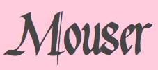 From Collingswood, NJ, Jerry Landers' type designs: Waters Gothic (calligraphic), Waters Gothic Deux, Waterhole (2000), Animal Caps (2000), Bouwsma Uncial, Foundational, Georgia Pond, Gourdie Cursive (2000), Goudie Cursive Deux, Gourdie Handwriting (2000), Gourdie Uncial, Gourdie Gothic Black, Gourdie Uncial Deux, Ken's Calligraphic, Korger Gothic Deux. Jerry also drew a character in the September 11 charity font done for FontAid II.
 Dafont link. Old URL (which died in 2015). [Google]
[More] ⦿
|
Naciye Cakir
|
Burlington, NJ-based designer of Weeknd (2015). [Google]
[More] ⦿
|
Natan Khodorkovsky
|
Designer of the free modular font Prototype (2013, FontStruct). Natan is based in Highland Park, NJ. [Google]
[More] ⦿
|
New Blazing Star Press
[Jason Wickersty]
|
The New Blazing Star Press (Jason Wickersty, Bayonne, NJ) revives historical fonts, borders, ornaments, rules, and woodcut artwork from the 18th and 19th centuries, copying every letter from original type specimen, business directories, broadsides, and advertisements printed over 150 years ago. The foundry sells 100 fonts under the title Fonts of the Civil War Era (60 fonts in 2012, 40 fonts in 2014). The 40 fonts from 2014: TPTC CW2 AdamsSentinel, TPTC CW2 ArmedAlphabet, TPTC CW2 BoldBeniciaBoy, TPTC CW2 Broderie, TPTC CW2 ComparativeBorder, TPTC CW2 FaceBorder, TPTC CW2 FishermansSongBorder, TPTC CW2 GuttaPercha, TPTC CW2 Jambieres, TPTC CW2 Klegg, TPTC CW2 LincolnsToothpickHollow, TPTC CW2 Lorenz, TPTC CW2 LoungerHashed, TPTC CW2 Lovejoy, TPTC CW2 Massaponax, TPTC CW2 MassaponaxHashed, TPTC CW2 NewRatesofTollBorder, TPTC CW2 NiblosGarden, TPTC CW2 NicodemusHeights, TPTC CW2 NorthStar, TPTC CW2 NutritiveCoffeeBorder, TPTC CW2 OysterHouse, TPTC CW2 SaltJunk, TPTC CW2 Schnepf, TPTC CW2 ShieldofFreedom, TPTC CW2 ShockoeBottomDisplay, TPTC CW2 ShockoeBottomSmall, TPTC CW2 SolilioquoyBorder, TPTC CW2 SpikedLineBorder, TPTC CW2 SquareLineBorder, TPTC CW2 SquarzasPunch, TPTC CW2 SquarzasPunchOutlined, TPTC CW2 St.LouisArsenal, TPTC CW2 TariffBorder, TPTC CW2 TheNorthStar, TPTC CW2 TitlePageLowercase, TPTC CW2 WestWoods, TPTC CW2 Whitworth, TPTC CW2 Zollicoffer, TPTC CW2 Zylobalsamum. Creative Market link. [Google]
[More] ⦿
|
Nico Schweizer
|
 New Yorker (b. 1969) who graduated from the School of Visual Arts in New York in 1993 and set up a studio in Hoboken, NJ. In 2004, Nico moved to Tuscany, and then Switzerland with his young family. He started a line of wooden children's toys in 2005, and later he ran a small agency for identity and website design in Zurich. He returned to the NY area in 2013, and since 2016, he has been a design director at The New Yorker magazine.
 He designed Albroni (1992, a revival of the slinky 1950 typeface Albro by Alexey Brodovitch), Hoboken-High (1998: an octagonal typeface), Typ1451 (1999, a very airy and open-bowled sans serif), LeCorbusier (great stencil font, 1999), Le Corbusier Condensed (1999), Gigaflop (1999) and Ultrateens (1999) at Lineto. Lineto link. [Google]
[More] ⦿
|
Oblivion Shattered
|
Designer of the handwriting fonts Scripted Genesis (2009), Oblivion Shattered (2009), Elvira's Touch (2009) and Markie's Fault (2009, marker pen font). The designer, Eva (b. 1990, New Jersey) is an illustrator. Dafont link. [Google]
[More] ⦿
|
Patrick VonSpreckelsen
[Von Type]
|
[More] ⦿
|
Petroglyphic Design (or: PetroFontLab, or: Petro Design)
[Alfredo Gravato]
|
PetroFontLab, or Petroglyphic Design, or Petro Design, offers free fonts by New Jersey-based graphic designer Alfredo Gravato: Refluxed (futuristic), Tekhead (futuristic), Purple Tentacle (grungy), Cubist Dreams, Meat Paper. Dafont link. Another Dafont link. [Google]
[More] ⦿
|
Philip da Silva
|
Graphic designer in New Jersey who created Calendario Azteka (2012, posters and alphabet). [Google]
[More] ⦿
|
Prepress Solutions (was Varityper)
|
East Hanover, NJ-based font seller. All fonts have a copyright notice to both Adobe and Varityper. This anomaly prompted me to look at things up close, and to decide that their fonts are derived works (like those produced by Brendel, SSi, and WSI). That is, control points on the outlines are slightly moved. Here is a partial list compiled by a good friend: Calligraphiques is Classic Script (Mecanorma), Chaplet is Diskus (Berthold), Calligrapher is Basilica (Agfa), Alexandra is Fine Hand (Letraset), Fredrica is AmazoneBT (Bitstream), Ideal Script is Englische Schreibschrift (Berthold), Mistress is Murray Hill (Bitstream), Florentine is Florentine Script (Agfa), and Francine is Francis (Lanston Type). [Google]
[More] ⦿
|
Raquel Aparicio
|
Raquel Aparicio, one of a group of illustrators called Purple rain Illustrators in Princeton, NJ, published an erotic all-caps alphabet in American Illustration 2013. [Google]
[More] ⦿
|
Ray Cruz
[Cruz Fonts]
|
 [MyFonts]
[More] ⦿
[MyFonts]
[More] ⦿
|
Rebecca Baptiste
|
Haddonfield, NJ-based designer of Spoopy (2013, a spooky grungy typeface). [Google]
[More] ⦿
|
Robert Alonso
[BA Graphics]
|
 [MyFonts]
[More] ⦿
[MyFonts]
[More] ⦿
|
Robert Fauver
[Typeology]
|
[MyFonts]
[More] ⦿
|
Robert Miyamoto
|
Moorestown, NJ-based designer of the comic book typeface Saga (2014). [Google]
[More] ⦿
|
Rutherford photo-lettering machine
|
This machine was developed in New Jersey from 1928 until 1936 for the banknote industry. It feartured master alphabets on glass plates, effectively stating the photo-lettering era. Peter Bain writes: Only a mere handful of the Rutherford machines had been sold and put into use. The Electrographic Corporation, then owner of one of New York City's leading typographers, decided to launch a start-up proposed and staffed by departing Rutherford employees, notably Edward Rondthaler and Harold Horman. The new midtown firm of Photo-Lettering Inc., starting in 1936, took advantage of the underutilized technology, and claimed an early commercialization of phototype. While not text photocomposition, Photo-Lettering was never handlettering as the name implied. Photography freed the typographic image from the historic constraints of metal, allowing flexibility in scale, dimension, and position, variations which had previously required letter-drawing skills. [Google]
[More] ⦿
|
Ryan Waller
|
New Jersey-based designer of the freeware font Pigeon Snatch (see FontFreak site), Red Herring (1997, Chank's) and ChestyLove. Dafont link. [Google]
[More] ⦿
|
Ryan Yeates
|
During his studies at Rider University, Ryan Yeates (Verona, NJ) designed a modular display typeface in 2016. [Google]
[More] ⦿
|
Sally Stansley
|
(Sara) Sally Stansley (Princeton, NJ) designed Acropora (2013), which was inspired by the branch-like Acropora species of coral. [Google]
[More] ⦿
|
Samuel Craig
|
Phillipsburg, NJ-based designer of the geometric sans typeface Pepsi (2014). [Google]
[More] ⦿
|
Savana Price
|
Aka Savanas Design. Hoboken, NJ-based designer (b. 1990) of the handcrafted typefaces Delighted (2017) and To The Point (2017), and of Circle Monogram (2017) and Chisel Mark (2017). Dafont link. Behance link. Creative Market link. [Google]
[More] ⦿
|
Scott Arbital
|
Marlboro, NJ-based graphic designer, who created Hand-painted Typeface and Simple Mechanics Font in 2017. Behance link. [Google]
[More] ⦿
|
Sean Cavanaugh
[FontSite]
|
[MyFonts]
[More] ⦿
|
Sean Cavanaugh
|
Author (b. Cape May, USA, 1962) of Digital Type Design Guide (Hayden Books, ISBN 1-56830-190-1, 1995), which for 45 US dollars comes with a CD with 220 useful PostScript and TrueType fonts (not designed by Sean though). A second 260-font CD for 30USD. He runs The Fontsite, where you can download free versions of CombiNumerals 4.0 (circled numbers), ATF Antique (ATF Antique was first released by the Barnhardt Bros.&Spindler type foundry in 1842. It was designed for sign cutting, and saw much use throughout the latter 19th century. Its popularity led to its re-introduction by ATF in 1905 under the name Antique 1. It is the precursor to the typefaces Bookman and Rockwell.), Goudy Sans, US Flag Font, Mini 7 and Mini 7 Tight (pixel fonts). Earlier, there were also Dynamo and Rosie. Commercial typefaces of his include the CombiSymbols family. Free fonts at FontSite: Bergamo, CartoGothic, CombiNumerals. Font Squirrel link. [Google]
[MyFonts]
[More] ⦿
|
Sean Downey
|
Somerset, NJ-based designer of the squarish typeface Brick (2015). [Google]
[More] ⦿
|
Shanice Harris
|
West Orange, NJ-based designer of the display typeface Neek (2016). [Google]
[More] ⦿
|
Shannon Kelly
|
Edison, NJ-based student-designer of a funky typeface in 2014. [Google]
[More] ⦿
|
Sheena Yera
|
Sheena Yera (Camden, NJ) created an octagonal caps typeface in 2013. [Google]
[More] ⦿
|
Shiloh Lenz
|
During her studies in Mount Holly, NJ, Shiloh Lenz created Flower Buds icons (2015). [Google]
[More] ⦿
|
Smrita Jain
|
 Indian graphic designer who lives in Jersey City. Behance link. Creator of Ateem (2010), a Hindi font. [Google]
[More] ⦿
Indian graphic designer who lives in Jersey City. Behance link. Creator of Ateem (2010), a Hindi font. [Google]
[More] ⦿
|
SnailWorks
[Lyle C. Briggs]
|
Lyle C. Briggs' outfit in Garfield, NJ. Lyle is a graphic designer/webmaster. About 12 original fonts (commercial, usually display style), and custom font design at 200 to 1000 dollars per font. An extremist style, culminating in the gorgeous font "not" and in the eccentric "libre". Site under reconstruction. [Google]
[More] ⦿
|
Sonal Gadre-Shintre
|
 New Providence, NJ-based designer of the spurred typeface Arch (2014). Inspiration came from Indian Mughal arches, and the application Sonal had in mind was fashion magazines. Arch was created for a course at SVA (School of Visual Arts) in New York. She also created a set of pictograms for Ariisto Realtors in Mumbai. [Google]
[More] ⦿
New Providence, NJ-based designer of the spurred typeface Arch (2014). Inspiration came from Indian Mughal arches, and the application Sonal had in mind was fashion magazines. Arch was created for a course at SVA (School of Visual Arts) in New York. She also created a set of pictograms for Ariisto Realtors in Mumbai. [Google]
[More] ⦿
|
Spanjer Brothers Inc
[William Spanjer]
|
Company located in Chicago, IL and Newark, NJ involved in big physical signs and raised letters, made in metal, wood, marble and other materials. They were very successful through WWII. Their books include Spanjer Brothers Catalog E: Wood Signs of All Descriptions (1909, Chicago, IL), Spanjer Brothers Catalogue S: Wood Carvers Wood Sign Material (1927, Newark, NJ), Spanjer Brothers Catalog 41: Guide to Better Signs (1941, Chicago, IL). [Google]
[More] ⦿
|
Speedball
|
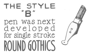 Speedball pens were invented by Hunt Corporation (or Hunt Company) which was located in Camden, NJ and later (since 1958) in Statesville, NC. The highlights of that company:
 - In 1899 C. Howard Hunt formed his own company, which he incorporated in 1901. George E. Bartol, a Philadelphia grain and commodities exporter and founder of the Philadelphia Bourse, a merchants exchange and business center, was among the first 28 shareholders. In 1903, Mr. Bartol was elected president and a director of the Company and served until 1917.
- The C. Howard Hunt Pen Company invented the smooth gliding round pointed pen, which required about 15 operations in the manufacturing. Expert cutters used cutting presses to produce almost 45,000 pens a day from rolled sheets of steel. Pictured from left, workers imprint, grind and ship 25 pens per minute.
- The C. Howard Hunt Pen Company began in this building in Camden, NJ. The factory moved to Statesville, NC, in 1958. The office moved from Camden to Pennsauken, NJ, in 1963 and then to Philadelphia in 1965. Also pictured here is Benjamin Newman, one of the expert pen makers C. Howard Hunt brought to Camden from Birmingham, England, in 1899.
- The Speedball Pen was developed and patented by sign letterer Ross F. George of Seattle. His square-tipped pen could make broad and thin lines. George took the patent to the C. Howard Hunt Pen Company in 1915.
- In 1916, George E. Bartol resigned as President of the C. Howard Hunt Company. His son George Bartol, Jr., succeeded him and was elected Vice President and then Chairman of the Board in 1926. He led the Company for 50 years. George Bartol, Jr., retired in 1969 and died in 1972 at the age of 80.
- The Hunt Company expanded and branched out. In 1997, Speedball Art Products was born, with headquarters in Statesville, NC.
[Google]
[More] ⦿
|
Stanley Davis
|
 Graduate of The Cooper Union, who was born in Brooklyn in 1938. He taught at The Newark School of Fine Arts and was art director at L. W. Frohlich in New York. Stan lives in Saugerties, NY.
 Designer of Stan Free (VGC, 1973) and the liquid font Amelia (1965, Visual Graphics Corporation). Amelia was later "stolen" by Bitstream and Linotype. Here is what Stan wrote: Bitstream and Linotype have stolen my "Amelia" font (their renditions of it are pathetic). My digitized version of Amelia and other fonts I designed are available at: highwoods@hvc.rr.com. Bio at Linotype. MyFonts site. FontShop link. Klingspor link. [Google]
[MyFonts]
[More] ⦿
|
Stefanellie Saavedra
|
Belleville, NJ-based designer of the backslanted sans serif typeface Dragged (2014). This typeface was a school project at SVA in New York. [Google]
[More] ⦿
|
Stefano Arcella
|
Type designer (b. New Jersey, 1967). He is involved in ornament design at the foundry of Charles Nix, New Fonts in New York, where he helped create Nani (2001, inspired by handpainted letterforms on the Sumatran island of Samosir, this typeface was awarded a TDC Certificate of Excellence in Typographic Design), NixRift (2001, based on W.A. Dwiggins's Eldorado), and Tuk Tuk (2001, based on lettering from the Tuk Tuk village in Sumatra). [Google]
[MyFonts]
[More] ⦿
|
Sternado Sebastien Sanon
|
Burlington, NJ-based designer of the squarish typeface Crash Override (2014). [Google]
[More] ⦿
|
Steven Haskell
|
Burlington, NJ-based graphic ddesigner. During his studies at Monmouth University, he created the brush typeface Brushed (2013). [Google]
[More] ⦿
|
Susan Johnson
|
Born in Long Island, Susan Johnson lives in New Jersey and works in Philadelphia. During her studies at Rutgers University, she designed the multiline display typeface ContrAversy (2013). [Google]
[More] ⦿
|
Tangmo Cecchini
|
 Graduate of Columbus College of Art & Design who lives in Mount Arlington, NJ. In 2016, he designed a decorative floral all caps alphabet. Behance link. [Google]
[More] ⦿
Graduate of Columbus College of Art & Design who lives in Mount Arlington, NJ. In 2016, he designed a decorative floral all caps alphabet. Behance link. [Google]
[More] ⦿
|
Tanya Padkowsky
|
Graphic designer in New Jersey who created a curly typeface in 2012. [Google]
[More] ⦿
|
Teeline Fonts
[Craig Eliason]
|
 Teeline Fonts is a digital type foundry launched by Craig Eliason (b. 1969, Houston, TX) in 2010. A professor of modern art and design history in the Department of Art History at the University of St. Thomas in Saint Paul, MN, Craig researches the history of type design, and particularly the history of its classification and vocabulary. He began designing his own fonts in 2008. Craig obtained a Ph.D. from Rutgers in 2002. Read, for example, Face the Nation: National Identity and Modern Type Design 1900-1960.
 His typefaces: - Ambicase Modern (2010), a unicase font, and Ambicase Fatface (2011).
- Flipper (2013), later renamed Backflip. Flipper won an award at the Morisawa Type Design Competition 2014.
- Cuttlefish (2021). A five-headed sans (+variable) superfamily with very different substyles called Neutral, Pragmatic, Optimistic, Luxe and Modern. He writes: Cuttlefish Pragmatic is a friendly sans in the mode of early-20th-century American Gothics. The Optimistic style is inspired by 20th-century ‘serifless romans’ that themselves took inspiration from Renaissance letters. The Modern styles are patterned after 18th-century high-contrast types, but excised of most serifs. Cuttlefish Luxe is a light and sophisticated contrasted sans. The Neutral styles are straightforward grotesques with even stroke weights.
- Plenaire (2021). A pebbled and speckled optical effect font family.
- Feneon (2021). An elegant multiline font family with possible uses as a neon font.
[Google]
[MyFonts]
[More] ⦿
|
The Netstar Fresh Fonts
[Jo the Webmistress]
|
Original free fonts by New Jersey's Jo "the webmistress" include Dorothy at the Algonquin (nice display font!), Bourbon Decay, Nini Beans, Rabbit Redux, Magic Marker, Pop Bop, SeeMyEtchings (caps), Digital Logic (pixel font), Spaple Gun, Testosterone, LALA, Toolbox Metal, Cafe Fontana, Floppy Disk, Squaresville. Truetype for PC. Alternate URL. Interview with Jo. Links. [Google]
[More] ⦿
|
The Universal Word Software
|
c/o Unipro Inc., 45 River Drive South, #105, Jersey City, NJ 07310, USA. [Google]
[More] ⦿
|
Theo Rehak
[Dale Guild Type Foundry]
|
[MyFonts]
[More] ⦿
|
Theresa Dill
|
Old Bridge, NJ-based designer of an untitled ultra-fat octagonal typeface (2014), which was completed during her studies at Brookdale Community College. [Google]
[More] ⦿
|
Theresa Scaffidi
|
Medford, NJ-based designer of Half-Pint (2013). [Google]
[More] ⦿
|
Thomas Losinski
|
New York City and New Jersey-based designer of the display typeface Wendel (2012). [Google]
[More] ⦿
|
Three Steps Ahead
[Joshua Korwin]
|
Joshua Korwin (b. 1983) is the creative director of Three Steps Ahead, which he founded in 2001 in Marlboro, NJ. Creator of the digital revival GoudyFancy (2004), an OpenType signage typeface posted on December 23, 2004, on alt.binaries.fonts and later published at MyFonts [for another digital revival of this typeface of Frederic Goudy, see Goudy Two Shoes by Canada Type]. He also created Bauer House (2006, T-26), an art deco display face. MyFonts link. Klingspor link. [Google]
[MyFonts]
[More] ⦿
|
Tim Chrepta
|
 Designer of the grotesque fonts Orbit Text and Orbit Display (2013). This was a special project for Orbit, a network company. New York City and Ledgewood, New Jersey-based graphic designer who graduated from the University of the Arts, Philadelphia.
 Under the tutelage of Andy Clymer (HFJ), he created an unnamed revival font in 2013. Behance link. [Google]
[More] ⦿
|
Tom Geismar
|
Graphic designer, b. 1931, Glen Ridge, NJ. After studying at Rhode Island School of Design and Brown University, he founded Brownjohn, Chermayeff & Geismar (which became Chermayeff & Geismar) with Robert Brownjohn and Ivan Chermayeff. His typefaces include A&S Gallatin (1986, Linotype), which was originally designed as a corporate font for Abraham & Straus, a department store based in New York. The photocomposition font A&S Gallatin was done in 1976. [Google]
[More] ⦿
|
Tom Murtagh
|
Cinnaminson, NJ-based designer of the octagonal typeface Standard (2013). [Google]
[More] ⦿
|
Travis Fantazir
|
Digital artist in Red Bank, NJ. In 2012, he created the modular typefaces Digital Sandwich, and Openface Digital Sandwich, and the art deco typeface Knuckle Sandwich. [Google]
[More] ⦿
|
Traviss Borgess
|
Ramsey, NJ-based graphic designer who made this type study in 2008. Behance link. [Google]
[More] ⦿
|
Typeology
[Robert Fauver]
|
 Typeology is the commercial foundry of Robert Fauver (b. 1978), who lives in Moorestown, NJ. His site has an on-line PDF-format type magazine that showcases new fonts, and was started in 2006. In Typeology #1 (2006), we find, e.g., 14 fonts from Dino Dos Santos René Verkaart, Damien Gosset, Marcio Hirosse, Andre Nossek, Keith Bates, Amy Conger, Jason Ramirez, Hannes Siengalewicz, Sean Kelly and Clément Nicolle.
 His early fonts were free, like the grunge ornate caps typeface Dirty Ames (2006, based on an intials typeface created by D.T. Ames in 1884), and the Broadway style typeface Quaker Shade (2009). His commercial typefaces include Holmes (2009, graffiti style) but a version of that is also at Dafont. Dafont link. Klingspor link. [Google]
[MyFonts]
[More] ⦿
|
Ursula Suess
|
 Ursula Suess was born in 1924 to German parents in Camden, NJ, and grew up in Munich, Germany, where she attended two semesters of design school at the Academy of Fine Art before it burned down during the war. She then studied calligraphy with Anna Simons for two years. She returned to America in 1946 and established herself as a graphic designer working for Oxford University Press, Macmillan Co., Harper, and other publishers. She also taught calligraphy for 20 years at the Westchester Art Workshop, and at the Cooper Union in New York City. In her fifties, she learned to cut gems and became a gem carver. She moved to Green Valley, AZ, in 1998, and has been applying her artistic versatility with clay, water-color and acrylics. In 1972 she designed Book Jacket Italic, one of film type era's most famous typefaces [copied by Phil Martin as Bagatelle]. In 2010, with the help of Patrick Griffin, she released the revised and expanded digital version through Canada Type. At VGC, she also made Rotalic (two weights).
 Klingspor link. [Google]
[MyFonts]
[More] ⦿
|
Vokei Artz
|
Graphic designer in Newark, NJ, who made Arial Fuzion (2010). [Google]
[More] ⦿
|
Von Type
[Patrick VonSpreckelsen]
|
Galloway and/or Absecon, NJ-based designer of the squarish all caps typeface Soltz (2017), and the eerie alchemic typeface Carpathia (2017). In 2018, he designed Porterhaus and the Western typeface Gunslinger. [Google]
[More] ⦿
|
William F. Capitain
|
Punchcutter, b. 1851, Southgate, UK. Picture. In 1865, he went to Flinsch in Frankfurt to study punchcutting with William Kirkwood. Then he left for Chicago, and became American. His later work was done while he lived in Bayonne, New Jersey. His typefaces, often quite ornamental and/or Victorian, were all done at Marder, Luse & Co, except Adtype (+Italic) (1903, ATF), Lithograph Shaded (1914, ATF, with Morris Fuller Benton), an unnamed typeface patented by ATF in 1916, and Alfereta (ca. 1897, Crescent Type Foundry: Alfereta by Dan X. Solo is a digital revival). Google patent link. On Adtype, Mac McGrew writes: Adtype is a square-serif typeface patented in 1903 by W. F. Capitaine and introduced by ATF. An early example of this sort of square-serif letter, it is distinguished by its high-waisted R and unusual g. Compare Adstyle, John Hancock, Bold Antique, Contact Bold Condensed. Figures and some other characters are narrower in the Monotype cutting shown, which was produced about 1912. The italic is inclined an extreme 24 degrees. One of the revivals is Capitaine (2019, Letters from Sweden), which the Swedes descrive as a good-humoured slab serif. The Marder, Luse typefaces by date: - 1877: Parallel Shaded.
- 1881: Ladies Hand Script.
- 1885: Critic, Fancy Grotesque, Octagon, Pencillings.
- 1886: Hiawatha, Parthenian, Roumanian, Spartan.
- 1887: Georgian, Utopian [image].
- 1888: Lithotint, Trinal 1, 2 and 3.
- 1889: Banquet, Caxton Old Style, Caxton Italic.
- 1890: Ebony. This typeface was revived in 2011 by Claude Pelletier as a free font.
- 1891: Diagonal Card Black.
- 1894: Caxton Old Style Bold.
- 1895: Circular Gothic, Circular Italic.
Patents of various typefaces in PDF format: 1885, 1885, 1885, 1886, 1886, 1886, 1887, 1889. [Google]
[MyFonts]
[More] ⦿
|
William Leavenworth
|
New York-based inventor (with A.R. Gillmore) of the pantograph, which allowed fast and accurate copying of wood type, in 1834. He enters into a partnership with his father in law, J.M. Debow, to manufacture wood type commercially in Allentown, NJ. Production starts in 1836 under the supervision of E.R. Webb. George Bruce buys out Leavenworth and Debow and sells it to E.R. Webb, who promptly goes into a partnership with Darius Wells in 1839, at which time Wells&Webb was formed. Specimen of Leavenworth's Patent Wood Type Manufactured by J.M. Debow (1840s) is on-line at the NYPL. Digital revivals include Poplar (1990) by Barbara Lind at Adobe, and Gothic Leavenworth (Wooden Type Fonts). [Google]
[More] ⦿
|
William Spanjer
[Spanjer Brothers Inc]
|
[More] ⦿
|
William W. Jackson
|
Prolific type designer, b. Camden, NJ, in 1847. He died in 1898 in Atlantic City, NJ. Many of his designs are late Victorian and art nouveau. As a punch cutter, engraver and type designer. He created typefaces for MacKellar, Smiths & Jordan, Barnhart Brothers & Spindler, Bruce Type Foundry, Central Type Foundry, Farmer Little & Co (later A.D. Farmer & Sons), Keystone Type Foundry, and ATF. His typefaces: - At A.D. Farmer&Son: Abbey No. 2 (ca. 1886), Flirt (ca. 1886), Horizontal Shaded (1883), Ivy Script, Law Hand (1883), Lockwood (1893), Stationers Script (before 1890).
- At Keystone Type Foundry: Ancient Gothic (1891), Gothic Script (1891). Ancient Gothic was revived as Vasari NF (2011, Nick Curtis).
- At MacKellar, Smiths&Jordan: Aquatint (1878), Cabalistic (1879), Cadmus (1887), Campanile (1879), Cimmerian (1882), Circular Script (1883), Cruickshank (1886: for a digital version, see Cruickshank ML (2012, Tom Wallace)), Eastlake (1879), Edson (1881), Fancy Gothic (1883), Fresco (1883), Graphic Text (1883), Jenson (1890), Kitcat or KitKat (1883), Koster Initials (1888), Medallic (1884), Mezzotype (1890), Monkish (1884), Myrtle Script (1885), Parsee (1888), Philadelphian Lining Gothic 6 (before 1896), Ripple Text (1878), Roundhead (1883; elsewhere we read that Roundhead is by Charles Beeler), Ruskin (1880), Title Black Shaded (1881), Typo (1891), Unique Celtic (1889). See also this art nouveau typeface from 1886, this script from 1883 and these ornaments from 1979. Other unnamed typefaces at MacKellar: 1878, 1883, 1879, 1882, 1883, 1883, 1888, 1890, 1879.
- At Barnhart Brothers&Spindler: Grace Script (1889), Radial Italic (1885), Standard Script (1887), Umbra (1887). This famous shaded typeface has been copied tens of times. Umbra (1907) was revived by Nick Curtis as Shady Lady NF (2005). Monotype's Umbra is based on a later metal version by Ludlow though. List of digital typefaces based on Umbra.
- At Bruce Type Foundry: Ornamented No. 515 (1876), Ornamented No. 1063 (1879), Ornamented No. 1547 (1875). Images of some typefaces at MacKellar: 1875, 1878.
- At Dickinson Type Foundry: Phinney Script.
- At Central Foundry: Steelplate Script (1888). Mac McGrew: Steelplate Script was advertised by ATF in 1907 as "equal to copperplate printing." It originated with Central Type Foundry in 1888. It is a very delicate traditional connected script, suggestive of nineteenth-century styles. The lowercase is quite small, but in 24-point there is an alternate lowercase font which is smaller yet. For digital revivals, see, e.g., Steelplate Script (2015, Gearwright). Geometric Condensed (with W.W. Jackson, 1882) was revived in 2014 by Robert Donona.
Google patent link. Klingspor link. Another MyFonts link. Klingspor link. [Google]
[MyFonts]
[More] ⦿
|
Yianna Stylianou
|
Senior graphic designer in Hillsborough, NJ. Creator of the grotesk sans typeface Imperfection (2013). [Google]
[More] ⦿
|
Yiu Tung Ho
|
 Graphic designer in Princeton, NJ. He wrote a short PDF file on Peignot. In doing so, he created his own derivation, Peignot Atypical. [Google]
[More] ⦿
Graphic designer in Princeton, NJ. He wrote a short PDF file on Peignot. In doing so, he created his own derivation, Peignot Atypical. [Google]
[More] ⦿
|
Zachariah Nelson
[I Can Be Your Type]
|
[MyFonts]
[More] ⦿
|
Zachary Manning
|
Designer (b. New Jersey, 1991) of the rounded geometric sans display typeface Level (2016). Dafont link. [Google]
[More] ⦿
|


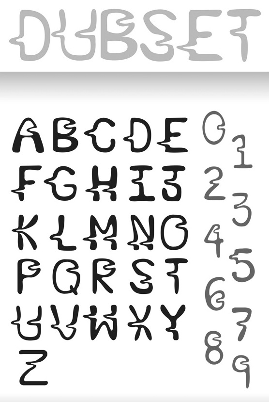
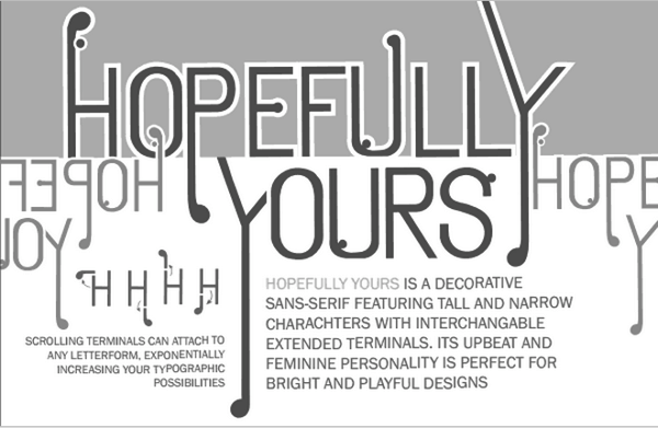
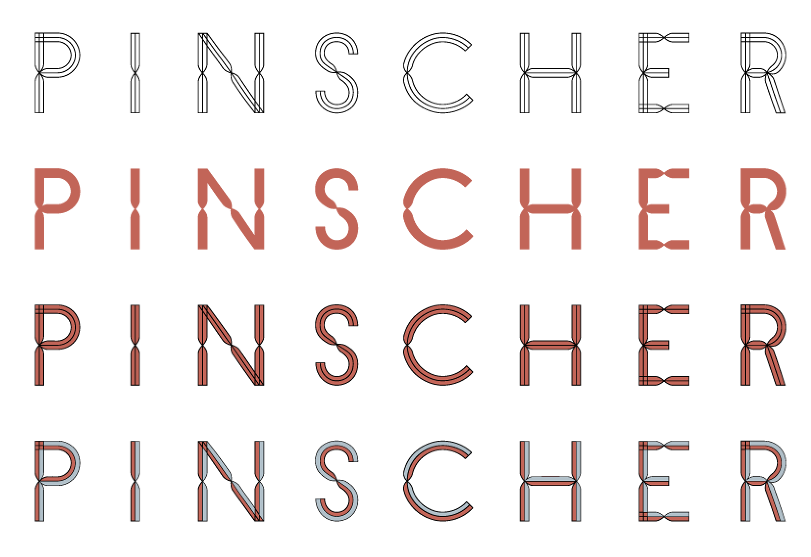
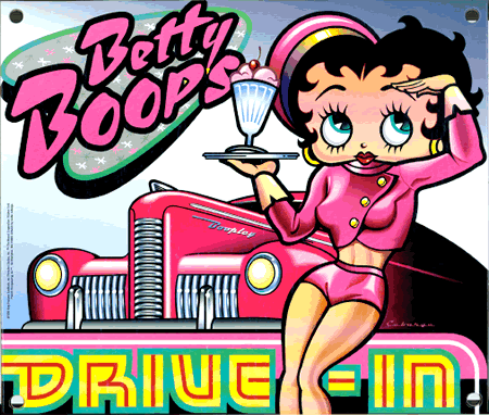
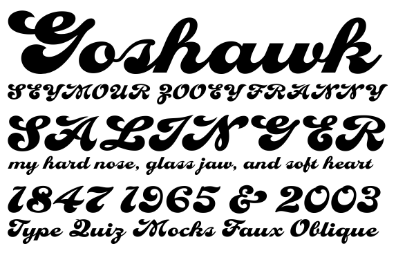
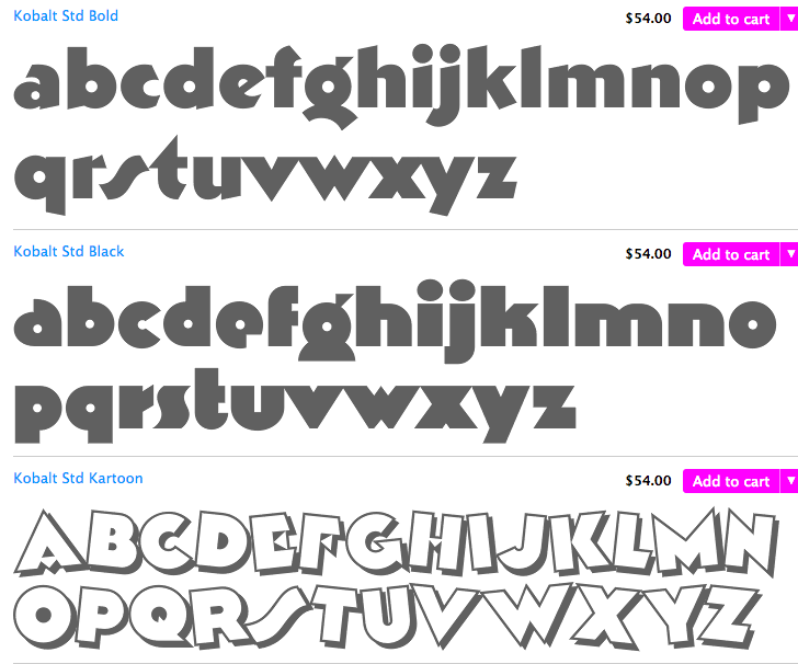
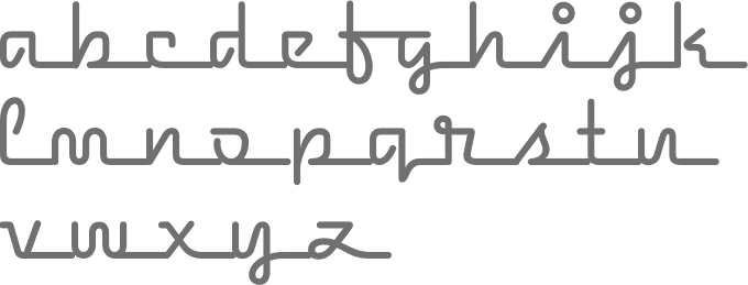
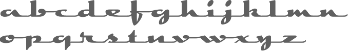
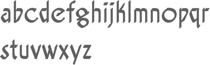
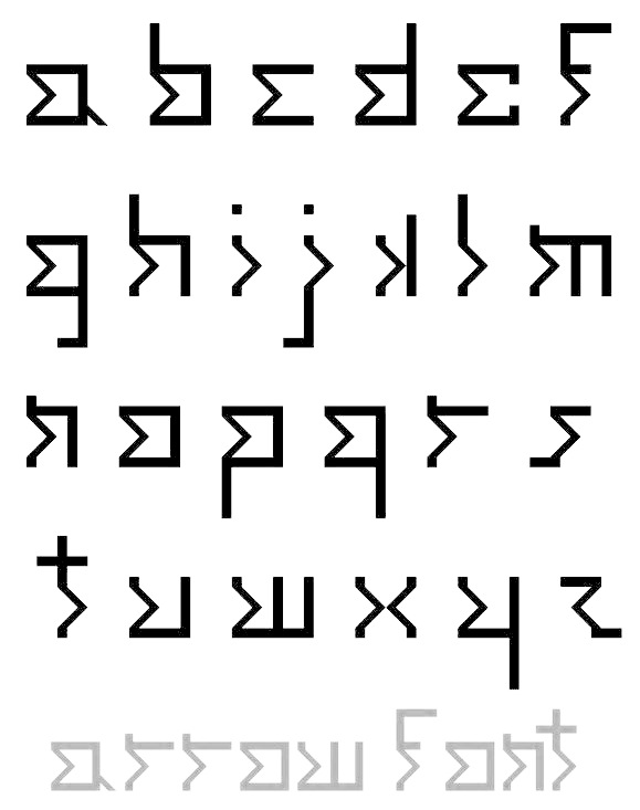
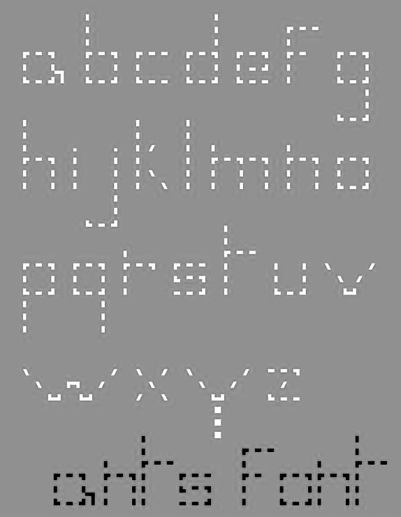
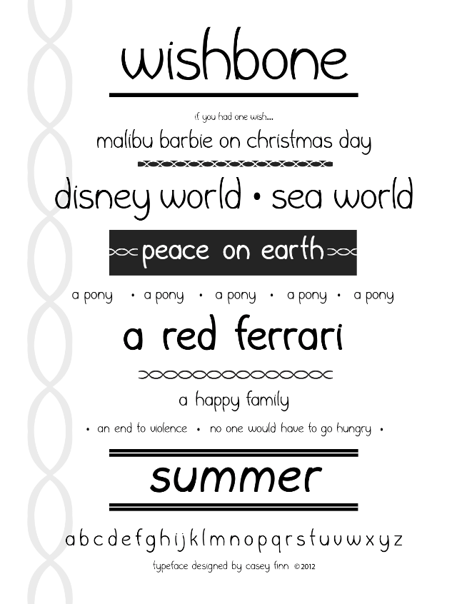
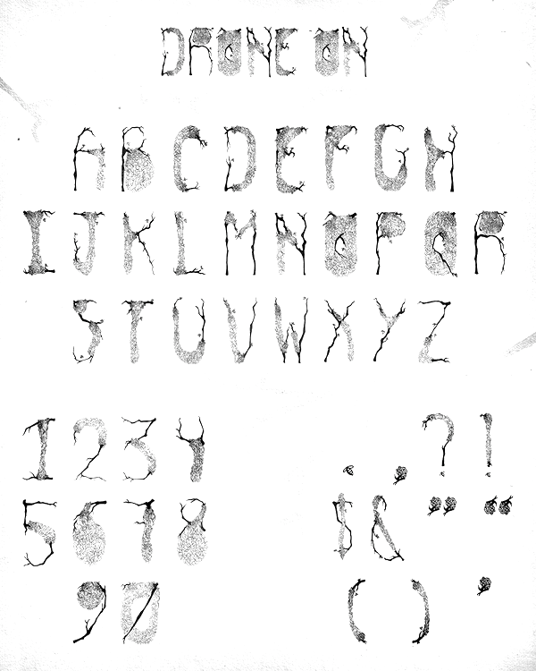
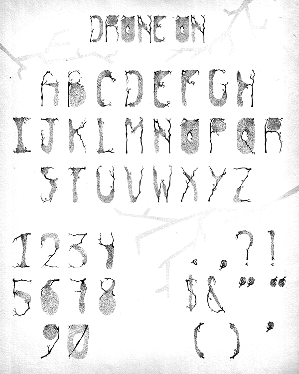
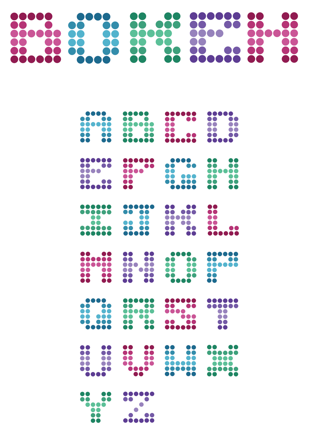
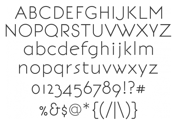
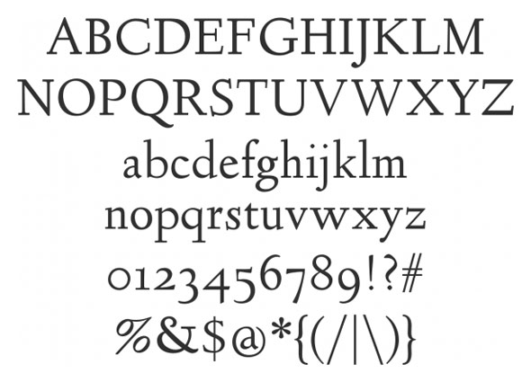
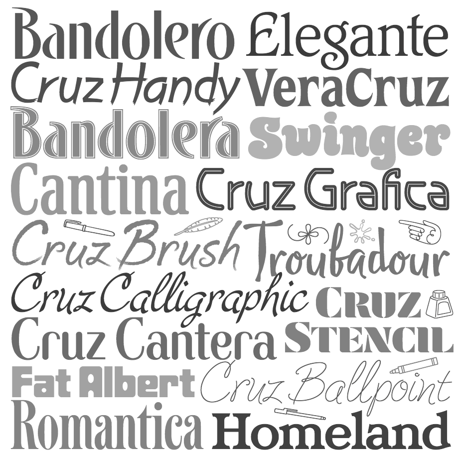
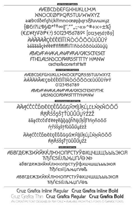
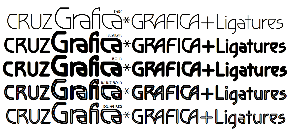
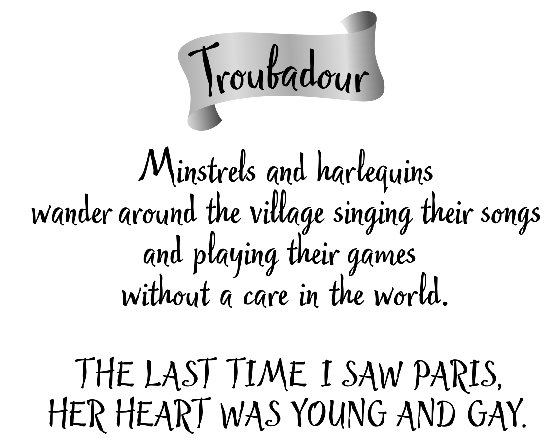
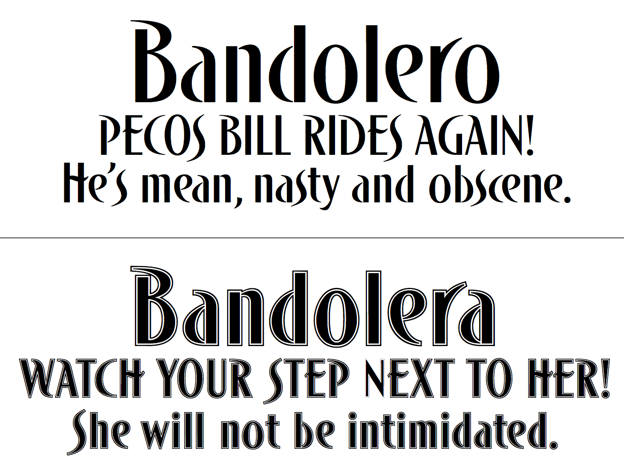
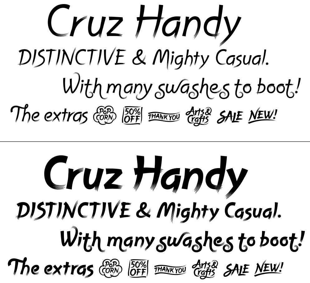
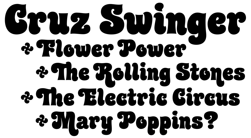
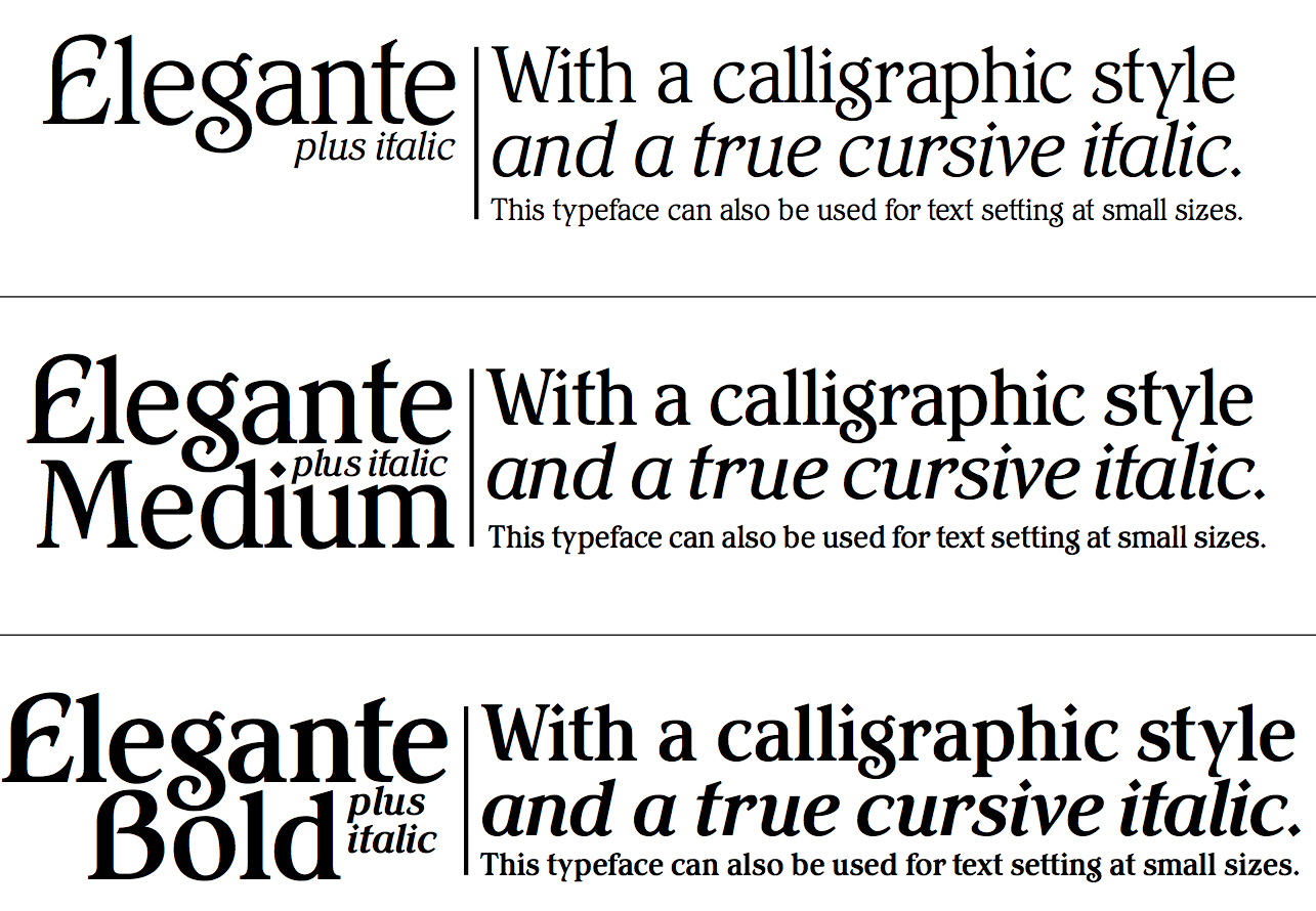
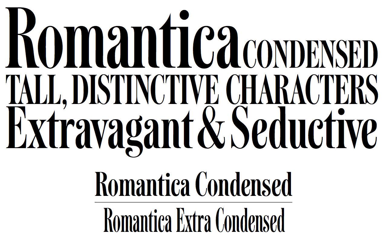
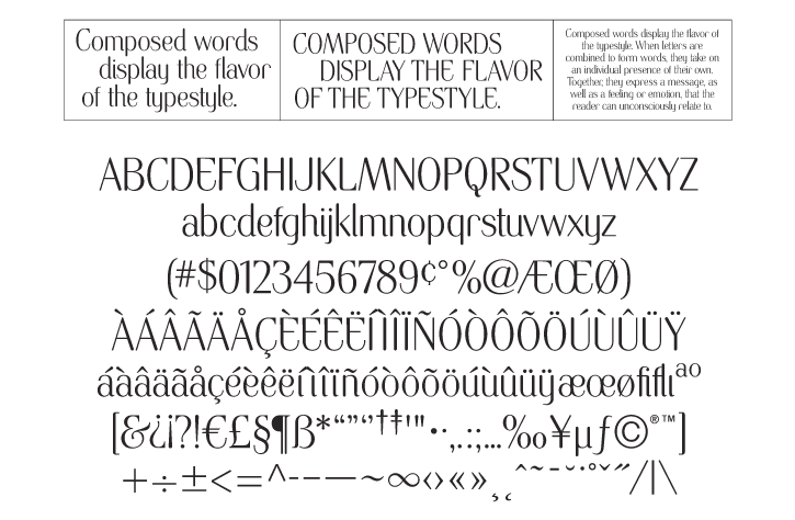
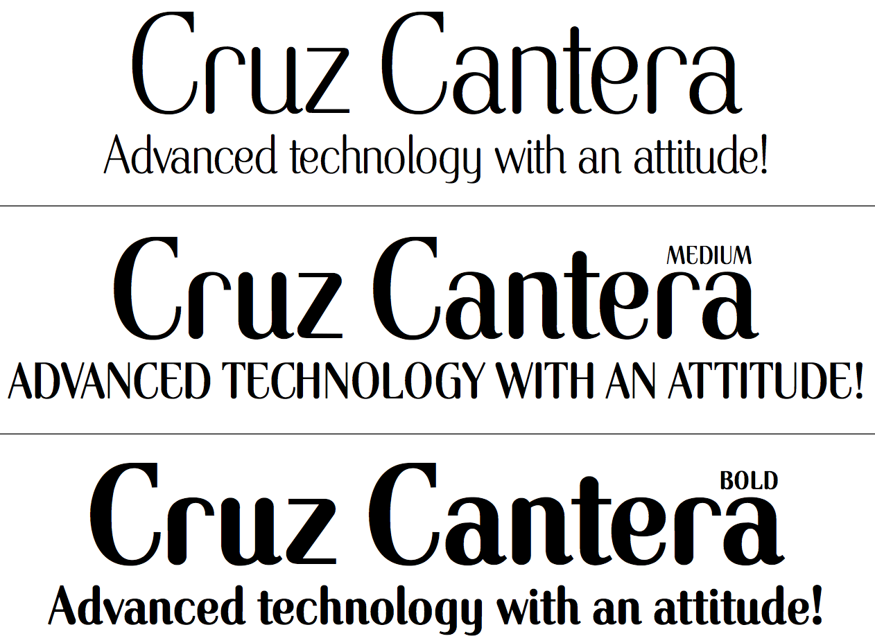
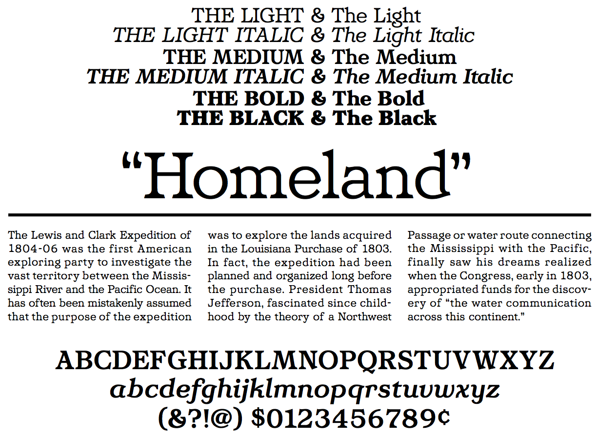
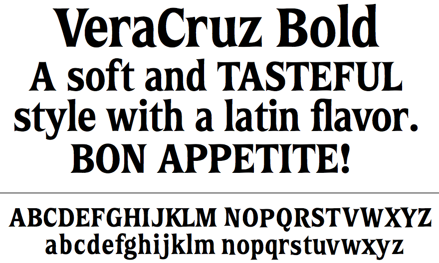
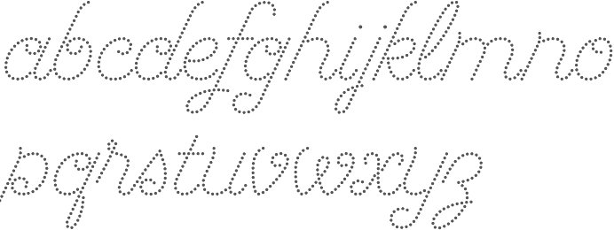
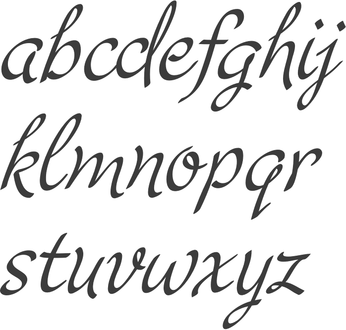
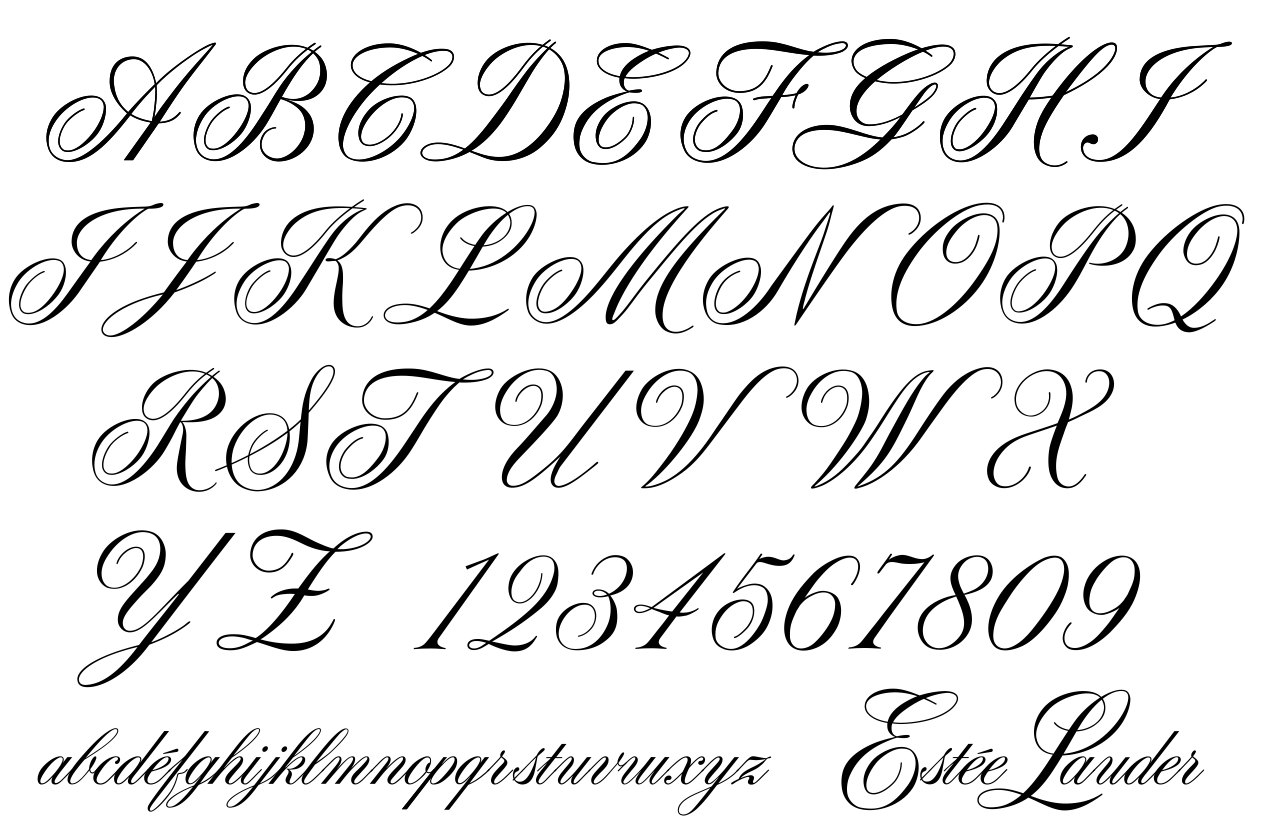
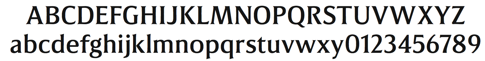
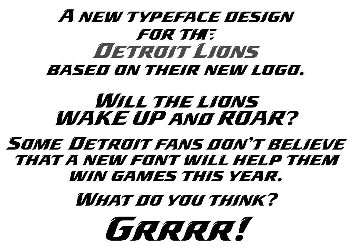
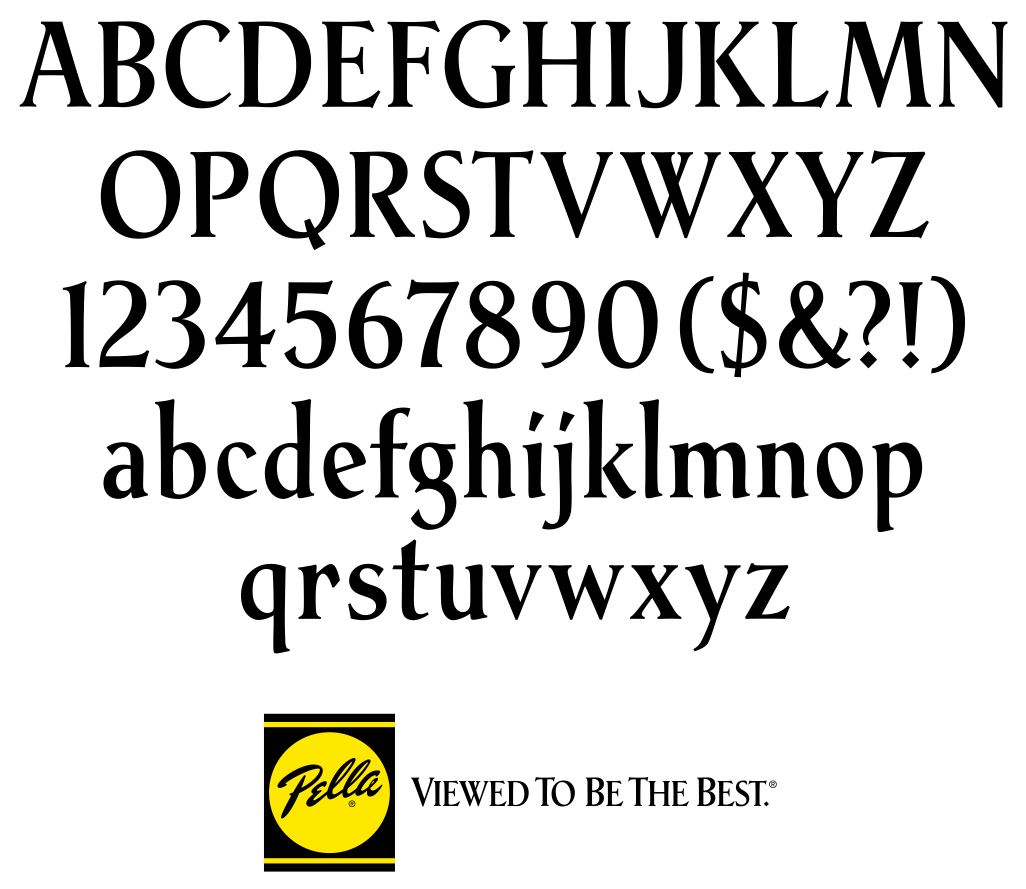
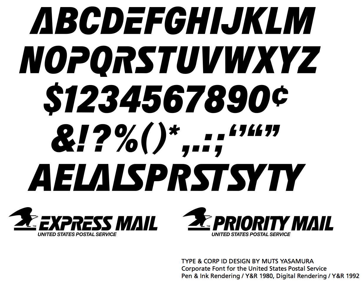
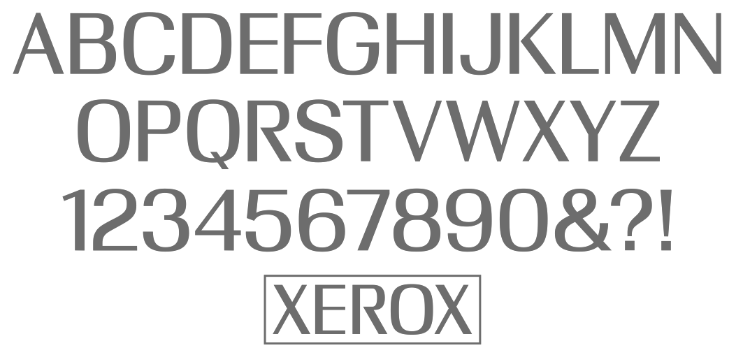
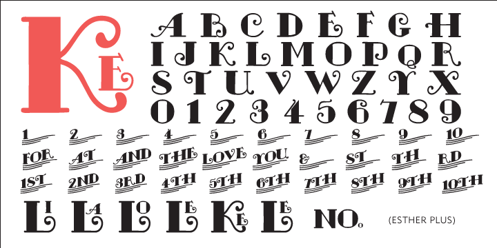
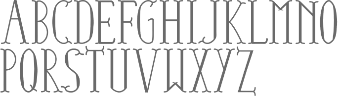
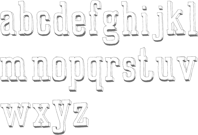
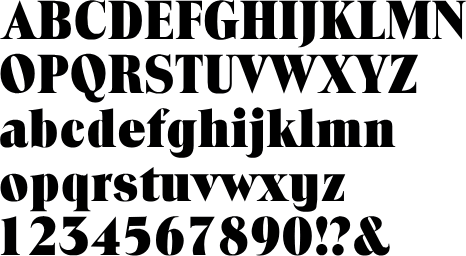
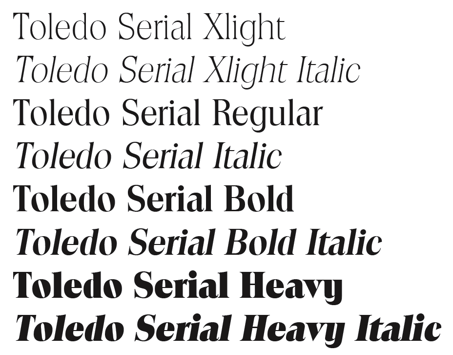
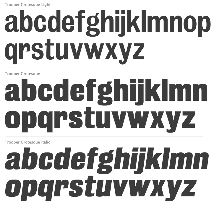
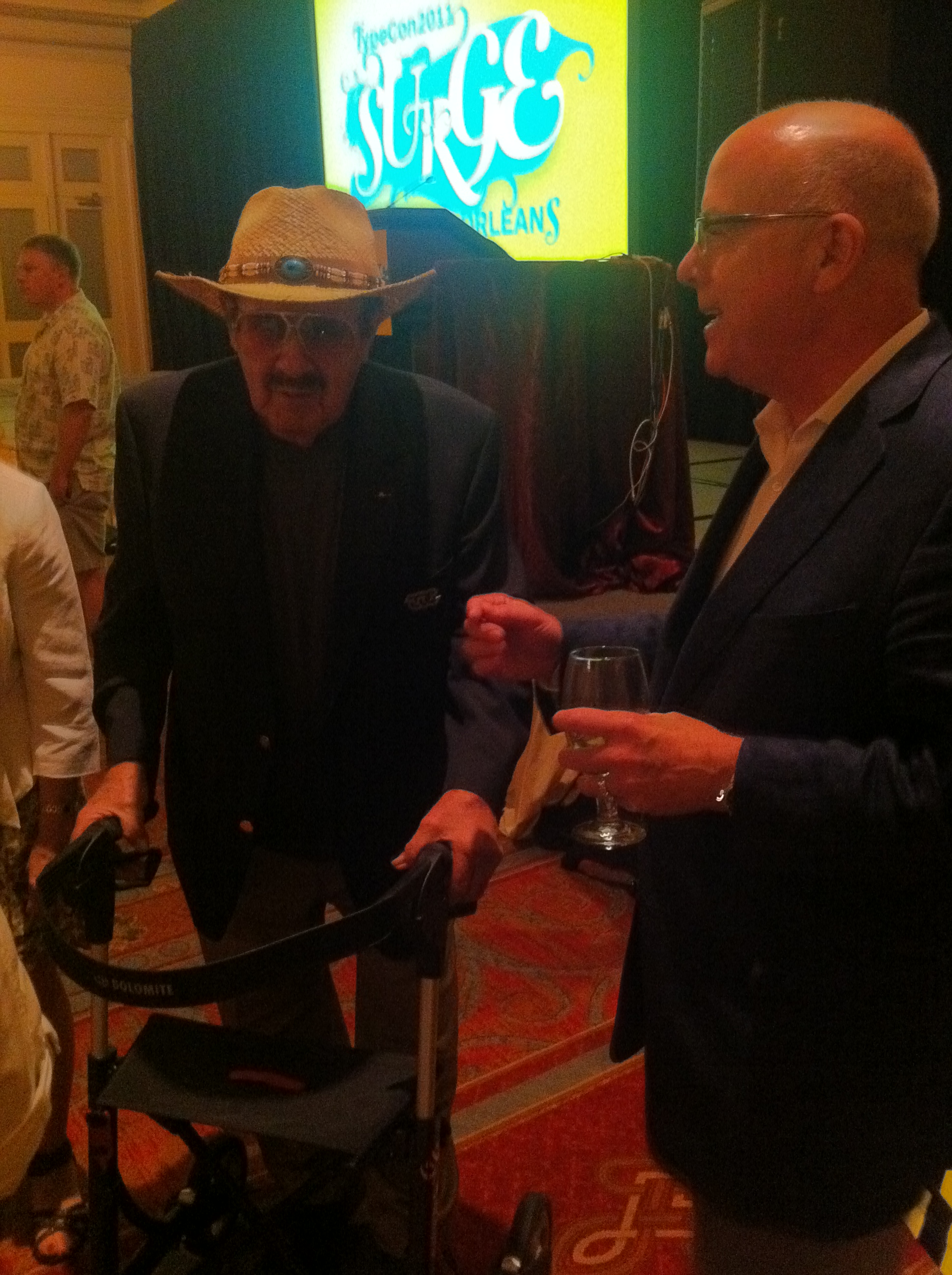
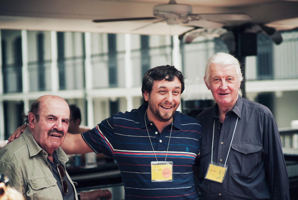
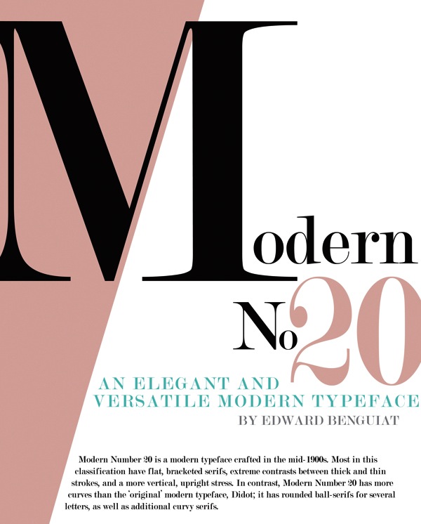
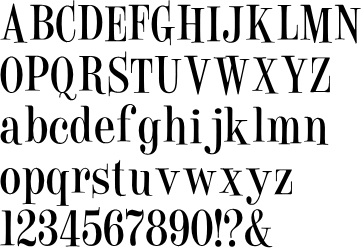
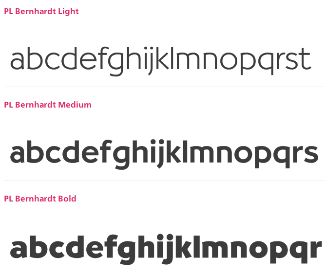
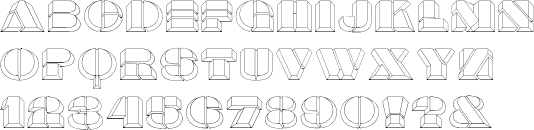
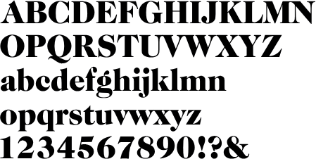
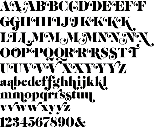
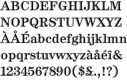
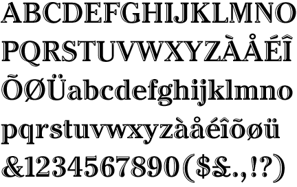
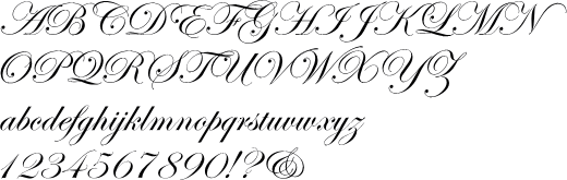
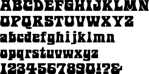
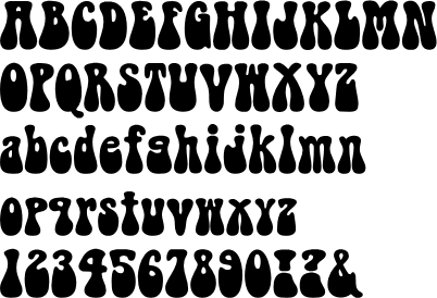
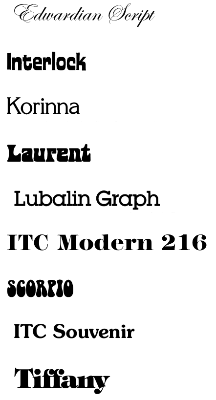
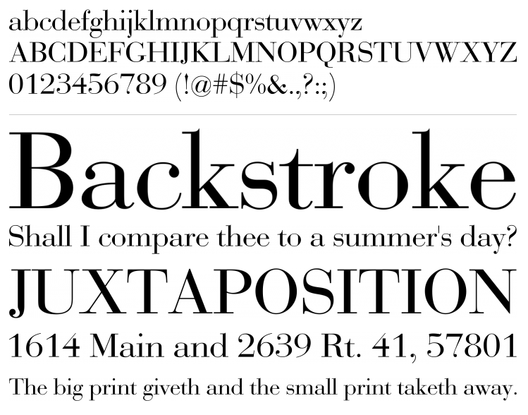
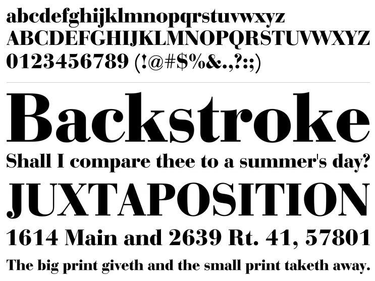
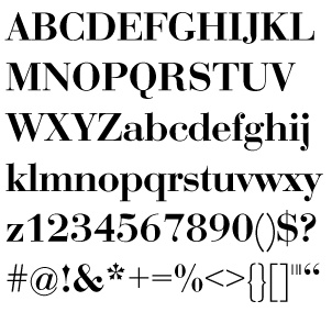
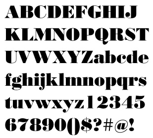
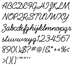
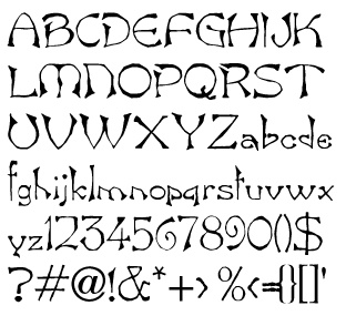
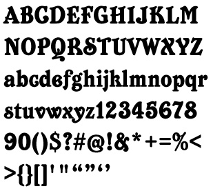
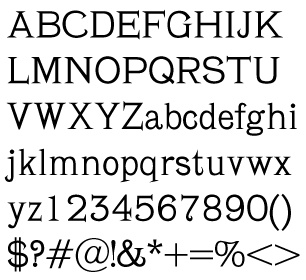
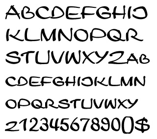
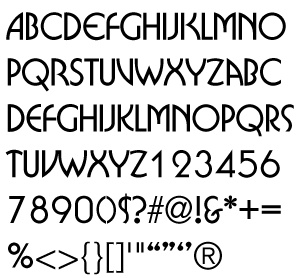
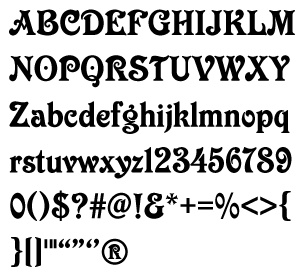
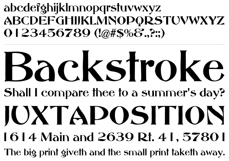
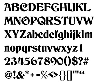
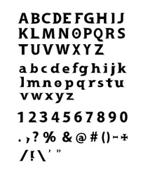
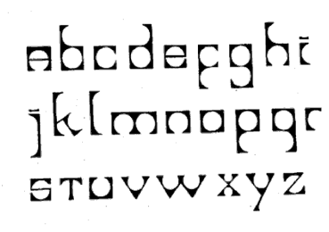
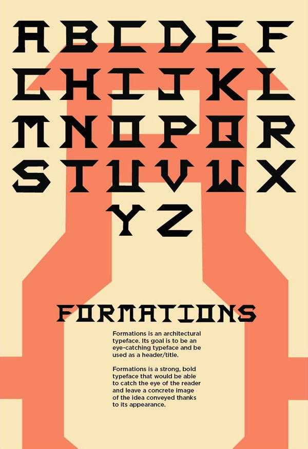
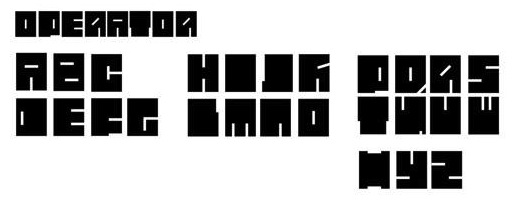
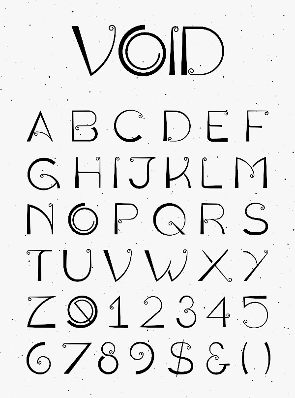
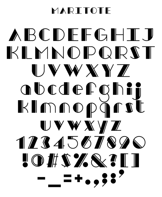
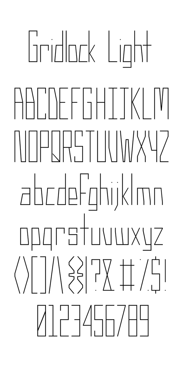
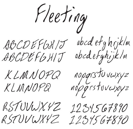
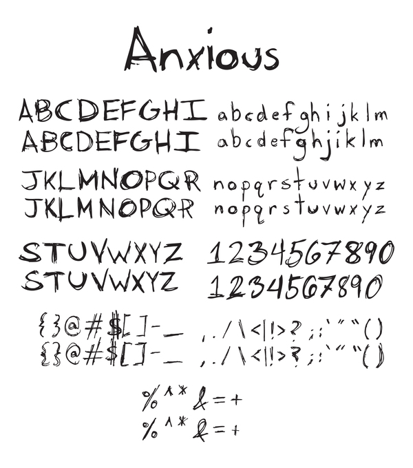
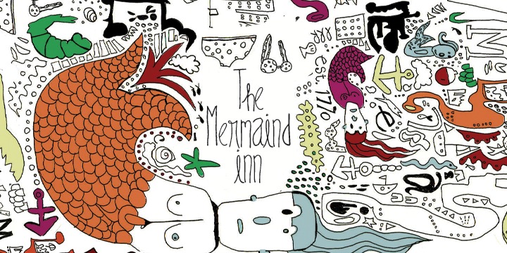
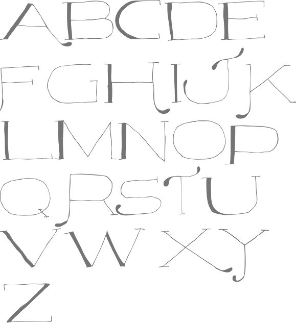
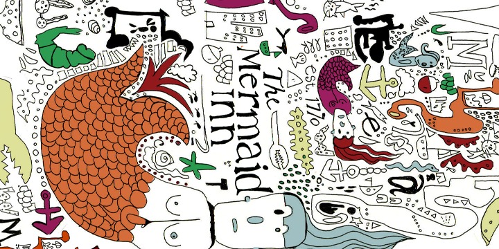
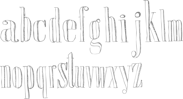
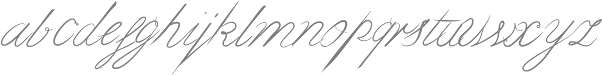
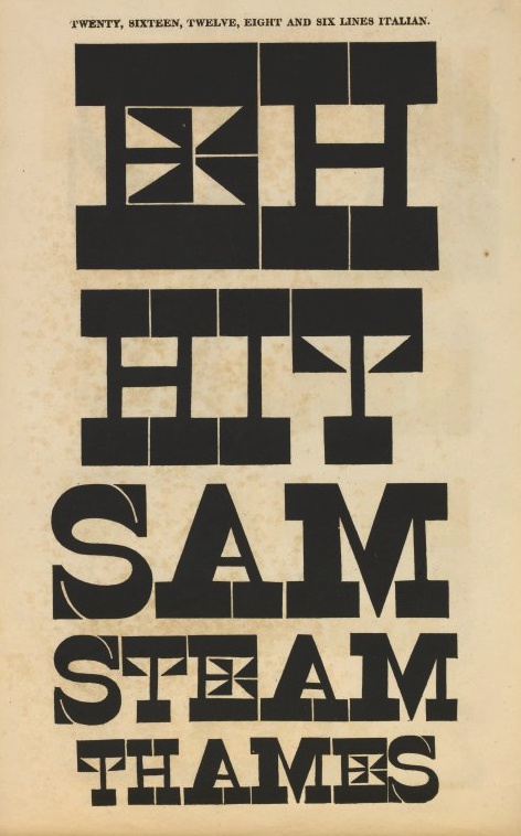
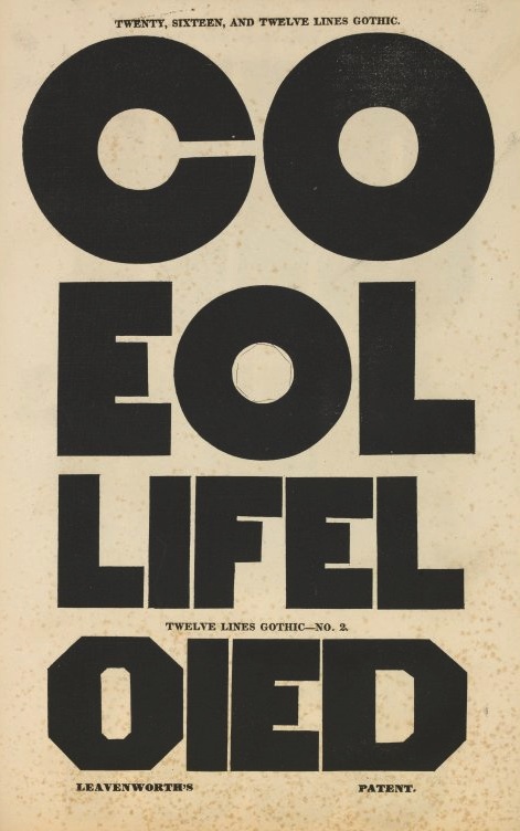
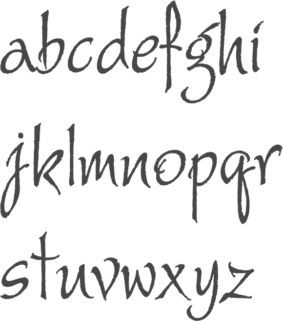
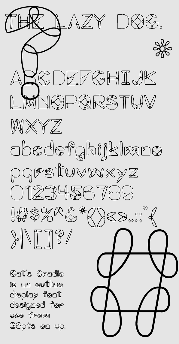
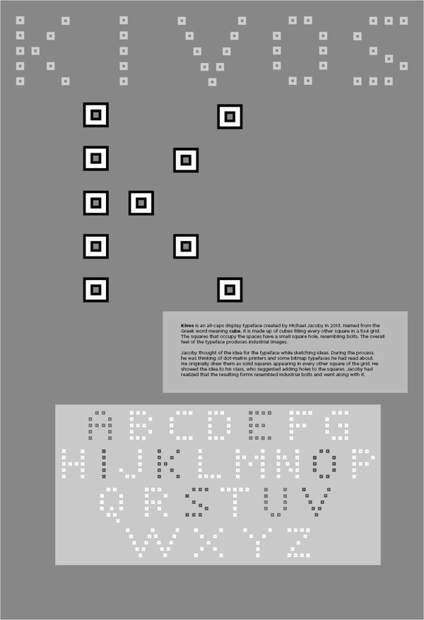
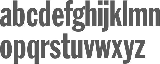
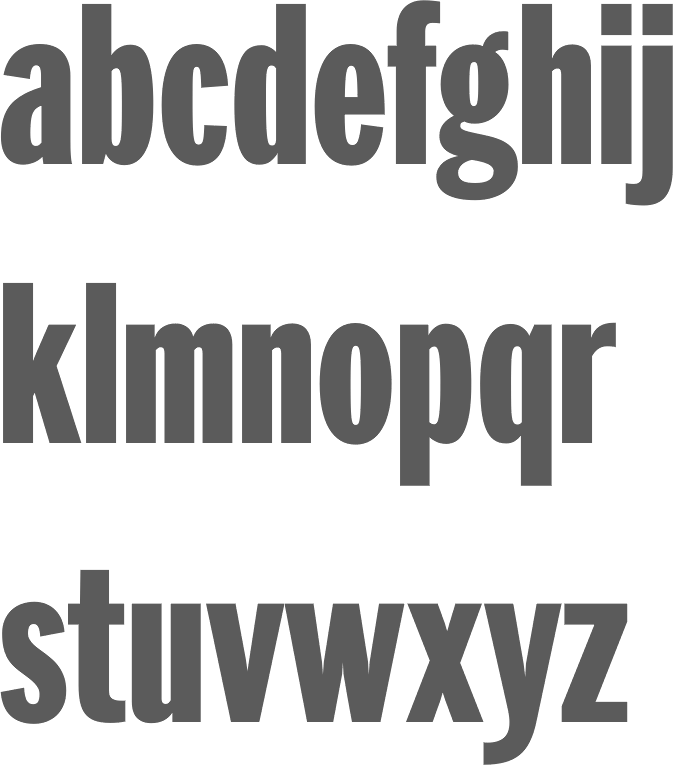
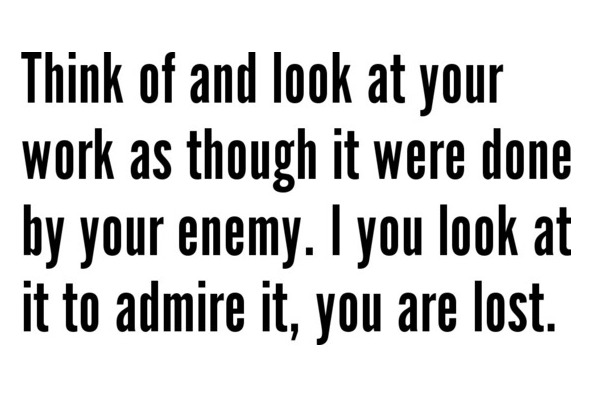
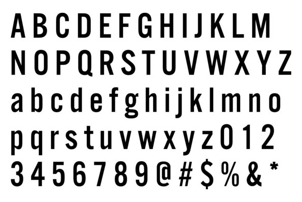
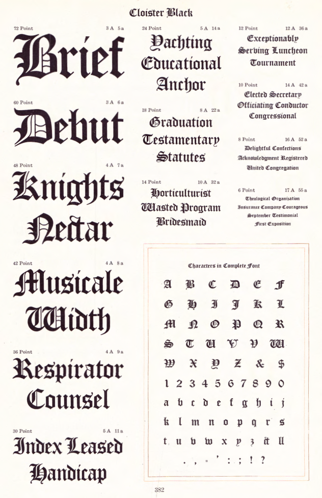
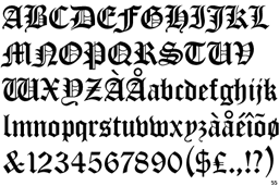
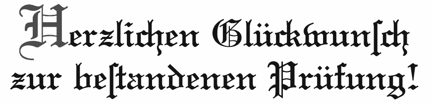
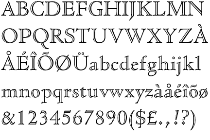
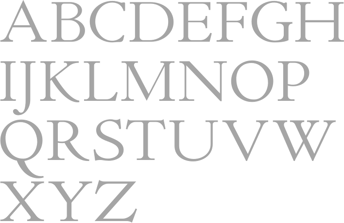
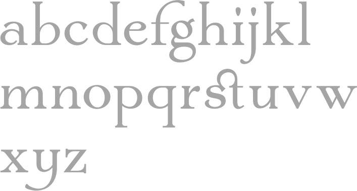
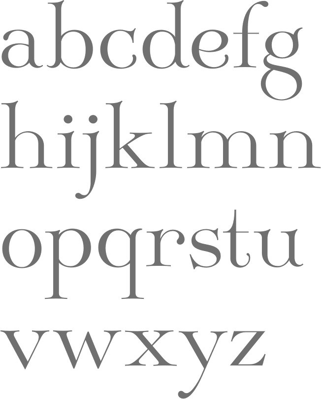
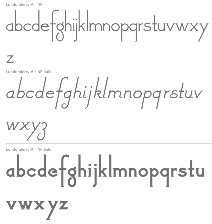
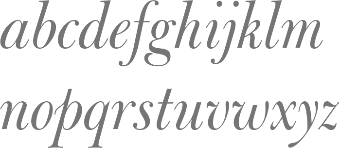
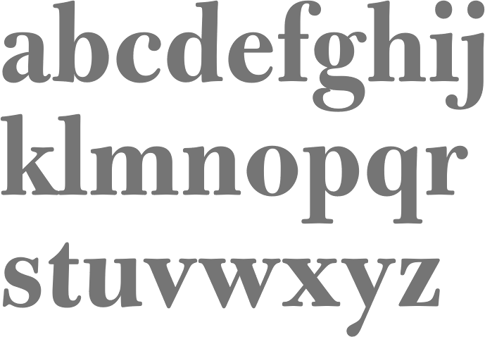
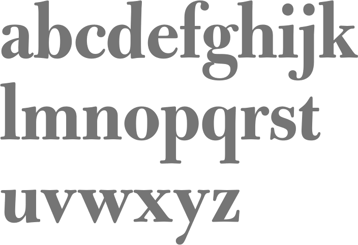
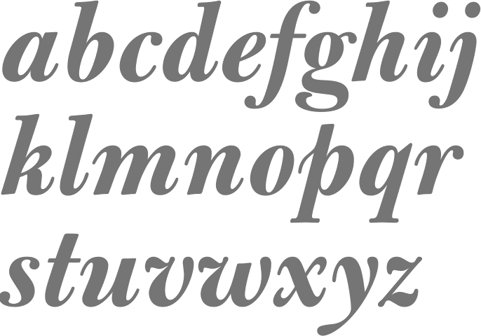
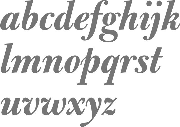
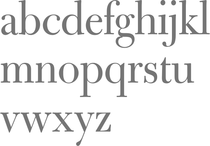
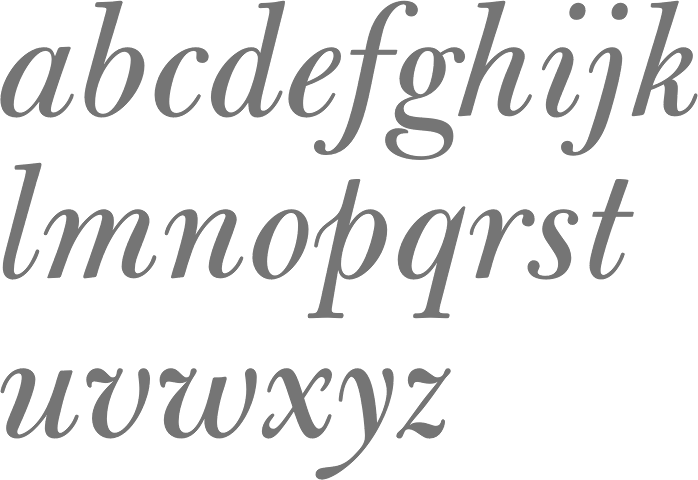
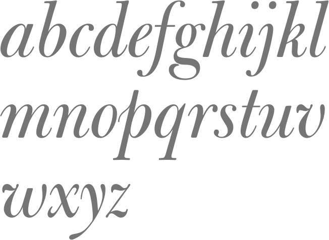
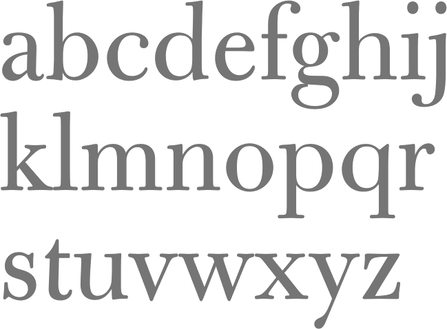
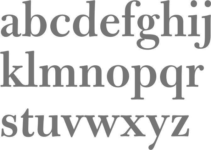
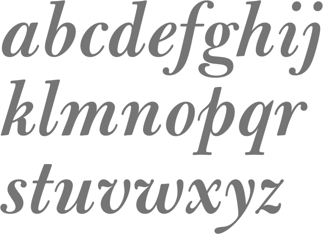
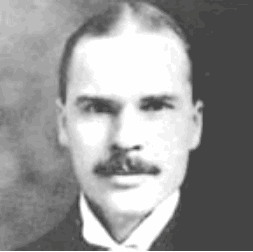
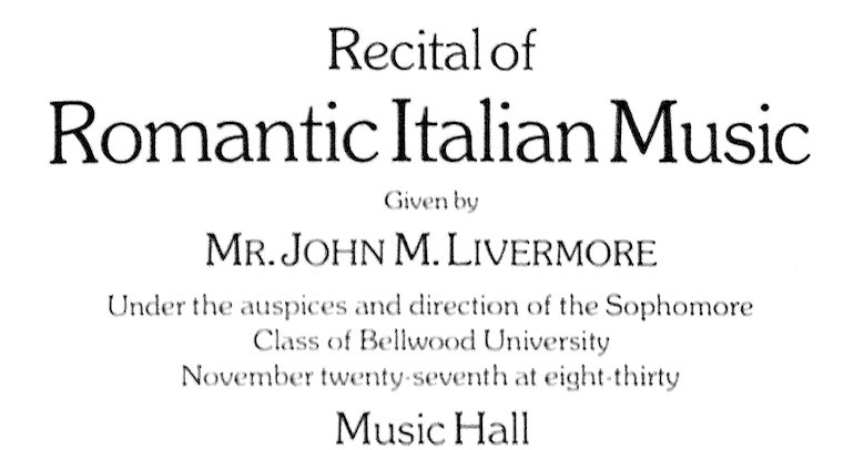
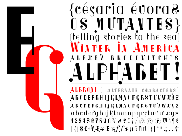
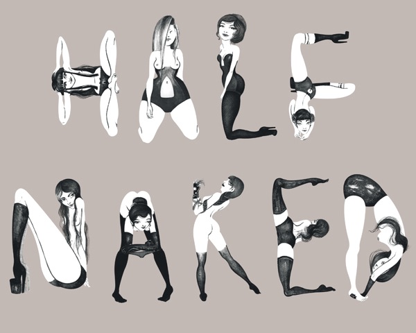
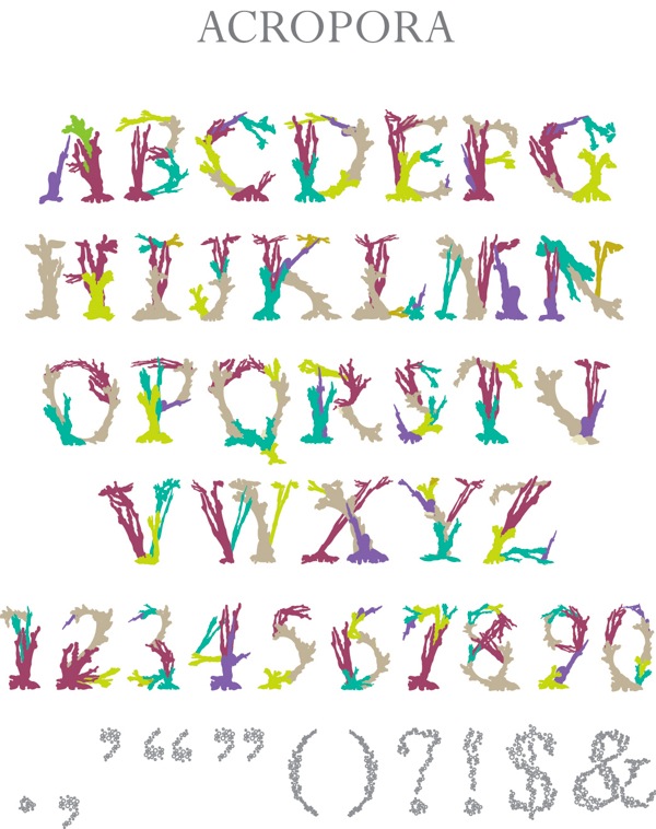
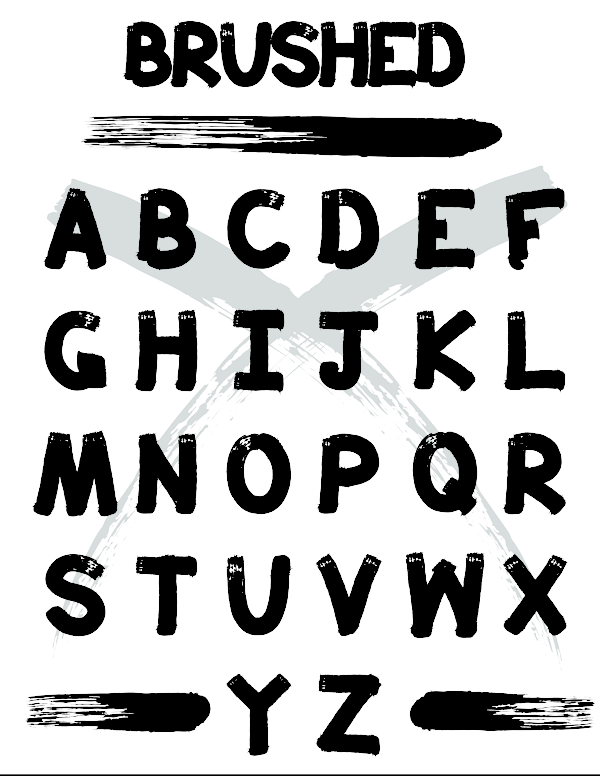
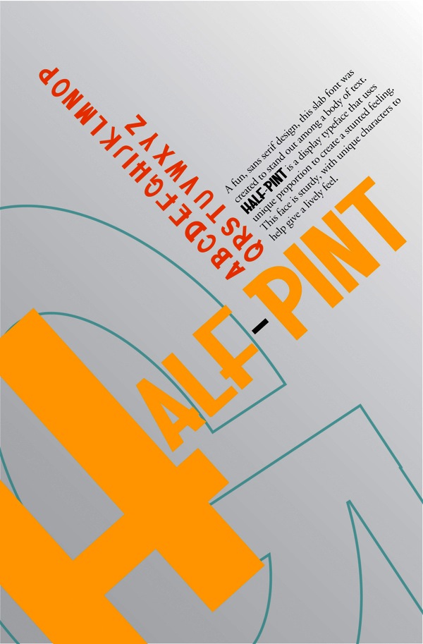
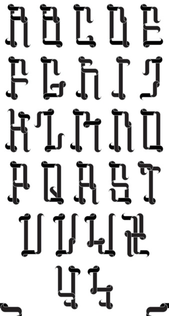
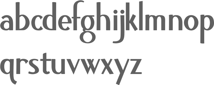
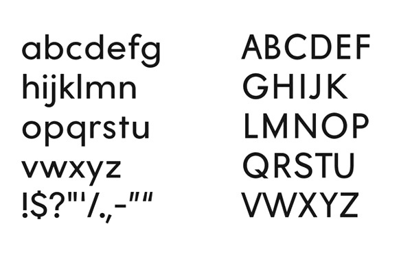
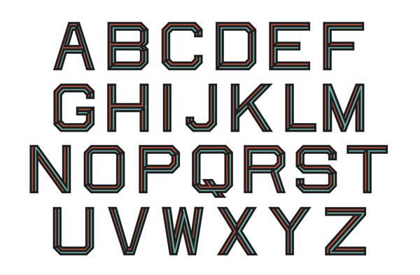
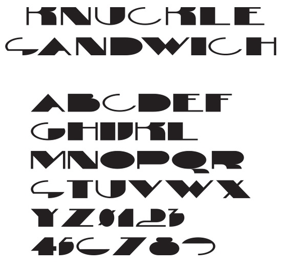
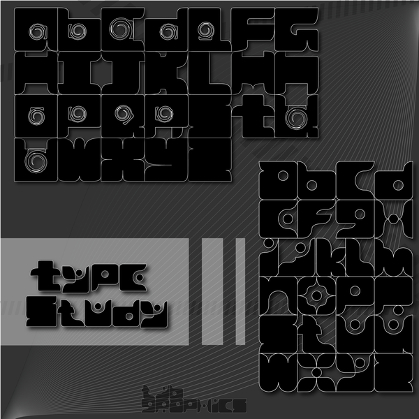
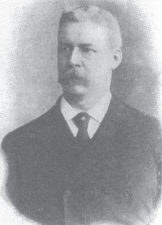
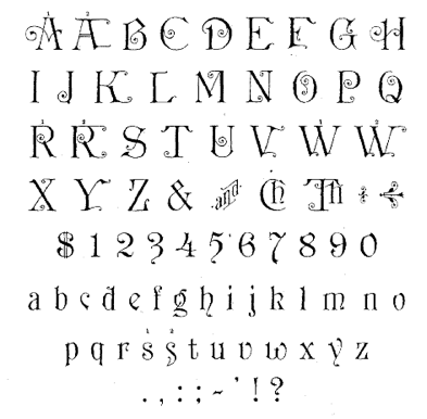