TYPE DESIGN INFORMATION PAGE last updated on Wed May 6 15:49:49 EDT 2026
FONT RECOGNITION VIA FONT MOOSE

|
|
|
|
|
Type scene in Texas | ||
|
|
|
|

SWITCH TO INDEX FILE
Texan designer of several series of handcrafted typefaces. The names of the typefaces start with PB. [Google] [More] ⦿ | |
Aaron D. Schmiedel
| |
Digital artist from Las Cruces, NM, who used perpendicular line segments to make CiCi (2012). A font for cemeteries? He is now based in Houston, TX. Behance link. [Google] [More] ⦿ | |
Dallas, TX-based designer of the art deco typeface Forte (2016). [Google] [More] ⦿ | |
Judy Litt at QuaLitty Design in Austin discusses typography, and provides links to font sites and font software, and offers general advice on all things typographic (hinting, font choice, font editors, etcetera). Faulty web page. [Google] [More] ⦿ | |
| |
Houston, TX-based designer of a thin custom stencil typeface in 2017. Behance link. [Google] [More] ⦿ | |
During his studies in Austin, TX, Adam Chavis designed a wiry typeface (2013). [Google] [More] ⦿ | |
Houston, TX-based graphic designer who designed the pixel / video game typeface Robocat in 2018. [Google] [More] ⦿ | |
AFS Ltd
| Alex, Chaya, Rashi, Ruth Fancy and Tzipporah (1992) are free Hebrew fonts made in 1992 by Aaron D. Schmiedel at AFS Limited: 7815 La Cabeza, Dallas, TX 75248. Download here. [Google] [More] ⦿ |
Dallas, TX-based designer of the handcrafted typefaces Handwritten, Scratch and Traffiti. Behance link. [Google] [More] ⦿ | |
Alex Cottles
| |
During his studies at Texas State University in San Marcos, TX, Alexander Aydelott created a pixel typeface in 2015. [Google] [More] ⦿ | |
In 2014, he published the prismatic typeface Maquinista, which can be bought at Hype For Type. It won an award at Tipos Latinos 2014. Winner at Tipos Latinos 2018 of a type design award for Isografia. In 2015, together with Michelle Benaim Steiner, he co-founded In-House International Design in Austin, TX. In 2020, he released Troptical (a 48-style prismatic or op-art typeface), and he co-designed Ragtag (a ragtag of capitals) with Rodrigo Fuenzalida for In-House International. In 2020, Rodrigo Fuenzalida, Alexander Wright and Michelle Benaim Steiner co-designed the exaggerated reverse stress (or: Italian) typeface Pata Slab at In-House International. All uppercase characters were built to fit precisely inside a square, so they are all the same width and height. In 2022, Rodrigo Fuenzalida and Alexander Wright published the decorative angular typeface family Broker at In-House International. HypeForType link. [Google] [MyFonts] [More] ⦿ | |
| |
Dallas, TX-based designer of the square-shaped typeface Chunky (2019). [Google] [More] ⦿ | |
Dallas, TX-based designer of the hexagonal typeface Marquis (2017). [Google] [More] ⦿ | |
| |
Alphabet Innovations International -- TypeSpectra (Was: MM2000)
|
Phil established Alphabet Innovations International in 1969 and TypeSpectra in 1974, and designed most of his 400 typefaces (read: film fonts for use in the VGC Photo Typositor) there: Agenda (1976), Americana (1972), Arthur (1970, by Roc Mitchell), Aurora Snug (1969), Avalon (1972), Baskerville (1969), Beacon (1987), Bluejack (1974), Borealis (1970, by Roc Mitchell), Britannic (1973), Bulletin (1971), Celebration (1969, by Roc Mitchell), Century S (1975), Cheltenham (1971), Clearface (1973), Cloister (1975), Corporate (1971, by Roc Mitchell), Corporate Image (1971, by Roc Mitchell), Courier B EF (2004, originally done at Scangraphic), Didoni (1969, a knock-off of Pistilli Roman with swashes added), Dimensia and Dimensia Light (1971, by Roc Mitchell), Dominance (1971), Egyptian (1970), Eightball (1971, some report this incorrectly as a VGC face, which has a different typeface also called Eightball: it was digitized by FontBank as Egbert. Alphabet Innovations' Eightball had other versions called Cueball and Highball, and all three were designed by George Thomas who licensed them to AI), Fat Chance (Rolling Stone) (1971), Fotura Biform (1969), Franklin (1981), Garamond (1975), Globe (1975), Goudy (1969), Harem (1969, aka Margit; digitized and revived in 2006 by Patrick Griffin and Rebecca Alaccari as Johnny), Helserif (1976---I thought this was created by Ed Kelton; anyway, this typeface is just Helvetica with slabs), Helvetica (1969), Introspect (1971, revived in 2012 by SoftMaker as Looking Glass, and by Castcraft as OPTI Looking Glass), Jolly Roger (1970, digitized in 2003 by Steve Jackaman at Red Rooster; Martin says that Jolly Roger and Introspect are his two most original designs), Journal (1987), Kabell (1971), Kabello (1970), King Arthur [+Light, Outline] with Guinevere Alternates (1971, by Roc Mitchell), Legothic (1973), Martinique (1970), Mountie (1970), News (1975), Palateno (1969), Pandora (1969), Pazazzma (1980), Perpetua (1969), Plantin (1973), Polonaise (1977; digital version by Claude Pelletier in 2010, called Chopin Script), Primus Malleable (1972), Quaff (1977), Quixotic (1970), Report (1971), Romana (1972), Scenario (1974), Sledge Hammer (1971), Son of Windsor (1970), Stanza (1971, by Roc Mitchell; this angular typeface was later published by URW), Stark (1970), Supercooper (1970), Swath (1979), Threadgil (1972), Thrust (1971), Timbre (1970), Times (1970), Times Text (1973), Trump (1973), Tuck Roman (1981), Viant (1977), Vixen (1970), Weiss (1973), Wordsworth (1973). In 1974, he set up TypeSpectra, and created these type families: Adroit (1981), Albert (1974), Analog (1976), Bagatelle (1979), Cartel (1975), Caslon (1979), Criterion (1982), DeVille (1974), Embargo (1975), Heldustry (1978, designed for the video news at the fledgling ABC-Westinghouse 24-hour cable news network in 1978; incorrectly attributed by many to Martin's ex-employee Ed Kelton: download here), Innsbruck (1975: revived in 2018 by Olexa Volochay as Tyrol), Limelight (1977), Oliver (1981), Opulent [Light and Bold] (1975, by George Brian, an amployee at Alphabet Innovations), Quint (1984), Sequel (1979), Spectral (1974), Welby (1982). His fonts can be bought at MyFonts.com and at Precisiontype. He warns visitors not to mess with his intellectual property rights, but I wonder how he can have escaped the ire of Linotype by using the name Helvetica. In any case, the fonts were originally made for use on photo display devices and phototypesetters. Some are now available in digital format. Near the end of his life, Phil's web presence was called MM2000 (dead link). Check his comments on his own typefaces. URW sells these typefaces: URW Adroit, URW Agenda, URW Avernus (after Martin's design from 1972), URW Baskerville AI, URW Beacon, URW Bluejack, URW Cartel, URW Cloister, URW Corporate, URW Criterion, URW Didoni, URW Fat Face, URW Globe, URW Goudy AI, URW Heldustry, URW Helserif, URW Introspect, URW Legothic, URW Martin Gothic, URW Martinique, URW Pandora, URW Polonaise, URW Quint, URW Scenario, URW Souvenir Gothic, Souvenir Gothic Antique (the Souvenit Gothic family was designed by George Brian, an employee of Alphabet Innovations at the time: it was AI's first text family), URW Stanza, URW Stark, URW Timbre, URW Viant, URW Wordsworth. Interview. Bye Bye Blackbird performed by Phil Martin in Largo, Florida. The final message on his last web page, posted posthumously read: MARTIN, PHIL, 82, of Largo, died Tuesday (Oct. 4, 2005) at Largo Medical Center. He was born in Dallas and came here after retiring as a writer, singer-songwriter, commercial artist, and comedian. As a high school student, he worked as an assistant artist on the nationally syndicated Ella Cinders, and at 18 wrote and drew Swing Sisson, the Battling Band Leader, for Feature Comics. He was an Army Air Forces veteran of World War II, where he served as a bombardier in Lintz, Austria. On his 28th mission shelling the yards in Lintz, his B-24 was hit and he was listed as missing in action until the war in Europe ended. He was a comedian on The Early Birds Show on WFAA in Dallas. As a commercial artist, he founded two multinational corporations to market typeface designs and is credited for designing 4 percent of all typefaces now used. He also wrote columns and articles for typographic publications. Locally, he sang original lyrics to old pop standards in area piano bars, and in 1999 produced 59 issues of the Web book Millennium Memorandum, changing the title to MM2000 when he issued the first edition of the new Millennium on Jan. 3, 2000. Survivors include his wife, Ann Jones Martin; and a cousin, Lorrie Hankins, Casper, Wyo. National Cremation Society, Largo. Phil Martin's digital typefaces. FontShop link. Klingspor link. [Google] [MyFonts] [More] ⦿ |
During her studies at Lamar University, Beaumont, TX-based Amanda Toups designed Geodeco (2017). [Google] [More] ⦿ | |
San Antono, TX-based designer of several handcrafted font sets geraed towards young children in schools. Ca. 2018. [Google] [More] ⦿ | |
Codesigner with S. John Ross of Cumberland Fontworks in Austin, TX, of Cock Boat (2001). [Google] [More] ⦿ | |
Graphic designer in Dallas, TX, who created a geometric alphabet in 2015. Behance link. [Google] [More] ⦿ | |
Andersen Agency
| Agency in Wichita Falls, TX, run by Bill Andersen. Their commercial Kindergarten family is sold through Font Factory. [Google] [More] ⦿ |
Art director in San Antonio, TX (and before that, Metairie, LA), who designed a few display typefaces in 2011: Eclipse, Eclipped, Regression (octagonal), JUNKY boy (ultra-fat, counterless), Gorilla (straight-edged). Russian propaganda poster art led to Burial (2013), Quickdraw (2013, Western), Aerial (2013) and Aerial Stencil (2013). He also made techno / sports typefaces Enforcer (2013) and Form (2013, techno sans). Typefaces from 2016: Matter, Form (techno), Hospital, Craze (sharp-edged, free), Foray (squarish), Hospital (squarish style), Hydjakids. Typefaces from 2017: Triton (sports font), Carson (beatnik font), Tomahawk (hipster style). Typefaces from 2018: Pirlo (techno), Spartan (an octagonal font and military stencil), Scoreline (athletic lettering). | |
Stone carver from Houston, Texas, who designed a full roman alphabet in 2001 as an alternative for Trajan for stone carvers. Ray Larabie then created Texhenge (2001) according to Andy's specifications, while Andy tested the font out on real marble. In Andy's own words: I approached Ray Larabie by email in early 2001 and asked him to produce a "texhenge" font for our project here in Texas, to build the first full-size stone circle in over 2000 years. I wanted a modern font to replace Trajan as the ideal stonecarving font for our age. He and I labored over the design of the three special symbols (dagger, double dagger, per mille sign) for several months until Ray's final design, represented in these two fonts, which are in my opinion beautiful and perfect. The main stone was to be a smooth limestone, but in 2001 I began laying out a test in six inch high lettering on carrara marble, a text of Ray's perfect Latin and "et" sign, and a tribute to my lovely wife Kathy. The test was interrupted and postponed until 2008 when I carved it. The bench sits outside our home, just off the sidewalk. It is a popular resting spot for us senior citizens, and we have seen young lovers enjoying a moment alone in quiet conversation. I am honored to have this font, and to have carved it first. Much more is planned for the font as the Texhenge.com stone circle project progresses over the years. The bench in which "Kathy and Andy" is carved is dedicated by Andy to Kathy McKee. Download these fonts here: Texhenge-Bold, Texhenge-Tight. Or go to this dedicated directory. [Google] [More] ⦿ | |
Angie Baldelomar
| |
Angie Makes (was: Fonted House)
|
In 2013, she published the connected script typeface Matchmaker (Fonted House), the hand-printed Southern Belle, and the ampersand font Quirky Sands. Typefaces from 2014, now published under her own label, Angie Makes, include Graciela (hand-printed), Hollyhock (sribbly script), Milkmaid. In 2015, she made the script typefaces Flatland, Lovefern, Frolicky, Malarkey, Bellwethers, Snowberry (watercolor emulation) and Fetching. Typefaces from 2016: Halfback, Foxglow, Heathrow (a great connected script), Duckbite (a script). Still in 2016, she published the Font Bundle of Glory, which contains these handcrafted typefaces: Blacksheep, Claphands, Dahlia Darling, Fandangle, Fineday, Funfetti, Helsinki, Hola Bonita, Hoodwink, Ladyfinger, Okey Doke, Rockaby, Seafair, Shippey. Typefaces from 2017: Hartley (textured brush script). Dafont link. Creative Market link. Another Creative Market link. Aka Angie Makes. [Google] [MyFonts] [More] ⦿ |
Based in Austin, TX, Anika Samples created the curly script typeface Sissy Hankshaw (2011), about which she writes: Helvetica Rounded Bold and Dorchester Script were combined to create this typeface as a typographic embodiment of Tom Robbin's Even Cowgirls Get the Blues protagonist Sissy Hankshaw. A stunning, modelesque wanderlust with cucumber-sized thumbs (and therefore a superior ability to hitchhike), Sissy's feminine beauty is referenced with Dorchester while Helvetica Rounded adds an awkwardness in hommage to her over-sized appendages. Behance link. [Google] [More] ⦿ | |
During her graphic design studies, Lubbock, TX-based Anna Rodriguez created a wonderful typographic poster of Rihanna (2016). [Google] [More] ⦿ | |
Graphic designer in Dallas, TX, who graduated in 2012 from the University of Wisconsin (B.Arts) in Madison, WI. Creator of the free display typefaces Diminuendo, Wedged, and Crossed Wires Condensed in 2012. Dafont link. [Google] [More] ⦿ | |
Annie Opitz Olsen, a graduate of the University of Nevada, Reno, was previously a Reno printer and calligraphy teacher. She works for Wycliffe Bible Translators and has given type design training workshops in Bangalore and Mexico City. Creator (with Victor Gaultney) at SIL International (Dallas, TX) of the Open Font License package of sans serif fonts called Andika Design Review (2006, weights called A through G). Andika means "to write" in Swahili. Annie writes: Andika is a sans serif, Unicode-compliant font designed especially for literacy use, taking into account the needs of beginning readers. The focus is on clear, easy-to-perceive letterforms that will not be easily confused with one another. Andika was develioped between 2004 and 2015. It contains about 600 glyphs. The early fonts were called Andika DesRev A and Andika DesRev B. The current fonts, Andika, Andika Basic (2008) and Andika New Basic (2015) are here. See also Fontsquirrel and Google Fonts. In 2020, the design of Andika New Basic is attributed to Victor Gaultney, Annie Olsen, Pablo Ugerman in one place and Victor Gaultney, Annie Olsen, Julie Remington, Don Collingsworth and Eric Hays in another. Codesigner of various other typefaces at SIL, including Gentium Plus (2014; with J. Victor Gaultney, Iska Routamaa and Becca Hirsbrunner). Speaker at ATypI 2009 in Mexico City, where she updated the type world on the newest features of Andika, which is constantly being expanded. Interview. Google Font Directory link. [Google] [More] ⦿ | |
Anthem Type
| Foundry with free offerings such as Lunch (a shadow outline face), Nicotine (handcrafted sans), Silver Sideshow, Civilian (grungy calligraphic script), Decade (grungy), Uptown, and pay fonts (Joey Nelson's Silver Sideshow). These typefaces were made in or just before 2005. The designers in Plano, TX are: Kenn Armstrong, Taber Buhl, Kingsley Harris, Ryan Santos, Peter Smith, and Joey Nelson. Dafont link. Fontspace link. [Google] [More] ⦿ |
Bar codes, MICR, signatures, logos. Located in San Antonio, TX. [Google] [More] ⦿ | |
Aridi Graphics (or: Aridi Computer Graphics)
| Company based in Dallas, TX, that markets Marwan Aridi's great drawings. His borders, ornaments, initial caps, ribbons and banners are almost legendary. They are for now in EPS format, and truetype and type 1 versions are available for many. Alternate URL. He sells great sets of drawings for the following: Arabic Calligraphy Art, Arabic Caps&Fonts, Web Clips, Initial Caps I, Initial Caps II, Initial Caps III, Initial Caps IV, Historical Ornaments Patterns&Frames, Arabesque Ornaments, Arabesque Borders, Olde World Borders I, Olde World Borders II, Calligraphia, Olde World Ornaments, Ribbons, Banners&Frames, Ornamental Backgrounds, Crests, Ribbons&Frames, Typography&Printer's Ornaments, Aridi Fiesta, Business 1, Background Two, Arabesque Designs. Alternate URL. Arab Caps has many fonts. Package of 30 display fonts for 500USD. [Google] [More] ⦿ |
Born and raised in Mexico City, Armin Vit is a graphic designer and writer now living in Austin, Texas. He is co-founder of UnderConsideration and its myriad sites. His last employment position was at Pentagram. He now runs UnderConsideration's Department of Design. With his partner, Bryony, he has co-authored the books Women of Design and Graphic Design Referenced. Designer of the futuristic fonts Modular (2001) and Tirkovet, and of Stress (letters obtained without lifting the pen). He attended the School of Graphic Design at Anahuac University in Mexico City and taught typeface design at the Portfolio Center, marchFIRST, Atlanta, GA. Home page. After Atlanta, he moved on to Chicago, and later to Austin. At TypeCon 2003, he told this dream about Hrant Papazian, I quote: I dreamt that Hrant came to my house, the weird thing is that it was his typophile picture only (since that is as far as I know what Hrant looks like). So he came in, and went "Number Two" in my bathroom without flushing, after that, he headed out to the kitchen to hang out and stuff. So I go into my bathroom and see these unflushed turds in my toilet. I go up to Hrant and say "Excuse me, Hrant, you left your turds in my toilet." His response involved handing me a plunger and adding "This should fix it." And that was it. [Google] [More] ⦿ | |
Artemis Type Foundry
| Robert McGath is a graphic designer in San Antonio, TX, who graduated from the Art Institute of San Antonio in 2016. He set up Artemis type Foundry that same year. [Google] [More] ⦿ |
List of font names for the Arts&Letters Corporation. [Google] [More] ⦿ | |
Type outfit in Dallas, TX, with some free fonts, some commercial fonts (BOSS fonts: 4000 fonts for 30 USD), and some typography essays on anti-aliasing. There seems to be a connection withComputer Support Corporation. It released at one point in 1996 a big CD of fonts called Arts&Letters, which I believe is related to Bay Animation. These were renamed fonts from elsewhere. About 100 fonts were at this site. A sampling of the free fonts: Amos-Normal, ArcherNormal, Asia-Extended-Bold, Banco-Normal, Barrett-Condensed-BoldItalic, CallimarkerItalic, Cane-StripedNormal, Cane-Hollow, CoffeeSackExtendedItalic, CraneNormal, Dominon-Normal, Enview-Bold, Glaze-Normal, Gorgio-Normal, Leo-Normal, Matterhorn, Orient2Normal (oriental simulation), PennantNormal, Plank-ExtendedNormal, RoninNormal, ShalomNormal (Hebrew simulation), Tangiers-Normal, ThreeDeeNormal, WampumNormal. The list of about 2000 fonts I am aware of, all made between 1995 and 2001, is here. [Google] [More] ⦿ | |
Graphic designer in Austin, TX, who created Game Over Font in Illustrator in 2012. It is a squarish typeface that comes with outline and 3d versions. Behance link. [Google] [More] ⦿ | |
Ashley Gardner
| |
Austin, TX-based graphic designer. In 2016, he created the wood emulation typeface Birch. Behance link. [Google] [More] ⦿ | |
Texas-based designer (b. 1981) of the grunge typefaces Rosebud (2010), Caged Prisoner (2010), Patriot Anthem (2010), Andalusian Trial (2009), Street Blues (2009), The New Metropolitan (2008), American Bravado (2008), Chicago House (2008), Perrymint (2008), Gridlock'd (2008), and Ascent 2 Stardom (2007-2008). He also made Doux Papaya (2010, a dessert menu face), Brig Maven (2010, organic), Stealth Magnum (2010), Dutch&Harley (2010), Cafe Lounge 19 (2008), Beauregard (2010, +Hollow), and Mighty Gizmo (2009, outline face). He sometimes uses the aliases The Original 19 and BGizzle Fonts. Blog. Alternate URL. [Google] [More] ⦿ | |
Beasts of England
|
In 2017, he created the script typeface Blackbike and the sans typeface Carnaby Street. In 2018, he released Rough Cut (with flared edges) and in 2019 he designed Jack's Maggot (a vintage label typeface), Room 205 (a wrought display typeface released by Typeverything) and Mrs. Carter (a back-slanted cursive). Typefaces from 2020: New Forest (a display type). Typefaces from 2021: Sisteron (a flashy serif with many ball terminals featuring elephant feet; published by Typeverything), Lovechild (a bold decorative serif). Typefaces from 2022: Alder Road (a condensed fashion mag serif). [Google] [More] ⦿ |
| |
Ben Noe
| |
Ben Noe Studio
|
|
Austin, TX-based designer (b. 1985) of the circle-and-arc-based font Big Poppa E (2012). [Google] [More] ⦿ | |
Bill Andersen
| |
Billy Hayes
| |
Austin, TX-based creator of the vector format font Slime (2011). Behance link. [Google] [More] ⦿ | |
Abilene, TX-based designer of the connected script typeface Real Quality (2013). This typeface was created for a class at ACU. [Google] [More] ⦿ | |
Bob Dobbs
| |
Boldperspective
| San Antonio, TX-based creators of the free Victorian web font Jokal (2011). The designer is possibly Sean McCabe. In 2012, Sean went commercial at Creative Market, which now sells Jokal and GeoCon Light. [Google] [More] ⦿ |
| |
Dallas, TX-based author of the web comic Giant's Teeth, who created the hand-printed typeface Giant's Teeth (2013). [Google] [More] ⦿ | |
College Station, TX-based designer of the spurred bilined typeface Finetica (2015). [Google] [More] ⦿ | |
Bren Burrill
| |
| |
Austin, TX-based designer of the pixel typeface Stairways (2014). This typeface was developed during her studies at Texas State University. [Google] [More] ⦿ | |
| |
Brian Blaine
| |
Austin, TX-based designer of the vintage typeface Not Constantinople (2016). Behance link. [Google] [More] ⦿ | |
Graduate of the Art Institute of San Antonio. San Antonio, TX-based creator of Papel Picado (2014), a decorative typeface family that contains ornamental initial caps in the style of Mexican fiestas. [Google] [More] ⦿ | |
Amarillo, TX-based creator of the prismatic caps typeface Retro F (2015) and the fun Rally Numbers (2016). Behance link. [Google] [More] ⦿ | |
Brian Jacob
| |
Texas-based designer of the hand-drawn typeface Street Prescription (2014). [Google] [More] ⦿ | |
Brian Willson
| |
At Texas State University in San Marcos, TX, Bridget Blankenship designed the pixel typeface Grandma's Quilt (2015). [Google] [More] ⦿ | |
Brody Neuenschwander was born in Houston, Texas in 1958. He studied art history at Princeton University and the Courtauld Institute, London, receiving his PhD in 1986. He studied calligraphy at Roehampton Institute under Ann Camp and then became assistant to Donald Jackson. Since 1988 he has worked as a free-lance calligrapher, first in Wales and now in Bruges, Belgium. Clients have included the U.S., UK, and Belgian governments, the BBC, Time-Life Books, and the Royal Mail. He has worked with director Peter Greenaway on several films, including "Prospero's Books" and "The Pillow Book." Brody is currently working to install trilingual signage in the Coptic quarter of Cairo. Brody got the Belle Lettere Award in 1997. Codesigner with Maciej Polczynski of Ozzy (2019, Laic). Described as calligraphic funk, this typeface cannot be properly classified. John Berry's report of a presentation. His presentation at Sonoma State University. John Berry's report of a presentation. Speaker at ATypI 2016 in Warsaw. [Google] [MyFonts] [More] ⦿ | |
| |
| |
Buttfaces Digital Type Foundry
| Buttfaces Digital Type Foundry offers some original fonts, both free and commercial, designed by Tobias Tylus. First he was located in Dallas, TX, but more recently, he moved to Providence, RI. The semi-grunge fonts all made at the zenith of the grunge movement in the 1990s and designed under the motto Don't take any crap include Buttweasel, Enema Light, Buttzilla, Skuttlebutt (grunge, 1997), Buttoni, Grumpybutt, Doopah, Buttskratch, Tookus, Buttinsky, Butt-Naked, Hindsight, Poopchute, Butthead, Buttkowski, Buttwriter, Headbutt, Buttskerville, Curliebutt, Chunkybutt, Punkass, Ciggiebutt, and Alien Butt. Since 2003, the fonts can be bought at MyFonts: Butt Bongo, Butt Scratcher, Butt Smuggler, Butt Writer, Butta Bing, Buttheads, Buttkowski, Buttmap, Buttskerville, Buttweasel, Buttzilla, Chunkybutt, Ciggiebutt, Creakybutt, Curliebutt, Dingbutts, Enema, Headbutt, Poopchute, Punk Ass, Sillybutt, Skuttlebutt, Stinkybutt. Old URL. View the typeface library. [Google] [MyFonts] [More] ⦿ |
Texas-based designer (b. 1987) of the fat finger font Aeiou (2020). [Google] [More] ⦿ | |
College Station, TX-based designer of the Texas A&M school project font Visualization (2016), a modular semi-stencil design inspired by Russian constructivism. [Google] [More] ⦿ | |
Houston, TX-based designer of the free tall interrupted stroke typeface Optomita (2020). [Google] [More] ⦿ | |
Caitlyn Cotter is a graphic designer from Austin, TX. During her studies at St. Edward's University, she created a hand-drawn art nouveau typeface that was illustrated on a Toulouse Lautrec style poster (2013). [Google] [More] ⦿ | |
Student at the University of North Texas in Denton. Designer of the woodprint-look font Emilee (2003), which he sketched, then scanned, using several woodcarving books (1950's) from his library at UNT as reference. He also designed the display typefaces Max Openace and Max Closed as well as Bunker, Engine, Ethan, and Smack. [Google] [More] ⦿ | |
Caleb East
| |
Calvin Glenn
| |
Cantara Ali (Texas State University, San Marcos, TX) designed the pixel typeface JBE Zorg in 2014. [Google] [More] ⦿ | |
Texas-based designer of several sets of handcrafted fonts for children. [Google] [More] ⦿ | |
Graduate of Savannah College of Art and Design, class of 2012. Graphic designer and lettering artist in Austin, TX. Behance link. [Google] [More] ⦿ | |
During her studies in San Marcos, TX, Carly Haynie created the pixelish typeface Feelin Shady (2014). [Google] [More] ⦿ | |
During her studies at Texas A&M University, Cassandra Martinez (Austin, TX) designed the sci-fi typeface Stellar (2013). [Google] [More] ⦿ | |
| |
As a student at State College, PA, Ceilidh Smith (Hoboken) created Disjointed Font (2015). She is now based in Texas. [Google] [More] ⦿ | |
Celeste McKeon (Austin, TX) created Hairy Font (2011) and Ribbon Font (2011, script face). [Google] [More] ⦿ | |
Art director in Dallas, TX. He created the art deco typeface Dirty House (2009). [Google] [More] ⦿ | |
Charles Combs from Austin, TX, runs the design studio Charles Combs Design. He created Ghost Font (2010, experimental). [Google] [More] ⦿ | |
Charles Duncan
| |
Houston, TX-based designer of the squarish shadow typeface Alter Ego (2016). [Google] [More] ⦿ | |
Web developer and designer, b. 1985, who lives in Austin, TX. Creator of the organic typeface Stewart Sans (2009). Dafont link. Home page. [Google] [More] ⦿ | |
Chicken Billy
| ChickenBilly.com offers art and illustrations by Billy Hayes from Fort Worth, TX, who describes his site as follows: Take Hanna Barbera, Hulk Hogan, James Brown, Fort Worth Zoo, B.B. King, Hank Williams III and Jesus Christ, mix until the image is bright like a angel. Add a pair of cowboy boots and jeans, some Mexican beer, your choice, and put it all on a page using only flat vector shapes.. Creator of the crazy outline caps typeface Pollo Pueblo (2012) and the Tekton-style architectural typeface Skwirl (2012). [Google] [More] ⦿ |
Chris Klee, a graphic designer from Missouri, now based in Austin, TX, created Renaissance Modern (2012): Renaissance Modern draws inspiration from the magnificent architecture of the pillars, windows, ledges and openings [of the Porta Nigra city gate in Trier, Germany] while also pulling from the modernity surrounding Trier. For Whole Foods, he designed the corporate typefaces Whole Sketch and Whole Sketch Sans in 2014. Behance link. [Google] [More] ⦿ | |
Chris MacGregor
| |
Union Type Supply used to be run by Chris MacGregor in Houston, TX, who was (is?) a web communications specialist at Halliburton. He also used to run Penultimate Type in Seabrook, TX. He founded About with Don Synstelien. His typefaces: Zehrgut (grunge face), Orti (by Jean-Jacques Tachdjian---a filled-in display face), Utile (high-contrast serif font designed by Matthew Chiavelli, Jeff Gillen, Chris MacGregor and Jean-Jacques Tachdjian), Afrobats, Bridgework, Citore, Emulate, Emulate Bold, Epaulet (1994), Tagged, Boxonoxo, Burner, Datapad, Empanel, Emulate, Esboki, Esdeki, Estuki, GleeClub, HiroItalic, HiroOutline, HiroSharp, Hiro, IttoBlock, IttoRound, JaySetch (named after Jay Setchell, who was Chris MacGregor's boss at Imagination Plus, The Woodlands, TX), LeslieSmith, Manitu, Metolurgy, MittenHollowHollow, MittenLeftLeft, MittenRightRight (1996), PepClub, Planet100, PlanetFiveHundred, PlanetSevenHundred, PlanetThreeHundred, ReverberateBold, Reverberate, Tagged, Tshtars, Unite, UtileCaustic. Some typefaces in this list were published by [T-26] (such as Epaulet, Emulate, Mitten, Tagged). On-line gallery. [Google] [MyFonts] [More] ⦿ | |
Graduate of Wayland Baptist University and Abilene Christian University (20107). Graphic designer in Lewisville, TX, who designed the display titling typeface Holbrook (2013). [Google] [More] ⦿ | |
Chris Rogge (Rogge Design, Austin, TX) created the vintage display typeface family Tall & Lanky in 2014. Behance link. [Google] [More] ⦿ | |
Chris Vile
| |
Typefaces from 2015: Armada CPC (a wide sans), Beach Ball CPC (a geometric solid font; Filled and Outline), Compass Rose CPC (a geometric sans family designed for web sites), Mutiny CPC (an angry all-caps brush typeface). Typefaces from 2016: Waves CPC (pixel fonts), Wave Blackletter CPC (pixel fonts). | |
Based in Austin, TX, this designer created the hand-printed Schoolboy text in 2009. [Google] [More] ⦿ | |
American vector artist (b. 1988) who runs Vector Tea and lives in Midland, TX. Creator of the handwriting typeface Certain Tea (2005). [Google] [More] ⦿ | |
A commercial Windows tool to create web pages that use your own fonts. By CoffeeCup Software from Corpus Christi, TX. It also has a medium-sized font archive. [Google] [More] ⦿ | |
Cole Evans
| My Fonts: Cole Evans (a.k.a. Little Lord Fontleroy, the Prince of Print) is a one man typographing entity. Cole Michael Evans (b. 1985) lives in Austin, TX according to one site, and in Dallas, TX, according to another. [Google] [MyFonts] [More] ⦿ |
Cole Michael Evans
| |
Garland, TX-based of the signage font Wingman (2015) for a rebranding of Pizza Hut's WingStreet. Behance link. [Google] [More] ⦿ | |
Courtney Brooke James (Austin, TX) created an unnamed monoline caps face in 2013 while studying at The University of Texas at Austin. [Google] [More] ⦿ | |
Courtney Rhodes
| |
Courtney Rhodes Design
| Courtney Rhodes Design is the foundry of Courtney Rhodes, who grew up in San Antonio, TX, graduated from Texas State University (class of 2013) and is now based in Dallas, TX. In 2010, she designed the display typeface Blacketor. In 2011, she created the round tip brush typeface Darby Display, and the comic book typeface Blunder Display (2011). Defunct Dafont link. Archive of most of the CAC fonts. Klingspor link. [Google] [MyFonts] [More] ⦿ |
Austin, TX-based designer of the sans typeface Sukha (2014). [Google] [More] ⦿ | |
Craig Eliason
| |
Aka Design Shark. Conroe, TX-based designer of these display typefaces in 2017: Roasted Chestnuts, Snowman Kisses, Milk for Santa, Christmas Wishes, Buffalo Plaid, Oh Deer, Candy Cane Cutie, f-Stop, Chunkster, Winter Holiday, Starry Sky, Snowball Fight (connect-the-dots), Sneaker Girl, Semi Charmed Life, I Love Books, Goal Line, Felty Dot, Fairytale Forest (curly, vampirish), Fairy Dust (hyper-curly), Dots A Lot (connect-the-dots script), Dream Days, Christmas Sweater (a stitching font), Be My Honeybee, Apple Pie, Outline Sketch, Dreams, Kids Kick, Dorm Days, Cookie Cutter, Morning Coffee, Holly days, Magical Unicorn, Maniac Monday, Hot Chocolate, Quirky Engraver. Typefaces from 2018: Pastry Shoppe, Tomcat, Kindergarten Teacher, Hollywood Gothic, Messy Life, Sleepy Puppy, Spooky Nights, Thin Man, Wine Not, Honeysuckle, Love Always. [Google] [More] ⦿ | |
Cumberland Fontworks
|
Fontspace link. Dafont link. Klingspor link. Abstract Fonts link. Wikipedia link. [Google] [More] ⦿ |
D. Jules Gianakos (Zapruder Design, Brooklyn, NY) is the Houston-born creator of Dealey (2012), an outline font based on HelveticaNeue LT 65 Medium. Behance link. [Google] [More] ⦿ | |
Austin, TX-based designer of Bearskin (2014, a pixel typeface). [Google] [More] ⦿ | |
Dan M. Zadorozny
| |
Lettering artist from Texas who is based in Brooklyn, and specializes in chalk lettering and shop signage. [Google] [More] ⦿ | |
Designer of the serif typeface Adjacent Lowercase (2004). Student in Austin, TX. [Google] [More] ⦿ | |
Darcy Baldwin
| |
Austin, TX-based designer of the arcade game font Digigraf Headline 1983, or simply DH83, (2017, FontStruct). FontStruct link. [Google] [More] ⦿ | |
David Carson (b. 1955, Corpus Christi, TX) graduated from San Diego State University. Arguably one of the world's most famous graphic designers, he created a few fonts and is credited with launching the typographic grunge style in the 1990s. When people talk of "David Carson" fonts, they usually mean fonts he used in publications he helped realize, like Ray Gun and Eye magazines, and the End of Print book. A number of these fonts that have appeared in Ray Gun (for which he worked from 1992 until 1995) while Carson was art director are available for sale from Garage Fonts. A font designed by Carson (emulating hand/finger gestures) is included in one of Neville's FUSE series. At FUSE 7, he published Fingers. In 1995, Carson left Ray Gun to found his own studio, David Carson Design, in New York City. In 2000, Carson closed his New York City studio and followed his children to Charleston, South Carolina, where their mother had relocated them. Since then he has lived in San Diego, Seattle, Zurich, and Tortola. Currently he lives and works in NYC. Joe Clark ends an interview like this: I sent David Carson a copy of my published story via poste escargot, only to have it returned unopened with a handwritten note declaring: "Joe-- I'm not interested in your type of 'journalism.'" The design prima donna's antics are increasingly irrelevant now that he has been dismissed from Ray Gun (ding-dong!) and is now a meta-personality famous for being famous, rather like Zsa Zsa Gabor on The Hollywood Squares. No quantity of hagiographic Apple and other advertisements, David, can substitute for a genuine career. And your new magazine Speak comes dangerously close to monomania. Letting you lay it out and edit it and write it is the Peter principle brought to life. Though you're not interested in my type of "journalism," more and more readers are losing interest in yours. First, a font list of fonts attributed to David Carson (but read on about that after the list): Australis, BigEd, BigLazyBoy, ChicaShica, ChickenPlain, Coniption, Contrary, Copper, Cystfun, Darwin, Dead, Evangelic, FragileReg, Freeway, Fux, Gangly, Gunnnn, Hawkwindps, Heroin, JapanNetta, Johndvl, Manifesto, Macanuda Pro, Magical, Mexican, Newcent, Note, O, OCROver, One, Ooombabold, PhaseGothic, Pizzaface, Public, PublicEnemy, Serifedsans, Seven, Shurpa, SignSystem, Spicadog, Temblorosa, Thaitrade, Times, Timstypo, Wingnut, Wrongfont, Yoyoyo, Zwigaforma. This text was found on the web, by an anonymous poster: By Carson's own admission, he has designed "only a few typefaces." In fact, only one face from his own digital foundry (he is the founder of Garage Fonts) is credited to him---and even then it is in conjunction with Betsy Kopshina (Chicken Scratch). He has however, modified some existing faces from various designers for his own design work. Yet the majority of what you see labled Carson is "in the manner of," as he is generally recognized as the father of deconstructive (grunge) type and style, having lead the design of RayGun magazine and most notably being the author of "The End of Print." His style is literally taught at many design schools such as American Applied Arts, CalArts, and Cranbrook; where he is often a featured speaker. A substantial amount of work from schools such as these are incorrectly credited to Carson, when they're actually student assignments following his style. Still another portion are thought to be rejected submissions to Garage Fonts. And yet others are just misfilings (where no one took the time to get info). I have identified the source of many of the [fonts] credited to Carson. They are as follows:
Author of the successful text The End of Print: The Graphic Design of David Carson (Chronicle, 1995). Wikipedia link. Interview with Joe Clark (Toronto). Very readable bio. %d Apr 19 2000 [Google] [MyFonts] [More] ⦿ | |
David Fleming Nalle
| |
David Shields is an Associate Professor of Design in the Department of Art & Art History at The University of Texas at Austin. Before joining the UT Faculty in 2004, David lived in Brooklyn where he co-founded the design studio Viewers Like You. He is currently focusing on historical and visual research of 19th century typographic form, through investigations of the Rob Roy Kelly American Wood Type Collection, and the significance that 19th century technical processes can have on contemporary digital type production practices. Shields holds a BFA from Memphis State University and a MFA from Cranbrook Academy of Art. Speaker at TypeCon 2008 and 2012. Speaker at ATypI 2016 in Warsaw where his talk was entitled Muster Hundreds! Towards a people's history of American wood type.. In that talk, he points out that there is currently a great discrepancy between the copiousness of known type designs and the paucity of identified type designers responsible for the creation of this work. His research aims to demystify the history of wood type by providing stories of real lived experience of the type designers of the nineteenth century and bringing their stories into parity with the type designers of this century. [Google] [More] ⦿ | |
Shields holds a BFA from Memphis State University and a MFA from Cranbrook Academy of Art. He lived in Brooklyn where he co-founded the design studio Viewers Like You, and was a design consultant in New York. He designed Goofypop and Frank Rounded. Now an assistant professor at the University of Texas at Austin, Shields researches and catalogues wood type, and organizes the extensive Rob Roy Kelly wood type collection there. Speaker at ATypI 2009 in Mexico City, and at TypeCon 2012 in Milwaukee. [Google] [More] ⦿ | |
Debbi Hosken
| |
Debi Sementelli
| |
Debi Sementelli Type Foundry
|
In 2012, they published DomLovesMary (a wedding script family), which is named in memory of Dominic and Mary Sementelli, Debi's in-laws. In 2013, Debi Sementelli created the lively invitation script typeface Cantoni (+Flourishes, +Ornaments), which came on the heels of the hugely successful Bombshell Pro by Emily Conners. In 2017, she published the connected calligraphic script Cinque Donne. In 2020, she released the calligraphic typeface Hello My Love Pro and Hello My Love Ornaments. Creative Market link. MyFonts link. Klingspor link. I Love Typography link. [Google] [MyFonts] [More] ⦿ |
Dennis Ludlow
| |
Derek Weathersbee
| |
Diana Craft
| |
Dick Pape
| |
Dick Pape
|
Download here. [Google] [More] ⦿ |
Dick Pape
| |
Download here. [Google] [More] ⦿ | |
Dick Pape: American Wood Type
|
Download here. [Google] [More] ⦿ |
Dillon James Sherman is a web and graphic designer who graduated from Kansas State University (Wichita, KS) and who is now located in Dallas, TX and/or Austin, TX. Creator of the free steam-powered Western typeface Sedgwick Co (2012). In 2013, as Lemoine, he created the decorative blackboard bold typefaces Shelley Alive and Shelley Dead. Aka Hogwash Studio. Fontspace link. Fontsquirrel link. Behance link. Old URL. Creative Market link (for buying his typefaces). [Google] [More] ⦿ | |
Dinghorns is a free truetype font with Texas longhorns. [Google] [More] ⦿ | |
DJBFontography
|
In 2011, she made DJB C Lyle Run, DJB Blueprint, DJB Crazy Goofy Cool, and DJB Cassandra. Typefaces designed in 2012: DJB Play Misty For Me (made in conjunction with Misty Cato), Bean Pole, DJB Liz, DJB Worn at the knees, DJB Cris Script, DJB Doodle Beans, DJB Squirly Q, DJB Jacked Up Kinda Luv, DJB Lena, DJB Pookiedoo, DJB Geeks Who Wear Glasses, DJB Brewhaus Special, DJB Emily's Garden (curly alphabet, co-designed with Lauren Grier), DJB Room Mother Script, Lucy Lu. In 2013, Darcy published the outline typeface Just an Outty (made together with Lauren Grier), the curly swirly DJB Swirl Me Around (made in conjunction with Shawna Clingerman), and the hand-printed DJB Boyfriend Jeans. In 2014, she made DJB Tweenybopper, DJB Holly Serif, DJB Chalk It Up, DJB Angel Baby, Upstairs at the Abbey (blackboard bold), Scruffy Angel, This Font Is Empty, All Cool Chicks, DJB Me and My Office, DJB Holly Serif, DJB Tweenybopper, DJB Angel Baby, DJB Holly Jolly, DJB All The Cool Chicks, DJB Doodle Beans, DJB Bad Stamp Job, DJB 2 Cute 4 U, DJB A Bit if Flaire, DJB I'm No Wizard, DJB Annalise The Bold, DJB This is my life, DJB This Font is Bold, DJB Holly Berry Wonderland, DJB Baby Bump, DJB Upstairs Downstairs, DJB Coffee Shoppe (Venti, Buzzed, Espresso), DJB Holly Enchanted, DJB Dear St. Nick, DJB Color Me Chic, DJB Coffee Shoppe Buzzed, DJB A Bit of Flaire, DJB Sarah Prints, DJB Monkey Scratches (scratched, sketched typeface), DJB This Font Is Worn, DJB Vintage Find Stamped (with Jennifer Barrette), DJB This Font Is Bold, DJB This Font Is Stressed, DJB This Font Is Empty, DJB Werecow of Danville, DJB Geordie Girl, DJB Fancy Nancy, DJB Fizza Wizza Wowza, DJB What A Babe, DJB Chubby Muffins, DJB Rubia's Tiny Print, DJB Chicken Scratchez, DJB High Zombie, DJB Holly Enchanted, DJB Coffeeshoppeespresso, DJBHeatherG, DJBZoraPrints, DJB Belly Button Outtie, DJB Skritch Skratch, DJB It's Full of Stars, DJB It's Full of Dots, DJB Doodle E Doo, DJB Mess in My Head, DJB Miss Liz, DJB About A Boy, DJB This Moment, DJB Danielle 2.0, DJB Merry, DJB BellyButton-Innie, DJB I Love A Ginger, Hand Stitched, Hand Penned, Baby Bump, Rubia Tuesday, DJB Bailey, DJB Emphatic, DJB You make Me Blush, DJB Doodled Bits, DJB Hunky Chunk, DJB Bad Stamp Job 1 (2), DJB In Such A Rush, DJB Sheldon's Girlfriend, DJB Uncertain Tense, DJB Holly Jolly B'Golly (a great poster typeface), DJB Lemon Head (hand-drawn), My Boyfriend's Handwriting, Sugar Shock. Typefaces from 2015: DJB On The Spot, DJB The Generic, DJB Nouveau (beatnik typeface), DJB Nouveau Straight, DJB Monogram Font, DJB Ransom Note Clipped, DJB-Another-Mandy, DJB-Dear-Mr-Claus, DJB-Eggsellent-Wobbly, DJB-Eggsellent, DJB-Got-No-Time-For-That, DJB-Lemon-Head-Dots, DJB-Speak-the-Truth-Bold, DJB-Speak-the-Truth-Boldly, DJB The Generic Kinda Funky All Caps, DJB It's Our Choices, DJB Mr. Claus, DJB Sunflowers for Vincent, DJB Standardized Test (+Oval), DJB Up on the Scoreboard (dot matrix font), DJB Friday Night Lights (dot matrix font), DJB My Last Amen, DJB The Cheerleader, DJB Drives Me Dotty, DJB This Font is Bold, DJB This Font is Empty, DJB On The Spot, DJB Don't Call Me Crazy, DJB Sticky Tape, DJB Messy Amanda Goes Bold, DJB Pokey Dots Font, DJB Friday Night Lights, DJB Up On The Scoreboard (dot matrix font), DJB Starry Starry, DJB Linus Pumpkin, DJB Number 2 Pencil, DJB In A Hurry, DJB Gonna Share My Story, DJB Stinky Marker, DJB Get Digital (LED font), DJB My Last Amen (sans), DJB Standardized Tests, DJB Number 2 Pencil (in the style of Comic Sans), DJB Sticky Tape Labels, DJB Speak Softly, DJB Ransom Note, DJB Meet Me At My Locker, DJB Ransom Note, DJB Lemon Head Dots, DJB Messy Amanda Goes bold (handwriting font), DJB Jenna, DJB Speak Up, DJB Sandra Dee, DJB Speak Out (outlined sans), DJB Pinky Swear, DJB Oh Suzannah, DJB Gimme Space, DJB My Mood Ring Says Blah, DJB Elliephont, DJB Fan Girl, DJB Sissy, JB I'm No Wizard, DJB Writes A Lot, DJB Letter Game Tiles (scrabble font), DJB Just An Outty, DJB Speak Up, DJB Poppyseed, DJB Lemon Head, DJB Miss Molly Brown, Holly Typed, Speak Out, DJB Writes A Lot, DJB On The Lighter Side, This Font Is Stressed, DJB Straight Up Now, DJB See Spot Run, DJB Jacked Up Kinda Luv, DJB I Love Me Some Brook, DJB This is me, DJB I Love Me Some Aly, DJB This Is Me, DJB Speak The Truth Boldly, DJB Me and My Shadow, DJB Rubia's Tiny Script, DJB Fresh Start, DJB Poppyseed, DJB Tootsie Wootsie, DJB Tootsie Wootsie Bold, DJB Downstairs at the Abbey, DJB Holly Typed Too Much, DJB Heart Attack, DJB That Font I Saw On TV, DJB Constance Beauregard (architectural lettering font), DJB I Love Me Some Aly, DJB Annalise, DJB Carly Sue Got Married, DJB Miss Molly Brown, DJB This Font is Worn, DJB Almost Perfect, DJB Holly Typed, DJB What A Babe, DJB How Cute Am I, DJB Brit's Thick Pen, DJB Brit's Thin Pen, DJB Scruffy Angel, DJB Sand Shoes and a Fez. Typefaces from 2016: DJB Hunky Chunk, DJB Ornamental (alphadings in Christmas balls), DJB Shape Up Stars (alphadings), DJB Candy Corn, DJB File Folder Labels, DJB File Folder Tabs, DJB About A Boy, DJB It's My Birthday, DJB Happily Ever After (curly font), DJB Journaling, DJB Yard Sale Marker, DJB Gonna Share My Story, DJB Smarty Pants, DJB This Font Is (Bold, Stressed, Worn, Empty), DJB Elliephont, DJB Nouveau, Cutouts, Drives Me Dotty, It's Our Choices. Typefaces from 2017: DJB Shape Up Hearts, DJB Another Mandy, DJB Almost Perfect. Typefaces from 2018: DJB Miss Jinkie Van Pelt, DJB Holly Jolly, Snarky Bess, Mia Script. Dafont link. Creative Market link. Fontspace link. Klingspor link. [Google] [More] ⦿ |
Wood type collectors weho started building a collection in 1940 in Dobbs Ferry, New York. [Google] [More] ⦿ | |
Doyald Young
| |
Doyald Young: Logotypes and Letterforms
|
Steve Heller writes: When digital programs like Fontographer made it easy for anyone with a computer to create typefaces, many of them purposefully inelegant, he advocated a high level of craftsmanship that he believed had been lost. In so doing, Mr. Young challenged a new generation to reject so-called grunge design in favor of precision. When the American Institute of Graphic Arts awarded Young its 2009 Medal for Lifetime Achievement, Marian Bantjes wrote Taste. Practicality. Formality. Understated prestige. The combination of those qualities forms as perfect a descriptor of Young's work as any you are likely to find, both in the process and the result. Although he is widely known for his elegant curves and scripts, he has never been a showy designer---there is not a trace of ego in his work. The range of letterforms able to flow at any time from his hand is great, and there is no way to particularly define Young's mark unless you have seen the hand-drawn comp. That is where his work is unmistakable: perfect letterforms drawn in pencil at a surprisingly small size without so much as a mark of hesitation or awkwardness. The style varies but the fluidity and perfection do not. Links and media: Scott Erickson's movie on Doyald Young. FontShop link. Klingspor link. Short obituary and video. Longer video about his life. Steven Heller's obituary in the New York Times. Obituary by Marian Bantjes for AIGA. He was adored and respected for his craft and gentleness. Portrait. Another portrait (credit: Louise Sandhaus). Author of several influential texts:
His typefaces include the extra bold condensed sports scripts fonts Home Run Sanscript (1999) and Home Run Script (1999, a connected bold retro signage script), Young Gallant (2010, a formal calligraphic script based on the alphabets his teacher, Leach, trained him on), ITC Eclat (1985, 1992, fat script face, which was used for titles by Comedy Central and the Queen Latifah movie Beauty Shop), Young Finesse (2003, an Optima-inspired thin headline typeface used in his book, Fonts&Logos), Young Finesse Italic (2006), Guts (1976, VGC), and Young Baroque (1984, 1992, Letraset; calligraphic Spencerian copperplate script; this is copied by Castcraft as OPTI Yen Script). [Google] [MyFonts] [More] ⦿ |
Duet Atelier
|
|
Duncan Roberston (Austin, TX) created a 42-cut typeface family called New Alphabet 13 (2013) after Wim Crouwel's New Alphabet. Behance link. [Google] [More] ⦿ | |
Dymond Speers
| Spring, Texas-based Brian Blaine (b. 1960) who created the free arrowed devilish typeface Midevil in 2014. His Dafont site disappeared, and he now operates as the commercial studio Dymond Speers. His commercial typefaces include the spurred Dymond Speers Solid and Outline (2014), which look very much alike his original Midevil font. Hellofont link. Fonts2u link. [Google] [More] ⦿ |
Ean Wolfe
| |
Designer in El Paso, TX. Behance link. He created a blackletter face from first principles in 2011. [Google] [More] ⦿ | |
| |
Austin, TX-based designer of the squarish display typeface Stout (2016). Behance link. [Google] [More] ⦿ | |
During her studies at lamar University in Beaumont, TX, Elizabeth Quebedeaux (Nederland, TX) created the art deco caps typeface Majestic (2013). [Google] [More] ⦿ | |
Denton, TX-based student-designer of the display typeface Umbrella (2012). [Google] [More] ⦿ | |
During her studies, Elizabeth Sukup (Denton, TX) designed the art deco typeface Marilyn (2019). [Google] [More] ⦿ | |
As a student in Dallas, TX, Elman De Leon designed the piano key typeface Modular in 2016. [Google] [More] ⦿ | |
Emary Aguayo
| |
Emary Designs
| Houston, TX-based designer of the connect-the-dots constellation typeface Oblivion (2018). [Google] [More] ⦿ |
Graphic designer and illustrator in Austin, TX, who created Emory's Typewriter in 2018. [Google] [More] ⦿ | |
Illustrator and digital photographer in Houston, TX, who created several funny typographic posters with buncy lettering in 2013. [Google] [More] ⦿ | |
Erica Holeman is a graphic designer & educator who at Oklahoma State University (BFA in graphic design) and the Maryland Institute College of Art (MFA in graphic design), and is currently teaching at the University of North Texas. At Type Cooper 2020, she developed the angular typeface Overhead. She writes: Overhead is a typographic manifestation of toxic work environments and their mental toll. The weighty serifs, incised stems, and exaggerated contrast all allude to the effects of immense pressure. [Google] [More] ⦿ | |
During her studies in Dallas, TX, Erica Jones designed the display typeface Mica (2016). [Google] [More] ⦿ | |
During her studies in San Antonio, TX, Erica O'Riley designed the tall handcrafted typeface Bloody Bones (2016). [Google] [More] ⦿ | |
As a student at the Art Institute of Houston, Erick Williams designed the free alchemic crop circle font Zeta Reticuli (2015). In 2016, he designed the display typeface Chareau. [Google] [More] ⦿ | |
Art director in Dallas, TX, who designed the Furniture Font in 2016. Behance link. [Google] [More] ⦿ | |
Eternal Maelstrom Studios (or: [emfont])
| Free fonts by Jason Harlan of Austin, TX, at this studio (Eternal Maelstrom Studios or [emfont]) with a Japanese techno look. The techno fonts typically have only 26 letters without punctuation or numbers: Akihibara (Latin with a kana look), AnimePornstar, Ddsnet, Freshmen (2000), Honeyflash, Kogal, Pornohouse (LED simulation), Third Party, Akihibarahyper (2001), Clovers (2001), Crafty (2001), Dreampop (2001), JackFrost (2001). Catalog of his fonts. Dafont link. Alternate URL. Fontspace link. [Google] [More] ⦿ |
Commercial Ethiopic software and fonts: handwriting fonts such as WashRa (1995), Ethiopia (1996), Wookianos (1997), YebSe (2000). Plus a free Sabaean Script font. Based in Houston. [Google] [More] ⦿ | |
Eye Envision Studios
| Elite Webdesigns (or: Eye Envision Studios, link died ca. 2004) offered Bren Burrill's free dingbats: Elite1websets, Elite2webset, Elitebitsnpieces, Elitecircledesigns, Elitekaleidos, Eliteremotesplashin. These were all made in 2000, and are very useful as web page icons. Bren Burrill hails from Corsicana, TX, and works as a photographer. [Google] [More] ⦿ |
A PO Box company company in Universal City, TX, involved in multilingual computing. It offers some Cyrillic fonts in a decorative pack (Artisan, Brush Stroke, Graceful Script, Kids Hand, Mechanical Pen, Mechanical Pen Wide, Old Cyrillic, Showtime). Other fonts can be found on various archives: for example, see Timesse CE (1999). Here is a partial list:
| |
Font Monger
|
Creator of Cannibal (2012, scratchy hand), Die Already (grungy caps), The Dead Saloon (2012, Western caps face), the scratchy scary typeface Dead Bitch (2012), the athletic lettering typeface No Honor Roll (2012), the grungy Redux (2012), Konquer (2012), Sandy Ravage (2012), and Digital Anarchy (2012), the blood drip typefaces Spiked (2012) and XSpiked (2012), and the brushed typeface GwizsK (2012). In 2013, he designed The Five One Two (graffiti font), Skidmarked (graffiti font), There Be Monsters, Digital Disorder (a textured typeface), We Are Depraved, The Dead Are Coming (grunge), Barbaric, Welcome To Texas (graffiti font), Chopper City (a spurred constructivist typeface), Maya Rose (a script face), Chaos and Pain (a tattoo font), Abandon (grungy poster face), Virtual Bliss, and Pale Horse (a dagger font), Malevolentz (grungy caps), Shrapnel (grungy caps). In 2014, he created Turnt Up (graffiti font), Grind Mafia, No Hard Evidence (glass scratch typeface), Techno Wanker, Abduco (grunge), Blackhead, Summon The Executioner (grunge), The Grinder (eerie font), Normal Sometimes (rounded sans), November Mornings, One More Day, Waukegan Hustle, Thoughts of Her, All Cracked Out, Redux, Cook County Jailhouse, Ol Skool (graffiti font), Why So Serious (grunge), Never Speak Of, Taco Truck Militia, Reason to see evil, Reaching for heaven, Digital Firebomb, Gas Mask Warriors, Necrotype, The Deadliest Saloon, The Decompozed, Necro Monger, Self Righteousness (grunge face), Rasterized (brush face), Some Devil Faces, Flowers For You, Dirtgrub Graffiti, M Ponderosa (letterpress typeface), Dr. Toboggan, Midnite Hour. Typefaces from 2015: Thoughts of Her, Any Takers, Men of Nihilist, Rise Inside, Ugly Kids, Mya Papaya, The Unknown, Shun Set, Chops Chops, My Funeral, Blood Lust (dripping blood font), Middle Schooler, Hood Rich, Tequila Sunset, Hire a Cowboy, Tequila Sunrise, Cynical Hills (spurred eroded vintage typeface), Make them suffer (grungy letters), Gristled, Dark Waters, Poison Hope, Code Predators (grungy and squarish), Oak Lawn, Sovereign (grungy blackletter), Crucifixion, Sinner Script, Travis County (graffiti font), No Reverence (grunge), Barter With A Gypsy, Vance Jackson (graffiti script), Vary Sharky (brush face by Chris Vile and Roland Huse), Sons of Noah, Knife Fight Ballet, Dingle Huckleberry (grungy blackletter), The Grim Raiders, Tha Kool Kidz, Genesee St, Quaaludes, Quaalude Hulk, Kings Butcher, Gunfighter Academy (grungy and spurred), Buffalo Grove, Children Among Lions, Dedecus Putro, Dedecus. Typefaces from 2016: El Sancho Rancho, Hells Rider Decay (spurred style), Eternity Tomorrow, The Last Call, Our Retaliation (grungy), Zero Athletics, Filth of Icarus (grungy), Texas Slaughter, Black Dahlia, Real Horror, Means of Malice, Mechanization, Valley of Elah, Hells Rider (Tuscan), Black Jacket Boys, Outerspace Militia, Fort Death, The Lost Canyon, The Defiler, Solace for Sadist, Mind Antiks, Tattle and Tales, In Collection, Skinny Jeans (all caps sans), Born Addict, Born a Sinner, Pistol Grip Pump (spurred Western style), Under Authority (grungy), Thrash It, They Perished, Sinthetic, Epitaph (spiky tattoo font), Eternity Now (hipster style), Sniffin Paint, Poker Kings, Virtual Rot, Apex Flunkee. Typefaces from 2017: Urbane Cuisine (sketched), Boots And Spurs, San Antono Charros (spurred), Faxine Sky (hairline), Hooligan (graffiti face), Pack of Wolves (dry brush), Tweaky, Eatn Cake, Who Asks Satan (brush style), The Devil Net, Hallow Grave, Death To Metal, Brake Fluid (tattoo style), Boiled Denim, El Sancho. Typefaces from 2018: Reposed, A Glimpse, The Waiting Room (scratchy typeface), Philophobia, Medium Rare (a Western font; and its grunge version, Soiled Doves), Chased Through The Woods, Blood Thirst, Voices in my Head, The Quick Marker, Watch People Die, Blue Waffle (erasure font), Under Your Bed (all caps grunge), Eater of Children, Burn The Witch (dripping blood blackletter)Side Effects. Typefaces from 2019: Taken (textured), Krazy Hazy, Jackknife, Cowboy Cadaver (Western, spurred), Commanders, Mortem Throne, Among Dead Priest (brush), Smile and Wave, Impact Brutas, Rustic Man. Typefaces from 2020: Covid Contagion, Family Annihilator, Font to a Chainsaw, Paper Planets (squarish), Sad Szn, Bless The Galling, Marshal The Dead, Golfclub Homicide, Malignant (a Halloween font), Mustafar Reloaded, Pathogens (a rough brush font), Space Mavericks, Milwaukee Cannibal, Fit for Murder (a dripping blood font), Horror Type, Happy Face Killer. Typefaces from 2021: LCt50, Bandero, Nerve Agent, Disembowel, Heretic, The Riven, The Rivened, One more Day, Silly Games, Ode To Murder. Home page. Personal home page for Designs By Chris. Dafont link. Fontspace link. [Google] [More] ⦿ |
Fontdotcom
| Major Thai font outfit and font download site. It carries many Thai fonts, such as TX Kikku (by Puey Ounjai, aka Toxin), Nook Freehand (2005, a Thai/Latin typeface by Nook Nattaya), and NP Naipol All In One (2005, by Pol Udomwittayanukul, aka Naipol). Ounjai also made TX Love (2005), a Valentine's Day font, TX Timesquare (2006, handwriting), TX Jello (2006). Dafont link. [Google] [More] ⦿ |
Fonted House (Lubbock, TX) was started by Sara Snyder and Angie Baldelomar. Together, they designed the tall hand-printed caps typeface Canoe (2012). [Google] [MyFonts] [More] ⦿ | |
Gabriel Walker
| |
BibleScript was the product that started Galaxie Software (located in Garland, TX) back in 1991. It was one of the most popular Greek and Hebrew font packages for 20 years. The following fonts can be freely downloaded from their site: GU-Greek (2001), GU-Hebrew (2001), Greek (2001), Greek-Uncials (2005), Greektl, Hebrew (2001), Hebrewtl, OLBGRK (2003), OLBHEB (2003), Scholar (1997). "GU" stands for Galaxie Unicode. [Google] [More] ⦿ | |
Hickory Creek, TX-based designer of the decorative typefaces Howard (2012) and Audrey (2012), created during a class project in which hybrids had to be made based on a cross of Aerator and Didot. Behance link. [Google] [More] ⦿ | |
General Glyphics
| Tom Davis is the principal of Dallas-based General Glyphics, which in 1993 marketed these border dingbats: Borders-Apogee, Borders-Argyle, Borders-BourbonStreet, Borders-Cartographer, Borders-DotRule, Borders-Droughts, Borders-FatWaves, Borders-Intersect, Borders-Karnak, Borders-Nieman, Borders-NiemanOpen, Borders-SantaFe, Borders-ScotchWaves, Borders-SmallDiamonds, Borders-Surveyor, Borders-Thebes, Borders-Transom, Borders-ZigZagOne, Borders-ZigZagTwo, Borders-Zues. Seems to have moved on to other things. [Google] [More] ⦿ |
George Thomas
| |
George Thomas
| |
He started selling his fonts in 2012 through his company, Creative Market. These include Peruse, Terra Stamp, Nimble Pen, Lamson Marker, Prova, Hand Block, Notch, Jaywalk and Hand Slab. Typefaces from 2014: Zoetic (hand-drawn poster family), Solder (multiline hand-drawn family), Hand Deco (hand-drawn layered deco family), and Bangarang (layered poster typeface family). Typefaces from 2015: Ate Bit (pixel font). Typefaces from 2016: Goulash (handcrafted poster typeface family), Prova. Home page. Creative Market link. Design Moo link. Behance link. [Google] [More] ⦿ | |
Ghostly Pixels
| Dallas, TX-based designer of the vintage hand-lettered typeface Old Elm (2016). Creative Market link. [Google] [More] ⦿ |
Dallas, TX-based designer (b. Louisiana) of the marker fonts Sharpie Fumes Sans (2016) and Sharpie Fumes Mono (2016). Creative Market link. [Google] [More] ⦿ | |
Waco, TX-based designer of SimpleJane (2002), Fathappy (2002), fun-times (2003), Glad (2002). [Google] [More] ⦿ | |
Texas-based designer of the molecular typeface Funky (2021). [Google] [More] ⦿ | |
Gokcen Dincer (Houston, TX) created a typographic layout for fashgion magazines in 2014 that deserves mention. [Google] [More] ⦿ | |
Grandheaven Fonts (was: Fontage Road)
| Free original and very grungy fonts without real utility: The Rundown, Sixtys Finale, Such A cutup, Tarantia, Harrisment 10, Led to Ruin, The Radical Land, Anime Dressup Girls, Overbent2000, Bexarian-Realm, Lavanian-Light, The-Hockey-Stick, Travesty-10, Vulture-Head, anime-dressup-girls, anorex, carp, creepland, final80, led-to-ruin, long-road, long-road32655, metairian, night-starker, nineties-finale, nuecies, rachal, radland, seventies-finale, snipsnip, snipsnip245, strangeness, way-way-west, way-west, y2k, derivfromanahal, argheightiesaregone, halfhalf, ano-rexia, argh, louisianaanana, rachalia, revengeforyourstolenbodies, carrion, bisonic, tulsie. All fonts by Charles Duncan from Brownsville, TX. [Google] [More] ⦿ |
Graphic Monkee
| Nathan Brown (Graphic Monkee, Austin, TX) designed the hand-printed typeface families GM North Western (2015, poster font), Spaceman (2014), Dashboard (2014), Adam Scribble (2014), Gilded Hand (2014), Donovan (2014: sci-fi sans), Corridor (2014: a thin hand-printed serif emulation typeface), Fortune (2014), Union Heavy, Handie Serif, Handie Sans Serif and Handie Icons in 2014. Haunted (2014) is a spooky typeface. Stone Lodge (2014) is a great shadow poster font. [Google] [More] ⦿ |
Groovy Journal
| Kilgore, Texas-based designer of these pen typefaces in 2017: Messdy Ink Pen, Humphrey, garden Gnome, Smarty Pants, Cheesy Enchilada, Maggie Mae, Stella, Jackson, Blue Mason Script (free), Lucille Hand, Simon, Matchstick, Marley, Marigold, Lumberjack, My Dear Watson, Betty Jane, Whiteboard, Oscar Bravo, Ella Harper, Curly Lou, Twiggy Pop, Gina Bina, Mimsy Whimsy. Creative Market link. Behance link. [Google] [More] ⦿ |
| |
At the University of Texas at Arlington, Ham Hes designed the furniture-inspired display typeface Wiggle (2016). Behance link. [Google] [More] ⦿ | |
Houston, TX-based designer of the connected brush script typefaces Coates (2017), Honeycutt (2017) and Adalind (2017), the script typeface Dark Void (2017), and the brush typefaces Swarsh (2017) and Limestone (2017). Creative Market link. Behance link. [Google] [More] ⦿ | |
During his studies at Abilene Christian University in Abilene, TX, Hayden Walker designed the outlined typeface Petty (2014). [Google] [More] ⦿ | |
Allen, TX-based designer of the sci-fi typeface Molecular Type (2015). [Google] [More] ⦿ | |
Austin, TX-based musician, artist and graphic designer. Creator of the native Indian-themed all caps typeface Native Script (2015). [Google] [More] ⦿ | |
During her studies in Austin, TX, Helaine Bach designed the vintage typeface Chana Oro (2016). [Google] [More] ⦿ | |
Texan designer of the fat finger font Elementary (2013). . Behance link. [Google]
[More] ⦿
| |
| |
HP2PS is based around an HPGL-2 interpreter written in Postscript. Free. By Texas Imperial Software Products. [Google] [More] ⦿ | |
Iconian Fonts
|
|
In 2020, they released Ragtag (a ragtag of capitals by Rodrigo Fuenzalida and Alexander Wright) and Troptical (a 48-style prismatic or op-art typeface by Alexander Wright). In 2020, Rodrigo Fuenzalida, Alexander Wright and Michelle Benaim Steiner co-designed the exaggerated reverse stress (or: Italian) typeface Pata Slab at In-House International. All uppercase characters were built to fit precisely inside a square, so they are all the same width and height. In 2021, he released the 20-style modular strip typeface Snare (designed by Rodrigo Fuenzalida and Alexander Wright, it includes ten unicase styles). [Google] [MyFonts] [More] ⦿ | |
InProS (Intellectual Property Solutions)
| Indian language fonts for PC and Mac. There used to be a commercial web page based in Houston, TX, where one could purchase fonts for Hindi [ex: SheelRekha, RoopLekha, Kamal], Gujarati [ex: Shefali, Nita, Anarkali, Agni], Punjabi [ex: Pushpa, Suman, Badal, Arup], Bengali [Jayanti, BornaMala], Tamil, Telugu, Kannada, Sanskrit [ex: Sansipro], Malayalam and Assamese. Fonts for transliteration include Diplomat and MonoPali. HTML editors for these languages as well. Free Om_SuniKanth font. Run by Sunny Kallara. [Google] [More] ⦿ |
Austin, TX-based designer of the display typeface Drake Viewz (2016). Dafont link. [Google] [More] ⦿ | |
J. Daniel Escareno (Houston, TX) created the all-caps typeface Levels in 2013. Behance link. [Google] [More] ⦿ | |
Jack Kilmon
| |
Jack's Scribal and Epigraphic Fonts
| Houston's Jack Kilmon designed many archaic and epigraphic TrueType fonts. Free for academics. His site also has an archive of some fonts by Reinhold Kainhofer (RK Ancient Fonts), and some Coptic, Hebrew, Hieroglyphic and Greek fonts. A list of his creations: Early Phoenician (8th century BC), Moabite/Mesha Stele Epigraphic, Lachish Ostraca Cursive Palaeohebrew, Elephantine Papyrus Cursive, Jack's Early Aramaic (10th c. BCE), Nabataean Aramaic, Jack's Samaritan, Jack's Siloam Inscription, Jack's Dead Sea Scroll Scribal (or DSS Scribal) (based on Great Isaiah Scroll), Jack's Habakkuk Scribal (based on Pesher Habakkuk), Jack's Meissner Papyrus Cursive, Dead Sea Scroll Scribal, Latin Epigraphic, Roman Rustica (Capitalis Rustica), Latin bookhand from 1st to 6th century, C. Sinaiticus Uncial Greek, Early Greek Epigraphic, Greek Minuscule with Ligatures, Carolingian Minuscule, Insular Minuscule, early Gothic, Gothic Textura Quadrata, C. Sinaiticus Uncial Greek, Early Greek Epigraphic, Greek Minuscule with Ligatures, Jack's Etruscan. Essay on the history of writing. And an archive of Greek, Coptic, Hebrew and hieroglyphic fonts. Dafont link. Marc Smith is not kind in his critique of Kilmon, who he calls an amateur (page 65). He deplores (page 69) that most letters, o, b, p and y included, have the same height in Kilmon's work. [Google] [More] ⦿ |
Graphic designer and photographer in San Antonio, TX. He created the circle arc-themed minimal sans typeface Don't Feed The Designers (2011). [Google] [More] ⦿ | |
| |
Jacob Type
|
Behance link. [Google] [MyFonts] [More] ⦿ |
Graphic designer in Houston, TX, who created the organic sans typeface Avifauna (2015). [Google] [More] ⦿ | |
Jake Luedecke
| |
| |
Designer at T-26 of the ultra-fat and overweight Mammoth (2004). Stolarski lives in San Antonio, TX. [Google] [More] ⦿ | |
| |
Austin, TX-based designer of Modular Alphabet (2013, an origami typeface). Behance link. [Google] [More] ⦿ | |
Jason Harlan
| |
Javier Viramontes (Brooklyn, NY) was born and raised in El Paso, Texas. He holds a B.F.A. in Design from the University of Texas at Austin. He has worked for various multi-cultural advertising agencies including LatinWorks (Austin, TX), XL Alliance, and BBDO Contrapunto in Madrid. He also studied at The Cooper Union for the Advancement of Science and Art, and is presently Lecturer at the University of New Haven. His typefaces include Aldine (2011, Lost Type), a wood-look headline typeface based on original proofs of a 19th Century American Wood Type alphabet, Aldine Expanded, and embellished by Javier Viramontes at the University of Texas, Austin. In 2016, he published the display sans typeface Kawak that is characterized by an asymmetric mouth of its C, at Latinotype, which wrote: Kawak is a sans inspired by Mayan glyphs from the Tzolk'in ritual cycle. Kawak marries modernist typographic tradition with Pre-Hispanic formalism, creating a perfect blend between cleanliness, readability, objectivity, and the Mayan super-ellipse. Kawak was designed by Javier Viramontes during the Type@Cooper, Extended Program under the careful guidance of Jesse Reagan and an amazing repertoire of visiting critics. The project was finalized by Alfonso Garcia and the Latinotype team. [Google] [MyFonts] [More] ⦿ | |
Mission, TX-based designer of the free display typeface Selant (2020). [Google] [More] ⦿ | |
Jeff Gillen
| |
| |
Houston, TX-based designer of Ribbonesque (2017). This font was finished during her studies at The Art Institute of Houston. Behance link. [Google] [More] ⦿ | |
American designer of the brush typeface Boulle (2011), a typeface designed for a course at The Art Institute of Austin. [Google] [More] ⦿ | |
Illustrator and art historian in Austin, TX, who designed a pen and ink alphabet called Pine (20143). [Google] [More] ⦿ | |
Texas-based designer of the free sketched typeface SP Caffeine (2017) and the free handcrafted typefaces SP Dear Mom (2017), SP Casual (2017) and SP Marker (2017), where SP stands for his company, Sizzle Print. Dafont link. [Google] [More] ⦿ | |
According to Identifont, Joe Taylor designed Blippo Black in 1969 at FotoStar. Currently he is the curator of the Mt. Blanco Fossil Museum in Crosbyton, TX. It was inspired by Herbert Bayer's 1925 experimental "universal typeface". Blippo versions: Scangraphic, URW. [Google] [More] ⦿ | |
Dallas, TX-based creator of the Fette Fraktur-inspired blackletter typeface FF Illustrati (2011). Free after registration here. In 2018, he designed the display typeface Merritt, a custom roman typeface, and the ribbon font Fairytale. [Google] [More] ⦿ | |
Joey Nelson
| |
During his studies in San Marcos, TX, Johannes Smit designed the squarish inverted stress typeface Fat Lane (2016). [Google] [More] ⦿ | |
Jon Sharp's studio in Lubbock, TX, is called Vertigo Creative. In 2016, he designed the decorative all caps wood-inspired typeface Oldenwood. [Google] [More] ⦿ | |
Jonathan Keene
| |
Dallas-based designer (b. 1978) of the hand-printed typeface Jonny Mack (2009). Home page. [Google] [More] ⦿ | |
| |
Graphic designer in Beaumont, TX, who created the futuristic typeface Astro (2014). Behance link. [Google] [More] ⦿ | |
Graphic designer from Waco, TX, working in Santa Fe, NM. He started making some typefaces during his studies in 2012, but these remain unnamed and unpublished. [Google] [More] ⦿ | |
Dallas, TX-based designer of a great capital A for one of his clients (ca. 2016). [Google] [More] ⦿ | |
Texan creator of the ornamental alphabet Fowl (2012). She is doing a BFA in Graphic Design at the Art Institute of Houston. [Google] [More] ⦿ | |
Jose Robles
| |
Joseph Smietanski
| |
| |
| |
Dallas, TX-based designer of the handcrafted typeface Spastic (2015). Creative Market link. Behance link. [Google] [More] ⦿ | |
Dallas, TX-based creator of Malayalam Origami Type (2012). Behance link. [Google] [More] ⦿ | |
Venice, CA-based winner in the Chartpak Designer Velvet Touch Transfer Lettering Typeface Competition in 1988 for his architectural drawing typeface Architect. [Google] [More] ⦿ | |
Justin Ho
| |
Justin Tordella
| |
Graphic designer in Beaumont, TX, who created the black metal / tattoo font Anarchy (2013). [Google] [More] ⦿ | |
For a design course at Texas A&M University, Austin, TX-based Kailtlin Carlson (b. 1994) designed the elegant display typeface Beaded Necklace (2016). [Google] [More] ⦿ | |
During her studies in San Marcos, TX, Kara Albe created Pixel Typeface (2014). [Google] [More] ⦿ | |
Kasey Villarreal is a graphic designer from Georgetown, TX. Creator of the hand-made typefaces Twigs (2012) and Ice Cream (2012). [Google] [More] ⦿ | |
San Marcos, TX-based designer of Do Svidanya (2014, pixel typeface). [Google] [More] ⦿ | |
Designer from San Marcos, TXZ, who drew a cute typographic character Little Miss Avenir (2012). [Google] [More] ⦿ | |
Lubbock, TX-based designer of the geometric display typeface Mona (2017). [Google] [More] ⦿ | |
College Station, TX-based designer of the sharp-edged disply typeface Low Tide (2015). [Google] [More] ⦿ | |
Austin, TX-based student-designer of a decorative caps alphabet (2016) that celebrates the city of Austin. [Google] [More] ⦿ | |
Katy Schilthuis (Little Sparrow Shop, Dallas, TX) created the hand-printed typeface The Skinny in 2015. [Google] [More] ⦿ | |
Graphic designer in Dallas, TX, who created the free modular typeface Peng (2017). [Google] [More] ⦿ | |
During her studies at Texas A&M University in College Town, TX, Kelly Maset (Houston, TX) designed the modular typeface Threads (2015), which is based on circles and a grid. [Google] [More] ⦿ | |
During her graphic design studies, Kelly Wetherbee (Denton, TX) designed a few typefaces under the name Type Babies as a hybrid of Didot and Petrol Light in 2013. [Google] [More] ⦿ | |
Menlo Park, CA-based designer of the pixelish Snake Font (2016), which is based on the 8-bit phone game Snake. This typeface was done during Kendra's studies at Texas State University in San Marcos, TX. [Google] [More] ⦿ | |
Arlington, TX-based designer of a liquid decorative caps alphabet in 2018. [Google] [More] ⦿ | |
Based in Austin, TX, Keo Pierron created the Pages Alphabet (2011). Check also his poster called Ponzu Sushi House (2011). [Google] [More] ⦿ | |
Graphic designer in Dallas, TX. Creator of ITC Bailey Quad (1996), the ITC Bailey Sans Book family (1996), and the fat-lettered font ITC Liverpool in 1999. Linotype link. FontShop link. [Google] [MyFonts] [More] ⦿ | |
Kevin Larson received his PhD in cognitive psychology in 2000 from the University of Texas at Austin. His academic research was on word recognition and reading acquisition. He currently works for Microsoft's Advanced Reading Technology team in Redmond, WA, and is working on the scientific understanding of ClearType and other reading technologies. At ATypI 2003, he spoke about the recognition of words. He provided evidence to support the following theory: "The reader recognizes each of the letters at the same time (in parallel) and assembles a word." (As opposed to sequential recognition and assembly, or word shape recognition.) Speaker at ATypI 2007 in Brighton. At ATypI 2009 in Mexico City, his talk was entitled Don't we have enough fonts? A summary: Few can distinguish differences between typefaces beyond a serif / sans-serif difference, particularly with text typefaces. If readers can't detect these differences, then we are wasting a lot of time and effort. Many researchers now believe that that people have two evaluative systems - one that involves slow, effortful, deliberative thinking - and one that is automatic, fast, and pre-attentive. The second, called rapid cognition, allows people to make rapid judgments with relatively little information. For example, it only takes 50ms (1/20th of a second) to make a judgment about the aesthetics of a website that is similar to a judgment made after a long exposure. Our studies demonstrate that the personality of a typeface is identified with rapid cognition and that it impacts our recognition of the words written with the typeface. At ATypI 2013 in Amsterdam, he speaks about Designing with Science (jointly with Matthew Carter). An excerpt: Matthew Carter and Kevin Larson have developed a type design process where they iteratively conduct scientific letter recognition tests and use the results from the tests to inform design decisions. Speaker at ATypI 2017 Montreal: Typography for Children. Speaker at ATypI 2018 in Antwerp. [Google] [More] ⦿ | |
Graphic designer in Lewisville, TX, who made the inline display typeface Highland (2012). [Google] [More] ⦿ | |
Killer Fonts
| Fonts by L. Theodore Ollier, named after famous killers, dead presidents, dictators, brainiacs, cowboys and notables. About 10 dollars a piece, the mostly handwriting fonts are designed by L. Theodore Ollier. TrueType or PostScript, Mac or PC. Partial list of font names: ButchCassidy, DaVincian, DahmerBits, DillingerConcise, Jeffersonian, OswaldConspiracy, PoeNevermore, RipperScript, ZodiacCleartext, ZodiacCryptik. Fonts are named after Lizzie Borden, Jeffery Dahmer, John Dillinger, Charles Manson, Lee Harvey Oswald, Gainsville Ripper, Jack The Ripper, Sirhan Sirhan, Zodiac Killer, Ben Franklin, Thomas Jefferson, Abe Lincoln, George Washington, Napoleon, Genghis Kahn, Beethoven, Leonardo Da Vinci, Herman Melville, Edgar Allan Poe, Michaelangelo, Buffalo Bill, Butch Cassidy, Jesse James, Billy The Kid, Columbus, Helen Keller, Blood Type AB, Blood Type Serum, Angouleme, Angoulema-Decora, Dr. Not, Ellipsis, Esarti, Linia, Sanserio, Serima, Slide Rule, Stop Gap. L. Theodore Ollier used to run The Pensword Type Foundry in Austin, TX. [Google] [More] ⦿ |
| |
Designer from Garland, TX (b. 1990), who created the handwriting font Kiminims (2006). Alternate URL. [Google] [More] ⦿ | |
Kindergarten and New Kindergarten are two 4-font families for school age children. With and without rules and arrows. Commercial product, truetype and type 1. Kindergarten (2000), New Kindergarten (2002). Company located in Wichita Falls, TX. [Google] [More] ⦿ | |
| |
Austin, TX-based designer of the handcrafted typefaces Firecracker (2015), Tangerine (2015) and Lollipop (2014). Her company is called Clouded by Design. Creative Market link. [Google] [More] ⦿ | |
Kitaleigh Boutique
|
Typefaces from 2018: KL Tinker, Love Rawr, Planks, Match Box, Buffalo Jane, Reindeer Goals, Gingerbread, Lovemug, Grandma's Cookies. [Google] [More] ⦿ |
Krista Langehennig (Austin, TX) created the experimental typeface Geo during her studies in 2012. [Google] [More] ⦿ | |
Dallas, TX-based designer of the free display typeface Clumsy (2010) and of the vector format font called Steed Font (2009) and of the hand-printed Funktion (2011). Designmoo link. Alternate URL. In 2012, Kyle started selling his Steedicons font and vector format icons. [Google] [More] ⦿ | |
Kyle Wayne Benson
| |
Houston, TX-based designer of the handcrafted typeface Strawberry (2017). Creative Market link. [Google] [More] ⦿ | |
L. Theodore Ollier
| |
Laney Fisher is from Houston, TX. While studying at Oklahoma State University in Stillwater, OK, Laney created Pixelated Typeface (2013: a pixel font with shadows). [Google] [More] ⦿ | |
Austin, TX-based designer of the handcrafted typeface Cola Script (2014). Creative Market link. [Google] [More] ⦿ | |
Lauren Ashpole
| |
Arlington, TX-based designer of the fun poster typeface Kalos (2012). Another Behance link. [Google] [More] ⦿ | |
Houston, TX-based designer of the tall hand-printed poster typeface Sunshine (2012) and of the fat outline typeface Arrowhead (2012). Behance link. [Google] [More] ⦿ | |
Graduate of TCU in Fort Worth, TX, who is now based in Austin, TX. She created the Tuscan typeface Stivali (2012, +Inline) and Candor Pasa (2014). Aka Lauren King. Behance link. [Google] [More] ⦿ | |
Lauren Snyder
| |
Designer from Texas (b. 1990) who created the handwriting font Lauri (2008). [Google] [More] ⦿ | |
Graphic designer in Austin, TX. She created the ornamental organic caps typeface Great Expectations (2012). Her posters are quite noteworthy. Behance link. [Google] [More] ⦿ | |
Letter Balm
| Jose Robles's foundry in Kyle, TX, is called Letter Balm. Creator of the splashy font Freshly Squeezed (2011) and of the graffiti font Street Legal (2013). [Google] [MyFonts] [More] ⦿ |
| |
Liberty Type Foundry
|
In 2015, he released the penmanship font Smith Spencerian, which is a revival of a 1878 script by Richard Smith for MacKellar, Smiths & Jordan, which is possibly the most decorative Victorian script. [Google] [More] ⦿ |
Houston-based designer of the handcrafted Curly Script (2012). [Google] [More] ⦿ | |
During her studies at Universidad Iberoamericana, Lily Bather (Dallas, TX) created the didone display italic typeface Florence Italic (2013). Behance link. [Google] [More] ⦿ | |
Fort Worth, TX-based designer of the marker pen font Field Notes (2016) and the handcrafted Lazy Sunday (2017). [Google] [More] ⦿ | |
Creator in Dallas, TX, of It's Not Monday (2013), Take Me Tuesday (2013), Work That Wednesday (2013), Thumper Thursday (2013), Forgetful Friday (2013), Kollection Bitmap (2013, pixel face), Pixeliza 20 (2013, pixel face), and WordBits (2013, pixel face). Dafont link. [Google] [More] ⦿ | |
Lone Star Lettering
| Amarillo, TX-based designer of the handcrafted typeface Reception To Follow (2017) and the script typeface Harvest Grey (2017). Lauren runs Lone Star Lettering. [Google] [More] ⦿ |
His work influenced Burgues Script (2007, Sudtipos) and Jamaica script (2018, Alex Ivanov, Vates Design). [Google] [More] ⦿ | |
Graphic design student, born in Monterrey, Mexico, and living in Dallas, TX. She created a techno typeface called ModernPop (2010). Home page. [Google] [More] ⦿ | |
Luedecke Design Font Co (was: LDF Fonts)
|
Fontspace link. Dafont link. Old URL. Behance link. Old URL. Creative Market link. Another Fontspace link. [Google] [More] ⦿ |
Illustrator, designer and art director in Austin, TX. He created the poster stencil typeface Bon Poster (2010). Behance link. [Google] [More] ⦿ | |
For the logo of Black Records, Lyndon Wier (Houston, TX) designed the heavy octagonal typeface Void 2058 (2019). [Google] [More] ⦿ | |
Austin, TX-based designer of the free handwriting font Mr. Marcoozie (2016). [Google] [More] ⦿ | |
Houston, TX-based designer of the modular typeface Manjula (2016). [Google] [More] ⦿ | |
Majus Corporation
| George Thomas is a font expert who owns Majus Corp in Dallas, a company he founded after having contributed to many of the major font foundries. Creative Alliance designer: The first font to be released from Majus Corp., and licensed exclusively to the Creative Alliance, is Civilite MJ. The typeface was originally cut by Robert Granjon in 1557. This Civilité dates from 1994 and is based on a model by Louis Ferrand (1922). He also created the film fonts Eightball, Highball, and Cueball, which were licensed to Alphabet Innovations (Phil Martin's company). MyFonts page. Phil Martin said about him: George Thomas came to work for me. A technical genius in my view. He made my studio the branch office of Merganthaler. When type director Mike Parker quit Merg to found Bitstream and hire away all Merg's type-knowledgable people, Steve Byers had no way to keep Merg in production except for what George and I did for him. His fonts have the MJ suffix. FontShop link. [Google] [MyFonts] [More] ⦿ |
During her studies at Texas Tech University, Maria Alvarado (Lubbock, TX) created a modular display typeface (2016). [Google] [More] ⦿ | |
Dallas, TX-based designer (b. 1998) of the fat finger font Buzz Buzz (2020). [Google] [More] ⦿ | |
As a student at The Art Institute of Houston, TX, MariaLila Hernandez designed the display typeface Puppy Bones (2016). [Google] [More] ⦿ | |
Graphic designer in Texas. El Lissitsky's Proun series inspired an ornamental caps font in 2012. Cargo collective link. [Google] [More] ⦿ | |
Katy, TX-based designer of the dry brush typefaces Stay Cool (2015) and Rebel Type (2015), and the handcrafted 3d typeface Font Play (2015). Behance link. [Google] [More] ⦿ | |
Graphic designer in San Antonio, TX, who designed Messy Monster Font (2016, handcrafted) and Thomas (2016, a wide sans). Behance link. [Google] [More] ⦿ | |
Mark Caneso
| |
Marwan Aridi
| |
As a student at the Art Institute of Houston, TX, Maryam Suliman (Katy, TX) created the decorative typefaces Innocence (2014), Angle Rad (2015), and Hannah Tattoo (2015). Behance link. [Google] [More] ⦿ | |
From Spring, TX, Alsoft's commercial font manager for Mac OS X. [Google] [More] ⦿ | |
Houston, TX-based designer of Shpw Card Squat (2017), New West (2016), Show Card (2016), Full Block Expert (2016), Egyptian Painters Sans (2016) and Power&Light (2016, a 3d typeface). [Google] [More] ⦿ | |
Brooklyn-based blogger, editor and writer, who was born in Dallas and studied law at the University of Florida. She used iFontMaker to create the clean hand-printed typeface Maud Print (2012). [Google] [More] ⦿ | |
Maury McCown
| |
Maury McCown Foundry (was: Railhead Design)
| Maury and Karen McCown from Bedford, TX, met at Howard Payne University and ran a nice small type foundry. Born and raised in Texas, Maury has been making fonts since 1992, but stopped at some point stating I am no longer making fonts, and I don't want any "font advertisement". Nevertheless, in 2010, Maury went commercial as Maury McCown Foundry. Karen McCown (1976-2014) died in a motorcycle accident in Cambodia. Maury's early fonts were free, under the label RAILhead Design: handwriting fonts Karen Sue, Stingray, PutterDo, Farkas, FunnyFace, grunge fonts Poltergeist and Doggie Doodie, and the dingbats HeadsAndFaces. Plus AbuseLite, Cheeka, Faerie, Flinker, Fluvii, Kitty, Mister, MrMcCown, NuGothic, TilterLite, WraithLite. Skitz And Amy are no longer there (they used to be at the now defunct mFONTS). $$ fonts at RAILhead: Chop Block (nice fat letters), Dead Font, Fomas Tart, Nugget, O-Negative, Phast Phont, Phatty, Sharpie, Simpleton, SloMo (nice tall hand-printed letters), Stingray, Twin Slime, Crash Test. He made the tall-legged Scrawny in 2010. [Google] [MyFonts] [More] ⦿ |
Medialoot
|
|
| |
Calligrapher in San Angelo, TX. In 2017, she designed the graceful Sakura Script. Creative Market link. Creative Market link. [Google] [More] ⦿ | |
Houston, TX-based designer of the script typeface Capri (2016). [Google] [More] ⦿ | |
Method & Craft
| Graphic designer since 2000 who is based in Austin, TX. Creator of the 12-style mononlinear sans typeface family Rebar (2021). [Google] [MyFonts] [More] ⦿ |
Michael Hamm
| |
Calligrapher and letter artist in Austin, TX. He has made several attractive calligraphic alphabets (not fonts). Behance link. Examples of his calligraphic alphabets: I, II, III, IV, V, VI. [Google] [More] ⦿ | |
In 2020, Rodrigo Fuenzalida, Alexander Wright and Michelle Benaim Steiner co-designed the exaggerated reverse stress (or: Italian) typeface Pata Slab at In-House International. All uppercase characters were built to fit precisely inside a square, so they are all the same width and height. [Google] [MyFonts] [More] ⦿ | |
Michelle Blackard (Elle Marie Calligraphy, Grapevine, TX) designed the connected script typeface Getaway (2017). Creative Market link. [Google] [More] ⦿ | |
Michelle Kolodziejczyk also uses the names Michelle Kolodzi and Michelle Kolo. San Antonio, Texas-based designer of the script typeface SCI Mk (2020). Here SCI stands for Shelly Creates It, which is the name of her web site. [Google] [More] ⦿ | |
Houston, TX-based creator (b. 1989) of Syera Inline (2012, pen-drawn), WW Digital (2011, LED style) and WW Pencil (2011, pen-drawn). Home page at WebWorks in Houston, TX. Aka MJP WebWorks USA. [Google] [More] ⦿ | |
Now here is a new idea proposed by Miekala Cangelosi, a freelance designer in Texas: take an existing font and use it to compose glyphs in a bigger font. The glyphs are like atoms, if you wish, of the new font. This will test (break?) the 1000x1000 or 2048x2048 grids people and font software enthusiasts are used to deal with, and support my call for much much larger grid sizes in font files. Anyway, Miekala used Bebas Neue to create an all caps face in 2011. [Google] [More] ⦿ | |
Miffin Fonts
| Misti Hammers (b. 1990, Saint Ignace, MI) created the fat finger typefaces Darlin Pop (a Valentine's Day font family), Shooting Stars (curly font), We Are In Love, Northern Lights, and MiffinsHandwriting in 2013. Misti, who lives in Texas now, also started Misti's Fonts. Dafont link. Other URL. Devian Tart link. [Google] [More] ⦿ |
Creator of an alphabet made from shattered glass (2011). Miguel is based in Houston, TX. [Google] [More] ⦿ | |
Mindcandy Design
| Foundry and font vendor in Austin, Texas, created in 1995. As a vendor, it offers an outlet for twelve formerly autonomous font makers: 2 Rebels, 3 Island Press, Abouttype, Brainreactor, Emboss, Mindcandy, Lagartija, Lunchbox, Plazm, Radiateur, Synfonts and Verge. One of the designers is Jeff Gillen. List of Mindcandy's own fonts: Abduct Sans, Blind Faith, Blueline, Blueprint, Bureaucracy+Municipal, Bureaucracy+State, Bureaucracy+Federal, Cloud 9, Delirious, Delirium, Faith, Groovy, Groovy+Oultine, Herschel Krustofsky, Hyman Krustofsky, Invacuo+Bones, Invacuo+Cloak, Invacuo+Valid, Jobless, Joker, Meltdown, Missing Link, Contamination (borders), Phace, Smacky, Bureaucracy+Electoral, MartianHoliday, Nokius (pixel font family), Nucleus, Rayguns, Riddler, Rollover, Rollover+Outline, Sibley Potato+AuGratin, Sibley Potato+Baked, Sibley Potato+Fried, Sibley Potato+Mashed, Sibley Potato+Salad (Mayo), Sibley Potato+Salad (Mustard), Slacker+Bookstore, Tribal Masks. Simon Daniels at Microsoft writes: "Despite using a Flash font viewer and having posted a claim that they 'embrace the latest technologies to deliver your message in virtually any medium', Mindcandy restricts others from embedding their fonts within Web pages. This is particularly strange given the fact that their free fonts are set to 'installable embedding'." TypoViewer is nice. Mindcandy decided in June 2002 to sell the fonts in their collection at 1 USD a shot, but I wonder if that does not violate the agreements with the designers. They also state that they are ready to get out of the font business altogether. And at the end of June 2002, the doors are closing on Mindcandy. [Google] [MyFonts] [More] ⦿ |
Creator of Mexico 86 (2011), a bilined headline typeface that was modeled after the Mexico 1986 World Cup logo font, which in turn was based on Avant Garde Extra Light. Free download at abfonts. Creator of Twin Mo 1 (2012, bilined). In 2013, he/she created Hadley Numerals (based on the numbers originally generated by Gunter Gerhard Lange for his Derby typeface), and Hadley Stencil (based on the letters originally generated by Gret Mengelt-Mergenthaler and Walter Ballmer for their Swiss typeface TEXPO). Free download. North Dallas Forty (2012, free) is based on the custom letters in the original 1979 movie posters and marketing materials for the film North Dallas Forty. In 2011-2012, Dick Pape created a number of free fonts based on designs pointed out to him by Mindofone, and he calls them his Mindofone collection, 86 files strong. They include French Alphabets (FA) and French Advertising Alphabets (FAA). The French Advertising Alphabets were designed by M. Moullet in Brussels in 1946. The FAA series: FAA3DLettresEnRelief, FAAAllongees, FAAAllongeesBold, FAAAntiqueAllongee, FAAAntiqueGrasse, FAAAntiques, FAAAntiquesGrasses, FAABaroque3DInitiales, FAABlockLettresEnRelief, FAACameoHollow, FAACaracteresdeFantaisie, FAAChevauchantes, FAACubiques, FAAEcossaises, FAAEcritureGrasseEmoussee, FAAEgyptienneGrasse, FAAEgyptiennesEmoussees, FAAFantaisie, FAAFantaisieBlaireau, FAAFantaisieHardi, FAAFantaisieHaut, FAAFantasio, FAAFloralGothiqueInitiales, FAAFrenchMecane, FAAItalianHeavySlab, FAALettresAuCrayonItalic, FAALiberty, FAANormandes, FAANormandesAllongees, FAAOmbreeEnRelief, FAAOnciale, FAAOrientales, FAAPochoir, FAARomainClassique, FAARomainTypographique, FAScenesPaysannes, FAASerifEgyptienne, FAAVetteFantasieAntieke. The FA series consists first of all of digitizations that are from a booklet by signpainter Roumond entitled 32 Alphabets Modernes, published in Paris by A. Charayron and Léon Duran, some time in the 1930s. Pape's 32 fonts are FAModerne0369, FAModerne0562a, FAModerne0562b, FAModerne0946aBold, FAModerne0946bBold, FAModerne1367a, FAModerne1367b, FAModerne2021a, FAModerne2021b, FAModerne2491a, FAModerne2491b, FAModerne2491c, FAModerne2491d, FAModerne4441, FAModerne5204, FAModerne5204a, FAModerne5204b, FAModerne5204c, FAModerne6183a, FAModerne6183b, FAModerne6518a, FAModerne6518b, FAModerne6518c, FAModerne6518d, FAModerne7287a, FAModerne7287b, FAModerne7666, FAModerne7798, FAModerne9002a, FAModerne9002b, FAModerne9321a, FAModerne9321b. The other fonts in the FA series are FAAntique2748, FAAntiqueShaded, FACondensedGothic, FACondensedReversedGothic, FAGillSignWritersGuide, FAGothicInitials, FAHerrickSignWriters, FAJeuSubstantoBold, FAPutti, FARoundSans4901, FAThin3394, FATransportReversed4858, FAUltraLight, FAVineInitials, FAWildFlowers. Further typefaces by Dick Pape: Cathedral (2011, a sketched expressionist face, based on Martin Wait), ColorLinesFont (2010, based on work by Anton Gridz), ColorOutLinesFont, FuroreMexicoCameo, FuroreMexicoNormal, FuroreMexicoPlain, FuroreMexicoWide. The Furore series was made in 2011 based on Furore No. 11 The Mexico Issue (Piet Schreuders, Amsterdam, 1978). | |
Mindy Armour
| |
Texan creator of the bouncy angry Post-Generative Trauma (2008), the grunge typeface Necros (2008), and the star-spangled letter typeface Adric (2008). [Google] [More] ⦿ | |
Misti Hammers
| |
Misti Hammers
| |
Misti's Fonts
|
Typefaces from 2021: Vazeelia (script), Bee Dotty (textured), Muirgen (blackboard bold), Blodwen, Magnilda, Be My Glittertine, Cute Little Sheep. Her typefaces from 2020: Dragon Wings, Bright Azure, I Love Glittermas, So Much Glitter, Sizable Quantity, Unicorn Confetti, Vampire Bite, Kind Handwriting, Nyckelpiga, Magier Schrift, Make Summer Fun, Make Anything, Bee Leave, Validity Script (by Mans Greback and Misti Hammers), Better Sweet, Yay Babe, Great Answer (brush script), And This Happened, Texas Twilight (rough script), MF 26 Banners (ribbons), Lipstick Rage (a crayon font), MF Heart Stuff (a Valentine's day font), XOXO Misti (lips). In 2019, she designed Very You, Winter Wunsch, Winter Twilight, Chasing Snowflakes, Qtie Script, Mistis Destruction (calligraphic), Eleganta (with Mans Greback), Familiar Taste of Poison, Self Deception, Never Ever, Magical Night, Dillon the Cat, My Last Breath, Ridin Dirty, MF Star Dings, Lightning Crashes, Misti Nicole, Drop the Game, Pretty Summer, Reality Shift, Wake The Warrior (script), June Calligraphy, Fairies in the Forest, Marienkaefer, Flower Shop, Smol Kitty Boi, My Yellow Car, By Me, Keep The Faith, Rebellious Af, Okay Again, Going Forward, Living Selflessly, Quite Colorful (outlined and shadowed), My Best Shot, The Heart Chakra, Sugar Addiction, Bringing on the Heartbreak, 26 More Kisses, MF Love Dings 2, Pique My Interest, Flame Fetish, So Damn Beautiful (script). In 2018, she designed Warm Winter Kiss, Forgiven Script, Quite Good, Dream Her, Rainbow Colors, My Happy Ending, Quite Magical, Clouds Smile Too, Whale I Tried, Haunted Moon, Fall is Coming, Good Unicorn, Losing Grip, The Haunted Maze, Love Like This, Bad Unicorn, Ready For It, Liebe Finden, I Heart Summer, Lucy The Cat, Queen Xylophia (upright script), Summer's Victory over Spring, I Heart Coloring, Cloud Calligraphy, Let's Bake Muffins, Blak and Bitter Coffee, Springtime in April, Springtime Sunshine, Unicorn Giggles, Make Magic Happen, Spring Is Coming, March Calligraphy, Your Star, Jakob's Handwriting, Color Your World, Supermassive Black Hole, Liar Script, I Found My Valentine, Lovers in February, Kiss Kiss (dingbats of lips), Snowflake Calligraphy, Behind Violet Eyes, Behind Brown Eyes, Chasing Stars, Einhorn Schrift, Unicorn Sparkles, January Handwriting, Simple Signature, and Winter in January. In 2017, she designed December Calligraphy, Summer in December, My December, December Sky, Behind Green Eyes, Unicorn Calligraphy, Everything You Want, Autumn Moon, Haunted Eyes, Spooky Halloween, Midnight in October, October Moon, Vampire Calligraphy, Please Dont Take My Man, You're So Cool, A Perfect Place, I Heart You Always, Behind Blue Eyes, The Illusion of Beauty (monoline connected script), Basically Yes, Give You What You Like, Affectionately Yours, I Miss Your Kiss, Guys My Age, Oh My It's July, Kiss Me Or Not, Color Time, Congrats Calligraphy, Congrats Script, Galaxy Boy, It's Definitely Possible, Waiting For You, Let That Be Enough, If Only, Let That Be Enough (tall, hand-printed), That I Love You, Otterly Adorable (monoline marker script), Love and Sunshine, Youth and Beauty, Unicorns Are Awesome, April Flowers, Sunny Spring Day, Oh Whale, March Into Spring, Lie To Me, Marshmallows & Chocolate, Chasing Hearts, White Chocolate Mint, Winter Calligraphy. In 2016, she designed Bold Stylish Calligraphy, Coffee With Sugar, I Love Christmas, Autumn in November (a connected script font), October Twilight (dancing script), Queen of Heaven, Requited Script, Watermelon Script (free), Better Together, Apples Script (curly calligraphic style), Stylish Calligraphy, Back to Black (signage script), The Heart of Everything (calligraphic), Hugs and Kisses (calligraphic script), Elephant Ears (fat marker font), The Happy Giraffe (thick roundish handcrafted sans), Dutch Tulips (a clean hand-printed typeface), Cupcake Party, Too Freakin Cute, My Epic Selfie, My Big Heart, Vampire Kiss, Lazy Spring Day, Coffee at Midnight, The Heart Maze, Strawberry Muffins, Texas Woman, Pretty Girls Script (connected and curly). In 2015 she made Miss Issippi, Ladybug Love, Mf Sippin on Sunshine (sketched font), Mf Vampire Heart (connected script), Feel My Heart (connected script), July Sky (a textured headline typeface), Mf Kazincbarcika (a comic book style fat finger script), Yellow Butterflies, I Love Glitter, Break The Rules (heavy brush script), Texas Spring, Love Song, Love is Awesome (Valentine;s Day font). Earlier typefaces include Mf Wedding Bells (2014, wedding script), Really Awesome (2014), Air Balloon (2014), Be Yourself (2014, fat finger font), Autumn breze (2014), Mf Summertime (2014), Mf Kings & Queens (2014), Mf Still Kanda Ridiculous, Mf Houston Paris Budapest (2014, calligraphic), Mf Kind & Witty (2014), Delicate Little Flower (2014), I Like It Bold (2014), Mf Queen Leela (2014, connected), Killing Loneliness (2014), Scribble Script (2014), Rusty (2014, comic book font), Young and Beautiful (2014: connected script), Foxes in Love (2014), End of the dream (2014), My Love Dings (2014, mostly hearts), Love & Trust (2014), Quirky & Messy (2014), Hey Pretty Girl (2014), Fill Me With Color (2013), Hug Me Tight (2013), This Is Ridiculous (2013), Hello Heartache (2013), Girls Have many Secrets (2013), Even More Mixed Up (2013), A Little Mixed Up (2013), Are You Freakin Serious (2013), Borders Divide But Hearts Shall Conquer (2013), Just Sayin (2013), For A Pessimist Im Pretty Op (2013), Technically But Not Actually (2013), My Oh My (2013), Simply Complicated (2013), The Lonely Ones (2013), What's My Age Again (2013), MF Dings 3 (2013: dingbats with hearts), Love Is A Many Complicated Thing (2013), Fool For Love (2013), Fine Again (2013), Rebel Chick (2013), I Love You Monkey (2013), Happy Birthday Baby (2013), MF Dings (2013), MF Dings 2 (2013), Honeybee (2013), My Font Addiction (2013), Fight For Our Love (2013) and Ships In The Night (2013). She also designed Sex & Candy (2013), Simply Complicated, Head Versus Heart (2013, outlined typeface), Kill The Lights (2013, sans), Soul Merets Body (2013, sans), MF Dings (2013), Curious Cat (2013) and Bright Like A Diamond (2013). Fontspace link. Dafont link. Old URL. Behance link. [Google] [MyFonts] [More] ⦿ |
mmolai
|
He created the ornamental caps typeface McDonald in vector (EPS) format. He made a scanfont called Roman Print Variously Shaded (2009), which is an ornamental caps alphabet in EPS format based on document from ca. 1800. In 2010, he used iFontMaker to create the hand-printed outline typeface Shadow Hand. [Google] [More] ⦿ |
Irving, TX-based creator of a typographic squirrel in 2013. [Google] [More] ⦿ | |
| |
Austin, TX-based designer of the script typeface Beatrice (2017). [Google] [More] ⦿ | |
Austin, TX-based designer. Her type designs are available via Creative Market, and include the hand-printed typeface Mabel (2012). [Google] [More] ⦿ | |
Moritz Zimmer
| |
Mysterian
| Texas-based designer of Interzone (2021: an eerie stencil font), Ezekiel (an angular script with broken outlines) (2021), the polygonal typeface Soutumi (2021) and the anthroposophic typeface Multipolar (2021). [Google] [MyFonts] [More] ⦿ |
Nathan Brown
| |
Nathan Brown
| |
Type consultant and researcher based in West Texas. Graduate of the type design program at the University of Reading, class of 2017. His graduation typeface there, Sark, covers Bengali, Cyrillic, Latin and Greek: Sark's serif styles are arrayed for constructing multi-script text documents, while its sans-serif styles are attuned to the needs of contemporary display technologies. [...] Sark Bengali offers two styles: an upright style designed for setting body text and an auxiliary style with a calligraphic feel that can employed for emphasis. It supports contextually sensitive matras and kars, initial and final forms. Currently, he lives in London and is a PhD student at the University of Reading under Fiona Ross and Matthew Lickiss. At Reading, he explores algorithms for spacing, kerning, and letter fitting across typographic styles and writing systems. Designer of the free font News Cycle (2011, OFL), a sans typeface that can be downloaded at Google Font Directory. News Cycle is a realist sans-serif font family based on specimens of the 1908 News Gothic typeface from ATF. It covers Latin, Greek and Cyrillic, but, incredibly, the fonts have no number 6. Della Respira (2012, Google Web Fonts) is a revival of the Della Robbia typeface by American Type Founders (ATF). The source files are here. Open Font Library link. Klingspor link. Google Plus link. [Google] [More] ⦿ | |
Graphic and web designer in Austin, TX. Creator of the rounded sans poster typeface Braeburn (2014). Behance link. [Google] [More] ⦿ | |
Navarr Tethyr Barnier's made poaint.exe (2009, handwriting typeface made with Fontcapture) and Anime Symbol (2009, Fontcapture font). Barnier is from Spring, TX. [Google] [More] ⦿ | |
Midland, TX-based designer of the elegant high-contrast display typeface Oblige (2017). Creative Market link. [Google] [More] ⦿ | |
Nick Curtis (b. Chicago, 1948) lived in Texas from 1952-1997, and lives since 1997 in Gaithersburg, MD and Alexandria, MD. From ca. 1990 onwards, he has been designing fonts, first for free, and then commercially. He had a great reputation as a "revivalist" type designer, with a particular interest in retro fonts and art deco types. In 2003, his site had become too popular and too expensive to maintain, and thus he went commercial as Nick's Fonts. In 2013, he stopped making fonts, and donated his collection of rare books and type material to the University of Virginia. Interview. Complete list of names and other info, maintained by Sander de Voogt. Interview in which we learn about his fondness for Corel Draw as a type design tool. Near the end of 2012, he posted this comment on his web site: Fifteen years ago, I embarked on a wonderful voyage of discovery, when I created my very first font with Fontographer 3.15. My maiden voyages were, frankly, rather clunky and amateurish, but I have been told that they showed promise. Well, sure enough, thanks to the diligent (and patient) efforts of Ilene Strizver, I polished up my craft enough to sell my humble efforts---first as a sideline business and, since 2006, as my full-time job. In total, I have produced over eleven hundred fonts---almost five hundred of them freeware fonts, which I conservatively estimate have been downloaded and enjoyed by over three million people worldwide. Unfortunately, this past year has brought a series of unanticipated setbacks, culminating in the loss of my wife's beautiful mind and soul to the scourge of alcoholism. In an effort to generate extra income to cover the expenses for her long-term care, I have proposed a number of, I believe, innovative ways to revamp the online font business; unfortunately, those efforts have fallen flat, primarily due to the professional font community's abject fear of crossing the $165 million Elephant in the Room. I even offered a special discount rate of 75% off retail price for full-time students of Typohile Forum. To date, there have been zero takers. Hell: even the webfont kit of one of my own fonts which I purchased from myfonts.com turned out to be an empty folder. Talk about a run of bad luck. Which leaves my with you, dear readers. If you or someone you know has had fun or made a buck from my humble efforts throughout the years, please donate whatever you can---even a lousy dollar would help---to help me out. I would greatly appreciate it. Home page. Dafont link. FontShop link. Klingspor link. Abstract Fonts link. View the typefaces designed by Nick Curtis. [Google] [MyFonts] [More] ⦿ | |
Nick Curtis
| |
Nick Curtis: Commercial typefaces
| Nick Curtis (b. Chicago, 1948) lived in Texas from 1952-1997. Since 1997, he is in Gaithersburg, MD and Alexandria, MD. Since the 1990s, he has been designing fonts, first for free, and then commercially. He had a great reputation as a "revivalist" type designer, with a particular interest in retro fonts and art deco types. In 2003, his site had become too popular and too expensive to maintain, and thus he went commercial as Nick's Fonts. Interview. Free downloads at TypOasis. Complete list of names and other info, maintained by Sander de Voogt. Interview in which we learn about his fondness for Corel Draw as a type design tool. Home page. His free fonts are listed elsewhere. On MyFonts, he says this about himself: Nick's Fonts is a modest little foundry dedicated to the preservation of our rich typographic heritage. Most of the foundry's designs are based on authentic historical sources, gleaned from the massive collections of the Library of Congress. If you are looking for a font that captures the essence of the Wild West, the Gay Nineties or the Jazz Age, look here first: if it is not in the catalog, it will be soon. [Google] [MyFonts] [More] ⦿ |
Dallas, TX (was: San Diego, CA)-based designer (b. 1983) who specializes in typefaces and tattoo designs. Creator of the free spurred font FT Anchor Yard (2012), the squarish typeface Jetpacks (2018), the tattoo fonts Last Forever, Mag Lines and Round Liner, the rounded spurred typeface Heck Yes (2018), and the hand-drawn typefaces Space Slant (2018) and Leatherwork (2013). In 2019, he released the display typefaces Fresh Flowers and Welcome to Texas. In 2020, he released the Western reverse contrast font Texicali, the squarish typeface House+Home, the black metal font Degenerate, and the handcrafted typefaces Motel, Paerland, Nick Q Hand and Show Poster. [Google] [More] ⦿ | |
Nikita Grimes
| |
NIMX Type foundry
| Display and dingbat fonts from a foundry in Dallas, TX. Denny Driver made the dingbat font MonkeysTail. Calvin Glenn (the principal?) made the multiple master font Steelhand, Tekno (1993, Monotype), Jacoby (1995, Monotype), and NIMX Jacoby (1995, in the Image Club collection). Other fonts include Jitterbug and Jitterbats (jointly by NIMX and Laurie McCanna, 1994), NIMX Quirks (1994, dingbats), and NIMX Robust (1994). FontShop link. Klingspor link. Defunct URL. FontShop link. [Google] [MyFonts] [More] ⦿ |
Arlington, TX-based designer of the mechanical object all caps typeface Prototype (2018). This seems to be a project at the University of Texas at Arlington. [Google] [More] ⦿ | |
Ojay Juarez
| |
Houston, TX-based designer of the display typeface Red (2017) and Soar (2017). [Google] [More] ⦿ | |
Padauk
| Padauk is a free Myanmar (Burmese) script font published by SIL International in 2002. Version 3 was completed in 2016. Martin Hosken is in charge of this project at SIL. The font designer is Debbi Hosken. Google Web Fonts download page. CTAN page. [Google] [More] ⦿ |
Denton, TX-based designer of Buzzed (2015). [Google] [More] ⦿ | |
Parker Jones (Dallas, TX) designed the dyslexia-awareness typeface Monsters in 2015. [Google] [More] ⦿ | |
In 2015, he also created Eboracum (based on a wood type from a 1972 wood type sample book by Delittle found at the Castle Press), Catle Press No 2 (a condensed gothic font, after original wood type from Castle Press, est. 1860), Philadelphian Gothic (a revival of a 19th century type called Philadelphia Lining Gothic), Archaic 1897 (a revival of a Victorian typeface from ATF), Metropolian (a revival of Metropolis (1897, American Type Founders)), Austin Nichols (Victorian: inspired by the hand lettering from an Austin, Nichols & Company advertising cover), and Hex (a hexagonal typeface). Typefaces from 2016: York Baile Hill, The Novice (blackletter), LF Clipped (fifties script: a faithful revival of Clipper by Louis Ferrand, Fonderie Typo. Française, 1952), Queens Square (inspired by a 1911 Sanborn map cover). Typefaces from 2017: Crepitus (monogram font). [Google] [More] ⦿ | |
| |
Resident of South Padre Island, TX, who made the Western display typefaces Eminent (2010) and Round Up (2009, Fontcapture) and the sketched blackletter typeface Twenty 12 (2012). [Google] [More] ⦿ | |
Paul Sirmon
| |
Raised in Texas, and a graduate of Parsons in New York, Paulina Ho designed the copperplate script typeface Bedonir (2013). Behance link. [Google] [More] ⦿ | |
Penelope has a Bachelor's degree in Arts with a Major in video art from Caracas, Venezuela. She currently works as a freelance graphic designer in San Antonio, TX. Creator of Orderup (2011, commissioned by the Orderup restaurant in san Antonio): This is a font I created for Orderup, by digitally tracing over the Sackers Gothic font they used for their logo to give the hand-drawn style they wanted for their new image. [Google] [More] ⦿ | |
PenUltimate Type Foundry
| Foundry in League City, TX, started in 1993 by its head designer, Chris MacGregor. Fonts available through [T-26], Prototype and Image Club. About 40 dollars per face. Interesting display typefaces include Citore, Zehrgut, LeslieSmith and Manitu. Also check the dingbats Afrobats and Nerybats. It is unclear if Chris designed all of these fonts. I wish they would indicate who made what. Anyway, the list of typefaces: Afrobats, Nerybats, Tagged, Citore, Emulate, Emulate Bold, Bridgework, Epaulet, Utile Inky, Utile Inky Italic, Utile, Utile Italic, Utile Coastic Italic, Utile Caustic, Leslie Smith, Zehrgut, Neohead, Itto Round, Empanel, Empanel Bold, Arrgoculture, Itto Block, Linkletter, Fleming Tall, Fleming Short, Delfinola, Attune, Fleming multiple master, Manitu, Monte Family, Pep Club, Stans. Here he says in 2009: I have over forty commercial typefaces available for sale through various type re-sellers around the world and my average yearly income off the typefaces is $115, even though I regularly see my typefaces in use on the web, on TV in print and in video games. I used to think that one day I'd have a nice supplemental income from my typefaces but the reality of the situation is that people like you don't value the effort that goes into making a typeface. I haven't designed a new typeface in eight years now and I have no desire to do so. Why should I when you're going to be a big bitching twat you greedy self-centered tantrum throwing teenager? Fuck the foundries? You and others who haven't paid for the typefaces you use have been fucking the foundries for years. Fuck the foundries? Fuck you. [Google] [More] ⦿ |
Phil Coffman
| |
Phil Martin
| |
Richardson, TX-based designer of the handcrafted watercolor brush typeface Cloud Valley (2016). [Google] [More] ⦿ | |
Dallas, TX-based digital artist. Designer of Falled Blocks (sic) (2015). Graphicriver link. [Google] [More] ⦿ | |
Postage Saver Software
| Scott Hochberg (Austin, TX) founded Postage Saver Software in 1994. Postage Saver Software develops and sells software and fonts for meeting the requirements of the United States Postal Service for barcoding, bulk mailing and tracking purposes. Their customers include print shops, small businesses, nonprofits, religious organizations and others. Their typefaces include Smart Bars 12 (2021). [Google] [MyFonts] [More] ⦿ |
Located in Houston, TX, this company sells a PostNet barcode font for Mac and PC. [Google] [More] ⦿ | |
Printable Wisdom
|
Typefaces from 2016: Birchwood (calligraphic script). Creative Market link. [Google] [More] ⦿ |
ps type (was: ppwrkstudio)
|
His typefaces include the free sans Quatro and the commercial contemporary sans FB Ratio (2009, Font Bureau, a sans family in 6 styles that grew out of ps Ratio and ps Ratio Headline). In 2009, Quatro became commercial. It was followed by ps Quatro Slab and Quatro Ultra Black in 2010 and Quatro Sans in 2012. Other typefaces include Campaign Grotesk (2015, FontShop), ps Caneso (2010, monoline sans), Runda, ps Untitled, ps Untitled Sans, ps Turiya Light (2009, organic sans), ps Runda (2010, sans), ps Neplus Ultra (2010, ultra thick slab), ps Dot Test (dot matrix face), and ps Fovea (2009, contemporary slab). Also in the works is the dot matrix typeface FF Diode (2009). Typefaces from 2016: Hatch (slab serif, which can be bought here). Typefaces from 2017: Ditch (a great inline typeface), Blue Sky (a sans family for branding). Typefaces from 2019: Pika Ultra (an ultra fat script). Typefaces from 2020: Campaign (Sans, Serif, Slab). Typefaces from 2021: Decoy (a 12-style soft inky serif), Hoss Grotesk (Hoss Sharp and Hoss Round: grotesques), Condenser (a 36-style condensed sans family), Hegante (a fat brush typeface), Naylor Stencil (a custom typeface for Brooklyn-based artist Jason Naylor). |
Puey Ounjai
| |
The 8MB Fonts zip file has some standard truetype fonts. Among the rarest in the collection: 404px (pixel font, 2000), AgencyFB-Reg (Font Bureau), LucidaGrande, LucidaSansUnicode, Orgv01 (pixel font, 2002, by orgdot.com), the Texas Instruments fonts Ti86Pc, Ti86PcBold, Ti86keys and Ti86keys, and the Indic fonts from Microsoft such as Tunga and Raavi. [Google] [More] ⦿ | |
College Station, TX-based designer of Dark Moon (2015, a poster typeface related to Viking or Elvish scripts). [Google] [More] ⦿ | |
Designer from Keller, TX, whose fonts at Garagefonts include the futuristic family Transpond (1999-2000). Home page. FontShop link. MyFonts link. Klingspor link. [Google] [MyFonts] [More] ⦿ | |
Editor for the Information Technology department at the University of Texas at el Paso. He designed Fontovar (2003), an experimental geometric hairline face. [Google] [More] ⦿ | |
Alyson L. Hill (Department of Psychology, Stephen F. Austin State University, Nacogdoches, TX) discusses readability of web sites. Dated 1997. One of her conclusions: In this experiment, Times NR (proportionally spaced) was faster than Courier New (non-proportionally spaced), while Arial (proportionally spaced) was slower than Courier New. [Google] [More] ⦿ | |
Rebecca Allen
| |
Texas-based creator of the hand-printed typeface Rebecca (2011). [Google] [More] ⦿ | |
Dallas, TX-based designer (b. 1990) of the handcrafted poster typeface Stuck (2015). [Google] [More] ⦿ | |
Graphic designer in Fort Worth, TX, who created T.M. Wardell (2012, a connected script face) and Liquid Flame (2012). [Google] [More] ⦿ | |
Richard Diaz Granados
| |
At The Art Institute of Dallas, Dallas, TX-based Richard Hermais designed the 8-bit pixel font Handglove (2018). [Google] [More] ⦿ | |
Graphic designer in Houston Heights, TX. He used coat hangers to make the wiry typeface Desperation (2012). Behance link. [Google] [More] ⦿ | |
San Antonio, TX-based barcode font company. At 150USD a shot, you can get Code39, Code128, UCC128/EAN128, Code93, Codabar, Interleaved 2 of 5, MSI-Plessey, PostNet, PlanetCode, 4 State, UPC/EAN/ISBN and more. [Google] [More] ⦿ | |
Rob Roy Kelly (b. Nebraska, 1925, d. Tempe, AZ, 2004) collected wood type from local printers for use by his students at the Minneapolis College of Art&Design. He began gathering the types in the late 1950s and continued adding to the collection over the next decade. He started researching the history, manufacture, and use of the growing collection partly in response to questions that arose from working with his students. His research was first published in the 1963 issue of Design Quarterly (No. 56), and was followed in 1964 by a limited-edition folio of specimen sheets from the collection, entitled American Wood Types 1828-1900, Volume One. Kelly's research would culminate with the publishing in 1969 of American Wood Type, 1828-1900: Notes on the Evolution of Decorated and Large Types and Comments on Related Trades of the Period. Since 1993, his substantive wood type collection resides at the University of Texas. At Dover, he published 100 Wood Type Alphabets. Kelly's final work with the Collection came in the early 1990s when he was asked by Adobe Systems to participate in a project to develop digital revivals of historic wood types as part of the Adobe Originals program. As consultant to the project, Kelly helped select, from his own collected materials, the type styles that would be made into digital fonts. Kelly died in January 2004. Obituary, which states: He studied design at the University of Nebraska and the Minneapolis School of Art and served in the Army during the Korean War. Later he did graduate work at the School of Art and Architecture at Yale, where he studied with Josef Albers, Alvin Eisenman, Alvin Lustig, Herbert Matter, Leo Lionni, Lester Beall and Alexey Brodovitch. He both taught and administered graphic design programs at the Minneapolis College of Art, Kansas City Art Institute, Carnegie Mellon University, Western Michigan University and, most recently, at Arizona State University. [Google] [More] ⦿ | |
A study collection, with extensive specimens, held by the Design Division of the Department of Art and Art History at The University of Texas at Austin. This is one of the most, if not the most, extensive web presence for wood type. The collection, as of mid 2009:
| |
Graphic designer in Dallas, TX, partner of Thiessen & Looper. Creator of the spurred vintage typeface Steamboat (2015) and the poster typefaces Vintage Display (2015, art nouveau), At Sea (2015) and Frontier (2015). Behance link. [Google] [More] ⦿ | |
Graphic designer in San Antonio, TX, who created the free sci-fi typeface Evolve in 2014. In 2017, he designed the handcrafted typeface Scribble Scrabble. Behance link. [Google] [More] ⦿ | |
Robert McGath
| |
Graphic designer from the Dallas Fort Worth area. Creator of Finger Font (2011): all glyphs are parts of fingers. Home page. [Google] [More] ⦿ | |
Dallas-based foundry with commercial font families by Roc Mitchell such as Avian, Boreas, Caribbee, Dimeter, LogoText, Poetry, Psalmist, Svenska and Revelry. From 1970 until 1974, Roc Mitchell designed typefaces for Phil Martin's Alphabet Innovations. These include Arthur, Borealis, Celebration, Corporate (retro futuristic), Corporate Image, Dimensia Light, Dimensia, King Arthur Light w/Guinevere Alternates, King Arthur w/Guinevere Alternates, King Arthur Outline w/Guinevere Alternates, and Stanza. Alex Rosario situates his revival Corporatus (2018) as follows: Descended from Microgramma and originally designed to be the American competition to distant cousin Eurostile, Corporate is best known for being the typeface used by video game developer and publisher Nintendo for many NES-related media in the West, including its controllers, and by Colecovision for its logo. [Google] [MyFonts] [More] ⦿ | |
Graphic designer in Dallas, TX. In 2012, he was working on the display typeface Santeria. At he Type @ Cooper program in 2012, Rolando C. Alcantara designed Murnau. Behance link. [Google] [More] ⦿ | |
| |
Graphic designer in Houston, TX, who created the wide wood emulation typeface Alpha (2017) and the angular, perhaps German expressionist, typeface Ulna (2017). Alpha and Ulna were created under the guidance of Font Bureau's Richard Lipton.Behance link. [Google] [More] ⦿ | |
At Texas A&M University in College Station, TX, Sadie Long designed the tuxedoed typeface Peak (2016). Behance link. [Google] [More] ⦿ | |
At The Art Institute of Austin, Austin, TX-based Samantha Adams designed the handcrafted typeface Sam's Font Lie To Me (2016). Behance link. [Google] [More] ⦿ | |
Samuel John Ross
| |
From Georgetown, TX: supplier of custom Truetype and Type 1 handwriting and logo fonts. Beware: a custom block letter handwriting font at 100 dollars plus shipping. For a cursive handwriting font, 300 dollars and up! [Google] [More] ⦿ | |
San Quan Prioleau
| |
Sander Wolf
| |
Sander's Conspiracy
| Based in Plano, TX, Sander Wolf (b. 1972), who runs Sander's Conspiracy, created these fonts: Messy Annie, Silly Annie, Sticky Annie (1997), Lonely Annie (1997), all handwriting fonts. MyFonts site. [Google] [MyFonts] [More] ⦿ |
Wife of S. John Ross from Austin, TX, who runs Cumberland Fontworks. In 2001, she designed the font Marshmallow. [Google] [More] ⦿ | |
Lubbock, TX-based type designer at Fonted House, a type foundry she started with Angie Baldelomar, with whom she co-designed the tall hand-printed caps typeface Canoe (2012). [Google] [MyFonts] [More] ⦿ | |
Texas-based designer (b. 1985) of Rini Darklight (2004, handwriting). [Google] [More] ⦿ | |
Corpus Christi, TX-based designer of the custom hexagonal triangulated typeface Holoprism (2015). [Google] [More] ⦿ | |
Graduate of Texas A&M University, class of 2016. College Station, TX-based designer of the trilined typeface Emeralds (2016). [Google] [More] ⦿ | |
Schrift.co
|
|
Scott Hochberg
| |
Scriptorium (Ragnarok Press, Fontcraft)
|
A creative and prolific designer, he has made hundreds of beautiful (often historic) fonts. His outfit, Scriptorium (based near Austin, TX, est. 1989), also does custom font and logo design. At some points, Scriptorium was also known as Ragnarok Press and Fontcraft. It specializes in artsy and ancient typefaces. Some subset of the fonts is made by Michael Scarpitti. Free font demos. Images of his best selling fonts. Special subpages:
Fonts from 2013: Doge (a Venetian font based on a J.M. Bergling revival), Original Django (after the titling font in Quentin Tarantino's movie Django Unchained). Fonts from 2014: Highball, Carillon (based on a typeface by Samuel Welo), Edifice (based on lettering by J.M. Bergling). Fonts from 2015: Gods of Mars (an inline sci-fi typeface), Rykov (based on a 1930s Ukrainian constructivist style; Latin and Cyrillic), Vie Moderne (French art deco), Dahlgren, Grand Concours (art deco), Tantalus, Power Tie (art deco), Marquis Greeking. Fonts from 2016: Ekberg Modern (based on lettering samples by Samuel Welo from poster designs of the 1920s), Knuckleduster, Tzaphkiel, Sarandiel, Primrose Initials, Elizabethan Script (chancery style), Zeitschrift (an art nouveau font based on the Ver Sacrum magazine), Wendingen (Dutch deco), Memento Mori (Tuscan), Rounders (art deco). Fonts from 2017: Buzzmill (wooden plank font), Pumpkin Patch Initials, Talinn, Reliquary, Nopalito, Scattershot (script). Typefaces from 2018: Marionettas (a Mexican horror movie poster font), Fascination, Architextura, Santa Sangre, Glyphos. Typefaces from 2019: Cafe Corso (art nouveau), Comic Classix. Fnts released in 2020: Epigramatic (based on lettering by Dard Hunter for the Roycroft Press in the early 1900s), Cryptos (graffiti). Klingspor link. Abstract Fonts link. Dafont link. View David Nalle's typefaces. Scriptorium's library. [Google] [MyFonts] [More] ⦿ |
Houston, TX-based designer, b. 1983. Creator of the simple octagonal typeface family SB Modern (2012). [Google] [More] ⦿ | |
Sean McCabe
| |
FontStructor who made Sensei322 Collegiate Font (2012), based on the athletic uniforms of the Baylor football team. [Google] [More] ⦿ | |
Austin, TX-based designer of the experimental typeface Genotype 5050 (2016). [Google] [More] ⦿ | |
Dallas, TX-based designer of the paperclip typeface Imp (2015) at Texas A&M University. Behance link. [Google] [More] ⦿ | |
Sharkshock
|
His early typefaces include Hot Pizza (2001), Hawaiian Punk, Royal Acidbath, Little Caesar, Subway, Holiday India, Mobsters, Dallas Cowboys (Western look, 2004), Dark Crystal, Queen of Camelot (2015), Green Eggs and Spam (2015), Ludlow Strong Ale (2015, German beer label font), Space Angel (2014), Electrox, Cowboys, Dolphins, Viking Stencil, Lexust (2002), Padaloma (2002), Fujita Ray (2002), Willy Wonka, Hursheys, Grinched (a Halloween or beatnik font), Honda, Busch Gardenz, Holiday India (2000), Simpsons, Blockbusted, IHOP, Chicken Fool A, Playtoy (2000: like the masthead of Playboy), Cowboys (2001), Dreamscar (2001, has a Cyrillic version), Mr. Goodbaur, Dr. Peppers, Oreos, Air Millhouse, Fruitopia, Raiders, TGI Friday, Jolly-Raunchy, Mouser, Pirate-Keg, Fujita Ray (2015), Modeccio (2015, art deco), Wendyville (2015, Western), Vonique 64 (2015, avant-garde style), Your Royal Majesty (2015, a unique blackletter-inspired vampire script), Hackney Block (2015), Thunder Lord (2015, an outlined variant of Raiderfont), Republica Minor (2015), News of the World (2015: a news headline font), TH3 Machine (2015), Funkrocker (2015, inky, grungy), Tiki Tropic (2015: a tiki font), TypoGraphica (2015, a strong geometric sans), Vonique 92 (2015, circle-based fashion sans), Reisenberg (2015, a black titling sans; v2.0 dates from 2018). There is also a medium-sized categorized archive, with subsections such as cartoon fonts and movie fonts. Typefaces from 2016: Twiddlestix, Konigsberg (rounded sans), Wicked Mouse (looney tunes typeface), Heathergreen (a tall condensed sans), Wonderbar (psychedelic), College Block (athletic lettering), Death Star, Ring of Kerry (uncial style), Blockletter (octagonal), Café Françoise, Cronus (round monoline sans), Suissnord (a wide sans display typeface), Grinched 2.0 (an update of Grinched), Red Seven (futuristic), Enchanted Land (derived from the blackletter genre), Freakshow (ornamental ransom note font), Deutschlander (a condensed sans for movie credits and similar applications). Typefaces from 2017: Lemonade Stand, Dark & Black, Hennigar (a heavy compact sans in the spirit of Impact), Durango Western, Banbury (a heavy display didone), United Kingdom (techno), Goldoni, Kingsmen. Typefaces from 2018: Bloomsburg (a 6-style organic sans; +Cyrillic), Stupid Meeting (an all caps display typeface), Medusa Gothic, Carson (tall grotesque), Collegeblock 2 (an octagonal varsity font), Medusa Gothic, Royal Crescent (sans), Praetoria, Papaya Sunrise, Helmswald Post (blackletter). Typefaces from 2019: Deutschlander 2.0 (an organic monoline sans, with coverage of Cyrillic and Greek), Zanzabar (a genie lamp or Arabic emulation typeface), Vonique 43 (an organic fashion mag sans), Delacorso Outlines (tall decorative caps), Kwixter Sketch (for Latin and Cyrillic). Typefaces from 2020: Stupid Meeting (an all caps sans with a comic book feel, appropriately named to describe most COVID era Zoom work sessions), Toyster (a plumpish typeface), Wonderbar 2 (psychedelic, all caps), Boldstrom (a tightly spaced heavy industrial sans), Reisenberg, Snicker Snack, Crosshatcher (a sketched font), Czesko (a skyline font), Storybook Ending (a mix of uncial and Tuscan), Toyster (a bubblegum font). Typefaces from 2021: Kamryn (a display serif), Mouser (an organic geometric sans in six styles), Dottingham (a Victorian typeface), Tempestua (a sharp bold display sans), Lemonade Stand, Brontoburger (a vernacular typeface). Typefaces from 2022: Jumbalo (a bubblegum font). Abstract Fonts link. Creative Fabrica link. [Google] [MyFonts] [More] ⦿ |
University of Texas student (BA in Advertising, 2013) who lives in Austin, TX. Creator of the bilined typeface Windwritten (2012). [Google] [More] ⦿ | |
Arlington, TX-based designer of a floral ornamental caps typeface in 2017. [Google] [More] ⦿ | |
Beaumont, TX-based creator of Angulus (2013). Behance link. [Google] [More] ⦿ | |
Shondra Eppinger (Midland, TX) created a cat silhouette ornamental caps typeface simply called Cat Typography (2013). [Google] [More] ⦿ | |
With a BFA in 1989 from the Basel School of Design and an MFA from the California Institute of Arts in Valencia in 1996, she became art director of the USC School of Architecture in Los Angeles, and she is now working as a designer and art director for institutional publications and she teaches at the University of Houston in the graphic communications program (since 2002). Cholla won at Bukvaraz 2001. She also won an award at Granshan 2008. Kontour joined Type Network in 2016. She designed these typefaces:
CV. Bio at Emigre. FontShop link. Behance link. Interview by MyFonts. Type Network link. [Google] [MyFonts] [More] ⦿ | |
Signfonts.com
| Commercial font studio, also called Art&Sign, located in Fort Worth, TX, started in 2001 by Steve Contreras. He writes: Created by Sign Artists, with the look of hand lettering. Casual and script fonts designed specifically for Sign painters and Artist, for use in vinyl cutting and large format printing. Some fonts could also be used for comic book purposes or general display. Their typefaces include: A&S-Christmas-Script, A&S-Graphina-Chisel, A&S-Happy-Jack, A&S-Harliquin, A&S-Motherlode, A&S-Pen-&-Ink-Roman, A&S-Popcorn, A&S-Porkchop-Primitive, A&S-Porkchop, A&S-Puff-Daddy, A&S-Rhino, A&S-Rister, A&S-Shocard-Block, A&S-Sign-Gothic, A&S-Signwriter, A&S-Snapper-Script, A&S-Speedway, A&S-Wizard, Jiggy Roman, Marquee, Marquee Chisel, Graceland, Brushwacker, Omni, Omni Chisel, Omni Chisel Regular, Xtreme Script, Roadhouse, Brushwacker Script, Cricket, Edoras, Black Swan, Blaze, Bone Casual, Cartoon, Wizard Bold. Ace High (2010) and Tuscano Script (2011) are Western Victorian typefaces. [Google] [More] ⦿ |
The SIL Encore Font System, version 3.0, is a library of over 1600 phonetic characters and linguistic symbols in truetype and type 1 formats. Four font families are included in the SIL Encore Fonts package: SIL Doulos (similar to Times), SIL Sophia (similar to Helvetica), SIL Manuscript (monospace, like Prestige), and SIL Charis (enlarged x-height). The pre-1993 family can be downloaded for free here. A free subset, SIL IPA93 Fonts 2.0, can also be obtained here [it does not include SIL Charis]. [Google] [More] ⦿ | |
Fonts in Cyberspace is an archive of many multilingual fonts. SIL Fonts, free to all, and professionally put together include the following:
Fontspace link. Dafont link. Wikipedia page. [Google] [More] ⦿ | |
"The SIL Tai Dam Fonts are regular and bold versions of the traditional Tai Dam script and are closely based on handwritten letters. [...] Over half a million Tai Dam people (also known as Black Tai or Tai Noir) live in northwestern Vietnam and northern Laos. Their language is a member of the Tai-Kadai language family and is closely related to Laotian and Standard Thai. [...] Special thanks are due to Mr. Faah Baccam, whose drawings have served as the basis for the development of these fonts." These fonts, developed by J. Victor Gaultney at the Summer Institute of Linguistics, are free. [Google] [More] ⦿ | |
Nuosu SIL (2008) is a single Unicode font for the standardized Yi script. The script was standardized in the 1970s by the Chinese government. In the process of standardization, 820 symbols from the traditional scripts of the Liangshan region were chosen to form a syllabary. The syllable inventory of a speech variety from Xide County, Sichuan was used as the phonological basis for standardization. For the most part there is one symbol per phonologically-distinct syllable and vice-versa. [Google] [More] ⦿ | |
Simon Walker
| |
Sirmon Stuff (was: Nine Crows Type Foundry)
|
Creator of Beefcake (2013, a signage sans), Sandman Retrogram (2014; based on the computer screen type seen in the movie Logan's Run) and Wooderson (2015, signage typeface). Typefaces from 2016: Big News I and II (grungy headline typefaces). Creative Market link. [Google] [MyFonts] [More] ⦿ |
Snail Fonts
| One money font, "tweeker", plus free fonts boomerang monkey, boomerang monkey deluxe, dilate, earthling, five cents, indian poker, internal, neon-like, number one (dingbat), poodle lover, possum droppings, rathole, reverence, space cowboy, special k, sugar, sugar [dissolve], tweed, and wetalmorker. The designer is Jonathan Keene from Dallas, TX, who created these fonts at the young age of 14. Dafont link. [Google] [More] ⦿ |
StarFish Designs
| Pearland, TX-based designer (b. 2000) of the octagonal typeface Starfish (2018) and the rounded sans typeface Enhance (2018). [Google] [More] ⦿ |
In 2015, Stephanie Mize (College Station, TX) designed Absolem, a modular typeface that was inspired by Alice in Wonderland. [Google] [More] ⦿ | |
During her studies in College Station, TX, Stephanie Sykora designed the hipster typeface Hello Henna (2016). [Google] [More] ⦿ | |
Aka Radon2000. American student (b. 1989) at AIH (The Art Institute of Houston) who created the ornamental caps typeface Jaws and Claws (2011). He also created the experimental sans typeface Long Sans (2012). Stephen is a graphic designer in Houston. Behance link. [Google] [More] ⦿ | |
During his studies in College Station, TX, Stephen Spencer designed the decorative typeface Breath (2016). Behance link. [Google] [More] ⦿ | |
Stereo Type Haus
|
At FontStruct in 2009, he made the Victorian family Cartelle (+Inline), the pixel family Microdot, and Chico. Granados spends his time between New York City and Austin, Texas. View Richard Granados's typefaces. [Google] [MyFonts] [More] ⦿ |
Steve Contreras
| |
Steve Wolf is a designer/illustrator based in Austin, Texas. He creates vintage designs, and published the EPS-format chunky geometric display typeface Retro Chunnk (2015). [Google] [More] ⦿ | |
Denton, TX-based designer of Type Babies (2011), a project in which the genetic features of two typefaces are mixed. [Google] [More] ⦿ | |
Studio 1816 Designs
| Houston, TX-based designer of the blackboard bold typeface Proverbs (2016). Creative Market link. [Google] [More] ⦿ |
SubGenius (was: BOBCO SubGenius Fonts)
| Type 1, TrueType, Mac and Windows formats of the outrageous and funny Bobco dingbat fonts made by Bob Dobbs (aka Atom Funway Plastico) from Dallas, TX, designer and type designer (although he claims help from Popess Lilith von Fraumench). A dozen Bobco fonts have been published to date such as Dr. Legume, Funway and the BOBCO series. Dafont link. [Google] [More] ⦿ |
Sunny Kallara
| |
Surface Type
| About 15 typefaces by Houston-based Michael E. Hamm: free fonts include Acidic, Actrial, Bountiful, Bounty, Gouge, Ozlo, Packet, Slurry. Unavailiable for now are Dwight, Elixir, Meekius, Silly Ass Thin, Silly Ass Thick, and Forge. Mostly grunge type. Good web page. Truetype for PC, type 1 for Mac. Dafont link. [Google] [More] ⦿ |
During her studies in Houston, TX, Tara Howard designed the custom curly typeface Tendril & Vine (2016). [Google] [More] ⦿ | |
Kerrville, TX-based designer of the hipster typeface Witchy (2016). [Google] [More] ⦿ | |
During her studies in Dallas, TX, Taylor Dawson designed the handcrafted all caps typeface Dawson (2017). [Google] [More] ⦿ | |
During her studies at Savannah College of Art and Design, Talor Frith-Brown (Houston, TX) created the piano key stencil typeface Raffiné (2015). [Google] [More] ⦿ | |
Teeline Fonts
|
His typefaces:
|
Texas Instruments gives its fonts away for free: BA-II-PlusSymbols, CBL-Symbols, Cabri-Symbols, TI-10-KeySymbols, TI-15-KeySymbols, TI-30MultiViewKeys, TI-30X-IIKeySymbols, TI-30Xa-SEKeys, TI-34-IIKeySymbols, TI-36X-IIKeySymbols, TI-40-KeySymbols, TI-73-KeySymbols, TI-89-symbols, TI-92-symbols, TI-College-Symbols, TI80KeySymbols, TI81symbols, TI8285ProgramCode, TI8285ProgramCodeBold, TI82STATSfr, TI82symbols, TI83symbols, TI85symbols, TI92ProgCodeBold, TI92ProgCodeN, TINspirekeys, Ti73ProgCodeBold, Ti73ProgCodeN, Ti83Pluspc, Ti83PluspcBd, Ti83ProgCodeBold, Ti83ProgCodeN, Ti86Pc, Ti86PcBold, Ti86keys, Ti89pc, Ti89pcbd, Ti92Pluspc, Ti92Pluspcbd, Voyage-200KeySymbols. [Google] [More] ⦿ | |
Texture Club
| Austin, TX-based designer of the handcrafted typefaces Brush It (2017) and Mark It (2017). Creative Market link. [Google] [More] ⦿ |
The Design Shop
| Tyler Hunter (The Design Shop, Denton, TX) created the hand-drawn typeface Benson (2014). Creative Market link. [Google] [More] ⦿ |
The Living End
|
In 2011, she went commercial at MyFonts as Lauren Ashpole Foundry, located in Brooklyn, NY. Her fonts there include Starry Night (1998), Sewing Patterns (2010, silhouettes of women), Sewing Patterns 2 (2012), Origami Bats (2010), Horseshoes And Lemonade (1998), Forgotten Playbill (2011), Bikes (2011, dingbats), Paper Hearts (2012, a Valentine's Day font), and Candy Randy (1998). Typefaces from 2014: Hellmuth (2014, based on the Tuscan writing on the Hellmuth Building) . Typefaces from 2015: Herbaceous Border (2015, floral caps). Typefaces from 2016: Bar Book (dingbats), Parallel Lines. Typefaces from 2017: Sewing Patterns 3. Typefaces from 2018: Roundabout (a display type with circus font textures), Mistletoe (a color SVG font). Typefaces from 2019: Thornback (sketched). Typefaces from 2020: Sacremende (a chunky, slightly messy display font inspired by the retro California aesthetic and, in particular, old surf rock posters). Typefaces from 2021: Space Time (a starry stackable shadow font). Abstract Fonts link. [Google] [MyFonts] [More] ⦿ |
Foundry run by L. Theodore Ollier from Austin, TX. It disappeared. Its fonts have the PTF prefix, not to be confused with the PTF commonly used now by the Porchez Type foundry. [Google] [More] ⦿ | |
The Routine Creative
|
Typefaces from 2017: Color Block (a color font), Trailer (monoline connected script), Quirk (partially stackable sans), Big (brush font), Fighter, Pineapple Pen, Banana, Augustine, Eleven (sans), Partay, Coachella, Mentalist (hairline sans), Rice (slab serif), Honey Oak, Powhatan (inspired by native American Indian themes such as arrows). Typefaces from 2018: Espresso (sans), Atlantic (brush), Salmon (modern all caps sans), Wild Child (handcrafted), Kangaroo, Traveler (monoline script), Valentina (a basic sans), Brother. Typefaces from 2019: Whiskey Ranger, American Mortar (a masculine vintage display font), Original Gangster, Hula Hoop. [Google] [More] ⦿ |
The Thrill of Design
| Dallas / Richardson, TX-based designer of the inky handwriting font family Legault (1998, Adobe). This typeface was revised in 2016. In 2016, she also published the script typeface Coquette and the handcrafted typeface family Becky. Coquette was renamed Lalonde. [Google] [MyFonts] [More] ⦿ |
During his studies in San Antonio, TX, Thélio Cambillard created Hughes (2014), a typeface inspired by the famed aviator Howard Hughes. [Google] [More] ⦿ | |
In 2012, he designed the (free) curly upright typeface family Mocha Script. In 2013, he designed the blood splatter font Sin. In 2014, he created the layered cartoonish font Storyland, the ink splatter typeface Isaiah 53, the wide typeface Lightyear, the blackletter typeface Easy Company, and the roundish typeface Thunder Pants (extended in 2016: see further on). Typefaces from 2015: Aventuras Stencil, Stella Grace (children's script), Sunshine Sans (+Spurred, +Stencil, +Rounded), Sugarfoot (Western), Country Bluegrass (Western), Baker Street Script, Yellowstone. Typefaces from 2016: Thunder Pants (handcrafted collection that includes the Halloween font Scaredy Pants, Narly Pants, Touchdown Pants, and Spangled Pants), Blacklisted (Peignotian sans), Old Glory, Survivor Wood (a wooden plank font modeled after the Survivor TV series), Survivor Display (cleaned-up version with several inline styles). Behance link. Creative Market link. Newer Creative Market link. [Google] [More] ⦿ | |
Three Islands Press (was: The Type Quarry)
|
Alternate URL. MyFonts link. Alternate URL. alternate site. Agfa-Monotype page. Fonts sold by Mindcandy. Creative Market link. FontShop link. Klingspor link. |
Houston, TX-based digital illustrator, who created the illustrated caps alphabet Etho Simian (2011). [Google] [More] ⦿ | |
Tobias Tylus
| |
Texan who is working on Republika Gothic Thin (2004). [Google] [More] ⦿ | |
Todd Milligan (Dust Bowl Artistry, Fort Worth, TX) created some custom athletic lettering typefaces in 2013 for organizations such as TCU and C-USA. Behance link. [Google] [More] ⦿ | |
Tom Davis
| |
Tony Thomas
| |
Trailhead Design (was: Graphic Monkee, or: We Graphics)
|
Commercial fonts from 2015: North Western (nature trail signage font set, + dingbats). Commercial typefaces from 2016: Varsity Scratched, Time To Run (inky grungy style), Alamosa (script). In 2016, he also designed Little Fox, Junior High Blocky Notebook Font and Trailhead. Typefaces from 2017: Tangerine Outlined (blackboard bold), Goliad, Runaway. Typefaces from 2018: Spindrift (signature font). Graphic Monkee home page. Creative Market link. Behance link. Creative Market link for Trailhead Design. [Google] [More] ⦿ |
During his graphic design studies at Texas Christian University in 2021, treevor Scott designed Caribou (a rounded perhaps art nouveau style serif), Khaki (a display serif), Studioso (a sans) and Angulosa (an octagonal typeface). [Google] [More] ⦿ | |
During his graphic design studies at Texas Christian University in 2021, TrevSco designed Anguloso (a 24-style octagonal typeface family), Studioso (a 14-style headline typeface) and Khaki (a 6-style decorative mini-serif) [Google] [More] ⦿ | |
During her studies at the University of North Texas in Denton, Tricia Smith created some experimental logotypes (2012). [Google] [More] ⦿ | |
Graphic designer and biologist in Austin, TX, who made the signage family Local (2011). [Google] [More] ⦿ | |
Fort Worth, TX-based designer of the decorative anatomical typeface Frankenstein (2018). [Google] [More] ⦿ | |
TX fonts and PX fonts
| Young U. Ryu from the Department of Mathematics, University of Texas at Dallas developed Type 1 fonts for use in mathematical texts set in TEX, in 2000. It was based on Adobe Times and Helvetica, the TX fonts. His PX fonts are type 1 fonts based on Adobe Palatino, URW Palladium and Adobe Helvetica for doing mathematics. After some modications by Thomas Esser in 2002, more recent versions of the TX fonts and pxfonts were placed on the CTAN archive. In the documentation, Young adresses the design of mathematical symbols: The Adobe Times fonts are thicker than the CM fonts. Designing math fonts for Times based on the rule thickness of Times =, , + , / , < , etc. would result in too thick math symbols, in my opinion. In the TX fonts, these glyphs are thinner than those of original Times fonts. That is, the rule thickness of these glyphs is around 85% of that of the Times fonts, but still thicker than that of the CM fonts. He contributed these ranges to the GNU Freefont project: Arrows (U+2190-U+21FF), Mathematical Symbols (U+2200-U+22FF). [Google] [More] ⦿ |
Tyler Hunter
| |
Typehead
|
Behance link. [Google] [More] ⦿ |
Great typesetting tips by R. Michael Conner (Austin, TX). [Google] [More] ⦿ | |
Uno Bello Design Studio
| Dallas, TX-based designer of the extreme contrast typeface Le Vaux (2019). [Google] [More] ⦿ |
Creator of Phoenix Regular (1992), while at the Daily Texas in University Station, TX. [Google] [More] ⦿ | |
Aka The Butterfly, Vanessa Bays specializes in very clean hand-printed typefaces. Texan creator (b. 1982) in 2014 of Sweet and Sassy Serif, Alexis Marie (a very clean hand-drawn sans), Clean Up Your Mess, Our Lil Secret Forever, My Silly Willy Girl, Amber Shaie, Expressions of the Soul, A Little Sunshine, Celia Garcia, and Sorry We're Closed. Typefaces from 2013: Running For A Cause, Give It Your Heart, Please write me a song, Where the lonely ones roam, Chunkster Jamz, Just Gotta Smile, Bubble Bath, Grandma's Garden, Sealed With A Kiss, Macilynn Marie, Love and Laughter, Baby Lexi, Papa Bear, All Things Pink, Sophmore Year, Diamond Girl, Always In My Heart, Georgia Belle, Chocolate Covered Raindrops, Miss Smarty Pants, Flower Power, Just for Giggles, Isabelle Layne, Cutie Patootie, Life's A Beach, VB Dings, Eternal Promise (upright connected script), The Urban Way (comic book font), Anjelika Rose, Jessica Elaine, My First Crush, A Gentle Touch, Penelope Loves Anne, You Make Me Smile, Simple Kind of Girl, Passing Notes, VB Dings, Wednesday, Bubble Letters, Panic Stricken, Yummy Cupcakes, Ribbon of Hope, Vanessa's Valentine, Eternal Script, Scrapoholic, Curly Shirley. Typefaces from 2012 include the free hand-printed typefaces Dazzling Divas, Smell The Roses, Urban Class (coic book style), Spring Rolls, Puppy Bellies, Too Tight, Daddy's Girl, Simplicity, Sloppy Hollow, Vanessa Loves You, Forget Me Not, Scrap It Up, Lilian, Caffeine, Sixteen, Kelli Lynn, By The Butterfly, Live Laugh Love, Little Miss Priss, LoveNess Three, Whisper a dream, Kenzie, Seriously, Hyperness, My Skinny Jeans, Love Me Forever, Sweetness, Workaholic, Connected (connect-the-dots face), Vannessa Marie, Christmas Eve, Lazy Day, Angel Toes, Fat Marker, Amanda Rae, Slopness, So Posh, I Lovers You, Wassup, DashNess, Chunkyness, Thinnyness, Bigness, Christmas Lightness, Lil Guy, Ness, LoveNess Two, Girl Next Door, Skinnyness, This Sux, VaNess, DotNess, LoveNess, Just Playin, Squishy, Cuteness. Dafont link. Fontspace link. [Google] [More] ⦿ | |
Vera Holera
|
Typefaces from 2016: New York (handwriting), Bakery Paradise, Delicious (connected script), Sunny Script, Spirit of Dance. Typefaces from 2017: Baikal, Amsterdam (script). Behance link. [Google] [More] ⦿ |
Vera Kudryashova
| |
Very Cool Studio
|
Creator in 2013 of Benson Script (with three contrast levels, from didone to monoline), the octagonal angular typefaces Millie and Truth, and of Clayton, Red Benny, Tide's In, Tide Sans (the surf-inspired humanist with a humorous selection of weight names ranging from Lil Bunny, to Dudette, Bunny, Mondo, Kahuna and Dude), Tide Sans Condensed, and Farmer's Co-Op (a vernacular sans with wood type influences). Typefaces from 2014: Jeames (a high-contrast decorative typeface with vintage serifs), Maritime Champion, Maritime Champion Stencil, Good News Sans (a set of 18 display sans typefaces, mostly for titling or short pieces), Kansas Casual (a sign painting font), Maritime Champion (inline typeface), National Champion (octagonal athletic lettering family). Typefaces from 2015: Qualtrics. Typefaces from 2018: Gooper (a take on Cooper Black; at Future Fonts). Typefaces from 2019: Bruphy (a variable font modeled after hand-painted brush lettering and released at Future Fonts). Typefaces from 2020: Gooper Text, Bruphy Text. Typefaces from 2021: Nudge (a condensed gothic sans based on a dog defecation sign composed of letters hand cut out of vinyl at Silver Lake Reservoir in LA), Gooper Deck. Typefaces from 2022: Henrietta (a revival of a 1980s font that ripped off Souvenir; I would like to have a good definition of the difference between revival and ripoff). [Google] [MyFonts] [More] ⦿ |
San Antonio, TX-based designer of the free display typeface Falchion (2014). Behance link. [Google] [More] ⦿ | |
Fort Worth, TX-based creator of a commercial font collection that covers most Indian languages: Gujarati Radhika, Gujarati Priti, Gujarati Palana, Hindi Vijay, Assamese Vijay, Bengali Vijay, Tamil Vijay, Telugu Vijay, Sanskrit Vijay, Punjabi Vijay, Malayalam Vijay, Malayalam Radhika, Kannada Vijay, Marathi Vijay, Nepali Vijay, Oriya Vijay, Indian Artwork-Vijay. [Google] [More] ⦿ | |
Texan bookbinder who used iFontmaker in 2011 to create Howie Stretch, a hand-printed face. [Google] [More] ⦿ | |
From ETT (Educational Techniques and Technology) in Kingwood, TX: commercial font packages such as Teacher's Font Series(24 USd per font), School Font Collection (50USD per font), and ArithmeFonts Collection (49 USD per font). [Google] [More] ⦿ | |
Weathersbee Type
| Graphic designer in Dallas and Amarillo who graduated from Texas Christian University (Fine Arts in Graphic Design). Creator of the grotesque all-caps typeface Franchise Bold (2009). Free download at Lost Type, Dafont and Fontspace. In 2015, he set up a commercial font shop as Weathersbee Type. His commercial fonts include Timekeeper (2015, numbers only), Excavate (2015), Envoy (2015), and Relax (2015). Creative Market link. old URL. [Google] [More] ⦿ |
Austin, TX-based designer of the beveled typeface Antimony (2017). Creative Market link. [Google] [More] ⦿ | |
| |
Young Ryu
| |
Houston, TX-based designer of the free tall monoline sans typeface Architecture (2018). [Google] [More] ⦿ | |
Denton, TX-based designer of the display typeface Hatchet (2013) that can be bought at Creative Market. Behance link. [Google] [More] ⦿ | |
Austin, TX-based graphic designer. Creator of an unnamed art deco typeface in 2013. [Google] [More] ⦿ | |
During his studies at Abilene Christian University, TX, in 2013, Zack Guerra created several untitled custom typefaces. [Google] [More] ⦿ | |
Freelance animator and cartoonist in Houston, TX, b. 1952. Creator of the free comic book font Zebtoonz (2012). Dafont link. [Google] [More] ⦿ |
 Corpus Christi, TX-based designer of a fine poster called Punk Type Anatomy (2020), which in turn is based on a poster by the Sex Pistols. [
 [
[
 Alexander Wright (
 College Station, TX-based creator of the modular techno typeface
  Director of Communication Design in the Northeast Bible Church, San Antonio, TX. Creator of a beautiful Russian constructivist poster called Save Trees (2013). [
 Born in Dallas in 1923, and retired in Florida, Phil Martin had an
  Angie Baldelomar is a Lubbock, TX-based type designer at
 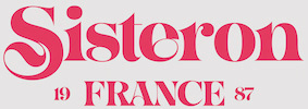 Aka SuperFurry.
  Austin, TX-based designer of Comic Papyrus (2015, a mix of Comic Sans and Papyrus) and
  Graphic designer in Texas, active since ca. 2000. In 2021, he designed
  This company sells about 4000 fonts for 30 USD (which appear to be renamed fonts from elsewhere) and has a few free downloads. They sell a BOSS Font Manager (20 USD). Run by Arts&Letters Corporation out of Carrollton, TX. Interestingly, the same fonts, with the same names, are also at Computer Support Corporation.
  Designer and illustrator at Hatch in San Francisco, who hails from Boerne, TX. His typefaces include
  Dallas, TX-based illustrator, graphic designer and markjeting assistant. Creator of the
  [
[ [
[ Texan designer, partner at Blazer Six. At Creative Market, Brody Vercher sells his fonts. His first typeface there is TeHaus (2014), an interlocking vintage typeface inspired by a font seen in the ATF catalog. [
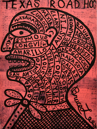 Designer of the fun typographic poster
  During her studies at Texas State University, Cassidy Byers (Austin, TX) designed Yoshi (2018), a custom typeface fr the Yoshi Sushi restaurant in Seattle, WA. [
 Designer and lettering artist in Austin, TX, who created the warm display typeface
  [
[ Game writer, game designer, graphic artist, and the creator and owner of Cumberland Games & Diversions, b. Cumberland, MD, 1971. He lived in Austin, TX, but is in Denver, CO, since 2014. Typefaces by S. John Ross include Sex Nerd (2021), Guacamole Quickstep (2019), Cynocel Poster (2019), Monesque (2019), Flagstones (2018), Kentucky Fireplace (2016), Bad Guy Black (2015, an engraved currency font), Silvery Tarjay (2015), Iron and Brine (2015), Afton James (2015), Fountain Avenue (2013),
  [
[ [
[ [
[ Debi Sementelli (b. 1973, Erie, PA) started out as a lettering artist for wedding services. She set up her own type foundry in 2013 in Carrollton, TX. Before that, she cofounded Correspondence Ink (in 2007) with
  [
[ [
[ Dallas, Texas-basedc Dick Pape (b. 1938) has been digitizing images and alphabets for many years. His typefaces include many revivals, all very true to the original images. Early in 2013, we agreed to host his 1,600 fonts on our site. Storage alone is initially of the order of 700 megabytes. Because of the sheer size of the collection, we have a
  Dick Pape (Dallas, TX) is digitizing the Dan Solo books one by one, and has digitized many other sources of alphabets and images. He started making fonts ca. 2007. In 2009, he was doing Solo's art deco tome. He is on several font-making forums such as
  In 2013 and 2014, Dick Pape digitized 108 typefaces from the Rob Roy Kelly Collection of American Wood Type. This collection is curated by the Design Division of the Department of Art and Art History at The University of Texas at Austin. The PDF catalog of this collection served as a source for the design and the font names. The typefaces:
  Darcy Baldwin (DJBFontography) is the Texas-based designer of these handwriting typefaces in 2007: DJBABITOFFLAIRE, DJBADEE1, DJBAMANDAG, DJBANGELA, DJBANNALISE, DJBANNETTEscript, DJBCHERE, DJBCHRISTINEC, DJBCINDA, DJBCINDAs, DJBDAWN, DJBDOODLEDOO, DJBELIZABETHK, DJBELKE1, DJBEMILYS, DJBEuroscript, DJBGINAE, DJBGISELLA, DJBJANELLE, DJBJANINE, DJBJENB2, DJBJENNA, DJBJENNIFER, DJBJENNIFERscript1, DJBJOAN, DJBJOYscript, DJBKATHERINE, DJBKATRINE, DJBKEELYB, DJBKEELYBscript, DJBKELLEY, DJBKENNAscript, DJBKIRA, DJBLINDSE1, DJBLINDY, DJBLIZ, DJBLORRAINE1, DJBMANDY, DJBMEGAN, DJBMETA2, DJBMISH, DJBMichael, DJBPOOKIEDOO, DJBRITA2, DJBSOFEE1, DJBTABITHAscript, DJBWENDY, DJBWENDYPscript, DJBWRITESALOT. In 2008, she made DJB Treasure Hunt, DJB Curlie Wurlie, DJB 2Cute4U, DJB Heart of Dixi. Fonts made in 2009: DJB For Annie, DJB Sloppy Joe.
  [
[ Graphic designer, typographer, type designer, author, teacher and lecturer, born in 1926 in Holliday, TX. He died on February 28, 2011 due to complications following a heart operation. He attended Los Angeles City College, Los Angeles Trade Technical Jr. College, and Art Center College of Design where he has taught for 27 years and holds the honorary title Inaugural Master of the School. Doyald drew characters, often of a
  Houston, TX-based designer of the flashy typeface Culture Display (2019) and Fashion Diaries Script (2019).
  Elizabeth Nunez-Xoconoxtle is from Austin, TX. During her studies at Texas A&M University in College Station, TX, she created the shaded squarish titling typeface Bruce (2014) and the grid-based sans titling typeface Stout (2015). [
 Chris Vile (Fontmonger, Austin, TX) is a type and graphic designer and web developer, who was briefly located in Chicago. He specializes in horror, graffiti, grunge and brush fonts.
  Austin, TX-based creator of several alphabets with sharpie pens. One of these, Sharp5, was turned into a
  Beaumont, TX-based designer of the fashion mag typeface Simplicity (2014). [
 Creator of a logotype / athletic lettering type family for the University of North Texas, called
  Born in Philadelphia and a resident of McKinney, Texas, Dan Zadorozny's creations at Iconian. He is a prolific type designer who specializes in techno and sci-fi typefaces.
  Denton, TX-based designer of the sci-fi typeface Space (2018) and the wonderful
  Brian Jacob (Houston, TX, and before that, Detroit, MI) set up Jacob Type in 2012. He designed these typefaces:
  [
[ Designer & partner at Switch in Dallas, Texas. He created the free sturdy manly condensed geometric sans serif typeface
  Jeff Rogers (or Rodgers in some publications) was born in Texas and lives in New York City where he works as a designer and illustrator. He has created custom lettering for such clients as Nike, The New York Times, Good Magazine, Metropolis Magazine, Blue Q and others. Jeff is also a partner at Abidesco, a Texas based design collective. With the help of the crew at YWFT, he created three typeface families:
  Graduate of the Masters of Type Design program of the University of Reading, UK. Jordan Bell (Waco, TX) writes about his graduation typeface
  Josh Finklea grew up in Austin, Texas. Finklea received a Bachelor of Fine Arts in Graphic Design at Art Center College of Design (Los Angeles). He has worked as a designer in Los Angeles, Amsterdam, New York City (where he worked at Design:MW), and is currently based in Austin, Texas. His typefaces were published at
  Teacher and designer in Dallas, TX. Graphic designer at the Frisco Independent School District in Frisco, TX. In 2017, he designed the (fantastic!) bubblicious semi-psychedelic interlocking letter poster typeface Jackerton. Aka noggindoodle. [
 Born in Missouri in 1979, Kimberly moved first to Texas and later (in 2007) to China, and most recently, to Orlando, FL. She made some free fonts (often handwriting styles), and also ran a personal handwriting font service [those fonts have names that start with KGD].
  Graduate of Texas A&M University, College Station, TX, class of 2015. Designer of the art deco typeface K Sass (2014).
  Or Kitaleigh Nikita Grimes, b. Montana. Dickinson, TX-based designer of the beautiful condensed handcrafted typeface KL Emily (2017). Other handcrafted typefaces by her from 2017 include Gingerbread, Coffee Beans, Goldfish Tale, Awkward Octo, Coconut Milk, Glitter In My Veins, Crazy Day, Pumpkin Patch, Donut Shoppe, Playbook, Hello Sweetheart, Cobwebs, Bonfires (connected monoline script), Beaches (a handcrafted sans), Pumpkin Spice, Kidergarten (child script), Pajama Jam, Back To School, School Haze, Rah Rah Rah, Road Trip, Faux Tales, Liberty, Sweet Berries, Salt+Lime, Milk+Cookies, Mermaid Tails, Unicorn Wishes, You+Me, Prickly Pear, Sweet Pineapple, Raydiant, Twinning, Lily Pop, Salty Kisses, Sunny Beach, Cassette Tape, Freedom Rings Monogram, Monomaid Monogram, KL Emily, KL Cassidy, KL Frances, KL Cupid and KL Gabe.
  [
[ [
[ During her studies in Lawrence, KS, Lexi Griffith (now in Dallas, TX) created the
  Commercial type foundry of George Thomas (Dallas, TX), whose fonts include Pendula (2014, art nouveau). They write: Pendula is an adaptation of Pittoresques Droites (Scenic Casual) found in the circa 1924 specimen book of La Fonderie Typographique Française. Changes to a very small number of the original characters were made to make the typeface work better with more languages, as well as for aesthetic reasons. A newly designed Cyrillic character set was added.
  Penman, b. 1859, San Antonio, TX, from Hungarian parents. [Some say January 20, 1860] His maternal grandfather, Ladislaus Ujhazi, was Governor of Kameron and the Count of Saros. He traveled a lot and was a versatile and multi-dimensional person. He worked in Sterling, IL, Jersey City, NJ, and Poughkeepsie, NY. He spent most of his life in New York, and died in 1910 in San Francisco. Author of
  Jake Luedecke (LDF Fonts, or Luedecke Design Font Co) (b. 1999) is the Dallas, TX-based creator of preponderantly hand-printed and pixel typefaces. These include:
  [
[ Graphics cooperative in Philadelphia that sells some fonts. These include:
  Dallas, TX-based designer of the elegant hand-sketched didone typeface Whimsy (2015).
  Dallas, TX-based creator of the
  [
[ Texan creator (b. 1990) of many free mostly hand-printed typefaces. Starting in 2016, she is located in Dresden, Germany.
  Type blog by Ojay Juarez (TX). Aka mmolai. Ojay used Fontifier to create the handwriting font
  During her graphic design studies in Houston, TX, Monica Villarreal designed the ornamental typeface
  [
[ [
[ Aka Pilaster Davy, b. 1964. UK-based designer of Whitby Brewers (2015: inspired by the hand lettering on a reverse glass painted Victorian advertising mirror, found in the Beck Isle Museum in Pickering, North Yorkshire), Castle Press No 1 (2015, after original wood type from Castle Press, est. 1860), Medhurst (2015, a high-contrast display typeface), Providence (2015, tattoo typeface), Allegheny (2015, a spurred typeface), York Whiteletter (2015, white-on-black ribbon font inspired by a Delittle design called Eboracum No3 Improved White Letter Type and late 18th century woodtype), Spartanburg (2015, inspired by the 1923 Sanborn Insurance Map cover for Spartanburg, South Carolina; a tattoo typeface) and Galveston (2015, a tattoo typeface): GalvestonTX is derived from a Sanborn Insurance Map cover published in 1912 for the city of Galveston, Texas.
  Austin, TX-based illustrator who runs Paulville Studio. Creator of a great typographic poster called Cafe Racer (2013).
  [
[ Ashley Gardner (aka Printable Wisdom) is the Texas-based designer of some handcrafted typefaces such as Ashley Brush Script (2015, a watercolor brush script), Skinny Minnie (2015), Scratch Super Sketchy Script (2014), Boldilicious (2014), Fabulovely (2014) and Understated (2014).
  Mark Caneso is a graphic and type designer who lived in Garden Grove, CA, Kapolei, HI, Beaverton, OR, Austin, TX, and now, Mount Pleasant and/or Charleston, SC. He founded ppwrkstudio (or: ps type) in 2004.
  Roy Tatum is an Austin-based designer and educator who teaches Generative Design and Generative Typography classes within the Graphic Design program at ArtCenter College of Design.
  [
[ Web developer for a creative firm in the Dallas, TX, area. Designer of these typefaces:
  Dave Nalle was born in Beirut on March 19, 1959, and died on February 13, 2021 from COVID in his home town of Manor, Texas. From his
  Dennis Ludlow (Sharkshock Productions, Raleigh, NC) started making mostly free fonts in 1999. On August 28, 2001, Dennis announced that he would stop producing fonts, forever. To prove himself wrong, he became more prolific trhan ever, and ultimately started designing retail fonts as well.
  Swiss designer
  Located in Dallas, TX, est. 1934. Founded over 70 years ago, SIL International is a faith-based organization that studies, documents, and assists in developing the world's lesser-known languages. SIL's staff shares a Christian commitment to service, academic excellence, and professional engagement through literacy, linguistics, translation, and other academic disciplines. SIL makes its services available to all without regard to religious belief, political ideology, gender, race, or ethnic background. Wikipedia writes: The organization's focus on language description, language development and Bible translation, and the missionary activities carried out by many of its field workers have been criticized by linguists and anthropologists who argue that SIL aims to change indigenous cultures, which exacerbates the problems that cause language endangerment and language death.
  The SIL Yi Font is a single Unicode font for the standardized Yi script used by a large ethnic group in southwestern China. Designed by SIL International, 7500 West Camp Wisdom Rd., Dallas, Texas. Yi is spoken by the Yi people (also known as Lolo) in Southern China (in Sichuan, Guizhou, Yunnan and Guangxi). The script is a purely syllabic script which was developed on the basis of an older, ideographic system.
  Paul Sirmon's commercial type foundry in Dallas Fort Worth, Texas, est. 2013, is called Nine Crows. In 2015, he set up

 Dallas, TX (was: Richmond, VA)-based designer of the sans typefaces Mint (2016), Amber (2016), Foodie (2016) and Daughter (2016), the rounded sans typeface Fox & Bower (2016), the minimalist sans typeface Avenue (2016), the handcrafted typefaces Yesterday (2016), Creative Queen (2016) and Love Note (2016), the art deco typeface Retro Deco (2016), the retro connected Avocado Script (2016), and the beveled typeface Suburbia (2016).
  Thomas Ramey, a graphic designer from Austin, TX, who grew up in Pasadena, TX, and was located in San Francisco and Nashville, TN, now operates out of Seattle, WA. He created the hybrid font
 Free fonts by Nathan Brown (Texas; was Philadelphia, PA), mostly handcrafted, grungy or sketched: WG-Analog, WG-Angeles, WG-Cascade, WG-Donovan-Title, WG-Dunste, WG-Fortune, Freestone, WG-Gilded-Hand, WG-Goodbye, WG-Grux-Regular, WG-Grux, WG-Halloh, WG-Handy-Icons, WG-Hudson-Slab, WG-Legacy-Edition, WG-Marshall, WG-Of-Concrete, WG-OffSet-Title, WG-Phased, WG-QuickHand, WG-Scriballistic, WG-Semplice-Regular, WG-Semplice, WG-Sequence, WG-Sideshow, WG-SilverLeaf-Regular, WG-SilverLeaf, WG-Skratched, WG-Statik, WG-Underneath, WG-Watchtower, WG-Whitley-Scribble, WG-Wild-Spaces. The
  Typehead is a commercial type foundry managed by Gabriel Walker. During his studies at Texas State University in San Marcos, TX, Gabriel Walker designed the
  Vera Kudryashova (aka Vera Holera, Katy, Houston, TX) specializes in calligraphic alphabets for Latin and Cyrillic. In 2015, she created the script typefaces Quick Snack Script, Imperfect Script, Imperfect Calligraphy Script, Happy Day Script, Caprice Script, Stubborn Faith and Maxim Script, and the yummy brush typeface Humus Script.
  [
[ Kyle Wayne Benson (b. 1988, Texas) describes himself as an affable graphic and type designer. He has his own commercial foundry, also called Kyle Wayne Benson, which specializes in signage type. Very Cool Studio was located in Orem, UT, and more recently in Oakland, CA.
  Student-designer in Houston, TX, of Drop Cap Stamps (2015), an incomplete but fascinating set of letters inspired by early Greek art. [
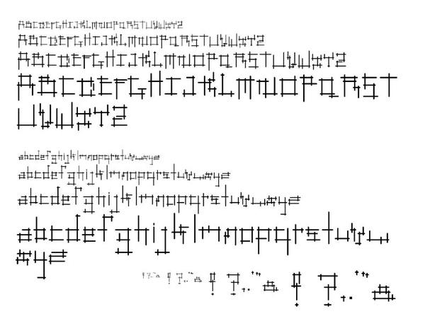
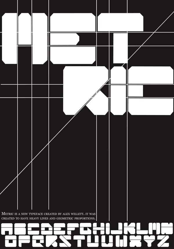
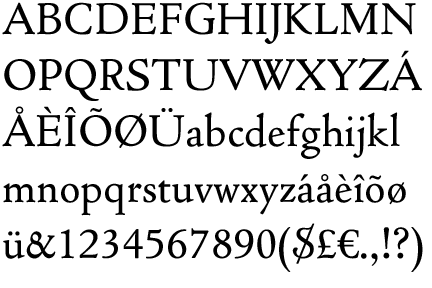
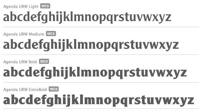
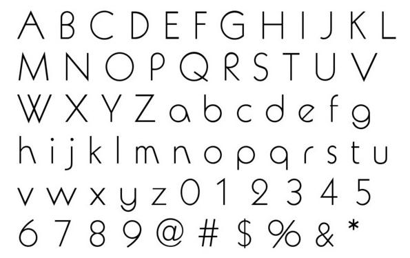
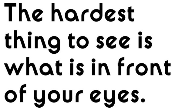
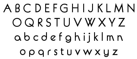
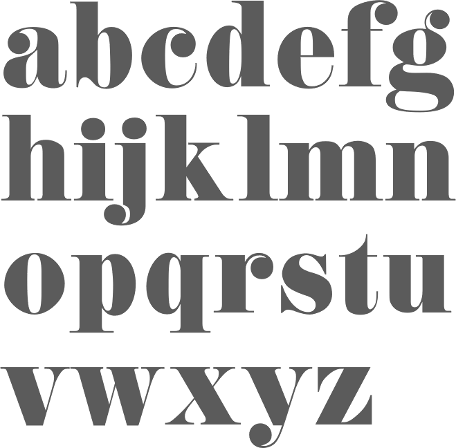
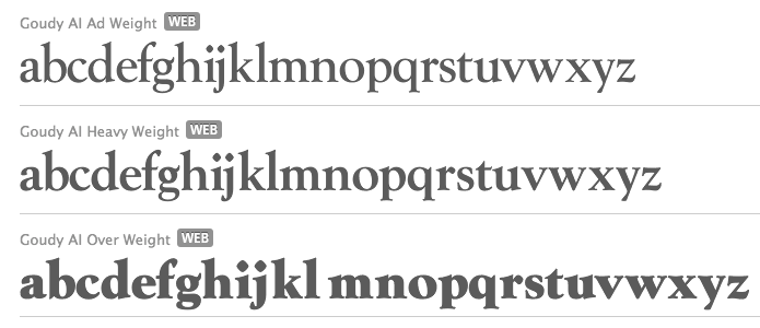
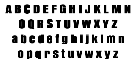
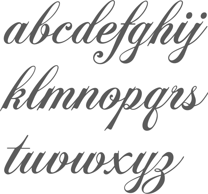
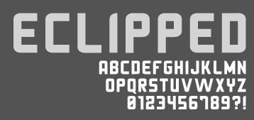
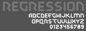
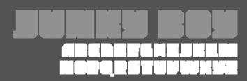
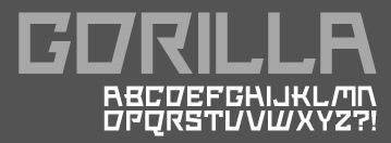
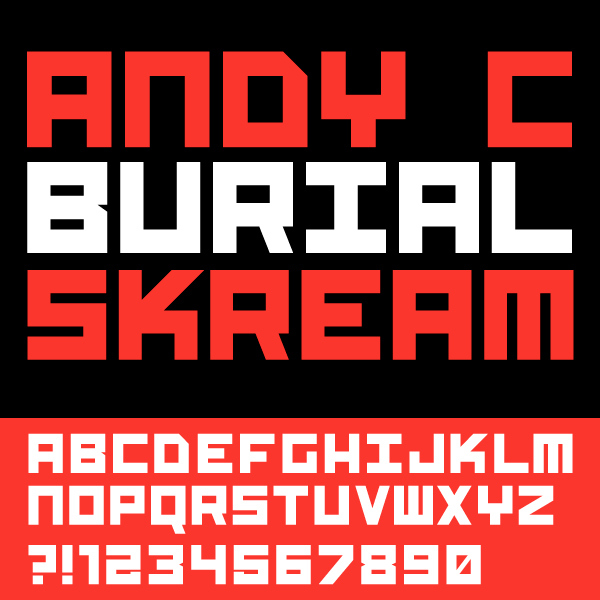
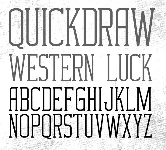
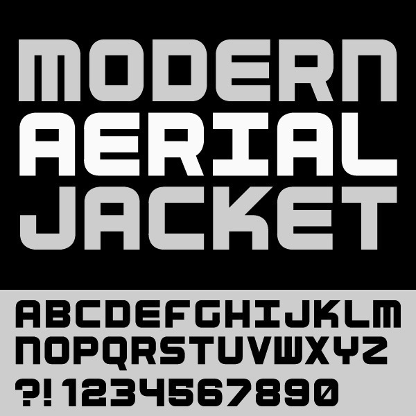
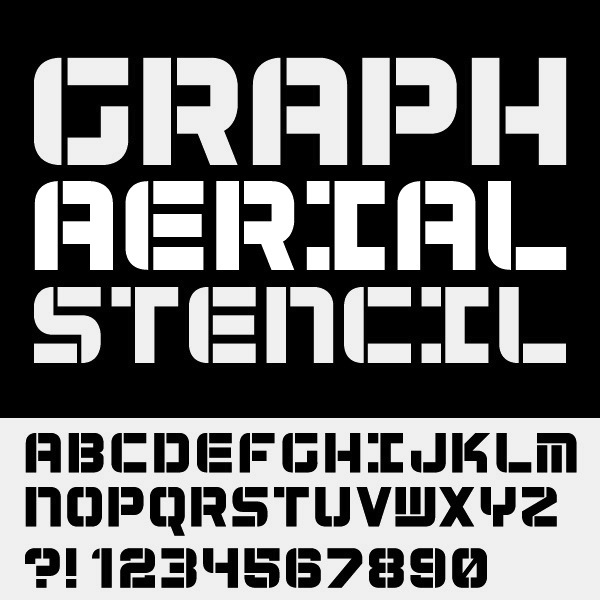
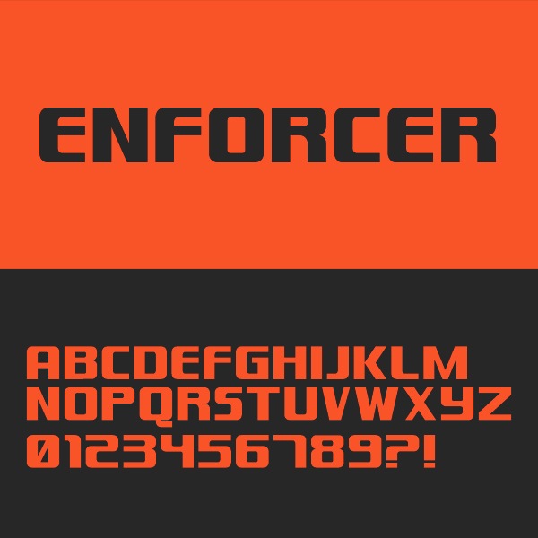
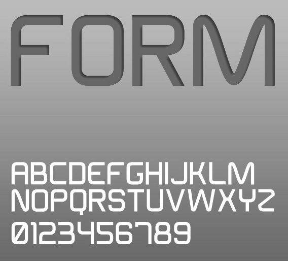
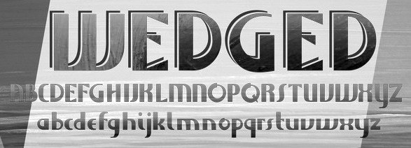
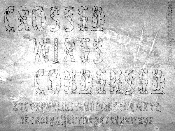
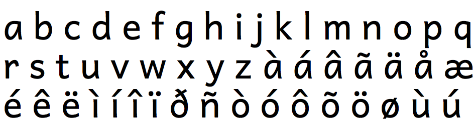
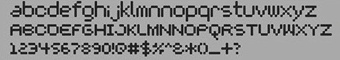
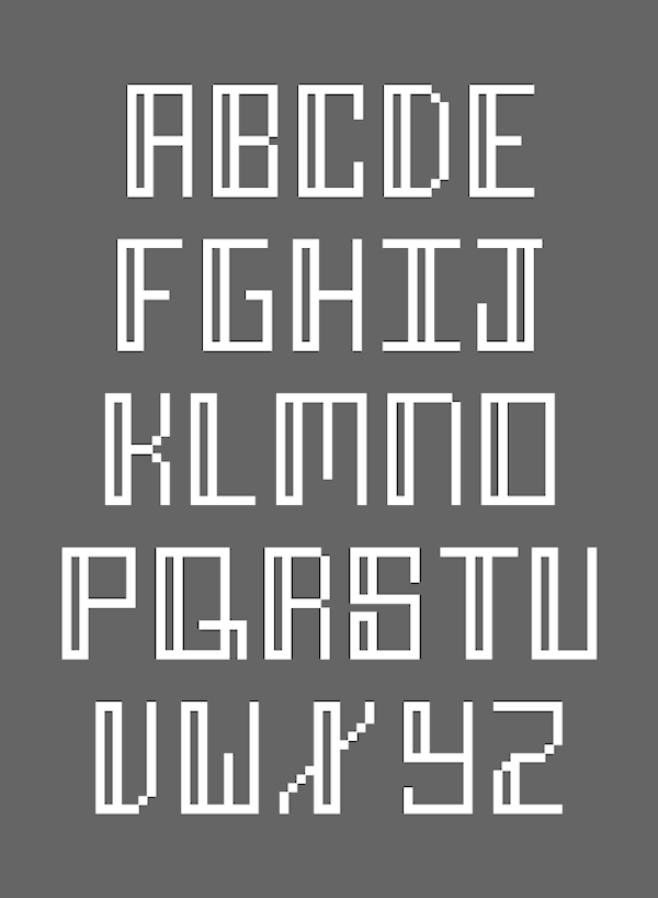
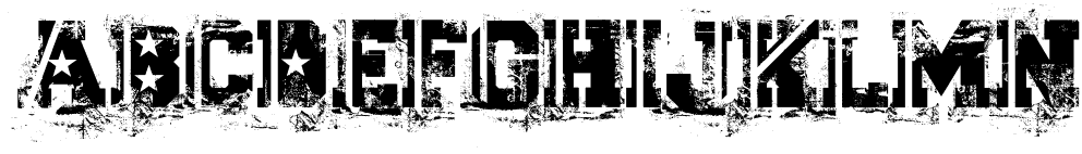
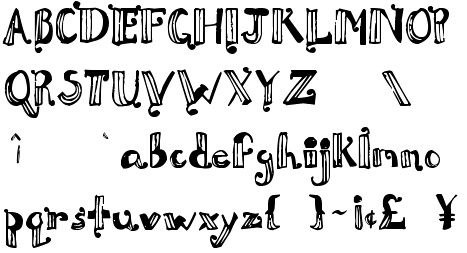
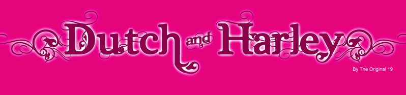
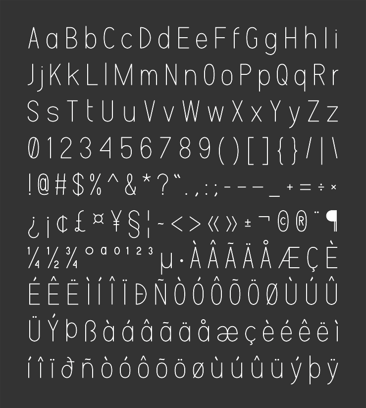
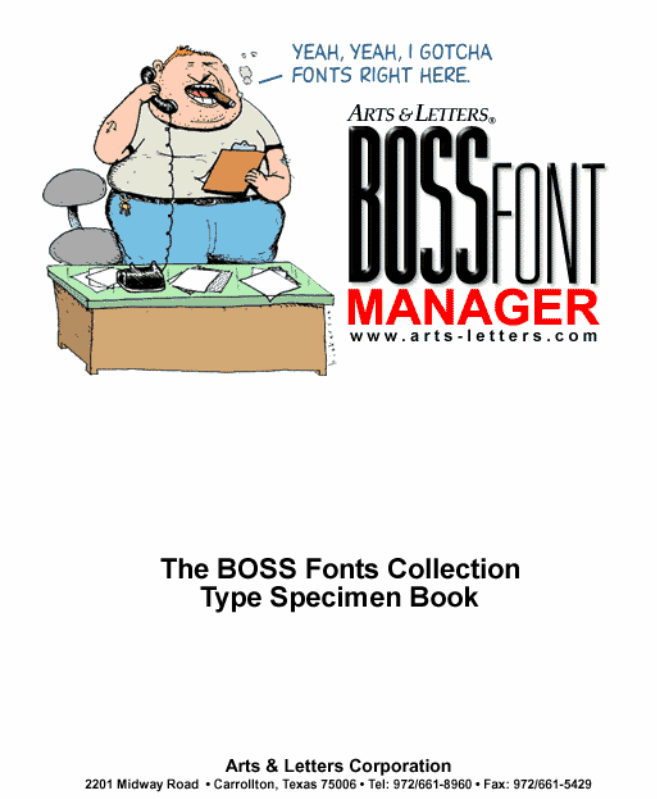
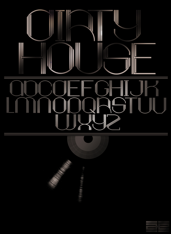
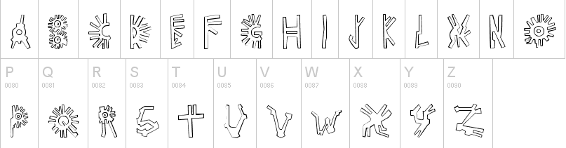
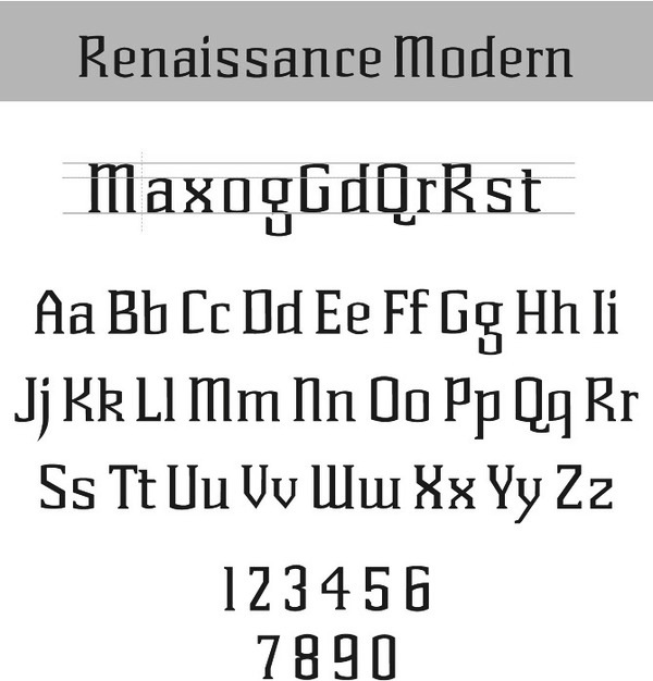
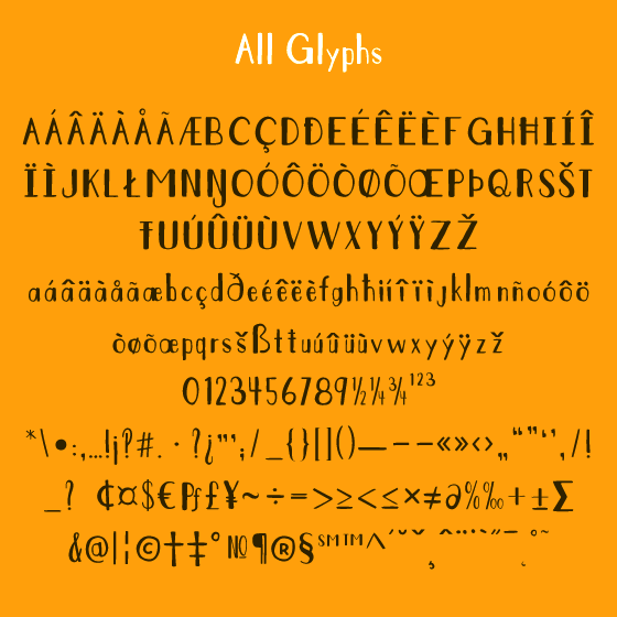
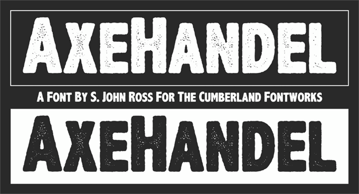
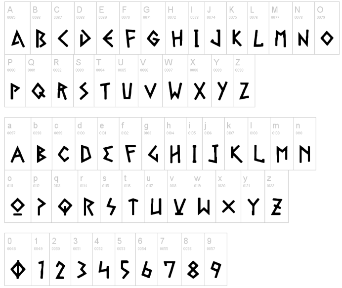
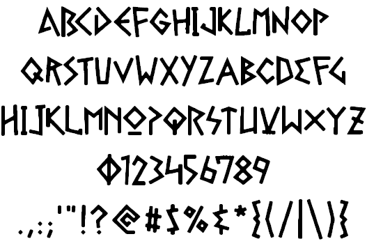
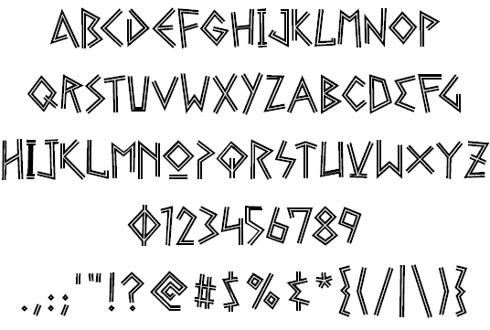
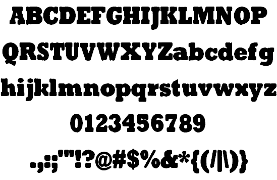
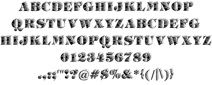
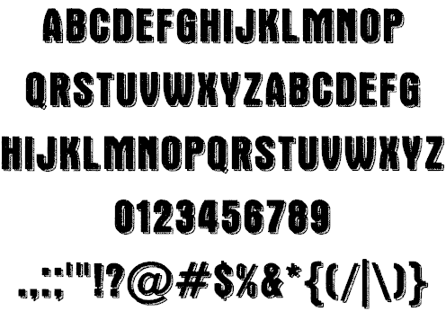
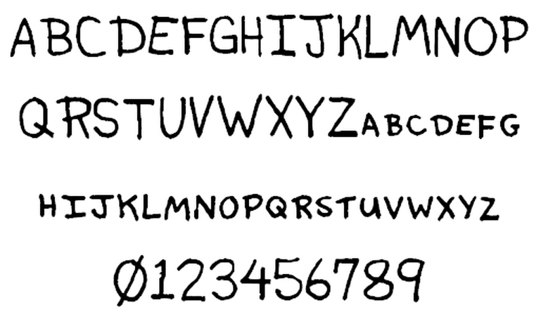
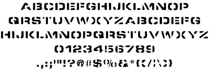
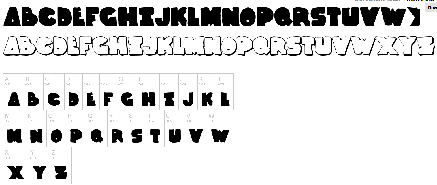
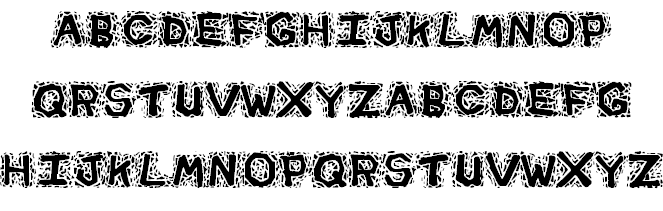
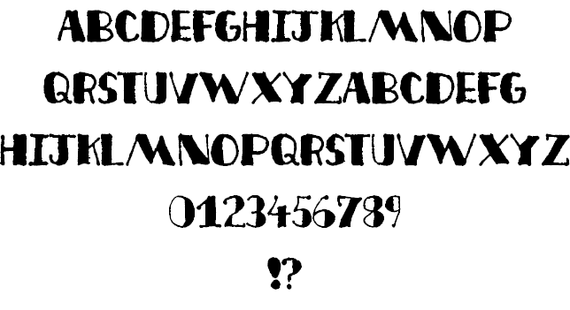
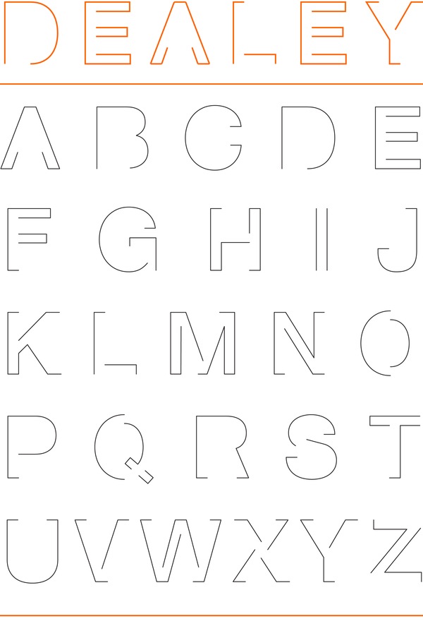
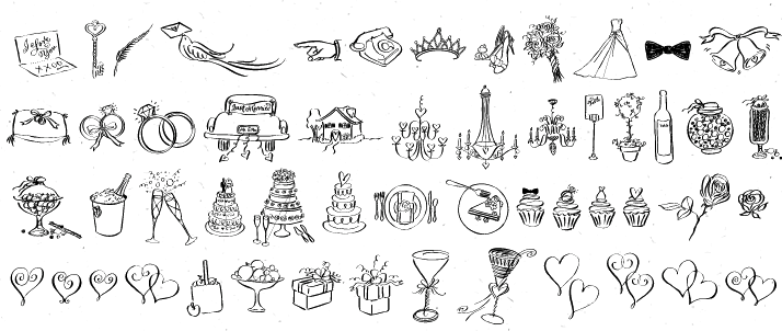
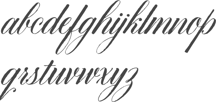
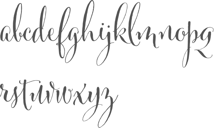
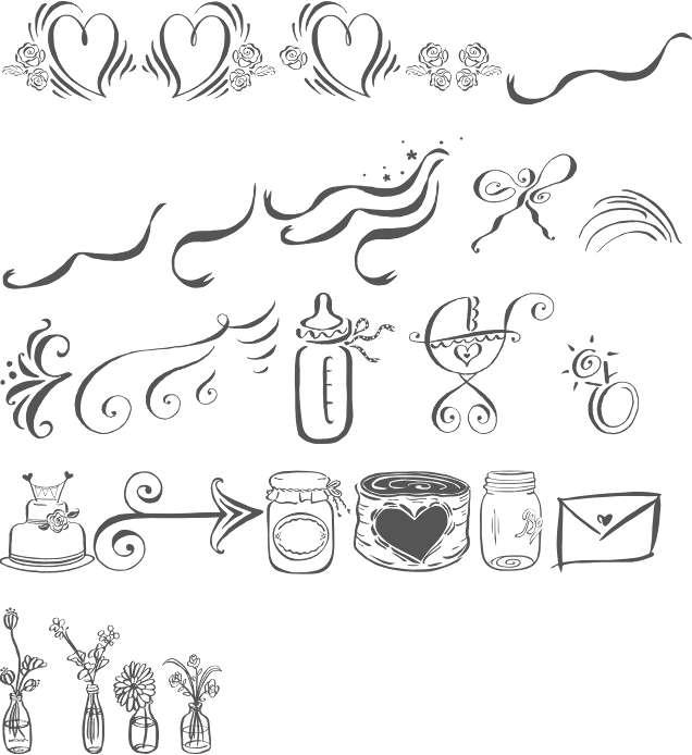
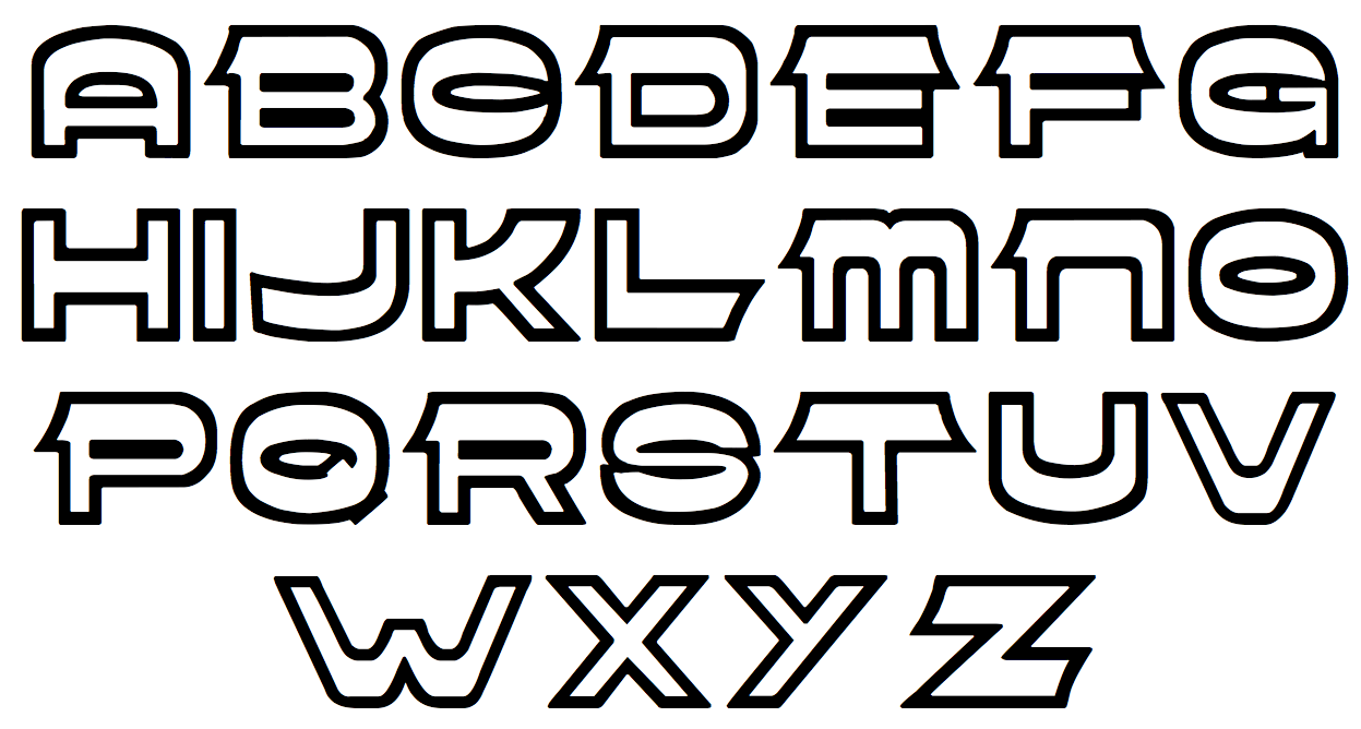
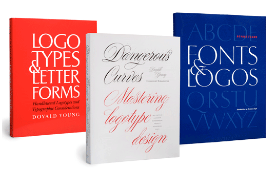
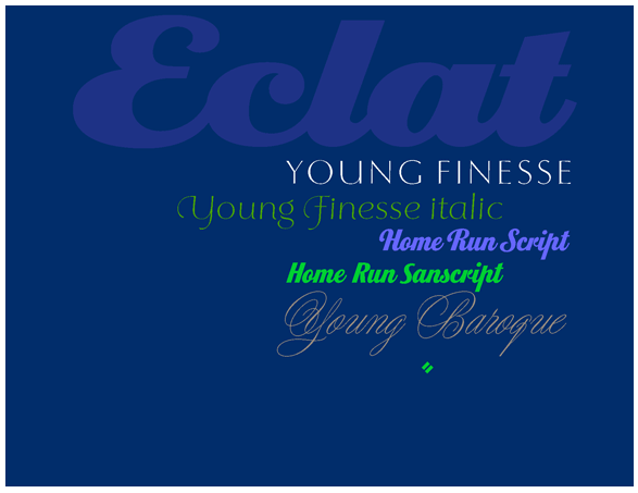
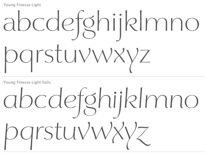
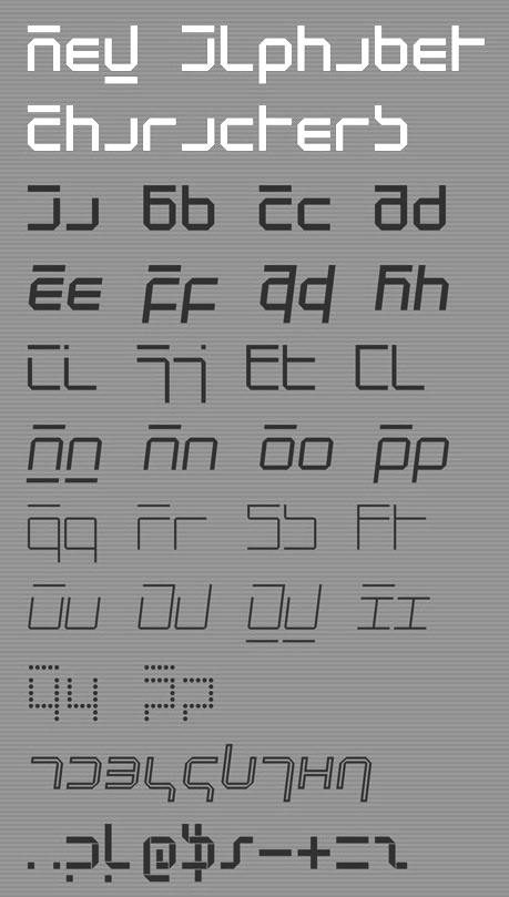
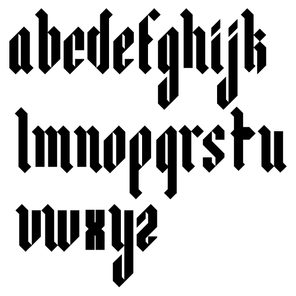
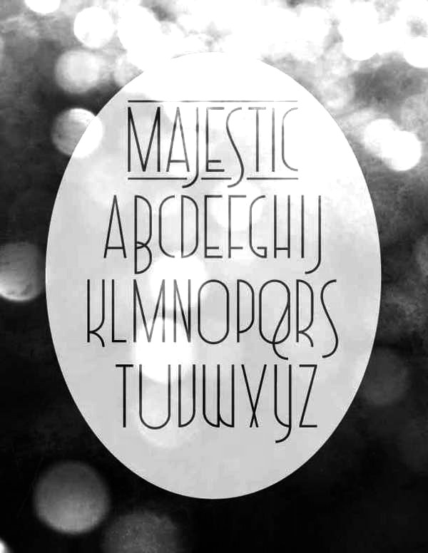
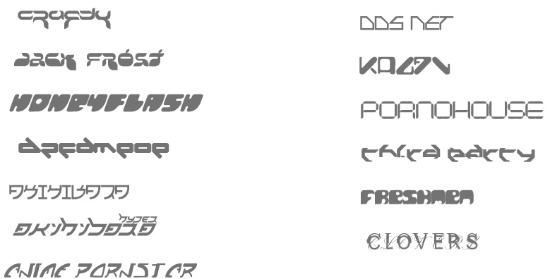
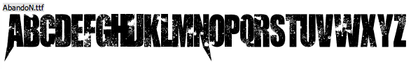
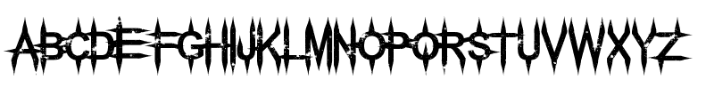
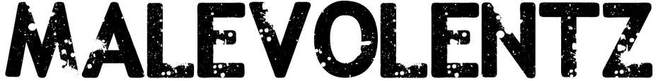
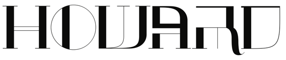
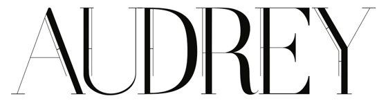
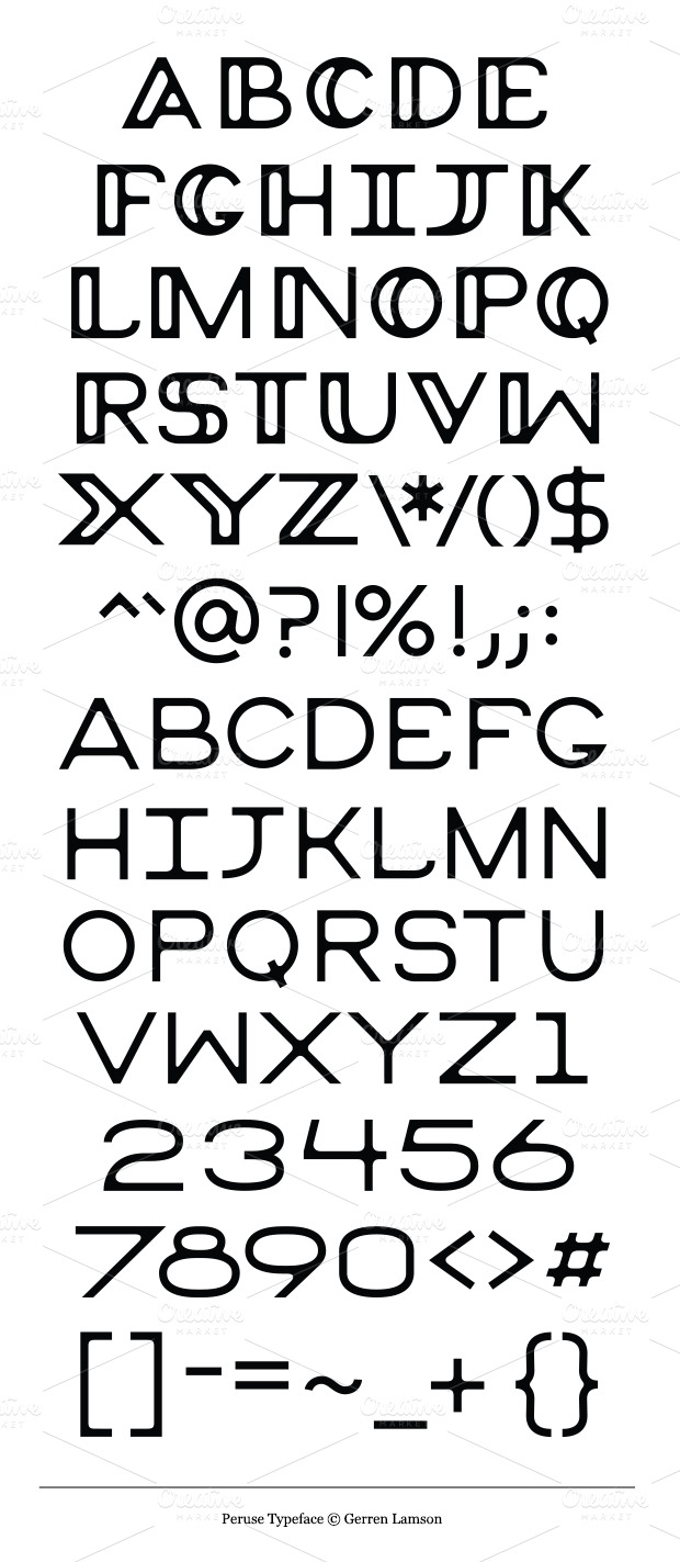
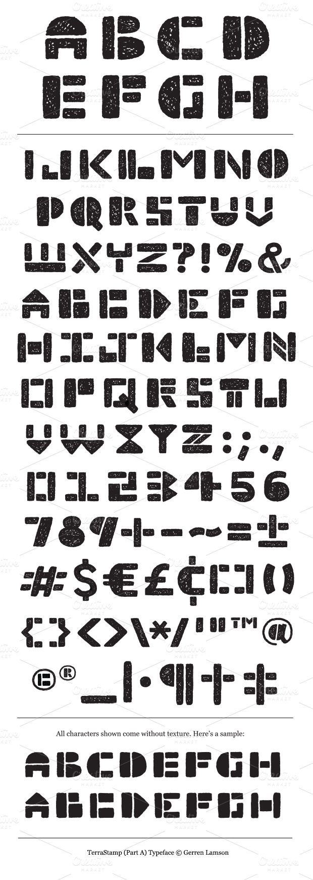
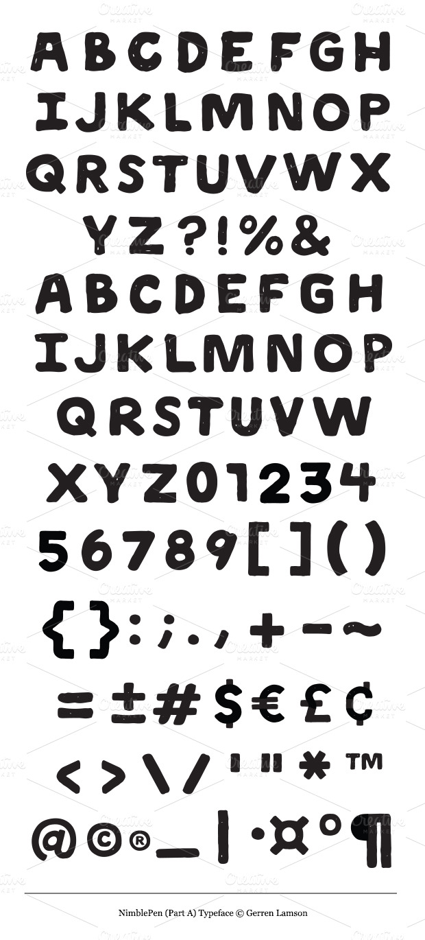
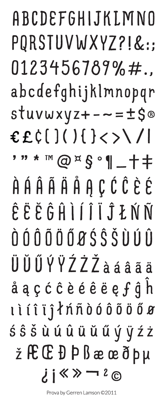
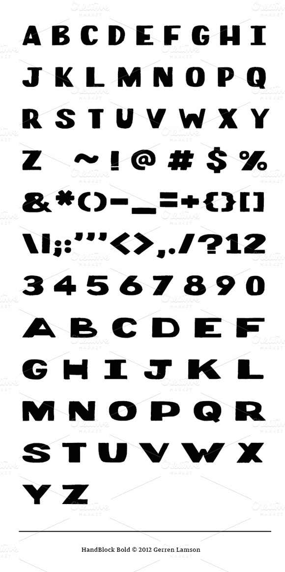
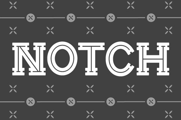
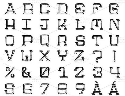
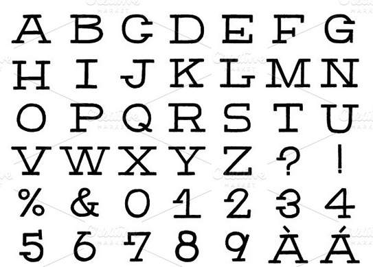
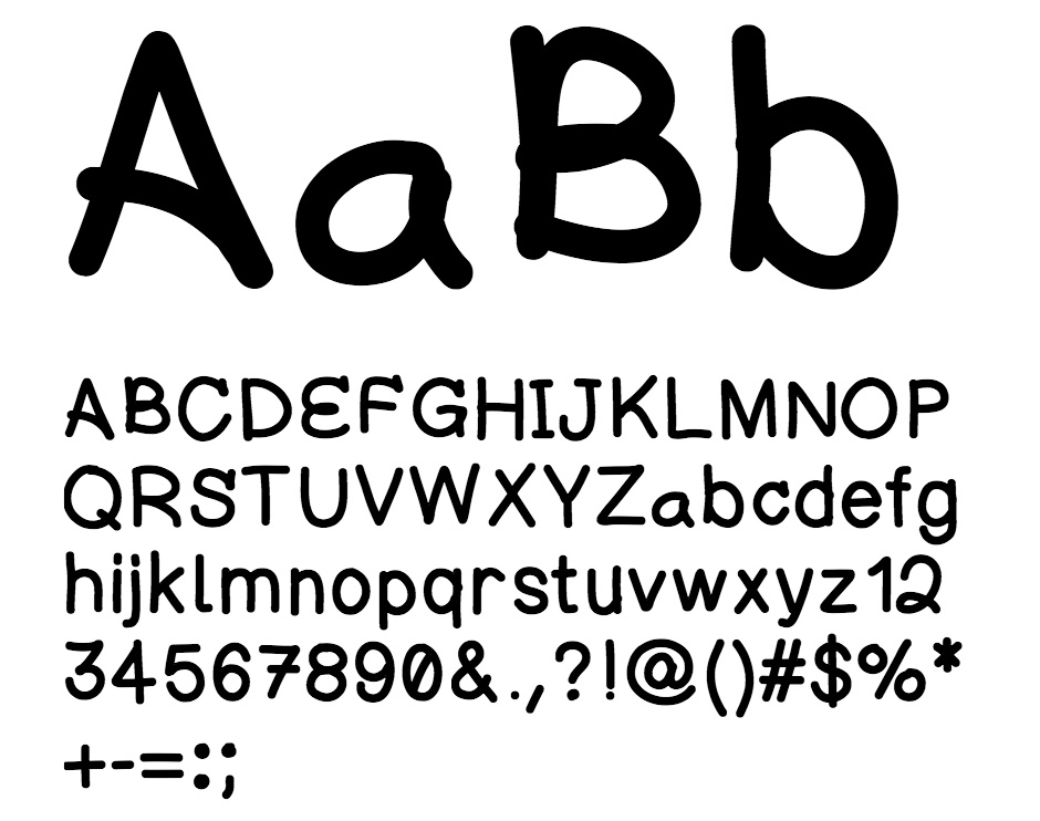
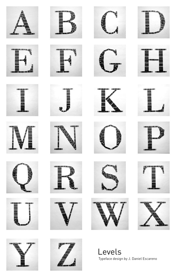
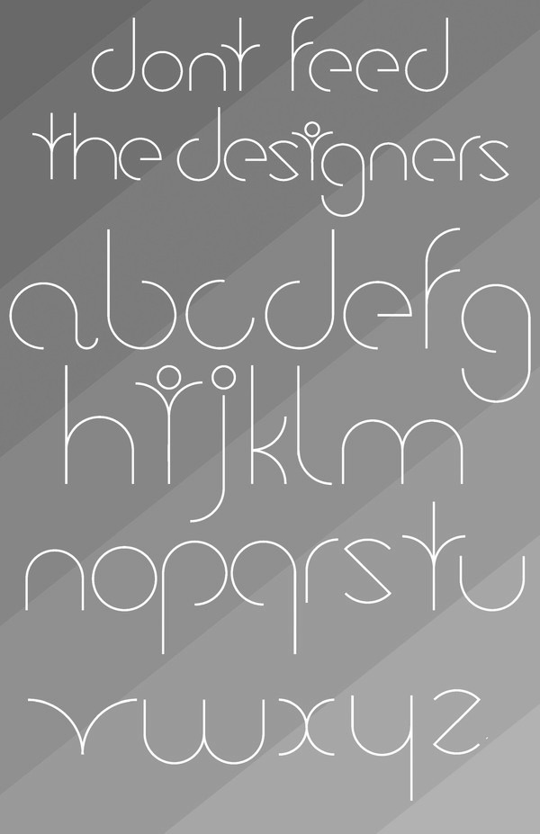
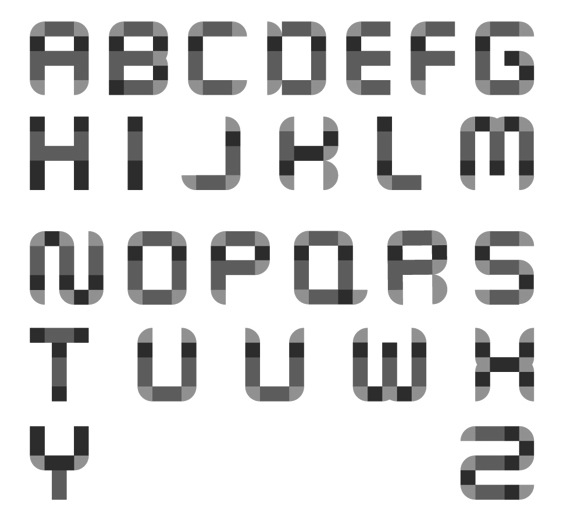
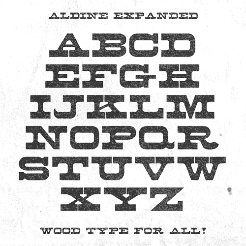
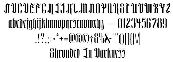
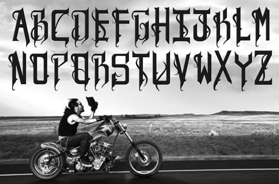
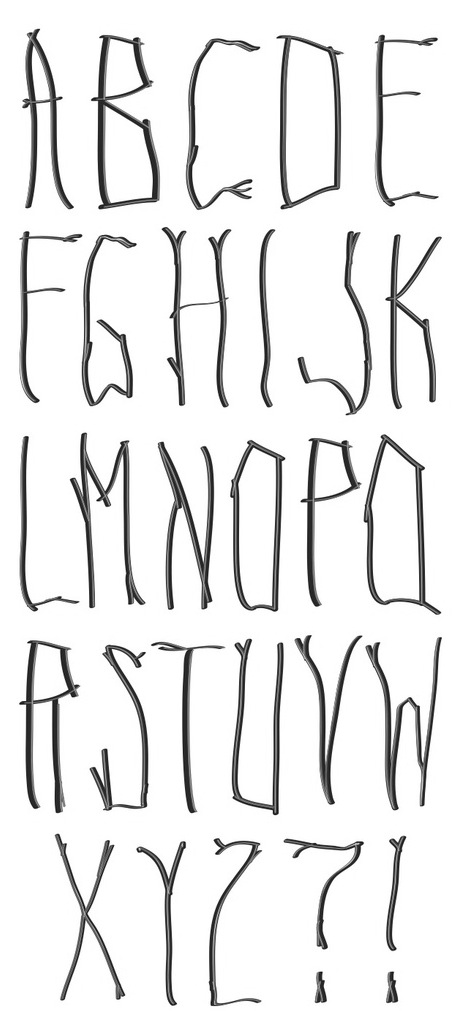
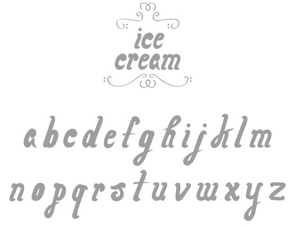
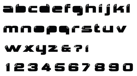
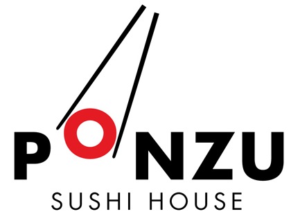
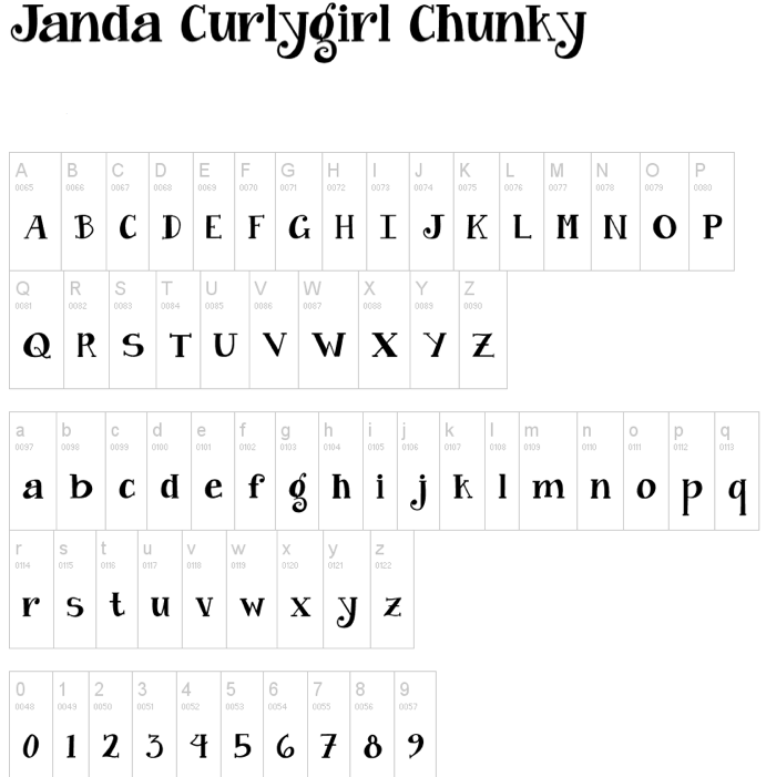
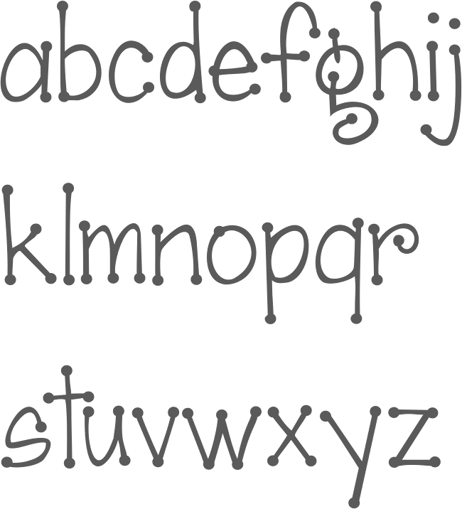
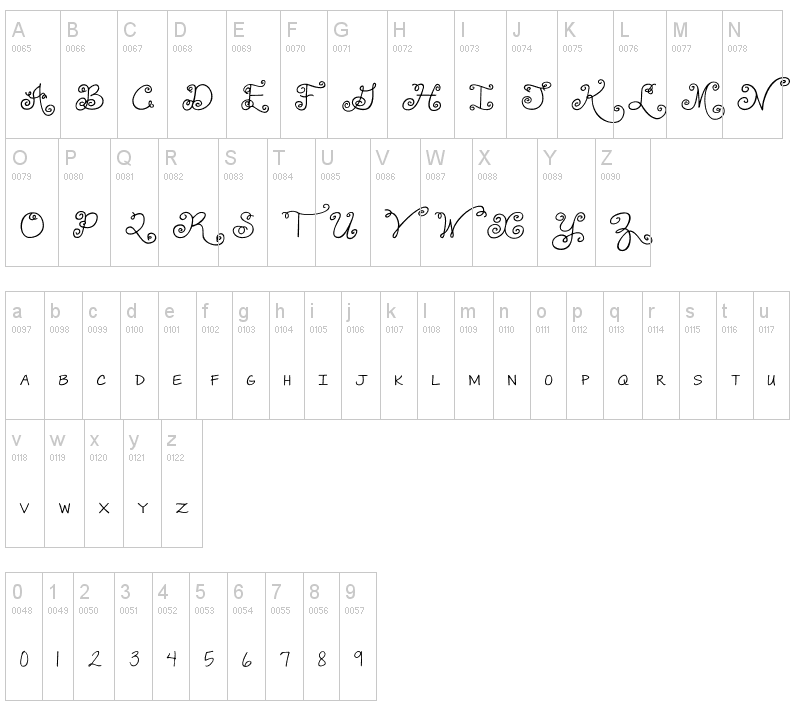
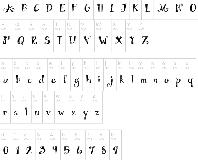
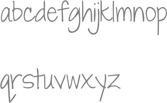
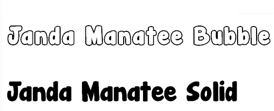
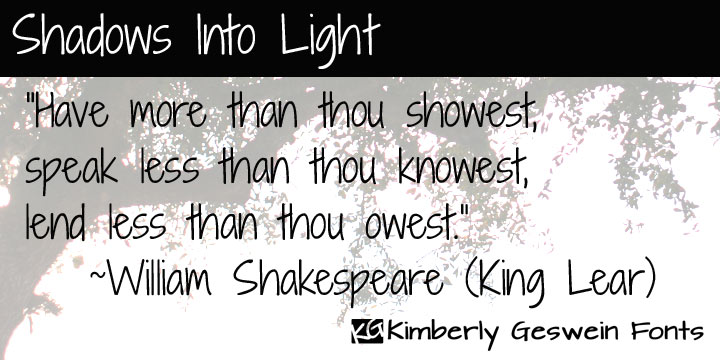
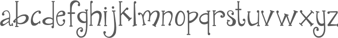
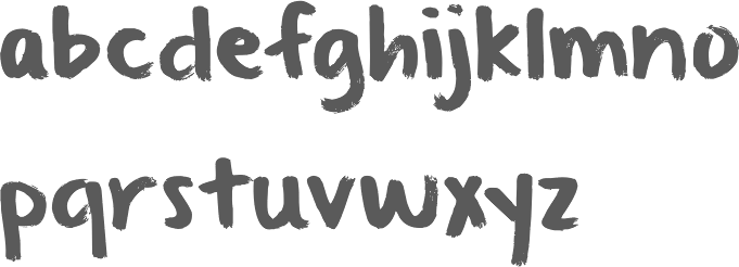
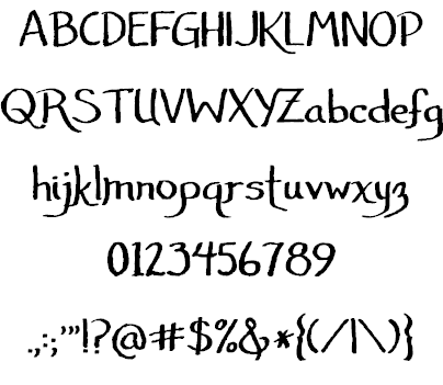
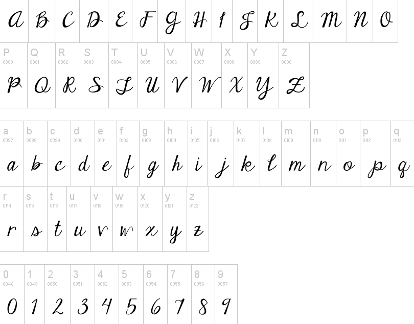
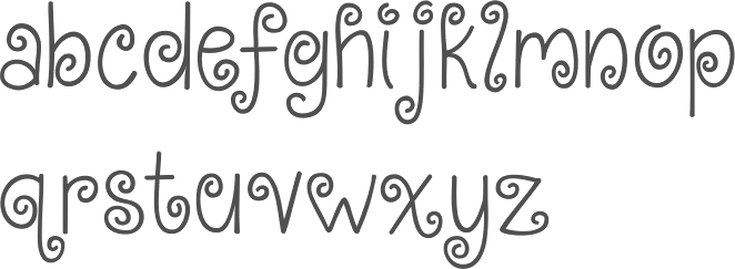
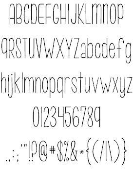
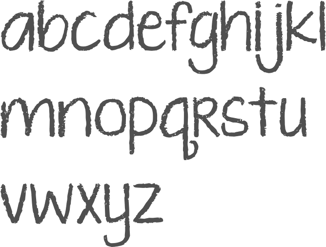
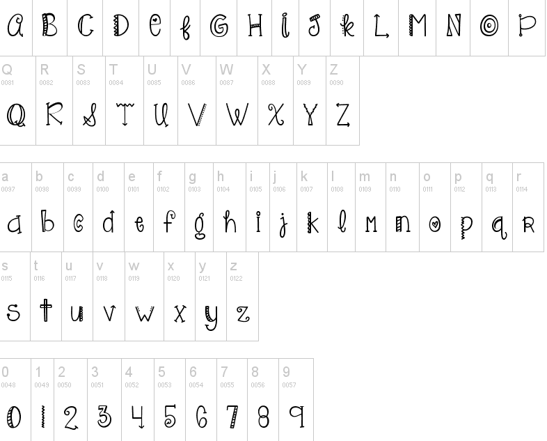
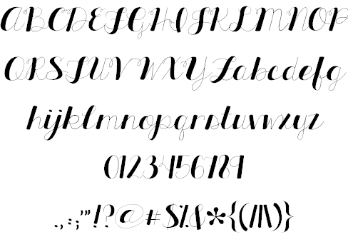
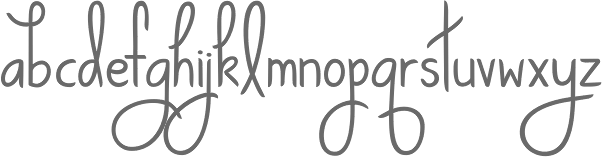
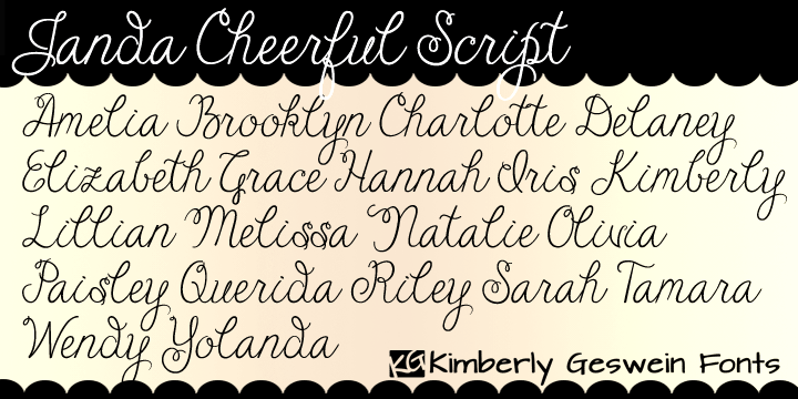
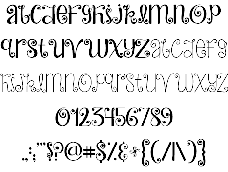
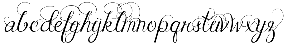
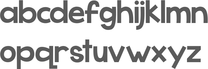
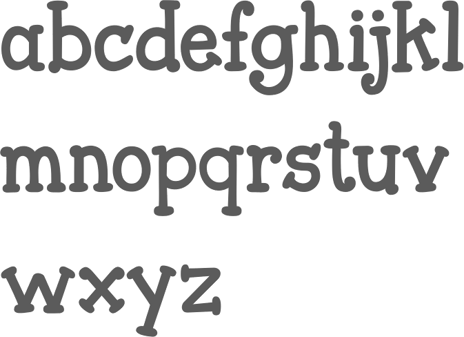
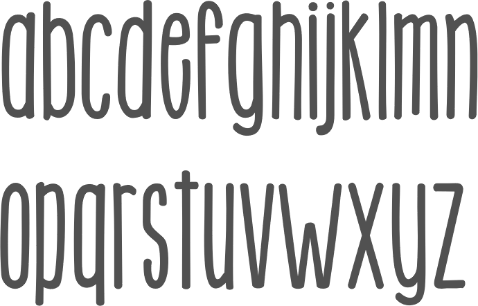
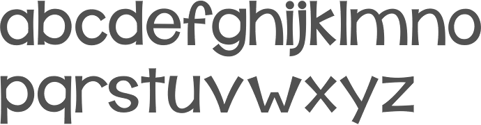
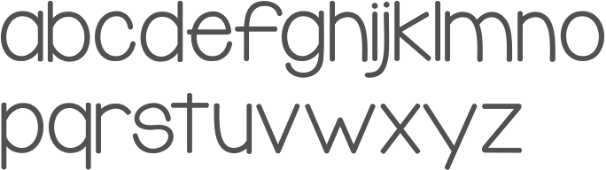
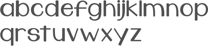
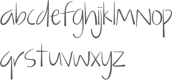
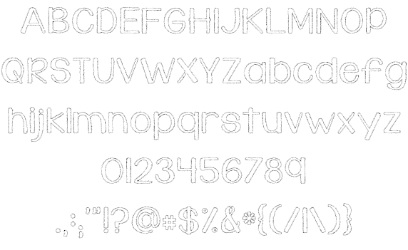
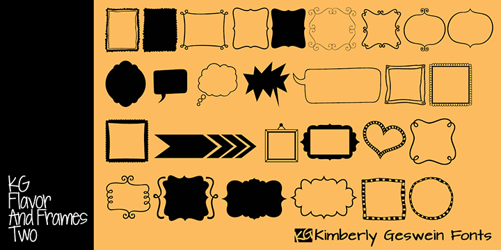
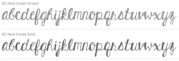
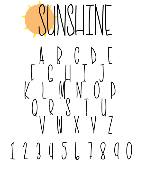
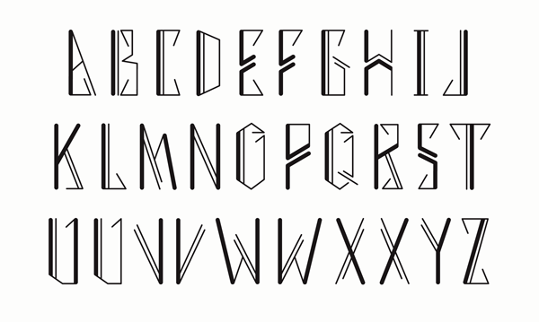
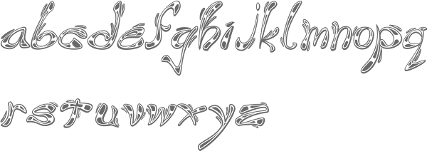
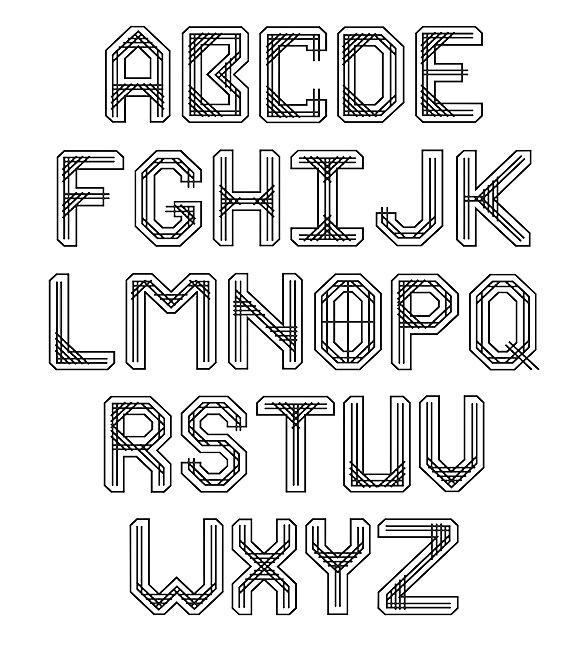
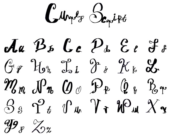
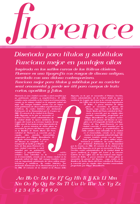
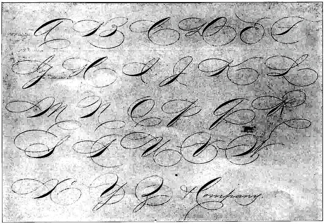
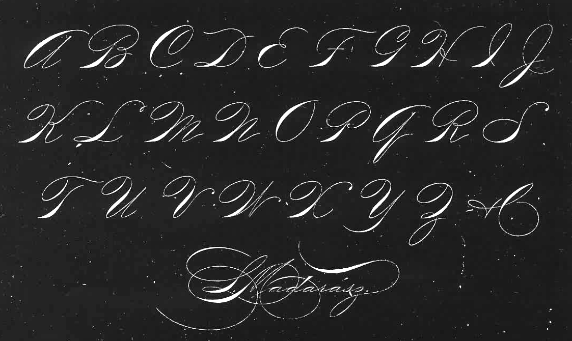
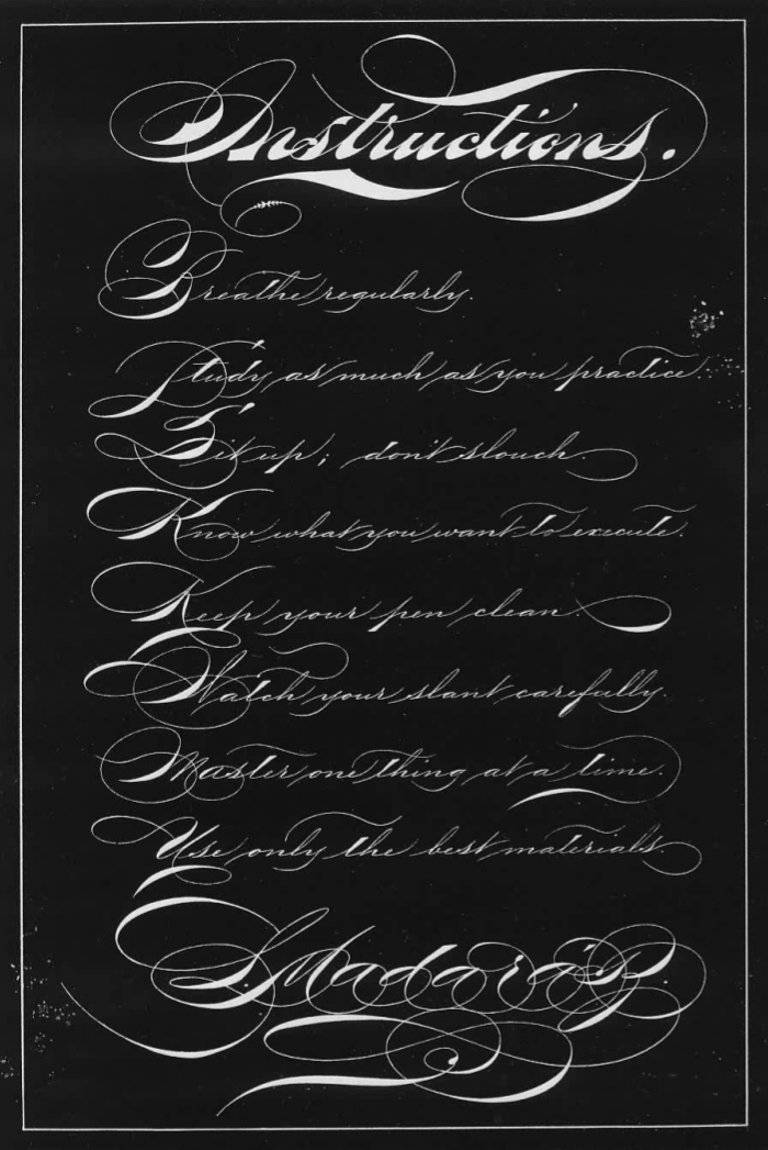
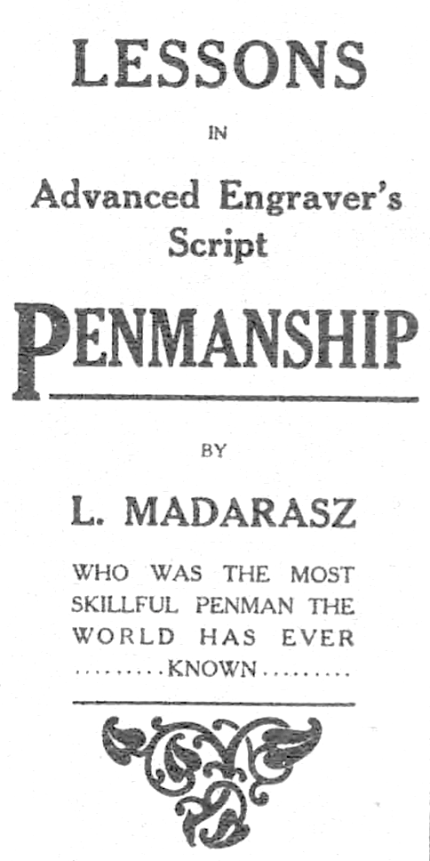
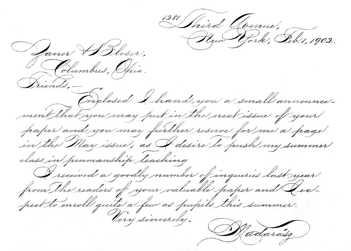
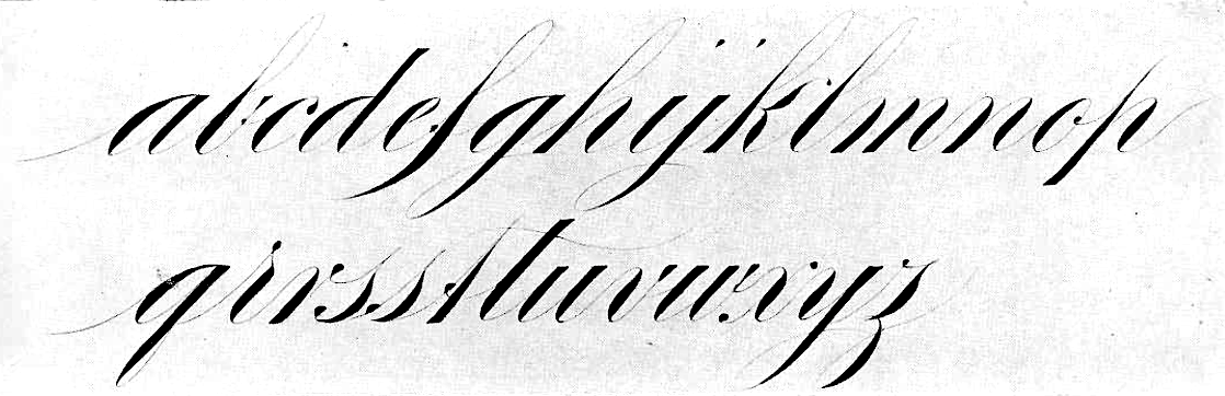
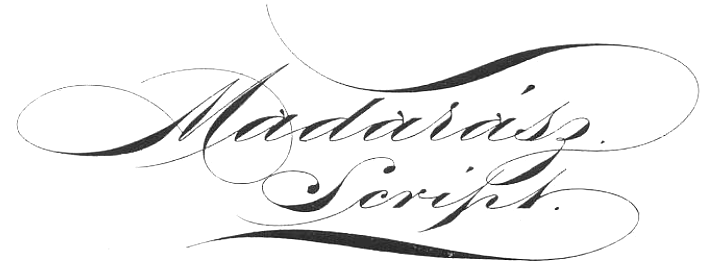
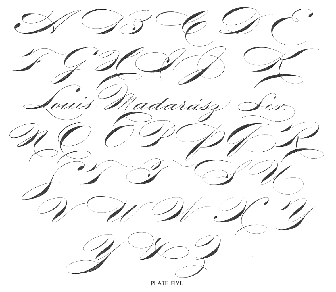
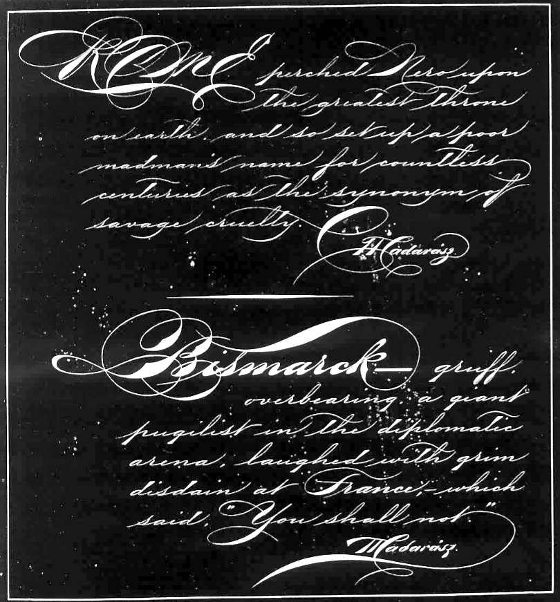
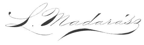
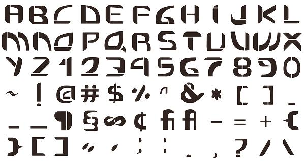
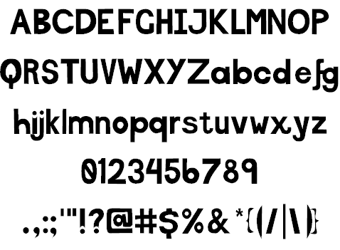
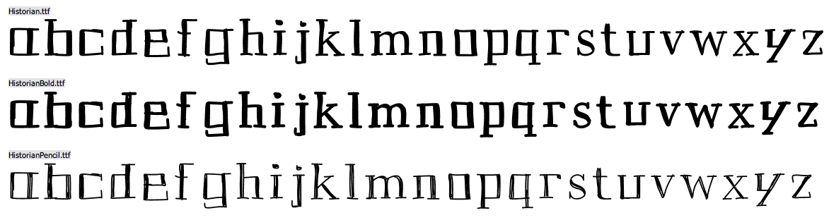
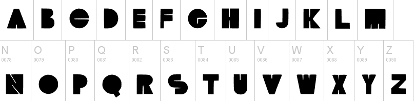
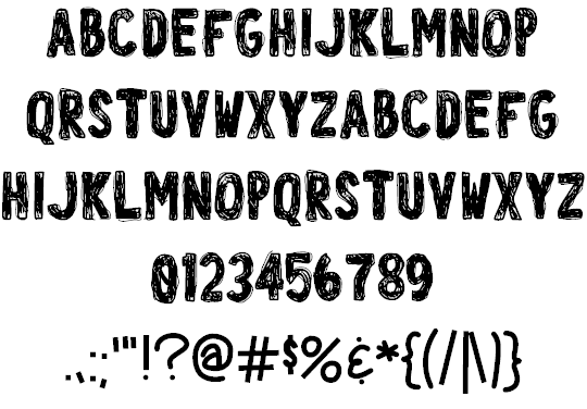
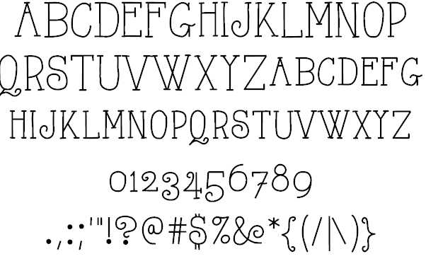
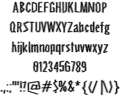
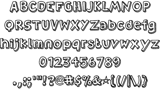
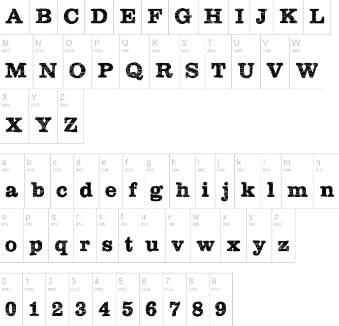
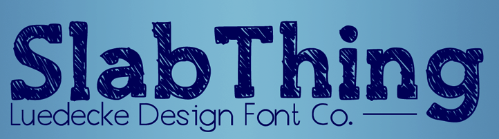
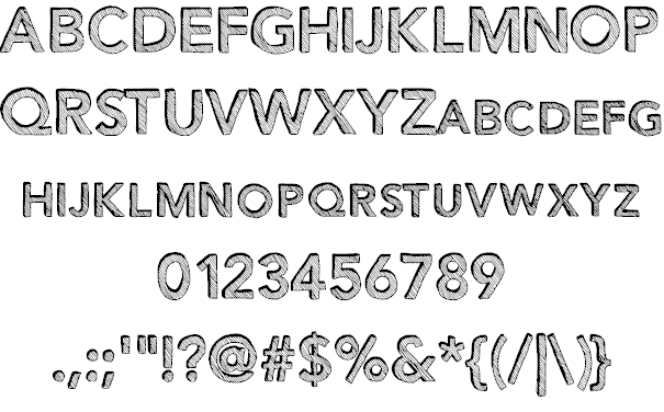
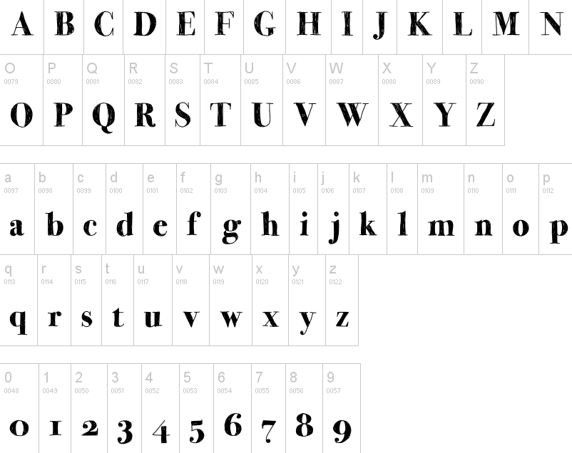
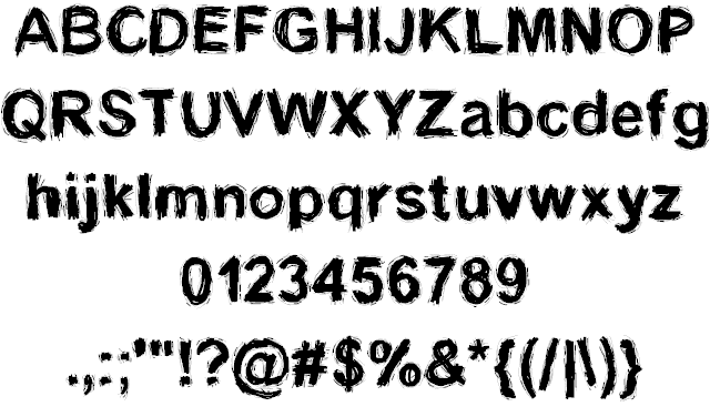
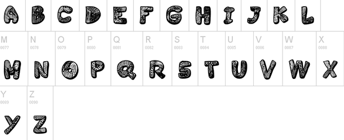
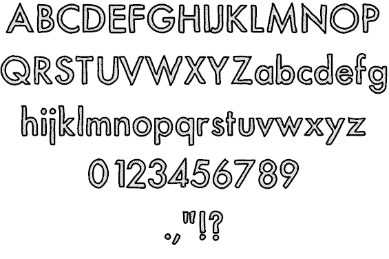
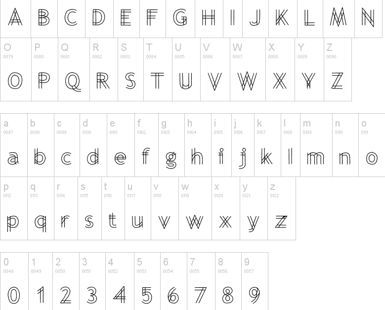
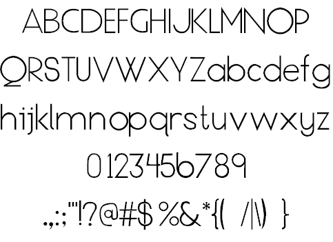
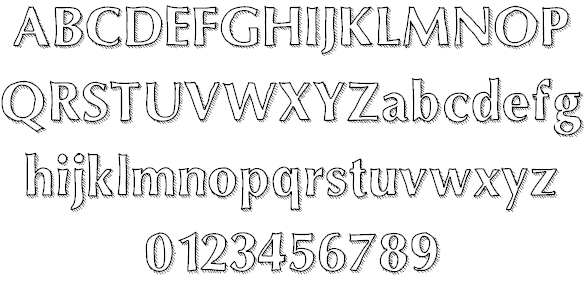
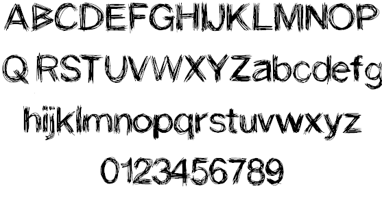
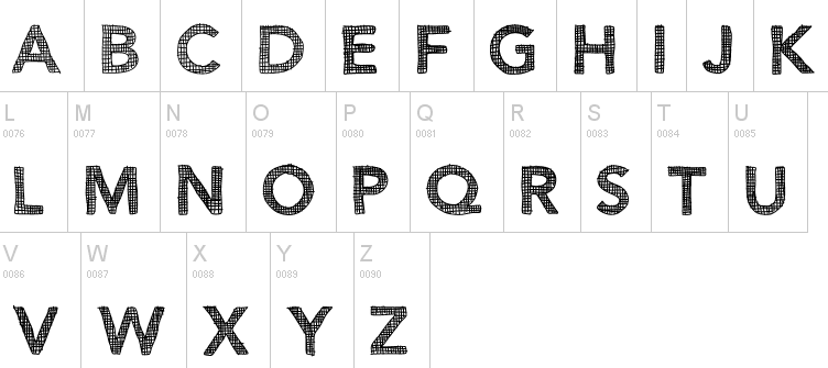
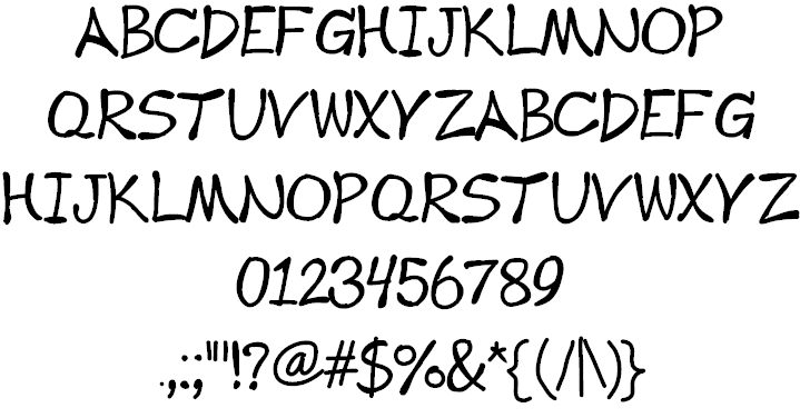
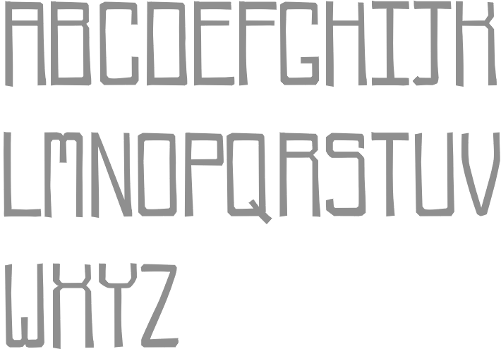
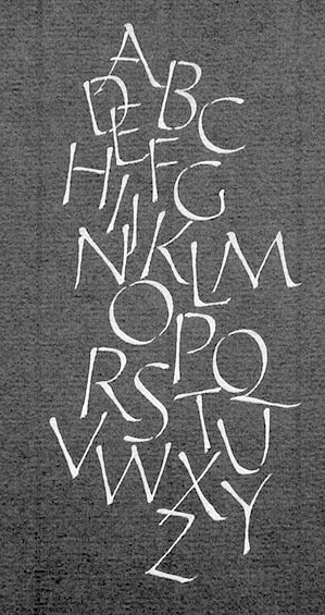
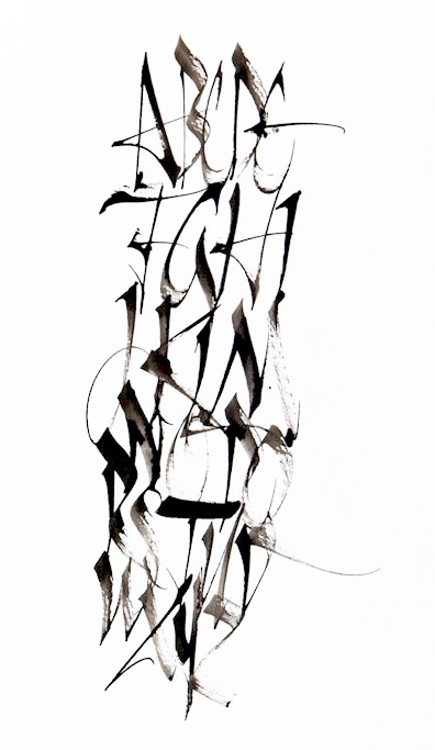
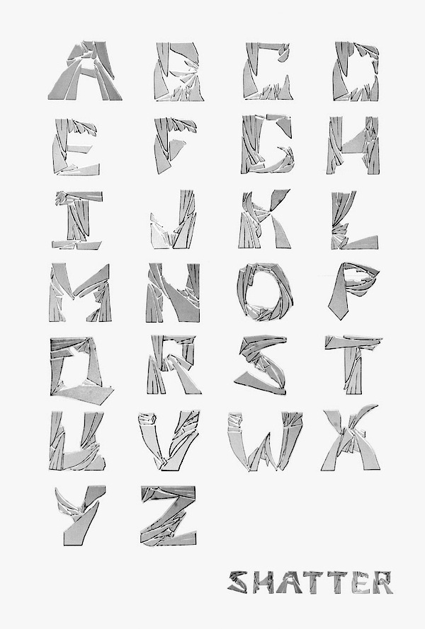
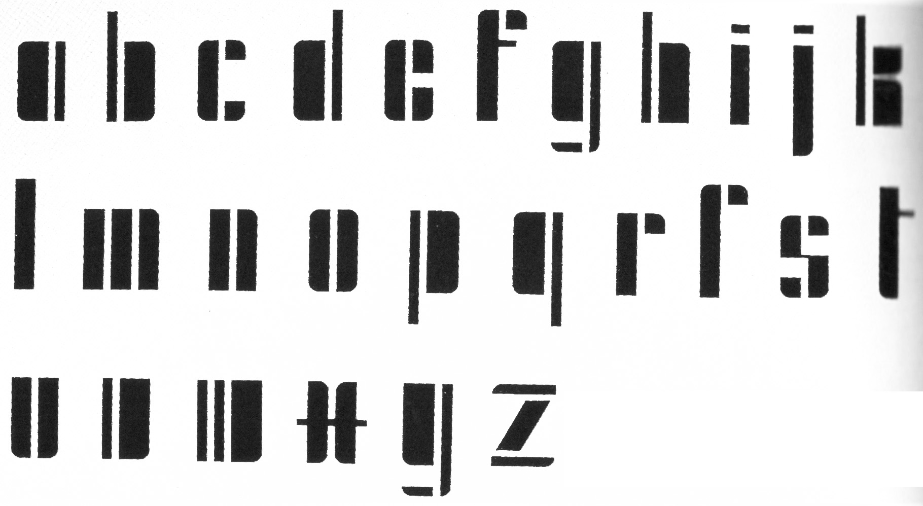
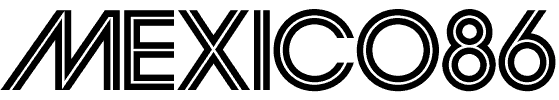
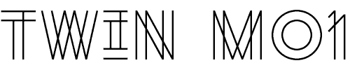
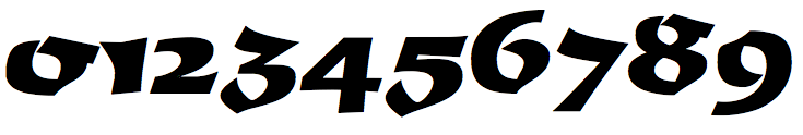
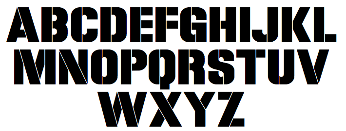
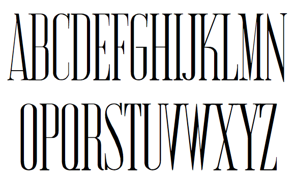
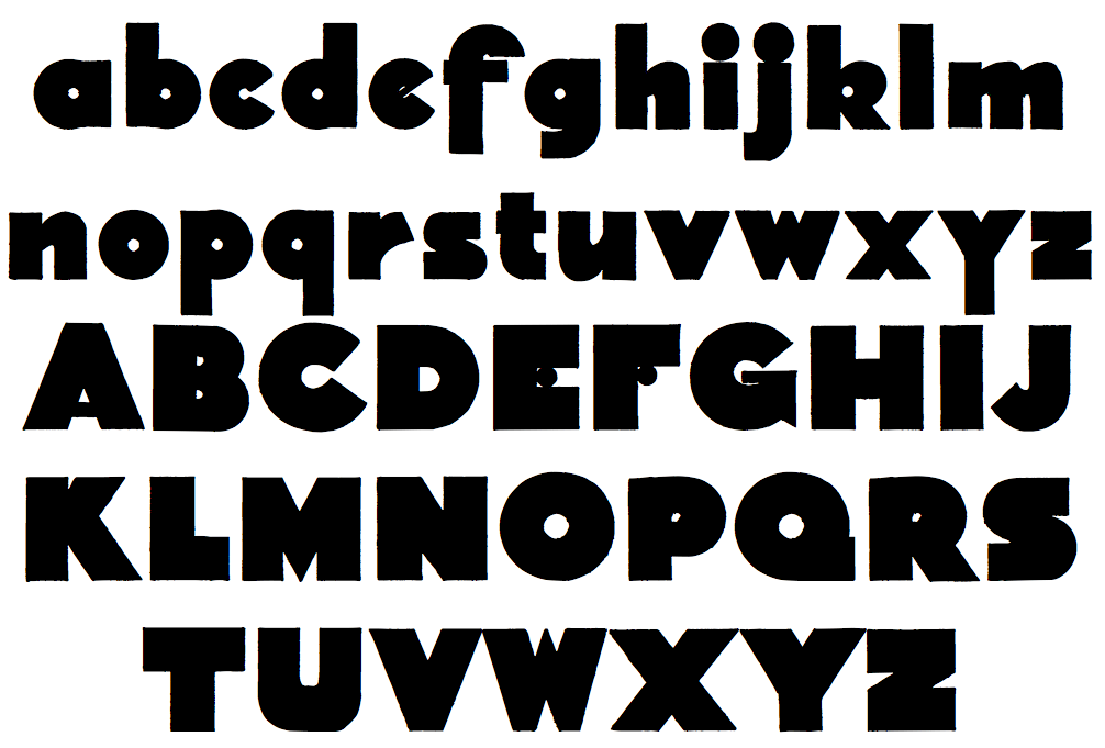
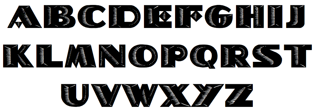
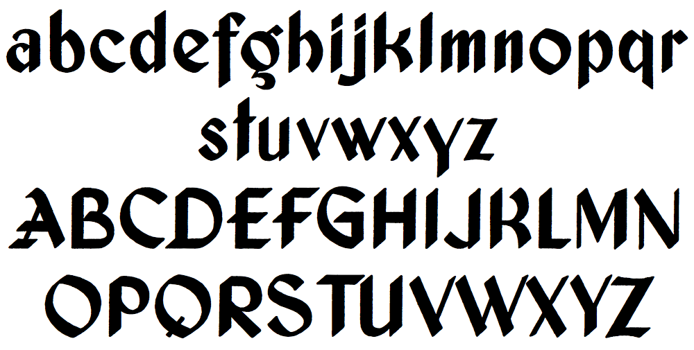
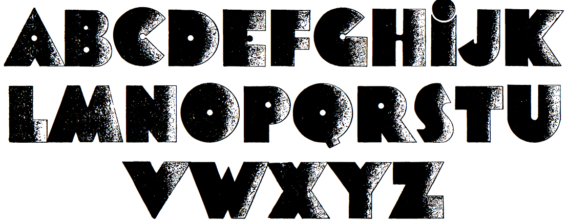
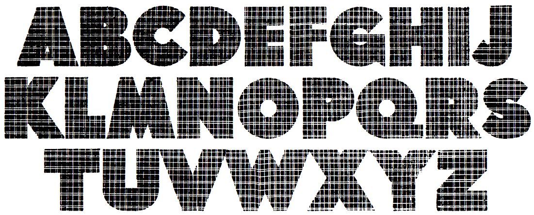
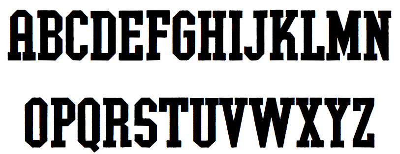
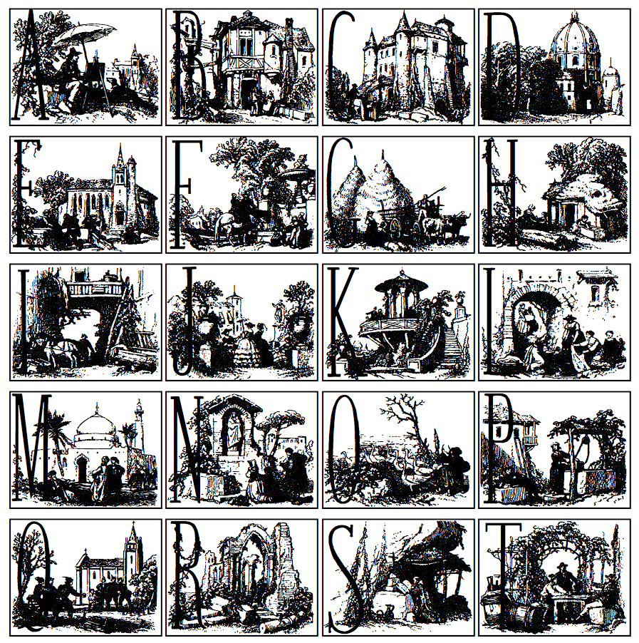
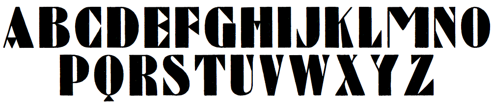
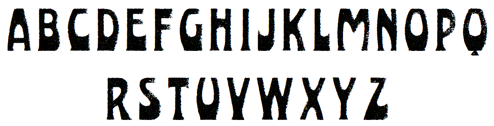
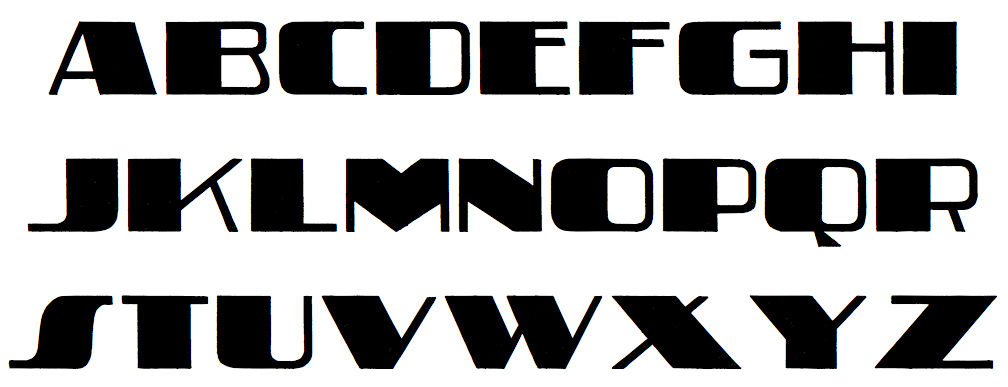
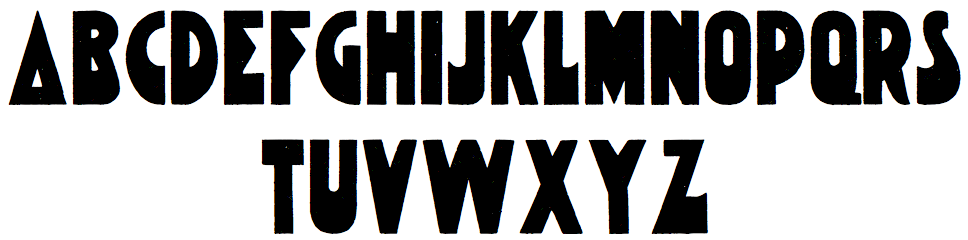
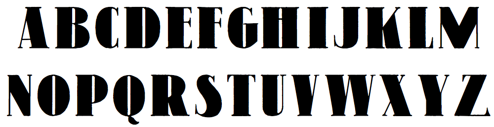
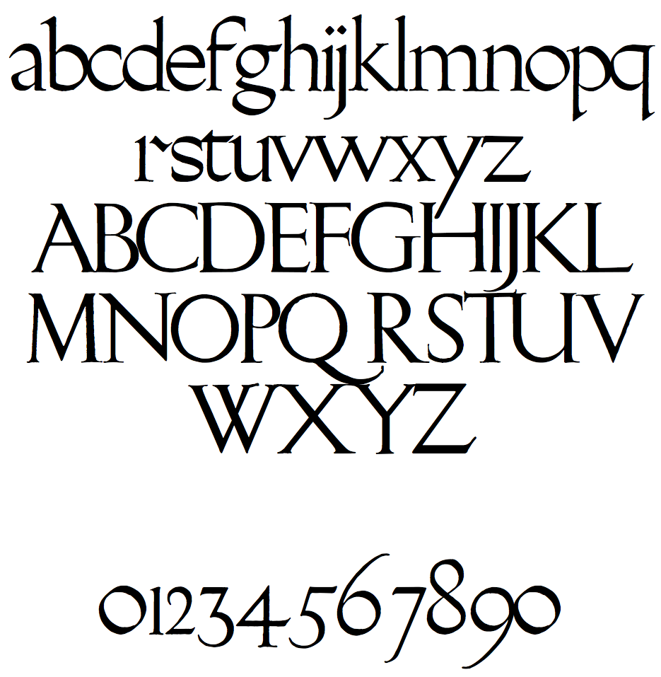
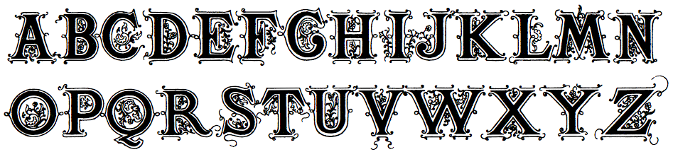
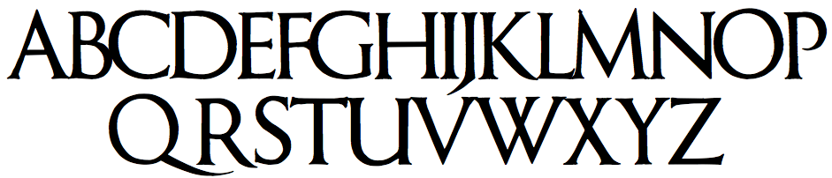
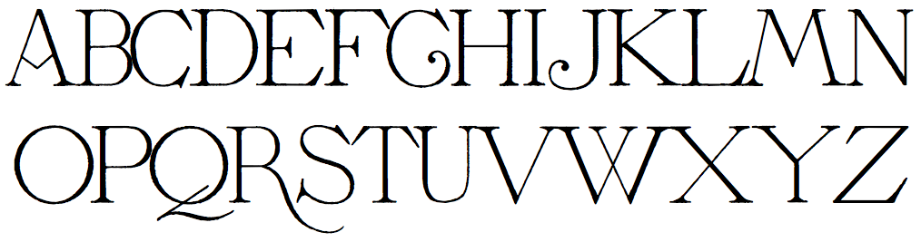
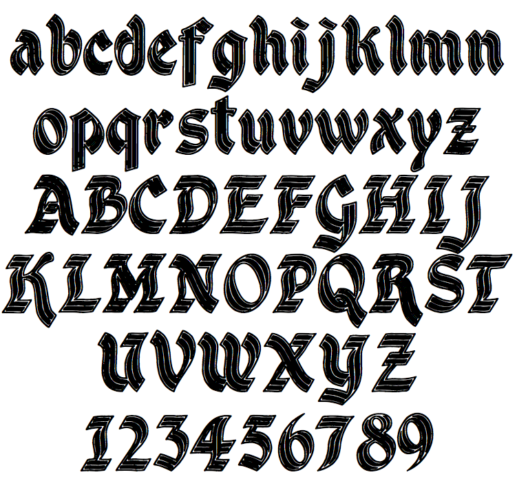
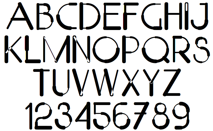
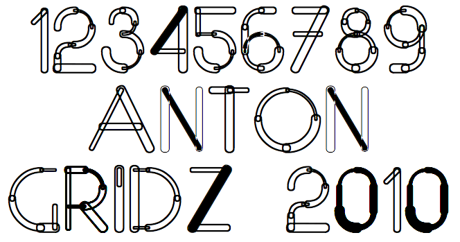
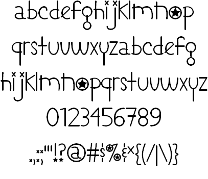
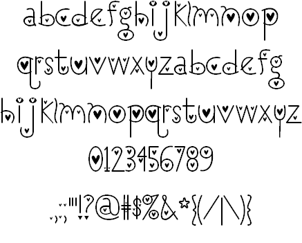
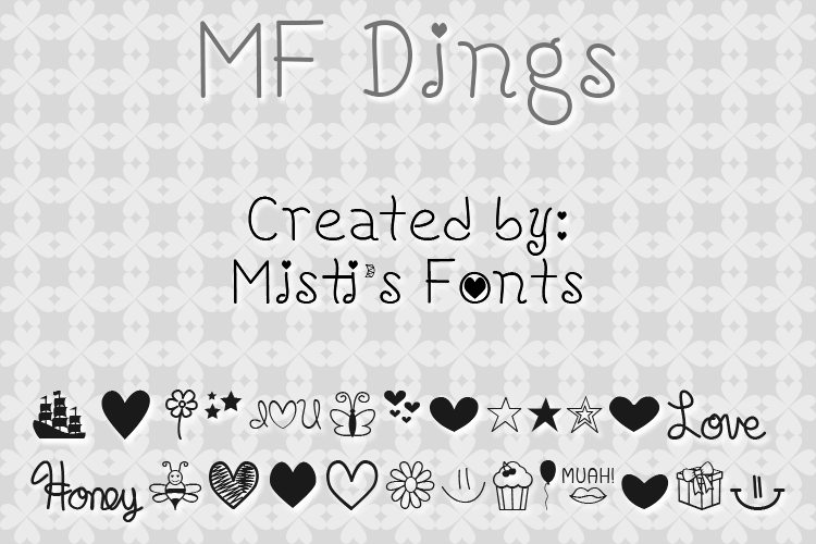
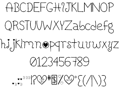
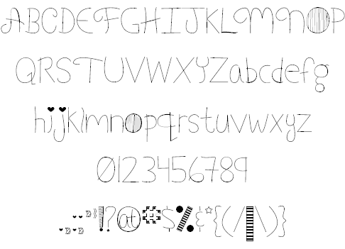
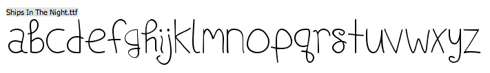
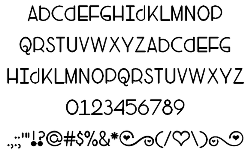
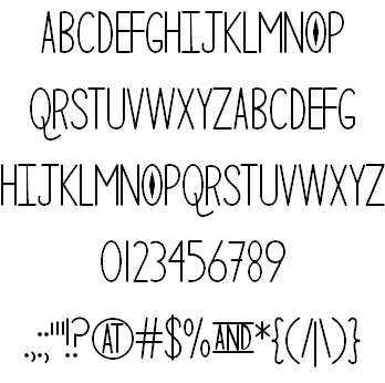
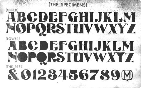
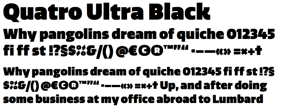
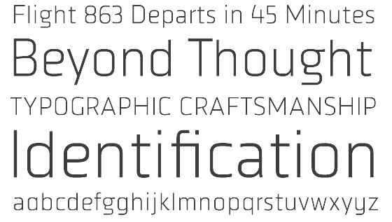
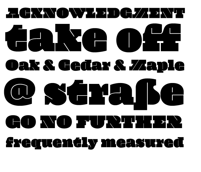
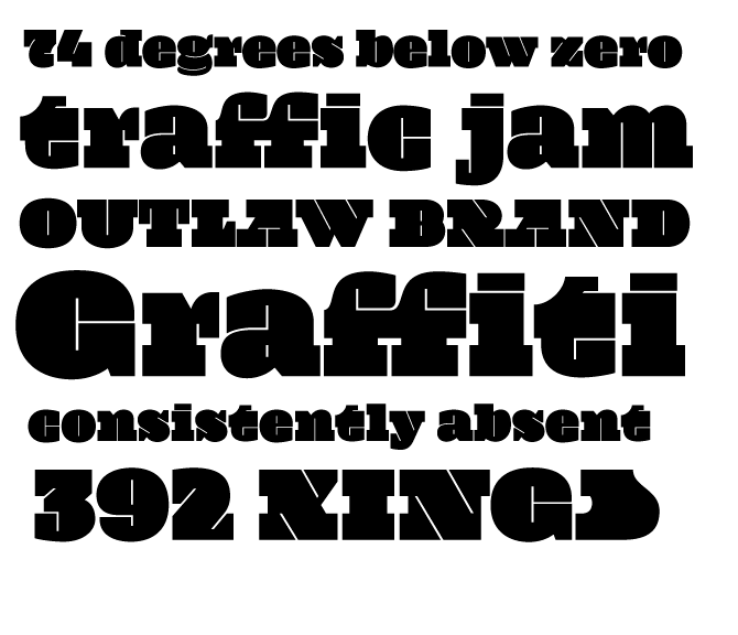
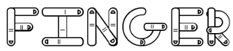
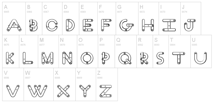
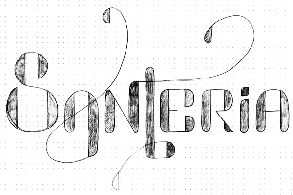
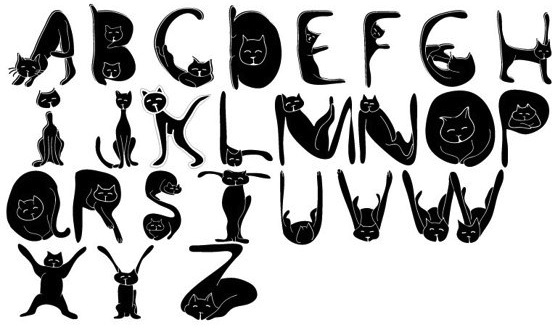
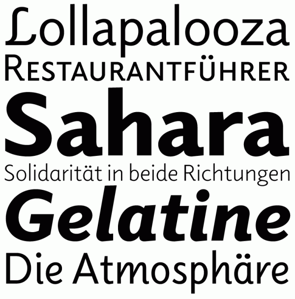
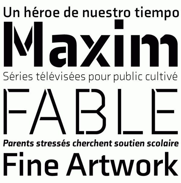
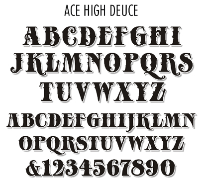
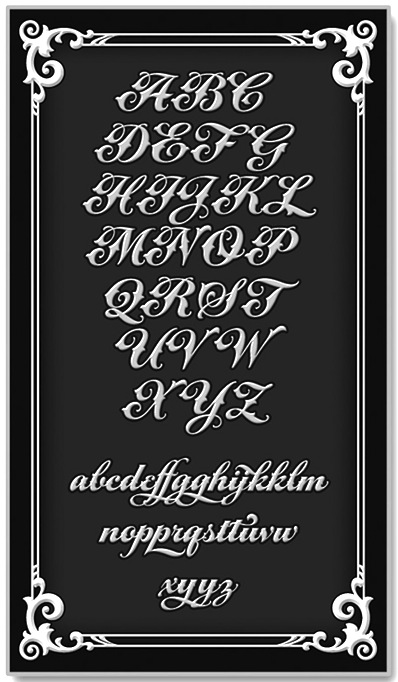
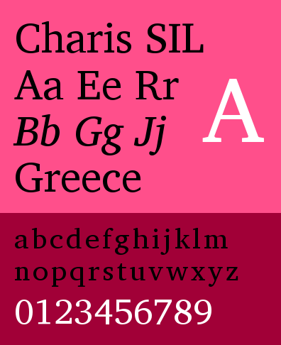
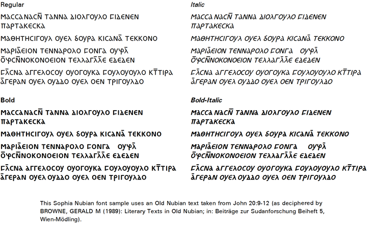
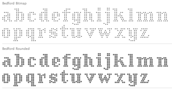
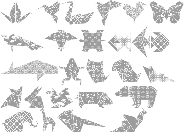
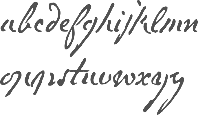
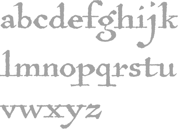
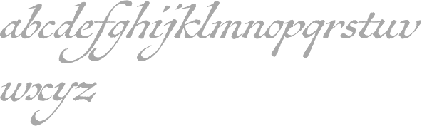
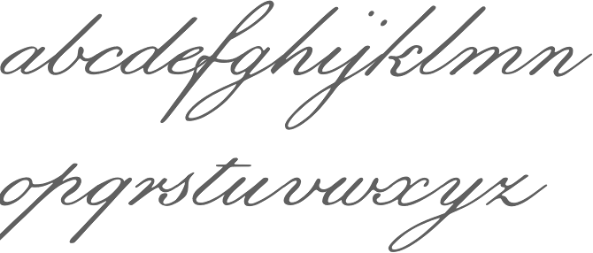
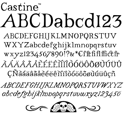
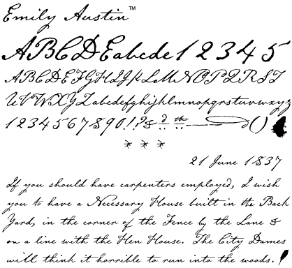
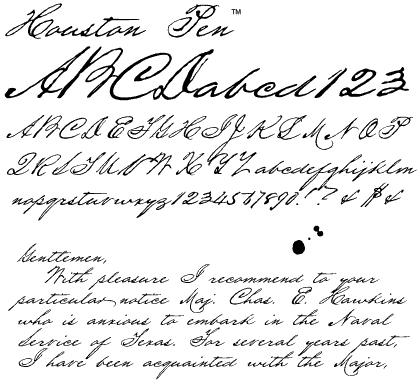
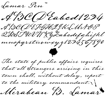
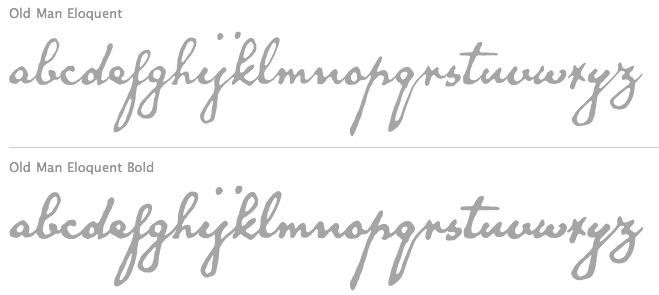
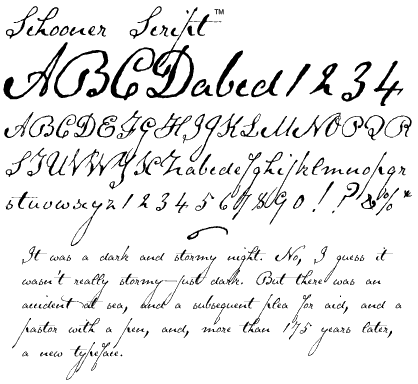
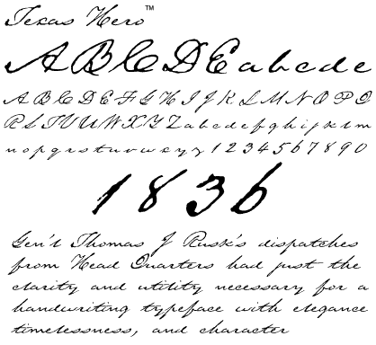
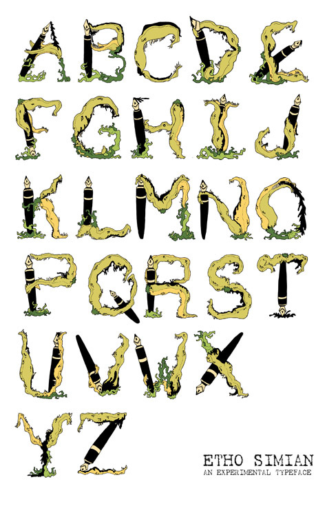
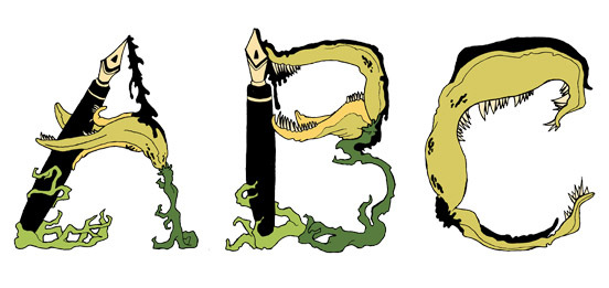
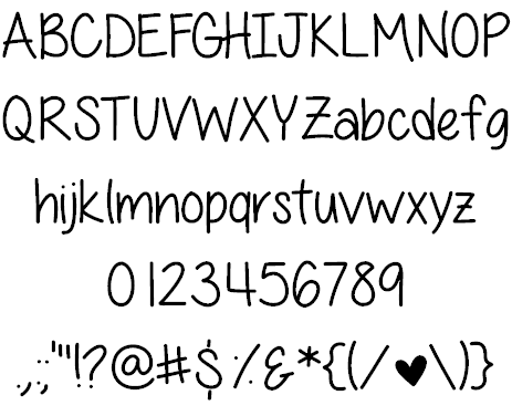
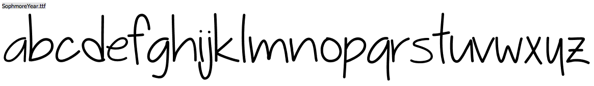
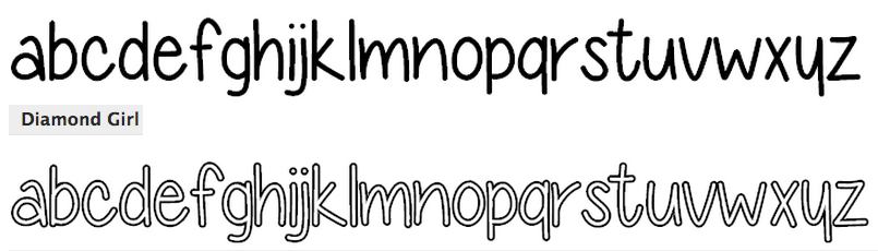
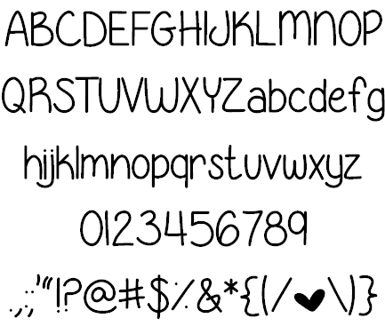
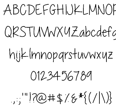
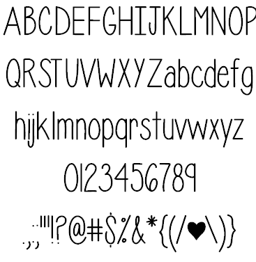
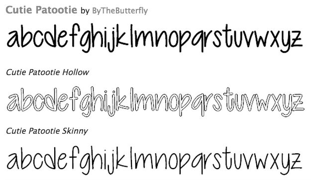
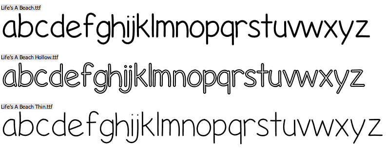
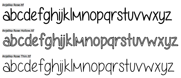
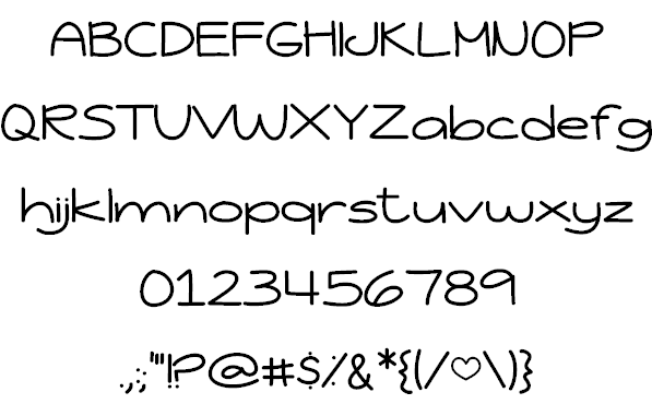
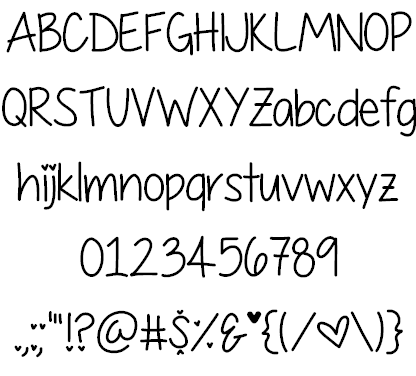
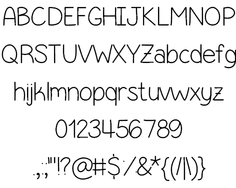
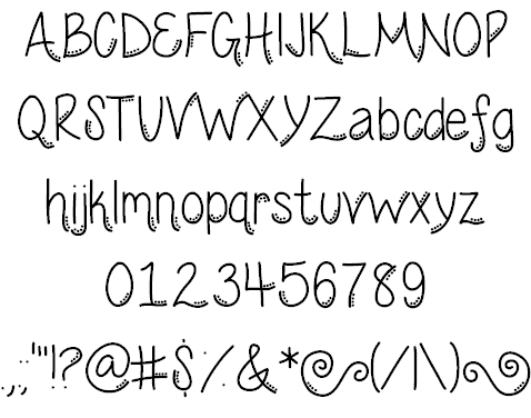
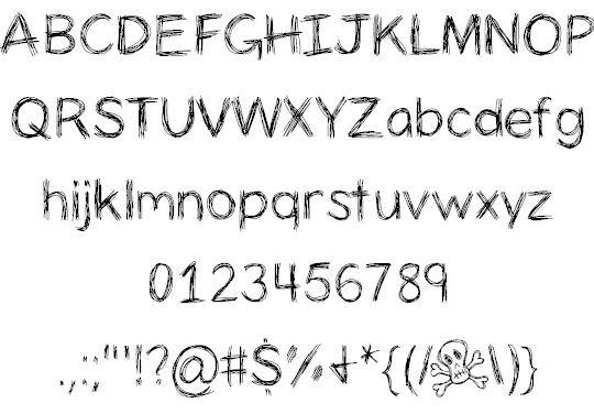
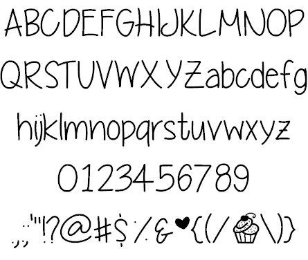
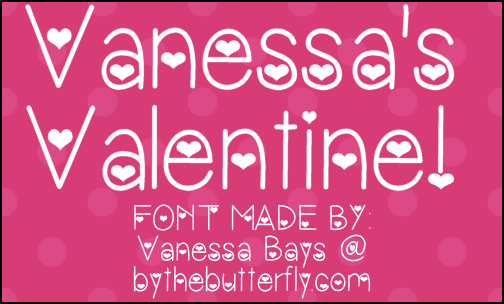
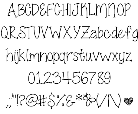
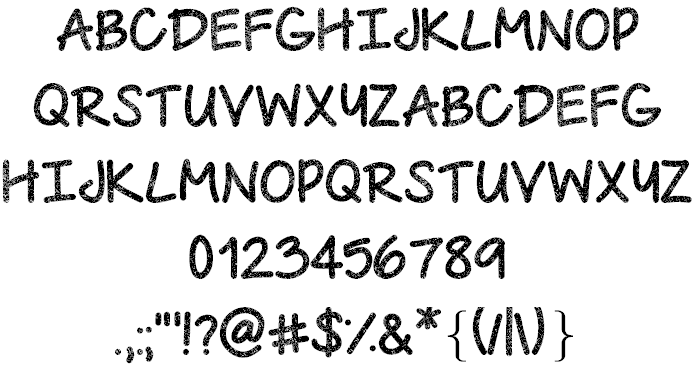
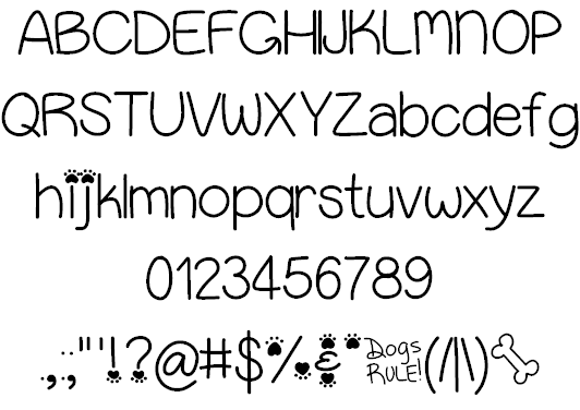
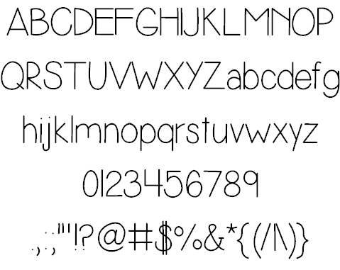
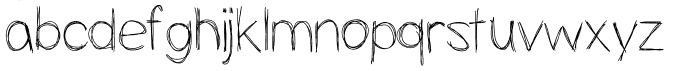
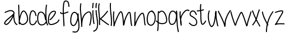
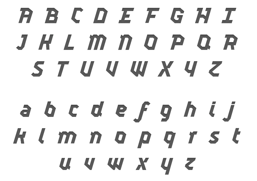
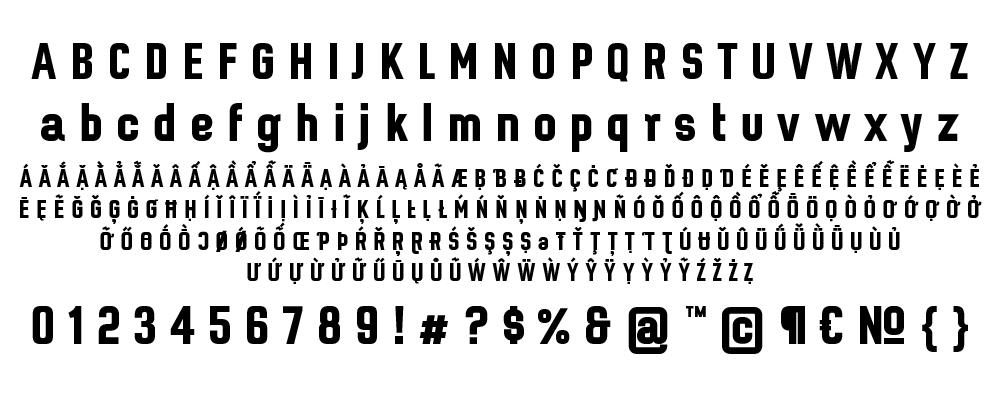
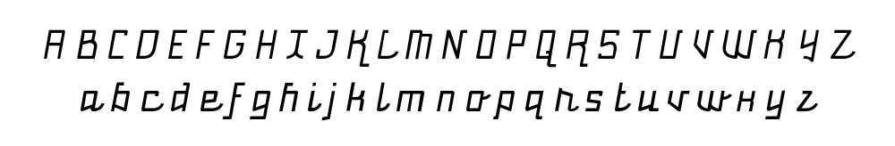
|
|
|
|