TYPE DESIGN INFORMATION PAGE last updated on Sun Jul 12 12:09:32 EDT 2026
FONT RECOGNITION VIA FONT MOOSE

|
|
|
|
|
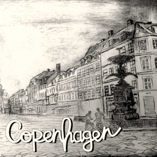
The Danish type scene | ||
|
|
|
|
SWITCH TO INDEX FILE
42 Studio
|
Aka Lilco and Co. Behance link. Creative Market link. More recent Creative Market link. Home page. [Google] [More] ⦿ |
A2 Type
|
At ATypI 2013 in Amsterdam, he spoke about New Transport. Winner of the type design prize at the Tokyo Type Directors Club TDC 2019, with Matt Willey, for the New York Times Magazine Olympic font. [Google] [MyFonts] [More] ⦿ |
Design studio founded in Denmark by Torsten Lindsø Andersen and Rasmus Michaelis. Together with Kontrapunkt, ABC Design created the new global brand typeface family for Nissan under direction from and in close collaboration with Bo Linnemann. Still with Kontrapunkt, ABC Design assisted them in developing the new didone style brand typeface for the Hotel d'Anglettere in Copenhagen (2016), working closely with Mads Quistgaard at Kontrapunkt. They also designed the wonderful Juli Sans (2016) and the more vernacular Barbu (2016-2017). Torsten Lindsø Andersen is based in Copenhagen where he co-runs Kontrapunkt’s type department and type lab together with Rasmus Michaelis. [Google] [More] ⦿ | |
Aalborg, Denmark-based graphic designer. He used the free font Talie as a model for his multiline typeface Mixed Ape (2013), which was designed for Mixed Ape Records. Behance link. [Google] [More] ⦿ | |
Adrian Täckman
| |
Graphic designer in Aalborg, Denmark, who created the vintage typefaces Forgeron (2016, spurred) and Blck Smth (2016, in Basic, Outline, Striped, Stamp and Wornout styles). [Google] [More] ⦿ | |
Alaina Jensen
| |
Graphic designer in Copenhagen. In 2012, he created the bold grotesk typeface Baltikum. He explains: Baltikum is a typeface inspired by the work of Danish designer/architect Knud V. Engelhardt. The type is based on an all capital letters alphabet by Knud. In collaboration with Christian Smed and Frederik Ibfelt 'Surplus Wonder' we create a modern version which includes the lowercase version of the alphabet. [Google] [More] ⦿ | |
Copenhagen, Denmark-based designer, originally from Constanta, Romania, of the brush script typeface Oasis Forever (2016). [Google] [More] ⦿ | |
During her studies in Copenhagen, Amalie Bolt Kjer designed the art deco typeface Amalie (2015). Behance link. [Google] [More] ⦿ | |
Aarhus, Denmark-based student-designer of the all caps sans typeface Mr. Bold (2018). [Google] [More] ⦿ | |
Copenhgen, Denmark-based designer of a brush typeface in 2016. [Google] [More] ⦿ | |
Klingspor link. Linotype link. [Google] [MyFonts] [More] ⦿ | |
Danish graphic designer and art director in Odense, who works at STUPID Studio. He created a great geometric modular typeface by superimposing simple geometric figures, and called it Paxono (2010). Behance link. [Google] [More] ⦿ | |
Danish creator (b. 1989) of the hairline octagonal font Aciddotica (2009). He lives in Aarhus. [Google] [More] ⦿ | |
At the School of Visual Communication in Haderslev, Denmark, Anders Waltz designed the free vector format heavy condensed four-angled constructivist typeface Kalashnikov (2016). [Google] [More] ⦿ | |
During her studies at the Danish school of Media and Journalism in Copenhagen, Andrea Gyldenör designed the 3d typeface View (2015) and the geometric experimental typeface Peak (2015). [Google] [More] ⦿ | |
Copenhagen, Denmark-based designer of My Handwriting Font (2016). [Google] [More] ⦿ | |
In 201, he created Panneau (a high-contrast sans typeface). Behance link. [Google] [More] ⦿ | |
In 2014, he also created the Open Source fonts Gidole Play (later renamed Gidolinya) and Gidole Sans [micropage], which is patterned after DIN 1451 and uses Euler spirals. Dedicated page for Gidole Sans. Github link for Gidole. In 2015, he published Gidole Regular and the monoline sans programming font families Monoid and Mono 16, which cover Latin, Greek and Cyrillic. Gidole was forked and extended in 2016 at Open Font Library by Cristiano Sobral as Normung. He modified the free M+ font to design MonoMusic for chords and tabs. Behance link. Dafont link. Open Font Library link. Use Modify link. [Google] [More] ⦿ | |
In 2013, Andreas Peitersen & Jess Andersen co-designed Faux at the danish type foundry Playtype. Faux is a three-dimensional, all caps display typeface inspired by old stone carving and engraving techniques. [Google] [More] ⦿ | |
Type designer, b. Denmark, 1985. His foundry in Copenhagen is Andreas Søren Johansen. In 2010, he created the liquid ink sans face Skammefy. Klingspor link. [Google] [MyFonts] [More] ⦿ | |
Andreas Stötzner
| |
Anette Schmidt
| |
Anja Emzén grew up in the south of Sweden, and got a bachelor degree in graphic design from the renowned Graphic Arts Institute of Denmark. Starting in 2010, she is doing graphic design work in Sydney, Australia. Emzén (2010) was created while Anja was studying at The Graphic Arts Institute of Denmark. It is a soft-edged slab serif. [Google] [More] ⦿ | |
During her studies, Copenhagen-based Anja Kajinic created the great condensed all caps titling typeface Dayclean (2015). Behance link. [Google] [More] ⦿ | |
Odense, Denmark-based creator of the free ai format font Paper (2013), which consists entirely of superimposed triangles. [Google] [More] ⦿ | |
During her studies at the School of Visual Communication in Haderslev, Denmark, Anne Aarup created a brushy typeface with an asparagus (2014). [Google] [More] ⦿ | |
For a school project at Skolen for Visuel Kommunikation in Haderslev, Denmark, Anne Aarup Kristensen designed the 3d skeletal typeface Isometric (2015). [Google] [More] ⦿ | |
During her graphic design studies in Haderslev, Denmark, Anne Hassing created a calligraphic typeface (2012). [Google] [More] ⦿ | |
Nørrebro, Denmark-based designer of Shahnama (2019) as a DMJX (Danish School of Media and Journalism) school project in Copenhagen. [Google] [More] ⦿ | |
At the Skolen for Visuel Kommunikation in Haderslev, Denmark, Anne Louise Ising created the impressive beveled all-caps typeface Spotype (2015). [Google] [More] ⦿ | |
| |
During her studies in Frederiksberg, Denmark, Anne Mai Særker-Sørensen designed the inky psychedelic typeface Cheap Thrills (2016). Behance link. [Google] [More] ⦿ | |
Danish designer, with Lotte Reinert, of a font made for the Botanic Gardens in Copenhagen in 2000, a very dark almost-slab serif face. [Google] [More] ⦿ | |
For a school project in 2009, Anne Mette Moller (Copenhagen, Denmark) designed a display typeface for the Sound & Vibration Technology company Brüel & Kjaer. [Google] [More] ⦿ | |
| |
Anthony I.P. Owen
| |
Approximate Type
|
Behance link. Home page. [Google] [More] ⦿ |
ARC Fonts
| Danish designer, b. 1998. Aske created Aske's Handwriting (2012). Dafont link. [Google] [More] ⦿ |
Arne Emil Jacobsen (b. 1902, d. 1971) was a Danish architect and designer. He is best known for his contribution to architectural functionalism and his simple but effective chair designs. In 1941-1942, Arne Jacobsen and Erik Moeller designed an architectural drawing-style alphabet for the Aarhus town hall. That alphabet was digitally revived---commissioned by the Board of Arne Jacobsen, Arne Jacobsen's Grandson Tobias Jacobsen and Danish branding agency AM---by the A2 foundry as Arne Jacobsen, ca. 2018. [Google] [More] ⦿ | |
Aske Ching
| |
During his studies in Haderslev, Denmark, Aske Gramstrup Andersen created the curvy display typeface Farisaeer (2015), which is named after a drink in Southern Denmark with coffee, rum and whipped cream. [Google] [More] ⦿ | |
Astrofonts
| Astrological fonts: StarFont Sans and Serif (1993) by Anthony Owen, and AstroFont (2000, by Astrolars). Anthony Owen is from Copenhagen. A type 1 version of StarFont exists, as well as Latex/TEX code for using the font (the latter by Matthew Skala). [Google] [More] ⦿ |
Originally from Reykjavik, Atli Þor Árnason is studying at The School of Visual Communication in Haderslev, Denmark. He created the runic and/or Futhark simulation typeface Ristir (2011), a typeface that was heavily inspired by The Elder and The Newer Futhark alphabet. Behance link. [Google] [More] ⦿ | |
PC-Mac compatible true type fonts primarily intended for the transliteration of Akkadian and Sumerian cuneiform texts. Bendt Alster's page. The fonts made by him from Monotype fonts include the BaBo family (BookmanOldStyle), the BaCesPsB family (CenturySchoolbook), the BaTak family (TimesAkkad), BaGarUni (Garamond Unicode). His BATimesAkkad (2000) is also here. [Google] [More] ⦿ | |
Benedikt Gröndal
| |
Graphic designer from Frederiksberg, Copenhagen, Denmark, who created Ideo Stencil (2006, a slab serif stencil) and Paperwing Sans (2006). [Google] [More] ⦿ | |
During his studies at The School of Visual Communication, Aarhus, Denmark-based Benjamin Brandt designed the experimental outlined display typeface Accessori (2015). [Google] [More] ⦿ | |
Creator of the textured typeface EMRE (2011), which stands for Engschrift Mit Runden Ecken. Wernery is based in Copenhagen, where he obtained a BA from the School of Visual Communication in 2010. Home page. [Google] [More] ⦿ | |
Graphic designer in Kolding, Denmark, who created Geometric Headline Font (2012). Behance link. [Google] [More] ⦿ | |
| |
Bjørn Hansen
| |
Behance link. [Google] [More] ⦿ | |
Bo Linnemann
| |
Bogstav
| Bogstav is the second type foundry identity of Pizzadude, kindergarten teacher Jakob Fischer (Denmark). Typefaces from 2022: Pausefisk, Turpentine Kisses (a hand-crafted version of Clarendon), Kitchen Stink, Organic Respect (a hand-crafted slab serif), Saturday Detentions, Dusty Hands, Tired Sunday, Frisky Bug. His typefaces from 2021: Lemon Smash, Fruitcake Fanatics, Gimcrack (a great informal sans with an even greater name), Public Interest, Overly Sweet, Sugar Flash (a vernacular party announcement font), Sugar Flash, Exit Punch, Weekday Mornings, Huskeseddel, Painless Feedback, Random Phrase, Organic Benefit, Organic Weekend, Sugar Junk, Saturday Light (a five-lined handcrafted typeface), Selfish Jeans, Foolish Talk (a fat finger font), Easy Answer, Dramatisk, Butter Cookie (a fat finger font), Appelsin, Brutal Fashion, Scrungy Picnic, Scrungy Picnic, Burger Shake, Sticky Rush, Gurgle Jock, Smartburst, Gurgle Jock, Smartburst, Organic Tuesday, Shaky Monday, Fransk Nougat, Cookie Kit, Musty Scoot, Lazy Boutique (counterless), Supertanker (counterless), Nonsense Note, Misquote Note (a fat finger font), Vintersjov, Personlighed, Spinat, Yggdrasil (hand-drawn, inspired by Nordic runes), Party Toast. His typefaces from 2020: Magisk Time, Ignorant, Magic Hour, Syndebuk, Chunky Dressing, Remarkably Dressed, Doorkick (a heavy brush face), Udklip, Misheard Lyrics. In 2019, he designed Tacky Song, Bungler, Overblik, Superfan, Jealous Punk, Talking Cat, Joking Lemon, Same Old Joke, Fake Fury, Rookie Heat, Direkteur, Identity and Helpless Advice (a dry brush typeface). In 2018, he published these mostly handcrafted typefaces: Charmetrold, Drivkraft, Frihed, Samtale, Primus Motor, Pusling, Komfortabel, Gulerod, Skulderklap, Tudeprins, Jernhelbred, Hyggebukser, Grovflab, Blikfang, Romkugle, Pauseklovn, Ugiftig, Wastebag (graffiti), Drillepind, Ramaskrig, Jackdaws, Karamboule. In 2017, he made these handcrafted typefaces: Otherwise, News Junkie, Nikotinus (drybrush), Budskab (dry brush), Swingdevil, Legwork, Milepost, Pandorama, Gymnastik (rough brush), Hummingbird, Curiousness, Butterfish, Snubnose, Obstacle, Luxurious (dry brush), Your Flames (heavy brush), Filmgoer, Dummkopf, Eventually, Teapoy, Tastebud, Leisurely, Automnious, Ravishing, Charmelade (dry brush), Habitatus, Temperamental, Ahorn, Chaplet, Everlasting, Honeypunch, Lemonism, Osculate, Repartee, Talkback, Tantamount. Dafont link. [Google] [MyFonts] [More] ⦿ |
Copenhagen, Denmark-based author of Webfont Handbook. He tweets on web typography and front-end development. [Google] [More] ⦿ | |
Buddha Graphix
| Jesper Birk's FunkDaFont series. His cool shareware fonts include Funky Deco (Arnold Boecklin grungified), Bandit, Barmos, BlueRoom, ConnectionBad, Clockwork, DanzinLikeCrazy (a very curly pen-drawn face), See Your Point, and StageDive. Other URL. Fontspace link. Dafont link. [Google] [More] ⦿ |
| |
At The School of Visual Communication in Haderslev, Denmark, Camilla Drejer Andersen designed the rune and Viking-inpspired techno typeface Njordwear (2015). Behance link. [Google] [More] ⦿ | |
During her studies at the Danish School of Media and Journalism in Copenhagen, Denmark, Camilla Green designed Joon Regular (2019), a custom font for the Shahnama Exhibition at The David Collection in Copenhagen. She also made the dot matrix typeface Gridtypo (2019). [Google] [More] ⦿ | |
| |
Danish designer from Copenhagen, b. 1975. He studied graphic arts at the San Carlos Academy of Fine Arts in 1997-1998 and at the Jan Matejko Academy of Fine Arts in Krakow, Poland, in 1999. Creator the free grunge typewriter family Traveling Typewriter (2006), the free experimental typeface Finger Type (2015), the triangulated Polygon (2015), and the squared LCD pixel typeface ChessType (2008). Dafont link. Yet another URL. Yet another URL. Newer Dafont link. [Google] [More] ⦿ | |
Carl Volmer Nordlunde
| |
During his studies, Pacatuba, Brazil-based Carlos Darthanhan created the decorative octagonal caps typeface Capitulares (2015). [Google] [More] ⦿ | |
Copenhagen-based designer of Typoholic Handmade (2016). Behance link. [Google] [More] ⦿ | |
During his visual communication studies in Haderslev, Denmark, Casper Nielsen created the art deco typeface Blue Room (2015). [Google] [More] ⦿ | |
During his studies at Danmarks Medie- og Journalisthøjskole, Copenhagen-based Casper Rasmussen created the triangulated and diagonalized graph theoretic typeface Octagon (2015). [Google] [More] ⦿ | |
Aarhus, Denmark-based designer of the high-contrast all-caps display typeface Alula in 2016. [Google] [More] ⦿ | |
Chainreact Media Design
| Chainreact is the personal web site and portfolio of Jan F. Poulsen in Denmark. He created the Block Boxter font (2005). [Google] [More] ⦿ |
During her studies at the School of Visual Communication, Haderslev, Denmark, Vejen-based Charlotte Bror Jacobsen created the modular typeface Remake Refont (2015). [Google] [More] ⦿ | |
| |
During her studies in Haderslev, Denmark, Charløtte Strom Nielsen created the lachrymal typeface Bobblebe (2015). [Google] [More] ⦿ | |
Danish designer (b. 1991) who made the organic headline typeface Whitelighter (2007). [Google] [More] ⦿ | |
Chess diagrams
| Eric Bentzen has links to chess diagram software, and to about twenty chess fonts. THE site for chess fonts! Download his Chess Alpha, his Chess Berlin, and many more TrueType chess fonts. See also here. [Google] [More] ⦿ |
Chimerique
|
|
At The School of Visual Communication in Haderslev, Denmark, Chris Friborg designed the display typeface Fontanamo (2016). [Google] [More] ⦿ | |
During his studies at Skolen For Visuel Kommunikation (School of Visual Communication) in Haderslev, Denmark, Christian Horsbøl Christiansen designed the free typeface Fibonacci Fraktur (2018) and the hand-painted all caps typeface Sticks n Stripes (2018). [Google] [More] ⦿ | |
Graphic designer in Copenhagen, b. 1979. At Dafont, one can download his techno typeface Street Movement (2011) and the ransom note font Gadetyper (2019). [Google] [More] ⦿ | |
For a school project in Kenn Munk's class at the School of Visual Communication in Haderslev, Denmark, Christian Lank designed the free quirky vector format sans typeface Quartz (2017). In 2019, while based in Amsterdam, he designed the free typeface Effekt Grotesk. [Google] [More] ⦿ | |
In 2008 he designed Flag Semaphore (+Smooth, Peace), Articulate, Font from NATO (military slab serif), Glockenwerk (pixel clock font), Glockenwerk Uhrzeit, Flags-and-NATO (dingbats), Font from NATO alpha, Tall, Flying-Circus (Western showtime typeface to imitate the Monty Python titling font), LCD-display, Simple (stencil font with 700 glyphs), TMNT, Tetris, sharp-pixels, Raster, Quad (nice stencil face), Inverted, Propaganda (Cyrillic font simulation), Empty Monospace, Pride, Stadium, Rounded, Dear God (script pixel face), Celtic Style. In 2009, he added 7x12 Pixel Mono, @bcde, Abstract Letter Patterns, Music, Texture, Diagonal, Gothic, Illusio, Unispace (typewriter type), Narrow Serif, Delta, Alien Double (great!), Donut, Flags-and-NATO, Simple-Fraktur-Initial, Simple-Fraktur, Texture, Friendly Serif, (+Soft), Invisible, Sharp, Heavy Diacritics, Concentrium, Continuous Digital Display, Elves, Pixies, Space Movie (+Ligatures), Flag Semaphore (+Smooth, +Peace), Articulate, BBT Biline Twist, Biline Twist, Empty Monospace, Unfix, Infix, Pride, Tyre Stencil (like tire threads---nifty...), and Overlap. FontStructions from 2010: Even (gridded), Brilliance, Slalom Vision, Quirky Serif, 7x12PixelMono, Ball Terminator, Gearbox, Prefix, Upside Down, Way Too Small (a minimalist pixel face), Butterfly, Ribbon Gymnastics, 2D Barcode, Horizon Stencil, Biline Twist, Blocktur, Symmetricus (alien writing?). FontStructions in 2011: 12 dice, Monotwist (tall, monospaced), Squarific (fat octagonal), Swirl (curly), Sweet (Victorian), Easter Eggs, 50 Fifty (experimental, geometric), Squarific (+Stencilious), Spiralix (spiral-themed for Latin and Cyrillic), Bloccus, Feet (monospaced). Creations from 2012: Düpbøl (German expressionist face), Slice, Blocktur, Alien Double, 7:12 serif (pixel face), Blick, Dry Heat (Isolates and Initials, Medials, Finals: an Arabic simulation family), FF9 Coin Slots, FF8 Untalic, FF7 w1de, FF6 Lean Mean, FF5 Bamana, FF4 Circulation, FF3 3times7, FF3 Runization, FF1 Glitchy, Squared, Puzzlish, Steep, Digitalis (octagonal), 50 Fifty (artsy and geometric), Monotwist, Infix. FF stands for Forgotten Fonts. Typefaces made in 2013: Ribbons And Banners, Digital Rome (pixel face), Censorship, Interlock, Bouma, Glaedelig Script, Hand XL Smooth, Vascomat, Spitzschtruct (emulation of Suetterlin), Neonic, Fish Scales, 7:12 Serif, Analogly, Squarific Fraktastic, Metro Sans (pixelish). Typefaces from 2014: Word Games, Shadows, Yuuroppuna pixel, Spines, Numbers, Tal Dansk, Zahlen Deutsch, Insular Typewriter, Nudge Nudge (dot matrix), 7:12 Serif (monospaced pixel font), Jovian, Squarafic Fraktastic, Computer Says No, Runic, Fluorescent (neon tube typeface). Typefaces from 2015: Hexagonia, Kapow (a comic book font), Fauxreign (a Thai emulation font). Typefaces from 2016: Ziplock (art deco), Vexillum (maritime signal flags). Typefaces from 2019: Drop Cap (Lombardic), Fun with Cubes (3d). [Google] [More] ⦿ | |
Copenhagen-based designer of a modular typeface in 2012. Behance link. [Google] [More] ⦿ | |
Copenhagen based designer of Octin College Free (2012, octagonal and stencil family), which is based on Ray Larabie's athletic lettering typeface Octin College. Behance link. [Google] [More] ⦿ | |
Graphic designer in Haderslev, Denmark, who is studying graphic design and communication at the School of Visual Communication in Denmark. Behance link. In 2012, she created the high-contrast fashion mag typeface Reddish. [Google] [More] ⦿ | |
Danish designer. He created the ultra fat slabby typeface Brett or Jarvis (2010). Behance link. [Google] [More] ⦿ | |
Christopher Hansen
| |
At The School for Visual Communication in Haderslev, Denmark, Christopher Maden designed the avant garde all caps sans typeface Informativ (2016). Thanks to the careful use of white space, it uses 43% less ink than the average of Times New Roman, Helvetica, Avenir and Franklin Gothic. [Google] [More] ⦿ | |
Odense, Denmark-based creator of the Danish Alphabet (font) (2012). Behance link. [Google] [More] ⦿ | |
Citrus Branding
| Denmark-based designer of the hand-printed typeface Farmers Marker (2019). [Google] [MyFonts] [More] ⦿ |
Danish lettering artist (b. 1917) who drew type for cigarette packages, companies, banks and breweries. Many logos are due to him. [Google] [More] ⦿ | |
Art director at Pegasus in Copenhagen, Denmark (b. 1971). At Garagefonts in 2000, he released these typefaces: Cafe Retro, Dualis, Five Link Chain, Fono, Mobilette, Modus, Toaster, the runny ink font TwoFourTwo (2000), C64 (2000, a pixel face), Fake Deco Extra Bold (2000, squarish). FontShop link. [Google] [More] ⦿ | |
He says: I created a new design again taking inspiration from the early sketches of Dwiggins' Experimental No. 223. I was able to use the very open aperture design of the e in this experiment. The a again explored a inflexion points within the counters, and this was too integrated in the design. Finally lightly rounded wedge shaped base serifs were chosen. In 2011, Claus placed Playfair Display with Google Web Fonts. He explains: Playfair Display is a transitional design. From the time of enlightenment in the late 18th century, the broad nib quills were replaced by pointed steel pens. This influenced typographical letterforms to become increasingly detached from the written ones. Developments in printing technology, ink and paper making, made it possible to print letterforms of high contrast and fine hairlines. This design lends itself to this period, and while it is not a revival of any particular design, it takes influence from the printer and typeface designer John Baskerville's designs, the punchcutter William Martin's typeface for the Boydell Shakespeare (sic) edition, and from the Scotch Roman designs that followed thereafter. As the name indicates, Playfair Display is well suited for titling and headlines. It was followed in 2012 by Playfair Display SC. Free download at CTAN and at Open Font Library. Free download of Playfair Display Italic. In 2014, Claus designed Inknut Antiqua, a free angular text typeface family for low resolution screens, designed to evoke Venetian incunabula and humanist manuscripts, but with the quirks and idiosyncrasies of the kinds of typefaces you find in this artisanal tradition. Google Fonts link for Inknut Antiqua. Open Font Library link. Inknut Antiqua covers Latin and Devanagari. Claus lives in Amsterdam. Google Font Directory link. Speaker at ATypI 2011 in Reykjavik on the topic of typography for touch-screen devices. Klingspor link. [Google] [More] ⦿ | |
Designer of the great font Puppetface at the Beetles and Dry Fish foundry. [Google] [More] ⦿ | |
Danish typeface designer with a background in art direction and graphic design. He graduated from the The Gerrit Rietveld Academie in Amsterdam, and obtained a Master of Arts in Typeface Design from the Department of Typography & Graphic Communication of The Univerity of Reading. Speaker at ATypI 2013 in Amsterdam. [Google] [More] ⦿ | |
Graphic designer and illustrator in Aarhus, Denmark, who created the rough handcrafted typeface Into The Wild (2015), which was inspired by the movie. She also designed the anatomical Boney Letters (2015). [Google] [More] ⦿ | |
During her studies at UFPel in Pelotas, Brazil, Daiele Rosa designed the triangulated space era typeface Estellar (2015). [Google] [More] ⦿ | |
During his studies at Skolen at Design College Australia in Brisbane, Dalton Batt created the modular display typeface Dune (2016). [Google] [More] ⦿ | |
Designer of the Tintin truetype font. Well, it's a bit unclear who the designer really is. [Google] [More] ⦿ | |
Student at Skolen for Visuel Kommunikation in Haderslev, Denmark, b. 1991. Creator of the free sans typeface family Thorup Sans (2012), which first started out as a logotype for school work. Behance link. Dafont link. [Google] [More] ⦿ | |
Haderslev, Denmark-based designer of the bilined textured typeface Saxo (2016) for a school project at the School of Visual Communication. [Google] [More] ⦿ | |
During his studies at the School of Visual Communication in Denmark, Copenhagen-born Daniel Lindholt designed the hypnotic prismatic typeface Hypno (2015). [Google] [More] ⦿ | |
Daniel was born in Copenhagen and graduated from DMJX Danish School of Media and Journalism in 2013. Behance link. [Google] [More] ⦿ | |
David Engelby
| |
David Engelby Foundry
|
In 2013, he set up the commercial David Engelby Foundry. The first typeface there was the text family Ingleby II. This was followed by OnO Display Pro (2013, a calligraphic typeface) and Onward (2013). Ruth Pro (2014) is a magazine typeface family inspired by ITC Mendoza and Stone Serif. In 2015, Engelby published the free three-style Copenhagen Grotesk, which was influenced by the rich history of German grotesques. It was followed in 2019 by Copenhagen Grotesk Nova. Typefaces from 2016: Leducation (a didone family combined with a touch of European decadence). Typefaces from 2017: Verger (inspired by William Morris's Golden Type), Verger Sans. Typefaces from 2018: Space Show (an atractive rounded sans for clear and big display typography including wayfinding, infographics and posters), Comic Tantrum (free demo), Verger Book, Kiks, Gothic Tantrum, Jutlandia Slab (which was redesigned in 2020 as Jutlandia Pro). Typefaces from 2019: College Tantrum (an octagonal athletic shirt font). [Google] [MyFonts] [More] ⦿ |
Deote
| New Danish type site from Copenhagen. None of the subpages show on my browser. Adrian Täckman is one of the cofounders of e-types in Copenhagen in 1997. [Google] [More] ⦿ |
Det danske Skriftstøberi Harry Løhr
|
|
DOF, or Dansk Oplysnings Forbund, is a Danish organization with its own free font, DOFMedium (2003), a sans with all appropriate diacritics. [Google] [More] ⦿ | |
| |
Font archive at a Danish site. It has, as a subset, the WSI Hand Font Collection. [Google] [More] ⦿ | |
Copenhagen-based designer of a prismatic typeface in 2017. Behance link. [Google] [More] ⦿ | |
Designed the free PostScript chess font Skak. Link temporarliy moved here. [Google] [More] ⦿ | |
During her studies at The Danish School of Media and Journalism in Copenhagen, Eleanor Bock Lund designed the wonderful soft-edged Greek simulation typeface Rollo (2015). [Google] [More] ⦿ | |
Danish typography guru who died on February 7, 2001. Eli was a teacher and researcher at The Graphic Arts Institute in Denmark, from 1956 until 1984. In 1993, he published Lange leve typografen (Long live typography). [Google] [More] ⦿ | |
Elzevir is an oldstyle typeface style related to garaldes. Elzevir was also the name of a renowned family of printers in the 16th and early 17th century in Leiden, The Hague, Utrecht, Copenhagen and Amsterdam. The first one, Louis (1540-1617), was the son of a Belgian printer in Leuven and established a print shop in Leiden in 1580. Other members include Isaac Elzevir, Bonaventrura Elzevir, and Abraham I Elzevir. They were operational until 1712. The Elzevir style was promoted by Louis Perrin in Lyon, France, in 1846. In the United States, this style is known as DeVinne. Britannica link. [Google] [MyFonts] [More] ⦿ | |
As a student at the School of Visual Communication in Haderslev, Denmark, Emil Boye designed the free font New Industry (2015). [Google] [More] ⦿ | |
During his graphic design studies in Haderslev, Denmark, Emil Juul created the monoline display typeface Acacia (2012). Behance link. [Google] [More] ⦿ | |
Emil Willumsen studied visual communication at The Royal Danish Academy of Fine Arts, School of Design, in Copenhagen. He created the sans display typeface Alma (2012). [Google] [More] ⦿ | |
At the School of Visual Communication in Haderslev, Denmark, Odense, Denmark-based Emilie Findsen designed Orthodox (2018). [Google] [More] ⦿ | |
During her studies in Copenhagen, Emilie Maagaard created a connect-the-dots typeface (2014). [Google] [More] ⦿ | |
Haderslev, Denmark-based designer of the curly bilined pastry shop typeface Parisienne (2013). [Google] [More] ⦿ | |
| |
Graphic design student at The Danish School of Media and Journalism in Copenhagen in 2018, when she designed Gridtypo (pixelish) and the display sans typeface KLM (2018). [Google] [More] ⦿ | |
En Passant - Nørresundby Chess Club
|
|
Eric Bentzen
| |
Eric Bentzen
| |
Danish graphic designer, b. 1939, who was trained as a lithographer in 1961 at The Graphic College and in 2008 at Denmark's Media and Journalism College, specializing in graphic design. He then taught at the Grafische Højskole between 1966 and 1981 and set up his own drawing room with his wife Mette Mourier. His type designs include the labyrinthine alphabet Mourier in 1971, which was revived by Sébastien Hayez in 2002 and published at the open source type foundry Velvetyne in Paris in 2011. Then, in 2020, Ukraininan designer Alex Ash (Alexander Kondratenko) proposed a Cyrillic alphabet expansion of the font, of which he had imagined the capitals. Ariel Martin Perez took this opportunity and developped lowercase letters for Latin and Cyrillic scripts (with feedback from Alex Ash for the Cyrillic), added diacritics and symbols, mastered the font and also created several sets of alternates. [Google] [More] ⦿ | |
Erik Oestergaard discusses blackletter fonts. [Google] [More] ⦿ | |
| |
Danish foundry founded in 1997 by ex-graduates from the Denmark Design School and the Royal Art Academy. They designed a lot for corporations, such as for Framfab (Point Sans and Point Serif), the Danish Film Institute (Millton, 1998), the Källemo catalogue (Källemo) and the Danish State Archive, and are the main competitor of Kontrapunkt. After the ATypI meeting in Denmark in 2001, I learned that this is one of Denmark's main foundries. Based in Copenhagen, it sells fonts by its founders:
| |
Artist in Copenhagen who was born and raised in Budapest, Hungary. In 2017, she created an alphabet by using nails and a thread, and described the experiment as follows: The Nailed It font was a group project with Martin Billy Malek and Melina Miller at KEA---Copenhagen School of Design and Technology. This font had been created by tying a single piece of thread around pins. [Google] [More] ⦿ | |
Expert Alphabets
| George Abrams (b. 1919 or 1920, Brooklyn, d. 2001, Manhasset, NY) is the designer of the gorgeous font families Augereau, Abrams Caslon and Venetian, at Expert Alphabets in Great Neck, NY. Abrams taught lettering and typeface design at the Parsons School of Design, the New School for Social Research and at the Columbia University Teachers College. He had over 50 years of Madison Avenue experience designing ads, logos, typography and lettering for Fortune 500 companies and more. His early typefaces were photo types published by Headliners in New York City. He died on June 7, 2001 at age 81. About Augereau: This is the only digitized typeface by George Abrams [in fact, the digitization is due to Charles Nix, for George Abrams]. Its 28 weights include over 2,000 sorts including expert, OsF,&alts. Augereau is named for Antoine Augereau, who was a typographer who had a few claims to fame - one was that he was Claude Garamonds teacher, and two was that he was sentenced to death for heresy in 1544. Heresy for a typographer in 1544 meant that he printed something that the king or the Pope didn't like and died for it. I would like to thank Poul Steen Larsen for clarifying the history of Abrams' Venetian: The Abrams Venetian was donated to Mr. Poul Kristensen of Herning (in Jutland), then Printer to the Royal Court (which he has ceased to be in 1995). You are right about the font being today locked to Poul Kristensen' old Linotron, from which not even Linotype experts brought in to unlock it, could get it out for conversion into an up-to-date digital font. So the font will disappear from the type arena when Kristensens Linotron one day breaks down. You can trust me, for I was the one who established the contact between George and Mr. Kristensen back in 1986. The font was first used in 1989 in a book by Martin Lowry, British renaissance historian, with the title Venetian Printing. George Abrams' chalk drawings of the entire alphabet in regular and italic were scanned, more precisely vectorised on-screen and downloaded in Denmark by the Kristensens and therefore, in one sense, could be called the first Danish complete font. A sample of the first use of Abrams' Venetian. A second sample from "Venetian Printing". Abrams Venetian was digitized at some point by Jorgen Kristensen for Poul Kristensen Grafisk Virksomhed Printer. Apostrophe wrote this about Abrams Caslon: This was actually reviewed by Caflish and, if I remember correctly, Mark vonBronkhorst, so there are at least 3 or 4 copies of it out there, other than the Abrams' estate original data. Sumner Stone once said that this is the best Caslon he has ever seen. At least he has seen it; I haven't. The typefaces by Abrams (Abrams Venetian and Augereau) are preserved in the New York City-based Abrams Legacy Collection (see also here). Klingspor link. [Google] [MyFonts] [More] ⦿ |
Copenhagen, Denmark-based designer of the pixel font Minecraft Fifty Solid (2021). [Google] [More] ⦿ | |
Finn Sködt
| |
Flag Icons
|
Note: The developer is Lipis (Panayiotis Lipiridis), who is based in Copenhagen, Denmark. Lipis graduated from the Copenhagen University College of Engineering in 2011 and is a web developer. [Google] [More] ⦿ |
Flemming Bau
| Danish designer of the circle-based font Bau (1972, Mecanorma), which won an award in 1972. He wrote: I was the head designer at Moesgårdd Museum in Aarhus, working as an exhibition designer and illustrator with archaeological and ethnographic themes---exhibitions, posters, book design, and artifact drawings. For this museum, I created the Bau font, and after that, I designed the entire alphabet for Mecanorma. In a letter to them, I wrote: "The Bau type is created for rather small spacing. The type is a new, harmonious, compact type, combining psychedelicflowing elements and strict geometric construction". Bau was revived and renewed in 2023 by Benoit Brun and Raphaël de la Morinerie at WrittenShape Type Foundry as Naive. [Google] [More] ⦿ |
He made the contemporary informal typeface Jula (2012). Asgaard was created during the one-week typeface design workshop tipoRenesansa in Trenta, Slovenia (February 2012). It is specially designed for street signage. Runge writes: To achieve great legibility the design paid much attention to features such as: large x-height, open counters, tiny serifs, slightly rounded corners, square terminals as well as inktraps. Research leading to asgaard is described in Runge's paper The echo of architecture in Danish type design of the 20. century. In 2013, Florian graduated from the MATD program at the University of Reading. His graduation typeface was Nomad. In 2016, he published the flared lapidary typeface Sherpa Sans at Rosetta. The naming caused a bit of a stir, not so much because of Oskar Boscovitz's Sherpa Sans (2002), but because of an unpublished font by a competitor. Rosetta took the moral high ground (even though it could have fought this trademark and won) and decided to rename Sherpa Sans Gitan. In 2018, Borna Izadpanah, Fiona Ross and Florian Runge co-designed the free Google Font Markazi Text. They write: This typeface design was inspired by Tim Holloway's Markazi typeface, with his encouragement, and initiated by Gerry Leonidas as a joint University of Reading and Google project. The Arabic glyphs were designed by Borna Izadpanah and design directed by Fiona Ross, they feature a moderate contrast. It takes its cues from the award-winning Markazi typeface, affording a contemporary and highly readable typeface. The complementary Latin glyphs were designed by Florian Runge. It keeps in spirit with its Arabic counterpart, echoing key design characteristics while being rooted in established Latin traditions. It is an open and clear design with a compact stance and an evenly flowing rhythm. Four weights are advertized at Google, but only the Regular is available. Behance link. Cargo collective link. [Google] [MyFonts] [More] ⦿ | |
Font archive from Denmark. Includes several original dingbat fonts from Listemageren such as Ancient Greeks and Gabriel's Angels. [Google] [More] ⦿ | |
Jakob Roest Vinkel's 300+ Danish archive with handwriting fonts. [Google] [More] ⦿ | |
FontLister
| Great freeware font manager for Windows by Conquerware's Peter Theill (well, version 3 is not; version 2 was here). A review from the net: Got a lot of fonts? Would you like a quick (and free) way to see them -- even the ones that aren't installed? Then take a look at FontLister, a good-looking freeware utility that no Windows font fanatic should be without. It lets you print and view samples of all your typefaces (including TrueType, Type 1, and screen fonts). In this new version, FontLister lets you delete and install TrueType fonts, gives you more-detailed information on each font, and sports several interface and printing enhancements. With this update, FontLister becomes a true must-have for all font lovers. Download and enjoy! Old URL. [Google] [More] ⦿ |
Windows 95 font manager software from Denmark. [Google] [More] ⦿ | |
Fontpartners
|
Morten Rostgaard Olsen's typefaces include FF Olsen, FF Max (2003, an elliptical sans inspired by Novarese's Eurostile from 1962). In 2014, Olsen extended FF Max to FF Max Pro and FF Max Condensed Pro. Ole Søndergaard has had his own design studio since 1972, and has taught at the Royal Danish Academy of Fine Arts. His most famous font family is FF Signa (2000). He also created Thule Letters (2005) based on carved letters on Knud Rasmussen's monument. Custom fonts include Public (2005) and Signa Tryg (Søndergaard, 2003). Together, as Fontpartners, they published these typefaces:
MyFonts link. FontShop link. Another FontShop link. Font Squirrel link. Klingspor link. View Morton Olsen's typefaces. Morten Rostgaard Olsen's typefaces. [Google] [MyFonts] [More] ⦿ |
Nicely categorized 300+ font archive by Mads Klinkby (Denmark). [Google] [More] ⦿ | |
From Peter Theill (Conquerware) in Denmark: "FontSelector is a simple freeware font viewer for Windows 95, 98, NT4 and NT5. It gives you a quick and easy way to browse and print all your installed fonts." Alternate URL. [Google] [More] ⦿ | |
Danish company that offers a number of gothic and fraktur fonts, as well as old handwriting fonts. [Google] [More] ⦿ | |
Danish rune font archive. Has Allan Daugaards Runefont, Grxlheim Runefont, Brynjolfson Runefont. [Google] [More] ⦿ | |
Fr. G. Knudtzons Bogtrykkeri operated in Copenhagen, Denmark. The type specimens from their printing house were published in a 330-page book, Prøvebog fra Fr. G. Knudtzons Bogtrykkeri (ca. 1900). [Google] [More] ⦿ | |
Danish printer, book designer and publisher, 1882-1969. [Google] [MyFonts] [More] ⦿ | |
| |
George Abrams
| |
German Donaldist Society (D.O.N.A.L.D.)
| The free Carl Barks Script (1998), an all caps bold comic book font that covers Greek as well, was originally made by the German Donaldist Society. In 1998, it was extended by Thomas Pryds Lauritsen of the Danish Donaldist Society. [Google] [More] ⦿ |
Danish foundry in Copenhagen. Their fonts include Chablon (ca. 1938), a stencil face, and Blackburn (a Stymie clone). Scan of 12 WS typefaces (1938), which are mostly heavily inspired by (or identical to) the fashionable typefaces of the era: Blackburn, Kardinal, Ceylon, Silhouet, Hamlet, Relief, Boston, Salut, Fed Antikva, Fransk Antikva, Kalanderfast Kursiv, Vogue. [Google] [More] ⦿ | |
Grølheims Rune side
| Danish rune site. The following free rune fonts by Morten Grølsted are available: Brynjolfson, Grolheim16, Grolheim24, GrolheimAS, GrolheimHal, GrolheimLim, GrolheimStung, GrolheimVal. These fonts also have many Viking dingbats. [Google] [More] ⦿ |
GRUNT
|
|
A revival of a skeletal slab serif from 1939 bu Biilmann Petersen was done in 2018 by Henrik Kubel in his Foundation Serif Didot. Paul Shaw surmises that this typeface by Biilmann Petersen was part of a mapmaking project. Another revival is New Plantin (2012, Mikkel Breck). This typeface was originally sketched by Biilmann Petersen based on an original Plantin typeface. [Google] [More] ⦿ | |
Gustav Boerge Jensen was a Danish industrial designer of the art deco era (b. Copenhagen, 1898, d. 1954), artist and letterer. He emigrated to United States, settling in New York City. He began working in the field of industrial design in 1928. His clients included Colophon Quarterly, Covici-friede, United Drug Company and DuPont, for whom he designed book jackets, bindings, and packaging. He was featured in the landmark 1934 article in Fortune magazine about the new profession of industrial design: the article noted that, of the recognized pioneers in the field---including Raymond Loewy, Henry Dreyfuss and Walter Dorwin Teague---Jensen was regarded as the top man from a purely aesthetic point of view. Paul Rand considered Jensen his mentor. After the United States entered World War II, demand for Jensen's brand of aesthetic design flagged, and he faded into obscurity. The date and place of his death is uncertain. He inspired many typefaces, such as Bodoni Egyptian Pro Thin (2007, Nick Shinn), a mythological Greekish art deco type Jensen first drew in 1931. Nick Curtis made Tasneem NF (2007), after Jensen's 1931 classic, which was drawn for American Alphabets. Jeff Levine added Danish Script Initials JNL (2019) to the collection of revivals. [Google] [MyFonts] [More] ⦿ | |
Handwriting Models
| Handwriting Models An Icelandic Manual, 1883 [fre download] was written by Benedikt Gröndal (1826-1907), an Icelandic poet, painter, draftsman, calligrapher and library historian. After a master's degree in Scandinavian Studies from the University of Copenhagen in 1863, he taught, wrote, and published a periodical, Gefn. In 2007, a foreword and useful introduction to handwriting models was added by Gunnlaugur Briem, and he placed all on his web site for free download. I quote: In 1875, Denmark changed handwriting models, replacing blackletter cursive by copperplate. This extended to its Icelandic dominion, where copybooks and model sheets in the new style were in short supply. Eight years later, a much needed handwriting manual by Benedikt Gröndal was published. The old style and the new are similar in appearance but have different letterforms. This picture shows the old blackletter cursive (top) and the new copperplate (bottom)---it was taken from Almanak Hins íslenzka þjóðvinafélags, Copenhagen (1877). Gröndal's copperplate and Gröndal's ronde. The foreword by Briem also shows a Danish ronde that appeared in Rundskrifts-Bogen; til Skolebrug og Hjemmeøvelse, ca. 1880. He also grabs the opportunity to showcase the most handsome of all Icelandic copperplate models done by Jón Þórarinsson in Skrifbók með forskriftum, 1. hefti (Reykjavík, ca. 1896). The American Palmer method, more open but less gracious, is illustrated in this alphabet from 1922 by Steingrímur Arason (from Litla skrifbókin, Reykjavík. Variants of this are shown in the alphabets of Guðmundur I. Guðjónsson, published between 1939 and 1953. Briem concludes: Handwriting based on copperplate was largely abandoned in Icelandic schools in 1984. It was replaced by italic, a modern monoline version of renaissance handwriting that owes much to Ludovico Arrighi's approach. A large selection of model sheets in this style is available for free download from the internet. He also shows Italiuskrift05, his own suggestion for schools. [Google] [More] ⦿ |
Hans Munk
| |
During his graphic design studies at the School of Visual Communication in Haderslev, Denmark, Hans Pelle Jart created the experimental modular typeface Fragments (2012). [Google] [More] ⦿ | |
Harry Løhr
| |
At Skolen for Visuel Kommunikation in Haderslev, Denmark, Heidi Bunk Bisgaard designed the display typeface Bare in 2018. [Google] [More] ⦿ | |
In 2019, Sijya Gupta and Heidi Rand Sorensen designed the experimental monolinear sans typeface Hedra at Indian Type Foundry. In 2020, he assisted Manushi Parikh at Indian Type Foundry with Begum Sans, a tapered lapidary high-contrast sans inspired by Florentine inscriptional lettering during the Renaissance. Linkedin link. [Google] [More] ⦿ | |
For her school project at Skolen for Visuel Kommunikation in Haderslav, Denmark, Helena M. Holm designed the high contrast font Rocket (2016). Behance link. [Google] [More] ⦿ | |
During her studies at Skolen for Visuel Kommunikation in Haderslev, Denmark, Henriette Høyer designed the fat display typeface To Infinity And Beyond (2016). [Google] [More] ⦿ | |
In 2015, Morten Rostgaard Olsen (Fontapartners), Ole Søndergaard and Henrik Birkvig co-designed the free typefaces KBH and KBH Pictos for the visual identity of the city of Copenhagen. At the retail level, one can buy FP Kobenhavn at MyFonts and FontShop. Co-organizer of ATypI in Copenhagen in 2001. His talk at ATypI 2014 in Barcelona was entitled Type said to Illustration: You wanna team up? [Google] [More] ⦿ | |
Henrik Christian Grove
| |
Graphic design student in Haderslev, Denmark, who for a school project created Drone Sans (2012), a typeface with alchemic influences that are so "in" in 2012. [Google] [More] ⦿ | |
Henrik Kubel
| |
Henrik Lund Mikkelsen
| |
Henrik Lund Mikkelsen Seen
| Henrik Lund Mikkelsen runs Henrik Lund Digital Design in Copenhagen. Fontstruct link. At Fontstruct, he published the pixel font Dezign in 2008. He explains: The font was originally named Harmonica for The Commodore Amiga 500 in the early '90s but I made an OpenType version of it around 2008 (still pixel style) and changed the name to "Dezign". [...] The Name "Dezign" comes from the Amiga 500 Demoscene group "Melon Dezign" which I started together with a programmer friend Jacob Gorm Hansen in 1991. |
Copenhagen, Denmark-based designer of Dale Black (2017), a heavy rounded text typeface created as an homage to Pabst and Cooper Black. [Google] [More] ⦿ | |
During his graphic design studies at the Danish School of Media and Journalism in Copenhagen, Hodja Berlev created the rounded fat poster typeface Turtle (2013, with Kamho Yung). [Google] [More] ⦿ | |
Small Danish font archive: dingbats, movie fonts, game fonts, fantasy fonts. [Google] [More] ⦿ | |
During his studies in Haderslev, Denmark, Ian Frost Nielsen designed the octagonal typeface family Millennium Falcon (2016). [Google] [More] ⦿ | |
Idiot Copenhagen
|
|
Ilektra holds a Bachelors in graphic arts from the Technological Educational Institute of Athens, Greece and a Masters in industrial design engineering from Aalborg university, Denmark. She works in Astoria, NY. Creator of an unnamed script family in 2012. Behance link. [Google] [More] ⦿ | |
Danish designer of the free athletic lettering font College Slab (2009-2010), which is an extension of an earlier typeface by Matthew Welch by the same name. [Google] [More] ⦿ | |
Graphic design student (BA) at Skolen for Visuel Kommunikation in Haderslev, Denmark. Creator of the electrical experimental typeface Iskry (2012). Behance link. [Google] [More] ⦿ | |
Hardeslev, Denmark-based student-designer of the handcrafted display typeface Little Monster Sculpture (2016). [Google] [More] ⦿ | |
Coding that supports the following languages: Afrikaans, Catalan, Danish, Dutch, English, Faeroese, Finnish, French, German, Galician, Irish, Icelandic, Italian, Norwegian, Portuguese, Spanish and Swedish. See also here, here, here, here, here, here, here, and here. More specifically, other ISO-8859 groups are as follows:
| |
Copenhagen, Denmark-based designer of a few display alphabets in 2016. [Google] [More] ⦿ | |
During his studies in Haderslev, Denmark, Jacob Lister Haugen designed the bilined typeface Borderline (2017). [Google] [More] ⦿ | |
| |
Jakob Fischer
| |
Jakob Fischer
| |
This designer from Greenland (b. 1989) created the simple hand-printed typeface JMMJ (2011). [Google] [More] ⦿ | |
Jan F. Poulsen
| |
Jan Maack
| |
Jan-Christian Bruun
| |
Melbourne, Australia-based designer of typefaces such as Dania (2009) and Sergio (2009). Dania was a graduation project in which she wanted the capture the identity of Denmark, if such a beast really exists. Behance link. [Google] [More] ⦿ | |
Copenhagen, Denmark-based designer of Jann Script (2020), which is geared towards Nordic languages. [Google] [More] ⦿ | |
Copenhagen, Denmark-based designer of the free font Jann Script (2019). 1001 Fonts link. [Google] [More] ⦿ | |
During her studies at the School of Visual Communication in Haderslev, Denmark, Janne Jeppesen designed the modular typeface Ajnabi (2016). [Google] [More] ⦿ | |
| |
JC Design Studio
|
Behance link. Creative Market link. Hellofont link. [Google] [MyFonts] [More] ⦿ |
During her studies in Copenhagen, Denmark, Jeanette Larsen designed Simple (2016), Handwritten (2017) and Magazine Font (2017: neo deco style). Behance link. [Google] [More] ⦿ | |
One of the cofounders of e-types in Copenhagen in 1997. He designed fonts such as Premiere (2001, a sans), Glendale (2009: Peignotian), Cabo (2004, grotesque), Contribute (2005: a polygonal typeface), and Agita (geometric sans). [Google] [More] ⦿ | |
Copenhagen-based designer of Kryle (2011), an octagonal typeface. In 2012, he created a gridded octagonal typeface, Block Type (2012). [Google] [More] ⦿ | |
Jeppe Pendrup
| |
Jesper Birk
| |
Graphic designer in Copenhagen. Creator of Cellar Door (2012, a Peignotian typeface), Ové Sans (2012, +Outline). Behance link. [Google] [More] ⦿ | |
In 2013, Andreas Peitersen & Jess Andersen co-designed Faux at the danish type foundry Playtype. Faux is a three-dimensional, all caps display typeface inspired by old stone carving and engraving techniques. [Google] [More] ⦿ | |
Copenhagen-based designer of Norrebro (2013, inspired by pixacao) and Vibrant Serif (2013, a pixel typeface). [Google] [More] ⦿ | |
| |
During his graphic design studies in Haderslev, Denmark, Jimmy Laursen created the sans titling typeface Forward (2013). [Google] [More] ⦿ | |
Helsingor, Denmark-based designer of the chunky neio-grotesque typeface Flottenheimer (2021) and the retro-futuristic typeface Nostromo (2021). [Google] [More] ⦿ | |
During his studies at Skolen for visuel kommunikation in Haderslev, Denmark, Joakim Meihack created the modular techno typeface Wesia Sans (2013). [Google] [More] ⦿ | |
| |
Danish designer (b. 1990) who lives in Copenhagen. He worked for five months to complete the good-looking geometric type family Comfortaa (2008), which is free at CTAN and Google Font Directory. In 2009, he made Trunkmill (2009) and the useful organic sans family Lastwaerk. In 2010, he added Montepetrum (a basic condensed family). Devian Tart link. Fontspace link. Font Squirrel link. Fontspace link. Catalog in 2010. Fontsy link. Kernest link. Klingspor link. Dafont link. Abstract Fonts link. Google Plus link. [Google] [More] ⦿ | |
Swede Johan Nordlander's runic font pack. Nice original designs. Demos available, but the fonts must be ordered. All formats (type 1, truetype, Mac and PC). Johan says: "I have been developing these runic fonts since 1991 in close collaboration with one of the world's foremost experts on Old English runes, Professor Bengt Odenstedt. " Fonts: Old Norse, Old English, Danish, Short-Twig, Staveless runes, Gothic runes, Scientific runes. Plus lots of references on runes! [Google] [More] ⦿ | |
Johann Gottfried Pöetzsch was a typefounder from Stötteritz near Leipzig. In 1753 he became manager of the Berling type foundry in Copenhagen. In 1755, Pöetzsch takes over the printing privileges in Denmark (from Hesse). Until his death in 1783, Pöetzsch successfully operates his type foundry. His market includes all Scandinavian countries. Elisabeth Krey, his widow then takes over the foundry, which eventually was sold to Sebastian Popp, and finally to J.P. Lindh (Stockholm) in 1814. Pöetzsch used mainly imported German matrices. Samples of the typefaces: Mittel Gammal Schwabach, Cicero Gammal Schwabach, Calender Zeigen auf Rheinlaender Kegel. [Google] [More] ⦿ | |
Sweden's first printer, who cut his own punches and cast his own types. He printed "Missale Upsaliense vetus" in Stockholm in 1483. He was also the first printer in Denmark, where he printed Breviarium Ottoniense and De obsidione et bello Rhodiano in 1482 in Odense. His main main office was in Lubeck, Germany. [Google] [More] ⦿ | |
Typecache link. Typotheque link. [Google] [More] ⦿ | |
Danish designer (b. 1991) who lives in Helsingør, Denmark. Creator of the geometric typeface Goca Logotype (2008). [Google] [More] ⦿ | |
Behance link. [Google] [More] ⦿ | |
He designed fonts such as Movie (2001, a very black condensed movie generics sans), iD:00 (2001, a large sans and serif family), Fletch Text (1998, a sans), DeLuca (Bodoni-like, 2001), NinetySix K (2001, a serif), Underton (1998), Point Sans (1999), Point Serif (1999), Cendia (1997), DenmarkSerif (1998), Mega (1999), Olic (1999), Arch Sans (2003), Arch Serif (2003), Arch Stencil (2003), Arch Pattern (2003). In the 2011 Playtype on-line catalog, it seems that several of his early designs have been renamed, and many others have been added. So here is the on-line list of his fonts there as of February 2011: AbidaleBook, AcademySans, AcademySerif, BingoSans, BingoSerif, DeArchie (didone), DeArchieDisplay, FletchText, FruOlsen (1998: a condensed display serif inspired by the old streets signs of Copenhagen, featuring tall x-heights, shaped drops and curved numbers), Geometric, Hall, HomeDisplay, Hazelwood, HermesBaby (old typewriter), Hill (2005: grotesque), HomeText, ID00 Sans (large family), ID00 Serif, ItalianPlate, JPSpecial Sans, JPSpecial Serif, JazzHouse (2007: a neo-grotesque), Mari (2006: a monolinear modern sans serif with a sense of nordic simplicity), MoviePlaytype, New Press, Noir Text, Nord Dingbats (circled letters), Norwegian, Play (2011, a minimalistic sans serif typeface, free at Google Fonts; CTAN TeX support), PrimoSerif (2000), Republic, SymphonyDisplay, TheWave, Trood, VentiQuattro (didone), Vertigo, Willumsen, ZettaSans. Later in 2011, he published the modern sans family Metro. In 2010, Hecksher created the 21-weight custom typeface family Berlingske for the newspaper by that name. It was extended over the years to a whopping 227 weights / 2100 glyphs-per-font in 2014, the year in which it was released as a regular retail font at Playtype, with Sans, Serif and Slab versions. Typefaces from 2013 include the large sans typeface family Nationale (Playtype) done for the National Museum of Denmark. See here. In 2014, an earlier typeface by e-types, Italian Plate, was releases in two monoline sans subfamilies, Italian Plate No. 1 and No. 2, and two serif versions, No. 3 and No. 4. In 2015, he published the extensive sans typeface family DuNord at Playtype. Typefaces from 2016: Hafnia Sans, La Fontaine. Typefaces from 2018: The Wave (sans). Typefaces from 2019: Melanzine (sans). Typefaces from 2020: Royal Theatre Serif (a didone), Royal Theatre Sans. Klingspor link. Google Plus link. [Google] [More] ⦿ | |
During his studies, Karlslunde Landsby, Denmark-based Jonas Hjalager designed the squarish typeface Exarus (2016). Behance link. [Google] [More] ⦿ | |
Copenhagen-based designer of the display sans typeface Orca (2015). [Google] [More] ⦿ | |
Copenhagen, Denmark-based designer of Saxo Grammaticus (2019: a tall geometric sans in three styles) and the rune emulation and Viking art font Sacred North (2019). [Google] [MyFonts] [More] ⦿ | |
Jonathan faust is a designer in Copenhagen, Denmark. He created a monoline slab typeface called Monoline Eastwood (2011: buy it at Ten Dollar Fonts), and a text typeface called Typewondo (2011). Behance link. [Google] [More] ⦿ | |
Jorgensen Fonts
|
MyFonts link. Klingspor link. [Google] [MyFonts] [More] ⦿ |
During her studies at the School of Visual Communication in Haderslev, Denmark, Josefine Boyschau Hansen designed the handcrafted squarish poster typeface Bip Bop (2016). [Google] [More] ⦿ | |
At the School of Visual Communication in Haderslev, Denmark, Josefine Juhl Østergaard designed the transformative typeface Flux (2017). [Google] [More] ⦿ | |
While studying in Haderslev, Denmark, Josefine Pedersen created the blackboard bbold typeface Where's The Ink? (2013). [Google] [More] ⦿ | |
During her studies in Copenhagen, Denmark, Josephine Vikkelsø designed an inky handcrafted typeface (2016). Behance link. [Google] [More] ⦿ | |
About ten specially selected fonts showcased by René Pedersen from Denmark. [Google] [More] ⦿ | |
During his studies in Copenhagen, Denmark, Kules Rask designed the multiline display typeface Zebra (2016) and the handcrafted typeface families Playful (2016) and Kindergarden (2016). [Google] [More] ⦿ | |
Julia Baranova
| |
Julia Dreams
| Julia Baranova (Julia Dreams) is a graduate of the School Of Contemporary Art, class of 2013. Perm, Russia and Copenhagen, Denmark-based creator of the thin connected script typefaces Merry Christmas (2015) and Olesia (2015), Christopher (2015), Happy Newyear (2015), The Valley (2015, brush script), Confetti (2015), Cleaf (2015), the watercolor script typeface Crispy (2015), Ah Punch (2015), and the monoline sans typeface Woonder (2015). Typefaces from 2016: Cornish Pasty (outlined, textured and sketched), Fish and Chips, English Castles, Windsor Great Park (+Italic), Worcestershire Sauce (+Press), Smoothie Life, Caprese, Carbonara, Minestrone, Beathrice (connected script). Typefaces from 2017: The Fontytotty Collection [Cat and Dog (Display + Italic), Quinny (Display + Italic), Sunshine (Display + Italic), Cherry Pie (Display + Italic), Honey Jar (Display + Italic), Holidays (Display + Italic), Jellyfish (Display + Italic), Yellow Fruit (Display + Italic), Flower Tea (Display + Italic), Monday (Display + Italic), Koala (Display + Italic), Jellyfish Outline (Display + Italic), Elements Font]. Typefaces from 2018: Handwritten font collection (free). [Google] [More] ⦿ |
Graphic designer in Copenhagen. He created the clean sans typeface Zimmer (2010), which was published by Gestalten. Behance link. [Google] [More] ⦿ | |
Graphic designer in Kolding, Denmark, who created the high-contrast display didone typeface Oh Boi (2015) and the monospaced sans typeface Kaxe (2018). [Google] [More] ⦿ | |
Design student in Kolding, Denmark. She created a display sans typeface during her studies in 2012. [Google] [More] ⦿ | |
At the School of Visual Communication in Haderslev, Denmark, Julie Renee Jensen designed a free vector format blackletter alphabet called Scarlet Letters (2017). [Google] [More] ⦿ | |
For a school project in Haderslav, Denmark, Julie Søgaard designed the display typeface Rain (2017). [Google] [More] ⦿ | |
During her studies in Aarhus, Denmark, Julie Winther Villadsen designed the alchemic Native Typeface (2014). [Google] [More] ⦿ | |
Free fonts BJyskISONN, IJyskISONN, RJyskISONN (2000) of the Institut for Jysk Sprog- og Kulturforskning, Aarhus Universitet, Niels Juels Gade 84, 8200 Aarhus N, Denmark. The fonts are "Ordbogens lydskrift". [Google] [More] ⦿ | |
Danish designer (Aalborg) in 1937 of the brushy typeface Stafet (William Simmelkiær Skriftstøberi). This site shows a 1938 note that announces that Kai Pelt had won the type competition held by Grafisk Compagni in 1937 with his typeface Palet, later known as Stafet. [Google] [More] ⦿ | |
Aalborg, Denmark-based winner of the type competition held by Grafisk Compagni in Copenhagen in 1937 with his brush typeface Palet, which later ecame known as Stafet. [Google] [More] ⦿ | |
During his graphic design studies at the Danish School of Media and Journalism in Copenhagen, Kamho Yung created the rounded fat poster typeface Turtle (2013, with Hodja Berlev). Based in Copenhagen, he created the mini-serifed typeface Citiest Serif (2013). [Google] [More] ⦿ | |
Incorrectly appointed by Type Euphoria as the designer of Fantomet, Lewis F Day No 191, and William J Pearce No 213. A visit to Listemageren reveals that she may be a cat or a daughter. [Google] [More] ⦿ | |
| |
During her studies at Copenhagen School of Design and Technology, Karoline Klestrup designed Papercut (2014). [Google] [More] ⦿ | |
Christianshavn, Denmark-based student-designer of the dirty graffiti font Graphic X (2017). Behance link. [Google] [More] ⦿ | |
Danish graphic designer and illustrator living in Copenhagen. Her typefaces include the brown bag typeface Traktor (2011) and the Latin American pearly ornamental typeface Oro (2011). In 2012, she added the geometric monoline family Neoneon. Behance link. [Google] [More] ⦿ | |
Karolis is freelance graphic and fashion designer, currently based in Herning, Denmark. His work includes the techno typeface Pegasus (2013). [Google] [More] ⦿ | |
Aalborg, Denmark-based designer of the decorative Finger Font (2017). Behance link. [Google] [More] ⦿ | |
Danish designer of the free crcle-based typeface Lunacy (2019). [Google] [More] ⦿ | |
Kasper Ledet
| |
Aarhus, Denmark-based designer of the extreme contrast fashion mag typeface Oscar (2016). [Google] [More] ⦿ | |
Kasper Pyndt Rasmussen
| |
Danish creative director who created Semislabed (sic) (2012). Behance link. [Google] [More] ⦿ | |
During her studies at Skolen for Visuel Kommunikation in Haderslev, Denmark, Kathrine Shackleton Nissen designed the squarish typeface Obey (2017). [Google] [More] ⦿ | |
During her studies in Copenhagen, Katrine Berg designed two handcrafted typefaces. Behance link. [Google] [More] ⦿ | |
During her studies at the School of Visual Communication in Haderslev, Denmark, Katrine Langelund designed the octagonal typeface Bionic Type (2013). [Google] [More] ⦿ | |
Graphic design student at the School of Visual Communication in Haderslev, Denmark. She created the stylish display typeface Kava (2012). [Google] [More] ⦿ | |
Kenn Munk (b. 1974) is the Aarhus-based Danish designer of free and commercial fonts since 2000: Karmaflage (2004, first free, but now a pay dingbat font at MyFonts), Influenza (2004, gothic), Wappenbee (2003, free bitmap dingbat font system for making crests), Arkudius (2003, entirely constructed from circles), Contamination, Acetone (formal script), Linemap (2002, free almost connected bitmap face), DummyTapes (2001, originally free), Replywood, Urbanregent, Aether (free dingbats), Rorschach, Yarpies, Nylon Violence, Psychophante (2004, dingbats). Kenn sells his typefaces through MyFonts. Klingspor link. [Google] [MyFonts] [More] ⦿ | |
Danish designer at Litewerx of the (free) pixel fonts Tile (1999), LiquidCrystal, Minus (1999) and Blue Matrix (1999). [Google] [More] ⦿ | |
Creative director in Aarhus, Denmark, who designed the Imelda typeface in 2013. Behance link. [Google] [More] ⦿ | |
Kim Pedersen
| |
kim-inter.net
| kim-inter.net is Kim Pedersen's web home. Pedersen is a Danish graphic designer and type designer, who made Arild Sans from 1993-1998. Pedersen worked (works?) at The Graphic Arts Institute of Denmark, Copenhagen. [Google] [More] ⦿ |
During her studies at Skolen for Visuel Kommunikation in Haderslev, Denmark, Kira Linneberg designed a devanagari emulation typeface (2018). [Google] [More] ⦿ | |
Danish designer of Capitalis Purificalis (2000, a minimalist sans), Quinone Headline (1999, a sans), and City Talker (1998, a condensed sans). [Google] [More] ⦿ | |
Danish graphic designer. He is working on this minimalist geometric face (2004). [Google] [More] ⦿ | |
Klaus Johansen
| |
Klaus Johansen
| |
Danish graphic designer who created a custom angular typeface for Danish photographer Søren Malmose (2012). He also did several logotypes. [Google] [More] ⦿ | |
Klaus Nielsen
| |
In 2010, Swedish designer Mårten Thavenius created Skilt Gothic (Font Bureau), which was based on signage types by Engelhardt from the 1920s, including those he created for the street signs in Gentofte, north of Copenhagen. Engelhardt's design was loosely based on the lettering of two Danish architects of the time: Thorvald Bindesbøll (designer of the Carlsberg logo) and Anton Rosen. The signs were so successful that they are still in use today. In 2017, Letters from Sweden published its Trim sans typeface family, which is also based on Engelhardt's work. In 2020, Wahyu Wibowo released Regave, a 24-style (+variable) typeface which is also influenced by Engelhardt's street signs. Digital typefaces based on Engelhardt's designs. CV. [Google] [More] ⦿ | |
Kontrapunkt
| Danish design bureau that publishes corporate fonts, and fonts for government agencies. The Danish Railway fonts ViaSign (2000), ViaText (2000) and DSBTPL (2000) are due to them. This company in Copenhagen was founded in 1991 by Kim Meyer Andersen and Bo Linnemann. Kontrapunkt's Bo Linnemann is mainly occupied with corporate branding, and this often includes new corporate designs. He professes to be deeply influenced by Knud Engelhardt, who used wide typefaces with the A, N, V, W and M corners stretched by horizontal pieces. His type designs include
Another URL. Fontsquirrel link. Old URL. [Google] [More] ⦿ |
During his studies at the School of Visual Communication in Haderslev, Denmark, Kristian Emil Hansen Svidt created the modular techno font Nebula Invasion (2015). Behance link. [Google] [More] ⦿ | |
Haderslev, Denmark-based creator of the high contrast fashion mag typeface Vertigo (2012). [Google] [More] ⦿ | |
Kristina Krogh Larsen is a graphic designer with a Bachelor's degree in Graphic Design and Visual Communication from the Danish School of Media and Journalism (formerly the Graphic Arts Institute of Denmark). In Trine Rask's type design class, she created the Charlie typeface in 2010, an exercise on contrast and ball terminals. [Google] [More] ⦿ | |
During his studies in Haderslev, Denmark, Kristján Jón Pálsson created the thin hexagonal sci-fi typeface Spacepipe (2014). [Google] [More] ⦿ | |
Ladyfingers
|
Klingspor link. [Google] [MyFonts] [More] ⦿ |
Information designer from Stutgart who is studyin at Stuttgart Media University. At Denmarks School for Media and Journalism in 2012, she designed the didone font Elegant, which has a fragile yet fashionable look. [Google] [More] ⦿ | |
Lars Mathiasen made his first font in October 1998. Email him to get Ljm, posted on alt.binaries.fonts. [Google] [More] ⦿ | |
Lars Pryds
| |
Lasse Hedegaard
| |
Copenhagen, Denmark-based designer of Strom (2019). Strom (+Rounded, +Divided) is a simple organic rounded sans typeface family. [Google] [MyFonts] [More] ⦿ | |
During her studies at the Danish School of Media and Journalism, Copenhagen, Denmark-based Laura Skyum-Jensen designed the rounded sans typeface Shahnama (2018). [Google] [More] ⦿ | |
Copenhagen, Denmark-based designer who studied at DMJX. In 2017, he designed the rounded informal sans typeface Nugien. Behance link. [Google] [More] ⦿ | |
laxxes fonts
| Three free type 1/truetype fonts by Denmark's Lasse Hedegaard of "laxxes fonts": Expression, Register (2000), Schwarz (1996). Dafont link. [Google] [More] ⦿ |
During her studies at the School of Visual Communication in Haderslev, Denmark, Lea Thagaard Thomsen created the typeface Melba's Call (2014). Behance link. [Google] [More] ⦿ | |
In 2012, she created an unnamed black didone display typeface. Home page. Behance link. [Google] [More] ⦿ | |
Swedish type designer, calligrapher and graphic designer, b. 1939, who lives in Skane, Denmark. He created RunaSerif (for Miles, 1995: inspired by the forms of ancient Viking runes, this typeface won the Nordic Typeface Competition in Copenhagen), Crane (1995, Agfa), Renasci (1997, based on old Danish inscriptions, mainly in churches), ZiP (Agfa Creative Alliance), and Hansson Stencil (Mecanorma). CV (in Swedish). | |
In 2011, they designed Paten (a severe almost-constructivist typeface) and Antiwar (an army stencil face). In 2012, they created Deadman. In 2014, they designed the rounded black typeface M52 Black. Behance link. [Google] [More] ⦿ | |
One of the "Trophée d'Or" awards is a typographic award. Given under the auspices of Agfa Monotype, it rewards the creator of the best typeface for a visual identity or a special use. Faces must be less than 5 years old. The 2003 awards were handed out at the 23rd Intergraphic Congress, held from January 15-17, 2003 in Paris. The winners:
| |
Let Us
| Let Us is the Copenhagen-based studio and type foundry of lettering artists Bjørn Hansen and Sean Donohoe. As of 2016, their typefaces include Groenthandler (grotesque), New Standard (octagonal and grungy, developed in association with Anthony DeMarco: first cut out of wood, then inked, and then printed multiple times to get the right tactile feel), and Thelab (a neutral sans for Latin and Cyrillic). [Google] [MyFonts] [More] ⦿ |
Levente Toth (Aalborg, Denmark) designed the initial caps typeface Festival Font in 2013. [Google] [More] ⦿ | |
Lili Lieber
| |
She is based in Copenhagen (since 2014) and works as an independent type designer. In 2017, Linda Hintz and the Monotype Design Team revived Gerard Unger's Praxis (1976) as Praxis Next. In 2015, Gerard Unger, Linda Hintz and Dan Reynolds published Demos Next (2014) at Linotype. In 2018, Linda Hintz and Toshi Omagari published the large geometric sans typeface family Neue Plak that revives and extends Paul Renner's Plak (1928). In 2022, she published the plumpish Pouf (It can inflate and deflate, looks like it's breathing when animated and makes most people smile). FontShop link. Future Fonts link. [Google] [MyFonts] [More] ⦿ | |
During her studies in Copenhagen, Linda Lukovics designed a deconstructed typeface in 2016. [Google] [More] ⦿ | |
Danish creator (b. 1987) of the experimental font Soft Triangles (2009). [Google] [More] ⦿ | |
During her studies at KADK in Denmark, Line Engberg (Copenhagen) designed a serif typeface (2019). [Google] [More] ⦿ | |
For a school project in Kenn Munk's class at the School of Visual Communication in Haderslev, Denmark, Line Larsen designed the multilined geometric typeface Paper (2017). [Google] [More] ⦿ | |
Founder of Stein & Otto in Haderslev, Denmark. Creator of Skraa 01 (2012), a typographic experiment in extreme contrast. [Google] [More] ⦿ | |
Copenhagen-based designed of the children's caps typeface ABC My Little Monsters (2015), which was finished during her studies at KEA (Københavns Erhvervsakademi). [Google] [More] ⦿ | |
Listemageren Fontarkiv
|
Dafont link. [Google] [More] ⦿ |
Danish outfit. Kim Jensen made the (free) pixel fonts Tile, LiquidCrystal, Minus and Blue Matrix. Ruben Borup made the pixel font City Lights. [Google] [More] ⦿ | |
During her studies at Skolen for Visuel Kommunikation, Copenhagen, Denmark-based Liv Banja Albrektsen designed the squarish modular typeface Copenhagen High Line (2016). [Google] [More] ⦿ | |
Livin Hell (was: Webbyen.dk)
| Danish site with about twenty original grunge fonts made by Christopher Hansen, who is located in the United States: A Theme for Murder (2005, a great scary script), Got Heroin (2005, ransom note font), Carnivale Freakshow (2004, Western), Even Badder Mofo (2005), Living Hell (2005), Nemo (2005), Nemo Nightmares (2005), Dearest Dorothy (2005, curly), Deanna (2005), The Gingerbread House (2005, a curly creepy German expressionist typeface), Cocaine Sans (2005), Latchboy (2005, curly creepy face), Raiderz (2004), Shoguns Clan (2004), Sell Your Soul (2004), Nightmare Maker (2004), Beyond Wonderland (2004), Bad Mofo (2004), Pure Evil (2004), Pure Evil 2 (2005), Slaytanic (2004), Spinal T. Fanboy (2004), Frank Knows (2004), Requiem (2004), The Battle Continuez (2004), Against Myself (2004), Scratched Car Paint (2004), Punk Kid (2003), All Rejects (2003), 80's-hero (2000), If (2000), Insert-your-name-here (2000), Metalheads (2000), Funky2, GoRiLlaz-2 (2000), Punk-Kid (2000), Green Days (2002), Straight-Face (2002), se7en (2002), The Battle (2000), and Dwarves (2003). See also here. Alternate URL. Fontspace link. FontShop link. Abstract Fonts link. Another Abstract Fonts link. [Google] [More] ⦿ |
Aarhus, Denmark-based designer of Garrets Skrifttype (2017, with Rene Sørensen). [Google] [More] ⦿ | |
Danish designer, with Anne Marie Brammer, of a font made for the Botanic Gardens in Copenhagen in 2000, a very dark almost-slab serif face. [Google] [More] ⦿ | |
Art director in Aarhus, Denmark, who created the signage script typeface Freddy (2014). [Google] [More] ⦿ | |
During her studies at the School of Visual Communication in Haderslev, Denmark, Louise Birkebaek Laursen (Kolding, Denmark) designed an experimental typeface (2018). [Google] [More] ⦿ | |
During her studies at the School of Visual Communication in Haderslev, Denmark, Louise Dupont designed Zuby (2013). [Google] [More] ⦿ | |
Copenhagen, Denmark-based designer of the rough heavy brush typeface Hello I'm a Typoholic (2016). Behance link. [Google] [More] ⦿ | |
Copenhagen, Denmark-based designer of the partially octagonal typeface Alm (2018). [Google] [More] ⦿ | |
During her studies at Skolen for Visuel Kommunikation in Haderslev, Denmark, Louise Hvenegaard designed the high-contrast fashion mag typeface Audrey (2014). [Google] [More] ⦿ | |
During Kenn Munk's type design class in Haderslev, Denmark, Louise Lahn design the straight-edged typeface Secat Sans (2013). [Google] [More] ⦿ | |
For Kenn Munk's class at the School of Visuel Communication, located in Haderslev, Denmark, Lube Glien Andersen designed the Balloonaddict typeface (2013). [Google] [More] ⦿ | |
Designer at Fountain of the serif family Tycho (2007). It is said that this is a revival of a font by Danish astronomer Tycho Brahes. [Google] [More] ⦿ | |
Lungo
| Rasmus Lange is the Danish creator in 2009 of the FontStruct fonts LungoMinimal (a horizontally stencilled family) and LungoType (octagonal). The Boss (2007) was patterned after the lettering in "The Philadelphia Story" (1940) by George Cukor. Cronista (2006) is a condensed font made for the TV series Kroniken. [Google] [More] ⦿ |
Danish illustrator and poster artist, with a style that is inbetween art deco and retro futurism. Behance link. [Google] [More] ⦿ | |
Mads Burcharth (Odense, Denmark) has a graphic design and branding studio called Stupid Studio. He created the simple monoline sans typefaces GEUSE (2009) and Sedo (2009). He graduated in April 2008 from SDE College, Center of Visual Communications with a major in Digital In 2013, he published the vector format typeface Quasimodo. Media. Behance link. Hellofont link. [Google] [More] ⦿ | |
Mads Freund Brunse
| |
Art director in Copenhagen. Norwegian creator of the prismatic typeface Seal (2012). | |
Randers, Denmark-based designer of Autumnus (2019). [Google] [More] ⦿ | |
Mads Quistgaard
| |
Danish designer of the hookish sans serif font Anton Regular (2002). The family mrh_Anton (2000) was posted on alt.binaries.fonts on July 23, 2002, by its creator. Designer of the following display sans typeface (2004), based on the handwriting of many people. [Google] [More] ⦿ | |
Mads Rydahl
| |
Magnus Gaarde
| |
During her studies at the School of Visual Communication in Haderslev, Denmark, Maiken Kloster Hviid Larsen designed the display typeface Stairs To The Moon (2016). [Google] [More] ⦿ | |
For Kenn Munk's class at Skolen for Visuel Kommunikation in Haderslev, Denmark, Maiken wang designed the counterless outlined typeface Toast (2016). Behance link. [Google] [More] ⦿ | |
Danish designer of Tight Type (2017), which is characterized by its contrast and ball terminals. [Google] [More] ⦿ | |
| |
As a student in Copenhagen, Denmark, Malou Schmidt designed the painted letter font Bigfud (2016) and some other handcrafted typefaces. [Google] [More] ⦿ | |
During his studies under Kenn Munk in Haderslev, Denmark, Marchan Christiansen designed Black Slab (2018). [Google] [More] ⦿ | |
Copenhagen, Denmark-based designer of the display typeface Katze (2018) and the curvy wavy typeface Schwung (2018), which is named and shaped after Niels W. Gade's hairstyle. [Google] [More] ⦿ | |
| |
During her design studies, Maria Gnezdilova (Herning, Denmark) created the connect-the-dots typeface Lisbon Metro (2014), the Lisboa Metro Font. [Google] [More] ⦿ | |
Maria Grønlund is a Lystrup, Denmark-based digital artist who experiments with elaborate glyphs. She created, e.g., Embryo Letters (2013), Shredded Alphabet (2011), I See Numbers (2011). In 2017, she published the plumpish color font Abelone at Fontself. [Google] [More] ⦿ | |
During her studies, Herning, Denmark-based Maria Nyholm Jensen an experimental typeface (2016). Behance link. [Google] [More] ⦿ | |
At the School of Visual Communication in Haderslev, Denmark, Marie Halkjær Pedersen designed the dot matrix typeface Punto (2017). [Google] [More] ⦿ | |
During her studies at Skolen For Visuel Kommunikation in Haderslev, Denmark, Marie Kjaer Aarestrup Jensen designed Swoosh Display (2016). Behance link. [Google] [More] ⦿ | |
One of the cofounders of e-types in Copenhagen in 1997. [Google] [More] ⦿ | |
Haderslev, Denmark-based designer of New Junction (2013). This tall bilined typeface was created while she was studying at the School of Visual Communication in Haderslev for Kenn Munk's class. [Google] [More] ⦿ | |
Founder in 2008 of M Design Studio in Copenhagen. Creator of a modular font in 2012. Behance link. [Google] [More] ⦿ | |
Copenhagen, Denmark-based student-designer of the circle and teardrop-themed display typeface Circle (2017). [Google] [More] ⦿ | |
| |
Copenhagen-based graphic designer, who created God Mother High Nose (2012), a modular monoline sans family. [Google] [More] ⦿ | |
Illustrator in Kalundborg, Denmark. Designer of the free display typeface FS ABC (2017). Behance link. [Google] [More] ⦿ | |
Martin Sørensen
| |
Martin Svampen
| Martin Sørensen (Martin Svampen) is the Copenhagen-based designer (b. 1989) of Svampen's Handwriting (2013) and Vanlose Handwritten (2013), Arcade Future (2014: circle-based sans), Vanlose Simple Type (2014), and Vanlose Book Type (2014, a sans for books). Dafont link. [Google] [More] ⦿ |
Based in Copenhagen for his studies at The Royal Danish Academy of Fine Arts, School of Design, Marton Borzak (b. Hungary) created the modular typeface Islands Brygge (2013). Behance link. [Google] [More] ⦿ | |
Mary Huang
| |
During his studies at the School of Visual Communication in Haderslev, Denmark, Mathias Olin Bender designed the spurred didone typeface El Paso (2016). [Google] [More] ⦿ | |
Danish creator in aarhus (b. 1988) of the hand-printed typeface Lotte by Rue (2012). Dafont link. [Google] [More] ⦿ | |
Haderslev, Denmark-based designer of the free display sans typeface Squid (2017). [Google] [More] ⦿ | |
Max Juric (Meximuss) is located in Denmark. His typefaces include the brushy Midnight Hours (2018). Creative Market link. [Google] [More] ⦿ | |
Illustrator in Copenhagen, Denmark, who created the colorful 3d decorative caps typeface Imaginary in 2017. Behance link. [Google] [More] ⦿ | |
Merilin Vrachovska
| |
Aarhus, Denmark-based designer of an unnamed thin font with technical / architectural roots. Behance link. [Google] [More] ⦿ | |
At the School of Visual Communication. Kolding. Denmark-based Mette Schøne Nielsen designed Toothbrush (2019). [Google] [More] ⦿ | |
| |
Based in Copenhagen, this Danish designer created some experimental typefaces in 2011. [Google] [More] ⦿ | |
Copenhagen-based designer of the exoerimental typeface Interchanged (2013). [Google] [More] ⦿ | |
| |
Aarhus, Denmark-based designer of the display typeface Beta (2016). [Google] [More] ⦿ | |
Michael Nordstrøm Kjaer (b. 1981), has a BA in Graphic Design from the School of Visual Communication in Haderslev, Denmark. His type foundry, also called Michael Nordstrom Kjaer, is located in Copenhagen. Typefaces from 2013: Absalon (an elliptical sans family). [Google] [MyFonts] [More] ⦿ | |
During her graphic design studies in Haderslev, Denmark, Michala Højtved created the Rub A Dub typeface (2013). [Google] [More] ⦿ | |
Graphic Design student at The Danish School of Media & Journalism, who will graduate in 2014. Based in Copenhagen, Michelle does mainly illustrations. Creator of the geometric alphabet Flip (2012). Behance link. [Google] [More] ⦿ | |
During her studies in Herning, Denmark, Michelle Kjeldbjerg designed Horror (2018: brush styles) and Stripe (2018). [Google] [More] ⦿ | |
As a student at the School of Visual Communication in Haderslev, Denmark, Michelle Sloth designed the thin display typeface Alon (2018). [Google] [More] ⦿ | |
Midt Sans is a series of freely downloadable sans fonts made in 2006. They are modifications of Morgan Sans (Feliciano Type Foundry, 2000-2005) done by Village (with permission from FTF) for Midt Jylland. [Google] [More] ⦿ | |
Copenhagen, Denmark-based designer of Gordita Sans (2015). [Google] [More] ⦿ | |
During her studies at the Danish School of Media and Journalism, Mikala Egebjerg Nielsen designed Flamingo (2018). [Google] [More] ⦿ | |
At the School of Visual Communication in Haderslev, Denmark, Mike Dinesen Petersen designed the bilined typeface Douglas Firs (2018). [Google] [More] ⦿ | |
| |
Haderslev, Denmark-based designer of Runic (2012), a runic simulation typeface This was created while she was studying at the School of Visual Communication in Haderslev. In 2013, she designed Octopus with Trine Hansen It is a circle-based minimalist sans. [Google] [More] ⦿ | |
Born in Tehran in 1986, Mohsen Khaki now lives in Denmark where he designs type. With Alireza Amiri, he created Ki Moa Trinagle Mark (2011). [Google] [MyFonts] [More] ⦿ | |
Østerbro, Denmark-based designer of Handmade Typo (2016). . [Google] [More] ⦿ | |
Morton Bek (Denmark) used to run The Tolkien Homepage. He designed the free fonts Futharken (1995; old Swedish/Norwegian from 700AC), Moon Runes (1995; Anglosaxon runes, supposed to resemble the writings on the maps from The Hobbit, by J.R.R.Tolkien) and Angerthas-Moria (1997; a Cirth font). Alternate page. Yet another URL. [Google] [More] ⦿ | |
Graphic designer in Copenhagen, Denmark, who designed the all caps typeface simply called A (2016). [Google] [More] ⦿ | |
Morten Grølsted
| |
Danish creator of the free Morse code font Morso Kode (2009). It contains three Danish special characters. [Google] [More] ⦿ | |
| |
Morten Rostgaard Olsen
| |
He is a cofounder of Fontpartners, where he published FP Dancer (2011), FP Head, FP Palina and FP Max (2003, an Eurostile-inspired sans). [Google] [More] ⦿ | |
| |
Copenhagen, Denmark-based creative director. Muggie designed these custom typefaces: Codan (2017, for an insurance company), Danske (2017, for Danske Bank), SEAS-NVE (2014, a slab serif / sans pair of typefaces done together with Nicolas Fuhr and Chester Jenkins). Behance link. Muggie is associated with Bold Copenhagen. [Google] [More] ⦿ | |
Nach Oh
| |
Copenhagen-based designer (b. 1987) of the geometric sans typeface Say Something (2013). Dafont link. [Google] [More] ⦿ | |
Graphic design student, who is currently studying to get a bachelor degree in graphic communication at the School of Visual Communication in Haderslev, Denmark. She created the curvy monoline typeface Ino (2012). Behance link. [Google] [More] ⦿ | |
For a project at the School of Visual Communication in Haderslev, Denmark, Nadja Rasmussen created Papercut (2015), a typeface that was influenced by Chinese calligraphy. [Google] [More] ⦿ | |
During her graphic design studies, Randers, Denmark-based Nana Fogh created the modified didone display typeface Jola (2013). [Google] [More] ⦿ | |
During her studies at the Copenhagen Technical College, Natasha Kineva designed the narrow stern slab serif typeface Korset (2015). [Google] [More] ⦿ | |
Nationale (2019) is the custom-made typeface family for the National Museum of Denmark. [Google] [More] ⦿ | |
Danish designer of the alphabet for the Danish license plates. He was a professor at the Royal Danish Academy of Fine Arts from 1970 until his death in 1979. The license plate design is now in the hands of the firm Klint&Vejse, run by Lars Klint and Lise Vejse Klint. [Google] [More] ⦿ | |
A musical notation metafont for transcribing Hildegard von Bingen's music. [Google] [More] ⦿ | |
Aarhus, Denmark-based creator of the didone display typeface Corydon (2012). [Google] [More] ⦿ | |
During his studies at Skolen for Visuel Kommunikation in Haderslev, Nicolai Boye Brodersen (Odense, Denmark) designed the blackletter typeface Cultype (2014). [Google] [More] ⦿ | |
During his studies at the School of Visual Communication in Haderslev, Denmark, Nicolai Elbaek designed the free paperclip typeface Plento (2016) and the free Bastell Sans (2016). [Google] [More] ⦿ | |
Soeborg-based Danish designer of the hand-printed typeface Phoenix Print (2005). Alternate URL. [Google] [More] ⦿ | |
| |
Danish designer of amor, blogs, boring, dogma, elektra (Greek simulation), fatboy, kromozone (grunge), mainstreet, micro, mousecrap, oilhand, onakite, raw, rec, risk, roundabout, starbeam (grunge), strike, Improvised (a pixel font). Niels lives in Copenhagen. Dafont link. At FontStruct in 2008, he created Dub Chuck, Structor, Work In Progess, and Monkey Wok. [Google] [More] ⦿ | |
Denmark-based designer of the free font Ant Serif (2018). [Google] [More] ⦿ | |
| |
Virum, Denmark-based student-designer of the all caps sans typeface Joule (2018). [Google] [More] ⦿ | |
During his studies, Vanløse, Denmark-based Nikolaj Egestorp designed the sans typeface Egen (2016). [Google] [More] ⦿ | |
Danish art director. During his studies in Haderslev, Denmark, he designed the pixelish typeface NKKR Grotesque (2016). This typeface was inspired by the lettering on the Randers Kunstmuseum building. Behance link. [Google] [More] ⦿ | |
Danish graphic designer. Creator of the Bauhaus-inspired typeface Bauhaus Modern (2017), and the monoline geometric sans typeface Unified (2017). Dafont link. [Google] [More] ⦿ | |
Nils Stec
| |
Born in Seoul, Nina Lee Storm moved to Denmark in 1975, where she works as a freelance type designer. Nina lives in Middelfart, Denmark, and her company is Lee Storm Design. She designed Storm Sans at Agfa/Monotype in 2000. She designed Noa for use on television and computer screens during the late 1990s. This tall x-height short-ascendered typeface was published by Linotype in 2004. FontShop link. Klingspor link. [Google] [MyFonts] [More] ⦿ | |
Nordlundes Bogtrykkeri
| Danish type foundry run by Carl Volmer Nordlunde (b. 1888). Nordlunde published Letter from a Danish typographer (1967, New York, The Typophiles). Other publications include type specimen books for specialty types such as Janson and Bembo. [Google] [More] ⦿ |
Not my type: the centuries-long identity crisis of Scandinavian typography | Great article by Shane Wilson in the Harvard Independent on Scandinavian typography and type design. But the Scnadinavians won't like it: Wilson says that there is no such thing as a Scandinavian typographical identity. [Google] [More] ⦿ |
Oct 22 2025
| |
Oh Type
|
Hernan's typefaces include NOH Squadra (2014, a poster typeface with calligraphic elements), Spina (2013, a spurred tattoo script), Green Raven (2011), Railham GW (a slab serif inspired by railraod tracks), NOh Green Raven (2013), and Carbone (2013, techno, advertised as a mafia font). In 2014, he designed False Widow. In 2015, he made the free Western inline typeface Rancho. In 2016, Nach Oh designed the sans typeface family Modesta. The modular typeface Mast (2017) is free. In 2018, he published the bilined logo and titling font Playmax. Behance link. Purchase the fonts at The Liars. Another Behance link. Creative Market link. [Google] [MyFonts] [More] ⦿ |
He created the well-known FF Signa typeface family in 2000, originally for signage, but also useful in text. This was complemented by FF Signa Extended and FF Signa Condensed in 2001, FF Signa Serif in 2005, FF Signa Correspondence Pro in 2006, FF Signa Stencil Pro and FF Signa Serif Stencil Pro in 2011, the 70-style FF Signa Slab Pro in 2013, and FF Signa Round Pro and FF Signa Slab Stencil in 2017. Ole designed Thule Letters (2005) based on carved letters on Knud Rasmussen's monument. Other typefaces include Public (1980, sans), and Helsingør (1980, a serif typeface for the town signage in Elsinore). With Morten Rostgaard Olsen, he set up Fontpartners. Together, they made FP Dancer (2007, an upright part script part sans part serif concoction), FP Palina (Futura Stencil face, 2006-2007), FP Quality (rounded stencil, 2006-2007), FP Silly (wavy stencil, 2005; free at Fontshop), FP Stage (2006-2007, wide display grunge). Custom fonts at Fontpartners include Elsinore (2005, serif), Public (2005), Signa Tryg (Søndergaard, 2003). FP Dancer (2007) is described by Jan Middendorp as follows: In the sans serif realm, spelling out human and warm, while avoiding to become childish or silly, isn't as easy as some type designers assume. Morten Olsen's Dancer is one of those new, and newly conceived, text typefaces that seem to do the job. It strikes a balance between typographic quality and charisma, between conventional wisdom about legibility, and expressiveness. Also, it has an equally eloquent serifed companion. In 2015, Morten Rostgaard Olsen (Fontapartners), Ole Søndergaard and Henrik Birkvig co-designed the free typefaces KBH and KBH Pictos for the visual identity of the city of Copenhagen. At the retail level, one can buy FP Kobenhavn at MyFonts and FontShop. FontShop link. Klingspor link. View Ole Sondergaard's typefaces. [Google] [MyFonts] [More] ⦿ | |
Ole Munk
| |
Illustrator who studied at Savannah College of Art and Design. Based in Vejle, Denmark. In 2014, she drew some floriated drop caps. Behance link. [Google] [More] ⦿ | |
Or Type
|
In 2013, Or Type offered these sans typefaces: La Pontaise Bold (contrasted, Peignotian style), Rather Semibold (wide grotesk), L10 Bold (geometric sans), Separat. Some of these typefaces are leftovers of the earlier GUNMAD type foundry: L10 was orinally done for the LungA 10 yearbook---this typeface won the prize for best type design in Iceland in March 2011, and Separat was used in Sigrún Halla Unnarsdóttir. Mads Brunse also designed L11 (also for LungA) in 2011. Newer fonts include Lemmen, Landnama, Boogie School (reverse stress typeface), Boogie School Sans (2019) and Boogie School Serif. Linkedin link. [Google] [More] ⦿ |
Aalborg, Denmark-based designer of the pixelish typeface Repetitor (2014). Graduate of aalborg University. [Google] [More] ⦿ | |
Copenhagen, Denmark-based designer of Bavian Grotesque (2018) during a course taught by Trine Rask at the Danish School of Media and Journalism. [Google] [More] ⦿ | |
Overtone
|
His typefaces include:
|
Danish designer of these typefaces:
| |
Panayiotis Lipiridis
| |
In 2020, Jeppe Pendrup and Paw Poulsen released the 12-style grotesque Studio6 at Playtype. It was created for the podcast radio studio Studio6. [Google] [More] ⦿ | |
Per Baasch Jørgensen
| |
Pernille Jensen (or Lundsgaard) designed the display typeface Go Xperiment (2013) during her studies in Haderslev, Denmark. [Google] [More] ⦿ | |
Graphic and print designer in Aalborg, Denmark. He created the ultra fat typeface Squares (2009). Behance link. Dafont link. [Google] [More] ⦿ | |
For a type design course taught by Kenn Munk in Haderslev, Denmark, Peter Kaalund designed the display typeface Galvanik Fraktur (2013), which was inspired by circuit boards. Behance link. [Google] [More] ⦿ | |
Graphic designer and illustrator from Kocurice, Slovakia, who is now based in Copenhagen, Denmark. Creator of the free vector format font Darect (2013), which consists of broken line segments. DromedarX (2016) is a display typeface developed during a two-day workshop with Immo Schneider and Johannes Breyer from Dinamo at Atelier of Graphic Design 2 of the Faculty of Fine Arts Brno. [Google] [More] ⦿ | |
Peter Theill
| |
After completing his studies at the SRH Hochschule der populären Künste FH, Philip von Borries moved to Copenhagen, Denmark, but also has an address in Berlin. Designer of the animated script typeface Madita (2016, Animography). Philip also made animated versions of Barbour (by Timo Kuilder) and League Spartan (by the League of Movable Type). [Google] [More] ⦿ | |
Philipp Caroline Neumeyer
| |
Graphic design student based in Denmark, Haderslev. Currently he is studying graphic communication at the School of Visual Communication. Creator of the fashion mag typeface Vojens (2011). Behance link. [Google] [More] ⦿ | |
Pia Rolschau Hansen (aka Catfish) is located in Aarhus, Denmark. She created a grotesk sans caps face in 2012. Behance link. [Google] [More] ⦿ | |
Danish pixel artist, who made two pixel fonts in 2010: Made of Pixels, Made of Bricks. [Google] [More] ⦿ | |
PizzaDude
|
View Jakob Fischer's typefaces. View Pizzadude's typefaces. [Google] [MyFonts] [More] ⦿ |
Planet
| Mads Rydahl (Denmark) designed some free techno and sci-fi typefaces: PlanetBubble, PlanetEstyle, PlanetKosmos, PlanetOpti, PlanetSpace. Rasmus Keldorff designed some others: Planet Megapolis, Planet Tricolore. Dafont link. [Google] [More] ⦿ |
Place to buy fonts made by E-type designers. Located in Vesterbro / Copenhagen, it was started in 2006. Another URL. The typefaces were designed by Jonas Hecksher (JH), Henrik Kubel (HK), and Jens Kajus (JK). By category:
| |
PLEKS
| Mats Quistgaard is creative director at Pleks, a graphic design studio in Denmark. He studied at The Royal Academy of Fine Arts School of Architecture and at Central Saint Martins, MA. Then he worked as a designer for Sleazenation, and art-directed and designed Frieze magazine. He co-founded design collective APOGS in 2001. He taught at the The Royal Academy of Fine Arts School of Architecture and Central Saint Martins, and founded Pleks in 2004. He founded Danish Faces in 2005. He created a number of corporate typefaces, such as an identity typeface for the public channel DR (Danish State Radio and Television) called DR1, DR2 and DRi (Dutch Radio, 2003---this font is by apogs.com, and the Dutch Radio is not the Danish Radio, so I am uncertain as to whether it belongs in this list at all); FRH; KRAT (an Egyptian face); Telia (grunge); Nyco Sans (for NYCOMED); BeoFont (2007; for Bang & Olufson). Another URL. Facebook page. [Google] [More] ⦿ |
Poul Allan
| |
Poul Allan Studio
| Graphic designer based in Kolding, Denmark, who studied at Design School Kolding (1968-1973). In 1988, he set up his own studio for identity systems, publications, exhibitions and printed matter, while teaching at Design School Kolding. His typefaces: Lizie Slab (2019, inspired by the De Stijl movement and Gerrit Rietveld). [Google] [MyFonts] [More] ⦿ |
Danish typographer and graphic designer. After studying in Copenhagen he went to the Imprimerie Nationale in Paris to study under José Mendoza. Agfa Creative Alliance designer who made the Jante Antiqua typeface [2007]. According to Poul Steen Larsen, the transitional family Jante (digitized by a technician at Purup Electronics Ltd) is the second complete Danish typeface, after Venetian (which was based on drawings by George Abrams). | |
Poul Steen Larsen of the Danmarks Biblioteksskole digitized Baskerville Book in 1995. Liber is a roman bookface done for the Danish library school publications in 1993, which was released in 2000. Other fonts include Mega (1996) and Colonna (1996). He is currently a professor at the Royal School of Library and Information Science in Denmark. [Google] [More] ⦿ | |
| |
Copenhagen-based photographer who created the handwriting font ras (2004) with Fontifier. Alternate URL. [Google] [More] ⦿ | |
Behance link. [Google] [More] ⦿ | |
One of the cofounders of e-types in Copenhagen in 1997. [Google] [More] ⦿ | |
Copenhagen, Denmark-based designer of Shahna Sans (2018). Developed as part of a course by Trine Rask, it was used in an exhibition about Persian art at the Copenhagen-based museum Davids Samling. [Google] [More] ⦿ | |
During his studies at the School Of Visual Communication in Haderslev, Denmark, Rasmus Jappe Kristiansen created Fragment Type (2014, a beveled typeface). [Google] [More] ⦿ | |
Danish designer at Planet of the techno typefaces Planet Megapolis and Planet Tricolore. Dafont link. [Google] [More] ⦿ | |
One of the cofounders of e-types in Copenhagen in 1997. [Google] [More] ⦿ | |
During his studies at the School of Visual Communication in Haderslev, Denmark, Rasmus Korsbak designed the paperclip-styled typeface Crescent (2015). [Google] [More] ⦿ | |
Rasmus Lange
| |
Rasmus Lund Mathisen
| |
Aarhus, Denmark-based designer of Garrets Skrifttype (2017, with Lorena Cruzado). [Google] [More] ⦿ | |
René Holst (aka Blue Panda), b. 1983, is a designer from Copenhagen, Denmark, who is currently studying Interactive Design at the Danish School of Media and Journalism. He created the ball terminal scriptish typeface New World Monkeys (2010). [Google] [More] ⦿ | |
Ribergaard&Munk
| Ole Munk is a graphic designer, design consultant, and illustrator. He holds an architectural degree from the Institute of Visual Communication at the Royal Academy of Arts in Copenhagen. He drew the comic strip Felix 1976-85. Graphic reporter at Politiken 1985-89, lecturer and consultant at the Graphic Arts Institute 1989-94, head of graphics at Politiken 1994-95, partner of Ribergaard&Munk since July 1995 (with Maj Ribergaard and Hanne Groenlund). He was awarded the Commemorative Prize of Knud V. Engelhardt (Knud V. Engelhardts Mindelegat) in 2003. Ribergaard&Munk is a graphic design studio, specializing in newspaper and magazine design. Munk, who also dabbles in logotype and typography put these articles on his site: Letters are made for reading, Typography and legibility (in Danish), and Grids (in Danish). [Google] [More] ⦿ |
Aarhus, Denmark-based designer of the corporate sans typeface Energi Danmark (2017). [Google] [More] ⦿ | |
Graphic design student in Haderslev, Denmark, who made the high-contrast calligraphic script typeface Silvya (2012). [Google] [More] ⦿ | |
For a school project at Skolen for Visuel Kommunikation in Haderslev, Denmark, Rikke Linneberg created the spurred display typeface Opium (2015). Behance link. [Google] [More] ⦿ | |
During her graphic design studies in Haderslev, Denmark, Rikke Skovhus Madsen created a high-contrast deco typeface (2015). Behance link. [Google] [More] ⦿ | |
Danish graphic designer in Copenhagen, who studied at the School of Visuel Communication, Haderslev, and interned in 2011-2012 at Double Standards in Berlin. Her typefaces include Lunar (done for a school project under Kenn Munk at the School of Visual Communication, Denmark), Holger (a monospaced sans also also done at the School of Visual Communication), and Berlin Baby (2012, a purely geometric typeface). Behance link. [Google] [More] ⦿ | |
French graphic designer in Copenhagen, who created the experimental typeface Geogrotesk in 2014. Behance link. [Google] [More] ⦿ | |
Romfont
| Romfont is project by Danish programmer Nils Stec (who operates as Stec Dose) to collect bitmap fonts from the ROM of various pieces of hardware: I have diassembled and/or searched BIOS and VGA-ROMs for fonts and extracted these. Also I have written a few tools to support this job. All extracted fonts and screenshots are available here. The list as of May 2020:
|
Danish designer at Litewerx of the (free) pixel font City Lights (2000). [Google] [More] ⦿ | |
During his studies in Haderslev, Denmark, Run Bob created the dungeon room typeface Okkultura (2013). [Google] [More] ⦿ | |
Holstebro, Denmark-based designer of the outline typeface Mensa Svans (2015). [Google] [More] ⦿ | |
Rüdiger
|
As Rüdiger at Future Fonts, he designed the typefaces Arnold (2018: a monospaced sans for Latin and Cyrillic) and Rainer (2018: a compressed sans). In 2019, he released the condensed sans typeface Theodor for Latin, Greek and Cyrillic. In 2021, he published Norbert at Typemates. Norbert is an extensive grotesque with support for Latin and Cyrillic. Subfamilies include Norbert Schmal and Norbert Breit. Award winner at 25 TDC in 2022. In 2022, Philipp Neumeyer released Juneau, a friendly geometric workhorse sans for Latin and Cyrillic, at TypeMates. Future Fonts link. [Google] [More] ⦿ |
Behance link. [Google] [More] ⦿ | |
Copenhagen-based designer of the stylish bilined typeface Arkham (2015), which was developed during her studies at Skolen for Visuel Kommunikation in Haderslev, Denmark. [Google] [More] ⦿ | |
During her studies at the School of Visual communication in Haderslev in Denmark, Sabine Piletti (Esbjerg, Denmark) designed the dry brush typeface Scratch It (2018). [Google] [More] ⦿ | |
Hvidovre, Denmark-based designer of the free display typeface Triangle (2016) and an all caps color font in 2018. [Google] [More] ⦿ | |
Copenhagen-based designer of the fat finger font GX (2016). [Google] [More] ⦿ | |
Haderslev, Denmark-based designer of the display typeface Curves (2016). [Google] [More] ⦿ | |
Danish creator (b. 1980) of Ugly Betty (2009, hand-printed, done with Yourfonts). Home page. [Google] [More] ⦿ | |
Sanja Radakovic (Ljubljana, Slovenia) is a Master student of graphic and interactive designat Designskolen Kolding in Denmark. In 2009, she created the text typeface Font Sanes. In 2011, she designed a corporate organic sans typeface for Telia Sonera called Sonera. [Google] [More] ⦿ | |
During her studies in Haderslev, Denmark, Sara Cramer Rasmussen designed a hyper-contrasted didone typeface called Artemes (2013). [Google] [More] ⦿ | |
Sean Sebastian Donohoe
| |
During his Masters degree studies at the Kolding School of Design, Sebastian Askari Schmidt created the simple sans typeface Askari (2012). [Google] [More] ⦿ | |
Danish type foundry in Copenhagen active there from 1738-1814. It had matrices from the 16th, 17th and 18th centuries. Its most celebrated owner was Johann Gottfried Pöetzsch. The timeline:
| |
Copenhagen, Denmark-based illustrator, comic book artist, and graphic designer. Behance link. He created the organic typeface Zayin (2009). [Google] [More] ⦿ | |
Designer in Denmark of a free OpenType font with partial Unicode support: Summersby (2003). Current language support: Danish, English, French, German, Italian, Norwegian, Russian, Swedish, Ukrainian, plus a few others. Alternate URL. He is working on a serif typeface called Random (2004). [Google] [More] ⦿ | |
This is the name of a type design class project in 2018 at the Danmarks Medie og Journalisthøjskole (Danish School of Media and Journalism, Copenhagen). Students who created typefaces in this context---all called Shahnama---include Anne Kathrine Nørregaard, Camilla Green, Mikala Egebjerg Nielsen, Line Brinkmann, Cathrine Frier Svan, Laura Skyum-Jensen, Katrine Holst, and Cecilie Demant. [Google] [More] ⦿ | |
SIAS (or: Signographical Institute Andreas Stötzner)
|
He created Andron Scriptor (2004, free), with original ideas for Greek and Cyrillic alphabets. The Andron project intends to extend this Venetian text typeface in many directions: right now, it covers Latin, Greek, Coptic, Gothic, runes, Cyrillic, Etruscan and Irish scripts, musical symbols, astronomical and meteorological symbols, and many dingbats. The Andron MC Corpus series (2012) contains Uncial, Mediaeval and Capital styles. He also created Andron 1 Monetary (2014), Andron 1 Alchemical and Andron 2 ABC (2014, for children's literature). On or before 2006, he created a few typefaces for Elsner & Flake. These include EF Beautilities, EF Ornamental Rules, EF Squares, EF Topographicals, EF Typoflorals, EF Typographicals, EF Typomix, EF Typosigns, EF Typospecs, EF Typostuff. Fonts from 2007-2010: Gramma (2007, three dingbats with basic geometric forms), Andron Corpus Publix (2007, dingbats including one called Transport), SIAS Freefont (2007, more dingbats), SIAS Lineaturen (2007, geometric dingbats) SIAS Symbols (2009), Andron Freefont (2009, text font), Andron 1 Latin Corpus (2009), Andron 1 Greek Corpus (2009), Andron Kyrillisch (2009, consisting of Andron 1 CYR, Andron 2 CYR and Andron 2 SRB where SRB stands for Serbian), Andron 2 English Corpus (2010, blackletter-inspired alphabet), Andron 2 Deutsch Corpus (2010), Andron Ornamente (2012), Reinstaedt (2009, blackletter family), Crisis (2009, economic sans). Lapidaria (2010) is an elegant art deco sans family that includes an uncial style and covers Greek. Hibernica (2010) is a Celtic variant of Lapidaria. Symbojet Bold (2010) is a combination of a Latin and Greek sans typeface with 400 pictograms. Rosenbaum (2012) is a festive blackletter face, obtained by mixing in didone elements. In 2013, he published Arthur Cabinet, a six-style inline art deco caps collection of typefaces, with accompanying Arthur Ornaments and Arthur Sans. Meanwhile, Andron Mega grew to 14,700 unicode glyphs in 2013. Typefaces from 2014: Behrens Ornaments (art nouveau ornaments based on Behrens Schuck by Peter Behrens, 1914), Fehlian (an open capitals typeface family with Plain, Gravur and Precious styles), Happy Maggie (a hand-drawn script based on Maggie's sketches when she was 13 years old), Abendschroth (for lullabies, girl's literature, murder poems, short stories and Christmas gift books), Abendschroth Scriptive, Albyona English No. 1 (as Andreas writes, suitable for children's books, fantasy literature, crime novels, natural food packaging and poison labeling, for infancy memories, vanitas kitsch items, dungeon museum bar menu cards, introductions to herbalism and witchcraft manuals), Lindau (a Venetian Jensonian typeface with considerable flaring in the ascenders), Grund (based on the 1924 art deco signage in Leipzig's Untergrundmesshalle Markt whose architect was Otto Droge), Leipziger Ornamente (based on variopus buildings in Gohlis, Leipzig, dating from the 1920s-1950s), Kaukasia Albanisch (ancient writing system of the Caucasus region, allegedly created by Mesrop Mashtots who also invented the Armenian alphabet in 405). Commissioned fonts include Runes (commission by Ludwig Maximilian University Munich), Lapidaria Menotec, Old Albanian, Dania (a special notation for Danish dialectology. Font extension of Latin Modern Italic (Open source), commissioned by the Arnamagnanean Institute, Copenhagen Universit). Typefaces from 2015: Andron 2 EIR Corpus (uncial, Gaeli), Artemis Sans (Greek version of Arthur Sans), Ardagh (a Gaelic / Irish version of Arthur Sans). Don Sans (a sturdy sans). Typefaces from 2016: Popelka (an uncial fairy tale font modeled after the opening sequence of the 1973 movie Drei Haselnüsse für Aschenbrödel). MyFonts. Behance link. Abstract Fonts link. Klingspor link. Showcase of Andreas Stötzner's typefaces at MyFonts. View the SIAS typeface library. [Google] [MyFonts] [More] ⦿ |
Sidsel Solmer Eriksen
| |
Haderslev, Denmark-based designer of the high-contrast fashion mag typeface Couture (2013). Behance link. [Google] [More] ⦿ | |
Art director and designer in Copenhagen, Denmark, who created a few typefaces in 2017. Behance link. [Google] [More] ⦿ | |
Simon Thordal (College of Visual Communication, Haderslev, Denmark) designed the free experimental geometric typeface Cryptex (2015), the experimental geometric typeface Encoded Mosaic (2016), and the wedge serif Latin / Cyrillic typeface Rust Modern (2016). Behance link. [Google] [More] ⦿ | |
In Kenn Munk's class in Haderslev, Denmark, Simon Thorup designed the speed font Festina Lente (2017). [Google] [More] ⦿ | |
For a school assignment, Simona Porubska (Copenhagen, Denmark) designed the grungy inky typeface Typoholic (2016). [Google] [More] ⦿ | |
During her studies in Haderslev, Denmark, Simone Fabricius designed the ball terminal typeface Beau (2017). [Google] [More] ⦿ | |
During her studies at the School of Visual Communication in Haderslev, Denmark, in Kenn Munk's class, Simone Kaae Pedersen created the hipster typeface Humble (2014). [Google] [More] ⦿ | |
Danish designer of the rough brush typeface Tin Foil (2017). [Google] [More] ⦿ | |
skak
| Metafont chess fonts called skak. Part of the skak package developed by Dane Torben Hoffmann in 2000. See also here. In 2002, several symbols were added by Dirk Baechle. [Google] [More] ⦿ |
Skriftklog Grafisk Design (was: TypeEinz)
| Magnus Gaarde studied graphic design at Hoyer College of Visual Communication from 2001-2004. Google Plus link. Type Einz was Magnus Gaarde's Danish type site. His typefaces there, done ca. 2005, included Grandjean Grotesk, Bocoché, Package, Black Hole (ultra fat experimental display face), Junk Yard, Medea (sans), Aarhus (sans), Petrograd (squarish), and Psychosium Grotesk. He set up Skriftklog Grafisk Design in Skanderborg, Denmark. At Google Web Fonts, these free fonts can be downloaded: Basic (2011; see also Open Font Library), Habibi (2011, a high-contrast serifed face), Trykker (2011, a text typeface published by Sorkin Type). Google Plus link. [Google] [More] ⦿ |
skull
| From Denmark, Henrik Christian Grove's metafont for a skull-and-crossbones symbol. [Google] [More] ⦿ |
Author of Reading Letters: Designing for Legibility (2012) and Type Tricks (2017). Designer of these typefaces:
Speaker at ATypI 2011 in Reykjavik. Speaker at ATypI 2013 in Amsterdam on the subject of typeface legibility. Her talk at ATypI 2014 in Barcelona was entitled The voice of a typeface. Speaker at ATypI 2014 in Barcelona. Speaker at ATypI 2016 in Warsaw on The legibility of letters and words and at ATypI 2017 in Montreal on The legibility of numerals. Speaker at ATypI 2018 in Antwerp on the topic of stroke weight and letter width. Speaker at ATypI 2019 in Tokyo on the topic of Age-Related Deficits and Their Effects on Reading. [Google] [MyFonts] [More] ⦿ | |
During her studies in Copenhagen, Sofia Lomakka designed the handcrafted typeface Graphix X (2017). Behance link. [Google] [More] ⦿ | |
Haderslev, Denmark-based designer of the display typeface Wavy (2016), which was a school project at Skolen for Visuel Kommunikation. [Google] [More] ⦿ | |
For a school project at Skolen for Visuel Kommunikation, Haderslev, Denmark, Sofie Graff Horup (Aarhus, Denmark) created the circle-and-arc-based avant garde monoline neo deco typeface Metric Sans (2015). [Google] [More] ⦿ | |
For a school project in Kenn Munk's class at the School of Visual Communication in Haderslev, Denmark, Sofie Hansen designed the foliate typeface Leafy Letters (2017). [Google] [More] ⦿ | |
Architect in Copenhagen, who created an unnamed geometric sans typeface in 2013. Behance link. [Google] [More] ⦿ | |
For a school project in Kenn Munk's class at the School of Visual Communication in Haderslev, Denmark, Sonny Bitsch designed the free hexagonal typeface Hexonny (2017). [Google] [More] ⦿ | |
| |
During his studies in Haderslev, Denmark, Søren Højen designed the free slimy typeface Snot (2018). [Google] [More] ⦿ | |
Greenland-based designer of Gorillaz (2006). [Google] [More] ⦿ | |
Spread Studio
| Spread Studio in Copenhagen, Denmark, is a multidisciplinary design studio covering art direction, design and publishing. It was founded by Sidsel Solmer Eriksen. She graduated from the Danish Design School in Copenhagen in 2004. In 2013, Spread Studio published Copenhagen Caslon. [Google] [More] ⦿ |
Danish architect and graphic designer (b. 1951) and senior lecturer at the Royal Academy of Fine Arts in Copenhagen. Steen Ejlers graduated from the Royal Danish Academy of Fine Arts, School of Architecture in 1975. He wrote several books including Claus Achton Friis - skrift&brugsgrafik (Arkitektens Forlag, 1996), and a book on Gunnar Biilmann Petersen, who was an eminent letter designer and the first design professor in Denmark. Alternate URL. Speaker at ATypI 2011 in Reykjavik. [Google] [More] ⦿ | |
Danish designer of the sans serif font Brus (2002). [Google] [More] ⦿ | |
At The School of Visual Communication in Haderslev, Denmark, Stine Erlang Sloth designed the display typeface Parka (2017). [Google] [More] ⦿ | |
During her studies at the School of Visual Communication in Haderslev, Denmark, Stine Holm Andersen created the cassette tape-inspired typeface Caset (2015). [Google] [More] ⦿ | |
At the Royal Danish Academy of Fine Arts School of Design, Stine Juhl created a fashion mag didone typeface in 2017. [Google] [More] ⦿ | |
During her studies in Copenhagen, Denmark, Stine Simonsen designed the grungy typeface Dekonstueret (2016). [Google] [More] ⦿ | |
Studio Denmark
| Hertfordshire, UK-based designer of these handcrafted typefaces in 2017: Audrey, Bianca, Victoria, Handy, Coalridge. [Google] [More] ⦿ |
Earlier work by her includes some calligraphy, a corporate typeface for the KADK (2012), and an unnamed slab serif typeface (2012). [Google] [More] ⦿ | |
Digital artist in Philadelphia, PA, and/or New York City, whose web sie is in Denmark. He created the modular geometric typeface Pictobob (2010) and the hand-printed Pops (2013). Dafont link. Behance link. [Google] [More] ⦿ | |
Graphic Design student at the Danish School of Media and Journalism in Copenhagen. She made the feather-themed typeface Seriema (2011), later renamed Kramer (2011) in honor of Seinfeld's Kramer. Designer of the rounded monoline sans typeface Arnold (2012). | |
Jörg Knappen's page on the European Computer Modern fonts. "The following languages are supported by the Cork encoding: Afrikaans, Albanian, Breton, Croat, Czech, Danish, Dutch, English, Estonian, Faroese, Finnish, French, Frisian, Gaelic, Galician, German, Greenlandic, Hungarian, Icelandic, Irish (modern orthography), Italian, Letzeburgish, Lusatian (Sorbian), Norwegian, Polish, Portuguese, Rhaetian (Rumantsch), Romanian, Slovak, Slovene, Spanish, Swedish, Turkish." [Google] [More] ⦿ | |
The Great Detective Font
| Detective font made by Klaus Johansen based on drawings by Henry Lauritzen and downloadable from the Listemageren web site. [Google] [More] ⦿ |
The Ivy Foundry
|
At The Ivy Foundry, he published
Creator of these typefaces at FontFont / FontShop:
FontShop link. Klingspor link. Type Network link. [Google] [MyFonts] [More] ⦿ |
Makers of the futuristic font Planet Kosmos. [Google] [More] ⦿ | |
Danish designer of KarType (2016, based on a typeface seen on an old Portuguese cigarette package), and Filmnord (2016, a bilined typeface designed for a school project). [Google] [More] ⦿ | |
During his studsies at the Danish School of Media and Journalism in 2013, Thomas Amby Johansen created a few ornamental drop caps. He also has a few spectacular posters under his belt, such as Time Trial, Bucheron (a tribute to A.M. Casssandre) and Cirque du Romani, all done in 2013. Behance link. [Google] [More] ⦿ | |
Copenhagen-based designer. Behance link. For Malmö Konsthall, Thomas developed Creo (2012). It was created to function well in two different scenarios---print typography and public signage. Typefaces for posters, catalogs and brochures need to be narrow enough to work in crowded environments, but still dynamic enough to encourage people to keep reading. Typefaces designed for wayfinding programs need to be open enough to be legible at a distance. Creo is designed to meet both scenarios. [Google] [More] ⦿ | |
Thomas is doing a Master's Degree in design at Danmarks Design Skole (a.k.a. The Danish Design School), specializing in the craft of graphic design, art direction&strategic communication. He designed Black Box Typeface (2010). [Google] [More] ⦿ | |
Danish designer of the rune font Elver Runer. [Google] [More] ⦿ | |
Danish graphic designer who created a sans family (2003). He runs Laboratorium Kobenhavn. [Google] [More] ⦿ | |
Thomas Pryds Lauritsen
| |
Graphic designer in Aarhus, Denmark. His first font attempt (2009). [Google] [More] ⦿ | |
Thomas T. Pedersen
| |
For a school project, Thor Repstock Due (Denmark) designed the futuristic robotic typeface Cybernetic Entity (2017). [Google] [More] ⦿ | |
Graphic design student in Haderslev, Denmark. Behance link. Creator of the Break display typeface in 2012. [Google] [More] ⦿ | |
Site has commercial Tibetan fonts of the highest quality. Director and font developer is Tony Duff, Kathmandu. Many of the fonts have a handwritten look. The fonts: Machine, Calligraphic, Newsprint, Dzongkha Calligraphic, Chosgyal Classic, Amdris. [Google] [More] ⦿ | |
Designer of SketchBook (2004, handwriting font). He runs Tim3D.tk. [Google] [More] ⦿ | |
During her graphic design studies in Haderslev, Denmark, Tinne Majse created the sans typeface Key-O (2013). [Google] [More] ⦿ | |
Copenhagen-based designer of the slab serif caps typeface Font 183 (2013). Why 183? I recall Highway 183 in Austin, TX, from my younger days---the tackiest sleaziest highway in the West. But the font is too classy for that. In 2014, he made the connect-the-dots or circuit-inspired typeface Kultura. Behance link. [Google] [More] ⦿ | |
Toke Nygaard
| |
Toke Nygaard's Beetles and Dry Fish foundry
| Absolutely wonderful typefaces called Puppetface (by Claus Kristensen) and Bastard (by Toke Nygaard). Great graphics in the web pages as well. [Google] [More] ⦿ |
Tolstrup Pryds Graphics
| Tolstrup Pryds Graphics is a Brabrand, Denmark-based graphic design studio run by Lars Pryds (b. Kolding, Denmark, 1962) and Lisbeth Tolstrup. Lars is the designer of a character in the September 11 charity font done for FontAid II. He also made the beautiful handwriting font family Tolle One (2001, available from MyFonts) and TPGFaceFont and TPGDontBlurry, a grunge font. TPG Katalog (2011) is a grungy stencil face. Typefaces from 2012: TPG Squarespace (monospaced and squarish), TPG PrydsPensel (a brushy painter's typeface). [Google] [MyFonts] [More] ⦿ |
Tom Forsyth
| |
Copenhagen-based designer who graduated as a graphic designer from Denmark's Designskole in the summer of 2004. He works as a freelance designer with type and identity design. His typefaces include the ransom note style font Pumpernickel (2002), Gauze (2000), 36degrees (2000), Trust (2001, a sans family discussed here), GeoSans (2003), and IntegriType (2004). He is working on a "superellipse"-inspired bitmap font A1 Roman (2002). Restricted link. [Google] [More] ⦿ | |
Torben Hoffmann
| |
Copenhagen-based graphic designer who created the tongue-in-cheek sans typeface TAJP (2012), which borrows glyphs from several fonts. In 2013, he designed Castano New. Behance link. [Google] [More] ⦿ | |
Torben Wilhelmsen
| |
Graduate of the The Danish Royal Academy of Fine Arts---School of Design, who works as a type designer at ABC Design, a type foundry he cofounded with Rasmus Michaelis in Copenhagen. His typefaces:
Behance link. [Google] [More] ⦿ | |
Transliteration of Non-Roman Alphabets
| From Copenhagen and Estonia, Thomas T. Pedersen's page on non-Roman alphabets. He specializes in all kinds of Cyrillic alphabets, such as Abaza, Abkhaz, Adyghe, Altay, Arabic, Armenian, Avar, Azerbaijani, Bashkir, Belarusian (Belorussian), Bulgarian, Buryat, Chechen, Chukchi, Chuvash, Crimean Tatar, Dargwa (Dargin), Dungan, Erzya Mordvin (Mordva), Eskimo - Yupik, Even, Evenki, Gagauz, Georgian, Greek, Hindi, Marathi, Nepali, Ingush, Kabardian, Kalmyk, Karachay-Balkar, Karakalpak, Kazakh, Khakass, Khanty, Kirghiz, Komi (Komi Zyryan), Komi-Permyak, Koryak, Kumyk, Lakh, Lezgian (Lezgin), Macedonian, Mansi, Mari: Hill Mari, Meadow Mari, Moksha Mordvin (Mordva), Moldovan (Moldavian), Nanai, Nenets, Nivkh, Nogay (Noghay), Ossetian (Ossetic), Ottoman Turkish, Russian, Rusyn (Lemko&Vojvodinian), Selkup, Serbian, Tabasaran, Tajik, Talysh, Tatar, Turkmen, Tuvinian, Udmurt, Ukrainian, Uzbek, Yakut, Yiddish. [Google] [More] ⦿ |
Haderslev, Denmark-based designer of Octopus (2013). This circle-based minimalist sans was created while she was studying at the School of Visual Communication in Haderslev. It was co-designed by Mille Kruse Thomey Damgaard. [Google] [More] ⦿ | |
| |
Trine Rask teaches type design at The Danish School of Media and The Danish Design School in Copenhagen. Author of Skriftdesign - øvelser på papiret (2009). In 2009, Trine went commercial at MyFonts. Her early fonts include Tommy Slim (2003, an all caps font to be used at 48 points and above), Case (a casual printed face), Pixel, Covergirl (2006, a stylish upright connected script for the fashion industry), Jewel (extra heavy with large contrast), and Brandts (sans serif). Her rounded typeface family Rum (2009) won an award at TDC2 2010). Rum is not named after the drink, but is just Danish for "room, space". In 2010, she published Rum Sans, a humanist modular sans serif to accompany Rum. In 2021, she added a poster version, Rum Plakat. In 2012, Trine designed Bornholm Tejn, named after the Tejn village on the rocky Danish island of Bornholm. It is a rough stone-cut polgonal typeface. It was followed some time later in 2012 by Bornholm Sandvig, in 2013 by Bornholm Dondal (stone-cut emulation) and in 2016 by the lowercase variant, Bornholm Tejn Low. She also published Rum Serif that year. In 2013, she finished Bornholm Allinge (chiseled stone face). Rum Sans (a humanist sans in 11 styles) and Rum Soft Sans (11 styles) were part of the commercial typeface library at Incubator / Village, but showed up in 2021 at MyFonts. Typefaces from 2019: Matita Geometric (a 5-style humanist geometric typeface designed with mathematics in mind), Matita Connected, Matita Written (hand-printed to teach handwriting), Slik. Typefaces from 2020: Matita Informal. Typefaces from 2022: Rum Silhouette. [Google] [MyFonts] [More] ⦿ | |
During his studies in Haderslev, Denmark, Trond Krüger created the paperclip typeface Pipeline (2014). [Google] [More] ⦿ | |
Copenhagen-based creator of the oil pipeline typeface The Pharcyde (2011). Behance link. Aka Wise One. [Google] [More] ⦿ | |
Type Five Studio
| Sean Donohoe was born and raised in Frederiksberg, Denmark, where he runs Type Five Studio and specializes in typography, graphic design and sign painting. Graduate of the TypeMedia program at KABK, 2017-2018. His graduation typeface is SuperBlue, a brush-based concave and flared sans serif. SuperBlue was created for the typographic identity of the clothing brand Hexar Ltd, including editorial layouts, product packaging, business papers and collateral. [Google] [More] ⦿ |
Typeface
| Free software that takes a picture of a typeface taken with the computer camera, and creates a typeface according to the mood. Announced as a typographic photobooth, Typeface is a software program by Mary Huang that lets users choose an instance of a parametric font depending upon a human face. Software by Mary Huang, a graduate of CIID in Denmark. She is originally from California where she studied Design and Media Arts at UCLA. Alternate URL. [Google] [More] ⦿ |
Udulffonts (or: www.wil.dk)
|
|
Ultramarin
| Ultramarin is the foundry of Danish designer Finn Sködt from Knebel (b. 1944, Aarhus), who created fonts such as Solaris (2011, slightly contrasted grotesk), Mentor (2011, fat pixel face), Q3 (2011, pixelish), Black Currant (2011, squarish), Zinar (Russian letter simulation, 1995), Empty Alphabet (experimental, 1998), Antikva (1999, a classic roman stone inscription alphabet), Primus Light (sans, 1994), and Black Currant (a compact sans made in 2000 for the Society of Bookcraft in Denmark). |
Description of character sets.
| |
Uwe Zimmermann
| |
Malmö, Sweden-based designer of the free rune simulation font Vidir Futhark (1997). Danish home page. [Google] [More] ⦿ | |
Viking
| Uwe Zimmermann designed the metafont Viking (2003). He explains: "The package VIKING contains the two 16 letter runic alphabets as used by the vikings in Scandinavia. It is based on the archaic font series by Peter Wilson and uses the same, simple installation and interface routines." [Google] [More] ⦿ |
Vinterstille
| Vinterstille is Klaus Nielsen's Danish foundry in Aarhus (which used to be in Aalborg), set up in 2001. He used to have these freeware fonts: The Handwriting of Barbie's Jealous Sister (2001), RubThis (2002, grunge), Antfarm (texture face), WankerHand (2002), Stylebats Cleancut (2002, dingbats), Problematic Piercer (2011, experimental typeface based on body rings), and LonesomeLiar (2003). But all his fonts are commercial now. They are designed with full character sets for all Scandinavian languages as well as German. In 2015, Klaus designed the pixel typeface Parametric Glitch. Dafont link. Fontspace link. [Google] [More] ⦿ |
| |
Graphic designer from Kaunas, Lithuania, who is based in Herning, Denmark, who created the minimalist sans typeface Dancing On My Own in 2016. [Google] [More] ⦿ | |
William Simmelkiær
| |
William Simmelkiær Skriftstøberi
| In 1873, William Simmelkiær (1849-1922) founded the type foundry William Simmelkiær Skriftstøberi, Galvanoplastik og Clichéfabrik in Copenhagen, Denmark. William had learned the craft of type founding during a vist of Schelter&Giesecke in Leipzig. In 1904 he acquired the foundry Frieses Skriftstøberi, Copenhagen (established in 1837 by Heinrich Berling), and in 1909 a little unknown foundry in Lyngby. Their 1912 specimen book entitled Skriftprover confirms that the foundry was quite active. [Flickr site for that 1912 specimen book. Another pic of that book. And another one. And another one.] After William's death in 1922, his son Svend Simmelkiær (1892-1939) took over the foundry. In 1923, Svend established Grafisk Compagni as a sales company. The old foundry continued to cast type under the original name, but now as a part of Grafisk Compagni. The main business of Grafisk Compagni was the sale of equipment to the graphic trade---types from Genzsch&Heyse, presses from F.A.G., Vandercook, Miehle and Albert Frankenthal, and typesetting machines from Linotype. After Svend's death, the company became an Inc/ Ltd in 1940. In 1982 the company closed down. All the rights to their types were acquired by Haas'sche Schriftgießerei and all mats, machines, archives and so forth were destroyed. They only cut one original face, the brushy Stafet. The typeface was designed by Kai Plet in 1937 and was only cast in 36, 48 and 60 point. The rest of their type holding were from foreign type foundries such as ATF, Berthold and Bauersche Giesserei [see, e.g., Corps 48 or Dana Bodoni]. The typeface Simmilkiær Grotesk is a special Danish version of Polar/Kristall/Saxo/Rund Grotesk cut by Wagner&Schmidt, Leipzig (1930-1937). Simmelkiær Grotesk is not 100% identical to any of the German and Swedish versions though. [Google] [More] ⦿ |
Zealand
| Designer of the sans typeface family Zichtbaar (2018, Playtype). In 2020, Jeppe Pendrup and Paw Poulsen released the 12-style grotesque Studio6 at Playtype. It was created for the podcast radio studio Studio6. [Google] [More] ⦿ |
 Aka Lilco and Co, and as Lili Lieber-Lövei. Born and raised in Hungary, Lili Lieber lives in Copenhagen and/or Budapest. Designer of (mostly) handcrafted type. Her typefaces include Apolline (2019: a deco sans), Floyd (2019: a display sans), Shifter (2018: reversed letters), Fulio (2018), Oliwe Sans (2018), Lotto Sans Serif (2017: circle-based and monoline), Jenice (2017), Bilbao (2017), Honey Beast (2017), Azille (2017), Easy Tiger (2017, counterless), Maxetti (2017), Argenta (2017), Yeahsayer (2017, a Bohemian sans), Twin Pines (2017), the avant garde sans typeface Avellino (2017), the neat hand-printed typeface Quimper (2017), Copertino (2017), Pompidour (2017), Bolden (2017), the display typeface Gin & Tonic (2017), Shiraz (2017, primitive script), West Coast (2017, sans), and the monoline sans typefaces Quest (2016, +Stencil) and Knots (2016, +Knotted).
 Danish engineer and typeface designer, b. 1972, Glostrup, Denmark. In 2010, he created the 18-style
  Copenhagen-based designer of the rounded sans headline typeface
  Copenhagen-based designer (b. 1986) of Tal (2014), a full set of numerals in many weights for use on small devices. Tal is advertized as free, but there are no download buttons anywhere.
  [
[ [
[ During her studies at Copenhagen School of Design and Technology, Copenhagen, Denmark-based Anne Louise Rom created a colorful geometric solid typeface (2015). [
 Graphic designer in Haderslev, Denmark, who created the hairline fashion mag typeface
  Danish graphic and type designer in Copenhagen, who studied at The Royal Danish Academy of Fine Arts, School of Design (2010-2016) and The Royal Academy of Art, The Hague (2014-15). In 2020, he set up Approximate Type. His typefaces:
  Copenhagen-based creator of
  During his studies at the School of Visual Communication, Haderslev, Denmark, Bjarke Nøhr Kristensen created the squarish techno almost constructivist typeface Ambolt (2014). [
 Graphic design student in Kolding, Denmark, who created
  Kolding, Denmark-based designer of the dry brush typeface Thistle (2015) and the arched headline typeface Camilla (2016; possibly also called Five), which was a school assigment at the School of Visual Communication, Denmark. [
 During her studies at the Danish School of Media and Journalism, Camilla Heegaard Severinsen designed the didone display typeface Contrast Display (2015). [
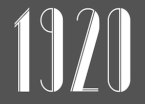 During her graphic design studies at
  Aalborg, Denmark-based designer of the smooth script typefaces Coconut (2018), Banana (2018) and Pumpkin (2018), and the floral caps typeface Blossom (2018). [
 Danish designer (b. 1991), aka CMunk, who used
  Also known by insiders as El Pato Loco Atomico. Danish type designer (b. 1973, Kulby, Vestsjalland, Denmark) who obtained his BDes from The Gerrit Rietveld Academie in Amsterdam, and his MA in typeface design from
  Daniel K. Nielsen (Sheffield, UK) designed his first font in 2013. Called
  [
[ Copenhagen-based creator (b. Jutland, Denmark) of the four-style serif typeface
  Graphic designer in Copenhagen. Creator of a few typefaces in 2013 such as
  During her studies in 2015 at Designskolen Kolding in Kolding, Denmark, Emilie Ragouet designed several experimental typefaces.
  Eric Bentzen's page with links to chess fonts.
  Designer who used FontStruct in 2010 to make Giraf Light With More Letters, Xdiol with more letters, and Bordonizzle. I think, but am not 100% sure, that the E. Mars at FontStruct and Dafont is the same guy as Ethan Mars at
  A collection of all colored country flags in SVG format, plus the CSS for easier integration in web pages.
  Designer in London, who was born in Flensburg (Germany) and studied for four years in Aarhus (Denmark).
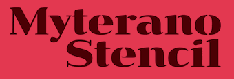 During his studioes at KADK in Copenhagen, Denmark, Frederik Rafn Barfod designed Myterano Stencil (2018). [
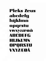 In 2008, Hans Munk (GRUMT, Frederiksberg, Denmark) digitized Jan Tschichold's typeface Zeus for and at
 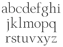 Danish architect (1897-1968), who taught design at Danmarks Designskole, from 1951-1967. At some point, he designed some lettertypes.
 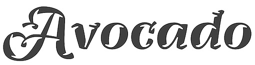 Aka Hejheidi. Danish graphic designer who studied at Designskolen Kolding, class of 2011. In the
  [
[ Kasper Ledet made a great handlettered
  Graphic design graduate of the Bergen National academy of the arts in Norway. Jacob lives in Copenhagen. Creator of the playful high-contrast curly typeface
 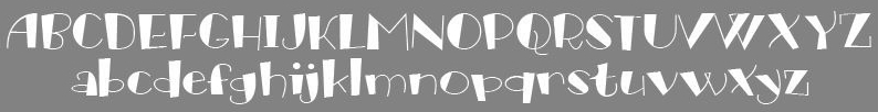 [
[ [
[ [
[ At the School of Visual Communication in Haderslev, Denmark, Jannik Bjørn Løkke designed the minimalist experimental typeface Cyanide (2015). [
 Danish graphic designer in Lyngby. He made the following typefaces:
  Jimmy Duus (Copenhagen, Denmark) created the avant garde typeface family Espanoles and the sans typeface Summer Sans in 2014.
  Danish designer, b. 1983. Creator of the funny typefaces dingbat fonts The Freaky Face (2009) and The Freaky Face 2 (2010).
  Graduate of the Masters program in
  As a student at the School of Visual Communication in Denmark, Jonas Emmertsen created the
  Jonas Hecksher holds a degree from The Royal Danish Academy of Fine Arts and The School of Design and Ecole supérieure d'arts graphiques et d'architecture in Paris, where he specialized in graphic design and typography design. Heckscher is Partner and Creative Director at design agency e-Types which he co-founded in 1997 and co-founder of type foundry and type design brand Playtype. He is a 5-time recipient of the Danish Design Award, a winner of two gold Creative Circle awards, a silver award winner at the Britsh D&AD, a winner in 2014 of the Knud V. Engelhardt Memorial Award, and the recipient of a certificate of excellence in type design from Type Directors Club N.Y. Playtype is currently based in Vesterbro, Denmark.
  Foundry in Copenhagen which sells the fonts made by
  Born in 1982, this Danish designer dabbled in
  [
[ Knud V. Engelhardt (1882-1931) was a Danish architect, printer and designer. He worked on kilometer stones, type for trams, street signs, and is well known in type circles for a slab-serif alphabet made for the city of Copenhagen with heavy wide capitals.
  Ladyfingers was established in 2010 by
  Danish designer (b. 1989) of the grunge ink spill typeface
  Graphic designer and typographer from Copenhagen who founded the design studio More To Come. His typefaces include
  [
[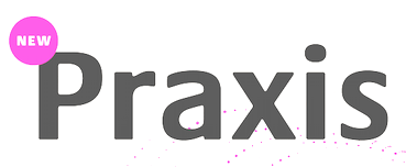 Linda (Copenhagen, Denmark) studied at HfG Schwäbisch Gmünd (2007). A course with Luc[as] de Groot led her to
  In the late 1990s, Klaus Johansen from Odense made gorgeous (free) dingbat typefaces such as Fabeldyr, Ancient Heads, Art Nouveau Headers, Art Nouveau Women, Atleter,
  Senior designer at Goodmorning Technology in Copenhagen. She desiged the custom typeface
  Designer in Copenhagen, who created the oriental-look display sans typeface
  During his studies in Copenhagen, Marius Krone created a fun Miro-esque lachrymal typeface (2014). [
 For her school project at Skolen for Visuel Kommunikation in Haderslav, Denmark, Mette Straagaard designed the blackboard bold typeface Flif (2016).
  Michael Hansen (Michaelhansenwork, Copenhagen, Denmark) studied at the Royal Academy of Fine Arts in Copenhagen. As a student, he created a virtual identity for the future light rail in Aalborg. This involved the development of the rounded sans typeface family Aalborg Bold (2015) and the creation of a few wayfinding icons.
  Design student in Haderslev, Denmark, who made the monoline art deco typeface
  [
[ Copenhagen-based graphic designer (b. 1964) who created the highly legible Fontfont typeface family FF Olsen (Light, Regular, Bold) in 2001. He also designed Union Regular and Union Bold for the Danish Government, which for a while was giving away these fonts for free
  Copenhagen, Denmark-based designer of Bellagio (2018). [
 Graduate of The School of Visual Communication in Haderslev, Denmark.
  Danish art director, based in Copenhagen. Creator of Casa Madero (2012, a logotype for the winery), Douwe Egberts (2012),
  Haderslev, Denmark-based designer of the monoline monospaced connected typeface Link (2017). [
 Nach Oh (Oh Type) is a type designer and illustrator from Medellin, Colombia, who is now based in Melbourne, Australia. Nach's real name is Hernan Toro (b. 1986, Copenhagen, Denmark), according to one page. On another page, Nach Oh seems to be a woman. Let's call him/her Hernan.
  Danish graphic designer and signwriter, b. 1937, who studied at the Royal Academy of Fine Art in Copenhagen (1961-1964) and has taught there from 1966 until 1978. He ran his own graphic design studio in Elsinore in 1973. Co-founder and partner of Eleven Danes, 1985-1995. He has designed signage systems for banks, offices and public buildings in Denmark, Sweden and the Middle East, and did a lot of corporate design for Danish banks and Danish industry.
  Art director and graphic designer Mads Fruend Brunse (b. Denmark) is based in London. After graduating from ECAL (Lausanne) in 2009, Brunse has experience from working with people such as Node Berlin Oslo (Germany), Vladimir Llovet Casademont (Germany), Sofie Spindler (The Netherlands) and OK-RM (UK). Since 2007 he is collaborating with Guðmundur Ingi Úlfarsson (Iceland) under the name GUNMAD. In March 2013, he set up the type foundry Or Type together with Úlfarsson. Or Type is based in Reykjavik, Iceland.
 [
[ The Great Dane from Copenhagen,
  During her studies in Copenhagen, Rahel Oberhummer designed the ultra condensed art deco typeface Schachmatt (2016). [
 Aarhus, Denmark-based creator of the rounded curly tattoo font
  [
[ Philipp Neumeyer is a ballet dancer and type designer who studied communication design at the Muthesius Academy of Fine Arts and Design Kiel (MAFAD), Germany, class of 2014. In the
  Randers, Denmark-based graphic designer who made an unnamed lachrymal typeface in 2013.
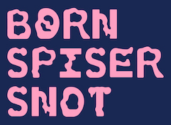 During his studies under Kenn Munk in Haderslev, Denmark, Søren Højen designed the
  Sun Helen Isdahl Kalvenes (b. Stavanger, Norway) was based in Copenhagen, Denmark, and is now in Oakland, CA. In 2012-2013, she studied towards an M.A. in Type Design at the KADK (Royal Danish Academy of Fine Art School of Design). In 2013, she graduated from the
  Aarhus, Denmark-based designer (b. 1968) who worked as an art director and graphic designer since 1990. He started making typefaces in 2006. Ten years later he established The Ivy Foundry and wrote: The Ivy Foundry is committed to helping brands and corporations fine-tuning their visual voice. In 2018, The Ivy Foundry joined
  During her studies at Danmarks Medie- og Journalisthøjskole in Copenhagen, Trine Pape designed the tuxedoed art deco typeface Coastline (2015). [
 Danish designer Trine Rask lived in Den Haag from 2003-2004, as a graduate student at the
  Danish outfit headed by Danish Typographer Torben Wilhelmsen. Free fonts: ufFeet, ufKartoon. Dollar fonts: ufRegule (a sans made in 2001 that is used by the Danish Dietetic Association), ufTenn, ufUdulf, ufDeconstrotic, ufZapZip, wfont. Coorganizer of ATypI in 2001 in Copenhagen. He tried his hand at iFontMaker and made the hand-printed stencil typeface
  Successful illustrator and graphic designer in Odense, Denmark. In 2014, he created a logo and designed a font for Mister Finch and a book about his textile sculptures published by Glitterati Incorporated. This font, Mister Finch, is curly and can be regarded as a vampire script.
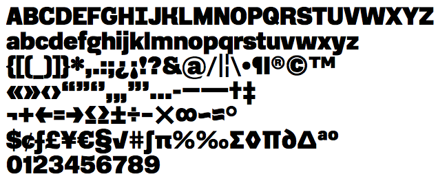
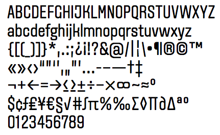
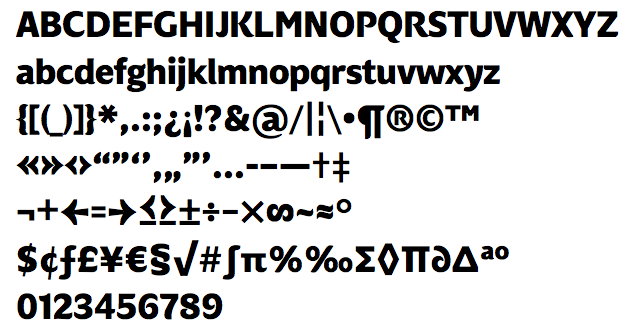
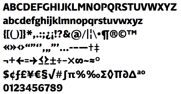
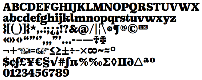
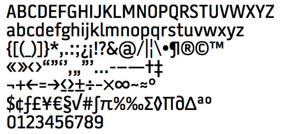
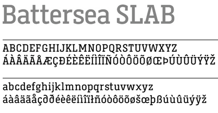
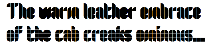
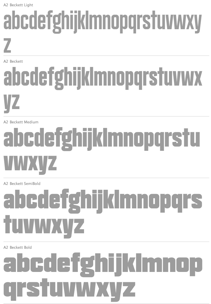
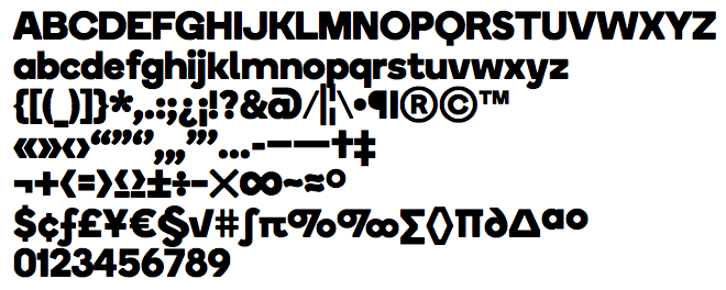
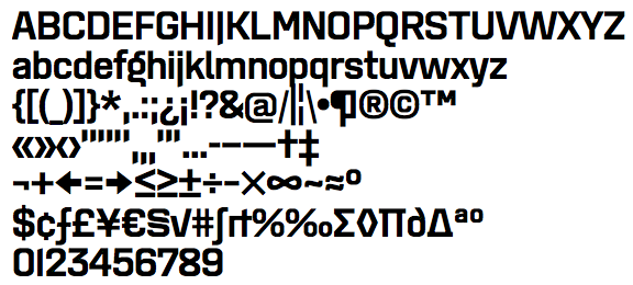
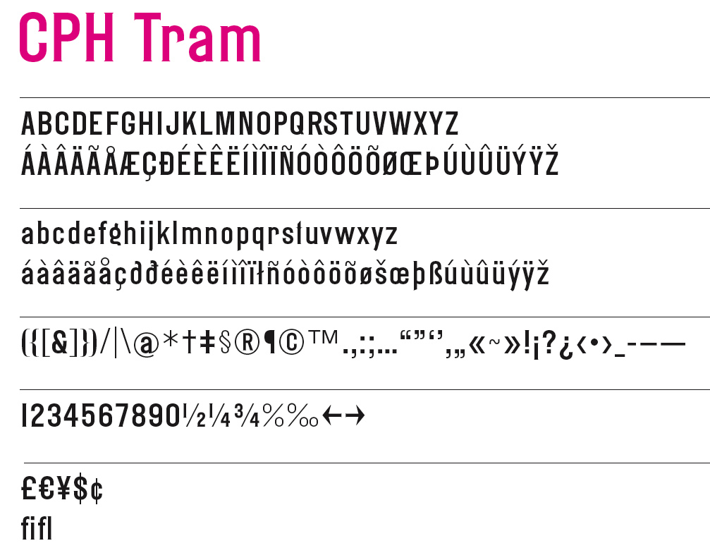
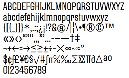
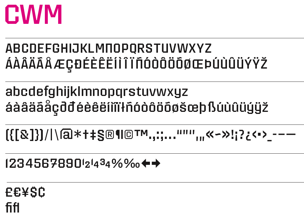
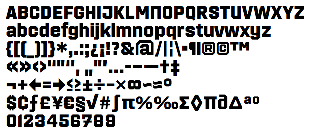
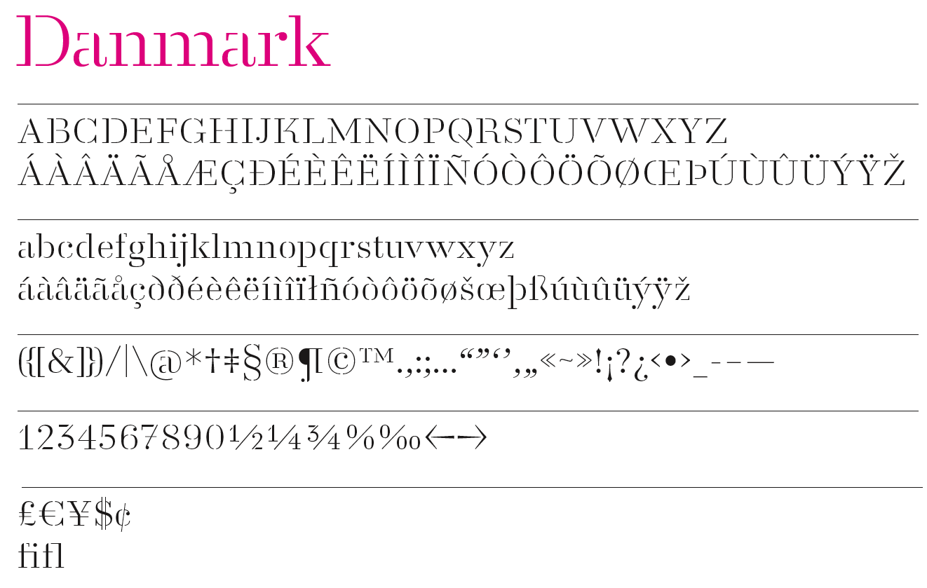
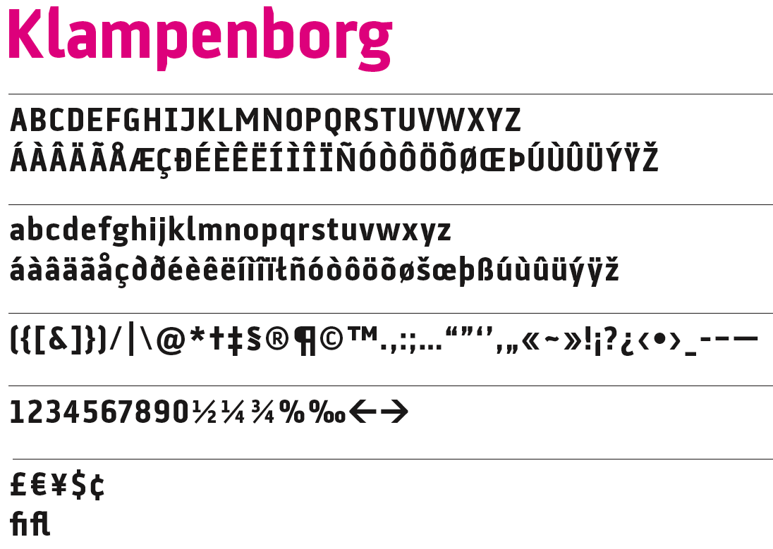
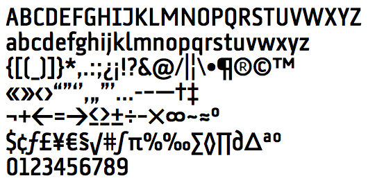
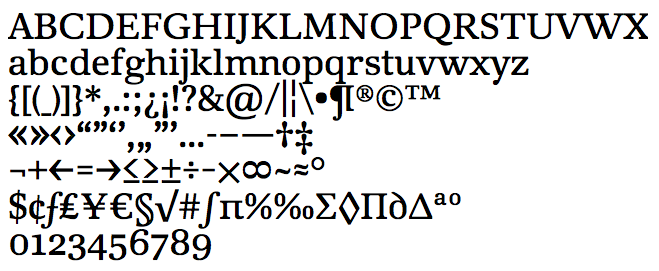
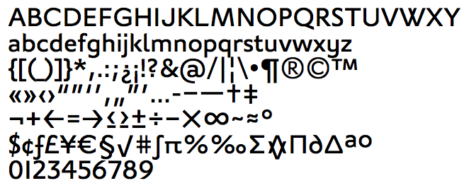
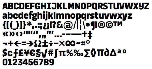
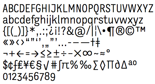
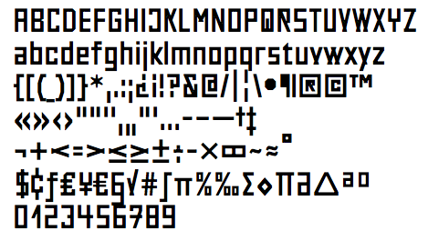
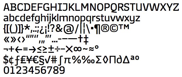
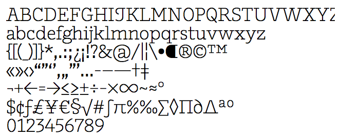
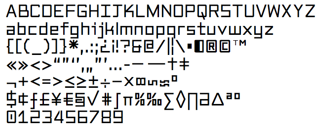
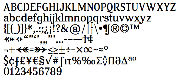
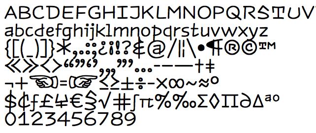
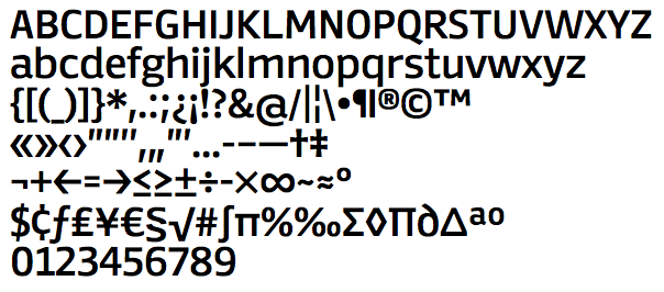
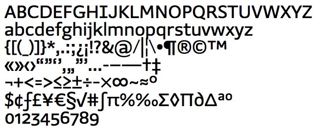
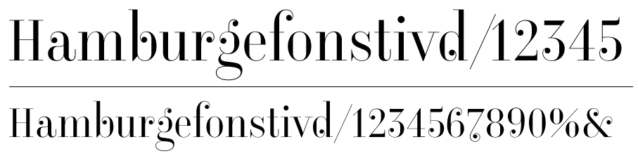
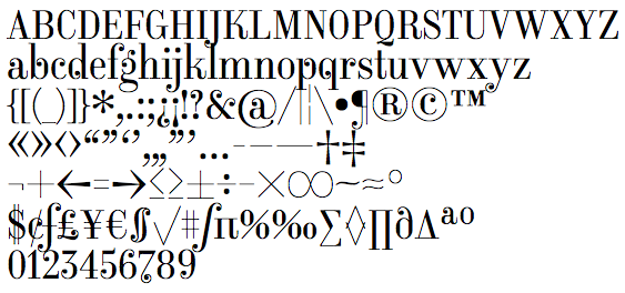
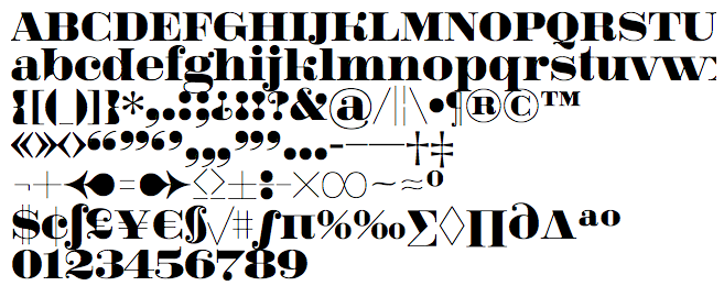
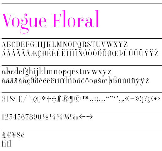
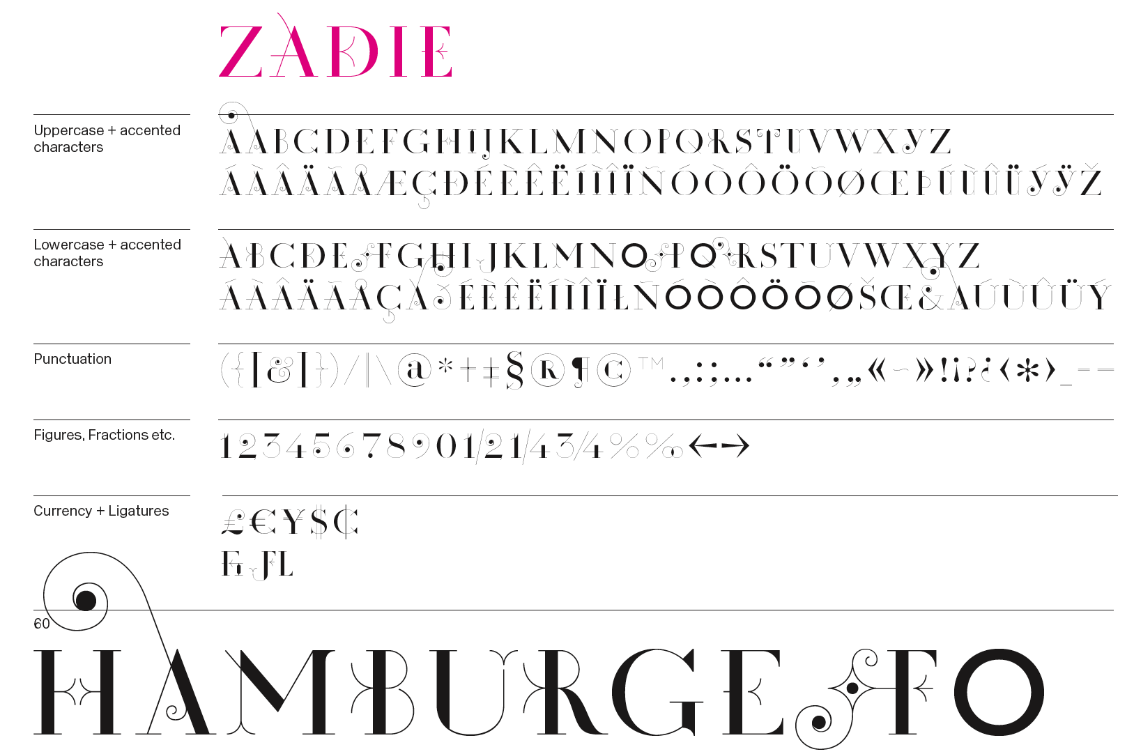
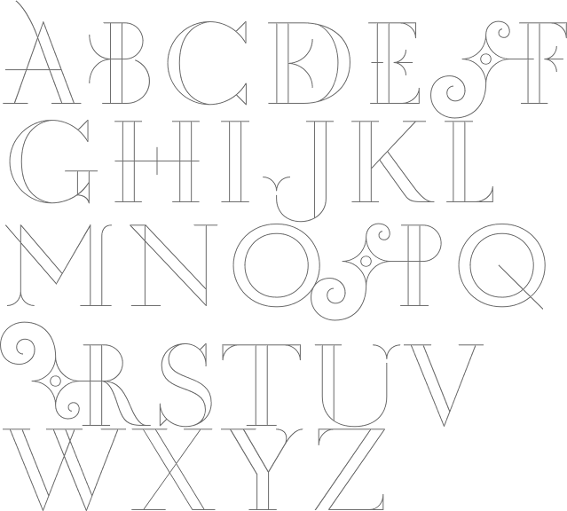
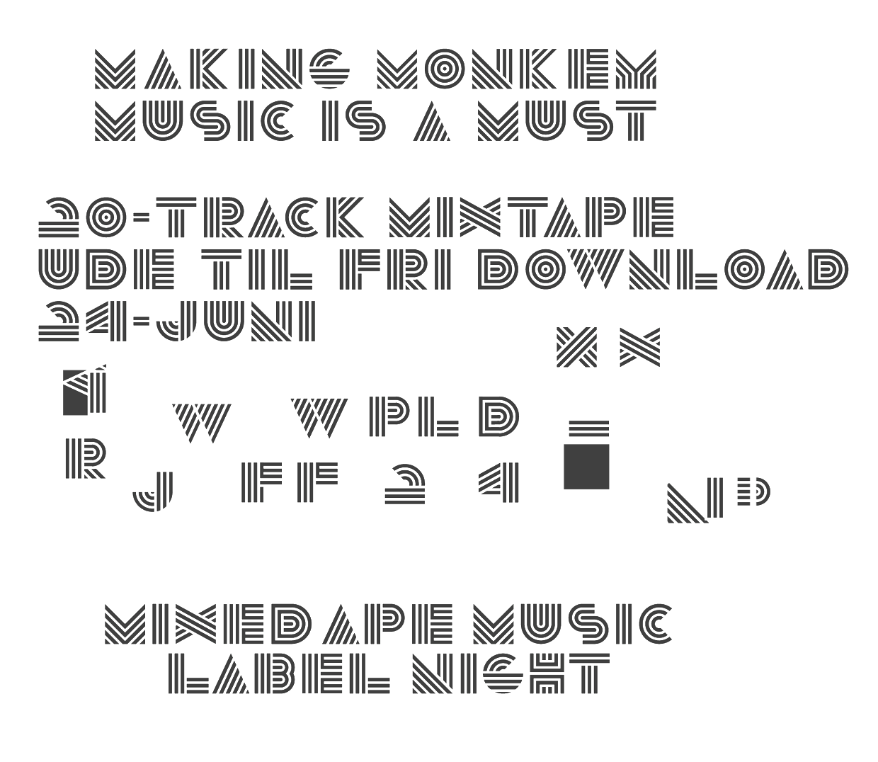
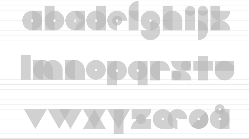
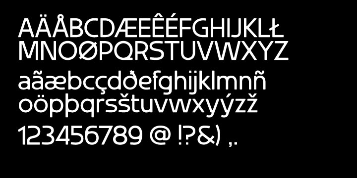
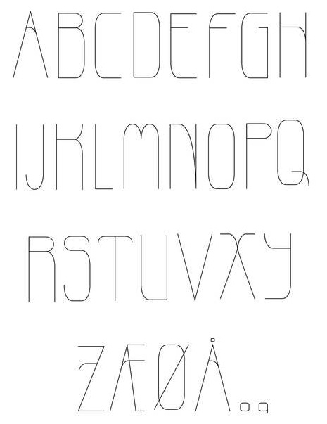
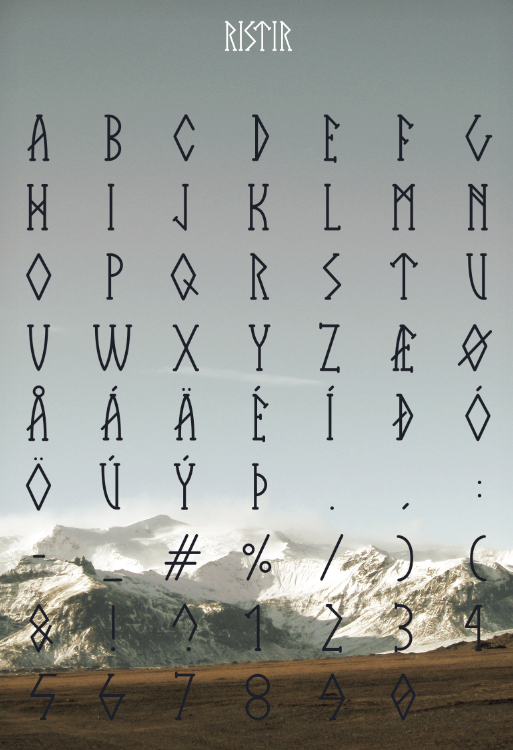
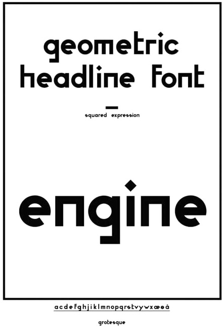
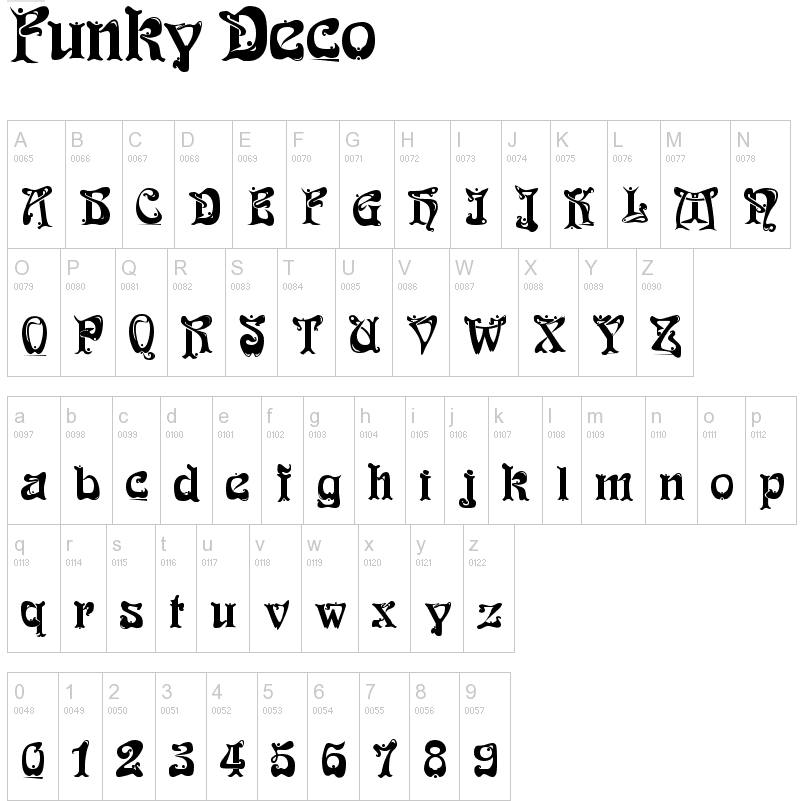
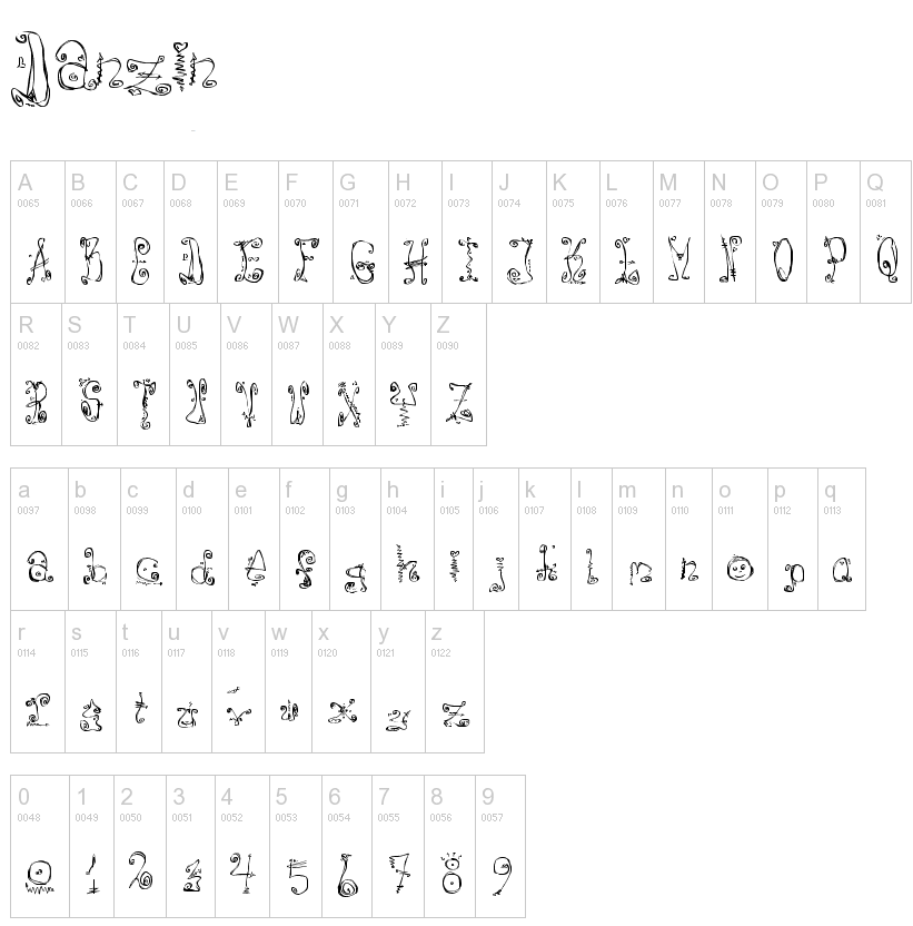
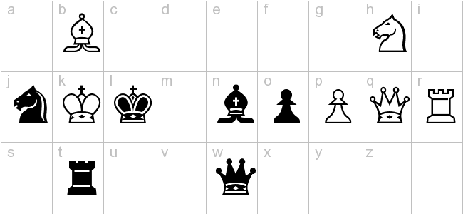
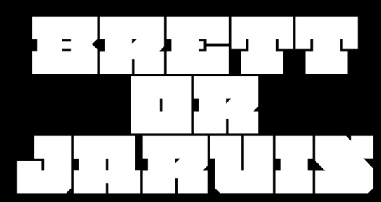
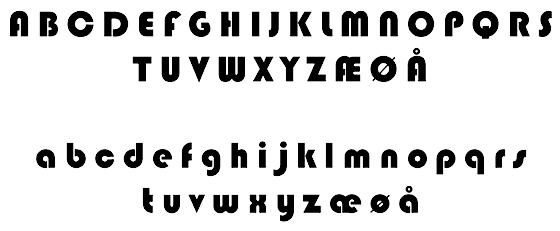
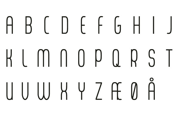
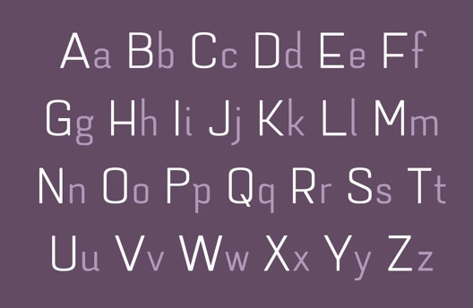
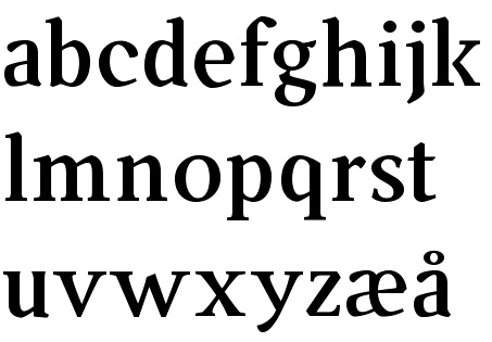
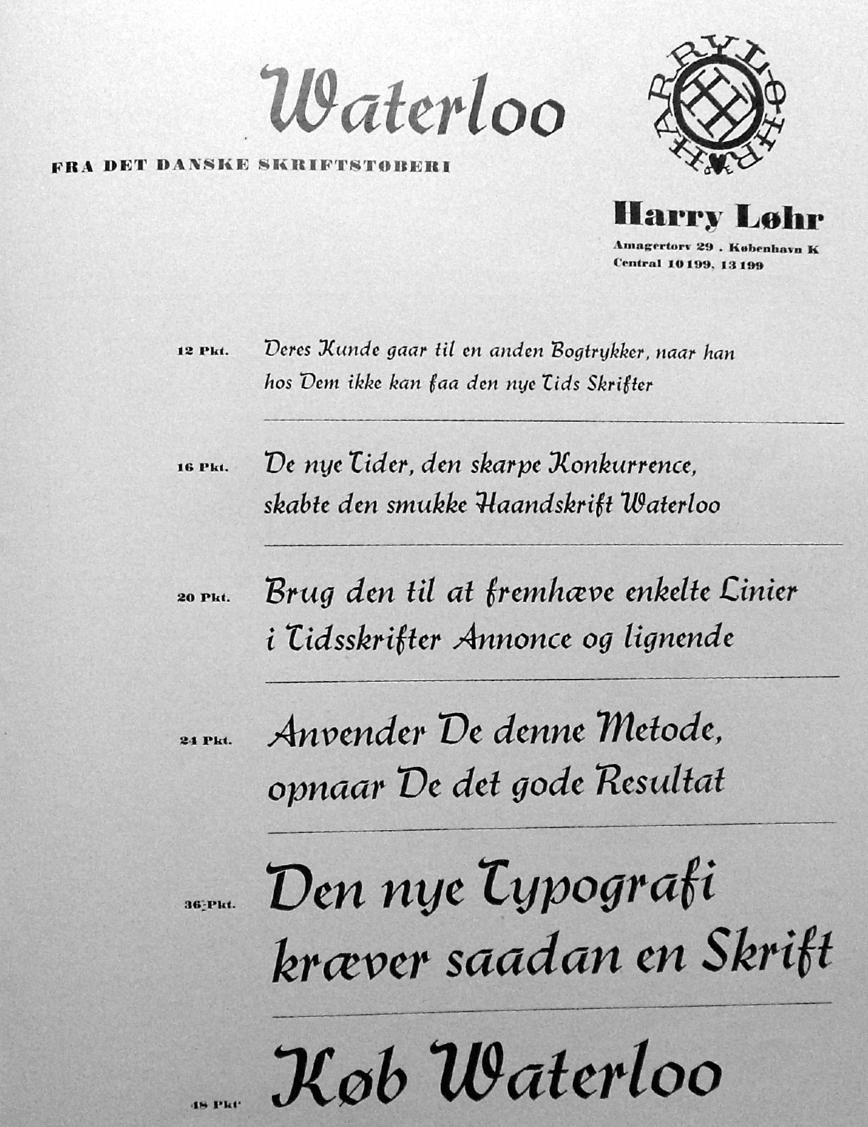
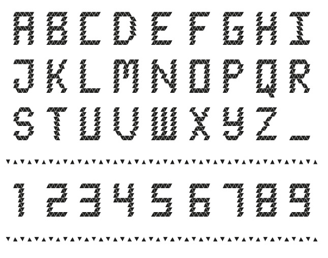
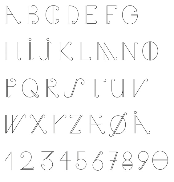
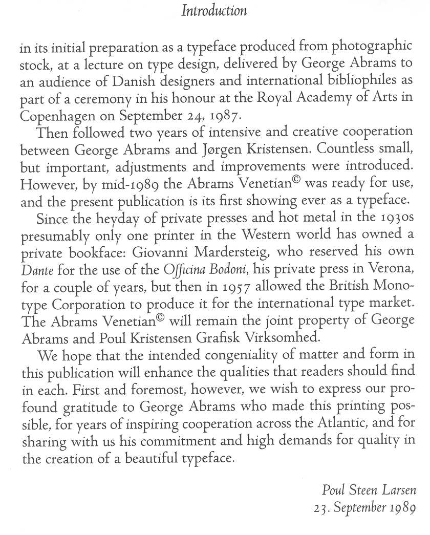
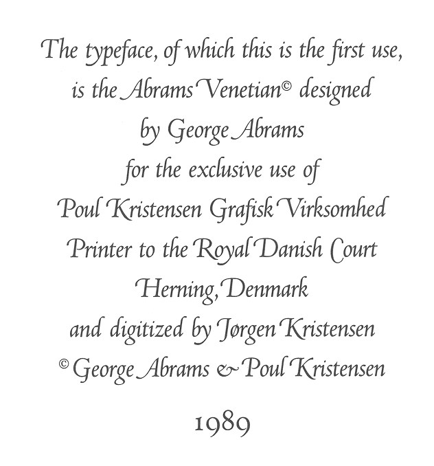
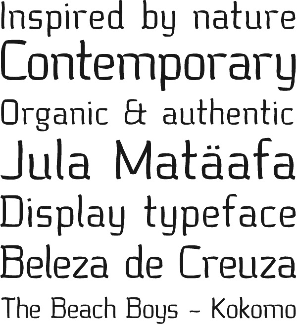
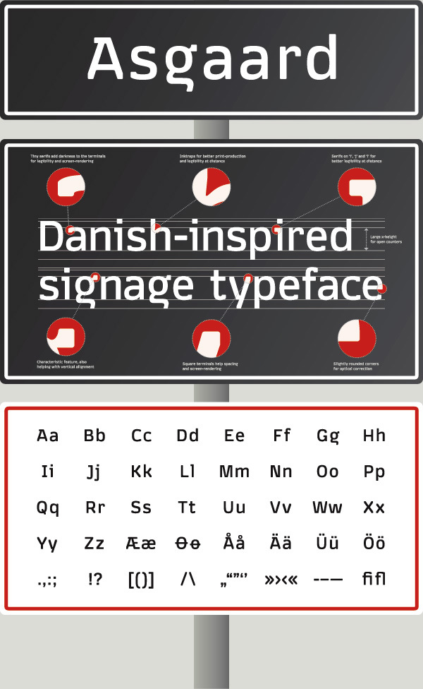
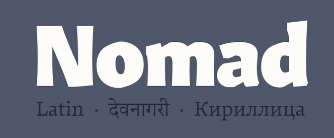
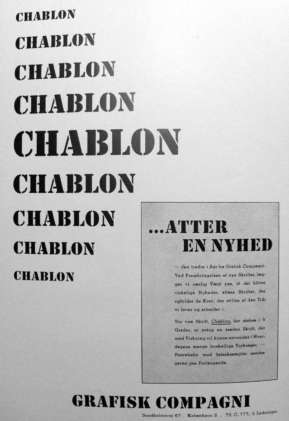
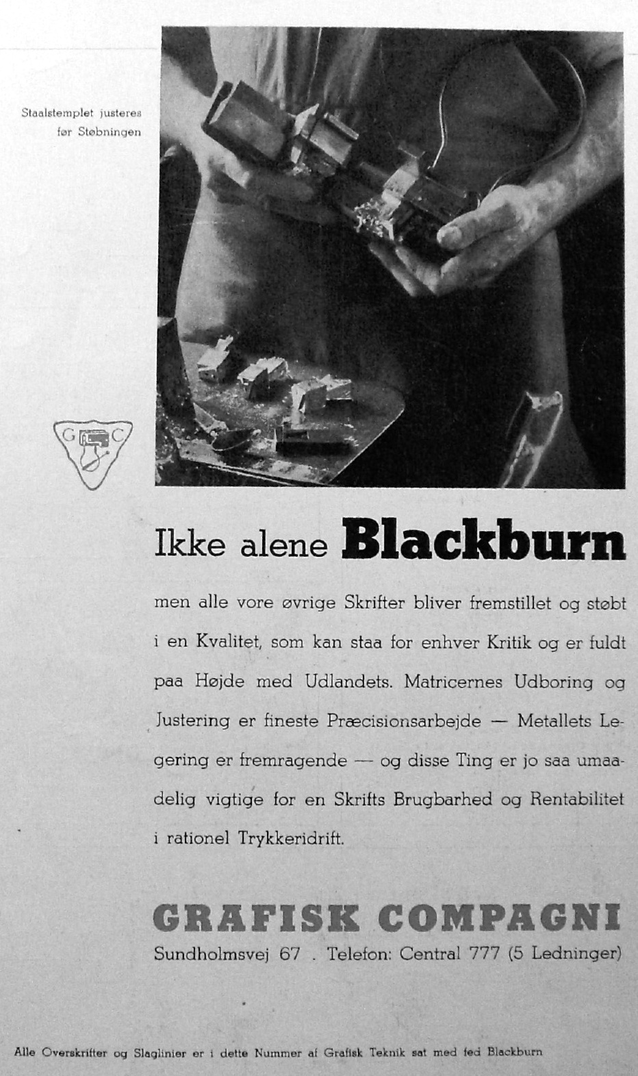
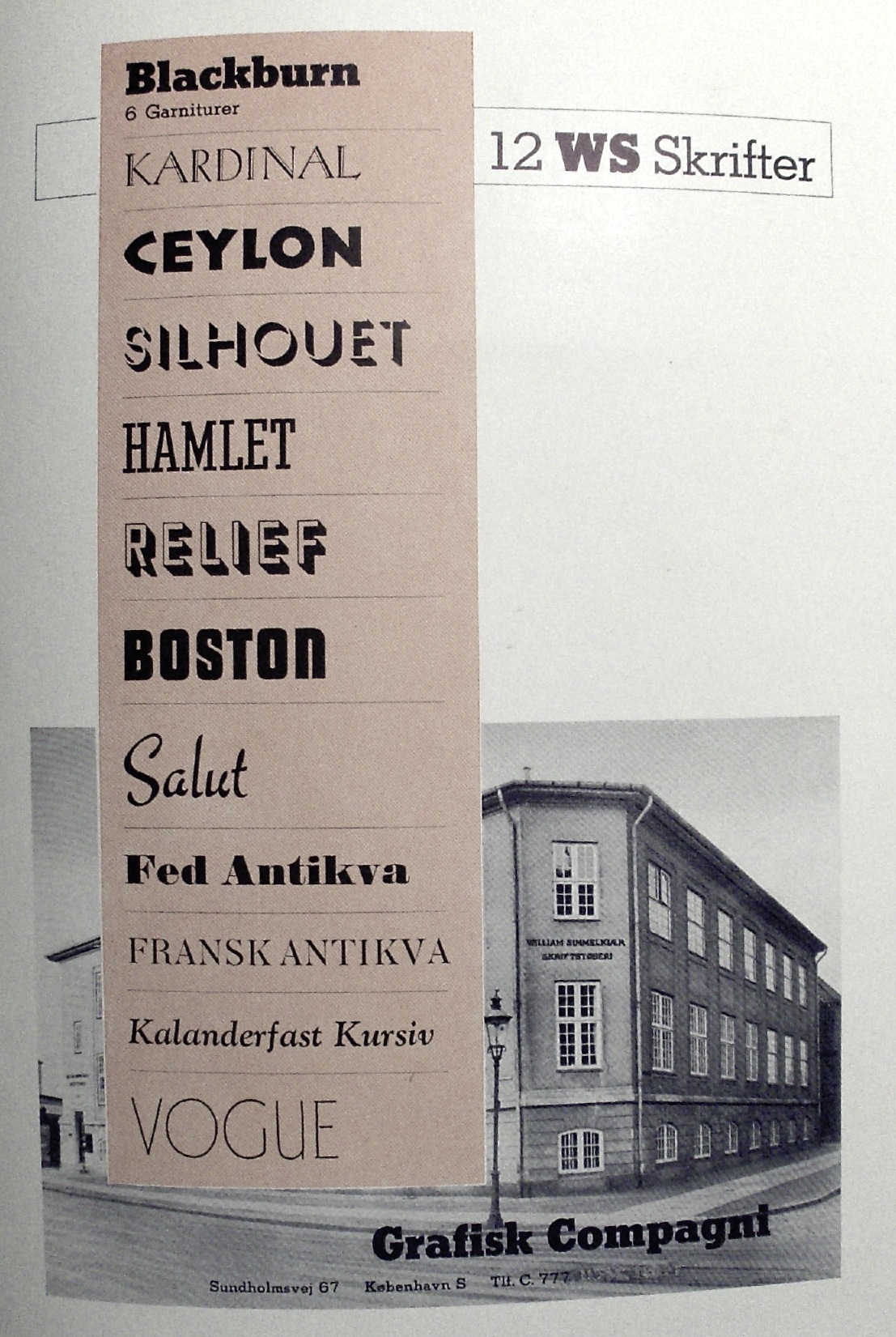
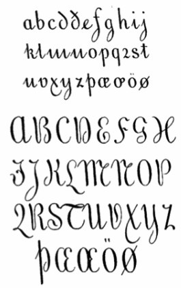
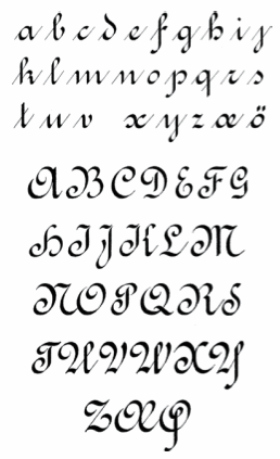
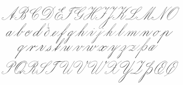
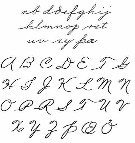
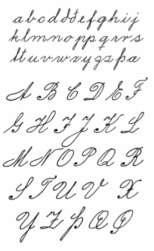
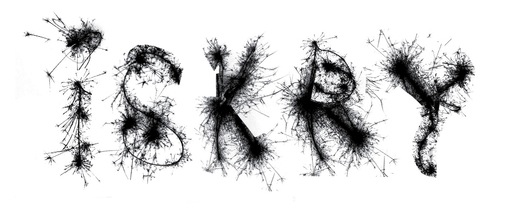
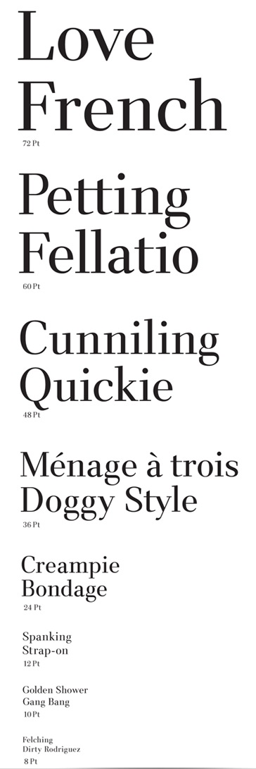
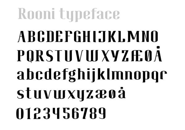
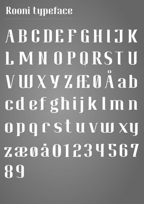
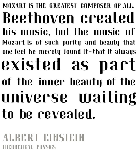
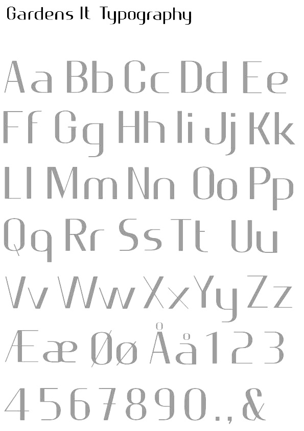
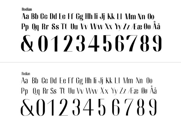
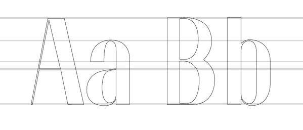
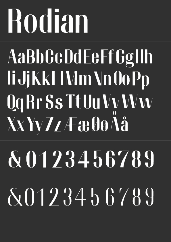
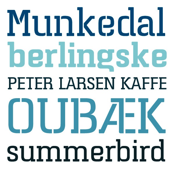
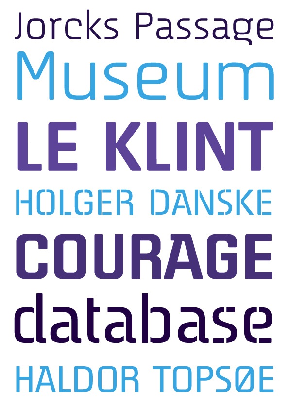
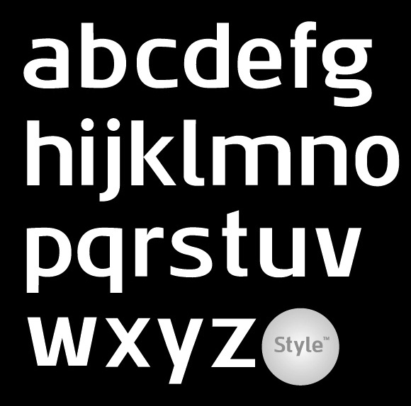
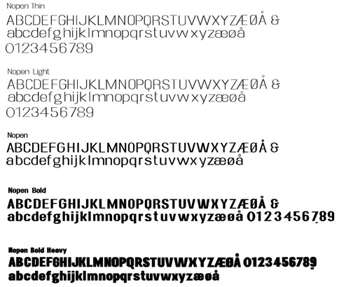
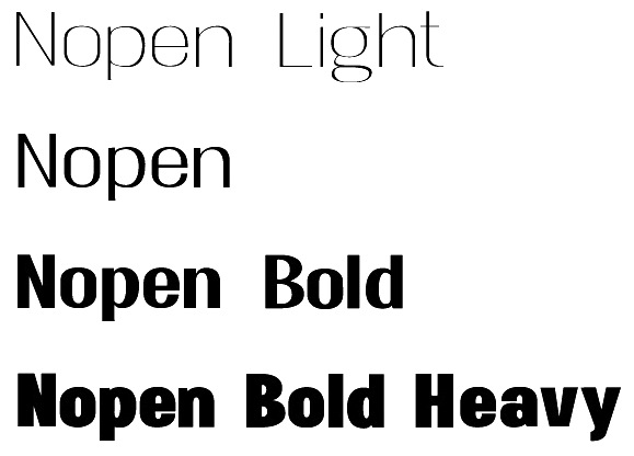
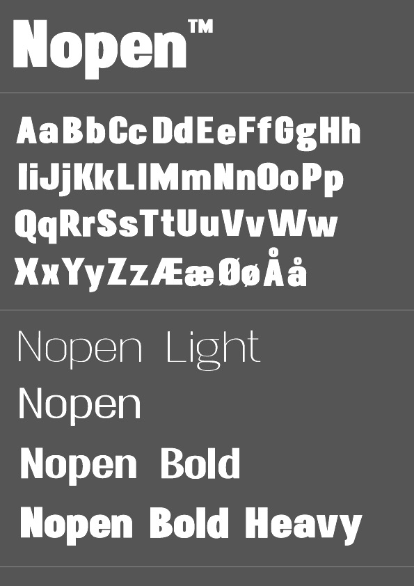
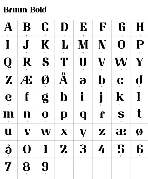
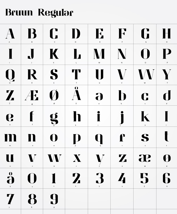
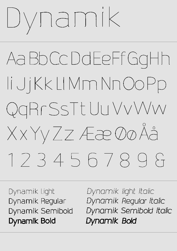
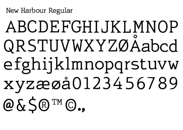
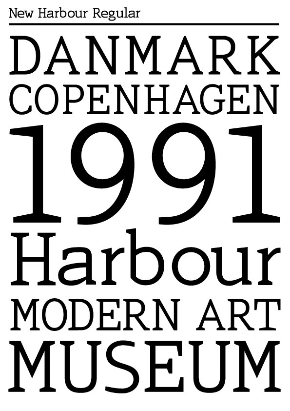
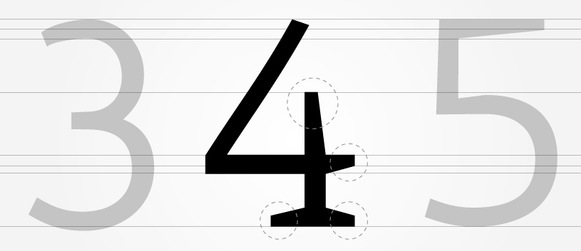
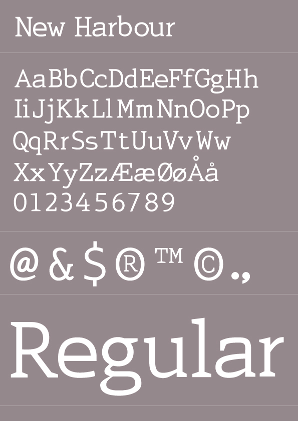
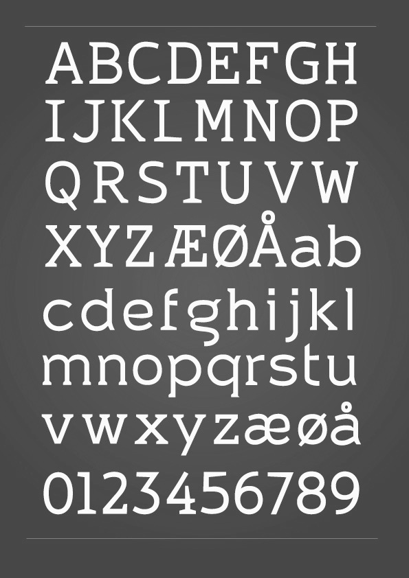
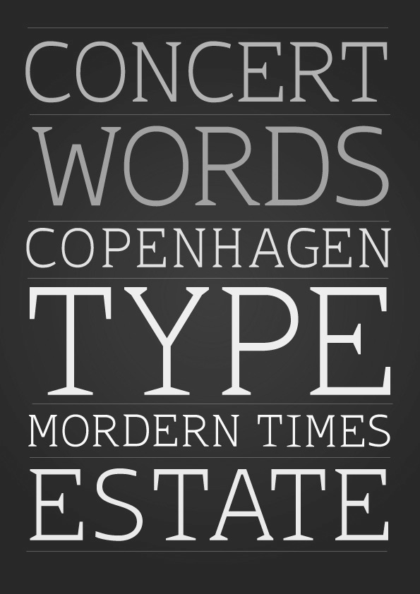
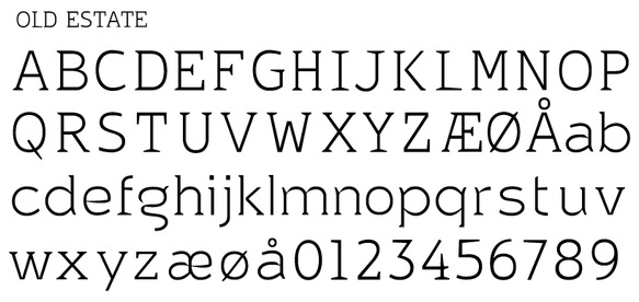
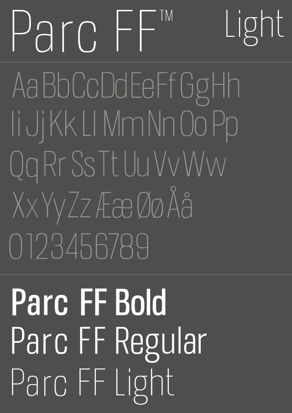
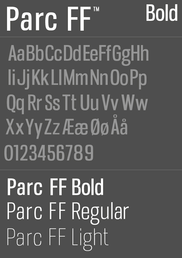
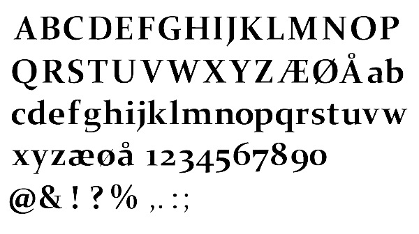
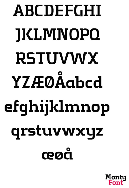
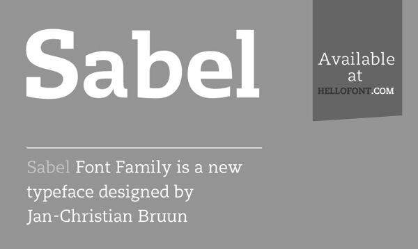
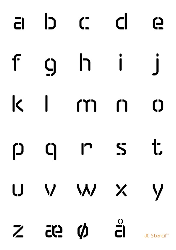
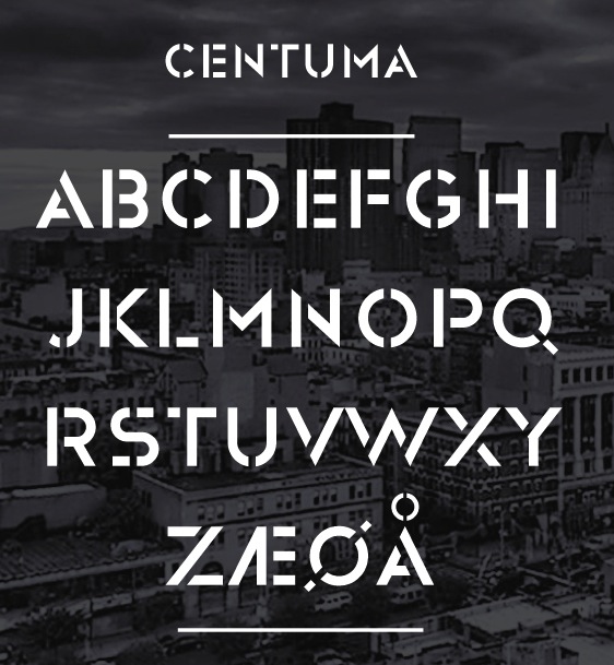
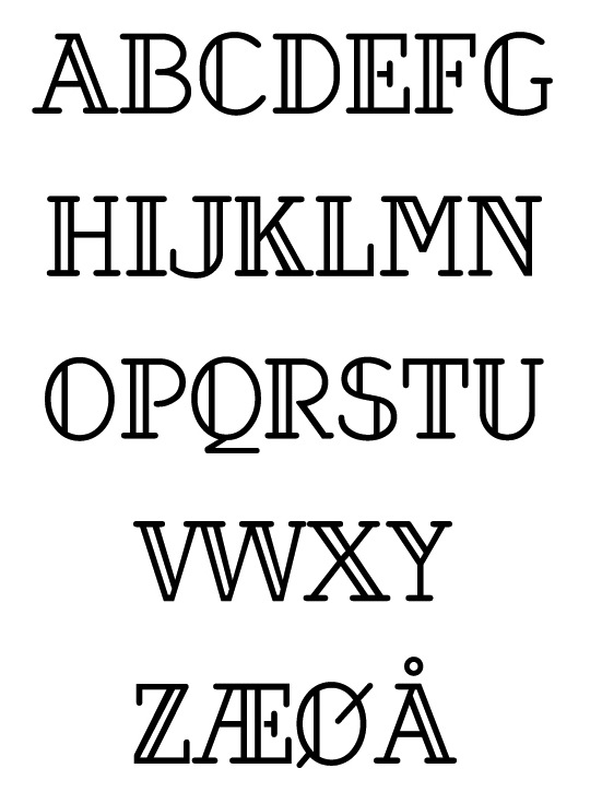
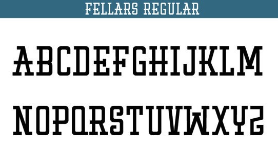
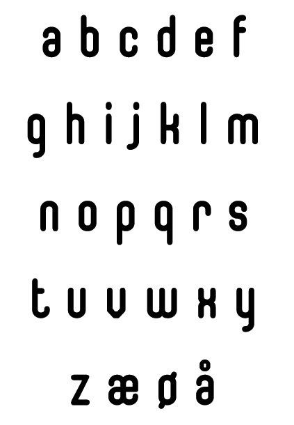
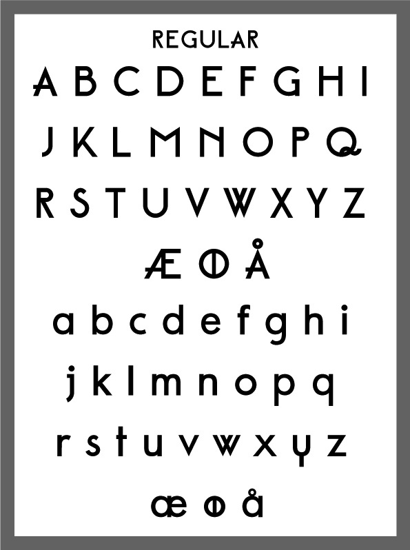
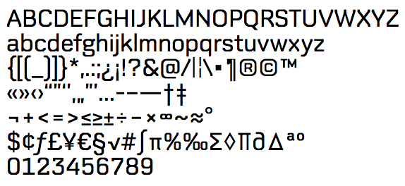
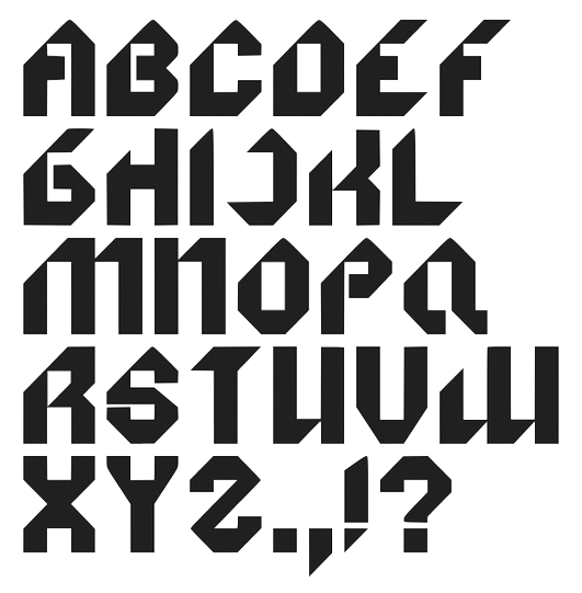
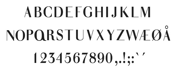
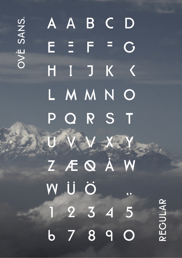
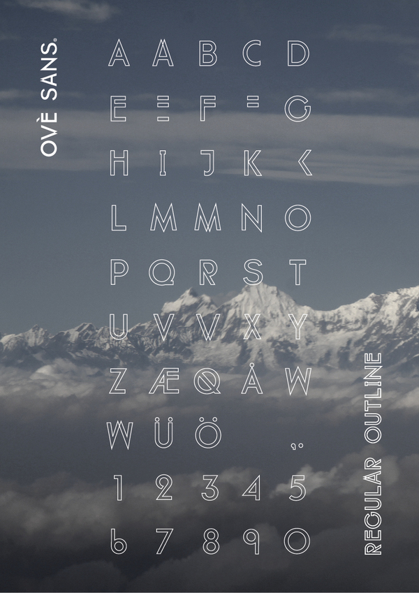
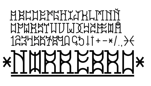
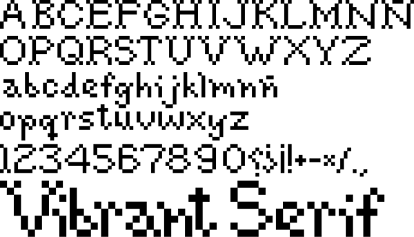
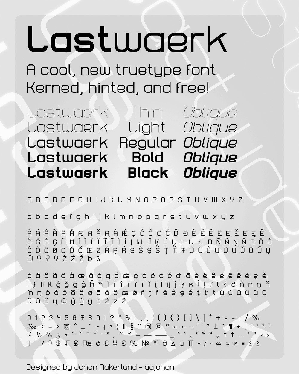
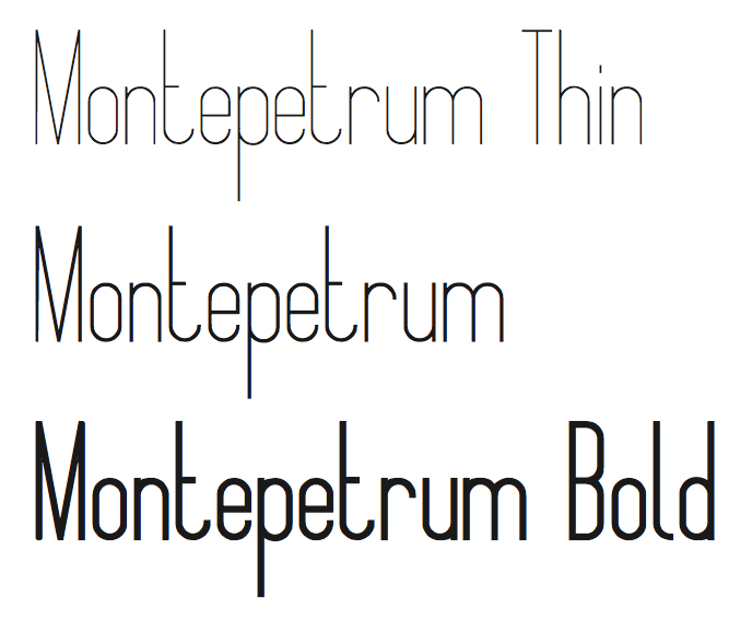
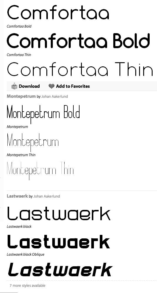
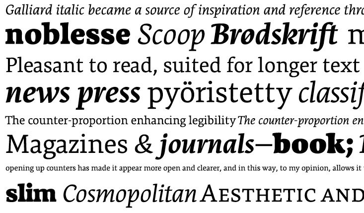
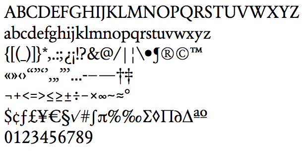
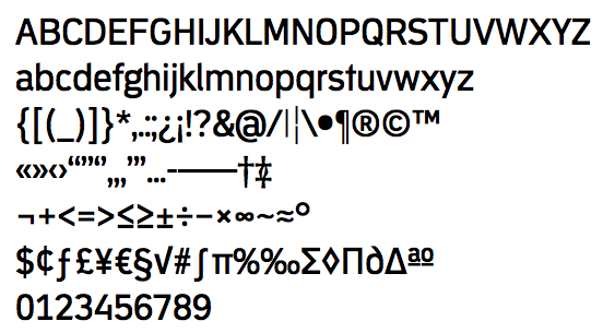
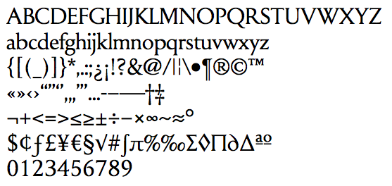
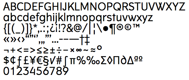
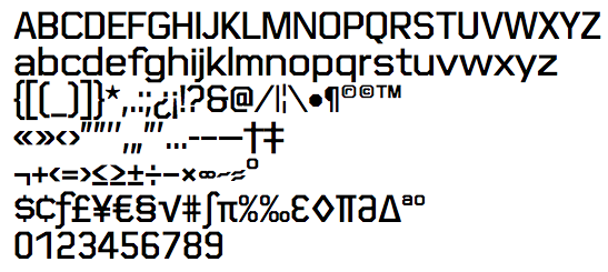
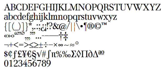
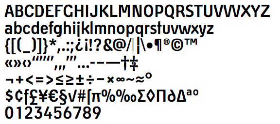
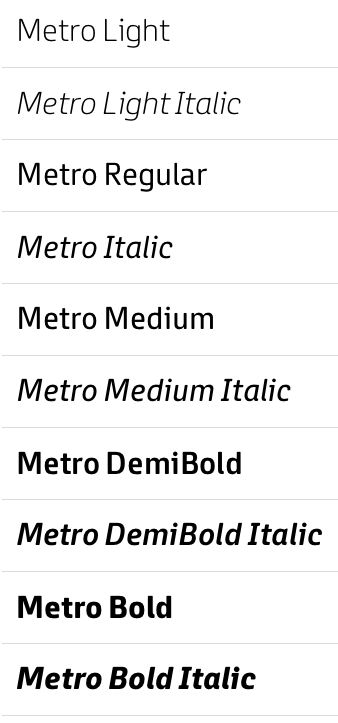
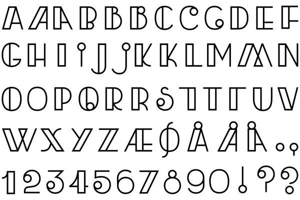
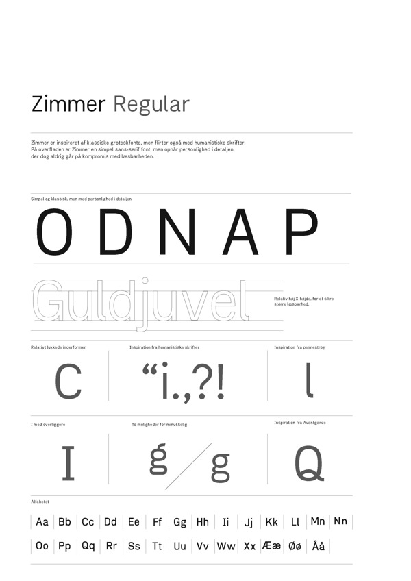
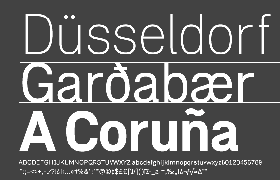
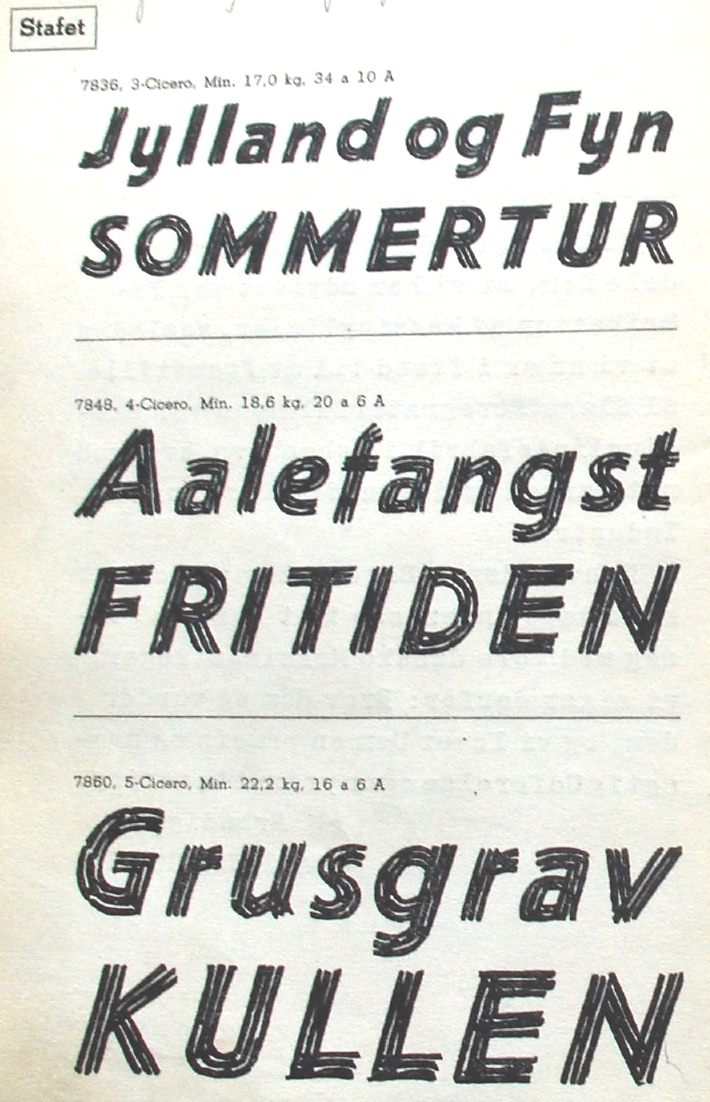
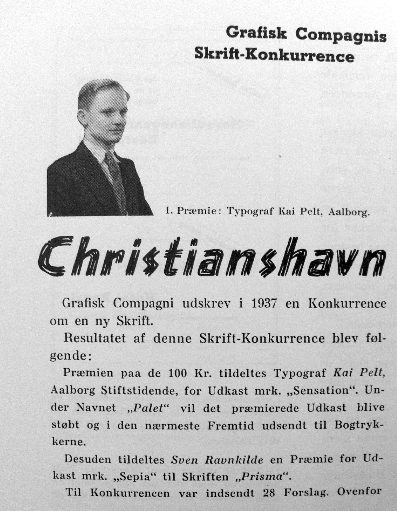
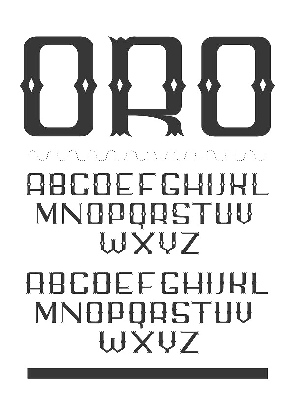
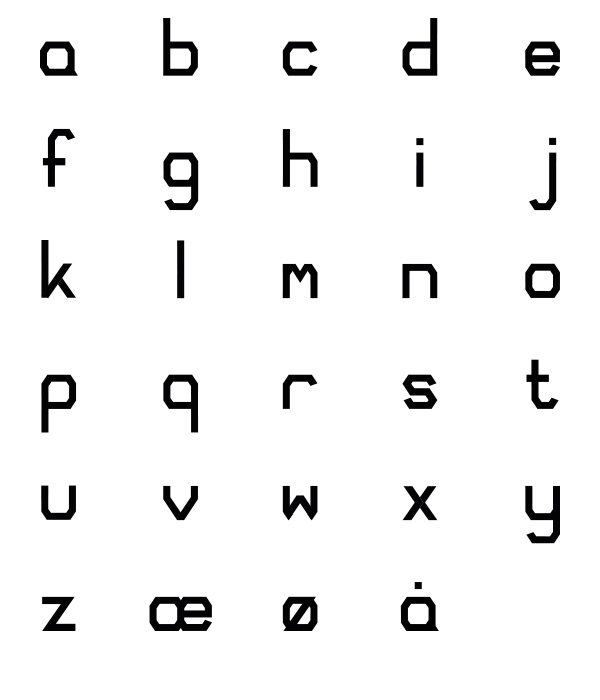
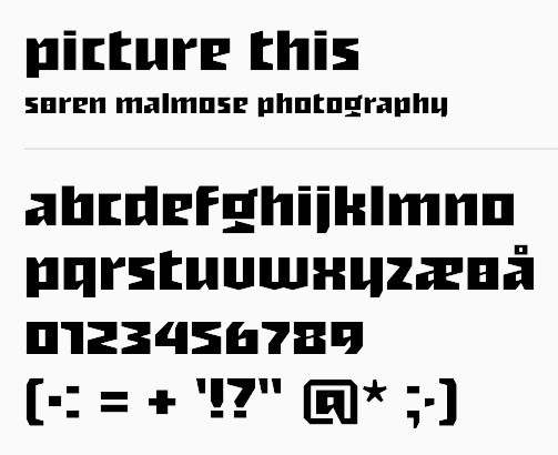
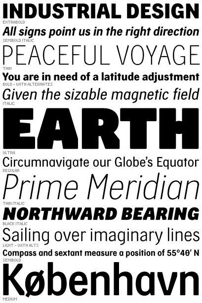
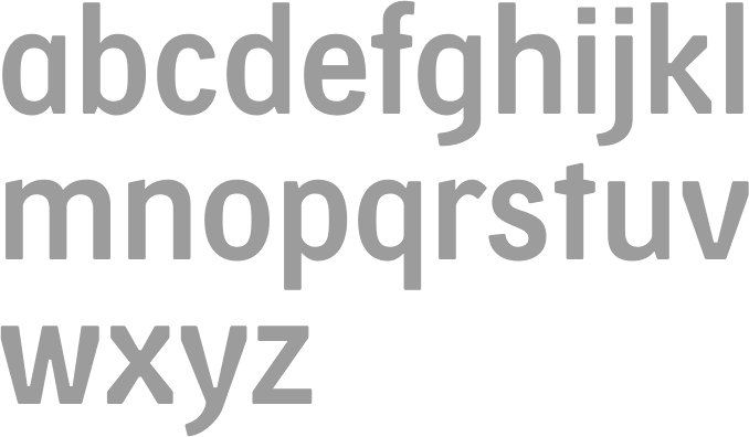
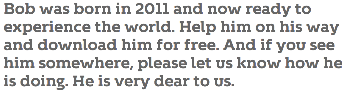
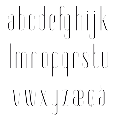
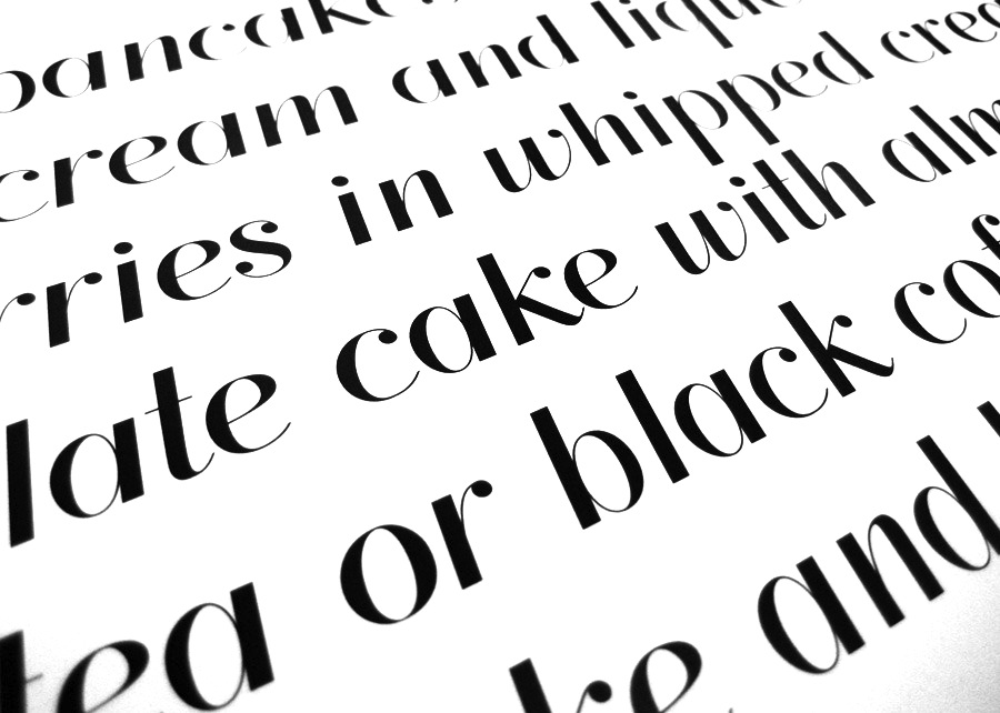
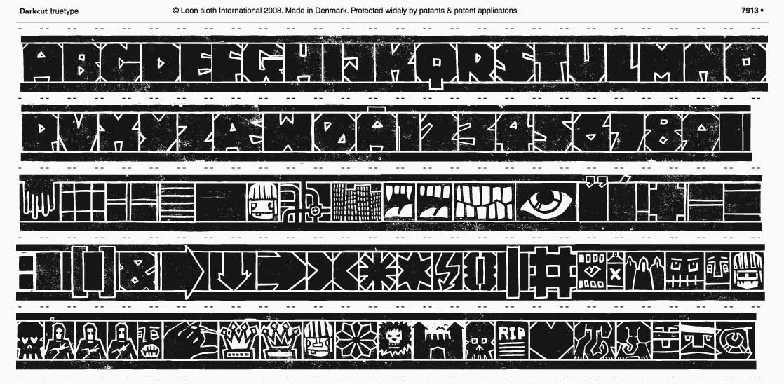
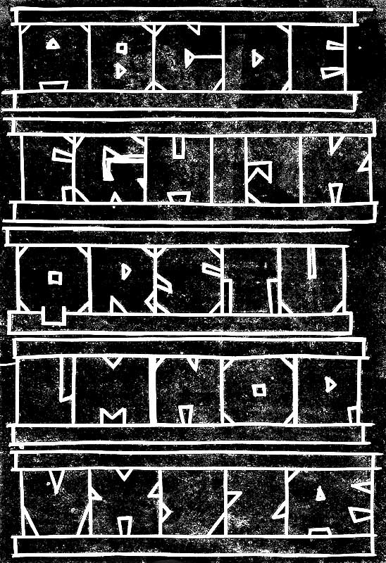
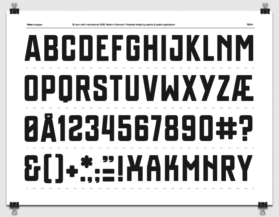
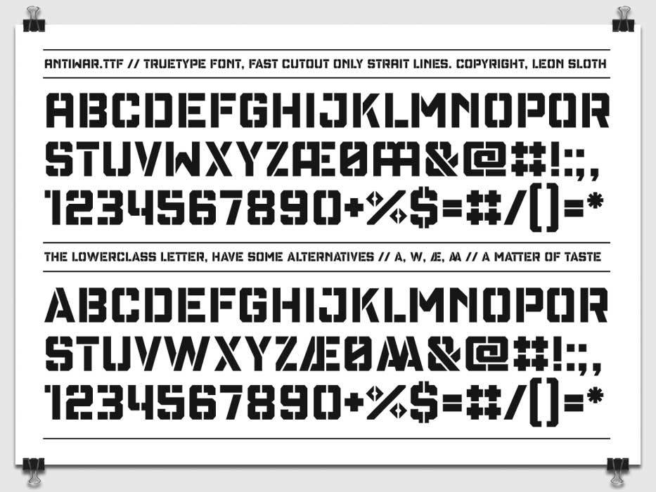
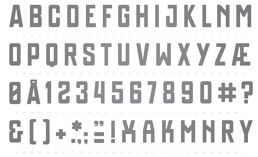
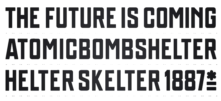
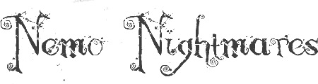
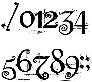
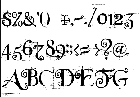
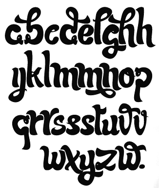
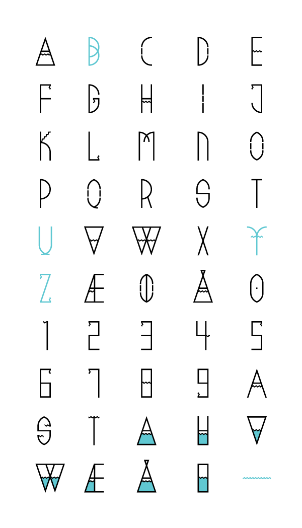
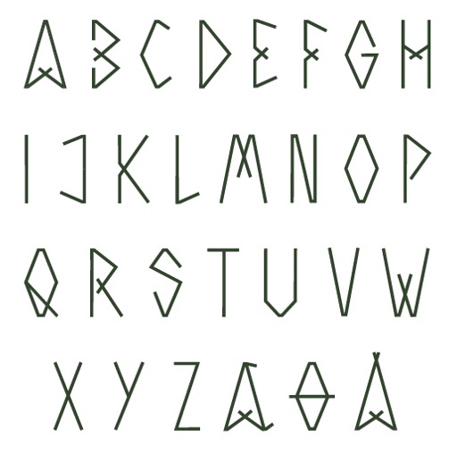
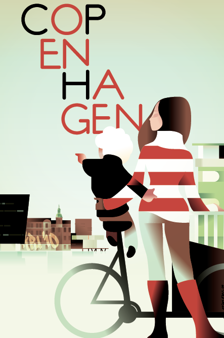
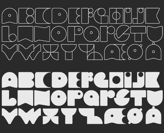
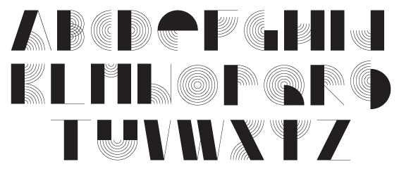
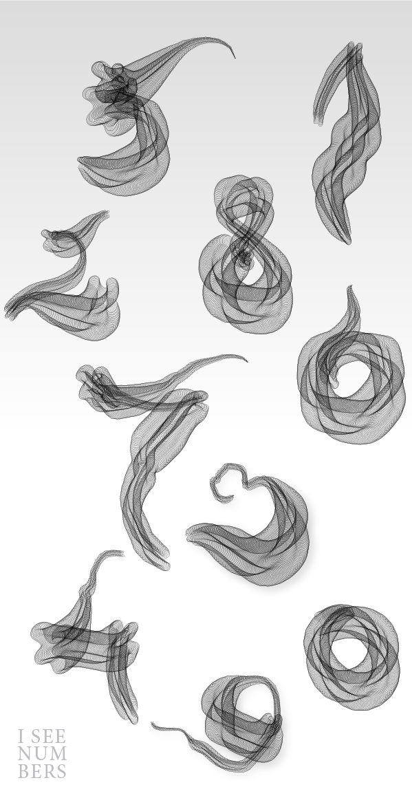
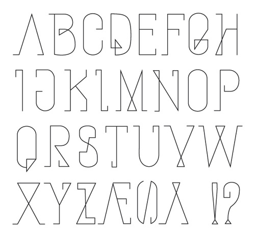
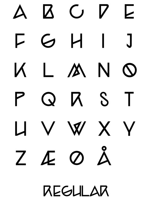
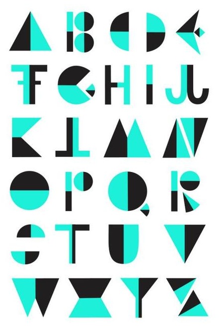
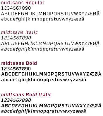
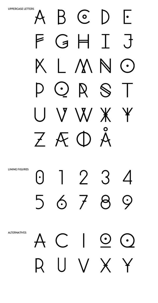
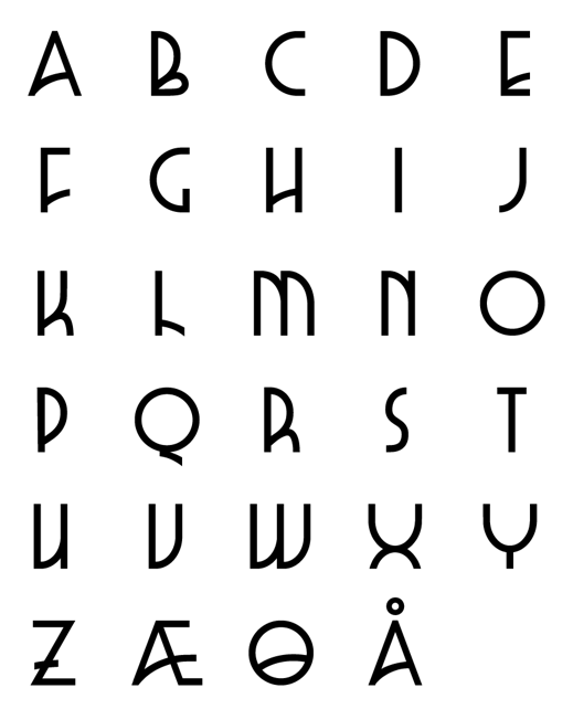
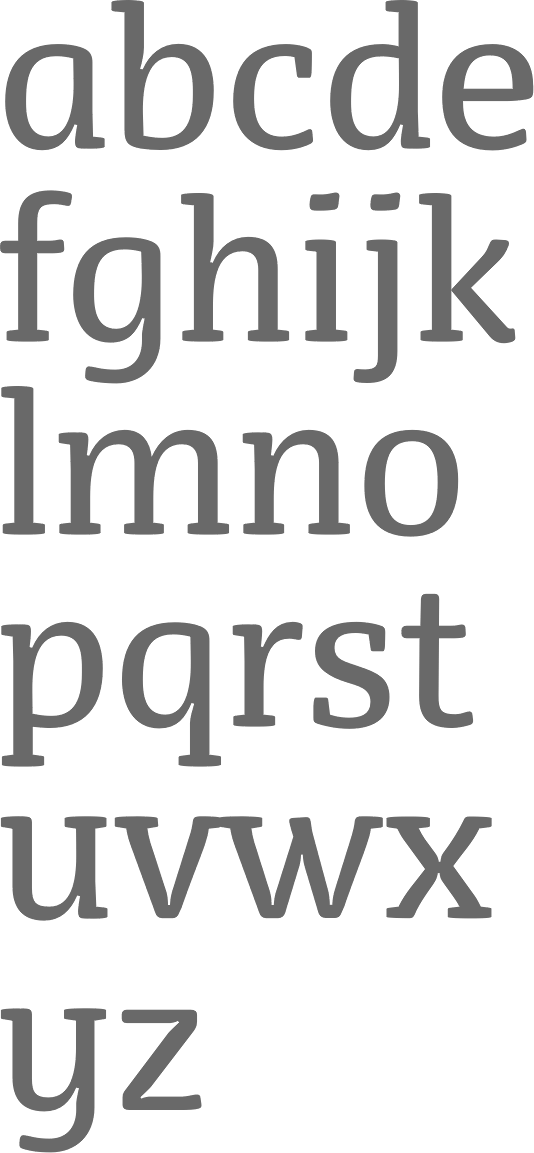
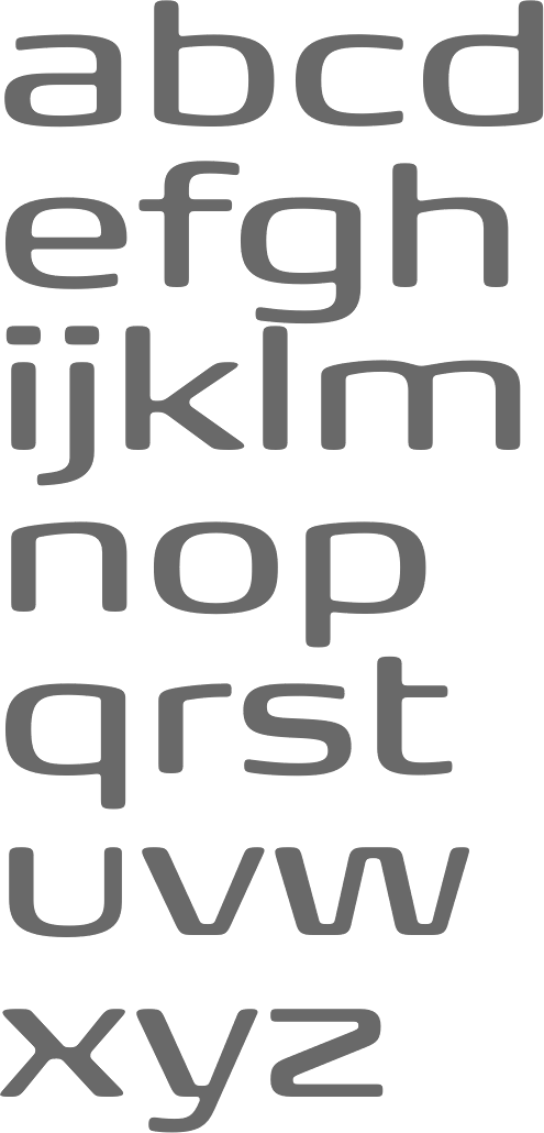
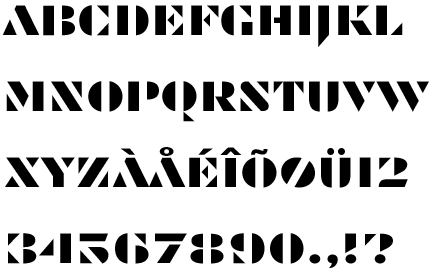
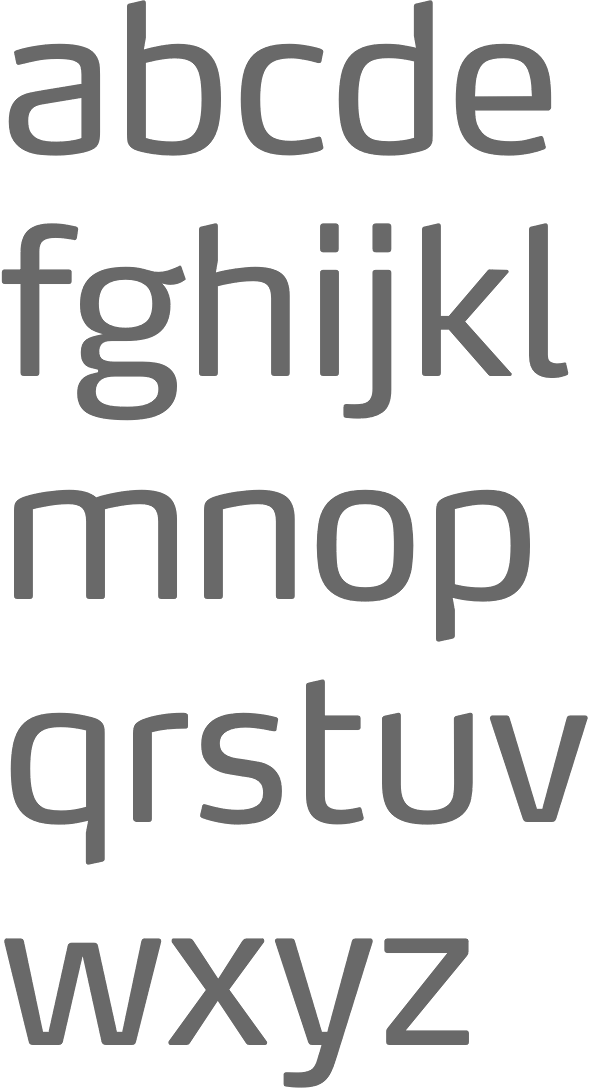
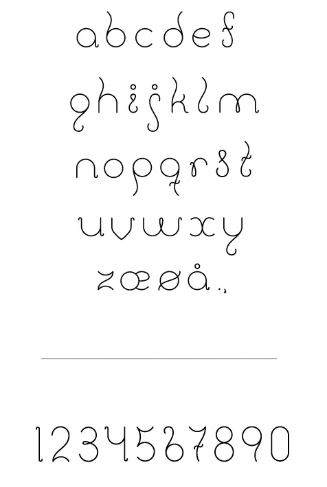
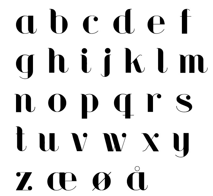
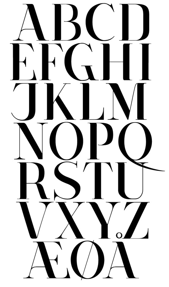
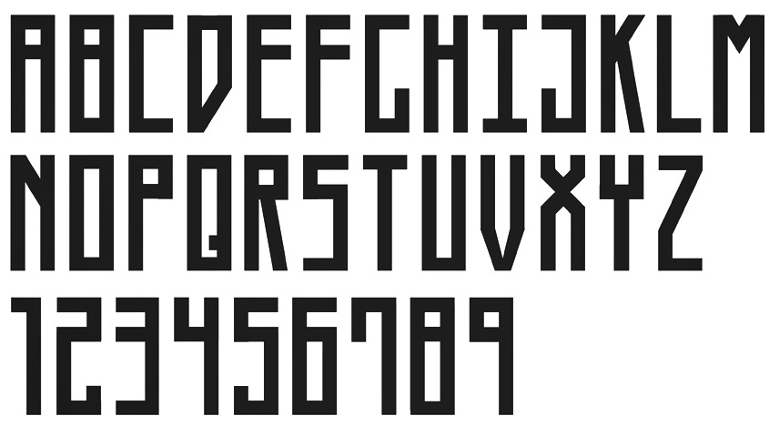
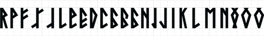
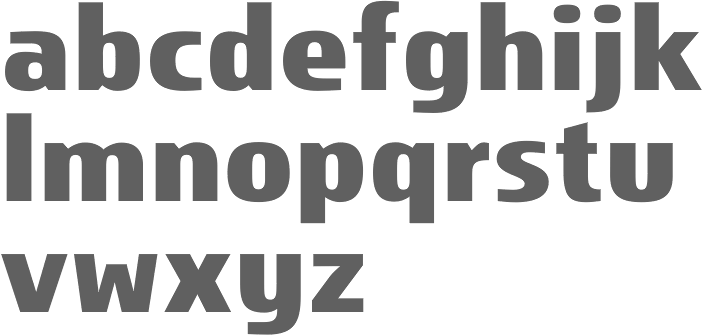
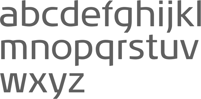
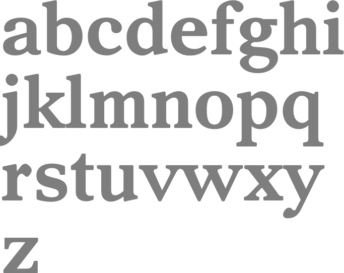
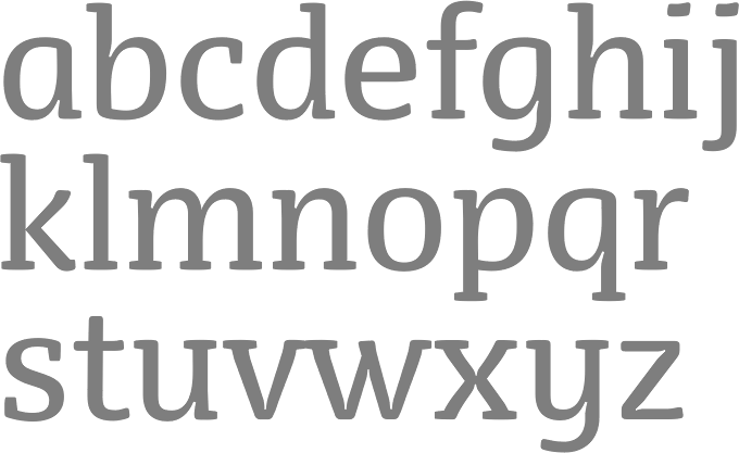
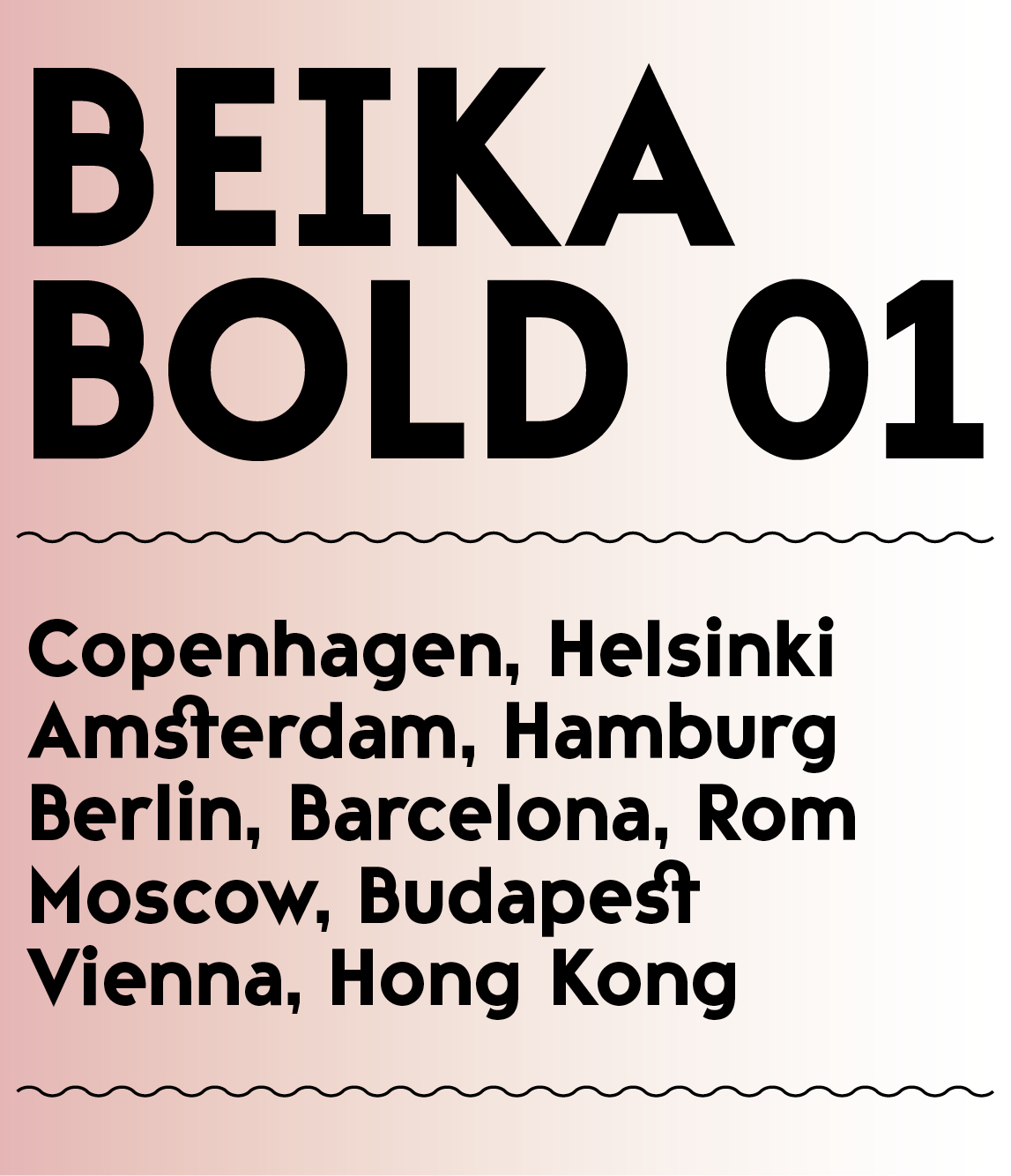
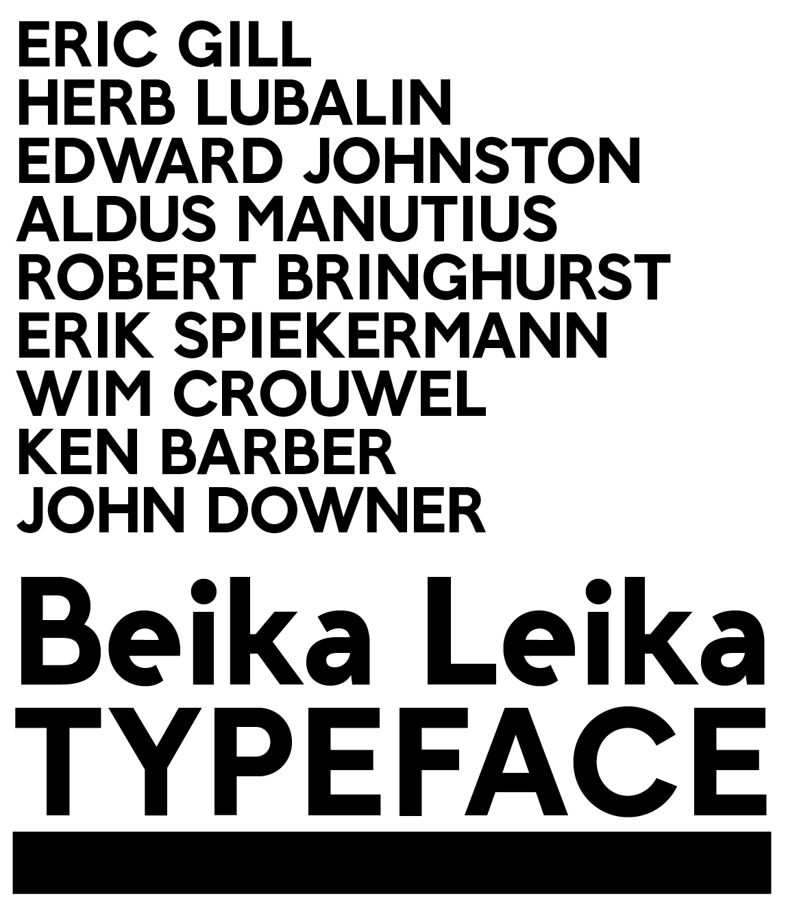
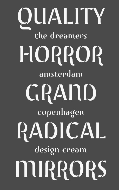
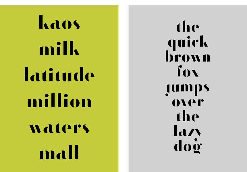
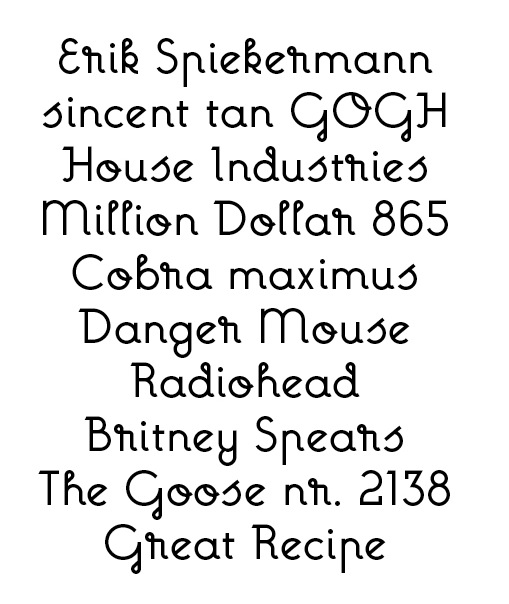
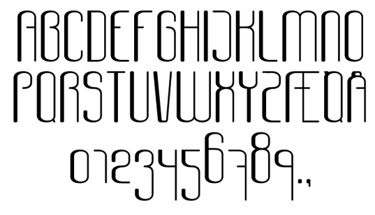
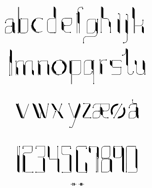
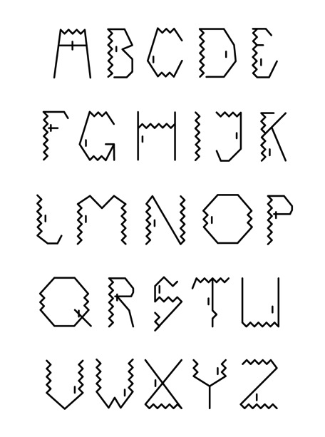
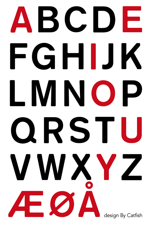
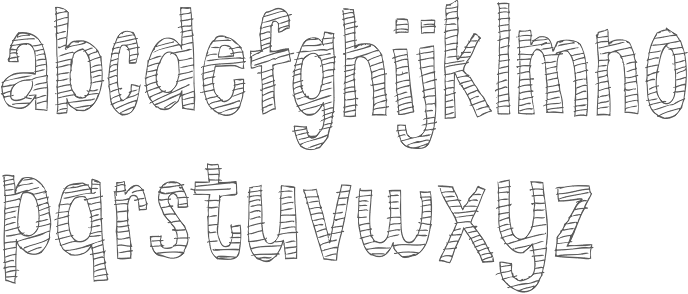
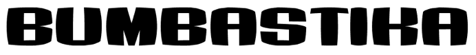
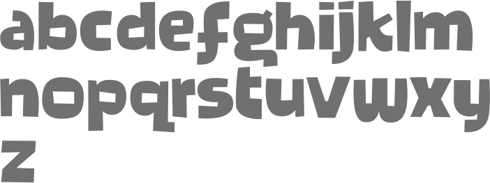
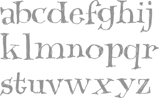
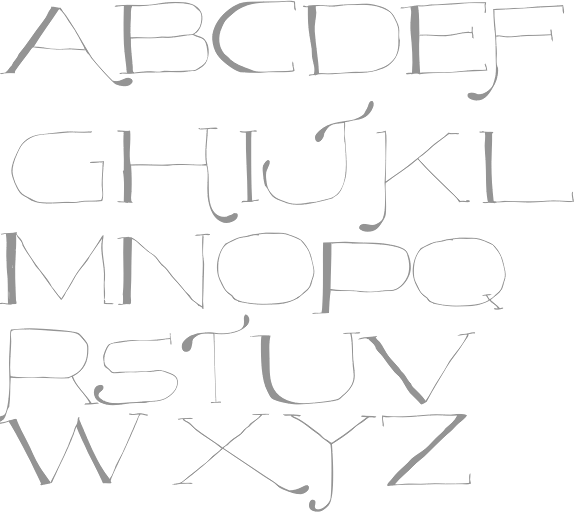
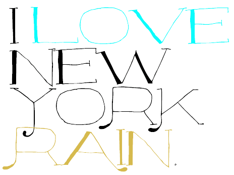
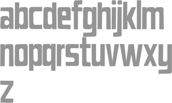
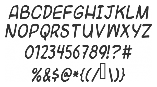
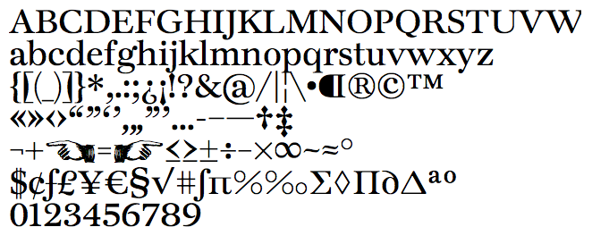
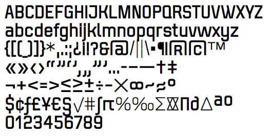
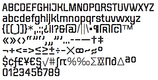
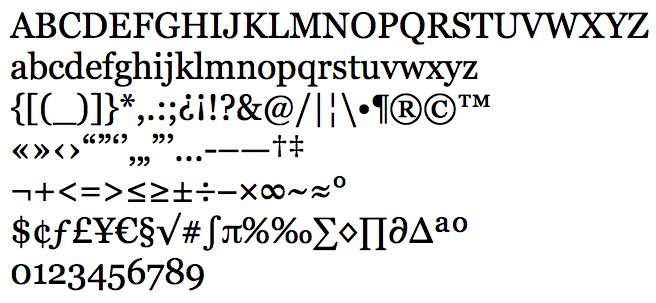
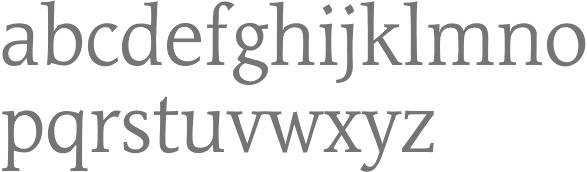
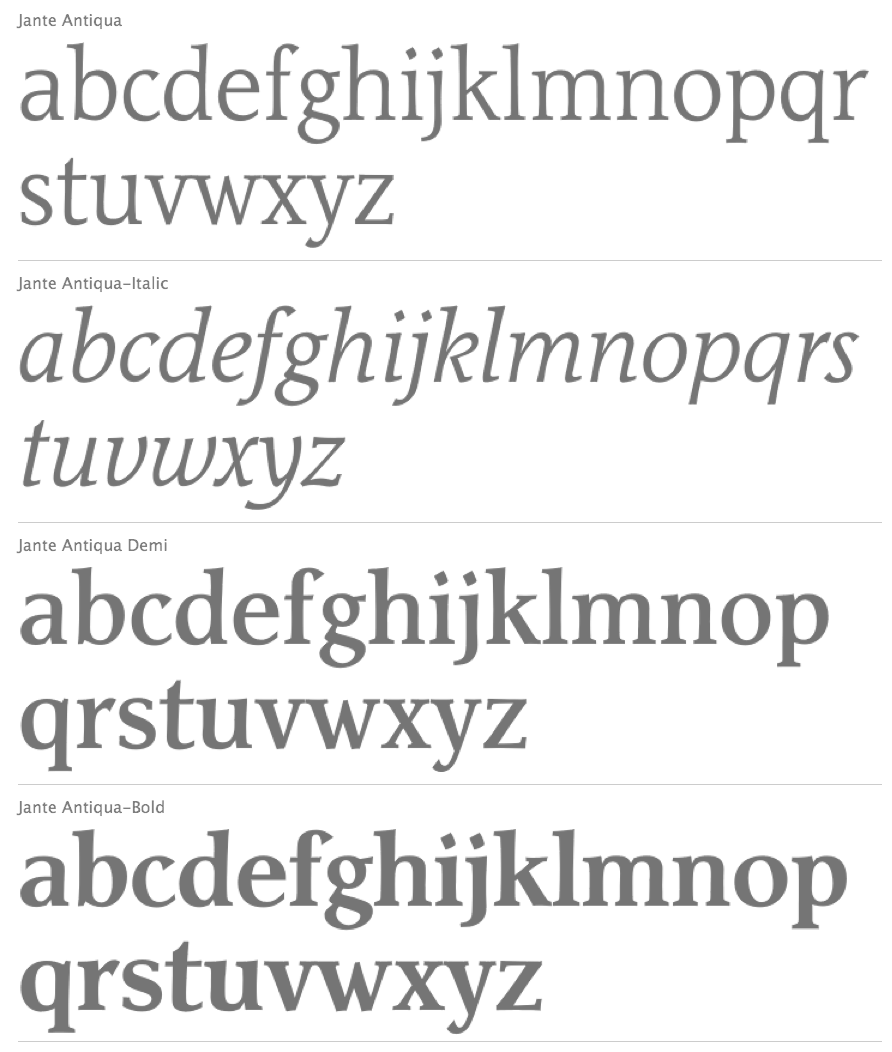
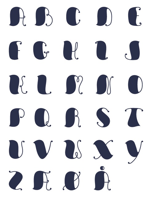
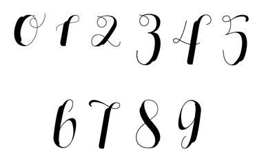
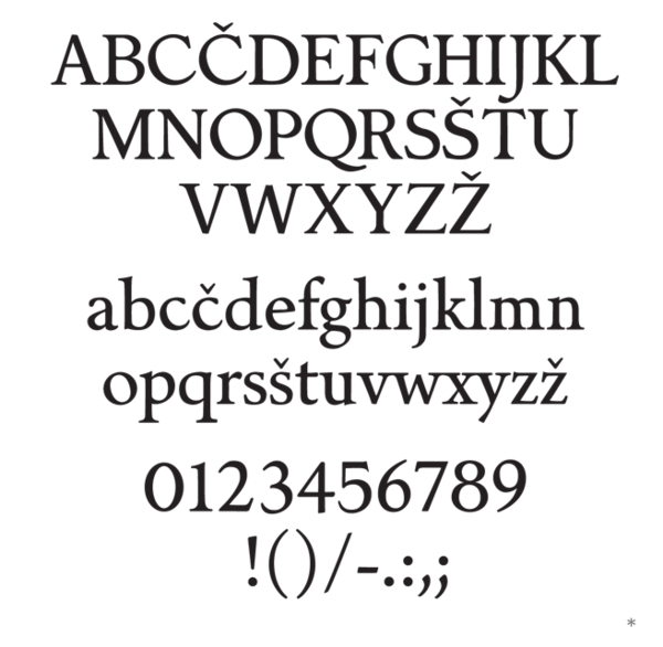
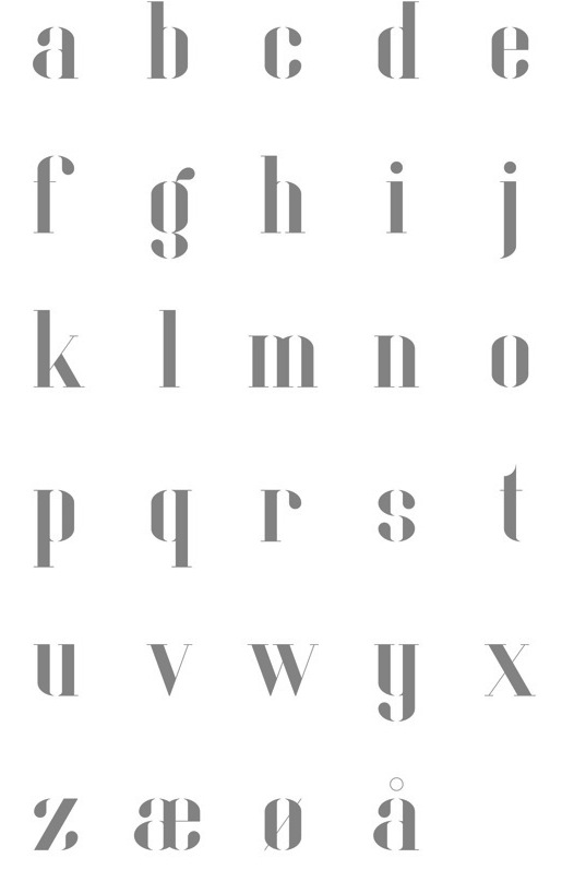
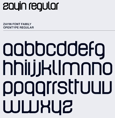
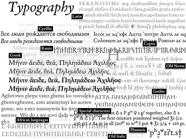
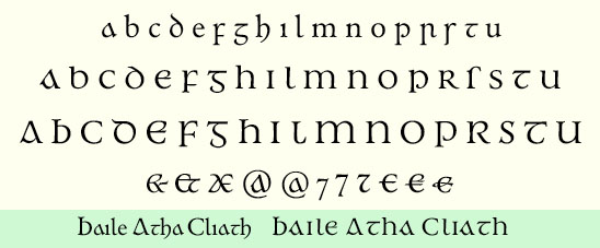
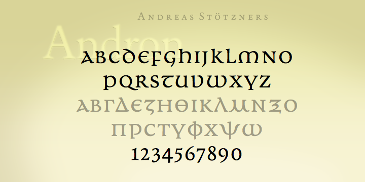
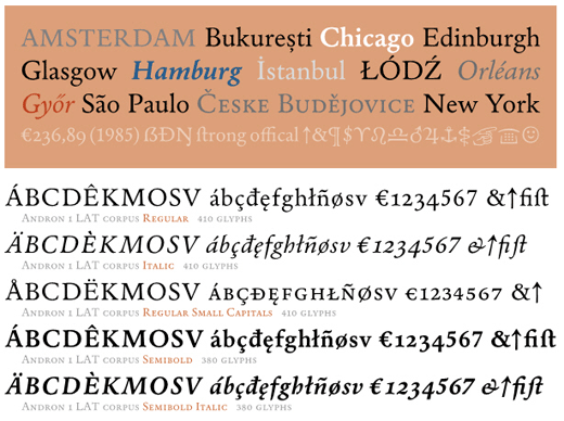
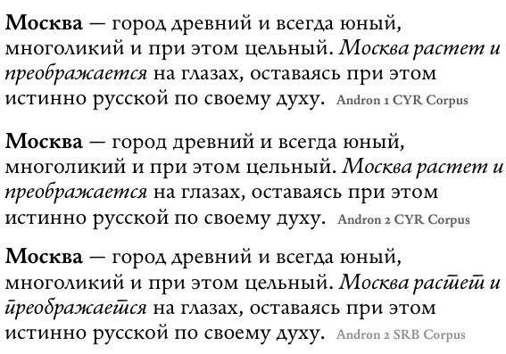
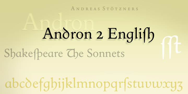
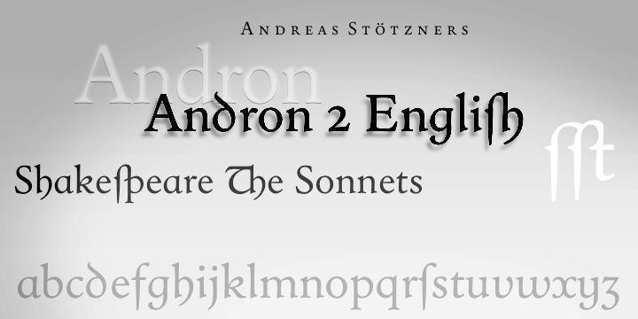
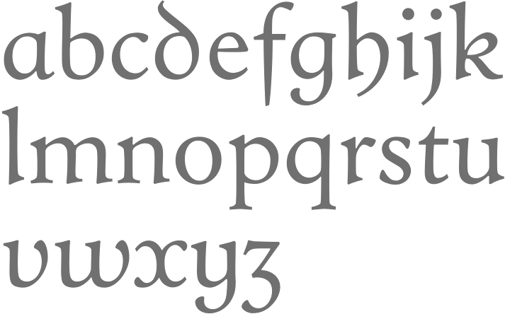
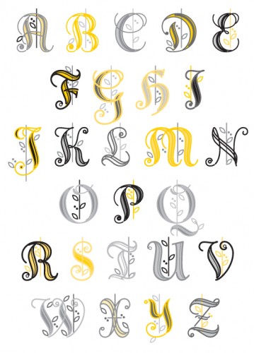
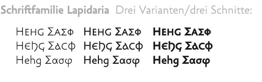
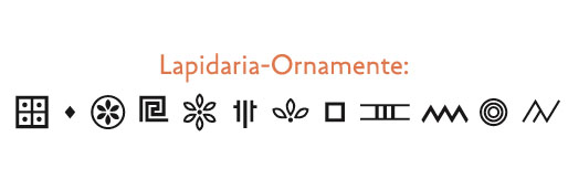
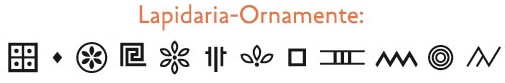
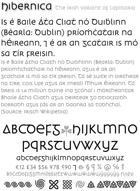
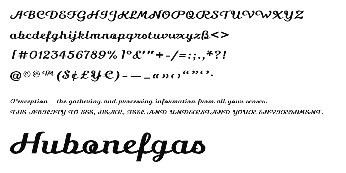
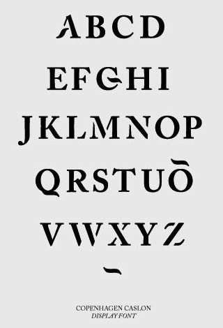
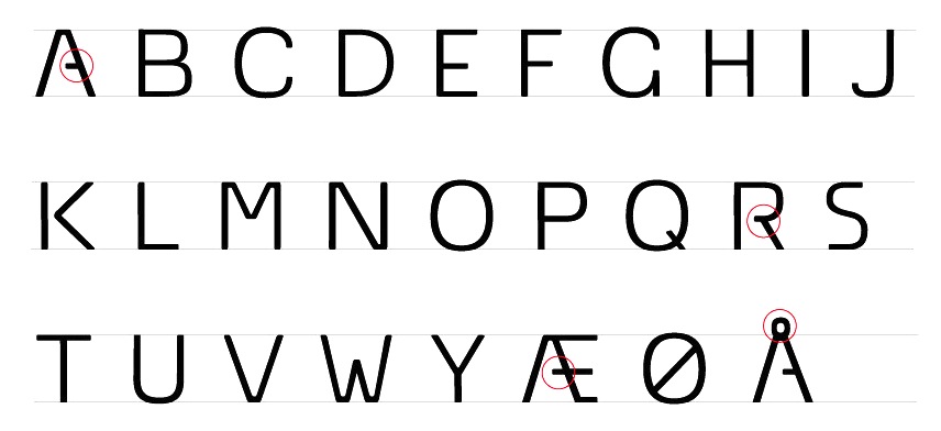
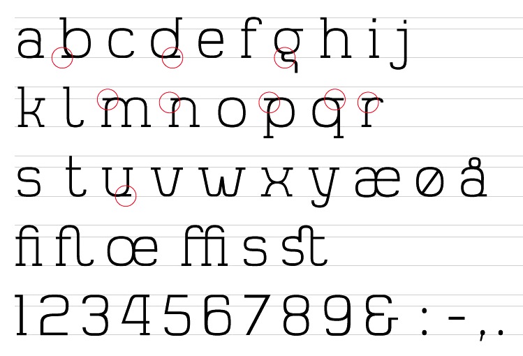
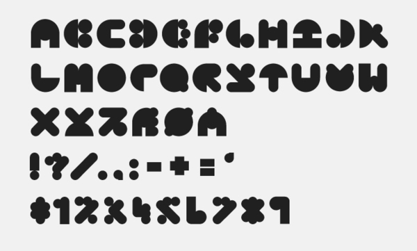
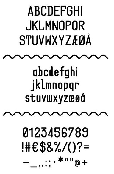
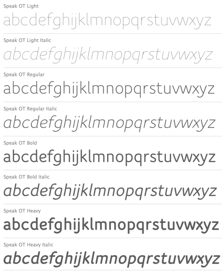
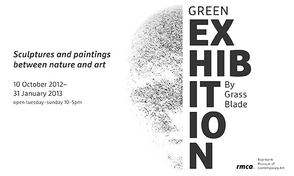
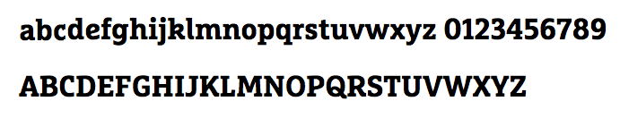
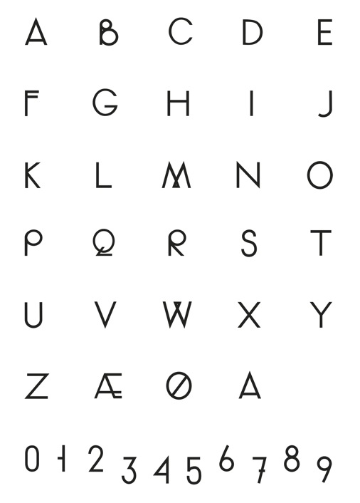
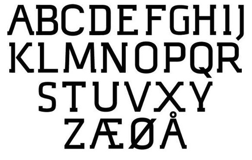
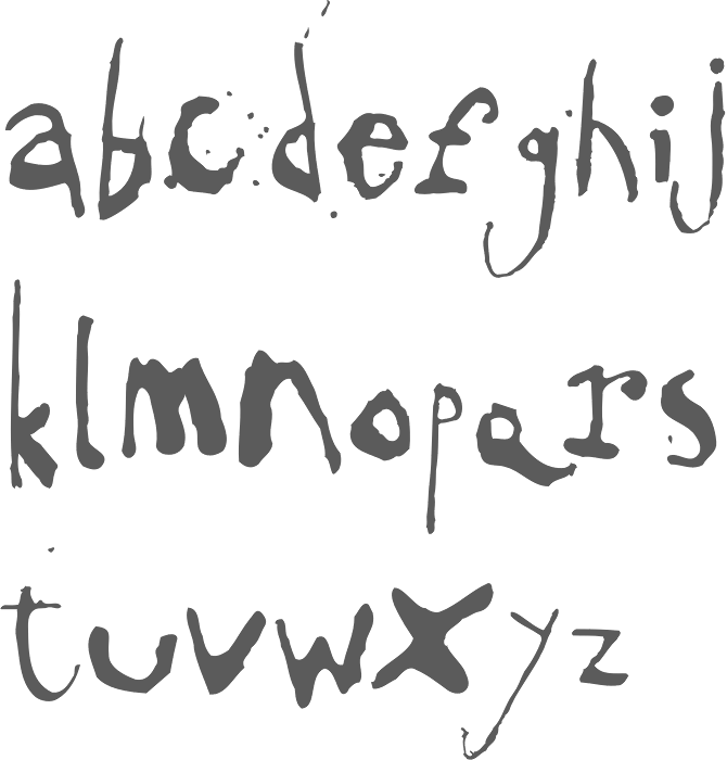
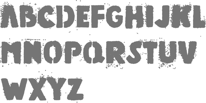
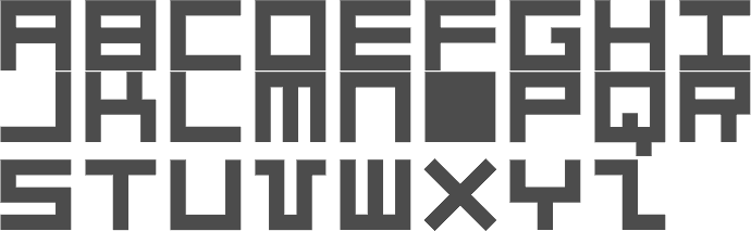
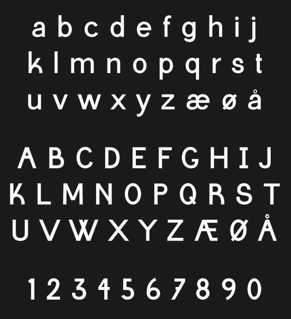
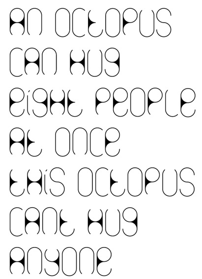
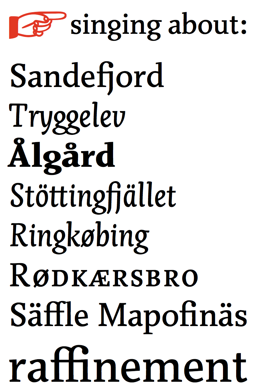
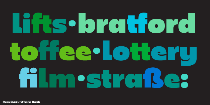
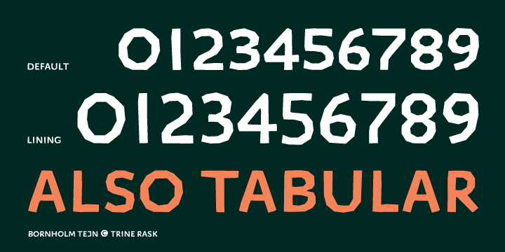
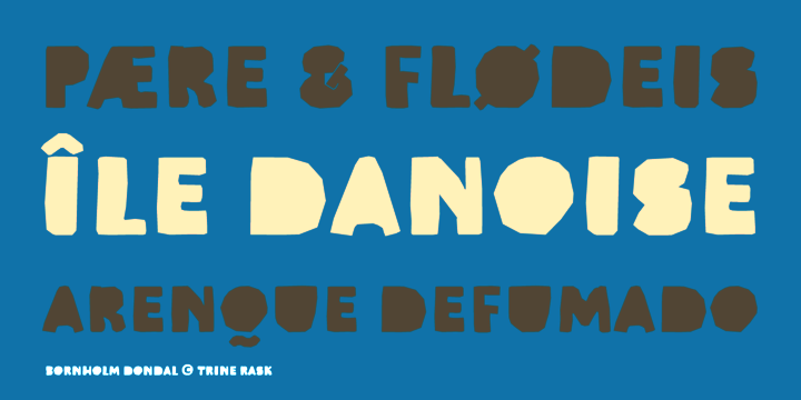
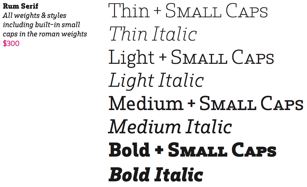
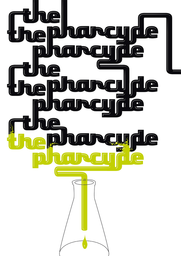
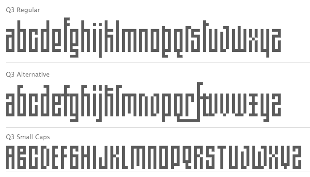
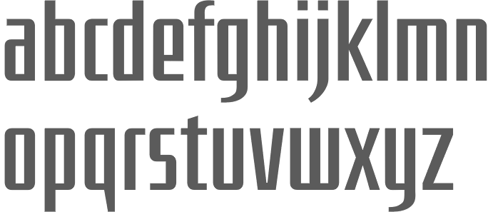
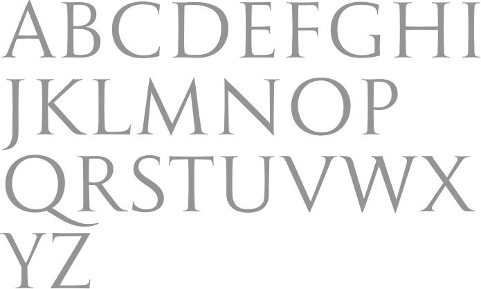
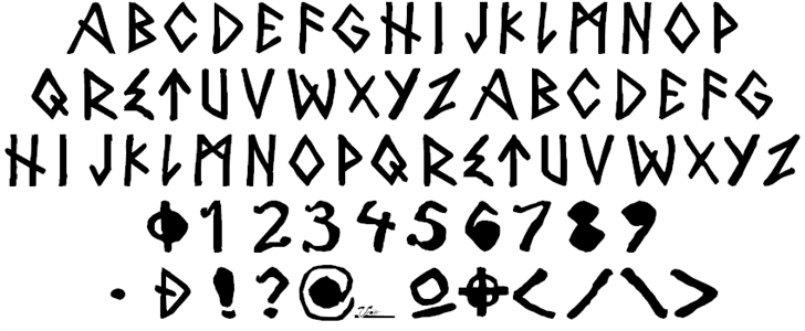
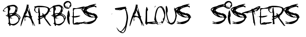
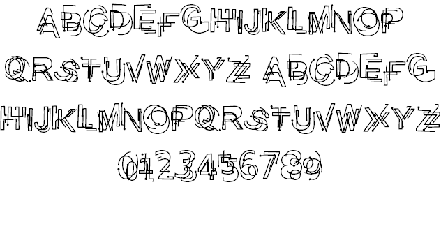
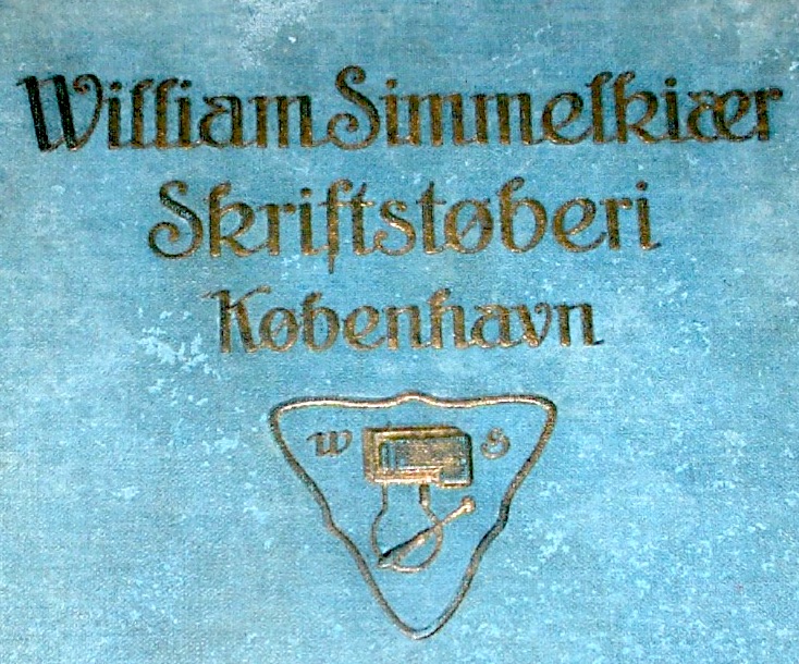
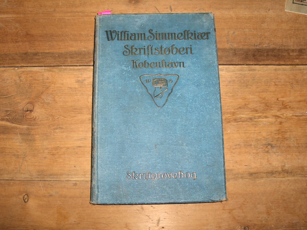
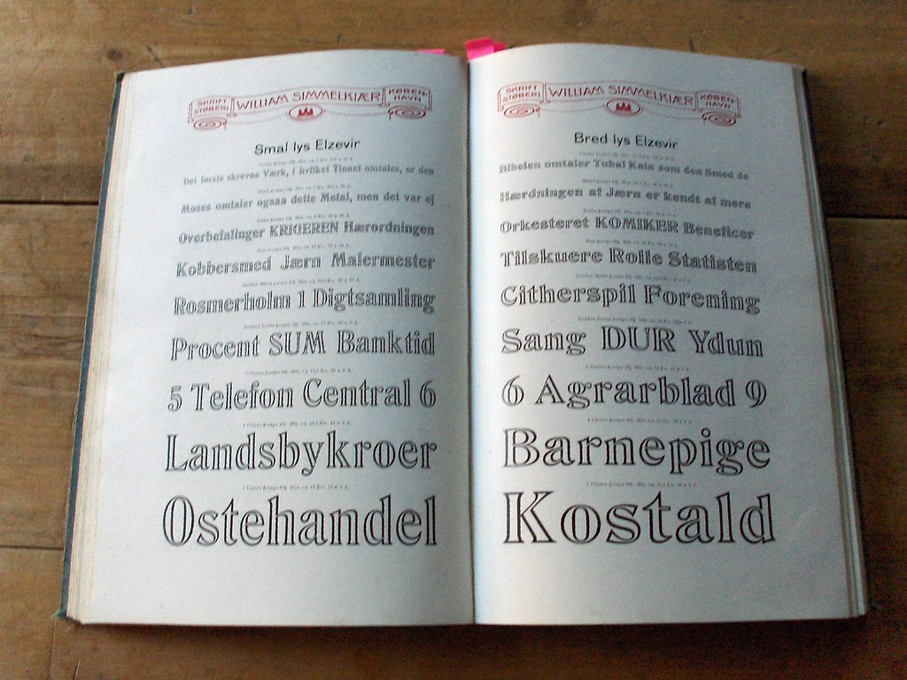
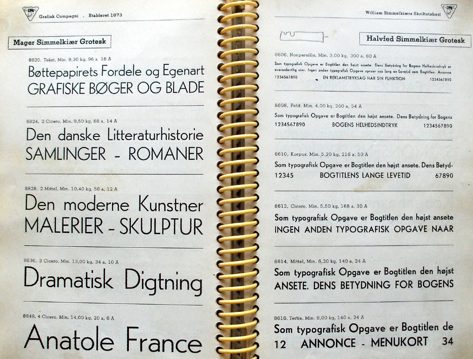
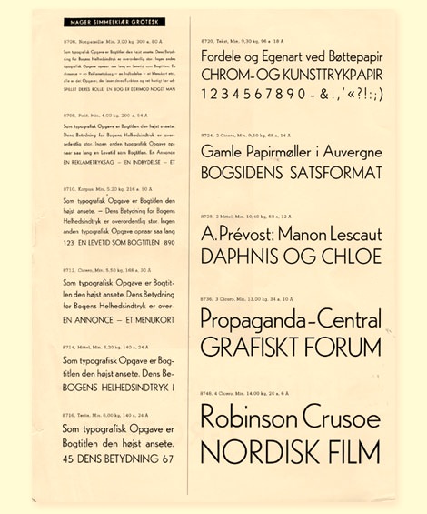
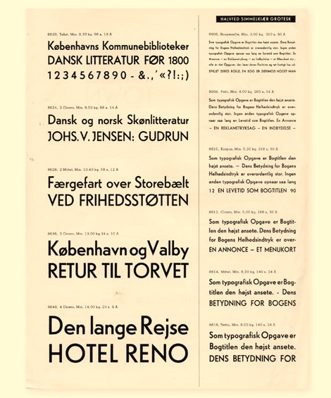
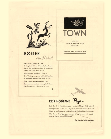
|
|
|
|