TYPE DESIGN INFORMATION PAGE last updated on Sat Jan 10 11:44:09 EST 2026
FONT RECOGNITION VIA FONT MOOSE
|
|
|
|
|
Font examples | ||
|
|
|
|
SWITCH TO INDEX FILE
A picture page with many great lettering examples. [Google] [More] ⦿ | |
1920s and 1930s in Travel Ephemera
| Travel brochure and travel poster lettering from the 1920s and 1930s, art directed by David Levine. [Google] [More] ⦿ |
| |
Great examples of type on posters and photoshop examples. [Google] [More] ⦿ | |
400 Logos
| Ludwig Gatzke's collection of 400 logos of web companies. [Google] [More] ⦿ |
Examples of simple but elegant or surprising typographic posters. [Google] [More] ⦿ | |
In 2012, while studing at Type@Cooper under Jesse Ragan, he published the beautiful angular typeface Marais. Site dedicated to Marais. [Google] [More] ⦿ | |
| |
Great letterer and poster designer in Brooklyn, NY. Home page. I particularly like the music poster Peephole (2009) done for the Peephole Band. [Google] [More] ⦿ | |
Creator of the (painted) illustrated caps called Growing Power (2011). Images: i, ii. [Google] [More] ⦿ | |
| |
PDF files of hundreds of fonts that are used in Academic Computing Labs. [Google] [More] ⦿ | |
| |
Student at the University of Leeds (UK) who made a nice Bodoni poster in 2011. [Google] [More] ⦿ | |
| |
Twocester, UK-based creator of an alphabet collage entitled Traditional Versus Radical (2014). [Google] [More] ⦿ | |
Aerosyn-Lex Mestrovic
| |
Krakow, Poland-based designer of some innovative logos in 2012. [Google] [More] ⦿ | |
Flickr page by Agence Eureka, which has scanned many lettering books from the art deco era and the immediate post-war era. [Google] [More] ⦿ | |
Designer in Udine, Italy, who touched me with her beautifully lettered logo design La Tetta di Giulietta (2012). [Google] [More] ⦿ | |
Giza, Egypt-based designer of the typographic poster Scream (2013) for the movie by the same name. [Google] [More] ⦿ | |
Designer from Alexandria, Egypt, who created a typographic poster in 2013 entitled Girls Rule. [Google] [More] ⦿ | |
Egyptian graphic designer. Creator of a typographic donkey (2010). [Google] [More] ⦿ | |
Eskisehir, Turkey-based type and graphic designer, who created New Old Rounded (2010). Also, check out his Snell Roundhand poster (2010). Another URL. [Google] [More] ⦿ | |
Great graphic designer from Valencia, Spain. At Behance, she showed a trendy blingy smoky New York typographic poster (2009). In 2010, she made an equally fine poster for Berlin. [Google] [More] ⦿ | |
During her studies at FADU / UBA in Buenos Aires, Ailen Carcaba created the italic stylish poster typeface Honduras 122 (2015), the origami typeface paper Type (2014). Her poster for Brian De Palma's film Phantom of the Paradise (2014) is also noteworthy. [Google] [More] ⦿ | |
| |
Seattle, WA-based graphic designer. Creator of a beautifully lettered mural design for Killer Infographics' new office in 2013. Behance link. [Google] [More] ⦿ | |
Alan Cheetham
| |
Poster artist, whose lettering on this poster from 1922 inspired Nick Curtis to make ToonervilleNF. [Google] [More] ⦿ | |
Graphic designer in Tijuana, Mexico, who created a beautiful engineering style El Grill logo in 2015. [Google] [More] ⦿ | |
Guttenberg, NJ-based creator of a few fun typographic posters based on quotes from the main characters in the show Mad Men. I especially like Remember Don, when God closes a door, he opens a dress (2011) and I'm not a solution to your problems. I'm another problem (2011). [Google] [More] ⦿ | |
Located in Colombia, SC, Aldrena made a few nice typographic posters in 2010, illustrating typefaces such as Rockwell, Optima and Mrs Eaves. [Google] [More] ⦿ | |
| |
Graphic designer in Bogota, Columbia, who created Minoria (2012, hexagonal). Behance link. [Google] [More] ⦿ | |
Graphic designer in Santo Domingo, The Dominican Republic. In 2016, he created the handcrafted poster Of Monsters and Men. [Google] [More] ⦿ | |
Buenos Aires-based illustrator and designer. He created a nice sketchy poster called Hecho en Latino America (2011). [Google] [More] ⦿ | |
Vilnius, Lithuania-based creator of Neon font (2014, Cyrillic). [Google] [More] ⦿ | |
Behance link. [Google] [More] ⦿ | |
Alessandro Segalini
| |
Designer and graffiti artist in Guatemala City. In 2017, he published a beautiful lettered poster simply called Letter. Behance link. [Google] [More] ⦿ | |
Born in Scotland, Alex Hunter grew up in the USA and is now based in Charlotte, NC. She created great lettering for her poster Ask Me To Stay (2013). [Google] [More] ⦿ | |
He is the codesigner with Andreu Balius of SuperVeloz (2005, TypeRepublic), a digital version of his grandfather's typeface. It won an award at the TDC2 2005 type competition. Balius says about this typeface originally created by Joan Trochut from 1920-1980: Super-Veloz could be considered as an Ornamental type design, but in its core it is an experimental typeface based on a set of modular features that, with the combining of its modules, a great range of typefaces, ornaments ---even illustrations---, could be made. That is perhaps the most interesting experiment in early modern type design ever made in Spain during the immediate years after the War. The lecture, considering the borders between type design and ornament design, will introduce the context where Joan Trochut's Super-Veloz was produced (from sketches to published brochures and speciments) in 1942. Also will explain how Super-Veloz works. It is really a "type-ornament" design that could be considered on the edge of what we call type design. Alex has created design, illustration and typography for a diverse range of clients: Nike, Adidas, The Rolling Stones, Katy Perry, BBC, Coca-Cola, Pepsi, The Guardian, The New York Times and Time Magazine. Alex Trochut's lettering must be seen to be believed---it has to be genetic transmission. Recurring themes include adorned initials and modular types. His numerical all-caps alphabet for British Airways is phenomenal and pushes the bling-bling to the fashionable extreme. Stunning dollar sign drawn by him in 2007 for Acido Surtido. In 2009, he published Neo Deco at HypeForType. Noteworthy type treatments of that year include Nixon and the Futurecraft logo. In 2012, he designed Trojan Font (like Trajan). He also did some stunning multiline alphabet for V Magazine. Also noteworthy is a swashy calligraphic logo for Wiz Khalifa and Atlantic Records. In 2013, Barcelona-based creative agency, Herraiz Soto commissioned Alex Trochut to create an original typeface collection titled Raw for Notegraphy. In 2017, he made the color font Megazero at Fontself in Opentype SVG format. In 2018, Alex Trochut and Sudtipos cooperated on Utopian and Dystopian. Utopian is a color font family based on primary colors and pure geometric shapes, influenced by Bauhaus and De Stijl. Dystopian, its black and white companion with square features of Renner's original Futura drawings, emits a darker look and evokes Trumpian gloom and doom. Behance link. Debutart link. Klingspor link. [Google] [MyFonts] [More] ⦿ | |
| |
Designer and artist in Bergen, Norway, who made a remarkable typographic poster called Le Muée (2010). [Google] [More] ⦿ | |
Romanian graphic designer who has some interesting type posters such as Bancophone (2009) and Necro (2009). He lives in Bucharest. [Google] [More] ⦿ | |
Designer in Timisoara, Romania, who made a colorful and intricate typographic composition in 2013 entitled Liternictwo. [Google] [More] ⦿ | |
Alexandra Clotfelter is currently attending Savannah College of Art&Design in Savannah, Georgia. She created the typographic poster Occupy Wall Street (2011). Home page. [Google] [More] ⦿ | |
Graphic designer in Sao Paulo who designed a beautiful set of hand-lettered posters on the theme of Jimi Hendrix in 2013. [Google] [More] ⦿ | |
Alexandros Mavrogiannis
| |
Digital artist in Tagil, Russia. He creates innovative geometric alphabets and has published great typographic posters. [Google] [More] ⦿ | |
Springfield, OH-based designer of the colorful Chicago Latino Film Festival Poster in 2016. Behance link. [Google] [More] ⦿ | |
Saudi Arabian, b. 1988, located in Jeddah, who created the interesting Face Typography poster in 2008. [Google] [More] ⦿ | |
Graphic design student at Pellissippi State Community College in Knoxville, TN, 2010. Illustrator. Creator of a Grid Alphabet (2010). [Google] [More] ⦿ | |
Palma de Mallorca-based creator of a nice typographic collection of posters entitled Carteles Leo Bassi (2011), which mix the Western circus poster style and art nouveau elements. Typefaces created by er include the paper cut typeface Diplodocus (2011), and the octagonal typeface That Tune (2012). View her Y Modaba poster (2011). [Google] [More] ⦿ | |
A wonderful vintage Italian ad mounted on the wheels of a bicycle. [Google] [More] ⦿ | |
British graphic designer who made this poster of eyes in 2009. [Google] [More] ⦿ | |
Alexandria, VA-based creator of the 3d typeface Mondo Condo (2010). [Google] [More] ⦿ | |
| |
Graphic and web designer in Sacramento, CA, who created a Baskerville-themed magazine cover in 2016. [Google] [More] ⦿ | |
Alphabet trucks
| Eric Tabuchi has photographed trailer trucks on empty highways, each bearing one letter of the alphabet. His set of 26 trucks is perfectly uniform in scale and composition and lighting. His home page, where other alphabet series can be found. [Google] [More] ⦿ |
Graphic design and hand lettering on the Internet. [Google] [More] ⦿ | |
Alphan Typefaces
| Roberto Baldassari shows and discusses the fonts used in Space: 1999, from Data 70 (Esselte, 1970), to Futura Black, Futura Medium, Microgramma, and Eurostile Bold Extended to Countdown (an LCD font by Esselte, 1965). [Google] [More] ⦿ |
Barcelona-based illustrator. Look at the informal lettering in her posters. [Google] [More] ⦿ | |
Johannesburg, South Africa-based graphic designer and illustrator who has made some exquisite typographically relevant posters, such as Teknotribe (2015) and Let's Swing It (2016, in an art deco style). [Google] [More] ⦿ | |
An on-line tool in which Amazon book covers are used to typeset sample words. Nifty. [Google] [More] ⦿ | |
Designer in Ypenburg, the Netherlands, who created a minimalist script typeface in 2015. [Google] [More] ⦿ | |
American designer of a great Bodoni poster in 2019. [Google] [More] ⦿ | |
Behance link. [Google] [More] ⦿ | |
Amondo Szegi
| |
A weekly series of inspirational posts in the field of typography from Hangaroundtheweb. [Google] [More] ⦿ | |
Amsterdam Typography
| Signage map of Amsterdam maintained by Arno Verweij. A growing collection of photographs of letters and numbers that document typography in public spaces in Amsterdam since 2019. [Google] [More] ⦿ |
Amuki Studio
|
In 2012, she designed the modular color font INTI, and the cultural pattern typeface family Sara. In 2014, she designed the modular typeface Oraculo and the bribeware display typeface Lineas Y Puntos. Amaru Creador won an award at Tipos Latinos 2014. In 2015, she created the free display typeface Abyaster, and the multiline Bolivian pattern typeface Khurus. Her typefaces Modular 46 and Tiwanacu (decorative Nazca-themed caps) won awards at Tipos Latinos 2016. Typefaces from 2016: Criolla (an ornamental circus font, extended to Criollabat in 2019). In 2017, she designed an extraordinary multiline ancient Mexican culture-themed decorative typeface, Coatl Serpiente, and published the Arhuaca op-art patterns. Typefaces from 2017: Tinkuy Patterns (a free op-art pattern font related to native Andean cultures; in 2021, published by Sudtipos with gdigitization by Alejandro Paul), M46C (experimental, and modular), Entorno (a modular prismatic typeface), Arhuaca (a precolombian pattern font). Typefaces from 2020: Nunka Anent Dingbat, Sébastien (a set of color typefaces inspired by Truchet's tilings). [Google] [More] ⦿ |
| |
Sao Paulo, Brazil-based designer of a colorful typegraphic poster in 2017. [Google] [More] ⦿ | |
| |
In 2012, she created the tall high contrast fashion typeface Kilimanjaro. Her Textappeal lettering from 2014 is also noteworthy. Her experimental typeface Floating Typescapes won an award at ProtoType in 2016. Behance link. Old Behance link. [Google] [More] ⦿ | |
At Type Cooper 2020, she developed Silpancho Sans and Stencil, which were inspired by vernacular signage in Bolivia. Typefaces from 2021 include the reverse stress italic Chirimoya. In 2022, she was enrolled in Type Cooper west. [Google] [More] ⦿ | |
Brazilian designer in Campos. Her work includes many nice typographic posters. Flickr stream. [Google] [More] ⦿ | |
Brazilian graphic design graduate from IADE, Portugal (in 2011), who is now located in Glasgow. Creator of Pinho (2010), a modular typeface made from nuts. She also made Hardcopy (2012, for the Hardcopy magazine). As an example of her typography in branding and logos, check out the work she did for Galeria Barbara Longhi in Porto Alegre, Brazil. Dafont link. [Google] [More] ⦿ | |
Anastassiya Vishnevskaya
| |
Graphic designer and illustrator in Moscow. Creator of a colorful type poster (2009) for a children's book based on Futura. From it he derived a painted-look version of Futura (2009). Home page. Another URL. Another typeface. [Google] [More] ⦿ | |
YouTube video about the parts of a letter. [Google] [More] ⦿ | |
| |
Behance link. [Google] [More] ⦿ | |
Roman brand designer Andrea Laureti's Stop The Oil logo (2012) is full of visual typographic punch. [Google] [More] ⦿ | |
Graphic designer who works typography into some of her work, such as this Baskerville poster (2010). Behance link. She lives in Kansas City. [Google] [More] ⦿ | |
| |
Sao Paulo, Brazil-based illustrator, b. 1987. Creator of the old map script typeface Separaçao Script (2010). Smelly Cat typographic poster (2009). Dafont link. [Google] [More] ⦿ | |
Andreas Gustavsson
| |
On his page, Vienna-based Andreas Scheiger shows several interesting illustrations from The Evolution of Type. Home page. [Google] [More] ⦿ | |
Branding director in Braunschweig, Germany. His typographic work in Type Sex with Durex (2010) is remarkable. Behance link. [Google] [More] ⦿ | |
Andres de Velasquez
| |
Dafont link. Home page. [Google] [More] ⦿ | |
| |
Barcelona-based creator of the typographic poster La Mano Larga (2011). Behance link. [Google] [More] ⦿ | |
Andrew Dick was born in 1983 in Victoria, B.C. Canada, and is a selftaught artist who currently lives in Fukui, Japan. He is inspired by DADA, surrealism, the Cobra movement and naive art. He uses colored crayons and pens, paint, black ink, stamps, collages etc for his simple shapes, lines and new interpretations of old masters. His oeuvre includes several interesting sets of cats and critters done in 2007. [Google] [More] ⦿ | |
Student at Savannah College of Art and Design, majoring in Graphic Design. Creator of a nice typographic art deco poster in 2010. [Google] [More] ⦿ | |
Andrey Yushchenko
| |
Adeliade-based creator of a faux mag cover Arkitekt (2013) that balances photography and typography just right. [Google] [More] ⦿ | |
| |
Graduate of the Univsity of Guadalajara, mexico. Now based in Mexico City, he created a beautiful typographic poster called Sexo in 2015. Behance link. [Google] [More] ⦿ | |
Vienna-based graphic and web designer. In her work, I found one interesting typographic example, FontBot (2009). Home page. [Google] [More] ⦿ | |
Lima, Peru-based designer who did some creative lettering in 2014. [Google] [More] ⦿ | |
Graphic designer. She created the display typeface Penguin (2012) and received a Creative Summit award for the packaging design for Kikkoman, in large part due to the effective use of a fantastic custom typeface. She also created the board game Typopoly in 2012. [Google] [More] ⦿ | |
| |
Brazilian visual artist who did some beautiful lettering pieces in 2013. Behance link. [Google] [More] ⦿ | |
Anna Coutinho from Porto, Portugal and Mariana Almeida (from Angra do Heroismo, Portugal) designed a great codex-style logo for Formatos Design in 2010. [Google] [More] ⦿ | |
Nantwich, UK-based designer of Helvetica Shadows (2012). [Google] [More] ⦿ | |
Moscow-based designer of a typographic John Lennon poster in 2013. [Google] [More] ⦿ | |
During her graphic design studies, Lubbock, TX-based Anna Rodriguez created a wonderful typographic poster of Rihanna (2016). [Google] [More] ⦿ | |
| |
Anne Lee (Anne Lee Designs, Minneapolis, MN) created Summer Alphabet (a set of capitals---not a font) in 2012 while pursing her BFA at the Maryland Institute College of Art (MICA). Behance link. [Google] [More] ⦿ | |
| |
Toulouse, France-based designer of the nicely lettered piuece Leimotov (2016). [Google] [More] ⦿ | |
Graphic and motion graphics designer in Johannesburg, South Africa, where he worked as Ontwerp.tv (Idea currency) Pty Ltd. He is now located in Seattle, WA. He created several experimental alphabets, often of a geometric nature, such as Geometric Chic (2008-2009) and Beauty (2009). The Bends (2011) is a hairline curly-yet-straight display face. SansGoma (2011) is a hairline slab poster face. Nu Gothic (2011), Nu Modern (2011) and especially Vironica (2011) are fashion mag display typefaces. Neu Nouveau (2011) is a curly art nouveau face. Numera (2011) is an organic fashion mag face. Killoton (2011) is super-fat and beautiful. Creations in 2012: An art deco example in his Janelle 1945 work. Vorm Type, inspired by the work of Wim Crouwel, is a rounded blocky typeface that is monospaced in the x and y directions. Typefaces from 2013: Canada (alchemic). In 2015, he created a series of posters called Vignelliisms illustrating one-liners by Massimo Vignelli. Typefaces from 2017: Canada (I can't believe that he has trademarked the name Canada). Home page. Behance link. Ontwerp link. [Google] [More] ⦿ | |
Graphic designer in Buenos Aires, who has produced some nice typpgraphic pieces, such as a beautiful poster series entitled Congreso de Psicoanalisis (2014). [Google] [More] ⦿ | |
Slovak designer from the early part of the 20th century. One of his posters entitled Deleni Plochy (1927) shows rectangular bi-colored partitions of space. [Google] [More] ⦿ | |
| |
| |
Parisian creator of a poster for a Kurt Schwitters exhibition in Paris in 2012. [Google] [More] ⦿ | |
Lynchburg, VA-based designer of Thinny (2012). [Google] [More] ⦿ | |
| |
Legendary Swiss type teacher, b. 1920. Hofmann succeeded Emil Ruder as head of the graphic design department at the Schule für Gestaltung Basel (Basel School of Design) and was instrumental in developing the Swiss style of graphic design. His teaching methods were unorthodox and broad-based. He designed, and influenced the design of, books, exhibitions, stage sets, logotypes, symbols, typographical pieces, posters and sign systems. His work is recognized for its reliance on the fundamental elements of graphic form---the point, line, and shape. He retired in 1987. His output includes many fantastic typographic posters. Example. | |
Graphic designer in Brussels. Behance link. He has done some interesting typographic work, such as Noah (2009). [Google] [More] ⦿ | |
Illustrator and graphic designer in Saint-Germain-en-Laye near Paris. He created a beautiful poster for his city in 2010. [Google] [More] ⦿ | |
Villach, Austria-based typographer, who made a few great Bauhaus style posters in 2010, such as Bauhaus Hajo Rose, dedicated to the forgotten Bauhaus artist Hans Joachim Rose. [Google] [More] ⦿ | |
Arno Verweij
| |
Typographic poster examples: A, B, C, D, E, F, G | H | I | J | K | L | M | N | O | P | Q. Examples of typographically great bike posters: A | B | C. Behance link. Facebook link. Flickr link. Die Gestalten link. [Google] [More] ⦿ | |
| |
Parisian designer of Trenellographie (2014), a series of grungy typographic posters. He created the sans typeface Thaurr Caps in 2015. Behance link. [Google] [More] ⦿ | |
Polish graphic designer who lives in Wroclaw. He has made some inspired posters of typographic value. [Google] [More] ⦿ | |
Student at the Universidad Gestalt de Diseño, in Xalapa, Mexico. He created a fun typographic illustration called Nación Futura (2012). Behance link. [Google] [More] ⦿ | |
Graphic and editorial designer in Northport, NY. He made a few interesting type posters in 2010: Bembo, Futura, Zebrawood. [Google] [More] ⦿ | |
Creator at deviantart of a wonderful portrait composed of English and Japanaese text entitled Utada Hikari (2008). [Google] [More] ⦿ | |
| |
Graphic designer and illustrator in Southend-on-Sea, UK, who created a fat lettering typographic poster for pub signage in 2013. [Google] [More] ⦿ | |
A-Studio
|
In 2021, he released Uberdank (an all uppercase modular mono slab serif display typeface). [Google] [More] ⦿ |
Talented Russian illustrator in Saint Petersburg. Flickr page. She made some nice ornamental caps alphabet [perhaps not a font] and drew interesting typographic posters such as Logoman (2011). [Google] [More] ⦿ | |
| |
Graphic designer in Istanbul who created a nice poster in 2014 with art deco lettering. [Google] [More] ⦿ | |
Babis Touglis
| |
Bad Kerning
| Dan Hall (Memphis, TN) posted this example of kerning gone awry. [Google] [More] ⦿ |
The typophiles decry the lack of typographic passion at Monotype in 2011 in several ways. Chris Lozos an ugly ad for the 2011 release of Rotis II Sans. Others note that only the spreadsheet counts. An excerpt from their 2011 Annual Report: We derive a majority of our revenue from a limited number of customers, in particular manufacturers of laser printers and mobile phones. For the years ended December 31, 2010, 2009 and 2008, our top ten licensees by revenue accounted for approximately 50.8%, 47.1% and 46.3% of our total revenue, respectively. Their clientele consists of laser printing companies, publishing houses, mobile device firms, and large corporations. Others point to the visual degradation of another Monotype subsidiary, ITC. Stephen Coles points the finger at New York's design company Happy Cog. [Google] [More] ⦿ | |
Seoul-based motion graphic designer. Behance link. He made an art deco alphabet poster in 2011. [Google] [More] ⦿ | |
Balla Dora Typo-Grafika
| Many nice examples of creative typography, worked into a blog by Hungarian designer Dora Balla. In 2015, she made the experimental typeface HV Font. Home page. Behance link. [Google] [More] ⦿ |
Sacramento, CA-based designer. Cargocollective link. He created geometric logotypes called Virtuous (2012) and Espionage (2012). [Google] [More] ⦿ | |
Author of Type Image (2011). [Google] [More] ⦿ | |
Bathroom typography
| Funny alphabet composed of hairs found in a bathroom sink. Stuart Mayhew is based in Denver, CO. [Google] [More] ⦿ |
Beatnik lettering probably started in the fifties via magazines and movie credits. Hand-drawn, the letters are bouncy, uneven and often interlocking. Several examples of beatnik lettering were given by Jeremy Gullotto (Pasadena, CA) in 2013. [Google] [More] ⦿ | |
Graphic designer in Brescia, Italy. Behance link. She created an expressive typographic portrait of Beethoven in 2012. [Google] [More] ⦿ | |
A daily dose of typography brought to you by by "Satoru". [Google] [More] ⦿ | |
Freelance web designers Francis Chouquet and Aurélien Foutoyet, both based in France, run a type blog, reporting on great finds. [Google] [More] ⦿ | |
Graphic design student at UBA who created a few typefaces such as the experimental typeface Frecasjon (2012) and who designed a few beautiful retro posters, also in 2012. [Google] [More] ⦿ | |
Designer and illustrator in Trier, Germany. Creator of the typeface ION (2011), which is showcased on some of his posters. [Google] [More] ⦿ | |
Digital artist from Plymouth, UK. He created the experimental typeface Juice (2009). Behance link. [Google] [More] ⦿ | |
British illustrator who got a Masters degree in 2004 from the University of Huddersfield. Now, located in Toronto, he created some nice hand-lettered chalk mural pieces such as one called Metcalf Interns--it has the names of all 2001-2011 Metcalf interns. Cargo collective link. [Google] [More] ⦿ | |
Bristol, UK-based digital artist, who drew a few beautiful ornamental caps in 2011. [Google] [More] ⦿ | |
Graphic designer and illustrator in Brno, Czechia. He created animal silhouettes out of letters in 2009. [Google] [More] ⦿ | |
Bernardo Ruiz created a number of nice cards for Valentine in 2012 called San Valentin Tipografico. [Google] [More] ⦿ | |
Typographer and graphic designer in Sao Paulo, where he is art director at MTV. He made some typographic posters like Tipos Maleficos. [Google] [More] ⦿ | |
Bird Brain Factory
|
Typefaces from 2016: Space Fox (a trekkie font). Instagram link. Behance link. Creative Market link. Dafont link. [Google] [More] ⦿ |
Blastto
| Spanish graphic design group Blastto (Madrid) is actually Carlos Llorente, b. Guadalajara, Spain, currently based in London. He created a nice art deco type booklet in 2010, covering Broadway (1929), Bifur (1919), Parisian (1928) and others. Designer of the free experimental typeface Teardrop (2010) and the gridded typeface Try Type (2011). In 2012, he made Pigopago (a free double stroke font). The tweetware experimental typeface Del Gherp Al Tipo followed in 2013 after a TypoMad workshop in Madrid. Behance link. Dafont link. [Google] [More] ⦿ |
Austrian studio that created an alphabet of design classics in 2012. [Google] [More] ⦿ | |
| |
Behance link. [Google] [More] ⦿ | |
| |
Behance link. [Google] [More] ⦿ | |
Bulgarian graphic and type designer who made Versus (2008, pixelish). Also check out his colorful type poster. [Google] [More] ⦿ | |
Botto Arts is located in the United States. At Behance, they showcased a fine poster about Pluto (2010). [Google] [More] ⦿ | |
Designer from Iowa City, who shows some photogaphs of sign lettering at his site. [Google] [More] ⦿ | |
Each letter is a close-up of gyri (bumps) and sulci (grooves) found on the surface of the human brain. By Dr. Eric H. Chudler from the University of Washington. [Google] [More] ⦿ | |
Smashing magazine posts 50 breathtaking type posters. [Google] [More] ⦿ | |
Creator of a multiline typographic poster in 2009. [Google] [More] ⦿ | |
Brian A. Jaramillo
| |
Designer in Malabon, The Philippines, who made a beautiful typographic poster series in 2012 called Mothers Milk. [Google] [More] ⦿ | |
Artistic director in London, who created an Escheresque typographic poster called The Truth (2012). [Google] [More] ⦿ | |
Brian Jacob
| |
Graphic designer in Cape Coast, Ghana, who created a typographic poster in 2012 called Felman Ayariga. He is associated with Bagsart Designs, and with the University of Science and Technology in Kumasi. [Google] [More] ⦿ | |
Born in Australia and raised in Indonesia, she is currently based in New York City to pursue a degree in Advertising and Graphic Design at the School of Visual Arts (class of 2017). In 2017, she designed a nice poster entitled Ella Fitzgerald. Behance link. [Google] [More] ⦿ | |
Bru Perini (Porto Alegre, Brazil) did some exquisite lettering entitled Havana Libre (2012). [Google] [More] ⦿ | |
| |
During her graphic design studies, Goiania, Brazil-based Bruna Rodrigues created a great typographic poster entitled Black Swan (2015), after a movie starring Natalie Portman. This poster was co-designed by Nathali Fernandes. [Google] [More] ⦿ | |
Brazilian graphic designer in Sao Paulo. He created this amazing typographic poster of an eagle. [Google] [More] ⦿ | |
Brazilian art director who created a typographic poster of Charlie Chaplin in 2011. [Google] [More] ⦿ | |
Professional photographer Kjell Sandved has found all letters of the alphabet on the wings of butterflies. [Google] [More] ⦿ | |
Caligraft
| Beautiful (programmed) experimental letters derived from fonts. This is based on the Masters Thesis in Digital Arts, obtained in 2005 by the Catalan designer Ricard Marxer Piñón, 2006. For this, he wrote the "Geomerative" library of programs, which includes a truetype importer and interpreter. Alternate URL. [Google] [More] ⦿ |
Based in Ashburn, VA, Camille Hontiveros designed the lettering for a Moombahton Madness poster in 2013. [Google] [More] ⦿ | |
Graphic designer in Hull, UK. Creator of the gridded typeface Hypno (2012). He also created the original typographic poster called Seedy Motel (2012). [Google] [More] ⦿ | |
Carlos Llorente
| |
Graphic designer and illustrator in Tallahassee, FL, who created the illustrated set of letters spelling Resist (2017). Also noteworthy is her Trumpian Lord of the Puss Illustration (2017). Behance link. [Google] [More] ⦿ | |
Graphic designer in Argentina. Home page. He made a nice typographic poster of the Olympics in 2010. [Google] [More] ⦿ | |
Carol Liao (Los Angeles) created a Plantin specimen booklet in 2011. [Google] [More] ⦿ | |
Her graduation typeface at FADU-UBA, Andada, was awarded at the Second Bienal Iberoamericana of Design (BID 10) and at Tipos Latinos 2012. Andada is a warm text typeface designed specially for Argentinian and Paraguayan (Guarani) text. Andada is free at Google Fonts and Open Font Library. It was commercially released at Huerta Tipografica in 2020 as Andada ht Pro. In 2021, Google Fonts published Andada Pro. With Andrés Torresi, she developed Cambo (2011, Huerta Tipográfica), a family for Latin and Khmer [a free weight at Fontsquirrel]. Robots ht, which uses layering to construct robots, won an award at Tipos Latinos 2014. There is a useful accompanying font called Robots HT Arrows. Winner at Tipos Latinos 2018 of a type design award for Robots HT. In 2014, Huerta Tipografica published the free text typeface family Caladea which was designed by Carolina Giovagnoli and Andrés Torresi. Caladea is based on Lato and is metric-compatible with Microsoft's Cambria. In 2015, Andrés Torresi and Carolina Giovagnoli developed the Devanagari typeface family Sarali at Huerta Tipografica (free at Google Web Fonts). The Latin part is based on Torresi's Telex (2012). Sura (2015, Google Web Fonts) is a Devanagari typeface family designed by Carolina Giovagnoli. It is based on the original Latin typeface Andada, a serif typeface for text. Winner at Tipos Latinos 2018 of a type design award for Laura HT. In 2020, she designed the stone cut typeface Das ABC der Scheren. In 2021, she released Weg, an experimental font based on interweaved lines. [Google] [MyFonts] [More] ⦿ | |
Brooklyn, NY-based designer of Illustrated Type (2014, a hand-lettered poster). Behance link. [Google] [More] ⦿ | |
| |
French designer who has some nice typographic experiment called Alphabetempo (1994), based on the chronological decomposition of letters. [Google] [More] ⦿ | |
| |
Argentinian designer. He created a fun type match poster in 2012. [Google] [More] ⦿ | |
| |
Creator of the beautifully handlettered logo and meus for The Mermaid Inn (2009). Chad specializes in sign lettering out of his office on Spadina Avenue in Toronto. Behance link. [Google] [More] ⦿ | |
Beirut, Lebanon-based designer of the typographic poster Free Your Mind (2016). [Google] [More] ⦿ | |
Toronto-based creator of Halloween Fashion Week Poster (2012) for an event held in Toronto that was hosted by Elle Canada. [Google] [More] ⦿ | |
| |
Change The Thought
| Typography blog, with many nice typographic posters. Changethethought was established in 2002 as the portfolio website for designer and art director Christopher Cox (Lakewood, CO). [Google] [More] ⦿ |
UK-based designer who created a Herb Lubalin poster in 2010. [Google] [More] ⦿ | |
Hanover, PA-based designer of a blocky constructivist font poster in 2016, which is based on a font made using FontStruct. [Google] [More] ⦿ | |
| |
Taiwanese graphic designer who created Birds New Roman (2015)---a set of birds all composed of glyphs taken from Times New Roman. [Google] [More] ⦿ | |
Chenying Wang was born in Taiwan and studied at Shih Chien University. Now based in Tokyo, he designed the decorative alphabet Perfume (2016). Behance link. [Google] [More] ⦿ | |
At Linn Benton Community College in Salem, OR, Cheri Shones (Dallas, Oregon) designed a typographic Bettie age poster in 2015. Behance link. [Google] [More] ⦿ | |
Cherry Vishnya
|
|
| |
Chicago O'Hare
| Matt Soar points out a good one: the O'Hare airport sign is set in the typeface Chicago: There's a scene early on in the movie Meet the Fockers where Ben Stiller and his bride-to-be fly off to see her parents. The establishing shot (above) cleverly reminds us exactly which city they're leaving. Which brings us to the big, helpful sign: first, it was clearly comped in during post-production; and, second, it's typeset in, wait for it, Chicago. Now there's inspired design for you. Chicago - the font, not the city - was designed in 1983 as a system font for the Apple Macintosh by Susan Kare. Its design has absolutely nothing to do with the city of the same name. In fact, according to Kare herself, the set of fonts she designed for Apple "were named after Philadelphia suburbs", until management decided otherwise. The moral, as ever, is: don't select type based on its name. [Google] [More] ⦿ |
An ongoing project documenting interesting typography in Chicago. [Google] [More] ⦿ | |
Chicks and Types, aka Sketch This Out, is a virtual artist in Firenze, Italy. He created a few posters in 2012, such as Isabelle & Times New Roman, Heather & Museo, and Carla & Din. [Google] [More] ⦿ | |
| |
Illustrator and graphic designer based in Sevilla. Creator of the nice typographic poster called Francisco Nixon (2010). Behance link. [Google] [More] ⦿ | |
Surabaya, Indonesia (and more recently, Bremen and then Berlin, Germany)-based designer of the decorative caps typeface Flowery Font (2014) and the needlecraft font Aska (2016). Earlier, she made the typographic poster Tribute to Bjork (2012). | |
In 2013, she used Giacometti's sculptures to create a Giacometti lettering alphabet. Nahkoa (2013) is an angular typeface that is inspired by the native American culture. [Google] [More] ⦿ | |
Creative director in London who created an art nouveau poster for a masquerade ball in 2013. Behance link. [Google] [More] ⦿ | |
Designer in Missouri. I quite like the (commissioned) typography for a restaurant called Miso Sushi (2011). [Google] [More] ⦿ | |
Christian Annyas
| |
Christian Perez (Troyes, France) reated a cubist / Mondriaan style typographic poster in 2013, entitled Hurricane as a Girl. [Google] [More] ⦿ | |
| |
During her BFA studies at SUNY New Paltz, Christina Sharp (Rome, NY) created a hand-lettered poster in 2012 entitled Filling The Void. Behance link. [Google] [More] ⦿ | |
Christine Sejean (Reims, France) made a psychedelically-lettered poster entitled Paul McCartney (2012). [Google] [More] ⦿ | |
| |
Behance link. [Google] [More] ⦿ | |
Christopher Cox
| |
Typefaces from 2015: Armada CPC (a wide sans), Beach Ball CPC (a geometric solid font; Filled and Outline), Compass Rose CPC (a geometric sans family designed for web sites), Mutiny CPC (an angry all-caps brush typeface). Typefaces from 2016: Waves CPC (pixel fonts), Wave Blackletter CPC (pixel fonts). | |
Behance link. [Google] [More] ⦿ | |
Cigdem "Chi" Michalski (ChiChiLand, San Francisco, CA) is an illustrator whose work is mainly related to children. One of her typographic posters, Sweet Little Ones (2015), is especially appealing. [Google] [More] ⦿ | |
| |
Enjoy the great use of the letter M for the branding of the city of Melbourne in 2009 by a team of designers at Landor: Jason Little, Ivana Martinovic, Jefton Sungkar, Malin Holmstrom, Sam Pemberton. [Google] [More] ⦿ | |
Brisbane-based designer of a gorgeous watercolor lower case a (2014). [Google] [More] ⦿ | |
Kenosha, WI-based creator of the counterless hand-printed typeface Steamroller (2011). She also designed some beautiful ornamental caps in her Earth Day Poster (2011). Home page. [Google] [More] ⦿ | |
She created some remarkable ornamental caps, such as Dessert Rose, and a dollar sign. At Type Paris in 2015, she designed Iño, a humanist typeface influenced by Garamond. Type Paris link. [Google] [More] ⦿ | |
Jacksonville, FL-based creator of a wooden typographic sculpture (2012). [Google] [More] ⦿ | |
Examples of the great use of typography in advertizing. The web site "Italian Ways" presents and discusses Davide Campari's contributions through artists invited to design posters for him, mainly in the interbellum period. [Google] [More] ⦿ | |
This useful site lists information about company logos, colors and typefaces. [Google] [More] ⦿ | |
Graphic designer in Minneapolis, MN, who started life in North Dakota. He created the (free) tall sans display typeface Insanability (2010). He also made a Didot specimen poster. Home page. [Google] [More] ⦿ | |
Craig Ward is a British graphic designer and art director wjho moved to New York City in 2009, where he set up Words and Pictures in 2011. In 2015, he created the experimental typeface Fe203, and wrote: To form the glyphs, a tiny amount of ferrofluid was placed between two glass plates and subjected to a combination of spinning vertical and horizontal magnetic fields. The result is an array of complex hieroglyphics and shapes - each one as unrepeatable as a snowflake - that simultaneously call to mind ancient indigenous markings or symbols from science fiction. Designer of nice typographic examples, such as his Hairy Futura (2008). He designed the fat didone display typeface Lovechild (2009) and the spurred typeface Killer (2013). Other typefaces: Go Vote (2012, a brush poster and modular typeface for the American elections), Dark White (didone), Epitaph (alchemic), NM Serif (2015, for the branding of Dior's new perfume, Sauvage), England World Cup Kit (2018). | |
Experimental typography by Cranbrook Academy of Art students:
| |
A Dutch designer from Groningen. Examples of type on the streets of Paris. [Google] [More] ⦿ | |
Creattica was an image bank with a subsection on typography. It closed in 2014. An example of the sort of item showcased by them: the letter-based image called Bug (2010) by Ebru Selçuk. [Google] [More] ⦿ | |
Graphic designer from San Diego. Creator of some great type posters in 2009 and 2010. [Google] [More] ⦿ | |
Graphic designer in Lemberg, Ukraine. As a student, she made a nice art deco poster called Vita Brevis Ars Longa (2009). [Google] [More] ⦿ | |
His masterpiece, The Illustrated Screwtape Letters (Geoffrey Bles, 1942) has been republished many times. The recent Harper & Collins edition is illustrated by Papas and uses great ink spill lettering on its cover. As far as I know, no attempt has been made to digitize this handwriting. However, an alternate screenprint design has been created by Paul Flanders in 2014. [Google] [More] ⦿ | |
Russian site with many photographs of lettering in public places. Very entertaining! [Google] [More] ⦿ | |
Curitiba, Brazil-based designer of the typographic poster Curityba (2017), which evokes the typography in 19th century Curitiba. This work was done in cooperation with designers Pedro Gonzalez and Gustavo Aguiar and plastic artists André Mendes, Fernando Franciosi and Rimó Guimarãs. [Google] [More] ⦿ | |
D.A. Sanborn
| |
Graphic designer in Busan, South Korea. He created an interesting poster called Hangeul lettering (2014). [Google] [More] ⦿ | |
Daily Type
|
|
South African graffiti and digital artist whose mural called Octopus G (2011) is quite spectacular. [Google] [More] ⦿ | |
Illustrator in Oakland, CA. Designer of a great arts and crafts poster for Monarch Designs in 2014. Behance link. [Google] [More] ⦿ | |
| |
| |
Dan Hall
| |
Designer of a Bifur-like typographic poster for an Exhibition on Calvert Avenue, 2008. [Google] [More] ⦿ | |
| |
Dubai-based designer of a logotype caps typeface for Daniel Bio Studio (2013). [Google] [More] ⦿ | |
Boston-based designer of a nice imaginary Lord of the Flies movie poster (2011). [Google] [More] ⦿ | |
Communication&Multimedia Design at the NHL University in Leeuwarden, The Netherlands. Indonesian creator of beautiful lettering in his Maluku poster (2011). Maluku is the local word for Moluccan, referring to the island group situated between Celebes, the Phillippines, New Guinea and Timor. It is part of Indonesia. | |
Daniel Mellis (Chicago) printed a small book in 2010 based on 19th century ornamented metal typefaces from the collection at Wells College. These include Tinted, Tasso, Banquet, Antique Extra Condensed, Aquatint, Dandy, Modoc, Columbus, Art Gothic, Rubens, Yukon Pointed, Tuscan Stellar, Halftone, Obelisk, Alpine, Gothic Shade, Ruskin, Condensed Roman, Ray Shade, Tuscan Floral, Souvenir and Aurora Uncial (Victor Hammer, ATF---never produced, but rediscovered by Theo Rehak). [Google] [More] ⦿ | |
Illustrator and art director in Berlin. Behance link. Creator of some beautiful typographic posters, such as the ones that announce some plays at the Volksbühne Berlin (2011). [Google] [More] ⦿ | |
Wil, Switzerland-based creator of a nice type poster of Jan Tschichold. [Google] [More] ⦿ | |
Daniela Zatti
| |
| |
Graphic designer in West Columbia, SC, who drew a nice vintage poster called Becherovka (2013). Behance link. [Google] [More] ⦿ | |
Graphic designer in San Diego who used Doyald Young's Gallant to make beautiful posters entitled Brahms Letters (2011) for an event that took place at the Lincoln Center of the Performing Arts in New York, featuring the work of Johannes Brahms. Home page. [Google] [More] ⦿ | |
Danielle Gravelle (Milford, MI) designed an arts and crafts logo for Vienna Café in 2012. [Google] [More] ⦿ | |
Birmingham, UK-based student designer of some promising posters and cobver pages for Inviso Magazine (2014). [Google] [More] ⦿ | |
| |
Manchester, UK-based illustrator and graphic designer who has some nice typographic posters. Behance link. [Google] [More] ⦿ | |
Creator of a couple of great Bodoni posters. I also like the geometric typography in the brand design of Karaoke Kafe. [Google] [More] ⦿ | |
| |
Professional photographer in Westerville, OH. During his studies at Columbus College of Art and Design, Darrek created a great typographic poster that celebrates the fifth and sixth symphonies of Beethaven (2013). Behance link. [Google] [More] ⦿ | |
Type blog by David Airey, a graphic and logo designer. Check out his Alphabet Photo Gallery. His links to Flickr groups on found and vernacular type. 13 Typefaces for graphic designers. [Google] [More] ⦿ | |
| |
| |
Greenboro, NC-based creator of an Escheresque logo for Overfield (2012) and of a savvy logo for a charter yacht in the British Virgin Islands called Grand Cru (2012). | |
David Delahunty
| |
David Gonzlaez (Pencildrifter Studios, New York City) is an illustrator who uses great hand-drawn typography on his posters. Behance link. [Google] [More] ⦿ | |
David Levine
| |
| |
French graphic designer, journalist and photographer. In 2004, he started work in Istanbul for a branding company. Director of the collection Atelier Perrousseaux, and frequent speaker at design and type meetings. Author of
Creator of a nice poster for a Turkish debate held in November 2011 on the theme of freedom of expression, entitled Ghetto. [Google] [More] ⦿ | |
Not a typographer, but an expert sarcast well worth reading. [Google] [More] ⦿ | |
During his studies in Chicago, David Vernier designed a great poster for the Deaul AIGA (2016). Behance link. [Google] [More] ⦿ | |
Born in Caracas, Deborah is currently studying fine arts at California State University. She made a great type poster that explains typographic terminology. [Google] [More] ⦿ | |
| |
A place with many images by new visual artists, a designer gallery and information on typography. See also here. [Google] [More] ⦿ | |
Flickr site with many scans of decorative 19th century alphabets. [Google] [More] ⦿ | |
Coimbatore, India-based designer of a typographic Harley Davidson motorbike in 2015. Home page. [Google] [More] ⦿ | |
Located in Menomonie, WI, Dena Hoewisch created the cool typographic composition NY Color (2010). [Google] [More] ⦿ | |
Creator of some neat type posters in 2009. Another URL. [Google] [More] ⦿ | |
| |
| |
This site has a few historical examples of typefaces. [Google] [More] ⦿ | |
| |
Pictures of marginal marks, including a gorgeous manicule, in medieval manuscripts. Courtesy of the digital library at the University of California at Berkeley. [Google] [More] ⦿ | |
| |
Patras, Greece-based graphic designer and typographer. [Google] [More] ⦿ | |
Dimitry Hamekink
| |
| |
Graphic designer in Curitiba, Brazil, who created a typographic wine bottle in 2013. [Google] [More] ⦿ | |
Article in The PracTeX Journal, 2006, vol. 1. It has font quizzes and name-that-font tests concocted by Yves Peters, Tamye Riggs, Charles Bigelow, and Michael Spivak. [Google] [More] ⦿ | |
Designer of the Halloween poster Hello October (2019). [Google] [More] ⦿ | |
Detroit, MI-based designer of a Barack Obama poster (2011). [Google] [More] ⦿ | |
Graduate of York College, UK, who lives in York. She created a psychedelic lettering cat poster called Gilmore in 2013. Behance link. [Google] [More] ⦿ | |
Dora Balla
| |
Studio in Barcelona. Their oeuvre includes a number of wine labels, such as Alfaro Barroco, for which a special set of ornamental initials was created in 2011. [Google] [More] ⦿ | |
Graphic designer and illustrator in Toronto, whose work includes a beautiful Romeo and Juliet typographic poster (2009). [Google] [More] ⦿ | |
| |
Designer in Sofia, Bulgaria, who created an art deco poster called Car Deco (2013). [Google] [More] ⦿ | |
Student-designer at FADU, UBA (Buenos Aires, Argentina) of great psychedelic and mood-altering lettering pieces in 2019. [Google] [More] ⦿ | |
In 2015, a Dutch designer created a new logo for the Belgian beer brand, Duvel. He asked that I not mention his name. [Google] [More] ⦿ | |
Dylan Roscover (Aloma, FL) made an incredible portrait of Steve Jobs based on the "Here's to the crazy ones" ad campaign from Apple in the 90s, using Motter Tektura, Apple Garamond, Myriad, Univers, Gill Sans, and Volkswagen AG Rounded, fonts present in Apple branding and products. [Google] [More] ⦿ | |
| |
Designer of the great letter-based image called Bug (2010). [Google] [More] ⦿ | |
Graphic designer and illustrator in Bristol, UK, who did some interesting Si Scott-style lettering. [Google] [More] ⦿ | |
Creator of a beautiful Day of the Dead postcard series in 2009. He says: The Tzompantli, or wall of skulls was another element taken from the Aztec culture. These racks were built to display the sacrificial victims or those deceased at wars. The grin. In all these characters the grin is related to Mictlantecuhtli’s mocking smile. Some anthropologist say that this enigmatic gesture, depicted in one sculpture, seems to smile or mock ironically of those who typeface or will typeface him one day. Three posters were created as well, for silkscreen painting. The skulls in the postcards were designed using an ornamental and illustration style called DIDOQUE, which emulates the baroque ornamentation and is constructed on whole letters and pieces, signs, glyphs of the DIDOT typography. Didoque, is a portmanteau word and concept result of the words Didot and Baroque. The Didoque illustrations he Published in 2014 were based on HTF Didot. IN 2014, Olivaswas based in Milan. Home page. Behance link. [Google] [More] ⦿ | |
Illustrator in Bogota, Colombia. His Rock Al Parque typographic poster (2014) made me chuckle. [Google] [More] ⦿ | |
Chilean graphic designer who created this type composition (2001). Designer of the display typeface CL BEC (2006). Designer at the Pontificia Universidad Católica de Chile, "Magister en Artes Visuales" of the Universidad de Chile. Docent at the Universidad Católica of Diego Portales and at the Instituto Profesional Alpes. [Google] [More] ⦿ | |
Aka Eduardo "Duds" Lima. Uberlandia, Brazil-based designer of the typographic poster Essa Moca Ta Diferente (2015). [Google] [More] ⦿ | |
Stirling, UK-based graphic designer and typographer. Originally from Latvia, he cooked up some exquisite corporate identities. [Google] [More] ⦿ | |
Moscow-based art director and illustrator who has made some typographic illustrations between 2008 and 2013. Behance link. [Google] [More] ⦿ | |
Behance link. [Google] [More] ⦿ | |
Russian designer of the Latin / Cyrillic script typeface Basil (2016). [Google] [More] ⦿ | |
American designer of the Lucille Ball In Helvetica poster (2016). [Google] [More] ⦿ | |
Elena Albertoni
| |
Medford, MA-based designer of a colorful alphabet poster in 2015. [Google] [More] ⦿ | |
Nevers, France-based designer of Typographie Lumineuse (2016). [Google] [More] ⦿ | |
Italian designer who created a great circle and compass-based monogram in 1998-1999 at ISIA Urbino. See here. [Google] [More] ⦿ | |
Illustrator. In 2011, in her Dia De Los Muertos gouache series, she illustrated various poster typefaces, including Buttermilk (Jessica Hische), Poppl-Residenz, and P22 Imperial Script. [Google] [More] ⦿ | |
| |
London-based designer of a typographic poster of human typefaces (2014). Behance link. [Google] [More] ⦿ | |
| |
Designer in Atlanta, GA, whose company is called Curly Maple Creative. Creator of an eye-pleasing typographic poster called Rosebud Forks (2012). [Google] [More] ⦿ | |
| |
Sheffield, UK-based designer of some nice typographic illustrations (2015). [Google] [More] ⦿ | |
Freelance illustrator in Savannah, GA. She created the award-winning typographic poster Milagres in 2011. Behance link. [Google] [More] ⦿ | |
Toronto-based designer of a colorful typographic poster entitled Jessie Reyez (2017). [Google] [More] ⦿ | |
During her graphic design studies in Manchester, UK, Emma Patterson created a typographic alphabet (2015). [Google] [More] ⦿ | |
| |
Graphic designer in Liège, Belgium, who created an experimental alphabet using only ink and soap (2017). [Google] [More] ⦿ | |
Studio in Mexicali, Mexico. My eye was drawn to their work because of the excellent typographic logo done in 2014 for Dra Anetta Ortega, a pediatric doctor. [Google] [More] ⦿ | |
Ho Chi Minh City, Vietnam-based designer of a decorative capital N in 2016 to represent Nanorobotics. [Google] [More] ⦿ | |
Gallery of his typographic posters. Hebrew lettering examples: Suleyman (2010), You Are What You Resolve To Be (2010). | |
During his graphic design studies in Berlin, Enrique Medarde designed an interesting typographic blueprint (2015). [Google] [More] ⦿ | |
| |
Tustin, CA-based illustrator who created a wonderful Lombardic logotype called Siena in 2012. Behance link. [Google] [More] ⦿ | |
Student at Yale University's School of Art. In 2010, Eric hu designed a 17-foot poster celebrating the works of a 1960's avant-garde architecture group named Archigram. The poster features a customized typeface, stacked vertically and then collaged and intermixed with pieces and artifacts of Archigram's drawings. Metaphorically, this creates an entirely new megastructure and through the scale of the poster, the work reflects the rigor and passion of Archigram. [Google] [More] ⦿ | |
| |
Eric Tabuchi
| |
Illustrator and digital photographer in Houston, TX, who created several funny typographic posters with buncy lettering in 2013. [Google] [More] ⦿ | |
Erik Marinovich
| |
| |
During her studies in Leeds, UK, Erika Carter designed an original typographic poster on sexual health. [Google] [More] ⦿ | |
Designer in San Diego, who created an alphabet with matches, called Ignite (2011). [Google] [More] ⦿ | |
During his studies, Sacramento, CA-based Ernest Karchmit designed a stunning lettering piece entitled Logic (2017). Behance link. [Google] [More] ⦿ | |
Photographer from Istanbul. He made a nice typographic poster of Che Guevara. [Google] [More] ⦿ | |
Mary (aka Estranged Illusions, b. 1986) is from Sault Ste Marie, Ontario. She created a nice typographic poster entitled Power of Words (2008). [Google] [More] ⦿ | |
Estudio Cao
|
Behance link. Home Page. Behance link. [Google] [More] ⦿ |
Etienne Mineur
| |
Etienne Mineur
| |
This company sells an interesting Multifont buckle. [Google] [More] ⦿ | |
Designer in The Philippines of the typographic poster Flamingo in 2016. [Google] [More] ⦿ | |
Japanese designer(s) of the pixel typefaces Bwnsnw-Bitmap, Bwnsnw, Fanda-Black, Fanda-Egyptian, Fanda-Sans, Tdmex-Bitmap, and the display typefaces SukplenaPS (2004), Pruspic-Openface, Pruspic-Paint, and the art nouveau sans fonts Val-Blanc-Bold, and Val-Blanc. All typefaces are from 2001-2002, except where indicated. Fontspace link. [Google] [More] ⦿ | |
During his studies at School of Visual Arts, New York City, Evan Pokrandt created the hexagonal typeface Honeycomb (2014) and the tall typeface Toothsome (2014). Behance link. [Google] [More] ⦿ | |
| |
Creator of fine bottle label designs and typography. [Google] [More] ⦿ | |
Las Vegas, NV-based creator of a nice capital S logo for Starlet, a cocktail bar in the Palms Casino Resort. | |
Heraklion, Greece-based designer of a great Greek lettering poster for an optician called Markakis (2016). [Google] [More] ⦿ | |
| |
Examples of signage disasters: Aquatic Swimwear, Fashion City, Kastanienhof. [Google] [More] ⦿ | |
Studio in Karlovo, Bulgaria, that created a nice typographic poster caklled The Nomads (2014). [Google] [More] ⦿ | |
F37 (or: Face37)
|
He also published Type Trumps, a set of playing cards that feature the main typefaces. Behance link. [Google] [MyFonts] [More] ⦿ |
Art deco era illustrator and letterer. His oeuvre includes the cover of Almanach du journal amusant (1929), and L'Amour en campagne 100 dessins. [Google] [More] ⦿ | |
For 10 USD, a set of 48 cards with font specimen and the history of the typefaces. [Google] [More] ⦿ | |
Fael
|
Rafael designed Caravela (2011, organic) and Kravo (2010), an angular titling typeface which he claims was inspired by the Portuguese Revolution. In 2012, he made the squarish typeface Godo, Naperom (inspired by embroidery and lace), and Jangada (a display typeface based on hand-made wooden rafts). In 2013, he designed the condensed sans typeface Kravo and Ancora (an angular all caps sans). Typefaces from 2018: Antiga (an interlocking all caps Peignotian typeface). [Google] [MyFonts] [More] ⦿ |
Fantastic Frilly Bits Typography Inspiration
|
|
Spanish illustrator. Behance link. Creator of a retro cartoon illustrated alphabet (2011; not a font). [Google] [More] ⦿ | |
Pantin, France-based designer of the fun typographic logo Yummyogurt (2012), which was created during her studies. [Google] [More] ⦿ | |
| |
Illustrator in Wilhelmshavemn, Germany, who created several typographic posters in 2014. [Google] [More] ⦿ | |
Singapore-based creator of images from glyphs. [Google] [More] ⦿ | |
Beautiful graphic arts blog with many typographic examples. [Google] [More] ⦿ | |
Parisian designer of a green grunge typographic poster entitled 1979 (2010). [Google] [More] ⦿ | |
Sofia, Bulgaria-based creator of a great ink spill poster representing abstract expressionism (2014). [Google] [More] ⦿ | |
Designer and digital artist in Porto, Portugal. He made a nice typographic poster entitled Free Tibet (2010), and designed a number of experimental typefaces in 2010. In 2011, he made Souca (multilined), Ayuthaya (blackletter), Gourmet (art deco), Graphic Monkeys (bilined), a curly face and an ornamental caps face. Typefaces from 2012: Colambo (an early 20th century grotesk), Honkers (rounded sans). Behance link. [Google] [More] ⦿ | |
| |
Byelorussian illustrator who fled his country when he was 18 years old. He sold paintings in Moscow and now lives in Amsterdam. His drawings are straight out of the 19th century, ornamental and playful. He is also inspired by the psychedelic lettering of the 1960s. Discussion of his work by Coles. Typefaces, all made or drawn in 2006-2007: Rodopi, Fashion Condensed, Farringdon, Hopkins, Rondell (Western style face), Abramesque (ornamental caps), Mansard Trimmed (19th century emulation), Wedlock, Silverado, Shimmer Wide (cyrillic), Mona (extra-wide slab serif), Flirt Chloe (more 19th century ornamental glyphs), Jubilee (constructivist Cyrillic lettering), Big Cyrillic pixels (many great pixelized alphabets), Cuba, Gingerbread (Victorian), and St. Clair. Alternate URL. Check out his gorgeous country maps designed for the aeroflot in-flight magazine in 2008. [Google] [More] ⦿ | |
Romainville, France-based designer of some type posters such as one done for Ariana Grande in 2016. [Google] [More] ⦿ | |
Search engine for type-related photographs. [Google] [More] ⦿ | |
Flickr group specializing in single letter pics. [Google] [More] ⦿ | |
A Flickr pool for the typographically starved. [Google] [More] ⦿ | |
Florence (or: Bombastudio)
|
In 2012, she published Lucrezia, an overzealous decorative caps typeface, and Henry (a free retro script all caps family named after Henry Ford). Cargo Collective page with interesting posters such as Archer (2011) and Einstein. [Google] [MyFonts] [More] ⦿ |
Buenos Aires-based designer of a decorative Ampersand (2016). She also made a calligraphic poster, las estrellas de Pablo (Neruda). Behance link. [Google] [More] ⦿ | |
Designer of the fine typographic poster Superscript (2012). [Google] [More] ⦿ | |
A source of free clipart---mostly in TIFF format. These include tens of alphabets and almost a thousand initials, as well as many thosands of ornaments. Start page. [Google] [More] ⦿ | |
Flyer Goodness is an art blog that posts inspiring flyers&posters every day. A nice source also of typographic ideas. [Google] [More] ⦿ | |
Font posters designed by most foundries affiliated with MyFonts. [Google] [More] ⦿ | |
Interesting way of displaying and categorizing fonts, with over 1500 font images. By Merz Akademie's Patrick Schell and Harald Scholz, in Hamburg and Berlin, respectively. [Google] [More] ⦿ | |
FONTana Typestudio
|
Free typefaces: Zodiac (2000), Cards (Gyula Zsigri, 2001), Maldoror, Domino (Gabor Kóthay), Count, Csenge (a Hungarian rune font by Csaba Dávid), Qwerty (Gabor Kóthay, 2000), Y2K (Gabor Kóthay, 2000). Early commercial fonts: Woodini (caps), Sleeping Beauty (caps), Zimbalo (1999, Amondó Szegi), Pacalsone (1999, Amondó Szegi), Paradox (1999, Amondó Szegi), Construct (2001, Amondó Szegi), Binario (2000, Amondó Szegi), Bikewrench (2001, Amondó Szegi), Cabin (2001, Gábor Kóthay). At T-26, in 2001, Amondó Szegi published the commercial typefaces MuseFace (art nouveau), Glosso (2003), Xodus (2001, Regular, Italic, Forgotten), Kozma-Ornaments, all showing old Slavonic and/or Armenian influences in Latin letters. In 2000, he made Alian Ornaments (floral ornaments) for T-26. At T-26, Gábor Kóthay published Adagietto (2000), Minerva (2000), Archetype (2000). At PsyOps, Gábor Kóthay published the formal script Anglia (2001), Berill (2001), and Plexo (2001). Amondó Szegi's typefaces at T-26: Nexodus (2008, medieval style), Zenthes (2008), Alien Ornaments, Glosso, Iskola (2002, a Victorian typeface done with Silas Dilworth), Kozma (great ornaments), Melico, Melico Ornaments (2004, another great set), Xodus. At P22, Szegi designed the curly typeface Mantra (2005). Amondó Szegi's Telegdi family is since 2001 available from P22. At The Type Trust, he created the playful Gepetto (2006). Typefaces from 2013: Ma (avant-garde, constructivist, done as an hommage to Lajos Kassak), Overdose, Sorry (kitchen tile typeface), Atett (hommage to Lajos Kassak), Street Soul, Samizdat, Velorex (brush script), Zsir (fat octagonal face), Kedves (hipster font). Typefaces from 2014: Iseum, Pix Gotisch. Among their custom corporate identity jobs, the Losonczi Hair Salon work (2012) is quite outstanding. Dubstep (2012) is an experimental triangulated grid-based typeface. In 2013, Glosso Novum (2013, Fontana Type Foundry), a remastering of Glosso (2003), was published. Nexodus (2013) is a reworking of his 2001 typeface Xodus, with new ornaments and zodiac signs, and more weights. Xodus (2001, Regular, Italic, Forgotten) revives work by Miklós Kis Misztótfalusi (Nicholas Kis), who was one of the first designers of Armenian type: He prepared his first set of exotic types before September 1685 for the Armenian printing house in Amsterdam. It was the knowledgeable mayor of Amsterdam who requested that those types be founded. These types were used to print the mayor's (Nicolaes Witsen) work entitled Noord en Oost Tartarye. Misztótfalusi's name appears in the colophon of the book. Later, in 1687, he found Georgian types, which were, in many respects, similar to the Armenian set. Since there was no printing house in Georgia, he designed the types on the basis of some manuscripts. Unfortunately, as legend has it, the types never reached the Georgian court, which had commissioned Misztótfalusi to design them. They were either lost or stolen somewhere in Sweden. However, a sample sheet survived and was found in 1980 in Amsterdam. It may seem to make no sense to re-Latinise the types of Misztótfalus, who himself was a great master in founding Latin types, and for whom Armenian types meant the first step in a new direction. Typefaces from 2016: Crave Sans. Klingspor link. Fontspace link. Behance link. Dafont link. Creative Market link. [Google] [MyFonts] [More] ⦿ |
Examples of glyphs drawn at ATypI 2006 in Lisbon. [Google] [More] ⦿ | |
Annoying Japanese site by Morisawa in which users can play with glyph components to create new things. [Google] [More] ⦿ | |
FontPlay page by Dennis Hill. See also here. [Google] [More] ⦿ | |
Napse Design identifies the fonts on the most popular web site logos::
| |
Fontsinuse
| Stephen Coles set up this site about fonts in advertising and the media in 2010. The initial page reads: Our effort begins here, with a regularly updated collection of case studies and trend reports. We've invited experts from various fields to comment on how type is used (and misused) in graphic design today. In our first few installments, magazine designer Marc Oxborrow has an emotional reaction to the redesign of Bloomberg Businessweek, the Font Bureau's Sam Berlow notices that the type specimen has become a design genre, I point to some recent projects in which type and especially typeface selection plays a central role, and instructor and historian Indra Kupferschmid reminds us that the real Bauhaus was not all geometric and experimental letterforms. This blog is a prologue of more to come. Behind the scenes, we are building a searchable, sharable archive of typographic design, all indexed by typeface, industry, and medium. And you are invited to join us. [Google] [More] ⦿ |
For The Love Of Type
| Gemma O'Brien's type blog discusses many interesting typographic examples. O'Brien is an Australian artist specializing in lettering, illustration, and typography. Her calligraphy and designs can be seen in advertising campaigns, editorial publications, and large-scale murals around the world. She has collaborated with numerous global brands and publications including Apple, Adobe, and The New York Times. Several of her projects have received the Award of Typographic Excellence from the New York Type Directors Club. [Google] [More] ⦿ |
Examples of type found in various places. Blog format. [Google] [More] ⦿ | |
Foundations of Typography B
| A so-called web poster exhibition by René Wanner (Switzerland), who runs a quite complete poster page, on the theme of the letter B. [Google] [More] ⦿ |
Hamburg-based group which has produced some nice type posters in 2009 (but they have an awful web site). Behance link. [Google] [More] ⦿ | |
| |
Talented Italian information designer who worked for The Intelligent Lifestyle Magazine and La Repubblica and its magazine, Robinson. Examples of his work: Bicchiere ragionato (2011), Infografica (2011), Information Design. Author of Designer Quotidiano, re-designer.org. Flickr page. [Google] [More] ⦿ | |
| |
Buenos Aires-based graphic designer who has some interesting typographic examples while at FADU, UBA. [Google] [More] ⦿ | |
Slovak designer from the early part of the 20th century. Check out the sturdy typography in his Annual Report for the Vocational School of Graphic Design (1927). [Google] [More] ⦿ | |
Fre Lemmens (Zolder, Belgium) made the custom font family SKDR in 2012, and the custom handcrafted typeface Bar Marie in 2016. He designed Rotring (2016) based on the Rotring letter stencils, used to create technical drawings and plans. His typographic work for Apotheek Gijsenbergs and Belle & Belge (2016) is also noteworthy (and beautiful). Behance link. [Google] [More] ⦿ | |
Frederik Samuel
| |
Typographic examples, a sort of blog and showcase of type drawn or used by designers. Run by Aaron Carambula, Erik Marinovich, Jason Wong, and Dennis Payongayong. [Google] [More] ⦿ | |
Nice vintage American label typography, ca. 1910-1950. [Google] [More] ⦿ | |
Typography sub-pages at Fubiz Daily Dose of Inspiration. [Google] [More] ⦿ | |
Fuck yeah kerning
| A web site that posts examples of poor kerning. Run by Kilian Valkhof, a Front-end developer&user experience designer from The Netherlands. [Google] [More] ⦿ |
Graphic designer in Los Angeles and/or Baltimore (where Fumi is studying at the Maryland Institute College of Art (MICA) in 2014) who made a typographic goldfish poster for TDC59 in 2013. Behance link. [Google] [More] ⦿ | |
| |
Inspiring octagonal multicolored lettering by Gabe Re. [Google] [More] ⦿ | |
Canton, OH-based creator of a hilarious typographic poster called Gentleman (2014). [Google] [More] ⦿ | |
| |
Warsaw, Poland-based designer of the cursive script typeface Delikatesy (2016). This school project was inspired by the neon signs from the 1960s and 1970s. In 2017, while studying at the Academy of Fine Arts in Warsaw, she created a great custom lettering poster entitled Longing For Beauty. [Google] [More] ⦿ | |
Milan, Italy-based designer of the dashing all caps alphabet called Love Type (2021). [Google] [More] ⦿ | |
Imagine a Garamond with a topping of powerlines. [Google] [More] ⦿ | |
| |
Gary Hustwit
| |
Gary Paitre (Digital Dude) is an American-born Montrealer, whose design work took him to the "bubbly" logo for BUI Optometrics (2010). [Google] [More] ⦿ | |
| |
Pages on the design of a menu, from the selection of typefaces, to the page composition and the choice of colors and images. This particular author settled on Curlz MT for the title, and TempusSansITC for the body text. [Google] [More] ⦿ | |
Gemma O'Brien
| |
Gene Gable
| |
Singapore-based designer of some typographic animals in 2012. [Google] [More] ⦿ | |
Rochester, NY-based creator of a great set of single letter logos in 2011 for Modovare. Home page. [Google] [More] ⦿ | |
Vienna-based designer and illustrator who created the great typographic poster Zeig Dich in 2014. Behance link. [Google] [More] ⦿ | |
| |
George Daniel (London, UK) created nice typographic work for the Montana Film Project in 2012. [Google] [More] ⦿ | |
French poster artist, 1883-1965. A poster for Piera Nova (1923) inspired Raconteur (2007, Nick Curtis). [Google] [More] ⦿ | |
Georgia Cowley (Washington, DC) created the avant garde style typeface Avatura (2010). [Google] [More] ⦿ | |
| |
Samples of fonts that may never have been digitized: Phalanx (Genzsch and Heyse, 1928), Mundus Light and Bold (Stempel, 1928), Arpke Antiqua (Schriftguss, 1928), Zabel Roman (Woellmer, 1928-1930), Omega (Stempel, 1926). [Google] [More] ⦿ | |
Vicenza, Italy-based designer of Italy calligram (2017). [Google] [More] ⦿ | |
Milan-based designer of the bamboo stick typeface Tipo Canneto (2014). [Google] [More] ⦿ | |
Giada Coppi was a partner of LS graphic design, a studio that he founded in Milan together with Italian designers Marta Bernstein, Alberto Cantone, Paolo Ciampagna, and Emanuela Conidi. Now located in Vienna, she created the gridded typographic poster ManyVal 08 in 2008. [Google] [More] ⦿ | |
| |
Giangiorgio Fuga
| |
Giò Fuga Type
|
|
Londrina, Brazil-based designer of a colorful paper folding set of letters (2015). [Google] [More] ⦿ | |
Creator from Santiago, Chile, of typographic underwear in 2011. [Google] [More] ⦿ | |
Graphic designer in Lecco, Itay, who made a type-based portrait of Bodoni in 2009. [Google] [More] ⦿ | |
Art director and graphic designer from Sao Paulo, Brazil. She created this excellent type poster in 2009. [Google] [More] ⦿ | |
London-based designer and illustrator who has some nice type posters such as Sticky (2009). [Google] [More] ⦿ | |
At PUC in Rio de Janeiro, Giuliana Fantauzzi designed the text typeface Eczar (2017). [Google] [More] ⦿ | |
Istanbul-based designer of a great typographic poster for the 2017 Izmir European Jazz Festival. [Google] [More] ⦿ | |
Gladys Jose (Creative Hummingbird, Orlando, FL) is a student at the University of Central Florida. She created some great examples of applied typography. [Google] [More] ⦿ | |
New York based creative director. Designer of a typographic portrait of Nicki Minaj (2013). Behance link. [Google] [More] ⦿ | |
Glyph44 (or: Swash Hub)
|
Petros is also a talented typographic illustrator---see, e.g., his Blue Heron (2011). An example of his typography for information design: Table Tennis for the 2012 Olympics. At Studio SAP in London, he had a hand in many illustrations and illustrative typefaces such as Sleipnir (2012). In 2018, he designed the alchemic or hipster typeface family Geometrica, which comprises Arcane, Orion and Gravity. He also created the hipster font Bastion (2018, with Kimmy Lee and Matthew James) and the blackboard bold typeface Trindle Sans. As Swash Hub, he designed the hexagonal Elixia (2018), the hipster font Avion (2018, with Joshua Baron), and the rounded lowercase sans Kaige (2018). It is possible that SwashHub is Kimmy Lee (London). Still in 2018, Matthew James and Petros Afshar co-designed the Japanese emulation font Okami. Typefaces from 2019: Bael (sans, by Petros Afshar and Matthew James), Berman Bold (a blackletter font by Petros Afshar and Matthew James). Behance link. Home page. [Google] [More] ⦿ |
Gokcen Dincer (Houston, TX) created a typographic layout for fashgion magazines in 2014 that deserves mention. [Google] [More] ⦿ | |
| |
Google Maps Typewriter Machine
| A free on-line tool to write text using letters found as patterns in google maps. By Marc Antoni Malagarriga i Picas at the University of Barcelona. [Google] [More] ⦿ |
Fun google-based site that draws random letters from the web. [Google] [More] ⦿ | |
Graphic designer in Kiev, Ukraine, who created some nice illustrations and a few typographic posters in 2013. [Google] [More] ⦿ | |
Belgrade, Serbia-based designer of the typographic poster Infinita Tristeza (2016). [Google] [More] ⦿ | |
Found type blog with many examples drawn from the book arts scene. [Google] [More] ⦿ | |
In 2013, he created the lachrymal typeface Pluvia (2013). In 2016, he designed the fat brush typeface Brom. His fonts are sold via HypeForType. Behance link. Dafont link. [Google] [More] ⦿ | |
Graphics outfit in Manchester, UK, which has produced some outstanding typographic examples, such as In Rainbows (2009). Behance link. [Google] [More] ⦿ | |
David Chen collected some great videos from film and TV related to type. [Google] [More] ⦿ | |
Atlanta, GA-based creator of an oriental simulation logotype for a fictional upscale Japanese restaurant, Little Moon (2012). Alternate URL. [Google] [More] ⦿ | |
Moscow-based designer of the (Latin / Cyrillic) mini-stencil typeface Sensor (2013). [Google] [More] ⦿ | |
Letraset drawings (made up with characters). [Google] [More] ⦿ | |
Grundini
|
Bio from his web site: Tilly Northedge and Peter Grundy set up Grundy&Northedge in 1980 because they were both interested in information design. Firstly because it was a totally un-glamorous area of the business which they thought they could change, and secondly because it was less about selling things and more about explaining things which seemed a lot more interesting. Grundy&Northedge spent twenty six years making information visually interesting and in the process developed a way of drawing simple images to illustrate ideas that became their signature. They called it iconography, pictures that provide information and explain complex things. When Tilly left design in 2006 Peter Grundy renamed the studio Grundini with the intent of more extensive iconographic experimentation, not only for the clients who were in effect already there, but newly for customers, people who would see his work and buy one for there home, office or elsewhere. Peter Grundy's previous clients include Shell Oil, Moet&Chandon, Royal Mail, The Guardian G2, The Red Bull F1 Team, Men's Health, South West Trains, Hampton Court Palace and Volkswagen. In 2019, he designed London Dingbats (a set of information icons) at London Type. [Google] [More] ⦿ |
Guess the names and makers of these fonts (file courtesy of fellow typophile Pilla Tsun). Answers here. Another game. [Google] [More] ⦿ | |
Brazilian creator of this great Baroque typography poster. He lives in Porto Alegre. [Google] [More] ⦿ | |
Izmit, Turkey-based designer who created a few typographic images of cars in 2013. [Google] [More] ⦿ | |
Gustav & Brun (was: Jagjavi)
|
Creator of the simple hand-printed typeface Kohicle 25 (2009). See also his waxy letter studies from 2010. At his commercial foundry, he published Pushups (2012, hand-printed 3d face), Itchy Handwriting (2012), Docklan (2012, textured face), Herbarium (2012, plants dingbats) and Old Earthy (2012, a hand-drawn font inspired by the mid 19th-century art movement with William Morris and the Pre-Raphaelite Brotherhood). Typefaces from 2013: Sweeper, Paper Cuts, Nanu and Nanu Simple Ornaments (hand-drawn poster font), Macro (fat headline or poster face), Macro Print (the eroded version of Macro), Karl and Karl Black (blackboard bold typeface family). Typefaces from 2014: Caitiff (a fun poster typeface), Albus (comic book font), Expedition One (bichromatic geometric solid typeface), Sweeper Slanted (brush typeface). Home page. Behance link. Another home page. Fontspace link. Dafont link. View all their typefaces. [Google] [MyFonts] [More] ⦿ |
Turkish designer of a great typographic face in 2015. [Google] [More] ⦿ | |
Designer in the United Arab Emirates who made a great typographic illustration simply called Vector (2017). [Google] [More] ⦿ | |
Designer in Chicago. Behance link. In 2011, she created a beautiful poster entitled Avenir, using Frutiger's 1988 typeface Avenir. [Google] [More] ⦿ | |
Czech creator of a typographic poster entitled Diplomky (2012). Behance link. [Google] [More] ⦿ | |
Graphic designer in Toronto who created some experimental typefaces in 2016. [Google] [More] ⦿ | |
Hana is a graphic designer from Belgrade. She made a nice typographic poster called Neandertal (2010). I guess that this goes with her simplistic and almost constructivist squarish typeface Neandertal (2009). She also created Kuka (2010), a simple display sans with both Latin and Cyrillic alphabets. [Google] [More] ⦿ | |
Typography found on Bali's streets: a Ping Mag article by Uleshka dating from 2006. [Google] [More] ⦿ | |
HandType Co (was: Cooee Design)
|
David Delahunty is convinced beyond a reasonable doubt that code/programming can add a fresh element to design. He used a program to create experimental glyphs in an imaginary alphabet, Alphabreak. In 2017, he published Joosey Loosey (handcrafted typeface), Neistat (2017) and Webby (a web-textured font). Creative Market link. [Google] [More] ⦿ |
Article by Kyoko and Uleshka for Ping Mag in 2006 on the hand-drawn letters found on the streets of Japan. [Google] [More] ⦿ | |
During her studies in Medan, Indonesia, Handy Tandra created a typographic poster of Christina Aguilera (2015). [Google] [More] ⦿ | |
During her studies in Chattanooga, TN, Hanna Melara created a handlettered poster called Wolfgang and Friends (2013). [Google] [More] ⦿ | |
New York City-based creator of a watercolored roman capital set of letters in 2014. This was done during her studies at the School of Visual Arts. [Google] [More] ⦿ | |
Student at UW Stout, who created a typographic emu in 2011. [Google] [More] ⦿ | |
Flickr group on vernacular and signage type in hannover. [Google] [More] ⦿ | |
Happyloverstown
|
A follower of Calugi writes: Jonathan is a young illustrator hailing from Pistoia, Italy. It's nearly impossible to not recognize his signature style: what at first appears to be a child-like doodling, a closer look will reveal a world of intricate, carefully crafted patterns and eccentric geometric forms. Hellofont link. Behance link. Dafont link. [Google] [More] ⦿ |
Greek graphic designer. He created a number of minimalist/pizelish/squarish Latin/Greek fonts in 2009 under the name City Fonts. His Totem Font (2009) is experimental. Nomass Team Font (2009) is a squarish stencil. His typographic posters. Alternate URL. Another URL. Behance link. Devian tart link. Nomass site. [Google] [More] ⦿ | |
Hardy Leung
| |
Graphic designer in Vancouver. Creator of a poster typeface called J Dilla (2012) and of the art deco typeface Blk Dahlia (2012). She created a nice multiline logo for the hair, make-up and wardrobe stylist Gigi Nijjar. [Google] [More] ⦿ | |
Art director in Los Angeles. Creator of Black Light Type (2012), a colorful alphabet poster. [Google] [More] ⦿ | |
Kuala Lumpur-based designer (b. 1985) of the typographic poster Smoking Typography (2008). [Google] [More] ⦿ | |
Hassan Haider (b. 1980, Diepholz, Germany) sudied graphic design at FH Bielefeld. from Bielefeld, Germany, created the geometric typefaces Neo Serif (free), and Skate or Die (2009) and the grungy stencil typeface Soundpieces (2009). Nice accompanying poster too. Klingspor link. Bureau Hassan Haider link. [Google] [More] ⦿ | |
Hassan Musa
| |
Creator of a psychedelic typographic poster called Typographic classic cars (2012). [Google] [More] ⦿ | |
Korean designer who experiments with type. [Google] [More] ⦿ | |
Graphic designer who created a gorgeous lettering poster called Friday Pleasure (2009). [Google] [More] ⦿ | |
| |
Graphic designer in Amsterdam who drew a nicely lettered series of illustrations called Soup (2013). [Google] [More] ⦿ | |
Helena Öhman
| |
Helvetica
| A documentary film about Helvetica and the influence of type in our lives, by Gary Hustwit, released in 2007. From the web site: Helvetica is a feature-length independent film about typography, graphic design and global visual culture. It looks at the proliferation of one typeface (which will celebrate its 50th birthday in 2007) as part of a larger conversation about the way type affects our lives. The film is an exploration of urban spaces in major cities and the type that inhabits them, and a fluid discussion with renowned designers about the choices and aesthetics behind their use of type. Helvetica encompasses the worlds of design, advertising, psychology, and communication, and invites us to take a second look at the thousands of words we see every day. The film was shot in high-definition on location in the United States, England, the Netherlands, Germany, Switzerland, France and Belgium. [...] Interviewees in Helvetica include some of the most illustrious and innovative names in the design world, including Erik Spiekermann, Matthew Carter, Massimo Vignelli, Wim Crouwel, Hermann Zapf, Stefan Sagmeister, Michael Bierut, Jonathan Hoefler, Tobias Frere-Jones, Experimental Jetset, Michael C. Place, Norm, APFEL, Pierre Miedinger, Bruno Steinert, Otmar Hoefer, Rick Poynor, Lars Müller, and many more. Screened in Montreal on May 5, 2007, at Concordia University, the reaction was unanimously positive. The editing, pace, music and visual content are just perfect. The humour of Hustwit shines through when he pits the rationalists (pro-Helvetica people) against the emotionalists (the grunge crowd). The interviews with Massimo Vignelli (very funny), Wim Crouwel, Erik Spiekermann (about Helvetica: "bad taste is everywhewre"), Paula Scher (she said that Helvetica was used by the war corporations in Vietnam and is the cause of the Iraq war) and Michael Bierut are very entertaining. Maybe on purpose, maybe not, Hustwit used the Germans as a comical counterweight. FontShop link. [Google] [More] ⦿ |
Dutch poster artist, whose lettering on this maritime timetable entitled Sailings and Fares (1937) inspired Nick Curtis to make Metropolis NF. [Google] [More] ⦿ | |
Enjoy the pen-drawn sheep on the cover of Henry Moore Graphic Work 1972-1974. [Google] [More] ⦿ | |
Flickr group on historical types and typography. [Google] [More] ⦿ | |
Hilarious Youtube video made in 2009 by Albert Hall Prods. [Google] [More] ⦿ | |
Cairo, Egypt-based designer of some interesting typographic pieces in 2017. [Google] [More] ⦿ | |
Dutch typographer and designer who made the racy typographic poster Nikita (2010). [Google] [More] ⦿ | |
Designer in Faenza, Italy, who created some nice typographic posters in 2012. [Google] [More] ⦿ | |
| |
Durban, South Africa-based illustrator and creative director whose typographic mural Only in Durban (2015) creates a great image of the city. [Google] [More] ⦿ | |
Design boutique in East London which has created some alphabets (perhaps not fonts) such as Nike Running Club Alphabet (2012), Animal Alphabet (2010) and Circus Alphabet (2010). [Google] [More] ⦿ | |
I Love Typography
| Type information site and blog run since 2007 by graphic designer and web developer John D. Boardley from Kagawa, Japan. Now based in the UK, I Love Typography became a font vendor in 2020 under a junta that comprises John Boardley, Nadine Chahine and Julia Hines. Glossary. Examples of inspiring use of display/poster type. John Boardley is the author of Typographic Firsts (2019, Bodleian Library, University of Oxford). [Google] [More] ⦿ |
Attard, Malta-based creator of the typographic poster Sex, Drugs and Rock n' Roll (2010). [Google] [More] ⦿ | |
Las Palmas de Gran Canaria, Spain-based designer of the great school project art deco magazine cover Apocope (2012). [Google] [More] ⦿ | |
Idiot Copenhagen
|
|
Ignoto is based in Porto, Portugal. They offer some creative posters and logos, sich as Eighty Percent (2012). Behance link. [Google] [More] ⦿ | |
Check his Chernobyl poster to see symbols in action in a subtle way. [Google] [More] ⦿ | |
Branding and digital artist from Salvador, Brazil, who has produced a great type poster in 2009 entitled The Power of Typo. [Google] [More] ⦿ | |
Istanbul-based Creator of a nice typographic Istanbul poster (2010). [Google] [More] ⦿ | |
Ilya Ruderman
| |
| |
Graphic designer in Buenos Aires who created a fun typographic poster called El Arenque Ahumado (2012). Behance link. [Google] [More] ⦿ | |
INVDR
| Freelance designer currently studying in the York/Sheridan Bachelor of Design program in Toronto, Ontario. Check out his Font Bots: robots made from letters taken from famous fonts. [Google] [More] ⦿ |
Irene Scala is a fellow typophile and graduate of The Cooper Union for the Advancement of Science and Art, where she had the opportunity to study with educators such as Paul Rand, Lou Dorfsman, and Milton Glaser. After earning a B.F.A. from the Cooper Union, she went on to postgraduate study at The Bezalel Academy of Art and Design in Jerusalem. She now lives in New York City, where she is associated with Designing with Type: Designingwithtype.com is a web site devoted to the art and appreciation of typography. It offers a unique typographic resource for students, educators, and professionals, showcasing talent from around the world. Originally created by James Craig as a supplement to his popular textbook Designing with Type specifically for his Cooper Union students, it has grown to include contributions presented by fellow educators and designers to embrace a wider audience. In 2006, James Craig and Irene Korol Scala published the blockbuster book Designing with Type, 5th Edition: The Essential Guide to Typography (published by Watson-Guptill). Designer of a wonderful logotype entitled Cognac One (2012). [Google] [More] ⦿ | |
Parisian creator of innovative decorative lettering pieces for Roger Tallon (2014). [Google] [More] ⦿ | |
Cairo-based designer and typographer. He created a nice typographic ampersand in 2011. [Google] [More] ⦿ | |
| |
Italian type tour, showing pictures of found type, with maps and commentary. Part of Social Design Zine. For example, one is called Bodoniana. The other subpages are grouped around themes as well. [Google] [More] ⦿ | |
Croatian graphic designer in Zagreb who made a great Adobe Garamond Pro poster in 2010. [Google] [More] ⦿ | |
| |
Izmir University of Economics
| Type design projects (June 2007) by Alessandro Segalini's students at Izmir University of Economics:
|
Jack Turner
| |
Designer in Trier, Germany. Creator of a great party poster, Niko Party (2011). Home page. [Google] [More] ⦿ | |
Wellington, New Zealand-based designer of the prismatic logotype Party Down (2013), which was created for a kiwi lighting company. [Google] [More] ⦿ | |
Jacob Type
|
Behance link. [Google] [MyFonts] [More] ⦿ |
Designer in Santa Tecla, El Salvador, who created a nice typographic chameleon poster in 2012. [Google] [More] ⦿ | |
This Californian jewelry designer made a jewelry alphabet called The Temporium (2010). [Google] [More] ⦿ | |
French publishing house. Enjoy the pictures of old book covers. [Google] [More] ⦿ | |
Canadian illustrator who teaches at OCAD University (Ontario College of Art and Design) in Toronto. Nice handlettering in some of her work. [Google] [More] ⦿ | |
| |
Jake Haugen
| |
Jaksa Zsolt (b. 1979) from Budapest has interesting postings on the topic of typefaces. [Google] [More] ⦿ | |
Art director in Durban, South Africa, who created a great jand-lettered ironwork script piece called Gratitude (2016). [Google] [More] ⦿ | |
During his studies in Portland, OR, James Martyn created a typographic poster entitled Apple's Automotive (2013). Behance link. [Google] [More] ⦿ | |
James Moore (Portland, OR) created a psychedelic lettering poster of a sheep in 2013. Behance link. [Google] [More] ⦿ | |
Creator of a well-designed typographic poster for the BA Costume with Performance Design at The Arts University College at Bournemouth, UK. [Google] [More] ⦿ | |
Telford, UK-based digital artist. Designer of some great type posters in 2008. [Google] [More] ⦿ | |
Designer of Landshark (2013), a shark poster based on groovy lettering. Jamie is based in Jacksonville Beach, FL. [Google] [More] ⦿ | |
Jamie Oliver Aspinall (Schnuppe Designbureau, Basel, Switzerland) created several designs using typefaces such as FF DIN in 2013. Most of his portfolio consists of illustrations. Behance link. [Google] [More] ⦿ | |
Munich, Germany-based designer of the great typographic poster Robo Business Europe (2015). [Google] [More] ⦿ | |
Flickr group on Japanese type, mostly signs and signage on buildings. [Google] [More] ⦿ | |
Jarr Geerligs (Planet Jarr, Amsterdam) created a DNA inspired font and backgrounds for the Vogue Japan April issue of 2015. His experimental lettering work is exceptionally striking. Behance link. [Google] [More] ⦿ | |
Designer of the wonderful number poster Drawn & Set (2017). [Google] [More] ⦿ | |
| |
Bogota, Colombia, and Montreal-based designer of the great poster series Puscifer (2016) and the handcrafted typeface Nuvoo (2018). [Google] [More] ⦿ | |
Graphic designer in Monterrey, Mexico. Creator of a great Postcard From Brasil in 2013. [Google] [More] ⦿ | |
Buenos Aires-based designer of a nice typographic poster entitled Naranja (2012). [Google] [More] ⦿ | |
Santiago, Chile-based designer of a typographic elephant poster called Maltrato (2015). [Google] [More] ⦿ | |
Jay Miller
| |
Jayesh Raut (Mumbai) is an art director and illustrator who made a few creative typographic posters (2012). He created the display typeface Invictus (2012). [Google] [More] ⦿ | |
Liège, Belgium-based designer of a nice decorative poster illustrating the letter R (2017). [Google] [More] ⦿ | |
Cali, Colombia-based designer of the steampunk logo font Dandy (2015). [Google] [More] ⦿ | |
Kowloon, Hong Kong-based creator of the typographic opera poster Carmen (2013) and of the brush typeface Aqua (2015). [Google] [More] ⦿ | |
| |
Jeffrey Bowman (Hemsedal, Norway) created some very original typographic illustrations in 2013 including Skirt for a Virgin Media Shorts film. He created the experimental microbial typeface Hemsedal (2013), which was contributed in 2014 as a free font to Citype. Behance link. DE [Google] [More] ⦿ | |
Saltillo, Mexico-based designer of a shaded lettered piece called Karmina (2014). It is unclear if this is a digital typeface. [Google] [More] ⦿ | |
| |
Los Angeles-based creator of the calligraphic poster Shit Will Alays Butt Out (2012). Behance link. [Google] [More] ⦿ | |
Creator of some great typographic posters such as a series called Inky Bottles (2014) done for Hot Rum Cow magazine. Jenny works in Edinburgh, Scotland. Behance link. [Google] [More] ⦿ | |
| |
Digital artist from Orlando, FL. Creator of a nice art deco logo called Domo (2009). [Google] [More] ⦿ | |
Helsinki-based designer who made a cute paper type out of crinkled sheets (2009). [Google] [More] ⦿ | |
An experimental typeface by Jeremy Pettis, illustrating the concept of "kangaroo", inspired Nick Curtis to design Pal Joey NF (2008). Exclamation mark poster. Flickr page with his photographs and illustrations. [Google] [MyFonts] [More] ⦿ | |
His typographic posters are quite original, and pack lots of humour. See, e.g., Brixx Bar and Grill (2011) and Four-Fingered Fisherman (2011). In 2015, he created Augustus (2015), a rounded textured typeface inspired by his dachshund Augustus, and Luis, a counterless display face inspired by his chihuahua, Luis. Yus (2015) is a rough handcrafted typeface, Uncle Jer (2015) is hand-printed and designed to compete with Comic Sans, while Mia (2015) and Zord (2015) are tall thin titling fonts. Typefaces from 2016: Westerish (Tuscan style). Behance link. Old URL. Creative Market link. [Google] [More] ⦿ | |
Designers who made a great poster called Club Night with Navigators (2010). [Google] [More] ⦿ | |
American poster artist. A poster for Radiohead in the 1990s inspired Funky Rundkopf (2007, Nick Curtis). [Google] [More] ⦿ | |
Jess Kjer (Cherry Hill, NJ) is a graphic and interactive designer, and a 2010 graduate of Tyler School of Art. She created some lively lettering for posters. [Google] [More] ⦿ | |
Designer in Los Angeles who did a nice cover for George Schneider Photography (2012). Behance link. [Google] [More] ⦿ | |
During her studies in Philadelphia, PA, illustrator Jessica Cunningham created a map of France (2016) with handcrafted map lettering. She also drew a set of drop caps (2015). Behance link. [Google] [More] ⦿ | |
Chicago-based designer of a gorgeous handpainted digitally enhanced B called Alphabetastic (2012). [Google] [More] ⦿ | |
New York-based photographer and artist. She created an alphabet out of pictures of folded glasses in 2009. [Google] [More] ⦿ | |
New York City-based designer who did several art deco type treatments for her clients in 2010. Behance link. [Google] [More] ⦿ | |
San Francisco-based web designer who made a stylish Optima poster in 2010. [Google] [More] ⦿ | |
Jesson Yip
| |
Jesson Yip's typographic clock
| Jesson is a London based freelance digital designer specialising in web, interaction and visualisation. Latest clients include the Green Party, Pure Productions and Sainsbury Center for Mental Health. Formerly a senior designer at Lateral, working with clients such as Amnesty, Five, Levi's, Lexus, Nintendo and RSPCA. His clock is wonderful. [Google] [More] ⦿ |
| |
Print and web designer in Brooklyn, NY. Home page. The project Oiseaux Retro (2011) is based on the art nouveau period and the 1974 French flick, Emmanuelle, and resulted in a great calligraphic poster by the same name. [Google] [More] ⦿ | |
Melbourne-based student who drew an intricate illustrative number 2 in 2012. [Google] [More] ⦿ | |
Seoul-based designer of a few typographic portraits in 2014. [Google] [More] ⦿ | |
Hungarian poster artist, whose lettering on this Hungarian movie poster from 1927 inspired Nick Curtis to make Metropolis NF. [Google] [More] ⦿ | |
Porto, Portugal-based graphic designer who made some remarkable typographic posters. [Google] [More] ⦿ | |
João Miranda
| |
Job Wouters
| |
Jody Yeoh (Singapore) and Hwee Chong Chan co-designed Book Typeface (2011), with 3d glyphs made up of books. Jody Yeoh now works in Beijing, China. [Google] [More] ⦿ | |
Designer and illustrator in Sydney, who created a typographic poster called Chicago Typography Skyline (2012). Behance link. [Google] [More] ⦿ | |
| |
Creators of a nice typographic poster, Typographic Mustaches (2010). [Google] [More] ⦿ | |
Basel-based graphic designer, who created nice typographics for an Aston Martin promotion in 2012. Behance link. [Google] [More] ⦿ | |
| |
Chester, UK-based designer of the typograpghic poster Gonna Make You Sweat (2014). Behance link. [Google] [More] ⦿ | |
John D. Boardley
| |
A blog with many useful links to good and/or old typography. [Google] [More] ⦿ | |
Brooklyn-based illustrator and designer who created a great typographic poster for a Bon Iver performance in 2009. Behance link. [Google] [More] ⦿ | |
John Yu
| |
Lettering expert in New York City. [Google] [More] ⦿ | |
Behance link. [Google] [More] ⦿ | |
German graphic designer who created Door Sign (2011), a poster of a door sign with intersting typographic details. [Google] [More] ⦿ | |
Jonathan Calugi
| |
| |
Creator of a few typeface anatomy posters for typefaces such as Baskerville and Archer, in 2012. Jonathan is a graphic design student in Fremont, CA. [Google] [More] ⦿ | |
Jonathan Yule
| |
Dutch poster and comic book lettering artist, b. 1947, Heemstede, The Netherlands. Comic series and characters by Swarte include Katoen en Pinbal, Jopo de Pojo, Anton Makassar, Dr Ben Cine and Niet Zo, Maar Zo- Passi, Messa. Wikipedia link. Typefaces inspired by his lettering:
| |
Dallas, TX-based designer of a great capital A for one of his clients (ca. 2016). [Google] [More] ⦿ | |
Aka Jotace (Lugo, Spain, b. 1989, Ribadeo). Creator of an original typographic poster called Fruton (2012). [Google] [More] ⦿ | |
Located in New York City, Jose Antonio Contreras designed a colorful kitchen tile style typographic poster called Arts WFC Fall 2010 poster. Behance link. [Google] [More] ⦿ | |
Jose Arroyo (Arroyo Designs, Los Angeles) created a nice typographic poster entitled Math Is The Answer (2013). During the Syrian crisis of 2013, he made a typographic peace poster. Behance link. [Google] [More] ⦿ | |
Specialist in fashion mag typography, who is based in New York City. [Google] [More] ⦿ | |
Illustrator and graphic designer from Vitoria, Brazil, who is now located in Bremen, Germany. On his Behance page, we can find many great typographic posters. In 2014, he created a scratchy multiline typeface called Scratching Font. [Google] [More] ⦿ | |
Poster typography by José Domingo Betancur Gómez (Medellin, Colombia). Example 1, example 2. [Google] [More] ⦿ | |
Art director in Madrid. His logo for the Spanish band Gizmo (2012) is remarkable. Behance link. [Google] [More] ⦿ | |
Rotterdam-based British designer Joseph Parsons, of Joseph Parsons Design, created a beautiful art deco caps alphabet in 2013. He also designed the stylish art deco poster entitled Portfolio (2012). Behance link. [Google] [More] ⦿ | |
Creator of the fun poster entitled A Designer's Guide for Typestaches. Josh lives in Minneapolis. [Google] [More] ⦿ | |
Designer who will forever be known as the designer of the typographic poster Suck Me (2011). Student at Southampton Solent University, UK. Home page. [Google] [More] ⦿ | |
Art director who was in North Hollywood, CA, and is now based in Charlotte, NC. Developer of custom typefaces for the 2009 film Long Nights Moon. Promotional poster. In 2016, he designed the delightfully irregular Uptown Sans. Home page. Creative Market link. Behance link. [Google] [More] ⦿ | |
Illustrator in Salt Lake City, UT, whose posters are absolutely fantastic, delightfully frightening. [Google] [More] ⦿ | |
Typefaces made in 2012: Metropolis (a superb bilined retro type family, ideal for posters---free download). Behance link. Hellofont link. [Google] [More] ⦿ | |
Slovak designer from the early part of the 20th century. Here is an example of an art deco magazine ad published by him in 1937. [Google] [More] ⦿ | |
Juan Carlos Pagan
| |
Buenos Aires-based designer of the display typeface Gothic Soul (2014). [Google] [More] ⦿ | |
Boston, MA-based designer of a typographically interesting cover for the Hearh Annual Report 2017. [Google] [More] ⦿ | |
| |
Moscow-based illustrator, letterer and calligrapher. Flickr page. [Google] [More] ⦿ | |
Typographer from Bogota, Colombia. He uses textures in his posters. The texture of clothing inspired him to create an experimental alphabet in 2010. Alternate URL. Here and here are other experimental alphabets. [Google] [More] ⦿ | |
Illustrator/ designer in Nova Iguacu, Brazil, who designed a beautiful typographic anti-smoking poster in 2013. [Google] [More] ⦿ | |
During her studies at Universidade de Aveiro in Portugal, Juliana Moreira (Villa Nova de Gaia) designed a vernacular experimental typeface (2013) called Esta um frio de rachar. Also, check out the lettering in the poster entitled Fotografia (2013). [Google] [More] ⦿ | |
KS-based graphic designer. She created some logotypes such as BBQ (2011). [Google] [More] ⦿ | |
Sao Paulo-based graphic designer who created typographically inspiring lettering for Imperio Bartenders in 2010. [Google] [More] ⦿ | |
During her graphic design studies in Stoke-on-Trent, UK, Julie Brock created a neon light lettering poster entitled A Trip to Blackpool (2013). [Google] [More] ⦿ | |
Graphic designer who made the geometric experimental typeface Tangram (2011). Juliette is now based in Geneva, Switzerland, after previous jobs and training in Paris and Montreal. [Google] [More] ⦿ | |
Web designer in Sao Paulo, Brazil. Creator of a gorgeous Christian Louboutin shoe illustration poster in 2013. Behance link. [Google] [More] ⦿ | |
| |
Photographer in Brooklyn, NY, who created Coffee Stain Alphabet (2014). Behance link. [Google] [More] ⦿ | |
Interesting typographic designs by Jurriaan Schalken. [Google] [More] ⦿ | |
Justin Knopp
| |
Justine Nagan
| |
Designer in Gdansk, Poland, who created a colorful typographic poster called Calendar (2013). [Google] [More] ⦿ | |
| |
Behance link. [Google] [More] ⦿ | |
| |
Graphic designer in Rawalpindi, Pakistan, who made a nice poster of a human typeface based on parts of a typeface (2011). [Google] [More] ⦿ | |
Egyptian graphic designer who made some wonderful Arabic language book covers in 2013. [Google] [More] ⦿ | |
Creator of a an alphabet made up from natural elements (2009). [Google] [More] ⦿ | |
| |
Szczecin, Poland-based illustrator whose characteristic neurrotic scribbly lettering is optimally used in her illustrations. [Google] [More] ⦿ | |
Kasper Ledet
| |
Student of graphic design at the Maine College of Art, born in New Jersey. Behance link. Her ball terminal logotype called Fagerstrom (2010) shows a lot of innate talent. [Google] [More] ⦿ | |
Graphic designer in Moscow, who created several great typographic posters for Paratype in 2017. [Google] [More] ⦿ | |
Designer from San Marcos, TXZ, who drew a cute typographic character Little Miss Avenir (2012). [Google] [More] ⦿ | |
Katharina Nussbaumer
| |
UK-based designer of a codex-style identity and type style for the Mutton Quad restaurant in 2012. [Google] [More] ⦿ | |
Font art by Kathy Estibeiro, based on my own sugaku font series. [Google] [More] ⦿ | |
Newport, RI and Stamford, CT-based student, letterer and graphic designer. Creator of an ornamental caps face (2011) and a nice psychedelic typography poster in 2009. Behance link. [Google] [More] ⦿ | |
Homel, Belarus-based designer of several great typegraphic illustrations in 2019. [Google] [More] ⦿ | |
Saint Petersburg, Russia-based designed of the typographic Grid Poster (2016). [Google] [More] ⦿ | |
| |
Tea, SD-based designer of Hand Type Poster (2014) and Wisteria (2016, a hand-lettered brush script font). Behance link. Creative Market link. [Google] [More] ⦿ | |
Flagstaff, AZ-based creator of a typographic poster called Open Day (2013). [Google] [More] ⦿ | |
| |
Based in Austin, TX, Keo Pierron created the Pages Alphabet (2011). Check also his poster called Ponzu Sushi House (2011). [Google] [More] ⦿ | |
| |
| |
A typical art deco advertising, taken from the Straits Times in Singapore, February 1936. [Google] [More] ⦿ | |
Illustrator in Liverpool, UK, who, during his studies at De Montfort University, created a few illustrations with sketched lettering, such as one entitled The Poo Men (2013). Behance link. [Google] [More] ⦿ | |
| |
Kilian Valkhof
| |
October 2009: ABC News has adopted Arial as its main display font. Capital I and lower case l "ell" look exactly the same, so Kim Jong-Il was read as Kim Jong II, or Kim Jong the Second. [Google] [More] ⦿ | |
Or Ngan Le Kim. Or Ngan Le. Albany, NY-based designer, as a student at The College of Saint Rose, of the curly calligraphic piece called Anna Belle (2016) and the experimental typeface Potcharu (2017). [Google] [More] ⦿ | |
Kisman Studio (was: Holland Fonts)
|
His early typefaces: ExtendedMaxMixOne (1991), Rosetta, Jacque (1991, FontFont), Fudoni (1991), the experimental font Linear Konstruct (FUSE 2). He wrote a coffeetable book on typography in the streets of Paris, but no book store in Paris seems to have it, and I have looked! He is editor of Tribe. In 2002, he started Holland Fonts. His fonts there: Bebedot Blonde (2002), Bebedot Black, Bfrika (2002, an interesting African lettering font), Cattlebrand (2002), Chip 96 (2002), Chip 02 (2002), Circuit Closed (2002), Circuit Open, Interlace Single (2002), Interlace Double, Mundenge Rock (2002), Nevermind (2003, a cut-out style reminiscent of Saul Bass's movie titling types), Pacific Sans (2003), Pacific Serif (2003), Pacific Standard L, Pacific Standard B, Pacific Classic L (2002, artsy, stylish), Pacific Classic B, Quickstep Regular (2002, an angular font), Quickstep Bold, Quickstep Sans R, Quickstep Sans B, Submarine (2003, an octagonal font family), Traveller Regular (2002), Traveller Bold, Tribe Mono (2003, a tech font), Zwartvet (2002, a Van Doesburg/ De Stijl type font). Four free ransom note fonts made in 2003: Dutch Doubles, Frisco Remix, We Love Your Font, MaxMix One. At Union Fonts, he (re-)published Bebedot, BFRIKA, Cattlebrand, Chip01, Chip02, Pacific, Quickstep, Submarine and Traveller in 2003, and Mata Hari (Indic simulation typeface in weights called Exotique, Hollandaise and Parisienne) and Xbats (2004, Christmas dingbats) in 2004. In 2017, Max Kisman was asked to design a naked font for the Dutch printing association, Drukwerk in de marge. It is called Genitaal XXX. Speaker at ATypI 2004 in Prague. FontShop link. Klingspor link. Illustration Daily link. His bestselling fonts at MyFonts. Pic. [Google] [MyFonts] [More] ⦿ |
Designer and illustrator in New York City, who made a great stencil poster entitled New York Fucking City (2012). [Google] [More] ⦿ | |
Despite the modest agricultural name, they say this about themselves: Koeweiden Postma is one of the leading branding and design agencies in The Netherlands. I quite like the typographic work they did in the form of posters and ads for the Picasso in Paris 1900-1907 exhibition, held in 2011. Behance link. [Google] [More] ⦿ | |
In 2013, he designed the Cyrillic sans typeface Ledokol and the Cyrillic ornamental caps typeface Kirillica Hersonese. In 2016, he designed the handcrafted Cyrillic typeface Dlja Goroda Tihvin. [Google] [More] ⦿ | |
| |
Illustrator and street artist in Mexico City. [Google] [More] ⦿ | |
Washington, DC-based designer of typographic illustrations for Farmers Fishers Bakers in Washington, DC, 2013. In 2013, she published the curly typeface Zeppolini at Design23. Behance link. [Google] [MyFonts] [More] ⦿ | |
During her studies in Orlando, FL, Kristin Bencomo designed Torch (2013), a hand-drawn typeface. [Google] [More] ⦿ | |
Torontonian designer of some interesting caps in which opposite counter are filled by competing graphical elements: K, S. While studying at the Ontario College of Art and Design University in Toronto, she created the connect-the-dots geometric typeface Interfuse (2013). Newer Behance link. [Google] [More] ⦿ | |
| |
The nice typographic poster set against animal furs entitled I Want To Be A Beast (2009) was designed by Ksenia Slavcheva. See Philip Bartsch's site. [Google] [More] ⦿ | |
Graphic Designer, born 1980 in Taiwan. Living and working in Tainan, Taiwan. His lettering can be seen, e.g., on the logo of the Japon Kabob Bar. [Google] [More] ⦿ | |
| |
And now for something straight out of James Bond, Blavod Vodka (2017), a custom typeface for Blavod Vodka---the original Black Vodka. Behance link. [Google] [More] ⦿ | |
Owasso, OK-based designer of fun logotypes such as the one used in her Bomb Ass poster (2014). [Google] [More] ⦿ | |
| |
During her studies at Savannah College of Art & Design in Savannah, GA, Kyra Troy designed a stylish alphabet poster (2013). [Google] [More] ⦿ | |
Quito, Ecuador-based designer of the thin avant garde typeface Muyu (2018). [Google] [More] ⦿ | |
La Letteria Berlin
| Elena Albertoni's site dedicated to lettering, signpainting, calligraphy and type design. Twitter link. [Google] [More] ⦿ |
Valencia, Spain-based designer of a nice set of typographic posters entitled Chillwave (2015). [Google] [More] ⦿ | |
Polish design studio which created a nice logo for Restaurant Zurowina in Warsaw in 2012. Behance link. [Google] [More] ⦿ | |
A great ad for Lanvin Castillo stockings, dated 1959. [Google] [More] ⦿ | |
Larry Anderson (Seattle) was winner at TDC 27 in 2006 in the logotype category with a nice piece called Bliscotti. [Google] [More] ⦿ | |
Lasca Sartoris
| |
Creator of a photo-play font called Fingerhot Pepper (2012). Born and raised in Miami, she is presently in New York City. Behance link. [Google] [More] ⦿ | |
| |
Los Angeles-based creator of a typographic logo for The Little Bureau (2012). Behance link. [Google] [More] ⦿ | |
During her graphic design studies at Staffordshire University, Laura Whitehouse (Stoke-on0-Trent, UK) designed an ornamental version of the well-known Onyx font. [Google] [More] ⦿ | |
Richmond, VA-based designer of the typographic portrait of Hitchcock (2012), which only used letters from his film posters. [Google] [More] ⦿ | |
Lauren Harvill (Atlanta, GA) used fishing lures in her illustrative alphabet called Alluring Type (2012). [Google] [More] ⦿ | |
| |
Belgian graphic designer from Huy. Some of his posters, such as Typographisme Escher and Al Capone, are typographically interesting. Behance link. [Google] [More] ⦿ | |
Le Studio Graphic and Web Design
| Dimitry Hamelink's studio Le Studio in The Netherlands is also based in Cazillac, France. It did the typography in a brush style for the album I am Hunter by Miss Montreal (2012). Behance link. [Google] [More] ⦿ |
Nantes, France-based designer of some pictograms in 2016. [Google] [More] ⦿ | |
Orlando, FL-based graphic designer who created the Slutvetica poster in 2009. He also produced a typography booklet in 2009. [Google] [More] ⦿ | |
Leo Cepeda (Sunrise, FL) designed a beautifully expressive logo for a restaurant called Saluté (Cayman Islands) in 2012. Behance link. [Google] [More] ⦿ | |
Tbilisi-based creator of some typographic posters such as one called I Love Typography (2010). [Google] [More] ⦿ | |
Argentinian artist (b. 1920) who uses letters in very sexy ways such as on mannequins. [Google] [More] ⦿ | |
| |
Typographic poster based on the work of Annie Leibovitz. [Google] [More] ⦿ | |
Letman
| Nice calligraphy in 2009 by Job Wouters in Amsterdam. [Google] [More] ⦿ |
Dutch lettering artist who drew some alphabets in 2010. [Google] [More] ⦿ | |
Web tool: Lets you try out Letraset fonts before buying them. [Google] [More] ⦿ | |
LetterCult
|
Behance link. Brian is located in Signal Hill, CA. [Google] [More] ⦿ |
Letterform Archive
| A great source of typographic images collected since 1980 by Rob Saunders, who is based in San Francisco. A visual treasure trove, well-documented. Rob Saunders has been collecting letterforms for over 35 years, while pursuing a career as a designer, teacher, children's book publisher, and marketing consultant. His collection contains many books and ephemera of historical and inspirational interest to type designers. He founded Letterform Archive in 2013 to share his collection with the design community. Frequent speaker at TypeCon meetings. Speaker at ATypI 2015 in Sao Paulo. [Google] [More] ⦿ |
Pictures from Havana (by yours truly, dated April 2003), and a brief report on type in Cuba. [Google] [More] ⦿ | |
Pictures of lettering in Santiago de Compostela, taken by yours truly with a cheap digital camera in 2003. [7MB] [Google] [More] ⦿ | |
Melbourne, Australia-based graphic designer whose work often involves creative typography. Behance link. Currently, she is a graduate student at Swinburne University in Melbourne. [Google] [More] ⦿ | |
Manizales, Colombia-based designer of the culture-laden logotype Gaitas y Tambores (2017). [Google] [More] ⦿ | |
New York City-based designer of experimental typographical pieces in 2012. [Google] [More] ⦿ | |
Hammond, LA-based creator of a nice typographic movie poster for the Woody Allen film Midnight in Paris (2012). [Google] [More] ⦿ | |
| |
Lisa Holland (Lisa Holland Design, UK) is a graphic design graduate from the University of Wales Newport. Behance link. She made a great typographic illustration series called Iconic Women (2011). Creator of the experimental typefaces Wred (2011), Edscribel (2011) and Contortionist (2011). [Google] [More] ⦿ | |
During her studies at BAU, Girona-based Lisa Lot created a nice tpographic poster entitled Neocalorrisma (2013). Behance link. [Google] [More] ⦿ | |
| |
| |
Tool to generate an image set in the Llama alphading font. Unknown creator. No font downloads. [Google] [More] ⦿ | |
| |
Based in Medellin, Colombia, Lola Naranjo designed the ribbon typeface Serilla and the multilined Mayatype in 2013. She also has great typographic posters, such as one called In The Frenetic City (2013). Behance link. [Google] [More] ⦿ | |
The aim of this site: London Typographica is aimed at type and lettering enthusiasts in London. Our aim is to photographically record publicly available lettering and type throughout the capital. [Google] [More] ⦿ | |
| |
Puerto Rican letterer, illustrator and poster designer. His lettering includes an Alfabeto Español (1969), and an ad for Orquestra Sinfonica (1965). Lorenzo Homar received a PhD from the InterAmerican University in Puerto Rico in 1972. Illustrations: Sgt Everett Gould, Fitchburg, MA, Puerto Rican poster (1968), Sin Nombre (1976). [Google] [More] ⦿ | |
Graphic designer in Toronto. He used glyphs from Helvetica to illustrate sexual positions in Helvetisutra (2012). Behance link. [Google] [More] ⦿ | |
Fun Flickr site---most photographs are of typefaces used for or by businesses with a similar name. Souvenirs set in Souvenir, Clarendon Street in Clarendon, and so forth. [Google] [More] ⦿ | |
Graphic designer in Barcelona, who did some experimental typography. [Google] [More] ⦿ | |
He has shown some complete, mostly calligraphic, alphabets that I suspect have never been fonted. These include the calligraphic brush set ABC Narrow (2008), a blackletter demo, and Dry Brush Fraktur (2010). Pic. [Google] [More] ⦿ | |
Lucas Benjamin Sharp
| |
During his studies at York University in Toronto, Lucas Young created an ornamental caps typeface called Alphabeta (2013). He created a Si-Scott style typeface in 2013 which is not available to the public---see however various posters on his site in that same style. Behance link. [Google] [More] ⦿ | |
Lucaz Mathias
| |
| |
Lucid Mind Designs
| Jake Haugen (Minneapolis) is the creator of Bulletica (2009, Helvetica with bullets), an alphabet in AI, PSD and JPG format only. [Google] [More] ⦿ |
| |
Ludwig Gatzke
| |
| |
| |
| |
Luke Connolly
| |
Home page. HypeForType link (where one can buy his typefaces). Klingspor link. Behance link. [Google] [More] ⦿ | |
Graphic designer, photographer and letterer in Chicago. Behance link. Hallmark lettering example, poster entitled Mise en scene (2010). [Google] [More] ⦿ | |
San Francisco-based designer, a graduate from San Jose State Univerisity with a BFA in graphic design. She created a beautiful typographic poster of Charlie Chaplin (2011). [Google] [More] ⦿ | |
Graphic designer in San Jose, CA, who created a great-looking web site and set of postcards for a hearing loss project called Barriod (2012). [Google] [More] ⦿ | |
In 2012, Madeleine designed the hexagonal Etern typeface family. In 2013, she designed Circ (circle-based). In 2014, she published the sans titling typeface Haandlagd. In 2015 she added Friends who Drink and in 2016 Oval. Behance link. [Google] [More] ⦿ | |
Baltimore, MD-based student-designer of the experimental lettering piece I Taste A Liquor Never Brewed (2016) and the thin typeface Strata (2016). Behance link. [Google] [More] ⦿ | |
Graphic designer in New York City. She created some typefaces with letters, such as Shakespeare (2009). [Google] [More] ⦿ | |
Artist in Dhaka, Bangladesh, who drew a nice typographic frog in 2019. [Google] [More] ⦿ | |
Singapore-based designer of an alphabet inspired by Alexander McQueen's fashion collection of the autumn 2018. [Google] [More] ⦿ | |
American designer of a nice poster for the letter R (2016). [Google] [More] ⦿ | |
Mandy Milks
| |
Student at Bauhaus University Weimar who created some avant-garde type posters. Behance link. [Google] [More] ⦿ | |
Manuel Kiem
| |
Marc Antoni Malagarriga i Picas
| |
I will take a wild guess and say that Marcel Cros was a Belgian illustrator and/or poster artist. In 1937, he did the lettering of an airline timetable "Sabena 1937 horaires et tarifs du 5 Avril au 9 Octobre" for (now bankrupt, thanks to our Swiss friends) Sabena Airlines. That beautiful poster led Nick Curtis to design his Sabrina Zaftig NF font in 2002. [Google] [More] ⦿ | |
Cartago, Costa Rica-based creator of the neon sign font Neonia (2012), the calligraphic Sakura logo (2012), and Almendra Unicase (2013). Behance link. [Google] [More] ⦿ | |
Talented illustrator and graphic designer in Milan, Italy, who works for the Italian version of Wired Magazine. Behance link. Examples: a bike poster called Hand Made With Love (2011), and an illustration called Firenze (2011). Creator of the fun free font GRN Burgy (2011), which was created for massive headlines, posters and fast food logos. It takes inspiration from the earliest American graffiti and from fast food culture. [Google] [More] ⦿ | |
Udine-based designer of a nice typographic logo, Pinna (2012). [Google] [More] ⦿ | |
| |
During her studies at the University of Aveiro, Margarida Alves (Porto, Portugal) created the sans typeface Clemente (2014). [Google] [More] ⦿ | |
Buenos Aires-based illustrator who uses refreshing creative lettering in some of her work. [Google] [More] ⦿ | |
| |
Graphic designer from Chicago, who has made some nice typographical posters like Garamond Botanicals (2009). [Google] [More] ⦿ | |
Buenos Aires-based creator in 2010 of a nice neon light style poster announcing Roadshow MTV 2010 in Mexico City. She graduated from the University of Buenos Aires. Behance link. [Google] [More] ⦿ | |
Valencia, Venezuela-based designer of some nice brush-drawn alphabets (2014) during an experimental calligraphy workshop at Universidad Arturo Michelena. [Google] [More] ⦿ | |
During her studies at Savannah College of Art and Design in Savannah, Georgia, Mariana Dominguez Cosson designed a beautiful typographic anatomy poster (2013). [Google] [More] ⦿ | |
Santa Fe, NM-based designer of the typographic poster called Boombox (2012). She also drew an organic ornamental caps alphabet in 2012. Behance link. [Google] [More] ⦿ | |
Marie-Christina Latsch from Muenster, Germany, created a very original typographic poster called Melodramatischer Pop (2010). [Google] [More] ⦿ | |
| |
Designer of a multicolor geometric layered font system called Lettrage. This colored alphabet (2009) is from the thesis of Thomas L'Excellent. It consists of basic geometric forms only. [Google] [More] ⦿ | |
Asuncion, Paraguay-based designer of various interesting typographic posters in 205. [Google] [More] ⦿ | |
| |
Author of Popup (2008), a book (and video) with popups of the letters of the alphabet. [Google] [More] ⦿ | |
| |
Lyon, France-based designer of the experimental typeface Corps Typographique (2015). [Google] [More] ⦿ | |
Designer and illustrator living in Seattle, WA, who created a linocut alphabet in 2016. [Google] [More] ⦿ | |
Mark Eastman's pictures of handlettering on walls and signs. Dead link. [Google] [More] ⦿ | |
Rijeka, Croatia-based illustrator and graphic designer. Creator of a poster for Carol Twombly's 1997 font, Chaparral (2010). [Google] [More] ⦿ | |
Mark Thoams (Waukesha County Technical College, Pewaukee, WI) designed Pig calligram in 2017. [Google] [More] ⦿ | |
Markus Hanzer
| |
Great example of glowing multiline neon lettering. [Google] [More] ⦿ | |
Debutart link. Klingspor link. Behance link. [Google] [More] ⦿ | |
Czech graphic design student, who, as a stunt, created an alphabet out of molten caramel sauce, called Karamel Sans CE (2009). [Google] [More] ⦿ | |
Marta Podkowińska
| |
Lodz, Poland-based designer of a nice lettering poster called Piosenki (2013). [Google] [More] ⦿ | |
Benton Gothic is a font family developed by Font Bureau for Martha Stewart Living Magazine and Worth Magazine from 1995-1997. Font Bureau also made Welo Script for them in 1998, as well as MSL Elzevir (1994-1995) and the ornate formal script font Lithografia (1998) (Lithographia Script was first released by the Bauer foundry around 1895). [Google] [More] ⦿ | |
Graphic designer in Barcelona who makes extraordinary typographical posters. [Google] [More] ⦿ | |
Born in 1932 in London, Martin Kaye was well-known for his sturdy posters which he made from 1972 until 1983 for Paradiso in Amsterdam. A set of 1100 of these posters owned by Stichting Martin Kaye Alphabet Index&Library is being managed by Affichemuseum in Hoorn, The Netherlands. He was also a type expert, and had started a catalog of typefaces, having made a listing of 60,000 typefaces when he was murdered in 1989 during a robbery. His work included also many unique complete alphabets. The book Facade AlphaBets et Cetera is the only published book document. At Amazon, we read about his book: Although out of print Martin Kaye's work deserves some recognition for his part in the world of typographic design. This book of some 90 pages reflects his work throughout 20 years. With typographic studies to reproductions of some of Kaye's Paradiso posters, this is perhaps the best example of of a lifetime's work by this artist. It is unfortunate this item remains out of print since it remains a definitive example of typographic inovation and inspiration. It is with great sadness that the book, published in 1985, four years prior to his death, remains as his only epitaph. Since only 1000 copies were ever printed it may never be seen by as many as might apreciate such a work. Examples of Kaye's work do hang in the Rock Museum in Amsterdam. But for me this book is a must for anyone interested in typography. This was done in the days before computers. Martin would hand cut the designs in 'red film' a method by which screenprint templates would be made. The intricacy of his designs and skill would astound anyone seeing him at work, the results of which would shine out from poster stands all over Amsterdam. [Google] [More] ⦿ | |
Stockholm-based designer of quite a few nice lettering pieces such as Hottest Here (2012). [Google] [More] ⦿ | |
Czech creator of the typographic poster I Am For Free Fuck (2012). [Google] [More] ⦿ | |
Student at ESAG-Penninghen who lives in Paris. During her studies, she created a nice typographic poster entitled Black and White (2012). [Google] [More] ⦿ | |
Designer in London, who designed a double-page spread for their feature spotlighting the creative hotlist for 2011. Behance link. [Google] [More] ⦿ | |
Matt Soar
| |
British-born Matt Soar is an intermedia artist and filmmaker in the Department of Communication Studies at Concordia University, Montreal. He has written extensively about graphic design, visual communication, and cultural production for scholarly and professional audiences. Soar's project Lost Leaders (2011 onwards) is an archival, scholarly, and artistic exploration of the histories of US film leader standards. Soar is co-founder and director of the Montreal Signs Project, a growing collection of commercial and civic signs from around the city. He is in post-production on Les Enseignistes de Montréal, a web documentary on the histories of signmaking. On his web site, there are interesting articles on Roger Excoffon's typefaces Nord, Banco, Choc and Mistral, as found on the streets of Montreal. Speaker at ATypI 2017 Montreal. [Google] [More] ⦿ | |
Matt Stevens (Charlotte, NC) created a great series of mechanically deconstructed caps called The Exploded Alphabet (2013). In a similar style, he designed illustrations for an article on European Supercars for Wired UK, also in 2013 Behance link. [Google] [More] ⦿ | |
Matt W. Moore
| |
| |
Designer in Ladera Ranch, CA. He studied Art and Design at California Polytechnic University San Luis Obispo before taking work at Surfer Magazine. Creator of a nice Happy Newyear 2013 poster, as well as a great typographic cycling poster called Jedidiah (2012). Behance link. [Google] [More] ⦿ | |
Vancouver-based creator of a nice Q capital in 2013. Behance link. [Google] [More] ⦿ | |
| |
Rotterdam-based designer. Home page of Desited Media. Creator of a great multiline / prismatic poster for North Sea Jazz (2012). [Google] [More] ⦿ | |
| |
| |
Max Kisman
| |
Illustrator and graphic designer in Lyon, France, whose Typocontes (translated: typographic fables), done in 2012, are quite enjoyable and humorous. Behance link. [Google] [More] ⦿ | |
Meg Paradise (b. Scranton, PA) and Lauren Sheldon created the typeface for this flowery Chopard poster (2010). Meg lives in New York City. [Google] [More] ⦿ | |
London-based designer and illustrator. She created a typographic fashion poster in 2010. [Google] [More] ⦿ | |
Brooklyn, NY-based creator of an imaginary book cover for a text on Thomas Edison in 2012. This was done during her studies at the Pratt Institute. [Google] [More] ⦿ | |
San Juan, Puerto Rico-based designer of a great typographic illustration of Olaf (2016), a character in Disney's The Frozen. [Google] [More] ⦿ | |
Hayward, CA-based designer of the elegant typographic poster You've got red on you (2014). [Google] [More] ⦿ | |
| |
She also has beautiful illustrations. [Google] [MyFonts] [More] ⦿ | |
Great Dutch designer (b. 1956) who makes optimal and ingenious use of type. [Google] [More] ⦿ | |
New York City-based designer of a typographic tattoo lettering poster entitled Rock the Belles (2013). Behance link. [Google] [More] ⦿ | |
Digital artist in Breda, The Netherlands, who made some nice posters that showcase Baskerville (2010). [Google] [More] ⦿ | |
During her studies in Barcelona, M. Yao Liu created an untitled pixel typeface (2014). She also hand-lettered a gender equality poster in 2012. [Google] [More] ⦿ | |
| |
Michael Cina
| |
In 2012, he designed the tall typeface Towering Heights (2012). Behance link. [Google] [MyFonts] [More] ⦿ | |
Montreal-based graphic designer. He used the tall hand-drawn poster lettering in vogue since about 2011 for a freehand window display for Citizen Vintage x POP Montreal in 2012. Behance link. [Google] [More] ⦿ | |
Michael Russem
| |
Geneseo, IL-based designer of a noteworthy typographic poster called How In The World (2013). Behance link. [Google] [More] ⦿ | |
Michael Vanderbyl
| |
Graphic designer in Manila, The Philippines, who designed an interesting typographic poster in 2015 during her studies at LPU. [Google] [More] ⦿ | |
| |
Michiel Schuurman (b. Amsterdam, 1974) studied graphic design and typography at the Koninklijke Academie voor de Beeldende Kunsten (KABK) Den Haag and graduated as graphic designer in 2002 from the Gerrit Rietveld Academy Amsterdam. He specialized in typography, designs his own typefaces and likes working in black and white. His posters show great typographical originality. His typefaces include Oldskool (1998-2000), an outline face, and Ixopusada (1998). [Google] [More] ⦿ | |
Portsmouth, UK-based graphic designer who made her own logo for Geekarilla. Behance link. [Google] [More] ⦿ | |
Around 2008, making portraits using letters became somewhat of a fad. Wikipedia: Micrography, also called microcalligraphy, is a Jewish art form developed in the 9th century, with parallels in Christianity and Islam, utilizing minute Hebrew letters to form representational, geometric and abstract designs. Colored micrography is especially distinctive because these rare artworks are customarily rendered in black and white. Here and here are some examples. Handpicked by me:
| |
| |
Valencia, Spain-based designer of the art nouveau typographic poster True Love (2015). [Google] [More] ⦿ | |
Istanbul, Turkey-based designer of a modular typeface (2018). [Google] [More] ⦿ | |
Mika Yokota (Los Angeles, CA) designed several unnamed geometric (triangular, hexagonal, circular) typefaces in 2013. [Google] [More] ⦿ | |
Raleigh, NC-based designer. He did the logotype and identity for Le Chateau Cinq (2013), a high end French cuisine and jazz fusion restaurant. A merge of Chunk Five and Dubtronic Solid yielded the Chunktronic typeface (2012). His foundry is called the Frankenstein Type Foundry. [Google] [More] ⦿ | |
Mike Perry works in Brooklyn, NY, where he makes books, magazines, newspapers, clothing, drawings, paintings, and illustrations. He has drawn a number of ornamental alphabets that as far as I know have not been turned into fonts (yet). These include Porn Beyond Sex (2010), Alphabet Town (2010), Animalphabet (2010), and Bikini Type (2010). Examples of his illustrations: Six (2009). Amsterdam (2009). [Google] [More] ⦿ | |
Writer, comic artist and illustrator in Amman, Jordan, who uses some typography in his illustrations, such as in Agent Molotov (2011). [Google] [More] ⦿ | |
Graduate of FADU UBA in Buenos Aires. He created a typographic posrer called Cubismo (2012). [Google] [More] ⦿ | |
Samples of fonts in action on signs and billboards. [Google] [More] ⦿ | |
During her studies at FADU, UBA, Buenos Aires, Mile Cavalieri designed a great typographic / cartographic map (2019). [Google] [More] ⦿ | |
Sao Paulo-based creator of a logotype for a CD cover for Florence and the Machine (2012). Designer of the fat rounded monoline typeface Fredoka One (2011, Hafontia), which is free at Google Fonts, where it was published in 2012. See also here. Fredoka is accompanied by Fredoka Dingbats. A variable font with weight and width axes was added in 2022. Typefaces from 2017: Quitanda (brush script), Jazzling (script and sans), Zenith (monoline script), Fruit Salad (brush script). 1001 Fonts link. Behance link. Creative Market link. [Google] [More] ⦿ | |
A very nice interactive program by Philadelphia's Miller Designworks that makes a snowflake out of someone's initials printed in a given font. [Google] [More] ⦿ | |
Oslo-based designer of the ornamental caps alphabet Creeps (2010). He created some interesting typographic posters, such as Next Time Cards (2009). Behance link. [Google] [More] ⦿ | |
Graphic designer in Pune, India.Creator of the custom Golden Palm logo font (2012). [Google] [More] ⦿ | |
Hundreds of pics of dust jackets by famous designers. Interesting typography too! [Google] [More] ⦿ | |
Tehran-based designer (b. 1987) of a futuristic caps set in 2012, called Future Type. [Google] [More] ⦿ | |
| |
Nashville, TN-based creator of FontBot (2013), a typographic composition that uses Fragment Core Sans, a typeface originally designed by Shuji Kikuchi (Sugargliderz). [Google] [More] ⦿ | |
Irving, TX-based creator of a typographic squirrel in 2013. [Google] [More] ⦿ | |
Monobrauw is a type foundry est. in 2010 by Jorge Páez, a student of graphic design at CEDIM in Monterrey, Mexico. Behance link. He made a typographic phot reportage of Bruges in 2010. [Google] [More] ⦿ | |
Graphic designer and illustrator in Olinda, Brazil, who made a nice poster for a dengue awareness campaign in 2012. [Google] [More] ⦿ | |
| |
The most popular typefaces in the annual reports for 2005 of 60 of Germany's main companies are, in decreasing order of frequency, Frutiger Next, Frutiger, Compatil, Helvetica Neue, Univers, Corporate ASE, Myriad, Helvetica, Minion, and Thesis. [Google] [More] ⦿ | |
Farmingdale, NY-based creator of a great Fengshui poster (2019). [Google] [More] ⦿ | |
Winner at TDC 27 in 2006 in the poster category with a great piece called Masquerade. [Google] [More] ⦿ | |
MWM Graphics
| Matt W. Moore (MWM Graphics) is the designer of Deck of Cards (2011, illustrative caps), Crenshaw and Xacto (2005, typefaces inspired by California scrawl and Xacto knife blades), Alphafont Cuatro (2010, a geometric experiment). Illustrations: Fishing lures, frog. Klingspor link. His fonts can be bought via HypeForType. [Google] [More] ⦿ |
Graphic designer in New York. Creator of a nice 3d typography poster in 2011. Behance link. [Google] [More] ⦿ | |
Designer in Noorden, The Netherlands, who created a typographic poster entitled Istanbul (2012). [Google] [More] ⦿ | |
Type specimen book pictures on Flickr. Has some pictures of the 1923 ATF specimen book. [Google] [More] ⦿ | |
During his studies at IES Puerta Bonita in Madrid, Nacho Herraiz designed a great typographic music poster for the Salzburger Festspiele (2013). [Google] [More] ⦿ | |
Swansea, UK-based designer of the great typographic poster Ornithopobia (2016) during her studies at University of South Wales, Cardiff. [Google] [More] ⦿ | |
Graphic designer in Belgrade, b. 1979, who created some typographic posters, including Frida in Belgrade (2012). Behance link. [Google] [More] ⦿ | |
| |
San Francisco-based creator of the charming ink splatter logotype Colaito (2013). Behance link. [Google] [More] ⦿ | |
Graphic designer in La Paz, Bolivia, who created a nice typographic logotype called Amautta (2012). [Google] [More] ⦿ | |
Johannesburg, South Africa-based creator of the petroglyphic emulation typeface Rud (2017), the typographic poster Africa Remix (2015) and an art nouveau self portrait (2013). [Google] [More] ⦿ | |
London-based creator of a great handwritten resume in 2012. [Google] [More] ⦿ | |
Natasha Maria Fernandez-Fountain
| |
| |
Long Beach, CA-based graphic designer who created interesting typographic examples including Artacular (2010) and Haberdashery (2010). Home page. [Google] [More] ⦿ | |
Graphic designer from Elba, New York. He created this excellent type poster in 2009. Behance link. [Google] [More] ⦿ | |
Nate Williams
| |
Nate Williams Illustration and Design (or: Letter Playground)
|
|
Bradford, UK-based graphic designer and illustrator who has made a nice poster about the letter I in 2009. | |
Designer in Eureka, CA, of a Futura poster in 2010. Home page. [Google] [More] ⦿ | |
Really interesting way to show that reading distance matters. [Google] [More] ⦿ | |
Belgrade, Serbia-based illustrator. Designer of a great typographic poster for Kids-patch, a local festival held in 2020. [Google] [More] ⦿ | |
Typographic poster site around the theme of cities. [Google] [More] ⦿ | |
| |
Type site. Check out the typographic paintings. [Google] [More] ⦿ | |
Nicholas Ainley
| |
Marseille (2017) is co-designed with Louise Fili. It is an art deco-inspired letterform that is based on Louise Fili's cover design for the Marguerite Duras novel The Lover. Behance link. [Google] [MyFonts] [More] ⦿ | |
Nick Kelly (Must Design, Bristol, UK) designed an outstanding typographic logo in 2012 for a handbag company called Desejo. He created the typeface Picnick (2012). [Google] [More] ⦿ | |
Nick Sherman
| |
Russian graphic designer and digital artist from Saint Petersburg, who created these great visit cards. [Google] [More] ⦿ | |
Italian graphic designer. His brand identity for Onychos (2011) has many nice typographic elements. [Google] [More] ⦿ | |
Located in Milan, Italy, this graphic artist is the author at Behance of Bodoni tree (2009). [Google] [More] ⦿ | |
| |
As a design student in Curitiba, Brazil, Nicolle Arzua created the hand-printed typeface Arzua (2012). Today, she is a lettering artist in Curitiba. Behance link. [Google] [More] ⦿ | |
Dortmund, Germany-based designer of avfew f=great typographic posters such as Surf Safari (2018) and Club House (2018). [Google] [More] ⦿ | |
Student at Bilkent University in Ankara who created a typographic poster called Insomnia (2014). [Google] [More] ⦿ | |
| |
In 2016, he designed the striking octagonal striped typeface Tri, the experimental typeface Portal, and the geometric typeface Eret. Behance link. [Google] [More] ⦿ | |
No Hype For Me
|
In 2009, Forster made the all caps sans typeface NoType, and made an organic didone, Voor. These typefaces are free. Klingspor link. Dafont link. Behance link. [Google] [More] ⦿ |
Aix-en-Provence, France-based designer of a set of typographic insects in 2015. [Google] [More] ⦿ | |
Nontype
| Extraordinary (defunct) cutting edge graphic design company. Their type work, such as the conic Equipoise, is outstanding. Aerosyn-Lex Mestrovic, the designer, is part-time typographer with work experience in his native Buenos Aires and in New York and Tokyo. He is the creative director of both The KDU and The Royal Magazine. [Google] [More] ⦿ |
| |
Funny type-based animations by Lycette Bros (John and Mark Lycette) from Melbourne, Australia. [Google] [More] ⦿ | |
Noupe.com: 50 Incredible Fonts for Professional Web&Print Design | A list of 50 nice free fonts for general use. See also here for a follow-up. [Google] [More] ⦿ |
Nuform Type Foundry
|
In 2015, he designed the retro Viktor Script with James Edmondson at Oh No Type. At Future Fonts, he published Brzo (2020: a display typeface inspired by the boldness of 90s basketball graphics), the reverse stress typeface Jaws (2018) and the vintage typeface Hermanos (2018-2021). He writes: Hermanos is a dedication to the hand painted signs found in the mission district of San Francisco. Its flared serifs, narrow stature and cheerful spirit make Hermanos a perfect compliment for packaging, restaurants and editorial headlines. Designer of Ozik (2022), a bizarre four-weight display typeface that pays homage to the iconic lettering featured on Black Sabbath's Vol.4 album. Future Fonts link. [Google] [More] ⦿ |
Funchal, Portugal-based creator of some a nice typographic poster in 2010 that uses the Eiffel tower for a movie festival. Behance link. [Google] [More] ⦿ | |
NYC Type
| Photographed vernacular type in New York City. By Luke Connolly. [Google] [More] ⦿ |
Saint Petersburg-based designer of the compass and ruler logo for the Tao Restaurant. [Google] [More] ⦿ | |
Oded Ezer
| |
Oded Ezer Design Studio
|
Another designer at the studio is Michel Sahar. Ezer graduated from Bezalel Academy of Art&Design, Jerusalem, with a Bachelor degree in Visual Communication Design (1998). He teaches typography and graphic design in several academies in Israel and other countries, among them the Bezalel Academy for Art&Design, Jerusalem, the Shenkar College of Engineering near Tel Aviv, the Wizo College of Design, Haifa, and the Mimar Sinan University, Faculty of Fine Arts Graphic Design Department, in Istanbul, Turkey. Heebo (2015, Google Fonts link) is a Hebrew and Latin typeface family, which extends Christian Robertson's Roboto Latin to Hebrew. The Hebrew was drawn by Oded Ezer and the font files were mastered by Meir Sadan. Since the Hebrew design of this family is primary, the vertical metrics are different to the original Roboto family. This family is auto-hinted, whereas Roboto is hand-hinted, so the rendering quality of Roboto may be better on older Windows machines. The Heebo project is led by Meir Sadan, a type designer based in Tel Aviv. Github link. Open Font Library link. At ATypI 2005 in Helsinki, he spoke on Contemporary hebrew typography as an expression of a new identity. He spoke at ATypI 2005 in Helsinki on Contemporary hebrew typography as an expression of a new identity. About his award-winning posters. The Oded Ezer Typosperma Project. Ezer's Flickr page. His experimental Hebrew typography is discussed by Uleshka in Ping Mag. It deals with a 3-d lettering experiment called Plastica, and describes many other ingenious projects. Speaker at ATypI 2010 in Dublin. Winner at D&AD 2011 with his typeface Rutz (2011, aka Vesper Hebrew). Klingspor link. [Google] [MyFonts] [More] ⦿ |
Examples of fonts used on magazine covers. [Google] [More] ⦿ | |
Italian creator of a nice type poster called The Baseline Grid (2011). She is based in Rome. [Google] [More] ⦿ | |
Located in Karlskrona, Sweden, Ola Syse made a couple of refreshing Helvetica posters in 2010. [Google] [More] ⦿ | |
This Kiev-based graphic designer created a colorful Cyrillic poster alphabet called Kineteatra Bommer (2013). In 2018, he published the Cyrillic dot matrix typeface Den Nespshnogo Mistectva. [Google] [More] ⦿ | |
Graphic designer in Bodo, Norway. Creator of a typographic poster simply called 2009. This was done as an illustration for the 2009 edition of Helse Nords calendar, depicting "a year in northern Norway". Home page. [Google] [More] ⦿ | |
Saint Petersburg, Russia-based designer of a gorgeous Cyrillic poster entitled Roadside Picnic (2016). Behance link. [Google] [More] ⦿ | |
Watercolor artist and illustrator living in Norway whose watercolor illustrations often feature nice scripts. [Google] [More] ⦿ | |
| |
Russian letterer and logotype designer who made exceptional designs. Check out Optima (2010), for example. [Google] [More] ⦿ | |
| |
| |
BA (Hons) Graphic Design student in his final year at Leeds College of Art in 2011. He lives in London. Creator, also in 2011, of a typeface for use as the identity for singer songwriter Emily White. Poster of type typefaces (2011). Behance link. [Google] [More] ⦿ | |
| |
One by Four
|
Font Squirrel link where one can download Matchbook. Dafont link. Natasha Maria Fernandez-Fountain's home page. [Google] [MyFonts] [More] ⦿ |
Creator of some typographic posters such as Absolut 90s (2012) and Open (2012). [Google] [More] ⦿ | |
Australian creators of a great set of futuristic caps called Future (2011). Organ Studio is based in Perth. [Google] [More] ⦿ | |
Okada (Studio origami) is based in St. Petersburg, Russia. Behance link. Creator of great type posters such as the rope skipper (2009). [Google] [More] ⦿ | |
Eskisehir, Turkey-based designer of Make 5 (2014), an engineering-inspired typographic illusration. Behance link. [Google] [More] ⦿ | |
A disturbing trend of the past few years---start a photo of visual communication site where people can "drop off" images for display, such as (the now extinct) Dropular. No credits, no names of creators, no links to original sites, and thus, each image dropped in this manner constitutes theft, in my eyes, because the link between creator and product is forever lost. I am showing some orphaned alphabets here, in the hope that the creators can come forward, and tell me who they are: Sample 1 | Sample called Morning coffee | Arabic "thanks" | Arab "woman" | Arleah | Karsten Schmidt | Martin Malacek. [Google] [More] ⦿ | |
Example of on-line adjustment of font weights. By Enrico Bravi, Mikkel Crone Koser and Paolo Palma. [Google] [More] ⦿ | |
| |
| |
Font samples (gifs) of many shareware/freeware fonts prepared by Simon Gibbs. [Google] [More] ⦿ | |
Graphic designer in Sydney, Australia. She created the themed Ice Alphabet (2010). [Google] [More] ⦿ | |
Student at FADU UBA (Buenos Aires). For Cosgaya's course, he designed a nice poster on Bell Gothic (2010). He also made a gothic look typeface called Revenge (2010). [Google] [More] ⦿ | |
Cordoba, Argentina-based creator of a geometric art deco typographic logo for the band The Ovnis in 2013. [Google] [More] ⦿ | |
Brooklyn, NY-based branding and digital imaging artist. He dabbles in experimental typography. [Google] [More] ⦿ | |
Pagan&Sharp
| Queens, New York-based designer and art director. He received his BFA from Parsons School of Design in 2006, and completed his postgraduate studies in typeface design at The Cooper Union in 2011. At Behance, he is showing some typefaces he created, such as Malleable Grotesque (2009), and Powell (2009, roman letters). Some of his posters, such as Three Olives Vodka, are also nice. In 2011, Lucas Sharp and Juan Carlos Pagan set up Pagan&Sharp in Brooklyn, NY. Foundry link at MyFonts. Together, Pagan and Sharp published Malleable Grotesque Regular (2011). Pagan and Sharp closed its doors (some time ca. 2015) and they went their own way: Carlos Pagan can be found at Juan Carlos Pagan, and Lucas Sharp continues at Sharp Type. In 2018 He received the Type Directors Club Ascenders Award which recognizes the work of designers who are 35 years of age and under for their remarkable achievement in design, typography, type design, and lettering. He is currently the founding partner and Executive Creative Director of Sunday Afternoon. [Google] [MyFonts] [More] ⦿ |
Des Moines, IA-based designer of a typographic map of Chicago in 2015. Behance link. [Google] [More] ⦿ | |
Paola Gallo (Lecco, Italy) created a wonderful logotype to express suffocation, called Soffocato (2012). It is a set in a warm plump type, as well as in an Ed Benguiat Interlock style compositionC, created during a course at Politecnico di Milano in 2011 with Giangiorgio Fuga. [Google] [More] ⦿ | |
| |
The beautiful typographic designs by Patrycja Zywert (High Wycombe, United Kingdom) include her paperclip logo (2009) and Avocado (2009), and the hexagonal / 3d typeface Foster (2010) created to celebrate architect Norman Foster. More ornamental art. [Google] [More] ⦿ | |
British designer who participated in the Type Tarts competition (2010). Behance link. [Google] [More] ⦿ | |
| |
Graphic designer with some beautiful typographic applications in his portfolio. [Google] [More] ⦿ | |
| |
Typefaces influenced by his lettering:
| |
Paul Shipper (Hamilton, New Zealand but born in Manchester, UK) did the hand-lettering and cover design for a Shots Fired album called Packin Heat in 2012. Behance link. [Google] [More] ⦿ | |
| |
Buenos Aires-based designer. She created some beautiful typography-based posters such as one for Audi, and two for Nike (2012). [Google] [More] ⦿ | |
| |
Paulo Canabarro
| |
Typefaces from 2013: Rhino Luz, Erasaur, Always Together, Aspergit (avant-garde sans family), Science Fair, Our First Kiss (upright monoline connected script), Marchesa, Marte (hairline avant-garde font), New Spirit (2013), Max And The Dust, Essence Sans (avant-garde sans), Moondance, Dalmais (Peignotian fashion mag face), Mers (circular arc font), Camieis (squarish face), Cliche 21 (avant-garde hairline sans), Old Cave (brush face), Aspargo (hand-printed), The Rainmaker (outlined 3d face), Skandar. Typefaces from 2014: Oxymorons, I Never Learn, Realize My Passion, Stark (geometric sans), Pistara (thin avant garde sans), Maloire, Arenq (bilined). Dafont link. Fontspace link. [Google] [More] ⦿ | |
| |
Prague, Czechia-based designer of a poster called Hipster Typo Bike (2016). [Google] [More] ⦿ | |
Brazilian graphic designer who created the free font Fornida (2006-2008). Home page. Check also his Nu Jass lettering. [Google] [More] ⦿ | |
Portuguese art director and designer who lives in Pavia (Lisbon). His type posters are slick and loud. [Google] [More] ⦿ | |
Penduka Senaka
| |
A list of popular, notorious and influential typefaces. By Cam. [Google] [More] ⦿ | |
An example of a 1931 ad for Pernod involving Josephine Baker, typeset in art nouveau style. [Google] [More] ⦿ | |
| |
Pete Lacey (Northampton, UK) is a specialist in branding. I particularly like the type-based logo called Danzk (2010). [Google] [More] ⦿ | |
Peter Cho
| |
Peter Grundy
| |
Peter Vajda
| |
Petros Afshar
| |
Phil Baines
| |
British graphic designer who was born in 1958 in Kendal, Westmorland, and died in 2024. Baines graduated from St Martin's School of Art in 1985 and the Royal College of Art in 1987. He worked as a freelance graphic designer, was Professor of Typography at Central Saint Martins College of Art&Design (now a university) in London (from 1991 until retiement), ran Phil Baines Studio, maintained Public Lettering (about type found in cities), and was Typographic Advisor to the Central Lettering Record CD-Rom project. He designed FUSE Classic 1, Can You (1989), Ushaw (FUSE 8, FontShop, 1993), Toulon (1994), Horncastle (1994), VereDignum LT Std in Alternate, Decorative and Regular weights (2003, Linotype Taketype 5 collection) and Can You Read Me (FUSE 1, 1991). His pages on public lettering in London. His books include Signs, lettering in the environment (with Catherine Dixon, 2003) and Type&Typography (2002, with Andrew Haslam). Author of Rookledge’s Classic International Typefinder (Christopher Perfect, Gordon Rookledge, Phil Baines). At ATypI 2007 in Brighton, he spoke on From the Motor Car Act to motorways. He has also a good reputation for taking people on typographic city tours, as he did in 2006 at ATypI in Lisbon, and at ATypI 2010 in Dublin. Linotype link. FontShop link. Speaker at ATypI 2010 in Dublin in which he explained how he and Catherine Dixon produced the lettering for the Pozza Palace in Dubrovnik on commission for the Serbian Orthodox Church. Obituary in The Guardian. Local download of that obituary. [Google] [MyFonts] [More] ⦿ | |
Designer from Australia who now works in Amsterdam, where she became known for her Pink Ribbon Magazine, for which she also did the lettering. Behance link. [Google] [More] ⦿ | |
During her studies in Nantes, France, Pia Cappone designed a nice art deco poster entitled Fête de l'imprinerie à Nantes (2016). [Google] [More] ⦿ | |
In 2012, he created the free monoline octagonal typeface Segmentum, and the poster typeface Sportiva. Grottangeles (2014) is possibly named after the cholo graffiti style practiced in Los Angeles. He also designed a set of wayfinding icons in 2014. Other typefaces: Ballphabet (2015, an experimental circle-based typeface family), El Santo (2014, a hipster typeface). Pierfrancesco's logo and typography work includes beauties such as a fish called Aperitivo (2011), and a foot illustration called Walking (2011). Behance link. [Google] [More] ⦿ | |
Parisian designer of the beautiful logotype The Flying Lotus (2013). Behance link. [Google] [More] ⦿ | |
During his studies at Lisaa in Nantes, France, Pierre Bouyer designed a poster entitled L'Alphabet Sexuel (2016). He also designed the free vector format connect-the=dots typeface Stelar (sic) (2016), the free vector format dry brush typeface Azade (2016). In 2017, he published the free AI-format dry brush script Müburbs. Behance link. [Google] [More] ⦿ | |
| |
Czech creator of a typographic dog (2011). [Google] [More] ⦿ | |
Art director in Wuppertal, Germany, who created a great logotype for the identity of Russian DJ and producer Anton Chekhov in 2012. [Google] [More] ⦿ | |
Pinterest
| Lasca sartoris offers links to spicy lettering, logos and alphabets. [Google] [More] ⦿ |
News stories and picture galleries related to graphic design and typography in France. [Google] [More] ⦿ | |
Spanish designer in Barcelona who made a series of Didot posters in 2011. [Google] [More] ⦿ | |
Creators of a couple of nice posters that advertise music events in 2009 in Sabadell, Catalunya. [Google] [More] ⦿ | |
Bangkok-born creator of a number of striking type posters in 2008. Based in London, Pomme Chan runs Pomme Pomme Studio (illustration, design). [Google] [More] ⦿ | |
Postage Stamps by Type Designers
| Kat Ran Press (Cambridge, MA) has an extensive collection of postage stamps by type designers such as Peter Bil'ak, Neville Brody, Walter Brudi, Wim Crouwel, S.H. de Roos, Adrian Frutiger, Eric Gill, S.L. Hartz, Lance Hidy, Max Kisman, Jan Van Krimpen, Jean-Benoit Lévy, Gerrit Noordzij, Erik Spiekermann, Reynolds Stone, Georg Trump, Gerard Unger, Julian Waters, and Hermann Zapf. The Kat Ran Press was founded in 1994 by Michael and Katherine Russem. [Google] [More] ⦿ |
Typographer and graphic designer from Banja Luka, Bosnia and Herzegovina. He designed some nifty typographic posters. He created JPMst (2009), an experimental organic sans family. [Google] [More] ⦿ | |
Presidential Election Fonts 2008
|
|
An on-line service that renders any text in composed pieces of pretzels. [Google] [More] ⦿ | |
Graphic designer in Wellington, New Zealand, who created an original cover for Vanity Fair in 2012 that introduces an analysis of Lady Gaga. [Google] [More] ⦿ | |
Public Lettering
| A site managed by Phil Baines (1958-2024), who wrote: This site is based on a walk by Phil Baines for his graphic design students which was then written up for the 1997 ATypI conference. The text has been updated and expanded to include other examples. This walk concentrates on larger examples of public lettering and doesn't mention incidentals - stop-cocks, manholes, dates on buildings, builders marks, &c - of which there is much en route. Much of the pleasure of this kind of walk, is finding things yourself. Although also public, it entirely ignores advertising hoardings, store signs and most corporate identities as these are usually approached as pieces of graphic design rather than opportunities for specialist, site-specific lettering. [Google] [More] ⦿ |
| |
Cebu City, The Philippines-based designer of a beautiful typographic pen poster (2014). [Google] [More] ⦿ | |
More art than type. Site under reconstruction. [Google] [More] ⦿ | |
Raban Ruddigkeit
| |
Designer in San Diego, CA, who created a typographic Shoe Canvas (2015). [Google] [More] ⦿ | |
Illustrator in Toronto. She drew many alphabets, mostly for children's prints. These are not fonts---they are only sold as prints. Behance link. Her shop. [Google] [More] ⦿ | |
Rafael Serra
| |
During his studies at Maranatha Christian University in Indonesia, Bandung-based Raffael Sebastian created the decorative caps typeface Asmat (2015). [Google] [More] ⦿ | |
Hyderabad, India-based student-designer of a nice typographic bicycle illustration (2017). [Google] [More] ⦿ | |
German site with some type clips and moving type projects. [Google] [More] ⦿ | |
Art director at ESPN. Bristol, CT-based designer of the great poster entitled ESPN College Football (2016). Behance link. [Google] [More] ⦿ | |
Nuremberg, Germany-based graphic designer and illustrator, who did some nice typographic posters in 2009. [Google] [More] ⦿ | |
Belgian designer, as a student at Les Ateliers du Pixel of EPSE in Marcq, Belgium, of a great and simple poster entitled Pourquoi (2017). Les Ateliers du Pixel home page. [Google] [More] ⦿ | |
While not a real typeface, the photographic alphabet Toothpick (2013) by Raquel Diaz (Logrono, Spain) is nevertheless worthy of mention. Raquel made the AI-format layered textured poster font family Mix Made in 2014. [Google] [More] ⦿ | |
| |
Utica, NY-based graphic designer who created some stunning typographic art in 2014. [Google] [More] ⦿ | |
American creator of type-inspired drawings. She did a David Bowie in 2005 that is quite nice. [Google] [More] ⦿ | |
Auckland, New Zealand-based designer of a beautiful learning infographic poster in 2012. Behance link. [Google] [More] ⦿ | |
| |
Renato Forster
| |
Designer in Vienna, who made a nice origami poster for The Japanese Garden in Van Nuys, CA, in 2012. Behance link. [Google] [More] ⦿ | |
René Wanner
| |
A collection of 22 special alphabets, photographed, cut out, scanned, designed, and distorted. [Google] [More] ⦿ | |
Graphic designer and illustrator in Jakarta, Indonesia, who created a great decorative letter R in 2017. [Google] [More] ⦿ | |
| |
Ricard Marxer Piñón
| |
Ricardo Diaz Angulo
| |
Lettering artist in Odemira, Portugal. He did some windmill lettering commissioned by the Municipality of Odemira for the international day of the mills in 2011. Behance link. [Google] [More] ⦿ | |
Lisbon-based designer, who created the nice typographic poster London Tower Bridge (2010). [Google] [More] ⦿ | |
| |
Richard Diaz Granados
| |
Based in San Francisco, Richard Perez (kinny Ships) has some nice examples of fresh typography, including a brilliant colorful poster made in 2009. Via HypeForType, one can buy his experimental typeface Protozoa. [Google] [More] ⦿ | |
For his Masters Thesis at the University of Rennes, Richard Simon made a typographically animated short clip of a speech delivered on June 20, 1940 by Charles De Gaulle, then in exile in England, to unite the French resistance in World War II. [Google] [More] ⦿ | |
Very inventive graphic designer in San Francisco. He has created great typographic posters such as Gecko (2009), as well as a pixelish experimental typeface called Pheobo (2009). [Google] [More] ⦿ | |
Digital artist from Bangalore. He made the type poster entitled Vintage Typography (2010). Behance link. [Google] [More] ⦿ | |
Rick Banks
| |
Graphic design student at The Manchester College of Manchester Metropolitan University, UK. Creator of Logo Typeface (2011), with letters taken from famous logos. He also made a nice Wim Crouwel poster (2011). [Google] [More] ⦿ | |
Ridian Type
| In 2017, this Mexico City-based graphic designer created a number of individual glyph type posters. His typefaces, ca. 2017-2018 include Revolutia (a didone), Anima Serif (a Venetian), Anima Sans (a humanist sans). Home page. [Google] [More] ⦿ |
Graphic designer in Singapore who practices typography there. [Google] [More] ⦿ | |
Illustrator in New York City who runs Rob Blackard Studio. In 2016, Rob designed Children's Alphabet Art Print, and the octagonal typeface Rooftop. Behance link. [Google] [More] ⦿ | |
Rob Saunders
| |
| |
| |
Font software specialist who has written several free font editors such as MEEK 4.0 and FontStruct, both on-line truetype font generators. He is based in Berlin. At Designer Shock in Berlin, ca. 2001, he made the grunge fonts DSHomeBack, DSHomeFront, DSHomeSide, DSHomeTop (2001). At Meek FM, he presents a typographic synthesizer. His fontStruct creations are mostly pixelish: Robby Meeky, floorplan, Johann, Johann Skinny, Johann Small (2008, all fat rounded sans typefaces), logo (a horizontal stencil face), low_orbit, low_orbit_super_pixel, minimeek_1, Modular Nouveau No. 2 (2008), minimeek_extended, nouveau_modular, plain, sharp, snipped_1, the_first_dot_clone, the_first_fontstruction, tuning_fork, Dilly Dally (2012, possibly by a pretender?). | |
Talented illustrator in Madrid who drew some ornamental caps in 2011. Check also his Ladytron poster (2011) and his fashion illustrations. Robert was born in Caracas, Venezuela, in 1977. Home page. [Google] [More] ⦿ | |
Roberto Baldassari
| |
Based in Naples, Italy, Roberto Cacace did some interesting hand-drawn lettering in 2013. Behance link. [Google] [More] ⦿ | |
Roberto de Vicq de Cumptich
| |
He wrote Words at Play (with Matteo Bologna, Adobe, 2004), about which he says: This book showcases type portraits of well-known writers in a playful homage to the power of words and the beauty of typography. In 2010, he designed a PDF brochure for TDC in New York entitled How To Make Love To Your Type [and the typophiles as a group are a cranky bunch without any sense of humor]. In 2021, he released Tuppence at Delve Fonts. Tuppence is a contemporary interpretation (including a variable font) of Blackfriars, a reversed-contrast Victorian typeface released in 1910 by London foundry Stephenson Blake. Typographic picture by TDC, 2009. Another URL. Klingspor link. Adobe link. [Google] [More] ⦿ | |
Designer in Rimini, who made a nice typographic poster called Party and Bullshit (2011). [Google] [More] ⦿ | |
Brasilia, Brazil-based graphic and poster designer. He works a lot of type into his projects. Designer of the flowery experimental font Goteira (2006), which I think would be just right to headline a novel on Roman orgies. [Google] [More] ⦿ | |
Budapest, Hungary-based designer of the hexagonal typeface Xanv (2017), which was a project at the Visual Arts Institute of Eszterhazy Karoly University in Eger, Hungary. [Google] [More] ⦿ | |
Designer in Toulouse who created an interesting typographic music illustration entitled Jazz d'Été (2012). [Google] [More] ⦿ | |
Creative director in Paris, whose Galaxy Type Posters showcase various classic fonts in a fresh way, using chords between points on the outlines. Behance link. [Google] [More] ⦿ | |
Signage in Rome, photographed by Erik Van Blokland. [Google] [More] ⦿ | |
References: Lambiek, Raedwald, Brian Sibley, Ronald Searle tribute. [Google] [More] ⦿ | |
Rotterdam-based designer of a rubber-band-based alphabet called Facade (2013). [Google] [More] ⦿ | |
Illustrator in Malta who did a beautiful piece of lettering called Typestrations (2012) as part of a safe sex project during her graphic design studies. [Google] [More] ⦿ | |
Bloomington, IN-based designer of Deco Alphabet (2012). He also found and letterpress-printed a Bodoni-style typeface found in the Hamilton Wood Type Museum. [Google] [More] ⦿ | |
Ciudad Real, Spain-based designer of a nice typographic poster called Flowink (2012). [Google] [More] ⦿ | |
| |
Illustrator, typographer and graphic designer in Cape Town, South Africa. Rudi writes about himself: Hailing from Cape Town, South Africa, Rudi de Wet draws his inspiration from the region's hand-painted typographic signs, African fabrics and loves decoration. Presently, he works his magic as a freelance illustrator and graphic designer in Melbourne, Australia. He studied a BA in Fine Arts, with majors in Graphic Design and Illustration from the University of Stellenbosch, where, besides studying, he spent much of his time drinking the town's famous selection of rich, amazing wine. Rudi was one of the founding members of the Am I Collective, a now well-respected and highly sought-after design and illustration studio in Cape Town. He spent three years there, where an average day consisted primarily of hand typography jobs for the likes of Ogilvy&Mather, Saatchi&Saatchi, Network BBDO and Y&R Paris. His outlined 3d face Mzansi (2009) was custom-made for Lowe Bull Cape Town. He designed Unilever in 2010. In 2013, he drew a typographic poster for Husqvarna. Behance link. [Google] [More] ⦿ | |
Designer and web developer in Kelowna, BC, who created a typographic poster entitled Alfred Hitchcock (2013). [Google] [More] ⦿ | |
Slovak illustrator and book cover designer from the early part of the 20th century. [Google] [More] ⦿ | |
Russian graphic designer and occasional typographer. Behance link. [Google] [More] ⦿ | |
At Rustfetish, a sample of a photographic alphabet from rusty backgrounds. [Google] [More] ⦿ | |
| |
Safari typographique Eitienne Mineur archives
| French found type site by Etinne Mineur, professor at ENSAD in Paris. [Google] [More] ⦿ |
Great photostream with retro lettering. Also check Saffron's artwork with is concerned with the female eye. Home page in the UK. [Google] [More] ⦿ | |
Graphic designer in Aaley, Lebanon, who made some great Arabic typography posters in 2020. [Google] [More] ⦿ | |
Based in Singapore, Sahara Abdullah's logo lettering (2011) for her own brand is quite nice. [Google] [More] ⦿ | |
Check the beautiful bathroom pictograms used in this French web site that sells bathroom accessories. [Google] [More] ⦿ | |
Abu Dhabi-based designer of a fun vintage car calligram (2018). [Google] [More] ⦿ | |
Indian designer of the typographic illustration Autorikshaw (2017). [Google] [More] ⦿ | |
Sam Berlow
| |
Sam Knott (London) created a typographic Dia De Los Muertes poster in 2012. Behance link. [Google] [More] ⦿ | |
Bangalore, India-based designer of several great lettering pieces, such as the African texture poster Kalahari (2018). [Google] [More] ⦿ | |
Sanborn Fire Insurance Map typography
| Great Victorian and western style posters. Title pages, headings and letterforms clipped, cropped and isolated from maps and map publications issued between about 1880 and 1920. D. A. Sanborn, a young surveyor from Somerville, Massachusetts, was engaged in 1866 by the Aetna Insurance Company to prepare insurance maps for several cities in Tennessee. [..] Before working for Aetna, Sanborn conducted surveys and compiled an atlas of the city of Boston titled 'Insurance Map of Boston, Volume 1, 1867'. [..] The atlas includes twenty-nine large plates showing sections of Boston at the scale of 50 feet to an inch. It is believed to include the earliest insurance maps published by Sanborn. [Google] [More] ⦿ |
| |
A graphic designer in Washington, DC, who runs Sara Studio, and is also known as sara Vienna. Behance link. She uses type creatively in her design projects and posters. See the Ojai Invite poster of 2010, for example. [Google] [More] ⦿ | |
Designer in Vila Nova de Famalicao, Portugal. She created a few interesting typographic posters called Cartazes Tipográficos (2010). [Google] [More] ⦿ | |
Toulouse, France-based designer of Type Spider (2014). Behance link. [Google] [More] ⦿ | |
Sarah Gulliver (Luquin, Spain) made a fun calligraphic poster in 2013 called Gorka. [Google] [More] ⦿ | |
Designer and illustrator in Coimbra, Portugal. Alternate URL. She created a photographic alphabet, Austero (2010), based on sidewalk stones. [Google] [More] ⦿ | |
Located in Decatur, IN, Sarah Seitz designed a number of typographic posters in 2013 under the name Typographic Storybook. [Google] [More] ⦿ | |
Graphic designer in Rotterdam, The Netherlands, who created the matrix typeface Synesthesia in 2015. The lettering in her 2012 North Sea Jazz poster is also quite remarkable. Behance link. [Google] [More] ⦿ | |
Poster designer in Mar del Plata, Argentina. His work includes these posters from 2016: Fernet Branca, Fosil Sardina. [Google] [More] ⦿ | |
Designer in Chisinau, Moldova, who created the Taboo Club poster in 2012. [Google] [More] ⦿ | |
In 2012, Sawdust published Ivory, a stencilish typeface. Shanghai Ranking Numerals (2013) is a multiline typeface commissioned by Shanghai Ranking for Shanghai Jiao Tong's Top 200 Research Universities book. Wired UK (2013) is a commissioned hipster typeface. Lunetta (2013, Hype For Type) is a great multilined labyrinthine headline typeface. Fast Company (2014) is geometric and experimental. In 2015, they created the custom typefaces Kobe Bryant and Kevin Durant for Nike / Jordan and NBA basketball player Kevin Durant, and the spring-themed typeface Electric Word for an issue of Wired. Still in 2015, they published a geometric alphabet in Nylon, a book curated by Bernstein and Andriulli. Still in 2015, Jonathan Quainton and Rob Gonzalez created a custom typeface for LeBron James. In 2016, they designed the successful display typeface Audi for Audi Magazine, UK, in which the letters themselves are adapted to the sleek lines of the Audi Quattro. The fashion mag typeface Quainton (2008) was first published as a retail typeface in 2016. Hype For Type link. Typefaces from 2020: Neuro X (ultra-condensed, in 12 styles). [Google] [MyFonts] [More] ⦿ | |
Wonderful German site concerned with typography. Plus a German glossary. Small free font archive. Type in use on posters, such as this beautiful 1964 poster by Lou Dorfsman (1918-2008). Their type classification:
| |
Graphic designer in Hilliard, OH, who made some nice logotypes. [Google] [More] ⦿ | |
Singapore-based designer of a childen's boot set of letters, called The Typefaces, which is based on typefaces set in type. Behance link. [Google] [More] ⦿ | |
Sean Rees
| |
Sean Somics (Santa Barbara,CA) created the typographic poster Design With Type (2011). [Google] [More] ⦿ | |
FontShop link. Linotype link. Interview in 2008 by iLT. Klingspor link. View Sebastian Lester's typefaces. [Google] [MyFonts] [More] ⦿ | |
Montevideo-based creator of a typographic poster entitled John Lennon (2012). [Google] [More] ⦿ | |
Graphic designer and illustrator in Istanbul. Creator of some beautiful typographic artwork in 2013. Behance link. [Google] [More] ⦿ | |
Turkish graphic designer with international clients that include Coca Cola and Marie Claire. Creator of a mood-filled typographic poster called Listen to typography. [Google] [More] ⦿ | |
| |
Originally from Moscowm Sergey Serebrennikov now works as an art director in Miami, FL. In 2015, he won a contest for the best typographic poster for South Miami Beach's Art Deco Weekend. [Google] [More] ⦿ | |
| |
Seoul, Korea-based designer of a textured version of Berthold's akzidenz Grotesk, called Alien Akzidenz Grotesk (2013). [Google] [More] ⦿ | |
Sexy, bold and experimental typography
| Examples of sexy, bold and experimental typography published by Smashing Magazine in a May 2008 issue. By Vitaly Friedman. [Google] [More] ⦿ |
Dubai-based designer of the fun logotype promotional poster Feria (2014). [Google] [More] ⦿ | |
Illustrator in Coventry, UK who created some interesting lettering posters such as a tabasco bottle (2012). [Google] [More] ⦿ | |
Shanghaitype
|
|
Based in Cape Town, South Africa, Sharleen Hollick created fun typographic posters called Ladies and Gentlemen (2013). Home page. [Google] [More] ⦿ | |
Sharp Type
|
Type catalog, 2010. [Google] [MyFonts] [More] ⦿ |
Designer of the decorated caps poster Complicated Doodle (2017). Shaun is based in Amsterdam. Behance link. [Google] [More] ⦿ | |
Design student in Johannesburg, South Africa, in 2012. In 2012, Shavaughn created a bicycle calendar using only typographic building blocks. [Google] [More] ⦿ | |
SHCH Graphics Group
| Graphic design, illustration and art direction group located in Kiev, Ukraine, and headed by Andrey Yushchenko. Alternate URL. They offer some beautiful decorative capital letters: 1, 2, 3, 4, 5, 6, 7, 8, 9. Additional URL. [Google] [More] ⦿ |
Graphic design student at Lincoln University in Lincolnshire, UK, who created a hand-lettered poster in 2014 entitled Bad Taste (2014). Behance link. [Google] [More] ⦿ | |
Mumbai-based designer of a bubblegum poster called Magic (2013). [Google] [More] ⦿ | |
Shinybinary
| Nik Ainley's art features many beautiful uses of type, such as this poster (2009). Behance link. [Google] [More] ⦿ |
Edinburgh, Scotland-based creator of a typographic poster called The Boy Who Wanted To Play The Violin (2013). She explains: Commissioned by Craigmillar Communiversity in conjunction with newly established Small + Crummy Press to work with illustrator Andrew Crummy to develop a special edition book. The launch of this publication was planned to coincide with the opening of the 'Arts: The Catalyst (for social change)' exhibition at Edinburgh's City Art Centre. The book's first edition sold out on the night! [Google] [More] ⦿ | |
| |
Blog related to photographs of hand-painted letters. [Google] [More] ⦿ | |
Silo Design
| Brooklyn, NY-based multidisciplinary design company of New Yorker Susanne Cerha and her Norwegian husband Terje Vist. In the type world best known for their spectaculrly beautiful Flash-based web page Type Is Art, where one can interactively make art from parts of typefaces. [Google] [More] ⦿ |
Silviana Cosma (Bucharest) created a typographic James Bond poster in 2012. | |
Stockholm-based graphic designer. He created some typographically interesting logos in 2010. Behance link. [Google] [More] ⦿ | |
Graphic designer in Paris. Home page. Not a type designer, but his Fuck Putin poster (2009) deserves an award. [Google] [More] ⦿ | |
Hanoi-based graphic designer. He created some stunning typographic posters in 2009. [Google] [More] ⦿ | |
Behance link. [Google] [More] ⦿ | |
Sydney, Australia-based designer of some blackletter type stamps in 2014. [Google] [More] ⦿ | |
A set of illustrations called Chicks&Wheels: i, ii, iii, iv, v, vi, vii. The calendar: i, ii, iii, iv, v, vi, vii, viii, ix, x, xi, xii. In 2013, he published a sequel, Chicks and Types Volume 2. Chicks and Types link. [Google] [More] ⦿ | |
Simone Verza (London, UK) did an ad campaign for Caramelo (2011), which has some nice examples of creative typography. [Google] [More] ⦿ | |
| |
| |
| |
These guys are selling images of sketched type: 20 type sets for 200 dollars. [Google] [More] ⦿ | |
Smashing Magazine: 60 Brilliant Typefaces For Corporate Design |
Similar earlier posts include this and this. [Google] [More] ⦿ |
Type design and type examples at Smashing Magazine. [Google] [More] ⦿ | |
Graphic designer in Athens (Greece) who made some nice posters in 2011 about an imaginary 2018 FIFA World Cup in Tanzania---great lettering too. [Google] [More] ⦿ | |
Albany, NY-based designer of the textured display typeface Delirious (2016). [Google] [More] ⦿ | |
Designer in Modesto, CA, who created the ornamental caps typeface Native Voices (2012). She also made beautiful typographic posters entitled Berlin (2012) and Languages Matter (2012). For Trattortia Sorrent Panini, she made a custom art deco typeface. [Google] [More] ⦿ | |
WWII humour involving Helvetica. Taken from the defunct 2002 Honest Fonts site, backed up here. [Google] [More] ⦿ | |
Designer in Vacaville, CA. I like the 3d headline typeface Gazette used by him in a poster in 2011. Home page. [Google] [More] ⦿ | |
| |
Spacejump
|
|
A CBC piece by Nora Young on type and words, broadcast on April 23 and 26, 2008. It features parts of an interview of Patrick Griffin of Canada Type. [Google] [More] ⦿ | |
Specimenism
| A net web site by Nick Sherman, which shows oversized specimen of fonts with links to MyFonts. [Google] [More] ⦿ |
This Swedish web page lists types used in logos: Skype (Helvetica Rounded Bold), YouTube (Alternate Gothic No. 2), Flickr (Frutiger Black), Technoirati (Neo Sans Medium), Webolgsinc (Syntax Bold). [Google] [More] ⦿ | |
Californian graphic designer, b. 1980. Her work includes a nice typographic poster entitled Phoenix rising in type (2008). [Google] [More] ⦿ | |
| |
Slovak illustrator and designer from the early part of the 20th century. He did, for example, newspaper illustrations [example from 1934], and book covers [example from 1942]. [Google] [More] ⦿ | |
Romanian graphic designer who has some interesting typographic work, such as one entitled Adobe. [Google] [More] ⦿ | |
Stefan Lucut's beautiful multiline lettering. See also here. [Google] [More] ⦿ | |
Luton, UK-based creator of the decorative caps poster PLUR (2013). [Google] [More] ⦿ | |
Examples of the most frequently used screen fonts. In this test, Palatino Linotype, Georgia and Verdana come out as winners. [Google] [More] ⦿ | |
Famous American graphic designer. Examples of his posters. [Google] [More] ⦿ | |
| |
A web portal for phy and design. It has beautiful typographic posters too. [Google] [More] ⦿ | |
Graphic designer in Athens, Greece, whose lettering for a sushi restaurant logo is worthy of consideration. [Google] [More] ⦿ | |
UK-based stencil company, located in Ipstones. Samples of their alphabets: a script, Old English, Western. [Google] [More] ⦿ | |
| |
Student from McPherson, KS, who is studying graphic design a the University of Kansas. She created a colorful poster to announce an AIGA event in 2012. [Google] [More] ⦿ | |
Illustrator in Stuttgart, Germany, who created some type posters in 2010. [Google] [More] ⦿ | |
Stephen Coles
| |
Stephen Coles
| |
Stephen Mellor (Neep Studio, London) created a nice typographic poster in 2012 entitled Live at the Troubadour. Behance link. [Google] [More] ⦿ | |
In 2012, he created the stencil typeface Muirside, and published a modular compose-as-you-go blackletter type system called Granimator or Blackpack. Together with Gary Greenall (XLN Telecom), he created the headline sans typeface Langdon (2013). He has produced a few interesting type posters. Behance link. HypeForType link. [Google] [More] ⦿ | |
Based in Utrecht, The Netherlands, this graphic designer created some interesting typographic posters, such as Seahorse (2009). [Google] [More] ⦿ | |
Pages by Professor Domenico Scudero at the Università di Roma "La Sapienza", showing hundreds of examples of posters, logos and typography in the 20th century. [Google] [More] ⦿ | |
Stuart Mayhew
| |
Graphic and typographic design studio in Wroclaw, Poland. Behance link. They are involved in original typographic work and lettering. [Google] [More] ⦿ | |
Studio 69
| Santa Cruz de la Sierra, Bolivia-based designer of the stenciled RoteSonne Poster in 2014. [Google] [More] ⦿ |
Studio Big Horror
| Art director, illustrator and designer based in Athens, Greece who set up Big Horror Studio in 2010. Before that, he was assistant art director at Esquire magazine. He made some fun type plays in 2009. His typefaces:
Cargocollective link. Behance link for Big Horror Athens. [Google] [More] ⦿ |
Examples of nice typography: 2008, more, and more. [Google] [More] ⦿ | |
Studio Indigo
|
Creator of some handlettered pieces in 2012, including a psychedelic Christmas tree, a Valentine's Day card, and an Easter Egg. She also made a geometric typeface in 2012. In 2013, she created the typefaces Ribbon and Studio. In 2014, she worked on Shrimp, a free text typeface. Typefaces from 2016: Belle Helene (script), Karolina. This calligraphic text font is inspired by Edward Johnston's foundational hand and roman capitals. The name Karolina refers to the carolingian style that influenced Johnston. Typefaces from 2018: Celadon Script, Stitching Love. Typefaces from 2019: Fairlady (script), Cerulean Love. Typefaces from 2021: Figuratika (a geometric art deco stencil typeface), Stitch It Up (a cross stitch font). [Google] [MyFonts] [More] ⦿ |
Bangkok-based industrial designer, b. 1988. Behance link. Creator of the typographic poster Doodots (2009). [Google] [More] ⦿ | |
Foundry where one finds these typefaces: Sampler, Mother (comic book style), Fun Fair (merry-go-round lettering), 1971, Construct (two stencil typefaces), Midnite Cowboy, Cheap, Unit Three (T26, kitchen tile lettering), Mundane (rubber stamp lettering), Mindgap, Sit! (squarish lettering), Problematic2000 and Scaffold. The design of their main page is fantastic! Scan of an event poster. [Google] [More] ⦿ | |
A tribute to Joan Trochut-Blanchard modular type system, Supertipo Veloz (1942) by a Catalan group that includes Andreu Balius and Alex Trochut. It includes a nice sandbox. It was started in 2003. [Google] [More] ⦿ | |
Susanne Cerha
| |
Art director and designer in Jogjakarta, Indonesia, who made some nice typographic posters in 2010. Another link. [Google] [More] ⦿ | |
I am guessing that she probably was a French poster artist at the height of the art deco movement. Nick Curtis claims that his Soda Jerk NF font is based on this poster by Musson entitled Remiremont Vosges, Chemins de Fer de L'est. [Google] [More] ⦿ | |
Singaporean graphic design student who made a nice typographic illustration of The Year of The Dragon (2012). [Google] [More] ⦿ | |
Suzanne Sweetman from Dublin, Ireland, drew the ornamental caps alphabet Creatures (2011). [Google] [More] ⦿ | |
In 2013, she drew many decorative drop caps. [Google] [More] ⦿ | |
Regina, Canada-based designer of a fine typographic poster called Orange Whip (2015) in the Bauhaus style. [Google] [More] ⦿ | |
An example from 1970 of the hundreds of newspaper titles set in blackletter. [Google] [More] ⦿ | |
His typefaces: Ostbahnhof (2016, a blackletter-inspired headline font), Paula (2016, based on the hand of comic book artist Paula Bulling), Bikini (2010, fatty poster face), Skizzenfont (2009), Palast Black (2008, ultra fat), Pestorino (2008). He also did a great typographic job in his Foch Flyer (2010) and Mückenschwein logo (2008). Arapix12 (2012) is a Latin-Arabic pixel font with very special capabilities: every Latin and Arabic glyphs are designed within just 12 pixels, which is especially reduced for fitting Arabic extended ascenders and descenders. Retails as 29LT Arapix. At his own tyefoundry, simply called Sylvain Mazas (est. 2018), he published the German expressionist typeface Ostbahnhof (2018). [Google] [MyFonts] [More] ⦿ | |
Lima, Peru-based designer of the great vintage illustration Heredero Gin (2018). [Google] [More] ⦿ | |
American architect who did the beautiful inscriptional lettering on a monument in Toronto in 2008 honor the thousands who died in the forest of Katyn during the German invasion. Report by Jake Bauming. [Google] [More] ⦿ | |
Tagxedo
|
|
Irun, Spain-based illustrator. Designer of the typographic poster Nacionalsocialismo (2012). [Google] [More] ⦿ | |
Signage pictures from the Parson School of Design. [Google] [More] ⦿ | |
During her studies in New York City, Tamara Yakov designed an art deco set of numerals called October Calendar (2017). [Google] [More] ⦿ | |
Her early typefaces: 1 | 2 | 3 | 4 | 4 | 5 | 6 | 7 | 8 | 9 | 10 | Sukkhos (Mr. Softie) | Overseas Type (2010, done at Concordia University in Montreal) | Moda Barcelona (2011). In 2010, she designed the map face Cartola, which grew out of a project at EINA in Barcelona and is based on Mrs Eaves. Mar 34 (2011) designed exclusively for the identity of Estruch, a restaurant located at the Plaza of the Cathedral in downtown Barcelona. The project was made in collaboration with Raquel Quevedo, who used the typeface for designing a graphic system for the identity. Both the face&the graphic design are based on postal service paraphernalia. Momo (2011) is a typeface that is developed based on the concepts of dada by El Lissitsky&Kurt Schwitters. In 2013, she graduated from the Type & Media program at KABK in Den Haag with a text typeface called Botanica that is geared towards scientific publications. In 2018, she published Tara at Indian Type Foundry. Designed for immersive reading, it has considerable contrast and wedge serifs. | |
At KABK, she designed the Guia family in2010 for pedestrian wayfinding. In 2009, she did a revival (still at KABK) of Frank Hinman Pierpont's 1925 face, Horley Old Style. In 2016, she designed the pixel font TatiFox (FontStruct). Also check her type portraits: Ang San Suu Kyi, Jose Ramon Horta, Mahatma Gandhi, Martin Luther King, Nelson Mandela. In 2018, House Industries published Coryn Didot and writes: Coryn Didot updates the Modern type style's elegant hairline strokes and crisp serifs by introducing a seductive squircular silhouette. Truly a font for lovers of alluring typography. Coryn Didot is based on a Photo-Lettering alphabet drawn by C.E. "Les" Coryn. The original appeared in the company's 1965 Alphabet Thesaurus Vol. 2 under the name Galax Didot. A revised design, introduced in the early 70s as Galaxy Didot, served as the basis for House Industries' version which was digitized by Tania Raposo in 2013. [Google] [More] ⦿ | |
London-based freelance designer. He created some nice typographic posters of Baskerville (2011). [Google] [More] ⦿ | |
Graphic designer in Birmingham, UK, who made a type poster that illustrates Religion is the opium for the masses (a saying by Karl Marx). [Google] [More] ⦿ | |
Moscow-based designer of a Cyrillic steampunk-themed typeface in 2015. [Google] [More] ⦿ | |
Parisian designer of the typographic poster Clarke & Copeland (2014). [Google] [More] ⦿ | |
Graphic designer and painter (b. San Francisco, 1981) who created the free hairline octagonal typeface Pomegranate in 2007 for Neo2, a Spanish magazine. She also has many nice typographic posters in her gallery. In 2008, Dick Pape captured some of her work in his scanbat typeface Tauba Auerbach. [Google] [More] ⦿ | |
Taylor Lane
| |
Taylor Lane Typography
| Sexy compositions of letters in the shapes of pin-ups by LIDA Agency in the UK. Creative and Art Director: David Harris. Typographers: David Harris, Justin Shill, Stuart Addy, Jan Hansen. Additional URL. Miss Bodoni, Miss Meta, Miss Sabon, Miss Serifa, Miss Perpetua, Miss Bembo, Miss Joanna, Miss Gothic. [Google] [More] ⦿ |
| |
This Dutch designer created a nice typographic poster in 2012 entitled Hier brandt altijd licht. [Google] [More] ⦿ | |
Tess Bader (Las Cruces, NM) draws well. She made a nice typographic poster that introduces herself. [Google] [More] ⦿ | |
Interactive viewing of text set in various fonts. [Google] [More] ⦿ | |
The Best Type Book with No Typesetting
| Gene Gable scanned many pages of Studio Handbook Letter&Design for Artists and Advertisers (1927, Samuel Welo). This book has 233 pages and is entirely hand-lettered! [Google] [More] ⦿ |
As reported by the Dallas Morning News on February 26, 2009, a forgery was discovered by a chronological anomaly: Lucille Hester, the 69-year-old former school teacher who provided the "goosebump moment" of Bob Hayes' Pro Football Hall of Fame election last weekend, tried Wednesday to answer thorny questions about type fonts. Hayes' family members have questioned the validity of the letter she read to a national TV audience, noting in particular a "Bob Hayes" signature they say is obviously forged. Lucille Hester showed the now-controversial letter to the media after the Hall of Fame announcement last weekend. But on Wednesday, the focus turned to the letter's typeface. At The Dallas Morning News' request, one of the world's most noted typeface designers examined a photo of the purported Hayes letter, which was dated Oct. 29, 1999. Dutch designer Luc(as) de Groot said the letter's typeface is "definitely Calibri," which he designed for Microsoft in 2003. It was not available to the public until the debut of Microsoft Office 2007. Hayes, the former Cowboys receiver and Olympic sprint champion, died on Sept. 18, 2002. Hester has said Hayes, whom she identifies as her half-brother, signed and gave her the letter in 1999 while visiting her in Washington, D.C. [Google] [More] ⦿ | |
Design and illustration studio in Melbourne. One of its illustrators is Paul Nolan who created some interesting type-based posters. [Google] [More] ⦿ | |
TJOUT is dedicated to the documentation and study of signs, word fragments, and typography created with utilitarian intent in urban environments. It is not really a "jpournal", but rather a collection, Flickr-style, of photographs of type found in cities. Archive. [Google] [More] ⦿ | |
The Keystone Design Union (or: KDU) is a design studio in Brooklyn, NY. Behance link. Creative diurectors David Gensler, Jared Liner, Josh Vanover, and Zach Shuta created some fine retro posters in 2010. [Google] [More] ⦿ | |
American art student who made a Bodoni type anatomy poster in 2011. [Google] [More] ⦿ | |
The logos of Web 2.0
| Stephen Coles identifies and classifies the fonts used in some of the best web-specific brands. He declares lime green to be the official color. His categories are
|
The Movie Title Stills Collection
| A large data base of movie title images collected by Christian Annyas (Amsterdam). [Google] [More] ⦿ |
Essen, Germany-based designer of the experimental neon light alphabet Generativ Jazz (2011). Not a font, I think. [Google] [More] ⦿ | |
The Typehead Chronicles of Thomas Christensen
|
|
The Zyme
| Designer of the wonderful number poster Drawn & Set (2017). [Google] [More] ⦿ |
Creator of a great type design timeline poster in 2013, during her studies at the School of Art Institute of Chicago. Behance link. [Google] [More] ⦿ | |
Font connaisseur. Author of "Ce monde odieux" (2001). Bitstream font samples. Other font samples. [Google] [More] ⦿ | |
Examples of the main Bitstream fonts, compiled by Thierry Bouche. [Google] [More] ⦿ | |
Creative Market link. Behance link. [Google] [MyFonts] [More] ⦿ | |
Dutch inventor of the skin alphabet (2008). [Google] [More] ⦿ | |
Thomas Christensen
| |
Graphic designer from Lier, Belgium, who made an expressive and hilarious type poster that features Didot and Helvetica (2010). Home page. [Google] [More] ⦿ | |
During his studies in Potsdam, Germany, Thomas Schulze created the alphabet Messer Gabel Schere Licht (2014). This is not a digital typeface. [Google] [More] ⦿ | |
Thought Bucket
| |
Guarda, Portugal-based creator of some great typographic posters, such as one about Tokyo (2014). [Google] [More] ⦿ | |
Votarantim, Brazil-based designer of the techno logotype Singol (2013). Behance link. [Google] [More] ⦿ | |
| |
Creator of a typographic poster called Ride Your Bicycle (2012). This work was done during his graphic design studies in Duluth, MN. [Google] [More] ⦿ | |
Tasmanian designer of the pixel typeface Tall Trees Pixel Font (2011). In Singapore in 2013, he created a fun typographic poster titled He died with a felafel in his hand. Home page. Behance link. [Google] [More] ⦿ | |
Todd Hart is co-founder and creative director of focus2. Todd is a graduate of the Communications Design program at the University of North Texas, and is an adjunct professor at UNT. In 2008, he designed a number of Halloween-themed icons based on letters from typefaces, such as Dracula is Grotesk, WolfMan from Helvetica, and Frankenstein in Franklin Gothic. [Google] [More] ⦿ | |
Extraordinary use of typography in posters, by Toko in Sydney. [Google] [More] ⦿ | |
Tom Ahn designed a nice Garamond poster in 2010. [Google] [More] ⦿ | |
| |
Freelance designer in Gdansk, Poland. Behance link. He created a nice type poster called M for Mathematics in 2009. [Google] [More] ⦿ | |
Venice-based graphic designer who created a great calligram called Moka in 2012. Behance link. [Google] [More] ⦿ | |
Russian graphic designer and occasional typographer. TommiArt home page. [Google] [More] ⦿ | |
During his studies in Singapore, Tong Pei Cheong created a great Chinese character metamorphosis illustration (2013). Behance link. [Google] [More] ⦿ | |
The typophiles are showing many nice examples of handlettering. [Google] [More] ⦿ | |
Standard page for drawing in readers to look at good free fonts. Links, but no downloads. [Google] [More] ⦿ | |
Graphic designer in Atlanta, GA. Home page. Mayhem 594 (2009) is a nice example of blackletter type in use. [Google] [More] ⦿ | |
Hong Kong-based typographic poster artist and designer. [Google] [More] ⦿ | |
Graphic designer in Johannesburg, South Africa, who created the free thin sans typeface Rhetoric (2015) and the free display typeface Grothika (2015). [Google] [More] ⦿ | |
For the Annual Tweed Run in London in 2011, a nice typographic poster was created. [Google] [More] ⦿ | |
TypArchive
|
|
Type Box
|
Typefaces from 2017: Serifa (hand-painted), Berinjela, Sanctum (spurred style), Sanctum ShadeLines, Trincha (a vernacular type). Behance link. Dafont link. [Google] [More] ⦿ |
Type Crime: Rated R
| An animation by Jay Miller in which four capital R's battle it out: Helvetica (quirky), Arial (big and sloppy), Futura (kicking from the groin), and Interstate (on a cane). [Google] [More] ⦿ |
Type design cooperative in Russia. TimproFirst (2020, NN Type Foundry) is the result of the first type improvisation session, a process during which four designers (Nick Nedashkovskiy, Nikita Gaidook, Lesha Pushkarev and Vladimir Kolomeytsev) created a typeface in one file at the same time. Github link for Type Improvisation. [Google] [More] ⦿ | |
A Flickr group for traffic sign typefaces. [Google] [More] ⦿ | |
Typecalendar
| One type play per day. By Roberto de Vicq. [Google] [More] ⦿ |
Typechart
| On-line type testing and type previewing tool. The CSS code is generated on the fly and ready for use. Compare Windows Cleartype rendering with Apple font rendering. By Penduka Senaka. [Google] [More] ⦿ |
Typecube
| Manuel Kiem created a Rubik's cube-inspired rotating cube that yields various letters by proper rotations. It is called the Typecube (2007). Fontspace link. [Google] [More] ⦿ |
Typeface
| Documentary made in 2008 by Justine Nagan about the Hamilton Wood Type Museum in Two Rivers in rural Wisconsin. Justine Nagan has produced or helped produce various films at Kartemquin Films. She has a Masters Degree from the University of Chicago, 2004. Another URL. [Google] [More] ⦿ |
Font pages for all popular or historic typefaces, made by students in a typography class. [Google] [More] ⦿ | |
Typeflash (or: Type+Play)
| Type examples in Flash, by Budapest, Hungary-based Peter Vajda. Examples from 2015-2016 include a Hebrew simulation alphabet and an experimental blackletter alphabet. The names: Hungarian, Greek, German, English, Zion, Arabic, Typeflash Sex. Still in 2016, he designed the pixelish Modul and Typeflash Digital, the 3d Typeflash Cube, the blackletter typefaces Box and Gothic, the experimental Loop, the arrowed typeface Sex, and the dot matrix typeface Chain. Typefaces from 2017: Figyelem (pixel typeface), Line (octagonal), Dot. [Google] [More] ⦿ |
Typegoodness
| Frederik Samuel's showcase of beautiful typographic work. Active between 2009-2012, and not updated after 2012. [Google] [More] ⦿ |
Type posters and examples of good typography. [Google] [More] ⦿ | |
Typemuseum
| A great pictorial archive of type used in hundreds of contexts all over Europe. Its director is Markus Hanzer from Vienna. Established in 2001. [Google] [More] ⦿ |
Type-themed & type-inspired iPhone & desktop wallpapers for typenuts. [Google] [More] ⦿ | |
Lots of interviews and radio clips, nicely organized by person, font, location, and event. This will be a vlauable historic record of the state of the art of type design. [Google] [More] ⦿ | |
Ryan Gregory (Manchester, UK) started Typesque in 2014 to showcase hand-drawn type. Behance link. Home page. [Google] [More] ⦿ | |
Tour of Italian typography, as found on the streets, buildings, and in daily life. [Google] [More] ⦿ | |
Typo Trip --- Typography on the Road
| W. Mejor's site on found type in many countries. [Google] [More] ⦿ |
Typographic posters from the collection of the National Museum in Poznan, at the Miejska Galeria Sztuki in Lodz, Poland. Featuring type-based posters of five designers, Philippe Apeloig, Takenobu Igarashi, Tadeusz Piechura, Taku Satoh, and Ruedi Wyss. Especially the work of Taku Satoh from the early nineties (neo-ornamentalism) is quite impressive. Letters are constructively worked into futuristic designs and ads. [Google] [More] ⦿ | |
Typodarium 2009
| Typodarium is a typographic one-sheet-per-day wall calendar by Lars Harmsen and Raban Ruddigkeit (2009, Verlag Hermann Schmidt). [Google] [More] ⦿ |
Typogenerator
| Great free on-line utility that generates a typo poster randomly using correlated images found by google. This is a student project by Katharina Nussbaumer, done in the summer of 2004 at the Fachhochschule Hagenberg in Austria. [Google] [More] ⦿ |
This site showcases typographic posters by a few hundred graphic and type designers. [Google] [More] ⦿ | |
Typographic Safari in Singapore
| |
Type samples from Chicago gathered by students at Loyola University Chicago. [Google] [More] ⦿ | |
Typography Mania
| Typography Mania is a weekly post series that comes around every Wednesday with the best of Typography design works on the web, from type videos to images everything is full of great design and typography inspiration. Users can submit their typography designs. It is managed by Paulo Canabarro, a web designer from Brazil currently living in Providence RI, USA. Last post dates from 2011. [Google] [More] ⦿ |
Flickr group on typography and signage in the fifties. [Google] [More] ⦿ | |
Romin Favre's playful and imaginative use of letters in his art. [Google] [More] ⦿ | |
Typoretum
| Justin Knopp graduated with a BA in Graphic Design from Central Saint Martins College of Art&Design in 1994. Now, he runs a letterpress shop in Colchester, UK, and makes beautiful cards (among other things). He also has a blog. [Google] [More] ⦿ |
Typotopo
| Peter Cho's web page with many type experiments. He explains: TYPOTOPO is a collection of works loosely themed around typography, virtual spaces, and technology. Digital technology can allow for new ways to express visualand textualmessages. Craft plays an important role in our digitally-mediated world. Through the experiments on this site, I am exploring how craft can apply to software artifacts, interactive systems, and other works created using the computer. Peter Cho won a Tokyo Type Directors' Club TDC 2002 awar for his interactive typography, "letterscapes". Letterscapes is a collection of twenty-six interactive typographic landscapes, encompassed within a dynamic, dimensional environment. In each landscape, a letter of the alphabet serves as the starting point for a playful, mouse-driven experience. Peter Cho is a designer and programmer based in San Francisco. He holds a masters degree from the MIT Media Laboratory. [Google] [More] ⦿ |
| |
| |
Illustrator from Quilmes, Argentina. She made a typographic cover for a book on food design in 2011. [Google] [More] ⦿ | |
| |
Vanderbyl Design
| In 2006, TDC 27 gave an award for logotype design to Michael Vanderbyl and Ellen Gould of Vanderbyl Design in San Francisco. [Google] [More] ⦿ |
Graphic designer in Milwaukee, WI, who created a Caslon poster in 2010. Behance link. [Google] [More] ⦿ | |
Vanessa Zuñiga
| |
Parisian art director who made a nice personalized metro map / poster called RATP Maligne (2011). [Google] [More] ⦿ | |
Vernacular type is the term often used for found type or type in the real world. At ATypI meetings in Lisbon and Mexico City, Marina Chaccur and Priscila Farias spoke about Brazilian vernacular type. Farias identified interesting sources including type used for cattle branding, or types found on the doors of blacksmiths. In urban Brazil, graffiti and lambe lambe provide rich sources of vernacular type. Blogs like Villatype refer mostly to urban typography. With the advent of Flickr, there were bound to be groups like The Center for Vernacular Typography. Phil Baines has almost made a profession out of it---he often takes people on walking tours of London, and delighted type aficionados at ATypI in Lisbon with his city walk there. But, in fact, not just building and traffic signs, but also graffiti and all other type found in the urban or rural landscapes can be called vernacular. [Google] [More] ⦿ | |
At FADU / UBA in Buenos Aires, Veronica Garcia designed an inspirational set of caps called Maquina (2016). [Google] [More] ⦿ | |
Moscow-based designer of a gret movie poster called Leon (2017). [Google] [More] ⦿ | |
The Finnish Law Institute logo (2011) is cleverly designed by Vesa Rantanen. [Google] [More] ⦿ | |
A blog regarding hand-made alphabets (not typefaces). [Google] [More] ⦿ | |
| |
London-based graphic designer and illustrator, who created some nice typographic illustrations. Behance link. [Google] [More] ⦿ | |
Graphic designer in London. Behance link. Ramen (2010) is a great high-contrast typographic poster for an imaginary fashion mag. [Google] [More] ⦿ | |
Graphic designer in Straseni, Moldova. He created a typographic poster entitled Porsche 911 (2013). [Google] [More] ⦿ | |
Student at Washington University in St Louis, MO, who excels at illustrations (A Day in Chennai (2012) is my favorite series). He created a great ornamental caps alphabet called Foodie in 2012. [Google] [More] ⦿ | |
Villatype
| Mandy Milks' blog about type found in public spaces. See also here. Based in Toronto. [Google] [More] ⦿ |
Art director and graphic designer from New York City. He created some great type posters in 2009. [Google] [More] ⦿ | |
Vincent Hadi Wijaya (Jakarta, Indonesia) made a nice Helvetica portrait of himself in 2011. Home page. [Google] [More] ⦿ | |
Designer of several multicolored type experiments from 2005 until 2008. The pictures below are taken from the thesis of Thomas L'Excellent. [Google] [More] ⦿ | |
Popular image site that has interesting subsections tagged by letter, font, type design, typeface, typo, typography, lettering and alphabet. [Google] [More] ⦿ | |
Vitaly Friedman
| |
| |
Vitor Bravin
| |
Vladimir Tomin
| |
Von Puttkamer made a nice typographic poster entitled Cocain. [Google] [More] ⦿ | |
Mumbai-based designer of some typographic posters such as The Dirty Martini (2013). [Google] [More] ⦿ | |
W. Mejor
| |
Walking Fearless
|
Together with Bruno Rodrigues in 2013, Joao Miranda designed the modular typefaces Big and Memoria. Natalia (2014) is a fun free-for-personal-use hipster font. Typefaces from 2016: the thin delicate display typeface Calma Display, Phuc (described by herself as an ugly frog that turned to a beautiful font after its first Japanese ramen). Typefaces from 2017: Big. Typefaces from 2019: Add Fuel (all caps sans). Behance link. YWFT link. MyFonts link. [Google] [MyFonts] [More] ⦿ |
Argentinian design firm with nice typographical examples. [Google] [More] ⦿ | |
Argentinian studio located in Buenos Aires. Behance link. One of their branding projects, called Craneo, led to a nice typographic development of an Italian logotype. [Google] [More] ⦿ | |
Graphic design student at the Willem de Kooning Academy who lives in Delft. She is passionate about lettering, and has drawn a few alphabets in 2012. Behance link. [Google] [More] ⦿ | |
Based in Arnhem, The Netherlands, this web site glorifies nice typographical contributions in advertising and presentations. It is also a place of study: The Werkplaats Typografie (WT) is part of ArtEZ Institute of the Arts. WT is a two-year masters programme centred on practical assignments and self-initiated projects. It also serves as a meeting place for graphic designers with regard to research and dialogue. The WT is supervised by Karel Martens and Armand Mevis. [Google] [More] ⦿ | |
| |
Typographic poster by an unknown designer, ca. 2021. [Google] [More] ⦿ | |
Graphic designer from El Segundo, CA, who did a beautiful typographic poster/experiment called Sunsilk (2009). [Google] [More] ⦿ | |
Automated on-line creation of text in randomized fonts and layouts. Software by Jonathan Feinberg. [Google] [More] ⦿ | |
Worth is a font family developed by Font Bureau for Worth Magazine from 1995-1996. [Google] [More] ⦿ | |
Spanish poster artist, whose lettering on this poster entitled "Ricardo Llacer y Hijos" from 1948 inspired Nick Curtis to make Little Rickey NF. [Google] [More] ⦿ | |
Designer in Kosova, Albania, who created the ultra-black square-shaped typeface Anime in 2012 (no longer available). [Google] [More] ⦿ | |
Costa Rican graphic designer who made some typographic posters such as one called Cello (2012). [Google] [More] ⦿ | |
Graphic designer and photographer in Sofia, Bulgaria. Behance link. He created the bullet hole alphabet Quadroval (2010). He also did some typographic posters. [Google] [More] ⦿ | |
Matilda (2012) is a sans typeface designed together with Max Gregory and Joe Warburton. The same trio set up Form and Writing in 2012. [Google] [More] ⦿ | |
| |
Chapeco, Brazil-based designer of some interesting lettered pieces, one of which is called Orgasmatic (2014). [Google] [More] ⦿ | |
Avant-garde sculptor, painter and novelist, b. Nagano prefecture, Japan, 1929. Her Google Doodle work (2013) can be seen here. [Google] [More] ⦿ | |
| |
| |
| |
Turkish graphic designer who made a colorful typographic poster called Pantone (2010). [Google] [More] ⦿ | |
You Work For Them (or YWFT; formerly Cinahaus or TrueIsTrue)
|
Cina's fonts include the pixel fonts YWFT Caliper (1998), YWFT Bit (1998), 6x7oct (1998) and BlackGold; the handwriting font Cinahand; Blessed (1999, techno), YWFT Cam (1998, a slab serif based on industrial lettering), CommunityService, Crossover (1998, dot matrix with stars instead of dots), Composite (1998, octagonal), Formation (1999, a big octagonal family), Jute (2004, a masculine, military, sans-serif), YWFT Maetl (1999, octagonal, angular family), YWFT Moteur (a technical, retro, machine-like design; it briefly went under the name Alloy---in the early 2000s it was heavily used in the video gaming magazine Playstation), YWFT Novum (2002: a heavy block font that draws inspiration from a typeface originally used by the Swiss graphic designer Siegfried Odermatt), Pakt, Reversion (1997, squarish), Selector, Selek (1998, pixelish), YWFT Blackgold (2000, pixelish), Service (2001-2002, an octagonal family), YWFT Signature (1998), Trisect (1999, three-lined family), Unisect (1999, organic monoline sans), YWFT Ultramagnetic (1996, a popular rounded gothic typeface family), Ultramagnetic2 (1999), YWFT Ultramagnetic Expanded (2011), YWFT Ultramagnetic Rough (1996-2017), Unfinished. Bastard (1998), Kcap6 (with Matt Desmond), Cheese (1998), Novum (2002), Overcross (2002, unfocused letters), Stem (1998), Testacon (with Kral and Desmond, 1999), Praun (2002, pixel typefaces), OneCross (2002, pixelish stitching family), Estenceler (2004, a great stencil family a bit related to Milton Glaser's Glaser Stencil), Graphium (2004, octagonal Western style family), Expos (2004, graffiti or poster face), YWFT Pixacao (2007, after the Brazilian graffiti style), Vox (2007, monoline sans), Militia Sans (2007, like a Russian constructivist stencil), Jupiter (roman), Militia (2007, heavier stencil), Merc (2007, grunge), Guild (2007), Clarendon Text (2007, a complete revival), Jezebel (2007, script), Ambassador Script (2007, a digital revival of Novarese's typeface by that name), Enam (2002, influenced by Crouwel), Enigmatic Hand (2007), Dusty (2007, a Tuscan-eared Western font), YWFT Poplock (2007, experimental), YWFT Pakt (2004, geometric sans), Sudsy (2007), Black Sabbath (2008, ultra black slab serif, by Stefan Kjartansson), YWFT Belle (2008), YWFT Agostina (2008), YWFT Bitwood (2007-2017, pixelish Western typeface), YWFT Mullino (2009, letterpress emulation), Trithart (2008, grunge by Emma Trithart), YWFT Tapscott (2008-2017, informal and nostalgic all caps family, in the style of Rennie Mackintosh), Habano (2008, script), Amorinda (signage script), Retron (2008, connected script), MD01 (medical-themed dingbats), Adelaide (script), Centennial Script (calligraphic), Alexia (calligraphic), Ultramagnetic (experimental), Nash (1997, grunge), Amber (kitchen tile), Fab (3d), 6x7 Oct (1998, pixels and dots), Wool (2009, stencil), YWFT Matter (2009, a wide bold grotesque), YWFT Merriam (2009, a Clarendon-styled slab serif), Agostina Alternate (2011, with Michael Paul Young and Taechit Jiropaskosol), Ramsey (2012), YWFT Dessau (2013, schizograms and capitals like Bauhaus on drugs), YWFT League (2014, inspired by college football jerseys), YWFT Yoke (poster typeface done with Pintassilgo), YWFT Illuminati (2015, abstract capitals). Blog. His lovely g poster (2010). House fonts at YWFT by unknown designers: YWFT Knit (2010: knitting patterns), YWFT Motif (2015), Ramsey Condensed (2015), YWFT Roamer (2016), YWFT Whisky (alchemic), YWFT Psychosis, YWFT Processing (2001-2010: YWFT Processing was developed in 2001 for Casey Reas, the co-creator of the Processing programming language. We created this display face to be sharp, tall, unique and interesting...much like Mr. Reas himself. The font was derived from an original logo that already existed, and we continued the idea into a fully working six-weight font family. YWFT Processing was converted to Opentype format in 2010), YWFT Filbert (2012), YWFT Nim (2012, combining the hipster style with overlays for bevel and shadow effects), Dogma (2012, alchemic), Attic (spooky poster face, in EPS format), YWFT Yoke (textured all-caps), Riblah (2003, dot matrix), YWFT Fraktur (tattoo face), YWFT Burls (2013, fat poster typeface), YWFT Coltrane (2011, handdrawn poster typeface), YWFT Symplify (2013: haute couture snowflakes), YWFT Smoothie, YWFT Chance (2016), YWFT Skipper (2016), YWFT Wheatgrass (2016), YWFT Estee (2002-2017), YWFT Watermelon (2017), YWFT Ink (2017, originally designed in 2008), YWFT QUE, YWFT Burtonian (2017, named after Tim Burton), YWFT Crew (handcrafted), YWFT Maudlin (2017), YWFT Liana (2017; perhaps plumbing dingbats, who knows?), YWFT Victoria (2010: a bonbonnerie type), YWFT Valley (2017: a Memphis movement type), YWFT Wellsworth (2017), YWFT Harmony (2008-2017, a curly calligraphic script), YWFT Edger (2017), YWFT Chateau, YWFT Gummy (2002-2018), YWFT Blender (2018), YWFT Fluctuant (2018: a variable font), YWFT Gavin (a ransom note font) (2021), Ramsey (2021: a 54-style rounded squarish typeface), YWFT Hugo (2021: a child's hand). View Michael Cina's typefaces. Alternate URL. Behance link. Interview. [Google] [MyFonts] [More] ⦿ |
Type introduction clip on YouTube by, hmmm, WhatTheFuckTV. [Google] [More] ⦿ | |
Russian-born graphic artist and illustrator, who is the author of some great typographic posters and designs. [Google] [More] ⦿ | |
| |
Designer and illustrator in Berlin (was: Bonn), Germany. In 2012, he made a wonderful ornamental caps face, World Font, which illustrates 26 of the main scripts in the world today. [Google] [More] ⦿ | |
Yvan Berqué (Luna, Menen, Belgium) created a great typographic logo for a tapas bar called L'Epoque in 2012. [Google] [More] ⦿ | |
Milwaukee-based graphic designer who made a Didot Typography poster in 2010. [Google] [More] ⦿ | |
Brno, Czechia-based graphic designer. Check out his Meat Typo work (2009). [Google] [More] ⦿ | |
Buenos Aires-based illustrator and graphic designer. He designed some remarkable logos in 2011. [Google] [More] ⦿ | |
Kiev-based designer of a beautiful curly logo for the coffee shop Cacaofée in Bonn (Germany) in 2012. In 2016, she designed the handcrafted typeface Cookie. In 2017, she added the handcrafted Rodriguez and Ice Cream Berries. | |
Zoomorphic calligraphy
| A subpage of BibliOdyssey which describes the creation of animal drawings from letterforms, typically using Arabic glyphs. Many nice examples are shown by Sudan's Hassan Musa. [Google] [More] ⦿ |
|
|
|
|

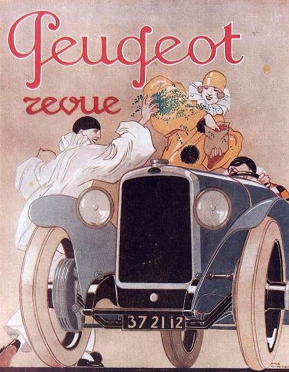
 A list of links to good free clean legible fonts collected by someone in Edmonton. Well, with a few exceptions like Linotype's Helvetica Neue... Here is that list:
  A Kalamazoo, MI-based designer working on
 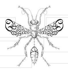 Palo Alto, CA-based designer of a stunning
  Corpus Christi, TX-based designer of a fine poster called Punk Type Anatomy (2020), which in turn is based on a poster by the Sex Pistols. [
 Creative director and founder of Illustrashion Magazine, based in London. Known as
  Handletterer and
 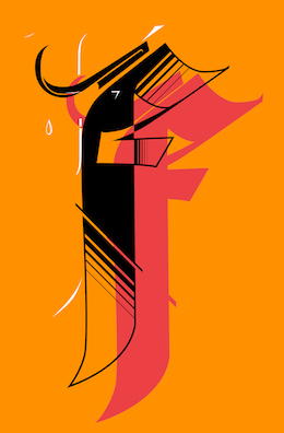 Colombo, Sri Lanka-based graphic designer who created a stunning letter F in 2017. [
 [
[ During her studies in Monterrey, Mexico, Alejandra Garza designed a great typographic poster entitled Rafael Coronel Retrofutura (2014). Alejandra mixed Fette Unz Fraktur, IFC Los Banditos, and DIN Next LT Pro to obtain the hybrid typeface Oldtime Circus (2014). To celebrate Andy Warhol, she designed Pop Art Type in 2014. [
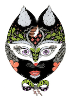 Designer in Toronto (b. 1986, Siberia) who has some nice botanical illustrations in her
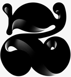 Brooklyn, NY-based grandson of Joan Trochut of Super-Veloz fame, b. 1981, Barcelona. After completing his studies at Elisava Escola Superior de Disseny in Barcelona, Alex established his own design studio in Barcelona before relocating to New York City.
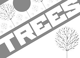 Director of Communication Design in the Northeast Bible Church, San Antonio, TX. Creator of a beautiful Russian constructivist poster called Save Trees (2013). [
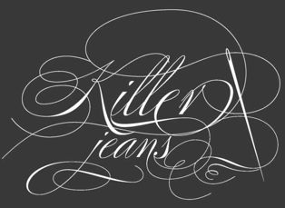 Architect and graphic designer in Atlanta, GA. Amberlee created Josephine (2011, headline caps). She also created some fashionable calligraphic headline posters against child labor in 2011, based on
 Graphic designer in Buenos Aires who created a wonderful typographic poster called Kraftwerk (2015). [
 Located in Recife, Brazil, Ana Elisa Ribeiro, a student at UFPE, created
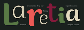 Ana Michel is a graphic designer and educator based in La Paz, Bolivia. Currently she teaches at UPB Cochabamba, Bolivia. Designer of the smooth organic sans typeface Laretia during a workshop at
 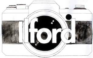 During his studies in Ottawa, andi Bordt drew a great typographic poster for Ilford (2014). [
 Hungarian graphic designer and photographer in Sydney, who created the stylish piano key bespoke typeface
  Andrea Unali (Zone 13 Studio, Milan, Italy) created a great-looking lettered poster to illustrate the 1940s (2014). [
 Andres Sanchez lives in Greenville, SC, where he does graphic and web design.
  Graduate of Universidade Anhembi Morumbi. Fashion designer in Sao Bernardo do Campo, Brazl, who created a poster celebrating Stanley Kubrick's Clockwork Orange (2017). [
 At UC Davis, andy Do created the nice multicolor lettering piece Rebirth (2019). [
 Velenje, Slovenia-based illustrator / designer of a beautifully lettered poster for Festival Nasedlega Kita in 2012. [
 Saint Petersburg, Russia-based designer of the colorful typographic identity of the Metropolis Film Festival (2014). [
 Parisian editorial designer, who created a typographically interesting calendar in 2011 entitled
  New Delhi, India-based designer of an attractive set of curly hand-drawn letters called Dreamer (2016). [
 Graphic designer in Athens, Greece, who designed the Latin / Greek decorative typefaces Raisa (2018) and Industria (2018). [
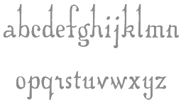 Graduate of RISD, Central Saint Martins College of Art and Design, London, and Parsons School of Design, New York. She created experimental alphabets such as
  Extraordinary Hungarian design talent based in Budapest, 1986-2015. I can't find enough superlatives to describe his work or find appropriate words to express my sadness when I learned of his death due to a
 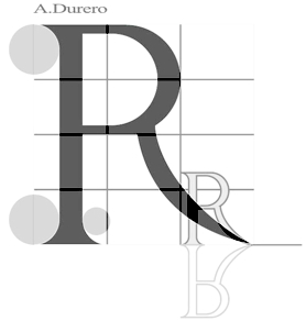 Art and type experiments at Universita Autonoma de Mexico, which sets out to prove that the real world is coming to an end and visual reality is taking over. Check out
  As a student, Joliet, IL-based Ashlee Stevens designed a great ironwork-inspired illuminated letter N in 2017. [
 Nottingham / Derby, UK-based designer. He made the straight-edged experimental display typefaces
 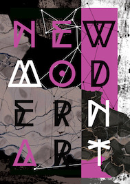 Moscow-based student-designer of a great modern hipster art poster (2018). [
 Assistant Professor at Utah Valley University in Salt Lake City, who is based in Sandy, UT. His typographic work/
 Poster artist in Lima, Peru. In 2021, he/she designed Experimental (2021). [
 Bordeaux-based studio which specializes in hand-made lettering.
  Creator of a poster called
  Prague-based designer. He created an innovative set of ornamental capitals / icons for
  [
[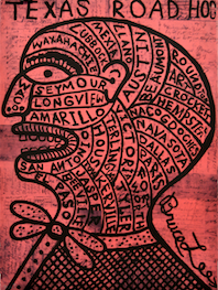 Designer of the fun typographic poster
  Born in Rosario, Argentina, in 1976, she studied type design at UBA in Buenos Aires from 2009 until 2010, and co-founded the type coop
  Graduate of The University of Kansas, class of 2011, who studied Visual Communications, Graphic Design and Illustration. She created
  During her studies at ECV in Bordeaux, France, Celia Mindren designed the fine-looking display typeface Aurora (2015) and the thick oriental brush script Biming (2015). She also won first prize in a national wine bottle design competition for her Rosé Bordeaux project. [
 Chad Geran is a cartoonist and illustrator in Regina, Canada.
  Seoul-based graphic designer who spent some time in London.
 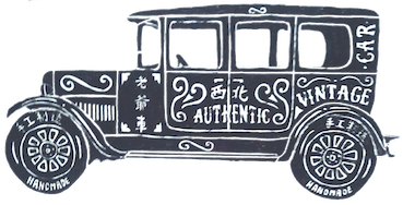 Singapore-based designer. Creator of some great hand-lettered posters in 2014. [
 Kiev, Ukraine-based graphic designer. She cyrillicized Anton Cahyono's Atziluth Script and Irina Dvilyuk's Miss Katherine in 2019. In 2020, she released the
 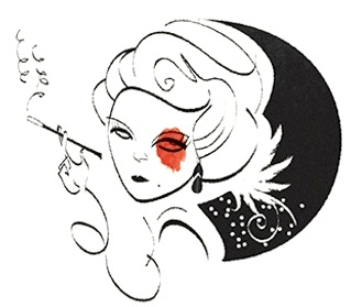 Chi No (Tel Aviv, Israel) and
 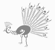 Student in 2010 of Jennifer Kennard at Seattle Central Community College. In her class, she designed a beautiful typographic
 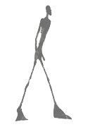 During her graphic design studies, Chloé Marchand (Paris) designed a poster in 2012 for the exhibition of
  Student from Atlanta, GA, who made a great
  Christoph Ruprecht is an art director in Karlsruhe, Germany. He created several typefaces in 2013, including
  Brussels-based graphic designer. He created very funny typographic posters to advertise Humo in 2013.
  Designer and lettering artist in Austin, TX, who created the warm display typeface
  German creator in Trier of a typographic robot called
  Social site about art that represents and depicts cities in which the artists live. Examples include
 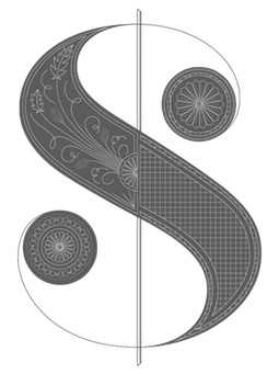 Claudia grew up in the south of Brazil and moved to the USA to attend college. She has BFA in Graphic Design from the School of Visual Arts in New York City where she has also taught. Claudia worked for nearly 10 years as a designer and Art Director in New York before moving to San Francisco in 2013 to serve as Design Director at WIRED. She has worked for The New York Times, T: The New York Times Style Magazine, Blender, More Magazine, New York Magazine, Domino Special Editions, Gourmet Special Editions and Men's Health. In 2012, Claudia redesigned Real Simple Magazine, marking the beginning of her design studio with WIRED pal Margaret Swart.
 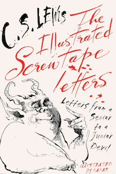 Clive Staples Lewis (1898-1963) was a novelist, poet, academic, medievalist, literary critic, essayist, lay theologian, and Christian apologist. Born in Belfast, Northern Ireland, he held academic positions at both Oxford University (1925-1954) and Cambridge University (1954-1963). He is best known both for his fictional work (The Screwtape Letters, The Chronicles of Narnia, and The Space Trilogy), and for his non-fiction Christian apologetics (Mere Christianity, Miracles, and The Problem of Pain).
  Daily Type is a creative project run by four Russian type designers. Regularly updated page with many new type designs and ideas. Based on a concept of Yury Ostromentsky & Dasha Yarzhambek, the site features designs by Yury Gordon, Yury Ostromentsky, Dasha Yarzhambek, Dmitry Jakovlev and Ilya Ruderman, and was launched in 2005. Daily Type is a creative project run by several Russian type designers. Day by day, they create original typefaces and post their results along with routine. [
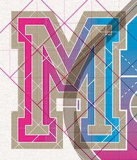 Totnes, UK-based designer of great typographic posters such as M Squared (2015), K (2015), 49 (2015), S (2015), Tundra (2015), Congratz (2015).
 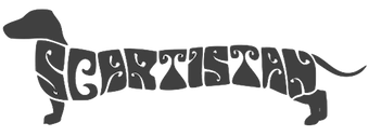 For a truly fun psychedelic lettering application, check out
  Dana Krusche (Berlin, Germany) created the (typographic) gig poster Free Pussy Riot in 2014.
  Italian art ditrector, graphic designer and visual artist. In 2022, he published the colourful Artphabet, which was inspired by Ettore Sottsass and the Memphis movement, as well as by artists such as Peter Blake, Alighiero Boetti, Robert Brownjohn, Fortunato Depero, Milton Glaser, Alessandro Mendini, Piet Mondrian, Bruno Munari and Piet Zwart. [
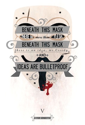 Artist and designer in Villa Allende, Argentina, who created a great typographic poster called Vendetta in 2015. [
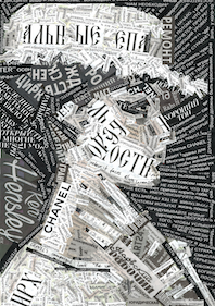 Estonian designer of a great collage typographic portrait in 2017. [
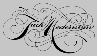 Los Angeles-based designer, sign letterer and illustrative typographer. The TDC Annual in 2009 shows
  Graphic designer in Chicago, who made a nice typographic poster called
  New York City-based writer and editor who designed several nice book covers that employ innovative typographic styles. [
 Graphic designer in Rio de Janeiro, who created the techno-lettered poster Werner Klatt 2013 (2013) with
  Durban, South Africa-based creator of the nice typographic poster entitled Poetry Africa (2013). Student at Durban University of Technology, class of 2013. [
 Didot is everyhere, on
  During his studies at FADU / UBA in Buenos Aires, Diego Urquiza designed a great typographic movie poster entitled A Trip Tp The Moon (2013). [
 Montreal-based graphic designer who made a great typographic poster called
  Creator of
  Designer from the state of Washington. Doug Fast started the trend of revitalizing Victorian lettering and signs. As an advertising designer, he created the K2, New Balance and
  Russian artist and software specialist who was written an on-line HTML creator called Typograph.
  Illustrator in Berlin, whose brush and pen lettering on fashion posters is distinctive and powerful. Of particular beauty are her
 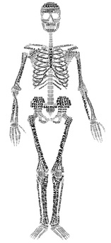 Sheffield, UK-based graphic design student who created a
  I had a good laugh when I saw Emiliano's
 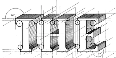 Sydney, Australia-based graphic designer and illustrator who created a nice architectiral typographic iece called The Brief (2015). [
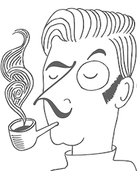 Brescia, Italy-based designer of a set of ten type typefaces in 2015 that represent ten different type styles. [
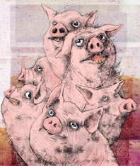 Talented illustrator in Izmir, Turkey. Some of his posters have great lettering. [
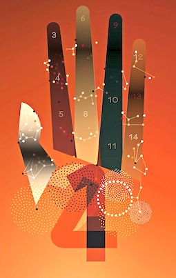 Paris-based designer who created several experimental geometric typefaces in a series called Monoide (2014). He also created Butterfly Alphabet (2014) and many awe-inspiring techno illustrations.
  [
[ Designer in Leon, Mexico, who made the classical roman typeface
  Lucaz Mathias (Estudio Cao, Jacarei, Brazil) designed the blackboard bold art deco typeface family
  Eve Kuo (
 Krakow, Poland-based designer of Dream Letters (2018). [
 Fael is Rafael Serra (b. Santarém, Portugal, 1983). Since 1989, he lives in Barcelos / Porto. Rafael graduated in Graphic Design and Advertising from the Oporto Polytechnic Institute, and works as a graphic designer and lettering artist in a design studio in Braga. He created some typefaces, both free and private.
  Examples of a 2006-2008 style of typography with frills and swashes, spearheaded by the designs of Si Scott. Others in this "movement" include Hydro74, Marian Bantjes, Ginger Monkey, SHCH, Lee25, Maria karkova, Doug Alves, Daniel Gordon, Craig Ward, Nick Keppol, ElBarbon, Joao Oliveira, Lily Piyathaisere, Dhanank Pambayun, 5ive, Bechira Sorin, Fabio Sasso. The list and the examples were compiled by Daniela Zatti, a graphic and product designer from Porto Alegre, Brazil. [
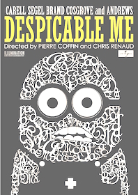 Cyberjaya, Malaysia-based designer of a fun typographic poster entitled Despicable Me (2012). It is based on the French Script MT font. [
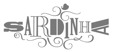 Graphic designer in Lisbon, Portugal. In his oeuvre, I especially appreciate the typography in his
  Wood type picture group. [
 Marta Podkowińska is the Polish designer of a few great type logos such as Bomba (2009). She also made the exquisite
 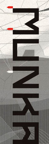 FONTana is a font design studio in Szeged, Hungary, started in 1999.
  Roman art director and illustrator who makes typographically interersting pieces such as one socialist revolution-inspired illustration called Apostrophe (2014) and a poster for the Still Three Jazz Trio (2006). [
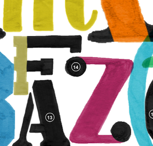 During her studies in Linkebeek, Belgium, Francisca Zaunberger Melo designed the neautiful color poster entitled Anatomie de la Lettre (2015). [
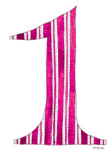 Seoul, Korea-based designer of a watercolor set of letters and numbers in 2014. [
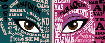 During her studies at Senac in Sao Paulo, Gabriela Bento de Paula designed a great typographic poster called Mulan (2016). [
 Bournemouth, UK-based graphic and type designer who made some bling type posters, and created a
  Kent, UK-based designer of the architectural typographic poster Top Tech (2017). [
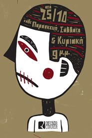 Illustrator in Athens, Greece. His shop is called Rote Grafik. His posters are remarkable and showcase Ben Shahn-style lettering. [
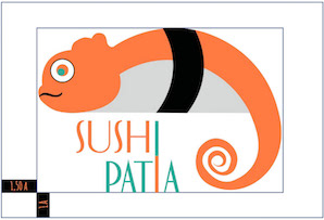 Argentinian graphic designer who made great use of typefaces in her graphic design work. [
 Graphic and
  An Italian type foundry by Milan-based type designer Giangiorgio Fuga, ATypI member, teacher of typography at the Istituto Europeo of Milan, Politecnico of Milan, Italy and Unisinos of Porto Alegre, Brasil. His great
  London-based creator of the super-experimental geometric and hipster typefaces Artificer (2011), Insomiak (2015, a hipster typeface), Illusive (2014, alchemic), Tuna (2014), Kim (2014), Solaris (2017), Sleipnir (2012) and Flatland (2011).
  Golova is a community of graphic designers, illustrators and art directors in the UK.
 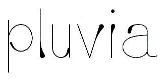 Graduate of De Montfort University Leicester. Leicester, UK-based designer of the
  Unbelievably talented graphic designer in London. Designer in the
  Andreas Gustavsson is a Swedish designer, b. 1979, located in Nyköping. At MyFonts, starting in 2013, the name
  Graphic designer in Dublin, where he ran
  Very talented Pistoia, Italy-based designer (b. 1982). His typefaces:
  [
[ Italian graphic designer, b. 1931. He was Max Huber's assistant from 1950 until 1954, and joined Massimo Vignelli's Unimark in 1967. In 1974, he founded the studio Signo. He heads the visual design program at Politecnico di Milano. [
 [
[ Designer and illustrator in Cape Town, South Africa. He created the artsy deco typeface Minimal Grotesque Mono (2013). [
 Kasper Ledet made a great handlettered
 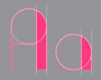 New York-based print designer who made the
  Florianopolis, Brazil-based designer of the art deco typeface
 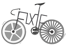 Jakarta-based creator of a beautiful set of posters in 2012 for an event called
  Brian Jacob (Houston, TX, and before that, Detroit, MI) set up Jacob Type in 2012. He designed these typefaces:
 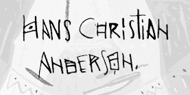 Cornwall, UK-based illustrator whose lettering in The Emperor's New Clothes poster (2013) is quite stunning.
  Talented illustrator in Salvador Dali's home town of Cadaques, Catalunya. In 2019 and 2020, he illustrated Wes Anderson's film The French Dispatch, which showcases remarkable typography. [
 Graphic designer in Chicago, IL, who used typography optimally in his
 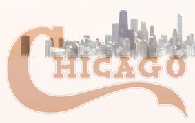 Chicago-based graphic designer who created a beautifully lettered poster featuring Chicago's skyline in 2019. [
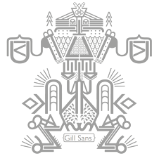 Graphic design student at KASK, Gent, Belgium. At
  Teacher at the Edmonton Digital Arts College in Edmonton, Alberta, who created the techno family Powers (2011), the squarish monoline family
 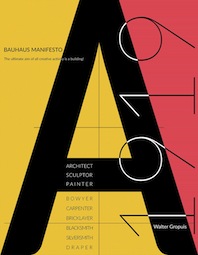 As a student at Boston University, Jewelson Fernandes designed the typographic Bauhaus Manifesto poster (2016). [
 Graphic designer and illustrator in Surfers Paradise, Australia, who designed a few noteworthy typographic posters in 2014. [
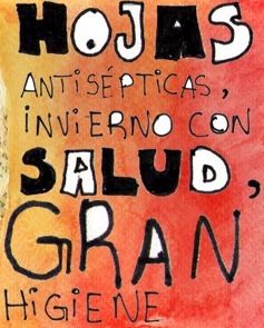 Buenos Aires-based designer of a great hand-drawn typographic poster series in 2014, called Fama y Eucalipte. [
 [
[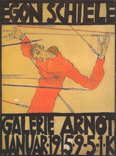 Jon Cox is a graphic designer in Santa Ana, CA. His work includes a beautifully lettered poster in the style of Egon Schiele (2013).
  [
[ Aka Jonathan Looman. Dutch type and graphic designer.
  Josip Kelava (Jay Kreative, Australia and UK) is an art director and graphic designer. He has done typographic work for fashion mags and fashion-conscious ads such as for
  During her studies at York University, Toronto-based Julia Seo created a Theo van Doesburg typographic poster (2014).
 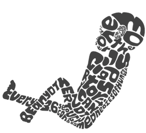 Creator in Utica, NY, of the display typeface
 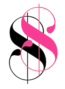 During her studies at York University in Toronto, Kadi Koroma created
 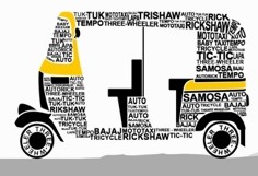 Ahmedabad, India-based designer of a nice typographic poster called
  Phenomenally imaginative graphic designer from Sofia, Bulgaria. He created some great typographic posters in 2010, such as those of a
 Graphic designer from Raleigh, NC. Recent graduate from the College of Design at NCSU. Creator of a
 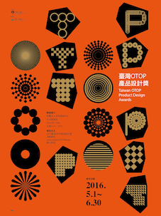 Taipei, Taiwan-based graphic designer and professor at Taiwan Tech. Mentored by the Japanese design master Shigeo Fukuda, Lee established his studio in 1996. He made some interestinf typographic posyers in 2013 for a New York Type Directors Club exhibition (with Chun-Ying Lin) and in 2015 and 2016 for the Taiwan OTOP Product Design Awards. [
 You've got to like the poster by Glasgow-based
  Heemskerk, The Netherlands-based designer of the sharp-edged pointy tooth typeface Piranha (2015). Also check out his typographic work in his Things poster (2015).
 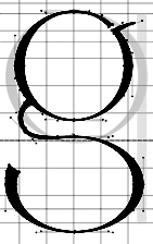 Fine artist, fashion photographer and graphic designer in San Francisco. She created
 Saint Petersburg, Russia-based designer of the high-contrast display typeface
  Torontonian creator of a lovely typographic poster entitled
  Lodz, Poland-based poster artist, b. 1985. Many of his remarkable posters have a strong typographic component. [
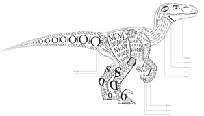 Design student in San Francisco who made the fun typre drawning called
  Creative director in Sheffield, UK. He designed the experimental (photographic?) alphabet
  Tokyo, Japan-based illustrator, b. 1986, Tokorozawa. Designer of the nice kanji lettering pieces called July's Makanai and August's Makanai (2016).
  Barcelona-based designer who created a hip
  Illustrator in Porto, Portugal. In 2017, he designed some stunning typeface compositions to illustrate his own web page. [
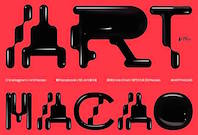 Portugal-based Macau-born designer of the
  Brian Jaramillo's page that highlights remarkable work by type designers, letterers, sign painters, graffiti artists, stone carvers, calligraphers, poster artists, and graphic designers. Its founders are Brian Jaramillo and Ray Frenden (a custom letterer), and frequent contributors include Jonathan Selig,
  Graduate of York College in York, PA, who lives in Cockeysville, MD. Creator of
  Illustrator in Sheffield, UK. Author of
 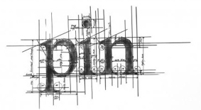 Typographic artist in the UK, whose work includes a series of ruler-and-compass constructions of letters. Images:
  Graphic designer in Marseille, France, who created some powerful typographic posters in 2015.
  Award-winning graphic designer and illustrator in Barcelona, whose work and letter designs are characterized by flashy and colorful contructions. She studied at the University of Salamanca (2008) and ELISAVA (2013). Her type designs include 36 Days of Type (2016) and Ahoy (2013, a decorative rope font, which can be bought
 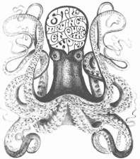 Celebrated Milan-based calligrapher, letterer and illustrator. Examples of his lettering include
  [
[ Designer in Madrid, who created a nice
  Reading, PA-based designer of a wonderful ironwork-inspired piece of lettering entitled Syrup (2016). [
 Jacksonville, FL-based graphic designer. He created the
 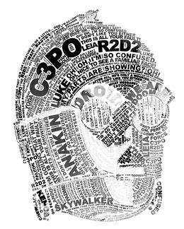 Vienna, Austria-based creator of a typographic R2D2 poster (2014). [
 Jastrzebie Zdroj, Poland-based designer of the typographic
  Art director, illustrator, designer and typographer from Melbourne, Australia, but who is now located in Sydney. Creator of these typefaces for
  Graduate of the Westerdals School of Communication in Oslo. Creator of a nice typographic logo called Reach (2010). She also created a high-contrast art deco typeface called
  There have been many type typefaces since 2000, so Noronha's work in 2011 is a bit of a late addition to the crowded field. Nevertheless, he shows a nice sense of humour in his designs, so I am linking to it. Examples:
  Illustrator, art director and designer in Stockholm, Sweden, who studied graphic drawing at Lund University. Her work is characterized by bold colors and aggressive lettering.
  Designer of a great
  Parisian creator of interesting threaded letters in 2014. [
 During her studies, Rueil-Malmaison, France-based Marion Caillet created great lettering for Moba Magazine (2015), and drew the decorative type Je Suis Vicieuse (2015). [
 Graphic designer in Barcelona who founded her own studio in 2008. In 2018, she joined the faculty in the Masters program in typographic design at
  [
[ At the College of Saint Rose in Albany, NY, in 2017, Mattew Carrera designer a great monogram. [
 Art director, illustrator and designer in Stockholm. Her illustrations include a hand-lettered motorcycle pin-up set created in 2013. In 2016, she designed the wonderful (commercial) poster typeface Czechmate and wrote: A retro typeface straight outta Eastern Europe. Inspired by mid-century matchbox designs from Poland, Hungary and the former Czechoslovakia. Contains over 200 glyphs, including all uppercase European characters, numbers, symbols, and many more. Francis Nouveau (2016) is a slim, modern, geometric, display typeface based on vintage Polish poster art. Still in 2016, she designed Gooberville and Broadkast.
  Bologna, Italy-based designer of
  Illustrator in Rotterdam. Some of his posters have original lettering styles. [
 [
[ Based in Gold Coast, Australia, Melissa Mcarthur designed a great almost-art nouveau logotype in 2013 called
  Berlin-based
  Interesting pages about all of the world's metros: their architecture, history, art,
 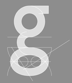 [
[ Student at MNSU in Mankato, MN, who lives in Vernon Hills, IL. He made a text-based
  Mexico City-based creator of the great typographic poster Cuadro de Bebe (2015). [
 Barcelona-based illustrator. Designer of a very original lettered poster to celebrate Josep Maria Pujol (2015).
  Santo Domingo, the Dominican Republic-based designer of the hilarious typographic poster Minion (2016). [
 Parisian designer of fantastic futuristic lettering pieces, including one for Sophie Taeuber (2014) and one for an exhibition called Retrospective Albert Hollenstein (2014). [
 During her studies in Minsk, Belarus, Nastassia Kuchynskaya created two fantastic typographic posters against high school bullies. [
 Rio de Janeiro-based graphic designer. Her
  [
[ Nate Williams is a designer and illustrator in Washington. Creator of the free font
  Hong Kong-based designer. A school project for an imaginary lifestyle store
 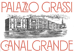 New York City-based designer of several great mosaic-based lettering pieces in 2017. In 2017, Louise Fili, Nicholas Misani and Rachel Michaud co-designed the art nouveau typeface
  Nicola Van Den Heever (Pretoria, South Africa) designed a few great typographic posters during her illustration studies at the Open Window School of Visual Communication in 2013. [
 Born in Kuala Lumpur, Malaysia, in 1987. Graphic designer in Brooklyn, NY, who created Kama (2015), an experimental typeface inspired by the work of Russian suprematist Kazemir Malevich. She also drew great cosmic typographic illustrations for Bullett Magazine in 2015.
  Graphic designer in Petah Tikva, Israel. In 2014, he and Chi No co-designed the Latin / Arabic typographic poster Made in Jaffa. In 2015, he created a decorative all caps Hebrew typeface simply called Alefbet.
  As a reaction against HypeForType and other hyped up outfits, No Hype For Me (
 Iranian designer of a nice mini-poster that reads Modern (2015). [
 Erik Marinovich (Croatia) ran/runs
  Givatayim, Israel-based Hebrew type design studio in London established in 2000 by one of the main Hebrew type designers of today, Oded Ezer (b. Tel Aviv, 1972). Ezer designed the award-winning font Mayai (Hebrew script: awards at
 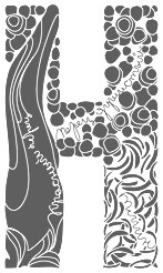 Check out the
  Sao Paulo-based illustrator who has occasionally used interesting lettering on his fun posters (ca. 2014). [
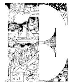 London-based illustrator. Designer of the typographic poster Anatomy of Cockney Gentleman (2014). She also created the decorative caps typeface White Stuff Autumn 2014 (2014).
 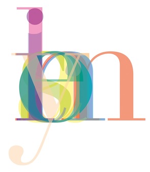 Based in Newcastle-upon-Tyne for his studies at Northumbria University, Olly Wild created a poster called Victor Hugo (2014) that overlays the letters of a word. [
 One by Four is a four-person design studio in South Florida, and later in Brooklyn, NY. The main type designer in the group is South Florida-based Natasha Maria Fernandez-Fountain (b. 1985). The others are Alejandra Abad, Brian Haines and Bruno Torquato. Typefaces by Natasha include Geomancy (2010, +ExtraBold, +Hairline; a
 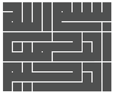 Cairo, Egypt-based designer of several nice Arabic typographic posters in 2015. In 2017, he designed the
 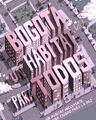 Bogota, Colombia-based designer of the great 3d typographic poster Bogota un habitat para todos (2015).
 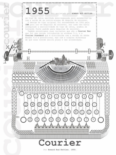 Design student in Uberlandia, Brazil. In 2011, he created a great letter-based
  The
The 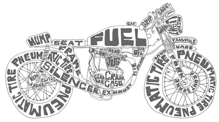 Austin, TX-based illustrator who runs Paulville Studio. Creator of a great typographic poster called Cafe Racer (2013).
 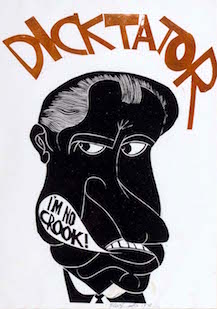 Paul Peter Piech (b. Brooklyn, NY, 1920, d. 1996) was a poster and linocut artist who spent most of his professional career in Britain. He produced a large number of original prints on social, political and literary themes over five decades, combining innovative lettering with original artwork and bold colours in a unique style. Concerned with social and racial injustice and annoyed by some political classes and Richard Nixon in particular, he is known for a print of Nixon with the word dicktator inscribed above.
 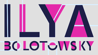 Paula Choin (Pixie Brown, Montpellier, France) designed the great typographic poster Ilya Bolotowsky (2016), which is named after the famous abstract painter.
 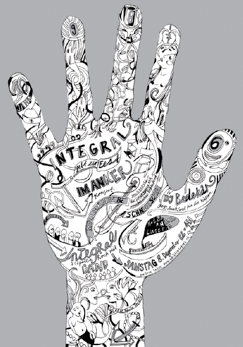 Zurich-based award winner at TDC55 for
  Aka Skomii. Austrian creator of the hand-printed typefaces
 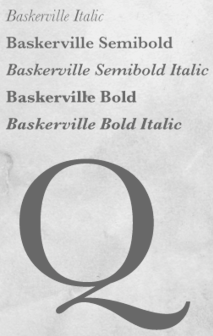 Croatian graphic designer in Zagreb who made a stunning
  Paignton, UK-based designer who did some interesting type experiments.
 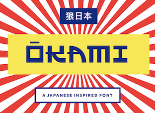 [
[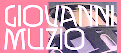 Freelance graphic designer in Grottaglie, Italy. Stones inspired Pierfrancesco Annicchiarico to design the experimental typeface Secco (2009). The Cà brùtta building by Giovanni Muzio in Milan got him to design the
 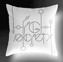 Graphic designer in Miami, FL, who created a wonderful connect-the-dots typographic poster entitled
  Sam Berlow (Font Bureau) is interviewed on New York Public Radio (WNYC radio) about the candidates' fonts. On the same topic, he also published a piece in the
  San Leandro, CA-based designer of 208 (2009) and Mouse (2009), experimental typefaces.
 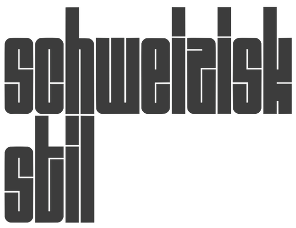 Irvine, CA-based creator of a great piano key style poster entitled Schweizisk Stil (2014). [
 Sao Paulo-based creator of a typographic poster entitled
 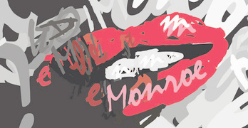 Torontonian creator of a beautiful and thought-provoking
 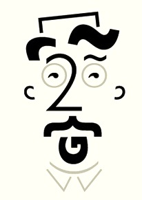 Hastings, UK-based designer of very funny typographic typefaces of Eric Gill, John Baskerville, Claude Garamond and William Caslon (2016). [
 [
[ Robert Boyall (Norwich, UK) created a
 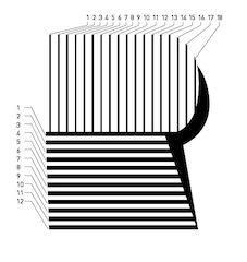 Visual communication student at the University of Kansas in Lawrence. During his studies, he created a nice Eurostile poster (2012) and the striped experimentel typeface Papes (2014). [
 Brazilian graphic and type designer, who teaches at Type Cooper West (in San Francisco) and is a renowned restaurant branding designer. Bembo's Zoo is Roberto de Vicq de Cumptich's children's book with all drawings integrated with glyphs from Bembo. He also published
 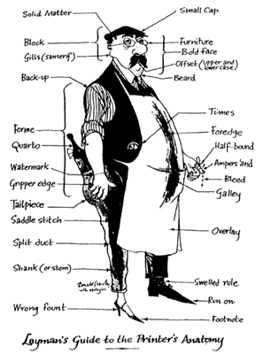 Ronald Searle (b. Cambridge, 1920, d. 2011) was a British cartoonist. He survived the Japanese death camps in Changi in WWII. In 1960, Ronald Searle was the first non-American cartoonist to receive the National Cartoonists Society's Reuben Award.
  Talented illustrator in Trier, Germany. His illustrations have
  Got to like the swashy lettering in the
  [
[ During studies at IBD in Mumbai, Sandeep Suman Mishra created a
  Design studio of Rob Gonzalez and Jonathan Quainton located in London's Hoxton area. Creators in 2009 of two art deco custom typefaces for Middle Boop magazine, and of many other types for visual identities and projects. One, the art deco typeface New Modern, can be bought exclusively from
  [
[ Graduate of Central Saint Martins College of Art and Design in London. He started out designing fonts for [T-26] and Garagefonts, but is also (or, perhaps, mainly) a
  Based in Sidney, Senovik Senovik created a great poster of a capital S, and called it
  Moscow-based graphic and print designer, whose lettering in his logos is stunning.
  For the city of Shanghai, a mini-animated-logotype competition took place in 2014. Remarkable contributions by Bob Lei (Macao) and
  Lucas Sharp is a designer (b. 1986, San Francisco) set up Sharp Type in Brooklyn, NY, and later in New York City proper. Before that, Lucas Sharp was involved with
  The digital images by Si Scott will blow you away. He is a master at creating images that escape from letters. Wonderful typography and type art.
  Graphic designer and illustrator in Darmstadt who created an erotic alphabet called
 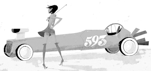 Great Italian illustrator in Firenze.
 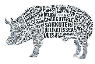 Istanbul-based designer who created a typographic pig in 2013. [
 During an internship at Safari Inc in Osaka, Japan, Siomeng Chan (Macau, Macao) created Ilusion Font (2015), a 3d Escher-style typeface. Among his many notable contributions to design, the hilarious Hi Serifs poster stands out. [
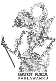 Indonesian designer of the beautiful typographic poster called
  Smashing Magazine's 2008 list of the best web type typefaces: Affair, Agile,
 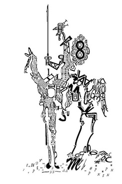 Athens-based designer. She created
  Vladimir Tomin is a graphic designer from Khabarovsk, Russia.
 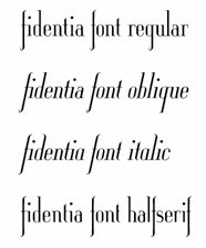 Graphic designer in Prague and Katowice, Poland.
 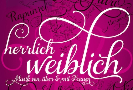 Based in Endingen, Germany, Stefan Wäldin created a great typographic poster for Stadtmusik Endingen in 2014 called Herrlich Weiblich.
  Rome, NY-based creator of a typographic poster called Pediophobia Fear of Dolls (2013). [
 Graphic designer in Stirling, Scotland. He created some fonts and designed some letters for
  Helena Öhman (Studio Indigo) is a Swedish illustrator and graphic designer based in Stockholm.
  Calligrapher and illustrator in Rehovot, Israel. She made some
  Born in 1980 in Chambéry, France, he studied at the Kunsthochschule Berlin-Weißensee in 2007, and has been working in Berlin since then, first for seven years as a type designer at LucasFonts, where he specialized in Arabic type, and then as a graphic designer at the Mückenschwein Publishing House, and as a freelance graphic designer and illustrator.
 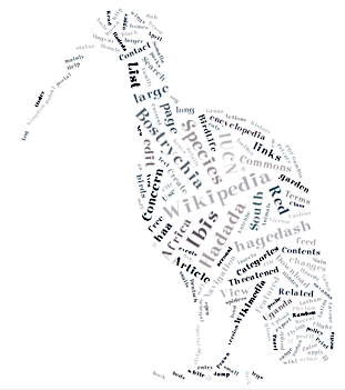 This was bound to happen. We now have a typographic tag cloud portrait generator and server. Admirably, it uses only free fonts, and free color palettes. The blurb: My name is Hardy Leung and I'm the creator of Tagxedo, an online tool that turns words into stunning artworks. Examples:
 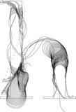 Talented Mexican graphic designer and digital artist (b. 1985) who was based in Montreal but is now back in Mexico City. She pushed the boundaries of experimental typography with creations like Fabric Type (2009), which was developed at Concordia University in Montreal, where she obtained a BFA in design in 2009. She continued her studies at EINA in Barcelona, graduating in 2010.
  Graphic designer from Portugal who obtained a Bachelors in Graphic Design from ESAD.CR in Caldas da Rainha, and a
  Russian designer of some great illustrations and lettering for Cafe Bar Afrika in 2014. [
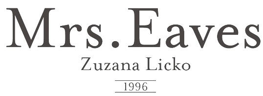 Information and specimen of all historically important typefaces: Akzidenz Grotesk, Aldus, Antique Olive, Avant Garde, Avenir, Baskerville, Bell, Bembo, Bodoni, Bulmer, Caslon, Centaur, Century Old Style, Cheltenham, Dante, Frutiger, Galliard, Garamond, Gill Sans, Goudy Old Style, Granjon, Helvetica, Janson (Kis), Minion, Mrs. Eaves, Optima, Palatino, Perpetua, Sabon, Syntax, Times New Roman, Today, Trump Medieval,
 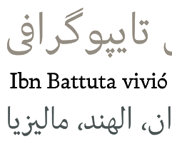 French freelance graphic and type designer who started his own commercial type foundry in 2014. Now based in Nantes, Thierry was educated in Nantes and studied Typography & Language at ESAD in Amiens, France, class of 2014. His typefaces:
 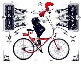 Illustrator in Berlin, whose work involves fresh creative lettering. His businessman poster series is exceptional.
 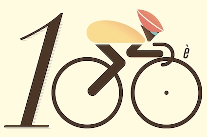 Bristol, UK-based illustrator and graphic designer who created several Tour de France posters for Le Coq Sportif between 2012 and 2014.
  TypArchive.com is the brainchild of type designer Richard D. Granados. The concept was to build an ever-growing typographic image archive featuring various disciplines, styles, specimens, techniques and oddities. Photographs are classified by region, and by object. Includes car typography and 3d typography. Contributions by
 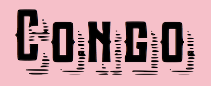 Graphic designer in Bauru, Brazil, who created the ball terminal typeface
 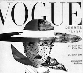 Freelance illustrator and typographer in Iligan City in The Philippines. She created a wonderful typographic poster based an iconic 1950s Vogue cover. [
 Graphic designer in Lyon, France, who created the signage icon set Signalétique Bellecour (2015) and exquisite didone lettering for a milk bottle company called Maison Nacrée (2015). [
 Art design studio that outputs some interesting typographical work such as the
 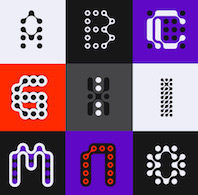 [
[ Vicky Chindaliya (Faridabad, India, b. 1990) created a hilarious CV well worth mentioning on my pages. This work was done during his studies. [
 Vitel Tomas (Usti nad Labem, Czechia) created a
 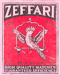 [
[ Albufeira, Portugal and London, UK-based graphic designer who made the experimental typefaces
  Whitney Titling and Whitney Sans are fonts developed by Tobias Frere-Jones (Font Bureau) for the Whitney Museum from 1995-1996. These fonts were further developed while Tobias was at H&FJ to other subfamilies such as Whitney Condensed, Whitney Greek and Whitney Cyrillic. [
 UK-based creator of
  Seattle, WA-based creator of a number of experimental Kufi examples for Arabic (2015). In 2016, he designed the
  Graduate in Visual Communication from Nanyang Polytechnic, Singapore. Now based in Tampines, Singapore, Yeo Yu Xin created Didot Zebra (2013), a typographic illustration based only on parts of glyphs in
  Designer in Barcelona who grew up in Santo Domingo, Dominican Republic. Her company is called Shiny Design. Creator of the fat rounded multicolor alphabet
 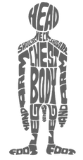 Istanbul-based creator of a hilarious type poster called
  Michael Cina (Minneapolis) is the cofounder of WeWorkForThem and
  Seoul-based designer. He created a stunning poster set in 2013 to celebrate Paul Renner's Futura (1927). [