| | |
Addictive Fonts: Greek simulation font list
|
 The list of free Greek simulation fonts mentioned in 2010 by this now defunct site:
 [Google]
[More] ⦿
|
Alexei Chekulayev
[Double Alex Team]

|
 [MyFonts]
[More] ⦿
[MyFonts]
[More] ⦿
|
Alexis Renard
|
As a student at Iscom Lille, France, Alexis Renard designed the Greek simulation font Horion (2016). [Google]
[More] ⦿
|
Alphabet&Type
[Paolo Vannucci]
|
 Paolo Vannucci (Alphabet&Type, b. 1969, Punta Marina Terme) created the curly handwritten Halloween typefaces Afterlife, Evernight (2009) and Evernight Stargazer (2009).
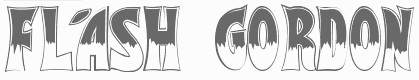
 He also has an interest in Startrekkery because he designed the typefaces Transformers Movie (2009) and Star Trek Future (2009). All these typefaces are free at Dafont and/or Fontspace. Alternate URL. In 2010, he did the free brush typeface Fronte del Porto, which is based on the Elia Kazan movie with Marlon Brando entitled On The Waterfront. There is also a commercial side of Alphabet&Type: In 2010, they published the angular family Antares, the bold organic typeface Minardi (+Collage), and the curly family Vannucci Antico. Metropolis (2010) is an angular typeface based on the titling of Fritz Lang's movie Capolavoro. Sabrina (2010) is taken directly from the Best movie by Billy Wilder, with Audrey Hepburn and Humphrey Bogart. An American in Paris (2010, or: UnAmericanoAParigi) is based on the font used in the movie by Vincente Minnelly, with Gene Kelly and Leslie Caron. Cleopatra (2011) is a chisel font with a Greek look, based on Cleopatra, the movie by Joseph L. Mankiewkz, starring Liz Taylor and Richard Burton. Il Grinta (2011) is the wedge serif titling font of True Grit, Henry Hathaway's movie starring John Wayne. The beautiful inline typeface Singapore (2011) after the titling in John Brahm's movie featuring Ava Gardner. Strade di Fuoco (2011) is based on the movie Streets of Fire by Walter Hill, with Diane Lane. Flash Gordon (2011) is based on the famous movie by Mike Hodges, starring Max Von Sydow. Amazing Spider Man (2011) is based on the Spiderman movie by Marc Web which featured Andrew Garfield. Captain America (2011) is based on the movie by Joe Johnston, with Chris Evans. Twilight New Moon (2009) is based on the Twilight movie. Electric Dreams (2011) is based on steve Barron's movie. Tintin (2011) is a comic book typeface based on Steven Spielberg's 2011 movie. Fantastic Four (2011) is a StarTrek style family that is based on the Tim Story movie. Faelorehn (2011) is a vampire script. Creations from 2012: Sherlock Holmes, Watson (based on Guy Ritchie's movie), Lucky Luke (after the successful Western comic book series by Morris and Goscinny), Danger Diabolik, Ghost Rider (based on the movie by Mark Steven Johnson, starring Nicolas Cage), Notorious (a brush font based on Notorious, a movie by Hitchcock starring Cary Grant and Ingrid Bergman), Cullen, Flower Header, Dorian Gray (from the movie by Oliver Parker starring Ben Barnes), Snow White (from Rupert Sanders's movie Snow White and The Huntsman). Typefaces made in 2013: Beastly (based on the David Barnz movie featuring Vanessa Hudgens), Top Gun (an octagonal typeface based on the movie with Tom Cruise), Manhattan (from Woody Allen's movie), Assassin (based on a Ubisoft video game). Typefaces from 2014: Dylan Dog (based on Kevin Munroe's movie starring Brandon Routh). [Google]
[MyFonts]
[More] ⦿
|
Andrew Brash
|
British graphic designer. Creator of the Greek simulation font Eschaton (2012). [Google]
[More] ⦿
|
Anthony Cherbuin
|
Freiburg, Switzerland-based designer of the Greek emulation typeface New Space (2016). Behance link. [Google]
[More] ⦿
|
Arkara (or: Fopifopi)
[Edy Bagus Pamungkas]
|
Edy Bagus Pamungkas (aka Arkara) is a Jakarta, Indonesia-based type designer born in 1986 or 1989. His typefaces: - From 2019: ARK Reunio, ARK Seychelle, ARK Misha (+Script), Allice, Brooks, Dark Slide.
- From 2018: Toonish, Willex (experimental brush), Savage Odette (brush), Friday Killer, Enamel Lovers, Festivo, Lucinta (a rounded all caps color font).
- From 2017: Ghost Trick, Outcast Motofont, Bompail (brush), Baby Arthara, Nanda (handcrafted).
- From 2016: Foxy Brush, Hello Creamy, Artsins (art brush style), Toonish, Summerica, Willex Brush.
- From 2015: Fiestalogy, Happy Trippy, Varsita (athletic lettering), Caraka (curly script), Artchiko Brush, Slicks (Victorian signage), DarkSide (brush typeface), Allice, Halays, Artsy Brush, Futur Attire (cursive script), High Pride (Greek simulation brush), Ozzombie, Paud.
- From 2014: The free modular decorative typeface Sekruplongbo, Retrophoria (a tall condensed neon sign font), Cyr52 (a geometric font inspired by sci-fi movie posters), and Arkara (fat finger typeface). Also known as Fopi Fopi and Win Rico, he created the free speed simulation typeface Fopi Rush and the rounded display typeface Fopi Artchiko. Commercial typefaces (via Creative Market) include Chiko Cookies, Late Halloween, Doddy Boldy (a block font), Punk Machine (+ vector-format retro motorcycle dingbats), Abraham (Gothic medieval font), King Arthur, Smokey (wavy font), Warastika and Mama Bear.
Behance link. Dafont link. Buy Edy's fonts at Creative Market. Dafont link for Fopifopi. Fopifopi link. Creative Market link for Fopifopi. Old Tumblr link. [Google]
[More] ⦿
|
Bayu Suwirya
[Illushvara]
|
[MyFonts]
[More] ⦿
|
Billy G
|
Gujranwala, Pakistan-based designer of the free all caps Greek simulation typeface Linircle (2017) and the free display typeface Nathick (2017). [Google]
[More] ⦿
|
Blambot!
[Nate Piekos]
|
 Blambot Comics Fonts was founded in 1999 by graphic designer and illustrator, Nate Piekos, and is located in East Providence, RI. Blambot has a huge number of original free comics fonts and balloons by Nate Piekos (East Providence, RI, b. RI, 1975). Comic Lettering is an alternate URL, where you can also order logo designs, custom fonts, and custom lettering. Fontspace link. The fonts:
 - 2021: Collect Em Now BB (a comic strip font), Spinner Rack Pro BB.
- 2020: Out of Line Pro BB, Ready for More BB, Nightmark BB, Tight Spot BB, Budrick BB, Flannel Shirt BB (a sans family).
- 2019: Tire Swing BB, Ready For Anything BB.
- 2018: Invulnerable BB.
- 2017: Collect Em All BB, Spinner Rack BB.
- 2016: Friend Or Foe Tall BB, Friend Or Foe BB, Astrogator BB, Out Of Line BB.
- 2015: Susurrus BB (sans family), Inkcantation BB (slightly creep jhand-drawn serif font), Blambastic BB, Brushzerker BB.
- 2014: Hundredwatt BB, Piekos Toons BB, Beelzebnrush BB, Astounded Round BB, Astounder Squared BB, Sleuth Serif BB, Crypto Creep BB, Wretched Remains BB (brushy Halloween font), Mech Effects 1 BB, We Come in Peace BB, Manga Master BB.
- 2013: Unearthed BB (Celtic), Always Angry BB, Sequentialist BB, Might Makes Right BB, Fight To The Finish BB, Palooka BB, ManlyMen BB, Trash Cinema BB, Bulletproof BB, Ticking Timebomb BB (LED font), Potty Mouth BB (dingbats), Vengeful Gods BB (Greek simulation face), Blowhole BB (fat finger font family), Shrunken Head BB, Perihelion (+Condensed: elliptical sans).
- 2012: Dungeon Dweller BB, Mark of the Beast BB (Halloween font), Monsterific BB, Tough as nails BB, Longbow BB (a rough-edged blackletter), Gamma Rays BB, Inkslinger BB (a true comic book style family), Saucer BB (sketch font), Smells Like Tacos BB, Mutant Academy BB, Destroy Earth BB, Mandroid BB, Fundead BB, Stupid Head BB, Spellbreaker BB, Elevations BB (2012, a blueprint typeface), Revenger BB (angular family).
- 2011: Silver Bullet BB (a fat hand-drawn blackletter face), Shallow Grave BB, Imaginary Friend BB, Highjinks BB, ShallowGrave BB, Quahog BB (angular, calligraphic), Mumble Grumble BB, Action Figure BB, Piekos FX Rough BB, ChainsawzBB, Heavy Mettle, Billy The Flying Robot BB, Longbox BB.
- 2010: Ninjutsu BB, Protest Paint BB, Rock Steady BB, Ladylike BB, Protest Paint BB (grunge), Tone Deaf BB, Clown Teeth BB, Irish Stout BB (beer label face), Sans Sanity BB, Straight To Hell, Unmasked, Piekos FX BB, Hometown Hero BB, Piekos Professional; BB, Big Bad Bold BB, Crash Landing, HoneyMead BB, Secret Origins (2010).
- 2009: Dragonbones BB, MeanStreets BB, Two Fisted BB, RedStateBlueState BB, Scream Queen, Fresh Meat BB, Gone Fission BB, Black Hole, Life Form, Crimewave BB, Firepower BB, Artists Alley BB, Stronghold BB, Village Idiot, Raging Red Lotus (2009, oriental simulation), Dwarven Axe BB, Silver Age BB, Flyboy BB (2009, techno), Giant Sized Spectacular BB (2009).
- 2008: Snake Oil Salesman (old typewriter face), Earthman and Earthman Extended (a nice 12-style retro sans family), Clairvoyant BB, KrakHead BB [one of my favorites], Blambot FXPro BB, Sangre BB, Dearly Departed BB, Boogers, Bada Boom BB, Old Crone BB (2008, bewitched style).
- 2007: Fire Fight BB, After Dark BB, Post Mortem BB, Fold and Staple BB (with Brandon J. Carr), Dunce Cap BB, DeathRattle BB, Potty Mouth BB, Dominatrix BB (grunge), Shore Leave BB (based on sailor tattoos), Cloudsplitter BB, Drawing Board (inspired by Tekton), Warhorse BB, Warmonger BB.
- 2006: Duty Calls BB, Hellfire BB, AveAveBB, Indie Star, Blamblam BB, Braaains BB (dingbats), Musashi BB, Atland Sketches, Double Life BB, SkinDeep BB, SkinDeep Swashes BB, Newsflash.
- 2005: KeelhauledBBBold, KeelhauledBB, MainframeBBBold, MainframeBB, Alter Ego BB, Entrails, Mastermind BB, Zooom BB, Whitechapel BB (handwriting), Sucker Punch, Crimefighter, 10c Soviet, CyranoBB, Praetorium, Spectre Verde, Hired Goons, Afterlife BB (2005, tall ascendered face), Seven Monkey Fury (oriental simulation face), Spectre Verde, FeedbackBB.
- 2004: Atland, Creative Block, Midnightsnack BB, Bloody Murder BB, Seven Swordsmen, Webletterer, Rackum Frackum, Oh Crud, CatholicSchoolGirlsBB, Antihero, Dark Arts, Bearded Lady BB, BottleRocket, Streetcred, Lowrider, Extra pickles (2004).
- 2003: Square Jaw BB, Shinobi, Bar Brawl, Holy Mackerel (2003, Craterface BB, Zombie Guts, Knuckle Sandwich, Workingman, Fat Stack BB, Santa's Big Secret, ArrMatey, Tokyo Robot, JackLanternBB, Perils of Piekos, Turntablz, Wicked Queen (2003, free), Golden Oldie, Badaboom, OhCrap, Whoop Ass, Damn Noisy Kids, Paperboy, Armor Piercing, Radioactive Granny, Sidekick International, Digital Strip, Mighty Zeo, Arcanum, Zud Juice, Ale&Wenches, Bar Brrawl, Bar Brawl BB, Armored Science BB, Blamdude, Shinobi, Man of Science, Sidekick BB (2003).
- 2002 and earlier: AndroidNation, Blambot-Custom, Blambot-Standard, Captain-Spandex, Casket-Breath, Concetta, Dupuy-Bold, Edible-Pet-II, Edible-Pet, Edible-PetInternational, Enchilada, Evil-Genius, Flat-Earth-Scribe, Gunhead-Chick, Lovecraft's-Diary, Mouth Breather, Mighty-Tomato, MonkeyChunks, Monkeyboy, Mummy-Loves-You, Mutant-Supermodel, Nate's-Choice, PiranhaSexual, Red-Right-Hand, Roboshemp, Space-Pontiff, Squeezy-Cheez, Urinetoast, Voodoo-Doll, YellaBelly, Zartz!, TwelveTonFishstick, TwelveTonSushi, A.C.M.E.-Explosive!-Bold, A.C.M.E.-Explosive!, GrungeUpdate, Mothership, Twelve-Ton-Goldfish, Whoop-Ass, WickedQueen BB, Winter-in-Gotham, 13 O Clock, ACMEInternational, ChroniclesofaHero, ChroniclesofaHeroBold, FanboyHardcore, KidKosmic, LetterOMatic, MangaTemple, GorillaMilkshake, Caeldera, Belizarius, Bottix, ChatteryTeeth, OrangeFizz, OrangeFizzItalic, Pythia, SpiritMedium. Direct access.
- Commercial fonts: Knuckle Sandwich, Utility Belt, Tentacle Jones, Rocketboy, Seargent Six-Pack, Secret Identity, Edible Pet 3, Piekostype, LintMcCree Mysteries, Doc Seismic, Mike Allred's AAA, AAARGH, Allred's Aliens Invade, Asteroids for Lunch, Action Away, Allred's Amazing Stupendous, ArmorPiercing, Mars Police, Irezumi, Holy Macxkerel, Hudson VC, CreepingEvil, BlambotPro (great), Creeping Evil, Rooftop Run, AAA Redmeat, Eurocomic, Comic Geek, Jack Armstrong (nice), Rivenshield (useful), Howard Bros (nice), Mighty Zeo, Cajun Boogie, Betty Noir, Sand Diego '02, Wrecking Ball, Miskatonic, Roswell Wreckage, WizardSpeak, Glass Jam, BucketOBlood, Three Arrows, Damn Noisy Kids, Humbucker, Oh Crap, Caveman, Blambot Casual, 10CentComics, BettyNoir, BigBlokeBB, BlamDudeBB, BlamDudeBBItalic, CajunBoogie, DetectivesInc, Irezumi, IrezumiItalic, SpiritMedium, VanHelsing.
Over 1000 free fonts here: 10CentSoviet, 10CentSovietBold, ACMEExplosive, ACMEExplosiveBold, ACMESecretAgent, ACMESecretAgentBold, ACMESecretAgentItalic, AleandWenchesBB, AleandWenchesBBBold, AndroidNation, AndroidNationBold, AndroidNationItalic, AnimeAce, AnimeAceBold, AnimeAceItalic, Arcanum, ArcanumBold, ArcanumItalic, ArmorPiercing, ArmorPiercing20BB, ArmorPiercing20BBItalic, ArmorPiercingItalic, ArrrMateyBB, BadaBoomBB, BattleLines, BettyNoir, BigBlokeBB, BlamDudeBB, BlamDudeBBItalic, BlambotCustom, Bottix, BottleRocketBB, BottleRocketBBBold, Caeldera, CajunBoogie, CatholicSchoolGirlsBB, ChroniclesofaHero, ChroniclesofaHeroBold, CreativeBlockBB, CreativeBlockBBBold, CrimeFighterBB, CrimeFighterBBBold, DamnNoisyKids, DarkArtsBB, DetectivesInc, DigitalStrip, DigitalStripBold, DigitalStripItalic, DwarfSpiritsBB, EvilGeniusBB-Bold, EvilGeniusBB, FanboyHardcore, FanboyHardcoreBold, FanboyHardcoreItalic, FatStackBB, FeastofFleshBB, FeastofFleshBBItalic, FeedbackBB, FeedbackBBItalic, FlyboyBB, GorillaMilkshake, GorillaMilkshakeItalic, Irezumi, IrezumiItalic, JackLanternBB, KeelhauledBB, KeelhauledBBBold, KidKosmic, KidKosmicBold, KidKosmicItalic, LetterOMatic, LetterOMaticBold, LetterOMaticItalic, MainframeBB, MainframeBBBold, MangaTemple, MangaTempleBold, MangaTempleItalic, MarsPolice, MarsPoliceItalic, MightyZeo20, MightyZeo20Bold, MightyZeo20Italic, MightyZeoCaps20, MightyZeoCaps20Bold, MightyZeoCaps20Italic, Miskatonic, MouthBreatherBB, MouthBreatherBBBold, NewsflashBB, OhCrap, OhCrudBB, OrangeFizz, OrangeFizzItalic, PraetoriumBB, PsiphoonBB, Pythia, RagingRedLotusBB-Italic, RagingRedLotusBB, RoswellWreckage, SanitariumBB, SantasBigSecretBB, SergeantSixPack, SevenMonkeyFuryBB, SevenSwordsmenBB, ShockTherapyBB-Italic, ShockTherapyBB, SpectreVerdeBB, SpectreVerdeBBBold, SpiritMedium, SwingSetBB, TurntablzBB, TurntablzBBBold, TwelveTonFishstick, TwelveTonSushi, Umberto, Vampiress, VillageIdiotBB, WarmongerBB, WebLettererBB, WebLettererBBBold, WhoopAss, WickedQueenBB, WizardSpeak, WizardSpeakWorn, Yoshitoshi, YoshitoshiBold, YoshitoshiItalic, ZudJuice, ZudJuiceBold, ZudJuiceItalic. Dafont link. Klingspor link. Fontspace link. View the Blambot typeface liubrary. [Google]
[MyFonts]
[More] ⦿
|
Bogdan Balatchi
[DePlictis Type (was: ESS Fonts)]
|
[MyFonts]
[More] ⦿
|
Brandon Schoepf
[Tepid Monkey Fonts]
|
[More] ⦿
|
Breaking the Norm
[Stuart Sandler]
|
Publishers at MyFonts of a 500-font collection that are mostly display, headline, and handwriting fonts. The designers are Stuart Sandler and Brian Bonislawsky. Sandler also runs Font Diner, while Bonislawsky runs AOE. The font families were designed in 2002, but were only published at MyFonts in 2005: Air Flow BTN, American Highway, Anastasia, Annie BTN, Aundee BTN, Automatic, Backtalk Sans BTN, Backtalk Serif BTN, Beer Dip, Bleedblob BTN, Candy Buzz BTN, Candy Round BTN, Candy Square BTN, Cheddar Salad BTN, Cinema Gothic BTN, Clever Duke BTN, Cold Spaghetti BTN, Concursico Mono BTN, Concurso Italian BTN, Concurso Moderne BTN, Crazy Girlz Blond BTN, Crazy Girlz Brunette BTN, Crazy Loot BTN, Darlin BTN (child's hand), El Nino, Etiquette, Exotic Island BTN, Finer Diner, Fluffy Slacks BTN, Freezer BTN, Galeforce BTN, Gasoline Sans BTN, Gasoline Serif BTN, Giggles BTN, Grilled Cheese BTN, Guest Check, Hawaiian Aloha BTN, Heather BTN, Holiday Springs BTN, Hot Mustard BTN, Hurrah Dreidle BTN, Java Kick BTN, Jukay BTN, Lil' Tipsy BTN, Lionel Text, Malihini Cuban BTN, Malihini Tahitian BTN, Milwaukee, Mister Sirloin BTN, Motor Oil, Nightclub BTN, Ocalla Hand BTN, Oyster Bar BTN, Pie Contest BTN, Princess BTN (2003, Stuart Sandler), Regulator, Roast Beef BTN, Rojo Frijoles, Roller World BTN, Sandscript BTN, Smarty Pants BTN, Spaghetti Western, Starliner BTN, Super Delicious BTN, Surfer Shop BTN, Undercurrent BTN, Wacky Action BTN, Wild Ketchup BTN, Yarn Sale, Youngsook BTN, Zigzap, Zolan Mono BTN, Zolano Sans BTN, Zolano Serif BTN.
This list of 500 BTN fonts has all the fonts that are packaged with FontAgent Pro Plus (that package also has about 250 Bitstream fonts): AirFlowBTN, AnnieBTN, AppleBoyBTN, AundeeBTN, BacktalkSansBTN, BacktalkSerifBTN, BigChumpBTN, BleedblobBTN, BreakbeatBTN, CaesarBruteBTN (2003, Greek simulation face), CalamityTeenBTN, CandyBuzzBTN, CandyRoundBTN, CandySquareBTN, CarverJackBTN, CheddarSaladBTN, CinemaGothicBTN, ColdSpaghettiBTN, CombatReadyBTN, CombatTestedBTN, ConcursicoMonoBTN, ConcursoItalianBTN, ConcursoModerneBTN, CopaSharpBTN, CrazyGirlzBlondBTN, CrazyGirlzBrunetteBTN, CrazyLootBTN, DarkHalfBTN, DarlinBTN, DevilDogBTN, DraglineBTN, EggHuntBTN, ExoticIslandBTN, FidelityHourBTN, FluffySlacksBTN, FreezerBTN, GaleforceBTN, GargantuaBTN, GasolineSansBTN, GasolineSerifBTN, GigglesBTN, GigglesWigglesBTN, GrilledCheeseBTN, HawaiianAlohaBTN, HeartBreakerBTN, HeatherBTN, HolidaySpringsBTN, HotMustardBTN, HurrahDreidleBTN, IguanaLoverBTN, JadeMonkeyBTN, JavaKickBTN, JukayBTN, LAHeadlightsBTN, LilTipsyBTN, LittlePiggyBTN, MalihiniCubanBTN, MalihiniTahitianBTN, MandingoBTN, MarquisetteBTN, MorningLimerickBTN, NeuroticMindsBTN, NightclubBTN, OcallaHandBTN, OperatorNineBTN, OysterBarBTN, PieContestBTN, PlatinumBeatBTN, PrincessBTN, PrincessRoyalBTN, RegisterSansBTN, RegisterSerifBTN, RetroStarstruckBTN, RevelationBTN, RoastBeefBTN, RollerWorldBTN, SalsaMangosBTN, SandscriptBTN, SantiagoBTN, SmartyPantsBTN, SneakerheadBTN, StarlinerBTN, StickyMoulaBTN, SugarskinBTN, SuperDeliciousBTN, SupremagandaBTN, SurferShopBTN, ToastedVeinBTN, TribalDividersBTN, TroutkingsBTN, UndercurrentBTN, UnknownCallerBTN, VanishingBoyBTN, WackyActionBTN, WildKetchupBTN, YoungsookBTN, YubaBTN, ZolanMonoBTN, ZolanoSansBTN, ZolanoSerifBTN. In this interview, Stuart explains the hectic schedule: Most type designers can point out specific aspects that helped them improve their skills. For me, there was simply Before and After Breaking the Norm. It was the first of many collaborative projects as well as the most exhausting professional experience of my life. In early 2003 I was contacted by Jim Lyles of Bitstream, who was always very generous with his font-making knowledge. He had a proposal. Bitstream had built up a font library of around 500 fonts that they offered to software companies to bundle with their products---these are called OEM fonts. At the request of several of its customers, Bitstream wanted to increase its OEM library to 1,000 fonts. Jim approached Brian Bonislawsky and me — we were friends and had collaborated previously with success---to see if we would agree to offer up our respective font libraries and create any amount that were missing. After some discussion, Brian and I realized, rather than pillage our libraries, we both felt we were fast enough---each making about four fonts a month at the time---to come up with 250 new fonts each, and we let Jim know we were up for the challenge. When Jim got back in touch, he informed us that Bitstream would like us to go for it, with a handful of caveats: we had to cover a wide range of font styles, very few of them could be derivative "filler" weights, they had to meet a minimum character and kerning set, and lastly they needed the fonts IN NINETY DAYS! For the next three months Brian and I in our respective home offices took font making to its extreme. My routine started when I awoke usually around 10am after a quick bowl of cereal, a check of daily e-mail and a full pot of coffee (the first of three each day), I set straight off to the task of gathering source materials, drawing small words or lettering samples in Adobe Illustrator and sending them off to Jim and Sue Zafarana at Bitstream for approval. Once approved, I would spend the day fleshing out the character set, creating derivative weights and sending them off again for approval. Then they were quickly imported into Fontographer, spaced, kerned, and sent off again to Bitstream to be generated. I would continue this process, only stopping for quick meals, till I literally couldn't keep my eyes open any longer and headed straight to bed. The days blended together and time with friends and family was rare; this was further complicated with my two young kiddos running around the house. My amazing wife Ann was left to tend to their needs while the time of day was marked by my coming up to eat or refill my coffee mug. Each day was committed to a different part of the process and some days which were spent entirely spacing or drawing and kerning usually went very quickly. While I was in the middle of my own madness in Minnesota, Brian was living the same experience down in Florida and we spent many hours on the phone keeping each other motivated and comparing notes. We ultimately met our goal of 250 fonts each in 90 days and were both relieved and utterly exhausted. I can't say I look back on that project fondly---it was absolutely brutal---but it gave me amazing font-making chops and it is very satisfying to see how well many of those fonts stand up over time. Catalog of their best selling typefaces. View all typefaces made by Breaking The Norm. [Google]
[MyFonts]
[More] ⦿
|
Brett T. Johnson
[Simeon out West Foundry]
|
[MyFonts]
[More] ⦿
|
Brian Powers
[Furdzville]
|
 [More] ⦿
|
Bruno Duarte
|
 Lisbon, Portugal-based graphic designer who created the Greek mythology-inspired Greek emulation or brutalist typeface Arka (2016). Behance link. Creative Market link. [Google]
[More] ⦿
Lisbon, Portugal-based graphic designer who created the Greek mythology-inspired Greek emulation or brutalist typeface Arka (2016). Behance link. Creative Market link. [Google]
[More] ⦿
|
Cameron Thorpe
|
During his studies, Huddersfield, UK-based Cameron Thorpe created the Greek simulation typeface Unique (2015). [Google]
[More] ⦿
|
Carmen Llorens
|
Barcelona-based designer of the Greek simulation font Nemrac (2014) and the speed emulation font Incliso (2014). Flickr link. [Google]
[More] ⦿
|
Castle Type
[Jason Castle]
|
 Designs by Jason Castle from San Rafael, CA, who studied psychology at Dominican University of California. He does custom font design and sells commercial typefaces through MyFonts and FontShop. Blog. These include:
 - A: AfrikaBorders, Afrika Motifs, Agency Open (M. F. Benton, 1934, revival Jason Castle), Agency Gothic Inline, Ampersands, Azbuka (2005, a heavy slab serif).
- B: Brasileiro (2007, an art deco face).
- Carisma (2007, a clean geometric sans), Carlos (art deco inspired by Elektra), Castle Fleurons, Chinoise (2008, based on hand lettering that is reminiscent of a style of ancient Chinese square-cut ideograms), Cloister Black, Copperplate Script, Cradley (2015, a Caslon titling family with Greek and Cyrillic, named after the birthplace of William Caslon).
- D: Deko Initials (1993, discontinued in 2007; based on NADA0 drawn in 1972 by Marcia Loeb), Dionisio (2008, didone).
- E: Eden (Bold, Light; originally designed by Robert H. Middleton in 1934).
- F: Fat Freddie, Futura CT and Futura CT Inline (2007, based on Futura ND, but discontinued after only a few weeks).
- G: Goudy Lombardy (Lombardic), GoudyStout, Goudy Text, Goudy Trajan (1994-2010, free; +alternates).
- H: Handsome (2002, nice finger dingbats, aka fists).
- J: Jensen Arabique (left field art deco, based on work of Gustav Jensen, 1933).
- K: Koloss (art deco).
- L: Latin CT (2008, 6 styles), Latin Wide, Laureat, Lise Informal (2008, hand-printed), Lombardy.
- M: Maximilian CS (Rudolf Koch, 1917), Metropolis Bold and Shaded (based on the 1932 Stempel cut as designed by W. Schwerdtner), Minotaur (2008, an original monoline design based on an Oscan votive inscription from the second century BC; looks like simulated Greek).
- N: Norberto (2009, an all-caps Bodoni; +Stencil).
- O: Ogun (2008, inspired by an Egyptian-style Russian block alphabet and useful for athletic lettering; formerly named Azbuka).
- P: Plantain (2002, a digital version of Plantin Adweight, a 1913 typeface by F. H. Pierpont), Plantain Stencil (2009), Progreso (2010, a condensed, unicase, serif gothic type design inspired by the hand-lettering on Russian posters from the 1920s).
- R: Radiant, Radiant Extra Condensed CT (both Radiants are revivals of Roger Middleton's typeface by that name, 1940), Ransahoff (2002, ultra condensed didone), Rudolf (1992, based on Rudolf Koch's German expressionist work such as Neuland).
- S: Samira (2008, art nouveau style; based on Peter Schnorr's Schnorr Gestreckt, from 1898), Shango (1993, based on Schneidler Initials by F.H.E. Schneidler (1936), and including a digital version of Schneidler Cyrillic (1992); extended in 2007 to Shango Gothic and in 2008 to a 3-d shadow version, Shango Chiseled, and in 2009 to Shango Sans), Sculptura (2005, an all caps typeface based on Diethelm's Sculptura from 1957), Sencia (2008, based on Spanish art deco stock certificate lettering from 1941), Sonrisa (2009, art deco family---Sonrisa Thin is free), Standard CT (a neo-grotesque family), Standard CT Stencil (2012: free).
- Tambor (Light, Black, Inline, Adornado) (1992) (note: Jason claims that it was remotely based on Rudolf, which in turn was based on calligraphy of Rudolf Koch), Trio (an art deco sansserif), Trooper Roman (discontinued).
- V: Vincenzo (2008, a slabby didone), Warrior (2009, a 3d font based on Ogun; +Shaded).
- X: Xavier (art deco family based on Ashley Crawford by Ashley Havinden, 1930, revival by Jason Castle in 1992).
- Z: Zagora, Zamenhof (2011: an all caps poster face with constructivist ancestry, named after the inventor of Esperanto), Zuboni Stencil (2009, Latin and Cyrillic, constructivist and perhaps even military).
Klingspor link. Behance link. View Jason Castle's typefaces. [Google]
[MyFonts]
[More] ⦿
|
Catarina Dionisio
|
Porto, Portugal-based designer of the straight-edged Greek emulation font Trash (2018). [Google]
[More] ⦿
|
Celia Maldonado
|
Art director at Waffle Productions in Quetzaltenango, Guatemala. Creator of a Greek column-inspired typeface called Greek Swirl Font (2013). Behance link. [Google]
[More] ⦿
|
Claudia Domingues
|
Graphic designer in Lisbon. Creator of the straight-edged Greek simulation font Genesis (2018). [Google]
[More] ⦿
|
Comicraft (was: Active Images)
[Richard Starkings]
|
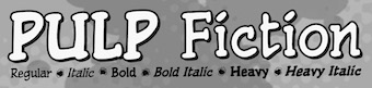 Comicraft was founded by Richard Starkings and John Roshell in 1992. Located in Santa Monica and Los Angeles, they do lettering and design for the comic book industry and make comic book fonts. At one point they were also called Comic Book Fonts. The current presidents are Rita Simpson and Richard Starkings. Alternate URL. T-26 link. Creative Market link. Some fonts: Sanctum Sanctorum (2003), Grandguignol (2003), MagicalMysticalFour (2003), Smash (2003), Aztech, Joe Kubert, Gobbledygook, Meanwhile, Matinee Idol [Nick Curtis has a much nicer script font by the same name, sold by MyFonts], Manganese (Asian-lookalike by Richard Starkings), Altogether OOky (by John Roshell), AbsolutelyFabulous, Achtung Baby (1997, Richard Starkings: a brutalist typeface), Adamantium, Alchemite, AstroCity, AstroCity International, Bithead, BrontoBurger, CarryOnScreaming, Chills, ClobberinTime, Comicrazy, Destroyer, DivineRight, DoubleBack, DutchCourage (1995, an art deco family), Elsewhere (art nouveau), Flameon, Framistat (2000, JG), Frostbite, GrimlyFiendish, Hooky, Hellshock, IncyWincySpider, JimLee, JoeMad, KissAndTell, KissAndTell International (2000, JG), Meltdown, MonsterMash, PhasesOnStun, PulpFiction, ResistanceIs..., RunningWithScissors, SchoolsOut (1999, John Roshell), SezWho/SezYou, SpookyTooth, Spills, Splashdown, StandBy4Action, Stormtrooper, TheStorySoFar, ToBeContinued, Thrills, WildWords, WildWords International, YuleTideLog, Zoinks, ZAP Pack, Digital Delivery, Jeff Campbell (2000, by JG), Los Vampiros, DeadMansChest, Cutthroat International (2000), Rigor Mortis (2000, John Roshell), DangerGirl, Thingamajig, Red Star, Red Square, Drop Case, Too Much Coffee Man, NearMyth, Stonehenge, Golem and SwordsAndSorcerers (medieval or runes fonts). Their monster fonts collection includes MonsterMash, CarryOnScreaming, Chills, GooseBumps, CreepyCrawly, Grimly Fiendish, IncyWincySpider, SpookyTooth, Meltdown and TrickorTreat dingbats. In 2005, MyFonts started selling their collection. Fonts by Starkings include Achtung Baby, Carry On Screaming, Clobberin Time, Flame On, Goosebumps, Grimly Fiendish, Sez, Splashdown. The full font list: Absolutely Fabulous (1999), Achtung Baby (1997), Adam Kubert (2005), Adamantium (1999), Alchemite (1997), Altogether Ooky (1999, vampire script), Area51 (2005, an octagonal typeface with a military stencil)), Astro City (2005), Astronauts In Trouble (2005), Atomic Wedgie (2005), Aztech (2005), Battle Cry (2005), Battle Scarred (2005), Belly Laugh (2005), Biff Bam Boom (2005), Bithead (1997), Blah Blah Blah (2005), Bronto Burger (1996), Carry On Screaming (1996), Chatterbox (2005), Cheeky Monkey (2005), Cheese And Crackers (2005), Chills (1997), Clobberin Time (1995), Comicrazy (1995), Creepy Crawly (2005), Cutthroat (2005), Danger Girl (2005), Dave Gibbons (2005), Dead Mans (2005), Dear Diary (2005), Designer Genes (2005), Destroyer (1999), Digital Delivery (2005), Divine Right (1998), Doohickey (2005), Double Back (1998), Dreamland (2005), Drop Case (2005), Dutch Courage (1995), Elsewhere (1998), Euphoria (2005), Exterminate (1999), Face Front (2005), Flame On (1997), Forked Tongue (2005), Framistat (2005), Frostbite (1997), Girls Girls Girls (2005), Gobbledygook (2005), Golem (2005), Goosebumps (2005), Grande Guignol (2003), Grimly Fiendish (1998), Hedge Backwards (2005), Hellshock (1997), Hooky (1999), Hush Hush (2005), Hyperdrive (2005), Incy Wincy Spider (1996), Jeff Campbell (2005), Jeff Campbell Sketchbook (2005), Jim Lee (1998), Joe Kubert (2005), Joe Mad (1999), Kiss And Tell (1999), Ladronn (2005), Los Vampiros (1999), Manganese (1999), Matinee Idol (2005), Meanwhile (2005), Meltdown (1997), Mike Wieringo (2005), Monster Mash (1997), Near Myth (2005, a grunge face, since 2007 also at T26), Nuff Said (2005), Overbyte (2005), Paranoid Android (2005), Pascual Ferry (2005), Pass The Port (2005), Phases On Stun (1995), Primal Scream (2005), Pulp Fiction (1996), Red Square (2005), Red Star (2005), Resistance Is (1997), Rigor Mortis (2005), Rumble (1994), Running With Scissors (1997), Sanctum Sanctorum (1998), Santas Little Helpers (2005), Schools Out (1999), Sean Phillips (2005), Sentinel (2005), Sez (1998), Shannon Wheeler (2005), Shannon Wheeler (2005), Smash (2005), Snowmany Snowmen (2005), Soothsayer (2005), Spellcaster (2005), Spills (1997), Splashdown (1997), Spookytooth (2005), Stand By4 Action (1997), Stonehenge (2005), Stormtrooper (1997), Thats All Folks (2005), The Story So Far (1998), Thingamajig (2005), Thrills (1997), Tim Sale (1999), Tim Sale Brush (2005), Tim Sale Lower (2005), Timelord (2005), To Be Continued (2005), Too Much (2005), Tough Talk (2005), Treacherous (2005), Trick Or Treat (2005), Wall Scrawler (2005), Wiccan Sans (1999), Wiccan Serif (1999), Wiccan Special (1999, see also T-26), Wild And Crazy (1997), Wild Words (1995), Yada Yada Yada (2005), Yeah Baby (2005), Yuletide Log (1996), Zoinks (2005), Phil Yeh (2006), Zzzap (2006), Battle Damaged (2007), Speeding Bullet (2006), Foom (2007), Letterbot (2007), Timsale (2007), Cutthroat (2007), Framistat (2007), Area 51 (2007, techno, octagonal), CC Comicraft (2007), Ratatat (2008), Mad Scientist (2008), Monologous (2008, T-26), HolierThanThou (2008, T26), Elephantmen (2008, grunge typeface at T26), Storyline (2008, T-26), Primal Scream (2009, T-26), Spillproof (2009, T-26), Sign Language (2008), Moritat (2009, T-26, by John Roshell), Pass The Port (2009, T-26), Credit Crunch (2009), Elsewhere (2009, art nouveau), Code Monkey (2011, monospaced yet informal), Glitter Girl (2011, hand-printed), Rassum Frassum (2011, comic book face), Rocket Man (2011, a retro futuristic family), Spaghetti Western (2011, signage face), Sunrise Till Sunset (2012), Samaritan and Samaritan Tall (2013, with John Roshell).
 In 2014, John Roshell published the school font Dash To School. Typefaces from 2015: Samaritan Lower (by Richard Starkings and John Roshell), Dusk Till Dawn Buried (expressionist). Typefaces from 2016: Questionable Things (with John Roshell: a question mark font). Typefaces from 2017: Evil Schemes (by Richard Starkings and John Roshell), Regeneration, Obey Obey Obey (by Starkings and Roshell). Typefaces from 2018: Samaritan Tall Lower (by Starkings and Roshell), Blah Blah Upper (by John Roshell and Richard Starkings), Evil Doings (by Richard Starkings and John Roshell). Typefaces from 2020: Elektrakution (a Greek simulation font family by Richard Starkings and John Roshell), This Man This Monster (by John Roshell and Richard Starkings). Typefaces from 2021: Richard Starkings Brush (2021; a comic book typeface by Richard Starkings and John Roshell), Scoundrel (a comic book face by Richard Starkings and John Roshell). Creative Market link. View Comicraft's typefaces. Fontsquirrel link. [Google]
[MyFonts]
[More] ⦿
|
Creatype Studio (or: Taro Creatype, Crella Marketplace, Rahardi Creatype)
[Mohamad Rian Rahardi]
|
Depok and/or Bangka Belitung, Indonesia-based designer (b. 1979) of these script typefaces in 2018: Guthenberg (signage script), Rampage Monoline, Chicago Script (baseball script), Entreaty (signage script), Striped King, Rathyland, Banshee (brush script), Aksana (brush script), Just Signature, Granite (brush), Wakanda, Halimun (signature font), Jacklyn (signature font), Winchester (signature font), Jelytta, Bulgatti, Southampton, Little Jack. Typefaces from 2019: Barcetto, Butterly, Huttely, Qrownly, Questa White (a monoline script), Oklahoma, Guthenberg Bold, Estylle Madison, Thankfully, Mistrully, Sophia Christie, Attemptyon, Maghody, White Angelica, Gilligan Shutter (monoline script), Ballystic, After Sunset, Barcelony, Brittany Signature, Cervanttis, Clattering, Estrela, Endestry, Guttenbay, Hello Santtiny, Herdrock (brush style), Hey Lucky, Kasting Script, Billystuck, Porcelain, The Gwathmey. Typefaces from 2020: Death Rock (dry brush), Gwyneth, Kamilya, Kids Now, Lemony, Mandaly, Mossley, Ondyne, Wildrock, Hello Sunny, Hurtley, Magnolia, Myrwala, Priscyla, Rockys, Skulrock, Summer Beach, Yearbook, Montrelo (a rounded interlocking sans), Kingstyle, Starshy, Kastyle, Scarletty, Thransty, Quinttor, Breaker The Brush, Jattayu, Lazy Jumps (dry brush), Besties Matthew, Gesthyla, Ganttlets (dry brush), Estelly, Oklahoma, Blastyes, Stadella, Twister, Gistesy, Broadway (art deco), Brittanya Goldenite, Monttrela, Estrela (a rabbit ear script), Alesandra, Eleanor, Evangeline, Masticusy, Sydhartta, Jumps Steady, Bandage Kroasty, Hanastly, Retylle Solyta, Rampage Monoline, Estylle Madison, Halmahera, Hypebeast (spurred, caps), Whisholder (spurred, caps), Cristabella, Mallorie, Baquette, Crocky, Gadroons, Halymoon, Magdalyn, Raysha. Typefaces from 2021: Agatha Christy, Anastasya (a monoline script), Antipathy Stamp, Anttelope, Aquawave, Attena (calligraphic), Aurelye, Babyque, Ballantik, Barcelona, Barthony, Bedtime Story, Bellagio Chic, Black Diamond, Brandon Matthews, Brittany, Broadway, Brokllyng, Broster (a weathered vintage slab serif), Brotherhood Brush, Brownies, Bryan Kimberly, Bucherry, Cherly Blossom, Connecticut, Coutline (stencil), Creamy, Cristabella, Dellyssion, Doodleland, Dorothy, Edward, Elisabeth, Endless Loveness, Enternal, Enternity, Essperanza, Eugellyca, Fioretta, Franchisca, Fruiti Juicy (a cut-out typeface), Gading Retro (a retro signage script), Garry Shelby, Gaston & Jacklyn, Gebrush, Ghostily Spooky, Gisella Anistasy, Goldisyle, Gorock, Graffity, Hamston, Hancoke Adventure, Hardbeat, Hattrick, Hello Sunny, Helloo Gladiattor, Heredittary, Hurtley, Jabottabeck, Jealousy, Jordan Dunk (script), Judthing, Juliette, Junkies, Kalemanja (Greek emulation), Kalistra (a bold monoline sans), Kallisoka (a display serif), Karllina, Kattalyna, Kidos Park, Kidstation, Kingstyle, Klassik Style (a retro signage script), Komika (a cartoon font), Komsiyochi (a signature script), Kulldesak, Lamorry, Layttona, Lazzy Dog, Little Queen, Lord of Scotland, Mackyloo, Magnifyco, Magnolia, Mallorie, Manchester Signature, Marleigh (a chunky display serif in the Windsor genre), Megaloman, Misrelly, Moanster, Modest (stencil), Monstera, Montrelo, Moonview, Myrwala, Peachy, Priscilla, Priscyla, Quickly Sustain, Quinlliyk, Rattiar, Rontrelan, Rowytta, Rustty, Sabertooth (a dry brush font), Sachssy, Sacramento, Samanthy, Scratchy, Shutterland, Skulrock, Sophiaticha Handwritten, Southwell, Sticky, Sugena Rawuh (a monoline script)m Summer Beach, The Brands Quest, The Brown Fox Stylish Marker, The Quest, The Rocky, Therhog, Tropikana, Vegawanty, Vinttadge, Western Wildler, Westlynn, When Modern Meet Vintage, Wintter, Wyaletta, Wyattiky, Wyattruly (calligraphic script), Gwyneth, Death Rock (a dry brush font), Yearbook, Rockys, Ondyne, Mossley, Lemony, Kids Now, Wildrock, Mandaly, Kamilya, Hanessy, Crocky, Raysha, Magdalyn, Halymoon, Gadroons, Baquette, Searghy, Marlyne, Grunge!, Bryshty, Jacklyn Blands, Sunquish. Typefaces from 2022: Brittany Signature. [Google]
[MyFonts]
[More] ⦿
|
Crump Hand
[Stefie Justprince]
|
 Depok, Jakarta, Indonesia-based designer of the handcrafted typefaces Pangoline (2019), Beasty Morty (2018), Sweet Beaches (2018), Orabelle (2018: connected script), Koeltoerals (2018: monoline signage script), Rushtelle (2018), Sloutthy (2018) and Hingar Bingar (2018: a marker pen font).
 Typefaces from 2019: Gourmet, Firstborn, Sunkist Squash, Borgemore, Smoothis Bucket, Galahad (dry brush), Goodbye, Chillhop, Salyka, The Quotes, Hallou, Burgundy, Brittanian (dry brush script), Risslead (dry brush), Haringtone (dry brush), Pelakor, Shallamander, Clarra, Modern Guns, Drunkgun. Typefaces from 2020: Pixelfy, Southern Spaceship, Blushing, Royal Kingdom, BetterYouSmile-Script, Proud (brush). Typefaces from 2021: Dopeness (a round marker font), Six Pounder (a polygonal or Greek emulation typeface), Ballpoint Marker, Candy Paint (painted letters), Slippery Slope, Blindshot (a dry brush font), Youth Today (a very dry brush font), Break Snooze (a fat finger font), Stripes Pattern (a scrapbook font), Roasted (a grungy brush font), Macho Rogers (a plump display font), Springtime Romance (a scrapbook font), Tasty Matcha (a fat finger font), Tasty Matcha (a fat finger font), Briskly Cabrales (squarish and chamfered), Roots N Branches (a fat finger font), Glowing Bubble (a unicase bubblegum font), Taste Of Heaven (a scrapbook font), Anything Skribble, Hate Your Writing (a fat finger font), Joy Of Christmas, Concrete Fantasia, Wispy Night, Playdates, Shamar, Rhantica, Reclaim, Retrophile, Brickyard, Cosmopolitan, Nooble Wooble, Saturday Alright, Money Honey, Natural Portabella, Organic Jalapeno, Celina Stephanie, Third Degree, Suffer Through, Bullseye (a bold marker pen font), Hurtz (a plump comic book font), Orange Leaves (a supermarket signage typeface), Thursday Routine, Grateful Everyday (a fat finger font), True South (a dry brush font, SVG style), Quacker Slate. Typefaces from 2022: Breakfast Renegade (a simple handprinted typeface). [Google]
[MyFonts]
[More] ⦿
|
Cumberland Fontworks
[Samuel John Ross]
|
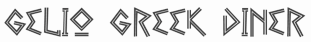 Game writer, game designer, graphic artist, and the creator and owner of Cumberland Games & Diversions, b. Cumberland, MD, 1971. He lived in Austin, TX, but is in Denver, CO, since 2014. Typefaces by S. John Ross include Sex Nerd (2021), Guacamole Quickstep (2019), Cynocel Poster (2019), Monesque (2019), Flagstones (2018), Kentucky Fireplace (2016), Bad Guy Black (2015, an engraved currency font), Silvery Tarjay (2015), Iron and Brine (2015), Afton James (2015), Fountain Avenue (2013), Axe Handel (2013, grunge), Sans Sara (2011, geometric organic sans), Growly Grin (2011, grunge), Gelio (2011, Greek simulation family; +Pasteli), Shock Shimmy (2011), Gelio Greek Diner (2011, Greek simulation face), Rugged Ride (2010, a texture font), A Love of Thunder (2010), The Day That Love Came To Play, Unity Dances (2009), Knits and Scraps (2008), Heirany Slight (2007), Merchant Copy (2006), Hexpaper (commercial: font for printing out hex paper (for puzzles and such)), RisusLCBDingbats, RisusLCBKringlebats, TemphisSweatermonkey, HultogSnowdrift (2006), Hultog Engraved (2006), Encounter Critical, Erthe Gaming Systems (art nouveau), Tender Goliath (a heavy slab serif), Temphis Spidersilk (2005), Ten Ton Ballyhoo (2005, grunge), Vermin Magic (2005), Uneasy, Tombs of Rivulax, Almanac of the Apprentice (2005), Yemite Snow Letters (2005), Seven Miles to Heirany (2005), Bold Marker (2005), Apostate Cancer (2005), Bydee Man (2005, based on the handwriting of Austinite Brian Joseph), Uresia (2005, runic), Dragon Harbour (2005), A Kringle in Time (2004, Christmas dingbats), Vanthian Ragnarok (2004), Regal Demise (2004), Nobody Small (2004), Earwax Wit (2004), Always Joking (2004), Hill Country (2004), Barrel House (2004), Iron Lung (2004), Art Greco (2004, a stone cutter face), Powell and Geary (2004), Wolves Engraven (2003), Homespun (2003), Cup and Talon (2003), Glyphs of Hax (2003), Invader Candy (2003), Temphis Runes (2003, commercial), Temphis Laundry Marker (2012), Temphis Brick (2003), Temphis Knotwork (2003), Temphis Dirty (2005), Struck Dead (2003), Double Slug (2003), Oddbats (2003), Phaeton John (2003), Scrawlings (2003, a gothic font), FountainAvenue (2002), Pokethullu (2002), AtlasoftheMagi (2002), Skuntch (2001), Prison Walls (2002), Downtown Auto (2002), Arvigo (2002), Beccaria (2002, very old typewriter font), Cheap Seven Inches (2002), Nicotine Stains (2002), Apple Butter (2002), Merchant Copy (2006), Mexlar (2002), Eye Socket (2002), Spacedock Stencil (2001), Rutherford (2001), SPARKSScrapbook2001 (2001), Sparks ("from skeletal necromancers to doughty Dwarf warriors to Bigass Ogres to chicks with guns - and now an entire science-fiction set!"), Skull Salad (2001), The Temphis Runes (commercial rune font set), Cock Boat (2001, co-designed with Amy Miles), Marshmallow (2001, by his wife Sandra Ross), Yank (2001, handwriting, by Sandra Ross), Focal Deviance (2001), Darn Ya (2001, typefaces), Punkinhead (jack-o-lantern shaped letters), Rocket Yo-Ho (2001), Thunder Thighs (2001), Dirty Headline (2001, and Dirty Headline v2, 2012: The most successful of the Cumberland stress-fonts is an unlikely typographic hero, released as it was with huge chunks of even the basic U.S. keyboard set missing (it had no apostrophe, for example, and no smart-quotes). Why so limited? I built it for one thing and one thing only, so it only had what it needed. I never expected to see it spread across the globe on buses, TV and movie screens, book coves, web-banners, lottery tickets, signs and clothing. I also never expected it to introduce me to roller derby girls (a whole team of them!), or to hook me up with a pen-pal who means a lot to me, but it's done all those things and more.), Ninja Bootleg (2001), Face Front, Nameless Harbor, Martian Hull Markings (1999), ProtoRooftops (2001), Zarking (2001), Graalek, High Fiber (2001), LastUniform, Wolves&Ravens (2000), Wolves&Ruin (2003), Pigeon Street (2001), Gravel (2001), TheAlchemist (2001), Deco Freehand (2001), Archipelago (2001), Flagstones (commercial), Newfie (handwriting, by Sandra Ross), Hultog (2000), and Lunatic Regular (handwriting, 1999). 15 USD fontmaking service. At Apostrophic Lab in 2001, he designed FuturexApocalypse. The Temphis Runes font set is commercial.
 Fontspace link. Dafont link. Klingspor link. Abstract Fonts link. Wikipedia link. [Google]
[More] ⦿
|
CybaPeeCreations (or: Typoasis)
[Petra Heidorn]
|
 CybaPee is the nom de plume of Petra Heidorn who lives near Hamburg. She has created many typefaces (listed below) between 1997 and 2005 and has cooperated with several type designers on interesting projects. She is undoubtedly best known for her successful web site Typoasis (discontinued in 2016), where one could download her own creations, and those of her many friends. Petra was also heavily involved in several attempts to revive blackletter fonts, in cooperation with Manfred Klein, Dieter Steffmann, Paul Lloyd and others. She organized several revivals of the typefaces of Rudolf Koch and Ernst Schneidler. She also managed the extensive web presence of Manfred Klein.
 In 2016, she allowed me to host her fonts on my site. Download page. Download all her fonts in one zip file. Her typefaces: - AlphanatismConHeads (2001). Stamped style.
- ArabDancesMediumItalic (2002). An Arabic simulation typeface done with Manfred Klain's assistance.
- Azimech (1999).
- Bauernschrift (2004). After a 1911 typeface from Bauersche Giesserei.
- Bayreuth (2003). A nice scan-version of Bayreuth Fraktur by Ernst Schneidler for C.E. Weber in 1932.
- Bibelschrift (2004). Codesigned with Manfred Klein, Bibelschrift revives a Fraktur from 1926-1928 used by the Bremer Presse, est. 1911. The Bremer Presse was bombed by the Americans in 1944.
- BirthdayGreetz (1999).
- Brahms Gotisch (2005). A blackletter typeface co-designed with Manfred Klein. It is a revival of a 1937 Genzsch&Heyse typeface designed by Heinz Beck.
- Burte Fraktur (2003). After Christian Heinrich Kleukens for the Mainzer Presse, 1928.
- CalliBrush (1999).
- Camouflage (1999). Textured.
- Chaos-Theorie (2000). A Halloween or vampire font.
- Charon (1999). An angry and / or scary typeface.
- Crystopian.
- CursedKuerbis (1999).
- Cyclin (2000). An ironwork font.
- DecoCaps (1999). Ornamental caps.
- DeutscheDruckschrift (2004). A revival of Heinz König's 1888 blackletter typeface for Genzsch&Heyse.
- DeutscherSchmuck (2004). Codesigned with Manfred Klein, this ornamental dingbat font is a revival and extension of the Schmuck für Deutsche Druckschrift by Eduard Ege, Genzsch and Heyse, 1922.
- DiamondDreams (1999). A pearly all caps typeface.
- Ellipsoideogram (2000). An italic headline sans.
- Epitough (1999). A sans.
- Extemplary (1999).
- Funtastique (1999). An exagerrated, almost bubbkly, art nouveau typeface.
- Gondoliere (2000). A light-hearted poster typeface.
- Gotika (2005). After Reiner's 1933 blackletter typeface for Bauer.
- Greex (1999). A Greek emulation typeface.
- Hans Sachs Gotisch (2005). Based on a typeface by that name of Albert Auspurg, 1911, Genzsch&Heyse.
- Hartwig-Schrift (2005). A blackletter typeface that revives Hartwig Poppelbaum's Hartwig Schrift from 1927-1928.
- Hasenchartbreaker (1999). A handcrafted typeface.
- Heimat (2005). After Wilhelm Weimar's Heimat from 1917, Genzsch&Heyse.
- HelvAssim (1999). A naughty take on Helvetica to needle Linotype.
- Hohenzollern (2004). Based on Carl Albert Fahrenwaldt's blackletter typeface for Bauersche Giesserei, 1902.
- HollandGotisch (2005). Designed together with with Manfred Klein, this is a revival of the textura typeface Nederduits (aka Fleischmann Gotisch) by Johann Michael Fleischmann, ca. 1750.
- InkyDinky (1999).
- IsleOfTheDead (1999). An angular handcrafted typeface reminiscent of the movie titling of Dr. Caligari.
- Jaecker-Schrift (2005). Revival of the 1912 blackletter typeface by Wilhelm Jaecker for D. Stempel.
- Kleukens-Fraktur (2004). A Schwabacher based on a design by Friedrich Wilhelm Kleukens, 1910.
- KrasniFellows (1999). An old Slavonic emulation typeface.
- KuehneRevised (2003). A blackletter typeface.
- LadyIce-Italic, LadyIce-SmallCaps, LadyIce, LadyIceRevisited, LadyIceRevisitedUpper. An organic monoline sans typeface family developed together with Apostrophe.
- Leibniz-Fraktur (2003). A Schwabacher typeface based on a house font at Genzsch & Heyse, 1912.
- LeontineLoew. A warm and plump informal typeface.
- LightBats (1999). Dingbats.
- Lupinus (1999).
- Lurzing-Initials (1997). A decorative caps typeface based on a 1908 typeface by Karl Lürzing that depicts naked figures.
- Manuskript Gotisch (2004). A revival of a 1514 Textura typeface by Wolfgang Hopyl, which was a house typeface at the Bauersche Giesserei in 1899.
- ModerneSchwabacher (2005). After a ca. 1900 typeface by the Otto Weisert foundry called Moderne Halbfette Schwabacher.
- MonkeyHouseParty (2001).
- MothproofScript (1999). A calligraphic typeface. The name is a take on frostmoth, one of Petra Heidorn's early aliases.
- MuseAsis (2002). Artsy fartsy.
- Napapiiri (1999).
- Neudeutsch (2004). After a 1900 original by Otto Hupp for Genzsch&Heyse.
- NeueFraktur, NeueFrakturExtraBold (2004). Revivals of typefaces by Johannes Wagner Schriftgiesserei in 1927.
- NinjaLine (2000). An outlined graffiti typeface.
- Nordland (2005). Based on a typeface by Heinz Beck for Trennert&Sohn, 1935.
- Oetztype (1999). German expressionist. Named after the Tyrolian Iceman, Oetzi.
- Oktoberfest (1999).
- Pachyderm (1999). A nice ultra-fat typeface.
- PeesCelticItalic, PeesCelticPlain, PeesCelticOutline (1999). Ornamental Celtic caps.
- Pegypta, Pegyptienne (1999). Hieroglyph-inspired typewriter fonts.
- PostmoderneFraktur (1999).
- Rammstein (1999). A tall condensed typeface.
- ResPublica (2000).
- RoteFlora (1999). Garffiti style typeface.
- RoyalGothic (1999). A swashy set of initials.
- SadLisa. A kitchen tile font designed to support Lisa Jenkins in a copyright battle.
- Sagittarius (1999). An arrowed typeface.
- SailingJunco (1999). A stencil typeface.
- Scalper-Bold, Scalper, ScalperInk (2001). Grunge style.
- SchmalfetteGotisch (2004). Codesigned with Manfred Klein, this semi-Textura typeface is based on a type of Ernst Schneidler.
- SchneidlerInitialen (2004). After F.H.E. Schneidler.
- Schneidler Schwabacher (2004). After F.H.E. Schneidler.
- SchwabachDeko (2005). This is Verzierte Schwabacher by Carl Kloberg, Leipzig, 1891. In 2005, Petra co-designed a similar revival of Verzierte Schwabacher with James Arboghast, simply called Verzierte Schwabacher. Her SchwabachDeko attempted to be as close as possible to the original.
- Scoglietto (1999). A text typeface.
- SerpentisBlack (2004). Digitization of a typeface by E.W. Tieffenbach for Officina Serpentis, 1913. This in turn is based on a Gotico-Antiqua by Peter Schoeffers (Mainz, 1462) which was refined in the late 15th century by Creussner and Koberger.
- SlimlinerMicro (1999).
- Smoke-Rasterized-Medium (2001). Degraded and textured.
- SoftAutumn (1999).
- Stoertebeker (1999). A mediaeval typeface with a rough outline.
- SunnySide (2000).
- Symphonie (2005). A digitization of Imre Reiner's Symphonie from 1938 (renamed Stradivarius in 1945).
- TaraType (1999). A lapidary typeface named after Petra's friend, Sabine Taranowski.
- Teutonia (2004). Based on a typeface by Roos & Junge, ca. 1900.
- TipTop (2004). Based on a typeface from Schriftgiesserei Julius Klinkhardt, Leipzig, ca. 1900. Virtually identical to Teutonia.
- ToolTime (1999). Dingbats.
- TypesourceFanclub (2001). A heavy semi-slab serif.
- Urdeutsch (2004). A rounded blackletter typeface based on Urdeutsch (1924-1925, Adolf Heimberg for Genzsch&Heyse).
- Vogeler Caps (2002). Based on Heinrich Vogeler's decorative blackletter caps typeface Jugendstil Initialen (1905).
- Weiss-Gotisch (2004). A revival of E.R. Weiss's typeface by that name, published in 1936 at the Bauersche Giesserei.
- WelcomeY2K (2000). A casual typeface.
- XmasTerpiece, XmasTerpieceSwashes (2001). A Fraktur font based on Rhapsodie by Ilse Schuele.
Dafont link. Klingspor link. Fontspace link. [Google]
[More] ⦿
|
Cyn Fonts
[Petros Vasiadis]
|
 Petros Vasiadis is a graduate of Vakalo Art & Design College who works in Athens, Greece. Petros Vasiadis set up CYN Fonts in Athens, ca. 2013, and offers these free (mostly brush) fonts for Latin and Greek: CYN Kypselers (hexagonal), Logikfron (grunge), Me Rider (grunge), Banxed (hexagonal), CYN Ypsoma (hand-printed), CYN Unlimited (brush), CYN Ufos (scratchy), CYN U, CYN Pan Shadow, CYN Pan (hand-printed), CYN Nextshift (hand-printed), CYN Goodinside, CYN Forgiven, CYN Filos (brush), CYN Byron, CYN Autozen (nice brush), CYN Autoside (brush), CYN Autopol (scratchy brush), CYN Autolimit (brush), CYN Autofly (brush), CYN 4Uven. In 2015 Cyn Fonts had these typefaces: Actual, Calimera, CYN Pan, CYN Singing, CYN_4Uven, CYN_autofly, CYN_autoLimit, CYN_autoLimit_it, CYN_AutoPOL, CYN_AutoPOL_it, CYN_autoSide, CYN_autoSide_it, CYN_autozen free font, CYN_Byron, CYN_Byron_it, CYN_FILOS, CYN_FILOS_italic, CYN_Forgiven, CYN_Forgiven_italic, CYN_Goodinside_italic, CYN_Goodinside_shadow, CYN_Nextshift, CYN_Nextshift_i2, CYN_U (2011, free brush face), CYN_UFos, CYN_Unlimited, CYN_Unlimited_it, CYN_Unlimited_U, CYN_Ypsoma, CYN_Ypsoma_Bold, CYN_Ypsoma_Bold_it, Gearus, Logikfront, Merider (:Me Rider:), Pagkrati, RighOn.
 He cut the serifs and ends off Times Roman to create the sans typeface RighOn, the extended rounded display sans typeface Pagkrati, and the slab serif typeface Calimera in 2013. Free downloads. In 2014, he created the free font Gearus, the free handwriting font Singing, and the free thin sans display typeface Actual Free Font (2014, Latin and Greek). In 2015, he published Cyn Filos (free rough brush font), Covalt, the curly typeface Medelsan, the stencil typeface Quaummerce, the interesting 10-weight Latin / Greek sans family Pinaxi (commercial). Its very open forms and organic feel make this ideal for mobile devices. He also made a proposal for a drachma symbol at the height of the Greek Euro crisis in June 2015. Still in 2015, he designed the grunge fonts Studiomast and Typink, the free handwriting font Cyn Goodinside, the calligraphic nibbed typeface Erasty, the nibbed typeface Achieve, the commercial vintage poster typeface Palko, Delyte, Bortrait, Porta, Maternity, The Loom, the handcrafted Tasy and Innosend, the nibbed typefaces Nicky, Relevancy and Applauds, the amoebic Locker, the octagonal Powergo, the inky script typeface Trip, and the monospaced organic sans typeface Bot (Latin and Greek). Typefaces from 2016: PVF NeuTymes, PVF Clothing, PVF Over, PVF Newtown, PVF Mazzy, PVF Saved, PVF Seventy, PVF Solon (Greek simulation font), PVF Springs, PVF Climax, PVF Tropo, PVF Riding, PVF Spice, PVF Cash, PVF Chock, PVF Presence, PVF Codesk, PVF Saved, PVF Pop, Stroma, Ally, Hutch (tattoo script), Treesign. Behance link. Blogspot link. Home page. Blogger link. [Google]
[More] ⦿
|
Dan M. Zadorozny
[Iconian Fonts]
|
 [More] ⦿
|
Dathan Boardman
[Open Window]
|
 [MyFonts]
[More] ⦿
[MyFonts]
[More] ⦿
|
David Berlow
|
 David Berlow (b. Boston, 1955) entered the type industry in 1978 as a letter designer for the Mergenthaler, Linotype, Stempel, and Haas typefoundries. He joined the newly formed digital type supplier, Bitstream, Inc. in 1982. After Berlow left Bitstream in 1989, he founded The Font Bureau, Inc. with Roger Black. Font Bureau has developed more than 300 new and revised type designs for The Chicago Tribune, The Wall Street Journal, Entertainment Weekly, Newsweek, Esquire, Rolling Stone, Hewlett Packard and others, with OEM work for Apple Computer Inc. and Microsoft Corporation. The Font Bureau Retail Library consists mostly of original designs and now includes over 1,000 typefaces. In a video made for Mike Parker's TDC medal in 2011, Mike Parker says that David Berlow is the most talented type designer he ever met. David lives in Martha's Vineyard.
 At ATypI 2004 in Prague, David spoke about Daily types. At ATypI 2009 in Mexico City, he spoke on The heart of my letter, (and the online version). Since that time he has been very active and vocal on the issue of high quality web fonts. Speaker at ATypI 2011 in Reykjavik and at ATypI 2014 in Barcelona. David Berlow Type Specimens (free pdf). Another type specimen booklet. Interview by A List Apart in 2009. Speaker at ATypI 2010 in Dublin. FontShop link. www.typovideo.de/david-berlow. David Berlow on web fonts. Interview by The Boston Globe. His typefaces: - Agency FB (1995). After Morris Fuller Benton's squarish typeface from 1932-1933 for American Typefounders.
- Amstelvar (2017). A variable (or parametric) font at Font Bureau. Contributors include David Berlow, Santiago Orozco, Alexandre Saumier Demers, and David Jonathan Ross. Open Font Library link, where one can download the font. Github link.
- Apres (2008, a sans with 40 styles). David Berlow and staff drew Apres as part of a series designed originally for the Palm Pre smart phone, for use both on the device and in print marketing. Simple, open letterforms and generous proportions provide a clear, comfortable, and inviting experience for navigation and readability.
- Belizio (1987-1988), a beautiful Clarendon-style slab serif modeled after the 1958 original slab serif by Aldo Novarese called Egizio Corsiva Nero. Claudio Piccinini would have liked Font Bureau to acknowledge Aldo Novarese's Egizio as the source of this family.
- Belucian (1990, by David Berlow and Kelly Ehrgott Milligan. Several weights exist, including Demi and Ultra.
- Berlin Sans (1997).
- Bureau Grotesque (1989). This 27-style family is now called Bureau Grot. Font Bureau's blurb: The current family was first developed by David Berlow in 1989 from original specimens of the grotesques released by Stephenson Blake in Sheffield. These met with immediate success at the Tribune Companies and Newsweek, who had commissioned custom versions at the behest of Roger Black. Further weights were designed by Berlow for the launches of Entertainment Weekly and the Madrid daily El Sol, bringing the total to twelve styles by 1993. Jill Pichotta, Christian Schwartz, and Richard Lipton expanded the styles further, at which point the family name was shortened to Bureau Grot.. Note: there is a custom version called M&C Saatchi Grotesque with truetype data created by dtpTypes in 1998.
- CalifornianFB.
- CheltenhamFB.
- Custer RE (2014), a typeface for small on screen use. The Font Bureau blurb: In 2009, a book from 1897 in the library of the University of Wisconsin caught David Berlow’s attention. It was set in a clear text face---a predecessor of Bookman---cast by the Western Type Foundry who called it Custer. Upon noting how well the typeface worked in point sizes of 6 and 7 points, Berlow developed it into a member of the Reading Edge series specifically designed for small text onscreen. Custer RE is a broad and approachable typeface drawn large on the body with a tall x-height to maximize its apparent size when set very small. The minimal stroke contrast and the hefty serifs let it stay exceptionally clear down to a font-size of 9px. Font Bureau.
- Decovar (2017). A variable font. Github link, where one can freely download the font family. See also Open Font Library.
- Desdemona (1992). An art nouveau face.
- Eagle (1889-1994). This art deco typeface Font Bureau Eagle was started in 1989 for Publish. David Berlow designed a lowercase, finished the character set, and in 1990 added Eagle Book for setting text. In 1994, Jonathan Corum added Eagle Light and Eagle Black to form a full series.
- Eldorado.
- Empire.
- Esperanto (1995).
- ITC Franklin Gothic (1991). In 2008, David Berlow added Condensed, Compressed and Extra Compressed widths to Vic Caruso's 1979 ITC Franklin interpretation (which had Light, Medium, Bold and Black), and Font Bureau sells a complete ITC Franklin now. In 2010, Berlow completed his definitive revision of ITC Franklin, a single new series of six weights in four widths for a total of 48 styles. Typeface review at Typographica.
- Giza (an Egyptian family.
- Hitech (1995).
- Juliana Text (2009), a rebirth of Sem Hartz's Juliana (1958, Linotype), a popular narrow legible paperback text face.
- Kis FB (2007): a revival of old style types by Nicholas Kis from ca. 1700.
- Letras Oldtsyle (1998). Letras Oldstyle was commissioned by Letras Libres, the reigning literary magazine published by Enrique Krauze in Mexico City. This garalde series was inspired by the earliest typefaces cut in the Americas in the early 1600s by printer Henrico Martinez. Proofs survive in the Biblioteca Nacional. Letras Oldstyle stands as the first typeface ever cut in the Americas, the root of American type design.
- Meyer Two (1994). Based on a 1926 type by L.B. Meyer.
- Millenium BT Bold Extended (1989, Bitstream). Also known by insiders as Starfleet Bold Extended, this font was used on federation starship hull markings until episode ten. MyFonts link.
- Moderno FB (1995): an exhibitionist didone in 32 styles, for Esquire Gentleman. In 1996 Berlow cut new styles with Richard Lipton for El Norte. In 1997, Roger Black ordered new weights for Tages Anzeiger. It grew further when the Baltimore Sun, with FB Ionic as text, was redesigned. The whole series was then revised for Louise Vincent, Montreal Gazette, with further styles added in 2005 for La Stampa. [It is my favorite type family at Font Bureau.]
- Momentum (2018). An in house variable font family for use on the Type Network web site.
- Nature (1995).
- Numskill (1990).
- Old Modern.
- Online Gothic (1995).
- Ornaments.
- Phaistos (1990-1991). A flared angular design done with Just van Rossum, and inspired by Rudolf Koch's Locarno.
- Poynter Agate.
- Reforma: Based on Giza.
- Rhode (1997).
- Roboto Flex (2017). A large free variable typeface family by David Berlow on commission for Google; based on Christian Robertson's original Roboto. Google Fonts link. Github link. Google redits Font Bureau, David Berlow, Santiago Orozco, Irene Vlachou, Ilya Ruderman, Yury Ostromentsky and Mikhail Strukov.
- Romeo.
- Scotch Roman (1993).
- Skia (1993, Apple). A Greek simulation sans, in the style of Twombly's Lithos, co-designed with Matthew Carter for Apple's QuickDraw GX project.
- Skyline.
- Titling Gothic FB (2005): Berlow spent 10 years developing FB Titling Gothic in seven weights of seven widths each for use as display and headline romans. It was inspired by the popular ATF Railroad Gothic and grew out of Berlow's own Rhode.
- Throhand: a classic family based on metal type found at the Plantin Moretus Museum in Antwerp.
- Truth FB (1995).
- Village.
- Vonness (2007): a newspaper sans family. Font Bureau: Vonness was designed by David Berlow working closely with Neville Brody on corporate redesign for Jim Von Ehre at Macromedia. Core weights are loosely based on Bauersche Giesserei's Venus, 1907-1910. Berlow expanded the ideas behind the series to 56 fonts.
- Yurnacular (1992, part of FUSE 4).
- Zenobia (1995).
View David Berlow's typefaces. Another catalog of David Berlow's fonts. Speaker at ATypI 2018 in Antwerp. [Google]
[MyFonts]
[More] ⦿
|
Denis Patouillard-Démoriane
|
Parisian creator (b. 1949) of Bibracte (1997, Creative Alliance), a Greek simulation typeface designed with Michel Redon. [Google]
[More] ⦿
|
DePlictis Type (was: ESS Fonts)
[Bogdan Balatchi]
|
 Graphic designer Bogdan Balatchi (DePlictis Type, and before that, ESS Fonts) graduated in 2004 from the Faculty of Arts of West University in Timisoara, Romania. Most of his work is inspired by old Slavic calligraphy.
 Bogdan created the display sans typeface Facebook Letter Faces (2011) and the medieval lettering typeface Kogaion ESS (2011), which are both free. Klauss (2011) and Pain in the sky (2011) are commercial soft techno typefaces. In 2012, Bogdan created the groovy typeface Best Party Of The Week-End. In 2020, he released BlinkHead (a modular typeface), Damasquine (an art deco-ish Greek enulation font), and Architype AD-2014. In 2021, he published Greuceanu (a decorative archaic typeface), Areon Flux (a modular typeface), Squadzone (an urban techno font) and the medieval font Monasterka (for Latin, Greek and Cyrillic). [Google]
[MyFonts]
[More] ⦿
|
Diogo Bueno
|
During his studies in Rio de Janeiro, Diogo Bueno created the free Greek simulation font Deva (2013). [Google]
[More] ⦿
|
Double Alex Team
[Alexei Chekulayev]
|
 Cyrillic type outfit, whose fonts were mostly designed by Alexey Chekulaev in the mid 1990s as extensions of Latin fonts. Double Alex stands for Alexey Gunin and Alexey Chekulaev. The list of fonts, all in Cyrillic and many in Latin as well:
 - Decorative: Angelica (1996), Apostol, Arabskij (1993, Arabic simulation typeface based on an artwork of designer Oleg Snarsky), ArtScript, Blagovest (a series of Old Slavonic types), BorjomiDecor, CalipsoCyrillic, CalligraphRuss, Camerton, CooperDAT, CoventryCyr, Demosfen, Drops, E2, E4, Electronica, ElectronicaS, Eskiz, 1, Eskiz, 2, FavoritTraf, Finist, Hitman, Inicial, Italiansky, Jokey, Josephine, KeyFont, Kisty, Manuscript, Mistica, Mobul, Nelma, Ottisk, Petrovsky, PresentDAT, Radius, Repriza, SansDecor, Strob, SuvenirRus, TabloFont, Triline, Verbena, Vodevile.
- Sans serif: Acsioma (1996), AcsiomaNext, Apical (1995, based on Agfa Aurora; Apical Bold is identical to Bitstream's Aurora Bold Condensed; for another version, see Castcraft's OPTI-Aurora Grotesk No. 9), Bastion, BastionKontrast (1992; co-designed with Alexey Gunin, and based on Helvetica), Blits, Block A, Block B, Bloknot, CyberCyr, Ecyr, Eurofont, Favorit, Favorit, Condensed, Freestyle, Kekur, Mania, MetRonom, Normalize, Orenburg, PaperGothic, Pinta, Plastica, Positiv, Pravda, Priamoj, PriamojProp, Regina, Rostislav, Rotonda, Rubrica, Sistemnyj, TornadoCyr.
- Serif: Adamant, Alliance (1995, based on Berkeley Old Style by Frederic W. Goudy, 1938), APCCourier, APCGaramond, BaskervilleDAT, Bodoni Cyrillic (1970), Borjomi, ClassicRuss, Coliseum, Diet Didot (2006, published by Paratype in 2014 as DietDidot), Egypetskij, Grand, Grenader, Ideal, Jargon, Laguna, Latinskij, Legenda, Madrigal, Metropol, Shakula (1996, a heavy slab serif by Alexey Chekulaev, based on Monotype's Rockwell), Surpriz (1993, by Alexey Chekulaev, based on ITC Souvenir by Benguiat), Talisman, Vacansia.
- Special: Interfont, Plumb.
Alexei Chekulayev is the Russian designer of Rubrica (1996, Double Alex Font Studio), Angelica (1996, Double Alex Font Studio), Acsioma (1996, Double Alex Font Studio) and Alliance (1995, Double Alex Font Studio, a Cyrillic version of Goudy's Berkeley Oldstyle). He worked on these Linotype families: Univers, Sabon, Wiesbaden Swing, Stencil (1997, after the 1937 original by Gerry Powell), San Marco, and Linotype Bariton (1997: a great poster typeface in the Zeitgeist of the 1930s). In 2014, he designed these typefaces at Paratype: Suvenir Rus (inspired by (psychedelic) artwork of Grigory Klikushin; the original at Double Alex is from 1994), Demosfen (Greek simulation font). Still in 2014, Chekulaev and Akira Kobayashi (Monotype) won a Granshan 2014 award for the Cyrillic typeface SST. Typefaces from 2021: Ice Cream (a supermarket font), Altruiste (a ten-style decorative slab serif), Postulat (a 16-style geometric slab serif). Linotype link. Klingspor link. Another MyFonts link. Paratype link. View Alexey Chekulayev's typefaces. [Google]
[MyFonts]
[More] ⦿
|
Edric Studio
[Ega Nugraha]
|
 Known as Edric Studio, Renata Insan C, M. Nouval, and Ega Nugraha. Bandung, Indonesia-based designer of mainly modular typefaces. He created these typefaces in 2017: Nine Tail, Meatballs (a layered signage script), Rohman, Roundfra (a modular typeface), the preppy handlettered typeface Mirinia, the brush font Hummer, the deco typeface Coet, the script typefaces Ghost (smooth and with high contrast), Ora et Labora, and Lisna, the handcrafted Sild, the marker font Winkdeep, the brush script Oppy Sahra, Cully Mac, Terry Bruce, Gliford, and the art deco sans typeface Allorta.
 Typefaces from 2019: Ghost (a high-contrast script), Cully, Trumans Script, Rowland, Nairi Amber (Sans, Script), Qalin, Allorta, Rowland (sans), Flower Adaline, Rowland Caligraphy, Axton, Dezert, Kempton Serif, Kempton Sans Serif, Kempton Handwritting, Stanwick, Fornever, Victorisa, Anamelia, Oldwin Script, Old Excalibur, The Afford, Aldith, Bigboby, Victorisa Script, Aldith Script, Cully, Ethelyne, Allorta (an art deco sans), Atthia, Gladwin (a connect-the-dots font), Gladwin Script, Cyttah, Thiaga (a font duo), Neolion (sci-fi style), Trumans (Shadow, Stencil, Script), Qalin (Sans, Script), Stanwick (+Calligraphy), Holea, Livingston (Sans, Serif, Signature), Haston, Accelerare, Lionello (sans+script), Brian Worth, Kempton (font trio), Amorica (Sans, Script), Northcliff (slab serif, +Stencil, +Shadow, +Outline), Stella Alpina, The Lekker (spurred), Xharp (sci-fi), Joscelynn, The Champ, Mery Qolby, Twopath, Aldora (a monoline sans), Coet (rounded sans), Alfrida, Brian Worth (slab serif), Funny Samurai (oriental simulation font), Rohman, Zorgeous, Alaqua (rounded sans), Sam, Green Aila, Goldin Finance (sans), Saila Nurissalma, Fositif (monoline script), Twopath, Dezert, Louise Ann (script). Typefaces from 2020: Acilla Tristan, Aftermoon (a lively script), Aghnesta Sans, Aghnesta Signature, Aghnesta, Aldira, Alican, Aneetha Sans, Aneetha, Angel Valley, Angemurphy Blackletter, Angemurphy, Anindya Meita, Ariesta Moon, Arsya Edelwiess (sic), Ashelynn Sweet Sans, Aslina Ohio, Ayesha Burns, B Luna Piena, Badass Holliday (+Sans), Barnetta, Because of You, Belagiana Flowers (+Sans), Bhalbino, Birdella, Black Suit, Blind Heart, Bolliver, Breezy Bolton (+Sans), Bufferly Serif, Burning Sun, Calderdale, Callion, Canvashead, Cardolith, Carllis, Catherina, Cattily, Cerys Everett, Chairmate, Chameeta, Charlyn Rushmoor, Cheeks Rosy Script, Cheeks Rosy, Chill Friend, Choerunnisa, Cifans Bell, Claressa, Crush on You, Daisy Facthory, Damiola, Daysave, Dazz Place Display, Delafinka, Denique, Devllin, Dewebeauty, Donellia, Doughnuts, Dreamy Melodies, During Dusk, Eberta Light, Exninja Caligraphy, Exninja, Explore Sky (Greek simulation), Extraordinary U (a signature font), Ezhilan Aliqua, Fangirliya, Feliciana, Flow Perfect, Fly Feather Script, Gamila, Gapbrooth, Garan Fox, Gemintang, Ghaniya Holmy, Ghivton, Ghostlike, Ginger Bread, Ginger Spice, Gladwin (a connect-the-dots font), Gloria Beauty, Gonlotus Fangwell Script, GonlotusFangwell Dry Brush, Goodselves, Goshty Doll, Great Devotion, Greatest Show, Great March, Greentler, Guritno Script, Guritno, Happy Nature, Happy Sweety, Hasita Hillary, Haston, Hatching Love, Hazelnut Smooth Handwriting, Heluzenut, Herist, Hilliard, Himponis (a signature script)Holla Hearth, Jellita, Jenoshark Feiya, Jillfester, Kandis Marsh Script, Kanya, Karllia, Kate Raymond Script, Kathreen Smith, Keira Dreamer (+Sans), Kelana Morris, Kellia Wakeup Script, Kellista, Kelsey Wilson, Kiarina, Lamish Caritta, Lauliya, Leading Role, Leonita, Lighten Up (upright script), Long Knive, Look Down, Lorieta, Lovic, Lovic, Machaela (monoline script), Mallisa, Maxwell Leonard, Meiriona, Meisya Emilia, Mile Green, Mind Notes, Mirinia, Modya Tea, Moody Star, Morachinno, Most Sense, My Illutions, Myron Hector, Naiyana, Naminasae, Neolion, New Gladish Fancy, Nhadiem Elans, Nicollia, Nicolls, Nielsen Owen Script, Night Feel (wild calligraphy), Nikeisha, Ninabell, No Offense (a signature script), North Mount Script, Nothan (stencil), Ogorphy, Ogowey, Only Friend (a signature script), Oppy Sahra, Orla Fiola Script, Orla Fiola, Oscar Wright, Overa, Pancake Batter, Peace Boy Serif, Peace Boy, Pep Talk, Photogenics, Plaza Avenue, Pubarash Lulu, Qailla Gloam, Quinnesha, Rainray Serif, Rainray, Rashean (a rough brush font), Raysha Moonly, Redalle, Reyburn (+Script), Right Attitude Sans, Right Attitude, Rottorant, Rubicela, Saeela Nuary Serif, Saeela Nuary, Sandwell (+Sans), Secret Feeling, Selfies Script, Sellby Ridge, Selvillia Dreamer (+Sans), Semiora, Sendayu, Serameyer (a signature font), Sevastyan, Shaimaa Script, Shamora, Sheinman, Sheira, Shimponia, Sillmy Sans, Sillmy, Simple Harmony, Snoorks, Squirrel Boys, Stay Big, Straight White, Sunaiko Haines, Sunny November, Swag Ghost, Syllia, Tantra (stencil), Tantra Script, Tantra, Telly Humble Sans, Telly Humble, Thalia Hillary Script, Thalia Hillary, The Billie Monlly Sans, The Billie Monlly, The Moyanka, Thiaga Script, Thifa, Think Dreams, Thipany, Timitty Sans, Treated Good, Vanellofa, Velasquis Tamyra Script, Velasquis Tamyra, Vender Rustime Display Grunge, Vender Rustime Script, Veronica Elena, Verwalter (a great modern rounded sans). Vlorens Flower Script, Vlorens Flower, Waringtons (+Script), Washllo, Wavaca, Wednesday Night, White Chunti, White Honey (+Sans), Within Life, Wolf Rubeus, Wolven Shevana, Wooslight, Wubby Kitten, Xabiya, Xander Bruce, Xenia Urshina, Yhasmeera, Yofanka (a brush script), Yoforia, Zainiver, Zakilla, Zeanica, Zephira. Typefaces from 2021: Flower Leaf, Gladiator Arena (grunge), Hang Stick, Happy Rhino, Dalisha (script), Kinasih (a signature script), Cute Lovely, Cool Glasses, Simple Couple, Bright Summer (script), Battles Bridge (a spurred beer bottle font), Grand Estonia (script), Judicious, Brookville (calligraphic), Salisbury (script), Airframe (a monoline sans family by Widiyanti & Suci Anita), Hardenburg, Beechlands (a dry brush font), Racemate (a racecar font), Wedding Dream (calligraphic), Lifebest, Snowbare, Ice Breaking, Botanic, Seychelles (a monoline script), Juicely (script), The Empire, Monice (a rounded organic sans), Cartoonery, Beckley (brush script), Happy Moon, Rayesha Moony (a calligraphic script), Black Sting (a blackletter font), Triumphal, Strong Iron, Brockley, Chubby Toon, Super Shining (a signature script), For Kids, Rashyid, During Dusk, Rubicela, Gloria Beauty, During Dusk, Seaways, Close Distance, Yofanka, Pep Talk Script, Whether Fark, Lighten Up, Crush On You, Fairy Style, Ninabell, Aftermoon, Doughnutz, Great March, Goodselves, Extraordinary U, Dreamy Melodies, Canvashead, Mile Green, Colorful Glazed, Dazz Place Display, Treated Good, Night Feel, Plaza Avenue, Sheinman, Gingar Bread Script, Himponis, Semiora, Naminasae, Within Life, Stay BIG, No Offense, Only Friend, Black Suit, Zeanica, Krisward, Firlands House, Jazz One Script, Infinity Gown, Jazz One, Mighty Duck, Good Smells, Nice Tune, Nebula Starry, Social Trend, Slang Outfit, Leading Role, Eberta, Matchmaking, Lux Rose, Eberta Script, First Heart, Siblings Love, Mad Galaxy Script, Ghostlike, Mad Galaxy, Go Come Sans Serif, Go Come, Pink Tinge, Overall Deep, Pink Sun, Siblings Love Sans, Roxanne Elea, Young Boy, Thahiyat, Eleanor Satnight Script, Bardlove, Nadheva, Manly Dack, Khensin, Brusly Name Signature, Freakouts, Hermony, Blankspot, Stepballoon, Lansbury Goulding, Bevernice, Horror Type, Without Love (script), Crushing (font duo), Breaking Dawn, Sugar Roll, Hanry Potter (sic) (script), Bestnine, Fine Todey (sic), Havelberg (a monolinear script), Lushyana (an inky script), Catch You, Woolymood (calligraphic script), Seaways (a monoline script), April Dance, Hitz Girlz. Typefaces from 2022: Hello Bhessy, Luvi Hollis, George Asher, Curly Planet, City Halle (script), Night Lover (a fashion mag typeface), Ivanka Rachel (a fat finger script), Fire Foxes, Captain Jerry (a cartoon font), Kathleen Tico, Clock Crown, Saturday Moon (font duo), West Houston (script). [Google]
[More] ⦿
|
Edy Bagus Pamungkas
[Arkara (or: Fopifopi)]
|
[More] ⦿
|
Ega Nugraha
[Edric Studio]
|
 [More] ⦿
|
Eleanor Bock Lund
|
During her studies at The Danish School of Media and Journalism in Copenhagen, Eleanor Bock Lund designed the wonderful soft-edged Greek simulation typeface Rollo (2015). [Google]
[More] ⦿
|
Evgeny Dneprovsky
[Fractal Font Factory]
|
[MyFonts]
[More] ⦿
|
Exclamations (or: The Boutons)
[Gary David Bouton]
|
 Gary David Bouton and Barbara Bouton's site was called Exclamations. Gary has been writing books on computer graphics for over 20 years, inlcuding eight books on Corel Draw. In 2015, Gary went commercial as Gare.
 Their typefaces: International Symbols (2015, an icon font), Twooth (2015), Greek Diner Inline (2015, based on Carol Twombly's Lithos), BifurOverlay (2015, an overlay font based on Cassandre's Bifur (1929)), Bouton Kursiv (2008), Odissey (2008), Russel Write (2010), Elephants and Bears (dingbats), GreekDiner Inline, GeotypeTT (1997), WebKnobsTT (1997), Beacon (2008, a Schwabacher), BOUTON Nouveau Ornaments II (2009), BifurFoundation (2010), BifurOverlay (2010, after Cassandre's Bifur), Frankfurter Venetian (2008, fat rounded horizontally striped all caps face), Folks (medieval caps), Nouveau Rococo Deco Dings I (2008, art nouveau ornaments), Simulata (2006, geometric deco typeface with Bifur influences), Whimsy (comic book font), SymbolsTT (1998, charityware dingbat font). Exclamations link. Alternate URL. Dafont link. Creative Market link. [Google]
[More] ⦿
|
Fani Dimopoulou
|
Patras, Greece-based designer of the typewriter typeface Makina (2018) and the Gree emulation typeface Master Yoda (2018). [Google]
[More] ⦿
|
Font & Graphic Land
|
 Banda Aceh, Indonesia-based designers of the script typefaces Luxurious Line (2015), Ramsteinz (2015: calligraphic), Gracias (2015, thick brush), Hello Listie (2015), Glytten (2015), Adelle Script (2015) and Loft Yian (2015), the display typeface Vardy (2015, film noir style), and the wonderful rough brush font The Mistie (2015).
 Typefaces from 2016: De Black, Fortescue, Heart Signal, Hey Dory, Toretto, Honey Land (brushed calligraphic font family), Ravenclaw (Halloween font), Jaguar (dry brush), Champagne (an inky brush typeface), Sharktooth, Lovely Kenzie, Labyrinth (bilined), Cashy Allen (brush script), Joker (handcrafted), Coralie (curly script), La Viola (free thick brush typeface), Captain America (octagonal and interlocking), Brightscales (curly script), Chicksar, Typefloss (a nice dry brush font), Lovelight, Alexandria (Greek simulation font), Brushello, Cherry Blossom (a children's font), Woodpecker (wood plank typeface), Cataleya (free). Typefaces from 2017: Luxurious Line, Camelone, Glamorous Silhouette, Russell, Vardy, Forester (vintage slab serif), Soeltin, Almera, Relevant, Mellany (script), Tomodachi Hiragana. Behance link. Another Behance link. Aka Voryu. [Google]
[More] ⦿
|
Fontschmiede
[Frank Baranowski]
|
 Obsolete German foundry, est. 2010 by Michel M and Frank Baranowski (b. Altenmedingen, 1960), and located in Neuenkirchen, where he runs the graphic design studio Cylex. Baranowski studied Graphic Design at the Hochschule fuer Bildende Kuenste in Braunschweig, Germany. His fonts:
 - Alphabutts Initials (2004-2008). Letters to fit into circles.
- Clayborn (2004). A massive font.
- Concrete (2004-2010).
- Destroya (2005-2008).
- Dodgy Ultra (2009). A blocky font.
- Elemenz Initials (2004).
- Funtype (2008-2010). A handcrafted typeface.
- Journal74 (2012). A retro font family.
- Kaleido (2004).
- Karoline (2005). A backslanted script.
- Line44
- Monumental (2009).
- MrsBeasley+ (1995-2010). Psychedelic.
- Musical (2004).
- NewTelegraph (2011, +Arrows).
- Patchwork (2005). A beatnik font family.
- Phoenikia (1998). Greek emulation.
- Silverblade (2010). A decorative, perhaps medieval, family.
- Sputnik (2010). An oriental simulation face.
- Superia (2006-2010).
- Tambourine (2004-2010). Art nouveau.
- Und4.
Some of Baranowski' fonts are released under the label Transkrypt. Open Font Library link. [Google]
[MyFonts]
[More] ⦿
|
Fractal Font Factory
[Evgeny Dneprovsky]
|
Chita, Russia-based designer of the Latin typefaces Halloween (2016, vector format), Angular (2016) and Linear Style (2015). Typefaces from 2017: Virgil (a Latin/Cyrillic label font), Fractal (a minimalist sans). In addition, he drew several vector format vintage alphabets. In 2019, he published the vintage typeface family Vitage. Typefaces from 2020: Bakeryhouse (a vintage layerable font), Black Crow (an 8-style geometric sans family). Typefaces from 2021: Angry Monkey (a vintage layered font), Black Beer (a beer bottle blackletter font), Tomahawk (a tattoo font?), Yummy Delivery (a font for food pacakging), Yo ho ho (a pirate font), Yummy Delivery (a cartoon font), Flame Rider (a spiky tattoo or motorcycle gang font), Old Bikers (a multilayer vintage blackletter or tattoo typeface), Scarytale (a spurred typeface), Pirates Rum (a spurred typeface), Fire Needle (a layerable tattoo font). [Google]
[MyFonts]
[More] ⦿
|
Frank Baranowski
[Fontschmiede]
|
[MyFonts]
[More] ⦿
|
Furdzville
[Brian Powers]
|
 Great free fonts made by Brian Powers (Furdzville): BrianPowersDoodleNormal (very funny), BrianPowersDoodle21, ChangelingDingbats, Nocker (curly Victorian typeface), NockerCranky, Plok, RedcapBloodthirsty, SatyrPassionate (1998, Greek simulation face), SidheNoble, SluaghCreepy, TMBGJohnHenry, TMBGSevereTireDamage, TrollOathbound (1992).
 Fontspace link. Dafont link. [Google]
[More] ⦿
|
Galdino Otten
|
 Cartoonist from Recife, Brazil, b. 1966, whose sense of humor and artsistic prowess shine in his dingbat fonts. Dafont link. Fontsy link.
 Creator of the experimental Almost Sanskrit (2009), Zodiac Nice (2009, astrological symbols), Xilo in Zodiac (2009), Xilo-Cordel-Literature (2009, dingbats), Cordel Circo Mambembe (2010), Inside Issue (2009), Stretched Signature Flex (2009), Action of the time (2009, grunge), the dingbat typeface Ugly Cars (2010), the grunge typeface Capitão Galdino (2008), the grunge typeface Saltpeter-N-Fungus (2010), Texture Road (2010, more grunge), BSB DF 50 (2010, grunge), Fine Serif (2009), and the nice dingbat typeface Ochent Silibrina (2009). Fonts made in 2010: Sport 4 Ever (dingbats for Olympic Games), 60sPop (multiline face), DotSpot (dot matrix), IRON H METAL (tattoo, gothic), IngaStoneSigns (stone age glyphs), Ode2PasteUp (hand-printed), WideSquare (pixelish), ActionoftheTimeNewUL, BSBDF50, Haus-Sweet-Haus, INSIGHT-ISSUE-NEW, Movie Filmstrip, SquareChalk, Action Of The Time New (grunge), CordelValentine (dingbats), IngaStoneSigns (petroglyphs), SustainableAmazon, VeryDamaged (grunge), ParkTechCG (letters as in wired circuits), kidSWritten, Iron H MetallLight, LaceNice (knitted look), Ode2PasteUp, TextureRoad (grunge). Fonts from 2011: Booklet Cordel (sketched), Cordel Encarnado, Nuclear Accident (texture face), Noncircular (techno), Old Press (grunge), Old Typography (grunge). Fonts made in 2012: New Press (condensed sans family, +Eroded), Sketch Wall, Comic Gibi, Own Written, Comica BD (comic book shadow font), Cartoon Relief (a 3d cartoon typeface), Riscada Doodle (scratchy hand), Sketch Nice, Needlework Good (a stitching font), Biscuit Made, Just Skinny, Crazy Style, After Cheret (hand-drawn 3d shaded outline face), Spots in the mirror, TNT Xplosion, Escrita Toska (curly script), Cordel Movies (moviemaking dingbats), Fine N Tall, Cordel Groteska, From Street Art (free graffiti font), Sketch College (sketched athletic shirt font), Thin Press (grungy vernacular type), Sketch Serif, Relief BD, Maxxi Serif (very heavily slabbed serif face), Semi Cursive Gut, Sketch Coursive (sketch face), Salt Pet Non Eroded, Advanced Architecture, Very Fine Serif (a monoline Egyptian), Sketch Nothing, Freehand Nothing, Shark Attack (curly), Do Doodle, Maybe Pollock (dust texture face), Xilo Prosa (grunge), Thin Design, Amazon Palafita (hand-drawn 3d outline face), Snow Times, Snow Traces, USSR Army (rough army stencil with a Russian feel), Needlework US (stitch font), Old Scribe (Greek lapidary face), Nickel Bumpy, Soviet Style (stencil face), Top Modern (heavy slab serif), Lettering Set New, Carton East, Not Tuned TV (sketch font), Scar Bleed (scary font), Maxxi Dots (texture face, +Shadows), Dots Land Gotika (grungy blackletter), Stefanie Dots (textured letters), Karamuruh (textured caps), Broken Type (grunge: a glaz krak font), Touppeka (a Kafkaesque, tribal or painter's font), Old Dreams (grungy), Bad King (sketched typeface), False 3D (hand-printed 3d outline typeface), True2D, I Wrote All, Resistance Until The End. Typefaces from 2013: Serifa Comica (comic book slab), Press Style Serif (letterpress style), Press Style Large, Triatlhon In (sic: a Greek simulation face), Go 2 Old Western (grungy wood type), Old Serif Gut, Press Style (letterpress style typeface), Dust Serif, Thing Press, Thin Grotesk Serif, Before Collapse (glaz krak face), Stencil Style New (a military stencil), Damaged Serif, Press Serif Cool, Press Feeling, Sketch Toska, Link Parties, Almost Cartoon, Cartoon Toy, Toy Toy Toon, Fine Style (didone caps), Fine Sans (Peignotian), Beyond Blackboard, Forgotten Junk (grunge). Typefaces from 2014: Simply Rounded, Cartoon 2 Packages, Pain N Bleed, Yummy Lollipop, Hippie Movement, Rotunda Geo, Old Figaro Cursive, Cute Cartoon, Sketch Gothic School (sketched blackletter), Fine College (hatched athletic lettering face), Press Felling Eroded (letterpress emulation), School Book New (sketched), Stencil Cargo Army (military stencil), Fine Eroded, Grunge Poster, Education Is A Way, Cartoon Blocks, Cartoon Bones, Cursive Option, Odd Press (letterpress emulation), Cartoon Tunes, From Cartoon Blocks (3d), Hippie Movement, Yummy Lollipop, Needlework Perfect, Press Gutenberg (blackletter), Unic Calligraphy, Roundfed Eroded, Children's Book (outlined), Neon 2 News, Good Choice (shaded letterpress emulation), Cartoon 2 Us, O 10 Type, Dust West (grungy Western style), Comic Balloon, Caligraf 1435 (pirate era script), No Name Sans, Top Secret Stamp (grungy stencil), Fine Blackboard (blackboard bold, inline), Press Style Extra L (letterpress), Sounds Good (geometric sans), Sounds Eroded (shaded letterpress font), Cartoon Blocks Christmas, Street 2 Art (graffiti font). Typefaces from 2015: Snaps Taste (a grocery store or comic book font), Snaps Taste Christmas, Calligraphy Hand Made, Silly Aliens (dingbats), Sketch Match (3d, sketched), Cartoon 4 Sports (dingbats), Kids Book, Almost Japanese (oriental simulation font, +Comic, +Cartoon), Inga Stone Redesigned, Money Money Plus (engraved money font emulation), Thin Cool, Old N New Media (dingbats), Thinkers World (scanbats of famous intellectuals), Magical Cord, Quick Writing, Eroded 2 Much, Stencil Army WW I (military stencil), Stencil WW II (military stencil), D-Day Stencil (military stencil), Western Bang Bang (weathered Western font), Modern Serif, Modern Serif Eroded, Money Money (handcrafted engraved currency font), Almost Japanese Smooth (oriental simulation typeface), Write Righ, Ease Christmas (dingbats), Sketch Script Cool, Ficticcia College. Typefaces from 2016: Doodle Cafe Scents (dingbats), Christmas Cookies, Coffee Written, Soft Marshmallow, Niagra Faults, Sketch Toronto, Sketch Fine Serif, Sketch Handwriting, Typewriter Press, Typewriter Style, Sketch 3D, Maple 3 Cartoon (snow-covered letters). Typefaces from 2017: Crazy Krabs, Old Barbwire, Gregory Packaging, Ghost Army Stencil, Old Wise Sketch (sketched blackletter), Packaging Funny, Blackboard Restaurant, Kavernosa (bony typeface), Little Kid. Typefaces from 2018: 1927 Epoque, Cartoon Toy Turbo, Old Wise Lord (blackletter), Handmade Memories, Silly Cartoon, Old Press Original, Pet Shop, Cute Script, Dust West College (hatched), New Comic BD. Typefaces from 2019: Eco Bamboo (Cartoon, Fun), Karamuruh Turbo (all caps with a quilted texture), Cordel Junina, Cordel de Mangai (240 dingbats), Cordel Rustika. Typefaces from 2020: Beach Party Cartoon. [Google]
[More] ⦿
|
Gary David Bouton
[Exclamations (or: The Boutons)]
|
 [More] ⦿
|
George Valmas
|
George Valmas is from Thessaloniki, Greece. He made the hand-printed Freehand (2010), which is not free. In 2013, he designed Atena (a Greek simulation face) and Freedo Tall (Ten Dollar Fonts). Behance link. Old URL. [Google]
[More] ⦿
|
Guilherme Belligoli
|
Piracicaba, Brazil-based designer of these typefaces in 2014: Mermaid Hooker, Scheibe (Greek simulation font), Heavy Fancy. [Google]
[More] ⦿
|
Hans-Jürgen Ellenberger
|
German designer (b. 1950) of some Linotype fonts. Among his creations, which are mostly handwriting or rough fonts: - Linotype Albafire (Linotype), 2002.
- Linotype Albatross (Linotype), 2002.
- Linotype Albawing (Linotype), 2002.
- Linotype Aspect (Linotype), 1999.
- Beluga (Linotype), 2003.
- Biosymbols (Linotype), 2003.
- Cajoun (Linotype), 2002.
- Carlin Script (Linotype), 2002. A medieval font that was awarded at the TDC2 2003 competition.
- Chemsymbols (Linotype), 1999.
- Chemtools (Linotype), 2003.
- Linotype Colibri (Linotype),
- Daedalus (URW Type Foundry), 2004. a Greek simulation face.
- Elementis (Linotype), 2003. Elementis won an award at the TDC2 2005 type competition and at the Linotype International Type Design Contest 2003.
- FontForum Ellenberger (2006, URW) and ElleFont.
- Escript (Linotype), 2003.
- Flying Objects (URW Type Foundry), 2005.
- Linotype Inagur (Linotype), 1999.
- Isometrik (URW Type Foundry), 2006. A stencil family.
- Kilimanjaro (URW Type Foundry), 2004.
- Mateo (Linotype), 1994.
- Linotype Offix (Linotype), 1997.
- Pegathlon (Linotype), 1999.
- Perpedes (URW Type Foundry), 2005.
- Perpedix (URW Type Foundry), 2005.
- Linotype Rana (Linotype), 1997.
- Linotype Traco (Linotype), 1999. Afootstep dingbat font.
Linotype link. Showcase of Ellenberger's fonts. [Google]
[MyFonts]
[More] ⦿
|
Henry Cohn
|
 UK-based FontStructor who made these typefaces in 2014: Stencil Class, Stencil Funk, Formal Dragon, Casual Dragon, Gothic Hand (blackletter), Slice, Font, Cheap Spaceship, Dickson, Katholikes (Greek simulation), Grotesque Italic, Clunky Gadget, Hirschfeld (ultra-condensed, based on the signature of one of cartoonist Al Hirschfeld), Strange Square, Traianus Scvlpta, Odd Oval, Traianvs, Canary, Canary Demi, Double Trouble, Metropolis (constructivist: based on Boris Bilinsky's poster for the 1927 film Metropolis), Albrecht, Fittin Justice (+Bold), Serif Ultra, Confessions of a Sinner (Cohn writes: A replica of the lettering I carved into a linocut book cover that I made for my favourite book: The Private Memoirs and Confessions of a Justified Sinner by James Hogg), Fake Kitsch, 1 Brick Letters, Gainst The Wind, Top Serif, Suggestion (+Bold: art deco).
 In 2015, Cohn created Stencil Funk (psychedelic style). Typefaces from 2016: Fittin Justice Bold (letters fit together through the middle), Seeing Double. Dafont link. Creative Market link. [Google]
[More] ⦿
|
Iconian Fonts
[Dan M. Zadorozny]
|
 Born in Philadelphia and a resident of McKinney, Texas, Dan Zadorozny's creations at Iconian. He is a prolific type designer who specializes in techno and sci-fi typefaces. Dafont link. Fontsy link. Abstract Fonts link. Font Squirrel link. His fonts in alphabetical order:
 - #44 font (2002), 00Starmap (2001, pixel font), 1968 Odyssey (2016), 1st Cav (2008), 1st Enterprises (2017), 2-Tech, 21 Gun Salute (2013), 2nd Amendment (2007, guns), 2nd Amendment 2050 (2009, more gun silhouettes), 2Toon, 300 Trojans (2008, comic book family), 4114 Blaster (2008, futuristic), 5th Agent (2008, techno), 7th Service (2002), 8th Element (2013), 911Porscha, 98 Bottles of Beer (2016).
- Achilles, Action-Men (2008), Action Women (2008, female outlines), Aegis (2010, Greek simulation family), Aetherfox (2013), AirCobra (2002), Aircruiser (2011, trekkie family), AirForce (planes and copters), Airstrike (2013), Airstrip One (2003), Aldo's Moon, Aldo's Nova, Alexis (2001), Alien League, Alpha Century (2020), Alpha Men (2015), Alpha Sentry, Alpha Taurus (2007, octagonal, athletic lettering), Amalgam, American Kestrel (2019), Americorps (2012), Ampire (2019), Anakefka (2009, ultra-fat family), Annapolis (2016), Antietam (2015), Antikythera (2013, Greek simulation face), Antilles (2009, sans family), Arctic Guardian (2019), Argosy, Arilon (2008), Armed Lightning (2017), Army Rangers (2013, octagonal), Assassin Nation (2015, scary and perhaps referring to the "tradition" of school shootings in the USA), Astro Armada (2020: sci-fi), Astropolis (2009), Atlantia (2012, futuristic), Avenger (2008, futuristic).
- Babes&Bond (2009, erotic silhouettes), Babe-alicious (2002, erotic outlines), Bad Axe (2017), Bad Robot (2007, computer game look), Bal-Astaral (2016, octagonal), Bamf (2011, techno family), Banjin (2016), Banshee Pilot (2016), Barcade (2018), Battlefield, Battleworld (2016), Beam Rider, Beam Weapon (2015), Beastian (2011), Behemoth (2018), Ben Zion (2008, Hebrew simulation), Berserker (2008, grunge), Beta Biergärten (2008), Big Blue Bug (2021), Bio-disc, Bio-discSolid, Bio-discThin, Bionic Comic (2002), Bionic Type (2002), Birds of a Feather (2007, dingbats), Black Bishop (2015), Black Gunk (2016), Blade Singer (2021), Blizzard Shaft (2020), Block, Blood Crow (2009), Blood Drenched (2020), Bloodlust (2011, dripping blood face), Blue Cobra (2020), Blue July (2009), Body Swipers (2014, Halloween font), Bog Beast (2013), Bomber Escort (2020), Boomstick (2015), Borgsquad (2014, mechanical/octagonal), Bretton (2018), Brin Athyn (2008, uncial/Celtric), Broken Cyborg (2019), Bronic (2004), Bubble Butt (2014, bubblegum typeface), Buchanan (2016), Buddy Champion (2015), Bummer (2007, octagonal), Bushido (2008, oriental simulation), Butch and Sundance (2013), Buttons the Bear (2008, children's hand), Byte Police.
- Camp Justice (2018), Capella (2011, a wide techno family), Capricus (2018), Captain Canaveral (2019), Carnival Corpse (2016), CasperComics, Centaurus (2015), Chardin Doihle (2008), a useful informal handprinting family), Charlemagne, Charlie's Angles (2018: octagonal), Charmling (2019), Cheyenne Hand (2008), Chicago Express (2016), Christendom, Classic Cobra (2016), Clubber Lang (2013, grungy), Cobalt Alien (2015), C.O.D.E.R. (2012), Coffin Stone (2019: a stone age font), College Collage (2017), Colony Marines (2017), Colossus (2011, old chipped stone look), Combat Droid (2019), ComicBookCommando, ComicFX, Commonwealth, Concielian, Concielian Break (2015), Concielian Classic (2018), Concielien Jet (2015), Contour of Duty (2016), Corinthian, Count Suckula (2015, horror font), Covert Ops (2012, army stencil), Coyote Deco (2007, art deco), Crappity-Crap-Crap (2007), Crazy Ivan (2017: constructivist), Creepy Crawlers (2015, horror font), Crime Syndicate (2013), Crixus (2011, a squarish sans that includes an athletic lettering style), Cro-Magnum (2003), Cruiser Fortress (2016), CryUncial, Cyberdyne (2016), Cyberia (like Soviet: neat Russian imitation letters), Cyborg Rooster (2015), Cydonia Century (2017), Cyrus The Virus (2012, grungy, hand-printed).
- DS Man, Daedalus (2008), Daemonicus (2012), Dagger Dancer (2020), Dameron (2016), Dangerbot (2016), Danger Flight (2015), Dan Stargate (2008), Dan'sHand, Dark Alliance (2014), Dark Dominion (2019), Dark Hornet (2020: a great blocky mechanical typeface family), Dark Horse (nice brush font), Darklighter (2018), Darkwind, Dassault (2013), Deathblood (2014, Halloween font), Deathshead (2019: a metal band font), Deceptibots (2019: stencil), Defcon Zero (2016), Dekaranger (2015), Delta Phoenix (2019), Delta Ray, Demon Priest (2013), Department-K, DepartmentH, Deranian (2008), Devil's Tongue (2019), Detonator, Devil Summoner (2014), DiegoCon (2004), Digital Desolation (2014), Ding-o-saurs (2007), Direktor (2008, Cyrillic simulation techno), Dire Wolf (2013), Disco-Dork, Disco Deck (2005), Disco Duck, Discotechia (2015), Dodger, Dokter Monstro (2017: a great fat hand-painted typeface), Domino Jack (2016, an octagonal stencil typeface), Domino Mask Condensed (2016), Dotcom (2002), Drafting Board (2008), Drafting Table (2008), Dragon Order (oriental simulation), Dread Ringer (2015), Drid Herder (2002), Drive (2015, techno font), Droid-Lover (2008), Drone Tracker (2016), Drosselmeyer (my favorite), Dusk Demon (2020: grungy).
- Eagleclaw (2009), Eaglemania, Eagle Strike (2015), Early Warning (2021), Earth Orbiter (2016), Earthrealm (2013), Earthshake (2013), Earth's Mightiest (2002), East West (2015, constructivist), Echo Station (2017), Eco-files, Edge Racer (2917), Egg Roll (2016, oriental simulation), Elastic Lad (2020), Eldebaran (2012), Elder Magic (2009), Election Day (2009), Elephant Gun (2021), Elite Danger (2017), Emissary (2014, sci-fi), Empire Crown (2011, blackletter), Enduro, Ensign Flandry, Ephesian (2007), Eridanus (2015, octagonal / mechanical), Erin Go Bragh (2009, Celtic/uncial), Escape Artist (2015), Eskindar (2013), Eternal Knight (2013), Eurofighter (2015), Eva Fangoria (2018: a dripping blood font), EverettSteele'sHand, Excelerate, Excelsior, Excelsior Comics, Exedore (2008), Exoplanet (2013, techno), Extechchop (2005), Eyes Only (2018).
- Factor (2016), Falconhead, Falcon Punch (2015), Famous Spaceships (2007), Famous Spaceships 2 (2019), Fanfare Ticket (2018: dot matrix family), FantasticCreatures, Fantazian (2003), Fantom (2009, bad handwriting), Federal Blue (2019), Federal Escort (2014), Federal Service (2011), Federapolis (2008, octagonal techno face), Fedyral (2019), Fedyral-II (2019), Feldercarb (2003, octagonal font), Ferret Face (2013), Fiddler's Cove (2012), Fight Kid (2009), Final Front (2019), First Order (2001), Flash Rogers (2016), Flesh Eating Comic (2013, grunge), Flight Corps (2008, techno/pixelish), FlyingLetaherneck (2002), Force Commander (2019), Force Majeure (2016), Foreign Alien (2020), Foucault (2014, uncial), Fox on the Run (2018), Fox on the Run Academy (2018: athletic lettering), Frank-n-Plank (2013, a wooden plank font), Freakfinder (2014: Halloween font), Free-Agent (2008), Freedom Fighter (2013, stencil), From Bond With Love (2014: military stencil), Front Runner (2019), Frost Giant (2019), Frozen Crystal (2016, LED font), Funk Machine (2016, a great ultra-black techno family of typefaces), FunnyPages, Furiosa (2019), Future Forces (2015), Futurex Grunge (2005).
- Galactic Storm (2014), Galant, Galaxy-1 (2008), Galaxy Far Far Away (2009, futuristic dingbat font), Galaxy Force (2014), Galga (2008, futuristic), Gamma Sentry, Gemina (2011, sci-fi / techno family), Gemina2 (2013), Generation Nth, Gentleman Caller (2014), GeoBats (2007), Gearhead (2013, octagonal), Ghost Clan (2014), GI Incognito (2012), Global Dynamics (2014), Globe Trekker (2021), Goalie (2008, hockey mask alphading), Goblin Creek (2016: Halloween font), Gods of War, Gotharctica (2015, blackletter for horror flicks), Governor (2017), Graffiti Street (2019), Grand National (2015), Grand Sport (2015), Graymalkin (2011, trekky), Grease Gun (2012), Grendel's Mother, Grim Ghost (2013), Ghoulish Intent (2016: Halloween font), Grimlord (2009), Groovy Smoothie (2018), Guardian (2008), Guardian-Laser (2008), Guardian-Pro (2008), Guardian-Shadow (2008), Gunner Storm (2015), Gunrunner (2016: techno), Gunship, Gunship V2 (2002), Gypsy Killer (2013), Gyrfalcon.
- Hadriatic (2008, roman lettering), Half Elven (2013), Halfshell Hero (2013), Hall of Heroes (2007), Halo, Hanging Tree (2019: a wood print emulation font), Han Solo (2013), Hard Science (2019), Harrier (2002), Hawkmoon (2011), Head Human (2021), Heavy Copper (2020), Heavy Falcon (2019), Hello Copters (2013: helicopter dingbats), Hemogoblin (2017: spooky font), Heorot (2009, stone age fonts), Hermetic Spellbook (2017: alchemic), Heroes Assemble (2011), Heroes Assemble Dingbats (2014: all Avenger characters), Hero Worship (2021), Hexgon (2018), Hexkey (2020), Highrise Heaven (2007, city skyline dingbats), Hip Pocket (2014: psychedelic), Hitchblock (2017), Hollow Point (2015), Holly Dingle (2015), Holy Empire, Home Base (2020), Homemade-Robot, Holo Jacket (2016), Homebase (2020: heavy, octagonal), Homelander (2020), Homeworld (2003), Homeworld Translator (2003), Hong Kong Hustle (2015), Horroroid (2015), Horroween (2013, Halloween font), Hot Kiss (2017: paint splatter font), Howlin Mad (2017), Hula Hoop Girl (2019), Hulkbusters, Hydronaut (2019), Hydro Squad (2014), Hyper Vyper (2019: octagonal), Hypno Agent.
- Iapetus (2014, sci-fi), Icebox Art (2012), iChrono (2018), IWantMyTTR!, Iconian (2002), Iconified, iDroid (2020), Illuminati, Illumino (2016), Imaginary Forces (2008, mythical dingbats), Imperial Code (2003, Startrek style face), Imperium, Incubus, Incubus-Italic (2008), Incubus-Shadow (2008), Indigo Demon (2017), Infinity Formula (2003, super techno), Infobubble, Inhumanity (2014), I-House Edition (2014), Inspector General (2020), Instand Zen (2016: Halloween font), Inter Bureau (2019), Interceptor (2008), Interdiction (2012), Intergalactic (2017), International Super Hero (2002), Intrepid, Iron-Cobra (2008), Iron Forge (2012).
- Jack's Candlestick (2013), Jackson, Jannisaries, Jedi Special Forces (2012), Jeebra (2018), Jerusalem (1999, Hebrew font simulation)[see also here], Jetta, JettaTech, Jetway (2012, a stencil face), Johnny Torch (2012), Joy Shark (2018), Judge, Judge Hard, Jugger Rock (2018), Justice (2009), Jumpers (2017), Jumptroops (2003-2015), Justinian.
- Kahless, KameraDings (2009), Kangaroo Court (2018), KarateChop (2009), Kartoons (2008), Katana, Kaylon (2019), Kennebunkport (2013, script), Keystone (pixel font), Khazad-Dum (2011), Kid Cobalt (2008, comic book face), Kinex, King Commando (2011), King's Ransom, Kinnihuman (2020: dingbats), Knievel, KnightsTemplar, Kittrick (2019: a heavy octagonal type), Knock Furious (2003, dingbats), Kobold (2008, futuristic), Kondor (2013), Kountry Kodes (2008, international license plate lettering), Kovacs (2018), Kovacs-Spot (2016), Kreature Kombat (2018), Kreeture (2002), Kubrick (2008).
- Lamprey (2012, techno family), LandShark (2001), LandWhale (2001), Laredo Trail (2013, a Western face), Laser Corps (2020), Laserian, Laser Wolf (2018), Law and Order (2005, dingbats), League Wars (2013, sci-fi stencil), Leatherface (2013), LED Sled (2016, LED font), Left-Hand Luke (2016), Legacy Cyborg (2019), LegalTender, Legion, Legionnaires (2017: silhouettes), Legio Sabina (2017), Lethal (2014), Liberty Island (2013, sci-fi), Liberty Legion (2015), Lifeforce (2018), Light Brigade (2018), Lightsider (2011, Star Trekkish family), Lincoln Lode, Livewired (2015, sci-fi), Lionel (2009), Low Gun Screen (2008, a totally square screen type family), Lincoln Chain, Lionheart, Lobo-Tommy (2008), Lord of the Sith, Loveladies, Low Gun Screen (2008, screen face), Lux Contra Tenebras (2018: a fat Textura typeface).
- Machiavelli, Mad Marker, Magic Beans (2007), Major Force (2016), Mandalore (2019: squarish), Marathon-II, Marathon, Marsh Thing (2014, Halloween font), Masked Marvel (2002), Master Breaker (2017), Masterdom (2004), Merri Christina (2015, children's hand), Metal Storm 3D (2008), Metronauts (2013), Metroplex, MetroplexLaser, MetroplexShadow, Michaelmas, Michigan (2015), Milk Bar (2003), Micronian (2008, extensive pixel-based family), Military-RPG (2008), Mindless Brute (2015), Miracle Mercury (2017), Missile Man (2002, futuristic), Miss Amanda Jones (2004, brush style), Mister Twisted (2018), Mobile Infantry, Modi Thorson (2013, techno), Monsterama (2011, scary face), Monster Hunter (2017), Montroc (2015: squarish and varsity style), Moon Dart (2008), Moon Runner (2016), Morse Kode, MorseNK, Motorama (2018: car maker icons), Movie Gallery (2008, dingbats), Mrs. Monster (2013, Halloween brush font), Mystery Mobile (2015), Mystic Singler (2008, rough brush face).
- Nathan Brazil (2013, art deco), National Express (2003), Native Alien, Navy Cadet (2016), Nemesis Enforcer (2013), Neo-Geo (like the letters on the Neon cars), Neo Navy (2015), Neuralnomicon, Neuralnomicon (2018), Neutron Dance (2020), New Come Title (2016), New Mars (2015), New York Escape (2015), Nextwave (2014), NGC 292 (2020), Nick Turbo (2001), Nicomedia (2020), NifeFite, NifeFiter, NifeFites, Nightchilde (2013), Nightmare Alley (2016: Halloween font), Nightrunner (2008, sci-fi), Night Traveler (2020), Nightwraith (2011, techno family), Ninja Garden (2018), Ninjas (2002), Nobody's Home (2014: poster font), NoloContendre, Northstar (2014), Nostromo, Nuevo Passion (2013), Nyet (2002, Soviet letter simulation).
- Oberon, Oberon-Deux, Obsidian Blade (2020), Obsidiscs (2003, dingbats), Oceanic Drift (2013), October Guard (2013, Cyrillic simulation face), Odinson (2007, runes), Oh Mighty Isis (2014, Greek simulation family), Olympic Carrier (2017), Olympicons (2003), Omega 3 (2010, futuristic), Omega Flight (2020), Omega Force (2013, octagonal / mechanical), Omega Sentry, Omni Boy (2019), OmniGirl (2003, techno), Opilio (2012), Opus Magnus (2013, metal band font), Opus Mundi (2015), Oramac (2004), Ore Crusher (2013), Oubliette (2020), Outlands-Truetype (2001), Outrider (2013), Overstreet Bible (2014, hand-printed), Ozda (2011, a fat techno family with several horizontally striped styles), Ozymandias.
- Psyonic VII (2012), Paladins (2015), Pandemonious Puffery (2002), Parker's Hand (2002, handwriting), Peace & Houston (2019: squarish), Pepperland (2019), Perdition, Peregrine, Phantacon (2017), Phaser Bank (2008, techno), Philadelphia, Philly Dings (2003), Phoenicia (2015), Piper Pie (2007), Pistoleer (2011), Planet N (2016), Planet S, Planet X, Player 1 Up (2012: architectural family), Pocket Ball (2016, dot matrix style), Pocket Monster (2016), Police Cruiser (2013), Postmaster, Power Lord (2011), Predataur (2019), Presley-Press (2007), Press Darling (2012), Procyon, Prokofiev (2009, rounded and squarish), Promethean (2008), Protoplasm, Prowler (2013), Pseudo Saudi (1999, Arabic simulation), Psycho Butcher (2014, ransom note font), PuffAngel, Pulsar Class (2018), Pulsar Class Solid (2018), Pulse Rifle (2009), Punch (2020), Pyrabet.
- QTs (2013: erotic silhouettes), Quake-&-Shake, Quantum of Malice (2013), Quark Storm (2013), Quarrystone (2015), Quartermain (2002), Quasar Pacer (2018), Quasitron (2009, futuristic), Quatl (2002, an Inca font), Queen&Country (2009), Quest Knight (2009), Questlok, Quicken (2013, horizontal stencil), Quickening (2014), QuickGear (2019), Quickmark (2004), Quick Quick (2019), Quick Strike, QuickTech, Quill Sword (2016: soft blackletter style).
- RCMP, Racket Squad (2017), RadZad, Radio-Space, Raider Crusader (2016), Raise Your Flag (2013), Range Paladin (2018), Ranger Force (2020), Realpolitik, Rebecca, Rebel Command (2012, Star Trek family), Redcoat (2008, blackletter), Red Delicious (2019), Redline (2015), Red Rocket (2011, techno), Red Undead (2016: Halloween font), Regulators, Renegado (2014), Replicant, Repulsor (2013, pixelish), Rhalina (2011, a nice upright script), Rhinoclops (2019), Righteous Kill (2009), Right Hand Luke (2016), Robo Clone (2018), Robotaur (2008), Rocket Junk, Rocket Pop (2016), Rocket Type (2002), Rockledge (2019: an eroded stone look font), Rogue-Hero, Roid Rage (2003), Ro'Ki'Kier (2008), Rosicrucian (2009, stone age font), Royal Samurai (2018), Rubber Boy (2013, poster font family), Rumble Tumble (2020: a rough military stencil), Rune Slasher (2019).
- Sable Lion (2002), Sagan (2008, futuristic), Samurai Terrapin (2018: blocky), Scarab, ScarabScript, Sci-Fi (2008), SDF (2013), Sea-Dog, Searider-Falcon (2008), Secret Files (2011), Sever, Shablagoo (2015: thick creamy poster font), Shining Herald (2013), Shogunate (2019: a heavy octagonal typeface), Singapore Sling (2014), SisterEurope, Skirmisher (2014), Sky Cab (2017), Skyhawk (2014), Sky Marshal (2015), Sky Ridge (2020), Snubfighter (2009, sci-fi), Soldier (2011), Soloist (2018), Sound FX (2003), Soviet, Space Cruiser, Space Junker, Space Ranger (2013), Space Runner (2019), Spartaco (2016), Speed Phreak (2020), Speedwagon (2015), SPQR (2008, grunge roman), Spy Agency (2012), Spy Lord (2001), Starcruiser (2019), Starduster (2011), Star Eagle (2014), Star Fighter (2017), Star Guard (2019), Star Navy (2009: dingbats), Star Nursery (2018, fat stencil), Stranger Danger (2014: grunge), Strike Fighter (2017), Strikelord (2011, trekkie family), Stuntman, Subadai Baan (2013), Super Commando (2015), Super Soldier (2014, silhouettes), Super Submarine (2017: stencil), SuperUltra911, Superago (2002), Swordtooth (2017).
- Talkies (2008, dingbats), Tarrget (2013, based on the Tekken "Tag Tournament" logo), Taskforce (2008), Tauro (2012), Team America (2014), Team Galaxy (2020), Tele-Marines, Tempest Apache (2018), Terra Firma, Terran, Terror Babble (2017), Texas, Texas2, The Immortal (2019), TheRifleman, The Shire (2009), The Shooter (2012: gun dingbats), Texas Ranger (2014: Western font), Thundergod, Thundergod II (2013), Thunder-Hawk (2011, an aviation techno face), Thunderstrike (2016), Thunder Titan (2017), Thunder Trooper (2017: stencil), Tigershark (2013), Timberwolf (2011), Time Warriors (2007), Tokyo Drifter (2016), Tool (2012, dingbats of tools), Toon Town Industrial (2005, comic book font), Tower Ruins (2014: stencil), Tracer (2015), Trajia (2008, a techno/stencil/athletic lettering family), TransAmerica (2015), Traveler (2008), Travelicons (2009), Travesty (2003, scrawly handwriting), Trek Trooper (2008, Startrek font), Trigger Man (2013, octagonal and mechanical), Trireme (2011, Star trek family), Tristram (2008, uncial), Troopers (2011, futuristic), Trueheart (2009, Celtic), Turbo Charge (2016), Turtle Mode (2020: heavy octagonal), Tussle (2002), Typeecanoe (hand-printed), Typhoon (2013).
- Uberholme, Uberholme Lazar (2001), UFO Hunter (2009), Uglier Things (2018), Ultra 911, Ultramarines (2013), Underground Rose (2014, connect-the-dots), Union Gray (2015), Unisol, United Palanets (2014), UniversalJack, Uno Estado (2009, constructivist), Urban Defender (2019), U.S.A., US Angel (2017), USArmy, US Army II (2013), US Marshal (2012), US Navy (2007), U.S.S. Dallas (2008), Usuzi.
- Valerius (2009, uncial), Valiant Times (2021), Valkyrie (2008), Valley Forge (2008), Vampire Bride (2016: Halloween font), Vampire Games (2001), VariShapes (2001), Viceroy of Deacons (2016), Vicious Hunger (2014, grunge), Victory Comics (2017), VideoStar, Vigilante Notes (2003), Viking Squad (2015, stencil), Villain Team-Up (2020: a fat finger font), Vilmos Magyar, Vindicator (2012, techno), Virgin Hybrid (2014), voxBOX, Voortrekker Pro (2009: octagonal and athletic lettering family), Vorpal (2012: sci-fi stencil face), Vorvolaka (2013), Voyage Fantastique (2013), VX Rocket (2014, fat octagonal face), Vyper (2008, futuristic stencil).
- War Eagle (2009), Warlock's Ale (2014), War Machine, War Priest (2012), Warp Thruster (2013: military or Star Trek stencil), Warrior Nation (2011), Wars of Asgard (2009), Watchtower (2012), Weaponeer (2008, military lettering), Ween Dings (2918: Halloween dingbats), Were-Beast (2008), Westdelphia (2015, blackletter), Western Rail (2015), Wet Works (2013, grungy stencil), Whatafont, Ensign Flandry (2003), Whiskey Bravo (2003), Whovian (2015, scanbats of all Dr. Who characters owned by the British Broadcasting Corporation), Wiccan Ways (2020: alien writing), Wicker Man (2017), Wildcard (2011, Star trek family), Wimp Out (2004), Winter Solstice (2016), Wolf Brothers (2015), Wolf's Bane (+II, +Super-Extended, 2013), Woodgod (2013), Worldnet (great), Worm Cuisine (2016), Write Off, Writer's-Block, WyldStallyns.
- Xaphan (2003), XBones (2018), XCryption (1999, a hacker face), X-Fighters (2014), XPED, Xcelsion (2002), Xeno Demon (2017), Xenophobia, Xephyr, Xeppelin (2005, zeppelin dingbats), X-Grid (2008), Xiphos (2007), Xmas Xpress (2013), Xoxoxa, X-Racer (2012).
- Yahren, Yamagachi 2050 (2019), Yama Moto (2009: oriental simulation), Yankee Clipper (2011), Yay USA (2013), Year 2000, Year3000 (2001), Yellow Jacket (2002), Yeoman Jack (2021), Y-Files (2016), Yiroglyphics (2004), Yorstat (oriental simulation), Younger Brothers (2014), Younger Blood (2017), Young Frankenstein (2013), Young Patriot (2019: squarish), Youngtechs (2008, futuristic), Yukon Tech, Yummy Mummy (2018).
- Za's Vid (2001, pixel font), Zado (2002, dot-matrix font), Zakenstein (2011, caps only grunge), Zamboni Joe (2002, hand-printed)), Zealot (2008), Zee Lance, Zen Masters (2002, pixelish), Zero Prime (2019), Zeta Reticuli (2019), Zeta Sentry (2009, techno/futuristic), Zirconian (2021), Zollern (2013), Zombie Control (2013: a bloody paint drip face), Zone Rider, Zoologic (2009, animal dingbats), Zoomrunner (2016), Zounderkite (2017), Zyborgs, Zymbols.
[Google]
[More] ⦿
|
Ilham Hutomo
|
Indonesia-based designer of the free Greek simulation font Edge To Edge (2020). [Google]
[More] ⦿
|
Illushvara
[Bayu Suwirya]
|
 Denpasar, Bali-based designer, b. 1989, of Love Santa (2019), Candy (2019), Hello Kids (2019), Round Light (2019: free), the curly scipt typeface Brandalls (2019) and the Greek emulation font Surfbreaks (2019, + Surf Breaks Swash).
 Typefaces from 2020: Brown Peanut, Karisa House (hand-printed, all caps), Angela Sweet, Gold Brush, Winter Swash, Violetdays, Christ Moon , Cerellia (an upright script with attractive ascenders), Silver Rocky (a dry brush script), Sans Autumn, Diamond Pride (a clean needle-anbd-thread script), Baking Pastry, Jimuella, Eye Monsta, Allamanda, Flintoye, Fully Moon, Spooky Green, Lemon Rolls, Honey Butterfly, Small Bunny, Foliage Monogram, Afilia, Berthan, Black Halloween, Eye Monsta, Leafing, Meowcats, Slabs, The Roseville (a fat finger font), Vintage Parker Leafing. Typefaces from 2021: Dragons Gravity, Neon Magic (a neon font), Woodyland (hand-crafted), Rainy Candy (a scrapbook font), Valo (a tuxedoed typeface), Pinky Scream (a horror font), Valley (script), Jelly Billy (a children's font), Rushline (an all caps brush font), Enjoy Things (a scrapbook font), Crafty Notes (scrapbook font), Kidy Smile (a monolinear children's font). Typefaces from 2022: Boldies (a stylized bold serif), Retro Bawl (retro and hand-crafted). Creative Fabrica link. [Google]
[MyFonts]
[More] ⦿
|
Jason Castle
[Castle Type]
|
 [MyFonts]
[More] ⦿
[MyFonts]
[More] ⦿
|
Jeff Levine
[Jeff Levine: Additional typefaces]
|
 [MyFonts]
[More] ⦿
[MyFonts]
[More] ⦿
|
Jeff Levine: Additional typefaces
[Jeff Levine]
|
 This is a list of fonts by Jeff Levine not categorized anywhere else on my pages.
 - A: Adelanto JNL (2009), Adhesive Letters JNL (2011), Adhesive Serif Letters JNL (2015), Adventure Film JNL (2021: a casual sans based on the titles and credits for Texas Across the River, 1966), Afternoon Edition JNL (2015), Air Circus JNL, Aisle Seats JNL (2006, based on letters cut by the Redikut Letter Company of Hawthorne, CA), Album Cover JNL (2008), Alleway JNL (2012, a condensed sans), Allograph JNL (2007), Alphacal JNL (2008, outlined, and like Juneway JNL, based on water-applied decals once made by the Duro Decal Company (now Duro Art Industries) of Chicago), Alton JNL (2010: a bold display sans), Amateur Printer JNL (2007, grunge), Ampersorts JNL (2011: ampersands), And So Forth JNL (2011), Anecdote JNL (2009), Announcement Board JNL (2018: white-on-black), Antique Packaging JNL (2019: Victorian), Antique Price Tags JNL (2019), Arcaro JNL (2013, a calligraphic typeface based on the movie credits of the ABC TV series Naked City, 1958-1963, starring detective Frank Arcaro), Antique Show Card JNL (2018: based on an alphabet from the first Speedball Lettering Book in 1915), Arch Creek JNL (2010, an all caps revival of Beton), Ardball (2006), Arrevederci JNL (2018), Arrow Callouts JNL (2021: an arrow-themed alphading font), Art Deco Monograms JNL (2015), Arte Critique JNL (2009), Artist Colony JNL (2009), Arts District JNL (2014), Art Student JNL (2010), Art Techno JNL (2017), Astrospy JNL (2008: techno), Awkward Gothic JNL (2008), Axelby JNL (2013).
- B: Backpage Article JNL (2010), Bal Harbour JNL (2008), Balcony Seats JNL (2007, narrow retro sans), Ball Game JNL (2018), Bandmaster JNL (2021: based on the opening movie titles from the 1940 musical comedy Strike up the Band starring Judy Garland and Mickey Rooney), Barricade (2011, a great shadowed caps face), Bayview JNL (2008, based on Inland Type Foundry's Studley), Best Bet JNL (2014, a slab serif redesign of Beton), Bike Decals JNL (2008), Billing and Shipping JNL (2010), Bingo Player JNL (2010), Birch Beer JNL (2008), Bitmap Typewriter JNL (2017), Bit Part JNL (2017: extra condensed), Bit Player JNL (extra-condensed tall poster font) (2015), Bloktor Mosaik JNL (2007), Blue Parrot (2006), Bluesman JNL (2014: based on the lettering of the blues album "I'm Jimmy Reed" released on the legendary Vee-Jay label out of Chicago), Bold Display Sans JNL (2016: based on an imge in a Speedball book), Bonehead JNL (2013, bones), Bookkeeper JNL (2019: based on R. Hunter Middleton's slab serif, Karnak), Bookkeeping JNL (2019, like an extra bold version of R. Hunter Middleton's slab serif Karnak (1936)), Boss Jock JNL (2021: an informal font based on the title and credits from the 1965 film Strange Bedfellows), Box Lunch JNL, Brass Rail JNL (2015), Brazil Nut JNL (2015), British Cinema JNL (2021, based on the hand lettered titles and credits from the 1945 British film The Way to the Stars), British Vehicle JNL (2020; based on the UK license plate font created by Charles Wright in 1935; with Ahmed Eraqi), Broadcast JNL (2015), Broadletter JNL (2009), Brochure Sans JNL (2022: based on Sans Serif No.7 from the 1921 Miller & Richard type specimen book), Brogado (2006), Brookside JNL (2016), Brushmark JNL (2011), Brush Off JNL (2017), Bulk Weight JNL (2017), Bum Steer JNL (2015), Burger Joint (2006), Burger Royale JNL (2007), Burlesk Queen JNL (2020: blocked letters), Business Helpers JNL (2014), Business Letter JNL (2021: based on the squarish typeface Geometric in the 1894 catalog of the John Ryan Foundry in Baltimore, MD).
- C: Calendar Blocks JNL (2009), Calling Card JNL (2010), Callouts JNL (2011, in Circle and Square styles; white letters on black background), Canby (2006, a squarish caps face), Candle Wax JNL (2014, based on the movie poster for Bell, Book and Candle starring James Stewart), Cast And Crew JNL (2015, condensed monoline), Cast Shadow JNL (2010), Casual Lunch JNL (2009), Casual Friday JNL (2008, roman lettering), Casual Tune JNL (2015), Catalog Serif JNL (2015), Catalog Sheet JNL (2022: based on an extra condensed serif typeface from the 1892 MacKellar, Smiths & Jordan type foundry specimen book), Catch Words JNL (2009), Channel Tuning JNL (1999), Channel Surfing JNL (2010), Charlies Bar BQ JNL (2008, heavy slab serif), Charmer JNL (2014), Chive Turkey JNL (2007), Chunky Nouveau JNL (2020), Circuletter JNL (2016), Ciribiribin JNL (2014), Classification JNL (2015), Classroom JNL (2009), Cling Vinyl JNL (2009), Coal Train (2004), Cocktail Hour JNL (2016, a beatnik typeface based on the opening title for the 1962 Blake Edwards film Days of Wine and Roses starring Jack Lemmon and Lee Remick), Coffee Bar JNL (2021: a squarish typeface), Coldfield JNL (2008), College Nouveau JNL (2018), Colmar JNL (2018), Columnist JNL (2020, after Morris Fuller Benton's News Gothic, 1908, ATF), Commentary JNL (2010, almost typewriter type---easy on the eye), Composer JNL (2017), Concierge JNL (2014), Conscription JNL (2017), Corkboard JNL (2010: a rounded all caps family), Cornfield JNL (2008), Crepe Paper JNL (2018), Criminal Intent JNL (2018: based on the trailer of the 1942 movie Mr. and Mrs. North), Crown Heights JNL (2007, slab serif caps), Cruise Director JNL (2021: an inline typeface based on a hand-lettered title on the poster for the 1933 musical comedy film Melody Cruise), Courtship JNL (2018), Cover Letter JNL (2019), Curtain Up JNL (2018), Cyberglass (2010, techno), Cybrox JNL (2012, grunge).
- D: Dance Hall JNL (2011), Dance Lesson JNL (2015, a wedge serif in the style of Latin Wide), Rotisserie Menu JNL (2021: based on a 1928 menu for the restaurant Rotisserie Du Cardinal), Dangits JNL (2009), Danish Script Initials JNL (2019, based on letters designed by Copenhagen-born industrial artist and letterer Gustav Boerge Jensen (1898-1954), Date Book JNL (2021; based on the credits of the movie The Awful Truth, 1937), Decal (2006), Decalcomania JNL (2017), Deco Of Tomorrow JNL (2014), Deconstructed JNL (2012), Decorative Panels JNL (2009), Deco Template JNL (2018: squarish), Deerfield JNL (2006, Bank Gothic style), Department Store JNL (2019), Desk Jockey JNL (2008), Deskplate JNL (2011: an all caps copperplate font), Desk Job JNL (2018), Detective Client JNL (2021: based on the cast credits of the 1941 film, The Maltese Falcon), Detention JNL (2007, hand-printed), Diamond Callouts JNL (2019, letters in triangles), Diamond Jim (2010), Diamondwood JNL (2015, rhombic), Dip Pen JNL (2017, rounded, handcrafted), Disclaimer JNL (2010, condensed thin headline face), Display Board JNL (2020: based on Paul Renner's Futura Display from 1932), Display Inline JNL (2009), Displayced (2006, LED font), Display Roman JNL (2014), Doggone It JNL (2019: based on the movie posters for the 1962 film, Mono Cane), Do It Yourself JNL (2008), Doo Wop Initials JNL (2007), Doowop (2006), Dormitory Decals JNL (2009), Double Take JNL (2008), Drafting Class JNL (2021: based on an all caps alphabet in The Essentials of Lettering by Thomas E. French and Robert Meiklejohn (circa 1912)), Dreamy JNL (2017), Dual Line Roman JNL (2021: an inline titling typeface), Duonor JNL (2010), Durable JNL (2016, based on a 1940s cover of a catalog for the Duro Decal Company of Chicago).
- E: Eastport JNL (2019: an interpretation of Morris Fuller Benton's 1931 classic, Stymie Extra Bold), Eat More Fruit JNL (2016), Eccentric Sans JNL (2018), Edessa JNL (2009: chiseled stone look, faux Greek), Editorial Comment JNL (2009, grotesk caps-only headline face), Edits and Credits JNL (2008), Egg Farm JNL (2021: based on the opening titles and credits of the 1947 film comedy The Egg and I), Electric Newspaper JNL (2021: a dot matrix font based on the moving message board electric newspaper from 1931 installed by the Los Angeles Times---in partnership with the Richfield Oil Company---on its building), Electrostatic JNL (2017, textured), Elite Resort JNL (2017, slab serif), Elsinor (2006), Endless Journey JNL (2009), Ensemble Inline JNL (2014), Entitled JNL (2007, squarish as in Bank Gothic), Evening Edition JNL (2009), Evening Event JNL (2021; based on hand lettering from the title credits for the 1950 film All about Eve), Evening Paper JNL (2015), Evening Walk JNL (2018), Expressions (smilies).
- F: Factual JNL (2010,headline face), Fairgrounds (2006), Fancy Free JNL (2016: decorative caps), Fancy Show Card JNL (2021), Farragut JNL (2008, hairline geometric), Fastenating JNL (2012, paper clip font), Federal Agent JNL (2021: a condensed typeface based on the opening title of the 1959 premiere season of The Untouchables), Feltboard JNL (2008), Fence Post JNL (2012), Festival Nights (fancy letters), File Clerk JNL (2020, Jeff Levine: based on Cushing (1897)), File Folder JNL (2010, Bank Gothic style family), Film Crew JNL (2009), Fincastle JNL (2011, all caps sans titling face), First Responder JNL (2017: a left-slanted version of Catalog JNL), Flagstaff JNL (2010), Flatbush Beanery (2006), Flipboard JNL (2011), Flivver (2006, a slab-serif display font), Floor Tiles JNL (2009), Florida (2006, retro), Food Vendor JNL (2011), Fordham JNL (2011, all caps slab serif), Formal Invite JNL (2021: thin, condensed serif lettering found in a 1937 magazine ad for Chris Craft boats), Formal Notice JNL (2020: a revival of an alphabet by Samuel Welo in Studio Handbook for Artists and Advertisers), Frankly Plain JNL and Franky Ornate JNL (2010, all caps typefaces after Franklin Gothic), Frantic Pace JNL (2016, a bouncy retro party font), Free Form Retro JNL (2021: an all caps sans based on the titles and credits from the 1960 French film Le Passage Du Rhin), French Calligraphic JNL (2019), French Cinema JNL, French Serif Moderne JNL (2009), French Slab Serif JNL (2018: based on the 1934 French lettering instruction book L'Art du Tracé Rationnel de la Lettre), French Song JNL (2021: a whimsical typeface based on the titles and credits of the 1952 British comedy Song of Paris), Freunlaven JNL (2006, psychedelic), Front Row JNL (2017: a tall condensed typeface that reinterprets Morris Fuller Benton's Empire from 1937), Fruit Juice JNL (2020), Fun and Games (2011, a casual retro typeface redrawn from the lettering found on the cover of a 1935 Speedball Lettering Pen book).
- G: Gene Condensed JNL (2014), Generic Sans JNL (2022: modeled after Condensed Blair from the 1907 specimen book of the Inland Type Foundry), Generic Gothic JNL (2013: an interpretation of Franklin Gothic Condensed), Genesee JNL (2010), Gift List JNL (2016), Gift Wrap JNL (2014), Gilbert JNL (2011, after Eric Gill's sans), Go Home JNL (2017), Good Sport JNL (2019), Goose Creek JNL (2021: based on hand lettered credits from the 1942 British film comedy The Goose Steps Out), Go To Town JNL (casual inline type style) (2015), Gothic Grotesk JNL (2020; a revival of Royal Gothic (1930s, Stevens, Shanks & Sons), which in turn was based on Charter Oak (1899, Keystone Foundry)), Greenwich Village JNL (2014), Groovy 3D Caps JNL, Groovy Happening JNL (2005, psychedelic, in the style of Action Is), Groovy Summer (2006, a casual sans), Guadalajara JNL (2014, a Mexican party font), GummedAlphabet JNL (2011), Gummed Letters JNL (2010).
- H: Halavah Twist JNL (2007; see also its extension Zydeco JNL in 2009), Hallandale (2006), Halliday JNL (2013: an outlined typeface based on Beton Open Condensed), Handbills And Posters JNL (2015), Handmade Caslon JNL (2015), Handmade Dropshadow JNL (2010), Handmade Gothic JNL (2011, inspired by lettering samples in a 1941 Speedball Lettering Pen instructional booklet), Handmade Headline JNL (2018: a 1940s style typeface), Handmade Roman JNL (2011), Hand Stamped JNL (2006, rubber stamp look), Hanford (2010, a sans headline family), Hash and Beans JNL (2007), Headstone Roman JNL (2015), Hectonoid JL (2008), Heller Sans JNL (2019: after an experimental alphabet by Steven Heller), Highbrow Cafetorium JNL (2009), Hippie Comics JNL (2021: based on poster lettering in the 1920 edition of How to Paint Signs and Sho Cards by E. C. Matthews), Home Address JNL (2019), Home Economics JNL (2018), Home Room JNL (2009), Horse Puckey JNL (2008), Hotel Suite JNL (2017), Hoxie JNL (2008).
- I-J: Impecunious JNL (2017), Impressionable JNL (2012, based on a rubber stamp set), Incarceration JNL (2020), Industriality JNL (2015), Informational Gothic (2013: The Wood-Regan Instruments Company (Wrico) of New Jersey manufactured for decades a line of lettering kits called the Wrico Sign Maker. With only special ink pens, plastic templates and a template guide anyone could letter clean, clear signs, posters and notices. This typeface is based on one of those kits), Informational Sans JNL (2021: squarish, caps only), Initial Seals JNL (2012), Inkpad Letters JNL (2011), Inline Lettering JNL (2011, inspired by the opening title of a classic 1940s horror film, The Invisible Man's Revenge), Inlet JNL (2017), Inline Square JNL (2017), Innerspring JNL (2015), Intermediate JNL (2019: based on a home movie titling kit from circa the 1950s or 1960s called the Magna Tech Titler Number 312, modeled after Futura Bold), Interoffice Memo (2011), Intrigue JNL (2014, based on the hand-lettered movie titles from one of the William Powell / Myrna Loy Thin Man series of films), Island Time JNL (2015), Jalopy (2014), Jive Jump (2006), Jobseeker JNL (2011: hand-printed), Juneway (2006, modeled after a set of water-applied decals made by the Duro Decal Company of Chicago), Jungle Drums JNL (2017, African theme), Junior Printer JNL (2015), Just Great JNL (2016: angular display typeface).
- K-L: Katydid JNL (2015, a connect-the-dots typeface), Katz Pajamas JNL (2017), Keyden Drop Caps JNL (2021: a set of slab serif framed capitals based on John Alden Initials, shown in the 1906 edition of the Keystone Type Foundry specimen book), Key Largo JNL (2011, all caps slab serif), Lakeland JNL (2013), Kiddie Blokz JNL (2010), Kids Activities JNL (2017, handcrafted), Lamp Post JNL (2012, an interpretation of Post Old Style, ca. 1901), Last Date JNL (2018), Lasting Impression JNL (2008), Late Breaking News JNL (2016, headline sans), Late Hours JNL (2021: inspired by the hand lettered titles for the 1961 film The Children's Hour), Lecture Hall JNL (2012), Lefferts (2006, squarish display face), Legal Brief JNL (2021), Legal Eagle JNL (2017, with engraved lines), Les Folies JNL (2009, Victorian), Lettering Lesson JNL (2021: a bold serif typeface based on the 1922 instructional booklet from the St. Louis Show Card School), Lettering Pen JNL (2015, handcrafted), Library Book Initials JNL (2018: Library Book Initials JNL was modeled from examples of Sidney Gaunt's Publicity Initials; originally sold in metal type by Barnhart Brothers and Spindler as a companion to the Publicity Gothic typeface), Liebestraum JNL (2014, a decorative caps font), Limited Appeal JNL (2016), Linem Up (2010), Lobby Card JNL (2010), Local News JNL (2021: a condensed sans based on the hand lettered title for the 1954 film Power of the Press), Location JNL (2017), Longbranch Initials (2006, for decorative monograms), Longacre JNL (2013, fat rounded sans), Long And Thin Initials JNL (2015), Loose Leaf JNL (2010), Love Notes JNL (2011: alphadings), Luminum JNL (2007).
- M: Made in Japan (2014), Mailbox Letters JNL (2008), Main Feature JNL (2017, a marquee sans), Mainline JNL (2014), Manual Typewriter JNL (2017: allegedly after a 1933 example by Morris Fuller Benton), Manufactory JNL (2019, a wedge serif not unlike the ones used in advertizing in the late 19th century), Manufacturer JNL (2020: a reinterpretation of the Extra Bold Extended weight of Bauersche's Venus Grotesk (ca. 1907)), Marble Cutter JNL (2015, based on dies used for stamping text into marble headstones or other monuments manufactured by The Vermont Marble Company (Vermarco), which operated from the 1880s until 1976), Marching Band JNL (2019), Margate JNL (2013, based on water-applied decals manufactured in 1962 by the American Decalcomania Company for Goodyear), Marketing Strategy JNL (2017), Marking Device JNL (2014), Maryland JNL (2014), Matchbook JNL (2014: based on lettering on a matchbook from the Carrousel Restaurant in Miami Beach), Mayville JNL (2009), McCadden JNL (2013, inspired by the hand-lettered credits for the George Burns and Gracie Allen Show [1950-1958]), Meal Ticket JNL (2008, squarish), Merchandiser JNL (2010), Merchandising JNL (2014, brush signage script), Merchant Trade JNL (2020, after the Matthews Series by Inland Type Foundry, 1901), Merrymakers JNL (2020), Midnite Movie JNL (2017, inspired by the hand lettered title credits from the 1961 Hammer Pictures film Curse of the Werewolf), Millport (2006, squarish display face), Mimeograph Template JNL (2019: based on a plastic lettering guide manufactured by the Albert Blake Dick Company of Chicago), Misdirection JNL (2009), Mixed Messages JNL (2007, ransom note), Mocombo JNL (2010, an African look typeface that is a slightly modified version of one of the numerous alphabets created by the late Alf R. Becker for Signs of the Times Magazine during the period of the 1930s through the 1950s), Model Railroad JNL (2015), Moderator JNL (2013), Modern Appliances JNL (2014), Monoline Rounded JNL (2014), Monster Movies JNL (2018: a Halloween font), Monthly Meeting JNL (2013), Monthly Newsletter JNL (2011), Monthly Statement JNL (2018: based on the 1934 French lettering instruction book L'Art du Tracé Rationnel de la Lettre), Morning Edition JNL (2021), Morning Paper JNL (2015), Morningside Heights JNL (2015), Morningstar JNL (2012, named after Jeff's friend, Estella Dawn Roberts of Stella Roberts Fonts), Movieland JNL (2008), Movie Night JNL (2011), Movie Set JNL (2021: an all caps wedge serif based on a 1911 movie poster for the film How Bella Was Won), Movie Show JNL (2021: an all caps wedge serif based on a 1911 movie poster for the film How Bella Was Won), Moving Message JNL (2015, dot matrix typeface), Musical Arrangements JNL (2014), Musical Comedy JNL (2021: hand-printed), Musical Score JNL (2015), Music Course (2019), Mystery Show JNL (2018: modeled after the hand lettered titles found on various early episodes of the 1950s TV suspense program Alfred Hitchcock Presents).
- N: Naroid Initials JNL (2010, one of the most ultra-compressed sets of initials available in digital type), Narrow Minded JNL (2014), National Spirit JNL (2009), Newark JNL (2014: a strong slab serif), New Car Tag JNL (2020: based on the new license plates in Florida, which were introduced in 2018), Newsbreak JNL (2008), Newsbreaker JNL (2016; a vintage newspaper titling typeface), News Crew JNL (2017), Newshawk JNL (2007, a condensed sans), Newspaper Publisher JNL (2021: based on a headline in the 1917 edition of Logansport, Indiana Pharos-Observer), Newsprint JNL (2011), Newsreel Caps JNL (2014), Newsreel Text JNL (2021), News Ticker JNL (2021: based on the New York Times Square ticker operational in the 1930s), Newsworthy JNL (2011: a condensed headline sans), New Thin Roman JNL (2019, based on an alphabet called Compressed Roman in Essentials of Lettering, 1912), Nightcap JNL (2011), Nighthawk JNL (2009, a retro headline sans), No Entry JNL (2021: a bold blocky slab serif based on the hand lettered titles and credits from the 1958 war film The Young Lions), Nondescript JNL (2012), Nouveau Date JNL (2021: arts and crafts style), Nouveau Fashion JNL (2018), Nouveau Spur JNL (2019: neither art nouveau nor spurred), Nouveau Standard JNL (2018), Nouveau Handlettered JNL (2017), Nouveau Lettering JNL (2019, based on a 1916 slab serif alphabet by Thomas Wood Stevens), Nouveau Romance JNL (2017), Nouveau Roundcorner JNL (2015), Nouveau Square JNL (2017, squarish), Nouveau Standard JNL (2018), Nouveau Work JNL (2018), Nouveau Years JNL (2019), Nouveau Yorke JNL (2015), Novelty Nouveau JNL (2021), Now Playing JNL (2010).
- O: Oblogram JNL (2008, techno), Occidental Tourist JNL (2009), Odditype JNL (2006, computer simulation), Off Duty JNL (2021: based on the hand lettering from the titles and credits of the 1964 French film comedy Le Gendarme de Saint-Tropez), Office Staff JNL (2021: a version [with serifs added] of Popularity JNL---a condensed art deco design based on a popular typeface known as Radiant), Office Space JNL (2021: based on Condensed Edina from the 1921 Miller & Richard type specimen book), Office Work JNL (2021: a squarish typeface based on the title and credits of the 1965 film Mirage), Off The Wall JNL (2008). Old Bodoni Wide JNL (2016), Old Songs JNL (2018), Old Tijuana JNL (2018: in the serape style of pseudo-Mexican lettering found on ad designs of the 1930s and 1940s), Order Form JNL (2021: after MacKellar, Smiths & Jordan's Lining Gothic Extended from their 1892 catalog), Ordinary Gothic JNL (2017: gaspipe style), Outline Sans JNL (2018), Overnight JNL (2017), Oversimplified JNL (2019), Overton JNL (2017, based on early letter designs of Rudolf Wolf).
- P-Q: Pacific Atoll JNL (2021: a stylized slab serif type design based on the movie title lettering for the 1942 wartime film Pacific Rendezvous), Pacific Island JNL (2017: a tiki font based on the sheet music cover for the title song from the 1957 Marlon Brando movie Sayonara), Packaged Cookies JNL (2021; based on the first Oreo Sandwich package from 1923), Packaged Goods JNL (2016), Park Slope JNL (2014), Parfum de Paris JNL (2014), Paint Store JNL (2006), Parking Lot Sale JNL (2021: a flag font), Parkitechture (2006), Part and Parcel JNL (2009), Partial Eclipse JNL (2012), Patriotica JNL (2011, American flag face), Pavement JNL (2010, based on the extra-condensed lettering used on roadway information signs as revised by the U.S. Government in 2000), Pendraw Roman (2006), Pen Elegant JNL (2018, after an alphabet from a 1918 lettering instruction book by William Hugh Gordon), Pen Gothic JNL (2017: a rounded sans), Penmanshift JNL (2006, ronde style), Pen Nib Square JNL (2019), Penny Wise JNL (2017), Pen Sans Rounded (2019: based on a Speedball book from 1940), People Talk JNL (2021; a squarish all caps typeface based on a title card with cast credits for the 1935 movie The Whole Town Talking starring Edward G. Robinson and Jean Arthur), Performer JNL (2014, re-drawn from condensed hand lettering found on a piece of vintage sheet music), Personal Invitation JNL, Personalization (2019: a squarish typeface), Personal Note JNL (2011), Photo Developer JNL (2021), Picz JNL (2009), Pillow Puff JNL (2008, fluffy and cloud-like lettering), Pistol Twelve JNL (2008), Pitkin JNL (2006, a hand-lettered sans), Plastic Display JNL (2010, sketched from photo examples in an old sales promotion sheet for the Movitex Do-It-Yourself Plastic Sign Kit by Pryor Marking Products of Chicago), Plastic Template JNL (2011), Pleasantville JNL (2012, a condensed slab serif), Pocket Initials JNL (2008), Podunk JNL (2007), Political Poster JNL (2021: a condensed casual sans inspired by the hand lettering on a 1940 campaign poster for Franklin Delano Roosevelt), Pool Deck JNL (2015), Popstix JNL (2013), Pop Tune JNL (2014), Popularity JNL (2014, after Radiant), Port Of Call JNL (2015), Postal JNL (2009, white on black, as on stamps), Poster Contoured JNL (2018), Poster Pen JNL (2017), Poster Inline JNL (2014), Poster Plain JNL (2012), Poster Project JNL (2020), Post Production JNL (2021: a slab serif modeled after title card of the 1950 Humphrey Bogart and Gloria Grahame drama In a Lonely Place), Prehysteric JNL (2010), Presentation JNL (2011, a slabby family), Press Run JNL (2015, a reinterpretation of the classic typeface Cheltenham Condensed), Pricing Labels JNL (2010), Printed Letters (2006, made from stamped impressions made by a 1940s childrens sign making set), Printing Set JNL (2006, based on a rubber stamp alphabet), Printing Sorts JNL (2009), Prismatiq JNL (2009, shadow face), Privilege Sign JNL (2021: based on above-the-store signage for many newspaper stands, soda shops, candy stores, luncheonettes and pharmacies of the 1950s and early 1960s), Privilege Sign Two JNL (2021: based on decorative signage for many drive-ins, motels, food stores and other businesses of the 1940s), Promotional Copy JNL (2012), Proofreader JNL (2011, a rounded slab serif face), Prospect Heights JNL (2015), Public Notice JNL (2009), Public Transportation JNL (2008), Public Utility JNL (2012), Public Works JNL (2007: emulates the hand-cut lettering silk screened onto metal), Publication JNL (2010, a revival of DeVinne, 1890), Punch Tape JNL (2016, dot matrix font), Quick Meal (2019: a hand lettered interpretation of Morris Fuller Benton's 1905 design Miehle Extra Condensed Title), Quick Poster JNL (2019), Quick Response JNL (2015, based on QR codes), Quick Titling JNL (2019), Quorfid JNL (2010).
- R: Raccoon Coat JNL (2014), Radio Interference (2019: grungy), Radio Show JNL (2019: based on a logo from the TV show Car 54 Where Are You?), Rail Bum JNL (2016, basically Morris Fuller Benton's Hobo with slab serifs added), Railway Station (2019: a spurred wedge serif), Recording Artist JNL (2019), Record Jacket JNL, Recreation JNL (2013, outlined shadow face), Red Border Labels JNL (2015), Rendering (2011, architectural draftman's lettering), Reprint JNL (2013), Restaurant And Lounge JNL (2015, handcrafted), Retail Merchant (2006), Retail Monoline JNL (2021: a stylish thin headline typeface), Retail Packaging JNL (2019), Recruitment JNL, Retail Price JNL (2021, +Inline; for catchy price cards), Retail Shop JNL (2018: based on vintage New York City neon signage), Retirement JNL (2021: a flared headline typeface based on the hand lettered film credits for the 1937 movie Make Way for Tomorrow), Retro Packaging JNL (2018), Retro Resort JNL (2011), Reveler JNL (2019), Reverberation JNL (2011, horizontally striped face), Reverse Calendar Blocks JNL (2011), Rhineland Roman JNL (2017), Ritz Slab Serif JNL (2018), Road Picture JNL (2021: modeled after the hand lettered title and credits for the 1940 Bob Hope-Bing Crosby semi-musical comedy Road to Singapore), Roadside Diner JNL (2021: a signpainting font in the style of pre-war Miami), Rockaway JNL (2006, titling sans), Rock Concert JNL (2021; an all caps curly Victorian typeface inspired by the opening title and credits for the 1964 motion picture comedy Send Me No Flowers starring Rock Hudson, Doris Day, and Tony Randall), Roma Initial Caps JNL (2009), Rotisserie Menu JNL (2021: based on a 1928 menu for the restaurant Rotisserie Du Cardinal), Rough Print JNL (2012, rubber stamp lettering), Roundpoint Pen JNL (2011, based on instructional lettering found in an old Speedball Pen textbook), Roughshod (2006), Running Board JNL (2017, monoline, pen-lettered), Rural Route JNL (2010), Rustic Inn JNL (2014).
- S: Salad Bar JNL (2013), Sales Convention JNL (2021: a squarish typeface based on a menu printed in 1937 for the Starlight Room of the Waldorf-Astoria in New York City), Sales Pitch JNL (2014), Sales Slip JNL (2013), Sandcastle JNL (2011), Sans Poster Bold + 3D, Savings And Loan JNL (2014), Scandals JNL (2017), School Project JNL (2015, based on self-adhesive poster board letters once made by the E-Z Letter Stencil Company and sold under the name Quik Stik), Schoolroom JNL (2020: a school font based on the type style used for the Superior Sign and Chart Printer No. 929), School Age (2019: based on Trixy Toy Educator, a 1930s-era set of letters and numbers for teaching children, manufactured by the Durrel Company of Gardner, MA), Schoolyard Blues JNL (2018), Sea Cruise JNL (2015), Scoreboard JNL (2014: dot matrix typeface), Screentext JNL (2010, pixel), Screenwriter JNL (2021; based on the all caps hand lettered credits from the 1950 Humphrey Bogart film In a Lonely Place), Second Guess JNL (2017), Second Impression JNL (2008), Sennetarium JNL (2008, after lettering in a Charlie Chaplin movie), Semi Calligraphic JNL (2018), Sentzoff Coupon (2006, stitched), Series A Signage JNL (2018: this is based on Highway Gothic, also known as FHWA, by the United States Federal Highway Administration; the widths varied from A (condensed) to F (wide), but A was discontinued, hence the motivation to create Series A Signage), Serif Callouts JNL (2017), Sew What JNL (2010, stitching face), Shareholder JNL (2015), Shelf Numbers JNL (2008), Shelf Tags JNL (2017), Shicken Zoop JNL (2008, Hebrew), Shipping Carton JNL (2012), Sign and Poster JNL (2009, die-cut letters), Sign and Display JNL (2019: a companion of Sign and Poster), Shopkeeper JNL (2010, after a a vintage rubber stamp sign and chart printing set), Shopping Guide (2019), Short Subject JNL (2016, based on some hand-lettered title cards from various vintage Columbia Pictures two-reel comedies), Show Card Freehand JNL 2021; based on the title and credits for the 1951 Dick Powell and Rhonda Fleming film Cry Danger), Show Card Pen JNL (2021: based on an alphabet in the 1920 edition of How to Paint Signs and Sho Cards by E. C. Matthews), Show Card Sans JNL (2021: based on an alphabet in the 1922 book Modern Show Card Writing), Showmanship JNL (2017), Show Poster JNL (2021: A vernacular typeface based on a design from the 1960 edition of Samuel Welo's Studio Handbook for Artists and Advertisers), Shutterbug JNL (2021: a blocky typeface based on the signage of Jerry Lewis's Camera Exchange on Vine Street in Hollywood in 1950), Sightseeing Boat JNL (2021: based on the titles and credits for the 1966 romantic comedy The Glass Bottom Boat), Sign Expert JNL (2021: based on an alphabet in The Expert Sign Painter, 1922), Sign Studio JNL (2019: a multiline typeface modeled after an alphabet found in Martin Meijer's Album de Lettres Arti (1949)), Sign Template JNL (2015, based on one of the many plastic lettering guides manufactured by the now-defunct Wright-Regan Instrument Company also known as Wrico), Silent Film JNL (2021: a display slab serif used by the Uptown Theater in Wichita, Kansas, in 1928), Silent Movies JNL (2021; a rounded monolinear sans of the interbellum period), Silly Behavior (2019: a shaded bouncy letter font that revives a 1930 alphabet from 100 Alphabets Publicitaires dessinés par M. Moullet), Simplicity JNL (2014), Simply Grotesk JNL (2012, Peignotian), Simply Nouveau JNL (2017), Slab Compact JNL (2019), Sleuth JNL (2013, after the trailer for the 1936 movie After The Thin Man), Slim Chance JNL (2015, an ultra-narrow font based on an image of vintage packaging for Aquapruf Ear Drum Protectors), Slim Nouveau JNL (2017), Snack Shop JNL (2007, the retro diner look in a bold outline face), Snorkel JNL (2014), Snow Job JNL (2017, inspired by the hand-lettered titles for the 1964 Rankin-Bass animated holiday classic Rudolph the Red Nosed Reindeer), Socialite JNL (2009), Soda Fountain JNL (2015, bilined), Solid Serif JNL (2014), Songbook JNL (2014), Song Composer JNL (2017), Song Merchant JNL (2017), Song Plugger JNL (2014), Song Publisher JNL (2015), Song Stylist JNL (2016), Song Vendor JNL (2017), So Unusual JNL (2021: based on the hand lettered credits for the 1942 film comedy I Married a Witch), Southwest Serenade JNL (2015), Special Edition JNL (2021: based on a newspaper headline font used in 1924), Specimen Book JNL (2020: based on Lining Antique (1889. Illinois Type Foundry) and Central Lining Antique (1892, Central Type Foundry)), SplintersJL (2004), Sporting Event JNL (2021: a slab serif based on the title and credits of a British boxing film from 1953 called The Square Ring), Sportsboard JNL (2020: a flipboard font), Sport Shaded JNL (2009), Spring Fashion JNL (2010), Spring Season JNL (2020: textured caps), Spur Handlettered JNL (2008), Squarity JNL (2008), Stage Production JNL (2020), Stage Show JNL (2021: based on the movie credits for 9 Garcons...Un Coeur starring Edith Piaf), Stamp of Approval JNL (2007), Stamped Metal JNL (2012, beveled), Starlight Sans, Stationer JNL (2018), Stellator JNL (2006, a high-tech modular font), Stenographer JNL (2021: close to Bank Gothic Condensed), Stickball JNL (2017), Stonecut JNL (2014), Store Clerk JNL (2020: outlined), Store Tags JNL (2011), Streetcar JNL (2019: a vintage railroad wagon lettering font), Streeter JNL (2013, based on Beton Bold Condensed), Stylish Title JNL (2021: based on the cover title of the July 1935 issue of Harper's Bazaar), Subscription JNL (2018), Summer Holiday JNL (2021; based on the hand lettered production credits for the 1930 film Holiday), Summertime Breeze JNL (2021: based on the opening title sequence for the 1958 film The Long, Hot Summer), Sunlight JNL, Sunny South JNL (2015), Sunshine Susie JNL (2018), Supporting Cast JNL (2011), Surf Bum (2019), Swing Band JNL (2013: inspired by the title lettering from "Hi-De-Ho", a 1930s all-black cast film starring legendary bandleader Cab Calloway), Swing Vote JNL (2020: a beatnik font).
- T: Tabloid Edition JNL (2021: based on a headline newspaper font from UK's Daily Mail in 1918), Tabloid News (2019: an all caps condensed slab serif), Tabloid Press JNL (2015), Take Charge JNL (2016, based on the opening title card for the 1936 film The Charge of the Light Brigade starring Errol Flynn, Olivia de Havilland, Donald Crisp and David Niven), Tallahassee Chassis JNL (2007, modeled from a toy rubber stamp set imported from Japan), Tall And Narrow JNL (2015), Tamiami JNL (2009, Victorian, known as "Cuba"), Tea Bag JNL (2013), Tea Time JNL (2014), Technerd JNL (2011, a thin technical/mechanical face), Technopen JNL (2013: a rounded techno sans from a 1929 instructional booklet for the Esterbrook Drawlet Pens), Teenagers JNL (2021: a beatnik font that was inspired by the hand lettered opening credits for The Many Loves of Dobie Gillis, a teen-oriented television comedy that ran from 1959 to 1963 on CBS), Teen Years JNL (2021: a blocky sans inspired by the hand lettered name for the Joyce Records label (circa 1956)), Template Basic JNL (2021: a simple sans), Template Sans (2019: based on a lettering template by the Wright-Regan Instrument Company (Wrico)), Template Shadow (2019), Tenement JNL (2020: based on a Cooper Black style alphabet by Harry Lawrence Gage that was shown in Thomas Woods Stevens's book Lettering (1916)), Terrace JNL (2015), Terror JNL, That Stuff JNL (2009), Theater Lights JNL (2014), Theater Tickets JNL (2021: Based on the marquee signage for Detroit's Majestic Theater built in 1934), Theatrics JNL (2009, 3d face), Thin Mint JNL (2011), Thinly Disguised JNL (2016), Three Day Pass JNL (2009), Tiler JNL (2012, a gridded face), Title Block Sans JNL (2011, an avant-garde titling face), Too Much Information JNL (2007), Top Billing JNL (2008, dot matrix), Top Forty (2019: handcrafted), Topographic Sans JNL (2018: a mapmaking sans featured in a U.S. Army Corps of Engineers topographic drafting manual), Toucan Tango JNL (2007, multiline face), Tough Guy (2006, shaded titling face), Tough Stuff JNL (2008), Toy Decals JNL (2018), Toy Letters JNL (2018: based on die-cut letters and number by Village Toys (circa 1930s or 1940s)), Toyprint JNL (2009, grunge), Trade Journal JNL (2010), Trade Printer JNL (2007, Victorian-era sans emulation), Train Car JNL (2021: based on the hand-lettered opening credits of Alfred Hitchcock's Strangers on a Train (1951)), Transactive JNL (2007, dot matrix), Transcendental JNL (2017), Tribal Council JNL (2011, jungle lettering with a linocut look), Trilium JNL (2010, triline face), Tropicano JNL (2013, a wavy typeface), Tunesmith JNL (2014, Victorian), Twelve Oaks (2006), Two Cents Plain JNL (2012), Two Reeler JNL (2006; see also its follow-up typeface Positive Vibe JNL, 2007, both modeled after title cards of an early Charlie Chaplin movie), Two Step Nouveau JNL (2018), Type Catalog (2011, bilined all caps face), Typemonger JNL (2022: based on Two Line Sans Serif from the British type specimen book of Vincent Figgins (circa 1860)), Typesetter JNL (2011), Type Vendor JNL (2012), Typewriter Sans JNL (2015), Type Wronger JNL (2013, old typewriter typeface).
- U-V: Unpretentious JNL (2014), Urmeba JNL (2012, named after amoebas and co-designed with Ray Larabie; a barf font), Used Cars (2012), Utica JNL (2010, squarish all caps face), Vacation Resort JNL (2021: based on the hand lettered cast and production credits for the 1942 musicl comedy Holiday Inn starring Bing Crosby and Fred Astaire), Vaudevillian JNL (2017), Utility Signage JNL (2017), Vehicle JNL (2010, a condensed block font as for car plates), Vendor JNL (2010, Victorian era ribbon face), Vertical Roundpoint JNL (2011, found in a 1941 edition of the Speedball Lettering Pen instruction book and re-drawn digitally by Jeff Levine), Victorian Typewriter JNL (2020), Vintage Designs JNL (2009, dingbat which has some fists), Vintage Price Tags JNL (2015), Vododeo JNL (2014).
- W: Washington Heights JNL (2016), Wavely (2010), Weekend Date JNL (2020), Weeneez JNL (2011, wiener-shaped glyhs), Welcome Home JNL (2009), Werble JNL (2010), What A Night JNL (2018), Whoosh JNL (2007), Wild About Myself JNL (2015), Willoughby JNL (2006, based on 1950s toothpaste lettering), Window Sign JNL (2013), Wine Cellar JNL (2014), Winery JNL (2012: a soft-serifed caps face), Winkle Picker JNL (2021: a cut paper font based on the 1963 movie poster for an Italian documentary called Sexy Nudo), Winter Garden JNL (2017), Wireline JNL (2021: a paperclip font), Wire Mesh JNL (2009), Work Force JNL (2011), Wynwood JNL (2009).
- X-Y: Yankee Doodle Boy JNL (2017), Yard Sale JNL (2013), Yargo JNL (2009, hand-printed), Yayazout JNL (2008, fun titling face), Yorso Square JNL (2007).
- Z: Zera JNL (2007, intersecting rings), Zodor JNL (2010), Zoning Department JNL (2012), Zydeco JNL (2009).
[Google]
[MyFonts]
[More] ⦿
|
Jim Lyles
[Stiggy & Sands]
|
 [MyFonts]
[More] ⦿
[MyFonts]
[More] ⦿
|
John Roshell
|
 Designer (b. 1970, Mountain View, CA) of many (most) fonts at Comicraft, a comic book font outfit in Los Angeles, CA, a company he cofounded with Richard Starkings in 1992.
 Some fonts: Altogether OOky, Addams-AltogetherOoky, Addams-Capitals, Addams-Regular, CCBithead-Bark, CCBithead-Byte, CC Bryan Talbot (2008, created for Bryan Talbot's Alice in Sunderland), CCHooky-Open, CCHooky-Solid, CCAlchemite, CCChills, CCDigitalDelivery, CCDivineRight-Regular, CCDoubleBack-Future, CCDoubleBack-Past, CCElsewhere-Regular, CCFlameOn, CCFrostbite, CCGrimlyFiendish-Regular, CCJimLee, CCJoeMadInt, CCLosVampiros, CCMeanwhile, CCMeltdown, CCMonsterMash, CCSpills, CCSplashdown, CCStormtrooper (1997), CCTheStorySoFar-Regular, CCThrills, CCToBeContinued, WildAndCrazySFX. With Richard Starkings, he designed Achtung Baby (2001), Adamantium and DoubleBack in 2001 for Agfa/Monotype. Other designs: Dave Gibbons (2006), UpUpAndAway (2005), Forked Tongue (2005), Paranoid Android (2005), Snowmany Snowmen (2005), Gibbous (2006), Astronauts in Trouble, Chatterbox, Red Star, Tough Talk, Sean Phillips, Atomic Wedgie, Pass The Port, Divine Right, Shoutout, Battle Scarred, Danger Girl, Primal Scream, PhaseSonStun, Yeah Baby, Nuff Said (2005), Trick Or Treat, MonsterMash, CarryOnScreaming, Chills, Goosebumps, CreepyCrawly, GrimlyFiendish, IncyWincySpider, Spookytooth, Meltdown and TrickOrTreat dingbats, BiffBamBoom, Spellcaster, Cheese And Crackers, FaceFont, Hedge, Meanwhile, Wildwords International, Comicrazy, Storyline (2006), Happy Holidays (2007), Foom (2007). MyFonts sells these fonts by him: Adamantium, Alchemite, Altogether Ooky (vampire script), Area51, Aztech, Battle Cry, Bithead, Chills, Dave Gibbons, Dead Mans, Destroyer, Digital Delivery, Divine Right, Drop Case, Elsewhere, Euphoria, CC Fairy Tale (2007), Face Front, Fighting Words, Flame On, Foom, Frostbite, Gibbons Gazette (2009, Gobbledygook, Golem (2002), Grimly Fiendish, Happy Holidays, Hellshock, Hip Flask, Holier Than Thou, Hooky, Hyperdrive, Joe Kubert, Meanwhile, CCMild Mannered (2007), Monologous, Near Myth, Overbyte, Phat Boi, PhilYeh, Rough Tongue, Sanctum Sanctorum, Scott McCloud, Smash, Speeding Bullet, Spills, Splashdown, Spookytooth, Stonehenge Runes, Stormtrooper, Storyline, Thats All Folks, The Story So Far, Thingamajig, Thrills, Tim Sale, Tim Sale Brush, Timelord, Treacherous, Treasure Trove (2007), Up Up And Away, Wild And Crazy, Zzzap, Deadline (2007), Kickback (2007, with David Lloyd), Sticky Fingers (2007, scary). Typefaces made in 2008: Ratatatat (2008), CC Mad Scientist (2008), HammerHorror (2008), EnemyLines (2008, based on WWII lettering used by the nazis), Cutthroat Lower (2008), Philyeh (2008), Doohickey Lower (2008), CC Sign Language (2008, fruit vendor lettering). Typefaces made in 2009: SpillProof (2009), Slaphappy (2009), Hooky (2009, spraycan style), Long Underwear (2009), Digital Delivery (2009), Grande Guignol (2003, art nouveau), Bronto Burger (2009), Elsewhere (2009, art nouveau), Exterminate (2009, stone carving face), You Blockhead (2009), CC Rugged Rock (2009), Creations in 2010: Wild Words Lower (2010), Back Beat (2010), Rick Veitch (2010, based on the lettering of comic book artist Rick Veitch), Credit Extension (2010), Shiver (2010, with Richard Starkings), Shake (2010, with Richard Starkings), Elephantmen (2008-2010, squarish family). Contributions from 2011: Knobbly Knees, Ed McGuinness (comic book script family), Big Top, Clean Cut Kid, Dash Decent (a very round almost-bubblegum family), Fancy Pants (connected script), Goth Chic (blackletter). Fonts from 2012: Lunar Modular, Lunar Orbiter, Lunar Rover, Geek Speak, Ancient Astronaut, Totally Awesome (comic book caps face). Fonts from 2013: Samaritan and Samaritan Tall (with Richard Starkings), Ghost Town (a family of seven gold rush era typefaces), Colleen Doran (a comic book family: A Distant Soil is a classic bold and beautiful science fiction/fantasy comic book series by creator, writer, artist and letterer Colleen Doran. A Distant Soil is being remastered and re-released by those awfully nice chaps at Image Comics and Colleen commissioned Comicraft to create the definitive bold and beautiful Colleen Doran font, based on her original pen lettering), Mega City (an elliptical in-your-face advertising signage typeface family), Soliloquous (fat rounded hand-printed comic book family), Excalibur Stone, Excalibur Sword, Legendary Legerdemain (+Leggy), Cool Beans (beatnik font). Fonts from 2014: Shaky Kane (based on the comic books by that name), Resistance Is Lowered (techno), Hero Sandwich Ingedients, Hero Sandwich Combos (a layered set of informal typefaces combined in many ways), Monstrosity (a ghoulish typeface), HighJinks, Onomatopedia, Killzone, Killswitch, Killjoy. Fonts from 2014: Mike Kunkel (based on the hand of comic book artist Mike Kunkel). In 2015, John Roshell (Comicraft) created the comic book typeface family The Sculptor based on Scott McCloud's lettering. Other fonts from 2015 include AB Flock Poster, Hypnotique, Samaritan Lower (by Richard Starkings and John Roshell), Graveyard Smash, Maladroit, Extra Extra (pen-lettered newspaper headline font family), Merry Melody, Temporal Shift and Temporal Gap (computer emulation typeface), Temporal Shift and Temporal Gap Expanded, Temporal Shift and Temporal Gap Compressed, Danger Girl Hex (with Jeffery Scott Campbell), J. Scott Campbell Lower (with Jeffery Scott Campbell). Typefaces from 2016: Victory Speech Lower, Man Of Tomorrow, Thrills, Holy Grail, A Likely Story, Victory Speech, Questionable Things (with Richard Starkings), The Story Begins + Ends, Pixel Arcade (video game font), Schadenfreude (octagonal style), Vengeance Is Mine. Typefaces from 2017: Right In The Kisser, Music To My Eyes">, True Believer. Typefaces from 2018: Metcon (+a stencil version, Metcon Rx), Summer Fling, Samaritan Tall Lower (by Starkings and Roshell), Blah Blah Upper (by John Roshell and Richard Starkings), Ultimatum, Wuxtry Wuxtry (art nouveau), Single Bound (a sans), Evil Doings (by Richard Starkings and John Roshell), Prince of Darkness (a gothic layered font family), Empire State Gothic, Empire State Deco. Typefaces from 2019 by John Roshell: Whatchamacallit (a variable cartoon sans with weight, width and italic axes), Ask For Mercy, Excelsius, Space Race, When Suddenly. Typefaces from 2020: FX Machina (squarish, octagonal), Origin Story, Cybervox, CCQuigglesmith (a beatnik font), Ripped Bam Boom, Dynamic Duo, If This Be Doomsday, Elektrakution (a Greek simulation font family by Richard Starkings and John Roshell), Whatchamacallit, CCMighty Mouth, This Man This Monster (by John Roshell and Richard Starkings), Simply Marvelous, Meanwhile Uncial, Transylvanian (a jungle font), Shark Snack, Letterhack Sans, Letterhack Serif. Typefaces from 2021: Ultimatum MFV (a 21-style chamfered military typeface family including several stencil fonts), Grim N Gritty, Richard Starkings Brush (a comic book typeface by Richard Starkings and John Roshell), Scoundrel (a comic book face by Richard Starkings and John Roshell), Tall Tales (a fat finger font). Typefaces from 2022: Beyond Belief. Klingspor link. FontShop link. View John Roshjell's typefaces. [Google]
[MyFonts]
[More] ⦿
|
Jordi Manero Pascual
[Woodcutter Manero]
|
 [More] ⦿
|
Jorge Alberto Martinez
[Yorch Visual]
|
 [MyFonts]
[More] ⦿
[MyFonts]
[More] ⦿
|
Jovan Gavrilovic
|
Creator of these free Latin / Cyrillic typefaces in 2004-2005: NK 123, NK 124 (uncial), NK 128, NK 138 (a Greek simulation face), VUK-44, Goran, Blagovest 2. The NK in these names refers to Nikola Kovanovic, who created the Cyrillic portions of all typefaces. [Google]
[More] ⦿
|
Juan Sancho
|
Valencia, Spain-based designer of the Greek simulation typeface Harto (2014). [Google]
[More] ⦿
|
Keith Bates
[K-Type]
|
 [MyFonts]
[More] ⦿
[MyFonts]
[More] ⦿
|
Konrad Moszynski
|
 Konrad Moszynski (MuchaDSGN, Ostrow Wielkopolski, Poland) created the Greek simulation typeface family Antique Greek in 2013. In 2014, he designed the tattoo font Yarson Tattoo. Behance link. [Google]
[More] ⦿
Konrad Moszynski (MuchaDSGN, Ostrow Wielkopolski, Poland) created the Greek simulation typeface family Antique Greek in 2013. In 2014, he designed the tattoo font Yarson Tattoo. Behance link. [Google]
[More] ⦿
|
Kreative Korporation (was: Relay Fonts, or: Kreative Software)
[Rebecca Bettencourt]
|
Relay Fonts (Rebecca Bettencourt, aka Beckie RGB, and also known as Kreative Korporation and Kreative Software) offers a number of free fonts. - Their main list of fonts, 2003-2010: Alisha, CosmicSpamMS, DotCom, Eighteen, Felicia, FluorineLite, FluorineLiteMikiana, Glass, GlathenGirl, Infinity, Kaileen, Kawakimi, LongIsland, LongIslandIcedTea, Madgecrack, MikaPro, Miranda25, Miranda27, OpenDocRocks (hairline sans), SixthKristenSquirt, Sorority, Tenbitesch, ThiMegaTampon.
- Designers in 2008 of the large free typeface Constructium seen at the Open Font Library.
They write: Constructium is a free font for supporting constructed scripts, as encoded in the Unofficial ConScript Unicode Registry. It is based on SIL Gentium and thus released under the SIL Open Font License. Constructium is ideal for mixed Latin/Greek/Cyrillic, IPA, and conlang text, thus well suited for conlangers' web sites. In addition to most Latin and Greek, basic Cyrillic, and IPA extensions, Constructium supports the following conscripts: Tengwar, Cirth, Amman-Nar, Olaetyan, Seussian Latin Extensions, Sylabica (isolated forms only, no syllables), Unifon, Solresol, Glaitha-A, Glaitha-B, Deini, Kamakawi (encoded at U+F000), and Klingon. - They made the pixel fonts Chixa, Epilepsy Sans (2011), Fairfax (+Bold, +Italic, +Serif), FluorineMicro, Goethe (+Bold), Hippauf, KKFixed4x5, KKFixed4x7, KKPx4, Magdalena (+Bold), McMillen (+Bold), Mischke (+Bold), Monterey (+Bold), SeaChelUnicode, SixteenSegments, dwtMicro, dwtMicroMask.
- Fontstructor who made SF Subway (2011), a kitchen tile typeface based on tiled lettering seen in the San Francisco MUNI system, Underclocked (2012), Great Rounded Matrix (2012, a dot matrix face), Fonteriana (2014), Thin Martin (2014).
- Discontinued fonts: Berkelium Bitmap, Endcurled, Lauren, Sunflower's Illegible Writing, Berkelium Type, Fluorine, Mikkav, Unmodified Fax, C Colon Backslash, Hydrogenfluoride, Modern Grease, Copyright Renewed, Infinite, Signatures.
- Conlang fonts: Constructium, Nuvenon (Tehano Venon for Ayeri).
- The Urban Renewal series revives the old Apple typefaces with new names: Liverpool (aka London), Sanfrisco (aka San Francisco), Los Altos (aka Los Angeles), Torrance (aka Toronto), Athene (aka Athens), Parc Place (aka Cream, aka Palo Alto), Valencia (aka Venice).
- Faithful recreations in 2011 of pixel fonts of old computers, notably Apple II [BerkeliumIIDHR, BerkeliumIIHGR, PRNumber3, PrintChar21, Shaston320, Shaston640, ShastonHi320, ShastonHi640], Commodore 64 [Berkelium1541, Berkelium64, Giana, PetMe, PetMe128, PetMe1282Y, PetMe2X, PetMe2Y, PetMe64, PetMe642Y], Apple Lisa [EmptyFolders2X3Y, EmptyFoldersRaw, Engelbart2X3Y, EngelbartRaw, LisaCalcPaper2X3Y, LisaCalcPaperRaw, LisaGraphPaper2X3Y, LisaGraphPaperRaw, LisaGuidePaper2X3Y, LisaGuidePaperRaw, LisaProjectPaper2X3Y, LisaProjectPaperRaw, LisaSketchPaper2X3Y, LisaSketchPaperRaw, LisaTerminalPaper2X3Y, LisaTerminalPaperRaw, LisaTerminalPaperSmall2X3Y, LisaTerminalPaperSmallRaw, PriamWhamos2X3Y, PriamWhamosRaw, SomeAcronym2X3Y, SomeAcronymRaw, StartupFrom2X3Y, StartupFromRaw, Twiggy2X3Y, TwiggyRaw], and others [Antiquarius, CandyAntics, ColleenAntics, DosStartDefaultFont, ItalianPlumber, Speccy].
- Custom fonts: Jewel Hill, Miss Diode n Friends, This is Beckie's Font.
- Under the alias of Jon Relay, Rebecca made mostly handwriting fonts: Eighteen, Nineteen, Felicia (2002), Ditch The Logical, Endcurled, Alisha (2003), AdministratorPassword, BerkeliumBitmap, BerkeliumType, CopyrightRenewed, Cosmic Spam, DotCom, DWT, Eighteen, Fluorine (+Lite), Fonteri, Glass (3d face), Glathen Girl (2004), Hydrogenfluoride, Infinity, Jewel Hill, Kaileen (2004), Kawakimi, Make Lots of Graphs, Jon'sNewRoman, Jon'sSupercondensed, Kelly, Lauren, Matal, Miranda 27, Mikkav, Modern Grease (Greek simulation), OpenDocRocks, Plastic, ReturnofRelayScript, SCSIPort, Sexy Sara (2002), Sixth Kristen Squirt, Sorority, Teen Dreem Magazeen, Tenbitesch, UnmodifiedFax, Jewel Hill (2002, based on artwork by Amy Taramasso).
- Typefaces from 2012: Hippauf (pixel face), Fairfax (pixel family), Thi Mega Tampon, Tenbitesch (curly face), Sorority, Miranda 25, Mika Pro, Madgecrack, Long Island, Long Island Ice Tea.
- Typefaces from 2013: Constructium (a text typeface adapted from J. Victor Gaultney's Gentium (2003)).
- Typefaces from 2017-2019: Kreative Square (a wide monospaced sans), Fairfax HD.
Dafont link. Fontspace link. Abstract Fonts link. Klingspor link. Open Font Library link. [Google]
[More] ⦿
|
Kristina Eriksen
|
During her studies in Stavanger, Norway, Kristina eriksen created he Greek simulation typeface Modern Alphabet (2014). [Google]
[More] ⦿
|
K-Type
[Keith Bates]
|
 K-Type is Keith Bates' (b. 1951, Liverpool) foundry in Manchester, UK, est. 2003. Keith works as an Art&Design teacher at a Salford High School. They custom design type, and sell some of their own creations.
 Commercial typefaces: - Adequate (2012). A basic geometric monoline sans family.
- Adventuring (2010, comic book style)
- Alan Hand (2005, based on some blobby lettering, handwritten by printer and mail artist, Alan Brignall)
- Alex (2002-2004)
- Alright (2004, cursive script)
- Anna (2002-2007).
- Argot (2019). Characterized by square counters, this typeface family exhales brutalism and industrialism. See also Argot Machine (2019).
- Artist Hand (2019).
- Axis
- Bank of England (2012, blackletter): Bank of England is loosely based on blackletter lettering from the Series F English twenty pound banknote introduced in 2007. The font also takes inspiration from German Kanzlei (Chancery) typefaces and the 17th century London calligrapher, John Ayres.
- Banks & Miles (2018). Inspired by the geometric monoline lettering created for the British Post Office in 1970 by London design company Banks & Miles, a project initiated and supervised by partner John Miles, which included Double Line and Single Line alphabets. The new digital typeface is a reworking and extension of both alphabets.
- Barbica (2015). A glyphic typeface.
- Bricola (2020).
- Brush Hand New (2013): Brush Hand New is a full font based on a copy of Flash Bold called Brush Hand marketed by WSI in the 1990s and more recently distributed through free font sites. Brush Hand was an anonymous redrawing of Flash which simplified, slightly lightened, smoothed out ragged edges, and improved the legibility of the original classic created by Edwin W. Shaar in 1939.
- Building&Loan (2007, engaved face)
- Bigfoot (2005, a Western font based on the slab capitals used by Victor Moscoso in his 1960s psychedelic rock posters)
- Bolshy (2009)
- Bolton750 (2003, a mechanical typeface done with John Washington).
- Chancery Lane (2021). An italic text typeface that is based on chancery scripts.
- Charles Wright (2016). A set of fonts based on the UK license plate fonts.
- Chock (2009)
- Circa (geometric sans)
- Cloudbuster (2019). Inspired by Imre Reiner's Corvinus Skyline of 1934.
- Club.
- Coinage Caps (2017). Coinage Caps is a trilogy of small caps fonts based on the roman lettering used for the designs of British coinage. Coinage Caps Eric Gill is a regular weight, spur serif style drawn by Eric Gill for silver coin designs in the 1920s which were rejected by the Royal Mint. Coinage Caps Humphrey Paget is a medium weight serif based on the lettering of Thomas Humphrey Paget, designer of the Golden Hind Halfpenny first struck in 1937. This font simulates the soft, slightly rounded corners of the minted letterforms. Coinage Caps Kruger Gray is a glyphic, flare serif font typical of the bold style engraved by George Kruger Gray for numerous British and Commonwealth coins during the 1920s and 30s. This font also simulates the slightly rounded corners of the minted letterforms.
- Collegiate (2009)
- Component (2012). A font for lost civilizations and dungeon rituals.
- Context (experimental)
- Credit Card (2010, font for simulating bank cards)
- Curwen Sans (2018). A monoline sans from the early 1900s originally created for in-house use at the Curwen Press in London.
- Cyberscript (2006, connected squarish face)
- Deansgate (2015). Deansgate and Deansgate Condensed are based on the clearest and most distinctive of the sans-serif letterforms used on Manchester street nameplates, and easily identified by a pointy Z and pointed middle vertices on M and W.
- Designer
- Digitalis
- English
- Enamela (2013). Keith writes: Enamela (rhymes with Pamela) is based on condensed sans serif lettering found on vitreous enamel signage dating from the Victorian era and widely used in Britain for road signs, Post Office signs, the plates on James Ludlow wall postboxes, railway signs, direction signs and circular Automobile Association wayfinding plaques throughout the first half of the twentieth century. The original model goes back to Victorian times, ca. 1880.
- Engravia (2018). Engravia is a didone display typeface supplied in three varieties of engraving---Inline, Shaded and Sawtooth---plus a plain basic font.
- Example (2017). A workhorse neo-grtesque typeface family.
- Excite
- Flip (2011), a western grotesk billboard face.
- Flyer (2009, techno)
- Frank Bellamy (2009, an all-capitals family based on the hand lettering of English artist Frank Bellamy, who is most famous for his comic art for Eagle and TV21, and his Dr Who illustrations for Radio Times)
- Future Imperfect
- Gill New Antique (2003)
- Greetings
- Helvetiquette
- Hapshash (2010): an all capitals font inspired by the 1960s psychedelic posters of British designers Hapshash and the Coloured Coat (Michael English and Nigel Waymouth), in particular their 1968 poster for the First International Pop Festival in Rome. A dripping paint font.
- Irish Penny (2016). An uncial typeface based on the lettering from Percy Metcalfe's influential pre-decimal coinage of Ireland, the Barnyard Collection.
- Ivan Zemtsov (2009)
- Kato (2007, oriental simulation face)
- Keep Calm (2015). A geometric sans inspired by a British war poster from 1939.
- Keith's Hand
- Klee Print (2010, Klee Print is based on the handwriting of American artist Emma Klee)
- Latinate (2013). A vintage wedge serif wood style typeface, and a rough version.
- Lexie (an improved or "adult" version of Comic Sans) and Lexie Readable (2006, modified in 2015). Keith writes: Lexie Readable (formerly Lexia Readable) was designed with accessibility and legibility in mind, an attempt to capture the strength and clarity of Comic Sans without the comic book associations. Features like the non-symmetrical b and d, and the handwritten forms of a and g may help dyslexic readers.
- Licencia (2016). A blocky typeface inspired by the tall, soft-cornered lettering on vehicle licence and registration plates world-wide.
- Londinia (2016).
- Matchbox
- Max
- Ming
- Modernist Stencil (2009).
- Monterey Pop (2020). A psychedelic / popart typeface based on Tom Wilkes's poster lettering for the Monterey International Pop Festival in June 1967.
- Mythica (2012). A slightly condensed lapidary roman with copperplate serifs.
- Modulario (2010): a contemporary sans.
- New Old English (2010, blackletter)
- Norton (2006)
- Nowa (2004, a play on Futura)
- NYC (octagonal)
- Openline (2008, an art deco pair)
- Oriel Chambers Liverpool: A Lombardic small caps font based on the masonry lettering on Peter Ellis's 1864 building, Oriel Chambers, on Water Street in Liverpool.
- Pentangle (2008, based on album lettering from 1967)
- Pixel
- PixL (2002-2004)
- Plasterboard (2004-2005)
- Pop Cubism (2010) is a set of four texture fonts, combining elements of cubism and pop art.
- Poster Sans (2006). A wood type family based on Ludlow 6 EC. See also Poster Sans Outline.
- Rick Griffin (2006, more psychedelic fonts inspired by a 1960s Californian artist)
- Rima (2020). A stencil typeface with heavy slabs.
- Roundel (2009, white on black)
- Runestone (2010, runic).
- Sans Culottes (2008, grunge)
- Serifina
- Solid State (2008, art deco blocks)
- Solus (2004, a revival of Eric Gill's 1929 typeface Solus which has never been digitized; read about it here)
- Stockscript (2008, down-to-earth script based on the pen lettering of the writer, Christopher Stocks)
- Susanna (2004)
- Ticketing (2011): pixelish.
- Total and Total Eclipse (2004, squarish display typefaces based on the four characters of Jaroslav Supek's title lettering for his 1980s mailart magazine, Total)
- Transport New (2009: a redrawing of the typeface designed for British road signs. In addition to the familiar Heavy and Medium weights, Transport New extrapolates and adds a previously unreleased Light weight font originally planned for back-lit signage but never actually applied. Originally designed by Jock Kinneir and Margaret Calvert beginning in 1957, the original Transport font has subtle eccentricities which add to its distinctiveness, and drawing the New version has involved walking a tightrope between impertinently eliminating awkwardness and maintaining idiosyncrasy.)
- Union Jack (octagonal)
- Victor Moscoso (2008, psychedelic)
- Wanda (2007, art nouveau)
- Waverly
- Wes Wilson (2007, psychedelic, inspired by 1960s psychedelic poster artist Wes Wilson).
- 3x5
- Zabars (2001): a Western face.
His free fonts: - Blue Plaque (2006: a distressed font based on English heritage plaques)
- Blundell Sans (2009)
- Celtica (2007) has Celtic influences
- Dalek (2005, stone/chisel face: Dalek is a full font based on the lettering used in the Dalek Book of 1964 and in the Dalek's strip in the TV21 comic, spin-offs from the UK science fiction TV show, Doctor Who. The font has overtones of Phoenician, Greek and Runic alphabets). See also Dalek Pinpoint (2018).
- Designer Block (2006)
- Flat Pack (2006)
- Future Imperfect (2006, grunge)
- Gommogravure (2005)
- Greetings (2006), Greetings Bold (2006)
- Insecurity (2005, experimental) won an award at the 2005 FUSE type competition.
- International Times (2006, inspired by the masthead of the International Times underground newspaper of the 1960s and 1970s)
- Keep Calm (2011). Related to London Underground.
- Kindersley Sans (2017). A modernized version of David Kindersley's 1950s type used for many street name plates in Britain, about which Bates writes: Kindersley Sans is a humanist sans-serif that conserves the Gill-inspired character and some of the calligraphic qualities of Kindersley's lettering, it retains the Roman proportions and its Britishness, but traditional prettiness and intricacy are discarded in favour of a clean modernity.
- Klee Capscript (2005: based on the handwriting and capitals drawn by artist Emma Klee (USA) for her Color Museum Mail Art invitation. The upper case is based on Emma's capitals and the lower case is freely adapted from her script)
- Lexia and Lexia Bold (2004)
- MAGraphics (2004)
- Magical Mystery Tour (2005, outlined shadow face), Magical Mystery Tour Outline Shadow (2005), Magica (2015, a serifed titling typeface family).
- Mailart (2004), Mailart Rubberstamp (2004), Mailart Rubberstamp Sans (2018).
- Mandatory (2004, a UK number plate font based on the Charles Wright typeface used in UK vehicle registration plates).
- McKnight Kauffer (2021). A retro poster font in the style of poster artist Edward McKnight Kauffer.
- Motorway (2015), a companion typeface to Transport, the British road sign lettering. This is an extension of an original design by Jock Kinneir and Margaret Calvert: The Motorway alphabet was created for the route numbers on motorway signage, and is taller and narrower than the accompanying place names and distances which are printed in Transport. However, for Motorway Jock Kinneir and Margaret Calvert created only the numbers 0 to 9, the capitals A, B, E, M, N, S and W, ampersand, slash, parentheses and a comma. So, although the lettering made its first appearance on the Preston bypass in 1958, K-Type Motorway is the first complete typeface and contains all upper and lower case letters, plus a full complement of punctuation, symbols and Latin Extended-A accented characters. As with the Transport alphabet the starting point was Akzidenz Grotesk, Motorway taking inspiration from condensed versions. Changes were mainly driven by a quest for legibility, resulting in some reduced contrast between horizontal and vertical strokes, and Gill-esque straight diagonal limbs on the 6 and 9, and high vertex for the M.
- Penny Lane (2014). A a sans serif derived from twentieth-century cast-iron signs displaying Liverpool street names.
- Possible (2020). A 10-style mini-serif typeface.
- Provincial (2014). A Victorian set of outline fonts.
- Ray Johnson (2006-2008)
- Roadway (2005, based on New York roadside lettering).
- Romanica (2017). A humanist sans.
- Sam Suliman (2020). A condensed squarish typeface which was inspired by lowercase lettering on a Sarah Vaughan album cover designed by Sam Suliman in 1962. Suliman was born in Manchester, England in 1927. After working for McCann Erikson in London, he moved to New York where he took on freelance work designing album covers, particularly celebrated are his striking minimalist designs for jazz records. He moved back to England in the early 1960s, designing many book jackets, film titles and fabrics, also working in Spain and India before settling in Oxford in the 1980s.
- Savor (2011). An art nouveau family.
- Sgt Peppers Lonely Hearts Club (2014).
- Sinkin Sans (2014, free) and Sinkin Sans Narrow (2015, commercial). Open Font Library link.
- Soft Sans (2010)
- Subway Ticker (2005)
- Taxicab (2016). A squarish style.
- This Corrosion (2005).
- Toppler (2018). A modern and full range top-heavy cartoon font family that includes a Popdots style. Bates was striving to improe on 1990s clasics such as Baby Kruffy (Ben Balvanz), Comix Heavy (WSI) and Startling (Dave Bastian).
- Wildcat (2016). An athletics typeface family.
- Zinc (2018). A monoline sans with diagonal nubs.
- Colnage Caps Kruger Gray (2018). Coinage Caps is a trilogy of lapidary small caps fonts based on the Roman lettering used for the designs of British coinage.
- Dalek Pinpoint (2018). Based on Dalek comic book lettering from the 1960s.
- Icky Ticket Mono (2018). IckyTicket Mono is a monospaced font based on the coarsely printed numbering from 1960s bus tickets.
- Sexbomb (2018). A psychedelic typeface family.
- Mancunium (2019). A monoline sans family.
- Straight Line (2020). An outlined font with chamfered corners and straight edges, possibly useful as a blackboard bold type.
- We The People (a blackletter font based on the peamble of the American constitution).
- Bowdon (2021). A six-style warm, Bodoni-inspired English Modern, influenced by the 1930s lettering of designer Barnett Freedman.
- Oxford Street (2021). A condensed grotesque with horizontal and vertical stem terminals; it is a street a signage font that began as a redrawing of the capital letters used for street nameplates in the borough of Westminster, which in turn were designed in 1967 by the Design Research Unit using custom lettering based on Adrian Frutiger's Univers 69 Bold Ultra Condensed.
Custom / corporate typefaces: With Liverpool-based art director Liz Harry, Bates created a personalized font, loosely based on Coco Sumner's handwritten capitals, for the band I Blame Coco. Medium and Semibold weights of Gill New Antique were commissioned by LPK Design Agency. Stepping Hill Hospital and Bates created Dials, a pictorial font to help hospital managers input data about improvements. A custom font was designed for Bolton Strategic Economic Partnership. Abstract Fonts link. View Keith Bates's typefaces. Dafont link. Yet another URL. Fontspace link. Fontsy link. Behance link. [Google]
[MyFonts]
[More] ⦿
|
Lars Bergquist
[Timberwolf Type]
|
 [MyFonts]
[More] ⦿
[MyFonts]
[More] ⦿
|
Laureline Pujo
|
During her graphic arts studies in Toulouse, France, Laureline Pujo created a script typeface, Journey (2014). [Google]
[More] ⦿
|
Levi Halmos
[no image fonts]
|
 [MyFonts]
[More] ⦿
[MyFonts]
[More] ⦿
|
Lucas Maximo
|
Sao Paulo, Brazil-based designer of the Greek simulation typeface Poseidon (2015). [Google]
[More] ⦿
|
Manfred Klein
[MK Greco Extra Bold]
|
[MyFonts]
[More] ⦿
|
Manfred Klein
[Manfred Klein: Stone-age look and chiseled typefaces]
|
[MyFonts]
[More] ⦿
|
Manfred Klein: Stone-age look and chiseled typefaces
[Manfred Klein]
|
Adonis-Bold, Athena, AthenaHandwritten, Cuneate, CuneyChars, Diogenes, GreeKish, HellasDust, JuliusCTwo, MCapitals, MouseStrokes3D, MouseStrokesCont, MouseStrokesInverseShadow, OldGreekButtons, Papercuts, PetitexBut-Bold, PetitexBut-Light, PetitixBut-Normal, Pompeji-Black, PompejiMK, PompejiPetit, Prehistoric, Prehistorish, QuickGreekBold, QuickJuliusC, RandomUnciale-Bold, Rehacles-Light, Rehacles-Medium, RomaCesare-Normal, RomaMonumentalBC, SteinAntik-Bold, SteinAntik-Light, SteinAntik, StoneAgeBatsBold, StonesAgeButtons, StrokeBorn-Bold, StrokeBorn, StrokesFonds, StrokesNBullets, Strokey-Bold, Strokey-VeryBold, Strokey-VeryVeryBold, StrokeyHand, Tremolo-DemiBold, Tremolo, Twiggy-Bold, Twiggy-Light, Zyprian. Download page. Download all these fonts in onze zip file. [Google]
[MyFonts]
[More] ⦿
|
Marine Barbet
|
During her graphic design studies, Cambrai, France-based Marine Barbet created the Phoenician or Greek simulation typeface Fenicia (2014). [Google]
[More] ⦿
|
Martha Blanch Pavia
|
During her graphic design studies in Barcelona, Martha Blanch Pavia created the rounded chiseled typeface Dolmen (2013). [Google]
[More] ⦿
|
Mat Planet
|
Creative Alliance designer of Planet Informal, Planet Sans and Planet Serif in 1998. Alternate URL. See also here. Planet is a futuristic Greek simulation face. [Google]
[MyFonts]
[More] ⦿
|
Max Bill
|
 Influential Swiss graphic designer, sculptor, painter and architect, b. 1908, Winterthur, d. 1994. He studied at the Bauhaus from 1927 until 1929 under Josef Albers, Paul Klee and Oskar Schlemmer, and moved to Zurich after that. In 1944, Bill became a professor at the school of arts in Zurich. In 1953, along with Inge Scholl and Otl Aicher, he founded the influential Ulm School of Design, which closed in 1968. Bill was a professor at the Hochschule für bildende Künste Hamburg and chair of Environmental Design from 1967 to 1974. He lived in Zurich in the later years of his life and died at the Berlin Tegel airport of a heart attack.
 Max Bill created the typeface Bill (1949-1950) which is characterized by straight-edged glyphs (the o excepted). Digital typefaces based on his work include the geometric Max Bill (2014, Jack Harley Szukalski), Architype Bill (The Foundry), Bill Corporate Narrow (2015, Oliver Jeschke), Bill Corporate (2015, OGJ Type Design), Bill Display (2015, Oliver Jeschke: Greek simulation style) and Sequel Sans (Oliver Jeschke), Sequel Geo (2022, Oliver Jeschke). Swiss Type Design link. [Google]
[MyFonts]
[More] ⦿
|
Michael Gene Adkins
[The Fontry]
|
 [MyFonts]
[More] ⦿
[MyFonts]
[More] ⦿
|
Michael Want
|
 British type designer from Waltham Abbey who worked as a staff designer for P22 from 1994 until 1999. Morisawa Judge's Choice Award winner in 1996 for his typeface Fusaka (an oriental simulation font, 1996, Adobe). Other designs: P22 ToyBox Blocks, P22 ToyBox Animals (1996), P22 ToyBox Regular (1996, child's hand), P22 Vincent, P22 DeStijl (1995, with Richard Kegler--Regular, Stencil, Extras and Tall: of these, Want only did the Stencil style), P22 DaddyO (1998; a beatnik set that includes Blackface, Crazy, fatface, Gaunt, Hip, Junkie and Square styles; by Richard Kegler and michael Want), P22 Bayer Fonetik (1997), P22 Acropolis (1995, Greek simulation typeface done with Richard Kegler), P22 Kells Square (1996, Michael Want and David Setlik), P22 Insectile (1995), P22 Cezanne (1996, a popular handwriting face), P22 Fonosaurus, P22 Folk Art (1997, a number of stitching fonts done with Richard and Denis Kegler), P22 Vincent and P22 Vincent Extras (1998, dingbats and script based on Vincent Van Gogh's work), P22 GD&T (1997: a geometric dimensioning and tolerancing fot), P22 Prehistoric Pals, P22 Prehistoric Pen, P22 Garamouche (+Ornaments; Think of Garamouche as Garamond's drunken cousin, he writes). The ToyBox set was co-designed by Michael Want, Jennifer Kirwin, Richard Kegler, Kevin Kegler, and Mariah Kegler in 1996. The P22 Kells set was co-designed by David Setlik, Richard Kegler, and Michael Want in 1996.
 FontShop link. View Michael Want's typefaces. [Google]
[MyFonts]
[More] ⦿
|
Michail Semoglou
|
Thessaloniki-based ex-student at the University of Reading who designed Vergikios (2002), a Greek typeface with hellenized Latin letters as well. He co-founded Type Initiative with Canadian Keith Chi-hang Tam and joined the type coop Village in 2005. [Google]
[More] ⦿
|
Michel Redon
|
French designer of Bibracte (1999, Creative Alliance), a caps typeface with angles as in gothic cathedrals. Codesigned with Denis Patouillard-Démoriane, it can also be considered as a Greek simulation typeface. Fontshop link. [Google]
[MyFonts]
[More] ⦿
|
Mike Wolf
|
 Born in 1960, this German or American designed several 3d typefaces such as Twister (2006, Escher trompe-l'oeuil face), Aragon (2010), Ribbon (2006), Greek To Me (2011, Greek simulation face), Inner City (2011, an Escheresque face), A Ripping Yarn (2011, texture face), Helixx (2006), Strip Joint (2011), Wicker Man (2011), and Atomic Picnic (2006). Other typefaces include Tapestry (2011), Stonehenge (2011, textured), Tape Deck (2011), Bad Escher (2011), Swirl (2011, labyrinthine), and Grounf (sic) Round (2011). [Google]
[More] ⦿
Born in 1960, this German or American designed several 3d typefaces such as Twister (2006, Escher trompe-l'oeuil face), Aragon (2010), Ribbon (2006), Greek To Me (2011, Greek simulation face), Inner City (2011, an Escheresque face), A Ripping Yarn (2011, texture face), Helixx (2006), Strip Joint (2011), Wicker Man (2011), and Atomic Picnic (2006). Other typefaces include Tapestry (2011), Stonehenge (2011, textured), Tape Deck (2011), Bad Escher (2011), Swirl (2011, labyrinthine), and Grounf (sic) Round (2011). [Google]
[More] ⦿
|
MK Greco Extra Bold
[Manfred Klein]
|
Greek simulation typeface by Manfred Klein (2006). [Google]
[MyFonts]
[More] ⦿
|
Mohamad Rian Rahardi
[Creatype Studio (or: Taro Creatype, Crella Marketplace, Rahardi Creatype)]
|
[MyFonts]
[More] ⦿
|
MyFonts: Greek simulation typefaces
|
A list of commercial Greek simulation fonts. [Google]
[More] ⦿
|
Nasir Baradari
|
Writer, director, editor, and graphic designer based in India. In 2021, he released the blocky geometric typeface Vaelor, and the Greek emulation typeface Brush Of Zeuxis. Nasir writes that inspiration for his font came from the ancient painter Zeuxis. [Google]
[MyFonts]
[More] ⦿
|
Nate Halley
[Total Font Geek]
|
[More] ⦿
|
Nate Piekos
[Blambot!]
|
 [MyFonts]
[More] ⦿
[MyFonts]
[More] ⦿
|
Nelson Borhek Press
[Steve Lenius]
|
Nelson Borhek Press is located in Minneapolis, Minnesota. Its type designer, Steve Lenius, created these typefaces: Jetworld (2020: a retro-futuristic typeface). [Google]
[MyFonts]
[More] ⦿
|
Neobyzantine
|
This site has the following polytonic Greek and Slavonic fonts: Miroslavljeva_Cirilica, CirilStudenica, MgGreekArchaic-Plain (actually a Greek simulation face, 1983), OdysseaF, SymbolGreekPF, UB-Byzantine-Italic, UB-Byzantine-Normal (Unibrain, 1993), ALBXHRNormal (Im Grhgorioy, 1994), NB-Byzantine-NB, CSvetiNIKOLANormal (Predrag Milivojevic, Belgrade, 1993). [Google]
[More] ⦿
|
Niels Bonnevie
|
Danish designer of amor, blogs, boring, dogma, elektra (Greek simulation), fatboy, kromozone (grunge), mainstreet, micro, mousecrap, oilhand, onakite, raw, rec, risk, roundabout, starbeam (grunge), strike, Improvised (a pixel font). Niels lives in Copenhagen. Dafont link. At FontStruct in 2008, he created Dub Chuck, Structor, Work In Progess, and Monkey Wok. [Google]
[More] ⦿
|
Nihar Patade
|
Mumbai-based student-designer of the straight-edged typeface Lines (2014) and the experimental geometric typeface 360 (2015). [Google]
[More] ⦿
|
Nimio Insight
|
Design studio in Toledo, Spain, who created the hipster typefaces Anfora (2014, Greek simulation) and Prenzlauer (2013). In 2014, Nimio created a decorative set of numerals called Numerologia (2014) and the custom avant-garde sans typeface Geome. Behance link. [Google]
[More] ⦿
|
no image fonts
[Levi Halmos]
|
 Free fonts by Hungarian type and graphic designer Levi Halmos [or: Levente Halmos], made between 1997 and 2001: AlienGhost2, Aliens, Anabolic Spheroid (2001, revived but alas commercialized by Roger S. Nelsson in 2009 as Anabolic Spheroid Pro), Aztec, Baby Universe (2000), Bateman, Bedlam Remix (2001), Bitsumishi (Bitsumishi Pro (2009) appeared at CheapPro Fonts; Bitsumishi Pro v2 followed in 2012), Butch, Byblostie, CHELIVES, Caddy (1996), CelticGaramond, CelticGaramondthe2nd, Chemistry, Coolthreepixels, Crystal Clear, Danube (techno, geometric), DataTransfer, Dredwerkz, ElephantMan, Escape Pod Normal, FUTURE, Faceplant, Finchley (1998), FreakShow, Gagarin (2001, a Cyrillic simulation and constructivist family), GraveDirt, Guevara, Haiku, Helldorado (2001, Western), Hibernate (2000), Iamsimplified, Indochine (2002, oriental letter simulation), IronLeague (2002, a Jonathan Barnbrook style face), Ivanbats, Ivanhoe, KabosGyula, Kalocsai Flowers Pi (2001), Kenzo, KingKikapu, Kozmonauta (2000), Kozmonauta2, Krizia Uomo (1995, art deco; later renamed Krizi Amo Pro in 2011, probably under pressure from Uomo), Leonardo (1996, a constructed face), Lefferts Corner (2001), LicenzPlate, Lousitania (2001, square-serifed), MagyarSerif, MarshGas, MathmosOriginal, Mutter (a stitch font), Niobium [Niobium Pro (2010, with Roger S. Nelsson) is used for signage and wayfinding in the new Mbombela Stadium built for the FIFA World Cup 2010], Nordic (2001; the Pro version appeared in 2010), Nushto (2000), Olympus (Greek simulation face), Peex (dot matrix family), Phatguy, PiratesGold (made commercial in the CheapProFonts collection of Roger S. Nelsson in 2009), Poison Berries (2000), PresidenteTequila (2000), RakettaFromMars (2001, fifties style futurism), Rammstein, RammsteinRemix (2001, constructivist), RedheadGoddess (2000), RedwildoderRotwild, Resurrection, Runningshoe, Sarkozi Line Patterns Pi (2001), Scully (scanbats), ScumoftheEarth (2000), Shazbot, Slither (1998), SmartSexy, SmartandSexy, Snake Venom (2000, Mexican simulation face), SpaceWorm (2000, futuristic), Sporty, Stonebridge, Subatonik, Sulphur (2000, a typeface influenced by gothic cathedrals), Tank Junior (2001), TerraX, Thrust (2000, Star Trek face), TickyFont, Treasure Island (2001, rounded with a semi-Greek look), TrustThisOne, TwoGunJohann (2000), TypeKnight (2001, with hairline serifs), VicePresidente (2001, Mexican simulation face), VoodooDolls, Voodoo Spirits (2001, wiggly hand), WeepingItalic, WhoulNormal, Zombieball.
 Myfonts link. Roger S. Nelsson (Cheapprofonts) and Halmos extended Danube and Celtic Garamond in 2009 as Danube Pro and Celtic Garamond Pro, respectively. Fontspace link. Font Squirrel link. Dafont link. View Levi Halmos's commercial typefaces. [Google]
[MyFonts]
[More] ⦿
|
Noel Goetowski
|
Born in 1993, this American youngster designed the Greek simulation typeface Glyphos and the pixel typeface FiveXFive in 2010 using FontStruct, where he is known as Vulpes Aurum. [Google]
[More] ⦿
|
OGJ Type Design
[Oliver Jeschke]
|
 Aka OGJ Type, Oliver Jeschke is based in Berlin. In November 2022, The Type Founders acquired the OGJ Type Collection. Since then, Oliver has worked under an exclusive type design contract through November 2025. Starting in December 2025, he plans to release new typefaces---including Version 1 International---through a new, truly independent type foundry, free from private equity and corporate ownership.
 With Oliver Mayer (Tatin, Basel), he created the avant garde linear grotesk typeface family Version 1 International (2013). The typeface family, characterized by upward diagonal strokes in the f, h, m, n and u, was published by Volcano. Volcano writes: The Version 1 font family is a mannered geometric linear-grotesque, hand-drawn and developed by Oliver Jeschke and Oliver Mayer at Tatin Design Enterprises in Basel, Switzerland and Berlin, Germany. It was created in a three-month training and was further developed in the later stages as OpenType font. In 2015, influenced by the work of Swiss master designer Max Bill, Oliver Jeschke created the Greek simulation typeface family Bill Display, the sans typeface Bill Corporate, and Bill Corporate Narrow. See aso Bill Corporate Mx (2016) and Bill Display Lowercase. Spectators Headline (2016) is a breezy semi-informal notebook sans family. Typefaces from 2017 include Sequel Sans and Sequel Rounded. Calling it a "post-Max Bill design", Sequel Sans was developed in collaboration with the Max Bill Georges Vantongerloo Foundation. In 2018, Sequel 100 Wide and Sequel 100 Black were added to that collection. Typefaces from 2018: Shapiro (a 32-style grotesk in which horizontal and vertical strokes are nearly identical in width), Temper Wide (slab serif). Typefaces from 2019: Shapiro Pro (138 styles), Shapiro Base (sans), Darbee Legend (a sans family with cuts named after famous racehorses). Typefaces from 2020: Sequel Sans VF (the variable font version of Sequel Sans), JT Energy (a great addition to the geometric sans genre featuring optically consistent line thickness; it comes with two condensed styles called JT Energy Placard, and with JT Energy Variable). Typefaces from 2021: JT Collect (a 14-style grotesk used by Nike). Typefaces from 2022: Sequel Geo (an 82-style Swiss sans family).. [Google]
[MyFonts]
[More] ⦿
|
Oliver Jeschke
[OGJ Type Design]
|
 [MyFonts]
[More] ⦿
[MyFonts]
[More] ⦿
|
Olympe Silve
|
Paris-based designer of the firework-themed decorative caps typeface L'Artificielle (2016), the monoline Greek simulation typeface Hydapse (2016), and the modular outlined typdeface La Faculté (2016). Behance link. [Google]
[More] ⦿
|
Open Window
[Dathan Boardman]
|
 Dathan Boardman (Open Window) is an American type designer who lives in Eau Claire, WI, and was born in 1979. He went to UW Stout to get his BFA in Graphic Design.
 Fontspace link. Klingspor link. Fontsquirrel link. Google Plus link. His typefaces: - Afternoon Tea (2010), an art deco typeface that is inspired by a lettering specimen featured in Letters and Lettering by Paul Carlyle and Guy Oring published in 1938.
- Art Club (2013) and Art Club Roman (2014).
- Backlash (2015, Molly Jacques Erickson and Dathan Boardman). The next step in gonzo splatter lettering scripts.
- Baseline Script (2013). A thin-lined upright script.
- Caesar Dressing Pro (2011). A Greek simulation / stone chisel face.
- Calla Script (2017). By Molly Jacques and Dathan Boardman.
- Calligraffitti (2010). Free at Google Fonts.
- Clarendon Paint (2010).
- College Dropout (2010): a sketch typeface based on athletic lettering glyphs.
- Coming Soon and Calligraffiti (2010): free fonts at the Google Font Directory. The Pro versions are commercial.
- Cowboy Stories (2013).
- Deco and Deco Hatched (2010): art deco headline typefaces.
- Distinction (2020). A script released by Great Lakes Lettering.
- Doriss Girls (2013). A marquee typeface family.
- Farm Girl (2011). A hand-printed face.
- Gold Diggin (2011) hearkens back to posters from the Gold Rush Era.
- Grannys Greenhouse (2019). A beatnik font by David Cohen and Dathan Boardman).
- Hand of Joy (2011) is a thin connected script face.
- Headbanger (2012). A heavy metal album cover font.
- Jacky Hand. Based on the handwriting of a 6-year old child.
- Liquor Store (2019).
- Metal Mania (2012). A spurred heavy metal band font, free at Google Web Fonts.
- Miniver Pro (2011) and Miniver Air Raid Pro (2012) are based on the titling for the 1942 movie Mrs. Miniver.
- Pen Swan (2016).
- Raindrop (2017). A flirty handcrafted typeface family for editorial illustration.
- Rifleman (2012) is a painted wide-slabbed typeface.
- Shag Script (2011). Was this renamed Shrag Script?
- Sketchura (2011) is a sketch face.
- Skyline Hotel (2014).
- Some Assembly (2012). A rounded organic sans family.
- Spur Rust (2011) is a disheveled take on the spicy classic Hellenic Wide.
- Undercoat (2011). A painted version of Helvetica.
- Velvet Hammer (2014). A calligraphic script co-designed with Jen Maton.
- Wide Noise (2010) is grungy.
Great Lakes Lettering in Eau Claire, WI, showcases the type designs of Dathan Boardman and Molly Jacques Erickson. They jointly designed the illustrative handwriting font Frosted in 2012. In 2013, they co-designed the hand-drawn typefaces Saint Agnes and Icing, and the script typeface Kailey (2013). View Dathan Boardman's typefaces. Dafont link. Creative Market link. [Google]
[MyFonts]
[More] ⦿
|
Panos Vassiliou
[Parachute]
|
 [MyFonts]
[More] ⦿
[MyFonts]
[More] ⦿
|
Paolo Vannucci
[Alphabet&Type]
|
 [MyFonts]
[More] ⦿
[MyFonts]
[More] ⦿
|
Parachute
[Panos Vassiliou]
|
 London, UK, and Athens and Kifissia, Greece-based type foundry started in 2001 by Panos Vassiliou. It specializes in fine multilingual (usually Latin, Greek and Cyrillic) typeface families. He is a graduate of the University of Toronto, Canada with a major in Applied Science and Engineering. Following his University of Toronto graduation, he studied Graphic Communications at Ryerson University. Panos Vassiliou has conducted numerous seminars for Canadian companies such as Bank of Nova Scotia, Royal Bank and Sony Canada. He graduated from the University of Toronto/Canada, where he studied Applied Science and Engineering. He has been Creative Director for the Canadian design firm AdHaus, former Publisher of the monthly magazine DNA (Greece) and Secretary-General for the Hellenic Canadian Congress (Ontario, Canada). He has been designing typefaces since 1993, including commercial fonts as well as commissions from Vodafone, Nestlé, Ikea and National Geographic. He started Parachute in 2001 setting the base for a typeface library that reflected the works of some of the best contemporary Greek designers, as well as creatives around the world obsessed with type. Apart from its commercial line of typefaces, Parachute offers bespoke branding services for corporate typefaces and lettering. Customers include Bank of America, the European Commission, UEFA, Samsung, IKEA, Interbrand, National Geographic, Financial Times, National Bank of Greece, Alpha Bank and many others.
 Myfonts link. Behance link. Other type designers at Parachute include Kanella Arapoglou, Alexandros Papalexis, Dimitris Foussekis, Aggeliki Skandalelli, Helen Gabara, Babis Touglis, Vangelis Karageorgos, George Toumbalis, Eva Karapidaki, Charis Tsevis, Pavlos Levendellis, Panos Vassiliou, and George Lygas. At Granshan 2010, Vassiliou won Second Prize in the Greek text typeface category for PF Encore Sans POro, and First and Second Prizes in the display typeface category for PF Regal Pro and PF Champion Script Pro, respectively. Typefaces: - Adamant
- PFAgora Pro: Agora Sans, AgoraSerif, AgoraSlab.
- Amateur
- PF Archive Pro (2004). He received a design award for his typeface Archive at the E AWARDS 2004. It has special typographic features and multilingual support for all European languages including Greek and Cyrillic.
- Armonia
- Astrobats
- Bague Universal and Bague Sans (2014). A geometric grotesk that dares to be different. Accompanied by Bague Slab Pro (2014), PF Bague Inline Pro (2014), and PF Bague Round Pro (2014).
- Baseline
- Beatnick
- Beau Sans (2011). Inspired by Bernhard Gothic.
- A custom didone font for Greece's Benaki Museum (2020-2021).
- PF Benchmark Pro (2014).
- Bodoni Script (2009).
- PF Brummell (2016). A sans characterized by sharp angled terminals and a diamond dot on the i.
- Bulletin Sans (2000-2005)
- Centro (Centro Sans, Centro Serif, Centro Slab) a typeface originally developed for the redesign of the Financial Times Deutschland. PF Centro Pro family (Sans, Serif, Slab, a trillion styles) won an European Design Award in May 2008 in Stockholm and at Paratype K2009. It was completed by PF Centro Serif Compressed, PF Centro Sans Condensed and PF Centro Sans Compressed in 2015. In 2016, he published PF Centro Slab Press.
- PFChampion Script Pro (2004-2008). A much lauded connected calligraphic script that is based on a calligraphic script by Joseph Champion, 1709-1765. Winner at Paratype K2009 and Granshan 2010. Images: i, ii iii, iv, v. The 4245-glyph family comprises Cyrillic, Latin and Greek subfamilies.
- Cosmonut (sic) (2002). A retro futuristoc typeface made by Dimitris Foussekis.
- PF Das Grotesk Pro (2014). Panos writes: Das Grotesk was inspired by earlier nineteenth-century grotesques, but it is much more related to American gothic designs such as those by M.F. Benton.
- DaVinciScript (2001-2006). A Treefrog-style script typeface by Vassiliou and Dimitris Foussekis.
- PF Dekka (2014). This solid elliptical sans family was influenced by Monaco's outline version called MPW. It includes PF Dekka Mono.
- PF DIN (2010): PF DIN Display (2002-2005), PF DIN Mono, PF DIN Serif (2016; this great serif version of DIN---a first---contains a wealth of goodies: just look at the great weather icons; it won an award at Granshan 2016), PF DIN Stencil Pro (2010), PF DIN Stencil, PF DIN Stencil B (2016), PF DIN Text Pro, PF DIN Text Condensed, PF DIN Text Compressed, PF DIN Text Arabic, and PF DIN Text Universal. With Latin, Cyrillic and Greek coverage, each font has about 1300 glyphs. The designs go back to the lettering of the Prussian railways around 1900. In 2013, PF Din Text Pro was published. In 2021, the three-axis (weight, width, italic) variable type system PF DIN Max saw the light.
- Eco Park. A 3d outline face.
- PF Encore Sans (2009). A rich and versatile sans family supporting Greek, Latin and Cyrillic.
- PF Fuel Pro
- PF Fusion Sans (1996-2006)
- PF Garamond Classic.
- PF Goudy Intials and PF Goudy Ornaments. A winner at Paratype K2009.
- PF Grand Gothik (2019). A large grotesque typeface family with three subfamilies and a variable font option. He writes: Grand Gothik is a postmodern, multiscript, multifaceted and variable type system which shines at its heavier extended versions with its hip, expressive, almost brutal energy. Grand Gothik's design space includes 3 axes for weight, width and one for italics. It is available as a variable font or as five separate opentype families---compressed, condensed, normal, wide and extended. Each family comes with 9 weights spanning from Extra Thin to Black plus italics.
- PF Handbook (2005-2007, sans family)
- HausSquare
- HellenicaSerif. Chiseled look, Greek simulation face.
- PF Highway Sans (2001-2015). Highway Sans Pro is based on the standard typefaces used for highway signs and other byways open to public travel in the United States. These standards were established by the US Federal Highway Administration in 1966 following several studies which were conducted at the California Department of Transportation in the 1940s. It covers Latin, Greek and Cyrillic.
- House Square. A Bank Gothic lookalike.
- PF Isotext (2005). Meant for technical documentation, it is modeled after Isonorm.
- Kids, KidsStuff
- Libera
- Lindemann and PF Lindemann Sans (2012).
- PF Marlet (2019). A sharp-edged humanist sans family fit for fashion mags: Marlet Titling, Marlet Finesse, Marlet Swash, Marlet Display, Marlet Text. PF Marlet, collected three awards one after the other, a year after appearing on Luc's best-of-2019 list. First, the coveted TDC Certificate of Typographic Excellence 2020 (at 23RDC), followed by another one from European Design Awards, a third distinction from Tokyo TDC and a fourth crown, Red Dot Award 2020, all in 2020.
- Mechanica A and B, 2002-2006. Octagonal families.
- PF Mellon (2019). A modernist variable grotesque influenced by nineteenth and early twentieth century condensed sans serif typefaces such as Stephenson Blake's Grotesque No.77 and ATF's Alternate Gothic.
- PF Monumenta (2002-2006). A majestic lapidary roman family.
- Muse
- Online (One, Two and Three). Pixelish family.
- PF Ornamental Treasures (2008). Byzantine ornaments and borders.
- PF Pixelscript
- Playskool
- Psychedelia (2003, Dimitris Foussekis). A psychedelic typeface.
- Regal Pro and Regal Finesse Pro: Award-winning high fashion display didone families, 2010-2012, originally designed for the Grazia magazine. Awards include Red Dot Awrd 2012, Communication Arts Annual Competition 2012, Creative Review Type Annual 2011, European Design awards 2011, EBGE awards 2011, Granshan Awards 2010. See also PF Regal Swash and PF Regal Stencil.
- PF Reminder Pro (2003). A hand-printed typeface.
- Scandal
- PF Spekk (2020). A simple versatile geometric sans for Latin, Greek and Cyrillic.
- PF Square Sans Pro, PF Square Sans Condensed Pro (2013).
- PF Stamps (2002-2006). A grungy stencil typeface by Panos Vassiliou and George Lygas.
- PF Synch Pro (2006). An industrial strength slab-serif typeface.
- PF UEFA Super Cup (2013).
- PF Uniform
- PF Venue (2017). Semi art deco, and free-spirited, a great poster typeface family.
- VideoText
- PF Wonderbats (2003). Funky and strange animals.
- Wonderland (2006). By Dimitris Foussekis.
Their type blog is called Upscale typography. Catalog. View all typefaces designed by Parachute. Klingspor link. MyFonts interview. [Google]
[MyFonts]
[More] ⦿
|
Pedro Muñoz Pastor
|
 Spanish creator (b. 1993) of the octagonal/pixel fonts Limh and Limh II (2009, FontStruct), GameOver (2009), GameOver2 (2009), Greek (2009, octagonal Greek simulation face, FontStruct) and 1896 (2009, constructivist). Aka Fodkito, he lives in Córdoba.
 Dafont link. Klingspor link. Abstract Fonts link. Open Font Library link. [Google]
[More] ⦿
|
Peter Lowas
|
 Visual artist in Berlin. Creator of the Greek simulation and geometric typeface Archimedes (2011). [Google]
[More] ⦿
Visual artist in Berlin. Creator of the Greek simulation and geometric typeface Archimedes (2011). [Google]
[More] ⦿
|
Peter Rempel
[PR Fonts]
|
[MyFonts]
[More] ⦿
|
Petra Heidorn
[CybaPeeCreations (or: Typoasis)]
|
 [More] ⦿
|
Petris Design
|
Rijeka, Croatia-based creators of the stone cut style font CarFont (2015), which is used in the magazine Artip. Behance link. [Google]
[More] ⦿
|
Petros Vasiadis
[Cyn Fonts]
|
 [More] ⦿
|
PR Fonts
[Peter Rempel]
|
 Peter Rempel (b. 1958) is a Winnipeg-based calligrapher. Nice graphic about classical roman types. He designed some exquisite shareware fonts: PR Uncial Creepy (2010), PR Agamemnon Bold (2008), PR-Uncial (2003), PR-UncialAltCapsExtended, PR-UncialAlternateCapitals (1998), Demo-ofGabrielCondensed, Demo-ofGabrielRegular, Demo-version:Gabrielextended, PR-CelticNarrow (1998), Magickal Signs, PR Runes (2000), PR Rune Stones (2000), Pi Rho Runestones (1998), PR Astrological (1998), PR Compass Rose (2007), PR Viking (2007; +Alternates) and Pirho Herakles (1998, an Etruscan-style or Greek simulation font). In preparation: PR Alchemyst, PR Snaggly, PR Monk's Holiday.
 He writes about himself: educated in music composition and visual design. In his family home, there were many wall plaques with German Bible verses, rendered in a variety of gothic and fraktur lettering styles. In the 1980s he discovered the art of calligraphy, first through the speedball lettering textbook, and later by joining the calligraphers Guild of Manitoba. He has studied a variety of lettering styles, but his strongest interest is in the letter styles of the Middle Ages, starting with the German Fraktur styles he knew from childhood, and extending back, into uncials, runic shapes, and the Classical Roman Letter. The Chancery cursive, or Italic hand, which to many people is synonymous with calligraphy, never held much interest for him. He released his first shareware fonts in 1996. In 2010, he went partially commercial. His first pay font is PR Pointers (2010, an arrows font). In 2011, he designed the commercial typefaces PR Mapping and PR Stars. In 2012, he published PR Arco (arcs for framing curved lines of text, in a style common on Victorian posters and almanac covers) and PR Hydra (a Greek simulation font). Typefaces from 2013 include PR Snowflakes 01, PR Bramble Wood 1 and 2, PR Valendoodle 01 (Valentine's Day ornaments), PR Swirlies (in series numbered 01 through 13), PR Swirlies Frames, PR HallowDoodles (Halloween dingbats), PR Nouveau Ornaments (art nouveau), PR Viking (a rune simulation face), PR Foxtail 01, PR Foxtail 02, PR Scrolls 03, 04 and 05 (2014), PR Sprucewood (2014), PR Swells One (2014), PR Xmas Doodles (2014), PR Hearts Take Wing 01, PR Mysticon 01 (star dingbats), PR Pointers 01 (arrows), PR Valknut (Norse god symbolism), PR Scrolls, PR Uncial (1998), PR Dim Sum (brush face), PR Columban (a Celtic uncial, named after Irish monk Columbanus), PR Columbian. Typefaces from 2014: PR Cauldron (a scary Celtic style font), Vanaheim (a flared display typeface influenced by Nordic runes). Typefaces from 2015: PR Hallow Doodles 03, PR Ex Cathedra (Trajan capitals). MyFonts link. MyFonts foundry link. Klingspor link. Fontsy link. Dafont link. Castles&Crypts link. [Google]
[MyFonts]
[More] ⦿
|
Présence Typo
[Thierry Puyfoulhoux]
|
Friendly French Agfa Creative Alliance designer (b. 1961) who lives in Baratier. He was an ex-student of José Mendoza at the Imprimerie Nationale à Paris. He started Présence Typo in 2000. He published numerous typefaces in various places: - ITC: ITC Korigan Light (1997), ITC Friz Quadrata Italic (2003, to complete the ITC Friz Quadrata of 1965), Friz Quadrata Bold Italic (1994).
- Agfa creative Alliance: Alinea (1995-1997).
- Présence Typo: Cicero (1995; Cicero2 is promised), Bebop (1996), Adesso (1999), Classica (a very elegant family, 1999), Classica Gallic (2001), Madisonian (1999), Tschichold (1999, the only lineale typeface by Tschichold drawn in 1933-1936 for the Uhertype photo-typesetting machine), Presence (1998), Prosalis (1998), Tangram (2001), Tuxedo (1999, a fun didone experiment), Kouros (2003, a Greek simulation font), Indigo Sans (2003), Indigo Serif (2003), Classica Prestige, BigTicy (2005), Ubik (2004, an 8-weight sans family), Diana and Princess (2004, calligraphic typefaces, after designs by Roger Excoffon in 1956). A.M. Cassandre's Cassandre (1968) was largely unfinished, after having been turned down by Berthold and Olivetti. It was finished in a revival of sorts (3 weights) by Thierry and is still called Cassandre (2003) [Cassandre Original includes only the letters drawn by A.M. Cassandre. Cassandre Normal and Bold are completed and expanded interpretations of the original drawings of 1968. Cassandre was the last typeface designed by the great poster artist and type designer A.M. Cassandre (1901-1968)]. Fonts available at MyFonts include Fusion Engraved, Fusion Standard, Laricio, Tandem, and Zipper, Placebo Sans (2003), Tuxedo (1999, a fun didone experimental face), Placebo Serif.
- Typotek: Tangram (1999, letters and dingbats made from triangles and squares), Présence (1999, sans serif), Classica (1999, serif), and Prestige (1999, serif).
- Custom fonts: Add Electric City, Add Iron, ITC Friz Quadrata Italic (2003, to complete the ITC Friz Quadrata of 1965), Père Castor Flammarion (designed for Flammarion by José Mendoza and digitized by Thierry), Option Italique (designed as an italic for Optima), ITC Korigan (uncial).
Klingspor link. FontShop link. Linotype link. View the typefaces designed by Thierry Puyfoulhoux. [Google]
[MyFonts]
[More] ⦿
|
PrimaFont
|
 Foundry that was run in the 1990s by Christine Mauerkirchner and Rainer Grunert out of Kronberg, Germany. They made about 30 free Truetype and PostScript fonts, and were selling over 2000 fonts at 2.50 Euro a shot. Check here for Berthold A.G. clones of all famous families. The main PrimaFont collection in PostScript cost 1700 USD! As far as I can tell, if the 30 free-font sampler is any indication, this collection is not different from the good old Adobe, Monotype or Linotype collections, which may all be found somewhere if one looks hard enough.
 Free fonts: Cheboygan, Exmouth (copperplate script), Jacoba (another copperplate calligraphic script), Mouth (uncial), Livingstone (uncial), Marlon Book, Oliver (Victorian), Scoutlight DB, Shanghai (oriental simulation face), and Xtra (Greek simulation face). Dafont link. Abstract Fonts link. Font Journal link. [Google]
[More] ⦿
|
Pyrozennifaer
|
Creator of the Greek simulation font Azsys (2005). [Google]
[More] ⦿
|
Quentin Girard
|
Graduate of EG in Brussels who works in Paris as a graphic designer. In 2017, he created Diakomistika, a typeface inspired by ancient roman and Greek stonecut fonts. [Google]
[More] ⦿
|
Ray Larabie
[Typodermic]
|
 [MyFonts]
[More] ⦿
[MyFonts]
[More] ⦿
|
Rebecca Bettencourt
[Kreative Korporation (was: Relay Fonts, or: Kreative Software)]
|
[More] ⦿
|
Richard Starkings
[Comicraft (was: Active Images)]
|
[MyFonts]
[More] ⦿
|
Robert Foster
|
Designer, sculptor and type designer, b. 1895. His type designs include: - Foster Abstract (1931). Mac McGrew writes: Foster Abstract is a very heavy, serifless type of futuristic design, in which parts of some letters are suggested rather than actually presented. It was designed by Robert Foster in 1931, and matrices were cut by Frederic W. Goudy for private casting. Some letters are much like Sans Serif Extrabold. Compare Pericles. Foster Abstract was revived in 2006 by John Bomparte as Abstrak BF.
- Pericles (1934, ATF), a Greek simulation or stone cut style typeface. Mac McGrew writes about Pericles: Pericles is a distinctive font of sans-serif capitals designed in 1934 for ATF by Robert Foster, based on hand-lettering he had been doing for several years for magazine and advertising headlines. It is much more informal than other sans serifs of the time, such as Futura or Bernhard Gothic, with more of an inscriptional feeling. Some characters are derived from classical Greek forms. A 72-point size is said to have been cut but never issued. For an extension and digitization of Pericles, see Pericles Pro (2005, Ascender, Steve Matteson), a 433-glyph OpenType font. Pericles was reworked by Jim Rimmer as RTF Cadmus. P22 writes about this version: Rimmer's re-working of a design done by Robert Foster, a hand lettering artist. Foster's type, named Pericles, is a style that he used for a time in lettering magazines and advertising headings. The design is based closely on early inscriptional Greek, but is less formal than the sans types of Foster's time. Cadmus keeps the proportions of Pericles but is overall less quirky than the Foster design. A further extension (including Greek, Cyrillic and Hebrew) was done by Canada Type as Cadmus Pro (2016).
[Google]
[MyFonts]
[More] ⦿
|
Roland Hüse
[Runes & Fonts (or: My Handwritings)]
|
 [MyFonts]
[More] ⦿
[MyFonts]
[More] ⦿
|
Romain Albertini
|
Parisian art director and graphic designer. Creator of the experimental typeface Numberz (2009), in which all the capitals are made up of pieces of numbers. Other experimental fonts: Seven (only the 7 is used to make up letters), Binary (only 1 and 0 are used), and Suffer (letters made by removing chunks). Creator of CrisisFont (2010), a display typeface created to remmember the Greek finincial crisis of 2010. Its letters are quite geometric and seem lost in confusion. [Google]
[More] ⦿
|
Runes & Fonts (or: My Handwritings)
[Roland Hüse]
|
 Kazincbarcika, Hungary-based type designer Roland Hüse (b. 1980) sells his fonts through My Handwritings (Kazincbarcika, Hungary), which was renamed Runes&Fonts. His first font is Zuider Postduif (2012, an informal type family). Florida Shark (2012) is a free Death Metal or tattoo version of one of his commercial fonts. Tamiami (2012) is a headline typeface. Granny's Handwriting (2012), Script Demolition (2012), Sharon Lipschutz's Handwriting (2012), Isa Por Es Homou (2012) and Kinga's Handwriting (2012) are hand-printed typefaces. Napping Cat (2012) and Cubic Sub (2012) are angularly designed, while Mgla (2012) is round and plump. Greek Stone (2012) is a squarish Greek simulation face. On The Road (2012) is a textured typeface. Whirly Wood (2012), Hargita (2012, inspired by ancient Hungarian runes), Dreamcatcher (2012) and Bee Ridge Vantage (2012: see also Bee Ridge) are grunge typefaces. Individigital (2012, +Black, +Thin) is a techno set of typefaces.
 Typefaces from 2013: November Sky (art deco sans), Windy Wood, Cool Weekdays, Yellow Peas Light (clean thin monoline sans; free), Back To The Future 4, Yellow Peas Demo (hairline sans), Yellow Peas Bold, Pagan Winter (bilined), Beer Money (brush face), Poor Weekdays (+Serif), Hun Legion (inspired by ancient Hungarian runes), Freehand Roman, Esthajnal (inspired by ancient Hungarian runes), Buffalo Chicken (a connected script), Telihold. Typefaces from 2014: Sunny Winter (thin script), Sunny Merry Christmas (dingbats), Fox in the snow (connected hand), Dersu Uzala Brush (Asian brush), Good Karma (connected script), Stitch Warrior, Chickpeas, Jaspers Handwriting, Margarita in August, Wheatland, Slim Extreme (a gorgeous geometric hairline sans), Sparkler (a clean geometric sans), Factory Worker, Brushido (Japanese simulation font), Mojito in June, Mesa Grande, Altering The Future, Black Olives (thin calligraphic script), Hangyaboly (comic book font), Fecske (Peignotian sans), Windy Rain, Rainy Wind (calligraphic script), Comic Roman, Wizard of the Moon, Urban Stone (grunge version of Urban Tour), Urban Tour (avant garde sans), Wacky Sushi (hiragana emulation), Constrocktion (multilined typeface). Typefaces from 2015: She Always Walk Alone (handcrafted), Transatlantic Cruise (an outline script), Csemege (upright connected script), Milano Traffic (sketched typeface), Undergrunge Tornado (a great brush font, +Cyrillic, +Hiragana, +Katakana), Dirt Road, Kikelet, Kikelet Brush, Have A Great Day (rough brush script), Sorsod Borsod, City Birds (script), Loonaria, Texas Grunge (brush script), Solaria (minimalist techno), Biloxi Script, Chicken Fried Steak, Texas Grunge (brush face), Sharky Spot, Autumn Chant (connected script). Typefaces from 2016: Tribal Case (decorative caps), Shopping Script, Biloxi Calligraphy, Tribal Case (tattoo font), Ting Tang, Alaska Script, Take It Easy (fat finger font), Mi Amor (wide monoline handwriting), Spring Script, Fox in the Snow (connected school script), Kazincbarcika Script (a gorgeous calligraphic script). Typefaces from 2017: Interconnected, Bar Hoppers, Ciao Baby (retro signage script), De Rotterdam, Abigail Script. Typefaces from 2018: Christmas Wish Calligraphy, Christmas Wish Monoline, Chicago Moonshine (art deco), Poker in October (a layered color typeface), Personalitype (connected monoline script), Yellow Peas (sans), The Laughing Wolf (script), Italian Breakfast, Saturday Champagne, Teach (by Moataz Ahmed), Long Night (signature script), Relapse (rough brush script), Just Be (brush script), Air in Space (stencil), Beach Script, Interconnected, Beaumaris (slab serif). Typefaces from 2019: Christmas Wish (calligraphic script), Brachetto (a formal calligraphic typeface developed together with lettering artist Leah Chong), Mulled Wine Season, Colder Weather (spurred), Unlocking Your Dreams (brush script), Gold Under The Mud (a fine scratchy brush script), The Mumbai Sticker (script). Typefaces from 2020: Delugional, Roberts Script, Alone Together Script (a swashy tattoo script), Shopping Script (a signature font), Shape Variable Script (a variable script font that can be programmedi to react to music), Jam Session (blackboard bold), Un Jour Merveilleux (a script), Stars + Love. Typefaces from 2021: Long Story Short (a monolinear signature script), The Racoon Quest (a condensed all caps typeface), Delugional (Greek emulation), Neon Love (a monolinear neon sign script font released at Schriftlabor). Fontspace link. Dafont link. Creative Market link, Old URL. Home page. Another Fontspace link. Creative Fabrica link. [Google]
[MyFonts]
[More] ⦿
|
Samuel John Ross
[Cumberland Fontworks]
|
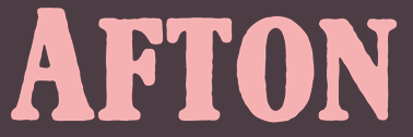 [More] ⦿
|
Silvio Napoleone
|
 Silvio is the Toronto-based designer of ITC Napoleone Slab (2001) and the Greek simulation font family ITC Medea (2003). He also published FF Hydra (2002), an extensive family. He graduated from the Philadelphia College of Art in 1993, and is currently working at Crescent Design Consultants in Toronto. There is a slight question as to whether ITC Medea was based on the source code of UnciTronica (Manfred Klein, AI, 1994). [Google]
[MyFonts]
[More] ⦿
Silvio is the Toronto-based designer of ITC Napoleone Slab (2001) and the Greek simulation font family ITC Medea (2003). He also published FF Hydra (2002), an extensive family. He graduated from the Philadelphia College of Art in 1993, and is currently working at Crescent Design Consultants in Toronto. There is a slight question as to whether ITC Medea was based on the source code of UnciTronica (Manfred Klein, AI, 1994). [Google]
[MyFonts]
[More] ⦿
|
Simeon out West Foundry
[Brett T. Johnson]
|
Brett T. Johnson (b. Loveland, CO, 1972) runs Simeon out West Foundry in Englewood, CO. He sells fonts based on ideas from Byzantine, Ge'ez and old slavonic scripts, and Eastern Orthodox manuscripts. Brett Johnson was born in Loveland, CO, in 1972. The creations: Typewriter Olympia SM8 (2016, based on old Olympia SM and SF typewriters fromthe 50s and 60s), Radonezh (2016, old Slavonic simulation font family), Simeon's Handwritten Blackletter (2008), Pseudo-Hellenic (2008, a Greek and Latin didone pair), Tiblisi (2008, a Georgian simulation face), Pentopolis (2008, based on an ancient Coptic script), Svati Sava (2008, a Serb-look font), Muscovite Manuscript (2005), Pravoslavnie (2005), Alexandria (2005), Alaskaya (2006), Svati Nikolai (2005), Thebes (2005), Suzdal (2005), Kniga Molitva (2005), Vladimir (2005), Scetis (2005), Adis Ababa (2008). Colonial Press (+Italic) (2008) is based on work by William Caslon I (1692-1766). Klingspor link. [Google]
[MyFonts]
[More] ⦿
|
Sofia Alejandra
|
Mexican designer of the Greek emulation typeface Leppardy (2017). [Google]
[More] ⦿
|
Stefania Lusini
|
Art director in Barcelona, who designed the straight-edged typeface Pajaro (2016). Behance link. [Google]
[More] ⦿
|
Stefie Justprince
[Crump Hand]
|
[MyFonts]
[More] ⦿
|
Steve Lenius
[Nelson Borhek Press]
|
[MyFonts]
[More] ⦿
|
Steve Matteson
|
 Rochester Institute of Technology's School of Printing graduate who lived in California and in Holland, MI, and now resides in Louisville, Colorado. He was a disciple of Chuck Bigelow and Kris Holmes. MyFonts page on him. In 1990, he started work at Monotype in Palo Alto to create the Windows truetype core fonts Arial, Times New Roman and Courier New. He stayed with Monotype and then Agfa/Monotype until 2003 (when he was probably fired, but that is only an unreliable guess), directing type development from the design office in Palo Alto, CA. Bio at Agfa/Monotype. He has directed branding projects such as Agilent Technology's corporate sans serif and Microsoft's corporate font family 'Segoe'. At the same time, he was involved in producing bitmaps and outline fonts for cell phones and TV set top environments. He has worked extensively designing Greek, Cyrllic, Thai, Hebrew and Arabic alphabets to satisfy the requirements of customers such as IBM, Microsoft, Nokia, Sun and Sybase. In 2004, he co-founded Ascender Corporation in Northbrook, IL, where he remained Type Design Director until Ascender was bought by Monotype, where he now heads the type design team (12 people in all, as of 2013).
 CBC interview in 2012. Fontspace link. FontShop link. At ATypI 2011 in Reykjavik, he spoke on typefaces for Android OS. His typefaces: - Amanda.
- Andale Mono (Monotype), Andale Mono (Ascender). This is a monospace sans-serif typeface designed for terminal emulation and software development environments. It was originally created by Monotype. Andalé Mono was first distributed as an Internet Explorer 4.0 add-on under the name Monotype.com. In version 1.25 of the font, it was renamed to Andale Mono, distributed with Internet Explorer 5. It is often used by programmers, and is bundled with Mac OS X.
- Andy (Monotype), his first face, a design based on a friend's lefty handwriting. Published at Agfa's Creative Alliance.
- Arimo (2010). A free sans family at Google Web Fonts that is metrically compatible with Arial. TeX support and further downloads on CTAN.
- Ascender Sans Mono (2004-2008, Ascender). Metrically compatible with Courier New. Ascender Serif (2005, 4 styles) is metrically compatible with Times New Roman.
- Ascender Uni Duo is a fixed-width comprehensive Unicode-compatible font available with support for the Unicode Standard. Ascender Uni Duo is a 39MB TrueType font with approximately 53,000 glyphs. The Latin and related glyphs (designed by Steve Matteson) are Sans Serif, with Gothic ideographs drawn in Japanese style, and complementary styles for other scripts. There are also versions of Ascender Uni that provide localized support for Korean, Simplified Chinese and Traditional Chinese. OpenType layout support is included for Arabic (initial, medial, final, isolate, and required ligature forms, as well as basic mark positioning), and vertical writing for CJK locales (consisting mostly of Latin, symbol, punctuation, and kana glyph variants). Character Set: Latin-1, WGL Pan-European (Eastern Europe, Cyrillic, Greek and Turkish), Chinese, Japanese, Korean, Thai, Vietnamese, Hebrew, Arabic. Ashley Crawford.
- Ascender Sans (Ascender).
- Ascender Serif (Ascender).
- Ayita (2006, Ascender), a decorative sans family co-designed with Jim Ford.
- Bertham Pro (2009, Ascender). Four styles including Open, after Goudy's Bertham.
- Bierstdat (2021). A sans typeface that could replace Calibri later in 2021 as Microdoft's go-to font in Microsoft 365 apps.
- Blueprint (1993).
- Binner Gothic (Monotype).
- Blueprint (Monotype).
- Cambria (Ascender).
- Carnero (2019, Monotype). Steve describes this sans family as a feisty hybrid of precise geometry and calligraphic flair.
- Chicory (2006, Ascender). A calligraphic script face.
- (2010). A free family at Google Code that is metrically compatible with Courier New. See also OFL.
- Creepy (Ascender Corporation): a Halloween font designed with Carl Crossgrove.
- Curlz (1995, Monotype). Done with Carl Crossgrove, based on wrought iron on chairs.
- Dempster (2016, with Jim Ford at Ascender). The original iangular industrial design, by Jim Ford, goes back to 2010.
- Droid Sans Mono Pro (Ascender), Droid Sans Pro (Ascender), Droid Serif Pro (Ascender). and Droid Sans Mono: a font family designed in 2006-2007 by Steve Matteson at Ascender for Google's Android project, mobile phone software for handsets. Free download at CTAN.
- Dujour (2005, Ascender): an art deco revival of the 1930's typeface Independant by Joan Collette and Jos Dufour for Plantin. Compare with the free Independant by Apostrophic Labs.
- Endurance Pro (2009, Ascender): neo-grotesque sans. Endurance Pro Cond (Ascender).
- Facade (Monotype).
- Fineprint (Monotype). A design loosely based on his own penmanship ("on a good day"). Another Creative Alliance face.
- Friar Pro (2009, Ascender): Friar Pro is a revival of Frederic W. Goudy's "Friar" typeface. Goudy described this typeface design as a 'typographic solecism' as it combines a lowercase of half-uncial forms from the 4th through 7th centuries with an uppercase of square capitals from the 4th century. Friar was originally designed in 1937 and used to print a Christmas keepsake produced by Goudy and printer Howard Coggeshall. The fire that burned Goudy's studio in 1939 destroyed the drawings and matrices before many metal fonts were cast. Of all that was lost in the fire, Goudy once said he missed Friar the most.
- Futura Now (2020: a 107-style family by Steve Matteson, Terrance Weinzierl, Monotype Studio and Juan Villanueva, that includes variable fonts as well as subfamilies called Text, Display, Headline, Inline, Outline, Shadow and Script).
- Georgia Pro (Ascender).
- Gill Floriated Caps.
- Goudy Fleurons (2010, Ascender).
- Goudy Modern MT (Monotype).
- Goudy Ornate (2002). Unsure if Matteson made this or Carl Crossgrove.
- Kennerley. Based on Goudy's Kennerley family.
- Kidprint (Monotype).
- Kootenay (2006, Ascender), a sans family.
- LeBeau (Ascender): a signage font.
- Liberation Mono, Sans and Serif (2007-2009, Ascender). A set of free open source fonts done for Red Hat Inc.
- Lindsey Pro (2006, Ascender): a cursive script based on his niece's hand.
- Louisville Script (2008, Ascender): ordinary handwriting.
- Massif (2006-2011, Monotype). Odd name, since Jean Joveneaux made a font called Massif in 1957. How can Monotype get away with a trademark for this is beyond me.
- Mayberry (2008, Ascender): a 14-font sans family with extremely large x-height and strange proportions. Mayberry semibold is free. Mayberry Pro (Ascender).
- McZee, a Microsoft symbols font.
- Miramonte Pro (2006, Ascender). A geometric-meets-humanist sans after the typeface Marsuv Grotesk by Stanislav Marso at Grafotechna, 1960.
- Open Sans (2010, Ascender). A free family by Steve Matteson. See also at Google Fonts. In 2021, he added the rounded companion, Open Sans Soft (20 styles).
- Overpass and Overpass Mono (2011-2019), designed by Delve Withrington, Dave Bailey, and Thomas Jockin. A free open source sans font. The design of Overpass is an interpretation of the well-known Highway Gothic letterforms from the Standard Alphabets for Traffic Control Devices published by the U.S. Federal Highway Administration in 1948. It was created for Red Hat Inc. Dedicated web page. Link at Delve Fonts.
- Newstyle. Based on Goudy's 1921 typeface, Newstyle. See also Newstyle (2018, Steve Matteson).
- Pericles Pro (2005, Ascender): an Ascender typeface based on the work of Robert Foster who created the original for American Type Founders in 1934), a 433-glyph OpenType font for Greek simulation or stone cut looks.
- Pescadero Pro (2005, Ascender),
- Pescadero Pro: a serif face.
- Rockwell Team (Ascender): an athletic lettering face.
- Rebus Script (2009, Ascender): done with Terry Weinzierl.
- Scooter Script (2009, Ascender): comic book style face.
- Segoe Chess (Ascender), Segoe Mono (Ascender), Segoe TV (1997-2004, Ascender: done for MSNTV).
- Tinos (2010). A free serif family at Google Fonts that is metrically compatible with Times New Roman. Download at CTAN, where one also finds TeX support maintained by Bob Tennent. Nerd Fonts patch.
- Tipperary eText (2012-2013), Monotype.
- Titanium Motors (2012, Monotype), Titanium (2006, Ascender): techno typefaces.
- Truesdell (1994, Monotype): a revival and extension of the "lost" Goudy types cut in 1931. Also at Creative Alliance. Also includes Truesdell Sorts.
- Tucker Script (2009, Ascender): ordinary handwriting face.
- Twentieth Century Poster (2002), an art deco display font straight from the late 1920s.
- VAG Rounded Next (2018, Monotype). Developed under the direction of Steve Matteson, this revival of the 1979 classic corporate font of Volkswagen AG has new weights and adds support for Greek and Cyrillic. The MyFonts site co-lists Tom Grace as designer.
- Verdorgia (2010): an ugly duckling.
Klingspor link. Fontspace link. View Steve Matteson's typefaces. [Google]
[MyFonts]
[More] ⦿
|
Stiggy & Sands
[Jim Lyles]
|
 Stiggy & Sands is the Arvada, CO-based type foundry of Brian "Stiggy" Bonislawsky and Jim "Sands" Lyles, est. 2013. Their first commercial typefaces, all jointly designed, are Sante Pro (2013, a tall upright connected script), Rum Raisin (2013, inspired by the lettering from a vintage Kellogg's Raisin Bran cereal box), Maiden Orange (2013), Luckiest Softie Pro (2013, a rounded comic book typeface that was inspired by hand-lettered vintage 1950s advertisement), Smokum Pro (2013, a Western typeface), Carioca Script Pro (2013, inspired by the lettering on the RCA Records Stereo Action Series in the 1960s), Uncial Antiqua Pro (2013), Spicy Rice Pro (2013: psychedelic or disco), Ultra Pro (2013: a Clarendon or wood style slab serif), Quintessential Pro (2013: calligraphic), Bruno Ace Pro (a techno/automoive font, followed in 2018 by Bruno Ace Pro Rounded), Aclonica Pro (2013), Special Elite Pro (grungy typewriter), Audiowide Pro (2013: organic techno face), Peralta Pro (2013: a bouncy cartoon font), Englebert (2013: inspired by the title screen of the 1930s film Der Blaue Engel starring Marlene Dietrich), McLaren Pro (2013: comic book style), Galindo (2013: a comic book typeface with square counters), Margarine Pro (2013), Righteous Pro (2013), Mouse Memoirs Pro (2013, cartoonish), Risque Pro (2013, funky style), Luckiest Guy Pro (a fat comic book font based on vintage 1950s ads), Original Surfer Pro (2013, an an offbeat sans serif font bursting at the seams with lively personality. Inspired by a vintage advertisement for the California Cliffs Caravan Park, this font exudes all of the fun of a summer vacation anytime of the year), and Marcellus Pro (a flared roman inscriptional typeface with both upper and lower case, originally published in 2012 by Astigmatic; CTAN page).
 Typefaces from 2014: Purple Purse Pro (an offbeat didone based on a vintage Ivory Soap ad from the fifties). Typefaces from 2015: Shojumaru (an oriental simulation font inspired by a movie poster for the 1957 film titled Sayonara, starring Marlon Brando), Sacramento (connected script), Bazaruto (a decorative set of typefaces inspired by wrought iron, Letters and Lettering by Carlyle and Oring, and didones), Maiden Orange Inline Pro. Typefaces from 2016: Syncopate Pro (unicase), Kapture (a great romantic script), Stint Pro (slab serif spanning condensed to expanded widths), Grand Hotel Pro (upright connected script), Ribeye Pro, Shojumaru Pro (oriental style), Freckle Face Pro. Typefaces from 2017: Dear Sans (rounded sans family), Glorious Song (a display serif typestyle that was inspired by the poster lettering for the 1948 movie Words and Music), Montez Pro. Typefaces from 2018: Croft (a revival of Lewis Buddy III's ATF classic, Roycroft, 1912), Navarone (a Greek simulation font inspired by the titling sequence of the 1962 movie "The Guns of Navarone"), Distressed Telegraph (based on the typewriter font Large Elite Type No. 44), Gimbel Script (a tall monolinear upright vintage script), Bigelow Rules Pro (a beatnik font), Eagle Lake Pro, Husk (a digitization and extension of a film typeface called Maile by LetterGraphics), Boilermaker (a digitization and extension of a film typeface from LetterGraphics dubbed Flair G100), Eagle Lake (calligraphic), Bruno Ace. Typefaces from 2019: Fascinate Pro (a soft-shelled art deco typeface), Artisinal (an art deco typeface that revives John W. Zimmerman's Cubist Bold from 1928). Modulate (a blocky modular typeface), Lorette (based on the film font Laurel from LetterGraphics), Quandor (based on the Lettergraphics film font Impacta), Magnate (a digitization of the film typeface Wilshire from LetterGraphics), Toastie (based on the film font Flair 312 by Lettergraphics), Latitude Sans (a heavy sans based on Lettergraphics' Free). Typefaces from 2020: Bugleboy (this font family revives and expands the film font Wood Grotesk by LetterGraphics), Berkshire Pro (a plump display typeface), Mervale Script Pro (a brush script originally done in 2012 at astigmatic One Eye). Typefaces from 2021: Huerto (a geometric angular sans), Pennyroyal Pro (an elephant feet font with irregular outlines), Pennyroyal (an elephant foot almost cutout font). Typefaces from 2022: Pardner (a hand-painted spaghetti Western font). MyFonts link. [Google]
[MyFonts]
[More] ⦿
|
Stone Type Foundry
[Sumner Stone]
|
 The Stone Type Foundry in Guinda (ex-Rumsey and ex-Palo Alto), CA, is Sumner Stone's outfit, which he founded in 1990. Born in Venice, Florida in 1945, Sumner Stone is a major designer, and creator of the Stone family. He studied calligraphy with Lloyd Reynolds at Reed College in Portland, Oregon, and then went to work for Hallmark cards as a lettering artist. In 1979, he became type director at Autologic, and in 1984, he became the Director of Typography at Adobe Systems (until 1989). His typefaces:
 - ITC Stone Sans (1992, Linotype), ITC Stone Sans II (2010, ITC), ITC Stone Sans (Adobe), ITC Stone Sans (ITC), ITC Stone Sans (Linotype). The ITC Stone family was co-designed by John Renner.
- Stone Phonetic (with John Renner, 1992).
- ITC Stone Informal (ITC), ITC Stone Informal (Adobe), ITC Stone Informal (Linotype).
- ITC Stone Serif (ITC), ITC Stone Serif (Linotype), ITC Stone Serif (Adobe).
- ITC Stone Humanist (2005, ITC).
- Stone Print (Stone Type Foundry, 1991). Designed for Print: America's Graphic Design Magazine.
- Magma II (Stone Type Foundry, 2014), Magma (2004), Magma Halo (2004) and Magma Thin (2009). These are extensive informal humanist sans text families that could be used as Greek simulation typefaces.
- Tuff (Stone Type Foundry, +Halo, +School, 2008-2009) started from his Magma. This flared informal typeface is slightly Greek in its vision, and has hints of Morris Fuller Benton's Souvenir, Stone's own ITC Stone Informal, and Dennis Pasternak's Maiandra.
- Munc (Stone Type Foundry, 2005). The uncial version of Magma. It has some Basque influences.
- Silica (Stone Type Foundry, 1993). A humanist slab serif.
- Arepo (Stone Type Foundry (1995). A modern text family related to his SFPL family developed for the San Francisco Public Library in 1999 and 2003.
- SFPL (Stone Type Foundry: minipage). Part of a new identity of the San Francisco Public Library.
- Sator (1995, Stone Type Foundry), Popvlvs (2010, Stone Type Foundry), Davanti (2010, Stone Type Foundry). Roman inscriptional typefaces.
- Cycles (Stone Type Foundry, 2004). Cycles comes in 7 optical scales: 5, 7, 9, 11, 18, 24 and 36pt, each in numerous weights and figure styles.
- Basalt (Stone Type Foundry). Basalt won an award at Bukvaraz 2001 and was first used for signage at the Cecil H. Green Library of Stanford University.
- Leaves + Straw (Stone Type Foundry). A dingbat font.
- Nvma Titling (Stone Type Foundry). Numa Titling is an Etruscan letterform used in centuries -7 through -3. While roman, it is runic and chiseled in appearance. See also Numaiota.
- Scripps College Old Style (Monotype, 1997). Scripps College commissioned his revival of Scripps College Old Style (1997, Agfa-Monotype), originally designed by Frederic Goudy. Compare with Richard Beatty's Goudy Claremont, another good revival of that family.
- From 1994-1995: ITC Bodoni Six (ITC), ITC Bodoni Twelve (ITC), ITC Bodoni Seventy-Two (ITC), ITC Bodoni Seventy-Two Std (Linotype), ITC Bodoni Seventy-Two (Linotype), ITC Bodoni Seventy-Two Pro (Linotype), ITC Bodoni Twelve (Linotype), ITC Bodoni Ornaments (ITC), Bodoni Display Figures. Based on Bodoni's original designs, there are 6, 12 and 72-point optical sizes. The family was developed under Stone's guidance who was partially aided by Holly Goldsmith (Six Roman), Janice Prescorescott-Fishman (Seventy-two Roman) and Jim Parkinson (Six Italic).
- Dignitas (2011). Commissioned by Hallmark.
At ATypI 2007 in Brighton, he spoke about The foundation of the humanist sans serif. As of 2008, his entire collection can be licensed for 20 computers in an educational lab for just 300 dollars. Scripps College pages. CV at Agfa. Bio at Linotype. Page at Emodigi. His lecture in 2007 on W.A. Dwiggins. PDF file of his work. Signature. 2012 Newyear's card. Interview by MyFonts in 2014. FontShop link. Klingspor link. View Sumner Stone's typefaces. Summary overview of Sumner Stone's typefaces. [Google]
[MyFonts]
[More] ⦿
|
Stuart Sandler
[Breaking the Norm]
|
[MyFonts]
[More] ⦿
|
Sumner Stone
[Stone Type Foundry]
|
 [MyFonts]
[More] ⦿
[MyFonts]
[More] ⦿
|
Tarcisio Benevides
|
Sao Paulo, Brazil-based designer of the Greek simulation typeface Kasibue (2015). He explains that it is actually influenced by the simplicity of Amazon tribes. Behance link. [Google]
[More] ⦿
|
Teknike
[Thoma Kikis]
|
 Thoma Kikis is a New York City-based graphic designer, photographer, filmmaker and entrepreneur.
 Typefaces from 2016: Ithaka (script). Publisher of these handcrafted typefaces in 2017: Anamorphic, Evangelos, Passagem, Privé, Qipao (momospaced felt marker pen font). Teknike also created Nautis (sans), Cycladic (sans), Vantagram (blackletter), Uny (slab serif perhaps for athletic lettering), Fugues (star-studded textured style inspired by organic geometry as apparent in the work of Antoni Gaudi; started in 2015), Jadeite (sans) and Designator (a squarish modular monospace font). Typefaces from 2019: Omoshiroi (a handcrafted monospace typeface), Cote (a hand-lettered monospace font), Penzance (a monospaced handcrafted typeface), Monadic (a monospaced textured typeface), Chartreux (a geometric monospaced display sans typeface), Originator (a squarish monospaced font family), Quantour, Prive (a display handwriting font). Typefaces from 2020: Receptor (a monospaced squarish typeface), Departe (a dot matrix font), Eleusis (monospace, all caps), UNY (slab serif). All his fonts cover Latin and Greek. Some cover Cyrillic and Hebrew too. Typefaces from 2021: Ermou (a Greek emulation typeface). [Google]
[MyFonts]
[More] ⦿
|
Tepid Monkey Fonts
[Brandon Schoepf]
|
Free original fonts by Brandon Schoepf at Tepid Monkey. The foundry closed its doors in July 2002, to be continued by The Typover Foundry, starting July 15, 2002. That site too seemed to have problems, so Typoasis took over in 2005. The list of typefaces: Abscissa, AbscissaBold, AbscissaBoldItalic, AbscissaItalic, AccidentalPresidency, Bedizen, Benegraphic (a handwritten Fraktur, 2001), CadmiumEgg, Caduceus, Charybdis, Dadhand, Discognate, DiscognateLight, Dotimatrix3, Dotimatrix5, Dotimatrix7, Dulethia (Greek simulation face), EagerNaturalist, EightyPercent, EightyPercentCaps, EightyPercentCapsOutline, EightyPercentOutline, ElectedOffice, ElectedOfficeOutline, ElectedOfficeOutline18118, FifteenOkay, FifteenOkaySlanted, Galaxy Monkey, Hipchick, Hoffmanhand, Jrhand, KetchupSpaghetti, LockedWindow, Medrano, Monoglyceride, MonoglycerideBold, MonoglycerideDemiBold, MonoglycerideExtraBold, Nauvoo, NegativeTuning, November (2001, pixel font), Opossum, Origami Mommy (2002, square outline font), Ponderosa, Ptarmigan, PtarmiganCondensed, PtarmiganCondensedItalic, PtarmiganItalic, Qhytsdakx (2001), RationalInteger (checkbook font), RepetitionScrolling, Scott, Stockstill (stencil font), Sujeta, Sujeta3D, SujetaBold, SujetaBoldItalic, SujetaItalic, SujetaOutline, Survivant, Transuranium (2001), Updike, VerticalTuning, Zig. Dafont link. Kernest mentions the name Brandon Schoech. [Google]
[More] ⦿
|
The Fontry
[Michael Gene Adkins]
|
 The Fontry is a Watts, OK, based outfit, est. 1992 by Michael Gene Adkins (b. 1965, OK) and James L. Stirling (b. 1964, OK): Digital type for computer-aided signmaking, with fonts designed for signmakers by signmakers.
 Since 2009, they have been producing various digitizations of alphabets designed by Alf R. Becker in the 1930s and 1940s. Gene Adkins designed ARB-187 Moderne Caps AUG-47 (2013, didone), ARB 85 Modern Poster JAN-39 (2011, after Modern Poster Script, 1939), ARB-70 (1995), ARB-67 (1998), ARB-66 Neon (2010, +Block, +Line), ARB-44 (1995), ARB-96 Jitter Display DEC-39 (1999), SCRIPT1 ARB-85 Poster Script Normal (2000), ARB-66 Neonline Block, ARB114 Hillbilly Roman JUN-41 Normal (1999), ARB-187 Moderne Caps AUG-47 CAS family (2009, a beautiful didone display face), the ARB 08 Extreme Roman AUG-32 CAS family (2009), ARB-218 Big Blunt (2010), ARB-218 Neon Blunt. Another product is the Wild Bunch Pak #3: Danthr Skal, Kastaka, Gas Bumps, Skrawl 613, Sharrpe Gothik, Levo Fraz, Kommerce, Stellar Spice, Infected Hurt. Wild Bunch Pak #2 (50 USD) has Marbles&Strings, Keetoowah, Peppermint, Ghixm (2008: a retrospective of the horror comics and movie posters of the 1960s and the 1970s), Klash, all outline fonts. In Wild Bunch Pak #1, look for Toxia. Race Pak #1 contains 5 chiseled fonts, including ARB67, Brannt Chiseled, Excursions, JLS Ultra, and Race Checkers. 50 USD. There are also Greek Pak #1 (12 Greek fonts for 25 USD, including GRK Orbit, GRK Universe City, GRK Albert, and GREK Bodnaut) and Signfaces Narrow Pak #1. At Garagefonts, Wild Larra, Wild Ruts, Wild Toxia, Wild Nobody families (1999), Jackport (2014, athletic lettering and Western typeface family). Adkins also designed the commercial font First Vision at GarageFonts in 1998. Review at &Type. List of the fonts on his CD. MyFonts sells FTY Garishing Worse (2011---there is a free version at Dafont), SCRIPT1 Team (2010), SCRIPT1 Toon (2010), SCRIPT1 Voodoo Script (1999-2009, signage script), What Sound Pounds (2009), WILD3InfectedHurtNormal (2010), WILD1 Firstvision (1997), WILD1 Larra (1997, grunge), WILD1 Nobod (1997, grunge), WILD1 Ruts (1997), WILD1 Toxia (1997) and the blackletter typefaces Ironhorse and Ironrider (2007), revivals of classic wood type typefaces. FontShop link. Some fonts are inspired by sign painter Frank H. Atkinson. These include the Broken Poster series done in 2010, FHA Modernized Ideal Classic (2011), and FHA Nicholson French (1999-2014: art nouveau). In 2008, The Fontry published the Greek Font Set, Copper Penny DTP (after Copperplate Gothic, but with lower case included), Droeming (an eerie family) and Earth A.D. (more eerie stuff, metallic, and with sharp serifs). It then generated a break-away subfoundry that carries fonts solely designed by James Stirling, Fontry West. Fontry West is located in Tulsa, OK. At MyFonts, these Fontry West fonts can be bought: Iron, WILD1 Firstvision, WILD1 Larra, WILD1 Nobody, WILD1 Ruts, WILD1 Toxia, WILD2 Ghixm, Greek Font Sets 1 and 2 (not Greek, only Geek-ish, made for fraternity use), and a large Comic Fanboy set which includes glyphs painted with stars and stripes (CFB1 American Patriot, CFB1 Captain Narrow, CFB1 Shielded Avenger, all made by Adkins). The CFB1AmericanPatriot family (2009), and the SCRIPT1 Rager Hevvy family (2009) are free here. JLS Overkill (2009, Bloque, Stencil, Grunge, Champion [athletic lettering], Hammer) is a sturdy family covering everything from SUV-strength stencils to grunge stencils and macho slab serif headline typefaces. After Disaster (2008), FHA Eccentric French Normal (2008, wood type after an alphabet created by Frank H. Atkinson in 1908), WHATSOUNDPOUNDS?Normal (2009) are free at Dafont. Sinder (2010) is a grunge face. FTY Konkrete (2010) is constructivist, and has a beveled weight. FTY Strategycide (2010-2018) is a similar severe headline sans family. Sinder (2010) and Demon Sker (2011) are free grunge typefaces. American Purpose (2011) is a grotesk family. American Purpose Casual and American Purpose Stripe (2011) are follow-ups. Garishing Worse (2011) is a casual bold face. Sharpe Gothik (2011) is hand-drawn. American Captain (2011, a manly retro squarish propaganda headline face; see also American Captain Patrius 02 FRE). Deathe Maach (2012) is a sturdy 6-style display family. Avengeance (2012) is a techno typeface. FHA Condensed French (2012, by Michael Gene Adkins and James L. Stirling) and FHA Nicholson French (1999-2014, art nouveau) are based on Frank H. Atkinson's examples. Typefaces from 2013: FHA Broken Gothic (a layered chiseled family done with James Stirling, based on Broken Poster by Frank H. Atkinson), FTY SKRADJHUWN (a flared family), Iron Man of War (with layering effects, +001Rivet), Iron Man of War 2 NCV, RACE1 Brannt (prismatic, beveled, art deco), FTY Skorzhen (mini-spurred), FTY Speedy Casual, FTY Skradjhuwn NCV (comic book family). Typefaces from 2014: FHA Tuscan Roman (2014, Michael Gene Adkins, James L Stirling), FTY Varoge Saro Noest. Typefaces from 2015: FHA Sign DeVinne (after a popular sign painting design by Frank H. Atkinson named after DeVinne). Typefaces from 2016: FTY Delirium (+Neon), Delirium NCV. Typefaces from 2017: FTY Galactic VanGuardian. Typefaces from 2021: Fty Old Sport (a slab serif athletic lettering font family, one of the best in this genre). Typefaces made by Fontry West. Typefaces by Mike Adkins. Fontspace link. Klingspor link. Dafont link. Abstract Fonts link. Creative Market link. [Google]
[MyFonts]
[More] ⦿
|
The PAP Type foundry
[Theod. Paraskevopoulos]
|
Major Greek type foundry, est. 1956, which reached its peak in the mid 1960s. Part of its 1964 type specimen catalog was republished in Hyphen (vol. 4(1)), 2003. They made 176 different Latin alphabets and even more Greek character sets. It was located in Athens and run by Theod. Paraskevopoulos. There are nice selections of Greek stone-cut style typefaces, script typefaces (Kerkyraika, Olympiaka), modern type (Neukro 1960, Perfekt), Egyptian typefaces, sans typefaces (Korinthiaka, Nettas, Iphigeneias), brush typefaces (Arcadia III), text typefaces (Pelasgika, Elzevir), fun display type (Byzantina, Aiolika Stena, Astoria, Orpheus, Greco 1100B), Western type (Epidaurou), caps display type (Nikes, Olumpic Leuka, Ioulias, Rodiaka, Bersaliana Stena), unicase (Athenaika) and typewriter type (Makedonika Leuka). [Google]
[More] ⦿
|
Theod. Paraskevopoulos
[The PAP Type foundry]
|
[More] ⦿
|
Thierry Puyfoulhoux
[Présence Typo]
|
[MyFonts]
[More] ⦿
|
Thoma Kikis
[Teknike]
|
[MyFonts]
[More] ⦿
|
Tiago Pereira
|
Graphic designer and typographer in Curitiba, Brazil. Creator of the beautiful unicase avant garde typeface Repo Type (2010), the Barnbrookish typeface Vicctoria (2010), and the Peignotian typeface RBSC (2010). Behance link. Another Behance link. He is credited with the free chisel font Nosewritten (2009, a Greekish typeface created without using any hands; see Unique Types). Behance link. [Google]
[More] ⦿
|
Tim Ryan
[Type Revivals (or: SourceNet)]
|
[MyFonts]
[More] ⦿
|
Timberwolf Type
[Lars Bergquist]
|
 Lars Bergquist is the Swedish type designer (b. 1936) who runs Timberwolf Type in Sollentuna, just outside Stockholm. Bergquist designed numerous successful text families and display typefaces, including the free Beryll typeface. In 2016, the collection moved over to (was bought by?) 3IP. Some offerings:
 - Old Style romans: Sarabande (1998; based on Jean Jannon's famous "Garamond" of 1621), Pavane (1998, based on a text typeface by Rudolf Koch), Philomela (2000, also at PsyOps), Montrachet (2002, Fountain: a garalde family), Monteverdi (Fountain: with Granjon's Plantin Ascendonica italic).
- Baroque/transitional: Leyden, Leyden News (PsyOps, 2000), Baskerville 1757 and Baskerville Caps (1998; winner of a Bukvaraz award in 2001, available at Type Quarry).
- New Style Romans: Millennium, Eleonora (1999), Prospero (1998, a didone family), Waldstein (2003, Fountain: a Scotch typeface).
- Sans typefaces: Millennium, Millennium Sans, Millennium Linear, New Millennium, New Millennium Sans and New Millennium Linear (2000).
- Display typefaces: Diorite (2005, a calligraphic angular family), Corsiva Italica (2003), Paracelsus (2003, Fountain: a modern version of Schwabach), Foliant Blackletter (German 15th C Textur), Zeppelin Bauhaus Gothic, Berserk Scandinavian runes, Escorial (at PsyOps), Paestum (2001, a Greek simulation family), Sekhmet (2000), Praetorian, Pressroom (2003), Proconsular, Palaestra (the latter three are inspired by informal, painted Roman wall writing), Triumphalis Caps (also inspired by Roman imperial inscriptions), Bucintoro (1999, a modern version of the rotunda blackletter), Midnight (2000; a neon light/ blackboard bold family), Karolin Fraktur (at Psy/Ops: Fraktur modeled after the Bible of King Charles XII, printed in Stockholm in 1703), Rococo Titling (2001, ornate titling caps based on work done by Jacques-François Rosart (1714-1777) and Pierre Simon Fournier (1712-1768), and the Renaissance family Ronsard (at PsyOps, 2000).
Some fonts are available at Fountain, Psy/Ops and Type Quarry. Bukvaraz gave him an award for Absolut Type, a classic Renaissance family, so I wonder if that is not the same as Baskerville 1757. Lars says that Absolute Vodka complained, so the type is sold by Psy/Ops as Aalborg (2002). He published Whitenights at Linotype in 2003. FontShop link. Klingspor link. [Google]
[MyFonts]
[More] ⦿
|
Total Font Geek
[Nate Halley]
|
Nate Halley (aka Total font Geek) is the creator of free fonts, mostly made with FontStruct. The handwriting typefaces were made with MyScriptFont. Typefaces from 2014: Casale Finale NBP, Mozart NBP (pixel face). Typefaces from 2013: Halleyvetica Neue NBP (hand-printed), Grishenko Opiyat NBP (inspired by Spaceport, House Industries), Cinema Gothic NBP (octagonal), NBP Readout, Dexter NBP, Roentgen NBP (pixel face), Super Thing NBP, On Strike NBP, Quantifier NBP, Voyager NBP (sci-fi face), Cellblock NBP, Klassiq NBP, Rosenkrantz (pixel face), Octapost (octagonal), Snare Drum One NBP, Meyer Gothic NBP (octagonal), Mindfuct NBP (squarish), Miranda NBP, Spire NBP (squarish), Casale Two NBP (pixel face), Kernel Panic, Sebastian Gothic NBP, Theorem NBP, Signus Digital Round (pixel face), Signus Bold, Saville Row NBP, Kernel Panic NBP, Guru Meditation NBP (pixel face), Mayfair NBP (pixel face), Calibration Gothic NBP Latin (pixel face), Mercutio NBP Basic (pixel family), Plutonium NBP (octagonal), Mr. DNA NBP, Mr. Kamikaze NBP, Kraftwagen Grotesk (inspired by DIN). The list of typefaces made in 2012: Astragal NBP (pixel face), Nine by Five NBP (pixel font), Lionel Micro NBP (pixel font), Brighton NBP (2012), Brighton Two (2012, +Sans, +Serif, +Gothika), Synchronizer NBP (pixel face), Blackpool NBP, Forty Seven NBP, Motorik NBP, Spyware NBP, Balthasar Regular (pixel face), Kensington Gothic NBP (sci-fi), Energy Dome NBP, Mushroom Kingdom NBP, Nintendo Dingbats NBP, Skyline Beach NBP (octagonal), Book Report, Stevenage NBP, Northside NBP (fat finger face), Please Don't Leave NBP, Raven Sans NBP (inspired by Bank Gothic), Raven Serif NBP, Grishenko Novoye NBP (+Cyrillic), Nintendo Dingbats NBP, Wensleydale Gothic, Dear Katie (hand-printed), Prospero NBP (pixel font for game consoles), Middle School Crush NBP, Kinderarten NBP, Class Project NBP, Aristotelian NBP (Greek simulation font), Akron NBP (Akron Sans NBP, Akron Serif NBP), Erbos Draco Nova NBP (dot matrix font), Shylock NBP (dot matrix face), JustAnotherDay NBP, Soo Bawlz NBP (athletic lettering font based on the logotype from the Hardcore Devo albums), Beautiful World NBP, Basil Gothic NBP, Halleyvetica NBP, HalleyScriptThin NBP, GradeSkooler NBP, GrishenkoNBP (rounded techno sans), Glasstown NBP, Kinishinai NBP (octagonal), Corporate Gothic NBP, Erbos Draco Monospaced NBP (dot matrix face), Smart Patrol NBP (pixel face), Recombo NBP (+Round), Zarbville NBP (pixel face), Weird Science NBP (sci-fi typeface), Sharp Objects NBP, Casale Micro NBP, Dilithium Pixels NBP, Casale NBP, One Time NBP, Schutzgitterhaus-Grotesk NBP. Fontspace link. FontStruct link. Another Fontspace link. [Google]
[More] ⦿
|
Type Revivals (or: SourceNet)
[Tim Ryan]
|
 Tim Ryan is a Thousand Oaks, CA-based type designer and font enthusiast, who has helped me out generously with font links in the 1990s. FontShop link.
 His fonts are distributed by ITF and Monotype and Precision Type. Font list: AES, AcmeTR, AdmiralTR, AlpineWhiteTR, AncientTextTR, AssayTR, August family, AutomationTR, BinnerGothicTR, BinnerTR, BlackboardLinedTR, BlackboardTR, BoboCapsTR, BonGuia, Bondage-Oblique, Bondage-Regular, BoomerangTR (1995, a typical art nouveau face), CameraStencilTR, CartoonPartyCapsTR, ChopinTR, CiviliteTR, ClaudiusTR, CollegeCapsTR, CoreDumpTR, DirectionTR, EclipseCapsTR, EngravedTR, ExpressTR, FlairTR, FrenchCapsTR, GabrielleTR, GaelicCapsTR, GoudyMediaevalTR, HelvinBlackTR, HelvinTR, HostessTR, KhayyamTR (Arabic simulation face), KiddoKapsTR, KleukensTR, LadyDawnTR, MaximeTR, ModTR, PencilCapsTR, PlayBlocksTR, SaltinoTR, SansPlateCapsTR, SchoolScript-Bold, SchoolScript (1994), SchoolScriptDashed, SchoolScriptLined-Bold, SchoolScriptLined, ShalimarTR (Indic simulation), ShalomTR (Hebrew simulation), SimplexTR, SpringtimeTR, SukiakiTR (Japanese simulation), SusieQTR, VarianteInitialsTR, WashingtonTextTR, XerxesTR (Greek simulation face, now at Monotype), SchoolOblique. Santa Barbara, CA-based SourceNet used to market school fonts, ca. 1992-1994, such as those listed above: SchoolScript-Bold, SchoolScript (1994), SchoolScriptDashed, SchoolScriptLined-Bold, SchoolScriptLined, but also DnealianCursive, DnealianCursiveLined, DnealianManuscript, DnealianManuscriptLined. [Google]
[MyFonts]
[More] ⦿
|
Typodermic
[Ray Larabie]
|
 Ray Larabie (b. 1970, Ottawa, Canada) ran Typodermic in Mississauga, ON, which opened in the Fall of 2001. In 2006, it moved to Vancouver, BC, and in 2009 it moved on to Nagoya, Japan. Dafont page. Ray Larabie has been making fonts since 1996, but those early fonts were freeware. His pre 2001 fonts are grouped under the label Larabie Fonts. In 2001, he set up Typodermic. Latest additions.
 The Typodermic fonts: - 2022: Biphoton (a monospaced sans with the same proporions as Letter Gothic 12), Valve (an industrial muffler shop font), Deception (a sub-pixel typeface with ten captivating effects---Deception Array (wide blocks), Deception Bars (text viewed through lenticular glass), Deception Blocks (as in heavy JPEG degradation), Deception Diamonds, Deception Lines (for a grayscale effect), Deception Particles, Deception Plusses, Deception Process (simulates grayscale LCD text or a thermal printer on the fritz), Deception Scanline (television picture tube text rendering), Deception System (1-bit dithering gone haywire)), Monofonto (a monospaced sans), Encercle Draft (permitting users to create numbers in borders), Encercle Sans, Heavy Heap (a groovy psychedelic typeface with a scorching look, reminiscent of 1960s hot-rod culture and die-cast toy vehicles), Ggx89 (a 48-style tightly spaced Swiss style sans family).
- 2021: Quadrillion (a 12-style rounded monoline sci-fi family), Mochon (a wall writing or chalk font based on the lettering of Donald Mochon, dean of the RPI School of Architecture until 1966; the Mochon samples were provided by an ex-student of Mochon, Karl A. Petersen), Steelfish Hammer (a subtly rustic version of Larabie's most popular typeface, Steelfish), Wavetable (sci-fi), Xyzai (an LED emulation font, described by Ray Larabie as a hardcore, Y2K-style techno typeface), Geoparody (a 12-style squarish typeface inspired by a late 1960s font called Anonymous), Typewriter Spool (122 fonts, modeled after the Underwood No. 5 typewriter font).
- 2020: Gravtrac (a 56-style condensed to crushed slab serif family inspired by mid-twentieth century classics like Univers 59 Ultra-Condensed, Helvetica Inserat and Compacta; +Greek, +Cyrillic), Vinque Antique (a rustic handcrafted blackletter in eight styles).
- 2019: Dealerplate (17 license plate styles for various states and provinces in the USA and Canada, current as of 2019; included are California, New York, New Jersey, Ohio, Illinois, Pennsylvania, Florida, Maryland, Michigan, Wisconsin, Massachusetts, Missouri, Washington, North Carolina, Virginia, Quebec, and Ontario), Kenyan Coffee Stencil, Good Timing, Steelfish Rounded, Bitcrusher (a consumer electronics / techno font), Galderglynn 1884 (a nineteenth-century style sans-serif typeface that exp[ands his Galderglynn Esquire).
- 2018: Cybermontage, Crack Man (a pac man font), Propaniac (a 1980s-style postmodern typeface inspired by a Pointer Sisters record sleeve which was designed by Shoot That Tiger Creative Services), Zelega Zenega, Spectrashell.
- 2017: Minicomputer (MICR style), Squirty, PCTL9600, PCTL4800 (retro techno), Ultraproxi (semi-monospaced and influenced by the high speed computer printers from the 1950s to 1970s), Toxigenesis (techno sans), Venus Rising, Vanchrome (a compact sans-serif headliner with chromatic layers), Krait (a layered geometric typeface designed for architectural display), Xylito (a layered font for chromatic or 3d effects).
- 2016: Refuel (octagonal, based on military aircraft markings), Expressway Soft (a sans-serif font family inspired by the U.S. Department of Transportation's FHWA Series of Standard Alphabets, also known as Highway Gothic), Conthrax (squarish, techno), Cornpile (cartoonish), Electric, Evensong (art deco), Fledgling (a very tall typeface), Gymkhana (sans), Remissis (sans), Sunday Evening (a reverse contrast typeface), Meloche (Meloche is a unique grotesque sans-serif typeface influenced by hand-painted French signs of the late nineteenth century. It's available in 7 weights and obliques).
- 2015: Canada 150 (a custom font for the Canadian government; see here, here, this coverage regarding the Inuktitut part of the font, and this reaction by the curmudgeons in Toronto who complain that Ray did this work for free), Autoradiographic (sans family), Built Titling (for compact headlines), Chickweed Titling (cartoon titling font), Cardigan Titling (flared headline face), Bench Grinder Titling, Kleptocracy Titling, Palamecia Titling (rounded black comic book typeface), Quasix Titling, Galderglynn Titling (all caps sans family from hairline to black), Mixolydian Titling, Stormfaze (a sci-fi font started in 1996 and finished in 2015), NK57 Monospace (a 60-style programmer typeface), Gargle, Athabasca (a sans family designed for the rugged Canadian oil patch).
- 2014: Mesmerize (a large free sans family), Kingsbridge (a large slab serif family with sharp points on the A, M, N, V and W), Manbow (a layered geometric art deco display font which includes solid, clear, stripe, polka-dot and screen patterns), Breamcatcher (an all caps art deco font inspired by the piano sheet music for With Every Breath I Take which was featured in the Bing Crosby/Kitty Carlisle musical comedy film, Here is my Heart), Kilsonburg (Dutch deco based on an old Vogue magazine cover), Uchiyama (poster typeface), Goldsaber (art deco design), Vexler Slip (unicase), Rakesly, Dacquoise, Pretender, Rimouski (a rounded geometric font family), Nulshock (techno), Recharge (techno/industrial font), Interrogator Stencil, Strange Alphabets (arts and cratfs font), Angerpoise Lampshade (free).
- 2013: Numbers With Rings, Shookup (funky cartoon font), Pastrami on Rye (cutout comic book style), Chickweed, Built (a condensed headline sans), Fluctuation (a softly rounded elliptical sans family), Astrochemistry (sci-fi, techno with rounded edges), Snasm (sci-fi).
- 2012: Engebrechtre (2000-2012), Die Nasty (1999-2012: free), Strasua (1999-2012), Planet Benson (1997-2012), Husky Stash (1998-2012), Barbatrick (1999-2012: a speed emulation font), Zero Hour (1997-2012), Urkelian (1998-2012: very condensed), Zolasixx (inspired by the video game Zaxxon), Ampacity (neon font), Chromakey (a space deco headline font inspired by box art classic video games including Matrix Marauders and Magical Chase), Disassembler (1980s style bitmap font), Zerbydoo (a dot matrix family), Superego (a geometric-techno font inspired by the cabinet graphics for the 1981 Stargate arcade game), Rukyltronic (a set of dot matrix typefaces), Nerdropol (pixel family), Gulkave (rounded pixel font), Cyclopentane, Palamecia (a fat finger poster face), Gameness (a 1990 retro industrial deco font), Camulogen (headline face), Color Basic (a pixel typeface inspired the by TRS-80 Color Computer), Triac Seventy One (a funky face), Acroyear (retro all-caps headline font), Troll Bait, Strenuous (unicase), Permanence (a retro=futuristic font based on Alvin Toffler's cover of Future Shok, 1970), Clockpunk (octagonal and quaint), Battlemaze (trekkie face), Mixolydian (industrial sans).
- 2011: Ugocranis (a brutalist typeface), Clipwave, Wheaton (MICR-inspired), Mango Scribble, TRS Million (dot matrix face), Ugogranis (constructivist), Gomoku (paper cut face), From The Internet.
- 2010: Cranberry Gin (2010, octagonal), Restore (all caps, geometric sans), From The Stars (an elliptical techno family done with Chikako Larabie), Thrusters (space age face), Dream Orphanage, Dream Orphans (2000-2012), Kengwin (rounded slab serif), Gleaming The Cube (Greek simulation face), Vectipede (a slab serif family), Great Escape (an elliptical sans family), Subrocs (connected script), Hackensack (with Chikako Larabie), Polarband (bilined stackable headline face), Naked Power, Special Forces (a great macho slab serif headline face---watch for awards to roll in), Warugaki (handpainted), Warmer, Honfleur (art deco; with Chikako Larabi), Voivode (a headline typeface done with Chikako Larabie), Hachimitsu (Asian look face, done with Chikako Larabie), Kadeworth (rounded retro look sans, done with Chikako Larabie), Gnuolane Jump (2010, with Chikako Larabie), Markerfield (brush), Board of Directors (Bank Gothic style family, done with Chikako Larabie), GGX88 (a Swiss sans family), Body Goat, Reversal, Gord (techno), Computechnodigitronic (LED, LCD geek-look font), Bench Grinder, Inklea (a bubbly face), Skygirls (retro brush script), Gloss (a paint brush typeface based on Champion, 1957, G.G. Lange), Galderglynn Esquire.
- 2009: Maqui (an industrial headline sans family), Zingende (art deco family: caps only), Misadventures, Gaz (large retro sans family), Acrylic Brush, Enamel Brush (a digitization of Catalina, 1955, Emil J. Klumpp), DDT (neutral sans), Thump (fat, casual), Desperate Glamour, Pricedown (an update of his free 1990s font, patterned after the lettering on The Price Is Right show), Mitigate (monoline and slabbed; has some typewriter styles), Catwing, Walken (slab serif stencil), Silicone (soft rounded sans family), Movatif (sans), Gunplay (a stencil family inspired by the poster for the 1972 Steve McQueen/Ali MacGraw film The Getaway), Fragile Bombers (octagonal), Forgotten Futurist (techno sans, 19 styles), Bullpen (slab serif), Coolvetica (35 styles), Duality, Good Times, Strenuous, Shlop (paint-drip style), Dirty Baker's Dozen (stencil), Junequil (VAG Rounded style), Owned (graffiti), Domyouji, Threefourtysixbvarrel (stencil), Enacti, Uniwars (futuristic, 16 styles).
- 2008: Madawaska (a rugged slab serif), Ebenezer (grunge), Gnuolane Stencil, Raincoat, Report School (avant garde sans), Jesaya, Carouselambra (art nouveau), Debusen (rounded), Barge (military font), Renju (2008, potato or rubber stamp print face), Otoboke (handlettered), Hit (informal hand), R6 D8 (futuristic sans family), Rexlia (an octagonal machinistic family), Hybrea (a display sans with TV screen rounding), Sweater School, Tussilago (2008, a neutral sans family), Presicav (extended sans), Hover Unit, Addlethorpe (grunge), Scheme (rounded sans), Usurp (bouncy poster lettering), Negotiate (technical sans family), Divulge, Sewn, Gnoulane (condensed sans), Moja, Teeshirt (old typewriter face), Pound (art deco marries grunge), Graveblade (heavy metal font), Synthemesc (psychedelic anti-Starbucks font), Chysotile (white on black grunge), Cardigan (sans), Gurkner (balloon style), Reagan (grunge).
- 2007: Tight (a copy of Dean Morris's 1976 Letraset chrome font Quicksilver), Headlight, Meloche (a 3-style grotesk), Octin Spraypaint (grunge stencil), Octin Vintage (grunge), Bouffant (script), Octin Prison (stencil), Octin Sports (octagonal), Octin College (octagonal, for sports jerseys), Octin Stencil (free octagonal font family), Burnaby Stencil (stencil), Superclarendon, Conceal, Ohitashi, Stud (grunge), Bristles (grunge), Skirt, Cotton (grunge), Kelvingrove (a bit of copperplate gothic, rounded and shaved), Augustine, Containment, Snowa, Veriox, Scrubby, Transmute, Sheaff, Injekuta (techno), Rinse (grunge), Polyflec, Domyouji (square sans), Winthorpe (old style), Cutiful (script), Flyswim (grunge), Dirtstorm (spray-painted stencil), Shnixgun (grunge), Neuzon (grunge), Oxeran (old typewriter), PRINTF (grunge all caps monospaced), Akazan (sans), Nyxali (a metal tag face), Nesobrite (25 styles of Bank Gothic lookalikes), Meloriac (a heavy headline sans inspired by Futura), Walnut (graffiti face), Gnuolane (a narrow superelliptical sans), Edifact (a damaged computer font), Darkheart, Stampoo (squarish), Raymond (rough script), Hayate (oriental look), Telephoto. The entire Octin series is free at DaFont.
- 2006: Octynaz (grunge), Paltime (ornamented), Jolie Ecriture Desard (children's hand), Mango (comic book face), Desard (child's hand), Bulltoad, Lerku (eroded serif), Charbroiled (also eroded), Ceroxa (eroded stencil), Nagomi (a chiseled-look Asian font based on calligraphy of Chikako Suzuki from Nagoya), Whiterock, Yellande, Chilopod (a futuristic typeface inspired by the logo from the 1980s videogame, Atari Centipede), Order, Goldburg (based on a typeface by George Bowditch, 1957), Laserjerks (2006, brutalist), Milibus (futuristic), Bonobo (serifed), Ohitashi, Sarasori (TV-tube shaped typeface in the style of Oban), Structia (an octagonal family), Betaphid (octagonal), Gendouki (futuristic stencil), Slugger (athletic lettering), Marianas (a gorgeous art deco face), Lineavec (octagonal), Corzinair (serif family), Buxotic (a great caps face), Cinecav X (for closed caption TV and DVD), Salsbury (comic book face), Lonsdale (loosely based on a font called Parkway Script, which was designed by Emil Hirt in 1964), Alepholon (futuristic), Kwokwi, Mikadan (a tribute to Stephenson Blake's Verona from 1948, which was in turn based on William Dana Orcutt's Humanistic from 1904), Marion (2012: a beautiful transitional family adopted as a standard Mac OS X font), Quasix (hookish), Skraype (grunge stencil), Bleeker (casual lettering), Linefeed (monospaced line printer font), Draculon (a casual typeface inspired by the letterforms of William Orcutt's humanist font from 1904 which was in turn based on an Italian manuscript from 1485), Mahavishnu (a mix between 1970s psychedelics and art nouveau), Doradani (a corporate identity sans family), Korotaki (futuristic).
- 2005: Beat My Guest, Kadonk (a Halloween face), Report (a VAG-Rounded style face), Croteau (a poster face), Heroid (ook face), Barrista (informal script), Wyvern (sans serif), Wubble (like puddles of water), Caryn (casual script), Folder (a rigid sans family), Venacti (a futuristic family), Xenara (a keyboard lettering family), Emory (a destructionist sans family), Ligurino (neat sans&serif family), Biondi (update of Copperplate Gothic; followed in 2010 by Biondi Sans; these copperplate style typefaces are in the style of AT Sackers), Byington (Trajan column lettering), Sayso Chic, Expressway (28 weights, a highway signage family), Algol (pixel type), Meposa (fat display face), Tandelle (condensed), Vigo, Maychurch, Mecheria, Vactic (dot matrix), Zosma, Topstitch, Windpower, Llandru, Soap (a creative extension of Cooper Black, with dingbats), Kleptocracy (1999-2005), Owned, Rimouski (sans), Burnstown Dam (2005, a wooden plank font), Sinzano (sans with opentype ligatures galore; compare, e.g., House Ed Interlock), Zamora.
- 2004: Affluent, Threefortysixbarrel (stencil face), Tank, Telidon (dot matrix face), Funboy, Neuropol X, Neuropol Nova, Mufferaw (comic book face), Larabiefont, Zekton (techno), Strenuous 3D, Silentina (advertised as "a silent movie font"), Amienne (brush script), Fenwick Outline (free), Betsy Flanagan (1998, a keyboard face), Boopee (children's handwriting), Pirulen (in the general Bank Gothic style), Zalderdash.
- 2003: Zupiter, Blue Highway.
- Before 2002: the dot matrix family Telidon, Telidon Ink, Butter Belly, Almonte (1999), the architectural font Jillican (octagonal), Snowgoose, Bomr, Pakenham, Neuropol, Nasalization, Fenwick, Kleptocracy DLX, Sui Generis, Dirty Bakers Dozen (faded stencil), Minya Nouvelle, Asterisp, Chinese Rocks, Jillsville (great artsy Courier), Ulian, Wevli (including Wevli Dingbats), Sappy Mugs (funny mugshots), Sofachrome (1999, inspired by Pontiac car emblems), Eden Mills (1999).
MyFonts interview. Fontspace link. Fontspring link. Catalog of the typefaces in the Larabie Fonts collection. Klingspor link. Catalog of the Typodermic library in decreasing order of popularity. Extensive (large page warning) Typodermic catalog. Font Squirrel link. Creative Fabrica link. Fontsquirrel link. Fontdaily link. [Google]
[MyFonts]
[More] ⦿
|
V. Sarela
[Yautja]
|
 [More] ⦿
|
Vic Fieger
[Xaviera Comics]
|
 [MyFonts]
[More] ⦿
[MyFonts]
[More] ⦿
|
Vladimir Nikolic
|
 Belgrade, Serbia-based designer (b. 1981) of these typefaces:
 - The dingbat fonts Canavarlar (2020: funny men), Haircut (2020: women's hairdos), Ornament Borders (2020), Gourdy (2020: birds), Lizards (2020), Mantra (2020), All Star (2020), Speel (2020), Soavely (horses) (2020), Forma (2020), Hell Beasts (2020), Mistresses (2020), Paraiso (2020), Crow (2020), Traverser (2020: crosses), Cats (2020), Dogs (2020), Negative-Heads (2020), Otu (2020), Wakazi (2020), Risk (2020), Wurm (2020), Beard Man (2020), Hoder (2020), Damen (2018), Damen 2 (2020), Foliga (2020), Solo Drinker (2020), Congress (2020), Farmacy (2020), Elections (2020), Emergency (2020), VN Arrows (2020), Hexagonos (2020), Automobiles (2020), Cars (2020), Emoji Boom (2020), Bestia (2020), Aliens (2020), Insect (2020), Bytost (2020), Monstero (2020), Aveto (2020), Dancing Cat (2020), Atradimas (2020), Womanhood (2020), Figur (2020: an alien insect font), Halfwits (2020), Silly Donkey (2020), Crazy Monkey (2020), Round Masks (2020), The Quick Dog (2020), Flying Birds (2020), Maskid (2020), Monstra (2020), Bull Skulls (2020), War Items (2020), Public Transport (2020), Loomad (2020), Mokhabiso (2020: African patterns), Record (2020), Mulher (2020), Heroez (2020), Bulls (2020), Madarak (2020: birds), Bold People (2020), Munari (2019: a collection of drawings based on Bruno Munari's book "Artista e designer" from 1966), Screws (2019), White Mouse (2019), Schepselen (2019), Glatze (2019), Crosses (2019), Chefs (2019), Diamond Blocks (2019), Hexagons (2019), Maumbo (2019), Circles (2019), Enfeite (2019), Pigs (2019), Mythos (2019), Kreaturen (2019), Baby Alien (2019), Body Moving (2019), Various Boys (2019), Lines and Objects (2019), Mouvman (2019), Watch (2019), Credit Card (2019), Cycles (2019), Devil Emoji (2019), Fare (2019), Mund (2019), Labbra (2019), Circular Ornaments (2019), Cranium (2019), Ugok (2019), Ansigter (2019), Tsim (2019), Schmetterlinge (2019), Jungfrau Maria (2019: religious icons), Knights Helmets (2019), Kinderskizzen (2019), Wolves (2019), Various Cats (2019), Owls (2019), Spiral Object 3D (2019), Zodiac Signs (2019), Cyborg (2019), Duck (2019), Cat 3D (2019), Object 3D (2019), Circle and Line (2019), Various Girls (2019), Dulcet (2019), Erotic Symbols (2019), Frauen (2019), Pierre the Vampire (2019), Robotter (2019), Middle Finger (2019), Claudio The Cat (2019), Medusa (2019), Veggie (2019), Pablo (2019), Fishes (2019), Dream of Picasso (2019), Stam (2019), Animality (2019), Ink Drops (2019), Faces (2019), Bayan (2019), Froggy (2019), Senhoras (2019), Diamondo (2019), Skallen (2019: skulls), Swimmers (2019), Churches (2019), Easter Icons (2019), Lippen (2019), Gullar (2019), Bankwesen (2019), Creatures with Horns (2019), Vehicles (2019), Various Hands (2019), 3D Animals (2019), Abantu (2019), Herr (2019), Menge (2019), Funny Aliens (2019), Mustachos (2019), Kids Drawings (2019), Tierfarm (2019), Troep (2018), Women Heads (2018), Cats and Dogs (2018), Wanita (2018), Eyez (2018), Animales (2018), Peoples (2018), Mobile Icons (2018), Controllers (2018), Womano (2018), Lost in Space (2018), Blumen (2018: flowers), Tetriso (2018), Snowflake (2018), Meine (2018: masks), Horoscopicus (2018), Esoterica (2018), Astrologicus (2018, astrolical symbols), Abbild (2018: African masks), Being (2018: monsters), Gebell (2018), Headed (2018), Falter (2018), Filling (2018), Anichka (2018), Cyclopia (2018), Buggus (2018), Opa (2018), Messe (2017), Head of Idol (2018), Diavolo Nero (2017: funny silhouettes).
- The boxed or encircled alphabets Audience Capitals (2020), Galileo (2020), Compare (2020), Compare-Light (2020), Hexagonas (2020), Select (2020), Before (2020), Before-Dark (2020), Boxes (2020), Boxes-Extravagant (2020), Boxes-Fancy (2020), Calf-Negative (2020), Capital-Relationship (2020), Pyxidas (2020), Capitalica (2020), Tundra (2020), Ordinary Capitals (2020), Broadway Capitals (2020), Browser Capitals (2020), Capitalismo (2019), Schwarzenberg Capitals (2019), Retrospective Capitals (2019), Official Capitals (2020), Impression (2020), Oriental (2020), and Letters in Circles (2018).
- Shadowed caps: Cleopatra (2021), Farmers Market (2021), Erkekler (2021), Assignation (2021), Greek Tragedy (2021), Distorted (2021), Lightshow (2021), Credenza (2021), Ragusa (2021), Comunismo (2021), Scordia (2021), Gazelle (2021), Organ (2021), Strizhi (2021), Umoya (2021), Ninja Justice (2021), Unlimited (2021), Unicorns (2021), Labyrinth (2021), True Artisans (2021), Poker (2021), Donald (2021), Ferrari (2021), Booster (2021), Madness (2021), Favorita (2021), Vitamin (2021), Robot (2021), Robust (2021), Engine (2021), Whether (2021), Nucleus (2021), Trunk (2021), Ombre (2021), Viscosus (2021), Jewelry (2021), Verge (2021), Pursue (2021), Keener (2021), Visor (2021), Korvo (2021), Squash (2021), Scum (2021), Darker (2021), Education (2021), Cimice (2021), Tomb (2021), Bambola (2021), Calla (2021), Rump (2021), Complex (2021), Razor (2021), Driveller (2021), Karambol (2021), Princino (2021), Berger (2021), Adopted (2021), Bugbear (2021), Samara (2021), Talisman (2021), Waterway (2021), Megabus (2021: a marquee font), Roller (2021), Numerica (2020), Bond (2020), Gloom (2020: a marquee font), Chalkboard (2020: sketched), Unboxing (2020: techno), Antennas (2020), Secca (2020), Umfo (2020), Sabbia (2020), Squirrel (2020), Byzan (2020), Debtor (2020), Bridge (2020), Familie (2020), Lake (2020), Roma (2020), Tissue (2020), Bombay (2020), Osteology (2020), Restroom (2020), Speaker (2020), Bebika (2020), Center (2020), Gismo (2020), Fierce (2020), Gambler (2020), Afterparty (2020), Birdbrain (2020), Boner (2020), Divine (2020), Gelatin (2020), Lost (2020), Marshland (2020), Quadri (2020), Shadow (2020), Stairs (2020), Superba (2020), Techno (2020), Underman Book (2020), Wired Capitals (2020), Fineliner (2020), Fictive Kinship (2020), Exotica (2020), Ural (2020), Devianza (2020), Kultur (2020), Unmute (2020), Antiqua (2020), Chains (2020), Scheme (2020), Stumble (2020), Aroma (2020), Beans 2 (2020), Cover (2020), Cronica (2020), Fundament (2020), Horna (2020), Loce (2020), Mademoiselle (2020: art nouveau), Melodia (2020), Penny (2020), Taikun (2020), Assault (2020), Athletica (2020), Baraka (2020), Brassica (2020), Builder (2020), Chancellery (2020), Gwara (2020), Pliez (2020), Recinzione (2020), Right (2020), Rimes (2020), Seal (2020), Service (2020), Scorpions (2020), Terraces (2020: American flag font), Wedding Cabbage (2020), Wild Girl (2020), Tragedy (2020), Indos (2020), Starfish (2020), Vintage (2020), Adriatica (2020), Funeral (with American flag texture) (2020), Voleur (2020), Calzino (2020), Peshkop (2020), Metzger (2020), Asshole (2020), Puppet (2020), Broeksel (2020), Hals (2020), Escort (2020), Vortex (2020), Dades (2020), Boild Hedgehog (2020), Mermer (2020), Grower (2020), Rainbow (sketched) (2020), Baise (2020), Necklace (2020), Angels (2020), Smuggler (2020), Dommage (grungy) (2020), Squalor (2020), Fusto (2020), Course (2020), Fisheye (2020), Baiser (2020), Banda (2020), Cantaloupe (2020), Canto (2020), Begriff (2020), Trapeze (2020), Arabeska (2020), Silver (2020), Wasco (2020), Kosaken (2020), Triangle (2020), Banquet (2020), Demode Capitals (2020), Cultus Capitals (2020), Idiot Capitals (2020), Granary Capitals (2020), Liberta (2020), Montblanc (2020), Granary (2020), Blanket (2020), Tuyaux (2020), Wolf (2020), Comeback (2020), Oliba (2020), Idiot (2020), Trailer (2020), Bricks (2020), Toys (2020), Luxury (2020), Hertz (2020), Signal (2020), Serenada (2020), Kurven (2020), Schnecke (2020), Mona (2020), Sierra (2020), Search (2020), Tranchante (2020), Eccentric (2020), Fast (2020), Mosquito (2020), Speed-of-Light (2020), Thanks (2020), Album (2020), Boyhood (2020), Ending (2020), Trend (2020), Universal-Serial-Bus (2020), Fixed (2020), Kings (2020), Holiday (2020), Range (2020), Numbers (2020), Shipman (2020), Officer (2020), Video (2020), Order (2020), Route (2020), Cosa-Nostra (2020), Clowns (2020), Unique (2020), Voyeur (2020), Shape (2020), Brigadier (2020), Allora (2020), Spartacus (2020), Advisor (2020), Ambis (2020), Cables (2020), Genesa (2020), Horse (2020), Laptop (2020), Pork (2020), Mafioza (2020), Mucho (2020), Athens (2020), Audience (2020), Rotor (2020), Mundo (2020), Olympus (2020), Border (2020), Scale (2020), Survival (2020), Trouble (2020), Turnabout (2020), Catharsis (2020), Parade (2020), Discoteque (2020), Rude (2020), Fame (2020), Safran (2020), Ausweis (2020), Mechanica (2020), Moscowian-Party (2020), Beers (2020), Strengthen (2020), Tempo (2020), Unreal (2020), Poetico (2020), Bach (2020), Bach-Fat (2020), Energy (2020), Alexandra (2020), Basket (2020), Cushion (2020), Model (2020), Organiser (2020), White (2020), Anabela (2020), Cannibal (2020), Casablanca (2020), Castle (2020), Control (2020), Crazy (2020), Crazy-Gradient (2020), Emotion (2020), Honey-Bunny (2020), Knockout (2020), Linearo (2020), Murmure (2020), Polished (2020), Reon (2020), Sparrow (2020), Storms (2020), Street-Stars (2020), Franchise (2020), Pencil (2020), Ruanda (2020), Pepito (2020), Megalomania (2020), Rouleaux (2020), Frozen (2020), Together (2020), Saldo (2020), Museum (2020), Network (2020), Hunk (2020), Cultus (2020), Creator (2020), Flow (2020), Blocchi (2020), Possession (2020), Bad Germans (2020), Discounted (2020), Traversal (2020), Mangalica (2020), Murmansk (2019), Summer Candy (2019), Question (2019), Second Channel (2019), 3D Models (2019), Memory (2019), Computer (2019), Diversity (2019), Elastic Letters (2019), Businessman (2019), Kuchen (2019), Demode (2019), Objective (2019), Medication (2019), Nonsense (2019), Plagiat (2019), Toledo (2019), Tricks (2019), Common (2019: a trompe-l'oeil font), Mafia (2019), Releases (2019), Extradition (2019), Shoot To Kill (2019), Groowing (2019), Enough (2019), President (2019), Silence (2019), Dressed (2019), Already (2019), Hocus Pocus (2019), Password (2019), Ready (2018) and Messages (2017).
- The ornamental caps typefaces Mahal (2021), Stamp (2021), Hell Door (2021), Tangram (2021), Custom (2021), Remake (2021), Studio (2021), Adagio (2021), Oxidizer (2021), Mondial (2021), Paraglide (2021), Tattoo (2021), Developer (2021), Dama (2021), Lobby (2021), Gabaritos (2021), Sence (2021), Ombre (2021), Cresa (2021), Anniversary (2021), Wire (2021), Triton (2021), Lamina 92021), Hangup (2021), Years (2020), Dowry (2020), Sephora (2020), Jewels (2020), Straightforward (2020), Dance (2020), Necklace (2020), Maria (2020), Taxi2 (2020), Outlaw (2020), Combat (2020), Chewed (2020), Fantasy (2020), Observation (2020), Cure (2020), Pioneer (2020), Near (2020), Kleid (2020), Unitas (2020), Tomato (2020), Blader (2020), Canal (2020), Baked Snails (2019), Alcoholic (2019), Bonjour (2019), Zylinder (2019), Phenomenal (2019), Surfaces (2019), Success (2019: as in De Stijl), Retailer (2019: multilined), Havana (2019: multilined), Mechanismo (2019) and Pencil Letters (2019).
- The display typefaces Trader (2020), Oysters (2020), Furious Ride (2020), Portfolio (2019), Pontos (2019), Swordsman (2019), Regular (2019), Andrey (2019), Retrive (2019), Connected (2019), Locator (2018), Tracking (2018), Iceberg (2018: snow-capped letters), New Amsterdam (2018), Ana (2018), Enemy (2018), New Yorkers (2018), Happy Day at School (2018), Focused (2018), Modish (2018), Beholder (2018) and Principality (2017).
- The alphadings Birthdays and Parties (2021), Bahanalia (2020), Icecreams (2020), Brailler (2020), Night Dreams (2020), Flower Capitals (2020), Jingle Bells (2020), Neuron Capitals (2020), Easter Time (2020), Hearts and Arrows (2018), Penguins (2018), Kitties (2018), Doggy (2018), Teddy Bears (2018), International Capitals (2018), Aafia Capitals (2018), Answer Capitals (2018), Beholder Capitals (2018).
- The circuit font Simple Repairs (2021).
- The 3d typefaces Sharp (2021), Edited (2021), Three Dimensions (2020), Rental (2020), Shiny Blocks (2020), Turbulence (2020), Labor (2020), Worship (2020), Fantasy-3D (2020), Zucker (2020: stacked blocks) Perfetto (2020), Rude-3D (2020), Lover (2020), Kasten (2020), 3D Models (2019), Tricks (2019) and Metallic (2019).
- The multiline typefaces Yiphi (2021), Porker (2020), Formula (2020), Laguna (2020), Hypochondria (2020), Majestic (2020), Vibes (2020), Tubes (2020), Yogurt (2020), Turkish (2020), Question (2019), Pancake (2019), Remained (2017), Liquidrom (2018), Second Channel (2019), 3D Models (2019), However (2019), Confarreatio (2018) and Fudged (2018).
- The textured typefaces Incompetent (2021), Autumn (2021), Sangria (2021), Studio (2021), Kino (2021), Elixir (2021), Espace (2020), Mistress (2020), Heritage (2020), Silicone (2020), Hornettio (2018), Ignorant (2018), Americans (2020: the American flag embedded into the glyphs), Pollution (2020), Jakob (2019), Diversity (2019), Townscape (2019), Patriotic (2019: American flag theme), Meshes (2018), Complained (2019), Duration (2018) and its solid counterpart, Duration Book (2018).
- The Slavonic emulation typeface Russian Land (2017) and the Cyrillic emulation typefaces Monarch (2021), Cold War (2021), Beograd (2020), Ukrainian Princess (2019), Territory (2019), Kalinka (2019), Rubles (2018), Maniac (2018), Jurij (2018), Kachusha (2018), Soviet Program (2018), Armenia (2017), Fontograd (2018) and Russian Spring (2017).
- The constructivist typefaces Tokarev (2017), Russiano (2018), Suggested (2018), Hungaria (2018) and Schwachsinn (2018).
- Art deco typefaces: Cavalier (2021), Performer (2021), Angelica (2019), Protocol (2019), Retrospective (2019), Leculier (2018, after an alphabet in Georges Leculier's art deco lettering book from ca. 1930), Better (2018), Critical (2017).
- Art deco caps: Reverse (2020), Bathroom (2019), Idiotism (2019).
- The chess fonts Schach (2020) and Wisdom Chess (2020).
- The weather icon font Weather Symbols (2020).
- The decorative sans typefaces Shock (2021), Energia (2021), Pitviper (2021), Nemesis (2021), Addiction (2021), Nehad (2021), Chewer (2021), Nightfall (2021), Gourmet (2021), Flipside (2021), Layered Letters (2019), Imbecile (2019), Answer (2018), Hours (2018), Abandoned (2018), Sea Gardens (2017), Forvertz (2018), Yeysk (2018) and Closeness (2018).
- Sans: Wollicht (2021), Ministro (2021), Lonely (2021), Noix (2021), Messina (2021), Samara (2021), Rickrack (2021), Broadcaster (2021), Catamaran (2021), Official (2019).
- Comic book fonts: Reset (2021).
- Artsy fonts: Hornstick (2021), Kikundi (2021), Shanghai (2021), Skewed (2021), Company (2021), China (2020).
- The headline sans typefaces Finance (2020), Marija (2020), Fashion (2020), Magazine (2020), Policemen (2020), Impressum (2019), Educated Deers (2019), Hindenburg (2019) and Fixation (2018).
- The rounded organic sans typefaces Hofmann (2020), Adelino (2020), Available (2018) and Biysk (2018).
- The handcrafted typefaces Diana (2020), Flood In London (2019), Milord (2018), Sex and Breakfast (2018), Sweet Handwrite (2018), Industrial Revolution (2018), Oh Maria (2017), Sofija (2017) and Travelling (2017).
- The bubblegum typefaces Roller (2020), Jellies (2020), Designero (2019), Bubblicious (2019) and Icecreamer (2017), and its oily companions Gummy (2018) and Liquid (2018).
- The heavy deco typefaces Guest (2019), Bigger (2018), Hours (2018), Intransitive (2018: Dutch deco), Theatrical (2017) and Consequences (2017).
- The beveled fonts Iron (2020), Rising (2020), Novgorod (2020), Troy (2020), Fake Hope (2019), Diamond Ring (2019), Playback (2018) and Member (2018).
- The starred caps typefaces Farmers Market (2021), Donald (2021), Citizen (2021), Wizard (2021), Adrenaline (2021), Diabolo (2021).
- The stencil fonts Browser (2019), Serbia (2019), Belgrado (2019), Further (2019), Generals (2018), Mayor (2018) and Olga (2018).
- The semi-stencil all caps typefaces Restaurant Menu (2019), Queen Dea (2019), Latest (2019) and Large (2019).
- The fat rounded sans typefaces Guest (2019) and Subscribe (2019).
- The Western fonts Newlywed (2020) , Tombola (2019), Permission (2019), Alexander (2019), Retrosonic (2019), Kasplysk (2019).
- The experimental typeface Typo Layer (2019).
- The German expressionist outline typeface Robert (2018).
- Current Moment (2019): a digitized "Zuccini" plate by Frits Jonker.
- The LED fonts Remaster (2021), Ringing (2022), Gigabytes (2020), Error (2020) and Technology (2018).
- The octagonal athletic lettering fonts Academy (2021), Junk (2020), Barbara (2019), Soccer (2020), and Soccer League (2018) and the outlined athletic font Onderneming (2018).
- Leculier (2018). After an alphabet in Georges Leculier's art deco lettering book from ca. 1930.
- The speed fonts Live News (2020) and Speed Racing (2019).
- Essere (2018).
- The squarish typefaces Archipelago (2021), Haine (2020), Augsburg (2020), Legionary (2020), Cyber Princess (2019), Professor (2019), Layers (2018) and Cataclysmo (2017).
- Driving Around (2018).
- The decorative floral caps typefaces Floral Capitals (2018) and Narcissus (2018).
- Gradientico (2018). A textured didone.
- The Greek simulation font Meteora (2018).
- Griddy Blocks (2018) and Blocky Letters (2018).
- Decorattio (2018).
- Ordinary (2018) and Mina is Gone (2018).
- The trilined typeface Trio (2017).
- The connected handwriting typeface Eric's (2016).
- The military typefaces Login (2018), Commanders (2017) and Hunt (2017, after an alphabet by the Hunt Brothers in their 1930s book Lettering of Today).
- The neon typeface Bubble 3D (2017), and the neon and shadow font family Magia (2019).
- Schaeffer (2017). A revival of the famous multiline typeface Fatima (1933, Karl Hermann Schaefer).
- The grungy typefaces Horizont (2020), Cosmas (2020), Drunk Millionaire (2019), Leave No Fingerprints (2018), Haziness (2017) and Victorious (2017).
- The molecular typeface Neuron (2019).
- The inline caps typefaces Panther (2021), Africa (2021), Look (2019) and Speed (2019).
- The inline typefaces Green (2020), Bernard (2020), and Games (2017).
- The display serif typefaces Kandinsky (2021), Funia (2021), Army Guys (2021), Hoodie (2019).
- The marquee typefaces Squad (2021), Grotto (2021), Megabus (2021), Plagiat (2019), Dropped (2019), Casino (2018) and Chicago (2018).
- The layerable marquee font Rockefeller (2018).
- Movie fonts: Film Letters (2018).
- The outlined typeface Important (2018).
- The white-on-black typeface Circusant (2019).
- The didone typeface Vogue (2018).
- The geometric solid typeface family Ivan (2019).
- The geometric sans typeface Occupied (2017).
- Rise of Kingdom (2017).
- Cartoonish (2017).
- Hesitation (2017). A rounded handcrafted poster font.
- Leben and Leben Shadow (2018).
- Braillenum (2018).
- The condensed grotesks Around (2020), Heinrich (2019) and Schwarzenberg (2019).
- Schreibmaschine (2017). A dusty old typewriter font.
- The vintage initial caps typefaces Nautiica 3d (2018), Fantasy Capitals (2018) and Herne Capitals (2018).
- The Arabic emulation typefaces Bayram (2020) and Sinbad (2018).
- Herne (2018).
- Passage (2018).
- Knotty (2018).
- The Mexican style font Mexicanera (2018), Dilemma (2018: Mexican Calavera skulls), and Mexican Tequila (2018).
- The techno typefaces Flight 21 (2019), Cyber Princess (2019), Passionate Relationship (2019), Neighbor (2018), Bombardment (2018) and Leprosy (2018).
- The avant-garde typeface Typolino (2018).
- Regensburg (2018).
- The ultra-fat typefaces Crime (2020), Owners (2018) and Housebreak (2019).
- The prismatic typefaces Jumble (2020), Boogie Woogie (2019), Running (2019), Bigger Italic (2018; based on Bigger Book), Linerine (2018) and Cosmology (2018).
- Failed (2018).
- The codex typefaces Grille (2020), Compass (2020) and Measurements (2018).
- Damages (2018).
- The circle-themed fonts Sparks (2020) and Condition (2018).
- The textured typefaces Mitesser (2020), Object (a meshed font) (2020), Noisy Walk (2020), Brightness (2020), Mistress (2020), Heritage (2020), Silicone (2020), Hornettio (2018) and Ignorant (2018).
- The oriental simulation fonts Dasvidaniya Book (2020), Pearl Harbor (2020), Chinese Dragon (2019), Sudoku (2019), Hiroshima (2019) and Kamikaze (2018).
- Monograms: Quintete (2020), Formogram (2020), Diamond Monogram (2020), Ribbon-Monogram (2020), Bulged Monogram (2020), Monogramus (2019), Blocky Monogram (2018) and Monograma (2018).
- Blackletter: Bramble Princess (2021), Drunks (2021), Cosmopolite (2020).
- Fists: The-Point (2020).
- Scanbats: Retro-People (2020), Vladimir (2019: Putin scanbats), Portraits de Femmes (2019: scanbats), Notre Dame and Notre Dame de Paris (2019: scanbats), Hollywood Actors (2019: scanbats), European Leaders (2018: scanbats), Trumpolina (2018: Trump scanbats).
- Word fonts: Black-Lives-Matter (2020).
- Plank fonts: Wooden Planks (2020).
- The outlined typefaces Carwash (2020), Hypno (2020), George (2020), 3D Letters (2018), Milk & Chocolate (2018: trilined), Czar (2018), Classica (2018) and Created (2018).
- The glitch fonts Elderberry (2021), Sparkle (2021), Eclairages (2021), Nectar (2021), Check Your Connection (2020), Horizons (2020) and Searching For Signal (2019).
- The glaz krak font Smashed (2018).
- The circus font Amigo (2020).
- The kitchen tile font New Message (2020).
- The 3d dingbats typefaces Basic Objects (2020: geometric shapes) and Jigsaw Puzzles 3D (2018).
- The modular typefaces Orenburg (2018), Broadway (2018) and Assyrian (2018).
- Escher style: Illusion (2019), Vologda (2019).
- Slinky typefaces: Rings (2020), Zylinder (2019), Pipes (2019).
- Lombardic caps: Moher (2020), Dublin (2020), Moderno (2020).
- Ransom note caps: Today (2020).
- Artistic font: Meute (2020).
- Halftone fonts: Tourner (2020), Cinquecento (2020), Devotion (2020), Gulliver (2020), Bamboo (2020).
- Ornaments: Adornos (2020).
- Antique caps: Grandes (2020), Reveler (2020: from Draughtsman's Alphabets (1877) by Hermann Esser)).
- Funny faces: Isitolo (2020).
- Angular caps: Milk (2020), Strike (2020), Worldwide (2020).
- Tall sans caps: Bungler (2020), Shakeout (2020).
- Mecano typefaces: Shakers (2020).
- Titling sans: Steinberg (2020).
- Titling serif: Love (2020).
- Break (2020).
- China (2020).
Creative Fabrica link. [Google]
[More] ⦿
|
Vladlen Erium
|
Russian designer of Somaton (2000, Paratype), an angular family that simulates old mechanics and Greek at the same time. In 2010, he made DJ Parade, a wide futuristic sans. FontShop link. Klingspor link. [Google]
[MyFonts]
[More] ⦿
|
Welab
|
Studio in Belo Horizonte, Brazil. They made the free fonts Nosewritten (2009, a Greekish face, Unique Types), Baurete (2009, a fat liquid bubble letter face), Prima09 (2009, a wall paint style face). Behance link. [Google]
[More] ⦿
|
Woodcutter Manero
[Jordi Manero Pascual]
|
 Prolific Barcelona-based type designer. He started out by creating the counterless hand-printed typefaces Woodcutter Dripping Nightmare (2012) and Woodcutter MMXII (2012).
 In 2013, he created Gothic Winter (snow-capped blackletter), Woodcutter Anonymous (ransom note font; +part2, 2014), The Shining (movie scanbats), Woodcutter Optical Army (op-art), Viking Runes Shields, Fresh Blood, Pig Rules, Pole Dance, Music+Party, Asian Food, Deers (sic), Woodcutter Amor de Madre (curly tattoo font), Tattoo Vieja Escuela 1, 2 and 3, Origami (animal dingbats), Vintage Motorcycle Club (scanbats), Vintage Christmas (dingbats), Terry Richardson World (scanbats), Woodcutter Wire Fence, Woodcutter Points (textured face), Made in Spain 4, I Love 80s (dings), Drugs (drug paraphernalia dings), Barber Shop (dingbats), Woodcutter del Reves, Adventure Time, New York New York (1 and 2), Woodcutter Dripping Classic, Woodcutter Tinta China (ink splatter font), Woodcutter Cross, Nightmare on Social Media, Breaking Bad (scanbats), Fight Club (boxing scanbats), Boligrafo (sketched font), Robots, Luxury Brands, Woodcutter Buena Lettra, Barcelona (scanbats), Devoto (religious dingbats), Joker (dingbats), Woodcutter Typewritter (sic), Banksy (scanbats), Made in Spain 1, 2 and 3 (company logos), Animal City (funny dingbats), LSD Junior (a scary alphading font), Woodcutter Army (army stencil), Woodcutter El Día De Todos Los Santos (Mexican dingbats), Woodcutter Summer Shadows, and the monster dingbat typeface Woodcutter El Dia del Juicio. Still in 2013, he designed Woodcutter Black Square, DaPunk, Woodcutter Pollita Alegre (a penis font), Woodcutter Hungry Pig, and Woodcutter Hand Light. Typefaces from 2014: Hospital Icons, Woodcutter Rare Drawings, Headache, Irresistible (rounded sans), Doctor Garcia (textured), Violence, Hipster Icons, Saint Valentine's Day, Mister Manson, Casino (dingbats), Christian Icons, Christmas Icons, Hermes Manero, Beauty (dingbats), Art Icons & Tools, Clouds Mix, Malamadre (grunge), Offset Punk, Manos de Cerdo, Hotel Oriental, Basic Trip, Popeye (scanbats), Viva la Fiesta (flag alphadings), Street Stencil, Supermarket, Ebola Font, Vintage Halloween, Motel Imperial, Clothes, The Second World War (army stencil), Tahs On A Rope, Penis (dingbats), Regular Show (dingbats), Parkinsonism, The 70 Greatest Directors of All Time (scanbats), Smartphone (alphadings), Dripping, Chaos in Wisconsin, Saturno, Gym (dingbats), Angie, Antique Book, Black Rodeo, Gutierrez+, Matias-Font, Viejo-Oeste, Woodcutter-Prison-Tattoo, old+sailor, Italian Revolution, Kid Nightmare, Anderson (rough stencil), Manero (scratchy script), Tecno-Chaos (dot matrix font), Neverland, Martian Font, Radical Block, Woodcutter Delicada, Bon Appetit, Termica, Kandinsky, Hotel Paradiso, Seven Arts, Street Icons, Militaria (dingbats), Undergramo (poster font), Woodcutter Avispa, Fuego Fatuo, Other Space, Electrica Sals, Woodcutter Dramatica, Cocinitas (cooking dingbats), Bad Mother Fucker, Quentin Tarantino (scanbats), El Extraño, Fine Disorder, Woodcutter BCN Style (dripping blood font), Woodcutter Virus, Efectiva, Mogambo (fat brush), Duck Tape, Warriors, Cutre Glam, Woodcutter Sutill Shadow, Woodcutter Future, Rage, Woodcutter Negative, Manolo, Vegetables, Woodcutter Storm (lightning texture), Woodcutter Rare Drawings, Rustic Heavy Metal, Grass, Virgin Mary (scanbats), Laurus Nobilis (wreaths), Mister Bambu, Woodcutter Barcode, Conquest, Multimedia Icons, Preschool, Cursors, Woodcutter Kaos, Woodcutter Lines, Ukraine (constructivist), Meccano, Woodcutter Simple Font, Crux (crucifixes), Dolores (3d), Eyes, MoneyMoneyMoney, Made in Spain 5, Barcelona Mon Amour, New Society (a 3d shadow face), Federico (a hand-printed shadow typeface), Aranea (spider dings), Fifth Avenue (art deco), Beware of Pitbull, Dictators (scanbats), Woodcutter Vintage Cartoon, The American (textured face), Woodcutter Mixed Icons, Apple Japanese Keyboard, Vintage Classics Disney, Carnage College (blood splatter font), Vintage Porn (scanbats), Woodcutter Fontana (textured caps), Woodcutter Mixed Icons, Woodcutter Jet Set, Woodcutter Gothic Drama (blackletter), Woodcutter Relieve, Mixed Icons Vol. 1, Woodcutter Electric, Woodcutter Cloth, Street Style (graffiti font), Gothic Punk, Human Body Parts, Dirty Harry, Woodcutter Fine Sketch, Woodcutter Invisible, Miley Cyrus (scanbats), Old Guard, Circus and Fair, Comic Cover, Woodcutter Gigantismo, Clockwork Orange (scanbats), Dosmilcatorce, The Walking Dead (scanbats). Typefaces from 2015: Rude High School, Imprenta Gonzales (white on black), Estrategia (textured style), Monkey Business, Venganza (dripping blood font), Woodcutter Executive, Left Hand Comic (textured), Dirty News, Gorilla BCN (a great handcrafted athletic lettering typeface), Neo Protein (bio-grunge), Barrio-Santo (graffiti style), Periodic-Table-of-Elements, TerrorToons, Vanilla-Candy, Baseball-Icons, Boots, Fine-Homage, Jesus-Christ (religious icons), Lock, Meredith (texturted typeface), Neo-Victorian, Old-Europe (soft blackletter), White-Army (military stencil), HeadWear, Oil-Icons, Pollito-Peligroso (white-on-black letters), Taxi, The-Dentist, Planeta Zero (white-on-black letters), Cronenberg, Hell Bar, Horror Poster, Big Gipsy Bro, Peccatum (bloo drip font), Tempus Fugit (grunge), Indiana State (a great shaded titling face), DJ Icons, Gentleman Icons, Dope Crisis (textured), Bad Quality, Love and Hate, Smoking (dingbats), Phantom of the Opera (dripping blood font), Video Games (dingbats), Beauty Initials, Knife, Ciudad Capital, System Error (dot matrix font), Rejilla (gridded font), Punk Survival, Watches, Barrio Chino (grungy typeface), Delayed (dot matrix font), Impertinencia, Ecology, Anchor, Comic Sandchez, Beard, Globe Icons, Jalisco Company (handcrafted 3d typeface), Summer Icons, New Art Deco (textured art nouveau typeface), Gordita Alegre, Banned World, Pixel Chaos, Dirty Grunge, Metal Curvy, Jazz Club, One Percent, Profile, Scoreboard, Sentencia, The Octopus (silhouettes of octopi), New Sailor (tattoo script), Cleaner, Bear Icons, Woodcutter Trama, Manolete (wavy font), Skully (alphadings), Big Designer, Vintage Punk (white on black), Streets of Fire (textured), Nordica, Belle Epoque (art deco), Bakery, The Worlds Best Logos, Special Unit (textured typeface), Manifesto, Shooter, Woodcutter Carnage, Black Rain (sketched), Soft Addiction, Digital Camera Symbols, Surf, Tailoring, Palo Santo, Morbida (rounded athletic letters), Fine Shadows, The Woodcutter (dings), Experimento (textured typeface), Seven Sisters, Senior Citizen (dingbats), Hotel California, Woodcutter Hand 2015, Fire Department (scanbats), Dolor de Muelas [toothache], Hamburger, Vintage Mixed Vol 1 and 2, Torremolinos, Ol Torero (bullfight scanbats), Formula 1 (scanbats), Presidents of the United States of America, Furure Blood (dripping blood typeface), Wild West Icons, Maravillosos, Territorio (textured display face), Forced Flowers, Black Hole, The Death, Extra Fat (comic book font), Cristobal, Cirilico, Fuck Off (a very useful raised middle finger font), Mexican Skull (the best Mexican skull font anywhere), Old Nuremberg, Maria Dolores, China, Street College, Rodriguez, Tourism, Community, Oklahoma (varsity font), Smartphone Icons, Science Icons, Horse, Greek Mythology, Persiana (a Venetian blind font), Alcohol, Whatsap Emoticons, Library (possibly the best library icon font today), Candelita, Remember Me, Flamenco, Universidad 2015 (athletic lettering), Sneakers, Fire, Industrial Worker, Europe, Abstemious, Police, School, Paris, Savage Empire, Nautical (dingbats), Crusader (dingbats), Woodcutter MMXV, Rats, Monster Mash, 5th Avenue Stencil, Baby Icons, New Space, City Icons, Diamonds, Punkland, Temblores, Puttana Antique, Human Anatomy (dingbats), Guerra Santa, Winter Icons, Farm, NeoWriter, Russia. Typefaces from 2016: Woodcutter People Faces, Ear, Codociosa (grungy), Viking Hell, Simple Myopia (textured, halftone style), Bulbs, Emblem, Vegan Icons, Fleur de Lis, Pregnancy, Harley Davidson, Window, Owl, Native American Indians, The Toy Castle, Aristogramos Chernow, Mediogramo (monogram font), Yes Darling, Dilema Emocional (white on black), Original 301 (draftsman style), Emperador Oscuro (scribbly), Vespa (scanbats), Fine-Sheriff, Hard-Western, Olivia-Garcia (brush script), Woodcutter-Rude-Press (a great handcrafted poster typeface), Printing, Disabled Icons, Golf Icons, Electric Guitar Icons, Airport-Icons, Prudencia (pixel style), Rude-Basic, Stencil-Guerrilla, Tramita-club, Drone, Garden Icons, Feminine Hygiene, Psycho Dad, Intransigencia (textured), Fat Food Icons, Torrebruno, Home Appliances, La Pecosa (textured), Gyn Toons, Insect Icons, Bomb, Special Forces, Business, Irish, Female Underwear, Zombie Salad, Isometric Love, Dinastia (textured), Fireworks, Happy Birthday, Snake Mix, US Election, Spectrum, Extreme Simple, Drunk Sailor (tattoo font), Mountain (dingbats), Cafe Madrid (white on black), Celebration, Rabbit, Rude College, Words, Wingding Review, Transilvania (blood drip font), Tattoo Museum, El Arropeiro (dry brush font), TV (scanbats), Western Dead, Star Wuarras, File Types, Industrial Poison (grunge), Future War, Masacre Digital, Senor Domingo (grungy), Workout Routine (dingbats), Gipsy Bar, Finegrams (ornamental caps, monogram font), Diving (dingbats), Extupida, Dictadura, Euro Estilazo, Cul de Sac, Lions, Woodcutter Olla Barrejada, Cocaine, Monogramos, Gobierno (rounded sans), Maldita Comebolsas, Macho (spurred style), Eagle (great eagle-themed dingbats for East European coup d'etats ca. 1880), Fuck Love, Woodcutter Rocks (white on black), England (dingbats), Mechanic (garage mechanic dingbats), Rodaja (script), Le Petit Chaos, Old Deutschland (blackletter), Mister George, Cloud Candy, Ceporro, Old School Toons, Big Drama (fat poster style), Serial Font, Hotel Madriz, Lady Fiesta, Punk Army, Enfermo Rules, The Laguna, Casa Camaron, Mister Muerte (dripping blood font). Typefaces from 2017: Sea Life, Sushi Sushi, Destruccion, The Barrio Caps (blackletter for gangs), Prehistoric Paintings, Sumo, Hot Air Balloons, Woodcutter Self-Portraits, Manero Universe (grune), Digital Dark Sister (LED font), New Watch (LED style), Free Biker (spurred tattoo font), The King, Canada, Super Hero, Target Shooting, Smokeland, Rabia Absoluta, Infringement, Gifts Icons, Sprinkled (textured), Miopia Internacional, Chupapollas, Orientalismus (oriental emulation), Technopollas, Doctor Punk (ransom note font), Global Terror, Bananas Social Club, Wedding, Coffee Icons, Archeology, Graffiti Tags, Maquina de Escribir (old typewriter font), Little Candy Shop, Madre Superiora (script), Territorial, Diogenes, Cyber Tittle, Pain Explosion, Panchito Style, Lightning Bolt, Pixeland, Club Seven Espadas, Chandelier, Computer Mouse, Restroom, Wash Care, Hell Circus, Extraterrestre, Pix Punk, Lamp, Pizza, Pirate Style, Vacaciones, Hecatombe, Fuente Manerismo, La Cucaracha (white on black), Plastic Surgery, Mafia Mix, Dirty Classic Machine (old typewriter), Woodcutter Noise, Cokelines, Simple Cream, Vintage Poison, Lighter Icons, Pacific Break, Maldito Gringo, Bazar Costa, Doctor Satan (dripping blood font), Caja Fuerte (textured stencil typeface), Saint Peter (brush script), Bela-Lisboa, Ear, Future-Socialism (constructivist), Poop, Retro-Toons, Tattoo-Pro-Icons, Victorian-Gang, Woodcutter-Justice, Writing, Amusement-Park, Linoleum, Funny Barber (shaded), Decadence, Victorian Gang, Depalma (spurred sans), Bela Lisboa. Typefaces from 2018: La Gilda, Portugal Vintage, Call to Huesi, Wood Xmas, Black Empire (a fancy blackletter), Benedicto (a textured all caps typeface), Pixel Icons, Hysterical, Cadalso 74 (grunge), Gramitos, Negroni Chaos, Carajillo de Anis, Hail Disney, Pen Icons, Neo Spain (a glitch font), Adolfito, Anesthesia, Don Pasquale, The Imperial, Juanita Banana, Sovereignty, Bloody Winter (dripping blood font), Drunk College, Sunset Boulevard (shadow font), Miss Order (3d effect font), Burning Manero, Dirty War (a grungy military stencil), Press Division (a shadow font), Fight Team 18, Time To Dead (grunge), Woodcutter Clasica, La Nueva Vieja Escuela (a paint drip font), Woodcutter Animal Faces, Crochet (a softly spurred typeface), Marshal Manero, Nou Barris Bcn, Bad Things (a dripping blood font), Biker Vamp, Insuperable, Pain Shop, El Monstruo del Raval, Arabesque Ornaments, Fans, Tarraco City, Woodcutter Basic Viking (rune simulation), The Hurraca Company, Broken Press, Carnage 1974 (a dripping blood font), Manicomio Woodcutter (a very funny comic book style dingbat font), Amor (spurred), Rompetechos, Electric Punk, Happy Square, Bad Signal (a glitch font), Funny Death, Fresh Nieve (paint drip font), Rota en mil Pedazos (a glitch font), Perra Gorda, Goma de Mascar (a bubblegum font), Mister Love, La Deco Klan, Glitchland, Hackerchaos, Vicious Stencil, Hippie (dings), Skate (dingbats), Dinosaur Icons, Mastodontus, Alphaletras, Torito Style (a woven font), Problems in Wisconsin, Alarma Social, Rue Mademoiselle, Tree Icons, Go Go Sports, Rage Against Mom, Hell Kitchen, Black Order, Black Trident, Sale, War Times (dingbats), Ice Cream Icons, Bastardo, Titi Yayo Rules, Jailbreak, Britannia (blackletter), Venenosa (grungy letterpress), The Gallery (3d, sketched), El Puto Amo, Finolis, Lovegramos (monogram font), Smartwatch, Interferencias (glitch font), Hostage (ransom note font), Miss Antonia (grungy caps), Bocadilla de Mortelada, Bitcoin, Car Parts, Celtic Knots, Cock (rooster dingbats), Dubious Reputation, Funny Chaos, Garage Imperio (shaded, vintage), Geometriarquia (archeological stone font), Good Morning, Graphic Design (dings), Hard Core, HoldFast (spurred), MacizoCompany, Milk, New Gang (garage dingbats), Ninja and Samurai, PhayaThai (Thai emulation), Robotic Arm, Rotunda, Social Media Circled, Stone Block, Unicorn, Victorious (Victorian), Gypsyland, Modernist Chaos, Rata Negra, MMA Champ, Love Initials, Doctor Glitch, Mad College, E-Commerce (dingbats), Sheriff (dingbats), Outline Mix, Stencil Icons, Fairy Tales (dingbats), Alfabetizacion, Night Fever Again, Jodido & Noble, Woodcutter Oligarquia, Screwdriver, Baroque Explosion, Seville Kid, Huesitos, Hanging Party, Brave Grams, Tower of London (outlined, Tuscan), Quintanar de la Orden, Punk West, El Forastero, The Enemigo (ink splash font), El Camino, Finisterre (thin sans). Typefaces from 2019: Ho Chi Minh City, Retro Team, Brushland, Stamp Empire, The Drama Army (an irregular military stencil), Space Grunge, Disturbed (a glitch font), Dead Corporation, El Tito Adolfo (textured), Dirty Deco, Mister Black, Grunge Manifesto, Dark College, Indian casino (a striped Far West font), Heil West (Tuscan), Bonesitos (a bone font), Bad Santa Company, Felipe Segundo, Vanity Garden, Rough Blacky, Rough City (textured, weathered caps), California, Canarias, Chernobyl (weathered), Beauty Bee (an inky script), Chain Style (a bike chain font), Spaniard Soldier, The Matadero (a slimey font), Lapicero, The Minima, House Icons, La Distinguida, Fuente Jalisco, Cordoba, Extreme Glitch, Simulacro, Dies Irae Saloon, El Hispano (decorative Tuscan capitals), Senorita Esmeralda (Tuscan; white on black), Easy Listening, Cool Chaos, Guarrilla, Big Dealer (a grungy poster typeface), Lord British (decorative caps), Cantina Jalisco (Tuscan), Disco Paradiso (brush font), Dark Metal Institute, Asteroide, Bloody Office (dripping blood font), Los Chapters, Home Entertainment, Witch, Cemetery King (dripping blood font), Steel Soldier (a military stencil), Estreno (a dot matrix font), Cat Faces, Gears Icons, Flower Icons, Hardcore Poster, Northern Army (a military stencil), Casimiro, Pantano Gipsy (sic), Zodiac Mix, Insane Empire, Break Summer, Wood Hell Company, Merluza Company (a grungy typeface), Metalurgia Sexual, Aztec Icons, Cemetery Picnic, Pantano Thing, Falange Punk, Jupiter Team, Breakdance, Origaminator, Gothic Gotera, Friday 14, Wifi Icons, Parque del Buen Retiro, Bato Todo El Rato (a graffiti font), Neo Nacional (a shadow font), Capitan Morgan (a Tuscan pirate font), Habitacion 37, Santa Monica (a shadow font), Casino Bar (shaded font), El Boxeador, Attack the Block, Sister Ant, Hard Tree, Another Round, Charcuteria, Thor Gonzalez, Crappy Town (grungy), European War (eroded military stencil), Rock of Times (3d), Crazy Saigon (shaded), Diamondgrams (monograms), Humanoide 2014 (a dripping blood font), Cheddar Cheese (weathered type), Alberto ha Vuelto, Sweet Cake, Cortocircuito (a glitch font), Potorro Angular, Hijo Puta Peligroso (a 3d shadow font), Constitution, Mastodonte, Street Reich, Hispania Manero, Pureta, Pandora, Spray Letters, Roca de Escama, Fat Mom Rules, Thespian, Stencil Time, Isometria Club (3d), Meteoritox, Cinema Capitol, Barna Break, Scratch Night Team, The Estampada, Afterhours, B-Team, Caballito, Ampersand, Gothic Manus, Espana (spurred, Western), Circus Manerus (Tuscan circus font), Hood Army Stencil, Negative System, Positive System, Pagan Symbols, Andy Capp, American Sign Language, Tiki Idols, Greek Column, Maze, Euro Western, Speed Grams, Tiki Tako, Burgos City (waethered caps), The Company (inline caps), Waste Money (a striped money font), Speedy Retro (a circus font), La Rapidita (a speed emulation font), Chill-out Gang, Resistance (grunge), Normandy Squad (condensed military stencil), Last Round, Tecno Extrema, Madrid Grunge, Escabetxina, Face To Sun, Sailor Gonzalez (a tattoo font), Times Now (a codex font), Sergi Tete, Orgasm Co. Typefaces from 2020: Pocket Change, Basura Humana, Korean Icons, Construction Icons, Cowboy Manero (handcrafted, Western), National College, Big Junkie Joe, New World Order, Le Club Parisien, Hardcore Attitude (grungy), Orchestra Icons, Soccer Icons, Tennis, Billiard, Startup Icons, The Fortune, Imperator, La Ramera de Barcelona, The North Hell, Soccer Team, Traditional Punk (a ransom note font), Seismo Club (a glitch font), Ugly, Pistolas, Thailand Icons, Renderland (beveled), Traditional Tattoo Parlour, Retro Computer (halftone font), Vintage Glitch, Torquemada in da house, Louisiana Biker Shop, Le Casino Royale (vintage caps, almost Tuscan), Property of Thor, Los Angeles MMXX (a dripping blood blackletter), American Dreamer (a circus font), American Signs, Back To The Fantasy, Badass Draws, Ballooning, Barcelona Streets (a dripping paint font), Battle of Gettysburg, Bisturi Night Club (a marquee font), Born To be Strong (grungy), Bourbon Whiskey, Century Manero (blackletter), Crunch Motel, Decorative Stencil, Drunk Company, Fat Enterprise, Fellini Club, Gameboard, Gorilla Team, Grandma Rules (a stitching font), Grindcore Records (a scratchy font), Hygiene Icons, La Cebadita, Laia the Great Blondie, Latino Heart, Mass Hysteria, Neo Metropolis, Old Celtiberian (blackletter), Oscuro Club (a heavy grungy brush font), Pandemic&co, Poster Queen, Retro Killer (splattered blood font), Saint-Tropez, Sangre y Arena, Se Esta Lianado, Skate Brand (grungy), Spanish Nightmare (a glitch font), The Happy Bear, The Poster King (grungy), Trabello, Trapeze Artist, Western Samurai, City of Brussels, Daddy Ink (a dripping blood font), Conflictive, Albacete Team, Ornaments Salad, Strong Brain, Hand Shadows Icons, Hello Kitty, Bunker Lowercase (a blackletter), LSD Glitch, Rounder Dirty Team, Ole Torrero, Doctor Terror, Hello Chilly (a glitch font), Donuts Icons, Candy Icons, Holy Bible, Old Japanese, Gothic Notausgang, Adventure Magazine, Nordic Thunder, Black Metal, Franco Bros, Saigon Hotel, Piratas, English Bulldog, Mount Olympus (stone cut Greek emulation), Recreativos, Coronavirus, Dirty And Elegant (grungy), 18 Army (an army stencil), Dirty Streets (grungy), Dark Citizen (grungy), Wild Spain, Marbella, Woodcutter People Faces Vol2, Hawaiian Icons, Vietnam, Maps of USA, Comandante Glitch, Planets, Documenta (a shadow font), Ghetto Bros, Charnego (a wooden plank font), Westfalia (a blackletter), Oi!oi!oi! Party (a ransom note font), Bad Gringo (Tuscan), La Formalita, Sabandija Asquerosa, Woman Faces, Dark Tales, Model Woman Silhouettes, Super Impacto, Adolfo's Punk Restuarant, Virginia, Henry McCarty (a grungy western font), Neo Euskal Herria (a Basque font), Heartbreaking, Battery Icons, Space Rangers, Terremoto, La Distorsionada (a glitch font), New York Press (textured ultra fat caps). Typefaces from 2021: Retro Grunge West, The Bandido (spurred), Casino Madrid, Rosita's Dinner, Mom's Gang (a grungy slab serif), Las Brigadas (a military stencil), Typewriter Grunge, Fire Safety Icons, Zodiac Killer Code, Hearts Salad, American Offset (a halftone texture font) Schizoid Personality, Happy Ending (a dripping semen font), María Magdalen, Nuevo Orden Nacional, Future Shit, Carnage Movie Poster (brush), Big Holidays (counterless), San Judas Tadeo, The King Of Wall (a ransom note font), Graffiti City, Spanish College (a sports font), Campo De La Bota, History Icons, Gothic War, Rocking Bunny, White Storm, Police Department, Rebel Hero, Graphic Lady, La Casa Del Cementerio, Picapiedra (a 3d stone font), Barcelona Scared (a dripping blood font), Nightmare On Raval Streets, High Moon, The Lord of War, La Isla Tortuga (a pirate font), Carmen Polo Superstar (script), Napolitana, New Dimension (3d), Heavy Steel, Barna Hardcore, Fine Books (Initial caps), Descompensada (a ransom note font), Rifle Casual, Espana Imperial, Big Titles, La Costa Dorada is Spain, Brasil Icons, Indonesian Icons, Los Guripas (a grungy blackletter). [Google]
[More] ⦿
|
Xaviera Comics
[Vic Fieger]
|
 American graphic designer (b. 1982) located in Medway, MA, who has created many free fonts, and some low cost commercial fonts. He is also known for his web comic, Dubmarine. Until 2006, all his fonts were free, but starting in 2006, he started selling them via MyFonts.
 In 2004, he created Airstrip Four, AlphaEcho, Boston Traffic (a freestencil typeface), Breakaway, CarbonType (old typewriter), Corporate HQ, DataControl (nice octagonal face), DataControlUnifon, Delta Echo, Eurocentric, FormerAirline, GangofThree (oriental simulation), Helsinki (comic book font), IonicCharge (LCD simulation), JamPact, KarmaticArcade, KnowYourProduct (stencil), LandSpeedRecord, MajorSnafu (stencil; Major Snafu Pro (2012) is a cooperation with Cheap Pro Fonts), NervousRex, Osaka-SansSerif (techno), PillboxOpaque (dripping blood face), QuickEndJerk, Refrigeration, SiameseKatsong, Tetroserbogia, Umbrage, Virgo01, Whitehall1212, Xenophone (+Pro version in 2011), Yukarimobile, ZonaArmada. In 2005, he designed FrauleinUnifon, Fraulein, Fraulain II, Fraulein Hex, NukuNuku (oriental simulation face), OffshoreBankingBusiness, PlannedObsolescence, TerryScript, Wunderbar, YachtingType, Zero&Zero-Is, Xerography, FrauleinHex, ICBMSS20, ICBMSS25 (stencil typefaces), Hydrogen Type, Gumbercules, Kremlin (Cyrillic letter simulation; followed in 2010 and 2014 by Kremlin Pro and Kremlin II Pro at CheapProFonts), Johnny Homicide, Lilac Malaria, Motorway, Offshore Banking Business, Planned Obsolescence, Nuku Nuku Paradiso (Asian simulation), Quadrophonic, Ruth Script, Shoplifter (ransom note font), Under Influence (scratchy face), Viva Allende, KarmaticRevolution (with Mike "Karma" Alkire), RanmorianStd-B (artificial language script) and Ex (kana). His 2006 additions, still free: Big in America, Maxine Script, Gisele Script, Siamese Katsong (oriental simulation), Pokopen, Grecian Formula (Greek simulation), Edo (brush; this became Edo Pro in 2010), Armalite Rifle (grunge stencil; a Pro version followed in 2010), Ruth Script, Terry Script, Oil Age Heiroglyphs (grunge), Nyamomobile (gorgeous futuristic stencil face), Q-Bert's Funeral, Xtreme Chrome, Fawn Script, Ukiah Caps (a hip all caps face), Banzai (fake Japanese), 106 Beats That, Azudings1, Fawn Script, Freelance Kamchatka, and Daisy Script. Commercial fonts: Sixpak (2008, pixel face), Jaipur (2007, Indic script simulation), Santa Mensch (2006, brush face), Celonius Mark XIX (2006 geometric design), Argon Type (2006, futuristic), India Echo (2007, futuristic), How to Consume Oxygen (2007, grunge), Statue Of Liberty's Underwear (2007, Russian constructivist style), Moon Corps (2007, katakana), Underwood Champion (2008, free distressed typewriter), Heavy Data (2008, a computer simulation face). Perlmutter (2008) is a Hebrew and Yiddish font designed for the purpose of legibility at great distance (included are niqqud, letters with dagesh, punctuation, sheqel sign, and aleph-lamed ligature). In 2009, he created Edifice Wrecks (graffiti), Damon Script (comic book face) and Maritime Flags and Curses (dingbat face). Fonts made in 2010: Single Sleeve. In 2015, he created Extended Play. Fonts at FontStruct in 2009: Newhome (LED simulation). Free fonts made in 2011: Death to Smudgey (grunge), Lino Chisel (2011). Fontsy link. Font Squirrel link. Fontspace link. Kernest link . Devian Tart link. FontM link. Dafont link. Aka Xaviera Comics. [Google]
[MyFonts]
[More] ⦿
|
Yasuhiro Yamaoka
[YOFonts]
|
[More] ⦿
|
Yautja
[V. Sarela]
|
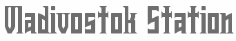 This is one of the most talented FontStructors, but also an active musician. On Behance, he/she is listed as Van Saarland from Hameenlinna, Finland, and on FontStruct since 2014 as V. Sarela, from Oulu, Finland.
 Typefaces from 2011: Teotihuacan (inspired by a Mexican poster), Micra (a monospaced OCR-A font), Fast Driving, Rendez-Vous (a condensed serif font inspired by the cover of "The Essential Jean Michel Jarre"), Carat Condensed, Carat, Wolfen (a copperplate style condensed face), Futuroid (sci-fi), Instrumenta (after Neville Brody's Industria), Modern Vision (based on the opening credits from The Terminator and The Running Man), Future Earth (futuristic: based on a typeface used in The Terminator logo which is also the base for the font "Earth"), Phatprogy (+Extra Phat). Typefaces from 2012: Modus Operandi, Ikonomi (squarish sans), Genera, Hexathrone, Liquid Crystal Serif, Wulthraesk (constructivist), Electionale, Major (a high contrast didone), Commandant (2012, like Futura Stencil), Comfutur (a beautiful stencil typeface with a bit of Futura Black), Qode (a retro-futuristic LED style typeface), Graphyto (a heavy slab face), Heavy Royale, Thiage (Thai simuation face), Bravis, Cirquetry, Solidis, Velocifero (bilined), Heavy Royale, Jet Set Groove, Reactor A1 (futuristic stencil), Polymoda (an abstract font), Lino II, Sequencer (+Condensed), Hertzace (square retro-futurist), Cifira (art deco), Saturation (monoline sans), Katana (+Bold, +Condensed), Countura (abstract and minimalist), Stripelane (horizontally striped), Vortexa (in the style of Data 70), In Nomine Matrix, Afterburner, Afterburner Phase II, High Rise (Western typeface), Sulaco, Polaroid, Tech Noir (a dot matrix typeface based on the nightclub sign from The Terminator), Slabbers II, Windician (art deco), Cryptocube, DMC 12, Ken Jp (oriental simulation typeface), PxlSQ, Scorpione, Monotronic, Advancer (dot matrix face), Avico, Discolyde, Film Sequence, Modern Vision (based on an unknown typeface which was used in the opening credits of The Terminator, The Running Man, Class of 1999, and also used on Robert A. Heinlein's book covers (there's a font called Heinlein which is similar)), Cromagnon, Gace, Midora Sans, Squarium (constructivist), Cheque Matte (octagonal; athletic lettering), Plusminus, Advancer Lite, Magnetofunk (retro-futuristic), Integrafia (piano key stencil face), Network9, Cechida, Rendez-Vous (condensed square slab face), Rendez-Vous II, Equantum, Karelian Stencil, Cryptocube, Neolexia, Ambiente, Stencilae (stencil), Linearis (horizontally striped), Contrafacia A and B (horizontally striped typefaces), Stereovision, Hypetron (based on the TRON logo), Degré (hexagonal), Typorabilis, Wunderkind (kitchen tile face), Kiova Captura, Biomehanika. Typefaces from 2013: Starast Maxi, Starast Next, Lugar, Siquid (dot matrix face), Devico (constructivist), Meco (based on Meco's logo), Confiant A, Confiant B, Zerusta, Carat, Combonaut, Jet Set Groove, Cifira, Gace, Condensbit, Synditon, Abciria, Vulthraesk, Rendez-Vous (+II), Instrumenta (based on Neville Brody's Industria), Saturation, RndEX, Rewinder, Power Electronics (an octagonal typeface based on the Captain Power logo), Obsidian Deco (a gorgeous fat piano key typeface), Electrone, Plusminus, Connector Module, Scorpione, Perficio, XOX Design, Da Capo (bold slab serif), Gradiator, Phatprogy, Genexus, Finica Sharp Script, Power Electronics (based on the Captain power logo), Aftertouch (a wide sans), Telecharger, Vicenti, Modicea, Submachine (based on Stanley Davis's Amelia), Genera Deux (a computer font), Genexe, Network 9 (connect-the-dots), Square Earth, Future Earth (trekkie font based on an old Terminator logo), Cechida, Supernature, Siberiada (a great Russian simulation typeface with a medieval touch), Defigma (bilined), Carat, Back to the future (based on the movie logo; called Rewinder on FontStruct), Vibrion (techno face), Connector Module, Wunderkind (a tiled typeface), Yaguar, Pacific Serif (slab serif), Aerogenes (wide techno font), Windician, Commandant (a wide art deco stencil face). Typefaces from 2014: Brigadier, Freelight (rounded stencil), Stencilae, Protocol Sans, Vicenti, Submachine, Dalecarian, Equantum, Twiphex, Waremann, Wolfen, Waltraud, Carat, Teotihuacan, Rendez-Vous (+II), Major (didone), Ambiente, Kiova Captura (based on the font used in Kiev camera manuals), Glissando, Vibrixean (sci-fi), Licoricette, Protagon (Greek simulation), Rewinder, Ardeus (futuristic, LED simulation), Techsyna (sci-fi), Rezonans (piano key style), Modern Vision, Trideko Display (multilined typeface), Xeometro (octagonal), Verbica, Megalith (a great black slab), Calibro. Typefaces from 2015: Coffee,-Juice,-Food-2, Electric-Blue, Karakteristika (blackletter tattoo font), Memogo (horizontally-lined font), Proximitro, Stratus, Super-Eurobeat, Verdisquo, HI-NRG, Modern Vision (based on a font used in the opening credits of The Terminator, The Running Man, Class of 1999), Workflow (stencil), Blackwing. Abstract Fonts link. Behance link. Dafont link. [Google]
[More] ⦿
|
YOFonts
[Yasuhiro Yamaoka]
|
YOFonts offers beautiful fonts like Trafica and Engraver Sans by Yasuhiro Yamaoka. Most are commercial. Some can be downloaded as freeware or shareware. Fontsquirrel link [where one can download Eau (+Douce Sans, +Naturelle Sans, 2003), EPF (1999-2006), Grov (2000-2002), Midiet (1990-2009, sans and serif), Nord (1992-2000, elliptical), and Telegrama (1992, pixelish)]. Freeware fonts (Mac/PC): Crematec Bold, Glyphian (runic), Grov Alphabet Regular / Italic / Condensed (1999), Grov Katakana, Grov Hiragana, Laitty (1993-1997, upright connected script), Lapidit (1994-2002, experimental), Liq (1995, LCD face), IgnorantModern (1993), Initia (geometric, circular), OneZero Alphabet, OneZero Katakana (pixel face), Ovals (border font), Quads (borderfont), SmooHG, SmooKK, Opuscula (2008-2011), Practica, Ovals Regular (Border font), Quads Regular (Border font). Font of the month (free): Philo AB, Philo KK, Philo HG. Other fonts: Angrite-Regular (1998), ArchaeoDeco (2001, art deco), Botaniq (organic, 2001-2002), Circles, CremSBold (1995-1997), CremacBea, CremacBeaBold, Crematec (techno), Cybertalk (2000), DippleKKS (1998, organic, molecular), Elementa (1990-1998, a techno family in Sans, Serif and Script styles), Engraver Sans (1995, Greek simulation family), Fact (1995-2005, information design family), Fol (1995, octagonal family), LiqMono, LiqMonoOblique, LiqRegular, LiqRegularOblique, ModCircle (1995), ModQuad (1996), Moderno (1997-2002, sans), Philo (1995-1996), Pica (1993-2005), Pixe (1992-1998), Practica (1991-2002, +Practica MsF), Nord-Bold (1998), OneZero-ABOneZero (1998), OneZero-ABZeroOne (1998), OneZero-ABZeroZero (1998), OneZero-KKOneOne (1998), OneZero-KKOneZero (1998), OneZero-KKZeroOne (1998), OneZero-KKZeroZero (1998), Serian (1997-2005, a German Schreibschrift), Trafica (1999-2002). In Font Pavilion 12 [dead link]: Smoo (1997-1998, Latin, katakana, hiragana). [Google]
[More] ⦿
|
Yorch Visual
[Jorge Alberto Martinez]
|
 Designer in Mexico City. Creator of these typefaces in 2014: Cuatacho (a tweetware signage / cartoon font), Libreto (a warm readable rounded Latin text typeface). He co-designed the elliptical display typeface Maciza in 2016 together with Monica Munguia. For Rara magazine, he created the Greek emulation typeface Rara (2016). Libreto (2014). At Latinotype, he published the cursive typeface family Fondue (2016). Fondue is a type family of eclectic shapes, inspired by Art Deco designs, in particular, the lettering used by Mexican cartoonist Ernesto "El Chango" Cabral in almost the entire run of Revista de Revistas.
 In 2020, he released the tall 48-style sans typeface Galeana at Latinotype. [Google]
[MyFonts]
[More] ⦿
|


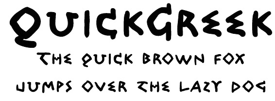
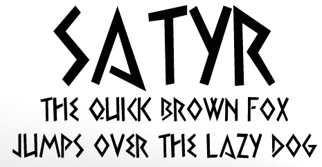
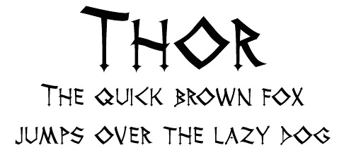
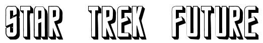
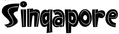
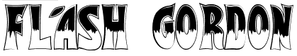
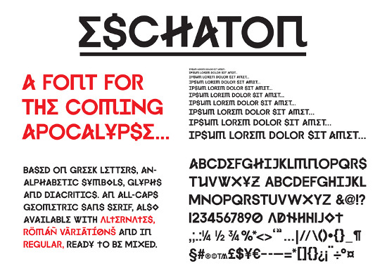
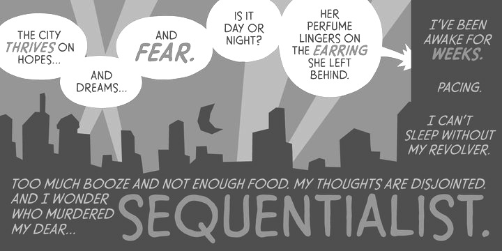
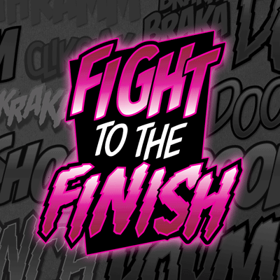
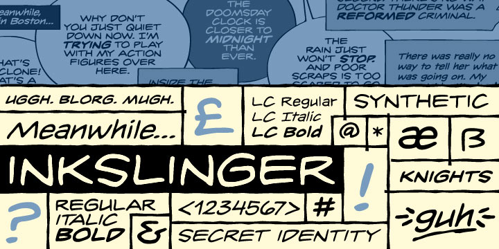
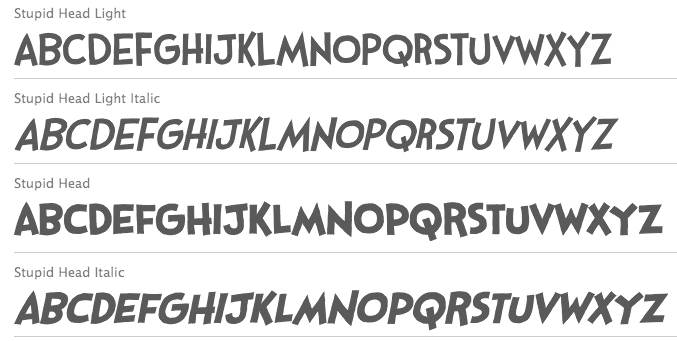
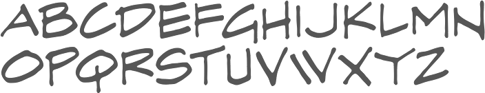
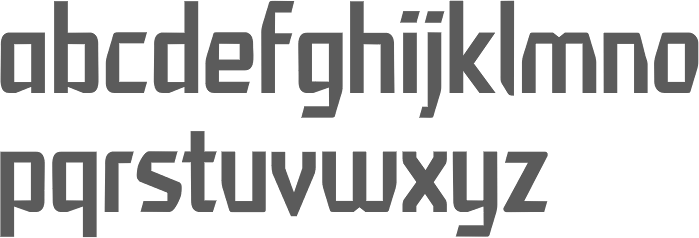
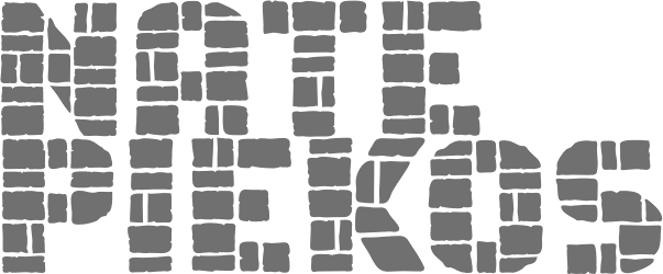
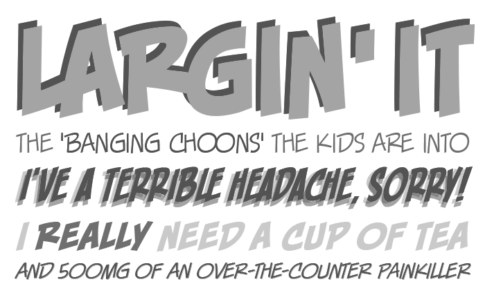
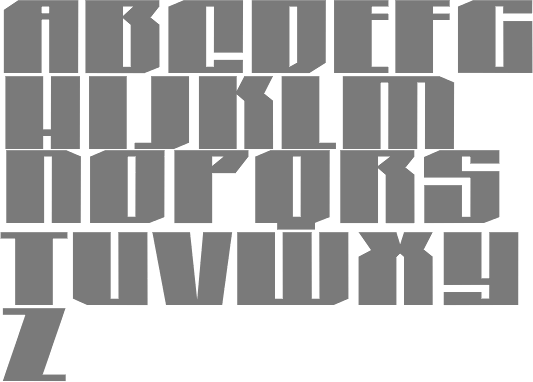
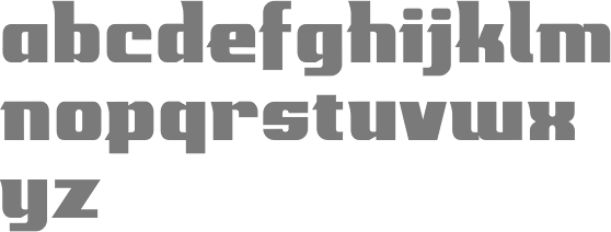
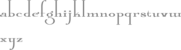
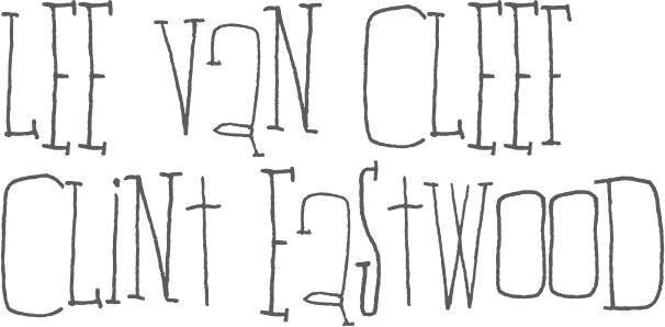
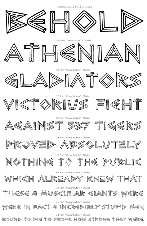
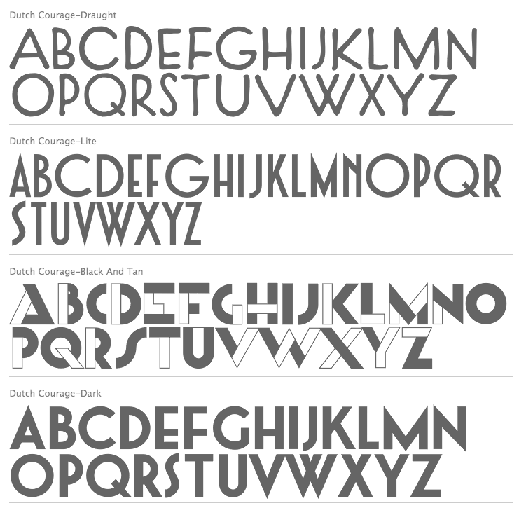
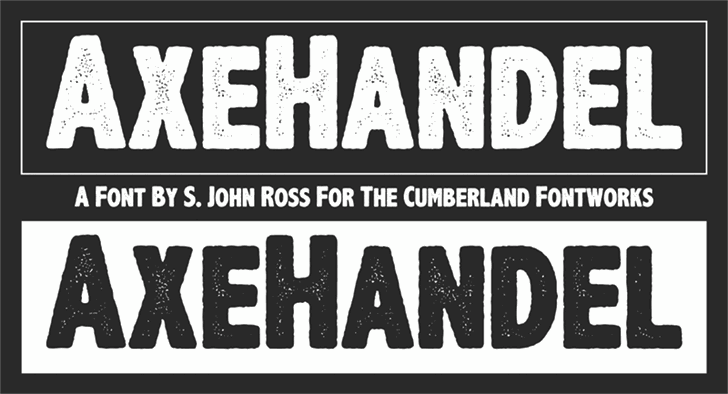
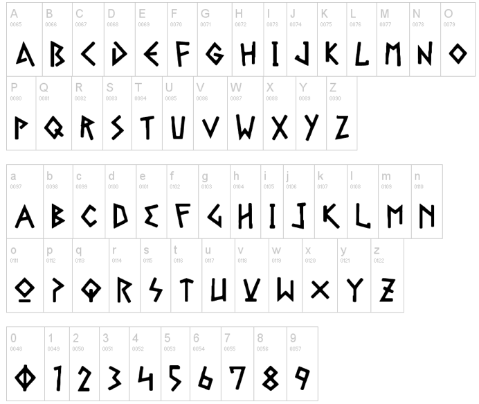
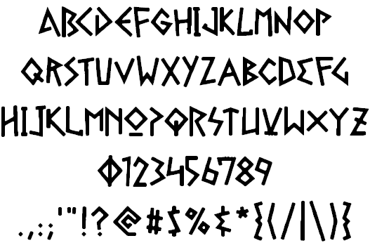
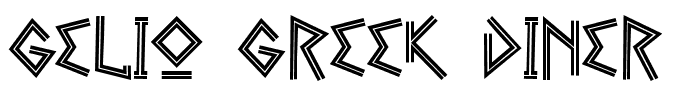
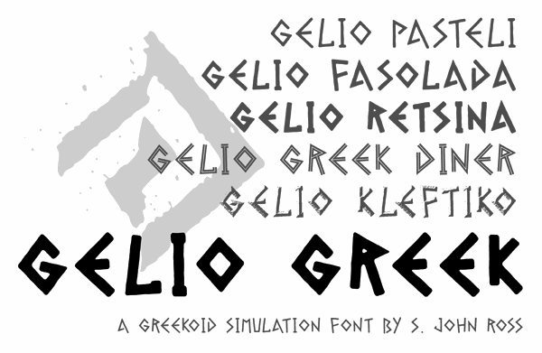
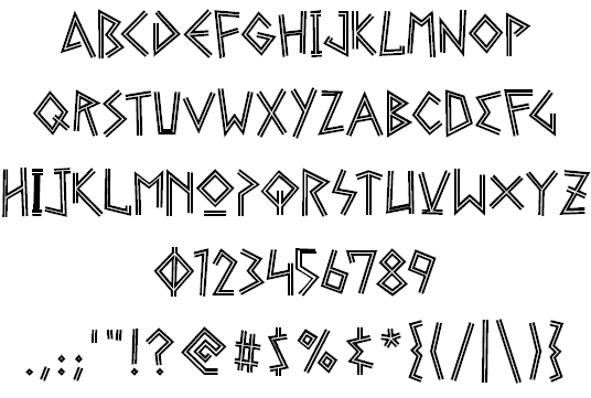
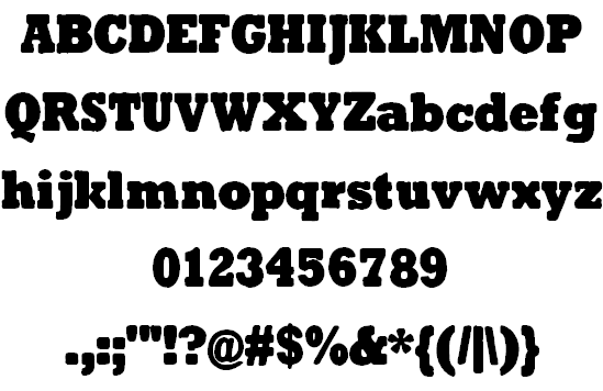
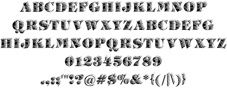
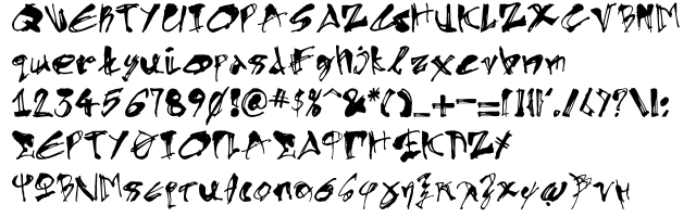
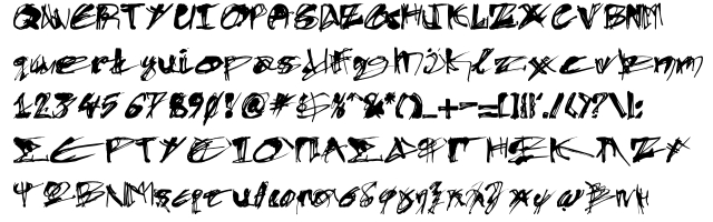
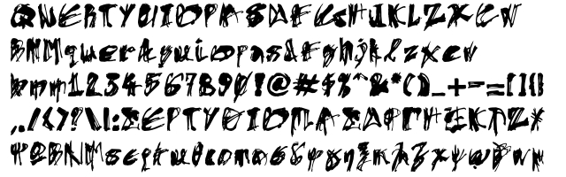
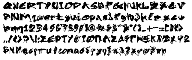
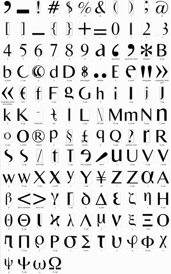
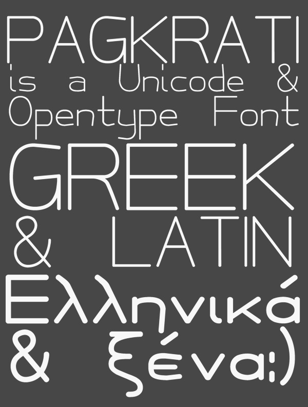
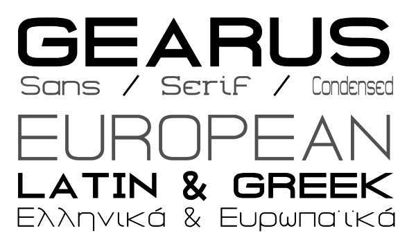
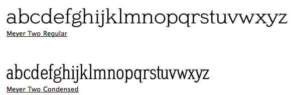
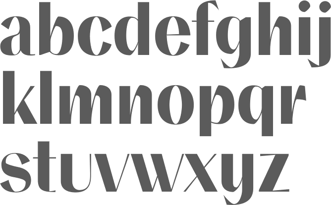
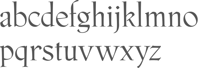
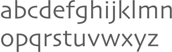
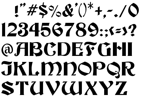
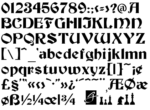
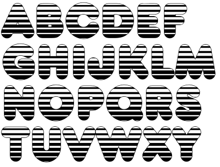
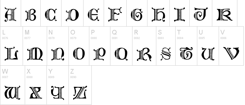
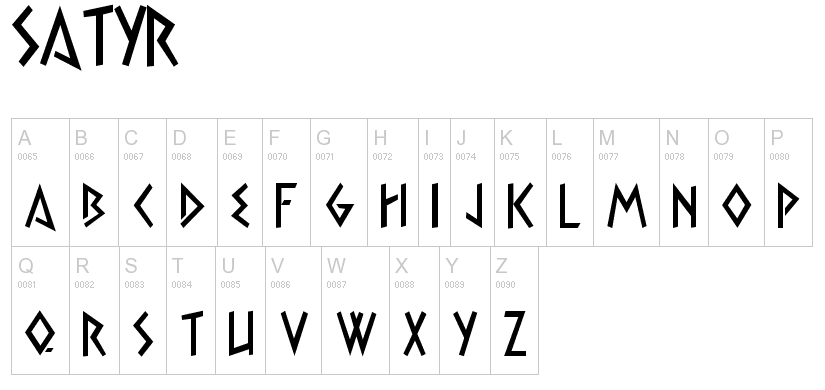
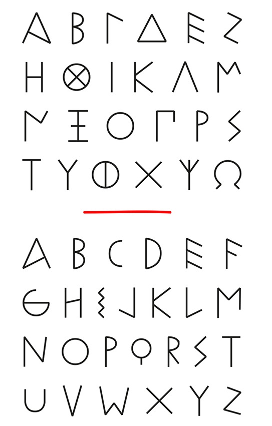
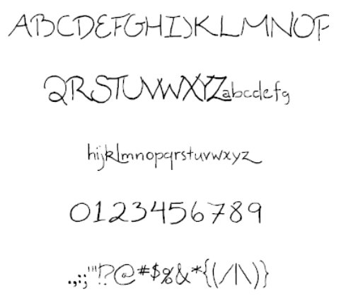
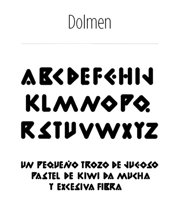
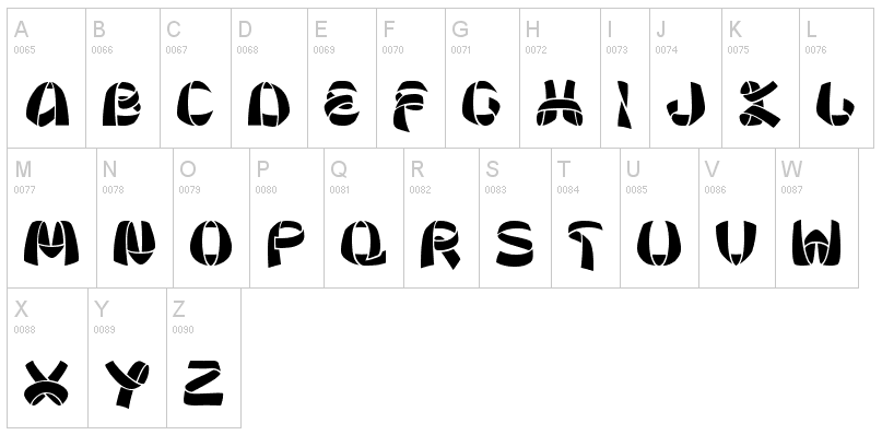
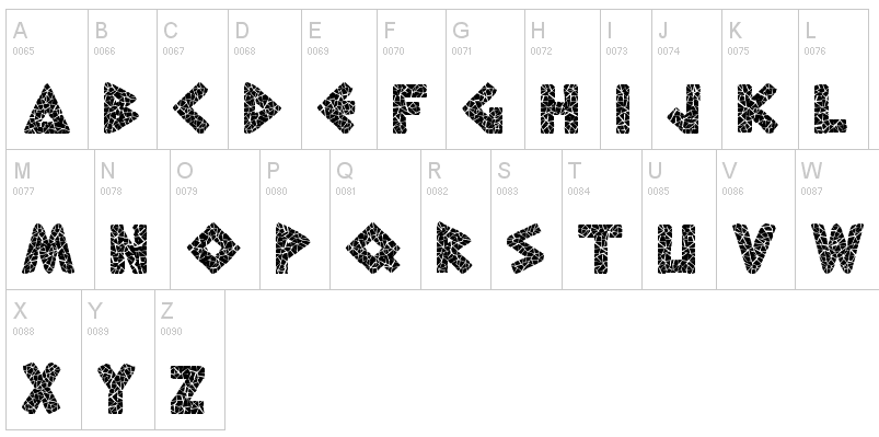
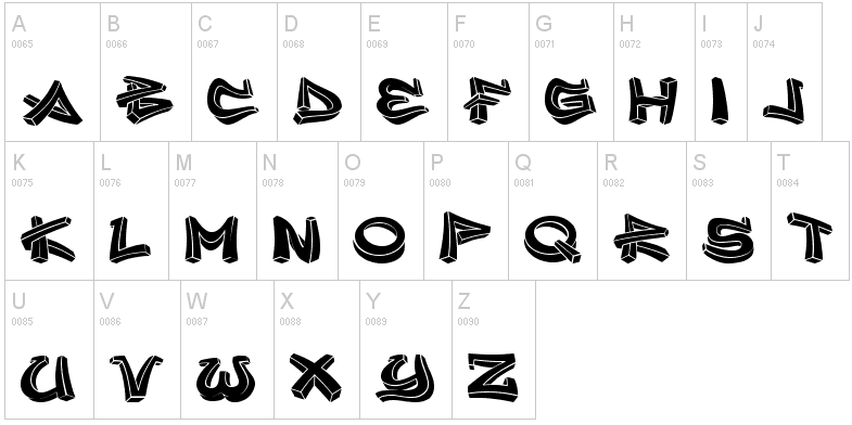
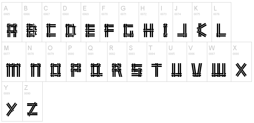
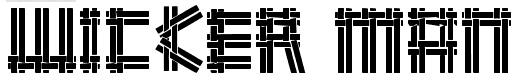
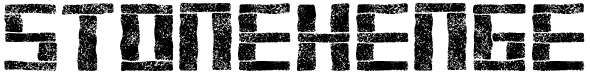
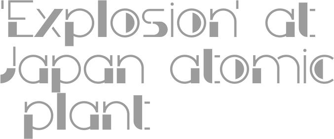
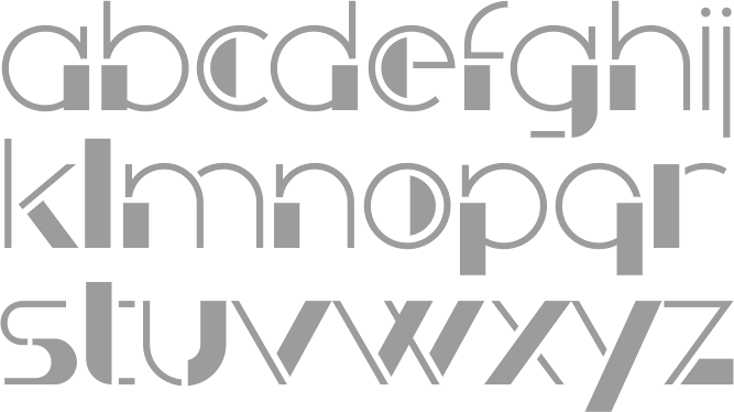
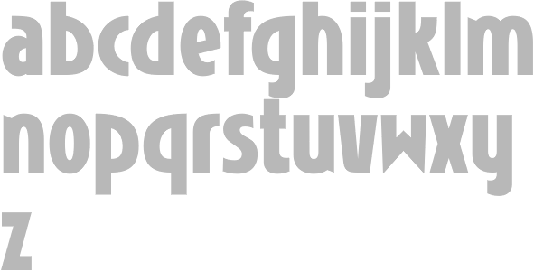
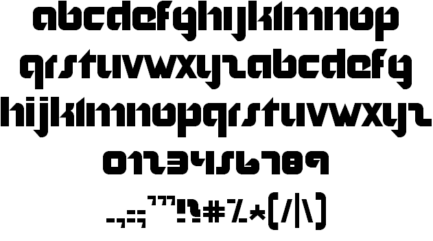
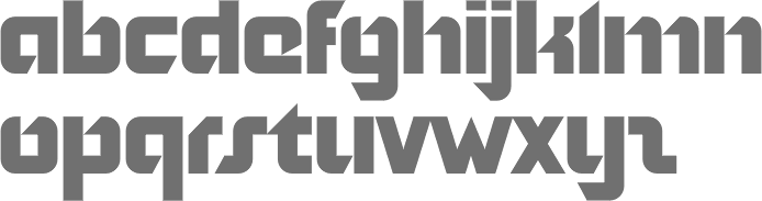
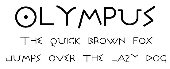
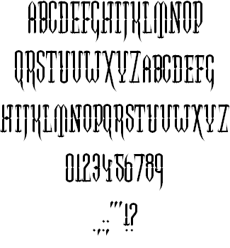
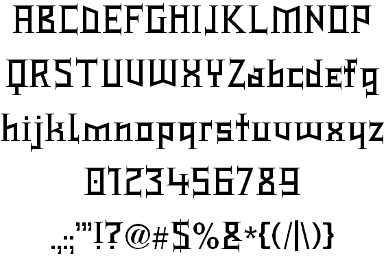
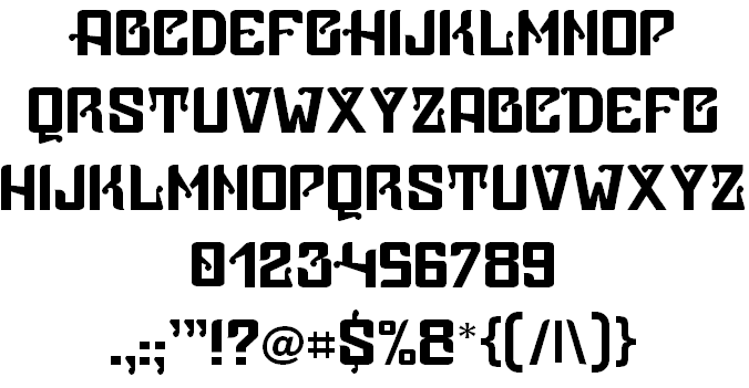
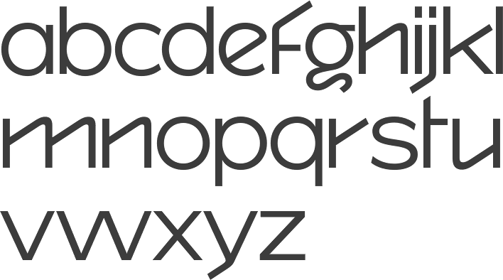
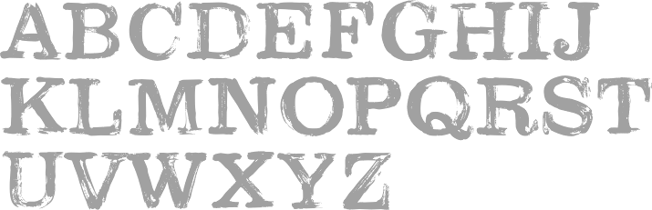
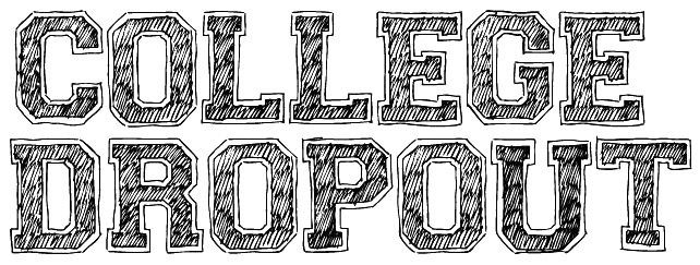
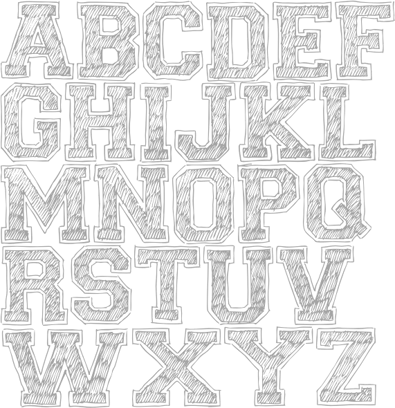
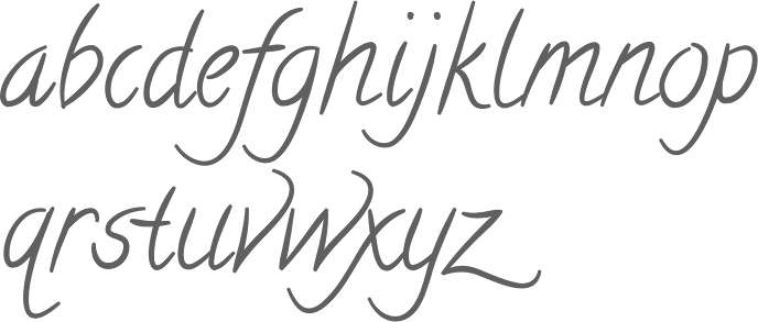
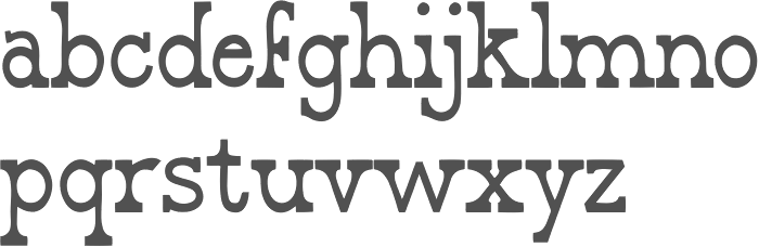
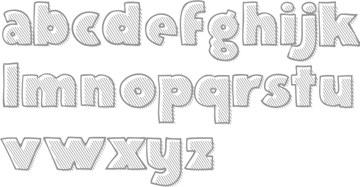
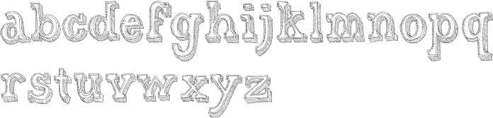
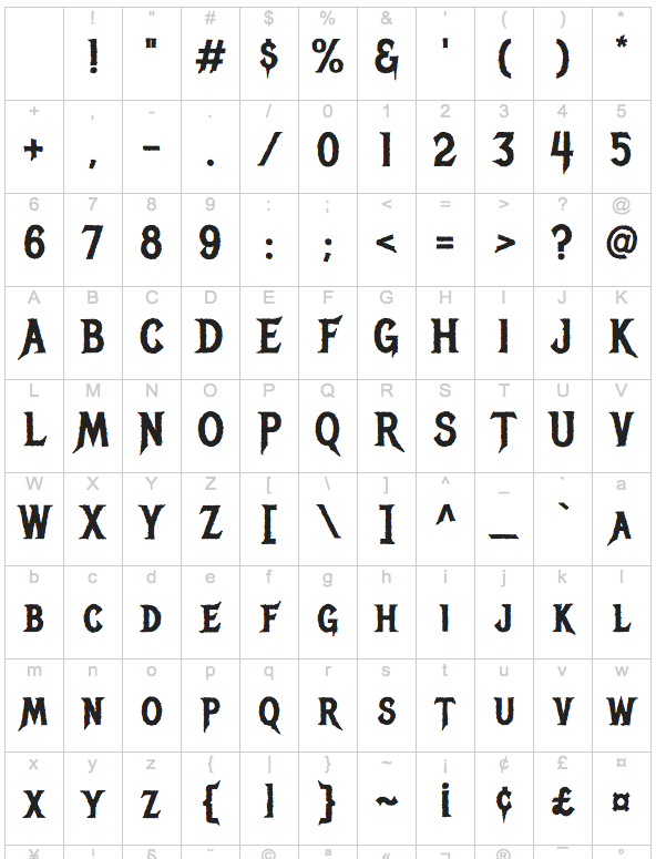
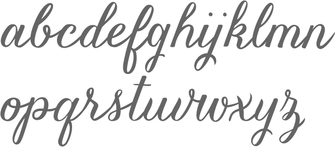
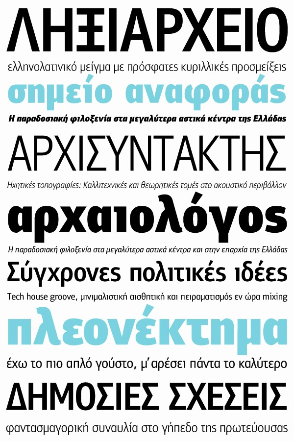
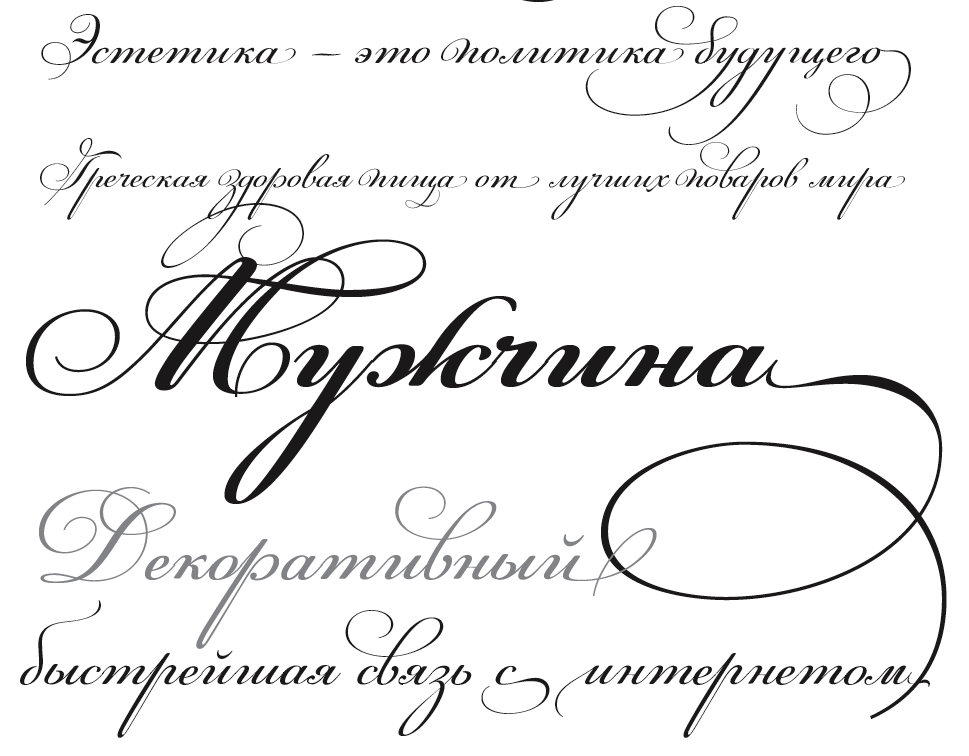
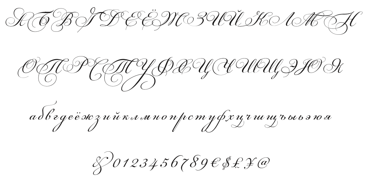
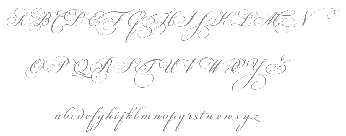
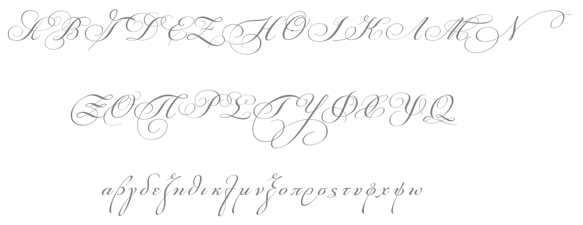
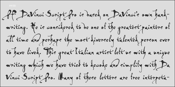
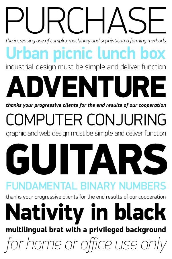
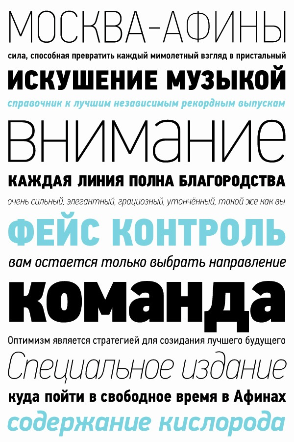
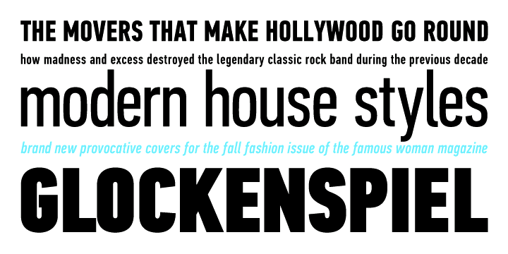
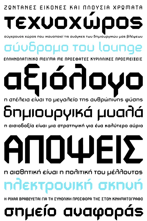
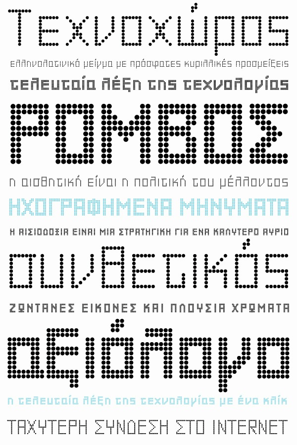
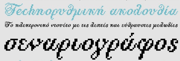
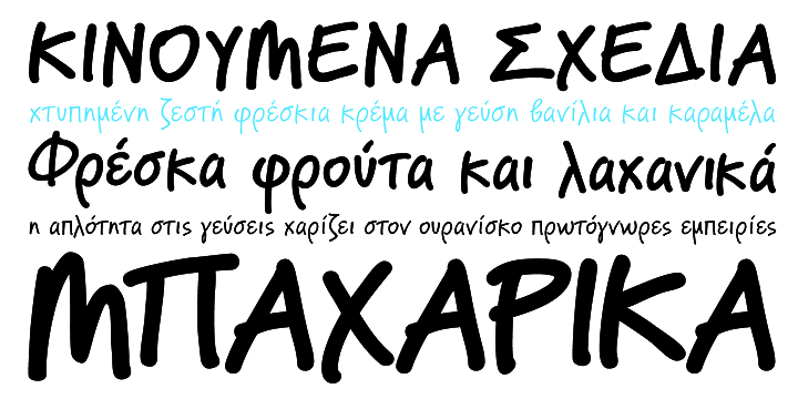
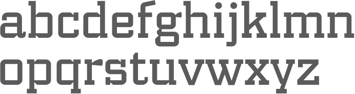
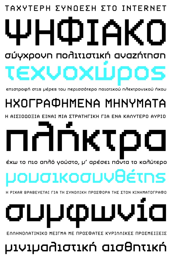
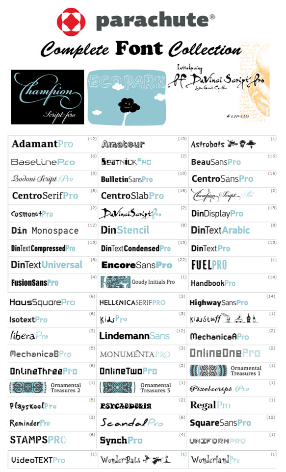
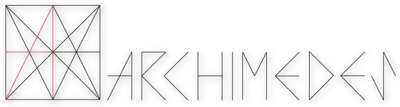
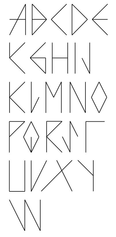
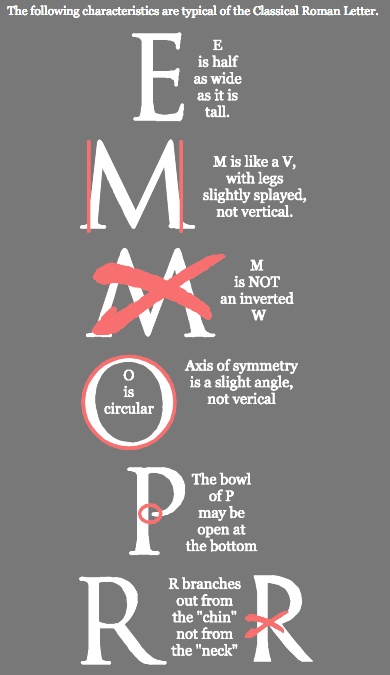
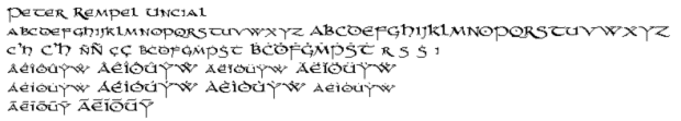
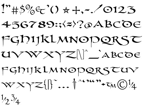
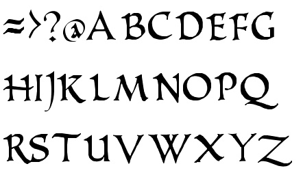
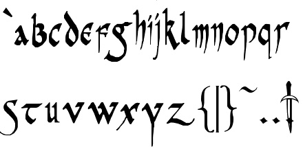
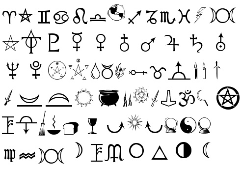
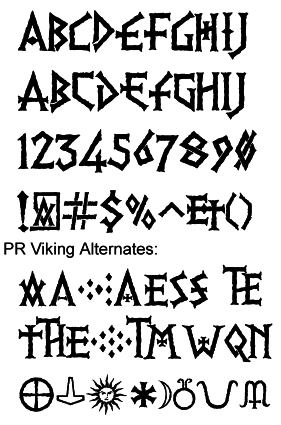
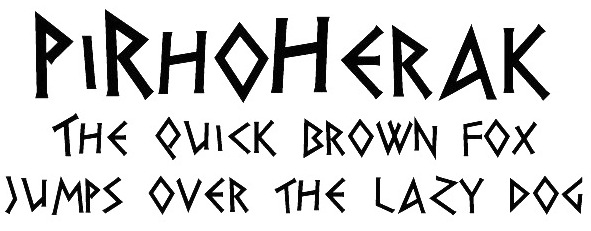
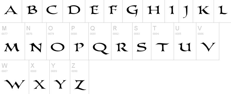
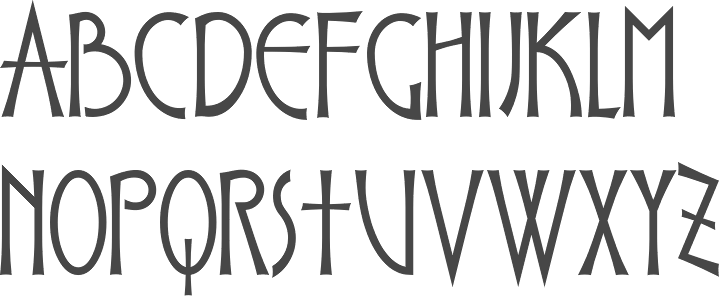
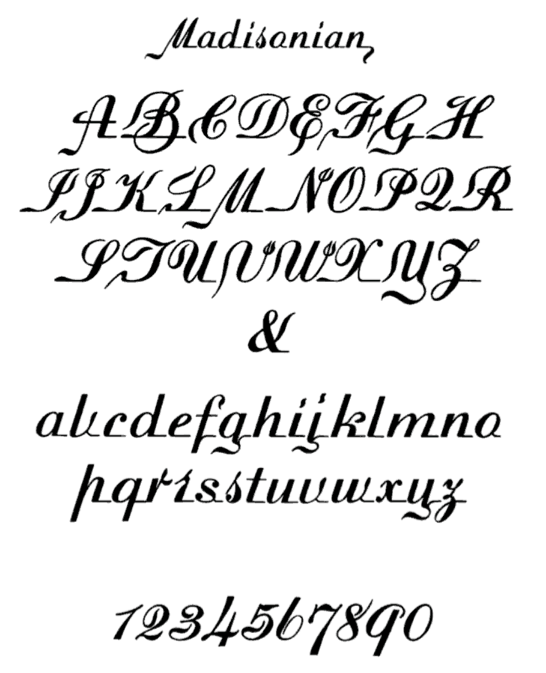
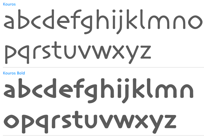
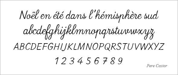
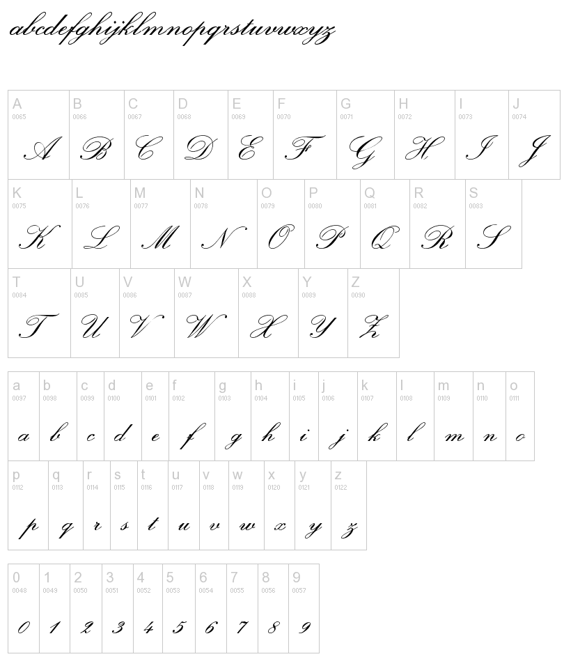
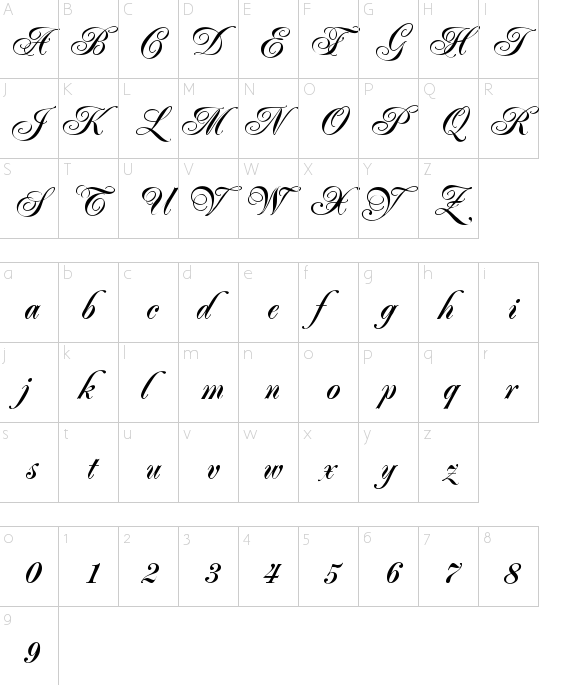
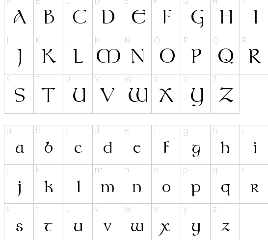
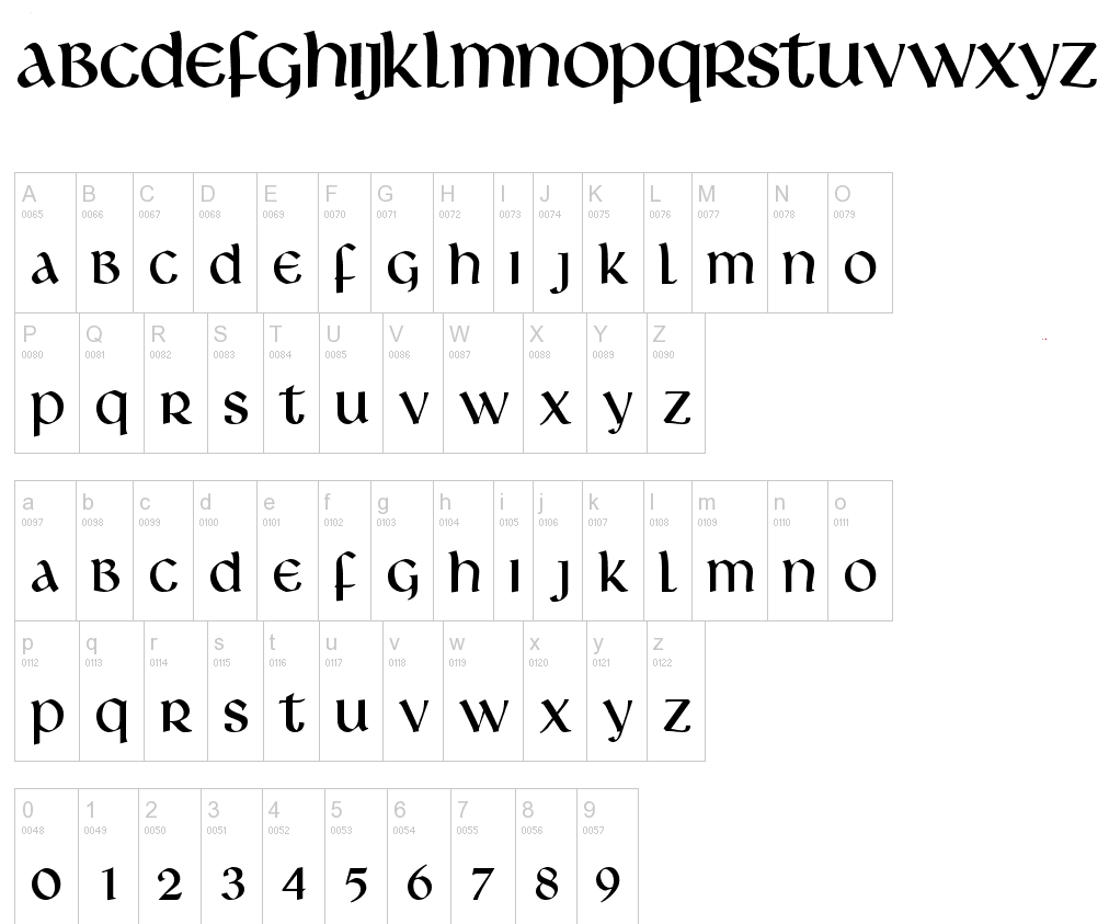
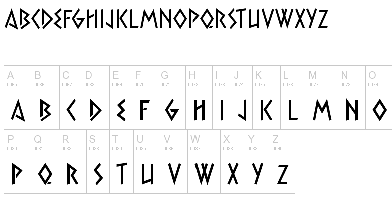
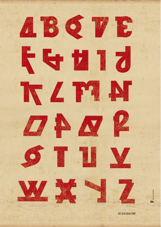
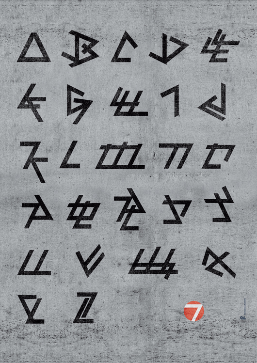
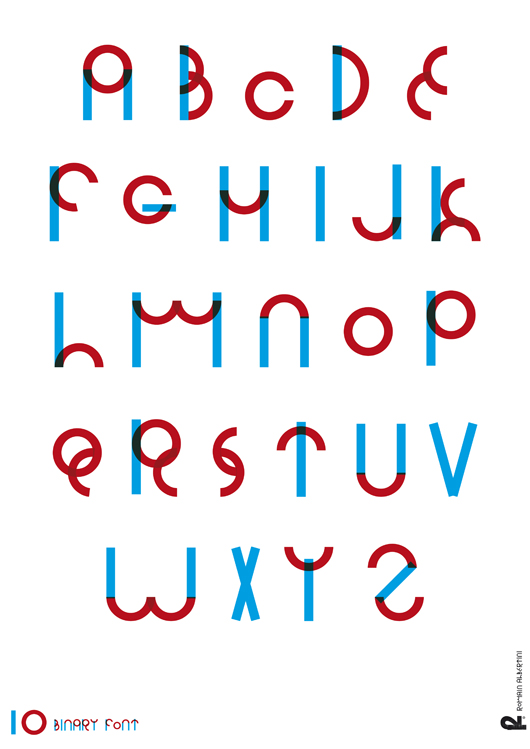
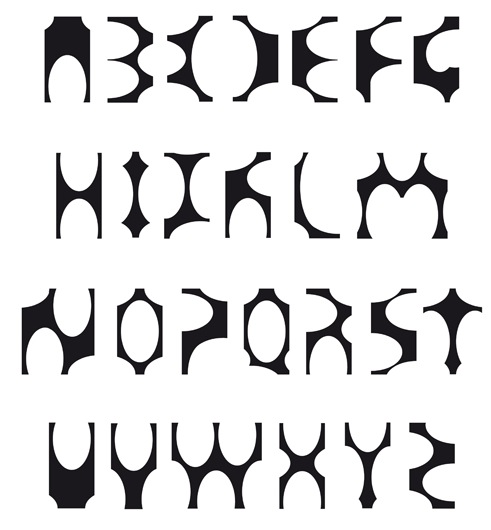
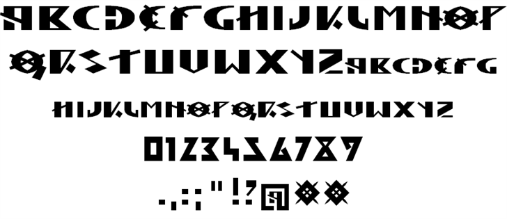
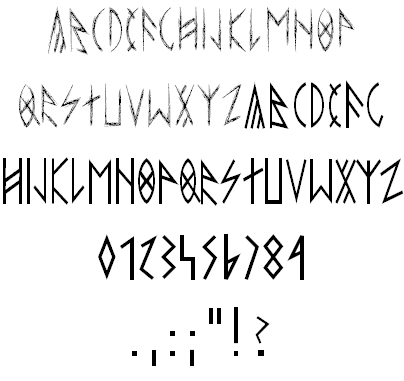
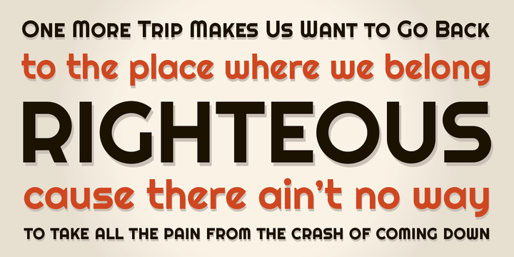
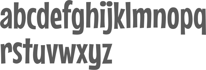
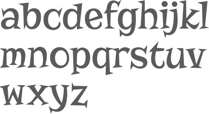
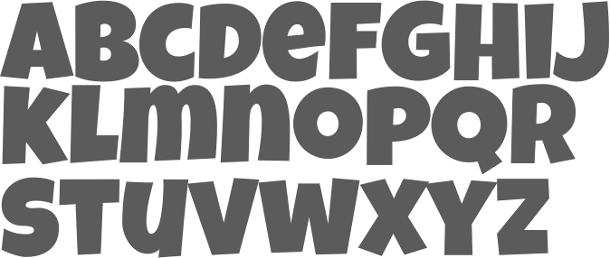
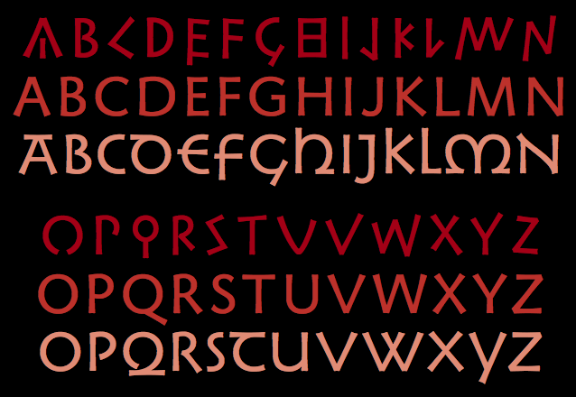
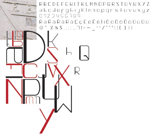
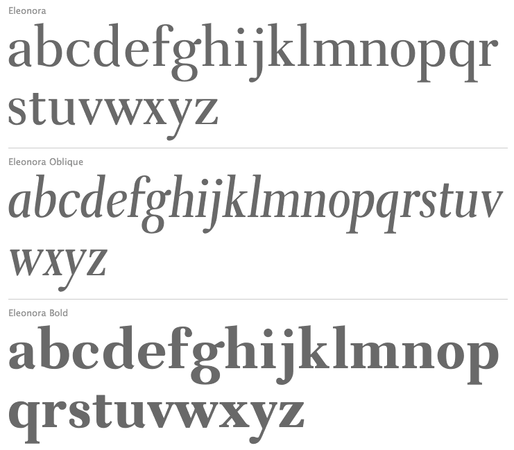
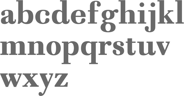
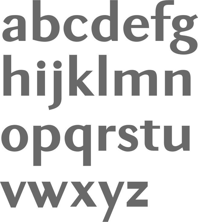
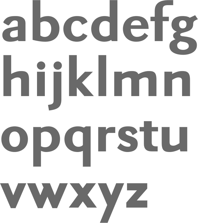
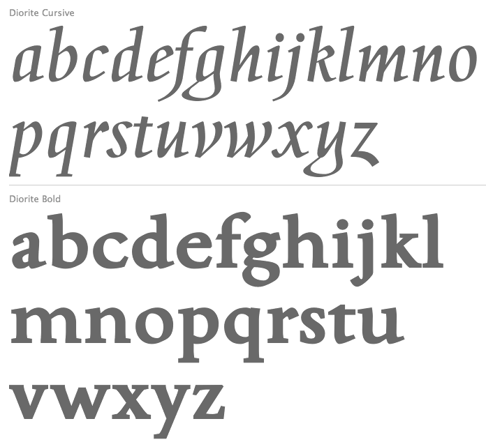
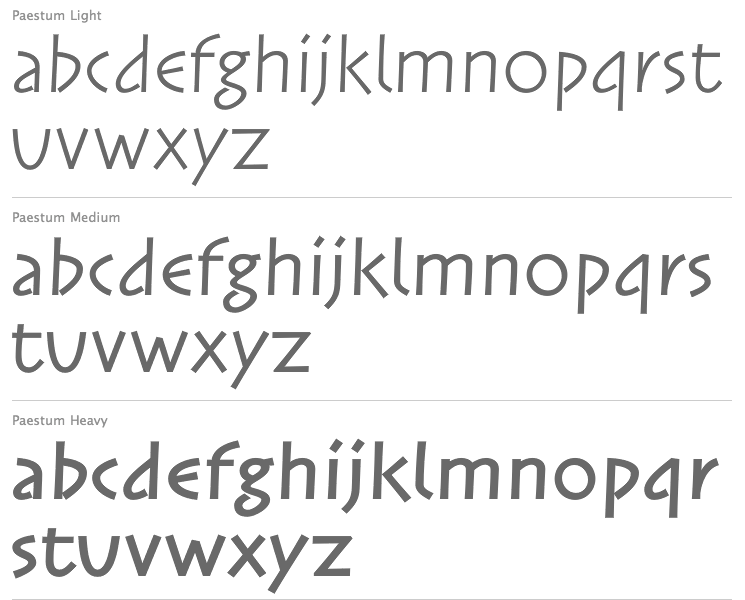
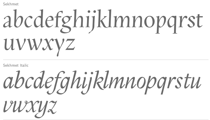
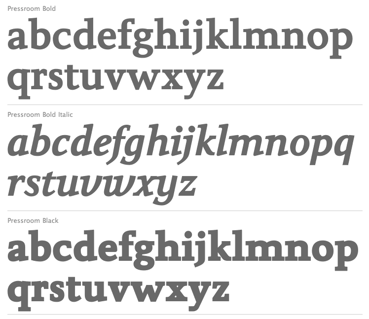
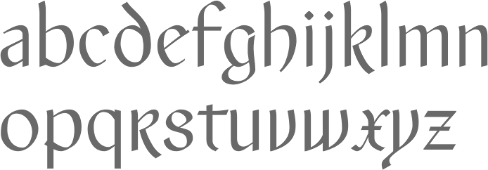
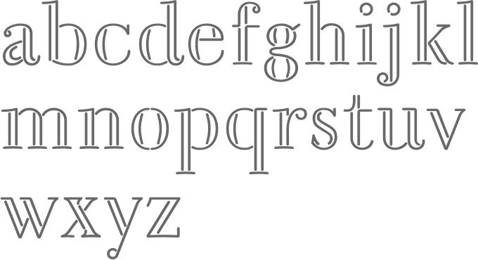
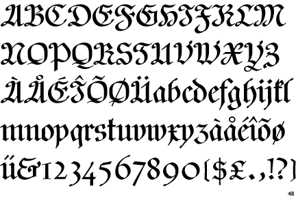
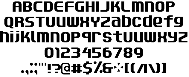
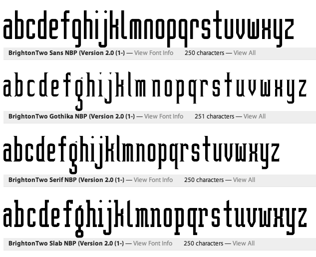
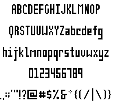
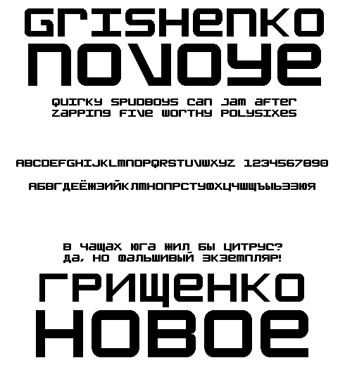
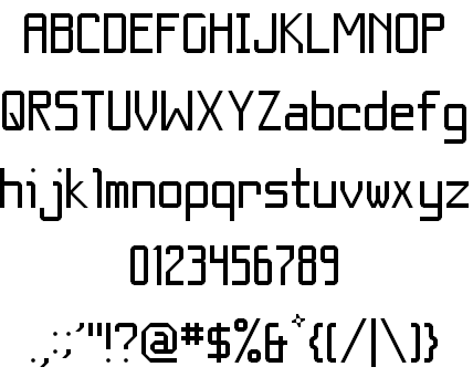
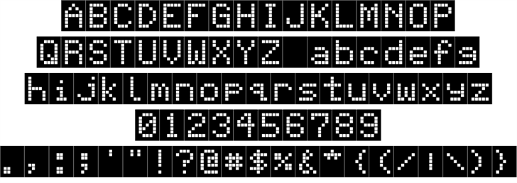
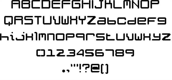
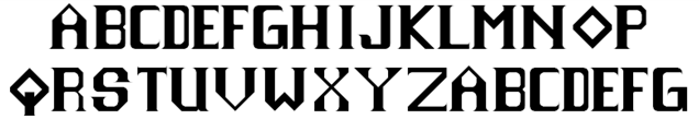
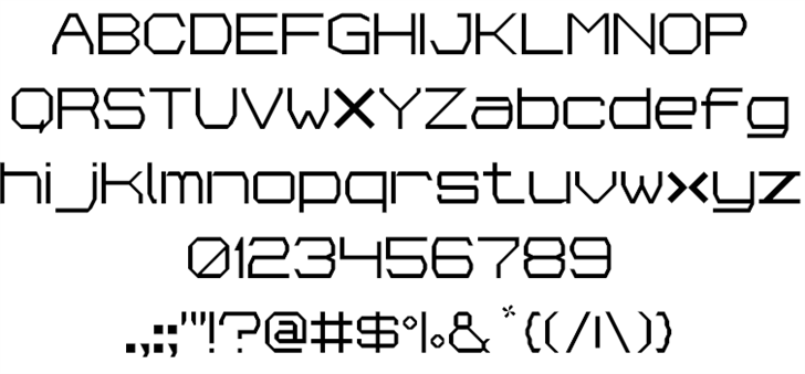
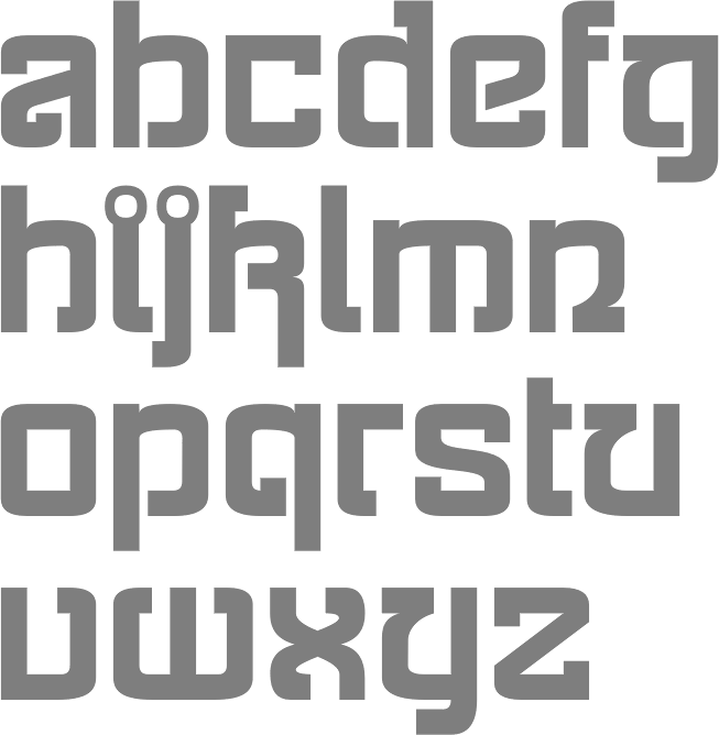
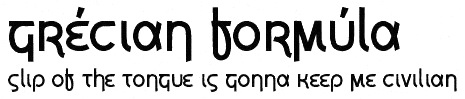
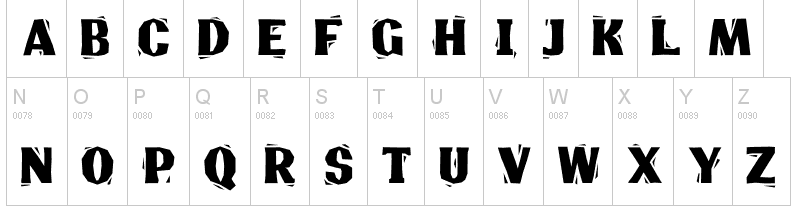
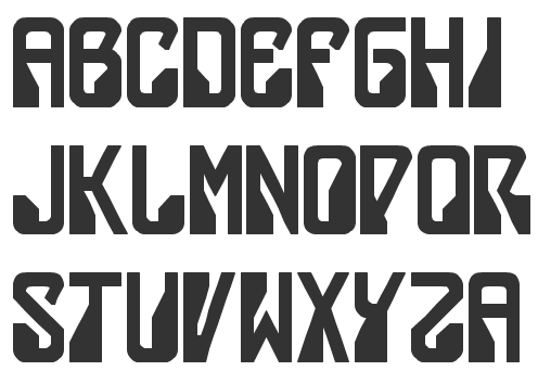
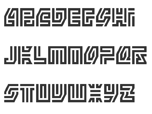
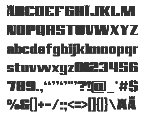
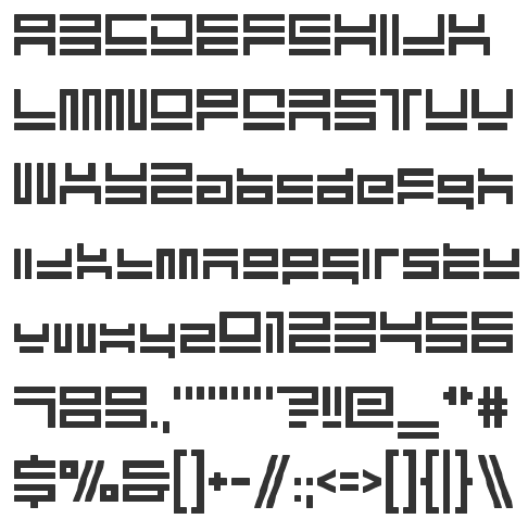
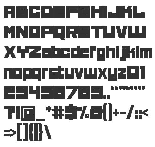
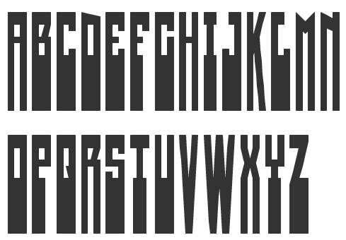
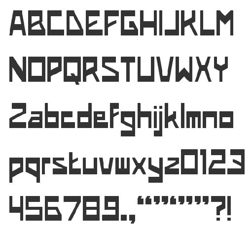
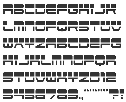
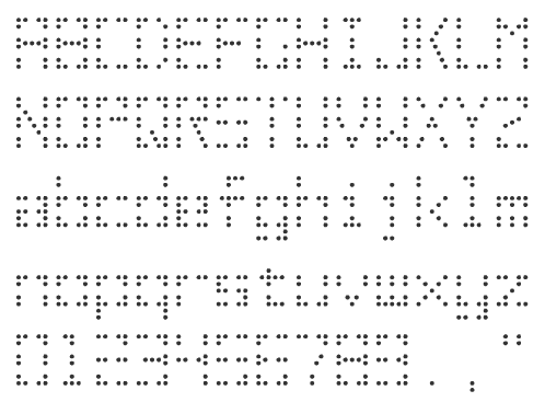
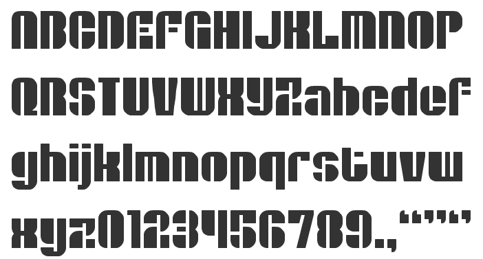
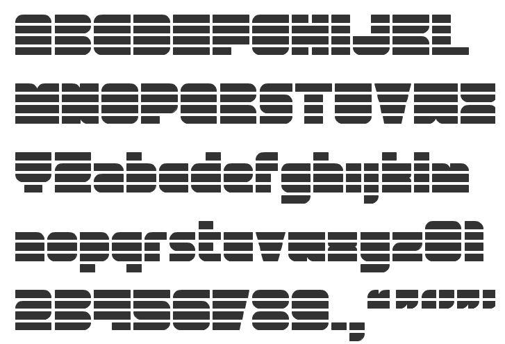
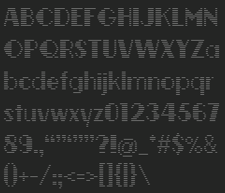
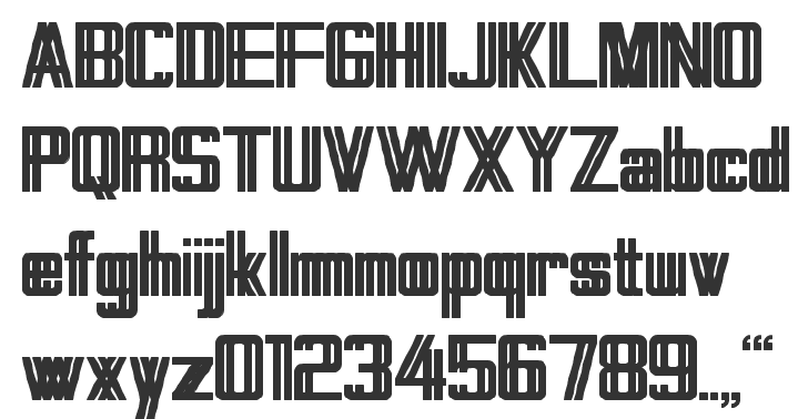
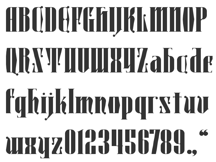
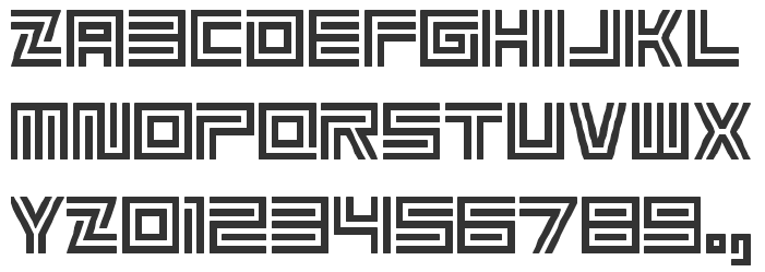
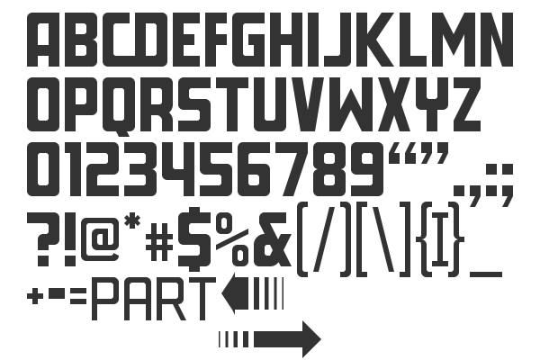
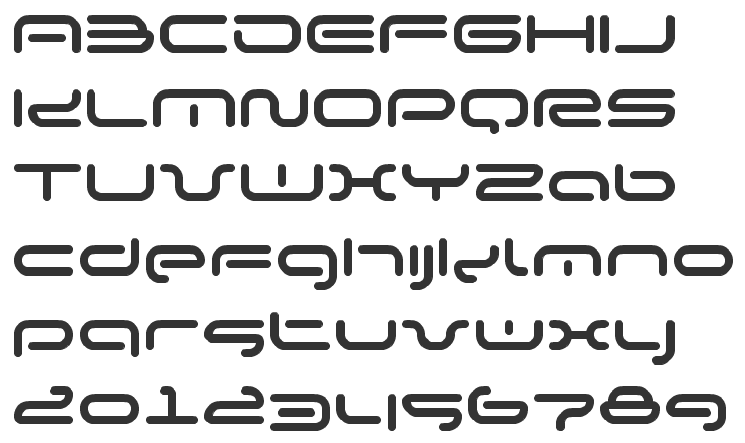
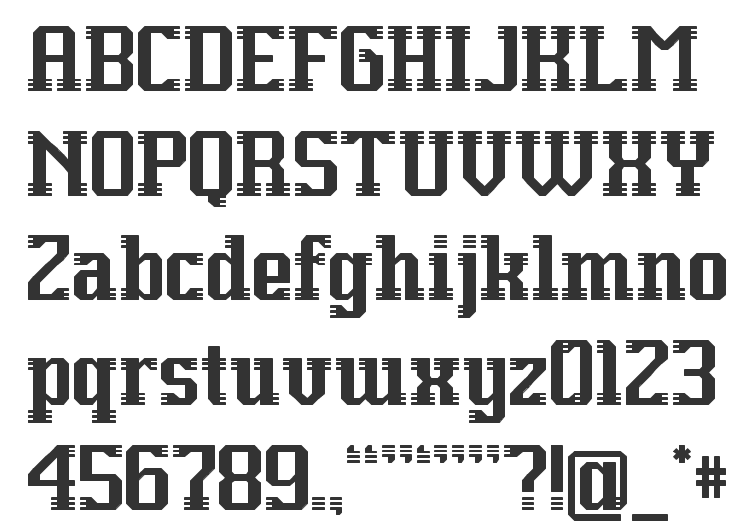
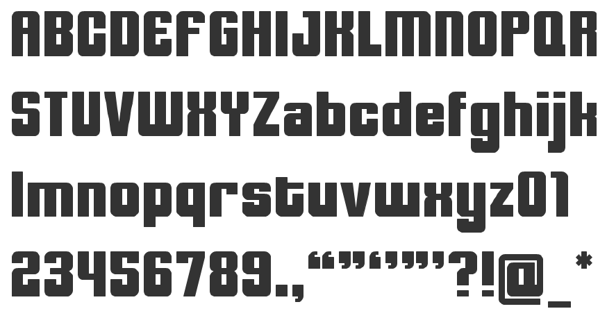
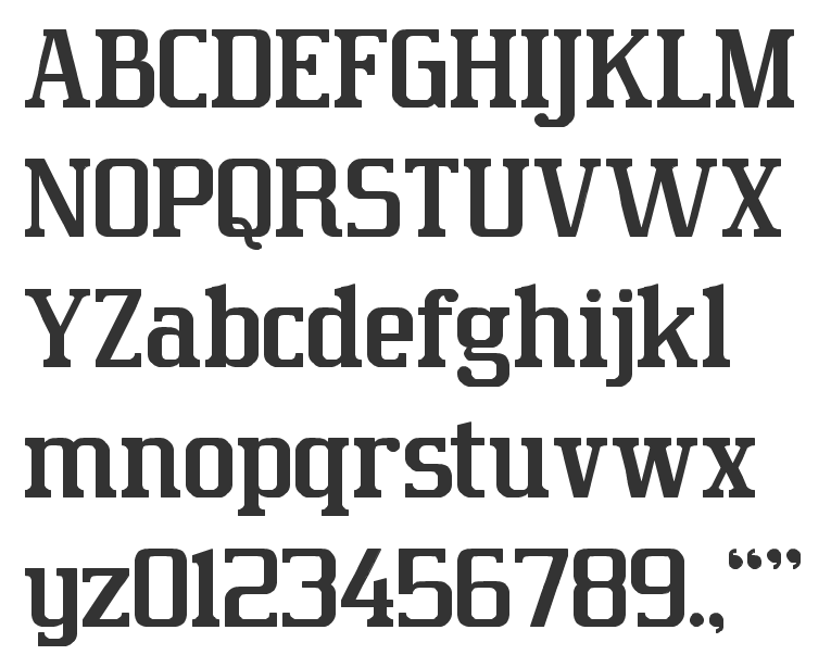
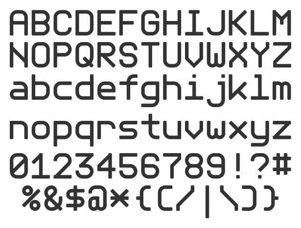