| | |
7N Types
[Situjuh Nazara]
|
 Indonesian creator in Jakarta (b. 1985). 7NTypes includes several designers, including Keithzo, but Situjuh Nazara is the founder and main contributor. Creator of The Amazing Grace (2012), Twofold Uncomplete Design (2012), Alighty Nesia (2012, an open geometric sans family), Gratis (2012, free headline sans), C7Nazara (2012) and Situjuh Hand (2012, a curly typeface).
 Typefaces from 2013: Hurufo+Numero (sans family), Yaahowu (a rounded sans family), Gobold, Bryana Aningsih Shara (upright script), Gpkn (circle-based monoline sans). Typefaces from 2014: Smoolthan (monoline organic sans), Remponk (multilined), Playsir (comic book typeface), Defonarts, Tulisan Tangan 74, Fortheenas_01, Evogria (bold and mechanical), Anysome, Blackplotan, Dotcirful (dot matrix typeface), Handgley, Brokeren (techno sans), Headsome&Modif. Typefaces from 2015: Manophiser (sans), Theodista Decally (upright connected script), Upbolters (a macho sans caps typeface). Typefaces from 2016: Cutrims (a polygonal typeface), Xacose. Typefaces from 2017: Blessing in Disguise, Chirota (handcrafted), Hastoler, Merysha-Italic, Merysha (serif), SHAOutline, ShareHappinessAround (rounded sans), SomethingLooksNatural, Tentram-Italic, Tentram, Reitam (sans), Myfrida, Ribeat (smooth brush), Etchas, Goeslim, JulySeventh, Justtellmewhat, Offerings, Prohandy, Reprineato, Steagisler, Stea, Miss Nealy, Hastro, Dialoegue, Kisah Ceritra, Chesan, Boxise, Creword, Breetty, Anydore (calligraphic), Brushaff, Budiyaya (brush), Brotherina (connected script), Chosence (sans family), Handycheera, Aulyars (calligraphic script), Molleat. Typefaces from 2018: Freshness, Christed, Xyling, Youthing October Fourteen, Kayskew October Eleven, Hoty, Friday October Twelve, Codian October Nine (art deco), Caboge, Stripe October Seven, Nesdate October Ten, Codian October Eight, Odian October Nine, Stripe Shadow October Seven, Clambake October Six, Lovina October Five, Grande October Four, Grande October Three, The October Two, The October One, Favoner One, Homade McRacken, Besta Baru, Srows, Sanson, Bestar, Kathen, Byby, Charilla, CuteBeSpecial, FriendlySchoolmates-Italic, FriendlySchoolmates, GirlsMarks, HeartWarming, HeartWarmingExtra, Kaylonick, LearnShareColaborate-Bold, Mergic, MOGrhythm, OpenMinded, OpenMindedInside, PassiontoAction, PassiontoActionSlant, TeamWork-Italic, TeamWork, Yessy, Feltarigo, Motira, Adelio Darmanto, Troche, Nicolera, Mantul, Yukikato, Gebrina, Veni, Onadio, Aliena, Gabelisa, Still Loving, Shink, Sottee, Milyone, Kelidya, Yuliya, Hestina, Masbro, Goday, Milgun, Togetha, Thisay, Dhitha, Charline, Briany, Candire, Arinda, Anglena, Abilya, Story of Super Boys, Richela Kids, Seelyn, Pulen, Podo Moro, Sri Muliyo, Neigfriste, Hardino (monoline script), Purple River, Yoshephin, Theola Kids, All Season, All Season Ornaments, Hello Teman, Attracted Monday, Cirquesa, Hopeitissed (signage script), Hettas, Certhas, Fattana, Qeiza, Having Fun, Flotta, Soe, Misses, Siry, Mommy's Kitchen, Thany, Mother's Touches, Create Something Today, Well Bred, Cheria, Beatific Margella, Hidea, Gobold Blocky, Riztteen, Stika, Bintar, Ginta, Menscho, Hilona, Dehasta Momentos, Mungkin, Shartoll Light, Robaga Rounded, Ingat, Ascota, Klapjo. Typefaces from 2019: Homazing, Pre (script), Millythea, Rough Rough, The Friday Stroke (brush script), Anu, Dearly Loved One, Khalifa, Vesetia, Blending Attraction, Lova Valove, Quotable, The Simple One, Matchinger, Touch Over Next, Waiting For, Being Love, Lova Valove Serif, Clawster, Hopia, Sanson, Being Love Sans, Back To Ancient Time, Protector, Mystag, Oreta, Dearly Loved Slab One, Yep, Nuaz (a stitching font), Bronice, Nesdate October Ten. Typefaces from 2020: Sheroo (beatnik style), Thank You So Much, Styla, Racy Mango, Josy Wine (spurred), Lonely Melody, Alegra, Alenor, Conformable, Sweet Hansan, River Script, Kevin Aprilio, Jorby, Maines, Say Yes, Fish Grill, Flash on Saturday Night, Literally Natural, Lady Nature, Joyful Story, Brush Hours, Daily Walker, Free Monday, Mila Bright, Marchone, Githo Love, Fondacy, Jumat, Brastagi, Christiany, Feltarigo, Gabelisa, Gibran, Baligle, Do It With Love (a Valentine's Day font), Vecoly, Delightious, Ataro, Anticed, Cherrythea, Merrycle, Twolank, Atozimple (a monoline sans), Bikito (a curly script), Tyfanie, Hilya, Lonnie. Dafont link. Web site. Creative Market link. Creative Fabrica link. Another Creative Fabrica link. And another Creative Fabrica link. [Google]
[More] ⦿
|
Absonstype (was: Haksen Graphic, or: Haksen Letters, or: Haksen Studio)
[Sarwo Edhi Prayitno]

|
Edhi Sarwo or Sarwo Edhi Prayitno or Edhi Prayitno. Magelang, Indonesia-based designer, b. 1982, who set up Haksen in 2017 and Absonstype in 2021. He designed Ballete (2018), Metteora (an irregular script) (2018), Philbrook (2018: a tall sans), Romantic (2018: a connected monoline script), Anonim (2018), Rumetes (2018), Polythem (an upright script) (2018), Brooklyn (2018, a dry brush font), Amellia (2018: a swashy script), The Immortal (2018), Arpeggio (2018), Saint Petersburg2 (2018), British Columbia Serif (2018), Balutteli (2018), Balutteli Serif (2018), Belleson (2018), Hello Pretty (2018), The King (2018), Angry+Hungry, (2018), Busset City (2018: a monolinear rabbit ear script), Muttung (2018: a rustic script), Saint Petersburg (2018), Niken (2018: script), The Chocolate (2018), Delicious (2018), Adellina (2018), Antique Balutteli (2018: Serif and Script), Sweet Girls (2018: curly script), Katty Pretty (2018), The Wormies (2018), Mellisa (2018), Stylistic Sign (2018), Bestalia (2018), Lincoln (2018), the upright script Paulo Pacito (2018) and the italic script Willona (2018). Typefaces from 2019: Please (roman caps), Hamburg (a rabbit ear calligraphic script), Angellyne (script), Big Bang (script), Ballado (an extended sans), Bello (a calligraphic script), Roberts (a bold brush signage script), Babyhome, Hellena, Mottion, Albero (an all caps vintage sans), Alberobello, Cnossus, High Dreaming, Dreaming, Blame (all caps; sans and serif), Great Authorized (a vernacular script), Ambyar, Sikatch, Berash, Romeo Fans (a dry brush script), Right Female, Attention (font duo), Babylon, Soulmate (calligraphic), World Pressure, Senada, Rothena, Masha, Blade, The Brandy, Arkana, Southeast (a dry brush typeface), Angela Aiglory (a rabbit ear script), Beauty, Love Heart (a Valentine's day font), Anyone, Stones, Dragon, Karyland, Radiga, Rumero, Mylord, Pinnocio, Black Cat, Melburn, Bumblebee, Black Forest (font duo), Saturday, Biscuit, Amuba, Angela, Amy, Washington, Hasella, Grusel (dry brush). Typefaces from 2020: Lamborte (techno), Tobelord (a flared all caps display sans), Challenge (inky script), Elmore, Twice Spoiler (a dry brush script), Effingham (wild script), Billystory, Mangosteen, Morning Girls, Millenial Script, Tittowest (described as a futuristic serif), Millestones (brush), Monsterio (futuristic, slab serif), Oldbrothers, Thunderboss (an octagonal sports font), Father's Entreaty, Bunny Story, Coding Sign, Botanical Flourish, Soulwave, Hello Crafter, Pretty Night, Megatura (a decorative serif), Into Paradise, Netherland Cracker, Mango Salsa, Beauty Mermaid, Secret Admire, Standing Classy, Athena, Retanglez, Heartbright (a script), Bunny Story, Withyou, Alligattory, Anandya, Coding Sign, Jasmine Sheffield (a wild script), Millenial Script, Morning Girls, Secret Admire, Netherland Cracker, Mango Salsa, Eiffel Shine, Sweety, Big Stomach, Piano Teacher, Romantic Chicago, Donkey Casting, Falling Love, California Dolphin, Meritoriously (a scrapbook font), Honey Moon, Really Distinct, Sandblast, Ferments (a scrapbook script), Lovely Unicorn, Austria Memories, Birama (a dry brush script), High Billion, Believe (a clean wide sans), Consistance (an inky signature script), Matrixoid (in the Saul Bass style), Paris Helen (a romantic script), Mostly Bonny (script), Westony (a wild inky script), The Fresh of Onion (a fat finger font). Typefaces from 2021 at Haksen: Really Distinct (script), Sandblast (a brush script), Big Stomach (a scrapbook font), California Dolphin (a scrapbook script), Falling Love (a scrapbook script), Piano Teacher (script), Donkey Casting (a scrapbook font), Nostrud, Austria Memories (script), High Billion (a font duo), Honeymoon (a dry brush script), Romantic Chicago (a brush script), Elmore (script), Mostly Bonny (script), Alberobello Serif (a display serif), Big Bang (script), Antagonist (bold and flared), Megatura (a decorative serif), Thunderboss (techno), Santa Fe Spring (script), Funboldies, Hastag (a rabbit ear script), Mattiass (a dry brush script), Mottion, Beby Asia (a wild script), Angellyne, Babyhome, Feeling, Senada, Hellena, Rothena. Typefaces from 2021 at Absontype: Greatelo (a free techno font), Beillonei (a display typeface), Rottering (a thin fashion mag serif), Andromeda, Restore, Barcelona (a monolinear display sans), Alteron (a bold display sans), Rescueto (spurred), Avemon (a display serif), Kagestone (a display serif), Rectoba (a squarish display typeface), Teritone (a squarish typeface), Demora (a 6-style squarish sans). Typefaces from 2022: Efiles (a display typeface given the psychedelic treatment), Netherland Cracker (a bold upright scrapbook script). Creative Fabrica link. [Google]
[MyFonts]
[More] ⦿
|
Adi Marwah
[BBA Key (or: Marwah Store, or Arwah Studio, or Art Design)]
|
[MyFonts]
[More] ⦿
|
Adien Gunarta
|
 Adien Gunarta is an Indonesian type designer (b. 1995) who is based in Probolinggo, East Java, and who is studying at Airlangga University, Surabaya, class of 2014. His typefaces can be found under his name or under Teras Grafika (set up in 2015) and Fontastic Indonesia. Adien Gunarta's typefaces are brimming with Indonesian cultural heritage symbols and shapes.
 Typefaces from 2010, mostly made with FontStruct: the pixel typeface Benci Malaysia, the hand-printed Nyonya Gendut, the squarish typeface Hutan and the irrgularly sized Madura Regular. He also made the texture / knitting typeface Batik, FoOleD bY GaYUs, Probolinggo (organic), Smasasinema (display face), the texture typeface Serangkaian Pattern, Indo-Malay Confrontation (pixelish), Koruptor and the Bitches (gothic), Qurban Feast, and the curly native pattern typeface Mlungker. In 2011, he made Kabupaten (a sketch font), Social Monster, Buka Pusa Bersama, Ceria Lebaran, Pajarakan Studs, Batik Gangster, Maharani (hand-printed), Lovely Eunike Hans (hand-printed), the texture typeface Kawung Textile, Wildan Izzur Gunarta, Genius Jempolan Royal (scanbats), Pray For Japan, Quantum of Bali, X-Code from East (Javanese script), Hangeul (Korean simulation face), Halidians Blockserif, Moanday Earn Bored, the paper cut typeface Malingsia, Awesome Java, Mesin Hitung (an LCD face), Eenvoudige Batik (stitching face), Antique Paleoindonesia (patterned face), Kebencian (scratchy face), Kemasyuran Jawa (a display face with an Indonesian look), Probolinggo Sans, Londo Chino, Urban (paper cut face), Bikang Struck, Chana Remedy, Indonesian Woman (pixel dings), People Diverse (pixel dings), DBA Muslim (pixel dings), Turk and Nusa (ball terminal face), Jakarta Recycle (paper fold octagonal face), Halida Sans (a swirly version of Ubuntu), Buka Puasa Bersama (Arabic simulation face), Social Monster (grunge), Ceria Lebaran Normal (lava lamp typeface), Dukungan, Dukungan, Sanjaya Epoch, and Jakarta Sunken (angular face). In 2012, he created Halidians Blockserif, Penakut, Agoestoesan, Siti Maesaroh (Arabic simulation face), Turk and Nusa, Rest in Phuket (Thai simulation typeface), Chana Remedy, Bunaken Underwater, New Madura, Moro Seneng, Endutt Normal, Antibalon, Hayyu Kaget, Damai Kpk Polri, Damai Pelajar, Jangan Bersedih (hand-printed), Ikan Besar, Senyum (hand-printed), Catatan Perjalanan (fat finger face), Wizzta, and Quick Argani. Typefaces from 2013: Emilio 19 (athletic lettering font), Bangkit, Faishal Bakeries, Soerjaputera (avant-garde), Soerjaputera Doea (art deco), Sang Fatchurrohmah (lava lamp face), Aceh Darusalam (Arabic simulation face), Revolusi Timur Tengah (Arabic simulation face), Nurkholis (Arabic simulation), Kopleng (alchemic), Menjelajah Halmahera (a ronde font), Jakarta Highends, Smasasinema, Sanjaya Epoch, Mlungker, Dukungan, Thohir Ke Badreah (all caps sans face), Serangkaian Pattern, Endutt (fat finger face), Boutiques of Merauke (a curly typeface), Balinese Family, Zamrud & Khatulistiwa (curly font), Awesome South Korea (great oriental-look font), Freeport Go Away (poster font), Senang Banyol, Don Aquarel, Jawadwipa Adisastra, Si Kancil (fat finger font), Wortellina, Don Butique (hand-printed), Did You See That, Bimasakti. Typefaces from 2014: Rampung, Prabowo, Larasukma (an abstract shape font), Tafakur (Arabic simulation typeface), Syawal Khidmat (Arabic simulation face), Kurnia (curly script), Kota Surabaya (dingbats of buildings), Hutan Lestari, Kobarapi (spurred typeface), Mukadimah (Arabic simulation, based on ae Cortoba by Arabeyes), Huruf Maranti (upright connected script), Emilio 20 (athletic lettering). Typefaces from 2015: Gurindam (Dutch art deco), Upakarti, Tyree Friendly Face (rounded sans), Berantas Korupsi, Kanisah (Hebrew simulation font). Typefaces from 2016: Belacu, Cemong, Bungasai, Semringah, Binarung (masks), Surabanglus (beatnik style). Typefaces from 2019: Kembang (dingbats). Fontspace link. Home page at Fontastic Indonesia. Devian Tart link. Klingspor link. Dafont link. Behance link. [Google]
[More] ⦿
|
Ageless Type (was: Crop Studio, or: Juniors 94)
[Rahmat Syaputra]
|
Or Rahmat Syahputra. Ingin Jaya, Kabupaten Aceh Besar, Aceh-based designer, b. 1994, of these brushy calligraphic typefaces in 2017: Gerhana, Bintanghu, Geulayang (upright ronde script), Syalty, Kookaburra, Pugter, Flalkner, Iolana, Aneishie. Creator of the monoline script typeface Nagata (2018), the upright script typeface Berkarya (2018), the signage script typeface Hunkydory (2018), and the calligraphic script typefaces Rughetta (2018), Oliverra (2018), Kenshington (2018), Robertortiz (2018), Rodanthe (2018), Kristopher (2018), Serendipity (2018), Whitening (2018) and Matthew (2018). Typefaces from 2019: Fantastic (script), Armadilla (upright script), Aurelia (curly script), Firgia Gia (calligraphic). [Google]
[More] ⦿
|
Alcode
[Sukjana Almunandar]
|
 Banda Aceh, Indonesia-based designer (b. 1993) who specializes and excels in formal calligraphic typefaces. Creator of the thin calligraphic typefaces Yesterday (2017: upright) and Jazzi Script (2017), and the swashy formal calligraphic typefaces Peaches (2017), and Sinday College (2017).
 Typefaces from 2018: Malikon, The Duality, Karmila Script (a signature font), William Duke (a great formal calligraphic script), Differenlight (Spencerian calligraphic), Stipa Willington (formal calligraphic), Gatlik Saphir (formal calligraphic), Lile Dahliya (formal penmanship calligraphy), Bulgattie (copperplate calligraphy). Typefaces from 2019: Laront Monoline, Claristy, Graceful (a thin Spencerian script), Beduga (a signature script), Desirable Calligraphy (Spencerian), Fantera (a baseball script). Typefaces from 2020: Colfige (a fashion mag typeface), Claristy, Dalgond Script (formal calligraphic), The Duality (a formal calligraphic script), Peaches (a penmanship script), Imagine (calligraphic), Willmaster Calligraphia (a Spencerian penmanship script), Quntas Script (a hairline calligraphic font), Kota Datoma (wild calligraphy). Typefaces from 2021: Betting Soker (a brush script), Tugafy (fashion mag font), Mole Display (a distorted font), Avole (a hipster fashion mag font), Qanthorely Castigra (a wild Tree Frog genre script), Bolgifam (a triptych of stylish typefaces including a formal copperplate calligraphic style), Matilost Wikly (script), Silta The Farming (a brush script), The Kaluge (a feminine display typeface), Silta The Farming (a brush script), Tylaco (an art nouveau typeface), Dofta (a high-contrast decorative typeface), Dofta (a high-contrast decorative typeface), Batick Rodist (a wild script in a font duo), Blosta (a fashion serif and a copperplate calligraphic script), Piguet Script, Migueto (a fashion mag typeface), AvOle Serif (a fashion mag typeface; identical to Migueto). Typefaces from 2022: Roti Brown (an elegant wild script). [Google]
[MyFonts]
[More] ⦿
|
Alexandre Matos
|
Portuguese photographer and designer in Viana do Castelo, Portugal. Alexandre obtained a degree in Graphic Design at IPCA (Polytechnic Institute of Cavado and Ave) in Barcelos in 2010. He created the elegant squarish typeface Finez (2010) and the geometric circle arc-themed sans typeface Ronde (2010, his graduation work). [Google]
[More] ⦿
|
Allain Guillaume
|
 Typefounder in Paris, ca. 1900, whose production included Batardes coulées, Gauloises, and Ronde Ancienne (upright script). [Google]
[More] ⦿
Typefounder in Paris, ca. 1900, whose production included Batardes coulées, Gauloises, and Ronde Ancienne (upright script). [Google]
[More] ⦿
|
Allmo Studio
[Muhammad Nur Alamsyah]
|
 Designer in Wonogiri, Indonesia, b. 1987. In 2018, he published the free script typefaces Hailuna and Anthemie. His commercial typefaces include the excellent retro signage script Bohemian Melody (2018), the signage script Avangarde (2018) and the handcrafted Mentawai (2018).
 Typefaces from 2019: Vignettic (a heavy retro signage script), Basuki Script, Agradian (script), Adonessia (wild calligraphy), Black Hummer (brush script, identical to Bellarsky), Ethiopia, Starlight (script), Giorello (a signature script), Ducky Manly, Mohica (a license plate font), Realistica (a brushed signage font), Mondella (a ronde script), Bellarsky, Thunder, Thunder Rough. Typefaces from 2020: Pottery Crafting (a brush script), Manhattan (a dry brush script), Retrophilia, Castlefire (a circus font), Ebullience, Humanely, Resemhary. Typefaces from 2021: Vignettic (a wonderful creamy retro signage script), Mohan (a decorative serif). Typefaces from 2022: Rattani (a hyper-inktrapped display typeface). [Google]
[MyFonts]
[More] ⦿
|
AM Studios
[Amirul Isra]
|
Banda Aceh, Indonesia-based designer of the upright connected script font Gangster Berdury Monoline Script (2016) and the calligraphic typefaces Bosline (2016), Auliyana (2016), Brillion Shella Script (2016), Misfadiella (2016), Martino Script (2016, a great swashy calligraphic script), and Israquella (2016). Typefaces from 2017: Sammer Lesson (script), Sammer Lesson Sans, Butlsr, Sweet Girl, Amirra Script, Brownight (brush script), Shafira Script. Typefaces from 2018: Fantiyella (swashy calligrapgic), Vabrietta Script (calligraphic), Boesty, Exaller (dry brush), Mifone (brush script), Resti Script (Treefrog style), Geristy, Minosha, Blythe (brush script), Butlsr. Typefaces from 2019: Cimberleigh (calligraphic script), Landing (script). [Google]
[MyFonts]
[More] ⦿
|
Amirul Isra
[AM Studios]
|
[MyFonts]
[More] ⦿
|
Antoni Halim
[Halim Studio]
|
[More] ⦿
|
Aqeela Studio
|
Aceh, Indonesia-based designer of the following script or signage typefaces in 2018: Refadhiana Lajuba (calligraphic), Annjelina (calligraphic), Willdiyana (calligraphic), Mollgarete, Dino Party (a children's book font), Sweet Dream, Sweet Sweet (a curly script), Milena Hymes Script, Aggie Marder Script, Musche Moulton Script, Marshabella (calligraphic), Cathleen, Angelica, Bella Madelyn, Michelle Stine, Alissa Thomas, Angies Luis Script, Krusyida, Ossellany Script, Austria Script, Motesia (calligraphic). Typefaces from 2019: Varelisa, England (a wild script), Sarllina, Amilya (a curly script), Fartos Benofa, Sinta Script, Leone Moliss, Davina Sichelle, Molin (a softly curved serif), Berlin Script, Antonio, Bilges (a display didone), Sarmytos, Mortyni, Beldon, Goliyana (a formal calligraphic script), Mellysa, Osella Estin (a signature font), Mellionery, Antilira, Amerthyna. Typefaces from 2020: Autelan (a baseball script), Martonisa (wild calligraphy), Megilan (an upright formal connected script), Modusa (a stylish display serif), Mastura, Mollisa, Agestin, Will Shortz, William (script), Chery Santos (a wild script), Eilee Smith, Cathie Glas (an inky calligraphic script), Coletta Davis, Botterill Signature, England Signature, Brittany Coleman, Douglas, Arabela, Agatha (an open upright script), Melistoria, Michelle Stine, Qorlyna Script, Refadhiana Script, Molisa (script), Gabrina (script), Gogles, Gracelina, Amrelia, Rostina (an upright calligraphic script), Sicheli (a brush script), Amidah (an upright ronde script). Typefaces from 2021: Alhirah (a rabbit ear script with heart-shaped tittles), Aulyana (calligraphic), Rosnila (a curly script), Marcha (an upright script), Ellastia (a thin script), Bitsaylen (an inky signature script), Sastica Nora (a hairline rabbit ear script). Typefaces from 2022: Batmeton (an elegant formal retro script). Fonts2U link. [Google]
[MyFonts]
[More] ⦿
|
Ari Rafaeli
[ARTypes]
|
 [MyFonts]
[More] ⦿
[MyFonts]
[More] ⦿
|
Artha Desain (was: David Her)
[Swangga Raditya]
|
David Her, alias Swabgga Raditya, alias Artha Desain, is the Surabaya, Indonesia-based designer of the upright script typeface Swangga (2016) and Perrdana (2017). Creative Market link. Behance link. [Google]
[More] ⦿
|
ArtOne CreativeWorks (was: Locomotype)
[Arwan Sutanto]
|
ArtOne Digital (formerly Locomotype) is the type foundry of Arwan Sutanto, a graphic designer in Yogyakarta, Indonesia, who also owns ArtOne Creativeworks. Arwan created the elliptical sans face Fonquero (2014), the free brush typeface Belepotan (2014, +Italic), Fonesia (2014), Fonesh (2014), Fonia (2014), and the free outline typeface Fonarto XT (2014; updated in 2019 to Fonarto v2). Fondian (2014) is a commercial rounded Comic Sans style typeface. Fonago (2014) is a vintage font. Tinta Script (2014) is an upright script. Typefaces from 2015: Fonesia, Cemara (brush script typeface), Garris (monoline script), Fonstyle, Fonari, Fonderful, Fonjava (a rhythmic script), Fonjazz, Fonino (brush script). Typefaces from 2016: Om Telolet Om (free), Sumptuous (sans), Sumptuous Light, Boldero Brush (inspired by graffiti art), Hotline (a monoline connected signage script), Jogjakartype, Jogjakartype Logos. Typefaces from 2017: Endeavora, Bahagia (signature script), Windtalker, Asalasik, Fonalux, Fonquero Sedo, Wolesbro, Morning Dew, Eufoniem (upright connected script), Delicy, Matahati (script). Typefaces from 2018: Hokyaa, Jankador, Dephion (font duo), Bakso Sapi, Lemoo. Typefaces from 2019: Crimstone (a weathered octagonal typeface), Noiry (script), Bonega (an all caps inscriptional sans), Pantura (a playful casual font), Kaftice, Redsniper (Victorian), True Happiness, Harmona (Script, Sans), Pestapora, Lendiga (a monoline script), Zoelander, Wkwk, Romantick, Sweet Pancake (calligraphic script). Typefaces from 2020: Reffort (a fourteen-style sans showing emotion in its counters), Sandega (a stencil font), Halokia (a condensed monoline connected sans), Shelda, Nilakandi (an upright script), Bakso Sapi, Komikula, Antario (a stylish sans), Giga Sans (an 18-style geometric sans), Toska (squarish). Typefaces from 2021: Gunterz (a macho all caps hardware store techno typeface), Filarion (a polygonal typeface in the style of Ben Shahn), Kanzaki (a 10-style playful script). Typefaces from 2022: Bradia (a condensed Victorian typeface). Home page. [Google]
[MyFonts]
[More] ⦿
|
ARTypes
[Ari Rafaeli]
|
 ARTypes is based in Chicago, and is run by Ari Rafaeli, earlier possibly known as Richard Everds. List of their typefaces categorized by revival type:
 - Hermann Eidenbenz: Graphique (1946) now called Graphique AR, a shadow face.
- Jan van Krimpen (Enschedé) revivals: Romulus Kapitalen (1931), Romulus Open (1936), Curwen Initials (Van Krimpen did these in 1925 for The Curwen Press at Plaistow, London), and Open Kapitalen (1928).
- Jacques-François Rosart: Rosart811, a decorative initial typeface that is a digital version of the 2-line great primer letters cut by J. F. Rosart for Izaak&Johannes Enschedé in 1759 (Enschedé no. 811).
- Stephenson Blake revivals: Borders, Parisian Ronde.
- Rudolf Koch (Klingspor) revivals: Holla, Koch-Antiqua-Kursiv Zierbuchstaben, Maximilian-Antiqua, Neuland 24pt.
- Bernard Naudin (Deberny&Peignot) revival: Le Champlevé.
- W. F. Kemper (Ludwig&Mayer) revival: Colonia. P.H. Raedisch: Lutetia Open (2007) is based on the 48-pt Lutetia capitals engraved by P. H. Raedisch under the direction of Jan van Krimpen for Enschedé in 1928.
- Richard Austin: Fry's Ornamented (2007) is a revival of Ornamented No. 2 which was cut by Richard Austin for Dr. Edmund Fry in 1796. Stephenson, Blake&Co. acquired the type in 1905, and in 1948 they issued fonts in 30-pt (the size of the original design), 36-, 48- and 60-pt.
- Max Caflisch (Bauer) revival: Columna.
- Elisabeth Friedlaender (Bauer) revivals: Elisabeth-Antiqua, Elisabeth-Kursiv (and swash letters). Linotype Friedlaender borders.
- Herbert Thannhaeuser (Typoart) revival: Erler-Versalien.
- O. Menhart (Grafotechna) revivals: Manuscript Grazhdanka (cyrillic), Figural, Figural Italic (and swash letters). Also, Grafotechna ornaments (maybe not by Menhart).
- Hiero Rhode (Johannes Wagner) revival: Hiero-Rhode-Antiqua (2007).
- F. H. E. Schneidler (Bauer) revival: Legende.
- Herbert Post revival: Post-Antiqua swash letters.
- Georg Trump (Weber) revivals: Trump swash letters, Trump-Gravur (called Gravur AR now). The outline caps typeface Forum I-AR is derived from the Forum I type designed by Georg Trump (1948, C. E. Weber). Signum AR-A and Signum AR-B (2011) are based on Trump's Signum (1955, C.E. Weber). Palomba AR (2011) is based on Trump's angular calligraphic typeface Palomba (1954-1955, C.E. Weber). Amati AR (2011) is based on a Georg Trump design from 1953.
- Hermann Zapf revival: Stempel astrological signs.
- F.H. Ernst Schneidler: Zentenar Initialen is based on the initials designed by Prof. F. H. E. Schneidler, ca. 1937, for his Zentenar-Fraktur types.
- Isaac Moore: Old Face Open (Fry's Shaded) is a decorative Baskerville which was probably cut by Isaac Moore for Fry ca. 1788. A revival was issued in eight sizes by Stephenson Blake in 1928.
- Border units and ornaments: Amsterdam Apollo borders, Gracia dashes, Primula ornaments, Bauer Bernhard Curves, Weiß-Schmuck, Curwen Press Flowers, Klingspor Cocktail-Schmuck, Nebiolo fregi di contorno, Attika borders, English (swelled) rules, Künstler-Linien, an-Schmuck, Primavera-Schmuck.
- Freie Initialen are derived from initials made for the Stempel Garamond series. The type was issued in 1928 in three sizes (36, 48, and 60 pt); the AR version follows the 60-pt design.
- Initiales Grecques, based on Firmin Didot's design, ca. 1800.
- Emil A. Neukomm revivals: Bravo AR (2007; originally 1945).
- Ernst Bentele revivals: Bentele-Unziale (2007).
- Joseph Gillé: Initiales ombrées (2007) is based on Gillé's original all caps typeface from 1828.
- Maria-Ballé-Initials (2007), after an original font from Bauersche Giesserei.
- Raffia Initials (1952, Henk Krijger): revived by ARTypes in 2008 as Raffia.
- Ornaments 1 AR (2010): from designs from 18th and 19th century typefounders that were ancestors of the Stephenson Blake foundry.
- Ornaments 2 AR (2010): Ornaments 2 contains designs for the Fanfare Press by Berthold Wolpe (1939) and for the Kynoch Press by Tirzah Garwood (ca. 1927).
- Ornaments 3 AR (2010): based on designs by Bernard Naudin for Deberny et Peignot, c. 1924; and ornaments based on designs by Oldrich Menhart, Karel Svolinsky and Jaroslav Slab for the state printing office of Czechoslovakia and Grafotechna.
- Ornaments 4 AR (2010): based on the Amsterdam Apollo and Gracia ornaments and the Amsterdam Crous-Vidal dashes (designed by Crous-Vidal).
- Ornaments 5 AR (2010): based on the Amsterdam Primula ornaments designed by Imre Reiner, 1949.
- Ornaments 6 AR (2010): based on designs for the Curwen Press by Edward Bawden and Percy Smith.
- Yü Bing-nan revival: Freundschafts-Antiqua AR (2010). Freundschafts-Antiqua (which was also called Chinesische Antiqua) was designed in 1962 by the Chinese calligrapher Yü Bing-nan when he was a student at the Hochschule für Grafik und Buchkunst at Leipzig in 1960.
- Sans Serif Inline (2011). Based on the 36-point design of the Amsterdam Nobel Inline capitals (1931).
- Hildegard Korger revivals: Typoskript AR (2010) is based on a metal type which was produced in 1968 by VEB Typoart, Dresden, from a design of the German calligrapher and lettering artist Hildegard Korger.
- Hans Kühne revival: Kuehne-Antiqua AR (2010) revives a Basque typeface by Hans Kühne.
- The Troyer AR ornaments (2010) are based on the first series of ornaments designed for American Type Founders by Johannes Troyer in 1953.
- The Happy Christmas font (2011) is a snowflake font that is based on designs by Amsterdam and Haas, c. 1950. December Ornaments (2011) contains the 36 Amsterdam designs which were originally issued in 24 and 36 point.
- Walter Diethelm: Diethelm AR (2011) revives Walter Diethelm's Diethelm Antiqua (1948-1951, Haas).
- Walter Brudi revivals: Pan AR (2010, based on a 1957 font by Brudi).
- Hermecito (2013) is a 46-style type system based on an angular serif. It covers Cyrillic, Latin, Greek and several other scripts. Besides being eminently readable, it also has extensive coverage of mathematical and phonetic symbols. Renzo (2013) is along the same lines but with sharpened serifs.
- Spiral (2014) is a revival of a typeface called Spiral designed by Joseph Blumenthal and cut bu Louis Hoell in 1930. In 1936, Monotype reissued that type as Emerson 320.
- Custom typefaces include Fabrizio (2016), a classical serif typeface family for Hebrew, Latin, Cyrillic and Greek, with hints of Garamond and Caslon. Ari writes that Fabrizio made its first appearance in Saggi di Letteratura Italiana: Da Dante per Pirandello a Orazio Costa, by Lucilla Bonavita, printed at Pisa in March 2016 by Fabrizio Serra Editore for whom the type was specially designed.
MyFonts link. View the typefaces made by Ari Rafaeli / ARTypes. [Google]
[MyFonts]
[More] ⦿
|
Arwan Sutanto
[ArtOne CreativeWorks (was: Locomotype)]
|
[MyFonts]
[More] ⦿
|
Arys Design
[Iordache Ionut]
|
Graphic designer in Dublin, Ireland. His typefaces in 2014 include Tipsy Script, Sketch Up, Woods Woods, Chiply Script, Exuber (a condensed didone), Coplex, Adelaide, Denise, Amalia (a condensed formal script), Paradise (a ronde script), Aberdeen (a vintage handmade typeface) and the extensive typeface family Vernon Sans. In 2015, he created Broondy Serif (a didone typeface with wedge serifs), Volare (vintage family), Ellington, Adamina Script (a sturdy connected signage script). Creative Market link. [Google]
[More] ⦿
|
Bayu Prahara
|
Indonesian designer of the connected upright script typeface Tegak Bersambung (2013) and the lava lamp font B Prahara (2013). In 2019, he published the monoline marker pen font family Bayu Prahara 2. [Google]
[More] ⦿
|
BBA Key (or: Marwah Store, or Arwah Studio, or Art Design)
[Adi Marwah]
|
Aka Alexe Crisna. Aceh, Indonesia-based designer, b. 1990 or 1991, of the calligraphic script typefaces Kayla Script (2018), Amazon (2018) and Angeline Bba Key (2018), and the script typefaces Andalan (2018), Marketing (2018), Love Malia (2018), Hipnotis (2018), Melinda (2018), Alifa (2018), Quantum (2018), Amanda (2018), Santiago (2018) and Midnight (2018). Script typefaces from 2019: Love (heart dingbats), Cindy Love (script), New Lettering (a calligraphic script), Rembulan, Manohara Pro, Winters, Rachidah Script, Charline (script), Jamilah, Mountain, Wilona, Christopher Pen Brush, Yamada (script), Nakeisha (formal calligraphy), The Distro, Brush, Amanda Art Design (a free calligraphic script), Contania (a dry brush script), Widia Hand Brush (a dry brush script), Beuton (rounded sans), Glaudiana, Michela, Alone Forever (calligraphic), Contania (brush), Mellinde (upright), Bellagia (a creamy script), Melodie (upright script), Chocolate (creamy script), Odelette (script), Qualio (a monoline sans), Beatiful (sic), Cangkhoi, Marilatte, Glemada (upright, calligraphic), Hatachi. Typefaces from 2020: Nurhalifa Bold Script (a formal calligraphic script), Nurhalifa Script, Nurhalifa Italic, Salsabila (script), Welliana, Johnson Black (wild calligraphy), Mahendra (a rhythmic script), Rhonda. HB Fonts link. Typefaces from 2021: Maudhia (a formal script). [Google]
[MyFonts]
[More] ⦿
|
Bernard Vivier
|
Frenchman Bernard Vivier made some wonderful school handwriting fonts (with rulers) between 1998 and 2003: BV_Api, BV_Batboi, BV_Baton, BV_Baton_Italiques, BV_Rondes, BV_Rondes_Boite, BV_Rondes_Ital, BV-Cursive-Ital-Italic, BV_Baton-Boite, BV_Rondes2, BV_Rondes2-ital, BV_Rondes_Ital, Bv-Arial-Boite. Old dead URL. [Google]
[More] ⦿
|
Brittney Murphy
|
 Type designer, aka Sometimes Aislinn, who is based in Vinita, OK. In 2014, she went commercial via Creative Market.
 Her typefaces: Ambition + Ink (a hand-printed font), Aerwyna (2021: a fairytale font), Shirebourn (2021), Crickhollow (2021), Farmhouse Rooster (2020), Airbender (2020), The Old Forest (sketched, eerie) (2020), Lingonberry Marmalade (2020), Little Miracles (2020), Brandybuck (2020), Poundcake (2020), Haunted Woods (2019: +Corroded, +Inline), Moonbright (2019, +Inline), Wildemount (2019), Farm to Market (2019, +Fancy), Hodgepodgery 3D (2019), Love Monster ketched (2019), Love Monster Skinny (2019), Heartwrecked (2019: brush font), Bang Whack Pow Outline (2019: cartoon font), Fishfingers Outline, Cuddlebugs Outline (2019), Hodgepodgery Outline (2019), Aberforth Outline (2019), Melisande Sharp (2019), Wildemount Rough (2019), Perfectly Scrathy (sic) (2019: a sketched font), Dusty Velvet (2019), Aberforth (2019: unicase), Aberforth Tiles (2019: white on black), Aberforth Rough (2019), Sugar + Spice (2018, +HandSans), Beautiful Things (2018), Christmas Sprouts (2018), Hodgepodgery (2018), The Road Ahead (2018), Submarine Beach (2018), The Brooklyn Smooth (2018), Skydancer (2018), Wildemount (2018), Just Alice (2018), Uptown Market (2018), Raspberry Moonshine (2018), Avacado & Lime (2018), Ambition & Ink (2017), The Brooklyn (2017, sans), Shorthalt (2017), Alphabetized Cassette Tapes (2017), Geektastic (2017), Letters for Learners (2017), Asparagus Sprouts (2017), Lovegood (2017), Georgina (2017, script), Meatloaf (2017, 3d), Honeyquick (2017), Market Fresh (2016), Beautiful Mess (2016), Another Birdhouse (2016), Velvet Heart (2016), Unrulyness (2016), Meadowbrook (2016), Simple Joys (2016), Yellow Umbrella (2016, beatnik style), Charbroil (2016), Perfectly Amicable (2016: a sans), Hickory Jack (2016: a connected script), Small Town Skyline (2016), Brilliant (2015), Morningtype (2015, sans), September Mornings (2015), Sassy Molassy (2015), Peas & Carrots (2015), Notepaper Airplanes (2015), Gingersnaps (2015: a curly font), Retrofitted (2015), When It Rains (2015), Love Monster (2015), Cashew Apple Ale (2015, +Bold), Tinue Road (2015), Generally Speaking (2015, hand-printed), Wedding Chardonnay (2015, a ronde), Huffleclaw (2015), Sandbox Melodrama (2015, children's hand), Faerytale Woods (2015), Dandelion (2015), Hazelnut Water (anthroposophic), McKenna (2015), Whatever It Takes (2015), Something Blue (2015), Blueberry Oatmeal (2015), Always Forever (2014), Where Stars Shine the Brightest (2014), A Song For Jennifer (2014, sketched typeface), Cuddlebugs (2014), Sweetly Broken (2014), Hazel Grace (2014, a wonderful curly script), Hazelnut Water (2014, +Lite), Jasmine Reminiscentse (sic) (2014: a connected script), Virginia Sky (2014), Something Blue (2014), Cheddar Jack (2014), Sandbox Melodrama (2014), Ingrained (2013, textured typeface), Garden Fresh Tomatoes (2013), Something In Your Eyes (2013), Faerytale Woods (2013), Dark Roast (2013, a connected script), Jennifer Lynne (2013), Retrofitted (2013), Whiz Bang (2013), Fish Fingers (2013), Something in your eyes (2013), Enough For Me (2013), Organic Fridays (2013, funky; +Lined, +Italic), Orange Juice (2013, hand-printed shadow face), Apple Cider Daydreams (2012), McKenna (2012, hand-printed), Just Kidding (2012, outlined and hand-printed), My Grandpa's Farm (2012), Café And Brewery (2012, thin sans), Whatever It takes (2012, hand-printed), Albatross (2012, grungy), Deus Etched Machina (2012: a sketched typeface), Gingersnaps (2012, curlified text), Kyne Morgan (2012), A song for Jennifer (2011), Night of the fireflies (2011), Cinnamon Cake (2011), One Starry Night (2011, curly letters), Dandelion in the Spring (2011), Simply Glamorous (2011, script), Second Breakfast (2011, hand-printed), Skinny Jeans (2011), Sweet Home Oklahoma (2011), Sweetly Broken (2011), Light Up The World (2011), Of Wildflowers and Wings (2011), Joy Like Sunshine Through My Windowpane (2011), When It Rains (2011, grunge), Peyton Jennifer (2011, an informal hand-printed sans), Appleberry (2011, sketch font), Irish Spaghetti (2011, hand-printed), Alphabetized Cassette Tapes (2011), The Beautiful Ones (2011, grungy), Contempo Jungle Minuet (2011), The Unseen (2011), Sophomore Yearbook (2011, hand-printed), Jelly Bean Sandwich (2010), English Essay (2010), Jazz Essay (2010, connected hand), A Sensible Armadillo (2010), Double Scratch (2009, Fontcapture), Writing Stuff (2009, Fontcapture) and Just Act Casual (2009, Fontcapture), Yesterday Again (2011), Illuminate (2011, a sketch font), Vanilla Twilight (2011), Where Stars Shine The Brightest (2011), Attack of the Cucumbers (2010), Awakening (2010). Fontspace link. Dafont link. Creative Market link. Abstract Fonts link. [Google]
[MyFonts]
[More] ⦿
|
Cao Fila (was: Amatraca Design Grafico)
[Marcelo Sodré]
|
Cao Fila was set up in Sao Paulo, Brazil, by Marcelo Sodré, who earlier ran Amatraca Design Grafico. Originally, he designed free fonts, such as Ju Gulart (2012, thin curly face), Tia Marcia (2009, upright script; almost a ronde), FSM Sans (2005), Zoi Mao (2005, handwriting), Mix Serif Condense (2012, pixel font), Fonte Mundo (2014, upright connected script) and Amatraca Grotesque (2014). His commercial fonts include Setter (2020), a strong slightly rounded casual sans family with large x-height. [Google]
[MyFonts]
[More] ⦿
|
CAT Design Wolgast
[Peter Wiegel]
|
 Wolgast-based type designer Peter Wiegel (b. 1955) runs CAT Design Wolgast. Designer of these free fonts:
 - In 2019: Kufi Pattern.
- In 2018: Aurach Tri (a trilined typeface), Googee (monoline circle-themed sans), Gianna (medieval script), Hamburger Schwabacher.
- In 2017: Eyechart (heavy slab serif), Border Control (inline), Espresso Dolce (rounded sans), Gotisch Weiss, Halt (a dry brush typeface after Walter Hoehnisch's Stop from 1939), Kanzler, Llewie (rounded sans), Schulze Werbekraft (expressionist, after Arthur Schulze, 1926).
- In 2016: Ronaldson Gothic (after a MacKellar, Smiths & Jordan Co original), Vorgang (a great 1920s geometric sans), 5by7 (LED pixel font), BP 12-22 (industrial sans), u DIN 1451 Mittelschrift, Flubby, Gaeilge (Irish / uncial), Junior CAT (after Hans Heimbeck, 1936), CAT Liebing Gotisch (after Kurt Liebing), Tippa (an old typewriter font based on Adler Tippa 1).
- In 2015: Nuernberg (blackletter), CAT Schmalfette Thannhaeuser (blackletter), Offenbacher Reform (a revival of Offenbacher Reform, a blackletter typeface by Roos & Junge), Autobahn (blackletter), Barloesius Schrift (after Georg Barloesius's Barlösius Schrift, 1906), CAT-Franken-Deutsch (after Alfons Schneider, 1936), Fuckin Gwenhwyfar, CAT Kurier (a script after Herbert Thanhaeuser's Kurier from 1939), CAT Linz, CAT Rhythmus (a sharp-edged black grotesk after a Schriftguss AG original), DIN Schablonierschrift (DIN-based stencil), CAT North Licht, Feronia, Fette National Fraktur (after Walter Hoehnisch, 1934), Grobe-Plakat-Fraktur, CAT Childs (fifties style cursive typeface), Jena Gotisch (decorative caps), Kabinett Fraktur (after Johann Friedrich Unger, 1793-1794), Wattauchimma (heavy hipster sans), Friedolin (blackletter), Lorem Ipsum, Symphonie (a calligraphic script, reviving Imre Reiner's Symphonie (1938), also called Stradivarius (1945)), Power (a retro techno typeface), Krugmann Brush, Omega.
- In 2014: BernerBasisschrift1, BernerBasisschrift2 (school script), Berolina, Brausepulver (after Brause & Co., 1912), Fette Mikado (psychedelic style oriental look), Germanica, Gloria, HentimpsCirclet (blackletter), Hofstaetten (blackletter), Kleinsemmering, KuenstlerGotisch (blackletter), LacledeCAT (psychedelic), NeptunCAT, Neue Zier Schrift (a mischievous curly script), Pommern Gotisch, Reclame, CAT Report (retro brush script), Rueck-Italic, Rueck, RueckLeft, RueckLicht, RundschriftCAT (hairline ronde), Standard Graf (German expressionist and hexagonal typeface), Teutonic, VerzierteFavorite, VictoriaCAT, AdmiralCAT (a retro script), Dynamo (poster font), Des Malers Fraktur, Kanzleyrath (blackletter), Ober-Tuerkheim (art nouveau), PopplFrakturCAT (blackletter), Rundkursiv, Modeschrift (fifties script), Biedermeier Kursiv, Ehmcke Federfraktur (after a 1935 font by F.H. Ehmcke), Wernicke Schwabacher (after an original by Emmi Wernicke), Gotische Missalschrift, Hand Textur (after a 1935 font by F.H. Ehmcke), Renata (after a 1914 bastarda by Bauersche Giesserei), Rundgotisch Rauh (possibly after a Schelter & Giesecke design from 1903), Offenbacher Schwabacher (after Kurt Wanschura's bastarda from 1900), Incopins Clusters (multilined typeface), BadGong, Bernardo Moda (Bold, Semibold, Moda, Contrast: modeled after Lucian Bernhard's Bernhard fashion), CAT-Hohenzollern (after a 1902 art nouveau font by Bauersche), CATNorth, CATNorthLicht, CATNorthShadow, CAT Zentenaer Fraktur UNZ1 (a blackletter after a 1937 original by F.H.E. Schneidler), Coggers-Tariqa, EirikRaude, Fabrik (a geometric sans), Grobe Deutschmeister (German expressionist face), Harry Piel (or Piehl--a tattoo font), Kanalisirung, Klaber-Fraktur, Peter Obscure, Rumburak (a fat retro script), Flottflott (retro script), Indira K, Regent UNZ (a Schwabacher), Postamt, TGL 0-1451 Engschrift (a DIN-like font).
- In 2013: Spartakus (+Round), Cut Me Out (white on black sans), 5by9 (dot matrix face), Tartlers End (high-contrast ball terminal face), Alpha 54 (rounded flared script face), Chunk Five Ex (slab serif; he writes: With permission of Meredith Mandel, the original author of the ASCII-Font Chunk Five, I have extended Chunk Five Ex to a full featured unicode font with all figures used in Latin and Cyrillic writing), Simple Print (simple sans), Fette Bauersche Antiqua (a didone fat face), Manuskript Gothisch (after Manuskript Gotisch (1899, Bauersche), which was modeled after Wolfgang Hopyl's 1514 Textura), Quast (hairy font).
- Still in 2013, he published a number of school scripts, including Neue Rudelskopf, Deutsche Normalschrift, Imrans School, Rastenburg (German school font), and Bienchen.
- In 2012: Hardman (connected fifties script), Immermann (a quaint slab serif), Quast (grunge), Fundamental Brigade (sans family), DiffiKult (a bilined face), Men Nefer (a Memphis lookalike), Fette Unz Fraktur (like Fette Fraktur), Mutter Krause (for the reconstruction of the 1929 silent movie "Mutter Krausens Fahrt ins Glück", where it is used for intertitles, that where missing. The font is redrawn from the original intertitles), Youbilee (a font with laurels).
- In 2010: Alfabilder (dingbats), Gondrin (athletic lettering with a 3d effect), Helvetia Verbundene (making Helvetica into a school script? The original typeface was by Carl Albert Fahrenwaldt 1901), Proletarsk (a grotesk face), Vis-à-vis (great idea--a double-storied serif face), ApolloASM (Victorian), BertholdrMainzerFraktur, Doergon-Regular (license plate font), DoergonBackshift, DoergonShift, Eureka (Victorian, ornamental face), GoeschenFraktur (1880-style Fraktur used in Sammlung Göschen books), Makushka, MakushkaKontura, MakushkaQuadriga, MakushkaSecunda, Moderne3DSchwabacher, ModerneGekippteSchwabacher, StrassburgFraktur, TGL0-16 (same as DIN 16), TGL0-17 (same as DIN 17), TGL0-17Alt, Tank (emblems of gas companies), EricaType-Bold, EricaType-BoldItalic, EricaType-Italic, EricaType-Regular (typewriter), ErikaOrmig, Fibel Vienna (2012, a high-legged sans), GreifswalderTengwar-Regular, GreifswalerDeutscheSchrift (German Schreibschrift), Midroba-Regular (a strong mechanical octagonal face), MidrobaSchatten, MMX2010 (futuristic), Präsent60, Rotunda Pommerania (blackletter), TengwarOptime, TengwarOptimeDiagon, cbe-Bold, cbe-BoldItalic, cbe-Italic, cbe.
- In 2009: 18thCenturyInitials, 18thCenturyKurrent-Regular, 18thCenturyKurrentAlternates, German writing from the 18th century), CentreClaws, CentreClawsBeam1, CentreClawsSlant, Cöntgen Kanzley Regular (blackletter), Cöntgen Kanzley Aufrecht (2009), ElficCaslin, H1N1, Loxembourg1910Shadow (an art nouveau-influenced stencil face), Luxembourg1910, Tschichold, VarietScala (an art deco sans family), Varietee, VarieteeArtist, VarieteeCabaret, VarieteeCascadeur, VarieteeCasino, VarieteeCirque, VarieteeColege, VarieteeConferencier, VarieteeFolies, VarieteeIkarier, VarieteeJongleur, VarieteeMirage, VarieteeRevue, VarieteeTheatre, KochFetteDeutscheSchrift (blackletter), MoradoFelt-Regular (upright connected script), MoradoMarker (2009), MoradoNib, PreussischeVI9 (DIN-like family), PreussischeVI9Linie, PreussischeVI9Schatten-Linie, PreussischeVI9Schatten, SchatternvonPreussischeVI9, Stage (art deco), Ring Matrix (dot matrix), Nathan, Amptmann Script (2009, upright connected script), Cat Shop, Blankenburg (blackletter), Murrx (arched face), Schwaben Alt (1988, bastarda), Vrango, 14LED (Regular, Phattt-Heavy, Rised-Black), 24LED (+Bright, +Grid, +Modul), DIN1451fetteBreitschrift1936-Regular, FibelNord (basic sans family with an architectural twist), FibelSued (family), PaneuropaBankette, PaneuropaCrashbarrier-Black, PaneuropaFreeway, PaneuropaHighway, PaneuropaRoad, PaneuropaStreet, PaneuropaWrongWay, Quirkus (family), RingMatrix (dot matrix family), RingMatrix3D, RingMatrixTwo, DiscipuliBritannica (connected script), GruenewaldVA-Regular (connected school script), Rudelskopfdeutsch-Aufrecht, WiegelLatein (connected school script), WiegelLateinMedium (2009), Morado, Moebius Bicolor (art deco), Elbaris (sans), ElbarisOutline, Nomitais (multiline face), RostockKaligraph, Waschkueche, WaschkuecheGrob-Ultra, WiegelKurrent (traditional German school script), WiegelKurrentMedium, XAyax, XAyaxOutline (2009), Kaufhalle (squarish), Quimbie (art deco), CasaSans-Regular, Elb-Tunnel, MeyneTextur (blackletter), Yiggivoo, TGL 31034-1 (futuristic sans), Beroga (a simple organic sans).
- Before 2009: Xayax, PreussischeIV44Ausgabe3 (2006, a severe sans), Utusi Star (1989, very condensed all-caps face), Avocado (2006, script face), CbeNormal (2006, script face), Leipzig Fraktur (+Bold) (2006), Berlin Email (2006, a condensed sans family, followed in 2009 by Berlin Email Serif), MaassslicerItalic (2006, a futuristic typeface made for Rudolf Maass + Partner GmbH), Powerweld (a gorgeous avant-garde typeface made for OPTI Pumpen und Technik GmbH), WolgastScript (2005), WolgastTwo (2006, connected script), WolgastTwoBold, ZeichenDreihundert-Regular, ZeichenHundert-Regular, ZeichenVierhundert-Regular, ZeichenZweihundert-Regular (2006, traffic dingbats), Djerba simplified (Arabic font, Computer and Technologie, Hamburg, 1995; it can be downloaded here), Titus FrakturBaltic (1998), TITUS FrakturEast Normal (1998), and TITUS FrakturWest Normal (1998) [which used to be downloadable here; these fonts were retired and the Titus name dropped; most of the glyphs made it to Schwaben Alt].
Dafont link. One more URL. Fontspace link. Yet another URL. Font Squirrel link. Fontsy link. The list of his truetype and opentype typefaces as of 2011: 18thCenturyInitials, 18thCenturyKurrentStart, 18thCenturyKurrentText, Alfabilder, AlteDIN1451Mittelschrift, AlteDIN1451Mittelschriftgepraegt, AmptmannScript, ApolloASM, Avocado, Barnroof, BerlinEmail, BerlinEmail2, BerlinEmailBold, BerlinEmailBold, BerlinEmailHeavy, BerlinEmailHeavy, BerlinEmailOutline, BerlinEmailOutline, BerlinEmailSchaddow, BerlinEmailSchaddow, BerlinEmailSemibold-Bold, BerlinEmailSemibold-Bold, BerlinEmailSerif, BerlinEmailSerif, BerlinEmailSerifSemibold, BerlinEmailSerifSemibold, BerlinEmailSerifShadow, BerlinEmailWideSemibold, BerlinEmailWideSemibold, Beroga, Beroga, BerogaFettig-Bold, BerogaFettig-Bold, BertholdMainzerFrakturUNZ1A-Italic, BertholdMainzerFrakturUNZ1A, BertholdrMainzerFraktur, Blankenburg-Regular, BlankenburgUNZ1A-Italic, BlankenburgUNZ1A, CasaSans-Regular, CasaSans, CasaSansFettig-Bold, CatShop, CentreClaws, CentreClawsBeam1, CentreClawsSlant, ChunkFiveEx, CntgenKanzley-Regular, CntgenKanzleyAufrecht, DIN1451fetteBreitschrift1936-Regular, DiscipuliBritannica, DiscipuliBritannicaBold, Doergon-Regular, DoergonBackshift, DoergonShift, DoergonWave-Regular, Elb-Tunnel, Elb-TunnelSchatten, Elbaris, ElbarisOutline, ElficCaslin, EricaType-Bold, EricaType-BoldItalic, EricaType-Italic, EricaType-Regular, ErikaOrmig, Eureka, FibelNord-Bold, FibelNord-BoldItalic, FibelNord-Italic, FibelNord, FibelNordKontur, FibelSued-Bold, FibelSued-BoldItalic, FibelSued-Italic, FibelSued, FibelSuedKontur, GoeschenFraktur, GoeschenFrakturUNZ1A-Italic, GoeschenFrakturUNZ1A, Gondrin, GreifswalderTengwar-Regular, GreifswalerDeutscheSchrift, GruenewaldVA-Regular, GruenewaldVA1.Klasse, GruenewaldVA3.Klasse, H1N1, HelvetiaVerbundene, KochFetteDeutscheSchrift, KochFetteDeutscheSchriftUNZ1A-Italic, KochFetteDeutscheSchriftUNZ1A, LeipzigFrakturBold, LeipzigFrakturHeavy-ExtraBold, LeipzigFrakturLF-Bold, LeipzigFrakturLF-Normal, LeipzigFrakturNormal, LeipzigFrakturUNZ1A-Bold, LeipzigFrakturUNZ1A-BoldItalic, LeipzigFrakturUNZ1A-Italic, LeipzigFrakturUNZ1A, Luxembourg1910, Luxembourg1910Contur, Luxembourg1910Ombre, MMX2010-Regular, Maassslicer3D, Maassslicer3D, MaassslicerItalic, MaassslicerItalic, Makushka, MakushkaKontura, MakushkaQuadriga, MakushkaSecunda, MeyneTextur, MeyneTexturUNZ1A-Italic, MeyneTexturUNZ1A, Midroba-Regular, MidrobaSchatten, Moderne3DSchwabacher, ModerneFetteSchwabacher, ModerneFetteSchwabacherUNZ1A-Italic, ModerneFetteSchwabacherUNZ1A, ModerneGekippteSchwabacher, MoradoFelt-Regular, MoradoMarker, MoradoNib, MoradoSharp-Regular, Murrx, Nathan-CondensedRegular, Nathan-ExpandedRegular, Nathan-Semi-expandedRegular, Nathan, NathanAlternates-CondensedRegular, NathanAlternates-ExpandedRegular, NathanAlternates-Semi-expandedRegular, NathanAlternates, Nomitais, Nomitais, Numikki, Numukki-Italic, Numukki-Italic, Numukki, Powerweld, PreussischeIV44Ausgabe3, PreussischeIV44Ausgabe3, PreussischeVI9, PreussischeVI9Linie, PreussischeVI9Schatten-Linie, PreussischeVI9Schatten, Proletarsk, Prsent60, Quimbie, Quimbie3D, QuimbieShaddow, QuimbieUH, Quirkus-Bold, Quirkus-BoldItalic, Quirkus-Italic, Quirkus, QuirkusOut, QuirkusUpsideDown, RostockKaligraph, RotundaPommerania, RotundaPommeraniaUNZ1A-Italic, RotundaPommeraniaUNZ1A, Rudelskopfdeutsch-Aufrecht, SchatternvonPreussischeVI9, Schulfibel-Nord-Linie-2, SchwabenAlt-Bold, SchwabenAltUNZ1A-Italic, SchwabenAltUNZ1A, Stage, StrassburgFraktur-Regular, TGL0-16, TGL0-17, TGL0-17Alt, TGL31034-1, TGL31034-1, TGL31034-2, TGL31034-2, Tank, TengwarOptime, TengwarOptimeDiagon, TitilliumMaps29L-1wt, TitilliumMaps29L-400wt, TitilliumMaps29L-800wt, TitilliumMaps29L-999wt, TitilliumText22L-1wt, TitilliumText22L-250wt, TitilliumText22L-400wt, TitilliumText22L-600wt, TitilliumText22L-800wt, TitilliumText22L-999wt, TitilliumTitle20, UtusiStar-Bold, UtusiStar, VarietScala, Varietee, VarieteeArtist, VarieteeCabaret, VarieteeCascadeur, VarieteeCasino, VarieteeCirque, VarieteeColege, VarieteeConferencier, VarieteeFolies, VarieteeIkarier, VarieteeJongleur, VarieteeMirage, VarieteeRevue, VarieteeTheatre, Via-A-Vis, Vrng, Waschkueche, Waschkueche, WaschkuecheGrob-Ultra, WaschkuecheGrob-Ultra, WiegelKurrent, WiegelKurrent, WiegelKurrentMedium, WiegelKurrentMedium, WiegelLatein, WiegelLateinMedium, WolgastScript, WolgastScript, WolgastTwo, WolgastTwo, WolgastTwoBold, WolgastTwoBold, XAyax, XAyax, XAyaxOutline, XAyaxOutline, YiggivooUnicode-Italic, YiggivooUnicode-Italic, YiggivooUnicode, YiggivooUnicode, YiggivooUnicode3D-Italic, YiggivooUnicode3D-Italic, YiggivooUnicode3D, YiggivooUnicode3D, ZeichenDreihundert-Regular, ZeichenDreihundertAlt, ZeichenHundert-Regular, ZeichenHundertAlt, ZeichenVierhundert-Regular, ZeichenZweihundert-Regular, ZeichenZweihundertAlt, cbe-Bold, cbe-BoldItalic, cbe-Italic, cbe, kaufhalle, kaufhalle, kaufhalleblech, kaufhalleblech, moebius. His type 1 fonts as of 2011: Avocado, BerlinEmail, BerlinEmail2, BerlinEmailBold, BerlinEmailHeavy, BerlinEmailOutline, BerlinEmailSchaddow, BerlinEmailSemibold-Bold, BerlinEmailSerif, BerlinEmailSerifSemibold, BerlinEmailSerifShadow, BerlinEmailWideSemibold, Beroga, BerogaFettig-Bold, CasaSans, Elb-Tunnel, Elb-TunnelSchatten, Maassslicer3D, MaassslicerItalic, Numukki-Italic, Numukki, Powerweld, PreussischeIV44Ausgabe3, Quimbie, QuimbieUH, RostockKaligraph, TGL31034-1, TGL31034-2, UtusiStar-Bold, UtusiStar, Waschkueche, WaschkuecheGrob-Ultra, WolgastScript, WolgastTwo, WolgastTwoBold, YiggivooUnicode-Italic, YiggivooUnicode, YiggivooUnicode3D-Italic, YiggivooUnicode3D, cbe-Bold, cbe-BoldItalic, cbe-Italic, cbe, kaufhalle, kaufhalleblech. A list of typefaces in alphabetical order, with descriptive comments provided by Reynir Heidberg Stefansson from Iceland: 18th Century Kurrent (Kurrent-style handwriting, Wiegel-coded), Alfabilder (Alphabetic picture font for the German alphabet), Amptmann Script (Partly-connected, upright writing, used on Prussian Railways pattern drawings), ApolloASM (Jugendstil, vaguely resembling an ornate Bocklin), Avocado (Handwriting, broad-nib pen-style), Berlin Email (Narrow sans-serif, based on emailled signage; Wiegel-coded), Berlin Email Serif (Narrow serif, based on emailled signage; Wiegel-coded), Beroga (All-minuscule, rounded marker-style sans-serif with ca. 8° slope), Berthold Mainzer Fraktur (Fraktur in Wiegel (Regular only) and UNZ1(A) coding), Blankenburg (Semicondensed Tannenberg in Wiegel (Regular only) and UNZ1(A) coding), Casa Sans (Squarish, broad-nib pen-style block writing), CatShop (Serif, soft of an acid-washed didone), cbe Normal (Sans-serif, narrow, somewhat cuneiform), Centre Claws (Sans-serif, Art Deco display, a bit like Broadway), Cöntgen Kanzlei (Cöntgen Kanzley) (Fraktur-based calligraphy by Heinrich Hugo Cöntgen, Wiegel coding), DiffiKult (Sans-serif, display, no horizontal lines), DIN 1451 fette Breitschrift 1936 (The now-withdrawn Wide version of DIN 1451 traffic font), Discipuli Britannica (UK school handwriting), Doergon (Slab-serif, narrow-ish, all majuscule), CAT Eckmann, Elabris (Elbaris) (Sans-serif, caps/smallcaps, shades of DIN1451 Engschrift), Elb-Tunnel (Sans-serif, based on signage in the old Elbe tunnel in Hamburg), Elbic Caslon (Elfic Caslon, Elfic Caslin) (a Caslon for the Queen Galadriel), Erika Type (Erica Type) (Slab-serif, typewriter, comes from Wiegel's old Erika typewriter), Eureka (Serif, caps/smallcaps, Art Deco/Jugendstil), Fibel Nord (2009, sans-serif, based on German school primer), Fibel Sued (2009, sans-serif, based on German school primer), Fibel Vienna (Sans-serif, based on Austrian school primer), Fundamental Brigade (Sans-serif, geometric, some UNZ1 ligatures), Göschen Fraktur (Goeschen Fraktur) (Fraktur with a biblical feel, Wiegel (Rg only) and UNZ1 coding), Gondrini (Gondrin) (Sans-serif, geometric, display, shaded outlines, cookie-cutter), Greifswalder Deutsche Schrift (Handwriting, based on Rudolf Koch's Offenbacher Kurrent, Wiegel coding), Greifswalder Tengwar (Tengwar handwriting in Offenbach style), Gruenewald VA (Latin-style schoolhand, Wiegel coding), H1N1 (Heavy display typeface made of parallel wavetrains), Hardman (Heavy, wide, squarish logotype with connecting letters), Helvetia Verbundene (Swiss handwriting), Immermann (Display, resembles a seriffed Radio/Rundfunk, UNZ1 coding), Kaufhalle (Display, recreation of HO Kaufhalle logotype), Koch Fette Deutsche Schrift (Very plain fraktur, Wiegel (Rg only) and UNZ1 coding), Leipzig Fraktur (Fraktur for bread text, Wiegel coding), Leipzig Fraktur UNZ1A (Fraktur for bread text), Luxembourg 1910 (Sans-serif, Jugendstil display typeface from old spice drawers), Maass Slicer (Maassslicer) (Sans-serif, oblique display face, orig. logotype), Makushka (Sort-of an Elabris with minuscules, looks overlayable), Men Nefer (Slab-serif, geometric, UNZ1 coding), Midroba (Spur-serif, display, all-majuscule, heavy, octal), MMX2010 (Sans-serif, display, caps/smallcaps, TV game machine feel), Moderne Schwabacher (Heavily reworked, Wiegel coding), Moderne Fette Schwabacher UNZ1A (Heavily reworked, Wiegel coding), Möbius (moebius) (Sans-serif, display, bicolour (u/c = non-spacing fills, l/c = spacing outlines)), Morado (Connected handwriting with nib or marker pen), Murrx (Heavy display typeface made from ellipsoids on NE-SW axis), Mutter Krause (Serif, slanting, Jugendstil-feel), CAT Neuzeit and CAT Neuzeit Schatten (2012-2014), Nathan (Slab-serif, hand-drawn.), Nomatais (Nomitais) (Elabris with multiple levels of outlines), Numukki (Conlang, knotted-line, good for separators and scenebreaks), Powerweld (Sans-serif, Bauhaus style, all-minuscule), Präsent 60 (PI font with various East German logos), Preussische IV 44 (PreussischeIV44Ausgabe3) (Repro of Prussian Railways pattern type IV 44 version 3), Preussische VI 9 (Repro of Prussian Railways pattern type VI 9 version 2), Proletarsk (Sans-serif, monoline, doubled-up questionmark), Quast (Brush type, all-majuscule, very rough outline), Quimbie (Sans-serif, all-majuscule, resembles Amelia), Quirkus (Sans-serif), Ring Matrix (LED matrix with ring LEDs, solid LEDs and ring LEDs with shadow), Rostock Kaligraph (Very round calligraphy, resembles rotunda), Rotunda Pommerania (Rotunda style, Wiegel-code (Regular only) or UNZ1-coded), Rudelskopf deutsch (Sans-serif, based on Kurrent-style letterforms), Schwaben Alt (Schwabacher in Wiegel- (Rg only) or UNZ1-coding.), Stage (Sans-serif, narrow, Art Deco, fleeting taste of Broadway), Strassburg Fraktur (Handwritten fraktur, ornate majuscules, Wiegel-coding), Tank (PI font with (gas/petrol) tank station logos), TengwarOptime (Optima for Tengwar), TGL 0-16/0-17 (East German versions of DIN 16 and DIN 17 blueprint types), TGL 31034-1, TGL 31034-2 (East German versions of DIN 6776 / DIN EN ISO 3098 blueprint types), Utusi Star (Sans-serif, slight resemblance with Rundfunk), Varieté (Sans-serif, all-majuscule or caps/smallcaps), Vis-A-Vis (Serif, all-majuscule, split in middle), Volk Redis (Kurrent handwriting, anno 1930-1941), Vrångö (LED matrix type like Ring Matrix), Waschküche (Serif, resembles Antykwa Torunska), Wiegel Kurrent (Kurrent-style handwriting), Wiegel Latein (Latin-style handwriting), Wolgast Script (Sloppy-looking handwriting with a broad-nib pen), Wolgast Two (Latin/Cyrillic handwriting), XAyax (Serif, Jugendstil, narrow, all-majuscule), Yiggivoo Unicode (Sans-serif, wide, tall x, board game packaging feel), Youbilee (PI font with various jubilee laurels), Verkehrszeichen (Zeichen) (PI fonts with traffic signs (in layers)), Verkehrszeichen alt (Zeichen Alt) (PI fonts with old traffic signs (in layers)). Abstract Fonts link. Dafont link. Kernest link. Klingspor link. CAT Fonts link. Fontesk link. [Google]
[More] ⦿
|
Character
[Herbert F. Van Brink]
|
 Prolific Woodland Hills, CA-based typophile and type designer (1937-2013) whose portfolio consisted largely of revivals and who used the alias Character for his typographic work. The Los Angeles Times posted this obituary: Herb passed away after a brief fight against esophageal cancer. He was a 42 year resident of Woodland Hills CA. Son of the late Jean and Mary Van Brink, he was born in Manhattan, graduated from Stuyvesant High School (1952) and Queens College (1956) and always considered himself a New Yorker. He had a long career in Information Technology and retired from Arco. He loved traveling, bowling, genealogy, and was a bridge Life Master among his many interests. He was a trickster and a perfectionist. He leaves his wife, Paula, his son, David Van Brink and DIL Deb Culmer of Santa Cruz CA, his daughter Qarin Van Brink and SIL James Ray of Burien WA, grandchildren Amelia and Wilhelmina Ray Van Brink, brother and sister-in-law Jeffrey and Louise Van Brink of E. Northport NY and nephews Matthew and Jordan Van Brink.
 His typefaces: - Animal dingbat fonts: AbecedarianZoo (2003, created from an alphabet in Art Explosion 200,000), Turf&surf (2005).
- Alphadings: Jennifer's train (2011), ABCPlay (2005), DiddleTheMouse (2005), Silly Set (2005), Stone Carving (2005), Snow Persons (2005), Alaskan Ice (2005), Peppermin Canes (2005), USStarsNStripes (2003, first called USFlags), XmasTree (2002), XmasTree II (2004), Xmas Alpha (2005).
- Erotic alphabets: Flotner (2002, based on a scan of the human character alphabet by Peter Flötner (1534)), SilvestreBodies (2006, based on a figurative alphabet designed by Joseph Balthazar Silvestre in 1834, with engravings made by Girault), ErotiCaps Outline (2007), ErotiCaps Solid (2007), WeygelBodies (2006, adapted from Martin Weygel's 1560 interpretation of Peter Flotner's 1534 figurative alphabet).
- Stained glass themed fonts: ModernStainedGlass (2007), ModernStainedGlass2Tone (2007).
- Capital alphabets: Cameo Antique (2011, after Cameo Antique on page 17 of The Solotype Catalog of 4,147 Display Typefaces---a shaded outline version of the typeface called NightShade, on the same page of Dan Solo's book; the only known digitized fonts of NightShade are "Shadowed Serif" by James Fordyce (1994) and NigelSadeSH, from Soft Horizons (1993)), Modern French Capitals (2010, after a set of capitals drawn by Alphonse Mucha), Mucha French Capitals (2010, similar?), Marcel Caps (2007; based on "Crossroads" by August Will (1891)), WoodLook (2007, an improvement of 101's Wooden Alpha BlockZ), 3DAlphabet (2008, based on an alphabet coloring book designed by Jean Larcher, 1978), RomantiqueInitials (2007, based on work by Aridi), Blistered, BlisteredFramed, BlisteredReverse (2005, based on Marwan Aridi's Blister from the Initial Caps Vol I), ChiseledRound, Contemporary CH (2010), CourierInitials (2005, based on an alphabet by Johan)), Eclectica (2003, party-theme), FeathersInYourCaps (2002), FlowerSketches (2002), LACETRIM (2002), LeafyStencil (2003), QuiltedStippled (2004, based on an embroidery alphabet created by DesignsInStitches), RetroCapsBW (2004), RetroCapsWB (2004), Rope5 (2004, rope font), Rustic Black Shadow (2011. He explains: In the Solotype Catalog of 4,147 typefaces, RUSTIC is shown with a black shadow. RUSTIC WHITESHADOW has a white shadow. However, the Solotype digital font named RUSTIC has no shadow. Similar no-shadow fonts are also available as Pinewood (by Rick Mueller and one by Dieter Steffmann) and as Woody (by DincType). As of October, 2011, no digitized version of Rustic Whiteshadow is known. Character has produced a font named RusticBlackShadow, which matches the font named Rustic in the Solotype Catalog. Dick Pape had created an earlier version named Pepin Press Caps FA204, based on fonts contained in the Pepin Press book Fancy Alphabets. ), THINROPE (2002), VALENTINEHEARTS (2002), Printed Circuit (2005), SportsABC (2005), Feathered Flight (2005), Joe Clement (2007, Western pixel face), Ribbon Shadow (2007).
- Fonts based on scans from Awesome Alphabets (Mike Artell, 1999, Good Year): SketchBoards, SketchBones, SketchClothes, SketchLogs (2005), SketchPencils, SketchPipes, SketchTools, all done in 2005.
- Athletic lettering: Collegiate Heavy Outline (2006), Real Madrid 2011-2012 (2011, an expansion of a font by "Adriano"), The Football League (2011), Adidas Euro 2008 (2011), Puma World Cup 2010 (2010: based on Crepello, a custom-made font by Paul Barnes for Puma, that was used on the jersey of Italy, Switzerland and Uruguay during the 2010 FIFA World Cup), Adidas Unity (2010), LINKEB+Regular (2008) uses the lettering of the Geaux font used by LSU.
- Pixel or dot matrix style fonts: Dash It All (2007, based on Cooper Black), Even Hearted (2007, an improvement of CK More Hearts), Square 9x9 (2007).
- Brush typefaces: Skippingbrush (2006), GraffitiPaintBrush (2008).
- Dingbats: Being Sport Pictograms (2008).
- Scanbats: PilobusSilhouettes (2010) is based upon a human alphabet photographed by John Kane.
- Techno: BultacoDual (2010), Dr Who 42 (2007), London MMXII (2008), ArrowheadLake (2009, +Shadows, +Sunlit; based on the nearly blackletter typeface Arrowhead from the Solotype Catalog and alphabet books).
- Historic typefaces: Driftwood 67 (2011, Driftwood on page 67 of The Solotype Catalog of 4,147 Display Typefaces), ArrowheadLake and ArrowheadLakeShadows (2011, based on Solotype Catalog p.74), Cutin (2011, a simple rounded monoline sans called Cut-in Medium on page 163 of The Solotype Catalog of 4,147 Display Typefaces),Cutin (2011, a simple rounded monoline sans called Cut-in Medium on page 163 of The Solotype Catalog of 4,147 Display Typefaces), Pepin FA288 (2011, based on Matra, or Bifur, on page 54 of The Solotype Catalog of 4,147 Display Typefaces by Dan X. Solo), Varicka (2010, from "Decorative Condensed Alphabets", by Dan Solo, p. 94. It is similar to Red Rooster's Triple Gothic Condensed, but the Solo's font has different features), MaxfieldParrish140 (2007: From an incomplete (no "N") hand-drawn alphabet by Maxfield Parrish. See figure 140 of "Letters&Lettering" by Frank C. Brown, 1921. This is a different source than the P22 Parrish font family.), Ronde Antique (2009, based on page 110 of the Verlag Gerlach 1881 catalog).
- Other: Scramble Mixed (2006, scrabble face), Happy Fourth, Emperor AN (2009: this semi-art nouveau typeface is Emperor on page 42 of The Solotype Catalog of 4,147 Display Typefaces---not the same as Dan Solo's Emperor at MyFonts), Wood Gothic Caps (2011, blackletter), WoodWud (2011), Gallia Two (2010, based on a font found on page 55 of The Solotype Catalog of 4,147 Display Typefaces as Gallia No. 2), Charleston (2010, based on page 46 of The Solotype Catalog of 4,147 Display Typefaces), Azteca Regular (2010: based on Azteca Condensed by Dan X. Solo, page 74 of The Solotype Catalog of 4,147 Display Typefaces), Othello Fill and Solid (2011, derived from Othello on page 155 of The Solotype Catalog of 4,147 Display Typefaces), Sharons Shadows (2010, +Bold), Masked Menace (2012, based on Bodoni Poster).
Fontspace link. Dafont link. Fontspace link. And another one. See also at abfonts. Dafont link. [Google]
[More] ⦿
|
Cochard&David
|
Typefounders in Paris. Their work can be found in this specimen book (Paris, ca. 1890). No full specimens in this publication, which has many of the useless typefaces of the late 19th century. The No. 549-553 typefaces are of the "Ronde" script style. Also standing out is No. 670, the Initiales Ornées Vénitien Romain, a very light typeface with frivolous border-like ornaments in the glyphs. [Google]
[More] ⦿
|
Coen Hofmann
|
 Born in Amsterdam in 1939, Hofmann started out as a typesetter, and then morphed into a calligrapher and an author on calligraphy, and finally into a type designer.
 Designer at URW++/Fontforum of - Admira (2019). A revival of the striped all caps money font Admira (1940, Schriftguss).
- Altrincham (2003).
- Caxtonian Black (2012). A blackletter.
- Globus Cursive (2015, +Cyrillic). This cursive font is a revival of a font by Friedrich Hermann Wobst (1932, D. Stempel AG).
- Gothic Initials (2015). After an original from 1821 by Firmin Didot's foundry.
- Holland Gothic (2012). A blackletter.
- Jason Uncial (2012). A unicase uncial design.
- Perugia Cursive (2003). A gorgeous calligraphic script based on the 19th century "Scrittura Rotonda Francese" and "Scrittura Italiana" developed by Italian calligrapher Cesare Silvestrini.
- Pinel Pro (2014). A revival of a didone from 1899 by Joseph Pinel called French 10pt No. 2. URW++ writes: Coen Hofmann digitized the font from a batch of very incomplete, damaged and musty drawings, which he dug up in Altrincham. He redrew all characters, bringing up the hairstrokes somewhat in the process.
- Ramona (2004). A shaded typeface.
- Revis (2011). A formal script based on Daphne, a typeface that was originally designed by German type designer Georg Salden. For some reason, that typeface was withdrawn from the URW++ library some time later.
- Romeo (2004). A 3d beveled shadow face.
- Sax (2008). A didone typeface family.
- Seizieme Pro (2013). Based on the 1905 font Série 16 by Peignot, which was mainly used for scientific publications.
- Signpainters Script (2013). A connected copperplate script.
- Silvestrini (2003). A gorgeous Gando-style ronde. Based on the 19th century "Scrittura Rotonda Francese" and "Scrittura Italiana" developed by Italian calligrapher Cesare Silvestrini.
- Sirius and Sirius Caps (2003). A garalde family developed together with British type designer Neville Brown.
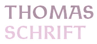
- Technotype (2011). A revival of Herbert Thannhaeuser's 1952 slab serif family Technotyp.
- Thomas Schrift and Thomas Versalien (2015). Based on Friedel Thomas's Thomas Schrift and Thomas Versalien from 1956-1958.
- URW Akropolis (2016, URW++). A revival of the cigar box open typeface Acropolis designed by the Ludwig Wagner foundry in Leipzig in 1940.
- Pergamon (2016, URW++). A wonderful 10-style didone typeface family that revives, extends and modernizes Pergamon Antiqua first designed in 1937 at Ludwig Wagner in Leipzig by Alfons Scheider.
- Marli (2016). A revival of the cursive typeface Korso by F. Schweimanns (1913).
- Moewe (2017). An open typeface in the blackboard bold genre that revives Möwe (1929, Heinz Beck for Genzsch & Heyse).
- Golf (2017). Golf was originally designed by Henry Reinhard Möller in 1935 for Schriftguss KG. Coen Hofmann redrew the capitals and then added lower case letter and Cyrillic alphabets.
Klingspor link. View Coen Hofmann's typefaces. [Google]
[MyFonts]
[More] ⦿
|
Dan X. Solo
[Solotype]
|
 [MyFonts]
[More] ⦿
[MyFonts]
[More] ⦿
|
Darwin Huayan Harahap
[Royaltype]
|
 [More] ⦿
|
Dawn Studio (was: Frachmadi)
[Fajar Rachmadi]
|
Aka Dawn Creative, and Fajar Rachmadi Priyambada. Sidoarjo, Indonesia-based designer (b. 1992). Creator in 2018 of the display typefaces Glenmore and Gores Sans, and the script typefaces Chrystalic, Chrisyard Script and The Ninth Valley. Typefaces from 2019: Rara Sekar (an upright script), Brownies (script), Gayatri Script, Psychopath, Creepy Forest, Sigarette (a signature font), Rote, Black Castle, Berthalia, South Bali, Melyana, Sweet Letter, Kayana (an attractive script), Vasgas, Nex Time (futuristic), Valyrianth (script), Das Pattern (brush font), Digitizer (a pixel font), Bravani (script), dXplosive (octagonal). Typefaces from 2020: Deeney (a fat finger font), Vasgas (sans), Valyrianth (a signature script), Sigarette, Heywa (a curly typeface). [Google]
[MyFonts]
[More] ⦿
|
DCO (or: dcoxy medina, or: Atelier Oxydes)
[Greg Médina]
|
 DCO (or: dcoxy medina, or: Atelier Oxydes) is Greg Médina. Atelier Oxydès is located in St Maurice de Cazevieille, France. He specializes in very funny drawings. Creator of these typefaces in 2012: the fun figurine dingbat typefaces called Alien DCO and Warrior DCO, the hilarious typeface dingbat fonts Zombiz and Teubé, Bubbledco, Profilsdco, Ovni (futuristic dingbats), Punkskull DCO (2012), and the kaleidoscopic Formes (2012).
 Typefaces from 2013: Felicity (ornaments), Gross Brush (grunge), Dark Forest, Follow The Arrow, Snow for Santa, Eat My Cookie, Cooking Set (dingbats), Florality, Big Bang Comix, Babydoll (geometric monoline sans, with a shadow style), Dirty Macadam, Elegance Two (frames), My Sweet Sunshine, Lucie Mandragore, Pimp My Christmas (dingbats), Magic Kiss, Women and Shoes, Halloween Bell, Dust Scratches, Elegance (ribbon ornaments), Dumbass Town, Meaning of Life, Life Style Memory, Tribal Tattoo Addict, Ornaments Soul, Lost Area, Funny Toys, Space Dude, Sick Crew, Teubé 5, Teubé 3, Teubé Hat, Teubé Bot, Plastic Pets, Girl Power, Alien Dude, Formes 2, Alien DCO2, Teubé2. Typefaces from 2014: Gants de Soie, Anne Exilum, Kaboom & Bang, Dcoxy Stamp (a baby-themed dingbat font), Rooster Serif, King Rooster (constructivist), Speak Easy, Skater Girls Rock, TheCinthia Edito, Bad Spirit, Birdy Game (creamy typeface), Shell Gate (tattoo font), Mandala Home, Macaroni&Cheese, Holy Moly (rounded comic book sans), Delphine et Mathias Script (tattoo font), Limonade de Camomille (signage script), Indians Lives (signagecscript), Ether Cute Poison (signage script), Tartare de Violettes (vampire or tattoo script), Karl Wright Script, Bubble & Soap, Break The Silence, Spooky Night, Right Balance, Peanut Butter Cookies, Rabbit Hole (brush script), Smile Parade, Radio Trust, Oakland Sista, Dust & Blast, Psycho (weathered shadow typeface), Bowling Shoes (connected script), Ornament Mix (dingbats), Shuriken Dance Like A Tiger (script), Arthus Hightone (tattoo script), Dark is the Night, City of Angel, From Brush to Caps, Donovan Quidaw (a ronde), Not A Drope (brush face), Karl Wright, Kerala Quest, Rock and Roll Street, Ray Morgan Style, Wind of Change, Mama Love, Mama Punch (athletic lettering), Queen Luna, Kelly Brush The World, Shadow Boxing (an upright connected script), Header Ornament, Sweet Dreamz, Zombie Morning (brush typeface), Dragonfly on my Nose, Estella Cello, Djah Beat, Roses Kingdom (uopright connected script), Buddha Moon, War Brush, Icarus Kharma, Cheese Cake, Badiane (upright loopy script), Meny Please, Young Shark (spurred typeface), Keep It Up (heads), Purple Shadow (Victorian decorative typeface), Tears of Joy (flourishes), Hilarious, Teubé Tribute. Typefaces from 2015: Radical Beat (tattoo script), Raisin des Sables (script), Bandits (tattoo script), Vinegar Stroke, Mad Rats, Sliced by Hand, Ready to Ride, Chardons, Mr Sunshine, Chardons Brush, Gueules de Loup, Atlantic Mail (rhythmic script), Daily Quantum, La Maison de Papier, Friday Night (supermarket signage style), Butter Kings (tattoo script), Lady Bohemia (tattoo script), Kilowatts, Akodia (a lava lamp typeface), Moustache Club, Brioche au Potiron (avant garde sans), Bisous (signage script), Deadly Inked (tattoo script), Spider Monkey (poster font), Qualité Deluxe Platinium (signage script), Distillated, Blood Shade, Ribambelle (thin script), Burning Man, Amandes Salées (tattoo script), Bring Me That Glyph (alchemic), Mad Potato Bill, Authentic Ratatouille, Fugu + Maki (a great set of thin-veined poster fonts), Une Sale Histoire de Yak (script), Pamela Wants to Ride, Sani Andrew des Kiwis, Grilled Chicken, Ancestral Katana Sword, Magic Bean Salade, Alice And The Wicked Monster, Rhum Banane, Honey Moon (borders and filets), Rookies Showtimes (signage font), Digging The Grave. Typefaces from 2016: Watch Out (brushed typeface), America Stars, Grown Localy (sic), Winter in Alaska (glaz krak style), Dusty Muffin, Gillie & Hilda, Chatelain des Radis, Manhattan Avenue (heavy script), Seasider, Suburban Pledge, Baldaquin, Original Woody, Your Fear (vampire script), Drone Nation, Big Car Short Gun, Cameltoe Kalypse, Doctor Cosmicucumber, La Cithare (connected script), Agatha Needs Flesh (script), Bostella (script), Jonquilles, La Cité des Mille Reines, Shotgun, Thunder Strike, Atelier Omega, Aldebaran, Bichette, Bulldozer (brush font), La Citadelle des Papillons. Typefaces from 2017: Polibrush (monoline sans), Endless Wall, Chicken Socks, Barry Kades, Sansaul Petronika, Stubborn Shark, Sharky & Meduza, Oblivion (script), Brainfish Rush, Summer Fever, Bethanie Snake, Last Shade (weathered), Raku (heavy brush), Lily of the Valley, The Bully (grungy signage script), Stick & Kick, Sketch (brush script), Joly Death (blood drip type), Bambino, Gatalike, Lucia (connected monoline script), Gatalike, Island of Dreams, Snow Riders, Amtrash, Stardust (signage script). Typefaces from 2018: Mustardy, Wawie Patch, Anathematise, Delich (an SVG dry brush font), Sweet Spot (doodles), Detrimental, Shitzu & Porko (a comic book font family), Detective Bildo, Daylight & Moonlight (brush script), Deadline Countdown, Rotten Pumkin (sic), Rhapsodize, Chunks (heavy script), Shenanigans (dry brush), Cassandre, Ridiculous, Slam, Lithium Hill (dry brush), Litchis Island (a painted script), Snowballs City, Litchis on Velvet, Brainfish, Burglar, Action Protocol, Snowballs Season, Shania & Heinz (brush script), Slamers, Madera studio, Chaude Sourie, Barber Street. Typefaces from 2020: Pickle Juice, Klaxon Gaston, Mezalia Sumatra (hatched), Bozos (squarish), Niktalope, Livie (a fat finger script), Ornamentis, Artisanalerie, Marbles Trick, Komou, Black Swan, Historic Seattle, Iconic Poopies (yes, poop-shaped icons!), Thurdy Sticks, House Marker, Zorgho, Blue Mist, Dreambats (dingbats), Strike Block (dingbats), Esteban+Solina, Rusty+Gosh. Typefaces from 2021: Shelter (script), Seekers, Game On (sketched, 3d), Green Room (a marquee font), Madame Viviane (script), Lemon Sangria (inline), Chicken Pot Pie (arched), Wombats (squarish), Chico Rocket (inline), Red Bee (a half-black typeface). Dafont link. Old URL. [Google]
[More] ⦿
|
Delafa Design
[Milla Febriana Tanjung]
|
Surakarta, Indonesia-based dreator of these script typefaces in 2018: Passionate (upright connected script), Ballerine, Presty (a free upright connected script). [Google]
[More] ⦿
|
Deniz86 (was: Atadroe, Rt Creative, Blue Eyes)
[Rahmat Hidayat]
|
Aceh, Indonesia-based designer (b. 1986) of the script or calligraphic typefaces Absolut (2021), Salwaty (2021), Beautiful Calligraphy (2021), Flalkner (2021), Angela (2021), Belanttara (2020), Sarahfadhilla (2020), Despacito (2020), Everything (2020), Nauwra Beauty (2020), Qualyty (2020), Brazilian (2020), Xanderella (2020), Matthiew (2020), Beauty Maheyrah (2020), Wittering On (2019), Amirul (2019: an upright script), Lazortha (2019), Jordan River (2019), Ageless (2019), Cempalakuneng (2019: an upright script), Nayla (2019), Quixotic (2019), Evergreen (2019), Magnificent (2019), Ladies First (2019), Azelia (2019), Dughter (2019), Glitter (2019), Guitarist (2019), Boutique (2018), Margarita (2018), Lovellyana (2018), Mighty (2018), Songstar (2018), Monica Script (2018), Angelica (2018, an upright script), Bauthicia (2018), Nantiya (2018), Bottle (2018), Battle Day (2018), Mom Love (2017, brush script), Nutellia (2017), Mantan (2017), Jacktifour (2017), Mr. Satan (2017), Bastille Day (2017), Scooter (2017), Glorious (2017), Markisha (2017, calligraphic), Magdalen (2017), Dughter (2017), Robusta (2017), Simbad (2017, calligraphic script), Guanabana (2017), Cabbage (2017, calligraphic), Dolphin (2016), Salwa (2016), Zinnia (2016, upright connected calligraphic style) and Megaibeilya (2016). Rt Creative also operates as Blue Eyes. Behance link. Graphicriver link. Creative Fabrica link. Fontdaily link. Fontbundles link for Atadroe. [Google]
[More] ⦿
|
Die Entwicklung unserer Schrift
[Peter Doerling]
|
Peter Doerling's visual overview of the styles of writing in Germany, for books, official documents (Urkunden) and in letters. For books, he takes us here: - 200-300: Roman capitals.
- 300-500: Quadrata.
- 500 on: Uncial.
- 900 on: Karolingian minuscules.
- 1200 on: Gothic minuscules.
- Textura.
- 1400 on: Rotunda.
- 1500 on: Schwabacher.
- 1600 on: Fraktur.
- 1500 on: Humanistic style.
- 1570 on: Antiqua.
- 1900 on: Grotesk, Egyptian. [Note that he omits the modern style.]
- 1960 on: Helvetica. (???)
For official documents: - 200-300: Roman capitals.
- 400-600: Rustica.
- 500 on: Half Uncial.
- 900 on: Karolingian minuscules.
- 1500 on: Notula.
- 1600 on: Canzlei (Cantzley, Kanzlei).
- 1600 on: Humanistic Canzlei
- 1875: Ronde, Rondo, Rundschrift.
- 1915: Jugendstil.
- 1930: Tannenberg.
For letters: - 200-300: Roman capitals.
- 400 on: Young Roman cursive.
- 900 on: Karolingian minuscules.
- 1300 on: Cursive.
- 1600 on: Cancellaresca [refined formal script].
- 1600 on: Kurrente.
- 1600 on: Humanistic cursive.
- 1800 on: deutsche Schreibschrift.
- 1800 on: Lateinische (Latin) Schreibschrift.
- 1930: Tannenberg.
[Google]
[More] ⦿
|
Din Studio (or: Doni, Ditatype)
[Donis Miftahudin]
|
 Yogyakarta, Indonesia-based designer (b. 1990) of these script typefaces in 2018: Radicalis (script), Blacktail (layered, spurred, Western), Aniyah (formal calligraphic script), Angelina Script, White Star, Better Saturday, Volaroid, Gravity Handwritten, Wellington (Sans), Mister Froggie, Amadora (upright script), Brilliant, Portland, Adora Queen, Fox Tail, Deliciously (+Sans), Breaking Down (brush-lettered), Welcome Home.
 Typefaces from 2019: Smooth Fantasy, Le Jour (font duo), Kafina, The Stranger (dry brush), Rolling Back, Marline, Blue Rose, Better Summer, Lemonday, Rottely (a decorative serif) (by Muhammad Romzul Khoir?), Monday Vacation (a dry brush or chalk font; +Sans), Brilliant Soulmate (a signature font), Perfect Redemption (dry brush), Redemption (dry brush), Andasia, Saturday Lovers, Pondspell (a free dry brush font), Sailing Heart (dry brush script), Calling Loves Script, Just Calling, Zingakon (a brush font), Anastik, Miracle Script, Camellia, Blueberry, Lovely, Gulali (a heavy monoline script), Boga Bogi, Bigtime (script). Typefaces from 2020: Bright Angels, Blaster Timers, Hawken (a sharp-edged display typeface), Lemonlove (squarish and interlocking), Darknight (a dystopian typeface), Kickout (a sports font), Vintage Melody (a vintage signage script), Anyva (a formal calligraphic script), White Pigeon (a heavy retro signage script), Ayalena, Gamerock (squarish, dystopian), Marrline (an upright monoline script), Black Bones, Westlake (a bold display serif), Anzilam (a regular script with a beheaded lower case f), Among (a condensed monolinear sans), Black Indie, Blue Rose, Kanetin (a sans), Menthol Signature, The Fox Tail (a lava lamp script), Willson (all caps, slightly flared), Kasdio, Lovely, Miftah, Shall Blossom (a dry brush script), Striker (squarish, modular and characterized by square counters), Waranty (a display serif), Aiytha (formal calligraphic), Blastine (a fine inky script), Sporten (squarish; a sports font), Vantely (a one-style monolinear sans), Atteron (a refined decorative all caps typeface), Carade (a decorative serif), Esporte (constructivist), Kafina (a decorative serif), Netraly (a condensed bold organic sans), Regular Brush (a dry brush script), Jafrine, Watterline, Redkits (a dry brush script), Feel Better (a dry brush font), Maraton (a blackboard bold font), Hellomind (a monoline script), Rodwick (a sports font), Norwill (a sports font), Kaithryn (an inky script), Ventralie (blackletter), Kingroad (a blackletter or tattoo font), Hunterlife (a blackletter font), Lovera (a display serif with tall x-height), Rankfine (a formal script), Slashmine (a calligraphic blackletter font), Blackside (a blackletter or tattoo font), Fiosthic (an inky script), Calvera (squarish), Revillia (a decorative serif), Aniyah (formal calligraphy), Better Saturday, Gacor (sans), Bright Rainbow, Dellons Signature, Le Jour, Mister Jacky (brush script), Panama (brush script), Roaster Brush (a dry brush script), Speedline, Sawah (a wide techno logo font), Finest Butter, Garetha (a decorative serif), Rithem (a dry brush script), Vintage Rotter (a monoline script), Amelliyo (a dry brush script), Okinawa (a dry brush script), Rostave (futuristic), Voyntea (calligraphic), Montheylin (a formal calligraphic script), Soage (all caps, mini-serifed), Avalors (a sci-fi font), Mister Sally, Razor Bland (all caps, a heavy razor-sharp sans), Request, Halvert (layered, all caps, vintage), Jasson Gillen (script), Mertalion (a vintage all caps mini-wedge serif), Black Bones (a dry brush script), Halleyo (a dry brush script), Pitchey Bloom, Rocklay (a smooth brush script), Black Arcade (Tuscan), Blaster Timers, Batteny, Bettermind Signature, Castrade (a thin architectural sans), Brown Sunflower, Slash Signature, Chyali, Rockel (squarish, techno, cybernetic), Best Quotes (a brush script), Sweet Fig, Remind (a heavy decorative serif), Stradas (spurred, Victorian), Neon Planet (a neon or paperclip font), Neon Planet Script, Malion (a display serif), Akserant, Akserant Display, Moderrat (a 7-style wide tuxedoed sans family), Pretty Queen, Cybero (a techno / cyberpunk typeface), Sisterhood (a dry brush script), Qeskile Voyage, Breathing (a dry brush script), Fogie (a ten-style display serif), Feeling Passionate, Bella Vista (a thin monoline script), Spring Sunday, Bogota (a display serif), Marcelo (an all caps train font), Montaseli (Sans, Script), March (a display mini-serif font family), Crowded (a vintage font), Grown, Gellatio (a dry brush font), The Poisoned Heart (an art nouveau style script), Costa Rica (script), Brightwall (a dry brush script). Typefaces from 2021: Valiety (an 8-style display serif), Lafayette (a dry brush script), Margita (an 8-style cultured sans), Steamy Miracles, Smiling Lovely (a dry brush script), Grandift (a squarish typeface), Writable Story (an inky script), Beach Vibes (a brush font), Bigruns Brush (a horror brush font), Blimps (a dry brush script), Yellow Palette (dry brush script), Hysteria Rollers (a brush script font duo), Wild Month (a chubby flared all caps typeface), Denlia, Mirava (an 8-style geometric sans, from hairline to bold), Medyan Script (a bold retro signage script), Morning Vintage (a heavy reverse stress retro script), Misslena (a decorative serif), Boldy Vintage (a bold retro signage script), Finest Vintage (a creamy retro signage script), Reverse Vintage (a reverse stress script), Brave Gates (a dry brush font), Retro Vibes (a signage script), Angella White (a dry brush script), Carloti (a stylish all caps sans), Fitriyah (a decorative, almost painted, serif), Stay Retro (a signage script), Arthur Keith (a brush script oozing personality), Beauty Satine (script), Handoyo Signature, Lost Monday (a heavy monoline script), Vintage Round (a vintage signage script), Vintage Lander (a fat script), Sending (a dry brush script), Sweet Moments (a dry brush script), Vilane (a 7-style geometric sans), Windey Signature (calligraphic), Wonderful Branding (a dry brush script), Glory Signature (upright), Basking (a decorative serif), Billie Sight (an inky script), Finding Beauty, Antique Heritage (a rounded monolinear upright script), Fancy Matter (a monoline script), Safira March (a display serif), Beauty Swing (a decorative serif), White Space (a decorative serif), Billion Miracles (a signature script), Kickoff (a squarish font), Skater Squad (a graffiti font), Streetbomber (graffiti), Streetfire (graffiti), Streetlife (graffiti), Bomber Dreams (graffiti), Bosskids (graffiti), Bostero (a graffiti font), Urban Blocker (a fine bulky graffiti font), Bomberboy (a graffiti font), Billionary (a 7-style slab serif), Magelo (a thin-slabbed serif; seven styles), Miguel (a tuxedoed mini-serif typeface in seven styles), Chicago Makers (a fine vintage decorative serif; eight styles), Feeling Steady (a dry brush script), Flatlion (a monolinear script), Javyer (a thin script), Romely (a 7-style fashionable Peignotian typeface), Billastim (a thin and wild script), Universe (futuristic, octagonal), Wertign (a thin and wild script), Boomber Rockstar (a graffiti font), Vintage Rovery (a plumpish decorative serif), Starstone (squarish, modular), Portaly (a rounded monolinear sans), Spaceline (a sci-fi font). Din Studio spun off Vintage Division in 2021, where it published their vintage fonts. The initial collection in 2021: Big Flask, Black Arcade, Blacktail, Boosters, Carlingthon, Cravery, Crowded, Dracolas, Fieldstone, Finest Vintage, Lastones (art deco), Lostcowboy, Medyan Script, Mertalion, Monoline Fighter, Morning Vintage, Mostlatest, Reverse Vintage, Royale Dreams, Stay Retro, Vintage Bridge, Vintage Feeling, Vintage Lander, Vintage Melody, Vintage Rotter, Vintage Round, Vintage Rovery, Western Brother. Typefaces from 2022: Stainger (a 16-style display sans), Rakeny (a 7-style sharp-edged display serif), Billstone Signature. [Google]
[MyFonts]
[More] ⦿
|
Ditoollis Project (was: KV Channel)
[Muhammad Faizal Said]
|
Or Faisal Said. Gondang Candimulyo, Kertek, Wonosobo, Indonesia-based designer (b. 1999) of the bold script typefaces Bankitte (2019), Bollish Hunt (2019), Milittan (2019), Ralliankara (2019), Qhinanttika (2019), Claymale (2019), Chuttime (2019), Allianta (2019), Yhulliantti (2019), Jhanttan (2019), The Chamid (2019), Chapline (2019), Arllitta (2019 and Dettallia (2019). Other typefaces: Milleniale (2019: rounded sans), Manthine (2019: script), Shillentta (2019: dry brush script), Dinattallie (2019: a more formal script), Calyana (2019: upright script). Typefaces from 2020: Maylika Calligraphy, The Arivale, Chanki, Claudira (a monoline marker pen font), Chaprile Calligraphy. Typefaces from 2021: Madina (a signature script), Manthine, Calyana, Rhallisa, Nelachia, Dathang, Etalasi (a brush script). [Google]
[More] ⦿
|
Donis Miftahudin
[Din Studio (or: Doni, Ditatype)]
|
 [MyFonts]
[More] ⦿
[MyFonts]
[More] ⦿
|
Ecriture parisienne
|
 A metal script typeface published by Fonderie Typographique Française in the interbellum era. This ronde inspired by the renaissance penmanship of Gianfrancesco Cresci (1560-1588) is characterized by inky terminals. [Google]
[More] ⦿
A metal script typeface published by Fonderie Typographique Française in the interbellum era. This ronde inspired by the renaissance penmanship of Gianfrancesco Cresci (1560-1588) is characterized by inky terminals. [Google]
[More] ⦿
|
Eka Pamuji
[Eknoji Studio]
|
[MyFonts]
[More] ⦿
|
Eknoji Studio
[Eka Pamuji]
|
Denpasar, Bali-based designer (b. 1993) of the display typefaces Maldini (2019) and Serdane (2019), the dripping blood font Scarynizo (2019), and the upright rabbit ear script typeface Belatoni (2019). Typefaces from 2020: Hantoria Signature, Sunflowers (a wild script), Soubath Ambyar (a fat finger font), Ralgani, Hekayi, Amalia, Korian (a rabbit ear script), Enlova, Neon Bines, Bellove, Aloritma, Cagakara, Light Beach, Wadaw Mania, Mark Catynia, Hikata, Cutenes Monster, Dream Night, Arbiy, Ramadhani (Arabic emulation), Broolia, Valencia Script, Butter Pineapple (a scrapbook font). [Google]
[MyFonts]
[More] ⦿
|
Eko Nurcahyo
[Marchtwentype Studio]
|
[More] ⦿
|
Emil Gursch
|
 German foundry based in Berlin, active from 1866 until 1917, when it was acquired by H. Berthold AG. Klingspor's file on Gursch. Typefaces published by them include:
 - Accidenz-Versierungen.
- Akademisch.
- Alexandra (<1897).
- Antiqua No. 2 through 9.
- Apollo Grotesque (1897).
- Alt-Gotisch (1899) mager&halbfett. Altgothische initialen.
- Bambus Grotesque (1896).
- Berliner Fraktur (ca. 1897).
- Briefschrift Deutsch (<1899).
- Britannia-Versalien (1902).
- Continental Grotesque.
- Dekorative Vignetten (1899).
- Egyptienne.
- Elzevir, ca. 1899: many weights and styles.
- Eskorial (1909) and Eskorial halbfett (1908) by Eduard Lautenbach, published by Emil Gursch.
- Flächer Ornamente (1899).
- Fraktur 14g (1910), Fraktur 14 halbfett (1915), Fraktur 16 (1916), Fraktur No.4 through No.8. Halbfette and Moderne schmale halbfette Fraktur, Schmale Fette Zeitungs-Fraktur, Fette Fraktur.
- Gloria (1898), Fette Gloria Kursiv (1904), Gloria fett (1902), Gloria schmalfett. Gloria Kuric schmalfett. Digitally revived in 2019 by Ralph M. Unger as RMU Gloria.
- Gothisch (schmale enge, Courante and Accidenz), Renaissance Gothisch (1902: eng, magere and halbfette), Fette Gothisch (neueste and breite). Gothische Federzüge.
- Grandezza I and II (1904) by Hermann Zehnpfundt.
- Grotesque.
- Hermes Grotesque (1897).
- Hortensia (<1902). A digital version of this Victorian script was finished in 2009 as Hortensia by Canada Type: Hortensia was Gursch's most popular typeface, used extensively and prominently in many beautiful type catalogs, and a commonly seen design element in Germany for quite a while after its release.
- Industria (1913, a grotesk designed for ads). Weights include Zart, Halbfett, Fett and Zephyr. By Hermann Zehnpfundt.
- Journal (1912-1913) by Hermann Zehnpfundt. Weights include Antiqua, Kursiv, Antiqua Halbfett.
- Breite Kanzlei, Moderne halbfette Kanzlei, Antike Kanzlei (wow!).
- Kavalier (1910) by Hermann Zehnpfundt.
- Klinger (1919, +Antiqua) by Julius Klinger.
- Koenig-Type (1903-1907, Heinz König), Koenig Schwabacher (1912-1913, Heinz König), Koenig-Fraktur (1910, Heinz König. This is also called Gursch Fraktur),
- Kontinental Grotesk.
- Korona (1905, + Halbfett) by Albert Auspurg.
- Mediaeval, Cursiv, Mediaeval Cursiv.
- Monument (+Halbfett).
- Moderne Schreibschrift.
- Phönix-Cursiv (1897).
- Polygon Undine (1904).
- Roma (ca. 1897).
- Rubens (1905) by Albert Auspurg.
- Rundschrift.
- Saxonia Einfassung (borders).
- Schwabacher, Fette Schwabacher (1899).
- Schwarze Hände, and many great math and astrological sets.
- Senefelder (1908).
- Sirius Ornamente (1908).
- Skulptur (1901): has styles called Halbfett and Licht.
- Sütterlin Unziale (+Halbfett), made in 1905 by Ludwig Sütterlin himself.
- uncial gotisch or Morris Gotisch. For a digital version, see Morris Gotisch by Gerhard Helzel.
- Versierte Italienne.
- Werk Fraktur (fett, halbfett), done before 1907.
- Zierschrift Roma, Zierschrift Apollo, Zierschrift Gloria, Boston Zierschrift.
- Zirkular Kursiv (1913) by F. Müller-Münster.
There were also numerous ornaments and vignettes. Published documents include Industria, eine charaktervolle Reklame-Grotesk (1913), Polygon-Undine. Fette Gloria-Kursiv (1904), Nachtrag zur Handprobe. Neue Erzeugnisse aus den Jahren 1898-1901 (1902), Munster-Sammlung der Schriftgiesserei Emil Gursch, Berlin S., Messinglinien-Fabrik und Gravir-Anstalt (1899). That last book is their main publcation, 112 pages of nicely presented specimens covering all lettertypes and ornaments in detail. A peek into one of Gursch's specimen books. PDF prepared by Klingspor Museum. [Google]
[MyFonts]
[More] ⦿
|
Emil Karl Bertell
[Fenotype]
|
 [MyFonts]
[More] ⦿
[MyFonts]
[More] ⦿
|
Fahri Rizal
[Mocca Letter (or: Fana Studio)]
|
[MyFonts]
[More] ⦿
|
Fajar Rachmadi
[Dawn Studio (was: Frachmadi)]
|
[MyFonts]
[More] ⦿
|
Fajriadi Fajriadi
[Masinong (was: Pholetter, Fatype Studio)]
|
[MyFonts]
[More] ⦿
|
Fenotype
[Emil Karl Bertell]
|
 Fenotype, a Finnish type foundry, has the original (often techno) designs of Emil Bertell (b. 1983, Helsinki) and his brother Erik Bertell and wife Kea Bertell. Emil has been studying graphic design at University of Art&Industrial Design in Helsinki since 2004. He designed most of his typefaces during 2001-2004, and works as a freelance illustrator. Behance link.
 Typefaces made in 2002: Disco (prismatic), Lakmus, Valimo, FUTU, Test1, Foton Torpedo, Cheaptype, Personal Computer, Copycut, Unicode 0024, HKI Metro, HKI NightLife, Digital Kauno, Fenotravels (dingbats), Tivoli, Kosmonaut, 10124, JouluFonttiFenotype, Testi, 1laitos, 1120, 0629 (2002, a kitchen tile font), 0927, 0210, FTdingsprevi, Fenotypedings#lego3, Genotype, NeoPangaia, NeoPangaia 2, Nipponblocks, Pectopah, Personalcomputer, Pouttu, Samarin (2002, athletic lettering), Unicode0024, URALphat, URALthin, URAL, URAL3d (all Latin/Cyrillic fonts with incomplete punctuation though), Automania (multiline), Copycut, Halo, 222_2003, Tantor, Letters, Rikos, Lastu, ThreeTheHardWay, Bukkake, Halo. Emil's brother Erik designed Neon (paperclip face), Mama and Mama Round (paperclip typefaces). In private email, he calls himself Carl. The foundry evolved from 2theleft. Fonts made in 2003: Military Dingbats, 08 02 03 Fenotype, Projectsfenotype, Rock-it. Fonts made in 2004: Scandinavian Titan white, Scandinavian Titan, Acid Test 2, Acid Test (texture typefaces), 080203, Letters11, Linja, Projects, Rock it, Simpletype. Commercial typefaces: Sapluuna, Shortcut, Transeuro-Express, Omega-Uros, Fenotype Dings, Military Dingbats, Nippon Noodle. Typefaces made in 2004: Kolari, Kolari Light, FTfaces, Twisted Ontogenesis. Alternate URL. In 2005: RoundAbout, Nihilist Philosophy, Boogie Monster, Chunky Hunk (Western), Diy Typeface (kitchen tile style), Futuretro (stencil-like), 3TheHardWayOverrun, Pedant Dilettante, FT Rosecube, FT Blockbuster, 3TheHardWayRMX, Adios Gringo (Western face), Helsingfurt (3d oil glow face), Cream Soda (liquid), Thashed Paper Bag, Big Medium. In 2006: Rock It Deluxe (grunge), Cassette (dingbats), Kings Garden (Japanese trees as dingbats). MyFonts link, opened in 2009, where one can buy 080203, 3 The Hard Way Overrun, 3 The Hard Way RMX, Adios Gringo, Depth Charge, FT Helsingfurt, FT Roundabout, FT Scandinavian Titan, FT Twisted Ontogenesis, Ice Cream Soda, Kings Garden, Kolari, Nihilist Philosophy, Old Note, Rock It, November Script, and Majestic Mishmash (ransom note caps), Digital Kauno (2002, upright script), 10.12, EB Vintage Future, Fenotype Dingbats, FT Forest, FT Funghis, FT Military Dingbats, FT Weapon of Choice, Motel Xenia, URAL, Valima. Additions in 2010: Linguine (connected script), FT Telegraph (slab serif), FT Brush, FT Industry Machine, FT Giorgio, Killer Elephant (signage), FT Supervisor (ultra-condensed), FT Dead Mans Diary (scribbly), FT Grandpa Script (grunge calligraphy), FT Stamper (angular lettering), FT Tantor (fat, rounded), FT Bronson (fat display typeface with mustache dings thrown in), FT Master of Poster (bi-level display typeface with many ligatures and interlocking letters), FT Hidden Forest (tree dingbats), FT Mammoth (grotesque headline face), Rikos (futuristic), Squarendon Extra Bold (2010, a Clarendon), FT Moonshine Script (a Treefrog style face), Billboard (a hand-printed rounded caps family), EB Bellissimo Display (rounded monoline sans), Malamondo (an all caps display typeface with a large number of interlocking ligatures), Linja (2002 and 2010, a rounded ultra condensed family), Punavuori (2002 and 2010: a monoline sans family), Signor (2010, a rounded all caps family), Mrs. Lolita (connected script), Funghi Mania (mushroom dingbats), Funghi Mania Script, Darlington (very open upright connected script family), Archipelago (+Caps: an upright connected script), Tower (pieces that enable one to modularly construct towers when stacked; created as a school assignment at the University of Industrial Art&Design Helsinki in 2006), Monster (just as Tower but for monsters), Verna (informal face with ball terminals), Verner (2010, a connected script version of Verna), Verner (2010, a connected script version of Verna). Typefaces from 2011: Pepita Script (an upright connected script with small lachrymal terminals), Pepito (its nonconnected version), Barber (upright script family), Banzai Bros (a fat caps-only signage face), Mishka (an upright connected script with tear drop terminals). In 2012, he created Salamander Script, Taiga (connected upright script), Mercury Script (a set of upright connected script typefaces), Slim Tony (a bubblegum retro signage face) and Mercury Ornaments. Typefaces from 2013: No. Seven (a successful brushy signage or baseball script), Alek and Alek Ornaments (an upright signage script), Voyage (a vintage script), Barracuda Script (brushy signage face), Bonbon (signage script), Bonbon Ornaments, Scaramouche (a playful connected script). Typefaces from 2014: Larry (sturdy connected script), Silver (upright connected script), Powder Script, Peaches And Cream (creamy signage or baseball script), In and Out (a connected retro signage script), The Carpenter (a script family in the style of Mercury Script). Typefaces from 2015: HMS Gilbert (a collection of 14 hand-crfated vintage types), Lager (a signage script family with adaptable swashes and other opentype goodies), Vanilla Shot, Journey (a smooth and elegant vintage script family of four weights and a matching ornament set, packed with alternate characters, and, in Bertell's style, perfect connections between glyphs), Tea Biscuit (signage script), Skipper, Skipper (connected script), Frost (a signage typeface that is just right, a sure award winner), Monday (sign apinting typeface). Typefaces from 2016: Jazz Script, Fragola (sign painting font), Syrup (sign painting font), Cosmopolitan (monoline connected script), Bluebell (copperplate calligraphic script), Inkston (vernacular brush script together with the standard handcrafted sans and text styles), Beaujolais (brush script), Black Script (a heavy signage script), Beaujolais (an organic brush script), Cold Brew (signage script), Inkheart (tattoo style). Typefaces from 2017: Camper (monoline script, accompanied by Camper Print), Aether Rain (thin script), Thang, Big Fish, Bolton (Bolton Script and Bolton Script, and the degraded Bolton Print pack), Vodka (Slab, Sans, Pen and Brush), Poster Brush, Fresh Press (signage style), Praktika (grotesk), Praktika Rounded, Blossoms, Kitchen (sign painting brush), Letterpress Studio, Takeaway, Aether Rain, Pitcher (baseball script), Karu (a workhorse sans), Bluebell (calligraphic), Roster (signage script), Dog Days, Catsy, Alfons (in Script, Display, Sans, Serif, Tiki, Extras and Ornaments subfamilies), Cosmopolitan (monoline script and sans pair), Snooker (retro signage script), Salty (a creamy brushed signage typeface). Typefaces from 2018: Aster Script, Audrey (a monoline script and sans duo), Galatea (a 48-style sans family by Erik and Emil Bertell), Double Porter (an 18-style font collection with scripts, sans, and grunge faces thrown in the mix), Matchstick, Fruitos, Corner Deli (a layerable set of fonts in script and sans styles), Bayamo (a brush script done for Monotype), Sidecar (a connected monoline neon sign script, and a matching sans), Ginger John, Brush Marker, Shirataki (monoline soft pen script), Ash (a crayon font), Breakfast Script, Dallas Print Shop (a display family by Teo Tuominen and Emil Karl Bertell), Capital (a sans and serif family by Teo Tuominen, Erik Jarl Bertell and Emil Karl Bertell). Elixir, Maestri (a classical connected scrupt by Teo Tuominen and Emil Karl Bertell), Popcorn (brush script), Cherry (signage script), Goodwater, Signature Script, Kingfisher (a beer botle signage script), Sonder (brush script). Typefaces from 2019: Taurus (an all caps logotype family by Emil Bertell, Erik Bertell and Teo Tuominen), Ex Libris (a high contrast flared serif titling font), Riley (a retro sign painting script), Allison Script, Milky (a sign-painting brush script), Portland (a reverse contrast typeface by Emil Bertell, Erik Bertell and Teo Tuominen), Zeit (a transitional text typeface by Emil Bertell, Erik Bertell and Teo Tuominen), Boardwalk Avenue Rough (a monoline script and a weathered all caps sans), Avion (a sans family by Emil Bertell, Erik Bertell and Teo Tuominen), Yes Script, Gainsborough (script), Florian (a roman typeface with crisp edges and some contrast), Vogue Sans (a haute couture all caps contrast sans), Fabrica (a decorative frilly didone by Emil Bertell, Erik Bertell and Teo Tuominen), Chai (an expressive sans / serif hybrid), Rainmaker Script (monoline), Aequitas (a stylish sharp-edged roman typeface family), Tapas (by Emil Bertell, Erik Bertell and Teo Tuominen: a Serif, Sans, Deco and Script collection), Lawrence (a stylish roman typeface), Kallio Brush (a signage brush script), Morison (a great 32-style wedge serif typeface by Erik and Emil Bertell and Teo Tuominen), Felicity Serif (a juicy bold high-contrast serif), Las Palmas (Brush, Pen, Slab, Condensed), Honey Drops, Explorer, Boardwalk Avenue (a sans/script font duo), Skye (a heavy decorative didone), Leftfield (a retro baseball script), Steak And Cheese, Agile Sans (a humanist sans by Emil Karl Bertell, Erik Jarl Bertell, and Teo Tuominen), Punk Rocker, Silverline, Perfume (Pen, Brush and Sans), Hops And Barley, Allison. Typefaces from 2020: Laurel (by Teo Tuominen, Emil Bertell and Erik Bertell: a 4 style sans with amnay wedge elements), Omnipop (Sans, Brush, Script), Paper Tiger (a Victorian Script accompanied by a condensed flared serif in two weights and a chunky sans serif), Resolve Sans (by Teo Tuominen, Emil Bertell and Erik Bertell: an extensive grotesk super family of 124 fonts: from compressed to extended, thin to black), Gambler (a 14-style display type collection), Rockford Sans (2020: an 8-style geometric sans with large x-height and slightly rounded corners; Emil Bertell, Erik Bertell and Teo Tuominen), Slacker (a brush script), Grand Atlantic (a vintage display package), Magnolia (Brush, Serif), Walden (a heavy rustic serif typeface by Emil Bertell, Erik Bertell and Teo Tuominen), Klik (a geometric sans family with Bauhaus influences, by the dynamic trio of Emil Bertell, Erik Bertell and Teo Tuominen), Rose Garden Deluxe (a font duo), Felicity (a heavyweight display sans). Typefaces from 2021: Alonzo (a 24-style Peignotian sans by Emil Bertell, Erik Bertell and Teo Tuominen), Imagist (a 12-style sharp-edged serif by Emil Bertell, Erik Bertell and Teo Tuominen), Maine (a 12-style modernized book antiqua by Emil Bertell, Erik Bertell and Teo Tuominen), Briston (a bold creamy serif in the Windsor genre), Lagom (a 16-style slab serif with some Clarendon charm; by Emil Bertell, Erik Bertell and Teo Tuominen), Skillet (a chubby Cooper Black-genre typeface full of hedonism and joie de vivre), Kings Valley (a decorative serif), Shaker Script (monolinear), Wonder (a 12-style rounded serif in the style of Windsor; by Emil Bertell, Erik Bertell and Teo Tuominen), Ellie Script (a signature script), Dirty Sundae (a casual font), Grand Cru (a refined serif family with 36 styles; by Emil Bertell, Erik Bertell and Teo Tuominen), Kiosk (a 4-style vintage headline typeface family in Script and Sans versions). Typefaces from 2022: Blood Orange (in the Cooper Black / Windsor / Souvenir genre), Tomato Ketchup (supermarket kitsch in the fat rounded Windsor genre). Dafont link. Behance link. Creative Market link. MyFonts interview. View the Fenotype typeface library. View Emil Bertell's typefaces. [Google]
[MyFonts]
[More] ⦿
|
Firman Syah
[Olexs Studio (was: Rabbit Type, Mr. Rabbit, and Olex Studio)]
|
 [MyFonts]
[More] ⦿
[MyFonts]
[More] ⦿
|
Fonderie Typographique Française
|
 Type foundry in Paris, founded in 1921 by the merger of the firms of Chaix, Marcou, Durey, Huart and Saling. There were several catalogs of their typefaces such as Fonderie Typographique Française Catalogue Général (ca 1925, 798 pages). This site shows many samples from this foundry. The typefaces shown include Amadis (blackletter), Apollo, Ascot, Atlas (1933, an art deco typeface by K.H. Schaefer), Bizerte (art deco), Blanches Saint Germain (pearly caps), Caravelle (1957, the French name of Folio, a Helvetica-like typeface by Konrad Bauer and Walter Baum), Clipper (1951, by Louis Ferrand), Deauville (a charmer that conjures up Les Vacences de Monsieur Hulot), Décor (pixelized and with mosaic effects), Ecriture parisienne (ronde), Editor (1937, Henri Chaix), Estienne, Excelsior FTF (art nouveau), Flash (1953, Enric Crous-Vidal), Garamond FTF, Hélios (a shaded titling face), Ile de France (by Enric Crous-Vidal), Marocaines FTF (revived in 2019 by mario Feliciano as Mazagan), Moscovites, Muriel (1950, a script typeface by Joan Trochut-Blanchard), Normandy, Paris (1953, Enric Crous-Vidal), Pittoresques FTF (1924, Japanese style art nouveau: revival of Pittoresques penchées by Yanick Blancho in 2015 as Koëlh), Psitt (1954, by René Ponot), Ramsès (a tall-legged Egyptian), Stylo (1935, connected script), Swing (art deco), Vulcain (art deco). Apollo is FTF's reply to Renner's Futura. [Google]
[MyFonts]
[More] ⦿
Type foundry in Paris, founded in 1921 by the merger of the firms of Chaix, Marcou, Durey, Huart and Saling. There were several catalogs of their typefaces such as Fonderie Typographique Française Catalogue Général (ca 1925, 798 pages). This site shows many samples from this foundry. The typefaces shown include Amadis (blackletter), Apollo, Ascot, Atlas (1933, an art deco typeface by K.H. Schaefer), Bizerte (art deco), Blanches Saint Germain (pearly caps), Caravelle (1957, the French name of Folio, a Helvetica-like typeface by Konrad Bauer and Walter Baum), Clipper (1951, by Louis Ferrand), Deauville (a charmer that conjures up Les Vacences de Monsieur Hulot), Décor (pixelized and with mosaic effects), Ecriture parisienne (ronde), Editor (1937, Henri Chaix), Estienne, Excelsior FTF (art nouveau), Flash (1953, Enric Crous-Vidal), Garamond FTF, Hélios (a shaded titling face), Ile de France (by Enric Crous-Vidal), Marocaines FTF (revived in 2019 by mario Feliciano as Mazagan), Moscovites, Muriel (1950, a script typeface by Joan Trochut-Blanchard), Normandy, Paris (1953, Enric Crous-Vidal), Pittoresques FTF (1924, Japanese style art nouveau: revival of Pittoresques penchées by Yanick Blancho in 2015 as Koëlh), Psitt (1954, by René Ponot), Ramsès (a tall-legged Egyptian), Stylo (1935, connected script), Swing (art deco), Vulcain (art deco). Apollo is FTF's reply to Renner's Futura. [Google]
[MyFonts]
[More] ⦿
|
Font Bundles
|
 London-based font vendor who started in 2015 or 2016, and carries mostly brush script typefaces. They are mainly pushing their own work.
 Typefaces from 2017: Treasure Script, Hastter Sontial script, Dealina (calligraphic script), Red Mist, Queen, Wishing Well, Highlights, Handy Man, Hey Betty, Polar Bear, Realtech, Golly Gosh, Magic Man, Ardina Script (by Ari Fadli), Rusty Bucket (dry brush), Dolly Script (calligraphic wedding script), Handstyles, Bouncy Hunter (spurred), Django (Western), Olivia Script, Questioned, Renegade, One Dance (calligraphic), Mammoth (script), Honey Bee, September Script (calligraphic), Amanda (calligraphic), Sandy Pro, Lilly Mae. Typefaces from 2018: Squishy, Squishy Extras (sea life dingbats), Billie Harley, Origami, Arkinay, Moscow (a Cyrillic emulation typeface), Bindi, Felt Tip, Christina, Park Ranger, Rembulan, Catchy Script, Champagne (brush and ink splatter), Azalea, Loft Yian (script), Love Candy, Wisdom Script, Montage (signage script), Bristol, Stephanie Jane (brush pen font), Glamorous Silhouette (font duo), Sun City (sans), Crackers, Sliders Script, Jaquilane (upright script), Gladis (formal calligraphic script), Wheatbread (monoline sans), Monstera (a stylish serif typeface), Sailor (tattoo font), Comic Boom (cartoon font), Kely Rose, Radical, Granger (brush font), New Type (prismatic), Sugar Script, Aloha Big Man, Magical Unicorn, Chocolove, Gentle, Roseland, Queensland (copperplate calligraphy), Pink Grapefruit, Jingle Boo, Old Press, Michigan (outline slab serif), Boulder Holder, Angelica (a creamy signage script), Anchor, Freshca (upright connected script), Zimbra (zebra-striped, by Alex Etewut), Adele, AlyshiaScript, BackStitch, BirthdayScript, Brat, BringHearte, CherryBlossom, Eastland, ElhammerBrush, Enyssala, Florva, GloomyDay, HappyBirthday, Heavenfield, Herbie, Junitha, Kayleigh, Mirantie, Mountiane, Nattalia, Quance, QuickBrush, Rafifi, Reebiolla, Rockets, SandyBeaches, Springer, Strangelove, TheCharlotte, Valentino, VictorianMonogram, WinterTime, Zebra. Typefaces from 2019: Radicals (signage script), Lovebird, Ridgeway, Lindale, Moscow, Anthem, Blackstar (blackletter), Maskoolin, Tatima, Hands Down, Monday Blues, September Script, Restuner, Mammoth, Hey Betty, Ciscopic, Hatterline, Jaiho Script, Diamonds, Indah Script, Amanda (calligraphic), Molyna, Mellow Line, Sandy, Renegade, Loveya Script, Angelina Script, Heilig, Dealicha, Allana. Typefaces from 2020: Sleeplesson, Nostalgia Script, Fb Super Fun, Fb Lawnmower, Fb Lovehearts, Fb Leonardo, Fb Fancycorgi, Fb Bananasandwich, Fb Doodled, Fb Mighty Spiky, Quirkle, Toasted Cinnamon, Loveya Doodle, Neon Light (a marquee font), Cliche, Zipper, Fb Mainland, Fb Strawberry, Fb Many Mondays, Fb CountryGirls, Fb Caramelong, Sausages (a chunky script). [Google]
[More] ⦿
|
Francesco Paolo Siniscalco
[Francesco Paolo Siniscalco Typefounders]
|
[More] ⦿
|
Francesco Paolo Siniscalco Typefounders
[Francesco Paolo Siniscalco]
|
Naples-based foundry. Their work can be found in Saggio di caratteri della fonderia di proprietà di Francesco Paolo Siniscalco e c. (Napoli, Dalla stamperia di Salvatore de Marco, 1846). That book shows a modern family, some Fraktur families such as Gotico Tedesco and Gotico Inglese, a Rondo, an Inglese connected writing face, the frilly caps typeface Toscano, flared caps typefaces called "Chinese", and a few minor families grouped under generic names such as Ornato, Egiziano, Ombrato, Americano, Bislunche and Grasso. [Google]
[More] ⦿
|
Gérard Mariscalchi
|
 Montrealer who designed ITC Redonda (1998, an upright ronde script), Baylac (a psychedelic font fdirst done at Agfa, and then at ITC) and the Comic Strip family. Planned are the calligraphic font Herald (for Font Bureau), the protest font Infamy, and Robin Hood. He created the following Agfa Creative Alliance fonts: Evita (1998, now an ITC font: an organic roundisch script), Baylac, Link, Lineale, Iona, Marnie and Toots (1997, based on calligraphy by Villu Toots). He designed the great calligraphic font Scrivener in 2000 (I guess the Herald project at Font Bureau must be dead then).
 FontShop link. Klingspor link. Alternate link. View Gérard Mariscalchi's typefaces. [Google]
[MyFonts]
[More] ⦿
|
Geupap
|
Designer of the swashy upright connected Dephon Script (2016). [Google]
[More] ⦿
|
Gillian Fisher
|
American designer of Rochester Pro (2013), a gestual connected upright retro script co-designed with Stuart Sandler at Neapolitan. [Google]
[MyFonts]
[More] ⦿
|
Greg Médina
[DCO (or: dcoxy medina, or: Atelier Oxydes)]
|
 [More] ⦿
|
Grim Letter
|
 Indonesian designer of the creamy upright script typeface Sanverina (2018). [Google]
[More] ⦿
Indonesian designer of the creamy upright script typeface Sanverina (2018). [Google]
[More] ⦿
|
Groen Studio (or: Jorse Creative, or: Jorsetype)
[Symon Adam Abdullah]
|
 Aka Ay Terry, Ayi Teiry, Roy Yan, Jorse Creative, Symon Adam, Symon Adam Abdullah, Ront Beld, Groen Studio, Lage Jorse, Roiyani, Roiyani Teungku, Roy Yani, Ront Jorse, Groen Lagoe and Roy Jorse, b. 1979. Banda Aceh, Indonesia-based creator of the connected retro signage script typefaces Exoticus (2015), Random Ink (2015), Catfish Script (2015), Umbrella (2015), Wolf Bane (2015: an upright connected script; a Pro version appeared in 2018), Bettaria Script (2015), Matador (2015), Melani Script (2015), Aslang Barry (2015, connected calligraphic script), Fameliya (2014, a connected wedding script), Olivera (2014), Mutiara (2014), Routine Script (2014), Bunthok (2014), Fretaliya (2014), Fatimma (2014), Cuplex Script (2014) and Semadome Script (2014). Ront also designed the brush typefaces Rocket (2015) and Fronte (2015), the more formal connected script typeface Monalisa (2014, renamed later to Montala, probably under pressure from Monotype, owner of ITC Mona Lisa), the calligraphic Amtenar (2015), the brush script Fire Vector (2015), the connected brush script typeface Standly (2015), the script font Maphylla (2015), Freestyle (2015), and the fun connected script typeface Emillia Script (2015).
 Typefaces from 2016: the connected script typefaces Hermes, Beatrice, Bellati, Slowly and Elmaira, the sans typeface Asiach, the handcrafted typeface Country, and the brush script typefaces Astro, Getter, Metric, Brusher, Spontance, Fronte Script, Rocket, Arthands, Brokelly, Armant, Batagors (calligraphic dry brush style), and Almaida, the sans titling typeface Asiach, the connected script Spontance, the handcrafted Country Light, Twetter (swashy calligraphic style), Rantes, Lucue, Brusher (dry brush), Beetle (connected script), Freestyle, Notulen. Typefaces from 2017: Herawati (signature font), Shabira, Bintang, Hand Boys, Sambilan, Betania (brush), Blangku, Valentina, Mother Love, Mangifera (calligraphic script), Happy Berry, Expant (dry brush script), Boston (brush script), Rosenesya (calligraphic script), Bonita (fat brush), Shabira, Amster (an elegant high-contrast signage script), Just Beauty, Justin, Blangku, Mother Love, Bettol, Anitha (calligraphic script), Settiya, Hello Sweety, Expant (dry brush), Boston, Bonita, Astro (brush script), Metric, Getter (dry brush script), Hermes, Arthands, Brokelly, Bellati, Country Family, Batagors (a great dry brush calligraphic script), Armant, Slowly, My Heart, Love & Heart, Heartless, Justin (rough brush script), Muthya. Typefaces from 2018: Romantina, Solution (sans), Mellanie, Rocket, Fronte Script, Berlian. Typefaces from 2019: Muctar (a signage script by Ront Jorse), Taranum (a calligraphic script), Delegation (Script, Sans; by Symon Adam Abdullah), Quintrell, Vortices, Wolfsbane (by Sai Poel), Wamelo. Typefaces from 2020: Creative Signature. Typefaces from 2021: Chayton (script), Osmont (a Treefrog script), De Monte (a 20-style geometric sans). Behance link. Graphic River link. Yet another Creative Market link. Graphic River link. Newest Creative Market link. Fontspring link. Graphicriver link. [Google]
[MyFonts]
[More] ⦿
|
Group Type
[Mark Solsburg]
|
 Mark Solsburg's outfit located in Westport, CT. Before GroupType, Solsburg worked at ITC, which he left in 1989 to start FontHaus. Later he started TypoBrand and Grosse Pointe Group LLC. Solsburg headed the Type Directors Club for a few years. He is presently located in Ann Arbor, MI. He is President / CEO of DsgnHaus (1989-present), and partner in TypoBrand LLC (2004-present), a specialized typographic consulting firm founded by type designer, Mark van Bronkhorst; former type designer for Adobe, Linnea Lundquist, and Mark Solsburg. It seems that the FontHaus collection is now being marketed under the Group Type label at MyFonts. Group Type does technology consultation in the field of providing software and type typeface fonts for designers, publishers and typographers, related to the selection, purchase and use of design software and type typeface fonts for use in graphic, industrial, interactive and communications design. They specialize in revivals. Their fonts include
 - Aquiline. An absolutely wonderful 16th century script.
- Arbor Brush (2012). A brush font that seems almost painted.
- Aries. A 1995 revival of a lapidary typeface by Eric Gill.
- Bank Gothic (1994). A revival of Morris Fuller Benton's original---see also Bank Gothic BT. Now also Bank Gothic Distressed.
- Bristol (1994). In Adornado and Solid substyles. Based on a design by Stevens Shanks.
- Broadway Poster.
- Carpenter Script (1995). Revival of an old connected ATF script by James West.
- Caslon Antique (1993). Based on an original by Bernd Nadall.
- Cloister Initials (2006). A revival of an illuminated caps typeface by Goudy.
- Cooper Poster.
- Corvinus Skyline (1991). By Ann Pomeroy. A revival of a condensed modern family by Imre Reiner by the same name.
- Craw Modern (2012). A revival of Craw Modern by Freeman Craw (1958, ATF).
- Diane Script.
- Fortis (2012), formerly Atlas. In the wood style of Latin Wide, with heavy sharp triangular serifs.
- Girder Poster.
- Gotico Black. A blackletter.
- Grosse Pointe Metro (2006-2009). A great Bauhaus style sans family based on William Addison Dwiggins' Metro #2). See also Detroit Metro.
- Grotesca (1995).
- Laughin. Andrew Smith contributed his Laughin, which was earlier at FontHaus.
- Maxim.
- Ovidius Script. A medieval simulation script, dated 2006, designed by Thaddeus Szumilas. Comis in Light, Medium and Bold.
- Poster Gothic.
- Raleigh Gothic (1995). A typeface based on Morris Fuller Benton's design. See also Raleigh Gothic RR for a different revival.
- Regular Joe (2006). An out-of-place childish handwriting font.
- Ronde Script (2012). This ronde comes from the French side. Group ype says that it was modeled after Parisian Ronde by the Chappelle foundry in Paris, but its roots go back to Nicolas Gando.
- Schneidler Initials (1995). Revival of Friedrich Hermann Ernst Schneidler's Trajan-style typeface.
- Sitcom. Ann Pomeroy contributed Sitcom.
- Spire. By Ann Pomeroy. A condensed didone family heavily based on Sol Hess's Spire (Lanston).
- Stradivarius.
View the Group Type typeface libary. [Google]
[MyFonts]
[More] ⦿
|
Halim Studio
[Antoni Halim]
|
 Aceh, Indonesia-based designer, b. 1981, of these script fonts in 2017: Miracle (calligraphic), Hafizan Script, Andeglei (script + sans), Shangrela, Sheyna, Violette, Andalas (an upright script), Lagena, Monthain (monoline script), Bakmie, Black Chero, Auteru (script), Reomio & Juliet (sic) (script), Bentoke (calligraphic), Camelia (formal calligraphy), Regina (calligraphic), Vertigo (brushy calligraphic).
 Typefaces from 2018: Julian Thomas (signature script), Natasya, Jelisa, Karlote, Good Mood (a rubbe duckie font), Sports Time, James Douthson (signature script), Virgita (calligraphic), Kaitlyne (calligraphic). Typefaces from 2019: Metric (script), Violette (brush script), My Love Elegant, Myhope (script), Madam (script). [Google]
[More] ⦿
|
Hans-Jörg Hunziker
|
Type designer (b. 1938, Switzerland, based in Paris) who studied typesetting in Zürich from 1954-1958. Later he studied with Emil Ruder and Armin Hofmann in Basel (1965-1967). From 1967 until 1971, he was a type designer with Mergenthaler Linotype in Brooklyn, NY, where he worked with Matthew Carter. From 1971 until 1975, he worked with Frutiger in Paris, and became a freelance designer in 1976. From 1990 until 2006, he led some labs at the Atelier de Recherche Typographique, NRT, in Nancy. From 1998 until 2002, he had his own design bureau together with Ursula Held: Atelier H. He has also taught at the Hochschule für Gestaltung und Kunst in Zürich. He codesigned CGP (used in Centre Georges Pompidou; 1974-94, with Jean Widmer, and Adrian Frutiger), Centre Pompidou Pictograms (1974, for the same project in Paris), Cyrillic (in 1970 with Adrian Frutiger for IBM Composer), Frutiger (in 1976 with Adrian Frutiger at Stempel), Gando Ronde (a formal script, with Matthew Carter in 1970; Linotype; called French 111 at Bitstream), Helvetica (with Matthew Carter in 1970; Linotype), Helvetica Compressed (with Matthew Carter, ca. 1974?), Iera Arabic and Iera Roqa Arabic (1983, Institut d'étude et de recherches pour l'arabisation; Honeywell Bull), Metro (in 1970 with Adrian Frutiger; used in the RATP), Univers and Univers Cyrillic (in 1970 with Adrian Frutiger; Linotype), and the Siemens custom type family (in 2001, a cooperation with URW). Siemens (2001-2007, URW++), the project he is best known for, won an award at the TDC2 Type Directors Club's Type Design Competition 2002. Siemens Sans, Siemens Slab and Siemens Serif are here. Siemens Sans Global (4000 Euros) covers Turkish, Baltic, Romanian, Cyrillic, Greek, Chinese Simplified, Chinese Traditional, Japanese, Korean, Thai, Vietnamese, Arabic, and Hebrew. Klingspor link. [Google]
[MyFonts]
[More] ⦿
|
Herbert F. Van Brink
[Character]
|
[More] ⦿
|
Hubert Jocham
|
 German über-type designer (b. 1965, Memmingen) who studied graphic design in Augsburg (Germany) and Preston (England). His degree project dealt with the history of the italic type of the renaissance and the relationship between roman and italic. In 1998 he moved to London to work for Henrion, Ludlow and Schmidt in corporate branding. He worked at one point for Frank Magazine in London. Today Hubert Jocham is a freelance designer located once again in Memmingen, Germany. He develops brandmarks and logotypes for leading brand agencies like Interbrand, Landor, Enterprise and Futurbrand. He designs text and headline systems for international magazines like GQ London, Vogue Moscow, Vogue France (2010), Vogue Turkey, L'Officiel Paris, and New York and German publishers like Milchstraße and Gruner&Jahr. He is responsible for the corporate type of Bally in Switzerland, the Kunsthaus Graz and Agfa Photo. He set up Hubert Jocham Type in 2007. MyFonts link. FontShop link. His typefaces:
 - Adonis.
- The ecccentric serif families Alida Text and Display (2007).
- Becca (2018). An extensive slab serif family.
- Bent (sans family).
- Bravery. A curvy wedge serif. Accompanied by Bravery Sans.
- The Contra Sans and Contra Serif families.
- Contura. Inspired by Jakob Erbar's Feder Grotesk, and designed with the fashion industry in mind.
- The Crema family (2012) has various flowing thick signage script styles.
- Debra. A modern grotesque.
- Dolce.
- Element.
- Elsner&Flake fonts: EF Havanna (1996), EH Herbert (1996), EF Panther, EF Sahara, EF Keule and EF Tabard.
- Esquina. An open and attractive sans.
- The TV-screen-curved Fernseher family.
- Fire.
- The signage brush script typeface Flavour (2004).
- Flow. A sharp-edged sans.
- Glanz (2018). A high contrast fashion mag typeface family.
- Glenda (2009). A script face.
- Granat (2009). A 14-style rounded sans family related to Jocham's own Teleplu and Teleneue.
- Jocham (2012). A fat connected signage script family that won an award at TDC 2013.
- June, New June and New June Serif (1999, after the large x-heighted June, used in W-magazine and Harvey Nichols magazine).
- Keks (2009). A broken angular type.
- The industrial sans family Konsens (with related Konsens Stencil).
- Leaf. A playful serif.
- Legau (2007). A sans with lots of stroke modulation.
- Libris, Bally Libris.
- LTA Identity.
- Madita (2011). An upright connected script family.
- Magazine.
- Matrona (2010). An ultra fat rounded family, awarded at TDC2 2011.
- The display serif typeface Mighty.
- Mommie (2006) was originally designed as a display typeface for L'Officiel magazine in Paris in 2003. It won a display typeface award at TDC2 2008, and was followed in 2008 by MommieBrush. Boris Bencic, the art-director asked Jocham to design a script with high contrast in the stroke, in the tradition of Spencerian Hand.
- The wide basic sans family Monday.
- Motora Sans (2011). A simple sans family which according to Hubert is pure gasoline and sweat.
- Narziss (a beautiful high-contrast ornamental didone headline typeface, winner at TDC2 2010). Followed in 2012 by Narziss Pro Cyrillic. See also Narziss Grotesk and Narziss Text.
- Neopop (2009). A circular type experiment.
- New Libris Sans. This is a multi-weight extension of Libris, the corporate typeface of Bally, Switzerland, designed by Jocham in 1999. New Libris Serif.
- Oktober.
- Other Sans, Other Oldstyle.
- Perfetto (2008). A classic serif family based on a typeface penned by Giovanni Francesco Cresci with an x-height of 8 mm, and published in his book Il perfetto Scrittore in 1570 (also seen in Tschichold's Meisterbuch der Schrift).
- Polia (2014).
- Ramon (2014).
- Riccia (2010). A grotesk family with schizophrenic "a" and "g".
- The angular serif typeface Rudolph.
- Safran (2009). A solid 18-style sans family.
- In 2005, he made the brush script headline typefaces Schoko and Drop.
- In 2008, he added the brush signage families Schwung and Milk.
- September.
- Softedge.
- Spring Sans (2008).
- Susa (2009). A connected script face.
- Tantris Sans (2014). Created for the book about the famous restaurant Tantris in Munich.
- The comic book family Tasty (2005).
- Teleneue.
- Televoice (2018). A sans with elliptocal curves.
- Venturio (50s diner face).
- Verve Sans and Serif (2006-2007) are a pair of fun birds, especially the frivolous serif originally planned for a women's psychology magazine called Emotion. A few days after their publication, they were renamed Verse Sans and Verse Serif, probably because the name Verve clashed with Adobe's VerveMM font made in 1998 by Brian Sooy (by the way, there is also a Verve type family by Dieter Steffmann, dated 2000).
- Vivid (2009).
- Voice (2004-2005, elliptical sans). Subfamilies include Voice Edge, Voice Sans and Voice Shoulder, all done at URW. In 2007, Voice was removed from URW and is solely available at Hubert Jocham Type&Design. The family was extended and now includes many styles, subdivided in Voice (sans), VoiceEdge, VoiceShoulder, VoiceSerif, Voice Heavy, Voice Medium, Voice Ultra Bold, and TeleVoice.
- The very interesting asymmetrically rounded Volt (2007), a sans family he claims improves on similar typefaces such as Bernhard Gothic, Barmeno, Dax, Prokyon, Voice Shoulder, and Phoenica.
- Weekend.
- Work ahead: this serif face (2005).
- Xmas Rudolph (2006). A free display serif face.
- Yuri (2017). A predominantly didone typeface with gently sloped serifs.
View Hubert Jocham's typefaces. Another view. Klingspor link. MyFonts interview. Volcano Type link. [Google]
[MyFonts]
[More] ⦿
|
iCutLetter Studio
|
Indonesian designer specializing in scripts. In 2019, his typefaces include Royal Wedding, Athena Dillethrim, Deen Haag (sic), Calon Biny, and Dianys (a ronde script). [Google]
[More] ⦿
|
Imprimerie du Commerce Evariste Mangin
|
 French printer. In 1867, they published Spécimen des caractères de l'Imprimerie du commerce Évariste Mangin. Samples: Cover page, Egyptiennes blanches, Egyptiennes éclairéees, Fantaisie, Ronde, i, ii, iii, iv. [Google]
[More] ⦿
French printer. In 1867, they published Spécimen des caractères de l'Imprimerie du commerce Évariste Mangin. Samples: Cover page, Egyptiennes blanches, Egyptiennes éclairéees, Fantaisie, Ronde, i, ii, iii, iv. [Google]
[More] ⦿
|
Imprimerie Edmond Monnoyer
|
French printer, est. Paris, 1618, and in Le Mans in 1751. In 1889, they published Spécimen des caractères de l'imprimerie Edmond Monnoyer (Le Mans) [Other link]. Picture of Edmond Monnoyer. Samples: Anglaise, Cover page, Elzevir, latines lithographiqes, Ronde and écossaise, Ronde and gothique. Antoine Monnoyer was master printer in Paris in 1618, and ran the print shop until 1634, when (his son?) Pierre Monnoyer took over. There is a historical hole after that, until Jean Baptiste Monnoyer (b. 1688, d. 1777, Joinville), who was a printer for the duke of Orleans in Joinville. Charles Monnoyer (b. 1720, joinville, d. 1793, Le Mans) became the printer of the king and the bishop of Le Mans, where he established himself in 1751. He headed the business until 1789. Charles II Monnoyer (b. 1758, Le Mans, d. 1811) was in charge from 1789 until 1811. Charles III Nicolas Monnoyer (b. 1793, Le Mans, d. 1860) headed the firm from 1811 until 1860, and was followed from 1860 until 1889 by Charles IV Edmond Monnoyer (b. 1829, Le Mans, d. 1899). Finally, from 1889 until 1932, the firm was in the hands of Charles V Antoine Monnoyer (b. 1868, Le Mans) and Paul Charles VI Frederic Monnoyer (b. 1903, Le Mans). [Google]
[More] ⦿
|
Initia Type
[Liam Philip]
|
London and/or Temanggung, Indonesia-based designer (b. 1988) of Sheptember (2018) and the upright ronde Butterfly Script (2018). [Google]
[More] ⦿
|
Intellecta Design (or: Monocracy Types)
[Paulo W]
|
 Intellecta Design is a design company in Brazil run by Paulo W (b. 1970) from Recife. In 2020, he also set up Monocracy Types. Paulo W is a gaúcho (Brazilian southerner), with interests in multiple areas, including poetry (he has published the digital opus Magical Book), graphic design and, most recently, type design.
 Dafont link. MyFonts. MyFonts link. Abstract Fonts link. YWFT link. Behance link. Blog. Home page. Fonthaus. Monotype. Eshops. Facebook. Flickr. Klingspor link. Wordpress. Devian tart. T26. Linkedin. Identifont. Linotype. ITC. Faces.co. His typefaces: - Free fonts: Inductive Resonance (2014: connected script), Retrodings (+Two, 2014), Living In The Past (outlined Tuscan face), Rough Ornaments Free (2014), CornPop Three (borders), Too Good To Be True (2013, retro script), Blanchard Inland (2013), Living Together (2013), Arresto (2013, brush script), Hertziano (2013, non-connected fat script), Japanese Tourist (2013), Nouveau Never Dies Free (2013), The Beat Goes On (2012, fifties script), Stencix (2012), Figgins Brute Trash (grunge), Fontaniolo Beveled (2011, ornamental caps), Czech Gotika (2011), Random Dingbats (2011), Victorian Free Ornaments (2011), Rustic (2011), Armorial (2011), Woman Silhouettes (2011), The Nile Song (2010, hieroglyphics), Smith Typewriter (2009), Sign Flags (2010, semaphore dingbats), Senectus Morbus (2010), MesoAmerica (2010, Indian symbols), ClassicSketches (2010, dingbats), Columns (2010, dingbats of Greek and Roman columns), EasyCuneiform (2010), EasyLombardicTwo (2010), EasyOpenFace (2010, blackboard bold style), Egidia (2010), Significante (2010, dingbats with, e.g., gender symbols), WhiteDominoes (2010, domino pieces), Easy Heraldics (2010), Intellecta Heraldics (2010), Heraldic Devices (2011), KidingsFree (2010, dingbats), RoughTuscan (2010), The French (2009, Fleur de Lys dings), AprendizCaligrafico (2010), Volitiva (2006, Trajan caps and chancery lower case, all based on work by Ludovico Vicentino Arrighi), Gaivota (2006), KurrentKupferstichThin (2006), PaulKlein (2010), PaulKleinTwo (2010), PortuguesArcaicoLectura (2005), ReproxScript (2009, based on Jerry Mullen's Repro Script from 1953-1954), RickGearyHomage (2007, scanbats), WestBalaio (2006, ornamental caps), Corto Maltese (2006, scanbats), Renaissance Coiffure (2006), Renaissance Ornaments (2007), Renaissance Shoes (2012, free), TTF Tattoef (2006, tattoo-inspired dingbats), ExperiTypo5 (2006), Lower Metal (2006), Geometric Serif PW (2006), Geometric (2006), Geometric Petras PW (2006), War II Warplanes (2005), Carbono (2005), Times New Vespasian (2005), BoldBold (2005), Vengeance (2005), Doppleganger (2005), Chancelaresca (2005), Cursivo Saxonio (2005), Gotische Minuskel 1269 (2005: a Kanzlei Schrift after Dekan Hermann zu Soest, 1269) and Guto Lacaz (2005, dingbats).
- Richard Gans revival project: Gans Tipo Adorno, Gans Lath Modern, Gans Titular Adornada (2006), Gans Ibarra (2006, after Carlos Winkow's Elzeviriano Ibarra), Gans Antigua (2006), Gans Antigua Manuscrito (2006), Gans Radio Lumina (2006), Gans Fulgor (2006), Gans Carmem Adornada (2006), Gans Italiana (2006, extensive Italian-style slab serif family), Gans Titania (2007), Gans Titania Adornada (2007), Gans Titular (2007), Gans Gotico Globo (2007: 9 styles by Iza W), Gans Royality (2007: 3 styles by Iza W), Gans Headpieces (2008), Gans Rasgos Escritura (2010: filets---followed in 2011 by Rasgos Escritura Nuevos), Gan Esquinazos (2010, frames), Gans Blasones (2010, shields), Gans Neoclassic Fleurons (2008), Gans Classical Fleurons, Gans Ding.
- Wood-inspired typefaces: Dead Wood Rustic (2007), Taranatiritza (5 wood type styles, after William Hamilton Page), Majestade (2007, by Iza W---two Tuscan style typefaces), Decorative Tuscanian (2007), Concave Tuscan (2010, wood type), Palermo (2007, by Iza W---Tuscan style family), Teatro (2009, Tuscan), Bruce Double Pica (2009, Tuscan; the Beveled weight is free), Antique Extended (2010, slab serif wood type), Dark Wood (2009, gothic), Dark Wood Beveled (2011).
- Charles Bluemlein's script revivals: Bluelmin Kisaburo (2013), Bluelmin Ralph (2012), Bluelmin Ronald (2012), Bluelmin Sandsfort (2012) and Bluelmin Benedict (2012). (2012).
- Blackletter: Salterio (2012, +Trash, +Three, +Gradient, +Shadow, +Shadow Two), Leothric (2011, bastarda), Bruce 532 Blackletter (2011, after George Bruce), Schneider Buch Deutsch (2007, +Trash, +Shadow, +Shadow Two), Schneidler halb fette Deutsch (2009, +Beveled), Schneidler Zierbuchstaben, Hostetler Fette Ultfraktur Ornamental (2007, blackletter caps), Gothic 16 CG (2007), Gothic 16 CG Decorative (2007, blackletter caps), Schneidler Grobe Gotisch (2008, Iza W, T-26), Allerlei Zierat (2008, ornament fonts based on a 1902 catalog of Schelter & Giesecke), Allerlei Zierat Capitals (2007), Psalter Gotisch (2009, a blackletter after the Benjamin Krebs blackletter face by the same name, ca. 1890), Münster-Gotische (2009, a blackletter family after a 1896 typeface by the same created by Schelter&Giesecke), Koberger N24 Schwabacher (2007), Student's Alphabet (2007, blackletter), Like Gutemberg Caps (2007), Nürnberg Schwabacher, Gotische Frame (2007: four framed blackletter styles by Iza W), Gotische (2007: ten ornate blackletter styles by Iza W), Gothic Garbage, Gothic Shadow, Gothic Trashed, Gothic Flourish (2009), Gotica Moderna (octagonal, blackletter), AltDeutsch (2007, four severe blackletter fonts by Iza W), Fin Fraktur, Gotische Bouffard, Heimat RGS, Gothic Handtooled Bastarda (2006), HostetlerFetteUltfrakturOrnamental (2007, blackletter caps), Gothic Handtooled Bastarda (2006).
- Historical revivals: Pantographia (2010: a digitization, as is, of several alphabets from Edmund Fry's Pantographia, 1799), Caslon2000, Caslon B, Delamotte Large Relief (2010), Figgins Brute (2007: 8 heavy Egyptian styles by Iza W based on Figgins' 1817 specimen book), Erased Figgins Brute (2007), Gras Vibert (2007, a didone family; followed by Gras Vibert Two in 2009).
- Erotic or human alphabets: American Way of Life (2011), Roman Silhouettes (2011), Silvestre Weygel (2007, named after Martin Weygel'a erotic alphabet from 1560, which in turn was based on Peter Flötner's 1534 alphabet), Gravure (caps typeface made of human silhouettes), Innocence (2007, dingbats of girls).
- Medieval chancery hand: Portugues Arcaico (2005, three medieval handwriting styles), Kurrent Kupfertisch (2006, a medieval hand done with Fernanda Salmona), Dovtrina Christam 1622 (authentic old manuscript face), Catania (2007, exquisite medieval caps in 3 styles by Iza W).
- Typewriter typefaces: Remix Typewriter (2012), Smith Trash (2012), Neo Bulletin (2010, +Trash), Remington PW (old typewriter face), Olivetti Linea (old typewriter face), Erased Typewriter 2 (2007: 4 styles by Paulo W), RIP Typewriter (2009), Shadow Typewriter (2007), Underwood Typewriter (by Iza W).
- Calligraphic: Broken Kiss (2015), Derniere Script (2015), Bradstone Parker Script (after Zaner's penmanship), Jan van den Velde Script (2011, based on the penmanship of Jan van den Velde as illustrated in vna den Velde's 1605 book Spieghel der schrijfkonste; developed jointly by Paulo and Iza W), Penabico (2010, with Iza W); Penabico is a free interpretation of the copperplate script styles to be found in the Universal Penman, London, 1741, by George Bickham---it contains over 1500 calligraphic glyphs and 250 ornaments. Samples of Penabico: i, ii, iii, iv, v, vi, vii, viii, ix), Easy Calig, Intellecta Mixed Script (2008), Spencerian Constancia (2008), Calligraphia Latina Soft4 (2010, quilled ornaments), Intellecta Script commercial (2009), Spencerian By Product (2009), Spencerian Palmer Penmanship Pro (2010), Indenture English Penman (2010), Calligraphia Latina (2008-2010, in weights called Soft2, Dense, 3, Soft4, Mixed, Square Edition).
- Victorian, Edwardian: Engel (2007, by Iza W in 15 styles that have a 1870s look), Compendium (Victorian), Costado (2009, a Victorian / Western face).
- Ornamental caps: Campi (2009), Doppel Mittel Lapidar Azure (2012), Musirte Antiqua (2012), The House of Usher (2012), Peterlon (2012), Dolphus Mieg Alphabet (2011, +Two), Dolphus Mieg Monograms (2011), Human Nature (2011), English Arabesque Revival 1900 (2011), Imprenta Royal Nonpareil (2011), XVI Century Shaw Woodcuts (2011), Ichweis Caps (2011), Cherubim Caps (2011), Rara Beleza (2011), Gothic 1880 Revival (2011), Angelicaps (2010), Unnamed Caps Two (2010), VertiCaps (2010) Rebimboca Caps (2010), Rebimboca Beveled (2012, free), Rebimboca Gradient (2012, free), Rebimboca Trash (2012, free), Rebimboca Outlined (2012, free), Republica Presente (2010), Speedball Metropolitan Caps (2010, after a design by Ross F. George), Nice Initials (2010), Morphelic (2010), DurerGotischCapitals (2010), Egmontian (2007, ornamental caps family), Saducismus Triumphatus (ornamental caps), Vogus (Victorian caps), Victorian Ornamental Capitals (2009) and Frompac 1889 Arabesque (2007) [both are classical arabesques published in Ludwig Petzendorfer's Schriften-Atlas. Eine Sammlung der wichtigsten Schreib- und Druckschriften aus alter und neuer Zeit nebst Initialen, Monogrammen, Mappen, Landeskarten und heraldischen Motiven fur die praktischen Zwecke des Kunstgewerbes, 1889], Lettrines Petin (+Ornée), Numa Initials (2006), Gradl Initialen, Vampirevich (2009, ornamental caps), Paulus Franck 1602 (2006, ornate caps), Geodec (2006, baroque caps), HostetlerFetteUltfrakturOrnamental (2007, blackletter caps), Cadels (2007, ornate caps by Iza W), Manuscript XIV Century (2007, by Iza W--four Lombardic caps), Merona (2007, by Iza W--ten Lombardic caps fonts), Selena (2007, by Iza W---ornate Victorian caps), Leyenda (great Victorian era ornamental caps), Mixed Capital Style (2007, caps), Lenda (2008, capitals), Kidnaped at Old Times (2008, ornamental caps, ransom note style), Mortised Capitals, Is Not ABrazilian Font (hand-printed blackboard bold caps), Robur The Conqueror (2009, ornamental caps), Georgia Capitals (2009), Decadence avec Elegance (exaggerated ornamental caps).
- The American Advertise series: American Advertise No. 9 (2008), American Advertise No. 17 (2007, 19th century caps), American Advertise 018 and 019 (2008), American Advertise Square Series (2007), American Advertise 003 (2012), American Advertise 004 (2010), American Advertise 005 (2010), American Advertise 006 (2010, alphadings), American Advertise 007 (2010, ornamental caps).
- Ornaments, fleurons: Transportation Dings *2015), Cornucopia of Dingbats Eight (2015), Animals Old Cuts Two (2015), Unpublished Ornaments Two (2013), Classix (2012), Cornucopia of Dingbats (2012-2014, +Two, +Three, +Four, +Five, +Six, +Seven), Cornucopia of Ornaments (2013; +Two, +Three, +Four, +Five, +Six, 2014), Cornucopia Caligrafica (2012), Vintage Hands (2012), Human Silhouettes (2012; +Free, 2013; +Two, 2013; +Human Silhouettes Three, 2013; +Four, 2013; +Five, 2014; +Six, 2014; +Seven, 2014; +Eight, 2014; +Nine, 2015), Easy Fleurons (2012), Floreale Two (2012), Neoclassic Fleurons Free (2011), Calligraphic Frames Soft (2011, +Two), Jugendstil Flowers Free (2011), Easy Ornaments (2011), Blasons (2011), Blasons Free (2012), Armorial (2011), Monograms Soft (2010, with Iza W), Easy Tiles (2010), Free Tiles (2010), Rough Fleurons Two (2010), Vegetable Breathe (2010), Corn Pop Plus (2010), Mortised Fleurons (2010), Mortised Ornaments (2011), Mortised Ornaments Free Two (2013), Golden Times (2010), Stahlhelme und Kronen (2010), Rough Fleurons (2006), Nouveau Never Dies (2009, ornaments), GeodecBruceOrnamented6 (2006, after a sample from the Bruce Type Foundry), Grave Ornamental (2006), BlackOrnaments (2008), Hera Hedelix (2009, ornamental tiles), Mortised Ornaments (2009), Soft Fleurons (2007), Half Flower (2007), Frames 1 (2007, by Iza W), Flower Essences, Micro Fleurons (2009), Naturella (2009, leaf and grape dingbats by Iza W), Black Fleurons (2010), Easy Fleurons Two (2011), Intellecta Borders (2008, by Iza W), Intellecta Style (2007, borders).
- Fonts made before 2007: Brute Aldine (2007, Western family), Bad Situation (2007, after a design by Freeman Delamotte from 1864), Benjamin Franklin (2007), Geodec Petras Enhanced (2006), Deutsche Poster (2006), FatFontGrotesk (2006), Orchis (2006, an art deco family by Iza W), Fantis (2006), Frompac (2006, with Iza W), Geodec Fog (2006), Intellecta Modern (2006), Intellecta Modern 2 (2006), Intellecta Romana Humanistica (2006), Advantage (2006, together with Iza W), Biza (2006, together with Iza W), Elegancy (2006, together with Iza W), Estiliza (2006, a sans family together with Iza W), Experitypo 4, Stairway to Heaven, Copperplate PW, Dings PW, Roger Dean, Gliphs PW, Luxeuil, Watchtower Bible 1965, Gabinete Portugues (11 fonts), Elara (2009), Xilografuras (dingbats), Beta, Alta, Paleolitica Nacional, Shakespeare Studs, Copperplate collection (5 fonts), Wine, Ampersamp, James Poem, Leal Conselheiro, Haeckel Enygma, Iza B, Of, Lementa (2006, ornate family), Pirates (dingbats), Wire Clip (2009), Divina Proportione (2009, dingbats), Tharagaverung (2007), Correo (2009, a nice manly bold face), Titivilus (2007, Roman lettering), Pirates De Luxe (2007, dingbats), Geodec Minuskel (2006), Geodec Spyral (2006), Copperplate Decorative (2006), Feosa (2006), Francesco Decorative (2006, Iza W), Geodec Petras Enhanced (2006), Ibarra Flourished (2006), Intellecta Decorative 017 (2006), Intellecta Decorative 018 (2006), Intellecta Slab Bold (2006), Kansas Decorative (2006), Pingente (2006), Sixties Living (2006), Caractere Doublet (2007), DeutschePosterSteinschrift (2007; by Iza W), Bailarina (2007), GP Casual Script (2007), Colonia Portuguesa (2007), Contouration (2007), Deco Experiment 3 (2007), Floresco (2007), Flower Jars (2007, by Iza W---a very nice idea), Frutisis (2007), Intellecta Monograms (2007: 19 monogram fonts by Paulo W), Intellecta Monograms Random Sample (2012-2013: several typefaces), Peloponeso (2007, by Iza W), Porcupine (2007, by Iza W), Southern Flight (2007, by Iza W---condensed), TTF TTTOEF 4 (2007, by Iza W---dingbats), GeodecBruceFlourished, HostetlerNormande, Victorian Ultra Parphernalia (2007), Angels (2007), Angels Free (2013), Mondrongo (2007), Oorlog (2007).
- Fonts in 2008: Das Riese (3d engraved caps, +Shadow), Economica (sans, T26), Antiqua Double 12, Bad Baltimore (+Beveled, +Typewriter), Calligraphia Latina (2008-2009, in weights called Soft2, Dense, 3, Mixed, Square Edition, Free), Fry's Alphabet, Grissom (bug dingbats, by Iza W), Latinish (by Iza W), Lettering Deco (by Iza W), Litho Romana Inland, Quadratta Serif (a slab serif by Fernando Diaz), TTF TATTOEF 7 (by Iza W).
- Fonts made in 2009: Eingraviert (engraved; scans: i, ii, iii), Eingraviert Beveled (2011), Greko Roman Oldstyle, Ortodoxa do oriente, Sans Square, Speedball (by Iza W, Victorian style), Speedball Western Letters (after Ross F. George's lettering), Elara (2009), Intellecta Roman Tall, Force Brute & Ignorance, Sunamy Caps, Starret, The Pilgrim (alphadings), Renaisperian (alphadings), Real Caps Two, Mateus Bold (4 bold styles), Intellecta Crafts (arts and crafts family), Bruce 1490, Bradley Dingies (five dingbat typefaces, after William H. Bradley), Allerlei Zierat Renaissance, Grave Plus, the grungy Monkey series (Victorian Monkey, Monkey Poesy, Monkey Messed Gutenberg Caps, Monkey Was Here, Monkey Insinuation, Monkey In The Middle Ages), Montezuma (dingbats), Grotesque and Arabesque, Calhambeque (old car dingbats), Eiger (2009, a 3d sketched headline face).
- Faces made in 2010: Polen, Pencraft (capitals were inspired in Swagger Capitals, an original design from Carl Stephen Junge, at Barnhart Brothers & Spindler; lowercase based Pencraft Specials, an ornamental variation of the Pencraft Oldstyle series, as displayed in the BBS catalog from 1922), Salamemingoe (children's hand), BarberPoles, Beware the neighbors (scary), BlackInitialText, CaligrafiaDivina, CornPop, CowboyHippie Pro, Grotesca3-D, Nardis, Senzacuore, Speedball Metropolitan Poster (2010, after a design by Ross F. George), TagWood, Tosca, TypographyTribute, Zooland, Bubbleboddy-Fat, bubbleboddylight-Light, Pretoria Gross (a Victorian family done with Iza W), Wood Font Five (wood plank font), Wood Font Four, Herr Foch (art nouveau), Rebimboca, Octagon French (a 3d beveled typeface due to George Nesbitt, 1838), Picuxuxo (retro futuristic, comic book style), Large Old English Riband, Ornamental Riband, Kidings (Dutch dingbats), Hostil (originally done in 2007: a headline family; followed by Hostil Shadow Two (free, 2012) and Hostil Gradient (free, 2012)), Grotesca, Heptagon French, Antiquariaat (condensed), Cortinado, Sanoxio (3d headline face), Violentia (grunge), Swirlies (spiral dings).
- Faces from 2011: Dia de los Muertos (fantastic skeletal masks), Inland Becker, Rasgos Escritura Nuevos, Jaggard (2007, a renaissance penmanship caps typeface modeled after Joachim Romann's Queen (1954-1956, Stempel)), Jaggard Two, Naive Ornaments Black, Augustus (+Beveled: roman letters), Sayonara (oriental simulation face; the Beveled style is free), Trash Barusa (inline ornamental face), Free Ribbons, Black Ornaments Three, Calligraphia Latina Soft 5, Heraldic Devices Premium, Ornate Blackboards, Benjamin Franklin Beveled, Baltimore Typewriter Beveled, Bernardo Beveled, Van den Velde Script (a free interpretation of the work of the famous master penman Jan van den Velde, found in the Spieghel der schrijfkonste, in den welcken ghesien worden veelderhande gheschrifften met hare fondementen ende onderrichtinghe (Haarlen, 1605)), Indenture English Penmanship, Penmanship Birds and Ornaments (2012), Beware The Neighboors Shadow (texture face), White Free (shadow face), Delamotte Large Relief Beveled.
- Typefaces made in 2012: Porosa, Presto, Derradeira (signage script), About Sweet Memories (brush script), Intellecta Ribbons, Irrelevante (beveled caps), Laus Sus Chris (Christian dingbats), Unpublished Ornaments, Heavy Squared Writing (brush face), Mezcla Titan, Sweet About (retro script), Publicité, Hard to read monograms, Free Medieval, Doctor Polidori (initial caps), Mixed Silhouettes (One through Five), Glosilla Castellana Cursiva (inline type family), Sayonax (a textured version of the oriental simulation typeface Sayonara), Wood Stevens (free), Rockabilly (fifties script), Interdite Script (heavy calligraphic face), Prismatica (free), Cristalid (free prismatic face), Zed Leppelin (free), Neo Bulletin Outline (free), Neo Bulletin College (2012), Victorian Free Ornaments (+Two), Spanish Army Shields (+Two), Varius Multiplex, Stephens Heavy Titling.
- Typefaces from 2013: Face of Yesterday (calligraphic script), Ribbon in the sky, Dreamer (a flowing upright semi-connected script), Vorname (blackletter), Barocque Capitals, Close To You (a rabbit-eared script), Wappen (heraldic shields), Eletroz (hand-printed), Morcrepito (blackletter), Metropolitan Poster Black, Animal Silhouettes, Intellecta Pointers and Hands, The Loyalist (script), Vonnegut (a left-leaning script), Perhaps Love (left-leaning script), So Lonely (script), Exposition (upright script), Plaster of Paris (connected script), Volstead (connected script), Versitia (connected script), Porongo (heavy brush script), Fat Fantasy, Das Krieg (soldier dingbats), Corn Pop Two (ornamental corners), Corn Pop Four, Corn Pop Five, Astrodings, Vulnavia Sans (comic book face), Capitular Heraldica, Mirella Initials Ornamntals (a swashy calligraphic script; with Iza W), Carpete (retro script), Free Writer, Round Hand, Exclusivite (fifties script), Hertz Oscillations (fat retro script), Heavy Rock (fifties script), Raindrops (retro script), Ralph Walker (ronde), Exiles (retro signage script), Mr. Richmond Caps (art nouveau alphadings), Berengard Caps Two.
- Typefaces from 2014: Prester John, Animals Old Cuts, Take a Pebble, Corn Pop Five (borders), Kidnapped at German Lands (ransom note font), Kidnapped at German Lands 2, Kidnapped at German Lands 3, Kidnapped at German Lands 4 (finished in 2016).
- Typefaces from 2015: Rogeer (script), Chart Moss, Eliensee, Speedball Ragged, State Bridge, Derniere Script, Grissom Four (dingbats of critters), Das Modern, Zona Pro (a sans family).
- Typefaces from 2016: Ares Modernos, Soldier William Holmes (vintage handwriting), Doctor Russel (script), Hollandisch Closed (blackletter), Rough Flowers (floral ornaments), Equis (crosses), Mattaaus (a counterless poster font), Holland Morleau (a Kanzlei style blackletter font), Rough Vignettes, Rechnung (a bejeweled didone), Alphabet Fantasie (decorative caps), Phantasinian (blackletter), Loosing Memory (blackletter), Laandbrau (blackletter), Lord Radcliff.
- Typefaces from 2019: Penmanship Feather.
- Typefaces from 2020: Victorian Alphabets (a weathered engraved money font; despite its name, this is just one alphabet), Mortised Vignettes, Mortised Caps, Monocracy Cuts And Clips, Sincelo Ornaments, Augusta Torino Ornaments (based on art nouveau ornaments from Societa Augusta Torino), Renouveau (art nouveau).
Typefaces from 2021: Gotteslob (blackletter), Cotton Mather (a medieval blackletter), Josef Wein Moderne Blackletter (after an alphabet by Josef Heim from the 1900 book Moderne Schriften / herausgegeben und verlegt von Josef Heim, Supernouveau (art nouveau ornaments). Showcase of Intellecta Design's fonts, numbering 554 as of early 2017. [Google]
[MyFonts]
[More] ⦿
|
Iordache Ionut
[Arys Design]
|
[More] ⦿
|
Irpan Maulana
[Sabrtype (or: Sabr Creative)]
|
 [MyFonts]
[More] ⦿
[MyFonts]
[More] ⦿
|
Jason Anthony Walcott
[Jukebox Collection]
|
 [MyFonts]
[More] ⦿
[MyFonts]
[More] ⦿
|
JB Foundry
[Jean Boyault]
|
 JB Foundry was established by Jean Boyault (b. 1960, Suilly La Tour, France), a type designer who lives in Suilly La Tour. He is the designer of the cursive and other school fonts for teachers, all free and made in 2006-2007: JBCursive, JBEtude-Regular, JBMatrice, JBBatonRond-Bold, JBBatonRond-Extra, JBBatonRond-Italic, JBBatonRond-Regular, JBChantier, JBCursive++Feutre, JBCursive++Marqueur, JBCursive++Normal, JBFil, JBRond, JBScolaireT1-Bold-Italic, JBScolaireT1-Bold, JBScolaireT1-Italic, JBScolaireT1, JBScolaireT2-Bold-Italic, JBScolaireT2-Bold, JBScolaireT2-Italic, JBScolaireT2.
 Typefaces made after 2007: Simple Ronde (2011, upright connected script), JB Etude (2007), JB Script (2010), JB Haut>, JB Lames (2008), JB Elegant (2008), JB Cursive, JBStyle (2008), JB Fil Std (2009) and JB Calli (2008). Commercial typefaces: JB Davayé (2010, connected upright script), Belladone (2010, a graceful display family), Maceriam (2010, +Nova, +Putri, +Lapide: letters cemented into walls---a great idea). From 2011: Old French School Bold (upright connected script), Filature (a monoline connected upright script). Typefaces from 2012: Only One Dollar (a shaky script), JB Cursive 3, Purple Line, Purple Deco, Suilly La Tour, Typha Latifolia, Bouclettes (a curly upright typeface). Typefaces from 2013: Friandise (a decorative typeface reserved for chocolate enthusiasts), Capucine (a chocolate store pair of typefaces), Cuivrerie (a flared interlocking typeface based on lapidary inscriptions found in Bourgogne), Suilly La Tour (calligraphic script), Gaston (a large script family), Typha, Centaurea (a beautifully executed layered type system based on a didone with curved serifs), Toubib (hand-printed). Typefaces from 2014: Hirondelle (connected script), Lecteur Heureux (connected upright loopy script), Happy Reader (connected script), Hopeful Giraffe (a very tall and thin upright script). Typefaces from 2015: HopefulGrasshopper (a fun printed script), Henri Modeste (an experimental didone typeface), Gaston (upright connected ronde script), R+C (the ultimate explicit ruler-and-compass technical drawing typeface with filled, outlined and sketched substyles). Typefaces from 2016: Belle Allure (connected upright school script). Typefaces from 2017: Badinerie (flowery semi-connected connected script), Badinerie Love (with hearts added), badinerie Christmas. Fontsy link. Klingspor link. Dafont link. [Google]
[MyFonts]
[More] ⦿
|
Jean Boyault
[JB Foundry]
|
 [MyFonts]
[More] ⦿
[MyFonts]
[More] ⦿
|
Jessica Barron
[Jessica Barron Designs]
|
[More] ⦿
|
Jessica Barron Designs
[Jessica Barron]
|
Meridian, ID-based designer of the upright rabbit ear ronde typeface Swirl (2019). [Google]
[More] ⦿
|
Jessica Castillo
|
During her graphic design studies at Savannah College of Art and Design (SCAD) Jessica Castillo (Swanton, VT) created the upright frilly script typeface Bellaluna (2013). [Google]
[More] ⦿
|
Jim Lyles
[Stiggy & Sands]
|
 [MyFonts]
[More] ⦿
[MyFonts]
[More] ⦿
|
Jim Lyles
|
 Type designer (b. 1955, Indiana) who lives in Michigan City, IN. While living in NYC, he began working for Mergenthaler Linotype, learning the craft of letter drawing and typeface design. For the next 32 years, Jim worked in the Type group at both Linotype and Bitstream. When Monotype acquired Bitstream early 2011, Jim chose to go solo by founding Stiggy & Sands together with Brian Bonislawsky. He is also a partner at BluHead Studio, where he digitizes old photo fonts by Joseph Churchward. Jim is also active in Stuart Sandler's Filmotype project, where he has resurrected several typefaces, including Filmotype Reef and Filmotype Jade.
 At Bitstream, he did in-house work, and had his signature on Candy Bits (1996, an M&M simulation font), Prima Sans (1998), Prima Serif (1998), Prima Sans Monospace (Bitstream, with Sue Zafarana, 1998) and Bitstream Vera (2003). According to Lyles, Bitstream Vera is actually a detuned Bitstream Prima. Gnome asked that we modify some of the characters in the monospace, particularly for coding legibility. We added a center dot to the zero and modified the lcase l to distinquish it from the figure one. Although I designed Vera (Prima), it was actually Sue Zafarana who adapted it to a mono version, at times a very challenging task. The Vera fonts are also here. Vera Sans is at the basis of Menlo (2009), a Snow Leopard system font, about which Apple writes: Apple's Menlo is based upon the Open Source font Bitstream Vera and the public domain font Deja Vu. He revived some Filmotype fonts from the 1950s: Filmotype Jade (2012, based on an original connected script typeface from 1955), Filmotype Reef (2011), Filmotype MacBeth (2007), and Filmotype Austin (2009, brush face). In 2012, he created a gracious upright script face, Stalemate, which can be downloaded from Google Web Fonts. The upright connected script Grand Hotel (2012, Google Web Fonts, with Brian Bonislawsky for Astigmatic) finds its inspiration from the title screen of the 1937 film "Cafe Metropole" starring Tyrone Power. The free Rum Raisin was published at Astigmatic One Eye. Stiggy & Sands is the American type foundry of Brian Bonislawsky and Jim Lyles, est. 2013. Their first commercial typefaces, all jointly designed, are Luckiest Guy Pro (a fat comic book font based on vintage 1950s ads) and Marcellus Pro (a flared roman inscriptional typeface with both upper and lower case, originally published in 2012 by Astigmatic; CTAN link). At Hamilton Wood Type, he designed HWT Roman Extended Fatface (2014), which is based on 19th century didone wood styles. In 2016, Brian J. Bonislawasky and Jim Lyles published the rugged octagonal mega typeface family Tradesman and the techno typeface Offroad at Grype. In 2018, he published the connected script typeface Michiana Pro at BluHead Studio. Another MyFonts link. Klingspor link. P22 link. [Google]
[MyFonts]
[More] ⦿
|
Jim Spiece
[Spiece Graphics]
|
 [MyFonts]
[More] ⦿
[MyFonts]
[More] ⦿
|
John Stephenson
[Stephenson Blake]
|
 [MyFonts]
[More] ⦿
[MyFonts]
[More] ⦿
|
Jonathan Stephen Harris
[Tattoo Woo (or: JSH Creates, or: Smokewire)]
|
 [MyFonts]
[More] ⦿
[MyFonts]
[More] ⦿
|
José Luis Cóyotl Mixcoatl
|
 Mexican designer in Puebla who studied at the Benemerita Universidad Autonoma de Puebla (BUAP). Designer of the 4-weight semi-blackletter display family El Chamuco (2004, T-26), the pixel/modular family Zoomanic (2007, an award winner at Tipos Latinos 2010), Artico (2003, a custom family for the Spanish magazine Simbad), the script typeface Santanera (2004, consisting of Cha Cha Cha and Rhumba), the purely geometric and linear Mixcoatl (2005), the octagonal typeface Vulcana (2004), and of the pixelated typeface Pixetl (2004, T-26).
 At Tiypo, we find his futuristic typeface Cachirul, the futuristic Rayos Gama, Forever, Frizz (2004, Display, Quadra: octagonal and squarish), the starry typeface Galaxia, Gen (2004), Gum Sans, Gum Organica, the squarish Ix Sans, the organic Latex, Mimetic, Monique, the techno typeface Neutron, Pancracia, Pixetl, the Broadway typeface Pocket, Super (grunge), the script typeface Santanera, and the octagonal Vulcana. In 2012, he designed the warm serif family Maria, the angular typeface Anahuak. For the magazine Padres & Hijos, he created a custom ronde typeface in 2012. He lives in Tlaxcalancingo, Puebla. His company is called The Coyote Lab of Design. At Tipos Latinos 2010, he won awards for Zoomanic and for Cubomatics Icons. In 2014, he created the custom typefaces Lyons Script (anmed after Rob Lyons) and Reposè Script. Typefaces from 2016: the handcrafted CyMx Breath, the arts-and-crafts movie credit font American Horror Story, Klingspor link. T-26 link. Behance link. [Google]
[MyFonts]
[More] ⦿
|
Jukebox Collection
[Jason Anthony Walcott]
|
 This is the new foundry of Hollywood, CA-based Jason Walcott, who formerly ran JAW Fonts, Jukebox Type, and Counterpoint Type Studio. JAW Fonts ceased operation in 2003 and Jason reintroduced his collection of fonts in a revised form under the new name of Jukebox Type. Established in 2015, Jukebox Collection started out with these typefaces, which are mainly remastered and recycled typefaces from JAW Fonts and Jukebox Type with original designs going back to the period 2001-2007, roughly spaeking:
 View the Jukebox Collection typeface library. [Google]
[MyFonts]
[More] ⦿
|
Julie Patat
|
 During her typography studies at Ecole Estienne in Paris, Julie Patat created the unicase font Mischievous Type (2014) and the display typefaces Wolf (2015, after an alphabet in D. Duvillé's l'Art du tracé rationnel de la lettre, 1934), Amsterdam (2015, art nouveau) and Brocéliande (2015). She also revived Firmin Didot's Ronde. Alda (2015) is an italic font with two different angles. Designed for French pocket books, it was inspired by Aldus Manutius's italics from 1501.
 In 2018, she published the Peignotian fashion branding typeface Trigère. Since 2014, Julie is asociated with Novo Typo in Amsterdam as a type designer. [Google]
[More] ⦿
|
Julien Chazal
|
Frenchman who has a wonderful historic overview of the calligraphic styles. Here are his categories: - Renaissance, starting with Gutenberg, and the re-use of Greek and Roman architecture and lettering. It has the chancery hand (or italic) and the humanist (or antiqua). But also in this category are the ronde (upright curvacious scripts), the Flemish cursive (stunning calligraphy) and the fine or modern chancery.
- Gothic, or medieval, alphabets: Primitive gothic (S, T, U, V), textura (P, Q, R), cursive gothic (D, E, F, G, H), bastarda (A, B, C), rotunda (M, N, O), and Fraktur (I, J, K, L). Chazal adds to these six groups the Lombardian (lettre tourneure: A, B, C, D, E, F, G), the tourneure gestuelle (modern hand-printed version of the Lombardian: A, B, C), and the lettres cadeaux (overly ornamental caps).
- Anglaises: voluptuous and difficult calligraphy.
- Gestuelles in modern calligraphy: the cola pen, the tire-ligne, the flat nib, and the pointed nib.
Additional scans of his work: The letter G | Happy 2005 | Abcdefg | Fine chancery alphabet | Lettres cadeaux | Starting alphabet for the lettres cadeaux | Trial 1 | Trial 2 | Trial 3. [Google]
[More] ⦿
|
Julius Klinkhardt
[Julius Klinkhardt Schriftgiesserei]
|
 [More] ⦿
|
Julius Klinkhardt Schriftgiesserei
[Julius Klinkhardt]
|
 Julius Klinkhardt designed typefaces such as the blackletter font Neue Schwabacher (1922, Berthold). He ran the Julius Klinkhardt Schriftgiesserei in Leipzig in the late 19th century, after having acquired the type foundry of Gustav Schelter in 1871. It was taken over by Berthold in 1920. Their typefaces include Flora Ornamente (1906), Lithographia (1895), Secessions Schriften (1906), Baldur (1903, art nouveau; for a digital revival, see Alan Presott's New Baldur APT, 1996, and Dieter Steffmann's Baldur from 2000), Britania-Gotisch (1900, also known as Altgotish, and as Kloster Gotisch, and as Mammut Gotisch), Breitkopf Fraktur (just like versions of this typeface at C.F. Rühl (1912)), Helios Reklameschrift (revived by Ralph M. Unger in 2017 Affiche), Stempel (1912) and Berthold (1919)), Rosen Zierat (ca. 1910), Negro (1908), Elvira (1908), Cornelia Einfassung (1908), Hubertus Schmuck (1909), Filigran Ornamente (1910), Doris Ornamente (1917), Stigma Ornamente (1911), Bastard gross (a Kanzlei typeface with mager and fett versions), Werkschrift Germanisch (ca. 1880), Tango-Cursiv (1914), and Bismarck-Gotisch gross, all digitally revived by Gerhard Helzel. His TipTop (ca. 1900) was digitized under the same name by Petra Heidorn (2004). Tip Top Pro (2008, URW++) is a commercial revival of the same typeface by Ralph M. Unger.
 On EBay, they were selling the specimen book: See here. Their main specimen books are Gesamt-Probe der Schriftgiesserei Julius Klinkhardt in Leipzig und Wien (1885, 690 pages) and Oktav-Probe II (1890, 452 pages). See the cover of an earlier specimen book. Some type designers: - Richard Grimm-Sachsenberg: Grimm-Antiqua und Schmuck (1914), Neue römische Antiqua (1907), Saxonia (1907), magere römische Antiqua (1912).
- Heinz König: Rundine (1913).
- Hermann Delitsch: Ramses (1912, an Antiqua face), Delitsch-Kanzlei (1903), Delitsch Antiqua (1911).
- Julius Nitsche: Unger Fraktur (1910; Wetzig says 1907), Neudeutsche Ornamente (1911), Buchschmuck (1905), Akzidenz-Zierat (1905).
- Remarkable typefaces: Schmale Runde Grotesk (1885, a forerunner of DIN?).
- Gadso Weiland: Toscana Schriften und Schmuck (1908).
Examples from their catalog from 1890: Fette Universal, Garnitur XII and XIII, Garnitur XIV, Kurrentschrift, Verzierte Merkur Kanzlei, and Neue Cursiv Zierschrift, Antika and Italia Grotesk Versalien, drawing of a boudoir, Enge Egyptienne, Fette Cursiv, Fraktur, Halbfette Fraktur, Holz Schriften (wood type), more wood type, drawing of horses, Moderne Fette Fraktur, monograms, Neue Fette Fraktur and Victoria Gotisch, Neue Fette Fraktur, Neue Schmale Fette Egyptienne, Romanische Gotisch, Rundschrift Polytypen, Schmale Antiqua, Schmale Fraktur, Schmale Halbfette Grotesk, Schwabacher, Silhouette Initialen, Stickmuster Typen, vignetten, more vignetten, Zierschriften, more Zierschriften, Zweifarben-Schriften. [Google]
[More] ⦿
|
Julius Schmohl
|
In 1891, Julius Schmohl and Ernst Lauschke designed an art nouveau and a Victorian face for BBS. Schmohl was born in Germany, but lived in Chicago for most of his life. In 1895, he and Max Rosenow published an upright script with BBS. This ronde typeface was originally known as Oliphant and renamed Advertisers Upright Script in 1925. In 2014, Spiece Graphics created a digital version of it, Milroy Upright SG. [Google]
[MyFonts]
[More] ⦿
|
Kevin Yudha
[Prototype Studio (or: Equinox Studio, or: Kensington)]
|
[More] ⦿
|
Keystone Type Foundry
|
 Philadelphia-based foundry, 1888-1917. The history of this short-lived foundry was told by James Eckmann in The Keystone Type Foundry, 1888-1917: a reprint [from] Printing&graphic arts, volume VI, number 1, February 1958 (Lunenburg, Vermont: The Stinehour Press, 1958). Their work appeared in Keystone Type Foundry, 1901 (362 pages), Abridged specimen book, type: nickel-alloy on universal line comprising a price list of types, borders, leads and slugs, brass rule, brass galleys; miscellaneous cuts and general supplies for printers (1906, 636 pages, see also here, here and here), A book of Keystone type typefaces (2nd ed., Philadelphia, ca. 1920), Catalogue and specimen book. Keystone products, consisting of type, material, furniture, complete line of miscellaneous supplies for printers and publishers, machinery and wood goods (Philadelphia, ca. 1910), See also Keystone Products Catalogue and Specimen Book, Consisting of Type, Material, Furniture, Complete Line of Miscellaneous Supplies for Printers and Publishers, Machinery and Wood Goods (1915).
 Typefaces: Admiral, Ayer (Mac McGrew: Ayer was introduced by Keystone Type Foundry in 1909, which said it was "named for F. Wayland Ayer, founder of Keystone Type Foundry and the great advertising agency which bears his name." The non-kerning italic was added in 1910.), Ben Franklin, Ben Franklin Condensed, Ben Franklin Open, Bulletin, Caslon Adbold, Caslon Adbold Extended, Caslon Adbold Extra Condensed, Caslon Bold, Caslon Bold Condensed, Caslon Bold Extended, Caslon Bold Italic, Caslon Lightface, Caslon Lightface Condensed, Caslon Lightface Italic, Caslon Title Extended, Charcoal, Charter Oak (1899), Compressed Gothic, Condensed Lining Gothic, Crayonette, Elite Typewriter, Gothic Condensed No. 3, Gothic No. 102, Gothic No. 114, Harris Italic (1910), Harris Roman (1909), Herculean Gothic, Italia Condensed (1906), John Alden Decorative Initials (1906), John Hancock, John Hancock Condensed, John Hancock Extended, John Hancock Outline, Keystone Gothic, Laureate (1906: revived in 2012 by Isabel Urbina), Lining Antique [Keystone], London Gothic (1910 or earlier), New Model Remington Typewriter, Outline, Outline Condensed, Remington, Remington Typewriter, Round Gothic (1884), Skeleton Lining Gothic, Skeleton Lining Gothic No. 19, Smith Premier, Title Gothic [Title Gothic No. 9, Condensed Title Gothic No. 11], Venezia, Washington Text (1902, blackletter), Washington Text Shaded. Digital pictures I took from the Specimen Book of Type (1903): Bulletin, Keystone Bikes, Boldface Cellini, Crayonette Open, Keystone Cyclers, Encore, Lining Antique, Lining Gothic, Outing Initials, Remington Typewriter, Remus, Ronde Initials, Salem (a wedge serif revived in 2021 by Latinotype as Osbourne), Venezia, Victoria Italic, Worcester. Catalog A-C, Catalog C-P, Catalog P-Z. Digitizations: - Miletus Grotesk (2021, Mario Feliciano) revisits Standard Gothic (1906).
- The slab serif John Hancock (ca. 1903) and condensed slab serif John Hancock Condensed (ca. 1917, Lanston Monotype) were digitized as Hancock RR (1994) and Hancock Pro (2017) by Steve Jackaman (Red Rooster).
- The Remington typewriter typefaces (ca. 1905) were digitized as Secret Service Typewriter RR (2002) by Steve Jackaman (Red Rooster).
- Roman TyresRR (1997) was made by Steve Jackaman (Red Rooster).
- Poor Richard RR is based on a Keystone design from 1919, namely Ben Franklin, Ben Franklin Condensed, Ben Franklin Open (named after Benjamin Franklin's "Poor Richard Almanack"). There is also a free font Poor Richard (1994, Projective Solutions).
- Jeff Levine's Keyden Drop Caps JNL (2021) is a set of slab serif framed capitals based on John Alden Initials, shown in the 1906 edition of the Keystone Type Foundry specimen book.
- Caslon FB (1992, Font Bureau) comes with this text: Our familiar Caslon Bold headletters were invented around the turn of the twentieth century in the United States and were only loosely based on William Caslons romans. The best of the Caslon Bolds originated at the Keystone Type Foundry of Philadelphia, whose Caslon Bold Condensed appeared about 1905, probably drawn by R.F. Burfeind. Jill Pichotta revised his Bold Condensed&drew the Bold Extra Condensed.
- Gibbs Mason designed the art nouveau typeface Vanden Houten (1904) at Keystone. This typeface was remade by Dan X. Solo as Dutch Treat at Solotype.
- Emerge BF (2009, John Bomparte) is a flare serif typeface that was inspired by Admiral, c.1900.
- Old Softy NF (2010, Nick Curtis) is a soft round typeface based on Round Gothic (1884).
- Charter Oak is similar to Royal Gothic (Stevens Shanks & Sons). For a digital revival, see Gothic Grotesk JNL (2020, Jeff Levine) or OPTI Charter Oak (by Castcraft).
Comments by Mac McGrew: - On Harris Roman: Harris Roman was announced by Keystone Type Foundry in 1909. It was "named in honor of the late Joel Chandler Harris, author of Uncle Remus." It is a plain modernized roman, somewhat similar to Century Expanded. In 1910 Harris Italic was added; it was designed to be cast without kerns. Advertising claimed, "Non-kerning italics will save endless annoyances and losses resulting from broken letters, and the purchase price is the same as any other type of our make."
- On Charter Oak: Charter Oak is a heavy, inclined gothic introduced by Keystone in 1899. There is a fair amount of contrast, and round letters are flat sided or nearly so. London Gothic (q.v.) was a comparable upright face, and Royal Gothic of the 1880s from another foundry is quite similar. Compare Doric Italic.
- On London Gothic: London Gothic was issued by Keystone Type Foundry in 1910 or earlier, but is virtually a duplicate of Royal Gothic, shown by Marder, Luse&Co. in 1887. It is similar to the same founder's Charter Oak series, but upright. Although the italic typeface survived Keystone's acquisition by ATF in 1919. London Gothic does not appear to have done so. See Charter Oak.
[Google]
[More] ⦿
|
Laura Worthington
[Laura Worthington Design]
|
 [MyFonts]
[More] ⦿
[MyFonts]
[More] ⦿
|
Laura Worthington Design
[Laura Worthington]
|
 Laura Worthington of Bonney Lakes, WA, is a letterer, illustrator and graphic designer. Her script typefaces became quite popular in recent years. In 2010, she set up shop at MyFonts. Catalog. In 2021, she started licensing her typefaces via The Type Founders".
 Her typefaces: - Adorn (2014), Adorn Smooth (2015), Adorn Garland Smooth (2016, with Dai Foldes). Adorn is a hand-drawn poster font family larger than Charcuterie. It contains subfonts called Pomander, Coronet, Garland, Bouquet, Solo (monograms), Duo (monograms), Catchwords, Banners, Frames, Ornaments, Roman, Condensed Sans, Expanded Sans, Slab Serif, Serif, Copperplate, Engraved.
- Al Fresco (2013). A breezy exuberant script loaded with opentype features.
- Alana (2011, +Ornaments). A connected script.See also Alana Smooth (2017).
- Alisha (2017).
- Azalea Rough, Azalea Smooth
- Beloved (2015)
- Bianca (2010). A flowing calligraphic typeface.
- Blithe (2017).
- Boucherie (2014). In the "collection of vintage fonts" mould of Charcuterie, Boucherie captures the lively essence of 19th-century French advertising typography with a collection of original designs, rather than strict historical revivals.
- Buckley (2012).
- Caprizant (2016).
- Charcuterie (2013). A large set of hand-drawn typefaces for vintage signage.
- Congenial (2015). A legible soft unpretentious sans family originally designed for her own web site.
- Ed's Market (2015). A grocery store and sign painting font family.
- Elaina (2018). Script and Semi-Serif. Laura claims that Elaina Script is closest to her own handwriting.
- Elicit Script (2018, by Laura Worthington and Jim Wasco). A hybrid (casual and formal) scrpt typeface based on pointed pen Spencerian Script handwriting.
- Fairwater (2016). Designed together with Dai Foldes, this typeface family has Script, Sans, and Serif subfamilies, as well as several sets of ornaments. The Serif subfamily conjures up tattoo lettering, but also mathematical blackboard bold style and art deco.
- Funkydori (2012). A fat retro signage script.
- Ganache (2014). A packaging and logo script.
- Gioviale (2012). A calligraphic script.
- Greeting Cards (2010).
- GrindelGrove (2009). A vampire font.
- Harlean (2013). A rough-edged, powerful, and slightly sinful script face---originally named Harlowe.
- HoneyBee (2012). An all caps pirate ship font.
- Hummingbird (2012). A penmanship font.
- Juicy (2015). A plump and yummy candy store font.
- Ladybird (2010). A curly script.
- Liam (2011). Bouncy and curly script.
- Mandevilla (2013). Pure Americana, useful for signage.
- Milkshake (a creamy retro script).
- Modish (2016). A smooth brush script font.
- Nelson (2011). A notched eroded family, almost for Mexican simulation.
- Number Five.
- Origins (2010). An antiqued typeface hand-lettered with a crow quill pen. Followed by Origins Smooth (2016).
- Recherché (2010). A delicate script typeface.
- Regina (2010). A delicate script typeface.
- Renata (2016). A connected calligraphic script co-designed with Dai Foldes.
- Rosarian (2011). A pointed brush connected script typeface.
- Samantha (2011): 2700 flourished glyphs in the classical ronde upright script style and in an italic style; +Swash.
- Sepian (2010). A pointy Textura font.
- Sheila (2010). A connected calligraphic script.
- Shelby (2011). A monoline, semi-connected script typeface based on hand lettering created with a Speedball B metal nib.
- Spumante (2015).
- Tangelo (2017).
- Tiva (2010). A handcrafted and almost connected script.
- Voltage (2014). A retro fat signage script.
- Wallflowers (2011), Wallflowers II, Wallflowers III, Winter Wallflowers (2012).
- Winsome (2016). A casual script.
- Yana (2010). A spurred serif typeface.
Interview by MyFonts in 2010. I Love Typography link. FontBros link. Creative Market link. Klingspor link. Behance link. Fontspring link. Picture. View Laura Worthington's typefaces. Images of her typefaces. [Google]
[MyFonts]
[More] ⦿
|
Lauren Thompson
[Nymfont (was: Nymphont)]
|
 [More] ⦿
|
Letterfresh Studio
[Rizki Andika]
|
 Indonesian studio specializing in calligraphic typefaces. Designer in 2018 of the calligraphic typefaces Ballesia, Bunglone, Diamond, Fathinya, Girly Love (upright script), Ranger Script and Margaretha (2018).
 Typefaces from 2019: Rangen (a sign painting script), Fathoni (a signage script), Batavia Script, Diamond, Melly Script, Buttering, Authem, Stayhill (a retro signage script), Austine Script (for signage), Stayland. Typefaces from 2020: Beautiful Day Script Duo, Mogila Display (a decorative serif), Stay Glory Script (monolinear handwriting), Angelta Script, Beauty Queen Script, Sagita Script, Resnick (a fat headline or poster serif in the genre of Cooper Black or Windsor), Childa Script (a formal script), Amolina Boutique Script (a luxury script and accoapnyiong all caps sans), Budgeta Script (a signage script), Starline (monoline script), Ragilone Brush, Dustine Script (a remarkable high-contrast script characterized by samurai sword swashes and a military horizontal trim), Bufally Script (a vintage script). Typefaces from 2021: Morning Flower Serif (an inky script), Salisha Signature, Agustina Script (upright), Golding Signature (an inky signature script), Rosthila Script (a creamy upright script), Liontine Script, Molista Script (an upright calligraphic script), Galitha Script (upright and calligraphic), Hello Georgina Script (an upright rabbit ear script), The Humble Script (a creamy script), Beauty Night Script (an upright script), My Sweety Script, Sweet Child Script (a formal calligraphic script), Hello Baby (an upright script). [Google]
[MyFonts]
[More] ⦿
|
Lettersiro
[Muhammad Sirojuddin]
|
Muhammad Sirojuddin, aka illustrator Shiro Ngampus (of The Art of Shirongampus), is a Yogyakarta, Indonesia-based designer, b. 1989. In 2016-2017, he published some fonts at Shiro Ngampus. In 2017, he started Lettersiro, where he designed these handcrafted typefaces in 2017: Stay Outside, Amsterdam (signature script), Mellisa Script, The Sunshine Script, Sunshine Ornaments, Holland Signature, Beauty (monoline script), Gisellia (signature script), Calling Heart (brush script), Handsome (dry brush script). Typefaces from 2018: Geronimo Base, Arthington, Asking Mind, Sayur Koool, Meillina, Bolder Line, Blur Sight, Sweetland, Wellsight, Reckless Art, Gojira Black, Butter Layer, Brieston, Breakout, Breaking Mad, Blinkstones (dry brush), Banthink Clean, Black Sambath, Mentega, Handsome, Wild Nature, Santana, Hunters, Kobar, Bio Monster, Good Sunday, Butter Haunted, Black Street, Dillova, Honey Butter (a font trio), The Banthink (a poster font), Sweetland, Outsmile (a signature script), Audhistine, Stella Wilson (font duo), Time Hunters Script, Onetime (signage script), Paladise (creamy upright script), Lovely Photograph Better Glory, Grooving (a weathered vintage font), Midtown. Typefaces from 2019: Best Rock, Raster Slice, Kalimat Script, Satturday Collection, Hollanda, Rallian, Gotten Say, Quick Jump, Blade Stroke, Sandiego, High Sky, Delight Place, Higher Style, Monoline Signature, Lollipa, Deliont, Bellome, Vintage Quotes, Santiago, Darkside (dry brush), Bruttall (dry brush), Bloody Durian, Ruthless, Bankzath, Blanksack Immortal, Judgement Territory, Something in The Grave Yard, Blank Smile, Think Smart, So Sweet Honey, Signatime, Nightland, Willmad Friday, Maillove, Hello Santuy, Collonar Caps, Golliath, Monumental, Zamruds, Barton (rounded sans), Brave Strong (brush style), Dreaming Time (a fat finger font), Greathunt, Wrong Hunt (brush), Lost World, Monster World, Smasher, Charitta, Donnis, Perfect Sweet, Rentuck, Silhouette, Blankid, Signatour, Splash (dry brush), Redtowns (brush), Retro Thunders (a great angular signage script), Hamilton (script), Keilla, Willian, Melting Letter, Burn Wood, Bomber Balloon, Inzomniac, Brown Choco, Dark Hammer, Black Spirit, Black Heart, Batsand, Aged Machine, Heartless, Blink Kiss. Typefaces from 2020: Breaking Wild, The Brat, Expain, Snow Fairy, Beloved Daughter, Shelva, Henniver, Cold Climate, Friend White, Agged Machine, Bradley, Friday, Haksen, Chicago, Writing Tresno, Vintage Quotes, Dalton, Earn, Media Times, Samford + Samford Black. Typefaces from 2021: Paladise (a bold upright retro script), Beauty Switzerland Duo, Honey Crafter (a bold upright retro script), Amsterdam Signature (an upright rabbit ear script), Hunters Think (a bold creamy script). Creative Fabrica link. [Google]
[MyFonts]
[More] ⦿
|
Liam Philip
[Initia Type]
|
[More] ⦿
|
Lindstrom Design
[Nils Lindstrom]
|
Nils Lindstrom is a Glendora, CA-based logotype and type designer. He is the creator of the elegant script typeface Elfin (2007, a fanciful reinterpretation of the elvish type found inside the ring in J. R. Tolkien's Lord of the Rings), and the heavyweight upright signage script Beppo (2011). Jeff Rubow designed Sticks (comic book face) and Mr Jenkins (comic book style) at Lindstrom in 2010. In 2017, he designed Athellia (an upright condensed formal script). In 2022, he released Smart Deco (a tall and pure deco typeface). MyFonts link. [Google]
[MyFonts]
[More] ⦿
|
Linnea Lundquist
[Sweet Fonts Collection]
|
[MyFonts]
[More] ⦿
|
Linoscript
|
Linoscript was made by Morris Fuller Benton at ATF in 1905. It is in the ronde style, and was earlier called Typo Upright and before that, Tiffany Script, at ATF. Equivalent names and designs include Basque, Agfa Codex, Linotype Computer, Agfa Dominante, Berthold Joanna, MT Kaylin, MT French Script. The Softmaker version is called L730 Script. [Google]
[More] ⦿
|
Marcelo Sodré
[Cao Fila (was: Amatraca Design Grafico)]
|
[MyFonts]
[More] ⦿
|
Marchtwentype Studio
[Eko Nurcahyo]
|
 Semarang, Indonesia-based designer (b. 1991) of the script typefaces Bonjour Allgera (2018, font duo), Berlineta (2018, signage script), Olcigatte (2018), Blista Rade (2018), Cattalleya (2018: upright and monoline) and Marsseille (2018).
 Typefaces from 2019: She Amasya, Rotherland, Oleander Cakes. Creative Fabrica link. [Google]
[More] ⦿
|
Mark Solsburg
[Group Type]
|
 [MyFonts]
[More] ⦿
[MyFonts]
[More] ⦿
|
Masinong (was: Pholetter, Fatype Studio)
[Fajriadi Fajriadi]
|
First called Fatype Studio, it was renamed in 2017 to Pholetter and Farjadi Pholetter and in 2018 to Masinong. Banda Aceh, Indonesia-based designer (b. 1991) of the calligraphic script typefaces Shirlly (2016), Gabias Script (2016) and Afrile Script (2016). Typefaces from 2017: Andella Script, Brillyo Script, Montalia Script, Debt Collectors (brush script), Barbara Script, Stylish Script, Dahlia Script (uright). Typefaces from 2018: Dahlia Script (upright script), Golden Bridge (font duo), Woodley (gonzo calligraphy), Thirsty, Romansa. Typefaces from 2019: The Lucky, Change Brush, Betharie, Chester Brush, Wonderkids, Baleria Script, Magistoe, Morelight Script, Wellington. Graphicriver link. Typefaces from 2020: Handover, Shantika Script, Zellora Script, Castillo, Natalle (a heavy brush script), Dellarose, Agnesia (script). [Google]
[MyFonts]
[More] ⦿
|
Matthew Carter
|
 Matthew Carter (born in London in 1937, and son of Harry Carter) is one of today's most influential type designers. He trained as a punchcutter at Enschedé in 1956. In 1963 he was hired by Crosfield, a firm that pioneered the new technology of photo-typesetting, to lead their typographic program. He worked for Mergenthaler Linotype (1965-1981), and co-founded Bitstream Inc. with Mike Parker in 1981, adapting many fonts to digital technology. In January 1992, he founded Carter&Cone with Cherie Cone, and often collaborated with Font Bureau. In 1995, he won the Gold Prize at the annual Tokyo Type Directors Club competition for Sophia. In 1997, he received the TDC Medal for significant contributions to the life, art, and craft of typography. In 2010, he received a MacArthur grant. He lives in Cambridge, MA.
 John Berry on Carter's art (2002). Apostrophe comments on Berry's article. Interview. His fonts: - The Microsoft screen fonts Verdana (1996), Georgia (1996), Georgia Greek, Georgia Cyrillic, Nina and the humanist sans typeface Tahoma (1994). Georgia (in roman and italic only) is a screen version of Miller, Carter's Scotch design. Nina was designed to address the requirements on smaller screens such as phones, and was used in Windows Mobile smartphones before Microsoft switched to Segoe. The Greek and Cyrillic versions of Nina were developed by François Villebrod. Georgia Pro (2010, Ascender) was developed from Georgia with the help of Steve Matteson. For Verdana Pro (2010, Ascender), Carter was assisted by David Berlow and David Jonathan Ross.
- Apple's Skia (1993), a sans serif designed with David Berlow for Apple's QuickDraw GX technology, now called AAT. [Carter's Skia and Twombly's Lithos are genetically related.]
- Monticello (2003), based on Linotype's Monticello (1950), which in turn goes back to Binny&Ronaldson's Monticello from 1797, a typeface commissioned by Princeton University Press for the Papers of Thomas Jefferson. It is in the Scotch roman style.
- Miller (1997, Font Bureau), an extremely balanced family co-designed by Carter, Tobias Frere-Jones and Cyrus Highsmith. Carter explains: Miller is a Scotch Roman, a style that had its beginnings in the foundries of Alexander Wilson In Glasgow and William Miller in Edinburgh between about 1810 and 1820. It is considered that the punchcutter Richard Austin was responsible for the types of both Scottish foundries. Miller is a revival of the style, but is not based on any historical model. Now, there is also a 16-weight newspaper version, Miller Daily (2002), and an 8-weight Miller Headline (2002). This was followed by News Miller, a typeface designed for the Guardian. Note: Georgia (1996) is a screen version of Miller, and Monticello (2002) is a later modification. A comparison of these typefaces.
- Alisal (1995, +Bold).
- ITC Galliard (1978), a recreation of Robert Granjon's garalde letters. This typeface was originally conceived in 1965. Bringhurst recommends a Carter and Cone version of this font, called Galliard CC: it has old style figures and small caps. Further versions include Aldine 701 (Bitstream), Matthew (Softmaker), ITC Galliard Etext (2013, Carl Crossgrove, Linotype), and Gareth (Softmaker).
- The ITC Charter family (1987 for Bitstream and known as Bitstream Charter; licensed to ITC in 1993; see the Elsner&Flake version of ITC Charter). An upgraded commercial version was released by Bitstream in 2004 under the name Charter BT Pro.
- Vincent (1999), a font commissioned for use in Newsweek. It is named after Vincent Figgins, an English foundry owner and punch cutter who lived in the late 18th century.
- Walker (1994), designed for The Walker Art Center.
- Ionic Number One (1999, Carter&Cone).
- Mantinia (1993, Font Bureau), based on inscriptional forms, both painted and engraved, by the Italian renaissance artist Andrea Mantegna.
- Big Caslon (1994, Font Bureau), a display typeface based on the largest romans from William Caslon's foundry.
- Big Figgins (1992) and Big Figgins Open (1998, based on the decorative didone types shown in the specimens of Vincent Figgins of 1815 and 1817). Big Figgins was called Elephant and Elephant Italic in Microsoft's Truetype Fontpack 2.
- Sammy Roman (1996), loosely based on the 17th century romans of Jean Jannon. A beautiful typeface designed to accompany kanji and kana typefaces produced by Dynalab in Taiwan.
- Sophia (1993, Font Bureau), a mix with Greek, uncial and classical Roman influences.
- Shelley Script (1972), a family of formal scripts, split into Andante, Volante and Allegro. It is based on intricate English scripts of the 18th and 19th centuries attributed to George Shelley.
- Cochin (1977, at Linotype). MyFonts writes: In 1913 Georges Peignot produced a typeface based on Nicolas Cochin's eighteenth century engravings. In 1977, Matthew Carter expanded this historic form into a three part series.
- Bell Centennial (Linotype-Mergenthaler, 1975-1978), a legible heavily ink-trapped family designed by Matthew Carter as a replacement of Bell Gothic at Mergenthaler. There are also digital Linotype and Bitstream versions. AT&T commissioned the font to replace their previous typeface choice Bell Gothic for their 100th Anniversary.
- Cascade Script (1965-1966, Linotype, now also known as Freehand 471 BT in the Bitstream collection). Paratype's extension of Freehand 471 to Cyrillic is by Oleg Karpinsky (2011).
- New Century Schoolbook was designed from 1979-1981 in the New York Lettering office of Merganthaler Linotype based on Morris Fuller Benton's Century Schoolbook from 1915-1923. It was the second face, after New Baskerville, that was digitized and expanded using Ikarus (digital technology). The Bitstream version [Century Schoolbook] is a virtually exact copy, only being moved from a 54 unit to a 2000 or so unit design.
- Auriol (Linotype), an art nouveau family (including Auriol Flowers 1 and 2 and Auriol Vignette Sylvie) based on the lettering of the painter and designer Georges Auriol. MyFonts explains: Auriol and Auriol Flowers were designed by Georges Auriol, born Jean Georges Huyot, in the early 20th century. Auriol was a French graphic artist whose work exemplified the art nouveau style of Paris in the late 19th and early 20th centuries. In 1900, Georges Peignot asked Auriol to design fonts for Peignot&Sons. The resulting Auriol font was the basis for the lettering used by Hector Guimard for the entrance signs to the Paris Metro. It was re-released by Deberny&Peignot in 1979 with a new bold face, designed by Matthew Carter. These decorative fonts with a brush stroke look are well-suited to display settings. The Peignot drawing office insisted on a more normal appearance in the boldface, calling it Robur. Matthew Carter has returned to Auriol's original design for the whole series.
- Helvetica Greek (Linotype).
- Helvetica Compressed (Linotype, 1974, with Hans-Jörg Hunziker).
- Wilson Greek (1995), compatible with Miller Text, and based on a type cut by Alexander Wilson for the Glasgow Homer of 1756. See here.
- Olympian (1970, Linotype), designed for newspaper use. This is Dutch 811 in the Bitstream collection. The custom typeface Milne (Carter&Cone) done for the Philadelphia Inquirer is based on Olympian.
- Gando, a French "ronde" typeface based on the work of Nicholas Gando (mid 1700s), and designed for photo-typesetting at Mergenthaler by Carter and Hans-Jörg Hunziker in 1970. Very similar to Bitstream's Typo Upright.
- Fenway (1998-1999, Carter&Cone), commissioned by Sports Illustrated to replace Times Roman.
- Snell Roundhand (1965-1966): a connected cursive script based on the 18th-century round hand scripts from English writing masters such as Charles Snell. Early in the digital era, Matthew published this in the Bitstream collection as Roundhand BT. A Cyrillic version by Isabella Chaeva and Vladimir Yefimov was released by ParaType in 2013.
- Auriga (1970). (Wallis dates this in 1965 at Linotype.)
- CRT Gothic (1974).
- Video (1977).
- V&A Titling (1981).
- Deface (in the FUSE 18 collection).
- Madrid (2001), done for the Spanish newspaper El País.
- Milne, done for the Philadelphia Inquirer (a revised version of Olympian). Not available.
- Durham, a sans serif family for US News&World Report.
- Airport.
- Century 725 (Bitstream, for the Boston Globe: after a design by Heinrich Hoffmeister).
- For Microsoft: Georgia, Verdana, Tahoma (1994), Nina.
- Freehand 471 (Bitstream). A chunky slightly angular script.
- New Baskerville. [Matthew Carter says that this is wrongly attributed to him. It was directed by John Quaranta.]
- Postoni [or Post-Bodoni], for the Washington Post, which is still using it. See here.
- Le Bé, a Hebrew typeface that was used in the Pennyroyal Caxton Bible.
- Rocky (2008, Font Bureau, with Richard Lipton), for the Herald in Scotland.
- Time Caledonia.
- Wiredbaum, for WIRED.
- Wrigley (for Sports Illustrated). Matthew Carter designed Roster in the 1990s, and it was adopted as a display face for Sports Illustrated under the name Wrigley. Jesse Ragan was instrumental in later expanding the family from its original seven styles to the current 60. In 2015, Carter & Cone and Font Bureau released an expanded 60-style family of this typeface under the new name Roster.
- Benton Bold Condensed (for Time Magazine).
- Foreman Light (for the Philadelphia Inquirer).
- Newsbaum (for the New York Daily News).
- Carter Latin: Matthew was commissioned in 2003 to create a new design to be cut in wood type by the Hamilton Wood Type&Printing Museum in Two Rivers, WI. He came up with an all-caps, chunky, Latin-serif design.
- Times Cheltenham (2003), which replaces in 2003 a series of headline typefaces including Latin Extra Condensed, News Gothic, and Bookman Antique.
- The Yale Typeface (2004), inspired by the late fifteenth-century Venetian typeface that first appeared in Pietro Bembo's De Aetna, published by Aldus Manutius. This extensive family is freely available to members of Yale University.
- DTL Flamande (2004, Dutch Type Library), based on a textura by Hendrik van den Keere. Since 2018, available from URW++. Additions to DTL Flamande by Lukas Schneider.
- Meiryo UI, Meiryo UI Bold, Meiryo UI Bold Italic, Meiryo UI Italic (2004). Meiryo is a modern sans serif Japanese typeface developed by Microsoft to offer an optimal on screen reading experience and exceptional quality in print, as part of the Cleartype project. The Japanese letterforms are generously open and well-proportioned; legible and clear at smaller sizes, and dynamic at larger display sizes. The beauty of Meiryo is that it sets text lines in Japanese with Roman seamlessly and harmoniously. Meiryo was designed by a team including C&G Inc., Eiichi Kono, Matthew Carter and Thomas Rickner. It won a 2007 type design prize from the Tokyo Type Directors.
- Suntory corporate types (2003-2005), developed with the help of Akira Kobayashi and Linotype from Linotype originals: Suntory Syntax, Suntory Sabon, Suntory Gothic, Suntory Mincho.
- Rocky (2008, Font Bureau): A 40-style high contrast roman family that is difficult to classify (and a bit awkward). Developed with Richard Lipton.
- Carter Sans (2010, ITC), based on epigraphic letters used in inscriptions. Created for the identity of the Art Directors Club 2010 class of its Hall of Fame, one the laureates in the 2010 Hall of Fame. Codesigned by Dan Reynolds, this chiseled typeface is loosely based on Albertus.
- In 1997, he designed Postoni for the The Washington Post's headlines, a sturdy Bodoni.
- MS Sitka (2013). A typeface with six optical sizes that are chosen on the fly if an appropriate application is present. Developed at Microsoft with the help of John Hudson (Tiro Typeworks) and Kevin Larson (who carried out extensive legibility tests). German link. Typophile link. Sitka won an award at Modern Cyrillic 2014.
- Van Lanen Wood Type (Hamilton Wood Type, 2002-2013). Carter started work on the wood type in 2002, but technical accuracy issues postponed the implementation. Digital versions were finally done in 2013 by P22's Hamilton Wood Type.
- Big Moore (2014, Font Bureau): A 1766 specimen by Isaac Moore, former manager of Joseph Fry's foundry in Bristol, England, shows many types inspired by John Baskerville. But a century later, standardization had foisted inept lining figures and shortened descenders upon these designs. Matthew Carter remedies the tragedy with Big Moore. Oldstyle figures, full-length descenders, and historic swashes are restored to this regal serif in two styles. Big Moore won an award in the TDC 2015 Type Design competition.
- Role (2019, Sans, Slab, Serif, Soft). A superfamily published at Morisawa and Fontelier. Matthew Carter, Shotaro Nakano, and Kunihiko Okano co-designed Role Serif at Morisawa.
Speaker at ATypI 2013 in Amsterdam. Speaker at ATypI 2019 in Tokyo on the topic of Expressing Vocal Tones through Typography. Linotype link. FontShop link. Favorite quote: Watching me work is like watching a refrigerator make ice. Another quote: A typeface is a beautiful collection of letters, not a collection of beautiful letters. View Matthew Carter's typefaces. Matthew Carter's fonts. The typefaces made by Matthew Carter. See also here. Wikipedia page. Klingspor link. [Google]
[MyFonts]
[More] ⦿
|
Max Rosenow
|
Chicago-based designer at BBS of an ornamental face that was patented in 1894. In 1895, he and Julius Schmohl published an upright script with BBS. This ronde typeface was originally known as Oliphant and renamed Advertisers Upright Script in 1925. In 2014, Spiece Graphics created a digital version of it, Milroy Upright SG. [Google]
[MyFonts]
[More] ⦿
|
Mecanorma
|
 French graphics lettering company initially involved in instant lettering (made by Trip Productions), and some original typeface designs. From 1989 until 1994, Mecanorma worked with another Dutch company Visualogik to create digital versions of their typefaces, all having MN in their names. Monotype licensed and digitized some of Mecanorma's typefaces. In 1995, Mecanorma got out of graphics and stepped into home decoration. In 1999, Trip Productions, a Dutch Company located in Lisse, purchased the Mecanorma brand and what was left of the company. In 2004, International TypeFounders from Cedars, PA, licensed the typefaces from Trip Productions and released them as the Mecanorma Collection. Since 2021, there also is a Mecanorma Collection at The Type Founders.
 Their collection includes some great fonts: Access, Artdeco, Artworld, BalloonMN, Brio, BusoramaMN, Campus, CardCamio, Carplate, CaslonAntiqueVL, ChocMN, CircusMN, ComicStripMN, DynamoMN, Galba, Globe-Gothic-Outline, Glowworm, Jackson, LibraMN, MtPlacard, Ortem, Renault, RoslynMN, Sayer, SayerScriptMN, SquashMN, Sully-Jonquieres, Watch-Outline. You can also buy through Atomic Type. Projected new URL, which I am afraid will never be activated because in 1999, the company was bough by the Dutch company Trip Productions. MyFonts sells these typefaces: Access, American Uncial, Anatol, Arnold Bocklin (art nouveau), Artdeco, Artworld (an embossed font), Aster, Balloon (brush font), Blippo Black, Brio, British Inserat, Brush, Bulletin Typewriter, Caligra (blackletter), Campus (athletic lettering), Cardcamio, Carplate, Caslon Antique, Celtic (in the style of University Roman), Chicago (dot matrix / marquee typeface), Chinon, Choc (brush script), Circus (Western font), Classic Script (a copperplate calligraphic script), Comic Strip, Commercial Script, Contest, Cooper Black, Dubbeldik, Dynamo, Egyptienne, Estro (Western font), Eurostile, Forelle, Fumo Dropshadow MN, Galba (Trajan typeface), Globe Gothic, Glowworm (a bubblegum font), Gothique (blackletter), Hansson Stencil, Hillman, Hotel (multilined art deco), Isonorm, Jackson, Jubilee Lines (an engraved money font), Latina, Leopard, Libra (uncial), Michelina (anthroposophic), Milton, Mistral, Normalise Din, Old Style, Olive, Orator, Organda, Ortem, Polka (a brush typeface), Renault, Rondo (retro script), Roslyn, Sayer Interview (old typewriter font), Sayer Script, Sayer Spiritual, Squash, Stencil, Stop (stencil typeface), Studio, Swaak Centennial (pure art nouveau), Tzigane, Viant, Vivaldi, Voel Beat (beveled), Watch Outline (LED font), Windsor, Zambesi (African look font). Designers include Albert Boton, J.H. Crook, Jan van Dijk, J. Dresscher, Roger Excoffon, U. Fenocchio, L. Fumarolo, William Gillies, N. Glason, Lennart Hansson, B. Jaquet, K. Kochnowicz, J. Larcher, C. Mediavilla, José Mendoza y Almeida, L. Meuffels, Aldo Novarese, Georges Renevey, F. Robert, Manfred Sayer, M. Schmidt, J.P. Thaulez, J. Werner and Bogdan Zochowski. The Western slabby font Figaro MT (2004) is ascribed to Mecanorma. A list culled from the web: AccessMN-Bold, AccessMN-Medium, AmericanUncialMN, AnatolMN, ArnoldBocklinMN, ArtdecoMN, ArtworldMN, AsterMN-Demi, AsterMN-Roman, BalloonMN-Bold, BalloonMN-ExtraBold, BlippoBlackMN, BrioMN, BritishInseratMN, BritishInseratMNCondensed, BrushMN, Bulletin-Typewriter, BusoramaMN-Bold, CaligraMN, CampusMN, CardcamioMN, CarplateMN, CaslonAntiqueVL, CelticMN-Bold, CelticMN-Italic, CelticMN, CenturyMNCondensed-BoldItalic, CenturyMNCondensed-Bold, CheltenhamMN-Book, CheltenhamMN-BookItalic, CheltenhamMN-Ultra, ChicagoMN, ChinonMN, ChocMN, CircusMN, ClassicScriptMN, ComicStripMN-Italic, ComicStripMN, CommercialScriptMN, ContestMN, Cooper-Black-Italic, Cooper-Black-Outline, CooperBlackMN, CushingMN-Book, CushingMN-Heavy, CushingMN-HeavyItalic, CushingMN-Medium, DubbeldikMN, DynamoMN-Bold, DynamoMN-Medium, DynamoMN-Shadow, EgyptienneMNCondensed-Bold, ElanMN-Extended, ElanMN-Light, ElanMN-Medium, EnrouteVL, ErasMN-Book, ErasMN-Demibold, ErasMN-Ultra, ErasMN, EstroMN, EurostileMN-Extended, EurostileMN-ExtendedBold, EurostileMN-Medium, FidelioMN, FolioMN-Bold, FolioMN-Extrabold, ForelleMN, FranklinGothicMN-Book, FranklinGothicMN-BookItalic, FranklinGothicMN-Heavy, FrizQuadrataMN-Bold, FrizQuadrataMN, Fumo-DropshadowMN, FuturaBlackMN, GalbaMN, Gillies-Gothic-Bold, Gillies-Gothic-Light, Gillies-Gothic-Ultra-Shadow, Gillies-Gothic-Ultra, GlobeGothicMN-Bold, GlobeGothicMNCondensed-Bold, GlobeGothicMNOutline, GlowwormMN, GlowwormMNCompressed, GorillaVL-Bold, GothiqueMN, HanssonStencilMN-Bold, HanssonStencilMN, HillmanMN, HillmanMNCondensed, HotelMN, IrishUncialVL, IsonormMN, Italia-Bold, Italia-Book, Italia-Medium, JacksonMN, JubileeLinesMN, LatinaMN, LeopardMN, LibraMN, MRunic-Condensed, MSwingBold, MachineMN-Bold, MachineMN, MichelinaMN, MiltonMN-Demibold, MistralVL, MtPlacard-Condensed, NormaliseDinMN, OklahomaState, OliveCompactMN, OliveMNBold, OliveNordMN, OratorMN, OrgandaMN-Bold, OrgandaMN, OrtemMN, PascalMN, PolkaMN-Bold, PolkaMN, PopplExquisitMN, PopplExquisitMN-Alternative, RenaultMN, RenaultMNBold, RondoMN, RoslynMN-Bold, RoslynMN-Bold, RoslynMN-Outline, RoslynMNMedium, SaphireMN, SayerMN-Interview, SayerScriptMN-Black, SayerScriptMN-Bold, SayerScriptMN-Light, SayerSpiritualMN-Italic, SayerSpiritualMN, SloganMN, SquashMN-Outline, SquashMN, StencilAntiqueMN, StencilAntiqueVL, StencilMN, StencilMNOutline, StopMN, StudioMN, SullyJonquieresMN-Bold, SullyJonquieresMN, SwaakCentennialMN, Syntax-Bold, Syntax-Roman, ToucheVL, TziganeMN, ViantMN-Bold, VivaldiMN, VoelBeatMN, WashSymbolVL-Light, WatchMN-Outline, WindsorMN, WindsorMNElongated, ZambesiMN. MyFonts link. View Mecanorma's typefaces. [Google]
[MyFonts]
[More] ⦿
|
Michael Gills
[ULGA Type (was: Creative Goats)]
|
[MyFonts]
[More] ⦿
|
Milla Febriana Tanjung
[Delafa Design]
|
[More] ⦿
|
MJB Letters (was: Artspace Design)
[Muhammad Mujibulloh]
|
 Or just Mas Mujib, b. 1990. Ciamis or Jakarta, Indonesia-based designer of Andalusia (2018), Honey Flower (2018), Lovely Honey (2018), Noorlita (2018: script), Southeast (2018), Chives (2018), Alyshen (2018: a Peignotian all caps sans), Snowy Day (2018), Smile of Cinderella (2018: signature script), Definite Soul (2018), Luxurossa (2018), Avicenna (2018: a display sans), Javenese Neu (2018: squarish), Villanesia (2018), Moonlight (2018: a modular sans) and the handcrafted Ajieb (2018).
 Typefaces from 2019: Atlane, Sheyla, Keysha, Klamber Satisfaction (font duo), Southen (a brush script), Amstella (calligraphic), Himalaya (a monoline signature script), Maldives (dry brush), Ballimore, Kastella, Cambridge (a tall upright script), Geishela, Heaternia, Sayidah, Sehaty, Space Outside (a dry brush script), Maryhand, Salty Malthy, Midnight Signature, Adhellita, Sathyn (calligraphic), Hilburg Script, Brightside (a brush font), Angeline, Alymhela, Afnolyca, Nalytha, Soulter, The Rottary, Romantice (roman), Nayshilla, Tinny Hurry, Cattelyna (upright script). Typefaces from 2020: Naturallus (a monolinear script), Photomark Signature, Millano Script, Mirallove Restimond (an inky upright script), Capetown Signature (a monoline script), Rightland (script), Rolanstine (wild calligraphy), Sophia Morgant (wild calligraphy), Shutle Mind, Southand, Rightland (signage script), Valent Lovey, Capetown Signature, Beloving, Southland, Sweeter Sandwich, Cute Molly (a shaky script), Belinda Carolyne (a rabbit ear script). Typefaces from 2021: Harttiney (a fine script), Arabellia Signature, Historina (script), Pretty Berelly (script), Herlianty (script), Golden Moment (wild writing), Stright Brush (a dry brush script), La Beauties (a casual inky script). Typefaces from 2022: Hustony Extrude (a signage script), Golden Partline (emulating handwriting). [Google]
[MyFonts]
[More] ⦿
|
Mocca Letter (or: Fana Studio)
[Fahri Rizal]
|
Or Fahri Denjer, or Fahri Mocca. Jambi, Yogyakarta, Indonesia-based designer, b. 1992, of these typefaces, by category: - The calligraphic typefaces Alice (2020), Denila (2020), Gloresia (2019: wild calligraphy), Ediana Script (2019), Alyana (2019), Balerina (2019), Clover (2019), Gresya (2019), Latia (2019), Bougainvillea (2019), Madelyn (2018), Sofia (2018), Marion (2018), Nattalia (2018) and Olivia (2018).
- The stylish typeface Baby Cute (2018).
- The monoline geometric sans typeface Bulgare (2018: a fashion mag sans).
- The dry brush typeface Black Stones (2018).
- The comic book typefaces Carmella (2018) and Happy Comic (2018).
- The beatnik font Caroline (2018).
- The display typefaces Toffee (2018) and Skittle (2018).
- The fat marker fonts Daniel (2019), Baby Girly (2018), Good Daddy (2018) and Rumagge (2018).
- The handcrafted and script typefaces Sinta Mellia (2020), Britale (2020), Blossom (2020), The Horizontal (2020), Juliette (2020), Abigail (2019), Hilda (2019), Sheila (2019), Bianca (2018), Falicia (2018), Fanya (2018), Lydia (2018), Meisha (2018), Grace (2018), Winter (2018), Aurora (2018), Famous (2018), Kaylia (2018), Viona (2018), Novia (2018), Black Bubble (2018), The Jhonny Tan (2018), Crazy Lover (2018), Soulmate (2018), Mariana Oghawa (2018), Bettalia (2018: upright script), Little Malle (2018), Happiness (2018), Threelie (2018), Bringdown (2018), Queenland (2018), Mondayline (2018), Laylantia (2018), Valencia Script (2018), Diomira (2018), Monica (2018), Hargena (2018), Morgenta (2018), The Jack Marron (2018), Pretty Queen (2018), Forgotten (2018), Barthilda (2018), Christopher (2018) and Anggeliana (2018).
- The brush scripts Southwales (2019) and Highway (2019).
- The signature font Beholde (2020).
Typefaces from 2019: Alisson (script), Georgea, Booming (a comic book font), Etienne (a fat rounded marker font), Florian, Amadore, Goldberg. Typefaces from 2021: Stones (a rough brush font). [Google]
[MyFonts]
[More] ⦿
|
Morris Fuller Benton
|
 Prolific American type designer (b. 1872, Milwaukee, d. 1948, Morristown, NJ), who published over 200 alphabets at ATF. He managed the ATF type design program from 1892 until 1937. Son of Linn Boyd Benton. MyFonts page on him. Nicholas Fabian's page. Linotype's page. Klingspor page. Unos tipos duros page. His fonts include:
 - 1897: Cloister Old Style (ATF). [Stephenson Blake purchased this from ATF and called it Kensington Old Style, 1919] [Cloister (2005, P22/Lanston) is based on Jim Rimmer's digitization of Benton's Cloister.]
- 1898: Roycroft. Mac McGrew on Roycroft: Roycroft was one of the most popular of a number of rugged typefaces used around the turn of the century, when printing with an antique appearance was in vogue. It was inspired by lettering used by the Saturday Evening Post. then a popular weekly magazine, and has been credited to Lewis Buddy, a former Post artist and letterer, but ATF says it was designed "partly" by Morris Benton, about 1898. Gerry Powell, director of typographic design for ATF in the 1940s, says, "Roycroft was first known as Buddy, changed when it was adopted by Elbert Hubbard for the Roycroft Press." Henry L. Bullen, ATF librarian and historian, says, "The first font of type to be made from matrices directly engraved on the Benton machine was 24-point Roycroft. October 4, 1900." While the machine was originally designed in 1884 to cut punches rather than matrices, it is doubtful that no fonts of mats were cut before 1900. Roycroft is also said to be the first typeface for which the large size of 120-point was engraved in type metal, with matrices made by electrotyping. Many typefaces of the day had a number of alternate characters. For this face. ATF gave specific instructions for their intended use: "M with the short vertex, in words the letters of which are open; R with the long tail, as a final letter in all-cap words; the wide h, m, and n, as a final letter only; t with the swash tail, as a final letter but not too frequently; u with the descending stroke, in words having no descending letters; ct ligature, wherever possible; the long s and its combinations, in antique work." Roycroft Open was cut in 1902, probably from the same patterns as the parent face. Roycroft Tinted is a very unusual face, in which the typeface is engraved with the equivalent of a halftone screen of about 25 percent tone value, with a black shadow on the right side; this typeface was cut by the Dickinson Type Foundry branch of ATF in Boston, and includes the same special characters as Roycroft. Compare Post Oldstyle.
- 1900: Century Expanded (1900: poster by Heather Leonhardt). This was a complete redraw of Century Roman which was designed in 1894 by his father, Linn Boyd Benton, for Theodore Low DeVinne, the publisher of Century Magazine. Digitizations by Elsner&Flake, Bitstream and URW.
- 1901: Linotext (aka WedddingText).
- 1901-1910: Engravers.
- 1901: Wedding Text (some put this in 1907), Old English Text, Engravers' Old English (a blackletter font remade by Bitstream). Wedding Text has been copied so often it is sickening: Wedding Regular and Headline (HiH, 2007), Dan X. Solo's version, Comtesse, Elite Kanzlei (1905, Stempel), Meta, Lipsia, QHS Nadejda (QHS Soft), Blackletter 681, Marriage (Softmaker), Wedding Text TL (by Tomas Liubinas).
- 1902: Typoscript.
- 1902-1912: Franklin Gothic. Digital versions exist by Bitstream, Elsner&Flake (in a version called ATF Franklin Gothic), Red Rooster (called Franklin Gothic Pro, 2011), Linotype, and ITC (ITC Franklin Gothic). Discussion by Harvey Spears. Mac McGrew: Franklin Gothic might well be called the patriarch of modern American gothics. Designed in 1902 by Morris Fuller Benton, it was one of the first important modernizations of traditional nineteenth-century typefaces by that designer, after he was assigned the task of unifying and improving the varied assortment of designs inherited by ATF from its twenty-three predecessor companies. Franklin Gothic (named for Benjamin Franklin) not only became a family in its own right, but also lent its characteristics to Lightline Gothic. Monotone Gothic, and News Gothic (q.v.). All of these typefaces bear more resem- blance to each other than do the typefaces within some other single families. Franklin Gothic is characterized by a slight degree of thick-and-thin contrast; by the double-loop g which has become a typically American design in gothic typefaces; by the diagonal ends of curved strokes (except in Extra Condensed); and by the oddity of the upper end of C and c being heavier than the lower end. The principal specimen here is Monotype, but the basic font is virtually an exact copy of the ATF typeface in display sizes, except that Monotype has added f- ligatures and diphthongs. Franklin Gothic Condensed and Extra Condensed were also designed by Benton, in 1906; Italic by the same designer in 1910; and Condensed Shaded in 1912 as part of the "gray typography" series. Although Benton started a wide version along with the others, it was abandoned; the present Franklin Gothic Wide was drawn by Bud (John L.) Renshaw about 1952. Franklin Gothic Condensed Italic was added by Whedon Davis in 1967. Monotype composition sizes of Franklin Gothic have been greatly modi- fied to fit a standard arrangement; 12-point is shown in the specimen-notice the narrow figures and certain other poorly reproportioned characters. The 4- and 5-point sizes have a single-loop g. Gothic No. 16 on Linotype and Inter- type is essentially the same as Franklin Gothic up to 14-point; in larger sizes it is modified and more nearly like Franklin Gothic Condensed. However. some fonts of this typeface on Lino have Gagtu redrawn similar to Spartan Black. with the usual characters available as alternates; 14-point is shown. Western Type Foundry and later BB&S used the name Gothic No.1 for their copy of Franklin Gothic, while Laclede had another similar Gothic No. 1 (q.v.). On Ludlow, this design was originally known as Square Gothic Heavy with a distinctive R and t as shown separately after the Monotype diphthongs; when the name was changed to Franklin Gothic in 1928, it was redrawn, closer to Franklin Gothic but still a bit top-heavy; the unique R was retained in standard fonts but an alternate version like that of ATF was made available separately; also a U with equal arms, a single-loop g, and a figure 1 without foot serifs. Ludlow Franklin Gothic Italic, partially shown on the third line of the specimen, is slanted much more than other versions, to fit the standard 17 -degree italic matrices of that machine. Modern Gothic Condensed and Italic (q.v.) are often though not properly called Franklin Gothic Condensed and Italic, especially by Monotype users. Also see Streamline Block.
- 1903: Alternate Gothic (ATF). See Alternate Gothic Pro Antique (Elsner&Flake), Alternate Gothic No2 (Bitstream), Alpin Gothic (by Team77), League Gothic (2009-2011, The League of Movable Type), and Alternate Gothic No1, No2 and No3 (see the URW version). Mac McGrew: Alternate Gothic was designed in 1903 by Morris F. Benton for ATF with the thought of providing several alternate widths of one design to fit various layout problems. Otherwise it is a plain, basic American gothic with no unusual features, but represents a more careful drawing of its nineteenth-century predecessors. The Monotype copies in display sizes are essentially the same as the foundry originals, with the addition of f-ligatures. The thirteen alternate round capitals shown in the first line of Alternate Gothic No.1 were designed by Sol Hess in 1927 for Monotype, hence the "Modernized" name; with these letters the design is sometimes referred to as Excelsior Gothic. Monotype keyboard sizes, as adapted by Hess about 1911, are considera- bly modified to fit a standard arrangement; caps are not as condensed as in the original foundry design. In 6-point, series 51 and 77 are both the same width, character for character, but some letters differ a bit in design. Note that these two narrower widths are simply called Alternate Gothic on Monotype, while the wider version is Alternate Gothic Condensed! Alternate Gothic Italic, drawn about 1946 by Sol Hess for Monotype matches No.2, but may be used with other widths as well. Condensed Gothic on Ludlow, is essentially a match for Alternate Gothic No.1, but has a somewhat different set of variant characters, as shown in the third line. There is also Condensed Gothic Outline on Ludlow, introduced about 1953, essentially an outline version of Alternate Gothic No.2. On Linotype and Intertype there is Gothic Condensed No.2 which is very similar to Alternate Gothic No. 1 in the largest sizes only, but with even narrower lowercase and figures. Also compare Trade Gothic Bold and Trade Gothic Bold Condensed. For a free version of Alternate Gothic No. 1, see League Gothic (2009-2011, The League of Movable Type).
- 1904: Bold Antique, Whitin Black [see OPTI Bold Antique for a modern digitization], Cheltenham (digitizations by Bitstream and Font Bureau, 1992), Cloister Black (blackletter font, see the Bitstream version: it is possible that the typeface as designed by Joseph W. Phinney).
- 1905: Linoscript (1905). Originally at ATF it was named "Typo Upright". Clearface, about which McGrew writes: Clearface was designed by Morris Benton with his father, Linn Boyd Benton, as advisor. The bold was designed first, in 1905, and cut the following year. The other weights and italics were produced through 1911. As the name implies, the series was intended to show unusual legibility, which it certainly achieved. The precision of cutting and casting for which ATF is noted produced a very neat and handsome series, which had considerable popularity. Clearface Heavy Italic has less inclination than the lighter weights, and is non-kerning, a detail which helped make it popular for newspaper use; the specimen shown here is from a very worn font. Some of the typefaces have been copied by the matrix makers. But the typeface Monotype calls Clearface and Italic is the weight called Bold by other sources. Monotype also includes Clearface Italic No. 289, a copy of the lighter weight. Revival and expansion by Victor Caruso for ITC called ITC Clearface, 1978. Also, American Extra Condensed, an octagonal mechanical typeface revived in 2011 by Nick Curtis as Uncle Sam Slim NF.
- 1906: Commercial Script (versions exist at Linotype, URW, Bitstream (called English 144), SoftMaker (2012), and Elsner&Flake), Miele Gothic, Norwood Roman.
- 1907: Lincoln Gotisch, named after Abraham Lincoln. This found found its way from ATF to Schriftguss, Trennert und Sohn, and Ludwig Wagner. Digital revivals include Delbanco's DS Lincoln-Gotisch. Compare with Comtesses, Lipsia, Elite Kanzlei, Lithographia and Wedding Text.
- 1908: News Gothic, Century Oldstyle (digital versions by Bitstream, Elsner&Flake, and URW), Clearface Gothic (1907-1910: digital revivals include Clear Gothic Serial (ca. 1994, SoftMaker) and Cleargothic Pro (2012, SoftMaker). McGrew: Clearface Gothic was designed by Morris Benton for ATF in 1908, and cut in 1910. It is a neat, clean gothic, somewhat thick and thin, which incorporates some of the mannerisms of the Clearface (roman) series. However, it can hardly be considered a part of that family. There is only one weight, and fonts contain only the minimum number of characters.
- 1909-1911: Rugged Roman. McGrew: Rugged Roman was designed for ATF by Morris F. Benton in 1909-11. It was patented in 1915, but the earliest showing seems to have appeared in 1917. It is a rugged face, as the name says, of the sort that was popular early in the century, but appears to have no relation to other typefaces having the name "Rugged." It somewhat resembles Roycroft, but is lighter. But to add to the uncertainty, fonts contained a number of ligatures of the kind which were more common in the early 1900s, in addition to the usual f-ligatures.
- 1910: Cloister Open Face, Hobo (1910, strongly influenced by the Art Nouveau movement; Hobo Light followed in 1915), ATF Bodoni (Bitstream's version is just called Bodoni, and Adobe's version is called Bodoni Book or Bodoni Poster or Bodoni Bold Condensed, while Elsner&Flake call theirs Bodoni No Two EF Ultra; Font Bureau's version has just two weights called BodoniFB-Bold Condensed and Compressed). McGrew writes about Hobo: Hobo is unusual in two respects---it is drawn with virtually no straight lines, and it has no descenders and thus is very large for the point size. It was designed by Morris F. Benton and issued by ATF in 1910. One story says that it was drawn in the early 1900s and sent to the foundry without a name, which was not unusual, but that further work on it was continually pushed aside, until it became known as "that old hobo" because it hung around so long without results. More time elapsed before it was patented in 1915. The working name was Adface. Hobo was also cut by Intertype in three sizes. Light Hobo was also drawn by Benton, and released by ATF in 1915. It is included in one list of Monotype typefaces, but its series number is shown elsewhere for another Monotype face, and no other evidence has been found that Monotype actually issued it.
- 1911-1913: Venetian, Cromwell. Mac McGrew: Cromwell is a rather playful typeface, designed by Morris Benton in 1913 but not released by ATF until three years later. It uses the same capitals as Cloister (q.v.) and has the same small x-height with long ascenders and descenders, but otherwise is quite different, with much less formality. Notice the alternate characters and the double letters including overhanging f's.. Cromwell was digitized by Nick Curtis in 2010 as Cromwell NF. Mac McGrew on Venetian: Venetian and Italic were designed by Morris F. Benton for ATF about 1911, with Venetian Bold following about two years later. They are rather reserved transitional typefaces, almost modern, instead of classic designs of Venetian origin as the name implies. The result is closer to Bodoni than to Cloister. The working title was Cheltenham No.2, but the relationship to that family is not apparent. It is carefully and neatly done, but never achieved widespread use. Compare Benton, a later typeface by the same designer, which has similar characteristics but more grace and charm.
- 1914: Adscript, Souvenir, Garamond (with T.M. Cleveland).
- 1916: Announcement, Light Old Style, Goudy Bold. Mac McGrew writes: Announcement Roman and Announcement Italic were designed by Morris F. Benton in 1916, adapted from steel or copperplate engravings, but not completed and released until 1918. These delicate typefaces have had some popularity for announcements, social stationery, and a limited amount of advertising work, but are a little too fancy for extensive use. Oddly, some of the plain caps shown in the specimens, both roman and italic, do not seem to appear in any ATF specimens. Foundry records show that a 48-point size of the roman was cut in 1927, but no other listing or showing of it has been found. In fact, sizes over 24-point were discontinued after a few years, and all sizes were discontinued in 1954.. Digitizations: Announcement Roman was revived by Nick Curtis in 2009 and called Society Page NF. Rebecca Alaccari at Canada Type revived it as Odette in 2004. See also Castcraft's OPTI Announcement Roman.
- 1916-1917: Invitation. For a digital revival, see Sil Vous Plait (2009, Nick Curtis).
- 1917: Freehand.
- 1917-1919: Sterling. Digitizations include Howard (2006, Paul D. Hunt), Argentina NF (2009, Nick Curtis), and Argentina Cursive NF.
- 1918: Century Schoolbook (1918-1921). (See ITC Century (Tony Stan, 1975-1979), or the Century FB-Bold Condensed weight by Greg Thompson at Font Bureau, 1992. For Century Schoolbook specifically, there are versions by Elsner&Flake, Bitstream and URW. Bitstream has a monospaced version.) URW Century Schoolbook L is free, and its major extension, TeXGyre Schola (2007) is also free.
- 1920: Canterbury. Mac McGrew: Canterbury is a novelty typeface designed by Morris F. Benton for ATF in 1920, when trials were cut, but not completed for production until 1926. It features a very small x-height, with long ascenders and descenders; monotone weight with minute serifs; and a number of swash capitals. It is primarily suitable for personal stationery and announcements. Compare Camelot Oldstyle. Digital versions were done by Nick Curtis in his Londonderry Air NF (2002-2004), and Red Rooster in the series Canterbury, Canterbury OldStyle, and Canterbury Sans.
- 1922: Civilité. Mac McGrew on the ATF Civilité: Civilite in its modern adaptation was designed by Morris Benton in 1922 and cut by ATF in 1923-24. The original version was cut by Robert Granjon in 1557 to imitate the semi-formal writing then in vogue, and is believed to be the first cursive design cut in type. It became popular for the printing of poetry and for books of instruction for children, where the type itself could serve as a perfect model of handwriting. The first of these books was titled La Civilite puerile, printed at Antwerp in 1559. The books were so popular that the design came to be known as "civility" type. Other interpretations of the letter have been made, including Cursive Script, cut in the nineteenth century in 18-point only from French sources by ATF predecessors and by Hansen, but Benton's seems more attractive and legible to modern eyes. The French pronunciation of ci-vil'i-tay is indicated by the accented e, which was used only in ATF's earliest showings. The many alternate characters were included in fonts as originally sold; later they were sold separately and finally discontinued, although the basic font was still listed in recent ATF literature. Also see ZapfCivilite. Compare Freehand, Motto, Verona.
- 1924: Schoolbook Oldstyle.
- 1926-1927: Typo Roman.
- 1927: Chic (American Typefounders; doubly shaded capitals and figures), Gravure, Greeting Monotone, Goudy Extra Bold. The art deco typeface Chic was revived by Nick Curtis as Odalisque NF (2008) and Odalisque Stencil NF (2010).
- 1928: Parisian, Bulmer (revival of William Martin's typeface from 1792 for the printer William Bulmer; digital forms by Monotype, Adobe, Linotype, and Bitstream), Broadway (1928-1929, see two styles offered by Elsner&Flake, Linotype, Bitstream, and 11 weights by URW), Goudy Catalogue, Modernique, Novel Gothic (ATF, designed with Charles H. Becker), Dynamic. Novel Gothic has seen many digital revivals, most notably Telenovela NF (2011, Nick Curtis), Naked Power (Chikako Larabie) and Novel Gothic SG (Jim Spiece). Images of Bulmer: i, ii, iii, iv, v, vi, vii, viii, ix, x, xi, xii.
- 1929: Louvaine. McGrew: Louvaine series was designed by Morris F. Benton for ATF in 1928. It is an adaptation of Bodoni (the working title was Modern Bodoni), and many of the characters are identical. Only g and y are basically different; otherwise the distinction is in the more abrupt transition from thick to thin strokes in this series. In this respect, Ultra Bodoni has more affinity to Louvaine than to the other Bodoni weights. The three weights of Louvaine correspond to Bodoni Book, Regular, and Bold. This series did not last long enough to appear in the 1934 ATF specimen book, the next complete one after its introduction. Compare Tippecanoe.
- 1930: Benton, Engravers Text, Bank Gothic (see Bitstream's version), Garamond-3 (with Thomas Maitland Cleland), Paramount (some have this as being from 1928: see Eva Paramount SG by Jim Spiece). McGrew: Paramount was designed by Morris Benton in 1930 for ATF. It is basically a heavier companion to Rivoli (q. v.), which in turn is based on Eve, an importation from Germany, but is heavier than Eve Bold. It is an informal typeface with a crisp, pen-drawn appearance. Lowercase is small, with long ascenders and short descenders. Vertical strokes taper, being wider at the top. It was popular for a time as an advertising and announcement type.
- 1931: Thermotype, Stymie (with Sol Hess and Gerry Powell). Stymie Obelisk is a condensed Egyptian headline face---the latter was revived by Nick Curtis as Kenotaph NF (2011).
- 1932: Raleigh Gothic Condensed (the digital version by Nick Curtis is Highpoint Gothic NF (2011)), American Text (blackletter). Mac McGrew: Raleigh Gothic Condensed was designed by Morris F. Benton for ATF in 1932. It is a prim, narrow, medium weight gothic face, with normally round characters being squared except for short arcs on the outside of corners. The alternate characters AKMNS give an even greater vertical appearance than usual. At first, this typeface was promoted with Raleigh Cursive as a stylish companion face, although there is no apparent relationship other than the name. Compare Phenix, Alternate Gothic, Agency Gothic.
- 1933: American Backslant, Ultra Bodoni (a great Bodoni headline face; see Bodoni FB (1992, Font Bureau's Richard Lipton). About Agency Gothic, McGrath writes: Agency Gothic is a squarish, narrow, monotone gothic without lower- case, designed by Morris F. Benton in 1932. It has an alternate A and M which further emphasize the vertical lines. Sizes under 36-point were added in 1935. Agency Gothic Open was drawn by Benton in 1932 and introduced in 1934; it follows the same style in outline with shadow, and probably has been more popular than its solid companion. Triangle Type Foundry, a Chicago concern that manufactured matrices, copied this typeface as Slim Open, adding some smaller sizes. ATF's working titles for these typefaces, before release, were Tempo, later Utility Gothic and Utility Open. Compare Raleigh Gothic Condensed, Poster Gothic, Bank Gothic. Digital versions include Warp Three NF (2008, Nick Curtis), which borrows its lowercase from Square Gothic (1888, James Conner's Sons), FB Agency (1995, David Berlow at FontBureau), Agency Gothic (by Dan Solo) and OPTI Agency Gothic (by Castcraft).
- 1934: Shadow, Tower (heavy geometric slab serif), Whitehall. Font Bureau's Elizabeth Cory Holzman made the Constructa family in 1994 based on Tower. Digital versions include Warp Three NF (2008, Nick Curtis), which borrows its lowercase from Square Gothic (1888, James Conner's Sons), FB Agency Gothic (1995, David Berlow at FontBureau) and Agency Gothic by Castle Type. Eagle Bold followed in 1934. McGrew: Eagle Bold is a by-product of the depression of the 1930s. The National Recovery Administration of 1933 had as its emblem a blue eagle with the prominent initials NRA, lettered in a distinctive gothic style. Morris Benton took these letters as the basis for a font of type, released later that year by ATF, to tie in with the emblem, which businesses throughout the country displayed prominently in advertising, stationery, and signs; naturally it was named for the eagle. Compare Novel Gothic. USA Resolute NF (2009, Nick Curtis) is based on Eagle Bold.
- 1935: Phenix. This condensed artsy sans was revived in 2011 at Red Rooster by Steve Jackaman and Ashley Muir as Phoenix Pro.
- 1936: Headline Gothic. For a digital version, see ATF Headline Gothic (2015, Mark van Bronkhorst, Igino Marini, & Ben Kiel at American Type Founders Collection).
- 1937: Empire. This ultra-condensed all caps skyline typeface was digitally remade and modernized by Santiago Orozco as Dorsa (2011). Jeff Levine reinterpreted it in 2017 as Front Row JNL. Bitstream also has a digital revival.
Linotype link. FontShop link. Picture. Typefaces alphabetic order: - Adscript
- Agency Gothic (+Open
- Alternate Gothic No.1 (+No.2, +No.3)
- American Backslant
- American Caslon&Italic
- American Text
- Announcement Roman&Italic (1916). For digital revivals or influences, see Friendly (2012, Neil Summerour), Odette (2004, Canada Type) and Society Page NF (2009, Nick Curtis).
- Antique Shaded
- Bank Gothic Light (+Medium, +Bold, +Light Condensed, +Medium Condensed, +Bold Condensed). For digital versions, see Bank Gothic AS Regular and Condensed (2008, Michael Doret).
- Baskerville Italic
- Benton (Whitehall)&Italic
- Bodoni&Italic (+Book&Italic, +Bold&Italic, +Bold Shaded, +Bold Open)
- Bold Antique (+Condensed)
- Broadway (+Condensed). The prototyical art deco typeface (1928-1929).
- Bulfinch Oldstyle (1903).
- Bulmer&Italic
- Canterbury
- Card Bodoni (+Bold). 1912-1916.
- Card Litho (+Light Litho)
- Card Mercantile
- Card Roman
- Century Expanded&Italic
- Century Bold&Italic (+Bold Condensed, +Bold Extended)
- Century Oldstyle&Italic (+Bold&Italic, +Bold Condensed)
- Century Catalogue&Italic
- Century Schoolbook&Italic (+Bold)
- Cheltenham Oldstyle&Italic (+Condensed, +Wide)
- Cheltenham Medium&Italic (+Medium Condensed, +Medium Expanded, +Bold&Italic, +Bold Condensed&Italic, +Bold Extra Condensed&Title, +Bold Extended, +Extrabold, +Bold Outline, +Bold Shaded&Italic, +Extrabold Shaded, +Inline, +Inline Extra Condensed, +Inline Extended)
- Chic
- Civilite
- Clearface&Italic (1907, +Bold&Italic, +Heavy&Italic)
- Clearface Gothic: a flared version of Clearface.
- Cloister Black
- Cloister Oldstyle&Italic (+Lightface&Italic, +Bold&Italic, +Bold Condensed, +Cursive, +Cursive Handtooled, +Title&Bold Title)
- Commercial Script
- Copperplate Gothic Shaded
- Cromwell.
- Cushing Antique (1902).
- Della Robbia Light
- Dynamic Medium
- Eagle Bold
- Empire (1937). A skyline typeface.
- Engravers Bodoni
- Engravers Old English (+Bold)
- Engravers Bold
- Engravers Shaded
- Engravers Text
- Franklin Gothic&Italic (+Condensed, +Extra Condensed, +Condensed Shaded)
- Freehand (1917). Mac McGrew: Freehand, a typeface based on pen-lettering, was designed for ATF by Morris Benton in 1917. The working title before release was Quill. Derived from Old English, it is an interesting novelty, and has had quite a bit of use. Compare Civilite, Motto, Verona.
- Garamond&Italic (+Bold&Italic, +Open)
- Globe Gothic (+Condensed, +Extra Condensed, +Extended, +Bold&Italic)
- Goudy Bold&Italic (+Catalogue&Italic, +Extrabold&Italic, +Handtooled&Italic, +Title)
- Gravure
- Greeting Monotone
- Headline Gothic
- Hobo&Light Hobo (1910). For digital versions, see Informal 707 (Bitstream), Hobbit (SF), Homeward Bound (Corel), Hobo No2 (2012, SoftMaker), Bogo (2016, Harold Lohner), and Hobo (Bitstream).
- Invitation (+Shaded)
- Light Oldstyle
- Lightline Gothic&Title (1908). For a revival, see Benton Gothic Thin NF (2014, Nick Curtis).
- Lithograph Shaded (1914, with W.F. Capitain).
- Louvaine Light&Italic (+Medium&Italic, +Bold&Italic)
- Miehle Extra Condensed&Title
- Modernique
- Monotone Gothic&Title
- Motto (1915). Mac McGrew: Motto is a calligraphic typeface designed by Morris F. Benton for ATF in 1915. It is similar to the same designer's Freehand, drawn a couple of years later, but has plainer capitals, heavier thin strokes, and shorter descenders. But letters combine into legible words with a pleasant, hand-lettered appearance. Also compare Humanistic, Verona. For a digital version, see Motto by Juan Kafka.
- News Gothic (+Condensed, +Extra Condensed&Title)
- Norwood Roman
- Novel Gothic
- Othello
- Packard (+Bold)
- Paramount
- Parisian
- Pen Print Open
- Phenix
- Piranesi Italic (+Italic Plain Caps, +Bold&Italic, +Bold Italic Plain Caps)
- Poster Gothic (1934).
- Raleigh Gothic Condensed (1934).
- Rockwell Antique
- Roycroft
- Rugged Roman
- Schoolbook Oldstyle
- Shadow
- Souvenir (1914). Revived in 1977 by Ed Benguiat as ITC Souvenir, but a total failure as a type design. Simon Garfield: Souvenir was the Comic Sans of its era, which was the 1970s before punk. It was the typeface of friendly advertising, and it did indeed appear on Bee Gees albums, not to mention the pages of Farrah Fawcett-era Playboy. Mark Batty from International Typeface Corporation (ITC) on one of his best-selling fonts: A terrible typeface. A sort of Saturday Night Fever typeface wearing tight white flared pants. Garfield also retrieved this quote by type scholar Frank Romano in the early 1990s: Real men don't set Souvenir. Digital revivals also include Sunset Serial by Softmaker, and ITC Souvenir Mono by Ned Bunnel.
- Sterling&Cursive
- Stymie Light&Italic (+Medium&Italic, +Bold&Italic, +Black&Italic)
- Thermotypes
- Tower Condensed (1934). Revived by Photo-Lettering Inc as PL Tower.
- Typo Roman&Shaded
- Typo Script and Typo Script&Extended (1902)
- Typo Shaded
- Typo Slope
- Typo Upright&Bold
- Ultra Bodoni&Italic (+Condensed, +Extra Condensed)
- Venetian&Italic (+Bold)
- Wedding Text&Shaded
View Morris Fuller Benton's typefaces. A longer list. A listing of various digital versions of News Gothic. More News Gothic-like typefaces. Even more News Gothic-like typefaces. [Google]
[MyFonts]
[More] ⦿
|
Muhammad Faizal Said
[Ditoollis Project (was: KV Channel)]
|
[More] ⦿
|
Muhammad Mujibulloh
[MJB Letters (was: Artspace Design)]
|
[MyFonts]
[More] ⦿
|
Muhammad Nur Alamsyah
[Allmo Studio]
|
[MyFonts]
[More] ⦿
|
Muhammad Razi
[Studio RZ]
|
 [More] ⦿
|
Muhammad Sirojuddin
[Lettersiro]
|
[MyFonts]
[More] ⦿
|
Muhammad Taufik
[Rastype]
|
[MyFonts]
[More] ⦿
|
MyFonts: Ronde typefaces
|
Ronde typefaces in the MyFonts collection. [Google]
[More] ⦿
|
MyFonts: Upright scripts
|
Upright script typefaces, including, but not limited to, rondes. [Google]
[More] ⦿
|
Nicholas Gando
|
Or Nicolas Gando. French calligrapher, engraver and type founder, d. ca. 1767. He acquired the types of Claude Lamesle: Épreuves générales des caracteres provenants de la fonderie de Claude Lamesle, lesquels se trouvent présentement dans celle de Nicolas Gando, l'aîné (Paris, Cloître S. Julien le Pauvre, 1758). See also Epreuve des caractères de la fonderie Gando (Paris, Cloistre Saint Julien le Pauvre, imprimerie Jacques Guerin, 1745; local download), Recueil d'ornemens qui comprennent les différentes combinaisons des vignettes de la fonderie de N. Gando (1745; local download), and Epreuves des caractères de la fonderie Gando, père et fils (Paris, Cloître Saint Julien le Pauvre, 1760). His son is Pierre-François. He was involved in music typography and wrote an angry response Observations sur le traité historique et critique de M. Fournier (1766) as a reaction to accusations of plagiarism made by Pierre-Simon Fournier in 1765 in Traité historique et critique sur l'origine et les progrès des caractères de fonte pour l'impression de la musique. A 170-page specimen book was published in 1810: Specimen des caractères de la fonderie de N.P. Gando à Paris et de son fils TH. S. Gandon à Bruxelles. [facsimile reprint in 1992 by Lane and Lommen] This shows that his son, Th. S. Gando, had set up shop in Brussels. Nicolas Gando is often associated with the upright connected script style. Digital versions of his typefaces include Gando Ronde (a formal script by H.J. Hunziker and Matthew Carter in 1970; Linotype), French 111 (at Bitstream) and Gando BT (at Bitstream). Typo Upright / Linoscript is a genetically slightly different family of rondes (compare the k's). [Google]
[MyFonts]
[More] ⦿
|
Nils Lindstrom
[Lindstrom Design]
|
[MyFonts]
[More] ⦿
|
Nymfont (was: Nymphont)
[Lauren Thompson]
|
 Lauren Thompson (Nymfont, or Nymphont) is a designer from Las Vegas (b. 1982). She created the elegant sans typeface LT Oksana (2008), the grungy Frail 7 bedazzled (2008) and the classical ornament typeface Nymphette (2008). Her LT Nutshell Library (2008, an ornamental titling font and a display text font) was inspired by the "Nutshell Library," a book series by Maurice Sendak. LT Chickenhawk (2008) is a hand-printed outline font.
 Nymph's handwriting (2009) followed a bit later. LT White Fang (2009) is an outline blackletter face. LT Sweet Nothings (+ Dingbats), Cupi de Locke and Damask Dings were added in 2009. Champagne&Limousine (2009) is an elegant geometric sans family. Caviar Dreams (2009) and LT Anomaly (2009) are sans families. Happy Phantom (2009, +Demi) is a typewriter-style slab serif. Pinstripe Limo (2010) is bilined. Sachiko (2010) is an upright connected script. Jolly (2010) is a monoline sans family with four weights. Lemondrop (2012) is an art deco family. Tellural (2012) is a monoline sans typeface family. The 4-style serif typeface Aver (2012) is quite useful. In 2013, she published Merveille (a ronde script), Xiomara (connected curly script), Connie (a late Victorian or early art nouveau typeface), Whipsmart (a clean flared sans), the classic ornamental font Dingleberries, Margot (a quaint almost art nouveau alphabet), and the informal Tuscan typeface Robinne Truecase. Typefaces from 2016: Rolande (handcrafted), Knud (yummy script). Devian Tart link. Abstract Fonts link. Fontspace link. Nymfont home page, which has a type design blog. Klingspor link. [Google]
[More] ⦿
|
Olexs Studio (was: Rabbit Type, Mr. Rabbit, and Olex Studio)
[Firman Syah]
|
 Banda Aceh, Indonesia-based designer of Hellvina Hand Script (2015), Samitha Script (2015), Tynabella Script (2015), Silliza (2015), Aprillia (2015), Freenight (2015, watercolor brush), Samuella Script (2015), Seilla (2015, calligraphic), Ricca (2015, calligraphic), Love Sania (2015), Shizuka Brush Script (2015), Nella Script (2015), Beauty Atok Script (2015, connected and calligraphic in the style of a ronde), Allea Script (2015), the bubblegum typeface Monster Jelly (2015), the brush script typefaces Layla (2015, in Painted and Brush styles), Anggie (2015), Jailheart (2015), Sweet Delia Hand (2015), Stella Script (2015), Thunder Script (2015), Rachel (2015), Wendi (2015) and Rat Black Painted (2015). He also made the handcrafted typefaces Kingfont Script (2015), Asraf Kids (2015) and Obama Hand Lettering (2015).
 Typefaces from 2016: Himdath (script), Fighter (brush script), Mothica Script, Like Bandits Ink Script, Risthi Script, Redlight (dry brush script), Suthejo, Fredly, Flitte Script (connected and calligraphic), Nightgirls Script (brush script), Romero Script, Love Time Script, Seilotta (brush script), Angellight Beauty Script, Amylight, V Agnes, Valentine Agnes, Allita Script, Hello Bethy (brush script). Typefaces from 2017: Monttassic, Madrid Castilla (brush script), Stealing Heart, Mahligai Script (calligraphic), Southside (signage script), Klibeuth Script, Hangtuah Script, Comichate, New Aprillia Script, Bigtedy Script, Raditya, Raditya Comic. Typefaces from 2018: Winter Frost (SVG font), Lisa Angel (a great comic book font), Ray Signature, Light Shutter (SVG brush font), The Magnitude, Outside, Natsuki, Nettizen (dry brush), Beatles Culture. Typefaces from 2019: Keith, Magliette (signage script), Bad Cats (script), Mallica Fairytale (a free beatnik font), Pristyne (a heavy script). Typefaces from 2020: Renda (a warm serif), Stay Home Script, Rastell. Typefaces from 2022: Rodentia (a scrapbook script), Abine (a spurred script (a spurred script), Gastone (a dry pen script), Monest (in the Windsor genre), Montells (a children's book font), Rojallie (a bold monolinear script). [Google]
[MyFonts]
[More] ⦿
|
Olga Umpeleva
|
Graduate of the Moscow State University of Printing Art, and of the TypeMedia program at the Royal Academy of Art (KABK) in Den Haag, The Netherlands, class of 2020. Moscow-based designer of the free font Tagesschrift (2005, Yanone, done together with Jan Gerner, A. Korolkova and V. Yefimov). Fontdeck link, where she is credited with the Paratype typeface PT Sans (2010). PT Sans can also be downloaded at Alex Barakin's site, at Fontspace, at Github, and at CTAN. Open Font Library link. The companion family PT Serif is also at CTAN. The full family, co-designed with Alexandra Korolkova and Vladimir Yefimov, will set you back over 1000 dollars however. Federico (2007) is based on the handwriting of Spanish poet and playwright Federico Garcia Lorca (1898-1936). Pragmatica Slab (2011, Paratype, Olga Umpeleva and Vladimir Yefimov) was designed as a complement to the popular type family Pragmatica by Vladimir Yefimov and Isabella Chaeva (1989-2004) by the addition of square slab serifs. Paratype writes: Pragmatica Slabserif was designed as a complement to the popular type family Pragmatica by Vladimir Yefimov and Isabella Chaeva (1989-2004) by addition of square serifs. Inspired by Helserif (Phil Martin, 1978 [note from Luc to self: I think Paratype errs here, since Ed Kelton made Helserif in 1976]) which was formed in the same way by addition of square serifs to Helvetica (Eduard Hoffman and Max Miedinger, 1957). First sketches of Pragmatica Slabserif were created by Vladimir Yefimov in 1988 during development of Pragmatica. Olga Umpeleva designed the whole slabserif type family of six weights basing on that sketches. She also did an upright connected educational script in 2011 at Paratype: Little Cecily (based on a Russian calligraphy sample book for primary schools, Propisi pryamogo pisma (Moscow, 1914)). Such scripts were implemented in school programs at the end of the 19th and the beginning of the 20th century. In 2012, Olga published the curly upright script typeface Sevillana (Google Web Fonts, Brownfox Foundry) and the playful decorative typeface Henny Penny (Google Web Fonts and Brownfox). Typefaces from 2013: M.Video (a corporate typeface done with Ksenia Erulevich at Art Lebedev Studio), ALS Schlange Sans (Art Lebedev Studio: a rich sans family with rounded terminals, and a toolbox "f"), ALS Schlange Slab. Typefaces from 2015: Kudryashev Display (2015, Isabella Chaeva, Alexandra Korolkova and Olga Umpeleva). Kudryashev Display is a set of light and high-contrast typefaces based on Kudryashev text typeface. In addition to Kudryashev Display and Kudryashev Headline typefaces, the type family includes also two Peignotian sans-serif typefaces of the same weight and contrast, with some alternates. The serif styles were designed by Olga Umpeleva in 2011, the sans styles were created by Isabella Chaeva in 2015 with the participation of Alexandra Korolkova. The typeface was released by ParaType in 2015. Still in 2015, she designed Federico (a typeface based on the handwriting of Spanish poet and playwright Federico Garcia Lorca (1898-1936)). Typefaces from 2017: Fado (a formal broad nib calligraphic beauty). Typefaces from 2018: Kelpie (an inky and a monoline pair of scripts). Typefaces from 2020: Noordenwind (her graduation typeface at KABK). Typefaces from 2021: Westenwind (an experimental font that on purpose exaggerates the number and sizes of the serifs). Kernest link. MyFonts link. Google link. Klingspor link. Fontspace link. Behance link. Future Fonts link. [Google]
[MyFonts]
[More] ⦿
|
Oscar Yáñez
|
 Oscar Yáñez (b. Mexico City) has a Bachelor's degree in Graphic Communication Design from the Universidad Autónoma Metropolitana (UAM) and a Master's degree in Typographic Design from the Centro de Estudios Gestalt. He studied Project Management in the Instituto Tecnológico Autónomo de México and a Masters degree in Type Design at Centro de Estudios Gestalt. He was involved and leading designs and redesigns in more than fifty magazines, newspapers and websites like Time Inc Expansion, Editorial Televisa, Reforma, El Universal and Khaleej Times newspapers. Nowadays he is Group Design Director for Harper's Bazaar Arabia and is based in Dubai.
 Designer of Fabrica Texto (Italica, Versalita, Bold, 2008) and Lucrecia Texto (Itálica, Versalita, Bold), both winners in the Tipos Latinos 2008 competition for best text family. Grand prize winner at Tipos Latinos 2010 for his titling type family Carlota. Other typefaces by him include Aion, Moneda, and Condesa. Viga (2011, free at Google Web Fonts) is a heavy angry macho sans. In 2012, he created Amate, a type that was designed for a newspaper in Cuernavaca. Calavera (2012, Cocijotype) is an ornamental display typeface that is based on the Mexican Tuscan letter style and on the work by Mexican engraver Manuel Manilla. It won an award at Tipos Latinos 2014. Dorotea (2012) is a Latin / Greek / Cyrillic typeface family created for text in books and periodicals. The name is in honor to Dorothy Abbe, typographer, puppeter and close friend of William Addison Dwiggins. At ATypI 2009 in Mexico City, he spoke eloquently about Boudewijn Ietswaart and the development of the Balduino typeface (by the Círculo de Tipógrafos). In 2014, he created the curly ronde script typeface Bistro for Gastronomie Magazine. He lives in Mexico City and is Design Editor at GEE. Founding member of Círculo de Tipógrafos in Mexico. In 2010, Cristobal Henestrosa strated work on Charter, which is based on an experimental typeface named Charter, designed yet never fully finished by William Addison Dwiggins. It is an upright italic, unconnected script typeface, whose main features are a pronounced contrast, condensed forms and exaggerated ascenders. While Dwiggins worked on this project from 1937 to 1955, he only completed the lowercase and a few other characters. However, it was used to set a specimen in 1942 and a short novel in 1946. The sources that Cristobal used for Royal Charter (and later, Mon Nicolette) were the original sketches by WAD as well as printing trails kept at the Boston Public Library, and a copy of the 1946 edition of The Song-Story of Aucassin and Nicolette. This gorgeous typeface can be used successfully in headlines, subheads and short passages of text from 12 points onwards. It was published in 2020 as Mon Nicolette at Sudtipos, where the help of Oscar Yanez was acknowledged. Mon Nicolette also comes in a variable format with weight and optical size axes. [Google]
[More] ⦿
|
Paulo W
[Intellecta Design (or: Monocracy Types)]
|
 [MyFonts]
[More] ⦿
[MyFonts]
[More] ⦿
|
Peter Doerling
[Die Entwicklung unserer Schrift]
|
[More] ⦿
|
Peter Wiegel
[CAT Design Wolgast]
|
 [More] ⦿
|
Poole Foundry
[Wesley Poole]
|
Wesley Poole's foundry based in Kaneohe, HI, and established in 2006. Wesley Poole (b. California, 1952) was a sign painter and wine label designer in the Napa Valley (his companies were called Oasis Graphics and then Titus&Poole, and Poole Aert&Design) for almost 25 years before moving to Hawaii in 2002 due to multiple sclerosis. Typefaces: - Pagoda International (2006, designed with his son Samuel Poole). A comic book font based on the lettering of the Pagoda Hotel in Honolulu.
- Poole Standard (2006). A stylish headline face.
- Poole Chiselcut (2007). Digitization with the help of Rod Cavazos (PsyOps).
- Polynesiac (2007, Wesley and Samuel together). Simulation of Easter Island lettering.
- Jigger Statz (2007).
- Contempo Elan (Grand Script and Ornamental) (2006). A festive and assertive calligraphic script done by Wesley and Samuel Poole.
- Alphaluxe (2008). A calligraphic upright connected ronde script by Wesley and Samuel.
- Vingo (2006).
Klingspor link. [Google]
[MyFonts]
[More] ⦿
|
Prototype Studio (or: Equinox Studio, or: Kensington)
[Kevin Yudha]
|
Or Umi Kholifah, or Yudha Chibi, or Dwi Yudha, or Kensington, or Equinox Studio, or Prototype Studio, or Chouji Kripik, or Kevin Yudha, or Matt Diamond. Cirebon (or New York)-based Indonesian designer of Romantika (2017: signature font), Black Jack (2017: font duo), Kensington (2017: hairline connected script), Tanzania (2017: brush script), Dahlia (2017: brush script), Kalimantan (2017: calligraphic script), Crayonila (2017: an upright calligraphic brush script) and Altequera (2017: squarish typeface). Typefaces from 2018: Royal Script, Magic & Chic, Katulamp (font duo), Chateau de Gudanes, Taleful (brush script). Early Creative Market link. Creative Market link. [Google]
[More] ⦿
|
Putra Cetol Studio
[Putra Novembria Candra Kusuma]
|
 Karanganyar, Indonesia-based designer, b. 1989, of these typefaces in 2018:
 - Oriental simulation fonts: Japanese Emperor (2022: emulating Japanese).
- The spurred typeface Darkrise.
- The circus font The Circus Show.
- The futuristic typeface Digitechno.
- The curly script typeface Valentijn.
- The monoline poster typeface Revalate.
- The monoline cursive script typefaces Simplyline, Cinta Cantik, Antiqueline, The Beautyline, Aiushtya, Skywave, Simbok Pudjie and Yesie.
- The vintage typeface Nuri.
- The retro signage script typeface Vintage Party.
- The tall octagonal typeface Armor.
- The display typefaces Ratigk, Deco Tech, Horstail and Murai.
- Playlines.
- The tiki font Tikiland.
- The script typefaces Jofi, Beauty Love, Bigfun, and Rhonde (a free swashy calligraphic typeface).
- The upright scripts Shathika, Sweetyhearts and Shaquilla.
- The brush typefacesAuthorfun and Pax Suyud.
- The weathered condensed Therlalu.
- The color fonts Garis Lengkung and Circuitra.
- The textured typeface Quiltrix.
- The poster typeface Audrey.
Typefaces from 2019, mainly calligraphic except if specified otherwise: Attaira (art deco and script), Arshaka (a great vampire blackletter font), Honey Berry, Vanetta, Safiar (font duo), Havina, Eurolite (a modular sans), Florita (font duo), Silky Candy, Ultimate Slayer (brush), Zahiya (a ronde), Networld (a mesh font), Stranger Creature, Amella, Grimscy, Visaka (a tall spurred wedge serif), Micayla, Rougher (brush), Slatter, Rygid (a straightened script), Mixy Missy (an oily script), Qunky (a formal script), Marceila (upright script), Glamoury (calligraphic), Thicxer, Madhen (script), Secret Darling, Keshia, Mahaputra (a spurred swashy Victorian typeface), Busther (brush style), Sherley, Shanela, Rotters (script), Sweety Lovers (script), Aliyah, Laureta, Tashia, Smash Wall (a glaz krak typeface), Delacruz (techno), Elvino (techno), Crava (a vintage display typeface), Bornena (curly script), Vintage Queens (for vintage signage), Kanaya, Yuanita, Daysha, Thickline, Maze Line (labyrinthine), The Doctor (a signature font), West Kingdom (fat signage script), Pixel Bit, Barstrip, Arjunka, Waffle Latte (monoline and connected), Strip Deco (Broadway style), Corlita Script, Fathur (signature script), Royal King (inline, vintage), Boldest (an oily fat font), High Mount (titling sans), Stasya, Ultimate Class (a thin monline script), Hai Eisya (geometric sans), Dirty Rock (grunge), Hello Eisya, Boldline, Dvorak (dry brush), Ayana, Bigdot, Ghaya, Scary Night, Keytip (Victorian), Melodious Script, Lusya, Nachelle. Typefaces from 2020: Techno Board (a circuit font), Happy Christmas Party, Roadstone (a signage script), Cavilay Script (wild calligraphy), Urban Sketart (a fine mural art font), Shecarea, Rose Thorns, Retroparty (a bold script), Lovely Couple, Macrosty (a bold script), Amarithe, The Bold Street (a fat graffiti font), Rahaely (script), Nightcrow (a fiery font), Vintage King (a grungy vintage signage script), Vintage Party (a signage script), Gayesha, Water Splash, Clarinta (a wide hairline calligraphic script), Kinghawk, Audrena (a monoline script), Royal Queen, Headbrush, Coldcoast (script), Mahacara, Goldenlife (an upright signage script), Lyodra (a monoline script), Mayla (wild inky calligraphy), Faylake (a fat finger font), Grandmora (monoline script), Qonitya, Clowney (an inky script), Shafiqa (a rabbit ear script), Spirly (curly, Victorian), Quentara, Roxer, The Excited (signature script), Street Road (modular), Rasputia (a calligraphic script), Retroking. Typefaces from 2021: Antique Vignette (a stylish script with extreme contrast), Love Paradise (a scrapbook font), Vintage Reclame (an upright retro advertizing script), Bulky Book (in the piano key genre), Scarf Bandana, Double Pineapple, Lychee Farmland, Single Tangelo (a cuddly casual typeface), Grandtown (a bold retro script), Dizzy Fence (a beatnik font), Cheesy Bread (a bold supermarket font), Roughpen, The Night Lamp (a horror brush font), Monokind Script (a monoline script), Cristaloak (a script with a weathered outline), Cute Love Story (a scrapbook font), My Love Letter (a monoline scrapbook script), Feldberg (a dynamic display typeface), Morrello (a rounded wide display serif), Quaker Ladies (Victorian), Spooky Monsta, Abstract Style (a geometric solid typeface), Ballsye (a fat finger font), Burning Hammer (a font with flaming letters), Falsetto Signature, Kharinniswa (a bold and wide serif typeface), Roshmary (a condensed monolinear sans), Unpredictable (a condensed display sans), Surprise Spring (script), Handaru (a wide script), Queen Veronica (a monolinear script), Strong Grandpa (a bold retro signage font), Rahardian (a signage script), Candrika (a vintage spurred typeface), Euphoria Party (a psychedelic font), Spookies Identity (this is what a font infected with pestilence or leprosy would look like), Alvarisky, Springate (script), The Knight (script), Hello Audrey (an upright script), Winslet (a bold script), Hello Audrey (an upright script), Winslet (a bold script), My Beautiful Story (an inky script), Romantic Dates (calligraphic), Blossom Heart (script), Happy New Year Party. Typefaces from 2022: Japanese Emperor (emulating Japanese), Binlay (script), Child Krafter, Fresh Spring (a scrapbook script), Our Infinity Love (a wonderful connected script with a warm rhythm), East Aurora (a bold slab serif), Heathfield (a bold vintage serif). Creative Fabrica link. [Google]
[MyFonts]
[More] ⦿
|
Putra Novembria Candra Kusuma
[Putra Cetol Studio]
|
 [MyFonts]
[More] ⦿
[MyFonts]
[More] ⦿
|
Rahmat Hidayat
[Deniz86 (was: Atadroe, Rt Creative, Blue Eyes)]
|
[More] ⦿
|
Rahmat Syaputra
[Ageless Type (was: Crop Studio, or: Juniors 94)]
|
[More] ⦿
|
Ralph Michael Unger
[RMU (Ralph Michael Unger Typedesign)]
|
 [MyFonts]
[More] ⦿
[MyFonts]
[More] ⦿
|
Rasshit Dsign
[Rasyid Annas]
|
Sidoarjo, Indonesia-based designer (b. 1999) of the upright connected script typeface Sellebeew (2018), the vintage typeface Brave (2019), and the script fonts Valetha (2019), Goldbery (2019), Chooki Bold (2019) and Sagne (2019). [Google]
[More] ⦿
|
Rastype
[Muhammad Taufik]
|
Indonesian designer (b. 1996) of the upright script typeface Betrycia (2019), and the calligraphic script typefaces Handriona (2019), Lucky Start (2019), Baristafi (2019), Ballurani Script (2019), Burrahar (2019) and Hirradista (2019). Typefaces from 2020: Liashintya Script (curly and swashy formal calligraphy), Mellisa Hella, Meltisia Script (a wild script), Salsadila Script, Scarletta Script, The Artmars Script (a retro signage script), Dharma (a display typeface). With few exceptions, his calligraphic typefaces exhibit rabbit ear ascenders. Typefaces from 2021: Beauty Sabila (script), Romantis Natalies Duo, Lovely Motheris Font Duo, Natalic Script, Hello Bluebird Font Duo, Hello Bestlady Duo, Solidaritas Script (swashy formal calligraphy). Typefaces from 2022: Beloved Turtle (a scrapbook script). [Google]
[MyFonts]
[More] ⦿
|
Rasyid Annas
[Rasshit Dsign]
|
[More] ⦿
|
Riley Cran
|
 Graphic designer in Seattle, WA. He cofounded Lost Type Coop in 2011 with Tyler Galpin. His Canaveral (2011, Lost Type) is a squat serifed font for maximum clarity in tight spots. Governor (2011, Lost Type) is an art deco alphabet inspired by the apartment signage of Miami Beach. Muncie (2011) is an industrial / mechanical sans headline face, perfect for coal mine strikes. The condensed sans serif Fairview was created in 2013.
 In 2015, he designed the muscular sans typeface Moriston (Lost Type), which builds on Miller & Richard's Grotesque #7. The typeface is named after Riley's grandfather, Glenn Morison Chronister. In 2016, Riley Cran published the super-charged upright connected script typeface Escafina. In 2017, Aaron James Draplin and Riley Cran co-designed the industrial typeface DDC Hardware at Lost Type. Still in 2017, Riley Cran and Neil Secretario co-designed Calafia Casual Script. Riley Cran strted off 2018 with a phenomenal contribution, a 56-style didone typeface family, Mort Modern, which was inspired by the lettering of Mortimer Leach. Another URL. Klingspor link. [Google]
[More] ⦿
|
Rizki Andika
[Letterfresh Studio]
|
 [MyFonts]
[More] ⦿
[MyFonts]
[More] ⦿
|
RMU (Ralph Michael Unger Typedesign)
[Ralph Michael Unger]
|
 Ralph M. Unger (b. 1953, Thuringia, East Germany) says this about himself at MyFonts: Typesetter from the composing stick via Linotype setting machines to the Mac. Jobs in various Thuringian printeries. Barred further education by Communist authorities due to political reasons. Imprisoned in East Germany. Since 1988 in the state of Baden-Wuerttemberg, former West Germany. Jobs in several newspaper printing houses as advertisement compositor. Own office since 1995, in Aalen, Baden-Wuerttemberg. He lives in Schwaebisch Gmuend, and was a freelance type designer for Profonts and URW++, where he contributed frequently to their libraries between 2002 and 2009. In 2009, he founded RMU. MyFonts link. I split his contributions into two groups, the URW / Profonts group, and the RMU group. The prefix FontForum refers to a subseries of URW++ fonts. Unless specifically mentioned, all the following fonts are at URW++ and/or Profonts:
 - FontForum Admiral Script (2005): revival of Middleton's Admiral script from 1953.
- Amitié (2009): a garalde family.
- Arabella Pro (2006): after the script by Arnold Drescher from 1936, published at Joh. Wagner.
- Fontforum Atrament (2006): architectural lettering. Do not confuse with a Suitcase Type Foundry font from 2003 by the same name.
- Atze (2010): a comic book family.
- Behrensschrift D (2007): after the jugendstil typeface Behrens Schrift, 1902, by Peter Behrens.
- FontForum Bernhard Script (2005): after Bernhard Script from the 1920s.
- Bradley (2005): blackletter, after the original by William H. Bradley.
- Breite Kanzlei (2007).
- Breitkopf Fraktur (2003): after the original by Johann Gottlob Immanuel Breitkopf, done in 1793.
- Brocken (2011) is a signage typeface inspired by a design of Volker Küster (1960s).
- Profonts Bureau (2010, Profonts): a minimalist rounded sans family.
- FontForum Calypso (2005): a revival of Roger Excoffon's Calypso (1958).
- Card Pro (2006): a decorative display based on Ella Cursief (1916, Sjoerd Hendrik de Roos, Lettergieterij Amsterdam).
- Chaweng (2006, Profonts): an oriental all caps simulation face.
- Civilite URW (2005).
- Compliment (2004, casual script). Based on a 1965 script by Helmu Matheis for Ludwig & Mayer.
- Cranach (2007): a blackletter typeface modeled after Kuenstler Gotisch from the Krebs Foundry.
- Dominante (2007): a serif family based on Johannes Schweitzer's font by that name, 1959.
- Dominique (2010, profonts): an informal typeface.
- FontForum URW Ecsetiras (2005): revival of Ecsetirás (Zoltan Nagy, 1967, a brush face).
- Edda Pro (2008). An art nouveau typeface that revives a Heinrich Heinz Keune typeface from 1900.
- Energia Pro (2008, Profonts): connected monowidth script, based on Arno Drescher's Energos from 1932.
- Estro (2003, Western lettering). Seems close to Nebiolo's Estro from the 60s.
- Eurobrush Pro (2007, Profonts): handwriting.
- EuroSans (2008).
- Euroscript Pro (2006, Profonts): school script typeface based on his own handwriting.
- Flashes (2007): a revival of Crous-Vidal's Flash, 1953.
- Fox (2007): a brush script based on W. Rebhuhn's original from the 1950s.
- Gamundia (2010): a calligraphic copperplate script inspired by Excoffon's Diane.
- Ganz Grobe Gotisch (2006): a fat blackletter modeled after the original by F.H.E. Schneidler.
- Gmuender Elan Pro (2011) is a 1950s style script face.
- Gradl Nr 1 (2008): based on hand-drawn art nouveau upper case characters by M. J. Gradl, ca. 1900.
- Graphique Pro (2008): shaded caps face, based on Graphique, which was originally created by Swiss designer Hermann Eidenbenz in 1945, and issued as hot metal font by Haas'sche Schriftgießerei. See also New Graphique Pro (2011).
- Handel Slab (2009): a 6-style extension of Trogram's 1980 typeface Handel Gothic.
- Hanseat (2010): a grotesque family done at Profonts. It was heavily inspired by Germany's official DIN 1451 Engschrift.
- Iova Nova (2007): based on Jowa Script, designed by J. Wagner in 1967.
- Profonts>Impression (2008): art deco.
- Jessen Schrift (2004): after the Rudolf Koch blackletter typeface by that name.
- FontForum URW Konzept Pro (2005): revival of Konzept (1968, Martin Wilke's handprinting face).
- Legende (2002): a script typeface based on the original typeface of Friedrich Hermann Ernst Schneidler (1937).
- Leipziger Antiqua. The original Leipziger Antiqua by Alfred Kapr at Typoart dates from 1971 until 1973. The digital version of Leipziger Antiqua was developed by Ralph M. Unger in 2005.
- Manuskript Antiqua (2005): after Oldrich Meinhart's Manuskript Antiqua.
- The Maszynysta family of heavy industrial sans typefaces (2010) have a textured style (Struktura), a Shadow, and a plain Roman.
- Maxim (2003, Profonts): The heavy brush typeface Maxim was originally designed by Peter Schneidler in 1956 for the Bauer foundry.
- New Bayreuth (2008): after Friedrich Hermann Ernst Schneidler's Bayreuth from 1932.
- Old Borders and Lines (2010). A free font.
- Ornella (2008): Jugendstil.
- Peter Schlemihl (2008, Profonts): a revival of a blackletter by Walter Tiemann.
- Pedell (2009): a casual script.
- Polo (2002): a brush face modeled after Carl Rudolph Pohl's Polo (1960).
- In 2012, Ivana Koudelkova co-designed the grungy headline typeface Retroactive Pro with Ralph M. Unger at Profonts.
- Fontforum Rhapsody (2006): a revival of Ilse Schüle's rotunda face.
- Roberta (2003): art nouveau typeface after obert Trogman's typeface for FotoStar.
- FontForum Signs and Symbols (2006).
- Splendor (2009): a revival of a brush script typeface by Wilhelm Berg, Schriftguss, 1930. See also Splendor Pro (2014).
- Sportowy (2009): an outline face.
- Stanford (2011). A sports lettering face.
- Stiletto (2006): a medieval script.
- Fontforum Stripes (2007): a multistripe op art display typeface based on a Letraset font from 1973 by the same name.
- Fontforum Thalia (2006): retro font.
- Tintoretto (2006): shadow display face based on an origonal by Schelter & Giesecke.
- Tip Top Pro (2008): a Julius Klinkhardt art nouveau typeface revival.
- FontForum Unciala (2005): a revival of Oldrich Menhart's typeface Unciala (1953, Grafotechna).
- Unger Chancery (2005).
- Unger Script (2003): based on H. Matheis' Slogan typeface designed for Ludwig&Mayer in 1957.
- Veltro (2007): after a 1931 original by G. da Milano at Nebiolo.
- Profonts Woodpecker (2008).
The list of RMU fonts: - Affiche (2017). A revival of Helios Reklameschrift of the Klinkhardt foundry.
- Aldo Manuzio (2017). After a house typeface from 1897 by Schelter&Giesecke.
- Amati Pro (2010): after Georg Trump's condensed didone face, Amati, 1951.
- Antiqua Florenz (2021). A revival and extension of Paul Zimmermann's Antiqua Florenz (1960, Ludwig & Mayer), which is based on Venetian romans.
- Avus Pro (2012). A sans family that extends Gert Wunderlich's Maxima (1970).
- Baroque Pearl (2016). A pearly typeface that revives Peter A. Demeter's Fournier Geperlt (1922, Schriftguss).
- Behrens Kursiv (2013). After a 1906 original by Peter Behrens.
- RMU Belvedere (2020). A revival of Heinrich Wieynck's art nouveau / fin-de-siècle typeface Belvedere (1906, Bauer).
- RMU Bison (2020). A revival of Julius Kirn's brush script Bison (1935-1938, C.E. Weber).
- Bernhard Blackletter (2016). After Lucian Bernhard's extrafette Bernhard Fraktur (1921).
- Bernhard Cursive Extra Bold (2010).
- Borghese (2015). An art nouveau font after a Schelter & Giesecke original from 1904.
- Borgis Pro (2012). A Clarendon-style text family.
- Boulette (2015, a fat creamy script).
- RMU Bowery (2019) A revival of Old Bowery (1933, ATF)).
- Bravura Pro (2013). After G.G. Lange's Publica.
- Bricklayers (2012). An original fat slab display face.
- Brillant (2009): art nouveau and ultra heavy.
- Butti (2011). A script family paterned after Fluidum (1951, Alessandro Butti, Nebiolo).
- Cable Condensed (2014). Based on Koch's Kabel.
- Caesar Pro (2011). A flared sans typeface after Caesar Schrift (1913, Georg Schiller, C.F. Rühl).
- Capitol Pro (2012). An art deco typeface based on Capitol (Karl Hermann Schaefer for Schriftguss, 1931).
- Carina Pro (2017). A calligraphic script typeface based on Rautendelein (1929, Schriftguss).
- Carla Pro (2013). A broad-nibbed script modeled after Ballantines Script (Elsner & Flake, 1974; see also Ballantines Serial by SoftMaker).
- Carlsbad (2018). A couple of art nouveau typefaces based on originals from 1895 by H. Berhold called Regina Cursiv and Hansa Cursiv.
- Caslon Gotisch (2009): after the original by William Caslon from 1763.
- Celebration (2009): blackletter.
- Circensis (2016). A Western circus font based on a concept of Fritz Richter.
- Claudius (2010): after a 1937 blackletter font at Klingspor.
- Constanze Pro (2012). A light cursive typeface based on Constanze (1954, Joachim Romann, Klingspor).
- Contact Pro (2010): after Contact, a 1963 font by Helmut Matheis.
- Dante Alighieri (2018). Based on a Schelter & Giesecke original.
- Daphnis (2016). A revival of Daphnis (1929, Walter Tiemann).
- Deutschmeister (2017). A textura blackletter typeface after Deutschmeister by Berthold Wolpe for Ludwig Wagner in 1934. (Some dispute that Wolpe made this font.)
- Diamant Pro (2012). A transitional serif face.
- Emilia (2016). Based on Weiss Antiqua (1928) by Emil Rudolf Weiss.
- Neue Echo (2016). Based on Echo for Schriftguss.
- Elbflorenz (2020). A revival of Albert Auspurg's display typeface Miami (1934, Schriftguss).
- Emilia Gotisch (2016). After Weiss Gotisch (1936) by Emil Rudolf Weiss.
- Emilia Fraktur (2021). A revival of Emil Rudolf Weiss's Weiss Fraktur (1913).
- Erler Titling (2015). After Erler Versalien (1953, Herbert Thannhaeuser for Typoart).
- Eurotech Pro (2011): a slabby techno family.
- Faulkner Pro (2011): a connected heavy signage script based on Alan Meeks's Kestrel.
- Fette Kanzlei (2019).
- Fette Unger Fraktur (2010).
- Fichte Fraktur (2020). After Walter Tiemann's Fichte Fraktur (1934).
- Fontanesi RMU. An ornamental caps typeface that revives Aldo Novarese's Fontanesi (2018).
- Forelle Pro (2010): after the original Forelle script typeface by Erich Mollowitz, 1936.
- Frankenberg Pro (2012). An antique script face.
- Gabor Pro (2014). A connected copperplate script.
- Gaby Pro (2017). A revival of Hans Möhring's script typeface Gabriele (1938 or 1947, C.E. Weber).
- Garamond Antiqua Pro (2015).
- RMU Gilgengart (2020). A revival of Hermann Zapf's Fraktur font Gilgengart (1938).
- Gillray Pro (2015). A copperplate script after Hogarth Script (by Harald Bröder for Typoart).
- RMU Gloria (2019). After Gloria (1898, Emil Gursch).
- RMU Gong (2020). Based on Arno Drescher's Super Grotesk Schmalfett first released in 1933 at Schriftguss.
- Gmuender Gravur (2011). A 3d shadow face. Gmuender Antiqua Pro (2015) is influenced by the metal font Imprimatur (1952-1955, Konrad F. Bauer and Walter Baum). Gmuender Kanzlei (2018) is a blackletter typeface.
- Goethe Fraktur (2022). A revival of a blackletter typeface by Wilhelm Woellmer (1905).
- Gravira (2021). A revival of Herbert Thannhaeuser's Gravira, released by Schelter & Giesecke in 1935 .
- Haenel Antiqua (2020, based on a 19th century antiqua by Eduard Haenel) and Haenel Fraktur (2011, after Haenel Fraktur, ca. 1840).
- Hanse Textura (2020). A revival of a textura by Hermann Zapf.
- RMU Helion (2020). A revival of the 3d titling typeface Helion (1935, Arno Drescher for Schriftguss Dresden).
- RMU Herkules (2019). After a late 19th century font by Bauer and Berthold called Reklameschrift Herkules.
- Hoelderlin (2018). After Eugen Weiss's Hoelderlin blackletter font (1937).
- Hoyer Script (2017). After Hanns Thaddeus Hoyer's Hoyer Schoenschrift (1939, Stempel).
- Hupp Fraktur (2016). After Otto Hupp, 1911.
- Impuls (2010): a brushy typeface based on Paul Zimmermann's Impuls (1945).
- Initials RMU One (2012) consists of revivals of Rudhardsche Initialen (Otto Eckmann, ca. 1900) and Walthari Initials (ca. 1900, Rudhardsche Giesserei). Initials RMU Two (2012) consists of revivals of Jubilaeumsinitialen (by Bauersche) and Augsburger Initialen (by Peter Schnorr, 1901).
- Jean Paul Fraktur (2021). A revival of Breitkopf's Fraktur font Jean-Paul-Schrift (1798).
- Jobs Gravure (2011). It had to happen---a few days after Steve Jobs' death, Unger released the beveled engraved typeface Jobs Gravure, which is an extension of Trump Gravur (1954, Weber).
- Jolly Polly (2012): a curly non-connected script face.
- Kis Antiqua Pro (2018). A revival of Hildegard Korger's Kis Antiqua at Typoart.
- Kleist Fraktur (2010): after Walter Tiemann's original.
- Kompress Pro (2013). Two compressed sans typefaces.
- RMU Kontrast (2021). An art deco typeface that revives Kontrast (1930, F.H.E. Schneidler at Weber).
- Koralle RMU (2018). A revival of Schelter and Giesecke's Koralle (1915).
- Korpus Pro (2014). A text typeface family. Followed later in 2014 by Korpus Sans Pro.
- Korpus Serif Pro (2021). A revival and extension of Timeless (Typoart) that covers Greek, Latin and Cyrillic.
- Leibniz Fraktur (2012) is modeled after the famous Genzsch & Heyse blackletter font.
- Lenbach (2021). Inspired by a German font from the Victorian era.
- Liliom Pro (2012). A beautiful fat didone typeface based on an original from the Fonderie Française.
- Lipsia Pro (2011). An angular serif family.
- Literatura Pro Book (2012).
- Litfass (2021). A revival of an art nouveau font by Flisch.
- Lutetia Nova (2014). A fresh two-style take on Jan van Krimpen's Lutetia (1924).
- RMU Luchs (2021). A redesign of Jakob Erbar's inline all caps art deco font Lux (Ludwig & Mayer, 1929).
- Luxor Pro (2010): a Victorian/Western display face.
- Lyrica (2014). A revival of the informal blackletter typeface Lyrisch (1907, Georg Schiller).
- RMU Magnet (2021). A redesign and revival of Magnet (1951, Arthur Murawski at Ludwig & Mayer).
- RMU Manolo (2019). Based on the art nouveau typeface Manolo (Ludwig & Mayer).
- Manutius Pro (2012).
- Meister Antiqua (2011, +Bold, +Book). A Typoart original from 1951 in the tall flared ascender serif genre, revived and extended.
- Mitropaschrift (2016). An octagonal original.
- Mobil Pro (2011). A semi-script typeface in the fifties style of Matheis.
- Monument (2010): a 3d shadow roman caps face created after Oldrich Menhart's Monument.
- Narziss (2018). A revival of Walter Tiemann's Narziss from 1921.
- RMU Neptun (2021). A revival and extension of the art nouveau typeface Neptun by Aktiengesellschaft fuer Schriftgiesserei und Maschinenbau, Offenbach.
- Neue Kurier (2011). Typoart's popular signage script font in a new, completely remastered version.
- Neue Muenchner Fraktur (2010).
- Neue Schwabacher (2021). After Albert Anklam's Neue Schwabacher (Genzsch & Heyse, 1876).
- Neue Thannhaeuser (2011).
- Old Towne Pro (2010): a Western font.
- RMU Omega (2020). After Omega, an art deco typeface by Friedrich Kleukens at Stempel in 1926.
- Orbis Pro (2016). A revival of Walter Brudi's shadow typeface Orbis (1953, Stempel).
- Orplid Pro (2019). a layerable typeface that revives and extends Hans Bohn's all caps Bauhaus era typeface Orplid (1929).
- Parcival Antiqua (2016). A revival of Parcival Antiqua (1926, Herbert Thannhaeuser).
- Parfum (2013). A low x-height script that was inspired by Howard Allen Trafton's Quick (1933, bauer).
- Parler Fraktur (2018). A revival of Friedrich Poppl's Poppl Fraktur.
- Parler Gotisch (2011). A blackletter face.
- RMU Pittoreske (2019). A decorative Victorian typeface.
- Plastica Pro (2015, a chiseled typeface inspired by a J. Lehmann design).
- RMU Pergola (2021). A vintage shadow typeface inspired by a late-19th century font of Georg Giesecke.
- Post Fraktur (2014) and Postillon (2014). After Herbert Post, 1933-1937.
- Primana Pro (2012). A seductive geometric grotesk family.
- Prinzess Gravur (2010): a blackletter typeface modeled after Prinzeß Kupferstichschrift (1905, Berthold).
- Prisma Pro (2011). Revival and extension of Rudolf Koch's multiline typeface Prisma (1931).
- Reklame Fraktur (2016). After Reklame Fraktur by Albert Christoph Auspurg, 1914.
- Reflex Pro (2018). All caps, with an inline style.
- Reznicek Pro (2011) is a post-Victorian pre-art nouveau typeface named after Ferdinand von Reznicek (1868-1909), one of the leading artists and illustrators of those times.
- Rekord Antiqua (2020). A revival of the art nouveau era text typeface Rekord Antiqua (1911, Wagner & Schmidt).
- Rhythmus Pro (2016). After a Schriftguss AG and Schelter&Giesecke original grotesk, and extended to cover Cyrillic.
- Ridinger Std (2012). Based on Riedingerschrift (Franz Riedinger, 1906, for Benjamin Krebs Succ.).
- Ronde Pro (2011): roundhand script.
- Royal Grotesque (2021). A revival of Wotan by Wagner & Schmidt, 1914. Did this typeface become RMU Royal Sans (2022)?
- Salzmann Fraktur (2019). A revival of Max Salzmann's blackletter font released by Schelter & Giesecke in 1912.
- Saskia Pro (2016). Revival of Jan Tschichold's Saskia (1931, Schelter & Giesecke).
- Schmale Anzeigenfraktur (2009): based on Koch's Schmale Deutsche Anzeigenschrift, 1923, Klingspor.
- Schmale Mediaeval (2020). Based on Schelter & Giesecke's Schmale Mediäval (1840).
- Schmuckinitialen (2009): an ornamental caps typeface in the art nouveau style based on Walthari Initials [Walthari (1899, Heinz König for the Rudhard'sche Giesserei) in the upper case and Eckmann Initials (ca. 1900, by Otto Eckmann, Germany's chief art nouveau type designer) in the lower case].
- Schreibmeister (2021). Ralph's interpretation of Arno Drescher's formal cursive typeface for Ludwig Wagner (1958, Leipzig).
- Schwabacher Book (2013).
- Sebaldus (2019). A heavy blackletter typeface, after Sebaldus Gotisch (1926, H. Berthold).
- Senatsfraktur (2020). After Friedrich Bauer's Senats Fraktur done in 1907 for Genzsch & Heyse.
- Concordia (2020). A revival of Sensation Schmalfett (1914, Heinrich Hoffmeister).
- Siegfried Pro (2017). A revival of the art nouveau typeface Siegfried (1900, Wilhelm Woellmer).
- RMU Skizze (2021). This revives Walter Höhnisch's script typeface Skizze (1935, Ludwig&Mayer).
- Staxx Pro (2013). A prismatic typeface.
- Staufer Gotisch (2015). An engraved blackletter typeface modeled after Herbert Thannhaeuser's Hermann Gotisch (Schriftguss, 1934).
- Steinschrift Pro (2015). A single style condensed sans serif.
- Sylphe Pro (2019). A vintage script font that revives Schelter & Giesecke's Isabel (not Sylphide, as claimed by him).
- Tablica (2017). After Karl-Heinz Lange's DDR telephone directory font Minima (1984).
- Thannhaeuser Fraktur (2013) is a redesign of Typoart's Thannhaeuser Fraktur.
- Thomasschrift (2014). A rustic typeface that revives and extends Thomas-Schrift by Friedel Thomas (1957-1958, Typoart).
- Titanschrift (2011). A yummy soft and fat display face.
- Tombola (2018). After an alphabet from the 1920s by Otto Heim.
- RMU Trianon, renamed RMU Trifels (2020). After Heinrich Wieynck's Trianon (1905, Bauersche Giesserei).
- Trocadero Pro (2010): an extension and revival of Trocadero Kursiv, 1927, Albert Auspurg, Trennert.
- Troubadour Pro (2010): In Medium and Engraved styles.
- Trump Deutsch (2011): a blackletter face, after the 1935 original by Georg Trump.
- Trybuna (2013). Based on Herbert Thannhaeuser's Liberta Antiqua (1958), but completely redrawn.
- Turnier (2019). A revival of G.G. Lange's derby (1952-1953).
- Tyton Pro (2013). A brush script after Heinz Schumann's famous 1964 Stentor.
- Typoskript Pro (2010): a revival of Hildegard Korger's Typoskript, first done at TypoArt in 1968.
- Unger Fraktur (2010): after a 1793 design by Johann Friedrich Unger; includes fett and mager.
- Walbaum Antiqua Pro (2013). A revival of Justs Erich Walbaum's didone classic.
- RMU Wallau (2019). After Rudolf Koch's rotunda typeface Wallau (1926-1934).
- Werbedeutsch (2021). A revival of the blackletter typeface Buchdeutsch (Ernst Schneidler, 1926).
- Wieynck Fraktur (2019). after Heinrich Wieynck's Wieynck Fraktur (1912).
- Wieynck Gotisch (2018). After Wieynck Gotisch (1926, Heinrich Wieynck).
- Zentenar Fraktur (2010): mager and halbfett; after the 1937 workhorse by Ernst Schneidler at Bauer.
- Zierfraktur (2010): after Deutsche Zierschrift, an engraved blackletter font that was cut by Rudolf Koch between 1919 and 1921 for Klingspor.
Ralph made some typefaces outside URW/Profonts and RMU, such as Stripes (2014, a prismatic typeface puvlished by Thinkdust). Klingspor link. View Ralph M. Unger's typefaces. [Google]
[MyFonts]
[More] ⦿
|
Royaltype
[Darwin Huayan Harahap]
|
 Aka Darwinoo, and revitalized in 2019 as Royaltype. Medan, Indonesia-based designer of these (mostly calligraphic) typefaces:
 - 2015: Violina (rounded sans), Alien (textured typeface).
- 2016: Santa Rose (swashy script), Beautiful Friends (über-curly tall calligraphic script), Metalick (hexagonal), Australian Script (a swashy pirate map or upright penman script), Simplisicky Script (a creamy connected script in outlined and filled versions), Von Halent (thick brush font), Marie Bella (an attractive watercolor brush font), the curly 950+-glyph script typeface Cymbidium Script, Brazilian Script, the handcrafted Handwritten Sans and Lazy Gogo, Chrysanthin (curly), Daslan Script (very curly), Old Story Bold, the scary Blunt Brush, the children's font Kid Type, the cute curly calligraphic Wedding Font, Shyntia Bella.
- 2017: Children Handwritten, Bargain Script, Rasterize Script, Elegant Sans, Dastan Script, Asteroidea, Perfectos Script, Nostar Script (dry brush), Senior Artist, Argentina Script, Artisoya Script, Frizzy Bella, Comic Land, Philosophy Script, Simple Chalk, Garden Sans, Handwritten Bold, High Desert Script, Comic Font, American Script (a free swashy calligraphic typeface), Sweeter Than Candy (swashy calligraphic script).
- 2018: Arabian Script, Artisoya Two, Artisoya Three, Simplisicky (a yummy creamy script), Kindergarten Memories (a children's script), Recognition Script, Wonderland Scratch.
- 2019: Violina (sans), Rasterize Script, Children Signature, Nostar Script (a chalk or dry brush font), Monogram Script, Bittermilk, Champigna, Cream Soup, Comic, Mozzarella, Mythical Garden, Forsythia Garden, Santa Rose, Marie Bella, Peanut, Senior Artist, Sweet Baby, Naturalistic Playground, Instine Sans, Handwritten, Rock Stair.
- 2020: Watermelon, Sambalado, Instine Script.
Creative Fabrica link. [Google]
[More] ⦿
|
Sabrtype (or: Sabr Creative)
[Irpan Maulana]
|
 Sukabumi, Indonesia-based designer who created the display sans typefaces Wingko and Bivoac (layerable), the monoline script typefaces Rigoletto, Andalusia and Galliyani, the free weathered font Abraham Stamp, the upright script Andina, the script typefaces Asyast Krizalid, Rosalin, Halana, Raliangi, Walkway (monoline, +Bonus: a leafy dingbatfont) and Kalliandra, and the brush script typefaces Valeriana and Andallan in 2018.
 Typefaces from 2019: Rosis (an all caps sans), Ballroom (script), Allagia (a great upright script), Hai Brush, Bonaro (a vintage font family), MixBox, Aldivaro, Bardon (a 10-style all caps sans with weathered and textured options), Bradlay (upright script), Bivouac (retro layered sans), Dalillah (free), Jattestor (calligraphic), Anderella, Dollie (script). Typefaces from 2020: Andaga, Natalisa (modular), Sallas, Sinttesy, Black Bass, Risotto, Hi Morgane, Kalyubi, Agathe Ledden (an inky Treefrog script), Blackbill, Berthusen, Bubble Love (a shadow font), Wonderblend, Mandan (a compressed all caps sans), Daltana, Andhibath, Cooker Cake, The Stamshons, Little Angel, Billbest, Hillstate, Navada (dark caps), Brasham (a stylish display sans), High Performance, The Kallman (brushed), Kastangel. Typefaces from 2021: Nura (a 10-style geometric all caps sans intended for logos; the N is an upside down U, for example; contains a variable font). Creative Fabrica link. Fontdaily link. [Google]
[MyFonts]
[More] ⦿
|
Samuel Poole
|
Son of Wesley Poole, born in California in 1984. Sam lives and works with his father Wesley in Hawaii, and has cooperated with him on these fonts that were published by Poole Foundry: - Pagoda International (2006, designed with his son Samuel Poole). A comic book font based on the lettering of the Pagoda Hotel in Honolulu.
- Poole Standard (2006). A stylish headline face.
- Poole Chiselcut (2007). Digitization with the help of Rod Cavazos (PsyOps).
- Polynesiac (2007, Wesley and Samuel together). Simulation of Easter Island lettering.
- Jigger Statz (2007).
- Contempo Elan (Grand Script and Ornamental) (2006). A festive and assertive calligraphic script done by Wesley and Samuel Poole.
- Alphaluxe (2008). A calligraphic upright connected ronde script by Wesley and Samuel.
- Vingo (2006).
[Google]
[MyFonts]
[More] ⦿
|
Sarwo Edhi Prayitno
[Absonstype (was: Haksen Graphic, or: Haksen Letters, or: Haksen Studio)]
|
[MyFonts]
[More] ⦿
|
Sasha Godiaieva
|
Art director at Leo Burnett Kiev in Kiev, Ukraine. Creator of the hairline upright connected script typeface Lena (2013). Behance link. [Google]
[More] ⦿
|
Seruput (or: Barokah, or: Graptail)
[Teuku Deky Firnanda]
|
 Indonesian design studio located in Banda Aceh, run by Teuku Deky Firnanda, b. 1989. In 2013 it published the free Comic Sans-style typeface Barokah, Purbacala (hand-lettered posater face), Hardline, Hardline Grunge, and Hardline Stencil.
 In 2014, they created Kahitna, Stand By Slab, Laskar (signage script), Aleandra (a flowing script), Gemulay Script (signage script family), Monday (script face), Transmetal and Bringin (a free connected script). Typefaces from 2015: Apashi, Anthem Script (a ronde style connected script), Honeymoon Script, Devious, Dankita Script (brush script), Ringdena (connected calligraphic script), DorayakiScript, Realist, Hillda Script, Angelline Script, Karmela Script, Lemonade. Typefaces from 2016: Pathout Script (for signage), Manisly Script, Kaitlyn Script, Trapline, Regaled Script. Typefaces from 2017: Antigena, Duffish (a heavy upright script), Sarcastic (+Inline; Victorian; published in 2019 as Sarkastic), Pathout Script, Young Coconut Script (signage brush script), Blastrick (Tuscan / Victorian), Smooth Boy, Bringin, Delitha. Typefaces from 2018: Dropslide (Victorian), Laskar Script, Aerohate (Victorian), Jailetter (spurred), Grantmouth, Monday Script, Karmela Script, Apashy, Ropstone (Victorian). Typefaces from 2019: Arastin (Serif+Script), Herina, Grantmouth Vol. 2 (art nouveau), Crotila. Typefaces from 2020: Rodest (a decorative serif), Histories Family (a fairy book display serif), Boheld (a vintage collection with Sans, Serif, Bold, Condensed, and Inline styles), Morthern (a decorative Victorian typeface). Typefaces from 2021: Sarcastic Nova (Victorian caps), Ringift (a decorative serif), Norteam (a 9-style vintage all caps collection), Lorida (a compressed display serif), Sernes (an 18-style condensed all caps display serif), Bunga Pro (a stylish curly romantic serif), Koling (a romantic cursive font), Klipan Black, Rhinegold (a heavy display serif with diamond-shaped tittles). Dafont link. Behance link. Graptail link. Another Creative Market link. Graphicriver link. Type Department link. [Google]
[MyFonts]
[More] ⦿
|
Sidney Clyde Gaunt
|
Artist and type designer at Barnhart Brothers&Spindler, 1874-1932, who lived in Chicago. Creator of many typefaces: - Adstyle&Italic (plus Condensed, Extra Condensed&Headletter, Wide, Lightface, Black, Black Outline, Shaded: 1906-1920, BB&S).
- Authors Oldstyle&Italic, Authors Oldstyle Bold, Authors Roman&Italic (plus Condensed, Wide, Bold, Bold Condensed). Mac McGrew writes: Authors Roman Italic, and Authors Roman Wide were designed by Sidney Gaunt for BB&S in 1902, with other versions added in 1909 to 1915. It is a legible but generally undistinguished face, perhaps best in the Wide version. The italic includes a number of quaint swash characters. and was one of the first BB&S italics to be cast on its offset body, described elsewhere (see "The Third Dimension of Type" in the Introduction); the bold typefaces provide restrained complementary display for headlines. Authors Oldstyle, shown by BB&S in 1912, bears little resemblance to Authors Roman.
- Barnhart Oldstyle&Italic (and a No. 2 version). Mac McGrew writes: Barnhart Oldstyle was designed in 1906 by Sidney Gaunt for BB&S, followed by the italic and Barnhart Oldstyle No.2 the next year. The latter appears to have the same caps as the first typeface but larger lowercase with shorter ascenders. There is also Barnhart Lightface, advertised in 1914 but perhaps designed earlier. This series seems undistinguished, but the original roman and italic were popular enough to be shown as much as twenty years later. Ascenders are long, and some characters have a bit of the irregularity that was popular at that time. The italic apparently was one of the first typefaces cast by BB&S on its offset body, which provided mortises to avoid overhanging kerns in italic designs.
- Barnhart Lightface.
- Cardstyle. Mac McGrew writes: Cardstyle is an unusual typeface designed in 1914 by Sidney Gaunt for BB&S. It is a medium weight monotone, rather narrow, with tiny serifs, and was intended for use on announcements. There is no lowercase, but caps are cast in several sizes on each of three bodies, for cap-and-small-cap combinations. Notice the logotypes, which were more common around the turn of the century.
- Chester Text (1914, blackletter). Mac McGrew writes: Chester Text is a fancy shaded letter designed by Sidney Gaunt in 1914 for BB&S. It features caps and small caps, and is intended for stationery and social work, but is hard to read and not suited to anything but a few simple names or words.
- Engravers Old Black, Engravers Roman Shaded (1914, BBS, formerly Chester Title).
- French Plate Script. Mac McGrew writes: French Plate Script (or French Plate) was designed by Sidney Gaunt for BB&S in 1904. It is an upright script, otherwise similar to the same founder's Wedding Plate Script, both derived from types cut by Mayeur of Paris which were based on eighteenth-century engraving. Both are connecting scripts, the former being similar to Typo Upright (q.v.). Inland Type Foundry showed a similar French Script in 1905, patented by William Schraubstadter, and later listed by ATF. Douglas C. McMurtrie, in his book Type Designs, calls this "one of the finest script types ever produced."
- Mission. Mac McGrew writes: Mission was designed for BB&S by Sidney Gaunt in 1905, but patented by George Oswald Ottley. It is a rather novel face, with long ascenders and short ascenders. Serifs are triangular, like some members of the Latin series. Most noticeable is the way some strokes in the capital letters are joined with curves, especially in the B. Compare Viking.
- Old Roman Condensed (plus Bold, Bold Condensed, Black&Italic, Semitone).
- Parsons Swash Initials.
- Pencraft Oldstyle&Italic (1914, plus Bold, Shaded), Pencraft Text (1916, blackletter). Pencraft Oldstyle and its ornamental version (Pencraft Specials), as printed in the 1922 BBS catalog, inspired the lowercase of Pencraft (2010, Chyrllene K, Intellecta Design). Mac McGrew writes: Pencraft Text was designed by Sidney Gaunt for BB&S in 1916. It has somewhat the character of Pencraft Oldstyle, by the same artist at about the same time, but it can hardly be considered a part of that family. It has just a suggestion of the angularity of Text or Old English typefaces, but retains more of the character of simple hand-lettering. Mac McGrew writes: Pencraft Old Style and Pencraft Italic were designed by Sidney Gaunt for BB&S in 1914, with the bold and shaded versions following over the next two years. The Oldstyle is a rather charming interpretation of lettering styles popular at that time, but the other versions are not as impres- sive. Pencraft Oldstyle is notable for the large number of Auxiliary charac- ters, some of which were commonly included with other similar typefaces, and the unique Pencraft Specials, which consisted of a variety of swash strokes to be used to extend the special ascending and descending letters. Pencraft Italic included several swash caps among its Auxiliaries, and Pencraft Bold had Auxiliaries comparable to the roman, but without the flourishes or Specials. Compare the long ascenders and descenders of Parsons and Stymie.
- Publicity Gothic (1916). Free versions called Lemiesz by David Rakowski and Dieter Steffmann. Publicity Gothic was digitally extended to a commercial all-caps face, Publicity Headline, in 2006 by Tom Wallace (HiH). See also the revival in 1995 by Image Club Graphics: Publicity Gothic ICG Out and Solid. Holy Ravioli NF (Nick Curtis) is also based on Publicity Gothic. Library Book Initials JNL (2018, Jeff Levine) was modeled after examples of Sidney Gaunt's Publicity Initials, which was originally sold in metal type by Barnhart Brothers and Spindler as a companion to the Publicity Gothic typeface. Other digital versions: OPTI Publicity Gothic (Castcraft), Publicity Gothic (by SoftMaker). Mac McGrew writes: Publicity Gothic was designed by Sidney Gaunt in 1916 for BB&S. It is basically a bold gothic, but with many deep irregularities designed into the edges of strokes, which are the same in all sizes. There are no descenders. characters which normally have descenders being designed within the x- height. Caps and ascenders are nearly the full body size, making the typeface considerably oversize by usual standards. Lowercase q has a capital form and is made only in combination with u. The colon and semicolon are full cap height, and there are a number of special characters as shown. ATF revived it for a short time about 1933. Compare Advertisers Gothic.
- Stationers Semiscript. McGrew: Stationers Semiscript as offered by BB&S was a renaming of Palmer Series, introduced by Inland Type Foundry in 1899. It has been ascribed to Sidney Gaunt. It is similar to the BB&S Wedding Plate Script in slope, proportions, and general appearance, but characters do not join. This typeface was revived and extended by Canada Type in 2010 as Siren Script.
- Talisman&Italic. Patented in 1903 and 1904 resopectively.
- Wedding Plate Script. Mac McGrew writes: Wedding Plate Script was designed by Sidney Gaunt for BB&S in 1904. It is much like the same founder's French Plate Script, but sloped, and similar to Typo Slope, produced the following year by ATF.
Images of some of his typefaces when they were patented by BBS: 1908, 1908, 1908, 1906. Klingspor link. [Google]
[MyFonts]
[More] ⦿
|
Situjuh Nazara
[7N Types]
|
 [More] ⦿
|
Solotype
[Dan X. Solo]
|
 Dover Press sold Oakland's Dan X. Solo's digitizations. Dan Solo (b. 1928, d. 2012) has collected over 13,000 sets of metal fonts, starting when he was 9 years old and growing up in Oakland, CA. Finally, in 2002, he stopped doing that and began converting all of his fonts to computer type. Solotype, his company, was established in Alameda, CA. He printed 30 books on fonts (with Dover), including The Solotype catalog of 4,147 display typefaces, and created hundreds of fonts. In 2007, Dan Solo retired from the font business. He died in 2012.
 Robert Trogman writes: I know Dan X. Solo personally. He ran a typographic studio in Berkeley for over 30 years. He had a large collection of film fonts, including some of my own. He created thousands of fonts and is now retired and is an avocational prestigitator. Copyrights have run out on most of his fonts. He also protected himself by creating pseudonyms on the questionable font names. Stuart Sandler confirms that many of the fonts in Solo's Dover books are in fact from the Filmotype collection, which Stuart is digitizing right now. Gene Gable writes: Dan Solo of Solotype in Berkeley was experimenting with photo type as early as 1945 and started doing optical special effects in the early '60s. And a number of the larger display-type shops developed their own techniques. But in terms of opening up new markets for display type (and giving designers more control over type setting), Visual Graphics and Letraset lead the way. These companies were proud of, and promoted, the fact that that their products could be used by non-typesetters with little training. Bio. He wrote about himself: Dan X. Solo The Solotype Archive was begun in 1942 when I was 14. I was a kid printer for several years before that. At 16, after a quick three months of training, I dropped out of school and went to work full time as a radio actor and announcer in San Francisco. (Easy to get jobs in those days, due to the war-induced manpower shortage.) In 1949 and 1950, I created a magic show which played West Coast theatres with some success. After that, back to broadcasting. By 1962, I was completely burned out on radio, so I decided to see if I could make a living with my collection of antique types, which numbered about a thousand fonts at that time. In 1962, I sent out 4,000 catalogs showing the type to ad agencies all over the U.S. The timing was perfect (no thanks to me) because there was developing at that time a renewed interest in the old types. Business took off immediately. The Solotype collection was one of four commercial collections at the time, but I seemed to have been more aggressive in marketing than the other chaps. (Well, Morgan Press certainly knew how to market.) Two years into the business, I began to collect alphabets on paper for conversion to photo lettering, which was just becoming mainstream in the type business. We closed the shop for a month every year and went on a type hunt, mostly in Europe where there didn't seem to be much competition among collectors. Other typographers couldn't understand how we could do this, but I believe it made people appreciate the resource we offered even more. Over the years, the collection became quite large. When I closed Solotype a couple of years ago, I got rid of about half the archive (because the fonts were dull, or already digitized, or for a variety of other reasons) leaving me with about 6,000 fonts on paper or film. In 1974, I began to supply Dover Publications with mechanicals for books of 100 alphabets on a particular theme. I did 30 of these books over the years, and 30 more of printers' ornaments, borders, and so forth. Sometime in the 1990s, Dover asked me to digitize books of 24 fonts each, to be sold with a disk in the back. I did 12 of these. The Dover relationship came to an end when Hayward Cirker, the owner and my special friend, died and the company was sold to another publisher. Dover felt that they had covered the type field thoroughly. Now in my old age, my wife and I have a mindreading act that is great fun and good for the ego. Even so, when not traveling, I digitize type for relaxation and enjoyment, but have made no effort to sell it. Until now. Solo's wood type/Western/ headline/ Victorian collection includes Acantha, Bindweed, Dime Museum (2004, a French Clarendon revived by ATF in 1933 under the name P.T. Barnum), Egyptian Oldstyle, Excelsis, Extravaganza, Rigney, Assay, Baraboo Banner, Beijing, Brevet (after a Victorian typeface from 1887 by Ernst Lauschke), Brussels, Cathedral, Cleopatra, Cognac, Crossroads, Dainty Lady, Dangerfield, Diablo, Dutch Treat, Grecian, Lord Mayor, Malibu, Minnesota, Moulin Rouge, Penny Arcade (1992, a Victorian face after an 1890 original called Mural by Boston Type Foundry), Trixie, Valerie, Valjean, and Zorro. Alaska is based on an 1890 design of Marder, Luse and co. Arcade imitates an 1888 design of Barnhart Brothers&Spindler. Bamboo (oriental simulation face) is based on a 1889 creation of Barnhart Brothers&Spindler. Behrens Antiqua and Behrens schrift are revival of early 20th century typefaces by Peter Behrens. Eccentric is a digitization of a 1898 arts and crafts typeface by Kingsley/ATF. Hansard is a revival of a display type published in 1887 by MacKellar, Smiths,&Jordan. Pekin is a digitization of a face, first designed by Ernst Lauschke in 1888 and issued by Barnhart Bros.&Spindler foundry in Chicago under the name Dormer, and revived by them in 1923 under the name Pekin. Charles Henry Beeler made a condensed sans serif issued by Mackellar, Smiths&Jordan foundry in 1887: it was digitally revived as Roundhead. Monument is a revival of a 1893 typeface by the Boston Type Foundry, but was also cast at the Central Type Foundry. Vienna Light is a delicate early 1900s type originally created by the German foundry of Schelter&Gieseke. Other designs: Bareback, Campaign (ca. 1970), Cigar Label (1997), Estienne, Farringdon (a western face), Goodfellow (digitization of wood type from 1895 found at Hamilton and probably due to W.H. Page), Harlem Text (blackletter), Houdini (ca. 1992), Memorial, Quadrille 2 (a simplified Tuscan face), Sparticus, Vanities (a Victorian type), Whirligig. In 2005, MyFonts added Seminary (after a Victorian font from 1885 by Bruce Type Foundry), Margie (formal script based on Marggraff Bold Script by the Dresden foundry vormalig Brüder Butter, 1920s), Fancy Dan, Bamberg (2005, after a condensed wood type from ca. 1850), Fat Face No. 20, French Ionic (quite ugly--based on an 1870 Clarendon derivative by the Cincinnati Type Foundry), Hearst Italic (based on a 1904 typeface by Carl Schraubstadter of the Inland Type Foundry), Hearst Roman (based on a typeface from the Inland Type Foundry allegedly stolen from a hand lettering job done by Goudy, acccording to Goudy himself), Tally Text (early photolettering type of the comic book style), Welcome 1 (based on Van Loey-Nouri's art nouveau typeface from 1900). A list of some digitized fonts: - Art Deco: Advertisers Gothic Light, Alex, Beverly Hills, Boul Mich, Capone Light, Chic (after Morris Fuller Benton's Chic, 1927), Clyde, Eagle Bold, Eagle Narrow, Eden Bold, Eden Light, French Flash, Gallia, Graybar Book, Grock, Matra, Modernique (art deco), Parasol, Parisian, Phoenix American, Plaza Suite, Publicity Gothic, Salut, Stymie Obelisk, Zeppelin.
- Victorian: Anglo, Arboret, Campanile, Chorus Girl, Fancy Celtic, Ferdinand, Floral Latin, Glorietta, Grant Antique, Gutenberg, Hogarth, Jagged, Katherine Bold, Lafayette, Meisteringer, Olympian, Phidian, Ringlet (1998, a Victorian typeface after an 1882 original by Hermann Ihlenburg), Romanesque, Rubens, Stereopticon, Templar, Wedlock, Zinco.
- Script/Cursive: Amapola, Artists Script, Carpenters Script, Certificate Script, Commercial Script, Conway (an architectural script), Elegance, Engrossing Script, Figaro, Flare, Gloria Script, Hanover, Helvetica Cursive, Holly, Kunsteler Bold, Liberty, Manuscript, Orion Script, Pantagraph Script (+No2, +No3), Park Avenue, Romany Script, Trafton Script, Typo Upright, University Script, Virginia Antique.
- Art Nouveau: Ambrosia, Argus, Artistik, Auriol, Baldur, Bocklin, Cabaret (2003, as in Murder She Wrote), Carmen, Childs, Edda Black, Excelsior, Francomia, Giraldon, Harrington, Isadora, Metropolitan, Murillo, Oceana, Odessa, Orbit Antique, Palmetto (2005; an art nouveau typeface based on a 1887 typeface called Palm from the A.D. Farmer Foundry), Siegfried, Skjald, Spartana, Titania.
- Gothic/Medieval: Academy Text, American Uncial, Antique Black, Becker Bold, Bradley, Castlemar, Celebration Text Fancy, Church Text, Engravers Old English, Frederick Text, Freehand, Hingham Text, Initials-Bradley and Caxton, Kanzlei Light, Lautenbach, Lautenbach Fancy Caps, Libra, Morris Black, Nicholini Broadpen, Rhapsodie Swash Caps, Scottford Uncial, Solemnis, Washington Text, Wedding Text.
- Celtic: Anglo Text, Camden Text, Chappel Text, Cimbrian, Colchester Black, Durer Gothic, Durwent, Fenwick, Genzsch Initials, Gloucester Initials, Gutenberg Gothic, Hansa Gothic, Harrowgate, Kaiser Gothic, Kings Cross, Konisburg, Malvern, Medici Text, Middlesex, Progressive Text, Tudor Text, Warwick, Westminster Gothic, Yonkers.
- Special-Effects Display Fonts: Azteca Condensed, Buddha (oriental simulation face, after a Schelter&Giesecke type), Burst, Campaign (1970), Chinatown (oriental simulation), Cigar Label (1997-2002), Colonial Dame, Contract Banner (2004, a take on Mezzotint from 1880), Direction, Fillet, Filmstar (1999), Firebug, Headhunter, Hollywood Lights, Igloo Solid, Import, Lariat, Needlepoint, Old Glory, Protest, Rustic, Scimitar (Arabic simulation face), Scoreboard, Skyline, Starburst, Sundown Shadow, Tableau, Tonight, Xerxes.
- Other: Acantha, Assay, Baraboo Banner, Beijing, Bindweed, Brevet (after a Victorian original by Ernst Laushke, 1887), Brussels (positioned inbetween Stephenson Blake's Flemish Expanded and Flemish Condensed), Cathedral, Cleopatra, Cognac, Crossroads, Dainty Lady, Dangerfield, Diablo, Dime Museum, Dutch Treat, Egyptian Oldstyle, Excelsis, Extravaganza, Grecian, Lord Mayor, Malibu, Minnesota, Moulin Rouge, Penny Arcade, Rigney, Trixie, Valerie, Zorro.
Images of selected typefaces: Agency Gothic, Alpha Midnight, Alpha Twilight, Anita Lightface (1977), Art Deco Display Alphabets, Ashley Crawford, Ashley Inline, Astur, Bamberg, Banco, Beans, Blackline, Bobo Bold, Braggadocio, Broadway Engraved, Busorama Bold, Busorama Light, Bust, Charger, Checkmate, Colonel Hoople, Corral, Dudley P Narrow, Dynamo, Earth (a futuristic / prismatic typeface revived by nick Curtis in 2015 as Terranova NF), Eclipse, Empire, Ewie, Fat Cat, Fatso, Festival, Futura Black, Futura Inline, Gillies Gothic Bold, Greeting Monotone, Grooviest Gothic, Hess Neobold, Hotline, Huxley Vertical, Inkwell Black, Joanna Solotype, Joyce Black, Koloss, Lampoon, Mania, Mania Contour A, Mania Contour B, Margit, Mindy Highlight, Modernistic, Monograms Stencil, Mossman, Neon, Neuland (+Inline), Phosphor, Piccadilly, Pickfair, Polly, Prismania P, Quote, Rhythm Bold, Shady Deal, Sheet Steel, Sinaloa. The Solotype Catalog is a file with information on Dan Solo's typefaces, annotated with remarks about name equivalences and digitizations. The original file was due to Thibaudeau, but typophiles on alt.binaries.fonts have added to it in 2010. PDF version. Excel version. Text version. See also here. View Dan Solo's typefaces. Another page on Solotype. Dan Solo's typefaces listed in decreasing order of popularity. View Dan Solo's typefaces. View Dan Solo's typefaces. [Google]
[MyFonts]
[More] ⦿
|
Spiece Graphics
[Jim Spiece]
|
 James R. Spiece (b. 1946, Wabash, IN) attended Culver Military Academy and graduated from Wabash High School in 1964. Jim attended Indiana University and graduated with a B.S. in 1969 after serving two years in the US Army stationed in Germany. Based in Fort Wayne, IN, he liked to revive old type designs. Ji died in 2021 in Green Valley, AZ. Obituary.
 The typefaces made Jim Spiece: - Adonis Old Style SG (2004): a connected upright script modeled after a little stationery and greeting card typeface developed for American Type Founders in 1930 by Willard T. Sniffin.
- Anthology SG (2005).
- Arched Gothic Condensed: another Victorian type, developed around 1885 by the James Conners&Son Foundry (New York).
- Ark Monogram SG: Ark is a combination monogram set based on the ATF Virkotype designi from the 1930s.
- Asteroid Primo SG (2009).
- Astoria Antique (2003): 19th century style ornamental face.
- Aviator SG (1995), aka Ventura Slim, based on an old 1930s lettering style popularized by Carl Holmes in his book.
- Bernhard Brushscript SG: based on an extremely heavy informal script was created in the early 1920s by Lucian Bernhard.
- Bernhard Gothic SG
- Beverly Shores Script SG (2004).
- Birdlegs SG (1991).
- Cactus Flower SG (2006): a Wild West family based on lettering by Ross F. George.
- California Poster SG (1996).
- Centric Geo SG (1996) and Centric Serif SG (1996). These are squarish slab typefaces.
- Concerto Rounded SG: revival of some 1920s Lucian Bernhard lettering.
- Edison Swirl: A frilly Victorian blackletter typeface based on a design by Hermann Ihlenburg from ca. 1900.
- El Castillo SG (2008): an old style newsprint family.
- Epicerie One&Two SG (2008): a signage family.
- Eva SG. Eva Antiqua SG is an exquisite family based on the 1922 Klingspor model by German designer Rudolf Koch (known as Koch Antiqua or Locarno). It also includes Eva Paramount SG, which is a revival of a 1928 typeface, also flared, by Morris Fuller Benton called ATF Paramount. The Castcraft incarnation is called OPTI Eve.
- Frisco Antique Display SG (2004): based on a woodtype display typeface from the 1880s by Bruce Type Foundry.
- Gable Antique Condensed (2002): based on a Bauer Type Foundry art nouveau face.
- Gambit Nouveau SG (2004): art nouveau.(2004): art nouveau.
- Grand Slam SG (2002): based on an old cardwriting style known as Poster Gothic.
- Headline Helpers One SG and Headline Helpers Two SG (2009). Followed by Headline Helpers Three SG (2017), Headline Helpers Four SG (2017), Headline Helpers Five SG (2017).
- Hollywood Deco SG (1994): based on a Willard T. Sniffin deco-inspired original from 1932.
- ITC Blair (1997). Blair has its roots in the Inland Type Foundry, ca. 1900.
- ITC Deli Deluxe and ITC Deli Supreme (1999)
- ITC New Winchester
- Ironman SG (2002): art deco poster font.
- Kingsbury Condensed SG (1992): 1930s style art deco face.
- Kolinsky Sable SG (2004): a brush display typeface due to Charles P. Bluemlein, 1944.
- Little Brown Frog SG (2007).
- Melrose Modern SG (2005): art deco family.
- Memorandum SG (1992): a sans text family.
- Metropolis SG: revival of a long-legged 1932 classic design by W. Schwerdtner for the Stempel Foundry.
- In 1895, Julius Schmohl and Max Rosenow published an upright script with BBS. This ronde typeface was originally known as Oliphant and renamed Advertisers Upright Script in 1925. In 2014, Spiece Graphics created a digital version of it, Milroy Upright SG.
- Mingo Gothic SG (1991-1992).
- Narcissus SG (Open and Solid): Narcissus Open is a heavy typeface designed by Walter Tiemann in 1921 for the Klingspor Foundry in Germany.
- Newport Classic Basic SG and Newport Classic SG: based on an extra condensed art deco typeface designed by Willard T. Sniffin for American Type Founders in 1932.
- Nicolas Jenson SG: a large text family about which Spiece writes: It was the original work of fifteenth century designer Nicolas Jenson that formed the basis for this roman serif style developed by Ernst Detterer in 1923. Similar in spirit to other early twentieth century revivals such as Centaur, Cloister Old Style, and Italian Old Style, Nicolas Jenson is distinguished by its pristine and delicate nature. A gifted young apprentice to Detterer, Robert Hunter Middleton, greatly expanded the family. And by 1929, bold, italic, and open were part of the Ludlow Foundry's beautiful Nicolas Jenson Series. It was reintroduced under a new name, Eusebius, in 1941.
- Nova Script Recut One SG (2011): based on Nova Script (1937, George F. Trenholm).
- Pacific Clipper SG (1991): a mix between Koch's kabel and ATF's Novel Gothic (1929, Morris Fuller Benton and Charles H. Becker).
- Panorama SG (1995): art deco family, based on an old 1930s lettering style popularized by Carl Holmes is his wonderful book on the subject.
- Quaint Gothic: Arts&Crafts face.
- Replica Rough SG (2018). A grungy typeface.
- Samson Classic SG: a heavy display typeface based on a 1940 design by Robert Hunter Middleton for the Ludlow Foundry.
- San Remo Casual SG: a fifties style connected script.
- Sheridan Gothic SG: an art nouveayu face, ca. 1910, known as Grant Antique.
- Speedway SG (1992-1993): connected upright 1950s diner script.
- Stellar Classic SG (1997): Stellar was originally designed by by Robert Hunter Middleton in 1929 as a serifless roman well before Hermann Zapf's Optima, released in 1958.
- Stratosphere SG (1993).
- Telepod SG (2002): based on an old Speedball lettering style and has a very retro look.
- Thumbnail Text SG (2005).
- Travel Kit SG (2004): art deco.
- Tribunus SG: roman Trajanus style family, originally designed in 1939 by Warren Chappell for Stempel.
- Tweed SG (1992): handlettering.
- Ultramodern Classic SG: a marquee lettering font family in the style of Broadway. Based on a 1928 design by Douglas C. McMurtrie, Aaron Borad, and Leslie Sprunger.
- Valentina SG (1991-1992): a plump comic book style script.
- Veranda Poster SG: derived from a European art supply manufacturer's logotype done in the Vienna (Wien) Austria style, which was used by artists such as Julius Klinger and Willy Willrab in the 1920s.
- Wellsbrook Initials SG: based on the 1920s work at Bauer of the German graphic designer Emil Rudolf Weiss.
- Zinc Italian SG (2002): 19th century style curly ornamental face, aka Zinco in the Victorian era. Based on Zinco (1891, Hermann Ihlenburg for Mackellar, Smith & Jordan).
MyFonts link. Klingspor link. View Jim Spiece's typefaces. Listing of Jim Spiece's fonts. [Google]
[MyFonts]
[More] ⦿
|
Stephen Rapp
|
 American calligrapher, letterer, and type designer (b. 1953, Indianapolis, IN) located in Lakewood, OH, and/or Kent, OH. As a lettering artist for American Greetings since 2000, he has designed and developed numerous proprietary fonts. He specializes in beautiful script typefaces. Stephen's commercial fonts can be found in both Veer and P22/IHOF collections. Creator of these fonts:
 See also here. MyFonts link. Klingspor link. Behance link. Creative Market link. [Google]
[MyFonts]
[More] ⦿
|
Stephenson Blake
[John Stephenson]
|
 Founded in 1819 in Sheffield by toolmaker John Stephenson (died in 1864), silversmith William Garnett and financier James Blake, initially largely based on the purchase of the foundry of William Caslon III and IV in 1819. In 1829 Garnett left to become a farmer. The company was renamed Blake&Stephenson in 1830, but Blake died soon after. It became Stephenson, Blake&Co. in 1841. John Stephenson died in 1864, the year after he handed control to his son Henry. The company grew by acquiring most British typefoundries: Fann Street Foundry (1906); Fry's Type Street Letter Foundry; H.W. Caslon&Sons (1937); Miller&Richard (1952). The matrices and other old typographic equipment to Monotype and can be seen in the Type Museum of London. MyFonts provides this update: Members of both the Stephenson and Blake families still sit on the board of the present company. In 2001, according to managing director Tom Blake, the foundry was still producing some type in zinc, but by 2005 the company was wound up. There are plans to turn the former premises into an apartment complex.
 In 1996, all remaining materials (punches, matrices, specimen books) were sold to Justin Howes' Type Museum. The information in The Ancestry of British Typefounding and the complete list of the Stephenson-Blake typefaces comes from Roy Millington's Stephenson Blake The Last of the Old English Typefounders, The British Library, London, 2002. Today, Stephenson Blake continues in manufacturing only. Partial typeface list: Algerian (URW), Brittanic (Linotype), Baskerville Old Face (URW), Blackfriars (1920; a reversed-contrast Victorian typeface; digitally revied as a variable font by Roberto de Vicq de Cumptich at Delve Fonts as Tuppence), Carlton (1910s, digitized by Letraset in 1983; some say the original is F.H. Ehmcke's Ehmcke Antiqua, 1909), Chisel (an engravers typeface done in 1939 by Robert Harling; digital version at URW), Consort [the Stephenson Blake version of Clarendon], Doric Bold (Adobe), Elongated Roman (1937: a revival of the Victorian condensed and elongated fat faces, in the genre of Slimback), Fry's Ornamented No. 2 (many digitizations exist, e.g., Beffle (1991, David Rakowski)), Grotesque No 9 (URW), Impact (Linotype, Adobe), Kingston (with almost square counters and eyes), Klang (by Will Carter), Latin (URW), Latin Wide (1940), Latin Antique (1880s; a woodish typeface revived by Nick Curtis in 2011 as Indubitably NF; Monotype also had a metal version of this), Old Town No 536 (Western face, see Linotype), Playbill (a 1939 western saloon typeface by Robert Harling; digital versions at Bitstream, Linotype, and URW), Sans Serif Shaded (revived by Dieter Steffmann in 2002), Tea Chest (1939, an all-caps stencil typeface revived in 2011 by Nick Curtis as East India Company NF; Sigrid Claessens and Günther Flake revived Tea Chest Stencil in 1999 for Apply Interactive), Thorowgood, Verona (1923), Vivaldi (now at Linotype), Windsor (Bitstream, URW, Linotype, after a 1903 original by Sir William Kirkwood at Stephenson Blake), Wood Indexes (fists), Marina Script (1936, a copperplate script), Parisian Ronde (acquired from the Inland Type Foundry in 1905), Imperial Script (late 1800s formal script not unlike Firmin Didot's Anglaise, 1809), Bologna (script face, 1946), Glenmoy (script face, 1932, digitized and expanded in 2005 by Alejandro Paul as Mousse Script (Sudtipos) and in 2007 by Nick Curtis as Glengary NF, and in 2012 by Vernon Adams as Norican at Google Web Fonts), Francesca Ronde (1948), Granby (1930, a humanist sans family based on Edward Johston's types; revivals include one by Steve Jackaman and Ashley Muir called Granby Elephant (2011), and the main digital revival, from 2011, by Elsner and Flake called Granby EF), Recherché (revived by Nick Curtis as Plus de Vagues NF (2006)), Youthline Script (1952, a copperplate script for the banking and insurance industry, digitized and extended into a 7-weight family in 2005 by Rebecca Alaccari and Patrick Griffin as Sterling Script (2005)). Some type specimen, and a discussion of some typefaces, by yours truly. Scans of some old typefaces: Britannic Italic (1906), Flemish (for a digital semi-revival, see Dan Solo's Brussels), Freehand Script, Olympian. A few scans from Henry Taylor Wyse's book of 1911, showing types owned jointly by Stephenson Blake and Sir Charles Reed of Sheffield: AntiqueRoman, Athenian, Baskerville, Black No. 3, DeVinne, DeVinne Italic, Hallamshire Old Italic, Italian Old Style, Italian Old Style, Italian Old Style Italic, Lining Modern No. 20, Lining Old Style No. 5, Lining Westminster Old Style, Winchester Bold, Winchester Old Style, Winchester Old Style Italic. View digital typefaces that descend from the Stephenson Blake collection. [Google]
[MyFonts]
[More] ⦿
|
Stiggy & Sands
[Jim Lyles]
|
 Stiggy & Sands is the Arvada, CO-based type foundry of Brian "Stiggy" Bonislawsky and Jim "Sands" Lyles, est. 2013. Their first commercial typefaces, all jointly designed, are Sante Pro (2013, a tall upright connected script), Rum Raisin (2013, inspired by the lettering from a vintage Kellogg's Raisin Bran cereal box), Maiden Orange (2013), Luckiest Softie Pro (2013, a rounded comic book typeface that was inspired by hand-lettered vintage 1950s advertisement), Smokum Pro (2013, a Western typeface), Carioca Script Pro (2013, inspired by the lettering on the RCA Records Stereo Action Series in the 1960s), Uncial Antiqua Pro (2013), Spicy Rice Pro (2013: psychedelic or disco), Ultra Pro (2013: a Clarendon or wood style slab serif), Quintessential Pro (2013: calligraphic), Bruno Ace Pro (a techno/automoive font, followed in 2018 by Bruno Ace Pro Rounded), Aclonica Pro (2013), Special Elite Pro (grungy typewriter), Audiowide Pro (2013: organic techno face), Peralta Pro (2013: a bouncy cartoon font), Englebert (2013: inspired by the title screen of the 1930s film Der Blaue Engel starring Marlene Dietrich), McLaren Pro (2013: comic book style), Galindo (2013: a comic book typeface with square counters), Margarine Pro (2013), Righteous Pro (2013), Mouse Memoirs Pro (2013, cartoonish), Risque Pro (2013, funky style), Luckiest Guy Pro (a fat comic book font based on vintage 1950s ads), Original Surfer Pro (2013, an an offbeat sans serif font bursting at the seams with lively personality. Inspired by a vintage advertisement for the California Cliffs Caravan Park, this font exudes all of the fun of a summer vacation anytime of the year), and Marcellus Pro (a flared roman inscriptional typeface with both upper and lower case, originally published in 2012 by Astigmatic; CTAN page).
 Typefaces from 2014: Purple Purse Pro (an offbeat didone based on a vintage Ivory Soap ad from the fifties). Typefaces from 2015: Shojumaru (an oriental simulation font inspired by a movie poster for the 1957 film titled Sayonara, starring Marlon Brando), Sacramento (connected script), Bazaruto (a decorative set of typefaces inspired by wrought iron, Letters and Lettering by Carlyle and Oring, and didones), Maiden Orange Inline Pro. Typefaces from 2016: Syncopate Pro (unicase), Kapture (a great romantic script), Stint Pro (slab serif spanning condensed to expanded widths), Grand Hotel Pro (upright connected script), Ribeye Pro, Shojumaru Pro (oriental style), Freckle Face Pro. Typefaces from 2017: Dear Sans (rounded sans family), Glorious Song (a display serif typestyle that was inspired by the poster lettering for the 1948 movie Words and Music), Montez Pro. Typefaces from 2018: Croft (a revival of Lewis Buddy III's ATF classic, Roycroft, 1912), Navarone (a Greek simulation font inspired by the titling sequence of the 1962 movie "The Guns of Navarone"), Distressed Telegraph (based on the typewriter font Large Elite Type No. 44), Gimbel Script (a tall monolinear upright vintage script), Bigelow Rules Pro (a beatnik font), Eagle Lake Pro, Husk (a digitization and extension of a film typeface called Maile by LetterGraphics), Boilermaker (a digitization and extension of a film typeface from LetterGraphics dubbed Flair G100), Eagle Lake (calligraphic), Bruno Ace. Typefaces from 2019: Fascinate Pro (a soft-shelled art deco typeface), Artisinal (an art deco typeface that revives John W. Zimmerman's Cubist Bold from 1928). Modulate (a blocky modular typeface), Lorette (based on the film font Laurel from LetterGraphics), Quandor (based on the Lettergraphics film font Impacta), Magnate (a digitization of the film typeface Wilshire from LetterGraphics), Toastie (based on the film font Flair 312 by Lettergraphics), Latitude Sans (a heavy sans based on Lettergraphics' Free). Typefaces from 2020: Bugleboy (this font family revives and expands the film font Wood Grotesk by LetterGraphics), Berkshire Pro (a plump display typeface), Mervale Script Pro (a brush script originally done in 2012 at astigmatic One Eye). Typefaces from 2021: Huerto (a geometric angular sans), Pennyroyal Pro (an elephant feet font with irregular outlines), Pennyroyal (an elephant foot almost cutout font). Typefaces from 2022: Pardner (a hand-painted spaghetti Western font). MyFonts link. [Google]
[MyFonts]
[More] ⦿
|
Studio RZ
[Muhammad Razi]
|
 Aceh, Indonesia-based designer of the calligraphic typefaces Authentic (2016), Wolfband (2016) and Annabeth Script (2016) and the brush script typeface Montellia (2016).
 Typefaces from 2017: Adellicia (weathered script). Typefaces from 2018: Adventure Script, Absolute (an elegant thin calligraphic hand). Typefaces from 2020: Meutuah, Aqilla, Amlight, Ametha, Bettos (an upright script), Anisha, Mellanie, Mellonya, The Bintang, Beloved, Evolution. [Google]
[More] ⦿
|
Sukjana Almunandar
[Alcode]
|
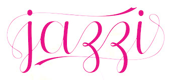 [MyFonts]
[More] ⦿
[MyFonts]
[More] ⦿
|
Swangga Raditya
[Artha Desain (was: David Her)]
|
[More] ⦿
|
Sweet Fonts Collection
[Linnea Lundquist]
|
 From Myfonts: The Sweet Fonts Collection represents an effort to locate and revive obscure, engraved lettering styles that are at risk of fading away, as well as to re-interpret familiar designs for broader application. Sweet Fonts is located in San Francisco, and is a spin-off/side show of Mark van Bronkhorst (MvB). Their fonts: Sweet Upright Script (2008, MvB and Linnea Lundquist), Sweet Gothic, Sweet Gothic Serif (2009: both in the style of Copperplate Gothic), Sweet Titling No. 11 (2009, art deco), Sweet Titling No. 22 (2010: multilined), Sweet Square Pro, Sweet Sans On Air, Sweet Sans Pro. [Google]
[MyFonts]
[More] ⦿
From Myfonts: The Sweet Fonts Collection represents an effort to locate and revive obscure, engraved lettering styles that are at risk of fading away, as well as to re-interpret familiar designs for broader application. Sweet Fonts is located in San Francisco, and is a spin-off/side show of Mark van Bronkhorst (MvB). Their fonts: Sweet Upright Script (2008, MvB and Linnea Lundquist), Sweet Gothic, Sweet Gothic Serif (2009: both in the style of Copperplate Gothic), Sweet Titling No. 11 (2009, art deco), Sweet Titling No. 22 (2010: multilined), Sweet Square Pro, Sweet Sans On Air, Sweet Sans Pro. [Google]
[MyFonts]
[More] ⦿
|
Symon Adam Abdullah
[Groen Studio (or: Jorse Creative, or: Jorsetype)]
|
 [MyFonts]
[More] ⦿
[MyFonts]
[More] ⦿
|
Tattoo Woo (or: JSH Creates, or: Smokewire)
[Jonathan Stephen Harris]
|
 Tattoo Woo (or: Smokewire) is American tattooist Jonathan Harris. He also runs JSH Creates.
 In 2011, he created the curly gothic tattoo typefaces Hot Chocolate Latte, League of Ages, Royal Inferno, Tribal Times and Tribal Dragon, and the spiky typeface Quasari (2011). He also made Jelly Swirls (curly), Highway to hell, What a mess (grunge), Pixie Moon, Sword Thrasher, Starship XXXII (Star Trek face), Christmas Snow (art nouveau snowcapped glyphs), and Jazzy Caveman (a stone age face). Typefaces created in 2012: Bright Star Tonight, Harristoon, a crayon series (Crimes Times Six, Colored Crayns, XXX Dirty Jokes XXX, Harris Wear, Black Crayon), Alien Mutations Begin, Vineyard Magazines, Forbidden Land (scratchy face), Way Gardens (flowery script), Pencil Shading, Cartoon Shadow, Heart Shapes, Sassy Stark, Back to School, Black Eye Peas, Silly People, Street Art (a great ink splatter font), Heartbroken, Jen Luves Ben Forever, Heart Broken, Catalina, Anywhere but home, Holly Christmas, Kringley Christmas (dingbats), Seasons Greetings, Cheese Cake, Abraham Heights, Call me maybe (sketch font), Lydia Puente (calligraphic script), Tribal Script, The Daily Bread (a beautiful ronde), Naughty Nights, a set of four Asian brush style typefaces (Japanese Style, All Yoko, Chinese Asian Style, Chinese Takeaway), Hey Cutie, Zing Easy (brush), Kids Play, Keep It Simple (loopy script), Standing Tall (anguished Kafkaesque typeface), The Abandoned Treasure (brushy caps face), The Mocking Bird, Nighty Nights, Road Trip, Been Hanging Around, Divided Nations, Dodger Gear, The Best Night (brush), Stencil Brush (brush), Quite Chocolatey, Round About (stitch font), Physics Teacher, Madman Howling, Love Sequel, Cross Out, My Mistake, Colours of Autumn, Da Streets (graffiti face), Hard Fox (stencil brush), You Are Precious (curly script), The Blue Oasis, Dysfunctional Family (brush face), Lovely Excuse (brush family), No Fear (brush face), Dead End, The Art Show (brush face), Comical Smash, The Quick, The Lost Paintings, Stone Age, Eyeliner Tattoo, Sketch Pad, Art Class (spilled paint face), Ink Studio, Stay Holy Okay, Water Park (bubblegum face), Urban Jungle, Geez Seriously (curly typeface), Crazy Weekend, Slimeball, Real People, A Brush No, Beware of the Hogs (blood drip typeface), Definitely Maybe, Draw Freehand, Bloodthirsty (blood drip font), Zombie Slayer (blood drip font), Your Bloody Choice (blood drip font), Barn Animals, Comic Strip, Scribble Fun (textured face), Boom Shanker, Girly Punk, Pucky, Spray Break, Font Insane, Fairground, Last Breath (2012), Follow Your dreams, Together Again, Drawing Guides, Death Branch, Panda Spots, Fuzzy Bear, Threadz Needle, Homeboy, Hairs Dens Bag, Primitive Alien, Bonney Lass, Cake Nom (3d and shaded), Headshop (psychedelic), Tribal Butterflies (dings), Tribal Dragons Tattoo Designs, Tribal Animals Tattoo Designs, Abstract Alien Symbols, Jewelry Design Shapes, Wander Ball, Love Hue, The Fat Store, Chooka Zoon (bubblegum face), Happy Roxy, Hearts and Stars, Arcade Book, Teaspoon Display (swashy calligraphic face), Ready Black (another swashy calligraphic face), The Lodger Rang (gothic script), Sketch Book, Sketchline, Drafting, Last Breath (tattoo font), Drawing Pad, Child's Play, Design Bubble, A Stitch Plus Nine, Ming in Bling (comic book shadow face), You Are Something (curly script), Hot Pink, How To Do Something (comic book face), I Love What You Do, Get Wet. Typefaces from 2013: Seaside Heights, Falling Rain, Ace Records, Today People, Night Adder, Squicky (curly font), No Messin (scratchy brush), Wrong Tracks, Postcard From Mars, Aluminum Trucks (script), Life Azures, The Waddys, The Angels, Oliver Richards (brush face), Arabic Magic, Messenger, Anxiety Management, Basterds, Beep Beep, Suburban Legends, Street Wild, Abreviater, Snowmania, Yak Shamash, Booday, Everyday Mayhem, Mega Team, Beaty Pagent (sic), Monster Unleashed, Hopeless Place, Alley Cat, The Lovers, Crazy Rascals, Golden Star, Gimme Your Love, Every Freakin Night (a sketched poster face), Big Top, Hopeless Place, The Lovers, Alley Cat, Queenie Beebie, Swirly Shirley (curly script), Dark World (scratchy face), Fun House (sketched face), Ultimate Chaos, Wake Me Up, Find A Way, Fat Tats (signage script), Big Winks, Nothing To Lose (blood drip typeface), Art Brewery (brush font), Holiday Blues (scratchy brush), Punked Out, The Jolly Rancher, Quite Mighty, Smudgie Crayon, Squiggley Brown, Morning Star (brush face), No Talking Allowed, Butter Finger (scratchy typeface), Mad Beef (thin script), Dinosaur, Reed of Love (a textured script face), First Grader, School Holiday (brush script), Spin Head (sketched face), Russian Roulette, Blah (brush face), Eating You Alive (brush face), Christians United (brush face, same as Blah), Beginning of Summer (brush face), Something Strange (blood drip font), Messy Script, Broken Ink, Car Wash, Head Case (a very curly script), Barn Owl, Ruff Ruff, Shadow Jumper, Barn Oil, Phantom Ghost, Tardy Kid, Scrapbooking, Fiesta Time, Science Project, Oh No Not Again, Oh Shit (brushy), Teaser Houses, Eternal Fascination (connected script), Shades of Black, Bingo Bangos (brushy script), Street Fighter, Marker Pen (brush), Home and Away (brush), Spring Cleaning, Scribble Table, Sound Heart, Imagination Station (a heavy brush face), Teddy Bear, Good Day, Easy Rider (retro script), Silent Reaction, Today is the Oldest and Youngest (tall condensed script), Brush Strokes, Texas (brush), Messing About (scratchy hand), Kindergarten (hand-printed), Oh No (dusty typeface), Art Studio, Crazy Horse (great grungy brush), Time Machine, Strings and Things (sketched typeface), Twisted Brother, Big Easy, Egyptian Nights, Demolished, Lazy Girls, Angels Message (pixie dust script), Medieval Queen, Kings and Queens (swashy script), Admiration Pains, Confetti Stream, Hill Billies (signage face), Sweet Heart, Manhunter, Beware of the dog, Kiss Me Quick (Valentine's Day script), Atomic Number (a chalky dusty typeface), Potted Balls, The Boatman (graffiti font), Dead Island (brush face), Age to Age (swashy brush), Sticky Things (brush face), Lasting Love, Beware of the Zombies, Skyscraper, Coffee House, Rough Rider (fat brush face), The Green Life, National Cartoon (sketched 3d face), True Lies (brush face), Heron's Nest (sketched), Freaky Friday, Be There Soon, Praying Angel, Leap of Faith (graffiti brush), Beginning Yoga (brush script), Tims Grocery Store, Biogalaxy, Funga Donga Binge, Sketchbook Challenge, Arsonist, Say No to Drugs, Frizzled Planet, Decayed in Sixty Seconds. Typefaces from 2014: Believer Fever (tattoo script), Millennium (sketched font), Everything Holiday (tattoo script), Angel Warriors, Ghetto Master, Going Rogue (3d, hand-printed), Times Are Hard (brush), Oliver Twist (fat brush), Story Book (brush face), Rockers, Berty Script, Broken Promise (textured all caps typeface), Paranoid Freak (a great scratchy typeface), Nitya HK (or: Drawing Practice: a sketch font), Early Bird, British Quest, Crazy Thoughts (fat brushy script), Teenage Dreams, Renegades (hairy, grungy), The Pits (crayon font), Always Beside You (tattoo script), Greed (fat brush), Sea Reef, Sandy Bay, Fun Crayon, Mother in Law (caryon brush), Asylum Mansion (fat brush), Taking Notice, Basquiat, The Beach, Open Hours, Paranoia (brush typeface), Beast of Avalon, Motives, The Hit, Air Heads, Painted Lady (brush script), Born Wild (fat brush), Rebel Beat, Across the Road (script), Zentaiges (script), Fearing Madness (tattoo font), Rags to Riches (a great brush face). Typefaces from 2015: Merry Christmas Tree, Christmas Trees Celebration, Fun Christmas Trees, Ocean Rotation, Street Sound (thick brush), Without Notice (thick brush font), Slowed Down (brush font), Girlfriend (sketched shaded beauty), The Others Are Here (scary brush font), Government Torment (brush font), Love Rock, Skid (charcoal brush), Redrum (grungy brush), Charcoal, Home School (textured), Mona Shark (textured 3d typeface), Cookie Dough, Minimum Loss, Moonstreet, Friday Lovers, Broken Dreams, Cutie Pie, Freedom Fighters, Cooperation Nest, Magic Pies (rough brush script), Rain Tax. Typefaces from 2016: Loads of Love, Personal Delinquent, The Right Thing, Devastated (scratchy style), Broken Ground, Slimed, Cartoon Madness (sketched), Anything For You, Sketchy Script, Beautiful Vampires (scratchy), Think Nothing, Barn House (paint or blood drip typeface), Thready Bear, Get Richer, Bedrock, Chocolate Smoothie, Running Scared, Truly Yours, Coffee Mocha, Abrahams Wish, Dicey Slices, Forbid Nothing, Cartoon Freak, The Oyster Bar, Nowadays, Rough Script, Messy Artist, Fun Things, Bubble Bash (grungy), Yeti Fety (dry brush script), Kahuna Island (a tropical island font), Dancing on the Beach, Consistency Measures, Dead Wood (dry brush), Regent Way, Last Feast, Steppers, Oily. Typefaces from 2017: Wishing Well, Darkside of the Morning, From Nowhere, Wreak Havoc, Rocky Bottoms, Shock Horror, Signatures, Elyse, Stew Tuesdays (brush script), Majestic Mansion, Chasing Magnolia. Typefaces from 2018: Queens Perfume, Shiny Pimple, Belly Queens, Martian Vacation, School's Out (sketch font), Brush Pains (dry brush), Death Valley (dry brush), Steady Rain (crayon font), Blinkets, Trap Beats, Chicken Fajitas, Knackers, Regal Eagle. Typefaces from 2019: Sketchy Night (a dry brush font), Royal Riot (dry brush), Questionary (a chalk font), Holly Hood, Squiggles, Pirate Scripts, Mutation Patient, Futures Past, Monster Reading (sketched), Metal Head, Ghosting, Wear and Tear, Rain Shower (textured), Ring Master, Yellow Rose, Splat Attack, Crazy Hearts (dingbats), Margarita, Black Brush, Ghost Story, Chalk Stick, Spiritual Ritual (textured), Farty Breath, When in Rome (brush), Crazy Metro, Swirly Tops (curly). Typefaces from 2021: Crimes Times Six (a dry brush font), Sticky Pops. Fontspace link. Dafont link. Abstract Fonts link. Fontspace link for Smokewire. Link to Smokewire. Fontspace link for Jonathan harris. [Google]
[MyFonts]
[More] ⦿
|
Teuku Deky Firnanda
[Seruput (or: Barokah, or: Graptail)]
|
 [MyFonts]
[More] ⦿
[MyFonts]
[More] ⦿
|
Typo Upright
|
Typo Upright is a ronde style upright script that originated from the Inland Type Foundry as French Script. MacMcGrew: Typo Upright is Morris Benton's interpretation in 1905 of a popular style of vertical French Script, introduced by ATF as Tiffany Upright. It is the only such design suitable for adaptation to keyboard slug casting, and is called Lino Script and Interscript by the two leaders in that field. There is also Typo Upright Bold and Typo Shaded, both recorded as being designed by Benton in 1906, but only the latter is noted as having the Tiffany name originally. These two typefaces are adaptations of the Typo Upright design. Finally there is Typo Slope, a sharply inclined version of the same design; it is credited to Benton in 1905, originally as Tiffany Slope. The lowercase of this typeface is more nearly a conventional script, while the caps show the French influence. Typo Upright was copied by Western as Society Script. Also see French Plate Script. Stephenson Blake's version of this design is Parisian Ronde. Typo Upright is also known as French Script, Interscript, Kaylin Script and Linoscript. Digital versions include French Script (Monotype), Typo Upright (Bitstream), Linoscript (Adobe), and Ronde Script (2012, Group Type). [Google]
[More] ⦿
|
Typomancer
[Warit Chaiyakul]
|
 Warit Chaiyakul (Typomancer) is a type designer from Bangkok, Thailand. He created the upright connected script typeface Rhyme Casual (2012) and its unconnected cousin Rhyme Formal (2012).
 All of Warit's typefaces cover Latin and Thai. Warit also designed Wongklom (2012, a rounded sans), Theorem (2012, didone), Charm (2012, serifed face), Conflict (2012, sans), Arch (2012). In 2013, he published Acid (an upright script), the rounded didone typeface family Lynx, the hybrid didone family Felis, the rounded humanist sans family Lounge, the calligraphic script family Mist, and the Latin / Thai sans typeface Quark. Dawnora (2014, +Initials, +Headline) is a flared swashy display type family. Auxilia (+Condensed) is a geometric sans typeface family. Typefaces from 2015: Cline (slab serif and sans), Cline (a slab and sans family), Lince (16 fashion mag typefaces rooted in didones), Felis Script. Typefaces from 2016: Eirlys (a sharp-edged typeface with a medieval or Irish character), Conflict (sans), Ounce (a didone typeface), Cloud (some weights are free). Typefaces from 2017: Cloud Soft (soft rounded sans; free LightBold weight), Gwyner, Charm (a warm rounded sans). Typefaces from 2018: Muirne (a Celtic semi-serif typeface family), Pinala (script and sans duo). Typefaces from 2019: Cloud Lucent, Cloud Script (free). Typefaces from 2020: Belynos. [Google]
[MyFonts]
[More] ⦿
|
ULGA Type (was: Creative Goats)
[Michael Gills]
|
 Michael Gills is a British calligrapher and graphic and type designer. He founded Creative Goats in Ipswich, Suffolk, UK, and later set up ULGA Type. He worked first at Letraset (1988-1995) where he made typefaces such as Charlotte and Charlotte Sans, Elysium, Gilgamesh, Fling, Forkbeard, Frances Uncial, Isis, Katfish, Prague and Type Embellishments. He is currently an art director at The Folio Society: Book publishers, London. His fonts:
 - ITC Iris (1990). A tall condensed all caps typeface.
- Elyseum Book (1992), originally at Letraset, now sold by ITC.
- Charlotte Book and Charlotte Sans (1992), originally at Letraset, now sold by ITC.
- Figural Book (1992; art direction by Colin Brignall; based on a typeface of Oldrich Menhart), originally at Letraset, now sold by ITC.
- Isis (1990, Letraset, then ITC). An open inline all caps typeface.
- Katfish (1994, Letraset, then ITC). An angular script typeface.
- Prague (1991, Letraset, sold by ITC; based on a typeface of Oldrich Menhart).
- Fling (1995), an upright connected script originally published at Letraset, but now an ITC font. Recently used for Martha Stewart's Blueprint magazine.
- Gilgamesh Book (1994), Gilgamesh Book Italic, Gilgamesh Medium, Gilgamesh Bold, all originally at Letraset, now sold by ITC. Plus Gilgamesh Titling (Fontek).
- Spidercave (Fontek).
- Type Embellishments Three (with Martin Wait, 1994, originally at Letraset, later at ITC). With Colin Brignall, Type Embellishments One (1993) and Type Embellishments Two (1993).
- Forkbeard (Letraset, then ITC).
- Frances Uncial (1995, Letraset).
- Avalanche Script (originally from Letraset).
- Rahere Sans (2019), a humanist sans with little contrast. He explains: Way back in 1992 I designed my first sans serif, Charlotte Sans, and although it was relatively successful, I was never really satisfied with the end result: not enough weights & italics, a small character set, lack of accented characters, and my design skills were still in their infancy. Whilst Rahere shares many common elements with Charlotte Sans, it is much more than just a reworking; it represents over 20 years of accumulated knowledge and experience as a designer. In 2021, he released the flared lapidary typeface Rahere Roman Display, which pays homage to Berthold Wolpe's Albertus. In 2022, he added the gothic version Rahere Esoteric and in 2022 Rahere Sans Inline.
- Agatized Informal (2020). A rough-edged stencil typeface with chunky letterforms and tight spacing. Accompanied by Agatized Formal (2020).
- Ulga Grid (2020). A modular, monospaced typeface reminiscent of the old Letraset LCD and Quartz typefaces from the 1970s and 1980s.
- Steel Grrrder (2021). A 12-style industrial strength stencil family. Followed by Steel Grrrder Script (2021), Steel Grrrder Groove (2021) and Steel Grrrder Nutjob (2021).
FontShop link. Klingspor link. View Michael Gills's typefaces. [Google]
[MyFonts]
[More] ⦿
|
Wagner&Schmidt
|
 German foundry establshed in 1888 by Theodor Robert Arthur Schmidt and Ludwig Wagner in Leipzig. In 1902, Ludwig Wagner quit and joins Gundelach&Ebersbach (first founded in 1897) also in Leipzig, and then opens his own foundry, Ludwig Wagner. Schmidt stops in 1932, while Otto Schmidt takes over--the company is now called Wagner&Schmidt Nachfolger. Otto Schmidt dies in 1941, and the company is dissolved in 1942.
 Wagner&Schmidt was responsible for such successful Fraktur typefaces such as Allemannia-Fraktur (see also Ludwig&Mayer, Frankfurt am Main, 1908), Deutschmeister (Berthold Wolpe; the date 1927 has been suggested), Fette Fraktur (well, their own version at least, dated 1875, with present day versions by that name at Adobe and Berthold. Imitations of Fette Fraktur: Fraktur Fett (Greenstreet), Baron&Berliner (Swfte), Bauble (SSi), Luftwaffe (WSI), F692 Blackletter (SoftMaker), Fraktur (SoftMaker)). They also made the art nouveau era text typeface Rekord Antiqua (1911: revived in 2020 by Ralph M. Unger as Rekord Antiqua), the upright semiscript Mirabelle (1926, which was digitized and extended by Nick Curtis as Anna Nicole NF (2007)), Donatello (1935), Kurmark (see also Norddeutsche Schriftgießerei, Berlin, 1934), Annonce Grotesque (1914; see also Ludlow), Amanda Ronde (1939; see Stephenson Blake) and Senta (1904). Under C.E. Weber in Stuttgart, we find these additional typefaces: Colonna Antiqua (1908), Druckhaus Antiqua (1919), Druckhaus Kursiv, Ekkehard (1903), Erika (1920), Margarete (before 1927), Orient Antiqua (1914), Parlements Fraktur (1908) and Progreß Reklameschrift. In 1936-1937 the company created the Bauhaus-inspired headline sans family Kristall Grotesk, which was digitally revived in Kristall H MfD Pro (2019, Elsner & Flake). [Google]
[More] ⦿
|
Warit Chaiyakul
[Typomancer]
|
 [MyFonts]
[More] ⦿
[MyFonts]
[More] ⦿
|
Wesley Poole
[Poole Foundry]
|
[MyFonts]
[More] ⦿
|
William A. Schraubstadter
|
 St. Louis-based punchcutter and typefounder (1864-1957) who started the Inland Type Foundry in St. Louis in 1895 together with his brothers Carl and Oswald. He is credited with the heavy square-serif typeface Foster (Inland Type foundry, 1905). Mac McGrew says: [Foster] seems rather crude by later Stymie standards-even compared with the earlier Boston Breton-particularly for the narrow G, the wide J, the high-waisted B, P, and R, and several other unusual letters. Condensed Foster, introduced by the same foundry in 1908, is comparable. He goes on: Adcraft Medium was formerly known as Rugged Medium or Alfred [Medium]. It was originated by Inland Type Foundry and patented by William A. Schraubstadter in 1910. About Comstock, McGrew writes: Condensed Comstock was introduced by Inland in 1905, but patented in the name of William A. Schraubstadter in 1908. It has no lowercase, but the design is more contemporary. Monotype has copied both typefaces, but Monotype Comstock Condensed is in 18-point only, without figures. Schraubstadter also created Woodward and Woodward Outline (1894, Inland Type foundry), Winchell Condensed, Webb, French Script, Devinne Recut, Devinne Recut Outline, and many 19th century typefaces.
 All notes by Mac McGrew about various typefaces designed by Schraubstadter: - Adcraft. The three weights shown by BB&S in 1927 under this name were assembled from three different sources. While they are acceptable as family members, their resemblance to each other is merely coincidental and not as pronounced as in most families. The unifying feature is their rugged or irregular shape, a popular style of the time. Adcraft Black, the oldest member, was introduced by BB&S under the name of Plymouth Bold in 1900 or earlier. It is very heavy, and the most rugged of the group. Fonts contained all the Special characters shown, except for certain ones in the largest sizes. The regular weight of Plymouth (q.v.) was called Adcraft Bold by some users, but that name does not seem to be in any of the founders' literature. Adcraft Medium was formerly known as Rugged Medium or Alfred [Medium]. It was originated by Inland Type Foundry and patented by William A. Schraubstadter in 1910. Adcraft Lightface originated with Western Type Foundry in 1911 as Carlton and was taken over by BB&S as Rugged Lightface; it was also made under the name Puritan by Hansen, which is the source of this specimen. Adcraft Lightface fonts contained all the Special characters shown plus capital AE and DE diphthongs, but Adcraft Medium fonts had ct and st ligatures only. Compare Avil, Drew.
- Comstock was advertised by Inland Type Foundry in 1902 as "a striking novelty, our brand new face." It was revived by ATF in 1957. It is a medium weight conventional gothic, distinguished by a hairline surrounding each letter. The G lacks a crossbar, typical of many nineteenth-century gothics. The design was sponsored by A. H. Comstock of Omaha, according to a review at the time of its introduction. Condensed Comstock was introduced by Inland in 1905, but patented in the name of William A. Schraubstadter in 1908. It has no lowercase, but the design is more contemporary. Monotype has copied both typefaces, but Monotype Comstock Condensed is in 18-point only, without figures. In both foundry typefaces, there are several sizes on 12-point body; No.1 is the largest in regular, but No.1 is the smallest in Condensed. In 1911, a copy of Comstock was issued by Bauer in Germany under the name Astoria, revived in 1957.
- Foster is a heavy square-serif letter, patented and probably designed by William Schraubstadter and introduced by Inland in 1905. It seems rather crude by later Stymie standards-even compared with the earlier Boston Breton-particularly for the narrow G, the wide J, the high-waisted B, P, and R, and several other unusual letters. Condensed Foster, introduced by the same foundry in 1908, is comparable. See Webb for the outline version of the same design.
- Rockwell Antique was a reissue of Litho Antique, cut by William Schraubstadter for Inland Type Foundry and introduced in January 1910 when it was advertised as the "newest typeface; one of our best; closely imitating steelplate and lithography." In the late 1920s similar typefaces became popular in Europe, and some were imported into the United States. Morris Benton of ATF added several characters to the old Inland face, matrices of which were then in ATF's vaults, and it was reissued in 1931 as Rockwell Antique. But Benton saw that something more was needed, and redrew it as Stymie Bold (q.v.) in the same year. The alternate characters which were added to Rockwell are the same ones now shown with Stymie Bold. Monotype copied Rockwell but erroneously called it Stymie Bold in some literature, and there has been confusion between the two typefaces ever since; the latter name is often applied to fonts of Rockwell cast on Monotype machines by secondary suppliers. Indicative of this confusion, Stymie Bold Italic on Mono is series 1891, corresponding to Rockwell series 189, while Stymie Bold is 790. English Monotype has several weights of Rockwell, a square serif family which differs from this typeface and should not be confused with it; see Imports in Appendix. Antique Shaded (q. v.) is sometimes called Rockwell Antique Shaded. For a digital revival of Litho Condensed (1908), see Liz DeLuna's Litho Compressed (2016). Schraubstadter's slab serif was revived and expanded to six weights as ATF Egyptian Antique by Mark van Bronkhorst, Igino Marini, and Ben Kiel.
- Webb is an outline version of Foster (q.v.). It is cut to register for two-color v work; slightly larger so slight misregister will not let the Foster show around C the edges. It was patented in 1905 by William Schraubstadter, probably the designer, and shown by Inland the same year. Condensed Webb was shown shortly after.
- Winchell was designed by Edward Everett Winchell, art director of the Matthews-Northrup Printing Works in Buffalo, New York, and introduced by Inland Type Foundry in 1903 as "especially adapted for use in fine catalog and booklet printing, as well as for commercial stationery, where something out of the ordinary is demanded." It is a bold, thick-and-thin display face, but more like a nineteenth-century design, with some characters seeming to be poorly proportioned or having awkward shapes. These faults are less noticeable in Condensed Winchell, introduced by Inland the following year, but patented by William Schraubstadter in 1905. Neither is a distinguished typeface by later standards. Compare John Hancock, Bold Antique.
- Woodward was designed for Inland Type Foundry in 1894 by William A. Schraubstadter, and named for a Saint Louis printer. Other versions followed over the next few years. In 1911 Inland was purchased by ATF and its equipment divided between that foundry and BB&S. Some time later BB&S reissued Woodward and Woodward Outline as DeVinne Recut and DeVinne Recut Outline (q.v.).
[Google]
[More] ⦿
|
Yesie Erma Yunita
[Yunita Ecy]
|
[More] ⦿
|
Youssef Habchi
|
 Strasbourg and now Metz, France-based creator of Ormont Light (2013), a free geometric sans titling typeface.
 Marbre Sans (2014) is a free Peignotian fashion mag typeface. Still in 2014, Youssef designed the free sans family Kirvy and the free calligraphic connected script typeface Brotherhood Script, which on January 18, 2015, was by almost a factor of two the most downloaded font at Dafont. In 2015, he published the thin calligraphic typeface Distant Stroke, the athletic lettering font Sablon Up (College, College Alt), the textured typeface Sablon Washed and the calligraphic Darleston. Steamster and Beastform are rhythmic pen scripts. Indelible is a dry marker script, while Milton One and Two are copperplate calligraphic scripts. Typefaces from 2016: Tasty Birds (a handcrafted tall all caps didone family), Highjack, Road Rage (angry brush script), Blacksword (a flowing script). Typefaces from 2017: Quinzey (monoline pen font), Crabmeal, Javacom (signature script), Antro Vectra (handwriting), Infinite Stroke (connected script). Typefaces from 2018: Mafakanev, Stingray, Hughs (script), Dulcelin (script). Typefaces from 2019: Reglisse (an oily font), North Wave (a tilted script), Deuxieme Rang (a ronde), Fishes Friends (a fat finger or marker pen font), Spring Romance (wreaths), Retwisted, 62 Dragz (a speed track font), Midnight Drive, Buvard, Sand Dunes (a dry brush script). Typefaces from 2020: Eternate (monoline script), Gavabon (sketched), Superficious. Behance link. Dafont link. Fontspace link. Graphicriver link. [Google]
[More] ⦿
|
Yunita Ecy
[Yesie Erma Yunita]
|
Surakarta, Indonesia-based designer of calligraphic typefaces, aka Yunita Ecy. In 2018, Yunita designed the free upright script typeface Shathika (2018) and the free script typeface Jofi (2018, PutraCetol Studio). Typefaces from 2019: Dorcy. Typefaces from 2020: Almahyra, Alyna, Andini, Armyta, Belvania, Bratayudha (monoline script), Dyana, Emila (a swashy script), Fimayra, Gold Marble, Gyldan (Victorian), Hanie, Hillway, Hovalik, Lanifira, Maysile, Morlyn (a monoline script), Oldland (a bottom heavy script), Rifanca, River Lake, Rogusta, Southaven, Syahira (a swashy upright script), Syarena, Tragedye (a dry brush script), Velisya, Veristic (modular), Vialuna, Wild Foxs (dry brush script). [Google]
[More] ⦿
|

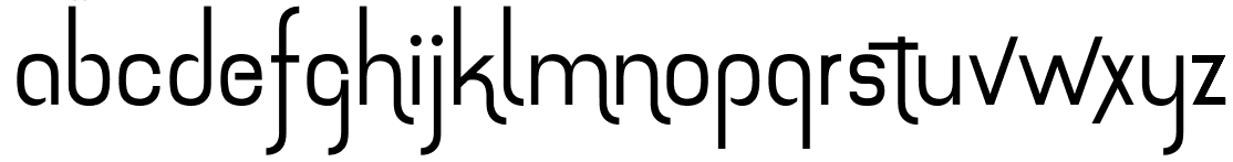
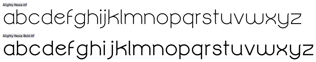
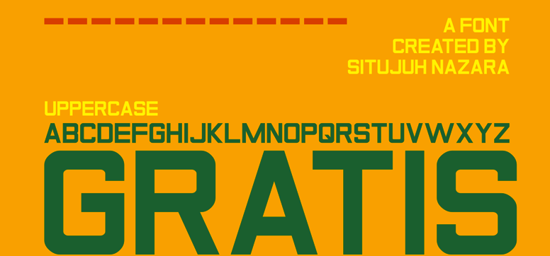
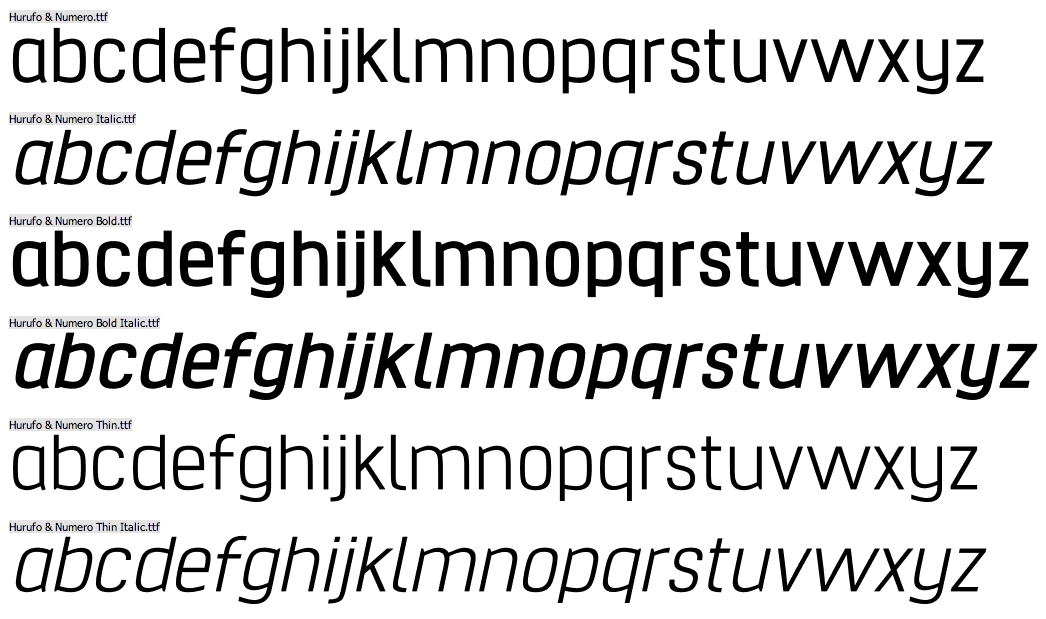
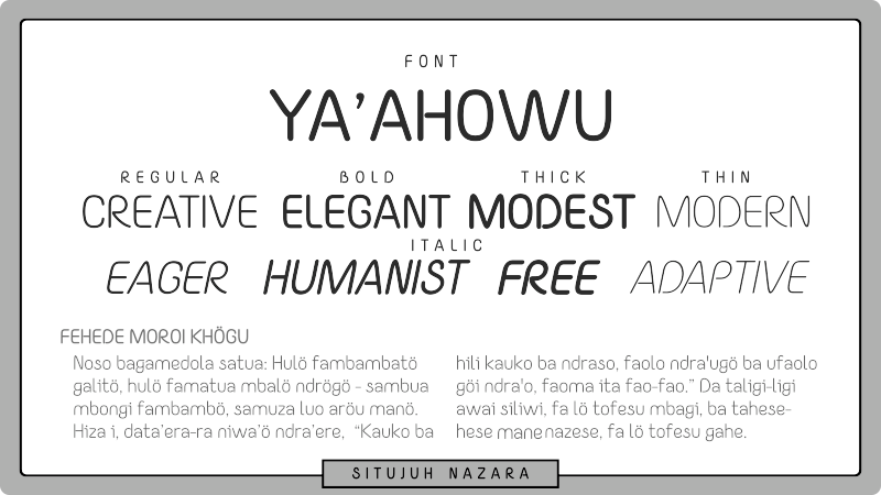
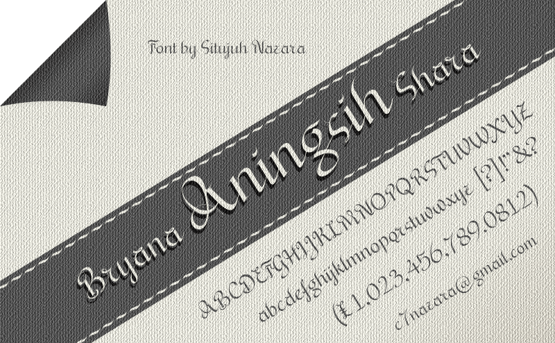
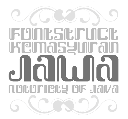
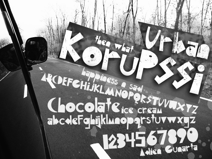
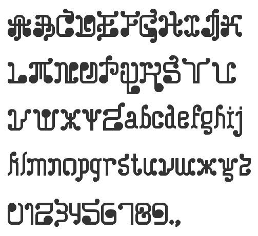
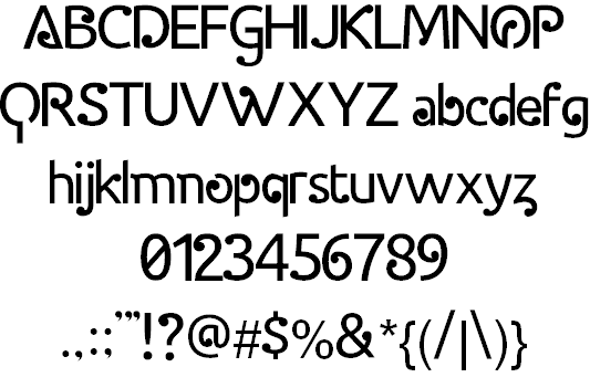
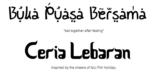
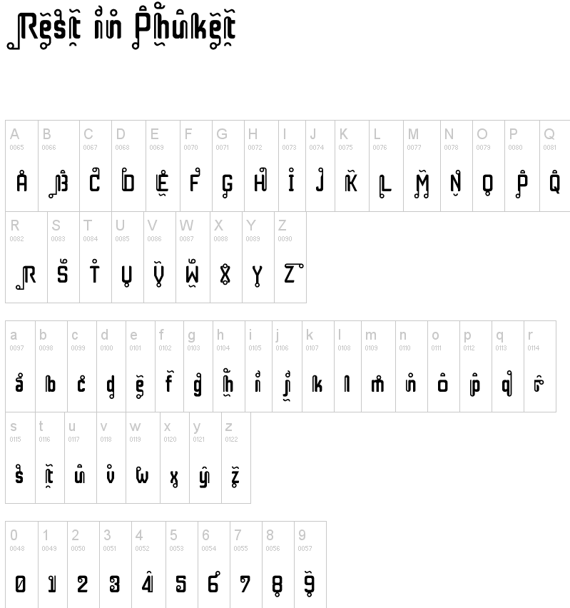
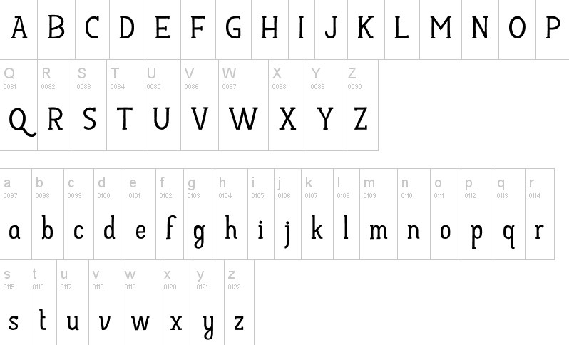
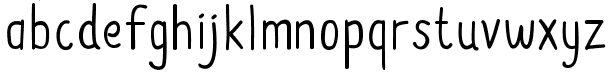
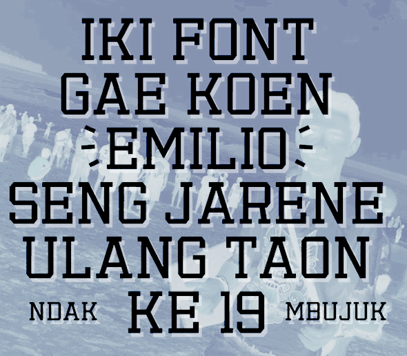
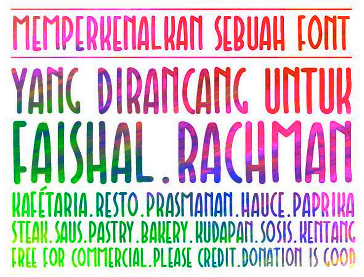
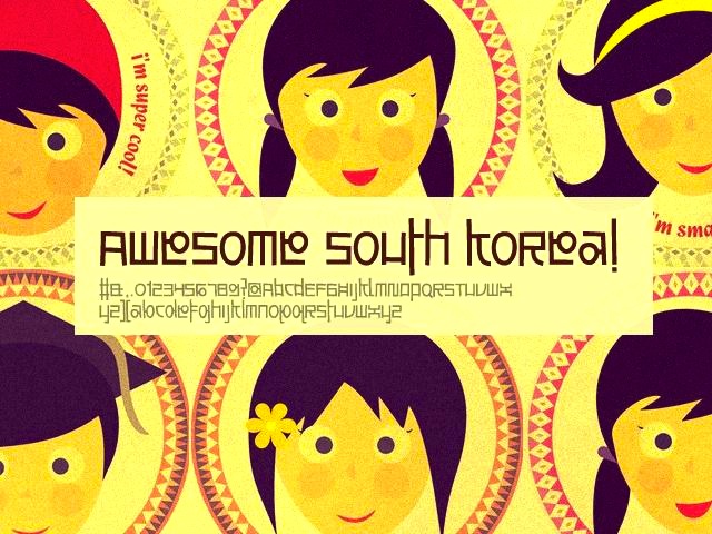
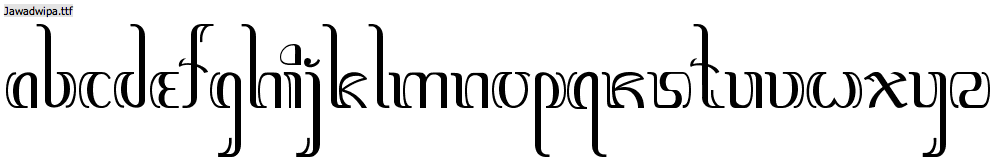
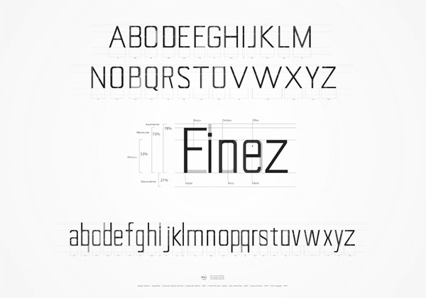
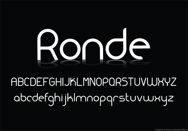
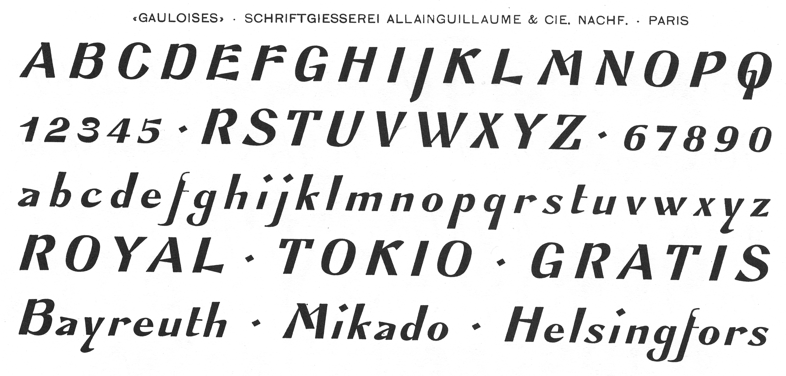
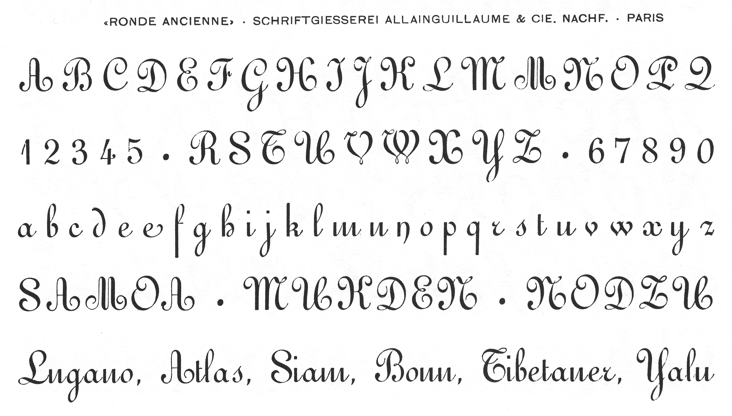
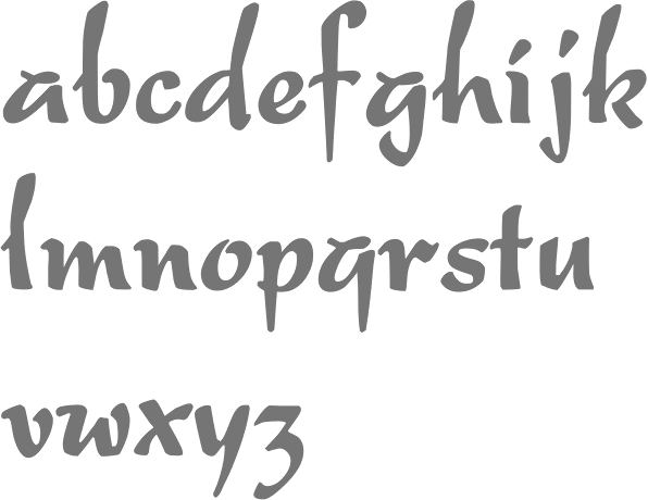
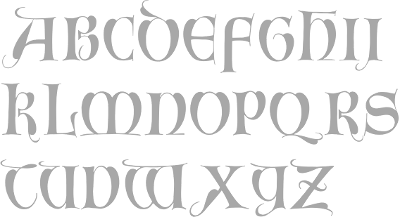
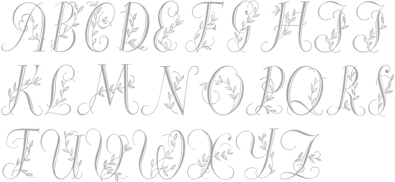
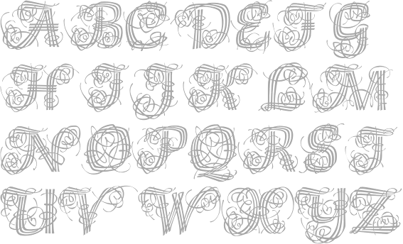
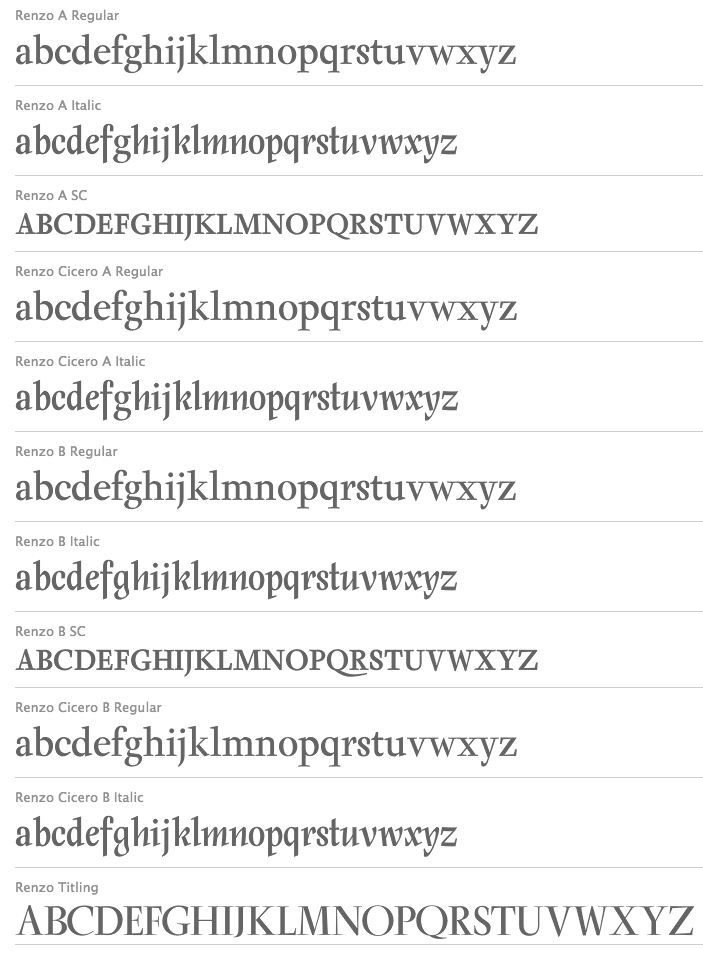
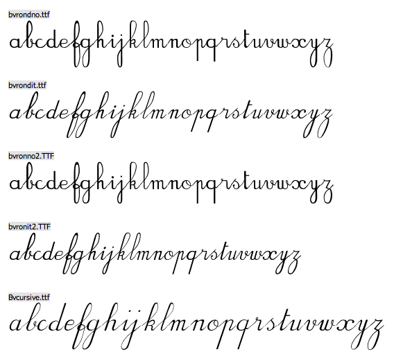
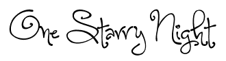
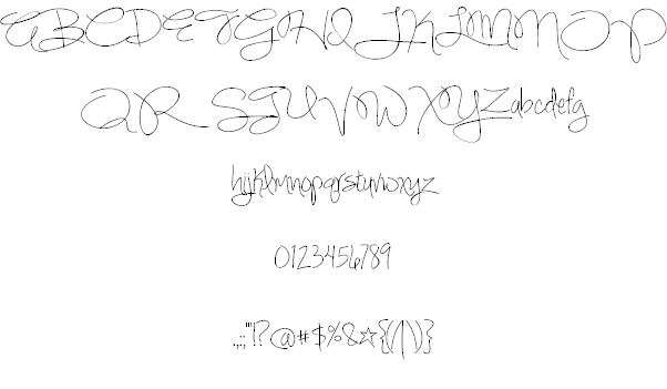
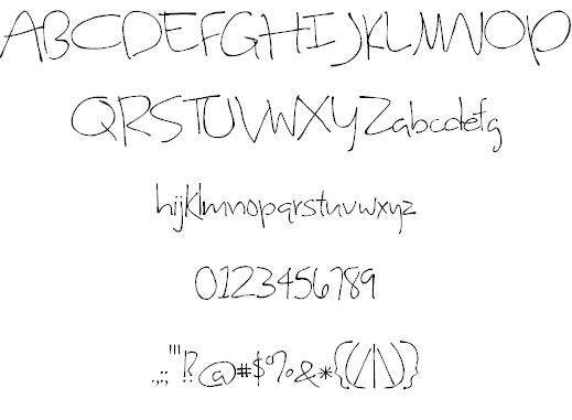
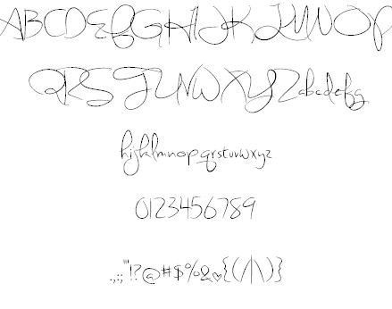
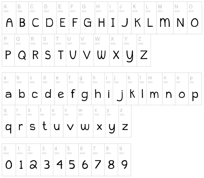
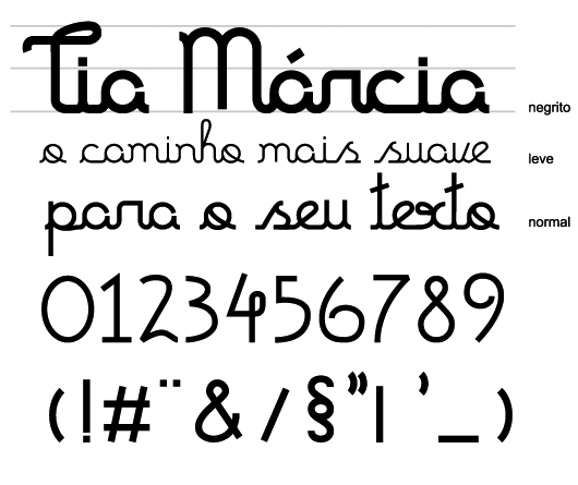
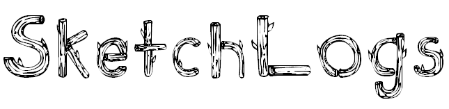
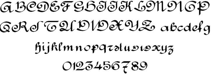
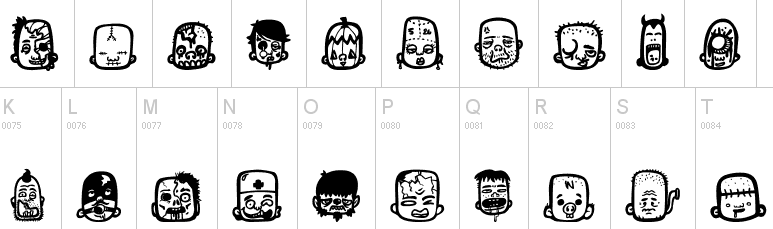
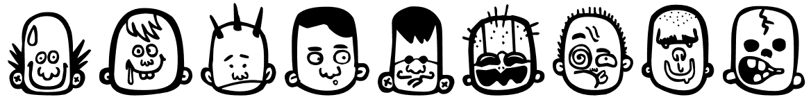
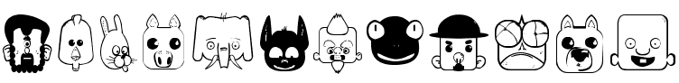
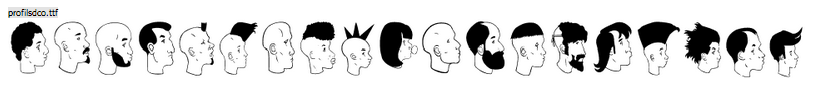
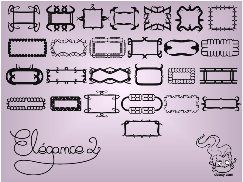
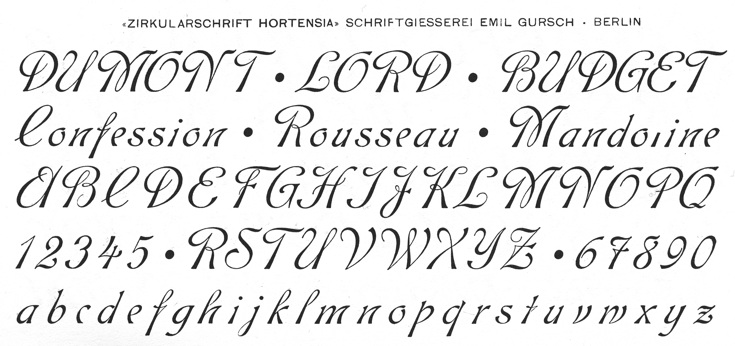
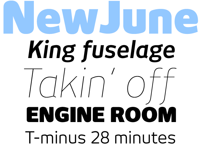
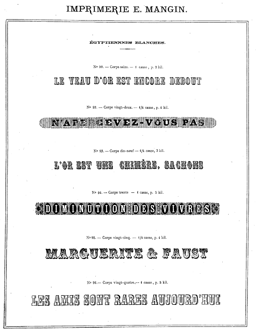
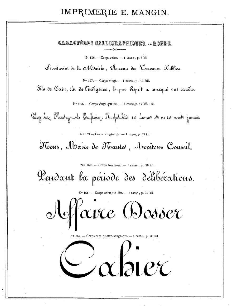
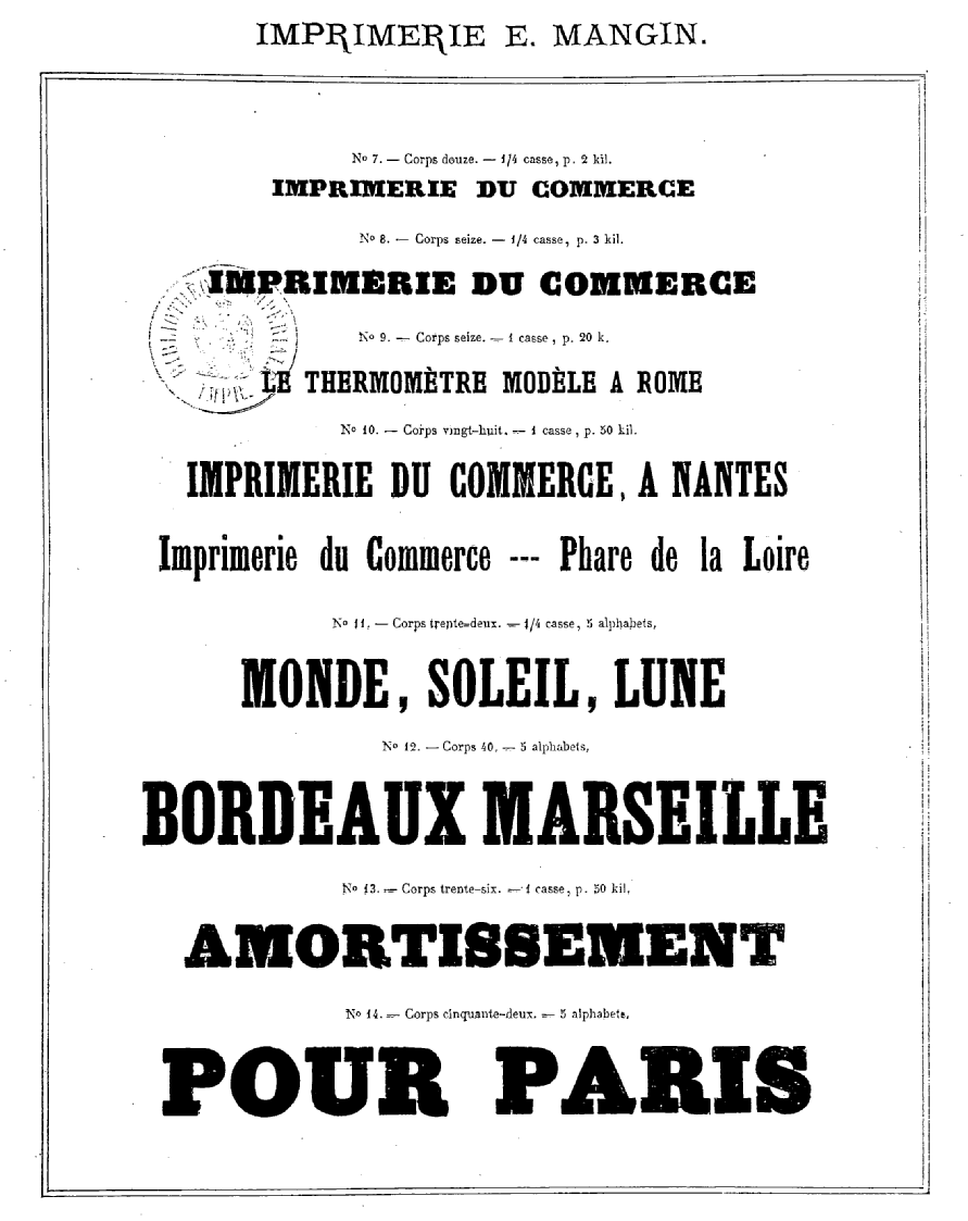
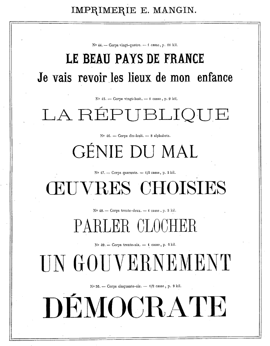
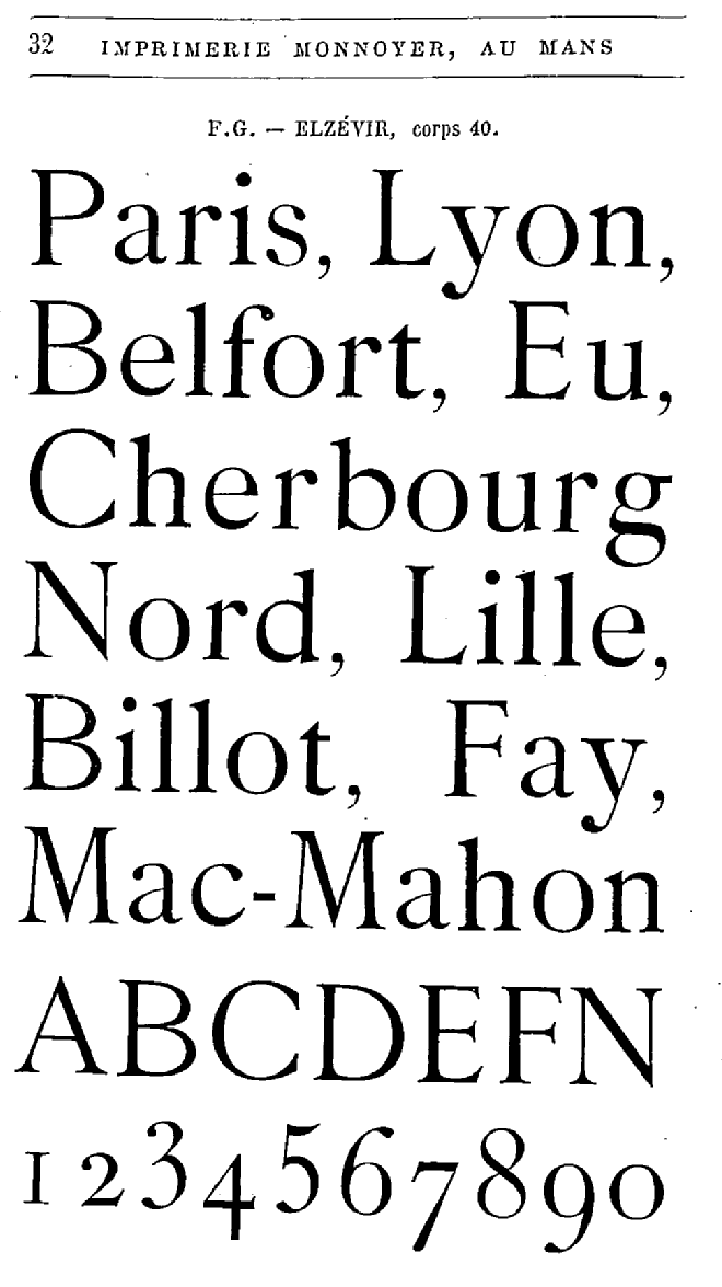
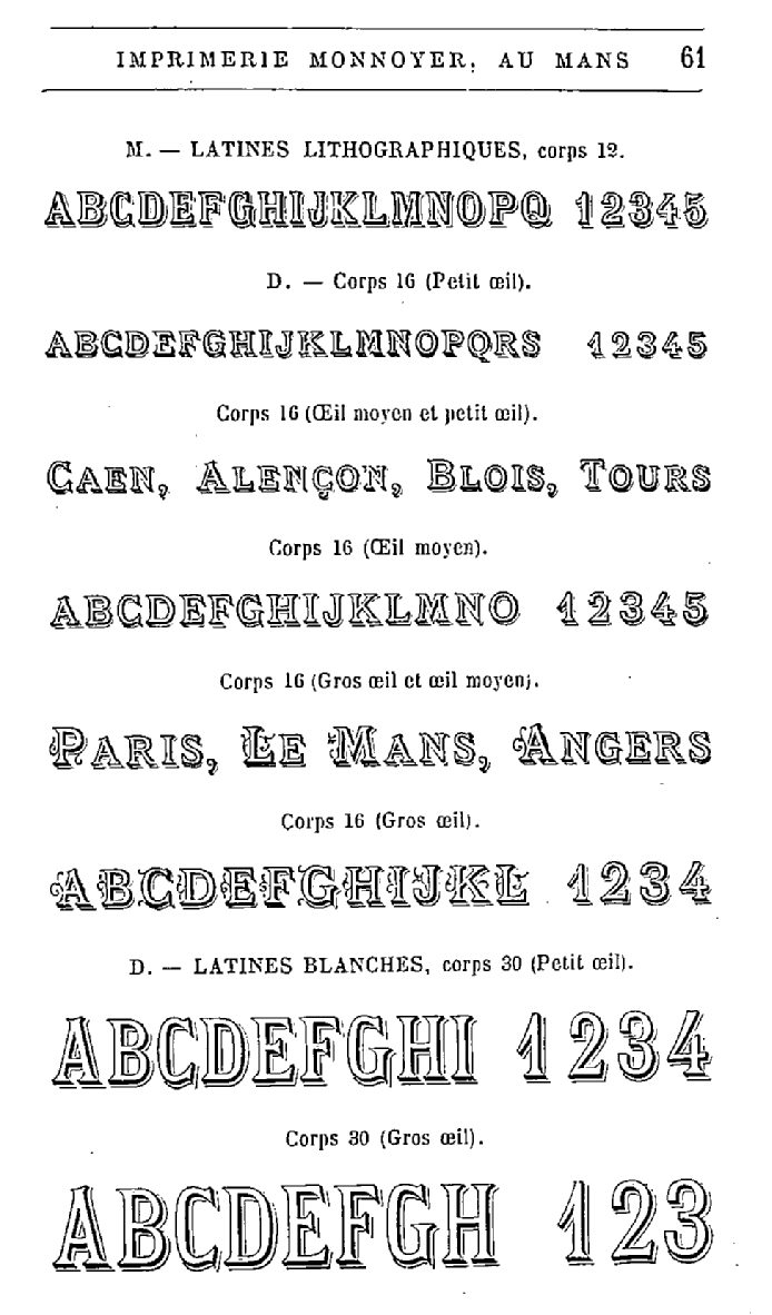
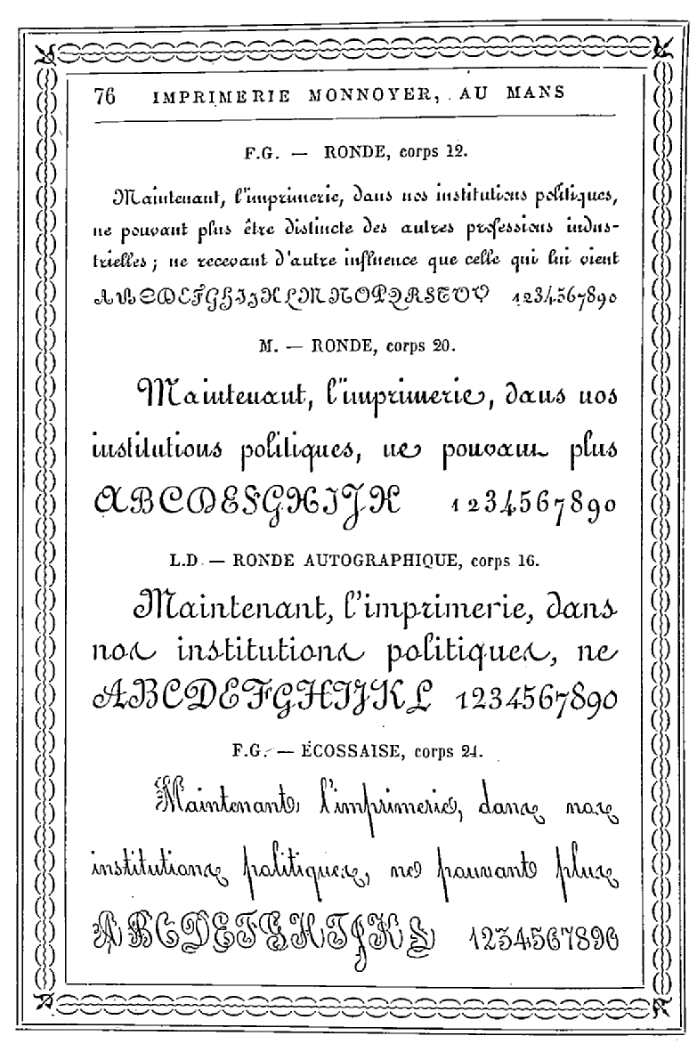
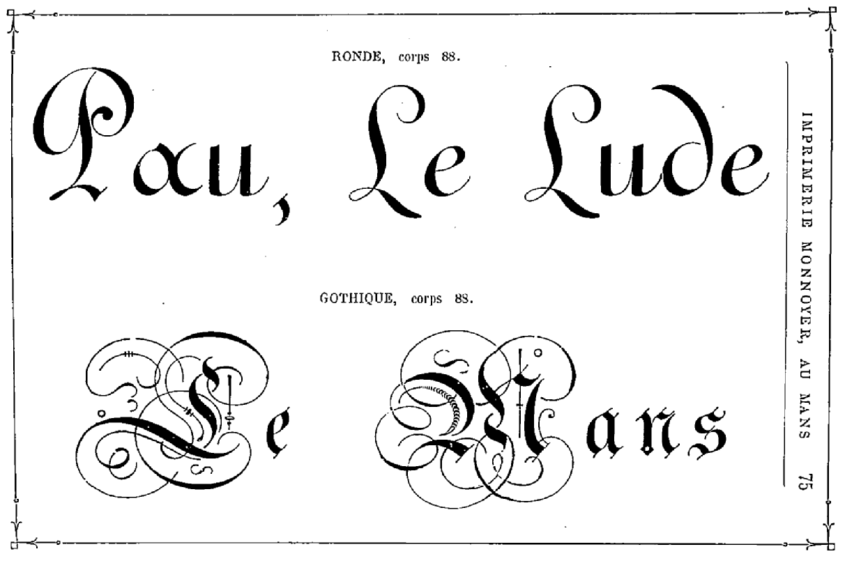
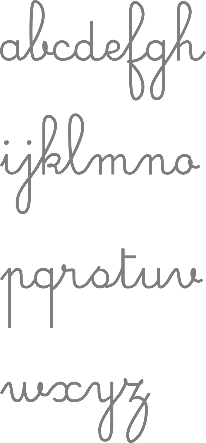
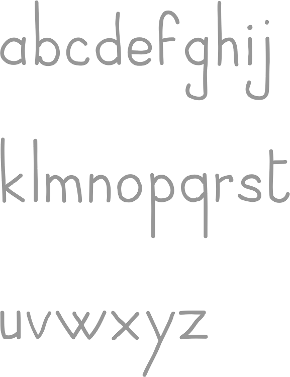
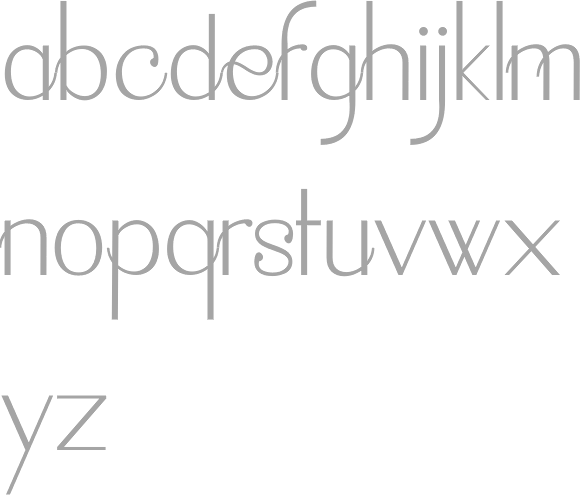
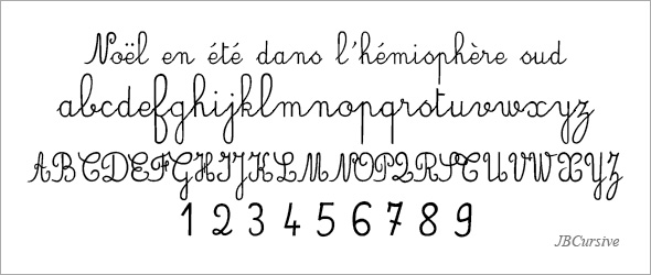
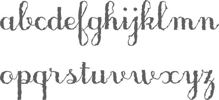
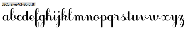
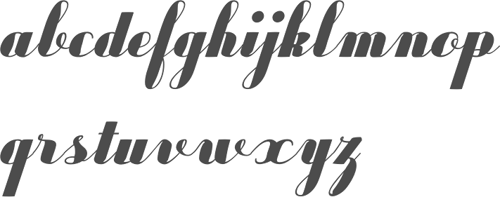
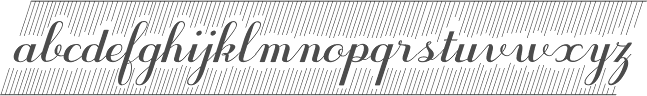
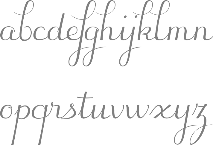
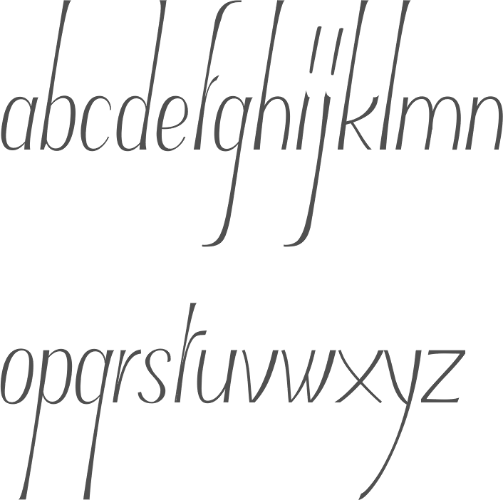
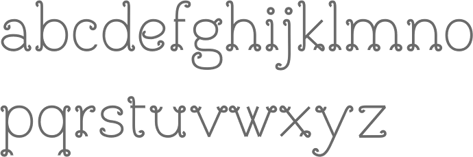
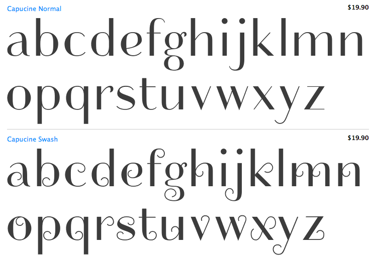
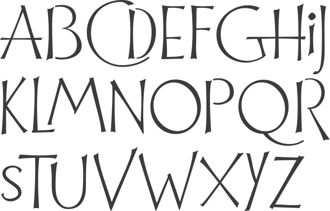
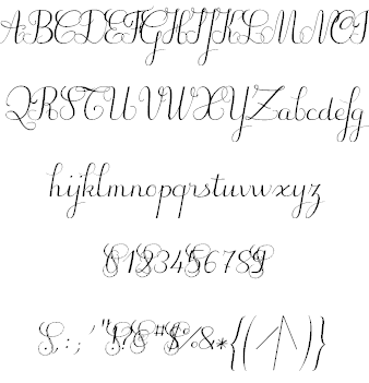
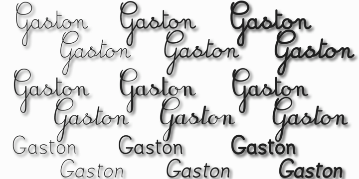
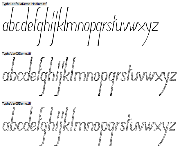
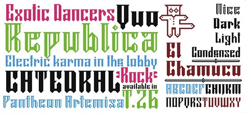
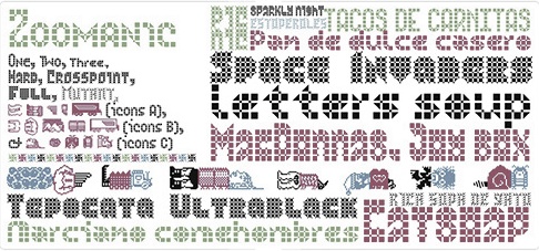
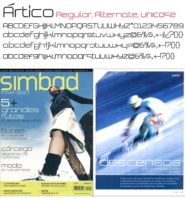
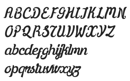
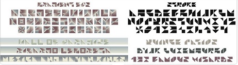
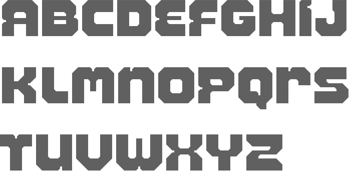
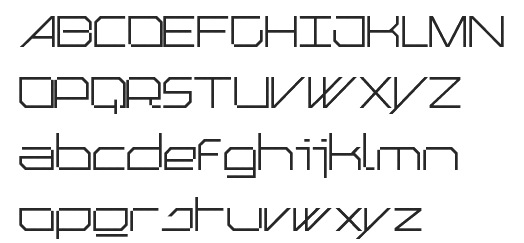
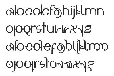
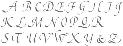
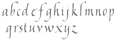
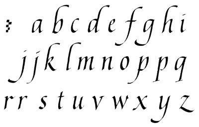
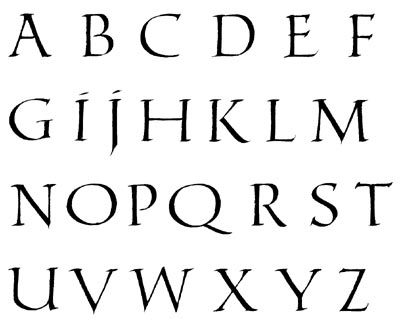
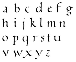
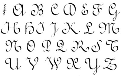
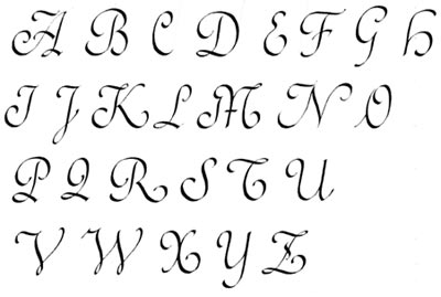
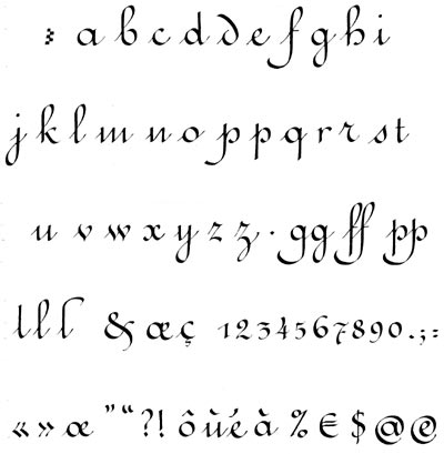
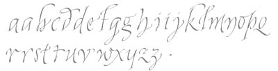
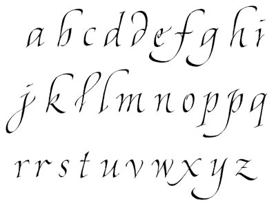
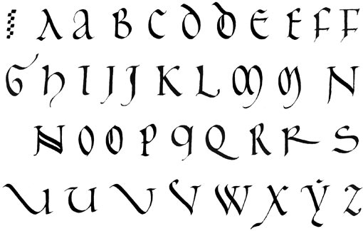
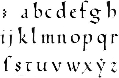
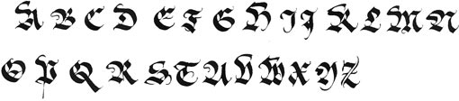
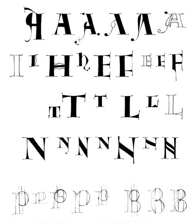
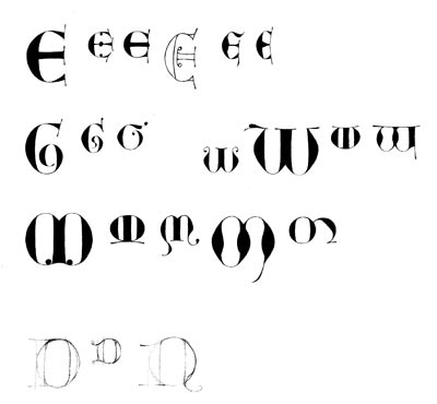
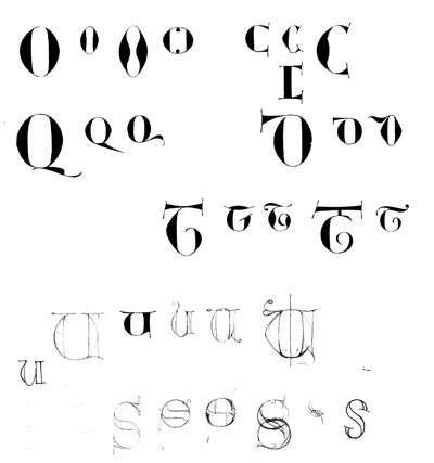
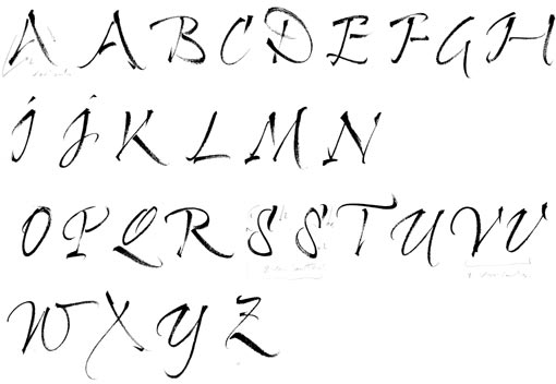
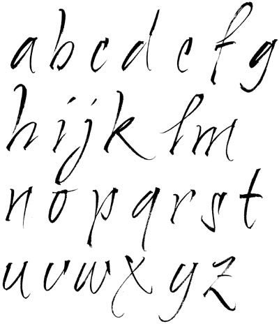
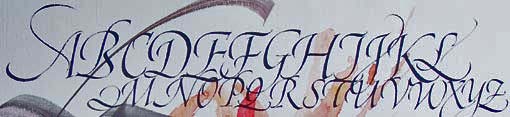
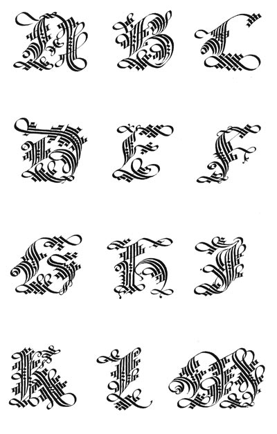
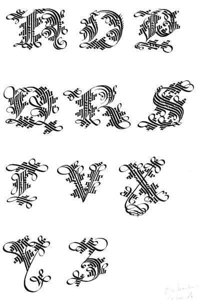
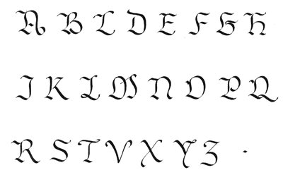
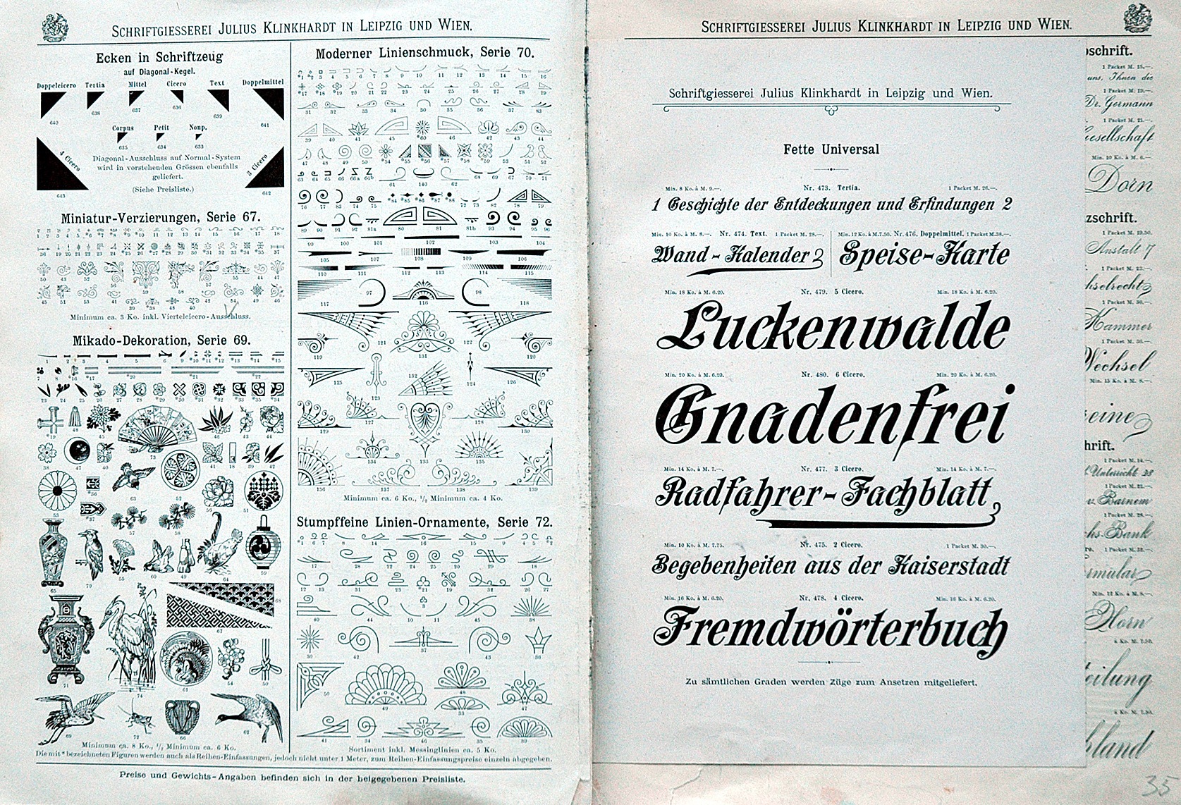
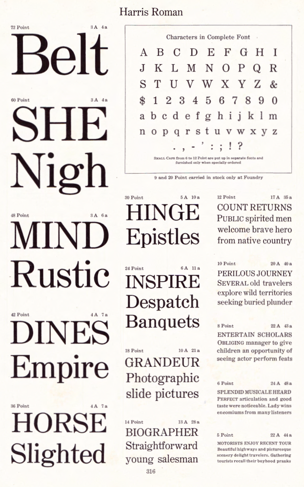
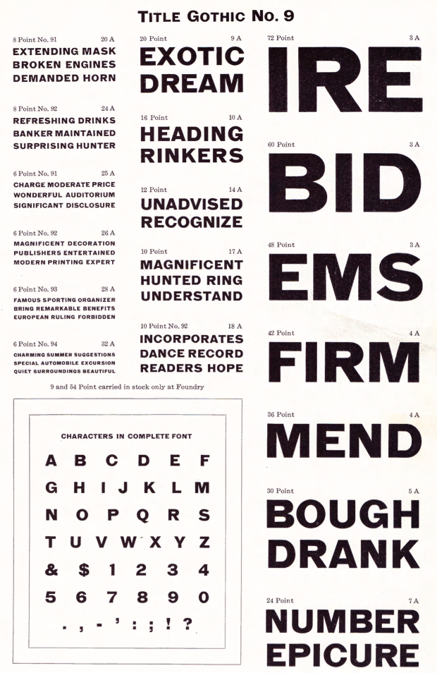
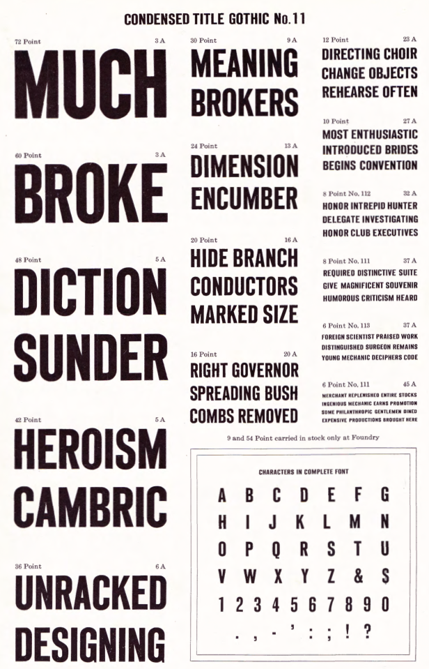
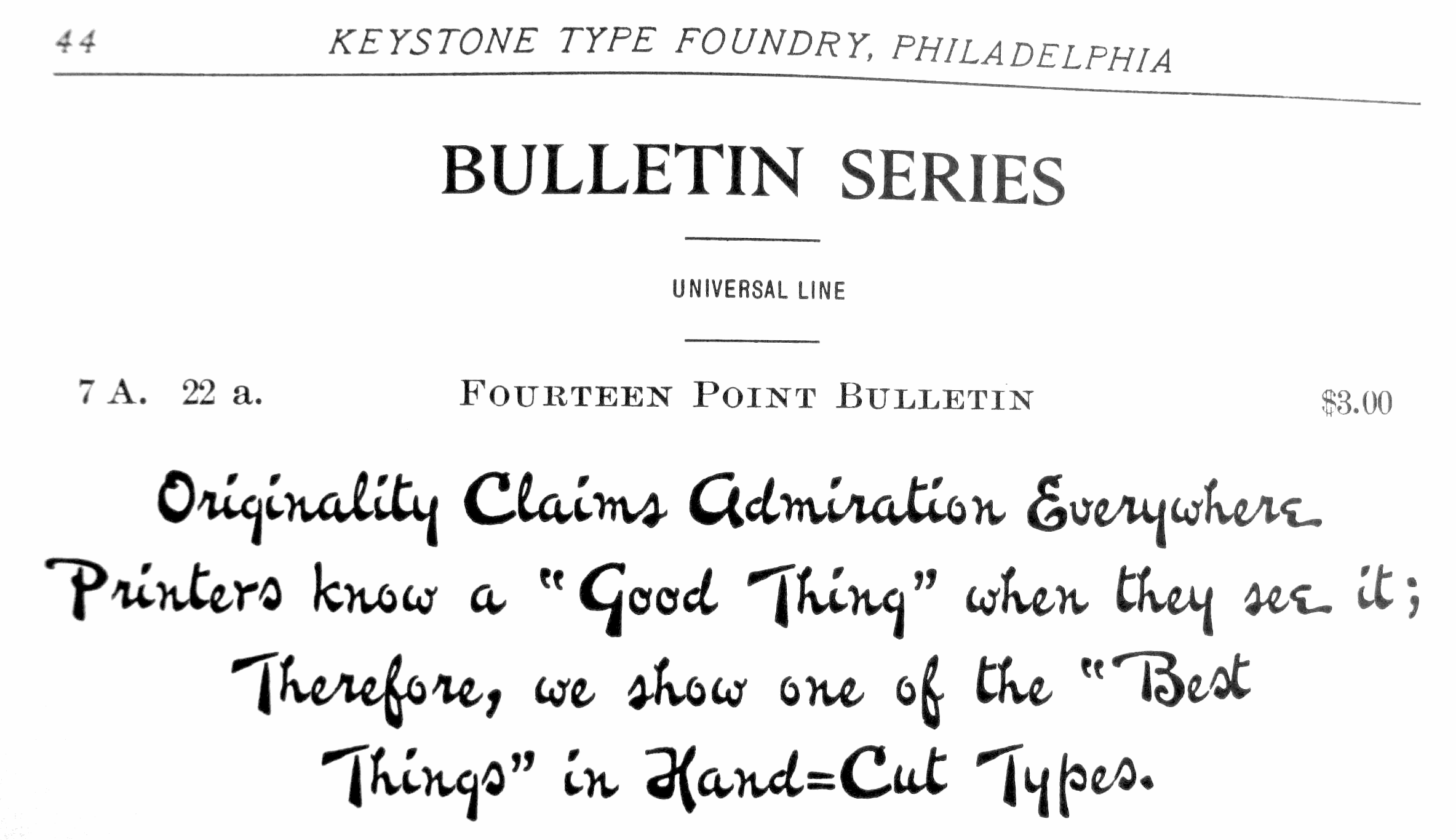
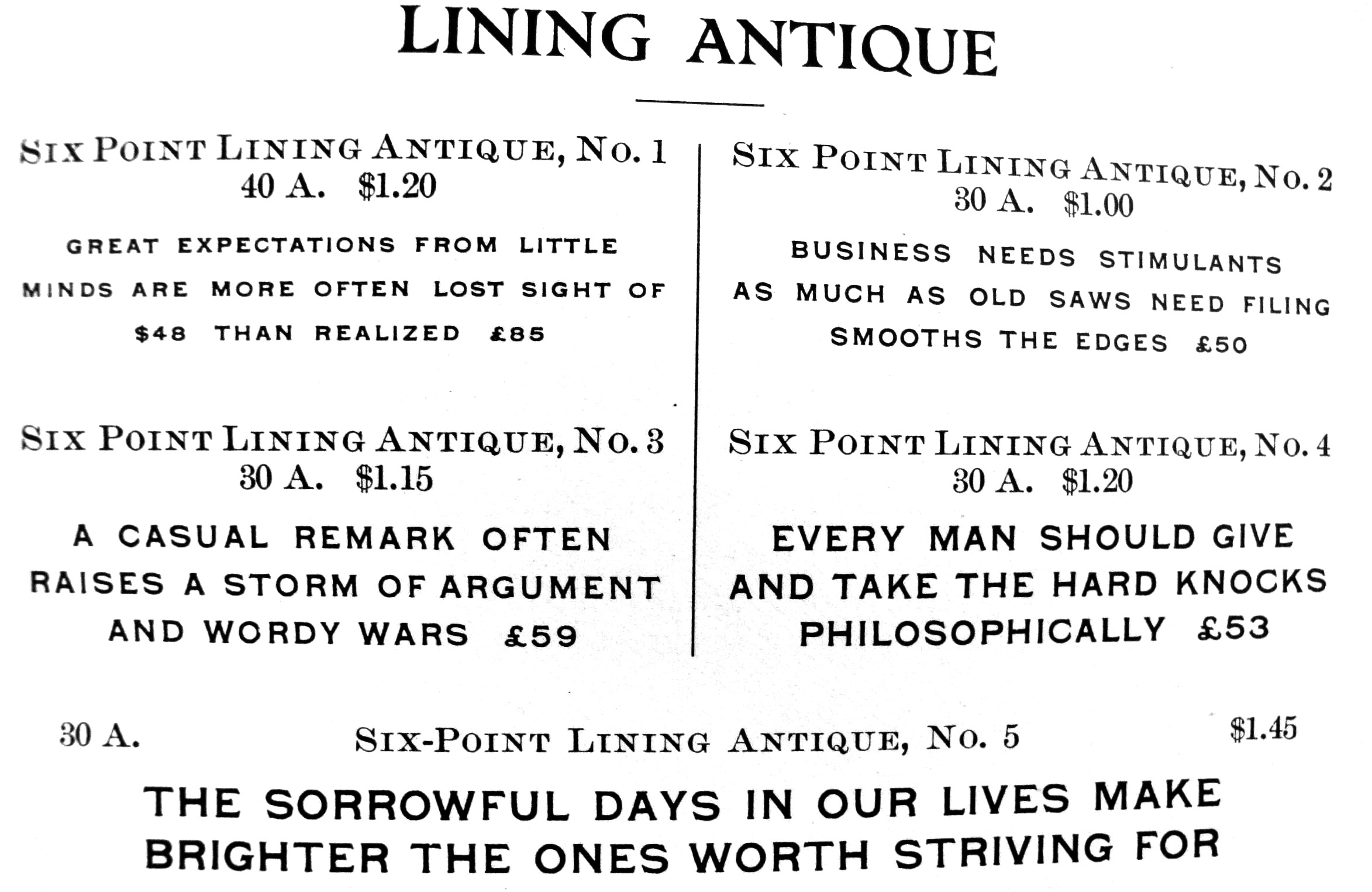
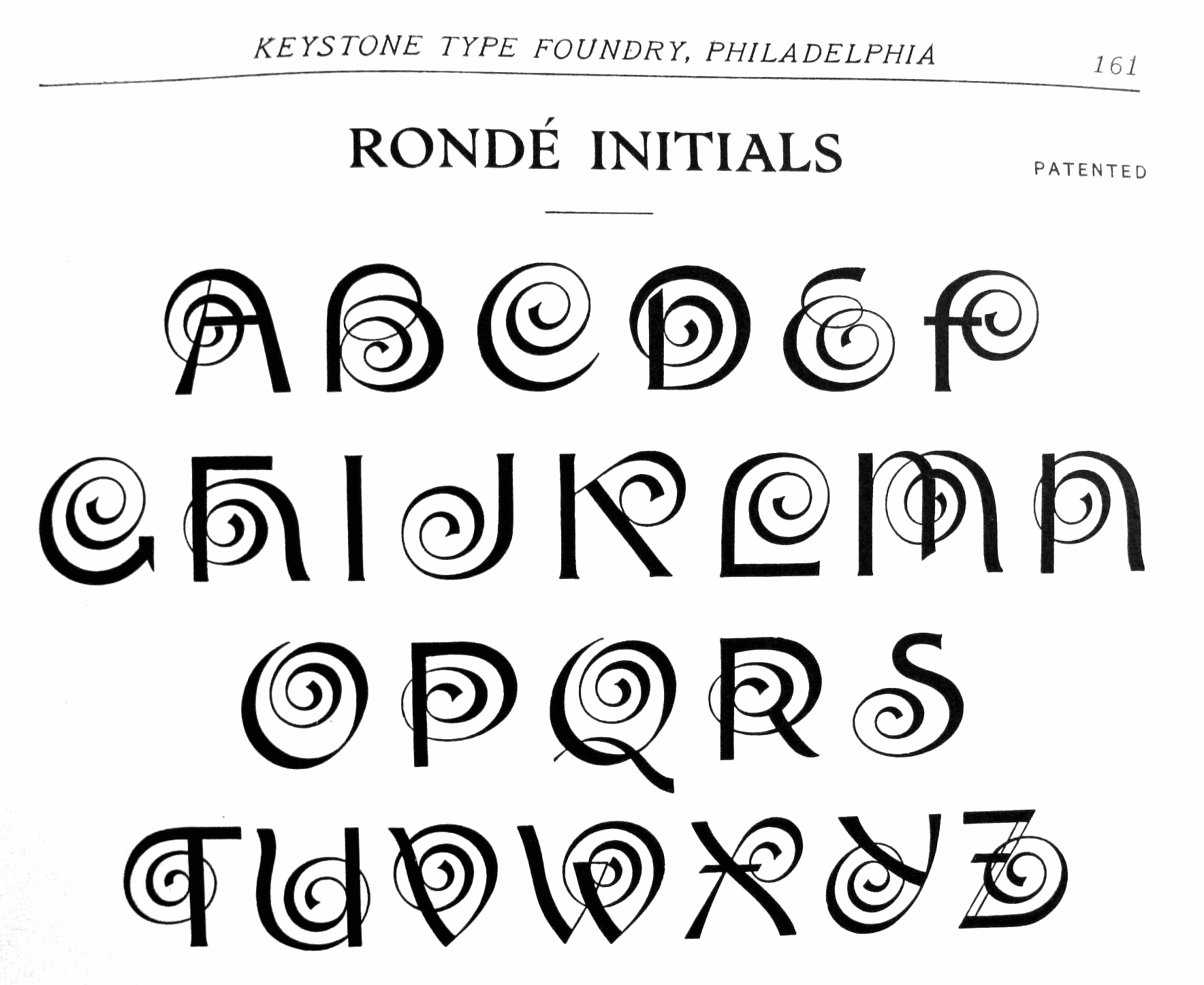
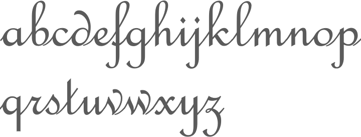
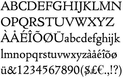
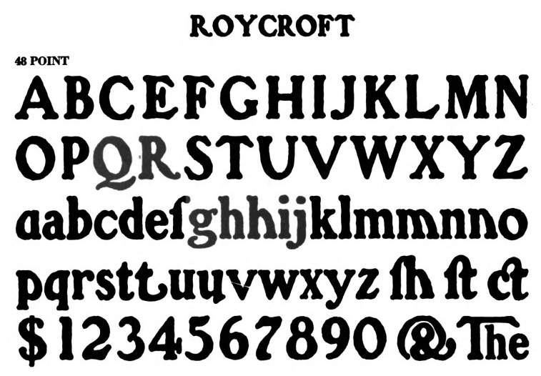
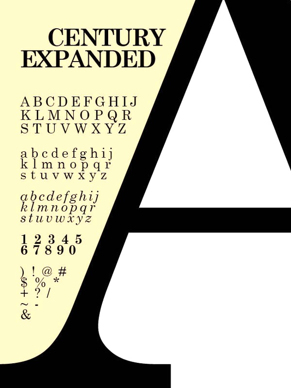
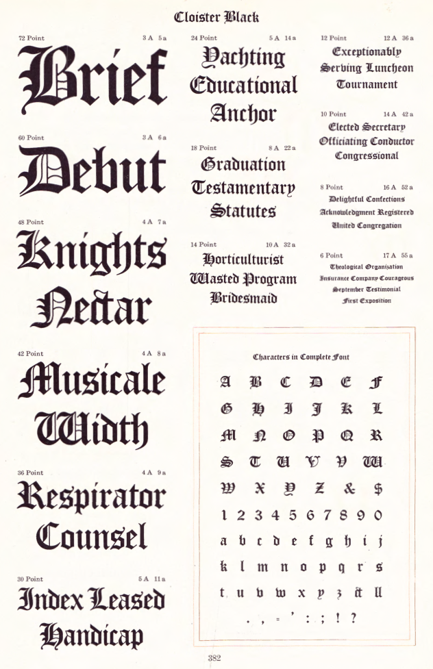
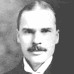
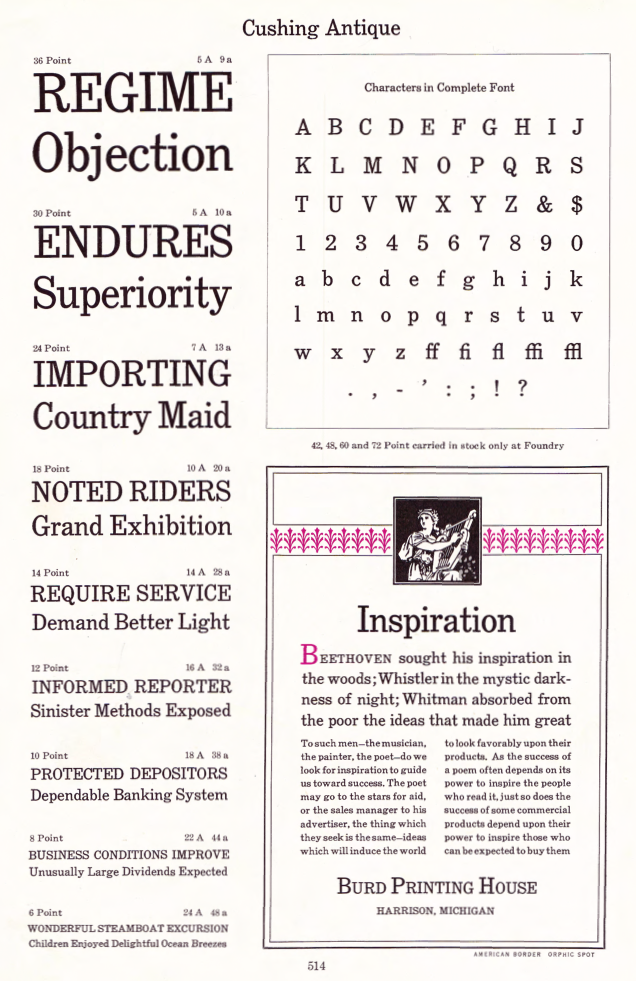
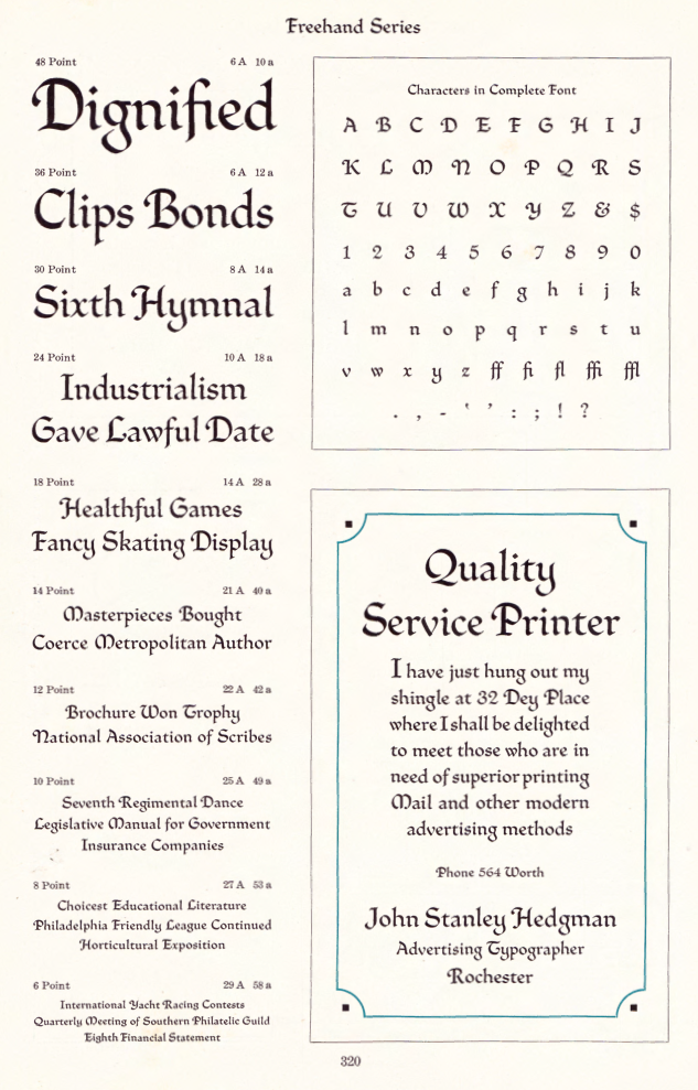
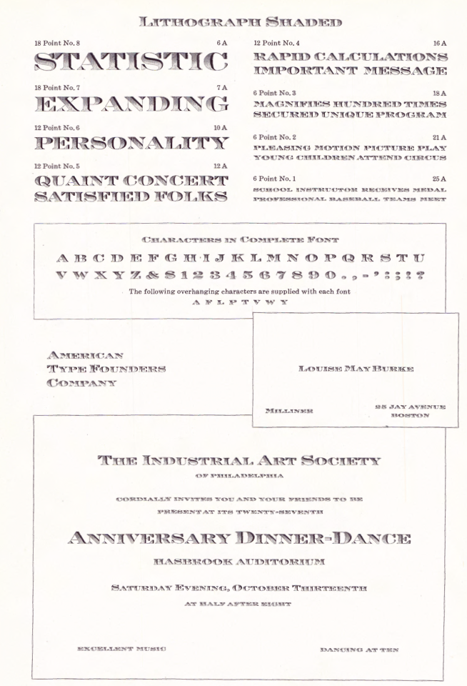
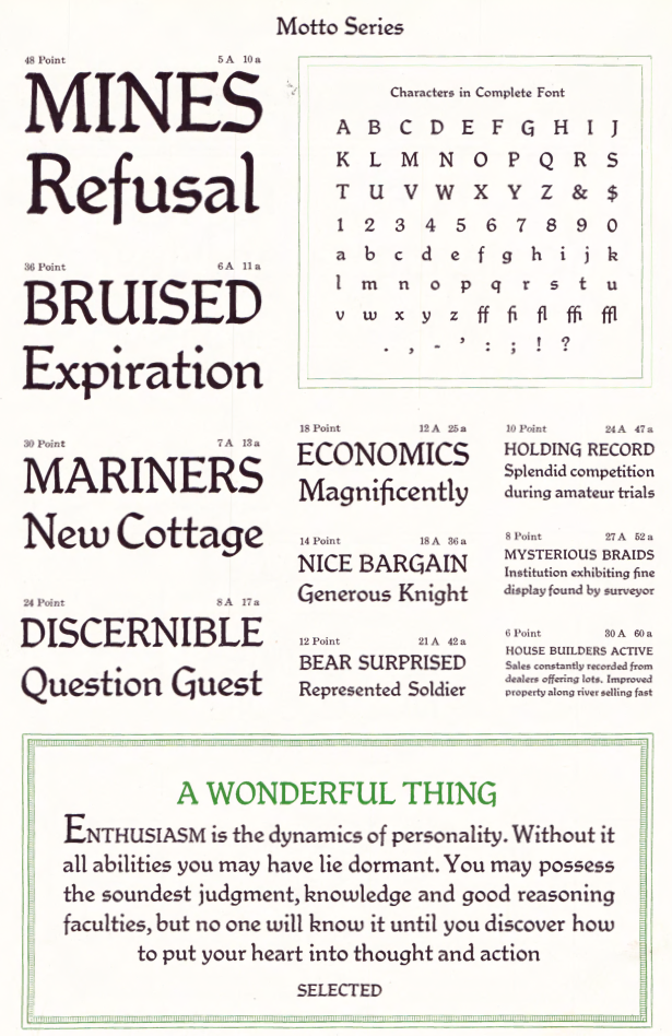
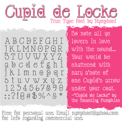
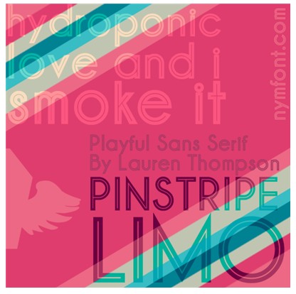
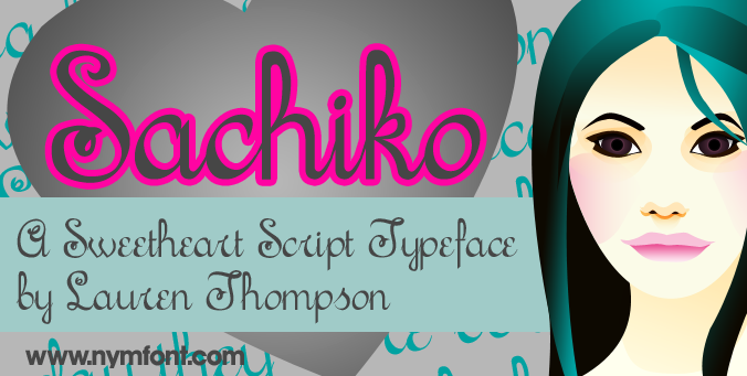
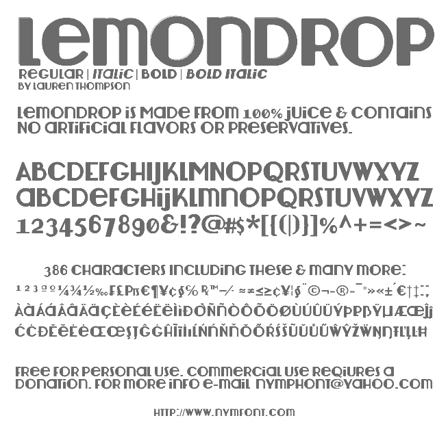
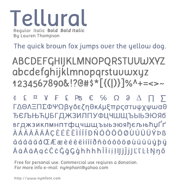
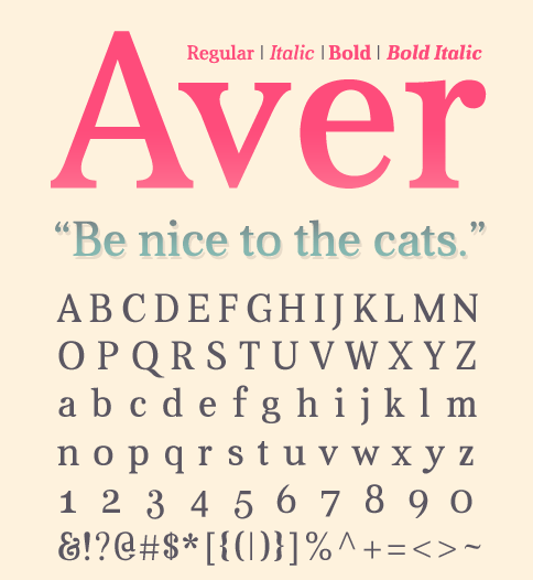
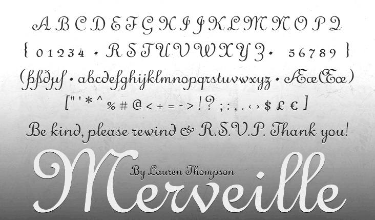
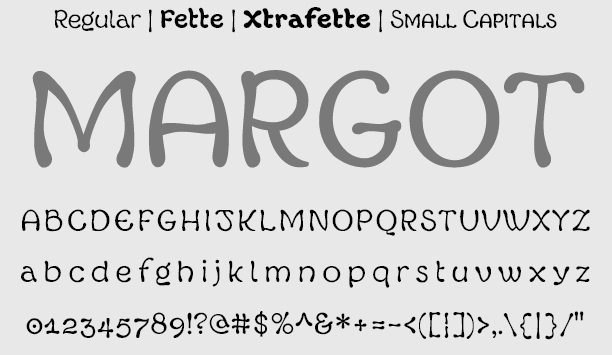
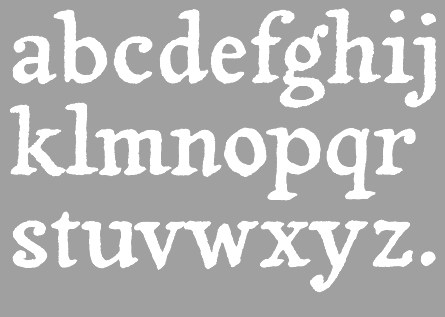
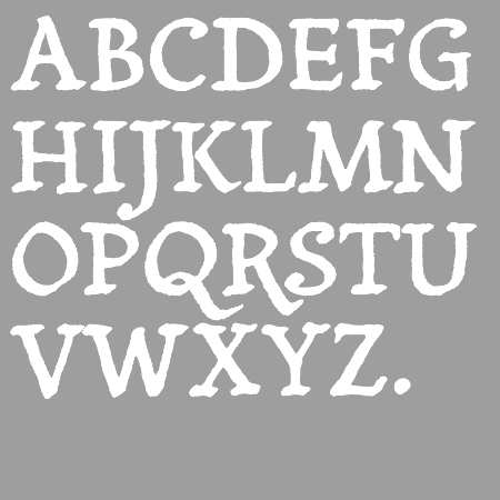
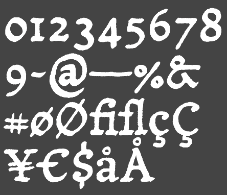
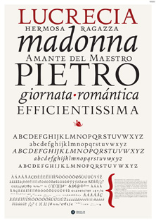
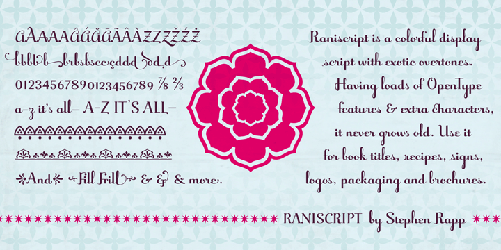
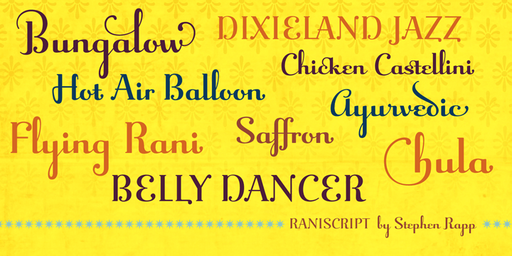
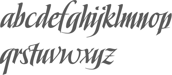
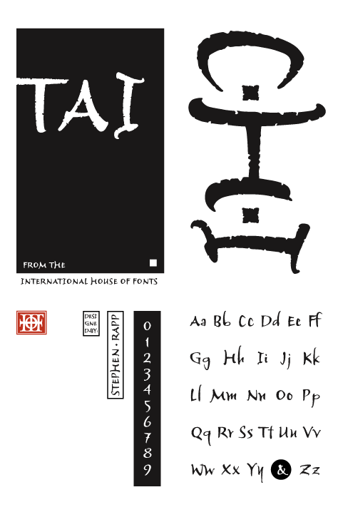
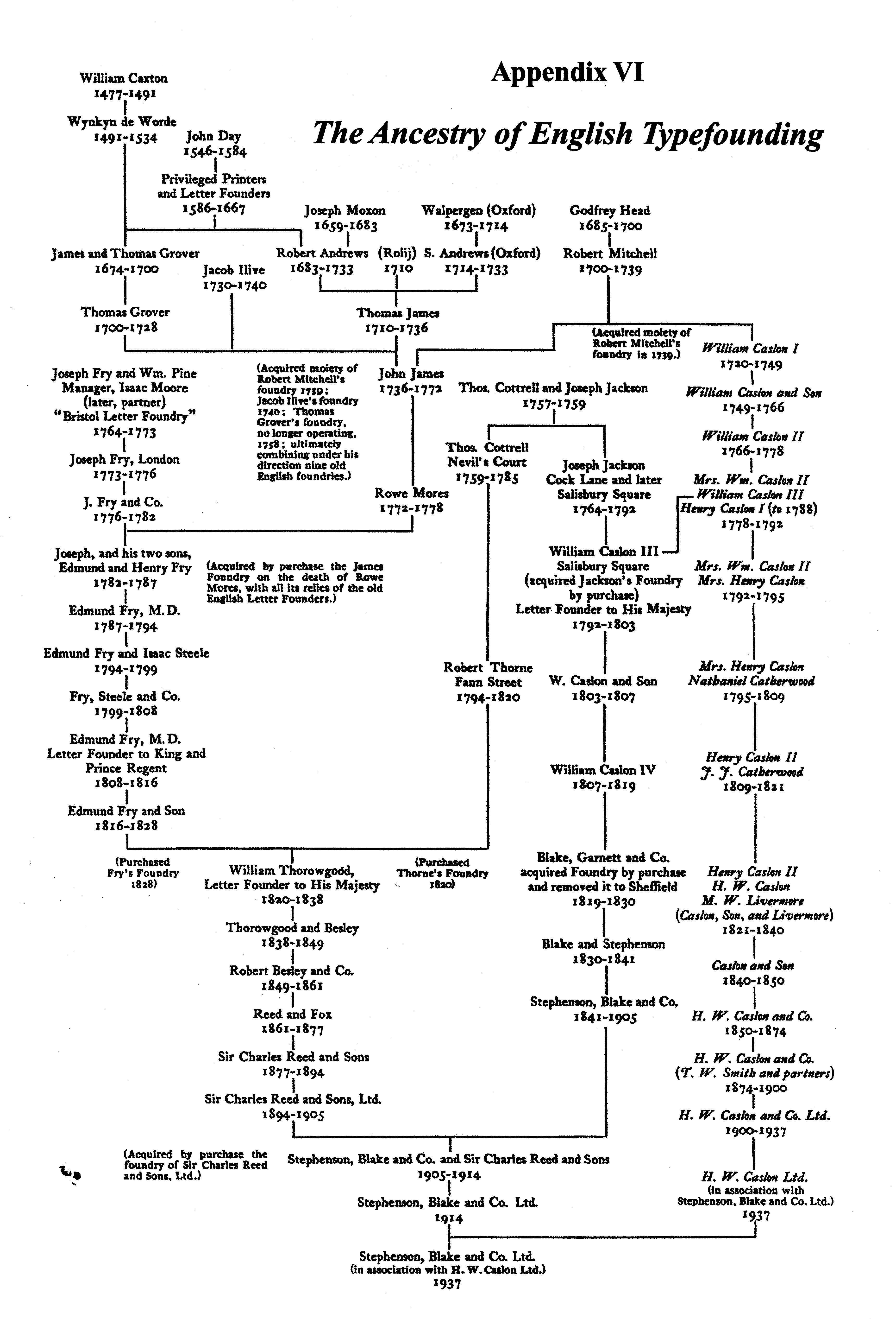
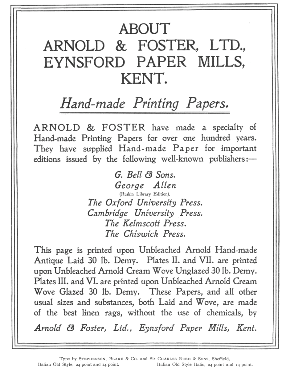
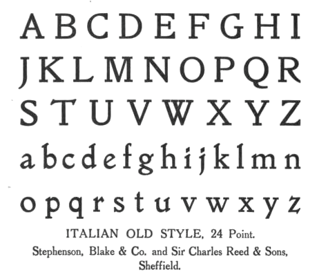
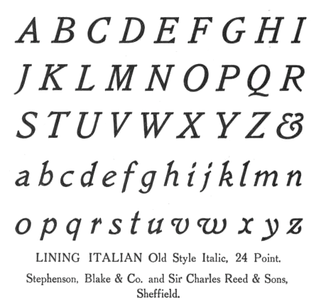
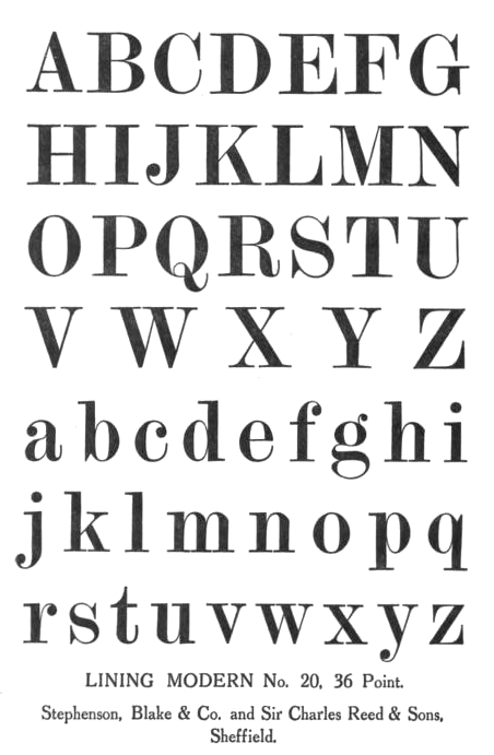
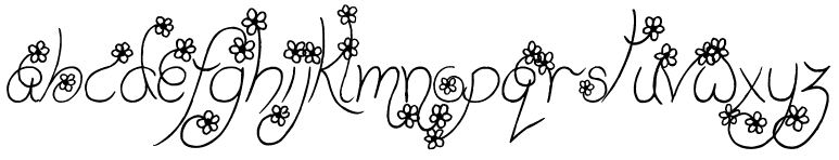
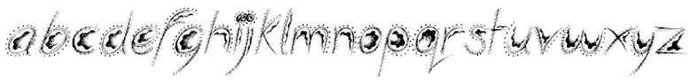
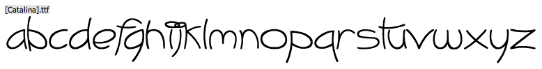
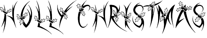
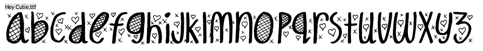
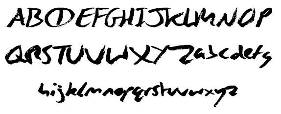
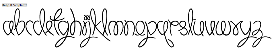
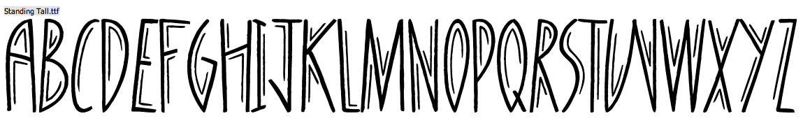
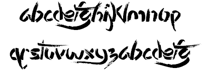
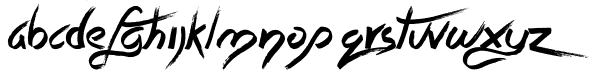
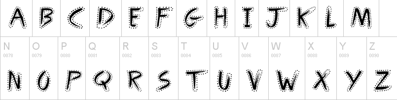
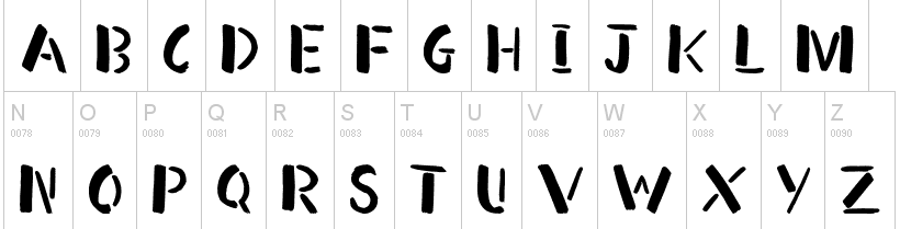
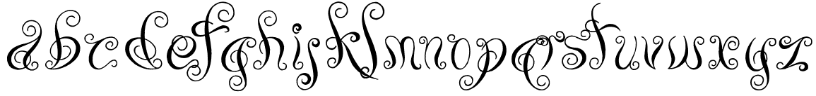
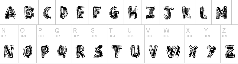
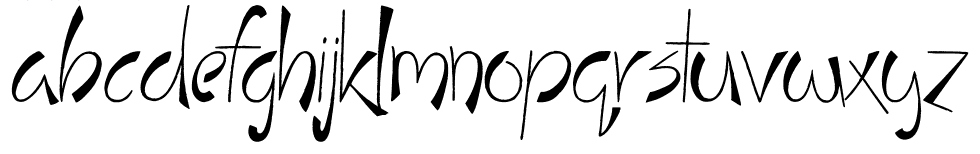
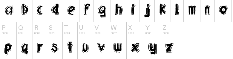
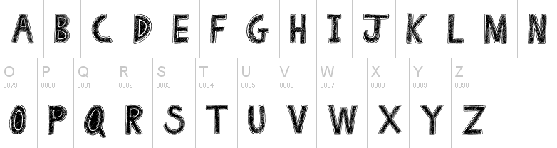
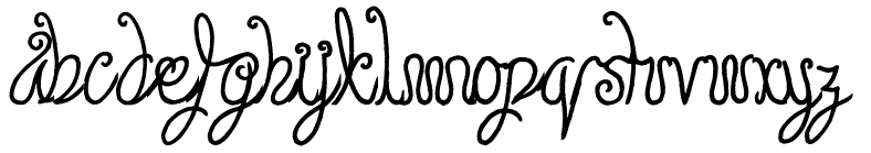
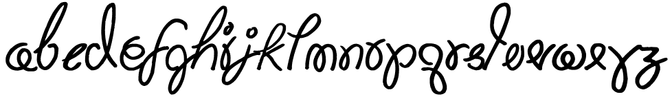
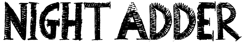
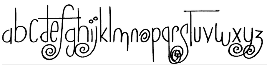
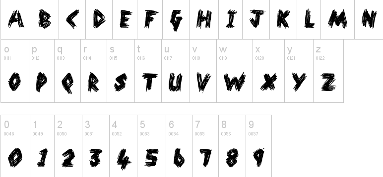
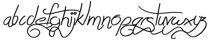
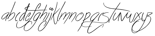
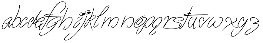
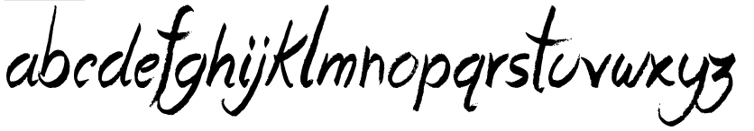
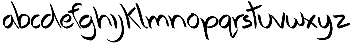
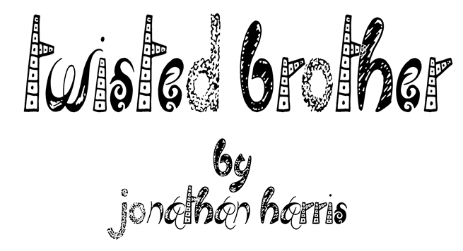
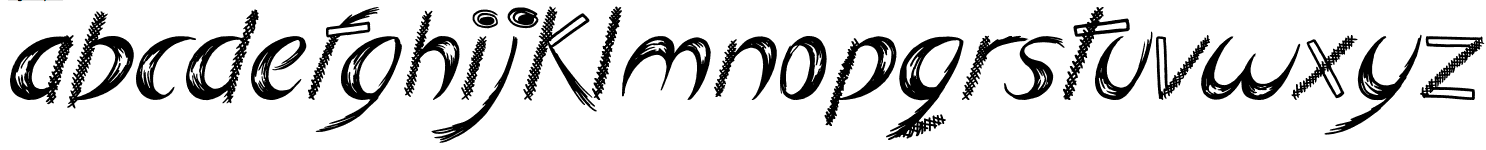
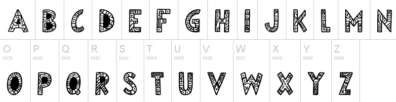
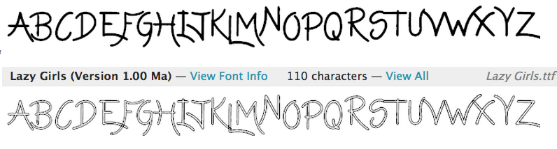
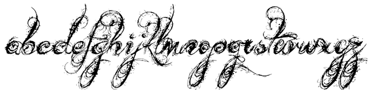
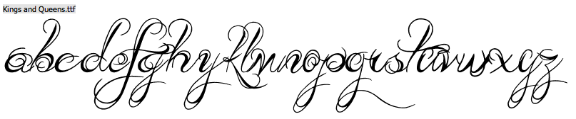
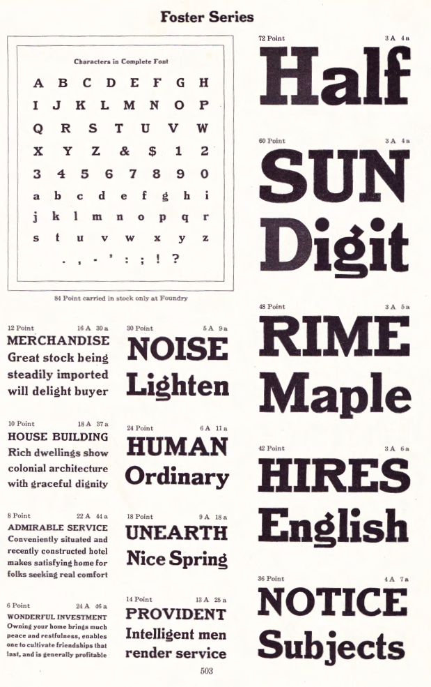
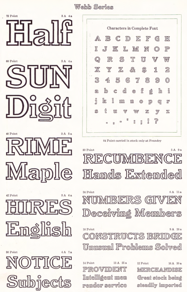
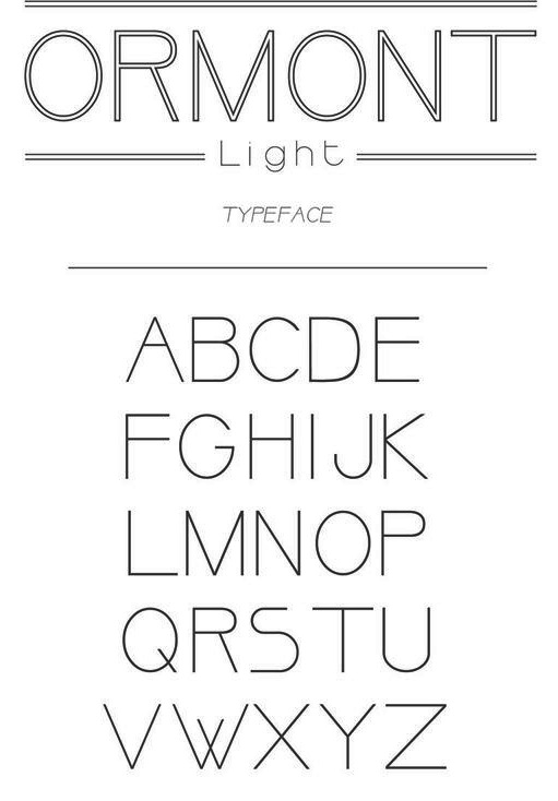