TYPE DESIGN INFORMATION PAGE last updated on Sat May 16 08:11:48 EDT 2026
FONT RECOGNITION VIA FONT MOOSE

|
|
|
|
|
Type design in Sweden | ||
|
|
|
|
SWITCH TO INDEX FILE
11-D Productions (was: JW's Art)
|
Alternate URL. Some of his fonts at Typearound. Alternate URL. Dafont link. Fontspace link. [Google] [More] ⦿ |
Dead link. Seventeen Swedish calligraphers: Kerstin Anckers, Susan Duvnäs, Karl-Erik Forsberg, Mona Gordon, Ludvig Grandin, Marie Anikó Györi, Lennart Hansson, Helene Henningson, Annika Larsson, Florian Kynman, Gun Larson, Lars Olof Laurentii, Erik Lindegren, Annika Rücker, Cecilia Skogh, Ylva Östberg Skarp, Marianne Pettersson Soold. [Google] [More] ⦿ | |
23SE
|
|
Pelle Anderson's Swedish language design and type magazine. It is very up to date on type used in newspapers. [Google] [More] ⦿ | |
Art director in Malmo, Sweden, who made the free geometric symbol font Cymbol (2012). Behance link. [Google] [More] ⦿ | |
African Drum Rhythms
| Free Djembe truetype font for Djembe drum music notation. By Lennart Hallström from Stockholm. [Google] [More] ⦿ |
agnuaspflibko
| |
Aidfonts (was: Antropos)
|
Baar published these typefaces with Linotype: Atlantis, Linotype Kaliber, Linotype Balder (1994), Linotype Ordinar (2000), Linotype Pisa (1997), Feltpen, Nordica (chiseled typeface). Nice fonts at old Antropos site included: Aristoteles, Platonia, Andromeda, Zeitgeist, Artemis, Andromeda Engschrift, BaarAntropos, BaarAntroposAidfont, BaarAntroposBold, BaarAntroposBoldItalic, BaarAntroposCaps, BaarAntroposDisplay, BaarAntroposEngschrift, BaarAntroposItalic, BaarGoetheanis (2002), BaarLemuria (2002), BaarMetanoia (2002), BaarMetanoiaBold, BaarMetanoiaBoldItalic, BaarMetanoiaItalic, BaarPhilos, BaarPhilosBold, BaarPhilosBoldItalic, BaarPhilosItalic, BaarSophia (2002), BaarSophiaBold, BaarSophiaBoldItalic, BaarSophiaItalic, BaarZeitgeist. He founded Menschengeist and Aidfonts (2005), where one can download his Sophia, Metanoia and Philos families. Dafont link. Linotype link. FontShop link/ Klingspor link. Fontspace link. Catalog of Lutz Baar's commercial typefaces. See also here. [Google] [MyFonts] [More] ⦿ |
Bror Zachrisson penned Akke Kumlien: 1884-1949 in PAGA, volume 1, number 3, pp. 45-56, 1953. Kumlien studied the history of arts and literature at Uppsala University, which later bestowed on him an honorary doctorate. He was also the founder of the Institute for Research of Materials at the Royal Academy of Arts in Stockholm, the head of the Thiel Gallery's well-known art collection, and the main artistic consultant at P. A. Norstedt&Sons, the royal printing house. His Kumlien transitional typeface was the first major Swedish-designed typeface in over a hundred years. Specimen. Author of Bokstav och ande (The Letter and the Spirit: 1948), and Kunstneren og bokkunsten (Artist and Book Art). MyFonts link. Klingspor link. [Google] [MyFonts] [More] ⦿ | |
Swedish designer of the hand-drawn typeface Prakti Script (2014). [Google] [More] ⦿ | |
At Kanon Foundry, he designed the retail typeface Operand (2021, by Alexander Örn; a low contrast, almost monolinear sans serif that draws inspiration from the 1930s Scandinavian functionalist design era) and co-designed these corporate typefaces with Tor Weibull: the angular sans typefaces Bedow Head and Bedow Hand (2020), NLTG Wave Display & NLTG Wave Serif (for the Nordic Leisure Travel Group). [Google] [More] ⦿ | |
As a student, Malmö, Sweden-based Alice Kindborg Elofsson designed the art deco typeface Plum Royale (2018). [Google] [More] ⦿ | |
Alireza Amiri
| |
Allrunes
| Carl-Gustav Werner is a mathematician at Sweden's Lunds Universitet. He created metafont code for runes (2001-2014) of all kinds, including Scandinavian, Continental, Gothic, Anglo-Frisian, Normal, Short-Twig, Staveless, and Medieval. He explains: Several fonts exists for typesetting runes, for a list, see here. Most of them are rather limited. [...] I try to cover most varieties that ever existed. Since I prefer LaTeX for document writing, I have created the font with Metafont and set up a package for easy use in LaTeX. CTAN download site. [Google] [More] ⦿ |
Alpha Quantum
|
Dafont link. [Google] [More] ⦿ |
Stockholm, Sweden-based designer, with Jens Schildt, of a geometric solid typeface in 2018. [Google] [More] ⦿ | |
Amanye Tenceli: Tengwar Calligraphy
| Tengwar calligraphic page by Måns Björkman from Sweden. Free fonts made by him include Sarati Eldamar (2005), Valmaric Eldamar (2006), Tengwar Scribe, Tirion Sarati (2002), Tengwar Parmaite. Plus many calligraphic notes. He explains: This page is dedicated to the beautiful writing systems that in Tolkien's works derived from the continent of Aman. They are often collectively called Tengwar, although strictly speaking this is wrong, Tengwar being the name of Feanor's writing system (Feanors Tengwar) but not of the Sarati, Rúmils script (the Tengwar of Rúmil). Alternate URL. [Google] [More] ⦿ |
Gothenburg, Sweden-based graphic designer who is mainly preoccupied with logotypes and calligraphic book covers. He has also been working as a teacher in graphic design at HDK's School of Design and Crafts at Gothenburg University. Designer of the elegant neo-modern family Bodebeck (2004, Linotype). [Google] [More] ⦿ | |
| |
Creator of the world's smallest typeface, 3x3 (2005), which has appeared on several record sleeves; a slightly modified version appears on the cover of LFO's Sheath, designed by The Designers Republic. Anders de Flon (b. 1983, Stockholm, Sweden) is a Swedish creative advisor, graphic designer and industrial designer known for his minimalistic and experimental work. Founder of Deflon, a Creative&Advising venture, based in Stockholm. [Google] [More] ⦿ | |
Dr. Anders Ekenberg who teaches at the Theological Institute of the University of Uppsala (Sweden), has a medieval music notation font. [Google] [More] ⦿ | |
Swedish freelance graphic designer located in London. Behance link. Creator of the formal upright script/display typeface Rund (2009). [Google] [More] ⦿ | |
Small Swedish archive with previews. Site makes my browser crash. [Google] [More] ⦿ | |
Swedish folk fiddler. Designer whose fancy caps fonts will soon be developed in cooperation with David Kettlewell. [Google] [More] ⦿ | |
Swedish type enthusiast who created a bitmap font in 2001. Link and name of font removed on his request. [Google] [More] ⦿ | |
Andreas Brunelius
| |
Andreas Carlsson
| |
Swedish designer (b. Malmö, 1987) who runs the Karmacube web site. His first typeface is Magma Simplica (2003, sans). He also made Magma (2004, a nice geometric display sans). [Google] [More] ⦿ | |
Swedish designer who created Minimal Slask (2012). [Google] [More] ⦿ | |
Andreas Gustavsson
| |
Andreas Johansson
| |
Andreas Lindholm
| |
Andreas Lindkvist
| |
Andreas Norberg
| |
Andreas Nymark
| |
Kalmar, Sweden-based lettering artist and illustrator. Designer of the commercial typeface Pirates Treasure (2015). Behance link. [Google] [More] ⦿ | |
Andreas Pihlström
| |
Swedish designer, who now lives in Kalmar, Sweden. Creator of the thin monoline compass-and-ruler typeface Tall Tower (2011). Behance link. [Google] [More] ⦿ | |
Anja Emzén grew up in the south of Sweden, and got a bachelor degree in graphic design from the renowned Graphic Arts Institute of Denmark. Starting in 2010, she is doing graphic design work in Sydney, Australia. Emzén (2010) was created while Anja was studying at The Graphic Arts Institute of Denmark. It is a soft-edged slab serif. [Google] [More] ⦿ | |
In 2008 she graduated from Beckmans College of Design in Stockholm where she studied advertising and graphic design. Designer and illustrator in Stockholm, who made the decorative caps typeface Ornis (2010). Behance link. [Google] [More] ⦿ | |
Anna Tribelhorn
| |
A graduate of the Type Design program at KABK, annika now specializes in logotypes and stonecutting. Her business, Inscriptorum, is located in Sundborn. [Google] [More] ⦿ | |
Swedish bookstore offering many valuable historical books on typography. [Google] [More] ⦿ | |
Berlin, Germany (was: Jamtland, Sweden)-based designer (b. 1988) of Rub My Soap (2015, a free animated font), Runkmuskel (2011, hand-printed), Woodwarrior (2013, a hipster typeface with runic influences), tweetware hipster typeface), Wasteland (2014, a tweetware brush typeface advertized as post-apocalyptic), and PXLPLZ (2012, pixel face). Dafont link. Behance link. Open Font Library link. [Google] [More] ⦿ | |
In 2016, he designed the free blackletter typeface Bajern. In 2017, he published the slab serif typeface Farsan and the free ink splash typeface Pissjar Sans (for which he peed over 300 times during a six-month period). Behance link. Creative Market link. [Google] [MyFonts] [More] ⦿ | |
Freelance illustrator and graphic designer in Eskilstuna, Sweden. Creator of the alchemic typeface Aber Grotesque (2012). [Google] [More] ⦿ | |
| |
Based in San Francisco, AppDynamics is an enterprise software company specialising in application performance monitoring software that ensures the smooth running of business-critical applications In 2019, a rebranding of AppDynamics led to the corporate typeface AppD Sans, which was jointly developed by Göran Söderstrom (Sweden), Paul Russell (New Zealand), Kallan & Co (Finland), Brett King (Finland) and Hannu Koho (Finland). [Google] [More] ⦿ | |
Arina Stoenescu (b. 1969, Bucharest) is a doctoral student at Department of Arts and Cultural Sciences at Lund University, Book history. Her doctoral thesis is entitled Typography and Politics. The political impact of typography in newspapers from Romania during the communist time (1948-1989). She lives in Stockholm since 1989. In 2010 she started the first independent type design and typography courses in Swedish universities. Speaker at ATypI 2017 Montreal: An atypical history of type in Romania 1508-1989. [Google] [More] ⦿ | |
Aring Typeface
|
View Mans Grebäck's typefaces. Abstract Fonts link. Fontspace link. MyFonts link. Another URL. Dafont link. Klingspor link. Buy fonts directly from Måns Grebäck. Old URL. [Google] [MyFonts] [More] ⦿ |
Åsa Gilbertson
| |
Aka Baville, Artman Ay is based in Gothenburg, Sweden, and studies dentistry at the Medical University of Lublin, Poland. Creator of the hand-printed typeface Irregularis (2013). Created with Font Creator, it is useful for casual text, or blackboard emulation. Wikipedia link. Fontspace link. [Google] [More] ⦿ | |
Artery Design
|
Dafont link. [Google] [More] ⦿ |
| |
Goteborg, Sweden-based designer of an all caps sans typeface simply clalled Alfabet (2013). Behance link. [Google] [More] ⦿ | |
Ateljé Altmann
| Ateljé Altmann is Christian Altmann's Stockholm, Sweden-based creative studio with a background in art direction, typography and graphic design. In 2020, it released Altmann Grotesk, a 5-style almost monolinear sans by Christian Altmann and Janik Sandbothe that was initially planned as an internal studio typeface. [Google] [MyFonts] [More] ⦿ |
Said to be a fusion of Futura and Akzidenz Grotesk, Avisto started appearing on Swedish signs in the 1930s. Image from the book I Love Type 01 Futura [via Christian Steen Jørgensen, Copenhagen, and Typophile]. [Google] [More] ⦿ | |
Self-described as an exile Swede and medieval rockstar currently studying Graphic Design at Westerdals SoC in Oslo, graduating summer 2013.. At Westerdals, he developed Dystopia (2012), a monospaced typeface inspired by retrofuturism and repressive social control systems. Behance link. [Google] [More] ⦿ | |
Swedish Brooklyn, NY-based designer of Teknisk and Teknisk Stencil (2016), designed to capture the mechanical feeling of the early machines. Behance link. [Google] [More] ⦿ | |
Bagarmossens Scoutkår
| Typefaces at the Swedish scouting group Bagarmossens Scoutkår, all made by Björn Jonsson in 1998: BrädgårdHandskriven, Brädågrd, ScoutikvadratHandskriven (handwriting). [Google] [More] ⦿ |
He released the semi-experimental typeface Agate at the Swedish foundry So Type. Agate was originally designed to be used as a display font for Strates, an architecture magazine edited by Baptiste Gerbelot Barillon who took part in the early days of the project. [Google] [More] ⦿ | |
BarFonts
| Released under the GNU General Public License, BarFonts 1.0 contains fonts for the following bar codes: Codabar, Code 39, Code 128, Interleaved 2 of 5, UPC A, UPC E, EAN 13 and EAN 8. The postscript package was developed by Jan Kärrman from the Department of Scientific Computing, Uppsala University, Sweden. Printing some message text as a bar code does, for most bar codes, involve some modification of the text, such as addition of a checksum character and/or special start/stop/delimiter characters. For each font there is a Perl script and a Visual Basic script that can be used to convert a message into the correct form. Each font also comes in a non-standard variant, an "auto font", that is designed to automatically convert the message into the appropriate form. The auto fonts should be considered as experimental, and have several limitations, see the documentation for details. [Google] [More] ⦿ |
Stockholm, Sweden-based design studio, set up ca. 2005. In 2020, Bedow, together with Kanon Foundry (Alexander Örn (Malmö) and Tor Weibull), designed the angular sans typeface Bedow Head and Bedow Hand. [Google] [More] ⦿ | |
Swedish art historian whose 1956 PhD dissertation was entitled Svenskt stilgjuteri före âr 1700 (Typefounding in Sweden before 1700). In 1950 he published an 18-page booklet entitled Det äldsta Svenska Stilprovet Tryckt at Skolan for Bokhant verk. [Google] [More] ⦿ | |
| |
Varberg, Sweden-based designer of the hipster outline typeface Framnäs (2017). [Google] [More] ⦿ | |
| |
| |
Beyond Design
| Ola Björling (Beyond Design) is the designer of Advent (dot font), HybridBold (1999), HybridOutline (1998), JuliaEngstrmBold (based on the handwriting of Julia Engström), Muttprutt, Omicron (a beautiful futuristic face), Randi (1998), Slidfis, Slidfiskittlande (1997, athletic lettering), Slidfissaftig, Starlightseedcitysightseeing, Technoidone. Some of his fonts are under the (Swedish) TarmSaft label, and some under Beyond Design. All were made around 1997. He also made Agaro to Sagaru and Serial Killer, both techno fonts as well. |
Swedish association for printing, type and book arts. [Google] [More] ⦿ | |
Birdfont
| Birdfont is a free font editor by Uppsala, Sweden-based Johan Mattsson, launched in 2014. Supported by Mac, Windows, Linux and OpenBSD, it is based on the svg and ttf formats. It can generate fonts in TTF, EOT, SVG and BF format. Color fonts and OTF fonts are supported for a small fee. Github link. As of 2021, BirdFont had 90,000 lines of Vala code. Marko Jovanovac is listed as co-developer. [Google] [More] ⦿ |
Björn Berglund
| |
Björn Berglund Creative Studio
| Letterer and graphic and type designer from Sweden, who set up Björn Berglund Creative Studio in 2015. In 2021, he released the elliptical sci-fi sans typeface Fuglesans. Typefaces from 2022: Vivo Sans (a squarish sans). [Google] [MyFonts] [More] ⦿ |
Swedish graphic design student at Konstfack in Stockholm, b. Landskrona, 1983. His portfolio includes the refreshing caps designs he calls Typeface Anatomy (2008). He also made a skectch for Handwritten (2008). D, O, R. [Google] [More] ⦿ | |
Björn Johansson
| |
Björn Jonsson
| |
Sundsvall, Sweden-based designer of the angular display typeface Schattentanz (2013). [Google] [More] ⦿ | |
Björn X. Öqvist
| |
Bo Berndal
| |
Swedish designer born in 1924 in Stockholm. He says of himself: Compositor, Linotype operator, teacher of typography. Type designer in a small matrix factory 1950-51. Calligrapher, book designer, author, lecturer and trade mark specialist. Now retired, but does type design as a hobby and to special orders for museums, ad agencies, companies and even to private persons. His typefaces:
Pelle Anderson interviews Bo Berndal. Bitstream write-up. Agfa/Monotype write-up. Author of Typiskt typografiskt (Fisher and co, 1990). MyFonts page. Linotype page. MyFonts interview. FontShop link. Klingspor link. View Bo Berndal's typefaces. [Google] [MyFonts] [More] ⦿ | |
Bodyhand
| Swedish graphic designer who made the children's book typeface Bodyhand in 2018. [Google] [MyFonts] [More] ⦿ |
Bold
| Founding creative director of Differ Design in Stockholm. Founder and Creative Director of the Swedish design agency Bold (in 2011). Prior to Bold he was the Design Director at The Brand Union's Stockholm office. He has many years of international experience having worked and studied in Japan, New York, Dubai and London. His typefaces include Nordea Sans (for Nordea Bank), Labyrinyth (pixel style), Lateral (vertically striped face), Pop-Up, Fine Line, and Basic Shapes (a geometric experiment). [Google] [More] ⦿ |
Botond Bokor
| |
Motion graphics designer in Uppsala, Sweden. Codesigner with Martin Vlas and Melissa Kumaresan of the free all caps rounded sans typeface Pop (2016). Behance link. [Google] [More] ⦿ | |
Box Tube Labs
|
In 2018, he designed Kensmark (athletic lettering in 45 styles), Jawbreak (Sans, Serif and Slab), Infield (an athletic lettering font), Hitch Route (a sports typeface family), and Backcheck. In 2019, he released North Block (an octagonal sports font), Campione Neue (an octagonal sports font, with two variable font styles), Le Bronn (a condensed movie credit sans), and Mavericks (an industrial strength octagonal typeface). Typefaces from 2020: Playmaker (a varsity font), Areno (an octagonal sports font), QB One (an octagonal sports font family with square counters; 28 styles), Kensmark (octagonal), Outlast (a sports shirt font). [Google] [MyFonts] [More] ⦿ |
Brainreactor--GyoDea
| Techno and futuristic fonts by Andreas Lindholm (from Bromma, Sweden; now in Stockholm and Santiago, Chile) such as Aerospace, BumbleBee, Calculator, Crystopia, Decoder, Dominator (2000), Elastica, Futuremark, Infaith, Intergalactic, Neodream, Neutronica, Octane, Pornomania, Prenoptica, Prologik, Reactivator, Ultimate Survivor, Viagra, Virus, Survival, Propaganda, Booster. Mac and PC. Fonts sold by Mindcandy. Alternate URL. His future typefaces are shown here. Dafont link. [Google] [MyFonts] [More] ⦿ |
Brikk
| Garamond Corpvs (2017) is a typographical set of posters created by Swedish illustrator and typographer Björn Johansson (Stockholm) as an in-depth pseudo-scientific research about the shapes of the Latin letters. The project is based on Geoffroy Tory's book Champ Fleury from 1529. Behance link. [Google] [More] ⦿ |
ByAndreas (was: Andreas Lindkvist Fonts, or The Bright Side)
| Here we had shareware fonts and dingbats designed by Andreas Lindkvist from Stockholm: TheBrightSide (great dingbats), Messydots, Kraft und Stil (as in De Stijl), Leftside, Green Babe, DoYourThing, Dekoside, Apapa, Brightside Dingbats, lindkvistdotcom, AllMyHands (fingers, hands--including "the finger"), Gumpy One (comic book font), GetTheMessage (letters in hearts), GetATicket, PunkTCom (dot matrix), and Happy Dots. The commercial fonts include Champion Sparkplug, ArcadeFontPack, BurningBats, Container, New Home, oFont, Organic Font, DigDotDot, PlasticBag, Lazzaroni, RetroBats, CynCyn and Cherish Font. |
Swedish designer of the grungy typeface Le Bossu (2015). [Google] [More] ⦿ | |
Stockholm, Sweden-based hcreator (b. 1990) of the handwriting typeface Egg's Handwriting (2009). [Google] [More] ⦿ | |
Camilla Styrström
| |
CAP Design
| Swedish design mag that has occasionally some features on fonts and font technology. Run by Per Torberger. Run by Per Torberger. It used to have Andreas Lindkvist's Capofont and Capheads. [Google] [More] ⦿ |
Carl Bjorklund
| |
Designer in Stockholm, Sweden, who specilaizes in corporate branding. In 2012, he designed a cold war sans for the Spionage Museum in Berlin. Behance link. [Google] [More] ⦿ | |
Software engineer based in Uppsala, Sweden. Designer of the free neo-grotesque typeface Helmet (2018) and the free geometric typeface Techna Sans (2019). Fontsquirrel link. Github link. [Google] [More] ⦿ | |
Swedish designer of the newspaper typeface Zero One (2004), which was digitized by Jonas Böttiger. [Google] [More] ⦿ | |
Swedish author (b. Stockholm, 1938) in 1974 of a book about Western ideograms. Its title was the Swedish equivalent of "Symbols - Western ideograms". This book is an encyclopedia and has for each new edition been revised and substantially enlarged. Its first English language edition was published in 1991 in the US under the title Dictionary of Symbols (ABC-CLIO, 1991, 596 pages). The latest published revised and much enlarged English language edition appeared in 1995 under the new title Thought Signs The semiotics of symbols - Western non-pictorial ideograms. Review. [Google] [More] ⦿ | |
Swedish designer and photographer in Stockholm who made Noodle (2009), a typeface sketch inspired by noodles. [Google] [More] ⦿ | |
Carl-Gustav Werner
| |
From 2009 until 2012, Carolina Dahl studied at HDK, the School of Design and Crafts, Göteborg, Sweden. She experimented in 2013 with monoline typefaces. One Unit Typeface (2013) is based on sticks. [Google] [More] ⦿ | |
Carolina Laudon
| |
During her studies at Berghs School of Communication in Stockholm, Sweden, Caroline Hotti designed the elegant teardrop-themed display typeface Diskreta (2017) and the sharp-edged sans poster typeface Quartz (2017). [Google] [More] ⦿ | |
Swedish designer of the scratchy handwriting typeface Glow Carro Danish SWpiik (2007). Fontsy link. [Google] [More] ⦿ | |
Graphic designer in Malmö, Sweden, who created the display typeface Catastrophe in 2016. [Google] [More] ⦿ | |
Cercurius (was: Lars Törnqvist Typografi)
|
And a jump list for Fraktur fonts. MyFonts link to his foundry, Lars Törnqvist Typografi. View Lars Törnqvist's typefaces. [Google] [MyFonts] [More] ⦿ |
Swedish printer and possibly typographer (1828-1923), who founded a printshop in Arboga in 1858 and moved it to Stockholm in 1862, where she married and ran it with her husband Knut Sigfrid Flodin until 1874. [Google] [More] ⦿ | |
During her studies at HDK in Gothenburg, Sweden, Charlotte Gonzalez created the Eucalyptus Leaf Alphabet (2015). [Google] [More] ⦿ | |
Fonts made by Mattias Lundgren from Sweden: Chiffer Forskjutet alfabet 5 tecken (1996), Chiffer Pagod (1996), Chiffer Scout (1997). [Google] [More] ⦿ | |
Swedish designer of the grunge font Barp, of Tsmoke Black, and the very interesting dingbat font Gizmo One. [Google] [More] ⦿ | |
Swedish author (b. 1946) of Typografisk håndbok (1998, Ordfront & Ytterlids; see also Ordfront/Ordfront Galago, Sweden, 2004), and of Bokstaven, ordet, texten, andra utgåvan, första tryckningen (Ordfront förlag, 1998). Old URL. [Google] [More] ⦿ | |
Christer Meijer
| |
Christian Altmann
| |
Author of Type Studies The Norstedt Collection of Matrices in the Type foundry of the Royal Printing Office (Norstedt Tryckeri, Stockholm, 1983), in which we find reproductions of all metal typefaces in the collection of the Norstedt foundry. [Google] [More] ⦿ | |
Christian Liljeberg
| |
Christian Svalander
| |
Swedish designer who made 35mm (2011, a movie strip font), Aviator (2011, techno), Bad Analogy (2011) and Well Mister (2011, octagonal). Behance link. [Google] [More] ⦿ | |
Font archive at Swedish University Network SUNET, mirrored from cica. Has a Bengali font, a Telugu font, a Tamil font, a Tarot font, Sanskrit font and several Cyrillic fonts. [Google] [More] ⦿ | |
Claes Källarsson
| |
Claes Månsson
| |
| |
| |
CORE.NU Fonts
|
|
Creative District
| Gothenburg-based Christian Svalander is art director and co-founder of Creative District, a progressive design and web bureau. In 2010, he made Bianca, named after his daughter. He is working a franklin Gothic style face, Delia Gothic (2010). Another URL. [Google] [More] ⦿ |
Designer whose illuminated caps will soon be developed in cooperation with David Kettlewell. Half-Estonian, half-White Russian designer, living in Sweden. She draws illuminated caps for David Kettlewell. [Google] [More] ⦿ | |
Art director at Acne in Stockholm. Designer of the corporate playing card text typeface Gnuf (2010). [Google] [More] ⦿ | |
Daniel Feldt
| |
Daniel Jansson (b. 1982) lives in Boden, Sweden. At Devian Tart, he designed NentindoConsolic. Home page. [Google] [More] ⦿ | |
Daniel Viberg
| |
David Brasgalla
| |
David Kettlewell
| |
David Lindecrantz
| |
| |
Dawnland
|
He created the Chaos font series, which comprises Paradox (1999, trembling hand face; +Paradox X, 2011, +Paradox Runa, 2011), Lamenta (1999, scratchy face), Lamenta X (2011), Lilith (2000, initials made with human figures), Nihil (2011, grungy) and Dissonus (2004, a nihilist grunge typeface inspired by the type treatments of Dave McKean as well as the Manson Anti Christ Superstar-artwork). Other typefaces include Victualia (brushy), Aeterna (2011, grunge), Haakke (2011, a children's hand), Awe (hand-printed), Victualia X (2011, a hand-drawn brush font), Chaos 1996 (2011, pen illustrations), Massiva GrotesQ (2012), Lore (2012, blackletter), Nokturnia, Nekromantea, Pandemonia, Meep (2013), Blck Phnx (2013, a lava lamp font), Auntie Lee (2013, hand-printed), Uncle Lee (2013, hand-printed), Ponderous (2013, a poster titling face), Cirque De La Lune (2013, poster lettering), Dulcet (2014, vintage script), Left Hand path (2015, hand-printed), Lost + Forlorn (2017, a punk/horror typeface), Wounds (2018: a scribbly horror font), Murk (2020: an all caps typeface with 26 ghastly creatures). Behance link. Creative Market link. Klingspor link. Dafont link. [Google] [MyFonts] [More] ⦿ |
Born in Hong Kong in 1968, Dennis Poon was a designer in San Francisco and Stockholm. He currently works at Philips in Singapore. At the Typebox foundry, he designed TxElf (2002, blockish almost-bitmap font), TX Hex (2002) and TX Gitter (2001, a simplified Codex-like face). FontShop link. Klingspor link. [Google] [MyFonts] [More] ⦿ | |
Design av MAD
| Jönköping, Sweden-based designer. His catalog in 2022 showed these hand-crafted typefaces: America, Aqualine, Bumpy, Be You, Bubbly Rainbow (a bubblegum font), Casual, Chalkboard, Coconut Tree, Coming Home, Concrete Wall, Curve, Fancy Pants, Grip, Incdale, Limejuice, Painted Letters, Retro Poster, Rooftop, Scary House, Small Dots, Stripey, Tide. Creative Fabrica link. [Google] [More] ⦿ |
Design Eva Wilsson
|
Alternate URL. Another URL. Typedia link. Another URL. [Google] [MyFonts] [More] ⦿ |
Swedish handwriting font service. Has PC and Mac truetype handwriting font examples: Karin-Josephson, Lisa-Heine, Mikael-GustavssonRegular. [Google] [More] ⦿ | |
Graphic designer in Gothenburg, Sweden, who made Signlanguage American Font (sic) in 2011. Behance link. [Google] [More] ⦿ | |
Designer in Ankara and Stockholm, who created Bourdier (2012), a deconstructed typeface. Behance link. [Google] [More] ⦿ | |
dope fonts!
| Original grunge designs by Ola Nilsson from Sweden: the curly Doublejoint, the scratchy PleasureGelf, BarelyManilow [appropriate name for an intentionally ugly font], Barbapa, Dope714, Glorija and the Smiths, Kiddie Grinder, ChocolateBandit, Folk 1, 666 and Untitled. [Google] [More] ⦿ |
Swedish designer (b. 1987) of the pixel typefaces ElegantSlim (2007), bQUBIK (2007) and qtFace (2007). [Google] [More] ⦿ | |
elefont
| At elefont (and before that at subform) we could fond the free (non-commercial use only) fonts Halvar, Bailando, Onaka (katakana) and Atmosphere (fantastic LED font), designed by Swede Mattias Jakobsson in cooperation with Daniel Brandt. Elefont disappeared but is revived at typOasis by CybaPee. Dafont link. Fontspace link. [Google] [More] ⦿ |
Gothenburg, Sweden-based designer of a robot style ornamental caps alphabet (2012). This is perhaps not a font yet. Behance link. [Google] [More] ⦿ | |
Malmö, Sweden-based designer of Typeface 2B (2018). [Google] [More] ⦿ | |
Ellinor Maria Rapp
| |
Swedish author of A Handbook of Lettering for Stitchers (1966). The English traslation was published by Van Nostrand Reinhold (NY) in 1973. Amazon link. PDF file [34MB]. [Google] [More] ⦿ | |
Illustrator in Karlskrona, Sweden. During her studies, she designed a stylish experimental circle-based alphabet (2014) and a minimalist typeface called 11/3 (2014). [Google] [More] ⦿ | |
Gothenburg, Sweden-based designer of the monoline headline typeface Lyckan (2012). [Google] [More] ⦿ | |
Stockholm, Sweden-based designer of the custom sans typeface Grevgatan (2018) and the blackletter typeface Poseidon (2016). [Google] [More] ⦿ | |
During her studies at Berghs School of Communication, Stockholm, Sweden-based Emilie Svensson designed the angular display typefaces Dynast (2016) and Anxiedentity 006 (2016), and the blackletter typeface Poseidon (2016). Earler, she created the decorative caps typeface Fay (2014). [Google] [More] ⦿ | |
Stockholm, Sweden-based designer of the freZ sci-fi typeface Systema (2019). [Google] [More] ⦿ | |
Swedish designer. FontStructor who made these typefaces in 2012: Microbe 8 (dot matrox), Tractile 5 (horizontally striped face). [Google] [More] ⦿ | |
Designer in Stockholm, who created several unnamed typefaces in 2012. Behance link. [Google] [More] ⦿ | |
Graduate of Konstfack University of Arts, Crafts and Design (2013-2016). Malmö, Sweden-based desiner of the free Victorian typeface Echotopia (2020), which is based on the masthead of an issue of The Echo published sometime between 1890 and 1900. [Google] [More] ⦿ | |
Erik Lindegren (Swedish calligrapher and typographer, 1918-1996) ran the Erik Lindegren Grafisk studio in Askim, Sweden, and is the author of "ABC of Lettering and Printing Types". [Google] [More] ⦿ | |
| |
Swedish designer at Garagefonts who made the stencil typeface Broke in 2001. Esa Tanttu Design is based in Arlöv. FontShop link. [Google] [More] ⦿ | |
Eva Wilsson
| |
FAIRY is Borware's commercial server based font embedding service for Web documents. For Windows, Linux and soon also X/UNIX. Borware is Michael Jansson's company located in Bromma, Sweden. It is now called em2. [Google] [More] ⦿ | |
Falko Grentrup
| |
Falling Angel Studio
| Falling Angel Studio in Partile, Gothenburg, Sweden, was established in 2009 by Alireza Amiri (b. 1986, Teheran). Their first fonts include Circ (pixelish), Ki Moa Triangle Park (2011, with Mohsen Khaki), Sandikza (scribbly hand), Smart (rounded hand-printed face), Smart Maximus, Entoferno, Kakeroon (2010), Scatterbrain, XMadness (dot matrix face), Smart Wix (2010), Mazigh (2010, hand-printed), Jebrill (2010), Khoft (2010, grungy stencil), Kanta Cube (2010, block letters), Smart Maximus (2010), and Smart Toxonic. The following alphading pages were published in 2012: Ghab Star David, Ghab Star Clipart, Ghab Star Bahai, Ghab Star, Ghab Leaf Plane, Ghab Leaf Lucky, Ghab Leaf, Ghab Heart Triple, Ghab Heart, Ghab Gravestone, Ghab Cloud, Ghab Bubble Speech Black, Ghab Bubble Speech 2, Ghab Bubble Speech, Ghab Bottle, Ghab Atom. They were created jointly by Alireza Amiri and Sevin Shiva. Kokab (2012, with Sevin Shiva) and Azad (2012, with Sevin Shiva) are elegant black extended display typefaces. Bisheh (2012, with Sevin Shiva) is a condensed sans display family. Vierw Alireza Amiri's typefaces. [Google] [MyFonts] [More] ⦿ |
Swedish design and type design coop that unties G&oml;ran Söderström, Ørjan Nordling and Fredrik Andersson. Their typefaces include SL Gothic, DN Bodoni, DN Grotesk, LO-Enighet, SEB Basic, ATG Rubrik, ATG Text. M Typecache link. [Google] [More] ⦿ | |
Familjen Sthlm
| Advertising and design-bureau located in Stockholm, Sweden, est. 2011. As part of their business, they design principally custom and corporate typefaces. These include Vasakronan Serif (2019: design lead Isabelle Rudström-Österlund), AIK Display (2021, with a vintage feel), Karnov Display (2021, an angular lapidary typeface for Norstedts Juridik), Northvolt Grit (+Italic) (2021, for the Swedish battery maker), Ica Rubrik Black (2021), Vattenfall Bold (2021). Designers of the free sans font family Familjen Grotesk (2022, a multi-style inktrapped variable font family by Anders Wikstroem, Jonas Baeckman, Matilda Gysing and Kristian Moeller; Google Fonts). Github link for Familjen Grotesk. [Google] [More] ⦿ |
Fantas Internetgrafik (was: Fonter--Dingbats by Fanta)
| Free dingbat fonts by J.J. Kane: Button1, Fantas1, Fantas2, Fantas3, Ftanimal (animal silhouettes). Alternate URL. [Google] [More] ⦿ |
| |
Stockholm-based designer who conceived an experimental caps face in 2011. [Google] [More] ⦿ | |
Swedish art director and graphic designer in Malmö. Behance link. His first typeface is Rutger Serif (2010, with all serifs and edges massaged into round relaxed shapes; +Italic). Constructed (2010) is modular and octagonal. Three Sixty (2010) is an extremely black octagonal face. [Google] [More] ⦿ | |
Filip Tydén
| |
About 300 fonts in this new Truetype archive in Sweden. Categories: Futuristic/Space, OldTypewriter, Funny, Creepy. [Google] [More] ⦿ | |
Sweden's Anders Wallin maintains a lovely archive, which used to be called Mr. Wallin's Font Warehouse. [Google] [More] ⦿ | |
Fontanova
|
|
Fontar
| Graphic designer and art director with a background in the advertising industries of Iceland and Sweden, who has a PhD in graphic design from Luleå University of Technology, Sweden, and lives in Huddinge, Sweden. In 2022, he designed Tacit (a monolinear Scandinavian sans based on the designer's PhD thesis). [Google] [MyFonts] [More] ⦿ |
Fontcaster
|
He designed these typefaces:
FontShop link. Klingspor link. FontFont link. Linotype link. [Google] [MyFonts] [More] ⦿ |
From Leksand, Sweden, Peter Reichel's font site. It advertises the following: Search the Font database by name/design, attribute/family, headline, text or pi-fonts. Create and customize (body and headline text) extensive type-charts (PDF created on the fly) for more than 1000 fonts, in your own language. Download free TT-fonts with extensive kerning tables. Problem is that on some Netscape browsers, nothing works. [Google] [More] ⦿ | |
Fontomen (was: Tabbar&Typer)
| Nice free fonts made by Jenny Barck, who sometimes uses the name Joakim Kihlström. The fonts include AsaRocks, BabyBazonga, BabeBamboo, BatBen (batman font), Beam, BrandNewHeavies, Ceasar, DayOfTheTentacle, Diodos (1997), Djellibejbi (hearts), ElasticWrath (curly), Eller, Flame, HailMary, HarryPotter, Holywood, Heffaklump, Jagular, Jamiro, Komhjlp, Korv, KabanossNormal, Magnumpi, ManaMana, Modinskan, Megafon, Merde, Monday, Rambo, RamboKiller, Reddordedd, Runar, Salamander, Serru, SugarRay, Swabba, Tigger, Walter (2001, a Disney font), XFiles, Zeppelin. Dafont link. Fontspace link. Abstract Fonts link. [Google] [More] ⦿ |
Hans Presto's site about Lettering, Comics, Handwriting, Vintage Steel pen nibs and Calligraphy. Based in Stockholm. It has a subpage about stencil fonts, and includes a small stencil font archive. [Google] [More] ⦿ | |
Fountain--A Friendly Type Foundry
|
Some offerings over the years: the avant-garde Anarko (nice!), the curly Pizzicato (also nice), Pussy, Udo, Barbera, Gas, the gorgeous bottle dingbats Mini (by Peter Bruhn), Kundera, the free downloads Animals, Doggystyle, Egg, Egg Cameo, Fat Ultra, Kundera, Maceo, Mothafucka, Pavement, Pavement-Kana and Sevenet. All of the aforementioned typefaces have mostly been designed by Peter Bruhn. They also do custom work. Other fonts: Jinchi1, Hebrew, Greek. Recent fonts by Simon Schmidt include CloseCall, CloseGridder, Ogra and Schlager. Martin Fredrikson Core made the fat display typeface Filt (based on Antique Olive, it now has a Greek weight as well), Borgstrand, FTN Sauerkrauto [see also Sauerkrauto Pro (2000)], and Malmo Sans. Matthew A. Chiavelli made Ultura (1996). Peter Hoffmann created Alita. Lars Bergquist published Paracelus (a modern version of Schwabacher), Baskerville 1757 (2002), Montrachet, Monteverdi, and Waldstein (a Scotch typeface). Steve Payne designed COMA. Felix Braden made Sadness and Grimoire. Lee Basford created Nuephoric. Peter Bruhn made the commercial fonts Mayo, Ketchupa, Mustardo and the free fonts Partisan, Jinichi, Lipo-D, Dopil, Deuzhood, Azteak (initial caps) and Anticca. Lotta Bruhn designed Lucifer. Stefan Caludius made Dekoria (2003), a Tuscan titling face. Fountain released Stefan Hattenbach's sans family Stalemate in 2004, which was originally an OEM family designed for but not used by a German IT company, Gretel (by Sylvia&Daniel Janssen), Scrixel 8 and 16 (pixel families by Thomas Crolla). |
Kiko Seiz (b. 1993) is a Portuguese graphic design in Stockholm. Another URL. He created the hand-printed stencil alphabet Surfer Blood (2011), and the grotesk caps typeface Atom (2011). [Google] [More] ⦿ | |
Franko Luin
| |
| |
Frans Wiklund
| |
Fredrik Andersson
| |
Type designs include Berling Nova Sans&Serif (with Orjan Nordling), custom work for Nu-institutet and Botkyrka konsthall, and a release for Fountain is also in the works. He is the chairman of the Stockholm typographic guild. Klingspor link. [Google] [MyFonts] [More] ⦿ | |
Norrköping (was: Stockholm)-based graphic and type designer who cofounded Theygraphics with Stockholm-based Jiri Adamik-Novak and Prague-based Zdenek Patak. He obtained an MA in Graphic Design at the Konstfack College of Arts and Design, Stockholm, Sweden. In 2018, he published the circle-themed typeface Circle. [Google] [More] ⦿ | |
Graphic designer in Stockholm. He created an alphabet oiut of forks and spoons called Fork It Out (2010). [Google] [More] ⦿ | |
Free Goodies for Designers (or: FGD)
|
In 2015, Marcelo made the tweetware fonts Parabola and Bellaboo, the clean sans typeface Bavro, and the tweetware font Melo. In 2016, he made the tweetware multiline typeface Lines, the free avant garde sans typeface Boot Camp, the free Impact-style sans headline typeface Alberto, the Bauhaus-inspired Alva, and the tweetware brush script typeface Tindra. Typefaces from 2017: Kung (brush style), Sans Jose (a free Peignotian typeface), Rimbo (a great fat poster typeface). Typefaces from 2018: Brux (dry brush), Eighties, Kung (brush), Bolden (a free condensed black sans). Typefaces from 2019: Bavro Pro, Serifina (a high-contrast all caps typeface). Typefaces from 2020: Wired. Marcelo was born in Sao Paulo, graduated from Belas Artes University there, and settled in Stockholm. Marcelo Reis Melo. Behance link. [Google] [More] ⦿ |
In 2010 Freja Hedvall attended Berghs School of Communication in Stockholm, Sweden, with a Bachelors degree. From 201-2013, she studies Communication Design at Billy Blue College of Design in Sydney, Australia. In 2012, Freja created the counterless geometric typeface Rat Race. [Google] [More] ⦿ | |
Graphic designer and illustrator in Stockholm, Sweden. A graduate from Forsbergs School of Graphic Design and Advertising, she created the brush typeface Inkling (2010). [Google] [More] ⦿ | |
Fuelfonts (was Betatestfonts)
| Claes Källarsson's Fuelfonts in Sundsvall (Sweden) has some really cool shareware creations: Armorica, ArmoricaOblique, Ashbury, AshburyItalic, Barbarella, Bazooka, BigHeadMofo, Bomberman, Cake, Cherub, CherubSmallCaps, Choker, Decipher, Dinghy, Dipdop, DiscoMonkey, Dopdip, Dronecat, DrowningMonkey, Drugpusher, Eclipser, EclipserOblique, Electrolite, Experi, Fishsoup, FlipFlop, FlipFlopRoyal, Fluffster, Flux, Gothicum, Gummy, Holodeck5, Hyperblaster, Inkblob, InkyBear, Ion, JadeMonkey, KingAnakin2, Klonk, Knucklebuster, KnucklebusterOblique, Kryogenic, LittleDotties, Lotusflower, Makimango, MakimangoOblique, MetalCrusher, Mobster, Palomino, Parkland, ParklandSerif, PuffyDreamland, Releaser, ReleaserSerif, Resurrector, Rollergirls, Romeric, Schleepy, ScribbledMonkey, Snakegirl, Soopafresh, Spearbox, Squizzlie, Starmonkey, Stoopid, Subhuman, SuperHighway, VerucaBlack, ZyberBob, Candybar (at Chank), Talismanica (2002), Claes Interlock (2006, inspired by Ed Interlock), and Sooper Cosmic (1997, Chank---an extension of Chank's 1995 typeface Cosmic). Dafont link. Abstract Fonts link. Klingspor link. [Google] [MyFonts] [More] ⦿ |
Creator of the pixel font FuzzballFury 5px (2008, FontStruct). Sleath Wolfox is his artist name on Deviantart. [Google] [More] ⦿ | |
Fyrisfonts
| Stefan Lundhem started Fyrisfonts. He is the designer of Garajannon (Garamond family), Spartacus (a Roman, CODEX-like lettering font), Beckhem Gothic, Fournament, Primus, Fyris Fraction, Fyris Fraktur, Krabat, Heltime (mix of Times and Helvetica), Terminator, Bessie (2001, multiline art deco typeface modeled after Marcia Loeb's 1972 alphabet, Rainbow), Billie (2001, art deco titling, modeled after Marcia Loeb's 1972 alphabet, Zig Zag), Jämför abc, Miami Blues and Miami Vice (beautiful, now called Bessie and Billie, respectively). The pages in Swedish contain an in-depth study of Jenson and Adobe Jenson MM, Caslon, Cloister Old Style, Fraktur, Garamond, Minion MM, MultipleMaster fonts, Myriad MM, OpenType, Poynter, RailwayType, Newspaper type, Web fonts, Web typography, and screen typography. [Google] [More] ⦿ |
Motion graphic designer in Stockholm, Sweden, who created the experimental typeface GE Type (2014). Behance link. [Google] [More] ⦿ | |
The Swedish company Gibb has its own futuristic font, Moorpark (1993). Free download. [Google] [More] ⦿ | |
Gilbertson's Web Design
| Ten freeware/shareware dingbat fonts by Asa Gilbertson (Sweden). The fonts are just called GlbDesign 1 through 10, and consist mostly of repetitive ornamental patterns. [Google] [More] ⦿ |
Self-proclaimed mad scientist, concept artist, illustrator and graphic artist from Burträsk, Sweden (b. 1982). Creator of the rune font Theban Alphabet (2008) and Old Norse Runes (or: Urnordiska Runor) (2008). On behalf of Ba'al Graphics, he made the blackletter typeface Scaenarium Unus (2008). He also created the dripping blood typeface Terror Production (2008). Alternate URL. Devian Tart site. Old home page. [Google] [More] ⦿ | |
Swedish type designer who assisted Stefan Hattenbach with the development of the custom typeface Dwiggins Script (2018) for Antikvariat Morris. It revives a free hand script typeface by W.A. Dwiggins, and comes with standard and decorative initials, and a set of ornaments. [Google] [More] ⦿ | |
Göran Andersson lives in Östersund, Sweden. He made these free fonts in 1999: BocceGG, BrutalGG, EgyptienneGG, GraffeGG, GroteskGG. Click on Typsnitt. [Google] [More] ⦿ | |
Göran Söderström
| |
Great Scott
|
Typefaces from 2016: Applejack (thick brush script), Knuckle Sandwich (dry brush), Midnight Rider (dry brush script), Wilder (a condensed handcrafted typeface), GS Frank (a sans family influenced by DIN and Eurostile), Gunnar (handcrafted rounded sans), Cherie Bomb (brush font), Margot (brush script). Typefaces from 2017: Etheline (sans), Handwritten Halloween, Fright Night, Narrabeen Brush, Luchador (a great vintage layered font family), Alma Mono (a rounded monospaced sans in five weights)). Typefaces from 2018: Stray Bullets, Knicknack (rounded sans), Rockaway Beach. Typefaces from 2019: Nostromo (octagonal), Deckhouse, Brickton (a vintage layered font), Emmylou (sans+signature styles), Manufaktur (techno or gaspipe sans), Post Box (a ballpoint pen font). Typefaces from 2020: Alma Sans (a low contrast sans), Stonehill (a bold handpainted sans serif typeface for display or packaging use), Morro (a counterless geometric poster typeface), Redig (a bold condensed chamfered / octagonal sans appropriate for athletics or news print). Home page. [Google] [MyFonts] [More] ⦿ |
Gro teaches typography at the Söderstörns Högskola (since 2011) and at Beckmans Designhögskola, both in Stockholm, and is art director at Gemensam framtid (Svenska Missionskyrkan), also in Stockholm. Typecache link. [Google] [More] ⦿ | |
Swedish designer of Modern Runic (2013). Dafont link. [Google] [More] ⦿ | |
Stockholm-based designer of the squarish logotype Konfess (2011) for the University of Istanbul. [Google] [More] ⦿ | |
Gustav & Brun
|
View Andreas Brunelius's typefaces. Creative Market link. View all their typefaces. [Google] [MyFonts] [More] ⦿ |
Gustav & Brun (was: Jagjavi)
|
Creator of the simple hand-printed typeface Kohicle 25 (2009). See also his waxy letter studies from 2010. At his commercial foundry, he published Pushups (2012, hand-printed 3d face), Itchy Handwriting (2012), Docklan (2012, textured face), Herbarium (2012, plants dingbats) and Old Earthy (2012, a hand-drawn font inspired by the mid 19th-century art movement with William Morris and the Pre-Raphaelite Brotherhood). Typefaces from 2013: Sweeper, Paper Cuts, Nanu and Nanu Simple Ornaments (hand-drawn poster font), Macro (fat headline or poster face), Macro Print (the eroded version of Macro), Karl and Karl Black (blackboard bold typeface family). Typefaces from 2014: Caitiff (a fun poster typeface), Albus (comic book font), Expedition One (bichromatic geometric solid typeface), Sweeper Slanted (brush typeface). Home page. Behance link. Another home page. Fontspace link. Dafont link. View all their typefaces. [Google] [MyFonts] [More] ⦿ |
Stockholm-based conceptual artist. Designer of Aurbesh-Hand (2007), the Star Wars alphabet font. [Google] [More] ⦿ | |
In 2009, Jerlardtz graduated as Art Director from Forsbergs in Stockholm, Sweden. He created Vilhelmia (2009, paper fold face) and Teodoria (2009, an artistic counterless family; + Round, Sharp, Square), Schmo (2011, a monoline sans) and Bartholomeus (2011, squarish architectural sans). Behance link. [Google] [More] ⦿ | |
During his studies in Gothenburg, Sweden, Gustav Karlsson designed an outline typeface (2013) that is an extension of the letters used in his monogram. Behance link. [Google] [More] ⦿ | |
Haldur Rohtla is a independent type-designer from Gothenburg, Sweden. In 2003 he graduated from Chalmers School of Architecture and has been a practicing architect since then. His interest in font design comes from presentations of school projects and essays. Haldurís font foundry is also called Haldur Rohtla. [Google] [MyFonts] [More] ⦿ | |
Halldór Björn Halldórsson
| |
During his design studies, Hampus Wester (Gothenburg, Sweden) created Wavy (2013). Behance link. [Google] [More] ⦿ | |
Comic book font links by Stockholm's Hans Presto. Has many other useful links too. [Google] [More] ⦿ | |
Hans Samuelson
| |
Sweden-based designer / programmer who developed a free mono-spaced version of Alexey Kryukov's popular didone font Old Standard, and called it New Heterodox Mono (2019-2021). It is intended as a programming font. [Google] [More] ⦿ | |
Håkan Johansson
| |
Swedish designer in Stockholm who studies at the Berghs School of Communication. Creator of the coiled typeface VRS (2012). [Google] [More] ⦿ | |
Behance link. [Google] [More] ⦿ | |
Helena Öhman
| |
Typefaces from 2017: Wermland Gothic, Fields of Cathay, Chrobot, Grenade Stencil (military stencil), Camargue Serif, Krechanstaud Gothic (grungy), Spettekaka Serif, Boulodrome (heavy rounded sans script). Typefaces from 2018: Les Champs, Backcountry, Manhandle Slab, Out of My League (sans). Typefaces from 2019: Budokan Rounded, Edsbacka Flare Serif, Bonard, Generalissimo, Airside Sans, Haute Corniche (art deco caps), Danderyd Gothic. Typefaces from 2020: Big Star (octagonal). [Google] [More] ⦿ | |
Graphic designer and illustrator from Stockholm. Creator of Suprematic (2008), an ultra-constructivist typeface inspired by the Russian artist Kazimir Malevich and his art form of suprematism. | |
Swedish designer of his own handwriting font, Henke (1998). [Google] [More] ⦿ | |
Stockholm, Sweden-based designer of the free sci-fi typeface family Smash Hit (2013). Dafont link. [Google] [More] ⦿ | |
Sweden's first printer who also cut his own punches. In 1650, he issued Sweden's first book with copper engravings, Vapenboken. He was succeeded in 1670 by his son, Henrik Keyser II. [Google] [More] ⦿ | |
Swedish book printer and typographer, whose story is told be Douglas McMurtrie in The First Swedish Type Specimen (Chicago, 1933). He published Sweden's first type specimen book in 1691: "Någre få prooff. Hoos Henrick Keiser Kongl. Maytz: och Upsal. Acad. Booktryckiare Stockholm 1691". Only two copies of this specimen book remain, one in Stockholm, and one in Upsala, where Keiser was the University of Upsala printer. The type specimen book shows Fraktur, Schwabacher, music notation, Hebrew, Greek, Cursive, Antiqua, Roamyn and title capitals. Later on, Keyser became the royal printer. He died in 1699. Bio in Swedish. [Google] [More] ⦿ | |
Henrik Sonnergård (Gothenburg, Sweden, b. 1992) created the hand-printed Sonnergard (2009, Fontcapture font). [Google] [More] ⦿ | |
Stockholm-based designer of the minimalist modular typeface Yudi (2015). Behance link. [Google] [More] ⦿ | |
Graphic designer in Malmo, Sweden. His typefaces include Typo 1 (2012, graffiti), and Typo 2 (2012, hand-printed). Buller (2013) is a pixel typeface. Behance link. [Google] [More] ⦿ | |
Hökarängen, Stockholm, Sweden-based type foundry, est. 2015. [Google] [MyFonts] [More] ⦿ | |
House of Eraser
|
Fontspace link. Dafont link. Abstract Fonts link. [Google] [More] ⦿ |
House of Lime
|
The font list: Abstract, Africa, African Design, African Eggs, AfricanPattern, AlphaRemember, AlphaSausage, AlphaThin, AmishQuilts, AngelsFairies, Angelsaroundtheworld, AngloText, Animal, AnimalDesign, AntiqueStuff, AntiqueStuffII, AroundSports, Aroundthehouse, ArtDecoMotif, ArtNouveauBild, ArtNouveauBlume, ArtNouveauFlowers, ArtNouveauFramesandBorders, ArtNouveauInitials (2001), ArtNouveauInitialsA, ArtNouveauInitialsB, ArtNouveauInitialsC, AsianArt, AsianArtII, BOO, BabyTime, BackToSchool (2000, pencil-themed face), Bagsandstuff, BagsandstuffII, Balloons, Baseball, Big Lou (2003, art deco), BirdStencilDesign, BirdStencilDesignII, Birdies, Bzzy (2004, alphadings), Books, Butterflies, Buttons (2006), Calender, CamelotCaps (2000), CarstensOwls, Cats, CelticElements, CelticElementsII, CelticMotif, Celtics, Cherub, CheshireInitials (2001), Chiseled (2006), ChristmasTime, ChristmasWreath, ChubbyDotty, ChubbyTrail, Cornerflair (2002), CrayolaKiddyFont, Curly Fleur Caps, DBLCeltic, DBLCorners, DBLFacesfromthepast, DBLFlowerDelight, DBLMedievalDesign, DancerInTheDark, DancerInTheDarkII, DancerInTheDarkIII, DecorativeOrnamental, Decorette, Decorina (2001), DesignMotif, DesignerCorners, DesignerCorners, DesignerDing, DesignerDividers, DesignerFrames, DesignerFramesTwo, DesignerMix, DesignerMixII, DesignerMixed, DesignerMotifs, DesignerMotifsThree, DesignerMotifsTwo, DesignerPlus, DesignerStuff, Dividers, DividersTwo, DoggyBag, DogsandCats, Dolphins, Dot Trail (2002), DoverChineseMotifDesign, DoverFloral, DoverFloralandDesignII, DoverJapaneseDesign, Dragons, Durbin Initials (2009), EasterBunny, EasterHoppy, EasterTime, EatingOut, Egypt, ElectionTime (2000), Elegance, EvelynsHeart, EvsDragons, ExtraOrnamentalNo2, FaceofaLady, Faces2Faces, FacesOfTheCentury, Faith, Fans, Fashion, FashionLadies, FleurCornerCaps (2000), FloralDesign, FloralStencilDesign, FloridVictorianOrnament, FlowerandFairyAlphabet, Folklore, FolkloreII, Fontanesi, Framed, Frames, FramesAndBorders, FramesAndBordersII, FramesAndBordersIII, FramesandBackgrounds, FramesandHeaders, Fromthegarden, Fruityandveggie, Furballs, GailsUnicorn, GardenTime, Geisha, Genzsch Initials, GermanCaps, GothicCornerCaps, GothicFlourish, GrafikText, GuinevereCaps, HalloweenKiddyFont, Hats, HatsII, HatsIII, HatsIV, HatsV, HeartsofLime, Heraldics, Horses, Houses, HousesII, Howling, Iconettes, Inmygarden, Inyourgarden, Itsserved, Jars, JustFrames, KarensKitties, KeyasTurtles, KiddyDing, KiddyFlakey (2002), KiddyFrames, KiddyHalloween, KiddyToys, KidsAlphabet, KittytheCat, Ladiesofthe20s, Leaves, LimeBlossomCaps (1999), LimeGloryCaps (2000), LisasDragons, LittleHeroes, LizsGibsonGirls, LovePoision, Maskes, MedievalAlphabet (2000), MedievalMotif, MedievalMotifTwo, MexicanMotif, MirrorImage, MosaicCaps (2000), Motif, Mousie (2000, alphadings), MoyrasParrots, Music For Your Ears (2006), MutansII, Mutants, Mythical, NavyBlues (2000, white on black buttons), OldFashionedIllus, OldFloralIllustration, OldFolksShuffle (2000), Onthefarm, OrientalDesign, OrientalIcons, OrientalIconsII, OrientalIconsIII, OrientalIconsIV, OrientalView, OrnamentalCorners, OrnamentalDecoration, OrnamentalDecorationII, OrnamentalElements, OrnamentalElementsII, OrnamentalFramesI, OrnamentalInitialsA, OrnamentalInitialsB, OrnamentalInitialsC, OrnamentalInitialsD, OrnamentalInitialsE, OrnamentalInitialsF, OrnamentalInitialsG, OrnamentalInitialsH, OrnamentalInitialsI, OrnamentalInitialsJ, OrnamentalInitialsK, OrnamentalInitialsL, OrnamentalInitialsM, OrnamentalInitialsN, OrnamentalInitialsO, OrnamentalInitialsP, OrnamentalInitialsQ, OrnamentalInitialsR, OrnamentalInitialsS, OrnamentalInitialsT, OrnamentalInitialsU, OrnamentalInitialsV, OrnamentalInitialsW, OrnamentalInitialsX, OrnamentalInitialsY, OrnamentalInitialsZ, OutOfAfrica (2000), Paisley, Paisley Caps, PaisleyII, Party (2004, Mexican simulation face), Pentagon (2003, Western face), PhilliBoo, PokemonKiddyDing, Retro Elite (2003, art deco), RibbonCaps, Rose, Rosegarden, Scary, Scary House, Scrapper's Arrows, ScrappersCorner, ScrappersElements, ScrappersElementsII, ScrappersElementsIII, ScrappersElementsIV, ScrappersElementsV, ScrappersKeys, ScrappersStencil, ScrappingDoodles, Scream, Sealife, September11, Shaking Salsa, Ships, SimplyFriends, Skeleton, Smelly, SomeoneSpecial, Spiders (2001), SplatterCaps, Spooky, Sporty (2004), Spring (2003, Victorian ornamental typeface), Square Frame (2006), Stamped Flowers, Starlite, Stars, Stencil, StripesCaps (2000), SugarFootStrut, Sun and Moon, Sunflowers, Sunny Days (2004), SunshineKiddyFont, Tattoo, TheGoddess, ThePerfectMan, ThemeCorners, TiffanyCorners, TiffanyCornersII, TiffanyCornersIII, Tiles, Tools, TraditionalFloralDesign, TraditionalFloralDesignII, TraditionalFloralDesignIII, Trapeze (2004), TreasuryofDesign, Treesandleaves, Tulips, TylersPokemon (2000), UncasWomen, Valentine, VictorianWindow, Wedding, Wildflower, WildflowerII, WildflowerIII, WildflowerIV, YesterdaysBeauty, YourSign, Yummi, Zodiac. Designer Menues (commercial dings, 2001). In 2006, these commercial dings: Scrapping Corners, Scrappers Fills. Direct access to the dingbats. Direct access to fonts. Fontspace link. Dafont link. Abstract Fonts link. [Google] [More] ⦿ |
Stockholm-based creator of Husby (2011), a white on black pixel typeface done with FontStruct. [Google] [More] ⦿ | |
Ideal Fonts
|
Dafont link. Abstract Fonts link. Fontspace link. [Google] [More] ⦿ |
In 2009, Ikea, which had been using Ikea Sans and Ikea Serif, switched to Verdana for its signs. Freely distributed by Microsoft, the typeface allows Ikea to use the same font in all countries and with many alphabets. An Ikea spokesperson adds: It's more efficient and cost-effective. Plus, it's a simple, modern-looking typeface. But the verdict by typographers is unanimous---this is a bad choice. One person even started a wiki page called Verdanagate. Excerpts from their reactions:
| |
Isabelle Rudström-Österlund
| |
Jacob Waller
| |
jag och Linus + Lars
| Joel Nordström is a Stockholm-based type designer at Lineto. He created Easyscript (2002), a script typeface based on four letters originally drawn in a logo by Eidenbenz in 1948. He also created Kada (2002-2004), a fat rounded stencil typeface loosely inspired by Frankfurter (by Alan Meeks and Nick Belshaw, 1978-1981). RBG6 is his studio in Sweden. Klingspor link. [Google] [More] ⦿ |
Jakob Nylund
| |
Jan Kärrman
| |
Swedish graphic designer, b. Västeras, 1979, who lived in Gothenburg, and studied at the Cranbrook Academy of Art under Elliott Earls, where among other things he developed type. Typefaces: Fold (2003-2007, based on folded paper), Scripty (2006-2007), Lovely (2007), Thug (2006, modular typeface). [Google] [More] ⦿ | |
Jan Roland Eriksson
| |
During his studies at the University of Muenster, Germany, Janik Sandbothe designed Brutalist Grotesque (2016). In 2019, he published Euphoria. In 2020, Christian Altmann and Janik Sandbothe co-designed Altmann Grotesk, a 5-style almost monolinear sans that was initially planned as an internal studio typeface for Ateljé Altmann. [Google] [MyFonts] [More] ⦿ | |
Malmö, Sweden-based designer of the children's script typeface Naima5 (2020). [Google] [More] ⦿ | |
Jenny Barck
| |
Swedish graphic designer responsible for the blackened octagonal obsese typeface Dance Made (2008), used in its logo. He also designed the custom typeface Donadoni (or: Maldini). Jens lives in Stockholm. [Google] [More] ⦿ | |
Graphic designer in Stockholm, who created a bold sans display typeface in 2017 called Lemons Sans. Behance link. [Google] [More] ⦿ | |
Stockholm-based designer who has designed some logotypes in 2011-2012. [Google] [More] ⦿ | |
Designer of the very artsy and stylish Dodoma Blue. Wonderful!!!! [Google] [More] ⦿ | |
Piteå, Sweden-based designer of the rock-themed typeface Sten (2016), the minimalist modular typeface Ingenting (2016), the display typeface Kroken & Agnet (2016), and the modular typeface Tecken (2016). [Google] [More] ⦿ | |
Type designer closely associated with So Type and Söderhavet, a Stockholm-based type foundry and design studio, respectively. His typefaces there:
| |
Behance link. [Google] [More] ⦿ | |
Graphic designer in Katrineholm, Sweden. Behance link. He created the display sans typeface Kraut Display (2011) for architecture and bold statements. [Google] [More] ⦿ | |
Jimmy Moberg
| |
Stockholm-based graphic and type designer who cofounded Theygraphics with Stockholm-based Fredrik Forsberg and Prague-based Zdenek Patak. He obtained an MA in Graphic Design at the Konstfack College of Arts and Design, Stockholm, Sweden. [Google] [More] ⦿ | |
J.J. Kane
| |
Joe Hewitt
| |
Joe Hewitt Design
| British designer who moved to Kungsbacka, Sweden. In 2021, he released Ribbonloops (a ribbon font family). In 2022, he released the 7-style layerable mechnical font family Last Bastion. [Google] [MyFonts] [More] ⦿ |
Joel Nordström
| |
Designer who experiments with type design. An example: his kitchen tile typeface Space (2009). He was born in Bengtsforce, Daisland, Sweden, and lives in Gothenburg. His type projects include Mastodon, Burn, Fatso, Mother (upright script), and UniTight. [Google] [More] ⦿ | |
Some of his projects are the corporate typeface of Sport 2000 (in cooperation with URW++, Hamburg), the corporate typeface of the Andorra Telecom SOM and the corporate typeface of the National Television and Radio Spain RTVE (both in cooperation with Summa, Barcelona). His type designs at URW++ include Ruca (2010, blackletter), Neustadt (2010, URW++: a legible elliptical monoline sans family, which was originally designed as a corporate font for Sport 2000), Stina (2012, a stitch font done for profonts), Ribera (2012, a contemporary sans) and Bloket Pro (2013: a piano key typeface). In 2014, he created the layered typeface family Graphique Pro Next (Profonts), which is a revival and extension of the famous Graphique Pro designed in 1945 by Hermann Eidenbenz. His main contribution in 2015 is the 20-style URW Geometric typeface family, which is modeled after the German geometric typefaces from the 1920s. In 2016, he added URW Geometric Condensed and URW Geometric Extended to that family. Typefaces from 2018: URW Dock (a contemporary geometric type family inspired by the square sans typefaces of the 60s, and in particular Eurostile), URW Dock Condensed. In 2020, 20 Extended styles were added to URW Dock. Typefaces from 2020: Cerco (a 12-style warm rounded geometric sans). Typefaces from 2021: Cromlin (a stylish sans typeface at FontPeople). [Google] [MyFonts] [More] ⦿ | |
Swedish blogger (b. 1972) who created the hand-printed typefaces JBM Flimsy (2012) and JBM Galligrad (2012). Dafont link. [Google] [More] ⦿ | |
Graphic designer in Malmö, Sweden, who designed the display typeface Teletropica in 2017. In 2018, he designed Nada Fraktur. [Google] [MyFonts] [More] ⦿ | |
Based in Stockholm, Johan Henning (Jocko) designed Monoline (2003). [Google] [More] ⦿ | |
Johan Mattsson
| |
All old links for Mattsson are dead. These include Beteckna, Kernerst, Linuks, ETH, OFL, and Debian. In 2014, Johan Mattsson developed the free font editor Birdfont. [Google] [More] ⦿ | |
Swede Johan Nordlander's runic font pack. Nice original designs. Demos available, but the fonts must be ordered. All formats (type 1, truetype, Mac and PC). Johan says: "I have been developing these runic fonts since 1991 in close collaboration with one of the world's foremost experts on Old English runes, Professor Bengt Odenstedt. " Fonts: Old Norse, Old English, Danish, Short-Twig, Staveless runes, Gothic runes, Scientific runes. Plus lots of references on runes! [Google] [More] ⦿ | |
Johan Pehr Lindh
| |
Johan Prag is a Swedish Art Director living and working in Tokyo, Japan. Before coming to Tokyo, he was part of renowned design agency Stockholm Design Lab where he among other things worked on the rebranding of Scandinavian Airlines System. His typefaces include SUN (for UA's SUN album), and Breathe (for UA's Breathe album). [Google] [More] ⦿ | |
| |
Freelance graphic designer. Creator of the outline typeface Kryptic (2009). Home page in Gothenburg, Sweden. [Google] [More] ⦿ | |
Johan Ström
| |
Johan Waldenström
| |
In 2013, he went commercial, and started the Johan Winge type foundry out of Uppsala. His commercial typefaces include the round monospaced techno retro-futuristic typeface Cubiculum (2013) about which he says: Cubiculum is a clean revival of a kind of font that was widely available for different electronic typewriters in the 80s and early 90s. Typically, each manufacturer had their own slightly different design, and also their own name for this font: commonly known as Cubic, it was also marketed as Techno, Report, Block, and Quadro. Dafont link. Another URL. Old Uppsala University link. [Google] [MyFonts] [More] ⦿ | |
Sweden's first printer, who cut his own punches and cast his own types. He printed "Missale Upsaliense vetus" in Stockholm in 1483. He was also the first printer in Denmark, where he printed Breviarium Ottoniense and De obsidione et bello Rhodiano in 1482 in Odense. His main main office was in Lubeck, Germany. [Google] [More] ⦿ | |
Swedish illustrator and graphic designer. In 2010, she made Papercut Font. Behance link. [Google] [More] ⦿ | |
Creator of a modular typeface based on posters and graphic work by famous Japanese graphic designer Tanaka Ikko (1930-2002). Johanna is based in Stockholm. [Google] [More] ⦿ | |
John Bark founded the Bark Design Studio in Stockholm in 1988, after several jobs in New York at the School of Visual Arts, Milton Glaser Inc, and Esquire. With Örjan Nordling, he designed DN Bodoni for use as headlines in the Swedish newspaper "Dagens Nyheter". [Google] [More] ⦿ | |
Jonas Bohlin
| |
Digitizer of the newspaper typeface Zero One (2004), which was designed by Carl Fredrik Hultenheim. [Google] [More] ⦿ | |
Swedish graduate of the TDi program at the University of Reading, UK, 2017. Designer of the octagonal typeface Egna. [Google] [More] ⦿ | |
Jonas Williamsson
| |
Jorgen Dahlqvist
| |
Graphic designer in Norrkoping, Sweden. Creator of the monospaced dadaist typeface Block Me (2011). [Google] [More] ⦿ | |
Stockholm-based art director and graphic designer. Creator of the counterless fat typeface Red Block (2008). His home page is called Hungry For Design. Behance link. [Google] [More] ⦿ | |
J.P. Lindh
| Swedish typefounder located in Mariedal, just outside Stockholm, est. 1816. Per Adolf Norstedt, a magistrate in Örebro, acquired Johan Pehr Lindh's business in 1821, and founded P.A. Norstedt & Söner in Stockholm in 1823. Lindh continued on until 1832, when he amalgamated with the Norstedt printing works at No. 6 Riddarholmen, where Norstedt remained until it closed down. To start himself, Lindh had acquired the type foundry of Sebastian Popp in Copenhagen in 1814, together with his brother Nils Magnus Lindh. He had also purchased old typefounding equipment from Johan Georg Lange in Stockholm in 1806. [Google] [More] ⦿ |
Swedish designer. She created a hand-printed typeface in 2012. In 2013, she published thev artsy hand-printed typeface Hyltia. [Google] [More] ⦿ | |
Just My Type
| Free experimental Adobe Illustrator alphabets by Jakob Nylund, who is based in Sweden. In 2012, J. Randall Harris extablished Just My Type as a commercial foundry in Tucson, AZ. However, Jakob Nylund's Just My Type has been around since at least 2008. However, Jakob's Just My Type was changed ca. 2012 into a photography site, so now there is just one Just My Type. The best typeface created by Nylund is Soraya (2008), an art deco multilined beauty waiting to be fontified. Others include Layer Cake (2008), Tash (2008, a "moustache" font), Pyramid (2008), Twist (2008, very bold), AnalogueVsDigital (2008, pixelish), Leaf Type (2009), Align (2010), Fat Face (2009), and Sausage (2009, stylish and round). Additional URL. [Google] [More] ⦿ |
Swedish art directors, who oversaw the development of the sketch typeface Spotify Lagom (2010, by Daniel Wallin). [Google] [More] ⦿ | |
Swedish language article by Wangstedt on digital type. [Google] [More] ⦿ | |
Kanon Foundry
|
Retail faces by Kanon include Diagol Grotesk (2020, by Tor Weibull) and Operand (2021, by Alexander Örn; a low contrast, almost monolinear sans serif that draws inspiration from the 1930s Scandinavian functionalist design era). Corporate typefaces by Kanon: Bedow Head and Bedow Hand (2020: an angular sans typeface by Bedow and both founders of Kanon Foundry), NLTG Wave Display & NLTG Wave Serif (by Alexander Örn and Tor Weibull: for the Nordic Leisure Travel Group), Crastino (2019; by Tor Weibull: a Scotch roman-inspired typeface for Ocean Plastics at Röhska Museum of Design and Craft). [Google] [More] ⦿ |
Born in Stockholm in 1954. Designer whose fancy caps and uncial fonts will soon be developed in cooperation with David Kettlewell. The first one in this series is Karins Lombardy Caps (2006). MyFonts link. [Google] [MyFonts] [More] ⦿ | |
Stockholm, Sweden-based designer of the calligraphic typeface Birgitta (2015). [Google] [More] ⦿ | |
Karl Wångstedt
| |
His books in Swedish include
FontShop link. Klingspor link. CV. Linotype page. Bio in Swedish by Curt Ahnström. [Google] [MyFonts] [More] ⦿ | |
Karl-Gustaf "K&aing;ge" Helge Gustafson (b. 1917, Tranemo, Sweden; d. 2006, Mariestad, Sweden) was a Swedish cartoonist who worked for a long period at the Swedish Road Administration's traffic office and the Swedish Transport Safety Agency where he drew road signs. He drew the Swedish signs warning of moose and pedestrian crossings in 1955. Gustafson also designed the Tratex font, which is used on Swedish road signs. Tratex was modified by Chester Bernsten, who works for the Swedish Road Administration, Vägverket, and digitized/implemented by Karl Wångstedt. Free download of Tratex (2001, Gustafson and Bernsten) at Transport Styrelsen, Sweden. [Google] [More] ⦿ | |
During his studies at Berghs School of Communication in Stockholm, Sweden, Karl-Johan Sanfer (b. Leksand) designed the blackletter typeface Heredeno (2016), which is based on writings in 17th and 18th century mural paintings from Leksand and around the Dalecarlia county in Sweden. Behance link. [Google] [More] ⦿ | |
Stockholm, Sweden-based designer of the artsy display typeface Break The Lines (2013). [Google] [More] ⦿ | |
Kemie Guaida
| |
Kenneth Pilo
| |
Kenneth Pilo is art director and creative director of pilo.se, his own virtual agency in Sweden. He has worked in the advertising business since 1977. Since 2003, he has also been the driving force behind the online community bold.se, a meeting point for the Swedish advertising business. In collaboration with Mårten Fischer, Ray Larabie of Typodermic, and Göran Söderström of Pangea Design, the biline headline display font Pilo (Regular, Thin) was created in 2007-2009 and is available at Veer. It is based on the logotype of bold.se, which in turn was designed by Björn Höglund at Daddy. Typedia link. [Google] [More] ⦿ | |
Klingonska Akademien
| Zrajm C Akfohg (in reality, Björn X. Öqvist), of the "Klingon Academy" in Uppsala, Sweden writes: This typeface is actually a modification of Klingon Language Institute's "KLIpIqaDmey." The original font was made by Ph.D. Lawrence M. Schoen.. He continues The KApIqaD typeface is a font for writing klingon with the alphabet adopted by Klingon Language Institute (and accepted as canon by most other klingonists). [Google] [More] ⦿ |
Swedish design studio. They made an interesting Morse Alphabet in 2010. [Google] [More] ⦿ | |
Stockholm-based designer of So Low Sans (2014). [Google] [More] ⦿ | |
K.T. Kristian Möller
| |
KTKM
|
Corporate typefaces by him include Quality Arrows (pictograams for Quality Hotel park in Södertäje, Sweden) and Hemköp Hand (for a grocery store). Unpublished typefaces: KM Caslon Antiqua (based on the Haas version), KM Caslon Kursiv, KM In Pectore (a display version of Bembo), KM Minerva (after a Linotype typeface by Reynolds Stone), KM Philatelie (an original antiqua), KM Ratio Latein Text (after Friedrich Wilhelm Kleukens's famous typeface Ratio Latein, 1925), KM Signwriter (a Trajan typeface after Eric Gill's instructions for the W.H. Smith bookstore), KM Universalitet. In 2013, he created Volunta Roman and Italic (a didone typeface). [Google] [MyFonts] [More] ⦿ |
FontStructions from 2011: Bayonet is a high-contrast art deco display face. Arbour is a piano key face. Pugilista is a fat boxy face. Pistolera is where the West meets psychedelia. About Syncope he says: You have seen the likes before ("FF HardSoul Ultra" by Donald Beekman or "Loudine" at pintassilgoprints.com). Constructivism with extreme bulk. Ultra-fat retro letter shapes. Ubangi is a hip "remix" of Rian Hughes's Darkside. FS Space Opera is party art deco. FS Rasterbator is a dotty raster halftone exercise. [Google] [More] ⦿ | |
Kvant Type Foundry
|
|
Korean creator of the pictograph font Creatures (2011). Kyuhyung Cho has a BFA in graphic design from Konkuk University, Seoul, Korea, and an MFA in storytelling from Konstfack, Stockholm, Sweden. [Google] [More] ⦿ | |
Lars Bergquist
| |
Lars explains about his AE (almost European) fonts: "This is a set of virtual fonts building, from the standard CM fonts, a set of almost T1 encoded fonts." [Google] [More] ⦿ | |
Swede, b.1981. Initially into graffiti writing, he says this about himslef: I am currently teaching Art and Game development at LBS Lund, doing my best to make sure our next generation game devs will bring some kick-ass to the industry. Fontspace link. Getting Up (2011) and Stylewars 2011 (2011) are halfway between handwriting and graffiti. Dafont link. [Google] [More] ⦿ | |
Typefounder in Stockholm from 1832-1846. It was acquired / absorbed by P.A. Norstedt in 1846. In the Norstedt collection, we find NS95: Hierta's Mittel Antikva No. 1. [Google] [More] ⦿ | |
Born in Stockholm in 1941, he is a Swedish lithographer, left-handed calligrapher, type and graphic designer, artist and teacher or ex-teacher at the following schools: Beckman Design School, Bergs Design School, and his own Schola Laurentii. One of Sweden's main graphic designers, he has created 1300 logos in Sweden, some of which have won awards, most notably from TDC in 1975. From 1974 until 1984 he developed the ten weight classic text family called Jonsson Roman. In 1983, he changed his name to Lars Olof Laurentii. Author of Textning, grundbok i kalligrafi (Forma Publishing Group f.d.ICA-förlaget, 2001-03). He currently runs Flora&Lettera AB and Schola Laurentii. [Google] [More] ⦿ | |
Swedish book printer, 1706-1773. Christian Axel-Nilsson says that this Cicero Mager Fraktur No. 1 at the Norstedt foundry in Stockholm can be traced back to Salvius. Scan of a 1759 publication by Salvius. [Google] [More] ⦿ | |
Lars Törnqvist
| |
Laudon Type
|
Her work includes some of the most used corporate typefaces in Sweden, like Monopol (for Systembolaget, the booze monopoly in Sweden), and DN Bodoni and DN Grotesk (2000-2002, together with Örjan Nordling, Pangea Design, for the Swedish daily morning paper Dagens Nyheter). Other clients include Volvo AB, Arla, White Architects, Insurance company If and design agency F&B Happy and Identity Works as well as ad agency F&B. Her other typefaces include Endure (grungy sans), LTD Vichy (octagonal face), Laudon Stockholm Sans (unfinished), LTD Pamskrift (Victorian), LTD Handskrift (2001, a script font for the Scandinavian insurance company Försäkringsbolaget IF), LTD Shake, LTD Sthlm Sans, LTD Cartoon, White Dark (a shaded typeface for White Architects (2002)), LTD Cut (a 3d face), John Rounded (a fat marker font), Derome Sans, Gamlestadsstencil, and Länsförsäkringar Rubik. Graduate of the TDi program at the University of Reading, UK, 2017. In 2020, Carolina became president of ATypI. Her term lasts until 2022. [Google] [More] ⦿ |
Malmo and later Stockholm, Sweden-based student-designer (at Beckmans School of Design) of the hipster typeface Western Dock (2015), which was inspired by baseball. [Google] [More] ⦿ | |
Lemonheads
| A free grunge font by Carl Bjorklund called Lemonheads (1996). Fontspace link. [Google] [More] ⦿ |
Lennart Hallström
| |
Swedish type designer, calligrapher and graphic designer, b. 1939, who lives in Skane, Denmark. He created RunaSerif (for Miles, 1995: inspired by the forms of ancient Viking runes, this typeface won the Nordic Typeface Competition in Copenhagen), Crane (1995, Agfa), Renasci (1997, based on old Danish inscriptions, mainly in churches), ZiP (Agfa Creative Alliance), and Hansson Stencil (Mecanorma). CV (in Swedish). | |
Art director in Stockholm, Sweden, who created the free typeface Nidus Sans (2015). Behance link. Gumroad link. [Google] [More] ⦿ | |
Huge Mac font archive (type 1), run by Pelle Anderson (b. 1954) out of Stockholm and Bruxelles. Contains a huge number of rarely found fonts, such as most of the fonts from Mortal Turtle (by Bob Conlon), some fonts by Omnibus (Franko Luin), most fonts by Tjörb&ounl;rn Olsson, Magnus Åström, Chris Loneberg, Jölle Jörälv, and Stefan Lundhem, and fonts by people such as Haile Dredd. Direct access. [Google] [More] ⦿ | |
One of the "Trophée d'Or" awards is a typographic award. Given under the auspices of Agfa Monotype, it rewards the creator of the best typeface for a visual identity or a special use. Faces must be less than 5 years old. The 2003 awards were handed out at the 23rd Intergraphic Congress, held from January 15-17, 2003 in Paris. The winners:
| |
Letraspace was created by Trotsiglinda (Linda Âslund), Grafi (Magdalena Lindelöw) and Dawnland (Daniel Viberg), in Sweden, in 2013. Every week they make new word using lettering and calligraphy. Letraspace also organizes events. On this sub-page, one can download several free fonts. These fonts are based on the handwriting of LetraSpace workshop attendants, processed by the online service from PaintFont.com and refined by Daniel Viberg as part of the LetraSpace workshop, LitterArt Gästabud, Sweden, in 2014. They include Dayweed (David Wiberg), Gagfi (Gabriella Axelsson), Humafi (Magdalena Lindelöw), Kickart (Christina Forsbom), Miranda (Miranda Viberg), Nettlebladt, Tyra (a children's hand by Tyra Viberg). Some fonts are sold commercially via Creative Market. These include Left Hand Path (2014). Behance link. [Google] [More] ⦿ | |
Letters from Sweden
|
Letters from Sweden is an agency whose sole focus is type design. Göran Söderström was previously instrumental in Familjen Pangea's type design department and is a well-known commissioned type designer who has drawn typefaces for C&A, Zeta, ICA, Posten Frimärken, Expressen, ATG, SEB, WyWallet, Ulf Rollof and collaborated with Stockholm Design Lab, Stefania Malmsten, Pompe Hedengren, Hummingbirds, Designkontoret Silver, The Kitchen and Bold Stockholm. His retail typefaces listed above have been used by Red Bull, SVT, Expressen, The New Republic, Pitchfork Music Festival, Helsingborgs Dagblad, Lassila & Tikanoja, Rodeo Magazine and others. View the typeface collection of Letters From Sweden. [Google] [MyFonts] [More] ⦿ |
Liedgren Design
| Liedgren Design in Stockholm, Sweden specialises in corporate design. The staff includes as designer/partner Oscar Liedgren, who designed a titling alphabet for Sweden's oldest publishing house, Norstedts. His font by that name was a nominee at the Trophées d'Or du salon Intergraphic de Paris in 2003. Custom typefaces include the stencil / sans family Det Vita Huset. [Google] [More] ⦿ |
Lilypond
| Lilypond is a Swedish site with Mats Bengtsson's fonts which are useful for music composition and mathematics (different sets of braces and numbers). Mats created the type 1 versions from Metafont bitmaps using pktrace. The fonts in the Feta font series: TeX-feta-braces0, TeX-feta-braces1, TeX-feta-braces2, TeX-feta-braces3, TeX-feta-braces4, TeX-feta-braces5, TeX-feta-braces6, TeX-feta-braces7, TeX-feta-braces8, TeX-feta-din10, TeX-feta-din11, TeX-feta-din12, TeX-feta-din13, TeX-feta-din14, TeX-feta-din17, TeX-feta-din19, TeX-feta-din4, TeX-feta-din5, TeX-feta-din6, TeX-feta-din7, TeX-feta-din8, TeX-feta-din9, TeX-feta-nummer10, TeX-feta-nummer11, TeX-feta-nummer12, TeX-feta-nummer13, TeX-feta-nummer4, TeX-feta-nummer5, TeX-feta-nummer6, TeX-feta-nummer7, TeX-feta-nummer8, TeX-feta11, TeX-feta13, TeX-feta16, TeX-feta19, TeX-feta20, TeX-feta23, TeX-feta26, TeX-parmesan11, TeX-parmesan13, TeX-parmesan16, TeX-parmesan19, TeX-parmesan20, TeX-parmesan23, TeX-parmesan26. See also here. [Google] [More] ⦿ |
Lina Forsgren is an illustrator in Stockholm, Sweden. She created FRIAST (2011), an all-caps alphabet made with feathers. She also created an illustrated all caps alphabet around the theme of food recipes in 2011. Behance link. [Google] [More] ⦿ | |
During her studies in Malmö, Sweden, Linda Hurtig created the typeface Lindonesia (2014). Behance link. [Google] [More] ⦿ | |
Codesigner, with Apostrophe at Apostrophic Laboratory, of Severina, Poultrygeist, Komikandy, Extrano, Librium and Libritabs. Born and bred in Stockholm. [Google] [More] ⦿ | |
Motion designer and illustrator in Stockholm. Codesigner in 2014, with Jeroen Krielaars (Calango) of the animated octagonal typeface Magnus. She also made the animated typeface Franchise over at Animography. [Google] [More] ⦿ | |
Swedish creator of the bold marker typeface Wishlist 2009 Bold (2009). [Google] [More] ⦿ | |
The Pirate Bay is a Torrent site located in Stockholm, Sweden. It is run by Fredrik Neij. In January 2006, Bruno Steinert (Linotype) asked TPB to remove certain fonts and font names from its site, and threatened with a 25,000 Euro penalty per infraction. The Pirate Bay laughed it off. PDF 1 and PDF 2 have Linotype's correspondence. This PDF and this one have Neij's witty replies. [Google] [More] ⦿ | |
Swedish-German Lis Bokt started Tysk Tysk in 2002. She made these free handwriting fonts in 2003: AdreaJolynNormal, Ajani, Artilleria, FlscherNormal, GwaHoThin, Huvudroll, Kikare, Kunstherz, KyldiskNormal, LiesandaScriptMedium, Mndalein, Schosszeit1, Solskriven, StridslystenMedium. In 2004, she added Kulterin Maskpan and Gfaalit. From 2005: more handwriting typefaces such as Miss Lolly, Skrivande, Schneller and Stryka. From 2006: Regellos. Dafont link. [Google] [More] ⦿ | |
Swedish designer of the handcrafted sans typeface Bumling (2016). [Google] [More] ⦿ | |
A fair-sized Swedish archive (50 fonts) maintained by Johan Ljungman. Not updated since January 1999. [Google] [More] ⦿ | |
Spouse of Peter Bruhn, who ran Fountain Type until his death in 2014. Klingspor link. [Google] [MyFonts] [More] ⦿ | |
During her studies at Hyer Island in Stockholm, Louise Clysen the free brush font Lou (2015). [Google] [More] ⦿ | |
Swedish art director who made Homemade Baskerville (2010). [Google] [More] ⦿ | |
In 2014, he created the angular and quite legible text typeface PF Occula, which was published by Parachute. FontShop link. Klingspor link. [Google] [MyFonts] [More] ⦿ | |
Student in Motola, Sweden, who created the condensed logotype Bergmál Sans (2012). [Google] [More] ⦿ | |
Lunch Type (or: Steppot)
|
Typefaces from 2017: Yes Yes No, Ballbase. Typetoken link. Old URL. Dafont link. Aka Steppot. Fontsquirrel link. [Google] [More] ⦿ |
Lutz Baar
| |
Mac Rhino Fonts (MRF)
|
His typefaces:
Custom typefaces: Absolut Headline and Script (2008; for Absolut Vodka), Cancerfonden (2018, with Söderhavet), DFDS (sans and serif), Djurgårdens IF (2017: DIF Display, by Kurppa Hosk and Stefan Hattenbach is an octagonal soccer shirt typeface), Dometic Icons (2016), Exotic Snacks (grunge face), Filmstaden (2015-2017, a sans done with Söderhavet), Halebop (2017: octagonal, +Arabic), H&M Script, Hästens (a delicate serif family), Jernhusen (2017, done with Söderhavet), Resurs Bank (2018, done with Söderhavet), SJ (2015), Skanska (2016, done with Söderhavet: Skanska Sans), Skrapan Sans (2006-2007), So-Type (2017-2018, done with Söderhavet: So Ray, So Sargo and So Wrasse), Svenska Arkitekter (2016: the stencil typeface SA Display; done with Ramiro Oblitas), Svenska Dagbladet (2006, a cooperation of Macrhino described as follows: Svenska Dagbladet (SvD) needed a specific headline font for their business section, and ordered a custom typeface from Typecraft and Pangea design, which had both been involved in previous redesigns of the newspaper. The objective was to design something that had a distinctive and unique character, but that would also interact well with their existing grotesque typefaces. Mac Rhino Fonts was then commissioned by Pangea design to do the basic typeface design, and then developed the final design together with Orjan Nordling at Pangea. Mark Winelid at Typecraft then took the font through the final production stages by making detail adjustments as requested by SvD, technical optimization of outlines, kerning and OpenType formatting.), Swedbank (2016: Swedbank Headline), Sweden Sans (2013-2014, with Stockholm design agency Söderhavet:. this nationalistic typeface was commissioned by the Swedish government), Tallink (2017: Tallink Script), Thomas Cook (2013-2016: Thomas Headline and Thomas Script), TV4 (2016: Quattro Sans, developed together with Bold Scandinavia), Urban Escape (2017, UE Display was done for AMF Fastigheter), WAD (2018: Dwiggins Script, which was developed together with Glenn Sjökvist for Antikvariat Morris). Free typefaces: Hattrick Smal Caps, Kerning Unicase, Montessori Script, Stylish Small Caps. Scheduled type: Beef, Fontanino, Hangover, Pomodoro, Republicana. MyFonts interview. Interview. Bio at Garagefonts. Presence at PsyOps. I Love Typography link. FontShop link. View Stefan Hattenbach's typefaces. [Google] [MyFonts] [More] ⦿ |
Magnus Klahr is a graphic designer in Gävle, Sweden. The typeface Traffic Regular (2010) has a bit on LED look, and was inspired by flight schedule boards in airports. Behance link. [Google] [More] ⦿ | |
Swedish creator of the grunge handwritring font Parne (2000). Dafont link. Alternate URL. [Google] [More] ⦿ | |
Based in Malmö, Sweden, Maja Andersson designed the display typeface Rootwork (2015). [Google] [More] ⦿ | |
Malin Danngärde
| |
Swedish creator of the hand-printed typeface Amanda (2011). [Google] [More] ⦿ | |
manofonts (was: MillaN)
|
Dafont link. [Google] [More] ⦿ |
Marcelo Reis Melo
| |
Swedish graphic, type and logo designer, and photographer, born and raised in Skelleftea in Northern Sweden, but now located in Vancouver. His typefaces include SD Stencil, Bolsrf (ultra fat), Street Typeface (squarish), Swedisc (avant garde sans), Crispy (hairline octagonal), SubStreet (sturdy sans headline face), Miru (experimental), Subscript (upright connected script), and Bulky (ultra fat). [Google] [More] ⦿ | |
| |
Uppsala, Sweden-based creator of the fat finger font Sebran (2012). Dafont link. [Google] [More] ⦿ | |
Måns Björkman
| |
Måns Grebäck
| |
Mårten Nettelbladt
| |
Mårten Thavenius
| |
Swedish creator of Pilo Regular (2007, at Pilo Bold Me GBG; with Kenneth Pilo, Ray Larabie and Goran Soderstrom). Kenneth Pilo writes: Kenneth Pilo had never designed a typeface and this particular project was long overdue. In collaboration with Marten Fischer, Ray Larabie of Typodermic, and Goran Soderstrom of Pangea Design, the font Pilo Regular was born in 2007. Pilo Regular is a bold, single weight OpenType typeface featuring subtle inline detailing and a solid sporting aesthetic. It feels both hard and soft, decorative and stoic, vintage and modern. The typeface is inspired by the logo for Bold (community for swedish advertising business), which was designed by Bjorn Hoglund, CP+B Europe. Pilo Regular is a multilined typeface that takes a bit from YagiBold, the CNN typeface. Pilo Thin (2008) is a hairline avant garde sans designed by the same group, Larabie excepted. [Google] [More] ⦿ | |
Martin Bengtsson
| |
Martin Bergman (Täby, Sweden) created the truetype dingbat font DancingMen in 1994 for his father, Ted Bergman, a well-known Sherlockian. The font is based upon the secret alphabet developed by a gang of American criminals in the Sherlock Holmes adventure "The Dancing Men", first published in 1903. The font notice states that Poul Steen Larsen (Denmark) may have helped with the font in 1995. [Google] [More] ⦿ | |
Swedish creator of the fat finger iFontMaker font Kidkie Two (2011) and of Bla Bla Bla Regular (2011). [Google] [More] ⦿ | |
Martin Fredrikson Core
| |
Martin Frostner graduated with an MA in Graphic Design from Konstfack University College of Arts, Crafts&Design in 2002 and set up his own design studio in Stockholm. With Sueh Li Tan, he designed the calligraphic cum octagonal typeface Biskop Arnö (2010). [Google] [More] ⦿ | |
| |
Designer in Stockholm who created an Escher-style "impossible" alphabet in 2013. Behance link. [Google] [More] ⦿ | |
Stockholm-based designer of Kor Till Attack (2004, a VAG Rounded lookalike). [Google] [More] ⦿ | |
Stockholm-based designer of quite a few nice lettering pieces such as Hottest Here (2012). [Google] [More] ⦿ | |
Graphic designer in Stockholm who was dabbling in experimental typography in 2010. [Google] [More] ⦿ | |
Mats Bengtsson
| |
Swedish photographer, b. 1976. Creator of the hand-printed typeface Alve (2013). Dafont link. [Google] [More] ⦿ | |
In 2013, Matthias created Supercake (a sans typeface for packaging), Kayno (an elliptical sans---I am confused as to the difference with his other Kayno typeface...), and Prominence (a 3d display face). The 2d typeface Saint Tropez followed in 2014. Behance link. [Google] [More] ⦿ | |
Mattia Marchi
| |
| |
Mattias Jakobsson
| |
Mattias Josephson
| |
Swedish graphic designer and art director who graduated from Linnaeus University. Behance link. Creator of Sammelsurium (2012, a brush face). [Google] [More] ⦿ | |
| |
Mehrdad Arta (Stockholm) created the 8-style sans typeface family Arta Crisp in 2012. Behance link. [Google] [More] ⦿ | |
Meijer Workgroup
| Commercial dingbat fonts at this Swedish site: Kyrksymboler (church symbols), INX (general dingbats). By Christer Meijer and Kristian Bonnevier. [Google] [More] ⦿ |
Merethe Liljedahl
| |
MGM Designs (was RavenClaw--Eclipse Designs)
| Mattia Marchi is a designer from Nacka, Sweden. Free fonts by him, all designed in 1998, include "123 and" (a nice handwriting font, see also here), Blind, PunkAssBitch, Hardcore, Stockholm Graffiti (or: STHLMGraffiti, 1998, see also here), Karelia, pUNKASSBLEED, STUCK, Swallow and Torgny. Mostly grunge styles. Another URL. [Google] [More] ⦿ |
During her graphic design studies in malmö, Sweden, Michaela Rosengren designed the thin ovate typeface Egg Font (2014). [Google] [More] ⦿ | |
Michelle Sjoberg (b. 1987) has lived and worked in Hong Kong, DSweden and New York City. Currently located in New York, she created the modular typeface Tic Tac (2012). [Google] [More] ⦿ | |
Micke Stenius from Leksand, Sweden, designed the letters of the graffiti fonts "SomesStyleStraightoutofSweden" in 2000, which was later converted into a font by Samuel Park at Ideal Fonts. See also here and at Dafont. [Google] [More] ⦿ | |
| |
Swedish creator of the hand-printed typeface Inga Gill (2010, iFontMaker). [Google] [More] ⦿ | |
Mike Larsson
| |
Graphic artist in Gothenburg, Sweden. He made techno/octagonal typefaces such as Al Gore (2009) and experimental typefaces such as Blocklyn (2009), Cheesy (2009) and Cansas (2009), Behance link. [Google] [More] ⦿ | |
Misc-Fixed ISO 10646-1 Outline Font Project
| Ulf Jordan's project "is aimed at producing a free software outline version of the classic bitmapped misc-fixed terminal fonts, with the same coverage as Markus G. Kuhn's extended ISO 10646-1 version of the screen fonts." Jordan is a student at Chalmers University of Technology in Sweden. For now, the fonts (Misc-Fixed) are in PostScript only. GNU licensing. [Google] [More] ⦿ |
Moberg Design
| Illustrator and designer in Malmö, Sweden, who studied at Eksjö School Jönköping and Gävle University (class of 20120. He created he rune emulation typeface Odenruna (2016). [Google] [More] ⦿ |
Designer in Stockholm, aka Kringla Interaktiv Design. Her favorite color in her oeuvre is pink. Creator of the comic book typeface Pettson o Findus (2013). She exlains: While working at Gammafon, the games with the swedish childrens books character Pettson and Findus became widely popular and was translated into other languages. All the text on the boxes of the games were handwritten by Sven Nordqvist himself. To spare him from texting in german, dutch and every other language I created a typefont with his letters. The Pettson font is used today in an international franchise that spans books, magazines, games and movies. It has become an integral part of the Pettson brand character. Behance link. [Google] [More] ⦿ | |
More Etc
|
|
Typefaces from 2022: Mahbook. Typefaces from 2021: Mareh, Tashweeq (a truly spectacular Arabic typeface in which glyph is a piece of modern geometric art), Mithqal, Dardashah (an inline Arabic display typeface), Lakhbatah, Lafet, Hawadeet, Caricaturey (a comical and comic book font), Mopaxel (a pixelish color font), Teraaz, Tashweesh (pixelish), Najmy, Rakan. Typefaces from 2020: Tashkeel (a color font), Talasem, Naghamah (a children's book font), Qafashat, Makana (a fat display typeface), Shakhabeet, Meshkal (Arabic for kaleidoscope: an Arabic display font that is inspired by the kaleidoscopic geometries), Kahraman. Typefaces from 2019: Mostaqbali, Wafir (condensed), Modhesh, Graffitica, Lamhah, Lattouf, Laftah, Kaleel, Mawzoon. Typefaces from 2018: Moltaqa, Khorafi, Mateen, Jadeer, Taiween, Lafeef (rounded), Tamema, Ikseer, Origami (a color font), Fenoon, Dahka, Tajreed, Oajoubi. In 2017, he designed Etlalah, Tashabok, Olfah, Zahey, Alama, Takween (based on the Mashrequi writing style), Loabah, Makeen, Maheeb, Enferad, Paxalah (a pixelish Arabic typeface), Mozarkash (deco style). Earlier typefaces: Fokaha (2016), Khetab (2016, Kufic), Taleeq (2016), Saiihah (2016, an experimental Arabic typeface), Ahaleel (2016), Inseyab (2016, a monoline Arabic typeface), Ostouri (2015, a heavy calligraphic Arabic typeface), Kaleem (2015, Arabic display typeface), Ebhaar (2015), Tarhaal (2015), Jazeel (2014), Hetaf (2014), Bareeq (2014), Tawasul (2014), Wahaj (2013), Bedayah (2013, a geometric Arabic typeface), Atyaaf (2013, a multiline display face), Aqlaam (2012, Arabic), Falak (2012, Arabic typeface), Ahlan (2012, Arabic typeface), the hairline Arabic typeface Khayal (2012), the fat octagonal typeface PolyFont (2012), the corporate typeface Tasreeh (2012), the comics book font Nokta (2012), Ekleel (2012), Friendo (2012), Retro Town (2012, free demo), and the pixel typefaces Kufigraph (2012), Raqami (2012) and Pixelogist (2012). Arabic typefaces made in 2013: Fekrah, Fenoon (square Kufic style). Creative Market link. Dafont link. Behance link. You Work For Them link for Scribo Studio. [Google] [More] ⦿ | |
Mr. Fisk (or: MR.FISK's FONTEX 2000mg)
|
His fonts: Happy Days (2013, an old typewriter font), Cold Coffee (2005), Terror 2005, Psych (2005), SwedeTrauma2005, Typewriter Royal 200 (2004, bold, thrashed and normal styles), A Perfect Drowning, Kraut-type-a-fuck (2004, distressed blackletter), Megalomania X (2003), Crap Music, AMobileLife, AlienCrops, Alienoid, AmateurLobotomy, Anal Probe (2012), Anarchistic (nice), Angrybitch, AreaIntruder, BadCargo, Beyond-Dingbat, Bio-septic, Bodybag, BrainDamage, BrendaSpencer, Buried, CafeAuShite, Caffeine, ColourBlind, Cypher, Damnation, DeadPostMan, DeadPostMan2004 (2004, old typewriter), DeadlyBreakfast, Dear-Theo (the Vincent Van Gogh font), Division-X, Dr. Benway, Dr.Enoksen, EdGein, Electric-Chair, Evil-Mail, FadedMovieStar, Feed-The-Enemy, Feed, FingeredFlesh, Fishcheese-Lungpeed, Fiskish-art, FlamingCorpse, ForgottenHospital, Fuckin'uglyfont, Hairofthedog (2000), HardWare, HateYouAll, HeadSurgery, ImpotentDeadFucker, InterZone-2, InterzoneCode, Jack-The-Ripper, Kontakt-Zagreb, LittleInsect, Living-End, LostPassenger(part2), LostPassenger(version3), LostPassenger, LostPassenger4, LowDown, LubricantSmell, Mr.Fisk.(hand), Mr.Fisk.-Art-2, MrFisk-Coke, MyBiopsy, NaiveFont, NoOne, Nofriend, Note-Of-Terror, NothingNet, PeepShow (white on black), Peter-Kurten, Private-Death, PrivateHell, Re-buried, Reinfeldt's Rotten Brain Font (2008, grungy stencil), Remington Riviera (Sperry rand, 2007, old typewriter), Santanas Humanum Salvator, ShittyDings, SickCoke, SixPointNine, Space-ship354, Suicide, Sweden-sucks, SwedishMeat (special), SymbolNerve (hacker font), The End (blackletter), The-Evil-Cop, TimesNewZoo-man, Under-water, Untitled, Washme,please, ZeBirdzLaMortum, DancingDead, Depressionist (2000), Areyouawake, Neo?, BadCargo2.0, BrokenPlanewing, Brother Deluxe 1350 (2012, old typewriter face), FriedAss, Handgranade, Head-injuries, German Underground (2003, smudged blackletter), Satanas Humanum Salvator (2000, a blackletter typeface with arrows for learning the curves). Aka Murderama at Devian tart. [Google] [More] ⦿ |
My Longley (b. 1986, Åland Islands) works as a graphic designer in Stockholm. Shee studied design at Konstfack and printmaking arts at Grafikskolan. In 2018, My designed the modular stencil typeface Blåkulla (at Letters from Sweden). [Google] [More] ⦿ | |
mytruetype
| This was an English truetype handwriting font service run from Norrkoping, Sweden by Mattias Josephson. Free fonts here included Karin Josephson (1999), Lisa Heine (1999) and Mikael Gustavsson. Link died and was removed. [Google] [More] ⦿ |
Illustrator Nathalie Hallman (Stockholm, Sweden) explains the motivation behind her decorative caps typeface Egon Schiele (2013): Typeface built out of image cut-outs from works by Austrian expressionist painter Egon Schiele (1890-1918). A protégé of Gustav Klimt, Schiele was a major figurative painter of the early 20th century. The twisted body shapes and the expressive line that characterize Schiele's paintings and drawings mark the artist as an early exponent of Expressionism. From 2012 until 2015, she studied at Beckmans College of Design in Stockholm. She drew an ornamental caps alphabet called Ribbon (2012). Behance link. [Google] [More] ⦿ | |
Creator of the pixel typeface Rune Scape UF (2010, FontStruct). There is also a Nathan Parker in Stockholm who created the geometric bicolored typeface SVID (2012). [Google] [More] ⦿ | |
Swedish design site. The owners made some interesting free fonts: New Begindings, Fubbick (based on fraudulent signatures), Bintje Bold (potato print face), and New Handwriting (2007, based on a unsuccessful handwriting reform that the Swedish head council of education attempted to implement during the mid 70s). [Google] [More] ⦿ | |
Swedish designer of the handcrafted all-caps typeface Autumnal Boulevard (2016). [Google] [More] ⦿ | |
New Renaissance Fonts (was: New Fontografia, or: David's Fontografia 2006)
| David Kettlewell (b. Edinburgh, Scotland, 1946, d. Bollstabruk, Sweden, 2011) moved to Sweden in 1984 to take the role of head of music at a college. He was soon putting his musical and linguistic talents to researching and performing early Swedish church and choral music. He was a guest lecturer at four of Sweden's universities and for a period a professor at Tartu University in Tallin, Estonia. He worked from his forest farmhouse in Bollstabruk, Northern Sweden. Kettlewell also ran Fontografia, a medieval and calligraphic type site featuring subpages on Ludovico Vicentino [degli Arrighi], Giovambattista Palatino, and Giovanniantonio Tagliente. He also told us why Fontlab is so much better than Fontographer when developing fonts from scans. Obituary. David Kettlewell is a harper, renaissance musicologist and conductor who illuminate his work with text and type. His own work through New Renaissance Fonts is mostly with medieval and renaissance scripts, calligraphic alphabets and ornamental capitals. Direct acess. MyFonts link for New Renaissance. Klingspor link. Free fonts: AliceScrolltipRoman, AndersFancyCapitals, AndersPlainCapitals, BickhamSwashCaps, Cartouches, CelticNoadProtoype, Chiswickblack, DagmarIlluCaps, Davies-RomantiqueCaps, DaviesIlluminatedcapitals, DaviesRoundhand, DaviesSapphire, DeBeauChesneRoman, FantasiaCaps, GothicCaps, KarinsFreeLombardyCaps (2006, with Karin Skoglund), KingRichard2Caps, Kurbits3, Lettreornee, LubnaCaps, NesbittDecoratedCaps-Medium, RicksClassicItalic, RicksDecoratedUncial-Medium, RicksFolkloreRoman, RicksRelaxedHand-Italic, Samuel, SevilliaDancingText, Sevilliastandingtext, Sevilliatiles, ShawDecoratedInitials1, ShawDecoratedInitials4-Medium, Taliente-IlluCaps, WestminsterMemorialBrasses-Medium. Other fonts (some no longer available or shown): Soest St. Mary (2006, decorative capitals from embroidery work in a German church), Kurbits, Samuel, Celtic Noad, Dagmar IlluCaps, Lettre ornée, Phalesiodecor (medieval caps, 1998), American Uncial (adaptation of a URW font), FinalRomanfat or FatRoman50 (adaptation of an RWE font), Marshall (made from an 1822 parchment). Some fonts are developed in conjunction with Richard Bradley. Others involved more loosely include Adam Twardoch, Karin Skoglund, Dagmar Varaksits and Anders Rosen. MyFonts offers fonts like Chiswick Illuminated Caps (2009, Lombardic), Alice Scrolltip (2006), Albrecht Fraktur (2011), Edward's Uncial 1904 (2011, after an alphabet drawn by Edward Johnston), Davids Roundhand, Karins Lombardy Caps, Sevillia (2006, with Richard Bradley), and Soest St Mary. View the New Renaissance Fonts library. [Google] [MyFonts] [More] ⦿ |
During her studies at Berghs School of Communication in Stockholm, Sweden, Nicole Mirembe Ohlén designed the angular handcrafted typeface Redroad (2017). [Google] [More] ⦿ | |
| |
Niklas Design
|
|
Graphic designer in Sundsvall, Sweden, who made the experimental typeface Paper (2013). He is associate professor of graphic design at Mid Sweden University. [Google] [More] ⦿ | |
Niklas Johnson
| |
Stockholm-based designer of Saxon Grotesk Fet (sic) (2011), after an old specimen of Sweden's Berling Type foundry. Behance link. [Google] [More] ⦿ | |
Swedish artist, b. 1987. Designer of Infected grunge (2007). [Google] [More] ⦿ | |
Graphic designer in Stockholm, who made the fashion mag sans typeface Pumps & Skinny Jeans (2012). [Google] [More] ⦿ | |
Born in Eskilstuna near Stockholm, Nils Larson moved to the United States in 1921 and started working at Mergenthaler in 1922 as type expert. He retired in 1959. His work is summarized in Letters and Nils Larson, Reflections On His Contributions to Typographic Development 1922-1959 (Brooklyn, 1959). [Google] [More] ⦿ | |
Nils-Lennart Johannesson
| |
Illustrator and animator in Stockholm, Sweden. She created the paperclip typeface Las (2010). [Google] [More] ⦿ | |
| |
In 2016, Noel joined TypeTogether as a type designer. In 2018, Noel Pretorius and Maria Ramos set up NM Type. Together, they designed the custom typeface Meister for Jägermeister. In 2019, Noel Pretorius and Maria Ramos co-designed Movement, a free experimental variable font inspired by dance movements. In 2021, they created Trisco, a custom font for Centro Galego de Arte Contemporánea. [Google] [More] ⦿ | |
NoFont
| Nofont is an absolutely wonderful Swedish type experiment page with many pixel fonts. The free fonts by Solna, Sweden-based Andreas Carlsson include Artek-BloxFilledTwiggy (1998, pixel font), Artek-BloxFilled, Artek-BloxTwiggy, Artek-Blox, Artek-OutlineTwiggy, Artek-Outline, Artek-Regular, Artek-Twiggy, ChemicalBreakfast-Normal, ChemicalBreakfast-Outline (1999), CWebLarge (2000, pixel font), CWebSmall, Ihateyou (2000), MWeb (pixel font), Positions-AttheMovies (abstract forms). Commercial fonts: DIN Cafe, Megafat (pixel font), NoInitials (caps). Experimental/futuristic fonts: Distribution, Intershitty, Sentenced, Tube, Klum, Click Megafat. Dingbats: I Hate You, Positions. It seems the fonts are no longer available for distribution. Dafont link. [Google] [More] ⦿ |
Norberg Type Foundry
| Norberg Type Foundry is based in Umea/Gemträsk, northern Sweden. Established in 2020 by designer Andreas Norberg, the foundry aims to create a string of modern classics. Designer of the simple 12-style monolinear sans typeface Skyna (2021). [Google] [More] ⦿ |
Norstedt Tryckeri
| Stockholm-based foundry, est. by P.A. Norstedt. The managers of the type foundry include C. and J. Riis (Denmark) (1817, under Lindh--1849, under Norstedt), Thomas Christian Ebbesen (1849-1869), Axel Kock (1869-1920s), Ernst Jonasson (1920s-1950), and Rune Wennborn (1950-1980). A timeline:
|
Great links page on Old English, Icelandic, Norwegian, Swedish, Celtic and Germanic. [Google] [More] ⦿ | |
Not my type: the centuries-long identity crisis of Scandinavian typography | Great article by Shane Wilson in the Harvard Independent on Scandinavian typography and type design. But the Scnadinavians won't like it: Wilson says that there is no such thing as a Scandinavian typographical identity. [Google] [More] ⦿ |
Nymark Type
| Born in Karlstad, Sweden, Andreas Nymark studied at Hyper Island (class of 2011) and now works in Stockholm. In 2018, he set up Nymark Type. At Type@Paris 2016, Andreas Nymark designed the text typeface Svedala to provide a serif counterpart of Sweden's national typeface, Sweden Sans. In 2021, he released Tranemo, a geometric sans that reinterprets Tratex, the official swedish traffic sign font. Designer of the custom font Klaravik Sans. [Google] [More] ⦿ |
Ola Björling
| |
Ola Nilsson
| |
Located in Karlskrona, Sweden, Ola Syse made a couple of refreshing Helvetica posters in 2010. [Google] [More] ⦿ | |
Swedish creator (b. 1986) of Bubble Dub (2014). [Google] [More] ⦿ | |
In 1962, he designed the typeface Eksell Display, which was revived in 2015 in digital form by Göran Söderström, who published four styles, including a stencil. His design work covered a broad range, but Eksell Display was the only complete typeface created by him. Eksell Display was discontinued in May 2018. Sophie Finch did another revival of Eksell Display in 2017. In 1973, he created Eksell Sans, which in turn was revived by Letters from Sweden (in 2021, as Eksell Sans). Göran Söderström writes: This striking display face seems to live in an alternate universe. A strange world merging science fiction and Wild West where avant-garde musicians put out hip jazz records. The iconic Swedish designer and illustrator approached typographic shapes with a visionary attitude. He came up with these wildly original letterforms in 1973 and designed the font he personally missed to prove he could master the craft. Taking cues from display faces of the seventies, Eksell constructed an alphabet out of straight lines and circle arcs. The letterforms are slightly reminiscent of Bob Newman's Zipper (Letraset, 1970) and Aldo Novarese's Sintex (VGC, 1972). Still, Eksell's daring design takes those concepts into entirely new territories. [Google] [More] ⦿ | |
Swedish youngster, b. 1993. He created the neat scratchy handwriting typeface Bite Me (2008). [Google] [More] ⦿ | |
| |
Omkrets arkitektur
| Swedish architect Mårten Nettelbladt (Omkrets arkitektur, Stockholm) is the designer of some typefaces such as Indikator (2004), which has nifty geometric roots. He also designed the architectural lettering font family Miso (2006), which can now be freely downloaded, e.g., here. In 2012, he set up his own commercial foundry: Mårten Nettelbladt. He published the ASCII art font Several Seven (2012) there, as well as the full Miso family (2006). Typefaces from 2018: Polyline (monline, monospaced, technical and octagonal). Font Squirrel link. Kernest link. Abstract Fonts link. Fontspring link. [Google] [MyFonts] [More] ⦿ |
Omnibus Typographi
|
His typefaces, all at Linotype:
|
Amsterdam-based designer of the free handcrafted typeface Punta Banco (2015), which is based on the logo Onno designed for Punta Banco surf. Behance link. [Google] [More] ⦿ | |
| |
Ormulum Fonts
| About ten free truetype fonts here: the OrmDemo family by Nils-Lennart Johannesson (2000), and the Orrm family by Peter S. Baker (1999). Johannesson is Professor of English Language, Stockholm University. The Ormulum Project is concerned with the reproduction of the Middle English twelfth century homily collection Ormulum (written by the Augustinian canon Orm from Lincolnshire). [Google] [More] ⦿ |
Designers in East London and Stockholm. For the Spanish magazine Neo2, they created the experimental Laser Font (2008). In 2012, they published the rounded display sans typeface Leroy (Regular, Backslant) at Colophon. They explain: Leroy was based on a technical drawing found in a 60s model car magazine. The type was drawn with a lettering set, a system used around that time to letter maps and other precision drawings. It was presumably similar to Keuffel & Esser's Leroy set, hence the name. Leroy was designed for use on Bonobo's Black Sands album, which was released on Ninja Tune in 2010. [Google] [More] ⦿ | |
Type designer closely associated with So Type and Söderhavet, a Stockholm-based type foundry and design studio, respectively. His typefaces there:
| |
Oscar Liedgren
| |
Stockholm, Sweden-based designer of the human silhouette typeface Sapiens (2015). [Google] [More] ⦿ | |
Illustrator, painter and occasional type designer in Bandhagen, Sweden. He created Futhark, Bent (2010), and Lined (2009). Via MyFonts, one can buy Lined. Klingspor link. HypeForType link. Behance link. [Google] [MyFonts] [More] ⦿ | |
Stockholm, Sweden-based designer of the fat art deco typeface fatcamp (2016). [Google] [More] ⦿ | |
Oskar Lübeck
| |
Oskar Sundberg (Sweden) designs his own fonts: Varbee (1997), Their Lifetime, Motorbooty, Jah and Parlet. Sometimes he calls his outfit "Adore Design". | |
Stockholm-based designer of an alchemic ornamental caps typeface called Beroe (2013), aprt of an assignment at Berghs School of Communication. Behance link. [Google] [More] ⦿ | |
Osman Nuri Alkan
| |
Our Polite Society
|
|
Pansa Studio
|
|
Site with a few free original fonts by a Swedish student: Masada is a great display font. CP-skriv and GH Garamond are the other fonts. Windows TTF. [Google] [More] ⦿ | |
Swedish designer and type designer. In 2012, he cooperated with Goran Soderstrom at Letters of Sweden in the production of the masculine athletic lettering and robust advertising typeface Trim Poster (2013). [Google] [MyFonts] [More] ⦿ | |
Coauthor with Bo Berndal of Typiskt typografiskt, Bokförlaget (TT Fisher & Co, 1990). [Google] [More] ⦿ | |
Swedish/American designer (b. 1980) of Lou at Typearound (2001). [Google] [More] ⦿ | |
On Ocober 15, 2018, he was attacked in New York City and severly injured. There is a GoFundMe site to help him pay his extensive medical bills. Designer of the Kolo LP art nouveau family (with Garrett Boge) in 1996 at Letterperfect Design. He was inspired by the lettering of Koloman Moser, Gustav Klimt, Alfred Roller, and other members of the Secession, Vienna's turn-of-the-century Art Nouveau movement, in the design of Kolo. Garrett Boge and Paul Shaw made the fun handwriting font Bermuda LP in 1996. At LetterPerfect (which he started with Garrett Boge in 1996), he co-designed Kolo (1996), Tomboy, Beata, Donatello, Ghiberti, Pietra, Pontif (roman capitals), Cresci (roman capitals), Old Claude LP and Uppsala LP (1998) with Garrett Boge. At Agfa/Monotype, you can buy his calligraphic fonts Göteborg LP (1998), Stockholm LP (1998, with Garrett Boge), and Uppsala. His books:
At ATypI in Rome in 2002, he spoke about the revival of the roman capital in the 15th century, and lettering in fascist Italy. At ATypI 2017 in Montreal, he spoke on the evolution of Dwiggins's Electra. Paul Shaw has been honored with the 2019 SOTA Typography Award. FontShop link. [Google] [MyFonts] [More] ⦿ | |
Stockholm-based graphic designer, b. 1979. His fonts include the curly-creepy pre-suicide typeface Farewell Eternity (2001). [Google] [More] ⦿ | |
Icelandic linguistics professor at the University of Stockholm. Since 1989, he has made fonts for phonetic transcription and fonts for writing out Old Icelandic as it appears in Icelandic manuscripts. He also works with the Árni Magnússon Institute in Iceland, an institute devoted to the preservation and publication of Icelandic manuscript texts. With two other Icelanders, Jörundur Hilmarsson and Sigurdur H. Pálsson, he has made these fonts, which hopefully will soon be available for free download:
| |
An archive with about 50 handpicked fonts, nicely presented by Peggy Colbell, web designer in Malmo, Sweden. Direct access. [Google] [More] ⦿ | |
Pelle Piano
| |
Pelle Piano TrueType Factory
| Free fonts designed by Swedish designer Pelle Piano include DJOnline, Rhythm and Blues, Hip20s, The Worlds Finest, Lines-Bold, Fabulous50s, RetroFuture Online, PP Handwriting (comic book font), World's Finest, and Stereo. Mac only. Some fonts such as Fabulous50s and Lines-Bold are now commercial. [Google] [More] ⦿ |
Per Adolf Norstedt
| |
From Sweden, Per Ekengren proposed a very interesting sans font, Heaventica (2002). He also made the kitchen tile font Blocklyn (2002), Frestelse (2003), and the geometric sans Bloodprints on the Veranda (2003). [Google] [More] ⦿ | |
Designer of the hand-printed fonts Monotype Lingo and Monotype Coolman (1999, ITC). Per Ellström also uses the name Pelle Piano, and runs the Pelle Piano TrueType Factory in Sweden. [Google] [More] ⦿ | |
Per Olof Rizell's free runic fonts Runar and OlofR, truetype for Windows. [Google] [More] ⦿ | |
Alingsås, Sweden-based creator of an untitle bi-colored typeface in 2013. [Google] [More] ⦿ | |
Per Torberger
| |
Creations by "Pete Boy" (Petri Salmela) from Sweden: Pete-Boysfirst, PBValhall, Grass, PBHandofErkki, PBHandofMinna, PBHandofPete-Boy, PBHandofSinikka, PBHandofTez, ClimbingPlant, PBVikings. Many of the fonts have handwriting. Alternate URL. [Google] [More] ⦿ | |
Swedish designer (b. 1965) of the comic book font Steelhand, and the handwriting font Peba. [Google] [More] ⦿ | |
| |
Peter Bruhn
| |
Peter Jonsson
| |
| |
Printer in Sweden in the 18th century, who was responsible for the Gazette de Stockholm from 1742-1752. [Google] [More] ⦿ | |
Punchcutter and typefounder who migrated from Breslau (Germany) to Sweden in 1618, and cut Fraktur, Cyrillic and runic punches in Sweden. He was the only punchcutter in Sweden in that time period. Bengtsson (1956) writes that after his death, all of his matrices and equipment vanished from Sweden and showed up in Holland. [Google] [More] ⦿ | |
| |
Petter Andersson is a Swedish graphic designer currently based in Amsterdam who specializes in identity, typography, web and print design. In 2011, he created the simple geometric display sans family Ekzakto. His blog. [Google] [More] ⦿ | |
Swedish designer (b. 1986) of Frutugira-Heavy, Frutugira-Sphere, Frutugira (2002), Photon (2001, dingbats and pictures), The1 Hand (2000), The1 Scribbles (2000, dingbats), Ytha (2003, a sans based on Edward Johnston's London Underground type designed for London Transport in 1915). Alternate URL. [Google] [More] ⦿ | |
Philip Cronerud
| |
100-font Swedish archive. Has an Arabic shareware font section. In the Asian font section, grab Arakawa (katakana), and a few far-from-complete Chinese fonts. [Google] [More] ⦿ | |
Swedish creator of the nicely paced hand-printed typefaces FP Third Hand (2011) and FP Second Hand (2011). Home page. [Google] [More] ⦿ | |
Swedish designer of the ultra fat typeface Phat (2011). Behance link. [Google] [More] ⦿ | |
Creator of the dot matrix font Bajspapper (2008, FontStruct) (Swedish for toilet paper, I think). [Google] [More] ⦿ | |
Pilo Bold Me GBG
| Swedish design group. Their typefaces include Pilo Regular (2007) and Pilo Thin (2008). Kenneth Pilo writes: Kenneth Pilo had never designed a typeface and this particular project was long overdue. In collaboration with Marten Fischer, Ray Larabie of Typodermic, and Goran Soderstrom of Pangea Design, the font Pilo Regular was born in 2007. Pilo Regular is a bold, single weight OpenType typeface featuring subtle inline detailing and a solid sporting aesthetic. It feels both hard and soft, decorative and stoic, vintage and modern. The typeface is inspired by the logo for Bold (community for swedish advertising business), which was designed by Bjorn Hoglund, CP+B Europe. Pilo Regular is a multilined typeface that takes a bit from YagiBold, the CNN typeface. Pilo Thin (2008) is a hairline avant garde sans designed by the same group, Larabie excepted. [Google] [More] ⦿ |
Pixelhuset (was: Pixelhaus)
| Free OpenType and Mac truetype bitmap fonts: McMurdo Bold 7pt and eWorlder Headline 12pt. Brought by David Brasgalla (from Sweden). Old URL. [Google] [More] ⦿ |
Pixilate Designs
|
In 2013, Kemie published an ornamented low-contrast sans typeface called Bellota (based on Gesine Todt's Snippet) and the hand-printed Pocket Px, Pocket Swash, and Pocket Serif Px. Bellota and Bellota Text are now downloadable from Google Fonts and Github. In 2014, Kemie published a warm replacement family for Comic Sans, called Jolly Good Sans. It was expanded in subsequent years and seems especially suited for children's books. Typefaces from 2015: JollyGood Proper, Pocket Swash Px. Typefaces from 2016: Raski, JollyGood Sans Condensed, JollyGood Proper Unicase. Typefaces from 2017: Jolly Good Proper Condensed, Amike (an architectural handwriting font family). Typefaces from 2018: JollyGood Serif. Typefaces from 2019: Bookbag (a rounded sans font family for teaching children to read and write), Skriva (a comic book or blueprint script). Typefaces from 2020: Jolly Good Proper Serif. |
Studio in Stockholm, which designed the decorative typeface Brio (2016). Behance link. [Google] [More] ⦿ | |
Fresh Swedish foundry with an exemplary web page. Free fonts: car dingbats and two fonts called SymbolonStellar (star dingbats). All the fonts are sharp and of the highest quality. Exquisite, really. Also, SmallCreatures, Birds, Religion, Parrots, Fish, Borders and Crests. Will also make company logos. [Google] [More] ⦿ | |
| |
Psview
| Claes Månsson's online PostScript viewer. Here is the yummy blurb: "This is an online viewer, with which you can view PDF and PostScript files as browsable images and Word documents as web pages. Given a URL on the net or a file on your computer, the viewer will try to retrieve the document, convert it and show it to you. No plugin software is required." [Google] [More] ⦿ |
Radek Sidun
| |
Swedish type designer who assisted Stefan Hattenbach with the development of the custom stencil typeface SA Display (or Svenska Arkitekter Display) (2016). Together with Göran Söderström, Ramiro designed the polytope-and-circular-arc typeface Mikro (2016-2020). [Google] [More] ⦿ | |
Stockholm, Sweden-based designer of several display typefaces in 2017. [Google] [More] ⦿ | |
Open Font Library link. Github link. Linkedin link. Aka rsms. [Google] [More] ⦿ | |
During his studies in Stockholm, Rasmus Thuritz created a multiline art deco typeface called DSGN (2013), which was inspired by Avenir and Agenda. [Google] [More] ⦿ | |
Reala
|
|
During her industrial design studies in Sweden, Rebecca Hallqvist created the inviting display typeface Signe (2013). [Google] [More] ⦿ | |
Malmö, Sweden-based designer of the display typeface Rainbird (2016). [Google] [More] ⦿ | |
Retroglobe
| Christian was born in Gotheborg, Sweden, in 1978. Recently, he made an LED style font (inspired by the old Pulsar LED watches) for a Palm application called Desk Clock by Paul Rees. Old URL. Christian Liljeberg's other fonts include Husqvarna (a fifties style font, in the style of the name of the motorcycle), Ahead, and Liljeberg Saxo (a revival of a typeface called Saxo issued by the Bergling Foundry in Sweden). They cannot be downloaded, and they are in fact still being worked on. [Google] [More] ⦿ |
Richard Årlin
| |
Swedish designer of the slab serif font Alamo Slab (2002, based on a design by Richard Ronaldson dating from 1824), display font Bastian Gothic Condensed (2002), a humanist sans (2003), Fwiszine font (2002), the sans-serif bitmap font Quick brownie (2002), and the serifed bitmap font Benjamin Serif. [Google] [More] ⦿ | |
Karlskrona, Sweden-based designer of the free typeface Arlong (2011). Behance link. [Google] [More] ⦿ | |
| |
Creator of Paregos (Chank). He is also at Design chapel, where he created a vector art counterless fat typeface called Black Nun Bold (2008). Designchapel is the Swedish portfolio of Robert Lindström, an interactive art director and co-founder of North Kingdom. Robert is working at the North Kingdom Stockholm office in Gamla Stan. He is also the founder of Blaugallery. [Google] [More] ⦿ | |
Robert Samsonowitz
| |
| |
Stockholm-based designer of the modern textura typeface Frid (2018). [Google] [More] ⦿ | |
Malmo, Sweden-based graphic designer who created an unnamed thin sans face in 2011. Behance link. [Google] [More] ⦿ | |
Big Swedish archive with about 600 freeware/shareware TrueType fonts. [Google] [More] ⦿ | |
Ronja Melcker (b. 1993, Falköping, Sweden) created the condensed hand-printed typeface Cutiepie (2013), the thin typeface Pancake (2013), Ronjam (2013), and the thin octagonal typeface Zicizac (2013). Dafont link. Blogg.se link. [Google] [More] ⦿ | |
Rotalic
| Rotalic is a rotation applied to a typeface. It is a variation similar to the oblique type and the italic type as the vertical lines of a glyph are inclined, but it differs from these other variations in keeping the original shape of the characters. Therefore, any typeface can have a rotalic version. It was invented as an idea and a word in 2007 by Swede Filip Tydén. [Google] [More] ⦿ |
ROTORtype
| Free fonts by David Lindecrantz (Sweden): ROTORcap (1999), ROTORbonk (1998), ROTORanti (1999), ROTORzonk (1998), Rotor Cap Neue, Rotor Boy, Rotor Block Chamfer, and Rotorkeff (1997, by Jonas Petersson). All fonts are LED and screen fonts for video games and video game simulations. Dafont link. Old URL. A second Dafont link. [Google] [More] ⦿ |
Runfonter
| From Sweden, Svante Lagman's rune fonts, Runlitt and Futhark-A. These are some of the most professional rune fonts available today. [Google] [More] ⦿ |
Runic bibliography by Jan Axelson (Stockholm/Uppsala), James E. Knirk (Oslo) and Jonas Nordby (Oslo). [Google] [More] ⦿ | |
Runic World Tamgaci
| Gumushane, Turkey, and Gothenburg, Sweden-based designer of fonts developed based on old European runic inscriptions, old Asian runic inscriptions, old Hungarian runic inscriptions, runic inscriptions found in Africa, and italic inscriptions such as Etruscan and Iberian. Typefaces from 2022: Ongunkan All Runic Unicode A (a major font that covers Latin, Old Hungarian, Old Turkic, Old Italic, runic, Tifinagh, Lycian, Lydian, Carian, Phoenician, Cypriot, Ogham, Old South Arabian, Old North Arabian, Old Persian, and Ugaritic), Ongunkan Phrygian, Ongunkan Armanen Runes (a series of 18 runes, closely based on the historical Younger Futhark, introduced by Austrian mysticist and Germanic revivalist Guido von List in his Das Geheimnis der Runen, published as a periodical article in 1906, and as a standalone publication in 1908), Ongunkan Danish Futhark (he explains: Prior to 500 AD the 24-rune Elder Futhark was used in Denmark. From 500 AD to 800 AD there were many transitional futharks, reflecting a change from the 24-rune Futhark to the 16-rune Futharks. By the end of this period, the 24-rune Futhark went completely out of use and the 16-rune Futharks had prevailed.), Ongunkan Gothenburg Futhark Swe (based on the 26-letter Bohuslän runes, which are used in the west coast area), Ongunkan Latin Space, Ongunkan Latin Techno, Ongunkan Norwegian Futhark (he explains: The oldest runes discovered in Norway date from 400 AD. They were based upon the 24-rune Elder Futhark of Germanic origin. Two of the runes in the Elder Futhark, Pertra and Eoh, have never been found in any Norwegian rune text. From 550 AD to 700 AD there was a transition period between the older 24-rune Futhark and the newer 16-rune Futharks. By the end of this period, the 24-rune Futhark went completely out of use and the 16-rune Futharks had prevailed. About 900 AD, the Shorttwiggs-runes were introduced from Sweden. Shortly thereafter, from 1000 AD, Futharks with more than 16 runes became more prevalent, as these were more consistent with the Latin alphabet. These types of runes were used in Norway up to 1800 AD), Ongunkan Anglo Saxon Spirit, Ongunkan Younger Futhark One, Ongunkan Younger Futhark (he explains: The Younger Futhark, also called Scandinavian runes, is a runic alphabet and a reduced form of the Elder Futhark, with only 16 characters, in use from about the 9th century, after a transitional period during the 7th and 8th centuries. The reduction, somewhat paradoxically, happened at the same time as phonetic changes that led to a greater number of different phonemes in the spoken language, when Proto-Norse evolved into Old Norse. Also, the writing custom avoided carving the same rune consecutively for the same sound, so the spoken distinction between long and short vowels was lost in writing. Thus, the language included distinct sounds and minimal pairs that were written the same. The Younger Futhark is divided into long-branch (Danish) and short-twig (Swedish and Norwegian) runes; in the 10th century, it was further expanded by the "Hälsinge Runes" or staveless runes. The lifetime of the Younger Futhark corresponds roughly to the Viking Age. Their use declined after the Christianization of Scandinavia; most writing in Scandinavia from the 12th century was in the Latin alphabet, but the runic scripts survived in marginal use in the form of the medieval runes (in use ca. 1100-1500) and the Latinised Dalecarlian runes (ca. 1500-1910)), Ongunkan Fantastic Latin, Ongunkan Modern Latin, Ongunkan Sweden Futhark, Ongunkan Sweden Dalecarlian Run (a late version of the runic script that was in use in the Swedish province of Dalarna until the 20th century), Ongunkan Sweden Dalecarlian Run, Ongunkan Old Turkic Yenisei (based on the Yenisei inscriptions, which consist of a total of 158 Turkish inscriptions, kurgans (graves) and rock stones that have been found along the Yenisei river, which passes through the Khakasya, Tuva and Altai autonomous republics in Russia. The inscriptions were written with Turkish stamps, also known as the Orkhon Alphabet), Ongunkan Old Turkic Arrival (based on an alien language in the science fiction movie called Arrival), Ongunkan Old Turkic Predator (old Turksih runic; based on alien script from the Fantastic Predator movie), Ongunkan Runic Predator (runic; based on alien script from the Fantastic Predator movie), Ongunkan Runic, Ongunkan Greek Script, Ongunkan Karamanli Turkic Scrip (based on the Greek alphabet used by the Karamanli Turks (who are Orthodox Christians) and adapted to Turkish), Ongunkan Kensington Runestone (a rune-covered slab of brownstone that was claimed to have been discovered in central Minnesota in the United States in 1898; probably a hoax perpetrated by its discoverer, Olof Öhman), Ongunkan Old Hungarian Runic (used in parts of Transylvania until the 1850s; banned by Istvan, the first Christian king of the Hungarians (Szekel)), Ongunkan Rosetta Stone (ancient Greek as seen on Egypt's rosetta stone), Ongunkan Tifinagh Berber. [Google] [MyFonts] [More] ⦿ |
Espen S. Ore is the project leader at Norwegian Computing Centre for the Humanities, Bergen, Norway. As part of this work a database comprising the runic inscriptions at the Historic Museum in Bergen will be built. Other runes will be added, and plans are to expand the search to Sweden and Denmark as well. Anne.Haavaldsen is another runologist heading the project. The steering committee consists of professors Helge J.J. Dyvik, Odd Einar Haugen and Richard H. Pierce of the University of Bergen. Included is the Gullskoen font (Odd Einar Haugen (University of Bergen, Department of Scandinavian languages and literature, Sydnesplassen 7, 5007 Bergen, Norway) and Gullhornet. [Google] [More] ⦿ | |
SAAiS is the association of the Syriac Assyrian Academics in Sweden. At its site, we find the Assyrian font Assyria's Letters (West). [Google] [More] ⦿ | |
MacCampus writes: The Saames are a small people living in Northern Norway, Sweden, Finland, and Russia. They have their own language called Saami (Samisk, Saamisch), sometimes also called Lappe (Lappisch). The language (or rather its three different dialects) uses some characters not present in any other European language. For Saami, MacCampus has created the SamoFont series of fonts. Currently available are Nimbus Roman SA (SamoFont 01) and Nimbus Sans SA (SamoFont 02). [Google] [More] ⦿ | |
Sampo holds a Masters Degree in Electrical Engineering from the Royal Institute of Technology in Stockholm. Originally from Finland, he was the lead engineer for the TrueType rasterizer---and inventor of truetype---while at Apple, from 1987 to 1989. He set up his own company, Type Solutions, to market font development software (TypeMan, StingRay, Incubator), a Java development system, software for the Apple Newton and, later, a new rasterizer, T2K. This relied much less on hints in the font, yet produced results comparable with good TrueType fonts. In 1995-1996, Type Solutions (and Tax and Accounting Software Corporation, whatever that is) made the Helvetica-lookalike fonts TxFntB10, TxFntB12, TxFntB14, TxFntB8, TxFntB6, TxFntN6, TxFntN8. In 1998, Bitstream acquired Type Solutions and T2K is now fully integrated into Bitstream's font rasterizer, now called Font Fusion. An interview. From August, 1989 to November 1998, he was a founder and President of Type Solutions, Inc., where he developed the font renderer T2K. Sampo Kaasila joined Bitstream in November 1998 upon the acquisition of his company, Type Solutions, Inc. As Vice President, Research and Development at Bitstream, he is the main developer of ThunderHawk, a web browser for wireless devices. That software has a font family developed by Bitstream called Kaasila (2001). He stayed with Bitstream until its demise in 2012. In 2012, he joined Monotype as its Research and Development Director. Linkedin link. [Google] [MyFonts] [More] ⦿ | |
Samuel Park
| |
Stockholm, Sweden-based designer of the free typeface Elefant Display (2017) and the free slab serif display typeface Globetrotter (2017). [Google] [More] ⦿ | |
Samuelstype Design
|
Fonts from 2013: Brooklyn Samuels, Rubica (originally drawn as a pitch for a headline sans typeface for one of Sweden's supermarket chains, it is both geometric and warm). In 2015, he published the 60-style typeface family Magica which consists of Jade (no serif), Onyx, Ruby and Topaz (full serif). In 2018, he published Hoxton Samuels (a sans workhorse). Typefaces from 2021: Metropolia (a 5-style monoline art deco sans). Typefaces from 2022: Darling Rose (a stonecutting font inspired by faded stone cuttings in a churchyard), Reba Samuels (15 styles: sans, slab serif and italic). FontShop link. Klingspor link. MyFonts interview. [Google] [MyFonts] [More] ⦿ |
Malmö, Sweden-based designer of the all caps arts-and-crafts typeface Old Fashioned (2017). [Google] [More] ⦿ | |
Bolinas, Sweden-based designer of Movement (2014, a wiggly typeface). Behance link. [Google] [More] ⦿ | |
Sara Lindberg (b. 1987, Sweden) designed the fat finger font Lindberg hand and symbols (2015). Dafont link. [Google] [More] ⦿ | |
Swedish designer who lives in Stockholm. In 2009, together with Olof Lindqvist, he designed the commercial typewriter family Client Mono (Die Gestalten) (+Bold, +Light). Fontshop link. [Google] [More] ⦿ | |
Swedish designer who studied in Sydney, Australia. At Behance, he made the experimental geometric face XYZ (2009), which must have been designed based on a mathematical program. He did the identity for an Uppsala-based group and designed the hip typeface Värmland's State of Mind (2010). [Google] [More] ⦿ | |
Type designer in Tehran (b. 1987) who lives in Sweden. The following alphading pages were published in 2012: Ghab Star David, Ghab Star Clipart, Ghab Star Bahai, Ghab Star, Ghab Leaf Plane, Ghab Leaf Lucky, Ghab Leaf, Ghab Heart Triple, Ghab Heart, Ghab Gravestone, Ghab Cloud, Ghab Bubble Speech Black, Ghab Bubble Speech 2, Ghab Bubble Speech, Ghab Bottle, Ghab Atom. They were created jointly by Alireza Amiri and Sevin Shiva at Falling Angel Studio. Kokab (2012, with Alireza Amiri) and Azad (2012, with Alireza Amiri) are elegant black extended display typefaces. Bisheh (2012, with Alireza Amiri) is a condensed sans display family. [Google] [MyFonts] [More] ⦿ | |
Swedish designer of the handcrafted typeface Jakobstad (2019). [Google] [MyFonts] [More] ⦿ | |
Stockholm-based graphic designer. He created some typographically interesting logos in 2010. Behance link. [Google] [More] ⦿ | |
Gothenburg, Sweden-based designer of the squarish typeface Boxy (2010). [Google] [More] ⦿ | |
Sweish designer of the handcrafted typeface Goodboy (2019). [Google] [More] ⦿ | |
Sinisa Wolf
| |
Sinisa Wolf GraphicumMMI
| Swedish logotype, type and graphical studio, which shows two typefaces, probably made by themselves: GrMMI#1 (a bold sans based on Industria) and GrMMI#2 (an avant-garde sans). [Google] [More] ⦿ |
| |
Swedish creator of the simple hand-printed typefaces Bonbon (2013), Sofie (2012). Aka Junity. [Google] [More] ⦿ | |
Codesigner with Kemie Guaida in 1998 of Soli (Pixilate Designs, Sweden), a typeface that is based on an architect's handwriting. That typeface can now be bought at MyFonts. [Google] [MyFonts] [More] ⦿ | |
Typefaces from 2019: Kate Olson, Molci LaPayne, Milam, Sigmond, LaShaye, Olason, Haley, Roscher. [Google] [More] ⦿ | |
This Swedish web page lists types used in logos: Skype (Helvetica Rounded Bold), YouTube (Alternate Gothic No. 2), Flickr (Frutiger Black), Technoirati (Neo Sans Medium), Webolgsinc (Syntax Bold). [Google] [More] ⦿ | |
Stockholm-based programmer, b. 1970. Creator of Dark Jubilee (2014, octagonal typeface), The Art of Illuminating (2005, blackletter; based on an image scanned from The Art of Illuminating As Practised in Europe from the Earliest Times by W. R. Symms, with an Essay and Instructions by M. D. Wyatt, Architect. London. Published April 2nd 1860 by Day and Son, Lithographers to the Queen), Blöjbytesdepå (2005), Rat Paws (2000), Angular (2005), Hopfer Hornbook (2005, after lettering by Daniel Hopfer (circa 1470-1536)), Tuer's Cardboard font (2005, design taken from a cardboard battledore in Tuer's History of the Horn-Book, 1896) and Inero (2005, futuristic typeface). Dafont link. OFL link. [Google] [More] ⦿ | |
Stamp & Prtess
|
Also called Stigbergets Stamp och Press. Fonts: Funkiswoodcut (1999), Moravus (1999). [Google] [MyFonts] [More] ⦿ |
Stefan Hattenbach
| |
Designer in Stockholm. Behance link. Creator of the techno typeface Rumble (2012, free download). [Google] [More] ⦿ | |
Stefan Lundhem
| |
Stefan Wetterstrand
| |
Stefania Malmsten is a Swedish art director and a graphic designer with clients mainly in the fields of art, fashion and film. She was one of the founders of Pop and Bibel magazines in Sweden and is a former art director at Vogue Hommes International in Paris. In 2006, Stefania Malmsten received The Berling Prize, Sweden's most prestigious graphic design-prize. In 2013, Stefania founded the design studio Malmsten Hellberg together with designer Ulrika Hellberg. Stefania is currently the Creative Director at Rodeo Magazine in Sweden. She co-designed the thin display typeface Line in 2013 with Göran Söderström (Letters from Sweden). The typeface was originally designed for Swedish fashion and culture magazine Rodeo in 2012 before it was released for commercial use at the end of 2013. Line comes in 5 super thin styles. The thinnest is possibly the thinnest typeface commercially available anywhere. During the work with Rodeo magazine, Stefania got the idea for a typeface that would be the exact opposite of Line---a heavy face where the counter spaces in the characters would correspond to the differents widths in Line. The idea was shelved at the time but was used as a custom face for the documentary Maj 68. Inline is available since 2021 from Letters from Sweden in three widths, with seven optical variants in each width. Included is also a variable font. [Google] [MyFonts] [More] ⦿ | |
Stig Norin (Lund, Sweden) offers some HP Deskjet fonts for Syriac. [Google] [More] ⦿ | |
Stiligt
| Swedish service for creating handwriting run by Jacob Waller. The handwriting font Dolk (2004) was created by him. [Google] [More] ⦿ |
During her studies in Malmö, Sweden, Stina Axelsson designed Brison (2018). [Google] [More] ⦿ | |
Stockholm Design Lab
|
|
Studio Indigo
|
Creator of some handlettered pieces in 2012, including a psychedelic Christmas tree, a Valentine's Day card, and an Easter Egg. She also made a geometric typeface in 2012. In 2013, she created the typefaces Ribbon and Studio. In 2014, she worked on Shrimp, a free text typeface. Typefaces from 2016: Belle Helene (script), Karolina. This calligraphic text font is inspired by Edward Johnston's foundational hand and roman capitals. The name Karolina refers to the carolingian style that influenced Johnston. Typefaces from 2018: Celadon Script, Stitching Love. Typefaces from 2019: Fairlady (script), Cerulean Love. Typefaces from 2021: Figuratika (a geometric art deco stencil typeface), Stitch It Up (a cross stitch font). [Google] [MyFonts] [More] ⦿ |
Studio Reko
| tudio Reko in Stockholm, Sweden, is headed by Frans Wiklund and Ludwig Mattson. In 2018, it published the modular typeface Bruk. [Google] [More] ⦿ |
SU Ling TSP
| Swede Thomas Björkstrand designed two architectural drawing fonts, Truetrans1 and Truetrans2 (1998). [Google] [More] ⦿ |
Subtype (was: Typisc or Suprb)
| Swedish commercial foundry, est. 2006, earlier called Suprb or Typisc. Commercial fonts: NTMY (2009, ultra-black), Alasca (2008), Quick16 (2008: pure geometry), ASCA (2008, "the cousin of OCR"), Myld (2008, avant garde ideas), Wyld (2010, hairline version of Myld), DIRR (2007, an unreadable extra black concoction), ASCA and ASCA-D (2007, rounded octagonal), LIW (techno, in bold and regular versions), Wyld (2007, Avant Garde to the extreme), Quick16 (2008, experimental), Alkasca (2008), Building (2006), Asphalt (2007, avant garde). Free fonts: Quart (2008, kitchen tile style), SWEM (2007, experimental), Cloud (2006, hairline font with connected letters, by Andreas Pihlström). Alternate URL. YWFT link. [Google] [More] ⦿ |
Stockholm, Sweden-based designer of Stroke Font Family (2015), whic includes exlorations with a flat brush, a double ballpoint and a filt pen. [Google] [More] ⦿ | |
Hypergraphical Swedish design firm had a sample of their font in the Gratis section. Page disappeared. [Google] [More] ⦿ | |
Svante Lagman
| |
Swedish archive with Gothic-looking fonts. [Google] [More] ⦿ | |
Type foundry in Stockholm. Their fonts: Sweden Quantum, Sweden Cargo, Sweden Convoy (stencil), Sweden Bananas, Sweden Firecracker, Sweden Hose Black, Sweden Hose White, Sweden au Naturelle, Sweden Spacio, Sweden Sumo (original stencil font!). No downloads. [Google] [More] ⦿ | |
Swedish Columbia
| Swedish Columbia is the Gothenburg-based foundry of Swedish type designer Håkan Johansson. Creator of Decavision (2009, art deco or futuristic face). [Google] [MyFonts] [More] ⦿ |
T4 Typography AB
| Swedish commercial foundry in Stockholm. Bo Berndal and Torbjörn Olsson are two of T4's main type designers. The sister company A4 designs newspapers. Typefaces at Myfonts include:
Catalog at MyFonts. View Bo Berndal's typefaces. FontShop link. Klingspor link. [Google] [MyFonts] [More] ⦿ |
T4 Typography AB (was: Sinnebild, Olsson's Fonts, Torbjörns Typer, T-Type)
|
MyFonts sells the T4 fonts Motor Mouth (2006, by Martin Fredrikson), Batory (techno) and Batoswash (both monoline sans designs by Bo Berndal, 2006), Mixtra Roma (forced serif), Havel (super-condensed constipated slab serif), Mixtra Sansserif, and Mixtra Slabserif. Mixtra is a versatile and complete type family designed by Bo Berndal in 2006. Olsson's Havel (2006) is an updated interpretation of a Czech type design from the 1930s, different from condensed types of the same era, such as Spire (Sol Hess, 1937), Onyx (Gerry Powell for ATF, 1937) or Quirinus Bold (Alessandro Butti, 1939). In 2007, Olsson added these fonts: One Night Stand (experimental), Interrupt Display Pro (2007, in the style of Impact), Eknaton (a powerful Egyptian family), Museum Tertia Cursive (2007, inspired by a beautiful set of 126 matrices in the Swedish Norstedts type collection. These types were probably manufactured in Germany before 1750. The matrices are part of a set imported to Sweden by J.P. Lindh from Breitkopf and Härtel 1818), Museum Ornaments (2007), Museum Borders, and Museum Fournier (2007, inspired by a set of Rococo capitals designed by Pierre Simon Fournier le Jeune ca. 1760. The matrices are part of a set imported to Sweden by J.P. Lindh in 1818 from Breitkopf&Härtel in Leipzig, Germany. They are now in the Nordiska Museum in Stockholm). Tyma Garamont (2007, five wonderful styles) was inspired by the Berner-Egenolff type sample from the 1560s. The Italic was inspired by a sample from Robert Granjon, also from the 1560s. The name TYMA is short for AB Typmatriser, a Swedish company founded in 1948, because the Second World War stopped all import of matrices for Linotype and Intertype typesetting machines. The templates for Garamont Roman were initiated by Henry Alm 1948. Bo Berndal was hired the following year, and continued the work by drawing and cutting templates for the rest of Garamont Roman, as well as for the remaining Garamont family. Bo Berndal stayed at TYMA until it went bankrupt in 1952. At that time Bo Berndal had already kick-started his career as type designer by drawing the typeface Reporter for one of the big daily newspapers, Aftonbladet, a version of Cheltenham for another daily, Dagens Nyheter, and copied several old typefaces for other customers. Librarian Sten G. Lindberg at The Royal Library of Stockholm, Kungliga Biblioteket, procured copies of original type samples. Bo Berndal completed TYMA Garamont in 2007. Klingspor link. Alternate URL. View the typefaces designed by T4. View the T4 library. View Torbjörn Olsson's typefaces. [Google] [MyFonts] [More] ⦿ |
TarmSaft font factory
| Futuristic, experimental, grungy stuff not found elsewhere, by agnuaspflibko in Sweden. Check Pormask Ytterhud. Tarmsaft is no more, though. Some of its fonts may still be found on archives, so here is a list of font names: Äggstock, ArsleGothic, ArsleGothic, Bajoran-Ancient-STsemicanonbased, Bajsmaskintjocksprutande, Bajsmaskin, Bajsmaskintjocksprutande, Bajsporr, BantarbjrnHeavy, BilligHora, Bonushora, Brottardolme, Brunkål, Brunst, BrunstCaps, Brunöga, FetmaHeavy, Fisring, Fisring, Fittsvamp, Flottig, FlytningarSvulstiga, Flytningarsprutande, Flytningar, FlytningarSvulstiga, Flytningarsprutande, GallaBlack, GallaBold, Galla, GallaBlack, GallaBold, Gathora, Gubbrra, elvetet, InavelFrtvinad, InavelKromosomkalas, InavelKusin, InavelMutant, InavelStorebror, InavelTetkaCyr, InavelTjockaSlkten, Kewken, Kattakodd, Kisskorv, Knarkarsvin, Knulla, Lantfnask, Läderbög, LillSnase, Lingonvecka, Manslem, Multihora, Muttprutt, Ollon, Onani, Pormask2039, PormaskRemix, Pormask-Ytterhud, Pormask, PormaskInnebrännare, PormaskInnebrännare, PormaskKlämd, PormaskKlämd, PormaskRemix, Porrblaska, Psttning, Pungen, Psttning, Reningsverk, Rättpick, Rugguggla, Rumpnisse, Runkspad, RuttenSpya, Rvkrm, Rvple, RvpleTjock, Rännskita, Rvkrm, Skinnbanjo, Skäggbiff, Snderfistad, SneflabbNormal, Snetripp, Snuskpk, SpinkigJvel, SpinkigJvel, Spräckaren, Spritad, Sprutfest, Spräckaren, Spyhink, Stjrt, Stngkorv, Stngkorv, Snderfistad, TarmSystem, Taskekseminflamerat, Taskeksem, Taskekseminflamerat, Tidelag, Tidelagskoprofag, Tjackluder, Tjockebo, TrampaIntePMinKukSlyna, TrampaIntePMinKukSlyna, TrampaIntePMinKukSlyna, Våldtäkt, Våldtäkt, Våldtäkt, Aptango, Åderpåk, Nobrain, Tjockebo, Äggstock, ÄggstockGravid, Åderpåk. The full archive has been restored by CybaPee at TypeOasis. Italian tarmsaft site. typeOasis archive. URL at DaFont. [Google] [More] ⦿ |
CargoCollective link. [Google] [MyFonts] [More] ⦿ | |
The Distillers (Noel Pretorius, David Drew and Johan Norberg) have worked together as a creative art direction, design and interactive team in Sweden since 2009. Creator of Distilled (2011, slab serif). Home page. [Google] [More] ⦿ | |
Jörg Knappen's page on the European Computer Modern fonts. "The following languages are supported by the Cork encoding: Afrikaans, Albanian, Breton, Croat, Czech, Danish, Dutch, English, Estonian, Faroese, Finnish, French, Frisian, Gaelic, Galician, German, Greenlandic, Hungarian, Icelandic, Irish (modern orthography), Italian, Letzeburgish, Lusatian (Sorbian), Norwegian, Polish, Portuguese, Rhaetian (Rumantsch), Romanian, Slovak, Slovene, Spanish, Swedish, Turkish." [Google] [More] ⦿ | |
| |
TheyGraphics is a multidisciplinary graphic design studio. Working in advertising, retail, fashion, company profiles, broadcast, illustration, type design and music. Their offices are in Stockholm, Sweden and Prague, Czech Republic. The designers: Fredrik Forsberg (Stockholm), Jiri Adamik-Novak (Stockholm), Zdenek Patak (Prague). The fonts: Leda (experimental), Motion (hairline octagonal), Prank (Amelia-inspired), Logarex and Garamond Preissig. [Google] [More] ⦿ | |
Nyköping, Sweden-based designer of the decorative Playtime Alphabet (2015). Behance link. [Google] [More] ⦿ | |
Thomas Björkstrand
| |
Thomas Eriksson
| |
| |
Thomas Rogerstam
| |
Three Horn Faces
|
|
Pelle Anderson writes about the use of typefaces in Swedish newspapers (in Swedish). This article has interesting statistics, showing the demise of Times in the 1992-1999 period in favor of Nimrod (by Robin Nicholas, Monotype) and Century (Morris Fuller Benton). [Google] [More] ⦿ | |
Timberwolf Type
|
|
During her studies at KADK, Malmö, Sweden-based Tina Josefine designed the muscular bold vintage sans typeface Folkets (2016). It is based on a sign dating from 1928. [Google] [More] ⦿ | |
Graphic designer in Malmö, Sweden, who created these fonts in 2017: Folkets (display sans), Ludens sans, Yast Display. [Google] [More] ⦿ | |
Blackletter and script font archive kept by Tina Mårtensson. Has MirkwoodGothicBroad, Schwarzwald, SheerBeauty, SheerElegance, SheerGrace, BrockScript, all from the WSI collection. [Google] [More] ⦿ | |
Graphic design, collage artist, illustrator and visual merchandiser in Malmö, Sweden. During their studies at Östra grevie in Malmö, Hanna Hedström and Tina Nejderskog created an experimental typeface for overlays called 87Font (2014). [Google] [More] ⦿ | |
Tinet Elmgren
| |
Tobias Alexandersson
| |
Type designer closely associated with So Type and Söderhavet, a Stockholm-based type foundry and design studio, respectively. At So Type, he co-designed So Ray (2017-2018) together with the Söderhavet design team: Stefan Hattenbach, Jesper Robinell, Oscar Bauer. This grotesque family includes a variable type. [Google] [More] ⦿ | |
Tobias Kvant
| |
Stockholm-based designer of the experimental typeface Eyevetica (2013), which was created during his studies at Beckmans College of Design. Behance link. [Google] [More] ⦿ | |
Letterhead Fonts link. Klingspor link. [Google] [MyFonts] [More] ⦿ | |
Stockholm, Sweden-based designer of a blackletter typeface in 2020. [Google] [More] ⦿ | |
| |
Designer of Cmarrows (1998), a metapost format set of arrows. Tommy was (is?) at the Department of Mathematics of the Royal Institute of Technology in Stockholm, Sweden. [Google] [More] ⦿ | |
Tommy Olsson (Jonkoping, Sweden) created the alchemic typeface Noya Deco in 2013. Behance link. [Google] [More] ⦿ | |
Tor Weibull
| |
Swedish designer of fonts such as the Heraldus family, done at Expressen in Stockholm. [Google] [More] ⦿ | |
Torbjörn Olsson
| |
Transfer Studio
|
|
Trini Testi
| |
Truly Type
|
In 2016, Cronerud set up Truly Type, and writes: We are a San Francisco based type publisher, founded in 2016. Trulytype is used as a platform to produce and distribute typefaces made in close collaboration with a growing number of artists, institutions, writers and designers. The typefaces at Truly Type:
|
TTD Fonts (Typical Type Design Fonts)
| TTD Fonts is a Swedish font foundry of Peter Jonsson and Michael Gisselberg. Started in 1989, it has over 300 commercial symbol fonts ad ornamental fonts. The list: Aboriginal Symbols, Aboriginal Symbols Two, Abstract Butterflies, Abstract Cars, Abstract Chiks, Abstract Insect Two, Abstract Magpies, Abstract Raptors, Abstract RT, Abstract Trees, Abstract Trees Two, Adinkra Amulets Four, Adinkra Amulets One, Adinkra Amulets Three, Adinkra Amulets Two, Adinkra Symbols Four, Adinkra Symbols One, Adinkra Symbols Three, Adinkra Symbols Two, Aeroplanes, Ageless Symbols, American Rock Art, Ancient Symbols, Ancient Symbols Two, Anglo-Saxon Runes, Animal Skull Art, Animal Skulls, Animal T-shirts, Animals, Animals Reverse, Antique Escutcheons, Antique Mirrors, Apples and Pears, Aquarium Fish, Aquatic Heaven, Arboreal One, Arboreal Two, Arrows, Ballerina, Ballerina Framed, Ballet, Ballet Art, Ballet Framed, Baseline Bullets, Basically Stars, Bats Galore, Batty Stars, Bike ART, Bird Paradise, Bird T-shirts, Birds, Birds of Prey, Birdy, Black n White, Body One, Body Three, Body Two, Body Art, Body Vision, Bodyesque, Bonsai Trees, Borders, Borders Fat, Boxed Bullets, Brass Instruments, Bug World, Bugs, Bullet Images, Bullet Perfect, Bullets, Bullets Two, Bullets Three, Butterflies, Butterflies Inside, Butterfly Dreams, Button Maker One, Button Maker Two, Car Park, Chairs, Chapter Head Vikings One, Chapter Head Vikings Two, Chapter Head Vikings Three, Chapter Head Vikings Four, Chickadee, Chili Peppers, Chinese Amulets, Chinese Lucky Charms, Chinese Symbols, Christian Crosses, Churinga Stones, Circular Symbols, Classic Car Signs, Common Animals, Common Bullets, Common Signs, Crests, Cross Hair, Crosses Framed, Cultural T-shirts, Daggers, Dance Art, Dinosauria, Dolphins, Dolphins Two, Dolphin Art, Don't Bug Me, Dream Cars, Eagle Flight, Elder Futhark, Electric Guitars, Elephant Walk, Encircled Animals, Encircled Birds, Encircled Butterflies, Encircled Suns, Enclosed Stars, Eternal Circles, Eternal Circles Two, Eternal Circles Three, Eternal Circles Four, Evening Star, Exotic Fruit, Falconidae, Famous Actresses, Famous Faces One, Famous, Fantasy Skulls, Fantasy Skulls Dark, Fantasy Swords, Fast Cars, Feather Art, Feathers, Feathers Three, Feathers Two, Feather Art Three, Flintlock Pistols, Floor Lamps, Flowery, Flutterflies, Fluttering Wings, Frog Art, Frogs, Frogs Two, Fruit Collection, Fruit Two, Furniture One, Furniture Two, Futhark Amulets, Garden, Garden Tools, Glassware Light, Glassware Medium, Good Morning, Grasses, Grass Decor, Gunslinger, Hallristningar, Harriers, Hawks and Buzzards, Hieroglyphs, Highlighted Animals, Horse Plaques, Horse Play, Horse Signs, Horses, Human Symbols, Human Symbols Two, Hummingbirds, Insect Markers, Insect T-shirts, Insectia, Insect Header One, Insect Header Two, Iron Horse, John Dalton Elements, Katana Tsubas, Kinda Fishy, Kites, Lamps, Le Ballet, Lepidoptera, Liqour Glasses, Little Fishes, Lizards, Magical Symbols One, Magical Symbols Two, Magpies, Mandatory Signs, Martial Arts, Martial Arts Framed, Martial Arts Weapons, MC Aprilia, MC BMW, MC Ducati, MC Harley D, MC Honda, MC Indian, MC Kawasaki, MC Suzuki, MC Yamaha, MC Art, MC Header One, MC Header Two, MC Old Sign, MC Windrider, Medieval Weapons, Metal Plates, Mix Bats, Mix Max, Modern Dance, Modern Dance Framed, Modern Mirrors, Morningstar, Movie Swords, Music One, Native American Petroglyphs, Native American Symbols, Normal Futhark, Normal Runes, Ornamental Fantasy Skulls, Ornamental Horses, Pacific Reef, Parrot World, Parrots, Penguins, Penguin Art, Penguins Framed, Pica, Pictograph Symbols, Pictograph Symbols Two, Pinup Girls, Plants, Plate Circles, Power Tools, Prima Ballerina, Prima Ballerina Framed, Rec Signs RA Series, Rec Signs RG Series, Rec Signs RL Series, Rec Signs RM Series, Rec Signs RS Series, Rec Signs RW Series, Recycle, Recycle Two, Religio, Religioso, Religious Symbols, Road Warning Signs, Roosters, Rooster Signs, Rooster Vanes, Royal Buttons, Royal Buttons Two, Royal Signs, Rune Stones Dark, Running Horse, Safety Warning Signs, Scissors, Scooters, Seabirds, Short Twig Futhark, Short Twig Runes, Simple Cartouche, Skull Sculptures, Snow, Soaring High, Solar System, Solaris, Sports, Square Symbols, St Symbol Signs, St Symbol Signs Two, Star Inside, Star Simplicity, Star Symbols, Steering Wheels, Sun Birds, Sun Flower, Sun Symbols, Sunset, Sunset Birds, Super Cars, Swedish Rock Carvings, Tasseography, Tattoo, Terns, Textile Care Symbols, Theban, Titty Dee, Tools, Toys, Traffic Signs, Transportation, Tree Leaf, Tree Silhouettes, Trees, Triangular Symbols, Triple Bugs, Tropical Fish, Twisted, Unicorn Art, Unicorn Signs, Unicorns, War Axes, Warning Signs, Vases&Urns, Washing Symbols (Celcius), Washing Symbols (Fahrenheit), Vegetables, Vehicle Country Codes: English Speaking Countries, Vehicle Country Codes: Europe, Vehicle Country Codes: European Union (+ candidate countries), Vehicle Country Codes: The Americas, Vehicle US States Codes, Wheel Trims Two, White Butterflies, White Dolphin, White Leaf, Viking Stones, Viking Symbols, Wild Animals, Wild West, Wild West Framed, Wine, Wine Decanters, Vintage Car Signs One, Vintage Cars, Vultures, Yin Yang Ornamental, Yoga One. [Google] [More] ⦿ |
TungusFonts
| Berlin-based outfit of Tinet Elmgren (from Sweden). Designer of the free hand-printed / comic book typeface Tinet (2008). Dafont link. [Google] [More] ⦿ |
Grimsta, Sweden-based designer of these typefaces in 2018: Lovattos (SVG format dry brush font), Rellycs (SVG format), Blackyard (SVG format dry brush font), Boutegard (monoline script), Alexandro Benima (signage script), Callistar SVG, Baker Jackson (signature script), Bricktom's (SVG font), Pattaya (SVG script), Waves Vibes (font trio), Vearst (SVG font). [Google] [More] ⦿ | |
Typografism
| Fredrik Andersson's Swedish type blog. Be sure to read his entertaining report of ATypI 2008 in St. Petersburg where he was robbed of his camera by the police or the army. [Google] [More] ⦿ |
Typographical measurement systems
| Jan Roland Eriksson explains the various measurements in typesetting. [Google] [More] ⦿ |
Ulf Jordan
| |
Graphic designer in Stockholm, who made Tox F and Tox L in 2009, two rounded counterless fat typefaces (see also here), and a 3d simulation typeface based on three circles in 2009. [Google] [More] ⦿ | |
unfontunately
|
Devian tart link. Direct access. Dafont link. Fontspace link. Abstract Fonts link. [Google] [More] ⦿ |
Description of character sets.
| |
Uwe Zimmermann
| |
Swedish art historian who wrote several books in swedish on type design. His masterpiece was written in 1975: Bokstavformer och typsnitt genom tiderna (Letter designs and typefaces through the ages). [Google] [More] ⦿ | |
Vägverket
| Swedish traffic site, where one can download a sans traffic font family called Tratex (2002), consisting of TratexSvart (2001), TratexVit (2001), TRATEXNEGVERSAL-NEGVERSAL, TRATEXPOSVERSAL-POSVERSAL, TRATEXSVARTSAMISK-SVARTSAMISK, TRATEXVITSAMISK-VITSAMISK. About the production of this family: created by Karl-Gustaf Gustafson and Chester Bernsten (who works for the Swedish Road Administration) and digitized by Karl Wångstedt. Dafont link. [Google] [More] ⦿ |
Stockholm-based designer of the irregular script typeface Basquiat ABC (2013), which is inspired by the great Puerto Rican artist Jean-Michel Basquiat. Veronika also made some stunning scratchboard illustrations in 2012. [Google] [More] ⦿ | |
Malmö, Sweden-based designer of the free rune simulation font Vidir Futhark (1997). Danish home page. [Google] [More] ⦿ | |
Viking
| Uwe Zimmermann designed the metafont Viking (2003). He explains: "The package VIKING contains the two 16 letter runic alphabets as used by the vikings in Scandinavia. It is based on the archaic font series by Peter Wilson and uses the same, simple installation and interface routines." [Google] [More] ⦿ |
Art director in Stockholm, who created Fohrsmark (2014, a conndensed skyline typeface) during his studies at Södertörn University. [Google] [More] ⦿ | |
Dafont link. Aka Viktor Hamburger. Behance link. [Google] [More] ⦿ | |
A graduate of the Shillington School of Graphic Design, Vivian also holds an M.F.A. in Spatial design from HDK, University of Gothenburg, Sweden, and a BPS in Architecture from the University at Buffalo. Behance link. She created the thin Tuscan display typeface Split Ends (2011). [Google] [More] ⦿ | |
Art director in Umea, Sweden, who created a display typeface in 2014. [Google] [More] ⦿ | |
Swedish type designer (1861-1924). In his ABC of Lettering and Printing types, Erik Lindegren writes: In Sweden, the Gothenburg printer, Waldemar Zachrisson (1861-1924), had followed the work of William Morris with great interest. In his annually published printing calenders and in his monthly pamphlets, he propagated for the ideas of Morris and in this way worked for the reformation of Swedish book art and typography. As a pointer to Zachrisson's endeavour to imbue the art of printing with a national characteristic, we should take into consideration his cooperation with the German type-founders, Genzsch&Heyse, with whom he produced a roman which would be particularly suitable to the Nordic languages. About this type, which is based on the type cut by the Dutch printer Christophe Plantin, who had copied from Nicolas Jenson, Waldemar Zachrisson wrote in a letter in 1907 to his friend and colleague, Hugo Lagerstrom, in Stockholm: "I have been given delightful encouragement and strong support in my convictions about this style from several remarks made in letters from experts of note. Nordisk Antiqua (Genzsch-Antiqua) will certainly contribute to the artistic attractiveness of the pages and editions of the book; it is easy to read, it is more robust than the ordinary medieval types, and the colour of the style is just strong enough for printing on our clear white paper." Gisela Will adds: Nordisk Antiqua (or Genzsch-Antiqua) was not designed by Waldemar Zachrisson, but by Friedrich Bauer, 1863-1943. The first appearence was in 1906 with a single weight under the name of Nordisk Antiqua. In the year of 1912 a whole family of seven weights was announced under the name of Genzsch-Antiqua which was part of the name of the foundry in Hamburg where Bauer had been the manager of composing and printing since 1900. As the foundry Genzsch&Heyse had a lot of customers in Scandinavia, their Nordisk Antiqua became widely spread over the north of Europe. Personal note: Christopher Plantin was born in France, but lived and worked in Antwerp (Belgium). [Google] [More] ⦿ | |
YOFF (or: Your Own Font; was Font Garden)
|
Listing of these initial handwriting fonts: AaronFont-Hand, Addiction, AliceWachol, Amura, AmuraMusic, Amyie-Hand, AngHand, Augustin-Hand, Bonnie'sfont, BrianneHand, CRobles, Cathie'sHand, Charyn-Hand, Chelmo, Chelsea'sHandwriting, CherFont-Hand, Cheryl-Hand, Cindywrite-Hand, Crys-Hand, David-Hand, Deanna'sHand, Deanna'sHand-Music, Delany-Hand, Derek-Hand, DeseraePlain, DesereaFancy-Hand, Diana-hand, Dulce'sFont, EdithHand, Efficient, Elisha-Hand, Ellifont, Erin-Elizabeth, FG Klara (2005, Fiona-Hand, ForgetMeNot-Girl, Frederick-Hand, Gina, GraysonFont, Gunnar-Krus, Handwriting, Ivy-Hand, Jayne-hand, JaynePrint-Hand, Jeana-Script, Jeff-Hand, JenniferHand, Jenny-Handwriting, Jessy-hand, Joe, Judy-Script, Justen-Hand, KariKatziFont, Katie-Font, Keven-Hand, KollerFont-Script, Kristen Curly (1999), KristenScript, Kristenscriptalt, LN, Larina-hand, Larua-Hand, LeafQueen, LeafQueen-scripty2, LeafQueenHand, LeafQueenScript-scripty2, LockermanHand, Maria-Hand, MarioHand, Mats-Hand, Mazgiz, Melodie, Mich, Michelle (2000), Michelle-Marker, MomsFont-Hand, Nancy-Print, Natalie'sScribble, Pam'sHand, Paulette-Hand, PiaScript, Polly, QUesneLL, REW, RingbearerRegular, Rissa'sFont, SSR-Hand, Samantha-hand, Sammy, Sandy-Script, SaraElizabeth, Schaun-Hand, Shane-Hand, Shelton, Shennette-Hand, Starlet, Steve-Hand, Steven2-Hand, Stuarty-Hand, TotallyTweetie, Traci-Hand, Valorie-Hand, VirgilGS, Whitney2, Whitney2, Wolfie-Hand, Wurth-hand, c.j-Hand. She created Claudia (2003, handwriting by Claudia Lasiter). At Dafont, one can find her typefaces Cheryl Hand (2000), Jayne Print (2000), Totally Tweetie (2001, dings) and Whitney2 (2000). A list of fonts on their site in 2006: BrianneHand, FGAaron, FGAddiction, FGAmura, FGAmuraMusic, FGAmyie, FGAngHand, FGAugustin, FGBonnie'sfont, FGBunnigrrrl'shandwriting, FGCJ, FGCRobles, FGCathie'sHand, FGCharyn, FGChelsea'sHandwriting, FGCherFont, FGCheryl, FGChris, FGChristine, FGCindywrite, FGCrys, FGDavid, FGDeanna'sHand, FGDelany, FGDerek, FGDesereaFancy, FGDiana, FGDulce'sFont, FGEdith, FGEfficient, FGElisha, FGEllifont, FGErin-Elizabeth, FGFiona, FGFrederick, FGGina, FGGraysonFont, FGGunnar, FGHandwriting, FGIvy, FGJayne, FGJaynePrint, FGJeana, FGJeff, FGJennifer, FGJenny, FGJessy, FGJoe, FGJusten, FGKariKatzi, FGKatie, FGKeven, FGKollerFont, FGKristenCurly, FGKristenScript, FGLN, FGLarina, FGLaura, FGLeafQueen1, FGLeafQueen2, FGLeafQueenHand, FGLisa, FGLisaScript, FGLockerman, FGMariaHand, FGMelodie, FGMich, FGMichelle, FGMomsFont, FGNancy, FGPam'sHand, FGPaulette, FGPiaScript, FGPolly, FGQUesneLL, FGREW, FGRingbearer, FGRissa'sFont, FGSamantha, FGSammy, FGSandy, FGSaraElizabeth, FGSchaun, FGShane, FGShelton, FGStarlet, FGSteve, FGSteven, FGStuarty, FGTotallyTweetie, FGTraci, FGValorie, FGVirgil, FGWhitney1, FGWhitney2, FGWolfie, FGWurth. Dafont link. Font Garden at MyFonts sells FG Adam, FG April, FG Camilla, FG Carola (2006), FG Caroline, FG Elias, FG Ellinor, FG Erin, FG Jasmine, FG Jennifer (2007), FG Jordan, FG Lova, FG Matilda, FG Muriel, FG Nadja, FG Nando, FG Nina, FG Petra, FG Rakel, FG Rebecca, FG Ronja, FG Saga, FG Smilla, FG Tindra, FG Traci, FG Typical, FG Rochelle, FG Emmy. Added in 2007: FG Jacky, FG Norah. Fonts in 2008: FG Abby, FG Sharon, FG Alison, FG Jason, FG Pedro, Bethany (handwriting), FG Callie (grunge blackletter), FG Noel (child's hand). Fonts from 2009: FG Kelli (connect-the-dots face), FG Liz, FG Tiffany. Additions in 2010: FG Alex, FG Audrey, FG Kristine, FG Lina, FG Well Well, FontAddicts Halloween, FG Tonya, FG Jennie, FG Swan, FG Suzanne. Additions in 2011: Charlotta (children's hand). As YOFF, MyFonts sells Abigail YOFF (2020), Alisha YOFF, Mazi YOFF (2011, a happy hand-printed family), Jolly, Abby, Bunnigrrrls Handwriting YOFF, Nicola YOFF (2013), Stella YOFF (2013), Roger YOFF (2013). Klingspor link. Dafont link. [Google] [MyFonts] [More] ⦿ |
 Based in Stockholm, Johan Waldenström was born in Sweden in 1984. At 11-D Productions (or: JW's Art), we find mostly graffiti annd grunge typefaces. His typefaces: Joker (2019), Chronic (2019), Whoa2 (2019: a graffiti font), Gringo (2019: a wild brush font), Insane (2019: a neurotic typeface),
  Swedish foundry. It used to have free fonts designed by Jorgen Dahlqvist in the late 1990s: the gorgeous CD cover font
 Lutz Baar (b. Berlin, 1946) ran Antropos. He is a calligrapher/type designer who runs a design studio called
 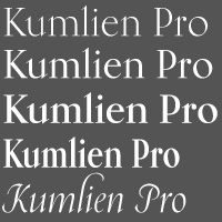 Swedish painter, poet, scholar, publisher, typographer and type designer (b. Stockholm, 1884, d. Stockholm, 1949) who designed fonts at Klingspor such as Kumlien (1943), Kumlien Bold and Kumlien Antiqua.
  Malmö, Sweden-based designer, who set up Kanon Foundry in 2019 together with
  Martin Bengtsson (Alpha Quantum) is a Swedish graphic designer who lives in The Netherlands. He studied at University of Liljeholmen, Sweden. Creator of the sci-fi typeface
  Designer from Nybro, Sweden, who made the ultra-fat mechanical typeface Volta (2010). [
 [
[ Anton Bolin (Hökarängens Bokstavsfabrik) is a Swedish type designer located in Hökarängen, just outside Stockholm. Creator of the rounded children's book or poster font
  Anton Svensson (Svanaryd, a studio in Stockholm, Sweden) created the headline signage typeface Åland in 2015.
  Måns Grebäck (Aring Typeface, Örebro, Sweden) is a prolific Swedish designer (b. Lindesberg, Sweden, 1990), who lives in Borlänge, Sweden. Måns Grebäck has a bachelor's degree in graphic design from the University of Dalarna (2012). In 2010, he went commercial, and started selling fonts through
  Artery Design is located in Gothenburg, Sweden, and is run by Botond Bokor (b. 1978). In 2012, Botond published a few free fonts at Dafont:
  , Hamburg, Germany and Stockholm, Sweden-based designer of the decorative typeface Indian Summer (2015) and the 3d number font FC (2019). [
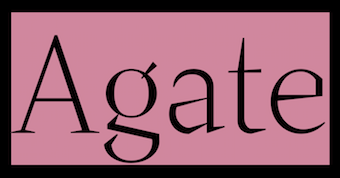 Type designer based in Paris and Stockholm, who graduated with a master's and a bachelor's degree in graphic design from ESAD Valence, in 2016 and 2014 respectively. In 2013, he did a post-graduate diploma in Fashion at Duperré (Paris) after completing a technical degree in visual communication at Estienne (Paris). Baptiste did a five-month internship in 2015 at Underware, working on Cyrillic and learning Python scripting and type design from Bas Jacobs.
  Designer of Hexadecimal (2019), Calculate 16 (2019: an LED font), the modular blackletter typeface Isometretos (2019), Templars Cipher Plus (2019), the heavy slab serif typeface Grundsten (2019) and the traffic sign sans typeface Storgata (2019), which is influenced by the traditional Swedish traffic signage font Tratex. [
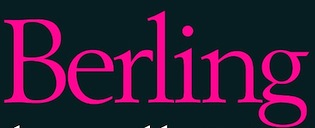 Extinct Swedish foundry based in Lund, active from 1837 until 1980. At Berlingska Stilgjuteri, Karl-Erik Forsberg published
  Stockholm-based design student. Bernhard created
  Stockholm, Sweden-based designer of the spurred typeface
 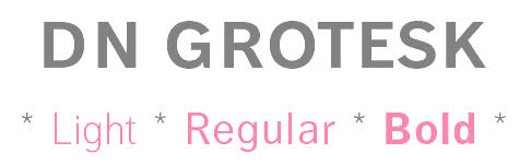 [
[ Born in Karlstad, Sweden, in 1952,
  Swedish painter, designer, illustrator, jazz musician and inventor, b. 1944, who studied under lettering artist Erik Lindegren. In 1976, Nordenstam drew a typeface originally called Quickstep. Letters from Sweden, who turned this into a font called
  Celebrated Swedish sculptor, b. Stockholm, 1929, who lives and works in New York. His work influenced many (mostly modular) type designs. A partial list:
  Free fonts by Swedish designer
  [
[ Graphic designer in Stockholm, Sweden, who created Hazel Bleu (an all caps typeface with flared serifs), Olympica Olympicto (sports icons), and Parennts (a modular typeface) in 2016. [
 Now Eva Wilsson and formerly Eva Grinder. Swedish designer of
  In 2010 Erik attended a type design course at Södertörn University in Sweden. In 2014, he published his first typeface,
  During his graphic design studies at the Berghs School of Communication in Stockholm, Filip Callas designed the late
  Swedish foundry (est. 1991 by Johan Ström) offering the old style humanist typeface family Indigo Antiqua (2003, designed by book and type designer Johan Ström (b. 1936, Sweden), and digitization by Jonas Böttiger and Törbjörn Olsson). The type designer claims inspiration from Guillaume le Bé (France), Miklós Kis's Janson, Christoffel van Dijck (van Dijck) and Peter Valpergen (Fell).
  After completing a B.A. in Philosophy and Aesthetics, Swedish designer Mårten Thavenius (b. 1965) began working as an interface designer with IBM as senior GUI architect. In 2009, he left IBM to work as an independent web solutions consultant and typeface designer. His most popular designs are the comprehensive families Aptifer Sans and Aptifer Slab. He lives in Belgium and Sweden, and his foundry is called Fontcaster.
  Fountain is a Swedish foundry in Malmö, founded in 1994 by Peter Bruhn (1969-2014). In 2008, its designers include Rui Abreu, Lee Basford, Lars Bergquist, Felix Braden, Lotta Bruhn, Peter Bruhn, Lucas Brusquini, Matthew Chiavelli, Stefan Claudius, Thomas Crolla, Jay David, Stefan Hattenbach, Peter Hoffman, Nina Hons, Sylvia&Daniel Janssen, Randy Jones, Gábor Kóthay, Martin Lexelius, Ricardo Santos, Góran Sóderstróm, Simon Schmidt, and Dirk Uhlenbrock.
  During his studies in Gothenburg, Sweden, Frans Karlsson designed Common Sans Regular (2016). He explains: Common Sans Regular is a versatile typeface that performs excellent on-screen and printed. Its capitals are based on Caslon's sans serif from 1816, while the lower case combines elements from 1910s-1920s Nobel, Johnston and Berlin's U-bahn font as well as my own handwriting. It builds on these great faces to give a sense of urgency to written content.
  Fredrik is associated with Nordling's design company, Pangea Design, in Stockholm. Fredrik designed
  The site
  [
[ Daniel Feldt is a graphic designer and illustrator from Stockholm, Sweden. His early typefaces include Furiosa (2015, a fat brush script), Bob (2015, a heavy octagonal mechanical typeface) and Gunnar Bold (2015, a rounded sans).
  Swedish designer (b. 1984) who obtained an MA in typeface design from
  Swedish type designer associated with
  Andreas Gustavsson is a Swedish designer, b. 1979, located in Nyköping. At MyFonts, starting in 2013, the name
  Kristianstad, Sweden-based graphic designer and illustrator. Creator of an alphabet consisting only of solid geometric shapes called
  [
[ Sollentuna, Sweden-based creator (b. 1973) of Parsley Path (2016), Ignoreland A (eroded style), Ombudsman Stencil (2016), Chateau de Garage (2016, a heavy slab serif), King of Rome (2016, heavy wedge serif), Backboard Outline (2016, athletic lettering), Jollysight Sans (2016), Horseback Slab (2016), Playoff (2016), Bellet (2016, Peignotian, caps only), Strejka (2016, grungy and handcrafted), Promenade de la Croisette (2016, a condensed all caps movie credit font), Fogle Hunter (2016, a tall-ascender antiqued treasure map typeface), Ground Control (2016, a techno typeface), Hello Euroboy (2016), I Am A Rock (2016), the condensed handcrafted typeface Tamales (2015), Discoteca Rounded (2016), Entschuldigung (2016, squarish sans), Discoteca (2016, rounded sans), Mouthpiece (2016), Jumping The Couch (extremely condensed film noir font), the Peignotian typeface Nizza (2016), the athletic lettering font Be True To Your School, and the narrow handcrafted Stem Panini (2016).
  Thomas Rogerstam's free fonts from 1997-1999, published at House of Eraser, Sweden: Rhino (nice hand-printed letters), Rough Cut, Flat Tyre, Lard,
  Defunct type foundry that had free original
  Samuel Park's freeware fonts at Ideal Fonts include Bauer, ChiquitaNormal, ChiquitaOutlined, CoverseAllstars, CoverseAllstars,
  Jimmy Gustafsson (
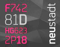 Jörn Oelsner (b. 1981, Flensburg, Germany) is a German type and graphic designer based first in Antwerp, Belgium, and later in Vegby, Sweden, and Ulricehamn, Sweden. He graduated at the Design Factory International in Hamburg, Germany. While studying he worked for URW++, Hamburg. After graduation he worked in several graphic design studios in Europe. His own design studio is
  Swiss or Swedish designer of OCR-A (2008), Atari Small (2007), and
  Illustrator and designer in Gothenburg, Sweden, who made some custom types called
  [
[ As a Swedish student at Uppsala University, based in Knutby, Johan Winge created the
  [
[ [
[
 Kummaeno calls himself an art director, graphic stuntman and fontstructor. He lives in Sweden where he works at
  Swedish type designer, graphic designer and illustrator, born in 1975, and based in Lund. His typefaces:
  [
[ [
[ Laudon Type Design is a one woman type studio dedicated to typography, type design and type education. Carolina Laudon is a Swedish typographer and type designer living in Gothenburg, Sweden. After art studies in Stockholm and London she finalized her MA in Graphic Design at the University of Goteborg in 2000. Since then she has worked in her own type studio, focusing on type design and typographic work. For seven years she was responsible for all typographic tutoring at the Konstfack University of Arts in Stockholm. She taught typography at the Forsberg School in Stockholm and Goteborg. She currently teaches at Berghs School of Communication in Stockholm. In 2012, Carolina Laudon received The Berling Prize, Sweden's most prestigious typographic design-prize.
 Trained calligrapher, born in 1970 in Kristianstad, Sweden. Lotta Bruhn designed the Lucifer dingbat font around the theme of her cat, at Fountain in Malmö. She also designed Bully Dog and Domestic (2003, Fountain), two commercial dog dingbat fonts, as well as the fifties style connected script
  Born in Sweden in 1976, Lucas Brusquini studied at the Graphic Arts Institute of Denmark. As a designer and art director he has worked in the UK, Denmark and Sweden. He currently lives in Landskrona, Sweden. At
  Swedish designer. Creator of the fashion mag typefaces
 Original creations by Camilla "
 [
[ Illustrator, art director and designer in Stockholm, Sweden, who studied graphic drawing at Lund University. Her work is characterized by bold colors and aggressive lettering.
  [
[ [
[ [
[ Born in Gothenburg, Sweden, in 1970, Martin Lexelius (aka Core, aka
  Illustrator and graphic designer in Stckholm, Sweden, who studied at FH Trier, Gerany. In 2010, he created the typeface
  The
The  Art director, illustrator and designer in Stockholm. Her illustrations include a hand-lettered motorcycle pin-up set created in 2013. In 2016, she designed the wonderful (commercial) poster typeface Czechmate and wrote: A retro typeface straight outta Eastern Europe. Inspired by mid-century matchbox designs from Poland, Hungary and the former Czechoslovakia. Contains over 200 glyphs, including all uppercase European characters, numbers, symbols, and many more. Francis Nouveau (2016) is a slim, modern, geometric, display typeface based on vintage Polish poster art. Still in 2016, she designed Gooberville and Broadkast.
  [
[ Freelance illustrator in Gothenburg, Sweden. Creator of a nice set of vintage ornamental numbers (2013).
  [
[ Swedish graphic designer and art director. Creator of
  Alexandria, Egypt and Stockholm, Sweden, and Riga, Latvia-based creator of these Arabic typefaces in 2022: Anteeqa.
  From Sweden, Mike Larsson's fonts include some dingbats, many grunge styles, some gothic fonts, and many crazy designs. These were mostly free.
  Nicole Östman (Stockholm, Sweden) created the
  Swedish graphic designer, b. 1991, who obrained a Masters degree at IED in Florence, Italy. He is currently based in Stockholm. His typefaces:
  Type foundry set up by Noel Pretorius and Maria Ramos in 2017, jointly in Sweden and Spain. Their typefaces:
  Olle Eksell was born in 1918 in Kopparberg, Sweden. From 1930 to 1941, Olle studied illustration and graphic art in Stockholm under Hugo Steiner-Prag. He later worked at the Ervaco advertising agency in Sweden, where he met his future wife and life companion, Ruthel Eksell. In 1946, the newly married couple sailed with the Drottningholm ship to America to continue their studies at the Art Center College of Design in Los Angeles. He died in 2007.
  Swedish art director and designer who lives in Stockholm, b. 1983. In 2009, together with Sebastian Wadsted, he designed the commercial typewriter family
  Fonts designed by talented Swedish designer Franko Luin (born in Trieste, Italy in 1941, to Slovenian parents). Luin immigrated to Sweden in 1961. After studying at the Grafiska Institutet during the 1960s, Franko Luin spent two decades as a print designer for Ericsson before becoming independent. In the 1990s he was involved in multimedia and typeface design. In 1996, he founded his own typographic studio, Omnibus Typografi. At some point, he led a course in Web Typography at the Berghs School of Communication in Stockholm. Franko Luin passed away on September 15, 2005, in Tyresö, Sweden.
  Our Polite Society Type is a project by Our Polite Society, a graphic design studio based in Amsterdam and Stockholm, formed in 2008 by Jens Schildt and Matthias Kreutzer (a German who graduated from and taught at Rietveld Academy in The Netherlands). Early on in their collaboration, they began designing type for specific projects, usually for limited use. Our Polite Society Type is an attempt to finalize some of their favourite designs of the past years and make them available to others as of 2019. Font engineering by Radek Sidun. Their typefaces:
  Pansa Studio is a brand, design and animation studio in Stockholm, which was founded in 2013 in Verona, Italy, by Rodrigo Nasta (b. 1986, Montevideo, Uruguay), and Trini Testi (b. 1990, Rome). In 2013, Trini Testi designed the elegant tall-legged, almost Peignotian, typeface Funkadeli. Trini has an MA in graphic design from IED.
 Born in Malmö, Sweden in 1969, d. 2014. He started
  Stockholm, Sweden-based designer of the avant-garde all caps typeface Max (2014). [
 Graphic designer in Stockholm, who created
  [
[ Download the following beautiful handwriting and handprinting fonts made by Mexican designer Kemie Guaida, who lives in Helsingborg, Sweden: Balderas (2002), BlackoutSans (2001), BlackoutSerif (2001),
  Swedish software expert who lives in San Francisco and who has worked for Dropbox, Facebook, Spotify, Lear Corporation and Spray. His own company is called Notion. His typefaces:
  Jonas Williamsson graduated in graphic design and illustration from Konstfack University College of Art, Crafts and Design, Stockholm, in 1999. Reala is a Swedish art and poetry collective run by Samuel Nyholm, Jonas Williamsson (b. 1973) and Laurent Benner out of Stockholm and London. At
  Designer in London and Stockholm. In 2012, he created
 Designer and calligrapher from Sweden, who specializes in script and calligraphic typefaces. In 2018, she published Wilma, Olina, Northwest Campston, Raila, Moccem, Jorgen, Lagom, Minka, Paolo Nola, Helma, Wilson, Benjamin, Wolen, Sven, Kirka, Sonia, Norell, Leona, Miana, Fletcher, Minacht, Jadenson, Bonsoir Script Camira, Grazia, Moland, Demila, Mohen, Micca.
  Stamp & Press (Stamp och Press in Swedish) is a fifteenth-century type papermill, hand press printing office, hand stampcutting and hand-casting office, bookbinding and digital fonts foundry created and operated entierly by Swedish punchcutter and printmaker, Richard Årlin, b. 1945. He runs Stigbergets Stamp och Press using his own metal types, own paper and own engravings. MyFonts.com states: He cut the punches for his own typefaces, Ungut and Stanislaus. He has also made the a digital version of those designs called Moravus, which has been used for all advertising and posters for Ingmar Bergman's Maria Stuart at Stockholm's Royal Dramatic Theatre.
 [
[ Stockholm Design Lab is a multidisciplinary design agency in Sweden, founded in 1998 by Björn Kusoffsky and Thomas Eriksson. They do custom type work. These logotypes and custom types include:
  Helena Öhman (Studio Indigo) is a Swedish illustrator and graphic designer based in Stockholm.
 Swedish designer based in Stockholm. His typefaces:
  Interactive art director student in Stockholm.
  [
[ Graduate of Biel's School of Design, and now based in Bern, Switzerland. Designer of
  Graduate of Parsons School of Design in New York. Stockholm, Sweden-based designer of
  Lars Bergquist is the Swedish type designer (b. 1936) who runs Timberwolf Type in Sollentuna, just outside Stockholm. Bergquist designed numerous successful text families and display typefaces, including the free
  [
[
 Aka Rursus, this Swedish viking calls himself a nerd and a cyber vagabond---exactly my kind of guy! Designer of the slab typewriter font for Latin and Cyrillic called Rursus Compact Mono (2007-2010), an
  Transfer Studio is a design studio that was established in 2006 in London and Stockholm by Valeria Hedman (b. Sweden) and Falko Grentrup (b. Germany). Falko first studied Graphic Design at the Arts Institute of Bournemouth followed by an MA in Communication Design at Central Saint Martins in London. He is based in the UK. Their typefaces:
  Designer from Stockholm, Sweden, who moved to Amsterdam in 2011 where he founded the type foundry mediumextrabold in 2013. His collection of typefaces is characterized by conceptual design, clean aesthetics and functional form in the Scandinavian tradition. His typefaces are treated like real objects, i.e., each family comes in editions and consists of 50 to 1000 copies. When sold out, they are no longer available. The catalog of mediumextrabold:
  Andreas Johansson is the Gothenburg, Sweden-based designer in 1999 of the medieval Cyrillic font Magna Veritas (based on a scan). He founded "unfontunately" in September 2001. Other fonts: Afterfonts,
 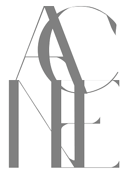 Karlskrona, Sweden-based designer of the rune simulation typeface Fort Wendy (2014), The Medic (2014), Coco Puff (2014), Maniac (2014: avant garde), Agony (2014: hairline circle-based experimental typeface), Acne (2014), and the hairline sans typeface Galacticastle (2014).
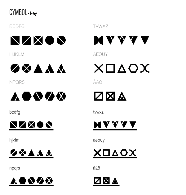
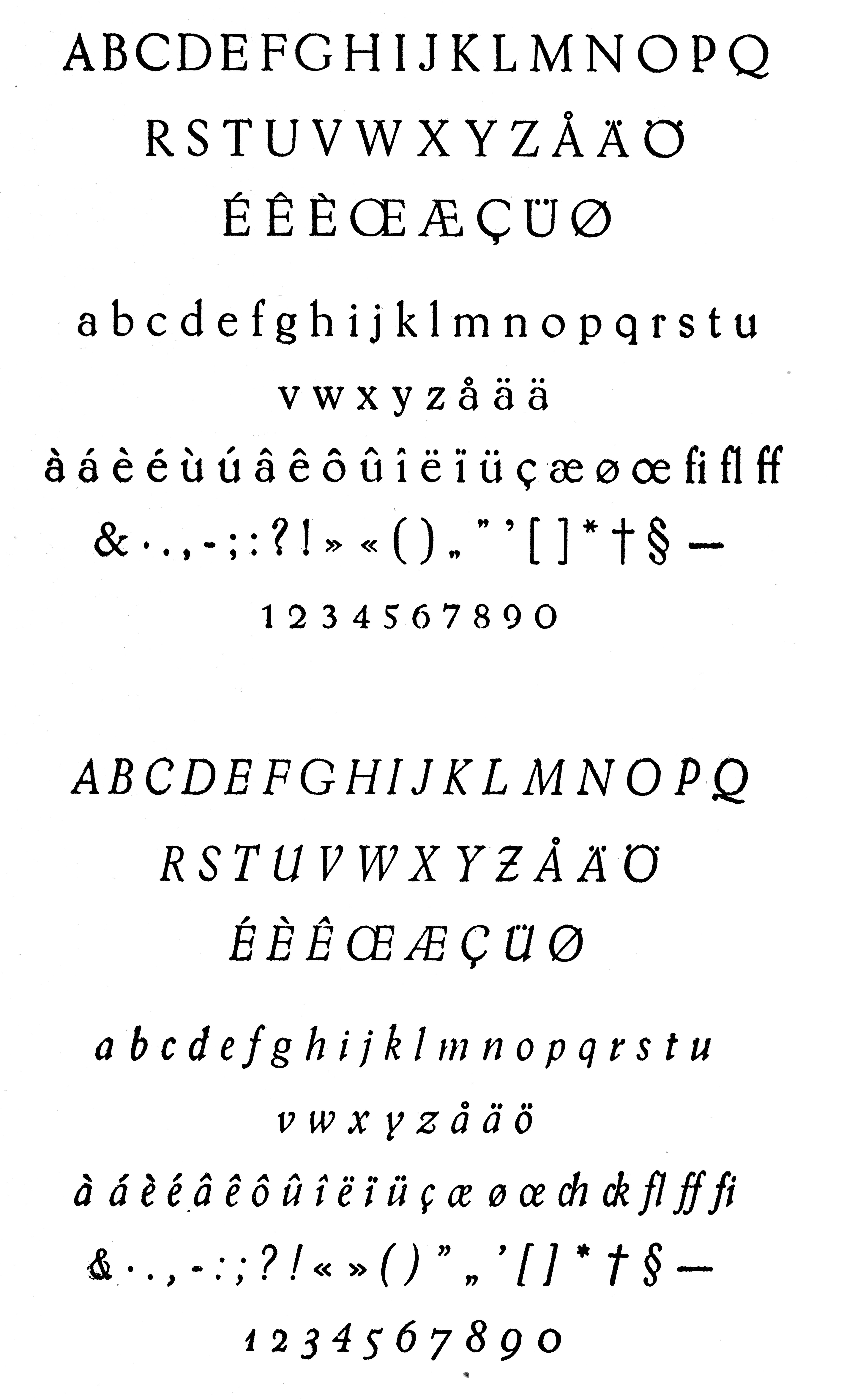
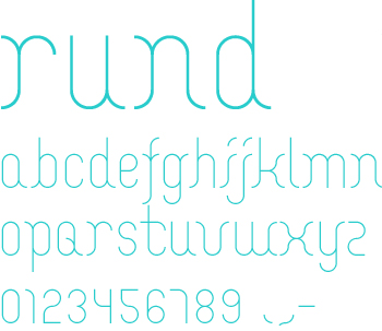
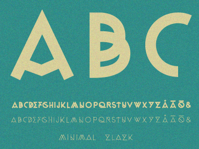
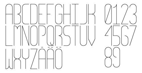
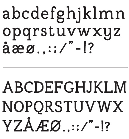
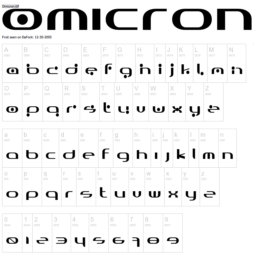
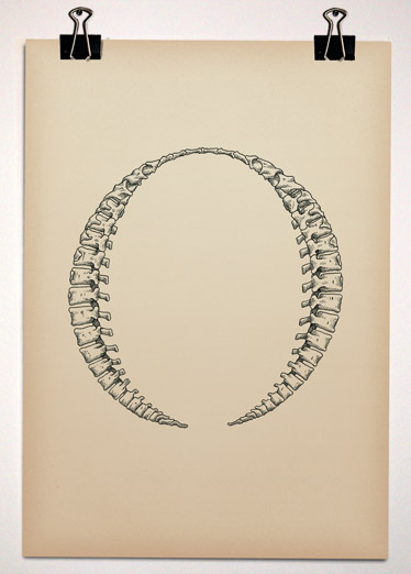
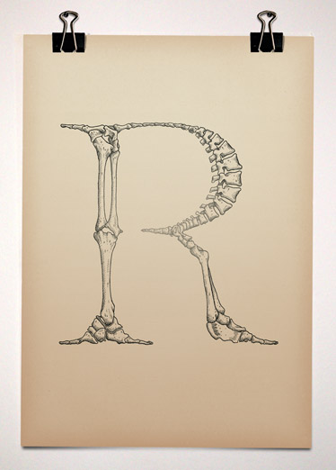
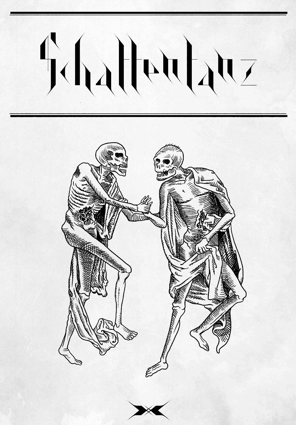
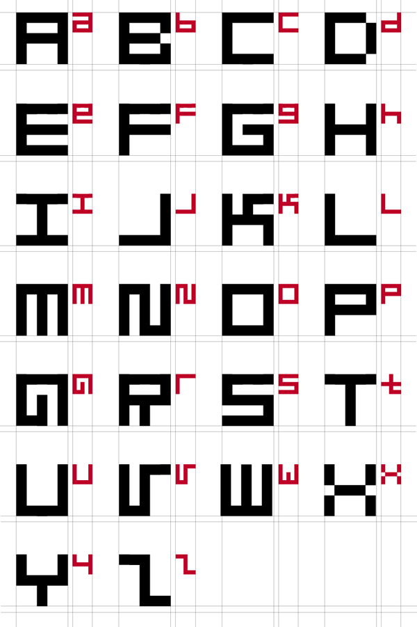
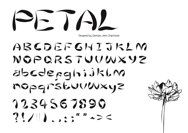
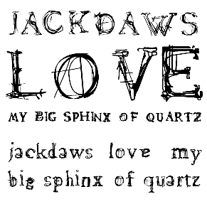
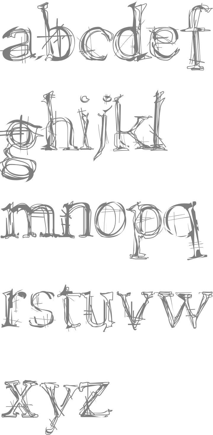
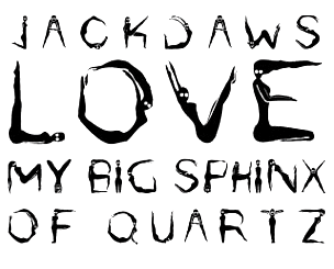
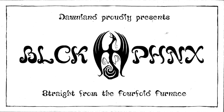
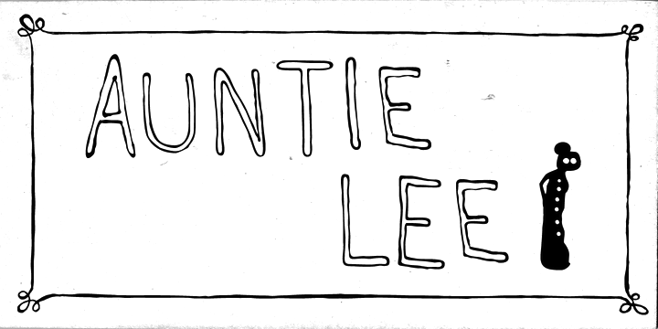
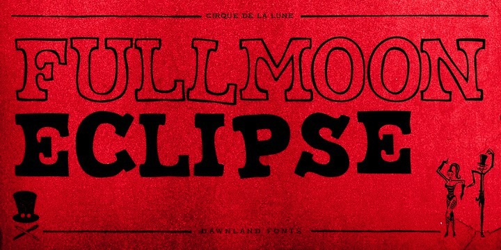
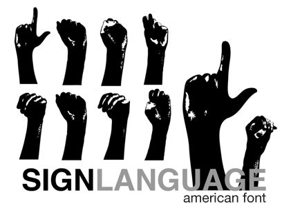
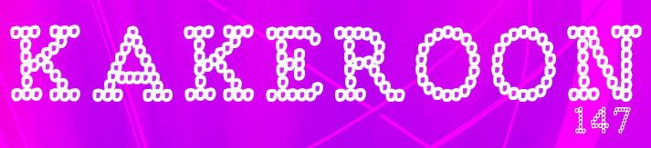
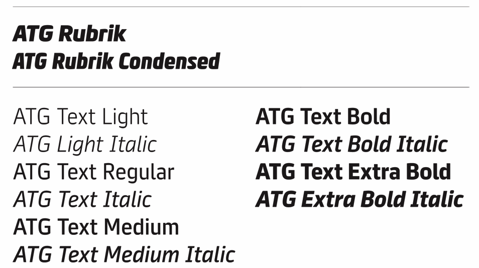
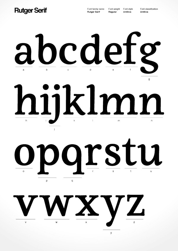
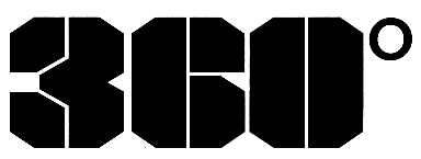
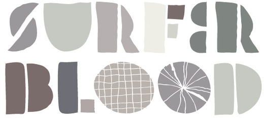
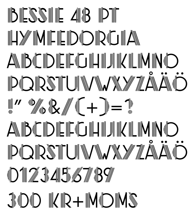
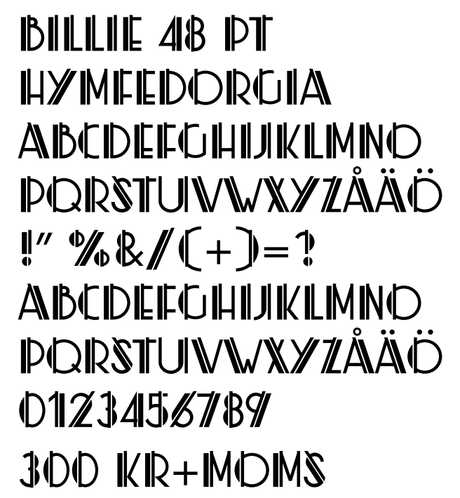
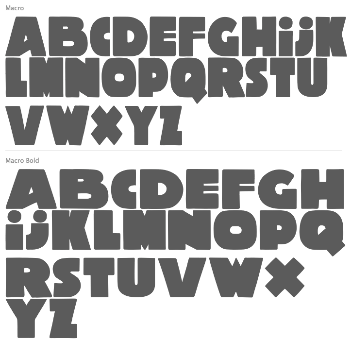
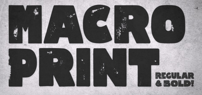
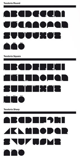
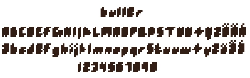
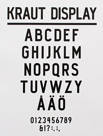
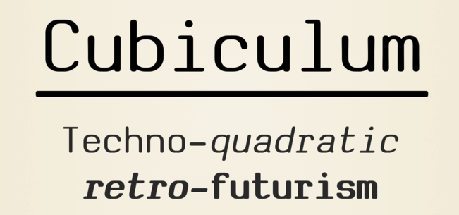
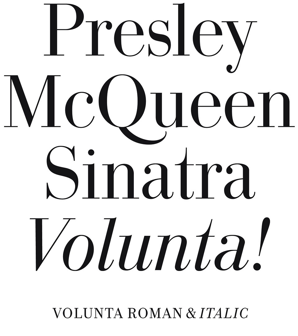
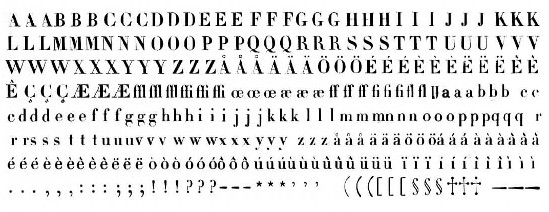
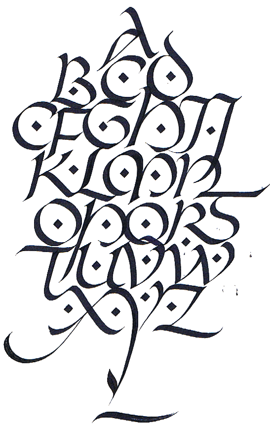
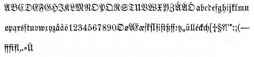
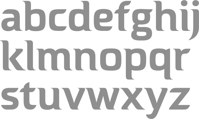
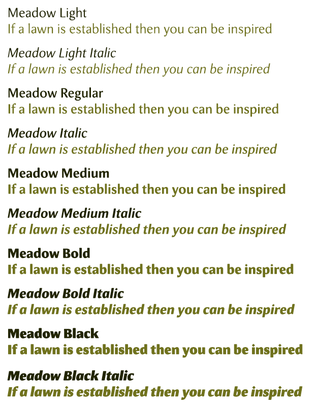
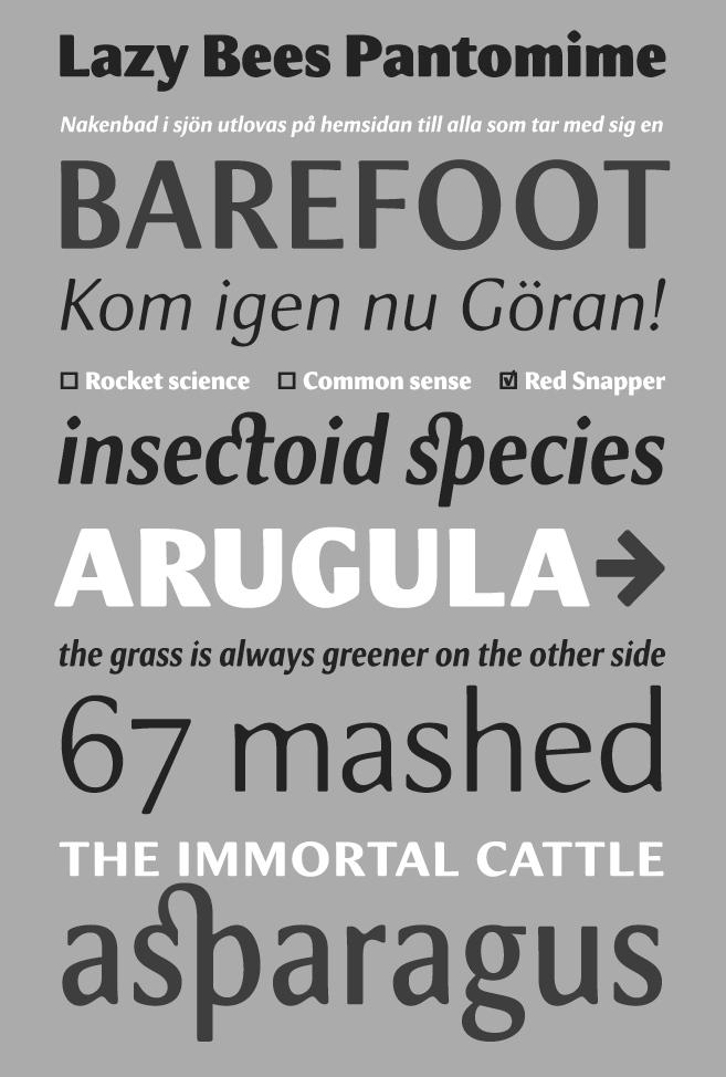
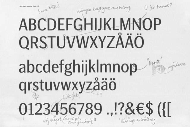
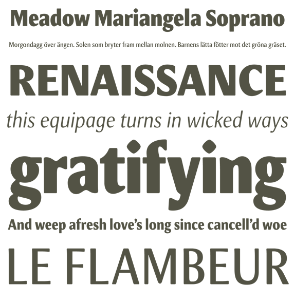
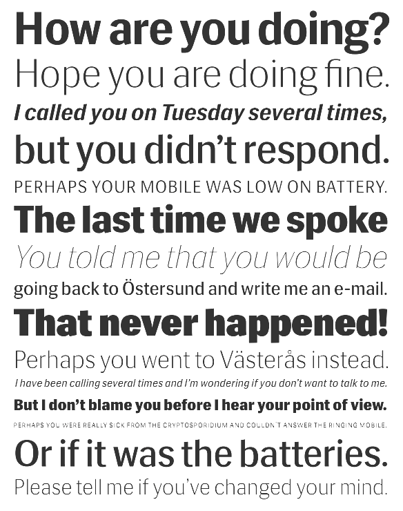
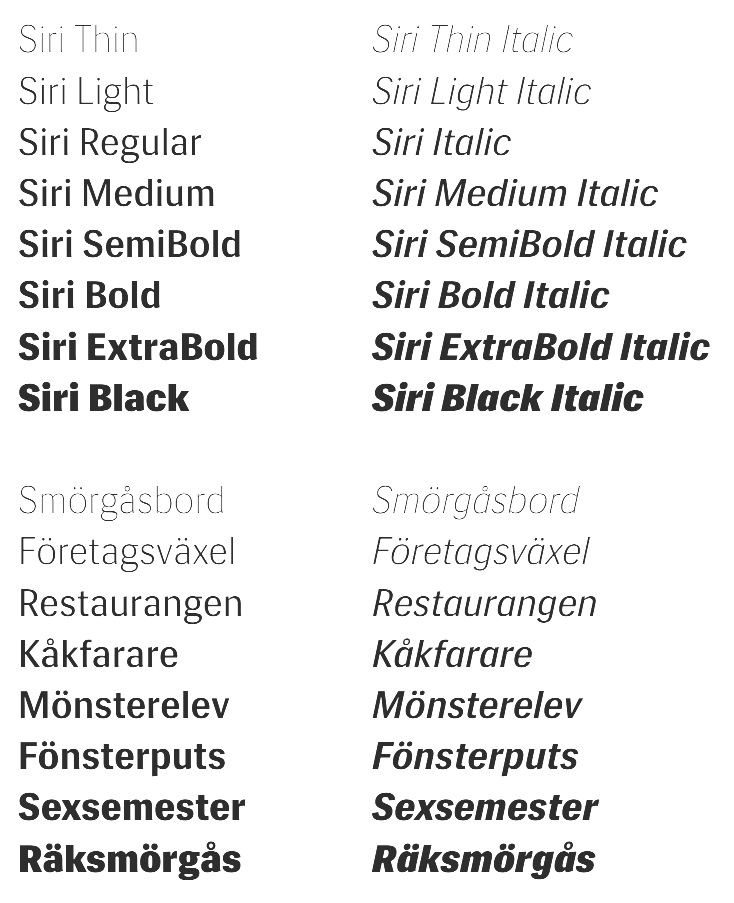
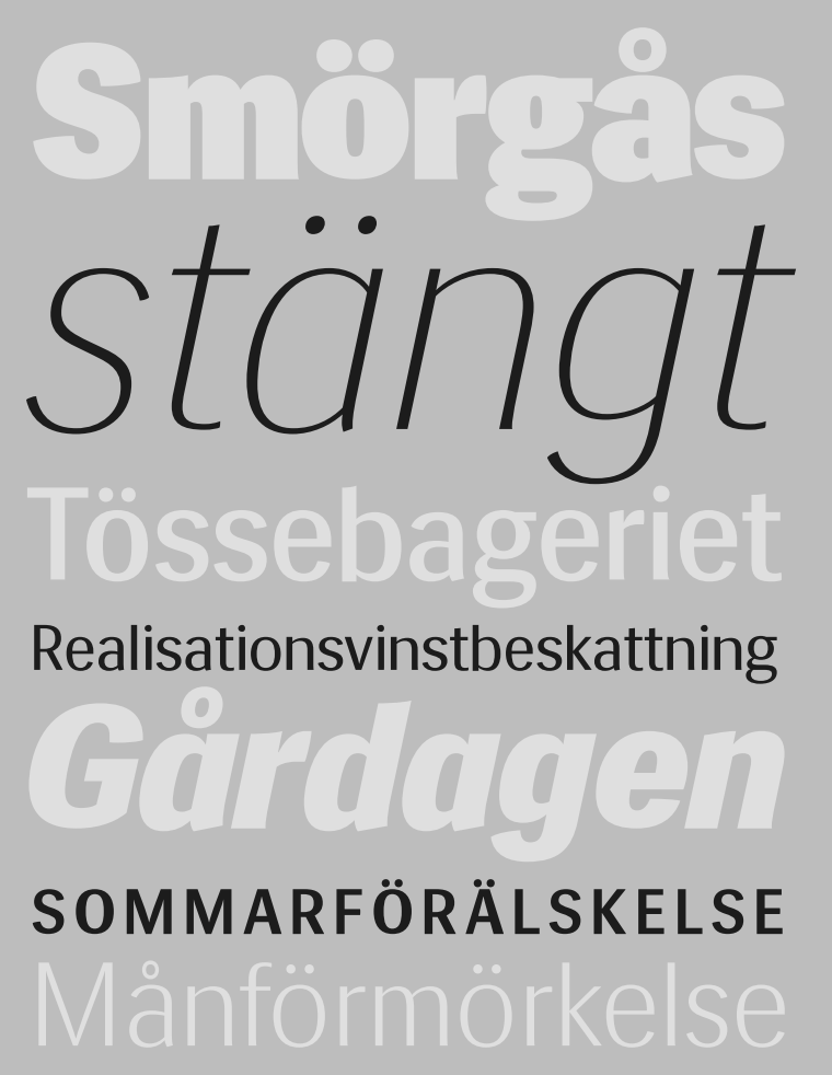
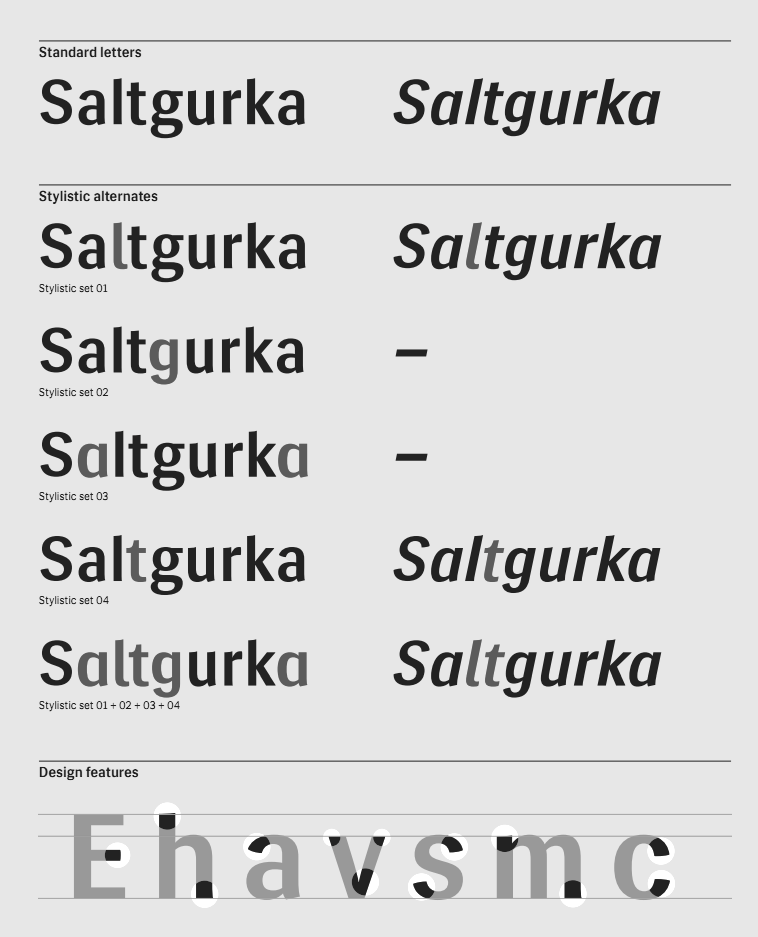
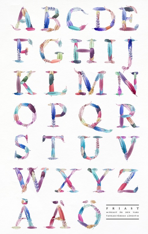
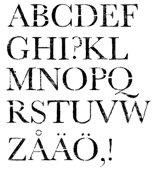
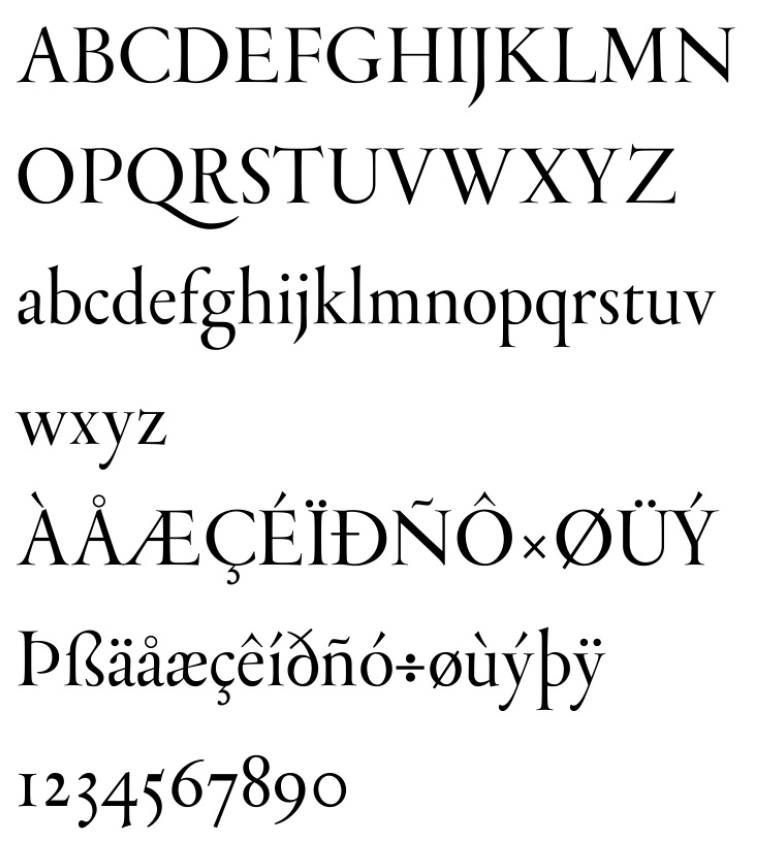
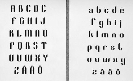
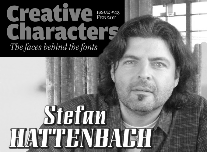
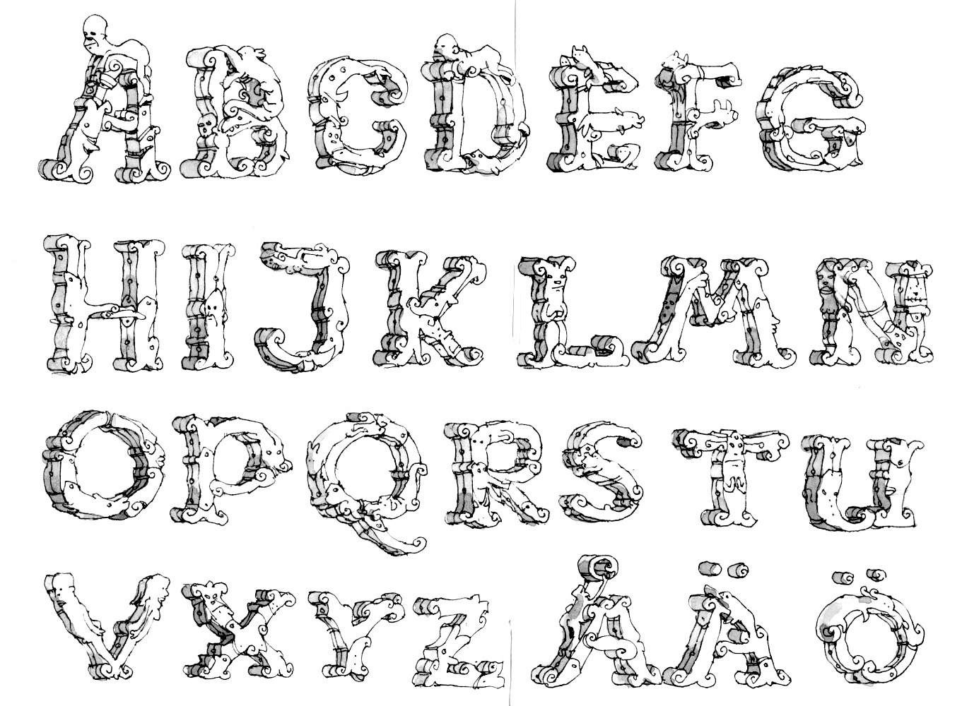
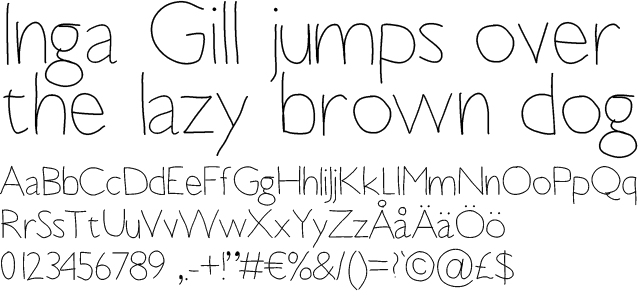
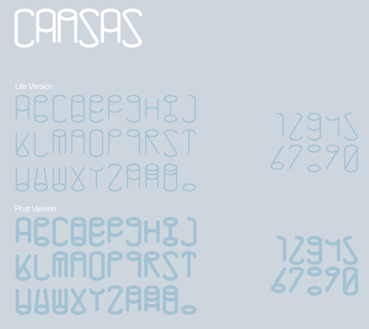
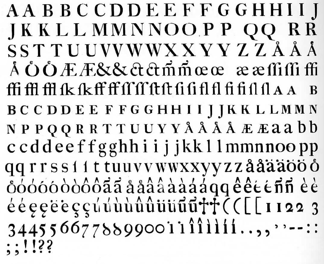
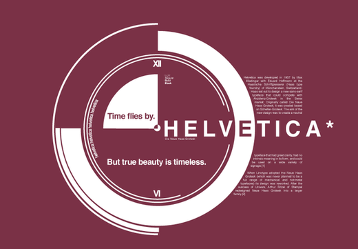
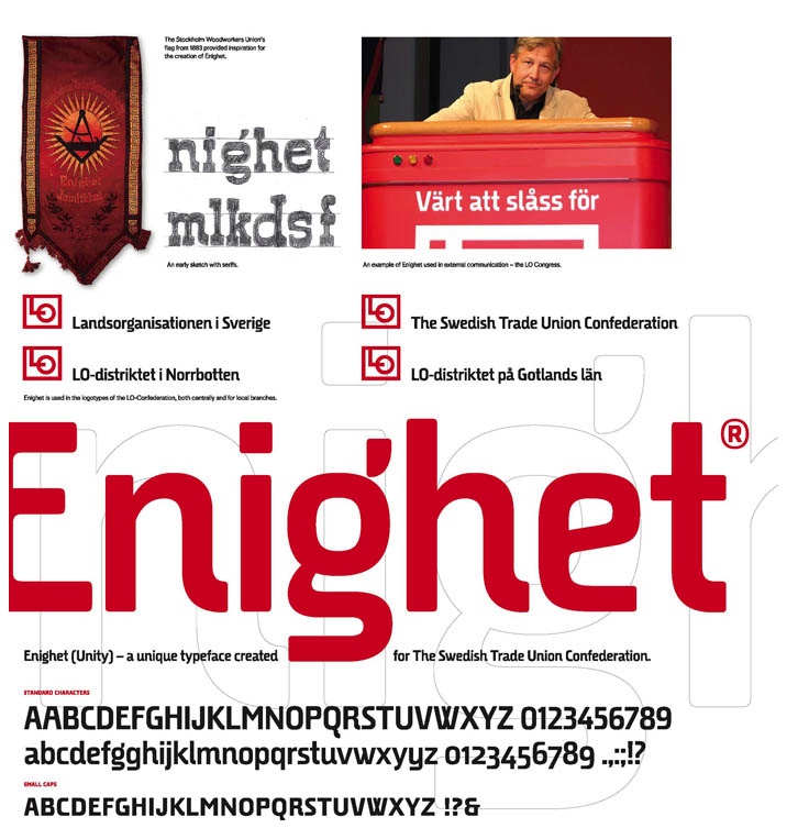
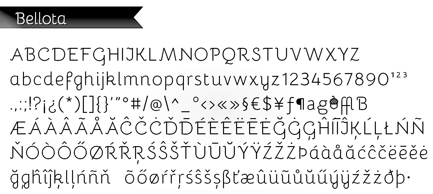
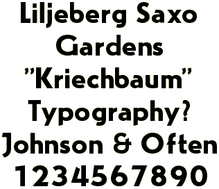
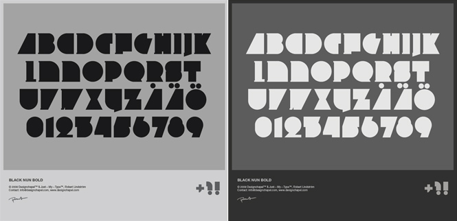
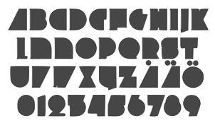
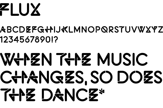
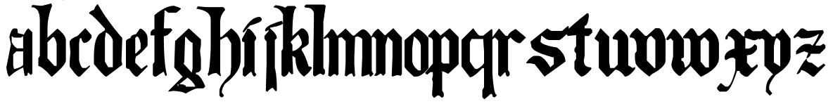
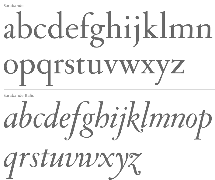
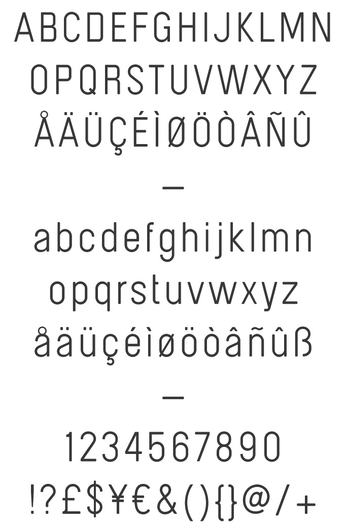
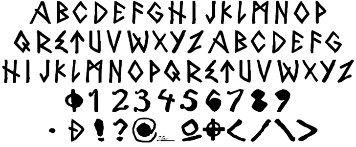
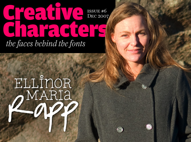
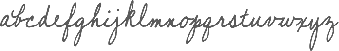
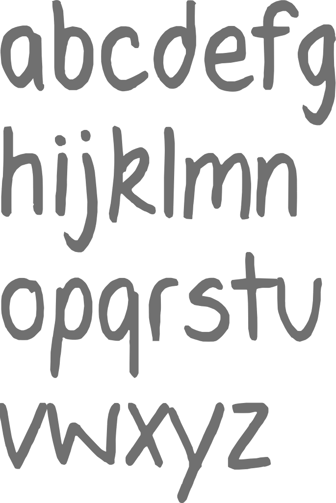
|
|
|
|