| | |
Abby Luke
|
Boston, MA-based designer of Hermes (2012). Behance link. [Google]
[More] ⦿
|
Aboutype
[Joffre LeFevre]

|
 Aboutype (est. 1991) was Joffre LeFevre's small Boston-based foundry and custom font bureau. LeFevre (b. 1945, Muskegon, WI, d. 2022, Proctorsville, VT) has been making typefaces since about 1970. He studied Fine Arts (illustration) at Kendall College of Art and Design and Fine Arts (graphic design) at Grand Valley State University. He also received an honorary Masters in Fine Arts from Babson College. For twenty years serving as principal type designer and type product designer for Compugraphic/Agfa Corporation before founding Aboutype Associates, Inc., a type design studio and custom digitizing service in 1989. He retired to Vermont in 2009. Joffre LeFevre's 1997 Volkswagen font series is floating around in web space however. As he says, The Volkswagen fonts were hand-drawn by me to a specification based on a long neglected display version of Futura that was developed by a photo composition type foundry in the early seventies. Similar to the type used in the introduction of the first VW Beetle.
 LeFevre's fonts include Antique Central (shop sign font), Bitters, Boot Stitch, Capital, Crombury (2006, elegant high-ascendered display family), Cullens Shoes, Downtown, Elongated Roman, Erasurehead, Everett Mill, Free Zone (2001, geometric sans), Granger (2007), Hemmings, Hunter (2001, a slab serif family in the style of Beton), Hunter Poster, Mac Sans Outline Poster, Max Stitch, Merchant, Minernil (2006, slab serif family), Mulsanne (race car font), New Horizon (inscriptional, Trajan), New Horizon Titling, New Prairie (2001, transitional family), Pemberton, Pitch Pipe (2001, modern, bold), Putney (shop sign font), Ravenna, Rays Cafe, Redeye (2001, a religiously condensed and quite unreadable face), Redeye Sans, Revenue, Saloon, Sparrow (2007), Vanquish (2001, geometric sans), Wade Vernacular, Whitingham, and Zone. Some fonts now sold through MyFonts: Antique Central, Bitters, Boot Stitch, Capital, Crombury, Cullens Shoes, Downtown, Elongated Roman, Erasurehead, Everett Mill, Free Zone, Hemmings, Hunter, Hunter Poster, Max Stitch, Merchant, Mulsanne, New Horizon, New Prairie, Pemberton, Pitch Pipe, Putney, Ravenna, Rays Cafe, Redeye, Redeye Sans, Redeye Serif, Revenue, Saloon, Vanquish, Wade Vernacular, Zone, Sydney, Charles, Merrimac, Willem, Float, Proceed, Salonika. Klingspor link. View Aboutype's typefaces. Obituary. [Google]
[MyFonts]
[More] ⦿
|
Adam Schwartz
|
Boston, MA-based designer at Cloudflare and freelance film composer. Author of The Magic of CSS, a fantastic introduction to CSS. Github link. [Google]
[More] ⦿
|
Adult Ramblings
[Anastacia E. Zittel]
|
 This used to have alphadings and dingbats by Anastacia E. Zittel (b. 1976) from Douglas, Massachusetts, all made between 1990 and 2002: AEZ-American-Woman, AEZ-Americana, AEZ-April-Fool's-Day-dings, AEZ-I-saw-the-Sign, AEZ-Jon's-Handwriting, AEZ-Kate's-Handwriting, AEZ-Lacy-Hearts, AEZ-Native-American-Turtle, AEZ-Owls-for-Traci>, AEZ-Traci's-Handwriting, AEZ-Transportation-2005, AEZ-Vanity, AEZ-Where's-Harry?, AEZ-another-turtle-font, AEZ-batty, AEZ-beep-beep!, AEZ-black-cat, AEZ-blocky, AEZ-boats, AEZ-bunnies, AEZ-buzz-buzz, AEZ-camping, AEZ-celebrate, AEZ-chalkboard, AEZ-clothes, AEZ-curly-Q, AEZ-deco-dings, AEZ-ducks, AEZ-executive-hearts, AEZ-eyes-have-it, AEZ-fishie-fishie, AEZ-giraffes, AEZ-goldfish, AEZ-halloween-dingbats, AEZ-here-ducky,-ducky, AEZ-medieval-dings, AEZ-mother-daughter-ducks, AEZ-my-pet-fish, AEZ-no-name, AEZ-not-your-mom's-ariel-font, AEZ-outlinevertical, AEZ-owlness, AEZ-puppy-dog, AEZ-ruff,-ruff, AEZ-scrapbooking-dings, AEZ-scripty-2, AEZ-scripty, AEZ-seascape, AEZ-snowman, AEZ-spooky, AEZ-steeple, AEZ-sunflower-letters, AEZ-swim-away, AEZ-toy-dolls, AEZ-wedding-dings, AEZAnastacia's-Dings, AEZAnastaciaHW, AEZJanuary-1, AEZJanuarybold-1, AEZLeighHW, AEZSTPatricksDay, AEZanotherfont, AEZbasic-font, AEZbears, AEZbighearts, AEZblot-by-Jon-Zittel, AEZcircles, AEZclassicaltoys, AEZcrazycats, AEZcrimsonandclover, AEZcrochet, AEZdaisy, AEZdazzleme, AEZdollz, AEZdots, AEZfairies, AEZhearts, AEZholidaybears, AEZinsects, AEZlemonade, AEZmedievaldings2, AEZmmmcaffeine, AEZmonster, AEZmoonbeam, AEZoutlinefrenzy-1, AEZsegar, AEZsunflowers, AEZsweethearts, AEZturtle, AEZzipedity.
 Alternate URL. There are also free handwriting fonts: AEZ-American-Woman, AEZ-country-girl, AEZLeighHW, AEZ-Traci's-Handwriting, AEZ-Jon's-Handwriting. Fontmaking tutorial [dead link]. The font pages seem to have disappeared. Dafont link. Klingspor link. [Google]
[More] ⦿
|
Ahern Laurinat
|
Located in Boston, MA, Ahern Laurinat created the multiline display typeface Well That's Just The Way It Goes (2012). [Google]
[More] ⦿
|
Alain Montes
|
Beverly, MA-based designer of the school project font Corporate Thug (2013). Behance link. [Google]
[More] ⦿
|
Alan Auger
|
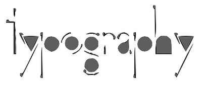 During his graphic design studies at the New England School of Art and Design at Suffolk University near Boston, Alan Auger designed the circle-based typeface Abode (2013).
 Behance link. [Google]
[More] ⦿
|
Albert Angus Turbayne
|
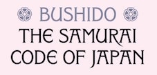 Albert Angus Turbayne (b. 1866, Boston, MA, d. 1940, London) was an American book designer and bookbinding artist. He worked in London for the London County Council School of Photoengraving and Lithography and also for Carlton Studio. He wrote Monograms and Ciphers (republished by Dover in 1968 and by Mayflower Books in 1978 with the title A Complete Book of Monograms & Ciphers). Designer of an initial caps face at the end of the 19th century. One of his typefaces inspired Ben Noe's typeface Turbayne (2021). [Google]
[More] ⦿
|
Alex Tarallo

|
Codesigner with Donald Tarallo at Tarallo Design of FormPattern Color (2018),d FormPattern Color Three (2019: a typeface for creating borders and frames) and FormPattern Color Six (2020), Varese Outlined (an all caps geometric outline font) (2020). [Google]
[MyFonts]
[More] ⦿
|
Alex Thomson
|
Graphic designer in Boston, MA. In 2015, he designed the deco typeface Sevenpoint for silkscreen printing. [Google]
[More] ⦿
|
Alexander Bartlett
|
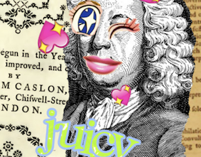 During his studies, Boston, MA-based Alexander Bartlett designed Caslon Remixed (2019) and created hilarious animated gifs in the process. [Google]
[More] ⦿
|
Alexander Phemister

|
Punchcutter. From MyFonts: Scottish punchcutter (b. Edinburgh, 1829, d. Chelsea, MA, 1894) active in the revival of oldstyle designs at Miller&Richard in the 1850s. He went to America in 1861, working at the Bruce type foundry for two years, and then for the Dickinson foundry. In 1872 this foundry was ravaged by fire; Phemister was made a partner by its founder Samuel Nelson Dickinson and worked there until retirement in 1891. MyFonts missed the boat on this one! Phemister was the first man to design the famous Bookman. His typefaces include these: - Bookman. McGrew states: Bookman Old Style has become a lastingly popular "workhorse" design for plain, easy-to-read text, and to some extent for display as well. It is derived from an oldstyle antique typeface designed by A. C. Phemister about 1860 for the Scottish foundry of Miller&Richard, by thickening the strokes of an oldstyle series. From there on, his design was copied and refined over and over again, starting with the Bruce Type Foundry (Antique No. 310), MacKellar (Oldstyle Antique), Keystone (Oldstyle Antique), Hansen (Stratford Old Style). His design of Bookman was refined at Kinsley/ATF in 1934-1936 by Chauncey H. Griffith. The Bookman story does not end there, but at least, Phemister started it! Numerous implementations of Bookman exist, such as the free URW Bookman L family, and the free extension of the latter family in the TeX-Gyre project, called Bonum (2007).
- Franklin Old Style. McGrew writes: Franklin Old Style was intended to be a modernization of Caslon, cut in 1863 by Alexander Phemister, once of Edinburgh, later of Boston, for Phelps, Dalton&Company. Being more regularized, it has lost the individuality and most of the charm of Caslon, but is a clear, legible typeface that has had considerable popularity. It was one of the early typefaces cut by Linotype for book work; the italic has an extreme slant for a slug-machine face, but composes remarkably well. Compare Binny, Clearcut Oldstyle.
Some images below by Alex Delgado. FontShop link. Klingspor link. View and compare Bookman-style commercial typefaces. [Google]
[MyFonts]
[More] ⦿
|
Alexandra Moran
|
Boston-based designer of the bold slab serif typeface Astral (2012) and of Ahoy Sailor (2012). [Google]
[More] ⦿
|
Alexis Copithorne
|
Boston-based designer of the spindly neurotic typeface Rehab (2013). [Google]
[More] ⦿
|
Alicia Boulos
|
During her studies at the University of Massachusetts Dartmouth, Milford, MA-based Alicia Boulos designed the outlined sans typeface Outline (2016), and the display sans typeface Next (2016), which is characterized by teardrop-shaped counters. Behance link. [Google]
[More] ⦿
|
Alison Hale
|
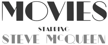 Graphic designer at The Improper Bostonian Magazine. She created a great Broadway-style art deco marquee typeface called McQueen (2012). [Google]
[More] ⦿
|
Allison Spitaels
|
 Graduate of MassArt, class of 2015. Boston, MA-based designer of Spitaels Display (2015), a calligraphic old style typeface influenced by the work of José Mendoza de Almeida. [Google]
[More] ⦿
|
Alphabet Synthesis Machine
|
A free on-line truetype font editor, developed by Golan Levin, with the help of Jonathan Feinberg and Cassidy Curtis. (Alphabet Synthesis Machine is a co-production of Art21, Inc., New York City, and The Arts Company, Cambridge, MA) It has a font archive with over 7,000 fonts created by visitors. All fonts created are of the inner city graffiti kind, so this is not meant to be a professional tool. I estimate that the archive gets about 50 fonts per day. See, e.g., here for M1. See here for Antarctica (2007) by Czar Choi. [Google]
[More] ⦿
|
Alyssa Richmond
|
During her studies at Endicott College, Hanover, MA-based Alyssa Richmond designed the Peignotian all caps typeface Oakland (2015). [Google]
[More] ⦿
|
Amanda Bonnar
|
During her studies at Art Institute of Pittsburgh, Buzzards Bay, MA-based Amanda Bonnar designed the brush script typeface Roman Holiday (2016), which was inspired by the 1953 movie starring Audrey Hepburn and Gregory Peck. Behance link. [Google]
[More] ⦿
|
Amanda McAllister
|
During her studies at Northeastern University, Amanda McAllister (Boston, MA) created the sans typeface Harlan (2014). [Google]
[More] ⦿
|
Anastacia E. Zittel
[Adult Ramblings]
|
[More] ⦿
|
Andrew Newman
[FineFonts]
|
[More] ⦿
|
Aneel Nazareth
|
San Francisco-based MIT graduate, designer of the iconized alphabet font Anillo. [Google]
[More] ⦿
|
Anji Ren
|
During his computer science studies in Cambridge, MA, Anji Ren programmed an experimental font, Gru Grammar (2014), using only a quarter circle and its negative. [Google]
[More] ⦿
|
Anthony Giberti
|
Bridgewater, MA-based designer of an art deco school project typeface done at Lasell College in Newton, MA in 2016. [Google]
[More] ⦿
|
AramediA Group (Boston and Beirut)
[George Hallak]
|
George Hallak's outfit specializing in Arabic Fonts for Microsoft Arabic Windows 95 and Sakhr Windows. Glyph's Arabic Fonts (16) for Arabic Win 95, 3 in 1 package 59.00. Sakkal's Arabic&Islamic Calligraphic Designs (PC or Mac) $49.95. Sakhr's Modern Arabic True Type Font is $30.00. Sakhr's Al-Jawaher Fonts Scalable (Khuttout Tajmiliah) is $50.00. ASC's True Type Font Pack one for Ar. Win 3.x is $30.00. Programmers/Localizers/Consultants Arabization&Software Center, Arabic Educational Multimedia. Jawaher Al Horof 4.0 (Editor): Arabic Editor for Design Applications. Arabic Fonts. Arabic Keyboard Tutor. "The Jawaher Fonts Program provides more than fifty different font styles with all available effects, such as bold, italics, shading and molding. The Jawaher Fonts can be operated under the programs Ustaz 3.1 and Desktop Publishing 3.0 with no special operating requirements in working under Microsoft Arabic Windows and Sakhr Windows. 68USD. Other font families: Sakhr, Kofi, Naskh, Reqaa, Akhbar, Persian. Al Rassam Al Arabi is the same as Kalimat but for Windows. Al Rassam AlArabi lets you add Arabic text into non Arabic photo retouching and illustration programs such as Adobe Photoshop, Illustrater, Freehand. Corel. Al Rassam Al Arabi comes bundled with 20 Arabic fonts. [Google]
[More] ⦿
|
Ari Weinkle
|
Ari Weinkle (Brookline, MA) created the circle-and-straight segment typeface Sisyphus (2012). Behance link. [Google]
[More] ⦿
|
Arjen Noordeman
|
Graduate from the Academy of Art and Design in Arnhem (1998) and of the Cranbrook Academy of Art (2000) who designed the gorgeous neo deco font New Amsterdam (2001), Deadgun (2000, as a past tribute to Raygun), Yeehaw, Blood Thirsty, Wanted Dead or Alive, Diamond, and Al Capone Was Here. At Union Fonts, he published New Amsterdam, Are You In?, and Roger That, fonts also showcased at Cranbrook. In 2005, he decided to go public and make his fonts available for free: Becoming Animal, Free Doughnut, Human Behavior, Deadgun, Yeehaw, Blood Thirsty, Wanted Dead or Alive, New Amsterdam, Are You In?, and Roger That. Noordeman is an art director and a designer, and has offices in North Adams, MA, and Brooklyn, NY. [Google]
[More] ⦿
|
Arthur Baker
[Arthur Baker Designs (or: Glyph Systems)]

|
 [MyFonts]
[More] ⦿
|
Arthur Baker Designs (or: Glyph Systems)
[Arthur Baker]

|
 American calligrapher in Andover, MA, who worked for many foundries, and ran several studios. He ran Glyph Systems in Andover, MA, and before that, Alpha Omega and Maverick Designs. Baker grew up in Berkeley, CA, and attended school on the West Coast and New York City. After serving in the U.S. Army, he studied under calligrapher Oscar Ogg and had private lessons with George Salter and Tommy Thompson. Some of Baker's earliest designs were made available through Photo-Lettering Inc., and his first widely-available commercial typeface was published in 1965. Baker's first book was published in 1973. Arthur Baker died in 2016 at the age of 86. Tribute by Allan Haley. His typefaces were all calligraphic:
 - Amigo (Adobe), Amigo (Linotype). Designed by Arthur Baker in 1989 for Agfa Compugraphic, Amigo is based on spontaneous pen lettering and an exaggerated calligraphic look.
- Arrows (Arthur Baker). Made in 1995.
- Baker Signet (Monotype), Baker Signet (Bitstream), Baker Signet (Adobe), Baker Signet (Linotype). Originally designed as a photo type in 1965 for VGC, it was Baker's first commercial design. Baker Signet features in the word Coke on the Coca Cola bottles. Halley writes: Tall ascenders and angled weight transfer show a subtle foundation in late 15th century typefaces. Baker Signet can also be found at VGC as Baker Argentina No 1 (1976) and Baker Danmark One (1976). Baker Signet, in its display text weights, was at the basis of Sigvar (Softmaker).
- Calligraphica (Arthur Baker), Calligraphica (IHOF). Created in 1995.
- Cold Mountain (Arthur Baker). Designed in 1995.
- Collier Script (Arthur Baker). Designed in 1995.
- Daybreak (Arthur Baker). Designed in 1995.
- Duckweed (Arthur Baker), Duckweed Sans (Arthur Baker). Designed in 1995.
- Feathers (Arthur Baker), Fishface (Arthur Baker), Florettes (Arthur Baker), Flowery (Arthur Baker), Hands (Arthur Baker). Designed in 1995.
- Hiroshige Sans (Arthur Baker), Hiroshige (Adobe). Hiroshige was designed in 1986 by Cynthia Hollandsworth of AlphaOmega Typography, Inc. The typeface was originally commissioned for a book of woodblock prints by nineteenth-century Japanese artist Ando Hiroshige, whose work influenced many impressionist artists. Hiroshige Sans (Arthur Baker) followed in 1995.
- ITC Tiepolo (ITC), ITC Tiepolo (Adobe). Tiepolo was designed at AlphaOmega Typography for the International Typeface Corporation in 1987.
- Kigali (Arthur Baker), Kigali (Adobe). Designed by Arthur Baker in 1994 for URW, Kigali is a wide-bodied display type with bold, uneven pen-drawn strokes that taper dramatically downward. There also is a textured version called Kigali ZigZag.
- Marigold (Monotype), Marigold (Adobe). Marigold was first released by Agfa Compugraphic in 1989.
- Mercator (Arthur Baker), Mercator (IHOF). Designed in 1995. Based on the lettering of Flemish map maker Gerardus Mercator (1512-1594).
- The Maverick Designs Collection (1994): New Amigo (Arthur Baker), New Marigold (Arthur Baker), New Oxford (Arthur Baker), New Pelican (Arthur Baker), New Visigoth (Arthur Baker).
- Oakgraphic (Arthur Baker). Designed in 1995.
- Oxford (Adobe). Designed for Agfa Compugraphic in 1989. It is a robust and lively non-connecting script with several bi-form characters.
- P22 Matador (IHOF). P22 Matador (2007) is a contemporary Roman font based on the manuscript tradition (digitized by Michael Clark).
- Pelican (Linotype), Pelican (Adobe). Released by Agfa Compugraphic in 1989.
- Plumes (Arthur Baker). Designed in 1995.
- Sassafras (Arthur Baker), Sassafras (Adobe). Designed for URW in 1995, Sassafras is based on the natural inline effect created when writing with a split-metal nibbed pen.
- Swirls (1994), Swooshes (1994). Ornaments.
- Visigoth (Adobe), Visigoth (Linotype). Visigoth was created in 1988 by Arthur Baker for AlphaOmega Typography. He designed it specifically for setting the text of A Dante Bestiary published in 1989 for Ombondi Editions in New York.
Some explanations by Freddy Nader: The Baker Argentina and Danmark typefaces were variations on his Signet. Baker originally made Signet for Headliners International in the 1960s, where he worked full time. In 1972 he was approached by VGC and told that they would pay him royalties as well if he made the same typeface for them. Royalties were a relatively new thing back then - Tommy Thompson was the very first person to ever earn royalties in type (in 1944 for his Thompson Quill script for Photo Lettering Inc), and he wasn't a type designer per se, he was a calligrapher. Lured by the idea of royalties coming his way from two different directions for the same face, Baker did a Signet for VGC. When Bob Evans, owner of Headliners, found out, he threatened to sue VGC for trademark infringement (copyright for typefaces was unheard of at the time - every major photo type house had "similar" fonts, and whenever someone got exclusives made by outside designers under a royalty program, it was only a matter of weeks before they were knocked off and changed slightly by other type houses, big and small). So in order to avoid a trademark infringement lawsuit, VGC called their typeface Baker Signet, instead of just Signet, and went further by asking Arthur Baker to make a lighter version and a condensed version. The lighter version was called Baker Argentina, the condensed version was called Baker Danmark. The "Number One" prefix was added to both so that when the inevitable knockoffs happened, type buyers would know which type was made first. About Baker Sans, Freddy writes: The Baker Sans was a knockoff of Helvetica. It was a massive family of a lot of fonts, rendered very ugly by camera stretching and slanting. Eddie Bauer used it as their corporate typeface for a long time in order to avoid the expensive fees of licensing Helvetica. Tim Ryan ended up digitizing it for Arthur Baker in the mid 1990s for a lot of money. That digital version is now being sold by ITF under one of its many companies (either Arthur Baker Design, or Arthur Baker Designs, or maybe Maverick Designs). MyFonts link. Klingspor link. View Arthur Baker's typefaces. Linotype link. MyFonts page. Another MyFonts page. And still another MyFonts page. FontShop link. View Arthur Baker's typefaces. [Google]
[MyFonts]
[More] ⦿
|
Ashley Leuci
|
An old wooden boardgame inspired Ashley Leuci (from Douglas, MA) in her creation of the Aligaram typeface (2012). [Google]
[More] ⦿
|
Ashley Scesny
|
Maynard, MA-based designer of the pixel typeface Mad-E (2015). [Google]
[More] ⦿
|
ATypI '99 report
|
Report by Luc Devroye of the ATypI '99 meeting held in Boston, 7-10 October 1999. Great pictures by Jill Bell, including two close-up shots of BenguiatFrisky. [Google]
[More] ⦿
|
Audrey Bowen
|
Monson, MA-based designer of the decorative caps typeface Supernova (2017). Behance link. [Google]
[More] ⦿
|
Ava Liu
|
Graduate of the School of Design at Rochester Institute of Technology. East Billerica, MA-based designer of the calligraphically-inspired Plumeria (2015) and Plumeria Sans (2015). Behance link. Dafont link. [Google]
[More] ⦿
|
Baker and Greele Type Foundry

|
Boston-based foundry dating from the 19th century. Nick Curtis made the Western billboard typeface New Boston WBW (2004) based on a 1826 Baker and Greele face. Baker and Greele were the first to cast some native Indian type. For example, in 1827-1829, they cast type for the Cherokee script, a syllabary composed of 85 unique glyphs, each representing a distinct phonetic component. This syllabary was invented by Sequoyah [or George Guess, or Gist, 1760-1843] in 1809. Of the characters finally used, only a few actually retain the original shape, or derivatives thereof. Those sharing Latinate forms may or may not have been suggested by the Rev. Samuel Worcester, who helped Sequoyah to improve and finally adapt the script for use as foundry type. Wm. Joseph Thomas from the Joyner Library of East Carolina University, Greenville, NC, writes; "I know that the American Board of Commissioners for Foreign Missions, which was also headquartered in Boston, arranged for the types to be cast, and they ordered a press to be sent to the Cherokee Nation. The first known printing in the syllabary was December 1827 in the Missionary Herald; the types and press were shipped to the Cherokee Nation in November 1827, according to letters between the ABCFM and the missionary in C.N. The Cherokees began printing their newspaper, the Cherokee Phoenix in February 1828." Harvard has an old type specimen book: "Specimen of printing types and metal ornaments, cast at the New England Type Foundry by Greele & Willis, Congress Street, Boston" (New England Type and Stereotype Foundry, Boston: Beals, Homer & Co., Printers, 1828). In this book, most specimens have imprint: Baker & Greele, Boston, some dated. [Google]
[MyFonts]
[More] ⦿
|
Barbara Gibb
|
Born in 1958 in Brighton, MA, Gibb graduated in 1980 from the Southeastern Mass. University. She was a type lettering artist and supervisor of new type design at Compugraphic. She created Vela (1984, Compugraphic). [Google]
[More] ⦿
|
Becka Schuelke
|
Print designer in Cambridge, MA. Becka created the hand-drawn poster typeface Beckler in 2014. Dafont link. [Google]
[More] ⦿
|
Ben Whitla
|
Boston-based designer. He occasionally designs custom typefaces, such as, e.g., for Mattel Hot Wheels. Behance link. [Google]
[More] ⦿
|
Bill Garth
[Compugraphic Corp.]

|
[MyFonts]
[More] ⦿
|
Bill Garth
[Photon Inc]

|
[MyFonts]
[More] ⦿
|
Bilt Fonts (or: Aruban Font Foundry)
[George Ryan]

|
Established in 2003 by George Ryan in Arlington, MA, Bilt Fonts (Aruban Font Foundry) sells revivals and original designs through MyFonts. Typefaces include Pietin, Geo Sans, Netto, Rescue, Jingle, Geo Tablet, Lottsa Lotta, Big Stuff, Rainman, Depth Charge, Sansand, Bulla Bulla, Kappa Nappa, Kappa Sappa, Sarabella (2004, calligraphic), Marcus Texus (fun informal), Marcus Displaeus, and Spio Beo. George Ryan held senior positions at Linotype and Bitstream since 1979, where he has been involved in the production of over 2500 fonts. [Google]
[MyFonts]
[More] ⦿
|
Bitstream

|
 Founded in 1981 by Mike Parker, Matthew Carter, Cheri Cone, and Rob Freedman, Bitstream is the first digital font foundry. Not without controversy, though, as many claim that the original digital collection was an illegal copy of Linotype fonts [Note: I disagree with that statement--take out "illegal"]. In 1999, Bitstream created MyFonts.com, a web site for finding, trying, and buying fonts on line. Bitstream was headquartered in Cambridge, Massachusetts, and led dfior some time by CEO Anne Chagnon.
 Bitstream wrote on the origins of the collection: The Bitstream Typeface Library was developed under the supervision of Matthew Carter, the creator of such esteemed typefaces as ITC Galliard; Snell, Bitstream Charter and Swiss Compressed. Carter, who also serves as Bitstream's Senior Vice President of Design, set uncommonly high standards for the company's highly-skilled design staff. Working from the earliest-generation artwork available, each character of every typeface is hand-digitized on advanced workstations specially programmed by Bitstream's engineers. In building the library, Carter has overseen the licensing of typefaces from such respected international sources as the International Typeface Corporation (ITC), Kingsley-ATF Type Corporation, and Fundicion Tipografica Neufville SA, among others. Bitstream also develops new and original designs. Many countries provide for the legal protection of typeface names only, not the designs themselves. This means that the original names of many typefaces can only be used with a license from the owner. The majority of Bitstream typefaces in this catalog have licensed names (on which royalties are paid), or have historical names that reside in the public domain, or have names to which Bitstream owns the rights. In these cases, the name is used. When the original name is not available for use by Bitstream, an alternative name appears. For example, Swiss 721 is the name that Bitstream uses for its version of the typeface popularly known as Helvetica? Because the original name of that typeface is not widely licensed, there are many offerings of the design with completely different names. It is important to note that the use of an alternative name has no bearing on the inherent quality or authenticity of the typeface design. Bitstream sold a nice 500-font CD for 39 USD around 1996, with all the great text families. This was a fantastic buy, as proved by this quote from John Hudson: I have said it before and I will say it again: I think the development of the original Bitstream library was one of the worst instances of piracy in the history of type, and it has set the tone for the disrespect for type shown today. (A bit of background: Bitstream asked Linotype if they could digitize Linotype's library of fonts. Linotype refused, but Bitstream went ahead anyway.) On this issue, read these pages by Ulrich Stiehl and Typophile. Bitstream was offering a 250-font CD. Type Odyssey Font CD (2001). Bitstream has added Greek, Cyrillic, OldStyle versions to many of its families. New releases in July 2001: Artane Elongated, Cavalero, Drescher Grotesk BT, FM Falling Leaves Moon, FM Rustling Branches Moon, Picayune Intelligence (by Nick Curtis), Raven, Richfont, Rina, Sissy Boy, Stingwire, Tannarin. In November 2001, Serious Magic entered into a long-term agreement to license 25 Bitstream outline fonts for its new visual communication products. Bitstream has been an exemplary corporate citizen, occasionally producing license-free fonts for the masses, such as their Vera collection. Bitstream's own overstated blurb about itself: Bitstream Inc. (NASDAQ: BITS) is a software development company that makes communications compelling. Bitstream enables customers worldwide to render high-quality text, browse the Web on wireless devices, select from the largest collection of fonts online, and customize documents over the Internet. Its core competencies include fonts and font technology, browsing technology, and publishing technology. Finally, together with its spin-off, MyFonts, Bitstream was sold to Monotype Imaging in 2011. Catalog of typefaces [large web page warning]. [Google]
[MyFonts]
[More] ⦿
|
Bloodworld
|
Boston, MA-based designer of the Cherokee typeface Tsalagi (2014). [Google]
[More] ⦿
|
BluHead Studio LLC
[Steve Zafarana]

|
 Type design studio located in Norwood, MA, est. 2005. Fonts can be bought at MyFonts.
 BluHead Studio LLC was founded in 2005 by a group of type designers, including Steve Zafarana, who founded Tail Spin Studio in 1999, also in Norwood, MA. Steve Zafarana was senior type designer at Bitstream from 2006-2012 and at Monotype from 2012 onwards. BluHead Studio was filling out the character sets and digitizing the font designs of New Zealand designer Joseph Churchward. These include the psychedelic Ta Tiki CW (2006) and Conserif CW, Design CW (2006, geometric). Creations by Tallulah Bluhead include Soylent Blu BH (2006: a bouncy cartoony wedge serif)) and Conference Call BH (2006). Roy Preston published the Prenton RP humanist sans family in 2006 and the comic book style families Comixed RP and Roy Hand RP in 2007. Between 2006 and 2008, several hand-printed typefaces were published. These include Barbara Script BH (2007, after the hand of Barbara Bemiss), Ciof Script BH (2008, a felt tip pen font after Susan Ciofolo Antico), Sally Script BH (2006, after Sally Muspratt), and Joanne Script BH (2007, by Joanne Paul). Sparkle Bluff BH (2007) is a ball and stick font for children. Notebook BH (2008) is a block letter face. In 2007, BluHead started publishing fonts by Joseph Churchward: Churchward Asia, Churchward Brush, Churchward Chinatype, Churchward Heading, Churchward Lorina (2014---the original by Churchward goes back to 1996), Churchward Maori, Churchward Maricia, Churchward Ta Tiki, Churchward Conserif, Churchward Design Lines, Churchward Freedom, Churchward Isabella (2015, a sans), Churchward Marianna (bubblegum face), Churchward Montezuma (2012, based on an Aztec-inspired design), Churchward Newstype (2008), Churchward Samoa, Churchward Supascript, Churchward Typestyle (2022; a 12-style sans). FontShop link. Creative Market link. Klingspor link. View the BluHead typeface library. [Google]
[MyFonts]
[More] ⦿
|
bmap2afm
|
Free MS-DOS utility by Norm Walsh (at the time of publication at Small Planet Software, Sunderland, MA): it converts, on a PC, a Mac .bmap file (Mac screen font) into an AFM metrics file that can be used with type 1 fonts on any platform. Kerning information is preserved. [Google]
[More] ⦿
|
Boston Breton
|
 Mac McGrew: Boston Breton was introduced by ATF about 1900. It was redrawn from the earlier Breton, originated by one of ATF's predecessors, the Boston Type Foundry, in the early or mid-1890s. It is a bold, rather wide square-serif face, suggestive of Stymie Bold which came thirty-some years later. But its large lowercase and short ascenders are suggestive also of the modifications designers have given such typefaces in phototype adaptations, seventy years or more later. Boston Breton Condensed and Extra Condensed came from the same source in 1909 or earlier. All have the same unusual sort of Q. In 2011, Nick Curtis created a digital version called Boston Breton NF. [Google]
[More] ⦿
|
Boston Type and Stereotype Foundry
|
This firm originated as a branch of Elihu White's New York Foundry in 1817, but was sold and became the Boston Type Foundry in 1820. When stereotyping, a process which utilized printing plates made from set up type, was introduced in America, the Boston Type Foundry became a major producer of stereotype plates. Specimen book: "Specimen of Printing Types from the Boston Type and Stereotype Foundry" (Boston: Dutton and Wentwork, printer, 1828). Stephen O. Saxe edited Specimen of printing types from the Boston Type&Stereotype Foundry (New York, Dover, 1989, 184 pages). That original book dates back to 1832. [Google]
[More] ⦿
|
Boston Type Foundry
[Edward Pelouze]

|
 Boston-based foundry, est. 1817 by Edward Pelouze. Also called Bedlington&Ewer, Boston Type&Stereotype Co. (1825-1845), and John K. Rogers, Agent (the latter happened when it was bought by John K. Rogers and Edward Pelouze in 1853). Acquired by ATF in 1892.
 Free specimen books: Condensed specimen book from the Boston Type Foundry (1860, John K. Rogers&Co, Boston), Popular designs for artistic printers. Selected from the novelties manufactured by the Central type foundry, of St. Louis and Boston type foundry, of Boston. The only manufacturers of copper alloy type (1892). Digital revivals: View digital typefaces derived from the Boston Type Foundry. [Google]
[MyFonts]
[More] ⦿
|
Boutros International (or: Boutros Arabic Typefaces)
[Mourad Boutros]

|
 Boutros calligraphic Arabic fonts (sold by Glyph Systems of Andover, MD) are fonts designed by "Boutros International" a group of experts headed by Lebanese designers Mourad and Arlette Boutros, who run Boutros Foundry out of London, UK. The blurb: These beautiful TrueType Fonts are designed to work in Microsoft's Arabic Windows versions 3.1 / 95 / 98 / NT as well as on the Mac OS with an Arabic Language Kit.
 Their fonts include Boutros Decorative Kufic, Boutros Display, Boutros Koufic, Boutros MB Naskh, Boutros Modern, Boutros New Koufic Modern, Boutros Simplified Naskh, Boutros Asifa, Boutros Farah, Boutros Farasha, Boutros Fares, Boutros Najm, Boutros Thuluth (2012, based on Arabic bamboo calligraphy), Boutros Advertisers Naskh, Boutros Advertising, Boutros BBC Arabic, Boutros GE Tasmeem, Boutros Latin (Serif, Sans Serif), Boutros Maghribi, Boutros Minaret. See also here. Mourad Boutros is an experienced Arabic creative director, calligrapher and typographer. From his bio: Since 1978, he has been Arabic typographical consultant to many international companies including Letraset. Mourad has designed more than 50 Arabic typefaces, some of which are available on IBM printers as core fonts. Typeface commissions have included corporate typefaces for Mercedes-Benz and for Al Anba, the leading Kuwaiti Arabic newspaper. The early ITC collection in the 1980s had six Arabic typefaces: ITC Latif, ITC Boutros Calligraphy, ITC Boutros Setting, ITC Boutros Kufic, ITC Boutros Modern Kufic, ITC Boutros Rokaa. At Ascender, Mourad published Boutros Maghribi (2009, co-designed with Rana Abou Rjeily), based on the Arabic calligraphy bamboo classical Maghribi style. In 2008, Boutros co-designed Tanseek Modern and Tanseek Traditional with Richard Dawson and Dave Farey. Here you can download these 2004 fonts by Boutros: GEBox-Bold, GECapMedium-Medium, GEContrastBold-Bold, GECurvesMedium-Medium, GEDinarOne-LightItalic, GEDinarOne-Medium, GEDinarOne-MediumItalic, GEDinarTwo-Light, GEDinarTwo-LightItalic, GEDinarTwo-Medium, GEDinarTwo-MediumItalic, GEEast-ExtraBold, GEEast-ExtraboldItalic, GEElegant-Italic, GEElegantMedium-Medium, GEFlow-Bold, GEFlow-BoldItalic, GEFlow-Italic, GEFlow, GEHili-Book, GEHili-Light, GEJarida-HeavyItalic, GEJaridaHeavy-Heavy, GEMBFarahBold-Bold, GEMBFarashaLight-Light, GEMBFaresMedium-Medium, GEMBMBBold-CondensedBold, GEMBNajmBold-Bold, GEModernBold-Bold, GEModernLight-Light, GEModernMedium-Medium, GENarrowLight-Light, GESSTVBold-Bold, GESSTextBold-Bold, GESSTextItalic-LightItalic, GESSTextLight-Light, GESSTextMedium-Medium, GESSTextUltraLight-UltraLight, GESSThree-Italic, GESSThree-Light, GESSTwoBold-Bold, GESSTwoLight-Light, GESSTwoMedium-Medium, GESSUniqueBold-Bold, GESSUniqueLight-Light, GESmooth-LightItalic, GESmoothLight-Light, GETasmeem-Medium, GEThameen-Book, GEThameen-BookItalic, GEThameen-DemiBold, GEThameen-DemiBoldItalic, GEThameen-Light, GEThameen-LightItalic, GETye, GEUnique-ExpandedBold, GEWideExtraBold-ExtraBold. Here one can find Boutros-Ads-Pro-Bold, Boutros-Ads-Pro-Bold-Condensed, Boutros-Ads-Pro-Light, Boutros-Ads-Pro-Medium, and Boutros-Ads-Pro-Medium-Italic. In 2017, Mourad Boutros and Soulaf Khalifeh published the free low contrast Tajawal sans typeface family for Latin and Arabic. Google Fonts link. Github link. In 2018, Boutros Fonts published URW Geometric Arabic. FontShiop link. [Google]
[MyFonts]
[More] ⦿
|
Brendan Ciecko
|
 Graphic and web designer in Boston who studied at Hampshire College 2006-2007). He wrote the Fontly app for finding and preserving the typographic culture all around us. In 2014, he founded of Cuseum, a company that powers mobile-first experiences that help museums engage their visitors. His software platform makes it easy for museums, cultural institutions, and public attractions to publish mobile apps, manage their collections, access visitor analytics, and generate new revenue opportunities. Brendan specialized for a couple of years in revivals of classical typefaces but seems to have left the domain of type design permanently:
 - Pani Deco (2013): an art deco typeface based on a poster designed in 1928 by Polish artist Anna Harland-Zajaczkowska.
- Secesja (2013): a typeface based on Polish "Mloda Polska" (Young Poland) Art Nouveau / Secession styles of the early 20th-century. It is based on a poster printed in 1908 by an unknown artist.
- Warszawa Deco (2013): an art deco typeface based on a document from 1939. This typeface is based on Polish Art Deco and modernism of the Interwar period.
- Galicja (2013): a typeface based on Polish "Mloda Polska" (Young Poland) Art Nouveau / Secession styles of the early 20th-century. It is based on a poster printed in 1911 by the Piller-Neumann printshop in Lwow (present day Lviv, Ukraine).
- Mekicki (2013). A typeface based on a poster designed in 1928 by Polish artist Rudolf Mekicki. It is part of a series inspired by the aesthetics of Poland between 1908 and 1939.
- Klimt (2013). A Peignotian typeface based on the handwriting of Gustav Klimt.
- Seebad Grado (2013). A typeface based on the a 1906 art nouveau poster by Austrian artist Josef Maria Auchentaller.
- Froika (2013). A spurred Victorian typeface based on lettering found on a poster designed in 1922 by Czech artist Antos Frolka.
Creative Market link. Behance link. Linkedin link. Obsolete link from 2013 where his fonts could be downloaded. [Google]
[More] ⦿
|
Brenna Arnold
|
During her studies, Boston-based Brenna Arnold designed the pixelish typeface Curvy (2018, FontStruct). [Google]
[More] ⦿
|
Brian Bednarski
|
Bolton, MA-based designer of a counterless experimental typeface in 2013. [Google]
[More] ⦿
|
Brian Lucid

|
Type designer from Massachusetts who made Narcissus Roman (1995, Font Bureau), a strong bold inline titling typeface with upper and lower case characters---in its genre, one of the best typefaces on earth. He also designed the ultra-condensed typeface Barcode (1994, Font Bureau). Font Bureau writes about Narcissus: In 1921, Walter Tiemann designed Narcissus for Klingspor after a suave set of ornamental inline capitals first cut by Simon Pierre Fournier about 1745. In 1925, Mergenthaler Linotype reproduced Tiemann's type, calling it Narciss. The elegance of Fournier's Louis XVI design created a vogue in late eighteenth-century Paris; Narciss and Narcissus sparked a revival in the twenties. Brian Lucid's cut reflects the urbane air of a master. Klingspor link. FontShop link. Font Bureau link. [Google]
[MyFonts]
[More] ⦿
|
Brian Page
|
Springfield, MA-based Brian Page (b. 1977) created the glaz krak typeface Brokn Rage (2015). [Google]
[More] ⦿
|
Briana A. Fuentes
|
South Hadley, MA-based designer (b. 1983) of Brian' Font (2006, handwriting font) and Briana's Handwriting Jesus (2006). [Google]
[More] ⦿
|
Brittany
|
Easthampton, MA-based designer of the hand-drawn Tea (2013), which is based on the handwriting of her aunt. [Google]
[More] ⦿
|
ByHand
|
Commercial software from Sagittal Software Company in Brookline, MA. As they explain: "The ByHand Calligraphy and Handwriting Editor for Windows, a fully-functioning wordprocessor for calligraphy or your own personal handwriting. ByHand does not use or create new fonts. It is based on the new SagittalScript technology that draws characters exactly the way you do. It looks like human handwriting because it is human handwriting." [Google]
[More] ⦿
|
Cade Type Foundry
[Philip Cade]
|
 Cade Type Foundry is the private foundry of Philip Cade. He cut his first (metal) typeface in 1972. The foundry is an outgrowth of the Juniper Press. Cade published a Specimen book Type Borders Ornaments and Bras Rule in 1976 (Juniper Press, 24 GinnRoad, Winchester, MA). Local download.
 Typefaces include Jenson Old Style No. 58, Goudy Lanston No. 279, and Caslon Old Style Italic 3371. [Google]
[More] ⦿
|
Cameron Mac Wylie
|
During his studies at Boston University, Cameron Mac Wylie designed the Bauhaus-style poiano key typeface Broadway Black (2019). [Google]
[More] ⦿
|
Carter & Cone
[Matthew Carter]

|
Boston-based company started in 1991 by Matthew Carter and Cherie Cone that published typefaces such as Mantinia, Elephant, Sophia (1993) and the beautiful Galliard CC. They produced type on commission for Apple (Skia), Microsoft (the screen fonts Verdana, Georgia, Nina and Tahoma), Time, Newsweek (Vincent, 1999), Wired, U.S.News&World Report, Sports Illustrated, The Washington Post, The Boston Globe, The Philadelphia Inquirer, The New York Times, El País and the Walker Art Center. In particular, these are their typefaces for The New York Times: NYT Cheltenham (2001, 2008-2014), NYT Franklin (2012-2014), NYT Imperial (2007, 2008-2014), NYT Karnak (1993-2014: Font Bureau and later Carter and Cone), NYT Stymie (1990-2014). MyFonts site. Type Network link. The Type Founders link. Linotype link. View Carter&Cone's typefaces. [Google]
[MyFonts]
[More] ⦿
|
Cascadilla Press
|
Somerville, MA-based outfit that created Arboreal, a PostScript font for making syntax trees. It also released fonts for linguists. [Google]
[More] ⦿
|
Catherine Cameron
|
For a student project, Boston, MA-based Catherine Cameron designed the text typeface Brett (2017). [Google]
[More] ⦿
|
Chanida Kittimethee
|
As a student at Boston University, Chanida Kittimethee designed the experimental typeface (2018) based only on lines and circles. [Google]
[More] ⦿
|
Charles Gibbons
[Oddsorts]

|
 [MyFonts]
[More] ⦿
|
Charles L.H. Wagner
|
Charles L.H. Wagner was the founder and director of the Wagner School of Sign and Commercial Art, Boston, Massachusetts. Formerly instructor in Show Card Writing at Northeastern University and Young Men's Catholic Association, Boston, and University Extension, Department of Education, Commonwealth of Massachusetts, and Principal, Wagner-Sprague Correspondence School. Wagner wrote six volumes of poetry and was a frequent contributor to technical magazines and metropolitan newspapers. He was a landscape and oil portrait artist as well. In 1926 he published Blue Print Text Book of Sign and Show Card Lettering (at Fellowcrafters Inc, Boston, MA). [Google]
[More] ⦿
|
Charlie Robinson
[Cutlip]
|
[More] ⦿
|
Cheryl Warrick
|
Boston, MA-based fine artist, illustrator and surface designer who created the calligraphic brush script typeface Ellie Mae in 2015. Creative Market link. [Google]
[More] ⦿
|
Cheryl Worrick
|
Boston, MA-based designer of these hand-printed typefaces in 2019: Jump Start, Playdate, Just Curious, Bountiful, Simplicity, Hello Monday, Happy Day, Easy Street. In 2015, she drew Ellie Mae. [Google]
[More] ⦿
|
Chris Bowers
|
 During his studies in Boston, Chris Bowers designed the typeface family Ketman Display (2015), a revival of the German art deco typeface Patria (1938, Henry Reinhard Moeller). On the project page, users can interpolate between several different masters of Ketman. [Google]
[More] ⦿
|
Chris Chew
|
CT-born creator of Serious (2013), an avant garde sans typeface, during his studies at The Art Institute of Boston at Lesley University, where he is in the class of 2014. Behance link. [Google]
[More] ⦿
|
Chris Lenzi
|
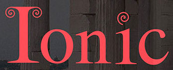 During his studies at Mount Ida College in Newton, MA, Chris Lenzi (Franklin, MA) designed the curly display typeface Ionic (2016). [Google]
[More] ⦿
|
Chrissy Kurpeski
|
Graphic design and illustrator in Boston, MA. She writes about her 2010 font Tubular Times: Tubular Times is a typeface that I designed during an independent study with Cyrus Highsmith at RISD. Inspired by the proportions of Adobe Garamond, I was curious to see if I could create a sans serif typeface that would be legible when used to set text in books. She also made some typographically interesting posters. [Google]
[More] ⦿
|
Christi Payne
[Eyes Wide Open]
|
[More] ⦿
|
Christopher Vilela
|
Easton, MA-based designer of the alchemic typeface Geo Easton (2013). [Google]
[More] ⦿
|
Ciaran Crawley
|
Originally from Northern Ireland, Ciaran Crawley studied at Massachusetts College of Art & Design. Now located in Boston, MA, Ciaran designed the pixel typeface Bit Noire (2018, FontStruct). FontStruct link. [Google]
[More] ⦿
|
ClearType: Typophile discussion
|
Typophile discussion on the merits of Microsoft's ClearType font package. Some quotes: - Bill Troop: [...] What is clear is that this new group of fonts (with the stellar exception of Meiryo by Eiicho Kono and Matthew Carter) does not come anywhere close to the quality previously achieved by Microsoft with Verdana and Georgia, for example. Not to mention that even Courier looks sensational in ClearType. And not to mention, for example, the ClearType version of Frutiger that was done for eBooks - why on earth can't that be made available for general use when it is so obviously the best candidate for a general purpose ClearType font? It is so much better than these new fonts which are at best uninspired and at worst amateurish. [...] The only four designers I can think of who are capable of consistently and creatively producing excellent type over a period of many decades, more or less unaided, are the four I mentioned: Carter, Zapf, Frutiger, Stone. Why on earth isn't Microsoft commissioning them? They would all work for rather less than 'John Hudson', I happen to know. Oh! and Berlow! These days, you could get a lot of great type out of Berlow for a hundred + grand. Where is that toweringly gifted craftsman in all of this? Robert Norton, where are you when we need you?
- More Bill Troop, who revealed that the fonts selected came out of a contest organized by Microsoft, and that each designer got more than 100k per family (I have also heard the figure 20k per weight; Simon Daniels states that he, Mike Duggan and Geraldine Wade were on the selection team): If you've got the money to spend, why not spend it on the greats? Just look at the amateurism rampant here. For example, the italic and bold italic s in Constantia - the kind of error you'd expect in someone drawing type for ten weeks. Let's take Calibri, of which Lucas, the one actual professional in this group, says 'Its proportions allow high impact in tightly set lines.' Oh yes? Then what is that river of space doing around the u? Why is the right sidebearing about twice what it should be and the left sidebearing about a quarter? Why is the color of each weight, and each weight in relationship to the other, so completely off? Look at the word exclamations in bold in that font - the color is so badly judged that the exc looks like it was smudged by comparison to the rest of the word and the diagonals in the x look too heavy. And how do those clotted g forms aid readability? And why do the bolds and bold italics in nearly all the fonts look a point size too large? You know, sometimes, even a really good designer needs a good art director to tell him where he is going wrong, and there surely wasn't one here, if what I am seeing represents final versions. Look at the italic a in Candara. It's not just that it's too narrow (where so many of the other fonts in this series have letters that are too wide); it just doesn't seem to have any relationship to the other letters in the words; it's like an ugly changeling. And that silly italic e, straight out of a Dwiggins nightmare, and again, problems with all of the s's. What is that silly filip on the stem of the p in Cambria that drags the whole letter out of true? But don't get me started. There isn't any end to the problems here. It's all amateursville, a type bakeoff. [...] Where is the expertise of a Zapf, a Frutiger, a Carter, a Stone, a Berlow? What about Dennis Pasternak, that wonderful designer who never pushes himself onto internet discussion boards and who really, really knows how to design type? What about some of the great eccentrics who we never hear from, such as that modest Canadian, Jim Rimmer, probably Canada's best designer, who might, with some guidance, have risen superbly to this kind of challenge? Or the wonderful fellow in Massachusetts - what is his name? - Dan Carr - who knows so much more about type and readability than some of the Coca-Cola belt hillbillies on display here? Was there an art director? Someone of the calibre of a Roger Black, a Sumner Stone? For Heaven's sake, great type people are a dime a dozen, and _this_ is what you have to show for 25+G a weight?
- Hrant Papazian: Only Constantia stands out as a high achievement, while Cambria is quite unappealing to me, and Consolas is superb if you buy its "foundational" logic, which I for one don't though), and I've been thinking about what might be the underlying reason. Certainly much of it is the "technology-snapping" going on, but I wonder if the rest wasn't a conscious -and perhaps pragmatically highly sound- design decision. There seems to be a certain design tentativeness in the whole, but it might strike just the balance that users need right now. My only real complaint about the overall is that renderings of a glyph vary.
[Google]
[More] ⦿
|
Colorful Typhoon (or: Kitsch Labo)
[Futaba]
|
Between 2000 and 2004, Futaba (Colorful Typhoon) designed BeeMarkerInk, Chocolatesyrup, MARUCHIBI, MyBrushwriting, MyMousewriting, MySimplewriting, NANTEN, Sunshine-normal, Sunshine-smart, ChimaChima7, Baby-blocks, DOSUKOI (pixel face), Kuchibue (pixel script), Mukokuseki Kitchen (nice brush face), Mrs-Kichinto (pixel face), Square-rough, homework-normal (handwriting), homework-smart, Baby-blocks, ChimaChima7, DOSUKOI, Go-Go-Go, HARIGANE-RETRO, HARIGANE, Have-a-break, Kuchibue. Fontspace link. Old URL. [Google]
[More] ⦿
|
Compugraphic Corp.
[Bill Garth]

|
This company existed as Compugraphic and Agfa Compugraphic from 1960-1995. The timeline: - Founded in 1960 in Brookline, MA, by Bill Garth and Ellis Hanson (Chief Engineer of Photon, Inc). The intention was to apply computer technology to typesetting. The company would go on to influence the world of photocomposing with its low cost typesetters.
- In 1963, the company relocates to Reading, MA, and introduces its Linasec I and II, the first general typesetting computers.
- In 1967, the company relocates to Wilmingon, MA, forms a Type Group and an engineering department, and releases its first typeface, Bodoni.
- In 1968, Compugraphic introduces the phototypesetters CG 2961 and CG 4961. In 1969, the 7200 Headliner machine (the first keyboard-operated machine to set headlines and display type) was added, followed, in 1970, by the Area Composition Machine (ACM) 9000, in 1971 by the CompuWriter machines, in 1973 by the VideoSetter I and II, in 1974 by Unified Compuser and ExecuWriter, in 1975 by UniScan and UniSetter, and in 1977 by the EditWriter 7500, the Mini-Disk Terminal, and the Mini-Disk Reader..
- The first typeface exclusively developed by Compugraphic, is released, Holland Seminar. It was created by Hollis Holland in 1973.
- 1974: The purchase of T. J. Lyons Press, gives Compugraphic the rights to nearly 2,500 old and antique typefaces.
- In 1981 Agfa bought 51% of Compugraphic, increased that to 80% in 1983 and finally they merged outright in 1989. The new company name is Agfa Corporation.
- In the late eighties, they proposed the scalable format FAIS as an alternative for type 1 and truetype. This format did not survive long.
- In 1992 Miles, Inc (Pittsburgh, PA) bought Agfa/CG. In 1995 Miles changed name to Bayer Corporation. Agfa is the imaging division of this comnpany.
- Finally, in 1999 Agfa (after acquiring Monotype in '97) became independent of Bayer. They now own the ITC catalog (and, by virtue of that, the former Esselte/Letraset font catalog too) as well as the others they picked up through the years.
MyFonts sells Garth Graphic (Compugraphic, and now Agfa/Monotype, by Constance Blanchard and Renee le Winter, based on earlier sketches of John Matt, 1979) and Phenix American (Agfa-Monotype), and named in honor of Bill Garth. Noteworthy is the 1988 catalog "The TypeBook". Images of some typefaces: CG Garamond (now Monotype; see also Garamond Antiqua and Garamond Kursiv), CG Times (now Monotype). Timeline at the Monotype Imaging site. Compugraphic collection of fonts (with CG in the name). [Google]
[MyFonts]
[More] ⦿
|
Constance Blanchard

|
Born in 1954 in Athol, MA. Studied at the University of Vermont and the Mass. College of Art. Type designer and type design manager at Compugraphic at some point. The eight weight-Garth Graphic family was jointly designed by Renée LeWinter, John Matt and Constance Blanchard (1979, Agfa / Monotype). Fonshp link. [Google]
[MyFonts]
[More] ⦿
|
Cosmo Catalano
|
Editor of A web log of design and high drama which frequently comments on typographic matters such as web fonts (why pay for them?), traffic signs, and typeface use. He calls himself the world's toughest writer, and lives in the New England area (he graduated from Dartmouth, NH). In this piece entitled The Tell-Tale R Some Thoughts on Clearview, Cosmo writes this about the decision to start using Clearview for America's highway signs: While I admit it's (much) easier to read, I can't say I'm exactly psyched about seeing it. There are a variety of reasons why. I suppose my gut reaction is that it no longer feels like I'm driving down a federally-funded expressway-it feels like I'm staring at ads. While I've mentioned that Interstate has really picked up its public profile recently, Interstate isn't really the FHWA typeface. Tobias Frere-Jones got a lot of attention for Interstate because the edits he made were very subtle, yet somehow made the font tolerable for more than 12 characters at a time. Clearview, on the other hand, was in use for advertising years before it ever appeared along the highway-most notably by megalith AT&T. I liked the old, ugly FWHA typeface because it was so odd and idiosyncratic. It was like watching a David Bowie in his "androgynous alien" days-no mistaking it for anything else, let alone a sweeping corporate rebranding. FWHA's cold formlessness was also nice because it didn't encourage you to interact. One of Steve Jobs' most persistent design maxims is that products need to be anthropomorphic; it makes people want to engage with them. Clearview is definitely more human than FHWA, but is that really a good thing? Do we really want people relating to and engaging with signage? Or do we want them to glance, comprehend, and get their eyes back on the road? I'm also skeptical of the notion that legibility should be the only standard. Reading interstate signage-even with the old, weird FHWA face-is pretty damn easy. If you need the extra 200 feet to pick out an exit, what other details are you missing? Should you really be on the road? [Google]
[More] ⦿
|
Cristopher Cefole
|
Ashburnham, MA-based designer of the bold counterless geometric typeface LOT (2013). [Google]
[More] ⦿
|
Cutlip
[Charlie Robinson]
|
Weymouth, MA-based designer and illustrator. Creator of these display typefaces in 2020: Old Money (free), Milk Carton, Numbskull. Download site for his free fonts. [Google]
[More] ⦿
|
C.W. Jones
|
Jones lived in Brockton, MA. Author of Alphabets for Practical and Ornamental Engrossing (1914), Lessons in Engraver's Script (1914), American Method of Business Writing, and Ninety-five Lessons in Ornamental Penmanship (1914). The second book contains one full formal calligraphic alphabet by Jones himself. [Google]
[More] ⦿
|
Cynthia Batty

|
 Cynthia Batty (formerly, Cynthia Hollandsworth) was born in Washington, DC in 1955 (MyFonts) or 1956. She studied at the California College of Arts and Crafts in Oakland, CA, and managed the department of type design and development at Agfa Compugraphic in Massachusetts. She was President of AlphaOmega, a design studio dedicated to typeface development. She was also the Director of Typeface Development at High Technology Solutions, in Poughkeepsie, New York. Currently (?), she is the vice-presdident of Simon&Schuster in New York. For a few years, she was Executive Director of ATypI, involved, in particular in the ATypI meetings in Vancouver and Prague.
 Her typefaces show calligraphic influences: - Hiroshige (1986). Versions sold by Linotype and Adobe. Hiroshige was designed in 1986 by Cynthia Hollandsworth at AlphaOmega Typography, Inc. The typeface was originally commissioned for a book of woodblock prints by nineteenth-century Japanese artist Ando Hiroshige, whose work influenced many impressionist artists.
- Pompeii Capitals (1995). Designed by Philip Bouwsma for ITC. It is unclear what Cynthia Hollandsworth's role was in the design.
- Synthetica (1996). With Philip Bouwsma at Agfa.
- ITC Tiepolo (1987). By Cynthia Hollandsworth and Arthur Baker at AlphaOmega.
- Vermeer (1986).
- Agfa Wile Roman (1990). Marketed by Monotype as Agfa Wile Roman and simply Wile.
Bio at ATypI. Linotype link. FontShop link. Klingspor link. [Google]
[MyFonts]
[More] ⦿
|
Cynthia Tocio
|
Lowell, MA-based designer of Broken Bones Alphabet (2015). [Google]
[More] ⦿
|
D. Sandi Sjahputra
[Winston Type Co.]

|
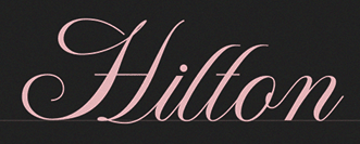 [MyFonts]
[More] ⦿
|
Dan Cederholm
[SimpleBits (or: Icon Shoppe)]

|
[MyFonts]
[More] ⦿
|
Dan Dewitt
|
Creator of Bastardville (1994) at Dewitt&Anthony, which was (is?) located in Northampton, MA. [Google]
[More] ⦿
|
Dan Forbes
|
Based in Boston, Dan Forbes is a graphic designer with a keen interest in tyography. In 2009, he created the log-themed Woody Display. [Google]
[More] ⦿
|
Dana Jacobs

|
Vineyard Haven MA-based designer of the free scratchy hand-printed typeface Sixty Four Dollar Question (2012). In 2012, she set up her own commercial foundry, Dana Jacobs. [Google]
[MyFonts]
[More] ⦿
|
Daniel Berkeley Updike
|
Born in Providence, 1860, he died in Boston in 1941. Typographer, printer, historian and author, best known for his classic book Printing Types: their History, Forms and Use" (1922, Harvard University Press; second edition at Harvard University Press in 1951) which is based on a lecture series he gave at Harvard University from 1910 to 1916. The second edition is from 1937. In 1893 (some say 1894), he founded the Merrymount Press in Providence, Rhode Island. He designed the Montallegro typeface. In 1896, Daniel Berkeley Updike and Bertram G. Goodhue co-designed a bold text typeface. Britannica entry. Abebooks link. Volume 1 and Volume 2 of his book have been scanned in. Patent office link. [Google]
[More] ⦿
|
Daniel Comite
|
Boston-based designer of a nice imaginary Lord of the Flies movie poster (2011). [Google]
[More] ⦿
|
Danielle Demers
|
At Mount Ida College, Holbrook, MA-based Danielle Demers designed a honeycomb grid-based typeface in 2017. [Google]
[More] ⦿
|
David Berlow
[Font Bureau]

|
[MyFonts]
[More] ⦿
|
David Berlow

|
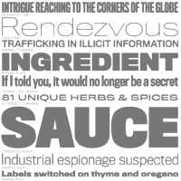 David Berlow (b. Boston, 1955) entered the type industry in 1978 as a letter designer for the Mergenthaler, Linotype, Stempel, and Haas typefoundries. He joined the newly formed digital type supplier, Bitstream, Inc. in 1982. After Berlow left Bitstream in 1989, he founded The Font Bureau, Inc. with Roger Black. Font Bureau has developed more than 300 new and revised type designs for The Chicago Tribune, The Wall Street Journal, Entertainment Weekly, Newsweek, Esquire, Rolling Stone, Hewlett Packard and others, with OEM work for Apple Computer Inc. and Microsoft Corporation. The Font Bureau Retail Library consists mostly of original designs and now includes over 1,000 typefaces. In a video made for Mike Parker's TDC medal in 2011, Mike Parker says that David Berlow is the most talented type designer he ever met. David lives in Martha's Vineyard.
 At ATypI 2004 in Prague, David spoke about Daily types. At ATypI 2009 in Mexico City, he spoke on The heart of my letter, (and the online version). Since that time he has been very active and vocal on the issue of high quality web fonts. Speaker at ATypI 2011 in Reykjavik and at ATypI 2014 in Barcelona. David Berlow Type Specimens (free pdf). Another type specimen booklet. Interview by A List Apart in 2009. Speaker at ATypI 2010 in Dublin. FontShop link. www.typovideo.de/david-berlow. David Berlow on web fonts. Interview by The Boston Globe. His typefaces: - Agency FB (1995). After Morris Fuller Benton's squarish typeface from 1932-1933 for American Typefounders.
- Amstelvar (2017). A variable (or parametric) font at Font Bureau. Contributors include David Berlow, Santiago Orozco, Alexandre Saumier Demers, and David Jonathan Ross. Open Font Library link, where one can download the font. Github link.
- Apres (2008, a sans with 40 styles). David Berlow and staff drew Apres as part of a series designed originally for the Palm Pre smart phone, for use both on the device and in print marketing. Simple, open letterforms and generous proportions provide a clear, comfortable, and inviting experience for navigation and readability.
- Belizio (1987-1988), a beautiful Clarendon-style slab serif modeled after the 1958 original slab serif by Aldo Novarese called Egizio Corsiva Nero. Claudio Piccinini would have liked Font Bureau to acknowledge Aldo Novarese's Egizio as the source of this family.
- Belucian (1990, by David Berlow and Kelly Ehrgott Milligan. Several weights exist, including Demi and Ultra.
- Berlin Sans (1997).
- Bureau Grotesque (1989). This 27-style family is now called Bureau Grot. Font Bureau's blurb: The current family was first developed by David Berlow in 1989 from original specimens of the grotesques released by Stephenson Blake in Sheffield. These met with immediate success at the Tribune Companies and Newsweek, who had commissioned custom versions at the behest of Roger Black. Further weights were designed by Berlow for the launches of Entertainment Weekly and the Madrid daily El Sol, bringing the total to twelve styles by 1993. Jill Pichotta, Christian Schwartz, and Richard Lipton expanded the styles further, at which point the family name was shortened to Bureau Grot.. Note: there is a custom version called M&C Saatchi Grotesque with truetype data created by dtpTypes in 1998.
- CalifornianFB.
- CheltenhamFB.
- Custer RE (2014), a typeface for small on screen use. The Font Bureau blurb: In 2009, a book from 1897 in the library of the University of Wisconsin caught David Berlow’s attention. It was set in a clear text face---a predecessor of Bookman---cast by the Western Type Foundry who called it Custer. Upon noting how well the typeface worked in point sizes of 6 and 7 points, Berlow developed it into a member of the Reading Edge series specifically designed for small text onscreen. Custer RE is a broad and approachable typeface drawn large on the body with a tall x-height to maximize its apparent size when set very small. The minimal stroke contrast and the hefty serifs let it stay exceptionally clear down to a font-size of 9px. Font Bureau.
- Decovar (2017). A variable font. Github link, where one can freely download the font family. See also Open Font Library.
- Desdemona (1992). An art nouveau face.
- Eagle (1889-1994). This art deco typeface Font Bureau Eagle was started in 1989 for Publish. David Berlow designed a lowercase, finished the character set, and in 1990 added Eagle Book for setting text. In 1994, Jonathan Corum added Eagle Light and Eagle Black to form a full series.
- Eldorado.
- Empire.
- Esperanto (1995).
- ITC Franklin Gothic (1991). In 2008, David Berlow added Condensed, Compressed and Extra Compressed widths to Vic Caruso's 1979 ITC Franklin interpretation (which had Light, Medium, Bold and Black), and Font Bureau sells a complete ITC Franklin now. In 2010, Berlow completed his definitive revision of ITC Franklin, a single new series of six weights in four widths for a total of 48 styles. Typeface review at Typographica.
- Giza (an Egyptian family.
- Hitech (1995).
- Juliana Text (2009), a rebirth of Sem Hartz's Juliana (1958, Linotype), a popular narrow legible paperback text face.
- Kis FB (2007): a revival of old style types by Nicholas Kis from ca. 1700.
- Letras Oldtsyle (1998). Letras Oldstyle was commissioned by Letras Libres, the reigning literary magazine published by Enrique Krauze in Mexico City. This garalde series was inspired by the earliest typefaces cut in the Americas in the early 1600s by printer Henrico Martinez. Proofs survive in the Biblioteca Nacional. Letras Oldstyle stands as the first typeface ever cut in the Americas, the root of American type design.
- Meyer Two (1994). Based on a 1926 type by L.B. Meyer.
- Millenium BT Bold Extended (1989, Bitstream). Also known by insiders as Starfleet Bold Extended, this font was used on federation starship hull markings until episode ten. MyFonts link.
- Moderno FB (1995): an exhibitionist didone in 32 styles, for Esquire Gentleman. In 1996 Berlow cut new styles with Richard Lipton for El Norte. In 1997, Roger Black ordered new weights for Tages Anzeiger. It grew further when the Baltimore Sun, with FB Ionic as text, was redesigned. The whole series was then revised for Louise Vincent, Montreal Gazette, with further styles added in 2005 for La Stampa. [It is my favorite type family at Font Bureau.]
- Momentum (2018). An in house variable font family for use on the Type Network web site.
- Nature (1995).
- Numskill (1990).
- Old Modern.
- Online Gothic (1995).
- Ornaments.
- Phaistos (1990-1991). A flared angular design done with Just van Rossum, and inspired by Rudolf Koch's Locarno.
- Poynter Agate.
- Reforma: Based on Giza.
- Rhode (1997).
- Roboto Flex (2017). A large free variable typeface family by David Berlow on commission for Google; based on Christian Robertson's original Roboto. Google Fonts link. Github link. Google redits Font Bureau, David Berlow, Santiago Orozco, Irene Vlachou, Ilya Ruderman, Yury Ostromentsky and Mikhail Strukov.
- Romeo.
- Scotch Roman (1993).
- Skia (1993, Apple). A Greek simulation sans, in the style of Twombly's Lithos, co-designed with Matthew Carter for Apple's QuickDraw GX project.
- Skyline.
- Titling Gothic FB (2005): Berlow spent 10 years developing FB Titling Gothic in seven weights of seven widths each for use as display and headline romans. It was inspired by the popular ATF Railroad Gothic and grew out of Berlow's own Rhode.
- Throhand: a classic family based on metal type found at the Plantin Moretus Museum in Antwerp.
- Truth FB (1995).
- Village.
- Vonness (2007): a newspaper sans family. Font Bureau: Vonness was designed by David Berlow working closely with Neville Brody on corporate redesign for Jim Von Ehre at Macromedia. Core weights are loosely based on Bauersche Giesserei's Venus, 1907-1910. Berlow expanded the ideas behind the series to 56 fonts.
- Yurnacular (1992, part of FUSE 4).
- Zenobia (1995).
View David Berlow's typefaces. Another catalog of David Berlow's fonts. Speaker at ATypI 2018 in Antwerp. [Google]
[MyFonts]
[More] ⦿
|
David Charles Randolph Rakowski

|
 Type designer and composer, born in St. Albans, VT, in 1958. He was one of the early free/shareware type designers, well-known for creating revivals of 19th century typefaces. He was the Walter W. Naumburg Professor of Composition at Brandeis University, and has previously taught at Harvard University, Columbia University, and Stanford University.
 List of Rakowski's fonts: 3-DWedgie, Aarcover, AdineKirnberg-Script, Ann-Stone, Beachman, Beffle (1991, after Fry's Ornamented No. 2 from Stephenson Blake), Bizarro, BrailleFont, BunnyEars, ChristensenCaps, Crackling, DaBigKeyCaps, DavysCrappyWriting, DavysDingbats, DavysKeyCaps, DavysNewOther, DavysOtherDingbats, DavysRibbons, DeBalme Initials, DieterCaps, Diner-Fatt, Diner-Obese, Diner-Regular, Diner-Skinny, Dobkin-Script, Dragonwick, Dubiel (1991), Dupuy-Light, DupuyBALloon, Eileen, EileenCaps, EileensMediumZodiac, Elizabeth-Ann, Elzevier, EraserDust, Firecat, Gallaudet (a sign language font), Garton (1993), Gessele-Script, GriffinOne, Harting (an old typewriter font), Headhunter, Holtzschue, Horst, Ian-Bent, Jeff-Nichols, Jumble, Kinigstein, Konanur, KoshgarianLight, Kramer, Lassus (1993), LeeCaps, Lemiesz (a free version of Publicity Gothic, 1916), Lilith-Heavy, Lilith-Initals, Lilith-Light, Lintsec, Logger, LowerEastSide, McGarey-Fractured, Multiform, Nauert, NixonInChina (oriental simulation), ParisMetro, Pixie, Pointage, Polo, Rechtman-Script, ReliefDeco, ReliefInReverse, Reynolds, Rockmaker, Rothman [note: poster by Lauren Buroker], Rounded, Rudelsberg (a Munch Jugendstil style font), Salter, Shotling, Showboat, Shrapnel, Starburst, TejaratchiCaps, TenderleafCaps, ToneAndDebs, Tribeca, Uechi, UpperEastSide (1990), UpperWestSide (lettering from the New Yorker magazine), VarahCaps, Wedgie, Wharmby, WhatA-Relief, Will-Harris, Zaleski, and Zallman-Caps. Some downloads: Uechi, Rothman, Tejaratchi, Eileen Caps and Elzevier Caps, Paris Metro, Davy's Dingbats (see also here). With Klaus Herrmann, of Intecsas in Düsseldorf, he started updating his fonts from 1992-1999. Those fonts can be bought at Will-Harris. Here is an interview with David. Download 120 of his fonts here. And finally, a text file with the names of most of his fonts. Mark Johansson explains the history of Rakowski's fonts. Dafont link. MyFonts page. Abstract Fonts link. Font Squirrel link. Fontspace link. Klingspor link. [Google]
[MyFonts]
[More] ⦿
|
David Fleming Nalle
[Scriptorium (Ragnarok Press, Fontcraft)]

|
 [MyFonts]
[More] ⦿
|
David Jonathan Ross
[DJR Type]

|
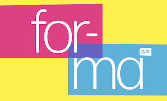 [MyFonts]
[More] ⦿
|
David Kindersley

|
 English stonecutter (b. Codicote, 1915; d. Cambridge, 1995). An ex-apprentice of Eric Gill, he set up his own shop in Cambridge in 1939. His carved plaques and inscriptions in stone and slate can be seen on many churches and public buildings in the United Kingdom. He and his third wife Lida Lopes Cardozo, also a stonecutter, designed the main gates of the British Library.
 In 1952 Kindersley submitted MoT Serif to the British Ministry of Transport, which required new lettering to use on United Kingdom road signs. The Road Research Laboratory found Kindersley's design more legible than Transport, a design by Jock Kinneir and Margaret Calvert, but nevertheless chose Transport. Many of the street signs in England, especially in Cambridge use Kindersley's fonts. The book typeface Octavian was designed by Will Carter and David Kindersley for the Monotype Corporation in 1961. He also created Itek Bookface. Kindersley was known for his letterspacing system. Author of Optical Letter Spacing for New Printing Systems (Wynkyn de Worde Society/Lund Humphries Publishers Ltd, 1976) and Computer-Aided Letter Design (with Neil E. Wiseman). The Cardozo Kindersley workshop, which Kindersley founded and was later continued by Cardozo, publishes a number of typefaces based on Kindersley's work. They include Kindersley Street (2005, aka Kindersley Grand Arcade) which is based on Kindersley Mot Serif (1952). It was designed for the Grand Arcade, Cambridge. London street signs that were designed by David Kindersley served as the basis of a complete lapidary typeface by Boris Kochan and Robert Strauch of Lazydogs Type Foundry, called Streets of London (2013). Image: Stone cut alphabet from 1979 displayed in the University of Amsterdam' Special collections. Linotype link. FontShop link. MyFonts link. Wikipedia. Klingspor link. [Google]
[MyFonts]
[More] ⦿
|
Deanna Susser
|
Boston-based creator of the slightly grungy and appropriately named typeface Stress (2011). Behance link. [Google]
[More] ⦿
|
Delve Fonts (was: Delve Media Arts)
[Delve Withrington]

|
 Delve Withrington (Alameda, CA; b. 1970, Asheville, NC) studied at Savannah College of Art and Design, designed signage, print projects and web pages in addition to designing custom typefaces, worked for Fontshop, and in 2004, joined the type team at Agfa Monotype, which morphed into Monotype Imaging, Redwood City, CA. From Asheville, NC, he moved around and ended up in San Francisco. In 1996, he founded Delve Fonts in Berkeley, CA (in fact, Delve Media Arts, and later renamed Delve Fonts). He has collected a virtually complete list of books on typography. Author index. MyFonts link. Designer of these typefaces:
 - Beleren (2015). A custom typeface for the trading card game Magic: The Gathering (Hasbro).
- Blasphemy Initials: a free (and also commercial...) spooky font.
- Blot Test (1999): a dingbat font inspired by the work of noted German psychologist Hermann Rorschach [1885-1922].
- Cody (1999): an informal comic book face.
- Continuo (1996): an all caps bilined outline face.
- Cortina (2011). A futuristic family by Joachim Müller-Lancé.
- Delve Hand (1996-2003).
- Eucalyptus Regular.
- Eulipia (1997-2003): organic.
- Helfa (2011). Delve writes: Readability is baked in with a generous x-height, fine proportions that have a medium height to width ratio, and reasonable contrast in stroke weight variation.
- Filmotype Washington (for Font Diner). Designer unidentified.
- Muskeg. A combination of German expressionism and brush styles.
- Oktal Mono (2012, a rounded octagonal modular typeface by Joachim Müller-Lancé and Erik Adigard of MAD studio in Sausalito).
- Peso (1999): an octagonal family inspired by a parking sign discovered in Guanajuato, Mexico.
- Quara (2009): a techno sans.
- Smith & Nephew (2003) and Smith & Nephew Cyrillic (2015), rounded sans typefaces in the style of VAG Rounded.
- Tilden Sans (2004-2009): low contrast, large x-height.
- Tome Sans (2020). A 10-weight sans superfamily, with a variable font option.
- Uppercut Angle (2011). A signage typeface by Joachim Müller-Lancé. It was originally developed for the Krav Maga training center of San Francisco.
- Ysobel (2009; winner of an award at TDC2 2010). Delve co-designed the newspaper type family Ysobel (Monotype) with type designers Robin Nicholas, head of type design at Monotype, and Alice Savoie (Frenchtype, Monotype). The sales pitch: According to Nicholas, the idea for the Ysobel typefaces started when he was asked to create a custom, updated version of the classic Century Schoolbook typeface, which was designed to be an extremely readable typeface - one that made its appearance in school textbooks beginning in the early 1900s. See also Ysobel eText Pro (2013).
His Art work often involves type. Bitstream's Type Odyssey 2 (2002) has Continuo, Blot Test, Peso, Peso Negative. In 2009, Steven Skaggs designed Rieven Uncial and Rieven Italic at Delve Fonts. Pic. Adobe link. [Google]
[MyFonts]
[More] ⦿
|
Delve Withrington
[Delve Fonts (was: Delve Media Arts)]

|
[MyFonts]
[More] ⦿
|
Dennis Pasternak
[Galapagos Design Group]
|
[More] ⦿
|
Dennis Pasternak

|
American designer (b. Holyoke, Massachusetts, 1952) at Galapagos Design Group located in Littleton, MA, which he founded in 1994. Before that, he worked at Compugraphic and Bitstream. His typefaces: - Baltra GD: a proud serif font.
- Bartholome Open: this typeface won an award at Bukvaraz 2001. See also here.
- Bing (2002).
- Bisco Condensed (2002): an informal face.
- Bitstream Chianti (1993): a flared humainst sans designed for use on web pages.
- LittletonMM: a 3-axis multiple master designed for an unnamed museum in Massachusets, a sort of multiple master version of New GothicBT. They say that this is the only 3-axis multiple master ever made as an OEM or commercially.
- Maiandra GD.
- ITC Stylus (1995): in the orbit of Tekton.
View Dennis Pasternak's typefaces. [Google]
[MyFonts]
[More] ⦿
|
Diane Collier
[Kigali Designs]
|
[More] ⦿
|
Dickinson Type Foundry
[Samuel Nelson Dickinson]

|
Boston-based foundry, also called Phelps&Dalton, and Phelps, Dalton&Co. Founded by Samuel Nelson Dickinson in Boston in 1839. They published "Specimen of type for book printing, manufactured by Samuel N. Dickinson" (Boston, 1842), "Hand-book specimen of printing type, cuts, ornaments, etc., from the foundry of Samuel N. Dickinson" (Boston, 1847), and "Point specimen book. Specimens of printing types, rules, cuts, printing material" (Boston, 1893, 457 pages). See also The General Specimen Book of the Dickinson Type Foundry, Comprising Types for Letter-Press Printing of Every Variety (Boston: Phelps&Dalton, 1856). In 1872, a fire ravaged the company, and a skilled punchcutter, Alexander Phemister, became a partner. In 1891, Dickinson became part of ATF in the great meltdown. Joseph W. Phinney and Robert W. Nelson (1851-1926) made the transition from Dickinson to ATF. Scans of typefaces shown in the 1923 ATF catalog: Roycroft Tinted, Card Mercantile (1890s). Commentary by McGrew on Card Mercantile: Card Mercantile was produced by Dickinson Type Foundry in the 1890s or earlier. Except for a few letters, it appears to be a duplicate of Extended No. 3 of Stevens, Shanks in England. In 1901 Morris Benton redesigned the two smallest sizes for ATF, successor to Dickinson, for better compatibility with the other sizes. It is a very delicate, wide, thick-and-thin style without lowercase (but the English typeface has lowercase), somewhat similar to Engravers Roman, which supplanted it in popular use. An 1899 ad said, "For imitating the work of steel engravers there can be nothing more beautiful picked from a case, and it is difficult if not impossible to imagine how anything finer ever can." Compare Engravers Roman, Brandon, Litho series. Digital revivals include Renaissant NF (2014, Nick Curtis: a Victorian typeface). Wikipedia link. [Google]
[MyFonts]
[More] ⦿
|
DJR Type
[David Jonathan Ross]

|
 DJR Type (Conway, MA, and before that, Deerfield, MA, and before that Los Angeles, CA, and before that, Lowell, MA) stands for David Jonathan Ross Type. Originally from Los Angeles, he was a student at Hampshire College in Amherst, MA, where he studied information design and typographic tradition. In 2007, he joined Font Bureau as a junior designer and was assisting with custom projects and expanding Font Bureau's retail library. Soon after that, het set up DJR Type. In 2016, DJR Type joined Type Network and pulled all his typefaces from MyFonts. He also runs Font of the Month Club.
 In 2018, he was the tenth winner of the Charles Peignot Prize. His typefaces: - Manicotti (2010). An ultra reversed-stress Western saloon style typeface that won an award at Modern Cyrillic 2014. DJR Manicotti won an award at TDC2 2007. For a free lookalike, see Plagiacotti (2009, Saberrider).
- Lavinia.
- Climax Text (2006) is a text and display series that was designed for Hampshire's student newspaper.
- Trilby (2009, Font Bureau). Trilby is based on a 19th century French Clarendon of wood type fame.
- Condor (2010, Font Bureau). This is a 60-style art deco family. By 2020, it had a 3-axis (weight, width, italic) variable version.
- Turnip (2012) is an angular and manly text face, also published at Font Bureau.
- In 2013, Ross and Roger Blcak revived Nebiolo's Forma for the redesign of Hong Kong Tatler, a fashion mag, supervised and commissioned by Roger Black, who was then based in Hong Kong. Read about the whole process in this piece by Indra Kupferschmid. Page specially dedicated to DJR Forma. In 2021, Belgian national broadcaster VRT picked DJR Forma for all its entire range of media.
- Bungee (2013, Google Fonts) won an award at TDC 2014. This homeless typeface, which comes in Regular, Hairline, Inline, Outline and Shade versions, is free: Bungee is a font family that celebrates urban signage. It wrangles the Latin alphabet to work vertically as well as horizontally.
- In 2014, David Jonathan Ross created the formidable 168-style programming font family Input (Font Bureau). Input is free for private use. It won an award at Modern Cyrillic 2014 and in the TDC 2015 Type Design competition. See also the proportionally spaced typewriter family Input Sans.
- Gimlet (2016). A 112-style Opentype family loosely based on Georg Trump's 1938 typeface, Schadow, and advertized as funky and functional. Ross writes: Gimlet is half Schadow, half imagination, and nothing else. And like its namesake beverage, Gimlet is a little tart, a little sweet, and can really pack a punch. Gimlet Variable Bold Condensed followed in 2019. Gimlet XRay (2020) is an An experimental colorized version of Gimlet that exposes what goes on under the hood of a variable font, visualizing control points, bounding boxes, kerning, etc. Amazingly, this variable color font has six axes, weight, width, oncurve point size, offcurve point size, glyph utline weight and point outline weight.
- Fern and Fern Micro (2014, Font Bureau). A Venetian typeface designed for screen.
- Output Sans.
- Fit (2017, by David Jonathan Ross and Maria Doreuli). A tall black display family that runs from ultra-compressed to very wide. It screams Use me for the Oscars! Fit was first developed as a variable font. It won an award at Granshan 2017.
- DJR Lab, or Lab Variable (2017), is a free pixelish variable font.
- Under miscellaneous, we find an untitled French Clarendon and an untitled semi-serif.
- Font of the Month Club fonts from 2017: Nickel, Roslindale (Roslindale is a text and display serif that takes its inspiration from De Vinne, a Victorian oldstyle typeface named for the nineteenth century printer and attributed to Gustav Schroeder and Nicholas Werner of the Central Type Foundry), Zenith (blackboard bold), Crayonette (a revival of Henry Brehmer's scriptish Crayonette, 1890), Bild (a compressed headline font based on the American gothic type styles from the 20th century; a variable font followed in 2019), Pappardelle Party (spaghetti Western style), Roslindale Text, Klooster (followed in 2021 by Klooster Thin).
- Font of the Month Club fonts from 2018: Bradley DJR (a revival of the blackletter typeface Bradley, 1895, William H. Bradley), Extraordinaire, Rhody (slab serif), Map Roman (an all caps vintage mapmaker font), Output Sans Hairlines, Rumpus Extended, Roslindale Light, Merit Badge (a variable color font).
- A tech type virtuoso, he charmed me with his art deco variable font Extraordinaire (2018) that was influenced by the diamond-shaped forms found in the center of the city of Sao Paulo, Brazil.
- Typefaces from 2019: Heckendon Hairline, a condensed Clarendon.
- Typefaces from 2020: Dattilo (a variable style revival of Aldo Novarese's slab serif Dattilo (1974)), Pomfret.
- Typefaces from 2021: Rustique (rustic capitals), Megazoid (a chunky geometric sans), Job Clarendon (with Bethany Heck, who wrote: Job Clarendon is an homage to job printing---display-heavy designs made for posters and flyers in the heyday of letterpress printing. This style of Clarendons was wildly popular in this genre of work, and I've always been interested in how adaptable they were. The style was fattened, squished and stretched to accommodate lines of text both short and long and type foundries across the globe each found their own unique features to contribute to the Clarendon stew. Ross pulled the design to both extremes but had his work cut out as he explained: The chasm between Hairline and Black was far too wide to interpolate across effectively, so I incorporated new drawings in the Extra Light, Regular, and Bold weights to act as additional tentposts to support the design).
Speaker at ATypI 2016 in Warsaw and at ATypI 2017 in Montreal. Klingspor link. Home page. Adobe link. [Google]
[MyFonts]
[More] ⦿
|
Donald Tarallo
[Tarallo Design]

|
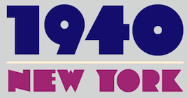 [MyFonts]
[More] ⦿
|
Drianne Laliberte
|
Graphic designer in Sprinfield, MA, who created the modular sci-fi typeface Space Cube (2014). [Google]
[More] ⦿
|
Duxbury Systems Inc
[Matt Sulivan]
|
Matt Sullivan's outfit in Littleton, MA that made some Braille fonts, including "Duxbury". See here for a free Braille font by them (1996). See also here. SimBraille (1996) and Braille (1996) are here. They also made Swell Braille (2007). See also here. [Google]
[More] ⦿
|
Duy Hoang
|
Graphic design student at the University of Massachusetts. Creator of the Headache Alphabet (2010). [Google]
[More] ⦿
|
Dyana Weissman
[Kerns&Cairns]

|
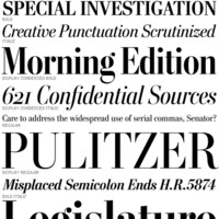 [MyFonts]
[More] ⦿
|
Earl Biscoe

|
Quoting MyFonts: Earl Biscoe was a Bitstream font designer who retired in the mid-1980s because of illness. Earl lost his battle with mesothelioma cancer in October of 2001 after surviving 16 years beyond all expectations due to alternative therapy. Earl inspired people with his determination for beating the odds with an unfaltering wit. His positive attitude for the gift of life gave him strength to endure and help others in similar situations. [Google]
[MyFonts]
[More] ⦿
|
Eben Sorkin
[Sorkin Type (was: Eyebytes)]
|
[More] ⦿
|
Ed Rogers

|
Artist and lettering artist, 1925-2002. P22 writes: Ed Rogers came to public attention through David Greenberger's Duplex Planet magazine. Ed moved into the Duplex Nursing Home in Boston in 1981. Conversations and interviews with Ed appeared regularly in The Duplex Planet, which started in 1979 as a periodical, subsequently collected into books, adapted into a comic book series and staged monologues. Approximately 150 of Ed's drawings have been shown in an exhibition titled "An Exact Spectacular" at several museums and universities since 1994. Ed's work was featured in the packaging of R.E.M.'s Out Of Time CD. He appeared in the Duplex Planet documentaries "Your Own True Self" and "Lighthearted Nation." Ed lived his life pretty much hidden from view. Born in 1925, he was institutionalized some time in his twenties and then lived in nursing homes from his late forties until his death in 2002. He conducted his life at a remarkably slow pace but if you slowed down too, you would find he had an endearing purity and simplicity. Like most of us, Ed perceived drawing and writing and different tasks. His writing has a deep right slant and large loops with a clearly tentative hand. When asked to draw, Ed would most often work on the lettering seen is this font. He also drew a sort of teddy bear of other gentle animal shaped characters. His pencil, pen or crayon would touch the surface of the paper many times before a line might be drawn. And then several lines might be repeated as he worked through whatever mental process was underway. Sometimes he stopped with a clearly depicted character or word, other times the muse in his hand continued to mark the page until the images were all but obscured. And sometimes the finished product would be a dynamic mass of line work, eradicating the white space. He would, if requested, create a specific drawing, as he did for R.E.M. and other artists. In 2004, Richard Kegler and Colin Kahn co-designed P22 Ed Rogers, based on ed Rogers's lettering. [Google]
[MyFonts]
[More] ⦿
|
Edward Pelouze
|
Born in 1799, died in 1876. Edward Pelouze was the second son of Edmund Pelouze, and a key figure in the Pelouze type foundry family. In 1817, he worked for the Boston Type Foundry, and later in Boston, he worked for Phelps, Dalton and Co, He moved to New York to work as a typefounder for White's (1829) and set up his own foundry, the Pelouze Foubndry, in 1830. In the central part of his life, he moved type equipment to San Francisco and set up a foundry there in 1848. But he returned to Boston, where he bought the Boston Type Foundry in 1853 with John K. Rogers, to form the John K. Rogers Foundry. His three sons, whom he had introducted to typefounding, would all become successful typefounders as well. Not to be coinfused with his son, Edward Dalton Pelouze or his grandson, Edward Craige Pelouze. [Google]
[More] ⦿
|
Edward Pelouze
[Boston Type Foundry]

|
[MyFonts]
[More] ⦿
|
EFI Home Page (Educational Fontware)
|
Sells handwriting-fonts designed to exactly replicate many educational handwriting styles. In particular, they have these: - D'Nealian: DN Cursive and DN Manuscript.
- Zaner-Bloser: ZB Manuscript, ZB Cursive, OZ Manuscript, OZ Cursive.
- A Beka: AB Cursive and AB Manuscript, based on the style shown in workbooks developed by A Beka Book, Inc.
- Bob Jones University: CCU Cursive and CCU Manuscript, ugly fonts based on materials copyrighted by Bob Jones University.
- DKL Cursive and DKR Cursive, patterned after the handwriting methods in the workbooks Cursive Writing Skills (Educators Publishing Service, Inc, 31 Smith Place, Cambridge, MA), by Diana Hanbury King.
- Frank Schaffer: FS Classic, FS Contemporary, and FS Manuscript, developed using materials copyrighted by Frank Schaffer Publishing.
- Getty-Dubay Italic: GDI Basic, GDI Combined, and GDI Cursive, a handwriting method developed by Barbara M. Getty and Inga S. Dubay at Portland State University, Continuing Education Press. EFI worked with Getty and Dubay to develop its GDI fonts.
- Handwriting Without Tears: HWT Cursive and HWT Manuscript, pretty upright cursives and a hairline geometric sans. Handwriting Without Tears is a registered trademarked of Jan Z. Olsen.
- Harcourt Brace: HB Cursive and HB Manuscript.
- Loops and Groups: LG Cursive, based on the handwriting samples in the copyrighted Instructor's Manual Loops and Other Groups---A Kinesthetic Writing System by Mary Benbow.
- McDougal, Littell: McD Cursive and McD Manuscript, based on materials copyrighted by McDougal, Littell&Company.
- Palmer: Palmer Manuscript (simple hairline sans), Vintage Palmer and New Palmer, which include several variations of the cursive handwriting style that constitute the Palmer Method. Vintage Palmer is based on a 1923 workbook, and New Palmer on a 1987 workbook.
- Pentime: PT Cursive and PT Manuscript, developed for use by the Amish communities, through workbooks rather than directly with computers. The fonts were created for JKL Services, who use the fonts to produce handwriting materials for the Amish community.
- Peterson Directed Handwriting: PM Cursive, PM Block, and PM Slant.
- Queensland: QM Cursive and QBA Manuscript, based on samples from workbooks by Horowitz Martin Education.
- Russian: RU Cursive and Manuscript families (9 fonts) for Cyrillic.
- Seattle School District: SSD Cursive and SSD Printscript, based on handwriting samples and methods developed by Patricia Heller and Elaine M. Aoki for the Seattle Public Schools. samples were found in a 1993 K-5 handwriting manual called Write It Right (Seattle Public Schools).
- Steck Vaughn: SV Cursive and SV Manuscript, developed using materials copyrighted by Steck Vaughn Company.
- Specialty Fonts: four Ball-and-stick and Dashes fonts, Braille 24 and Braille 24 Hollow, Clocks, EFI Count Dots on Numbers, EFI Direct Instruction, EFI Music Symbols, Emo-faces, Fingerletters (for American Sign Language), Lettersound Pictures, Morse Code, Phonetics Phont, POSTNET-16.
[Google]
[More] ⦿
|
Elena Giurleo
|
Medford, MA-based designer of a colorful alphabet poster in 2015. [Google]
[More] ⦿
|
Elizabeth Cory Holzman

|
 Born in Cambridge, MA, in 1970, and educated at the Rhode Island School of Design (1988-1993), Eliabeth now lives near New York City where she is Principal of Elizabeth Cory Studios. From 1993 until 1995 she was senior font designer at Font Bureau, and from 1996-1998, she was font manager and designer at Meta design in Berlin.
 Agfa Creative Alliance designer who made the art deco all caps typeface Brok (1995), which first appeared in 1919 as poster letters cut in wood by Chris Lebeau for the Willem Brok Gallery in Hilversum, Holland. At Font Bureau, she designed the heavy geometric slab serif family Constructa, which is based on Morris Fuller Benton's 1934 ATF design called Tower. Font Bureau link. Klingspor link. FontShop link. [Google]
[MyFonts]
[More] ⦿
|
Elizabeth Kate Hartley
[Lizzy Hartley Design]

|
[MyFonts]
[More] ⦿
|
Embossdesign.com
[Stephen Boss]

|
Emboss was founded in 1995 by Stephen Boss (b. 1969, Michigan), and is located in Beacon, NY, and Camillus, NY. Stephen Boss lived in Gloucester, MA, then in Brooklyn, NY, and finally near Syracuse, NY. His fonts are sold by Monotype Imaging / ITC and Myfonts. Typefaces include Babalon, Oo La La, Chubbét (2010: sans family, +Distended), Tobago, Phervasans (pixel face), DNA, Elefont, Eurydome (2010, like Eurostile?), Thai One One (a Thai simulation font), Jerusalem Syndrome, Dramaminex, Crossell (2010, a sans family), FaxFont97, Embossanova (2012), Chubbét Extended (2012), EmBauhaus (2012), and Zyncho. [Google]
[MyFonts]
[More] ⦿
|
Emily Pacht
|
Chelmsford, MA-based designer of the sketched typeface Patches Print (2015). [Google]
[More] ⦿
|
Emily Spadoni
[Emily Spadoni]
|
 Plainville, Massachusetts-based Emily Spadoni (b. 1979), runs her own foundry, simply called Emily Spadoni. She specilaizes in scripts, and in partucular, curly, frilly, mischievous scripts and vavoom vampire handwriting. In 2014, she made these hand-printed typefaces: Drawing With Markers, Peanutbutter Smoothies (curly), What I Want For Christmas, Sweethearts Love Letters (curly script), Strawberry Whipped Cream, Silver Bellybutton Ring (cute curly script), Betty, Pink Ladies and Peanutbutter (a curly teatime script), Tall Tulips, Doodle Dings 1 Birds Cages.
 Typefaces from 2015: Storybook, Fashionista Black, Sophia (brush script, free), Ke Aloha (Hawaiian vibe script), Fashionista (calligraphic connected script), Annabella Calligraphy Script (a great calligraphic curly wedding script typeface family), So Lovely, Velvet Berries (curly script), Butterfly Waltz Script (curly script), Secret Garden Script, Lettres Douces, Starstruck, Berrylicious, Portabello Script, Smoothie Shoppe (free), Sweet Peony, Margherite, Mirabella Script, Lilly Belle, Sweet Pea, Ballerina Script (curly script), Tippy Toes, Doodle Dings 2 Retro Flowers, Ralphie Brown (curly script), Because I Am Happy (hairline script), Give Me Some Sugar (a lovely boudoir-curly typeface), Dandelion Soup, Noteworthy (a connected signature script), Gardenia (+flower ornaments), Country Chic, Clementine, Daydreamer, Tickled Pink (very curly), Sugar Plums Script, Abigail Brush, Hello Sunshine Script, Ink Blossoms Script, Carried Away, and Beautiful Day. Typefaces from 2016: Lemons Mangos Sunshine (a swashy feature-laden script), Smoothie Shoppe (free), Romantic Script, Clementine Script. Typefaces from 2017: Dandelion Soup, Peony Blooms. Typefaces from 2018: Roseroot Cottage (a 22-style font collection). Typefaces from 2019: Bottoms Up Love. [Google]
[More] ⦿
|
Emily Spadoni
[Emily Spadoni]
|
 [More] ⦿
|
Erica Schultz
|
Erica is a graphic designer, Judaica artist, writer, community organizer, vocalist (mezzo-soprano) and performer. After 22 years in the Boston area, she relocated in September 2011 to the Upper West Side of Manhattan, where she lives with her partner, the actor Tom Giordano. Fontspace link. Creator of Erica's Handwriting (2007, Fontifier). [Google]
[More] ⦿
|
Erik Di Mauro
|
Foxborough, MA-based designer of Nightcall (2012). Behance link. [Google]
[More] ⦿
|
Erin Gwozdz
|
 During her studies at the Art Institute of Boston, Erin Gwozdz created the wide slab serif typeface Mild Salsa (2013) and the modular typeface Kiyo (2013). Behance link. [Google]
[More] ⦿
|
Eyes Wide Open
[Christi Payne]
|
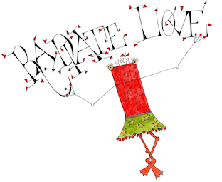 Calligrapher and book designer in Amherst, Massachusets. At Type Cooper 2021, she designed a flared stroke font, Bambo, that showcases her calligraphic background. [Google]
[More] ⦿
|
Fatima Albudoor
|
Art student in Boston. Designer of the hand-printed typeface Tima's Font (2011, iFontMaker) and of Blocks (2011, iFontMaker). [Google]
[More] ⦿
|
FineFonts
[Andrew Newman]
|
Andrew Newman (b. 1947) is a graphic designer in Cape Cod and Boston, who runs Andrew Newman Design and Fine Fonts. His font creations: Charade is based on the original lettering done for Sandra Brown's books, but has been refined and expanded. Handelbar Gothic (1998) is based on URW Handel Medium. Dafont link. Behance link. [Google]
[More] ⦿
|
Font Bureau
[David Berlow]

|
 Founded in 1989 by noted publications designer and consultant Roger Black and type designer David Berlow, Boston-based Font Bureau is, in my humble view, the best and most professional font design company in the world. It is uncompromising in its quest for quality. They have a good hold on the North-American newspaper market. Sam Berlow manages the company. I am not listing their fonts here---they are listed under the various type designers who have contributed to Font Bureau.
 Catalog of Font Bureau's typefaces. [Google]
[MyFonts]
[More] ⦿
|
Francis B. Courtney
|
American author (b. 1867, Worcester, MA) of The Francis B. Courtney Scrapbook. Elsewhere, in 1896, he showed these swashy penman's capital alphabets drawn by him: i, ii, iii. [Google]
[More] ⦿
|
Frank Romano
|
Rochester Institute of Technology Professor Emeritus Frank Romano had a long career in the printing and publishing industries. He was the editor and publisher of TypeWorld between 1977 and 1990, and later Electronic Publishing, Computer Artist, and Color Publishing magazines. He is the author of sixty books, including the 10,000-term Encyclopedia of Graphic Communications (with Richard Romano). His books were among the first on digital printing, computer-to-plate, workflow, PDF, QuarkXPress, InDesign, and new media. His latest books include History of the Linotype Company (RIT Press, 2013) and History of the Phototypesetting Era (California PolyTechnic Institute GRcL Press, 2014). He is president of the Museum of Printing in Haverhill, MA which houses the only collection of cold type systems. [Google]
[More] ⦿
|
Frere Jones Type
[Tobias Frere-Jones]

|
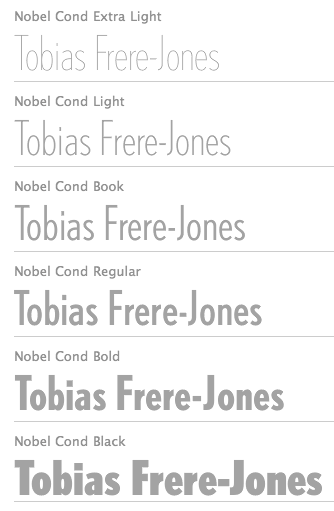 Celebrated type designer, born in 1970 in New York City. Frere-Jones received a BFA in Graphic Design from the Rhode Island School of Design in 1992. He moved to Boston, where he worked at the Font Bureau until 1999. He joined the faculty of the Yale University School of Art in 1996 and has lectured throughout the United States, Europe and Australia. From 1999 until 2014, he worked for and with Jonathan Hoefler in New York. In 2015, he set up his own type foundry, Frere Jones Type. His old Font Bureau typefaces can be bought since 2020 at Frere Jones / Type Network. His work is in the permanent collections of the Victoria & Albert Museum in London and the Museum of Modern Art in New York. In 2006, The Royal Academy of Visual Arts in The Hague (KABK) awarded him the Gerrit Noordzij Prijs, for his contributions to typographic design, writing and education. In 2013 he received the AIGA Medal, in recognition of exceptional achievements in the field of design.
 His Font Bureau typefaces: - Armada (1987-1994). A rigid elliptical sans in many styles. This is a surprisingly beautiful family despite its self-imposed design restrictions. The Compressed Black is a piano key typeface in the style of Wim Crouwel. Font Bureau: An experiment in algorithmic design, Armada follows the verticals and flat arches so often to be found in the architectural geometry of cast iron and brickwork in 19th century American cityscapes.
- Asphalt (1995). Font Bureau: Who hasn't admired the energy of Antique Olive Nord? All other ultrabolds seem sluggish in comparison. Nord exudes Excoffon's animation and Gallic impatience with the rules. Tobias Frere-Jones cross-bred the weight, proportion, and rhythms of Nord with the casual grace of his own Cafeteria, gaining informality and a dancing vitality on the page.
- Benton Sans (1995-2003). Created by Tobias frere-Jones and Cyrus Highsmith, it is a revival of Benton's 1903 family, News Gothic, and one of Font Bureau's bestsellers. It is a very complete family, ranging from regular widths to Condensed, Compressed and ExtraCompressed subfamilies. The Small Caps set is complete as well.
- Benton Modern (1997-2001). Benton Modern was originally undertaken by Tobias Frere-Jones to improve text at The Boston Globe. Widening the text face for the Detroit Free Press, he returned Century's proportions to Morris Fuller Benton's turn-of-the-century ATF Century Expanded, successfully reviving the great news text type. The italic, based on Century Schoolbook Italic, was designed by Richard Lipton and Christian Schwartz, who also added the Bold.
- Cafeteria (1993). Font Bureau about this cartoonish font: The irregularities normally found in script can enliven sans-serif letterforms. In Cafeteria, Tobias Frere-Jones took special care to balance activity with legibility on the paper napkin that served as his sketchpad, drawing a freeform sans-serif that is condensed but in no way stiff.
- Citadel (1995).
- CochinOldstyle (1992), CochinBlack (1991).
- Eldorado (1993-1994).
- Epitaph (1993). Drawn around 1880 at the Boston Type Foundry (the Boston branch of American Type Founders), Epitaph was modeled on a graceful Art Nouveau letterform that was bringing a new vitality to gravestone inscriptions at the time. The energy and life of the Vienna Secession alphabet drew the attention of Tobias Frere-Jones, who digitized the original set of titling capitals and added alternate characters for its Font Bureau release.
- Garage Gothic (1992). In three weights, it is based on parking garage ticket lettering but very reminiscent of license plate characters.
- Grand Central (1998). Grand Central was designed for 212 Associates from late-twenties capitals hand-painted on the walls of Grand Central Station. Font Bureau writes: The design is a distinguished Beaux Arts descendant of the great French Oldstyle originated by Louis Perrin in Lyons in 1846, known across Europe as Elzevir and in the U.S. as De Vinne.
- Griffith Gothic (1997-2000). A revival of Chauncey Griffith's telephone book directory typeface, Bell Gothic (1937-1938).
- Hightower (1994-1996). A Venetian typeface originally done for the Journal of the American Institute of Graphic Arts. Font Bureau: Dissatisfied with others' attempts to bring Nicholas Jenson's 1470 roman up to date, Frere-Jones prepared his version of this calligraphic roman, with his own personal italic.
- Interstate (1993, Font Bureau). Done for the United States Federal Highway Administration, but later released as a type family by Font Bureau. Interstate Mono (done with Christian Schwartz) followed in 2000, also at Font Bureau. The family is a reinterpretation of Highway Gothic, which has been the official typeface for American highway signage for decades. Its design is ultimately based on signage alphabets developed in the late 1940s by Dr. Theodore Forbes, assisted by J.E. Penton and E.E. Radek.
- Miller. A Scotch Roman finished in 1997 together with Matthew Carter and Cyrus Highsmith at Font Bureau.
- Niagara (1994). Almost a skyline typeface. Contains Niagara engraved.
- FB Nobel (1993). An exquisite geometric sans family based on old ideas of De Roos at Amsterdam who explored alternative character sets to enliven basic Futura forms. Frere-Jones views Nobel as Futura cooked in dirty pots and pans. FB Nobel showcased. The Extra Lights were added by Cyrus Highsmith and Dyana Weissman.
- Pilsner (1995). A beer bottle typeface. Font Bureau: Sitting in a Paris cafe with a bottle of beer, Tobias Frere-Jones gave his attention to the label. It was set in a roman design wearing blackletter-like clothes, probably to suggest an origin in Alsace or points to the East. Unable to forget the design, with its blocky, straight line emphasis, Tobias designed Pilsner, an exercise in straight lines in an angle-centered scheme.
- Poynter Old Style (1997, Font Bureau).
- FB Reactor (1996). This was first a FUSE7 font in 1993). Reactor destroys itself as it is put to use.
- Reiner Script (1993). Based on a 1951 brush script by Imre Reiner (ATF).
- Stereo (1993). After a typeface by Karlgeorg Hoefer, 1963 (Font Bureau says 1968).
At FontFont, he designed the children's fonts FF Dolores (1991) and FF Dolores Cyrillic. At FUSE 15, he designed Microphone (1996). At FUSE 10, he published Fibonacci, a font consisting just of lines. His custom work includes WorthGothic (1996), WorthLogo1996 (1995), WorthText (1995), GQGothic (1995), Halifax, Commonwealth (1995), Belizio-TwentySix (Font Bureau), HermanMillerLogo (1999, Font Bureau). Cassandra, Vitriol (1993), Quandry (1992-1994) and Chainletter (1993). Retina Agate (2001, specially made for small-print stock listings at the Wall Street Journal) netted him a Bukvaraz 2001 award and an AIGA 2003 Design Award. From 1999 until 2014, he designed for the Hoefler Type Foundry, which he joined as an equal partner (and the new company became Hoefler & Frere-Jones (in 2004), or H&FJ). He claims that he brought with him to H&FJ a lot of typefaces including Whitney, Whitney Titling, Elzevir, Welo Script, Archipelago (Shell Sans), Type 0, Saugerties, Greasemonkey, Vive, Apiana, and Esprit Clockface. It is not expicitly stated at the H&FJ site which typefaces he had a hand in, but one can safely assume that it must have been nearly every typeface made since he entered into the partnership. In 2014, Tobias sued Jonathan for half of the company in a 20-to-80 million dollar lawsuit since he claims that Hoefler reneged on his promise to give him his half. The typefaces at H&FJ he had a hand in include: Archer (2001, by Jonathan Hoefler and Tobias Frere Jones). A humanist slab serif originally designed for Martha Stewart Living. It has a great range of features, including a classy hairline style. Some say that Archer is just Stymie with some ball terminals. Nevertheless, it became a grand hit, and has been used by Wes Anderson in The Budapest Hotel, and by Wells Fargo for its branding. David Earls on Archer: with its judicious yet brave use of ball terminals, and blending geometry with sexy cursive forms, all brought together with the kind of historical and intellectual rigour you fully expect from this particular foundry, Archer succeeds where others falter. - HTF Retina (2002). For use in the Wall Street Journal.
- Gotham (2001). A sans serif done with the help of Jesse M. Ragan. In fact, the orignal design in 2000 was for GQ magazine. Read about it here. In 2007, he published the rounded version Gotham Round. Gotham was used in 2008 by Obama in his presidential campaign. Joshua Brustein (Business Week): Gotham is one hell of a typeface. Its Os are round, its capital letters sturdy and square, and it has the simplicity of a geometric sans without feeling clinical. The inspiration for Gotham is the lettering on signs at the Port Authority, manly works using "the type of letter that an engineer would make," according to Tobias Frere-Jones, who is widely credited with designing the font for GQ magazine in 2000. Critics have praised Gotham as blue collar, nostalgic yet exquisitely contemporary, and simply self evident. It's also ubiquitous. Gotham has appeared on Netflix (NFLX) envelopes, Coca-Cola (KO) cans, and in the Saturday Night Live logo. It was on display at the Museum of Modern Art from 2011 to 2012 and continues to be part of the museum's permanent collection. It also helped elect a president: In 2008, Barack Obama's team chose Gotham as the official typeface of the campaign and used it to spell out the word HOPE on its iconic posters. Hoefler produced versions in 2016 such as Gotham Office and Gotham Narrow Office.
- Cyclone (2003).
- In 2010, he and Jonathan Hoefler designed the sans family Forza.
- Giant (2003).
- Knoz (2003).
- Topaz (2003).
- Verlag (2006). Developed together with Jonathan Hoefler.
- Whitney (2004). This is an amazing 58-style sans family designed for the Whitney Museum, but now generally avalaible from Hoefler, and touted as a great family for infographics. A derivative, Whitney-K, is the house font of Kodak. Whitney's sales blurb: While American gothics such as News Gothic (1908) have long been a mainstay of editorial settings, and European humanists such as Frutiger (1975) have excelled in signage applications, Whitney bridges this divide in a single design. Its compact forms and broad x-height use space efficiently, and its ample counters and open shapes make it clear under any circumstances.
- With Hoefler, he collaborated on projects for The Wall Street Journal, Martha Stewart Living, Nike, Pentagram, GQ, Esquire, The New Times, Business 2.0, and The New York Times Magazine. In all, he has designed over five hundred typefaces for retail publication, custom clients, and experimental purposes. His clients have included The Boston Globe, The New York Times, The Cooper-Hewitt Museum, The Whitney Museum, The American Institute of Graphic Arts Journal, and Neville Brody. He has lectured at Rhode Island School of Design (from which he graduated with a BFA in 1992), Yale School of Art, Pratt Institute, Royal College of Art, and Universidad de las Americas. His work has been featured in How, ID, Page, and Print, and is included in the permanent collection of the Victoria&Albert Museum, London.
Interview. Interviewed by Dmitri Siegel. He created Estupido Espezial for fun, but it actually made it into an issue of Rollingstone. Catalog of his typefaces at Font Bureau. Keynote speaker at Typecon 2014. View typefaces designed by Tobias frere-Jones. Another page with typefaces created by Tobias Frere-Jones. [Google]
[MyFonts]
[More] ⦿
|
Futaba
[Colorful Typhoon (or: Kitsch Labo)]
|
[More] ⦿
|
Galapagos Design Group
[Dennis Pasternak]
|
 Foundry headed by Larry Oppenberg (President) and Mark Batty (Director). It was founded in 1994, and is based in Littleton, Massachusetts. Its main designers are Alex Kaczun, Michael Leary, Dennis Pasternak, George Ryan and Steve Zefarana.
 Makers of ITC Fontoon (1995), ITC Fontoonies (1995), ITC Gargoonies (1995), and ITC Backyard Beasties (1995). The web page of this foundry is simply superb. Web-O-Mints dingbats are free [see also here]. Other font families: AquaMintsGD, BackyardBeastiesITC, BaltraGD (lower case for a condensed style of Copperplate Gothic), BigClydeGD, FontoonITC-Regular, Fontoonies2, FontooniesITC, GargooniesITC, KennedyCusGD-Book, KennedyGD, KristenITC-Normal, KristenNotSoITC-Normal, MaiandraGD, MohawcsNoteGD, NikkiNewRomanGD-Normal, SafeFontGD, SpleenyDecafGD, StylusITC, TangientGD, TangientSerifGD, WakefieldGD-Regular. View Dennis Pasternak's typefaces. View typefaces designed by Galapagos. [Google]
[More] ⦿
|
Garon Rossignol
|
Garon Rossignol (aka DarkAngelX) (b. 1985) is the MA-based designer of the Final Fantasy Script collection (2005), Triforce (2005), Arwing (2004), Kirby Classic (2004), Super Plumber Bros (Super Mario logo font made in 2004), Diskun (2004), Humanoid Typhoon (2003), the game typeface Pretendo (2004), and the comic book typeface Pocket Monsters (2004). In 2005 he created the Pokemon Script Collection (pixel fonts): PokemonFRLG, PokemonPinballGBPartB, PokemonPinballRSPartA, PokemonPinballRSPartB, PokemonPinballRSPartC, PokemonPinballGBPartA, PokemonPuzzleChallengePartB, PokemonPuzzleChallengePartA, PokemonRSPartB, PokemonGB, PokemonRS, PokemonTCGGBPartB, PokemonTCGGBPartA, PokemonUnownGB. [Google]
[More] ⦿
|
Geo C. Rand & Avery
|
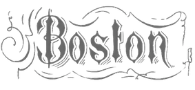 Printer in Boston who published Specimens in Boston in 1861 and in 1865. Free scan by the Boston Public Library.
 Some examples from the book: Double English Alhambra, Double English Calligraphic Script, Double English Condensed Shaded Black, Double English Script New Style, Double Great Primer Anglo Saxon, Double Great Primer Condensed Black, Double Great Primer Grecian Condensed, Double Pica Italian Script, Double Pica Saxon Open, Double Pica Saxon Ornate Shaded, Four Line Pica Condensed Title, Four Line Pica Italian, Four Line Pica Ornamented, Four Line Pica Ornamented No2, Full Face, Great Primer, Great Primer Heavy Face Antique, Great Primer Lutetian, Great Primer Script, Nevada Silver Mining Company, OrnamentNo16-Boston, OrnamentNo20-Boston, Pica Hairline Italic, Pica Hancock Script, Pica Ionic, Pica Round Shaded, Three Line Pica Graphotype, Two Line English German Text, Two Line English Open Condensed Shaded, Two Line English Ornamented No1, Two Line English Ornamented No4, Two Line Great Primer Caledonian, Two Line Great Primer Ornamented No8, Two Line Great Primer Saxon Ornate, Two Line Great Primer Tuscan Shaded No1, Two Line Pica Ornamented No5, Two Line Pica Runic, Two Line Small Pica. [Google]
[More] ⦿
|
George Burrelle-Wentworth
|
At Assumption College in Worcester, MA, George Burrelle-Wentworth designed the Peignotian typeface Medial (2016). [Google]
[More] ⦿
|
George F. Trenholm

|
American type designer (b. Cambridge, MA, 1886, d. Weston, MA, 1958). He designed Nova Script at Intertype in 1937. Other typefaces: Cornell (incl. Italic), Egmont Decorative Initials, Georgian Cursive, Trenholm Old Style&Cursive, Trenholm-Bold, Trenholm-Shaded Capitals, Waverly (incl. Italic). Some of his ornaments that appeared in ATF catalogs were digitized in American Pi NF (2006, Nick Curtis). Nova Script Recut One&Two (2011, Jim Spiece) revives Nova Script. Mac McGrew writes: - Cornell is an original, contemporary roman typeface of distinctive character. designed for Intertype by George Trenholm, who was typeface design coun- selor for that company. The roman and italic were introduced in 1948, with Cornell Bold in 1955.
- Georgian Cursive is a script typeface designed by George F. Trenholm in 1934; it was cast by Machine Composition Company in Boston in one size. It has some resemblance to Coronet and to Trafton Script, but is a little less formal; letters do not connect.
- Trenholm is an oldstyle type family designed by George F. Trenholm, Boston artist and designer, for BB&S. That company's specimen book of 1925 shows the series as being in preparation, but it was 1927 before the roman and bold were advertised as being completed, and at that time the Cursive was still being cut. In 1928 the Shaded Capitals were still listed as being cut. In 1929 BB&S was merged with ATF, and no evidence that this series was cast by ATF after that time has been found, although matrices were later listed in ATF's vaults. The roman and bold were rather conventional oldstyle designs, with sharply inclined serifs on the top of lowercase strokes, but no great distinction. The cursive was a mixture of that and italic, with no serifs at the top of ascenders. Cursive caps were distinctly that, and the shaded capitals even more so. Perhaps the series would have been successful if it had been available for a longer time, but it quickly became a rarity.
- Nova Script was designed by George F. Trenholm in 1937 for Intertype. It is a monotone cursive design, with narrow lowercase and unusual capitals. and has small serifs on some of the letters. The inclination is slight, to keep it within the limitations of straight matrices, and it was made only in one size. Compare Camera, Card Italic.
- Waverley was drawn by George Trenholm and introduced by Intertype 1 in 1940 as a modern roman that is less severe than Bodoni. It is derived from Walbaum, from the Berthold foundry in Germany, but is not a close copy. Alternate characters available include long descenders, oldstyle figures, a slightly descending cap J, and a K with a curved taillike the R. There are also several swash capitals for the italic. Compare Baskerville, Bell, Bodoni, Caledonia, Clarion, Scotch Roman.
Klingspor link. [Google]
[MyFonts]
[More] ⦿
|
George Graves
|
Graphic designer who studies visual communication at Endicott College in Beverly, MA. He create the techno typeface PakTek (2008). [Google]
[More] ⦿
|
George Hallak
[AramediA Group (Boston and Beirut)]
|
[More] ⦿
|
George Ryan
[Bilt Fonts (or: Aruban Font Foundry)]

|
[MyFonts]
[More] ⦿
|
George Ryan

|
 American designer, b. Rockville Centre, NY, 1950. George Ryan held senior positions at Linotype and Bitstream since 1979, where he has been involved in the production of over 2500 fonts. In 2004, Ryan joined Agfa Monotype, and is now a Monotype typeface designer. Creator of these typefaces:
 - The amazingly beautiful text font Kennedy GD (1995, Galapagos).
- Other Galapagos fonts: McLemore (2002), Geis (2002), Jorge (2002), Culpepper (2002, an extension and interpretation of Rudolf Koch's Neuland, 1923), the elegant formal script font Tiamaria (2002, connected script), the fat art nouveau font Robusto (2002, based on letters found in a book about Oswald Cooper), Prop Ten (2002).
- The hand-printed comic book style typeface ITC Kristen (1995).
- The legible Nikki New Roman GD (1996).
- The handwriting font MohawcsNote GD.
- The Bitstream font Oz Handicraft BT (1991). This was created by George Ryan in 1990 from a showing of Oswald Cooper's hand lettering found in The Book of Oz Cooper, published in 1949 by the Society of Typographic Arts in Chicago). A refresh was done in 2016.
- Migrate GD (now ITC Migrate).
- ITC Eborg.
- The fine dingbat font Web-O-Mints GD.
- The clean sans serif Wyle GD.
- Established in 2003 by George Ryan in Arlington, MA, Bilt Fonts (Aruban Font Foundry) sells revivals and original designs through MyFonts. Typefaces include Pietin, Geo Sans, Netto, Rescue, Jingle, Geo Tablet, Lottsa Lotta, Big Stuff, Rainman, Depth Charge, Sansand, Bulla Bulla, Kappa Nappa, Kappa Sappa, Sarabella (2004, calligraphic), Marcus Texus (fun informal), Marcus Displaeus, and Spio Beo.
- Semaphore (Bitstream, with Dave Robbins).
- In 2007, at Monotype, he made Givens Antiqua, named after Robert Givens, the co-founder and first president of Monotype Imaging---it is a soft and elegant serif family in 16 styles.
- In 2012, he published the comic book felt tip marker typeface Koorkin (Monotype).
- In 2013, he worked on an Ethiopic typeface at Monotype.
- In 2015, Monotype set out to remaster, expand and revitalize Eric Gill's body of work, with more weights, more characters and more languages to meet a wide range of design requirements. As part of that effort, George Ryan extended the popular Gill Sans from 18 to 43 fonts in his Gill Sans Nova (2015). Several new display fonts are available, including a suite of six inline weights, shadowed outline fonts that were never digitized and Gill Sans Nova Deco that was previously withdrawn from the Monotype library. Greek and Cyrillic coverage.
FontShop link. Klingspor link. View George Ryan's typefaces. [Google]
[MyFonts]
[More] ⦿
|
Gerald Cinamon
|
Gerald Cinamon was born in Boston, received his MFA Degree in Design at the School of Art and Architecture, Yale University, and has lived in London since 1961. He freelanced for numerous publishers and eventually became Chief Designer at Penguin Books for almost 20 years. His books regularly were chosen for the Best Books of the Year shows. He has written studies of designers and is now especially interested in lettering and design history. He wrote Rudolf Koch: Letterer, Type Designer, Teacher (2000, Oak Knoll Press and The British Library), E.R. Weiss: The Typography of an Artist (Oldham: Incline Press, 2011) and German Graphic Designers in the Hitler Period. He spoke about Koch at ATypI 2003 in Vancouver. [Google]
[More] ⦿
|
Gerald Giampa
[Lanston Type Co]

|
 [MyFonts]
[More] ⦿
|
Glenda de Guzman

|
 Graduate in 1992 from the Rochester Institute of Technology with a BS in Printing. While a co-op student for Monotype Typography in California, she hinted fonts. She has also carried out research at Microsoft with Robert Norton. She joined Font Bureau in 1994, but moved a few years later to Southern California.
 - Designer at Font Bureau of Bradley Initials (1994, after spectacular art deco capitals originally designed by William H. Bradley---see the 1934 ATF catalog, where it is called Bradley Ultra Modern Initials).
- She also designed Math1-Bold, Math1, Math1Mono-Bold, Math1Mono, Math2-Bold, Math2, Math2Mono-Bold, Math2Mono, Math3, Math3Bold, Math3Mono-Bold, Math3Mono, Math4-Bold, Math4, Math4Mono-Bold, Math4Mono, Math5, Math5Bold, Math5Mono, Math5MonoBold for Wolfram's Mathematica package in 1996 (truetype versions here or here or here).
FontShop link. Klingspor link. [Google]
[MyFonts]
[More] ⦿
|
Greg Mihalko
[Partners and Partners]
|
[More] ⦿
|
Hal Taylor

|
 Designer of Radio at T-26 in 2001. In 2005, he created ITC Stepp, a text and display family based on the 1930 logo for the Stetson Shoe Company of Weymouth, MA. See also here. In 2007, he designed Flexion Pro (Red Rooster), about which MyFonts writes: Flexion developed out of design philosophy and ambigramatic artwork of John Langdon. Based on the contents in Johns book Wordplay, author Dan Brown hired John to create ambigrams for his forthcoming novel Angels&Demons. Mr. Brown was so impressed with his work he even named the main character Robert Langdon after John. After the success of Angels&Demons, Dan Brown wrote The Da Vinci Code. When the movie adaptation of that book was in the works, Dan suggested that John create titles for the movie based on ambigrams. John contacted Hal Taylor to create a font based on the lettering treatment to be used for the credits at the end of the movie. Unfortunately, it was decided that the film was running long and the original title concept was scrapped. By this time, Hal was well into developing a full type family, including small caps, alternate characters, lining and ranging figures. John was impressed with the way the design was turning out and decided that it had enough merit to be released as Flexion. Jeeves (2009, Red Rooster) is an elegant script face. Wells Grotesque (2010, Red Rooster) was inspired by the H.G.Wells science fiction novel War of the Worlds, first published in 1898.
 FontShop link. Klingspor link. [Google]
[MyFonts]
[More] ⦿
|
Hannah Kieffer
|
Greenfield, MA-based designer of The Voice of Bennu (2019: decorated caps). [Google]
[More] ⦿
|
Hannah Tyson
|
 Manchester, UK-based Hannah Tyson created several hipster alphabets in 2014 and 2015. Behance link. [Google]
[More] ⦿
|
Harry Lawrence Gage
|
 Harry Gage lived in the village of Annisquam on Cape Ann, Massachusetts after he left corporate and academic life in the printing business. He produced a great deal of fine art in his later years---watercolors, designs for commemorative medals, and designs for the Christmas cards that were sent out by the village committee.
 Author of Vel Vet Show Cards (1924). Some of his alphabets can be seen in Thomas Woods Stevens's book Lettering (1916). All of the alphabets in the latter book were digitized by Dick Pape in 2012 and 2013, and are free and downloadable from this site: TWS Heavy Capitals 49, TWS Italian Gothic Caps 80 (Lombardic), TWS Renaissance Alphabet 39, TWS Robinson Caps 23, TWS Roman Caps 13, TWS Slab Capitals 22, TWS The Japanese 32. Futher digitizations of the 1916 alphabets include Jeff Levine's Tenement JNL (2020: of the Cooper Black style alphabet TWS Heavy Capitals 49), Da ABF Mafia's Yoshi Toshi (2003) and David Nalle's Yoshitoshi (2003), both of TWS The Japanese 32. [Google]
[More] ⦿
|
Harvard's DNA experiment
|
In 2012, scientist at Harvard University's Wyss Institute programmed DNA to interlock in such a way that certain shapes are made on a nanoscale. Their research, which was published in Nature, features a molecular picture with 107 designs, including emoticons, Chinese characters, numbers and letters from the Latin alphabet. The canvas is a rectangle measuring 64 nanometers by 103 nanometers, with 310 pixels. A nanometer is a billionth of a meter. [Google]
[More] ⦿
|
H.C. Hansen Type Foundry
|
Boston-based foundry. [Google]
[More] ⦿
|
Hex
[Nick Sherman]
|
Hex was founded by Nick Sherman (b. 1983). Nick is a typographer and typographic consultant based in New York City and Los Angeles. He is a co-founder of Fonts In Use and a graduate of the Type@Cooper typeface design program at Cooper Union. He serves on the board of directors for the Type Directors Club, the Adobe Typography Customer Advisory Board, as well as the artistic board for the Hamilton Wood Type & Printing Museum. He has taught typography, typeface design, letterpress printing, and responsive design at MassArt and Cooper Union. He previously worked at Font Bureau, Webtype, and MyFonts, directing web design and promotional material for typefaces. Originally from Hyannis Port and Boston, MA, he studied graphic design at MassArt in 2005. His degree project there, entitled A Modern Day Specimen Book, is beautifully presented, and leads us through thoughts on type classification to the idea of type molecules, with the nodes in the molecules representing styles or descriptions or dates, and the edges representing typefaces. He is interested in wood type, and occasionally helps out the organizers of the TypeCon conferences. As a designer at MyFonts (from 2007 until 2010), he was in charge of the interviews, presentations, and web designs of their successful and useful pages. In 2010, he joined Font Bureau. Flickr page. He is the founder of Woodtyper, an online journal focused on large and ornamented type and related matters. He also set up the type documentation project Type Record together with Indra Kupferschmid. His type designs: - Ambient (2005): a simple geometric monoline logotype for Ambient Devices.
- Sargent (2004): inspired by the lettering on the gravestones at Boston's Old Granary Burial Ground.
- Meatland (2004): a grotesk inspired by the lettering on a shop in Jamaica Plain.
- Plan 9 (2005): a squarish masculine sans typeface originally designed for a TV program called 3-B which would feature B-movies, including many horror flicks.
- HWT Brylski (2017, P22 Hamilton Wood Type Collection), named for retired wood type cutter Norb Brylski and designed to be cut as wood type at the Hamilton Wood Type & Printing Museum. It incorporates several themes that were common in 19th-century type design, including split Tuscan serifs with angled mansard-style sides, heavy weight placement at the top and bottom of letters (traditionally referred to as French or Italian/Italienne), and an extended overall width. The design was started in 2011 and released in 2017. David Jonathan Ross assisted with the final digital font production.
- Cleaner. Inspired by casual lettering seen in everyday settings: laundromats, work trucks, comics, parking signs and diners.
- Flight Center Gothic, designed for Michael Bierut's team at Pentagram as part of a restoration of the TWA Flight Center, Eero Saarinen's 1962 icon of modernist architecture at JFK airport in New York City. The typeface is a reinterpretation of the building's original signage lettering, with origins in Johannes John's Fette Kursiv-Grotesk, originally released as a standalone italic in 1892 by the J. John Söhne type foundry. David Jonathan Ross assisted with the final font production.
- Forester (2019), a typeface inspired by rounded lettering on signage at many parks in North America.
- French Tuscan. A Tuscan typeface modeled after a wood type-like typeface in the collection of Lanes Press.
- Horn Please. Inspired by a quirky, chamfered lettering style often used for Horn OK Please truck signs in India. The widths are drawn for variable interpolation.
- Kobodaishi. Kobodaishi is a digital interpretation of Electra, originally designed by W.A. Dwiggins.
- Kultur. An ultra-condensed grotesquea: It follows the ultra-narrow flat-sided headline typeface genre sometimes referred to as Inserat.
- Curvature.
- Laureate. A digital revival of Laureate, a typeface originally released by the Keystone Type Foundry at the turn of the 20th century. Sherman's version is based on an adaptation by the Ludlow Typograph Company.
- Lauweriks. Lauweriks was inspired by the Quadratuuralfabet, designed by Dutch architect and designer J.L. Mathieu Lauweriks in 1900. The new typeface adds a lowercase and refines or replaces the forms from the original caps-only design.
- Lupino Sans and Serif. Influenced by newspaper type.
- Manifold Sans and Serif. An expansion of the original manifold monospaced typeface for IBM Selectric typewriters.
- Margo. Margo is inspired by classic hand-lettered movie titles and book jackets from the 1940s and 1950s. Many of its distinctive features follow lettering from films art directed by Lyle R. Wheeler, including All About Eve, The Gunfighter, The Secret of Convict Lake, and dozens more.
- NYC Sans. NYC Sans is a typeface originally commissioned by New York City's official tourism agency, NYC & Company, as their brand typeface. The design began with my digitization of the type system from the 1970 NYCTA Graphics Standards Manual. In collaboration with Jeremy Mickel and with design direction from Emily Lessard, additional weights and refinements were developed.
- Papanek. Inspired by the energetic handwriting of industrial designer and social critic, Victor Papanek, this typeface began as a commission for use in a book on Papanek by Al Gowan. Many characteristics of the design come directly from samples of Papanek's writing.
- Phive. Based on Stephenson Blake's Condensed Sans Serifs No. 5, including a range of optical size variations.
- Plastic Script.
- Service Gothic (2020). A vernacular sans with a variable font thrown in.
- Skelter. Based on a piece of blackletter calligraphy by Jaki Svaren.
- Strike. A hairline sans based on an alphabet found in 50 Alphabete fuer Techniker und Fachschulen by Eric-Jean Müller.
He wrote Type from the Crypt about horror fonts. He started the Flickr group called Manicule about pointing hands (fists; see, e.g., here and here). He wrote the long essay on printing fists called Toward a History of the Manicule (2005). Check out this pic he took of Lucha Libre posters in Mexico City in 2009. He also designed the poster for the 2008 documentary on wood type called Typeface. Speaker at ATypI 2011 in Reykjavik. Speaker at ATypI 2013 in Amsterdam. Future Fonts link. [Google]
[More] ⦿
|
Holmes&Curtis
|
Boston-based foundry, also called E.A. Curtis, and Curtis&Mitchell. [Google]
[More] ⦿
|
Humphrey Obuobi
|
At Harvard University (Cambridge, MA) Humphrey Obuobi designed Origami X1 (2016). Behance link. [Google]
[More] ⦿
|
Humphrey Obuobi
|
As a student at Harvard, Cambridge, MA-based Humphrey Obuobi designed the circle-based typeface Centroid (2016). [Google]
[More] ⦿
|
Ian Evertson
|
Boston, MA-based designer of Retro Futura (2018). [Google]
[More] ⦿
|
Indre Puodziukynaite
|
Boston-based designer who created the high-contrast display typeface Fade Out (2013) during his studies. Behance link. [Google]
[More] ⦿
|
Isaiah Thomas
|
Typefounder, 1749-1831. Author of A Specimen of Isaiah Thomas's Printing Types. Being as Large and Complete an Assortment As Is to Be Met With in Any One Printing Office in America. Chiefly Manufactured by That Great Artist, William Caslon, Esq.; of London (Worcester, Massachusetts: Printed by Isaiah Thomas, 1785). Local download. I cite a blurb from an exhibit at Columbia University: The experiences of Adam Mappa and John Baine show that American printers wanted a domestic typefounding industry, but only if it could produce type of the quality of the English and Scottish foundries. The year after Mappa's foundry was advertised for sale, Isaiah Thomas issued this printer's specimen of type, not for sale but available for use in his printing office. The title page makes the truthful boast that this was as large and complete an assortment "as is to be met with in any one Printing-Office in America," adding that the type was "Chiefly manufactured by that great Artist, William Caslon, Esq; of London." Writing to Thomas in 1793, Ebenezer T. Andrews, in Boston, thought that Baine's type was "by no means handsome." But Thomas had not only to pay dearly for the imported type, he also had to pay import duties. By 1792, when he tried, unsuccessfully, to have the tax on type waived, the duties stood at 7-1/2% of the value of imported goods of all kinds. Instead, Congress raised the import duties on all goods to 10% in 1794, and, in order to protect the foundling American typefounding industry, specified the following year that this included all imported printing types. [Google]
[More] ⦿
|
Jack Ross
|
Boston, MA-based designer of the free fat finger fonts Blocky Sans (2016) and Middle School Essay (2016). [Google]
[More] ⦿
|
Jacqueline Sakwa

|
 Co-designer in 1993 with Richard Lipton at Bitstream of Cataneo (1991-1992; an elegant chancery cursive typeface, inspired by the work of Bennardino Cataneo, a 16th-century Italian writing master). She worked at Bitstream from 1982-1993, when she joined Galapagos as a type consultant. She lives in Massachusetts where she teaches art in an elementary school. She has a Masters degree in fine arts from the University of Massachusetts in Dartmouth (1980), and worked at the type drawing department of Compugraphic from 1980-1982. From 2001 until 2005, she created a fanciful display typeface in four weights, Minah (Font Bureau; +Black, Bold). FontShop link. [Google]
[MyFonts]
[More] ⦿
|
Jacquelyn Zaccardi
|
Boston, MA-based designer of the squarish display typeface Toast (2014). [Google]
[More] ⦿
|
James A. St. John
|
Boston and St. Louis-based typefounder, 1841-1901. He created the DeVinne series and many other 19th century typefaces. [Google]
[More] ⦿
|
James Walsh
|
 Chemistry professor at the University of Massachusetts, Amherst. Designer of the free font Academicons (2015), which can be downloaded from CTAN and Github. The academicons TeX package was written by Diogo A. B. Fernandes. Home page. [Google]
[More] ⦿
|
Javier Fuentes
|
Boston-based designer who was born in Cuba and raised in Venezuela. Behance link. He created the geometric outline typeface Jeroglifico (2011), and the Bauhaus-inspired outline typeface Dessau (2012). Behance link. Cave Graphic Design link. [Google]
[More] ⦿
|
Jessica Walker
|
Boston, MA-based designer of the sans typeface Cumulus (2015). Behance link. [Google]
[More] ⦿
|
Jewelson Fernandes
|
 As a student at Boston University, Jewelson Fernandes designed the typographic Bauhaus Manifesto poster (2016). [Google]
[More] ⦿
|
Jill Pichotta

|
 Jill Pichotta began working for Font Bureau as an apprentice with David Berlow in 1991, honing her skills on projects for Rolling Stone, Esquire, Condé Nast Traveller, The New York Times and Apple Computer. She has managed the production of retail releases for independent designers since 1993, and has contributed several typefaces at Font Bureau. In 2016, Jill Pichotta became Principal Product Manager for Type Network, overseeing type development and quality for the company's global alliance of foundry partners. Since 2021, Jill Pichotta is Vice President of Type at The Type Founders in New York.
 Jill Pichotta's typefaces: - Gangly (1996-1998). Codesigned with Joe Polevy.
- HipHop (informal printing, 1993).
- RomeoSkinnyCondensed (1991). One of the thinnest fonts on earth.
- Rats (with Jean Evans, 1997).
- FB Garamond Text and Display (1992-2000). Modeled after Ludlow's Garamond done in 1929 by Douglas Crawford McMurtrie and Robert Hunter Middleton.
- Californian FB Text and Display (1994-1999). Done in cooperation with David Berlow and Richard Lipton.
- Aardvark.
- A redesign of Matthew Carter's Postoni (1997), called Stilson (2009, with Richard Lipton and Dyana Weissman): Since 1997, The Washington Post's iconic headlines have been distinguished by their own sturdy, concise variation on Bodoni, designed by Matthew Carter. For the 2009 redesign, Richard Lipton, Jill Pichotta, and Dyana Weissman expanded the family with more refined Display & Condensed styles for use in larger sizes. Originally called Postoni, the fonts were renamed in honor of The Post's founder, Stilson Hutchins.
- Caslon FB (1992, Font Bureau) comes with this text: Our familiar Caslon Bold headletters were invented around the turn of the twentieth century in the United States and were only loosely based on William Caslons romans. The best of the Caslon Bolds originated at the Keystone Type Foundry of Philadelphia, whose Caslon Bold Condensed appeared about 1905, probably drawn by R.F. Burfeind. Jill Pichotta revised his Bold Condensed&drew the Bold Extra Condensed.
FontShop link. [Google]
[MyFonts]
[More] ⦿
|
Jim Lyles
[Park Street Studio]

|
 [MyFonts]
[More] ⦿
|
Joe Polevy

|
Boston, MA-based designer with Jill Pichotta at Font Bureau of Gangly (1996-1998, organic). Behance link. [Google]
[MyFonts]
[More] ⦿
|
Joffre LeFevre
[Aboutype]

|
[MyFonts]
[More] ⦿
|
John Collins
|
Boston-based software and web site developer for Bitstream and MyFonts, who was born in Leicester, England, in 1939. Since joining Bitstream in 1986, John Collins developed several pieces of font technology, including Fontware, Speedo, 4-in-1, TrueDoc and, most recently, the world's smallest stroke-based fonts for Chinese, Japanese and Korean languages. These developments have resulted in five U.S. patents. In 1999 John Collins became leader of the MyFonts team. He is also Vice President and Chief Technology Officer at Bitstream Inc., the parent company of MyFonts. Pic. [Google]
[More] ⦿
|
John F. Cumming

|
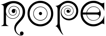 Massachusetts-based punchcutter, b. 1852, Harrisville, PA.
 - Typefaces at the Boston Type Foundry: Albino (1882), Autograph Script (1884), Bank Note Roman and Italic (1870), Banner (< 1883), Binner Gothic (< 1898), Century (1884), Cheque (1882), Clark Script (1884), Copley (1886), Dresden (1882), Duerer (1889), Facade (1892), Kismet (1879, the ultimate Victorian typeface), London (< 1885), Lubeck (1884), Magnolia Script (1884), Morris, Munich (1882), Record (1881), Rubens (1884), Skinner Script (1885), Soudan (1884), Syrian, Weimar (1886).
- Typefaces at the Dickinson Type Foundry (also in Boston): Algonquin and Algonquin Ornamented (1888), Caxton Title, Colonial (1887), Elandkay (1892), Florentine Old Script (1884), French Cursive, Globe. Gothic Script (1891), Gothic Slope, Grady (< 1891), Howland (1892), Jagged Series (1881), Karnac (1884, Victorian), Masonic Text (1890), Mother Hubbard (1885), Outing Series (1888, revived by Nick Curtis as Pique-Nique NF in 2014), Quaint (1888), Renaissant (1880, a Victorian typeface revived in 2014 by Nick Curtis as Renaissant NF), Satanick (1897), Skjald (1890), Stenograf (1890), Vertical Script (1897), Virile (1890), Visible Speech.
- Typefaces at the Hansen Type Foundry: Viking Old Style No. 3 (1899).
Comment by Mac McGrew on Howland: Howland was introduced by Dickinson in 1892 as a "companion series to DeVinne." The same design was called DeVinne Condensed (No.3) by Keystone Type Foundry, but differs from the De Vinne Condensed issued by other sources. Howland Open followed in 1894; it was copied by Linotype as Condensed Outline and suggested through the 1940s as a display typeface for classified advertising pages which banned bold types. Compare DeVinne Condensed, MacFarland Condensed. Some digitizations exist: the nice fat pre-art deco typeface Binner is offered by Linotype, Elsner & Flake (as Binner EF), and Monotype (as Binner Poster MT). Kismet was digitized by Linotype and separately by Richard Beatty as Spiral. Viking Old Style No. 3 was revived in Ingvaeonic-Oldestyle (2007, Nick Curtis)). Howland was revived by Elizabeth Carey Smith as Howland New. Jenson Oldstyle No. 2 (1893) was designed by J.W. Phinney and cut by John F. Cumming. Linotype link. FontShop link. Klingspor link. [Google]
[MyFonts]
[More] ⦿
|
John Giannopoulos
|
John Giannopoulos has been in and around the type industry since 1983, going back to the phototypesetting days with Compugraphic. Currently, he is Monotype's Director of Strategic Alliances responsible for partnering with major internet companies to advance the use of excellent typography across the web. He writes: John's personal goal is to see industry-wide web font adoption hit and exceed 25% by the end of 2013. This will ensure web font use will quickly move past early adopters and into the mainstream. Speaker at ATypI 2013 in Amsterdam: The Rapid Adoption of the Web Fonts & The Opportunities that Lie Ahead. His talk at ATypI 2014 in Barcelona was on a similar topic. John is based in Woburn, MA. [Google]
[More] ⦿
|
John Jenkins
|
Self-proclaimed writing master who wrote the pompous, childish and utterly useless The Art Of Writing (1813). [Google]
[More] ⦿
|
Jonathan Hughes

|
Jonathan Hughes (b. Framingham, MA) is a graphic designer, musician and, now, type designer in Amherst/Buffalo, NY. Creator of Zandvoort (2008), an OpenType Font containing the numbers 1 through 99 in circles. Both open (black numbers in a black outlined circle) and closed (white numbers in a black circle) versions are included. Free. Fyra (2009) is another family of circled letters and numbers. MyFonts link. Home page. [Google]
[MyFonts]
[More] ⦿
|
Jordan Dale Young
|
Boston-based designer of the colorful geometric shape typeface Party Down (2017) and Stone Henge (2017). Creative Market link. Behance link. [Google]
[More] ⦿
|
Jose Gonzalez
|
Born in the Dominican Republic, Jose Gonzalez lives in Peabody, near Boston, MA. During his studies, he created the alchemic vector format typeface Trian (2013). [Google]
[More] ⦿
|
Joseph Warren Phinney

|
 American type designer, 1848-1934. He worked in Boston, first at the Dickinson foundry, and later at ATF, where he was vice-president. He designed these typefaces:
 - Aesthetic (1882, Dickinson). This Victorian typeface was revived by Aridi as Spring.
- Cloister Black (Kinsley/ATF, 1904, available from Bitstream). According to McGrew, Cloister Black (or Cloister Text) was introduced by ATF in 1904. Its design is generally credited to Joseph W. Phinney, of ATF's Boston foundry, but some authorities give some or all of the credit to Morris Benton. It is an adaptation of Priory Text, an 1870s version of Caslon Text (q.v.), modernizing and eliminating the irregularities of that historic face, and making it one of the most popular versions of Old English. Flemish Black (q.v.), introduced at the same time, has the same lowercase and figures but a different set of capitals. Note the alternate V and W, and tied ct. ATF also makes a double lowercase l, while Monotype makes f-ligatures and diphthongs. Compare Goudy Text, Engravers Old English.
- Italian Old Style (1896, cut the punches; note--this is the Stephenson Blake name, who bought the typeface from ATF; the original name was ATF Jenson, and it in turn was modelled after Morris's Golden Type, according to Eason). Berry, Johnson and Jaspert relate Goudy's Italian Old Style typeface to Phinney's Jenson: [Italian Old Style was] designed originally as Jenson by Jos W. Phinney for American Typefounders. This type resembles Veronese, in colour, in its slab serifs and short ascenders and descenders. But the serifs on the tops of ascenders extend both sides of the main strokes. The italic is the roman inclined, even the a preserving the two-storeyed form, p and q are without foot serifs, the k has an enclosed, angular bowl. The Italian Old Style of F.W. Goudy is another recutting of Jenson, made for the Lanston Monotype. It has an unusual italic with some swash capitals. Tom Wallace explains the origins of his own Phinney Jenson in 2007: In 1890 a leader of the Arts & Crafts movement in England named William Morris founded Kelmscott Press. He was an admirer of Jenson's Roman and drew his own somewhat darker version called Golden, which he used for the hand-printing of limited editions on homemade paper, initiating the revival of fine printing in England. Morris' efforts came to the attention of Joseph Warren Phinney, manager of the Dickinson Type Foundry of Boston. Phinney requested permission to issue a commercial version, but Morris was philosophically opposed and flatly refused. So Phinney designed a commercial variation of Golden type and released it in 1893 as Jenson Oldstyle. Phinney Jenson is our version of Phinney's version of Morris' version of Nicolas Jenson's Roman.
- Abbott Oldstyle (1901). According to McGrew: Abbott Oldstyle is an eccentric novelty typeface designed in 1901 by Joseph W. Phinney for ATF. Upright stems taper inward slightly near the ends, while most other strokes are curved. Like many other typefaces of the day, each font contains several alternate characters, logotypes, and ornaments as shown. Some early specimens call it Abbot Oldstyle, without the doubled t. It bears ATF's serial number 1 because it headed the alphabetical list when the numbering system was introduced about 1930, rather than being their oldest face. Walter Long, who supplied the specimen, writes: All the fonts (sizes) are the same as to content and every item is shown on the specimen proof. So this may be the first complete font proof published, as the typeface was obsolete before founders and printers began showing all characters, and advertising typographers were still far in the future. However, a few characters in the specimen are worn or broken. Compare Bizarre Bold. For a digital version, see Abbott Old Style (2010, by SoftMaker). See also Brendel's Monsignore (1994), Alan Jay Prescott's New Abbott Old Style APT (1995), Opti/Castcraft's Abbess Opti (1990-1993), FontBank/Novel's Abbess (1990), SSI's Mandrita Display (1994), and Nick Curtis's Abbey Road NF.
- Bradley. McGrew's comments: Bradley (or Bradley Text) was designed by Herman Ihlenburg---some sources credit it to Joseph W. Phinney---from lettering by Will H. Bradley for the Christmas cover of an Inland Printer magazine. It was produced by ATF in 1895, with Italic, Extended, and Outline versions appearing about three] years later. It is a very heavy form of black-letter, based on ancient manuscripts, but with novel forms of many letters. Bradley and Bradley Outline, which were cut to register for two-color work, have the peculiarity of lower alignment for the caps than for the lowercase and figures, as may be seen in the specimens; Italic and Extended align normally. The same typeface with the addition of German characters (some of which are shown in the specimen of Bradley Extended) was sold as Ihlenburg, regular and Extended. Similar types, based on the same source and issued about the saUte time, were St. John by Inland Type Foundry, and Abbey Text by A. D. Farmer&Son. They were not as enduring as Bradley, which was resurrected fora while in 1954 by ATF. Also compare Washington Text. For a free digital revival, see Bradley Gratis (2005, Justin Callaghan).
- Camelot (1896). McGrew states: Camelot or Camelot Oldstyle was the first typeface designed by Frederic W. Goudy. He offered it to Dickinson Type Foundry (part of ATF) in Boston, which accepted it and sent him $10, twice what he had modestly asked for it. This was in 1896; it was apparently cut and released the following year as drawn, without lowercase. In February 1900 a design patent was issued in the names of Goudy and Joseph W. Phinney, and assigned to ATF. Phinney was a well-known designer for Dickinson-ATF, and apparently it was he who added the lowercase alphabet. Its success encouraged Goudy to make a distinguished career of type designing, and this typeface was included in ATF specimen books as late as 1941. Compare Canterbury.
- Cheltenham Old Style&Italic. McGrew's historical comments: The design of Cheltenham Oldstyle and Italic is credited to Bertram Grosvenor Goodhue, an architect who had previously designed Merrymount, a private press type. For Cheltenham he had the assistance of Ingalls Kimball, director of the Cheltenham Press in New York City, who suggested and supervised the face. Original drawings were made about 14 ' inches high, and were subjected to much experimentation and revision. Further modification of the design was done by the manufacturers. Some historians credit this modification or refinement to Morris F. Benton; another source says it was done at the Boston branch of ATF, which suggests that the work may have been done by Joseph W. Phinney. In fact, Steve Watts says the typeface was first known as Boston Oldstyle. Mergenthaler Linotype also claims credit for developing the face, but it was first marketed by ATF. Trial cuttings were made as early as 1899, but it was not completed until about 1902, and patented in 1904 by Kimball. It was one of the first scientifically designed typefaces.
- Engravers Old English (McGrew writes: a plain, sturdy rendition of the Blackletter style, commonly known as Old English. It was designed in 1901 by Morris Benton and another person identified by ATF only as Cowan, but has also been ascribed to Joseph W. Phinney.).
- Flemish Black (1902) (McGrew: It has the same lowercase as Cloister Black, which was introduced at the same time, but a distinctly different set of capitals. Cloister Black attained much greater popularity and longer life.).
- Globe Gothic (McGrew: a refinement of Taylor Gothic, designed about 1897 by ATF at the suggestion of Charles H. Taylor of the Boston Globe, and used extensively by that paper).
- Jenson Oldstyle&Italic, about which McGrew expounds: Jenson Oldstyle, though a comparatively crude typeface in itself, did, much to start the late nineteenth-century move toward better types and typography. Designed by J. W. Phinney of the Dickinson Type Foundry (ATF) and cut by John F. Cumming in 1893, it was based on the Golden Type of William Morris for the Kelmscott Press in 1890; that in turn was based on the 1470-76 types of Nicolas Jenson. Morris had established standards for fine printing, in spite of the fact that he did not design really fine types. Serifs in particular are clumsy, but the Jenson types quickly became popular. BB&S introduced Mazarin in 1895-96, as a revival of the Golden type, redesigned by our artist. But it was a poor copy, and was replaced by Morris Jensonian. Inland's Kelmscott, shown in 1897, was acquired by BB&S and renamed Morris Jensonian in 1912; Keystone had Ancient Roman (q. v.); Crescent Type Foundry had Morris Old Style. Hansen had Hansen Old Style (q. v.); and other founders had several other typefaces, all nearly like Jenson. It is hard to realize that Jenson was inspired by the same historic type as the later and more refined Centaur, Cloister, and Eusebius. ATF spelled the name "Jensen" in some early specimens, and added "No. 2" to the series, the latter presumably when it was adapted to standard alignment or when minor changes were made in the design. A 5-style family that includes LTC Jenson Heavyface and LTC Jenson Regular was published in 2006 at P22/Lanston. HiH produced its own typeface in 2007, called Phinney Jenson.
- Jenson Oldstyle Heavyface, introduced at the same time as the roman. McGrew: "ATF advertised Phinney's Jenson Heavyface in 1899 as "new and novel-should have been here long ago." Jenson Condensed and Bold Condensed were introduced in 1901."
- Satanick (McGrew: [..] issued by ATF in 1896, was called "the invention of John F. Cumming of Worcester, Massachusetts." It has also been credited to Joseph W. Phinney of ATF; probably Cumming cut it from Phinney's drawings. However, it was a close copy, though perhaps a little heavier, of the Troy and Chaucer types of William Morris. De Vinne called it "a crude amalgamation of Roman with Blackletter, which is said to have been modeled by Morris upon the style made by Mentel of Strasburg in or near the year 1470." See Morris Romanized Black.).
- Taylor Gothic (McGrew: ATF's Central Type Foundry branch in St. Louis claims to have originated Quentell in 1895 or earlier. The conversion to Taylor Gothic was designed by Joseph W. Phinney, while the redesign as Globe Gothic in about 1900 is credited to Morris Benton).
- Vertical Writing (McGrew: Vertical Script is a simple-almost childish-monotone upright script design, produced by Hansen in 1897. Although letters connect, they are widely spaced. The Boston foundry of ATF introduced a similar Vertical Writing, shown in 1897 and patented in 1898 by Joseph W. Phinney. Both are oversize for the body, with kerned descenders.).
Wiki. FontShop link. Klingspor link. [Google]
[MyFonts]
[More] ⦿
|
Josiah Stearns Cushing

|
 Born in 1854, died in 1913. Boston-based book printer who is usually credited with the design of Cushing in 1896 at Monotype. McGrew writes: Cushing is a group of typefaces rather than a family, for some members have little in common with each other, and were not intended to work together. Some accounts credit the design of these typefaces to Josiah Stearns Cushing, who in the late nineteenth century was president of the Norwood Press Company in Norwood, Massachusetts. Cushing was one of the most prominent printers of the day, but it seems more likely that he merely spelled out what he wanted in typefaces for his particular purposes, and that they were executed by others.
 Cushing and Cushing Italic were cut about 1897 by ATF. They are conventional roman and italic in basic design, but are almost completely uniform in weight of stroke throughout, with small oldstyle serifs, They were intended to provide a letter particularly adapted for book work, to print clearly and readably, and to reproduce well by electrotyping. A few years later they were shown as Lining Cushing No.2 and Italic, the added words probably indicating that some adjustment had necessarily been made to adapt them to the new standard alignment. BB&S had a copy of this roman under the name of Custer. in 1925 it was reissued as Bookman Lightface, in the same sizes. Compare Cardinal, Hunnewell. Frederic W. Goudy, the eminent type designer, includes Cushing Italic in his list of typefaces. In the book of his type designs, he says, "While in Hingham, Clarence Marder had me draw for him an italic to accompany the Cushing Roman already produced. ...Whether the italic shown in the specimen of today is the one I drew I cannot be sure. ..." It isn't; he went to Hingham in 1904; this Cushing Italic had been shown in 1898 or earlier. Cushing Oldstyle (later known as Lining Cushing Oldstyle No.2) was cut in the mid-1890s by ATF, and copied by Monotype in 1901. It is a sturdy, compact face, with a large x-height. In small sizes it is medium weight; from 18-point up it is a little heavier. The large, bracketed serifs and general style are similar to the early lonics, Dorics, and Clarendons. A copy of this typeface was made by Keystone under the name of Richelieu (named for Cardinal Richelieu), Linotype had it as Title No.1, and BB&S had a very similar face, Custer Bold, which in 1925 was renamed Bookman Bold. Lining Cushing Oldstyle Italic was cut about 1906 by ATF. It was cut for Monotype in 1910; the Monotype roman follows the original, being a little heavier in larger sizes, but the italic is wider than the original and uniform throughout, as patterns for the modified composition sizes were apparently used for display sizes as well. Cushing Monotone was cut about 1899, a refinement of an earlier typeface of the same name. It is generally a lighter version of Cushing Oldstyle, but not as light as Cushing [No. 2]. It is neat but undistinguished for either text or display, somewhat similar to Bookman but lighter. Uniline was a similar typeface shown later by Linotype. Also compare Cardinal. Cushing Antique was designed by Morris Benton for ATF in 1902, but not cut until 1905. An ATF announcement said of it, "Entirely redrawn and cut from new patterns. Conforms to approved outlines for antique typeface but modified to meet present-day requirements. Unquestionably the most complete and accurate series of antique made." It was copied by Ludlow in 1927. An italic was planned by ATF but not completed. Digital interpretations include ITC Cushing by Vincent Pacella (1982), Revival 721 (Bitstream), Calgary (SoftMaker), Bushing by David Bergsland (2010), and File Clerk (2020, Jeff Levine). [Google]
[MyFonts]
[More] ⦿
|
Judith Krimski
|
Boston, MA-based designer of a typographically interesting cover for the Hearh Annual Report 2017. [Google]
[More] ⦿
|
Julie Newkirk
|
Duxbury, MA-based designer of Bonespur (2018). [Google]
[More] ⦿
|
Julius Herriet Jr
|
Type designer born in 1861 in New York. At the Boston Type Foundry, he created Coburg, Facade Condensed, Makart (ca. 1886), Mural (1881), Quincy Script (ca. 1885), Rogers, Samoa, Webster (ca. 1888). At A. D. Farmer, he did Fashion Extra Condensed (some time before 1892). Facade Condensed, which has Victorian influences, is available in digitized form from Monotype. [Google]
[More] ⦿
|
Kathleen Doe
|
Designer of the art deco typeface Cinema (2002). No downloads. She received a B.S. in Electronic Media, Arts, and Communication from Rensselaer Polytechnic Institute in May of 2002, and is now working as a graphic designer at Stevens Design Studio in western Massachusetts. [Google]
[More] ⦿
|
Kellie Jayne Design
[Kellie McDonald]

|
Boston, MA-based designer of the handcrafted coffee table typeface Oatmeal Raisin (2018), Cinnamon Twist (2018) and Creme Brulee (2019: brush script). Other fonts from 2019 and 2020, all hand-drawn, include Parsnips, Key Lime, Parsnips, Jamberry, Whimsical Handwriting, Dusky Pines (Script+Serif), Happy Dance, Wagon Wheel Script, Strawberry Cake, and Boston Cream. Typefaces from 2021: Taconic. [Google]
[MyFonts]
[More] ⦿
|
Kellie McDonald
[Kellie Jayne Design]

|
[MyFonts]
[More] ⦿
|
Kelly Bowker
|
Graphic designer in Massachusetts. Creator of the display typeface Panogram (2013) and Circuit (2013). [Google]
[More] ⦿
|
Kelly Ehrgott-Milligan

|
 American designer of Belucian (Font Bureau, 1990, with David Berlow, after a 1928 design by Lucian Bernhard; +Ultra weight) and FB Empire (Font Bureau, 1989, with David Berlow). FontShop link. [Google]
[MyFonts]
[More] ⦿
|
Kelsey Gallan
|
Kelsey Gallan (Kelsey Ann's Art, a painting studio in Boston) is the American creator (b. 1994) of these free hand-printed typefaces in 2012: Traveling Through, Delicieux, Vite, Striped Sunshine, Mince, Demoi, Cantreach, Ann Brush, Chiifon & Bows, I Drawed This (sic) (children's hand), Thin Minty, Ann Marker. In 2013, she made Karroo Smallcaps, Askeses, Quirking, Alphabet Soup, Rocky Creer, Kicking Gravel, Swing High Low, Always Right, Oh My Gouache, Karma Cycle, Wildfire, Lemonade Lazy Days, Jumping Jacks, Over The Moon, Spaghetti Strap, Coming kiddo?, Get Down, and Scribbles and Giggles (scratchy face). Dafont link. [Google]
[More] ⦿
|
Ken Gitschier

|
 Graphic artist who worked for Agfa Monotype and then Monotype from 1988 until 2008, mainly as a hinting expert. Currently, he is a freelance designer in North Andover, MA. He made the scary handwriting font GitschHand (2001).
 Setimo (2015) was co-designed by Fernando Caro, Ken Gitschier, Fabio Haag and Lukas Paltram at Dalton Maag in Brazil, and won an award at Tipos Latinos 2016. [Google]
[MyFonts]
[More] ⦿
|
Ken McTague

|
Ken McTague is a sign artist working in Salem, Mass. He designed LHF Boston Truckstyle in 2002, a nice old-fashioned lettering font, and Dog Bone Roman at Letterhead Fonts. Since 2000, he runs his own sign painting and logo design company called Concept Signs. [Google]
[MyFonts]
[More] ⦿
|
Kent Lew
[Kent Lew Design (or: KL Type Foundry)]

|
[MyFonts]
[More] ⦿
|
Kent Lew Design (or: KL Type Foundry)
[Kent Lew]

|
 Kent Lew Design in Washington, Massassuchetts is where graphic designer and illustrator Kent Lew (b. California, 1962) publishes his work. He is a winner of an award at the TDC2 Type Directors Club's Type Design Competition 2002, with Whitman, an old style figures font family, published at Font Bureau in 2003. It includes Whitman Display.
 In 2018, he designed and released the sans typeface family Clarimo at Morisawa. Interview about Clarimo. FontShop link. Klingspor link. [Google]
[MyFonts]
[More] ⦿
|
Kerns&Cairns
[Dyana Weissman]

|
 American type designer, b. 1980, who graduated from the RISD, and worked at Font Bureau (as Senior Custom Designer) and Type Network (as Custom Type Director) in Boston. She set up Kerns & Cairns, also in Boston. Interview at Daidala. Interview by Christian Palino. Her typefaces:
 - Materot: calligraphic.
- She expanded the Benton Sans family into an ultra for Toyota, commissioned by Saatchi&Saatchi.
- Baskerville was modified by her for Northeastern University (via Korn Design).
- She made a font for learning handwriting for TouchMath.
- Apotek (2020): a squared counter typeface family based on lettering on old medicine bottles seen in Oslo.
- Benton Modern Display (2008), co-designed with Richard Lipton at Font Bureau: Benton Modern Text was first prepared by Font Bureau for the Boston Globe and the Detroit Free Press. Design and proportions were taken from Morris Fuller Benton's turn-of-the-century Century Expanded, drawn for ATF, faithfully reviving this epoch-making magazine and news text roman. The italic was based on Century Schoolbook.
- A redesign of Matthew Carter's Postoni (1997), called Stilson (2009, with Richard Lipton and Jill Pichotta): Since 1997, The Washington Post's iconic headlines have been distinguished by their own sturdy, concise variation on Bodoni, designed by Matthew Carter. For the 2009 redesign, Richard Lipton, Jill Pichotta, and Dyana Weissman expanded the family with more refined Display & Condensed styles for use in larger sizes. Originally called Postoni, the fonts were renamed in honor of The Post's founder, Stilson Hutchins.
- Escrow Reading Edge (2016, Font Bureau). An extension of Cyrus Highsmith's Scotch Roman, Escrow (2006).
- Syfy Hero and Syfy Sidekick.
- Waldorf Astorai. An art deco typeface inspired by the lettering on the facade of Waldorf Astoria Hotel at 301 Park Avenue in New York City.
- Comedy Sans. A 12-style typeface commissioned by Comedy Central.
- Firdevs (2022). A digitization of a Victorian typeface drawn in Silivri Prison by political prisoner and journalist Fevzi Yazici, and named after Fevzi's wife.
- CTV Sans. For the Canadian TV network.
- ESPN College Football. A custom varsity font family developed together with Victoria Rushton and loyalkaspar.
- Peacock Sans (2020, with Victoria Rushton). A custom typeface for Peacock, NBC Universal's video streaming platform.
- GRab=vity Grotesk (2021, with Victoria Rushton and CSTM Fonts).
FontShop link. Type Network link. [Google]
[MyFonts]
[More] ⦿
|
Kiera Anais
|
MA-based designer of the pixel font 51291pix (2008). [Google]
[More] ⦿
|
Kigali Designs
[Diane Collier]
|
From the blurb at TypeCon 2009: Diane Collier has over 20 years experience in type design and development specializing in complex scripts, with technical expertise in font hinting and OpenType development. Collier started her professional career in 1988 as a type designer for Compugraphic Corp. in Massachusetts, where she worked with many of today's top designers and developers. Collier started Kigali Designs in 1998 and has established a reputation in the industry for providing high quality work, while developing long term relationships with companies like Microsoft, Ascender, Monotype Imaging and others. She has written several font development specifications and created training videos for Microsoft. In addition, Collier provides training in many of the industry's type development tools for companies and individuals. When not on the computer, Collier teaches pottery and drawing at a local art school. She made a font by Arthur Baker into an 8-set family in 1994, called Kigali, an African-look family in memory of the victims of the 1994 Ruanda genocide. Kigali Designs will also do custom font work from their office in Massachusetts. [Google]
[More] ⦿
|
Knowles and Maxim
|
 Authors in Pittsfield, MA, of Real Pen Work---Self Instructor in Penmanship (1881). Selected alphabets: Slanted Letters, Business Letters, Capitals, Ornamental Alphabet, Rustic Alphabet, German Text, Old English, Marking Alphabet, Steel Pen Capitals. Additional drawings: Fists, afish, a lion, a deer, a horse, two horses, flourished heads.
 They also wrote Golden Gems of Penmanship (1884). Digital typefaces influenced by Knowles & maxim include Holly Initials (2010, David Nalle). [Google]
[More] ⦿
|
Kristen Caviston
|
Boston, MA-based designer of the ornametal caps typeface Tentacle Font (2013). [Google]
[More] ⦿
|
Kristen Connors
|
Graphic design student at Boston University. During her studies in 2012, she created a warm readable typeface family called Penmanship. [Google]
[More] ⦿
|
Kristin Rizzo
|
Graphic designer in Boston, who made a typographic poster called Gunsling Birds (2012) to promote Gunsling Birds, a future-noir rock band based in Brooklyn, New York. [Google]
[More] ⦿
|
Kristina Hem
|
Illustrator and graphic designer in Wakefield, MA. She created the modular ornamental typeface Arabian Nights (2011). [Google]
[More] ⦿
|
Kyle Hebert
|
Brighton, MA-based creator of the monoline display sans typeface Mona Surf (2014). Behance link. [Google]
[More] ⦿
|
Lance Hidy

|
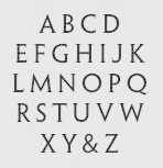 Lance Hidy (b. 1946, Portland, Oregon) studied art at Yale in 1964. After Yale, he studied calligraphy with Lloyd Reynolds and printing with Leonard Baskin and Harold McGrath at Gehenna Press before co-founding the publishing house David R. Godine (Brookline, MA) in 1969. Art director for the Harvard Business Review. He designed monographs of the work of Ansel Adams and Arnold Newman. He also made some postage stamps and silk screen posters. A resident of Merrimac, and of Newburyport, MA, he is a freelance designer of posters and books.
 Designer of the Adobe multiple master font Penumbra (1994). In its four styles, from Penumbra sans to Penumbra Flare, Penumbra Half Serif and Penumbra Serif, we see a gradual interpolation between a geometric sans and a Trajan-like classical roman serif headline face. Discussion by Phinney. MyFonts link. [Google]
[MyFonts]
[More] ⦿
|
Lanston Type Co
[Gerald Giampa]

|
 The Lanston Type Co was based in PEI, Canada, moved in 2002 to Vancouver, and moved later that year to Espoo, Finland. In 2004, Lanston was sold to P22. Its fonts can be licensed via P22 and The Type Founders. It has classic and wonderful offerings such as Albertan, Bodoni, Caslon, Deepdene (Frederic Goudy, 1929-1934; see D690 Roman on the SoftMaker MegaFont XXL CD, or URW Deepdene, or Barry Schwartz's Linden Hill (a free font)), Goudy Oldstyle, Jacobean Initials, Kennerly, Kaatskill, Water Garden and Jefferson Gothic. Owned by Gerald Giampa (b. 1950, d. Vancouver, 2009), who wrote me this: Frederic Goudy worked for us for 29 years. We manufactured Monotype casters and keyboards. The English sister company sold casters to England and the Commonwealth and we sold to the Americas and wherever else practical. Tolbert Lanston, our founder, was the inventor of Monotype. We still sell matrices and were punching them until several years ago. Soon we expect to have the equipment moved and operational once again. We are placing it into America's largest printing museum which is in Andover close to Boston. However there is a possibility that it will end up in Hull Québec. Our previous type director was Jim Rimmer of Vancouver, noted type designer. He designs, cuts and cast type in lead. Our typeface Albertan was designed by Jim and is very successful. John Hudson and Ross Mills of Tiro were directly inspired by our facilities in Vancouver. I encouraged them towards type design. The beautiful Bodoni 26 (unicase) can be bought at FontShop. Atlantic 35 (1909-1935) is a modern family first used by the Atlantic Monthly in 1909.
 The fonts: Albertan No. 977, Albertan Bold No. 978, Albertan Title No. 980,&Inline No. 979, Bodoni No. 175, Bodoni Bold No. 2175, Bodoni 26 (a Lanston unicase based on an interpretation by Sol Hess), No. 175, Caslon Old Style No. 337, Caslon Bold No's 637,&537, Deepdene No. 315, Figures Square No. 132, Flash No. 373, Fleurons C, Fleurons Granjon Folio, Fleurons Folio One, Forum No. 274, Francis No. 982, Garamont No. 248, Globe Gothic No's 240,&239,&230, Goudy Initials No. 296, Goudy Old Style No. 394, Goudy Thirty No. 392, Goudy Village (#2) No. 410, Hadriano Stone-Cut No. 409, Hadriano Title No. 309, Jacobean Initials, Jefferson Gothic No. 227, Jenson Old Style No. 508, Kaatskill No. 976, Kaufmann (Lanston Swing Bold) No. 217, Kennerley Old Style No. 268, Metropolitan No. 369, Obelisk No. 2577, Pabst Old Style No. 45, Pabst Old Style Open, Spire No. 377, 20th Century No. 605, Vine Leaves C, Vine Leaves Folio One, Vine Leaves Folio Two, Water Garden Ornaments. P22 writes this about Lanston: In the late 1800s, Tolbert Lanston licensed his technology to an English sister company and became a major international force. Lanston grew rapidly with America's pre-eminent type designer, Frederic Goudy, holding the position of art director from 1920-1947. The Philadelphia-based Lanston Monotype eventually parted ways with its English counterpart. English Monotype became simply known as Monotype from that time forth. Lanston was acquired by American Type Founders in 1969. After a series of other owners, the company found its way to master printer Gerald Giampa, who moved it to Prince Edward Island in 1988. During its time of transition, Lanston continued supplying the American market for monotype casters until January 21, 2000, when the hot-metal component of Lanston was tragically destroyed by a tidal wave. Giampa was one of the earliest developers of PostScript fonts. After the loss, he focused on digitization to an even greater extent. Under his stewardship, Lanston's classic typefaces were digitized in a style that was true to the sources, which are the brass and lead patterns from which the metal type was made. The past few years have seen Giampa and Lanston travel from Canada to Finland, and back again. Now, Lanston has completed another journey back to the United States to come under the care of a new steward: P22. Giampa is answering the call of the sea. He has traded his type founder's hat for that of a ship's captain to sail the northern Pacific coast. During his shore leaves, Giampa will act as typographic consultant to Lanston-P22. The P22 Lanston collection (2005-2006) was designed wih the help of people such as Paul Hunt and Colin Kahn. It includes these typefaces: - LTC Archive Ornaments (2014, Richard Kegler and Miranda Roth).
- LTC Artscript.
- LTC Athena.
- LTC Bodoni 175. Digital version by Paul Hunt. This is supposed to be close to the original Bodoni.
- LTC Bodoni 26.
- LTC Bodoni Bold.
- LTC Broadway. By Sol Hess.
- LTC Californian.
- LTC Camelot.
- LTC Caslon Remix.
- LTC Caslon.
- LTC Christmas Ornaments.
- LTC Circled Caps.
- LTC Cloister.
- LTC Creepy Ornaments.
- LTC Deepdene.
- LTC Figures.
- LTC Flash.
- LTC Fleurons Garamont.
- LTC Fleurons Granjon.
- LTC Fleurons Rogers.
- LTC Forum Title.
- LTC Fournier Le Jeune. A decorative all caps combines the font designed by Simon Fournier for the Peignot Foundry in 1768 with a more elaborate "Vogue Initials" caps offered by ATF in the 1920s.
- LTC Garamont.
- LTC Glamour. LTC Glamour was originally released by Lanston Monotype in 1948. It is based on Corvinus, designed by Imre Reiner. P22 designer Colin Kahn has added some unusual variants.
- LTC Globe Gothic.
- LTC Goudy Extras.
- LTC Goudy Handtooled.
- LTC Goudy Heavyface.
- LTC Goudy Initials.
- LTC Goudy Modern.
- LTC Goudy Oldstyle.
- LTC Goudy Open.
- LTC Goudy Ornate.
- LTC Goudy Sans. Goudy Sans Bold was originally designed by Fredric Goudy in 1922 as a less formal "gothic" and finished in 1929. The light was designed in 1930 and the Light Italic in 1931. Colin Kahn digitized them in 2006 to make a 6-style Goudy Sans family at P22/Lanston, which includes a Goudy Sans Hairline.
- LTC Goudy Text.
- LTC Goudy Thirty.
- LTC Hadriano.
- LTC Halloween Ornaments.
- LTC Hess Monoblack.
- LTC Holiday Ornaments.
- LTC Holly Leaves.
- LTC Italian Old Style (2007, by Paul Hunt, after Goudy Italian Oldstyle, 1924). Remastered in 2011 by Paul Grieshaber as LTC Italian Old Style Pro: LTC Italian Old Style is not to be confused with the English Monotype font also called "Italian Old Style", which is an earlier design from 1911 based on William Morris's Golden Type that is based on Nicholas Jenson's Roman face. Goudy went back to Jenson's original Roman and other Renaissance Roman typefaces for his inspiration and the result is what many consider to be the best Renaissance typeface adapted for modern use. Bruce Rogers was one of the biggest admirers of Italian Old Style and designed the original specimen book for Italian Old Style in 1924 using his trademark ornament arrangement. These ornaments are now contained in the pro versions of the Roman styles- Regular Pro and Light Pro.
- LTC Jacobean Initials.
- LTC Jefferson Gothic.
- LTC Jenson. LTC Jenson Oldstyle was designed by J. W. Phinney of the Dickinson Type Foundry in 1893 and is based on Morris's Golden Typeface. This remastered set features a true italic based on the 1893 ATF italic version as well as a newly digitized Jenson Regular (P22) and Jenson Heavyface (P22) based on Phinney's design of 1899.
- LTC Kaatskill. The italic was completed by Jim Rimmer.
- LTC Kennerley.
- LTC Keystone Ornaments.
- LTC Law Italic (Lanston's digital version from 2006). Mac McGrew: Law Italic is said to have originated as an imitation of formal styles of penmanship used for legal documents. The most common of several substantially different varieties is ATF's Law Italic No. 520, which originated with Marder, Luse about 1870. Several of the capitals are swash-like, while lowercase f and g have distinctive shapes. It has long thin serifs and sharp contrast between thick and thin strokes. Inland called the same design Caledonian Italic. Hansen had Barrister Italic. Monotype's Law Italic No. 23 is a sloped roman, somewhat similar to Ronaldson. Other Law Italics are obsolete.
- LTC Metropolitan.
- LTC Nicolas Cochin.
- LTC Obelysk Grotesk. A reconstruction of Sol Hess's Spire (1937) (digital versions first by Gerald Giampa and then by Colin Kahn).
- LTC Octic Gothic.
- LTC Ornamental Initials. Floriated caps.
- LTC Ornaments Animalia.
- LTC Ornaments One.
- LTC Ornaments Three.
- LTC Ornaments Two.
- LTC Pabst Oldstyle.
- LTC Powell.
- LTC Record Title.
- LTC Remington Typewriter.
- LTC Spire.
- LTC Squareface. By Sol Hess.
- LTC Swing Bold.
- LTC Tourist Gothic. By Sol Hess.
- LTC Twentieth Century.
- LTC Village No 2.
- LTC Vine Leaves.
- LTC Water Garden Ornaments.
- LTC Winchell (2021, Richard Kegler). A revival of Inland Type Foundry's Winchell (1906).
Fonts can be purchased from MyFonts where all fonts have the prefix LTC. Obituary of Giampa and links to obituaries. Catalog of the Lanston typeface library. View the typefaces designed by Lanston. A more extensive page of Lanston Monotype typefaces. [Google]
[MyFonts]
[More] ⦿
|
Larry Oppenberg

|
ATypI states: A thirty-five year veteran of the type industry, Larry began his career as a letter drawing artist for the Mergenthaler Linotype Company in 1968, where he honed his design and management skills. Departing Mergenthaler in 1982, Larry signed on with Bitstream, Inc to form and manage the explosive growth of their design staff in the 1980s. Larry concluded his Bitstream service as Vice President of Type Operations in 1994. Larry founded Galápagos Design Group, Inc immediately thereafter, where he still serves as President. Among other typographic pursuits, Larry serves as a member of the Board of Directors of the Museum of Printing in North Andover, Massachusetts. [Google]
[MyFonts]
[More] ⦿
|
Lee Gordon
|
Designer of the Bosox (2004) athletic lettering family, just after the Boston Red Sox won the World Series. Fontspace link. Dafont link. [Google]
[More] ⦿
|
Lee Schulz
|
Boston-based designer of the Type Directors Club 1999 award-winning design Antionette, an "extreme Victorian" face. His Salome also won an award at the same competition. Hrant Papazian on Schulz when he wrote a piece on a CalArts exhibition: Then there was Lee Schulz with his dedicated craftsmanship and astonishing inspirational range: the hyper-decorative Antoinette; the gloriously organic Salome; the surprising low-res Batterie; the reserved Minister. [Google]
[More] ⦿
|
Leo Charre
[Leo Charre Art&Design]
|
[More] ⦿
|
Leo Charre Art&Design
[Leo Charre]
|
Leo Charre Art&Design is founded by Leo Charre (b. 1976), who lived in Boston but now resides in Albany, NY. He created Gunlab (2001, dingbats; see also here), Pixelboy (2 pixel fonts), Chroma (pixel face). His site has a 200+ font archive as well. Alternate URL. [Google]
[More] ⦿
|
Linseed Studio
|
 Boston, MA-based designer of the squarish typeface Solia Sans (2017), which was inspired by the architecture and modernism of Seoul. In 2018, Linseed Studio designed Nosferatu (a tall shivery Halloween font with ornmaments), Belknap, 3d Sketch and the handcrafted Time Will Tell. [Google]
[More] ⦿
|
Lipton Letter Design
[Richard Lipton]

|
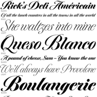 Calligrapher, sign painter, and graphic and type designer from Milton, Mass., who was born in New York, studied design and photography at Harpur College there (graduating in 1975), did some lettering in Syracuse until 1977, worked for Bitstream in Boston from 1983-1991, and made a career afterwards as a staff type designer at Boston's Font Bureau. In 2016, he joined Type Network, where his fonts can be bought. Since 2021, Richard Lipton is senior type designer at The Type Founders in New York. MyFonts page. MyFonts interview in which his modesty comes to the fore. His typefaces:
 - Alhambra: a calligraphic typeface.
- Apotek: based on lettering on old medicine bottles seen in Oslo.
- Arrus BT (Bitstream, 1991). This is a serif typeface with heavy calligraphic influences. The capitals are roman inscriptional. More typefaces in this style are to come, he promised in 2010.
- Avalon (1995, calligraphic): based on the calligraphic writing of Austrian artist Friedrich Neugebauer.
- Bennet Text, Bennet Display (36 styles: a wedge serif news text family), Bennet Banner (36 styles). This high contrast didone-themed superfamily (but for the wedge serifs) can't shed that "look at me" vibe. The initial idea for Bennet came from Moth Design's logotype and stationery system for the North Bennet Street School in Boston.
- Benton Modern Display (2008, co-designed with Richard Lipton at Font Bureau: Benton Modern Text was first prepared by Font Bureau for the Boston Globe and the Detroit Free Press. Design and proportions were taken from Morris Fuller Benton's turn-of-the-century Century Expanded, drawn for ATF, faithfully reviving this epoch-making magazine and news text roman. The italic was based on Century Schoolbook.). See also here.
- Bickham Script (1997, Adobe): The 2004 OpenType Pro version has hundreds of ligatures and substitute forms. See also Bickham Script 3 (2014). Review of Bickham by Timothy Rolands. Bickham Script is based on examples from Bickham's The Universal Penman. Poster by Fernanda D'Andrea (2013). Bickham Script 3 won an award at Modern Cyrillic 2014.
- Bodoni FB (1992, Font Bureau, a headline bold based on Benton's 1933 Ultra Bodoni).
- Bremen (Bitstream), Bremen (1992, Font Bureau). This German art deco face was influenced by the poster lettering of Ludwig Hohlwein in 1922. Munich is an angular version of Bremen.
- Bureau Grot. One of Font Bureau's bestsellers.
- Canto (2011, Font Bureau) is a 32-style roman family that started out from the Trajan inscriptions via a few styles called Canto Brush to smooth and delicate styles such as Canto Pen. New styles were added in 2017.
- Cataneo BT (Bitstream, 1993; with Jacqueline Sakwa): an elegant chancery cursive based on the calligraphic work of the 16th-century writing master Bernardino Cataneo.
- Ecru
- Escrow Banner (2016). An extension of Cyrus Highsmith's Scotch Roman, Escrow (2006).
- Hoffmann (1993): a display family that is based on lettering by Lothar Hoffmann.
- Meno (1994, Font Bureau). Lipton explains his oldstyle design: the romans gain their energy from French baroque forms cut late in the sixteenth century by Robert Granjon, the italics from Dirk Voskens' work in seventeenth-century Amsterdam. In 2016, he extended Meno to a 78-style superfamily. In 2021, MyFonts released Meno Text and in 2022 Meno Display (36 styles) and Meno Banner (36 styles).
- Miller Banner (2010, Font Bureau): a completion of Matthew Carter's Scotch family Miller, that has banner and titling styles, and adds styles with extreme contrast and hairline serifs.
- Moderno FB
- Munich.
- Nutcracker.
- Rocky (2008, Font Bureau, with Matthew Carter).
- Savanna Script (2013). A connected tightly spaced calligraphic script in three weights.
- Shimano: an industrial geometric font.
- Shogun (with Margo Chase, 1995).
- Sloop Script (a penmanship script, 1994), inspired by the lettering of Raphael Boguslav. Sloop Script won an award at Modern Cyrillic 2014. Type Network published Sloop Script Pro in 2018. MyFonts relesed Sloop Script Pro in 2021.
- Talon
- Tangier (2010, Font Bureau): a Spencerian calligraphic family that was part of the 2008 redesign of Glamour Magzine.
A redesign of Matthew Carter's Postoni (1997), called Stilson (2009, with Jill Pichotta and Dyana Weissman): Since 1997, The Washington Post's iconic headlines have been distinguished by their own sturdy, concise variation on Bodoni, designed by Matthew Carter. For the 2009 redesign, Richard Lipton, Jill Pichotta, and Dyana Weissman expanded the family with more refined Display & Condensed styles for use in larger sizes. Originally called Postoni, the fonts were renamed in honor of The Post's founder, Stilson Hutchins. - Delaney (2016).
- Collier (2018). A 150+-style lapidary flared stem typeface family ranging from Compressed to Extra Extended widths.
- Englewood (2022). A script whose inspiration for Englewood came from the calligraphic hand of Philip Grushkin.
I Love Typography link. Klingspor link. FontShop link. Type Network link. MyFonts interview. View Richard Lipton's typefaces. [Google]
[MyFonts]
[More] ⦿
|
Lizzy Hartley Design
[Elizabeth Kate Hartley]

|
Lizzy Hartley Design (Hamilton, MA) is Elizabeth Hartley's foundry. Elizabeth was a student at Flagler College in Tallahassee, FL. She created the hairline sans typeface Satin (2011). Dafont link. [Google]
[MyFonts]
[More] ⦿
|
Louis Prang
|
 Prussian-American printer and lithographer, 1824-1909. Boston-based author of Prang's Standard Alphabets (1878) and Prang's Standard Alphabets (1901, publ. Taber-Prang Art Co, Springfield, MA).
 Typefaces based on Prang's examples include Prangs (2016, Alejandro Paul, Sudtipos), a thinly connected italic didone. [Google]
[More] ⦿
|
Lucida
|
A set of metrics for the Lucida math fonts. Done by Sebastian Rahtz (CERN) and Karl Berry (University of Massassuchetts at Boston). [Google]
[More] ⦿
|
Ludvig S. Ipsen
|
Type designer based in Malden, MA. In 1903, he patented two typefaces for ATF, and many people believe that he therefore was the designer at ATF of ATF Florentine Old Style (1896). Mac McGrew writes: Florentine or Florentine Oldstyle was advertised by ATF in 1896 as a caps-and-small-caps design, but quickly replaced by Florentine Oldstyle No.2. with lowercase instead of small caps. Florentine Heavyface followed in 1898. The latter was renamed Florentine Bold, and condensed and extra condensed widths were added in 1903, and became popular advertising typefaces. Some of these were patented in the name of Ludvig S. Ipsen, and presumably he was the designer. ATF said of the Oldstyle: "Many of the characters are transcripts of the lettering of a famous Italian monument of the sixth century," although it is a rather bizarre novelty series. The advertizing for Florentine Old Style was in The Inland Printer, March 1896. In the digital age, we have these revivals and interpretations: - Florentine by URW. No date, no designer. This interpretation leans more towards art nouveau.
- Florentine (2012) by SoftMaker. Earlier, SoftMaker had F761 Deco in its line-up.
- OPTI Tommy by Castcraft.
- Agfa Monotype's Florentine AT Script (2002).
[Google]
[More] ⦿
|
Maggie Putnam
|
At he Type @ Cooper program in 2012, Maggie Putnam (Boston, MA) created the Monocle typeface. In 2012, she started the MA book design program at Reading in the UK. [Google]
[More] ⦿
|
Margaret Shepherd
|
 American calligrapher whose blog contains almost 200 calligraphic alphabets drawn by her in 2013. lives in Boston, where she created the Boston Calligraphy Trail.
 Author of Learn calligraphy, Learn World Calligraphy, Calligraphy Alphabets Made Easy, Using Calligraphy, Calligraphy Made Easy. She also wrote Capitals for Calligraphy: A Sourcebook of Decorative Letters (1981). The alphabets from the first half of 2013: 4penheavyBookhand, 7-11Segmentdisplay, 7segmentdisplay, 8712Roman, A+C, AngularItalic, Antiquarr, AssortedGothicfromLC, Aura_caps, Backhand, Bamboo, Beady1, Benedictus, BigKid, Blister, BoldBookhand, Bookshelf, BrightIdeaupperleft, BrightIdeaupperright, Brightideaoverhead, Caroling, Celticcaps, Celticcommoncase, Celticlc, Coiltic, Continuo, Coopywithpens, Copperlight.png, Cuts, DNA, Database, DeadCenter, DecoMono, Deflated,inflatedshortGothic, DeflatedGothic, DisjoinedNeuland1, Double-cross, Dryland, Durercaps, Dx6Italic1, Dx7Italic, Easterncapitals, Echo, Endless, EnglishTwo-ply, FastForward, FatUnc, Fatshadow, FlatGothic, Fleurdelis, Fraktur, FriendlyRoman, Frills, Glisten, Gothichighlightblack+gold, HalfGothic, HappyKid, Hearty, HeavyCopper, Heavycoppercaps, Heavyland, Heavyland1, Heftybutnimble, Heraldrybasic, Houseplant, Icelandictwoply, Interruptus, Italicambigramat180, Italicextralean, Italicswashcapitals6PW, Jan2Waity, Jan7Mesh, Jan8Roadside, KingArthur, Legendelc, Letterbox, LightweightItalic, LowerKingdom, Magdalene, MargaretShepherd-Pic, Masquerades, Minimalist, Miscellaneous, Moneon, MonoItalic, Morse, Mx26initials, NewYorker, Optimal, Papyruscaps, Pencildraft, Pencilrough, PlainGothic, Radiantidea, RectangularGothic, RetouchedRomans, Robot, Roman6PW, Romanalphabet, Romanshadow, Rondecaps, Rondelc, RoundedGothic, Runes, ShadyGothic, Shamrock, Shamrockcap, Shatteredalphabet, Shortcuts, Simplesplitcaps, Simplestitalic, SkinnyGothic, SlantedBookhand, Softsquare, SplitItalic, SplitSwash, Spray, Sprung, StainedGlassGothic, StarsandStripes, Staves, Studs, Superceltic, Swashcaps, Swashitalic, Talluplight, Thistle, ThuPhapred, TouchedupGothic, TowelDry, Truncatecaps, Truncatelc, Twinings, Uprightitalic1.1, Versalcircles, Versals, VerylightRoman, Vivaldi, Vivaldicaps, Yeoman, Zap, abItalicfromlc, blot, bookhand, coopylc, donut, fatcaps, legendecaps, stringy, typewriter. [Google]
[More] ⦿
|
Maria A. Lopez-Judd
|
Boston, MA-based designer of the hand-printed typeface Popsicle (2014). [Google]
[More] ⦿
|
Mariah Leah Beard
|
Mariah Leah Beard grew up in Beverly, Massachusetts and currently resides in Boston, as a student at the Massachusetts College of Art and Design, she created the clean handcrafted monoline sans typeface Mariah Papaya (2016). Behance link. [Google]
[More] ⦿
|
Marie Flaherty
[SymbolMinded]

|
[MyFonts]
[More] ⦿
|
Marie Jose de la Riva
|
Boston, MA-based creator of the mini-serifed typeface Mantina (2013), which blends features of Gotham Bold and Goudy Old Style Bold. Behance link. [Google]
[More] ⦿
|
Marilyn O'Dowd
|
Boston, MA-based designer of a set of display typefaces in 2015. [Google]
[More] ⦿
|
Marissa Fabrizio
|
Architectural intern Marissa Fabrizio (Carlisle, MA) created Offset Dim (2012), a typeface with the squarish regularity and artistic rhythm of a beautiful architectural project. [Google]
[More] ⦿
|
Mark Davis
|
 Type designer based in Brooklyn, NY. In 2014, as an intern at Typefounding (St. Louis, MO), he developed a typeface pending distribution by House Industries. In 2015, he joined Font Bureau, where he designed MF Ambulia Text (his graduation project at Type@Cooper in 2015), MF Abagnale (original headline sans from 2014), and MF Gaussian, under the umbrella of Font Bureau's Senior Font Designer, Cyrus Highsmith.
 MF Gaussian (2015) is a multiple-master didone named after the mathematical averaging process, since its bold regular weight is the average between a Didot and a Clarendon. MF Ferrans Sans and MF Alizarin were small projects from 2013. Buffalo (2014), mentioned above, is a digitization of Ed Benguiat's Benguiat Buffalo Ornamental. Based on Donald Roos's digitization of Benguiat Buffalo, it was created for Ben Kiel during an internship at Typefounding. This typeface is pending online distribution by House Industries. The luxury brand logo typeface MF Flair (2014) was the precursor of MF Gaussian. In 2016, he became graphic designer at BuzzFeedNews. Just before Election Day in 2016, he used samples of Donald Trump's scribbles to make the free comic book font BF Tiny Hand. Read what BuzzFeedNews's Ben King has to say. Behance link. Twitter link. Fontspace link for BF Tiny hand. [Google]
[More] ⦿
|
Marnen E. Laibow-Koser
|
A programmer, music composer and performing musician living in Randolph, Massachusetts. Designer of the programming font Borg Sans Mono (2016), which is based on Google's Droid Sans (2007). [Google]
[More] ⦿
|
Martina Benassi
|
Boston, MA-based student-designer of a decorative blackletter typeface in 2015. [Google]
[More] ⦿
|
Mary Catherine Pflug

|
 Boston-based American type designer who joined MyFonts as a foundry specialist in 2016. She is also one half of Type Sisters (with Lily Feinberg). Mary has a BA in International Business from Rollins College, class of 2016.
 Mary designed the beautiful pottery-style fattish poster typeface Dumpling (2012, Positype). This was a cooperation with Neil Summerour during her internship at Positype (2011-2016), but I let him explain the experience: Dumpling was drawn, digitized and mastered by an 18-year old over a semester-long Senior Concentration in Graphic Design at the South Carolina Governor's School for the Arts. Seriously, think about that! What were you doing when you were a senior in high school? I watched this unfold as her teacher, guiding where I needed to, encouraging when necessary, but ultimately putting her through a ridiculously tedious, painful and compressed process. She did not falter, she did not complain, she worked. In her own words (taken from an excerpt of her concentration paper), "In the middle of all this, I went to Charlotte, NC and saw and opera, the set designer was Jun Kaneko, [and afterwards] went to the Mint where we attended his talk (subsequently meeting him) and then perused a gallery of his work. His large ceramic forms made me realize how connected type is to sculpture. The medium may be different, but the ideas of negative space and forms interacting with each other and the view to convey a message are essentially the same. Architecture too, is surprisingly connected to type. I find myself gravitating towards the word, entasis a way of describing my letterforms, though they have no reference to the Parthenon or Classicism. In type you need balance, continuity, a little unexpectedness, and a good amount of math." [...] Mary Catherine, after completing her digitization, final tweaks, etc. in FontLab, turned the font over to me for OpenType coding and testing. In 2015, she co-designed Couture with Neil Summerour. This elegant typeface was inspired by Corvinus (Imre Reiner). On August 26, 2017, she presented the results of the second Font Purchasing Habits Survey in a 40-minute talk at TypeCon in Boston, MA. Twitter link. Dribble link. FontShop link. Home page. [Google]
[MyFonts]
[More] ⦿
|
Mary Curtis
|
 During her studies at SCAD in Savannah, GA, Randolph, MA-based Mary Curtis created Liquid (2014), a soft typeface with rounded out joints in the limbs of the glyphs. [Google]
[More] ⦿
|
Mary Louise Marino

|
Type designer at Font Bureau since 1998. Calligrapher. [Google]
[MyFonts]
[More] ⦿
|
Massachusetts College of Art&Design
|
Occasionally, one can follow a course on type design at the Massachusetts College of Art&Design in Boston. The faculty includes Brian Lucid. [Google]
[More] ⦿
|
Matt McInerney
[Pixelspread]
|
[More] ⦿
|
Matt Sulivan
[Duxbury Systems Inc]
|
[More] ⦿
|
Matthew Carter

|
 Matthew Carter (born in London in 1937, and son of Harry Carter) is one of today's most influential type designers. He trained as a punchcutter at Enschedé in 1956. In 1963 he was hired by Crosfield, a firm that pioneered the new technology of photo-typesetting, to lead their typographic program. He worked for Mergenthaler Linotype (1965-1981), and co-founded Bitstream Inc. with Mike Parker in 1981, adapting many fonts to digital technology. In January 1992, he founded Carter&Cone with Cherie Cone, and often collaborated with Font Bureau. In 1995, he won the Gold Prize at the annual Tokyo Type Directors Club competition for Sophia. In 1997, he received the TDC Medal for significant contributions to the life, art, and craft of typography. In 2010, he received a MacArthur grant. He lives in Cambridge, MA.
 John Berry on Carter's art (2002). Apostrophe comments on Berry's article. Interview. His fonts: - The Microsoft screen fonts Verdana (1996), Georgia (1996), Georgia Greek, Georgia Cyrillic, Nina and the humanist sans typeface Tahoma (1994). Georgia (in roman and italic only) is a screen version of Miller, Carter's Scotch design. Nina was designed to address the requirements on smaller screens such as phones, and was used in Windows Mobile smartphones before Microsoft switched to Segoe. The Greek and Cyrillic versions of Nina were developed by François Villebrod. Georgia Pro (2010, Ascender) was developed from Georgia with the help of Steve Matteson. For Verdana Pro (2010, Ascender), Carter was assisted by David Berlow and David Jonathan Ross.
- Apple's Skia (1993), a sans serif designed with David Berlow for Apple's QuickDraw GX technology, now called AAT. [Carter's Skia and Twombly's Lithos are genetically related.]
- Monticello (2003), based on Linotype's Monticello (1950), which in turn goes back to Binny&Ronaldson's Monticello from 1797, a typeface commissioned by Princeton University Press for the Papers of Thomas Jefferson. It is in the Scotch roman style.
- Miller (1997, Font Bureau), an extremely balanced family co-designed by Carter, Tobias Frere-Jones and Cyrus Highsmith. Carter explains: Miller is a Scotch Roman, a style that had its beginnings in the foundries of Alexander Wilson In Glasgow and William Miller in Edinburgh between about 1810 and 1820. It is considered that the punchcutter Richard Austin was responsible for the types of both Scottish foundries. Miller is a revival of the style, but is not based on any historical model. Now, there is also a 16-weight newspaper version, Miller Daily (2002), and an 8-weight Miller Headline (2002). This was followed by News Miller, a typeface designed for the Guardian. Note: Georgia (1996) is a screen version of Miller, and Monticello (2002) is a later modification. A comparison of these typefaces.
- Alisal (1995, +Bold).
- ITC Galliard (1978), a recreation of Robert Granjon's garalde letters. This typeface was originally conceived in 1965. Bringhurst recommends a Carter and Cone version of this font, called Galliard CC: it has old style figures and small caps. Further versions include Aldine 701 (Bitstream), Matthew (Softmaker), ITC Galliard Etext (2013, Carl Crossgrove, Linotype), and Gareth (Softmaker).
- The ITC Charter family (1987 for Bitstream and known as Bitstream Charter; licensed to ITC in 1993; see the Elsner&Flake version of ITC Charter). An upgraded commercial version was released by Bitstream in 2004 under the name Charter BT Pro.
- Vincent (1999), a font commissioned for use in Newsweek. It is named after Vincent Figgins, an English foundry owner and punch cutter who lived in the late 18th century.
- Walker (1994), designed for The Walker Art Center.
- Ionic Number One (1999, Carter&Cone).
- Mantinia (1993, Font Bureau), based on inscriptional forms, both painted and engraved, by the Italian renaissance artist Andrea Mantegna.
- Big Caslon (1994, Font Bureau), a display typeface based on the largest romans from William Caslon's foundry.
- Big Figgins (1992) and Big Figgins Open (1998, based on the decorative didone types shown in the specimens of Vincent Figgins of 1815 and 1817). Big Figgins was called Elephant and Elephant Italic in Microsoft's Truetype Fontpack 2.
- Sammy Roman (1996), loosely based on the 17th century romans of Jean Jannon. A beautiful typeface designed to accompany kanji and kana typefaces produced by Dynalab in Taiwan.
- Sophia (1993, Font Bureau), a mix with Greek, uncial and classical Roman influences.
- Shelley Script (1972), a family of formal scripts, split into Andante, Volante and Allegro. It is based on intricate English scripts of the 18th and 19th centuries attributed to George Shelley.
- Cochin (1977, at Linotype). MyFonts writes: In 1913 Georges Peignot produced a typeface based on Nicolas Cochin's eighteenth century engravings. In 1977, Matthew Carter expanded this historic form into a three part series.
- Bell Centennial (Linotype-Mergenthaler, 1975-1978), a legible heavily ink-trapped family designed by Matthew Carter as a replacement of Bell Gothic at Mergenthaler. There are also digital Linotype and Bitstream versions. AT&T commissioned the font to replace their previous typeface choice Bell Gothic for their 100th Anniversary.
- Cascade Script (1965-1966, Linotype, now also known as Freehand 471 BT in the Bitstream collection). Paratype's extension of Freehand 471 to Cyrillic is by Oleg Karpinsky (2011).
- New Century Schoolbook was designed from 1979-1981 in the New York Lettering office of Merganthaler Linotype based on Morris Fuller Benton's Century Schoolbook from 1915-1923. It was the second face, after New Baskerville, that was digitized and expanded using Ikarus (digital technology). The Bitstream version [Century Schoolbook] is a virtually exact copy, only being moved from a 54 unit to a 2000 or so unit design.
- Auriol (Linotype), an art nouveau family (including Auriol Flowers 1 and 2 and Auriol Vignette Sylvie) based on the lettering of the painter and designer Georges Auriol. MyFonts explains: Auriol and Auriol Flowers were designed by Georges Auriol, born Jean Georges Huyot, in the early 20th century. Auriol was a French graphic artist whose work exemplified the art nouveau style of Paris in the late 19th and early 20th centuries. In 1900, Georges Peignot asked Auriol to design fonts for Peignot&Sons. The resulting Auriol font was the basis for the lettering used by Hector Guimard for the entrance signs to the Paris Metro. It was re-released by Deberny&Peignot in 1979 with a new bold face, designed by Matthew Carter. These decorative fonts with a brush stroke look are well-suited to display settings. The Peignot drawing office insisted on a more normal appearance in the boldface, calling it Robur. Matthew Carter has returned to Auriol's original design for the whole series.
- Helvetica Greek (Linotype).
- Helvetica Compressed (Linotype, 1974, with Hans-Jörg Hunziker).
- Wilson Greek (1995), compatible with Miller Text, and based on a type cut by Alexander Wilson for the Glasgow Homer of 1756. See here.
- Olympian (1970, Linotype), designed for newspaper use. This is Dutch 811 in the Bitstream collection. The custom typeface Milne (Carter&Cone) done for the Philadelphia Inquirer is based on Olympian.
- Gando, a French "ronde" typeface based on the work of Nicholas Gando (mid 1700s), and designed for photo-typesetting at Mergenthaler by Carter and Hans-Jörg Hunziker in 1970. Very similar to Bitstream's Typo Upright.
- Fenway (1998-1999, Carter&Cone), commissioned by Sports Illustrated to replace Times Roman.
- Snell Roundhand (1965-1966): a connected cursive script based on the 18th-century round hand scripts from English writing masters such as Charles Snell. Early in the digital era, Matthew published this in the Bitstream collection as Roundhand BT. A Cyrillic version by Isabella Chaeva and Vladimir Yefimov was released by ParaType in 2013.
- Auriga (1970). (Wallis dates this in 1965 at Linotype.)
- CRT Gothic (1974).
- Video (1977).
- V&A Titling (1981).
- Deface (in the FUSE 18 collection).
- Madrid (2001), done for the Spanish newspaper El País.
- Milne, done for the Philadelphia Inquirer (a revised version of Olympian). Not available.
- Durham, a sans serif family for US News&World Report.
- Airport.
- Century 725 (Bitstream, for the Boston Globe: after a design by Heinrich Hoffmeister).
- For Microsoft: Georgia, Verdana, Tahoma (1994), Nina.
- Freehand 471 (Bitstream). A chunky slightly angular script.
- New Baskerville. [Matthew Carter says that this is wrongly attributed to him. It was directed by John Quaranta.]
- Postoni [or Post-Bodoni], for the Washington Post, which is still using it. See here.
- Le Bé, a Hebrew typeface that was used in the Pennyroyal Caxton Bible.
- Rocky (2008, Font Bureau, with Richard Lipton), for the Herald in Scotland.
- Time Caledonia.
- Wiredbaum, for WIRED.
- Wrigley (for Sports Illustrated). Matthew Carter designed Roster in the 1990s, and it was adopted as a display face for Sports Illustrated under the name Wrigley. Jesse Ragan was instrumental in later expanding the family from its original seven styles to the current 60. In 2015, Carter & Cone and Font Bureau released an expanded 60-style family of this typeface under the new name Roster.
- Benton Bold Condensed (for Time Magazine).
- Foreman Light (for the Philadelphia Inquirer).
- Newsbaum (for the New York Daily News).
- Carter Latin: Matthew was commissioned in 2003 to create a new design to be cut in wood type by the Hamilton Wood Type&Printing Museum in Two Rivers, WI. He came up with an all-caps, chunky, Latin-serif design.
- Times Cheltenham (2003), which replaces in 2003 a series of headline typefaces including Latin Extra Condensed, News Gothic, and Bookman Antique.
- The Yale Typeface (2004), inspired by the late fifteenth-century Venetian typeface that first appeared in Pietro Bembo's De Aetna, published by Aldus Manutius. This extensive family is freely available to members of Yale University.
- DTL Flamande (2004, Dutch Type Library), based on a textura by Hendrik van den Keere. Since 2018, available from URW++. Additions to DTL Flamande by Lukas Schneider.
- Meiryo UI, Meiryo UI Bold, Meiryo UI Bold Italic, Meiryo UI Italic (2004). Meiryo is a modern sans serif Japanese typeface developed by Microsoft to offer an optimal on screen reading experience and exceptional quality in print, as part of the Cleartype project. The Japanese letterforms are generously open and well-proportioned; legible and clear at smaller sizes, and dynamic at larger display sizes. The beauty of Meiryo is that it sets text lines in Japanese with Roman seamlessly and harmoniously. Meiryo was designed by a team including C&G Inc., Eiichi Kono, Matthew Carter and Thomas Rickner. It won a 2007 type design prize from the Tokyo Type Directors.
- Suntory corporate types (2003-2005), developed with the help of Akira Kobayashi and Linotype from Linotype originals: Suntory Syntax, Suntory Sabon, Suntory Gothic, Suntory Mincho.
- Rocky (2008, Font Bureau): A 40-style high contrast roman family that is difficult to classify (and a bit awkward). Developed with Richard Lipton.
- Carter Sans (2010, ITC), based on epigraphic letters used in inscriptions. Created for the identity of the Art Directors Club 2010 class of its Hall of Fame, one the laureates in the 2010 Hall of Fame. Codesigned by Dan Reynolds, this chiseled typeface is loosely based on Albertus.
- In 1997, he designed Postoni for the The Washington Post's headlines, a sturdy Bodoni.
- MS Sitka (2013). A typeface with six optical sizes that are chosen on the fly if an appropriate application is present. Developed at Microsoft with the help of John Hudson (Tiro Typeworks) and Kevin Larson (who carried out extensive legibility tests). German link. Typophile link. Sitka won an award at Modern Cyrillic 2014.
- Van Lanen Wood Type (Hamilton Wood Type, 2002-2013). Carter started work on the wood type in 2002, but technical accuracy issues postponed the implementation. Digital versions were finally done in 2013 by P22's Hamilton Wood Type.
- Big Moore (2014, Font Bureau): A 1766 specimen by Isaac Moore, former manager of Joseph Fry's foundry in Bristol, England, shows many types inspired by John Baskerville. But a century later, standardization had foisted inept lining figures and shortened descenders upon these designs. Matthew Carter remedies the tragedy with Big Moore. Oldstyle figures, full-length descenders, and historic swashes are restored to this regal serif in two styles. Big Moore won an award in the TDC 2015 Type Design competition.
- Role (2019, Sans, Slab, Serif, Soft). A superfamily published at Morisawa and Fontelier. Matthew Carter, Shotaro Nakano, and Kunihiko Okano co-designed Role Serif at Morisawa.
Speaker at ATypI 2013 in Amsterdam. Speaker at ATypI 2019 in Tokyo on the topic of Expressing Vocal Tones through Typography. Linotype link. FontShop link. Favorite quote: Watching me work is like watching a refrigerator make ice. Another quote: A typeface is a beautiful collection of letters, not a collection of beautiful letters. View Matthew Carter's typefaces. Matthew Carter's fonts. The typefaces made by Matthew Carter. See also here. Wikipedia page. Klingspor link. [Google]
[MyFonts]
[More] ⦿
|
Matthew Carter
[Carter & Cone]

|
[MyFonts]
[More] ⦿
|
Megan Gallo
|
Graduate from The College at Brockport, State University of New York. Boston, MA-based designer of the art deco typeface Gunnen (2014). Behance link. [Google]
[More] ⦿
|
Megan Gutman
|
Rockport, MA-based designer of Anedda (2011), a psychedelic typeface done at Endicott College. [Google]
[More] ⦿
|
Megan Mitchell
|
North Dartmouth, MA-based designer of Willow Script (2015). Creative Market link. [Google]
[More] ⦿
|
Melanie Chambers
|
During her studies at the The School Of The Museum Of Fine Arts in Boston, Melanie Chambers created a very detailed ornamental caps typeface called Exotica (2013). [Google]
[More] ⦿
|
Melifonts
[Melinda Jeffs]

|
 Born in Boston, MA, in 1988, Melinda Jeffs designs type. She founded Melifonts in 2011 in Hampton, NH. Creator of Drama Queen (2011, hand-printed), Belle Script (2011, curly letters), Pantsy Fance (2011, curly lettering), Rayna (2011), Donnia (2012), Sweet Cheeks (2012, hand-printed), Sariah (2011), Tandy Lee (2012, hand-printed), Polite Script, Meli Hand, and Weights and Measures (2011, slightly brushy). All her typefaces cover Cyrillic as well.
 Fontspace link. Klingspor link. [Google]
[MyFonts]
[More] ⦿
|
Melinda Jeffs
[Melifonts]

|
[MyFonts]
[More] ⦿
|
Michael Cunliffe Thompson
|
Designer (b. 1939, Bebington, UK) of the free Hebrew font family Mike Hebrew (2005). See also here. He is located in Lunenburg, MA, and works as a painter since 2002. Klingspor link. [Google]
[More] ⦿
|
Michael Fiore
|
 Worcester, MA-based designer of the Arabic simulation typeface Muad'Dib (2015), which is inspired by Frank Herbert's Dune. [Google]
[More] ⦿
|
Michael Ogulnick
|
During his studies at Northeastern University, Michael Ogulnick (Allston, MA) created the sans typeface Median (2013). [Google]
[More] ⦿
|
MIT: Digital Typography
|
This was the digital typography course of John Maeda at MIT, Cambridge, MA. Maeda has left MIT, and I have no idea if this course is still being offered. [Google]
[More] ⦿
|
Mitchell F. Brown
|
Or Mitchell Foster. Boston, MA-based designer of the mini-stencil typeface San Vicente (2017). Behance link. [Google]
[More] ⦿
|
Mohamad Karimifar
|
Designer in Boston, MA, who created the Farsi / Arabic typeface Mehraz in 2014. Behance link. [Google]
[More] ⦿
|
Molly Normandin
|
Graduate of The Art Institute of Boston. Boston, MA-based designer of the avant garde sans typeface Clip (2016) and the monoline sans family Hook (2012). [Google]
[More] ⦿
|
Monotype Imaging Inc

|
 In 2004, Monotype Imaging Inc was created when TA Associates bought Agfa-Monotype from Agfa. Its headquarters are in Woburn, MA. Agfa had bought the previous incarnation of Monotype in 1998. Before that, Agfa, a well-known photographic film, chemicals and paper manufacturer and Bayer subsidiary, entered the typography scene in 1982 by acquiring an interest in Compugraphic Corporation, the American phototypesetter company. From the press release: Based in Wilmington, MA, with regional offices in the U.K., Chicago, Redwood City, Calif., Japan and China, Monotype Imaging provides fonts and font technologies to graphic professionals, software developers and manufacturers of printers and display devices. Formerly Agfa Monotype Corp., the company also provides print drivers and color imaging technologies to OEMs (original equipment manufacturers). Monotype Imaging is home to the Monotype typeface library, a collection that includes widely used designs such as the Arial, Times New Roman and Gill Sans typeface families (now in OpenType in 21 weights). Monotype Imaging offers fonts and industry-standard solutions for most of the world's written languages. Information about Monotype Imaging and its products can be found on the company's web sites at www.monotypeimaging.com, www.fonts.com, www.monotypefonts.com, www.customfonts.com, www.fontwise.com, www.itcfonts.com and www.faces.co.uk. [...] Robert M. Givens remains as president and chief executive officer of the company. [...] Senior vice presidents Doug Shaw and John Seguin of Monotype Imaging have been named to its board of directors along with Givens and Johnston. Jonathan Meeks, a principal at TA Associates, has also joined the board. Dave McCarthy remains as vice president and general manager of Printer Imaging, and Al Ristow continues as vice president of engineering. The senior management team of Monotype Imaging also includes Jeff Burk, vice president of finance, Geoff Greve, vice president of type development, John McCallum, managing director of Monotype Imaging Ltd., David DeWitt, general manager of the U.S. consumer division, and Pattie Money, director of human resources.
 In 2006, Monotype Imaging acquires Linotype, one of the last truly dedicated and honest large type companies. In 2007, Doug Shaw succeeds Robert M. Givens as president and chief executive officer. In 2010, Monotype acquires Ascender. In 2011, Monotype buys Berthold Types, Bitstream and MyFonts. Images of their best-selling typefaces in 2011: i, ii, iii. Full catalog of Monotype's typefaces [large web page warning]. View the Monotype typeface library. [Google]
[MyFonts]
[More] ⦿
|
Montserrat College of Art
|
Located in Beverly, 20 miles north of Boston, you can take here. [Google]
[More] ⦿
|
Mourad Boutros
[Boutros International (or: Boutros Arabic Typefaces)]

|
[MyFonts]
[More] ⦿
|
MyFonts: Font Bureau
|
MyFonts hit list for Font Bureau type. [Google]
[More] ⦿
|
Natasha Taylor
|
 Boston, MA-based creator of the classy didone typeface Dallaglio (2014). [Google]
[More] ⦿
|
Nate Duval
|
Illustrator and designer in Longmeadow, MA. In 2010, he made a bicolored cutout alphabet. [Google]
[More] ⦿
|
Nelle McDade
|
Originally from Boston, Nelle McDade studied communicatrion design at Parsons in New York. Creator of an experimental pixelish CSS3-based typeface (2013). Behance link. [Google]
[More] ⦿
|
New England Type Foundry
|
Boston-based foundry, also called Baker&Greele, Greele&Willis, Henry Willis, Geo. A.&J. Curtis, Geo. A. Curtis, Hobart&Robbins, Bailey&Gilbert, and A.B. Packard. Its work can be seen in Specimen of Printing Types from the New England Type Foundry (Boston: Dutton&Wentworth, 1834). [Google]
[More] ⦿
|
Nick Sherman
[Hex]
|
[More] ⦿
|
Nicole Bogochow
|
Originally from the greater Boston area, Nicole Bogochow graduated with a BFA in Graphic and Interactive Communications from Ringling College of Art and Design. She is currently a freelance graphic designer residing in Sarasota, FL. Nicole experimented with hybrid typefaces. Her Industrial Sans (2014) blends Industria Std LT and Cottonwood, while Haiku combines Fette Fraktur with Ex Ponto in the strangest of marriages. [Google]
[More] ⦿
|
Nicole Fichera
|
Boston-based designer who focuses on architecture and branding. She created a nice logo for an architectural publication called Draft (2012), and designed a custom organic sans typeface for a non-profit company called Roxbury Gardens (2012). [Google]
[More] ⦿
|
Nicole Gavrilles
|
Boston-based photographer and typographer who is studying at Ringling College of Art and Design. The letter Y inspired her to create the experimental family Weye (2011). Behance link. [Google]
[More] ⦿
|
Nicole Vermes
|
Winchester, MA-based designer of the slab serif typeface Blacktop (2017). [Google]
[More] ⦿
|
N.S. Dearborn
|
Boston, MA-based author of American Text Book For Letters (1873). [Google]
[More] ⦿
|
Oddsorts
[Charles Gibbons]

|
 Charles Gibbons (b. 1967, Lynn, MA) received an MFA in graphic design from the Rhode Island School of Design. Gibbons spent much of the nineties as a designer for the University of Minnesota in Minneapolis and later as assistant professor of Graphic Design at the University of Wisconsin / Stout where he taught typography and publication design. In 2001, he joined the Library of Congress as the chief designer for the United States Copyright Office. Chuck has partnered with various typefoundries such as Bitstream, Filmotype, Sideshow, Tart Workshop, Device, and Cultivated Mind. The Ciao Bella ornaments he designed with Cultivated Mind's Cindy Kinash represent the first commercially available auto-chromatic fonts: each font can be set in two colors. Working with Stuart Sandler and Crystal Kluge at Tart Workshop, he developed the method by which their Aya Script delivers its characteristic curlicue ribbons. His types grace book covers, greeting cards, film titles, museum façades, and the seal of the United States Copyright Office. At present, he teaches typography and type design at Tufts University in Boston. In 2015, he set up Oddsorts. His typefaces, in more or less chronological order:
 - Aphasia BT (2000, Bitstream). He writes: A meeting of Byzantine and Art Deco forms, Aphasia began as a series of handwritten captions to accompany drawings in the early 1990s.
- At Oddsorts, he published Bradley Wayside and Bradley Chicopee in 2015: Begun in 2000 as a wedding gift for the designer's wife and used privately for years, they're finally available to the public. The fonts were inspired by the masterful art nouveau lettering of Will H. Bradley, whose posters for Ault & Wiborg printing inks and Victor Bicycles continue to draw collectors after more than a century. Wayside and Chicopee expand the twenty-odd characters Bradley drew into a comprehensive multiscript system that includes modern Greek and extended Cyrillic alphabets, ordinals, automatic fractions, and ornaments.
- In 2014, Charles Gibbons and Cindy Kinash co-designed Ciao Bella (first published at Cultivated Mind, and in 2016 at Oddsorts). It features a handcrafted copperplate script style, and several flower ornaments about which they write: The Ciao Bella ornaments he designed with Cultivated Mind's Cindy Kinash represent the first commercially available auto-chromatic fonts: each font can be set in two colors. What's truly innovative about Ciao Bella's ornaments is that most of the characters come in pairs that can be set in multiple colors without any stacking, layering, or aligning. They work in any application that supports kerning---even most word processors.
- Full Moon Suite (2001, Bitstream). Co-designed with Mary Trafton. Includes FM Black Cherry Moon, Alternate, Ligature, and Doubles. FullMoon BT won an award at the TDC2 2003 competition.
- Fleischmann BT Pro (2002). A family heralded by the typophiles as outperforming the DTL Fleischmann.
- Various Filmotype fonts for Stuart Sandler's Filmotype project. In 201, he designed the identical lively freestyle typefaces Filmotype Nemo (original from 1953), Filmotype Niro, and Filmotype Nero. The renaming was done under various scenarios of pressure. In 2011, he also made the signage typeface Filmotype Atlas. In 2012, he created the art deco fat didone typeface Filmotype Rose, and the fine brush letter signage typeface Filmotype Havana. Filmotype Adonis (2012) is a clean hand-drawn typeface. Filmotype Royal (2012) is a transitional typeface family. Typefaces from 2013: Filmotype Orlando (cartoonish), Filmotype Parade (cartoonish), Filmotype Zeal (a formal almost-copperplate script). In 2014, he added Filmotype Western (an italian, or reversed stress, typeface based on a Filmotype design from 1955), and in 2015 Filmotype Wand. Filmotype Maxwell (2019) is a revival of an interlocking Filmotype font from the 1960s.
- Greenleaf (2019).
- Local Market (2014). With Cindy Kinash. A hand-drawn collection of typefaces.
- True North (+Extras, +Textures: a vintage letterpress emulation set of fonts designed for posters and banners), 2014-2015. Done together with Cindy Kinash.
- Winooski (2015) is a fun cartoon typeface.
FontShop link. Oddsorts link. [Google]
[MyFonts]
[More] ⦿
|
Oliver Weiss
[Walden Font]

|
 [MyFonts]
[More] ⦿
|
Onna Bondoc
|
Designer from Woburn, MA, who made the font "US Presidents", which contains autographs by ALL US presidents in the order in which they served. Demo versions are in various places, but while Onna Bondoc is asking to send your money to her for a full version, the copyright notice in the demo font says "Oliver Wiess", go figure. [Google]
[More] ⦿
|
Park Street Studio
[Jim Lyles]

|
 Type foundry in Melrose, MA run by Jim Lyles. In 2014, Lyles designed the hand-drawn outlined typeface family Minotte and the rapid brush script Sanzio (2015). In 2016, Jim designed the extensive clean sans typeface family Belle Sans, which ranges from extra Condensed to Extra Wide. Creative Market link. [Google]
[MyFonts]
[More] ⦿
|
Partners and Partners
[Greg Mihalko]
|
A design practice in New York City focusing on print, exhibition, interactive and identity work with clients and collaborators in art, architecture, public spaces and activism. Designer in 2015 at MIT of the (free) Caslon 44 typeface family, and Sans 44 (which is based on GNU Free Sans). [Google]
[More] ⦿
|
Paul H. Neville

|
 Boston-based designer. His typefaces:
 - The display skyline sans serif FF Kath Condensed (1992, FontFont). It is accompanied by a gorgeous Inline. Four styles in all.
- FF Extra Condensed (1995, FontFont), one of the first blocky ultra-fat typefaces. FF Extra Black (1995, FontFont) is as black as you can get.
FontShop link. Klingspor link. [Google]
[MyFonts]
[More] ⦿
|
Paul Webb
|
Under freebies, we find the free font Rainbow Fragments (2011, geometric, experimental) made by Boston-based web designer Paul Webb. [Google]
[More] ⦿
|
Pelouze
|
A family of typefounders, starting with Edward Pelouze in Boston in 1818 until the last of the third generation of Pelouzes sold out in September 1901 to ATF to become branch 5 of American Type Founders. The link has a reproduction of The Pelouze Family of Typefounders, an article by Steve L. Watts in PAGA, vol. 4, no. 2, pp. 29-35, 1956 and a Pelouze family tree courtesy of yours truly. [Google]
[More] ⦿
|
Penmanship Made Easy
|
Book published in 1864 by George N. Comer and Oliver E. Linton in Boston, MA. They were affiliated with Comer's Commercial College in Boston. Image from that book. [Google]
[More] ⦿
|
Phil Hoa
|
East Boston, MA-based designer (b. Colombia) of the free black metal band typeface Black Drops (2014), which was developed during his studies at Montserrat College of Art in Beverly, MA. [Google]
[More] ⦿
|
Phil Pham
|
Phil Pham (of Phil Pham Design) lives in Boston. He created Legion Slab (2011), which can be downloaded here. Behance link. [Google]
[More] ⦿
|
Philip Bouwsma

|
 Type designer born in Boston in 1948 who created many exquisite designs such as Alexia (1992), Sallando Italic, Dorothea or Cresci Rotunda. His work shows the influence of masters such as Arthur Baker.
 View Philip Bouwsma's typefaces. [Google]
[MyFonts]
[More] ⦿
|
Philip Cade
[Cade Type Foundry]
|
[More] ⦿
|
Photon Inc
[Bill Garth]

|
Company in Wilmington, MA, founded by William Garth. MyFonts writes: In the 1950s, 1960s and 1970s, Photon, under Billy Garth, built a large and rambling library of low quality typefaces, original in nothing but scripts. A group of higher quality material created at Deberny&Peignot for Lumitype - Photon's European arm - under Higgonet and Moyroud was added when the younger Higgonet closed Deberny&Peignot. After Photon went out of business, the library was passed through Dymo (1975) to Itek (1979), and then to Unitex (1983), itself later acquired by Chorus Data Systems of New Hampshirer. [Google]
[MyFonts]
[More] ⦿
|
Pixelspread
[Matt McInerney]
|
Graphic designer currently working at Pentagram Design in New York. He graduated from Savannah College of Art and Design, and is originally from Western Massachusetts. At the Typesites page, Matt McInerney looks at sites that have great typographic design. He created Raleway (2009, a free hairline sans; the Google Web Fonts typeface Raleway Dots (2012) is by Brenda Gallo, Matt McInerney, Rodrigo Fuenzalida and Pablo Impallari; see here for a complete extension of Raleway between 2010-2013 by Matt McInerney, Pablo Impallari and Rodrigo Fuenzalida), New Alphabet (2008), an octagonal font based on Wim Crouwel's New Alphabet, using FontStruct. (For a commercial version of New Alphabet, check Architype New Alphabet (The Foundry). He also made Pentagrid (2009, on a 5x5 grid; +Pentagrid v2, +Pentagrid Alphabet), Dotserif, and Neuescreen, typefaces that are in the mold of New Alphabet. Orbitron (2009) is a great free futuristic sans family published at The League of Movable Type: it is a geometric sans related to both Eurostile and Bank Gothic. Romina Vespasiano made a great specimen poster for Orbitron in 2012. Allerta (+Stencil) (2010) is an open source typeface designed for use in signage. Allerta was designed to be easily and quickly read from a distance. Each letter exploits the most unique aspects of that individual letter so that each character can be easily distinguished from any other. Google Directory link. FontStruct link. Abstract Fonts link. Klingspor link. Home page of Matt McInerney. [Google]
[More] ⦿
|
Presidential Election Fonts 2008
[Sam Berlow]

|
 Sam Berlow (Font Bureau) is interviewed on New York Public Radio (WNYC radio) about the candidates' fonts. On the same topic, he also published a piece in the Boston Globe. Quotes:
 - Bush&Cheney in 2004: It had that incredible NASCAR feel with that slanted sans serif saying "We are going really fast, hang on".
- Obama [who uses Gotham for headlines]: It's classy, very metrosexual. If it were a suit, it would be Armani.
- Hillary Clinton [who uses a modified Baskerville]: It's a high-wasted serif from the 70s, the pants pulled up too high. It feels like a bad Talbot suit, it does not quite feel right.
- McCain: [About his logo] The star with the yellow bars clearly says he is a general.
- Huckabee: About a way to improve on Huckabee's cluttered and confusing look, Sam muses If it didn't look like a Daytona 500 car, that would be a good start.
[Google]
[MyFonts]
[More] ⦿
|
Priscilla Dunn
|
Somerville, MA-based creator of the elementary sans typeface Cubby (2014). [Google]
[More] ⦿
|
Qianqian Fang
[Wen Quan Yi]
|
[More] ⦿
|
Qianqian Fang
[WenQuanYi Zen Hei]
|
[More] ⦿
|
Quinn Field
|
Quinn Field, a graphic designer in Boston, created the hodge-podge typeface Blue Walle (2013) and the colorful experimental typeface Field (2014). [Google]
[More] ⦿
|
Rafael Dinner
[Rafael Dinner's fonts]
|
[More] ⦿
|
Rafael Dinner's fonts
[Rafael Dinner]
|
 MIT student who designed his own fonts at MIT, TrueType and PostScript. Illusion of 3D. Check out Reverb, ArgentumSilver, Daisy, StilettoBlack, StilettoSilver, Diamond, Grease (an oil slick typeface), Kontrast, and Rotondo Silver (texture face). Will do custom work. Type 1 versions.
 Dafont link. Abstract Fonts link. [Google]
[More] ⦿
|
Randi Giles
|
Graduate of Montserrat College, who lives in Beverly, MA. Creator of the paper fold / octagonal typeface Modern Square (2012). [Google]
[More] ⦿
|
Rawan Hammad
|
Khobar, Saudi Arabia-based designer of Arabic Greeky (2014). A the College of Design at UOD, now located in Boston, MA, Rawan Hammad designed the modular experimental typeface ABMK (2015). [Google]
[More] ⦿
|
Real Pen-Work
|
 A penmmanship instruction manual with the subtitle Self-Instructor In Penmanship, published by Knowles & Maxim, Pittsfield, Mass., and St. Catharines, Ontario, Canada. PDF file. [Google]
[More] ⦿
|
Richard Edwards
|
East Longmeadow, MA-based designer of the ornamental caps typeface Bone To Pick (2017). Behance link. [Google]
[More] ⦿
|
Richard Lipton
[Lipton Letter Design]

|
 [MyFonts]
[More] ⦿
|
Richard Yeend

|
 British cartoonist and type designer (b. London, 1945), who lived in Fourqueux, France, and is now based in Uccle, Belgium, since ca. 2000. He redesigned the The Boston Herald American, the International Herald Tribune and Die Welt. In addition, he has been Art Director for The New York Times and the European edition of The Wall Street Journal. Images of some of Richard Yeend's typefaces. Agfa/Monotype designer of Abbot Uncial, Acorn, Bangor, Broad Street, Comix, Honerswerda (Fraktur), Saxony Script, Ski Gothic (Fraktur), Xmas and Maidenhead (2001). At Linotype, he made Plantagenet, Achispado, Bandolero, Linotype Buckingham Fraktur (2002, part of TakeType 4), Linotype Richmond Fraktur, Hoyerswerda Fraktur (Agfa) and Linotype Richmond Zierschrift (2002). In 2003, as part of Linotype's Taketype 5 collection, he published Achispado LT, AmherstFraktur LT Std Bold, AmherstFraktur LT Std Heavy, AmherstFraktur LT Std Regular, AmherstGothicSplit LT Std It, AmherstGothicSplit LT Std Rg, AmherstGothicSplit LT Std RgAlt, Anasdair LT Std Bold, Anasdair LT Std BoldAlt, Anasdair LT Std Regular, Anasdair LT Std RegularAlt (2003), Bandalero LT Std, BurgstaedtAntiqua LT (Regular, Italic: with deformed letters, this is in the necrocock style), Hawkhurst LT Std Bold (2003, after a typeface by Albert Kapr), Hawkhurst LT Std BoldItalic, Hawkhurst LT Std Italic, Hawkhurst LT Std Regular, Hawkhurst LT Std RegularAlt, Hawkhurst LT Std RegularSC, Italienne LT Std (a true Western face), NeuseidlerAntiqua LT Std Bd, NeuseidlerAntiqua LT Std BdAlt, NeuseidlerAntiqua LT Std Hv, NeuseidlerAntiqua LT Std HvAlt, NeuseidlerAntiqua LT Std Rg, NeuseidlerAntiqua LT Std RgAlt. The Neuseidler family has art nouveau influences.
 View Richard Yeend's typefaces. Klingspor link. FontShop link. Linotype link. [Google]
[MyFonts]
[More] ⦿
|
Robert McElaney
|
Boston-based designer of an alien icons font called CVL Vector Symbols (2013). Behance link. [Google]
[More] ⦿
|
Robert Whalley
|
Boston-based graphic designer. Creator of the rune simulation font Ragnarok (2012), a display typeface that uses forms from pagan runes. Behance link. [Google]
[More] ⦿
|
Ruben Barrio
|
Type designer from Boston, who created Shatterboxx and Ocho8. [Google]
[More] ⦿
|
Ryan Barry
|
Graphic designer and illustrator in Worcester, MA. Creator of the free rounded sans and slab typefaces Jekyll (2015) and Hyde (2015), both finished during his studies at Becker College. [Google]
[More] ⦿
|
Ryan Struhl
|
The New Aesthetic is the page of Boston-based designer Ryan Struhl, the creator of the beautiful and warm free text typeface Cappucino Serif (2010) and of the free text typeface Kei Serif Book (2009). Devian Tart link. [Google]
[More] ⦿
|
Sabrina Gilmore
|
Boston, MA-based designer of a great display typeface in 2016. Behance link. [Google]
[More] ⦿
|
Sahba Fanaian
|
Boston-based designer of the ornamental caps typeface Fringe (2013). [Google]
[More] ⦿
|
Sam Berlow
[Presidential Election Fonts 2008]

|
 [MyFonts]
[More] ⦿
|
Samantha Silverman
|
Graphic designer in Massachusetts, who created the informally printed typeface Scraplifter (2010). [Google]
[More] ⦿
|
Samuel Nelson Dickinson
[Dickinson Type Foundry]

|
[MyFonts]
[More] ⦿
|
Sarah Dorman
|
During her studies at University Of Massachusetts, Dartmouth, Sarah Dorman (Townsend, MA) designed the deconstructed typeface Neverland (2018). [Google]
[More] ⦿
|
Scotch Roman
|
 Great discussion on Typophile regarding Scotch Roman. We have two different opinions on the source of Scotch Roman: Linotype gives it to Richard Austin, while DeVinne credits Samuel Nelson Dickinson with modelling the first Scotch in Boston in 1837. Both sources agree that it was first cut by Alexander Wilson and Son in Glasgow. In 1839, Dickinson opened his foundry with the Scotch matrices.
 Scotch is a great book and magazine typeface (short ascenders and descenders, good width, strong capitals, bracketed serifs, moderate contrast, calligraphic italics). Scotch typefaces initially come from Scottish foundries, which were popular in the United States in the late 18th century, through the Victorian era and even most of the 20th century among books, magazines, newspapers, and advertisements. It has always been more popular in the USA than elsewhere. Scan of 6-50pt Scotch Roman from the 1912 ATF book. And of 34-60pt. Summary of some Scotch typefaces: - Dwiggins' Caledonia.
- Matthew Carter created many Scoth Romans. Witness his FB Miller, Georgia ("Scotch Roman for screen"), Vincent, Big Figgins, Elephant, Caledonia (for Time magazine), and Linotype Monticello (after Binny & Ronaldson's Pica Roman No. 1, done for Princeton University Press).
- Another font in this gene is FB Scotch (1993) by David Berlow (for Newsweek), based on the original Scotch and on Dwiggins' Caledonia.
- Scotch Roman (Linotype), traced back to A.D. Farmer, 1904.
- Scotch Roman by Nick Shinn.
- Schorel (2019). A 54-style Scotch roman by Jeremy Dooley.
[Google]
[More] ⦿
|
Scott Newland
|
Boston, MA-based designer of the decorative initial caps alphabet Initial Print (2016). Behance link. [Google]
[More] ⦿
|
Scott-Martin Kosofsky
[The Philidor Company]
|
[More] ⦿
|
Scriptorium (Ragnarok Press, Fontcraft)
[David Fleming Nalle]

|
 Dave Nalle was born in Beirut on March 19, 1959, and died on February 13, 2021 from COVID in his home town of Manor, Texas. From his wiki page: Dave Nalle is a political writer, game author and font designer who was active in the early history of the development of the internet. Nalle was at one time Chairman of the Republican Liberty Caucus, a group that promotes libertarianism within the Republican Party, Senior Politics Editor at Blogcritics online magazine, and was the CEO of Scriptorium Fonts. Obituary [PDF] by Steve Jackson at the Daily Illuminator. Obituary by Shannon Appelcline at RGG Net. Obituary [PDF] at Dungeon Master Magazine.
 A creative and prolific designer, he has made hundreds of beautiful (often historic) fonts. His outfit, Scriptorium (based near Austin, TX, est. 1989), also does custom font and logo design. At some points, Scriptorium was also known as Ragnarok Press and Fontcraft. It specializes in artsy and ancient typefaces. Some subset of the fonts is made by Michael Scarpitti. Free font demos. Images of his best selling fonts. Special subpages: - Three free fonts: Onuava (a mini-serifed hybrid fixed-width font), Divona (sans), Sirona (based on Lombardic calligraphy).
- Lombardic: Aneirin, Benevento (8th century Lombardic), Cymbeline, Fabliaux, Formidable, Locksley.
- Decorative initials such as the 20th century sign lettering initials set Pencraft Initials (2009), New Saxon Initials (2016, based on work by F.G. Delamotte), Delamotte Initials One (2016), Delamotte Initials Two (2016), Holly Initials (2010, based on Real PenWork (1880s, Knowles and Maxim), Vyones (2010), Vergennes (2001), Cascade (2009), Bergling (2010; based on initials by John M. Bergling).
- Steampunk typefaces: Clockwork, Gearhead, Gears, Verne, Draughtwork, Belgravia, Boetia, Blackthorn, Linthicum, Good-fellow, Necromantic, Mephisto.
- Wild West fonts: Academy, Alcalde, Atkinson Boomtown (2009, after the lettering of Frank Atkinson), Atkinson Eccentric (2009), BigIron, Cibola, Del Norte, Lachesis, Perdido, Plowright, Primer, Riudoso, Niederwald, San Lorenzo (2011, with a Mexican and Tuscan look), Stonehouse, Manquo, Rochambeau, Purcell, Vaquero.
- Arabic simulation fonts: Samaritan is based on the poster lettering of Alphons Mucha from his poster for the play La Samaritan. Serendib and Waziri are based on the hand lettering of René Bull from his edition of the Arabian Nights. Caliph (1993) is derived from Ernst Schneidler's classic Legende font, with variant characters based on his original lettering. Also: Satampra, Jerash, Samarkand, Isfahan.
- Celtic fonts: the fonts include Constance, Durrow (1993, traditional rendering of Insular Minuscule calligraphy), Malvern, Glendower (based on the most common lettering in the Book of Kells), Knotwork (caps based on Celtic knots), Alba Text (modernized text font based on Celtic uncial lettering), Lindisfarne (based on a square uncial style), Stonecross (1997, derived from Celtic cross and gravestone inscriptions), Celtic Spirals (dingbats), Celtic Borders font (lets you combine key strokes to form decorative borders; many frames and borders are original Celtic designs by Arts&Crafts period artists like Evelyn Paul and Louis Rhead), Spiral Initials, Brigida (based on Rudolph Koch's interpretation of a squared uncial), Macteris Uncial, Coverack (heavy non-traditional uncial), Dahaut (modernized uncial), Dunsany, Glendower, Morgow (1999, spiral uncial), Teyrnon (elaborate spurred uncial), Padstow (heavy uncial), Vafthrudnir (2011, uncial), Sualtim and Columba (decorative initials based on characters found in the Book of Kells), Albemarle (2001).
- Oriental simulation fonts: Yoshitoshi (2003, based on the 1900-style writing by Yoshi Toshi.
- Gothic fonts, including Alt Gothic, Koch Gothic, Barnabas (2011), Sternhagen (2014), Montgisard (2010, roman capitals with blackletter lower case), Serenissima, Gelderland, Alcuin, Monumental, Goldwork, Waldeck, Roncesvalles, Montressor (2010, ornamental blackletter capitals), T4C Beaulieux (1998, a free copy here), Bastarda (2011), Burgundian, Cadeaulx, Collins Old English, Courtrai, Descant, Ereshkigal, Faustus, Franconian (1993, a Schwabacher), Froissart (2000), Ghost Gothic, Katisha, Koch Gothic, Ligeia, Magdeburg, Magdelena, Melusine, Pyle Gothic, Rheingold, Sanctum, Stuttgart Gothic (2010), Textura, Theodoric, Yngling (2002).
- German expressionist: Dromon.
- Renaissance fonts: Monumental Gothic, Caswallon (a Caslon family), humanist cursive (Palmieri, Castiglione and Hanes Italic), quirky Italian cursives (Fiorenza and Alleghieri), a Roman style hand-lettered font (Rudolfo and Rudolfo Swash), a Trajan-style Roman lettering (Hadrianus), a classic flourished cursive (Trinculo) and a set of floral intials from the Quattrocento (Fraticelli).
- Modern poster fonts: Ascelon, Bilitis, Cosmic Dude, Dromon, Ducatus Rough, Eglantine (after Central Type Foundry's Quaint Roman), Ekberg (2002, based on Samuel Welo's posters), Fortinbras, Hamilton, Jambon, Oblivion, Posada (2008, based on the poster lettering of Mexican artist José Guadalupe Posada), Squiffy, Suspicion, Magnin (2003).
- Mapmaker fonts: building elements are available in Basilica; Ortelius is a map dingbat font; Queensland (based on lettering by artist and calligrapher Eric Sloane), is bold, hand-drawn and reminiscent of medieval writing on maps. There are also Brandywine, Daresiel, Hesperides, Longhorne, Windlass (1996), and Cityscape. Orford (2008) is based on samples of hand lettering from a 1693 manuscript collected by Lewis Day in his classic book on historical paleography, Alphabets Old and New.
- Calligraphic fonts: Albemarle (2001), Azariel, Moncrief (2011, based on the calligraphy of J.M. Bergling), Pavane, Rasael (2009), Abdiel (2005), Roncesvalles, Gazardiel (2003, connected script), Spoonbill (2003, arts and crafts), Macteris (Roman uncial font), Antioch Uncial (Roman uncial font), Burgundian (Classic black letter font), Franconian (993, a classic black letter font), Castiglione (Attractive Renaissance lettering), Cicero (Roman Rustica font), Formidable (1993, very bold late medieval / Lombardic style), Collins Old English (Classic Old English style gothic), Corbei Uncial (Roman uncial font), Cymbeline (late medieval lettering), Durrow (Standard insular minuscule uncial font), Theodoric (Classic black letter font), Gazardiel, Ghost Gothic (Unusual gothic font), Glendower (Uncial font based on Book of Kells), Gloriana (Interesting hand lettering style), Folkard (from the hand-lettering of Charles Folkard), Offenbach Chancery, Ranegund Merovingian Courthand, Benevento (8th century Lombardic), Hesperides.
- Art deco typefaces: Imperatore (2018: based on a hand lettered design from California art deco master designer Pedro de Lemos in the 1920s), Speakeasy (2018), Gates of the West (2018), Lyceum (2014), Borealis (2009), Criterion (2011), Illuminata, Madding (2009, a bold poster font that grew out of Aventine), Alexandrine (2009), art Deco Stencil (2009, based on samples of Art Deco stencil lettering by Pedro Lemos), Falmouth.
- Art nouveau typefaces: Acadian, Agravain (2009), Amphitryon (2009), Ariosto, Asphodel, Averoigne, Beaumains (2011, based on J.M. Bergling's lettering), Beauvoir, Belgravia (based on J.M. Bergling), Bernhardt (based upon the lettering of the Czech art-nouveau artist Alphonse Mucha), Bentham, Berenicia, Boetia (2003, based on J.M. Bergling's lettering), Bruges, Bucephalus (1993), Burd Ellen (2009), Butterfield (1993; in Alfred Roller's style), Cafe Society (2018), Curetana, Damariscotta, Elsene (2011, based on lettering by early 20th century illustrator Clara Elsene Peck), Elysian, Exotique, Flaubert, Gaheris, Ganelon, Gehenna, Goodfellow, Grammophon (2019: a bold Jugendstil poster font), Harbinger, Huyot (2016, after Georges Auriol's types), Jugendstil Kunsthand (2003), Lysander, Maginot (1993; after Peter Schnorr, 1898), Munich (after the Munchner Jugend magazine), Norumbega, Odeon, Ormandine (2010), Pantagruel, Phaeton, Reggio, Rochmbeau, Rockne (2009), Rudolfo, Setebos, Sprite, Summerisle, Sylphide (2005), Undine, Valentin (2008), Vambrace (2010), Walhal, Wendingen (2016), Wormwood (2018), Zeitschrift (2016, based on the Ver Sacrum magazine).
- Modern poster fonts: Field Day (2003), Ascelon, Bilitis, Cosmic Dude, Dromon, Ducatus Rough, Eglantine (after Central Type Foundry's Quaint Roman), Ekberg (2002, based on Samuel Welo's posters), Fortinbras, Hamilton, Jambon, Oblivion, Squiffy.
- Constructivist fonts: Krasny Mir (2009), Vrubel, Structura (1997).
- Futuristic fonts: Alecto, Angelus, Circuit, Culdrose, Gearhead, Ironclaw, Parika, Sanhedrin, Semiramis (1997), Slither, Structuro, Yazata, Adastra (dings).
- Borders and ornaments. These include New Arets and Crafts Borders (20912, based on The Calendar of Golden Thoughts (Barse and Hopkins Publ, 1911).
- Boneyard fonts: Undertaker (2014), Antrobus (2010), Sepultura (2002), Halloweenies, Dementia, Boneyard, Skull and Bones, Malagua (1999-2013), Paleos (2002, from titling of B movies in the cave girl genre), Carmilla, Abaddon, Black Cow (1998), Valdemar, Cuede, Ligeia, Mayhem, Mephisto, Golgotha, Sanguinary, Ironworks, Moravia, Gehenna, Nosegrind (2005, graffiti), Corpus, Ghostly.
- School fonts: Schoolhand (2010).
- Arts and Crafts movement (late Victorian period, 19th century), based on work and lettering by Walter Crane, William Morris, Charles Rennie Mackintosh and Elbert Hubbard. The Arts&Crafts movement was enormously influential on the works of designers, artists and architects of the 20th century, and inspired the Art Nouveau and Art Deco movements. Fonts include William Morris' Kelmscott (based on Morris' Troy type), and True Golden, fonts from the Glasgow branch of the movement like Chelsea Studio (1997), which is based on Charles Rennie Mackintosh's lettering, fonts from the Roycrofters of New York like Semiramis and Ganelon, fonts based on Walter Crane's work such as Crane Gothic, Pencraft Initials (2009) and Walter Crane, and even fonts from the California Arts&Crafts period of the early 1900s like Coloma. Other typefaces: Jesse M. King (refreshed in 2015, and based on hand lettering from a frontispiece design by Glasgow-based Jessie King who was known for her lavish book covers), Aylward, Palmyra (based on work by the Roycrofters, a design community founded by Elbert Hubbard), Aylward (2010, Victorian), Hyacinth Initials, Spoonbill, Adresack (1996: inspired by the arts and crafts lettering styles of designers like Charles Rennie MacKintosh and Jessie M. King), Brandywine, Changeling (2009, based on lettering by fairy artist Fanny Railton), Goddard, and Advertising Gothic (2003), Valentin, Gaheris, Agravain (2009). Delaguerra (2001-2009) is based on a lettering style originating in the California Arts&Crafts period commonly associated with Mission Style. It is still in common usage in signage at historical sites in California.
- Victorian: Beaumarchais, Berenicia, Bilibin, Brandywine, Brigidis, Curetana, Durendal, Elphinstone, Flaubert, Folkard, Gjallarhorn, Gloriana, Hermia, Ironclaw, Magnus.
- Typewriter: Fontcraft Courier.
- Anthroposophic: Ekberg (2002, based on a sample of poster lettering by Samuel Welo).
- Medieval fonts of Scriptorium, critiqued by Marc Smith, page 65: Batwynge is based on lettre gffe by Geofroy Tory (1529), and not on an illuminated manuscript of the tenth century as claimed by Scriptorium. Perigord (1993) is based on a Carolingian alphabet drawn by Ernst Bentele in 1952. Allencon is a calligraphic font based on an interpretation of 6th century Ostrogothic Italian calligraphy.
Some selected fonts: Finchley (psychedelic), Captain Kidd (2012, an original font design based on the title lettering from the classic pirate movie starring Charles Laughton), Aerobrush (2011), Fondry Ornament (2009), Atkinson Egyptian (2008, after the lettering of Frank Atkinson), Verne (2008: remade in 2020 into Covid19), Goldwork (almost blackletter), BigBlok (2010), LetterpressGothic (2010), Plymouth (2010, in the style of Cooper Bold), Broadley (2008, an architecturally inspired script based on lettering by British architect and designer C.F.A. Voysey), Locksley (2004, medieval lettering), Tuscarora (curly lettering), Fiorenza (Renaissance calligraphy), Hesperides (old colonial calligraphic script), Angelus (beautifully printed monospaced script), Esperanza (1996, connected medieval handwriting), Ithuriel (2002), Alleghieri (2002), Hamilton (2002), Spiral Initials, Zothique (great font, based on hand lettering from a map of Clark Ashton Smith's fantasy world of Zothique), Reynard (semi-Celtic), Daresiel (elegant script), Caliph (1992, Arabic simulation), Bassackwards, Rosalinde (1999, handwriting), Arakne (2000, connected handwriting), Falconis (by Michael Scarpitti), Asrafel (semi-Celtic), Swithin (2004), Tyrfing (Art Nouveau/Fraktur, 1999), Waldeck (2008, blackletter), Woburn Initials, Stampwork, Draughtwork, Roughwork (a codex font derived from Nalle's own True Golden which is based on a=n earlier typeface by arts and crafts master William Morris), Melusine (gothic calligraphy), Corbei (uncial), Niederwald (hand lettering), Gjallarhorn (great uncial), Gaiseric (early medieval uncial), Taranis (1987, an uncial first drawn as a font for the cover of the old Ysgarth roleplaying system), De Bellis (roman era, by Michael Scarpitti), Engravers Gothic, Monimental Initials, Sanhedrin (Enemy of the State font), Vespasiano (roman capitals, by Michael Scarpitti), Bilitis, Hendrix (2002), Collins OE (old English), Samedi, Praitor, Evadare (1993, based on a character set which was hand calligraphed by Rudolf Koch), Koch Fantasie (1993), Black Cow (1998). Zothique, Ruritania, Mariner (2004, based on hand lettering originally done by Willy Pogany), Trinculo (a swinging cursive font), Texas Star (2002), Octavian (antique demi-serif font), Ruffian (antique type font), Ascelon (thin sans serif font), Munich (title lettering from Munchner Jugend magazine), Necromantic (bizarre bold titling font), Titania (romantic decorative lettering font), Oberon (bold romantic font), Knotwork, Guede (1993), Pullman, Purcell (Victorian circus poster style font), Allegheny, Carmilla, Malagua (1999-2013), Ardenwood, Platthand, Buccaneer, Cochin Archaic (2010), Boswell (1994), Guilford (based on lettering by artist and calligrapher Eric Sloane), Death Ray (2012, constructivist), Alecto (futuristic), Candlemas (2003), Bridgeport (2003, based on lettering by artist and calligrapher Eric Sloane), Medieval Tiles (2003), Linthicum (2003), Draughtwork (2003), Yngling (Fraktur, 2003), Rheingold (elaborate Fraktur: Music Hall Text elsewhere; see also Teuton Text, Cincinnati Type Foundry, 1877), Kidd (2003), Belgravia (2004), Peck Shields (2004), Scrawlies (2000, handcrafted), Albrecht Durer Gothic (2004), Orpheus (2004), InduXtrial (2004, a grunge face), Yoshitoshi (2003), Veronique (2004), Veneto (2006), Vidilex (1993, monospaced), Abelarde (2006), John Speed (1993: a mapmaker font), Furbelow (2006), Estoril (2006), Tangle, Aventine (sans), Texas Star (2002), Groningen (Bauhaus design), Nevins Hand, Scrapple (2011, Victorian, ornamental), Leodegar (2011, based on samples of 7th century Frankish hand lettering), Candlemass (2012). Fonts from 2013: Doge (a Venetian font based on a J.M. Bergling revival), Original Django (after the titling font in Quentin Tarantino's movie Django Unchained). Fonts from 2014: Highball, Carillon (based on a typeface by Samuel Welo), Edifice (based on lettering by J.M. Bergling). Fonts from 2015: Gods of Mars (an inline sci-fi typeface), Rykov (based on a 1930s Ukrainian constructivist style; Latin and Cyrillic), Vie Moderne (French art deco), Dahlgren, Grand Concours (art deco), Tantalus, Power Tie (art deco), Marquis Greeking. Fonts from 2016: Ekberg Modern (based on lettering samples by Samuel Welo from poster designs of the 1920s), Knuckleduster, Tzaphkiel, Sarandiel, Primrose Initials, Elizabethan Script (chancery style), Zeitschrift (an art nouveau font based on the Ver Sacrum magazine), Wendingen (Dutch deco), Memento Mori (Tuscan), Rounders (art deco). Fonts from 2017: Buzzmill (wooden plank font), Pumpkin Patch Initials, Talinn, Reliquary, Nopalito, Scattershot (script). Typefaces from 2018: Marionettas (a Mexican horror movie poster font), Fascination, Architextura, Santa Sangre, Glyphos. Typefaces from 2019: Cafe Corso (art nouveau), Comic Classix. Fnts released in 2020: Epigramatic (based on lettering by Dard Hunter for the Roycroft Press in the early 1900s), Cryptos (graffiti). Klingspor link. Abstract Fonts link. Dafont link. View David Nalle's typefaces. Scriptorium's library. [Google]
[MyFonts]
[More] ⦿
|
Sean O'Connor
|
 Boston, MA-based designer of Rinko Display (2015), a flared all-caps typeface inspired by labeling on food crates of the early 1900's. [Google]
[More] ⦿
|
Sebastian Ebarb
|
Sebastian Ebarb (New Bedford, MA) created the Tuscan typeface Dent (2012). [Google]
[More] ⦿
|
Sebastian Yepes
[Typespecimen App]
|
[More] ⦿
|
Shen Gao
|
During her studies in Boston, MA, Shen Gao designed the outlined display typeface Gao Round (2016). [Google]
[More] ⦿
|
Shmuel Ross
[THEDRAW Fonts]
|
[More] ⦿
|
SimpleBits (or: Icon Shoppe)
[Dan Cederholm]

|
 Dan Cederholm (Salem, MA) founded Dribble and set up the SimpleBits web page. The Shoppe is an offshoot of SimpleBits, LLC, a design studio founded in 2002 by Cederholm. SimpleBits specializes mostly in icons. Typefaces by Icon Shoppe include Chameleon16 (2007), a beautifully designed truetype pixel font. Icons by Icon Shoppe include Ballroom, Chameleon, Stockholm and Overcast. Typefaces by SimpleBits comprise Ships Whistle (2020: a rounded monolinear sans), Parkly (2021: a national parks font), Cartridge (2021: based on 1980s style video game labels such as those used for the Atari 2600 console), Captain Edward (2021: named after Captain Edward Teach, aka Blackbeard, this font takes cues from Cooper Black's lighter-weight siblings and draws inspiration from the rugged New England coast), Vault Alarm (2021: chunky) and Rotundo (2021).
 Typefaces from 2022: Easy Coast. Author of Twenty Bits I learned About Making Fonts (2021). [Google]
[MyFonts]
[More] ⦿
|
Solomon Buhari
|
Designer of Buhari Slab (2013), who is based in Lowell, MA. Behance link. [Google]
[More] ⦿
|
Sonira
|
American comic artist from Massassuchetts. Creator of Pen of Truth (2008, handwriting). [Google]
[More] ⦿
|
Sorkin Type (was: Eyebytes)
[Eben Sorkin]
|
 Eben Sorkin obtained an MA in typeface design from The University of Reading (2009), based on his typeface Arrotino (2009). In 2015, he joined the faculty at Lesley University near Boston, MA, and lives in Easthampton, MA. Sorkin Type (was: Eyebytes, in Eagle River, Alaska) is run by him. His talk at ATypI 2008 in St. Petersburg was entitled Contextual alternatives. He writes about Arrotino: Arrotino begins with the forms of early Italian renaissance in the late 15th century. Their melody, generousity, and variety of shape and proportion are echoed in Arrotino. As a consequence of this Arrotino is not especially efficient, but it is comfortable. His typefaces and those by contributors at Sorkin Type:
 - Armata (2011). By Viktoriya Grabowska.
- Army Pool Tiles (2005) and No Step (2007, stencil).
- Autour One (2011).
- The extensive (200+ weights) Bahn family (see also here), which has pixel and monospace themes. Software Developer (2005) is along the same pixel/monospace theme (see also here).
- Courgette (2012). By Karolina Lach.
- Duru Sans (2011). By Onur Yazcgil.
- Just for fun, he made the dot matrix typeface Exp1 (2008).
- FjallaOne (2012). By Irina Smirnova.
- Gelasio (2012): free at Open Font Library and Google Fonts. He writes: Gelasio is designed to be metrics compatible with Georgia. Gelasio is a general purpose screen oriented text face based on the Romain du Roi style cold metal type seen in Oeuvres de Jean Racine (1789). This pre-Baskerville style is sometimes called Reale or Transitional style. This and and a large x height offer a nobel, cheerful and simple feeling hence the name Gelasio. Github link.
- Goblin (2011). By Riccardo De Franceschi.
- Gravitas One (2011). By Riccardo De Franceschi.
- Habibi (2011). By Magnus Gaarde.
- Hammersmith One (2011). By Nicole Fally.
- In 2011, Eben put Nicole Fally's elegant art deco typeface Limelight and Hammersmith One on the Google Font Directory.
- Inder (2010). By Irina Smirnova.
- Kavoon (2013). By Viktoriya Grabowska.
- In 2010, Eben started working on Merriweather, a free workhorse serif family. It was followed in 2013 by Merriweather Italic and Merriweather Sans. Both are free at Google Web Fonts. Spin-offs of Merriweather sans include Liera sans (2020, Cristiano Sobral).
- Metamorphous (2011). By James Grieshaber.
- Ovo (2011). By Nicole Fally.
- Plaster (2011) is a Josef Albers-inspired stencil face, free at Google Web Fonts.
- Pompiere (2011). By Karolina Lach.
- Sarina (2011). By James Grieshaber.
- Short Stack (2011). By James Grieshaber.
- Sonsie One (2011). By Riccardo De Franceschi.
- Trykker (2011). By Magnus Gaarde.
- Vampiro One (2012). By Riccardo De Franceschi.
- Vast Shadow (2010-2011). By Nicole Fally.
- Voltaire (2011). By Yvonne Schuettler.
- Wellfleet (2011). By Riccardo De Franceschi.
- In 2015, he contributed Dekko to Google Web Fonts--Dekko is a Latin / Devanagari casual font in the spirit of Comic Sans. It originated with Modular InfoTech's 4948 [Modular InfoTech is a company based in Pune, India], and should not be confused with Norrasak Ramasute's YWFT Dekko from 2010.
- Still in 2015, he added Asar to Google Web Fonts---Asar is an original Devanagari and Latin typeface that is based on an expanding brush stroke following a heart line. The design is meant to work well with long texts. Asar is partially derived from Pria Ravichadran's Palanquin.
- Halyard (2017) is an information design sans typeface family by Joshua Darden, Lucas Sharp and Eben Sorkin.
- Codesigner with John Hudson, Joshua Darden, Maxim Zhukov, and Viktoriya Grabowska, of Omnes Cyrillic.
- In 2020, Eben Sorkin, Pria Ravichandran, Inga Ploennigs and Dan Reynolds co-designed the sans family Karow at URW.
- In 2021, Eben Sorkin and Mirko Velimirovic designed the 5-style Spline Sans (free at Google Fonts). They write: Spline Sans is a grotesque sans serif typeface family, purpose-built for UI interfaces, checkout processes, and paragraphs of text. Space efficiency is accomplished by condensing traditional grotesque proportions. This typeface oroginated from Spline Design. Github link. Spline Sans contains a variable font option.
Fontspace link. Fontsquirrel link. FontStruct link. Klingspor link. Dafont link. Eben spent February and March 2011 learning how to carve letters in stone from Lida Cardozo at the Cardozo Kindesley workshop, Cambridge UK, and collaborating with Lida on the typeface Pulle. The photographer photographed (in 2011, by Ralph Herrmann). Old URL. [Google]
[More] ⦿
|
Soup
|
An orphaned bold sans typeface made in 2017 by a young designer in Arlington Heights, MA, who wished to remain anonymous. [Google]
[More] ⦿
|
Stanhope Press
|
The Stanhope Press, founded by F.H. Gilson in 1878, was named after Charles, third Earl Stanhope, the inventor of the stereotyping process. In 1906, this Boston-based company published a 452-page book: "The book of specimens / Stanhope Press" (Boston : F.H. Gilson Co). [Google]
[More] ⦿
|
Stephanie Brune
|
During her studies at Endicott College, Stephanie Brune (Lakeville, MA) designed the modular typefaces Curl (2013) and Perspective (2013). [Google]
[More] ⦿
|
Stephanie Mendonca
|
Stoneham, MA-based creator of the Popsicle typeface in 2014 during her studies at Salem State University. [Google]
[More] ⦿
|
Stephen Boss
[Embossdesign.com]

|
[MyFonts]
[More] ⦿
|
Steve Zafarana
[BluHead Studio LLC]

|
[MyFonts]
[More] ⦿
|
Steve Zafarana
[Tail Spin Studio]

|
[MyFonts]
[More] ⦿
|
Stone Type Foundry
[Sumner Stone]

|
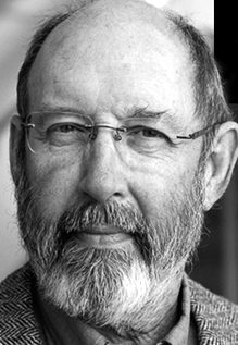 The Stone Type Foundry in Guinda (ex-Rumsey and ex-Palo Alto), CA, is Sumner Stone's outfit, which he founded in 1990. Born in Venice, Florida in 1945, Sumner Stone is a major designer, and creator of the Stone family. He studied calligraphy with Lloyd Reynolds at Reed College in Portland, Oregon, and then went to work for Hallmark cards as a lettering artist. In 1979, he became type director at Autologic, and in 1984, he became the Director of Typography at Adobe Systems (until 1989). His typefaces:
 - ITC Stone Sans (1992, Linotype), ITC Stone Sans II (2010, ITC), ITC Stone Sans (Adobe), ITC Stone Sans (ITC), ITC Stone Sans (Linotype). The ITC Stone family was co-designed by John Renner.
- Stone Phonetic (with John Renner, 1992).
- ITC Stone Informal (ITC), ITC Stone Informal (Adobe), ITC Stone Informal (Linotype).
- ITC Stone Serif (ITC), ITC Stone Serif (Linotype), ITC Stone Serif (Adobe).
- ITC Stone Humanist (2005, ITC).
- Stone Print (Stone Type Foundry, 1991). Designed for Print: America's Graphic Design Magazine.
- Magma II (Stone Type Foundry, 2014), Magma (2004), Magma Halo (2004) and Magma Thin (2009). These are extensive informal humanist sans text families that could be used as Greek simulation typefaces.
- Tuff (Stone Type Foundry, +Halo, +School, 2008-2009) started from his Magma. This flared informal typeface is slightly Greek in its vision, and has hints of Morris Fuller Benton's Souvenir, Stone's own ITC Stone Informal, and Dennis Pasternak's Maiandra.
- Munc (Stone Type Foundry, 2005). The uncial version of Magma. It has some Basque influences.
- Silica (Stone Type Foundry, 1993). A humanist slab serif.
- Arepo (Stone Type Foundry (1995). A modern text family related to his SFPL family developed for the San Francisco Public Library in 1999 and 2003.
- SFPL (Stone Type Foundry: minipage). Part of a new identity of the San Francisco Public Library.
- Sator (1995, Stone Type Foundry), Popvlvs (2010, Stone Type Foundry), Davanti (2010, Stone Type Foundry). Roman inscriptional typefaces.
- Cycles (Stone Type Foundry, 2004). Cycles comes in 7 optical scales: 5, 7, 9, 11, 18, 24 and 36pt, each in numerous weights and figure styles.
- Basalt (Stone Type Foundry). Basalt won an award at Bukvaraz 2001 and was first used for signage at the Cecil H. Green Library of Stanford University.
- Leaves + Straw (Stone Type Foundry). A dingbat font.
- Nvma Titling (Stone Type Foundry). Numa Titling is an Etruscan letterform used in centuries -7 through -3. While roman, it is runic and chiseled in appearance. See also Numaiota.
- Scripps College Old Style (Monotype, 1997). Scripps College commissioned his revival of Scripps College Old Style (1997, Agfa-Monotype), originally designed by Frederic Goudy. Compare with Richard Beatty's Goudy Claremont, another good revival of that family.
- From 1994-1995: ITC Bodoni Six (ITC), ITC Bodoni Twelve (ITC), ITC Bodoni Seventy-Two (ITC), ITC Bodoni Seventy-Two Std (Linotype), ITC Bodoni Seventy-Two (Linotype), ITC Bodoni Seventy-Two Pro (Linotype), ITC Bodoni Twelve (Linotype), ITC Bodoni Ornaments (ITC), Bodoni Display Figures. Based on Bodoni's original designs, there are 6, 12 and 72-point optical sizes. The family was developed under Stone's guidance who was partially aided by Holly Goldsmith (Six Roman), Janice Prescorescott-Fishman (Seventy-two Roman) and Jim Parkinson (Six Italic).
- Dignitas (2011). Commissioned by Hallmark.
At ATypI 2007 in Brighton, he spoke about The foundation of the humanist sans serif. As of 2008, his entire collection can be licensed for 20 computers in an educational lab for just 300 dollars. Scripps College pages. CV at Agfa. Bio at Linotype. Page at Emodigi. His lecture in 2007 on W.A. Dwiggins. PDF file of his work. Signature. 2012 Newyear's card. Interview by MyFonts in 2014. FontShop link. Klingspor link. View Sumner Stone's typefaces. Summary overview of Sumner Stone's typefaces. [Google]
[MyFonts]
[More] ⦿
|
Sue Zafarana

|
Born in Boston in 1955, Sue zafarana started at Compugraphic in 1977 redrawing metal type specimens for phototypesetters, and converting fonts for use in their digital equipment. She relocated to Bitstream Inc in 1984 to participate in the development of the first digital font library. After two years as a Senior Designer, she moved into the custom font group where she is still the Director of Custom Font Production. Her fonts include Prima Sans (+Monospace), which was done with Jim Lyles at Bitstream (1998, a humanist sans family). She also made Softie (2003, with Steve Zafarana), Rostra (2004, with Steve Zafarana), and Roger (2002, a quirky comic book style font done with Steve Zafarana at Tail Spin Studio). FontShop link. [Google]
[MyFonts]
[More] ⦿
|
Sumner Stone
[Stone Type Foundry]

|
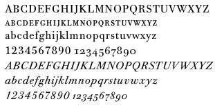 [MyFonts]
[More] ⦿
|
Suzanne Fleischauer
|
Aka Fleisch. Graduate of Johns Hopkins University. Codesigner, with Apostrophe at Apostrophic Laboratory, of Colwell and Hadley (2000), based on 1916 hand lettering by Ned Hadley. She also made Heraldic Crests, Heraldic Shields, Landes Fraktur, Blocky Sideways, High Hat (a pixel font), Wood Relief (2000), Sample (2007: a pixel font) and Woodcut Resawn (2009, at FontStruct). [Google]
[More] ⦿
|
Swamp Press
|
Metal type foundry in Northfield, MA. It is located at 15 Warwick Road, Northfield, MA 01360. Some of its types are listed here. [Google]
[More] ⦿
|
SymbolMinded
[Marie Flaherty]

|
SymbolMinded is Marie Flaherty's foundry in Scituate, MA. Her first typeface is Adinkra Symbols (2012), which is a set of 100 symbols from Ghana named after King Adinkra. Hobo Symbols Mod and Hobo Symbols Chalk (2012) are hobo symbol fonts. She writes: During the period of the Great American Depression hobos created a system of symbols to communicate and assist fellow travelers. These symbols would mark a home, farm, fence or other structure to indicate what to expect in the area. They would tip off travelers on how to find food, stay safe and what to avoid and more. In some areas of the USA, these symbols are still visible and have also become part of the American popular culture. [Google]
[MyFonts]
[More] ⦿
|
Tail Spin Studio
[Steve Zafarana]

|
 Steve Zafarana (b. 1951, Wakefield, MA) Steve began his professional design career at Compugraphic in 1977 where over the next seven years he assisted in the production of their phototype library. In 1984, he moved to Bitstream and helped in the development of that early digital font library, which included standard and custom fonts. In 1994, Steve and four other designers founded the Galapagos Design Group. In 2001, he returned to Bitstream as the graphic designer for the two subsidiaries, MyFonts.com and Pageflex Inc. His studio is Tail Spin Studio (est. 1999, Norwood, MA). His fonts are available from MyFonts.
 Steva Zafarana's type designs include - At ITC: ITC Fontoon (handprinting), the dingbats ITC Fontoonies, the wonderful dingbat fonts ITC Gargoonies, ITC BackyardBeasties.
- At Galapagos: TangientGD, the condom-shaped letters of Safefont GD, the grungy Big Clyde GD, Spleeny Decaf, and Wakefield GD.
- At Tail Spin Studio: Stuph, a dingbat font, SafeFont (a condom lettering font), Roger (2002, a quirky comic book style font done with Sue Zafarana), Softie (2003, with Sue Zafarana), Alph Dog (2007), and Rostra (2004, with Sue Zafarana).
a FontShop link. Klingspor link. [Google]
[MyFonts]
[More] ⦿
|
Tarallo Design
[Donald Tarallo]

|
 Donald Tarallo obtained a BA in Studio Arts and Graphic Design from Clark University, and an MFA in Graphic Design from Rhode Island School of Design (RISD). He also studied with André Gürtler and Wolfgang Weingart in the Weiterbildungsklasse at the Basel School of Design in Switzerland. Since 1998, Don has maintained a freelance practice working on projects in identity, publication, and web design. He has taught at Clark University, Guangzhou Academy of Fine Art, Rhode Island School of Design, Samsung Art and Design Institute, Siena Art Institute, and Bridgewater State University. Don currently teaches at Fitchburg State University in Fitchburg, MA.
 In 2017, he published the geometric sans serif typeface Binario. Donald writes: The design was inspired by elements of Italian Art Deco, early 1900s advertising, and shop signage. Binario pays homage to early modernism's optimism, modularity, and efficiency. Binario was followed in 2019 by Binario Soft. He also designed the geometric solid dingbat font FormPattern (+FormPattern Color, 2018; by Donald and Alex Tarallo) and the dingbat fonts Poeta and Poeta Color in 2017. In 2018, he designed the 8-weight sans family Scanno. In 2019, he released the zodiac sign font Starsigns, the art deco typeface Varese and FormPattern Color Three (2019: a typeface for creating borders and frames; with Alex Tarallo). In 2020, he released FormPattern Color Six (done with Alex Tarallo) and the plump bubblegum art deco typeface Varese Soft. Typefaces from 2021: East (a condensed sans in six weights; includes a variable font). [Google]
[MyFonts]
[More] ⦿
|
Technologies 'N Typography
|
Outfit in Merrymac, MA that offers free commercial fonts to its clients. TNT helps with the typesetting of books and offers to make custom fonts. For example, their ZephText fonts were commissioned in 1994 by the Harvard University Press for use in the HUP's printing of Greek and Latin books in the Loeb Classical Library Series. The fonts have never been publicly released or sold. But it is in the manufacturer's index of font samples (http://www.tekntype.com/tntfonts/). They support Latin, Greek, Cyrillic, Hebrew, Coptic, runes and many miscellaneous symbols. The Greek font is based on Porson's design. [Google]
[More] ⦿
|
The Farm and Trades School
|
Publisher of Specimen of Typefaces (Thompson's Island, Boston, MA, 1925). [Google]
[More] ⦿
|
The Museum of Printing
|
This museum is located in North Andover, MA. It contains material on machine composition of hot metal, hand composition of hot type, cold composition, phototypesetting, typewriters, plate-making, and printing and bookbinding in general. It also has an important collection of 500 books from the collection of Mac McGrew. [Google]
[More] ⦿
|
The Museum of Printing: McGrew Collection
|
 The collection of books donated by Mac McGrew to The Museum of Printing in North Andover, MA. These books are part of the material that was used to research details for his book, American Metal Typefaces of the Twentieth Century:
 | ACME TYPE FOUNDERS: Type c1984 | | ACME TYPE FOUNDRY: All-Slug Type Faces c1952 | | ACME TYPE FOUNDRY: 1-line Showings c1964 | | ACME TYPE FOUNDRY: Foundry Type 1939 | | ACME TYPE FOUNDRY, Acme Type, Catalog #10, 1960 | | ADVERTISING TYPOGRAPHERS ASSN: Standard Type Book sample pages | | ADVERTISING & PUBLISHING PRODUCTION YEARBOOK, Sixth Annual, Colton Press, NY 1940 | | AGNER, Dwight: The Nightowl at Ten, Press of the Nightowl, 1975 | | AIGA, Updike American Printer & His Merrymount Press, 1947 | | ALLEGHENY LUDLUM STEEL CORP: Stainless Steel Handbook, Pittsburgh 1951 (des by MFM) | | AMERICAN TYPE FOUNDERS, American Line Type Book, Pittsburgh 1906 | | AMERICAN TYPE FOUNDERS, Supplement to American Line Type Book, 1909 | | AMERICAN TYPE FOUNDERS, American Specimen Book of Type Stryles, Jersey City 1912 | | AMERICAN TYPE FOUNDERS, Decorative Material, c1907 | | AMERICAN TYPE FOUNDERS, Specimen Book & Catalogue, 1923 | | AMERICAN TYPECASTING FELLOWSHIP: Thompson Middleton Hammer Goudy 1980 | | AMERICAN TYPE FOUNDERS, Book of American Types, 1934 | | AMERICAN TYPE FOUNDERS, Legible Sans-Serif Types by Bernhard, c1931 | | AMERICAN TYPE FOUNDERS, Rockwell Antique, nd | | AMERICAN TYPE FOUNDERS, The Book of American Types, 1941 | | AMERICAN TYPE FOUNDERS, Oxford Series, nd | | AMERICAN TYPE FOUNDERS: Goudy Extrabold & Italic c1930 | | AMERICAN TYPE FOUNDERS, Interrelating Typographic Borders, nd | | AMERICAN TYPE FOUNDERS: Looks Plus 1944 | | AMERICAN TYPE FOUNDERS, Design with Type Planning Book, 1955 | | AMERICAN TYPE FOUNDERS, Caslon Italic No. 540 & Swash Letters, c1927 | | AMERICAN TYPE FOUNDERS, Novel Gothic, nd, 12x9 (C-4) | | AMERICAN TYPE FOUNDERS, The Book of American Types, 1961 | | AMERICAN TYPE FOUNDERS, American Caslon Italic, nd | | AMERICAN TYPE FOUNDERS, 6 Stymie Types, nd | | AMERICAN TYPE FOUNDERS, Stymie Inline Title, nd | | AMERICAN TYPE FOUNDERS, Goudytype, 1928 | | AMERICAN TYPE FOUNDERS, The Book of American Types, 1968 | | AMERICAN TYPE FOUNDERS, Alphabet Cards nd | | AMERICAN TYPE FOUNDERS, miscellaneous booklets & folders in box file (C-1) | | AMERICAN TYPE FOUNDERS, Raleigh Gothic Condensed, c1932 | | AMERICAN TYPE FOUNDERS, Two-Series Modernage Typography, c1930 | | AMERICAN TYPE FOUNDERS, Cloister Lightface, nd | | AMERICAN TYPE FOUNDERS, Garamond, 1925 | | AMERICAN TYPE FOUNDERS, Garamond Italic, nd | | AMERICAN TYPE FOUNDERS, French Type Faces, c1930 | | AMERICAN TYPE FOUNDERS, Specimen Book of Type, Philadelphia 1898 | | AMERICAN INSTITUTE OF GRAPHIC ARTS: American Type Designers 1948 | | AMERICAN WOOD TYPE CO.: Foundry Type, Wood Type 1957 | | AMERICAN TYPE FOUNDERS: Goudy Catalogue & Italic c1932 | | AMERICAN ARCHITECT Nov 1933: "Lettering Inspired by Type Faces," by C A McGrew p55 | | AMSTERDAM CONTINENTAL: Standard Series c1966 | | AMSTERDAM CONTINENTAL: A Handbook of Types c1967 | | ANDERSON, Greg: Two Essays on the Grabhorn Press, pvt 1969 | | ANGEL, MARIE: A New Bestiary 1963 | | ANNENBERG, Maurice: Typographical Journey Through the Inland Printer 1883-1900, Maran Press 1977 | | ANNENBERG, Maurice: Type Foundries of America & Their Catalogs, Maran Printing Services 1975 | | ASSN TYPOGRAPHIQUE INTERNATIONALE: Index of Typefaces 1975 | | ASSN OF AMERICAN UNIVERSITY PRESSES: AAUP Book Show 1987 | | ATLANTIC LINOTYPE: Foundry Type, Brooklyn, nd | | ATYPI, misc materials in env, Frankfurt, 1982 | | BALTIMORE TYPE: Type & Rule Catalogue No. 14 1962 | | BARNHART BROTHERS & SPINDLER, Type, Catalog 25-A, 1925 | | BARNHART BROTHERS & SPINDLER, Christmas Ornaments (& Dietz Text), c1932 | | BARNHART BROTHERS & SPINDLER, Type, Catalog 25-A, 1925 | | BARNHART BROTHERS & SPINDLER, Type, Specimen Book No. 9, 1907 | | BAUER ALPHABETS: Bauer Type Calculator | | BAUER ALPHABETS: Venus c1965 | | BAUER ALPHABETS INC., Bauer Type Calculator, nd | | BAUER TYPE FOUNDRY: Bernhard Brushscript c1930 | | BAUER ALPHABETS: Weiss | | BAUER TYPE FOUNDRY INC, Specimen Book of Bauer Types, nd | | BAUER ALPHABETS INC: For Your Guidance c1967 | | BAUER-NEUFVILLE: The Distinguished Bauer Family c1976 | | BEAUMONT, James G: Typeface Examples, 19th Century Printing House, Oakdale, Pa, nd | | BERRY, W TURNER & A F JOHNSON, Encyclopaedia of Type Faces, Pitman, NY, nd | | BERRY, W TURNER & A F JOHNSON, Encyclopaedia of Type Faces, Blandford Press, London, 1953 | | BERRY, JOHNSON & JASPERT, Encyclopaedia of Type Faces, 3rd Edition, Blandford Press, London, 1962 | | BERTHOLD: Fototypes E1, Berlin, 1974 | | BINNY & RONALDSON, A Specimen of Metal Ornaments, 1809, reprint | | BLIGHT, V C N: The Columbian Press, Sydney, NSW, 1962 | | BLIVEN, Bruce Jr: The Wonderful Writing Machine, Random House, 1954 | | BOHADTI, Gustav: Type Matrices: Paul H Duensing, 1968 | | BOHNE, PALL W: A Unique 1824 Columbian Press | | BON HOMME RICHARD: A Quart of Oysters & Other Bon Mots 1972 | | BORO TYPOGRAPHERS INC, NYC: Borders, Ornaments 1969 | | BORO TYPOGRAPHERS, NYC: Type Index rev 1965/Univers | | BORO TYPOGRAPHERS INC, NYC: 2-Line Specimens | | BRADOFSKY, Hyman: Looking Back, Bradofsky, Pomona, Calif., 1984 | | BROWN, FRANK CHOUTEAU: Letters & Lettering 1904 | | BRUCE, DAVID: History of Typefounding in the U.S. 1981 | | BRUCE GEO & CO, Specimens of Printing Types, 1848 (Ceprint) | | BRUNOGRAPHICS, Balto: Ludlow | | BRUNOGRAPHICS, Balto: Linotype | | BRUNOGRAPHICS, Balto: Hand-set Type | | BUNDSCHO, J M INC: Here Type Can Serve You, Chicago, 1935 | | BUNDSCHO INC, J M: Type Faces 1944 | | BUNDSCHO INC, J M: Type Faces 1952 | | CARNEGIE INSTITUTE OF TECHNOLOGY: Plaid Proofs, Pgh 1959 | | CARNEGIE INSTITUTE OF TECHNOLOGY: The Hunt Botanical Library, Pittsburgh 1961 | | CASLON PRESS, Pgh: Type Specimens | | CASTANEDA, CARLOS E: The Beginning of Printing in America 1939 | | CATICH: Rev Edward M: Eighth Annual Frederic W Goudy Award, RIT, 1976 | | CAXTON CLUB, Robert Hunter Middleton, The Man & His Letters, 1985 | | CENTRAL TYPESETTING CO, Machine Faces, Pittsburgh, nd, 11x8½ (2 copies) (C-4) | | CHAMPION PAPER CO: Printing Salesman's Herald 44, Typography 1982 | | CHAPLIN, RUTH A: The Little Details 1949 | | CHAPPELL, Warren: 40-odd Years in the Black Arts (Goudy Award), Press of the Good Mountain 1970 | | CHICAGO DESIGNERS: 27 Chicago Designers, 1936 | | CHURCH [boxfile) (A-2) | | CINCINNATI ARTS MUISEUM: Hermann Zapf 1960 | | CIRKER, Blanche, ed: 1800 Woodcuts by Thomas Bewick and His School, Dover 1962 | | CLEETON, GLEN U & CHARLES W PITKIN: General Printing 1941 | | COLISH INC, A: Types | | COLONIAL PRESS: Type Specimens, Pittsburgh, nd | | COMPOSING ROOM INC, NYC: Type Faces 1953 | | COMPOSING ROOM INC, NYC: Typefaces 1963 | | COMPOSING ROOM INC, NYC: New Faces 1964 | | COMPOSING ROOM INC, NYC: 29 Helpful Hints | | COMPOSING ROOM INC, NYC: 18pt Types for Machine Composition | | CONAWAY TYPESETTING, RAY, Pgh: 1-Line Type Specimens c1965 | | CONTINENTAL TYPEFOUNDERS ASSN., Specimen Book of Continental Types, 1930 | | CONTINENTAL TYPEFOUNDERS, A Selection of 50 Continental Typefaces, c1936 | | CONTINENTAL TYPEFOUNDERS, Half Font Price List, 1931 | | COOPER & BEATTY, Toronto: Typofile 1966 [box file) (A-5) | | COOPER & BEATTY, Toronto: Type-o-file 1959 [box file) (A-5) | | COOPER & BEATTY ltd, toronto: Type Selection Chart | | COST, Parricia Knittel: Contributions of LB & MF Benton to Typesetting & Typeface Design (ms) 1986 | | CRAFTSMAN TYPE INC, Dayton: Typecrafter | | CRAFTSMAN TYPE: Type Specimen Handibook, Dayton nd | | CRAFTSMAN TYPE, Dayton: Handibook c1964 | | CRAFTSMEN-ZIEGLER, Pgh: Specimens of Type nd | | CURTIS PAPER CO: Washington's Farewell Address, Newark Del 1954 | | DAHL & CURRY: Type Faces, Minneapolis, Minneapolis, nd: 11½x10½ (B-4) | | DAMON TYPE FOUNDERS CO., Type, Borders, etc., 1929 | | DAVIS & WARDE: Type, Vol. II, Gothic & Sans-Serif c1950 | | DAVIS & WARDE: Type, Vol. I, Serif c1950 | | DAVIS & WARDE: Type Faces, Display c1950 | | DAVIS & WARDE: Type Faces c1930 | | DAVIS & WARDE: Foundry, Lino, Mono | | DAVIS 7 WARDE, Faces not listed in type book, 1977 | | DAVIS & WARDE: Type, Vol. II, Gothic & Sans-Serif c1950 | | DAVIS & WARDE: Foundry, Mono, Lino 1-liner 1977—9x4 | | DAYTON TYPOGRAPHIC: Typeface Book, Dayton, Ohio, 1976 | | DeVINNE, THEODORE LOW: Modern Methods of Book Composition 1914—7½x5 | | DeVINNE, THEODORE LOW: Correct Composition 1914—7½x5 | | DeVINNE, THEODORE LOW: A Treatise on Title-Pages 1914—7½x5 | | DeVINNE, THEODORE LOW: Plain Printing Types 1914—7½x5 | | DOCTOR, Wilbur L: The Montallegro Typeface, Doctor, Kingston, RI 1985 | | DOCTOR, WILBUR L: The Montallegro Typeface 1985 | | DOCTOR, WILBUR L: Updike & Rogers 1986 | | DREIER, Thomas: The Power of Print—and Men, Mergenthaler Linotype 1936 | | DREYFUS, John: The Work of Giovanni Mardersteig, Press of the Good Mountain, 1972 | | DuBOIS PRESS, Rochester: Type Specimen Book | | DUENSING, PAUL: Bibliotheca Typographica 1980 | | DUODECIMO, TYPOCRAFTERS, PRINTING MISCELLANEA | | DUODECIMO KEEPSAKES ETC | | DUODECIMO SOCIETY: The Land in the Fork, 1959 | | DUODECIMO SOCIETY: Duodecimo Calendar 1959 | | DUODECIMO ETC | | DWIGGINS, William A: The Five Hundred Years, Press of the Nightowl, 1972 | | ECKMAN, DR JAMES, Keystone Type Foundry 1888-1917, PaGA 1958 reprint | | ECKMAN, DR JAMES, Inland Type Foundry 1894-1911, PaGA 1960 reprint | | ECKMAN, James: The Heritage of the Printer, v1, North American Publishing Co 1965 | | ECKMAN, DR JAMES, Great Western Type Foundry of Barnhart Brothers & Spindler 1869-1933, PaGA 1961 reprint | | ECKMAN, JAMES: The Collectanea Typographica of H L Bullen 1961 | | ECKMAN, DR JAMES, Chicago Type Foundry of Marder Luse & Co 1863-1892, PaGA 1959 reprint | | FASS, JOHN S: The Hammer Creek Press Type Specimen Book 1954 | | FISHENDEN, R B, ed: Penrose Annual, v50, Lund Humphries 1956 | | FLEURON, THE, n3, Oliver Simon ed, London 1924 | | FLEURON, THE, n5, Stanley Morison ed, London 1926 | | FLEURON ANTHOLOGY, prospectus, Univ of Toronto Press nd | | FLEURON, THE, n7, Stanley Morison ed, London 1930 | | FLEURON, THE, n6, Stanley Morison ed, London 1928 | | FLEURON, THE, n1, Oliver Simon ed, London 1923 | | FORGHUE, Norman W: Book Parts & Their Typographic Forms, Chicago, nd | | FORGUE, Norman W: Poorer Richard, Black Cat Press, 1954 | | FRANKLIN, BENJAMIN: An Apology for Printers 1973 | | FRANKLIN TYPOGRAPHERS, NYC: Type Faces | | FRANKLIN, BENJAMIN: Autobiography | | FRAZIER, J L: Modern Type Display 1929 | | FRAZIER, J L: Type Lore 1925 | | GARNETT, Porter: The Laboratory Press, Carnegie Institute of Technology, 1927 | | GENERAL PRESS CORP, Pgh: Type Specimens | | GEORGE, SAM, Pgh: Linotype Specimen Book c1965 | | GERSCH, HUBERT: Freudenfueurwerk 1962 | | GEYER PRINTING CO, Pgh: Type Faces 1958 | | GILL ERIC: An Essay on Typography 1936 | | GOUDY CHAPPEL: On Moxon's 25th 1982 | | GOUDY, FREDERIC W, Goudy's Type Designs, Myriade Press, 1978 | | GOUDY, FREDERIC W, Typologia, Univ of Calif Press, 1977 | | GOUDY, Frederic W: The Trajan Capitals, Oxford University Press, NY, 1936 | | GRAPHIC CRAFTS INC, Willow Street Pa: An Alphabet of Trades 1870-80 1981 | | GRAPHIC ARTS INDUSTRY IN PITTSBBURGH: 500 Years of Printing, Pittsburgh c1940 | | GRAPHIC ARTS TYPOGRAPHERS, Type Faces 3, NYC 1966 | | GUJARATI TYPE FOUNDRY, Type Book, c1920 | | H&H TYPOGRAPHIC SERVICE: Type book | | H&H TYPOGRAPHIC SERVICE: 1-Line Specimens c1964 | | H&H TYPOGRAPHIC SERVICE: Type book, Pittsburgh, nd | | HABER TYPOGRAPHERS: Type by Haber 1966 | | HABER TYPOGRAPHERS: Type by Haber supplement 8 1965 | | HABER TYPOGRAPHERS: Type by Haber supplement 5 1963 | | HABER TYPOGRAPHERS: Type by Haber supplement 6 1964 | | HABER TYPOGRAPHERS: Type by Haber supplement 7 1965 | | HANSEN H C TYPE FOUNDRY, Type, Printing Machinery & Supplies, 1909 | | HARRIS, ELIZABETH M: The Fat & the Lean 1983 | | HAWLEY, TIM: Printing Periodicals 1983 | | HAYES, James: The Roman Letter, RR Donnelley & Sons Co, 1952 | | HAYES, JAMES: The Roman Letter 1952 | | HAYWOOD, WILLIAM F: It's a Small World #34 1988 | | HAYWOOD, WILLIAM F: It's a Small World #33 1987 | | HAYWOOD, WILLIAM F: It's a Small World #32 1986 | | HAYWOOD, WILLIAM F: It's a Small World #31 1985 | | HAYWOOD, WILLIAM F: It's a Small World #35 1989 | | HAYWOOD, WILLIAM F: It's a Small World #30 1984 | | HAYWOOD, WILLIAM F: It's a Small World #29 1983 | | HAYWOOD, WILLIAM F: It's a Small World #28 1982 | | HAYWOOD, WILLIAM F: It's a Small World #14 1968 | | HAYWOOD, WILLIAM F: It's a Small World #26 1980 | | HAYWOOD, WILLIAM F: It's a Small World #25 1979 | | HAYWOOD, WILLIAM F: It's a Small World #13 1967 | | HAYWOOD, WILLIAM F: It's a Small World #24 1978 | | HAYWOOD, WILLIAM F: It's a Small World #23 1977 | | HAYWOOD, WILLIAM F: It's a Small World #10 1964 | | HAYWOOD, WILLIAM F: It's a Small World #22 1976 | | HAYWOOD, WILLIAM F: It's a Small World #15 1969 | | HAYWOOD, WILLIAM F: It's a Small World #21 1975 | | HAYWOOD, WILLIAM F: It's a Small World #18 1972 | | HAYWOOD, WILLIAM F: It's a Small World #17 1971 | | HAYWOOD, WILLIAM F: It's a Small World #16 1970 | | HAYWOOD, WILLIAM F: It's a Small World #27 1981 | | HEADLINERS: Wood & Foundry Type, Morgan c1964 | | HEADLINERS: More Morgan 1968 | | HERBICK & HELD: Keyboard Faces c1935 | | HERBICK & HELD: The Fine Art of Copy Preparation c1950 | | HERBICK & HELD: The Fine Art of Typography c1955 | | HERMANN ZAPF: About Alphabets 1970 | | HESS, Sol: Origin & Development of Printing Types, Lanston Monotype Machine Co, 1944 | | HESS, SOL, Origin & Development of Printing Types, Lanston Mono, nd | | HIGHTON INC, ALEX G, Newark: Type Specimen Book c1950 | | HIGHTON CO, Newark: Type Indexes, Hand, Machine, Photo c1971 | | HITCHCOCK, Maureen: Benton Types—Typefaces designed or adapted by M F Benton, Press of the Good Mtn 1978 | | HLASTA, STANLEY C, Printing Types & How to Use Them, CIT, 1950 | | HOFFMAN TYPOGRAPHIC SERVICE, Buffalo: Type catalog | | HOFFMAN TYPOGRAPHIC SERVICE, Buffalo: Additional Type Faces c1965 | | HOPKINS, RICHARD L: Yesterday's "Swift" 1980 | | HOPKINS, Richard L: The American Point System, Hill & Dale Press, 1976 | | HOPKINS, RICHARD L: Monotype References 1980 | | HOUSE & HOME | | HUSS, Richard E: Dr Church's "Hoax," Graphic Crafts Inc., 1976 | | HUSS, Richard E: Printers' Mechanical Typesetting Methods 1822-1925, University Press of Virginia, 1973 | | HUSS, Richard E: The Printer's Compositon Matrix, Oak Knoll Books 1985 | | IMPRIMERIE DROMAAIRE: 19th Century Russian Printing Types 1980 | | IMPRIMERIE DROMADAIRE: Scott Joplin 1983 | | INDIANAPOLIS PRINTING CO: Linotype & Foundry Faces | | INLAND PRINTER: Photocopies of type related items, 1900-1966 | | INLAND TYPE FOUNDRY, Specimen Book, 1901 | | INTERNATIONAL PAPER CO: The Pocket Pal 1957 | | INTERTYPE CORP, One-Line Specimens (alphabetical list laid in), 1970 | | INTERTYPE: Faces, Intertype Corp 1928 | | INTERTYPE CORP, Imperial, 1957 | | INTERTYPE: How to Select Type Faces, Intertype Corp, nd | | INTERTYPE CORP, Matrix Identification, c1972 | | INTERTYPE: Alphabets & Character Showings. Intertype Corp 1949 | | INTERTYPE CORP, Intertype Faces, One-Line Spoecimens, 1970 | | INTERTYPE CORP, Comparison of Weights in Book Faces, nd | | INTERTYPE CORP, One-Line Specimens, 1958 | | INTERTYPE: How to Select Type Faces, Intertype Corp, 1929 | | INTERTYPE: How to Select Type Faces, Intertype Corp, 1956 | | INTERTYPE: Faces, Intertype Corp 1933 | | INTERTYPE: Alphabets, Intertype Corp 1nd | | INTERTYPE: Faces, Intertype Corp 1945 | | INTERTYPE COMPANY: How to Select Type Faces | | INTERTYPE: Vogue, Intertype Corp nd | | INTERTYPE: Cairo, Intertype Corp 1951 | | INTERTYPE: Faces, Intertype Corp 1955 | | JAGGARS-CHILES-STOVALL INC, JCS Gazette & phototype pages, Dallas, nd | | JAGGARS-CHILES-STOVALL INC, Tight Type #2, Dallas, nd | | JAGGARS-CHILES-STOVALL INC, Dallas: Type Book 1960 | | JOHNSTON, EDWARD: Writing & Illuminating & Lettering 1915 | | JOHNSTON, Edward: Manuscript & Inscription Letters, John Hogg, London 1911 | | JONES: Thomas Roy: Printing in America, and ATF, Newcomen Society, 1948 | | KARCH, R Randolph: Great merican Writers Who Were Printers, Arsenal Jr HS Press, Pgh 1935 | | KELLY, Rob Roy: American Wood Type 1828-1900, Van Nostrand 1969 | | KELSEY CO, misc catalogs etc in envelope | | KEYSTONE TYPE FOUNDRY, Nickel-Alloy Type, 1907 | | KING TYPOGRAPHIC: This Is King Typographic Service, NYC, c1976 | | KING TYPOGRAPHIC SERVICE, NYC: Foreign Languages | | KINGSPORT PRESS: Book of Type Faces, Display Faces | | KINGSPORT PRESS: Book of Type Faces, Monotype Faces | | KINGSPORT PRESS: Book of Type Faces, Linotype Faces | | KINGSPORT PRESS: Book of Type Faces, Supplement | | KLINGSPOR TYPEFOUNDERS: Klingspor Types c1955 | | KLINGSPOR, GEBR: Marathon | | LABAREE, Leonard W & Whitfield J Bell: Mr Franklin, Selection from Personal Papers, Yale Univ Press 1956 | | LACLEDE TYPE FOUNDRY, St Louis, Laclede Type Foundry Specimens, 1922 | | LAKESIDE PRESS: Benjamin Franklin, Printer, RR Donnelley & Sons Co. 1956 | | LANSTON MONOTYPE CO, Monotype Success, reprint by Richard L Hopkins, 1984 | | LANSTON MONOTYPE: Selected Specimen Book Pages, v3, Lanston Monotype Machine Co nd | | LANSTON MONOTYPE: Selected Specimen Book Pages, v2, Lanston Monotype Machine Co nd | | LANSTON MONOTYPE: Selected Specimen Book Pages, v1, Lanston Monotype Machine Co nd | | LANSTON MONOTYPE: Types, Village No. 2, Goudy Bible, Goudy Thirty 1956 | | LANSTON MONOTYPE CO, Deepdene, 1930 (insert 1927) | | LANSTON MONOTYPE: Words by Beatrice Warde & Types by Varied Hands 1953 | | LANSTON MONOTYPE CO, Monotype Specimen Book of Faces, c1913-1938 | | LANSTON MONOTYPE: New Monotype Faces 1931 to 1936 | | LANSTON MONOTYPE CO, Monotype Type Faces, c1960 | | LANSTON MONOTYPE: The MNonotype, How It Works 1937 | | LANSTON MONOTYPE: Handy Index of Rental Matrices 1955 | | LANSTON MONOTYPE CO, Italian Old Style, 1924 | | LANSTON MONOTYPE CO, Specimens of Monotype Type Faces etc., c1972 | | LANSTON MONOTYPE CO, Specimens of Monotype Type Faces etc., misc pp, nd | | LAWSON, Alexander S: A Printer's Almanac (Heritage of Printer, v2), North American Pub Co 1966 | | LEWIS, BERNARD, Behind the Type, Life Story of F W Goudy, CIT, Pittsburgh 1941 | | LIEBERMAN, J Ben: Type & Typefaces, Myriade Press 1978 | | LINDEGREN, Erik: ABC of Lettering & Printing Typefaces, Greenwich House, NY, 1982 | | LINOTYPE GMBH, Linotype-Schriften, 1967 | | LINOTYPE: Großkegelschriften, Linotype GMBH, Frankfurt c1969 | | LINOTYPE/INTERTYPE, misc specimens, box file | | LITTLE, Evelyn Steel: 26 Lead Soldiers, a Salute to Printers, Eucalyptus Press, 1939 | | LONG, Robert P: Wood Type & Printing Collectibles, pvt 1980 | | LORAIN PRINTING CO, Lorain Ohio: From Our Composing Room c1961 | | LOS ANGELES TYPE FOUNDERS: Specimens & Price List 1959 | | LOS ANGELES TYPE & RULE CO: Type Faces c1947 | | LOS ANGELES TYPE FOUNDERS: Type 1964 | | (LUDLOW): William A Reade 1866-1930, Private, Chicago, 1930 | | LUDLOW: Record Gothic Cond Ital, Ludlow Typograph Co nd | | LUDLOW: Record Gothic Med Ext, Ludlow Typograph Co c1966 | | LUDLOW TYPOGRAPH CO, Record Gothic Condensed, nd | | LUDLOW: Record Gothic Family, Ludlow Typograph Co nd | | LUDLOW: Typefaces, Ludlow Typograph Co nd | | LUDLOW: Typefaces, Ludlow Typograph Co 1958 | | LUDLOW: Tempo Black Cond Ital, Ludlow Typograph Co nd | | LUDLOW: Typefaces, Ludlow Typograph Co 1957 | | LUDLOW: 2 New Faces (Zephyr, Parkway Script), Ludlow Typograph Co nd | | LUDLOW: Typefaces, Ludlow Typograph Co nd | | LUDLOW: Typefaces, Some, Ludlow Typograph Co 1941 | | LUDLOW: Record Gothic Bold Ext Rev, Ludlow Typograph Co nd | | LUDLOW: Bodoni Family, Ludlow Typograph Co nd | | LUDLOW: A New Script (Wave), Ludlow Typograph Co nd | | LUDLOW: Typefaces of Recent Production, Ludlow Typograph Co 1937 | | LUDLOW: Typefaces Recently Produced, Ludlow Typograph Co 1936 | | LUDLOW: Typefaces Supplement, Ludlow Typograph Co 1934 | | LUDLOW: Typefaces, One Line Specimens, Ludlow Typograph Co 1934 | | LUDLOW: Supplementary Specimen Pages, Ludlow Typograph Co 1932 | | LUDLOW: Typefaces, Ludlow Typograph Co 1961 | | LUDLOW: One-Line Specimens, Ludlow Typograph Co 1931 | | LUDLOW: Typefaces, Some, Ludlow Typograph Co 1954 | | LUDLOW: Typeface Alphabets, Ludlow Typograph Co 1966 | | LUDLOW TYPOGRAPH CO, Garamond, 1930 | | LUDLOW: Supplementary Specimen Pages, Ludlow Typograph Co 1931 | | LYONS PRESS, T J: 76 Americana Type Faces 1961 | | MACKENZIE & HARRIS INC, SF: Type specimens | | MACKENZIE & HARRIS INC: Type Book c1954 | | MANGIS TYPOGRAPHIC: Type Faces, Pittsburgh, 1958 | | MANGIS TYPOGRAPHIC SERVICE: Type Faces of Distinction 1967 | | MANGIS TYPOGRAPHIC SERVICE: Body Faces c1960 | | MATROTYPE: Linecasting Matrices, Matrotype Co Ltd c1979 | | McCAFFREY, Frank: Type Mechanized, Printing House Craftsmen 1941 | | McGREW, M F, Family of Basic American Gothics, H&H Typo, nd | | McGREW, Misc clippings & specimens file | | McGREW, Typographic design file | | McGREW, Copyfitting file | | McMURTRIE, DOUGLAS C, Type Design, Bridgman Publishers, Pelham NY, 1927 | | McMURTRIE, Douglas C: Invention of Printing, Printing House Craftsmen 1939 | | McMURTRIE, DOUGLAS C, Some Facts Concerning the Invention of Printing, Chicago PHC, 1939 | | MERGENTHALER LINOTYPE: The Readability of Type 1941 | | MERGENTHALER LINOTYPE CO, Specimen Book Supplement No. 1, 1939 | | MERGENTHALER LINOTYPE CO, Lino Type Faces, nd | | MERGENTHALER LINOTYPE: The Romance of Print 1945 | | MERGENTHALER: Peter Piper, Mergenthaler Linotype Co, 1936 | | MERGENTHALER LINOTYPE CO, clippings in env, c1930-40 | | MERGENTHALER LINOTYPE CO, Linotype Faces, One-Line Specimens, 1950 | | MERGENTHALER LINOTYPE CO: Distinction in Design 1954 | | MERGENTHALER LINOTYPE: The Legibility of Type 1935 | | MERGENTHALER: Matrix Specimen Book, Mergenthaler Linotype Co 1977 | | MERGENTHALER LINOTYPE CO, Specimen Book Supplement No. 3, 1941 | | MERGENTHALER: Linotype Machine Principles, Mergenthaler Linotype Co, 1940 | | MERGENTHALER LINOTYPE CO, Linotype Faces, 1929 | | MERGENTHALER LINOTYPE: The Readability of Type 1947 | | MERGENTHALER: One-Line Specimens, Mergenthaler Linotype Co 1948 | | MERGENTHALER: One-Line Specimens, Mergenthaler Linotype Co 1950 | | MERGENTHALER: One-Line Specimens, Mergenthaler Linotype Co 1958 | | MERGENTHALER LINOTYPE CO, Clip Sheets of Linotype Display Faces, nd | | MERGENTHALER LINOTYPE: Peter Piper 1936 | | MERGENTHALER LINOTYPE CO, Specimen Book Supplement No. 2, nd | | MERGENTHALER LINOTYPE CO, Lino Type Faces, nd | | MERGENTHALER: Index & Addenda, One-Line Specimens, Mergenthaler Linotype Co nd | | MERGENTHALER LINOTYPE CO, Useful Matrix Information, 1945 | | MERGENTHALER: Supplement, Specimen Book, Mergenthaler Linotype Co 1948 | | MERGENTHALER: A-P-L Faces, Mergenthaler Linotype Co 1938 | | MERGENTHALER LINOTYPE CO, Linotype Faces, 1929 | | MERGENTHALER: Manual of Linotype Typography, Mergenthaler Linotype Co 1923 | | MERRIMAN, Frank: A.T.A. Type Comparison Book, Advertising Typographers Assn 1965 | | MEYER, FRANZ SALES: A Handbook of Ornament | | MEYNELL, FRANCIS, English Printed Books, London 1948 | | MICHAEL, John & Jean: Bruce Rogers/Centaur Type, Acorn Press, 1968 | | MILWAUKEE JOURNAL, Type Faces and Production Techniques, 1950 | | MISCELLANEOUS Type Specimen sheets and folders | | MONO-LINO TYPESETTING CO: Type Book c1950 | | MONO-LINO: Specimen Book, Type Styles c1938 | | MONO-LINO TYPESETTING CO: Type Book, Pittsburgh, 1968 | | MONO-LINO TYPESETTING CO: Type book c1950 | | MONOTYPE CORP, ‘Monotype' Display Faces, c1967 | | MONOTYPE CORP., ‘Monotype' Centaur etc, London, nd | | MONOTYPE CORP LTD, Salfords: Type Study Leaflets for Students 1974? | | MONOTYPE CORP, ‘Monotype' Display Faces, 1976 | | MONOTYPE CORP, ‘Monotype' Specimen Book, London, nd | | MONSEN TYPOGRAPHERS, INC: Type Library, v1, Chicago, 1961 | | MONSEN TYPOGRAPHERS, INC: Type Library, v2, Chicago, 1961 | | MONSEN-CHICAGO: Typographic Handibook 1946 | | MONSEN-CHICAGO: Type Handibook 1941 | | MONSEN-CHICAGO: Type and Its Origin c1945 | | MONSEN-CHICAGO: Typographic Handibook c1950 | | MONSEN-CHICAGO: Typographic Handibook 1937 | | MONSEN-CHICAGO: Typographic Handibook | | MORGAN PRESS: Foundry Type, Hastings-on-Hudson, NY, nd | | MORGAN PRESS: Wood c1950 | | MUSEUM OF ART, CARNEGIE INSTITUTE: The Art of Black Africa 1969 | | NEBIOLO SOCIETÀ, Caratteri Nebiolo, nd | | NELSON, Stan: Typefounding, The Atelier Press, 1972 | | NEW YORK TIMES: Type Book | | NEW YORK TIMES: Style Book, McGraw-Hill 1962 | | NEW YORK TIMES: The Story of the Recorded Word 1940 | | NOORDZIJ, GERRIT, The Stroke of the Pen, The Hague, 1982 | | OHLER, S R: A Walk in the Park, Pickwick-Morcraft, 1967 | | ORCUTT, William Dana: In Quest of the Perfect Book, Little, Brown & Co, 1926 | | OVERALL, Richard M: Seven Scintillations, Press of the Nightowl, 1965 | | P-H-P GRAPHIC ARTS, Phila: 1-Line Type Specimens c1969 | | PETTINGILL & CO., Pettingill's Type Book, 1901 | | PETTY, G HARVEY: Calligraphy & Lettering 1984 | | PHILADELPHIA TYPESETTING ASSN: Phila Type Directory 1959 | | PHILADELPHIA TYPESETTING ASSN: Phila Type Directory 1957 | | PHILLIPS, Frederic Nelson: Old-Fashioned Type Book, Phillips Inc, NY 1945 | | PHOTO-LETTERING: One LIne Manual of Styles (Index to Alphabet Thesaurus), Van Nostrand 1971 | | PHOTO-LETTERING, NY: Type Index 1968 | | PICKWICK-MORCRAFT INC: Type Specimens c1963 | | PITTSBURGH SUN-TELEGRAPH: Type Specimen Book, 1943 | | PITTSBURGH PRESS: Advertising Type Faces, nd | | PLIMPTON PRESS, Type Specimen Book, 1965 | | PRINT, Magazine of Graphic Arts: Typewriter Type Issue, New York 1952 | | PRINTING HOUSE CRAFTSMEN: Printing Progress, a Mid-Century Report, Cincinnati 1959 | | PRINTING HOUSE CRAFTSMEN: Index to Graphic Arts Periodical Literature, 1941 | | PRINTING HOUSE CRAFTSMEN: A New England Keepsake, Boston 1938 | | PRODUCTION YEARBOOK, Omnibus of Type Faces, Colton Press, 1939 | | PROGRESSIVE COMPOSITION CO, Phila: Progressive Type Faces, v1 (A-K) c1960 | | PROGRESSIVE COMPOSITION CO, Phila: Progressive Type Faces, v2 (L-Z) c1960 | | PROGRESSIVE COMPOSITION CO, Phila: From A to Z | | RAPID TYPOGRAPHERS INC, NYC: Square Serif & Gothic Type Specimens | | RAPID TYPOGRAPHERS, NYC: Handy Type Listings | | REHE, Rolf F: Typography: How to Make It Most Legible, Design Research International, Carmel, Ind, 1984 | | REICHL, ERNST: Legibility 1949 | | ROCHESTER TYPOGRAPHIC SERVICE: Typo Type c1966 | | ROCHESTER TYPOGRAPHIC SERVICE: Specimen pages | | ROCHESTER TYPOGRAPHIC SERVICE: Typo Type c1940 | | ROGERS, Bruce: Paragraphs on Printing, Dover 1979 | | ROGERS, BRUCE: The Integrity of Printing 1983 | | RUETER, WILLIAM: The Making of Letters 1980 | | SCHLESINGER, Carl, ed: The Biography of Ottmar Mergenthaler, Oak Knoll, 1989 | | SCHMETS. RONALD, Of Typefounding, Portrait of D Stempel Firm, Darmstadt, 1987 | | SCHMIDT CO, E F, Milwaukee: Reflections 1, Early Writing 1961 | | SCHMIDT CO, E F, Milwaukee: Reflections 2, The Alphabet 1961 | | SCHNEIDEREITH & SONS: New Wings for Intelligence (Tribute to Mergenthaler), Baltimore 1954 | | SERVICE ENGRAVERS (H SHERR), Reverse Type for Ludlow, 1958 | | SHERBOW, Benjamin: Effective Type-use for Advertising, Benjamin Sherbow, 1922 | | SHERBOW, BENJAMIN: Making Type Work 1921 | | SIMONCINI, Francesco: Readability & Functionality of Typefaces, Turin 1965 | | SOCIETÀ NEBIOLO, Torino: Type Faces etc. | | SOCIETY OF TYPOGRAPHIC ARTS, Chicago: The Book of Oz Cooper, 1949 | | SOLO, Dan X: Victorian Display Alphabets, Dover 1976 | | SOUTHWESTERN TYPOGRAPHICS: Typographics Specimens 1965 | | SPELTZ, ALEXANDER: Styles of Ornament 1936 | | STEMPEL AG: Palatino, Michelangelo, Sistina | | STEMPEL AG, Printing Types, 1967 | | STEMPEL AG: Metropolis 1929 | | STEMPEL AG: Type Faces Available c1962 | | STEMPEL AG: Types on Anglo-American Point-System c1971 | | STEPHENSON BLAKE: Hand List of Modern Display and Text Types | | STEPHENSON BLAKE: Typeface Synopsis | | STEPHENSON BLAKE, A booklet of interest to every American printer, nd | | STEPHENSON BLAKE, Specimens of Printing Types, c1962 | | STEPHENSON BLAKE: A Book of Scripts & Rondes | | STEPHENSON BLAKE, Specimens of Printing Types, 1950 | | STEPHENSON BLAKE: Type Lore c1950 | | STEPHENSON BLAKE: Brass Rules & Ornaments | | STERLING, Homer E: Type Alphabets for Layout Lettering, Carnegie Institute of Technology 1932 | | STEWART CO, JAMES L: Type Specimen Book c1940 | | STRATHMORE PAPER CO: Memories of the Gay 90s, nd | | STUART, EDWIN H.: 1-line Specimen Book c1970 | | STUART, Edwin H: Copy Preparation, Pittsburgh nd | | STUART, EDWIN H: 1-line Type Specimens | | STUART, Edwin H Co: Type Specimen Book, nd (B1970) | | STUART, Edwin H Co: Type Book, nd (B1960) | | STUART, Edwin H Co: Type Specimen Book, nd (B1970) | | TGC COMMUNICATIONS: TGC Typeface Index, NYC, 1967 | | THOMAJAN, P K, American Type Designers, RIT, reprinted from American Printer 1956 | | TRAVEL, MAPS, ETC | | TYPE FILMS OF CHICAGO: Library of Film Faces 1972 | | TYPE AND ART, Type Specimens, Cleveland 1-58 | | TYPE DIRECTORS CLUB OF NEW YORK: 4th Annual Awards for Typographic Design Excellence 1958 | | TYPE AND ART, Type Specimens, Cleveland 6-58 | | TYPEFOUNDERS OF CHICAGO: Catalog | | TYPEFOUNDERS OF CHICAGO: Type Specimens by Neon Type Division 1983 | | TYPEFOUNDERS OF CHICAGO: Type Specimens by Neon Type Division 1962 | | TYPEFOUNDRY AMSTERDAM, Columbia, c1956 | | TYPOCRAFTERS ETC. | | TYPOGRAPHER, Goudy Issue, RIT, v20 n1 1960 | | TYPOGRAPHER: Dedicated to the Memory of Frederic W Goudy, RIT, 1960 | | TYPOGRAPHERS ASSN OF NY, Type Face Directory, 1965 | | TYPOGRAPHIA: Fine Printing, Paul H Duensing, 1965 | | TYPOGRAPHIC SERVICE CO, NY: Type Faces c1963 | | TYPOGRAPHIC SERVICE, Phila: Typo Type, metal c1950 | | TYPOGRAPHIC SERVICE CO, NYC: Type Faces | | TYPOGRAPHIC SERVICE INC, Phila: Typo Types | | TYPOGRAPHIC SERVICE CO: Combined Reference Guide, Indianapolis 1965 | | TYPOGRAPHICS COMMUNICATIONS INC., Announcement, 1967 | | TYPOGRAPHICS: Specimens, Southwestern Typographics, 1965 | | TYPOGRAPHICS: Type Faces, v2 H-Z+, Southwestern Typographics Inc/John A Scott Co, Dallas, 1965 | | TYPOGRAPHICS: Type Faces, v1 A-G, Southwestern Typographics Inc/John A Scott Co, Dallas, 1965 | | UNIVERSITY OF CHICAGO: Manual of Style, Chicago 1945 | | UNIVERSITY OF MICHIGAN: Scribes & Printers (exhibit), U/M 1943 | | UPDIKE, Daniel B: In the Day's Work, Harvard University Press, 1924 | | UPDIKE, D B, Printing Types, Their History Forms & Use, Harvard Univ Press, 1951 | | URW UNTERNEHMENSBERATUNG: Signus System for Lettering 1983 | | US GOVT PRINTING OFFICE: Style Manual, Washington 1967 | | US GOVT PRINTING OFFICE: Classification of Printing Industry Techniques, Washington 1939 | | VAN KRIMPEN, JAN: A Letter to Philip Hofer 1972 | | VICTORIA TYPOGRAPHERS, Chicago: Type Forms | | VILLAGE PRESS, Intimate Recollections, Marlborough, NY, 1938 | | VISUAL COMMUNICATIONS SOCIETY OF PITTSBURGH: Tenth Annual Exhibit, Pgh 1966 | | VISUAL COMMUNICATIONS SOCIETY OF PITTSBURGH: Communications (Zapf), v14 n3, April 1969 | | VISUAL COMMUNICATIONS SOCIETY OF PITTSBURGH: Communications, v15 n1, Feb 1970 | | WARDE, BEATRICE, The Crystal Goblet, World Publishing Co, 1956 | | WARDE, Beatrice: Concerning Some Words & Types, Lanston Monotype Machine Co, 1953 | | WARWICK TYPOGRAPHERS, St Louis: Type Specimen Book, Supplement | | WARWICK TYPOGRAPHERS: Type, St Louis, nd | | WATTS, STEVENS LEWIS: Henry Lewis Bullen & His Work 1966 | | WEBER, C E, Schadow-Antiqua (& Forum), Stuttgart, nd (1950s) | | WEBER C E SCHRIFTGIESSEREI STUTTGART, (no title), nd | | WENTZ, Roby:Eleven Western Presses, Printing House Craftsmen 1956 | | WEST VIRGINIA PULP & PAPER: A Typographic Quest No. 1 | | WESTERN PENNSYLVANIA CONSERVANCY: Wild Flowers of Western Pa 1979 | | WESTERN PENNSYLVANIA CONSERVANCY: Wild Flowers of Western Pa 1978 | | WESTINGHOUSE PRINTING DIVISION: Type Specimens 1973 | | WESTINGHOUSE PRINTING DIVISION: Type Specimens 1973 | | WESTINGHOUSE: Stenographer's Handbook, Westinghouse E&M Co 1943 | | WESTVACO: A Typographic Quest No. 6, Etcetera 1968 | | WESTVACO: A Typographic Quest No. 3, Type to be Read 1965 | | WILLENS & CO, Detroit: Mighty Midget Book of Type c1963 | | WILLENS & CO, Detroit: One Line Type Specimen Book c1966 | | WILLENS & CO, Detroit: 1-Line Type Specimen Book 1961 | | WILLENS & Co: Americana, Detroit nd | | WILLIAMSBURG; The Printer in 18th Century Wmsburg, Colonial Wmsburg 1978 | | WULLING, EMERSON G: A Comp's Eye View of Wilder Bentley 1983 | | YOUNGSTOWN SHEET & TUBE: 50 Years in Steel, Youngstown 1950 (des by MFM) | | ZAPF, Hermann: Manuale Typographicum, MIT Press, 1970 | | ZAPF, Hermann: Hunt Roman, the Birth of a Type, Pittsburgh Bibliophiles, 1965 | [Google]
[More] ⦿
|
The Philidor Company
[Scott-Martin Kosofsky]
|
 Scott-Martin Kosofsky (b. 1953) was based in Boston for 40 years, and is now located in Rhinebeck, NY, where he heads The Philidor Company. Among many other things, he was also the principal designer of most Titanic Records packaging, and designed a book on the holocaust. He designed a number of Hebrew types for his own use---several are licensed to various major rabbinic organizations. Over the years he has become the leading designer, producer, and editor of the bilingual Jewish prayer books that are used by the majority of Jews in the English-speaking world. Some of his type designs:
 - Philidor Bell-Text (1995) (an absolutely fantastic family, after Richard Austin, London, 1788), and Philidor Hillel (Hebrew). These typefaces won awards from the Type Directors Club in 1999.
- Prague Hebrew (2020). He explains the genesis of this typeface: In 1514, three years before Daniel Bomberg established his renowned Hebrew publishing venture in Venice, Gershom ben Solomon haKohen (d. 1544) founded a Hebrew printing house in Prague that would continue under his descendants, known as the Gersonides, until 1784. It was the second such establishment in Prague, the first having been founded in 1512, but it was the first to achieve a quality of production to equal the best in Italy, where Hebrew printing began in 1475. Early in the production of Hebrew books in Italy, types based on Sephardic (i.e., Iberian) letterforms became the norm, prevailing through the 16th century in the massive output of Hebrew books in Venice. The Antwerp books of later in the century and the Amsterdam books of the 17th century continued the trend. But Gershom, instead, made (or likely caused to be made) types that were typical of the manuscript letters of the Ashkenazic world of Western and Central Europe, a style akin to the Gothic style of German writing. Cultural identification in type styles has always been a persistent element of design, yet in the long history of Hebrew types, the Ashkenazic style has been in the minority---never quite absent, but seldom dominant, even in Germany. Perhaps its best-known modern manifestation is Henri Friedlaender's exceedingly popular Hadassah type, which retains Ashkenazic forms while eschewing the thick-thin contrast that is typical of the style.
- Le Bé (Large Hebrew, Hebrew Text). Designed in 2010 together with Matthew Carter, this typeface is based on text types by Guillaume Le Bé the most prolific designer of Hebrew types of the 16th century. The Large Hebrew style is a replica, more or less, of Le Bés seven-line pica Hebrew (Vervliet Conspectus, #403) with some modifications and the addition of diacritics.
[Google]
[More] ⦿
|
THEDRAW Fonts
[Shmuel Ross]
|
Free ascii fonts by Boston-based Shmuel Ross: Calvin, CalvinLight, CalvinSmCaps, Classic, and Hobbes. [Google]
[More] ⦿
|
Tobias Frere-Jones
[Frere Jones Type]

|
 [MyFonts]
[More] ⦿
|
Tom Grace

|
 Born in Boston in 1976. Graduated with an MA in Typeface Design from-the University of Reading and studied at the Rhode Island School of Design. After graduation, he worked briefly for Jeremy Tankard and Font Bureau. In 2005, he worked briefly for Porchez Typofonderie. He currently lives in Heidelberg, Germany.
 He designed these typefaces: - Strela (2003). This typeface covers Latin, Cyrillic, Albanian, Belorussian, Bosnian, Catalan, Croatian, Czech, Estonian, Greenlandic, Hungarian, Latvian, Lithuanian, Macedonian, Maltese, Polish, Romanian, Sami, Serbian, Slovak, Slovenian, Turkish, Ukrainian, and Welsh.
- Deréon (2005, Porchez Typofonderie). This is a 6-font family done together with J.F. Porchez for House of Deréon, the clothing label of Beyoncé and Tina Knowles.
- Other typefaces done for Porchez: Henderson Serif (2006, black weight and production help), Verspieren (2007, for an insurance company), Le Monde Journal PTF (2007, help with the expansion of the 1994 original by J.F. Porchez), Le Monde Livre PTF (2008, help with the expansion of the 1997 original), Parisine PTF (2006, production assistance), Parisine Office (2006, production assistance), Sabon Next (2002, assistance), Mencken (2005, help with this font for The Baltimore Sun).
- In June 2007, he won the best Greek display typeface catgory at the Hellenic Alphabet competition.
- In 2008, he made a bastarda typeface Givry (Type-Together) created in the spirit of the bâtarde flamande as shown in the styles of the prominent scribes Jean Fouquet, Loyset Liédet, and Jean Bourdichon. It has Civilité influences.
- Trade Gothic Next (2008), with Akira Kobayashi at Linotype.
- In 2009, he created Alizé (Type-Together), a 3-weight italic beauty based on the chancery italic of the 16th century, with a Garamondesque "h".
- In 2012, Type Together published his typeface Iskra, a rounded family that covers Latin and Cyrillic. Iskra won an award at TDC 2013.
- Aeris (2010, Linotype). A flared sans family.
- Neue Helvetica Compressed (2014, Linotype).
- In 2014, Akira Kobayashi, Sandra Winter and Tom Grace joined forces to publish DIN Next Slab at Linotype.
- In 2018, Tom Grace and Steve Matteson published VAG Rounded Next at Monotype. It is an extension of the Volkswagen font VAG Rounded from the 1970s.
Speaker at ATypI 2017 Montreal. Behance link. Old URL. Klingspor link. View Tom Grace's typefaces. [Google]
[MyFonts]
[More] ⦿
|
Tom Kennedy

|
 Thomas Kennedy started working for Baldwin Designs, a wood sign company in Concord, Massachusetts, in 1989, where he grew up. He specialized in signage and lettering, and hooked up with Letterhead Fonts in 2011. He now lives in Sweden. Designer at Letterhead of the Pilsner formal script font family (2002) (the lower case is now called Ballpark Script), Egyptian (2006: this is a gothic, not an Egyptian), Pilsner Swashes, CigarShop Corona, CigarShop Maduro (2002, caps), the Western billboard font Tonic (2002), LHF Thick and Thin (2002, sign painting caps in serif and sans styles), Ephemera and Ephemera Swashes (2002, calligraphic), Old Tom, Engravers Ornaments (a great set of filets), Cameo (copperplate), Confection Deco Caps (+Essentials), Corner Specimens, Colonial Roman (2003), Rawson&Evans (Victorian), Royal Script (2003), Cosmic Cursive (2004-2011, a drop dead gorgeous thick upright script), LHF Bootcut (2010, Victorian), LHF Billhead (2004, art nouveau / Victorian), Firehouse (2004, a Tuscan face) and Thick and Thin (2003, sans and serif).
 Letterhead Fonts link. Klingspor link. [Google]
[MyFonts]
[More] ⦿
|
Tom Kershaw
|
Boston, MA-based creator of the elegant piano key typeface Blok Tab (2013). Behance link. [Google]
[More] ⦿
|
Tommy Suy
|
During his graphic design studies in Lowell, MA, Tommy Suy created the modular round sans typeface Cubo (2014). [Google]
[More] ⦿
|
Trixie
|
Boston, MA-based designer of the pixel typeface Chunky Serif (2004). [Google]
[More] ⦿
|
Tsuneo Taneuchi
|
Boston-based designer who has produced graphics for a number of design firms, business organizations, and institutions, including WGBH, The Carpenter Center for Visual Arts, Harvard University, D.C. Heath, Houghton Mifflin and Little, Brown & Company. In 1983, he published a 3d outline alphabet, called Alphabet Rendezvous, in U&LC, vol. 10, No. 3. [Google]
[More] ⦿
|
Tyler
|
Aka avendrakon. American creator (b. 1995, MA) of the experimental typefaces Subzero (2013) and Katfyred (2012). All were made with FontStruct. [Google]
[More] ⦿
|
Type Designers Forum
|
Michel Bujardet's open list has been created as an electronic way to continuing the spirit found by participants at the TypeCon 98 conference, in Westborough, Massachusets, where type designers met in a relaxed setting, to discuss their hopes, concerns, and projects. The archives. [Google]
[More] ⦿
|
type me, type me not
|
Experiments in computational typography at MIT's Media Lab by John Maeda and his group, including Peter Cho. John Maeda's award-winning poster at the 1997 Tokyo Type Directors Club competition. [Google]
[More] ⦿
|
Type Network
|
In 2016, Font Bureau launched Type Network in partnership with Carter & Cone, Typetr (Petr van Blokland), DJR (David Jonathan Ross), Occupant Fonts (Cyrus Highsmith), Richard Lipton, Cabarga Type, Victoria Rushton, and Greg Thompson. TN Custom: a sub-site for custom type design. As of 2020, Type network had 30 partners: Bold Monday, Brody Fonts, CabargaType, Carter & Cone, CJ Type, CSTM Fonts, DJR, Font Bureau, Frere-Jones Type, Garage Fonts, Greg Thompson, The Ivy Foundry, Kerns & Cairns, Kontour, Lipton Letter Design, LudwigType, Mark Simonson, Monokrom, Newlyn, Occupant Fonts, Plau, Retype, Revolver Type Foundry, Roger Black, Supertype, Type-o-Tones, Typetr, Underware, Victoria Rushton, XYZ Type. In 2024, Matthew Rechs became its CEO, while Roger Black remains one of its key leaders. [Google]
[More] ⦿
|
Type Sisters
|
Type design duo consisting of Mary Catherine Pflug (Boston, MA) and Lily Feinberg (Nw York City). [Google]
[More] ⦿
|
TypeCon 2006
|
TypeCon 2006 was held in Boston's Hyatt Regency from August 9-13. Speakers included: Audrey Bennett (Rensselaer Polytechnic Institute), John "Fud" Benson, Jared Benson (Punchcut / Typophile), Nick Benson (The John Stevens Shop), William Berkson, David Berlow (The Font Bureau), John D. Berry, Arlette Boutros (Boutros International), Mourad Boutros (Boutros International), Ronn Campisi (Ronn Campisi Design), Matthew Carter (Carter and Cone), Stephen Coles (Typographica / FontShop), Nancy Sharon Collins, Jon Coltz (Daidala), James Craig (Designing with Type), Keith Cross (Milk Row Studio), Simon Daniels (Microsoft Typography), David DeWitt (Monotype Imaging), Karen Dupré (Monotype Imaging), Dave Farey (HouseStyle Graphics), Norbert Florendo, Al Gowan, Maryanne Grebenstei (The Abbey Studio), Sibylle Hagmann (Kontour), Allan Haley (Monotype Imaging), Ted Harrison (FontLab), Cyrus Highsmith (The Font Bureau), Kit Hinrichs (Pentagram Partners), Mark Jamra (Type Culture), Bruce Kennett (Bruce Kennett Studio), Kent Lew, Brenda Lorenzo (Monotype Imaging), Jim Lyles (Bitstream), Steve Matteson (Ascender Corporation), Gillian Mothersill (Ryerson University), Megan O'Connell (University of Oregon / Dead Skin Press), Mike Parker (The Font Bureau), Joseph Pemberton (Punchcut / Typophile), Thomas Phinney (Adobe Systems), Ricard Marxer Piñón, Paul Shaw (LetterPerfect), Nancy Skolos and Tom Wedell (Skolos/Wedell), Brian Sooy (Altered Ego Fonts), Bruno Steinert (Linotype Library), Clif Stoltze (Stoltze Design (Inc.), Ilene Strizver (The Type Studio), George Thompson (No Bodoni Typography), Adam Twardoch (FontLab), Tiffany Wardle, Jim Wasco (Monotype Imaging), Robin Williams, Halstead York (Extensis), Steve Zafarana (Bitstream), Sue Zafarana (Bitstream). [Google]
[More] ⦿
|
TypeCon 2017
|
TypeCon 2017 took place on August 23-27, 2017 at the Park Plaza Hotel in Boston, MA. The theme was The Olde and the Neue. The keynote speech was given by Martina Flor. The list of speakers includes Peter Bella, Nancy Bernardo, Scott Boms, Nadine Chahine, Spencer Charles, Lucas Czarnecki, Carolina de Bartolo, Meaghan Dee, Petra Docekalova, John Downer, Martina Flor, Amelia Fontanel, Laura Franz, Allan Haley, Ryan Hamrick, Masataka Hattori, Franz Hoffman, Richard Kahwagi, Bruce Kennett, Joyce Ketterer, Akira Kobayashi, Yoon Soo Lee, Andrea Leksen, Briar Levit, Grendl Löfkvist, Geri McCormick, Jennifer McKnight, Tucker McLachlan, Jess Meoni, Ana Monroe, Mark Jamra, Linh O'Briant, Constanza Pacher, Jason Pamental, Hrant Papazian, Neil Patel, Yves Peters, Mary Catherine Pflug, Thomas Phinney, Jill Pichotta, Yin Qiu, Charlotte Quin, John Roshell, David Jonathan Ross, Ina Saltz, Catherine Schmidt, Lisa Schultz, Alessandro Segalini, Georg Seifert, Paul Shaw, David Shields, Radek Sidun, Elizabeth Carey Smith, Perrin Stamatis, Sumner Stone, James Walker, Douglas Wilson and Lynne Yun. [Google]
[More] ⦿
|
Typefaces available from US foundries
|
List of all (metal) typefaces available for sale from these six US typefounders: - M & H Type (Mackenzie & Harris), 1802 Hays Street, San Francisco, CA 94129
- Swamp Press, 15 Warwick Road, Northfield, MA 01360
- Barco Type (F & S Type Founders Inc.), 237 S. Evergreen, Bensenville, IL 60106
- Quaker City Type Foundry, 2019 Horseshoe Pike, Honey Brook, PA 19344
- Michael and Winifred Bixler, Box 820, Skaneateles, NY 13153
- Harold Berliner, Printer, P.O. Box 6, Nevada City, CA 95959
[Google]
[More] ⦿
|
Typespecimen App
[Sebastian Yepes]
|
As the result of work done at MassArt, Sebastian Yepes's Typespecimen App allows users to explore similar typefaces and zoom in on a typeface for a specific project. Sebastian Yepes is a graphic design student at the Massachusetts College of Art and Design. He received his previous college education at the University of Caldas, in Manizales, Colombia, where he is from. Yepes is currently working as a Graphic Artist for the organic foods retailer Whole Foods Market in Jamaica Plain, Massachusetts. Sebastian Yepes: Home page. [Google]
[More] ⦿
|
Verginiya Kadina
|
 Is it possible to design a typeface that is simultaneously octagonal and elliptical? The answer is an emphatic yes---as Verginiya Kadina shows in her 2011 creation called Kadina, which was finished while she was an MFA student at Lindenwood University in Saint Charles, MO.
 Now located in Boston, she created a delicate experimental curved grid typeface in 2012. Kadina Design link. [Google]
[More] ⦿
|
Vic Fieger
[Xaviera Comics]

|
 [MyFonts]
[More] ⦿
|
Victor Morse
|
Victor Morse is a designer from Medford, MA. His work includes the typeface New Bedford Mercury (2010). Behance link. [Google]
[More] ⦿
|
Victoria Rushton
|
 After attending high school in Singapore, Victoria Rushton (New York City) studied at RISD (the Rhode Island School of Design) and graduated in 2013 with a degree in Illustration. In 2014 she joined Font Bureau and later Type Network as a staff designer, and lived in Boston. Under the guidance of Cyrus Highsmith at RISD, she created the text typeface Sylvia in 2012 for the poems of Sylvia Plath who committed suicide in 1963.
 In 2015, she designed the Font Bureau font Marcia, a didone with many quirks and curvy surprises. In 2016, she designed Embury Text. Victoria explains: Contrasting characteristics like soft round curves, sharp end strokes, exaggerated oval counters, punched in slab-like serifs, and swelling swashes play subtly off of each other, offering an unexpectedly immersive experience to the reader. In 2017, she designed the connected script typeface Gautreaux, which is inspired by a lettering style from Tommy Thompson's The Script Letter called "free style lettering." In 2021, Victoria, together with Type Network and Kerns&Cairns, designed the corporate typeface Peacock Sans for NBC. At Future Fonts in 2021, she released the Spencerian script typeface Kadabra, which was started by (her late partner) Dai Foldes, who in turn was inspired by the work of calligrapher Jean Larcher. Lovegrove (2021) is a display typeface designed by Dai Foldes and Victoria Rushton for their wedding invitations. It was inspired by the calligraphy of Raymond DaBoll and has been expanded into a variable font with a swash axis. Interview in 2015 by Type Thursday. Font Bureau link. Type Network link. Future Fonts link. [Google]
[More] ⦿
|
Vince Connare
[Vincent Connare]
|
 Vincent Connare (b. 1960, Boston) is an ex-painter turned type designer, who holds an MA in typeface design from the University of Reading in 1999. In the late eighties/early nineties Connare worked in the Ikarus, Intellifont and TrueType teams for Agfa/Compugraphic, and was one of the first type designers to learn TrueType hinting. Then he joined Microsoft, where he designed Trebuchet (1996) and Comic Sans (1995).
 At Connare.com (Seattle), he designed the transitional book text typeface Magpie in 2000. Vincent Connare joined Dalton Maag in the spring of 2001 as production manager. At Dalton Maag he was part of the team that developed Ubuntu and Nokia Pure. His own Magpie typeface was published in 2008 at Dalton Maag as Magpie Typo. Lesser known fonts by Connare include WildStyle (done for the Agfa Creative Alliance), Fabula (a font for children's texts in Basque, Catalan, Dutch, English, French, Frisian, Irish, Spanish and Welsh), Amaze (for mazes), and Vixar ASCII (1995, for Microsoft). Connare also enjoys a reputation as an expert font hinter. There is a movement by Isaac Stanfield to ban Comic Sans, discussed at Typographica and Typophile. Interview by Karen Huang. Piece by Emily Steel. Can Comic Sans look good in design? Check Markku Ylisirniö's Comic Sans poster. At Ampersand in 2011, he concluded "I just wanted to let it go; it just looks ridiculous" explaining why he was not involved with Ascender's Comic Sans Pro. Video: Influencers and Innovation: Comic Sans (2013). [Google]
[More] ⦿
|
Vincent Connare
[Vince Connare]
|
[More] ⦿
|
Vlad Ivashin
|
Boston, MA-based designer who made a constructivist typeface called Propaganda (2010). [Google]
[More] ⦿
|
Walden Font
[Oliver Weiss]

|
 Walden Font (est. 1997) sells historical typefaces&clip-art by Oliver Weiss from Winchester, MA. Walden's site includes a brief history of blackletter, as summarized in the PDF document The Gutenberg Press: Five Centuries of German Fraktur (1997). Typefaces by categories:
 - The nice 14-font package called Civil War Press.
- The free art nouveau font Jugend WF (2006).
- Kraftwerk Press (2016-2017), a collection of 25 German industrial fonts emulating the era from 1920-1930:
- WFBorderBergland, WFBorderLineal, WFBorderLorbeer, WFBorderRauhreif, WFBorderRiesel, WFBorderSaftig, WFBorderSandmann, WFBorderSchnuppe, WFBorderWolkig, WFBorderZahnung, WFKraftwerkOrnamente, WFKraftwerkVignettenFett, WFKraftwerkVignettenLicht. Great borders and ornaments that were mainly revived from Neues Schmuckmaterial (Schriftguss AG, formerly Brüder Butte).
- WFFettdruck, WFHochdruck, WFNormdruck: Examples of Reklameschrift originally designed in 1908, 1926 and 1920, respectively.
- WFFetteKrause. Inspired by an advertisement for printing machinery in a 1924 issue of the Hungarian trade magazine Magyar Grafika.
- WFKaracho: Inspired by a bit of hand-lettering from a 1926 issue of the German advertising art periodical Gebrauchsgrafik.
- WFLuftpost. Based on lettering samples for sign painters.
- WFNeueOhioSchrift. Weiss writes: The Brüder Butter foundry in Dresden had a good working relationship with ATF, and thus several American typefaces found their way into the Butter catalog. Among them was Pabst Oldstyle, designed in 1902. Brüder Butter changed the erect peak of Pabst's A to a flaccid one, and distributed the result as Ohio Schrift, starting about 1913. Throughout the 1920s, Brüder Butter marketed the Ohio family through a series of leaflets that put the typeface through its paces in innovative ways. WFNeueOhioKursiv is the Italian companion. In 1922, Brüder Butter added a bold typeface to the Ohio family. This was not an ATF transplant, but a new design by Eduard Lautenbach. It was available with a set of swash capitals, and several curly-cued, lowercase alternates, ideally suited for children's books. Weiss's revival is WFNeueOhioKraft.
- WFNeueWerbeKraft. Based on Arthur Schulze's Werbkraft (1926).
- WF Paletti. Loosely based on the popular monoline silent movie script typeface Tango-Kursiv (1913, Ernst Deutsch).
- WF Vulkan. A loud all caps typeface based on an advertisement in the April 1926 issue of Gebrauchsgraphik.
- Their Renaissance&Handwriting font pack has nine different handwriting fonts from 1450 to 1700.
- The Minuteman Printshop set contains 18 colonial fonts: Ancient Black, Caslon Book, Caslon Book Italic, Caslon Swash Italic, Webster Italic, Webster Roman, English Hand, Rev.War Heroes, Signers of the DoI, Colonial Bullets, Daisy Border, Lily Border, Marigold Border, Needlepoint Border, Pine Cone Border, Quilt Border, Rose Border, Tulip Border.
- Eighteen blackletter fonts, called the Gutenberg Press series: Alte Schwabacher, Breitkopf Fraktur, Coelnisch Current, Fette Haenel Fraktur, Ganz Grobe Gotisch, Grossvater Kurrent, Gutenberg Bibelschrift, Kurrent Kupferstich, Luthersche Fraktur, Maximilian Gotisch, Neue Schwabacher, Peter Schlemihl, Suetterlin, Theuerdank Fraktur, Unger Fraktur, W'bg. Schwabacher, Zentenar Fraktur.
- Wood type, the Wild West Press series (2010, 47 fonts), and related fonts: Sawtooth WF (2002), Acanthus Border, Ashwood Condensed, Ashwood Extra Bold, Asphaltum, Aubrey Landing, Baubles Border, Bear Gulch, Brass Rules, Bullion Extra Condensed, Bullion Italic, Bullion, Cattle Brands, Chalk Bluff, Clifford Eight, Cut and Shoot, Dead Man's Hand, Faywood Extra Condensed, Faywood Italic, Faywood, Fringe Border, Garland Border, Gatlin Bold, Grid Border, Heroes and Villains, Jawbones Condensed, Lace Border, Langtry, Matchwood Bold Italic, Matchwood Bold, Matchwood Italic, Matchwood, Muleshoe, Ophir, Rawhide, Round Mountain, Royal Nonesuch, Sageland, Sawtooth, Seal Border, Shelldrake, Stockton, Thousandsticks, Thunder Mountain, Vine Border, Western Bullets, Whitecross, Wildwash.
- Art nouveau revivals. His Art Nouveau Printshop Vol. 1 (2020) includes these fonts:
- WF Border Edellinien: Based on borders by Schelter & Giesecke, 1901.
- WF Border Eos.
- WF Border Flach: After a specimen seen in a 1915 specimen book at Bauersche Giesserei.
- WF Border Nimbus.
- WF Border Patriz Huber: After a Schelter & Giesecke design from 1906 called Patriz Huber Ornamente, which was named after designer, goldsmith and furniture maker Patriz Huber, 1878-1902.
- WF Border Peacock: Based on borders by Schelter & Giesecke, 1904 (or earlier).
- WF Border Seerosen.
- WF Border Ver Sacrum: Based on borders by Heinz Keune for Schelter & Giesecke, 1901 (or earlier).
- WF Dahlia: Closely based on a draft for F. Schweimann's Wodan, first issued by Stempel & Co in 1902.
- WF Fafner: After a poster typeface by Schelter & Giesecke first seen in 1905. Unknown designer.
- WF Habsburg: After an original by Heinz Keune from 1903 for Schelter & Giesecke.
- WF Jugendstil Ornaments.
- WF Liane Semibold: A condensed Plakatschrift that revives Liane Semibold (1908, Schelter & Giesecke).
- WF Maria Theresia: After Maria-Theresia-Versalien (1903, Heinz Keune for Schelter & Giesecke).
- WF Meierschrift: Based on Meierschrift (1903, C.F. Meier), which was produced by Schelter & Giesecke in 1904.
- WF Ovid: After an original by Heinz Keune from 1903 for Schelter & Giesecke.
- WF Radium: After an original white on black typeface by Schelter & Giesecke (1905).
- WF Rienzi Versalien: After Versalienschrift Rienzi (1901).
- WF Schelter Antiqua: A revival of Schelter Antiqua (1905, Schelter & Giesecke).
- WF Wallenstein: Based on an original by Heinz Keune (1904), who intended it as a heavy weight companion of Habsburg and Wittelsbach,
- WF Wittelsbach: After an original by Heinz Keune from 1903 for Schelter & Giesecke.
- Gnomos is a grungified merovingian typeface [Walden Font claims that it was found in a 16th century house].
- Magick: A series of 11 alchemic and medieval typefaces, including custom creations by Australian calligrapher Mark Calderwood: Astaroth, Bastarda, Batwynge, Gnomos, Luxeuil, Orgeuil, Runor, Salem 1692, Alchemy Symbols, Astrological Symbols.
- Diverse Handes: Nine historically accurate script fonts from the Renaissance era: 10th Century Bookhand WF, Bastarda WF, Copperplate 1672 WF, English Hand WF, German Latin WF, James the Second WF, Spanish Court Hand WF, Uncial WF, William Shakespeare WF.
- A collection of 62 American poster fonts of World War II, heavily influenced by art deco, was created in 2013: Acie WF, Almanzo WF, Balfrey WF, Bellofatto WF, Bleecker WF, Bleecker WFShaded, Bobbin WF, Bullshorn WF, Calt WF, Cassino WF, Cephus WF, Chippett WF, Cutright Bold ItalicWF, Cutright Bold WF, Cutright WF, Dickie WF, Dragoo WF, Elbie WF, Eldon WF, Elmira WF, Enlow WF, Epsom WF, Falaise WF, Fansler WF, Fustian WF, Glancy WF, Golden WF, Graveney WF, Greenlaw WF, Hackett WF, Hardwick WF, Harlie WF, Huntley WF, Irby WF, Iva WF, Jowdy WF, Kilroy WF, Kododa WF, Lacar WF, Maximino WF, Nelda WF, Nuisance WF, Odon WF, Olindo WF, Payson WF, Payson WFBold, Payson WFBold Italic, Payson WFItalic, Perlina WF, Poster Bullets WF, Remely WF, Reny WF, Sharkey WF, Sheffie WF, Telmoss WF, Tilmon WF, Toxie WF, Ula WF, Wallington WF, Wilber WF, Wylie WF, Zipnut WF.
- Other fonts in the collection: 10thCenturyBookhand, AcanthusBorder, Alchemy-Symbols, Alte Schwabacher, AncientBlack, AshwoodCondensed, AshwoodExtraBold, Asphaltum, Astaroth, Astrological-Symbols, AubreyLanding, Bastarda, Batwynge, BaublesBorder, BearGulch, BrassRulesBorder, BreitkopfFraktur, Bullion, BullionExtraCondensed, BullionItalic, BullionRoman, CWP_TypeNo08, CWP_TypeNo09, CaslonBook-Italic, CaslonBook, CaslonSwashItalic, Cattle Brands, ChalkBluff, CliffordEight, CoelnischCurrentFraktur, ColonialBullets, ConfederateSignatures, Copperplate1672, Cut&Shoot, DaisyBorder, Dead Man's Hand, EnglishHand, Faywood, FaywoodExtraCond, FaywoodItalic, FetteHaenelFraktur, FinalFrontierShipside, FringeBorder, GanzGrobeGotisch, GarlandBorder, GatlinBold, GebetbuchFraktur, GermanLatin, Gnomos, GridBorder, GrossvaterKurrent, GutenbergBibelschrift, Heroes & Villains, JamesII, JawbonesCond, Jugend, KurrentKupferstich, LaceBorder, Langtry, LilyBorder, LutherscheFraktur, Luxeuil, MarigoldBorder, Matchwood, MatchwoodBold, MatchwoodBoldItalic, MatchwoodItalic, MaximilianGotisch, Muleshoe, NeedlepointBorder, NeueSchwabacher, OldStateHouse, Ophir, Orgeuil, Pangho, Panghobl, Pangolin, Pangbl, PeterSchlemihl, PineConeBorder, QuiltBorder, Rawhide, RevolutionaryWarHeroes, RoseBorder, RoundMountain, RoyalNonesuch-Bold, Runor, Sageland, Salem1692, Sawtooth, SealBorder, Shelldrake, SignersoftheDOI, SpanishCourtHand, Stockton, Sütterlin, TheuerdankFraktur, Thousandsticks, ThunderMountain, TulipBorder, TypeNo1, TypeNo2, TypeNo3, TypeNo4, TypeNo5, TypeNo6, TypeNo7, TypeNo8, TypeNo9, TypeNo10, TypeNo11, TypeNo12, TypeNo13, TypeNo14, Uncial, UngerFraktur, UnionSignatures, VineBorder, WebsterRoman, Western Bullets, Whitecross, WilliamShakespeare, WittenbergSchwabacher, ZentenarFraktur.
- The New Victorian Printshop collection (56 fonts): Absalom, Adelar, Amaltea, Amilcar, Augur, Banter, Baretto Italic, Baretto Shaded, Baretto, Barettoshaded Italic, Beamish, Blaisdell, Blinov, Braham, Brinton, Brunel Script, Chatelaine, Cupboard, Devough, Dewitt, Ephinol, Gano Extended, Giglio, Gresley, Grubb Script, Hester, Hipolon, Hiram, Inigo, Isherwood, Jasper, Jophet, Klabasto, Lightburn, Medola, Monboddo, Nestor, Oldkirk Italic, Oldkirk, Ormsby, Pennyfarthing, Phectic, Pomeroy, Rebstock, Rudyard, Rungholt, Sedgwick, Steam Border Medium Aztec, Steam Border Medium Bar and Balls, Steam Border Medium Bar and Curls, Steam Border Medium Bar and Leaves, Steam Border Medium Baroque, Steam Border Medium Belgian Lace, Steam Border Medium Dish and Wire, Steam Border Medium Drainfly, Steam Border Medium Flourish, Steam Border Medium Frill, Steam Border Medium Geometric, Steam Border Medium Leaf, Steam Border Medium Loops, Steam Border Medium Picture Frame, Steam Border Medium Quatrefoil, Steam Border Medium Ribbon, Steam Border Medium Shells, Steam Border Medium Spruce, Steam Border Medium Tiles, Steam Border Medium Triangles, Steam Border Medium Woody, Steam Border Thin Brick Bar, Steam Border Thin Cordula, Steam Border Thin Double Wavy, Steam Border Thin Double, Steam Border Thin Fine Dots, Steam Border Thin Forward Wave, Steam Border Thin Oscillations, Steam Border Thin Scallop, Steam Border Thin Straight Rule, Steam Border Thin Tight Oscillations, Steam Border Thin Triple, Steam Border Thin Undulations, Steam Border Wide Arch and Vine, Steam Border Wide Argent Leaf, Steam Border Wide Bar and Acanthus, Steam Border Wide Bower, Steam Border Wide Knots and Weeds, Steam Border Wide Lattice, Steam Border Wide Mephisto, Steam Border Wide Peacock, Steam Border Wide Rebstock, Steam Border Wide Roccoco, Steam Border Wide Shield and Acanthus, Steam Border Wide Shield and Vine, Steam Border Wide Stipple, Steam Border Wide Stone Leaf, Steam Border Wide Vault, Steam Charms, Steam Flourishes, Steam Gems, Steam Logotypes, Steam News Cuts 1, Steam News Cuts 2, Steam News Cuts 3, Swartwood, Tempris, Tilson Initials, Tivadar, Trowbridge, Twiselton, Whitcomb, Whittle, Winan.
Dafont link. [Google]
[MyFonts]
[More] ⦿
|
Wen Quan Yi
[Qianqian Fang]
|
WenQuanYi Zen Hei is a huge unicode-compatible Chinese/Korean/Japanese/Latin (CJK) truetype font, available for free under the GNU license. From the web page: The WenQuanYi Zen Hei font is a Chinese (or CJK) outline font with Hei Ti style (a sans-serif style) Hanzi glyphs. This font is developed for general purpose use of Chinese for formating, printing and on-screen display. The non-Hanzi glyphs, including Latin, extended Latin, kana etc were merged from cmunss.ttf from the CM-Unicode project, and mplus-1p-medium.ttf from the M+ project. The embedded WenQuanYi bitmap song fonts were developed by WenQuanYi contributors and Qianqian Fang based on the bitmap fonts by firefly.
WenQuanYi Zen Hei contains arguably the largest number of Chinese Hanzi glyphs of all known open-source outline Chinese fonts: it has 20194 Hanzi glyphs covering 97% of the Unicode CJK Unified Ideographics. This font provides full coverage to the required code points for zh_cn, zh_sg, zh_tw, zh_hk and zh_mo locales. The total vector glyphs in this font is over 35000 including Latin characters, Japanese kanas, hanguls and symbols from many other languages. Developers: - Qianqian Fang: Developer for online and off-line stroke decomposition software, server-side scripts and database, software for vector glyph generation, font creation and version control, all the spline Hanzi glyphs, document and tutorial contributors and release manager. Incredibly, Qianqian Fang holds a Ph.D. in biomedical engineering from Dartmouth (2004) and is now a full-time biomedical imaging researcher at the Massachusetts General Hospital.
- Ailantian: key developer for vector Chinese glyphs stroke decomposition.
- Haitao Han, "twang467", and Qing Lei: key developers for vector Chinese glyphs stroke decomposition.
Links: Chinese version, English version, Sourceforge project, Development site, User forum, Screenshot gallery, Firefly bitmap font, Qianqian Fang homepage, Chinese National Standard. Incredibly, Qianqian Fang holds a Ph.D. in biomedical engineering from Dartmouth (2004) and is now a full-time biomedical imaging researcher at the Massachusetts General Hospital. Zen Hei download link. [Google]
[More] ⦿
|
WenQuanYi Zen Hei
[Qianqian Fang]
|
WenQuanYi Zen Hei is a huge unicode-compatible Chinese/Korean/Japanese/Latin (CJK) truetype font, available for free under the Gnu license. From the web page: The WenQuanYi Zen Hei font is a Chinese (or CJK) outline font with Hei Ti style (a sans-serif style) Hanzi glyphs. This font is developed for general purpose use of Chinese for formating, printing and on-screen display. The non-Hanzi glyphs, including Latin, extended Latin, kana etc were merged from cmunss.ttf from the CM-Unicode project, and mplus-1p-medium.ttf from the M+ project. The embedded WenQuanYi bitmap song fonts were developed by WenQuanYi contributors and Qianqian Fang based on the bitmap fonts by firefly.
WenQuanYi Zen Hei contains arguably the largest number of Chinese Hanzi glyphs of all known open-source outline Chinese fonts: it has 20194 Hanzi glyphs covering 97% of the Unicode CJK Unified Ideographics. This font provides full coverage to the required code points for zh_cn, zh_sg, zh_tw, zh_hk and zh_mo locales. The total vector glyphs in this font is over 35000 including Latin characters, Japanese kanas, hanguls and symbols from many other languages. Developers: - Qianqian Fang: Developer for online and off-line stroke decomposition software, server-side scripts and database, software for vector glyph generation, font creation and version control, all the spline Hanzi glyphs, document and tutorial contributors and release manager. Incredibly, Qianqian Fang holds a Ph.D. in biomedical engineering from Dartmouth (2004) and is now a full-time biomedical imaging researcher at the Massachusetts General Hospital.
- Ailantian: key developer for vector Chinese glyphs stroke decomposition.
- Haitao Han, "twang467", and Qing Lei: key developers for vector Chinese glyphs stroke decomposition.
Links: Chinese version, English version, Sourceforge project, Development site, User forum, Screenshot gallery, Firefly bitmap font, Qianqian Fang homepage, Chinese National Standard. Incredibly, Qianqian Fang holds a Ph.D. in biomedical engineering from Dartmouth (2004) and is now a full-time biomedical imaging researcher at the Massachusetts General Hospital. [Google]
[More] ⦿
|
William Addison Dwiggins

|
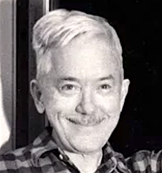 Martinsville, Ohio-born illustrator, calligrapher, typographer, book designer, author, type designer and puppeteer, 1880-1956 (Hingham, MA). Pic (1955). All his typefaces were designed for the Mergenthaler Linotype Company, where he worked for 27 years. He also was Acting Director of the Harvard University Press, 1917-1918. In 1919, he founded the Society of Calligraphers, Boston, and was in fact an accomplished calligrapher, who drew many ornaments and designed many jackets. Dwiggins studied lettering under Goudy in Chicago while a student at Frank Holme's School of Illustration. When Goudy moved to Hingham, Dwiggins followed and was to work there for the rest of his life. As a puppeteer, he often used the pseudonym Dr. Hermann Puterschein. His papers:
 - Some why's and wherefore's of the shapes of roman letters (1919), a short essay full of quotes, some good, but mostly derogatory, regarding the main text types in vogue at the time, such as Century, Caslon, Cheltenham, Pabst, Cadmus and Scotch.
- WAD to RR, a letter about type design, Department of Printing and Graphic Arts, Harvard College Library, Cambridge, MA, 1940. In this letter to a friend, RR, entirely written in a beautiful hand, he explains how to make type.
His typefaces: - Arcadia (1943-1947). Mac McGrew: Arcadia was an experimental typeface designed by William A. Dwiggins for Mergenthaler in 1943-47, used in Some Random Recollections, by Alfred A. Knopf for the Typophiles as Chapbook XXII in 1949.
- Caledonia (1938-1939). Known as Transitional 511 at Bitstream, New Caledonia at Adobe, and New Caledonia at Linotype. See C651 Roman on the SoftMaker MegaFont XXL CD, 2002. Nicola Caleffi complains that New Caledonia and BT 511 are too weak and miss old style figures.
Mac McGrew: Caledonia and Caledonia Italic were designed by William A. Dwiggins for Linotype in 1938, with Caledonia Bold and Bold Italic added two years later. A Bold Condensed version was produced by Lino for newspaper head- line use. Caledonia has been described as a modernization of Scotch Roman (and Caledonia is the ancient name for Scotland), but it is more than that. It also shows the influence of the Bulmer typeface, with a large portion of Dwiggins' individuality. He describes the typeface as having a "liveliness of action. [...] quality is in the curves---the way they get away from the straight stems with a calligraphic flick, and in the nervous angle on the under side of the arches as they descend to the right." Being designed specifically for the Linotype and its mechanical limitations, rather than being adapted from a foundry face, Caledonia Italic is particularly successful, and the whole family has become very popular. In text sizes, short descenders may be cast on nominal body sizes, while the more handsome long descenders (not made for italics) require one point larger body size. Compare Baskerville, Bulmer, Scotch. - Caravan Borders (1938). Four fonts available at Linotype (1976).
- Charter (1946). Mac McGrew: Charter was an experimental, special-purpose typeface designed by William A. Dwiggins for Mergenthaler between 1937 and 1942. An upright script, only the lowercase and the few other characters shown were completed. For tests, these were combined with Electra caps. It was used in a limited edition book, The Song Story of Aucassin and Nicolete, designed and printed in 1946 by S. A. Jacobs at the Golden Eagle Press, Mt. Vernon, New York, with Electra small caps in place of regular caps. Between 2010 and 2018, Cristobal Henestrosa developed the titling typeface Royal Charter, a digital revival of Charter. With the help of Oscar Yanez, this became a retail typeface at Sudtipos called Mon Nicolette.
- Eldorado (1953). Berry, Johnson and Jaspert give an earlier date, 1951. Created after a 16th century early roman lowercase by Jacques de Sanlecque the elder. Revived in 1993 at Font Bureau as Eldorado by David Berlow, Jane Patterson, Tobias Frere-Jones, and Tom Rickner. Mac McGrew: Eldorado is a contemporary roman designed by W. A. Dwiggins for Linotype about 1950, based on early Spanish models. The lowercase is compact, with a small x-height and long ascenders. Several italic letters have cursive or decorative forms; also notice the cap Y, with curved, serifless arms.
- Electra (1934-1935), a text typeface with a distinctive Q but otherwise unobtrusive glyph shapes. Known as Transitional 521 at Bitstream. Mac McGrew: Electra is a contemporary modern typeface designed by W. A. Dwiggins for Linotype. The light weight was drawn in 1935, the bold a few years later. Aside from its readability and distinctive character, Electra is distinguished by a choice of italic forms. Electra Italic is really a sloped roman, while Electra Cursive, released in 1944, is more nearly a conventional italic form; only the lowercase is different. Like a number of the better Linotype typefaces, Electra also has a choice of short descenders, which will cast on the nominal body, or long descenders, which must be cast one point larger. Compare Fairfield. A digital revival was done by Jim Parkinson in 2010: Parkinson Electra. Parkinson did another revival in 2017, Aluminia, exclusively for use in Bruce Kennett's 2017 book on W.A. Dwiggins. In 2018, Laura Garcia attempted a revival while studying at Type West.
- Experimental 267D.
- Falcon (published in 1961) is an experimental font at Mergenthaler Linotype. Mac McGrew: Falcon was designed during World War II for Linotype by William A. Dwiggins and released in 1961. It seemed to him, he said, "to hit the middle ground between mechanical exactitude and the flow and variety of a written hand-suggesting some of that flow and variety but controlling it, so the letter can be repeated."
- Hingham (1937-1943). Mac McGrew: Hingham was an experimental newspaper face, originally called Newsface, designed between 1937 and 1943 by William A. Dwiggins, for improved readability. Only the 7-point size was cut by Mergenthaler, and it was used only for tests.
- Metro (1929-30). This famous sans serif family was published by Linotype in 1936-1937. It is also called Metroblack, and sometimes dated 1928. In digital format, it is known as Geometric 415 at Bitstream, and Metro Office, Metro #2, Metrolite, Metromedium and Metroblack at Linotype. It is DH Sans at FontHaus. It was revived as Examiner NF by Nick Curtis (2009). It lives another life as Grosse Pointe Metro at Group Type. Mac McGrew: Metrolite and Metroblack were designed by William A. Dwiggins and introduced by Linotype in January 1930, as the first American typefaces to join the trend to sans serif started by Futura and Kabel. These typefaces are less mechanical than the European imports, and were promoted as being less monotonous and illegible. The first two weights were soon followed by Metrothin and Metromedium. In 1932 several characters were redesigned; thereafter the series was promoted as Metrothin No.2, Metrolite No.2, Metromedium No.2, and Metroblack No.2, including the redesigned characters, but the original characters were available as extras. Metrolite No.2 Italic was shown in 1935, along with Lining Metrothin and Lining Metromedium, which are like the small caps of the regular typefaces. Italics for Metromedium No.2 and Metroblack No.2 were shown in 1937. Metrolite No.4 Italic and Metrothin No.4 Italic are essentially the same design but narrower, for mechanical purposes. Unique Capitals are made for some sizes of Metrothin and Metromedium. Alternative figures are made as follows: Gothic No. 39, for Metrothin No.2, similar to Spartan Light. Gothic No. 40, for Metrolite No.2, similar to Spartan Medium. Gothic No. 41, for Metroblack No.2, similar to Spartan Black. Gothic No. 42, for M etrothin No.2, similar to Kabel Light. Gothic No. 43, for Metrolite No.2, similar to Kabel Medium. Gothic No. 44, for Metromedium No.2, similar to Kabel Bold. Gothic No. 45, for Metroblack No.2, similar to Sans Serif Extra Bold.
- Stuyvesant (1942-1947). Mac McGrew: Stuyvesant and Stuyvesant Italic were designed in 1942-47 by William A. Dwiggins, inspired by a quaint Dutch type cut by J. F. Rosart about 1750, and used in 1949 in The Shelby Letters, from the California Mines, 1851-1852, published by Alfred Knopf. An entirely different Stuyvesant, a novelty design, was made by Keystone before 1906, perhaps before 1900.
- Tippecanoe (1944-1946). McGrew writes: Tippecanoe was an experimental typeface designed in 1944-46 by William A. Dwiggins for Mergenthaler, on the Bodoni-Didot theme. It was used in a book by Elizabeth Coatsworth, a friend of Dwiggins, The Creaking Stair, published in 1949 by Coward-McCann. Compare Louvaine Bold [by Morris Fuller Benton]..
- Winchester (1944). Revived as ITC New Winchester by Jim Spiece. Mac McGrew: Winchester Roman and Winchester Uncial with their italics were completed in 1944 by William A. Dwiggins, the Uncial being an experiment aimed at making the English language easier to read by eliminating some of the ascenders and descenders typically used in this language. Italic caps and other characters were drawn in 1948 but not cut. Although made on Linotype matrices by Mergenthaler, fonts of hand type were cast and used only by Dwiggins and Dorothy Abbe beginning in 1950 at the Puterschein-Hingham Press, where they were partners until his death in 1956. In the specimen shown here, the uncial f appears in both italic alphabets. A regular italic f was cut but apparently not cast.
- He worked with multiple typewriter manufactures including Underwood, Remington Rand, and IBM, but none of them were finished. He left a number of intriguing drawings which are now kept at the Boston Public Library. In his Dossier, Toshi Omagari combined these materials to make a cohesive monospaced typeface family: the upright was taken from a drawing of monospaced lowercase for an unknown client, and the italic was from the work he did for Underwood which he called Aldine.
Matt Desmond created Dwiggins Deco in 2009 and writes: This typeface was originally designed in 1930 by W.A. Dwiggins as the cover for the book "American Alphabets" by Paul Hollister. Only the 26 letters of the alphabet were included on the cover, so the rest of the numbers, punctuation, symbols, and accented characters have been crafted in a matching [art deco] style. A free version called Dwiggins Initials KK was designed in 2012 by John Wollring. Noteworthy also is Stefan Hattenbach's Dwiggins Script (2018), developed together with Glenn Sjökvist. Books about Dwiggins include Bruce Kennett's W.A. Dwiggins A Life in Design (2017, Letterform Archive). Linotype link. FontShop link. Klingspor link. MyFonts link. Bio by Nicholas Fabian. Flickr picture group for Dwiggins. View digital typefaces based on the work of Dwiggins. View W.A. Dwiggins's typefaces. [Google]
[MyFonts]
[More] ⦿
|
William Dana Orcutt
|
Book designer, typographer and author (b. 1870, West Lebanon, d. 1953, Boston). Designer of French Round Face&Italic, Humanistic, Laurentian, Suburban French&Italic, and Verona. McGrew comments on each face: - Suburban French is one of Monotype's first independent recreations of typefaces from classic sources abroad. It was cut about 1911 at the suggestion of J. Horace MacFarland, prominent Pennsylvania printer, and was adapted to Monotype under the supervision of MacFarland and William Dana Orcutt, a well known typographer and book designer in New England. Its source is said to have been a Didot oldstyle first cut about 1804, but the Monotype typeface was first introduced under the name of Bodoni Roman. The double serifs at the top of lowercase vertical strokes are a distinguishing feature. Compare French Round Face.
- Verona is ATF's adaptation about 1951 of Bologna, which had been cut by Stephenson Blake in England in 1948. It is said to have been cut from Stephenson Blake's drawings, but lining figures were drawn to replace the hanging figures which Stephenson Blake had featured. The name was changed to avoid having disrespectful printers call it "baloney," yet retaining an Italian connotation. At the time ATF did not realize that Stephenson Blake had in turn adapted the design from an earlier ATF face, Humanistic (q.v.), drawn by William Dana Orcutt in 1904. With or without its later modifications, which are minor, this typeface retains more of the appearance of hand-lettering than almost any other cut in metal, and composes into a beautiful page with properly close spacing. Compare Freehand, Motto, Heritage, Thompson Quillscript. Incidentally, when ATF took Verona as a new name for Stephenson Blake's Bologna, they also overlooked the fact that Stephenson Blake uses the name Verona for their copy of BB&S-ATF's Munder Venezian.
- French Round Face, originally called Didot Roman or simply Modern, was one of the first revivals of the typefaces cut by Firmin Didot in France about 1784. This was cut for Monotype in 1910, under the direction of J. Horace MacFarland and William Dana Orcutt. The italic is unusual in that some lowercase letters have serifs like the roman. No. 16 on Linotype and Intertype is similar but heavier. Compare Suburban French.
- Humanistic was designed by William Dana Orcutt and privately cast by ATF in 1904 for the University Press, Cambridge, Massachusetts. It is a careful rendering into type of the round humanist writing of the Renaissance period, based in particular on the 1485 manuscript of Antonio Sinibaldi's Virgil in the Laurentian Library at Florence, Italy. This is considered by some to be hand-lettering in its most beautiful form, and occurred after the development of roman types as we know them. In 1940 this type was adapted to Monotype keyboard composition, under the direction of Orcutt and Sol Hess, the 21-point size being used for a large edition of Science and Health. The Monotype cutting, known as Laurentian closely follows the foundry version, including some but not all of the original alternate characters. A few years later the design was modified by Stephenson Blake in England, and issued as Bologna; this in turn was adapted by ATF as Verona (q.v.).
Note: Humanistic/Verona were digitally extended in 2006 by Ray Larabie as Mikadan (Typodermic). Klingspor link. [Google]
[More] ⦿
|
William H. Bradley

|
 Book designer, poster designer and typographer, born in Boston (1868). He died in 1962. His typefaces include the following:
 - Abbey Text (1895, A.D. Farmer).
- Bradley (ATF, 1895). This blackletter typeface was cut into a wood type by Hamilton in 1900.
- A beautiful unnamed lettering for the Inland Printer (1891-1892).
- He drew the Bradley Series and licensed it to American Type Founders in 1895. That blackletter design was copied and issued by the Inland Type Foundry (as "St. John") and by A.D. Farmer&Son Type Founding Co (as "Abbey Text", still 1895). Also in 1895, Hermann Ihlenburg at ATF made the Germanic-language version of the Bradley Series. Several German foundries had metal versions of his 1895 series under the names Halbfette Altgotisch, Altfettgotisch and Amerikanische Altgotisch, such as Bauersche Giesserei and Schelter & Giesecke (1903). Digital revivals: Fyne Fish NF (Nick Curtis, 2009), Bradley Pro (2005, Ralph Unger at Profonts), Bradley DJR (2018, David Jonathan Ross). Bradley was used by Disney in its Sleeping Beauty Castle.
- Priory Black (ATF, 1897-1898) is said to be due to Bradley. In 1904, ATF introduced a modernized version called Cloister Black (or Cloister Text), designed by Joseph W. Phinney or Morris F. Benton.
- Bradley Roman and Italic saw the light in 1901 when Bradley was writing Peter Poodle, Toymaker to the King, and these typefaces are known as the Peter Poodle types.
- In 1904, he co-designed Antique Bold with J.W. Phinney and Morris Fuller Benton at ATF.
- His Bewick Roman series (1904) has gorgeous ligatures (tt, ct, and so on). Mac McGrew: Bewick Roman was designed by Will Bradley in 1904 and issued by ATF the following year. It is a quaint display type with a number of unusual characteristics. Several capitals have both wide and narrow versions, although generally the typeface is rather narrow; there are also several tied charac$Gters and ornaments in the font, as was common with nineteenth-century designs. Compare Rogers, Vanden Houten.
- Wayside Roman and Italic. Mac McGrew: Wayside Roman and Italic were shown by ATF in 1900, as a handsome interpretation of modern typeface similar to Scotch Roman, but without the heavier capitals of the latter face. Some sources say the designer was Will Bradley, but this is disputed by other authorities, and most likely it is a revival of an older face. It was not in regular production very many years, but special castings have been made at times. Some figures appear to be oversize---6, 7, and 9 in the specimen shown here---but this is a characteristic of the font, although not uniform from one size to another. Also compare Oxford, Bell.
- In 1904, he created the beautiful Chap-Book series (Cuts, Borders, Directors (pointing fingers), Guidons (unbelievable parentheses)), as well as the Mission Toys Ornaments, all at ATF. Thereafter followed Missal Initials, Wayside Borders (1904), Wayside Ornaments (1904), Cloister Borders (1905), Cloister Initials (1905), Indian Borders (before 1908). Some of his ornaments made it to American Pi NF (2006, Nick Curtis) and to the five-font-set Bradley Dingies (by Paulo W, 2009). Mac McGrew: Missal Initials were issued by ATF in 1904; their design has been ascribed to Will Bradley. Derived from fifteenth-century sources, each letter is designed to fill a square area. Compare Caxton Initials, Lombardic Initials. For a digital version of Missal Initials, see Initials ATF Missal Caxton (2012, Alter Littera).
- Bradley Initials (1934). For a degital version, see Glenda de Guzman's Bradley Intials (1994, Font Bureau).
- Vanity (1921-1930) is custom type he made while he was art director.
- His last group of typefaces was Bradley Combination Ornaments, made in 1952 for Steve Watts, type merchandising director of the American Type Founders Company.
- Roman alphabet by Bradley.
Fontshop link. A Booklet of Designs (1915, New York) contains many of his interesting drawings for typefaces. [Google]
[MyFonts]
[More] ⦿
|
William I. Johnston
|
Designer based in Watertown, MA USA. He made CourierX, CourierOE and CourierWeb for use in web pages. A beautiful home page as well! [Google]
[More] ⦿
|
William Starling Burgess

|
 A joke started by Mike Parker at the 1994 ATypI: In recent years Mike Parker has unearthed evidence showing that the famous design [Times New Roman] was probably not the original work of Lardent and Morison, but of the American yacht racer and designer, Starling Burgess (b. Boson, 1878, d. 1947). People are still falling for it in 2007 and 2008. I will quote Bill Troop from the latter article.
 As for Burgess - - has a shred of independent evidence emerged to support the theory that this man, never hitherto associated with type - - was capable of designing TNR or any other typeface? Has a single page of a single book in Times printed before 1932 emerged? Where are the secret 'bonds' between the corporations that Mike Parker talks about? I retain my belief that Mike Parker has perpetrated a marvellous prank. There is not a single piece of verifiable evidence to support it as history. If anything were more decisive than another, it would be Jim Rimmer's unimpeachable statement that the italic attributed to 'Burgess' was in fact designed by him. That's OK. We know Jim Rimmer is a type designer and a very, very good one. We know little of Starling Burgess except that he was never a type designer. Nobody has ever shown an original drawing. Everything we have been allowed to see has been digitized. And all the 'secret agreements' from 1960 which Mike Parker speaks of - - where are they? Why has nobody managed to photograph or scan one of them? And why has nobody, a hundred years later, been able to discover a single page printed in TNR before 1932? This is just an amusing hoax that doesn't even rise to the level of the pranks that are occasionally inserted into the august Grove Dictionary of Music and Musicians. However, it has served its purpose, which was to distentangle Giampa from Monotype's legal eagles. Now that Gerald's Lanston/Monotype establishment doesn't seem to exist anymore, why doesn't everyone just come clean? Even Trever-Roper admitted he had been had. It doesn't seem to have done irreparable harm, long-term, to his reputation. Joel Alas reports it differently, as he tells how Mike Parker created a new font, Starling, in 2009, in honor of Burgess, but a Times-Roman lookalike. Excerpts from his piece: William Starling Burgess was born into a wealthy Boston family in 1878, and is best remembered as an accomplished naval and aeronautical designer, the builder of yachts for the America's Cup and aircraft for the Wright brothers. But before embarking on his stellar career on wind and water, Parker believes Burgess had a short but brilliant dalliance with typography. An old photograph of William Starling William Starling Burgess When Giampa started investigating the Lanston Monotype archives, he claimed to have found correspondence between the company and Burgess, who, in 1904, ordered the manufacture of a font series to be used for company documents at his shipyard in Marblehead, Massachusetts. But before Lanston Monotype could complete the order, Giampa claimed, Burgess witnessed an early flight by the Wright brothers and abandoned his interest in type in favour of aviation. His original drawings were filed at the company as Number 54, and remained on a shelf for years. Parker says that in 1921 Lanston Monotype tried unsuccessfully to sell the Number 54 font to a fledgling news magazine called Time. Sometime after that, Burgess's drawings fell into the hands of Stanley Morison, a type consultant at the Monotype Corporation in Britain, by way of Frank Hinman Pierpont, an American who managed that company's factory in Surrey and who made a career out of reviving old fonts. In the early 1900s typography was progressing rapidly, but newspapers were failing to keep up with the advances. The Times of London used a chunky serif font that was hard on the eye and wasteful of ink and paper. When Morison criticised The Times for its typeface in 1929, the newspaper challenged him to come up with something better. In his writings, Morison says that he looked to old-style fonts for inspiration, and set upon modifying a 16th-century typeface called Plantin. A sketch sheet was handed to Victor Lardent, a staff illustrator for The Times, who finalised the design. The Morison-Lardent drawings were accepted, and on October 3 1932, The Times went to print with its proud new typeface. [...] "Morison knew no bounds," says Parker, who has numerous anecdotes about their many encounters that paint a picture of a cunning and devious man. Morison never took credit for designing the font himself, but claims only to have "excogitated" it. [...] To date, no one but Giampa and Parker have claimed to have seen most of the evidence that supports the Burgess story. Sadly, no one else is likely to have the chance to verify their claims. In 1918, a fire tore through Burgess's shipyard, incinerating any documents that might have shed light on his activities during 1904, when Parker suggests he made the original drawings for the new font. On the other side of the Atlantic, a bomb blast near the London offices of Monotype Corporation in 1941 destroyed much information about Morison's activities during the redesign of The Times's typeface. The surviving brass B pattern plate of Starling The surviving brass pattern plate at the centre of the font controversy All that remained were the Lanston Monotype archives in Giampa's possession, until they too met with disaster. In January 2000, Giampa's house was flooded, and a century's worth of printing history was lost. "The bulk of the files ended up in a dumpster," Giampa said. FontBureau (see also here) perpetuates the story: In 1904 William Starling Burgess, gifted American polymath, drew his second type for Lanston Monotype, designated Lanston No. 54. A few years later, Burgess would abandon type for a distinguished career designing experimental aircraft, racing yachts, and the Dymaxion automobile. The type languished for decades until Frank Hinman Pierpont, American head of the British Monotype factory, passed on proofs of the design to Stanley Morison, who was developing a new roman for The Times of London. Mike Parker found the original drawings, now housed at the Smithsonian Institution, to be superior and prepared the Starling series for Font Bureau. [Note: Images below by Alex Delgado.] [Google]
[MyFonts]
[More] ⦿
|
Winston Type Co.
[D. Sandi Sjahputra]

|
 Aka Sandi Dez. Designer (b. 1985) based in Bandung, Indonesia. Creator of the free vintage spurred decorative blackletter typeface WT Bradford (2018), which includes Inline and Press styles. Winston also designed the vintage display typeface family WT Kingsbury (2018).
 In 2019, Winston Type Co published the distinguished early art deco typeface WT Bellochero, the Tuscan circus font WT Scotch, and the great formal calligraphic typeface WT Hilton Script. [Google]
[MyFonts]
[More] ⦿
|
Xaviera Comics
[Vic Fieger]

|
 American graphic designer (b. 1982) located in Medway, MA, who has created many free fonts, and some low cost commercial fonts. He is also known for his web comic, Dubmarine. Until 2006, all his fonts were free, but starting in 2006, he started selling them via MyFonts.
 In 2004, he created Airstrip Four, AlphaEcho, Boston Traffic (a freestencil typeface), Breakaway, CarbonType (old typewriter), Corporate HQ, DataControl (nice octagonal face), DataControlUnifon, Delta Echo, Eurocentric, FormerAirline, GangofThree (oriental simulation), Helsinki (comic book font), IonicCharge (LCD simulation), JamPact, KarmaticArcade, KnowYourProduct (stencil), LandSpeedRecord, MajorSnafu (stencil; Major Snafu Pro (2012) is a cooperation with Cheap Pro Fonts), NervousRex, Osaka-SansSerif (techno), PillboxOpaque (dripping blood face), QuickEndJerk, Refrigeration, SiameseKatsong, Tetroserbogia, Umbrage, Virgo01, Whitehall1212, Xenophone (+Pro version in 2011), Yukarimobile, ZonaArmada. In 2005, he designed FrauleinUnifon, Fraulein, Fraulain II, Fraulein Hex, NukuNuku (oriental simulation face), OffshoreBankingBusiness, PlannedObsolescence, TerryScript, Wunderbar, YachtingType, Zero&Zero-Is, Xerography, FrauleinHex, ICBMSS20, ICBMSS25 (stencil typefaces), Hydrogen Type, Gumbercules, Kremlin (Cyrillic letter simulation; followed in 2010 and 2014 by Kremlin Pro and Kremlin II Pro at CheapProFonts), Johnny Homicide, Lilac Malaria, Motorway, Offshore Banking Business, Planned Obsolescence, Nuku Nuku Paradiso (Asian simulation), Quadrophonic, Ruth Script, Shoplifter (ransom note font), Under Influence (scratchy face), Viva Allende, KarmaticRevolution (with Mike "Karma" Alkire), RanmorianStd-B (artificial language script) and Ex (kana). His 2006 additions, still free: Big in America, Maxine Script, Gisele Script, Siamese Katsong (oriental simulation), Pokopen, Grecian Formula (Greek simulation), Edo (brush; this became Edo Pro in 2010), Armalite Rifle (grunge stencil; a Pro version followed in 2010), Ruth Script, Terry Script, Oil Age Heiroglyphs (grunge), Nyamomobile (gorgeous futuristic stencil face), Q-Bert's Funeral, Xtreme Chrome, Fawn Script, Ukiah Caps (a hip all caps face), Banzai (fake Japanese), 106 Beats That, Azudings1, Fawn Script, Freelance Kamchatka, and Daisy Script. Commercial fonts: Sixpak (2008, pixel face), Jaipur (2007, Indic script simulation), Santa Mensch (2006, brush face), Celonius Mark XIX (2006 geometric design), Argon Type (2006, futuristic), India Echo (2007, futuristic), How to Consume Oxygen (2007, grunge), Statue Of Liberty's Underwear (2007, Russian constructivist style), Moon Corps (2007, katakana), Underwood Champion (2008, free distressed typewriter), Heavy Data (2008, a computer simulation face). Perlmutter (2008) is a Hebrew and Yiddish font designed for the purpose of legibility at great distance (included are niqqud, letters with dagesh, punctuation, sheqel sign, and aleph-lamed ligature). In 2009, he created Edifice Wrecks (graffiti), Damon Script (comic book face) and Maritime Flags and Curses (dingbat face). Fonts made in 2010: Single Sleeve. In 2015, he created Extended Play. Fonts at FontStruct in 2009: Newhome (LED simulation). Free fonts made in 2011: Death to Smudgey (grunge), Lino Chisel (2011). Fontsy link. Font Squirrel link. Fontspace link. Kernest link . Devian Tart link. FontM link. Dafont link. Aka Xaviera Comics. [Google]
[MyFonts]
[More] ⦿
|
Zachary Sawtelle
|
During his studies at Fitchburg State University in Fitchburg, MA, Zachary Sawtelle (Southwick, MA) created an ornamental typeface for playing cards (2014). [Google]
[More] ⦿
|


 Aboutype (est. 1991) was Joffre LeFevre's small Boston-based foundry and custom font bureau. LeFevre (b. 1945, Muskegon, WI, d. 2022, Proctorsville, VT) has been making typefaces since about 1970. He studied Fine Arts (illustration) at Kendall College of Art and Design and Fine Arts (graphic design) at Grand Valley State University. He also received an honorary Masters in Fine Arts from Babson College. For twenty years serving as principal type designer and type product designer for Compugraphic/Agfa Corporation before founding Aboutype Associates, Inc., a type design studio and custom digitizing service in 1989. He retired to Vermont in 2009. Joffre LeFevre's 1997 Volkswagen font series is floating around in web space however. As he says, The Volkswagen fonts were hand-drawn by me to a specification based on a long neglected display version of Futura that was developed by a photo composition type foundry in the early seventies. Similar to the type used in the introduction of the first VW Beetle.
  This used to have alphadings and dingbats by Anastacia E. Zittel (b. 1976) from Douglas, Massachusetts, all made between 1990 and 2002: AEZ-American-Woman, AEZ-Americana, AEZ-April-Fool's-Day-dings, AEZ-I-saw-the-Sign, AEZ-Jon's-Handwriting, AEZ-Kate's-Handwriting, AEZ-Lacy-Hearts, AEZ-Native-American-Turtle,
  During his graphic design studies at the New England School of Art and Design at Suffolk University near Boston, Alan Auger designed the circle-based typeface
  Albert Angus Turbayne (b. 1866, Boston, MA, d. 1940, London) was an American book designer and bookbinding artist. He worked in London for the London County Council School of Photoengraving and Lithography and also for Carlton Studio. He wrote
  During his studies, Boston, MA-based Alexander Bartlett designed Caslon Remixed (2019) and created hilarious animated gifs in the process. [
 Graphic designer at The Improper Bostonian Magazine. She created a great Broadway-style art deco marquee typeface called
  Graduate of MassArt, class of 2015. Boston, MA-based designer of Spitaels Display (2015), a calligraphic old style typeface influenced by the work of José Mendoza de Almeida. [
 [
[ American calligrapher in Andover, MA, who worked for many foundries, and ran several studios. He ran
  Founded in 1981 by Mike Parker, Matthew Carter, Cheri Cone, and Rob Freedman, Bitstream is the first digital font foundry. Not without controversy, though, as many claim that the original digital collection was an illegal copy of Linotype fonts [Note: I disagree with that statement--take out "illegal"]. In 1999, Bitstream created
  Type design studio located in Norwood, MA, est. 2005. Fonts can be bought at
  Mac McGrew: Boston Breton was introduced by ATF about 1900. It was redrawn from the earlier Breton, originated by one of ATF's predecessors, the Boston Type Foundry, in the early or mid-1890s. It is a bold, rather wide square-serif face, suggestive of Stymie Bold which came thirty-some years later. But its large lowercase and short ascenders are suggestive also of the modifications designers have given such typefaces in phototype adaptations, seventy years or more later. Boston Breton Condensed and Extra Condensed came from the same source in 1909 or earlier. All have the same unusual sort of Q. In 2011, Nick Curtis created a digital version called
  Boston-based foundry, est. 1817 by
  Boutros calligraphic Arabic fonts (sold by
  Graphic and web designer in Boston who studied at Hampshire College 2006-2007). He wrote the
  Cade Type Foundry is the private foundry of Philip Cade. He cut his first (metal) typeface in 1972. The foundry is an outgrowth of the Juniper Press. Cade published a
  [
[ During his studies in Boston, Chris Bowers designed the typeface family Ketman Display (2015), a revival of the German art deco typeface Patria (1938, Henry Reinhard Moeller). On the
  During his studies at Mount Ida College in Newton, MA, Chris Lenzi (Franklin, MA) designed the curly display typeface Ionic (2016). [
 Cynthia Batty (formerly, Cynthia Hollandsworth) was born in Washington, DC in 1955 (MyFonts) or 1956. She studied at the California College of Arts and Crafts in Oakland, CA, and managed the department of type design and development at Agfa Compugraphic in Massachusetts. She was President of AlphaOmega, a design studio dedicated to typeface development. She was also the Director of Typeface Development at High Technology Solutions, in Poughkeepsie, New York. Currently (?), she is the vice-presdident of Simon&Schuster in New York. For a few years, she was Executive Director of ATypI, involved, in particular in the ATypI meetings in Vancouver and Prague.
  [
[
 Type designer and composer, born in St. Albans, VT, in 1958. He was one of the early free/shareware type designers, well-known for creating revivals of 19th century typefaces. He was the Walter W. Naumburg Professor of Composition at Brandeis University, and has previously taught at Harvard University, Columbia University, and Stanford University.
  [
[ [
[ English stonecutter (b. Codicote, 1915; d. Cambridge, 1995). An ex-apprentice of Eric Gill, he set up his own shop in Cambridge in 1939. His carved plaques and inscriptions in stone and slate can be seen on many churches and public buildings in the United Kingdom. He and his third wife Lida Lopes Cardozo, also a stonecutter, designed the main gates of the British Library.

 [
[ [
[ Born in Cambridge, MA, in 1970, and educated at the Rhode Island School of Design (1988-1993), Eliabeth now lives near New York City where she is Principal of Elizabeth Cory Studios. From 1993 until 1995 she was senior font designer at Font Bureau, and from 1996-1998, she was font manager and designer at Meta design in Berlin.
  Plainville, Massachusetts-based Emily Spadoni (b. 1979), runs her own foundry, simply called Emily Spadoni. She specilaizes in scripts, and in partucular, curly, frilly, mischievous scripts and vavoom vampire handwriting. In 2014, she made these hand-printed typefaces: Drawing With Markers, Peanutbutter Smoothies (curly), What I Want For Christmas, Sweethearts Love Letters (curly script), Strawberry Whipped Cream, Silver Bellybutton Ring (cute curly script), Betty, Pink Ladies and Peanutbutter (a curly teatime script), Tall Tulips, Doodle Dings 1 Birds Cages.
  [
[ During her studies at the Art Institute of Boston, Erin Gwozdz created the wide slab serif typeface
  Calligrapher and book designer in Amherst, Massachusets. At Type Cooper 2021, she designed a flared stroke font,
  Founded in 1989 by noted publications designer and consultant Roger Black and type designer David Berlow, Boston-based Font Bureau is, in my humble view, the best and most professional font design company in the world. It is uncompromising in its quest for quality. They have a good hold on the North-American newspaper market. Sam Berlow manages the company. I am not listing their fonts here---they are listed under the various type designers who have contributed to Font Bureau.
  Celebrated type designer, born in 1970 in New York City. Frere-Jones received a BFA in Graphic Design from the Rhode Island School of Design in 1992. He moved to Boston, where he worked at the
  Foundry headed by Larry Oppenberg (President) and Mark Batty (Director). It was founded in 1994, and is based in Littleton, Massachusetts. Its main designers are Alex Kaczun, Michael Leary, Dennis Pasternak, George Ryan and Steve Zefarana.
  Printer in Boston who published
  American designer, b. Rockville Centre, NY, 1950. George Ryan held senior positions at Linotype and Bitstream since 1979, where he has been involved in the production of over 2500 fonts. In 2004, Ryan joined Agfa Monotype, and is now a Monotype typeface designer.
  [
[ Graduate in 1992 from the Rochester Institute of Technology with a BS in Printing. While a co-op student for Monotype Typography in California, she hinted fonts. She has also carried out research at Microsoft with Robert Norton. She joined Font Bureau in 1994, but moved a few years later to Southern California.
  Designer of Radio at T-26 in 2001. In 2005, he created
  Manchester, UK-based Hannah Tyson created several hipster alphabets in 2014 and 2015.
  Harry Gage lived in the village of Annisquam on Cape Ann, Massachusetts after he left corporate and academic life in the printing business. He produced a great deal of fine art in his later years---watercolors, designs for commemorative medals, and designs for the Christmas cards that were sent out by the village committee.
  Co-designer in 1993 with Richard Lipton at Bitstream of Cataneo (1991-1992; an elegant chancery cursive typeface, inspired by the work of Bennardino Cataneo, a 16th-century Italian writing master). She worked at Bitstream from 1982-1993, when she joined Galapagos as a type consultant. She lives in Massachusetts where she teaches art in an elementary school. She has a Masters degree in fine arts from the University of Massachusetts in Dartmouth (1980), and worked at the type drawing department of Compugraphic from 1980-1982. From 2001 until 2005, she created a fanciful display typeface in four weights,
  As a student at Boston University, Jewelson Fernandes designed the typographic Bauhaus Manifesto poster (2016). [
 [
[ Massachusetts-based punchcutter, b. 1852, Harrisville, PA.
  American type designer, 1848-1934. He worked in Boston, first at the Dickinson foundry, and later at ATF, where he was vice-president. He designed these typefaces:
  Born in 1854, died in 1913. Boston-based book printer who is usually credited with the design of Cushing in 1896 at Monotype. McGrew writes: Cushing is a group of typefaces rather than a family, for some members have little in common with each other, and were not intended to work together. Some accounts credit the design of these typefaces to Josiah Stearns Cushing, who in the late nineteenth century was president of the Norwood Press Company in Norwood, Massachusetts. Cushing was one of the most prominent printers of the day, but it seems more likely that he merely spelled out what he wanted in typefaces for his particular purposes, and that they were executed by others.
  American designer of
  Graphic artist who worked for Agfa Monotype and then Monotype from 1988 until 2008, mainly as a hinting expert. Currently, he is a freelance designer in North Andover, MA. He made the scary handwriting font GitschHand (2001).
  Kent Lew Design in Washington, Massassuchetts is where graphic designer and illustrator Kent Lew (b. California, 1962) publishes his work. He is a winner of an award at the TDC2 Type Directors Club's Type Design Competition 2002, with
 Authors in Pittsfield, MA, of
 The Lanston Type Co was based in PEI, Canada, moved in 2002 to Vancouver, and moved later that year to Espoo, Finland. In 2004,
  Boston, MA-based designer of the squarish typeface Solia Sans (2017), which was inspired by the architecture and modernism of Seoul. In 2018, Linseed Studio designed Nosferatu (a tall shivery Halloween font with ornmaments), Belknap, 3d Sketch and the handcrafted Time Will Tell. [
 Calligrapher, sign painter, and graphic and type designer from Milton, Mass., who was born in New York, studied design and photography at Harpur College there (graduating in 1975), did some lettering in Syracuse until 1977, worked for Bitstream in Boston from 1983-1991, and made a career afterwards as a staff type designer at Boston's Font Bureau. In 2016, he joined
  Prussian-American printer and lithographer, 1824-1909. Boston-based author of
  American calligrapher whose blog contains almost 200 calligraphic alphabets drawn by her in 2013. lives in Boston, where she created the Boston Calligraphy Trail.
  Type designer based in Brooklyn, NY. In 2014, as an intern at Typefounding (St. Louis, MO), he developed a typeface pending distribution by House Industries. In 2015, he joined Font Bureau, where he designed MF Ambulia Text (his graduation project at Type@Cooper in 2015), MF Abagnale (original headline sans from 2014), and MF Gaussian, under the umbrella of Font Bureau's Senior Font Designer, Cyrus Highsmith.
  Boston-based American type designer who joined
  During her studies at SCAD in Savannah, GA, Randolph, MA-based Mary Curtis created Liquid (2014), a soft typeface with rounded out joints in the limbs of the glyphs. [
 Born in Boston, MA, in 1988, Melinda Jeffs designs type. She founded Melifonts in 2011 in Hampton, NH. Creator of
  Worcester, MA-based designer of the Arabic simulation typeface Muad'Dib (2015), which is inspired by Frank Herbert's Dune. [
 In 2004, Monotype Imaging Inc was created when TA Associates bought Agfa-Monotype from Agfa. Its headquarters are in Woburn, MA. Agfa had bought the previous incarnation of Monotype in 1998. Before that, Agfa, a well-known photographic film, chemicals and paper manufacturer and Bayer subsidiary, entered the typography scene in 1982 by acquiring an interest in Compugraphic Corporation, the American phototypesetter company. From the press release: Based in Wilmington, MA, with regional offices in the U.K., Chicago, Redwood City, Calif., Japan and China, Monotype Imaging provides fonts and font technologies to graphic professionals, software developers and manufacturers of printers and display devices. Formerly Agfa Monotype Corp., the company also provides print drivers and color imaging technologies to OEMs (original equipment manufacturers). Monotype Imaging is home to the Monotype typeface library, a collection that includes widely used designs such as the Arial, Times New Roman and
  Boston, MA-based creator of the classy didone typeface Dallaglio (2014). [
 [
[ Type foundry in Melrose, MA run by Jim Lyles. In 2014, Lyles designed the hand-drawn outlined typeface family
  Boston-based designer. His typefaces:
  Type designer born in Boston in 1948 who created many exquisite designs such as
  Sam Berlow (Font Bureau) is interviewed on New York Public Radio (WNYC radio) about the candidates' fonts. On the same topic, he also published a piece in the
  MIT student who designed his own fonts at MIT, TrueType and PostScript. Illusion of 3D. Check out Reverb, ArgentumSilver, Daisy, StilettoBlack, StilettoSilver, Diamond,
  A penmmanship instruction manual with the subtitle Self-Instructor In Penmanship, published by Knowles & Maxim, Pittsfield, Mass., and St. Catharines, Ontario, Canada.
  [
[ British cartoonist and type designer (b. London, 1945), who lived in Fourqueux, France, and is now based in Uccle, Belgium, since ca. 2000. He redesigned the The Boston Herald American, the International Herald Tribune and Die Welt. In addition, he has been Art Director for The New York Times and the European edition of The Wall Street Journal.
  [
[ Great discussion on Typophile regarding Scotch Roman. We have two different opinions on the source of Scotch Roman: Linotype gives it to Richard Austin, while DeVinne credits Samuel Nelson Dickinson with modelling the first Scotch in Boston in 1837. Both sources agree that it was first cut by Alexander Wilson and Son in Glasgow. In 1839, Dickinson opened his foundry with the Scotch matrices.
  Dave Nalle was born in Beirut on March 19, 1959, and died on February 13, 2021 from COVID in his home town of Manor, Texas. From his
  Boston, MA-based designer of Rinko Display (2015), a flared all-caps typeface inspired by labeling on food crates of the early 1900's. [
 Dan Cederholm (Salem, MA) founded Dribble and set up the SimpleBits web page. The Shoppe is an offshoot of SimpleBits, LLC, a design studio founded in 2002 by Cederholm. SimpleBits specializes mostly in icons. Typefaces by Icon Shoppe include Chameleon16 (2007), a beautifully designed truetype pixel font. Icons by Icon Shoppe include Ballroom, Chameleon, Stockholm and Overcast. Typefaces by SimpleBits comprise
  Eben Sorkin obtained an MA in typeface design from
  The
The  [
[ Donald Tarallo obtained a BA in Studio Arts and Graphic Design from Clark University, and an MFA in Graphic Design from Rhode Island School of Design (RISD). He also studied with André Gürtler and Wolfgang Weingart in the Weiterbildungsklasse at the Basel School of Design in Switzerland. Since 1998, Don has maintained a freelance practice working on projects in identity, publication, and web design. He has taught at Clark University, Guangzhou Academy of Fine Art, Rhode Island School of Design, Samsung Art and Design Institute, Siena Art Institute, and Bridgewater State University. Don currently teaches at Fitchburg State University in Fitchburg, MA.
  The collection of books donated by Mac McGrew to The Museum of Printing in North Andover, MA. These books are part of the material that was used to research details for his book,
  Scott-Martin Kosofsky (b. 1953) was based in Boston for 40 years, and is now located in Rhinebeck, NY, where he heads The Philidor Company. Among many other things, he was also the principal designer of most Titanic Records packaging, and designed a book on the holocaust. He designed a number of Hebrew types for his own use---several are licensed to various major rabbinic organizations. Over the years he has become the leading designer, producer, and editor of the bilingual Jewish prayer books that are used by the majority of Jews in the English-speaking world. Some of his type designs:
  [
[ Born in Boston in 1976. Graduated with an MA in Typeface Design from-the University of Reading and studied at the Rhode Island School of Design. After graduation, he worked briefly for Jeremy Tankard and Font Bureau. In 2005, he worked briefly for
 Is it possible to design a typeface that is simultaneously octagonal and elliptical? The answer is an emphatic yes---as Verginiya Kadina shows in her
  [
[ After attending high school in Singapore, Victoria Rushton (New York City) studied at RISD (the Rhode Island School of Design) and graduated in 2013 with a degree in Illustration. In 2014 she joined Font Bureau and later Type Network as a staff designer, and lived in Boston. Under the guidance of Cyrus Highsmith at RISD, she created the text typeface
  Vincent Connare (b. 1960, Boston) is an ex-painter turned type designer, who holds an MA in typeface design from the University of Reading in 1999. In the late eighties/early nineties Connare worked in the Ikarus, Intellifont and TrueType teams for Agfa/Compugraphic, and was one of the first type designers to learn TrueType hinting. Then he joined Microsoft, where he designed
  Walden Font (est. 1997) sells historical typefaces&clip-art by Oliver Weiss from Winchester, MA. Walden's site includes a
  Martinsville, Ohio-born illustrator, calligrapher, typographer, book designer, author, type designer and puppeteer, 1880-1956 (Hingham, MA).
  Book designer, poster designer and typographer, born in Boston (1868). He died in 1962. His typefaces include the following:
  A joke started by Mike Parker at the 1994 ATypI: In recent years Mike Parker has unearthed evidence showing that the famous design [Times New Roman] was probably not the original work of Lardent and Morison, but of the American yacht racer and designer,
  Aka Sandi Dez. Designer (b. 1985) based in Bandung, Indonesia. Creator of the free vintage spurred decorative blackletter typeface WT Bradford (2018), which includes Inline and Press styles. Winston also designed the vintage display typeface family WT Kingsbury (2018).
  American graphic designer (b. 1982) located in Medway, MA, who has created many free fonts, and some low cost commercial fonts. He is also known for his web comic, Dubmarine. Until 2006, all his fonts were free, but starting in 2006, he started selling them via