| | |
100 Beste Schriften aller Zeiten
|
 German FontShop-sponsored site listing the hundred best fonts of all times, compiled by a jury in 2007. There is a lot of good information about each of the fonts mentioned. PDF file compiled by the jury: Stephen Coles, Jan Middendorp, Veronika Elsner, Roger Black, Ralf Herrmann, Claudia Guminski (FontShop) and Bernard Schmidt-Friderichs. Visualization of the list. The list:
 - (1) Helvetica
- Garamond
- Frutiger
- Bodoni
- Futura
- Times
- Akzidenz Grotesk
- Officina
- Gill Sans
- Univers
- (11) Optima
- Franklin Gothic
- Bembo
- Interstate (1993, Tobias Frere-Jones)
- Thesis
- Rockwell
- Walbaum
- Meta
- Trinité
- DIN
- (21) Matrix
- OCR A und B
- Avant Garde
- Lucida
- Sabon
- Zapfino
- Letter Gothic
- Stone
- Arnhem
- Minion
| | - (61) Blur
- Base
- Bell Centennial
- News Gothic
- Avenir
- Bernhard Modern
- Amplitude
- Trixie
- Quadraat
- Neutraface
- (71) Nobel
- Industria, Insignia, Arcadia
- Bickham Script
- Bank Gothic
- Corporate ASE
- Fago
- Trajan
- Kabel
- House Gothic 23
- Kosmik
- (81) Caecilia
- Mrs Eaves
- Corpid
- Miller
- Souvenir
- Instant Types
- Clarendon
- Triplex
- Benguiat
- Zapf Renaissance
| - (91) Filosofia
- Chalet
- Quay Sans
- Cézanne
- Reporter
- Legacy
- Agenda
- Bello
- Dalliance
- Mistral
| Follow-up in English. Credit for some images below: Danielle West. [Google]
[More] ⦿
|
Aldus Manutius

|
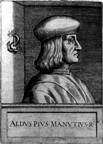 Late 15-th century Venetian scholar and printer, b. 1449, Bassiano, d. 1515, Venice. He founded the Aldine Press in 1495. His typefaces were all designed and cut by the brilliant Francesco Griffo, a punchcutter who created the first roman type cut from study of classical Roman capitals. Bembo, Cloister Italic and Poliphilus [aka Aldus Manutius' Roman] can be traced back to him. Example of his Italian Antiqua, 1499.
 Kevin Steele explains in 1996: Some sources cite the publication of Cardinal Bembo's De Aetna as 1493 or 1495. And in fact, the design continued to evolve until the 1499 publishing of the spectacular Hypnerotomachia Poliphili. Let's not split hairs. Let's celebrate 500 years of Bembo! In the mid fifteenth century printing quickly spread to Italy from Germany, and by the 1470's Venice had became the center of the printing industry, home to over 100 printing companies. Pioneers such as Erhard Ratdolt and Nicolas Jenson had already begun working on adapting the roman alphabet for metal type by the time Aldus Manutius established his press in 1494, with the intention of publishing all the Greek classics. Aldus Manutius (1450-1515) was a printer, entrepreneur, a great ego, and publisher of over 1200 titles. Among the many contributions of Aldus was the popularization of small, portable books. His expensive beautiful books were far from today's paperbacks, mind you. One of the many great talents working for Aldus was Francesco Griffo, a gifted type designer. Griffo created many innovative type designs that are still admired for their beauty and readability. Their collaboration broke up over a copyright dispute, primarily over the ownership of the cursive type typeface that Griffo developed under the direction of Aldus. Although Aldus even had a papal decree to protect this style of alphabet, it was as difficult then as it is now to protect a typeface design. The alphabet was widely copied, and the style is known as italic, after its country of origin. Digital typefaces derived from his work: 1501 Manutius (2001) by Klaus-Peter Schäffel. Selection of fonts based on Manutius's work. [Google]
[MyFonts]
[More] ⦿
|
Alexey Popovtsev
[Aronetiv]
|
 [MyFonts]
[More] ⦿
[MyFonts]
[More] ⦿
|
Alfred John Fairbank
|
English calligrapher, b. 1895, Grimsby, d. 1982, Hove, Sussex. Student at the Central School of Arts and Crafts, disciple (in his own words) of Edward Johnston. In 1921, he co-founded the Society of Scribes and Illuminators, and was honorary secretary from 1931 to 1933. He wrote several books on handwriting, including A Handwriting Manual (1932), many times reissued, e.g., in 1954 by Faber and faber in London. In 1960, Alfred Fairbank and Berthold Wolpe co-authored Renaissance handwriting: An anthology of italic scripts (Cleveland: World Publishing Co). His last book was A Book of Scripts (1968, London: Pelican Books). In 1932, Alfred Fairbank proposed Dryad Writing for schools. It is a connected regular and legible style of writing that was influenced by Francisco Lucas (16th century, Spain), and could be called chancery script. After the Second World War he founded the Society for Italic Handwriting. His only typeface was the first italic for Monotype, Bembo. This was not the italic that was put out for general use, and was eventually released (in 1928) as Bembo Narrow Italic. It is sometimes referred to as Fairbank Italic. The Bembo family is of course due to Stanley Morison at Monotype, after models of Francesco Griffo and Giovanni Tagliente. It has digital reinterpretations such as Bamberg Special (Softmaker) and Bergamo (Softmaker). It is possible that Fairbank MT (2003, Robin Nicholas) is named after him. [Google]
[MyFonts]
[More] ⦿
|
Angus R. Shamal
[ARS Type (was ARS Design)]
|
[MyFonts]
[More] ⦿
|
Aronetiv
[Alexey Popovtsev]
|
 Or Aleksey Popovtsev. Graphic designer in Kiev, Ukraine, who made the Latin / Cyrillic sans typefaces Nachalnaya (2016) and Rothko (2018: a sans).
 Typefaces from 2019: Jheronimus (a neo-humanistic grotesque variable font), Jheronimus Contrast, Ezlo Sans. Typefaces from 2020: Genau (a 9-style geometric sans influenced by the constructivist schools of Vkhutemas and Bauhaus; contains a variable font), Nomenclatur (2020: a sans family for information design and engineering, inspired by DIN). Typefaces from 2021: Wolfgang (a six-style bare-bones text typeface influenced by renaissance types such as Garamond, Bembo and Jenson). Typefaces from 2022: Rottko (a ten-style static grotesque). [Google]
[MyFonts]
[More] ⦿
|
ARS Type (was ARS Design)
[Angus R. Shamal]
|
 ARS Type is an Amsterdam-based foundry with some commercial fonts by Angus R. Shamal. Shamal had earlier published fonts with T-26 and Plazm. Fonts can be bought via Fontshop.
 The fonts: AudioVisual1, Code, Kamp, Kamp Serif, Retro City, OCRU, Toycube, Mortal, Maquette (1999-2000), Angelring, ARS Bembo, Contrast, Dandy, EcologyModern, Hartu (handwriting), Temper, ARS Novelty (2011, a free hybrid style face), ARS Polythene (pixel font family), Misanthry, Syntax (OsF format sans serif), CensorSans (1994), CensorSerif (1994), Credit (1995), Epilogue.pfa (1995), Exert (T-26), Humain-Graphica (1995), Humain-Synthetica (1995), Platrica (1994), Roscent (1995), ARSFortune (2000, futuristic), ARS Region (2002, Bauhaus sans), District (experimental), Descendiaan (1998), Zero Rate (futuristic), Tegel (1998, stencil, kitchen tile), Twenty (octagonal, techno), Trio (dot matrix fonts), Maquette (1999), Region, Product (2007, sans typefaces), Mr Archi, Prime (display), Deviata (unicase face), Forum I-AR (after Forum I, a 1948 font by Georg Trump), Freie Initialen-AR (2007, after a 1928 set of caps for Stempel Garamond), Fry's Ornamented (2007; a revival of Ornamented No. 2 which was cut by Richard Austin for Dr. Edmund Fry in 1796), Graphique-AR (2007; a shaded typeface based on a 1946 design by Eidenbenz for Haas), Gravur-AR (2007; a digital version of a type designed by Georg Trump and issued as Trump-Gravur by Weber in 1960), Initiales Grecques (after a Firmin Didot design, ca. 1800), Lutetia Open (2007; based on Jan Van Krimpen's Lutetia), Old Face Open (2007; a digitization of Fry's Shaded, an open all caps Baskerville cut by Isaac Moore for Fry, ca. 1788), Open Capitals (2007, after Jan Van Krimpen's 1928 typeface for Enschedé called Open Kapitalen), Romulus Capitals (2007; after the caps series by Jan Van Krimpen, 1931), Romulus Open (2007; after the Open series by Jan Van Krimpen, 1936), Rosart 811 (2007; open caps after Enschedé no. 811 by Rosart), Zentenar Initialen (2007; based on blackletter initials of F.H.E. Schneidler, ca. 1937). Fontshop link. Designer link at FontShop. [Google]
[MyFonts]
[More] ⦿
|
Asaf Bochman
|
Graphic and editorial designer in Northport, NY. He made a few interesting type posters in 2010: Bembo, Futura, Zebrawood. [Google]
[More] ⦿
|
August Heffner
[August Heffner's list of required typefaces]
|
 [More] ⦿
|
August Heffner's list of required typefaces
[August Heffner]
|
 For his graphic design class, August Heffner lists the only typefaces that he wants his students to use in their projects:
 - Old Style (renaissance 15th and 16th centuries): Garamond (1617) (v), Caslon (1722), Bembo (1495), Janson (1690), Palatino (1950), Sabon (1964), Centaur (1916).
- Transitional (baroque 17th century) (neo classical 18th century): Baskerville (1757), Times Roman (1931) (v), Scotch (1810), Electra (1935), Bookman.
- Modern (romantic 18th and 19th century): Bodoni (1780) (v), Didot (1784), Walbaum (1800).
- Egyptian/Slab: Century Schoolbook (1890) (v), Clarendon (1845), Cheltenham (1896), Lubalin Graph (1974), Melior.
- Sans Serif (realist 19th and 20th centuries)(Geometric Modernist 20th century): Helvetica (1957) (v), Univers (1957), Gill Sans (1928), Futura (1927) (v), Avant Garde (1967), Optima, Bell Centennial (1978), News Gothic (1908), Folio, Franklin Gothic, Adzidenz Grotesk, Frutiger, Trade Gothic.
- Digital Typefaces (Postmodern/Vernacular): Tobias Frere Jones, Interstate, 1993-95 (Font Bureau), Tobias Frere Jones, Knockout (Font Bureau), Tobias Frere Jones and Jesse Ragan, Gotham, 2000-01 (HFJ), Erik Spiekermann, Meta, 1984-991 (Font Shop).
- Digital Typefaces (Classical/Historical Revival): Jonathan Hoefler, HTF Didot, 1991 (Hoefler Type Foundry), Matthew Carter, Galliard, 1978, Matthew Carter, Big Caslon, 1994, Matthew Carter, Mantinia, 1993.
- Digital Typefaces (Electronic Communications): Tobias Frere Jones and Jonathan Hoefler Retina, 2000, Tobias Frere Jones and Jonathan Hoefler, Mercury, 1999, Zuzana Licko, Lo-Res, 1985 (Emigre), Matthew Carter, Miller, 1997 (The Guardian), Albert-Jan Pool, FF DIN, 1995 (Font Shop).
Note: (v) refers to Massimo Vignelli's list of the only typefaces you will ever need. [Google]
[More] ⦿
|
Bembo
[Stanley Morison]
|
 Historical typeface, loosely related to Garamond but with sharper serifs. The original is by Venetian Francesco Griffo (1495), created for use in printing De Aetna by Cardinal Pietro Bembo. The cursive is attributed to Giovanantonio Tagliente (1524). Stanley Morison made a metal version at Monotype in 1929.
 Ulrich Stiehl says: Bembo recuts sold today by Monotype, Adobe, and Linotype, have short ascenders (b, d, f, k, l) so that the spirit of freedom expressed by this Renaissance typeface gets lost. We offer here a few type specimens of former recuts of the Bembo which was used for the first time in the Latin book "De Aetna" written by "Petrus Bembus" (= Pietro Bembo). You can find gifs in this link of the following: Bembo, hand-composition foundry type (Germany, 1963), Monotype hot-metal composition Bembo (England, 1973), Monotype composition Bembo (Germany, year unknown), Berthold photocomposition Bembo with long ascenders (Germany, 1985), Bembo-Antiqua Series 270 Monotype in all type sizes from 4 pt to 72 pt (Germany, 1966). For digital versions, see Monotype Bembo. Bembo Book was released by Monotype in 2005. Bitstream's Aldine 401 is a Bembo look-alike. Other digital typefaces include fbb (2014, a free font by Michael Sharpe on the CTAN site), Bemtus (URW), Bamberg Serial (SoftMaker) and Bergamo (SoftMaker). Mac McGrew writes: Bembo was cut in 1929 by the English Monotype corporation under the direction of Stanley Morison, and shortly thereafter by Lanston Monotype in America. It derives from the first roman type used by Aldus Manutius in the dialogue De Aetna, by Pietro Bembo, printed in Venice in 1495. Punches were cut by Francesco Griffo of Bologna, the designer responsible four years later for the first italic types. This typeface is probably the most popular and successful of the numerous typefaces revived by Morison as typographic adviser to the English company. Morison attributed its success to the fact that "it was inspired not by writing but by engraving; not script but sculpture." The italic is adapted from a 1524 typeface of Giovanni Taglienti, and has a natural grace of its own. English Monotype also made Bembo Bold and Bembo Bold Italic. Poster by Arturo Gil. Poster by Agustina Fernandez (2013). [Google]
[More] ⦿
|
Bembo: Booklet by Roger Harris
|
A booklet on Bembo published in 2012 by then University of the Arts student Roger "Buddy" Harris. Reproduced here without permission. [Google]
[More] ⦿
|
Bembo: Comments
|
Bembo is the name given in 1929 by Stanley Morrison to his revival of type in use in 1495 Venice by the printer Aldus Manutius. Textism (now defunct) decried Monotype's digital version of this font. Textism: Monotype Bembo, released in 1929, was a brilliant revival of type in use in 1495 Venice by the printer Aldus Manutius. In its metal version, Bembo is my favourite thing to read; with acknowledged subjectivity, it is the most beautiful and readable text typeface of all. The tragedy is that its digital incarnation is sloppy in comparison: thin, wispy, it falls apart and its character evaporates unless used at sizes too large to be practical. Because of licensing and ownership of the design, this is the Bembo we are stuck with. View various digital versions of Monotype Bembo. View digital versions of Bembo. Compare digital versions of Bembo. [Google]
[More] ⦿
|
Best fonts of 2005 (Jan-Jun): Typographica
|
 The Golden Globe Awards of type design, nominated by regulars at Stephen Coles' Typographica, a selection from the ground up. I feel these are the true winners---unlike all those awards for which one has to apply, pay a fee and be subject to the scrutiny of a "selection committee". Masterfully brought to you by Stephen Coles---bravo! As Stephen himself notes this year (2005), there are three trends: (1) Gone are the days when large commercial outfits put out the bulk of serious type. Nine of the 14 top selections come from one-man studios. Meanwhile, several of the big boys (ITC, Linotype, Monotype, URW) are absent. (2) Nearly every featured font is available in OpenType, and many exclusively so. (3) Xavier Dupré: the Cambodia-based Frenchman is perhaps todays most productive single source of creative type design, rivaled only by Christian Schwartz. Drumrolls:
 - Lisboa (Ricardo Santos): Hrant Papazian writes: Lisboa harbors the sagacity to merely vie for — and thereby achieve — a simple Iberian warmth, something especially difficult in a sans. In the severely over-crowded field of humanist sans-serifs, Lisboa distinguishes itself through completeness (including expert characters and two numeral styles) and technical sophistication (as in its trapping), but mostly by providing two subtly varied cuts: one that helps exhibit the design's particular character; and another that eschews detail for maximal clarity in small sizes.
- Freight (Joshua Darden). Dyana Weissman: While we move out of the era of the antiseptic sans-serifs, Freight offers refreshing anomalies that warm up the design.[...] This family is insane. Not only because of the 100 styles, but also because of its charming little quirks.
- Ministry Script (Alejandro Paul). Paul Hunt comments: How do you convey sexiness with type? Use a sultry script face. The only thing more typographically titillating might be a set of canoodling ligatures.
- Garamond Premier Pro (Robert Slimbach).
- Deréon (Jean-François Porchez). Chris Rugen writes: When I see Déreon, I see a Whitman and Dalliance mix (two of my favorites) creating something unique. Like Whitman, Deréon gets its body from the Scotch Didone Caledonia.
- Proxima Nova (Mark Simonson). Kyle Hildebrant: It nestles neatly in a place between the geometric, grotesque, and gothic. Its generous x-height, thoughtfully balanced color, and expert typographic features (small caps, text figures, lining figures, etc.) position it as a prime candidate for extended textual setting.
- Zingha (Xavier Dupré, Font Bureau). Norbert Florendo comments: Reviewing Zingha is as delightful as discovering several long lost cases of unreleased ATF hot metal typefaces.
- Vista Sans (Xavier Dupré). Stephen Coles: With its friendly quirks, Vista Sans is a lot like Tarzana — another Emigre font — but succeeds everywhere Tarzana fails. The more distinctive glyphs feel harmonious with the rest of the font, never jarring. Gentle swashes and a large x-height make for a friendly sans that would work just right in so many settings.
- Cézanne Pro (James Grieshaber).
- FF Maiola (Veronika Burian). Dan Reynolds drools: Just when you thought your collection's text categories were set, Veronika Burian burst the stable doors open, reviving the Czech genre and its warm idiosyncrasies. A “warm” typeface? FF Maiola solves this puzzle using discrete play of irregularity and multiple angles, hearkening back to Menhart and Preissig's approaches.
- Maple (Eric Olson). Mark Simonson: Other type designers have mined the 19th century English grotesque, but Eric Olson gives it an energetic crispness which makes earlier attempts seem a bit stuffy. Maple captures the exuberant quirkiness of the grots without slavishly imitating them.
- Garda (Mario Feliciano). William Berkson notes: With great elegance and style—and alternative characters and ligatures—the set offers superb alternatives to Trajan, Optima, and Futura for titling.
- Litteratra (Karsten Lücke). Yippie! Keep it up, Karsten! Joshua Lurie-Terrell: It's a sort of roman amalgam of textura and Schwabacher, channeling the expressionist spirit of Vojtech Preissig. [...] It's an entire historical movement.
- Relato (Eduardo Manso). My compatriot Yves Peters: Emtype Relato combines Dutch purposefulness with Latin sensuality. Its serifs are constructed following a clever principle, and the typefaces look simply gorgeous.
Honorable mentions: FF Absara Sans (Xavier Dupré), Amor (František Storm), Arrival (Keith Tam), Avebury Black and Open (Jim Parkinson), Ayres Royal (Gert Wiescher), Bembo Book (Robin Nicholas), Bluemlein Scripts (Alejandro Paul), Botanika (Tomáš Brousil), Cabazon (Jim Parkinson), Chocolate (Angel Koziupa and Alejandro Paul), Crank8 (Greg Lindy & Henk Elenga), Deutsche Bahn [PDF] (Christian Schwartz and Erik Spiekermann), Dynasty (Rian Hughes), Fedra Sans Display (Peter Bilak), Flama (Mário Feliciano), Galicia (Rian Hughes), Gill Sans Pro (Monotype), Groovin' (Jason Walcott), Handsome Pro (Nick Shinn), Happy Hour (Jason Walcott), Incognito (Gábor Kóthay), Kaffeesatz (Jan Gerner), Kingfisher (Jeremy Tankard), Lapture (Tim Ahrens), Mashine (Tim Ahrens), Mercury Display & Text (Jonathan Hoefler & Tobias Frere-Jones), Miserichordia (Rian Hughes), Modesto Text (Jim Parkinson), Morice (Stephen Banham), Nerva (Dino dos Santos), Nicholas (Nick Shinn), Ogravan (Tomáš Brousil), Paperback (John Downer), Propane (David Buck), Radiogram (Rian Hughes), Rough Riders and Redux (Michael Hagemann), Sculptura (Jason Castle), ITC Stone Humanist Sans (Sumner Stone), Soap (Ray Larabie), Sovereign (Nick Cooke), Tamarillo (Jason Walcott), Tourette (Jonathan Barnbrook), Wanderer (Michael Hagemann). [Google]
[More] ⦿
|
Bitstream font analogue
|
 Bitstream font name equivalences. The original file, dated 2007, was at Fontinfo.net, but dispappeared some time ago. Here is that list in text format:
 Aachen == Charlemagne; Ruhr; Vanadium; Westlake Ad Lib == Alibi Adsans == Ad Gothic; Angro; Humanist 970; News Ad Akzidenz Grotesk == Ad Grotesk; Gothic 725; Grigat; Standard; Wayland Albertus == Adelon; Alburt; Flareserif 821 Aldus == Breklum; Luce; Mannucci Roman Alternate Gothic No.2 == Alpin Gothic; Gothic Amazone == Amazonia; Fredrika Amelia == Computer 651; Orbit; Orea American Text == Blackletter 851; National Text Americana == AM; American Classic; Aston; Colonial; Concord; Flairserif 721; Freedom; Independence Antique No. 3 == Egyptian 710 Antique Olive == Alphavanti; AO; Berry Roman; Gibson Antique; Incised 901; Oliva; Olivanti; Olive; Olive Antique; Oliver; Olivette; Olivette Antique; Olivia; Provence Antique Roman Open == Roman Stylus Antique Roman Shaded == Roman Shaded Arnold Bocklin; Auckland == Bock; Expo; Medusa; Nouveau; Youth; Freeform 715 Asta == Albany; AS; Astro; Aztec; Corolla; Dutch 823 Auriol == Freeform 721; Robur; Skylark Aurora Bold Condensed == Anzeigen Grotesk; Aura; Aurora; Grotesque Condensed Aurora == Empira; News 706; News No.12; News No.2; Polaris; Regal Baker Signet == Keene; Signature; Signatur Vario; Signete Balloon == BL; Freehand 041; Lasso Bank Gothic == Bond Gothic; Commerce Gothic; Deluxe Gothic; Magnum Gothic; Square 021; Stationer's Gothic Baskerville == Baskenland; Baskerline; Basque; Beaumont; BK; Transitional 401 Baskerville No.2 == Euro Baskerville; Transitional 404 Bauer Bodoni == Bodoni B; Euro Bodoni; Headline Bodoni; Modern 405 Bell Centennial == Gothic 762 Bell Gothic == Directory Gothic; Furlong; Gothic 761; Paddock Belwe == Belter; Welby Bembo == Aldine 401; Aldine Roman; Ambo; BE; Bem; Bernstein vario; Bingo; Griffo; Latinesque Berling == Carmichel; Revival 565 Bernhard Modern == Beacon; Bernie; BN; Duchess; Engravers Oldstyle Bernhard Tango == Aigrette; Carmine Tango Bingham Script == Freehand 591 Bison == Bison; Blizzard; Brush 738 Bitstream Alisal == Calligraphic 456 Bitstream Amerigo == Flareserif 831 Bitstream Arrus == Lapidary 721 Bitstream Carmina == Calligraphic 811 Bitstream Charter == Transitional 801 Bitstream Cooper == Freeform 741 Bitstream Fournier == Transitional 601 Bitstream Iowan Old Style == Venetian 801 Bitstream Oz Handicraft == Freehand 701 Bitstream Ventana == Humanist 800 Blippo == Geometric 755 Block == Black; Block; Gothic 821; Hobble Bloc == Geometric 885 Bodoni == BO; Bodoni No. 2; Brunswick; Empiriana; Gorvind; Modern 421 Bodoni Campanile == Modern 735; Palisade Bookman == Bookface; Bookman Antique; Bookprint; Revival 710 Bremen == Exotic 011 Britannic == Gallery; Grenoble Broadway == Big City; BW; Deco; Hudson; Moderne; Modernistic; Ritz; Showtime Brody == Brophy Script Bruce Old Style == Bruce; No. 31; Old Style No.3; Old Style No.7; Revival 704 Brush Script == Bombay; BR; Brush; Brilliant Bold Script; Brush 451; Punch Cable == Geometric 231; Kabel; Kabello; Kobel Caledonia == Calderon; Caledo; California; Cornelia; Edinburgh; Gael; Gemini; Highland; Laurel; Transitional 511 Candida == Candide Cascade == Freehand 471; Kascade Script Caslon 540 == Caslon 74; CL; Caslon 2; Caslon 484; Caslon 485 Caslon Bold == Caslon No. 3; New Caslon; Caslon 74 Bold Caslon Old Face == Caslon Old Style; Caslon; Caslon 128; Caslon 471; Caslon 76 Cataneo == Chancery 731 Centaur == Arrighi; Centaurus; Venetian 301 Century Expanded == Century Light/II; Century X; Cambridge Expanded; CE; Century; Century Bold Century Oldstyle == Cambridge Oldstyle Century Schoolbook == Century Text; Century Textbook; CS; Schoolbook; Cambridge Schoolbook; Century Medium; Century Modern Chapel Script == Mahogany Script; Monterey Cheltenham Old Style == Cheltonian; Chesterfield; Gloucester; Kenilworth; Nordhoff; Sorbonne; Winchester Choc == Staccato 555 City == Square Slabserif 711; Town Clarendon == Clarique; Clarion; Cerebral Cloister Black == Abbey; Cloister Black Codex == Calligraphic 421 Concorde == Dutch 809; Chinchilla; Concert Cooper Black == Bitstream Cooper; Burlesque; Coop; CP; Ludlow Black; Pabst; Plymouth; Rugged Black Copperplate Gothic == Atalante; Copperplate; Formal Gothic; Gothic No.29; Gothic No.30; Gothic No.31; Gothic No.32; Gothic No.33; Lining Plate Gothic; Mimosa; Spartan Corona == Aquarius; Cardinal; CR; Crown; Elmora; Ideal; Koronna; News 705 BT; News No.3; News No.5; News No.6; Nimbus; Quincy; Royal; Scotsman Royal; StarNews; Vela Coronet == Pageant; Ribbon 131 Courier == Messenger Davida == DaVinci De Vinne == Congressional; Industrial 731 Della Robbia == Cantoria; Canterbury; Dahila; Firenze; Westminster Old Style Diotima == Calligraphic 810; Diotima Dom Casual == Ad Bold; Brush 431; Brush Roman; Dom Casual; Polka Eckmann == Freeform 710 Egyptian 505 == Egyptios; Egypt 55 Egyptienne == Humanist Slabserif 712; Egyptien Electra == Avanta; Elante; Illumna; Selectra; Transitional 521 Embassy == Boston Script; Florentine Script; Hellana Script; Script No.1; Script No.2 Englische Schreibschrift == English 157; English Script Engravers' Old English == Old English; Old English Text Engravers' Roman == Lining Litho Engravers Roundhand == Roundhand No. 1; Signet Roundhand; Snell; Snell Roundhand Eurostile == Aldostyle; Astron; ES; Eurogothic; Europa; Gamma; Micro; Microstyle; Square 721; Waltham Excelsior == Angeles; Berlin; Camelot; Commerce No.1; Commerce No.2; Digi-Antique; Esquire; EX; Excel; Excella; League Text; News 702; News No.10; News No.14; Opticon; Paragon; Primus; Victoria Fairefax; Fairfield == Fairmont; Savant; Transitional 551 Financial == Letter Gothic Folio == Haverhill Fraktur == German Gothic Franklin Gothic == Gothic No.16; Pittsburgh Frutiger == CG Frontiera; Concorde; Freeborn; Humanist 777; Provencale; Roissy; Siegfried Fry's Baskerville == Baskerville Display; Baskerville F; Baskerville Old Face; Transitional 409 Futura == Alphatura; Atlantis; FU; Future; Photura; Sirius; Utica Gando == Gando Ronde Garamond == Aldine 511; American Garamond; Canberra; Carrera; Garamond No.2; Garamond No.3; Garamond No.49; Garamont; GD; Grenada Gill Sans == Eric; Gillies; Glib; Graphic Gothic; Hammersmith; Humanist 521; Sans Serif 2 Gothic No.13 == Gothic No.4 Goudy Old Style == Grecian; Number 11; Goudy; Goudy Bold; Goudy Extra Bold Granjon == Elegant Garamond; Garamont Premier; Grandeur Grotesque 126 == Gothic 720 Hanseatic == Swiss 924; Geneva 2 Hanoverian; Helvetica Compressed == Helvetica Pressed; Spectra Compressed; Swiss 911; Claro Compressed; Geneva 2 Compressed; Helios Compressed Helvetica Inserat == Swiss 921; Geneva 2 Sera; Geneva Inserat; Helios Inserat Helvetica Monospaced == Monospace 821 Helvetica == Aristocrat; CG Triumvirate; Claro; Corvus; Europa Grotesk; Geneva/2; Hamilton; HE; Helios/II; Helv; Helvette; Holsatia; Megaron/II; Newton; Spectra; Swiss 721; Vega; Video Spectra Hobo == Hobnob; Tramp Imperial == Bedford; Emperor; Gazette; New Bedford; News No.4; Taurus Imprint == Period Old Style; Dutch 766 Impuls == Impuls; Brush 439 Ionic No. 5 == Ionic-326; Ionic/2; News 701; News Text Medium; Rex; Windsor; Zar; Corinth; Doric; Ionic 342; Dow News; Ideal; Regal Italian Script == Lorraine Script; Lucia ITC American Typewriter == Amertype; AT; Newriter; Typewriter 911 ITC Avant Garde Gothic == AG; Avanti; Cadence; Geometric 711; Suave; Vanguard ITC Bauhaus == BH Geometric 752 ITC Benguiat Gothic == BT; Informal 851 ITC Benguiat == Beget; BG; Revival 832 ITC Berkeley Oldstyle == Venetian 519 ITC Bolt Bold == Square 821 ITC Bookman == Revival 711; Bookman; BM ITC Busorama == Geometric 075; Omnibus; Panorama; ITC Century == Centrum ITC Galliard == Seville ITC Garamond == Garamet ITC Kabel == Kabot ITC Korinna == Kordova ITC New Baskerville == Transitional 402 ITC Serif Gothic == Line Gothic ITC Souvenir == Sovran; SV ITC Tiffany == Jewel ITC Zapf Chancery == Chancelor Janson == Jason; Journal; Kis; Kis-Janson; Nikis; Dayton; Jan/Dutch Jefferson == Freehand 575 Kaufmann == Swing Bold; Tropez Liberty == Bernhard Cursive; Bernhard Schonschrift; Lotus; Viant Libra == Libretto; Libby Uncial Life == Fredonia Linotype Modern == Modern 880; Telegraph Modern London Text == Belvedere; Blackletter 686 Lydian Cursive == Granite Cursive; Lisbon Cursive Lydian == Granite; Lisbon Madison == Century 725 Mandate == Command; Freehand 521 Matt Antique == Garth Graphic Melior == Ballardvale/2; CG Melliza; Hanover/II; Lyra; Mallard; Matrix; ME; Medallion; Metrion; Uranus; Ventura; Vermilion; Zapf Elliptical Memphis == Alexandria; Cairo; Geometric Slabserif 703; Nashville; Pyramid Meridien == Zenith; Equator; Latin 725; Latine; Maximal Metro == Chelsea; Geometric 415; Gothic No.2; Gothic No.3; Megamedium; Meteor Mirarae == Calligraphic 808 Mister Earl == Freehand 651 Mistral == Aeolus; Missive; Staccato 222; Zephyr Script Neuland == Othello; Informal 011 Neuzeit Grotesk == Genneken; Geometric 706; Grotesk S News Gothic == Alpha Gothic; CG Trade; Classified News; Gothic Bold-131; Gothic No.17; Gothic No.18; Gothic No.19; Gothic No.20; Gothic-130; Lightline Gothic; Record Gothic; Toledo; Trade Gothic Nuptial Script == Bridal Script; Floridian Olympian == Olympus; Dutch 811 Ondine == Formal Script 421; Mermaid Onyx == Arsis; Onyx; Poster Bodoni Compressed Optima == Athena; CG Omega; Chelmsford/II; Musica; October; OP; Optimis; Optimist; Oracle/II; Orleans; Roma; Ursa; Zapf Humanist; Zenith Oscar == Formal 436 Palatino == Andover/II; CG Palacio; Compano; Elegante; Malibu/2; Paladium; Palatine; Palermo; Parlament; Patina; Pontiac; Zapf Calligraphic Palette == Brush 445; Palette Park Avenue == Parkway; PA Peignot == Exotic 350; Monterey; Penyoe Perpetua == Felicity; Lapidary 333; Percepta; Perpetual Piranesi Italic == Minuet Plantin == Aldine 721; Atlantic; PL; Planet; Plantin Poster Bodoni == Bodoni Extrabold/No. 2; Modern 721 Prestige == Prestige Elite Primer == Rector; Scholasta; Century 751; Premier; Bancroft Profil == Decorated 035 Raleigh == Cartier Rockwell == Slate; Geometric Slabserif 712; Rockland Romana == Romanisch; De Vinne; De Vinne Ornamental; French Old Style; Lorimer; Romaans Sabon == Berner; Classical Garamond; September; Sybil/2; Symposia Serifa == Seriverse; Sierra; Monty; Seraphim Shelley == Operinia Simoncini Garamond == Garamond Simoncini; Garamondus; Italian Garamond; Spartan == Technica; Techno; Times Gothic; Twentieth Century; Geometric 212; Sans; Sparta Star Trek == Square 051 Stempel Garamond == Euro Garamond; Garamond; Garamond Antiqua; Garamond Royale; Original Garamond Stempel Schneidler == Amalthea; Bauen Schrift; Bauer Text; Brewer Text; Kohinoor; Schneidler; Schneidler Old Style Stuyvesant == Wintergreen Stymie == ST Syntax == Synthesis; Cintal; Humanist 531; Symphony; Synchron Textype == Century 731 Times Roman == TmsRmn; TR; Varitimes; Claritas; Dutch 801; English; English 49; English Times; Euro Times; London Roman; Pegasus; Press Roman; Sonoran Serif; Tempora; Tiempo; Timeless; Times New Roman Torino == Contessa; Galileo; Industrial 736; Loren Trump Mediaeval == Activa; Ascot; Continental; Knight; Kuenstler 480; Mediaeval; Olympus; Renaissance; Saul Typo Upright == French Script; Interscript; Kaylin Script; Linoscript; Parisian Ronde Umbra == Durante; Meandme; Plastica Univers == Alphavers; Aries; Boston; Eterna; Galaxy; Kosmos; Swiss 742; UN; Versatile; Zurich University Roman == Ace; Celtic; Collegette; Forum Flair; Opera; Orna; Stunt Roman Wedding Text == Linotext; Marriage Windsor == Winslow [Google]
[More] ⦿
|
British Standards for Type Classification
|
Typeface classification according to "British Standards 2961:1967" (or BS 2961), British Standards Institution, London, 1967. - Humanist: Centaur, Jenson, Verona, Kennerley.
- Garalde: Stempel Garamond, Garamond, Caslon Old Face, Granjon, Sabon, Bembo.
- Transitional: New Baskerville, Baskerville, Caslon, Fournier, Perpetua.
- Didone: Bodoni, Bauer Bodoni, Torino, Walbaum.
- Mechanistic: Clarendon, Memphis, Rockwell, Lubalin.
- Lineal
- Lineal Grotesque: Franklin Gothic Demi-Bold, Franklin Gothic, News Gothic, Alternate Gothic.
- Lineal Neo-Grotesque: Helvetica Light, Akzidenz Grotesk, Folio, Helvetica, Univers.
- Lineal Geometric: Avant Garde Medium, Avant Garde, Futura, Eurostile, Erbar.
- Lineal Humanist: Gill Sans, Goudy Sans, Optima.
- Incised: Albertus, Latin, Friz Quadrata.
- Script: Brush Script, Mistral, Park Avenue, Zapf Chancery.
- Manual: Neuland, Broadway, OCR-A, Pritchard.
- Black Letter: Fette Fraktur, Old English, Goudy Text, Wilhelm Klingspor-Schrift.
- Non-Latin.
[Google]
[More] ⦿
|
Bruce Rogers
|
 Albert Bruce Rogers was a celebrated American type and book designer (b. 1870, Linnwood, IN, d. 1957, New Fairfield, CT). A graduate from Purdue in 1890, he worked in book design. It was not until 1901 that he cut his first typeface, Montaigne, a Venetian style typeface named for the first book it appeared in, a 1903 limited edition of The Essays of Montaigne. In 1912, Rogers moved to New York City where he worked both as an independent designer and as house designer for the Metropolitan Museum of Art. It was for the Museum's 1915 limited edition of Maurice de Guérin's The Centaur that he designed his most famous type-face, Centaur (1914). Like Montaigne, it was based on the Venetian typefaces of Nicolas Jenson. Wikipedia: Rogers considered this typeface to be a substantial improvement on his early Montaigne, both because his design had matured and because, on the advice of Frederic Goudy, he had employed Robert Wiebking as the punch-cutter, and Rogers used Centaur extensively for the rest of his career. The Centaur was produced by Rogers in Dyke Mill at Carl Rollins' Montague Press and is now one of the most collectible books ever printed.
 In subsequent years, he designed books for Mount Vernon Press, and Harvard University Press, and served as typographic advisor at Lanston Monotype. To produce the Oxford Lectern Bible for Oxford University Press, an italic complement to Centaur was needed. Wikipedia: As he did not feel capable of designing the sort of chancery typeface that he thought appropriate, Rogers chose to pair Centaur with Frederic Warde's Arrighi, a pairing retained to this day. Rogers died in New Fairfield, CT, and donated his books and papers to Purdue University, where they are in the Beinecke Rare Book and manuscript Library. His typefaces: - Montaigne (1901, privately cast). Punches cut by John Cumming. Mac McGrew: Montaigne was designed by Bruce Rogers in 1901, and privately cast for the Riverside Press in Cambridge, Massachusetts. It was derived from one page printed in the noted type of Nicolas Jenson, and made in one size only, approximately 16-point, with punches cut by John Cumming of Worcester. Massachusetts. Compare Jenson, Cloister, Centaur, Eusebius.
- Centaur (original) (1914). Development continued until 1931. Privately cast by Barnhart Brothers&Spindler. Matrices cut by Robert Wiebking of the Western Type Foundry. Centaur is a modern version of Nicolas Jenson's Venetian typeface Centaur. There are many digital age descendants of Centaur. Bitstream got that ball rolling with Venetian 301 (Cyrillic version by Dmitry Kirsanov, Paratype, 2006), and SoftMaker has its Cambridge Serial (2010). Type families called Centaur exist at Adobe, Monotype and Linotype. Related typefaces, but without Centaur's flaring, include Phinney Jenson (Tom Wallace) and Nicolas Jenson SG (Spiece Graphics). See also Centurion, Centus (URW), Coelacanth (2014, a free 36-style typeface family by Ben Whitmore), and Arrighi Italic .
- Centaur (Monotype) (1929, Monotype Ltd. and Mackenzie&Harris). Matrices re-cut for machine composition by British Monotype. Further developments based on or related to this typeface: LTC Metropolitan (Lanston; with Frederick Warde; also called Metroplitan Oldstyle; digital version by Lanston/P22), Poster (1918-1919), Goudy Bible (1947, designed with the collaboration of Sol Hess for Lanston Monotype). Mac McGrew: Centaur was designed by Bruce Rogers in 1914, based on the beautiful roman type first used by Nicolas Jenson in 1470, and a refinement of Mon- taigne (q.v.), designed a decade earlier by Rogers. Centaur was first cut by Robert Wiebking of BB&S as a private type for the Museum Press of the Metropolitan Museum of New York. In 1929 it was recut under the joint sponsorship of Lanston Monotype and Monotype Corporation, England, but issued only by the latter. Some critics have called it the best recutting of the Jenson letter. Arrighi (q.v.) was cut as an italic companion to Centaur. Compare Cloister, Eusebius, Italian Old Style, also Jenson. Discussion of Centaur by Don Hosek. About Centaur Monotype (1929), and its digital version, Dean Allen writes: Like Bembo, released for the Monotype machine the same year, Centaur was an exceptionally beautiful and eminently readable revival of Renaissance type. Unfortunately, the producers of the digital version made a common mistake: the shapes are based on the most basic starting point of Bruce Rogers designs. These designs were intended for metal type that would press into paper, the ink spreading as it absorbed into the fibre. The resulting printed shapes had a good deal more visual force than the original designs. The process was total: design anticipating application. This version of Centaur suffers from the perfection of the process of digital design and offset printing: the original shape is printed coldly intact, and thus its very difficult to set a well-made page in Centaur. In 2014, Jerry Kelly and Misha Beletsky coauthored The Noblest Roman (RIT Cary Graphic Ars Press) on the history of Centaur types by Bruce Rogers. The blurb: The history of the Centaur type, likely the most important American typefeace ever designed, has been recounted untold times in very general terms, following the official version of events, purported by its designer in several publications. Yet, as the new research by Jerry Kelly and Misha Beletsky shows, there is a number of gray areas to the story. The new data, culled from archival documents, some unpublished, as well as from a variety of published sources presents this important design and its history in a new light.
- LTC Fleurons Rogers (2005, P22 / Lanston) is a digital font based on fleurons drawn by Rogers.
Linotype link. FontShop link. Klingspor link. [Google]
[MyFonts]
[More] ⦿
|
Cameron Roll
[Typefaces no one gets fired for using]
|
[More] ⦿
|
Carl Volmer Nordlunde
[Nordlundes Bogtrykkeri]
|
[More] ⦿
|
Caterina Scardillo
|
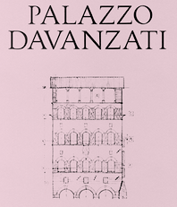 Graphic designer and calligraphy teacher at LABA, Free Academy of Fine Arts, in Firenze, Italy. In 2016, she designed the drop-dead gorgeous typeface Davanzati for Palazzo Davanzati, Museo della Casa Fiorentina. Davanzati has elements of Bembo (like the nose in the e) and Trajan. [Google]
[More] ⦿
Graphic designer and calligraphy teacher at LABA, Free Academy of Fine Arts, in Firenze, Italy. In 2016, she designed the drop-dead gorgeous typeface Davanzati for Palazzo Davanzati, Museo della Casa Fiorentina. Davanzati has elements of Bembo (like the nose in the e) and Trajan. [Google]
[More] ⦿
|
Charles Hedrick on fonts for laser printers
|
Charles Hedrick explains on abf: "Bembo is a wonderful font when properly printed. Possibly if you're setting a book it would be a good choice. But for a laser printer it's too light. A better alternative is Bitstream Aldine 401, which is based on the same originals but slightly darker. However the Bitstream version doesn't have small caps or text figures, which you really want. I would be inclined to use a Garamond or perhaps Minion instead. I believe Minion was intended specifically as a replacement for TNR. Of course if you really want flair, Galliard would be a possibility, but I think it's too contrasty for use with a laser printer. In print it's a bit better. My personal favorite is Simoncini Garamond (in the Scangraphic version, because it has SC/OSF). It's light, but it is sufficiently even that this isn't a problem. However it's got too much "character" for most of what I do. At the moment I'm using DTL Documenta as my standard. It's straightforward, good-looking, robust enough for laser printing, and very expensive." [Google]
[More] ⦿
|
Christopher Haanes
|
 Oslo-based Norwegian who was born in Cheltenham, UK, in 1966. Haanes teaches calligraphy, lettering and typography, and is a freelance calligrapher, book designer and typographer. He designed many alphabets, which are mostly calligraphic, but he has also drawn some old Roman lettering and blackletter alphabets. His blog (in Norwegian) has interesting typographic threads, such as this educational comparison between Antiqua typefaces like Brioso, Adobe Jenson, Bembo, Adobe Garamond, ITC New Baskerville and Linotype Didot. This thread looks at sans typefaces. He designed a calligraphic alphabet specifically for Cappelen Damm in 2008, which was digitized by Sumner Stone as Litterat. [Google]
[More] ⦿
Oslo-based Norwegian who was born in Cheltenham, UK, in 1966. Haanes teaches calligraphy, lettering and typography, and is a freelance calligrapher, book designer and typographer. He designed many alphabets, which are mostly calligraphic, but he has also drawn some old Roman lettering and blackletter alphabets. His blog (in Norwegian) has interesting typographic threads, such as this educational comparison between Antiqua typefaces like Brioso, Adobe Jenson, Bembo, Adobe Garamond, ITC New Baskerville and Linotype Didot. This thread looks at sans typefaces. He designed a calligraphic alphabet specifically for Cappelen Damm in 2008, which was digitized by Sumner Stone as Litterat. [Google]
[More] ⦿
|
Codesign (or: Aviation Partners, or AVP)
[Nicholas Garner]
|
 Nicholas Garner (b. 1949, Windsor) runs Codesign (or: Aviation Partners), a small London-based design firm which has created these commercial type families:
 - Cerafino (2005): informal sans.
- Delamere (2005): more classical sans.
- Kensington (2005): titling sans related to Gill Sans.
- Maisee (2005): an open, wide, generous and broadly smiling sans family.
- Tenison (2005): connected formal script.
- Fiendstar (2006, 16 styles; +Cameo (white on black), +Shaded) (after Gill Sans Schoolbook).
- Rosie (2010): a connected cosy script, in the Mistral style.
- Norwich (2006): a grungy version of Tenison. Outrage (2006) is more grunge.
- Cashback (2006).
- Crystal (2006): a slab serif family.
- Autobahn (2011) is a monoline elliptical sans family. Garner writes: Autobahn is a robust masculine sans of near monoline thickness and angular characteristics. Autocode (2011) is a monoline monospaced (for programs) elliptical sans based on Autobahn.
- LaCarte (2007): inspired by a series of handwritten menus produced in 1980. Further extended to La Carte Pen in 2010.
- Midas (2007).
- Sky Sans (including hairline weights) (2007).
- Lamoreli (2007).
- Backstage (2007). A stencil face.
- Amy (2010). Nicely hand-printed.
- Atria (2010) An ink-trapped sans-serif.
- Blocksta (2010). A rounded fat sans.
- The elegant script typeface Jacqueline (2010).
- New Fiendstar (2010).
- Omniscript (2010).
- Cambridge (2010). An elegant sans family with a misbehaving lower case q. Accompanied by a Cambridge Round family. It is designed as a schoolbook font, and is useful for dyslexics, since there are no ambiguities between letterforms.
- Central (2011). A rounded geometric sans family. Followed in 2012 by Central Inline.
- Combi (2011). This is a wonderful effort, as described by Garner himself: The Combi collection includes Sans, Sans Oblique, a true Italic, Serif, Serif Oblique and a set of Openface capitals. Combi fonts have 5 compatible weights and metrics allowing them to be used in free combination. Inspiration came from Jan Van Krimpen's Romulus (Enschedé, 1931). In addition to the Roman style, Van Krimpen created a set of open capitals, a simple oblique variant and subsequently, an attractive calligraphic italic, Cancelleresca Bastarda. In addition to Van Krimpen's idea, Combi has been influenced by features from many typefaces including Bembo, Melior and Optima. The object was to create a versatile family of body text and titling typefaces for use in books, magazines and on the web.
Polaris (2012) is a rounded sans family that reads well in print and on screens. Mensa (2012) is a 36-weight large x-height sans body family. - Beaulieu (2012).
- Clocktime (2012). A dingbat font with clocks.
- Chokey Pro (2012). A tall connected script face.
- Alleyn (2013). A soft geometric sans family. Followed in 2021 by the 12-style Alleyn Pro (2021).
- Corsica (2013). Corsica is an all-purpose geometric sans-serif typeface of visually uniform stroke thickness. The family contains six weights, two widths and three lowercase size options, together with an italic variant for each.
- Intrinseca (2014). An incised sans with some contrast and flaring, but still quite readable thanks to a good x-height.
- Browser Serif and Browser Sans (2014). These families were designed for use on screen.
Arethusa (2014) and Arethusa Pro (2014) are 12-style transitional typeface families. - Gimbal Egyptian (2018). Characterized by some asymmetric slabs and curvy italics. It covers Latin and Cyrillic and comes in several widths. See also Gimbal Grotesque (2018).
- Cadmium (2020). A 48-style grotesk family influenced by DIN.
- Varisse (2021). A 60-style superfamily consisting of Baskerville and transitional serifs on one end and Gill Sans-inspired humanist sans typefaces at the other end.
- Fielding (2022). A 12-style confident flared text and titling serif family.
MyFonts site. Klingspor link. Showcase of Nicholas Garner's typefaces. [Google]
[MyFonts]
[More] ⦿
|
Constantin Demner
[Studio Elastik]
|
[More] ⦿
|
Coulton Thomas
[Recognizing a Bembo]
|
[More] ⦿
|
Curwen Press
|
 The Curwen Press founded in 1863 by the Reverend John Curwen concentrated on printing music for the tonic sol-fa method, but when his grandson Harold (d. 1955) joined in 1908, he broadened their output to include limited edition books of high quality. It published a nice specimen book A Specimen Book of Types & Ornaments in Use at the Curwen Press, Plaistow, London (1928) and A Working Handbook of Types in Use at the Curwen Press (1931). The latter book shows an original art deco era ssan, Curwen Sanserif (+Titling). In the 1980s, it went under. Typefaces related to Curwen Press:
 - Colin Kahn designed P22 Curwen in 2005 and says: P22 Curwen Poster is a digitized version of a rare wood type used by the Curwen Press in England in the early 20th Century for poster work. P22 Curwen Maxima is a new hyper-stylized re-interpretation of Curwen Poster.
- Ari Rafaeli designed the delicate caps typeface Curwen Initials based on drawing by Jan van Krimpen in 1925 for the Curwen Press.
- Curwen Sans (2018, Keith Bates). A monoline sans based on an in-house sans of Curwen Press.
[Google]
[More] ⦿
|
Daniel Benjamin Miller
|
 Daniel Benjamin Miller (b. 2000, New York) is an undergraduate student in philosophy at McGill University. His type design work:
 - BMucicFont (2020). Based on the Steinberg Media music fonts for LilyPond music software.
- Salieri (2020). A revival of Jan Tschichold's Sabon (1964-1967).
- GFS Heraklit. This started out from Zapf's Heraklit Greek (1954). A digital revival was first done by George Matthiopoulos. Later improvements by Antonis Tsolomitis and in 2020 by Daniel Benjamin Miller.
- NX Baskerville Bold Italic (2020). An addition to Libre Baskerville (2012, Rodrigo Fuenzalida and Pablo Impallari).
- He added OpenType support and made some minor adjustments to ET Bembo (2002, Dmitry Krasny / Deka Design), releasing the result as XETBook (2019). In 2020, that font family was extended by Michael Sharpe as ETbb.
- In 2019, he started working on Regis, an original face inspired by the work of Pierre-Simon Fournier and Monotype 178 Barbou.
- RW Garamond (2019) is a freeware Garamond font in OpenType format. RW stands for Rudolf Wolf, the designer who created Stempel's version of Garamond from the Egenolff-Berner specimen. RW Garamond is a modified version of URW Garamond No. 8. and GaramondX, with changes being made to support OpenType (better vertical metrics, added diacritics, better kerning, more mathematical symbols, Greek for mathematics, character variants). Copyrights: 2000, URW++; 2005, Ralf Stubner; 2009, Gaël Varoquaux; 2012-2017, Michael Sharpe; 2019, Daniel Benjamin Miller.
- Domitian (2019). Based on URW's Palladio which in turn is based on Hermann Zapf's Palatino. Domitian is a project to develop a full-featured, free and open-source implementation of Palatino design. "Domitian" refers to the builder of the Flavian Palace, which is located on the Palatine Hill. Miller added true small caps and old style figures to URW's Palladio. The metrics have been adjusted to more closely match Adobe Palatino, and hinting has been improved.
- Garamond Libre (2019). Based on Unicode Fonts for Ancient Scripts (George Douros, 2017). CTAN link. Miller writes: Garamond Libre is a free and open-source old-style font family. It is a "true Garamond," i.e., it is based on the designs of 16th-century French engraver Claude Garamond. The roman design is Garamond's; the italics are from a design by Robert Granjon. The upright Greek font is after a design by Firmin Didot; the "italic" Greek font is after a design by Alexander Wilson. The font family includes support for Latin, Greek (monotonic and polytonic) and Cyrillic scripts, as well as small capitals, old-style figures, superior and inferior figures, historical ligatures, Byzantine musical symbols, the IPA and swash capitals. Miller added a bold italic.
- The STEP fonts (2019), free at CTAN and Github, created to be metrically compatible with Adobe's digitization of Linotype Times. STEP is based on the STIX and XITS fonts, and includes support for OpenType mathematical typesetting, usable with LuaTeX, XeTeX and Microsoft Office. It contains an original STEP Greek (2020) in Elzevir style.
- Courier Ten (2020). This is Courier 10 Pitch BT, made available by Bitstream, offered here in OpenType format as well as Type 1 for use with LaTeX. Package maintained by Daniel Benjamin Miller starting in 2020.
- MLModern (2021). He explains: MLModern is a text and math font family with (LA)TEX support, based on the design of Donald Knuth's Computer Modern and the Latin Modern project [note: 2003-2009, by B. Jackowski and J. M. Nowacki]. Some find the default vector version of Computer Modern used by default in most TEX distributions to be spindly, sometimes making it hard to read on screen as well as on paper; this is in contrast with the older bitmap versions of Computer Modern. MLModern provides a sturdy rendition of the Computer Modern design. [...] A script by Chuanren Wu was used to blacken the fonts before manual adjustment.
- MFB Oldstyle (2024). A public domain font based on Morris Fuller Benton's classic serif font, Century Oldstyle.
Miller is a supporter of free and open-source fonts, as well as free and open-source software. He uses FontForge for design, and releases all his work under free licenses: I really just want people to be able to use my designs, improve them and share them. First, on a pragmatic level, I know that my work will be imperfect, and I'd like others to be able to use their judgment to make adjustments (which I hope they'll also release under a free license). Second, I think that too much material (and not just fonts) is behind barriers of restricted access and artificial scarcity. This kind of thing---useful tools and information---wants to be free, so let it out for everybody to use. Github link. [Google]
[More] ⦿
|
Dante and its alternatives
|
Discussion on Typophile regarding Dante. Noteworthy is that John Dreyfus published an article entitled "The Dante Types" in 1985 (see Fine Print). A summary of comments: - Monotype Dante (digital version).
- Dante's digital version by Stamperia Valdonega in Verona, now run my Giovanni Mardersteig's son, Martino: John Hudson writes This is really splendid, has a range of optical sizes, and is much superior to the Monotype version. Also, it is based on the foundry metal original, not Monotype's hot metal version. It is not available for license.
- About the related Monotype Centaur and Bembo, Gerald Lange writes: While quite beautiful and desireable typeface designs, as a pressman I found them to be tragically flawed. The bar on the lowercase e is quite weak and erodes quickly with repeated impression. I always bought plenty of e sorts because of that. The digital versions however, hold up well when printed with the photopolymer plate process. [...] I've always favored [Monotype] Dante over [Monotype] Bembo. The Bembo was an earlier digital issue and may very well have been based on the photofilm version of Bembo rather than the metal. The Dante however, which was a much later release, was based on the metal patterns. At least that is what I recall. [...] You might also look into Pastonchi. When Monotype released it they put out an amazing prospectus which included samples of Marderstieg's work with it. When Monotype Typography released the digital version (I believe it was their last before they merged with Agfa), it was a direct replication of the metal. See here for an article by Lange on Monotype Dante.
[Google]
[More] ⦿
|
Daphne Preston-Kendal
[David Kendal]
|
Using webfont conversion tools by Adam Schwartz, David Kendal (Berlin, Germany) created a set of free opentype fonts, ET Book OT, in 201 based on ET Book, the free Bembo-style typeface family by Dmitry Krasny, Bonnie Scranton, and Edward Tufte. Github link. [Google]
[More] ⦿
|
David J. Perry
[Fonts for Scholars]
|
[More] ⦿
|
David Kendal
[Daphne Preston-Kendal]
|
[More] ⦿
|
Dean Allen
|
Dean Cameron Allen died in 2018 at the age of 51. Obituary in The Globe and Mail: It is with unspeakable sorrow that we announce the sudden passing of Dean Cameron Allen, on January 13, 2018 at the age of 51. He leaves behind his parents, James and Holly; his brother, Craig; an adoring family; longtime partner, Gail; and a legion of loving friends and admirers around the world. Renaissance man, trailblazer and autodidact extraordinaire, Dean was a person of dazzling wit, charm and erudition. Graphic designer, typographer, teacher, web pilgrim, critic, author, Weimaraner tamer, song and dance man, chef... he brought titanic intelligence, insight and humour to everything he did. And whatever room he was in, he was the weather. He was instrumental in bringing clean, elegant design and typographical rigour to the early internet. And in raising online writing to a fresh and thrilling new art form. A source of inspiration to many, he was generous with his guidance and praise. Equally at home with the bawdy as the sublime, he could wield his humour like a cudgel or dashing sleight of hand. And salvage even the most dire situation with laughter. He moved from his native Vancouver to France in his thirties, and had perfected the bise and Gallic shrug by day two. He was a loving stepfather, and gave full, raucous meaning to the term 'bon vivant'. O, combien tu nous manques. His absence is unfathomable. We miss him with every breath. Dean used to run a site called Textism, that had Essays and opinions on typography, ca. 2000-2003, but the site disappeared some time later. It included a critical comparison of twenty great text typefaces: Jenson, Bembo, Granjon, Elzevir, Caslon, Fleischmann, Baskerville, Fournier, Bell, Bulmer, Miller, Centaur, Janson, Electra, Fairfield, Dante, Aldus, Sabon, Albertina. [Google]
[More] ⦿
|
Deka Design
[Dmitry Krasny]
|
 Dmitry Krasny is the founder and creative director of Deka Design, a visual communications firm in New York City. He has been teaching courses in typography, information design, and book design since 1994, and served as Chair of Communication Design Department of Kanazawa International Design Institute (KIDI), Japan. He served on the jury of the TDC2 Type Directors Club's Type Design Competition 2004.
 In 2002, he designed the Venetian typeface family ET Bembo for Edward Tufte / Graphics Press. Tufte says that Bonnie Scranton and he himself co-designed the font but the extent of this collaboration is unclear. That typeface family is now available for free download from Tufte's Github site, where it is catalogued under the name ET Book. Later extensions enclude Daniel Benjamin Miller's XETBook (2019) and Michael Sharpe's ETbb (2020). [Google]
[More] ⦿
|
Dmitry Krasny
[Deka Design]
|
[More] ⦿
|
Edward Tufte
|
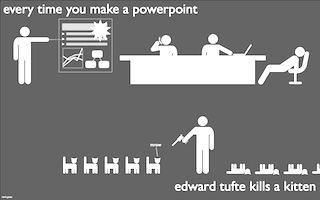 Edward Tufte has written seven successful books, including Visual Explanations (1997), Envisioning Information, The Visual Display of Quantitative Information, and Data Analysis for Politics and Policy. He writes, designs, and self-publishes his books on information design. He is Professor Emeritus at Yale University, where he taught courses in statistical evidence, information design, and interface design. His current work includes digital video, sculpture, printmaking, and a new book, Beautiful Evidence.
 Designer in 2002 of ETBembo, about which he writes: ET Bembo is a Bembo-like font for the computer designed by Dmitry Krasny, Bonnie Scranton, and myself. It will be used in my next book, Beautiful Evidence. My earlier books on analytical design were set in lead (!) in Monotype Bembo, an excellent book font. When converted to an electronic font, Monotype Bembo became thin and spindly (the computer people ignored "squeeze," the slight spreading of ink when the lead type hits the paper). So we made our own computer version and also made a few design changes (ligatures, several problems with the pi font, some letterforms, creation of a semibold). ETBembo is used in "The Cognitive Style of PowerPoint." It is just our house font and I'm not in the type business so it will not be commercially available. Tufte goes on to say that he thinks that Yale should make Matthew Carter's Yale font available for free to the whole world. Funny poster by Mark Goetz related to Tufte's stance on the typographic and infographic "qualities" of Powerpoint. Tufte's CSS. Github link for Tufte CSS, where one can download the free font family ET Book, which is ET Bembo, renamed. However, inside the font files, we still find the original name ET Bembo. [Google]
[More] ⦿
|
Elodie Costa
|
Graphic designer in Braga, Portugal. For a school project at Polytechnic Institute of Cavado and Ave (IPCA) University in Barcelos, Portugal, Elodie Costa, Sandra Sofia Santos and Gonçalo Rodrigues co-designed Empires (2015), a typeface based on Aldus Manutius's Bembo. [Google]
[More] ⦿
|
Estudio Agrade
|
Mexico City-based designer of the revival typeface Bembo Latin (2019). [Google]
[More] ⦿
|
etbb (or: ETbb)
[Michael Sharpe]
|
 etbb and ETbb (Michael Sharpe, 2020) are based on Daniel Benjamin Miller's XETBook (2019), which expanded Tufte's ETBook, the family name for the Bembo-like font family he commissioned for his books, ETbb expands its features to include a full set of figure styles, small caps in all styles, superior letters and figures, inferior figures, a new capital Sharp S with small caps version, along with macros to activate these features in LATEX. Both otf and pfb are provided. [Google]
[More] ⦿
etbb and ETbb (Michael Sharpe, 2020) are based on Daniel Benjamin Miller's XETBook (2019), which expanded Tufte's ETBook, the family name for the Bembo-like font family he commissioned for his books, ETbb expands its features to include a full set of figure styles, small caps in all styles, superior letters and figures, inferior figures, a new capital Sharp S with small caps version, along with macros to activate these features in LATEX. Both otf and pfb are provided. [Google]
[More] ⦿
|
Fable Type Foundry
|
Commercial type foundry based in Singapore. Their typefaces: - Common Sans (2020).
- Doctor Serif (2020).
- Every Times (2020). Inspired by Bembo and Plantin.
- Jersey (2020).
- Parang (2020).
- Plantdings (2020).
- Singdings (2020). Dingbats inspired by the objects, subjects, and architecture of Singapore.
- Space Sans (2020).
- Winter Gothic (2020).
[Google]
[More] ⦿
|
fbb
[Michael Sharpe]
|
 A free Bembo-like font family based on Cardo, created for the TeX community, with mathematical typesetting one of the primary goals. The package is maintained by Michael Sharpe. It was updated in 2014 by Sharpe, but he credits the early font development to David J. Perry, 2002-2010. CTAN link. [Google]
[More] ⦿
A free Bembo-like font family based on Cardo, created for the TeX community, with mathematical typesetting one of the primary goals. The package is maintained by Michael Sharpe. It was updated in 2014 by Sharpe, but he credits the early font development to David J. Perry, 2002-2010. CTAN link. [Google]
[More] ⦿
|
Fermello
[Fernando de Mello Vargas]
|
 Graphic designer and illustrator Fernando de Mello Vargas (or: Fermello, or just, Fernando Mello) is located in Sao Paulo, Brazil. He is the designer (with Vicente Gil Filho) of the text typeface Mello Sans (2006). He graduated in 2007 from the University of Reading. His typeface at Reading is the joint Latin/Tamil family Frida. Frida Text won an award at Tipos Latinos 2008 for extensive text family. It also won an award at Tokyo TDC 2008. Fernando Mello joined Fontsmith in the summer of 2008: His background in multiple visual areas-namely architecture, typography, graphic design and illustration - influences his search for creating innovative and original, yet functional and well-constructed typefaces.
 Fernando designed Adobe Tamil in 2012. At Fontsmith, he and Jason Smith released FS Joey (an organic sans family) and FS Jack (a confident sans family that was awarded at Tipos Latinos 2010). In 2008, he co-designed FS Silas Sans with Jason Smith, Bela Frank and Phil Garnham). In 2011, he designed the FS Pimlico family at Fontsmith. FS Pimlico won an award at Tipos Latinos 2012. In 2012, Jason Smith and Fernando Mello co-designed the sans typeface family FS Truman at Fontsmith. Still at Fontsmith, he published the 4-style text typeface FS Brabo in 2015---it is named after Brabo in Antwerp, where he was inspired by the Plantin Moretus museum and the garalde styles (Bembo, Garamond, Plantin). FS Brabo won an award at Tipos Latinos 2016. FS Untitled (2016, Jason Smith and Fernando Mello) was developed for screens. In 2017, he designed the incisive sans typeface FS Irwin that was inspired by New York City. Winner at Tipos Latinos 2018 of a type design award for FS Irwin. In 2018, FS Industrie (with Phil Garnham) was released by Fontsmith. FS Industrie is a 70-style techno / mechanical sans family. Codesigner with Jason Smith of FS Split Sans and FS Split Serif (2019). FS Split has a variable type option. Klingspor link. [Google]
[MyFonts]
[More] ⦿
|
Fernando de Mello Vargas
[Fermello]
|
 [MyFonts]
[More] ⦿
[MyFonts]
[More] ⦿
|
Flanker (or: Studio di Lena)
[Leonardo Di Lena]
|
 Flanker, or Studio Di Lena, is the foundry of Italian type designer Leonardo Di Lena (b. 1975, Rome). Initially, it offered fresh free designs of classics. In 2012, it went commercial. Their fonts:
 - Bodoni Flnk.
- CNR lineare: athletic lettering.
- Didot Flnk.
- Doppio Senso: inspired by the 1992 traffic signal typeface in Italy, Transport D.
- Elettra (2013). A transitional typeface with extra long serifs and several didone traits. For display work.
- Flanker: classical roman face.
- Flanker Garaldus (2012). Based on a 1956 font by Aldo Novarese.
- Griffo Flnk: A multistyle family after typefaces like Bembo.
- Imperator: a classical roman face.
- Italian Typewriter (2012). A family of monospaced typewriter typefaces based on Italian typewriters of the thirties and forties.
- Lello: another classical roman face.
- Magnificat (2011): after Friedrich Peter's ornamental font from 1975. Free download at Dafont.
- Marantz: fat art deco face, after the logo of the sound system company.
- Marlboro Flnk: ultra condensed and tall.
- Poliphili (2017). This is a serious attempt at a revival of the elegant typeface used in Hypnerotomachia Poliphili (1499, publ. Aldus Manutius) that was cut by Francesco da Bologna. That roman font in turn was a revised version of the type used in 1496 for Pietro Bembo's De Aetna.
- Flanker Ruano (2013). Based on a chancery typeface by Raffaelo Bertieri (1926).
- Selene (2013). A monoline sans. Followed by Selene Book (2021: a 14-style geometric sans with art deco influences in some styles).
- Semplicità (2014-2015): a remake of the art deco sans by Butti and Novarese in 1930.
- Shock to the system: an original in the cyberpunk style.
- Sony: after the Sony logo letters.
- Flanker Tanagra (2022). Leonardo writes about this condensed vintage serif: In order to give new imput to the art of typeface design in Italy, Nebiolo Company held, in March 1910, an artistic competition for a new alphabet conception, so the best-ranked design would be transformed into a real new typeface. 42 competitors participated and, although the first prize was not technically awarded, "Ancora" resulted as the best typeface, created by the designer-typographer Natale Varetti of Turin. Nonetheless, the new alphabet was transformed into a full-fledged metal typeface in 1924, renamed "Tanagra" in honor of the Greek city in the center of Boeotia.
- There's nothing money can't buy: a sans.
- Titano: an original art deco sans family.
- Total Eclipse: futuristic.
- Traiano: Trajan column style.
- Travertino: a sans workhorse family.
The outfit was known as JFDooM Flanker's Fonts, between 2001 and 2004. The fonts then were slightly different. They included BodoniFlnk, BodoniFlnkCor, BodoniFlnkCorGrass, BodoniFlnkGas, CNRLineare, DidotFlnk, DidotFlnkCorsivo, DidotFlnkCorsivoGrassetto, DidotFlnkGrassetto, Emblema-della-Repubblica-Italiana, Frantisek, GaramondFlnkNormale, GaramondFlnkCorsivo, GaramondFlnkCorsivoGrassetto, GaramondFlnkGrassetto, GriffoFlnkCorsivo, GriffoFlnkCorsivoGrassetto, GriffoFlnkGrassetto, GriffoFlnknormale, Lellocorsivobold, Lellocorsivo, Lello, MarlboroFlnk, Magnificat, There's-nothing-money-can't-buy, Poker, ShocktothesystemCorsivo, ShocktothesystemVuoto, Sony, Bjork-Isobel, Imperator, Traiano, Rdclub. Most fonts have Greek and Cyrillic letters as well. View Leonardo Di Lena's typefaces. [Google]
[MyFonts]
[More] ⦿
|
Font Chameleon
|
A fantastic software program, available during the mid nineties, and brought to the market by Ares Software Corporation. It allowed to mix and match and extend and blend and parametrically shake fonts. Its auto-hinting features were unequaled. The program is still around in some archives, but here is a local download of Font Chameleon 1.5 (1994-1995). Laurence Penney's take: FontChameleon (created by the same team that brought us FontMonger and Letraset FontStudio) was an extremely powerful font manipulation program. Its power resulted from taking direct control of outline editing away from the user. Using a new way of representing fonts, where each character was defined as a set of "difference descriptors" from a generic outline, Ares created close approximations of 150 well-known fonts. These all shipped with Version 1.0 - which cost around $300. Using on-screen slider controls, you could adjust the weight, width, x-height, slant and tracking of these fonts, as well as blending one font into another! In general, all characters of all fonts were defined in terms of repositionings of the same set of control points (though letters such as 'a' and 'g' had more than one point-set for obvious reasons). Exploiting stylistic consistency within a font, these repositionings could be parametrized so that each font was expressible as a 2K parameter set - compared with 40K to 60K for standard font formats. So this new power could save 95% of your fonts' disk space too. A simple use of FontChameleon's blend feature would be to interpolate between Helvetica Regular and Helvetica Bold. With my second try on the program, I tried a more crazy use: interpolating between Garamond and Futura. Wow! All the grunge fonts you'll ever need, and then some! (Ernie Brock, one of its developers, told me how ideal TrueType was for much of the blending. You could use its interpolated on-curve points to vary a corner from sharp to curved: just bring two consecutive off-curve points together, and... we have a corner point.) Now that Ares is owned by Adobe, and bearing in mind the potential personality clash with multiple masters, FontChameleon (along with all of Ares' other font products) has been discontinued. Font Chameleon video FontChameleon 1.5 Professional was released in 1994 with 220 preset "flexible" fonts, including italics. This release was a massive expansion of available base fonts which covered most classic serif and sans serif font families from Berkeley Old Style to Ares Sans 46, which was a synthetic reincarnation of Frutiger. In 1994 it was advertised for $149.95. According to Nicholas Fabian, These flexible fonts, called font descriptors average only around 4K of space. Every time a new font is needed in an application, a fully functional TrueType or Postscript Type 1 font can be generated in a matter of seconds. When a font is created in FontChameleon, it is a fully-hinted font with quality second to none. ontChameleon fonts have unparalleled flexibility. Design parameters of a font are changed using slider bars which universally modify all the characters in any of the fonts in the font descriptor list. Slider bars control the weight, length of ascenders, depth of descenders, width (condense/extend amount), cap height, number height, x-height, slant and tracking. Even two different fonts can be blended together to create a new font, which leads to potentially millions of useful font variations. The Font Chameleon flexible fonts: - Ares Serif 1 (Similar to Aachen Bold): Aachen Bold.
- Ares Serif 5 (Similar to Americana): Americana, Americana Bold and Americana Extra Bold.
- Ares Sans 7 (Similar to Antique Olive): Antique Olive Condensed Bold, Antique Olive Light, Antique Olive Roman, Antique Olive Italic, Antique Olive Bold, Antique Olive Black, Antique Olive Compact, Antique Olive Nord and Antique Olive Nord Italic.
- Ares Sans 8 (Similar to Avant Garde): Avant Garde Extra Light, Avant Garde Extra Light Oblique, Avant Garde Book, Avant Garde Book Oblique, Avant Garde Medium, Avant Garde Medium Oblique, Avant Garde Demi, Avant Garde Demi Oblique, Avant Garde Bold and Avant Garde Bold Oblique.
- Ares Serif 10 (Similar to Bauer Bodoni): Bauer Bodoni Roman and Bauer Bodoni Black.
- Ares Serif 11 (Similar to Bembo): Bembo and Bembo Extra Bold.
- Ares Serif 13 (Similar to Berkeley Old Style): Berkeley Old Style Book, Berkeley Old Style Book Italic, Berkeley Old Style Black and Berkeley Old Style Black Italic.
- Ares Serif 16 (Similar to Bookman): Bookman Light, Bookman Light Italic, Bookman Medium, Bookman Medium Italic, Bookman Demi, Bookman Demi Italic, Bookman Bold and Bookman Bold Italic.
- Bodoni: Bodoni, Bodoni Bold and Bodoni Poster.
- Caslon: Caslon Book and Caslon Black.
- Ares Serif 26 (Similar to Cheltenham): Cheltenham Condensed Light, Cheltenham Condensed Ultra, Cheltenham Condensed Book, Cheltenham Condensed Bold, Cheltenham Light, Cheltenham Book, Cheltenham Bold and Cheltenham Ultra.
- Ares Serif 27 (Similar to City): City Light, City Italic, City Bold, City Bold Italic.
- Century: Century Condensed Light, Century Condensed Book, Century Condensed Book Italic, Century Condensed Bold, Century Condensed Bold Italic, Century Light, Century Book, Century Book Italic, Century Bold, Century Bold Italic, Century Ultra, Century Condensed Ultra.
- Century Old Style: Century Old Style and Century Old Style Bold.
- Courier: Courier, Courier Oblique, Courier Bold and Courier Bold Oblique.
- Cooper Black: Cooper Black.
- Ares Serif 37 (Similar to Cushing): Cushing Book and Cushing Heavy.
- Ares Sans 38 (Similar to Doric Bold): Doric Bold.
- Ares Sans 40 (Similar to Eurostile): Eurostyle Bold Condensed, Eurostyle Condensed, Eurostyle, Eurostyle Oblique, Eurostyle Bold and Eurostyle Bold Oblique.
- Franklin Gothic: Franklin Gothic Extra Condensed, Franklin Gothic Book, Franklin Gothic Book Oblique, Franklin Gothic Demi, Franklin Gothic Demi Oblique, Franklin Gothic 2 Roman, Franklin Gothic Heavy and Franklin Gothic Heavy Oblique.
- Ares Sans 46 (Similar to Frutiger): Frutiger Light, Frutiger Light Italic, Frutiger, Frutiger Italic, Frutiger Bold, Frutiger Bold Italic, Frutiger Black, Frutiger Black Italic and Frutiger Ultra Black.
- Futura: Futura Condensed Bold, Futura Condensed Bold Oblique, Futura Condensed, Futura Condensed Oblique, Futura Condensed Light, Futura Condensed Light Oblique, Futura Condensed Extra, Bold, Futura Condensed Extra Bold Oblique, Futura Light, Futura Light Oblique, Futura Book, Futura Book Oblique, Futura, Futura Oblique, Futura Heavy, Futura Heavy Oblique, Futura Bold, Futura Bold Oblique, Futura Extra Bold and Futura Extra Bold Oblique.
- Ares Serif 48 (Similar to Galliard): Galliard Roman, Galliard Italic, Galliard Ultra and Galliard Ultra Italic.
- Garamond: Garamond Condensed Bold, Garamond Condensed Book, Garamond Condensed Light, Garamond Condensed Ultra, Garamond Light, Garamond Light Italic, Garamond Book, Garamond Book Italic, Garamond Bold, Garamond Bold Italic, Garamond Ultra and Garamond Ultra Italic.
- Ares Sans 52 (similar to Gill Sans): Gill Sans Condensed, Gill Sans Bold Condensed, Gill Sans Light, Gill Sans, Gill Sans Bold and Gill Sans Extra Bold.
- Ares Serif 53 (Similar to Glypha): Glypha Thin, Glypha Thin Oblique, Glypha Light, Glypha Light Oblique, Glypha, Glypha Oblique, Glypha Bold, Glypha Bold Oblique, Glypha Black and Glypha Black Oblique.
- Gothic 13: Gothic 13.
- Goudy Old Style: Goudy Old Style and Goudy Old Style Extra Bold.
- Ares Sans 57 (similar to Helvetica): Helvetica Ultra Compressed, Helvetica Extra Compressed, Helvetica Compressed, Helvetica Narrow, Helvetica Narrow Oblique, Helvetica Narrow Bold, Helvetica Narrow Bold Oblique, Helvetica, Helvetica Oblique, Helvetica Bold and Helvetica Bold Oblique.
- Ares Sans 60 (Similar to Helvetica Neue): Helvetica Neue Ultra Light, Helvetica Neue Ultra Light Italic, Helvetica Neue Thin, Helvetica Neue Thin Italic, Helvetica Neue Light, Helvetica Neue Light Italic, Helvetica Neue Roman, Helvetica Neue Italic, Helvetica Neue Medium, Helvetica Neue Medium Italic, Helvetica Neue Bold, Helvetica Neue Bold Italic, Helvetica Neue Heavy, Helvetica Neue Heavy Italic, Helvetica Neue Black and Helvetica Neue Black Italic.
- Ares Serif 65 (Similar to Janson): Janson Roman, Janson Bold.
- Ares Sans 63 (Similar to Kabel): Kabel Book, Kabel Medium, Kabel Demi, Kabel Bold and Kabel Ultra.
- Ares Serif 67 (Similar to Leawood): Leawood Book, Leawood Medium, Leawood Bold and Leawood Black.
- Letter Gothic: Letter Gothic, Letter Gothic Slanted, Letter Gothic Bold and Letter Gothic Bold Slanted.
- Ares Serif 69 (Similar to Lubalin Graph: Lubalin Graph Book, Lubalin Graph Book Oblique, Lubalin Graph Demi and Lubalin Graph Demi Oblique.
- Ares Serif 71 (Similar to Melior): Melior, Melior Bold.
- Ares Serif 73 (Similar to Meridien): Meridien, Meridien Bold.
- Ares Serif 75 (Similar to New Baskerville): New Baskerville Roman, New Baskerville Bold.
- News Gothic: News Gothic, News Gothic Oblique, News Gothic Bold and News Gothic Bold Oblique.
- Ares Serif 78 (Similar to New Century Schoolbook): New Century Schoolbook Roman, New Century Schoolbook Bold.
- Ares Serif 85 (Similar to Palatino): Palatino Roman, Palatino Italic, Palatino Bold Italic and Palatino Bold.
- Ares Serif 88 (Similar to Plantin): Plantin Light, Plantin, Plantin Bold.
- Prestige Elite (Similar to Prestige): Prestige Elite, Prestige Elite Slanted, Prestige Elite Bold and Prestige Elite Bold Slanted.
- Ares Serif 92 (Similar to Rockwell): Rockwell Condensed, Rockwell Light, Rockwell Light Italic, Rockwell, Rockwell Italic, Rockwell Extra Bold.
- Ares Serif 94 (Similar to Serifa): Serifa Light, Serifa Light Italic, Serifa, Serifa Italic, Serifa Bold and Serifa Black.
- Ares Sans 95 (Similar to Serif Gothic): Serif Gothic Light, Serif Gothic Bold and Serif Gothic Black.
- Ares Serif 99 (Similar to Stempel Garamond): Stempel Garamond Roman and Stempel Garamond Bold.
- Ares Serif 104 (Similar to Times): Times Roman, Times Italic, Times Bold Italic and Times Bold.
- Ares Serif 106 (Similar to Times New Roman): Times New Roman, Times New Roman Bold.
- Ares Serif 109 (Similar to Trump Mediaeval): Trump Mediaeval Roman, Trump Mediaeval Bold.
- Ares Sans 108 (Similar to Trade Gothic): Trade Gothic Light, Trade Gothic Light Oblique, Trade Gothic Condensed (18), Trade Gothic Condensed (18) Oblique, Trade Gothic Condensed (20) Bold, Trade Gothic Condensed (20) Bold Oblique and Trade Gothic Bold (2) Oblique.
- Ares Sans 110 (Similar to Univers): Univers Condensed Thin (39), Univers Ultra Condensed (59), Univers (55), Univers (55) Oblique, Univers (85) Extra Black, Univers (85) Extra Black Oblique, Univers (53) Extended, Univers (53) Extended Oblique, Univers (93) Extra Black and Univers (93) Extra Black Oblique.
- Walbaum: Walbaum, Walbaum Book, Walbaum Bold, Walbaum Book Medium and Walbaum Book Bold.
Finally, a note by Guy Jeffrey Nelson, published here with his permission: I was one of the kids who pushed points around developing Font Chameleon. I worked for the Font Bureau at the time, under the great David Berlow. Tobias Frere-Jones was there with me along with Elizabeth Holzman and Kelly Ehrgot Milligan, working obscene hours to get hundreds of fonts hinted. Never eating, barely sleeping, we lived in the studio at 18 Tremont at the time. At one point we picked up some gag "old lady" tourist sunglasses to shield our burning eyes from the glare of the old CRT monitors. Our "conference room" was empty beyond eight folding beach chairs, and at least one of us would be getting a tight 30 minutes of sleep in there through the days. But through it all there was time for meeting girls in the hall (I married the one I met. She is beside me now 28 years later.) smoking cigarettes and eating Junior Mints, dropping 60 pound monitors down the stairs, playing practical jokes on David, Sam Berlow and Harry Parker (I left and cut my hair for the first time in years and returned as my twin brother) and just general insanity in the Golden Age of digital font foundries. What fun it was to have Eric Spiekerman, Neville Brody, Matthew Carter, Roger Black and other design greats come by in the fog of war during the Font Chameleon project and others. [Google]
[More] ⦿
|
Fontanova
[Johan Ström]
|
 Swedish foundry (est. 1991 by Johan Ström) offering the old style humanist typeface family Indigo Antiqua (2003, designed by book and type designer Johan Ström (b. 1936, Sweden), and digitization by Jonas Böttiger and Törbjörn Olsson). The type designer claims inspiration from Guillaume le Bé (France), Miklós Kis's Janson, Christoffel van Dijck (van Dijck) and Peter Valpergen (Fell). Indigo Antiqua at Elsner & Flake (2006). In 2021, he released Indigo Antiqua 2, which was influenced by Francesco Griffo, without, however being a revival of Bembo (1496). [Google]
[MyFonts]
[More] ⦿
Swedish foundry (est. 1991 by Johan Ström) offering the old style humanist typeface family Indigo Antiqua (2003, designed by book and type designer Johan Ström (b. 1936, Sweden), and digitization by Jonas Böttiger and Törbjörn Olsson). The type designer claims inspiration from Guillaume le Bé (France), Miklós Kis's Janson, Christoffel van Dijck (van Dijck) and Peter Valpergen (Fell). Indigo Antiqua at Elsner & Flake (2006). In 2021, he released Indigo Antiqua 2, which was influenced by Francesco Griffo, without, however being a revival of Bembo (1496). [Google]
[MyFonts]
[More] ⦿
|
Fonts for Scholars
[David J. Perry]
|
 Cardo is a Unicode font under development by David J. Perry from Rye, New York. Covering European languages, as well as Hebrew, Greek/Coptic and Greek Extended, it is free for non-commercial use. He writes: "This font is my version of a typeface cut for the Renaissance printer Aldus Manutius and first used to print Pietro Bembo's book De Aetna. This font has been revived in modern times under several names (Bembo, Aetna, Aldine 401). I chose it mainly because it is a classic book face, suitable for scholarship, and also because it is easier to get various diacritics sized and positioned for legibility with this design than with some others. I added a set of Greek characters designed to harmonize well on the page with the Roman letters as well as many other characters useful to classicists and medievalists."
 Fontspace link. Klingspor link. [Google]
[More] ⦿
|
FontSite
[Sean Cavanaugh]
|
Online font site run by Sean Cavanaugh (b. Cape May, NJ, 1962) out of Camano Island, WA. This used to be called Title Wave Studios. Since 1996, Sean Cavanaugh is the head of FontSite. In the archives, one can/could find essays on writing style, rules of typography, and a comparison by Thomas Phinney (program manager of Latin Fonts at Adobe) of T1 and TTF. The Fontsite 500 CD (30 USD) offers 500 classical fonts with the original names, plus a few names I have not seen before, such as Bergamo (=Bembo by Francesco Griffo), Chantilly (=Gill Sans), Gareth (=Galliard), Noveo sans (=Neuzeit Grotesk), Palladio (=Palatino), Savoy (=Sabon), URWLatino, Unitus, Toxica, Publicity, Plakette, Pericles, Opus (=Optima), Melville, Function, Flanders, Cori Sans, Binner. Uli Stiehl provides proof that many of the fonts at FontSite are rip-offs (identical to) of fonts in Martin Kotulla's (SoftMaker) collection. This is perhaps best explained that Sean Cavanaugh's last real job was director of typography for SoftMaker, Inc., where he oversaw the development and release of SoftMaker's definiType typeface library and associated products [blurb taken from Digital Type Design Guide: The Page Designer's Guide to Working With Type, published in 1995 by Hayden Books]. Free fonts: Bergamo, CartoGothic (1996-2009), CombiNumerals. At MyFonts, the CombiNumerals Pro and CombiSymbols dingbat families are available since 2010. The site has a number of fonts with the acronym FS in the name, so I guess these are relatively original (but I won't swear on it): Allegro FS, Beton FS, Bodoni Display FS (+ Bold, Demibold), Bodoni No 2 FS (+ Ultra, Bodoni Recut FS (+Bold, Demibold), and so forth. His 500 Font CD has these fonts: - Garalde, Venetian: Bergamo, Bergamo Expert, Bergamo SC&OsF, Caslon, Caslon Expert, Gareth, Garamond, Garamond Expert, Garamond SC&OsF, Garamond Condensed, Garamond Modern, URW Palladio, URW Palladio Expert, Savoy, Savoy Expert, Savoy Small Caps&OsF, Vendôme.
- Slab Serif: Clarendon, Glytus, Typewriter, Typewriter Condensed.
- Script: Commercial Script, Deanna Script, Deanna Swash Caps, Hudson, Legend, Mistral, Park Avenue, Phyllis, Phyllis Swash Caps, Vivaldi.
- Uncial: American Uncial, Rosslaire.
- Blackletter: Fette Fraktur, Fette Gotisch, Olde English.
- Borders and symbols: Celtic Borders, Deanna Borders, Deanna Flowers, Picto, Sean's Symbols.
- Transitional: URW Antiqua, Baskerville, Baskerville Expert, New Baskerville.
- Didone, modern: Bodoni, Bodoni Expert, Bodoni Small Caps&OsF, Modern 216, Walbaum.
- Sans serif: Chantilly, Franklin Gothic, Franklin Gothic Condensed, Franklin Gothic Cnd. SC&OsF, Function, Function Small Caps&OsF, Function Condensed, Goudy Sans, Opus, Opus Small Caps&OsF, Syntax, Letter Gothic.
- Decorative: Ad Lib, Algerian, Arnold Boecklin, Binner, Caslon Antique, Chromatic, Copperplate Gothic, Davida, Delphian Open Titling, Function Display, Glaser Stencil, Goudy Handtooled, Handel Gothic, Hobo, Honeymoon, Horndon, Mercedes, Mona Lisa, OCR-A&OCR-B, Plakette, Reflex, Salut, Stop, Toxica, VAG Rounded.
Some more fonts: Alperton, Anaconda, Arizona, Bamboo, Bellhop, Bellows Book, Bernhard Modern FS (2011), Boehland (a revival of Johannes Boehland's Balzac, 1951), Le Havre. MyFonts link. Fontspace link. His art deco fonts, as always without "source" and confusing Victorian, art nouveau, and psychedelica with art deco, include Rimini, Arnold Boecklin, Eldamar, Erbar Deco, Rangpur, Pinocchio, Azucar Gothic, Boyle, Busorama FS, Winona, Abbott Old Style, Almeria (after Richard Isbell's Americana) and Adria Deco, Bernhard Modern FS (2011). FontSpring link. [Google]
[MyFonts]
[More] ⦿
|
Fontsmith
[Jason Smith]
|
 Jason Smith is the British corporate typeface designer who founded Fontsmith in 1997, where he retailed his own designs from his office in London. He has created a typographic identity for the Post Office in the UK. Phil Garnham was one of the in-house type designers. In January 2020, Fontsmith was acquired by Monotype.
 Smith's custom typefaces include Casey, Seat, Tractebel, PPP Healthcare, Powergen, Allied Irish Bank, UUnet, Channel 4, and Saudi Aramco, Champions (2009: for the UEAFA Champions League), Colgate Ready (2014: for Colgate, covering Latin, Cyrillic, Eastern European, Devanagari and Thai), More4 (2005, for the Channel 4 Adult Entertainment channel), ITV (2006, for the ITV network), BBC ONE (2006, for the BBC), Post Office Sans (2003), Severstal (2009), and Moto GP (2020: a custom techno / sports font). Vernon Adams and Fontsmith got into a quarrel about Vernon's Mako, which was submitted and rejected by Fontsmith, which published its own similar typeface Lurpak a few weeks later. Most of Jason Smith's typefaces are now at MyFonts, after Monotype's take-over in 2020: - FS Albert (2002). A soft-edged sans family by Jason Smith, Mitja Miklavcic and Phil Garnham. Followed by Emanuela Conidi's FS Albert Arabic. In 2007, Jason Smith designed the custom typeface Xerox Sans (+Condensed) as a modification of his FS Albert, to which Greek and Cyrillic alphabets were added as well.
- FS Aldrin (2016). A rounded sans by Phil Garnham.
- FS Alvar (2007, Jason Smith and Phil Garnham). A modernist utilitarian headline font family inspired by the work of Alvar Aalto.
- FS Benjamin (2018). A flared sans serif by Stuart De Rozario.
- FS Blake (Emanuela Conidi). A sans with some inherent tension.
- FS Brabo (2015, Fernando Mello). Named after Brabo in Antwerp, FS Brabo was inspired by the Plantin Moretus museum and the garalde styles (Bembo, Garamond, Plantin). FS Brabo won an award at Tipos Latinos 2016.
- FS Clerkenwell (2004, Jason Smith and Phil Garnham). A slab serif.
- FS Conrad (2009). A multiline display face by Phil Garnham.
- FS Dillon. Influenced by the Bauhaus quest for simplicity.
- FS Elliot (2012). By Nick Job.
- FS Emeric (2013, Phil Garnham). A large humanist slightly angular sans family. Dedicated web site.
- FS Hackney. An assertive sans typeface family by Nick Job.
- FS Industrie (2018). A 70-style techno / mechanical sans family by Fernando Mello and Phil Garnham.
- FS Ingrid. A humanist sans family by Jason Smith.
- FS Irwin (2017). An incised typeface inspired by New York, FS Irwin is a sans serif with calligraphic roots.
- FS Jack (2009, Jason Smith and Fernando Mello). A confident sans family that was awarded at Tipos Latinos 2010.
- FS Joey (2009, Jason Smith and Fernando Mello). An organic sans typeface family.
- FS Kim (2018). A joyful display typeface family by Krista Radoeva.
- FS Kitty (2007, Jason Smith and Phil Garnham). In the Japanese kawaii style.
- FS Koopman (2018). A sans family designed by Andy Lethbridge and Stuart De Rozario. A hybrid sans workhorse that takes inspiration from Swiss grotesks, American gothics and early British grotesques
- FS Lola (2006). Originally designed for Wechsler Ross&Portet by Phil Garnham, it is advertised by Fontsmith as a transgender type.
- Lost + Foundry (2018, Pedro Arilla and Stuart de Rozario). The Lost & Foundry family of seven fonts includes FS Berwick, FS Cattle, FS Century, FS Charity, FS Marlborough, FS Portland and FS St James. The campaign was developed by Fontsmith, M&C Saatchi London and Line Form Colour. The crumbling typefaces of Soho were recovered to be sold online as a collection of display fonts, to fund the House of St Barnabas's work with London's homeless. Fontsmith's designers Stuart de Rozario and Pedro Arilla worked with M&C Saatchi London to develop the fonts.
- FS Lucas (2016). A geometric sans by Stuart de Rozario.
- FS Maja. A curvy display typeface.
- FS Matthew. A sans family.
- FS Me. Mencap, a British company that works with people with a learning disability, asked Smith to design a font, FS Mencap (also known as FS Me), for the learning disabled---easy to read, yet elegant. Codesigned by Jason Smith, Mitja Miklavcic and Phil Garnham.
- FS Meridian (by Kristina Jandova). A rhythmic geometric sans family with circular forms.
- FS Millbank (2015). A wayfinding typeface family by Stuart de Rozario.
- FS Neruda (2018, by Pedro Arilla). A transitional storytelling text family named after Chilean poet Pablo Neruda.
- FS Olivia (2012). An angular poetic text typeface family by Eleni Beveratou.
- FS Ostro (2018, Alessia Mazzarella). A modern typeface family in text and display versions. It brings warmth and fresh air to the cold Italian didones. Its more subdued and less contrasted text version was influenced by Scotch romans. There are also genetic elements of Spanish display types.
- FS Pele (2007). An ultra fat typeface by Jason Smith and Phil Garnham.
- FS Pimlico (2011, Fernando Mello). A humanist display sans.
- FS Rigsby (2005). A sans.
- FS Rome (Mitja Miklavcic and Emanuela Conidi). An all caps Trajan typeface.
- FS Rufus (2009). A slab serif by Mitja Miklavcic, Jason Smith and Emanuela Conidi. Described by them as benevolent, quirky, peculiar, offbeat, jelly beans and ice cream, a retro eco warrior.
- FS Sally (Jason Smith and Phil Garnham). FS Sally Pro won an award at Granshan 2016.
- FS Sammy (Satwinder Sehmi, Jason Smith). A script typeface.
- FS Shepton (2015). A calligraphic brush script by Andy Lethbridge.
- FS Siena (2016). A luxurious fashion mag typeface given a new life in 2016 by Krista Radoeva. Jason Smith had started drawing Siena 25 years earlier. It is delicate, oozes style, and shows touches of Peignot in its contrast.
- FS Silas Sans (2008, Jason Smith, Bela Frank, Fernando Mello and Phil Garnham).
- FS Silas Slab (2015, Bela Frank).
- FS Sinclair (2007-2008). A rounded octagonal typeface by Jason Smith and Phil Garnham.
- FS Sophie (2004). A feminine sans typeface.
- FS Split Sans and FS Split Serif (2019, Jason Smith and Fernando Mello). Has a variable type option.
- FS Truman (2012, Jason Smith and Fernando Mello). A sans family.
- FS Untitled (2016, Jason Smith and Fernando Mello). Developed for screens.
[Google]
[MyFonts]
[More] ⦿
|
Francesco Griffo
|
Born and died in Bologna, ca. 1450-1518. Also called Francesco da Bologna. He was a Venetian punchcutter, who worked for Aldus Manutius cutting early italics, music types and romans. Under the surname Griffo, he designed and cut all types for the Aldine Press. The "Aldine" typeface was recreated by Monotype in 1929. In 1990, the Monotype staff digitized 24 weights of Francesco Griffo's Bembo family, which was originally created in 1496---however, read on below regarding the date. The Bitstream version is called Aldine 401. Bembo is a typeface that is not compact, with its wide letters and ample spacings, so its use must be carefully weighed. Interesting detail about the end of his life: after the death of Manutius in 1515, Griffo returned to Bologna where he printed some of his own editions until his own death in 1518 or 1519, when it is thought he was hanged for killing his brother-in-law. Kevin Steele explains in 1996: Some sources cite the publication of Cardinal Bembo's De Aetna as 1493 or 1495. And in fact, the design continued to evolve until the 1499 publishing of the spectacular Hypnerotomachia Poliphili. Let's not split hairs. Let's celebrate 500 years of Bembo! In the mid fifteenth century printing quickly spread to Italy from Germany, and by the 1470's Venice had became the center of the printing industry, home to over 100 printing companies. Pioneers such as Erhard Ratdolt and Nicolas Jenson had already begun working on adapting the roman alphabet for metal type by the time Aldus Manutius established his press in 1494, with the intention of publishing all the Greek classics. Aldus Manutius (1450-1515) was a printer, entrepreneur, a great ego, and publisher of over 1200 titles. Among the many contributions of Aldus was the popularization of small, portable books. His expensive beautiful books were far from today's paperbacks, mind you. One of the many great talents working for Aldus was Francesco Griffo, a gifted type designer. Griffo created many innovative type designs that are still admired for their beauty and readability. Their collaboration broke up over a copyright dispute, primarily over the ownership of the cursive type typeface that Griffo developed under the direction of Aldus. Although Aldus even had a papal decree to protect this style of alphabet, it was as difficult then as it is now to protect a typeface design. The alphabet was widely copied, and the style is known as italic, after its country of origin. Fontdeck link. Linotype link. FontShop link. Nicholas Fabian on Griffo. Agustina Cabal's poster of Bembo. [Google]
[MyFonts]
[More] ⦿
|
Gamb Design
[Manfred Baierl]
|
Manfred Baierl created the screen fonts Mini-5 and Mini-7 for 5pt and 7pt screen text in 2001. He also created the old typewriter font AltAdler, and the dot font Punkt. Free downloads. He sells Fishsoup, a type 1 font consisting of a smorgasbord of type styles. His pages have lots of useful discussions and links, not least of which is Bembo's Zoo. Check also on-line converter for typographic measurements, Top 10 typefaces, Information on the Euro. Download Ansicode (ANSI numbers replace characters). [Google]
[More] ⦿
|
Giovanantonio Tagliente
|
 Or Giovanni Antonio Tagliente. Calligrapher and writing master, born in Venice, 1468-1527. Author of Lo presente libro insegna la vera arte de lo excellente scrivere de diverse varie sorti de litere (1524). Sample images from that penmanship book, which includes scripts for Latin, Hebrew and Greek: i, ii, iii, iv. Also: Chancery, Florentine, Florentine bastarda, Lettera bollatica, Lettera imperiale. Sets of ornamental capitals: Italian gothic Initials and Italian Renaissance Capitals. Picture of Tagliente's title page of his book in 1531. PDF of his work by Toni Pecoraro. Digitizations:
 - A scanfont based on his chancery is 1491 Cancellaresca Formata (2009, GLC).
- Stanley Morison's metal Bembo (1929) is based on Tagliente's letters. Bitstream's Aldine 401 is the first digital take of Bembo, which is attributed jointly to F. Griffo and G. Tagliente. JY Aetna (1994) is Jack Yan's version. Other revivals include Bembo MT (Monotype), Bamberg Serial (Softmaker), Bergamo and Bergamo Osf (Softmaker), Bergamo (Infinitype) and Bergamo (FontSite).
FontShop link. [Google]
[MyFonts]
[More] ⦿
|
Gonçalo Rodrigues
|
Graphic designer in Guimaraes, Portugal. For a school project at Polytechnic Institute of Cavado and Ave (IPCA) University in Barcelos, Portugal, Elodie Costa, Sandra Sofia Santos and Gonçalo Rodrigues co-designed Empires (2015), a typeface based on Aldus Manutius's Bembo. [Google]
[More] ⦿
|
Grace Palmer
|
London-based creator of an untitled Bembo revival in 2014. [Google]
[More] ⦿
|
Greater Albion Typefounders (or: GATF)
[Paul James Lloyd]
|
 Paul J. Lloyd's type foundry in Western Australia, est. 2008. Lloyd (b. UK) made over 100 free truetype fonts before that. He writes: What we will offer is new designs, replete with Edwardian Fun, Victorian distinction, or any other piece of elegance we can manage.
 Edwardian creations from 2008-2010: Ark Wright (traditional shop signage), Adantine, Goldbarre, Brosse, Crewekerne, Crewekerne Magna and Crewekerne Magister (arts and crafts face), Larchmont, Brissard, Brossard (slab serif), Bonavia, Bonavia Blanc, Clementhorpe, Veneribe, Chiara Script, Howlett, Svengali Roman, Bonning and Bonnington (1920's style families with ideas from University Roman), Absinette (2009, art nouveau), Bamberforth, Tumbletype, Vertrina, Bromwich, Great Bromwich, Fleete, Helenium. Chipping emulates the Edwardian 1920s. In 2012, he added the Bolton Commercial family (late Edwardian, early art nouveau). Art deco typefaces: Oakland (2011, multiline typeface gleaned from a 1930s French car ad), Zenia (2010, trilined), Plebe (Plebia, 2008: a grotesk emulating the 1930s), Whitehaven (2008, an extensive art deco family with several shadow weights), Merry Fleurons (2008, Christmas ornament dingbats), Braxia (2008), Keynsia (fifties style art deco family with Peignot influences). Other typefaces: Haymer is a large sans family made in 2010. Clunic (2008) is a blackletter face. Tectura (2008) is a handwriting font. Eldridge is a slab serif family. Aliqua (2009), Chipperly (2009) and Syondola (2008, Tuscan) are Wild West families. Terazza Tilings (2009) and Valentine's Fleurons (2009) are dingbat typefaces. Additions in 2009 include Lowndes (soft blackletter), Christmas Fleurons, Merry Snowmen, Cherritt (described as a Victorian era Courier), DoodleBirds, Halloween Fleurons, ButtonFaces, Sabio (neither slab nor sans), Daub (brush graffiti font), Sabinard (a modern swash face), Cullions (futuristic blackletter), Coronard (blackletter / roman hybrid), Easter Fleurons, Chapter Initials, Paveline (19th century calligraphic script), Mellin Sans and Open, Gildersleeve (evoking the 1920s Arts and Crafts movement), Stannard (a 1920's advertising inspired small caps face), Slattery (a horizontally shaded fun face), Slatterine (2009, more retro futurism), Spillsbury (2010, Victorian family), Cirflex (2010, geometric display typeface based on arcs of circles), Oxonia (2010, a classic roman family) and Vectis (classic Roman elegance, another small caps face). Creations in 2010: Windevere, Albion's White Christmas, Paragon (a great didone display family with a wood type feel), Compton (slab serif family), Mexborough, Morover (Schwabacher family), Anavio (a classical roman family), Corvone (3d-effect font), Granville (Victorian), Corton (Victorian), Wellingborough (Victorian), Worthing (Victorian), Ark Wright (traditional shop signage), Bonaventure (art nouveau), Federal Streamliner (1950s feel techno face), Deva (classical roman), Crucis Ornaments (crosses), Bronzino (a roman with Arts and Crafts roots), Bertoni (2010, a didone family), Pardon Me Boy (train dingbats), Woodruff (Open Face fonts with a wood type look), Jonquin (based on a WWI poster; +Incised), Luscombe (1920s display family; +Parva), Movella (futuristic from the 1950s), Magdalena Sans (2010: a clear monoline sans), Endymion (2010: Tuscan), Paget (a Tuscan experimental all caps face), Portello (Victorian). Typefaces made in 2011: Admiral (art nouveau), Tuscaloosa (Tuscan face), Eccles (bombastic Victorian), Wolverhampton (pre-Victorian), Doncaster (Victorian family), Metropole (art nouveau family), Corsham (stone engraved lettering family), Leibix (casual), Albia Nova (an elegant futuristic organic face), Flapper (art nouveau face), Bertolessi (curly Victorian), Tulk's Victorian Banner (all caps banner face), Fitzgerald (Victorian all caps face), Cleveden (Victorian headline family), Spargo (an extensive set of early 20th century-look engraved typefaces for official documents and securities), Bettendorf (2011, based on a 1900s masthead typeface), Wolvercote (2011, similar to Bettendorf), Pittsburgh (2011, a Western-style engraved face), Chubbly (2011), Portmeirion No. 6 (2011, a Victorian / circus design), Bronzetti (2011; images: i, ii, iii, iv, v, vi), Sophie J (hanprinted), Dem Bones (2011, glyphs made from bones), Stout (2011), Birmingham New Street (a Victorian family inspired by the hand lettered title on a 19th century railway map), Beckinslade (ornamental blackletter). Production in 2012: Alfere Sans Stripes, Albion's Americana (Western stars and stripes face), Tudor Perpendicular (blackletter), Amici (rounded headline face), Amie (rounded sans), Wolverton Text (Edwardian family), Vinea (10-style display family), Par Avion (retro futuristic), AstroBats (retro sci-fi dingbats), Beeching (+Shadowed), Gondolieri (didone meets Tuscan), Penrose Slabserif (an Escher-like trompe l'oeuil 3d face), Haldane (art nouveau, Arabic look), Solidarius (chubby, fat felt-tip pen font), Bluebottle (angular display face), Merrivale (Victorian), Future Runes (runic simulation), Coliseo, Alfrere Sans (inspired by a 1950s television caption style), Tectura II (Lloyd's answer to Comic Sans), Secombe (Edwardian caps family), Milligan, London Court (Tudor-era caps family). Typefaces from 2013: Speedblur, Belhampton (Edwardian), Merry Baubles (Christmas tree dings), Merry Bauble Letters (Christmas alphadings), Wroxeter (blackletter), Thurbrooke (+Banner, +Initials, +Black, +Reverso, all based on 19th century banner headings and engraved lettering), Bourne (a rounded type system), Henrician (a set of eight Tudor style display typefaces), Belle Jardin (art deco marquee face), Lavery (Edwardian), Baldione (a stylized didone), Chequers (a vintage poster face), Turvy Topsy (fat finger face), Merrivaux (faux medieval), Blout (German expressionist typeface), Easter Egg Letters, Isometrica (a banner typeface family), Valentine's Letters, Imperial Granum (roman titling face), Brollo (chunky display face). Typefaces from 2014: Albions Very Old Masthead, Albions Engraved Black, Albions Old Masthead, Albions Incised Masthead, Albions Black Holly, Zanderley (pure Victoriana, +Initials), Landsdowne Commercial, Friendly Shaded Sans, Trivette, Wellmere Sans, Uncia Black, Henry VII, Greene and Rollins (layered Victorian typeface), Barollo, Alfrine, Alfrere Banner (+Incised), Lugano, Lanvier (1930s-style caps typeface family), Bonlivet (a hyper-decorative capitals alphabet from the late Victoian or early art nouveau era), Ames Text (a didone family with rounded brackets), Ames Roman (related to didones but with wedge serifs), Ames Weathered, Ames Shadow, Ames Shaded, Amersham (vintage signage family, 2013-2014). Typefaces from 2015: Netherland Perpendicular (Victorian blackletter), Ledbury (Victorian), Ambergate (Edwardian poster face), Empyrean (futuristic, yet curvy), Flinscher (1920s script), Signwriter Standard, Display Hatched, Albions Marker No.1 (a charming outlined marker pen typeface inspired by Bembo and Caslon), Joyvrie, Kinver (Victorian), Nationale (Victorian), Doges Banner, Doges Darker (Victorian), Doges Delight (Victorian), Doges Venezia (Victorian). Typefaces from 2016: Buntisland, Elmcourt, Allorette, Albion Sharp Italic, Deco Metro (art deco), SpeedSwash (blackletterish), Stridere (blackletterish), SpeedSketch. Typefaces from 2017: Shervington, Cantebriggia 1207 (a weathered blackletter), Algreve, Alambart, Duquesne Dark Woodcut, Courtold Shadow, Athabasca (Wild West Tuscan), Fargo Tuscan, Millerstown (Western), Millerstown Races, Old Millerstown, Sasparillo (Tuscan), Sasparillo Fizz, Wylgate, Herald Banner. Typefaces from 2018: Garstang Engraved, Halliwell Casual, Portculliard, Rotham Industria, Sombrieul (Edwardian), Shervington Engraved (a shaded typeface that appears hand-engraved on copper-plate). Typefaces from 2019: Dewhirst Display, Rakia (retro futuristic), Eurobia (art nouveau style). Typefaces from 2020: Draughtsman Engraved, Draughtsman Label Hand (Victorian), Civic Triline. Typefaces from 2021: Albion Seventies, Portculliard Engraved (an engraved ultra-decorative blackletter). Type announcements. Behance link. Klingspor link. Abstract Fonts link. Font Squirrel link. Kernest link. Abstract Fonts link. Hellofont link. View all typefaces by Paul Lloyd. Images of Paul Lloyd's best-selling typefaces. Greater Albion Typefounders: typeface collection. View Paul Lloyd's Victorian typefaces. [Google]
[MyFonts]
[More] ⦿
|
Hausschriften
|
 A list (in German) of typefaces used by companies (often specially designed). Translated and partially reprodused here. We also took info from this subpage.
 | Company | Type | Alternate type | Yet another type | Still another type | | | | | | | ARD | The Sans | The Serif | | | | AirBerlin | Meta | | | | | Airbus | Helvetica Neue | Times New Roman | Arial | | | Akzo Nobel | Symbol | | | | | Aral | Aral V2 Medium | Baskerville BQ | | | | Audi | Audi Antiqua | Audi Sans | | | | BMW | BMW Helvetica | | | | | Bonnfinanz | Frutiger | Adobe Garamond | Bodoni Book | | | Bosch | Bosch Sans/Serif | | | | | Bundesregierung | Demos | | | | | CDU | FF Kievit | | | | | Credit Suisse | Credit Suisse Type | | | | | DHL | Frutiger | Minion | | | | DRK | Gill Sans | Rockwell | | | | DSK | The Sans5 | | | | | DaimlerChrysler | Corporate ASE | | | | | Deutsche Bahn | Helvetica | | | | | Deutsche Bank | DeuBa Univers | | | | | Deutsche Post | Frutiger | Helvetica | | | | E.ON | Polo | | | | | Ford | Ford Light/Bold | | | | | Heineken | Heineken Sans/Serif | | | | | Henkel | Helvetica Neue | Swift EF | Arial | Times New Roman | | IKEA | Ikea | | | | | Langenscheidt | Trade Gothic | | | | | Linde AG | Linde Dax | | | | | Lufthansa | Helvetica | | | | | Mephisto | Futura Book | | | | | Mercedes | Corporate A/E/S | | | | | Mitsubishi | Alpha Headline | | | | | Nissan | NissanAG | | | | | Nivea | Nivea Sans | | | | | Nokia | Nokia Sans/Serif | | | | | Opel | Opel Sans | | | | | Pioneer | Meta | | | | | Porsche | Franklin Gothic | | | | | Roche | Minion | Imago | | | | School | Chevin | | | | | Shell | Futura LT Bold | | | | | Siemens | Siemens Sans/Serif/Slab Serif | | | | | Sparkass | Sparkasse Lt/Rg | | | | | TUI | Tui | | | | | Tengelmann | Syntax | | | | | UBS | UBS Headline | Frutiger 45 | | | | UPS | Dax | | | | | VW | VW Headline | Utopia | | | | Velux | Futura | | | | | Volvo | Volvo Broard | | | | | WDR | Meta | Minion | | | | Zeche Zollverein | Chevin | | | | | Company | Typeface | Foundry | Designer | Basis | Application | | | | | | | | Škoda | Skoda Sans | Dalton Magg | | | | | 3Sat | Gill Sans | Monotype | Eric Gill | | | | ADAC | Franklin Gothic | Linotype | Morris Fuller Benton | | | | AEG | Rotis | Agfa | Otl Aicher | | | | AMD | Gill Sans | Monotype | Eric Gill | | | | ARD | The Sans | LucasFonts | Lucas de Groot | | | | ARD | The Serif | LucasFonts | Lucas de Groot | | | | AVM | Info | FontFont | Erik Spiekermann, Ole Schäfer | | | | AVM | Meta | FontFont | Erik Spiekermann | | | | AWD | AWD | | | Interstate | | | AXA | Eras | ITC | | | | | Adidas | AdiHaus | | | DIN | | | Adobe | Myriad | Monotype | | | | | Adobe | Minion | Agfa | Robert Slimbach | | | | AirBerlin | Meta | FontFont | Erik Spiekermann | | | | Airbus | Times New Roman | Monotype | | | | | Airbus | Arial | Monotype | Patricia Saunders, Robin Nichols | | | | Airbus | Neue Helvetica | Linotype | | | | | Akzo Nobel | Symbol | | | | | | Aldi | Futura | Elsner+Flake | Paul Renner | | | | Allianz | Formata Condensed | | | | Headlines | | Apple | Apple Myriad | | | | | | Aral | Baskerville BQ | | | | | | Aral | Aral V2 Medium | | | | | | Arcor | Memphis | Linotype | Chauncey H. Griffith | | | | Arvato | Bliss | | | | | | Audi | Audi Antiqua | | | | | | Audi | Audi Sans | | | Univers | | | B.Braun Melsungen AG | Rotis | Agfa | Otl Aicher | | | | BMW | BMW Type | | | Helvetica | | | Beck's | Syntax | Linotype | Hans Eduard Meier | | | | Berliner Zeitung | Walbaum | Linotype | J. E. Walbaum | | Headlines | | Berliner Zeitung | Utopia | Monotype | | | Text | | Bertelsmann | Utopia | Monotype | | | | | Bertelsmann | Univers | Linotype | Adrian Frutiger | | | | Bonnfinanz | Bodoni Book | Bitstream | Giambattista Bodoni | | | | Bonnfinanz | Adobe Garamond | Agfa | Claude Garamond, Robert Slimbach | | | | Bonnfinanz | Frutiger | Linotype | Adrian Frutiger | | | | Bosch | Bosch Serif | | | | | | Bosch | Bosch Sans | | | | | | Bulthaup | Rotis | Agfa | Otl Aicher | | | | Bundesagentur für Arbeit | Corporate S | URW++ | Kurt Weidemann | | | | Bundesregierung | Neue Demos | | | | | | Bundesregierung | Neue Praxis | | | | | | C&A | CA Info Type | | | | | | C&A | CA Corporate Type | | | | | | CDU | CDU Kievit | | | Kievit | | | Canon | DendaNew | | | | | | Commerzbank AG | Commerzbank Headline | | | Stymie Black | | | CosmosDirekt | Geometric Slabserif 703 | Bitstream | | | Logo | | CosmosDirekt | Univers Condensed | Linotype | Adrian Frutiger | | | | Credit Suisse | Credit Suisse Type | | | | | | DA direkt | Frutiger | Linotype | Adrian Frutiger | | Fliesstext | | DA direkt | Linotype Ergo | Linotype | | | Logo | | DAB Bank | DAB Bank Officina | | | Officina | | | DHL | Frutiger | Linotype | Adrian Frutiger | | | | DHL | Minion | Agfa | Robert Slimbach | | | | DRK | Helvetica | Linotype | Max Miedinger | | | | DRK | Arial | Monotype | Patricia Saunders, Robin Nichols | | | | DSK | The Sans | LucasFonts | Lucas de Groot | | | | Delta Airlines | Delta | Dalton Magg | | | | | Der Spiegel | Spiegel Sans (a 32 style American gothic family) | LucasFonts | Lucas de Groot | Franklin Gothic | | | Der Spiegel | Spiegel Serif | LucasFonts | Lucas de Groot | Linotype Rotation | | | Detax | Frutiger | Linotype | Adrian Frutiger | | | | Deutsche Bahn AG | DB Sans Condensed | URW++ | | | | | Deutsche Bahn AG | DB Sans | URW++ | | | | | Deutsche Bahn AG | DB Head | URW++ | | | | | Deutsche Bahn AG | DB News | URW++ | | | | | Deutsche Bahn AG | DB Serif | URW++ | | | | | Deutsche Bank | Deutsche Bank Univers | | | Univers | | | Deutsche Post AG | Frutiger Condensed | Linotype | Adrian Frutiger | | Headlines | | Deutsche Post AG | Minion | Agfa | Robert Slimbach | | Fliesstext | | Deutsche Telekom | TeleAntiqua | URW++ | | | | | Deutsche Telekom | TeleGrotesk | URW++ | | | | | Deutsche Telekom | TeleLogo | URW++ | | | | | Deutsche Welle | Bembo | Agfa | Francesco Griffo, A. Tagliente | | Fliesstext | | Deutsche Welle | DW Interstate | | | Interstate | | | Die Grünen | Corpus Gothic | Fountain | Peter Bruhn | | | | Die Linke/PDS | Meta | FontFont | Erik Spiekermann | | Fliesstext | | Die Welt | Franklin Gothic | Linotype | Morris Fuller Benton | | | | Die Welt | Excelsior | Linotype | Chauncery H. Griffith | | Text | | Die Welt | TimesBQ | | | | Headlines | | Direct Line | Gill Sans | Monotype | Eric Gill | | | | Dr. Oetker | Dr. Oetker Tiffany | | | Tiffany | | | Dänisches Bettenlager | Futura | Elsner+Flake | Paul Renner | | | | E-Plus | Frutiger | Linotype | Adrian Frutiger | | | | E-Plus | OCR Plus | Linotype | Adrian Frutiger | OCR F | | | EnBW AG | DIN | FontFont | | | | | Erco | Univers | Linotype | Adrian Frutiger | | | | Erco | Rotis | Agfa | Otl Aicher | | | | Eurex (Deutsche Börse AG) | Syntax | Linotype | Hans Eduard Meier | | | | Ev. Johanneswerk | Arial | Monotype | Patricia Saunders, Robin Nichols | | | | Ev. Johanneswerk | Helvetica | Linotype | Max Miedinger | | | | FC Bayern München AG | FCB Interstate | | | Interstate | | | FSB | News Gothic | Linotype | Morris Fuller Benton | | | | FSB | Univers | Linotype | Adrian Frutiger | | | | Festo AG | Meta | FontFont | Erik Spiekermann | | | | Financial Times | Utopia | Monotype | | | | | Financial Times | Walbaum | Linotype | J. E. Walbaum | | | | Ford | Ford Extended | | | Helvetica | | | Frankfurter Allgemeine Zeitung | Eighteen | | | | | | Frankfurter Allgemeine Zeitung | Times Ten | | | | | | Frankfurter Allgemeine Zeitung | FAZ Fraktur | URW++ | | Fette Gotisch | | | Fraunhofer-Gesellschaft | Frutiger | Linotype | Adrian Frutiger | | | | Fujitsu Siemens Computer | Rotis | Agfa | Otl Aicher | | | | GE (General Electric Company) | GE Inspira | | | | | | Germanwings | Bliss | | | | | | Gothaer (Versicherung) | Meta | FontFont | Erik Spiekermann | | | | Heidelberg Gruppe | Heidelberg Gothic | | | News Gothic | | | Heidelberg Gruppe | Heidelberg Antiqua | | | Swift | | | Heineken | Heineken Sans | | | | | | Heineken | Heineken Serif | | | | | | Henkel | Swift | | | | | | Henkel | Neue Helvetica | Linotype | | | | | Henkel | Arial | Monotype | Patricia Saunders, Robin Nichols | | | | Henkel | Times New Roman | Monotype | | | | | IGEPA | IGEPA Raldo | URW++ | | | | | ING DiBa | Stone Sans | | | | | | Ikea | Ikea Sans | | | Futura | | | Ikea | Ikea Serif | | | New Century Schoolbook | | | Industrie- und Handelskammer | Rotis Sans | Agfa | Otl Aicher | | | | Industrie- und Handelskammer | Rotis Serif | Agfa | Otl Aicher | | | | J.M. Voith AG | Voith Helvetica | | | Helvetica | | | Jaguar | DIN | FontFont | | | | | Jet (Tankstelle) | JetSans | | | | | | Kabel Deutschland | Kabel Unit | | | FF Unit | | | LBS | LBS The Sans | | | The Sans | | | Langenscheidt | Trade Gothic | Linotype | Jackson Burke | | | | Lekkerland | LL Sari | | | FF Sari | | | Linde AG | Linde Dax | | | FF Dax | | | Linotype Library GmbH | Univers | Linotype | Adrian Frutiger | | | | Lufthansa | Helvetica | Linotype | Max Miedinger | | | | MINI | MINITypeRegular | Dalton Maag | | | Fliesstext | | MINI | MINITypeHeadline | Dalton Magg | | | Headlines | | Mazda | BaseTwelve Sans | | | | Headlines | | Mazda | Frutiger | Linotype | Adrian Frutiger | | Text | | McDonald's | Akzidenz Grotesk | | | | | | Mecklenburg Vorpommern | Myriad Pro | | | | | | Mecklenburg Vorpommern | Lithograph | | | | | | MediaMarkt | Franklin Gothic | Linotype | Morris Fuller Benton | | | | Mephisto | Futura Book | Elsner+Flake | Paul Renner | | | | Mercedes | Corporate E | URW++ | Kurt Weidemann | | | | Mercedes | Corporate A | URW++ | Kurt Weidemann | | | | Mercedes | Corporate S | URW++ | Kurt Weidemann | | | | Mitsubishi | Alpha Headline | | | | | | Mobilcom | Neue Helvetica Extended | Linotype | | | | | Müller (Drogerie) | MuellerSchrift | | | Gill Sans | | | Münchner Rück | Univers | Linotype | Adrian Frutiger | | | | N-TV | Info Office | FontFont | Erik Spiekermann, Ole Schäfer | | Laufbänder | | NDR | NDR Sans | | | | | | Nissan | NissanAG | | | | | | Nissan | Nissan Standard | URW++ | | | | | Nivea | Nivea Sans | | | | | | Nokia | Nokia Sans | | Erik Spiekermann | | | | Nokia | Nokia Serif | | Erik Spiekermann | | | | OBI | Obi Sans | Elsner+Flake | | | | | Opel | Opel Sans | | | Futura | | | PAGE (Magazin) | GST Polo | TypeManufactur | Georg Salden | | | | Paul Hartmann AG | Frutiger Next | Linotype | Adrian Frutiger | | | | Peugeot | Gill Sans | Monotype | Eric Gill | | | | Pioneer | Meta | FontFont | Erik Spiekermann | | | | Plus (Supermarkt) | The Sans | LucasFonts | Lucas de Groot | | | | Porsche | News Gothic | Linotype | Morris Fuller Benton | | | | Porsche | Franklin Gothic | Linotype | Morris Fuller Benton | | | | Postbank AG | Frutiger | Linotype | Adrian Frutiger | | | | Premiere World | Premiere Gothic | | | Franklin Gothic | | | Puma | Puma Pace | Dalton Magg | | | | | Quelle (Versandhaus) | Quelle Interstate | | | Interstate (1993, Tobias Frere-Jones) | | | RBB | Interstate (1993, Tobias Frere-Jones) | Font Bureau | Tobias Frere-Jones | | | | RTL aktuell | Bank Gothic | Bitstream | Morris Fuller Benton | | | | RWE | RWE Corporate | | | | | | Rama | Rama Typo | | | | | | Ravensburger | The Sans | LucasFonts | Lucas de Groot | | | | Roche | Minion | Agfa | Robert Slimbach | | | | Roche | Imago | | | | | | Roche | Minion | Agfa | Robert Slimbach | | | | Roche | Imago | | | | | | SPD | The Sans | LucasFonts | Lucas de Groot | | | | Saab | Gill Sans | Monotype | Eric Gill | | | | Sat.1 | SAT1DigitalSans | | | Digital Sans | | | School | Chevin | | | | | | Schwäbisch Hall AG | Charlotte Sans | | | The Sans | | | Shell | Futura LT Bold | Elsner+Flake | Paul Renner | | | | Siemens | Siemens Serif | URW++ | | | | | Siemens | Siemens Sans | URW++ | | | | | Siemens | Siemens Slab | URW++ | | | | | Smart | Smart Courier | | | Courier | | | Sparda Bank | Clarendon | Linotype | H. Eidenbenz | | Headlines | | Sparda Bank | ITC Officina Sans | Agfa | Erik Spiekermann | | Fliesstext | | Sparkasse | Sparkasse Light | Dalton Magg | | | | | Sparkasse | Sparkasse Regular | Dalton Magg | | | | | Stuttgarter Zeitung | DTL Argo | | | | | | Stuttgarter Zeitung | Gulliver | | | | | | Süddeutsche Zeitung | Excelsior | Linotype | Chauncery H. Griffith | | Text | | Süddeutsche Zeitung | Helvetica | Linotype | Max Miedinger | | Headlines | | TU Dresden | DIN Bold | FontFont | | | | | TU Dresden | Univers 45 | Linotype | Adrian Frutiger | | | | TUI | Tui | Dalton Magg | | | | | Tagesspiegel (Berlin) | Franklin Gothic | Linotype | Morris Fuller Benton | | | | Tagesspiegel (Berlin) | Poynter | Font Bureau | | | Fliesstext | | Tagesspiegel (Berlin) | Californian | Font Bureau | Frederic W. Goudy, David Berlow | | Headlines | | Talkline | Neue Helvetica | Linotype | | | Text | | Talkline | Rockwell | Monotype | F. H. Pierpoint | | Headlines | | Taz (Berlin) | Taz III | LucasFonts | Lucas de Groot | | | | Taz (Berlin) | LF Taz | LucasFonts | Lucas de Groot | | | | Taz (Berlin) | The AntiquaE | LucasFonts | Lucas de Groot | | | | Taz (Berlin) | TazText | LucasFonts | Lucas de Groot | | | | Tchibo | Interstate (1993, Tobias Frere-Jones) | Font Bureau | Tobias Frere-Jones | | | | Tengelmann | Syntax | Linotype | Hans Eduard Meier | | | | UBS | Frutiger 45 | Linotype | Adrian Frutiger | | | | UBS | UBS Headline | | | | | | UPS | UPS Sans | | | | | | VW | Utopia | Monotype | | | | | VW | VW Headline | | | | | | Vattenfall | Interstate | Font Bureau | Tobias Frere-Jones | | | | Velux | Futura | Elsner+Flake | Paul Renner | | | | Vobis | Interstate (1993, Tobias Frere-Jones) | Font Bureau | Tobias Frere-Jones | | | | Vodafone | Vodafone Font Family | Dalton Magg | | InterFace | | | Volvo | Volvo Broard | | | | | | WDR | Minion | Agfa | Robert Slimbach | | | | WDR | Meta | FontFont | Erik Spiekermann | | | | Wilo AG | Wilo Plus | | | FF Plus | | | Xbox 360 | Convection | | | | | | Xerox | Walbaum | Linotype | J. E. Walbaum | | | | Yello Strom | Yello DIN | | | FF DIN | | | ZDF | Handel Gothic | URW++ | | | Logo | | ZDF | Swiss 721 | | | Helvetica | | | ZF Friedrichshafen | ZF Serif | URW++ | | | | | ZF Friedrichshafen | ZF Sans | URW++ | | | | | Zeche Zollverein | Chevin | | | | | | comdirect | Dax | FontFont | Hans Reichel | | | | dm Drogeriemarkt | DM Cochin | | | Cochin | | | dm Drogeriemarkt | DM The Sans | | | The Sans | | | e·on | GST Polo | TypeManufactur | Georg Salden | | | | kabel eins | DIN 1451 | FontFont | | | | | mdr (Mitteldeutscher Rundfunk) | can you (read me?) | | | | | | tegut... | tegut-Sans | | | Officina Sans | | Credit for some images below: Danielle West. [Google]
[More] ⦿
|
IBM Composer
|
The type styles of the IBM Selectric Composer, which worked with typewriter balls: - Bembo (imitated by Aldine Roman)
- Baskerville
- Bodoni
- Century Expanded (called Century here)
- News Gothic (sort of imitated by Classified News)
- Copperplate Gothic
- Kis's Janson (imitated by Journal Roman)
- Times Roman (imitated by Press Roman). Includes Press Roman Symbol (Greek, Mathematical, Technical).
- Memphis (imitated by Pyramid)
- Optima (imitated by Theme)
- Univers
- Ruling Font
Interestingly, but not surprisingly in view of today's corporate ethics, IBM "forgets" to mention that Theme is Optima, that Pyramid is Memphis, and so forth. [Google]
[More] ⦿
|
Ivan Louette
|
 Belgian designer of the free dingbat font Botarosa (1999-2000). Louette lived in Chaumont-Gistoux, where he was affiliated with Roseraie communale de Terre Franche. He now resides in Louvain-La-Neuve and will soon move to Liège. His typefaces:
 - In 2014, he set out to improve on Georges Auriol's art nouveau type, Auriol, and created Blobby Georg Gras, which is based on Auriol's original idea---a predecessor of Auriol---that was used, e.g., in J.K. Huysmans's 1903 novel A Rebours. This typeface is more rounded, warmer and stencilized---a real charmer. In the end, the typeface was renamed George A Rebours (2015). Other Auriol revivals include French Light 2 Regular (2014), French Light 4 Regular (2015), French Elongated Bold (2014), French Elongated 4 Bold (2015), George Labeur Corps 10 (2015) and Georges Labeur Corps 8 (2015).
- Cabotine Sans Asymetrique 2 et 3 Medium (2015), Cabotine en Stress (2014) and Cabotine en Plastoc (2014).
- Geranium (2015-2017) is Louette's take on Venetians, influenced by typefaces such as Centaur and Hightower Text---it is rounded like liquid drops, subtly curvaceous as if Goudy himself held his pen, yet very Venetian. Not surprisingly, he then set his eyes on a revival of Goudy Village (2016), which led to Village 1903 (2019).
- In 2018, he designed the Jensonian typeface family Uccello.
- In 2020, he added a garalde typeface, Gustine, which was inspired by 16th century punchcutter Pierre Haultin's Augustine.
- Hilfea is a tall text family designed in 2021. It revisits Francesco Griffo's Bembo.
[Google]
[More] ⦿
|
Jack Yan
[Jack Yan and Associates (or: JY&A Fonts)]
|
[MyFonts]
[More] ⦿
|
Jack Yan and Associates (or: JY&A Fonts)
[Jack Yan]
|
Jack Yan (b. 1972, Hong-Kong) now lives in Wellington, New Zealand, where he founded Jack Yan and Associates (JY&A) in 1987, the first kiwi digital type foundry. He designed over 100 typefaces, which mostly share calligraphic roots---his lower case f is like a signature Yan glyph. In 2013, he turned to politics and is running to become mayor of wellington. He designed the extensive family Aetna, digitized based upon 16th century work by Francesco Griffo and Giovanni Antonio Tagliente. It is Yan's version of Bembo. His other font families include Decennie Express Pro (2011, a sans companion for JY Décennie), Decennie JY Titling, Integrity JY (2002), Pinnacle JY (1995-1996, +Bold), Ray JY, Rebeca JY (1993), Tranquility (1994-1995), Artemis JY, and Yan Series 333 (1987-1993). JY Koliba (by Jure Stojan, 2001) is a sans serif typeface family based on Slovenian architects' lettering of the 1940s. Other typefaces include Circles JY, Dandy JY (2012: Originally created for a theatre project at Massey University, Dandy is reminiscent of Pablo Ferro's hand-lettering; created by Danielle Smith), Comic Pro JY (1999, by Antonio Gonzalez de Santiago for Jack Yan), Novalis JY (2008, an anthroposophic family), Boomerang JY (by Greg Bastin), Boum-Boum (2002) and Alia JY (2008-2009, an aldine serif family). JY Pressly (2012, a serif family) was originally designed for Lucire, and destined for web and print use. Arts and Crafts alphabet by JY&A. Personal and political web site. Interview. Klingspor link. [Google]
[MyFonts]
[More] ⦿
|
Jan Maack
[The Ivy Foundry]
|
 [MyFonts]
[More] ⦿
[MyFonts]
[More] ⦿
|
Jason Smith
[Fontsmith]
|
 [MyFonts]
[More] ⦿
[MyFonts]
[More] ⦿
|
Jay Rutherford
[Typoart GmbH (or: VEB Typoart)]
|
 [MyFonts]
[More] ⦿
[MyFonts]
[More] ⦿
|
Joel Friedlander
[The story of Bembo]
|
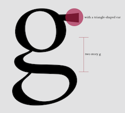 [More] ⦿
|
Johan Ström
[Fontanova]
|
[MyFonts]
[More] ⦿
|
John D. Boardley
[Old Style typefaces]
|
 [More] ⦿
|
Kak
[Katerina Kozhukhova]
|
 Kak is a Russian type and design magazine run by Peter Bankov and Katerina Kozhukhova. Alexander Tarbeev designed the typefaces KakC and DenHaag for the mag. This sub-page explains how to tell Bembo, Garamond, Janson, Caslon and Baskerville apart. Katerina Kozhukhova also designed a bouncy hand-printed typeface, Ka (Letterhead). [Google]
[More] ⦿
Kak is a Russian type and design magazine run by Peter Bankov and Katerina Kozhukhova. Alexander Tarbeev designed the typefaces KakC and DenHaag for the mag. This sub-page explains how to tell Bembo, Garamond, Janson, Caslon and Baskerville apart. Katerina Kozhukhova also designed a bouncy hand-printed typeface, Ka (Letterhead). [Google]
[More] ⦿
|
Katerina Kozhukhova
[Kak]
|
[More] ⦿
|
K.T. Kristian Möller
[KTKM]
|
 [MyFonts]
[More] ⦿
[MyFonts]
[More] ⦿
|
KTKM
[K.T. Kristian Möller]
|
 Karl Thomas Kristian Möller's foundry in Stockholm, est. ca. 2010, is called KTKM. He did a revival called Baskerville Old Face KTKM (2010), which aims to improve over the old Stephenson Blake version, about which Jan Tschichold wrote: The so-called Baskerville Old Face of the type foundry Stephenson Blake&Co. of Sheffield [...] is probably not immediately linked to Baskerville, but it is very much influenced by it. It is one of the most beautiful types of which the mats still exist; it has an incomparably different spirit than the streamlined re-cuts of today's Baskerville. Even keeping the general restraint extremely expressive. According to Berthold Wolpe (Signatures No. 18), the punches were cut and shown in samples in 1776 by Isaac Moore, who came from Birmingham to Bristol.
 Corporate typefaces by him include Quality Arrows (pictograams for Quality Hotel park in Södertäje, Sweden) and Hemköp Hand (for a grocery store). Unpublished typefaces: KM Caslon Antiqua (based on the Haas version), KM Caslon Kursiv, KM In Pectore (a display version of Bembo), KM Minerva (after a Linotype typeface by Reynolds Stone), KM Philatelie (an original antiqua), KM Ratio Latein Text (after Friedrich Wilhelm Kleukens's famous typeface Ratio Latein, 1925), KM Signwriter (a Trajan typeface after Eric Gill's instructions for the W.H. Smith bookstore), KM Universalitet. In 2013, he created Volunta Roman and Italic (a didone typeface). [Google]
[MyFonts]
[More] ⦿
|
Lee-Jeff Bell
[Rubicon Computer Labs Inc.]
|
[More] ⦿
|
Leonardo Di Lena
[Flanker (or: Studio di Lena)]
|
 [MyFonts]
[More] ⦿
[MyFonts]
[More] ⦿
|
Manfred Baierl
[Gamb Design]
|
[More] ⦿
|
Matthew Butterick
[Typography for Lawyers]
|
[More] ⦿
|
Matthew Carter
[The Yale Typeface]
|
[More] ⦿
|
Matthew Carter
|
 Matthew Carter (born in London in 1937, and son of Harry Carter) is one of today's most influential type designers. He trained as a punchcutter at Enschedé in 1956. In 1963 he was hired by Crosfield, a firm that pioneered the new technology of photo-typesetting, to lead their typographic program. He worked for Mergenthaler Linotype (1965-1981), and co-founded Bitstream Inc. with Mike Parker in 1981, adapting many fonts to digital technology. In January 1992, he founded Carter&Cone with Cherie Cone, and often collaborated with Font Bureau. In 1995, he won the Gold Prize at the annual Tokyo Type Directors Club competition for Sophia. In 1997, he received the TDC Medal for significant contributions to the life, art, and craft of typography. In 2010, he received a MacArthur grant. He lives in Cambridge, MA.
 John Berry on Carter's art (2002). Apostrophe comments on Berry's article. Interview. His fonts: - The Microsoft screen fonts Verdana (1996), Georgia (1996), Georgia Greek, Georgia Cyrillic, Nina and the humanist sans typeface Tahoma (1994). Georgia (in roman and italic only) is a screen version of Miller, Carter's Scotch design. Nina was designed to address the requirements on smaller screens such as phones, and was used in Windows Mobile smartphones before Microsoft switched to Segoe. The Greek and Cyrillic versions of Nina were developed by François Villebrod. Georgia Pro (2010, Ascender) was developed from Georgia with the help of Steve Matteson. For Verdana Pro (2010, Ascender), Carter was assisted by David Berlow and David Jonathan Ross.
- Apple's Skia (1993), a sans serif designed with David Berlow for Apple's QuickDraw GX technology, now called AAT. [Carter's Skia and Twombly's Lithos are genetically related.]
- Monticello (2003), based on Linotype's Monticello (1950), which in turn goes back to Binny&Ronaldson's Monticello from 1797, a typeface commissioned by Princeton University Press for the Papers of Thomas Jefferson. It is in the Scotch roman style.
- Miller (1997, Font Bureau), an extremely balanced family co-designed by Carter, Tobias Frere-Jones and Cyrus Highsmith. Carter explains: Miller is a Scotch Roman, a style that had its beginnings in the foundries of Alexander Wilson In Glasgow and William Miller in Edinburgh between about 1810 and 1820. It is considered that the punchcutter Richard Austin was responsible for the types of both Scottish foundries. Miller is a revival of the style, but is not based on any historical model. Now, there is also a 16-weight newspaper version, Miller Daily (2002), and an 8-weight Miller Headline (2002). This was followed by News Miller, a typeface designed for the Guardian. Note: Georgia (1996) is a screen version of Miller, and Monticello (2002) is a later modification. A comparison of these typefaces.
- Alisal (1995, +Bold).
- ITC Galliard (1978), a recreation of Robert Granjon's garalde letters. This typeface was originally conceived in 1965. Bringhurst recommends a Carter and Cone version of this font, called Galliard CC: it has old style figures and small caps. Further versions include Aldine 701 (Bitstream), Matthew (Softmaker), ITC Galliard Etext (2013, Carl Crossgrove, Linotype), and Gareth (Softmaker).
- The ITC Charter family (1987 for Bitstream and known as Bitstream Charter; licensed to ITC in 1993; see the Elsner&Flake version of ITC Charter). An upgraded commercial version was released by Bitstream in 2004 under the name Charter BT Pro.
- Vincent (1999), a font commissioned for use in Newsweek. It is named after Vincent Figgins, an English foundry owner and punch cutter who lived in the late 18th century.
- Walker (1994), designed for The Walker Art Center.
- Ionic Number One (1999, Carter&Cone).
- Mantinia (1993, Font Bureau), based on inscriptional forms, both painted and engraved, by the Italian renaissance artist Andrea Mantegna.
- Big Caslon (1994, Font Bureau), a display typeface based on the largest romans from William Caslon's foundry.
- Big Figgins (1992) and Big Figgins Open (1998, based on the decorative didone types shown in the specimens of Vincent Figgins of 1815 and 1817). Big Figgins was called Elephant and Elephant Italic in Microsoft's Truetype Fontpack 2.
- Sammy Roman (1996), loosely based on the 17th century romans of Jean Jannon. A beautiful typeface designed to accompany kanji and kana typefaces produced by Dynalab in Taiwan.
- Sophia (1993, Font Bureau), a mix with Greek, uncial and classical Roman influences.
- Shelley Script (1972), a family of formal scripts, split into Andante, Volante and Allegro. It is based on intricate English scripts of the 18th and 19th centuries attributed to George Shelley.
- Cochin (1977, at Linotype). MyFonts writes: In 1913 Georges Peignot produced a typeface based on Nicolas Cochin's eighteenth century engravings. In 1977, Matthew Carter expanded this historic form into a three part series.
- Bell Centennial (Linotype-Mergenthaler, 1975-1978), a legible heavily ink-trapped family designed by Matthew Carter as a replacement of Bell Gothic at Mergenthaler. There are also digital Linotype and Bitstream versions. AT&T commissioned the font to replace their previous typeface choice Bell Gothic for their 100th Anniversary.
- Cascade Script (1965-1966, Linotype, now also known as Freehand 471 BT in the Bitstream collection). Paratype's extension of Freehand 471 to Cyrillic is by Oleg Karpinsky (2011).
- New Century Schoolbook was designed from 1979-1981 in the New York Lettering office of Merganthaler Linotype based on Morris Fuller Benton's Century Schoolbook from 1915-1923. It was the second face, after New Baskerville, that was digitized and expanded using Ikarus (digital technology). The Bitstream version [Century Schoolbook] is a virtually exact copy, only being moved from a 54 unit to a 2000 or so unit design.
- Auriol (Linotype), an art nouveau family (including Auriol Flowers 1 and 2 and Auriol Vignette Sylvie) based on the lettering of the painter and designer Georges Auriol. MyFonts explains: Auriol and Auriol Flowers were designed by Georges Auriol, born Jean Georges Huyot, in the early 20th century. Auriol was a French graphic artist whose work exemplified the art nouveau style of Paris in the late 19th and early 20th centuries. In 1900, Georges Peignot asked Auriol to design fonts for Peignot&Sons. The resulting Auriol font was the basis for the lettering used by Hector Guimard for the entrance signs to the Paris Metro. It was re-released by Deberny&Peignot in 1979 with a new bold face, designed by Matthew Carter. These decorative fonts with a brush stroke look are well-suited to display settings. The Peignot drawing office insisted on a more normal appearance in the boldface, calling it Robur. Matthew Carter has returned to Auriol's original design for the whole series.
- Helvetica Greek (Linotype).
- Helvetica Compressed (Linotype, 1974, with Hans-Jörg Hunziker).
- Wilson Greek (1995), compatible with Miller Text, and based on a type cut by Alexander Wilson for the Glasgow Homer of 1756. See here.
- Olympian (1970, Linotype), designed for newspaper use. This is Dutch 811 in the Bitstream collection. The custom typeface Milne (Carter&Cone) done for the Philadelphia Inquirer is based on Olympian.
- Gando, a French "ronde" typeface based on the work of Nicholas Gando (mid 1700s), and designed for photo-typesetting at Mergenthaler by Carter and Hans-Jörg Hunziker in 1970. Very similar to Bitstream's Typo Upright.
- Fenway (1998-1999, Carter&Cone), commissioned by Sports Illustrated to replace Times Roman.
- Snell Roundhand (1965-1966): a connected cursive script based on the 18th-century round hand scripts from English writing masters such as Charles Snell. Early in the digital era, Matthew published this in the Bitstream collection as Roundhand BT. A Cyrillic version by Isabella Chaeva and Vladimir Yefimov was released by ParaType in 2013.
- Auriga (1970). (Wallis dates this in 1965 at Linotype.)
- CRT Gothic (1974).
- Video (1977).
- V&A Titling (1981).
- Deface (in the FUSE 18 collection).
- Madrid (2001), done for the Spanish newspaper El País.
- Milne, done for the Philadelphia Inquirer (a revised version of Olympian). Not available.
- Durham, a sans serif family for US News&World Report.
- Airport.
- Century 725 (Bitstream, for the Boston Globe: after a design by Heinrich Hoffmeister).
- For Microsoft: Georgia, Verdana, Tahoma (1994), Nina.
- Freehand 471 (Bitstream). A chunky slightly angular script.
- New Baskerville. [Matthew Carter says that this is wrongly attributed to him. It was directed by John Quaranta.]
- Postoni [or Post-Bodoni], for the Washington Post, which is still using it. See here.
- Le Bé, a Hebrew typeface that was used in the Pennyroyal Caxton Bible.
- Rocky (2008, Font Bureau, with Richard Lipton), for the Herald in Scotland.
- Time Caledonia.
- Wiredbaum, for WIRED.
- Wrigley (for Sports Illustrated). Matthew Carter designed Roster in the 1990s, and it was adopted as a display face for Sports Illustrated under the name Wrigley. Jesse Ragan was instrumental in later expanding the family from its original seven styles to the current 60. In 2015, Carter & Cone and Font Bureau released an expanded 60-style family of this typeface under the new name Roster.
- Benton Bold Condensed (for Time Magazine).
- Foreman Light (for the Philadelphia Inquirer).
- Newsbaum (for the New York Daily News).
- Carter Latin: Matthew was commissioned in 2003 to create a new design to be cut in wood type by the Hamilton Wood Type&Printing Museum in Two Rivers, WI. He came up with an all-caps, chunky, Latin-serif design.
- Times Cheltenham (2003), which replaces in 2003 a series of headline typefaces including Latin Extra Condensed, News Gothic, and Bookman Antique.
- The Yale Typeface (2004), inspired by the late fifteenth-century Venetian typeface that first appeared in Pietro Bembo's De Aetna, published by Aldus Manutius. This extensive family is freely available to members of Yale University.
- DTL Flamande (2004, Dutch Type Library), based on a textura by Hendrik van den Keere. Since 2018, available from URW++. Additions to DTL Flamande by Lukas Schneider.
- Meiryo UI, Meiryo UI Bold, Meiryo UI Bold Italic, Meiryo UI Italic (2004). Meiryo is a modern sans serif Japanese typeface developed by Microsoft to offer an optimal on screen reading experience and exceptional quality in print, as part of the Cleartype project. The Japanese letterforms are generously open and well-proportioned; legible and clear at smaller sizes, and dynamic at larger display sizes. The beauty of Meiryo is that it sets text lines in Japanese with Roman seamlessly and harmoniously. Meiryo was designed by a team including C&G Inc., Eiichi Kono, Matthew Carter and Thomas Rickner. It won a 2007 type design prize from the Tokyo Type Directors.
- Suntory corporate types (2003-2005), developed with the help of Akira Kobayashi and Linotype from Linotype originals: Suntory Syntax, Suntory Sabon, Suntory Gothic, Suntory Mincho.
- Rocky (2008, Font Bureau): A 40-style high contrast roman family that is difficult to classify (and a bit awkward). Developed with Richard Lipton.
- Carter Sans (2010, ITC), based on epigraphic letters used in inscriptions. Created for the identity of the Art Directors Club 2010 class of its Hall of Fame, one the laureates in the 2010 Hall of Fame. Codesigned by Dan Reynolds, this chiseled typeface is loosely based on Albertus.
- In 1997, he designed Postoni for the The Washington Post's headlines, a sturdy Bodoni.
- MS Sitka (2013). A typeface with six optical sizes that are chosen on the fly if an appropriate application is present. Developed at Microsoft with the help of John Hudson (Tiro Typeworks) and Kevin Larson (who carried out extensive legibility tests). German link. Typophile link. Sitka won an award at Modern Cyrillic 2014.
- Van Lanen Wood Type (Hamilton Wood Type, 2002-2013). Carter started work on the wood type in 2002, but technical accuracy issues postponed the implementation. Digital versions were finally done in 2013 by P22's Hamilton Wood Type.
- Big Moore (2014, Font Bureau): A 1766 specimen by Isaac Moore, former manager of Joseph Fry's foundry in Bristol, England, shows many types inspired by John Baskerville. But a century later, standardization had foisted inept lining figures and shortened descenders upon these designs. Matthew Carter remedies the tragedy with Big Moore. Oldstyle figures, full-length descenders, and historic swashes are restored to this regal serif in two styles. Big Moore won an award in the TDC 2015 Type Design competition.
- Role (2019, Sans, Slab, Serif, Soft). A superfamily published at Morisawa and Fontelier. Matthew Carter, Shotaro Nakano, and Kunihiko Okano co-designed Role Serif at Morisawa.
Speaker at ATypI 2013 in Amsterdam. Speaker at ATypI 2019 in Tokyo on the topic of Expressing Vocal Tones through Typography. Linotype link. FontShop link. Favorite quote: Watching me work is like watching a refrigerator make ice. Another quote: A typeface is a beautiful collection of letters, not a collection of beautiful letters. View Matthew Carter's typefaces. Matthew Carter's fonts. The typefaces made by Matthew Carter. See also here. Wikipedia page. Klingspor link. [Google]
[MyFonts]
[More] ⦿
|
Michael Bixler
[The Letterfoundry of Michael & Winifred Bixler]
|
[More] ⦿
|
Michael Sharpe
[fbb]
|
[More] ⦿
|
Michael Sharpe
[etbb (or: ETbb)]
|
[More] ⦿
|
Monotype ESQ Fonts
|
Monotype's ESQ fonts (enhanced screen quality) are designed for TVs and monitors. A list of their fonts: Albertus, Albany, Andalé LineDraw, Andalé M Sans, Andalé Mono, Andalé Mono bold, Andalé Mono CP437, Andalé Mono CP737, Andalé Mono CP850, Andalé Mono CP852, Andalé Mono CP855, Andalé Mono WGL, Andalé Sans, Andalé Sans bold, Andy, Andy bold, Apollo, Apollo italic, Apollo semi bold, Arial, Arial black, Arial black italic, Arial black Latin 1/2/5, Arial black WGL, Arial bold, Arial bold italic, Arial bold italic Latin 1/2/5, Arial bold italic WGL, Arial bold Latin 1/2/5, Arial bold WGL, Arial CE, Arial CE bold, Arial CE bold italic, Arial CE italic, Arial italic, Arial italic Latin 1/2/5, Arial italic WGL, Arial Latin 1/2/5, Arial Monospaced, Arial Monospaced bold, Arial Monospaced bold oblique, Arial Monospaced oblique, Arial Narrow bold italic Latin 1/2/5, Arial Narrow bold Latin 1/2/5, Arial Narrow italic Latin 1/2/5, Arial Narrow Latin 1/2/5, Arial Rounded, Arial Rounded bold, Arial Tur, Arial Tur bold, Arial Tur bold italic, Arial Tur italic, Arial WGL, Monotype Baskerville, Monotype Baskerville bold, Monotype Baskerville bold italic, Monotype Baskerville bold italic Latin 1/2/5, Monotype Baskerville bold Latin 1/2/5, Monotype Baskerville italic, Monotype Baskerville italic Latin 1/2/5, Monotype Baskerville Latin 1/2/5, Bell, Bell bold, Bell bold italic, Bell italic, Bembo, Bembo bold, Bembo bold italic, Bembo italic, Monotype Bernard condensed, Binner Gothic, Blueprint Web, Blueprint Web bold, Monotype Bodoni book, Monotype Bodoni book italic, Book Antiqua bold italic Latin 1/2/5, Book Antiqua bold Latin 1/2/5, Book Antiqua CE, Book Antiqua CE bold, Book Antiqua CE bold italic, Book Antiqua CE italic, Book Antiqua italic Latin 1/2/5, Book Antiqua Latin 1/2/5, Bookman Old Style, Bookman Old Style bold, Bookman Old Style bold italic, Bookman Old Style bold italic Latin 1/2/5, Bookman Old Style bold Latin 1/2/5, Bookman Old Style italic, Bookman Old Style italic Latin 1/2/5, Bookman Old Style Latin 1/2/5, Buffalo Gal, Century Gothic bold italic Latin 1/2/5, Century Gothic bold Latin 1/2/5, Century Gothic italic Latin 1/2/5, Century Gothic Latin 1/2/5, Century Schoolbook, Century Schoolbook bold, Century Schoolbook bold italic, Century Schoolbook bold italic Latin 1/2/5, Century Schoolbook bold italic WGL, Century Schoolbook bold Latin 1/2/5, Century Schoolbook bold WGL, Century Schoolbook CE, Century Schoolbook CE bold, Century Schoolbook CE bold italic, Century Schoolbook CE italic, Century Schoolbook italic, Century Schoolbook italic Latin 1/2/5, Century Schoolbook italic WGL, Century Schoolbook Latin 1/2/5, Century Schoolbook WGL, Monotype Clarendon, Monotype Corsiva Latin 1/2/5, Courier CE, Courier CE bold, Courier CE bold italic, Courier CE italic, Courier LD, Courier LD bold, Courier LD bold italic, Courier LD italic, Courier New bold italic Latin 1/2/5, Courier New bold italic WGL, Courier New bold Latin 1/2/5, Courier New bold WGL, Courier New CP437, Courier New CP437 Bold, Courier New CP737, Courier New CP737 Bold, Courier New CP850, Courier New CP850 Bold, Courier New CP852, Courier New CP852 Bold, Courier New CP855, Courier New CP855 Bold, Courier New italic Latin 1/2/5, Courier New italic WGL, Courier New Latin 1/2/5, Courier New WGL, Courier Tur, Courier Tur bold, Courier Tur bold italic, Courier Tur italic, Creepy, Creepy Latin 1/2/5, Cumberland, Curlz, Cyrillic: Arial, Cyrillic: Arial bold, Cyrillic: Arial bold inclined, Cyrillic: Arial inclined, Cyrillic: Courier, Cyrillic: Courier bold, Cyrillic: Courier bold inclined, Cyrillic: Courier inclined, Cyrillic: Times Bold A, Cyrillic: Times Bold inclined A, Cyrillic: Times New Roman A, Cyrillic: Times New Roman inclined A, EraserDust, EraserDust Latin 1/2/5, Facade Condensed, Felix Titling, Footlight, Footlight light, Monotype Franklin Gothic extra condensed, Monotype French Script, Forte, Monotype Garamond, Monotype Garamond bold, Monotype Garamond bold italic, Monotype Garamond bold italic Latin 1/2/5, Monotype Garamond bold Latin 1/2/5, Monotype Garamond bold WGL, Monotype Garamond italic 156, Monotype Garamond italic 156 WGL, Monotype Garamond italic Latin 1/2/5, Monotype Garamond Latin 1/2/5, Monotype Garamond WGL, Gill Alt One bold italic Latin 1/2/5, Gill Alt One bold italic WGL, Gill Alt One bold Latin 1/2/5, Gill Alt One bold WGL, Gill Alt One italic Latin 1/2/5, Gill Alt One italic WGL, Gill Alt One Latin 1/2/5, Gill Alt One WGL, Gill Sans, Gill Sans ALT1, Gill Sans bold, Gill Sans bold ALT1, Gill Sans bold condensed, Gill Sans bold extra condensed, Gill Sans bold italic, Gill Sans bold italic ALT1, Gill Sans bold italic Latin 1/2/5, Gill Sans bold italic WGL, Gill Sans bold Latin 1/2/5, Gill Sans bold WGL, Gill Sans condensed, Gill Sans condensed bold Latin 1/2/5, Gill Sans condensed Latin 1/2/5, Gill Sans extra bold, Gill Sans extra bold Latin 1/2/5, Gill Sans extra condensed bold Latin 1/2/5, Gill Sans italic, Gill Sans italic ALT1, Gill Sans italic Latin 1/2/5, Gill Sans italic WGL, Gill Sans Latin 1/2/5, Gill Sans light, Gill Sans light ALT1, Gill Sans light italic, Gill Sans light italic ALT1, Gill Sans shadow, Gill Sans Shadow Latin 1/2/5, Gill Sans ultra bold, Gill Sans ultra bold condensed, Gill Sans ultra bold condensed Latin 1/2/5, Gill Sans ultra bold Latin 1/2/5, Gill Sans WGL, Ginko, Ginko Latin 1/2/5, Gloucester bold, Gloucester bold condensed, Gloucester bold extended, Gloucester Old Style, Glowworm, Glowworm Latin 1/2/5, Haettenschweiler, Haettenschweiler Latin 1/2/5, Haettenschweiler WGL, Impact, Impact Latin 1/2/5, Impact WGL, Imprint Shadow, Kidprint, Kidprint Latin 1/2/5, Monotype Letter Gothic, Monotype Letter Gothic bold, Monotype Letter Gothic bold oblique, Monotype Letter Gothic Latin 1/2/5, Monotype Letter Gothic LineDraw, Monotype Letter Gothic LineDraw bold, Monotype Letter Gothic oblique, Monotype Letter Gothic WGL, Letter Gothic CP437, Letter Gothic CP437 Bold, Letter Gothic CP737, Letter Gothic CP737 Bold, Letter Gothic CP850, Letter Gothic CP850 Bold, Letter Gothic CP852, Letter Gothic CP852 Bold, Letter Gothic CP855, Letter Gothic CP855 Bold, Monotype Lydian, MICR, Monotype News Gothic, Monotype News Gothic bold, Monotype News Gothic bold condensed, Monotype News Gothic bold italic, Monotype News Gothic bold italic Latin 1/2/5, Monotype News Gothic bold italic WGL, Monotype News Gothic bold Latin 1/2/5, Monotype News Gothic bold WGL, Monotype News Gothic CE, Monotype News Gothic CE bold, Monotype News Gothic CE bold italic, Monotype News Gothic CE italic, Monotype News Gothic condensed, Monotype News Gothic Cyr, Monotype News Gothic Cyr bold, Monotype News Gothic Cyr bold inclined, Monotype News Gothic Cyr inclined, Monotype News Gothic Gre, Monotype News Gothic Gre bold, Monotype News Gothic Gre bold inclined, Monotype News Gothic Gre inclined, Monotype News Gothic italic, Monotype News Gothic italic Latin 1/2/5, Monotype News Gothic italic WGL, Monotype News Gothic Latin 1/2/5, Monotype News Gothic WGL, Nimrod, Nimrod bold, Nimrod bold italic, Nimrod italic, Monotype Old English Text, Monotype Onyx, Ocean Sans bold, Ocean Sans book, OCR-A, OCR-B, Pepita, Perpetua, Perpetua bold, Perpetua bold italic, Perpetua italic, Plantin, Plantin bold, Plantin bold EXPERT, Plantin bold italic, Plantin bold italic EXPERT, Plantin EXPERT, Plantin italic, Plantin italic EXPERT, Rockwell, Rockwell bold, Rockwell bold condensed, Rockwell bold italic, Rockwell condensed, Rockwell italic, Rockwell light, Rockwell light italic, Sabon, Sabon italic, Sabon semi bold, Sabon semi bold italic, Sassoon Infant Pro, Sassoon Infant Bold, Sassoon Sans, Sassoon Sans Bold, Monotype Script bold, Monotype Sorts, Swing bold, Theatre Antoine, Theatre Antoine Latin 1/2/5, Thorndale, Times New Roman bold F, Times New Roman bold italic F, Times New Roman bold italic Latin 1/2/5, Times New Roman bold italic WGL, Times New Roman bold Latin 1/2/5, Times New Roman bold WGL, Times New Roman CE, Times New Roman CE bold, Times New Roman CE bold italic, Times New Roman CE italic, Times New Roman F, Times New Roman italic F, Times New Roman italic Latin 1/2/5, Times New Roman italic WGL, Times New Roman Latin 1/2/5, Times New Roman Tur, Times New Roman Tur bold, Times New Roman Tur bold italic, Times New Roman Tur italic, Times New Roman WGL, Twentieth Century bold, Twentieth Century bold condensed, Twentieth Century bold italic, Twentieth Century bold italic Latin 1/2/5, Twentieth Century bold Latin 1/2/5, Twentieth Century condensed bold Latin 1/2/5, Twentieth Century condensed medium Latin 1/2/5, Twentieth Century medium, Twentieth Century medium condensed, Twentieth Century medium italic, Twentieth Century medium italic Latin 1/2/5, Twentieth Century medium Latin 1/2/5, Twentieth Century ultra bold, Twentieth Century ultra bold Latin 1/2/5. [Google]
[More] ⦿
|
Monotype Imaging Inc
|
 In 2004, Monotype Imaging Inc was created when TA Associates bought Agfa-Monotype from Agfa. Its headquarters are in Woburn, MA. Agfa had bought the previous incarnation of Monotype in 1998. Before that, Agfa, a well-known photographic film, chemicals and paper manufacturer and Bayer subsidiary, entered the typography scene in 1982 by acquiring an interest in Compugraphic Corporation, the American phototypesetter company. From the press release: Based in Wilmington, MA, with regional offices in the U.K., Chicago, Redwood City, Calif., Japan and China, Monotype Imaging provides fonts and font technologies to graphic professionals, software developers and manufacturers of printers and display devices. Formerly Agfa Monotype Corp., the company also provides print drivers and color imaging technologies to OEMs (original equipment manufacturers). Monotype Imaging is home to the Monotype typeface library, a collection that includes widely used designs such as the Arial, Times New Roman and Gill Sans typeface families (now in OpenType in 21 weights). Monotype Imaging offers fonts and industry-standard solutions for most of the world's written languages. Information about Monotype Imaging and its products can be found on the company's web sites at www.monotypeimaging.com, www.fonts.com, www.monotypefonts.com, www.customfonts.com, www.fontwise.com, www.itcfonts.com and www.faces.co.uk. [...] Robert M. Givens remains as president and chief executive officer of the company. [...] Senior vice presidents Doug Shaw and John Seguin of Monotype Imaging have been named to its board of directors along with Givens and Johnston. Jonathan Meeks, a principal at TA Associates, has also joined the board. Dave McCarthy remains as vice president and general manager of Printer Imaging, and Al Ristow continues as vice president of engineering. The senior management team of Monotype Imaging also includes Jeff Burk, vice president of finance, Geoff Greve, vice president of type development, John McCallum, managing director of Monotype Imaging Ltd., David DeWitt, general manager of the U.S. consumer division, and Pattie Money, director of human resources.
 In 2006, Monotype Imaging acquires Linotype, one of the last truly dedicated and honest large type companies. In 2007, Doug Shaw succeeds Robert M. Givens as president and chief executive officer. In 2010, Monotype acquires Ascender. In 2011, Monotype buys Berthold Types, Bitstream and MyFonts. Images of their best-selling typefaces in 2011: i, ii, iii. Full catalog of Monotype's typefaces [large web page warning]. View the Monotype typeface library. [Google]
[MyFonts]
[More] ⦿
|
MyFonts: Bembo
|
The main Bembo implementations at MyFonts. More digital versions of the Bembo typeface. [Google]
[More] ⦿
|
Nicholas Garner
[Codesign (or: Aviation Partners, or AVP)]
|
 [MyFonts]
[More] ⦿
[MyFonts]
[More] ⦿
|
Nordlundes Bogtrykkeri
[Carl Volmer Nordlunde]
|
Danish type foundry run by Carl Volmer Nordlunde (b. 1888). Nordlunde published Letter from a Danish typographer (1967, New York, The Typophiles). Other publications include type specimen books for specialty types such as Janson and Bembo. [Google]
[More] ⦿
|
Old Style typefaces
[John D. Boardley]
|
 A useful introduction to old style (or garalde) types by John D. Boardley. The types can be recognized by the horizontal crossbar on the "e", and more contrast between thick and thin (compared to humanist typefaces). The serifs have wedges, and the letterforms are smooth and refined. They were in vogue for almost 200 years, starting with Bembo in 1495 (Aldus Manutius and Francesco Griffo) and Francesco Griffo's first italic type in 1501. The French caught on 40 years later, and the Garamond-style typefaces saw the light ca. 1540, thanks to Claude Garamond and Robert Granjon. Christoffel van Dijck and Mikós Kis were doing garaldes in the Dutch region ca. 1600 (see styles like Ehrhardt). Finally, Caslon (William Caslon, ca. 1725) is also classified as a garalde. Old style digital typefaces include Berling, Calisto, Goudy Old Style, Granjon, Janson, Palatino, Perpetua, Plantin, Sabon and Weiss. [Google]
[More] ⦿
A useful introduction to old style (or garalde) types by John D. Boardley. The types can be recognized by the horizontal crossbar on the "e", and more contrast between thick and thin (compared to humanist typefaces). The serifs have wedges, and the letterforms are smooth and refined. They were in vogue for almost 200 years, starting with Bembo in 1495 (Aldus Manutius and Francesco Griffo) and Francesco Griffo's first italic type in 1501. The French caught on 40 years later, and the Garamond-style typefaces saw the light ca. 1540, thanks to Claude Garamond and Robert Granjon. Christoffel van Dijck and Mikós Kis were doing garaldes in the Dutch region ca. 1600 (see styles like Ehrhardt). Finally, Caslon (William Caslon, ca. 1725) is also classified as a garalde. Old style digital typefaces include Berling, Calisto, Goudy Old Style, Granjon, Janson, Palatino, Perpetua, Plantin, Sabon and Weiss. [Google]
[More] ⦿
|
Paul James Lloyd
[Greater Albion Typefounders (or: GATF)]
|
 [MyFonts]
[More] ⦿
[MyFonts]
[More] ⦿
|
Pietro Bembo
|
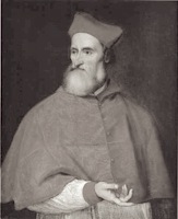 Italian classical scholar, who lived from 1470 (b. Venice) until 1547 (d. Rome). He was well-connected and knew the famous Medicis. Above all, he had an affair with Lucrezia Borgia. He influenced the development of the Italian language and established the madrigal as the most important secular musical form of the 16th century. He was made cardinal in 1539. Monotype gave his name to their typeface Bembo of 1929. The design is based on type cut by Francesco Griffo for the Aldine Press of Aldus Manutius, and first used in Bembo's work De Aetna (1495-1496). Allan Haley writes: In February 1496, Aldus [Manutius] published a rather insignificant essay by the Italian scholar Pietro Bembo. The type used for the text became instantly popular. So famous did it become that it influenced typeface design for generations. Posterity has come to regard the Bembo type as Aldus's and Griffo's masterpiece. Pietro Bembo himself had no connection to or influence on the typeface that carried his name. [Google]
[MyFonts]
[More] ⦿
Italian classical scholar, who lived from 1470 (b. Venice) until 1547 (d. Rome). He was well-connected and knew the famous Medicis. Above all, he had an affair with Lucrezia Borgia. He influenced the development of the Italian language and established the madrigal as the most important secular musical form of the 16th century. He was made cardinal in 1539. Monotype gave his name to their typeface Bembo of 1929. The design is based on type cut by Francesco Griffo for the Aldine Press of Aldus Manutius, and first used in Bembo's work De Aetna (1495-1496). Allan Haley writes: In February 1496, Aldus [Manutius] published a rather insignificant essay by the Italian scholar Pietro Bembo. The type used for the text became instantly popular. So famous did it become that it influenced typeface design for generations. Posterity has come to regard the Bembo type as Aldus's and Griffo's masterpiece. Pietro Bembo himself had no connection to or influence on the typeface that carried his name. [Google]
[MyFonts]
[More] ⦿
|
Recognizing a Bembo
[Coulton Thomas]
|
Coulton Thomas (Kansas City, MO) shows the features of Aldus Manutius's Bembo in 2016. [Google]
[More] ⦿
|
Roberto de Vicq de Cumptich
|
 Brazilian graphic and type designer, who teaches at Type Cooper West (in San Francisco) and is a renowned restaurant branding designer. Bembo's Zoo is Roberto de Vicq de Cumptich's children's book with all drawings integrated with glyphs from Bembo. He also published Men of Letters and People of Substance (David R. Godine, 2007). The promotional blurb states: de Vicq takes the designs of type and ornaments (known affectionately in the trade as "dingbats") and common linecuts to form the typefaces of his literary heroes. In the second part he combines type ornaments and icons to suggest a typeface with singular attributes: pride, fear, fanaticism, and surprise. But these are not drawings; they are images arranged from the combination of specific and discrete graphic forms. They are created on a computer and not in a composing stick. Designer at Muccatypo of Bastardo, Wet and Genealogy.
 He wrote Words at Play (with Matteo Bologna, Adobe, 2004), about which he says: This book showcases type portraits of well-known writers in a playful homage to the power of words and the beauty of typography. In 2010, he designed a PDF brochure for TDC in New York entitled How To Make Love To Your Type [and the typophiles as a group are a cranky bunch without any sense of humor]. In 2021, he released Tuppence at Delve Fonts. Tuppence is a contemporary interpretation (including a variable font) of Blackfriars, a reversed-contrast Victorian typeface released in 1910 by London foundry Stephenson Blake. Typographic picture by TDC, 2009. Another URL. Klingspor link. Adobe link. [Google]
[More] ⦿
|
Robin Nicholas
|
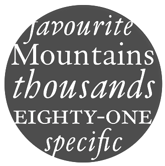 Born in Westerham, KE (1947). He joined the Monotype drawing office in 1965 and moved to the type design department in 1968, where he became manager in 1982. In 2009, he is head of typography at Monotype. Klingspor link. Robin Nicholas's typefaces:
 - With Patricia Saunders and a team of ten, he co-designed the Arial family at Monotype, an outgrowth of a program for low resolution sans typefaces started in 1982. I do not have to add anything here---Arial was made to mimic Helvetica and to adopt the same metrics. No other motivation. No higher artistic ideals. No admission from Nicholas, and no apologies. Arial is a stained 1982 stamp on the rest of Robin Nicholas' life.
- Still at Monotype, he made Nimrod (1980), which was first used by the Leicester Mercury in its year of introduction. Nimrod became a popular newspaper type.
- He created Plantin Headline Condensed (1995).
- He had a hand in the development and revival of Bell, Centaur, Clarion (a newspaper text face), Janson, Van Dijck and Walbaum, all between 1982 and 1989, all at Monotype. A blurb: Nicholas has directed the design of fonts such as the Clarion and Columbus fonts, as well as the digital versions of many Monotype typefaces including the Bell, Centaur, Dante, Monotype Janson, Fournier, Van Dijck, Monotype Walbaum, Bulmer and Pastonchi designs.
- He had a hand in Columbus (1992, Monotype). Ascender writes: Columbus has a fresh and lively hand-drawn feel but works well with today's computer systems and printers. An excellent text face, Columbus can also be used for display in advertising, posters, flyers and headlines, where the true elegance and beauty of the letters can be seen. Columbus was designed by Patricia Saunders and directed by Robin Nicholas in 1992 to celebrate the quincentenary of the voyage from Spanish shores by Christopher Columbus. The regular weight is based on types used in Spain by Jorge Coci circa 1513, and the italic is derived from a font cut by Robert Granjon circa 1543 and used by Bartolome de Najera in 1548 to print a famous manual by the writing master Juan de Yciar.
- He has done custom font projects for British Airways, Scandinavian Airlines, Barclays Bank, Opel automobiles (see Opel Sans; more here on this derivative of Futura; posted here), and Ikea (Ikea Sans is based on Futura and Ikea Serif on New Century Schoolbook).
- In 2003, he published the Felbridge family and Fairbank MT (a chancery hand) at Agfa-Monotype.
- Cambria, Jelle Bosma's 2006 typeface for Ascender and Microsoft, was a joint effort with Steve Matteson and Robin Nicholas.
- In a project started in 2002 at Monotype, and finished in 2005, he created Bembo Book. Monotype's page explains: Originally drawn by Monotype in 1929, Bembo was inspired by the types cut by Francesco Griffo and used by Aldus Manutius in 1495 to print Cardinal Bembo's tract de Aetna. A beautiful design with tall ascending lowercase and elegant letterforms, Bembo has been a favourite for book setting for over 70 years. No italic was used in the Aldine de Aetna work so another source was needed. This was found in a publication by the writing master, Giovantonio Tagliente, produced in Venice circa 1524. Considered by many to be one of Stanley Morisons finest achievements during his tenure as Typographical Advisor to the Monotype Corporation, Bembo has consistently been a best selling typeface, both in its original hot metal form and in todays digital formats. Not intended to be a facsimile of Manutius work, Bembo was drawn to embody the elegance and fine design features of the original but marry them with the consistency of contemporary production methods and to ensure that the typeface would work satisfactorily with high speed printing techniques. The first phototypesetting and digital versions were based on hot metal 9 point drawings. This gave good legibility in small sizes, due to a comparatively large x height, but lacked some of the elegance present in larger hot metal sizes. This new digital version of Bembo, called Bembo Book, has been designed to be more suited to text setting in the size range from 10 point to 18 point. Based on the hot metal 10/18 point drawings, which were used to cut all sizes from 10 point to 24 point, this new typeface has been carefully drawn to produce similar results to those achieved from the hot metal version when letterpress printed. The project started in 2002 when a high quality UK Printing House asked for a digital version of Bembo which would give a similar appearance on the page to the 13 point hot metal they were currently using. Hot metal drawings were digitised and extensive editing was carried out on the resultant outlines to ensure that design features and overall colour from the digital output remained close to that of the letterpress product. The resultant typeface is slightly narrower than existing digital versions of Bembo, it is a little more economical in use and gives excellent colour to continuous pages of text. Ascending lowercase letters are noticeably taller than capitals, giving an elegant, refined look to the text.
- In 2009, he co-designed Ysobel (Monotype; winner of an award at TDC2 2010) with type designers Alice Savoie, also working at Monotype Imaging's UK subsidiary, and Delve Withrington based in the U.S. The sales pitch: According to Nicholas, the idea for the Ysobel typefaces started when he was asked to create a custom, updated version of the classic Century Schoolbook typeface, which was designed to be an extremely readable typeface - one that made its appearance in school textbooks beginning in the early 1900s.. The web version by Linotype in 2013 is called Ysobel eText Pro. It has larger x-height and wider spacing.
View the typefaces made by Robin Nicholas. [Google]
[MyFonts]
[More] ⦿
|
Rubicon Computer Labs Inc.
[Lee-Jeff Bell]
|
 In Chelsea, Québec, Lee-Jeff Bell designed many type families that are patterned after major historical type families, mimicking what Bitstream did in the late eighties. He also developed Thames and Helv Condensed, and Unifont. Rubicon claims that their fonts are optimally hinted for even very small screen resolutions. The fonts:
 - Realist Fonts: Hilbert Neue (a sans typeface in the style Helvetica Neue), Uranus (like Univers).
- Humanist Fonts: Opulent (like Optima), Frobisher (like Frutiger), Guilford (like Gill Sans).
- Book Fonts: SGaramond (a 4-weight Stempel Garamond clone), Bentley (like Bembo), Burnett (like ITC Berkeley Oldstyle).
- Legacy Fonts: Hilbert (like Helvetica), Tribune (like Times), Hilbert Condensed (like Helvetica Condensed), Tribune Condensed (like Times Condensed).
- Condensed Fonts: Hilbert Neue Condensed (like Helvetica Neue Condensed), Frobisher Condensed (like Frutiger Condensed), Uranus Condensed (like Univers Condensed).
- Packaging Fonts: Karat (like ITC Kabel), IGaramond (like ITC Garamond).
- Newspaper Fonts: Essex (like Excelsior), Gisborne (like Gazette).
- Other: Hilbert Compressed (like Helvetica Compressed), Sharpe Classified (like Spartan Classified).
Yet another URL. This site offers free demo fonts by Rubicon: Bentley (Bembo-like), BurnettDemo-Normal, FrobisherCondDemo-Normal, FrobisherCondDemo, FrobisherDemo-Normal, FrobisherDemo, GisborneDemo, GuilfordDemo-Normal, GuilfordDemo, HilbertNeue, HilbertNeueCondDemo-Normal, HilbertNeueCondDemo, HilbertNeueDemo-Normal, HudsonCondDemo, HudsonDemo, IGaramondDemo-Normal, IGaramondDemo, Karat, KaratDemo-Normal, OpulentDemo-Normal (humanist sans), OpulentDemo, SGaramondDemo-Roman, SGaramondDemo, TribuneCondDemo, TribuneDemo, UranusCondDemo-Normal, UranusCondensedDemo, UranusDemo-Normal, UranusDemo. [Google]
[More] ⦿
|
Sabon
|
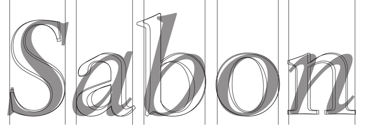 Digital versions of Jan Tschichold's Sabon or Sabon Antiqua (1967, Stempel) include Sabius (URW), Sybil (Autologic), Classical Garamond (Bitstream), Aldine 421 (Bitstream), Symposia (Compugraphic), September (Scangraphic), Berner (Varityper), and Savoy (SoftMaker). [Google]
[More] ⦿
Digital versions of Jan Tschichold's Sabon or Sabon Antiqua (1967, Stempel) include Sabius (URW), Sybil (Autologic), Classical Garamond (Bitstream), Aldine 421 (Bitstream), Symposia (Compugraphic), September (Scangraphic), Berner (Varityper), and Savoy (SoftMaker). [Google]
[More] ⦿
|
Sandra Sofia Santos
|
 Illustrator in Guimaraes, Portugal. For a school project at Polytechnic Institute of Cavado and Ave (IPCA) University in Barcelos, Portugal, Elodie Costa, Sandra Sofia Santos and Gonçalo Rodrigues co-designed Empires (2015), a typeface based on Aldus Manutius's Bembo. [Google]
[More] ⦿
Illustrator in Guimaraes, Portugal. For a school project at Polytechnic Institute of Cavado and Ave (IPCA) University in Barcelos, Portugal, Elodie Costa, Sandra Sofia Santos and Gonçalo Rodrigues co-designed Empires (2015), a typeface based on Aldus Manutius's Bembo. [Google]
[More] ⦿
|
Schriftklassifikation nach DIN 16 518
|
 Type classification (in German) according to the DIN 16 518 system invented in 1964. Pages by Bernhard Schnelle. I will use his German nomenclature, and quote his examples of each style.
 - I. Venezianische Renaissance-Antiqua: Amalthea, Ascot, Berkeley Old Style, Centaur, Concorde, Deepdene, Eusebius, Goudy Italian, Guardi, Horley Old Style, Jersey, Lutetia, Menhart-Antiqua, Normandy, Seneca, Schneidler-Mediaeval, Trajanus, Verona, Weidemann, Worcester Round.
- II. Französische Renaissance-Antiqua [garalde types]: Aeterna, Aldus-Buchschrift, Bembo, Berling, Charter, Comenius-Antiqua, Garamond, Granjon, Leipziger Antiqua, Meridien, Michelangelo, Octavian, Palatino, Perpetua, Plantin, Sabon-Antiqua, Trump-Mediaeval, Van Dijck, Vendome, Weiß-Antiqua.
- III. Barock-Antiqua [transitional types]: Baskerville, Bernhard Modern, Bookman, Caledonia, Caslon, Century, Century Schoolbook, Cheltenham, Cochin, Diotima, Ehrhardt, Imprimatur, Janson, Life, Nicolas Cochin, Poppl-Antiqua, Raleigh, Schoolbook, Scotch, Tiffany, Times.
- IV. Klassizistische Antiqua [modern or didone types]: Bauer Bodoni, Bodoni-Antiqua, Linotype Centennial, Corvinus, De Vinne, Linotype Didot, Ellington, Falstaff, Fat Face, Fenice, Madison-Antiqua (Amts-Antiqua), Normande, Tiemann-Antiqua, Torino, Walbaum-Antiqua.
- V. Serifenbetonte Linear-Antiqua [slab serif]: Aachen, Clarendon, Memphis, Old Towne, Pro Arte Schadow-Antiqua, Serifa, Volta.
- VI. Serifenlose Linear-Antiqua [sans]: Akzidenz-Grotesk, Antique Olive, Avant Garde Gothic, Cosmos, Delta, Erbar-Grotesk, Eurostile, Folio, Franklin Gothic, Frutiger, Futura, Gill, Helvetica, Univers.
- VII. Antiqua-Varianten: Abbot Old Style, Amelia, Americana, Arnold Böcklin, Banco, Calypso, Churchward, Cooper Black, Dynamo, Eckmann, Glaser Stencil, Hobo, Lasso, Mexico Olympic, Plastica, Profil, Souvenir, Stop, Superstar, Tintoretto, Traffic, Washington, Windsor, Zipper.
- VIII. Schreibschriften [scripts]: Arkona, Amazone, Bison, Boulevard, Brush Script, Caprice, Charme, Choc, Diskus, Englische Schreibschrift, Künstler-Schreibschrift, Lithographia, Mistral, Reiner Script, Rondo, Signal, Swing, Vivaldi.
- IX. Handschriftliche Antiqua: American Uncial, Antikva Margaret, Arcade, Codex, Delphin Dom Casual, Hadfield, Klang, Koch-Antiqua, Libra, Lydian, Ondine, Poetica, Post-Antiqua, Prima, Ritmo, Solemnis, Studio, Time Script.
- X. Gebrochene [Fraktur, blackletter], subdivided into Xa Gotisch, Xb Rundgotisch, Xc Schwabacher, Xd Fraktur, Xe Fraktur-Varianten.
- XI. Fremde Schriften [foreign types]: all non-Latin typefaces.
[Google]
[More] ⦿
|
Sean Cavanaugh
[FontSite]
|
[MyFonts]
[More] ⦿
|
Sean Cavanaugh
|
Author (b. Cape May, USA, 1962) of Digital Type Design Guide (Hayden Books, ISBN 1-56830-190-1, 1995), which for 45 US dollars comes with a CD with 220 useful PostScript and TrueType fonts (not designed by Sean though). A second 260-font CD for 30USD. He runs The Fontsite, where you can download free versions of CombiNumerals 4.0 (circled numbers), ATF Antique (ATF Antique was first released by the Barnhardt Bros.&Spindler type foundry in 1842. It was designed for sign cutting, and saw much use throughout the latter 19th century. Its popularity led to its re-introduction by ATF in 1905 under the name Antique 1. It is the precursor to the typefaces Bookman and Rockwell.), Goudy Sans, US Flag Font, Mini 7 and Mini 7 Tight (pixel fonts). Earlier, there were also Dynamo and Rosie. Commercial typefaces of his include the CombiSymbols family. Free fonts at FontSite: Bergamo, CartoGothic, CombiNumerals. Font Squirrel link. [Google]
[MyFonts]
[More] ⦿
|
Sebastian Kosch
|
 Sebastian Kosch (b. 1989, Germany) studied Engineering Science at the University of Toronto. He designed the open license garalde font family Crimson Text (2010), which is part of the Google open font directory. This was followed by Crimson (2011) and Crimson Bold (2011). Free downloads at OFL, CTAN and Aldus Leaf. See also Crimson Pro, originally designed by Sebastian Kosch and in 2018 expanded by Jacques le Bailly. The Crimson fonts were corrected in 2016 by Michael Sharpe and are available as Cochineal. Michael writes: These remarkable fonts are inspired by the famous oldstyle fonts in the garalde family (Garamond, Bembo) but, in the end, look more similar to Minion, though with smaller x-height and less plain in detail..
 Sebastian's motto: free as in both "free beer" and "freedom." Klingspor link. Open Font Library link. Google Plus link. Github link. [Google]
[More] ⦿
|
Shelley Winter
|
British type designer, born in 1959, who runs Type Design, an independent consultancy which she founded in 1981. From 1977 on, she worked in the type department of Linotype, where she and Walter Tracy developed Arabic and Cyrillic typefaces. She created Telegraph Newface Bold (1989, with Walter Treacy, for The Daily Telegraph), Telegraph Newface Roman (1990), Pegasus Bold (1980, with Matthew Carter for Berthold Wolpe), Mitsubishi Arabic (1987, with Tim Holloway), New Johnston Signage Light (1988), Sun Life Engraved (1988), and helped Matthew Carter with the creation of foreign glyphs to extend his Galliard family. BAA Bembo, used at BAA airports, was drawn by her (and possibly Freda Sack as well). Typographers laud it for its legibility compared to Vialog and Frutiger. Klingspor link. [Google]
[MyFonts]
[More] ⦿
|
Softmaker name equivalences
|
List of font name equivalences for Softmaker's MegaFont XXL CD (10,000 truetype fonts), compiled by Ulrich Stiehl, accompanied by an inverted file. This is a resource of considerable historical importance (despite faulty kerning and so on) as many fonts appear here for the first time in digital form. Others are just copies of fonts from the major foundries. [Google]
[MyFonts]
[More] ⦿
|
Stanley Morison
[Bembo]
|
[More] ⦿
|
Stanley Morison
|
 Stanley Arthur Morison was an influential British designer and type designer (b. 1889, Wanstead, d. 1967, London), who spent most of his creative energy at Monotype between 1920 and 1950.
 Designer with Victor Lardent of Times New Roman (1932) while consultant for the London Times. He designed Blado MT at Monotype (1923) (a revival of characters drawn by Ludovico degli Arrighi). He is also credited with revivals of Baskerville, Bell, Garamond (1922) and Bembo (1929). Mac McGrew writes: Bembo was cut in 1929 by the English Monotype corporation under the direction of Stanley Morison, and shortly thereafter by Lanston Monotype in America. It derives from the first roman type used by Aldus Manutius in the dialogue De Aetna, by Pietro Bembo, printed in Venice in 1495. Punches were cut by Francesco Griffo of Bologna, the designer responsible four years later for the first italic types. This typeface is probably the most popular and successful of the numerous typefaces revived by Morison as typographic adviser to the English company. Morison attributed its success to the fact that "it was inspired not by writing but by engraving; not script but sculpture." The italic is adapted from a 1524 typeface of Giovanni Taglienti, and has a natural grace of its own. English Monotype also made Bembo Bold and Bembo Bold Italic. Bio at Britannica. Biography by Nicholas Fabian. He wrote Four Centuries of Fine Printing (1924, New York: Farrar, Strauss and Company), Type Designs of the Past and Present (1926, The Fleuron Limited, London: a highly recommended 70-page treatise on the history of type), and First Principles of Typography (1936; reprinted in 1955). A Tally of Types was published by Cambridge University Press in 1973. His Letter Forms (2nd edition) was published by Hartleys & Marks in 1996. A quote from First Principles of Typography: Type design moves at the pace of the most conservative reader. The good type-designer therefore realizes that, for a new fount to be successful, it has to be so good that only very few recognize its novelty. Linotype link. FontShop link. Wikipedia link. [Google]
[MyFonts]
[More] ⦿
|
Start a design career
|
 The typophiles were asked in 2003 to list the 20 essential typefaces to start a design career. Here we go, unedited:
 - Sean Glenn: MetaPlus (FontShop), Helvetica Neue (Adobe), Mrs. Eaves (Emigre), Gotham (Hoefler Type Foundry), 20th Century (Monotype), Base (Emigre), Agency (Font Bureau), Simian (House Industries), Agenda (Font Bureau), OCR-B (Adobe), Formata (Adobe), Caxton (Adobe), Scala Sans (FontShop)
- Letter Tiep: Akzidenz Grotesk BQ, Univers, Frutiger Next (or Avenir?), Today Sans (or Syntax / Gill Sans?), The Sans, Trade Gothic (or News Gothic/Vectora?), Futura, Minion, Palatino, Berthold Baskerville (or Storm's John Baskerville / Monotype Bulmer), Filosofia, Lexicon nr2 ($$$), Officina Sans&Serif (or the FF Info series), Adobe Caslon, Bembo (or HTF Requiem), Stempel Garamond, Joanna (or Scala?), Clarendon (or Giza?)
- Jay Wilkinson: Akzidenz Grotesk BQ, Helvetica neue, Avenir (or Futura), Frutiger, Trade Gothic, Franklin Gothic, Optima, Bodoni (or Didot but not filosofia), Adobe Garamond, Adobe Caslon, Minion, Hoefler, Dante, Sabon, Perpetua, Requiem (or Bembo), Centaur, Clarendon, Shelly (or Snell Roundhand), Fette Fraktur (or Goudy Text)
- John Gordon: Blackletter, Centaur, Janson, HTF Requiem, Bembo, Caslon, Garamond, Baskerville, Palantino, HTF Didot, Perpetua, Electra, Clarendon, Akzidenz Grotesque, Helvetica Neue, Futura, Franklin Gothic, Trade Gothic, Poetica, Shelly
- Keith Chi'hnag tam: Minion Pro, Myriad Pro, Sabon Next, Monotype Baskerville (or Berthold), HTF Didot, Perpetua, Monotype Gill Sans, Berthold Akizidentz Grotesk, Thesis Sans, Swift, ITC Charter, FF Meta, PMN Caecilia, Adobe Caslon Pro, FB Miller, Adobe Syntax, ITC Franklin Gothic, Bitstream Futura, Monotype Bembo, Snell Roundhand
- H.D. Schnellnack: Neue Helvetica, FF DIN, Clarendon, Thesis Sans, Garamond Pro OTF or Neue Sabon, Myriad Pro OTF, Mrs Eaves OTF, FF OCR or FF Letter Gothic, Rotis Sans and SemiSans, Futura, Scala, TAZ III OTF, Univers, Bauer Bodoni, Franklin Gothic or Bureau Grotesque, Bell Gothic or Interstate (1993, Tobias Frere-Jones), Jenson Pro OTF or Warnock Pro or Kepler, Thesis Serif or Thesis Mono, Zapfino
[Google]
[More] ⦿
|
Studio Elastik
[Constantin Demner]
|
Studio in Vienna run by Constantin Demner. Constantin holds an MA from former LCP London College of Printing (now LCC London College of Communication) in MA Typo/graphic studies. Creator of some free fonts: LSTK Bembo (2012, a hand-drawn version of Bembo), LSTK Clarendon (2012, hand-drawn Clarendon), LSTK Gara Pen Tiny (2012, hand-drawn Garamond), LSTK Dayfly (2016, condensed headline grotesque). Dropbox page for downloads. Cargo Collective link. [Google]
[More] ⦿
|
Sueh Li Tan
|
Graphic and type designer from Penang, Malaysia, who lived in The Netherlands and is now in Kuala Lumpur, where she founded Huruf, a malaysian type collective. Graduate of the Type and Media program at KABK, 2009. There, Tan tried a revival of Bembo (2008) and created Callie Text and Callie Display (2009), a text family, as the graduation project. In 2010, in collaboration with Martin Frostner, she created the custom octagonal / calligraphic typeface Biskops Arnö for Nordic Folk High School Biskops Arnö at Mälaren. Creator of Interieur (at Sara De Bondt Studio in London), Monster Type, and DrawbotScript. Klingspor link Typecache link. Behance link. [Google]
[More] ⦿
|
Tasuki's blog
[Vit Brunner]
|
Vit "Tasuki" Brunner (Czechia) recommends the 14 best free fonts. Summarizing his recommendations: - Antykwa Torunska is an original typeface created by Polish type designer Zygfried Gardzielewski in 1960. It was digitized by Janusz Marian Nowacki. The font contains many diacritical marks, math symbols, and comes in many weights.
- Typo Latin Serif is a slab serif (Egyptian) typeface with an extremely large x-height. It was created by Manfred Klein.
- The DejaVu fonts are extensions of the free Bitstream Vera typefaces.
- Palatino (Hermann Zapf) is gorgeous, period. Palladio L is a free Palatino clone created by URW in cooperation with Hermann Zapf. Download it in URW fonts pack (together with 79 other fonts).
- Gentium, a typeface for many languages by Victor Gaultney. Extensive unicode support.
- Optima by Hermann Zapf. A free version: MgOpen Cosmetica.
- Bembo is a nostalgic antiqua created by Francesco Griffo in 1496. Cardo (David Perry) is based on Bembo.
- Vollkorn is an old style numerals typeface created by Friedrich Althausen.
- Computer Modern is a didone typeface created by Don Knuth.
- Avant Garde (Herb Lubalin) can be downloaded in the URW font pack where it is known as URW Gothic L.
- Goudy Bookletter 1911 is a revival of Frederic Goudy's Kennerley Old Style by Barry Schwartz.
- Helvetica by Max Miedinger. Magenta Ltd has a free version in its MgOpen pack: MgOpen Moderna.
- Geo Sans Light (Manfred Klein) is based on Futura, a geometric typeface created by Paul Renner in 1926.
[Google]
[More] ⦿
|
Taylor Lane
[Taylor Lane Typography]
|
[More] ⦿
|
Taylor Lane Typography
[Taylor Lane]
|
Sexy compositions of letters in the shapes of pin-ups by LIDA Agency in the UK. Creative and Art Director: David Harris. Typographers: David Harris, Justin Shill, Stuart Addy, Jan Hansen. Additional URL. Miss Bodoni, Miss Meta, Miss Sabon, Miss Serifa, Miss Perpetua, Miss Bembo, Miss Joanna, Miss Gothic. [Google]
[More] ⦿
|
The Ivy Foundry
[Jan Maack]
|
 Aarhus, Denmark-based designer (b. 1968) who worked as an art director and graphic designer since 1990. He started making typefaces in 2006. Ten years later he established The Ivy Foundry and wrote: The Ivy Foundry is committed to helping brands and corporations fine-tuning their visual voice. In 2018, The Ivy Foundry joined Type Network. In 2021, The Ivy Foundry joined The Type Founders.
 At The Ivy Foundry, he published - Ivy Epic (2021).
- Ivy Presto (2019: +Display, +Headline).
- Ivy Journal (2018). This transitional serif face is loosely based on both the seminal Roman inscriptional capitals and classic movable type in the style of Bembo, Baskerville, and Times New Roman.
- Swing King (2017). Hand-crafted.
- IvyStyle TW (2016). A friendly slab serif with ball terminals. Unlike the typewriter faces it takes its cues from, IvyStyle TW is a proportional design with a large number of weights.
- IvyStyle Sans (2016). Type Network analyzes: IvyStyle Sans is the sans serif component, a Scandinavian design reminiscent of the classic American Gothics. With open apertures and clean lines, the slightly narrow neohumanist letterforms abandon geometric rigidity in favor of improved reading comfort.
- Swing King (2018). Type Network writes that it is a casual sans serif created in collaboration with Danish illustrator Erik Sørensen. Throughout his decades-long career, Sørensen always had a hard time finding the right typographic voice to complement his drawings. He teamed up with Maack to produce a useful typeface that was neither cartoonish nor handwritten, but a joyful illustrated font imbued with the warmth and charm of his drawings.
- Ivy Mode (2018). A fashion mag sans family.
Creator of these typefaces at FontFont / FontShop: - FF Speak (2007). A 17-style rounded geometric sans family which includes a hairline weight, Speak-Light. A relative of Eurostile.
- FF Cube (2008). A large geometric sans with the industrial design feel of Eurostile and a large x-height.
- FF Marselis (2012). A sans serif family. He also designed FF Marselis Serif (2016) and FF Marselis Slab (2013). FF Marselis was chosen in 2016 for large letteing at Brussels Airport in 2016.
FontShop link. Klingspor link. Type Network link. [Google]
[MyFonts]
[More] ⦿
|
The Letterfoundry of Michael & Winifred Bixler
[Michael Bixler]
|
The Letterfoundry of Michael & Winifred Bixler in Skaneateles, NY has been devoted to the book arts, particularly the craft of fine letterpress printing, metal type founding, and traditional book typography, since 1965. Michael Bixler studiede at Rochester Institute of Technology. The Bixlers are known for their quality and ongoing preservation of the craft of typecasting. Some of its types are listed here. Their catalog of metal typefaces as of 2007: Albertus (+Titling), Baskerville, Bell, Bembo (+Bold, +Titling), Blado, Castellar, Centaur & Arrighi, Dante (+Titling), Ehrhardt, Fairbank Bembo Italic Condensed, Fournier, Garamond, Gill Sans, Joanna, Lombardic Capitals, Lutetia, Octavian, Old English, Perpetua (+Titling), Plantin, Poliphilus (+Titling), Spectrum, Sachsenwald, Univers, Van Dijck, Walbaum. Michael Bixler designed the metal typeface Bixler Roman in 1968. Matrices were cut in Japan and the typeface was cast privately. Bixler issued the blackletter metal typeface family Sachsenwald which is modeled after Berthold Wolpe's Sachsenwald (1936-1937; formerly known as Bismarck Script). In 2020, the Bixlers and P22 jointly published the ornamental typeface LTC Bixler Ornaments, and in 2021, they added LTC Bixler Ornaments Two. The digital versions are due to Terry Wüdenbachs. [Google]
[More] ⦿
|
The story of Bembo
[Joel Friedlander]
|
Bembo's story told by Joel Friedlander (1948-2021) in 2009. He recalls that Bembo is first and foremost an oldstyle typeface [bracketed serifs with a curved connection between serif and stem; the axis drawn through the thinnest part of the round letters leans to the left]. Aldus Manutius and Francesco Griffo created Bembo in 1496 for use in Pietro Bembo's book, De Aetna. Friedlander goes on: The design of Bembo was a clear attempt to bring the humanist script of the finest scribes of the day to the printed page, without slavishly following the more formal lettering of the day. It would later serve as the chief inspiriation to Claude Garamond, among others. Typefaces based on his work include Poliphilus, Cloister Old Style, Aetna, Aldine, Griffo Classico, Dante, and Adobe Minion. [Google]
[More] ⦿
|
The Typehead Chronicles of Thomas Christensen
[Thomas Christensen]
|
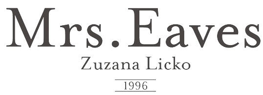 Information and specimen of all historically important typefaces: Akzidenz Grotesk, Aldus, Antique Olive, Avant Garde, Avenir, Baskerville, Bell, Bembo, Bodoni, Bulmer, Caslon, Centaur, Century Old Style, Cheltenham, Dante, Frutiger, Galliard, Garamond, Gill Sans, Goudy Old Style, Granjon, Helvetica, Janson (Kis), Minion, Mrs. Eaves, Optima, Palatino, Perpetua, Sabon, Syntax, Times New Roman, Today, Trump Medieval, Univers, Walbaum. [Google]
[More] ⦿
Information and specimen of all historically important typefaces: Akzidenz Grotesk, Aldus, Antique Olive, Avant Garde, Avenir, Baskerville, Bell, Bembo, Bodoni, Bulmer, Caslon, Centaur, Century Old Style, Cheltenham, Dante, Frutiger, Galliard, Garamond, Gill Sans, Goudy Old Style, Granjon, Helvetica, Janson (Kis), Minion, Mrs. Eaves, Optima, Palatino, Perpetua, Sabon, Syntax, Times New Roman, Today, Trump Medieval, Univers, Walbaum. [Google]
[More] ⦿
|
The Yale Typeface
[Matthew Carter]
|
Typeface specially designed in 2004 by Matthew Carter for Yale. It is free for all units at Yale University. From the press release: Yale is inspired by the late fifteenth-century Venetian typeface that first appeared in Pietro Bembo's De Aetna, published by Aldus Manutius. [...] In 1929, Stanley Morison of the Monotype Corporation in England led a project to revive Aldus's De Aetna face. The resulting typeface, Bembo, proved to be one of the most widely used and highly regarded book typefaces of the twentieth century. It continues regularly to appear in Yale publications. Unfortunately, the more recent photocomposition and digital versions of Bembo lack the vigor, weight, and formal integrity of either the De Aetna typeface or of the original Monotype version of Bembo. Matthew Carter's Yale recovers the strength of the Aldine original, and updates it by sensitively simplifying the basic letterforms and their details. Aspects of the vigor and "color" of the well-known typeface Galliard, an earlier Carter design, are also evident in the new Yale face. The fonts include YaleAdministrative Roman, YaleAdministrative Italic, Yale Design Roman, Yale Design Italic, Yale Small Capitals, Yale Web Small Capitals, Yale Street and Yale Street Aligning Figs. later additions include YaleNew, Yale Display, and Mallory (a companion font designed in 2015 by Tobias frere-Jones). Free download. [Google]
[More] ⦿
|
Thomas Christensen
[The Typehead Chronicles of Thomas Christensen]
|
[More] ⦿
|
Typedia: Typeface classification
|
The classification from the Typedia community: - Blackletter
- Fraktur: A German form of Blackletter with broken strokes. Classic example: Fraktur.
- Old English: The English blackletter style. Classic example: Cloister Black.
- Rotunda: A Blackletter style featuring wider lowercase with more rounded strokes.
- Schwabacher: A German form of Blackletter with simplified, rounded strokes.
- Textura: A Blackletter style featuring tall, narrow lowercase made mostly of straight strokes.
- Calligraphic
- Chancery: A script style of calligraphy made with a broad-point pen with slightly sloping, narrow letters that are the basis for italics in serif typefaces. Capitals may or may not have flourishes. Originated during the Renaissance. Classic example: Zapf Chancery.
- Etruscan: An early Roman form of calligraphy drawn with a flat brush held at a steep angle. Caps only, as lowercase had not been invented yet. Classic example: Adobe Pompeii.
- Uncial: A Celtic style of calligraphic script with forms created by a broad-nibbed pen at an almost horizontal angle, but sometimes more tilted in later variants. Roman lowercase is derived from Uncial forms. There is only one case in pure Uncial designs. Used during the middle ages. Classic example: American Uncial.
- Inscriptional---Roman Inscriptional: Stone-cut serif style from the late Roman Empire. The basis of modern roman capitals. Classic example: Trajan.
- Non-alphanumeric
- Dingbats
- Ornaments
- Pictorial
- Ornamented, Novelty
- Art Deco: A geometric display typeface style popular in the 1920s and 1930s. Classic example: Broadway.
- Art Nouveau: Display typefaces with a flowing, organic style popular in the early 20th Century. Classic example: Arnold Bocklin.
- Comic Strip Lettering: A style meant to look like the hand-drawn letters associated with comics or cartoons. This style is usually san serif, often having a loose, informal structure and is sometimes based on brush lettering. Classic example: Balloon.
- Dot Matrix: A style whose characters are composed of a pattern of dots used mainly for low-resolution impact printers, or to simulate the look of the output of such printers. Classic example: FF Dot Matrix.
- Futuristic: A style meant to suggest a futuristic theme. Often cold, brutal and geometric with a machine aesthetic and simplified construction. Classic example: Stop.
- Machine Readable: A style designed to be read by machine. These fonts are usually san serif and often feature unusual character shapes to make them more distinguishable from one another. Classic example: OCR-B.
- Pixel: A style whose characters are composed of pixels (usually represented as squares) used mainly for low-resolution computer display. Outline fonts are sometimes made to look like Pixel Fonts. Classic example: Silkscreen.
- Pseudo Foreign Script: A style intended to mimic non-Western letters. For example, a font that looks like Chinese, but is actually composed of Latin characters. Faux Chinese/Arabic/Hebrew. Classic example: Bruce Makita.
- Victorian: A whimsical, eclectic display style popular in the late 19th Century. Classic example: Skjald.
- Sans Serif
- Gothic: A sans serif style with moderate stroke contrast and modern proportions particular to the U.S. Usually features a two-story lowercase g, angled strokes on C and S, and a sloped, non-cursive italic. Classic example: Franklin Gothic.
- Grotesque: A sans serif style with moderate stroke contrast and modern proportions particular to the U.K. Usually features a two-story lowercase g, closed strokes (usually curving in slightly) on C and S, and a sloped, non-cursive italic. Classic example: Bureau Grot.
- Geometric Sans: A sans serif style made with rigidly geometric forms and little to no stroke contrast. Classic example: Futura.
- Grotesk: A sans serif style with low stroke contrast and modern proportions. Usually features a one-story lowercase g, closed or angled strokes on C and S, and a sloped, non-cursive italic. Classic examples: Akzidenz Grotesk, Helvetica.
- Humanist Sans: A sans serif style with proportions modeled on old-style typefaces. Characterized by open strokes on characters like C and S. Italics of this style often are more cursive in appearance, rather than a simple slanted version of the roman. Often has more slightly stroke contrast than other sans serifs. Classic examples: Gill Sans, Frutiger.
- Square Gothic: A sans serif style composed mainly of straight or nearly straight lines and (often) curved corners. Stroke contrast is usually low. Classic example: Bank Gothic.
- Swiss Gothic: A sans serif style with noticeable stroke contrast, straight sides on round characters, modern proportions, and large x-height. Usually features a one-story lowercase g and closed strokes on C and S. Classic example: Jay Gothic.
- Script
- Brush Script: Typefaces modeled after lettering made with a brush. Strongly associated with advertising in the mid-20th Century on. Classic example: Brush Script.
- Casual Script: Typefaces based on a style of lettering characterized by informal appearance, somewhat like handwriting, but more refined. Similar to Brush Script or Sans Serif. Classic example: Murray Hill.
- English Roundhand: A connecting-script style of calligraphy made with a flexible tipped pen. The characters are usually steeply sloped and capitals are often very elaborate. Popular in the 18th and 19th Century. Sometimes called Copperplate Script. Classic example: Bickham Script.
- French Roundhand: A connected-script style of calligraphy, sometimes with upright characters, a high stroke contrast and decorative capitals. Used in France in the 17th through 19th Century. Also called Civilité. Classic example: Typo Upright.
- Handwriting: A script style based on ordinary handwriting. Characters may or may not be connected. Classic example: Felt Tip Roman.
- Rationalized Script: A script style with sans serif qualities, low stroke contrast, and a formal appearance. Characters may or may not connect. Associated with 20th Century commercial design. Classic example: Gillies Gothic.
- Serif
- Grecian: A typically heavy display typeface with octagonal shapes where curves are normally used. Also known as Chamfered or Beveled. Popular in the 19th Century for wood types. Classic example: Acropolis.
- Latin: A serif style with large triangular or wedge-shaped serifs. Stroke contrast is medium to low. Popular in the 19th Century for wood types. Classic example: Latin.
- Modern: A serif style with high stroke contrast and vertical stress. Classic example: Modern No. 20.
- Didone: A serif style with high stroke contrast and vertical stress. Serifs are usually unbracketed. Classic examples: Bodoni (Italian), Didot (French).
- Scotch Modern: A serif style with medium to high stroke contrast and vertical stress, known for large serifs and tiny aperture. Serifs are usually bracketed. Classic examples: Modern No. 20, Scotch Modern.
- Old Style: A serif typeface with relatively low stroke contrast, angled stress, angled serifs. Classic example: Bembo.
- Antique: A serif style with moderate stroke contrast, bracketed serifs and usually vertical stress. Serifs are angled as in Old Style. Popular in the 19th Century. Classic example: Bookman.
- Dutch Old Style: A serif style with somewhat angled stress, bracketed serifs, and medium to high stroke contrast. Characteristic of Dutch and English types of the 18th Century. Classic examples: Caslon, Plantin, Times Roman.
- French Old Style: A serif style with angled stress on rounds; usually features a small eye on the lowercase e; soft, bracketed serifs and moderate stroke contrast. Classic example: Garamond.
- Spanish Old Style: A serif style with soft, bracketed serifs, medium to high stroke contrast, and often highly angled stress. Classic example: Rongel.
- Venetian Old Style: A serif style with angled stress on rounds; usually a tilted crossbar on the lowercase e; usually has somewhat low stroke contrast. Serifs are sometimes unbracketed. This style is associated with very early printing (Incunabula) in the West. Classic example: Jenson.
- Slab Serif: A serif style with serifs equal to or nearly the same thickness of the main strokes. Main strokes usually have low contrast. Classic example: Rockwell.
- Clarendon: A slab serif style with heavy, bracketed serifs, modern proportions and construction, low stroke contrast. Classic example: Clarendon.
- Egyptian: A serif style with heavy, unbracketed serifs, modern proportions, low stroke contrast. Basic construction is similar to Modern, but with low stroke contrast. Sometimes called Antique. Classic example: Egiziano.
- French Clarendon: A serif style with reverse stress (horizontal strokes thicker than vertical strokes) and slab serifs, sometimes bracketed, usually condensed. Popular in the 19th Century. Classic example: Playbill.
- Geometric Serif: A serif style made with rigidly geometric forms. Usually features slab serifs. Classic example: Stymie.
- Spur Serif: A serif style with very small serifs. Usually similar in design to san serif typefaces, except for the serifs. Usually very little stroke contrast. Classic example: Copperplate.
- Transitional: A serif style which, historically, bridges the gap between Old Style and Modern. Stroke contrast is stronger than old style, but less than modern. Bracketed serifs. Stress is mainly vertical. Characteristic mainly of English types around 1800. Classic example: Baskerville.
- Scotch Roman: A serif style with medium contrast and vertical stress, medium-sized bracketed serifs. Classic examples: Miller, Caledonia.
- Tuscan: A serif style with splayed or ornate serifs. Classic example: Thunderbird.
[Google]
[More] ⦿
|
Typefaces no one gets fired for using
[Cameron Roll]
|
 Cameron Roll is a freelance new media designer, author, and speaker. He has a blog in which the most trustworthy typefaces are listed. Taking votes from 61 typophiles gave these results:
 - 13 Helvetica Neue.
- 9 Frutiger, Warnock Pro, Futura.
- 7 Avenir, Myriad.
- 6 FF DIN, Bodoni.
- 5 (Adobe or other) Garamond.
- 4 Jenson Pro, Sabon, Trade Gothic, Trajan Pro.
- 3 Gotham, Caslon Pro, Akzidenz Grotesk, Rosewood, Franklin Gothic, Meta, Mrs Eaves, Thesis / The Sans, Gill Sans.
- 2 Bembo, Univers, Humanist 521, Minion, Officina (Sans), Trebuchet, Verlag, Imago, News Gothic, Clarendon, Versa (Sans).
- 1 Balance, Chopin Script, Sprint, Stone Print, Georgia, Zapfino, Bureau Grotesque, Courier New, Agenda, Bell Gothic, Filosofia, Arriere Garde, Marcelle Script, Porcelain, Lido STF, Uni 05 53, Modern 20, ITC Stone Sans, Book Antiqua, Avant Garde, Klavika, ITC Legacy, ITC Berkeley Old Style, Parkinson, Verdana, Cooper, Bello, Huxley, Maiandra GD, Interdimensional, Garth Graphic, Neutraface, Interstate, Vendetta, Proxima Nova, Newscastle, Zurich, Swiss, Eurostile, Fago, Downcome, American Typewriter ITC, Handel Gothic, Scala, Fonce Sans Pro, Penumbra, Electra, Optima, Serlio, Spring Light, Conduit, Lexicon, Delicious, Trinité, Productus, Documenta, Bitstream Vera, Bickham Script Pro, Voluta Script, Apex Sans, Chaparral Pro, Meridien.
[Google]
[More] ⦿
|
Typoart GmbH (or: VEB Typoart)
[Jay Rutherford]
|
 Dresden (East Germany)-based font studio that evolved from the former East German centralized press, VEB Typoart. VEB Typoart operated from 1948 until 1989, when it was renamed Typoart GmbH. Typoart GmbH dissolved mysteriously in 1995, perhaps due to bankrupcy.
 MyFonts catalog of digitizations. Timeline as provided by Typoart-Freunde, a project of Jay Rutherford at the Bauhaus University in Weimar (and published in 2007 in a book by the same title, Heinz Wohlers Verlag, Harrlach): - 1945: Schriftguß KG (before that, Gebr. Butter) produces type again.
- 1946: Schelter&Giesecke in Leipzig becomes VEB Druckmaschinenwerk Leipzig.
- 1948: Schriftguß KG becomes VEB Schriftguß Dresden. This is the true start of Typoart.
- 1951: the foundry section of VEB Druckmaschinenwerk Leipzig is absorbed by the VEB Schriftguß Dresden. Herbert Thannhaeuser becomes art director. We see the name Typoart.
- 1952: Herbert Thannhaeuser publishes Papier und Druck, and creates Meister-Antiqua and Technotype.
- 1957: Typoart is in full production now. An eyecatcher is Albert Kapr's Leipziger Antiqua.
- 1958: Thannhaeuser publishes his Liberta Antiqua and Garamond Antiqua. The Party decides that all private industrial property now belongs to the state.
- 1961: Typoart absorbs Ludwig Wagner KG in Leipzig and Norddeutsche Schriftgießerei Berlin. The Berlin wall is built.
- 1962: There is some negative press about Typoart's domination by Thannhaeuser's designs. VEB Typoart is absorbed by Vereinigung Volkseigener Betrieb (VVB) Polygrafische Industrie.
- 1963: Thannhaeuser dies. Albert Kapr becomes art director.
- 1965: The annual production reaches 4,5 million matrices. Purchase of the Digiset machine, built by Firma hell in Kiel, which is the first machine for electronic typesetting.
- 1967: Sabon Antiqua appears.
- 1970: Typoart is now owned by SED. In the DDR, all phototype printing is now done in Berlin, Leipzig and Dresden.
- 1971: Typoart is now producing its own phototype for the Linotron 505. Their prime productions include Maxima (by Karl-Heinz Lange; based on Gert Wunderlich's Linear-Antiqua) and Prillwitz-Antiqua (Albert Kapr).
- 1973: Albert Kapr publishes Typoart-Typenkunst, in which 19 typefaces are showcased.
- 1976: Phototype fonts are developed for Diatype, Diacomp (such as Maxima, Liberta, Garamond-Antiqua, Tschörtner-Antiqua, Leipziger-Antiqua), and 2NFA (Russian). Detlef Schäfer becomes head of research and development.
- 1977: To help with the digital transition, Norbert du Vinage joins Typoart.
- 1980: New types include Kleopatra, Biga, Zyklop, Quadro and Molli.
- 1987: Albert Kapr hands the art directorship to Norbert du Vinage. Publication of the first phototype catalog by Typoart.
- 1989: Publication of Fotosatzschriften, Typoart's typeface program. Typoart folds.
- 1990: VEB Typoart is changed into a GmbH with 230 employees.
- 1991: Eckehart Schumacher Gebler acquires all of Typoart's matrices. This collection is kept in the Werkstätten und Museum für Druckkunst Leipzig GmbH. Typoart GmbH and HL Computer (Karl Holzer's company) are joined.
- 1995: Typoart GmbH still has 100 employees. It offers typefaces in truetype and postscript formats. Albert Kapr dies in Leipzig. The demise of Typoart is mysterious, and not much is known about who owes what to whom. The copyright status of its typefaces remained uncertain. This page mentions the present situation. Andreas Seidel explains that Typoart has digitized lots of its type typefaces using Ikarus, and that the rights are held by Mr. Holzer, who may be in some financial trouble. He says that no living Typoart designers have received any royalties or public recognition.
Typoart Freunde and Typowiki have partial lists of typefaces. Here is my own: - Agitator (1960). By Wolfgang Eickhoff. This rough-brush typeface was digitally revived in 2007 by Patrick Griffin at Canada Type as Merc.
- Alte Schwabacher: blackletter by Herbert Lemme.
- Antiqua (fett, kursiv fett and schmalfett) by Barbara Cain. A didone family.
- Baskerville (1982) by Volker Küster and Peter Greinke.
- Bembo: Typoart's version is by Erhard Kaiser.
- Biga: a shaded headline typeface made by Fritz Richter in 1985.
- Caslon-Gotisch: a blackletter typeface originally created by William Caslon in 1760, it was brought to Leipzig from England in 1904 by Carl Ernst Pöschel.
- Eckmann: a soft blackletter, dating from 1900.
- Egyptienne. By Hans-Peter Greinke.
- Erler Versalien (1953, Herbert Thannhaeuser). Digital versions: Erler Titling (2015, Ralph M. Unger), Missale Incana (2004, Andreas Seidel).
- Garamond (1955): the metal Typoart version is by Herbert Thannhaeuser. The digital version is Garamond No.5 at Elsner&Flake. See also here. URW published a different digital version, Garamond No. 4. And Infinitype / SoftMaker says that its German Garamond is based on TypoArt's.
- Fleischmann: a serif based on Fleischmann's historical face. An original cursive by Harald Brödel was added.
- Halbfette Baskerville: an interpretation of Baskerville by Volker Küster.
- Hogarth Script: an elegant script based on 18th century copperplate originals by William Hogarth. Font by Harald Brödel. Digital versions at URW, Softmaker (as Hobson), Alexandra Gophmann (Cyrillic version, 2005), Ralph M. Unger (as Gillray Pro, 2015), Castcraft (as OPTI Historic Script), Linotype and Elsner&Flake. Incredibly, Linotype owns the Hogarth Script trademark.
- Kis Antiqua: Hildegard Korger's interpretation of this classic Dutch Antiqua by Nikolaus Kis. For a digital revival, see Ralph Unger's Kis Antiqua Pro (2018).
- Kleopatra: a double-line decorative typeface by Erhard Kaiser (1985), digitized in 1989.
- Leipziger Antiqua: a very legible Antiqua designed by Albert Kapr in 1959, developed for phototypesetting by Hans-Peter Greinke, and further developed in digital form by Tim Ahrens in 2002 as Lapture.
- Liberta Antiqua and Kursiv: a robust house typeface from 1958 made by Herbert Thannhaeuser. Klingspor gives the date 1956.
- Lotto (1955). By Herbert Thannhaeuser.
- Luthersche Fraktur: a blackletter by Volker Küster and Herbert Lemme, digitized in 1989.
- Magna: a DDR magazine text typeface from 1968, by Herbert Thannhaeuser. In 1975, Albert Kapr added Cyrillic letters. Karl-Heinz Lange developed the phototype. URW, Linotype and Elsner&Flake (who owns the trademark) have a digital version.
- Maxima: a sans family by Gert Wunderlich (1970). Elsner&Flake (who owns the trademark), Linotype and URW have a digital version.
- Minima: Karl-Heinz Lange's narrow sans designed for the DDR's telephone directory in 1984. Revived by Ralph M. Unger in 2017 as Tablica.
- Molli: a comic book typeface by Harald Brödel.
- Neutra (1968): A variant of Clarendon, rendered more legible by Albert Kapr. Used in the DDR for advertising.
- Nidor: a slab serif by Harald Brödel.
- Norma-Steinschrift: a house sans.
- Prillwitz (1971-1987): a didone by Albert Kapr and Werner Schulze based on the original from 1790 by Johann Carl Ludwig Prillwitz. Elsner&Flake have a digital version. See also the 2015 revival by Ingo Preuss called Prillwitz Pro.
- Polo by Carl Pohl. URW++ has a digital version.
- Primus: a 1962 workhorse family (with Magna and Timeless) for the magazines in the DDR. Conceived in 1962, it was later adapted in Phototype by Karl-Heinz Lange. However, the Berthold Phototypes book of 1982 and Klingspor Museum put the date of creation at 1950.
- Publika: a sans typeface developed between 1981 and 1983 by Karl-Heinz Lange. Sometimes spelled Publica.
- Quadro: a four-line showstopper typeface by Erhard Kaiser.
- Roesner Versalien (1960). By Wolfgang Roesner.
- Schwabacher T09, T20 and T48. By Herbert Lemme.
- Sinkwitz Gotisch and Versalien (1950). By Paul Sinkwitz.
- Stentor: a brush script by Heinz Schumann (1964). Digital versions by Scangraphic, Ralph M. Unger (2013, as Tyton Pro), Elsner&Flake and URW. Rosalia (2004, Ingo Preuss) is based on Stentor.
- Super Grotesk: a legible sans by Arno Drescher (1930, Schriftguss). Super Grotesk Buchtype (kursiv and halbfett) are placed in 1951. For a digital version, see FF Super Grotesk (1999, Svend Smital).
- Technotyp (1951). By Herbert Thannhaeuser.
- Thomas Schrift (1956). By F. Thomas.
- Timeless (1982). See also Elsner&Flake and URW. In 2021, Ralph Unger revived and extended Timeless, calling it Korpus Serif Pro.
- Tschörtner Antiqua and Kursiv (1955). By Helmut Tschörtner.
- Typo Skript (1968). By Hildegrad Korger.
- Typoart Didot (antiqua, kursiv and halbfett). Added in 1958 by Herbert Thannhaeuser.
- Typoart Garamond (1955). By Herbert Thannhaeuser.
- Walbaum (1984): a didone by Hans-Peter Greinke based on Walbaum's originals.
- Zyklop: an art nouveau/Jugendstil face by Fritz Kossack.
References on Typoart: - Walter Begner: 25 Jahre Typoart Dresden In: Papier und Druck, Leipzig 6/1973.
- Walter Begner: Entwurf und Herstellung von Schrifttypen in Ostdeutschland. In: Leipziger Jahrbuch zur Buchgeschichte. Jahrgang 6 (1996), pages 405-436.
- Albert Kapr and Hans Fischer: Typoart Typenkunst. Leipzig, 1973.
- Albert Kapr and Detlef Schäfer: Fotosatzschriften, Itzehoe, 1989.
- Detlef Schäfer: Fotosatzschriften Type-Design+Schrifthersteller, VEB Fachbuchverlag Leipzig, 1989.
- Norbert du Vinage (as artistic director of Typoart): 40 Jahre Typoart---vier Jahrzehnte intensives Bemühen um niveauvolle Schriften. In: Papier und Druck, Leipzig 11/1988.
Personal home page of Jay Rutherford. MyFonts link. View Typoart's typefaces. [Google]
[MyFonts]
[More] ⦿
|
Typography for Lawyers
[Matthew Butterick]
|
 Great pages about typography and the choice of fonts for law documents. Written by type designer and civil litigation attorney, Matthew Butterick. Eloquent and convincing, these pages are good reading for any typographer. Summarizing his advice:
 - Typography is always important because presentation is always important.
- Good typography makes your written documents more professional and more persuasive.
- Sure, typography is important because presentation is important. But the substance of your argument and the quality of your writing is still the most important of all.
- Straight quotes should never, ever appear in your documents.
- You must always put exactly one space between sentences.
- In a printed document, don't underline. Ever.
- If everything is emphasized, then nothing is emphasized.
- Centered text is generally overused. It is like ordering plain cheese pizza--safe but boring.
- All-caps text, meaning text where all the letters are capitalized, is best used sparingly.
- A paragraph mark or section mark should always be followed by a nonbreaking space so that the mark stays joined with the numerical reference that follows.
- A nonbreaking space should usually be used in front of any numerical or alphabetic reference. It should definitely appear after paragraph marks and section marks.
- Novelty fonts, weird fonts, outline fonts, shadow fonts have no place in any document created by a lawyer. Save it for your next career as a designer of breakfast-cereal boxes.
- Avoid using the core operating system fonts in printed documents. On Windows, that means Arial, Calibri, Cambria, Candara, Comic Sans, Courier, Georgia, Helvetica, any flavor of Lucida, Palatino, Trebuchet, and Verdana. On the Mac, that means Arial, Courier, Helvetica, Palatino, Skia, and Verdana. Subject to a few exceptions, you should also avoid Times New Roman.
- Monospaced fonts were invented to suit the mechanical limitations of the typewriter. They were not invented because anyone liked them. Monospaced fonts are hard to read and they waste space.
- Hyphenation does not improve text legibility, so other things being equal, you should turn it off.
- Avoid squishing type (or stretching it to get expanded type). If you need a condensed or expanded typeface, get one that was designed for the purpose.
- Real small caps are so rare that when they actually show up in a legal document, it's like a beacon of classiness. As far as bang for the buck, there are few deals in this website better than small caps. Once you use them, you won't go back.
- I like fonts that seem to be at home in a legal document---clean, authoritative, but not relentlessly humdrum or self-consciously offbeat. I also look for fonts that have noncontroversial italic and bold styles, because lawyers use those frequently. [He mentions Galliard, Sabon, Stempel Garamond, Minion, Arno, Goudy Old Style and Bembo, and warns about Bodoni, Bookman and any sans face.]
[Google]
[More] ⦿
|
Vit Brunner
[Tasuki's blog]
|
[More] ⦿
|
Westcott & Thomson, Inc. for Fotosetter or Fototronic composition
|
Photo-type era company in Philadelphia located on 1027 Arch Street. I located an image of their typefaces that are lookalikes/i> (by their own admission) of famous typefaces: Biretta is Bembo, Elegane is Palatino, Galaxy is Uniers, Laurel is Caledonia, Medallion is Melior, Plantina is Plantin, Vega is Helvetica, and Zenith is Optima. [Google]
[More] ⦿
|

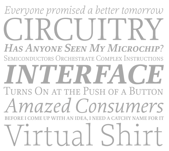
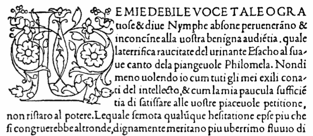
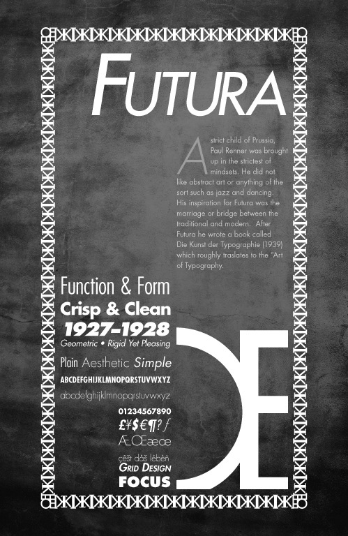
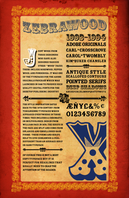
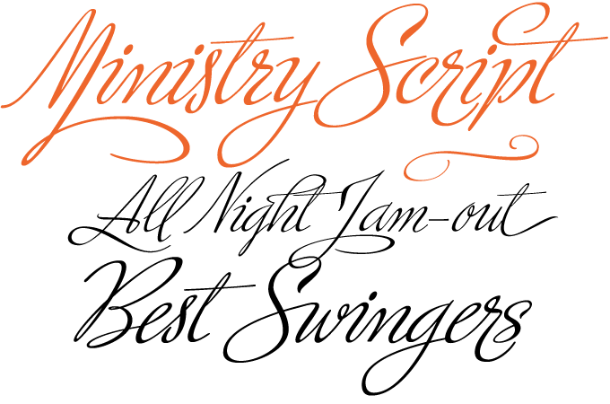
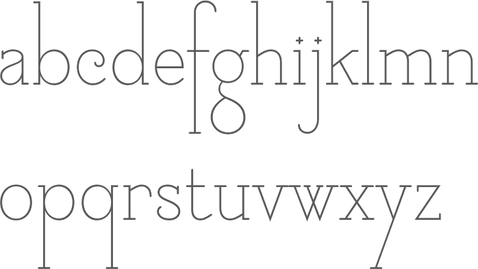
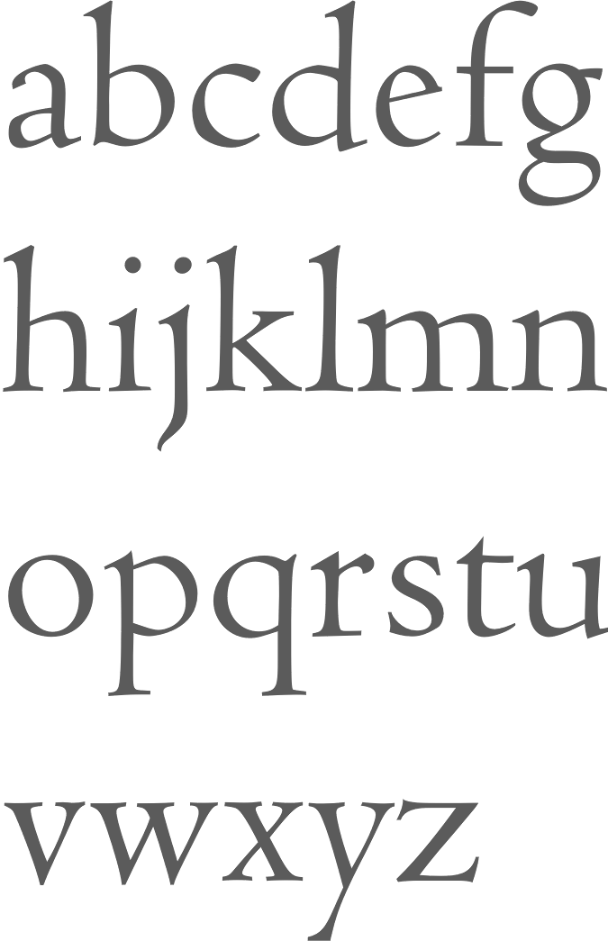
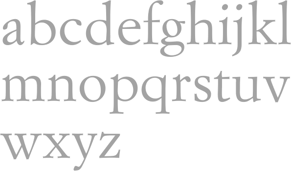
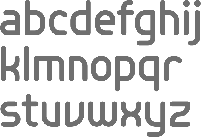
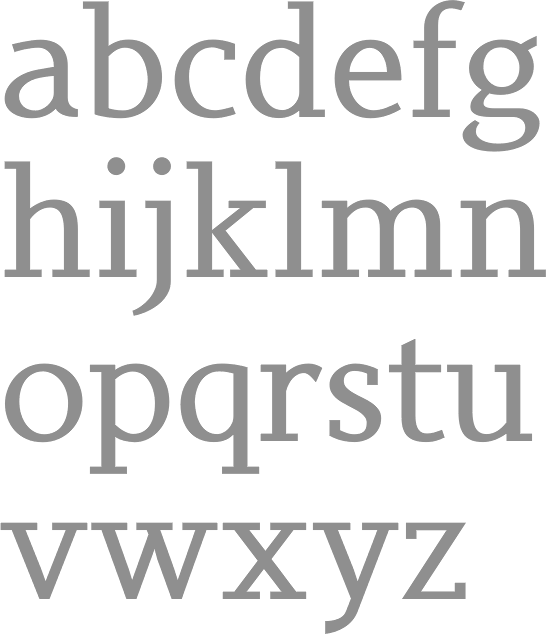
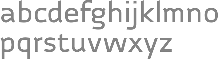
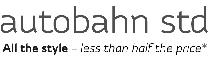
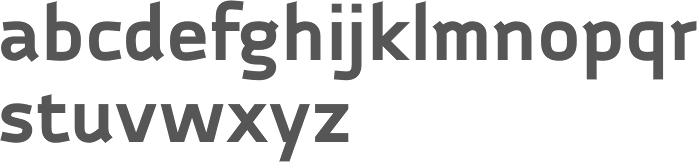
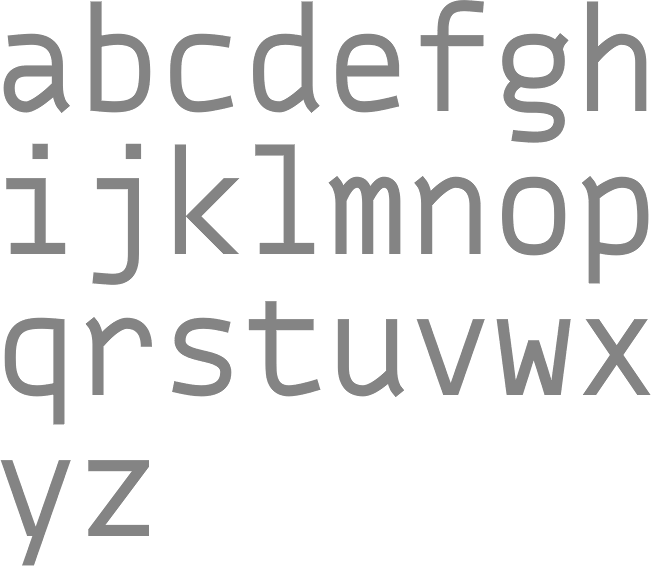
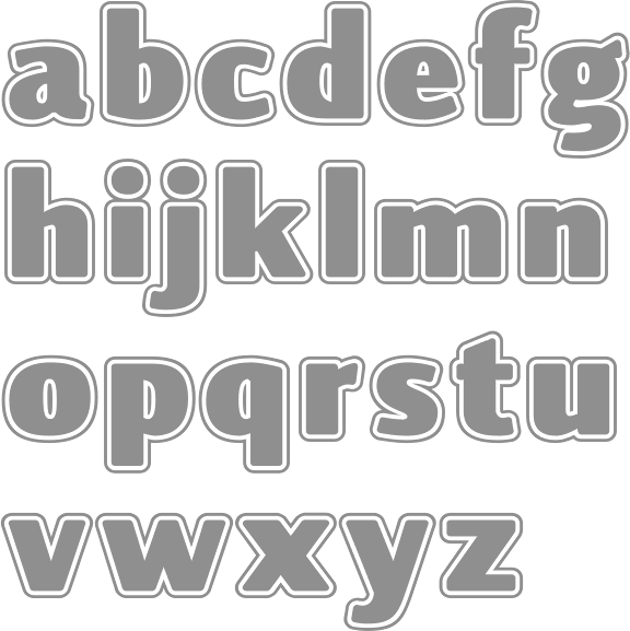
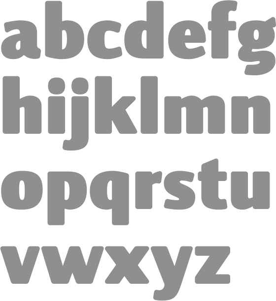
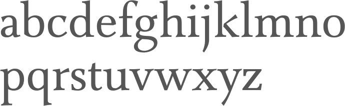
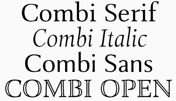
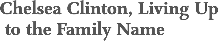
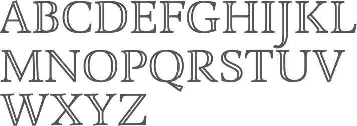
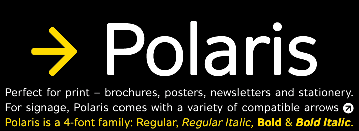
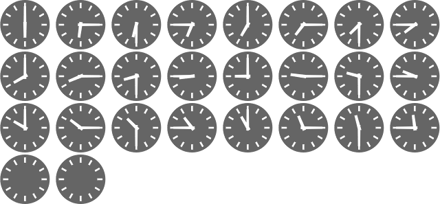
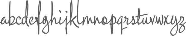
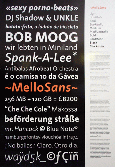
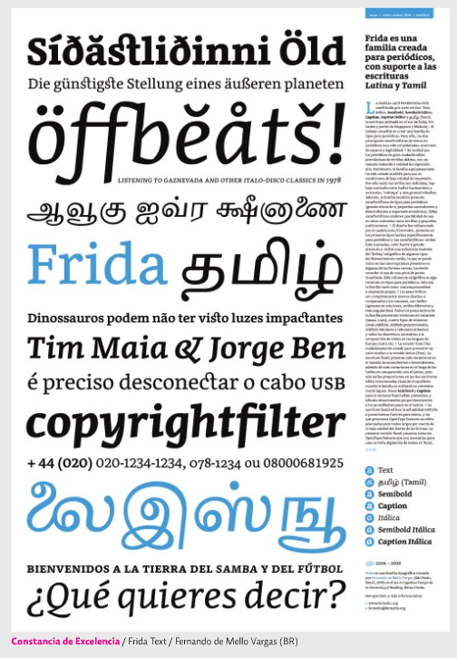
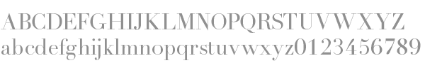
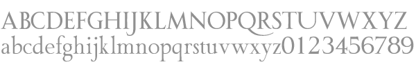
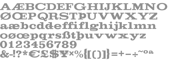
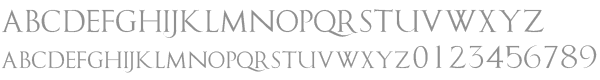
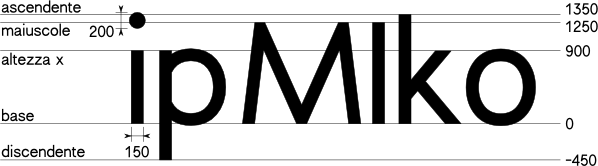
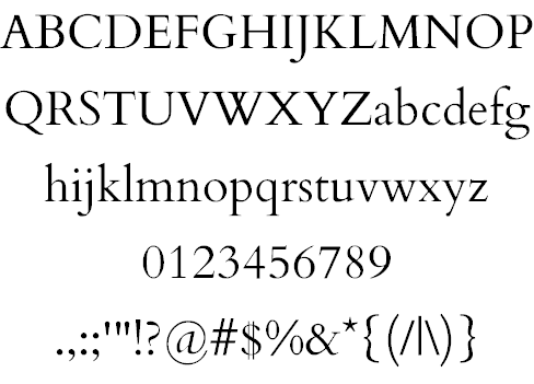
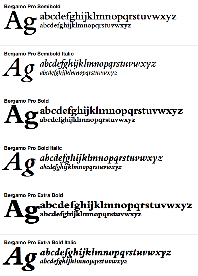
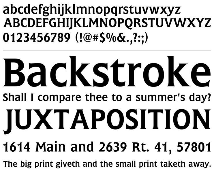
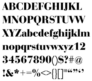
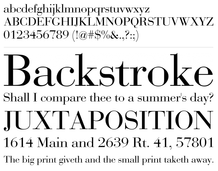
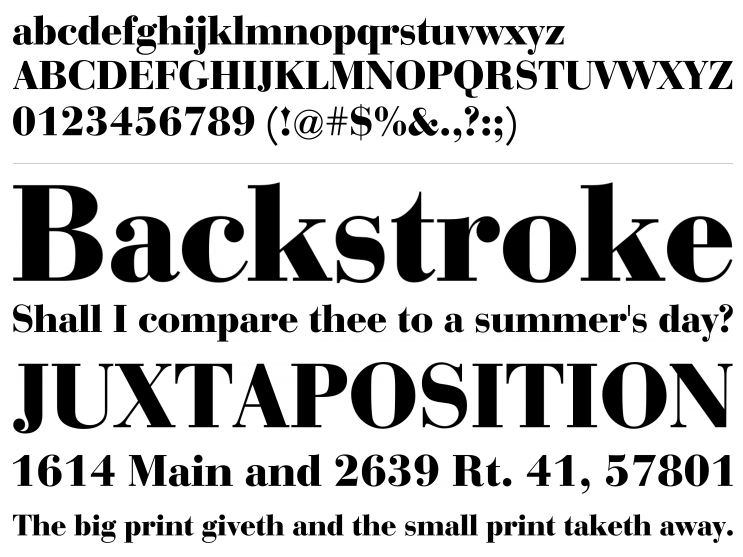
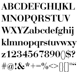
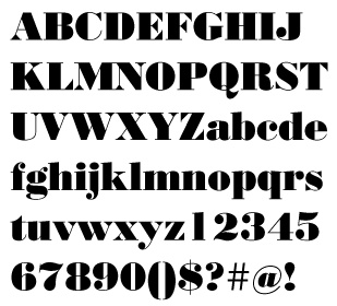
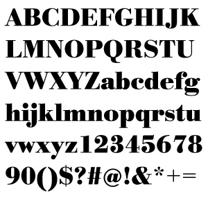
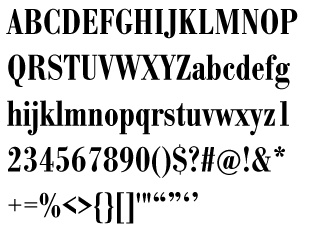
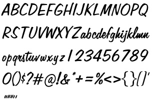
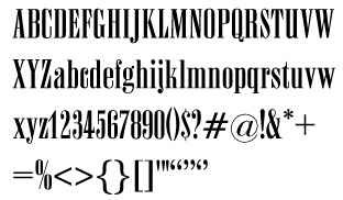
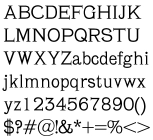
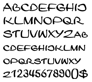
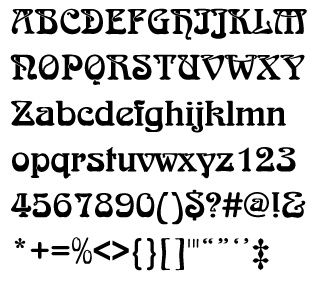
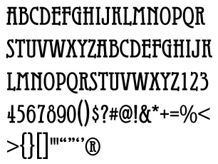
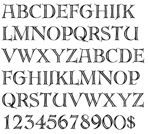
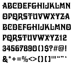
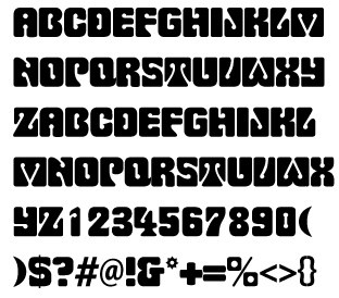
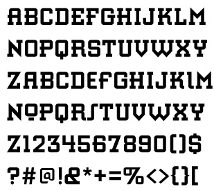
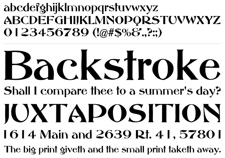
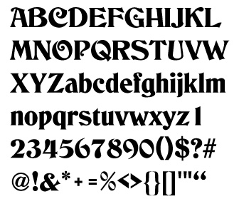
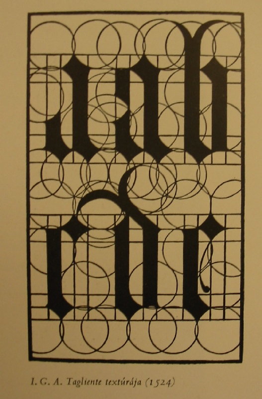
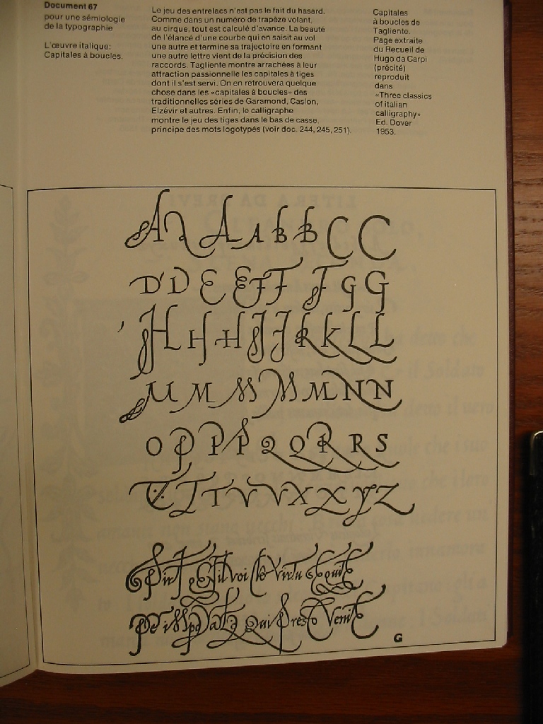
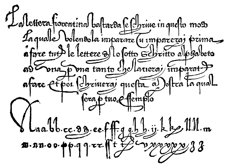
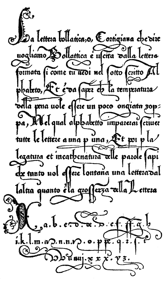
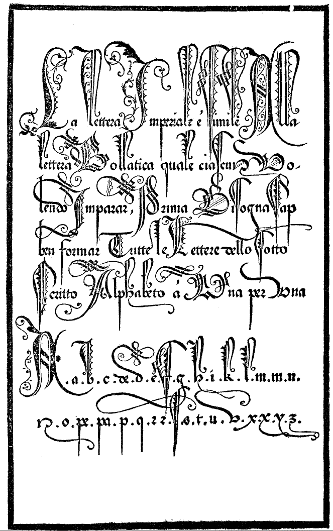
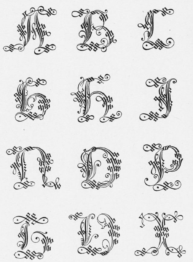
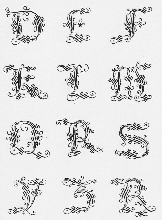
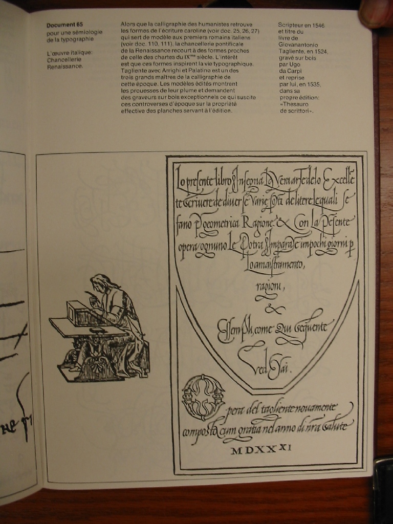
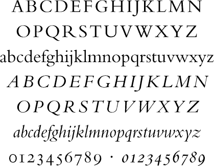
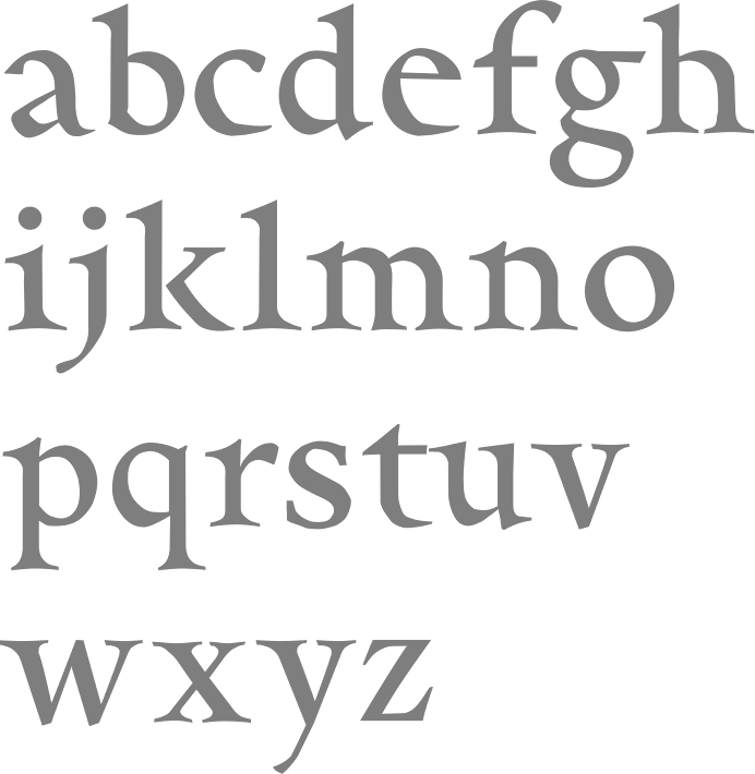
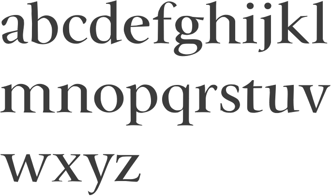
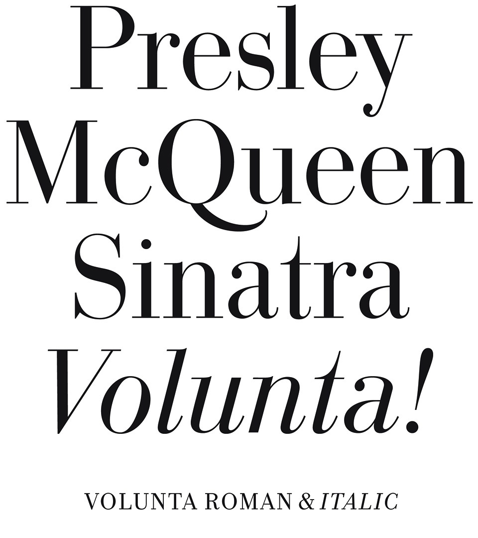
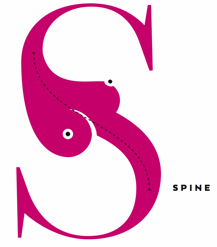
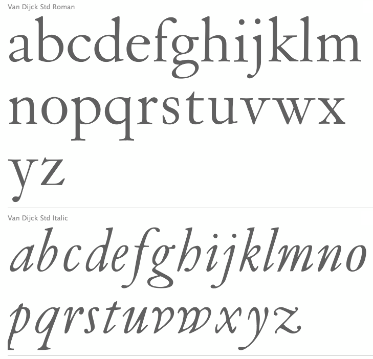
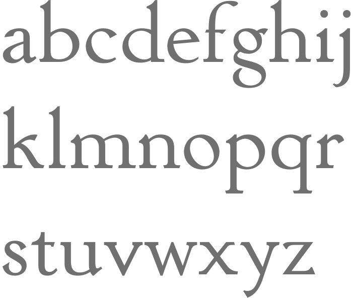
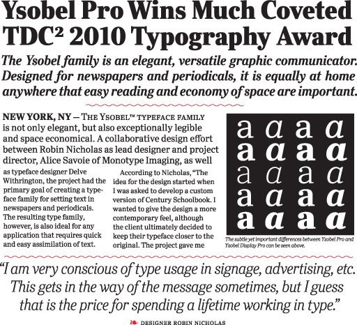
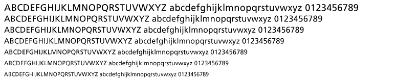
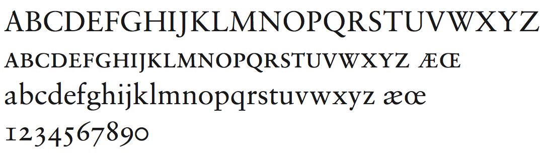
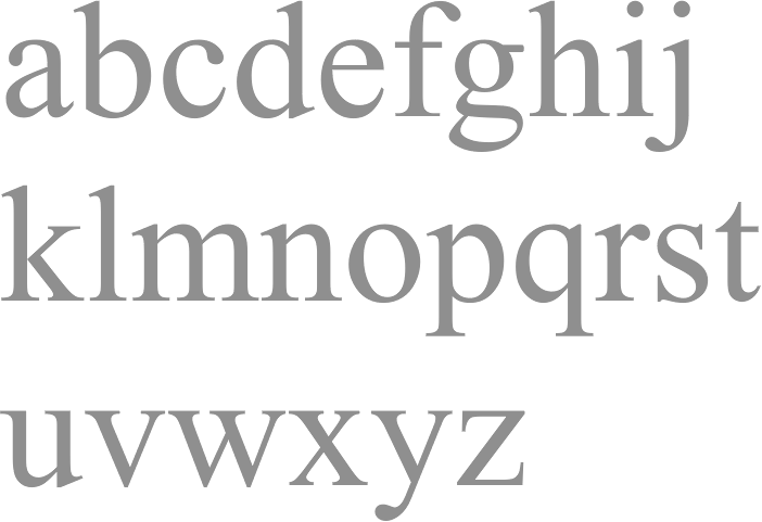
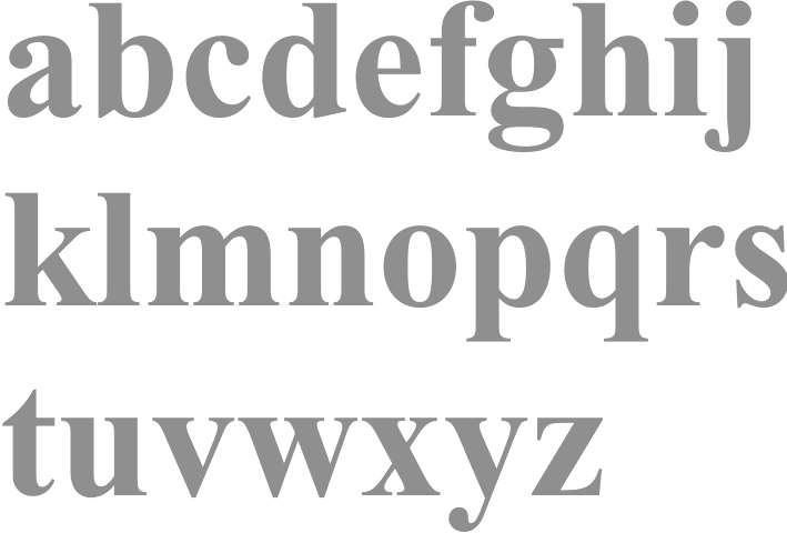
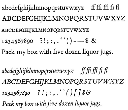
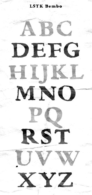
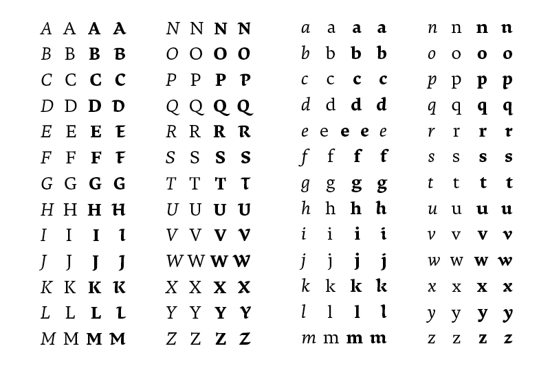
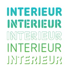
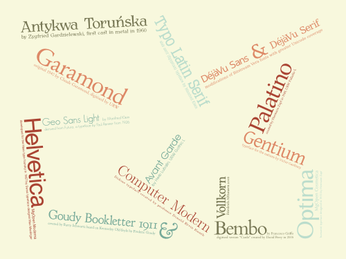
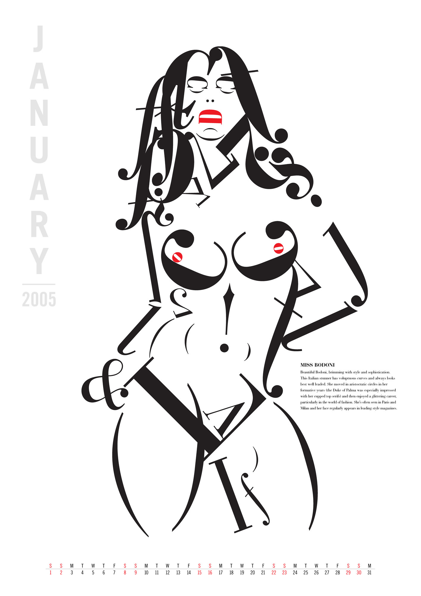
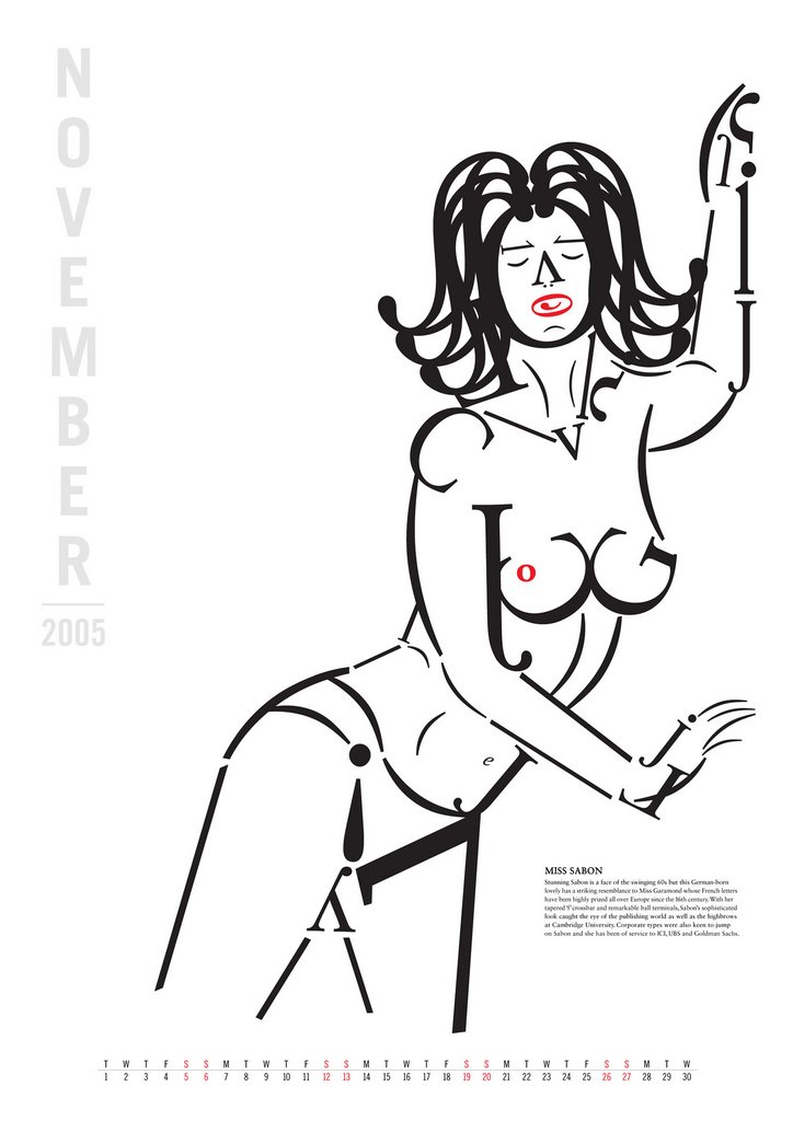
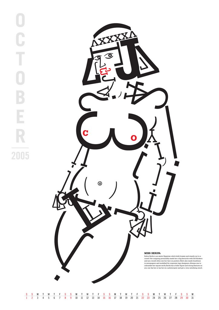
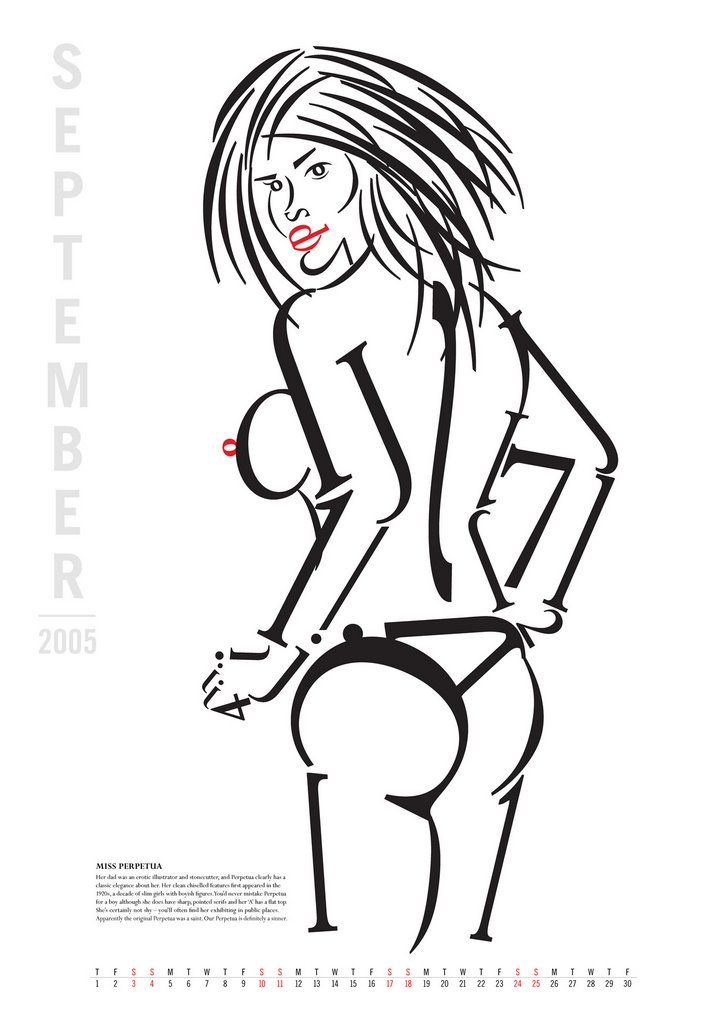
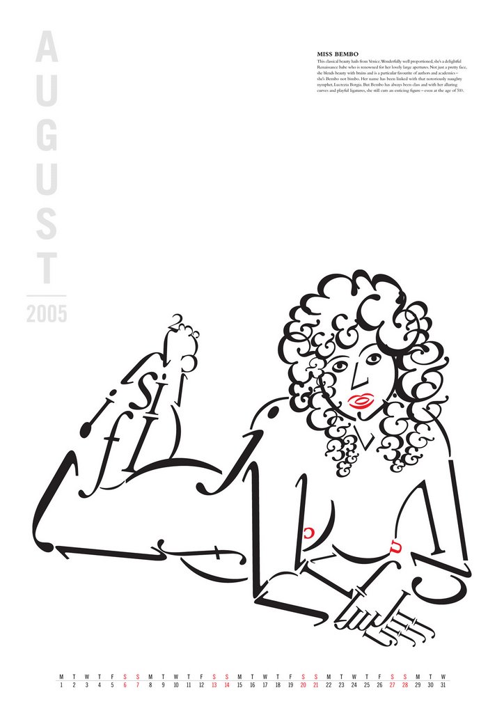
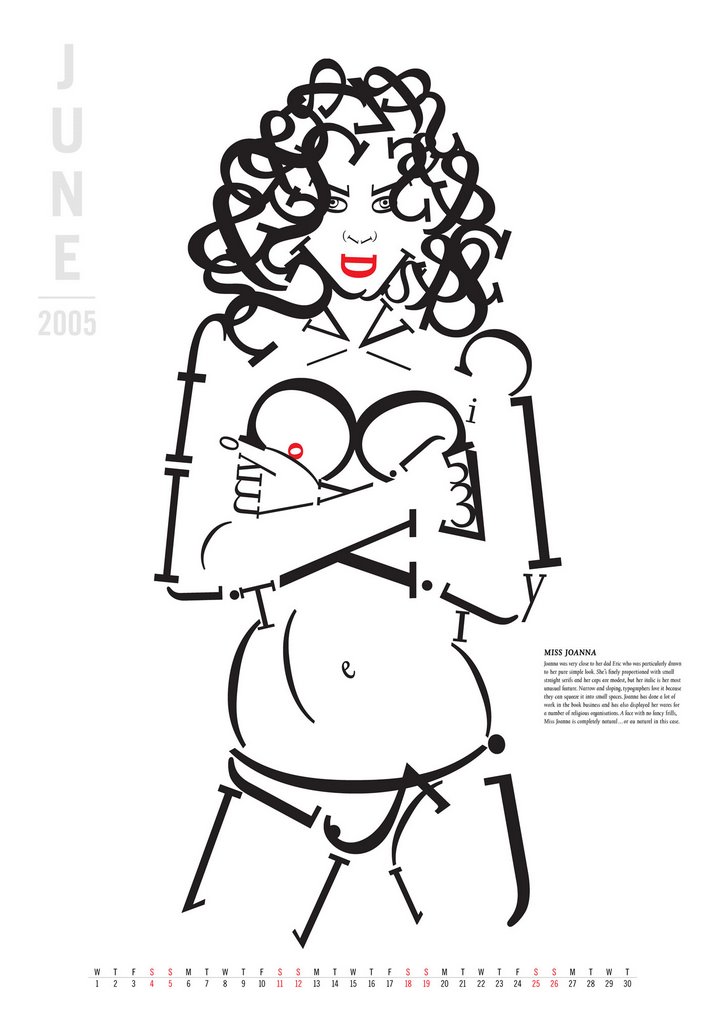
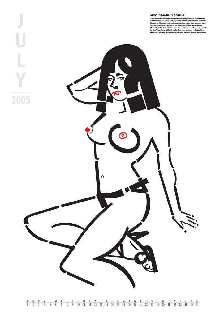
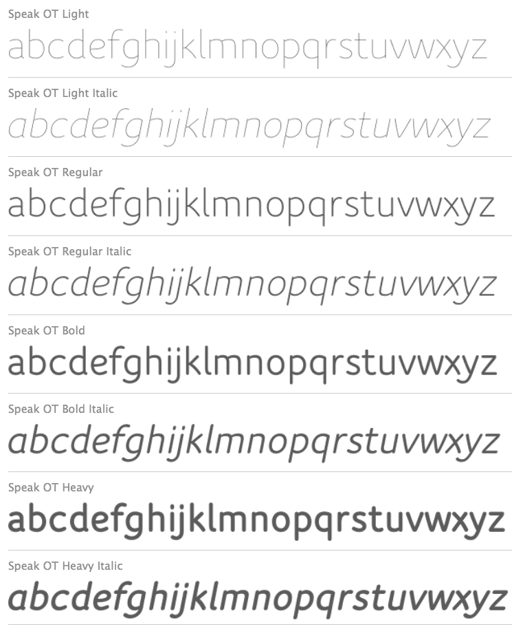
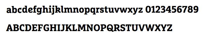
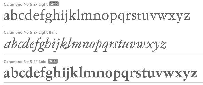