TYPE DESIGN INFORMATION PAGE last updated on Mon Apr 13 05:06:49 EDT 2026
FONT RECOGNITION VIA FONT MOOSE

|
|
|
|
|
Type design in Czechia | ||
|
|
|
|
SWITCH TO INDEX FILE
Czech type foundry in the 20th century. Fonts by them include Gregr Roman (1930), Gregr Italic (1931), and Dyrynk Lateinschrift (1928), all made by Karel Dyrynk. [Google] [More] ⦿ | |||||||||||||||||||||||||||||||||||||||||||||||||||||||||||||||||||||||||||||||||||||||||||||||||||||||
Prague-based foundry. Acquired in 1907 by H. Berthold AG. [Google] [More] ⦿ | |||||||||||||||||||||||||||||||||||||||||||||||||||||||||||||||||||||||||||||||||||||||||||||||||||||||
Czech design studio. Behance link. Creator of the blackletter / metal band typeface Gothicecream (2012, Ten Dollar Fonts). [Google] [More] ⦿ | |||||||||||||||||||||||||||||||||||||||||||||||||||||||||||||||||||||||||||||||||||||||||||||||||||||||
Brno, Czechia-based designer of the animated experimental font Distances (2018) and Typelike Icon Set (2018). [Google] [More] ⦿ | |||||||||||||||||||||||||||||||||||||||||||||||||||||||||||||||||||||||||||||||||||||||||||||||||||||||
During his studies, Adam Jicha (Plzen, Czechia) created Wireframe Alphabet (2014). Behance link. [Google] [More] ⦿ | |||||||||||||||||||||||||||||||||||||||||||||||||||||||||||||||||||||||||||||||||||||||||||||||||||||||
Adam Josefus
| |||||||||||||||||||||||||||||||||||||||||||||||||||||||||||||||||||||||||||||||||||||||||||||||||||||||
Prague-based designer of the straight-edged typeface Fabrikon (2015), the avant-garde sans typeface Counter (2013), Wladiwostok (2013, constructivist), Alma (2013, a wavy typeface), Illumination (2013, an alchemic typeface), Ambush (2013, an alchemic typeface) and Play Font (2013). He studied in Pilsen. Behance link. Another Behance link. [Google] [More] ⦿ | |||||||||||||||||||||||||||||||||||||||||||||||||||||||||||||||||||||||||||||||||||||||||||||||||||||||
| |||||||||||||||||||||||||||||||||||||||||||||||||||||||||||||||||||||||||||||||||||||||||||||||||||||||
Turkish born Akile Nazli Kaya (b. 1980) is a graduate of the Graphic Design Departmant of Bilkent University in Ankara. Her experience in animation and film studies started in 2005 at Film School Zlin in Czech Republic. Today, she is an animator and film director located in Prague. Behance link. Creator of the semi-serif typeface Idiot (2012). [Google] [More] ⦿ | |||||||||||||||||||||||||||||||||||||||||||||||||||||||||||||||||||||||||||||||||||||||||||||||||||||||
Czech designer (b. 1964), who holds an MA in Typo/graphic studies from London School of Printing. He founded Alba studio Ltd. in 1996, now Alba Design Press Ltd. in Prague. With his colleagues and design historian Dr. Iva Janakova he co-founded the design magazine Deleatur and served as editor. He teaches at the Academy of Architecture and Design in Prague (where he is a current PhD. candidate) and the Merz Academy in Stuttgart (2002). He was on the organizing committees of the International Graphic Design Biennale in Brno 2004, 2006 and the ATypI Congress 2004 in Prague. At the latter meeting, he and Johanna Balusikova introduced their own project called e-a-t experiment and typography. Creator of Cogito (2004), an experimental typeface. At ATypI 2005 in Helsinki, he spoke on Making democracy visible. [Google] [More] ⦿ | |||||||||||||||||||||||||||||||||||||||||||||||||||||||||||||||||||||||||||||||||||||||||||||||||||||||
Czechoslovakian designer (b. 1962, Prague), who studied at the Academy of Arts, Architecture and Design in Prague from 1982 until 1988. In the early 1990s, he worked as the art director of the Reflex magazine and as editor of the Raut magazine. In 1994 he co-founded Prague-based Studio Najbrt and Lev (founded by Ales Najbrt and Pavel Lev), which affiliates prominent Czech designers. Together with his co-workers, he is the author of many brands and visual styles, film and theatre posters. Since 1995, he has co-operated with the Karlovy Vary film festival on its visual style. The Czech Centre London states: "Studio Najbrt was founded in 1994 and is closely connected with the Prague arts scene, designing for theatres, book publishers, film makers, magazines, the National Gallery and art festivals. Ales Najbrt, himself an active artist and performer, works with Zuzana Lednicka and Pavel Lev and their work is recognized for its humour and clear typography. Studio has received many important awards for their poster and book design." His creations include the very East-European poster typeface Prazska Petka (1989, for a film poster), Jedovlym Pismem (1988, a hairy logotype done for the Sklep theater). At Briefcase Type, he published the typeface BC Thomas Ruhller in 2014. [Google] [More] ⦿ | |||||||||||||||||||||||||||||||||||||||||||||||||||||||||||||||||||||||||||||||||||||||||||||||||||||||
| |||||||||||||||||||||||||||||||||||||||||||||||||||||||||||||||||||||||||||||||||||||||||||||||||||||||
New York-based designer of the revival fonts Preissig Antikva, Preissig Italika, Menhart Italika and Menhart Manuscript, which won awards at the TDC2 2001 competition (Type Directors Club). He is a professor of graphic design at the Hartford Art School of the University of Hartford, and specializes in publication design. Author of the bestseller How to Spec Type, Type In Use", The Elements of Graphic Design (2002, Allworth Press), and Thinking in Type (2005). [Google] [More] ⦿ | |||||||||||||||||||||||||||||||||||||||||||||||||||||||||||||||||||||||||||||||||||||||||||||||||||||||
Hradec Kralove, Czech Republic-based applied cybernetics student, who created Kokaine (2012). [Google] [More] ⦿ | |||||||||||||||||||||||||||||||||||||||||||||||||||||||||||||||||||||||||||||||||||||||||||||||||||||||
Brno-born architect (1872) who worked in München and Vienna and died in 1969. Some of his lettering. [Google] [More] ⦿ | |||||||||||||||||||||||||||||||||||||||||||||||||||||||||||||||||||||||||||||||||||||||||||||||||||||||
Alois Studnicka
| |||||||||||||||||||||||||||||||||||||||||||||||||||||||||||||||||||||||||||||||||||||||||||||||||||||||
Digital fonts that were inspired by Mucha:
CV. One of his alphabets. Viennese Secession link. View commercial fonts that descend from Mucha's work. [Google] [MyFonts] [More] ⦿ | |||||||||||||||||||||||||||||||||||||||||||||||||||||||||||||||||||||||||||||||||||||||||||||||||||||||
Czech Design and Typography (studio experimentalniho design). Vendor of Central European versions of Adobe fonts in Czechia. [Google] [More] ⦿ | |||||||||||||||||||||||||||||||||||||||||||||||||||||||||||||||||||||||||||||||||||||||||||||||||||||||
Prague, Czechia-based designer of 8Bit Schwabacher (2016, pixel font) and Polska Jutra (2016), a 3d typeface inspired by Polish folklore embroidery. Behance link. [Google] [More] ⦿ | |||||||||||||||||||||||||||||||||||||||||||||||||||||||||||||||||||||||||||||||||||||||||||||||||||||||
Czech-born designer, who made the great art nouveau type family Cafe Noir (2004, free at Chank's). [Google] [More] ⦿ | |||||||||||||||||||||||||||||||||||||||||||||||||||||||||||||||||||||||||||||||||||||||||||||||||||||||
Andrea Vacovska
| |||||||||||||||||||||||||||||||||||||||||||||||||||||||||||||||||||||||||||||||||||||||||||||||||||||||
Andrej Sevcik
| |||||||||||||||||||||||||||||||||||||||||||||||||||||||||||||||||||||||||||||||||||||||||||||||||||||||
Graduate of Tomas Bata University. Ostrava, Czechia-based designer of the organic sans typeface Jarmila (2016) which was inspired by Jan Tschichold and the Bauhaus movement. [Google] [More] ⦿ | |||||||||||||||||||||||||||||||||||||||||||||||||||||||||||||||||||||||||||||||||||||||||||||||||||||||
Usti nad Labem, Czechia-based designer of the text typeface Neposeda (2016). This typeface was developed during the 29 th Tipo Brda workshop in Ljubljana. Behance link. [Google] [More] ⦿ | |||||||||||||||||||||||||||||||||||||||||||||||||||||||||||||||||||||||||||||||||||||||||||||||||||||||
Prague-based designer of the London 2012 alphabet (2012). [Google] [More] ⦿ | |||||||||||||||||||||||||||||||||||||||||||||||||||||||||||||||||||||||||||||||||||||||||||||||||||||||
Graphic designer in Prague, who created the sharp-edged display typeface Annya (2013) and the experimental typeface Antipon (2014). [Google] [More] ⦿ | |||||||||||||||||||||||||||||||||||||||||||||||||||||||||||||||||||||||||||||||||||||||||||||||||||||||
Her typefaces:
Fontsquirrel link. Behance link. [Google] [More] ⦿ | |||||||||||||||||||||||||||||||||||||||||||||||||||||||||||||||||||||||||||||||||||||||||||||||||||||||
Brno, Czechia-based designer of the inky handcrafted Mikulka (2015), which was part of her Masters thesis. In 2012, she created the scratchy typeface Ginsberg (2012) and in 2011, she completed work on the medieval font Freising (2011), both at Masaryk University. The precise date of the origin of the Freising Manuscripts cannot be exactly determined; the original text was probably written in the 9th century. They are the first Latin-script continuous text in a Slavic language and the oldest document in Slovene. [Google] [More] ⦿ | |||||||||||||||||||||||||||||||||||||||||||||||||||||||||||||||||||||||||||||||||||||||||||||||||||||||
Anna Sabachova Mackova is an illustrator / designer in Teplice, Czechia. She created Type Diary (2013) in which several hand-drawn alphabets are presented. [Google] [More] ⦿ | |||||||||||||||||||||||||||||||||||||||||||||||||||||||||||||||||||||||||||||||||||||||||||||||||||||||
Czech Fraktur page. It has a lot of information and samples, includes a table (reproduced below), and has a small archive: Gothenburg (WSI), MA-Gotic (Will Software), Magdeburg (Scriptorium), SchwabenAlt-Bold, Diamond-Gothic (Jim Fordyce, 1993), Engrossing (Scriptorium, 1994), Fiorne (WSI), GF-Gesetz (Lorenz Goldnagl, 1999), JGJDurerGothic (Jeffrey Glen Jackson, 1997, based on Albrecht Dürer), OffenbachChancery, Ruritania, Schwabach, WornManuscript (Phillip Andrade, 1999), Suetterlin, MA-Bastarda1 (Will Software), FFraktur1, DSNormalFrakturBold (BfdS, 1997), Old-London, WilhelmKlingsporGotisch-Dfr.
| |||||||||||||||||||||||||||||||||||||||||||||||||||||||||||||||||||||||||||||||||||||||||||||||||||||||
Ariel Laurencio Tacoronte
| |||||||||||||||||||||||||||||||||||||||||||||||||||||||||||||||||||||||||||||||||||||||||||||||||||||||
Brno, Czechia-based designer of the stick typeface called Authors (2013). [Google] [More] ⦿ | |||||||||||||||||||||||||||||||||||||||||||||||||||||||||||||||||||||||||||||||||||||||||||||||||||||||
Beige Type
| Andrea Vacovska (Beige Type, Prague, Czechia, b. 1987, Klatovy) created Blaue Brush (2014), a handmade typeface painted with a Japanese brush marker on smooth paper. [Google] [MyFonts] [More] ⦿ | ||||||||||||||||||||||||||||||||||||||||||||||||||||||||||||||||||||||||||||||||||||||||||||||||||||||
Prague, Czechia-based designer of the sans typeface Fundamenteel (2018). [Google] [More] ⦿ | |||||||||||||||||||||||||||||||||||||||||||||||||||||||||||||||||||||||||||||||||||||||||||||||||||||||
Graphic designer and illustrator in Brno, Czechia. He created animal silhouettes out of letters in 2009. [Google] [More] ⦿ | |||||||||||||||||||||||||||||||||||||||||||||||||||||||||||||||||||||||||||||||||||||||||||||||||||||||
He designed two strong sans font families for the Berthold Exklusiv Collection, Formata (1984) and Signata (1993). Formata, a popular sans serif face, is the corporate typeface of Postbank, Allianz, VW Skoda and Infratest Burke. Since 1998, Möllenstädt has worked independently from his own studio in Munich, and continues his association with Berthold as an independent designer. He most recently completed small caps and fractions for Formata, and added the Euro symbol to many typefaces in the Berthold collection. At Dalton Maag, he was responsible for SkodaSans (2000-2001), a custom font family that may be downloaded here. In 2016, URW publised his text typeface Classica Pro, which was unfinished when Möllenstädt died in 2013. The missing styles and details were done under the guidance of Volker Schnebel. | |||||||||||||||||||||||||||||||||||||||||||||||||||||||||||||||||||||||||||||||||||||||||||||||||||||||
Graphic design and type competition in Brno held at regular intervals. In 2000, theinners included Stefan Sagmeister (Grand Prix), Peter Bilak (best design in the type category), and Josef Týfa (special award for life-long contribution to Czech type design and typography). Normally, this is a graphic design competition, but every fourth year, a type competition is added. In 2004, the jury included Frantisek Storm, Stefan Sagmeister and Peter Bilak. [Google] [More] ⦿ | |||||||||||||||||||||||||||||||||||||||||||||||||||||||||||||||||||||||||||||||||||||||||||||||||||||||
Blackmarket
| Calligrapher and type designer in Prague. Designer of these typefaces:
| ||||||||||||||||||||||||||||||||||||||||||||||||||||||||||||||||||||||||||||||||||||||||||||||||||||||
Behance link. [Google] [More] ⦿ | |||||||||||||||||||||||||||||||||||||||||||||||||||||||||||||||||||||||||||||||||||||||||||||||||||||||
More recent fonts: BC Minim, BC Baseliner (a variable font by Simon Matejka), BC 3018 (2018: dingbats), BC Brief (2017, Matyas Machat), BC Novatica (2016, Tomas Brousil and Marek Pistora), BC Sklonar (2016, Marek Pistora and Martin Vacha). [Google] [More] ⦿ | |||||||||||||||||||||||||||||||||||||||||||||||||||||||||||||||||||||||||||||||||||||||||||||||||||||||
Type designer. He created the concave-stroked sans typeface Cantoria (1969, Grafotechna). [Google] [More] ⦿ | |||||||||||||||||||||||||||||||||||||||||||||||||||||||||||||||||||||||||||||||||||||||||||||||||||||||
Buro 128
| Buro 129 (Neil Johnston, Prague, Czechia) created the hand-drawn typeface Pferda in 2013 together with Jan Dvorak. [Google] [More] ⦿ | ||||||||||||||||||||||||||||||||||||||||||||||||||||||||||||||||||||||||||||||||||||||||||||||||||||||
| |||||||||||||||||||||||||||||||||||||||||||||||||||||||||||||||||||||||||||||||||||||||||||||||||||||||
Caron Twice
|
| ||||||||||||||||||||||||||||||||||||||||||||||||||||||||||||||||||||||||||||||||||||||||||||||||||||||
Ceské fonty
| Czech font archive: 3rdMan, 3rdMan, AKVALEIR, AardvarkCafe, Adamfont, Adam's-Font, Aeroportal-Bold, Aeroportal-Medium, Aeroportal, Airmole, AirmoleAntique, AirmoleShaded, AirmoleStripe, AmSans, AmSanslight, AmazonCE, Ambitsek, Amerika, AmerikaAlternates, Antigoni, AntigoniBdBold, AntigoniLight, AntigoniMed, Argor-Brujsh-Scaqh, AstronBoy-Italic, AstronBoy, AstronBoyVideo, AstronBoyWonder, AthenaUnicode, BadaBoomBB, BadaBoomCE, Bahamas-Bold, Bahamas, BahamasHeavy, BahamasLight, BaronKuffner, Baveuse, Baveuse3D, BenguiatFrisky, BlueHighway-Bold, BlueHighway, BlueHighwayCondensed, BlueHighwayLinocut, Bohemian-typewriter, Bosanova, Boulder, Brisk-CE, BrokenGhostCE, Brooklyn-Bold, Brooklyn-BoldItalic, Brooklyn-Italic, Brooklyn, Bullpen-Italic, Bullpen, Bullpen3D, CMUBright-Bold, CMUBright-BoldOblique, CMUBright-Oblique, CMUBright-Roman, CMUBright-SemiBold, CMUBright-SemiBoldOblique, CMUConcrete-Bold, CMUConcrete-BoldItalic, CMUConcrete-Italic, CMUConcrete-Roman, CMUSansSerif-Bold, CMUSansSerif-BoldOblique, CMUSansSerif-Oblique, CMUSansSerif, CMUSerif-Bold, CMUSerif-BoldItalic, CMUSerif-BoldNonextended, CMUSerif-BoldSlanted, CMUSerif-Italic, CMUSerif-Roman, CMUSerif-RomanSlanted, CMUTypewriter-BoldItalic, CMUTypewriter-Italic, CMUTypewriter-Light, CMUTypewriter-LightOblique, CMUTypewriter-Oblique, CMUTypewriter-Regular, CMUTypewriterVariable-Italic, CMUTypewriterVariable, Camilla, Cardo, Champagne&Limousines, ChroniclesofaHero, Chrysanthi-Unicode, CirqueDuFreakCE, CopperPot-Bold, CopperPot, DISTInkingBold, DISTInkingRegular, DeiGratia, Desyrel, Engebrechtre-Bold, Engebrechtre-BoldItalic, Engebrechtre-Italic, Engebrechtre, EngebrechtreExpanded-Bold, EngebrechtreExpanded-BoldItalic, EngebrechtreExpanded-Italic, EngebrechtreExpanded, EtBoemieRex, Eurofurencebold, Eurofurencebolditalic, Eurofurenceitalic, Eurofurencelight, Eurofurencelightitalic, Eurofurenceregular, Existence-Light, Existence-Light, Existence-StencilLight, Existence-UnicaseLight, ExpresswayFree, FAFERS-font, FantasticPete, Flatform-Light, France-Bold, France-Bold, France, FutureMillennium, FutureMillenniumBlack, FutureMillenniumItalic, Galette-Medium, Garogier, Geekabyte, Geekabyte2CE, Gemerald, Gentium-Italic, Gentium, GentiumAlt-Italic, GentiumAlt, Ginko, GnuolaneFree, Goodfish-Bold, Goodfish-BoldItalic, Goodfish-Italic, Goodfish, Gotika, GotikaApvalus, GotikaBrokas, GotikaSerifaiA, GotikaSerifaiB, GoudyBookletter1911, GrixelKyrou7Wide, GrixelKyrou7WideBold, GrixelKyrou7WideBoldXtnd, GrixelKyrou7WideXtnd, GrutchHanded, Guanine, GubbenIL, GunnyHandwriting, Gunplay, Gunplay3D, HappyKiller, HauntAOE, HildaSonnenschein-Dingbats, HildaSonnenschein-ExtraCharacters, HildaSonnenschein, IgnisetGlaciesSharp, IgnisetGlaciesSharpBold, IgnisetGlaciesSharpBoldItalic, IgnisetGlaciesSharpItalic, Ikusuteito, Impacted, InfraRed, InfraRedBlack, InfraRedBold, InfraRedExtraBold, InkiCE, Insula, JaneAusten, Junicode-Bold, Junicode-BoldItalic, Junicode-Italic, Junicode-Regular, KabanaBold, KabanaBook, Koala-Bold, Komikazoom, Legendum-Regular, LiberationMono-Bold, LiberationMono-BoldItalic, LiberationMono-Italic, LiberationMono, LiberationSans-Bold, LiberationSans-BoldItalic, LiberationSans-Italic, LiberationSans, LiberationSerif-Bold, LiberationSerif-BoldItalic, LiberationSerif-Italic, LiberationSerif, Linus, Love'sLabour, MPH2BDamase, MaassslicerItalic, Mager-Fat, Mager-FatItalic, Mager-Italic, Mager, Mastodon-Bold, Mastodon, MastodonHairline, Metrolox, Mogul, Monika, MonikaBold, Monofur, Monofuritalic, NegotiateFree, NewBrilliant, OFLGoudyStM-Italic, OFLGoudyStM, OctinCollegeFree, OctinPrisonFree, OctinSportsFree, OctinSpraypaintFree, OctinStencilFree, OctinVintageFree, Pakenham, Phorssa, PlasmaDripBRK, PlasmaDripCE, PlasmaDripEmptyBRK, Pricedown, Prociono-Regular, Promocyja, Promocyja, Propaganda, Pupcat, PykesPeakZero, RexliaFree-Regular, Rina, RingbearerCE, RingbearerMedium, Ritalin-Bold, Ritalin, RitalinExtraBold, RittswoodProfile_6-Bold, RittswoodProfile_6-Regular, RittswoodYoung-Extended, RittswoodYoung-Regular, Sandoval, Sanserifing, SaucyMillionaire, SaucyMillionaire, Scriptina-Alternates, Scriptina-Medium, Scriptina, Share-Regular, Share-Regular, Share-TechMono, Share-TechMono, Share, ShareTechMono, Steelfish-Bold, Steelfish, SteelfishOutline, StillTime, Strenuous, Strenuous3D, Summertime, SummertimeExtraCharacters, SummertimeExtraOblique, SummertimeOblique, Supersoulfighter, Syndrome-X, TacoSalad, TacoSalad, TeamouseVS, Teen-Bold, Teen-BoldItalic, Teen-Italic, Teen, TeenLight-Italic, TeenLight, Thryomanes, ThryomanesBold, ThryomanesBoldItalic, ThryomanesItalic, TimesSansSerif, Tincushion, TripSerifCE-Bold, TripSerifCE-BoldItalic, TripSerifCE-Italic, TripSerifCE-Light, TripSerifCE-LightItalic, TripSerifCE, Tycho'sRecipe, Uni0553, Uni0554, Uni0563, Uni0564, Unifur, Vahika-Bold, Vahika-BoldItalic, Vahika-Italic, Vahika, Vectroid, VelvendaCooler, VelvendaMegablack, VeraHumana95, VeraHumana95Bold, VeraHumana95BoldItalic, VeraHumana95Italic, Vibrocentric-Bold, Vibrocentric-BoldItalic, Vibrocentric-Italic, Vibrocentric, WeenCE, Wintermute, WirWenzlaw, WoskBlurCE, XBOX360, XalTerion, Xenippa, XiBeronne, Xirwena, YoureGone-Italic, YoureGone, Zekton-Bold, Zekton-BoldItalic, Zekton-Italic, Zekton, akaDora, akaDylanCollage, akaDylanOpen, akaDylanPlain, akaFrivolity, akaFrivolity, akaHoggle, akaPotsley, jGaramond-Bold, jGaramond-Italic, jGaramond, kawoszeh, ninifont-regular, px_sans_nouveaux, rittswoodclassic-regular, rittswoodofficelg-regular, skolacekCE, upirpaw, urania_czech. [Google] [More] ⦿ | ||||||||||||||||||||||||||||||||||||||||||||||||||||||||||||||||||||||||||||||||||||||||||||||||||||||
Software and TeX specialist at the University of Bayreuth, Germany, who designed AuriocusKalligraphicus (2004), a calligraphic type 1 handwriting font. In 2006, these fonts were added: Lukas Svatba (originally called AmiciLogo for the group Amici Musicae Antiquae in September 2004, this was changed, after adding Czech and Slovak diacritics for the wedding of Lukas Palatinus and Ludmila Nyvltova in the Spring of 2005), Jana Skrivana. Alternate URL. From the readme file: Each font features oldstyle digits and (machine-generated) boldface and slanted versions. Lukas Svatba is provided in a variant with a long s with the same input convention as in fraktur.sty by Matthias Mühlich. [Google] [More] ⦿ | |||||||||||||||||||||||||||||||||||||||||||||||||||||||||||||||||||||||||||||||||||||||||||||||||||||||
Christian Jansky
| |||||||||||||||||||||||||||||||||||||||||||||||||||||||||||||||||||||||||||||||||||||||||||||||||||||||
Prague-based graphic designer, typographer and type designer. She was working on Qualtagh in 2010. Born in Paris, she studied design in the UK and briefly worked in Belgium in 2008-2009. [Google] [More] ⦿ | |||||||||||||||||||||||||||||||||||||||||||||||||||||||||||||||||||||||||||||||||||||||||||||||||||||||
Illustrator, calligrapher and typographer, b. 1944 in Czechoslovakia. [Google] [More] ⦿ | |||||||||||||||||||||||||||||||||||||||||||||||||||||||||||||||||||||||||||||||||||||||||||||||||||||||
Color Works
| Color Works is Jan Safarik (b. 1987, Zlin, Czechia), who lives in Prague. He created the bold rounded sans typeface Cargo (2012). [Google] [More] ⦿ | ||||||||||||||||||||||||||||||||||||||||||||||||||||||||||||||||||||||||||||||||||||||||||||||||||||||
Arial, Courier New and Times New Roman East-European fonts. Truetype and type 1. [Google] [More] ⦿ | |||||||||||||||||||||||||||||||||||||||||||||||||||||||||||||||||||||||||||||||||||||||||||||||||||||||
Czech Design and Typography (studio experimentalniho design)
| Filip Blazek writes about typography. His own fonts include Pozorius, Studnicka Antikva and Duboryt. Alois Studnicka (Prague) seems to have designed PozoriusCESample. [Google] [More] ⦿ | ||||||||||||||||||||||||||||||||||||||||||||||||||||||||||||||||||||||||||||||||||||||||||||||||||||||
Jiri T. Pelech's place with some Czech font downloads. [Google] [More] ⦿ | |||||||||||||||||||||||||||||||||||||||||||||||||||||||||||||||||||||||||||||||||||||||||||||||||||||||
Contains over 270 type 1 fonts for use in X-Windows, including many interesting fonts from Star Division. [Google] [More] ⦿ | |||||||||||||||||||||||||||||||||||||||||||||||||||||||||||||||||||||||||||||||||||||||||||||||||||||||
Site has X fonts for 8859-2 and Linux support for the Czech language. [Google] [More] ⦿ | |||||||||||||||||||||||||||||||||||||||||||||||||||||||||||||||||||||||||||||||||||||||||||||||||||||||
This TeX users group has an active Bulletin, which has several interesting issues with articles each month. Free access to the issues. (In Czech) [Google] [More] ⦿ | |||||||||||||||||||||||||||||||||||||||||||||||||||||||||||||||||||||||||||||||||||||||||||||||||||||||
Daniel Quisek
| |||||||||||||||||||||||||||||||||||||||||||||||||||||||||||||||||||||||||||||||||||||||||||||||||||||||
Behance link. [Google] [More] ⦿ | |||||||||||||||||||||||||||||||||||||||||||||||||||||||||||||||||||||||||||||||||||||||||||||||||||||||
From 2004 to 2007, he ran his own design studio DAVI, with projects in graphic, web and interface design. Back in Brno, he worked with Tiro Typeworks (Canada) as an associate designer. At ATypI 2008 in St. Petersburg, he spoke about multi-script typography. His typefaces include
Blog. Myfonts link. Klingspor link. Speaker at ATypI 2013 in Amsterdam on the topic of multilingual type design. [Google] [MyFonts] [More] ⦿ | |||||||||||||||||||||||||||||||||||||||||||||||||||||||||||||||||||||||||||||||||||||||||||||||||||||||
| |||||||||||||||||||||||||||||||||||||||||||||||||||||||||||||||||||||||||||||||||||||||||||||||||||||||
During her graphic design studies in Recife, Brazil, Debora Escudeiro created a great vernacular typeface (2015), the dot matrix typeface Night (2015). [Google] [More] ⦿ | |||||||||||||||||||||||||||||||||||||||||||||||||||||||||||||||||||||||||||||||||||||||||||||||||||||||
Czech outfit. They created the free typeface Delarocca in 2010. Westcoast Ink (2010) is also free. [Google] [More] ⦿ | |||||||||||||||||||||||||||||||||||||||||||||||||||||||||||||||||||||||||||||||||||||||||||||||||||||||
Czech design mag. Has occasionally some articles on typography. [Google] [More] ⦿ | |||||||||||||||||||||||||||||||||||||||||||||||||||||||||||||||||||||||||||||||||||||||||||||||||||||||
During her studies in Prague, Denisa Vanikova created the text typeface DeCaslon (2013). [Google] [More] ⦿ | |||||||||||||||||||||||||||||||||||||||||||||||||||||||||||||||||||||||||||||||||||||||||||||||||||||||
Deniart Systems
|
List of font packages: Aglab, Alchemy Symbols, American Sign Alphabet, Ancient Writings Vol. 1, Ancient Writings Vol. 2, Angelica, The Astrologer Bundle, Astrologer, Aztec Day Signs, Black Magick, Braille Alphabet, Castles&Shields, Celestial Writing, Celtic Astrologer, Certar, Chinese Zodiac, Coptic Alphabet, Daggers Alphabet, Dendera, Dinosauria, Dragons, Egyptian Deities, Enochian Writing, Egypt. Hieroglyphics Vol 1, Egypt. Hieroglyphics Vol 2, Egypt. Hieroglyphics Vol 3, Egypt. Hieroglyphics Vol 4, Futhark, Greco, Hebrew Basic, Hypnotica, Magi Writing, Magick&Mystic, Malachim Writing, Masonic Writing, Maya Day Names, Maya Month Glyphs, Meso Americano, Meso Deko, Morse Code, Old Persian Cuneiform, Passing the River, Phaistos, Pike's Alphabets, Powers of Marduk, Sanskrit Writing, Semaphore Code, Signals&Signs, Skeleton Alphabet, Sublimina, Tengwanda Gothic, Tengwanda Namarie, Theban Alphabet, The Egyptologist, Tolkien Scripts, WhiteMagick, Skeleton Alphabet, Hebrew Basic, Sanskrit Writing. Note: I cannot find an entry for Jan Koehler at MyFonts, where all Deniart fonts are said to have been made by Denise Koehler. [Google] [MyFonts] [More] ⦿ | ||||||||||||||||||||||||||||||||||||||||||||||||||||||||||||||||||||||||||||||||||||||||||||||||||||||
| |||||||||||||||||||||||||||||||||||||||||||||||||||||||||||||||||||||||||||||||||||||||||||||||||||||||
Conference to be held from June 16-17, 2004 in Brno, Czechia. This meeting is related to the 21st International Biennale of Graphic Design Brno 2004. [Google] [More] ⦿ | |||||||||||||||||||||||||||||||||||||||||||||||||||||||||||||||||||||||||||||||||||||||||||||||||||||||
Conference held on 22-23 June 2000 in Brno, Czechia, and related to the 19thInternational Biennale of Graphic Design Brno 2000. Speakers included Ales Najbrt (Czechia), Jan Solpera (who spoke about Josef Týfa), and Andrej Krátky (Slovakia). [Google] [More] ⦿ | |||||||||||||||||||||||||||||||||||||||||||||||||||||||||||||||||||||||||||||||||||||||||||||||||||||||
Design Komando
|
| ||||||||||||||||||||||||||||||||||||||||||||||||||||||||||||||||||||||||||||||||||||||||||||||||||||||
Displaay
|
| ||||||||||||||||||||||||||||||||||||||||||||||||||||||||||||||||||||||||||||||||||||||||||||||||||||||
E-a-t (experiment and typography) is a joint Czech and Slovak enterprise that through publications and exhibitions tries to increase the visibility of Czechoslovak type design. Exhibitions in 2004 include Brno and Prague. In 2005, one is planned in Bratislava. Review by Dan Reynolds. Old dead link. [Google] [More] ⦿ | |||||||||||||||||||||||||||||||||||||||||||||||||||||||||||||||||||||||||||||||||||||||||||||||||||||||
Moscow-based designer. With Peter Bankov at the Prague School of Design, he created an experimental stick font (2016). He also made the Latin / Cyrillic stencil typeface Modul (2016). [Google] [More] ⦿ | |||||||||||||||||||||||||||||||||||||||||||||||||||||||||||||||||||||||||||||||||||||||||||||||||||||||
Graphic and print desigfner in Dvur Kralove nad Labem, Czech Republic. She created the thin condensed sans display typeface Radiator in 2013. Behance link. [Google] [More] ⦿ | |||||||||||||||||||||||||||||||||||||||||||||||||||||||||||||||||||||||||||||||||||||||||||||||||||||||
Czech designer (b. 1996) of the free handwriting font Kordulova (2014). Home page. [Google] [More] ⦿ | |||||||||||||||||||||||||||||||||||||||||||||||||||||||||||||||||||||||||||||||||||||||||||||||||||||||
| |||||||||||||||||||||||||||||||||||||||||||||||||||||||||||||||||||||||||||||||||||||||||||||||||||||||
During her studies in Prague, Elizaveta Gvozdeva designed the wavy display typeface Wine (2018), which is based on Frantisek Storm's Trivia Sans. [Google] [More] ⦿ | |||||||||||||||||||||||||||||||||||||||||||||||||||||||||||||||||||||||||||||||||||||||||||||||||||||||
Slovak scientist (b. 1988) who lives in Prague. Creator of the handwriting typefaces Enyon Handwrite (2008) and Naramel (2008). Home page. [Google] [More] ⦿ | |||||||||||||||||||||||||||||||||||||||||||||||||||||||||||||||||||||||||||||||||||||||||||||||||||||||
Prague, Czechia-based designer of the connect-the-dots typeface Astryc (2016). [Google] [More] ⦿ | |||||||||||||||||||||||||||||||||||||||||||||||||||||||||||||||||||||||||||||||||||||||||||||||||||||||
Usti nad Labem, Czechia-based designer of the experimental typeface Pronansiesjn (2016). [Google] [More] ⦿ | |||||||||||||||||||||||||||||||||||||||||||||||||||||||||||||||||||||||||||||||||||||||||||||||||||||||
Czech computer chess jump page, with a few links to font sites. [Google] [More] ⦿ | |||||||||||||||||||||||||||||||||||||||||||||||||||||||||||||||||||||||||||||||||||||||||||||||||||||||
Designer (b. 1945, Zlin, Czechia) at Alphabet Design in Toronto of the ornamental dingbat typeface JechoTecho1 (see also 2005, Bitstream). Klingspor link. [Google] [More] ⦿ | |||||||||||||||||||||||||||||||||||||||||||||||||||||||||||||||||||||||||||||||||||||||||||||||||||||||
Czech FontStructor who made these fonts in 2009 and 2010: Husi BRK, Baculka (octagonal), Topol (condensed), Krasopis Script, Krasopis (connected upright script), Kyklop (ultra fat deco face), Kolecka (2010, curly face), Dvojlom, Bublifuk, Rozeklany, Robustni, and Nedotazane. In 2011, he created the bilined typeface Svinutek, the octagonal typeface Shishoid, Zapadlo (octagonal), and Puntiky (texture face). [Google] [More] ⦿ | |||||||||||||||||||||||||||||||||||||||||||||||||||||||||||||||||||||||||||||||||||||||||||||||||||||||
Fansytype
| Czech graphic designer and typographer. In 2021, he released the comic / children's book font Cartooner and the rounded bold caps typeface family Chortler. [Google] [MyFonts] [More] ⦿ | ||||||||||||||||||||||||||||||||||||||||||||||||||||||||||||||||||||||||||||||||||||||||||||||||||||||
Filip Blazek
| |||||||||||||||||||||||||||||||||||||||||||||||||||||||||||||||||||||||||||||||||||||||||||||||||||||||
Central European font links at Filip Blazek's Czech site. Great jump site for typography in general. Some links are taken from my own pages. Jump page for Polish typography. List of the special Polish characters: A, a, E and e ogonek; C, c, N, n, O, o, S, s, Z, and z acute; Lslash, lslash, Zdotaccent and zdotaccent. [Google] [More] ⦿ | |||||||||||||||||||||||||||||||||||||||||||||||||||||||||||||||||||||||||||||||||||||||||||||||||||||||
| |||||||||||||||||||||||||||||||||||||||||||||||||||||||||||||||||||||||||||||||||||||||||||||||||||||||
Czech graphic designer and typographer from Prague who is currently studying graphic design at the Pilsen College of Art and Design. Creator of the geometric futuristic typeface Matey (2009), the geometric typeface Donator (2010, free), and the architectural print typeface Qart (2009). In 2017, he designed the sans typeface Nuckle. [Google] [More] ⦿ | |||||||||||||||||||||||||||||||||||||||||||||||||||||||||||||||||||||||||||||||||||||||||||||||||||||||
Czech designer of the free squarish typeface SpaceType (2020). [Google] [More] ⦿ | |||||||||||||||||||||||||||||||||||||||||||||||||||||||||||||||||||||||||||||||||||||||||||||||||||||||
Open Font Library link. Fontsquirrel link. Github link. [Google] [More] ⦿ | |||||||||||||||||||||||||||||||||||||||||||||||||||||||||||||||||||||||||||||||||||||||||||||||||||||||
Michal Kvasnihka's Czech site with Czech versions of the Computer Modern fonts, CS Concrete, and a handwriting font called Slabikar. [Google] [More] ⦿ | |||||||||||||||||||||||||||||||||||||||||||||||||||||||||||||||||||||||||||||||||||||||||||||||||||||||
From the Faculty of Informatics, Masaryk University, Brno, Czechia, Jan Pazdziora's PERL module for extracting information from TFM files. Free. GitHub link. [Google] [More] ⦿ | |||||||||||||||||||||||||||||||||||||||||||||||||||||||||||||||||||||||||||||||||||||||||||||||||||||||
Digital revivals of his typeface include Skaryna 2017 Title (2020, Aliaksei Koval). [Google] [More] ⦿ | |||||||||||||||||||||||||||||||||||||||||||||||||||||||||||||||||||||||||||||||||||||||||||||||||||||||
Frantisek Storm
| |||||||||||||||||||||||||||||||||||||||||||||||||||||||||||||||||||||||||||||||||||||||||||||||||||||||
Austrian art nouveau era painter, 1880-1932, who took the Czech citizenship in 1919. His Viennese Secession poster for the Kaiserjubiläums Möbel Ausstellung (a furniture exhibition during the Kaiser's Jubilee) inspired David Kerkhoff to design Fiebiger Eins (2013) and Fiebiger Zwei (2013). Fiebiger has many traits of the arts & crafts movement. Biography at the University of Magdeburg. [Google] [More] ⦿ | |||||||||||||||||||||||||||||||||||||||||||||||||||||||||||||||||||||||||||||||||||||||||||||||||||||||
Franz Kafka (1883-1924) is one of the most influential fiction writers of the early 20th century; a novelist and writer of short stories whose works, only after his death, came to be regarded as one of the major achievements of 20th century literature. He was born to middle class German-speaking Jewish parents in Prague, Bohemia [now capital of the Czech Republic, but then part of the Austro-Hungarian Empire]. Kafka's work-the novels The Trial (1925), The Castle (1926) and Amerika (1927), as well as short stories including The Metamorphosis (1915) and In the Penal Colony (1914)-is now collectively considered to be among the most original bodies of work in modern Western literature. Much of his work, unfinished at the time of his death, was published posthumously. He has nothing to do with type design, except for the fact that I use the term Kafkaesque to describe a gloomy, dark and/or illogical style of lettering. Well, not totally true---some people have tried to digitize his handwriting, most notably Julia Sysmalainen in her typefaces Josef K Paneuropean (2015) and Mister K (2008). [Google] [More] ⦿ | |||||||||||||||||||||||||||||||||||||||||||||||||||||||||||||||||||||||||||||||||||||||||||||||||||||||
Revivals: His neo-gothic typeface Saladin was later digitized and expanded by Patrick Griffin as Lionheart (2006, Canada Type). Hip Hop NF (2007) is a bouncy retro typeface based on Friedrich Poppl's Dynamische Antiqua (1960, Stempel). Elfort (2009, Iza W, Intellecta Design) is a calligraphic revival of work by Poppl. Poppl Stretto (1969) was at the basis of a revival by Canada Type called Wonder Brush (2012, Kevin Allan King and Patrick Griffin). Poppl Fraktur was revived and modernized by Ralph Unger as Parler Fraktur in 2018. [Google] [MyFonts] [More] ⦿ | |||||||||||||||||||||||||||||||||||||||||||||||||||||||||||||||||||||||||||||||||||||||||||||||||||||||
Future Millennium
| Zdenek Gromnica is a Czech type designer (b. 1989, Olomouc). He set up Future Millennium. Creator of Ignis et Glacies -Sharp- (2006, a futuristic sans caps face), Infrared (2006), Xaligraphy, XaligraphyBold, XaligraphyBoldItalic, XaligraphyItalic, XaligraphyThin, XaligraphyThinItalic (2006, semi-calligraphic family), InfraRed (2006), FutureMillennium (2006, sans---caps only), Elemental End (2010, sans), Memoria Vestri (2010, hand-printed), Not Just Groovy (2011), Jolana (2012), Pixel Millennium (2012, pixel face), Dominik (2012, sans), and Groovy Fast (2009, sans headline face). Devian tart link. Dafont link. Klingspor link. Fontspace link. [Google] [MyFonts] [More] ⦿ | ||||||||||||||||||||||||||||||||||||||||||||||||||||||||||||||||||||||||||||||||||||||||||||||||||||||
Graduate of Masaryk University in Brno, Czechia, class of 2013. Brno-based graphic artist who created a blackletter typeface in 2011 at Masaryk University that is based on lettering in the Krems Bible (1333/1334, Austria). In 2015, he published the splendid handwriting font Linkingabo. Behance link. [Google] [More] ⦿ | |||||||||||||||||||||||||||||||||||||||||||||||||||||||||||||||||||||||||||||||||||||||||||||||||||||||
Galaxa
| Michal Kostany is a Czech graphic designer. Operating as Galax, he published the techno / sci-fi fonts Magnetica and Tachyon in 2019. [Google] [MyFonts] [More] ⦿ | ||||||||||||||||||||||||||||||||||||||||||||||||||||||||||||||||||||||||||||||||||||||||||||||||||||||
Author of Moderni Maliri (Modern Painters, Prague 1909). The art nouveau title page was designed by Vladimir Zupansky. [Google] [More] ⦿ | |||||||||||||||||||||||||||||||||||||||||||||||||||||||||||||||||||||||||||||||||||||||||||||||||||||||
Prague-based designer of some pay pixel fonts, such as Pixie Bold, Pixie Regular and Pixie Symbol, all done in 2009. [Google] [More] ⦿ | |||||||||||||||||||||||||||||||||||||||||||||||||||||||||||||||||||||||||||||||||||||||||||||||||||||||
Gilberto Moya Perona
| |||||||||||||||||||||||||||||||||||||||||||||||||||||||||||||||||||||||||||||||||||||||||||||||||||||||
Grafotechna Garamond was introduced in 1959 by Stanislav Marso. Praha (1968) is a text typeface that was revived by Synoptic Office in 2017. [Google] [MyFonts] [More] ⦿ | |||||||||||||||||||||||||||||||||||||||||||||||||||||||||||||||||||||||||||||||||||||||||||||||||||||||
Czech creator of a typographic poster entitled Diplomky (2012). Behance link. [Google] [More] ⦿ | |||||||||||||||||||||||||||||||||||||||||||||||||||||||||||||||||||||||||||||||||||||||||||||||||||||||
Heavyweight
|
| ||||||||||||||||||||||||||||||||||||||||||||||||||||||||||||||||||||||||||||||||||||||||||||||||||||||
Graphic designer in Prague who created the softly rounded sans lower case typeface Hero (2013). She also created a few sets of informal pictograms, such as her Smile series, and a Dress Code series. Behance link. [Google] [More] ⦿ | |||||||||||||||||||||||||||||||||||||||||||||||||||||||||||||||||||||||||||||||||||||||||||||||||||||||
| |||||||||||||||||||||||||||||||||||||||||||||||||||||||||||||||||||||||||||||||||||||||||||||||||||||||
Czech designer of the organic round sans typefaces LogoBlogo (2010) and Logoblogo2 (2010, lowercase only). | |||||||||||||||||||||||||||||||||||||||||||||||||||||||||||||||||||||||||||||||||||||||||||||||||||||||
Czech designer of Grabstein (2019: Handschrift, Sans, Gotik), Bar Forst (2019: script) and Stone Runes (2018). [Google] [More] ⦿ | |||||||||||||||||||||||||||||||||||||||||||||||||||||||||||||||||||||||||||||||||||||||||||||||||||||||
Illustrator and book designer (b. 1880, Prague, d. 1945, New York). He became German in 1907. From 1907 until 1933, he was professor of graphics at the Staatlichen Akademie fü Graphische Künste und Buchgewerbe in Leipzig. He fled Germany in 1933 and after a long voyage, ended up in the USA, where he died. Blackletter typefaces designed by him include Steiner-Prag-Schrift (1912, Genzsch&Heyse), Batarde (Bauersche Giesserei, 1916). Designer of Akzidenz und Kalender Schmuck (1912, C.F. Rühl, Leipzig). Some of his work is archived at the Department of Rare Books and Special Collections of the Princeton University Library. [Google] [More] ⦿ | |||||||||||||||||||||||||||||||||||||||||||||||||||||||||||||||||||||||||||||||||||||||||||||||||||||||
Prague, Czechia-based student-designer of the floriated caps alphabet Botanical (2016), which is inspired by the flora of Tenerife. [Google] [More] ⦿ | |||||||||||||||||||||||||||||||||||||||||||||||||||||||||||||||||||||||||||||||||||||||||||||||||||||||
Ilya Gromov (Prague) created the display typeface Hip Slab (2011-2013). Behance link. [Google] [More] ⦿ | |||||||||||||||||||||||||||||||||||||||||||||||||||||||||||||||||||||||||||||||||||||||||||||||||||||||
Czech designer of the experimental typefaces Imperfection (2018: scratchy) and Rock On (2018: textured). [Google] [More] ⦿ | |||||||||||||||||||||||||||||||||||||||||||||||||||||||||||||||||||||||||||||||||||||||||||||||||||||||
IndicType1
| All the fonts below were converted from Metafont into type 1 by Karel Piska in 2005-2006 using his own tools, METAPOST, FontForge and t1utils. Karel Piska is with the Institute of Physics, Academy of Sciences, Prague.
| ||||||||||||||||||||||||||||||||||||||||||||||||||||||||||||||||||||||||||||||||||||||||||||||||||||||
Inky Type (or: Inky Otter Design; was: Rokus Media)
| Creator of the free handwriting typeface Nini Font (2007-2008), the handcrafted SnapHand (2015) and the cartoon typeface Riffic (2015). Fontspring link. [Google] [More] ⦿ | ||||||||||||||||||||||||||||||||||||||||||||||||||||||||||||||||||||||||||||||||||||||||||||||||||||||
Inkybrain
| Jeffree Benet (Inky Brain, Prague, Czechia) created the free arrowed font Arrowrifficly (2011). Prague Post link. Behance link. [Google] [More] ⦿ | ||||||||||||||||||||||||||||||||||||||||||||||||||||||||||||||||||||||||||||||||||||||||||||||||||||||
| |||||||||||||||||||||||||||||||||||||||||||||||||||||||||||||||||||||||||||||||||||||||||||||||||||||||
Based in Prague, Irina Sidorina designs and illustrates. Her portfolio includes the techno font Isatech (2009). [Google] [More] ⦿ | |||||||||||||||||||||||||||||||||||||||||||||||||||||||||||||||||||||||||||||||||||||||||||||||||||||||
Prague-based designer of these typefaces in 2015: Perfo, Hex, Quad (free). [Google] [More] ⦿ | |||||||||||||||||||||||||||||||||||||||||||||||||||||||||||||||||||||||||||||||||||||||||||||||||||||||
Ivana created the formal script Ivana Script (2005, URW). In 2012, she co-designed the grungy headline typeface Retroactive Pro with Ralph M. Unger at Profonts. Savour Pro (2013, Profonts) is a calligraphic typeface. Klingspor link. [Google] [MyFonts] [More] ⦿ | |||||||||||||||||||||||||||||||||||||||||||||||||||||||||||||||||||||||||||||||||||||||||||||||||||||||
Prague-based designer of the display typeface Perfo (2014). [Google] [More] ⦿ | |||||||||||||||||||||||||||||||||||||||||||||||||||||||||||||||||||||||||||||||||||||||||||||||||||||||
Prague, Czechia-based designer of the domino font Autorsky (2017). [Google] [More] ⦿ | |||||||||||||||||||||||||||||||||||||||||||||||||||||||||||||||||||||||||||||||||||||||||||||||||||||||
In 2015, he created the sans typeface FOTR, the wide display typeface Fat Pleasure, and the urban art stick font Primitive. Typefaces from 2017: Circularis (organic sans based on the geometry of the circle), Circularis Alt. In 2019, with Koi and Ahmed Eraqi, he co-designed Hurringtown Script. Typefaces from 2020: Yeezus (conjuring up rave, rap, acid and futurism). [Google] [MyFonts] [More] ⦿ | |||||||||||||||||||||||||||||||||||||||||||||||||||||||||||||||||||||||||||||||||||||||||||||||||||||||
In 2016, during his studies in Brno, Czechia, Jakub Bohos designed the bilined display typeface Unknown (2016). [Google] [More] ⦿ | |||||||||||||||||||||||||||||||||||||||||||||||||||||||||||||||||||||||||||||||||||||||||||||||||||||||
In 2013, he published Publikum Book, which is inspired by Public (1956, Stanislav Marso), a typeface that was very popular in Czech newspapers, books and magazines. [A related typeface is Tomas Brousil's RePublic Text, 2003.] At the end of 2013, in cooperation with Georg Seifert (creator of Glyphs app) in Usti nad Labem, Czech Republic, Jakub designed Georg. The angular signage typeface Baobab was designed in 2015. [Google] [More] ⦿ | |||||||||||||||||||||||||||||||||||||||||||||||||||||||||||||||||||||||||||||||||||||||||||||||||||||||
| |||||||||||||||||||||||||||||||||||||||||||||||||||||||||||||||||||||||||||||||||||||||||||||||||||||||
Jakub Samek
| |||||||||||||||||||||||||||||||||||||||||||||||||||||||||||||||||||||||||||||||||||||||||||||||||||||||
Czech engineer. Creator of the upright connected school script Písankové psaí Jakub Sloup opt (2011). [Google] [More] ⦿ | |||||||||||||||||||||||||||||||||||||||||||||||||||||||||||||||||||||||||||||||||||||||||||||||||||||||
Jakub Spurny
| |||||||||||||||||||||||||||||||||||||||||||||||||||||||||||||||||||||||||||||||||||||||||||||||||||||||
| |||||||||||||||||||||||||||||||||||||||||||||||||||||||||||||||||||||||||||||||||||||||||||||||||||||||
Jan Buchtela
| |||||||||||||||||||||||||||||||||||||||||||||||||||||||||||||||||||||||||||||||||||||||||||||||||||||||
Jan Charvat
| |||||||||||||||||||||||||||||||||||||||||||||||||||||||||||||||||||||||||||||||||||||||||||||||||||||||
Jan Horcik
| |||||||||||||||||||||||||||||||||||||||||||||||||||||||||||||||||||||||||||||||||||||||||||||||||||||||
Jan Hus (1370-1415) introduced the principle of a diacritic (in his case, a dot above some letters) in his "Orthographia Bohemia" (1406-1412). This work became the basis for modern Czech typography. Hus was burnt at the stake in Konstanz, but not because of his typographic convictions. [Google] [More] ⦿ | |||||||||||||||||||||||||||||||||||||||||||||||||||||||||||||||||||||||||||||||||||||||||||||||||||||||
Jan Hýsek is the owner of Lege.cz. He wrote several texts on typography now published at Lege.cz, which is an internet bookshop with a special focus on typography. Hýsek is a writer, photographer, poet, bookseller, musician and computer specialist. The name Martin Manis is an alias. [Google] [More] ⦿ | |||||||||||||||||||||||||||||||||||||||||||||||||||||||||||||||||||||||||||||||||||||||||||||||||||||||
Czech designer of Skvär (2013), an angular serifed typeface developed during Typeclinic 6 and Typeclinic 7 in 2013. In 2014, he continued the development of Skvaer. At Typeclinic 2015, Skvaer was perfected. During Typeclinic 11th International Type Design Workshop, he created the Latin / Cyrillic / Greek typeface Queen (2015). [Google] [More] ⦿ | |||||||||||||||||||||||||||||||||||||||||||||||||||||||||||||||||||||||||||||||||||||||||||||||||||||||
Jan Koehler
| |||||||||||||||||||||||||||||||||||||||||||||||||||||||||||||||||||||||||||||||||||||||||||||||||||||||
Jan Matousek
| |||||||||||||||||||||||||||||||||||||||||||||||||||||||||||||||||||||||||||||||||||||||||||||||||||||||
Czech codesigner, with Matej Syxra, of the free family TripSerif CE (2008), which can be downloaded at Dafont. [Google] [More] ⦿ | |||||||||||||||||||||||||||||||||||||||||||||||||||||||||||||||||||||||||||||||||||||||||||||||||||||||
Czech designer. Dafont also mentions the name Heinz Newman. Creator of the 3-d pixel fonts Khalijaka Black and Outline (2007) and the hairline octagonal typeface Boulder (2007). [Google] [More] ⦿ | |||||||||||||||||||||||||||||||||||||||||||||||||||||||||||||||||||||||||||||||||||||||||||||||||||||||
Jan Novak (b. 1989) studied at the Academy of Arts, Architecture and Design in Prague, and at the Zürcher Hochschule der Künste in Switzerland. His typefaces (like the award-winning Falster Grotesk, 2014 and BC Liguria, 2014) are published by Briefcase Type. [Google] [More] ⦿ | |||||||||||||||||||||||||||||||||||||||||||||||||||||||||||||||||||||||||||||||||||||||||||||||||||||||
| |||||||||||||||||||||||||||||||||||||||||||||||||||||||||||||||||||||||||||||||||||||||||||||||||||||||
Czech designer (1895-1976) of the didone family Brno Z (Grafotechna, 1959). [Google] [More] ⦿ | |||||||||||||||||||||||||||||||||||||||||||||||||||||||||||||||||||||||||||||||||||||||||||||||||||||||
Jan Safarik
| |||||||||||||||||||||||||||||||||||||||||||||||||||||||||||||||||||||||||||||||||||||||||||||||||||||||
Jan Schmoeger
| |||||||||||||||||||||||||||||||||||||||||||||||||||||||||||||||||||||||||||||||||||||||||||||||||||||||
While living in Karlovy Vary, Czechia, Jan Sindler designed Rodak (2014, a rounded sans typeface) and Maturia (2014, an ink-trapped school project typeface family that was influenced by Rathousky's Metron). Recently, he joined Lucasfonts in Berlin. At Futurefonts, he published Rotor (2019), a monospaced typeface with an axis for rotating glyphs on the X axis, as if in three-dimensional space. Graduate of the TypeMedia program at the Royal Academy of Art (KABK) in Den Haag, The Netherlands, class of 2020. His graduation typeface there was Gabion, a text and display family. Between 2018 and 2020, he developed the script typeface Afrikola. Typefaces from 2021: Rotor (experimental; static and variable). Future Fonts link. [Google] [More] ⦿ | |||||||||||||||||||||||||||||||||||||||||||||||||||||||||||||||||||||||||||||||||||||||||||||||||||||||
At the ATypI in Prague, Frantisek Storm said about Jan Solpera: Solpera always plays with the alternates. At that meeting, Storm described Solpera as a precise and patient man, who insisted on having many alternates (in his types). Klingspor link. [Google] [MyFonts] [More] ⦿ | |||||||||||||||||||||||||||||||||||||||||||||||||||||||||||||||||||||||||||||||||||||||||||||||||||||||
Jan Urban
| |||||||||||||||||||||||||||||||||||||||||||||||||||||||||||||||||||||||||||||||||||||||||||||||||||||||
Graphic designer from Hradec Kralove, Czech Republic. Behance link. He created a groovy smoky hazy all caps alphabet in 2009. In 2010, he followed that up with a stitching font and with Suche Hrdlo, an Escher trompe l'oeuil typeface. [Google] [More] ⦿ | |||||||||||||||||||||||||||||||||||||||||||||||||||||||||||||||||||||||||||||||||||||||||||||||||||||||
Designer of the paper-fold logotype Fontai (2009), Average (2012, an averaged typeface), Architekti (2009, headline face), and the logo typefaces Kruzynski (2009) and Candy Cane O (2009). He does identity and branding in Prague. [Google] [More] ⦿ | |||||||||||||||||||||||||||||||||||||||||||||||||||||||||||||||||||||||||||||||||||||||||||||||||||||||
Jana Horackova (b. 1962) studied at the Type and Book Culture department of the Academy of Arts, Architecture and Design in Prague. During her studies, she participated in an internship at the Nottingham Polytechnic University, focusing on digital font processing. She is currently involved in research work among tribal communities of the Alto Purus river basin in Amazonia, where she she is studying medicinal and ritual herbs as part of her doctorate studies. Designer of the uncial/blackletter typeface Rebeka, which is based on 13th century Italian bastarda scripts. Read its review by Dan Reynolds. We find it published in 2014 at Briefcace Type as BC Rebecca. [Google] [More] ⦿ | |||||||||||||||||||||||||||||||||||||||||||||||||||||||||||||||||||||||||||||||||||||||||||||||||||||||
| |||||||||||||||||||||||||||||||||||||||||||||||||||||||||||||||||||||||||||||||||||||||||||||||||||||||
Czech designer of Jannafont (2013, hand-printed). Dafiont link. [Google] [More] ⦿ | |||||||||||||||||||||||||||||||||||||||||||||||||||||||||||||||||||||||||||||||||||||||||||||||||||||||
Graphic designer in Brno, Czechia. In 2011, he created a Hebrew simulation face. [Google] [More] ⦿ | |||||||||||||||||||||||||||||||||||||||||||||||||||||||||||||||||||||||||||||||||||||||||||||||||||||||
Czech art historian and author of Avant-Garde Page Design 1900-1950 (Delano Greenidge Editions, 2002). This book presents a comprehensive visual lexicon of early 20th-century page design. Illustrations include designs by Pablo Picasso, Henri Matisse, Wassily Kandinsky, Marcel Duchamp, Aleksandr Rodchenko, Lázló Moholy-Nagy, El Lissitzky, and Jan Tschichold. [Google] [More] ⦿ | |||||||||||||||||||||||||||||||||||||||||||||||||||||||||||||||||||||||||||||||||||||||||||||||||||||||
Jaroslav „Dero“ Polakovic
| |||||||||||||||||||||||||||||||||||||||||||||||||||||||||||||||||||||||||||||||||||||||||||||||||||||||
Petra Docekalova, an expert on Benda, writes: Czech typography has been long influenced and deeply shaped by an incredibly hard-working figure---Jaroslav Benda. He was an important pillar who stood at the beginnings of contemporary Czech typography. He was an influencer who greatly inspired generations of type designers. Creator of a rather clumsy typeface in 1923 that exhibits quite a few irregularities (image below from Veronika Burian's thesis). Veronika writes in 2017: In the 1930s, Benda attempted to develop his first, typically Czech, typeface. He sent his drawings to the Monotype Corporation for casting, but the design never made it into production. As Benda believed the drawings had been destroyed, he continued revising his own version until the 1960s. In 1962, at the age of 80, he and his daughter Jarka Tupa published Betu (Benda-Tupa), an evolutionary conclusion of the designs supplied to Monotype. Donald Partyka believes that Betu was designed in 1952, but, as mentioned above, it has its roots in that original typeface from 1923. Revivals and reinterpretations of his work:
References: In 2014, Petra Docekalova wrote a thesis about Jaroslav Benda. This led to the book Jaroslav Benda 1882-1970 by Lucie Urbankova and Petra Docekalova (2017, in Czech). Kickstarter project in 2020 to extend and translate the text in English. [Google] [More] ⦿ | |||||||||||||||||||||||||||||||||||||||||||||||||||||||||||||||||||||||||||||||||||||||||||||||||||||||
Freelance designer in Prague, who created the blackletter typeface Der Jodler between 2011 and 2013. [Google] [More] ⦿ | |||||||||||||||||||||||||||||||||||||||||||||||||||||||||||||||||||||||||||||||||||||||||||||||||||||||
Czech fine-arts and design theoretician and critic. At ATypI 2004 in Prague, he spoke about The life and work of Josef Týfa. [Google] [More] ⦿ | |||||||||||||||||||||||||||||||||||||||||||||||||||||||||||||||||||||||||||||||||||||||||||||||||||||||
Czech designer of the sans typeface Latinka (2019). [Google] [More] ⦿ | |||||||||||||||||||||||||||||||||||||||||||||||||||||||||||||||||||||||||||||||||||||||||||||||||||||||
Czech designer of the clean geometric sans typeface family Latinka (2018). [Google] [MyFonts] [More] ⦿ | |||||||||||||||||||||||||||||||||||||||||||||||||||||||||||||||||||||||||||||||||||||||||||||||||||||||
Jeffree Benet
| |||||||||||||||||||||||||||||||||||||||||||||||||||||||||||||||||||||||||||||||||||||||||||||||||||||||
Jiři Spa#269;il
| Czech designer (b. 1998) of the experimental typeface Dmesh (2014). Dafont link. [Google] [More] ⦿ | ||||||||||||||||||||||||||||||||||||||||||||||||||||||||||||||||||||||||||||||||||||||||||||||||||||||
Czech graphic designer based in Hradec Kralove. Creator of the condensed blackletter font Future Combat (2012). Behance link. FontStruct link, where Jindra is known as fash153. [Google] [More] ⦿ | |||||||||||||||||||||||||||||||||||||||||||||||||||||||||||||||||||||||||||||||||||||||||||||||||||||||
Jiri Anderle's didactic pages on type history (in Czech). [Google] [More] ⦿ | |||||||||||||||||||||||||||||||||||||||||||||||||||||||||||||||||||||||||||||||||||||||||||||||||||||||
Behance link. Another Behance link. Home page. [Google] [More] ⦿ | |||||||||||||||||||||||||||||||||||||||||||||||||||||||||||||||||||||||||||||||||||||||||||||||||||||||
Jiří Novák (b. 1973) is the Czech FontStructor whose fonts in 2011 include Repropolis, Cyklopilot (a nice Peignotian face), Duotwin (De Stijl stencil face), Polystereon (counterless, octagonal), Plexilesk (square stencil), Naocetka (pixelish), Motodidakt (pixelish), Kultivar (stencil), Autogramot, and Uradia (octagonal). In 2012, he made Sadorost and Rototuc (stencil face). In 2013, he created PolystereonAB2416 and PolystereonAD2416, In 2015, he published MuratoporAA24, MandatetrinkaAC60 and MandatetrinkaAA60. His floral typeface Floriituta won an award in the 2016 Love Competition at Fontstruct. It was extended in the years following this award. In 2017, one of his best typefaces was the graph-theoretic font Mocholata AA55. [Google] [More] ⦿ | |||||||||||||||||||||||||||||||||||||||||||||||||||||||||||||||||||||||||||||||||||||||||||||||||||||||
| |||||||||||||||||||||||||||||||||||||||||||||||||||||||||||||||||||||||||||||||||||||||||||||||||||||||
Jiri Spacil
| |||||||||||||||||||||||||||||||||||||||||||||||||||||||||||||||||||||||||||||||||||||||||||||||||||||||
Czech illustrator who participated in the Linotype International Type design Contest in 2000. Jiri Vancura (b. 1944, Prague) lives and works in Kolin. [Google] [More] ⦿ | |||||||||||||||||||||||||||||||||||||||||||||||||||||||||||||||||||||||||||||||||||||||||||||||||||||||
Czech art student who made Pixela (2011), a font in which the outlines are dots and dashes. [Google] [More] ⦿ | |||||||||||||||||||||||||||||||||||||||||||||||||||||||||||||||||||||||||||||||||||||||||||||||||||||||
| |||||||||||||||||||||||||||||||||||||||||||||||||||||||||||||||||||||||||||||||||||||||||||||||||||||||
John Galt-Fansy
| |||||||||||||||||||||||||||||||||||||||||||||||||||||||||||||||||||||||||||||||||||||||||||||||||||||||
Czech illustrator, painter, newspaper caricaturist and writer, b. Hrusice, 1887, d. Prague, 1957. Lada produced nearly 600 cartoons of the Svejk characters, depicting Austria-Hungarian officers and civil servants as incompetent, abusive and often drunk [Svejk is the main character in Jaroslav Hasek's World War One novel The Good Soldier Svejk]. In 2015, Jitka Janeckova did a digital interpretation of the comic book style letters drawn by Josef Lada in her typeface Lada. [Google] [More] ⦿ | |||||||||||||||||||||||||||||||||||||||||||||||||||||||||||||||||||||||||||||||||||||||||||||||||||||||
Czech designer (b. 1913, Nachod Beloves, d. 2007) who lived and worked in Prague. Before the Second World War, he designed advertisements for Bata, Prazdroj, Thymolin and others. He later started to design the graphic elements of signs and fonts. FontShop link. Czech postage stamp designed by him in 1965. Týfa lived and worked in Prague. Before the Second World War, he designed advertisements for Bata, Prazdroj, Thymolin and others. He later started to design the graphic elements of signs and fonts. His typefaces:
| |||||||||||||||||||||||||||||||||||||||||||||||||||||||||||||||||||||||||||||||||||||||||||||||||||||||
Joseph Maria Olbrich (b. 1867, Troppau, Austria, which today is Opava in the Czech Republic; d. Düsseldorf, Germany, 1908, from leukemia) was an Austrian architect, and co-founder of the Vienna Secession artistic group, which was formed in 1897 by a number of Austrian painters, sculptors, and architects who had resigned from the Association of Austrian Artists, including Gustav Klimt, Koloman Moser, Josef Hoffmann, Joseph Maria Olbrich himself, Max Kurzweil, Otto Wagner, and others. His architectural works, especially his exhibition buildings for the Vienna and Darmstadt Secessions, have had a strong influence on the development of the Art Nouveau Style. Like most architects of that period, he drew several alphabets, such as these Modern German capitals. Nick Curtis designed Olbrich display NF based on a 1907 typeface by Joseph Maria Olbrich. [Google] [More] ⦿ | |||||||||||||||||||||||||||||||||||||||||||||||||||||||||||||||||||||||||||||||||||||||||||||||||||||||
Designer of RL Lyra (2017; by Jozef Ondrik: after Othman Motter). With Matej Vojtus, at Regular Lines, he designed RL Refusit (2018: a black display typeface), RL RW (2018: a Western font), RL Roman and RL Unno (2017-2018: a tuxedoed sans). [Google] [More] ⦿ | |||||||||||||||||||||||||||||||||||||||||||||||||||||||||||||||||||||||||||||||||||||||||||||||||||||||
JUSoft
| JUSoft is a Czech outfit where Jan Urban (from Blansko) made the dingbat font OB Piktogramy (1998). It has pictograms for use on maps and in cities. [Google] [More] ⦿ | ||||||||||||||||||||||||||||||||||||||||||||||||||||||||||||||||||||||||||||||||||||||||||||||||||||||
K Design
| K Design is the company of Czech designer Matej Kaspar Jirásek FontStructor who made the gridded Condensed Milk family in 2010. [Google] [More] ⦿ | ||||||||||||||||||||||||||||||||||||||||||||||||||||||||||||||||||||||||||||||||||||||||||||||||||||||
Czech design studio in Prague, and publisher of "Font" (in Czech): Od roku 1991 vydáváme odborný èasopis Font, toho èasu jediný specializovaný èasopis v ÈR zamìøený na grafiku, písmo, typografii, pre-press, reklamní praxi atd. Mezi odbìratele patøí vìtina tuzemských grafických studií, výtvarníkù a reklamních agentur. [Google] [More] ⦿ | |||||||||||||||||||||||||||||||||||||||||||||||||||||||||||||||||||||||||||||||||||||||||||||||||||||||
Karel Brejcha
| |||||||||||||||||||||||||||||||||||||||||||||||||||||||||||||||||||||||||||||||||||||||||||||||||||||||
Czech designer and book artist (1876-1949). Director of the state press Statni Tiskarna. Author of these books: Typograf o Knihach (1925, Druhé Vydani, Bydal Spolek Typografia, Prague: the 1925 version is the second edition; the first edition was privately published in a very limited edition in 1911 by Dyrynk himself), Rules of Typesetting (Pravidla Sazby), The Book Beautiful (Krasna Kniha). Typefaces made by him include Dyrynk Lateinschrift (1928, A. Gregr type foundry---Dyrynkova Latinka in Czech; Burian mentions that it is from 1930), Malostranska Antiqua (1927), Malostranska Italic (1928), Gregr Roman (1930), Gregr Italic (1931), Otakar Brezina (1946, Statni Tiskarna), Biblicke pismo (1933, unpublished), Konupek Italic (1946, unpublished), and a set of pictograms (1933, Statni Tiskarna). Digitizations: Dyrynk Lateinschrift was the basis of P22 Dyrynkova-Latinka (2003), and P22 Dyrynk Roman and Italic (Richard Kegler, P22, 2004). Klingspor link. [Google] [MyFonts] [More] ⦿ | |||||||||||||||||||||||||||||||||||||||||||||||||||||||||||||||||||||||||||||||||||||||||||||||||||||||
Designer at Grafotechna of the 2-weight transitional roman family Kolektiv (1952, with S. Duda and J. Týfa). [Google] [More] ⦿ | |||||||||||||||||||||||||||||||||||||||||||||||||||||||||||||||||||||||||||||||||||||||||||||||||||||||
Karel Piska
| |||||||||||||||||||||||||||||||||||||||||||||||||||||||||||||||||||||||||||||||||||||||||||||||||||||||
Karel Piska works at the Institute of Physics, Academy of Sciences, Prague, and specializes in Neo-Assyrian Cuneiform fonts covering also Akkasdian, Ugaritic and Old persian. There, he designed these fonts from 1999-2003 (free downloads): NAOldPersianAcadBFType1, NAOldPersianAcademicType1, NAOldPersianClassicType1, NAUgariticAcadBFType1, NAUgariticAcademicType1, NAUgariticClassicType1, NeoAssyrianAcadBFType1a, NeoAssyrianAcadBFType1b, NeoAssyrianAcadBFType1c, NeoAssyrianAcademicType1a, NeoAssyrianAcademicType1b, NeoAssyrianAcademicType1c, NeoAssyrianClassicType1a, NeoAssyrianClassicType1b, NeoAssyrianClassicType1c. Free metafonts of his include Syllabary A No. 56A (additional cuneiform signs), The page also has a rare metafont triple called "cunmfa", "cunmfb" and "cummfc" by Jo Grant (1992). He wrote "Fonts for Neo-Assysian Cuneiform," Proceedings of the EuroTeX Conference, Heidelberg, Germany, September 20-24, 1999, Günter Partosch andi Gerhard Wilhelms eds, Giessen, Augsburg, 1999, pp. 142-154. At TUG 2005 he spoke on the conversion of Metafont fonts to outline fonts using Metapost. After theoretical conversion, the FontForge font editor is used for removing overlap, simplification, rounding to integer, autohinting, generating outline fonts, and necessary manual modifications. [Google] [More] ⦿ | |||||||||||||||||||||||||||||||||||||||||||||||||||||||||||||||||||||||||||||||||||||||||||||||||||||||
Type designer, book illustrator, painter and graphic designer, b. 1896, Heiligenberg bei Olmütz, d. 1986, Prague. Graduate of the Hochschule für Kunsthandwerk in Prague. Later he taught at this school. In 1925, he created Svolinsky Antiqua which was used in K.H. Macha's book May. One size was cast by the Prague printing house Prumyslova Tiskarna. This high-contrast display typeface borrows ideas from the didones. Wenceslas Script was published in 1933 by Monotype. Finally, the also made an unpublished Grotesk in 1943. [Google] [More] ⦿ | |||||||||||||||||||||||||||||||||||||||||||||||||||||||||||||||||||||||||||||||||||||||||||||||||||||||
Brno, Czechia-based designer of the signage typeface Vinena (2013). [Google] [More] ⦿ | |||||||||||||||||||||||||||||||||||||||||||||||||||||||||||||||||||||||||||||||||||||||||||||||||||||||
| |||||||||||||||||||||||||||||||||||||||||||||||||||||||||||||||||||||||||||||||||||||||||||||||||||||||
Creator of these experimental geometric typefaces in 2010: Tasemnice, Semetrika, Metrika, Kaleidoscope. Katerina lives in Zlin, Czechia. [Google] [More] ⦿ | |||||||||||||||||||||||||||||||||||||||||||||||||||||||||||||||||||||||||||||||||||||||||||||||||||||||
Brno, Czechia-based graphic designer who made her first font in 2010. Behance link. [Google] [More] ⦿ | |||||||||||||||||||||||||||||||||||||||||||||||||||||||||||||||||||||||||||||||||||||||||||||||||||||||
Kenji Kaminski
| |||||||||||||||||||||||||||||||||||||||||||||||||||||||||||||||||||||||||||||||||||||||||||||||||||||||
Brno, Czechia-based designer of the handcrafted art nouveau typeface Alfontzo (2019). [Google] [More] ⦿ | |||||||||||||||||||||||||||||||||||||||||||||||||||||||||||||||||||||||||||||||||||||||||||||||||||||||
Czech designer (b. 1970) who created Hovado (1995) and the poster lettering typeface Excholer (1995, for Zivel magazine). With Petr Krejzek, she founded ReDesign in 1999. She is involved in identity design and as such, creates logotypes. In 1992, Klara Kvizova and Jan Solpera copublished the booklet Teimer's antiqua - a design of modern type roman and italics. [Google] [More] ⦿ | |||||||||||||||||||||||||||||||||||||||||||||||||||||||||||||||||||||||||||||||||||||||||||||||||||||||
Kolektiv Studio
| Kolektiv studio is a Prague based, multi-disciplinary design studio founded by Lukas Kijonka and Michal Krul. They designed the monospaced sans typeface Mono Dinner Pro (2013) and the experimental typefaces X (2015), Meetfactory (2012) and Width (2012). Behance link. [Google] [More] ⦿ | ||||||||||||||||||||||||||||||||||||||||||||||||||||||||||||||||||||||||||||||||||||||||||||||||||||||
Kometa
| Kometa is Christian Jansky's type foundry located in Brno, Czechia. His typefaces: Attila Sans (a contemporary sans with an attitude, 2019), Labil Grotesk and Stabil Grotesk (2018, based on his Masters thesis), Victor Serif (2019, a transitional typeface famiy named after Victor Lardent who designed Times New Roman; it has a variable option with a weight axis). Home page. [Google] [More] ⦿ | ||||||||||||||||||||||||||||||||||||||||||||||||||||||||||||||||||||||||||||||||||||||||||||||||||||||
Czech designer based in the UK. Creator of these typefaces:
| |||||||||||||||||||||||||||||||||||||||||||||||||||||||||||||||||||||||||||||||||||||||||||||||||||||||
Nove Straseci, Czechia-based designer of prismatic and brush typefaces in 2015. Behance link. [Google] [More] ⦿ | |||||||||||||||||||||||||||||||||||||||||||||||||||||||||||||||||||||||||||||||||||||||||||||||||||||||
In 2015, Kristyna Krejcova (Prague, Czechia) created the display typeface Kompromis in 2015. [Google] [More] ⦿ | |||||||||||||||||||||||||||||||||||||||||||||||||||||||||||||||||||||||||||||||||||||||||||||||||||||||
La Mère Noelle
| Noelle Papay (La Mère Noelle) created the experimental pixel typeface Caracterielle (2010). She is a freelance designer in Prague. [Google] [More] ⦿ | ||||||||||||||||||||||||||||||||||||||||||||||||||||||||||||||||||||||||||||||||||||||||||||||||||||||
Steven Heller writes this about this Czech designer who was born in Pilsen in 1897, went on to become professor at UMPREM in Prague in 1923, emigrated to the United States in 1939, and died in 1976 in New York: Ladislav Sutnar was a progenitor of the current practice of information graphics, the lighter of a torch that is carried today by Edward Tufte and Richard Saul Wurman, among others. For a wide range of American businesses, Sutnar developed graphic systems that clarified vast amounts of complex information, transforming business data into digestible units. He was the man responsible for putting the parentheses around American telephone area-code numbers when they were first introduced. [...] Overshadowed by two contemporaries, El Lissitsky and Moholy-Nagy, Sutnar is a relatively unsung leader of Modern objective typography. Yet he was a household name in Prague. Exhibition about his work in Prague (2003). In 2013, Tomas Brousil created the roundish sans family Ladislav. He writes: The Ladislav font revitalises Sutnar's legacy, while not explicitly copying any of his original fonts. It however keeps true to their technicist character and initial principles of character creation - a simple modular system of combined geometrical segments. This approach affects all round shapes of capital and lowercase letters, as well as the shapes of the majority of numbers. In 2015, Robyn Henry created the modular typeface Ladislav Sutnar. [Google] [More] ⦿ | |||||||||||||||||||||||||||||||||||||||||||||||||||||||||||||||||||||||||||||||||||||||||||||||||||||||
Lengua Mongola (was: Vocabulario Mongol)
| Ariel Laurencio's great Mongol language page. He has some links to other Mongol language pages. His page also has the Cyrillic Mongol font Ch Opus (1992, Andrejs Grinbergs, Tilde Ltd) and the Mongol transliteration font Galig (1990, by Akira Kamimura). [Google] [More] ⦿ | ||||||||||||||||||||||||||||||||||||||||||||||||||||||||||||||||||||||||||||||||||||||||||||||||||||||
Lenka Melcakova
| |||||||||||||||||||||||||||||||||||||||||||||||||||||||||||||||||||||||||||||||||||||||||||||||||||||||
Zabreh, Czechia-based designer of the 19th century style display typeface Liebental (2016). [Google] [More] ⦿ | |||||||||||||||||||||||||||||||||||||||||||||||||||||||||||||||||||||||||||||||||||||||||||||||||||||||
Czech creator of Lenka Stabilo (2012, OFL: hand-printed). Dafont link. Home page. [Google] [More] ⦿ | |||||||||||||||||||||||||||||||||||||||||||||||||||||||||||||||||||||||||||||||||||||||||||||||||||||||
Letterhead Studio VV Fonts
|
Behance link. His graphic design and photography studio. Live Ocean link (Vilnius, Lithuania). [Google] [MyFonts] [More] ⦿ | ||||||||||||||||||||||||||||||||||||||||||||||||||||||||||||||||||||||||||||||||||||||||||||||||||||||
Czech student of Academy of Arts, Architecture and Design in Prague. He made a character in the September 11 charity font done for FontAid II. [Google] [More] ⦿ | |||||||||||||||||||||||||||||||||||||||||||||||||||||||||||||||||||||||||||||||||||||||||||||||||||||||
Czech site with helpful tables of all Latin and Slavic alphabets. Downloadable fonts made by Libor Sztemon in 2001 for his software, Liborsoft, include Cieszyn, Great Moravia, Zamane e Euransi e Nauromenis (an old version of Times NR Basque), CNR-Solca, Casy-EA-Bold (a didone), Casy-EA, Darseni-e-Afshenasi, Dee-Sathairn, Euransi-e-Nauromane, FZDHTJW--GB1-0, FZHLJW--GB1-0, GaramondWLHalbfett, Havirov, Johaansi-ye-Peyravi (blackletter), Khorshide_Iran, LiborsoftInternational, LinguaLatina, Masnavi-e-Nauromane, OldMoravianGlagolitic, Ostrava (a copy of Flyer), PrydEuro-Cymraeg, Shahanshah-e-Xatt, TNRLiboriusVII, TempsEuro-Catalan, Times-NR-Czech, Times-NR-Greenlandic, Times-of-EuransiLS, Times-of-SlaviskPSMT, Times-of-Slavs, Times-of-the-West, TimesNewRomanHungarian, Velehrad, VelehradBold, Zemanho-ye-Darseni, Ardashir-e-Urofarsi, Daftar-e-Urofarsi, Gam-e-Urofarsi, Jahan-e-Urofarsi, BohemiaLS, BohemiaPS-BoldLS, BohemiaPS-BoldItalicLS, BohemiaPS-ItalicLS, LiborsoftCzechia, MoraviaLS, Moravia-BoldLS, Moravia-BoldItalicLS, Moravia-ItalicLS, SilesiaLS, SilesiaPS-BoldLS, SilesiaPS-BoldItalicLS, LiborsoftSilesiaPS-ItalicLS, Miyane-ye-Urofarsi (Liborsoft), Name-ye-Urofarsi, Parvane-ye-Urofarsi, Peyk-e-Urofarsi, Sadsale-ye-Urofarsi, ahpur-e-Urofarsi, Setare-ye-Urofarsi, Siyah-e-Urofarsi, Times of Tajiki, Tarik-e-Urofarsi, Zeman-e-Darseni, Zaman-e-Urofarsi, TimesNREuskaraEuransiEsperanto, Friulan Nazzi-Faggin (2001, a didone). Additional fonts include Avestin e Euransi, Avraham, Courier New Darseni, Darseni e Masnavi, Euransi (old standard charset), Euransi Arial, Eurasian Times, Liborsoft Slavonia, LSU Darseni, Pravda, Times NR Lower Lach, and Times of Hebrew. Another directory. [Google] [More] ⦿ | |||||||||||||||||||||||||||||||||||||||||||||||||||||||||||||||||||||||||||||||||||||||||||||||||||||||
Linda Kudrnovská
| |||||||||||||||||||||||||||||||||||||||||||||||||||||||||||||||||||||||||||||||||||||||||||||||||||||||
Little Type (was: Little Jimi Shop)
| Czech designer of the handcrafted typeface Cubicoola (2017) and the pixelish typeface Industral (sic) (2017). [Google] [MyFonts] [More] ⦿ | ||||||||||||||||||||||||||||||||||||||||||||||||||||||||||||||||||||||||||||||||||||||||||||||||||||||
Lost at Sea Co
|
| ||||||||||||||||||||||||||||||||||||||||||||||||||||||||||||||||||||||||||||||||||||||||||||||||||||||
Czech designer (b. 1963) of the blocky grunge typeface PesDog (1993). This illustrator and graphic designer is based in Prague. [Google] [More] ⦿ | |||||||||||||||||||||||||||||||||||||||||||||||||||||||||||||||||||||||||||||||||||||||||||||||||||||||
Graphic designer in Prague who made the connect-the-dots typeface Bodka (2013). [Google] [More] ⦿ | |||||||||||||||||||||||||||||||||||||||||||||||||||||||||||||||||||||||||||||||||||||||||||||||||||||||
Student in Prague who created the multiline and stencil fonts Expos, Exops and Sexpo in 2013. Earlier, she designed the modular typeface Oze (2011). Behance link. [Google] [More] ⦿ | |||||||||||||||||||||||||||||||||||||||||||||||||||||||||||||||||||||||||||||||||||||||||||||||||||||||
As a graphic design student in Prague in 2009, Lucie Frydlova created a modular typeface called Oze. [Google] [More] ⦿ | |||||||||||||||||||||||||||||||||||||||||||||||||||||||||||||||||||||||||||||||||||||||||||||||||||||||
Rokycany, Czechia-based designer of the blocky yet rounded all caps typeface Marble (2016). [Google] [More] ⦿ | |||||||||||||||||||||||||||||||||||||||||||||||||||||||||||||||||||||||||||||||||||||||||||||||||||||||
| |||||||||||||||||||||||||||||||||||||||||||||||||||||||||||||||||||||||||||||||||||||||||||||||||||||||
Lukas Kijonka
| |||||||||||||||||||||||||||||||||||||||||||||||||||||||||||||||||||||||||||||||||||||||||||||||||||||||
Lukas Krakora
| |||||||||||||||||||||||||||||||||||||||||||||||||||||||||||||||||||||||||||||||||||||||||||||||||||||||
Prague-based designer of some nice logotypes. [Google] [More] ⦿ | |||||||||||||||||||||||||||||||||||||||||||||||||||||||||||||||||||||||||||||||||||||||||||||||||||||||
Prague-based creator of Spin (2009, rounded and ultra-fat). [Google] [More] ⦿ | |||||||||||||||||||||||||||||||||||||||||||||||||||||||||||||||||||||||||||||||||||||||||||||||||||||||
Idea and identity designer in Prague. The LK font (2011) is an exclusive purely geometric typeface designed by graphic designer Lumír Kajnar in collaboration with Lars Kemper: The layout of the LK font was inspired by the styles of modern typographers from the first part of the 20th century (DeStijl movement, Theo van Doesburg typeface 1919). [Google] [More] ⦿ | |||||||||||||||||||||||||||||||||||||||||||||||||||||||||||||||||||||||||||||||||||||||||||||||||||||||
Prague-based designer of the display typeface Perfo (2016) and the experimental hacker typeface The Glyph (2016). [Google] [More] ⦿ | |||||||||||||||||||||||||||||||||||||||||||||||||||||||||||||||||||||||||||||||||||||||||||||||||||||||
mac2pfm
| Marek Peca's utility for converting (PostScript) font metrics from Macintosh resource forks to .PFM format, usable on Microsoft platforms and convertible to standard AFM. [Google] [More] ⦿ | ||||||||||||||||||||||||||||||||||||||||||||||||||||||||||||||||||||||||||||||||||||||||||||||||||||||
Sells Central European versions of Adobe fonts in Czechia. [Google] [More] ⦿ | |||||||||||||||||||||||||||||||||||||||||||||||||||||||||||||||||||||||||||||||||||||||||||||||||||||||
Ostrava, Czechia-based designer of the 3d futuristic typeface Space (2017). Behance link. [Google] [More] ⦿ | |||||||||||||||||||||||||||||||||||||||||||||||||||||||||||||||||||||||||||||||||||||||||||||||||||||||
Magio
| Jan Matousek (b. 1984) is a graphic and type designer based in Prague, Czechia. He studied at the Academy of Arts, Architecture and Design, Prague, graduating there in 2011. From 2011 until 2013, he worked as a graphic designer at Studio Najbrt, Prague. In 2018, he set up his own studio and type foundry, Magio. His typefaces:
| ||||||||||||||||||||||||||||||||||||||||||||||||||||||||||||||||||||||||||||||||||||||||||||||||||||||
Makes Type
|
In 2019, after having set up makes Type, he released Diagram Display. [Google] [MyFonts] [More] ⦿ | ||||||||||||||||||||||||||||||||||||||||||||||||||||||||||||||||||||||||||||||||||||||||||||||||||||||
Usti nad Labem, Czech Republic-based designer of Untitled (2019) and Jizera (2019: a sans). [Google] [More] ⦿ | |||||||||||||||||||||||||||||||||||||||||||||||||||||||||||||||||||||||||||||||||||||||||||||||||||||||
Czech designer (b. 1975) who lives in Olomouc. He made the runic font HlaholiceBold (2001). [Google] [More] ⦿ | |||||||||||||||||||||||||||||||||||||||||||||||||||||||||||||||||||||||||||||||||||||||||||||||||||||||
Marek Peca
| |||||||||||||||||||||||||||||||||||||||||||||||||||||||||||||||||||||||||||||||||||||||||||||||||||||||
Marek has written an AFM and PFM file generator, starting from a Mac font family resource fork. [Google] [More] ⦿ | |||||||||||||||||||||||||||||||||||||||||||||||||||||||||||||||||||||||||||||||||||||||||||||||||||||||
In 2014, he published Meridianus Sans and Serif (based on sketches of Rotislav Vanek) at Signature Type Foundry. Reflex, Merkur and Vafle were also published by Briefcase Type. In 2016, Tomas Brousil and Marek Pistora published BC Novatica at Briefcase Type: Novatica was created based on a commission from the Czech commercial television station Nova in 2007. Marek Pistora worked with Tomas Brousil to create an alternative to a readable, simply designed sans. They naturally called the typeface Novatica. In 2014 TV Nova decided to abandon Novatica for good, and in so doing it released the exclusive licence it had been using. Novatica thus became a new typeface offered by Briefcase Type Foundry. In 2016, Marek Pistora and Martin Vacha published the technical, almost typewriter, sans typeface BC Sklonar at Briefcase Type: The Sklonar typeface was originally designed exclusively for Zdenek Sklenar's S Gallery's corporate identity, conceived by Studio Najbrt in 2011. Two years later however, the gallery, including several works of art, was destroyed in a gas explosion. During the time of its use, the typeface appeared in promotional materials, in exhibitions, and also in artistic publications. But first and foremost, it excellently complemented the clean gallery space created by architect Josef Pleskot. [Google] [MyFonts] [More] ⦿ | |||||||||||||||||||||||||||||||||||||||||||||||||||||||||||||||||||||||||||||||||||||||||||||||||||||||
Prague, Czechia-based designer of the experimental typeface Klaviatura (2015), in which all glyphs are based on the lower case n from Helvetica. [Google] [More] ⦿ | |||||||||||||||||||||||||||||||||||||||||||||||||||||||||||||||||||||||||||||||||||||||||||||||||||||||
Czech co-designer of Ofform (2019) with Kristina Jandova and Martin Vacha at Displaay. Ofform is a modular folded paper font that started out as a custom typeface for the fashion brand Ofform 3D. [Google] [More] ⦿ | |||||||||||||||||||||||||||||||||||||||||||||||||||||||||||||||||||||||||||||||||||||||||||||||||||||||
Marian Misiak
| |||||||||||||||||||||||||||||||||||||||||||||||||||||||||||||||||||||||||||||||||||||||||||||||||||||||
Czech graphic designer. During Typeclinic 11th International Type Design Workshop, she created the organic typeface Tulsia (2015). [Google] [More] ⦿ | |||||||||||||||||||||||||||||||||||||||||||||||||||||||||||||||||||||||||||||||||||||||||||||||||||||||
Graphic designer and illustrator in Prague, Czechia, who created the typeface Crocs (2016). [Google] [More] ⦿ | |||||||||||||||||||||||||||||||||||||||||||||||||||||||||||||||||||||||||||||||||||||||||||||||||||||||
Born in Prague, Marketa Kontova is now in Southport, Australia. She created the curly script typeface Dignity (2013). [Google] [More] ⦿ | |||||||||||||||||||||||||||||||||||||||||||||||||||||||||||||||||||||||||||||||||||||||||||||||||||||||
| |||||||||||||||||||||||||||||||||||||||||||||||||||||||||||||||||||||||||||||||||||||||||||||||||||||||
Czech graphic design student, who, as a stunt, created an alphabet out of molten caramel sauce, called Karamel Sans CE (2009). [Google] [More] ⦿ | |||||||||||||||||||||||||||||||||||||||||||||||||||||||||||||||||||||||||||||||||||||||||||||||||||||||
Martin Cincar
| |||||||||||||||||||||||||||||||||||||||||||||||||||||||||||||||||||||||||||||||||||||||||||||||||||||||
Graphic designer in Litomerice, Czech Republic. Behance link. He created Grideater (2011) based on the grid design that characterizes the work of Wim Crouwel and so many others. Grideater has many weights that were designed together, as a whole. The design is modular and octagonal, and consists of Grideater Stencil and Grideater Semiround in various weights. [Google] [More] ⦿ | |||||||||||||||||||||||||||||||||||||||||||||||||||||||||||||||||||||||||||||||||||||||||||||||||||||||
Prague, Czechia-based designer of the multiline number typeface The Sleepy Eight (2017). [Google] [More] ⦿ | |||||||||||||||||||||||||||||||||||||||||||||||||||||||||||||||||||||||||||||||||||||||||||||||||||||||
Martin Kadlecik
| |||||||||||||||||||||||||||||||||||||||||||||||||||||||||||||||||||||||||||||||||||||||||||||||||||||||
Prague, Czechia-based designer of the Hebrew typeface Shapirit (2017). [Google] [More] ⦿ | |||||||||||||||||||||||||||||||||||||||||||||||||||||||||||||||||||||||||||||||||||||||||||||||||||||||
Martin Pecina
| |||||||||||||||||||||||||||||||||||||||||||||||||||||||||||||||||||||||||||||||||||||||||||||||||||||||
Typefaces by Filip Zajac, Jakub Valach and Martin Pysny in 2019: Skeleton Type One Poster, Skeleton Type One Initial Max (German expressionist). Future Fonts link. [Google] [More] ⦿ | |||||||||||||||||||||||||||||||||||||||||||||||||||||||||||||||||||||||||||||||||||||||||||||||||||||||
Czechoslovakian designer/typographer. He created the informal blocky fave Pakt. [Google] [More] ⦿ | |||||||||||||||||||||||||||||||||||||||||||||||||||||||||||||||||||||||||||||||||||||||||||||||||||||||
Martin Vacha
| |||||||||||||||||||||||||||||||||||||||||||||||||||||||||||||||||||||||||||||||||||||||||||||||||||||||
Czech designer (b. 1997) of the free pixel typefaces Super Glue (2015), Black and White (2015), Hakelgraph (2015), Pixel Grafiti (2015), Pixel Point (2015), Crazy Creation (2015), Pixeleris (2015) and The Fozderien (2015). He also made the hairline typeface Slim Slim (2015) and A2 Script (2015). Many of his fonts are made with FontStruct. [Google] [More] ⦿ | |||||||||||||||||||||||||||||||||||||||||||||||||||||||||||||||||||||||||||||||||||||||||||||||||||||||
Matej Hlavacek
| |||||||||||||||||||||||||||||||||||||||||||||||||||||||||||||||||||||||||||||||||||||||||||||||||||||||
Matej Kaspar Jirásek
| |||||||||||||||||||||||||||||||||||||||||||||||||||||||||||||||||||||||||||||||||||||||||||||||||||||||
Czech creator of the typographic poster I Am For Free Fuck (2012). [Google] [More] ⦿ | |||||||||||||||||||||||||||||||||||||||||||||||||||||||||||||||||||||||||||||||||||||||||||||||||||||||
Matej Syxra
| |||||||||||||||||||||||||||||||||||||||||||||||||||||||||||||||||||||||||||||||||||||||||||||||||||||||
His web page in in Slovakia, but his body is in Brno (and before that, Prague). This graphic designer created the fat rounded typeface Rusalka (2011), Dargov Grotesk (2015), Inter Grotesk (2015), Helios Serif (2015), Neu Neon (2015), Boris Serif (2015), Burza Display (2015) and Deci Display (2015, inline style). With Jozef Ondrik, he set up Regular Lines. Together, they designed RL Refusit (2018: a black display typeface), RL RW (2018: a Western font), RL Roman and RL Unno (2017-2018: a tuxedoed sans). [Google] [More] ⦿ | |||||||||||||||||||||||||||||||||||||||||||||||||||||||||||||||||||||||||||||||||||||||||||||||||||||||
His commercial typefaces include
| |||||||||||||||||||||||||||||||||||||||||||||||||||||||||||||||||||||||||||||||||||||||||||||||||||||||
In 2019, he published the variable font BC Minim Variable at Brieface Type Foundry. It was designed for extreme small size print, and offers weight and ink trap axes. [Google] [MyFonts] [More] ⦿ | |||||||||||||||||||||||||||||||||||||||||||||||||||||||||||||||||||||||||||||||||||||||||||||||||||||||
In 2017, he designed BC Brief (Briefcase Type). In 2018, Vojtech Riha and Matyas Machat co-designed Slavia and Slavia Press + Repress. The former is a socially awkward 1910-era grotesque, and the latter two typefaces are letterpress style cousins. In 2021, he released the nine-style sans Civil at Superior Type. At Brieface Type, he published BC Eric Machat (Machat's interpretation of Eric Gill's humanist typeface Gill Sans), BC Eric Machat Headline and BC Eric Machat Script (based on Eric Gill's handwriting). [Google] [MyFonts] [More] ⦿ | |||||||||||||||||||||||||||||||||||||||||||||||||||||||||||||||||||||||||||||||||||||||||||||||||||||||
Brno, Czechia-based designer of an art deco typeface simply called Art Deco (2018). Earlier he was located in Nachod, czechia as a student. [Google] [More] ⦿ | |||||||||||||||||||||||||||||||||||||||||||||||||||||||||||||||||||||||||||||||||||||||||||||||||||||||
Perm, Russia and/or Plzen, Czechia-based designer of the script typefaces La Femme (2015) and Annabel (2015), and the handcrafted typeface Winter Time (2015). In 2016, she designed the brush script typeface Alice Morning and Martha Script. In 2017, she designed Heartless Script. Behance link. Creative Market link. [Google] [More] ⦿ | |||||||||||||||||||||||||||||||||||||||||||||||||||||||||||||||||||||||||||||||||||||||||||||||||||||||
ME Typography
| Czech designer, b. 1974, of the Latin / Hebrew geometric sans typeface family Shapirit (2018). He specializes in Hebrew and Arabic scripts. [Google] [MyFonts] [More] ⦿ | ||||||||||||||||||||||||||||||||||||||||||||||||||||||||||||||||||||||||||||||||||||||||||||||||||||||
Designer at Grafotechna of Kalab, a roman typeface with many hairlines. [Google] [More] ⦿ | |||||||||||||||||||||||||||||||||||||||||||||||||||||||||||||||||||||||||||||||||||||||||||||||||||||||
Brno, Czechia-based designer of the wiry typeface Abeceda (2018). [Google] [More] ⦿ | |||||||||||||||||||||||||||||||||||||||||||||||||||||||||||||||||||||||||||||||||||||||||||||||||||||||
Michael Dolejs is a social network aficionado / graphic designer in Prague, who studied at University of West Bohemia, Pilsen, from 2014 until 2017, and is presently at Studio Najbrt. In 2015, he created the display typeface Hijku based on a Gotham skeleton. In 2018, he published the techno sans typefaces NMB Sans and WWM. Dribble link. [Google] [More] ⦿ | |||||||||||||||||||||||||||||||||||||||||||||||||||||||||||||||||||||||||||||||||||||||||||||||||||||||
During her studies in 2014, Michaela Koselova (Nachod, Czechia) created the simple experimental Author's Alphabet. [Google] [More] ⦿ | |||||||||||||||||||||||||||||||||||||||||||||||||||||||||||||||||||||||||||||||||||||||||||||||||||||||
Michal Kostany
| |||||||||||||||||||||||||||||||||||||||||||||||||||||||||||||||||||||||||||||||||||||||||||||||||||||||
Czech designer who created a poster with nice stitchy lettering for the Theater Caspar in 2003. The typeface is called Garder0bier. [Google] [More] ⦿ | |||||||||||||||||||||||||||||||||||||||||||||||||||||||||||||||||||||||||||||||||||||||||||||||||||||||
Czech creator of the old typewriter font Psacstroj (2011), Rifle 1 (2012, a wooden plank typeface), Willy 2 (2011, hand-printed), Ozzy 2 (2011, grunge blackletter face), and Mucha (2011, art nouveau). In 2013, the dot matrix typeface family PlDvl was created. | |||||||||||||||||||||||||||||||||||||||||||||||||||||||||||||||||||||||||||||||||||||||||||||||||||||||
Milos Micatek
| |||||||||||||||||||||||||||||||||||||||||||||||||||||||||||||||||||||||||||||||||||||||||||||||||||||||
Czech site with several free fonts developed in a mathematically precise manner:
| |||||||||||||||||||||||||||||||||||||||||||||||||||||||||||||||||||||||||||||||||||||||||||||||||||||||
MM Font Factory
| Czech comic book font designer. His creations include MM Script Evolution Italic, MMFF Kucetom (Tomas Kucerovsky), Mankinoid v2, Vierkas Handwriting MMFF, Nut Tree, DevCageR SFX, DevJed, Testament, MMTelenko, Telenko SFX, Sebastiano, Prophiety, Pan-Opti-Cum, Murena, BumPraskBang, KlasikoidCaps, Klasikoid, Conaniada 2, Bronzaica, MMFF Murderiada, MMFF WiShiWaShi, Noah Van Sciver, Vhrsti, Pavel "PaTa" Talas (MM Pata), Planeta Dinosauru. [Google] [More] ⦿ | ||||||||||||||||||||||||||||||||||||||||||||||||||||||||||||||||||||||||||||||||||||||||||||||||||||||
moonphase metafont
| Moonphases in metafont format, by Stanislav Brabec from Czechia. [Google] [More] ⦿ | ||||||||||||||||||||||||||||||||||||||||||||||||||||||||||||||||||||||||||||||||||||||||||||||||||||||
MyFonts pages on typefaces related to the work of the Czech art nouveau master Alphonse Mucha. [Google] [More] ⦿ | |||||||||||||||||||||||||||||||||||||||||||||||||||||||||||||||||||||||||||||||||||||||||||||||||||||||
MyFonts lists the top selling fonts of the Storm Type Foundry. [Google] [More] ⦿ | |||||||||||||||||||||||||||||||||||||||||||||||||||||||||||||||||||||||||||||||||||||||||||||||||||||||
MyFonts lists the top selling fonts of the Type Together foundry run by José Scaglione and Vik Burian. [Google] [More] ⦿ | |||||||||||||||||||||||||||||||||||||||||||||||||||||||||||||||||||||||||||||||||||||||||||||||||||||||
Narrow Type
| Narrow Type is a Czech type foundry set up by graphic designer Andrej Sevcik. In 2022, he released the delicate decorative sans typeface Regonia. [Google] [MyFonts] [More] ⦿ | ||||||||||||||||||||||||||||||||||||||||||||||||||||||||||||||||||||||||||||||||||||||||||||||||||||||
Freelance graphic designer based in Prague. In June 2010, she graduated from the Prague College with a degree in Graphic Design. Behance link. Her typeface On Fire (2012) looks like it was drawn with a watercolor brush. [Google] [More] ⦿ | |||||||||||||||||||||||||||||||||||||||||||||||||||||||||||||||||||||||||||||||||||||||||||||||||||||||
NC Type (or: Netvarec Typefaces)
| Prague-based type foundry offering typefaces by Daniel Quisek and Lukass Chladek, who gained their experience type during their MA studies in The Netherlands. Their fonts include NC Burrata (2020: a geometric sans; +a variable style), NC Fontina (2020: a grotesk sans that celebrates Mille Miglia, a Thousand Miles open-road race established in 1927 in Italy.) and NC Kobyla (2020: a workhorse text typeface family; +a variable font). Daniel Quisek is the co-designer with Martin Vacha of the free Google Fonts typeface Github link. [Google] [More] ⦿ | ||||||||||||||||||||||||||||||||||||||||||||||||||||||||||||||||||||||||||||||||||||||||||||||||||||||
Necrocock in a Czech death metal group formed in 1992 that revels in perversity, burials and cremations. For some reason, unknown to the author, necrocock is also a tag word in typeface classification used to describe legible sans (or oddly serifed) typefaces that are a bit bumpy or shifty, as if spooked by glyph ghosts. Examples include Hubert Jocham's Versa Sans and Verse Serif, Vlad Viperov's Markofontina (2014), Richard Yeend's Burgstaedt Antiqua, ITC Biblon, Monotype's Buccardi, Tipotype's Sedan, and a large portion of Frantisek Storm's typefaces, who as a death metal activist himself, must be considered as the main representative of this genre. Storm's typefaces in this style include Academica, AndulkaSans, AnselmSans, AnselmSerif, DynaGrotesk-2014, Farao, Hercules, JannonSans, JohnSans, LexonGothic, Mediaeval, SebastianPro, and Serapion. [Google] [More] ⦿ | |||||||||||||||||||||||||||||||||||||||||||||||||||||||||||||||||||||||||||||||||||||||||||||||||||||||
Neil Johnston
| |||||||||||||||||||||||||||||||||||||||||||||||||||||||||||||||||||||||||||||||||||||||||||||||||||||||
In 2016, she published the great retro signage script Blonde Script at Indian Type Foundry. [Google] [MyFonts] [More] ⦿ | |||||||||||||||||||||||||||||||||||||||||||||||||||||||||||||||||||||||||||||||||||||||||||||||||||||||
Nikola Klimova (Rajec-Jestrebi, Czechia) set up the Nikola Klimova Type foundry in Prague in 2014. Slurm (2014) is a set of hand-printed typefaces: Slurm is a hand-drawn fun font that is ideal for use in headlines, descriptions and logotypes used in product design and similar applications. [Google] [MyFonts] [More] ⦿ | |||||||||||||||||||||||||||||||||||||||||||||||||||||||||||||||||||||||||||||||||||||||||||||||||||||||
Nini Prower
| |||||||||||||||||||||||||||||||||||||||||||||||||||||||||||||||||||||||||||||||||||||||||||||||||||||||
Baltimore, Maryland-based designer of Frimbo (2004) and Frimbo Serif (2004). He also made the wonderful Preissig-Antikva influenced NsfBook, the sans typeface Nisamuel Sans (2005), KisbefeSans (2005), FineGold (2005), Kisbefe2 (2005) and the handwriting typeface ASLetters (2005). [Google] [More] ⦿ | |||||||||||||||||||||||||||||||||||||||||||||||||||||||||||||||||||||||||||||||||||||||||||||||||||||||
Noelle Papay
| |||||||||||||||||||||||||||||||||||||||||||||||||||||||||||||||||||||||||||||||||||||||||||||||||||||||
Czech type designer. Author of "A book of Type and Design" (English Language version of "TYPOGRAFICKÁ PÍSMA LATINKOVA", published by the State Office of Technical Literature, Prague, 1957), Tudor Publishing, New York, 1960. [Google] [More] ⦿ | |||||||||||||||||||||||||||||||||||||||||||||||||||||||||||||||||||||||||||||||||||||||||||||||||||||||
Veronika Burian on Menhart. FontShop link. Klingspor PDF. Oldrich Menhart's typefaces include
View the typefaces related to Oldrich Menhart. See also here. [Google] [MyFonts] [More] ⦿ | |||||||||||||||||||||||||||||||||||||||||||||||||||||||||||||||||||||||||||||||||||||||||||||||||||||||
Pague, Czechia-based designer of Logbond (2018) and Moontalk (2018). [Google] [More] ⦿ | |||||||||||||||||||||||||||||||||||||||||||||||||||||||||||||||||||||||||||||||||||||||||||||||||||||||
Ondrej won the silver medal in the Latin category at the 22nd Morisawa Type Design competition in 2019 for Kolektiv. [Google] [More] ⦿ | |||||||||||||||||||||||||||||||||||||||||||||||||||||||||||||||||||||||||||||||||||||||||||||||||||||||
| |||||||||||||||||||||||||||||||||||||||||||||||||||||||||||||||||||||||||||||||||||||||||||||||||||||||
Behance link. [Google] [MyFonts] [More] ⦿ | |||||||||||||||||||||||||||||||||||||||||||||||||||||||||||||||||||||||||||||||||||||||||||||||||||||||
Czech page with Arabia, Corel's renamed version of Arnold Boecklin. [Google] [More] ⦿ | |||||||||||||||||||||||||||||||||||||||||||||||||||||||||||||||||||||||||||||||||||||||||||||||||||||||
| |||||||||||||||||||||||||||||||||||||||||||||||||||||||||||||||||||||||||||||||||||||||||||||||||||||||
P22 Type Foundry
|
The fonts are: Industrial Design (an industrial look font based on letters drawn by Joseph Sinel in the 1920s---this font is free!), LTC Jefferson Gothic Obliquie (2005, free), Sinel (free), P22Snowflakes (free in 2003 and P22 Snowflakes (retail) in 2020, finishedd by Richard Kegler and Terry Wüdenbachs), Acropolis Now (1995, a Greek simulation typeface done with Michael Want), P22 Albers (1995; based on alphabets of Josef Albers made between 1920 and 1933 in the Bauhaus mold), Arts and Crafts (based on lettering of Dard Hunter, early 1900s, as it appeared in Roycroft books), Ambient, Aries (2004, based on Goudy's Aries), Arts and Crafts ornaments, Atomica, Bagaglio (Flat, 3D; in the style of Il Futurismo), P22 Basel Roman (2020, Richard Kegler: an update of a 2015 typeface, P22 Basel, based on a garalde font used by Johannes Herbst (aka Ioannes Oporinus) in 1543 to publish Andreas Vesalius' On the Fabric of the Human Body (De humani corporis fabrica) in Basel), Bauhaus (Bauhaus fonts based on the lettering of Herbert Bayer), Bifur (2004, Richard Kegler, after the 1929 original by Cassandre), Blackout, P22 Brass Script Pro (2009, Richard Kegler; based on an incomplete script fond in a booklet from Dornemann&Co. of Magdeburg Germany, ca. 1910 entitled Messingschriften für Handvergoldung; for years, P22 and MyFonts claimed that Michael Clark co-designed this, but Michael does not want any credit, as he did only about 20 letters), Cage (based on handwriting and sketches of the American experimental composer John Cage), P22 Casual Script (2011, Richard Kegler, a digitization of letters by sign painter B. Boley, shown in Sign of the Times Magazine), Cezanne (Paul Cezanne's handwriting, and some imagery; made for the Philadelphia Museum of Art), Child's Play, Child's Play Animals, Child's Play Blocks, Constructivist (Soviet style lettering emulating the work of Rodchenko and Popova), Constructivist extras, Czech Modernist (based on the design work of Czech artist Vojtech Preissig in the 20s and 30s), Daddy-o (Daddy-o Beatsville was done in 1998 with Peter Reiling), Daddy-o junkie, Da Vinci, Destijl (1995, after the Dutch DeStijl movement, 1917-1931, with Piet Mondrian inspired dingbats; weights include Extras, P22 Monet Impressionist (1999), Regular and Tall), Dinosaur, Eaglefeather, Escher (based on the lettering and artwork of M.C. Escher), P22 FLW Exhibition, P22 FLW Terracotta, Folk Art (based on the work of German settlers in Pennsylvania), Il futurismo (after Italian Futurism, 1908-1943), Woodtype (two Tuscan fonts and two dingbats, 2004), P22 Woodcut (1996, Richard Kegler: based on the lettering carved out in wood by German expressionists such as Heckel and Kirchner), Garamouche (2004, +P22 Garamouche Ornaments; all co-designed with James Grieshaber), GD&T, Hieroglyphic, P22 Infestia (1995), Insectile, Kane, Kells (1996, a totally Celtic family, based on the Book of Kells, 9th century; the P22 Kells Round was designed with David Setlik), Koch Signs (astrological, Christian, medieval and runic iconography from Rudolf Koch's The Book of Signs), P22 Koch Nueland (2000), Larkin (2005, Richard Kegler, 1900-style semi-blackletter), London Underground (Edward Johnston's 1916 typeface, produced in an exclusive arrangement with the London Transport Museum; digitized by Kegler in 1997, and extended to 21 styles in 2007 by Paul D. Hunt as P22 Underground Pro, which includes Cyrillic and Greek and hairline weights), Pan-Am, Parrish, Platten (Richard Kegler; revised in 2008 by Colin Kahn as P22 Platten Neu; based on lettering found in German fountain pen practice books from the 1920s), P22 Preissig (and P22 Preissig Calligraphic, 2019), Prehistoric Pals, Petroglyphs, Rodin / Michelangelo, Stanyan Eros (2003, Richard Kegler), Stanyan Autumn (2004, based on a casual hand lettering text created by Anthony Goldschmidt for the deluxe 1969 edition of the book "...and autumn came" by Rod McKuen; typeface by Richard Kegler), Vienna, Vienna Round, Vincent (based on the work of Vincent Van Gogh), Way out West. Now also Art Nouveau Bistro, Art Nouveau Cafe and the beautiful ornamental font Art Nouveau Extras (all three by Christina Torre, 2001), the handwriting family Hopper (Edward, Josephine, Sketches, based on the handwriting styles of quintessential American artist Edward Hopper and his wife, Josephine Nivison Hopper, and was produced in conjunction with the Whitney Museum of American Art), Basala (by Hajime Kawakami), Cusp (by James Grieshaber), P22 Dearest (calligraphic, by Christina Torre and Miranda Roth), Dwiggins (by Richard Kegler), Dyrynk Roman and Italic (2004, Richard Kegler, after work by Czech book artist Karel Dyrynk), Gothic Gothic (by James Grieshaber), La Danse (by Gábor Kóthay;), Mucha (by Christina Torre), Preissig Lino (by Richard Kegler), P22Typewriter (2001, Richard Kegler, a distressed typewriter font), the William Morris set (Morris Troy, Morris Golden, Morris Ornaments, based up the type used by William Morris in his Kelmscott Press; 2002), Art Deco Extras (2002, Richard Kegler, James Grieshaber and Carima El Behairy), Art Deco Display, the Benjamin Franklin revival font Franklin's Caslon (2006), Dada (2006) and the Art Nouveau font Salon (bu Christina Torre). In 2006, Kegler added Declaration, a font set consisting of a script (after the 1776 declaration of independence), a blackletter, and 56 signatures. Many of the fonts were designed or co-designed by Richard Kegler. International House of Fonts subpage. Lanston subpage (offerings as of 2005: Bodoni Bold, Deepdene, Flash, Fleurons Granjon, Fleurons Garamont, Garamont, Goudy Thirty, Jacobean Initials, Pabst, Spire). In-house fonts made in 2008 include Circled Caps, the Yule family (Regular, Klein Regular, Light Flurries, Heavy, Klein heavy, Heavy Snow, Inline; all have Neuland influences). Kegler / P22 created a 25-set P22 Civilité family in 2009 based on a 1908 publication from Enshedé, the 1978 English translation by Harry Carter, and a 1926 specimen also from Enshedé. P22 Declaration (Script, Signatures, Blackletter, 2009) is based on the lettering used in the 1776 Declaration of Independence. At ATypI 2004 in Prague, Richard spoke about Vojtech Preissig. Speaker at ATypI 2010 in Dublin, where he presented Making Faces: Metal Type in the 21st Century about which he writes: This film has the dual aim of documenting the almost-lost skill of creating metal fonts and of capturing the personality and work process of the late Canadian graphic artist Jim Rimmer (1931-2010). P22 type foundry commissioned Mr. Rimmer to create a new type design (Stern) that became the first-ever simultaneous release of a digital font and hand-set metal font in 2008. At ATypI 2011 in Reykjavik, he showed Making Faces. Typefaces from 2014: LTC Archive Ornaments (Richard Kegler and Miranda Roth). Typefaces from 2020: Showcard Script (by Terry Wüdenbachs, based on an original of Beaufont at the Hamilton Wood Type Museum, custom designed by the Morgan Sign Machine Company of Chicago). Typefaces from 2021: P22 Glaser Houdini (a layerable family, after Glaser's Houdini from 1964), P22 Glaser Babyteeth. Kegler writes: In 2019, P22 Type Foundry met with Milton Glaser (1929-2020) to initiate the official digital series of typefaces designed by Glaser in the 1960s and 70s. P22 Glaser Babyteeth is the first family released in the series. Milton Glaser's inspiration for his Babyteeth typeface came from a hand painted advertisement for a tailor he saw in Mexico City. He was inspired by that E drawn as only someone unfimilar with the alphabet could have concieved. So he set about inventing a completelly ledgible alphabet consistant with this model. P22 Glaser Babyteeth was based on original drawings and phototype proofs from the Milton Glaser Studios archives. Over the years there have been many typefaces that borrowed heavily from the Glaser designs, but these are the only official Babyteeth fonts approved by Milton Glaser Studio and the Estate of Milton Glaser. The solid and open versions are designed to overlap for two-color font effects and can even be mixed and matched for multi layer chromatic treatments. In 2021, he published the 3d art deco shadow font P22 Glaser Kitchen which is based on Big Kitchen (1976). View Richard Kegler's typefaces. View the IHOF / P22 typeface library. [Google] [MyFonts] [More] ⦿ | ||||||||||||||||||||||||||||||||||||||||||||||||||||||||||||||||||||||||||||||||||||||||||||||||||||||
Page42 Type Foundry
| Czech type, graphic and visual design studio run by Matej Syxra (b. 1980) in Prague. Creators of Flatform (2008, slab serif), TripSans (2008: exclusively licensed to Radio 1 for their new corporate identity designed by Klára Nemravová), Wosk Blur (2009), Strobe (2009, modern sans), Ween (2009), and Vitamin (2006, exclusively licensed for LIPOXAL medical products). At Dafont, one can download Flatform and the TripSerif CE family (2008, done with Jan Moravec). Aka Matej Sychra. [Google] [More] ⦿ | ||||||||||||||||||||||||||||||||||||||||||||||||||||||||||||||||||||||||||||||||||||||||||||||||||||||
Pankabre
| Novy Bor, Czechia-based designer of the connect-the-dotstypeface DotLinDot (2022). [Google] [MyFonts] [More] ⦿ | ||||||||||||||||||||||||||||||||||||||||||||||||||||||||||||||||||||||||||||||||||||||||||||||||||||||
Paragraph
|
Klingspor link. Dafont page (where three styles of Paperclip, Diagond, and the sans typeface Mentone are free). Home page. Pic. Showcase of Jan Schmoeger's typefaces at MyFonts. [Google] [MyFonts] [More] ⦿ | ||||||||||||||||||||||||||||||||||||||||||||||||||||||||||||||||||||||||||||||||||||||||||||||||||||||
Patrik Svoboda (Visual Perfect, Prague, Czechia) designed the hexagonal typeface Transforma in 2014. Behance link. [Google] [More] ⦿ | |||||||||||||||||||||||||||||||||||||||||||||||||||||||||||||||||||||||||||||||||||||||||||||||||||||||
A stencil typeface dating back to Czechoslovakia in the 1930s. It is shown in Stencil Type (Steven Heller and Louise Fili, Thames and Hudson). Jeff Levine made a digital revival in 2015 called Czech Stencil JNL. [Google] [More] ⦿ | |||||||||||||||||||||||||||||||||||||||||||||||||||||||||||||||||||||||||||||||||||||||||||||||||||||||
| |||||||||||||||||||||||||||||||||||||||||||||||||||||||||||||||||||||||||||||||||||||||||||||||||||||||
Prague, Czechia-based designer of a poster called Hipster Typo Bike (2016). [Google] [More] ⦿ | |||||||||||||||||||||||||||||||||||||||||||||||||||||||||||||||||||||||||||||||||||||||||||||||||||||||
Czech designer who created Error, a techno face. [Google] [More] ⦿ | |||||||||||||||||||||||||||||||||||||||||||||||||||||||||||||||||||||||||||||||||||||||||||||||||||||||
Czech designer who created various logotypes for the Reflex magazine in 1993. [Google] [More] ⦿ | |||||||||||||||||||||||||||||||||||||||||||||||||||||||||||||||||||||||||||||||||||||||||||||||||||||||
Jihlava, Czechia-based designer of the thin grotesk all caps typeface Neoteric (2016). [Google] [More] ⦿ | |||||||||||||||||||||||||||||||||||||||||||||||||||||||||||||||||||||||||||||||||||||||||||||||||||||||
| |||||||||||||||||||||||||||||||||||||||||||||||||||||||||||||||||||||||||||||||||||||||||||||||||||||||
Pavel Zelenka was born in 1970 in the Czech Republic. After five years of medical studies he left university to become graphic designer. In 1995 he co-founded two-person DTP business called Marvil, which within a few years became a full service graphic and pre-press company employing 10 people. He is an OpenType and Unicode enthusiast and his company, Studio Marvil, has converted more than 3000 fonts to OpenType format for URW++. In 2003, together with his friends Filip Blazek, Pavel Kocicka and Jakub Krc he began to publish Typo magazine, a Czech/English bi-monthly concerning typography, visual communication and graphic design. [Google] [More] ⦿ | |||||||||||||||||||||||||||||||||||||||||||||||||||||||||||||||||||||||||||||||||||||||||||||||||||||||
Brno, Czechia-based designer of the hairline avant garde typeface Brite Lites (2015). [Google] [More] ⦿ | |||||||||||||||||||||||||||||||||||||||||||||||||||||||||||||||||||||||||||||||||||||||||||||||||||||||
Perl font utilities for type 1 and truetype such as Font-AFM (Gisle Aas), Font-Fret (Martin Hosken), Font-TFM (Jan Pazdziora, Font-TTF (Martin Hosken). [Google] [More] ⦿ | |||||||||||||||||||||||||||||||||||||||||||||||||||||||||||||||||||||||||||||||||||||||||||||||||||||||
Czech FontStructor who made Skoro CZ (2011). [Google] [More] ⦿ | |||||||||||||||||||||||||||||||||||||||||||||||||||||||||||||||||||||||||||||||||||||||||||||||||||||||
Czech designer (b. 1967) who studied at the Academy of Arts, Architecture and Design in Prague. He founded Studio Machek & Babak. Since 2003, he works as a graphic designer at his own studio, Laboratory. Head of the Graphic Design and New Media department at the Academy of Arts, Architecture and Design in Prague since 2005. Designer of the experimental typeface Prkno (1992-1993, wooden plank-shaped letters). At Briefcase Type in 2014, he published the grungy typefaces Prkno, Rezan, Sijan (a needle and thread font) and Trhan. Interview (in Czech). Graphic design and new media web page. [Google] [More] ⦿ | |||||||||||||||||||||||||||||||||||||||||||||||||||||||||||||||||||||||||||||||||||||||||||||||||||||||
Petr Knoll
| |||||||||||||||||||||||||||||||||||||||||||||||||||||||||||||||||||||||||||||||||||||||||||||||||||||||
| |||||||||||||||||||||||||||||||||||||||||||||||||||||||||||||||||||||||||||||||||||||||||||||||||||||||
Petr Ondrusz
| |||||||||||||||||||||||||||||||||||||||||||||||||||||||||||||||||||||||||||||||||||||||||||||||||||||||
Graphic designer in Ostrava, Czechia. He created a typeface in 2012. Behance link. [Google] [More] ⦿ | |||||||||||||||||||||||||||||||||||||||||||||||||||||||||||||||||||||||||||||||||||||||||||||||||||||||
Prague, Czechia-based designer of the condensed typeface Decroissant (2017). Behance link. [Google] [More] ⦿ | |||||||||||||||||||||||||||||||||||||||||||||||||||||||||||||||||||||||||||||||||||||||||||||||||||||||
Plzen, Czechia-based designer of the stencil typeface Mossa (2017). [Google] [More] ⦿ | |||||||||||||||||||||||||||||||||||||||||||||||||||||||||||||||||||||||||||||||||||||||||||||||||||||||
Pilsen, Czechia-based creator of Klintypo (2014), a sharp-edged typeface (2014). [Google] [More] ⦿ | |||||||||||||||||||||||||||||||||||||||||||||||||||||||||||||||||||||||||||||||||||||||||||||||||||||||
Petra Docekalova
| |||||||||||||||||||||||||||||||||||||||||||||||||||||||||||||||||||||||||||||||||||||||||||||||||||||||
Prague-based designer of the experimental typeface Autorska (2017), which is based on 80 kilometers worth of running paths as reported by a GPS app. [Google] [More] ⦿ | |||||||||||||||||||||||||||||||||||||||||||||||||||||||||||||||||||||||||||||||||||||||||||||||||||||||
Petra-D Type Foundry
| Type foundry in Prague, Czechia, est. by Petra Docekalova, b. 1991, Ostrava, Czechia. Petra studied at the UMPRUM Academy of Arts, Architecture and Design in Prague and is a member of editorial team of TYPO9010, a book about Czech digital typefaces created between 1990 and 2010. Her graduation project consisted of a book about Jaroslav Benda and his typefaces. In 2014, she was working as a type design intern at Suitcase and Briefcase Type Foundry, and started her own typefoundry later that year. In 2025, she contnued under the name Petra-D Type Foundry. Petra studies at the Type Design and Typography studio of the Academy of Arts, Architecture & Design in Prague and intends to write a PhD thesis about New Script Forms. Her first commercial typeface, Monolina (2014), is a contemporary monolinear script that is based on the contrast between classical (beautiful) calligraphy and quickly jotted manuscript (sketches). As all styles are based on the single stroke of a round nib pen, the letter is rounded. At Petra-D Type Foundry in 2025, she started with seven script / signage fonts---PD Americano, PD Donut, PD Everyday, PD Kakabus, PD Monolina (updated), PD Monolina Brush, and PD Writer---as well as six custom fonts. Petra received the TDC Award of excellence 2017 for her diploma project dealing with Czechoslovak calligraphy and new hand lettering forms. Speaker at ATypI 2019 in Tokyo. [Google] [MyFonts] [More] ⦿ | ||||||||||||||||||||||||||||||||||||||||||||||||||||||||||||||||||||||||||||||||||||||||||||||||||||||
Czech creator of a typographic dog (2011). [Google] [More] ⦿ | |||||||||||||||||||||||||||||||||||||||||||||||||||||||||||||||||||||||||||||||||||||||||||||||||||||||
Pisto Casero
|
Typefaces from 2011: Paper Cube (3d, outlined), the ink spill typeface Sopa de Letras, the fat counterless typeface Minimal, the outline typeface I Am Online With U, the 3d hand-printed outline typeface Indietronica, the stencil pixel typeface Stencil 8Bit, Wet Arial (a beautifully executed type treatment face), and the 3d pixel typeface Chip Tunes. Typefaces from 2012: Awakened, Corrupted Democrazy (grungy), Czech Tales (a beautiful curly typeface inspired by traditional Czech fairytales), Neon Serif (multilined, prismatic), Democrazy (sans and serif with very tall ascenders). Typefaces from 2014: I Am Online With You (a connected outline font family). Typefaces from 2015: Santanelli (an all caps rounded hipster display typeface). Home page. Fontspace link. Dafont link. [Google] [MyFonts] [More] ⦿ | ||||||||||||||||||||||||||||||||||||||||||||||||||||||||||||||||||||||||||||||||||||||||||||||||||||||
Czech designer of the stencil logo font A New Signature (2006). No downloads. [Google] [More] ⦿ | |||||||||||||||||||||||||||||||||||||||||||||||||||||||||||||||||||||||||||||||||||||||||||||||||||||||
Vendor of Central European versions of Adobe fonts in Czechia. [Google] [More] ⦿ | |||||||||||||||||||||||||||||||||||||||||||||||||||||||||||||||||||||||||||||||||||||||||||||||||||||||
Rad Fonts
|
| ||||||||||||||||||||||||||||||||||||||||||||||||||||||||||||||||||||||||||||||||||||||||||||||||||||||
Czech designer of Comenia Script (Storm Type), an upright script designed for teaching writing. [Google] [More] ⦿ | |||||||||||||||||||||||||||||||||||||||||||||||||||||||||||||||||||||||||||||||||||||||||||||||||||||||
Radek Broz
| |||||||||||||||||||||||||||||||||||||||||||||||||||||||||||||||||||||||||||||||||||||||||||||||||||||||
Radek Sidun (b. 1980) wrote a graduation thesis at the Prague Academy of Arts, Architecture and Design (UMPRUM) (Graphic Design and Visual Communication, MgA. 2010) on diacritics in world languages. He has worked at Cornel Windlin's Zurich studio for two years. He is currently based in Prague, where he is an associate editor of Komfort magazine and teaches at the Type Design and Typography studio of the UMPRUM Prague Academy of Arts, Architecture and Design. Designer at the Suitcase Type Foundry of RePublic (a 2004 revival, done with Tomas Brousil, of Public by Stanislav Marso, 1955. Note that Public was used to set the text of a Czechoslovak Communist party newspaper, Rudé Právo). At Briefcase, he published BC Alphapipe and BC News (for which he received a TDC Certificate of Typographic Excellence 2015). Diacritics link. Type design and typography web site. At ATypI 2018 in Antwerp, he spoke on typefaces for television, in which he gave an overview of Czech television type from the 1960s until 2018, showing original typeface designs, archive materials, current approaches, rare videos, and type in motion. [Google] [More] ⦿ | |||||||||||||||||||||||||||||||||||||||||||||||||||||||||||||||||||||||||||||||||||||||||||||||||||||||
Radim Pesko
| |||||||||||||||||||||||||||||||||||||||||||||||||||||||||||||||||||||||||||||||||||||||||||||||||||||||
Hradec Kralove, Czechia-based designer of the angular expressionist typeface Johana (2015) and of the signage typeface Flaga (2014), which is inspired by railroad warning signs. [Google] [More] ⦿ | |||||||||||||||||||||||||||||||||||||||||||||||||||||||||||||||||||||||||||||||||||||||||||||||||||||||
In 2012, he created the polygonal typeface Vaba. Typefaces from 2013 include Waves (an informal sans). [Google] [MyFonts] [More] ⦿ | |||||||||||||||||||||||||||||||||||||||||||||||||||||||||||||||||||||||||||||||||||||||||||||||||||||||
Graphic design studio in Prague where Peter Krejzek (b. Brno, 1965) and Klára Kv&iscute;zová work. Both designers are well-known for designing the magazine Zivel. [Google] [More] ⦿ | |||||||||||||||||||||||||||||||||||||||||||||||||||||||||||||||||||||||||||||||||||||||||||||||||||||||
Designer in Hradec Kralove, Czech Republic, who studied at the Academy of Arts, Architecture and Design in Prague. Creator of the grungy poster typeface TS135 (2012). [Google] [More] ⦿ | |||||||||||||||||||||||||||||||||||||||||||||||||||||||||||||||||||||||||||||||||||||||||||||||||||||||
Renegade Fonts
|
Speaker at ATypI 2016 in Warsaw on Capital additions to Georgian typography. Personal home page. [Google] [MyFonts] [More] ⦿ | ||||||||||||||||||||||||||||||||||||||||||||||||||||||||||||||||||||||||||||||||||||||||||||||||||||||
Ricco Typo
| Type designer in Prague. His typefaces include Protihibice (or Prohibition), a drunk font inspired by the old woodcut types. [Google] [More] ⦿ | ||||||||||||||||||||||||||||||||||||||||||||||||||||||||||||||||||||||||||||||||||||||||||||||||||||||
Richard Kegler
| |||||||||||||||||||||||||||||||||||||||||||||||||||||||||||||||||||||||||||||||||||||||||||||||||||||||
Richard Svercic
| |||||||||||||||||||||||||||||||||||||||||||||||||||||||||||||||||||||||||||||||||||||||||||||||||||||||
Czech designer, b. 1962. He specializes in graphic communication and photography. [Google] [More] ⦿ | |||||||||||||||||||||||||||||||||||||||||||||||||||||||||||||||||||||||||||||||||||||||||||||||||||||||
| |||||||||||||||||||||||||||||||||||||||||||||||||||||||||||||||||||||||||||||||||||||||||||||||||||||||
Fonts at the time of the start-up include Aisha (Titus Nemeth: Arabic, Latin), Maiola (Cyrillic, Greek, Latin), Nassim (Arabic, Latin), Roxane (Devanagari, Latin), and Skolar (Cyrillic, Greek, Latin, Gujarati, Sanskrit). In 2011, they published Neacademia (by Sergei Egorov). Neacademia is a Latin and Cyrillic type family inspired by the types cut by 15th century Italian punch-cutter Francesco Griffo da Bologna for the famous Venetian printer and publisher Aldus Pius Manutius. The family is designed for lengthy texts. In 2012, Arek (Latin/Armenian) by Khajag Apelian was published by Rosetta Type Foundry. Interview by MyFonts. [Google] [MyFonts] [More] ⦿ | |||||||||||||||||||||||||||||||||||||||||||||||||||||||||||||||||||||||||||||||||||||||||||||||||||||||
Fenomen Slab (2017) is a useful slab serif family by Tomas Nedoma and Rotislav Vanek. The set contains four width proportions (Normal, SemiCondensed, Condensed and ExtraCondensed) in eight weights ranging from Hairline to Black. [Google] [MyFonts] [More] ⦿ | |||||||||||||||||||||||||||||||||||||||||||||||||||||||||||||||||||||||||||||||||||||||||||||||||||||||
RP Digital Type Foundry
|
Klingspor link. [Google] [More] ⦿ | ||||||||||||||||||||||||||||||||||||||||||||||||||||||||||||||||||||||||||||||||||||||||||||||||||||||
Rudolf (Rudolph) Ruzicka was a Czech type designer (1883-1978), wood engraver and designer, who worked for 50 years as a consultant for the Mergenthaler Linotype Company. He had a farm in Vermont. Designer of these typefaces:
Ruzicka was also known for his engravings: see this wood engraving example. Bio. FontShop link. An alphabet drawn in 1950 on his farm in Vermont (taken from PAGA, vol. 1, no. 1, page 12, 1953). Klingspor PDF. FontShop link. Klingspor link. View digital versions of Rudolf Ruzicka's typefaces. View Rudolph Ruzicka's typefaces. [Google] [MyFonts] [More] ⦿ | |||||||||||||||||||||||||||||||||||||||||||||||||||||||||||||||||||||||||||||||||||||||||||||||||||||||
Sabina Aghova
| |||||||||||||||||||||||||||||||||||||||||||||||||||||||||||||||||||||||||||||||||||||||||||||||||||||||
| |||||||||||||||||||||||||||||||||||||||||||||||||||||||||||||||||||||||||||||||||||||||||||||||||||||||
During her studies in Czechia, Sabina Eiblova designed the monoline typeface Lucky (2019) and the display typeface Claustrophobia (2019). [Google] [More] ⦿ | |||||||||||||||||||||||||||||||||||||||||||||||||||||||||||||||||||||||||||||||||||||||||||||||||||||||
Semaphor
| Semaphor metafont by Vit Zyka from Czechia (1998). [Google] [More] ⦿ | ||||||||||||||||||||||||||||||||||||||||||||||||||||||||||||||||||||||||||||||||||||||||||||||||||||||
Signature Type Foundry
|
| ||||||||||||||||||||||||||||||||||||||||||||||||||||||||||||||||||||||||||||||||||||||||||||||||||||||
Communication designer in Lissone, Italy, who created the display typeface family Galerie (2015). She explains: Galerie is a new family of typefaces for the National Gallery in Prague I designed during my six-months Erasmus in the typography studio UMPRUM (2012). The National Gallery in Prague is composed of seven buildings, each of which focuses on different art periods or styles in Czech Republic: the seven galleries don't have a unitary typographic design. The aim of the project is to create a new institutional image, which keeps a unique typographical structure for all the buildings, but also differs according to each artistic content. The family has a simple and thin shape as basis, and a different set of extrabold serifs for each building. Four up to seven were designed: the Medieval, Classical, Baroque and Cubist typefaces. [Google] [More] ⦿ | |||||||||||||||||||||||||||||||||||||||||||||||||||||||||||||||||||||||||||||||||||||||||||||||||||||||
| |||||||||||||||||||||||||||||||||||||||||||||||||||||||||||||||||||||||||||||||||||||||||||||||||||||||
| |||||||||||||||||||||||||||||||||||||||||||||||||||||||||||||||||||||||||||||||||||||||||||||||||||||||
| |||||||||||||||||||||||||||||||||||||||||||||||||||||||||||||||||||||||||||||||||||||||||||||||||||||||
In 2013, FontFont published FF Dora (the angular text family extended from her thesis work in 2010) and FF Dora Display (which is a bit in the style of Rudolf Koch's German expressionist style). Behance link. Fontfont link. [Google] [MyFonts] [More] ⦿ | |||||||||||||||||||||||||||||||||||||||||||||||||||||||||||||||||||||||||||||||||||||||||||||||||||||||
Czech type designer, 1883-1950. MyFonts writes: Slavoboj Tusar was the brother of Czech prime minister in the 1920s and 30s. His typeface [note: Tusar Antiqua] was introduced at the Exposition of Decorative Arts in Paris in 1925, revised and manufactured by Lanston-Monotype in 1926 and redesigned and digitized in 2004 [note: by Frantisek Storm, as Tusar Text, Tusar Book, Tusar Deco]. Tusar's advertising and typographic activities and writings are unique inspiring sources for today's young designers. Tusar Antiqua (or Tusarova antikva, 1924-1925) was originally cast by Prumyslova Tiskaran in Prague. The Monotype version, a year later, was slightly different. Tusarova antikva was made for Wiener's Boulevard rare book, which was exhibited in Paris at the Exposition Internationale des Arts Décoratifs et Industriels Modernes, along with Preissig's and Svolinsky's books. Tusar's metal alphabet was deliberately destroyed after the book was printed. Klingspor link. [Google] [More] ⦿ | |||||||||||||||||||||||||||||||||||||||||||||||||||||||||||||||||||||||||||||||||||||||||||||||||||||||
Graphic designer in Prague who created the display typeface Sonovina (2013). [Google] [More] ⦿ | |||||||||||||||||||||||||||||||||||||||||||||||||||||||||||||||||||||||||||||||||||||||||||||||||||||||
Robert Spalek's Czech tutorial on metapost. [Google] [More] ⦿ | |||||||||||||||||||||||||||||||||||||||||||||||||||||||||||||||||||||||||||||||||||||||||||||||||||||||
Spurnej Type Foundry
|
In 2020, he released Ghitta Bodoni Cancellaresca, which revives a chancery typeface from Bodoni's Manuale Tipografico (1818). The typeface family is named after Bodoni's widow, widow Margherita (Ghitta) Dall'Aglio who published that 1818 edition of Manuale Tipografico. [Google] [MyFonts] [More] ⦿ | ||||||||||||||||||||||||||||||||||||||||||||||||||||||||||||||||||||||||||||||||||||||||||||||||||||||
Stanislav Brabec
| |||||||||||||||||||||||||||||||||||||||||||||||||||||||||||||||||||||||||||||||||||||||||||||||||||||||
Designer at Grafotechna of the 2-weight transitional roman family Kolektiv (1952, with K. Misek and J. Týfa). [Google] [More] ⦿ | |||||||||||||||||||||||||||||||||||||||||||||||||||||||||||||||||||||||||||||||||||||||||||||||||||||||
Public was quite popular in Czech newspapers, books and magazines. There are two digital revivals. The first one, from 2002, is called RePublic and was created by Tomas Brousil. The second one is called Publikum, and was published by Jakub Caja in 2013. Vegan (2014, Vojtech Riha) is a modern, structured sans featuring delicate, humanist elements, inspired by Marso's Vega. Klingspor link. [Google] [MyFonts] [More] ⦿ | |||||||||||||||||||||||||||||||||||||||||||||||||||||||||||||||||||||||||||||||||||||||||||||||||||||||
| |||||||||||||||||||||||||||||||||||||||||||||||||||||||||||||||||||||||||||||||||||||||||||||||||||||||
| |||||||||||||||||||||||||||||||||||||||||||||||||||||||||||||||||||||||||||||||||||||||||||||||||||||||
Storm Type Foundry
|
Alternate URL. Myfonts write-up. At ATypI 2004 in Prague, he spoke about his own Czech typefaces, on his Czech Typeface Project, and on the life of Josef Týfa. Linotype link. FontShop link. Klingspor link. [Google] [MyFonts] [More] ⦿ | ||||||||||||||||||||||||||||||||||||||||||||||||||||||||||||||||||||||||||||||||||||||||||||||||||||||
This Prague-based outfit converted 1600+ fonts of the URW collection to OpenType. One free complete font, Barbedor. [Google] [More] ⦿ | |||||||||||||||||||||||||||||||||||||||||||||||||||||||||||||||||||||||||||||||||||||||||||||||||||||||
Suitcase Type Foundry
|
The Tabac family started with Tabac Sans in 2010. It was augmented in 2012 with Tabac Slab and Tabac Mono, which have a full range of weights from Hairline to Black. Tabac Glam, a fashionable Peignotian high contrast sans, was added in 2016, and Tabac Micro in 2018. In 2019, he published Tabac Big Glam, Tabac Big Sans, Tabac Big Slab and Tabac Big. Other typefaces from 2008-2010 include Monopol (a six-weight condensed sans that includes a hairline weight), Idealista (2010, organic, a mix of styles), Nudista (2009, a multistyle take on DIN with a superb fashion mag hairline, Nudista Thin), Kulturista (2009, a part slab part serif extension of Nudista), Comenia Sans (2008, a 12-style complementary family to Storm's Comenia Serif for school textbooks), Metalista (2008, unicase octagonal metallic face). 2007 was a successful year. Brousil created Bistro Script (2007, fifties diner style script), Corpulent (2007), and Gloriola (2007, a sans in 14 styles, including a hairline. The last typeface family won an award at TDC2 2008 and at Typographica's Best of 2007. Stephen Coles likes its position between the cool sterility of de Groot's monolinears and the warmth of Latin designers: With a broad range of weights, a complete Western character set, and a sack of ligatures and alternates, Gloriola has the depth required for complex identity systems and publication design. This shrewd response to the fashions of today is going to be useful for many years to come.). The year 2007 also saw Purista (a 10-style cousin of Eurostile), which includes hairline weights. Ellen Lupton says this about Purista: I've been feeling hungry for a stylish, edgy sans who enjoys evenings out on the town and long mornings of crisp conversation. In other words, I've been craving a font who likes to party but who can also help out with the dishes. Production in 2005-2006: Teimer's Antiqua (2006: a didone family based onn unpublished 1967 design by Pavel Teimer), Rokoko (2006, an octagonal custom typeface for the Rokoko Theatre in Prague), Sandwich (2006, a lively display caps set), Vafle (2006: based on an original concept by Marek Pistora from 1997, with minor adaptations and 11 new weights), Dederon Sans and Serif (2005, the sans version being inspired by TypoArt's Liberta; see also here for a comparison with Underware's Dolly), Dederon Serif. Typefaces from 2004 or earlier include Fishmonger (2004, a sans family), RePublic (a 2004 revival, done with Radek Sidun, of Public by Stanislav Marso, 1955. Note that Public was used to set the text of a Czechoslovak Communist party newspaper, Rudé Právo), Botanika (2005, a sans family including many typewriter styles and several mono weights), Atrament (2003, a narrowed grotesque inspired by the lettering used on the title of the almanac "Devetsil - Revolucni slovnik" (1922) edited by Karel Teige, in 30 styles!), Magion (2004, a simple geometric font), Fishmonger (2004, a broad 50-weight futuristic family), Katarine (2004, a warm sans family with appropriate dingbats added in), and Orgovan (2004-2005, a punk/brush family). Typefaces from 2013 include the roundish sans family Ladislav: The Ladislav font revitalises Sutnar's legacy, while not explicitly copying any of his original fonts. It however keeps true to their technicist character and initial principles of character creation - a simple modular system of combined geometrical segments. This approach affects all round shapes of capital and lowercase letters, as well as the shapes of the majority of numbers. The g consists of two disjoint circles. Typefaces from 2014: Urban Grotesk (a very airy, open grotesque typeface with large x-height and uniform grayness). Typefaces from 2015: Pacifista (stencil). Typefaces from 2016: BC Novatica (by Tomas Brousil and Marek Pistora (Briefcase Type): Novatica was created based on a commission from the Czech commercial television station Nova in 2007. Marek Pistora worked with Tomas Brousil to create an alternative to a readable, simply designed sans. They naturally called the typeface Novatica. In 2014 TV Nova decided to abandon Novatica for good, and in so doing it released the exclusive licence it had been using. Novatica thus became a new typeface offered by Briefcase Type Foundry. Typefaces from 2017: Jaroslav (monolinear sans, named after Jaroslav Benda, followed in 2020 by Benda), Pepi and Rudi (a sans and slab pair based on basic shapes such as circles, rectangles and triangles). Typefaces from 2020: Atyp BL (+variable), Atyp (+variable). A 25-style sans family remotely influenced by Bauhaus. Typefaces from 2021: Crabath (a 72-style transitional typeface family based on the 1761 specimen book of Czech typefounder Vaclav Jan Krabat; this family covers several optical ranges, from Subhead to Display to Text, and features wonderful initial caps). Typefaces from 2022: Atyp Kido (a 6-weight and variable rounded sans family for Latin, Greek and Cyrillic). Brousil made many corporate or identity fonts. Examples include Brzda (a custom font for Czech artist Pavel Brazda), Budovatel (a custom font for the Bohemian National Hall in New York), and Union (custom webfonts for the Czech graphic design union). MyFonts page. Behance link. Klingspor link. MyFonts interview. | ||||||||||||||||||||||||||||||||||||||||||||||||||||||||||||||||||||||||||||||||||||||||||||||||||||||
Superior Type
|
His typefaces:
| ||||||||||||||||||||||||||||||||||||||||||||||||||||||||||||||||||||||||||||||||||||||||||||||||||||||
SuSE CR s.r.o (Czech Republic) and URW++ Design and Development GmbH (Germany) have reached an agreement to ship URW equivalents of the 35 standard PostScript fonts using the ISO 8859-2 encoding with the Czech SuSE Linux 6.4 distribution. The fonts are distributed with the GNU General Public Licence. The type 1 fonts: URW Gothic L EE Book, URW Gothic L EE Demi, URW Gothic L EE Book Oblique, URW Gothic L EE Demi Oblique, URW Bookman L EE Light, URW Bookman L EE Demi Bold, URW Bookman L EE Light Italic, URW Bookman L EE Demi Bold Italic, Century Schoolbook L EE Roman, Century Schoolbook L EE Bold, Century Schoolbook L EE Italic, Century Schoolbook L EE Bold Italic, Nimbus Sans L EE Regular, Nimbus Sans L EE Bold, Nimbus Sans L EE Regular Italic, Nimbus Sans L EE Bold Italic, Nimbus Sans L EE Regular Condensed, Nimbus Sans L EE Bold Condensed, Nimbus Sans L EE Regular Condensed Italic, Nimbus Sans L EE Bold Condensed Italic, Nimbus Roman No9 L EE Regular, Nimbus Roman No9 L EE Medium, Nimbus Roman No9 L EE Regular Italic, Nimbus Roman No9 L EE Medium Italic, Nimbus Mono L EE Regular, Nimbus Mono L EE Bold, Nimbus Mono L EE Regular Oblique, Nimbus Mono L EE Bold Oblique, URW Palladio L EE Roman, URW Palladio L EE Bold, URW Palladio L EE Italic, URW Palladio L EE Bold Italic, URW Chancery L EE Medium Italic. [Google] [More] ⦿ | |||||||||||||||||||||||||||||||||||||||||||||||||||||||||||||||||||||||||||||||||||||||||||||||||||||||
Tabita's Shop
| Prague, Czechia-based designer of the brush scripts Lemonfish (2016), Cupcakia (2016) and Karlita (2016), the handcrafted typeface Funisima (2016) and the calligraphic script typefaces Lavandia (2016) and Hanelka (2016). Typefaces from 2017: Cedrika (calligraphic script), Florisa (signature script). Typefaces from 2018: Magic Winter, Snowy Christmas Script, Bright Side, Elderflower. [Google] [More] ⦿ | ||||||||||||||||||||||||||||||||||||||||||||||||||||||||||||||||||||||||||||||||||||||||||||||||||||||
Animator and designer in Prague. He created the squarish script typeface Dyktaat (2009). [Google] [More] ⦿ | |||||||||||||||||||||||||||||||||||||||||||||||||||||||||||||||||||||||||||||||||||||||||||||||||||||||
Tasuki's blog
| Vit "Tasuki" Brunner (Czechia) recommends the 14 best free fonts. Summarizing his recommendations:
| ||||||||||||||||||||||||||||||||||||||||||||||||||||||||||||||||||||||||||||||||||||||||||||||||||||||
Brno, Czechia-based designer of Title Font (2014). [Google] [More] ⦿ | |||||||||||||||||||||||||||||||||||||||||||||||||||||||||||||||||||||||||||||||||||||||||||||||||||||||
| |||||||||||||||||||||||||||||||||||||||||||||||||||||||||||||||||||||||||||||||||||||||||||||||||||||||
Creator of Moove (2013), Buns (2013, plump), the bold monoline sans display typeface Obligum (2013), and of the experimental geometric typeface Cryst (2013). Tereza is located in Plzen, Czechia. [Google] [More] ⦿ | |||||||||||||||||||||||||||||||||||||||||||||||||||||||||||||||||||||||||||||||||||||||||||||||||||||||
Tereza Vlachova (Prague, Czechia) created the custom script typeface Wave in 2013. [Google] [More] ⦿ | |||||||||||||||||||||||||||||||||||||||||||||||||||||||||||||||||||||||||||||||||||||||||||||||||||||||
Jörg Knappen's page on the European Computer Modern fonts. "The following languages are supported by the Cork encoding: Afrikaans, Albanian, Breton, Croat, Czech, Danish, Dutch, English, Estonian, Faroese, Finnish, French, Frisian, Gaelic, Galician, German, Greenlandic, Hungarian, Icelandic, Irish (modern orthography), Italian, Letzeburgish, Lusatian (Sorbian), Norwegian, Polish, Portuguese, Rhaetian (Rumantsch), Romanian, Slovak, Slovene, Spanish, Swedish, Turkish." [Google] [More] ⦿ | |||||||||||||||||||||||||||||||||||||||||||||||||||||||||||||||||||||||||||||||||||||||||||||||||||||||
TheyGraphics is a multidisciplinary graphic design studio. Working in advertising, retail, fashion, company profiles, broadcast, illustration, type design and music. Their offices are in Stockholm, Sweden and Prague, Czech Republic. The designers: Fredrik Forsberg (Stockholm), Jiri Adamik-Novak (Stockholm), Zdenek Patak (Prague). The fonts: Leda (experimental), Motion (hairline octagonal), Prank (Amelia-inspired), Logarex and Garamond Preissig. [Google] [More] ⦿ | |||||||||||||||||||||||||||||||||||||||||||||||||||||||||||||||||||||||||||||||||||||||||||||||||||||||
Three Dots Type
|
Marian Misiak is a graduate of the type design program at the University of Reading in 2010. Marian designed Timeline for his thesis. Timeline is a full family with serif, sans and Arabic subfamilies. It is intended for information design---the serif is kept uncomplicated while the sans and Arabic are basically monoline styles. Marian has both a Polish and a Czech background. With Tomek Bersz, he runs a studio in Warsaw, Bersz Misiak. In 2015, she co-authored a book on the cultural history of Polish type design with Agata Szydloska. Speaker at ATypI 2016 in Warsaw. [Google] [More] ⦿ | ||||||||||||||||||||||||||||||||||||||||||||||||||||||||||||||||||||||||||||||||||||||||||||||||||||||
Brno, Czechia-based designer of the free avant garde font Select Regular (2013) and of Vertical Bold (2016) and Autorske (2016). In 2018, he designed the hipster typeface Rosamunde. [Google] [More] ⦿ | |||||||||||||||||||||||||||||||||||||||||||||||||||||||||||||||||||||||||||||||||||||||||||||||||||||||
Tomás Brousil
| |||||||||||||||||||||||||||||||||||||||||||||||||||||||||||||||||||||||||||||||||||||||||||||||||||||||
This Czech blog has an icon font archive: Atmandings, Bagarozz, Cartographer, DISTYolksEmoticons, DotCom, Emoticons, Entypo, Evilz, Heydings-Icons, IconBitOne, Kfon, MexicanOrnaments, ModernPictograms, NaiveOrnamentsFree, NoticeStd, Nymphette, Paskowy, SLZodiacIcons, SirucaPictograms, SoftOrnaments, SymbolSigns-Basisset, WCRhesusABta, WebSymbols-Regular, Webmasters, Zodiac01. [Google] [More] ⦿ | |||||||||||||||||||||||||||||||||||||||||||||||||||||||||||||||||||||||||||||||||||||||||||||||||||||||
Czech designer who created Bluepix, and Type Egoist (1993, logotype). [Google] [More] ⦿ | |||||||||||||||||||||||||||||||||||||||||||||||||||||||||||||||||||||||||||||||||||||||||||||||||||||||
Graphic designer and illustrator in Prague, Czechia, who created the octagonal typeface Sharp in 2015. [Google] [More] ⦿ | |||||||||||||||||||||||||||||||||||||||||||||||||||||||||||||||||||||||||||||||||||||||||||||||||||||||
Tomas Nedoma
| |||||||||||||||||||||||||||||||||||||||||||||||||||||||||||||||||||||||||||||||||||||||||||||||||||||||
Ceske Budejovice, Czechia-based designer of the free heavy monoline sans typeface Karel (2018) and the free handcrafted typeface Slimak (2018). [Google] [More] ⦿ | |||||||||||||||||||||||||||||||||||||||||||||||||||||||||||||||||||||||||||||||||||||||||||||||||||||||
Tungus Studio
| Adam Josefus (Tungus Studio) is a Czech designer who lives in Prague. Creator of the seriously angular Happy Killer (2008) and the hand-printed Gramofon (2013). Old URL. Dafont link. [Google] [More] ⦿ | ||||||||||||||||||||||||||||||||||||||||||||||||||||||||||||||||||||||||||||||||||||||||||||||||||||||
Prague, Czechia-based designer of the display typefaces Lunare (2018, for posters), Karloff (2018: horror font), Molanga (2018: brush), Lastica (2018: monoline sans), Alcova (2017), Horizon (2018: sans) and Cejo (2017: pixelish). [Google] [More] ⦿ | |||||||||||||||||||||||||||||||||||||||||||||||||||||||||||||||||||||||||||||||||||||||||||||||||||||||
Type Together
|
Speaker at ATypI 2017 Montreal. Type Together occasionally published educational books as well. In 2022, they released Building Ligatures The Power of Type. Catalog of the Type Together typeface library. Adobe link. [Google] [MyFonts] [More] ⦿ | ||||||||||||||||||||||||||||||||||||||||||||||||||||||||||||||||||||||||||||||||||||||||||||||||||||||
| |||||||||||||||||||||||||||||||||||||||||||||||||||||||||||||||||||||||||||||||||||||||||||||||||||||||
Typewriterfonts.net
|
In 2012, he made the old typewriter typeface Albertsthal Typewriter. His typewriter typefaces of 2013 include Lucky Typewriter, Hollywood Starfire and Vera Type. In 2014, he made Hermes 1943 (old typewriter font), Susanne Nouveau, Modern Typewriter and Elegant Typewriter. Typefaces from 2017: Earth 2073 (rounded retro-futuristic), Dearborn Type, Oceanside Typewriter, Dresden Elektronik, 1938 Stempel, 1952 Rheinmetall (another old typewriter font). Typefaces from 2018: Prager Headlines. Typefaces from 2019: Speedwriter (an old typewriter font). Typefaces from 2020: Dogtown Typewriter, Victoria Typewriter, Orange Typewriter, Volkszeitung 21 (letterpress emulation). Typefaces from 2021: Mechonat Ktiva font (primarily a Hebrew typewriter font but it also contains basic Latin character set). Home page. Another link. Fontspace link. Abstract Fonts link. Dafont link. 1001 Fonts link. [Google] [More] ⦿ | ||||||||||||||||||||||||||||||||||||||||||||||||||||||||||||||||||||||||||||||||||||||||||||||||||||||
TYPO
| Bi-monthly Czech type and graphic design magazine set up in 2003 by Pavel Zelenka, Filip Blazek, Pavel Kocicka and Jakub Krc. Some issues are free. Linda Kudrnovská is its present editor-in-chief. Issue 13 (2005) deals with readability and legibility, for example. Some of the articles: The Science of World Recognition (Kevin Larson), The Bouma Supremacy (Hrant Papazian), Lateral Interference, Response Bias, Computation Cost and Cue Value (Peter Enneson), and Producting legible text on screen: Where do we look for guidance? (Mary C. Dyson). Issue 14 (2005) has an article by Iva Knobloch on Vojtech Preissig and by Adam Twardoch on FontLab 5. Table of contents. [Google] [More] ⦿ | ||||||||||||||||||||||||||||||||||||||||||||||||||||||||||||||||||||||||||||||||||||||||||||||||||||||
The Czech association TypoDesignClub was founded in 1996. Its members include Petr Babak, Pavel Benes, Lubos Drtina, Karel Haloun, Filip Heyduk, Pavel Hrach, Clara Istlerova, Milan Jaros, Jan Jiskra, Otakar Karlas, Ivan Kral, Petr Krejzek, Vaclav Kucera, Klara Kvizova, Zuzana Lednicka, Pavel Lev, Tomas Machek, Josef Maly, Richard Marsak (left 2001), Boris Myslivecek, Ales Najbrt, Robert V. Novak, Milan Pasek (d. 1998), Pavel Petr, Marek Pistora, Radomir Postl, Jan Solpera, Lubomir Sedivy, Petr Sejdl, Ondrej Smerda, Frantisek Storm (resigned 1999), Pavel Stastny, Rostislav Vanek and Zdenek Ziegler. At irregular intervals, the club publishes "Annual". [Google] [More] ⦿ | |||||||||||||||||||||||||||||||||||||||||||||||||||||||||||||||||||||||||||||||||||||||||||||||||||||||
typografie.dero.name
| Screen typography advice by Jaroslav „Dero“ Polakovic. In Czech. [Google] [More] ⦿ | ||||||||||||||||||||||||||||||||||||||||||||||||||||||||||||||||||||||||||||||||||||||||||||||||||||||
Typomil
| Martin Pecina's type blog. Subpage on typography. [Google] [More] ⦿ | ||||||||||||||||||||||||||||||||||||||||||||||||||||||||||||||||||||||||||||||||||||||||||||||||||||||
Typoplus
| Graphic design studio in Prague, with art director Pavel Hrach and creative director Václav Kucera. [Google] [More] ⦿ | ||||||||||||||||||||||||||||||||||||||||||||||||||||||||||||||||||||||||||||||||||||||||||||||||||||||
Typo.z (was: Designiq)
| Filip Blazek (alias Filip de Sign, b. 1974) writes about typography and ran Filip de Sign--Czech Graphic&Design Studio, founded in 1997 in Prague [in 2003, its name was changed to Designiq]. In 2000, he graduated from the Faculty of Arts at the Charles University in Prague. He regularly contributes to professional periodicals in the field of graphic design. His typefaces include Pozorius, Studnicka Antikva and Duboryt. In 2013, he designed Smalt, a typeface for the street signs in Prague. He explains: Until very recently, the typefaces used on enamel street signs were drawn by hand. Unfortunately the producers introduced computers to the process which resulted in brutal degradation of the typographic quality of street signs. Two years ago, I was invited to organize a typographic workshop at the Academy of Art, Architecture and Design, Prague, and I asked a group of students to create a typeface for Prague street signs based on the letterforms used between 1890s and 1990s. The result was very impressive, so I decided to undrego the process of countless negotiations with Prague municipality. The project has a happyend: Last year, Prague mayor accepted the proposal and all street signs in the capital of the Czech Republic are required to use the students' typeface system and follow certain guidelines. No more Helvetica Condensed Bold extended to 130 percent but a beautiful typeface Smalt (Czech for enamel). Alternate URL. Very useful pages for Central European typography, with plenty of links and practical information. Interview. Blazek's old site, still jam-packed with font information. Coauthor of Typography in practice (Praktická typografie), published by ComputerPress, 2000, 2004. Founder of Typo Magazine, which focuses on typography, graphic design and visual communication. Speaker at ATypI 2006 on diacritics (PDF of Filip's presentation). At ATypI 2009 in Mexico City, he spoke on posters from the 1989 Velvet Revolution. Speaker at ATypI 2011 in Reykjavik. Speaker at ATypI 2013 in Amsterdam: Typeface for Prague enamel street signs. [Google] [More] ⦿ | ||||||||||||||||||||||||||||||||||||||||||||||||||||||||||||||||||||||||||||||||||||||||||||||||||||||
Many variable fonts were designed by the students in the Type Design and Typography studio at the UMPRUM Academy in Prague during the Winter term of 2017. These include:
| |||||||||||||||||||||||||||||||||||||||||||||||||||||||||||||||||||||||||||||||||||||||||||||||||||||||
Universal Grotesk
|
Free download of two fonts made in 2010 and 2012 respectively, also by an unknown designer. One of these fonts claims in its metadata that the original is due to Vladimir Balthasar in 1934. In 2016, Peter Bilak reports that Indra Kupferschmid told him that Universal Grotesk is basically Kristall Grotesk (1937, Wagner & Schmidt in Leipzig). As Wagner & Schmidt morphed into the East-German type foundry TypoArt some time after 1945, Bilak conjectures that Grafotechna got its matrices from Wagner & Schmidt. Digital descendants:
| ||||||||||||||||||||||||||||||||||||||||||||||||||||||||||||||||||||||||||||||||||||||||||||||||||||||
Unsited
| Prague, Czechia-based designer of the brush font White Lantern (2017). Creative Market link. [Google] [More] ⦿ | ||||||||||||||||||||||||||||||||||||||||||||||||||||||||||||||||||||||||||||||||||||||||||||||||||||||
Upir Typo
| Upir Typo is Vaclav Krejci's Czech foundry. Designer of GUI Design Icons (2009), Upirpaw (handwriting), Pixelanky (2006), Skicack (2007, a sketched version of Times), and Scribel CE (2006, handwriting), Suprexy CE (2006, octagonal monospaced font), Thinpaw (2014, hand-printed), Awardos (2014: dingbats for awards and badges), Clocko (2014: clock dingbats), Upirjump (2019), Upirjuli4 (doodles for kids). Dafont link. MyFonts page. Yet another URL. Klingspor link. [Google] [MyFonts] [More] ⦿ | ||||||||||||||||||||||||||||||||||||||||||||||||||||||||||||||||||||||||||||||||||||||||||||||||||||||
V Design
|
Typefaces from 2013: Fragment Pro (+Inline: a great typeface family for layering), Consul Typewriter Pro (renamed Typer Pro in 2019). [Google] [MyFonts] [More] ⦿ | ||||||||||||||||||||||||||||||||||||||||||||||||||||||||||||||||||||||||||||||||||||||||||||||||||||||
Czech type designer who created the modular stencil typeface Patrona Grotesk (1931). [Google] [More] ⦿ | |||||||||||||||||||||||||||||||||||||||||||||||||||||||||||||||||||||||||||||||||||||||||||||||||||||||
Václav Kucera
| |||||||||||||||||||||||||||||||||||||||||||||||||||||||||||||||||||||||||||||||||||||||||||||||||||||||
Prague-based creator of Angus (2014), a squarish typeface. [Google] [More] ⦿ | |||||||||||||||||||||||||||||||||||||||||||||||||||||||||||||||||||||||||||||||||||||||||||||||||||||||
Vaclav Krejci
| |||||||||||||||||||||||||||||||||||||||||||||||||||||||||||||||||||||||||||||||||||||||||||||||||||||||
Graphic design graduate from Shillington College, Sydney, Australia, who works in Prague. In 2012, she created Lububblin, which is connect-the-dots typeface based on Lubalin Graph. Home page. Behance link. [Google] [More] ⦿ | |||||||||||||||||||||||||||||||||||||||||||||||||||||||||||||||||||||||||||||||||||||||||||||||||||||||
During her studies in Brno, Czechia, Vendula Buresova created the thin abstract sans typeface Absinth (2015). [Google] [More] ⦿ | |||||||||||||||||||||||||||||||||||||||||||||||||||||||||||||||||||||||||||||||||||||||||||||||||||||||
Veronika Burian
| |||||||||||||||||||||||||||||||||||||||||||||||||||||||||||||||||||||||||||||||||||||||||||||||||||||||
Born in Prague in 1973. She grew up in Munich, where she studied Industrial Design at the University of Applied Sciences. She worked as product and graphic designer in Vienna, Austria and Milan, Italy. She graduated with an MA degree in type design from the University of Reading. She joined Dalton Maag in London in the autumn of 2003. In Milan, she was at Die kleine Fonderie, a studio headed by Andrea Braccaloni as part of LeftLoft. In 2005, she and José Scaglione founded Type Together. Her typeface Maiola (2003), spiced up by the prototypical Czech angular design elements, received the Type Directors Club award in 2004 (Certificate of Excellence in Type Design) (see here) and was the "Judge's Choice". FF Maiola, released in 2005, includes Latin, Greek and Cyrillic letters and ligatures. For Maiola Cyrillic (2004), she received some help from Maxim Zhukov. In 2010, the Maiola family was published at Type Together. Other designs include Ronnia Sans and Gitter. She created LL Mila (2002, Leftloft: a condensed sans with a trademark "g"), which was part of the exhibition "Contemporary Type Design in Italy" during AtypI in Rome (2002). In 2005, she collaborated with Gerard Unger on the 12-weight corporate family Allianz. With José Scaglione she created the text typeface TT Carmina (2006), which can be had via MyFonts as Karmina (2007). Also with Scaglione, she did the humanist sans family Ronnia (2007, Type Together). In 2007, her slab serif family Crete was published at Cabinet Type. She won an award at Granshan 2008. In 2015, Veronika Burian and José Scaglione finally published the 18-style editorial sans typeface family Ebony. It is unrelated to the 1890 Marder & Luse font Ebony. In 2016, Veronika Burian and José Scaglione co-designed Portada, a sturdy serif typeface family for use on screen and small devices. It comes with an extensive free set of icons. Winner at Tipos Latinos 2018 of a type design award for Portada. At ATypI 2004 in Prague, she spoke about Oldrich Menhart (see also this PDF file). FontShop link. Klingspor link. [Google] [MyFonts] [More] ⦿ | |||||||||||||||||||||||||||||||||||||||||||||||||||||||||||||||||||||||||||||||||||||||||||||||||||||||
Prague-based designer of the grungy texture typeface Akcident (2014). [Google] [More] ⦿ | |||||||||||||||||||||||||||||||||||||||||||||||||||||||||||||||||||||||||||||||||||||||||||||||||||||||
Chrudim, Czechia-based designer of the bilined display typeface Verona (2015). [Google] [More] ⦿ | |||||||||||||||||||||||||||||||||||||||||||||||||||||||||||||||||||||||||||||||||||||||||||||||||||||||
For a school project, Veronika Kalivodova (Prague, Czechia) designed Koka (2016) and Ball (2016, dot matrix style). [Google] [More] ⦿ | |||||||||||||||||||||||||||||||||||||||||||||||||||||||||||||||||||||||||||||||||||||||||||||||||||||||
| |||||||||||||||||||||||||||||||||||||||||||||||||||||||||||||||||||||||||||||||||||||||||||||||||||||||
During her studies in Prague, Czechia, Veronika Svatkova designed the soft monoline sans typeface Galier (2017) and the handcrafted typeface Verua (2017). [Google] [More] ⦿ | |||||||||||||||||||||||||||||||||||||||||||||||||||||||||||||||||||||||||||||||||||||||||||||||||||||||
Vesturbaer
|
| ||||||||||||||||||||||||||||||||||||||||||||||||||||||||||||||||||||||||||||||||||||||||||||||||||||||
V.H. Brunner (1886-1928) was a Czech illustrator and book designer. He created about 600 books in total. His eight typefaces [five roman and three italic] have never been published. His typefaces are characterized by Czech diacritics that bleed into the body of the text. [Images on this page from Veronika Burian's thesis]. [Google] [More] ⦿ | |||||||||||||||||||||||||||||||||||||||||||||||||||||||||||||||||||||||||||||||||||||||||||||||||||||||
Prague-based researcher and TeX specialist who obtained a PhD in computer vision from the Czech Technical University in Prague in 2003. Designer of free semaphore fonts in OpenType and Type 1 formats, January 2008. The Semaphor font family contains 5 shapes (regular, bold, slanted, bold slanted, and mono) in 3 variants (differ by a pillar shape). They were obtained by rewriting the original Metafont sources he made in 1998 to Metatype1, and utilizing FontForge: Semafor-Bold, Semafor-Bold-Slant, Semafor-NoPillar-Bold, Semafor-NoPillar-Bold-Slant, Semafor-NoPillar, Semafor-NoPillar-Slant, Semafor-NoPillar-Mono, Semafor-PesonPillar-Bold, Semafor-PersonPillar-Bold-Slant, Semafor-PersonPillar, Semafor-PersonPillar-Slant, Semafor-PersonPillar-Mono, Semafor-Regular, Semafor-Slant, Semafor-Mono. He also made a softball metafont. [Google] [More] ⦿ | |||||||||||||||||||||||||||||||||||||||||||||||||||||||||||||||||||||||||||||||||||||||||||||||||||||||
Czech designer of a modular counterless typeface in 2018. [Google] [More] ⦿ | |||||||||||||||||||||||||||||||||||||||||||||||||||||||||||||||||||||||||||||||||||||||||||||||||||||||
The East-European typographic scene of the past 50 years reviewed by Adam Twardoch. Site temporarily in limbo. [Google] [More] ⦿ | |||||||||||||||||||||||||||||||||||||||||||||||||||||||||||||||||||||||||||||||||||||||||||||||||||||||
Vit Brunner
| |||||||||||||||||||||||||||||||||||||||||||||||||||||||||||||||||||||||||||||||||||||||||||||||||||||||
Ostrava, Czechia-based designer of these free fonts: Gunny Handwriting (2003), Tincushion (2003-2014), Hieroglyphic (2002, paperclip font), Fashionism, Milanotica (2012), Gunny Rewritten (2014), Blrrpix Strict (2014, pixel face), Kvantita (2014, script), Simply City (2014, organic sans). Typefaces from 2015: Jack Brusher (brush font), Gunny Manual, Gomes Strikes Agaian, Octagonal, Fashionism (thin sans), Bublina The Dog (comic book face), Quality of Life. Typefaces from 2016: Residualni (brush calligraphy), Ales&Hegar Raw (outlined party present font; inspired by the book "Mladezi" by Mikolas Ales (1852-1913). Its cover was designed by Milan Hegar who tried to imitate Ales's ornamental upper case letters from the original 1910s magazines). Typefaces froom 2017: Vitkova Pisanka (handwriting type loosely based on what was taught in Czech elementary schools in the 1980s), Ruffiano & Loseri, Eighties Monster (outlined and textured sans). Typefaces from 2018: Bublina The Mongrel (comic book script), Whatacolor (a watercolor brush font), Indiana Jones (his take on the font from the Indiana Jones logo), Pixlashed, Krasomila (hand-drawn letters used in credits of the movie Pysna princezna (The Proud Princess) (1952)). [Google] [More] ⦿ | |||||||||||||||||||||||||||||||||||||||||||||||||||||||||||||||||||||||||||||||||||||||||||||||||||||||
Vit Smejkal
| |||||||||||||||||||||||||||||||||||||||||||||||||||||||||||||||||||||||||||||||||||||||||||||||||||||||
Vit Zyka
| |||||||||||||||||||||||||||||||||||||||||||||||||||||||||||||||||||||||||||||||||||||||||||||||||||||||
Brno (was: Jihlava), Czechia-based designer of the hand-printed typeface families Hugo (2015, outlined and handcrafted), Snacker (2015, sans), Claire (2015, with Halloweenish Extras), Radka (2015) and Handy (2015) and of Personal Abstract Font (2015). Typefaces from 2016 include Ice Cream Font, Stack Up (handcrafted), Organic (handcrafted), Hippo In The Woods, Paoul (handcrafted), Cheesecake (brush font), George and Francis. Typefaces from 2017: Aloha from Deer (handcrafted and counterless). Behance link. Another Creative Market link. [Google] [More] ⦿ | |||||||||||||||||||||||||||||||||||||||||||||||||||||||||||||||||||||||||||||||||||||||||||||||||||||||
| |||||||||||||||||||||||||||||||||||||||||||||||||||||||||||||||||||||||||||||||||||||||||||||||||||||||
Vladimir Balthasar
| |||||||||||||||||||||||||||||||||||||||||||||||||||||||||||||||||||||||||||||||||||||||||||||||||||||||
Brno, Czechia-based designer of the jagged display typeface Bitter (2017). [Google] [More] ⦿ | |||||||||||||||||||||||||||||||||||||||||||||||||||||||||||||||||||||||||||||||||||||||||||||||||||||||
Brno, Czechia-based designer, b. 1996, of Peyote Handwrite (2018). [Google] [More] ⦿ | |||||||||||||||||||||||||||||||||||||||||||||||||||||||||||||||||||||||||||||||||||||||||||||||||||||||
Preissig Antikva was the basis of several digitizations:
View Vojtech Preissig's typefaces. View typefaces influenced by or based on those of Pressig. [Google] [MyFonts] [More] ⦿ | |||||||||||||||||||||||||||||||||||||||||||||||||||||||||||||||||||||||||||||||||||||||||||||||||||||||
Vojtech Riha
| |||||||||||||||||||||||||||||||||||||||||||||||||||||||||||||||||||||||||||||||||||||||||||||||||||||||
Vsevolod Vlasenko
| |||||||||||||||||||||||||||||||||||||||||||||||||||||||||||||||||||||||||||||||||||||||||||||||||||||||
Tomas Brousil's 72-style family Crabath (2021), which contains subfamilies for Text, Display, Subhead and Intials, is based on samples seen in Crabat's 1761 text. [Google] [More] ⦿ | |||||||||||||||||||||||||||||||||||||||||||||||||||||||||||||||||||||||||||||||||||||||||||||||||||||||
Quandary (2010), her second typeface, is angular. In 2010, she published Rue Display at Type Together: Rue is an organic, casually ornamental, narrow-faced sans serif, and the gridded information design and wayfinding typeface Simple. Fun portrait by Lim Cheng Mei. Typefaces from 2013: Twilight (a monoline font that silumates synapses on the surface of neurons). Home page. MyFonts link. MyFonts foundry link. Klingspor link. Behance link. [Google] [MyFonts] [More] ⦿ | |||||||||||||||||||||||||||||||||||||||||||||||||||||||||||||||||||||||||||||||||||||||||||||||||||||||
During her studies, Prague-based Yana Gurskaya created the brush typeface Sonntag (2015) and the all caps sans typeface Black Tag (2017). [Google] [More] ⦿ | |||||||||||||||||||||||||||||||||||||||||||||||||||||||||||||||||||||||||||||||||||||||||||||||||||||||
Yurii von Chitzki
| |||||||||||||||||||||||||||||||||||||||||||||||||||||||||||||||||||||||||||||||||||||||||||||||||||||||
Czech graphic designer (b. 1983) who studied graphic design and visual communication at Academy of Arts, Architecture and Design in Prague. During her bachelor thesis she researched stencil fonts and designed typefaces by her own. She also studied at the Academy of Fine Arts and Design, Bratislava. At Volcano Type, she published the art deco era stencil typeface Reklame Stencil (2010, developed jointly with Erwin K. Bauer). Volcano Type link. [Google] [MyFonts] [More] ⦿ | |||||||||||||||||||||||||||||||||||||||||||||||||||||||||||||||||||||||||||||||||||||||||||||||||||||||
Zdenek Gromnica
| |||||||||||||||||||||||||||||||||||||||||||||||||||||||||||||||||||||||||||||||||||||||||||||||||||||||
Brno, Czechia-based graphic designer. Check out his Meat Typo work (2009). [Google] [More] ⦿ | |||||||||||||||||||||||||||||||||||||||||||||||||||||||||||||||||||||||||||||||||||||||||||||||||||||||
Prague-based graphic and type designer who cofounded Theygraphics with Stockholm-based Fredrik Forsberg and Jiri Adamik-Novak. He obtained an MA from VSUP MA VSUP (Academy of Art, Architecture and Design) in Prague. [Google] [More] ⦿ | |||||||||||||||||||||||||||||||||||||||||||||||||||||||||||||||||||||||||||||||||||||||||||||||||||||||
Czech TeX and font software expert, whose place on the web is called IceBear Soft. He created makebarcode, a free package done in 2008 for the TeX community. It contains TeX macros for printing various 2/5 bar codes and Code 39 bar codes. The macros do not use fonts but create the bar codes directly by vrules. It is therefore possible to vary width to height ratio, ratio of thin and thick bars. The package is convenient for printing ITF bar codes as well as bar codes for identification labels for HP storage media. In 2010, he published OCR-B Outline. These are type1 and OpenType versions of an earlier Metafont by Norbert Schwarz (Ruhr Universitaet Bochum, Bochum, Germany). [Google] [More] ⦿ | |||||||||||||||||||||||||||||||||||||||||||||||||||||||||||||||||||||||||||||||||||||||||||||||||||||||
| |||||||||||||||||||||||||||||||||||||||||||||||||||||||||||||||||||||||||||||||||||||||||||||||||||||||
Prague-based graphic designer, who created the constructivist typeface Kozel (2011). [Google] [More] ⦿ | |||||||||||||||||||||||||||||||||||||||||||||||||||||||||||||||||||||||||||||||||||||||||||||||||||||||
Czech art director and graphic designer. With Pavel Lev and Ales Najbrt, she is involved in Studio Najbrt. Author of Typo 9010 Czech digitized typefaces 1990--2010 (2015). [Google] [More] ⦿ | |||||||||||||||||||||||||||||||||||||||||||||||||||||||||||||||||||||||||||||||||||||||||||||||||||||||
Interview by Rhonda Rubinstein. Rudy VanderLans, Zuzana Licko and Mary E. Gray wrote Emigre (The Book): Graphic Design into the Digital Realm (1993, Van Nostrand Reinhold, New York). Her work is discussed by William H. Powes (in More from Eastern Europe: Czechoslovakia. Art Direction, vol. 45, pp. 62-63, 1994), Laurie Haycock Makela (in Three New Faces. Design Quarterly, vol. 158, pp. 22-25, 1993), Mike Jones (in Two Colors, one vision. Design, vol. 500, pp. 64-66, 1999) and Patrick Coyne (in Communication Arts, vol. 34, pp. 64-73, 1992). |
 A free all caps layered typeface family made in 2015 by the crew at Type Together, namely, Veronika Burian, Jose Scaglione, Sonja Stange, Elena Veguillas and Irene Vlachou. Ahoj is a bold display sans serif inspired by images of old signs and lettering found in different cities. The typeface family was produced in a four-day workshop in Prague. Voluntary contributions will be used to help the victims of the 2015 quake in Nepal. [
 Designer from Siberia who graduated from Ladislav Sutnar Faculty of Design and Art, University of West Bohemia and is now based in Prague, Czechia. Type, graphic and motion graphics designer who created these typefaces:
 Born in Ivancice, Moravia (Czechia), in 1860, died in Prague in 1939. Famous for his sleek posters of women at the height of the art nouveau movement. In 1885 he studied at the Munich Academy of Art and then moved to the Academie Julian in Paris. In Paris, he took commissions for illustrations, portraits and decorative projects, but became most famous for his poster designs for plays, especially under the patronage of Sarah Bernhardt in the 1890s. The success of his posters led to a commercial career in decorative design for commercial and advertising products. Mucha also created jewelry designs, and briefly taught art in New York. In 1910, Mucha returned to Prague to work on nationalistic art, including murals, postage stamps, stained glass and bank notes.
 The designer of the well-known
  Prague-based designer. He created an innovative set of ornamental capitals / icons for
  Briefcase (Prague, Czechia) offers original Czech typefaces by designers, who may not wish to set up their own type foundry. Operating as a coop, it complements Brousil's Suitcase Type, which offers more traditional typefaces. Their participants include Tomas Brousil himself, as well as Marek Pistora, Filip Kraus, Jakub Samek, Vojtech Riha, Jan Novak, Ales Najbrt, Petra Docekalova, Radek Sidun, Jana Horackova, and Petr Babak. As of 2015, they published these typeface: BC Alphapipe, BC Dres, BC Falster Grotesk, BC Kakao, BC Liguria (2014, Jan Novak), BC Merkur, BC Mikser, BC Motel Sans, BC Motel Slab, BC Pramen Sans, BC Pramen Slab, BC Prkno, BC Rebecca, BC Reflex, BC Reformulate, BC Rezan, BC Steiner, BC Sijan, BC Thomas & Ruhller, BC Trhan, BC Vafle.
  Czech designer in 1941-1943 at Joh. Wagner of the display roman typeface Pracht, a hookish creature showing lots of anger. Nick Curtis created the cuddly showcard typeface
  Martin Cincar (Prague, Czechia) designed these typefaces:
  Prague-based designer of
  Czech designer (b. Brno) who graduated with a Masters in Informatics at the Masaryk University in Brno in 2005, spent a term at the Denmark's Designskole in Copenhagen in 2004 and graduated with distinction from the MA in Typeface Design at the
  Prague-based designer of the geometric experimental typeface Anthology (2015) and the display sans typeface Note (2015) whose tall ascenders emulate musical notes. [
 Great fonts for astrology, hieroglyphics, alchemy and the occult, by Toronto's Jan and Denise Koehler, mostly designed between 1993 and 1995. They moved to Litomerice and then Teplice, the Czech Republic, recently.
  Partner of Jan Koehler in
  Jan Buchtela (b. 1988, Mariánské Lázné, Czechia) set up Design Komando in Prague in 2014. He created
  Displaay is Martin Vacha's type foundry in Prague set up in 2014. Martin Vacha studied at the Academy of Arts, Architecture and Design in Prague. His early fonts were designed during his studies at UMPRUM in Prague. His typefaces:
 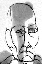 During her studies, Uherske Hradiste, Czechia-based Elizabeth Ruzicka designed the floriated decorative caps typeface Ex Natura (2016). [
 Florian Karsten Studio (Brno, Czech Republic) focuses on graphic design, type design and programming. They create websites, books, programmes, typefaces and functional systems. They are excited about open-source and peer2peer networks. Designer of exclusive high quality typefaces:
  Also Francysk Skaryna, Francisk Skaryna and Franciscus Scorina de Poloczko, b. 1486 Polazk (white Russia), d. 1541 Prague. Scientist and educator from Polotsk (current Belarus).
  [
[ German scribe and calligrapher (b. Soborten, Czechoslovakia, 1923, d. Wiesbaden, 1982), and designer of several text families, such as
  [
[ Czech state type foundry (est. 1951) from the communist era at which Josef Týfa, Oldrich Menhart and Rudolf Ruzicka worked for some time. Týfova Antikva (1959, inspired by the work of architect P.L. Nervi) by Josef Týfa later became Tyfa Text (and
  Jan Horcik (Heavyweight, Prague, Czechia, est. 2014) created the street art semi-graffiti typeface
  Designer (b. 1911, See bei Niesky (Sachsen), d. 1979, Leipzig) at Typoart in 1955-1959 of the garalde typeface Tschörtner-Antiqua. This family became very popular as a workhorse in the DDR. This was digitized in three optical weights as
  Graphic designer in Magnolia, AR, who created an
  Czech type designer (b. 1955, Prague) who studied at the Academy of Arts, Architecture and Design under the direction of Prof. Milan Hegar and Jan Solpera. Since 1994 Ivana Koudelková is working as a designer for URW++. She did numerous font localizations as well as creating Greek, Cyrillic and Devanagari alphabets for several hundred fonts. She is associated with Profonts as well.
  JAF34 is an independent graphic designer in Prague. Creator of the thin experimental typeface
  Prague-based designer who made his
  Based in Prague, Czechia, Jakub Foglar created Yellowstone (2015), an all caps display sans based on the lettering seen for marking the trails in Yellowstone Park.
  Jan Buble (b. 1989, Prague, Czechia) set up his own type foundry in Prague in 2014. His first commercial typeface,
  [
[ [
[ Czech designer of the paperclip typeface Spinka (2014). [
 [
[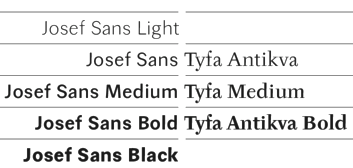 Czech designer (b. 1939, Jindrichove Hradci) went to the Art School in Prague (1954-1958) and the Academy of Art, Architecture and Design in Prague (or: School of Applied Arts) (1959-1965). From 1973 until 2003, he taught at that academy, and headed the Font Studio at the School of Applied Arts. His best-known student was Frantisek Storm. His typefaces:
  Prague, Czechia-based designer of the experimental paper strip font Scratch (2018). [
 Czech painter, graphic artist, author, designer of postage stamps and posters, b. 1882, d. 1970, Prague. From 1920 onwards he was Professor of Applied Arts at the School of Applied Arts.
  Jiri Chlebus (Magenta Design, Brno, Czechia) is a graphic designer.
  Czech poster artist and graphic designer, 1924-2003.
  Designer in Opava, Czech Republic, b. 1989. Graduate of the University of Ostrava, Czechia, the Academy of Fine Arts and Design in Bratislava, Slovakia, and the
  Jozef Ondrik (b. 1988, Ruzomberok, Slovakia) studied at the School of Applied Arts in Slovakia and at the Graphic Design and Typography Department of Tomas Bata University in Zlin (Czech Republic). He currently lives in Prague. He created Paper Font and
  Prague, Czechia-based designer of the Cyrillic horror font The Very Black Book (2019). [
 Prague-based creator of the handcrafted spurred vintage typeface Vienna Hotel (2015), the spurred handcrafted El Capitan (2015), and the Victorian typeface Fiero Rough (2015). He also made Apparel Icons (2015).
  Graphic designer in Brno, Czechia. He made the striped vector format font Candy Type (215), and a wonderful coloful decorative caps alphabet called Flat Alphabet (2015) and the equally interesting Circular Stamp Retro Vector Type and Circular Stamp Marine Vector Icons.
  [
[ Jakub Samek (b. 1988) studied at the Art High School of Vaclav Hollar and now continues his studies at the Studio of Typography at the Academy of Arts, Architecture and Design in Prague. He is a co-founder of studio Mütanta (2011). At
  Prague-based designer of Guinea (2014), a bold typeface characterized by squarish counters. [
 Or Mato Pysny. Graphic and type designer with illustration background and passion for animation. His main areas of interest are dyslexia and education. Graduate of the
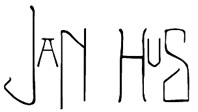
 Graduate of the Type Design and Typography program at UMPRUM, Prague, Czechia. Designer of the high-contrast tuxedoed sans typeface
  Born in Jablonec and Nisou, Czech Republic, 1992, Matyas Machat created
  In 2014, Nikola Giacintova (b. 1989, Sternberk, Czechia) set up a type foundry in Prague, Czechia. In 2014, she created
  Czech type designer (b. Prague 1897, d. Prague 1962) who was mainly active at Grafotechna, a state foundry in Prague. Menhart was also an author who wrote about type and its history. After the World War II, he helped the communist party to promote itself. He was the author of fonts celebrating the victory of communism in hand-written manifests. Menhart considered himself foremost as a craftsman, and derived typefaces from calligraphic origins. Author of
  Czech visual identity designer working mostly for the fashion industry, who has a Masters in type design at ECAL in Lausanne, Switzerland. Creator of the extended sans typeface Exil 71 (2014). In 2018, he designed the sans typeface
  Czech designer who created the stencil typeface
  Koprivnice, Czechia-based designer, b. 1989, Bilovec, Czechia. His typefaces include
  Or Ottokar Karlas. Type designer (b. Prague, 1965) at Storm Type in Czechia, who co-designed the 25-weight Preissig font family in 1998 with Frantisek Storm, after work by Vojtech Preissig. He is an independent typographer and teaches at the Academy of Arts, Architecture and Design in Prague. At
 Born in Prague in 1949, Jan Schmoeger emigrated to Australia in 1980/1981, and is a book designer in Mentone, Victoria. For most of his career here he worked as a graphic designer, mainly in book publishing. He was also a sessional lecturer at the School of Art and Design, Monash University, Caulfield, Melbourne (formerly Chisholm Institute of Technology) in 1986-1994 and 2004-2008. His typefaces:
  Graphic designer in Plzen, Czechia. Creator of the bilined typeface Retro (2014). [
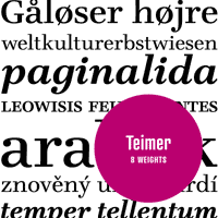 Czech type and graphic designer, 1935-1970. He created a Walbaum/Didot-style roman in 1967 called Teimer's Antiqua. It was submitted to Grafotechna in 1967 but never manufactured. Suitcase Type Foundry (Tomas Brousil) started work on its digitization in 2005, and published it in 2006. Some letters were modified. The 24-style family is called
  Pilsen, Czechia-based designer of the
  Fine Arts graduate from UCLM (University of Castilla-La Mancha) in Spain, who works as a graphic designer in Cuenca, where he set up the Pisto Casero commercial type foundry in 2013, after a period of free font production. He worked at
  Czech designer of the handcrafted typefaces Hello Bride (2018), Sad Riff (2018), Hello Glamour (2017), Flowerlly (sic) (2015), and Forestelly (sic) (2015: upright script), the brush fonts Black Star (2017) and Dream Alley (2015), and the calligraphic wedding script typeface Glorifica (2018). [
 Radko Hromátka (b. 1980) established the Radko Hromátka foundry in Prague in 2006. Radko created the art deco sans caps family
  Jan Charvat (Prague, Czechia) studied electrical engineering and computer graphic programming at Prague University. He set up his own commercial type foundry in Czechia in 2014 and works as a font engineer (with two years of font engineering experience at monotype in Bad Homburg) and type designer. His typefaces:
  [
[ Type designer in Prague whose typefaces are published at Signature Type Foundry. Most of them were designed after sketches by Professor Rotislav Vanek of the Studio of Graphic Design and Visual Communication at the Academy of Arts, Architecture and Design in Prague. Roman's typefaces include:
  Rosetta is an independent foundry, set up in 2011 by David Brezina, José Scaglione and Veronika Burian, with a strong focus on multi-script typography. It is headquartered in Brno, Czechia. Other designers include Anna Giedrys, Amélie Bonet and Titus Nemeth. They specialize in multilingual typefaces.
  At Storm Type, Czech designer Rotislav Vanek published the
  RP is a small scale digital type-foundry established in 2009 by Czech designer Radim Pesko, who currently lives in London, and before that, Amsterdam. He is a regular contributor to various publications including
  Jicin, Czechia-based codesigner with Veronika Hanzlikova of Butterick (2017), an angular typeface that revives a 1928 design by Vojtech Preissig. Earlier in 2017, she designed the rounded sans typeface Kavalir. [
 Tomas Nedoma established Signature Type Foundry in Prague in 2014. Most of their work is influenced by and rooted in the work of Professor Rotislav Vanek of the Studio of Graphic Design and Visual Communication at the Academy of Arts, Architecture and Design in Prague. In many cases, Vanek's sketches were digitized by participating type designers. Except where explicitly mentioned below, all typefaces were made by Tomas Nedoma. The typefaces:
  Graduate of the UMPRUM Academy in Prague. In 2017, he designed the variable width font baseliner, which was publically released in 2019 by Briefcase Type as
  Brno, Czechia-based designer of the basic sans typeface Uppest (2017), a wayfinding icon set for KOMA (2017), the handwriting font Karel Jaromir Erben Script (2017, based on the Czech poet's handwriting), and the icons and poster Enabled For Disabled (2017). [
 Zlin, Czechia-based designer of diacritics for Fette Gotisch (2016). She also created a set of icons for the disabled. [
 Slovak graphic designer, who graduated from the Academy of Fine Arts in Bratislava, Slovakia, and the Faculty of Fine Arts in Brno, Czechia, both in 2009. Then she did a
  Spurnej Type Foundry was founded in 2014 in Prague, Czechia, by Jakub Spurny. In 2014, Jakub designed
 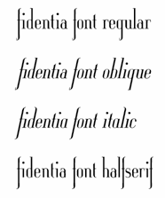 Graphic designer in Prague and Katowice, Poland.
  Nove Straseci, Czech Republic-based graphic designer, who runs
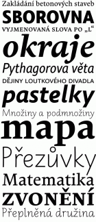 Suitcase Type is a Czech foundry, est. 2003 by
  Type foundry in Prague, Czechia, est. 2014 by Vojtech Riha (b. 1989), who studied at the Technical School of Ceramics in Karlovy Vary, and at the Studio of Typography of the Academy of Arts, Architecture and Design in Prague.
  Czech type designer, b. 1990, Karlovy Vary. In 2014, Tereza Smidova created the commercial layered all-caps typeface family
  Founded in 2017 by Marian Misiak, Three Dots Type is a small type foundry based in Wroclaw, Poland. The main font designer is Marian Misiak, and the second in line is Dominika "Nika" Langosz. Their fonts as of 2019:
  [
[ [
[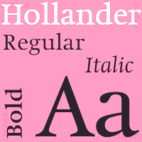 Foundry est. in 2005 by
  Czech designer of the grunge monospace font Urania Czech (2006) and of the didone numbers-only font Stöhr Numbers (2006). In 2009, he made the old typewriter typeface
 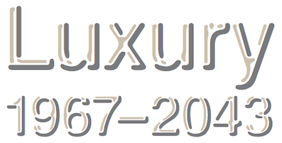 Foundry established in Prague in 2006 by
  [
[ Czech designer in Prague who operates as Whynot. In 2015, she created the handcrafted typeface Bebekvi. In 2014, Nika created a splendid set of zodiac symbols in EPS format, and a colorful zoo alphabet for children.
  Czech graphic design, photography and type design studio run by
  [
[ Vitel Tomas (Usti nad Labem, Czechia) created a
  [
[ Czech expressionist type designer from Svetec u Biliny, Bohemia, b. 1873. His work was influenced by Japanese art and symbolism. During World War II, Preissig supported the Czech resistance and was arrested in 1940. He died in 1944 in the Dachau concentration camp. Preissig is representative of the Czech cubist period, 1910-1925. His only book typeface,
  [
[ [
[ Typefounder Vaclav Jan Krabat (1719-1805) set up his shop in the center of Prague in 1751. His first specimen book was
  Graphic designer from and in Singapore. Her first fonts appeared in 2009: Hybrid (experimental),
  Czech designer of the didone typeface
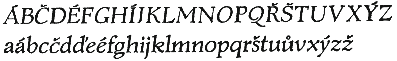
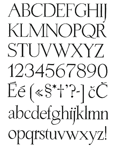
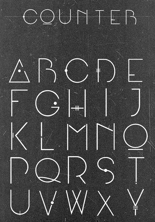
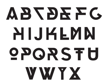
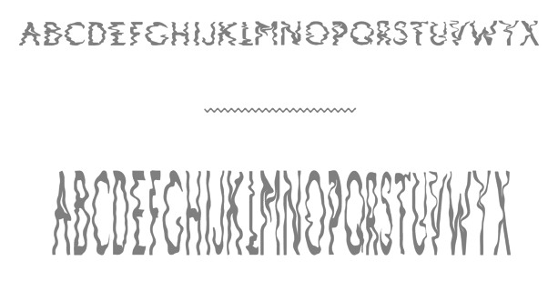
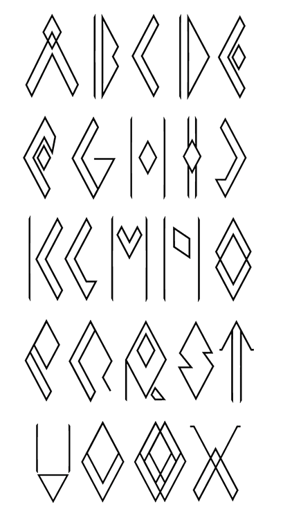
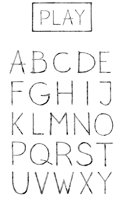
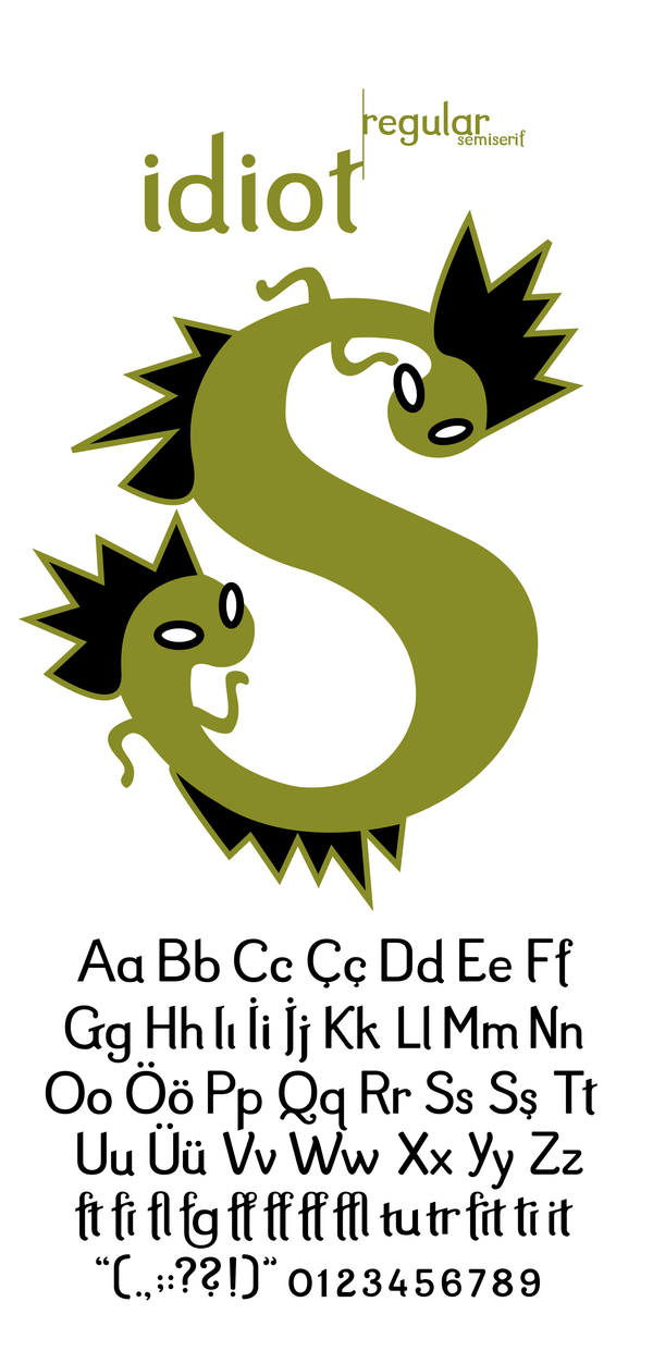
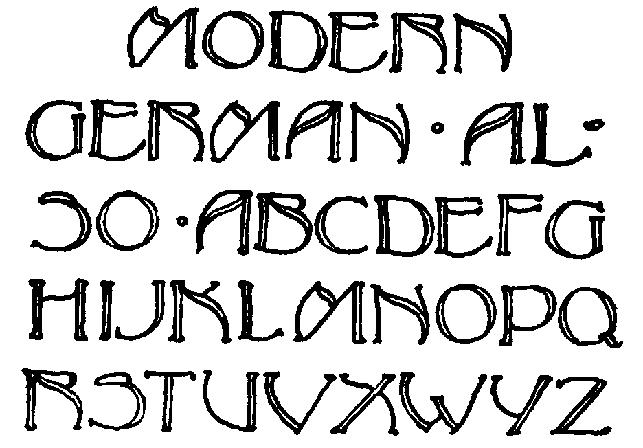
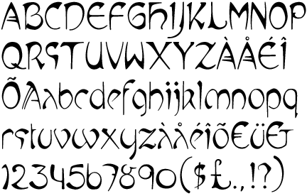
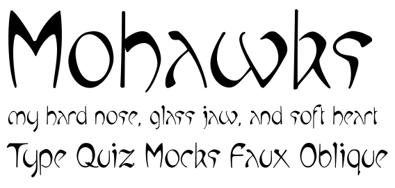
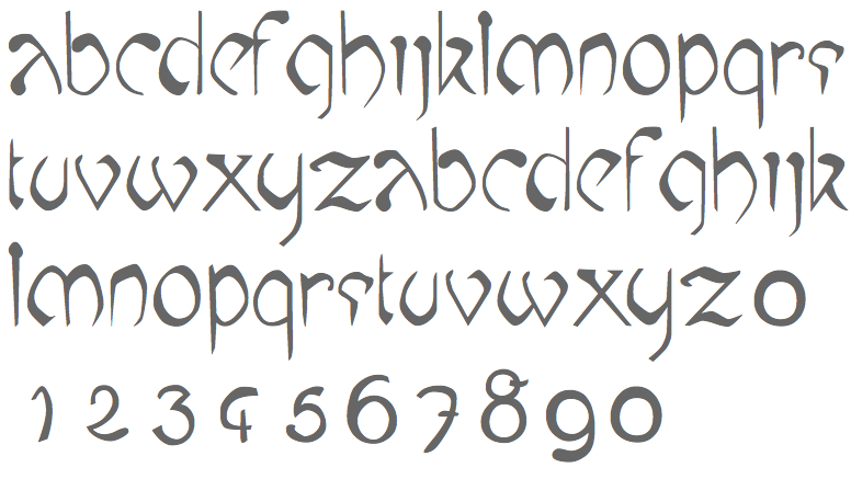
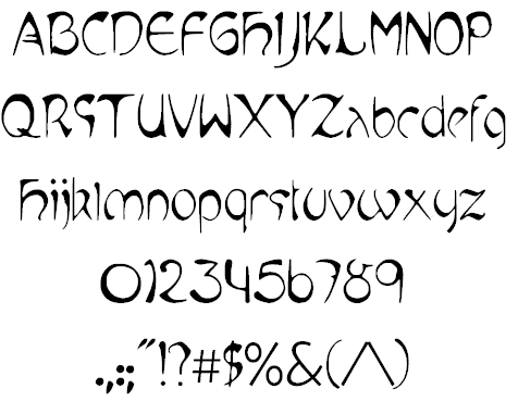
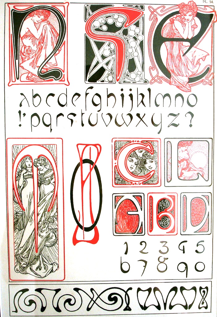
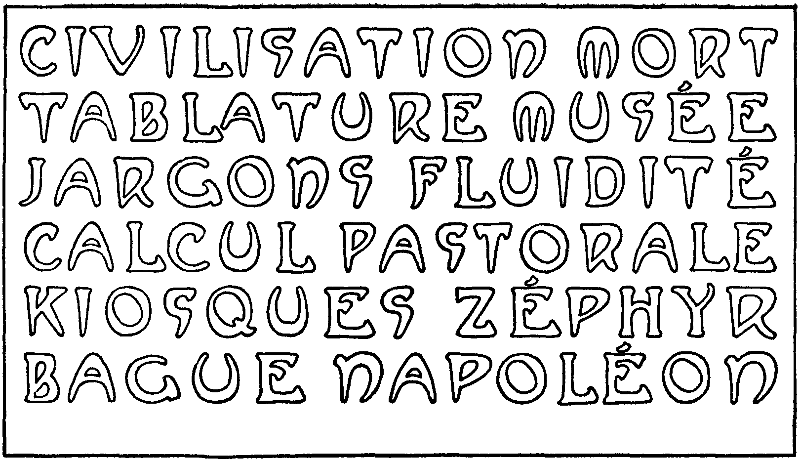
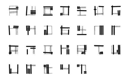
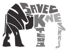
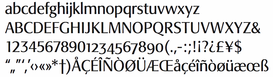
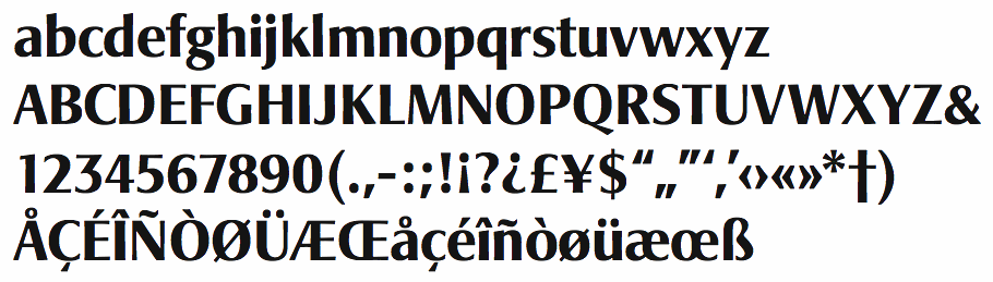
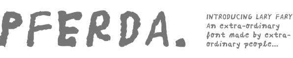
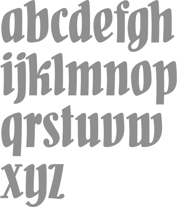
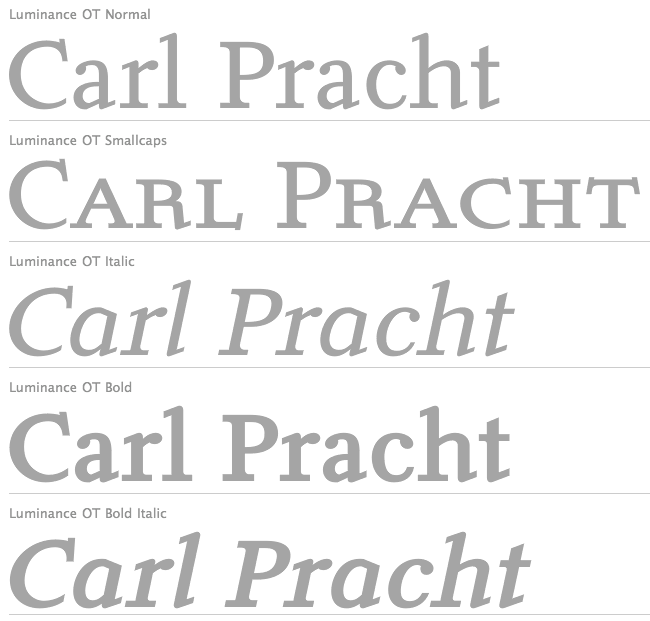
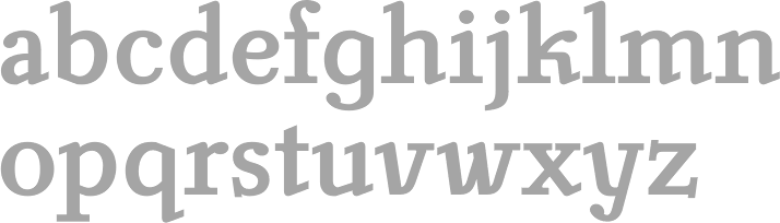
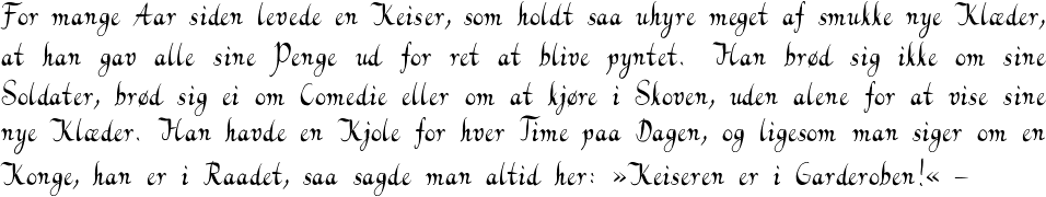
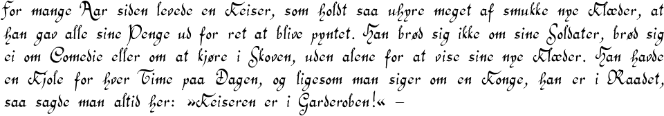
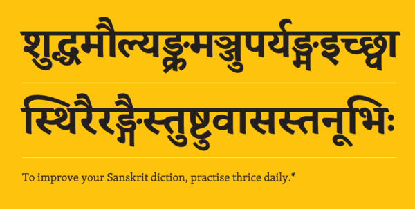
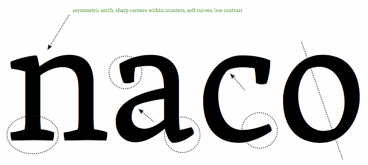
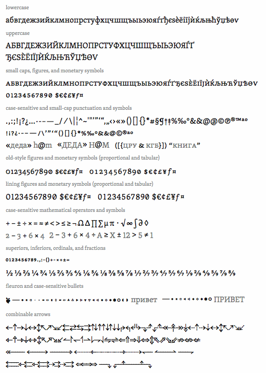
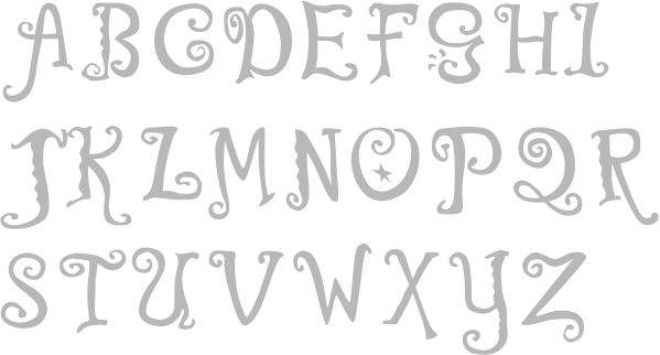
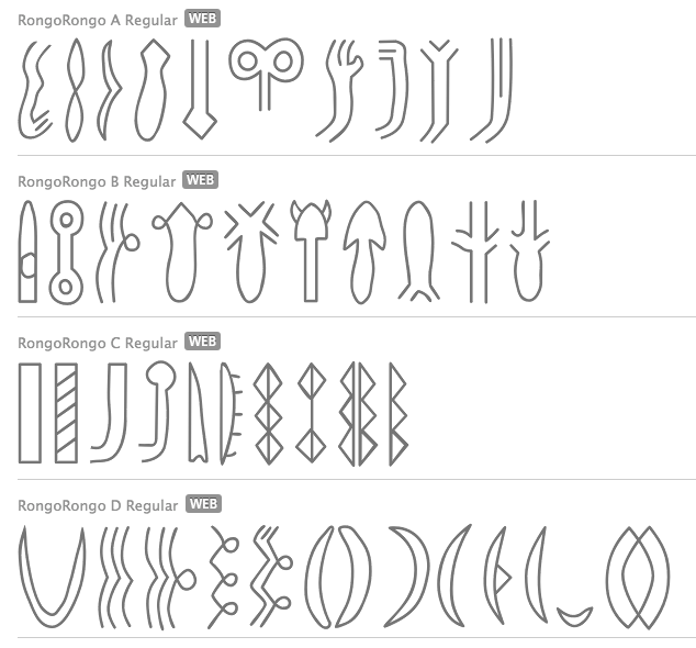
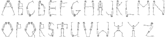
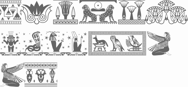
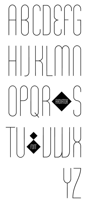
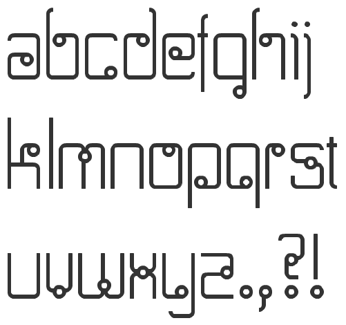
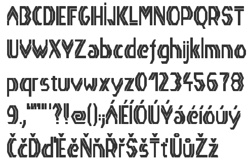
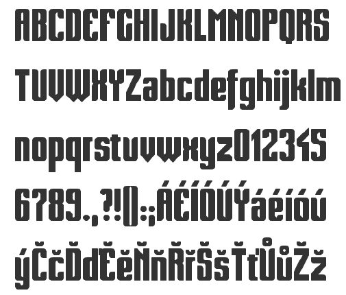
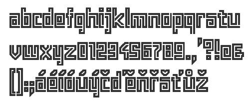
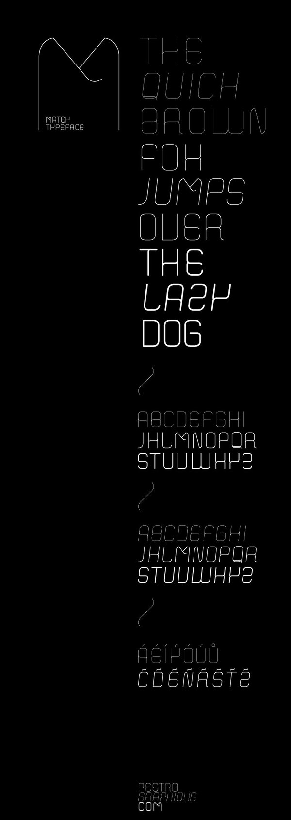
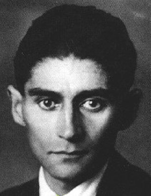
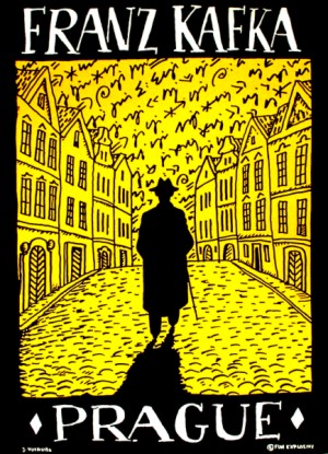
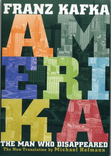
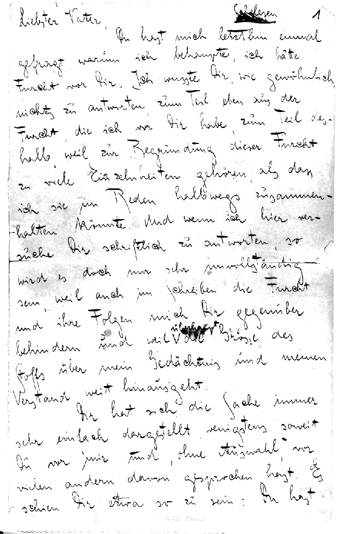
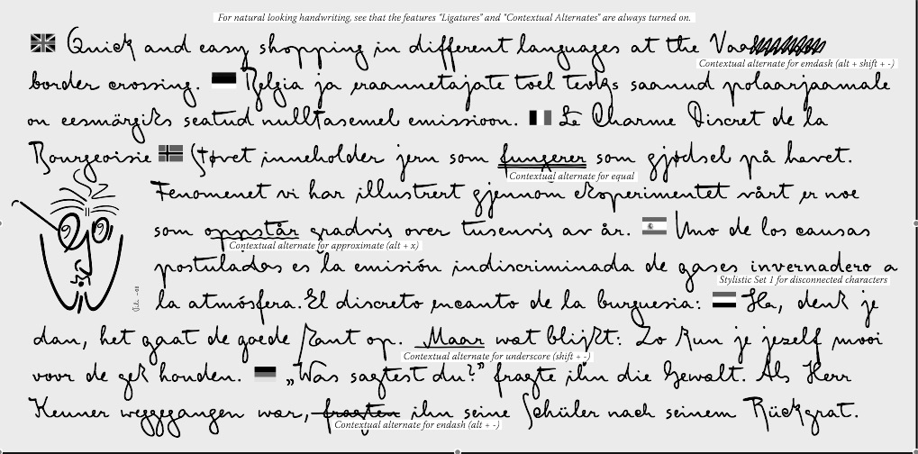
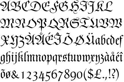
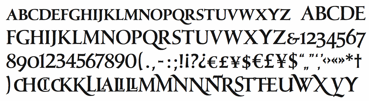
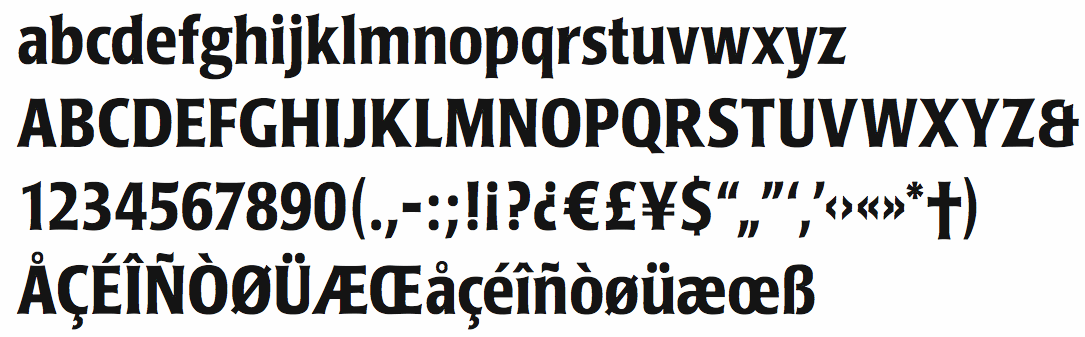
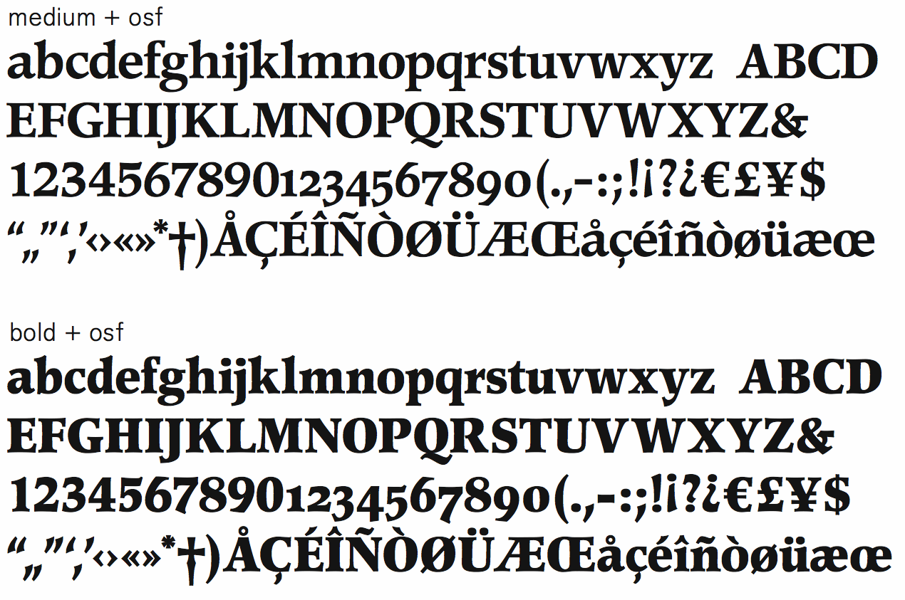
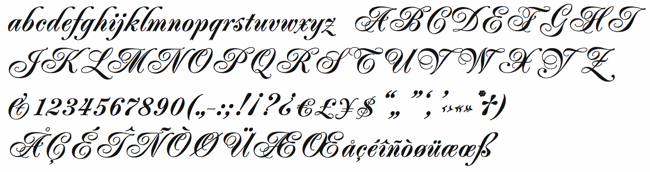
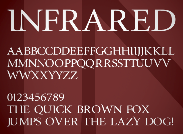
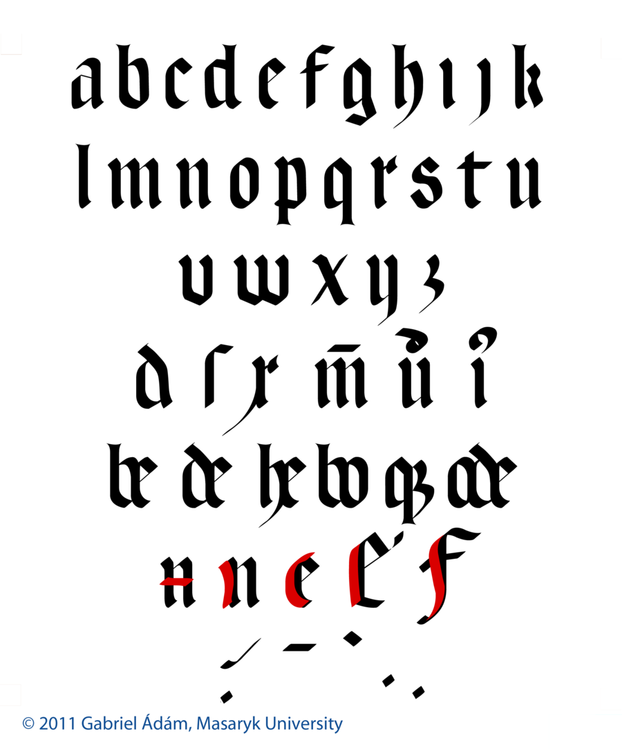
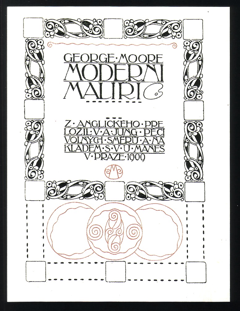
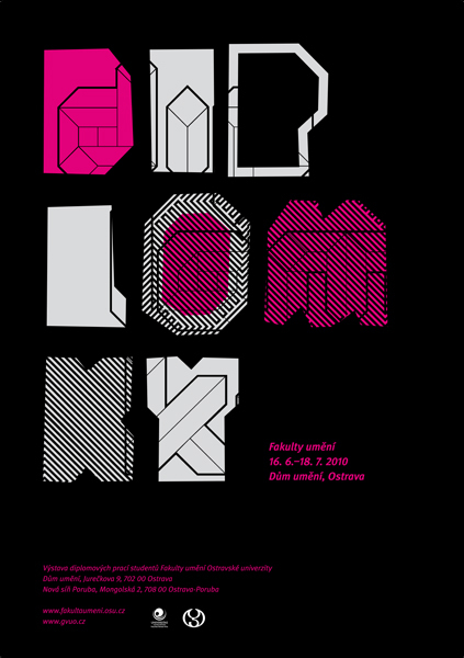
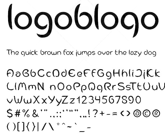
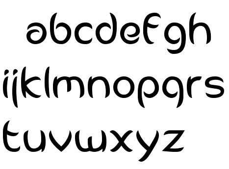
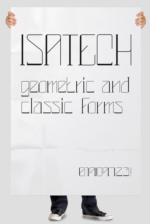
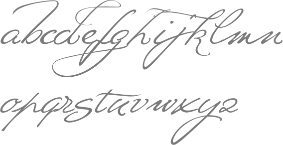
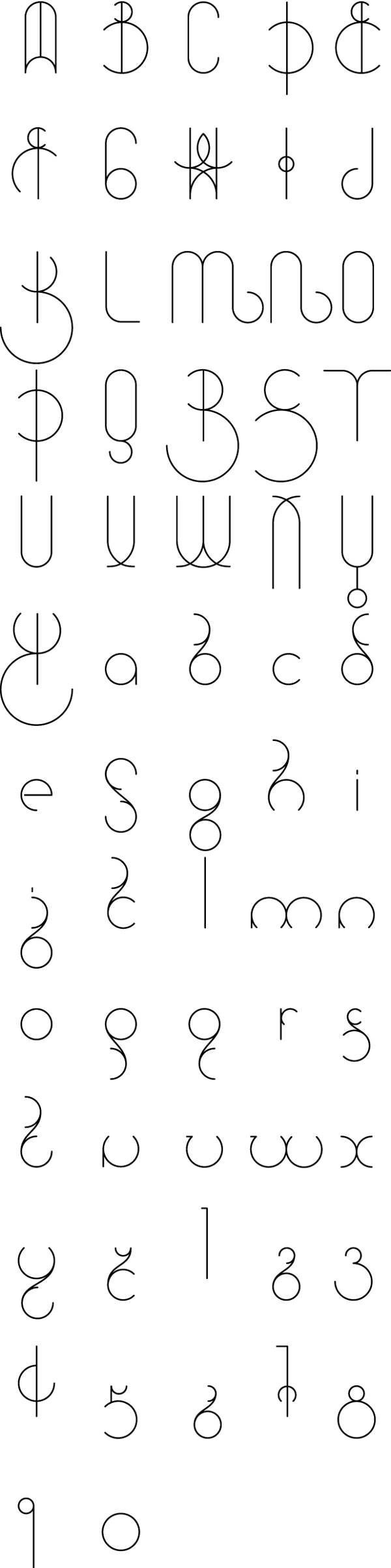
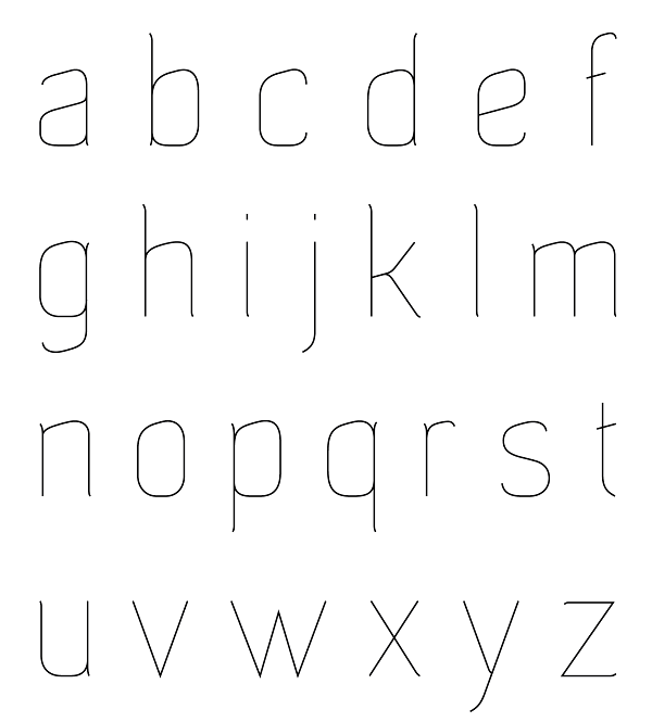
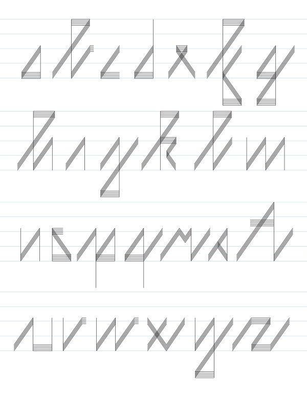
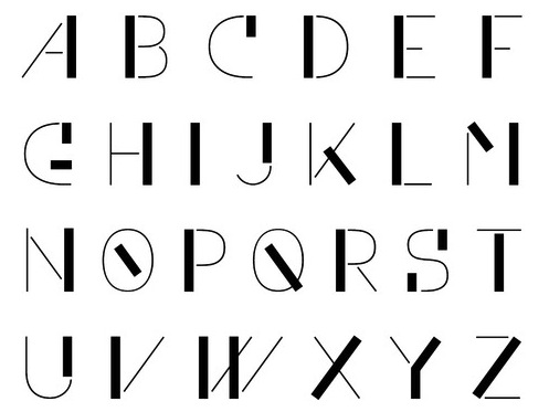
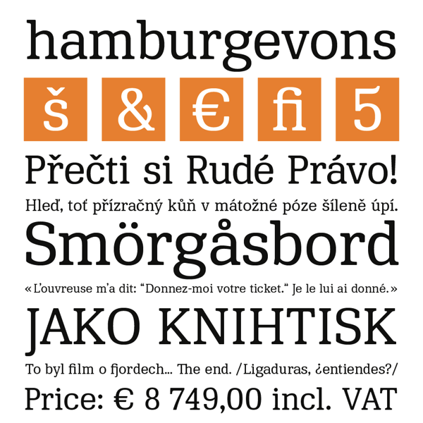
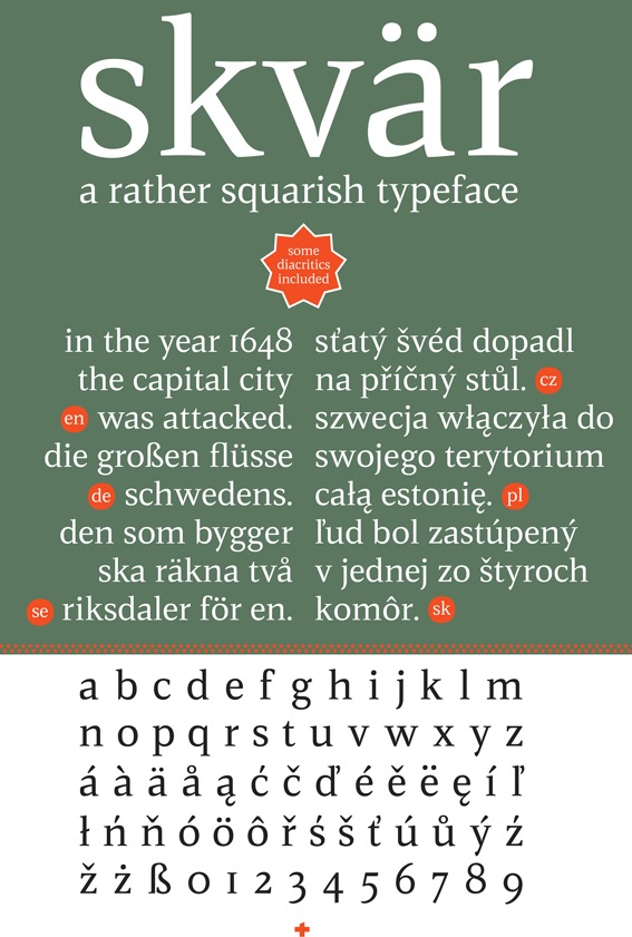
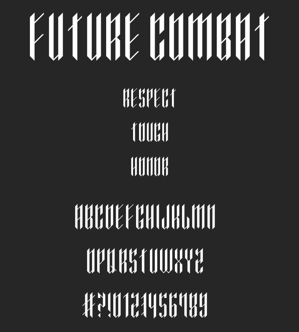
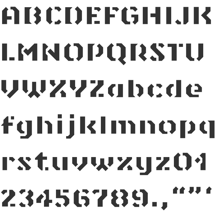
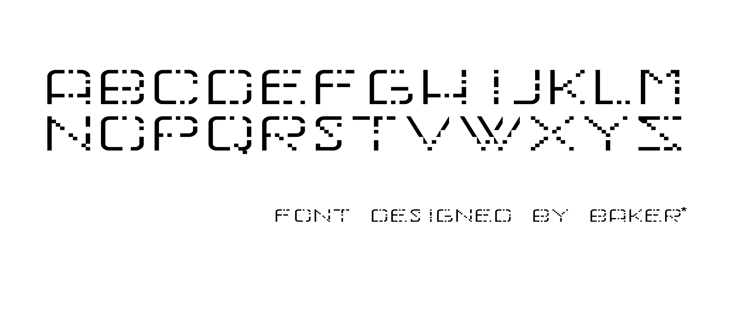
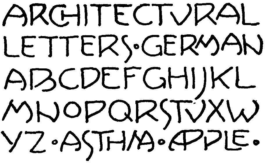
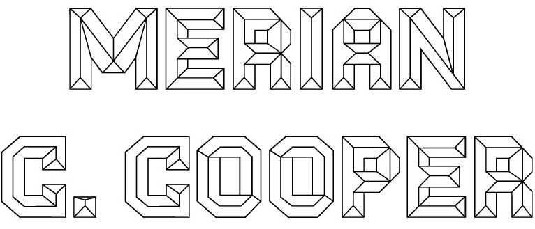
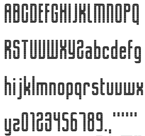
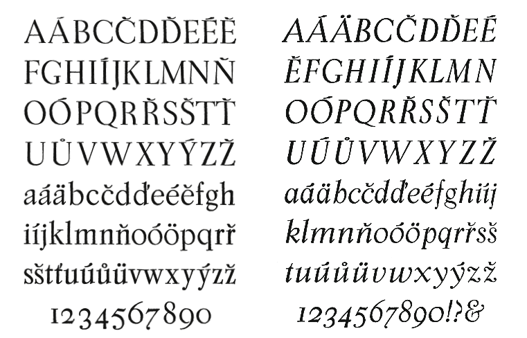
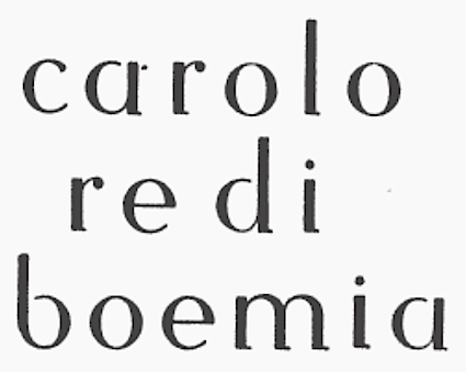
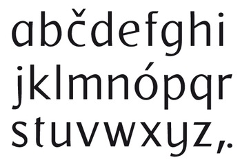
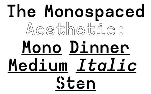
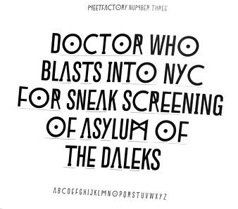
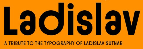
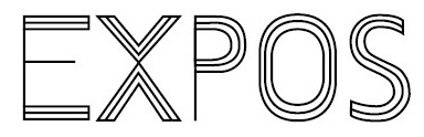
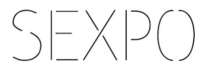
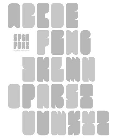
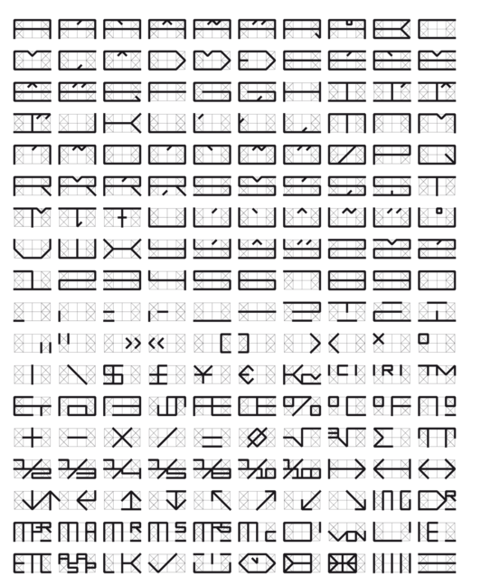
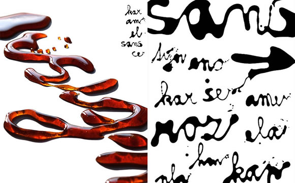
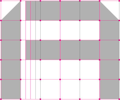
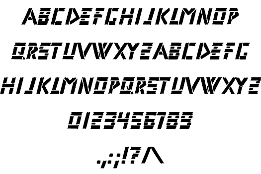
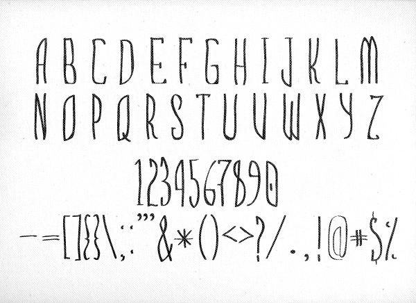
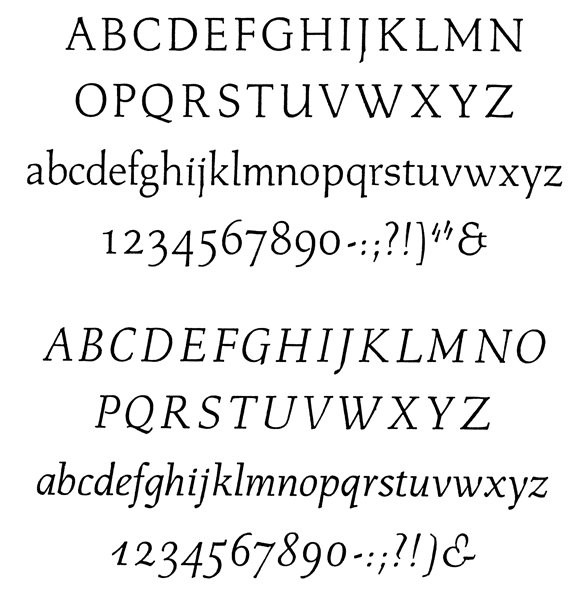
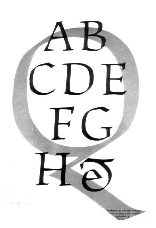
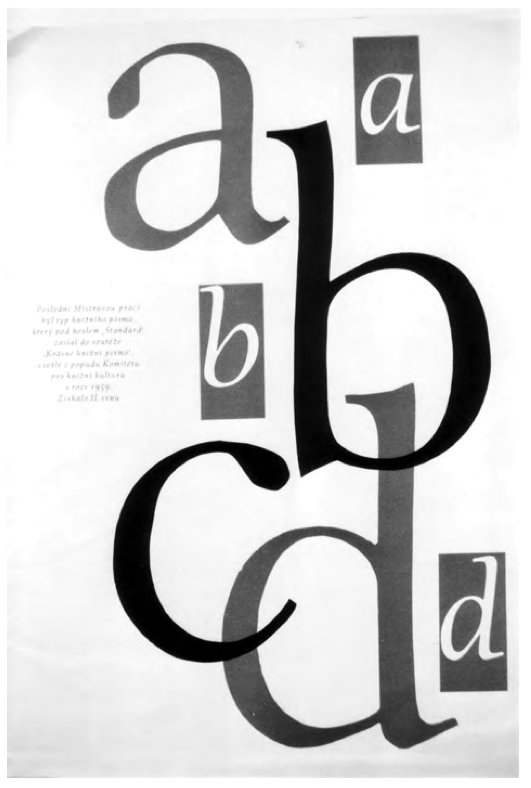
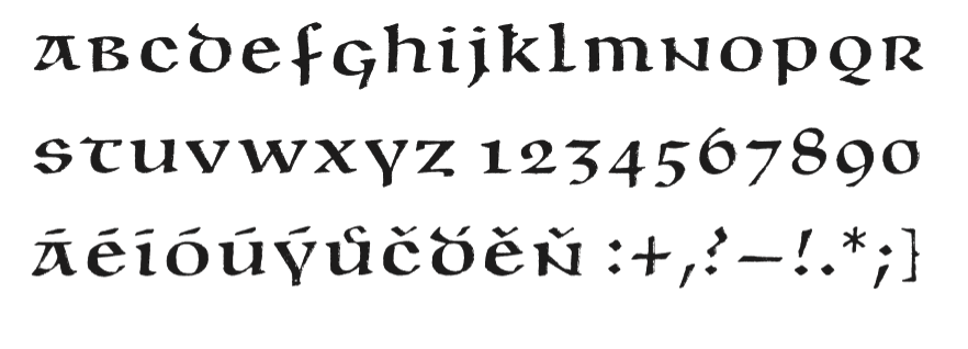
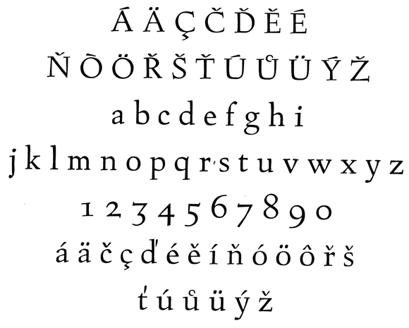
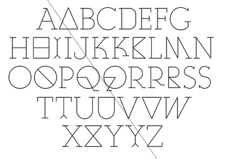
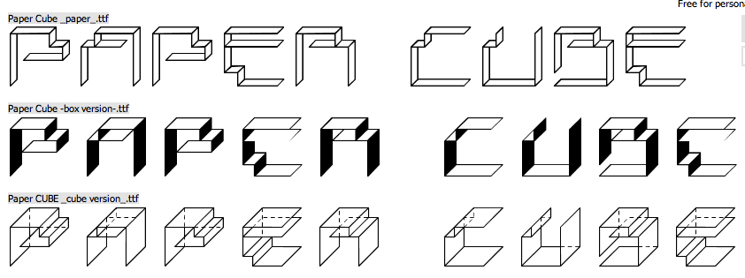
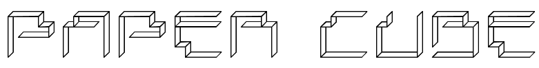
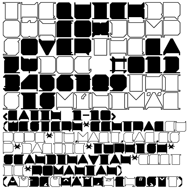
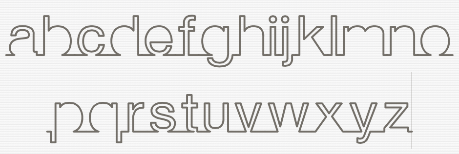
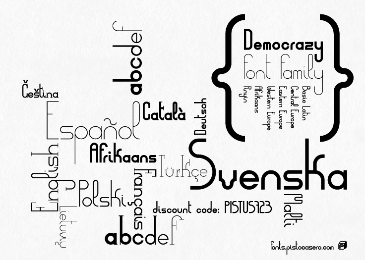
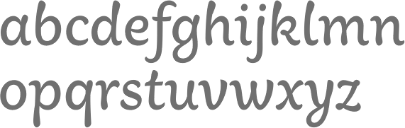
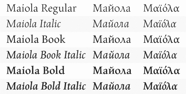
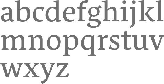
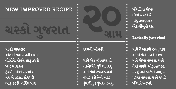
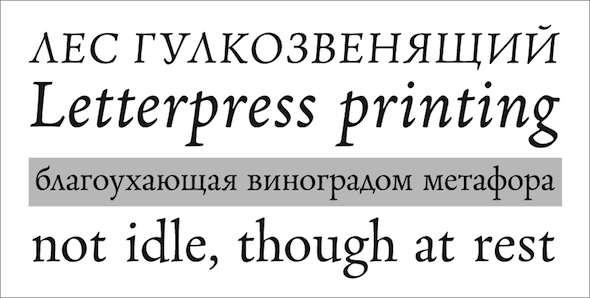
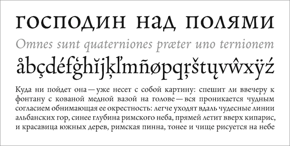
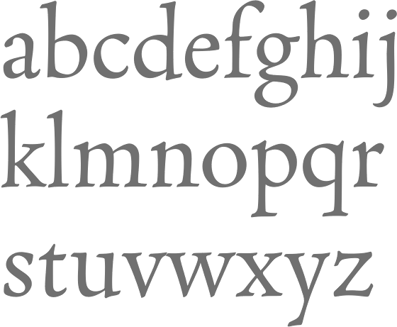
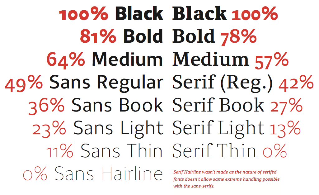
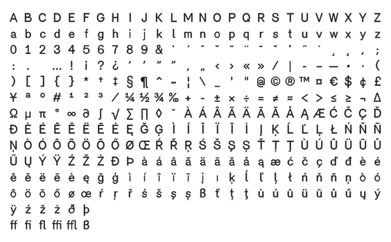
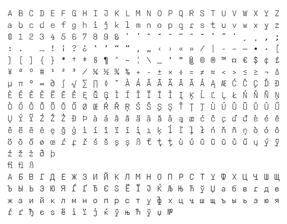
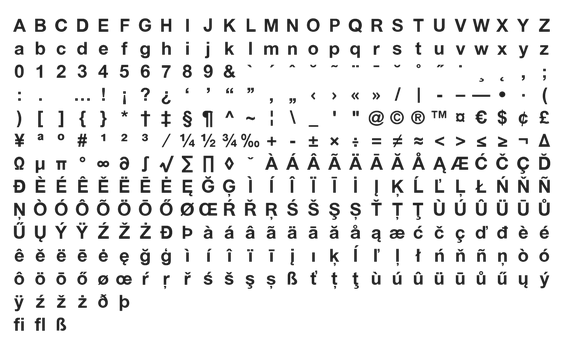
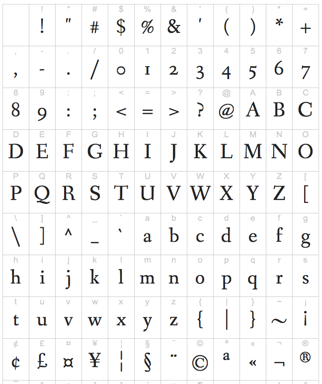
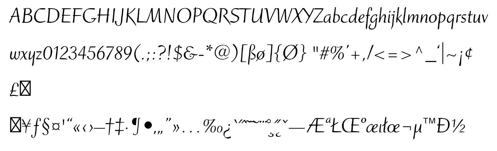
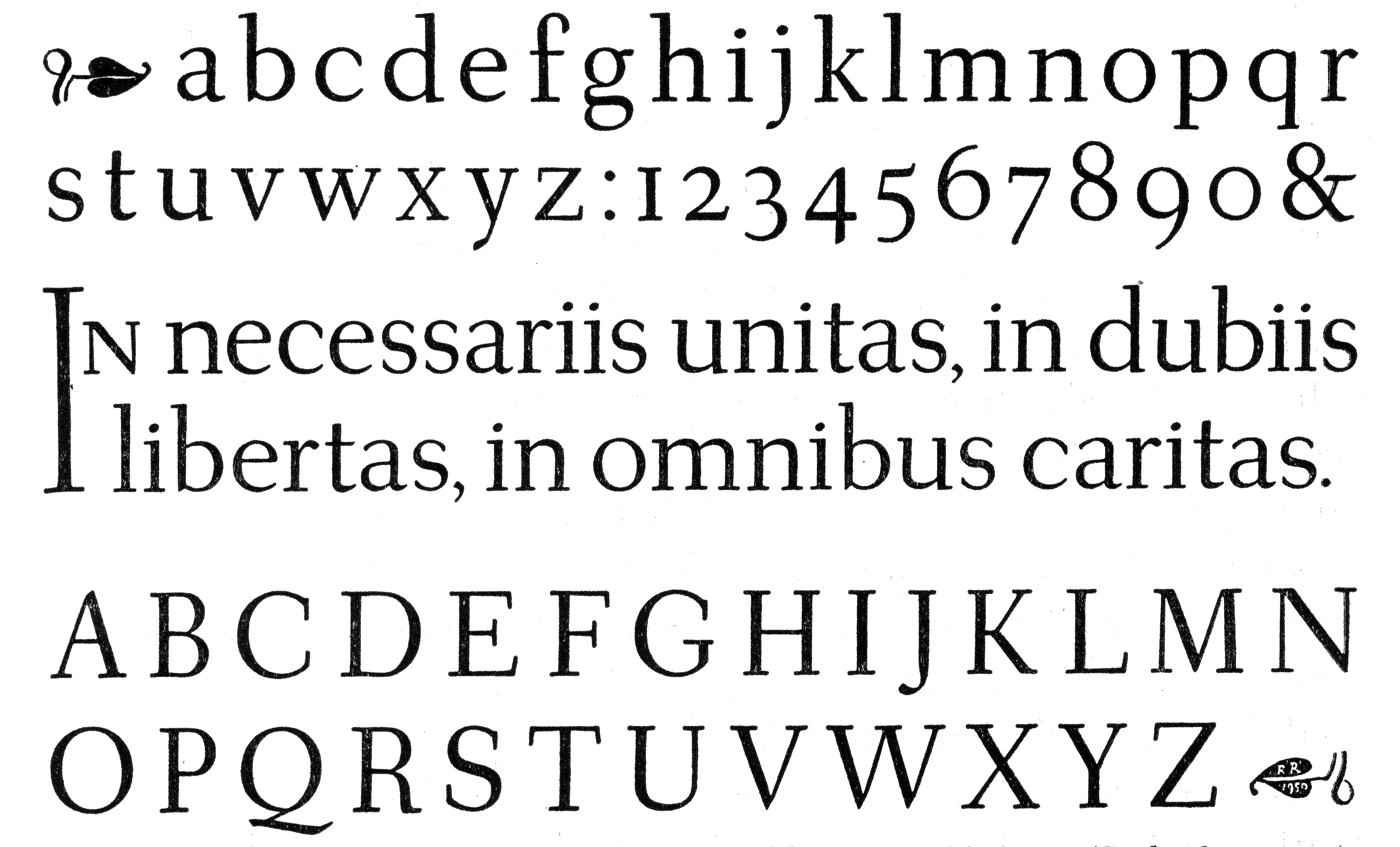
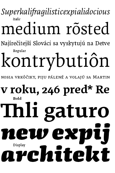
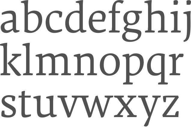
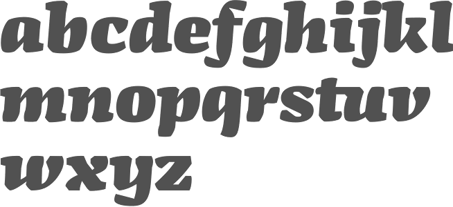
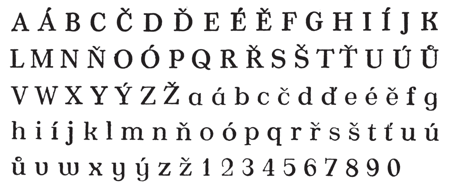
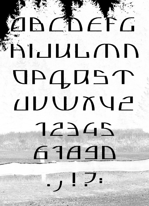
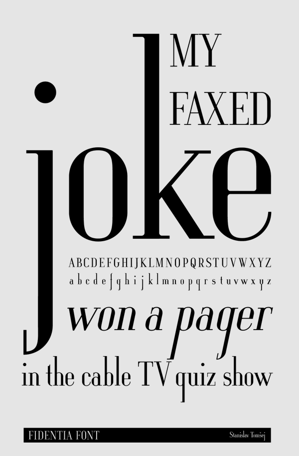
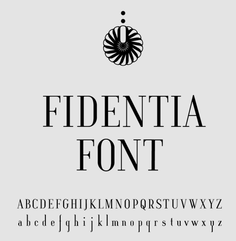
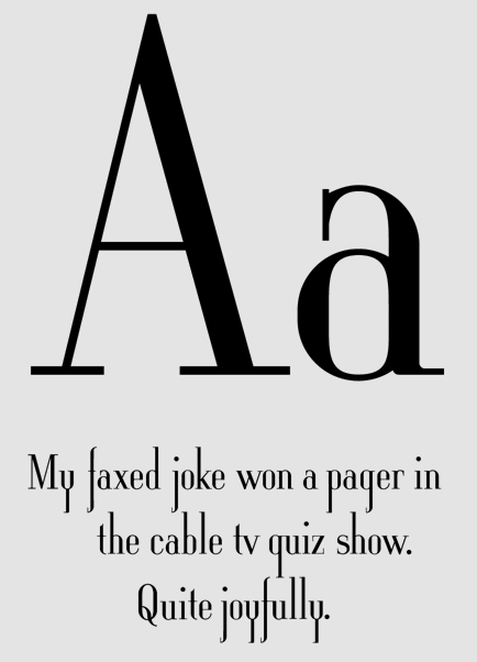
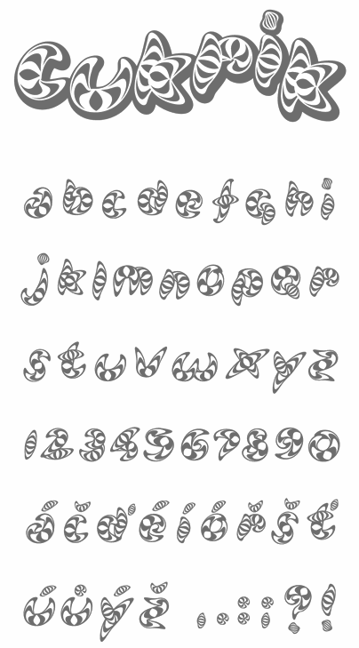
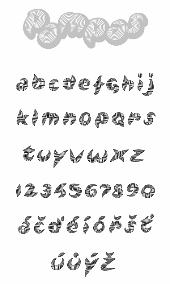
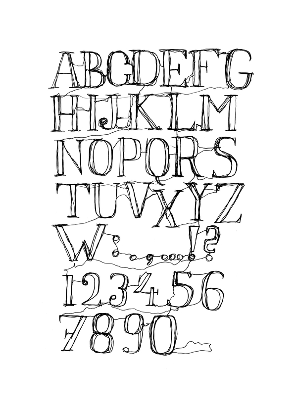
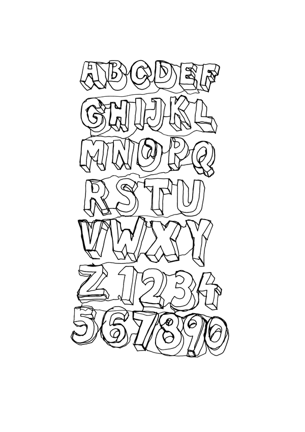
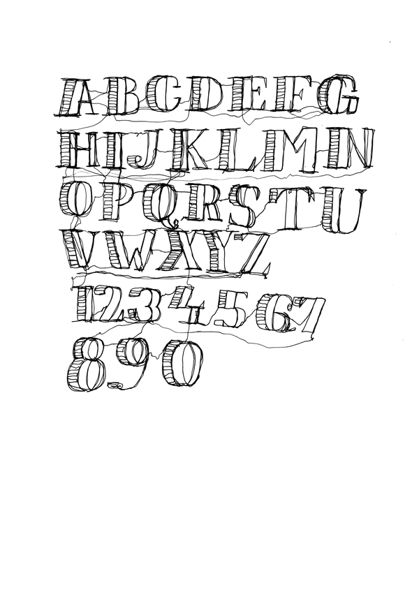
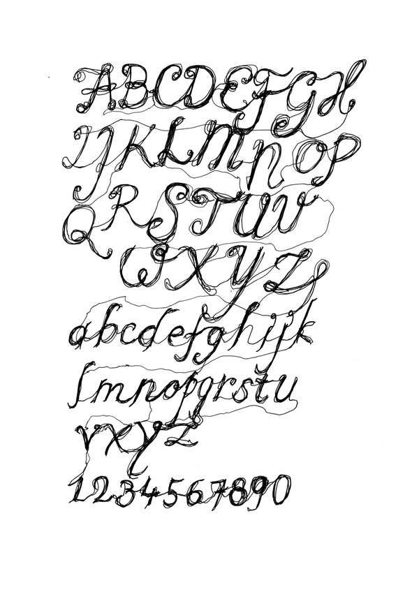
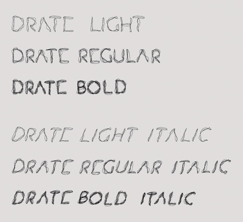
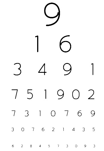
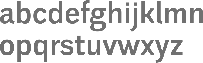
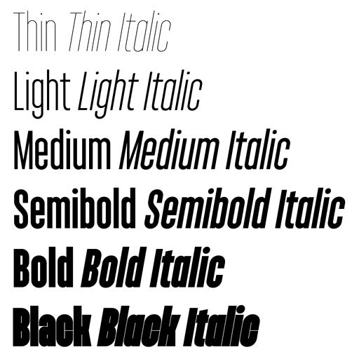
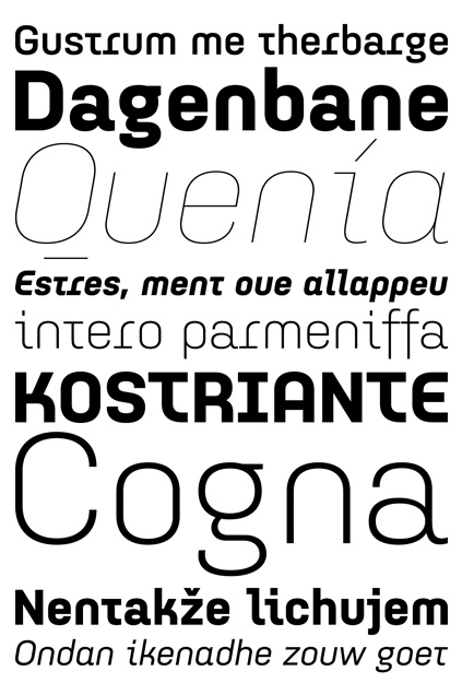
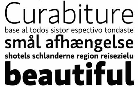
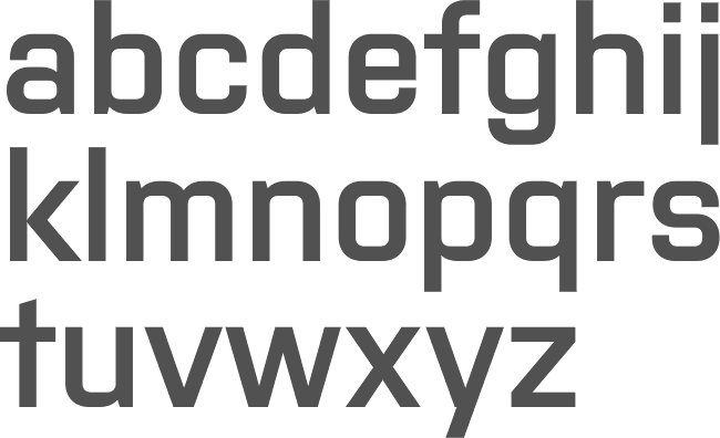
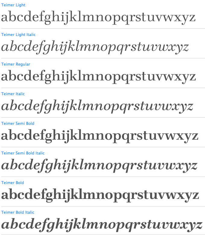
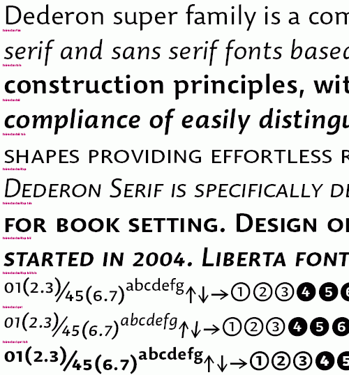
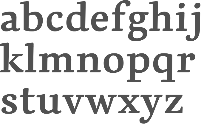
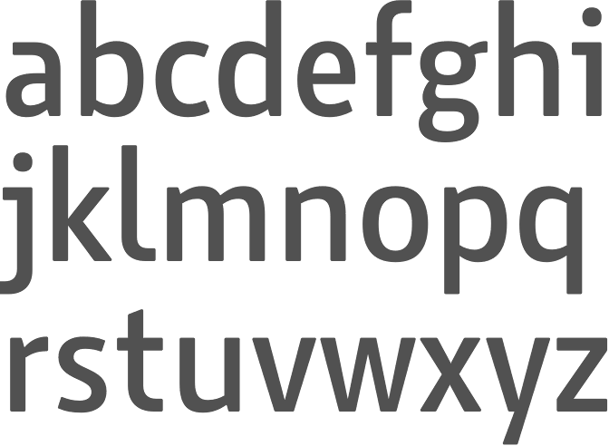
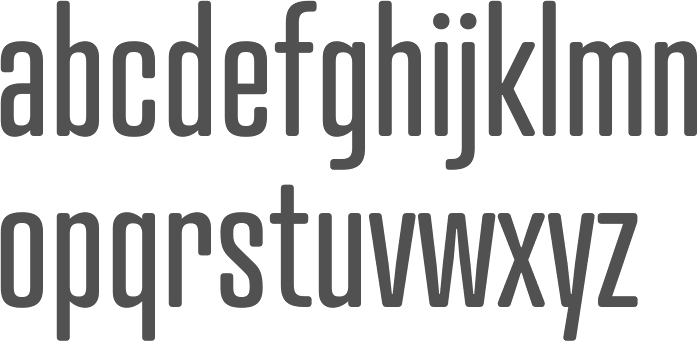
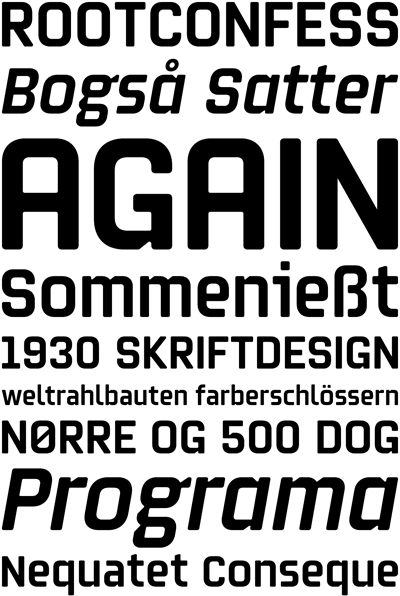
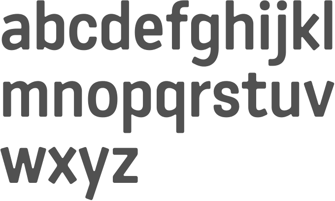
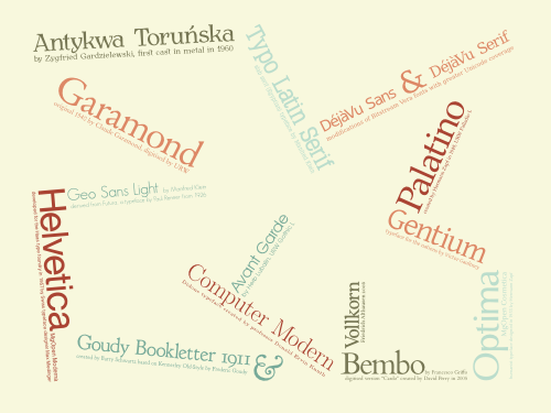
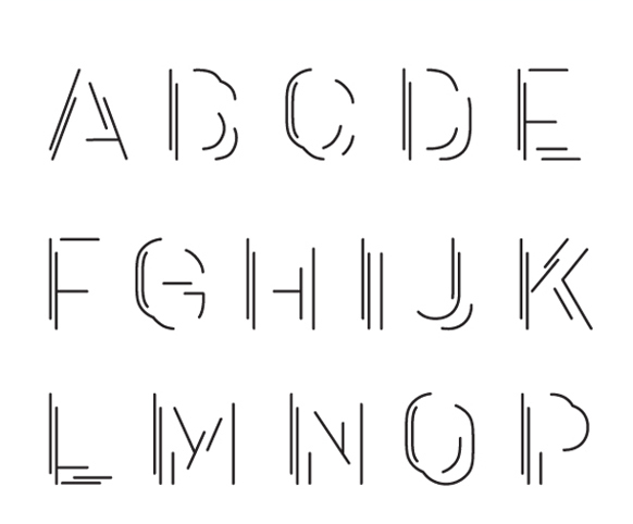
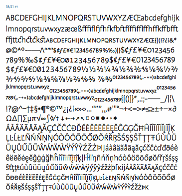
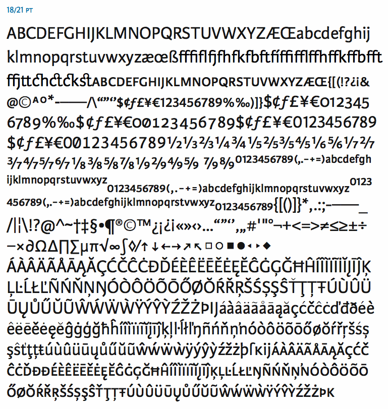
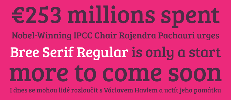
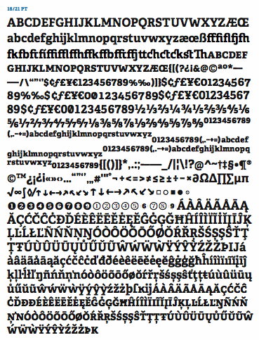
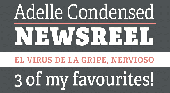
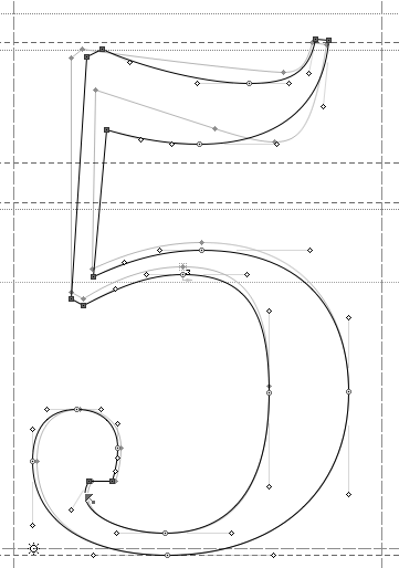
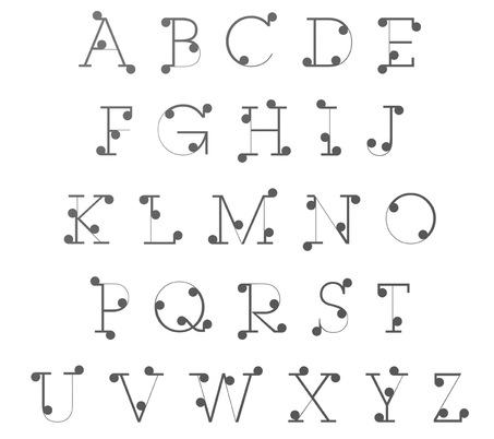
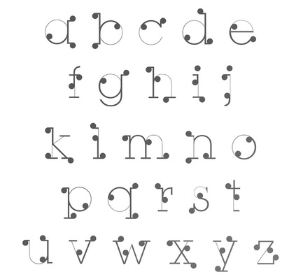
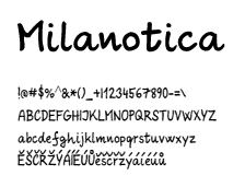
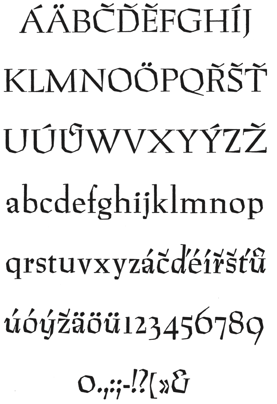
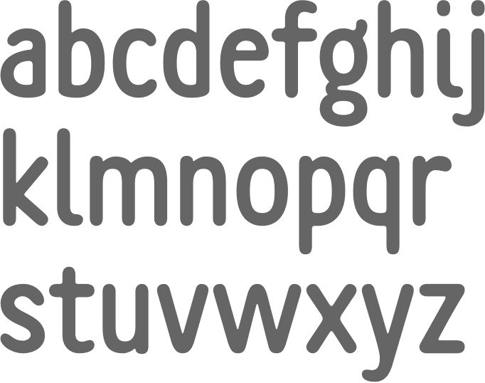
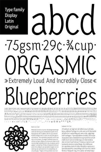
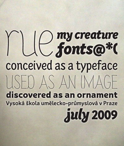
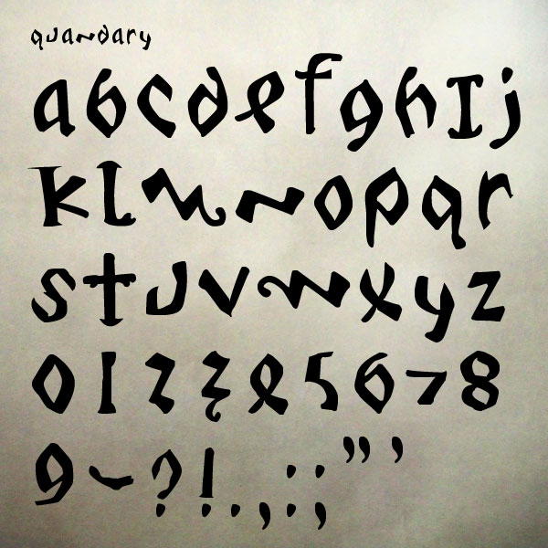
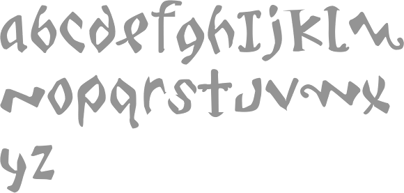
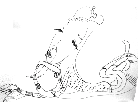
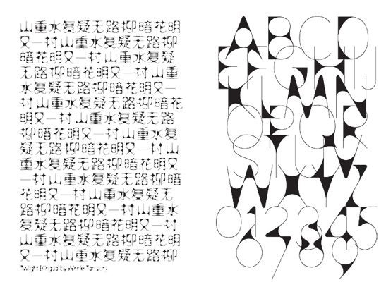
|
|
|
|