| | |
100types
[Ben Archer]
|
Educational and reference site run by Ben Archer, a designer, educator and type enthusiast located in England (who was in Auckland, New Zealand, before that). Glossary. Timeline. Type categories. Paul Shaw's list of the 100 most significant typefaces of all times were recategorized by Archer: - Religious/Devotional: Gutenbergs B-42 type, Gebetbuch type, Wolfgang Hoppyl's Textura, Breitkopf Fraktur, Ehrhard Ratdolt's Rotunda, Hammer Uncial, Zapf Chancery, Peter Jessenschrift, Cancellaresca Bastarda, Poetica.
- Book Publishing&General Purpose Text Setting: Nicolas Jenson's roman, Francesco Griffo's italic, Claude Garamond's roman, Firmin Didot's roman, Cheltenham family, Aldus Manutius' roman, William Caslon's roman, Pierre-Simon Fournier's italic, Ludovico Arrighi da Vicenza's italic, Johann Michael Fleischmann's roman, ATF Garamond, Giambattista Bodoni's roman, Nicolas Kis' roman, Minion multiple master, Unger Fraktur, John Baskerville's roman, Lucida, Optima, Bauer Bodoni, Adobe Garamond, Scotch Roman, Romanée, ITC Stone family, Trinité, ITC Garamond, Sabon, ITC Novarese, Charter, Joanna, Marconi, PMN Caecilia, Souvenir, Apollo, Melior, ITC Flora, Digi-Grotesk Series S.
- Business/Corporate: Akzidenz Grotesk, Helvetica, Univers, Syntax, Courier, Meta, Rotis, Thesis, Antique Olive.
- Newspaper Publishing: Times Roman, Bell, Clarendon, Century Old Style, Ionic, Imprint.
- Advertising and Display: Futura, Robert Thorne's fat typeface roman, Vincent Figgins' antique roman (Egyptian), Memphis, Fette Fraktur, Avant-Garde Gothic, Deutschschrift, Peignot, Erbar, Stadia/Insignia, Penumbra, Compacta, Bodoni 26, WTC Our Bodoni.
- Prestige and Private Press: Romain du Roi, Golden Type, Johnston's Railway Sans, Doves Type, Walker.
- Signage: William Caslon IV's sans serif, Trajan.
- Historical Script: Snell Roundhand, Robert Granjon's civilité, Excelsior Script.
- Experimental/expressive: Mistral, Beowolf, Dead History, Behrensschrift, Eckmannschrift, Neuland, Element, Remedy, Template Gothic.
- Onscreen/multimedia: Chicago, Oakland, OCR-A, Base Nine and Base Twelve, Evans and Epps Alphabet.
- Telephone Directory publishing: Bell Gothic.
Link to Archer Design Work. [Google]
[More] ⦿
|
Aaron Beck
[Aaron Beck]
|
Aaron Beck (Lee's Summit, MO) started making fonts in the 1990s under the labels Recordkeeper Software, RecordKeeper Systems LLC, Audio Electric Systems, and Aaron W. Beck Co. These include Beckett (textura, 1994), Cupertino (sci-fi face), Graveyard, Headstone, Pirate Bones, StoneCutter, Tombstone and Warlock. Fontspace link for RecordKeeper Software. Fontspace link for Aaron W. Beck Co. Dafont link. [Google]
[More] ⦿
|
Aaron Beck
[Aaron Beck]
|
[More] ⦿
|
Acmé-Paris
[Élodie Mandray]
|
 Acmé-Paris is a design studio in Paris run by Élodie Mandray and Caroline Aufort. Creators of New Gothic Textura (2009), Canevas (2010-2012, stitching font), Acme (2013), Tropique (2011, experimental), Minuscule (2012), Tribute (2012, children's hand), Juicy (2010), Eclipse, Thésard, the music-inspired Swing (2010), the heavy monoline sans typeface Acmé (2013), the titling sans typeface Le Creux (2013), and the stitching font Canevas (2013).
 Typefaces from 2015 include the multiline neon font Neo Neon. In 2016, Acmé Paris designed the copperplate style poster typeface Aylak, the titling sans Truck, the art nouveau typeface Bertand, the art deco typeface Beaumont, and the avant-garde typeface Cattolica. In 2017, they designed the artsy rounded sans typeface Kasha. Typefaces from 2022: Madrid (inspired by vintage posters from the Spanish Civil War). [Google]
[More] ⦿
|
Adam Jagosz

|
 Aka Iorveth Aen Seidhe. Katowice, Poland-based designer of Slowglass (2017: a stocky 30-style geometric semi-serif sans family with vast language coverage that includes Cyrillic, Greek and Vietnamese), the rune simulation font Pertho (2016) and the penis font Semi (2016). He also made several interesting calligraphic pieces.
 In 2019, he designed the 62-style sci-fi typeface family Ares (+Ares VF), the condensed Latin / Greek / Cyrillic sans Rywalka, the creamy stencil typeface Aromatron and the leafy Aromatron Ornaments. Typefaces from 2020: AJ Quadrata (a revival of Textura Qadrata). Aka Quadratype. Devian Tart link. Creative Fabrica link. [Google]
[MyFonts]
[More] ⦿
|
Alejandro Silva
|
Graphic designer in Santiago, Chile, who created the textura typeface Espinosa (2013). [Google]
[More] ⦿
|
Alphabetum
[Juan-José Marcos García]
|
Juan-José Marcos García (b. Salamanca, Spain, 1963) is a professor of classics at the University of Plasencia in Spain. He has developed one of the most complete Unicode fonts named ALPHABETUM Unicode for linguistics and classical languages (classical&medieval Latin, ancient Greek, Etruscan, Oscan, Umbrian, Faliscan, Messapic, Picene, Iberic, Celtiberic, Gothic, Runic, Modern Greek, Cyrillic, Devanagari-based languages, Old&Middle English, Hebrew, Sanskrit, IPA, Ogham, Ugaritic, Old Persian, Old Church Slavonic, Brahmi, Glagolitic, Ogham, ancient Greek Avestan, Kharoshti, Old Norse, Old Icelandic, Old Danish and Old Nordic in general, Bengali, Hindi, Marathi, Phoenician, Cypriot, Linear B with plans for Glagolitic). This font has over 5000 glyphs, and contains most characters that concern classicists (rare symbols, signs for metrics, epigraphical symbols, "Saxon" typeface for Old English, etcetera). A demo font can be downloaded [see also Lucius Hartmann's place]. His Greek font Grammata (2002) is now called Ellenike. He also created a package of fonts for Latin paleography (medieval handwriting on parchments): Capitalis Elegans, Capitalis Rustica, Capitalis Monumentalis, Antiqua Cursiva Romana, Nova Cursiva Romana (2014), Uncialis, Semiuncialis, Beneventana Minuscula, Visigothica Minuscula, Luxoviensis Minuscula, Insularis Minuscula, Insularis Majuscula, Carolingia Minuscula, Gothica Textura Quadrata, Gothica Textura Prescissa, Gothica Rotunda, Gothica Bastarda, Gothica Cursiva, Bastarda Anglicana (2014) and Humanistica Antiqua. PDF entitled Fonts For Latin Palaeography (2008-2014), in which Marcos gives an enjoyable historic overview. Alphabetum is not Marcos's only excursion into type design. In 2011, he created two simulation fonts called Sefarad and Al Andalus which imitate Hebrew and Arabic calligraphy, respectively. Cyrillic OCS (2012) is a pair of Latin fonts that emulate Old Church Slavonic (old Cyrillic). In 2013, he created Cuneus, a cuneiform simulation typeface. Paleographic fonts for Greek (2014) has ten fonts designed by Marcos: Angular Uncial, Biblical Uncial, Coptic Uncial, Papyrus Uncial, Round Uncial, Slavonic Uncial, Sloping Uncial, Minuscule IX, Minuscule XI and Minuscule XV. These fonts are representative of the main styles of Greek handwriting used during the Classical World and Middle Ages on papyrus and parchments. There is also a short manual of Greek Paleography (71 pages) which explains the development of Greek handwriting from the fourth century B.C. to the invention of printing with movable type in the middle of the fifteenth A.D. He wrote a text book entitled History of Greek Typography: From the Invention of Printing to the Digital Age (in Spanish; second edition, 2018). See also here and here. [Google]
[More] ⦿
|
Alter Littera
[José Alberto Mauricio]
|
 Spanish foundry, est. ca. 2009, and on the web since 2012. It is located in Madrid. Alter Littera's fonts and web site are designed and managed by José Alberto Mauricio, who holds a doctorate degree in Economics and Business Administration, and is Associate Professor of Econometrics at the Universidad Complutense de Madrid.
 Alter Littera produces and markets opentype fonts reviving some of the most beautiful bookhands from medieval Western manuscripts, as well as some of the finest European and North-American typefaces from the mid-fifteenth through the early-twentieth centuries. The "Bookhand", "Oldtype" and "Initials" font collections cover gothic and/or blackletter letter forms. The typefaces: - Gutenberg (B42-type) A (Johann Gutenberg, Mainz, ca. 1455). Includes the full set of special characters, alternates and ligatures from The 42-line Bible. Under development.
- Gutenberg (B42-type) B (Johann Gutenberg, Mainz, ca. 1455). Includes the full set of special characters, alternates and ligatures from The 42-line Bible. Published as Gutenberg B in 2012, this is a clean, smooth rendition of the B42-type used by Johann Gutenberg in his famous 42-line Bible. The font includes a comprehensive set of special characters, alternates and ligatures, plus Opentype features, that can be used for typesetting (almost) exactly as in Gutenberg's Bible and later incunabula. He says: The main historical sources used during the font design process were high-resolution scans from several printings of Gutenberg's Bible. Other sources were as follows: Kapr, A. (1996), Johann Gutenberg - The Man and his Invention, Aldershot: Scolar Press (ch. 7); De Hamel, C. (2001), The Book - A History of The Bible, London: Phaidon Press (ch. 8); Füssel, S. (2005), Gutenberg and the impact of printing, Burlington: Ashgate (ch. 1); and Man, J. (2009), The Gutenberg Revolution, London: Bantam (ch. 7).
- Gutenberg (B42-type) C (Johann Gutenberg, Mainz, ca. 1455). Includes the full set of special characters, alternates and ligatures from The 42-line Bible. Published in 2012 as Gutenberg C, this is a slightly roughened version of the Oldtype "Gutenberg B" Font, simulating irregularities and ink spreads associated with old metal types, papers and parchments.
- Psalterium (Psalter-type) (Peter Schoeffer, Mainz, 1457). Includes the full set of special characters, alternates and ligatures from The Mainz Psalter (Psalterium Moguntinum). He writes: A clean, smooth adaptation of the magnificent gothic types used by Johann Fust and Peter Schöffer in their famous Mainz Psalter (Psalterium Moguntinum) of 1457, also used in their Canon of the Mass (Canon Missae) of 1458, and in their Benedictine Psalter (Psalterium Benedictinum) of 1459. [Although these works were published after Gutenberg's break with Fust, it is generally agreed that Gutenberg was working along with Fust and Schöffer on the Mainz Psalter while the 42-line Bible was still being printed.] In addition to the usual standard characters for typesetting modern texts, the font includes a comprehensive set of special characters, uncial initials (adapted from both the Mainz Psalter and early sixteenth-century Dutch types by Henric Pieterszoon), alternates and ligatures, plus Opentype features, that can be used for typesetting (almost) exactly as in the Mainz Psalter and later incunabula.
- Oude Hollandse (Henric Pieterszoon "Lettersnijder", Antwerp, 1492). Under development.
- French Textura (Joos Lambrecht, Ghent, 1541). Under development.
- Flamand A (Hendrik van den Keere, Antwerp, 1571). Under development.
- Flamand B (Hendrik van den Keere, Antwerp, 1571). Under development.
- Nederduits (Johann M. Fleischmann, Haarlem, 1733). Under development.
- Psalter Gotisch (Benjamin Krebs Nachfolger, Frankfurt am Main, 1890). Under development.
- Manuskript Gotisch (Bauersche Giesserei, Frankfurt am Main, 1899). Under development.
- Munthe Schrift (Gerhard Munthe, Offenbach am Main, 1904), Under development.
- Deutsche Schrift (Rudolf Koch, Offenbach am Main, 1910). Includes both normal and large, ornamental capitals (two sets), plus several finial characters and ornaments from Koch's original designs. He writes:A comprehensive and faithful rendition of Rudolf Koch's first release, usually referred to as "Fette Deutsche Schrift" or "Koch-Schrift". In addition to the regular character set, the font includes a large number of alternates and ligatures, plus two sets of ornamental initials (Initialen mit Zierstrichen und Punkten zur Koch-Schrift, and Initialen zur halbfetten deutschen Schrift). The main sources used during the font design process were a sample page from Hendlmeier, W. (1994), Kunstwerke der Schrift, Hannover: Bund für Deutsche Schrift und Sprache (p. 164), and several specimen sheets from the Gebrüder Klingspor Type Foundry for Koch's Deutsche Schrift type family.
- Maximilian (Rudolf Koch, Offenbach am Main, 1914). Includes normal, small (Klein), and roman (Antiqua) capitals, plus ornamental capitals and alternates (Zierbuchstaben). Under development.
- Wilhelm Klingspor Schrift (Rudolf Koch, Offenbach am Main, 1925). Includes both normal (wide) and narrow capitals, plus the full set of alternates, ligatures and finial characters from Koch's original designs.
- Caslon Gotisch (D. Stempel A.G., Frankfurt am Main, 1926). Produced in 2012 as Caslon Gotisch, it is a faithful adaptation of the "Caslon-Gotisch" type acquired (among several other types) by D. Stempel A.G. in 1919 from the Leipzig printer Wilhelm E. Drugulin, and further developed by Stempel in later years. Details: In addition to the usual standard characters for typesetting in modern Western languages, the font includes a comprehensive set of special characters, alternates and ligatures, plus Opentype features, that can be used for typesetting as in antique writings and printings. The main sources used during the font design process were as follows: A sample page from Typographische Mitteilungen - XXIII Jahrgang - Heft 2 (1926), and a sample page from Hendlmeier, W. (1994), Kunstwerke der Schrift, Hannover: Bund für Deutsche Schrift und Sprache (p. 37).
- Gótico Cervantes (Fundición Tipográfica Richard Gans, Madrid, 1928). Under development.
- Wallau (a rotunda by Rudolf Koch, Offenbach am Main, 1930). Includes German, Uncial, and Ornamental capitals. Under development.
- Alter Gothic (Alter Littera, Madrid, 2012), or Alter Gothisch. This is Alter Littera's first original design. They write: Two specific sources must be acknowledeged: (1) the "Black" type from William Caslon's A Specimen of Printing Types (1785), and (2) the "Caslon Gotisch" type by D. Stempel A.G. (1926).
- Gothic A. After late Carolingian and early Gothic manuscripts (12th century). Under development.
- Gothic B. After Erhard Ratdolt's Lombardic Capitals (1491). Under development.
- Gothic C. After Henric Pieterszoon's Uncials (1508). A comprehensive set of initials (usually referred to as Uncials, Lombardic Initials, or Lombards) of the Germanic variety, designed after Henric Pieterszoon's Gothise Monnikke Letteren as appearing in Enschedé, J. (1768), Proef van Letteren, Haarlem (p. 120); also mentioned as Great Primer Uncials and 2-line Brevier Uncials in Vervliet, H.D.L. (1968), Sixteenth-Century Printing Types of the Low Countries, Amsterdam: Hertzberger (pp. 54-55, and 212-213).
- ATF Cincinnati, ATF Caxton, ATF Missal. From American Type Founders Company's American Specimen Book of Type Styles (1912). Under development.
- Initials Bergling (2012, Alter Littera) is a comprehensive set of initials (usually referred to as Uncials, Lombardic Initials, or Lombards) of the French variety, adapted from Bergling's book Art Alphabets and Lettering (Second Edition) (1918, Chicago: Blakely-Oswald Printing Company).
- Bergling B. From J.M. Bergling's Art Alphabets and Lettering (1918). Under development.
- Morris. From William Morris's The Kelmscott Chaucer (1896). Under development.
- Initials ATF Cloister (2012). After F.W. Goudy's Cloister Initials (1917).
- Roman Square Capital. From 1st century B.C. onwards. Under development.
- Roman Rustic. 1st to 6th centuries. Under development.
- Uncial. 3rd to 6th centuries. Under development.
- Artificial Uncial. 6th to 10th centuries. Under development.
- Roman Half-Uncial. 3rd to 9th centuries. Under development.
- Insular Majuscule. 6th to 9th centuries. Under development.
- Insular Minuscule. From 6th century onwards. Under development.
- Luxeuil Minuscule. 7th and 8th centuries. Under development.
- Beneventan Minuscule. 8th to 13th centuries. Under development.
- Carolingian Minuscule. 8th to mid-12th centuries. Under development.
- Early Gothic. 11th and 12th centuries. Under development.
- Gothic Textura Quadrata. 13th to 15th centuries. Under development.
- Gothic Textura Prescisus. 13th to 15th centuries. Under development.
- Gothic Rotunda. 12th to 16th centuries. Under development.
- Gothic Littera Bastarda. From 13th century onwards. Under development.
- Fraktur. From 15th century onwards. Under development.
- Humanistic Book Script. From 15th century onwards. Under development.
- Humanistic Cursive. From 15th century onwards. Under development.
- ATF Missal Caxton (2012): A comprehensive set of initials, frames and borders, adapted from American Type Founders (ATF) Company's American Specimen Book of Type Styles, Jersey City, 1912 (pp. 944-5). The font contains over one hundred glyphs, including clean renditions of both Missal Initials and Caxton Initials, plus adaptations of Department Store Initials and French Cast Squares. Caxton Initials were first designed by F. Goudy in 1905. Missal Initials is originally due to Will Bradley in 1904.
- Alter Headletter (2012). An original from Alter Littera in the style of Century Bold Condensed.
- The Oldtype Gutenberg A Font (2012, free) is a free abridged edition of the full-featured Gutenberg B and Gutenberg C fonts.
[Google]
[MyFonts]
[More] ⦿
|
Amélie Dumont
[Polymorph]
|
[More] ⦿
|
American Text
|
 A textura typeface. Mac McGrew: American Text was designed by Morris F. Benton for ATF in 1932, as a modernized adaptation of the sort of typeface commonly called Old English. It seems to be constructed entirely of straight lines, with a very angular appearance. It has had some popularity in advertising, as well as for stationery.
 Digital versions include American Text by Bitstream, OPTI American Text by Castcraft, Blackletter 851 by Bitstream, National Text by Bitstream, American Text (2019) by SoftMaker, and the free typeface American Text (2000) by Dieter Steffmann. [Google]
[More] ⦿
|
Anderson Maschio
[Estudio Crop]
|
[MyFonts]
[More] ⦿
|
Andrew H. Leman
[E-phemera (was: HPLHS Prop Fonts, and earlier: Prop Fonts)]
|
 [MyFonts]
[More] ⦿
[MyFonts]
[More] ⦿
|
Antoine van Waesberge
|
Strasbourg, France-based designer of Diagonale (2015), Vel Textus Nova (2014, inspired by both Textura and Suetterlin Schrift), the monospaced typeface Wisconsin Monospaced (2014), of Cro-Magnon Antique (sans) and of the maritime sans Fsk (2013). Behance link. Tumblr link. [Google]
[More] ⦿
|
Bartholomaeus Ghotan
|
Bartholomäus Ghotan was the foremost authority on printing liturgical texts in his era. He had previously worked as a priest at Magdeburg (Germany) where he learned about book printing and decided to start a new career. His clerical training made him an expert on the subject of liturgical books and he printed the very first missal, Missale Praemonstratense there in 1479. Ghotan moved to Lübeck and continued to make liturgical books. In 1486 he was invited to Stockholm where he printed several books for Swedish dioceses, including Missale Strengnense. In 1487 he had a disagreement with the government led by regent Sten Sture and returned to Lübeck where he printed Missale Aboense in 1488. Ghotan continued printing books in Lübeck for several years before deciding to open a printing shop at Novgorod in 1493. He probably died in Novgorod in 1494. Some suspect that he was killed in the disturbances caused by the conflict between the Hanseatic League and Czar Ivan the Great but the real cause of death is unknown. The letterforms of the digital font Missaali (2016, Tommi Syrjänen) are based on Missale Aboense. Ghotan followed the standard practice of the time and set the missal using textura, a type based on textualis formata that was the prevalent late-medieval script in Germany for the most valuable manuscripts. Thirty years earlier Gutenberg had used the same script for his famous bibles. Missale also has a number of large initials that are mostly set in the Lombardic style. [Google]
[More] ⦿
|
Bastarda -- Schwabacher
|
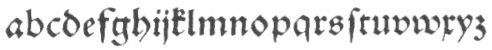 Bastarda (Schwabacher in German) dominated printing in Europe in the last part of the 15th and the first part of the 16th centuries. It breaks with the heavy Textura that Gutenberg used in his first books and his bible. All of the Lutherian books were set in Schwabacher, which was nearer to handwriting. It was probably first used by Johannes Bäumler in Augsburg in 1472. In any case, it was in use in Nürnberg in 1485, and showed up in 1490 in Anton Koberger's Schedelsche Weltchronik and in 1498 in Albrecht Dürer's Apokalypse. Examples: a hand-drawn Schwabacher from 1489, a sample by Johann Schoeffer in Mainz, dated 1521, and a fancy title page. In the middle of the 16th century, it was displaced by fraktur as the most-used German typeface. German link. Characterized by the pointed o (both top and bottom), the Asian-looking "g", the Garamond-like "h" and the "A" that thinks it is a "U", it was rejuvenated in the 18th century by German foundries such as Genzsch and Heyse (Alte Schwabacher, 1835, and Neue Schwabacher, 1876) and Klingspor (Offenbacher Schwabacher, 1900), and type designers such as Ehmcke (1916) and Schneidler (1918) who all produced beautiful readable typefaces.
 The French bâtarde (bastarda) became popular in France under the patronage of Jean, Duc de Berry, 1340-1416, and remained popular well into the 1600s. It is largely similar to Schwabacher although Schwabacher shows the (unreadable, U-like) open capital A that bâtarde avoids, as a rule. There are many digital Schwabacher typefaces. See, e.g., Alte Schwabacher by Berthold, Alte Schwabacher by URW++, or Adobe's Duc de Berry, Bigelow's Lucida Blackletter, or P22's SchwarzKopfNew and SchwarzKopfOld. [Google]
[More] ⦿
|
Bauersche Giesserei blackletter fonts
|
 Andreas Seidel lists the blackletter typefaces published by the Bauersche Giesserei (and I added a few more):
 - Flinsch Privat, 1919
- Renata, 1914. Digital revivals as renata by Gerhard Helzel, and later by Peter Wiegel.
- Bernhard Fraktur, 1913-22
- Frankfurter Fraktur, 1905 / after 1911 renamed to Flinsch Fraktur
- Flinsch Germanisch, 1876
- Zentenar Fraktur, 1937, named after the 100-year anniversary of the Bauer Foundry
- Herkules-Gotisch (1898)
- Hoyer Fraktur, 1935-37
- Weiß Gotisch, 1936, E. R. Weiß
- Weiß Rundgotisch, 1937
- Weiß Fraktur, 1914
- Element, 1933
- Gotika, 1933
- Laudan Kanzlei, 1913
- Manuskript Gotisch (1905-1923; note: I thought the correct date was 1899), made after letters created by Wolfgang Hopyl in 1514.
- Leipziger Fraktur, 1909
- Wieynck Fraktur, 1912, Prof. Heinrich Wieynck
- Gotisch, 1906, Georg Barlösius
- Enge Gotisch (1880). Digital version by Gerhard Helzel done in 2008.
[Google]
[More] ⦿
|
Bauersche Schriftgiesserei
|
 Frankfurt-based foundry started in 1837 by Johann Christian Bauer. At the end of the 19th century, the new owner was Georg Hartmann. On its staff, it had designers such as Konrad F. Bauer [Alpha (1954), Beta (1954), Folio (1956-63), Imprimatur (1952-55), Volta (1956), Verdi (1957), Impressum (1963), all made with Walter Baum], Lucian Bernhard [Bernhard Condensed, 1912], Hugo Steiner-Prag [Batarde, 1916], Julius Diez [vignetten, 1910-1912], Henri Wieynck [Trianon, 1906; Cursive Renaissance, 1912; Wieynck-Kursiv, 1912], Georg Hartmann, Paul Renner [Futura, 1937], Emil Rudolf Weiß [Weiß Fraktur, 1924], Berthold Wolpe [Handwerkerzeichen, 1936; Hyperion, 1931; Rundgotisch, 1938] and F.H. Ernst Scheidler [Legend, 1937]. In its glory period, Bauer's leader was Heinrich Jost (1889-1949), from 1922 until 1948, who with punchcutter Louis Hoell made a beautiful version of Bodoni, now known as Bauer Bodoni. A New York office was set up in 1927, but after the 1960s, the foundry declined and finally closed its doors in 1972. Its typefaces were passed on to its Barcelona branch, Fundición Tipográfica Neufville. See also here. Digitized typefaces include Futura ND (Paul Renner, redigitized by Marie-Therésè Koreman at Neufville in 1999), Edison Swirl SG (late 1800s, digitized by Spiece Graphics), Gable Antique Condensed SG (late 1800s, digitized by Spiece Graphics), Weiß (Bitstream, based on a family made in 1924-1931 by Emil Rudolf Weiss), Bauer Bodoni (1926, FT Bauer, made by Heinrich Jost and Louis Hoell), Bauer Bodoni (Adobe version), Candida (1936, now digitized at FT Bauer), Charme (1957, now available from FT Bauer), Impressum, Imprimatur, Venus (1907-1927, now at FT Bauer), Venus and Hermes (both available at Linotype; Venus is also at URW), Volta (1955), and Phyllis (1911, aka Wieynck Cursive). Other typefaces: Bernhard Cursive (1962), Constantia, Hellenic Wide (1962), Lucian (1962), Cantate (1962), Gillies Gothic (1962), Horizon (1962), Folio (1962), Bauer Beton (1962), Bauer Topic (1962), Bauer Classic (1962), Elizabeth (1962), Cartoon (1962), Trafton Script, Astoria, Lilith, Legend (1937), Fortune, Folio Kursiv, Folio Grotesk (1960), Cantate (1958), Papageno (1958), Verdi (1957), Amalthea (1957), Magic (1955), Steile Futura Kursiv (1955), Columna (1955), Maxim (1955), Tivolischmuck (1950), Symphonie (1938, by Imre Reiner, in 1945 called Stradivarius), Weiß Antiqua (1950), Legende (1950), Quick (1950), Ballé Initials (1940), Beton (1940), Corvinus (1934), Bernhard Roman (1930), Hyperion (1931), Volta Kursiv (1955), Rundgotisch (1938), Hoyer Fraktur (1935), Gotika (1934), Jubilaeums-Initialen (1902), Jubilaeums Antiqua (1902), Victoria Antiqua (1902), Künstler Grotesk, Lichte Futura (1931), Weiß Fraktur (1924), Reklameschrift Herkules, Herkules-Gotisch (1898), Enge Gotisch (ca. 1880: digital version by Gerhard Helzel), Ehmcke Antiqua (1921), Batarde (1916), Wieynck-Kursiv (1912), Zweifarbige Grotesk Kursiv, Cursive Renaissance (1912), Manuskript Gotisch (1899; after Wolfgang Hopyl, 1514), Graziosa (1914 or earlier, script face), Kleukens Antiqua (1910), Barlösius Schrift (1906-1907, H. Barlösius), Trianon (1906), Hohenzollern (1902, + Initialen), Telefunken (1959), Sinfonia (script), Amerikanische Alt-Gotisch (1903, influenced by Henry William Bradley's and Joseph Warren Phinney's 1895 art nouveau face, Bradley). Some of their vignettes were captured in Dieter Steffmann's Schluss Vignetten (2002). In house samples: AntiquaBrotschriften-IX-Garnitur, Einfache Kanzlei (ca. 1830), Enge halbfette Zeitungsfraktur, Fette Gotisch, Moderne halbfette Fraktur, Gotisch. [Google]
[MyFonts]
[More] ⦿
Frankfurt-based foundry started in 1837 by Johann Christian Bauer. At the end of the 19th century, the new owner was Georg Hartmann. On its staff, it had designers such as Konrad F. Bauer [Alpha (1954), Beta (1954), Folio (1956-63), Imprimatur (1952-55), Volta (1956), Verdi (1957), Impressum (1963), all made with Walter Baum], Lucian Bernhard [Bernhard Condensed, 1912], Hugo Steiner-Prag [Batarde, 1916], Julius Diez [vignetten, 1910-1912], Henri Wieynck [Trianon, 1906; Cursive Renaissance, 1912; Wieynck-Kursiv, 1912], Georg Hartmann, Paul Renner [Futura, 1937], Emil Rudolf Weiß [Weiß Fraktur, 1924], Berthold Wolpe [Handwerkerzeichen, 1936; Hyperion, 1931; Rundgotisch, 1938] and F.H. Ernst Scheidler [Legend, 1937]. In its glory period, Bauer's leader was Heinrich Jost (1889-1949), from 1922 until 1948, who with punchcutter Louis Hoell made a beautiful version of Bodoni, now known as Bauer Bodoni. A New York office was set up in 1927, but after the 1960s, the foundry declined and finally closed its doors in 1972. Its typefaces were passed on to its Barcelona branch, Fundición Tipográfica Neufville. See also here. Digitized typefaces include Futura ND (Paul Renner, redigitized by Marie-Therésè Koreman at Neufville in 1999), Edison Swirl SG (late 1800s, digitized by Spiece Graphics), Gable Antique Condensed SG (late 1800s, digitized by Spiece Graphics), Weiß (Bitstream, based on a family made in 1924-1931 by Emil Rudolf Weiss), Bauer Bodoni (1926, FT Bauer, made by Heinrich Jost and Louis Hoell), Bauer Bodoni (Adobe version), Candida (1936, now digitized at FT Bauer), Charme (1957, now available from FT Bauer), Impressum, Imprimatur, Venus (1907-1927, now at FT Bauer), Venus and Hermes (both available at Linotype; Venus is also at URW), Volta (1955), and Phyllis (1911, aka Wieynck Cursive). Other typefaces: Bernhard Cursive (1962), Constantia, Hellenic Wide (1962), Lucian (1962), Cantate (1962), Gillies Gothic (1962), Horizon (1962), Folio (1962), Bauer Beton (1962), Bauer Topic (1962), Bauer Classic (1962), Elizabeth (1962), Cartoon (1962), Trafton Script, Astoria, Lilith, Legend (1937), Fortune, Folio Kursiv, Folio Grotesk (1960), Cantate (1958), Papageno (1958), Verdi (1957), Amalthea (1957), Magic (1955), Steile Futura Kursiv (1955), Columna (1955), Maxim (1955), Tivolischmuck (1950), Symphonie (1938, by Imre Reiner, in 1945 called Stradivarius), Weiß Antiqua (1950), Legende (1950), Quick (1950), Ballé Initials (1940), Beton (1940), Corvinus (1934), Bernhard Roman (1930), Hyperion (1931), Volta Kursiv (1955), Rundgotisch (1938), Hoyer Fraktur (1935), Gotika (1934), Jubilaeums-Initialen (1902), Jubilaeums Antiqua (1902), Victoria Antiqua (1902), Künstler Grotesk, Lichte Futura (1931), Weiß Fraktur (1924), Reklameschrift Herkules, Herkules-Gotisch (1898), Enge Gotisch (ca. 1880: digital version by Gerhard Helzel), Ehmcke Antiqua (1921), Batarde (1916), Wieynck-Kursiv (1912), Zweifarbige Grotesk Kursiv, Cursive Renaissance (1912), Manuskript Gotisch (1899; after Wolfgang Hopyl, 1514), Graziosa (1914 or earlier, script face), Kleukens Antiqua (1910), Barlösius Schrift (1906-1907, H. Barlösius), Trianon (1906), Hohenzollern (1902, + Initialen), Telefunken (1959), Sinfonia (script), Amerikanische Alt-Gotisch (1903, influenced by Henry William Bradley's and Joseph Warren Phinney's 1895 art nouveau face, Bradley). Some of their vignettes were captured in Dieter Steffmann's Schluss Vignetten (2002). In house samples: AntiquaBrotschriften-IX-Garnitur, Einfache Kanzlei (ca. 1830), Enge halbfette Zeitungsfraktur, Fette Gotisch, Moderne halbfette Fraktur, Gotisch. [Google]
[MyFonts]
[More] ⦿
|
Ben Archer
[100types]
|
[More] ⦿
|
Best fonts of 2005 (Jan-Jun): Typographica
|
 The Golden Globe Awards of type design, nominated by regulars at Stephen Coles' Typographica, a selection from the ground up. I feel these are the true winners---unlike all those awards for which one has to apply, pay a fee and be subject to the scrutiny of a "selection committee". Masterfully brought to you by Stephen Coles---bravo! As Stephen himself notes this year (2005), there are three trends: (1) Gone are the days when large commercial outfits put out the bulk of serious type. Nine of the 14 top selections come from one-man studios. Meanwhile, several of the big boys (ITC, Linotype, Monotype, URW) are absent. (2) Nearly every featured font is available in OpenType, and many exclusively so. (3) Xavier Dupré: the Cambodia-based Frenchman is perhaps todays most productive single source of creative type design, rivaled only by Christian Schwartz. Drumrolls:
 - Lisboa (Ricardo Santos): Hrant Papazian writes: Lisboa harbors the sagacity to merely vie for — and thereby achieve — a simple Iberian warmth, something especially difficult in a sans. In the severely over-crowded field of humanist sans-serifs, Lisboa distinguishes itself through completeness (including expert characters and two numeral styles) and technical sophistication (as in its trapping), but mostly by providing two subtly varied cuts: one that helps exhibit the design's particular character; and another that eschews detail for maximal clarity in small sizes.
- Freight (Joshua Darden). Dyana Weissman: While we move out of the era of the antiseptic sans-serifs, Freight offers refreshing anomalies that warm up the design.[...] This family is insane. Not only because of the 100 styles, but also because of its charming little quirks.
- Ministry Script (Alejandro Paul). Paul Hunt comments: How do you convey sexiness with type? Use a sultry script face. The only thing more typographically titillating might be a set of canoodling ligatures.
- Garamond Premier Pro (Robert Slimbach).
- Deréon (Jean-François Porchez). Chris Rugen writes: When I see Déreon, I see a Whitman and Dalliance mix (two of my favorites) creating something unique. Like Whitman, Deréon gets its body from the Scotch Didone Caledonia.
- Proxima Nova (Mark Simonson). Kyle Hildebrant: It nestles neatly in a place between the geometric, grotesque, and gothic. Its generous x-height, thoughtfully balanced color, and expert typographic features (small caps, text figures, lining figures, etc.) position it as a prime candidate for extended textual setting.
- Zingha (Xavier Dupré, Font Bureau). Norbert Florendo comments: Reviewing Zingha is as delightful as discovering several long lost cases of unreleased ATF hot metal typefaces.
- Vista Sans (Xavier Dupré). Stephen Coles: With its friendly quirks, Vista Sans is a lot like Tarzana — another Emigre font — but succeeds everywhere Tarzana fails. The more distinctive glyphs feel harmonious with the rest of the font, never jarring. Gentle swashes and a large x-height make for a friendly sans that would work just right in so many settings.
- Cézanne Pro (James Grieshaber).
- FF Maiola (Veronika Burian). Dan Reynolds drools: Just when you thought your collection's text categories were set, Veronika Burian burst the stable doors open, reviving the Czech genre and its warm idiosyncrasies. A “warm” typeface? FF Maiola solves this puzzle using discrete play of irregularity and multiple angles, hearkening back to Menhart and Preissig's approaches.
- Maple (Eric Olson). Mark Simonson: Other type designers have mined the 19th century English grotesque, but Eric Olson gives it an energetic crispness which makes earlier attempts seem a bit stuffy. Maple captures the exuberant quirkiness of the grots without slavishly imitating them.
- Garda (Mario Feliciano). William Berkson notes: With great elegance and style—and alternative characters and ligatures—the set offers superb alternatives to Trajan, Optima, and Futura for titling.
- Litteratra (Karsten Lücke). Yippie! Keep it up, Karsten! Joshua Lurie-Terrell: It's a sort of roman amalgam of textura and Schwabacher, channeling the expressionist spirit of Vojtech Preissig. [...] It's an entire historical movement.
- Relato (Eduardo Manso). My compatriot Yves Peters: Emtype Relato combines Dutch purposefulness with Latin sensuality. Its serifs are constructed following a clever principle, and the typefaces look simply gorgeous.
Honorable mentions: FF Absara Sans (Xavier Dupré), Amor (František Storm), Arrival (Keith Tam), Avebury Black and Open (Jim Parkinson), Ayres Royal (Gert Wiescher), Bembo Book (Robin Nicholas), Bluemlein Scripts (Alejandro Paul), Botanika (Tomáš Brousil), Cabazon (Jim Parkinson), Chocolate (Angel Koziupa and Alejandro Paul), Crank8 (Greg Lindy & Henk Elenga), Deutsche Bahn [PDF] (Christian Schwartz and Erik Spiekermann), Dynasty (Rian Hughes), Fedra Sans Display (Peter Bilak), Flama (Mário Feliciano), Galicia (Rian Hughes), Gill Sans Pro (Monotype), Groovin' (Jason Walcott), Handsome Pro (Nick Shinn), Happy Hour (Jason Walcott), Incognito (Gábor Kóthay), Kaffeesatz (Jan Gerner), Kingfisher (Jeremy Tankard), Lapture (Tim Ahrens), Mashine (Tim Ahrens), Mercury Display & Text (Jonathan Hoefler & Tobias Frere-Jones), Miserichordia (Rian Hughes), Modesto Text (Jim Parkinson), Morice (Stephen Banham), Nerva (Dino dos Santos), Nicholas (Nick Shinn), Ogravan (Tomáš Brousil), Paperback (John Downer), Propane (David Buck), Radiogram (Rian Hughes), Rough Riders and Redux (Michael Hagemann), Sculptura (Jason Castle), ITC Stone Humanist Sans (Sumner Stone), Soap (Ray Larabie), Sovereign (Nick Cooke), Tamarillo (Jason Walcott), Tourette (Jonathan Barnbrook), Wanderer (Michael Hagemann). [Google]
[More] ⦿
|
Blackletra
[Daniel Sabino]
|
 Brazilian type designer Daniel Sabino de Souza studied under Laura Meseguer at the Eina-Escuela Superior de Disseny in Barcelona. His foundry in Sao Paulo is called Blackletra (est. 2012). He has taught type design at IED/Sao Paulo.
 He won an award at Tipos Latinos 2012 and at TDC 2013 for Karol. In 2012, he won the Silver Prize in the Latin category of the Morisawa Type Design Competition for Hashar, a beautiful angular connected script face. In 2013, he published Karol at Type O Tones. Falado (2013) is a delicate display typeface commissioned by Estudio Mucho for the graphic identity of the Spanish orchestra La Filarmónica. It won a Gold Medal at Laus'13. In 2014, he designed the superb angular script typeface Haltrix (Village). Karol Sans was published at Type-o-Tones in 2014. Haltrix, Gandur (which was inspired by other geometric texturas, specially Max Bittrof's Element (1933)) and Karol Sans all won awards at Tipos Latinos 2014. Expectedly, Haltrix won an award in the TDC 2015 Type Design competition. Gandur New (German expressionist) and Gandur Alte (closer to Textura) followed in the summer of 2014. In 2015, he released Silva (Text, Display), a typeface co-designed with Chester Jenkins. Gothiks (2015, Village), Gothiks Compressed (2016) and Gothiks Condensed (2016), a family of condensed typefaces of varying widths and thicknesses that hearken back to the gothic wood types, and Latam Sans (2015, a custom typeface for Latam Airlines) won awards at Tipos Latinos 2016. Typefaces from 2016 include Ofelia Std, a corporate sans family characterized by a lower case f that looks like a stretched s. Typefaces from 2017: Noka (a sci-fi geometric sans characterized by its curvy f and hipster g). Typefaces from 2019: STC Forward (a bespoke sans typeface for Saudi Telecom Company), Gothiks Round Compressed, Gothiks Round Condensed, Gothiks Round. Typefaces from 2020: Elizeth and Elizeth Condensed (a slab serif by Daniel Sabino, Lucas Gini and Henrique Beier), Skol Display (a forceful poster sans), Ofelia Text and Display, Ekos (an all caps typeface designed for the Natura Ekos brand). Typefaces from 2021: Silva Display (a 16-style serif). Winner at Tipos Latinos 2018 of a type design award for Elizeth. Village link (since 2014). Behance link. [Google]
[MyFonts]
[More] ⦿
|
Bookhands
[Peter R. Wilson]
|
 Renton, WA-based Peter R. Wilson's metafont code (2000-2003) for the "bookhands" series of fonts. It was his intention to provide the main examples of manuscript hands from the first century until the invention of printing. Included are the following:
 [Google]
[More] ⦿
|
Bosil Unique Fonts
[Michael Bolen]
|
American designer Michael Bosen or Michael Bolen (Bosil Unique Fonts) made these fonts in 2003: Mikie's Christmas List (hand-printed), Bosil Unique Regular (comic book face), Bosil Marker, BU DeBoned, BU Boned, Uniquely Sprayed (grunge), Slightly Dinged, Bu Handy Dings (hands, including fists), and "the finger"), Bu Marker SC. In 2012, he added BU Gothic Hybrid (a hybrid of grunge calligraphy and blackletter). Typefaces from 2013: BU Dingbats Sans Purpose (scanbats), BU Wicked, BU Richard The Second (textura), Bu 1757 Bordelish (frilly ball terminal caps), Bu Darn Cupids Again (Valentine Day's font), BU Penfield Deco (loosely based on a font by Edward Penfield at the turn of the 20th century), BU Bernhard Pen (loosely based on a style by Bernhard Pankok from the turn of the 20th century), BU Scarecrow (gothic font based on the hand of Walter Crane), BU Glenda, BU Oscar Diggs. [Google]
[More] ⦿
|
Calligraphy Shop
|
Daniel Quinn's calligraphy shop in Firenze shows nice examples of these hands (names in Italian): Onciale, Maiuscola Insulare, Minuscola Insulare, Carolina, Gotico Antico, Textura Quadrata, Capitali Gotiche, Beneventana, Rotunda, Capitali Rotunda, Bastarda Cancelleresca, Batarde Français, Fraktur Tedesca, Capitali Bastarde, Cadel, Capitali Longobarde, Foundational. [Google]
[More] ⦿
|
CAT Design Wolgast
[Peter Wiegel]
|
 Wolgast-based type designer Peter Wiegel (b. 1955) runs CAT Design Wolgast. Designer of these free fonts:
 - In 2019: Kufi Pattern.
- In 2018: Aurach Tri (a trilined typeface), Googee (monoline circle-themed sans), Gianna (medieval script), Hamburger Schwabacher.
- In 2017: Eyechart (heavy slab serif), Border Control (inline), Espresso Dolce (rounded sans), Gotisch Weiss, Halt (a dry brush typeface after Walter Hoehnisch's Stop from 1939), Kanzler, Llewie (rounded sans), Schulze Werbekraft (expressionist, after Arthur Schulze, 1926).
- In 2016: Ronaldson Gothic (after a MacKellar, Smiths & Jordan Co original), Vorgang (a great 1920s geometric sans), 5by7 (LED pixel font), BP 12-22 (industrial sans), u DIN 1451 Mittelschrift, Flubby, Gaeilge (Irish / uncial), Junior CAT (after Hans Heimbeck, 1936), CAT Liebing Gotisch (after Kurt Liebing), Tippa (an old typewriter font based on Adler Tippa 1).
- In 2015: Nuernberg (blackletter), CAT Schmalfette Thannhaeuser (blackletter), Offenbacher Reform (a revival of Offenbacher Reform, a blackletter typeface by Roos & Junge), Autobahn (blackletter), Barloesius Schrift (after Georg Barloesius's Barlösius Schrift, 1906), CAT-Franken-Deutsch (after Alfons Schneider, 1936), Fuckin Gwenhwyfar, CAT Kurier (a script after Herbert Thanhaeuser's Kurier from 1939), CAT Linz, CAT Rhythmus (a sharp-edged black grotesk after a Schriftguss AG original), DIN Schablonierschrift (DIN-based stencil), CAT North Licht, Feronia, Fette National Fraktur (after Walter Hoehnisch, 1934), Grobe-Plakat-Fraktur, CAT Childs (fifties style cursive typeface), Jena Gotisch (decorative caps), Kabinett Fraktur (after Johann Friedrich Unger, 1793-1794), Wattauchimma (heavy hipster sans), Friedolin (blackletter), Lorem Ipsum, Symphonie (a calligraphic script, reviving Imre Reiner's Symphonie (1938), also called Stradivarius (1945)), Power (a retro techno typeface), Krugmann Brush, Omega.
- In 2014: BernerBasisschrift1, BernerBasisschrift2 (school script), Berolina, Brausepulver (after Brause & Co., 1912), Fette Mikado (psychedelic style oriental look), Germanica, Gloria, HentimpsCirclet (blackletter), Hofstaetten (blackletter), Kleinsemmering, KuenstlerGotisch (blackletter), LacledeCAT (psychedelic), NeptunCAT, Neue Zier Schrift (a mischievous curly script), Pommern Gotisch, Reclame, CAT Report (retro brush script), Rueck-Italic, Rueck, RueckLeft, RueckLicht, RundschriftCAT (hairline ronde), Standard Graf (German expressionist and hexagonal typeface), Teutonic, VerzierteFavorite, VictoriaCAT, AdmiralCAT (a retro script), Dynamo (poster font), Des Malers Fraktur, Kanzleyrath (blackletter), Ober-Tuerkheim (art nouveau), PopplFrakturCAT (blackletter), Rundkursiv, Modeschrift (fifties script), Biedermeier Kursiv, Ehmcke Federfraktur (after a 1935 font by F.H. Ehmcke), Wernicke Schwabacher (after an original by Emmi Wernicke), Gotische Missalschrift, Hand Textur (after a 1935 font by F.H. Ehmcke), Renata (after a 1914 bastarda by Bauersche Giesserei), Rundgotisch Rauh (possibly after a Schelter & Giesecke design from 1903), Offenbacher Schwabacher (after Kurt Wanschura's bastarda from 1900), Incopins Clusters (multilined typeface), BadGong, Bernardo Moda (Bold, Semibold, Moda, Contrast: modeled after Lucian Bernhard's Bernhard fashion), CAT-Hohenzollern (after a 1902 art nouveau font by Bauersche), CATNorth, CATNorthLicht, CATNorthShadow, CAT Zentenaer Fraktur UNZ1 (a blackletter after a 1937 original by F.H.E. Schneidler), Coggers-Tariqa, EirikRaude, Fabrik (a geometric sans), Grobe Deutschmeister (German expressionist face), Harry Piel (or Piehl--a tattoo font), Kanalisirung, Klaber-Fraktur, Peter Obscure, Rumburak (a fat retro script), Flottflott (retro script), Indira K, Regent UNZ (a Schwabacher), Postamt, TGL 0-1451 Engschrift (a DIN-like font).
- In 2013: Spartakus (+Round), Cut Me Out (white on black sans), 5by9 (dot matrix face), Tartlers End (high-contrast ball terminal face), Alpha 54 (rounded flared script face), Chunk Five Ex (slab serif; he writes: With permission of Meredith Mandel, the original author of the ASCII-Font Chunk Five, I have extended Chunk Five Ex to a full featured unicode font with all figures used in Latin and Cyrillic writing), Simple Print (simple sans), Fette Bauersche Antiqua (a didone fat face), Manuskript Gothisch (after Manuskript Gotisch (1899, Bauersche), which was modeled after Wolfgang Hopyl's 1514 Textura), Quast (hairy font).
- Still in 2013, he published a number of school scripts, including Neue Rudelskopf, Deutsche Normalschrift, Imrans School, Rastenburg (German school font), and Bienchen.
- In 2012: Hardman (connected fifties script), Immermann (a quaint slab serif), Quast (grunge), Fundamental Brigade (sans family), DiffiKult (a bilined face), Men Nefer (a Memphis lookalike), Fette Unz Fraktur (like Fette Fraktur), Mutter Krause (for the reconstruction of the 1929 silent movie "Mutter Krausens Fahrt ins Glück", where it is used for intertitles, that where missing. The font is redrawn from the original intertitles), Youbilee (a font with laurels).
- In 2010: Alfabilder (dingbats), Gondrin (athletic lettering with a 3d effect), Helvetia Verbundene (making Helvetica into a school script? The original typeface was by Carl Albert Fahrenwaldt 1901), Proletarsk (a grotesk face), Vis-à-vis (great idea--a double-storied serif face), ApolloASM (Victorian), BertholdrMainzerFraktur, Doergon-Regular (license plate font), DoergonBackshift, DoergonShift, Eureka (Victorian, ornamental face), GoeschenFraktur (1880-style Fraktur used in Sammlung Göschen books), Makushka, MakushkaKontura, MakushkaQuadriga, MakushkaSecunda, Moderne3DSchwabacher, ModerneGekippteSchwabacher, StrassburgFraktur, TGL0-16 (same as DIN 16), TGL0-17 (same as DIN 17), TGL0-17Alt, Tank (emblems of gas companies), EricaType-Bold, EricaType-BoldItalic, EricaType-Italic, EricaType-Regular (typewriter), ErikaOrmig, Fibel Vienna (2012, a high-legged sans), GreifswalderTengwar-Regular, GreifswalerDeutscheSchrift (German Schreibschrift), Midroba-Regular (a strong mechanical octagonal face), MidrobaSchatten, MMX2010 (futuristic), Präsent60, Rotunda Pommerania (blackletter), TengwarOptime, TengwarOptimeDiagon, cbe-Bold, cbe-BoldItalic, cbe-Italic, cbe.
- In 2009: 18thCenturyInitials, 18thCenturyKurrent-Regular, 18thCenturyKurrentAlternates, German writing from the 18th century), CentreClaws, CentreClawsBeam1, CentreClawsSlant, Cöntgen Kanzley Regular (blackletter), Cöntgen Kanzley Aufrecht (2009), ElficCaslin, H1N1, Loxembourg1910Shadow (an art nouveau-influenced stencil face), Luxembourg1910, Tschichold, VarietScala (an art deco sans family), Varietee, VarieteeArtist, VarieteeCabaret, VarieteeCascadeur, VarieteeCasino, VarieteeCirque, VarieteeColege, VarieteeConferencier, VarieteeFolies, VarieteeIkarier, VarieteeJongleur, VarieteeMirage, VarieteeRevue, VarieteeTheatre, KochFetteDeutscheSchrift (blackletter), MoradoFelt-Regular (upright connected script), MoradoMarker (2009), MoradoNib, PreussischeVI9 (DIN-like family), PreussischeVI9Linie, PreussischeVI9Schatten-Linie, PreussischeVI9Schatten, SchatternvonPreussischeVI9, Stage (art deco), Ring Matrix (dot matrix), Nathan, Amptmann Script (2009, upright connected script), Cat Shop, Blankenburg (blackletter), Murrx (arched face), Schwaben Alt (1988, bastarda), Vrango, 14LED (Regular, Phattt-Heavy, Rised-Black), 24LED (+Bright, +Grid, +Modul), DIN1451fetteBreitschrift1936-Regular, FibelNord (basic sans family with an architectural twist), FibelSued (family), PaneuropaBankette, PaneuropaCrashbarrier-Black, PaneuropaFreeway, PaneuropaHighway, PaneuropaRoad, PaneuropaStreet, PaneuropaWrongWay, Quirkus (family), RingMatrix (dot matrix family), RingMatrix3D, RingMatrixTwo, DiscipuliBritannica (connected script), GruenewaldVA-Regular (connected school script), Rudelskopfdeutsch-Aufrecht, WiegelLatein (connected school script), WiegelLateinMedium (2009), Morado, Moebius Bicolor (art deco), Elbaris (sans), ElbarisOutline, Nomitais (multiline face), RostockKaligraph, Waschkueche, WaschkuecheGrob-Ultra, WiegelKurrent (traditional German school script), WiegelKurrentMedium, XAyax, XAyaxOutline (2009), Kaufhalle (squarish), Quimbie (art deco), CasaSans-Regular, Elb-Tunnel, MeyneTextur (blackletter), Yiggivoo, TGL 31034-1 (futuristic sans), Beroga (a simple organic sans).
- Before 2009: Xayax, PreussischeIV44Ausgabe3 (2006, a severe sans), Utusi Star (1989, very condensed all-caps face), Avocado (2006, script face), CbeNormal (2006, script face), Leipzig Fraktur (+Bold) (2006), Berlin Email (2006, a condensed sans family, followed in 2009 by Berlin Email Serif), MaassslicerItalic (2006, a futuristic typeface made for Rudolf Maass + Partner GmbH), Powerweld (a gorgeous avant-garde typeface made for OPTI Pumpen und Technik GmbH), WolgastScript (2005), WolgastTwo (2006, connected script), WolgastTwoBold, ZeichenDreihundert-Regular, ZeichenHundert-Regular, ZeichenVierhundert-Regular, ZeichenZweihundert-Regular (2006, traffic dingbats), Djerba simplified (Arabic font, Computer and Technologie, Hamburg, 1995; it can be downloaded here), Titus FrakturBaltic (1998), TITUS FrakturEast Normal (1998), and TITUS FrakturWest Normal (1998) [which used to be downloadable here; these fonts were retired and the Titus name dropped; most of the glyphs made it to Schwaben Alt].
Dafont link. One more URL. Fontspace link. Yet another URL. Font Squirrel link. Fontsy link. The list of his truetype and opentype typefaces as of 2011: 18thCenturyInitials, 18thCenturyKurrentStart, 18thCenturyKurrentText, Alfabilder, AlteDIN1451Mittelschrift, AlteDIN1451Mittelschriftgepraegt, AmptmannScript, ApolloASM, Avocado, Barnroof, BerlinEmail, BerlinEmail2, BerlinEmailBold, BerlinEmailBold, BerlinEmailHeavy, BerlinEmailHeavy, BerlinEmailOutline, BerlinEmailOutline, BerlinEmailSchaddow, BerlinEmailSchaddow, BerlinEmailSemibold-Bold, BerlinEmailSemibold-Bold, BerlinEmailSerif, BerlinEmailSerif, BerlinEmailSerifSemibold, BerlinEmailSerifSemibold, BerlinEmailSerifShadow, BerlinEmailWideSemibold, BerlinEmailWideSemibold, Beroga, Beroga, BerogaFettig-Bold, BerogaFettig-Bold, BertholdMainzerFrakturUNZ1A-Italic, BertholdMainzerFrakturUNZ1A, BertholdrMainzerFraktur, Blankenburg-Regular, BlankenburgUNZ1A-Italic, BlankenburgUNZ1A, CasaSans-Regular, CasaSans, CasaSansFettig-Bold, CatShop, CentreClaws, CentreClawsBeam1, CentreClawsSlant, ChunkFiveEx, CntgenKanzley-Regular, CntgenKanzleyAufrecht, DIN1451fetteBreitschrift1936-Regular, DiscipuliBritannica, DiscipuliBritannicaBold, Doergon-Regular, DoergonBackshift, DoergonShift, DoergonWave-Regular, Elb-Tunnel, Elb-TunnelSchatten, Elbaris, ElbarisOutline, ElficCaslin, EricaType-Bold, EricaType-BoldItalic, EricaType-Italic, EricaType-Regular, ErikaOrmig, Eureka, FibelNord-Bold, FibelNord-BoldItalic, FibelNord-Italic, FibelNord, FibelNordKontur, FibelSued-Bold, FibelSued-BoldItalic, FibelSued-Italic, FibelSued, FibelSuedKontur, GoeschenFraktur, GoeschenFrakturUNZ1A-Italic, GoeschenFrakturUNZ1A, Gondrin, GreifswalderTengwar-Regular, GreifswalerDeutscheSchrift, GruenewaldVA-Regular, GruenewaldVA1.Klasse, GruenewaldVA3.Klasse, H1N1, HelvetiaVerbundene, KochFetteDeutscheSchrift, KochFetteDeutscheSchriftUNZ1A-Italic, KochFetteDeutscheSchriftUNZ1A, LeipzigFrakturBold, LeipzigFrakturHeavy-ExtraBold, LeipzigFrakturLF-Bold, LeipzigFrakturLF-Normal, LeipzigFrakturNormal, LeipzigFrakturUNZ1A-Bold, LeipzigFrakturUNZ1A-BoldItalic, LeipzigFrakturUNZ1A-Italic, LeipzigFrakturUNZ1A, Luxembourg1910, Luxembourg1910Contur, Luxembourg1910Ombre, MMX2010-Regular, Maassslicer3D, Maassslicer3D, MaassslicerItalic, MaassslicerItalic, Makushka, MakushkaKontura, MakushkaQuadriga, MakushkaSecunda, MeyneTextur, MeyneTexturUNZ1A-Italic, MeyneTexturUNZ1A, Midroba-Regular, MidrobaSchatten, Moderne3DSchwabacher, ModerneFetteSchwabacher, ModerneFetteSchwabacherUNZ1A-Italic, ModerneFetteSchwabacherUNZ1A, ModerneGekippteSchwabacher, MoradoFelt-Regular, MoradoMarker, MoradoNib, MoradoSharp-Regular, Murrx, Nathan-CondensedRegular, Nathan-ExpandedRegular, Nathan-Semi-expandedRegular, Nathan, NathanAlternates-CondensedRegular, NathanAlternates-ExpandedRegular, NathanAlternates-Semi-expandedRegular, NathanAlternates, Nomitais, Nomitais, Numikki, Numukki-Italic, Numukki-Italic, Numukki, Powerweld, PreussischeIV44Ausgabe3, PreussischeIV44Ausgabe3, PreussischeVI9, PreussischeVI9Linie, PreussischeVI9Schatten-Linie, PreussischeVI9Schatten, Proletarsk, Prsent60, Quimbie, Quimbie3D, QuimbieShaddow, QuimbieUH, Quirkus-Bold, Quirkus-BoldItalic, Quirkus-Italic, Quirkus, QuirkusOut, QuirkusUpsideDown, RostockKaligraph, RotundaPommerania, RotundaPommeraniaUNZ1A-Italic, RotundaPommeraniaUNZ1A, Rudelskopfdeutsch-Aufrecht, SchatternvonPreussischeVI9, Schulfibel-Nord-Linie-2, SchwabenAlt-Bold, SchwabenAltUNZ1A-Italic, SchwabenAltUNZ1A, Stage, StrassburgFraktur-Regular, TGL0-16, TGL0-17, TGL0-17Alt, TGL31034-1, TGL31034-1, TGL31034-2, TGL31034-2, Tank, TengwarOptime, TengwarOptimeDiagon, TitilliumMaps29L-1wt, TitilliumMaps29L-400wt, TitilliumMaps29L-800wt, TitilliumMaps29L-999wt, TitilliumText22L-1wt, TitilliumText22L-250wt, TitilliumText22L-400wt, TitilliumText22L-600wt, TitilliumText22L-800wt, TitilliumText22L-999wt, TitilliumTitle20, UtusiStar-Bold, UtusiStar, VarietScala, Varietee, VarieteeArtist, VarieteeCabaret, VarieteeCascadeur, VarieteeCasino, VarieteeCirque, VarieteeColege, VarieteeConferencier, VarieteeFolies, VarieteeIkarier, VarieteeJongleur, VarieteeMirage, VarieteeRevue, VarieteeTheatre, Via-A-Vis, Vrng, Waschkueche, Waschkueche, WaschkuecheGrob-Ultra, WaschkuecheGrob-Ultra, WiegelKurrent, WiegelKurrent, WiegelKurrentMedium, WiegelKurrentMedium, WiegelLatein, WiegelLateinMedium, WolgastScript, WolgastScript, WolgastTwo, WolgastTwo, WolgastTwoBold, WolgastTwoBold, XAyax, XAyax, XAyaxOutline, XAyaxOutline, YiggivooUnicode-Italic, YiggivooUnicode-Italic, YiggivooUnicode, YiggivooUnicode, YiggivooUnicode3D-Italic, YiggivooUnicode3D-Italic, YiggivooUnicode3D, YiggivooUnicode3D, ZeichenDreihundert-Regular, ZeichenDreihundertAlt, ZeichenHundert-Regular, ZeichenHundertAlt, ZeichenVierhundert-Regular, ZeichenZweihundert-Regular, ZeichenZweihundertAlt, cbe-Bold, cbe-BoldItalic, cbe-Italic, cbe, kaufhalle, kaufhalle, kaufhalleblech, kaufhalleblech, moebius. His type 1 fonts as of 2011: Avocado, BerlinEmail, BerlinEmail2, BerlinEmailBold, BerlinEmailHeavy, BerlinEmailOutline, BerlinEmailSchaddow, BerlinEmailSemibold-Bold, BerlinEmailSerif, BerlinEmailSerifSemibold, BerlinEmailSerifShadow, BerlinEmailWideSemibold, Beroga, BerogaFettig-Bold, CasaSans, Elb-Tunnel, Elb-TunnelSchatten, Maassslicer3D, MaassslicerItalic, Numukki-Italic, Numukki, Powerweld, PreussischeIV44Ausgabe3, Quimbie, QuimbieUH, RostockKaligraph, TGL31034-1, TGL31034-2, UtusiStar-Bold, UtusiStar, Waschkueche, WaschkuecheGrob-Ultra, WolgastScript, WolgastTwo, WolgastTwoBold, YiggivooUnicode-Italic, YiggivooUnicode, YiggivooUnicode3D-Italic, YiggivooUnicode3D, cbe-Bold, cbe-BoldItalic, cbe-Italic, cbe, kaufhalle, kaufhalleblech. A list of typefaces in alphabetical order, with descriptive comments provided by Reynir Heidberg Stefansson from Iceland: 18th Century Kurrent (Kurrent-style handwriting, Wiegel-coded), Alfabilder (Alphabetic picture font for the German alphabet), Amptmann Script (Partly-connected, upright writing, used on Prussian Railways pattern drawings), ApolloASM (Jugendstil, vaguely resembling an ornate Bocklin), Avocado (Handwriting, broad-nib pen-style), Berlin Email (Narrow sans-serif, based on emailled signage; Wiegel-coded), Berlin Email Serif (Narrow serif, based on emailled signage; Wiegel-coded), Beroga (All-minuscule, rounded marker-style sans-serif with ca. 8° slope), Berthold Mainzer Fraktur (Fraktur in Wiegel (Regular only) and UNZ1(A) coding), Blankenburg (Semicondensed Tannenberg in Wiegel (Regular only) and UNZ1(A) coding), Casa Sans (Squarish, broad-nib pen-style block writing), CatShop (Serif, soft of an acid-washed didone), cbe Normal (Sans-serif, narrow, somewhat cuneiform), Centre Claws (Sans-serif, Art Deco display, a bit like Broadway), Cöntgen Kanzlei (Cöntgen Kanzley) (Fraktur-based calligraphy by Heinrich Hugo Cöntgen, Wiegel coding), DiffiKult (Sans-serif, display, no horizontal lines), DIN 1451 fette Breitschrift 1936 (The now-withdrawn Wide version of DIN 1451 traffic font), Discipuli Britannica (UK school handwriting), Doergon (Slab-serif, narrow-ish, all majuscule), CAT Eckmann, Elabris (Elbaris) (Sans-serif, caps/smallcaps, shades of DIN1451 Engschrift), Elb-Tunnel (Sans-serif, based on signage in the old Elbe tunnel in Hamburg), Elbic Caslon (Elfic Caslon, Elfic Caslin) (a Caslon for the Queen Galadriel), Erika Type (Erica Type) (Slab-serif, typewriter, comes from Wiegel's old Erika typewriter), Eureka (Serif, caps/smallcaps, Art Deco/Jugendstil), Fibel Nord (2009, sans-serif, based on German school primer), Fibel Sued (2009, sans-serif, based on German school primer), Fibel Vienna (Sans-serif, based on Austrian school primer), Fundamental Brigade (Sans-serif, geometric, some UNZ1 ligatures), Göschen Fraktur (Goeschen Fraktur) (Fraktur with a biblical feel, Wiegel (Rg only) and UNZ1 coding), Gondrini (Gondrin) (Sans-serif, geometric, display, shaded outlines, cookie-cutter), Greifswalder Deutsche Schrift (Handwriting, based on Rudolf Koch's Offenbacher Kurrent, Wiegel coding), Greifswalder Tengwar (Tengwar handwriting in Offenbach style), Gruenewald VA (Latin-style schoolhand, Wiegel coding), H1N1 (Heavy display typeface made of parallel wavetrains), Hardman (Heavy, wide, squarish logotype with connecting letters), Helvetia Verbundene (Swiss handwriting), Immermann (Display, resembles a seriffed Radio/Rundfunk, UNZ1 coding), Kaufhalle (Display, recreation of HO Kaufhalle logotype), Koch Fette Deutsche Schrift (Very plain fraktur, Wiegel (Rg only) and UNZ1 coding), Leipzig Fraktur (Fraktur for bread text, Wiegel coding), Leipzig Fraktur UNZ1A (Fraktur for bread text), Luxembourg 1910 (Sans-serif, Jugendstil display typeface from old spice drawers), Maass Slicer (Maassslicer) (Sans-serif, oblique display face, orig. logotype), Makushka (Sort-of an Elabris with minuscules, looks overlayable), Men Nefer (Slab-serif, geometric, UNZ1 coding), Midroba (Spur-serif, display, all-majuscule, heavy, octal), MMX2010 (Sans-serif, display, caps/smallcaps, TV game machine feel), Moderne Schwabacher (Heavily reworked, Wiegel coding), Moderne Fette Schwabacher UNZ1A (Heavily reworked, Wiegel coding), Möbius (moebius) (Sans-serif, display, bicolour (u/c = non-spacing fills, l/c = spacing outlines)), Morado (Connected handwriting with nib or marker pen), Murrx (Heavy display typeface made from ellipsoids on NE-SW axis), Mutter Krause (Serif, slanting, Jugendstil-feel), CAT Neuzeit and CAT Neuzeit Schatten (2012-2014), Nathan (Slab-serif, hand-drawn.), Nomatais (Nomitais) (Elabris with multiple levels of outlines), Numukki (Conlang, knotted-line, good for separators and scenebreaks), Powerweld (Sans-serif, Bauhaus style, all-minuscule), Präsent 60 (PI font with various East German logos), Preussische IV 44 (PreussischeIV44Ausgabe3) (Repro of Prussian Railways pattern type IV 44 version 3), Preussische VI 9 (Repro of Prussian Railways pattern type VI 9 version 2), Proletarsk (Sans-serif, monoline, doubled-up questionmark), Quast (Brush type, all-majuscule, very rough outline), Quimbie (Sans-serif, all-majuscule, resembles Amelia), Quirkus (Sans-serif), Ring Matrix (LED matrix with ring LEDs, solid LEDs and ring LEDs with shadow), Rostock Kaligraph (Very round calligraphy, resembles rotunda), Rotunda Pommerania (Rotunda style, Wiegel-code (Regular only) or UNZ1-coded), Rudelskopf deutsch (Sans-serif, based on Kurrent-style letterforms), Schwaben Alt (Schwabacher in Wiegel- (Rg only) or UNZ1-coding.), Stage (Sans-serif, narrow, Art Deco, fleeting taste of Broadway), Strassburg Fraktur (Handwritten fraktur, ornate majuscules, Wiegel-coding), Tank (PI font with (gas/petrol) tank station logos), TengwarOptime (Optima for Tengwar), TGL 0-16/0-17 (East German versions of DIN 16 and DIN 17 blueprint types), TGL 31034-1, TGL 31034-2 (East German versions of DIN 6776 / DIN EN ISO 3098 blueprint types), Utusi Star (Sans-serif, slight resemblance with Rundfunk), Varieté (Sans-serif, all-majuscule or caps/smallcaps), Vis-A-Vis (Serif, all-majuscule, split in middle), Volk Redis (Kurrent handwriting, anno 1930-1941), Vrångö (LED matrix type like Ring Matrix), Waschküche (Serif, resembles Antykwa Torunska), Wiegel Kurrent (Kurrent-style handwriting), Wiegel Latein (Latin-style handwriting), Wolgast Script (Sloppy-looking handwriting with a broad-nib pen), Wolgast Two (Latin/Cyrillic handwriting), XAyax (Serif, Jugendstil, narrow, all-majuscule), Yiggivoo Unicode (Sans-serif, wide, tall x, board game packaging feel), Youbilee (PI font with various jubilee laurels), Verkehrszeichen (Zeichen) (PI fonts with traffic signs (in layers)), Verkehrszeichen alt (Zeichen Alt) (PI fonts with old traffic signs (in layers)). Abstract Fonts link. Dafont link. Kernest link. Klingspor link. CAT Fonts link. Fontesk link. [Google]
[More] ⦿
|
Catharsis
[Christian "Cinga" Thalmann]
|
 Catharsis is located in Leiden, The Netherlands. Before that, Christian Thalmann's page Cinga.ch was run out of Switzerland, when he was a student at ETH Zürich. Thalmann is an astrophysicist by training.
 Catharsis had free typefaces such as the great Arabic simulation typeface Catharsis Bedouin (2004), CatharsisCircular, CatharsisRequiem (a unicase pair), CatharsisRequiemBold, CatharsisCargo, Cirnaja Bookhand and Cirnaja Calligraphy (made for his artificial language, Obrenje), Catharsis Macchiato (2005), CatharsisEspresso (2005). At Catharsis, the commercial foundry, he published Octant in 2013: Octant is an original steampunk display typeface drawing inspiration from Victorian-age steel and brass engineering, as well as from blackletter typography. Gryffensee (2013, in styles called Eins, Zwei and Drei) is designed to be the Futura of blackletter, combining the time-honored gravity and relentlessness of the Gothic script with the clean, contemporary freshness of the geometric sans. It also covers Cyrillic. Backstein (2013), baked brick, took its inspiration from the broken antiqua lettering in Berlin's old subway stations. Volantene Script (2013) is a (free) uncial display typeface inspired by the penmanship of Lady Talisa Maegyr-Stark as seen on HBO's Game of Thrones. Numina (2013, Glamour and Glory substyles) is an extensive condensed fashion-oriented typeface family related to Skyline and Corvinus. Maestrale (2013) adds calligraphic and flamboyant extenders to a decorative text typeface for a dramatic effect. Choose between Maestrale Manual (swashy) and Manuale Text. Blumenkind (2013) is inspired by an instance of metal-strip lettering found on the Bürgermeister Kornmesser Siedlung residential building complex in Berlin from the 1960s. Brilliance (2013) is a glamorous contemporary display blackletter combining the rich tapestry of Textura with a hint of the airy lightness of Spencerian script. Let's say that it is a light-hearted Textura. In 2015, he made the free 45-style classic serif typeface family Cormorant, which includes several unicase fonts. This typeface started out in 2014 as Paramond, a light, contrasted, space-taking Garalde with impossibly tiny counters and long extenders. Links to the Google Font directory: Cormorant, Cormorant Garamond, Cormorant Infant, Cormorant SC, Cormorant Unicase, Cormorant+UprightCormorant Upright. See also CTAN. In 2016, he created the humanist geometric sans typeface family Quinoa for Latin, Cyrillic, Greek and Hebrew. Typefaces from 2017: Tesserae (kitchen tile style), Traction. Traction was originally conceived and designed by Christian Thalmann. Chiara Mattersdorfer and Miriam Suranyi expanded, completed and produced the font family. This typeface sports signature serifs, soft edges and a fluid, organic design. In 2018, Christian started work on a blackletter-themed stencil typeface, first called Komik Ohne (the German for Comic Sans) and later named Kuschelfraktur (2019). Between 2016 and 2019, he developed Eau de Garamond---a sans distilled from the essence of Garamond---, which was later renamed Ysabeau. Github link. In 2020, we find another fork, Isabella Sans. Overbold (2019) is described by him as follows: Overbold is an unapologetic display typeface inspired by an illustration in Eric Gill's Essay on Typography (p.51), in which he demonstrates how not to make letters. In particular, he shows that increasing the weight of the downstroke in a serif A without structural adjustments yields an absurd, overbold result. I found the letter so charming that I decided to blatantly disregard Gill's wisdom and draw an entire overbold typeface. Here is the result. I'm not sorry. 1001 fonts link. Yet another URL. Fontspace link. Behance link. Klingspor link. Dafont link. Open Font Library link. Github link. [Google]
[MyFonts]
[More] ⦿
|
Cerement
|
American designer at FontStruct in 2008 of Lucid (monospaced 5x7 LCD font for Latin, Cyrillic, Greek and katakana: white on black), Absinthe (pixel face), Faith (condensed, unicase), Neuerburg (blackletter influences: from the logo for "Haus Neuerburg Zigaretten" designed by Prof. O.H.W. Hadank, 1925), Conform (pixel face), Minim (Textura blackletter). [Google]
[More] ⦿
|
Christian "Cinga" Thalmann
[Catharsis]
|
 [MyFonts]
[More] ⦿
[MyFonts]
[More] ⦿
|
Christoffel van Dijck
|
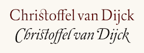 Born in Dexheim, Germany in 1606 or 1608 (some sources say 1601), he died in Amsterdam in 1669. Dutch printer, typefounder, type cutter, and type designer who worked for Elsevier. He had a type foundry in Amsterdam. In texts like Johan Enschedé's Proef vann Letteren (1768), his name is spelled Chistoffel van Dyk. Elsewhere we find the more modern Dutch spellings Dijk and Dijck for his last name. Rudi Geeraerts explains a bit about present day types based on Van Dijck's work. I cite him, interspersed with my own comments and additions:
 - Monotype Van Dijck (1937-1938) is based on a typeface used in 1671 in Herscheppinge (Joost van den Vondel) printed by Daniel Bakkamude. Jan van Krimpen was consultant to Monotype on that project. Most graphic designers were a bit disappointed because it looks skinny when used in normal text sizes. The digital version is due to Robin Nicholas.
- DTL Elzevir (1992, Gerard Daniels) is based on a study of several cuttings from Christoffel Van Dijck. Dutch Type Library mentions that it is mainly based on the Augustijn Romeyn a cut found on a 1682 type specimen issued by Daniel Elsevier's widow (hence the name DTL Elzevir) showing some typefaces from Van Dijck and others. So the DTL Elzevir is not a remake of the Monotype Van Dijck.
- Gerard Unger's Hollander (1983) is based on a study of the typography used in 17th century books using typefaces cut by van Dijck and possible Dirck Voskens. The Hollander is also the base of the well-known Swift. So Unger's Hollander is not a remake of the Monotype Van Dijck.
- OurType's Custodia, designed by Fred Smeijers, is a single-weight roman, with italic and matching small caps, with a seventeenth-century flavour. It was made in 2002 for use in the publications of the Custodia Foundation. Custodia 17 is the first typeface to join the OurType Classics collection. By seventeenth century flavoured we mean the flavour shared by a range of 17th century punch cutters, like Christoffel van Dijck, Dirck Voskens, Johan Michael Smit and Jean Baptiste van Wolschaten. References to and specimens of their typefaces can be found in several archives. One of them is the Plantin-Moretus Museum in Antwerp. The OT Custodia is neither a Van Dijck revival nor a Monotype Van Dijck remake.
- Dutch Textura (1681), in versions called Augusteyn Duyts and Mediaen Duyts.
- He designed a Hebrew typeface for the Hebrew bible of rabbi and typefounder Immanuel Atias (or: Joseph Athias), known as Otiyot Amsterdam (or: Letters from Amsterdam).
Typefaces offered at MyFonts that are rooted in Van Dijck's work include: FontShop link. Klingspor link. Christoffel Van Dijck's digital legacy. [Google]
[MyFonts]
[More] ⦿
|
Claude Médiavilla
|
 French type designer (b. 1948) who was born in the South of France. He studied typography, calligraphy and painting at the School of Fine Arts in Toulouse. He received the Prix Charles Peignot in 1982. In 1992, the President of France invited him to design the inscriptions for the royal tombs in the Basilique Saint Denis in Paris. He published Calligraphie (Imprimerie Nationale, 1993). Author of Calligraphy (Wommelgem, Belgium, 1996) and Histoire de la calligraphie française (Albin Michel, 2006; examples here). In 2009, with the help of Atelier des Signes, he created a typeface for the signage at Chateau de Fontainebleau. Additional URL. In 2010, Mediavilla cofounded Media type Foundry with Sonia Da Rocha and Joel Vilas Boas in Paris.
 His typefaces: - Galba: an elegant roman titling face, done at Mecanorma in 1987.
- Media Script (Mecanorma, 1985).
- Mediavilla (CCT, 1976).
- Mediavilla Script (Graphitel, 1986).
- Palazzo (Mecanorma, 1984).
- Tory (1991).
Examples of calligraphic alphabets drawn by him and shown in his Histoire de la calligraphie française (2006): Bastarda, Cancellaresca, Carolingian, Cursive gothic 1410, Luxeuil, Roman Capitals, Roman cursive 1st century, Roman cursive 4th century, Rustica 1st century, Textura 14th century, Textura 15th century, , Tourneure 15th century, Uncial 4th century. Klingspor link. [Google]
[MyFonts]
[More] ⦿
|
Communitas Monacensis
|
Free Fraktur fonts: MA-Bastarda1, MA-BastardAnglicana, MA-FereTextura, MA-GKursiv1, MA-Gotbuch, MA-InsularMinuscule, MA-Minuskel1, MA-Urkunde, all published by Will Software. [Google]
[More] ⦿
|
Cornelis Henricszoon Lettersnijder
|
Son of Henric Pieterszoon Lettersnijder, b. Delft. Dutch letter cutter ("lettersnijder"). He cut a Netherlandisch Bastarda, which he used from 1524 onwards, and a big double pica Textura to continue with the type family popularized by his father. Vervliet in his 1968 book ranks Cornelis a "cut" below his father. [Google]
[More] ⦿
|
CybaPeeCreations (or: Typoasis)
[Petra Heidorn]
|
 CybaPee is the nom de plume of Petra Heidorn who lives near Hamburg. She has created many typefaces (listed below) between 1997 and 2005 and has cooperated with several type designers on interesting projects. She is undoubtedly best known for her successful web site Typoasis (discontinued in 2016), where one could download her own creations, and those of her many friends. Petra was also heavily involved in several attempts to revive blackletter fonts, in cooperation with Manfred Klein, Dieter Steffmann, Paul Lloyd and others. She organized several revivals of the typefaces of Rudolf Koch and Ernst Schneidler. She also managed the extensive web presence of Manfred Klein.
 In 2016, she allowed me to host her fonts on my site. Download page. Download all her fonts in one zip file. Her typefaces: - AlphanatismConHeads (2001). Stamped style.
- ArabDancesMediumItalic (2002). An Arabic simulation typeface done with Manfred Klain's assistance.
- Azimech (1999).
- Bauernschrift (2004). After a 1911 typeface from Bauersche Giesserei.
- Bayreuth (2003). A nice scan-version of Bayreuth Fraktur by Ernst Schneidler for C.E. Weber in 1932.
- Bibelschrift (2004). Codesigned with Manfred Klein, Bibelschrift revives a Fraktur from 1926-1928 used by the Bremer Presse, est. 1911. The Bremer Presse was bombed by the Americans in 1944.
- BirthdayGreetz (1999).
- Brahms Gotisch (2005). A blackletter typeface co-designed with Manfred Klein. It is a revival of a 1937 Genzsch&Heyse typeface designed by Heinz Beck.
- Burte Fraktur (2003). After Christian Heinrich Kleukens for the Mainzer Presse, 1928.
- CalliBrush (1999).
- Camouflage (1999). Textured.
- Chaos-Theorie (2000). A Halloween or vampire font.
- Charon (1999). An angry and / or scary typeface.
- Crystopian.
- CursedKuerbis (1999).
- Cyclin (2000). An ironwork font.
- DecoCaps (1999). Ornamental caps.
- DeutscheDruckschrift (2004). A revival of Heinz König's 1888 blackletter typeface for Genzsch&Heyse.
- DeutscherSchmuck (2004). Codesigned with Manfred Klein, this ornamental dingbat font is a revival and extension of the Schmuck für Deutsche Druckschrift by Eduard Ege, Genzsch and Heyse, 1922.
- DiamondDreams (1999). A pearly all caps typeface.
- Ellipsoideogram (2000). An italic headline sans.
- Epitough (1999). A sans.
- Extemplary (1999).
- Funtastique (1999). An exagerrated, almost bubbkly, art nouveau typeface.
- Gondoliere (2000). A light-hearted poster typeface.
- Gotika (2005). After Reiner's 1933 blackletter typeface for Bauer.
- Greex (1999). A Greek emulation typeface.
- Hans Sachs Gotisch (2005). Based on a typeface by that name of Albert Auspurg, 1911, Genzsch&Heyse.
- Hartwig-Schrift (2005). A blackletter typeface that revives Hartwig Poppelbaum's Hartwig Schrift from 1927-1928.
- Hasenchartbreaker (1999). A handcrafted typeface.
- Heimat (2005). After Wilhelm Weimar's Heimat from 1917, Genzsch&Heyse.
- HelvAssim (1999). A naughty take on Helvetica to needle Linotype.
- Hohenzollern (2004). Based on Carl Albert Fahrenwaldt's blackletter typeface for Bauersche Giesserei, 1902.
- HollandGotisch (2005). Designed together with with Manfred Klein, this is a revival of the textura typeface Nederduits (aka Fleischmann Gotisch) by Johann Michael Fleischmann, ca. 1750.
- InkyDinky (1999).
- IsleOfTheDead (1999). An angular handcrafted typeface reminiscent of the movie titling of Dr. Caligari.
- Jaecker-Schrift (2005). Revival of the 1912 blackletter typeface by Wilhelm Jaecker for D. Stempel.
- Kleukens-Fraktur (2004). A Schwabacher based on a design by Friedrich Wilhelm Kleukens, 1910.
- KrasniFellows (1999). An old Slavonic emulation typeface.
- KuehneRevised (2003). A blackletter typeface.
- LadyIce-Italic, LadyIce-SmallCaps, LadyIce, LadyIceRevisited, LadyIceRevisitedUpper. An organic monoline sans typeface family developed together with Apostrophe.
- Leibniz-Fraktur (2003). A Schwabacher typeface based on a house font at Genzsch & Heyse, 1912.
- LeontineLoew. A warm and plump informal typeface.
- LightBats (1999). Dingbats.
- Lupinus (1999).
- Lurzing-Initials (1997). A decorative caps typeface based on a 1908 typeface by Karl Lürzing that depicts naked figures.
- Manuskript Gotisch (2004). A revival of a 1514 Textura typeface by Wolfgang Hopyl, which was a house typeface at the Bauersche Giesserei in 1899.
- ModerneSchwabacher (2005). After a ca. 1900 typeface by the Otto Weisert foundry called Moderne Halbfette Schwabacher.
- MonkeyHouseParty (2001).
- MothproofScript (1999). A calligraphic typeface. The name is a take on frostmoth, one of Petra Heidorn's early aliases.
- MuseAsis (2002). Artsy fartsy.
- Napapiiri (1999).
- Neudeutsch (2004). After a 1900 original by Otto Hupp for Genzsch&Heyse.
- NeueFraktur, NeueFrakturExtraBold (2004). Revivals of typefaces by Johannes Wagner Schriftgiesserei in 1927.
- NinjaLine (2000). An outlined graffiti typeface.
- Nordland (2005). Based on a typeface by Heinz Beck for Trennert&Sohn, 1935.
- Oetztype (1999). German expressionist. Named after the Tyrolian Iceman, Oetzi.
- Oktoberfest (1999).
- Pachyderm (1999). A nice ultra-fat typeface.
- PeesCelticItalic, PeesCelticPlain, PeesCelticOutline (1999). Ornamental Celtic caps.
- Pegypta, Pegyptienne (1999). Hieroglyph-inspired typewriter fonts.
- PostmoderneFraktur (1999).
- Rammstein (1999). A tall condensed typeface.
- ResPublica (2000).
- RoteFlora (1999). Garffiti style typeface.
- RoyalGothic (1999). A swashy set of initials.
- SadLisa. A kitchen tile font designed to support Lisa Jenkins in a copyright battle.
- Sagittarius (1999). An arrowed typeface.
- SailingJunco (1999). A stencil typeface.
- Scalper-Bold, Scalper, ScalperInk (2001). Grunge style.
- SchmalfetteGotisch (2004). Codesigned with Manfred Klein, this semi-Textura typeface is based on a type of Ernst Schneidler.
- SchneidlerInitialen (2004). After F.H.E. Schneidler.
- Schneidler Schwabacher (2004). After F.H.E. Schneidler.
- SchwabachDeko (2005). This is Verzierte Schwabacher by Carl Kloberg, Leipzig, 1891. In 2005, Petra co-designed a similar revival of Verzierte Schwabacher with James Arboghast, simply called Verzierte Schwabacher. Her SchwabachDeko attempted to be as close as possible to the original.
- Scoglietto (1999). A text typeface.
- SerpentisBlack (2004). Digitization of a typeface by E.W. Tieffenbach for Officina Serpentis, 1913. This in turn is based on a Gotico-Antiqua by Peter Schoeffers (Mainz, 1462) which was refined in the late 15th century by Creussner and Koberger.
- SlimlinerMicro (1999).
- Smoke-Rasterized-Medium (2001). Degraded and textured.
- SoftAutumn (1999).
- Stoertebeker (1999). A mediaeval typeface with a rough outline.
- SunnySide (2000).
- Symphonie (2005). A digitization of Imre Reiner's Symphonie from 1938 (renamed Stradivarius in 1945).
- TaraType (1999). A lapidary typeface named after Petra's friend, Sabine Taranowski.
- Teutonia (2004). Based on a typeface by Roos & Junge, ca. 1900.
- TipTop (2004). Based on a typeface from Schriftgiesserei Julius Klinkhardt, Leipzig, ca. 1900. Virtually identical to Teutonia.
- ToolTime (1999). Dingbats.
- TypesourceFanclub (2001). A heavy semi-slab serif.
- Urdeutsch (2004). A rounded blackletter typeface based on Urdeutsch (1924-1925, Adolf Heimberg for Genzsch&Heyse).
- Vogeler Caps (2002). Based on Heinrich Vogeler's decorative blackletter caps typeface Jugendstil Initialen (1905).
- Weiss-Gotisch (2004). A revival of E.R. Weiss's typeface by that name, published in 1936 at the Bauersche Giesserei.
- WelcomeY2K (2000). A casual typeface.
- XmasTerpiece, XmasTerpieceSwashes (2001). A Fraktur font based on Rhapsodie by Ilse Schuele.
Dafont link. Klingspor link. Fontspace link. [Google]
[More] ⦿
|
Dado Queiroz
|
 Brazilian designer (b. 1980, Curitiba) of the gorgeous 19th century-style decorative caps typefaces Marisco (Deluxe and Filled) (2007, Estudio Crop). He also made Tritura (2009, EstudioCrop: a grunge textura face), and Riff (2009, estudioCrop), a slab serif face. Dado Queiroz graduated in Graphic Design in 2003. Behance link. Klingspor link. [Google]
[MyFonts]
[More] ⦿
Brazilian designer (b. 1980, Curitiba) of the gorgeous 19th century-style decorative caps typefaces Marisco (Deluxe and Filled) (2007, Estudio Crop). He also made Tritura (2009, EstudioCrop: a grunge textura face), and Riff (2009, estudioCrop), a slab serif face. Dado Queiroz graduated in Graphic Design in 2003. Behance link. Klingspor link. [Google]
[MyFonts]
[More] ⦿
|
Damià Rotger Miró
[Dúctil]
|
 [More] ⦿
|
Dan M. Zadorozny
[Iconian Fonts]
|
 [More] ⦿
|
Dan Reynolds
[TypeOff]
|
 [MyFonts]
[More] ⦿
[MyFonts]
[More] ⦿
|
Daniel Hernandez
[Hernández Type (was: Estudio de diseño Calderón)]
|
 [MyFonts]
[More] ⦿
[MyFonts]
[More] ⦿
|
Daniel Sabino
[Blackletra]
|
 [MyFonts]
[More] ⦿
[MyFonts]
[More] ⦿
|
David Fleming Nalle
[Scriptorium (Ragnarok Press, Fontcraft)]
|
 [MyFonts]
[More] ⦿
[MyFonts]
[More] ⦿
|
Die Entwicklung unserer Schrift
[Peter Doerling]
|
Peter Doerling's visual overview of the styles of writing in Germany, for books, official documents (Urkunden) and in letters. For books, he takes us here: - 200-300: Roman capitals.
- 300-500: Quadrata.
- 500 on: Uncial.
- 900 on: Karolingian minuscules.
- 1200 on: Gothic minuscules.
- Textura.
- 1400 on: Rotunda.
- 1500 on: Schwabacher.
- 1600 on: Fraktur.
- 1500 on: Humanistic style.
- 1570 on: Antiqua.
- 1900 on: Grotesk, Egyptian. [Note that he omits the modern style.]
- 1960 on: Helvetica. (???)
For official documents: - 200-300: Roman capitals.
- 400-600: Rustica.
- 500 on: Half Uncial.
- 900 on: Karolingian minuscules.
- 1500 on: Notula.
- 1600 on: Canzlei (Cantzley, Kanzlei).
- 1600 on: Humanistic Canzlei
- 1875: Ronde, Rondo, Rundschrift.
- 1915: Jugendstil.
- 1930: Tannenberg.
For letters: - 200-300: Roman capitals.
- 400 on: Young Roman cursive.
- 900 on: Karolingian minuscules.
- 1300 on: Cursive.
- 1600 on: Cancellaresca [refined formal script].
- 1600 on: Kurrente.
- 1600 on: Humanistic cursive.
- 1800 on: deutsche Schreibschrift.
- 1800 on: Lateinische (Latin) Schreibschrift.
- 1930: Tannenberg.
[Google]
[More] ⦿
|
Dieter Steffmann
|
 FontShop was the name of Dieter Steffmann's foundry in Kreuztal, Germany (not to be confused with the FontShop foundry and font vendor). He made about 600 self-proclaimed "old-fashioned" fonts, and among these many Fraktur fonts. His site became too expensive to run, and was for about two decades hosted by Typoasis. His fonts can now de downloaded afrom 1001 Fonts. Alternate URL. Current list of fonts. See also here. New stuff. Fontspace link. A nice essay about Fraktur fonts accompanies the fonts. News. As Dieter puts it: I am not a designer but I add missing letters to public domain fonts in order to get a complete character set and I hint the fonts and create new weights (shadow, inline etc.) His Christbaumkugeln font, and how it was made. The font families:
 - Acorn Initialen (2000), Adine Kirnberg (2000, after David Rakowski's Adine Kirnberg Script, 1991), AI Parsons (1999: a simple conversion to truetype of AI Parsons (1994, Inna Gertsberg ans Susan Everett), which in turn revived Will Ransom's Parsons from the 1920s), Albert Text (2000), Alpine (2000), Altdeutsche Schrift (1998: a rotunda), Alte Caps (2000: white on black), Alte Schwabacher (2000, +Shadow), Ambrosia (2000), American Text (2000: a blackletter), Aneirin (2000: Lombardic), Angel (2000: an ironwork font), Anglican Text (2000: a frilly blackletter), Angular (1999: +Inline, +Shadow), Ann-Stone (2000: boxed art nouveau caps), Antique No. 14 (2000: fuzzy hand-crafted letters), Arabella (2000: script), ArabesqueInitialen (2002), Argos George (1999, an art nouveau font after Georges Lemmen's George-Lemmen-Schrift (1908); Steffmann added Argos Geirge Contour), Aristokrat Zierbuchstaben (2002, after a house font at Ludwig&Mayer, 1911), Ariston Script (2000: a formal calligraphic script), Art Nouveau Initialen (1999), Attic Antique, Augusta (2000: a rotunda; +Shadow).
- Baldur (2000: art nouveau; +Shadow, +RoughSliced; after a schelter typeface from 1895), Ballade Bold (2002, a Schwabacher font based on Ballade Halbfette designed by Paul Renner in 1937; +Contour, +Shadow), Barock Initialen (2002: an incomplete decorative initials typeface), Becker (1999; +Shadow, +Inline), Beckett-Kanzlei (2001), Behrens-Schrift (2002: an art nouveau-inspired blackletter typeface based on an original by Peter Behrens), Belshaw (2000: a Victorian decorative serif), Belwe (2002, after an original by Georg Belwe, 1913; Gotisch, Vignetten), Benjamin Franklin Antique (2000, after a warm wood type designed in 1991 by Walter Kafton-Minkel simply called Benjamin), Berlin Squiggle Condensed, Bernhard Schmalfett, Bier und Wein Vignetten (2002, based on drawings from the Bauersche Giesserei), Billboard, Bizzaro, Black Forest (2000, blackletter; +Text, +ExtraBold), Black Knight (1999: blackletter), Blackletter (2001; +ExtraBold, +Shadow), Blackwood Castle (2000: an almost Lombardic blackletter; +Shadow), Breitkopf Fraktur (2000), Bretagne Gaelic (1999), Brian James Bold (2000, +Contour), Bridgnorth, Broadcast Titling (2000, 3d caps), Broadway Poster, Brock Script (2000: formal calligraphic script).
- Cabaret (2000: all caps, +Contour, +Shadow), Campanile (2000: Victirian), Camp Fire (2000: wooden plank font), Canterbury Old English (2001: blackletter), Cardiff (2000: textured caps), Cardinal (2000: almost Lombardic; +Alternate, +Anglican), Carmen (1998: art nouveau style; +Shadow), Carrick Caps (2000), Caslon Antique, Caslon Fette Gotisch, Cavalier (2000), Celtic Frames (2000), Celtic Hand (2000), Challenge (2000; +Contour, +Shadow), Chelsea (2000: a serif), Chopin Script (2000, a formal penmanship script identical to Polonaise), Christbaumkugeln (1999: art nouveau alphadings consisting of Christmas ornaments), Chursächsische Fraktur, Cimbrian (2001: blackletter), Circus Ornate Caps (2001, a Western or circus font), Cloister Black Light (2001: blackletter), Coaster Black (2001, +Shadow), Coelnische Current Fraktur (2000), Colchester Black (2001: an ornamental blackletter), College, Courtrai (2000: a decorative blackletter), Coventry Garden, Cruickshank (2000: art nouveau caps).
- Damn Noisy Kids (2002: a heavy brush font), Davy's Dingbats, Debussy, Decorated Roman Initials (2003), Deutsch Gotisch (2002: an expressive blackletter font; +Dutesch Gotisch Heavy, +Outline, +Shadow), Deutsche Uncialis (+Shadow) (2000), Deutsche Zierschrift (2002, after Rudolf Koch, 1919-1921), Devinne Swash (2000), Digits (2000), Direction (2000: letters with embedded arrows), Dobkin Script (2000: after David Rakowski, 1992, Domino, Domo Arigato (1999: oriental emulation), Dover, Driftwood Caps (2000: a wooden plank font), Due Date (2000: a grungy stencil typeface), Duerer Gotisch (2001), Duo Dunkel (+Licht), Durwent (2001: a rotunda).
- Easter Bunny (after a 1994 font by Apropos Creations), Easter Egg (2001; after a 1994 font by Apropos Creations), Eckmann Initialen (2002, after the famous art nouveau typeface from 1900 by Otto Eckmann), Eckmann Plakatschrift (2002), Eckmann-Schrift (2002), Eckmann Titelschrift (2002), Eckmann Schmuck (2002), Egyptienne Zierinitialen (2002), Egyptienne Zierversalien (2002), Ehmcke-FrakturInitialen (2002), Ehmcke-Schwabacher Initialen (2002), Eichenlaub Initialen (2000), Eileen Caps (2000; after David Rakowski, 1992), Eisenbahn (2002, based on train vignettes at Bauersche Giesserei), Elzevier Caps (2000; after David Rakowski), Enge Holzschrift (2000; +Shadow), English Towne Medium (2000: a Fraktur), Epoque (1999; an art nouveau typeface; +Shadow, +Inline), Erbar Initialen, Estelle, Evil of Frankenstein, Express (1999).
- Faktos (1998; a rip-off of Cory Maylett's Faktos, 1992; +Striped, +Contour, +Shadow), Fabliaux (2000: Lombardic caps), Fancy Card Text (2000: a textura), Fat Freddie (2000: a fat all caps font; +Shadow, +Outline), Faustus (2000: a Schwabacher), Fenwick Woodtype (blackletter: 2001), Fette Caslon Gotisch (2001), Fette Deutsche Schrift (2002, a revival of a Rudolf Koch font from 1908), Fette Egyptienne, Fette Haenel Fraktur (2000), Fette Kanzlei (2002), Fette Mainzer Fraktur (2001), Fette Steinschrift (2002), Fette Thannhäuser (2002; after Herbert Thannhäuser, 1937-1938; +Schattiert), Fette Trump Deutsch (20002, after Georg Trump, 1936), Firecat, Flaemische Kanzleischrift (2000: calligraphic), Flowers Initials (2000: floriated caps), Forelle (2002: a retro script; +Shadow), Fraenkisch Spitze Buchkursive (2002; after Lorenz Reinhard Spitzenpfeil, 1906), Fraktur Coelnische Current (2000), Fraktur Schmuck (2001: ornaments), Fraktur Shadowed (2001), Fraktur Theuerdank (2000: a Schwabacher), Frederick Text (2001: a blackletter), Futura Script.
- Gabrielle (1999: a retro script), Ganz Grobe Gotisch (2000), Gebetbuch Fraktur (2000: a Schwabacher), Gebetsbuch Initialen (2001), Germania (2001, a revival of the 1903 blackletter typeface by Heinz König called Germania as well), Germania-Versalien, Gille Fils Zierinitialen (2002, after Gillé Fils, ca. 1820), Gingerbread Initials (Victorian initials, after an original from ca. 1890), Globus, Gloucester Initialen (2001), Gorilla Black (2000: rounded elephant feet font), Gotenburg A+B (2002, after Friedrich Heinrichsen), Gothenburg Fraktur (2000), Gotische Initialen (two different sets with the same name, one from 2000 and one from 2002), Gotisch Schmuck (2002, Fraktur), Goudy Initialen (2000), Goudy Medieval (2000), Goudy Thirty (2000), Grange (1999), GrenzschInitials (2001), Grusskarten Gotisch (2001), Gutenberg Textura (2000).
- Haenel Fraktur Fett, Hansa (1999: art nouveau), Hansa Gotisch (2001: a textura), Hansen (1998; +Contour, +Shadow), Happy Easter (1994, by Apropos Creations: art deco caps), Harrowgate (2001: a textura), Hazard Signs (2000), Headline Text (2001: a textura), Hercules (1999: art nouveau), Herkules (2004: art nouveau), Hermann-Gotisch (2002; after an original by Herbert Thannhaeuser, 1934), Herold (2002), Hippy Stamp (2000: after rubber stamps from the 1960s), Hoedown (2000; +Shadow), Holla (2001; after Rudolf Koch), Holidayfont, Holtzschue(2000: a circus font, after David Rakowski, 1992), Honey Script (2000: a retro script), Horror Dingbats (2000; after Letters from the Claw, 1998), Houtsneeletter, Humboldt Fraktur (2002-2005; after a Schwabacher font by Hiero Rhode, 1938; +Zier, +Initialen).
- Iglesia Light (2002), Iron Letters (2000), Isadora Original.
- Jan Brad, Journal Dingbats, Jahreskreis (seasonal dingbats, 2002), JSL Blackletter Antique (2000, by Jeffrey S. Lee), Jugendstil Fraktur (originally designed by Heinz Koenig, 1907-1910), Jugendstil Ornamente (2002, art nouveau ornaments, after Schelter & Giesecke).
- Kabinett Fraktur, Kaiserzeit Gotisch (2001), Kanzle (2001)i, Kanzlei Initialen (2002), Kalenderblatt Grotesk (2000), Kashmir (2001: an arts and crafts typeface), Kinder Vignetten (2002), KingsCross (2001: blackletter), Kinigstein Caps (2000: art nouveau initials after David Rakowski, 1990), Klarissa (2000), Kleist Fraktur + Zierbuchstaben (2002, after Walter Tiemann, 1928), Koch Antiqua (2002), Koch Antiqua Zierbuchstaben (2002), Koch Initialen (2000, after Rudolf Koch, 1922), Koenigsberger Gotisch (2001), Koenig-Type (2002; a Jugendstil Fraktur originally designed by Heinz Koenig, 1907-1910), Kohelet (2001), Koloss, Konanur Kaps (2000, after David Rakowski, 1991), Kramer, Krone Bold.
- La Negrita (2000, +Shadow), Latina (2001: script), Lautenbach (2001, +Zierversalien), Legrand (1999: art nouveau), Lemiesz (2000), Lettres ombrées ornées (2002, based on a typeface by Schriftgiesserei J. Gillé, 1820), Linolschrift (2000, +Heavy, a linocut font as in the Munch paintings), Lintsec (2000, a stencil typeface, after David Rakowski, 1992), Liturgisch + Zierbuchstaben (2002, after Otto Hupp, 1906), Logger (2000, after David Rakowski, 1991), Lohengrin Fraktur (2000), Long Island Antiqua, Louisianne (1998-2000: +Contour, +Shadow; a bold upright connected script), Ludlow Dingbats (2000, after Ludlow, 1930), Luthersche Fraktur (2000).
- Mainzer Fette Fraktur, Marker Felt (2001), Marketing Script (1999, +Shadow, +Inline), Marlboro (2000), Maximilian (2002, a Fraktur font and decorated caps based on Rudolf Koch, 1914; +Zier), Mayflower Antique (2000), Mediaeval Caps (2000), Medici Text (2002: an ornamental blackletter), Menuetto (1994, after K.R. Field), Messing Lettern (2000), Metropolitain (2000, an art nouveau font like the ine used for the Paris metro; +Contour, +Condensed), Middle Saxony Text (2001), Moderne Fraktur (1999), Monats-Vignetten (2002, based on drawings by Franz Franke for Bauersche Giesserei, 1920), Montague (2000), Monument (2002, after Oldrich Menhart, 1952), Mordred (2000), Morgan Twenty-Nine (1999: Victorian caps), Morris Roman Black (2002, after William Morris, 1893), Morris Initialen (2000, after William Morris).
- Napoli Initialen (2000), Neptun Gotisch (1999), Neugotische Initialen (2002, after an original from 1890), North Face (2000), Nougat (2000), Nougat Nouveau Drop Caps (2000), Nubian (after Walter T. Sniffin's font from 1928).
- Olde English, Old English Five (2000: blackletter), Old Town (2000: Western), Old London (2000: blackletter).
- Packard Antique (2000), Paganini Text (2000: blackletter), Pamela (2000: an ornamental blackletter), Paris Metro (1998; +Outline), Parsons Heavy (2000, after Bill Ransom, 1918), Paulus Franck Initialen (2002), Penelope (2000, Victorian), Peter Schlehmil (2002, after Walter Tiemann, 1918-1921), Peter Schlemihl Fraktur, Picture Alphabet (2000; after an original from 1834), Pilsen Plakatschrift (2000), Pinewood (2000, like wooden branches), Pinocchio (based on a psychedelic typeface by Gustav Jaeger, TypeShop, 1994), Plakat-Fraktur (2001), Plakat Antiqua, Plastisch (2002: ornamental caps), Plastische Plakat Antiqua (2002), Plum Script (2000: an upright script)), Pointage (2000; after David Rakowski, 1992), Polonaise (1999: a formal calligraphic script), Polo Semi (2000), Powell Antique (2000), Prince Valiant (1999: blackletter), Printer's Ornaments One (after Blake Haber, 1994), Prisma (2003, a four-line typeface inspired by Rudolf Koch's Prisma), Progressive Text (2001), Puritan (2000, +Swash).
- Quentin Caps (2001: Tuscan).
- Rediviva (2002), Rediviva Zierbuchstaben (2002: a Schwabacher font after a 1905 typeface at Benjamin Krebs designed by Franz Riedinger), Reeperbahn (1999; aka Rope), Regatta Relief, Reiner Script, Relief Grotesk (2003), Revue Decor, Reynold Art Deco (2000: arts and crafts; +Contour), Rheinische Fraktur (1999: after a 1905 Stempel font called Arminius Fraktur and Rheinische Fraktur), Rio Grande, Rockmaker (2000, after David Rakowski, 1992), Roland 92000. +Shadow, +Contour), Rolling No. 1 ExtraBold (2000), Roman Antique (+Italic) (2000), Romantik Initialen (2000), Romantiques (2002: ornamental caps, perhaps a circus font), Rondo, Rosemary Roman (2001: a great calligraphic script based on Rosemary Hall's Rosemary Roman), Roskell (1998: a poster font, +Bold, +Shadow), Roslyn Contour (2000), Rossano (2000, +Shadow), Rothenburg Decorative (2000: a frilly blackletter), Rothenburg Fraktur, Royal Initialen (1999), Roycroft Initials (2000), Rudelsberg (Schrift, Initialen, Schmuck: a typeface family in Munch Jugendstil style, based on Otto Eckmann's Eckmann from 1901).
- Saddlebag Black (2000: Western), Saloon ExtraBold, Saltino, Salto, Sans Plate Caps (2000), San Remo (2000: a Parisian art nouveau typeface), Sans Serif Shaded (2000, after a font by Stephenson Blake), Savings Bond, Schampel Black (2001: a blackletter), Schmalfette Fraktur (2000; +Schattiert), Schluss-Vignetten (2002, also from Bauersche Giesserei), Schmale Anzeigenschrift + Zierbuchstaben (2002, after Rudolf Koch's Deutsche Anzeigenschrift, 1916-1923), Schmuck Initialen (2001), Schwabacher (2002), Sebaldus-Gotisch (2002, a blackletter after H. Berthold's Sebaldus Gotisch from 1926), Sentinel (decorative caps from 2001), Sesame (2000, +Shadow), Shaded (2002, a take on Sans Serif Shaded by Stephenson, Blake & Co. Ltd., Sheffield), Sholom (1999: Hebrew emulation), Showboat Caps (2000), Shrapnel (2000: in the font, we find a reference to David Rakowski, 1992), Siegfried (2001, art nouveau, based on a typeface by Wilhelm Woellmer), Simplex, Sixties, Snowtop Caps (2001), Starburst (2000; after a 1990 font by David Rakowski), Steelplate Textura (2002), Stencil Display, Subway (2001: Black, Shadow), Supermarkt.
- Tanach (2003: Hebrew emulation), Tannenberg (Fette Gotisch, Fett, Umrandet, Schattiert: after Emil Meyer, 1933-1935), Thannhaeuser Fette Fraktur, Thannhäuser Zier (2002; original by Herbert Thannhauser, 1937/38), Theuerdank Fraktur (2000; after Schoensperger's Theuerdank, 1517), Thorne Shaded (2002, a shaded didone based on a Robert Thorne design of 1810), Tierkreiszeichen (2002, zodiac signs, based on drawings by Franz Franke for Bauersche Giesserei), Tintoretto (2000, after a Schelter & Giesecke original), Titania (2001; after Titania by Haas, 1906), Titling Roman Antique, Tobago Poster (2001; +Shadow), Tone And Debs (2002; after a 1991 snow capped font by D. Rakowski; identical to Snowtop Caps in 2001), Tonight (2002: a marquee font), Topic, Toskanische Egyptienne Initialen (2003: after a 1889 font by Schelter & Giesecke), Transport Pictorials, Tribeca (2001, after a David Rakowski original), Trocadero Caps, Trucker Style ExtraBlack, Turtles (2000; an extension of Turtles by Neale Davidson), Typographer Caps (2000), Typographer Fraktur (2002), Typographer Gotisch (2002), Typographer Holidayfont (2002: Christmas dingbats), Typographer Rotunda (2002), Typographer Subway (2011), Typographer Textur (2002, Fraktur), Typographer Uncial Gotisch (2002), Typographer Woodcut Initials (2002), Typographer's Schmuck-Initialen.
- Uechi Gotisch, Uncialis Deutsche, Unger Fraktur Zierbuchstaben (2002; after an ornamental caps typeface by Julius Nitsche done in 1908), Unicorn (2000).
- Vadstena Rundgotisch, Varah Caps, Ventura Bold (2000), Verve (+Shadow, 2000), Victorian Initials (2001), Victorian Text (2001), Viking (2000), Vivian (2000, +Shadow), Vogeler Initialen (2002, aka Vogeler Caps), Volute (1999: art nouveau caps).
- Walbaum Fraktur (after Justus Erich Walbaum, 1800), Wallau Deutsch, Wallau Rundgotisch, Wallau Unzial and Wallau Zierbuchstaben (2002; originals by Rudolf Koch 1925-1930), Walthari Text, Washington Text, Waterloo Relief, Wave, Weiß Initialen (2000), Weiss Lapidar (2002, revival of a typeface by Emil Rudolf Weiss), Weiss Rundgotisch (1998; Bold and Shadow), Werbedeutsch (2002, original by Herbert Thannhaeuser, 1934), Westminster Gotisch (2001: Lombardic), Wharmby (2000, a shadow font), White Bold (2003, a shadow font), Wieynk Fraktur (2002, +Initialen, + Caps Round; after a Schwabacher by Heinrich Wieynck, 1912), Wieynk Fraktur Vignetten (2001), Will-Harris Caps (2002, after David Rakowski, 1992), Woodcut.
- Yellow Submarine (1995; after Stanley Davis's Amelia, 1966), Yentus (2001: Hebrew emulation), Yonkers (2001: a Rundgotisch font), Yorktown (2000: a Western wood type emulation font).
- Zallman Caps (2000, after David Rakowski, 1991), Zentenar Fraktur (2003: after Friedrich Hermann Ernst Schneidler, 1937), Zentenar Zier (2002; after F.H.E. Schneidler, 1937), Zierinitialen 1 (2002, after an original from ca. 1800), Zierinitialen Two (2002; based on Deutsche Zierschrift by Rudolf Koch), Ziffern und Pfeile, Zither Script, Zodiac Pictorials.
A set of TeX service files for many of the decorative caps fonts was published by Maurizio Loreti from the University of Padova. The collection is now also available in OpenType. 1001Fonts link. Fontsquirrel link. Dafont link. Fontspace link. Abstract Fonts link. Home page. [Google]
[More] ⦿
|
Dieter Steffmann's blackletter typefaces
[Tim Larson]
|
 A list of Dieter Steffmann's blackletter typefaces, as compiled by Tim Larson (Christ Trekker). Download them here.
 - Fraktur: Breitkopf Fraktur, Chursaechsische Fraktur, Cimbrian, DS Ballade, DS Luthersche, DS Walbaumfraktur, Durwent, Ehmcke-Fraktur Initialen, Fette deutsche Schrift, Fette Haenel Fraktur, Fraktur Shadowed, Gebetbuch Fraktur, Humboldt Fraktur, Kabinett-Fraktur, Kanzlei, Kleist-Fraktur, Koenig-Type, Moderne Fraktur, Neptun, Paganini, Peter Schlemihl, Plakat-Fraktur, Rediviva, Rothenburg Decorative, Schampel, Schmale Anzeigenschrift, Schmuck Initialen, Theuerdank Fraktur, Typographer Fraktur, Unger-Fraktur Zierbuchstaben, Walbaum Fraktur, Wallau, Washington Text, Wieynk Fraktur, Yonkers, Zentenar Fraktur.
- Rotunda: Typographer Rotunda, Weiss Rundgotisch.
- Schwabacher: Alte Schwabacher, Schwabacher.
- Textura: American Text, Anglican Text, Beckett-Kanzlei, Black Forest, Blackletter Blackwood Castle, Canterbury, Cloister Black, Coelnische Current Fraktur, Colchester, Courtrai, Deutsch-Gotisch, DS Caslon Gotisch, DS Fette Gotisch, DS Weiss-Gotisch, DS Zierschrift, English Towne, Faustus, Fette Trump-Deutsch, Frederick Text, Ganz Grobe Gotisch, Gotenburg, Gothenburg Fraktur, Grusskarten Gotisch, Gutenberg Textura, Hansa Gotisch, Harrowgate, Headline Text, Iglesia, Kaiserzeit Gotisch, Kings Cross, Koenigsberger Gotisch, Liturgisch, Lohengrin, Maximilian, Medici Text, Middle Saxony Text, Old English Five, Old London, Olde English, Pamela, Prince Valiant, Progressive Text, Steelplate Textura, Tannenberg, Thannhaeuser Zier, Typographer Gotisch, Typographer Textur, Victorian Text, Werbedeutsch, Westminster Gotisch.
- Script: DS Admiral.
- Unclassified: Alpine, Aristokrat Zierbuchstaben, Augusta, Belwe, DS FetteThannhaeuser, DS HermannGotisch, DS Wallau, Fraenkisch, Lautenbach, Neugotische Initialen, Typographer Uncialgotisch, Zentenar Zier.
[Google]
[More] ⦿
|
Dúctil
[Damià Rotger Miró]
|
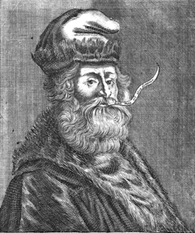 Damià Rotger Miró (b. 1981, Ferreries, Menorca) is a type designer, letterer and graphic designer at Dúctil in Palma de Mallorca. He also is professor at EDIB. Since 2015, he is organizing the summer type design course Gliglifo in the picturesque Sos del Rey Catolica near zaragoza, Spain.
 His creations in 2008-2009: Lullius (2009, a blackletter named in honor of Ramon Llull (Palma de Mallorca, 1232-1316)), Dúctil (2009, sans family), Crespell (2008, a soft organic sans), Miona (2008, an award winning and stunning serif), Concu (2007, sans family), Lullius Rotunda (2009). In 2010, these fonts were added: Cintax (octagonal, modular), Lullius Textura, Lullius Borders, Moll (+Italic). The sans family Ductil was designed in 2011. In 2012, we find these new typefaces: Nuada (a chancery script), Lullius Textura Modula. Other typefaces include FernandezCoca, an informal script named after illustrator Antonio Fernández Coca. Unostiposduros page. Behance link. [Google]
[More] ⦿
|
Dutch Type Library (or: DTL Studio)
[Frank E. Blokland]
|
 The Dutch Type Library was founded in 1990 by Frank Blokland (b. 1959, Leiden). It is based in 's Hertogenbosch, The Netherlands. Fonts include DTLAlbertina (Chris Brand), DTLArgo (Gerard Unger), DTL Caspari (Gerard Daniels), DTL Documenta (1986) and DTL Documenta Sans (Frank E. Blokland), DTL Dorian (Elmo van Slingerland), DTL Elzevir (1992, Gerard Daniels), DTL Prokyon and DTL Fleischmann (Erhard Kaiser), DTL Flamande (Matthew Carter, 2004, based on a textura by Hendrik van den Keere), DTL Haarlemmer (Jan van Krimpen, revived and extended by Frank Blokland), DTL Nobel (Sjoerd de Roos 1929; revived in 1993 by Andrea Fuchs and Fred Smeijers), DTL Paradox (Gerard Unger), DTLVandenKeere, DTL Unico (Michael Harvey), DTLRosart (Antoon de Vylder), DTL Sheldon (Jan van Krimpen revival), DTL Romulus (Jan van Krimpen revival), DTL Fell (a revival of lettering by John Fell, 1625-1686).
 From their corporate blurb: The Dutch Type Library was commissioned to produce the corporate typeface for the European Union. Further, DTL supplied the company letters to, among others, the New York Stock Exchange, Germany's Phoenix Television Broadcasting Company, Amnesty International USA, Emerson, The Diamond Trading Company, Taylor Nelson Sofres, Finland's most popular newspaper Helsingin Sonamat and banks and museums all over Europe. Besides fonts, the Dutch Type Library also produces sophisticated software for (OpenType) font production: DTL FontMaster, of which a free Light version is available. DTL has claimed all rights to the entire Lettergieterij Amsterdam typeface library obtained in some agreement with Tetterode. [This info may be wrong---I have no way to verify this.] He obtained a PhD from Leiden University and his dissertation was entitled Harmonics, Patterns, and Dynamics in Formal Typographic Representations of the Latin Script. The regularization, standardization, systematization, and unitization of roman and italic type since their Renaissance origins until the Romain du Roi. Klingspor link. Speaker at ATypI 2013 in Amsterdam: The (digitized) calligraphy on HM Queen Beatrix' Abdication Act 2013. [Google]
[MyFonts]
[More] ⦿
|
Élodie Mandray
[Acmé-Paris]
|
 [More] ⦿
|
Elmo van Slingerland
|
 Dutch type designer and lettering artist in Gouda (b. 1964, Rotterdam) who made DTLDorian (1994) at the Dutch Type Library. The calligraphic expertise of van Slingerland shines in this great text typeface family. [Google]
[MyFonts]
[More] ⦿
Dutch type designer and lettering artist in Gouda (b. 1964, Rotterdam) who made DTLDorian (1994) at the Dutch Type Library. The calligraphic expertise of van Slingerland shines in this great text typeface family. [Google]
[MyFonts]
[More] ⦿
|
Elsner&Flake
|
 German type foundry in Hamburg established in 1986 by Veronika Elsner and Günther Flake. They offer original fonts as well as improved versions of classical fonts. There are many non-Latin fonts as well. In-house designers include Jessica Hoppe (Carpediem), Verena Gerlach (Aranea), Petra Beisse (Petras Script), Uwe Melichar, Manuela Frahm (Fritz Dittert), Ralf Borowiak, Lisa von Paczkowski, and Achaz Reuss.
 Additions in 2005 include the dingbat typefaces Beautilities EF Alpha, Ornamental Rules EF, Diavolo Rules EF, Squares EF (Alpha, Beta and Gamma), Topographicals EF Alpha, Typoflorals EF Alpha, Typographicals EF Alpha, Typomix EF Alpha, Typosigns EF Alpha, Typospecs EF Alpha and Beta (which have several fists), Typostuff EF Alpha, Diavolo EF, Schablone EF, Gigant EF, Maloni EF, OCRA EF, EF Unovis (a 16-weight family inspired by Quadrat). In the hand-printed category, let us mention Filzerhand. Their blackletter collection includes some bastardas (Alte Schwabacher, Lucida Blackletter), some frakturs (Fraktur, Fette Fraktur EF, Justus Fraktur, NeueLutherscheFraktur, Walbaum-Fraktur), some rotundas (Weiss-Rundgotisch), and some texturas (Gotisch, Old English). Commissioned fonts include Castrol Sans (2007). Selected additional typefaces: Garamond Rough Pro (2018), Bluset Now Mono (2018), Newspoint (2017, based on Morris Fuller Benton's News Gothic), Meier Kapitalis (2013, a lapidary typeface based on a 1994 sketch by Hans Eduard Meier in his book Die Schriftentwicklung), Gillies Gothic EF (after William S. Gillies's 1935 original), EF Medieva, Bank Sans Caps EF, Metropolitain (1985) (after a 1905 art nouveau typeface by Fonderie Berthier). Fonts4ever link (2008). Listing at Fontworks. Future events schedule. New fonts. List of their fonts. Catalog of their typefaces [large web page warning]. See also here. [Google]
[MyFonts]
[More] ⦿
|
Emil Rudolf Weiß
|
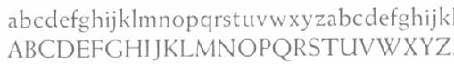 German typographer, graphic artist, book artist, painter, type designer, poet and teacher, b. 1875, Lahr, d. 1942, Meersburg. His typefaces include
 - Weiss Roman (1926). Digital versions include one at Adobe.
- Weiss-Fraktur (1909). This was commercialized in 1913 by Bauersche Giesserei. Digital versions: Weiss Fraktur (2004, Petra Heidorn and Manfred Klein), Emilia Fraktur (2021, Ralph Unger).
- Weiss-Fraktur Kursiv (1923-1924, Bauer).
- Weiss Antiqua (1928). Digital versions: W 690 Roman (SoftMaker), Emilia (2016, Ralph Unger), Weiss Antiqua (URW). In 2019, Rutherford Craze did his own revival.
- Weiss Lapidar mager (1931). Revived as Weiss Lapidar in 2002 by Dieter Steffmann.
- Neue Weiss-Fraktur (1935).
- Lichte Initialen (1935). Revived by Manfred Klein in 2005 as WeissGotnitials.
- Weiss-Gotisch (1936). A Textura typeface at Bauer, revived by Petra Heidorn in 2004 under the same name, by Delbanco as DS-Weiss-Gotisch, and by Ralph Unger as Emilia Gotisch in 2016.
- Weiss-Kapitale (1931).
- Weiss-Rundgotisch (1937, Bauer). Digitized by Fraktur.de, Nick Curtis (as Garmisch Rund NF, 2009), Elsner and Flake (as Weiss Rundgotisch), and Softmaker (as Gothic).
- Weiss Rundgotisch Inititalen (1939), at the Bauersche Giesserei.
- Rundgotisch and Uhlen Rundgotisch (1937), at Hansestadt Letter Foundry. Uhlen Rundgotisch became a Monotype font in 1938.
- Weiß Initials (Series I, II, II Bold, III), the 1920's. Digital versions: Wellsbrook Initials SG (2004, Spiece Graphics), URW Weiss Titling, and Quadrivium NF (Nick Curtis).
In 2011, Gerald Cinamon published E.R. Weiss: The Typography of an Artist (Oldham: Incline Press). Bio at Linotype, and at DdS. Footnote: Many textbooks incorrectly credit Weiss with Memphis (Stempel, 1929)---these include Mac McGrew, Rookledge, and Jaspert&Berry. Memphis was made by Rudolf Wolf. View Emil Rudolf Weiss's typefaces. Klingspor link. FontShop link. [Google]
[MyFonts]
[More] ⦿
|
English Textura
|
English Textura is a blackletter typeface digitized by Hoefler&Frere-Jones reproduced, with all its idiosyncracies, from Sixteenth Century Printing Types of the Low Countries, by H. D. L. Vervliet and Harry Carter, Menno Herzberger&Co, Amsterdam, 1968. The original was cut by Henric Pieterszoon Lettersnijder, a Dutch letter cutter, some time before 1492, and became a dominant type for Dutch books in the decades to follow. Hoefler mentions that the brass "matrices" from which this type was cast still survive, in the collection of the Enschedé Museum in Haarlem. They may be the oldest set of matrices in the world. [Google]
[More] ⦿
|
E-phemera (was: HPLHS Prop Fonts, and earlier: Prop Fonts)
[Andrew H. Leman]
|
 Andrew Leman is a prop designer in Hollywood, CA. The type foundry HPLHS Prop Fonts (was: Ephemera, Prop Fonts) was started by Hollywood's Andrew Leman, and is now located in Pasadena, CA. Some fonts are free, most are commercial.
 Dafont link. Klingspor link. Andrew Leman's fonts: - Cablegram (2001, old typewriter face, T-26).
- Leviathan.
- Garamold (2007, 2 styles).
- Journalistic (2007, a blackletter inspired by the nameplate of a New England newspaper from the 1920s).
- Blackburn (2006, distressed).
- RTemporal (2006, blackletter).
- Fonts in the HPLHS series, dated 2002: HeadlineTwoHPLHS, OldStyle1HPLHS, OldstyleItalicHPLHS, OldstyleSmallCapsHPLHS, Rogo, SlabSerifHPLHS, TelegramHPLHS, WW2BlackletterHPLHS, WW2BlackltrAltHPLHS, HPLHS-Lovecraft Cursive and Block (replica of H. P. Lovecraft's own handwriting), HPLHS-Autograph Lanier (replica of the 1875 handwriting of Sidney Lanier, a 19th century American poet), HPLHS-TextSerif (really Linotype Antique No. 1), HPLHS-TypoScript, HPLHS-TextSerif Oblique, HPLHS-Bulfinch, HPLHS-Colwell, HPLHS-Colwell Italic, HPLHS-Cromwell, HPLHS-National Oldstyle (after Goudy's font by that name), HPLHS-Post Monotone, HPLHS-Atlas Italic, HPLHS-Italic, HPLHS-Victoria (from the 1923 ATF book), HPLHS-Manuscript Caps, HPLHS-Tome Pi, HPLHS-TypoGothic, HPLHS-Copperplate Roman, HPLHS-Gothic520, HPLHS-Times Gothic, HPLHS-Persnickety, HPLHS-Roman Engraved, HPLHS-Mercantile, HPLHS-Mercantile Oblique, HPLHS-Mercantile Card, HPLHS-Headline Modified, HPLHS-ExtraExtra, HPLHS-Extra (wood type), HPLHS-Forsythe, HPLHS-MetroThin, HPLHS-MetroLight, HPLHS-MetroMedium, HPLHS-MetroMedium Italic, HPLHS-MetroBlack, HPLHS-Policy Gothic, HPLHS-Black Gothic, HPLHS-Gothic Compressed, HPLHS-Black Condensed, HPLHS-Black Oblique, HPLHS-Electro Gothic, HPLHS-Blackletter (an irregular hand-drawn textura font based on the lettering of French heraldic engraver Charles Demengeot).
- The E-phemera Font Collection, available from MyFonts, which includes these fonts, with a majority being retro or script typefaces: Policy Gothic (2012, an eroded caps face), Mooseheart (2012), Operapolitan (2012), Fishwrapper (2012), Fred (2007, inspired by a 1930s typeface by Fred G. Cooper), Schreibweise (2007, a pirate-flavored font inspired by a hand-lettered manuscript dating from 1492), Cablegram-Regular, Golden Ticket (2003: Base, Fill, Highlight; a digitization of hand-drawn poster lettering by Otto Heim from 1925), Cablegram-Urgent, Cablegram-Madras, Cablegram-Ottoman, Julius Klinger (2003, based on 1925 fabric lettering by Julius Klinger), Cablegram-Zagreb, DMV Printer, Landry Gothic, Telegrafo, Toronto Gothic (2003: worn wood type or letterpress emulation, close to Condensed Titling Gothic #11), Vogue (pencil-lettered caps), Penitentiary Gothic (+Fill, +Lolite, +Hilite, +Shadow), Chicago House, Compliments (+Upright), Satisfaction (script based on 1930s cigarette ads), Vandal Broke Extra Juicy, Lanier (2004), Impersonal. The Cablegram and DMV series are typewriter fonts. Heck Italic (2010) is based on captions, labels and legends appearing on 19th-century maps and natural history engravings by Johann Georg Heck. Dai Vernon (2010) is based on the handwriting of card magician Dai Vernon.
View Andrew Leman's typefaces. View the E-phemera typeface collection. [Google]
[MyFonts]
[More] ⦿
|
Estudio Crop
[Anderson Maschio]
|
Brazilian graphic design studio which recently branched out into type design. Located in Batel, Curitiba, it is founded and run by Anderson Maschio (b. 1980, Curitiba). Maschio designed Anark Stencil (2007). MyFonts link. Fonts at MyFonts, all by Dado Queiroz: Tritura (2009, grunge textura typeface by Dado Queiroz), Marisco (2007), Riff (2009, slab serif). Postuma (2005) is a calligraphic typeface by Beto Janz. [Google]
[MyFonts]
[More] ⦿
|
Faishal Mahdy
[Shaltype (or: Pudji Pangestoe Type Foundry)]
|
[MyFonts]
[More] ⦿
|
Fontologie
|
Company located in Washington State. Scrapbooking font style company with commercial curly handwriting and doodling fonts by Bannerwoman, Blushbutter, Carrie Stephens, Dianne Rigdon, Meredith Fenwick, Mindy Terasawa, Miss Tiina, Sara Carling, Sausan Designs, Scrappy Cats Designs, and Shabby Princess. Free Fontologie fonts: mtf_sketchie (2007, Miss Tiina), Taylor_Mackenzie (2007, Kristie Matthews), SVD_WilderThings (2007, Stephanie Victoria Designs), SVD JoyFilled (2007, Stephanie Victoria Designs), Doodle Dance (2008), Messy Bessy (2008), Free Refill (2008), Printing Primer (2008), Wiggle Worm (2008), Weathered (2008), Vintage Press (2008), Uptown Girl (2008), Textura (2008), PS I Love You (2008), Howie's Stamps (2008), Giggles and Giggles Small Caps (2008), Empty Wrapper (2008), Dippity Dots (2008), YS Frakleberry (2008), TS Traci (2008), TS Webchyk (2008), TS Wendy (2008), Antique (2008), MF Funkalicious (2008), Hallway Graffiti (2008), Journal Away (2008) and Jacki's Hand (2007, Jacki Steinkamp). All are hand-printed. Font making service: 35 dollars for a full font. All fonts sold since November 2007 at The Shabby Shoppe. These include the grunge typefaces Howie's Stamps, Wiggle Worm, Empty Wrapper and Vintage Press. Another URL. [Google]
[More] ⦿
|
Fontscape: Blackletter
|
Fontscape shows many font examples in each of these blackletter categories: - Bastarda (in German: Schwabacher): based on cursive writing. It is typified by an 'o' which is pointed at the top and bottom.
- Fraktur, the most common form, with o's that are D-shaped.
- Textura (in German: Gotisch; also: Old English): An angular family of blackletter type, characterised by a hexagonal 'o'.
- Rotunda (in German: Rundgotisch): the Italian version of Textura blackletter type, called Rundgotisch in German, typified by a smooth circular 'o'.
[Google]
[More] ⦿
|
Fontscape: Textura
|
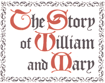 Commercial Textura fonts listed at Fontscape: Wilhelm Klingspor Gotisch, Wedding Text/Linotext (almost identical), Old English/Cloister Black (these two are related), Engravers' Old English, Agincourt, Fette Gothik, Gothique, Gotisch Bold, Goudy Text, Goudy Text Old Style, Notre Dame. [Google]
[More] ⦿
Commercial Textura fonts listed at Fontscape: Wilhelm Klingspor Gotisch, Wedding Text/Linotext (almost identical), Old English/Cloister Black (these two are related), Engravers' Old English, Agincourt, Fette Gothik, Gothique, Gotisch Bold, Goudy Text, Goudy Text Old Style, Notre Dame. [Google]
[More] ⦿
|
Fragtype
[Rodrigo Fuenzalida]
|
 Graphic and type designer from Caracas, Venezuela, b. 1981, who moved first to Buenos Aires and then to Santiago in Chile. While mainly a type designer, he also practices calligraphy. He was involved in and set up multiple type foundries, including Fragtype. Fuenzalida designed these typefaces:
 - The art deco faces Erre.
- The experimental typefaces Tructura, Tangram, Sicodelica (multiline), SuperC (2009, tall condensed) and Pixid (2010, pixel face).
- Concrete Stencil (2010). Stencil meets calligraphic script.
- Fux (2010). A rounded monoline sans.
- 7Tees.
- Aushaus: letters like music notes. This is also called Aubhaus.
- Gerd (2009). An artsy stylish piano key font that used to be free.
- LINE_A and K5 (multiline).
- Cubo (aka Khubo, 2009, Die Gestalten). This 3d geometric family was a grand prize winner in the experimental typeface category at Tipos Latinos 2010.
- Factur (2011) is an angular typeface.
- Isosibilia. A 3d face. This typeface won an award winner in the experimental typeface category at Tipos Latinos 2010.
- The connected upright script face Nedo.
- The grunge typeface Belt.
- The stencil Bodoni typefaces Giambo Stencil (2009, Die Gestalten) and Giambattista.
- Titan (2011). A fat rounded poster face, downloadable from Google Web Fonts.
- Fux (2010). A basic monoline sans family.
- Poetsen One (2012) is a rounded signage sans typeface co-designed with Pablo Impallari.
- Racing Sans (2012). A techno typeface that conjures up speed. Codesigned with Pablo Impallari, it is free at Google Web Fonts.
- With Nicola Massi, he created the textura typeface Pirata+One (2012, Google Web Fonts).
- Hermeneus One (2013, with Pablo Impallari) is a slab serif.
- Tweegi (2013) is an elegant super-condensed serif typeface family.
- Kardia (2014) is a rounded slightly elliptical warm-hearted sans family.
- Libre Baskerville (2012, Google Web Fonts, Open Font Library, Github, and CTAN) was developed together with Pablo Impallari. It is based on 1941 ATF specimens, but it has a taller x height, wider counters and minor contrast that allows it to work on small sizes in any screen.
- Libre Caslon (2012-2014). A free typeface family co-designed with Pablo Impallari.
- Raleway (2010-2013). This popular free sans typeface family was started by Matt McInerney in 2010 and completed by Pablo Impallari and Rodrigo Fuenzalida in 2013. In 2017, it was extended to Rawline.
- Libre Bodoni (2014) was developed by Pablo Impallari and Rodrigo Fuenzalida based on Morris Fuller Benton's Bodoni types---they optimized the glyphs for use on the web. Github link. Google Fonts link.
- Latina (2015) is a humanist sans typeface family developed with the Latinotype team. It won an award at Tipos Latinos 2016. Its headline styles have exaggerated humanist features, while its text styles are more subdued.
- In 2016, Latinotype published the 32-style Corporative Sans Round Condensed, which was developed by Elizabeth Hernandez and Rodrigo Fuenzalida, under the supervision of Luciano Vergara and Daniel Hernandez.
- Libre Franklin (Pablo Impallari and Rodrigo Fuenzalida) is a revival of Morris Fuller Benton's 1912 classic, Franklin Gothic. Created in 2015, it was only published in 2016 at Google Fonts. Github link.
- Taberna (2016). A vintage copperplate style family based on design trends in bar signage, liquor packaging and street wear. Codesigned by Jorge Cisterna at Latinotype.
- Letteria Script (2017, Latinotype). A signage script family.
- Winner at Tipos Latinos 2018 of a type design award for Mixta (Joya Type Foundry).
- In 2018, Daniel Hernandez and Rodrigo Fuenzalida enlarged the fat all caps slab serif Latinotype typeface Rita that was originally started in 2010.
- Market (2018, Latinotype) is inspired by hand-painted grocery store signs.
- In 2019, Latinotype published the great super-slab typeface Breton which was designed by Daniel Hernandez and Rodrigo Fuenzalida.
- In 2018, he published Multiple at Latinotype. Partly geometric and partly humanist, it has Sans and Slab subfamilies.
In 2019, Alfonso Garcia and Rodrigo Fuenzalida released Utily Sans at Latinotype. Utily Sans is a slightly humanist take on Futura. In 2019, Fuenzalida released Atenas through Los Andes. It emerged as a mixture of science fiction and calligraphy, with notable influences of Eurostile and Microgramma. There is a fully stocked stencil subfamily, Atenas Stencil. - Mixta (2020, Latinotype). A total of 54 typefaces with these subfamilies: Mixta Sharp, Mixta Pro, Mixta Didone. Includes weights from Hair to Heavy.
- Spock (2020). A 48-style demi-sans and demi-slab family by Luciano Vergara, Cesar Araya and Rodrigo Fuenzalida.
- In 2020, he co-designed Ragtag (a ragtag of capitals) with Alexander Wright for In-House International.
- Mixta Essential (or: Mixta Ess) (2020, Latino Type). A 12-style hybrid of a didone-inspired rectangle-shaped serif and a sharp wedge serif.
- In 2020, Rodrigo Fuenzalida, Alexander Wright and Michelle Benaim Steiner co-designed the exaggerated reverse stress (or: Italian) typeface Pata Slab at In-House International. All uppercase characters were built to fit precisely inside a square, so they are all the same width and height.
- Mumford (2021). An 18-style display sans.
- Outfit (2021, Google Fonts). Github link. This geometric font family was originally designed for the brand company Outfitio and On Brand Investments Pty Ltd. It includes a variable font.
- In 2022, Rodrigo Fuenzalida and Alexander Wright published the decorative angular typeface family Broker at In-House International.
Klingspor link. Abstract Fonts link. Behance link. Kernest link. YWFT link. Creative Market link. MyFonts link. Dafont link. Another Behance link. Google Fonts link. [Google]
[MyFonts]
[More] ⦿
|
Francesco Mistico Canovaro
[Zetafonts (or: Studio Kmzero, or: ZeroFont)]
|
 [MyFonts]
[More] ⦿
[MyFonts]
[More] ⦿
|
Frank E. Blokland
[Dutch Type Library (or: DTL Studio)]
|
 [MyFonts]
[More] ⦿
[MyFonts]
[More] ⦿
|
Frederic William Goudy
|
 One of the great type designers of the twentieth century, 1865-1947. Born in Bloomington, IL, he made over 125 typefaces. He founded the Village Press with Will H. Ransom at Park Ridge, IL, in 1903. From 1904 until 1906, it was in Hingham, MA, and from 1906-1913 at 225 Fourth Avenue, New York City, where a fire destroyed everything except the matrices on January 10, 1908. From 1913 until 1923, it was located in Forest Hill Gardens, Long Island, and from 1923 until his death in 1947 at Deepdene, in Marlborough-on-Hudson, NY. He was an art consultant for Lanston Monotype from 1920-1940.
 His life's work and his ideas on typography can be found in his great book, Typologia, Studies in Type Design \& Type Making (1940, University of California Press, Berkeley), but his views are already present in Elements of Lettering (1922, The Village Press, Forest Hill Gardens, New York). His own work is summarized, shown and explained in his last book, A Half-Century of Type Design and Typography 1895-1945, Volume One (1946, The Typophiles, New York). See also Frederic Goudy by D.J.R. Bruckner for Harry N. Abrams Publishers, New York. In 1936, Frederic Goudy received a certificate of excellence that was handlettered in blackletter and immediately stated, Anyone who would letterspace blackletter would steal sheep. He also wrote: All the old fellows stole our best ideas, and Someday I'll design a typeface without a K in it, and then let's see the bastards misspell my name. His 116 fonts include - Camelot (1896, Dickinson Type Foundry). He sold another design in 1897 to that foundry, but it was never published. McGrew writes: Camelot or Camelot Oldstyle was the first typeface designed by Frederic W. Goudy. He offered it to Dickinson Type Foundry (part of ATF) in Boston, which accepted it and sent him $10, twice what he had modestly asked for it. This was in 1896; it was apparently cut and released the following year as drawn, without lowercase. In February 1900 a design patent was issued in the names of Goudy and Joseph W. Phinney, and assigned to ATF. Phinney was a well-known designer for Dickinson-ATF, and apparently it was he who added the lowercase alphabet. Its success encouraged Goudy to make a distinguished career of type designing, and this typeface was included in ATF specimen books as late as 1941. Compare Canterbury.
- De Vinne Roman (1898)
- Copperplate (1901): See Copperplate Gothic Hand (2009, Gerd Wiescher), Copperplate URW, or Copperplate EF (Elsner&Flake).
- Pabst Roman (1902)
- Village (1902). Some say 1903. Village was originally designed by Frederic Goudy in 1903 for Kuppenheimer & Company for advertising use, but it was decided it would be too expensive to cast. It was later adopted as the house face for Goudy's and Will Ransom's Village Press. The matrices were cut and the type cast by Wiebking. The design was influenced by William Morris's Golden Type. This Venetian typeface was digitized by David Berlow (1994, FontBureau), by Paul D. Hunt (2005), and by Steve Matteson (2018), who simply called his revival Village. Hunt's version was eventually released in 2016 by P22 as LTC Village. Ivan Louette (Belgium) is working on a fine version of Village as well.
- Bertham (1936), his 100th typeface, named for his wife, Bertha.
- Copperplate Gothic (ATF, 1905): The Bitstream version was done by Clarence Marder.
- Goudy Old Style (ATF, 1914-1915): A 15% heavier weight was made by Morris Fuller Benton in 1919. Bitstream and URW++ sell that as Goudy Catalogue. See also Goudy Catalogue EF (Elsner&Flake), Bitstream's Goudy Old Style, Scangraphic's Goudy Old Style SB (2004), Infinitype's Goudy Old Style, Bitstream's Venetian 522, and Softmaker's G790.
- ATF Cloister Initials (1917-1918). This was revived digitally by several foundries: Alter Littera did Initials ATF Cloister (2012). Group Type created Cloister Initials (2006).
- Goudy Handtooled (1916): A decorative font. Elsner&Flake and Bitstream have a digital version. The Bitstream version used to be called Venetian 523.
- Goudy Modern (Lanston, 1918): Goudy Modern MT is the Agfa-Monotype version. Adobe's version is confusingly called Monotype Goudy Modern.
- Hadriano (1918): Agfa-Monotype has a digital version, as does Adobe.
- Goudy Heavyface (ATF, 1925-1932): Created as a possible competitor of Cooper Black. Bitstream has a digital version.
- Goudy Newstyle (1921): additional letterforms are provided to distinguish different pronunciations. This legible semi-Venetian typeface was cut by Wiebking and recut in 1935. It was sold to Monotype in 1942. Revival by Steve Matteson in 2018 as Newstyle.
- Italian Oldtyle (+Italic) (ca. 1925): made after Dove, Monotype's president, prompted Goudy to make a Venetian typeface to compete with ATF's Cloister Old Style.
- Venezia Italic (1925), to accompany Venezia. George W. Jones of the English Linotype company had it made by Linotype.
- Aries (1925-1926): a kind of blackletter typeface in the style of Subiaco done for Spencer Kellogg for his new private press (he never used it).
- Goudy Dutch: based on handwriting on an envelope from Holland. Goudy lost the drawings.
- Companion Old Style and Italic
- Deepdene (1927). See D690 Roman on the SoftMaker MegaFont XXL CD, 2002. Deepdene became a Berthold font, and at Berthold it was digitized and refreshed by G.G. Lange from 1982-1983. URW also has a Deepdene family. But above all, one could pick up a free two-style revival by Barry Schwartz, Linden Hill (2010, OFL). View various Deepdene implementations.
- Goudy Text (1928). Based on the textura blackletter types of by Johann Gutenberg in the fifteenth century, Goudy Text has a narrow, ordinary lowercase. It can be used in display advertising and on certificates and invitations. Goudy Text is a "blackletter" type first used in 1928 by Goudy in a Christmas card from type cast at his own foundry. Among the digital versions, see LTC Goudy Text (P22 and Lanston; by Paul D. Hunt; this family includes LTC Goudy Text Lombardic Caps) and Goudy Text CT (Jason Castle).
- Kaatskill (1929, Lanston Monotype): a beautiful old style figures font originally done for an edition of Rip van Winkle. Mac McGrew: Kaatskill is a private typeface designed and cut by Frederic W. Goudy for use in an edition of Rip Van Winkle which he made for The Limited Editions Club, in 1929. Goudy says that what he had in mind was merely to design a type "as simple, legible, vigorous, clear, and effective in detail as could, and which would at the same time show no note of strangeness in the mass. ...I feel that Kaatskill owes nothing in its design to any existing face. and the type therefore is as truly an American type as anything so hidebound by tradition as type can be." It is named for the Catskill mountains, which were the locale of Goudy's home and workshop as well as of the story. See Trajan Title.
- Remington Typewriter (1929)
- Kennerley (1930) (see his book A Novel Type Foundery for specimens). The Berthold foundry, where the types can now be bought in digital form, mentions the dates 1911-1924.
- Ornate Titling (1931). See LTC Goudy Ornate (Lanston) and Goudy Ornate (2002, Ascender).
- Kennerley Bold and Bold Italic, and Kennerley Open Caps, to accompany Kennerley Old Style.
- Goudy Heavy Face (+Italic), made to please Harvey Best, the successor of Dove at Lanston Monotype.
- Marlborough (1930s): a typeface whose design was sold in 1942 to Monotype, but nothing came of it.
- Tory Text (1935). A blackletter typeface inspired by the lettre batarde used by Geoffroy Tory in his Champs Fleury.
- University (of California) Old Style (1938). Also called Californian (1938). A commercial version of this is ITC Berkeley Oldstyle by Tony Stan (1983). Font Bureau published FB Californian (1994, Carol Twombly, David Berlow, Jane Patterson).
- Bulmer (1939)
- Goudy Sans: ITC Goudy Sans (1986), LTC Goudy Sans (2006, Colin Kahn), Goudy Elegant (SoftMaker), Moon Cresta (Ray and Chikako Larabie, 2010) and Goudy Sans EF (now gone?) are digital revivals of Goudy's Goudy Sans family from 1929. GoudySorts MT, an Agfa Monotype font consisting of beautiful ornaments.
- Goudy Thirty. Mac McGrew: When Monotype suggested that Goudy design a type that that company might bring out after his death, to be called Goudy Thirty (from the newspaper term for the end of a story), he thought of a design he had started for a western college. That commission had fallen through, so the design was unfinished. Then, as Goudy relates, "This design struck me as particularly adapted to the purpose. As I worked on it I had determined to make it, as far as I was able, my last word in type design, a type in which would give my imagination full rein, and a type by which as a designer would be willing to stand or fall." Completed in 1942, it was kept under cover by Monotype and not released until 1953-long after his death in 1947. But he designed several types after this one, so it was not the last one from his hands. Goudy Thirty is a fine recreation of a fifteenth-century round gothic, excellent for period pieces. For digital versions, see LTC Goudy Thirty (Lanston, now P22 Lanston) and Goudy Thirty (a free font by Dieter Steffmann).
- Nabisco (1921).
- Garamont (1921).
- Goudy Initials. These are floriated caps.
- New Village Text (1938). A hybrid consisting of the capitals of Tory Text and the lower case of Deepdene.
Several foundries specialize in Goudy's types. These include P22/Lanston, which has an almost complete digital collection, Ascender Monotype, and Castle Type, which offers Goudy Trajan (2003), Goudy Text, Goudy Stout and Goudy Lombardy. WTC Goudy was digitized ca. 1986 by WTC. Links: Bio by Nicolas Fabian. Alternate URL. Andrew R. Boone's article on Goudy in Popular Science, 1942. Goudy's typefaces listed by Paulo W. Obituary, May 13, 1947, New York Times, Time Magazine, November 6. 1933, Amy Duncan's thesis at BSU entitled "Howdy Goudy: Frederic W. Goudy and the Private Press in the Midwest", A 2009 lecture on Goudy by Steve Matteson (TypeCon 2009, Atlanta), Melbert B. Cary Jr. collection of Goudyana. Wikipedia: List of typefaces designed by Frederic Goudy. Linotype link. FontShop link. [Google]
[MyFonts]
[More] ⦿
|
Gebr. Klingspor: Schriftkartei
|
 In 1950, Gebr. Klingspor published a nice small booklet simply called Schriftkartei. The images below are from that book. [Google]
[More] ⦿
In 1950, Gebr. Klingspor published a nice small booklet simply called Schriftkartei. The images below are from that book. [Google]
[More] ⦿
|
Georg Herold-Wildfellner
|
 Type designer based in Vienna, Austria. Codesigner with Marcus Sterz at FaceType of a Victorian type family called Ivory (2009). They state that Ivory is inspired by a beautiful typeface used in an illustrated compendium about pomology from 1882. I did not know what Pomology is but the Urban Dictionary defines a pomosexual (for postmodernism sexual) as an individual who challenges assumptions about gender and sexuality. Now, a pomologist is a fruit tree specialist---that's another thing altogether. He created Aeronaut (2009, FaceType), a textura based on Kirchengotische Schrift, a font that can be found in a German font book from 1879 entitled Vorlegeblätter f&uunl;r Firmenschreiber. Weingut Script (+Ornaments, 2011) is a flourished type family. Mr. Moustache (2011) is a neatly hand-trimmed condensed type family, complete with various sets of ornaments and dingbats.
 Supernett (2019) and Supernett CN (2013, Facetype) are huge font families based on hand-drawn versions of Helvetica. They have 4700 glyphs and many opentype features. In 2014, he created the hand-lettered poster series Pinto. In 2015, Georg published the Opentype-feature-laden 2600+-character Mila Script Pro at FaceType. Typefaces from 2017: Pinto No 2 (hand-drawn), Sofa Sans Hand. Typefaces from 2019: Sofa Serif Hand. Klingspor link. Creative Market link. [Google]
[MyFonts]
[More] ⦿
|
George Williams
|
 George Williams's site (now defunct) site was a discovery! George Williams (b. 1959) wrote spline-generating code and then went on to produce several fonts with his software between 1987 and 1998:
 - Art nouveau style: Carmen, Ambrosia (1989), Fantaisie Artistique, Baldur, Monopol, Parisian, Peignot, Bocklin, Edda.
- Lombardic: Lombardic.
- Victorian: Caprice, Ringlet.
- Uncial: Uncial Animals, Roman Uncial Modern.
- Ornamental caps: Versal, Decorative, Square Caps, Extravagant Capitals, Floral Caps, Morris, Andrade.
- Display typefaces: Crystal, Flash, Cupola, Santa Barbara Streets (2013-2014; after the street signs in Santa Barbara, CA).
- Blackletter: Rotunda (1998), Bastarda, Textura Modern, Fractur (a remake of Wittenbach).
- Art deco: Piccadilly, Mirage (1999, prismatic).
- Calligraphic: Humanistic.
- Text: Caslon.
- Slab: Monospace.
- Sans: Caliban.
- Bamboo Gothic (2007).
- TIS620-2529 (a Thai font).
George Williams writes: I have been slowly working to provide free unicode postscript fonts for the three major groupings of styles used by European (Latin, Greek and Cyrillic anyway) type designs: serif, sans-serif and typewriter (or Times, Helvetica and Courier). Monospace is my approximation to Courier. Close examination will reveal that it is a bad copy of courier. Caslon Roman (1992-2001) is a serif font (designed by William Caslon in 1734), it's not a bad copy of Times, it's a bad copy of something else. Caliban is a bad copy of Helvetica. If Microsoft can call their version of Helvetica Arial, then Caliban seems appropriate for mine. Yet another URL. George Williams is best known as the inventor and creator of FontForge, the biggest and best free font editor today. It made him the darling of the Open Software community. Interview with OSP. Fontspace link. Dafont link. Abstract Fonts link. [Google]
[More] ⦿
|
Gerhard Helzel
|
 Diplom Engineer, turned type designer and painter, b. Pößneck, DDR, 1948, d. Hamburg, 2025. In 1991, he started digitizing blackletter fonts and offered them for sale on his website. In his last digital leaflet, dated September 2022, he showcased 531 predominantly blackletter fonts, which would make Helzel the leading provider of blackletter fonts in the world. He was involved in the Bund für Deutsche Schrift und Sprache. Twice annualy, Helzel republished the 1939 suspended newspaper Hamburger Nachrichten in blackletter typesetting featuring modern local news.
 Around 1953, Helzel's parents moved to Ludwigshafen in then West Germany, where Gerhard went to primary and high school. He went on to study electrical engineering in Karlsruhe (Diplomingenieur). After moving to Hamburg, he studied Latin and Greek and became interested in art. He lived from private lessons for grammar school students. Helzel led a modest life as he invested most of his earnings in books, painting materials and technical equipment. He lived alone in a small flat in the north of Hamburg. Helzel was the designer at Delbanco-Frakturschriften of DS-DtWerkschrift (1997), DS-Fruehling (1996), DS-MaximilianGotisch (1994), DS-MaximilianTitel (1994), DS-Post-Fraktur (1997). He hand-digitized over 200 blackletter fonts, including: - BreitkopfInitialen (2000). Breitkopf Fraktur was made in the 18th century.
- ElementSchmalfett (1998). Element is a modern Textura by Max Bittrof (1933, Bauersche Giesserei).
- Fichte Fraktur, after M. Tiemann, 1934.
- GotenburgA and GotenburgB (1998-2000). Gotenburg was originally designed by Friedrich Heinrichsen (1935-37, Stempel AG).
- HamburgerDruckschriftFett (1996). Hamburger Druckschrift is due to Friedrich Bauer (1904, Genzsch&Heyse). According to "Blackletter: Type and National Identity", Hamburger Druckschrift "is an accomplished entry in this category of hybrid typefaces made before the 1st World War. They work within the black-letter tradition while borrowing lighter weight, softer curves and more open proportions from roman. Bauer maintained the structure of broken script, but subdued any flourishes. The width of his letters are generally wider than in traditional frakturs and, as in Jugendstil hybrids, some lowercase letterforms are modernized." It has been used as headliner for "Hamburger Nachrichten" which was stopped by the Nazis in 1939. Today's "Hamburger Abendblatt", the daily Hamburg Times, is still using it as headliner.
- Humboldt Fraktur (2000, gross and klein). Humboldt Fraktur was made originally by Hiero Rhode (1938, Stempel AG).
- KochFrakturSchmaleHalbfette (2000). This font is due to Rudolf Koch (1910-1921, Gebr. Klingspor), and was originally named Deutsche Schrift. Digitized in 1998.
- Mainzer Fraktur. After an original in 1901 by Carl Albert Fahrenwaldt.
- Mars Fraktur (1995, free family).
- RatdoltRotunda (1998). Named after Erhard Ratdolt (1443-1528), typesetter. Designed by Wolfgang Hendlmeier in 1989. Available at Delbanco. Tannenber (after E. Meyer, 1934).
- Weber Fraktur.
- WieynckGotischLicht (2001). A font by by Heinrich Wieynck (1926, Schriftguss Dresden), inspired by William Morris' work.
Helzel also offers a free "Frakturconverter" program for Windows which transforms Antiqua fonts into Fraktur fonts. List of his fonts as of 2009: (Anker-)Schul-Fraktur, Accidenz-Gotisch, Akzidenz-Gotisch, Aldine, Albion-Gotisch, Alt-Fraktur, Alt-Gotisch (Bradley), Alt-Deutsch (after Ferdinand Theinhardt, 1851), Alte Münchner Fraktur (after a 1850 typeface by Gustav Lorenz), Alte deutsche Schreibschrift, Alte Schwabacher, Amts-Fraktur (after Heinrich Wilhelm Hoffmeister), Andreae Fraktur, Andreas-Schrift, Angelsächsisch, Angelsächsisch, Verzierte, Antike Gotisch, Aramäische Quadratschrift, Astra, Bastard, Bernhard-Fraktur, Bismarck-Gotisch, Breite deutsche Anzeigenschrift, Breite Kanzlei, Breitkopf-Fraktur, Britannia (Alt-Gotisch), Büxenstein-Antiqua, Büxenstein-Fraktur (after a house style at D. Stempel, 1912), Canzlei, Caxton, Caxton-Type, Claudius, Courante Gotisch, Danziger Fraktur (after A. W. Kafemann), Derby, Deutsche Reichsschrift (after a 1910 typeface by Wilhelm Woellmer), Deutsche Schrägschrift, Deutsche Schreibschrift (Bismarck-Zeit and Goethe-Zeit: school fonts), Deutsche Schrift, Deutsche Werkschrift, Deutsche Zierschrift, Deutsch-Gotisch, Deutschland, Dresdner Amts-Fraktur, Eckmann-Schrift, Einfache Kanzlei, Elegant, Element, Enge Gotisch (2008, after an 1880 font by Bauersche Giesserei), Enge moderne Kanzlei, Enge König-Type, Enge Kanzlei, Englische Antiqua, Faust-Fraktur, Fette Gotisch, Fette Schwabacher, Fichte-Fraktur, Fractur, Französische Antiqua, Frühling-Fraktur (1997, after Koch's original from 1917), Garamond-Antiqua, Genzsch-Antiqua, Germanen-Fraktur (this is the same as Stempel's Normannia from 1905), Germanisch, Goethe-Fraktur (after Wilheml Woelmmer), Gotenburg, Graeca, Gronau-Gotisch (after Heinrich Ehlert, 1850), Gursch-Fraktur, Gutenberg-Fraktur, Gutenberg-Bibelschrift, Gutenberg-Gotisch, Haenel-Antiqua, Halbfette Aldine, Halbfette Kanzlei, Halbfette Normalfraktur, Halbfette Schwabacher-Flinsch, Halbfette Wallau, Hamburger Druckschrift, Hamburger Fraktur, Hamburger Schwabacher, Hammonia-Gotisch, Hansa-Fraktur, Hansa-Gotisch (after a Genzsch & Heyse original), Hebräisch, Hellenistische Antiqua "Graeca", Hölderlin (after Eugen Weiss, 1937), Holländische Gotisch, Hoyer-Fraktur, Humboldt-Fraktur, Hupp-Fraktur, Ideal-Fraktur, Jean-Paul-Fraktur, Jubiläumsfraktur, Kaiser-Gotisch, Kanzlei, Karl-May-Fehsenfeld-Fraktur, (after a 1870 font used in the Karl-May books) Karl-May-Radebeul (after a 1890 font used in the Karl-May books), Kirchengotisch, Moderne, Kleist-Fraktur, Kleukens-Fraktur, Koch-Antiqua, Koch-Fraktur, König-Fraktur G14, König-Type, Kühne-Gotisch, Kühne-Schrift, Kurante Gotisch, Kurmark, Lichte National, Liebing-Type, Liturgisch (after Otto Hupp, 1906), Logos, Ludlow-Wartburg-Fraktur (after Ludlow, ca. 1920), Magere Wallau, Mainzer Fraktur, Manuskript-Gotisch, Mars-Fraktur, Maximilian-Gotisch, Mediaeval-Gotisch, Leipziger Altfraktur (after a 1912 typeface by Carl Kloberg), Midoline (after Jean Midolle's typeface from 1840 at Julius Klinkhardt), Moderne Kanzlei, Moderne Kirchen-Gotisch (based on an original from ca. 1880), Mönchs-Gotisch, Morris-Gotisch (Uncial-Gotisch, Unzial-Gotisch, after Emil Gursch), Münster-Gotisch, Neu-Gotisch klein, Neudeutsch(-Hupp), Neue (moderne) Fraktur, Neue Schwabacher, Nordisch-Antiqua, Normal-Fraktur (1999, after the font by Gustav Schelter, 1835), Normannia-Fraktur, Nürnberg, Offenbach, Post-Fraktur, Psalter-Gotisch, Ratdolt-Rotunda, Reklame-Fraktur halbfett, Renaissance-Fraktur, Renaissance-Kanzlei, Renata (after a Schwabacher of the Bauersche Giesserei, 1914), Richard-Wagner-Fraktur, Romeo Fraktur (2009, after a Stempel font from 1910), Rundgotisch, Russisch-Römisch, Salzmann-Fraktur, Schmale Accidenz-Gotisch, Schmale Haas-Gotisch, Schmale halbfette Fraktur, Schmale halbfette Gotisch, Schneidler-Schwabacher, Schraffierte Gotisch "Stella", Schreibschrift, Schul-Fraktur, Schwabacher, Schwabacher Mager Gross (after Albert Anklam, 1876), Sonderdruck-Antiqua (2008, after a 1913 typeface by Deberny and Peignot), Stahl (2007, after a 1937 typeface by Hans Kühne), Stahl Kursiv (2009, after Hans Kühne), Stella, Stempel-Fraktur, Straßburg (a blackletter based on fter H type by H. Berthold, 1926), Tannenberg, Thannhaeuser-Fraktur, Tiemann-Fraktur, Tiemann-Gotisch, Tiemann-Mediaeval, Unger-Fraktur, Verzierte Angelsächsisch, Verzierte Musirte Gotisch, Victoria-Gotisch (Viktoria-Gotisch), Wallau, Wartburg-Fraktur, Weber-Fraktur, Weiß-Fraktur, Werkschrift Germanisch, Wieynck-Gotisch, Wilhelm-Klingspor-Gotisch, Wohe-Kursive (after Wolgang Hendlmeier, 1988), Wohe Textura (2009, after Wolfgang Hendlmeier), Zeitungs-Fraktur, Zeitungs-Schwabacher (halbfette Neue Zeitungs-Schwabacher, to be more precise---based on a 1900 typeface by Pustet), Zentenar-Buchschrift. Catalog from 1996. Article in 1995 by him on Normal Fraktur. Another catalog, in pieces: I, II, III, IV, V, VI, VII, VIII. Antiqua catalog. Three free blackletter fonts. I would like to thank Wolfgang Hendlmeier and Harald Süß for providing additional information about the Gerhard Helzel's life. [Google]
[More] ⦿
|
Goudy Text
|
A textura blackletter typeface designed by Frederic Goudy in 1928. D.J.R. Bruckner: Ultimately, Goudy said, this black face was based on the Gutenberg forty-two-line Bible, via letters he had made for lines in Typographica No. 5 and Elements of Lettering. "My drawings show a trait on the lower-case b, h, k, l, which properly belong only to the l. The trait is a little pointed projection on the left side of the straight stem of the l at the height of the lower-case middles and (I think) was used to differentiate the l from the figure one (1). In my ignorance I put a trait on the other straight ascending stems where it was not needed, a lapse I never expect to live down, although no one, as yet, has called me for it---praise be. Mac McGrew: Goudy Text or Goudy Black was designed and cut by Goudy in 1928. Its design began with the style of letter in Gutenberg's 42-line Bible, the first printed book, but evolved into a freely rendered Gothic letter (in the old sense), composite in form from various sources. Monotype sought permission to copy the face, and to change the name to Goudy Text, as it is now generally known. Goudy's Lombardic Capitals (q. v.) are designed and cast for use as alternates with this face. The shaded version was added by Monotype. Compare Cloister Black, Engravers Old English. Digital versions: Goudy Text (Monotype), Goudy Text (Adobe), LTC Goudy Text (Lanston Type Company), Goudy Text CT (CastleType), Opti Goudy Text (Castcraft). [Google]
[More] ⦿
|
Gunnar Link
[Skogtype]
|
[MyFonts]
[More] ⦿
|
Gustav Mori
|
Type designer (1872-1950) who reconstructed Gutenberg-Textura (1928, Stempel). In 1916, he published a book on the Frankfurt-based foundry of Benjamin Krebs, Nachfolger, Die Schriftgiesserei Benjamin Krebs Nachf., Frankfurt a.M. Ein Beitrag zur Geschichte des Frankfurter Schriftgiesser-Gewerbes. Die Hochdeutschen Schriften aus dem 15ten bis zum 19ten Jahrhundert der Schriftgiesserei und Druckerei was published in 1919 at Elsevier. [Google]
[More] ⦿
|
Gwendoline Plumelet
|
Graphic design student in Lyon, France, who designed Pictura (2015), an angular typeface that is named after Gutenberg's Textura. [Google]
[More] ⦿
|
Hendrik van den Keere
|
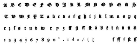 Born in Gent (now Belgium) around 1540, and aka Henry du Tour, he died in 1580. He delivered letters to Plantin (and exclusively so between 1570 and 1580). Enschedé's specimen book lists his 1575 Civilité as Civilité No. 14.
 His lettering was revived in 1994 by the Dutch Type Library as DTL VandenKeere. Myfonts.com writes that Van den Keere's 2-line Double Pica Roman (Gros Canon), cut around 1570 and shown in Plantin's c.1585 folio specimen, is the basis for Fred Smeijers' recent face, Renard. In Sixteenth-century Printing Types of the Low Countries (H.D.L. Vervliet, Amsterdam, 1968), van den Keere is called the best punchcutter of the Low Countries in the sixteenth century, being the link between the French, who dominated the 16th century, and the Dutch who led in the 17th century. In 1575, he made a Civilité, the "Van den Keere Civilité" (see here for more on that story). Matthew Carter's DTL Flamande (2004, Dutch Type Library) is based on a Textura by Hendrik van den Keere. DTL Flamande is available from URW++ since 2018. [Google]
[MyFonts]
[More] ⦿
|
Henric Pieterszoon Lettersnijder
|
Aka Henric Pieterszoon. Dutch letter cutter ("lettersnijder"), d. ca. 1511. He made a textura some time before 1492 Sixteenth Century Printing Types of the Low Countries (H.D.L. Vervliet, 1968) mentions that he was from Rotterdam, and cut letters. Occasionally, he printed as well, in Antwerp from 1496-ca. 1500, in Rotterdam from 1504 until 1509, and in Delft from 1508 until some time after 1511. It is estimated that he cut a third to half of all the type used in the Low Countries at that time. These typefaces, including the Textura, remained popular there from 1492 until about 1550-1560, when they were superseded by the blackletter type of Ameet Tavernier and Hendrik van den Keere. His son was Cornelis Henricszoon Lettersnijder, who also cut type, starting out in Delft. Digitizations: Oude Hollandse (2012, Alter Littera; after Henric Pieterszoon "Lettersnijder"'s 1492 typeface), Initials Gothic C (2012, Alter Littera, based on a 1508 type by Pieterszoon), English textura. [Google]
[More] ⦿
|
Hermann Zapf
|
 Prolific master calligrapher and type designer, born in Nuremberg in 1918. Most of his life, he lived in Darmstadt, where he died in 2015. He is best known for Palatino, Optima, Melior, Zapf Dingbats, Zapfino, and ITC Zapf Chancery. He created alphabets for metal types, photocomposition and digital systems.
 He studied typography from 1938 until 1941 in Paul Koch's workshop in Frankfurt. From 1946 until 1956, he was type director at D. Stempel AG type foundry, Frankfurt. In 1951 he married Gudrun von Hesse. From 1956 until 1973, he was consultant for Mergenthaler Linotype Company, Brooklyn and Frankfurt. From 1977 until 1987, he was vice president of Design Processing, Inc., New York (which he founded with his friends Aaron Burns and Herb Lubalin), and professor of Typographic Computer Programs, Rochester Institute of Technology, Rochester, New York. Students at RIT included Kris Holmes and Charles Bigelow, who together created the Lucida type family. Other prominent students include calligrapher/font designer Julian Waters and book designer Jerry Kelly. From 1987 until 1991, he was chairman of Zapf, Burns&Company, New York. He retired in Darmstadt, Germany, but consulted on many font projects until a few years before his death. In the 1990s, Zapf developed the hz program for kerning and typesetting. It was acquired by Adobe who used ideas from it in InDesign. Awards: - 1969 Frederic W. Goudy Award, Rochester Institute of Technology, Rochester, New York.
- 1973 Gutenberg Prize, City of Mainz.
- 1975 Gold Medal, Museo Bodoniano, Parma.
- 1985 Honorary Royal Designer for Industry, Royal Society of Arts, London.
- 1987 Robert Hunter Middleton Award, Chicago.
- 1994 Euro Design Award, Oostende.
- 1996 Wadim Lazursky Award, Academy of Graphic Arts, Moscow.
- 1999 Type Directors Club award for Zapfino (1998), New York.
- 2010 Bundesverdienstkreuz 1. Klasse.
Some publications by Hermann Zapf: Feder und Stichel (1949, Trajanus Presse, Frankfurt) About Alphabets (1960) Manuale Typographicum (1954 and 1968). Only 1000 copies were printed of the original. Typographic Variations (1964), or Typografische Variationen (1963, Stempel), of which only 500 copies were printed. Orbis Typographicus (1980) Hermann Zapf and His Design Philosophy (Chicago, 1987) ABC-XYZapf (London, 1989) Poetry through Typography (New York, 1993) August Rosenberger (Rochester, NY, 1996). Alphabet Stories (RIT Cary Graphic Arts Press, Rochester, 2008). Review by Hans Hagen and Taco Hoekwater. My collaboration with Don Knuth and my font design work [just an article], TUGboat 22:1/2 (2001), 26-30. Local download. List of his typefaces: - Alahram Arabisch.
- Arno (Hallmark).
- Aldus Buchschrift (Linotype, 1954): Italic, Roman. Digital version by Adobe.
- Alkor Notebook.
- Attika Greek.
- Artemis Greek.
- Aurelia (1985, Hell).
- AT&T Garamond.
- Book (ITC New York). Samples: Book Demi, Book Demi Italic, Book Heavy, Book Heavy Italic, Book Medium Italic. The Zapf Book, Chancery and International fonts are under the name Zabriskie on the SoftMaker MegaFont XXL CD, 2002.
- Brush Borders.
- Comenius Antiqua (1976, Berthold; see C792 Roman on the SoftMaker MegaFont XXL CD, 2002).
- Crown Roman and Crown Italic (Hallmark).
- Chancery (officially called ITC Zapf Chancery): Bold, Demi, Italic, Light, Liht Italic, Mediu Italic, Roman.
- Civilité (Duensing). Mac McGrew on the Zapf Civilité: Zapf Civilite is perhaps the latest typeface to be cut as metal type, having been announced in January 1985, although the designer, Hermann Zapf, had made sketches for such a typeface as early as 1940, with further sketches in 1971. But matrices were not cut until 1983 and 1984. The cutting was done by Paul Hayden Duensing in Kalamazoo, Michigan. The first Civilité typeface was cut by Robert Granjon in 1557, based on a popular French handwriting style of the time. Other interpretations have been made from time to time, notably the Civilité (q.v.) designed by Morris Benton in 1922 for ATF. The new Zapf design has the same general character but with a more informal and contemporary feeling. A smooth flow between weights of strokes replaces the stark contrast of thick-and-thin in older interpretations. There are several ligatures, and alternate versions of a number of characters, including several terminals. Only the 24-point Didot size is cut or planned.
- Charlemagne (Hallmark).
- Digiset Vario (1982, Hell): a signage face.
- Edison (Hell), Edison Cyrillic. Scans: Bold Condensed, Book, Semibold Italic, Semibold, Book Italic.
- Euler (American Mathematical Society). Zapf was also consultant for Don Knuth on his Computer Modern fonts. In 1983, Zapf, Knuth and graduate students in Knuth's and Charles Bigelow's Digital Typography program at Stanford University including students Dan Mills, Carol Twombly, David Siegel, and Knuth's computer science Ph.D. students Scott Kim and John Hobby, completed the calligraphic typeface family AMS Euler for the American Mathematical Society (+Fraktur, Math Symbols, +script). Taco Hoekwater, Hans Hagen, and Khaled Hosny set out to create an OpenType MATH-enabled font Neo-Euler (2009-2010), by combining the existing Euler math fonts with new glyphs from Hermann Zapf (designed in the period 2005-2008). The result is here. The Euler digital font production was eventually finished by Siegel as his M.S. thesis project in 1985.
- Firenze (Hallmark).
- Festliche Ziffern (transl: party numbers).
- Frederika Greek.
- Gilgengart Fraktur (1938, D. Stempel). Some put the dates as 1940-1949. It was released by Stempel in 1952. Revivals include RMU Gilgengart (2020, Ralph M. Unger), and Gilgengart by Gerhard Henzel.
- Heraklit Greek (1954). A digital revival was first done by George Matthiopoulos, GFS Heraklit. Later improvements followed by Antonis Tsolomitis and finally in 2020 by Daniel Benjamin Miller.
- Hunt Roman (1961-1962, Pittsburgh). A display typeface exclusively designed for the Hunt Botanical Library (Hunt Institute for Botanical Documentation since 1971), situated on campus of Carnegie Mellon University in Pittsburgh, to accompany their text typeface Spectrum. Review by Ferdinand Ulrich.
- International (ITC, 1977). Samples: Demi, Demi Italic, Heavy, Heavy Italic, Light, Light Italic, Medium, Medium Italic.
- Janson (Linotype).
- Jeannette Script (Hallmark).
- Kompakt (1954, D. Stempel).
- Kalenderzeichen (transl: calendar symbols).
- Kuenstler Linien (transl: artistic lines).
- Linotype Mergenthaler.
- Melior (1952, D. Stempel; see Melmac on the SoftMaker MegaFont XXL CD, 2002). Samples: Bold, Bold Italic, Italic, Roman.
- Michelangelo (1950, D. Stempel, a roman caps face; a digital version exists at Berthold and at The Font Company).
- Marconi (1975-1976, Hell; now also available at Elsner&Flake and Linotype; according to Gerard Unger, this was the first digital type ever designed---the original 1973 design was intended for Hell's Digiset system; Marconi is a highly readable text face).
- Medici Script (1971).
- Musica (Musiknoten, transl: music symbols; C.E. Roder, Leipzig).
- Magnus Sans-serif (Linotype, 1960).
- Missouri (Hallmark).
- Novalis.
- Noris Script (1976; a digital version exists at Linotype).
- Optima (1955-1958, D. Stempel--Optima was originally called Neu Antiqua), Optima Greek, Optima Nova (2002, with Akira Kobayashi at Linotype, a new version of Optima that includes 40 weights, half of them italic). Samples: Poster by Latice Washington, Optima, Demibold Italic, Black, Bold, Bold Italic, Demibold, Extra Black, Italic, Medium, Medium Italic, Regular, Italic. Digital clones: Zapf Humanist 601 by Bitstream, O801 Flare on the SoftMaker MegaFont XXL CD (2002), Opus by Softmaker, Columbia Serial by Softmaker, Mg Open Cosmetica, Ottawa by Corel, October by Scangraphic, CG Omega by Agfa compugraphic, Chelmsford by URW, Classico by URW and Optus by URW.
- Orion (1974).
- Palatino (1948, D. Stempel; the original font can still be found as Palazzo on Softmaker's XXL CD, 2002), Palatino Nova (2005, Linotype), Palatino Sans (2006, Linotype, with Akira Kobayashi), Palatino Greek, Palatino Cyrillic. Palatino was designed in conjunction with August Rosenberger, In 2013, Linotype released Palatino eText which has a larger x-height and wider spacing. Palatino samples: black, black italic, bold, bold italic, italic, medium, roman, light, light italic. Poster by M. Tuna Kahya (2012). Poster by Elena Shkarupa. Poster by Wayne YMH (2012). Zapf was particularly upset about the Palatino clone, Monotype Book Antiqua. Consequently, in 1993, Zapf resigned from ATypI over what he viewed as its hypocritical attitude toward unauthorized copying by prominent ATypI members.
- Phidias Greek.
- Primavera Schmuck.
- Pan Nigerian.
- Quartz (Zerox Corporation Rochester, NY).
- Renaissance Antiqua (1985, Scangraphic). Samples: Regular, Bold, Book, Light Italic, Swashed Book Italic, Swash Italic.
- Saphir (1953, D. Stempel, see now at Linotype).
- Sistina (1951, D. Stempel).
- Scriptura, Stratford (Hallmark).
- Sequoya (for the Cherokee Indians), ca. 1970. This was cut by Walter Hamady and is a Walbaum derivative.
- Linotype Trajanus Cyrillic (1957).
- Textura (Hallmark).
- URW Grotesk (1985, 59 styles), URW Antiqua, URW Palladio (1990).
- Hallmark Uncial (Hallmark).
- Virtuosa Script (1952, D. Stempel). Zapf's first script face. Revived in 2009 as Virtuosa Classic in cooperation with Akira Kobayashi.
- Venture Script (Linotype, 1966; FontShop says 1969).
- Winchester (Hallmark).
- World Book Modern.
- ITC Zapf Dingbats [see this poster by Jessica Rauch], Zapf Essentials (2002, 372 characters in six fonts: Communication, Arrows (One and Two), Markers, Ornaments, Office, based on drawings of Zapf in 1977 for Zapf Dingbats).
- Zapfino (Linotype, 1998, winner of the 1999 Type Directors Club award), released on the occasion of his 80th birthday. This is a set of digital calligraphic fonts. Zapfino Four, Zapfino Three, Zapfino Two, Zapfino One, ligatures, Zapfino Ornaments (with plenty of fists). Poster by Nayla Masood (2013).
Books and references about him include: - Hermann Zapf: A Life in Letters (2016, Julian Waters).
- What Our Lettering Needs: The Contribution of Hermann Zapf to Calligraphy & Type Design at Hallmark Cards (2011, Rick Cusick, RIT Cary Graphic Arts Press, Rochester).
- Hermann Zapf and the World He Designed: A Biography (2019, Jerry Kelly, The Grolier Club, New York).
- Laudatio for Professor Hermann Zapf (Frank Mittelbach). TUGboat 22:1/2 (2001), 24-26. Local download.
- Book review: Hermann Zapf and the World He Designed: A Biography, by Jerry Kelly (Barbara Beeton). TUGboat, Volume 40 (2019), No. 3.
Pictures of Hermann Zapf: with Lefty, with Rick Cusick, in 2003, with Frank Jonen, with Jill Bell, with Linnea Lundquist and Marsha Brady, with Rick Cusick, with Rick Cusick, with Stauffacher, a toast, with Werner Schneider and Henk Gianotten, with Chris Steinhour, at his 60th birthday party. Pictures of his 80th birthday party at Linotype [dead link]. Linotype link. Klingspor link. [Google]
[MyFonts]
[More] ⦿
|
Hernández Type (was: Estudio de diseño Calderón)
[Daniel Hernandez]
|
 Estudio de diseño Calderón in Chile had the work of two Chilean designers:
 - Daniel Hernández has some free fonts at Dafont and Font Squirrel. Klingspor link. His award-winning fonts include Stgotic textura (2006), Stgotic Fracktur (pixel blackletter), and the (free) unicase piano key font Pincoya Black (2008), which was based on Spanish Civil War poster, and won an award at Tipos Latinos 2010. He calls his ultra fat Roxy (2009) tipografia desde el culo del mundo.
Behance link. His Flickr page. His lettering. Hernandez Bold (2010, Sudtipos) has slabs, serifs, and plenty of round curves. It won an award at Tipos Latinos 2012. Rita (2010, Sudtipos) is an ultra-slab all caps typeface inspired by the fat wood types. In 2018, Daniel Hernandez and Rodrigo Fuenzalida enlarged Rita. Designer of the free text font Belgrano (2011). Merced (2011) is a thin monoline sans. Sanchez (2011, Latinotype and YWFT) is a slab serif family with a free weight. In 2013, he published the beautiful sequel, Sanchez Slab, which is patterned after Rockwell. Sanchez Niu (2017) is another slab serif in this family. - Javier Quintana created the smooth and delectable text family Berenjena in 2007. He also made the roundish display typeface Botota (2007), which is reminiscent of market signage in Santiago.
- Monroe (2010, Sudtipos, and revised in 2018, Latinotype) is a swashy slab family. See it in action in this I Love New York poster.
- Patagon (2011, Latinotype) is a rounded wood-inspired poster typeface done with Daniel Hernandez and Luciano Vergara.
- Guadalupe (+Gota, 2011, Latinotype). A hairline didone family with sufficient contrast and frilliness to satisfy the fashion mags.
- Andes (2011, Latinotype). This is a playful slightly swashy sans family. Followed by Andes Italic (2012) and Andes Condensed (2012). See also Andes Rounded (2014) and Andes Neue (2019), which has 56 styles.
- Bosque (2012) is a wood style family co-designed with Paula Nazal at Latinotype.
- Magallanes (2012, Daniel Hernandez) is a contemporary neohumanist sans serif typeface family covering Ultra Light to Black. This typeface was followed by the 8-style Magallanes Essential (2012) and by Magallanes Condensed (2013).
- Trend (2013). A layered type system done together with Paula Nazal Selaive. Followed by Trend Hand Made also in 2013 and Trend Rough in 2014.
- With Eli Hernandez, Daniel Hernandez published the unicase typeface family Grota in 2013.
- Roble (2013): A slab serif font family which Daniel places halfway between Andes and Sanchez. It is characterized by its clampy backbitten lower case c. The slab serif Roble Alt (2013) has eight weights of two fonts each.
- Together with Miguel Hernandez at Latinotype in 2014, Daniel Hernandez designed the 1930s tall-ascendered sans family Arquitecta, which is promoted as an alternative for Futura, Kabel and Avant Garde. It was followed later that year by Arquitecta Office and Arquitecta Standar. They also co-designed Texta, a geometric sans for all. His Newslab (2014) family is a combination of Andes, Sanchez and Roble; the Regular and Italic styles are free.
- In 2016, Cesar Araya and Daniel Hernandez co-designed the very Latin / curvy / warm slab serif typeface family Hernandez Niu.
- The foundry became Hernández Type at some point. The fonts there, repeated from the former foundry, include Patagon, Merced, Hernandez Bold, Monroe, Pincoya Black Pro, Rita Bold and Fat, and Pincoya Black Free.
- In 2016, Daniel Hernandez, now studying at the KABK in Den Haag, The Netherlands (2014-2018), created Lxy, an interesting dynamic (animated) display typeface made entirely with the Python programming language in Drawbot. At Latinotype, he published Basic Sans, Basic Sans Cnd and Basic Sans Narrow.
- In 2016, Bruno Jara Ahumada, Alfonso Garcia, Luciano Vergara, Daniel Hernandez and the Latinotype Team designed the roman square capital headline typeface family Assemblage.
- In 2017, Paula Nazal and Daniel Hernandez co-designed Trenda, a geometric sans family based on the uppercase of Trend. The rounded edge version of Trenda is Boston [16 styles; corrections and review by Alfonso Garcia and Rodrigo Fuenzalida].
- Peckham (2018). An 8-style slab serif named after the birthplace of Vincent Figgins. Digital editing and corrections by Alfonso Garcia.
- The Reinvention of Rita (2018). A slab serif.
- In 2019, Latinotype published the great super-slab typeface Breton which was designed by Daniel Hernandez and Rodrigo Fuenzalida. Daniel Hernandez added the geometric sans family Biennale in late 2019.
- In 2020, he released Magazine Grotesque at Latinotype. It is characterized by an overhanging umbrella lower case a, and an overbiting lower case e.
- Facundo (2020, Paula Nazal Selaive and Daniel Hernandez, at Latinotype) is a 14-style geometric sans family.
- In 2020, Luciano Vergara, Daniel Hernandez and Alfonso Garcia co-designed the 54-style sans family Aestetico. They introduce Formal and Informal subsets of fonts so that the family covers several sans genres.
- Apparel (2020, Latinotype) is a 20-font display serif family inspired by the MacFarland series in the 1912 ATF catalog, which in turn was based on Heinz Koenig's Roemische Antiqua (1888, Genzsch&Heyse). It was designed by Daniel Hernandez and Alfonso Garcia.
- Hernandez Bros (2021). By siblings Daniel and Eli Hernandez. This is a 7-style sharp-edged serif family loosely based on Bulfinch by William Martin Johnson (1903, ATF).
Behance link. Home page. [Google]
[MyFonts]
[More] ⦿
|
Hidetaka Yamasaki
|
 Graduate of Kyoto University and the the University of Reading's MATD program. Hidetaka Yamasaki (Japan) designed several typefaces:
 - Clare. A clean and clear typeface ideal for journals, such as newspapers and magazines. It covers Latin and Thai.
- Carl Marx. A geometric but warm rounded typeface based on a sketch drawn by a German painter who studied at Bauhaus, Carl Marx (1911-1991). It was published in 2018 in the Adobe Originals collection. Adobe writes: This typeface is based on lettering by Carl Marx (1911-1991), designed during his first semester at the Bauhaus in Joost Schmidt?s class, in 1932. Although the letter proportions are based on Schmidt's teachings, the forms are not constructed from compass and ruler, but drawn with brush and marker, lending the words a warm and lively touch. Hidetaka Yamasaki redrew the letters from scratch and added all missing characters for today's needs. A set of hanging figures, alternates for some critical letterforms (such as f, r, and t) as well as several ligatures make CarlMarx especially suitable for use in body text. As suggested by Marx, Yamasaki captured two weights from the original drawing and perfectly adjusted light and bold to highlight words and create hierarchy in headlines without losing or adding space. True to the original, Yamasaki captured the wobbly contour in CarlMarx, preserving warmth in the condensed geometric style of the early 1930s.
- Sandberg Grotesque. A quirky typeface based on a black face used in Willem Sandberg's catalogues in 1950s; outstanding feature of tapering serves for display use, but will disappear in small size to turn out a useful text typeface.
- Stylus. A simple, slightly lively text typeface for matching Latin with Arabic in small size.
- Rudolph. A typeface for greeting cards and picture books, a three-day project as the first assignment of the MATD.
- Luke (2019, The Northern Block). In the style of Caslon's English Blackletter (a textura), and named after the Caslon family tomb in the churchyard of St Luke Old Street in London.
[Google]
[MyFonts]
[More] ⦿
|
History of blackletter fonts
|
Birgit Stehno tells the story of black letter fonts. (1) Textura (written typeface developed in France in the 13th c.). (2) Rotunda, a "soothed" form of Textura, important in Southern Europe in the 15th c. (3) Humanistic Minuscule, written in Italy in the 15th century, and developing into the Antiqua typeface (4) At the end of the 1th century, Bastarda appears (more ornaments and curved strokes): the first printed books use Textura, Rotunda and Bastarda (5) Schwabacher appears around 1481, used in Martin Luther's bible; the umlauts are minuscule e's; until the 19th c. most books in Bavaria are in Schwabacher (5) The German emperor Maximilian (1493-1519) directed that a new typeface based on traditional 'German' fonts had to be created; thus, the Fraktur was designed by the calligrapher Leonhard Wagner; this type was adopted by the Renaissance artist Albrecht Dürer and by the reformation movement, and soon became popular all over Europe. [Google]
[More] ⦿
|
Hoefler (was: Hoefler&Frere-Jones, and Hoefler Type Foundry)
[Jonathan Hoefler]
|
 Born in 1970 in New York, Jonathan Hoefler ran the Hoefler Type Foundry (or: HTF) in New York. It employed Tobias Frere-Jones, Josh Darden, and Jesse Ragan. In 2004, it was renamed Hoefler&Frere-Jones, or HFJ for the cognoscenti. However, a legal problem between Jonathan and Tobias led to a corporate divorce in 2014---the company is renamed again The Hoefler Type Foundry. In September 2021, Monotype acquired Hoefler, and that is the end of that chapter. Their typefaces:
 - Acropolis.
- Archer (2001, by Jonathan Hoefler and Tobias Frere Jones). A humanist slab serif originally designed for Martha Stewart Living. It has a great range of features, including a classy hairline style. However, I see trouble down the road with the name Archer which has been used previously by several other foundries such as SignDNA, Arts&Letters and Silver Graphics. Some say that Archer is just Stymie with some ball terminals. Nevertheless, it became a grand hit, and has been used by Wes Anderson in The Budapest Hotel, and in Wells Fargo's branding. David Earls on Archer: with its judicious yet brave use of ball terminals, and blending geometry with sexy cursive forms, all brought together with the kind of historical and intellectual rigour you fully expect from this particular foundry, Archer succeeds where others falter.
- Champion Gothic.
- Chronicle Text. In 2007, HFJ published the "blended Scotch" newspaper serif text family Chronicle, which led to Chronicle ScreenSmart in 2015. See also Chronicle Display. In 2016, Hoefler published Chronicle Hairline. In Wired Magazine, Margaret Rhodes writes that it is for men who wear dress shoes without socks. Chronicle Hairline is a didone that breaks the didone rules. It is rounder, asymmetric (as in the mouth of the C), and as Hoefler puts it, more musical. As of 2016, the Chronicle typeface family consists of the display styles Chronicle Hairline, Chronicle Display (+Condensed, +Compressed), and Chronicle Deck (+Condensed), and the 60-style Chronicle Text family, which comes in G1, G2, G3 and G4 subfamilies.
- Many custom and branding typefaces, including, e.g., General GG (2005-2007) and typefaces for The New York Times Magazine, Times Mirror, Esquire and McGraw-Hill (1995, free download). Time.com provides previews of fonts made for Esquire, Lever House, eCompany Now, The Guggenheim Museum, The New York Times, and the Whitney Museum.
- Cyclone.
- Decimal (2019). A sans based on early wristwatch typefaces, i.e., the microscopic letters used by Swiss watchmakers in La Chaux-de-Fonds.
- Didot. HTF carefully designed and complete families include HTF-Didot (1991) in 42 weights/variations, originally designed for Harper's Bazaar; based on the grosse sans pareille no. 206 of Molé le jeune.
- Eyes Only (2019). A stencil typeface.
- Forza (2010). A sans typeface. Not to be confused with the 2007 font Forza by Michel Luther at Die Gestalten.
- Geometer Screen Fonts. Free Mac fonts.
- Giant.
- Gotham (2003). The stylish sans typeface made famous by Obama. See also Gotham Rounded.
- Historical Allsorts. This includes Historical-EnglishTextura, Historical-FellType, Historical-GreatPrimerUncials and Historical-StAugustin.
- Hoefler Text (+Ornaments). This antiqua text typeface consists of 27 fonts made in 1991-1992, and is distributed with many Apple products.
- Hoefler Titling.
- Ideal Sans. A slightly flared humanist sans. In the 1996 Morisawa Awards competition, Hoefler received a bronze prize for Ideal Sans. In 2011, HFJ writes it up beautifully: Typefaces are born from the struggle between rules and results. Squeezing a square about 1% helps it look more like a square; to appear the same height as a square, a circle must be measurably taller. The two strokes in an X aren't the same thickness, nor are their parallel edges actually parallel; the vertical stems of a lowercase alphabet are thinner than those of its capitals; the ascender on a d isn't the same length as the descender on a p, and so on. For the rational mind, type design can be a maddening game of drawing things differently in order to make them appear the same. Twenty-one years ago, we began tinkering with a sans serif alphabet to see just how far these optical illusions could be pushed. How asymmetrical could a letter O become, before the imbalance was noticeable? Could a serious sans serif, designed with high-minded intentions, be drawn without including a single straight line? This alphabet slowly marinated for a decade and a half, benefitting from periodic additions and improvements, until in 2006, Pentagram's Abbott Miller proposed a project for the Art Institute of Chicago that resonated with these very ideas. As a part of Miller's new identity for the museum, we revisited the design, and renovated it to help it better serve as the cornerstone of a larger family of fonts. Since then we've developed the project continuously, finding new opportunities to further refine its ideas, and extend its usefulness through new weights, new styles, and new features. Today, H&FJ is delighted to introduce Ideal Sans, this new font family in 48 styles. Ideal Sans is a meditation on the handmade, combining different characteristics of many different writing tools and techniques, in order to achieve a warm, organic, and handcrafted feeling.
- Idlewild (2012). A wide sans typeface family.
- Isotope (2018). A squarish typeface family. Not to be confused with Isotope by Fábio Duarte Martins, designed six years earlier.
- Inkwell (2017). Hoefler writes: Inkwell is provided in a range of styles with which readers already have clear associations: a bookish Serif and a cleanly printed Sans, a conversational Script, a ceremonial Blackletter, a fancy Tuscan for decoration, and a stately Open for titles. Each style is offered in six weights, from a technical pen Thin to a graffiti marker Black. Inkwell is a name used as far back as 1992 by Sam Wang, and additional older fonts called Inkwell exist by Dan Solo, Philip Cronerud and MXB Foundry.
- Knockout. The Knockout collection was designed to celebrate the beauty and diversity of nineteenth century sans serif wood types.
- Knox.
- Landmark (2013). In Regular, Inline, Shadow and Dimensional styles. A collection of architectural caps which started out as a custom typeface for Lever House in New York.
- Leviathan.
- Mercury Text and Mercury Display.
- Nitro & Turbo (2016). Hoefler writes: We designed Nitro for Pentagram's Michael Bierut, as part of a new identity for the New York Jets football team. Originally named Jets Bold, Nitro is rooted in the styles of lettering used by the team throughout its fifty-year history: even as its logotype evolved, it consistently used heavy, slanting forms to imply force and movement. and ends with corporate babble: Nitro embodies this indomitable spirit in the context of a fresh, contemporary design. About the naming: AF Nitro was made by Sylvia Janssen at the very popular Die Gestalten Studio in Germany, in 2001. It will be fun to watch that battle between giants. Not to mention that lesser known players also made commercial fonts called Nitro more than a decade earlier---these include Jack Wills at Sign DNA and Markus Schroeppel (in 2004).
- Numbers. In 2006, HFJ published the Numbers family, 15 fonts with nothing but numbers from various sources: Bayside (based on a set of house numbers produced around 1928 by H. W. Knight & Son of Seneca Falls, New York), Claimcheck (inspired by ticket stubs), Delancey (from tenement doorways), Depot (modeled on vintage railcars), Deuce (based on playing cards), Dividend (from an antique check writer), Greenback (based on U. S. currency), Indicia (inspired by rubber stamps), Premium (after vintage gas pumps), Prospekt (based on Soviet house numbers), Redbird (inspired by New York subways), Revenue (from cash register receipts), Strasse (after European enamel signs), Trafalgar (inspired by British monuments), Valuta (after Hungarian banknotes).
- Obsidian. In 2015, Jonathan Hoefler and Andy Clymer cooperated on the decorative copperplate engraved emulation typeface Obsidian. Various kinds of 3d illumination in Obsidian were obtained by an algorithmic process. Not to be confused with about ten other fonts called Obsidian--for example, we have Obsidian (pre 2003, Silver Graphics), Obsidian (2014, Steffi Strick), Obsidian (2012, Krzysztof Stryjewski), Obsidian Deco (2013, Yautja), Obsidian (2005, Sparklefonts), and Obsidian Chunks (pre 2002, Jeni Pleskow).
- Operator, Operator Mono, Operator Screensmart and Operator Screensmart Mono. The non-typewriter typewriter type..
- Peristyle (2017). A stylish condensed typeface family with piano key elements, and described by Hoefler as dramatic.
- Quarto.
- Requiem (1991-1994).
- In 2003, they published Retina (which was originally designed for the stock listings in the Wall Street Journal), but that font disappeared from their listing.
- Ringside.
- St. Augustin Civilité: St. Augustin Civilité is a digitization of Robert Granjon's extraordinary type of 1562, now in the collection of the Enschedé type foundry, Haarlem. This typeface is reproduced in Civilité Types by Harry Carter and H. D. L. Vervliet (Oxford Bibliographical Society, by the Oxford University Press, 1966.) As figures and punctuation were lacking in the original, these have been borrowed from two other Granjon types, the Courante and Bastarde of 1567. (The remainder of the character set has been invented.)
- Sagittarius (2021). A soft-edged compact semi-futuristic headline sans. In keeping with tradition, Hoefler dismisses or ignores the fact that the name Sagittarius was taken by a handful of other fonts since about 22 years ago.
- Saracen.
- Sentinel. Sentinel (1999) is HFJ's take on a Clarendon. I can't understand why they picked a name already taken by many foundries such as Graphx Edge Fonts, Comicraft, Dieter Steffmann and Sentinel Type. Anyway, in 2020, Sentinel got un upgrade (with smallcaps and ornaments) in 2020 in Sentinel Pro.
- Shades (2003). In Cyclone, Topaz, Giant and Knox weights.
- Surveyor (2014). An exquisite mapmaker and newsprint didone font family with Fine, Display and Text subfamilies.
- The Proteus Project.
- Topaz.
- Tungsten (2009) and Tungsten Rounded. Their sales pitch: That rarest of species, Tungsten is a compact and sporty sans serif that's disarming instead of pushy - not just loud, but persuasive. Douglas Wilson compares Tungsten with Alternate Gothic No. 3 (Morris Fuller Benton). Not to be confused with Tungsten (2005, Sparklefonts).
- Uncategorized early typefaces: Gestalt-HTF, Fetish-HTF (blackletter modernized, 1995), Ehmcke-HTF.
- Verlag (2006). A 30-style art deco-inspired semi-Bauhaus geometric sans family based on six typefaces originally designed for the Guggenheim. HFJ writes: From the rationalist geometric designs of the Bauhaus school, such as Futura (1927) and Erbar (1929), Verlag gets its crispness and its meticulous planning. Verlag's fairminded quality is rooted in the newsier sans serifs designed for linecasting machines, such as Ludlow Tempo and Intertype Vogue (both 1930), both staples of the Midwestern newsroom for much of the century. But unlike any of its forbears, Verlag includes a comprehensive and complete range of styles: five weights, each in three different widths, each including the often-neglected companion italic.
- Vitesse (2010). The typophiles react to the slab family with praise: I think they're chasing Cyrus Highsmith, Dispatch and Christian Schwartz, Popular on this one. Doing a pretty good job of it too! [...] Looks to me like the love-child of Eurostile and City. In 2020, Jonathan Hoefler added the inline Cesium, which forced him to modify the glyphs somewhat.
- Whitney. In 2004, they produced an amazing 58-weight sans serif family, Whitney (by Tobias Frere-Jones), designed for use in infographics. Whitney's sales blurb: While American gothics such as News Gothic (1908) have long been a mainstay of editorial settings, and European humanists such as Frutiger (1975) have excelled in signage applications, Whitney bridges this divide in a single design. Its compact forms and broad x-height use space efficiently, and its ample counters and open shapes make it clear under any circumstances. See also Whitney Condensed and Whitney Narrow.
- Ziggurat.
Hoefler received Bukvaraz 2001 awards for HTF Guggenheim, HTF Knockout, HTF Mercury (1997, no relationship with Goudy's Mercury of 1936) and HTF Requiem. At ATypI in 2002, he received the Charles Peignot award. FontShop link. [Google]
[MyFonts]
[More] ⦿
|
Hugues Carrere
|
Toulouse, France-based designer of the 690-glyph Strange Textura (2015) and the 1400-glyph Strange Times (2017). [Google]
[More] ⦿
|
Icelar
|
 Spanish art student (in 2013). FontStructor who created these typefaces in 2013: Beauvoir, Lancaster, Figaro, Abel, Cawdor (octagonal), Dilior (a didone), Harmond (blackletter), Antelopes, Godiva (blackletter), Autumn, Sasanida, Help I Need Somebody (circle-based geometric sans), Goodbye Fontstruct, Fairy Tale Vanishing, Slanton, Kyrie, Eat Me, De Stijl, Chiara, Hecate, Stancyl (piano key), Ionica, Winty's Gothica, Vintage America, El Greco, Fairy Tale, Ozawa, Donibo Display, Decade (blackletter), Donibo, Weirdy Moves (+Party), Bliss (crayon font), Ibsen (a dark copperplate style inspired by an Ikea logo), Avenzo, Avenzo Mad Serif, The Code of Honour (constructivist), Yago, Vienna Cafe Big (art nouveau), Castillian (Textura, +SmallCaps), Lumpy, Origami (3d face), Baldur2 (a lava lamp typeface), Trinity (Victorian), Patterns For Everyone, Evangelion, Scriptura, Maverick, Giralda, Freak Fraktur, Vienna Cafe (art nouveau), Sportiva (Small Caps, Deco1, Deco2 [blackboard bold], Sans, Alternates 1, Alternates 2, Alternates 3, Regular), Carmina, Hieronimus (a pixelish typeface inspired by Bauhaus: +Slab, +Stencil).
 Typefaces from 2014: Bronzino, Hagia, Decodrops, Kobe Slab, Enoe (blackletter), Adagio, Nemesis (thin avant garde sans), Shalott (geometric sans), Origami, Kobe Regular, Kobe Stencil, Giovanni (textura blackletter), Decan, Thoreau (blackboard bold), Blue Requiem, Funky Business, Red Requiem, Dreamcatcher, Drastic, Retropix, Vanity Strong, Dotchild, Reya (blackletter). Typefaces from 2015: Stanwyck (stencil), Tiberian (roman caps), Dresde Sans, Fraktur in the Forest, Dingbat Tribe, Action (in the style of Impact), Hibiscus (sans), Oranienbaum (a stylish serif), Amphora (sans), Lazzaro (squarish), Pineapple Juice, Sheldon. Typefaces from 2016: Watercolor (an art deco sans inspired by Carlos Winkow's Grotesca Radio), Hipster, Lakme Mondrianesque, Humanist Sans. Typefaces from 2017: Dublin, Dresde Serif. [Google]
[More] ⦿
|
Iconian Fonts
[Dan M. Zadorozny]
|
 Born in Philadelphia and a resident of McKinney, Texas, Dan Zadorozny's creations at Iconian. He is a prolific type designer who specializes in techno and sci-fi typefaces. Dafont link. Fontsy link. Abstract Fonts link. Font Squirrel link. His fonts in alphabetical order:
 - #44 font (2002), 00Starmap (2001, pixel font), 1968 Odyssey (2016), 1st Cav (2008), 1st Enterprises (2017), 2-Tech, 21 Gun Salute (2013), 2nd Amendment (2007, guns), 2nd Amendment 2050 (2009, more gun silhouettes), 2Toon, 300 Trojans (2008, comic book family), 4114 Blaster (2008, futuristic), 5th Agent (2008, techno), 7th Service (2002), 8th Element (2013), 911Porscha, 98 Bottles of Beer (2016).
- Achilles, Action-Men (2008), Action Women (2008, female outlines), Aegis (2010, Greek simulation family), Aetherfox (2013), AirCobra (2002), Aircruiser (2011, trekkie family), AirForce (planes and copters), Airstrike (2013), Airstrip One (2003), Aldo's Moon, Aldo's Nova, Alexis (2001), Alien League, Alpha Century (2020), Alpha Men (2015), Alpha Sentry, Alpha Taurus (2007, octagonal, athletic lettering), Amalgam, American Kestrel (2019), Americorps (2012), Ampire (2019), Anakefka (2009, ultra-fat family), Annapolis (2016), Antietam (2015), Antikythera (2013, Greek simulation face), Antilles (2009, sans family), Arctic Guardian (2019), Argosy, Arilon (2008), Armed Lightning (2017), Army Rangers (2013, octagonal), Assassin Nation (2015, scary and perhaps referring to the "tradition" of school shootings in the USA), Astro Armada (2020: sci-fi), Astropolis (2009), Atlantia (2012, futuristic), Avenger (2008, futuristic).
- Babes&Bond (2009, erotic silhouettes), Babe-alicious (2002, erotic outlines), Bad Axe (2017), Bad Robot (2007, computer game look), Bal-Astaral (2016, octagonal), Bamf (2011, techno family), Banjin (2016), Banshee Pilot (2016), Barcade (2018), Battlefield, Battleworld (2016), Beam Rider, Beam Weapon (2015), Beastian (2011), Behemoth (2018), Ben Zion (2008, Hebrew simulation), Berserker (2008, grunge), Beta Biergärten (2008), Big Blue Bug (2021), Bio-disc, Bio-discSolid, Bio-discThin, Bionic Comic (2002), Bionic Type (2002), Birds of a Feather (2007, dingbats), Black Bishop (2015), Black Gunk (2016), Blade Singer (2021), Blizzard Shaft (2020), Block, Blood Crow (2009), Blood Drenched (2020), Bloodlust (2011, dripping blood face), Blue Cobra (2020), Blue July (2009), Body Swipers (2014, Halloween font), Bog Beast (2013), Bomber Escort (2020), Boomstick (2015), Borgsquad (2014, mechanical/octagonal), Bretton (2018), Brin Athyn (2008, uncial/Celtric), Broken Cyborg (2019), Bronic (2004), Bubble Butt (2014, bubblegum typeface), Buchanan (2016), Buddy Champion (2015), Bummer (2007, octagonal), Bushido (2008, oriental simulation), Butch and Sundance (2013), Buttons the Bear (2008, children's hand), Byte Police.
- Camp Justice (2018), Capella (2011, a wide techno family), Capricus (2018), Captain Canaveral (2019), Carnival Corpse (2016), CasperComics, Centaurus (2015), Chardin Doihle (2008), a useful informal handprinting family), Charlemagne, Charlie's Angles (2018: octagonal), Charmling (2019), Cheyenne Hand (2008), Chicago Express (2016), Christendom, Classic Cobra (2016), Clubber Lang (2013, grungy), Cobalt Alien (2015), C.O.D.E.R. (2012), Coffin Stone (2019: a stone age font), College Collage (2017), Colony Marines (2017), Colossus (2011, old chipped stone look), Combat Droid (2019), ComicBookCommando, ComicFX, Commonwealth, Concielian, Concielian Break (2015), Concielian Classic (2018), Concielien Jet (2015), Contour of Duty (2016), Corinthian, Count Suckula (2015, horror font), Covert Ops (2012, army stencil), Coyote Deco (2007, art deco), Crappity-Crap-Crap (2007), Crazy Ivan (2017: constructivist), Creepy Crawlers (2015, horror font), Crime Syndicate (2013), Crixus (2011, a squarish sans that includes an athletic lettering style), Cro-Magnum (2003), Cruiser Fortress (2016), CryUncial, Cyberdyne (2016), Cyberia (like Soviet: neat Russian imitation letters), Cyborg Rooster (2015), Cydonia Century (2017), Cyrus The Virus (2012, grungy, hand-printed).
- DS Man, Daedalus (2008), Daemonicus (2012), Dagger Dancer (2020), Dameron (2016), Dangerbot (2016), Danger Flight (2015), Dan Stargate (2008), Dan'sHand, Dark Alliance (2014), Dark Dominion (2019), Dark Hornet (2020: a great blocky mechanical typeface family), Dark Horse (nice brush font), Darklighter (2018), Darkwind, Dassault (2013), Deathblood (2014, Halloween font), Deathshead (2019: a metal band font), Deceptibots (2019: stencil), Defcon Zero (2016), Dekaranger (2015), Delta Phoenix (2019), Delta Ray, Demon Priest (2013), Department-K, DepartmentH, Deranian (2008), Devil's Tongue (2019), Detonator, Devil Summoner (2014), DiegoCon (2004), Digital Desolation (2014), Ding-o-saurs (2007), Direktor (2008, Cyrillic simulation techno), Dire Wolf (2013), Disco-Dork, Disco Deck (2005), Disco Duck, Discotechia (2015), Dodger, Dokter Monstro (2017: a great fat hand-painted typeface), Domino Jack (2016, an octagonal stencil typeface), Domino Mask Condensed (2016), Dotcom (2002), Drafting Board (2008), Drafting Table (2008), Dragon Order (oriental simulation), Dread Ringer (2015), Drid Herder (2002), Drive (2015, techno font), Droid-Lover (2008), Drone Tracker (2016), Drosselmeyer (my favorite), Dusk Demon (2020: grungy).
- Eagleclaw (2009), Eaglemania, Eagle Strike (2015), Early Warning (2021), Earth Orbiter (2016), Earthrealm (2013), Earthshake (2013), Earth's Mightiest (2002), East West (2015, constructivist), Echo Station (2017), Eco-files, Edge Racer (2917), Egg Roll (2016, oriental simulation), Elastic Lad (2020), Eldebaran (2012), Elder Magic (2009), Election Day (2009), Elephant Gun (2021), Elite Danger (2017), Emissary (2014, sci-fi), Empire Crown (2011, blackletter), Enduro, Ensign Flandry, Ephesian (2007), Eridanus (2015, octagonal / mechanical), Erin Go Bragh (2009, Celtic/uncial), Escape Artist (2015), Eskindar (2013), Eternal Knight (2013), Eurofighter (2015), Eva Fangoria (2018: a dripping blood font), EverettSteele'sHand, Excelerate, Excelsior, Excelsior Comics, Exedore (2008), Exoplanet (2013, techno), Extechchop (2005), Eyes Only (2018).
- Factor (2016), Falconhead, Falcon Punch (2015), Famous Spaceships (2007), Famous Spaceships 2 (2019), Fanfare Ticket (2018: dot matrix family), FantasticCreatures, Fantazian (2003), Fantom (2009, bad handwriting), Federal Blue (2019), Federal Escort (2014), Federal Service (2011), Federapolis (2008, octagonal techno face), Fedyral (2019), Fedyral-II (2019), Feldercarb (2003, octagonal font), Ferret Face (2013), Fiddler's Cove (2012), Fight Kid (2009), Final Front (2019), First Order (2001), Flash Rogers (2016), Flesh Eating Comic (2013, grunge), Flight Corps (2008, techno/pixelish), FlyingLetaherneck (2002), Force Commander (2019), Force Majeure (2016), Foreign Alien (2020), Foucault (2014, uncial), Fox on the Run (2018), Fox on the Run Academy (2018: athletic lettering), Frank-n-Plank (2013, a wooden plank font), Freakfinder (2014: Halloween font), Free-Agent (2008), Freedom Fighter (2013, stencil), From Bond With Love (2014: military stencil), Front Runner (2019), Frost Giant (2019), Frozen Crystal (2016, LED font), Funk Machine (2016, a great ultra-black techno family of typefaces), FunnyPages, Furiosa (2019), Future Forces (2015), Futurex Grunge (2005).
- Galactic Storm (2014), Galant, Galaxy-1 (2008), Galaxy Far Far Away (2009, futuristic dingbat font), Galaxy Force (2014), Galga (2008, futuristic), Gamma Sentry, Gemina (2011, sci-fi / techno family), Gemina2 (2013), Generation Nth, Gentleman Caller (2014), GeoBats (2007), Gearhead (2013, octagonal), Ghost Clan (2014), GI Incognito (2012), Global Dynamics (2014), Globe Trekker (2021), Goalie (2008, hockey mask alphading), Goblin Creek (2016: Halloween font), Gods of War, Gotharctica (2015, blackletter for horror flicks), Governor (2017), Graffiti Street (2019), Grand National (2015), Grand Sport (2015), Graymalkin (2011, trekky), Grease Gun (2012), Grendel's Mother, Grim Ghost (2013), Ghoulish Intent (2016: Halloween font), Grimlord (2009), Groovy Smoothie (2018), Guardian (2008), Guardian-Laser (2008), Guardian-Pro (2008), Guardian-Shadow (2008), Gunner Storm (2015), Gunrunner (2016: techno), Gunship, Gunship V2 (2002), Gypsy Killer (2013), Gyrfalcon.
- Hadriatic (2008, roman lettering), Half Elven (2013), Halfshell Hero (2013), Hall of Heroes (2007), Halo, Hanging Tree (2019: a wood print emulation font), Han Solo (2013), Hard Science (2019), Harrier (2002), Hawkmoon (2011), Head Human (2021), Heavy Copper (2020), Heavy Falcon (2019), Hello Copters (2013: helicopter dingbats), Hemogoblin (2017: spooky font), Heorot (2009, stone age fonts), Hermetic Spellbook (2017: alchemic), Heroes Assemble (2011), Heroes Assemble Dingbats (2014: all Avenger characters), Hero Worship (2021), Hexgon (2018), Hexkey (2020), Highrise Heaven (2007, city skyline dingbats), Hip Pocket (2014: psychedelic), Hitchblock (2017), Hollow Point (2015), Holly Dingle (2015), Holy Empire, Home Base (2020), Homemade-Robot, Holo Jacket (2016), Homebase (2020: heavy, octagonal), Homelander (2020), Homeworld (2003), Homeworld Translator (2003), Hong Kong Hustle (2015), Horroroid (2015), Horroween (2013, Halloween font), Hot Kiss (2017: paint splatter font), Howlin Mad (2017), Hula Hoop Girl (2019), Hulkbusters, Hydronaut (2019), Hydro Squad (2014), Hyper Vyper (2019: octagonal), Hypno Agent.
- Iapetus (2014, sci-fi), Icebox Art (2012), iChrono (2018), IWantMyTTR!, Iconian (2002), Iconified, iDroid (2020), Illuminati, Illumino (2016), Imaginary Forces (2008, mythical dingbats), Imperial Code (2003, Startrek style face), Imperium, Incubus, Incubus-Italic (2008), Incubus-Shadow (2008), Indigo Demon (2017), Infinity Formula (2003, super techno), Infobubble, Inhumanity (2014), I-House Edition (2014), Inspector General (2020), Instand Zen (2016: Halloween font), Inter Bureau (2019), Interceptor (2008), Interdiction (2012), Intergalactic (2017), International Super Hero (2002), Intrepid, Iron-Cobra (2008), Iron Forge (2012).
- Jack's Candlestick (2013), Jackson, Jannisaries, Jedi Special Forces (2012), Jeebra (2018), Jerusalem (1999, Hebrew font simulation)[see also here], Jetta, JettaTech, Jetway (2012, a stencil face), Johnny Torch (2012), Joy Shark (2018), Judge, Judge Hard, Jugger Rock (2018), Justice (2009), Jumpers (2017), Jumptroops (2003-2015), Justinian.
- Kahless, KameraDings (2009), Kangaroo Court (2018), KarateChop (2009), Kartoons (2008), Katana, Kaylon (2019), Kennebunkport (2013, script), Keystone (pixel font), Khazad-Dum (2011), Kid Cobalt (2008, comic book face), Kinex, King Commando (2011), King's Ransom, Kinnihuman (2020: dingbats), Knievel, KnightsTemplar, Kittrick (2019: a heavy octagonal type), Knock Furious (2003, dingbats), Kobold (2008, futuristic), Kondor (2013), Kountry Kodes (2008, international license plate lettering), Kovacs (2018), Kovacs-Spot (2016), Kreature Kombat (2018), Kreeture (2002), Kubrick (2008).
- Lamprey (2012, techno family), LandShark (2001), LandWhale (2001), Laredo Trail (2013, a Western face), Laser Corps (2020), Laserian, Laser Wolf (2018), Law and Order (2005, dingbats), League Wars (2013, sci-fi stencil), Leatherface (2013), LED Sled (2016, LED font), Left-Hand Luke (2016), Legacy Cyborg (2019), LegalTender, Legion, Legionnaires (2017: silhouettes), Legio Sabina (2017), Lethal (2014), Liberty Island (2013, sci-fi), Liberty Legion (2015), Lifeforce (2018), Light Brigade (2018), Lightsider (2011, Star Trekkish family), Lincoln Lode, Livewired (2015, sci-fi), Lionel (2009), Low Gun Screen (2008, a totally square screen type family), Lincoln Chain, Lionheart, Lobo-Tommy (2008), Lord of the Sith, Loveladies, Low Gun Screen (2008, screen face), Lux Contra Tenebras (2018: a fat Textura typeface).
- Machiavelli, Mad Marker, Magic Beans (2007), Major Force (2016), Mandalore (2019: squarish), Marathon-II, Marathon, Marsh Thing (2014, Halloween font), Masked Marvel (2002), Master Breaker (2017), Masterdom (2004), Merri Christina (2015, children's hand), Metal Storm 3D (2008), Metronauts (2013), Metroplex, MetroplexLaser, MetroplexShadow, Michaelmas, Michigan (2015), Milk Bar (2003), Micronian (2008, extensive pixel-based family), Military-RPG (2008), Mindless Brute (2015), Miracle Mercury (2017), Missile Man (2002, futuristic), Miss Amanda Jones (2004, brush style), Mister Twisted (2018), Mobile Infantry, Modi Thorson (2013, techno), Monsterama (2011, scary face), Monster Hunter (2017), Montroc (2015: squarish and varsity style), Moon Dart (2008), Moon Runner (2016), Morse Kode, MorseNK, Motorama (2018: car maker icons), Movie Gallery (2008, dingbats), Mrs. Monster (2013, Halloween brush font), Mystery Mobile (2015), Mystic Singler (2008, rough brush face).
- Nathan Brazil (2013, art deco), National Express (2003), Native Alien, Navy Cadet (2016), Nemesis Enforcer (2013), Neo-Geo (like the letters on the Neon cars), Neo Navy (2015), Neuralnomicon, Neuralnomicon (2018), Neutron Dance (2020), New Come Title (2016), New Mars (2015), New York Escape (2015), Nextwave (2014), NGC 292 (2020), Nick Turbo (2001), Nicomedia (2020), NifeFite, NifeFiter, NifeFites, Nightchilde (2013), Nightmare Alley (2016: Halloween font), Nightrunner (2008, sci-fi), Night Traveler (2020), Nightwraith (2011, techno family), Ninja Garden (2018), Ninjas (2002), Nobody's Home (2014: poster font), NoloContendre, Northstar (2014), Nostromo, Nuevo Passion (2013), Nyet (2002, Soviet letter simulation).
- Oberon, Oberon-Deux, Obsidian Blade (2020), Obsidiscs (2003, dingbats), Oceanic Drift (2013), October Guard (2013, Cyrillic simulation face), Odinson (2007, runes), Oh Mighty Isis (2014, Greek simulation family), Olympic Carrier (2017), Olympicons (2003), Omega 3 (2010, futuristic), Omega Flight (2020), Omega Force (2013, octagonal / mechanical), Omega Sentry, Omni Boy (2019), OmniGirl (2003, techno), Opilio (2012), Opus Magnus (2013, metal band font), Opus Mundi (2015), Oramac (2004), Ore Crusher (2013), Oubliette (2020), Outlands-Truetype (2001), Outrider (2013), Overstreet Bible (2014, hand-printed), Ozda (2011, a fat techno family with several horizontally striped styles), Ozymandias.
- Psyonic VII (2012), Paladins (2015), Pandemonious Puffery (2002), Parker's Hand (2002, handwriting), Peace & Houston (2019: squarish), Pepperland (2019), Perdition, Peregrine, Phantacon (2017), Phaser Bank (2008, techno), Philadelphia, Philly Dings (2003), Phoenicia (2015), Piper Pie (2007), Pistoleer (2011), Planet N (2016), Planet S, Planet X, Player 1 Up (2012: architectural family), Pocket Ball (2016, dot matrix style), Pocket Monster (2016), Police Cruiser (2013), Postmaster, Power Lord (2011), Predataur (2019), Presley-Press (2007), Press Darling (2012), Procyon, Prokofiev (2009, rounded and squarish), Promethean (2008), Protoplasm, Prowler (2013), Pseudo Saudi (1999, Arabic simulation), Psycho Butcher (2014, ransom note font), PuffAngel, Pulsar Class (2018), Pulsar Class Solid (2018), Pulse Rifle (2009), Punch (2020), Pyrabet.
- QTs (2013: erotic silhouettes), Quake-&-Shake, Quantum of Malice (2013), Quark Storm (2013), Quarrystone (2015), Quartermain (2002), Quasar Pacer (2018), Quasitron (2009, futuristic), Quatl (2002, an Inca font), Queen&Country (2009), Quest Knight (2009), Questlok, Quicken (2013, horizontal stencil), Quickening (2014), QuickGear (2019), Quickmark (2004), Quick Quick (2019), Quick Strike, QuickTech, Quill Sword (2016: soft blackletter style).
- RCMP, Racket Squad (2017), RadZad, Radio-Space, Raider Crusader (2016), Raise Your Flag (2013), Range Paladin (2018), Ranger Force (2020), Realpolitik, Rebecca, Rebel Command (2012, Star Trek family), Redcoat (2008, blackletter), Red Delicious (2019), Redline (2015), Red Rocket (2011, techno), Red Undead (2016: Halloween font), Regulators, Renegado (2014), Replicant, Repulsor (2013, pixelish), Rhalina (2011, a nice upright script), Rhinoclops (2019), Righteous Kill (2009), Right Hand Luke (2016), Robo Clone (2018), Robotaur (2008), Rocket Junk, Rocket Pop (2016), Rocket Type (2002), Rockledge (2019: an eroded stone look font), Rogue-Hero, Roid Rage (2003), Ro'Ki'Kier (2008), Rosicrucian (2009, stone age font), Royal Samurai (2018), Rubber Boy (2013, poster font family), Rumble Tumble (2020: a rough military stencil), Rune Slasher (2019).
- Sable Lion (2002), Sagan (2008, futuristic), Samurai Terrapin (2018: blocky), Scarab, ScarabScript, Sci-Fi (2008), SDF (2013), Sea-Dog, Searider-Falcon (2008), Secret Files (2011), Sever, Shablagoo (2015: thick creamy poster font), Shining Herald (2013), Shogunate (2019: a heavy octagonal typeface), Singapore Sling (2014), SisterEurope, Skirmisher (2014), Sky Cab (2017), Skyhawk (2014), Sky Marshal (2015), Sky Ridge (2020), Snubfighter (2009, sci-fi), Soldier (2011), Soloist (2018), Sound FX (2003), Soviet, Space Cruiser, Space Junker, Space Ranger (2013), Space Runner (2019), Spartaco (2016), Speed Phreak (2020), Speedwagon (2015), SPQR (2008, grunge roman), Spy Agency (2012), Spy Lord (2001), Starcruiser (2019), Starduster (2011), Star Eagle (2014), Star Fighter (2017), Star Guard (2019), Star Navy (2009: dingbats), Star Nursery (2018, fat stencil), Stranger Danger (2014: grunge), Strike Fighter (2017), Strikelord (2011, trekkie family), Stuntman, Subadai Baan (2013), Super Commando (2015), Super Soldier (2014, silhouettes), Super Submarine (2017: stencil), SuperUltra911, Superago (2002), Swordtooth (2017).
- Talkies (2008, dingbats), Tarrget (2013, based on the Tekken "Tag Tournament" logo), Taskforce (2008), Tauro (2012), Team America (2014), Team Galaxy (2020), Tele-Marines, Tempest Apache (2018), Terra Firma, Terran, Terror Babble (2017), Texas, Texas2, The Immortal (2019), TheRifleman, The Shire (2009), The Shooter (2012: gun dingbats), Texas Ranger (2014: Western font), Thundergod, Thundergod II (2013), Thunder-Hawk (2011, an aviation techno face), Thunderstrike (2016), Thunder Titan (2017), Thunder Trooper (2017: stencil), Tigershark (2013), Timberwolf (2011), Time Warriors (2007), Tokyo Drifter (2016), Tool (2012, dingbats of tools), Toon Town Industrial (2005, comic book font), Tower Ruins (2014: stencil), Tracer (2015), Trajia (2008, a techno/stencil/athletic lettering family), TransAmerica (2015), Traveler (2008), Travelicons (2009), Travesty (2003, scrawly handwriting), Trek Trooper (2008, Startrek font), Trigger Man (2013, octagonal and mechanical), Trireme (2011, Star trek family), Tristram (2008, uncial), Troopers (2011, futuristic), Trueheart (2009, Celtic), Turbo Charge (2016), Turtle Mode (2020: heavy octagonal), Tussle (2002), Typeecanoe (hand-printed), Typhoon (2013).
- Uberholme, Uberholme Lazar (2001), UFO Hunter (2009), Uglier Things (2018), Ultra 911, Ultramarines (2013), Underground Rose (2014, connect-the-dots), Union Gray (2015), Unisol, United Palanets (2014), UniversalJack, Uno Estado (2009, constructivist), Urban Defender (2019), U.S.A., US Angel (2017), USArmy, US Army II (2013), US Marshal (2012), US Navy (2007), U.S.S. Dallas (2008), Usuzi.
- Valerius (2009, uncial), Valiant Times (2021), Valkyrie (2008), Valley Forge (2008), Vampire Bride (2016: Halloween font), Vampire Games (2001), VariShapes (2001), Viceroy of Deacons (2016), Vicious Hunger (2014, grunge), Victory Comics (2017), VideoStar, Vigilante Notes (2003), Viking Squad (2015, stencil), Villain Team-Up (2020: a fat finger font), Vilmos Magyar, Vindicator (2012, techno), Virgin Hybrid (2014), voxBOX, Voortrekker Pro (2009: octagonal and athletic lettering family), Vorpal (2012: sci-fi stencil face), Vorvolaka (2013), Voyage Fantastique (2013), VX Rocket (2014, fat octagonal face), Vyper (2008, futuristic stencil).
- War Eagle (2009), Warlock's Ale (2014), War Machine, War Priest (2012), Warp Thruster (2013: military or Star Trek stencil), Warrior Nation (2011), Wars of Asgard (2009), Watchtower (2012), Weaponeer (2008, military lettering), Ween Dings (2918: Halloween dingbats), Were-Beast (2008), Westdelphia (2015, blackletter), Western Rail (2015), Wet Works (2013, grungy stencil), Whatafont, Ensign Flandry (2003), Whiskey Bravo (2003), Whovian (2015, scanbats of all Dr. Who characters owned by the British Broadcasting Corporation), Wiccan Ways (2020: alien writing), Wicker Man (2017), Wildcard (2011, Star trek family), Wimp Out (2004), Winter Solstice (2016), Wolf Brothers (2015), Wolf's Bane (+II, +Super-Extended, 2013), Woodgod (2013), Worldnet (great), Worm Cuisine (2016), Write Off, Writer's-Block, WyldStallyns.
- Xaphan (2003), XBones (2018), XCryption (1999, a hacker face), X-Fighters (2014), XPED, Xcelsion (2002), Xeno Demon (2017), Xenophobia, Xephyr, Xeppelin (2005, zeppelin dingbats), X-Grid (2008), Xiphos (2007), Xmas Xpress (2013), Xoxoxa, X-Racer (2012).
- Yahren, Yamagachi 2050 (2019), Yama Moto (2009: oriental simulation), Yankee Clipper (2011), Yay USA (2013), Year 2000, Year3000 (2001), Yellow Jacket (2002), Yeoman Jack (2021), Y-Files (2016), Yiroglyphics (2004), Yorstat (oriental simulation), Younger Brothers (2014), Younger Blood (2017), Young Frankenstein (2013), Young Patriot (2019: squarish), Youngtechs (2008, futuristic), Yukon Tech, Yummy Mummy (2018).
- Za's Vid (2001, pixel font), Zado (2002, dot-matrix font), Zakenstein (2011, caps only grunge), Zamboni Joe (2002, hand-printed)), Zealot (2008), Zee Lance, Zen Masters (2002, pixelish), Zero Prime (2019), Zeta Reticuli (2019), Zeta Sentry (2009, techno/futuristic), Zirconian (2021), Zollern (2013), Zombie Control (2013: a bloody paint drip face), Zone Rider, Zoologic (2009, animal dingbats), Zoomrunner (2016), Zounderkite (2017), Zyborgs, Zymbols.
[Google]
[More] ⦿
|
Ingo Zimmermann
[Ingofonts]
|
 [MyFonts]
[More] ⦿
[MyFonts]
[More] ⦿
|
Ingofonts
[Ingo Zimmermann]
|
 Ingofonts is a foundry in Augsburg started by Ingo Zimmermann (b. 1967) in 1994. It offers Fraktur fonts, handwriting fonts, sans serif fonts, Antiqua fonts and some pixel fonts. Full fonts go for 50 USD a piece and up. Some fonts are free. Many fonts are adaptations or revivals of historically important fonts. Ingo also practices calligraphy, and in particular, calligraphy for wine labels. The list:
 - Absolut Pro (2008) is a classy sans family that comes in Regular, Licht, Thin and Schmuck.
- Amhara (2009): An experimental font inspired by the Ethiopic writing system.
- Analogue (2010).
- Anatole France (1997-2021). An art deco font in the style of Plakat Schrift by the munich-based printer Georg D. W. Callwey.
- August Sans (2013).
- Auxerre. A wedge-serifed text typeface. Ingo writes: Auxerre is a precursor of Etienne, which later became popular as an advertising script of the 19th century.
- Banknote 1948 (2010).
- Behrens Schrift (2008) is based on Behrens' famous 1902 Jugendstil typeface for Rudhard'sche Giesserei. Behrensschrift iF Plus (+Schmuck) followed in 2021.
- Biró Script is a handwriting font (2007-2012, +Biro Script Plus, 2020) named after the inventor of the ballpoint pen, Laszlo Joszef Biro, 1899-1985.
- Boule Plus (2020). A fat round circle-based bubblegum font family in Gras, Contour and Brilliant styles.
- CharpentierBaroqueIF, CharpentierClassicItaliqueIF, CharpentierClassicistiqueIF, Charpentier Renaissance Pro (1996 and Pro version from 2020; modeled on Roman Capitalis). Charpentier Classicistique Pro (2020; earlier called Classicist) is an absolutely charming didone display typeface family with an award quality Black. In 2014, he added Charpentier Sans Pro for Latin, Greek and Cyrillic with the Pro version following in 2020.
- Chiq Pro. After Apple's Chicago.
- Conté Script (2014). A phenomenal effort towards the creation of a typeface that emulates real handwriting. It even has three-letter ligatures to achieve the desired reality. Based on Ingo's own hand, it also achieves a crayon effect. See also Conte Script Plus (2020).
- Countries of Europe (2008). Outlines of countries. Free download.
- DeBorstel Brush Pro (2009): brush face.
- De Display (2010). A gridded type system.
- De Fonte (1995): a grungy blurred overexposed Helvetica. See also De Fonte Plus (2020).
- Déformé: a grungy Clarendon.
- Deko-Blakk, Deko-Yello (art deco typefaces from 2007).
- DeKunst (1995, deconstructivist). DeKunst Initialen (2007) is Bauhaus-inspired.
- DePixel (1999: based on Apple's Geneva and Chicago; and Illegible DePixel).
- Deutsche Schrift Callwey (1998). A free Sütterlin script that is based on a script sample from around 1920/30 by Karl Schäffer. DeutscheSchriftCallwey (1998): a free handwriting typeface in the style of the 1800s that was later taught in German schools under the generic name of "Sütterlin type".
- Rudolf Diesel Rudolf (2008-2009): Based on the handwriting of the inventor of the Diesel motor, Rudolf Kristian Karl Diesel (1858-1913).
- Die Überschrift (1998): headline sans.
- EconoSans Pro (2020). A 28-style sans that is meant to save space by squishing the letters together.
- Faber Eins, Faber Zwei (1996, legible sans family), Faber Drei, Faber Gotic (2002, +Text, +Gothic, +Gotic Capitals; a Textura based on Gutenberg's blackletter from 1450), Faber Fraktur (1994), Faber Sans Pro (2011). This comes with a great all caps Deko style.
- Façacde Pro (2007). An art nouveau brush typeface found in a 1900 booklet by Karl Otto Maier (a publisher in Ravensburg) entitled Schriften-Sammlung für Techniker Verkleinerte Schriften der wichtigsten Alphabete. Cyrillic version.
- Fixogum (1998, scratchy handwriting).
- Fundstueck (2021). A simplified squarish typeface.
- Graz2006 (1994, a sans family for the 2006 OlumTypographerpic Games in Graz; later renamed by Linotype to Olympia).
- Guhly (2011). An organic family.
- Gutenberg (1995, a textura).
- Handschrift (2007). Expressionist and rough.
- Hedwig Pro (2021). A tall condensed sans; 12 styles.
- Hero (angular handwriting).
- Josef (2000), Josefov (2003, slab serif for Josef), JosefPro (2006, a free sans family), Josefa Rounded Pro (2020: a rounded sans family).
- Klex Plus (1997): a calligraphic or watercolor brush font.
- Koch Schrift (1998-2021). A Schwabacher used by the Deutsche Reichsbahn and first developed by Rudolf Koch in 1909, first known as Neudeutsch and later as Koch Schrift. An earlier version of Zimmermann's Koch Schrift was called Schwabacher Deutsche Reichsbahn.
- Lech Sans (2020). A humanist sans family.
- LeDrôle Lettering Pro (2020).
- LettreCivilitdeGranjon (1997, a reworking of S. Moye's font by that name).
- Maier's No. 8 (2002) and Maier's Neue No. 8 based on forms found in work of Karl O. Maier from before 1914, which already has the geometrical simplicity characteristic of the Weimar period. Maiers No. 21 (2006) and Maiers Nr 21 Pro (2021) are based on a script found in the magazine Schriften-Sammlung für Techniker: Verkleinerte Schriften der wichtigsten Alphabete (Karl O. Maier, Otto Maier Publishing House, Ravensburg, ca. 1910)---a hand-crafted font for technicians. Finally, Maiers Nr. 42 Pro (2020) is a brush-painted art nouveau typeface based a pamphlet of script samples from around 1900 that was issued by Otto Maier's publishing house in Ravensburg, Germany.
- Marleen Script (2011, with over 400 ligatures).
- Menschenalphabet (1997), based on Peter Flötner's alphabet from 1534.
- Novello Pro (2009): The serifed counterpart of his Absolut Pro family.
- OlympiaBuchIF, OlympiaFettIF, OlympiaHalbfettIF, OlympiaLeichtIF, OlympiaSemiSansBuchIF
- Palmona Plus (2008). A German expressionist blackletter after Karl Schaeffer (1939). Palmona Plus was published in 2020.
- Saeculum (1996, cursive connected handwriting).
- Rudolf Diesel (2008-2009): Based on the handwriting of the inventor of the Diesel motor.
- Toby Font (2006(. A 3d doodle font for children.
- Wendelin Pro (1996). A grotesque family. The Pro was released in 2020.
- Whole Europe (2008, outlines of countries), now called Countries Of Europe. Pick it up, togeter with many suppoirt files for TeX by Herbert Voss, at CTAN.
Dafont link. Fontsy link. Klingspor link. Dafont link. Abstract Fonts link. [Google]
[MyFonts]
[More] ⦿
|
Jack Kilmon
[Jack's Scribal and Epigraphic Fonts]
|
[More] ⦿
|
Jack's Scribal and Epigraphic Fonts
[Jack Kilmon]
|
Houston's Jack Kilmon designed many archaic and epigraphic TrueType fonts. Free for academics. His site also has an archive of some fonts by Reinhold Kainhofer (RK Ancient Fonts), and some Coptic, Hebrew, Hieroglyphic and Greek fonts. A list of his creations: Early Phoenician (8th century BC), Moabite/Mesha Stele Epigraphic, Lachish Ostraca Cursive Palaeohebrew, Elephantine Papyrus Cursive, Jack's Early Aramaic (10th c. BCE), Nabataean Aramaic, Jack's Samaritan, Jack's Siloam Inscription, Jack's Dead Sea Scroll Scribal (or DSS Scribal) (based on Great Isaiah Scroll), Jack's Habakkuk Scribal (based on Pesher Habakkuk), Jack's Meissner Papyrus Cursive, Dead Sea Scroll Scribal, Latin Epigraphic, Roman Rustica (Capitalis Rustica), Latin bookhand from 1st to 6th century, C. Sinaiticus Uncial Greek, Early Greek Epigraphic, Greek Minuscule with Ligatures, Carolingian Minuscule, Insular Minuscule, early Gothic, Gothic Textura Quadrata, C. Sinaiticus Uncial Greek, Early Greek Epigraphic, Greek Minuscule with Ligatures, Jack's Etruscan. Essay on the history of writing. And an archive of Greek, Coptic, Hebrew and hieroglyphic fonts. Dafont link. Marc Smith is not kind in his critique of Kilmon, who he calls an amateur (page 65). He deplores (page 69) that most letters, o, b, p and y included, have the same height in Kilmon's work. [Google]
[More] ⦿
|
Jochen Hasinger
[Typeimage]
|
[MyFonts]
[More] ⦿
|
Johannes Gutenberg
|
 The pater familias of printing, 1394-1468, whose real name was Johannes Gensfleisch zur Laden. He spent most of his life in Mainz, where he was also born and where he died.
 Generally regarded as the inventor of printing in Mainz, Germany, in the 1440s. It is likely his actual invention was limited to the brass moulds and matrices to produce lead type accurately in large quantities. Some say that Laurens Koster in Haarlem probably made moveable type somewhat earlier. Gutenberg brought together many existing technologies in the form of the screw press, wood-engraving, and punchcutting already used in many aspects of metal-working. His goal was to emulate the writing of contemporary scribes. In 1449 he borrowed 800 guilders from a lawyer, Johann Fust, but had to borrow the same sum again in 1452 to continue with his preparations, whereupon Fust became a business partner. Gutenberg's main work, the 42-line Bible (the number of lines per page) was completed around 1455. At this point Fust was still owed money, and it seems that he bankrupted Gutenberg by foreclosing on the debt. He took over the business, removed Gutenberg, but kept on the foreman Peter Schoeffer as his partner. Together they went on to produce several fine works, and Mainz became known throughout Europe as the origin of printing. Bitstream write-up. Gutenberg homepage. Image. His Bible Textura (1452-1455). Wood print of Gutenberg by Karl Mahr. Engraved portrait by A. Thevet (1584). [Google]
[MyFonts]
[More] ⦿
|
Jonathan Hoefler
[Hoefler (was: Hoefler&Frere-Jones, and Hoefler Type Foundry)]
|
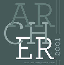 [MyFonts]
[More] ⦿
[MyFonts]
[More] ⦿
|
Joos Lambrecht
|
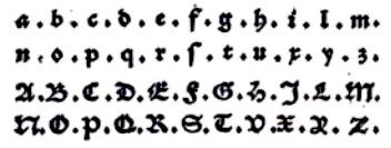 One of the first Belgian printers and typefounders, who lived and operated in Gent, Belgium, in the early 16th century. Born in Gent in 1491, he died in Wezel (Wesel) in Germany in 1556 or 1557. Peter Van Lancker describes his contributions. In 1539, he introduced the roman letter form in Gent, and even proposed an upright italic (IT 16 in Vervliet, It57 in Machiels, according to Van Lancker) in the publication Refereynen int Vroede, int Zotte, int Amoureuze. To read about Lambrecht, besides the plentiful of information on Van Lancker's page, one can also consult the thick opus by Dr. Hendrik D.L. Vervliet, Sixtienth-Century Printing Types of the Low Countries, Menno Hertzberger&Co, Amsterdam 1968, who wrote: Son of Jan Lambrecht, he came, it would seem, from a family long established in the town, engravers of seals and of marks for authenticating the renowed Ghentish cloth. Certainly Joos was successor to Vincent Lambrecht who performed this office from 1512 until 1537-1538. During the nearly 20-year period (1536-1553) of his activity at Ghent Joos Lambrecht proved to be a many-sided man typical of the Renaissance, poet, schoolmaster, seal-engraver, printer and punchcutter. As printer he came to be known for the outstanding quality of his presswork, the best of the Netherlands of his century, Plantin was de tweede helft? nvdr), and for his numerous mint-ordinances with woodcuts of coins that were copied until late in the century, by Jan Ewoutszoon of Amsterdam and others. His capacity of punchcutter is quite firmly established by the colophons in his numerous books, where he calls himself "lettersteker, typoglyphus, tailleur de lettres", by entries in the town's taxation, where he is described from 1540 onwards as "letterstekere", by a contract of 7 April 1548 binding Lambrecht to deliver new founts of type to Cornelius Manillus, printer at Ghent. Moreover, it is known that in 1553 Lambrecht sold his printing-office and type foundry to Pieter van den Kere, the father of Hendrik van den Keere the elder (and great-grandfather of the famous Dutch map engraver Pieter van de Keere, alias Kaerius), that Ameet Tavernier learned punchcutting from him, and that in 1580 Hendrik van den Keere the younger had several sets of matrices that he described as Lambrecht's. Van Lancker discusses several sources and analyzes Lambrecht's oeuvre. Some types by Lambrecht (not all cut by himself though):
 - T37, "Lambrecht's Pica Textura" (after 1541). Vervliet is not sure this was done by Lambrecht.
- T48, "Lambrecht's Brevier Textura" (after 1541). Same doubts in Vervliet's mind.
- T25, "English-bodied French Textura" dates 1499-1500. Used by, but not cut by Lambrecht.
- R12, "Lambrecht's 2-line Great Primer Lower-Case" was probably cut by Lambrecht in 1546.
- R23, "Lambrecht's English Roman" (after 1543).
- R25, "Lambrecht's Pica Roman" (after 1536).
- R30, "Lambrecht's Roman Capitals on Bourgeois" (1545).
- IT16, Lambrecht's Bourgeois Italic (after 1536). Vervliet: Lambrecht was the only printer to use this small Italic, which for its time is not without merit, and he did so from the beginning of his career in 1536. In a book of 1538 a set of narrower capitals occurs as well as the original capitals. In his well-known Refereynen of 1539 Lambrecht used this type for the passage in which he expressed his preference for Roman (and Italic) letters and his objection to the Gothic; but for this passage he used it with Gothic capitals and a few variant lower-case sorts. In the inventory of the remaining stock in Van den Keere's type foundry drawn up by Thomas de Vechter soon after 1581, there is an entry, 'An old Brevier by Joos Lambrecht', probably referring to matrices for this face. One of Lambrecht's italics inspired Laurent Bourcellier in 2009 to create Joos.
Some scans courtesy of Peter Van Lancker who researched Lambrecht's work: Bastaard Mediaan (1548), Grieks Mediaan (1536), Italiek Bourgeois (1536), Italiek Mediaan (1541), Romein Augustijn 91543), Romein Mediaan (1536), Schwabacher Augustijn 91550), Textura Augustijn (1539), Textura Bible (1541), Textura Gros Paragon (1551), Textura Gros Romain (1541), Textura Mediaan (1541), Textura Moyen Canon (1539). [Google]
[More] ⦿
|
Jordan Davies
[Wooden Type Fonts (was: American Wood Type and, Wooden Type)]
|
 [MyFonts]
[More] ⦿
[MyFonts]
[More] ⦿
|
José Alberto Mauricio
[Alter Littera]
|
 [MyFonts]
[More] ⦿
[MyFonts]
[More] ⦿
|
Juan-José Marcos García
[Alphabetum]
|
[More] ⦿
|
Julien Chazal
|
Frenchman who has a wonderful historic overview of the calligraphic styles. Here are his categories: - Renaissance, starting with Gutenberg, and the re-use of Greek and Roman architecture and lettering. It has the chancery hand (or italic) and the humanist (or antiqua). But also in this category are the ronde (upright curvacious scripts), the Flemish cursive (stunning calligraphy) and the fine or modern chancery.
- Gothic, or medieval, alphabets: Primitive gothic (S, T, U, V), textura (P, Q, R), cursive gothic (D, E, F, G, H), bastarda (A, B, C), rotunda (M, N, O), and Fraktur (I, J, K, L). Chazal adds to these six groups the Lombardian (lettre tourneure: A, B, C, D, E, F, G), the tourneure gestuelle (modern hand-printed version of the Lombardian: A, B, C), and the lettres cadeaux (overly ornamental caps).
- Anglaises: voluptuous and difficult calligraphy.
- Gestuelles in modern calligraphy: the cola pen, the tire-ligne, the flat nib, and the pointed nib.
Additional scans of his work: The letter G | Happy 2005 | Abcdefg | Fine chancery alphabet | Lettres cadeaux | Starting alphabet for the lettres cadeaux | Trial 1 | Trial 2 | Trial 3. [Google]
[More] ⦿
|
Karsten Lücke
[KLTF (Karsten Lücke Type Faces)]
|
[MyFonts]
[More] ⦿
|
Klaus-Peter Schaeffel
[KPS Fonts]
|
 [More] ⦿
|
KLTF (Karsten Lücke Type Faces)
[Karsten Lücke]
|
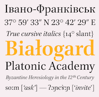 KLTF stands for Karsten Lücke Type Faces. It was established in 2005 in Datteln, Germany. Karsten is the talented German designer of the medieval text family Litteratra, which won an award at the TDC2 2001 competition (Type Directors Club). Karsten is from Datteln and studied communications design in Essen, finishing there in 2002. He worked at Steidl Publishers in Goettingen from 2004 to 2005. In 2005, he joined the type coop Village.
 Other designs by Karsten include KLTF Tiptoe (2005, a bold and black headline family), and KLTF Grotext (2007, an elliptical family in 7 styles). Co-designer with John Hudson, Alice Savoie and Paul Hanslow of Brill (2011), Brill Greek (2021), Brill Cyrillic (2021) and Brill Latin (2021). This classic text typeface family was a winner at the TDC 2013 competition. Client: Koninklijke Brill NV, Leiden, The Netherlands. Great OpenType link and discussion page. [Google]
[MyFonts]
[More] ⦿
|
KPS Fonts
[Klaus-Peter Schaeffel]
|
 Swiss calligrapher in Basel who made and sells various medieval and historically important script fonts. Dedicated page. These included the paleographic (PAL) series and the KPS series. He lives in Ühlingen--Birkendorf, Germany. His fonts are uniformly of high quality and are usefl for illustrating historical alphabets.
 His early commercial collection: KPS Anglaise (calligraphic script), KPS Antiqua (+Kapitälchen), KPS Capitalis (classic Trajan caps), KPS Cicero, KPS Epona (calligraphic), KPS Fein (hand-printed), KPS Hand (calligraphic), KPS Horaz (calligraphic), KPS Iris (calligraphic), KPS Petit (calligraphic), KPS Plinius, KPS Spitzfelder, KPS Vitruv (calligraphy), PAL Bastarda, PAL Cancellaresca, PAL Carolina, PAL Gotisch, PAL Humanistica, PAL Lombarden, PAL Quadrata, PAL Rotunda, PAL Rustica, PAL Textura, PAL Uncialis, PAL Uncialis Roemisch, Weissranken Initialen, Ranken Initialen (Celtic capitals). Since September 2013, all of his fonts are free. They were renamed and have conveniently the date of original creation in the font name. The fonts dated in the 1990s and 2000s are new typefaces or creative revivals by Klaus-Peter. The list of revivals: 0100DeBellisMacedonicis [Pre-uncial letters from the fragment "de bellis macedonicis", ca. 1st century], 0300Petros [Greek hand from the oldest surviving copies of St. Peter's epistles, dated 3th / 4th century], 0362Vitalis [Roman Minuscule Cursive from the so called Vitalis letter, written before 362 on papyrus (Strasburg)], 0480VergiliusRomanus [Capitalis Rustica from the Vergilius Romanus written in Rome, ca. 480], 0500VergiliusSangallensis [Capitalis Quadrata from the Vergil fragments in Stiftsbibliothek St.Gallen], 0512Dioskurides [Greek Uncials from the Vienna Dioskurides (about 512)], 0746Beda [from Beda Venerabilis: Historia ecclesiastica gentis Anglorum, Northumbria, dated 746], 0800Kells [Half Uncials from the Book of Kells], 0800Remedius [So called "Lombardic-Raetic Minuscule" from Codex 348 of the Stiftsbibliothek St. Gallen], 0800 Theophanes [Greek Hand after a 9th century Theophanes manuscript], 0850CarolinaTours [Carolingian Minuscule], 0850Carolinaundulata [Carolingian Minuscule from the Scriptorium of Tours], 0864Folchart [St. Gall Carolingian from the Folachart Psalter], 1012Otto [Late Carolingian Minuscule from the Perikopes of Heinrich II, written at the Reichenau, donated to the dome of Bamberg in 1012], 1258FridericusII [Gothic Rotunda from the falcon book of Emperor Friedrich II, Southern Italy 1258-1266], 1400Wenzel [Bohemian Textura from Vienna], 1450Sebastos [Humanistic Greek hand from Homer, Ilias, Vatican Library], 1455GutenbergB42 [Gothic Textura types from the 42 line Gutenberg Bible], 1458GutenbergB36 [Gothic Textura types from the 36 line Gutenberg Bible], 1470Jenson [an antiqua by Nicolas Jenson], 1475HumanisticaCursiva [Humanistic Cursive of the kind Bartolomeo Sanvito of Padua wrote, after Cod. Pal. Lat. 1508], 1480Humanistica [Humanistic Book Hand from Valerius Maximus: Facta et dicta memorabilia, ca. 1480-1485. The calligraphy is attributed to Antonio Sinibaldi from Florence and the titling capitals to Bartolomeo Sanvito from Padua], 1483Koberger [Incunabula type from the Koberger Bible, printed in Nuremberg in 1483], 1485Grueninger [Incunabula type from the Grueninger Bible, printed in Strasburg in 148], 1493SchedelRotunda [Incunabula type from the Latin edition of Hartmann Schedel's World Chronicles, printed by Koberger at Nuremberg in 1493], 1501Manutius [First printed Italic Antiqua by Aldus Manutius (Venice 1501)], 1513Gebetbuch [Fraktur from Emperor Maximilian's Prayer Book, printed in Augsburg in 1513], 1517Gilgengart [Fraktur type from Emperor Maximilian's 1517 private print "Gilgengart"], 1517Teuerdank [Fraktur type from Emperor Maximilian's "Teuerdank", printed at Augsburg in 1517], 1519NeudoerfferFraktur [Fraktur alphabet from a woodblock model in Johann Neudoerffer the Elder's Calligraphy book "Fundament", Nuremberg 1519], 1739Bickham [Copperplate or running hand after models from "The Universal Penman" by George Bickham, printed in London 1743], 1741Bickham [Bickham's round hand from Universal Penman], 1782Thurneysen [Baroque Antiqua Type of J. Jacques Thourneysen fils, Basel 1782]. Original versions by Schaeffel, with date of design in the font name: 1999Anglaise1, 1999Anglaise2, 1999Cancellaresca, 1999Carolina (Carolingian minuscule), 1999Livius, 1999LiviusBold, 1999LiviusItalic, 1999LiviusSmC, 1999LiviusTitel, 1999Ovidius, 1999Stylus, 1999Textualis, 2000Bastarda, 2000Cicero, 2000Humanistica, 2000Plinius, 2000PliniusItalic, 2000Seneca-Italic, 2000Seneca, 2000TextualisFormata, 2000Uncialis, 2001RotundaFormata, 2002Cato, 2002Horatius, 2002Vitruvius, 2003Epona, 2003Lombarden, 2004CapitalisQuadrata, 2004CapitalisRustica, 2004Iris, 2004UncialisQuadrata, 2004UncialisRomana, 2008-Noeuds-1 [for making Celtic knots], 2008-Noeuds-2, 2008-Noeuds-3, 2009Xenophon, 2010Filigrane, 2010Gouttes, 2010Labyrinthe [squarish], 2010Pointu [a calligraphic blackletter], 2010Vergilius [a great calligraphic face]. Old URL. [Google]
[More] ⦿
|
Latinotype
|
 Latinotype was founded in 2007 by Felipe Soto and Miguel Hernández, and is based in Concepción, Chile. Catalog of their typefaces. Latinotype now also includes the work of Daniel and Enrique Hernandez, Luciano Vergara and Joaquín Contreras. Their typefaces:
 - Stgotic Textura and Pintana (Daniel Hernandez) are pixel font award winners at Tipos Latinos 2008.
- Patagon (2011, Latinotype) is a rounded wood-inspired poster typeface done with Daniel Hernandez and Luciano Vergara.
- Selaive (2011, Paula Nazal) is a geometric monoline sans with an extreme hairline weight, Selaive Light.
- Sanchez (2011) is a large slab serif family. The Regular weight is free at Fontsquirrel.
- In 2011, he cofounded Los Andes Type, and published the fat round typeface Fatta (2011) there.
- Mija (2011). Inspired by vernacular signs.
- The Google Web Font Ceviche One (2011). This is an angular yet curvy extra black expressionist sans serif type.
- Sail (2012). A didone script.
- Sofia (2012). An upright script, free at Fontsquirrel.
- Tikal Sans (2012).
- Lolita (2012, Miguel Hernandez). A playful rounded sans family.
- Chela One (2012). A bold condensed brush script, free at Google Web Fonts.
- Arquitecta (2014, by Daniel Hernandez ad Miguel Hernandez). A 1930s sans with small x-height, great readability and an odd g, promoted as an alternative for Futura, Kabel or Avant Garde. It was followed later in 2014 by Arquitecta Office and Arquitecta Standar.
- Via Sans (2014, Daniel Peralta). A wayfinding typeface family inspired by Steile Futura and DIN 1451.
- In 2014, he co-designed Uomo with Tania Chacana at Latinotype. Uomo is a contemporary typographic system that explores the geometric sans style and Italian art deco in combinations of four widths and three weights.
- In 2014, Daniel and Miguel Hernandez co-designed Texta, a geometric sans for all.
- In 2015, the Latinotype team developed the 60-style semiserif typeface family Corporative [Corporative was developed by Javier Quintana and Cesar Araya, under the supervision of Luciano Vergara, and Daniel Hernandez], the 64-font family Corporative Sans, the 64-style Corporative Soft [Corporative Soft was developed by Javier Quintana, Eli Hernandez and Rodrigo Fuenzalida, under the supervision of Luciano Vergara and Daniel Hernandez], the 32- style Corporative Sans Round Condensed (dated 2016; developed by Elizabeth Hernandez and Rodrigo Fuenzalida, under the supervision of Luciano Vergara and Daniel Hernandez], and the 28-style headline wood-inspired Titular.
- Revista (2015, Paula Nazal Selaive, Marcelo Quiroz and Daniel Hernandez, at Latinotype) is a typographic system that brings together all the features to undertake any fashion magazine-oriented project. It has Revista Script (connected style), Revista Stencil, Revista Dingbats, Revista Inline and the didone Revista all caps set of typefaces. Revista won an award at Tipos Latinos 2016.
- Lota Grotesque (2017).
- Inter Sans (2017). An information design sans. In 2021, they released Inter, which was advertized as a sans Rockwell.
- Letteria Pro (2021). A script/sans/slab font trio by the Latinotype team.
- Rebrand (2021). A 33-style Latin sans in Text and Display versions.
- Osbourne (2021). A 20-font wedge serif that revives Keystone Type Foundry's Salem.
View the Latinotype typeface library. View Miguel Hernandez's typefaces. Fontsquirrel link. [Google]
[MyFonts]
[More] ⦿
|
Laura Worthington
[Laura Worthington Design]
|
 [MyFonts]
[More] ⦿
[MyFonts]
[More] ⦿
|
Laura Worthington Design
[Laura Worthington]
|
 Laura Worthington of Bonney Lakes, WA, is a letterer, illustrator and graphic designer. Her script typefaces became quite popular in recent years. In 2010, she set up shop at MyFonts. Catalog. In 2021, she started licensing her typefaces via The Type Founders".
 Her typefaces: - Adorn (2014), Adorn Smooth (2015), Adorn Garland Smooth (2016, with Dai Foldes). Adorn is a hand-drawn poster font family larger than Charcuterie. It contains subfonts called Pomander, Coronet, Garland, Bouquet, Solo (monograms), Duo (monograms), Catchwords, Banners, Frames, Ornaments, Roman, Condensed Sans, Expanded Sans, Slab Serif, Serif, Copperplate, Engraved.
- Al Fresco (2013). A breezy exuberant script loaded with opentype features.
- Alana (2011, +Ornaments). A connected script.See also Alana Smooth (2017).
- Alisha (2017).
- Azalea Rough, Azalea Smooth
- Beloved (2015)
- Bianca (2010). A flowing calligraphic typeface.
- Blithe (2017).
- Boucherie (2014). In the "collection of vintage fonts" mould of Charcuterie, Boucherie captures the lively essence of 19th-century French advertising typography with a collection of original designs, rather than strict historical revivals.
- Buckley (2012).
- Caprizant (2016).
- Charcuterie (2013). A large set of hand-drawn typefaces for vintage signage.
- Congenial (2015). A legible soft unpretentious sans family originally designed for her own web site.
- Ed's Market (2015). A grocery store and sign painting font family.
- Elaina (2018). Script and Semi-Serif. Laura claims that Elaina Script is closest to her own handwriting.
- Elicit Script (2018, by Laura Worthington and Jim Wasco). A hybrid (casual and formal) scrpt typeface based on pointed pen Spencerian Script handwriting.
- Fairwater (2016). Designed together with Dai Foldes, this typeface family has Script, Sans, and Serif subfamilies, as well as several sets of ornaments. The Serif subfamily conjures up tattoo lettering, but also mathematical blackboard bold style and art deco.
- Funkydori (2012). A fat retro signage script.
- Ganache (2014). A packaging and logo script.
- Gioviale (2012). A calligraphic script.
- Greeting Cards (2010).
- GrindelGrove (2009). A vampire font.
- Harlean (2013). A rough-edged, powerful, and slightly sinful script face---originally named Harlowe.
- HoneyBee (2012). An all caps pirate ship font.
- Hummingbird (2012). A penmanship font.
- Juicy (2015). A plump and yummy candy store font.
- Ladybird (2010). A curly script.
- Liam (2011). Bouncy and curly script.
- Mandevilla (2013). Pure Americana, useful for signage.
- Milkshake (a creamy retro script).
- Modish (2016). A smooth brush script font.
- Nelson (2011). A notched eroded family, almost for Mexican simulation.
- Number Five.
- Origins (2010). An antiqued typeface hand-lettered with a crow quill pen. Followed by Origins Smooth (2016).
- Recherché (2010). A delicate script typeface.
- Regina (2010). A delicate script typeface.
- Renata (2016). A connected calligraphic script co-designed with Dai Foldes.
- Rosarian (2011). A pointed brush connected script typeface.
- Samantha (2011): 2700 flourished glyphs in the classical ronde upright script style and in an italic style; +Swash.
- Sepian (2010). A pointy Textura font.
- Sheila (2010). A connected calligraphic script.
- Shelby (2011). A monoline, semi-connected script typeface based on hand lettering created with a Speedball B metal nib.
- Spumante (2015).
- Tangelo (2017).
- Tiva (2010). A handcrafted and almost connected script.
- Voltage (2014). A retro fat signage script.
- Wallflowers (2011), Wallflowers II, Wallflowers III, Winter Wallflowers (2012).
- Winsome (2016). A casual script.
- Yana (2010). A spurred serif typeface.
Interview by MyFonts in 2010. I Love Typography link. FontBros link. Creative Market link. Klingspor link. Behance link. Fontspring link. Picture. View Laura Worthington's typefaces. Images of her typefaces. [Google]
[MyFonts]
[More] ⦿
|
Lazar Dimitrijevic
[Posterizer KG]
|
 [MyFonts]
[More] ⦿
[MyFonts]
[More] ⦿
|
Lex Kominek
|
 Calgary-based designer of Naranja (2005), an experimental typeface built up of quarter circles and L-brackets. Its dingbats are inspired by Clockwork Orange. Faces made with FontStruct in 2008: Robot Builder (Solid, Shaded and Open: squarish typefaces), Polygonal Lasso (Far West type: 938 glyphs for Latin, Latin Extended A & B, Greek, Cyrillic, and Katakana), Marshmallow Script (based on Einhorn, Eclat, Deftone Stylus, and Magneto, all connected diner scripts), Crazy Eights (deck of cards), Ficus Stencil (+Compressed, +Condensed, +Extended, +Regular, +Zebra, +StencilOpen), Big Fat (+Vibrate, +Solid, +Shaded), Negatron (Regular, Solid and Fill), Tuscan Radar, Nuclear Depot Americum (495 glyphs consisting of stars), Nuclear Depot (Radioum, Neptunium, Plutonium, Uranium: a futuristic family that covers Cyrillic), Am I see are you pee see, eh? (a font that combines MICR with UPC-A). The links: big_fat_shaded, crazy_eights, ficus_stencil_compressed, ficus_stencil_condensed, marshmallow_script, negatron_fill, negatron_regular, negatron_solid, serpent_like_bold, tuscan_radar.
 2009 creations: Haemophobe (pixel), Star Wreck, Mouthcaster (a bilined typeface based on the lettering on the front of the 1978 edition of the Scoutmaster's Handbook), Pasta (white on black), Medical Station Alpha (techno), Disco Stud (Chrome, Solid, Chrome Oblique, Solid Oblique), Affix, Infix (experimental and minimalist), Pinball Blizzard, Tears in Rain (a simplistic textura), Five Minute Hair Colour (slab serif), Seg Sixteen (LED face), Trajedy (pixel), Nobody 8 Italic (pixel), Home Sweet Home (a cross-stitch font), Wotan, Tiki Deaky, Writetyper, Chromatose (shadow family), Chocobot (an octagonal family containing Dark, Stacked (multilined), Milk, White), Big Fat (Shaded, Vibrate, Solid). 2010 creations: Fungal Sharp, Fungal Rounded (described by himself as a unicase stovepipe sans), Elliptical Lasso (Western ornamental caps), Astral Projection (a dot matrix typeface that updates Astra, a Letraset font designed by François Robert and Natacha Falda in 1973), Brick-block tops (3d effect), Knots, Spacerock (an extensive arc-based geometric family), Telephone (counterless), Pixular, StarWreck the Next Generation, Hockey Club, Brick-Block Tops, Bubblemania, Ziabelle Remix (outline, 3d, shaded), Hextone, Falcone (robotic face), but I didn't Trap the Deputy (Egyptian), Dinosaur Gothic. Fonts from 2011: Apé'ritif (bilined), Csillagok (a futuristic face based on a Hungarian Star Wars poster), Valhalla (faux runic), Birodalom, Haboruja, Piezo, Felix (black art deco face). Typefaces from 2013: Portafina, Portofino. Typefaces from 2014: Hanz and Franz, McRasky (a MICR font), Apricpt, Classic Spacerock, Five Minute Hair Colour. Typefaces from 2015: Big Fat Shaded Neue, Rampy, Managrom (monogram font), Spagett (connected cursive script). [Google]
[More] ⦿
|
Linotype Textur
|
Linotype sells Textur Lombardisch and Textur Gotisch DFR without providing any information about its sources. Furthermore, for those thinking that they are buying two different fonts, be warned that the lowercases are identical. [Google]
[More] ⦿
|
Lo-ol Type foundry
[Loris Olivier]
|
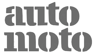 Talented type and graphic designer based in Morgin and/or Grand-Lancy, Switzerland. After obtaining a BFA from the Academy of Art University of San Francisco, he started a Masters in the TypeMedia program at KABK in Den Haag, graduating in 2015. After the KABK, he started working from Geneva on editorial identity, branding, editorial, graphic and type design. His spouse, Noheul Lee, is also a type designer. Loris's typefaces:
 - Animax (2016). A lineale geometric consisting of text and display.
- Aragon (2014). A transitional serif for display.
- Arancia (2016). A lineale geometric consisting of text and display.
- Bachus (2016). A heavy brush script.
- Brienz (2019).
- Chablaix (2015). A neo-textura.
- Civilitate (2016-2018). A blackletter with roots in Robert Granjon's Civilité..
- Cozette (2016). A didone.
- Fanny (2014). An exquisite display family.
- Fournier (2014). A revival.
- Gloubi (2019). A psychedelic font.
- Groo (2013). A lineale neo-grotesk for text and display.
- Kartel (2014). A lineale neo-grotesk for text.
- Katchka (2014). An all caps typeface for Latin and Cyrillic.
- Lemanic (2015). His graduation typeface at KABK. This large transitional text typeface family Lemanic is accompanied by a decorative blackletter typeface. Loris writes: The different weights and styles are made for magazine or newspaper environements. The entire family is constructed in order to decrease the usage of images next to the text. The shapes of the book weights and its inspiration are taken from the fluidity and the rhythm of the work of Fournier and certain shapes of the Romain du Roi.
- McQueen Superfamily (2020). A 20-style sans family in Display and Grotesque subfamilies by Loris Olivier, Noheul Lee and Katja Schimmel, realeased by Fontwerk.
- Medley (2015). A transitional serif for display.
- Merle (2016). A slab serif.
- Milwaukee (2014). A text typeface, + Stencil Bold.
- Misc (2013). A serif, sans and script trio.
- Moritz (2015). A slab serif.
- Orniere (2016). A lineale humanist sans, slightly flared and lapidary, for text and display.
- Phantom (2016). A transitional monospace serif (text and display).
- Phily (2015). A lineale geometric consisting of headline and display.
- Rouka (2015). A lineale neo-grotesk stencil typeface.
- Saudade (2013). A transitional serif in text and display versions.
- Scarpelli (2012). An étude in ball terminals.
- Soprana (2014). A transitional serif in text and display versions.
- Susanfe (2016). A sans typeface.
- Tuilots (2014). A gorgeous calligraphic text typeface.
- Tweelo (2014). A garalde.
- Volpe (2015). A transitional serif for display.
- Wicht (2016). A humanist serif.
Home page. Future Fonts link. Fontwerk link. [Google]
[More] ⦿
|
Loris Olivier
[Lo-ol Type foundry]
|
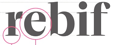 [More] ⦿
|
Lukas Schneider
[Revolver Type Foundry]
|
 [MyFonts]
[More] ⦿
[MyFonts]
[More] ⦿
|
Manfred Klein
[Manfred Klein: Blackletter, Fraktur, Rotunda]
|
 [MyFonts]
[More] ⦿
[MyFonts]
[More] ⦿
|
Manfred Klein
[TypOasis 2004]
|
 [MyFonts]
[More] ⦿
[MyFonts]
[More] ⦿
|
Manfred Klein: Blackletter, Fraktur, Rotunda
[Manfred Klein]
|
 Manfred's fascination with blackletter and its German roots is apparent from the tens of typefaces he designed that are either revivals of historic typefaces or playful and not so playful extensions. Here we go:
 - ArthritishSpringtime
- BarlosRandom, BarlosRandomRings
- BarlosiusEdged (2007)
- Bastarda-K, BastardaButtonsBeta, BastardaMajuskel1300, BastardusSans
- BauernFraktur (2004, after the 1911 original by Bauersche)
- BayreuthFraktur, Bayreuther-BlaXXL (2005, a variation of Schneidler's Bayreuth)
- BigBroken, BigBrokenTwo
- BigElla
- Brahms-Gotisch (2005, with Petra Heidorn: a revival of Heinz Beck's 1937 typeface at Genzsch&Heyse)
- BrokenAlphabetTradition, BrokenBrainsFrax, BrokenCapsJumperB, BrokenHand-Bold, BrokenHand, BrokenHandLight, BrokenRoman-Bold, BrokenSansCaps, BrokenSansCapsJumper, BrokenWoodtypes, BrokentTraditionRound
- BruchRund
- BruchschriftMK
- Burte-Fraktur
- Burtine (2003: handwritten freestyle version of Burte Fraktur, 1928), Burte-Fraktur, Burtinomatic, Burtinomatic-DemiBold
- Burtinomatic-DemiBold, Burtinomatic
- CancellerescA
- CantaraGotica
- Cantzley Inverse Caps (2007), CantzleyAD1600 (2005)
- CaslonishFraxx
- ClaudiusImperator
- Clausewitz-Fraktur (2005). Designed in memory of Klaus Burkhardt.
- CaslonishFraxx
- ClaudiusImperator
- CowboyCaxton
- Cuxhaven Initials Round (2006), CuxhavenFraktur (2006), CuxhavenInitials (2006), CuxhavenTimes (2002). All named in honor of Petra Heidorn, who is from Cuxhaven.
- DecadentaFrax (2007)
- DirtyThinkwitz (2003). In honor of his good friend Klaus Burkhardt.
- DizzyBrokenWritten
- DolbyFraxCaps (2005)
- DornspitzGrotesk
- DoubleBrokenTextura
- Druckschrift-Initialen
- DrunkenSailor (2006)
- DuerersMinuskeln
- ElectrUnciale (2005)
- ElephantaBlack (2006)
- FatFreeFrax
- FlyingHollander (2005)
- FracturiaSketched, FracturiaSketchedCaps
- FraktKonstruct, FraktSketch, FraktSketchFS, FraktalConPablos, FrakturInRings (2007), FrakturInitials07 (2007), FrakturNitials (2006), FrakturaFonteria, FrakturaFonteriaSlim (2006)
- FrakturCondensedHeadline, FrakturCondensedHeadlineExtra
- FraxBoxes, FraxBricKs, FraxBrix, FraxHandwritten-RoundCaps, FraxHandwritten, FraxHandwrittenXtrem-Medium, FraxInCage, FraxInCageLeftOblique, FraxInCageRightOblique, FraxInitials, FraxMouseSketches, FraxxSketchQuill
- FrungturaFS
- GGothiqueMK
- GermanFatman (2006)
- GingkoFraktur (2006)
- GoldenSwing
- GotenborgFraktur (2007)
- GothicLetters (2007)
- Gotic Caps (2006), GoticaBastard, GotischeMajuskel, GothicMajuscles
- GotikaButtons (2005, after Imre Reiner's Gotika from 1933)
- GutenbergsGhostypes, GutenbergsTraces
- HamletOrNot, HamletTobeornot
- HansFraktur
- HansSachsCaps (2007)
- HansSchoenspergerRandomish
- HappyFrax (2006)
- Haunted-Normal, HauntedBricks
- Heimat
- Holland Gotisch (with Petra Heidorn; a revival of Nederduits by Johann Michael Fleischmann, ca. 1750)
- ImresFraktur, ImresFraxCaps (2007)
- Incunitials
- IronFraktur
- JessicaPlus
- JoeCaxton
- JohannesBricks, JohannesButtons-02, JohannesGDiamonds, JohannesGLastTraces (2007), JohannesTraces
- Jugendstil (2006)
- KaiserRotbartCaps (2007)
- KL1CiviliteEdges
- Kl1RheumaticFraktur
- KleinSchwabach (2005)
- KleinsBrokenGotik (2006)
- KlungerCaps (2006)
- Leibniz-Regular
- LombardPlattfuss, Lombardic
- LookBrokenTypes
- LuFraktorsoBroad
- LudwigHohlwein (2006)
- LufrakturBricks (2006)
- LutherDuemille, LutherMousedrawn-Bold, LutherMousedrawn
- MKBritishWriting
- MK Broken Types (2006)
- MKFraxConstr (2007)
- MKImresTshirtsA
- MKalligFrax, MKalligFrax-MediumItalic
- MKancellerescaCaps (2005)
- MKantzley (2005), MKanzleiCaps-One (2006)
- MKapitalisRusticaMedium
- MKaslonTextura
- MoKsford, MoKsfordBold, MoKsfordDemiBold, MoKsfordExtraLight, MoKsfordLight
- MonAmourCaps (2006), MonAmourFraktur-Broken (2006), MonAmourFrakturRegular
- MonksWriting
- MorbusParcinsonFraxx
- MorscheKnochen
- MountFirtree
- MousefraKtur
- Münchner-Fraktur (2005). A revival of Renaissance Fraktur by Heinz König, 1885, Genzsch&Heyse.
- MyElectronicSchwabach
- NeuGothic-Bold
- Neudoerffer, NeudoerfferScribbleQuality. Both codex style typefaces are from 2003. Manfred writes that Neudoerffer is an unaltered version of the original Neudoerffer Initialen from 1660.
- OKsfordBadFat, OKsfordItalic
- OldTypographicSymphony-Regular, OldTypographicSymphony-Round
- PopFraxFrankfurt (2007), PopFraxFrankfurtCondensed (2007)
- PrinzEugen
- Potsdam (2005, a revival of a 1934 typeface by Robert Golpon)
- Prothesis-Black, Prothesis-Caribiqu, Prothesis-Caripix
- RandomFrax
- ReadableGothic
- RememberReinerFS
- RotundaEspagna
- Schaftstiefel Kaputt (2003)
- SchmaleGotischMK, SchmalfetteGotisch
- SchneidlerSchwabacher, SchneidlerSolitaires, SchneidlerSolitairesRound
- Schwabach, SchwabachDuemille, SchwabachScribbels, SchwabachScribbelsSecond
- ScribbledFrakturX-Heavy (2006)
- SketchedCassiusBroken
- SmallEdgedFrax (2006)
- Snoutlike (2003)
- SpaceWinningFrax (2007)
- TizonaDance
- TshirtsForFrax
- TypoasisBoldGothic (2003)
- VanDoesburgBrokenFS
- VeryBrokenFrax
- WaldarbeiterGotisch
- WeimarInline
- WeissGotischRandom
- Weissgotnitials (2005, based on Weiss's Lichte Initialen, 1935)
- WittewittMajuscles-Flourish, WittewittMajuscles-FlourishBricks
- WrittenFrax (2007)
Download page. Download all these fonts in onze zip file.               
[Google]
[MyFonts]
[More] ⦿
|
Mariage
|
A textura blackletter typeface By Morris Fuller Benton (1901, ATF), similar to wedding Text. Digital revivals: - Mariage and Mariage Antique D (URW).
- Mariage (Linotype).
The following text is adapted from Linotype's description: Morris Fuller Benton, the principal designer of the American Type Founders, designed Mariage in 1901. Mariage, which has been sold under a plethora of different names during the last century, is a blackletter typeface belonging to the Old English category. The term blackletter refers to typefaces that stem out of the historical printing traditions of northern Europe. These letters, called gebrochene Schriften, or "broken type" in German, are normally elaborately bent and distorted. Their forms often print large amounts of ink upon the page, creating text that leaves a heavy, black impression. The Old English style is a subset of blackletter type that dates back to 1498, when Wynken de Worde introduced textura style printing to England. Continental printers had been printing with textura style letters since Gutenberg's invention of the printing press fifty years earlier. Italian printers stopped using them around 1470. For northern Europeans, texturas remained the most popular form of typeface design until the invention of the fraktur style in Nuremberg. Mariage is heavily classicized sort of Old English type. During the Victorian era, designers admired the Middle Ages for its chivalric, community-based values and its pre-industrial lifestyle. Yet they also found the basic medieval textura letterform too difficult to read by present standards. They desired to modernize this old style. Today, this sort of update is often referred to not as "modernization" but as classicism. Benton's design for ATF builds upon earlier Victorian classicist interpretations of Old English/textura letters. For an example of what these Victorian designs looked like, check out the popular 1990 revival of the genre, Old English. Old English style types often appear drastically different from other blackletters. For contrast, compare Mariage to a classical German fraktur design, Fette Fraktur, a Schwabacher style face, or the popular early 20th Century calligraphic gothic from Linotype, Wilhelm Klingspor Gotisch. Especially in the United States, classicist Old English typefaces are thought to espouse tradition and journalistic integrity. These features, together with the inherent, complex beauty of Mariage's forms, make this typeface a perfect choice for certificates, awards, and newsletter mastheads. [Google]
[More] ⦿
|
Markus Schröppel
|
 German designer, b. 1965. Currently, he teaches typography at the University of Lapland in Rovaniemi, Finland, but maintains a home in Wuppertal, Germany. His typefaces:
 - Claus (2019). A typeface with a shaky outline.
- The dingbat typefaces LL Sami Signs (2016) and LL Hullu Poro (2016).
- LL Mystic (2016). A pixel or embroidery typeface.
- LL DCL (2016) and LL Miral (2019). Dot matrix typefaces.
- LL Disco (2016).
- LL Colon (2016).
- LL Mountain (2015). Mountain scene dingbats.
- LL Calligraphy (2014).
- LL Paladin (2014). Medieval calligraphic typeface.
- LL Liberte (2013). a rough stencil typeface based on railway stencils seen in Arles, France.
- LL Lisa (2013). A Cyrillic sans.
- LL Faces (2013).
- LL Rounded (2012).
- LL Charlotte
- LLChina (2009): a grunge stencil face.
- LLTippa (2009): old typewriter.
- LL Pochoir (2007, grunge).
- The dingbats font LL Hulu Poro (verrucktes Renntier) presented at FUSE95.
- LL Faktotum (1995, grunge). Download here.
- LL Humboldt (2012). A grungy signposting or poster face.
- LL Record (2002-2006): music dingbats.
- LL Medien (2004): extra-wide rounded techno face.
- Free typefaces: LL Nitro (2002, grunge), LL Mirai (2018), LL Futur (2013), LL Pearl (2013), LL Pixel, LL Pikseli (2009, dotted face, done with Rovaniemen Yliopisto), LL Rubber Grotesque (grunge, letterpress simulation, and/or rubber stamp font originally done in 1997), LL Regular (grunge), LL Cooper (2009, sketched typeface based on Cooper Black) and LL Alarm (roughened stencil face). LL Rubber Grotesque has been used in the Harry Potter films since 2005: see here.
- The typefaces for the interior of Smart cars (Smart Roadster) and the exterior of the Smart 4-4 and 4-2 (see here).
- LL Textur (2014, a calligraphically constructed Textura face).
- LL Xmas (2012, stitching font) and LL Dot (2012, dot matrix face).
In October 2007, he organized a Type Workshop in Rovaniemi. At that workshop, his students made a number of typefaces: Väinö Klemola, Siru Lämsä, Mika Junna, Merja Lahti, Lena Raeuchle, Kalle-Pekka Alare, Jussi-Pekka Koivisto, Heidi Ettanen, Hanna Piekkola, Hanna Kauppinen, Esa-Pekka Niemi, Elisa Niemelä, Elina Virtanen, Emile Uggla, Antti Huhtala. This was followed by similar workshops in 2008 and 2009. Type glossary. Old download link. Abstract Fonts link. [Google]
[More] ⦿
|
Martin Kotulla
[SoftMaker Software GmBH (or: freefont.de)]
|
 [MyFonts]
[More] ⦿
[MyFonts]
[More] ⦿
|
Martin Wenzel
[MartinPlusFonts]
|
 [MyFonts]
[More] ⦿
[MyFonts]
[More] ⦿
|
MartinPlusFonts
[Martin Wenzel]
|
 MartinPlusFonts is the Berlin-based foundry of Martin Wenzel, a German type designer (b. Berlin, 1969). Graduate of KABK Den Haag in 1998. From 1998 until 2005, he worked at Buro Petr van Blokland + Claudia Mens. Martin now runs MartinPlus, first in The Hague, The Netherlands, and relocated to Berlin in 2005. He is also affiliated with Kombinat Typefounders. His oeuvre:
 - FF Marten (1991).
- FF Rekord (grunge).
- The award-winning sans serif font FF Profile (1999), a flared sans known for its little contrast. This evolved in a semi-hand-printed casual teenager, FF Duper (2009).
- At FUSE 6, he created FUSE Schirft, now sometimes called Wenzel Schrift.
- At FUSE 3, he created InTegel (1991), a font like Boris Mahovac's Kalendar.
- FF Primary (1995, chiseled stone look).
- Daela (free, this font evolved into FF Primary).
- MediaPigeons (experimental, free).
- Trinité Sans (based on Bram de Does' Trinité).
- Ode (2010): a restaurant menu family, angular yet rounded. This type family evolved from Textura into a slightly broken readable set, in the German expressionist genre.
- Realist (2011), Realist Narrow and Realist Wide. A sans family that can be bought at Kombinat Typefounders.
Old web site. Fontshop link. Klingspor link. View Martin Wenzel's typefaces. [Google]
[MyFonts]
[More] ⦿
|
Matthew Aaron Desmond
[Matthew Desmond]
|
 MADtype (est. 1996) is Matt Desmond's place in the type world. He has had a prolific career that started out with shareware fonts while Matt was at the Minneapolis Technical and Community College. His page back then said A haven for quality shareware type for the Mac. Later, Matt started mattdesmond.com, and co-founded the Test Pilot Collective (est. 1998 with Joseph Kral and Mike Cina). Many of his early typefaces were experimental and/or futuristic. In late 2003, mattdesmond.com disappeared, and MADtype, commercial now, resurfaced at the MyFonts site. Currently, Matt is based in Minnetnka, MN. He has also lived in Atlanta, GA, Fayetteville, GA, Rochester, NY, Redwood City, CA, and San Francisco, CA. His fonts can also be purchased via You Work For Them. He also does commissioned type design. Some fonts are freely available at the Google Font Directory.
 Retail types as of 2011: - Abel (2011, Google Font Directory). Abel Pro was published in 2013.
- Aldrich (2011). A Bank Gothic style face, free at OFL.
- Amber (2000): kitchen tile face.
- American Gothic (1998): squarish.
- Audebaud (2010): a 19-th century style French Clarendon (wood type look). The design was inspired by the work of Constant Audebaud, an engraver of wooden type that was used for posters. Audebaud's work appeared in the 1880s in the Deux-Sèvres département of France.
- Beat (1998): rounded OCR face.
- Brauhaus (2004): Textura face.
- Cagliostro (2011). A free font at Google Web Fonts that is based on the handlettering of Ozwald Cooper.
- Curbdog (1998).
- Desmond Text (1998): a roman that has features of University Roman.
- Distill (2009): a De Stijl font that shouts 1920s.
- Dunelm (1996): emulation of 17th century printing styles.
- Dwiggins Deco (2009): This typeface was originally designed in 1930 by W.A. Dwiggins as the cover for the book "American Alphabets" by Paul Hollister. Only the 26 letters of the alphabet were included on the cover, so the rest of the numbers, punctuation, symbols, and accented characters have been crafted in a matching [art deco] style.
- Findon (2007): stencil.
- Futuristic category: ER9 (1999), KAH (2005, LCD style), Lunarmod (1997), Retron (1997; can be considered as a retro upright connected script as well), Shifty (1998).
- Grunge category: Bulletin (1997), Gothico Antiqua (1999), Rubba (1997), Stomper (1997--a rubber stamp font), Zapatista (1998-2007).
- Handwriting, handprinting category: Casino Hand (2005), Ghouliez (1996), Handegypt (2002---hand-drawn slab serif), Handy Sans (1997, hand-drawn sans), Joppa (1997), Pufficlaude BT (1998).
- Hessian (2009): Tuscan style wood type.
- Hydrochlorica (2004): organic.
- Invoice (1997).
- Ironside Crosses (2004): dingbat face.
- Marble Roman (2004-2009): angular roman all caps type.
- Matterhorn (2013). A 9-style sans family created with Michael Cina for Disney. Not to be confused with the many retail typefaces that are also called Matterhorn, such as Paratype's PT Matterhorn (1993) and Treacyfaces' TF Matterhorn (1990s).
- Pacioli or Luca Pacioli Caps (2007: emulating a mathematically constructed caps font by Pacioli (1509) published in his treatise De divina proportione.
- Pixel category: Basis (1999), Mang (1997).
- Plenti (2004): ultra plump.
- Quantico (2007): octagonal.
- Stencil category: Bandoleer (2009, +Tracer: a couple of stencil fonts with art deco and army influences), Madison (2007, slab serif stencil), Mercado (2005; has a non-stencil Mercado Sans).
- Urbandale (2018). A basic sans family.
- Variable (2004-2010): a sans-serif monoline typeface that includes ultra thin weights.
- Vexed (2005): sketched face.
- Wolfsburg (2007): blackletter stencil.
- Wooddale (1999): wood type emulation.
Free types as of 2010: Marble Roman, Environ regular, Dorkbutt, Europa, Exsect, Inthacity, Liquidy Bulbous, Lustria (2012, Google Web Fonts), Stomper. Commissioned types: 77kids (2007, for the children's brand; the sketched typefaces were done with Justin Thomas Kay), AE Aerie (2005-206, American Eagle Outfitters), AE Newburgh (2005-206, American Eagle Outfitters), AE Summer Fonts (2007, all for American Eagle Outfitters), EEL Futura (2006, for Enjoying Everyday Life), Nike World Cup (2006), Virgin America (2006). Typefaces from 2019: Starfire (2019, a retro geometric sans). Orphaned types that disappeared or were planned but never executed: BrotherMan, Caprice, Convolve, HipstersDelight, Lugubrious, ModestaSmallCaps, Serifity, Skitzoid, Sliver, ThrowupSolid, Auresh (1998, futuristic; Test Pilot Collective), Kcap6 (1998, with Cina; Test Pilot Collective), Epiphany (1997; Test Pilot Collective), Testacon (with Kral and Cina; Test Pilot Collective), Civicstylecom (1999; Test Pilot Collective), Lutix (1998; Test Pilot Collective), Xerian (1997; Test Pilot Collective), Swoon, Furtive (2004, a sans), the display typeface Flathead (2004), the blackletter typeface Bahn (2004), Mesotone BT (2006, Bitstream, a monoline sans), Practical (a monoline connec script, planned in 2007 but not published), Poliphili (planned in 2007, as a revival of an Aldus/Griffo font), Wutupdo (1996, Garage Fonts), GFDesmond (Garage Fonts), Drone, Golden Times (2014, a corporate small caps typeface for the University of Minnesota), Vapiano (2014: hand-printed typeface for Vapiano International). Behance link. View Matt Desmond's typefaces. Fontspring link. Fontsquirrel link. [Google]
[MyFonts]
[More] ⦿
|
Matthew Carter
|
 Matthew Carter (born in London in 1937, and son of Harry Carter) is one of today's most influential type designers. He trained as a punchcutter at Enschedé in 1956. In 1963 he was hired by Crosfield, a firm that pioneered the new technology of photo-typesetting, to lead their typographic program. He worked for Mergenthaler Linotype (1965-1981), and co-founded Bitstream Inc. with Mike Parker in 1981, adapting many fonts to digital technology. In January 1992, he founded Carter&Cone with Cherie Cone, and often collaborated with Font Bureau. In 1995, he won the Gold Prize at the annual Tokyo Type Directors Club competition for Sophia. In 1997, he received the TDC Medal for significant contributions to the life, art, and craft of typography. In 2010, he received a MacArthur grant. He lives in Cambridge, MA.
 John Berry on Carter's art (2002). Apostrophe comments on Berry's article. Interview. His fonts: - The Microsoft screen fonts Verdana (1996), Georgia (1996), Georgia Greek, Georgia Cyrillic, Nina and the humanist sans typeface Tahoma (1994). Georgia (in roman and italic only) is a screen version of Miller, Carter's Scotch design. Nina was designed to address the requirements on smaller screens such as phones, and was used in Windows Mobile smartphones before Microsoft switched to Segoe. The Greek and Cyrillic versions of Nina were developed by François Villebrod. Georgia Pro (2010, Ascender) was developed from Georgia with the help of Steve Matteson. For Verdana Pro (2010, Ascender), Carter was assisted by David Berlow and David Jonathan Ross.
- Apple's Skia (1993), a sans serif designed with David Berlow for Apple's QuickDraw GX technology, now called AAT. [Carter's Skia and Twombly's Lithos are genetically related.]
- Monticello (2003), based on Linotype's Monticello (1950), which in turn goes back to Binny&Ronaldson's Monticello from 1797, a typeface commissioned by Princeton University Press for the Papers of Thomas Jefferson. It is in the Scotch roman style.
- Miller (1997, Font Bureau), an extremely balanced family co-designed by Carter, Tobias Frere-Jones and Cyrus Highsmith. Carter explains: Miller is a Scotch Roman, a style that had its beginnings in the foundries of Alexander Wilson In Glasgow and William Miller in Edinburgh between about 1810 and 1820. It is considered that the punchcutter Richard Austin was responsible for the types of both Scottish foundries. Miller is a revival of the style, but is not based on any historical model. Now, there is also a 16-weight newspaper version, Miller Daily (2002), and an 8-weight Miller Headline (2002). This was followed by News Miller, a typeface designed for the Guardian. Note: Georgia (1996) is a screen version of Miller, and Monticello (2002) is a later modification. A comparison of these typefaces.
- Alisal (1995, +Bold).
- ITC Galliard (1978), a recreation of Robert Granjon's garalde letters. This typeface was originally conceived in 1965. Bringhurst recommends a Carter and Cone version of this font, called Galliard CC: it has old style figures and small caps. Further versions include Aldine 701 (Bitstream), Matthew (Softmaker), ITC Galliard Etext (2013, Carl Crossgrove, Linotype), and Gareth (Softmaker).
- The ITC Charter family (1987 for Bitstream and known as Bitstream Charter; licensed to ITC in 1993; see the Elsner&Flake version of ITC Charter). An upgraded commercial version was released by Bitstream in 2004 under the name Charter BT Pro.
- Vincent (1999), a font commissioned for use in Newsweek. It is named after Vincent Figgins, an English foundry owner and punch cutter who lived in the late 18th century.
- Walker (1994), designed for The Walker Art Center.
- Ionic Number One (1999, Carter&Cone).
- Mantinia (1993, Font Bureau), based on inscriptional forms, both painted and engraved, by the Italian renaissance artist Andrea Mantegna.
- Big Caslon (1994, Font Bureau), a display typeface based on the largest romans from William Caslon's foundry.
- Big Figgins (1992) and Big Figgins Open (1998, based on the decorative didone types shown in the specimens of Vincent Figgins of 1815 and 1817). Big Figgins was called Elephant and Elephant Italic in Microsoft's Truetype Fontpack 2.
- Sammy Roman (1996), loosely based on the 17th century romans of Jean Jannon. A beautiful typeface designed to accompany kanji and kana typefaces produced by Dynalab in Taiwan.
- Sophia (1993, Font Bureau), a mix with Greek, uncial and classical Roman influences.
- Shelley Script (1972), a family of formal scripts, split into Andante, Volante and Allegro. It is based on intricate English scripts of the 18th and 19th centuries attributed to George Shelley.
- Cochin (1977, at Linotype). MyFonts writes: In 1913 Georges Peignot produced a typeface based on Nicolas Cochin's eighteenth century engravings. In 1977, Matthew Carter expanded this historic form into a three part series.
- Bell Centennial (Linotype-Mergenthaler, 1975-1978), a legible heavily ink-trapped family designed by Matthew Carter as a replacement of Bell Gothic at Mergenthaler. There are also digital Linotype and Bitstream versions. AT&T commissioned the font to replace their previous typeface choice Bell Gothic for their 100th Anniversary.
- Cascade Script (1965-1966, Linotype, now also known as Freehand 471 BT in the Bitstream collection). Paratype's extension of Freehand 471 to Cyrillic is by Oleg Karpinsky (2011).
- New Century Schoolbook was designed from 1979-1981 in the New York Lettering office of Merganthaler Linotype based on Morris Fuller Benton's Century Schoolbook from 1915-1923. It was the second face, after New Baskerville, that was digitized and expanded using Ikarus (digital technology). The Bitstream version [Century Schoolbook] is a virtually exact copy, only being moved from a 54 unit to a 2000 or so unit design.
- Auriol (Linotype), an art nouveau family (including Auriol Flowers 1 and 2 and Auriol Vignette Sylvie) based on the lettering of the painter and designer Georges Auriol. MyFonts explains: Auriol and Auriol Flowers were designed by Georges Auriol, born Jean Georges Huyot, in the early 20th century. Auriol was a French graphic artist whose work exemplified the art nouveau style of Paris in the late 19th and early 20th centuries. In 1900, Georges Peignot asked Auriol to design fonts for Peignot&Sons. The resulting Auriol font was the basis for the lettering used by Hector Guimard for the entrance signs to the Paris Metro. It was re-released by Deberny&Peignot in 1979 with a new bold face, designed by Matthew Carter. These decorative fonts with a brush stroke look are well-suited to display settings. The Peignot drawing office insisted on a more normal appearance in the boldface, calling it Robur. Matthew Carter has returned to Auriol's original design for the whole series.
- Helvetica Greek (Linotype).
- Helvetica Compressed (Linotype, 1974, with Hans-Jörg Hunziker).
- Wilson Greek (1995), compatible with Miller Text, and based on a type cut by Alexander Wilson for the Glasgow Homer of 1756. See here.
- Olympian (1970, Linotype), designed for newspaper use. This is Dutch 811 in the Bitstream collection. The custom typeface Milne (Carter&Cone) done for the Philadelphia Inquirer is based on Olympian.
- Gando, a French "ronde" typeface based on the work of Nicholas Gando (mid 1700s), and designed for photo-typesetting at Mergenthaler by Carter and Hans-Jörg Hunziker in 1970. Very similar to Bitstream's Typo Upright.
- Fenway (1998-1999, Carter&Cone), commissioned by Sports Illustrated to replace Times Roman.
- Snell Roundhand (1965-1966): a connected cursive script based on the 18th-century round hand scripts from English writing masters such as Charles Snell. Early in the digital era, Matthew published this in the Bitstream collection as Roundhand BT. A Cyrillic version by Isabella Chaeva and Vladimir Yefimov was released by ParaType in 2013.
- Auriga (1970). (Wallis dates this in 1965 at Linotype.)
- CRT Gothic (1974).
- Video (1977).
- V&A Titling (1981).
- Deface (in the FUSE 18 collection).
- Madrid (2001), done for the Spanish newspaper El País.
- Milne, done for the Philadelphia Inquirer (a revised version of Olympian). Not available.
- Durham, a sans serif family for US News&World Report.
- Airport.
- Century 725 (Bitstream, for the Boston Globe: after a design by Heinrich Hoffmeister).
- For Microsoft: Georgia, Verdana, Tahoma (1994), Nina.
- Freehand 471 (Bitstream). A chunky slightly angular script.
- New Baskerville. [Matthew Carter says that this is wrongly attributed to him. It was directed by John Quaranta.]
- Postoni [or Post-Bodoni], for the Washington Post, which is still using it. See here.
- Le Bé, a Hebrew typeface that was used in the Pennyroyal Caxton Bible.
- Rocky (2008, Font Bureau, with Richard Lipton), for the Herald in Scotland.
- Time Caledonia.
- Wiredbaum, for WIRED.
- Wrigley (for Sports Illustrated). Matthew Carter designed Roster in the 1990s, and it was adopted as a display face for Sports Illustrated under the name Wrigley. Jesse Ragan was instrumental in later expanding the family from its original seven styles to the current 60. In 2015, Carter & Cone and Font Bureau released an expanded 60-style family of this typeface under the new name Roster.
- Benton Bold Condensed (for Time Magazine).
- Foreman Light (for the Philadelphia Inquirer).
- Newsbaum (for the New York Daily News).
- Carter Latin: Matthew was commissioned in 2003 to create a new design to be cut in wood type by the Hamilton Wood Type&Printing Museum in Two Rivers, WI. He came up with an all-caps, chunky, Latin-serif design.
- Times Cheltenham (2003), which replaces in 2003 a series of headline typefaces including Latin Extra Condensed, News Gothic, and Bookman Antique.
- The Yale Typeface (2004), inspired by the late fifteenth-century Venetian typeface that first appeared in Pietro Bembo's De Aetna, published by Aldus Manutius. This extensive family is freely available to members of Yale University.
- DTL Flamande (2004, Dutch Type Library), based on a textura by Hendrik van den Keere. Since 2018, available from URW++. Additions to DTL Flamande by Lukas Schneider.
- Meiryo UI, Meiryo UI Bold, Meiryo UI Bold Italic, Meiryo UI Italic (2004). Meiryo is a modern sans serif Japanese typeface developed by Microsoft to offer an optimal on screen reading experience and exceptional quality in print, as part of the Cleartype project. The Japanese letterforms are generously open and well-proportioned; legible and clear at smaller sizes, and dynamic at larger display sizes. The beauty of Meiryo is that it sets text lines in Japanese with Roman seamlessly and harmoniously. Meiryo was designed by a team including C&G Inc., Eiichi Kono, Matthew Carter and Thomas Rickner. It won a 2007 type design prize from the Tokyo Type Directors.
- Suntory corporate types (2003-2005), developed with the help of Akira Kobayashi and Linotype from Linotype originals: Suntory Syntax, Suntory Sabon, Suntory Gothic, Suntory Mincho.
- Rocky (2008, Font Bureau): A 40-style high contrast roman family that is difficult to classify (and a bit awkward). Developed with Richard Lipton.
- Carter Sans (2010, ITC), based on epigraphic letters used in inscriptions. Created for the identity of the Art Directors Club 2010 class of its Hall of Fame, one the laureates in the 2010 Hall of Fame. Codesigned by Dan Reynolds, this chiseled typeface is loosely based on Albertus.
- In 1997, he designed Postoni for the The Washington Post's headlines, a sturdy Bodoni.
- MS Sitka (2013). A typeface with six optical sizes that are chosen on the fly if an appropriate application is present. Developed at Microsoft with the help of John Hudson (Tiro Typeworks) and Kevin Larson (who carried out extensive legibility tests). German link. Typophile link. Sitka won an award at Modern Cyrillic 2014.
- Van Lanen Wood Type (Hamilton Wood Type, 2002-2013). Carter started work on the wood type in 2002, but technical accuracy issues postponed the implementation. Digital versions were finally done in 2013 by P22's Hamilton Wood Type.
- Big Moore (2014, Font Bureau): A 1766 specimen by Isaac Moore, former manager of Joseph Fry's foundry in Bristol, England, shows many types inspired by John Baskerville. But a century later, standardization had foisted inept lining figures and shortened descenders upon these designs. Matthew Carter remedies the tragedy with Big Moore. Oldstyle figures, full-length descenders, and historic swashes are restored to this regal serif in two styles. Big Moore won an award in the TDC 2015 Type Design competition.
- Role (2019, Sans, Slab, Serif, Soft). A superfamily published at Morisawa and Fontelier. Matthew Carter, Shotaro Nakano, and Kunihiko Okano co-designed Role Serif at Morisawa.
Speaker at ATypI 2013 in Amsterdam. Speaker at ATypI 2019 in Tokyo on the topic of Expressing Vocal Tones through Typography. Linotype link. FontShop link. Favorite quote: Watching me work is like watching a refrigerator make ice. Another quote: A typeface is a beautiful collection of letters, not a collection of beautiful letters. View Matthew Carter's typefaces. Matthew Carter's fonts. The typefaces made by Matthew Carter. See also here. Wikipedia page. Klingspor link. [Google]
[MyFonts]
[More] ⦿
|
Matthew Desmond
[Matthew Aaron Desmond]
|
 [MyFonts]
[More] ⦿
[MyFonts]
[More] ⦿
|
Matthieu Cortat
[Nonpareille (was: Chastellun.net)]
|
 [MyFonts]
[More] ⦿
[MyFonts]
[More] ⦿
|
Metis Digital Type Foundry (or: Studio Io, or: Metis Foundry; was: Volume2a)
[Simon Bent]
|
 Simon Bent from Melbourne (Metis Foundry, or: Studio Io; was: Volume2a) designed these typefaces in 2007-2008: Epsilon, Annual (modular, architectural), Tangerine, Deccade (experimental), Hoax [more scans: i, ii, iii, iv], Babylon (another modular experiment).
 In 2012, he created the geometric sans typeface Acumen, and the sans family Silence. He is working on Fragile, Terminal, Link, Recurrence (very experimental), Autonomy, Motor, Velcro, and Elevator. In 2013, he designed the sans typeface Figure. In 2016, he published the ultra-condensed blackletter typeface Optimum Compress in Textura style. In 2018, he published the great condensed brutalist octagonal typeface Texel, the experimental geometric typeface Pyxis (published by The Designers Foundry), and the geometric solid typeface Geometer. In 2019, he added the ultra-fat Dot19, the monoline experiment LXII, the modular Alexandro, the geometric sans typefaces Software and Gertrudes, and the sans font Mizzen. Typefaces from 2020: Geometer. Typefaces from 2021: LXII Display (a prismatic typeface). [Google]
[More] ⦿
|
Michael Bolen
[Bosil Unique Fonts]
|
[More] ⦿
|
Mihail JP
|
 Creator at Open Font Library (OFL) of the free blackletter typeface Deutsche Altdruckschrift (2009) and the large free Textura family Textura Libera (2014). This font is based on Unicode Symbols, which in turn is due to George Doulos under a free software license.
 In 2015, he published Inconsolata LGC, a Cyrillization and Hellenization of Raph Levien's programming font, Inconsolata. [Google]
[More] ⦿
|
Misha Vlasov
|
Or Mikhail Vlasov. Verona, Italy-based designer of these typefaces: - From 2017: Fast Gothic, Gothic Ornamental, Minimum Sharpness, Modern Stencil, Fast Left Hand Script, Ordine and Textura Nouveau.
- From 2021: Goratrix (a death metal blackletter font), Vedrana (a stylish sans), Ondina (a display italic), B Sign (an industrial stencil font for Latin and Cyrillic), Arina (a display serif for Latin and Cyrillic inspired by the (Slavic) ustav style).
- From 2022: Rotunda Divina (a rotunda blackletter), Braleyhlex (a medieval / Lombardic font inspired by a Verdun altarpiece in Klosterneuburg), Kelsi (a bubble graffiti font).
[Google]
[More] ⦿
|
Monotype blackletter typefaces
|
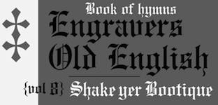 Old metal era blackletter typefaces at Monotype: Armin-Fraktur (1904), Helen-Fraktur (Robert Haas), Halbfett Kasseler Fraktur, Wittenberger Fraktur (or Mars-Fraktur) (1904), Würzburger Fraktur. Their digital blackletter typefaces include LucidaBlackLetter, ClementeRotunda, Cresci Rotunda, Gothique, OldEnglish, Old English Text, Rudolph, Wedding Text, Engravers Old English, Goudy Text.
 View Monotype's blackletter typefaces. [Google]
[More] ⦿
|
MyFonts: Textura
|
Top-ranked Textura fonts at MyFonts. [Google]
[More] ⦿
|
Myrto Papadaki
|
During his studies at Vakalo College of Art & Design in Athens, Greece, Myrto Papadaki created a textura-style blackletter typeface called Ladrian (2013). [Google]
[More] ⦿
|
Nicolas Massi
|
Graphic designer in Buenos Aires who is also involved in Tomo Fonts. His typefaces, dated 2009, include Tesca (a condensed-modern grotesque typeface. Three styles: Flaca, Normal&Gorda), and Arco (a fat face with some geometrical tweaks grabbing fresh and ideal for fashion editorial headlines). With Rodrigo Fuenzalida, he created the textura typeface Pirata+One (2012, Google Web Fonts). He is working on Tesca Specimen, San Francisco, Quick Pick (brush), Mick's, Jumper, Alask (brush), Royal Twins, Clas (brush script). In 2018, Nicolas Massi and Leonard Posavec co-designed Storehouse, a vintage all caps copperplate family with small wedge serifs. It includes a stencil style, San Francisco, Quick Pick (brush), Mick's, Jumper, Alask (brush), Royal Twins, Clas (brush script). Free typefaces by Massi include Braulio (2020; based on Futura Maxi Demi and a post by Braulio Amado), and Sato Sans (2020). MyFonts link. Behance link. Typedia link. Github link for Nicolas Massi. Nico Works link. [Google]
[MyFonts]
[More] ⦿
|
Nonpareille (was: Chastellun.net)
[Matthieu Cortat]
|
 Matthieu Cortat was born in Délémont (Switzerland) in 1982, and became a French citizen later. After a degree in graphic design in 2005, at the University of Art&Design Lausanne (Ecal), he obtained a Masters at the Atelier National de Recherche Typographie in Nancy (France). Cortat heads the Master Type design program at the École d'art de Lausanne (ECAL). He lives in Lyon where he is advisor to the collections of the museum of Printing and Graphic communication. He created the French typographical corpus, which brings together the typefaces in France between 1850 and today. He set up Nonpareille. Most of his typefaces can be bought at 205 Corp.
 His typefaces: - Bentham (transitional).
- Bonesana (2009, Gestalten, an elegant text family straight out of the 18th century).
- Brett (2004). A rounded pixel face.
- Chastelmail (a modification of ITC Officina).
- Goupil (2008, by Regis Tosetti).
- Ecstrat (2009, ornamental 18th century type in the style of Fournier or Rosart).
- Fairplay (transitional newspaper face).
- Glovis (2007, a monospaced typewriter typeface with ball terminals; with Régis Tosetti).
- Liberté.
- Tartan.
- Monolith.
- Stockmar (2007, Optimo: a 12-style baroque family inspired by by Johann Rudolf Genath II (1679-1740)).
- Stuart Pro and Stuart Standard (Nonpareille, 2008). These almost Venetian low-contrast text type families come in 18 styles each, and have three optical choices for the ranges below 8pt, 8-12 pt and above 12pt.
- Ecstrat.
- Glovis.
- Louize (2013). This is a contemporary revival of the Augustaux designed by Louis Perrin between 1846 and 1855. It mixes roman square capitals with a set of transitional / old style / incised lower case. In 2021, he added Louize Display Condensed. He explians: In 1846, Lyonnese printer, Louis Perrin commissioned founder Francisque Rey to cut a series of capitals inspired by monumental roman inscriptions. They have been used to compose "Les Inscriptions antiques de Lyon", a book by Alphonse de Boissieu. In 1855, the typeface was completed by a series of lowercase, some coming from the printshop of Rey, others designed by Perrin himself. His Augustaux, one of the first revivals in the history of typography, became rapidly successful, launching the Renouveau Elzévirien" movement. With the Louize Family, Matthieu Cortat provides a contemporary reinterpretation of the Augustaux. It retains a wise and serene tone, a clear grey of text, the soft roundness of the curves. Louize is discreet, calm, harmonious.
- Chrysaora (2013). An all caps art deco typeface family based on the engraved letters on the Palais de la Porte Dorée in Paris.
- Ebnor (2013). A digital version of the Écriture Bâton Normalisée (standardized sans serif) presented by M. Brun in a self-published booklet of 1959. The shape of letters respects the standard E-04-105 of the French Association for Standardization (AFNOR) which sets norms for industry, engineering and architecture. All letters are monolined and warmly rounded.
- Svafa (2013). This is a rune simulation typeface that revives lettering designed by Eugène Grasset in 1893, on a poster for Richard Wagner's opera, Valkyrie.
- Petit Serif (2013): Petit Serif is a caps typeface with copperplate endings, described as an interpretation (with Latin, Greek and Cyrillic versions) based on the lettering done at 55 Broadway, S.W.1, London, by Percy J. Delf Smith. It is a sans serif presenting the classic proportions of the Roman Square Capitals, yet it does show tiny serifs due to the use of a brush.
- Mecano Sans and Mecano Serif (2013). A revival of a condensed geometric Nebiolo family.
- Henry (2013). They write: Henry is a personal reinterpretation of the Garamond cut for the Deberny & Peignot type foundry between 1914 and 1926 by Henri Parmentier, under the management of Georges Peignot, who owned the foundry. Their purpose was to recreate the gracefulness of Claude Garamont's type typeface while allowing for the development of modern paper making, with its wood pulp paper, as opposed to 16th century rag paper. This elegant and smooth text family has its own mind: Henry is based on the text sizes (9 to 14) of the Garamond Peignot. It is a light and fluid Garald, rather skinny and narrow, with a slender grace. There is an art nouveau spirit in its z leaning on the left, its serpentine a and J, the roundish lower bowl of its t, the wide tail of its Q.
- Hans (2013). A dark Koch-style textura blackletter.
- Battling (2013). This is quite an interesting sans family, in the geometric style of 1930s Europe. The original rough model was a typeface family called Universelles by the Dutreix foundry in Limoges, first produced in the 1930s. The heavier weights are characterized by small cactus spurs. Apparently, Universelles is a renamed version of Hans Moehring's Elegant Grotesk (1928-1929).
- Anacharsis (2012). An experimental geometric sans family.
- Basetica Pro (2013). Even though only offered in two styles, the announcement says that Basetica aims to be the Helvetica for 2013.
- Helvetius (2016). A reinterpretation of a Fournier-style font used in a 1178 edition of De L'Homme by French philosopher Claude-Adrien Helvetius.
- Cosimo (2017, Bureau 205). A humanist sans.
- Yorick (2018). Yorick is based on a monospace typewriter font (model 3402U) found in the Campionario caratteri e fregi tipografici of the Nebiolo type foundry, dated 1920, but the font might probably be older. The source is a slab serif form very common in typewriter fonts (Pica, according to Olivetti naming system) with a little touch of classical flavour from the Imperial style (i.e. with thick and thin contrasts).
- Molitor (2019, 205TF). A great art deco-inspired sans typeface that looks great even for text on a screen.
- Muoto (2021), a variable sans serif font designed by Matthieu Cortat, Anthony Franklin and Sander Vermeulen (Base Design). They write: Muoto is the synthesis of a sensitive and human approach to modernist design. This font combines full curves and solid stems, showing that functionalism can actually be warm and softly effective. With its robust structure and subdued proportions, it evokes organic forms dear to Finnish architect Alvar Aalto, who in 1957 wrote: "We should work for simple, good, undecorated things, but things which are in harmony with the human being and organically suited to the little man in the street".
Speaker at ATypI 2017 Montreal. Klingspor link. View Matthieu Cortat's typefaces. View Nonpareille's font library. [Google]
[MyFonts]
[More] ⦿
|
Oldrich Menhart: Classification of blackletter types
|
Oldrich Menhart compares and classifies various blackletter typefaces in his book Nauka o Pismu (1954). He also compares Quadrata and Rustica in the uncial genre. [Google]
[More] ⦿
|
Oliver Weiss
[Walden Font]
|
 [MyFonts]
[More] ⦿
[MyFonts]
[More] ⦿
|
Paul Shaw
|
Paul Shaw's choice of 100 best typefaces of all times: - 1-10: Gutenberg's B-42 type, Nicolas Jenson's roman, Francesco Griffo's italic, Claude Garamond's roman, Firmin Didot's roman, Akzidenz Grotesk, Gebetbuch type, Cheltenham family, Helvetica, Aldus Manutius' roman.
- 11-20: William Caslon IV's sans serif, William Caslon's roman, Pierre-Simon Fournier's italic, Futura, Times Roman, Chicago, Bell, Ludovico Arrighi da Vicenza's italic, Univers, Romain du Roi.
- 21-30: Johann Michael Fleischmann's roman, Clarendon, ATF Garamond, Giambattista Bodoni's roman, Century Roman, Nicolas Kis' roman, Minion multiple master, Unger Fraktur, John Baskerville's roman, Lucida.
- 31-40: Ionic, Golden Type, Robert Thorne's fat typeface roman, Wolfgang Hopyl's textura, Vincent Figgins' antique roman (Egyptian), Johnston's Railway Sans, Optima, Bauer Bodoni, Adobe Garamond, Breitkopf Fraktur.
- 41-50: Bell Gothic, Courier, Trajan, Mistral, Doves Type, Scotch Roman, Syntax, Snell Roundhand, Memphis, Robert Granjon's civilité.
- 51-60: Fette Fraktur, Ehrhard Ratdolt's rotunda, Romanee, ITC Stone family, Trinité, ITC Garamond, Avant-Garde Gothic, Oakland, Deutschschrift, Hammer Uncial.
- 61-70: Beowolf, Meta, OCR-A, Sabon, ITC Novarese, Zapf Chancery, Rotis, Base Nine and Base Twelve, Peter Jessenschrift, Excelsior Script.
- 71-80: Bitstream Charter, Peignot, Erbar, Cancellaresca Bastarda, Joanna, Dead History, Behrensschrift, Eckmannschrift, Poetica, Marconi.
- 81-90: PMN Caecilia, Stadia, Imprint, Souvenir, Thesis, Apollo, Penumbra, Melior, Neuland, Flora.
- 91-100: Element, Walker, Remedy, Template Gothic, Digi-Grotesk Series S, Compacta, Antique Olive, Bodoni 26, Evans and Epps Alphabet, WTC Our Bodoni.
[Google]
[More] ⦿
|
Pepe Tzintzun
|
 Mexico City-based designer of the typeface family Doit Slab (2013), in which all glyphs have stab wounds. He also created the thin modular typeface Line (2013-2014). In 2016, he designed the handcrafted typeface Fernanda and the textura typeface Cacastrofica Textere. The latter typeface gets the Mon Pote award for 2016 (Mon Pote stands for Most Original Name Prize Of the Trump Era, and is awarded annually starting in 2016 by the office of Luc Devroye). In 2018, he published Dania Stencil.
 In 2019, Pepe released the gorgeous brush script font Mateo Caramelo. Pepe allowed me to host his font Line. Download Line. [Google]
[More] ⦿
|
Peter Doerling
[Die Entwicklung unserer Schrift]
|
[More] ⦿
|
Peter R. Wilson
[Bookhands]
|
[More] ⦿
|
Peter Schellhase
|
FontStructor who admits being influenced by Rudolf Koch and his disciple, Manfred Klein. Creator of Island (2009), The Fall (2009), and Textura Prescisus (2009, blackletter). [Google]
[More] ⦿
|
Peter Wiegel
[CAT Design Wolgast]
|
 [More] ⦿
|
Petra Heidorn
[CybaPeeCreations (or: Typoasis)]
|
 [More] ⦿
|
Polymorph
[Amélie Dumont]
|
Polymorph is a Brussels-based outfit that groups designers who use free programming tools for artistic expression. It is run by Amélie Dumont and François Zajega. Dumont designed some fonts through programming with Metapost, Javascript, FreeCad and other tools. By 2021, she finished Chemins (2021: polygonal), Ductus (2020: +Mono), Fablab (2020: made with freeCad), MetaAccanthis (2020), Fraktur Meta (2019), Metatextura Linear (2018) and Metafraktur Linear (2018). Gitlab link. [Google]
[More] ⦿
|
Posterizer KG
[Lazar Dimitrijevic]
|
 Lazar Dimitrijevic, who set up the foundry Posterizer KG, was born in 1981 in Bajina Basta, Serbia, and lives in Kragujevac, Serbia. He obtained a Master of Graphic Design from the Department of Graphic Design, FILUM Kragujevac, Serbia. Presently, he is art director at Design Studio BOX.
 His first font, Art Decor (2009), is a brush typeface in the style of Treefrog. Koma Latin (2009) is a roughly outlined script face. Bajka (2010) is a wonderfully entertaining Baskerville family (Latin, Cyrillic, dingbats, ornamental caps) made for children's fairy tale books. Scarface (2010) is a sublime scratchy hand ideal for torture movies. Kaligraf Latin (2010) is a rough-edged calligraphic face. In 2012, he published Collage BB (hand-drawn didone), the heavy Egyptian typeface Posterizer KG at DizajnDesign. This font was created for Celebration of 5 years anniversary of Design Studio Box from the city of Kragujevac (KG), the industrial city of Serbia. Posterizer KG (+Rounded) contains all the Latin and Cyrillic glyphs. Posterizer KG Inline and Posterizer KG Rough (a letterpress emulation version) were added in 2013. Posterizer KG Sketch followed in 2015. Still in 2012, he designed the ink splatter typeface Oops, and the calligraphic typefaces Cal Humanistic Cursive (a renaming of Cal Humanist Corsiva, posibly under pressure from Monotype), Cal Humanist Minuscule and Cal Humanist Corsiva. He also creates stunning calligraphic works. Cal Roman Capitals (2012) is a Trajan typeface. In the same calligraphic series, we find Cal Rustic Capitals (2012), Cal Square Capitals (2012), and Cal Uncial (2012). Typefaces from 2013: Posterizer KG Sketch, Cal Expressive, Cal Bakerly (calligraphic script in the style of Arthur Baker), Cal Cursive Roman, Cal Rustic Black, Cal Neuland Bold (after the German expressionist typeface Neuland by Rudolf Koch), Cal Gothic Bastard, Cal Gothic Fraktur, Cal Fraktur Modern, Cal Rotunda, Cal Gothic Textura, Cal Carolingian Minuscule, Cal Carolingian Gothic, Cal Insular Minuscule, Cal Insular Majuscule, Cal Beneventan Minuscule. Typefaces from 2014: Cal Neuland Shadow, Mozzart Sketch (a decorative hand-sketched version of Mozzart Sans, a slightly rounded, neo-Grotesque corporate font, that was originally created for the Belgrade-based company Mozzart DDO; followed in 2015 by Mozzart Rough). In 2015, he designed Drina (brush typeface), My Way (a TreeFrog style handwritten face). Typefaces from 2016: Bali Beach (brush script), Omorika (a rustic handcrafted sketched serif typeface). Typefaces from 2017: Workshop Brush (dry brush), Workshop Marker, Workshop Pencil. Typefaces from 2018: Miro (after the lettering in Joan Miro's art), Ernest (based on the hand of Ernest Hemingway), Natron (rounded condensed sans; +Pictograms). Typefaces from 2019: My Tara (a thick brush script), Natron Rough, Kalli Hand, Kalli Sketch. Typefaces from 2020: Panorama KG (based on the principle nothing below the baseline), Hubble (a rhythmic display typeface with thorny serifs), Liceum (a rhythmic calligraphic script for Latin and Cyrillic), Cal Fraktur Brush, Cal Roman Black, Cal Roman Modern, Cal Uncial Rough. Typefaces from 2021: PKG Roman Capitals (Trajan capitals with a hand-drawn finish, for Latin and Cyrillic), Monodia (a slab serif and its glitched version). [Google]
[MyFonts]
[More] ⦿
|
Progothics
|
Fraktur site run by Petra Heidorn and Dieter Steffmann (in German). Books on Fraktur. Tons of history. The fonts: - Fontsmith et.al.: Crusades Alternate
- Petra Heidorn: Semper Idem (2001)
- James Fordyce: Deutsch Gothic
- Richard Gast: LeeBee Schwarz, Swedie Cruel
- Iconian Fonts: Uberhölme
- Manfred Klein: Broken Brains, Frax Initials, MKaslon Textura, Civilité Edges, Very Broken Frax, Fraxx Sketch Quill (2001, inspired by the work of Imre Reiner), Cowboy Caxton (2001), TShirts for Frax.
- Graham Meade: Heidorn Hill, Labrit
- Darren Rigby: Bayern
- Mickey Rossi: Bongo Fraktur
- Dieter Steffmann: Lautenbach
- Tepid Monkey: Benegraphic
- Derek Vogelpohl: Gothican, Iron Gothic, Ironsides
- Matthew Welch: Fraktur Modern
- Sara: Hilda Sonnenschein (2001)
[Google]
[More] ⦿
|
Proportional Lime
[Shane Brandes]
|
 Oberlin, OH-based foundry of Shane Brandes (b. Lakefield, MN, 1974), who made the historic semi-blackletter revival Augsburger2009 (2009), which was inspired by one of Ernhardt Ratdolt's (1442-1528) many beautiful typefaces. Ratdolt was a printer from Augsburg, hence the name. River Liffey (2009) is based on a typeface used by James Williams an Irish printer active in Dublin during the late 18th century. Rising Sun (2009, blackletter) was inspired by Gering and Remboldt's work during the late 1490s in Paris.
 Charlemagne (2010) is an imaginary medieval script. Fleurious (2010) are ornaments. Sweynheym Pannartz (2010) is modeled after an example Conrad Sweynheym and Arnold Pannartz used in their early printing venture in Subiaco, Italy which began around 1465. Ballard (2010) was inspired by a font used by Henrie Ballard, who operated on Fleet Street at the Signe of the Bear in London from ca. 1597-1608. White Now (2010) is a music note font. Enn'agrammaton (2010) is a cryptographic font. Pluton (2010) is a fixed width font with over 1400 glyphs. Old Venexia (2010) simulates an irregular medieval type. Black Tie (2010) is a simple monoline sans family. Azabercna (2010) is based on gothic principles. Alchimistes (2010) is a medieval symbol face, while Florati (2010) provides a set of ornamental caps. Wappenstein (2010) is an angular stone-carved face: The font Wappenstein was inspired by the carving on a memorial stone located in Paderborn, Germany. The stone was a Epitaph of the Brenkener family, and the carver is known as the Meister des Brenkener Familienepitaphs. The carving, dating to 1562, currently is curated by the Erzbischöfliches Diözesanmuseum in the city of Paderborn and was originally in the Brenkener Pfarr Kirche. Boston 1851 (2010) is based on a stereotype used by Wier and White, Printers of Boston, that was created by the New England Stereoype Foundry under the auspices of Hobart and Robbins, also of Boston. Cruxially (2010) is a 500-glyph dingbat font with crosses. Gaspardo (2011) is an art deco display face. Anguillette (2011) is a quaint grungy face. Ernst (2011) is a very simple but large hand-printed face. The blackletter typeface Schoeffer (2011) is based on Typ.7:146/148G also known as Gesellschaft für Typenkunde plate no. 258, by Peter the Younger (son of Peter Schoeffer), cut ca. 1509-1520. Printers in Marks is a printer mark dingbat typeface created in 2011. Cat E Poultry (2011) is a scanbat typeface of cats. Lucas Brandis (2011) is based on section headings used by printer Lucas Brandis, the first printer to operate in the city of Lübeck around 1473. Creations in 2012: Vine Street, Nicolaus Kesler (a blackletter type based on one of the typefaces of Basel-based Nicolaus Kessler, 15th century), Modality Antiqua (straight-edged and mechanical), Martin Crantz (2012: Martin Crantz (or sometimes Krantz) of the three, including Ulrich Gering and Michael Friburger, that set up a press at the Sorbonne in 1470 was likely the fellow who had the technical know how how to cast the type itself, hence the name of this new typeface that is based on his work.). Modality Antiqua and Modality Novus are explorations of the octagonal principle. Zainer is a rough-edges renaissance era typeface named after Augsburg-based printer Günther Zainer who was active from 1468 until 1478. Swine And Roses is based on a Free Mason script. Ammurapi is a Ugaritic script face. Typefaces from 2013: Michael Wenssler (an incunabula / blackletter typeface based on Michael wenssler typeface from 1482), Andreae (a Fraktur based on a 16th century font by Hieronymus Andreae, who first worked as woodblock cutter and then became a publisher in the city of Nuremberg until his death in 1565), Dropsomaniacal (Lombardic), Therhoernen (grungy medieval script after a Cologne-based printer Arnold Therhoernen, active from 1470 until 1483), Rusch (a 1000-glyph revival of a late 15th century antiqua by Adolf Rusch von Ingweiler, who was active in Strasbourg from 1460 until 1489), Gutknecht (a Schwabacher based on a font used by Jobst Gutknecht, a printer in Nuremburg from 1514 until 1542). The rough blackletter typeface Kachelofen and Konrad Kachelofen are named after Konrad Kachelhofen, a printer in Leipzig active from 1482 until 1529. Albrecht Pfister (2013) is a textura typeface based on Biblia Paperum, which was printed by Pfister in Bamberg, ca. 1460. Amerbach 883 (2013) is a rotunda typeface based on a typeface by Basel-based printer and typefounder Johann von Amerbach, who was active from 1477 until 1513. Typefaces from 2014: Willie Caxton (a blackletter used by William Caxton in his 1476 edition of Chaucer's Canterbury Tales), Azabercna, Lion of Antwerp (an incunabula typeface: Gerard Leeu met his untimely end in a work-related altercation in 1492. He was a notable printer in both the cities of Gouda and Antwerp. This font typeface is based on the "Die gesten of gheschienisse van romen" typeface, ca. 1481.), Hildegardis (an alphabetic cipher that was invented in the 12th century by Hildegard von Bingen to obscure a language called Lingua Ignota. The exemplar was found in the Riesencodex), Lady Vittoria (vampire script based on a German cross stitch pattern from the 1870s), Trowel. Typefaces from 2016: Holle There (a re-cut of a typeface that Lienhart Holle used in his epic edition of Ptolemy's Cosmographia that dates to the early 1480's, even predating italics). Typefaces from 2017: Archbishop (based on the legal documents of Archbishop Arnold von Selenhofen, who granted Hildegard von Bingen and her nuns rooms at the Rupertsberg Monastery in the year 1150), Schoensperger Der Altere (after a blackletter font used by the first female printer, Anna Ruuml;gerin, who was Johann Schönsperger der Altere's sister; Johann was a famous printer in Augsburg, Germany, during the last 20 years of the 15th century). Typefaces from 2018: Zell (a rough blackletter based on 15th century German typeface by Ulrich Zell), Captain Cookie (based on the original font used to print a short history of Captain Cook's exploits around the world), Adelheid (a great curly blackletter based on a 16th century Swiss publication), Feodorov (named after Russia's first printer, Ivan Feodorov). Creative Market link. Klingspor link. [Google]
[MyFonts]
[More] ⦿
|
Rainer Will
[Will Software]
|
[More] ⦿
|
Ralph Michael Unger
[RMU (Ralph Michael Unger Typedesign)]
|
 [MyFonts]
[More] ⦿
[MyFonts]
[More] ⦿
|
Revolver Type Foundry
[Lukas Schneider]
|
 German type designer born in Frankfurt in 1973. He studied in Offenbach at the Hochschule für Gestaltung. He assisted Akira Kobayashi with some projects, and still lives in Frankfurt. In 2017, Lukas Schneider set up Revolver Type Foundry.
 At Typeoff.de, he created the Western billboard typeface Jeans (2004), AT Stencil (2004) and the kitchen tile typeface Disco3000 (2004). At the Hochschule, he created Gazoline, a grotesk face. Lukas Schneider has free-lanced for companies in Frankfurt as well as for the magazine form and for Linotype. He runs his own studio in Frankfurt, called Protago Graphic, and most recently started Snider Inc, also in Frankfurt. In 2007-2008, his masterpiece appeared in the FontFont collection: FF Utility, 15 styles of Bank Gothicalized alphabets specially made for information design. See also YB Utility Slab. He custom designed in 2006-2007, under the supervision of Prof. Johannes Bergerhausen and Prof. Ulysses Voelker at Fachhochschule Mainz the Plus family (for the Plus supermarket). In particular, one font is called Plus Exklusiv Medium. Another custom design is DRAFTFB for Eikes Grafischer Hort, a hand-printed typeface that covers Latin and Cyrillic. In 2013, he graduated from the Type and Media program at KABK in Den Haag. His graduation typeface was the delicate and quite readable text family Damien, which was created for editorial design. In 2016, Lukas published Expose at Indian Type Foundry. This 4-style sans typeface is "constructed" or "engineered" for use in headlines. Free version at Fontshare. Typefaces at Revolver Type Foundry: Damien (2017, in Display and Text subfamilies), Dinamit (2016: a terrific DIN Breitschrift, abandoned by the German DIN norming institute around 1936), Mondial Text (2016: a striking didone based on Hans Bohn's Mondial from 1930), Mondial Display (2016), Newson (a low contrast wayfinding sans with plenty of dingbats---hey, Frankfurt Airport managers, is anyone paying attention?). Designer of DTL Gros Canon at Dutch Type Library, which writes: The first part of the DTL [Gros] Canon Project included the digitization of three types by the Flemish Renaissance punchcutter Hendrik van den Keere (ca.1540-1580): Gros Canon Flamande (textura type, 1571), Gros Canon Romain (roman type, 1573), and Canon d'Espaigne (rotunda type, 1574). The latter is almost ready for release. Typecache link. Klingspor link. FontShop link. Type Network link. Old Snider Inc link. [Google]
[MyFonts]
[More] ⦿
|
RMU (Ralph Michael Unger Typedesign)
[Ralph Michael Unger]
|
 Ralph M. Unger (b. 1953, Thuringia, East Germany) says this about himself at MyFonts: Typesetter from the composing stick via Linotype setting machines to the Mac. Jobs in various Thuringian printeries. Barred further education by Communist authorities due to political reasons. Imprisoned in East Germany. Since 1988 in the state of Baden-Wuerttemberg, former West Germany. Jobs in several newspaper printing houses as advertisement compositor. Own office since 1995, in Aalen, Baden-Wuerttemberg. He lives in Schwaebisch Gmuend, and was a freelance type designer for Profonts and URW++, where he contributed frequently to their libraries between 2002 and 2009. In 2009, he founded RMU. MyFonts link. I split his contributions into two groups, the URW / Profonts group, and the RMU group. The prefix FontForum refers to a subseries of URW++ fonts. Unless specifically mentioned, all the following fonts are at URW++ and/or Profonts:
 - FontForum Admiral Script (2005): revival of Middleton's Admiral script from 1953.
- Amitié (2009): a garalde family.
- Arabella Pro (2006): after the script by Arnold Drescher from 1936, published at Joh. Wagner.
- Fontforum Atrament (2006): architectural lettering. Do not confuse with a Suitcase Type Foundry font from 2003 by the same name.
- Atze (2010): a comic book family.
- Behrensschrift D (2007): after the jugendstil typeface Behrens Schrift, 1902, by Peter Behrens.
- FontForum Bernhard Script (2005): after Bernhard Script from the 1920s.
- Bradley (2005): blackletter, after the original by William H. Bradley.
- Breite Kanzlei (2007).
- Breitkopf Fraktur (2003): after the original by Johann Gottlob Immanuel Breitkopf, done in 1793.
- Brocken (2011) is a signage typeface inspired by a design of Volker Küster (1960s).
- Profonts Bureau (2010, Profonts): a minimalist rounded sans family.
- FontForum Calypso (2005): a revival of Roger Excoffon's Calypso (1958).
- Card Pro (2006): a decorative display based on Ella Cursief (1916, Sjoerd Hendrik de Roos, Lettergieterij Amsterdam).
- Chaweng (2006, Profonts): an oriental all caps simulation face.
- Civilite URW (2005).
- Compliment (2004, casual script). Based on a 1965 script by Helmu Matheis for Ludwig & Mayer.
- Cranach (2007): a blackletter typeface modeled after Kuenstler Gotisch from the Krebs Foundry.
- Dominante (2007): a serif family based on Johannes Schweitzer's font by that name, 1959.
- Dominique (2010, profonts): an informal typeface.
- FontForum URW Ecsetiras (2005): revival of Ecsetirás (Zoltan Nagy, 1967, a brush face).
- Edda Pro (2008). An art nouveau typeface that revives a Heinrich Heinz Keune typeface from 1900.
- Energia Pro (2008, Profonts): connected monowidth script, based on Arno Drescher's Energos from 1932.
- Estro (2003, Western lettering). Seems close to Nebiolo's Estro from the 60s.
- Eurobrush Pro (2007, Profonts): handwriting.
- EuroSans (2008).
- Euroscript Pro (2006, Profonts): school script typeface based on his own handwriting.
- Flashes (2007): a revival of Crous-Vidal's Flash, 1953.
- Fox (2007): a brush script based on W. Rebhuhn's original from the 1950s.
- Gamundia (2010): a calligraphic copperplate script inspired by Excoffon's Diane.
- Ganz Grobe Gotisch (2006): a fat blackletter modeled after the original by F.H.E. Schneidler.
- Gmuender Elan Pro (2011) is a 1950s style script face.
- Gradl Nr 1 (2008): based on hand-drawn art nouveau upper case characters by M. J. Gradl, ca. 1900.
- Graphique Pro (2008): shaded caps face, based on Graphique, which was originally created by Swiss designer Hermann Eidenbenz in 1945, and issued as hot metal font by Haas'sche Schriftgießerei. See also New Graphique Pro (2011).
- Handel Slab (2009): a 6-style extension of Trogram's 1980 typeface Handel Gothic.
- Hanseat (2010): a grotesque family done at Profonts. It was heavily inspired by Germany's official DIN 1451 Engschrift.
- Iova Nova (2007): based on Jowa Script, designed by J. Wagner in 1967.
- Profonts>Impression (2008): art deco.
- Jessen Schrift (2004): after the Rudolf Koch blackletter typeface by that name.
- FontForum URW Konzept Pro (2005): revival of Konzept (1968, Martin Wilke's handprinting face).
- Legende (2002): a script typeface based on the original typeface of Friedrich Hermann Ernst Schneidler (1937).
- Leipziger Antiqua. The original Leipziger Antiqua by Alfred Kapr at Typoart dates from 1971 until 1973. The digital version of Leipziger Antiqua was developed by Ralph M. Unger in 2005.
- Manuskript Antiqua (2005): after Oldrich Meinhart's Manuskript Antiqua.
- The Maszynysta family of heavy industrial sans typefaces (2010) have a textured style (Struktura), a Shadow, and a plain Roman.
- Maxim (2003, Profonts): The heavy brush typeface Maxim was originally designed by Peter Schneidler in 1956 for the Bauer foundry.
- New Bayreuth (2008): after Friedrich Hermann Ernst Schneidler's Bayreuth from 1932.
- Old Borders and Lines (2010). A free font.
- Ornella (2008): Jugendstil.
- Peter Schlemihl (2008, Profonts): a revival of a blackletter by Walter Tiemann.
- Pedell (2009): a casual script.
- Polo (2002): a brush face modeled after Carl Rudolph Pohl's Polo (1960).
- In 2012, Ivana Koudelkova co-designed the grungy headline typeface Retroactive Pro with Ralph M. Unger at Profonts.
- Fontforum Rhapsody (2006): a revival of Ilse Schüle's rotunda face.
- Roberta (2003): art nouveau typeface after obert Trogman's typeface for FotoStar.
- FontForum Signs and Symbols (2006).
- Splendor (2009): a revival of a brush script typeface by Wilhelm Berg, Schriftguss, 1930. See also Splendor Pro (2014).
- Sportowy (2009): an outline face.
- Stanford (2011). A sports lettering face.
- Stiletto (2006): a medieval script.
- Fontforum Stripes (2007): a multistripe op art display typeface based on a Letraset font from 1973 by the same name.
- Fontforum Thalia (2006): retro font.
- Tintoretto (2006): shadow display face based on an origonal by Schelter & Giesecke.
- Tip Top Pro (2008): a Julius Klinkhardt art nouveau typeface revival.
- FontForum Unciala (2005): a revival of Oldrich Menhart's typeface Unciala (1953, Grafotechna).
- Unger Chancery (2005).
- Unger Script (2003): based on H. Matheis' Slogan typeface designed for Ludwig&Mayer in 1957.
- Veltro (2007): after a 1931 original by G. da Milano at Nebiolo.
- Profonts Woodpecker (2008).
The list of RMU fonts: - Affiche (2017). A revival of Helios Reklameschrift of the Klinkhardt foundry.
- Aldo Manuzio (2017). After a house typeface from 1897 by Schelter&Giesecke.
- Amati Pro (2010): after Georg Trump's condensed didone face, Amati, 1951.
- Antiqua Florenz (2021). A revival and extension of Paul Zimmermann's Antiqua Florenz (1960, Ludwig & Mayer), which is based on Venetian romans.
- Avus Pro (2012). A sans family that extends Gert Wunderlich's Maxima (1970).
- Baroque Pearl (2016). A pearly typeface that revives Peter A. Demeter's Fournier Geperlt (1922, Schriftguss).
- Behrens Kursiv (2013). After a 1906 original by Peter Behrens.
- RMU Belvedere (2020). A revival of Heinrich Wieynck's art nouveau / fin-de-siècle typeface Belvedere (1906, Bauer).
- RMU Bison (2020). A revival of Julius Kirn's brush script Bison (1935-1938, C.E. Weber).
- Bernhard Blackletter (2016). After Lucian Bernhard's extrafette Bernhard Fraktur (1921).
- Bernhard Cursive Extra Bold (2010).
- Borghese (2015). An art nouveau font after a Schelter & Giesecke original from 1904.
- Borgis Pro (2012). A Clarendon-style text family.
- Boulette (2015, a fat creamy script).
- RMU Bowery (2019) A revival of Old Bowery (1933, ATF)).
- Bravura Pro (2013). After G.G. Lange's Publica.
- Bricklayers (2012). An original fat slab display face.
- Brillant (2009): art nouveau and ultra heavy.
- Butti (2011). A script family paterned after Fluidum (1951, Alessandro Butti, Nebiolo).
- Cable Condensed (2014). Based on Koch's Kabel.
- Caesar Pro (2011). A flared sans typeface after Caesar Schrift (1913, Georg Schiller, C.F. Rühl).
- Capitol Pro (2012). An art deco typeface based on Capitol (Karl Hermann Schaefer for Schriftguss, 1931).
- Carina Pro (2017). A calligraphic script typeface based on Rautendelein (1929, Schriftguss).
- Carla Pro (2013). A broad-nibbed script modeled after Ballantines Script (Elsner & Flake, 1974; see also Ballantines Serial by SoftMaker).
- Carlsbad (2018). A couple of art nouveau typefaces based on originals from 1895 by H. Berhold called Regina Cursiv and Hansa Cursiv.
- Caslon Gotisch (2009): after the original by William Caslon from 1763.
- Celebration (2009): blackletter.
- Circensis (2016). A Western circus font based on a concept of Fritz Richter.
- Claudius (2010): after a 1937 blackletter font at Klingspor.
- Constanze Pro (2012). A light cursive typeface based on Constanze (1954, Joachim Romann, Klingspor).
- Contact Pro (2010): after Contact, a 1963 font by Helmut Matheis.
- Dante Alighieri (2018). Based on a Schelter & Giesecke original.
- Daphnis (2016). A revival of Daphnis (1929, Walter Tiemann).
- Deutschmeister (2017). A textura blackletter typeface after Deutschmeister by Berthold Wolpe for Ludwig Wagner in 1934. (Some dispute that Wolpe made this font.)
- Diamant Pro (2012). A transitional serif face.
- Emilia (2016). Based on Weiss Antiqua (1928) by Emil Rudolf Weiss.
- Neue Echo (2016). Based on Echo for Schriftguss.
- Elbflorenz (2020). A revival of Albert Auspurg's display typeface Miami (1934, Schriftguss).
- Emilia Gotisch (2016). After Weiss Gotisch (1936) by Emil Rudolf Weiss.
- Emilia Fraktur (2021). A revival of Emil Rudolf Weiss's Weiss Fraktur (1913).
- Erler Titling (2015). After Erler Versalien (1953, Herbert Thannhaeuser for Typoart).
- Eurotech Pro (2011): a slabby techno family.
- Faulkner Pro (2011): a connected heavy signage script based on Alan Meeks's Kestrel.
- Fette Kanzlei (2019).
- Fette Unger Fraktur (2010).
- Fichte Fraktur (2020). After Walter Tiemann's Fichte Fraktur (1934).
- Fontanesi RMU. An ornamental caps typeface that revives Aldo Novarese's Fontanesi (2018).
- Forelle Pro (2010): after the original Forelle script typeface by Erich Mollowitz, 1936.
- Frankenberg Pro (2012). An antique script face.
- Gabor Pro (2014). A connected copperplate script.
- Gaby Pro (2017). A revival of Hans Möhring's script typeface Gabriele (1938 or 1947, C.E. Weber).
- Garamond Antiqua Pro (2015).
- RMU Gilgengart (2020). A revival of Hermann Zapf's Fraktur font Gilgengart (1938).
- Gillray Pro (2015). A copperplate script after Hogarth Script (by Harald Bröder for Typoart).
- RMU Gloria (2019). After Gloria (1898, Emil Gursch).
- RMU Gong (2020). Based on Arno Drescher's Super Grotesk Schmalfett first released in 1933 at Schriftguss.
- Gmuender Gravur (2011). A 3d shadow face. Gmuender Antiqua Pro (2015) is influenced by the metal font Imprimatur (1952-1955, Konrad F. Bauer and Walter Baum). Gmuender Kanzlei (2018) is a blackletter typeface.
- Goethe Fraktur (2022). A revival of a blackletter typeface by Wilhelm Woellmer (1905).
- Gravira (2021). A revival of Herbert Thannhaeuser's Gravira, released by Schelter & Giesecke in 1935 .
- Haenel Antiqua (2020, based on a 19th century antiqua by Eduard Haenel) and Haenel Fraktur (2011, after Haenel Fraktur, ca. 1840).
- Hanse Textura (2020). A revival of a textura by Hermann Zapf.
- RMU Helion (2020). A revival of the 3d titling typeface Helion (1935, Arno Drescher for Schriftguss Dresden).
- RMU Herkules (2019). After a late 19th century font by Bauer and Berthold called Reklameschrift Herkules.
- Hoelderlin (2018). After Eugen Weiss's Hoelderlin blackletter font (1937).
- Hoyer Script (2017). After Hanns Thaddeus Hoyer's Hoyer Schoenschrift (1939, Stempel).
- Hupp Fraktur (2016). After Otto Hupp, 1911.
- Impuls (2010): a brushy typeface based on Paul Zimmermann's Impuls (1945).
- Initials RMU One (2012) consists of revivals of Rudhardsche Initialen (Otto Eckmann, ca. 1900) and Walthari Initials (ca. 1900, Rudhardsche Giesserei). Initials RMU Two (2012) consists of revivals of Jubilaeumsinitialen (by Bauersche) and Augsburger Initialen (by Peter Schnorr, 1901).
- Jean Paul Fraktur (2021). A revival of Breitkopf's Fraktur font Jean-Paul-Schrift (1798).
- Jobs Gravure (2011). It had to happen---a few days after Steve Jobs' death, Unger released the beveled engraved typeface Jobs Gravure, which is an extension of Trump Gravur (1954, Weber).
- Jolly Polly (2012): a curly non-connected script face.
- Kis Antiqua Pro (2018). A revival of Hildegard Korger's Kis Antiqua at Typoart.
- Kleist Fraktur (2010): after Walter Tiemann's original.
- Kompress Pro (2013). Two compressed sans typefaces.
- RMU Kontrast (2021). An art deco typeface that revives Kontrast (1930, F.H.E. Schneidler at Weber).
- Koralle RMU (2018). A revival of Schelter and Giesecke's Koralle (1915).
- Korpus Pro (2014). A text typeface family. Followed later in 2014 by Korpus Sans Pro.
- Korpus Serif Pro (2021). A revival and extension of Timeless (Typoart) that covers Greek, Latin and Cyrillic.
- Leibniz Fraktur (2012) is modeled after the famous Genzsch & Heyse blackletter font.
- Lenbach (2021). Inspired by a German font from the Victorian era.
- Liliom Pro (2012). A beautiful fat didone typeface based on an original from the Fonderie Française.
- Lipsia Pro (2011). An angular serif family.
- Literatura Pro Book (2012).
- Litfass (2021). A revival of an art nouveau font by Flisch.
- Lutetia Nova (2014). A fresh two-style take on Jan van Krimpen's Lutetia (1924).
- RMU Luchs (2021). A redesign of Jakob Erbar's inline all caps art deco font Lux (Ludwig & Mayer, 1929).
- Luxor Pro (2010): a Victorian/Western display face.
- Lyrica (2014). A revival of the informal blackletter typeface Lyrisch (1907, Georg Schiller).
- RMU Magnet (2021). A redesign and revival of Magnet (1951, Arthur Murawski at Ludwig & Mayer).
- RMU Manolo (2019). Based on the art nouveau typeface Manolo (Ludwig & Mayer).
- Manutius Pro (2012).
- Meister Antiqua (2011, +Bold, +Book). A Typoart original from 1951 in the tall flared ascender serif genre, revived and extended.
- Mitropaschrift (2016). An octagonal original.
- Mobil Pro (2011). A semi-script typeface in the fifties style of Matheis.
- Monument (2010): a 3d shadow roman caps face created after Oldrich Menhart's Monument.
- Narziss (2018). A revival of Walter Tiemann's Narziss from 1921.
- RMU Neptun (2021). A revival and extension of the art nouveau typeface Neptun by Aktiengesellschaft fuer Schriftgiesserei und Maschinenbau, Offenbach.
- Neue Kurier (2011). Typoart's popular signage script font in a new, completely remastered version.
- Neue Muenchner Fraktur (2010).
- Neue Schwabacher (2021). After Albert Anklam's Neue Schwabacher (Genzsch & Heyse, 1876).
- Neue Thannhaeuser (2011).
- Old Towne Pro (2010): a Western font.
- RMU Omega (2020). After Omega, an art deco typeface by Friedrich Kleukens at Stempel in 1926.
- Orbis Pro (2016). A revival of Walter Brudi's shadow typeface Orbis (1953, Stempel).
- Orplid Pro (2019). a layerable typeface that revives and extends Hans Bohn's all caps Bauhaus era typeface Orplid (1929).
- Parcival Antiqua (2016). A revival of Parcival Antiqua (1926, Herbert Thannhaeuser).
- Parfum (2013). A low x-height script that was inspired by Howard Allen Trafton's Quick (1933, bauer).
- Parler Fraktur (2018). A revival of Friedrich Poppl's Poppl Fraktur.
- Parler Gotisch (2011). A blackletter face.
- RMU Pittoreske (2019). A decorative Victorian typeface.
- Plastica Pro (2015, a chiseled typeface inspired by a J. Lehmann design).
- RMU Pergola (2021). A vintage shadow typeface inspired by a late-19th century font of Georg Giesecke.
- Post Fraktur (2014) and Postillon (2014). After Herbert Post, 1933-1937.
- Primana Pro (2012). A seductive geometric grotesk family.
- Prinzess Gravur (2010): a blackletter typeface modeled after Prinzeß Kupferstichschrift (1905, Berthold).
- Prisma Pro (2011). Revival and extension of Rudolf Koch's multiline typeface Prisma (1931).
- Reklame Fraktur (2016). After Reklame Fraktur by Albert Christoph Auspurg, 1914.
- Reflex Pro (2018). All caps, with an inline style.
- Reznicek Pro (2011) is a post-Victorian pre-art nouveau typeface named after Ferdinand von Reznicek (1868-1909), one of the leading artists and illustrators of those times.
- Rekord Antiqua (2020). A revival of the art nouveau era text typeface Rekord Antiqua (1911, Wagner & Schmidt).
- Rhythmus Pro (2016). After a Schriftguss AG and Schelter&Giesecke original grotesk, and extended to cover Cyrillic.
- Ridinger Std (2012). Based on Riedingerschrift (Franz Riedinger, 1906, for Benjamin Krebs Succ.).
- Ronde Pro (2011): roundhand script.
- Royal Grotesque (2021). A revival of Wotan by Wagner & Schmidt, 1914. Did this typeface become RMU Royal Sans (2022)?
- Salzmann Fraktur (2019). A revival of Max Salzmann's blackletter font released by Schelter & Giesecke in 1912.
- Saskia Pro (2016). Revival of Jan Tschichold's Saskia (1931, Schelter & Giesecke).
- Schmale Anzeigenfraktur (2009): based on Koch's Schmale Deutsche Anzeigenschrift, 1923, Klingspor.
- Schmale Mediaeval (2020). Based on Schelter & Giesecke's Schmale Mediäval (1840).
- Schmuckinitialen (2009): an ornamental caps typeface in the art nouveau style based on Walthari Initials [Walthari (1899, Heinz König for the Rudhard'sche Giesserei) in the upper case and Eckmann Initials (ca. 1900, by Otto Eckmann, Germany's chief art nouveau type designer) in the lower case].
- Schreibmeister (2021). Ralph's interpretation of Arno Drescher's formal cursive typeface for Ludwig Wagner (1958, Leipzig).
- Schwabacher Book (2013).
- Sebaldus (2019). A heavy blackletter typeface, after Sebaldus Gotisch (1926, H. Berthold).
- Senatsfraktur (2020). After Friedrich Bauer's Senats Fraktur done in 1907 for Genzsch & Heyse.
- Concordia (2020). A revival of Sensation Schmalfett (1914, Heinrich Hoffmeister).
- Siegfried Pro (2017). A revival of the art nouveau typeface Siegfried (1900, Wilhelm Woellmer).
- RMU Skizze (2021). This revives Walter Höhnisch's script typeface Skizze (1935, Ludwig&Mayer).
- Staxx Pro (2013). A prismatic typeface.
- Staufer Gotisch (2015). An engraved blackletter typeface modeled after Herbert Thannhaeuser's Hermann Gotisch (Schriftguss, 1934).
- Steinschrift Pro (2015). A single style condensed sans serif.
- Sylphe Pro (2019). A vintage script font that revives Schelter & Giesecke's Isabel (not Sylphide, as claimed by him).
- Tablica (2017). After Karl-Heinz Lange's DDR telephone directory font Minima (1984).
- Thannhaeuser Fraktur (2013) is a redesign of Typoart's Thannhaeuser Fraktur.
- Thomasschrift (2014). A rustic typeface that revives and extends Thomas-Schrift by Friedel Thomas (1957-1958, Typoart).
- Titanschrift (2011). A yummy soft and fat display face.
- Tombola (2018). After an alphabet from the 1920s by Otto Heim.
- RMU Trianon, renamed RMU Trifels (2020). After Heinrich Wieynck's Trianon (1905, Bauersche Giesserei).
- Trocadero Pro (2010): an extension and revival of Trocadero Kursiv, 1927, Albert Auspurg, Trennert.
- Troubadour Pro (2010): In Medium and Engraved styles.
- Trump Deutsch (2011): a blackletter face, after the 1935 original by Georg Trump.
- Trybuna (2013). Based on Herbert Thannhaeuser's Liberta Antiqua (1958), but completely redrawn.
- Turnier (2019). A revival of G.G. Lange's derby (1952-1953).
- Tyton Pro (2013). A brush script after Heinz Schumann's famous 1964 Stentor.
- Typoskript Pro (2010): a revival of Hildegard Korger's Typoskript, first done at TypoArt in 1968.
- Unger Fraktur (2010): after a 1793 design by Johann Friedrich Unger; includes fett and mager.
- Walbaum Antiqua Pro (2013). A revival of Justs Erich Walbaum's didone classic.
- RMU Wallau (2019). After Rudolf Koch's rotunda typeface Wallau (1926-1934).
- Werbedeutsch (2021). A revival of the blackletter typeface Buchdeutsch (Ernst Schneidler, 1926).
- Wieynck Fraktur (2019). after Heinrich Wieynck's Wieynck Fraktur (1912).
- Wieynck Gotisch (2018). After Wieynck Gotisch (1926, Heinrich Wieynck).
- Zentenar Fraktur (2010): mager and halbfett; after the 1937 workhorse by Ernst Schneidler at Bauer.
- Zierfraktur (2010): after Deutsche Zierschrift, an engraved blackletter font that was cut by Rudolf Koch between 1919 and 1921 for Klingspor.
Ralph made some typefaces outside URW/Profonts and RMU, such as Stripes (2014, a prismatic typeface puvlished by Thinkdust). Klingspor link. View Ralph M. Unger's typefaces. [Google]
[MyFonts]
[More] ⦿
|
Robert Pfeffer
|
 Dr. Robert Pfeffer (Giessen, Germany) specializes in old German and Germanic philology fonts. His mostly free typefaces include:
 - The two Latin fonts Pfeffer Simpelgotisch and Pfeffer Mediaeval are typefaces of the European Middle Ages. Pfeffer Simpelgotisch is a textura typeface. Pfeffer Mediaeval depicts a Carolingian minuscule.
- Some gothic (Wulfilan) alphabet fonts: Silubr (based on the uncial script of the Codex Argenteus), Ulfilas (a serif font designed to satisfy the requirements of modern typography), Skeirs (a sans serif font intended above all for screen display), Midjungards (following the style of J.R. Tolkien's Elven script Tengwar), Pfeffer Mediaeval.
- Runic alphabets: see Skeirs and Pfeffer Mediaeval.
Fontspace link. 1001 Fonts link. [Google]
[More] ⦿
|
Robin Bugdahn
|
Stockholm-based designer of the modern textura typeface Frid (2018). [Google]
[More] ⦿
|
Rod Graves
|
Vancouver, Canada-based graphic design student, who created Archura (2004, a blackletter face: the name stands for Arched Textura). [Google]
[More] ⦿
|
Rodrigo Fuenzalida
[Fragtype]
|
 [MyFonts]
[More] ⦿
[MyFonts]
[More] ⦿
|
Roland John Goulsbra
|
UK-based creator of the children's handwriting fonts AgrafieLL (1994) and Agrafie Alexie LL (1994), both available from Linotype. He also made Linotype Textur Gotisch (2002) and Linotype Textur Lombardisch (2002, a textura). Linotype link. FontShop link. [Google]
[MyFonts]
[More] ⦿
|
Ruxandra Duru
|
 Born in Iasi, Romania, Ruxandra Duru moved first to Casablanca and then to Montreal. In 2011, she studied at EINA in Barcelona.
 Ruxandra created the angular text typeface Botanica (2014, as a project at EINA), and the blackletter-inspired Textura Nova (2014, for the modern monk). In 2016, she designed the free knotted typeface Royal. [Google]
[More] ⦿
|
Schriftarten
|
Horst Enzensberger's pages on German ways of writing, and type forms. He deals briefly with these type forms: Antiqua; Bastarda; Beneventana; Buchschrift; Capitalis; Fraktur; gotische Minuskel; Halbkursive; Halbunziale; Kalligraphie; Kanzleischrift; karolingische Minuskel; Kurrentschrift; Kursive; Lateinschrift; Ligatur; Nationalschriften; Rotunda; Textura; Unziale; Urkundenschrift. [Google]
[More] ⦿
|
Scriptorium (Ragnarok Press, Fontcraft)
[David Fleming Nalle]
|
 Dave Nalle was born in Beirut on March 19, 1959, and died on February 13, 2021 from COVID in his home town of Manor, Texas. From his wiki page: Dave Nalle is a political writer, game author and font designer who was active in the early history of the development of the internet. Nalle was at one time Chairman of the Republican Liberty Caucus, a group that promotes libertarianism within the Republican Party, Senior Politics Editor at Blogcritics online magazine, and was the CEO of Scriptorium Fonts. Obituary [PDF] by Steve Jackson at the Daily Illuminator. Obituary by Shannon Appelcline at RGG Net. Obituary [PDF] at Dungeon Master Magazine.
 A creative and prolific designer, he has made hundreds of beautiful (often historic) fonts. His outfit, Scriptorium (based near Austin, TX, est. 1989), also does custom font and logo design. At some points, Scriptorium was also known as Ragnarok Press and Fontcraft. It specializes in artsy and ancient typefaces. Some subset of the fonts is made by Michael Scarpitti. Free font demos. Images of his best selling fonts. Special subpages: - Three free fonts: Onuava (a mini-serifed hybrid fixed-width font), Divona (sans), Sirona (based on Lombardic calligraphy).
- Lombardic: Aneirin, Benevento (8th century Lombardic), Cymbeline, Fabliaux, Formidable, Locksley.
- Decorative initials such as the 20th century sign lettering initials set Pencraft Initials (2009), New Saxon Initials (2016, based on work by F.G. Delamotte), Delamotte Initials One (2016), Delamotte Initials Two (2016), Holly Initials (2010, based on Real PenWork (1880s, Knowles and Maxim), Vyones (2010), Vergennes (2001), Cascade (2009), Bergling (2010; based on initials by John M. Bergling).
- Steampunk typefaces: Clockwork, Gearhead, Gears, Verne, Draughtwork, Belgravia, Boetia, Blackthorn, Linthicum, Good-fellow, Necromantic, Mephisto.
- Wild West fonts: Academy, Alcalde, Atkinson Boomtown (2009, after the lettering of Frank Atkinson), Atkinson Eccentric (2009), BigIron, Cibola, Del Norte, Lachesis, Perdido, Plowright, Primer, Riudoso, Niederwald, San Lorenzo (2011, with a Mexican and Tuscan look), Stonehouse, Manquo, Rochambeau, Purcell, Vaquero.
- Arabic simulation fonts: Samaritan is based on the poster lettering of Alphons Mucha from his poster for the play La Samaritan. Serendib and Waziri are based on the hand lettering of René Bull from his edition of the Arabian Nights. Caliph (1993) is derived from Ernst Schneidler's classic Legende font, with variant characters based on his original lettering. Also: Satampra, Jerash, Samarkand, Isfahan.
- Celtic fonts: the fonts include Constance, Durrow (1993, traditional rendering of Insular Minuscule calligraphy), Malvern, Glendower (based on the most common lettering in the Book of Kells), Knotwork (caps based on Celtic knots), Alba Text (modernized text font based on Celtic uncial lettering), Lindisfarne (based on a square uncial style), Stonecross (1997, derived from Celtic cross and gravestone inscriptions), Celtic Spirals (dingbats), Celtic Borders font (lets you combine key strokes to form decorative borders; many frames and borders are original Celtic designs by Arts&Crafts period artists like Evelyn Paul and Louis Rhead), Spiral Initials, Brigida (based on Rudolph Koch's interpretation of a squared uncial), Macteris Uncial, Coverack (heavy non-traditional uncial), Dahaut (modernized uncial), Dunsany, Glendower, Morgow (1999, spiral uncial), Teyrnon (elaborate spurred uncial), Padstow (heavy uncial), Vafthrudnir (2011, uncial), Sualtim and Columba (decorative initials based on characters found in the Book of Kells), Albemarle (2001).
- Oriental simulation fonts: Yoshitoshi (2003, based on the 1900-style writing by Yoshi Toshi.
- Gothic fonts, including Alt Gothic, Koch Gothic, Barnabas (2011), Sternhagen (2014), Montgisard (2010, roman capitals with blackletter lower case), Serenissima, Gelderland, Alcuin, Monumental, Goldwork, Waldeck, Roncesvalles, Montressor (2010, ornamental blackletter capitals), T4C Beaulieux (1998, a free copy here), Bastarda (2011), Burgundian, Cadeaulx, Collins Old English, Courtrai, Descant, Ereshkigal, Faustus, Franconian (1993, a Schwabacher), Froissart (2000), Ghost Gothic, Katisha, Koch Gothic, Ligeia, Magdeburg, Magdelena, Melusine, Pyle Gothic, Rheingold, Sanctum, Stuttgart Gothic (2010), Textura, Theodoric, Yngling (2002).
- German expressionist: Dromon.
- Renaissance fonts: Monumental Gothic, Caswallon (a Caslon family), humanist cursive (Palmieri, Castiglione and Hanes Italic), quirky Italian cursives (Fiorenza and Alleghieri), a Roman style hand-lettered font (Rudolfo and Rudolfo Swash), a Trajan-style Roman lettering (Hadrianus), a classic flourished cursive (Trinculo) and a set of floral intials from the Quattrocento (Fraticelli).
- Modern poster fonts: Ascelon, Bilitis, Cosmic Dude, Dromon, Ducatus Rough, Eglantine (after Central Type Foundry's Quaint Roman), Ekberg (2002, based on Samuel Welo's posters), Fortinbras, Hamilton, Jambon, Oblivion, Posada (2008, based on the poster lettering of Mexican artist José Guadalupe Posada), Squiffy, Suspicion, Magnin (2003).
- Mapmaker fonts: building elements are available in Basilica; Ortelius is a map dingbat font; Queensland (based on lettering by artist and calligrapher Eric Sloane), is bold, hand-drawn and reminiscent of medieval writing on maps. There are also Brandywine, Daresiel, Hesperides, Longhorne, Windlass (1996), and Cityscape. Orford (2008) is based on samples of hand lettering from a 1693 manuscript collected by Lewis Day in his classic book on historical paleography, Alphabets Old and New.
- Calligraphic fonts: Albemarle (2001), Azariel, Moncrief (2011, based on the calligraphy of J.M. Bergling), Pavane, Rasael (2009), Abdiel (2005), Roncesvalles, Gazardiel (2003, connected script), Spoonbill (2003, arts and crafts), Macteris (Roman uncial font), Antioch Uncial (Roman uncial font), Burgundian (Classic black letter font), Franconian (993, a classic black letter font), Castiglione (Attractive Renaissance lettering), Cicero (Roman Rustica font), Formidable (1993, very bold late medieval / Lombardic style), Collins Old English (Classic Old English style gothic), Corbei Uncial (Roman uncial font), Cymbeline (late medieval lettering), Durrow (Standard insular minuscule uncial font), Theodoric (Classic black letter font), Gazardiel, Ghost Gothic (Unusual gothic font), Glendower (Uncial font based on Book of Kells), Gloriana (Interesting hand lettering style), Folkard (from the hand-lettering of Charles Folkard), Offenbach Chancery, Ranegund Merovingian Courthand, Benevento (8th century Lombardic), Hesperides.
- Art deco typefaces: Imperatore (2018: based on a hand lettered design from California art deco master designer Pedro de Lemos in the 1920s), Speakeasy (2018), Gates of the West (2018), Lyceum (2014), Borealis (2009), Criterion (2011), Illuminata, Madding (2009, a bold poster font that grew out of Aventine), Alexandrine (2009), art Deco Stencil (2009, based on samples of Art Deco stencil lettering by Pedro Lemos), Falmouth.
- Art nouveau typefaces: Acadian, Agravain (2009), Amphitryon (2009), Ariosto, Asphodel, Averoigne, Beaumains (2011, based on J.M. Bergling's lettering), Beauvoir, Belgravia (based on J.M. Bergling), Bernhardt (based upon the lettering of the Czech art-nouveau artist Alphonse Mucha), Bentham, Berenicia, Boetia (2003, based on J.M. Bergling's lettering), Bruges, Bucephalus (1993), Burd Ellen (2009), Butterfield (1993; in Alfred Roller's style), Cafe Society (2018), Curetana, Damariscotta, Elsene (2011, based on lettering by early 20th century illustrator Clara Elsene Peck), Elysian, Exotique, Flaubert, Gaheris, Ganelon, Gehenna, Goodfellow, Grammophon (2019: a bold Jugendstil poster font), Harbinger, Huyot (2016, after Georges Auriol's types), Jugendstil Kunsthand (2003), Lysander, Maginot (1993; after Peter Schnorr, 1898), Munich (after the Munchner Jugend magazine), Norumbega, Odeon, Ormandine (2010), Pantagruel, Phaeton, Reggio, Rochmbeau, Rockne (2009), Rudolfo, Setebos, Sprite, Summerisle, Sylphide (2005), Undine, Valentin (2008), Vambrace (2010), Walhal, Wendingen (2016), Wormwood (2018), Zeitschrift (2016, based on the Ver Sacrum magazine).
- Modern poster fonts: Field Day (2003), Ascelon, Bilitis, Cosmic Dude, Dromon, Ducatus Rough, Eglantine (after Central Type Foundry's Quaint Roman), Ekberg (2002, based on Samuel Welo's posters), Fortinbras, Hamilton, Jambon, Oblivion, Squiffy.
- Constructivist fonts: Krasny Mir (2009), Vrubel, Structura (1997).
- Futuristic fonts: Alecto, Angelus, Circuit, Culdrose, Gearhead, Ironclaw, Parika, Sanhedrin, Semiramis (1997), Slither, Structuro, Yazata, Adastra (dings).
- Borders and ornaments. These include New Arets and Crafts Borders (20912, based on The Calendar of Golden Thoughts (Barse and Hopkins Publ, 1911).
- Boneyard fonts: Undertaker (2014), Antrobus (2010), Sepultura (2002), Halloweenies, Dementia, Boneyard, Skull and Bones, Malagua (1999-2013), Paleos (2002, from titling of B movies in the cave girl genre), Carmilla, Abaddon, Black Cow (1998), Valdemar, Cuede, Ligeia, Mayhem, Mephisto, Golgotha, Sanguinary, Ironworks, Moravia, Gehenna, Nosegrind (2005, graffiti), Corpus, Ghostly.
- School fonts: Schoolhand (2010).
- Arts and Crafts movement (late Victorian period, 19th century), based on work and lettering by Walter Crane, William Morris, Charles Rennie Mackintosh and Elbert Hubbard. The Arts&Crafts movement was enormously influential on the works of designers, artists and architects of the 20th century, and inspired the Art Nouveau and Art Deco movements. Fonts include William Morris' Kelmscott (based on Morris' Troy type), and True Golden, fonts from the Glasgow branch of the movement like Chelsea Studio (1997), which is based on Charles Rennie Mackintosh's lettering, fonts from the Roycrofters of New York like Semiramis and Ganelon, fonts based on Walter Crane's work such as Crane Gothic, Pencraft Initials (2009) and Walter Crane, and even fonts from the California Arts&Crafts period of the early 1900s like Coloma. Other typefaces: Jesse M. King (refreshed in 2015, and based on hand lettering from a frontispiece design by Glasgow-based Jessie King who was known for her lavish book covers), Aylward, Palmyra (based on work by the Roycrofters, a design community founded by Elbert Hubbard), Aylward (2010, Victorian), Hyacinth Initials, Spoonbill, Adresack (1996: inspired by the arts and crafts lettering styles of designers like Charles Rennie MacKintosh and Jessie M. King), Brandywine, Changeling (2009, based on lettering by fairy artist Fanny Railton), Goddard, and Advertising Gothic (2003), Valentin, Gaheris, Agravain (2009). Delaguerra (2001-2009) is based on a lettering style originating in the California Arts&Crafts period commonly associated with Mission Style. It is still in common usage in signage at historical sites in California.
- Victorian: Beaumarchais, Berenicia, Bilibin, Brandywine, Brigidis, Curetana, Durendal, Elphinstone, Flaubert, Folkard, Gjallarhorn, Gloriana, Hermia, Ironclaw, Magnus.
- Typewriter: Fontcraft Courier.
- Anthroposophic: Ekberg (2002, based on a sample of poster lettering by Samuel Welo).
- Medieval fonts of Scriptorium, critiqued by Marc Smith, page 65: Batwynge is based on lettre gffe by Geofroy Tory (1529), and not on an illuminated manuscript of the tenth century as claimed by Scriptorium. Perigord (1993) is based on a Carolingian alphabet drawn by Ernst Bentele in 1952. Allencon is a calligraphic font based on an interpretation of 6th century Ostrogothic Italian calligraphy.
Some selected fonts: Finchley (psychedelic), Captain Kidd (2012, an original font design based on the title lettering from the classic pirate movie starring Charles Laughton), Aerobrush (2011), Fondry Ornament (2009), Atkinson Egyptian (2008, after the lettering of Frank Atkinson), Verne (2008: remade in 2020 into Covid19), Goldwork (almost blackletter), BigBlok (2010), LetterpressGothic (2010), Plymouth (2010, in the style of Cooper Bold), Broadley (2008, an architecturally inspired script based on lettering by British architect and designer C.F.A. Voysey), Locksley (2004, medieval lettering), Tuscarora (curly lettering), Fiorenza (Renaissance calligraphy), Hesperides (old colonial calligraphic script), Angelus (beautifully printed monospaced script), Esperanza (1996, connected medieval handwriting), Ithuriel (2002), Alleghieri (2002), Hamilton (2002), Spiral Initials, Zothique (great font, based on hand lettering from a map of Clark Ashton Smith's fantasy world of Zothique), Reynard (semi-Celtic), Daresiel (elegant script), Caliph (1992, Arabic simulation), Bassackwards, Rosalinde (1999, handwriting), Arakne (2000, connected handwriting), Falconis (by Michael Scarpitti), Asrafel (semi-Celtic), Swithin (2004), Tyrfing (Art Nouveau/Fraktur, 1999), Waldeck (2008, blackletter), Woburn Initials, Stampwork, Draughtwork, Roughwork (a codex font derived from Nalle's own True Golden which is based on a=n earlier typeface by arts and crafts master William Morris), Melusine (gothic calligraphy), Corbei (uncial), Niederwald (hand lettering), Gjallarhorn (great uncial), Gaiseric (early medieval uncial), Taranis (1987, an uncial first drawn as a font for the cover of the old Ysgarth roleplaying system), De Bellis (roman era, by Michael Scarpitti), Engravers Gothic, Monimental Initials, Sanhedrin (Enemy of the State font), Vespasiano (roman capitals, by Michael Scarpitti), Bilitis, Hendrix (2002), Collins OE (old English), Samedi, Praitor, Evadare (1993, based on a character set which was hand calligraphed by Rudolf Koch), Koch Fantasie (1993), Black Cow (1998). Zothique, Ruritania, Mariner (2004, based on hand lettering originally done by Willy Pogany), Trinculo (a swinging cursive font), Texas Star (2002), Octavian (antique demi-serif font), Ruffian (antique type font), Ascelon (thin sans serif font), Munich (title lettering from Munchner Jugend magazine), Necromantic (bizarre bold titling font), Titania (romantic decorative lettering font), Oberon (bold romantic font), Knotwork, Guede (1993), Pullman, Purcell (Victorian circus poster style font), Allegheny, Carmilla, Malagua (1999-2013), Ardenwood, Platthand, Buccaneer, Cochin Archaic (2010), Boswell (1994), Guilford (based on lettering by artist and calligrapher Eric Sloane), Death Ray (2012, constructivist), Alecto (futuristic), Candlemas (2003), Bridgeport (2003, based on lettering by artist and calligrapher Eric Sloane), Medieval Tiles (2003), Linthicum (2003), Draughtwork (2003), Yngling (Fraktur, 2003), Rheingold (elaborate Fraktur: Music Hall Text elsewhere; see also Teuton Text, Cincinnati Type Foundry, 1877), Kidd (2003), Belgravia (2004), Peck Shields (2004), Scrawlies (2000, handcrafted), Albrecht Durer Gothic (2004), Orpheus (2004), InduXtrial (2004, a grunge face), Yoshitoshi (2003), Veronique (2004), Veneto (2006), Vidilex (1993, monospaced), Abelarde (2006), John Speed (1993: a mapmaker font), Furbelow (2006), Estoril (2006), Tangle, Aventine (sans), Texas Star (2002), Groningen (Bauhaus design), Nevins Hand, Scrapple (2011, Victorian, ornamental), Leodegar (2011, based on samples of 7th century Frankish hand lettering), Candlemass (2012). Fonts from 2013: Doge (a Venetian font based on a J.M. Bergling revival), Original Django (after the titling font in Quentin Tarantino's movie Django Unchained). Fonts from 2014: Highball, Carillon (based on a typeface by Samuel Welo), Edifice (based on lettering by J.M. Bergling). Fonts from 2015: Gods of Mars (an inline sci-fi typeface), Rykov (based on a 1930s Ukrainian constructivist style; Latin and Cyrillic), Vie Moderne (French art deco), Dahlgren, Grand Concours (art deco), Tantalus, Power Tie (art deco), Marquis Greeking. Fonts from 2016: Ekberg Modern (based on lettering samples by Samuel Welo from poster designs of the 1920s), Knuckleduster, Tzaphkiel, Sarandiel, Primrose Initials, Elizabethan Script (chancery style), Zeitschrift (an art nouveau font based on the Ver Sacrum magazine), Wendingen (Dutch deco), Memento Mori (Tuscan), Rounders (art deco). Fonts from 2017: Buzzmill (wooden plank font), Pumpkin Patch Initials, Talinn, Reliquary, Nopalito, Scattershot (script). Typefaces from 2018: Marionettas (a Mexican horror movie poster font), Fascination, Architextura, Santa Sangre, Glyphos. Typefaces from 2019: Cafe Corso (art nouveau), Comic Classix. Fnts released in 2020: Epigramatic (based on lettering by Dard Hunter for the Roycroft Press in the early 1900s), Cryptos (graffiti). Klingspor link. Abstract Fonts link. Dafont link. View David Nalle's typefaces. Scriptorium's library. [Google]
[MyFonts]
[More] ⦿
|
Séamas Ó Brógáin
[Seirbhísí Leabhar]
|
[More] ⦿
|
Segno Scrittura
|
The Associazione Culturale Calligrafia e Lettering in Torino, Italy, organizes workshops and courses on a variety of topics, some of which are related to calligraphy and the history of type. For example, from 14-15 March 2009, there was a course on Gothic Textura. [Google]
[More] ⦿
|
Seirbhísí Leabhar
[Séamas Ó Brógáin]
|
 Séamas Ó Brógáin (Seirbhísí Leabhar) is an Irish type specialist based in Dublin. He has a page on type measurements, with a proposal for reform. His typefaces are all free:
 - Clara (2015). A text typeface created specially for printing A Dictionary of Editing (2015). The family includes italic, bold, bold italic, and small capitals, while the character set includes Greek, Cyrillic, phonetic and mathematical ranges, scribal abbreviations, and other specialist characters. CTAN link, with TeX support, maintaned by Daniel Benjamin Miller.
- Florea (2013). Floriated type borders based on a sixteenth century model.
- The traditional minuscule (angular) Celtic font Gadelica (2007). Based on the first authentic examples from the seventeenth century.
- Germanica (2010-2012). A textura quadrata typeface based on a model by Fust and Schöffer (ca. 1457).
- Valida (2012). A font for creating ISBN barcodes.
Old URL. [Google]
[More] ⦿
|
Shaltype (or: Pudji Pangestoe Type Foundry)
[Faishal Mahdy]
|
 Indonesian designer who founded Shaltype in 2014. His typefaces:
 - Samerang Display (2021). A display typeface that tries to evoke the retro-futuristic 1970s.
- STCO Prescissa (2021). A Textura typeface.
- Estefania (2022). A retro signage script.
- Heartwave (2022). A poster font that was inspired by the seventies.
- Donphan (2022). A vintage display typeface.
[Google]
[MyFonts]
[More] ⦿
|
Shane Brandes
[Proportional Lime]
|
 [MyFonts]
[More] ⦿
[MyFonts]
[More] ⦿
|
Simon Bent
[Metis Digital Type Foundry (or: Studio Io, or: Metis Foundry; was: Volume2a)]
|
[More] ⦿
|
Skogtype
[Gunnar Link]
|
 Type designer born 1983 in Schramberg, Germany. He studied Kommunikationsdesign at Fachhochschule Mainz from 2007 to 2011, and founded Skogtype.
 Creator of Royal Oak Decor (Victorian ornaments), Royal Oak Sans (2009, Edwardian headline sans) and Royal Oak Serif (Western headline face). All were done in 2009 at Die Typonauten and were joint work with Ingo Krepinsky and Stefan Kroemer. In 2011, he designed the Cooper Black-style typeface Frido Black at 26 plus zeichen. See also Frido Narrow (2011). Ingo Krepinsky and Gunnar Link made the fun hand-drawn Western family Oklahoma Pro (2012) in styles called Deputy, Sheriff, Marshal and Scrawls (dingbats), and In 2012, he published Selva, a modern take on the textura style, at Die Typonauten. Riga (2012) is a lively fat signage typeface. Typefaces from 2014: Donki (fat signage script, extended to Donki Pro and Donki Pro Stencil in 2015). Typefaces from 2017: Skog Sans. Typedia page. MyFonts foundry page. Klingspor link. Behance link. [Google]
[MyFonts]
[More] ⦿
|
Softmaker: Blackletter fonts
|
 The blackletter fonts sold by Softmaker (which are based on hand-digitizations of Berthold's and and other collections by URW and Primafont):
 - Alte Schwabacher
- E780 Blackletter: This is Engravers Old English (1902, Morris Fuller Benton, ATF).
- F692 Blackletter: This is Fette Fraktur, or simply Fraktur.
- Fraktur-Regular: A 1875 typeface by Wagner, see also F692 Blackletter. Elsewhere: Frankenstein.
- G820 Blackletter: This is also known as Gregorian elsewhere.
- Headlight: Made by URW in 1994. Another name: Blacklight.
- J790 Blackletter: This is Unger Fraktur (1800, Berthold).
- Marriage: This is Mariage or Wedding Text (1901, Morris Fuller Benton, 1901).
- Old Blackletter: Also known as Old English, Ottoman.
- Ottoman: Also known as Old English, Old Blackletter.
- P650 Blackletter: This is Paladin. Elsewhere known as Excalibur.
- P790 Blackletter: This is Poppl Fraktur (1986, Friedrich Poppl, Berthold).
- Walbaum Fraktur
- W650 Blackletter: This is Walbaum Fraktur (1800, J.E. Walbaum).
- Z690 Blackletter: This is Zentenar Fraktur (1937, F. H. Ernst Schneidler, Neufville).
Later, the Elegant Blackletter collection was published in which the fonts were renamed, and new ones added: The blackletter collection published in 2016 by SoftMaker includes these typefaces: Albrecht Duerer Fraktur Pro, Barock 1720, Breitkopf Fraktur Pro, Coburg No1, Coburg No2, Coelnische Current Pro, Diamant Gotisch Pro, Fleischmann Gotisch Pro, Fraktur No2 Pro, Fraktur No3 Pro, Alte Schwabacher No1 Pro, Alte Schwabacher No2 Pro, Fraktur Pro (+ Arrow,Broken Glass, Broken Glass No2, Directions, Falling, Falling No2, Flash, Flash No2, Glass, Glass Nop2, Gradient, Gradient No2, Inkjet, Inkjet No2, Plant, Rising, Rising No2, Sawmill, Sawmill No2, Squiggle, Squiggle No2, Stars, Stars No 2, Strings, Stripes, Stripes No3, Strokes, Teensy No2, Winding, Winding No2), Fraktur No4, Gothic Pro, Gotisch Pro, Grail Fraktur Pro, Gravure Pro, Bold;Gravure Pro Bold;Gravure Pro-Bold, Gutenberg Textura Pro, Hans Fraktur Pro, Hohenstein Gotisch Pro, Hungarian Fraktur Pro, Innsbruck Initials, Leibniz Fraktur Pro (after Genzsch & Heyse, 1912), Light Text Pro, Lincoln Text Pro, Marriage Pro, Offenbacher Kanzlei Pro, Old Londontown Pro, Ottoman Pro, Peter Jessen Schrift Pro (after Rudolf Koch's Peter Jessen schrift, 1930), Poem Fraktur Pro, Renaissance Fraktur Pro (after Heinz Koenig's Renaissance Fraktur, 1885), Rundgotisch No1 Pro, Rundgotisch No2 Pro, Schwarzwald Pro, Schwere Fraktur Pro, Theuerdank Fraktur Pro, Walbaum Fraktur No1 Pro, Walbaum Fraktur No2 Pro, Walbaum Zierfraktur Pro, Wallau No1 Pro, Wallau No2 Pro, Wilde Fraktur Pro, Wilhelm Gotisch Pro, Zentenar Fraktur Pro (after Friedrich Hermann Ernst Schneidler, 1937-1938), Zwickau Fraktur Pro. [Google]
[MyFonts]
[More] ⦿
|
SoftMaker Software GmBH (or: freefont.de)
[Martin Kotulla]
|
 SoftMaker, Martin Kotulla's German foundry in Nürnberg, is selling the 10,000-TrueType font Megafont XXL CD (50 USD, www.megafont.de). Every month, a different font or font family (TT and T1) is given away for free. The MegaFont XXL has most standard Monotype/Adobe/Linotype families (up to 1995/1996). They say that most fonts are licensed from URW++ and Brendel Informatik (Cologne). Contents of MegaFont XXL's predecessor, MegaFont Profi CD, here. Since early 2001, you can download one font family from the CD MegaFont XXL here. Martin Kotulla also started infiniType, a collection of 5050 fonts at a good price (Mac and PC). That collection grew to 7444 fonts in InfiniType 4 in 2016. The XXL series has character sets for Western and Central European languages, Turkish, and Celtic, and comes with many expert sets. For historical accuracy: older packages by Softmaker include the 3333-font (TT and T1) MegaFont Profi CD-2.0 (99DM), the 5000-font MegaFont Euro (50 Euro), the Truepack Profi-CD and the 500-font TypeMaker 5.0 Profi-Pack (10DM).
  Their early fonts were renamed and had the attribute Serial in the name. Samples of some of these fonts/families: Adelon Serial (1996, after Albertus MT), Melbourne Serial, Nashville Serial (+Heavy), Nevada Serial, On Stage Serial, Ornitons Serial, Penthouse Serial, Plakette Serial, Priamos Serial, Quadrat Serial, Quebec Serial, Riccione Serial, Rochester Serial, Salzburg Serial, Stafford Serial, Sunset Serial, Sydney Serial, Thames Serial, Toledo Serial, Valencia Serial (Heavy), Valencia Serial (Xlight), Verona Serial, Volkswagen Serial, Wichita Serial. Their early fonts were renamed and had the attribute Serial in the name. Samples of some of these fonts/families: Adelon Serial (1996, after Albertus MT), Melbourne Serial, Nashville Serial (+Heavy), Nevada Serial, On Stage Serial, Ornitons Serial, Penthouse Serial, Plakette Serial, Priamos Serial, Quadrat Serial, Quebec Serial, Riccione Serial, Rochester Serial, Salzburg Serial, Stafford Serial, Sunset Serial, Sydney Serial, Thames Serial, Toledo Serial, Valencia Serial (Heavy), Valencia Serial (Xlight), Verona Serial, Volkswagen Serial, Wichita Serial.
In 2008, SoftMaker started selling fonts on MyFonts: fonts there include the 28-style Suetterlin family (2008), based on the handwriting taught in German schools in the first half of the 20th century, Harald Handwriting (2009), Agilo Handwriting (2009), Wally Handwriting (2009), Vittorio Handwriting (2009), Turandot Handwriting (2009), Tommi Handwriting (2009), Veneto Handwriting (2009), Tolomeo Handwriting (2009), Sarx Handwriting (2009), Salew Handwriting (2009), Roxana Handwriting (2009), Renate Handwriting (2009), PizPaz Handwriting (2009, Mexican style), Schneid Handwriting (2009), Pietro Handwriting, Phil Handwriting, Nadine Handwriting, Kuno Handwriting, Larissa Handwriting, Lizzy Handwriting, Juri Handwriting, Jeff Handwriting (2009), Josh Handwriting (2009), Jelena Handwriting (2009), Jaro Handwriting (2009), Jacques Handwriting (2009), Hilly Handwriting (2009), Harico Handwriting (2009), Hakon Handwriting (2009), Stone Handwriting (2009), Federico Handwriting (2009), Fabio Handwriting (2009), Emmi Handwriting (2009), Davio Handwriting (2009), Alec Handwriting (2009), Brian Handwriting (2009), Armand Handwriting (2009), Claude Handwriting (2010), Cathy Handwriting (2010), Clay Handwriting (2010), Danielle Handwriting (2010), Feliks Handwriting (2010), Foster Handwriting (2010), Giorgio Handwriting (2010), Giovanna Handwriting (2010), Guga Handwriting (2010), Giuliano Hanriting (2010), Carlo Handwriting (2009), Brouet Handwriting (2010), Bjarne Handwriting (2009), Fuego (2015: a retro script, after Letraset's Flamenco), Agnieszka Handwriting (2009) and Thery Handwriting (2009).  Additions in 2010: Tabasco (a geometric based on the phototype font by John Schaedler), Tabasco Twin (a bilined typeface after John Schaedler's Paprika), Advertisers Gothic (a revival of a 1917 typeface by Robert Wiebking), Ad Lib (a revival of a quirky 1961 typeface by Freeman Craw for ATF), Accent (brush face), Flagstaff (oblique techno face), Cornered (with angular pieces), Abilene (Western; caps only), Comix, Cathedral Open (nice open face), Boa Script (2010), Bryce (2010, brush script), Brush Script (2010, after the original ATF font by Robert E. Smith from 1942), Bernhard Fashion (2010), Abbott Old Style (2010, after a 1901 semi-Victorian font by Joseph W. Phinney), Artistic (2010, after Ariston, a 1933 typeface by Martin Wilke), Elegant Script (2010, a revival of Berthold's Englische Schreibschrift), Garamond Serial (2011), the Suetterlin family. Additions in 2010: Tabasco (a geometric based on the phototype font by John Schaedler), Tabasco Twin (a bilined typeface after John Schaedler's Paprika), Advertisers Gothic (a revival of a 1917 typeface by Robert Wiebking), Ad Lib (a revival of a quirky 1961 typeface by Freeman Craw for ATF), Accent (brush face), Flagstaff (oblique techno face), Cornered (with angular pieces), Abilene (Western; caps only), Comix, Cathedral Open (nice open face), Boa Script (2010), Bryce (2010, brush script), Brush Script (2010, after the original ATF font by Robert E. Smith from 1942), Bernhard Fashion (2010), Abbott Old Style (2010, after a 1901 semi-Victorian font by Joseph W. Phinney), Artistic (2010, after Ariston, a 1933 typeface by Martin Wilke), Elegant Script (2010, a revival of Berthold's Englische Schreibschrift), Garamond Serial (2011), the Suetterlin family.
The typefaces remastered in 2012 include Chandler Pro (this is Rofer Excoffon's 1955 brush typeface Choc; see also Staccato 555 by Bitstream and Chalk by Corel), Cheltenham Pro, Cleargothic Pro (after Morris Fuller Benton's flared version of Clearface, Clearface Gothic, 1907), Cooper Black Pro (+Stencil), Bristol Pro, Tioga Script Pro (after Georg Trump's 1956 script by that name, but aka Time Script). Free download: Huntington-Bold [-> Handel Gothic], Huntington-Light, ImperialStd-Bold [-> URW Imperial] ImperialStd-BoldItalic, ImperialStd-Heavy, ImperialStd-HeavyItalic, ImperialStd-Italic, ImperialStd-Medium, ImperialStd-MediumItalic, ImperialStd-Regular, ImperialStd-Xbold, ImperialStd-XboldItalic, KremlinScript-Bold [-> Kuenstler Script], RaleighSerial-Bold, RaleighSerial-Heavy, RaleighSerial-Regular, Scott [-> Stop], TiogaScript-Bold [-> Time Script], TiogaScript-Light, TiogaScript-Medium. Handwriting fonts shown at MyFonts in 2013: Allan Handwriting, Andrew Handwriting, Eleanor Handwriting, Enrico Handwriting, Estelle Handwriting, Jay Handwriting, Jaz Handwriting, Jesco Handwriting, Justine Handwriting, Kris Handwriting, Laszlo Handwriting, Lennart Handwriting, Luitpold Handwriting, Manolo Handwriting, Marbo Handwriting, Marcello Handwriting, Murielle Handwriting, Pablo Handwriting, Paolo Handwriting, Pascal Handwriting, Picto Handwriting, Rainer Handwriting, Reyno Handwriting, Ronaldo Handwriting, Teje Handwriting, Theo Handwriting, Valerian Handwriting, Vincent Handwriting, Vogel Handwriting, Volker Handwriting, Wilma Handwriting. The blackletter collection published in 2016 by SoftMaker includes these typefaces: Albrecht Duerer Fraktur Pro, Barock 1720, Breitkopf Fraktur Pro, Coburg No1, Coburg No2, Coelnische Current Pro, Diamant Gotisch Pro, Fleischmann Gotisch Pro, Fraktur No2 Pro, Fraktur No3 Pro. Later in 2016, SoftMaker published its revival collection, which includes Alternate Gothic Pro, Amsterdamer Garamont Pro, Antiqua Pro, Balloon Pro (brush), Caslon Antique Pro, Century Old Style Pro, Elmore Pro (architectural hand), Falcon Pro (retro brush), Cheltenham ExtraCondensed Pro Bold, Casual Pro (a copy of Thomas Nevison's Casual Pro from 1935), Garamond Nova Pro, Giulio Pro (a copy of Gillies Gothic), Josephs Brush Pro (a copy of Joseph Churchward's Churchward Brush), Malaga Pro (a copy of Roger Excoffon's Mistral), Melville Pro (after Murray Hill), Pedro Pro (a revival of the brush script Dom Casual by Peter Dombrezian, 1950-1953, at ATF), Salmon Pro (a revival of François Boltana's Stilla from 1973), Soledad Pro (based on Helmut Matheis's Slogan (1959, Ludwig & Mayer)), Somerset Pro (a revival of the Letraset font Shamrock designed in 1978 by Alan Withers), Sterling Pro (based on Stentor, designed in 1964 by Heinz Schumann at Typoart), Violin Script Pro (based on Vladimir Script by Vladimir Andrich, 1978). Typefaces from 2019: American Text (after an original condensed textura by Morris Fuller Benton), Angelo (after a Victorian typeface called Anglo by Barnhart Brothers ans Spindler, ca. 1895), Balloon No2 (just like SoftMaker's Balloon, based on Max Kaufmann's Balloon from 1939 at ATF), Balzac (after Johannes Boehland's Balzac from 1951), Amber (after Amelia by Stanley Davis, 1964), Karin Pro (a revival of OttoWeisert's art nouveau script Kalligraphia), Beale Charming (2019, after an art deco typeface by Collis Clements, ca. 1974), Bernhard Condensed No2, Bluff No2 (2012-2019, after Julius Kirn's brush script Bison, 1938), Boss (2012, after the sci-fi typeface ITC Bolt (1970, Tom Carnase and Ronne Bonder)), Broadway No2 (2012), Cavalier (2012), Century Schoolbook Pro (2019: after Morris Fuller Benton's typeface from 1919), Century PS Pro (2019: after New Century Schoolbook), Commercial Script No2 (2012, after Morris Fuller Benton's Spencerian script), Cristoforo (2012: after Columbus, a Victorian typeface by Hermann Ihlenburg), Dillon No2 (2012, after Jan Van Dijk's Demian), Disco (2012), Dom (2012; after Peter Dombrezian's Dom, 1952), Durango No2 (2012; after K. Sommer's Dynamo, 1930), Egyptian Wide (2012, after walter H. McKay's Egyptienne from 1952), Eller Initials (2012), Entebbe (2012: after F. Scott Garland's Enviro, 1982), Estelle (2012, based on Vince Whitlock's Equinox from 1988), Florentine (2012, after Ludvig S. Ipsen's ATF Florentine Old Style (1896)), Fraktur No2 (2012, after Johann Christian Bauer's Fette Fraktur, 1850), Frenzy (2012), Giulio No2 (2012, after William S. Gillies's Gillies Gothic, 1935), Greyhound (2012), Harlekin (2012, after Colin Brignall's retro script Harlow Solid (1977)), Hobo No2 (2012, after Morris Fuller Benton's Hobo, 1910), Hubert (2012, after Jan van Dijk's Van Dijk from 1982), Hudson (2012, a brush script), Ingrid (2012), Inverserif (2012), Japanette (2012, an oriental simulation face modeled after Barnhart Brothers and Spindler's 1893 font, Wedge Gothic ML, aka Japanet), Kalligraphia (2012, after Otto Weisert's art nouveau script, Kalligraphia, from 1902), Legend Script (2012, after F.H. Ernst Schneidler's faux Arabic simulation font Legende from 1937), Looking Glass (2012, after Phil Martin's Introspect, 1971), Messing (2012, after W. Schwerdtner's Metropolis from 1928), Metallic Sky (2012, after Mekanik, a Letraset typeface from 1988 by David Quay), Mister Big (2012, after Juergen Riebling's Mr. Big from 1972), Openface No2 (2012, after Augustea Open done in 1951 by Alessandro Butti and Aldo Novarese), Organ Grinder (2019, based on Franz Heigemeir's Organda from 1972), Paladin (2012, a blackletter, also called P650 Blackletter and Excalibur), Pergamon (2012, a deco hairline sans modeled after Premier Lightline (1969, Colin Brignall for Letraset)), Pinocchio (2012, based on a psychedelic typeface by Gustav Jaeger from 1973; earlier called P732 Deco by SoftMaker), Pretoria (2012, earlier called P820 deco by SoftMaker; a revival of the Edwardian typeface Pretorian by P.M. Shanks and Sons, ca. 1880s), Publicity Gothic (2012, based on Sidney Gaun's 1916 typeface for BBS), Quartz (2012, after Alan Birch's LCD from 1981), Reflex (2012, based on Refracta, made in 1988 by Martin Wait), Regency Script (2012: was R690 Script), Rosa (2019, after Herb Lubalin's ITC Ronda, 1970), Rough Script (2012, based on Imre Reiner's Reiner Black, 1955), Rovinj (2012, after a font by Phil Martin), Shotgun (2019, based on a film font from 972 by J. Looney for VGC), Siegfried (2012, art nouveau style), Slager (2012, based on Flash by Edwin Shaar, 1937), Sprint (2012, after Aldo Novarese's Sprint from 1974), Station Script (2012, after a 1946 typeface pair, Studio and Flambard, by Adolf Overbeek), Status (2012, after Michael Neugebauer's Squire from 1980-1987), Tico (2019), Unziale (2012), Yorkshire (2019, formal calligraphy), Zanzibar (2019, after a 1950s Filmotype font), Zephyr (2019; after Rofger Excoffon's Mistral, 1953). View the Softmaker library of typefaces. See also here. [Google]
[MyFonts]
[More] ⦿
|
Textura
|
A gothic letterform that first appeared at the end of the XIIth century. More or less like a heavy form of blackletter, it endured until the XVIth century. Example of German Textura from 1494. Nicolaus Everardi de Middelburgo's example of Rotunda and French Textura (1516). The original form of Textura is called Textura Quadrata. Also called Gothic or Gotisch, Textura spread around Europe from ca. 1140 together with Gothic art and architecture. Textura Quadrata has diamond-shaped heads and feet, whereas Textura Prescisus is castrated (no feet). Around 1400, nearly all books in Europe were in Textura handwriting, and so, Gutenberg's first movable type was also based on this form. But soon afterwards, it was replaced by Schwabacher and Antiqua. Wynken de Worde brought a Textura font of type to England in 1480. Old English types of the 19th Century are sometimes based on typefaces that developed out of his contribution. Textura (gotisch) examples of digital types: - From Bitstream: Cloister Black, Engravers Old English, Wedding Text.
- From Castle Type: CloisterBlack, GoudyTextOldStyle.
- From Ingrimayne: BeneScriptine.
- From ITC: ITC Agincourt, ITC Old English.
- From Lanston: GoudyText.
- From Omine: GoticaLumina.
- From Parkinson: Amador, Cabazon.
- From Preusstype: SinkwitzGotisch.
- From Aerotype: Octoberfest.
- From Mecanorma: Gothique.
- From Linotype: FetteGotisch, TexturGotisch.
- From URW++: Old English Standard, FetteGotisch, OldEnglish.
- From Adobe: GoudyText, LinoText, NotreDame, WilhelmKlingsporGotisch.
[Google]
[More] ⦿
|
The Gothic or Wulfilan alphabet
|
Quoting Dr. Robert Pfeffer: The Gothic or Wulfilan alphabet has nothing to do with the medieval gothic script. Rather, it is the script used by the ancient Goths and invented by Visigoth bishop Wulfila in the fourth century A.D. for the purpose of translating the Bible into Gothic. The Gothic fonts offered here [i.e., by Robert Pfeffer] are based on the younger model of the Gothic script (S-style) as it appears in the Codex Argenteus. The difference to the older variants (Sigma-style) lies in the younger model's S being equal to the Latin one, while the S of the older variants resembles the Greek sigma. [Google]
[More] ⦿
|
Théo Guillard
|
 Toulouse and now Paris, France-based freelance designer, who created Izy (2014), Autumn (2014, a textura face), Easy (2014, a fat display typeface), and Gerhard (2014, a take on Bernhard Gothic, 1930).
 In 2016, he designed the inline didone typeface Zina at Indian Type Foundry and Fontshare. In 2017, Jérémie Hornus, Théo Guillard, Morgane Pambrun, Alisa Nowak and Joachim Vu co-designed Bespoke Sans, Bespoke Serif and Bespoke Slab at Fontstore / Fontshare. In 2020, Bespoke Stencil was added. In 2018, he designed the great angular typeface Sharpie Script (free at Fontshare). Guillard won the bronze medal in the Latin category at the 22nd Morisawa Type Design competition in 2019 for Easy. In 2019, he released Carmin at Future Fonts. Carmin is like a hipsterized uncial. In 2020, he published the fat stone cut calligraphic typeface Grenat. Future Fonts link. Zodiak (2021, Jérémie Hornus, Gaetan Baehr, Jean-Baptiste Morizot, Alisa Nowak, and Théo Guillard at Fontshare) is a free 24-style text family with Century-like newspaper roots and sturdy bracketed slab serifs that was originally named Claire (2020). Gambarino (2016-2021, Fontshare). A condensed, single-weight serif face for headlines. [Google]
[MyFonts]
[More] ⦿
|
Thierry Fétiveau
|
 French freelance graphic and type designer who started his own commercial type foundry in 2014. Now based in Nantes, Thierry was educated in Nantes and studied Typography & Language at ESAD in Amiens, France, class of 2014. His typefaces:
 - Andersen. His graduation project from Nantes.
- Batutah (2013-2014). A Latin / Arabic bicephalic typeface family for his graduation project at ESAD. "Batutah" refers to the Arab pilgrim Ibn Batutah who traveled from Spain to China in the thirteenth century. This Latin / Arabic typeface is intended primarily for magazines.
- Futago (2013). A fashion mag hiragana and katakana didone. Thierry: Futago is a Japanese typeface of 141 glyphs intended to go with Latin typefaces from Didot family. Its name, which means twin, expresses clearly its objective: to be used in bilingual texts in order to create a graphic unity. This typeface has been selected by the website Typography Served in 2013.
- Wilson (2013). A visit by Laura Mesaguer led Thierry to the development of a 3-style Tuscan stencil typeface called Wilson (2013).
- Dark Times (2013). An extra-light revival of a gothic textura.
- Lewis (2014). A Tuscan stencil typeface.
- For the comic book artist Milena Picard, he custom-designed the comic book typeface family Anelim (2017).
- The art deco all caps Utopiales (2018): This typeface has been tailor-made for the Utopiales, an international science-fiction festival at the Cité des Congrès in Nantes. The Cité des Congrès in Nantes asked me to create a new titling typeface only in capitals following their art deco inspirations. I based it on the letters of this period found in the streets of Nantes that are part of the history and identity of the city.
- In 2019 he made a typeface, Bouclard, on commission for the publishing house Bouclard in Nantes.
Creative Market link. Behance link. [Google]
[MyFonts]
[More] ⦿
|
Tim Larson
[Dieter Steffmann's blackletter typefaces]
|
[More] ⦿
|
Tommi Syrjänen
|
 Finnish designer of the free typeface Missaali (2016). Missaali (CTAN link) is a package that contains the free OpenType/PS Textura font Missaali and a style file for using it with XeLaTeX. He explains: Textura is based on the textus quadratus form of the textualis formata that late medieval scribes used for the most valuable manuscripts. The font Missaali is based on Textura that Bartholomew Ghotan used to print missals and psalters in the 1480s. The letters were scanned and recreated from a facsimile reprint of Missale Aboense that Ghotan printed for the Turku diocese in 1488. The font has two intended use cases: (i) as a Gothic display font; and (ii) for emulating late-medieval manuscripts.
 In 2021, he designed the free medieval revival typeface Aboensis, which contains over 500 glyphs, including Lombardic capitals in one and two colors. He writes: Aboensis is a free unicode OpenType font that is intended for emulating late-medieval documents. The font is an example of a 15th century book cursive hand that was used in the Scandinavian countries. The main source for the glyphs is Codex Aboensis, a richly-illustrated law book written in the 1430s. The font also includes a number of glyphs taken from other roughly contemporary manuscripts. The largest group of them are cursive initials taken from The Black Book of Abo Cathedral that was compiled around the end of the 15th century. As medieval cursive is very difficult to read for modern readers, this font is not really suitable for any normal practical purposes. Instead, it is aimed for users who want to recreate medieval-looking documents with a computer. The font has two sets of initials. The rst ones are in the Lombardic style and are taken from Codex Aboensis. [Google]
[More] ⦿
|
Trash-mail
|
FontStructor who made the blackletter typeface Sutela (2010) which was modeled after the Textura used in Gutenberg's bible. [Google]
[More] ⦿
|
Typedia: Typeface classification
|
The classification from the Typedia community: - Blackletter
- Fraktur: A German form of Blackletter with broken strokes. Classic example: Fraktur.
- Old English: The English blackletter style. Classic example: Cloister Black.
- Rotunda: A Blackletter style featuring wider lowercase with more rounded strokes.
- Schwabacher: A German form of Blackletter with simplified, rounded strokes.
- Textura: A Blackletter style featuring tall, narrow lowercase made mostly of straight strokes.
- Calligraphic
- Chancery: A script style of calligraphy made with a broad-point pen with slightly sloping, narrow letters that are the basis for italics in serif typefaces. Capitals may or may not have flourishes. Originated during the Renaissance. Classic example: Zapf Chancery.
- Etruscan: An early Roman form of calligraphy drawn with a flat brush held at a steep angle. Caps only, as lowercase had not been invented yet. Classic example: Adobe Pompeii.
- Uncial: A Celtic style of calligraphic script with forms created by a broad-nibbed pen at an almost horizontal angle, but sometimes more tilted in later variants. Roman lowercase is derived from Uncial forms. There is only one case in pure Uncial designs. Used during the middle ages. Classic example: American Uncial.
- Inscriptional---Roman Inscriptional: Stone-cut serif style from the late Roman Empire. The basis of modern roman capitals. Classic example: Trajan.
- Non-alphanumeric
- Dingbats
- Ornaments
- Pictorial
- Ornamented, Novelty
- Art Deco: A geometric display typeface style popular in the 1920s and 1930s. Classic example: Broadway.
- Art Nouveau: Display typefaces with a flowing, organic style popular in the early 20th Century. Classic example: Arnold Bocklin.
- Comic Strip Lettering: A style meant to look like the hand-drawn letters associated with comics or cartoons. This style is usually san serif, often having a loose, informal structure and is sometimes based on brush lettering. Classic example: Balloon.
- Dot Matrix: A style whose characters are composed of a pattern of dots used mainly for low-resolution impact printers, or to simulate the look of the output of such printers. Classic example: FF Dot Matrix.
- Futuristic: A style meant to suggest a futuristic theme. Often cold, brutal and geometric with a machine aesthetic and simplified construction. Classic example: Stop.
- Machine Readable: A style designed to be read by machine. These fonts are usually san serif and often feature unusual character shapes to make them more distinguishable from one another. Classic example: OCR-B.
- Pixel: A style whose characters are composed of pixels (usually represented as squares) used mainly for low-resolution computer display. Outline fonts are sometimes made to look like Pixel Fonts. Classic example: Silkscreen.
- Pseudo Foreign Script: A style intended to mimic non-Western letters. For example, a font that looks like Chinese, but is actually composed of Latin characters. Faux Chinese/Arabic/Hebrew. Classic example: Bruce Makita.
- Victorian: A whimsical, eclectic display style popular in the late 19th Century. Classic example: Skjald.
- Sans Serif
- Gothic: A sans serif style with moderate stroke contrast and modern proportions particular to the U.S. Usually features a two-story lowercase g, angled strokes on C and S, and a sloped, non-cursive italic. Classic example: Franklin Gothic.
- Grotesque: A sans serif style with moderate stroke contrast and modern proportions particular to the U.K. Usually features a two-story lowercase g, closed strokes (usually curving in slightly) on C and S, and a sloped, non-cursive italic. Classic example: Bureau Grot.
- Geometric Sans: A sans serif style made with rigidly geometric forms and little to no stroke contrast. Classic example: Futura.
- Grotesk: A sans serif style with low stroke contrast and modern proportions. Usually features a one-story lowercase g, closed or angled strokes on C and S, and a sloped, non-cursive italic. Classic examples: Akzidenz Grotesk, Helvetica.
- Humanist Sans: A sans serif style with proportions modeled on old-style typefaces. Characterized by open strokes on characters like C and S. Italics of this style often are more cursive in appearance, rather than a simple slanted version of the roman. Often has more slightly stroke contrast than other sans serifs. Classic examples: Gill Sans, Frutiger.
- Square Gothic: A sans serif style composed mainly of straight or nearly straight lines and (often) curved corners. Stroke contrast is usually low. Classic example: Bank Gothic.
- Swiss Gothic: A sans serif style with noticeable stroke contrast, straight sides on round characters, modern proportions, and large x-height. Usually features a one-story lowercase g and closed strokes on C and S. Classic example: Jay Gothic.
- Script
- Brush Script: Typefaces modeled after lettering made with a brush. Strongly associated with advertising in the mid-20th Century on. Classic example: Brush Script.
- Casual Script: Typefaces based on a style of lettering characterized by informal appearance, somewhat like handwriting, but more refined. Similar to Brush Script or Sans Serif. Classic example: Murray Hill.
- English Roundhand: A connecting-script style of calligraphy made with a flexible tipped pen. The characters are usually steeply sloped and capitals are often very elaborate. Popular in the 18th and 19th Century. Sometimes called Copperplate Script. Classic example: Bickham Script.
- French Roundhand: A connected-script style of calligraphy, sometimes with upright characters, a high stroke contrast and decorative capitals. Used in France in the 17th through 19th Century. Also called Civilité. Classic example: Typo Upright.
- Handwriting: A script style based on ordinary handwriting. Characters may or may not be connected. Classic example: Felt Tip Roman.
- Rationalized Script: A script style with sans serif qualities, low stroke contrast, and a formal appearance. Characters may or may not connect. Associated with 20th Century commercial design. Classic example: Gillies Gothic.
- Serif
- Grecian: A typically heavy display typeface with octagonal shapes where curves are normally used. Also known as Chamfered or Beveled. Popular in the 19th Century for wood types. Classic example: Acropolis.
- Latin: A serif style with large triangular or wedge-shaped serifs. Stroke contrast is medium to low. Popular in the 19th Century for wood types. Classic example: Latin.
- Modern: A serif style with high stroke contrast and vertical stress. Classic example: Modern No. 20.
- Didone: A serif style with high stroke contrast and vertical stress. Serifs are usually unbracketed. Classic examples: Bodoni (Italian), Didot (French).
- Scotch Modern: A serif style with medium to high stroke contrast and vertical stress, known for large serifs and tiny aperture. Serifs are usually bracketed. Classic examples: Modern No. 20, Scotch Modern.
- Old Style: A serif typeface with relatively low stroke contrast, angled stress, angled serifs. Classic example: Bembo.
- Antique: A serif style with moderate stroke contrast, bracketed serifs and usually vertical stress. Serifs are angled as in Old Style. Popular in the 19th Century. Classic example: Bookman.
- Dutch Old Style: A serif style with somewhat angled stress, bracketed serifs, and medium to high stroke contrast. Characteristic of Dutch and English types of the 18th Century. Classic examples: Caslon, Plantin, Times Roman.
- French Old Style: A serif style with angled stress on rounds; usually features a small eye on the lowercase e; soft, bracketed serifs and moderate stroke contrast. Classic example: Garamond.
- Spanish Old Style: A serif style with soft, bracketed serifs, medium to high stroke contrast, and often highly angled stress. Classic example: Rongel.
- Venetian Old Style: A serif style with angled stress on rounds; usually a tilted crossbar on the lowercase e; usually has somewhat low stroke contrast. Serifs are sometimes unbracketed. This style is associated with very early printing (Incunabula) in the West. Classic example: Jenson.
- Slab Serif: A serif style with serifs equal to or nearly the same thickness of the main strokes. Main strokes usually have low contrast. Classic example: Rockwell.
- Clarendon: A slab serif style with heavy, bracketed serifs, modern proportions and construction, low stroke contrast. Classic example: Clarendon.
- Egyptian: A serif style with heavy, unbracketed serifs, modern proportions, low stroke contrast. Basic construction is similar to Modern, but with low stroke contrast. Sometimes called Antique. Classic example: Egiziano.
- French Clarendon: A serif style with reverse stress (horizontal strokes thicker than vertical strokes) and slab serifs, sometimes bracketed, usually condensed. Popular in the 19th Century. Classic example: Playbill.
- Geometric Serif: A serif style made with rigidly geometric forms. Usually features slab serifs. Classic example: Stymie.
- Spur Serif: A serif style with very small serifs. Usually similar in design to san serif typefaces, except for the serifs. Usually very little stroke contrast. Classic example: Copperplate.
- Transitional: A serif style which, historically, bridges the gap between Old Style and Modern. Stroke contrast is stronger than old style, but less than modern. Bracketed serifs. Stress is mainly vertical. Characteristic mainly of English types around 1800. Classic example: Baskerville.
- Scotch Roman: A serif style with medium contrast and vertical stress, medium-sized bracketed serifs. Classic examples: Miller, Caledonia.
- Tuscan: A serif style with splayed or ornate serifs. Classic example: Thunderbird.
[Google]
[More] ⦿
|
Typeimage
[Jochen Hasinger]
|
Jochen Hasinger (b. 1964, München) lives in Frankfurt am Main, Germany. From 1992 until 1994, he studied typography with Wolfgang Weingart and André Guertler at the Schule für Gestaltung in Basel, and studied in Stuttgart before that, rom 1985-1988. He became art director at various ad agencies in Frankfurt and Hamburg. He founded Typeimage in 2003. Klingspor link. Typefaces designed by Jochen Hasinger: - Covent BT (2003, a display sans family, Bitstream). Covent Nano (2006, a narrow version of Covent).
- TIPS (2004, Linotype). This family consists of six logo and image fonts: BComTIPS, ThisWayTIPS, TravelTIPS, ActiveTIPS, AstroTIPS, CountTIPS. Linotype page where TIPS is discussed: Tips (which stands for Type-Image-Piktogramm-Schrift in German, or type-image-pictogram-font in English) contains six different fonts of pictograms and stylized icons. Tips Active is a font filled with characters reminiscent of Otl Aicher's sports pictograms from the 1972 Olympic Games. Tips Astro contains astrological signs. Tips Bcom depicts icons for use in business communication or web page design. Tips Count is a font featuring numbers inside of various circles. Tips This Way and Tips Travel are both collections of pictograms for use in navigation and other signage systems.
- Sabin (2006).
- Architextura (2001).
- Botta (1989, modern).
- DryGin (1979, headline face).
[Google]
[MyFonts]
[More] ⦿
|
TypeOff
[Dan Reynolds]
|
 Typeoff was an Offenbach-based German type collective, est. 2004 by Daniel John Andrew Reynolds (b. 1979, Baltimore, MD), who blogs happily and frequently. Dan grew up in various cities in the USA, received a BFA in graphic design from the Rhode Island School of Design (RISD) in 2002, and moved to Germany in 2003 to study typography with Professor Fritz Friedl at Hochschule für Gestaltung in Offenbach. Dan was an intern at Linotype, and is still affiliated with Linotype. In 2004, he founded Typeoff.de. In 2007 he moved to the University of Reading for an MA in typeface design. Afterwards, he returned to Germany where he is based in Berlin and, for some time. In 2017, he helped Jan Middendorp set up the new foundry Fust & Friends. In 2018, he submitted his type history PhD dissertation at the University of Braunschweig, Germany, and joined LucasFonts in Berlin.
 Typefaces created by the collective include Argos, AT Stencil, Disco 3000, Ignaz Text, Ignaz Titling, India Gothic, Janus, Jeans, Pater Noster, Proportia, Sweet Pea, Teppic, Used to Love Her. The designers include the founder Dan Reynolds, and his collaborators David Borchers, Lara Glück, Till Hopstock, and Lukas Schneider. Dan's own typefaces at TypeOff include Ignaz Text (2004, originally called Ignaz Textura, and based on letters he found on a sepulchral memorial outside of St. Ignaz church in Mainz (Germany)), Ignaz Lombard Caps (2004), Ignaz Titling (2004), Janus (2004, a pixel face), Pater Noster (2004-2009, an uncial), Proportia (2004, a geometric sans), Sweet Pea (2004, an octagonal face), and Used to Love Her (2004, experimental). He is working on a Lombard Capitals face (2004), Teutonia Serif (2005, based on Teutonia, a geometric display typeface that was cut in Offenbach by the Roos & Junge type foundry in 1902; this squarish family is released under the name Mountain at Volcano Type in 2006) and Farewell Street (2004, sans family). Working on this condensed didone (2007). In 2007, he worked with Kobayashi at Linotype to produce a revival and extension of a 1930 sans family of Morris Fuller Benton, and named it Morris Sans (+Small Caps), which could be viewed as an organic version of Bank Gothic. Morris Sans was published in 2008 by Linotype. In 2008, he designed the serif family Martel in partial fulfilment of the requirements for the MA in typeface design at the University of Reading---it covers Latin and Devanagari. Martel Sans was published in the (free) Google Fonts collection in 2015. It was finished in 2014 in cooperation with mathieu Réguer. Github link. He is working on a Condensed Serif. Malabar (2008) won an award at TDC2 2009. Malabar also won the German Design Prize in Gold 2010. See the Linotype version Malabar Etext (2013). In 2013, Dan did a digital revival of Harold Horman's Western reverse stress typeface Carnival at House Industries. The original dates back to the 1940s when Horman co-founded PhotoLettering Inc. Codesigner with Matthew Carter in 2010 of Carter Sans (ITC), a flared lapidary typeface family. With Mathieu Réguer, he created the libre a monolinear, geometric sans typeface family Biryani (2015, Google Web Fonts) for Latin and Devanagari. In 2017, he published Rustic. In 2020, Eben Sorkin, Pria Ravichandran, Inga Ploennigs and Dan Reynolds co-designed the sans family Karow at URW. Type events of 2008 reviewed by Dan. Volcano Type link. Speaker at ATypI 2010 in Dublin and at ATypI 2011 in Reykjavik. Klingspor link. Speaker at ATypI 2013 in Amsterdam and at ATypI 2014 in Barcelona. Speaker at ATypI 2016 in Warsaw on Did photography kill punchcutting?. Speaker at ATypI 2018 in Antwerp on the topic of Jean Midolle's typeface Midolline. Volcano Type link. [Google]
[MyFonts]
[More] ⦿
|
TypOasis 2004
[Manfred Klein]
|
 Manfred Klein's typefaces from 2004: Bauernschrift (the original Bauernschrift, published in 1911 by Bauersche Gießerei, had a Jugendstil form and a classical gothic form), ArthritishSpringtime, Declared, DigitsCarpet, FraktKonstruct, GalleriaGeometricaA, GalleriaGeometricaB, Logotrainer, MKLatin-Bold, MKLatin-BoldOblique, MKLatinLight, MkLatinLight-Oblique, OldiesButGoodies, RomaMonumentalBC, SportSatyre-Medium, Uncitronica-Medium, Nasenbear, CircusEarth, FolksXXHeavy, PoliticiansWorking, AlkoInitialsFramed, AlkoInitials, CutAwayOne, FragmentBO4, FragmentF, LetterSoupMainz, MKaos-Regular, Menschenskinder, RodGauApesInitials, StoneCapsIngrid, TangramBlack, TangramWhiteBlack, TixBats, TypoApish, Ubahn-Light, Ubahn, UltraCondensedSansSerif, WalbaumTorsoThree-Regular, ArrowFaces, Associations, AssociationsBirds, DotCapsMK, FrakturaFonteria, GuernicaMemories, MultiCapsOne, MultiCapsTwo, Schwabach, SketchesOfSpain, DotsCapsTwo, KleerikaleConBlack, ManiaK, MonksWriting, MonospaceTypewriter, PablosChildren, RuebenNosesFour, SometimesSmiley, TherapeuticApplications, TraditionellSans-Bold, TraditionellSans-Normal, VForVictory, EuroGyptians, Fabeltiere04, GiambattistaDueMille-Oblique, GiambattistaDueMille, KlillLightCondensed, PhonebookFont, PreColumbus, StrokeBorn-Bold, StrokeBorn, TracesOfKandinsky, Amputation, EarthquakeTypewriter, HandwrittenSlim, MyPrivateZoo, PotatoMonsters, RoundOpArt, Sansumi-DemiBold, Sansumi-Regular, Sansumi-UltraLight, Santana-Black, Santana-BlackCondensed, Santana-Bold, Santana-RegularCondensed, Santana, SantanaXtraCondensed, WacObats, Warlord, AfterAtomWar, AnAlphaBetIsmXtreme, AnalphabetismBats, Eulenspiegel, FlyingWomen, FraktalConPablos, KleinsTypen, Napoleodoni, BackgroundBricks, Decreations, Faustant, Faustitalic, GeoGraphics, GuantanamoHumanism, LipoDVectorized, MKritzeleien, Napoleodoni-Bold, ReadingRailroad3D, ReadingRailroad, SchoenspergerCaps, StageGlyphs, StageGlyphsTwo, CarneVale, Cock-Bold, Cock-Italic, Cock (high ascender face), FranklySpokenTwo, GenManipulated, GenManipulatedRounded, KarlasAndManfreds, Lipsiantiqua-Regular, PostConstructivism, PostConstructivismInvers, SketchedCassiusBroken, SpaceGarbage, WinterCoat, Artistiques-Bricks, DoubleBrokenTextura, GoetheGothic, GoetheGothicBold, GoetheGothicOblique, PabloSansCaps, PreRomanCaps, RodgauHeads, ScribblesCalligraphique, SomeParts, SomePartsAlphabet, WomanWithDoveTwo, WritersFont, Russian, SpikyBrush, TechnoMK, Bastarda-K, LuFraktorso, OldGreekButtons, SchwabachScribbles, ToscanButtons, TrajanusBricks, Couples, LookForLeonardo, Morphes, NanaBallett, Rocky, BeastlyBats, ChildrenSketchings, CloseUp, IdenOfMarch, OrnaRosettes, StrangePeople, SurReal, TrajanSmallCaps, Aprilapril, Confuseyecons, Cucumbers, DuererUnd, Exhumations, MankBalloons, MankZieglers, OptimusPrinceps, OptimusPrincepsSemiBold (roman Trajan style), SlabRomana-Bold, SlabRomana-BoldOblique, SlabRomana-Oblique, SlabRomana, CapsRandomish, CapsRandomishBricks, CondensansPaneurope-Medium, CondensansPaneurope-MediumOblique, CondensansPaneurope-Oblique, CondensansPaneurope, HansSchoenspergerRandomish, HelloSirPeter, MankSans-Medium, MankSans-MediumOblique, MankSans-Oblique, MankSans, StencilBricksMK, StencilBricksRandom, AfriquArtes, EggsOne, EggsTwo, EggsnPills, FaceToFace, KarlasWelt, LookBrokenTypes, Schablonski-LessFat, Schablonski (stencil), BlaxxOnGrid, DancingVampyrish, EmkaSansCondensed-Bold, EmkaSansCondensed, Othermil, OwlsNOtherWitches, PrisonBricks, Renaiss-Italic, Runners, VignettSketches, AbsoluteImprovisations, Aparta, BlackLiving, Blowing, BullerBuPapercut-BoldOblique, BullerBuPapercut, CryArgentina, EnFace, EyeBeings, KidsPhantasies, Klats, Linearus, LinearusCentSix, Monofred-UltraLight, Pabloesques, Planless-Bold, Planless, ScribbleDichFrei, SilhouettesAnimalish, Spontifex, Spontifex, TokyoFrankfurtRound, XamStern, BlackSplinters, Linolphabet, Tomahawked, Typobricks, AmericanInhabitants, HypocriSymbols, LastWit, MK-Symbols, StrokesFonds, ThinkBats, UseBats, Klimes, MonoSpatial, Architypogra, CaslonDadaesque, Cuneate, CuneateCaps, MauMauKlein, FatGrafCalliKlein, CavePaint, Goblins, NudesSilhous, RainyDay, AidaSerifaShadow, BodonisBulemy, SuperSansCondLight, Adonis-Bold, Batmania, CactusBlossom, CrazyCrazySans, Eyeballs, FacesAndCaps, FigaroFigaro, FraxBricKs, LaughBajazzo, M-sKetches, MKGrotesque, MoreMonK, NextGeneration, Orcas, PragRoman, RomanGridCaps, StrangeCharacters, TypoTracesOne, Typotraces-Cinque, Typotraces-Four, Typotraces-Three, Typotraces-Zwo, UmDieEckePlus, Vampyrish, VespasianCaps, VespasiansFlorials, Wacofaces04, ZagzagHeads, Klexalfabeta, GotischeMajuskel, PompejiPetit, Birrrdds, Spontcomic, SprayersSujets, TypoElements, WacoMusish, BemBolz, BrokenRoman-Bold, MarinumBreezed, SansFat, Africaans, AllHands, AlwaysPeople, BauAHaus-Black, DeconstructaWide-ExpandedUltra, GrafFittyPunk, LeArchitect, MiszellenKOne, MiszellenTwo, OhLauri, Shamanbats, TrajanusBriX-Invers, TrajanusBricks, TrajanusBricksXtra, Wenceslas-Oblique, Wenceslas, Monofred Ultralight Update, GenotypiPrototype, VivaBodoni, WhatsHappened, Cancellereska, JuniusIrish, LombardPlattfuß, SketchesDuererInvers, TornielloInitials, Birds-Relaunch, KoeppHeads, MiszellenThree, ImperiumCond, KleinsWrittenCaps, SigismundoDiFanti, Zwiebelfisch, ChildWritten, KleinKallig, GoGo, FantasyBats, KarlasMiszellen, LosAngelesBold, MiszCinque, MiszellenQuattro, MouseTraps, LittleRock, Dinotiqua-Heavy, MountFirtree, FarmFont, Karlas704, MesoFaunaBats, PhaistosAlphabet, Quicktypes, AbstractBats, AztecBats, BienMaya, ForefathersSketches, HumanDeformations, MiszellenJuly, NativeAmericans, OldEgyptGlyphs, PeoplesParts, RainmansWeatherreport, SheAndHe, MKlimesCondensed, SansBlack, WinterthurCondensed, MonoSerifBased70, Rehacles, RustiCalligraphia, ScrapDealer, Vampyriqua, Zebraesq, FracturiaSketched, FracturiaSketchedCaps, OrnamentInitials, CavePeoplePainting, FontBetaOne, HierobatsSketches, PrehistFantasies, Roundlings, VampyrBats, WacoheadsTwo, Cybatiqua, HassianUncial, PittoresqJugendstil, BonFood, PoeticRound, ReligionSpirituality, Running Gnomes, WesternPastHeroes, WritersReaders, AdAstra, Practiqua, DistroyA, DottyShadow, QuickMary, QuickMax, StrokeyHand, EasterIslandsToday, EthnicReconstructions, MotherAfrica, Scherenschnitt, Napoleon, Newspaper, RoundSlabSerif, DisPropBold, FishHooks, VariationsForImre, GoticaBastarda, ImresFraktur (modeled after a blackletter by Reiner), ToskanaCapsRound, KidsStuff, MKDingBats, Offbeats, PeopleSketches, StrangeTypes, WeatherBats, MoldauQua, Postertypes, ThinManGiambattista, AnimalTypeFaces, DoubleFaces, ItalianEvolution, TodayRunes, BeachBats, MiszellenEight, PrettyPeople, ZeroPoints, Scherenschnitt, ScissorThree, Crosses, MayanMexican, MKarlasBats, LimesCondensed, SkiCargo, MonogramsToolbox, SerifCaps, SpaceDreams, TaxTaxation, ArrowsCompetition, Damaged, TypewriterCondensed, AfricanAngels, AfricanArtifacts, AfricanQueens, CaviarBats, CircusClowns, Hands, HelloDoc, MedicoBats, ModernPeace, SchoolStuff, LatinumTall-X, LucaPacioliCaps, LucaPacioliRough, UnclassicQuill-Condensed, ChildrenBats, Sketched, Egypt, SlimSans, WeekdaysRomanSlant, AbcariFond, Gastronom, HalfEnough-Bold, HelloweeniA, Mkristall, Stoerung, WildQuill, Artests, Burlesque, Exercises, FacesFaces, MenFiftyTwo, MSkizzen, BradbOGilvy, Centuriqua-Ultra, Ogirema, Africain, Angelinos, Assoziazione, BadCircumstances, FacesTypes, Gymnastics, HalloweenTwo, KidsStuffAdded, Proportions, Roaring29, ToyToy, WellnessBoom, WoodcutsOne, WoodcutsTwo, Bamboo, SansBlackSmall, FilledABC, FolksInCubes, SprayersTypes, JoeCaxton04, AfricEggs, BusinessPeople, DueMillePix, EarlyMidage, Musicus, NiceBoys, Sculpturs, SilhouettA, WildAnimalsOne, WoodcutAnimals, RomanSerif, RomanSerifOblique, DiskO-LightInverse, GreeKish, BatsDa, Djungle, E-Motions, EyesTests, HalloweensUfos, OldEgyptOne, OldEgyptTwo, RareClothes, SeeItInMuseum, SFAliens, Shamanish, TrafficVehicles, Users, Sansibar-CXCondensed, KidsFirstABC, KleinsKrempelTypes, QuasimodoCaps, VisitCard, ZigZagThree, QuadrataRomaMediumOblique, Climbers, EmkaBats, Homunculus, ReligiousSymbols, Schoolish, GrotesqueBoldTallX, RightSo, RomanWoodcut, Diogenes, HappyBirdsday, ProthesisBlack, StylosCapitale, Kinderkram, ReallyAnimalishOne, ReallyAnimalsTwo, VoteMe, JoaoCond-Light, JoaoImprovisations, LeiterplattenSans, ProthesisCaribiqu, ArmadaPirata, Bikers, DancingPeople, DeepSwimmers, Engel, MusicMuseal, PiratesOne, PiratesTwo, PiratesThree, PiratesSymbols, PreColumbats, RohrschachEtcetera, SciencesBats, Swimming Beautys, TrialNError, TwelveYearsAfter, WintersAbstract, WoodcutsAgain, YoungScene, UglyQua, SchneidlerSolitaires, Bibelschrift (with Petra Heidorn), CircusAir, FreeLife, Mirodish, Pixelsoup, PrositBats, Sports, Unlucky, WorkingClassHero, XmasOne, Zoobats, GeosansLightOblique, HoffmanFL, HamletOrNot (with Petra Heidorn), AstroCalligraphs, AstroDingbats, AtHome, BiblishPictures, BusyPeople, FamousBuildings, Landscapes, MoreDancing, Neighbours, RomansAntePortas, Seefahrer, Shopping, TheaterSymbols, Callimundial, OgiremaSlab, Delitsch Initialen, HartzVier, Hingehudelt, Hingeschludert-Black, MatisseThree, MrKlein, RemiDur, Burgfest, DelitschInitialen, UncialeOrnamentale, UncialeXpressLight, AbermalsAnimals, Buddhism, BuyMe!, LifeEyecons, LifeIcons, Tourists, Wintersports, FourEarsArrows, MensFriends, MKartoonsHeads, OetzisTimesWillCome, SportsTraining, XmasBatzz, ClassicBats, FramesAnd, HistoricMoments, OldFramesSymbols, PabloInTown, RomanArchitectura, Sleep, VeryBusy, BrokenHand, Burtinomatic (blackletter based on Burte Fraktur), MonumentA, Athena, DisPropSans, Zyprian, MiscellenDec04, MiszellenK, MoreBusy, OldTestament, ScienceFictions, Taucher, XmasOnMoon, Weiß Fraktur (with Petra Heidorn), DeutscherSchmuck (with Petra Heidorn, based on Schmuck für Deutsche Druckschrift by E. Ege, 1922), SchmaleGotischMK (after type by Ernst Schneidler), SchmalfetteGotisch (with Petra Heidorn, again based on Ernst Schneidler), SchneidlerSchwabachInitials, Serpentina, Schooltime, HistoricPeople, WYSIWYG, MK-Signatures, TheManyMKFaces. [Google]
[MyFonts]
[More] ⦿
Manfred Klein's typefaces from 2004: Bauernschrift (the original Bauernschrift, published in 1911 by Bauersche Gießerei, had a Jugendstil form and a classical gothic form), ArthritishSpringtime, Declared, DigitsCarpet, FraktKonstruct, GalleriaGeometricaA, GalleriaGeometricaB, Logotrainer, MKLatin-Bold, MKLatin-BoldOblique, MKLatinLight, MkLatinLight-Oblique, OldiesButGoodies, RomaMonumentalBC, SportSatyre-Medium, Uncitronica-Medium, Nasenbear, CircusEarth, FolksXXHeavy, PoliticiansWorking, AlkoInitialsFramed, AlkoInitials, CutAwayOne, FragmentBO4, FragmentF, LetterSoupMainz, MKaos-Regular, Menschenskinder, RodGauApesInitials, StoneCapsIngrid, TangramBlack, TangramWhiteBlack, TixBats, TypoApish, Ubahn-Light, Ubahn, UltraCondensedSansSerif, WalbaumTorsoThree-Regular, ArrowFaces, Associations, AssociationsBirds, DotCapsMK, FrakturaFonteria, GuernicaMemories, MultiCapsOne, MultiCapsTwo, Schwabach, SketchesOfSpain, DotsCapsTwo, KleerikaleConBlack, ManiaK, MonksWriting, MonospaceTypewriter, PablosChildren, RuebenNosesFour, SometimesSmiley, TherapeuticApplications, TraditionellSans-Bold, TraditionellSans-Normal, VForVictory, EuroGyptians, Fabeltiere04, GiambattistaDueMille-Oblique, GiambattistaDueMille, KlillLightCondensed, PhonebookFont, PreColumbus, StrokeBorn-Bold, StrokeBorn, TracesOfKandinsky, Amputation, EarthquakeTypewriter, HandwrittenSlim, MyPrivateZoo, PotatoMonsters, RoundOpArt, Sansumi-DemiBold, Sansumi-Regular, Sansumi-UltraLight, Santana-Black, Santana-BlackCondensed, Santana-Bold, Santana-RegularCondensed, Santana, SantanaXtraCondensed, WacObats, Warlord, AfterAtomWar, AnAlphaBetIsmXtreme, AnalphabetismBats, Eulenspiegel, FlyingWomen, FraktalConPablos, KleinsTypen, Napoleodoni, BackgroundBricks, Decreations, Faustant, Faustitalic, GeoGraphics, GuantanamoHumanism, LipoDVectorized, MKritzeleien, Napoleodoni-Bold, ReadingRailroad3D, ReadingRailroad, SchoenspergerCaps, StageGlyphs, StageGlyphsTwo, CarneVale, Cock-Bold, Cock-Italic, Cock (high ascender face), FranklySpokenTwo, GenManipulated, GenManipulatedRounded, KarlasAndManfreds, Lipsiantiqua-Regular, PostConstructivism, PostConstructivismInvers, SketchedCassiusBroken, SpaceGarbage, WinterCoat, Artistiques-Bricks, DoubleBrokenTextura, GoetheGothic, GoetheGothicBold, GoetheGothicOblique, PabloSansCaps, PreRomanCaps, RodgauHeads, ScribblesCalligraphique, SomeParts, SomePartsAlphabet, WomanWithDoveTwo, WritersFont, Russian, SpikyBrush, TechnoMK, Bastarda-K, LuFraktorso, OldGreekButtons, SchwabachScribbles, ToscanButtons, TrajanusBricks, Couples, LookForLeonardo, Morphes, NanaBallett, Rocky, BeastlyBats, ChildrenSketchings, CloseUp, IdenOfMarch, OrnaRosettes, StrangePeople, SurReal, TrajanSmallCaps, Aprilapril, Confuseyecons, Cucumbers, DuererUnd, Exhumations, MankBalloons, MankZieglers, OptimusPrinceps, OptimusPrincepsSemiBold (roman Trajan style), SlabRomana-Bold, SlabRomana-BoldOblique, SlabRomana-Oblique, SlabRomana, CapsRandomish, CapsRandomishBricks, CondensansPaneurope-Medium, CondensansPaneurope-MediumOblique, CondensansPaneurope-Oblique, CondensansPaneurope, HansSchoenspergerRandomish, HelloSirPeter, MankSans-Medium, MankSans-MediumOblique, MankSans-Oblique, MankSans, StencilBricksMK, StencilBricksRandom, AfriquArtes, EggsOne, EggsTwo, EggsnPills, FaceToFace, KarlasWelt, LookBrokenTypes, Schablonski-LessFat, Schablonski (stencil), BlaxxOnGrid, DancingVampyrish, EmkaSansCondensed-Bold, EmkaSansCondensed, Othermil, OwlsNOtherWitches, PrisonBricks, Renaiss-Italic, Runners, VignettSketches, AbsoluteImprovisations, Aparta, BlackLiving, Blowing, BullerBuPapercut-BoldOblique, BullerBuPapercut, CryArgentina, EnFace, EyeBeings, KidsPhantasies, Klats, Linearus, LinearusCentSix, Monofred-UltraLight, Pabloesques, Planless-Bold, Planless, ScribbleDichFrei, SilhouettesAnimalish, Spontifex, Spontifex, TokyoFrankfurtRound, XamStern, BlackSplinters, Linolphabet, Tomahawked, Typobricks, AmericanInhabitants, HypocriSymbols, LastWit, MK-Symbols, StrokesFonds, ThinkBats, UseBats, Klimes, MonoSpatial, Architypogra, CaslonDadaesque, Cuneate, CuneateCaps, MauMauKlein, FatGrafCalliKlein, CavePaint, Goblins, NudesSilhous, RainyDay, AidaSerifaShadow, BodonisBulemy, SuperSansCondLight, Adonis-Bold, Batmania, CactusBlossom, CrazyCrazySans, Eyeballs, FacesAndCaps, FigaroFigaro, FraxBricKs, LaughBajazzo, M-sKetches, MKGrotesque, MoreMonK, NextGeneration, Orcas, PragRoman, RomanGridCaps, StrangeCharacters, TypoTracesOne, Typotraces-Cinque, Typotraces-Four, Typotraces-Three, Typotraces-Zwo, UmDieEckePlus, Vampyrish, VespasianCaps, VespasiansFlorials, Wacofaces04, ZagzagHeads, Klexalfabeta, GotischeMajuskel, PompejiPetit, Birrrdds, Spontcomic, SprayersSujets, TypoElements, WacoMusish, BemBolz, BrokenRoman-Bold, MarinumBreezed, SansFat, Africaans, AllHands, AlwaysPeople, BauAHaus-Black, DeconstructaWide-ExpandedUltra, GrafFittyPunk, LeArchitect, MiszellenKOne, MiszellenTwo, OhLauri, Shamanbats, TrajanusBriX-Invers, TrajanusBricks, TrajanusBricksXtra, Wenceslas-Oblique, Wenceslas, Monofred Ultralight Update, GenotypiPrototype, VivaBodoni, WhatsHappened, Cancellereska, JuniusIrish, LombardPlattfuß, SketchesDuererInvers, TornielloInitials, Birds-Relaunch, KoeppHeads, MiszellenThree, ImperiumCond, KleinsWrittenCaps, SigismundoDiFanti, Zwiebelfisch, ChildWritten, KleinKallig, GoGo, FantasyBats, KarlasMiszellen, LosAngelesBold, MiszCinque, MiszellenQuattro, MouseTraps, LittleRock, Dinotiqua-Heavy, MountFirtree, FarmFont, Karlas704, MesoFaunaBats, PhaistosAlphabet, Quicktypes, AbstractBats, AztecBats, BienMaya, ForefathersSketches, HumanDeformations, MiszellenJuly, NativeAmericans, OldEgyptGlyphs, PeoplesParts, RainmansWeatherreport, SheAndHe, MKlimesCondensed, SansBlack, WinterthurCondensed, MonoSerifBased70, Rehacles, RustiCalligraphia, ScrapDealer, Vampyriqua, Zebraesq, FracturiaSketched, FracturiaSketchedCaps, OrnamentInitials, CavePeoplePainting, FontBetaOne, HierobatsSketches, PrehistFantasies, Roundlings, VampyrBats, WacoheadsTwo, Cybatiqua, HassianUncial, PittoresqJugendstil, BonFood, PoeticRound, ReligionSpirituality, Running Gnomes, WesternPastHeroes, WritersReaders, AdAstra, Practiqua, DistroyA, DottyShadow, QuickMary, QuickMax, StrokeyHand, EasterIslandsToday, EthnicReconstructions, MotherAfrica, Scherenschnitt, Napoleon, Newspaper, RoundSlabSerif, DisPropBold, FishHooks, VariationsForImre, GoticaBastarda, ImresFraktur (modeled after a blackletter by Reiner), ToskanaCapsRound, KidsStuff, MKDingBats, Offbeats, PeopleSketches, StrangeTypes, WeatherBats, MoldauQua, Postertypes, ThinManGiambattista, AnimalTypeFaces, DoubleFaces, ItalianEvolution, TodayRunes, BeachBats, MiszellenEight, PrettyPeople, ZeroPoints, Scherenschnitt, ScissorThree, Crosses, MayanMexican, MKarlasBats, LimesCondensed, SkiCargo, MonogramsToolbox, SerifCaps, SpaceDreams, TaxTaxation, ArrowsCompetition, Damaged, TypewriterCondensed, AfricanAngels, AfricanArtifacts, AfricanQueens, CaviarBats, CircusClowns, Hands, HelloDoc, MedicoBats, ModernPeace, SchoolStuff, LatinumTall-X, LucaPacioliCaps, LucaPacioliRough, UnclassicQuill-Condensed, ChildrenBats, Sketched, Egypt, SlimSans, WeekdaysRomanSlant, AbcariFond, Gastronom, HalfEnough-Bold, HelloweeniA, Mkristall, Stoerung, WildQuill, Artests, Burlesque, Exercises, FacesFaces, MenFiftyTwo, MSkizzen, BradbOGilvy, Centuriqua-Ultra, Ogirema, Africain, Angelinos, Assoziazione, BadCircumstances, FacesTypes, Gymnastics, HalloweenTwo, KidsStuffAdded, Proportions, Roaring29, ToyToy, WellnessBoom, WoodcutsOne, WoodcutsTwo, Bamboo, SansBlackSmall, FilledABC, FolksInCubes, SprayersTypes, JoeCaxton04, AfricEggs, BusinessPeople, DueMillePix, EarlyMidage, Musicus, NiceBoys, Sculpturs, SilhouettA, WildAnimalsOne, WoodcutAnimals, RomanSerif, RomanSerifOblique, DiskO-LightInverse, GreeKish, BatsDa, Djungle, E-Motions, EyesTests, HalloweensUfos, OldEgyptOne, OldEgyptTwo, RareClothes, SeeItInMuseum, SFAliens, Shamanish, TrafficVehicles, Users, Sansibar-CXCondensed, KidsFirstABC, KleinsKrempelTypes, QuasimodoCaps, VisitCard, ZigZagThree, QuadrataRomaMediumOblique, Climbers, EmkaBats, Homunculus, ReligiousSymbols, Schoolish, GrotesqueBoldTallX, RightSo, RomanWoodcut, Diogenes, HappyBirdsday, ProthesisBlack, StylosCapitale, Kinderkram, ReallyAnimalishOne, ReallyAnimalsTwo, VoteMe, JoaoCond-Light, JoaoImprovisations, LeiterplattenSans, ProthesisCaribiqu, ArmadaPirata, Bikers, DancingPeople, DeepSwimmers, Engel, MusicMuseal, PiratesOne, PiratesTwo, PiratesThree, PiratesSymbols, PreColumbats, RohrschachEtcetera, SciencesBats, Swimming Beautys, TrialNError, TwelveYearsAfter, WintersAbstract, WoodcutsAgain, YoungScene, UglyQua, SchneidlerSolitaires, Bibelschrift (with Petra Heidorn), CircusAir, FreeLife, Mirodish, Pixelsoup, PrositBats, Sports, Unlucky, WorkingClassHero, XmasOne, Zoobats, GeosansLightOblique, HoffmanFL, HamletOrNot (with Petra Heidorn), AstroCalligraphs, AstroDingbats, AtHome, BiblishPictures, BusyPeople, FamousBuildings, Landscapes, MoreDancing, Neighbours, RomansAntePortas, Seefahrer, Shopping, TheaterSymbols, Callimundial, OgiremaSlab, Delitsch Initialen, HartzVier, Hingehudelt, Hingeschludert-Black, MatisseThree, MrKlein, RemiDur, Burgfest, DelitschInitialen, UncialeOrnamentale, UncialeXpressLight, AbermalsAnimals, Buddhism, BuyMe!, LifeEyecons, LifeIcons, Tourists, Wintersports, FourEarsArrows, MensFriends, MKartoonsHeads, OetzisTimesWillCome, SportsTraining, XmasBatzz, ClassicBats, FramesAnd, HistoricMoments, OldFramesSymbols, PabloInTown, RomanArchitectura, Sleep, VeryBusy, BrokenHand, Burtinomatic (blackletter based on Burte Fraktur), MonumentA, Athena, DisPropSans, Zyprian, MiscellenDec04, MiszellenK, MoreBusy, OldTestament, ScienceFictions, Taucher, XmasOnMoon, Weiß Fraktur (with Petra Heidorn), DeutscherSchmuck (with Petra Heidorn, based on Schmuck für Deutsche Druckschrift by E. Ege, 1922), SchmaleGotischMK (after type by Ernst Schneidler), SchmalfetteGotisch (with Petra Heidorn, again based on Ernst Schneidler), SchneidlerSchwabachInitials, Serpentina, Schooltime, HistoricPeople, WYSIWYG, MK-Signatures, TheManyMKFaces. [Google]
[MyFonts]
[More] ⦿
|
Une petite histoire de la calligraphie
|
On the history of calligraphy: great French pages. Learn about the differences between Rotunda, Uncial, Textura, Roman, Gothic and Humanist. [Google]
[More] ⦿
|
Walden Font
[Oliver Weiss]
|
 Walden Font (est. 1997) sells historical typefaces&clip-art by Oliver Weiss from Winchester, MA. Walden's site includes a brief history of blackletter, as summarized in the PDF document The Gutenberg Press: Five Centuries of German Fraktur (1997). Typefaces by categories:
 - The nice 14-font package called Civil War Press.
- The free art nouveau font Jugend WF (2006).
- Kraftwerk Press (2016-2017), a collection of 25 German industrial fonts emulating the era from 1920-1930:
- WFBorderBergland, WFBorderLineal, WFBorderLorbeer, WFBorderRauhreif, WFBorderRiesel, WFBorderSaftig, WFBorderSandmann, WFBorderSchnuppe, WFBorderWolkig, WFBorderZahnung, WFKraftwerkOrnamente, WFKraftwerkVignettenFett, WFKraftwerkVignettenLicht. Great borders and ornaments that were mainly revived from Neues Schmuckmaterial (Schriftguss AG, formerly Brüder Butte).
- WFFettdruck, WFHochdruck, WFNormdruck: Examples of Reklameschrift originally designed in 1908, 1926 and 1920, respectively.
- WFFetteKrause. Inspired by an advertisement for printing machinery in a 1924 issue of the Hungarian trade magazine Magyar Grafika.
- WFKaracho: Inspired by a bit of hand-lettering from a 1926 issue of the German advertising art periodical Gebrauchsgrafik.
- WFLuftpost. Based on lettering samples for sign painters.
- WFNeueOhioSchrift. Weiss writes: The Brüder Butter foundry in Dresden had a good working relationship with ATF, and thus several American typefaces found their way into the Butter catalog. Among them was Pabst Oldstyle, designed in 1902. Brüder Butter changed the erect peak of Pabst's A to a flaccid one, and distributed the result as Ohio Schrift, starting about 1913. Throughout the 1920s, Brüder Butter marketed the Ohio family through a series of leaflets that put the typeface through its paces in innovative ways. WFNeueOhioKursiv is the Italian companion. In 1922, Brüder Butter added a bold typeface to the Ohio family. This was not an ATF transplant, but a new design by Eduard Lautenbach. It was available with a set of swash capitals, and several curly-cued, lowercase alternates, ideally suited for children's books. Weiss's revival is WFNeueOhioKraft.
- WFNeueWerbeKraft. Based on Arthur Schulze's Werbkraft (1926).
- WF Paletti. Loosely based on the popular monoline silent movie script typeface Tango-Kursiv (1913, Ernst Deutsch).
- WF Vulkan. A loud all caps typeface based on an advertisement in the April 1926 issue of Gebrauchsgraphik.
- Their Renaissance&Handwriting font pack has nine different handwriting fonts from 1450 to 1700.
- The Minuteman Printshop set contains 18 colonial fonts: Ancient Black, Caslon Book, Caslon Book Italic, Caslon Swash Italic, Webster Italic, Webster Roman, English Hand, Rev.War Heroes, Signers of the DoI, Colonial Bullets, Daisy Border, Lily Border, Marigold Border, Needlepoint Border, Pine Cone Border, Quilt Border, Rose Border, Tulip Border.
- Eighteen blackletter fonts, called the Gutenberg Press series: Alte Schwabacher, Breitkopf Fraktur, Coelnisch Current, Fette Haenel Fraktur, Ganz Grobe Gotisch, Grossvater Kurrent, Gutenberg Bibelschrift, Kurrent Kupferstich, Luthersche Fraktur, Maximilian Gotisch, Neue Schwabacher, Peter Schlemihl, Suetterlin, Theuerdank Fraktur, Unger Fraktur, W'bg. Schwabacher, Zentenar Fraktur.
- Wood type, the Wild West Press series (2010, 47 fonts), and related fonts: Sawtooth WF (2002), Acanthus Border, Ashwood Condensed, Ashwood Extra Bold, Asphaltum, Aubrey Landing, Baubles Border, Bear Gulch, Brass Rules, Bullion Extra Condensed, Bullion Italic, Bullion, Cattle Brands, Chalk Bluff, Clifford Eight, Cut and Shoot, Dead Man's Hand, Faywood Extra Condensed, Faywood Italic, Faywood, Fringe Border, Garland Border, Gatlin Bold, Grid Border, Heroes and Villains, Jawbones Condensed, Lace Border, Langtry, Matchwood Bold Italic, Matchwood Bold, Matchwood Italic, Matchwood, Muleshoe, Ophir, Rawhide, Round Mountain, Royal Nonesuch, Sageland, Sawtooth, Seal Border, Shelldrake, Stockton, Thousandsticks, Thunder Mountain, Vine Border, Western Bullets, Whitecross, Wildwash.
- Art nouveau revivals. His Art Nouveau Printshop Vol. 1 (2020) includes these fonts:
- WF Border Edellinien: Based on borders by Schelter & Giesecke, 1901.
- WF Border Eos.
- WF Border Flach: After a specimen seen in a 1915 specimen book at Bauersche Giesserei.
- WF Border Nimbus.
- WF Border Patriz Huber: After a Schelter & Giesecke design from 1906 called Patriz Huber Ornamente, which was named after designer, goldsmith and furniture maker Patriz Huber, 1878-1902.
- WF Border Peacock: Based on borders by Schelter & Giesecke, 1904 (or earlier).
- WF Border Seerosen.
- WF Border Ver Sacrum: Based on borders by Heinz Keune for Schelter & Giesecke, 1901 (or earlier).
- WF Dahlia: Closely based on a draft for F. Schweimann's Wodan, first issued by Stempel & Co in 1902.
- WF Fafner: After a poster typeface by Schelter & Giesecke first seen in 1905. Unknown designer.
- WF Habsburg: After an original by Heinz Keune from 1903 for Schelter & Giesecke.
- WF Jugendstil Ornaments.
- WF Liane Semibold: A condensed Plakatschrift that revives Liane Semibold (1908, Schelter & Giesecke).
- WF Maria Theresia: After Maria-Theresia-Versalien (1903, Heinz Keune for Schelter & Giesecke).
- WF Meierschrift: Based on Meierschrift (1903, C.F. Meier), which was produced by Schelter & Giesecke in 1904.
- WF Ovid: After an original by Heinz Keune from 1903 for Schelter & Giesecke.
- WF Radium: After an original white on black typeface by Schelter & Giesecke (1905).
- WF Rienzi Versalien: After Versalienschrift Rienzi (1901).
- WF Schelter Antiqua: A revival of Schelter Antiqua (1905, Schelter & Giesecke).
- WF Wallenstein: Based on an original by Heinz Keune (1904), who intended it as a heavy weight companion of Habsburg and Wittelsbach,
- WF Wittelsbach: After an original by Heinz Keune from 1903 for Schelter & Giesecke.
- Gnomos is a grungified merovingian typeface [Walden Font claims that it was found in a 16th century house].
- Magick: A series of 11 alchemic and medieval typefaces, including custom creations by Australian calligrapher Mark Calderwood: Astaroth, Bastarda, Batwynge, Gnomos, Luxeuil, Orgeuil, Runor, Salem 1692, Alchemy Symbols, Astrological Symbols.
- Diverse Handes: Nine historically accurate script fonts from the Renaissance era: 10th Century Bookhand WF, Bastarda WF, Copperplate 1672 WF, English Hand WF, German Latin WF, James the Second WF, Spanish Court Hand WF, Uncial WF, William Shakespeare WF.
- A collection of 62 American poster fonts of World War II, heavily influenced by art deco, was created in 2013: Acie WF, Almanzo WF, Balfrey WF, Bellofatto WF, Bleecker WF, Bleecker WFShaded, Bobbin WF, Bullshorn WF, Calt WF, Cassino WF, Cephus WF, Chippett WF, Cutright Bold ItalicWF, Cutright Bold WF, Cutright WF, Dickie WF, Dragoo WF, Elbie WF, Eldon WF, Elmira WF, Enlow WF, Epsom WF, Falaise WF, Fansler WF, Fustian WF, Glancy WF, Golden WF, Graveney WF, Greenlaw WF, Hackett WF, Hardwick WF, Harlie WF, Huntley WF, Irby WF, Iva WF, Jowdy WF, Kilroy WF, Kododa WF, Lacar WF, Maximino WF, Nelda WF, Nuisance WF, Odon WF, Olindo WF, Payson WF, Payson WFBold, Payson WFBold Italic, Payson WFItalic, Perlina WF, Poster Bullets WF, Remely WF, Reny WF, Sharkey WF, Sheffie WF, Telmoss WF, Tilmon WF, Toxie WF, Ula WF, Wallington WF, Wilber WF, Wylie WF, Zipnut WF.
- Other fonts in the collection: 10thCenturyBookhand, AcanthusBorder, Alchemy-Symbols, Alte Schwabacher, AncientBlack, AshwoodCondensed, AshwoodExtraBold, Asphaltum, Astaroth, Astrological-Symbols, AubreyLanding, Bastarda, Batwynge, BaublesBorder, BearGulch, BrassRulesBorder, BreitkopfFraktur, Bullion, BullionExtraCondensed, BullionItalic, BullionRoman, CWP_TypeNo08, CWP_TypeNo09, CaslonBook-Italic, CaslonBook, CaslonSwashItalic, Cattle Brands, ChalkBluff, CliffordEight, CoelnischCurrentFraktur, ColonialBullets, ConfederateSignatures, Copperplate1672, Cut&Shoot, DaisyBorder, Dead Man's Hand, EnglishHand, Faywood, FaywoodExtraCond, FaywoodItalic, FetteHaenelFraktur, FinalFrontierShipside, FringeBorder, GanzGrobeGotisch, GarlandBorder, GatlinBold, GebetbuchFraktur, GermanLatin, Gnomos, GridBorder, GrossvaterKurrent, GutenbergBibelschrift, Heroes & Villains, JamesII, JawbonesCond, Jugend, KurrentKupferstich, LaceBorder, Langtry, LilyBorder, LutherscheFraktur, Luxeuil, MarigoldBorder, Matchwood, MatchwoodBold, MatchwoodBoldItalic, MatchwoodItalic, MaximilianGotisch, Muleshoe, NeedlepointBorder, NeueSchwabacher, OldStateHouse, Ophir, Orgeuil, Pangho, Panghobl, Pangolin, Pangbl, PeterSchlemihl, PineConeBorder, QuiltBorder, Rawhide, RevolutionaryWarHeroes, RoseBorder, RoundMountain, RoyalNonesuch-Bold, Runor, Sageland, Salem1692, Sawtooth, SealBorder, Shelldrake, SignersoftheDOI, SpanishCourtHand, Stockton, Sütterlin, TheuerdankFraktur, Thousandsticks, ThunderMountain, TulipBorder, TypeNo1, TypeNo2, TypeNo3, TypeNo4, TypeNo5, TypeNo6, TypeNo7, TypeNo8, TypeNo9, TypeNo10, TypeNo11, TypeNo12, TypeNo13, TypeNo14, Uncial, UngerFraktur, UnionSignatures, VineBorder, WebsterRoman, Western Bullets, Whitecross, WilliamShakespeare, WittenbergSchwabacher, ZentenarFraktur.
- The New Victorian Printshop collection (56 fonts): Absalom, Adelar, Amaltea, Amilcar, Augur, Banter, Baretto Italic, Baretto Shaded, Baretto, Barettoshaded Italic, Beamish, Blaisdell, Blinov, Braham, Brinton, Brunel Script, Chatelaine, Cupboard, Devough, Dewitt, Ephinol, Gano Extended, Giglio, Gresley, Grubb Script, Hester, Hipolon, Hiram, Inigo, Isherwood, Jasper, Jophet, Klabasto, Lightburn, Medola, Monboddo, Nestor, Oldkirk Italic, Oldkirk, Ormsby, Pennyfarthing, Phectic, Pomeroy, Rebstock, Rudyard, Rungholt, Sedgwick, Steam Border Medium Aztec, Steam Border Medium Bar and Balls, Steam Border Medium Bar and Curls, Steam Border Medium Bar and Leaves, Steam Border Medium Baroque, Steam Border Medium Belgian Lace, Steam Border Medium Dish and Wire, Steam Border Medium Drainfly, Steam Border Medium Flourish, Steam Border Medium Frill, Steam Border Medium Geometric, Steam Border Medium Leaf, Steam Border Medium Loops, Steam Border Medium Picture Frame, Steam Border Medium Quatrefoil, Steam Border Medium Ribbon, Steam Border Medium Shells, Steam Border Medium Spruce, Steam Border Medium Tiles, Steam Border Medium Triangles, Steam Border Medium Woody, Steam Border Thin Brick Bar, Steam Border Thin Cordula, Steam Border Thin Double Wavy, Steam Border Thin Double, Steam Border Thin Fine Dots, Steam Border Thin Forward Wave, Steam Border Thin Oscillations, Steam Border Thin Scallop, Steam Border Thin Straight Rule, Steam Border Thin Tight Oscillations, Steam Border Thin Triple, Steam Border Thin Undulations, Steam Border Wide Arch and Vine, Steam Border Wide Argent Leaf, Steam Border Wide Bar and Acanthus, Steam Border Wide Bower, Steam Border Wide Knots and Weeds, Steam Border Wide Lattice, Steam Border Wide Mephisto, Steam Border Wide Peacock, Steam Border Wide Rebstock, Steam Border Wide Roccoco, Steam Border Wide Shield and Acanthus, Steam Border Wide Shield and Vine, Steam Border Wide Stipple, Steam Border Wide Stone Leaf, Steam Border Wide Vault, Steam Charms, Steam Flourishes, Steam Gems, Steam Logotypes, Steam News Cuts 1, Steam News Cuts 2, Steam News Cuts 3, Swartwood, Tempris, Tilson Initials, Tivadar, Trowbridge, Twiselton, Whitcomb, Whittle, Winan.
Dafont link. [Google]
[MyFonts]
[More] ⦿
|
Wedding Text
|
A textura blackletter typeface By Morris Fuller Benton (1901, ATF). Mac McGrew: Wedding Text is a light Old English face, designed by Morris F. Benton and cut by ATF in 1901. It is recorded that the 12-point size was cut in type metal in that year, instead of cutting punches or engraving matrices directly. Electrotype matrices were then made from these cuttings. It is uncertain whether this new method of cutting delicate typefaces resulted in unusual problems and delays, but the typeface was hailed as "new" in 1907 and again in 1909. It has been copied by Monotype under the same name, by Linotype as Lino Text, and by Hansen and Ludlow as Society Text, all virtually the same. Wedding Text Shaded was also designed by Benton, and cut by ATF about 1913. Compare Engravers Old English, Invitation Text, Plate Text. Digital revivals: [Google]
[More] ⦿
|
Will Software
[Rainer Will]
|
Rainer Will Softwareentwicklung (Schöffengrund, Germany) developed many school and cursive writing fonts, ca. 1996-2005. They sell their fonts in 10 to 30-font packages, such as handwriting, Altdeutsche schrift, Barcodes, Schulschriften (school fonts). There are also East-European, Cyrillic, Greek, Thai and IPA fonts. Here, we have demos for various programs, and if you download and unzip them, you will discover these alphading fonts: FT-BruchTon, FT-HochztsGlocken, KD-Kaesweich, HB-Kegel, HB-Kegelhardt, HB-Kegelweich, KD-Pilz, KD-Singvogel, and these dingbat fonts: NW-BioBlatt (leaves, 1998), Pikto5 (1997). The caps font IN-Barock is here. Will Software made hundreds of fonts, including the handwriting fonts Jeff and HW Stone (1998), KL-Antiqua2, Old-London, Fraktur. A fuller list, by type: - Alte Schriften (blackletter): Black-For, Chevalin, Civotype, Fleisman, Fraktur, German-Script, Germen-Type, Ghiollier, Goethe, Gotik, Gudenberg, Heinrich-Kanzlei, IN-Barock, IN-Barock2, IN-Barock3, IN-Florentine, IN-Fraktur2, IN-Fraktur3, IN-Geometric, IN-Gothic, IN-Gothic1880, IN-Innsbruck, IN-Jugendstil, IN-Jugendstil1920, IN-Jugendstil3, IN-LaRose, IN-OldGothic, IN-Schwabach, IN-Silhouette, IN-Uncial1475, IN-Walbot1, IN-Woodcut, IN-Woodcut2, KL-Antiqua1, KL-Antiqua2, KL-CapitalisQuadrata, KL-Fraktur1, KL-Gotic1, KL-Gotic2, KL-HKursive1, KL-HKursive2, KL-HKursive3, KL-Karolin1, KL-MKursive1, KL-MKursive2, KL-Rotunda1, KL-Rotunda2, KL-Unziale1, KL-Unziale2, Limpach, Luthan, MA-BastardAnglicana, MA-Bastarda1, MA-Bastarda3, MA-Current, MA-FereTextura, MA-GKursiv1, MA-GKursiv2, MA-Gotbuch, MA-Gotic, MA-InsularMinuscule, MA-Kurrent1814, MA-KurrentBarock, MA-Minuskel1, MA-Minuskel2, MA-Schreibschrift1900, MA-Schreibschrift1900Bold, MA-Urkunde, Meriage, Offenbacher, Old-Germen, Old-London, Petjes, Ried, Romand-Genealogie, Schlei, Schwaben, Suetterlin-2, Theudan, Verdn17, Verdn2, Walbot, Zentar-Bold, Zentar.
- Alte Schriften 2 (more blackletter fonts): AD-AlbrechtDuerer, AD-AltSchwaben, AD-Ballo, AD-Barock1720, AD-Blackpool, AD-British, AD-Burgundy, AD-CalligraphicAntiqua, AD-CalligraphicFraktur, AD-CalligraphicTextura, AD-Celtic, AD-CelticCollege, AD-Coburg1, AD-Coburg2, AD-Diagoth, AD-Dublin900, AD-Fraktur2, AD-GothQuad, AD-Gothisch, AD-Gotisch2, AD-Gotisch3, AD-GottfriedLeibniz, AD-Handschrift1, AD-Handschrift2, AD-Handschrift3, AD-Handschrift4, AD-Handschrift5, AD-Handschrift6, AD-Hans, AD-Herefordshire, AD-Hohenstein, AD-Huddersfield, AD-Italia1650, AD-Kaiser, AD-Odin, AD-Offenbach, AD-OldEire, AD-Patron, AD-Ponti, AD-Renaissance, AD-Sachsen, AD-Stebark, AD-Thingvellir, AD-Toulouse, AD-Turin, AD-University, AD-Wallgau, AD-Zierfraktur, Col-Barock, Col-Barock3, Col-Celtic, Col-Florentine, Col-Fraktur3, Col-Geometric, Col-Gothic, Col-Gothic1880, Col-Jugendstil, Col-Jugendstil1920, Col-Jugendstil3, Col-LaRose, Col-OldGothic, Col-Uncial1475, Col-Woodcut, Col-Woodcut2, Suetterlin-2, Suetterlin-4, Suetterlin.
- Familienschriften (fonts for kids, alphadings, dingbats): ArGlas3, ArSchatten7, Calos-Glas1, EffOutline, FT-Amor, FT-BruchGlas, FT-BruchTon, FT-GluecksKaefer, FT-GluecksKlee, FT-GluecksSchwein, FT-HerzanHerz, FT-Herzhardt, FT-Herzkranz, FT-Herzweich, FT-HochztsGlocken, FT-HochztsHerz, FT-Karneval, FT-Klecks, FT-Osterhase, FT-Sektknall, FT-Trommler, FT-WeihnachtsBaum, FT-WeihnachtsMann, Fingprnt-1, HB-Brfmarkclassic, HB-Brfmarkhardt, HB-Dart, HB-Fackel, HB-Fechten, HB-Filmklappe, HB-FrzBlattHardt, HB-Kegel, HB-Kegelhardt, HB-Lorbeerkranz, HB-Palette, JD-Halali, JD-Kerbe, JD-Pille, JD-Popblut, JD-Pseudokinese, JD-Pseudonippon, JD-Pseudoruski, JD-Schachhardt, JD-Timur, JD-Wurm, KD-Blumehardt, KD-Esel, KD-Franja, KD-Handschrift, KD-Kaeshardt, KD-Kaesmaus, KD-Katze, KD-LKW, KD-Lamm, KD-Nacht, KD-Obstigel, KD-Schneemann, KD-Zwerg, Revont-Kraeusel1, Teje.
- Festtagsschriften (holiday-themed fonts): FT-Amor, FT-Babyputte, FT-Babystorch, FT-Bethand, FT-Betkind, FT-BruchGlas, FT-BruchTon, FT-Clownslachen, FT-Cupido, FT-Eihardt, FT-Eikranz, FT-Eiweich, FT-Familienbande, FT-Getreide, FT-GluecksKaefer, FT-GluecksKlee, FT-GluecksSchwein, FT-HerzanHerz, FT-Herzbruch, FT-Herzhardt, FT-Herzkranz, FT-Herzweich, FT-HochztsGlocken, FT-HochztsHardt, FT-HochztsHerz, FT-HochztsJubilaeum, FT-HochztsKranz, FT-HochztsPaar, FT-Hufeisen, FT-Kalenderblatt, FT-Kanzel, FT-Karneval, FT-Kerze, FT-Klecks, FT-Kreuzlamm, FT-Menora, FT-Osterhase, FT-Schule, FT-Sektknall, FT-Spiegelfrau, FT-Spiegelmann, FT-Spukhaus, FT-Torte, FT-Trauerzweig, FT-Trommler, FT-Trompeter, FT-WeihnachtsBaum, FT-WeihnachtsMann, FT-ZuckrtuetHardt, FT-ZuckrtuetWeich, FTH-Fische, FTH-Jungfrau, FTH-Krebs, FTH-Loewe, FTH-Schuetze, FTH-Skorpion, FTH-Steinbock, FTH-Stier, FTH-Waage, FTH-Wassermann, FTH-Widder, FTH-Zwillinge, HB-Fackel, HB-Lorbeerkranz, HW-Handpic, KD-Blumebundt, KD-Lamm, KD-Nacht, KD-Schneemann, SP-Blume, SP-DRHH2, SP-DRHH3, SP-Face, WinterNacht.
- Geheimschriften (codes or secret fonts): SP-DRBYQuadrat, SP-DRHHQuadrat, SR-Abstrakt1, SR-Abstrakt2, SR-Abstrakt3, SR-Abstrakt4, SR-Abstrakt5, SR-Abstrakt6, SR-Astro, SR-Blatt, SR-Braille, SR-Chaos, SR-ChaosBold, SR-ChaosItalic, SR-Finger, SR-Geheim0, SR-Gesicht, SR-Labyrinth, SR-LabyrinthBold, SR-Marine, SR-Morse, SR-Puzzle, SR-Radierer, SR-Rune, SR-Schatten, SR-Schiffe, SR-Schloss, SR-Schmetterling, SR-Skyline, SR-Strichmann, SR-Tiere, SR-Wabe, SR-WabeBold, SR-Wappen.
- Handschriften: A1, A2, A3, Agnieszka, F1, F10, F2, F3, F4, F5, F6, F7, F9, Ghiollier, Goethe, HW-Agilo, HW-Andrew, HW-Brouet, HW-Burg, HW-Clay, HW-Emmi, HW-Feliks, HW-Foster, HW-Guga, HW-Handpic, HW-Harico, HW-Hilly, HW-Jeff, HW-Jesco1, HW-Jesco3, HW-Jesco7, HW-Josh, HW-Marbo, HW-Pablo, HW-Phil, HW-PizPaz, HW-Renate, HW-Sarx, HW-Schneid, HW-Stone, HW-Tolomeo, HW-Tommi, HW-Turandot, HW-Veneto, HW-Vincent, HW-Vogel, HW-Volker, Handwrites-CTrac, KD-Handschrift, KG-Hand, Limpach, Offenbacher, Ried, Rw2, Schlei, Teje, Uggy, Verdn17, Verdn2.
- Handschriften 2: HW-Alec, HW-Allan, HW-Armand, HW-Bjarne, HW-Brian, HW-Carlo, HW-Cathy, HW-Claude, HW-Danielle, HW-Dario, HW-Eleanor, HW-Enrico, HW-Estelle, HW-Fabio, HW-Federico, HW-Giorgio, HW-Giovanna, HW-Giuliano, HW-Hakon, HW-Harald, HW-Jacques, HW-Jaro, HW-Jelena, HW-Juri, HW-Justine, HW-Kuno, HW-Larissa, HW-Laslo, HW-Lennart, HW-Lizzy, HW-Luitpold, HW-Manolo, HW-Marcello, HW-Murielle, HW-Nadine, HW-Paolo, HW-Pascal, HW-Pietro, HW-Roxana, HW-Thery, HW-Valerian, HW-Vittorio, HW-Wally, HW-Wilma.
- Schulschriften (lined fonts, didactic fonts): DR-HH, DR-HH1, DR-HH1Bold, DR-HH2, DR-HH2Bold, DR-HH3, DR-HH3Bold, DR-HH4, DR-HH4Bold, DR-HHBold, DR-HHEl, DR-HHEl1, DR-HHEl1Bold, DR-HHEl2, DR-HHEl2Bold, DR-HHEl2Italic, DR-HHEl3, DR-HHEl3Bold, DR-HHEl3Italic, DR-HHEl4, DR-HHEl4Bold, DR-HHEl4Italic, DR-HHElBold, DR-HHElItalic, DR-HHOL, LA-El, LA-El1, LA-El1Bold, LA-El2, LA-El2Bold, LA-El3, LA-El3Bold, LA-El4, LA-El4Bold, LA-ElBold, LA-ElOL, MA-Schreibschrift1900, Offenbacher, SAS-1, SAS-2, SAS-2Bold, SAS-3, SAS-3Bold, SAS-4, SAS-4Bold, SAS-Bold, SAS-OL, SAS, SP-AnlEssen, SP-AnlHaus, SP-AnlTiere, SP-Anlaut1, SP-Anlaut2, SP-Anlaut8, SP-Anlaut9, SP-Bear, SP-Blume, SP-DRHH1, SP-DRHH2, SP-DRHH3, SP-DRHHKubik, SP-DRHHQuadrat, SP-Dino, SP-Face, SP-VAKubik, SP-VAQuadrat, SPAnlMensch, Suetterlin-2, Suetterlin-4, Suetterlin, VA-Ansi, VA-Pe, VA-Pe1, VA-Pe1Bold, VA-Pe2, VA-Pe2Bold, VA-Pe3, VA-Pe3Bold, VA-Pe4, VA-Pe4Bold, VA-PeA, VA-PeABold, VA-PeBold, VA-PeOL.
[Google]
[More] ⦿
|
Wolfgang Hendlmeier
|
 München-based German typographer and type designer (b. 1942, Marienbad). A blackletter specialist, Wolfgang Hendlmeier wrote many interesting articles on this topic for die deutsche Schrift, a magazine that he managed in the 1990s. He created these blackletter typefaces:
 PDF catalog of Hendlmeier's typefaces. [Google]
[More] ⦿
|
Wolfgang Hopyl
|
Hopyl (Hoppyl) was a printer in Paris (1489-1523). He made Textura typefaces (some are now called Hopyl Textura) and his work served as inspiration for many. For example, the Bauersche Giesserei published the Manuskript-Gotisch typeface (Hopyl, 1514) in 1899 (see also Stempel's version), which was digitally revived by Gerhard Helzel and Petra Heidorn (2004). [Google]
[More] ⦿
|
Wooden Type Fonts (was: American Wood Type and, Wooden Type)
[Jordan Davies]
|
 Wooden Type Fonts (was: American Wood Type) is founded and run by Jordan Davies from South Hero, VT: Historically accurate reproductions of wood type produced in the 19th century in a variety of styles. This is a work of passion and dedication by Jordan Davies. Jordan's other passion is painting. His (digital) wood typefaces include these original designs: Bevan Condensed, Bevan Medium (based on Melior), Inline Regular, London Light, London Heavy, Neo Geo Block, Quirk, Slab Four Rounded (+Ext), Slab Four Rounded Italic, Slab Four Rounded Revised, Slab Four Rounded Super. MyFonts link. Digital revivals:
 - 20th Century ExtraBold Extended (2017). A very wide version of Futura.
- Aetna Bold.
- Alpine Mtn (2021). a display sans with some stencil glyphs.
- Antique 6 (based on Stevens, Shanks), Antique Condensed Bold, Antique Light, AntiqueRegular (saloon font), Antique Five, Antique Sans, Antique Shadow, Antique Six, Antique Three, Antique Tuscan 1, Antique 7 (2011), Antique Tuscan 8 (2008), Antique Tuscan Condensed, Antique Tuscan Heavy, Antique Wells Medium (2005), Antique Wells Expanded (2011, based on Wells&Webb), Antique Two (2008), Antique XX (2008).
- Bernhard Gothic Medium (2017, after Lucian Bernhard).
- Blobbing (2013, a fat finger typeface), Bodoni Ultra (2015, based on a Bauer Types original).
- Cassjor (2011): an angular face.
- Cheltenham (2019), (2019).
- Churchward Ultra Bold (2018).
- Clarendon Condensed, Clarendon Condensed Bold (2007, based on a 1859 design by William Hamilton Page), Clarendon Extended (2005, after W.H. Page), Clarendon Heavy, Clarendon Extra Condensed (2007), Clarendon 618 (2010), Clarendon 617 (2010), Clarendon Semi (2011), Clarendon Jordan (2015).
- Columbian (2015) and Columbian Slab (2015). Heavy classical Egyptians.
- Concave Tuscan X Condensed.
- Craw Clarendon (2013), Craw Clarendon Extended (2015), and Craw Clarendon Bold (2014).
- Davies Serif (2014): a great wide wood-inspired wedge-serifed display didone.
- Devendra (2021). A counterless stencil typeface.
- DeVinne Wood, DeVinne Wood Italic.
- Doric Condensed, Doric Expanded.
- Egyptian Bold, Egyptian Ornamented (+Bold), Egyptian Regular, Egyptian Slab (2007), Egyptian Two, Egyptian Wide (2006, based on a Miller&Richard original, ca. 1850), Egyptian Bold Expanded (2011), Egyptian Extra Bold Condensed (2011), Egyptienne75 Black (2020).
- French Antique Condensed.
- French Calrendon (2015) and French Clarendon Expanded (2015).
- Gallatin Light (2021), Gallatin Bold (2019) and Gallatin Medium (2020). A slab serif.
- Girder Heavy (2008, based on a design of W.H. Page, ca. 1900), Girder Super (2014, a slab serif based on William Hamilton Page).
- Gothic Bold, Gothic Bold Extended, Gothic Extra Extended, Gothic Extended (2009), Gothic Medium, Gothic Nesbitt (2011), Gothic Leavenworth (2015), Gothic Number Sixteen (2019), Gothic Special Condensed Bold (2005), Gothic Special Condensed Medium (+Italic, 2013), Gothic Special Normal (+Italic, 2013), Gothic Special Thin, Gothic Tuscan, Gothic Tuscan 9 (+Narrow), Gothic Tuscan 8 (+Pointed), Gothic Tuscan Condensed, Gothic Tuscan Round, Gothic Tuscan Concave, Gothic Tuscan Pointed Narrow, Gothic Unique (2007).
- Grecian Bold Condensed, Grecian XX Condensed, Grecian Bold Expanded (2014).
- Grotesque (2010), Grotesque Bold Italic (2013).
- Jensen Old Style.
- Jordan Calligraphy (2015).
- Kurilian (2015). After a 1879 spurred wod type design by Heber Wells.
- Lettres Angulaires (2010): based on Textura.
- London Heavy and London Medium (2017). A revival of Johnson Underground.
- Mansard. This revives a wood type from 1878 by Heber Wells.
- Martin Bold (2018), Martin Medium Regular (2018).
- Masterman (2017). After a typeface by Boston's Hansen foundry.
- Mementor Bold (2018) and Mementor Medium Regular (2018).
- News Gothic Bold (2017) and News Gothic Light (2017). After Morris Fuller Benton's original at ATF.
- Number5 Reg (2010). A variation of the William Page 500 font.
- Number 154 (2006, based on a 1887 design by William Hamilton Page), Number 515 Black, Number 514 (2011).
- Octagon.
- Peerless (2008). Peerless 131 Bold (2012) is a wedge serif design based on William Hamilton Page.
- Penny (2007, a gorgeous didone headline font based on a 1838 wood type font by George Nesbitt).
- Roman X Condensed (a great didone font), Roman X Expanded, Roman Wells Bold.
- Rubens Regular (2005) and Rubens Expanded Regular (2018).
- Sainted Medium, Sainted Extra Bold (2018). Two slab serif typefaces.
- Skeleton Antique (2005-2012). Based on a William Page original from 1865.
- Slab Four Rounded (2010, +Bold, +Super).
- Stymie Extra Bold (2018).
- Teniers Regular.
- Teutonic.
- Thorowgood (2010): a relatively low-contrast Clarendon based on a wood specimen sheet. Thorowgood Wide was done in 2013.
- Times Gothic (2009).
- Trenton, Trenton Condensed (2005, based on an 1889 typeface by James Edward Hamilton), Trenton Ornamented.
- Trooper Roman Black (2020).
- Tuscan Egyptian, Tuscan Italian.
- Video Black (2020).
- Venusian Bold Extended (2018). The name refers perhaps to the classic Bauersche sans typeface Venus.
- William Page 500, William Page 506.
- Wood Regular (2005).
Showcase of his most popular fonts at MyFonts. Klingspor link. [Google]
[MyFonts]
[More] ⦿
|
Zetafonts (or: Studio Kmzero, or: ZeroFont)
[Francesco Mistico Canovaro]
|
 Italian design firm in Firenze consisting of three graphic designers, Francesco Canovaro, Debora Manetti, and Cosimo Lorenzo Pancini. It has evolved into Italy's premier and most prolific type foundry. Canovaro's Behance link. Also called ZeroFont and Zetafonts, this type foundry exhales joy---in every design and presentation, the passion of the designers bubbles to the surface. Blending a delicious sense of humour and a great aesthetic taste, Zetafonts is a typographic delight. Their typefaces:
 - Adlibitum (2018). A textura blackletter typeface family.
- Anaphora (2018). Anaphora is a contemporary serif typeface designed by Francesco Canovaro (roman), Cosimo Lorenzo Pancini (italic) and Andrea Tartarelli. It features a wedge serif design with nine weights from thin to heavy. Its wide counters and low x-height make it pleasant and readable at text sizes while the uncommon shapes make it strong and recognizable when used in display size. Anaphora covers Latin, Greek and Cyrillic.
- Aliens and Cows (2016). An ultra-condensed all aps sans family by Canovaro.
- Arturo (2018), by Francesco Canovaro.
- Atlantica (2017). A signage script family.
- Lightstrike (2016). A thin (and free) brush font by Canovaro.
- Byom (2016). A tweetware organic sans typeface family by Francesco Canovaro.
- Adlery (2016, +Cyrillic). A brush script by Cosimo Lorenzo Pancini.
- Adlibitum (2016). A blackletter typeface by Cosimo Lorenzo Pancini and Francesco Canovaro.
- Morbodoni (2016). A display didone by Cosimo Lorenzo Pancini and Francesco Canovaro.
- Altair (2016). A display sans by by Francesco Canovaro based on Digitalino.
- Aquawax (2015). A sans family by Canovaro and the Zetafonts team. Extended in 2019 to Aquawax Pro by Francesco Canovaro, Cosimo Lorenzo Pancini and Andrea Tartarelli.
- Armonioso (2014). A creamy connected signage script.
- A Day Without Sun (2014, by Cosimo Lorenzo Pancini).
- Another Shabby (2014, a primitive script by Francesco Canovaro).
- Antipasto (2007, by Matteo Di Iorio). A clean elegant sans by Canovaro.
- Arista (2007) and Arista 2.0 (2010). A simple rounded bold sans typeface designed by Francesco Canovaro and Adolfo Monti. In 2017, Francesco Canovaro updated these to Arista Pro.
- Arsenale White and Arsenale Blue (2009). Children's hands, done by Cosimo Lorenzo Pancini, Francesco Canovaro, Andrea Mi, Debora Manetti, Katiuscia Mari, and Jonathan Calugi.
- Beatrix Antiqua (2016, by Francesco Canovaro, Cosimo Lorenzo Pancini and Andrea Tartarelli). This humanist sans-serif typeface is part of the Beatrix family (Beatrix Nova, etc.) that takes its inspiration from the classic Roman monumental capital model. Its capitals are directly derived from the stone carvings in Florence's Santa Croce Cathedral. Beatrix keeps a subtle lapidary swelling at the terminals suggesting a glyphic serif, similar to Hermann Zapf's treatment in Optima. Some weights are free.
- Bimbo >(2018). A child emulation handwriting font developed as an extension and redesign of the original Arsenale White typeface created with italian illustrator Jonathan Calugi.
- Bistecca (2005). A bellissima extra-condensed serif font created for ego[n] 5 and for the cover of ego[n] 4.
- Braciola (2006). Monospaced and octagonal, with stencil styles added.
- Brushstrike (2015). By Canovaro.
- Byron (2006). Handwriting.
- In 2010, Canovaro designed the plumpish bubblegum typefaces Bubblebody Fat and Bubbleboddy Extra Light. These fonts were discontinued in 2016 and replaced by Bubbleboddy Neue.
- Bulletto (2015). A retro baseball script.
- Cibreo. A basic sans typeface by Canovaro and Monti.
- Cinematografica (2017). An ultra condensed small caps movie typeface used in the advertising campaign for Lucca Comics 2017 Festival. This film noir family features eight weights from thin to heavy with open type alternate glyphs and some full word ligatures.
- The rounded geometric sans family Cocomat (2015, Zetafonts, by Cosimo Lorenzo Pancini, Debora Manetti and Francesco Canovaro) was inspired by the style of the twenties and the visions of Italian futurists like Fortunato Depero, Giacomo Balla and Antonio Sant'Elia. Updated in 2019 as Cocomat Pro.
- Cocosignum (2017). Cocosignum Corsivo Italico and Cocosignum Maiuscoletto are both based on Italian art deco styles.
- Codec (2018) by Cosimo Lorenzo Pancini, Francesco Canovaro and Andrea Tartarelli is a geometric sans typeface family in which all terminal cuts are horiontal or vertical. See also Codec Pro (2019).
- Delizioso (2008). Art deco.
- Digitalino (2013).
- Docporn (comic book style).
- Duepuntozero Pro (2006-2008). A condensed rounded sans famly by Adolfo Monti and Francesco Canovaro. The Pro version was released in 2019.
- Filetto (2009). A sans modeled after DIN 1451 done by Canovaro, Debora Manetti and Katiuscia Mari.
- Florentia (2017). An 18-style lapidary typeface family influenced by the renaissance and luxury.
- In 2018, Debora Manetti and Francesco Canovaro designed the brush handwriting font Freehand Brush.
- Handvetica (2005). Arched.
- Happy Frush Zero (2014). A random note font.
- Happy Funghetto (2015). Fifties style lettering.
- Heading Pro (2017). A condensed sans typeface by Francesco Canovaro. Followed in 2018 by Heading Pro Ultra Compressed, Heading Pro Extended, and Heading Pro Text.
- Hello Script (2015). Curly and calligraphic.
- Modulo3 (2008). An artsy beauty.
- New Romantic (curly grunge).
- Panforte (2013) and Panforte Serif (2013): hand-drawn typefaces. Panforte Pro followed in 2017.
- Prozak. Consists of zProzak-Bold, zProzak and zProzakLight (2006). A basic sans typeface by Canovaro and Monti.
- Sala de Fiestas (2005-2006). Free download at OFL.
- Square80 (2009).
- Studio Gothic (2017, by Francesco Canovaro, Cosimo Lorenzo Pancini and Andrea Tartarelli) is an 8-style geometric sans family based on Alessandro Butti's geometric sans classic, Semplicita.
- Sugo (2007). By Canovaro and Monti.
- Taller (2009, ultra-condensed), Taller Evolution (2009), Tallest (2009, ultra-condensed).
- Targa Monospace. Inspired by license plate lettering.
- Targa (2002), TargaMS (2002), TargaMSHand (2002). Cosimo Lorenzo Pancini, who developed Targa in 2002, based his design on the peculiar sans serif monospace typeface with slightly rounded corners and a geometric, condensed skeleton that Italy had been using for its license plates. In 2022, Francesco Canovaro redesigned this font into a versatile multi-weight typeface, Targa Pro, which includes Targa Pro Mono (which keeps the original monospace widths), Targa Pro Roman (with proportional widths), both in five weights plus italics, the handmade version Targa Hand, and Targa Pro Stencil.
- Tutor (2006). Rectangular, pixelish---what I call a piano key font.
- Zerocalcare is a typeface family created for the branding of Lucca Comics & Games Festival 2016. It is based on the digitised handwriting of italian comic artist Zerocalcare, and it uses open type substitutions to mimick the flow of real handwriting. Free at Dafont.
- Double Bass (2018): A jazzy 4-style typeface family that pays tribute to Saul Bass's iconic hand lettering for Otto Preminger's The Man with the Golden Arm film title sequence and other movies, Bass's vibrating, almost brutal cut-out aestethics, and the cartoonish lettering and jazzy graphics of the fifties.
- Another Shabby (2018) is a brush script typeface family designed by Francesco Canovaro for Zetafonts with Cyrillic letters designed by Alina Golovan.
- Sugo Pro (2018, Francesco Canovaro, Andrea Tartarelli). It was designed in 2006 by Francesco Canovaro in two weights (regular and extralight) and later used by Cosimo Lorenzo Pancini as base inspiration for the design of the successful Zetafonts' Cocogoose Pro typeface. In 2018 the family was completely redesigned by Andrea Tartarelli, expanding the original glyph set to include Cyrillic and Greek and adding three extra weights and italics. The restored and revamped version is named Sugo Pro Classic. In 2020, Cosimo Pancini, Andrea Tartarelli and Mario De Libero drew the 60-style Cocogoose Pro Narrows family, which features many compressed typefaces as well as grungy letterpress versions.
- Extenda (2018) is a thin-to-wide grotesque advertising or movie credit family with some of the DNA of Impact or Compacta. By Francesco Canovaro and Andrea Tartarelli.
- In 2019, Blacker Sans (Francesco Canovaro, Andrea Tartarelli) and Blacker Pro (Cosimo Lorenzo Pancini and Andrea Tartarelli) were released. The 63-strong fashion mag powerhouse Blacker Sans Pro (Francesco Canovaro, Andrea Tartarelli) followed in 2020. Zetafonts writes: Blacker Pro is the revised and extended version of the original wedge serif type family designed by Cosimo Lorenzo Pancini and Andrea Tartarelli in 2017. Blacker was developed as a take on the style that Jeremiah Shoaf has defined as the "evil serif" genre: typefaces with high contrast, oldstyle or modern serif proportions and sharp, blade-like triangular serifs.
- The extreme wedge serif and reverse stress typeface family Blackest (2018, Andrea Tartarelli and Francesco Canovaro).
- In 2019, Cosimo Lorenzo Pancini, Francesco Canovaro and Andrea Tartarelli published the monolinear geometric rounded corner amputated "e" sans typeface family Cocogoose Classic and the condensed rounded monoline techno sans typeface family Iconic.
- Klein (2019) is (in their words) Zetafonts' love letter to the grandmother of all geometric sans typefaces, Futura. Starting from a dialogue with Paul Renner's iconic letterforms and proportions, Francesco Canovaro and Andrea Tartarelli decided to depart from its distinctive modernist shapes with slight humanist touches and grotesque solutions---with some design choices evoking the softness of humanist sans serifs like Gill Sans. The end result is a workhorse superfamily of 54 fonts with full coverage of Latin, Cyrillic and Greek. The original display-oriented family, developed in nine weights with matching italics (from the hairline thin to the sturdy black), has been paired with a text version (with slightly higher x-height, better readability and maximum legibility at small point size) and with a condensed version, to be used for space-saving display solutions in editorial and advertising formats. With a name that is both a nod to its humble functionality and an homage to French nouveau realiste artist Yves Klein, this typeface aims to become your next trusted companion in all your adventures in print, digital and motion design.
- Kitsch (2019, Francesco Canovaro, Andrea Tartarelli and Maria Chiara Fantini) mixes angular medieval elements and old style letterforms. Thicker (2020, by Francesco Canovaro and Andrea Tartarelli). They write: A geometric sans typeface on steroids, it was first designed in the muscular extrablack weight with the aesthetics of high-power dynamic typefaces used in sports communication, and then developed in the lighter weights where the shapes show some vintage-inspired proportions and the slightly squared look that nods to Novarese famous Eurostile, eponymous with retro-futurism..
- Stinger (2020, a 42-style reverse contrast family by Francesco Canovaro, Cosimo Pancini, Andrea Tartarelli and Maria Chiara Fantini).
- As part of the free font set Quarantype (2020), Francesco Canovaro designed Quarantype Chillout and Quarantype Sunshine. Sunshine Pro (2020, Zetafonts) was designed by Cosimo Lorenzo Pancini and Solenn Bordeau expanding the original Quarantype Sunshine design by Francesco Canovaro, which in turn was designed as a typeface for good vibes against Covid-19. Sunshine Pro is an experimental Clarendon-style font with variable contrast along the weight axis---contrast is reversed in light weight, minimized in the regular weight and peaks in the bold and heavy weights.
- Eastman (2020, by Francesco Canovaro and Andrea Tartarelli with help from Solenn Bordeau) is a 178-font geometric sans workhorse family with Bauhaus genes developed for maximum versatility both in display and text use, with a wide weight range and a solid monolinear design featuring a tall x-height. It comes with a two axis variable font (weight, italic angle). It was followed by the 46-style font Eastman Grotesque (2020, by Francesco Canovaro, Cosimo Pancini and Andrea Tartarelli), which comprises an interesting Eastman Grotesque Alternate subfamily with daring and in-your-face glyphs, and the 88-style Eastman Condensed (2021, by Francesco Canovaro, Cosimo Pancini and Andrea Tartarelli).
- Garbata (2020). A round typeface loosely based on Windsor and Cooper Black, having a variable type option that offers many weights. Between sans and serif.
- Bogart (2020, Francesco Canovaro and Andrea Tartarelli). An homage to the low-contrast oldstyle fat faces, like Cooper Black (Oswald Bruce Cooper, 1922), Windsor and Goudy Heavy Face (Frederic W. Goudy and Sol Hess, 1925-1932), and more recently, Bookman.
- Stadio Now (2020). A revival by the Zetafonts team of Aldo Novarese's Stadio (1974), a reverse contrast sans that was published only as a rub-on transfer typeface. It comes with a multi-axis variable font that greatly enlarges the design space.
- Amazing Slab (2021). A 20-style typeface family designed by Francesco Canovaro, Mario de Libero (who did the inline versions), Sofia Bandini and Andrea Tartarelli, developed from the Amazing Grotesk family designed by Cosimo Lorenzo Pancini. Characterized by outward-pointing top serifs, this typeface is designed for use in athletic lettering, logos and titling. Zetafonts writes: Mixing an Egyptian serif, low contrast approach with the curved endings and open shapes of humanist sans grotesques, it was developed to embody the energetic and friendly nature of the startup scene---a feeling of innovation, information and energy, with a desire for simplicity and straightforward communication. The basic design shapes for the font come from the strong personality of the extrabold letterforms drawn by Francesco Canovaro for his StartupItalia logo, that informed the display design of the four darkest weights (from medium to black).
- Coco Sharp (2021). A 62-style sans feast, and two variable fonts with variable x-height, by Francesco Canovaro, Cosimo Pancini and Andrea Tartarelli.
- Arsenica (2021). A 43-style decorative serif by Francesco Canovaro for Zetafonts, and developed by a design team that included Mario De Libero, Andrea Tartarelli and Cosimo Lorenzo Pancini. It comprises two variable fonts and subfamilies Display, Text, Alternate and Antiqua.
- Asgard (2021). A 72-strong experimental display sans superfamily with a 3-axis (weight, width, slant) variable font, designed by Francesco Canovaro, Andrea Tartarelli ans Mario De Libero.
- Heading Now (2021). A 160-strong titling font (+2 variable fonts) by Francesco Canovaro, Cosimo Pancini, Andrea Tartarelli and Mario De Libero that provides an enormous range of widths.
- Salad and Salad Interlock (2021-2022). These typefacea are based on vernacular signpainting, extending Debora Manetti's Sala de Fiestas.
- Bakemono (2021). Canovaro writes: the design space of fixed vs. proportional width, mixing the lessons of mechanical typewriter technology with the intuitions of eastern brush calligraphy. The name of the typeface comes from the Japanese shape-shifter monsters that could change their form freely between human and animal, and aptly describes the metamorphic nature of this wide superfamily coming in proportional, monospace and intermediate subfamilies. bakemono supports Latin, Cyrillic, Aarabic and kana, and comes with a variable font option.
Corporate typefaces were designed for Lucca Comics and Games, Digitalic Magazine, Kair, Unicoop, and Istituto Europeo di Design. Behance link. Zetafonts home page. View the Zetafonts library. Abstract Fonts link. I Love Typography link. MyFonts link. Type Department link. [Google]
[MyFonts]
[More] ⦿
|

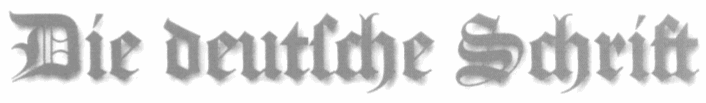
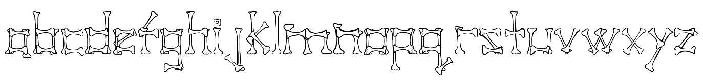
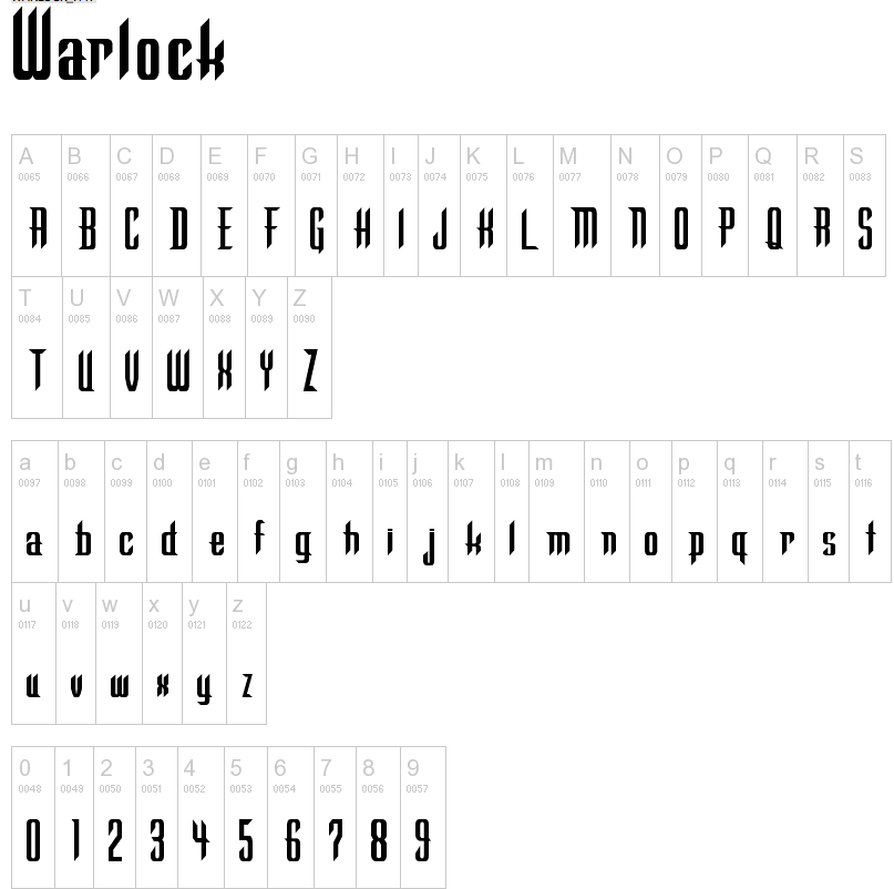
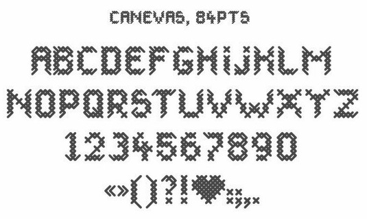
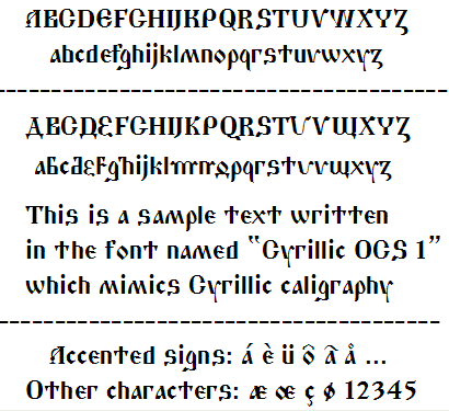
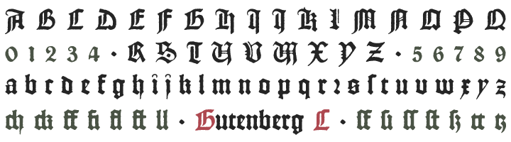
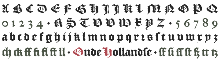
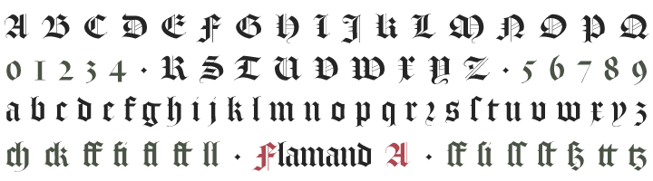
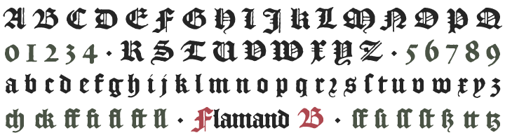
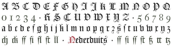
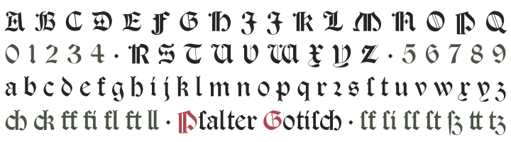
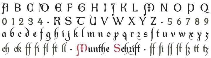
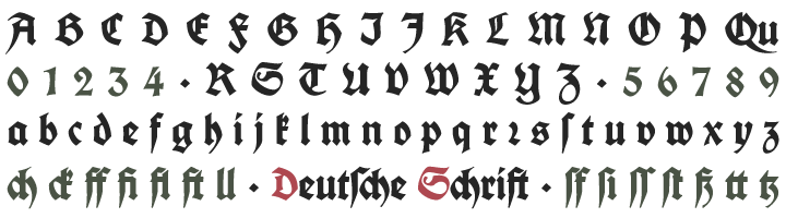
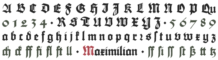
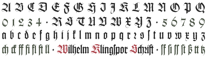
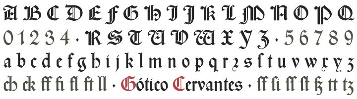
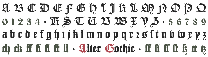
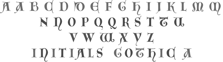
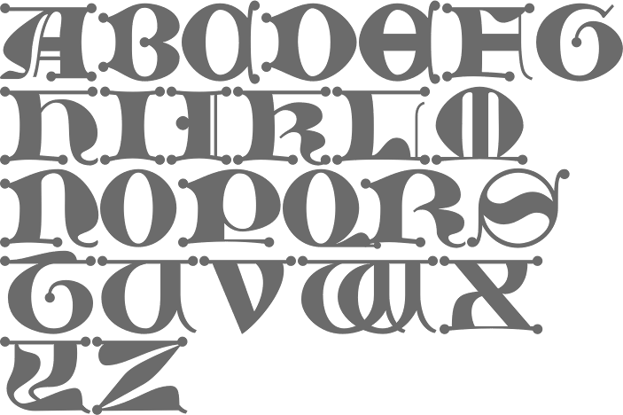
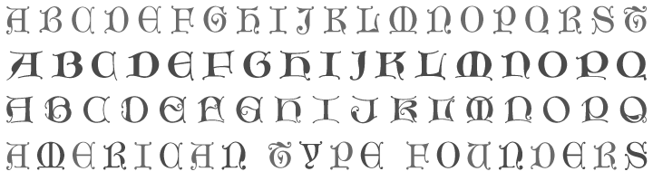
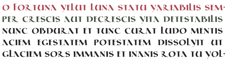
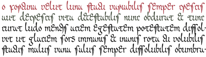
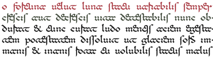
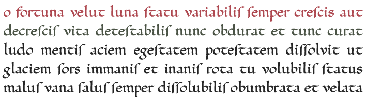
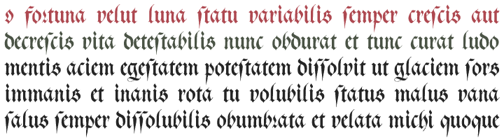
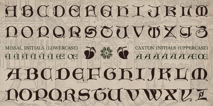
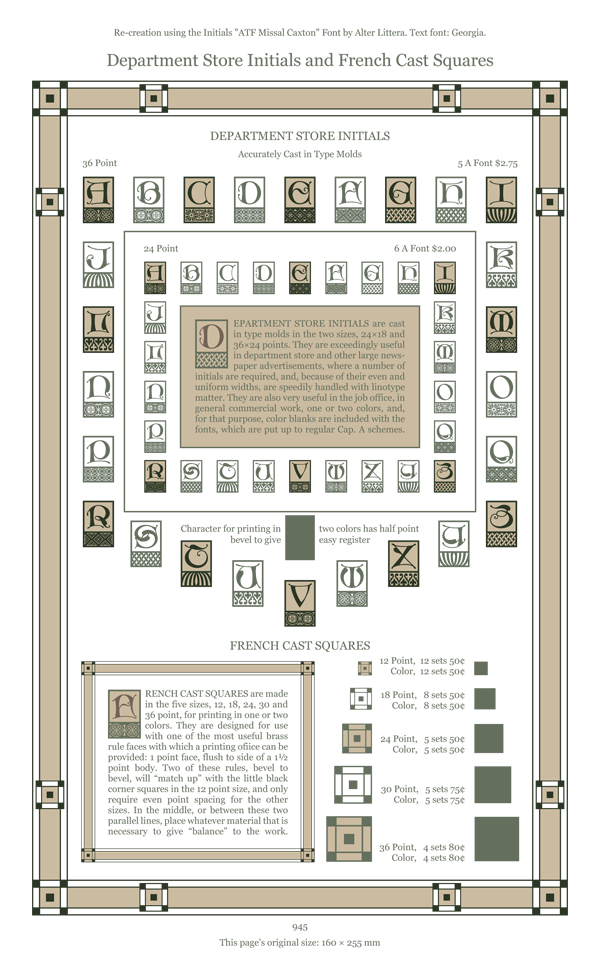
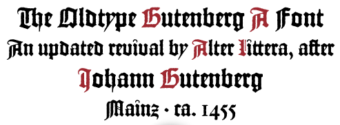
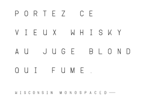
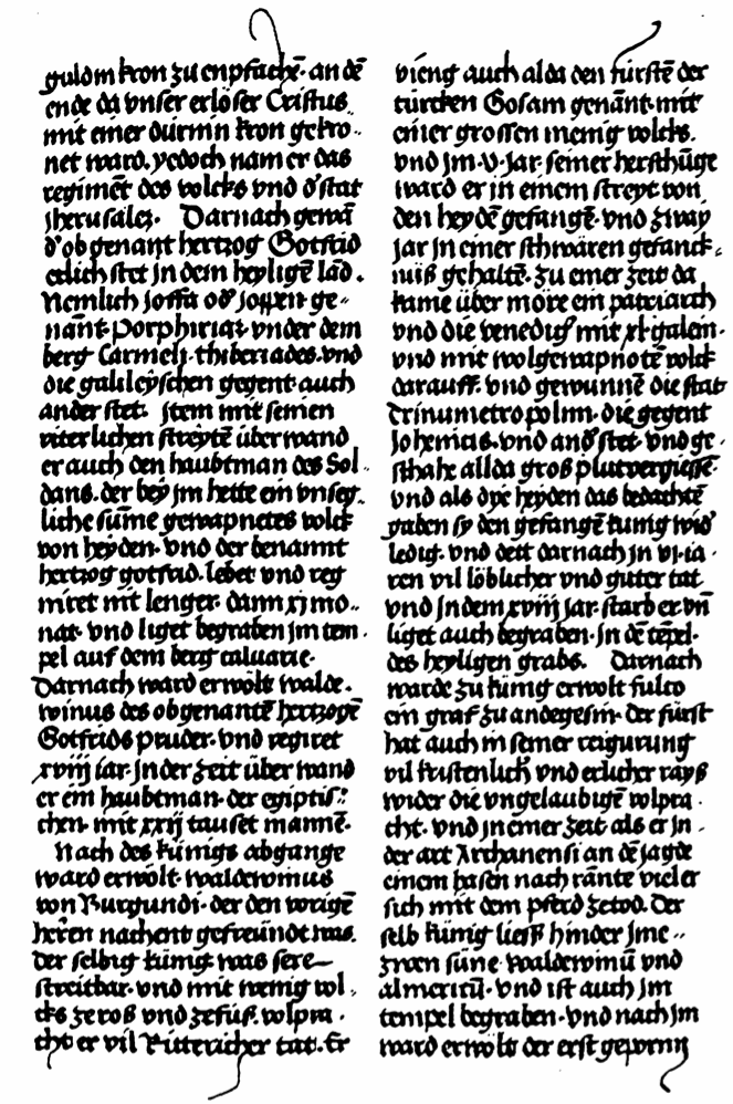
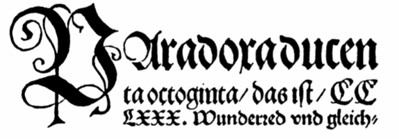
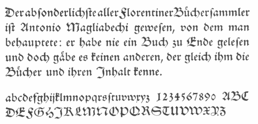
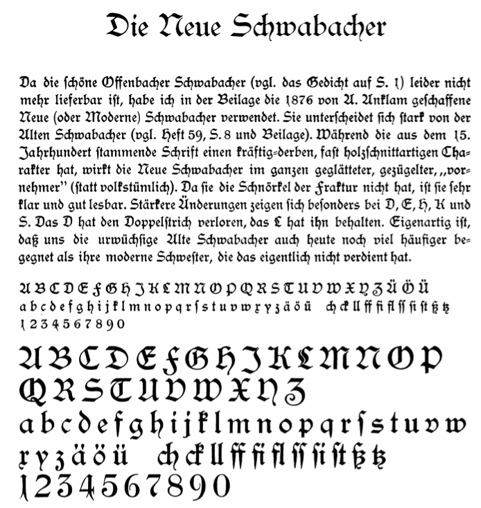
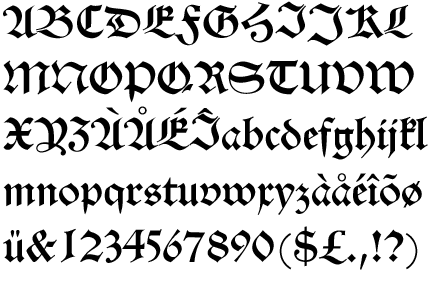
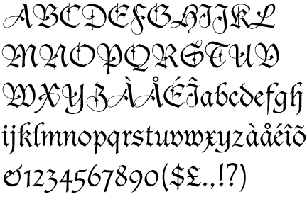
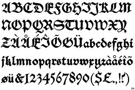
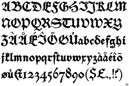
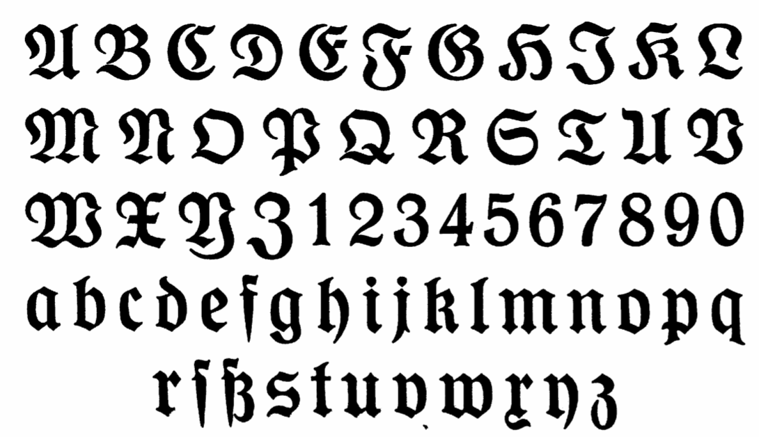
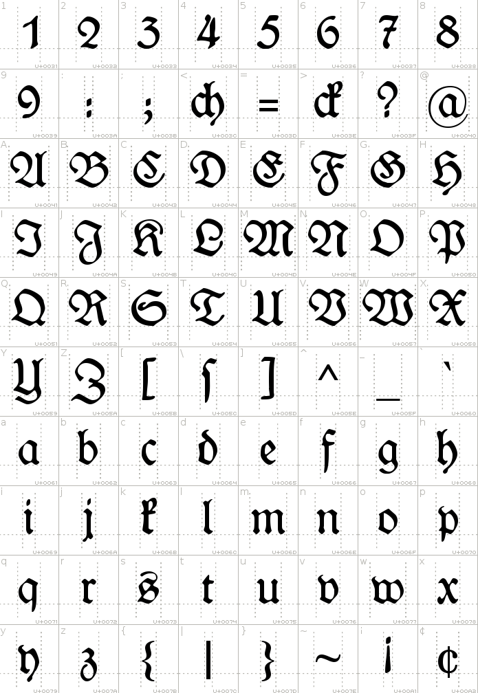
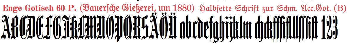
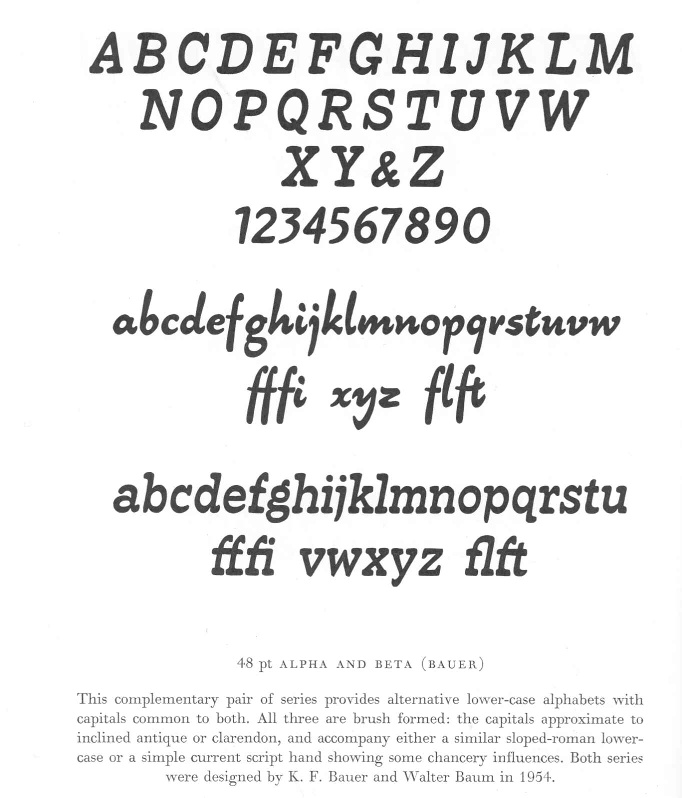
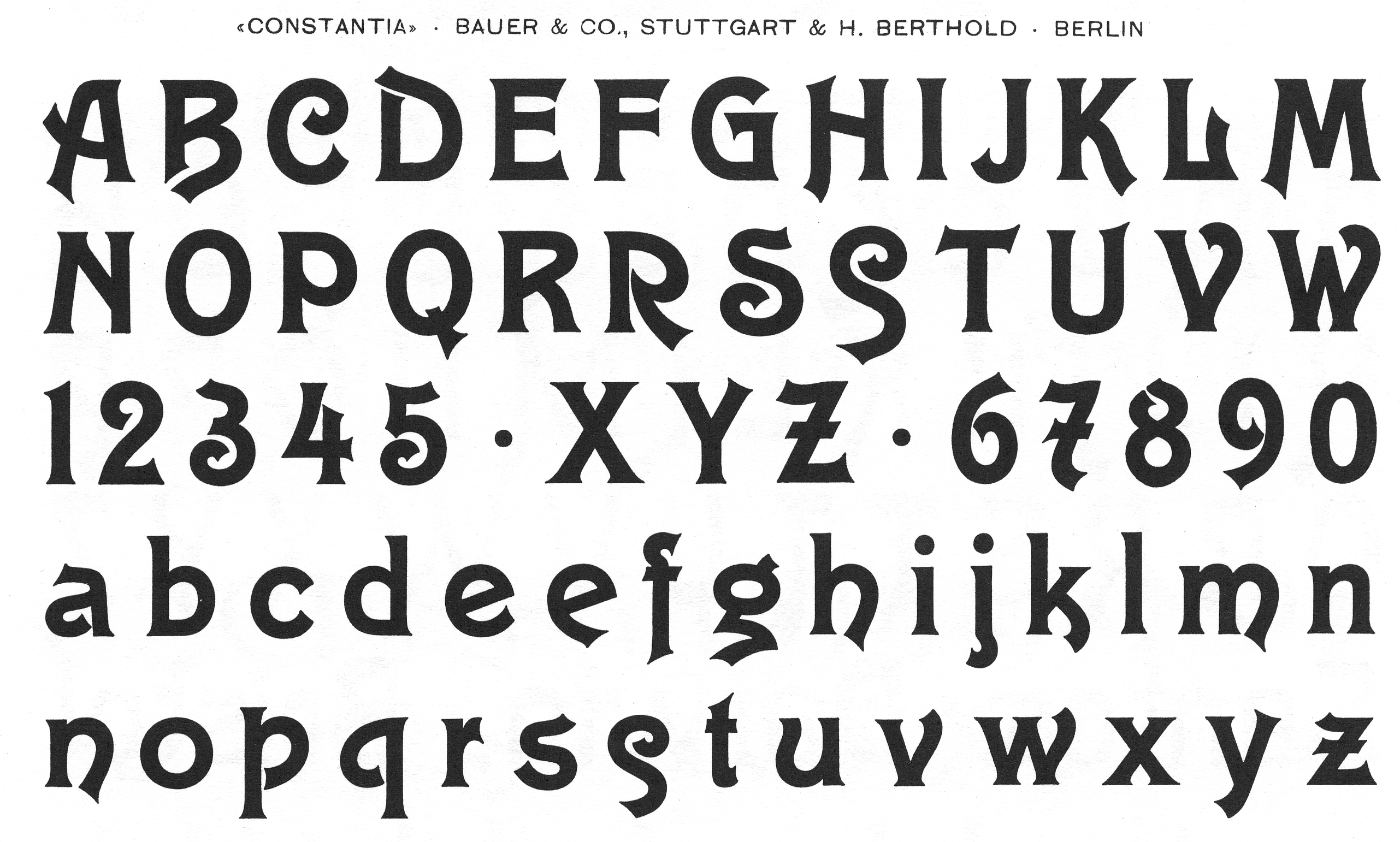
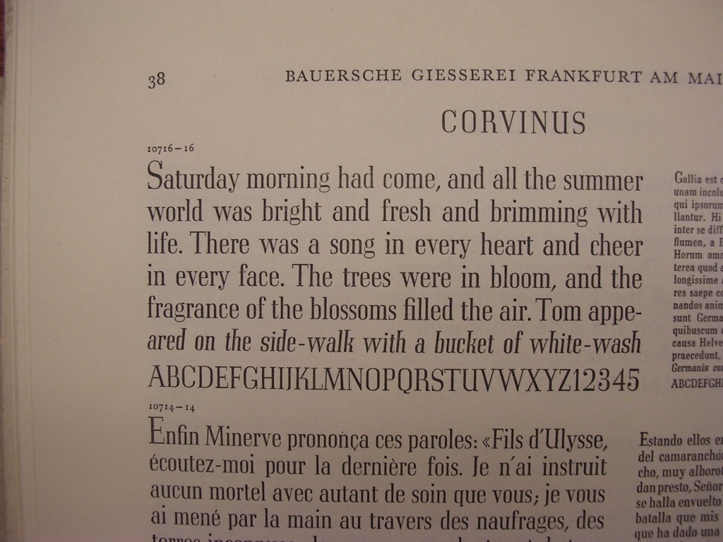
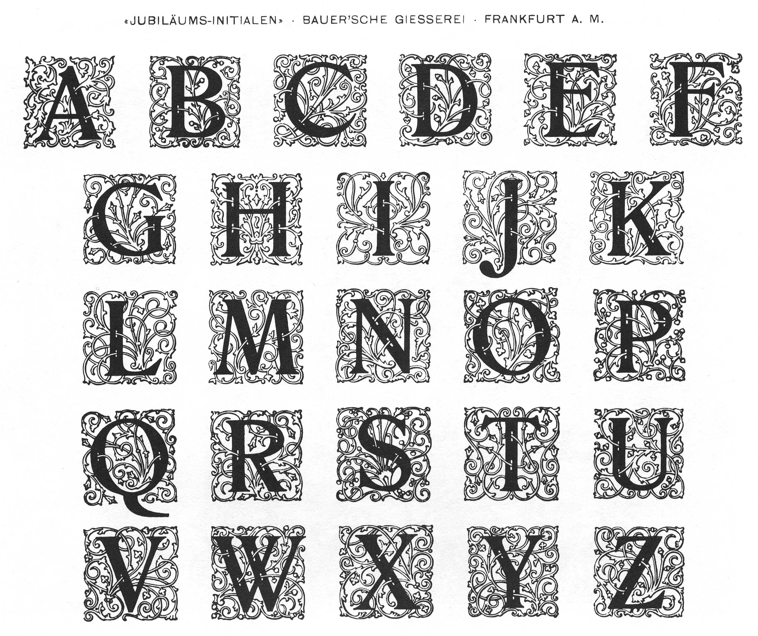
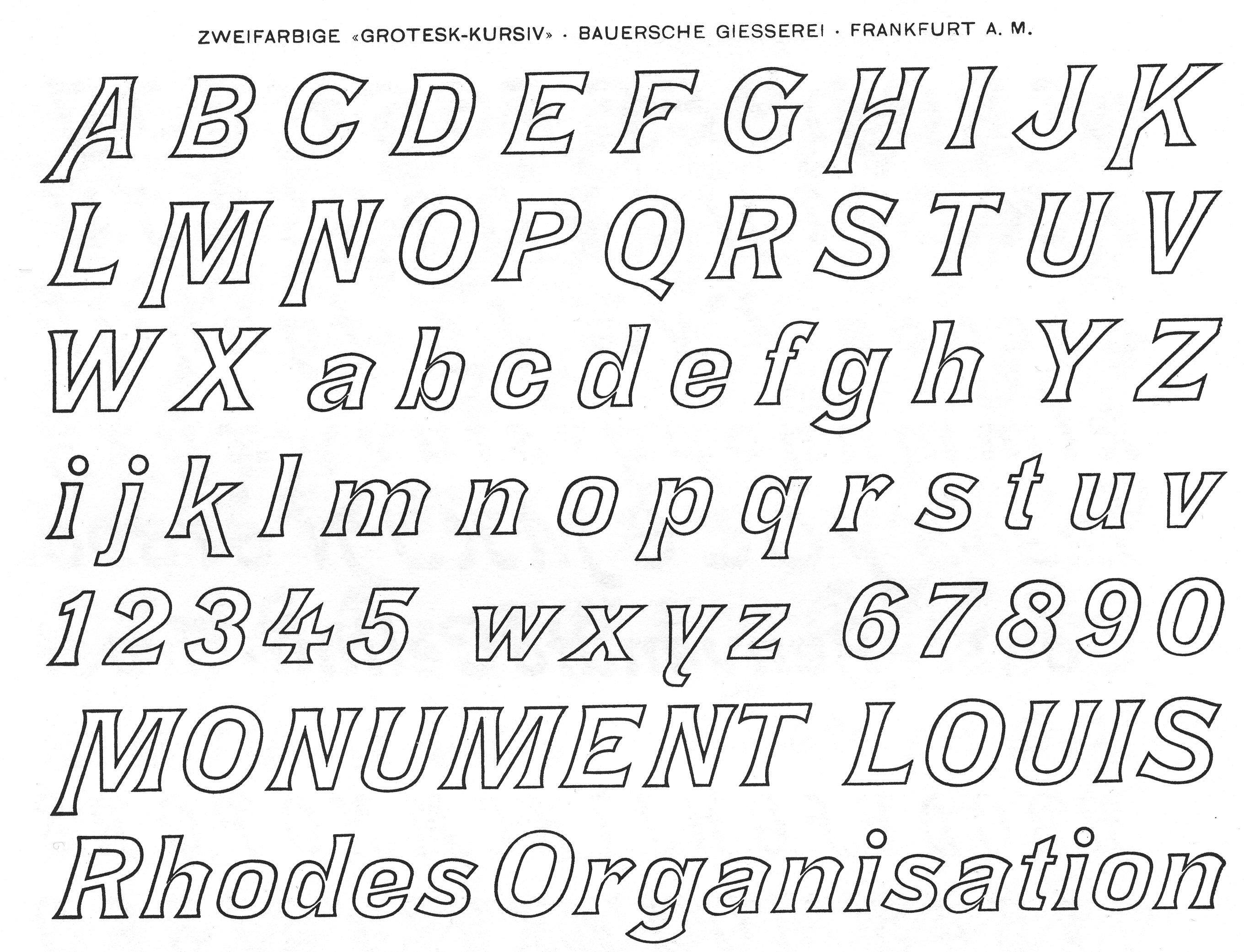
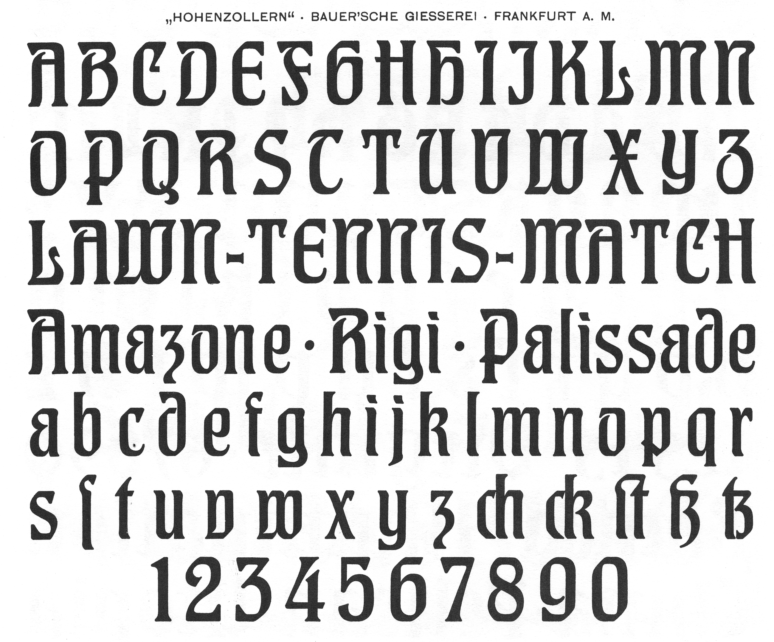
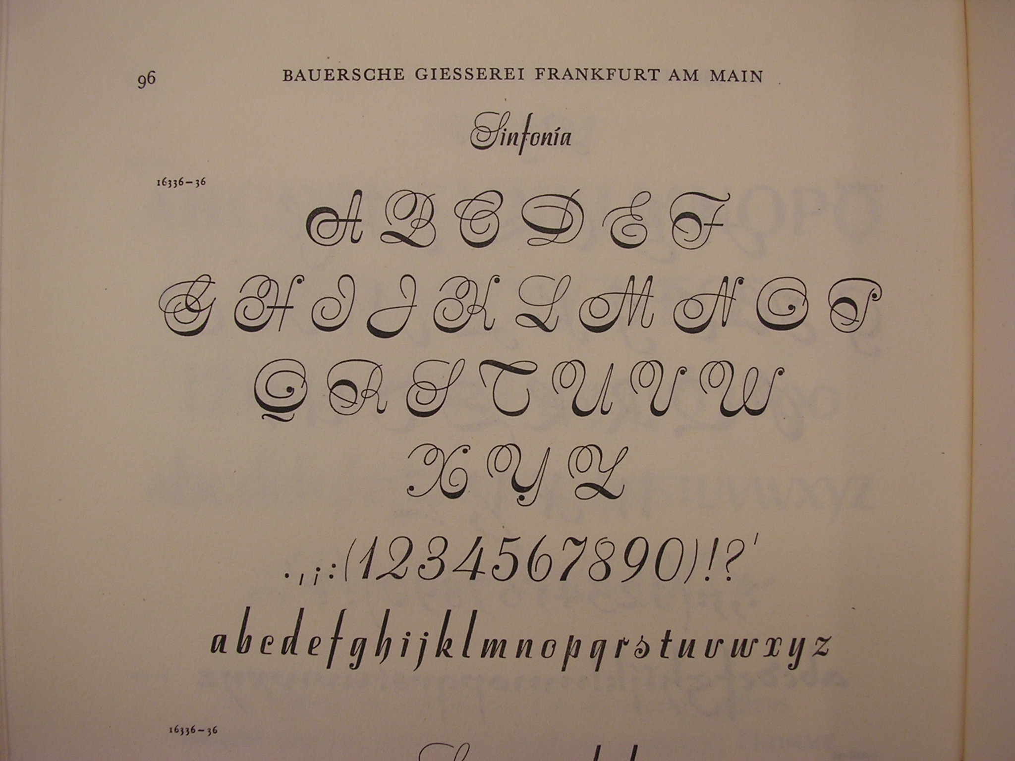
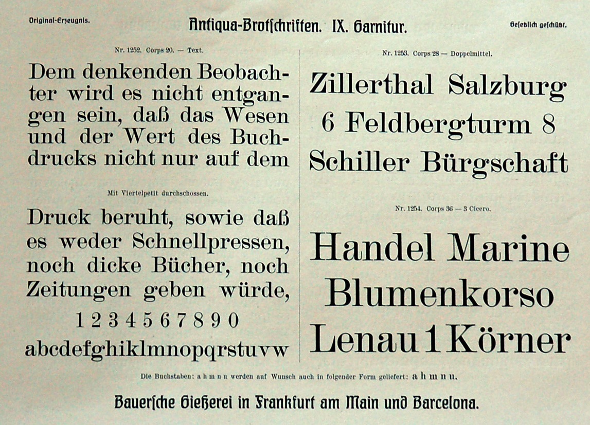
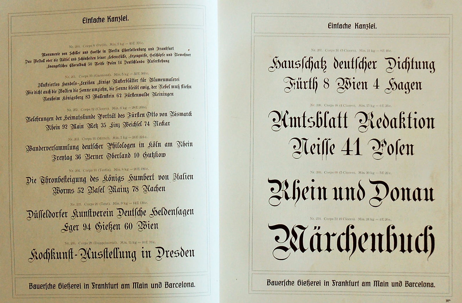
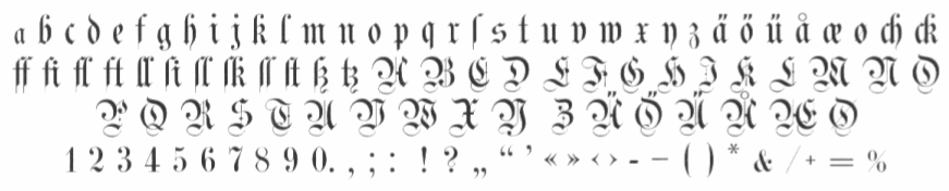
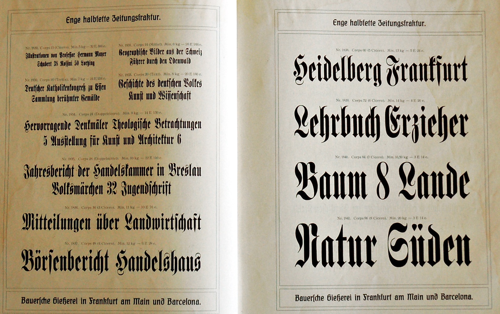
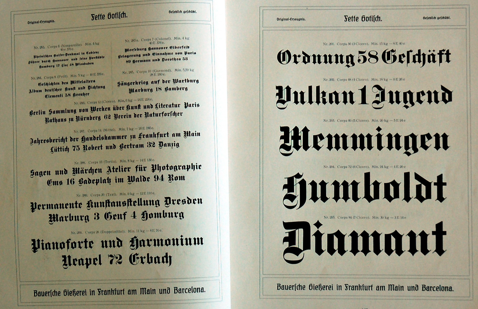
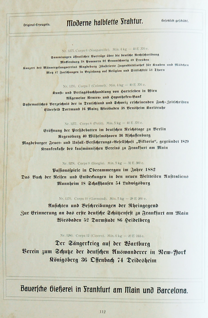
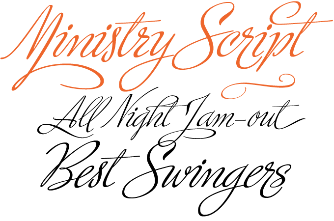
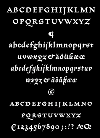
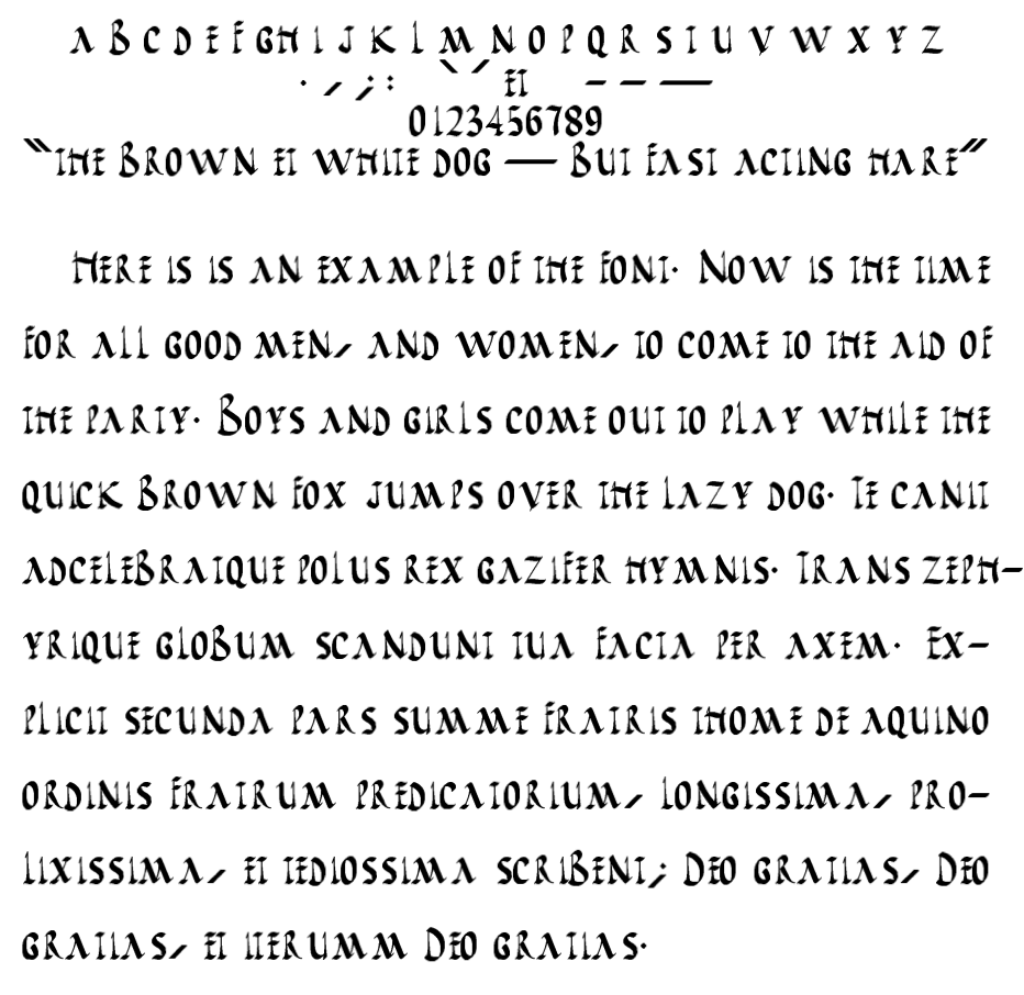
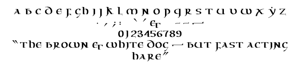
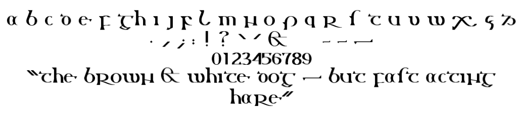
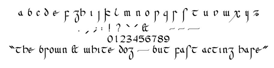
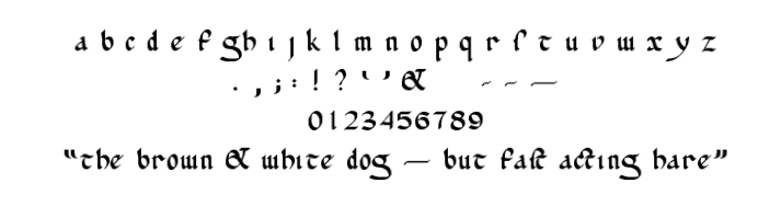
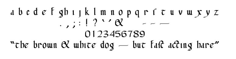
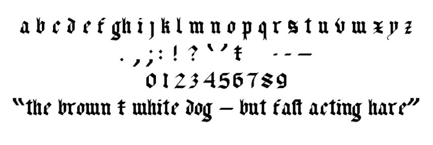
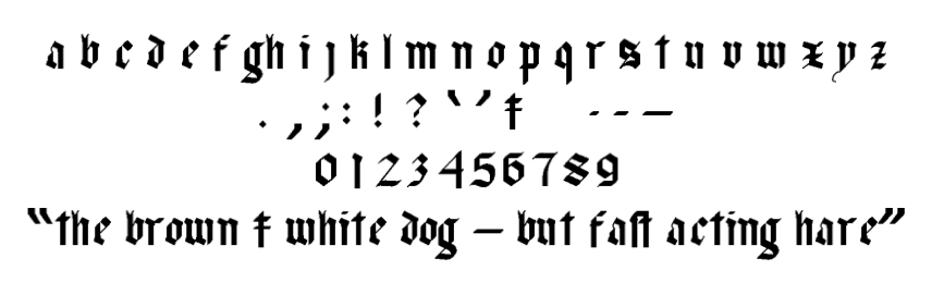
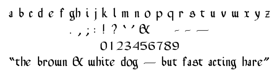
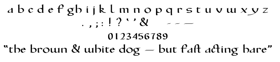
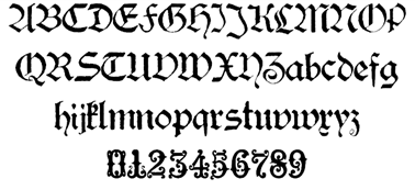
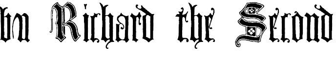
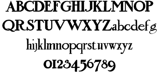
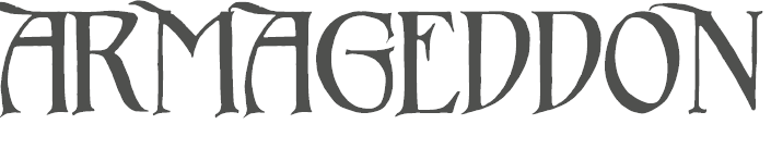
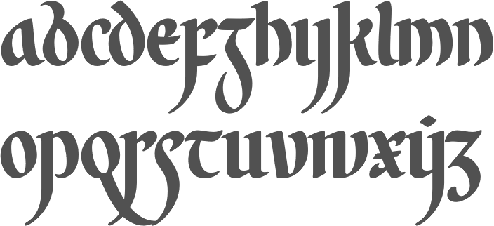
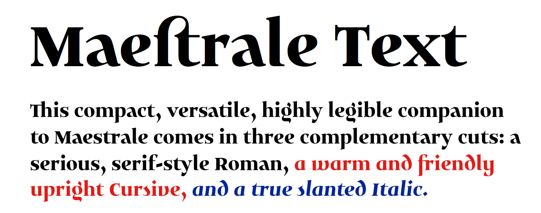
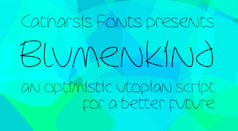
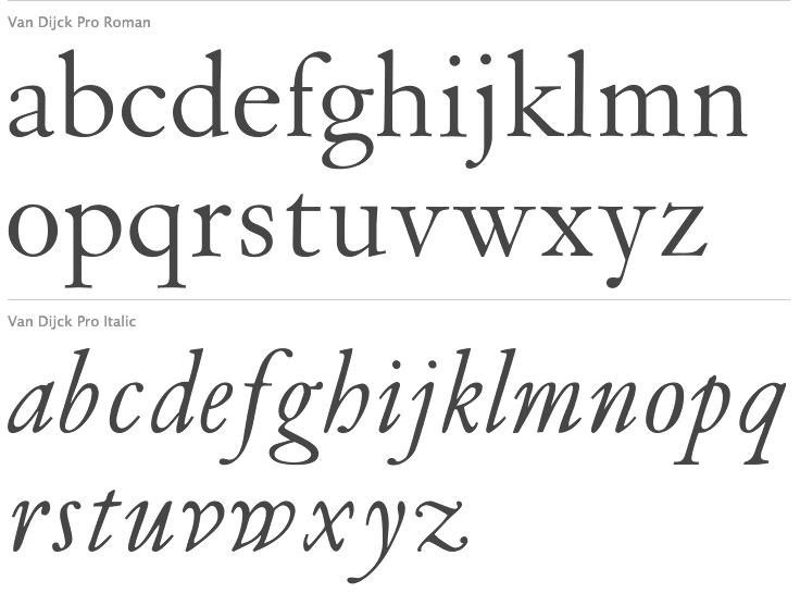
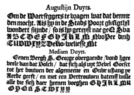
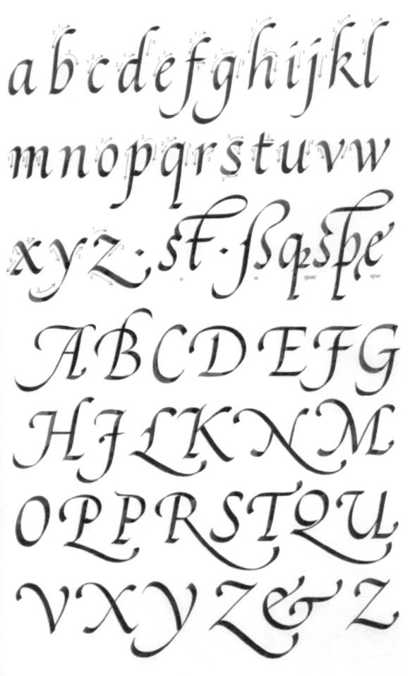
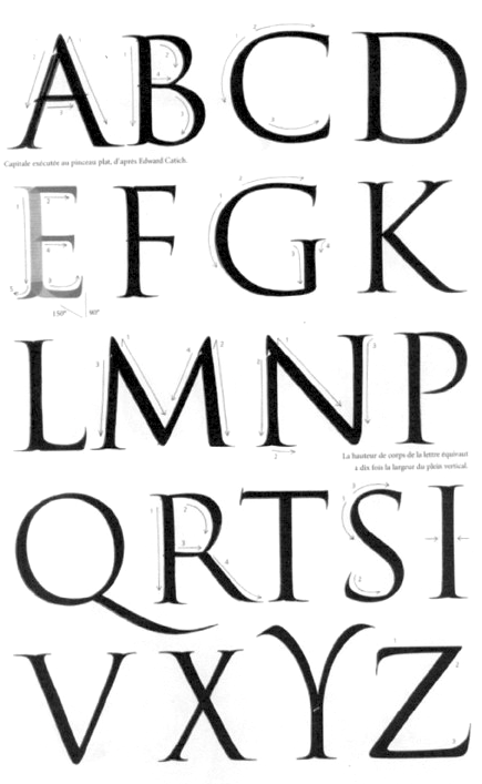
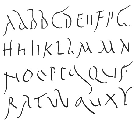
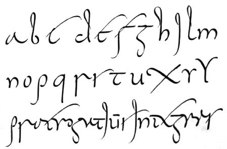
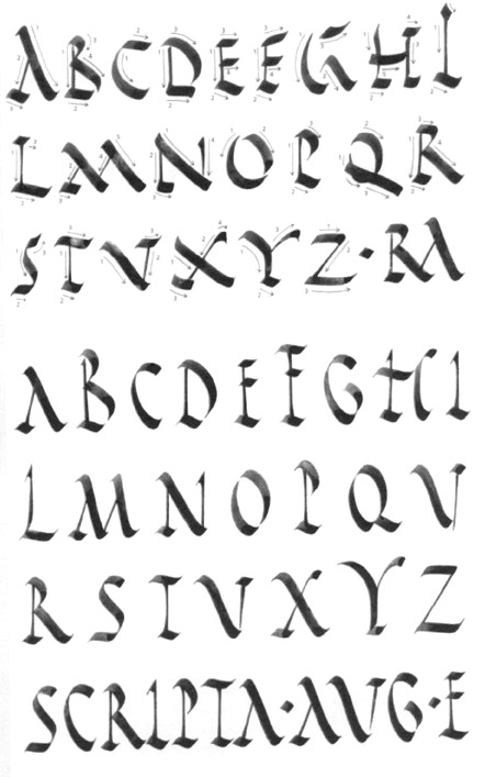
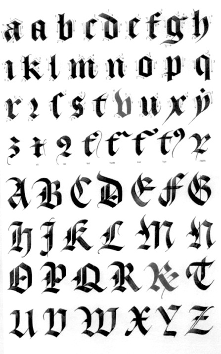
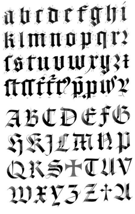
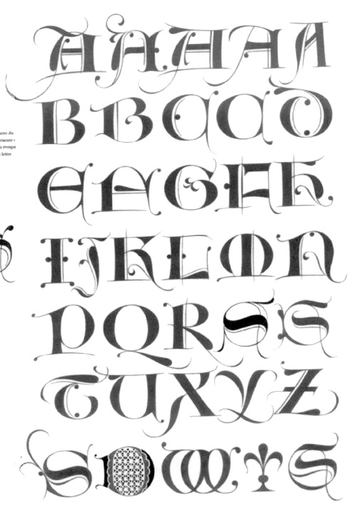
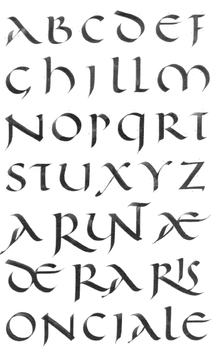
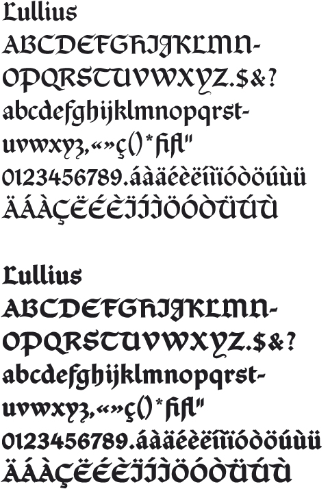
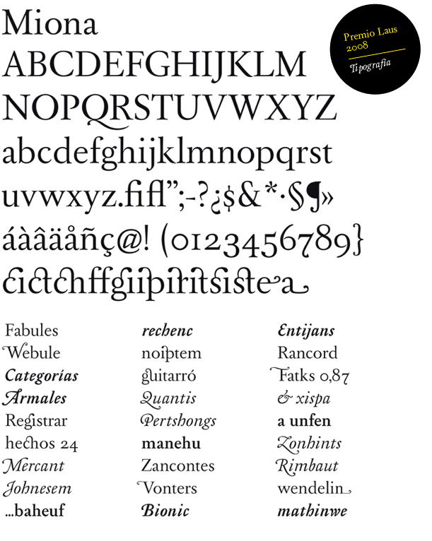
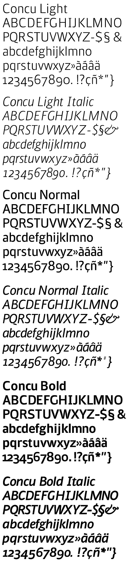
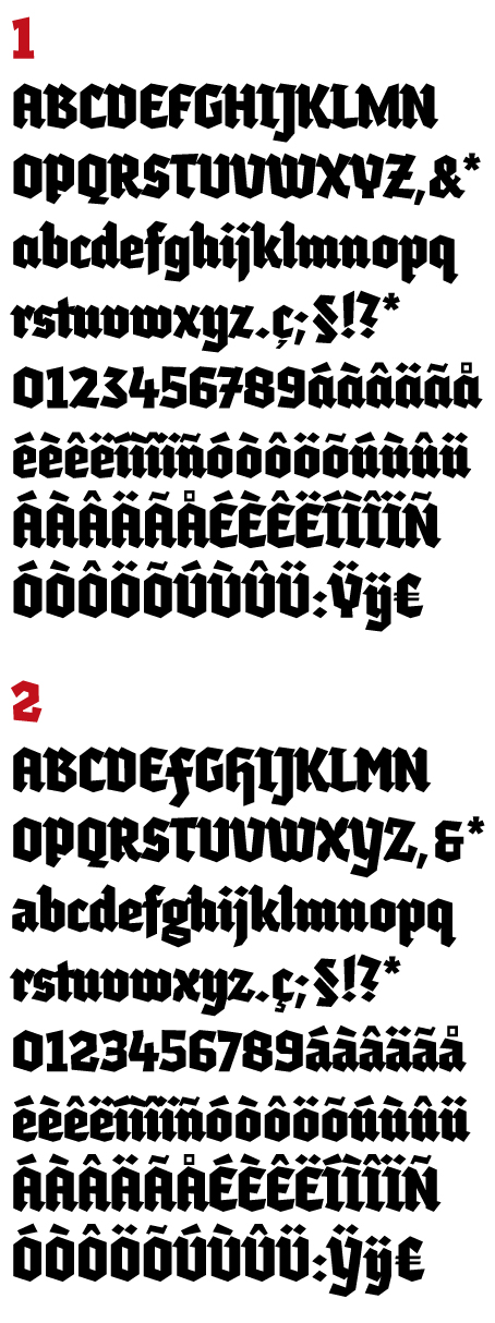
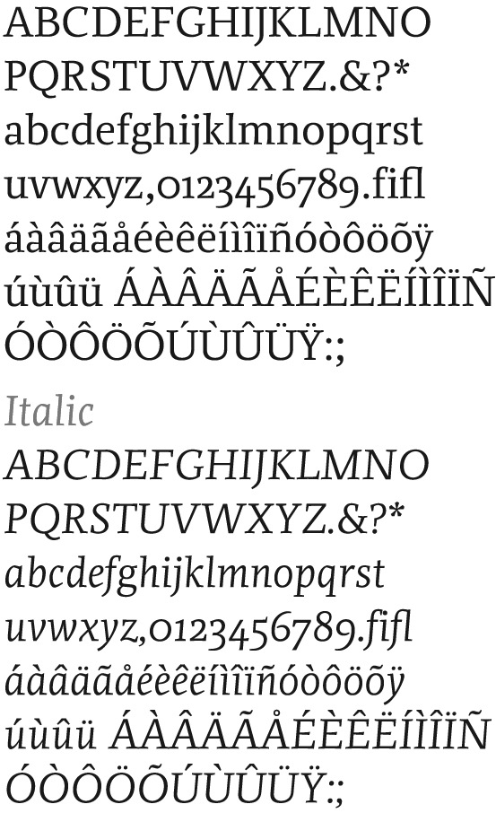
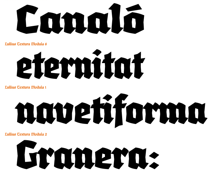
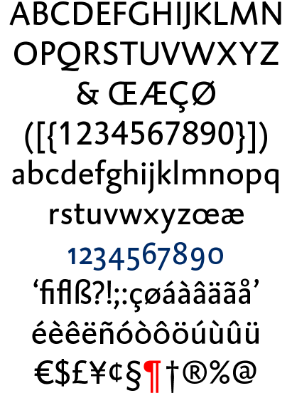
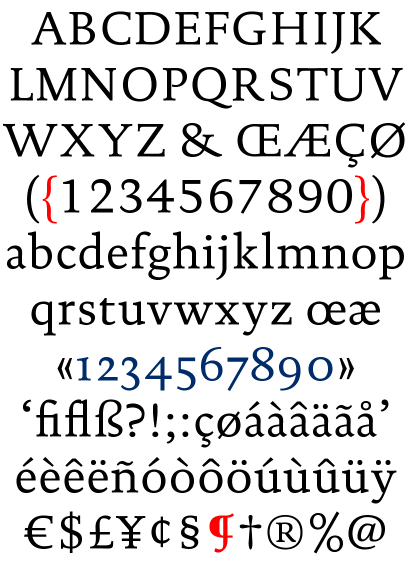
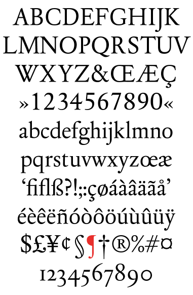
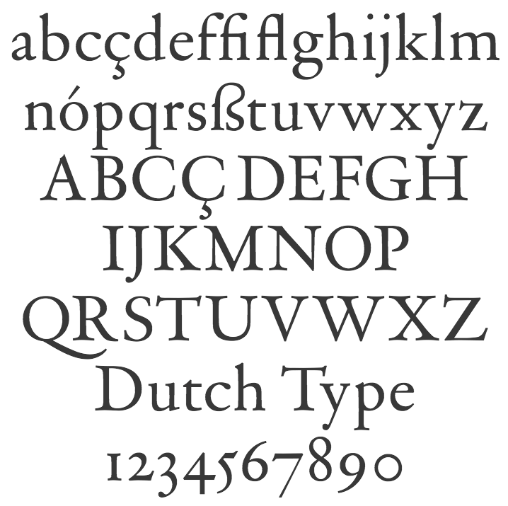
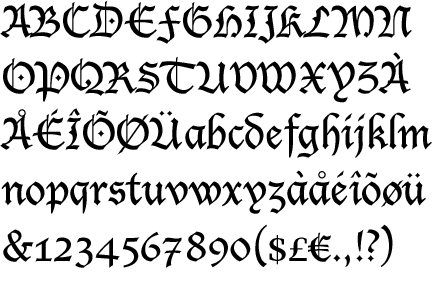
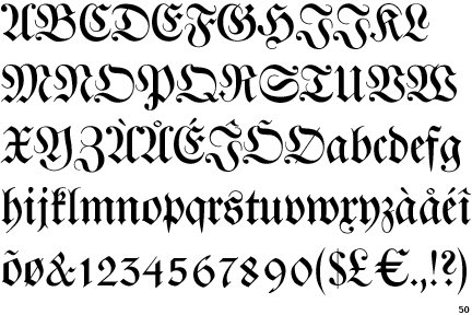
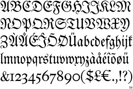
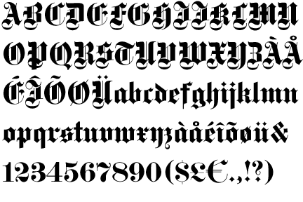
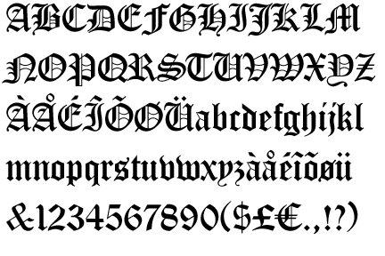
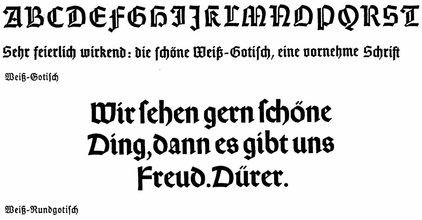
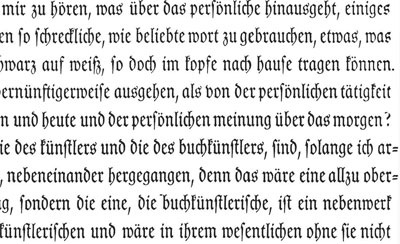
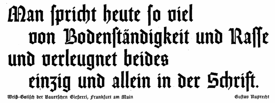
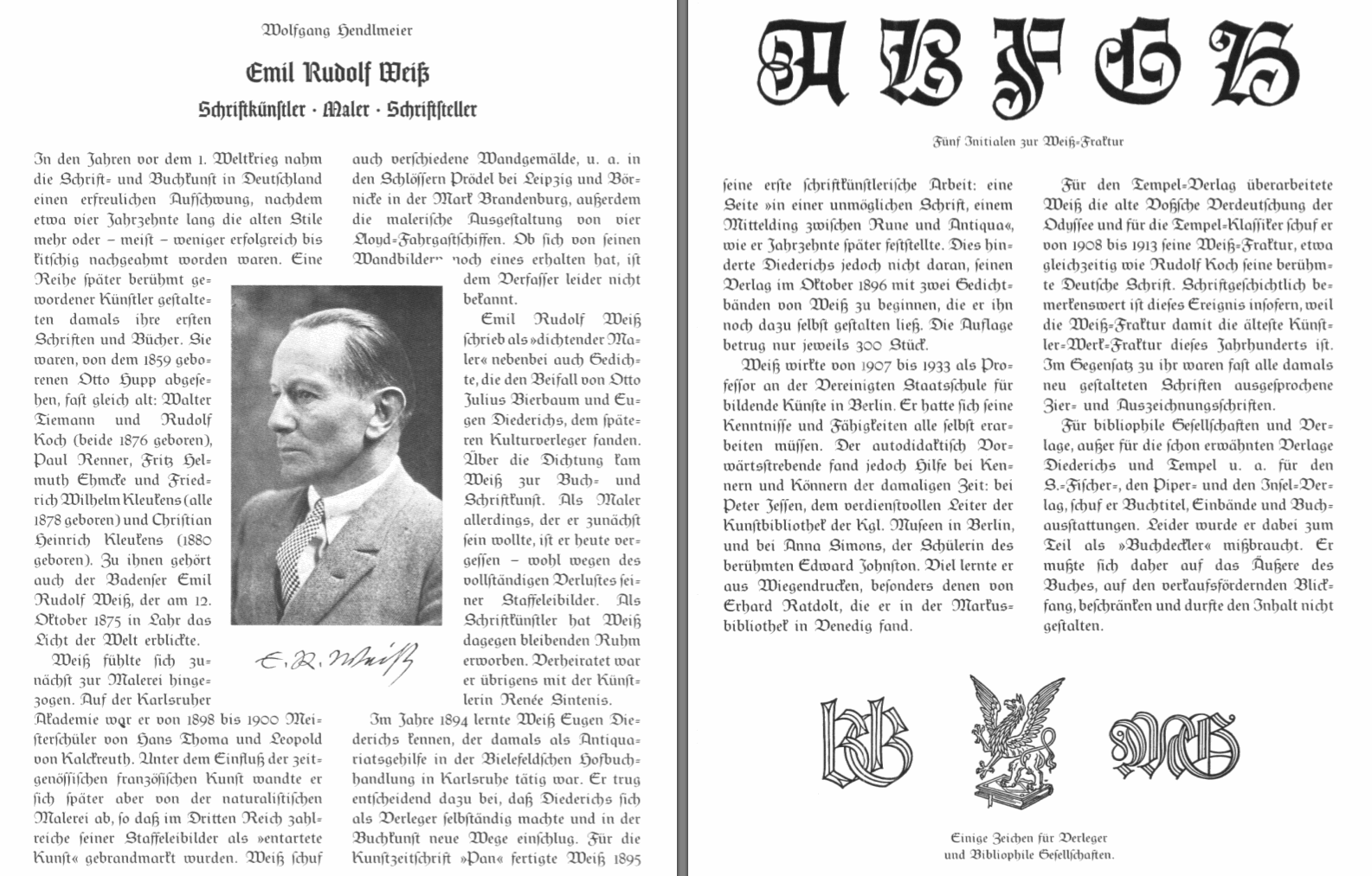
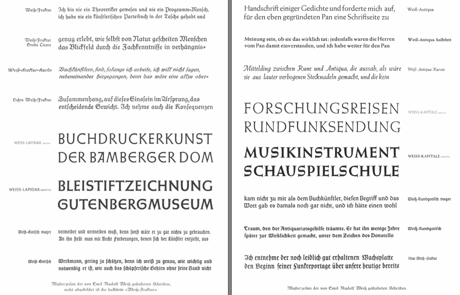
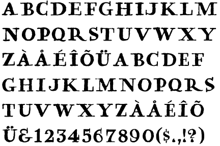
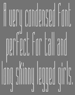
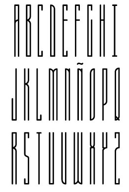
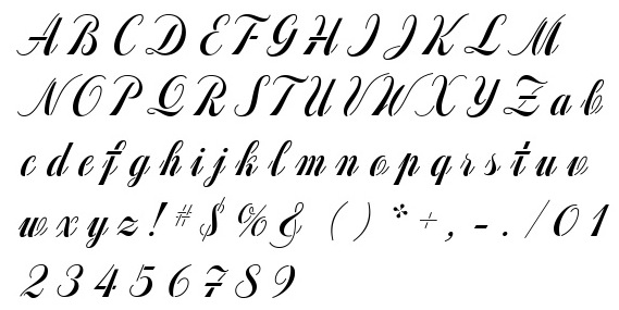
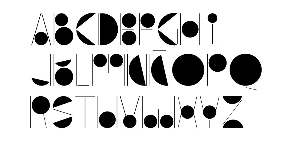
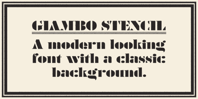
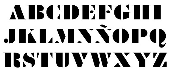
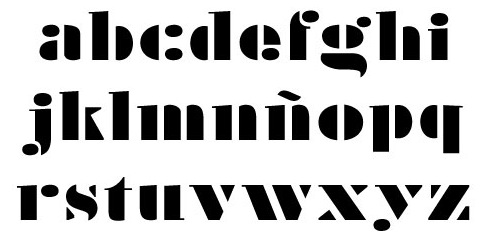
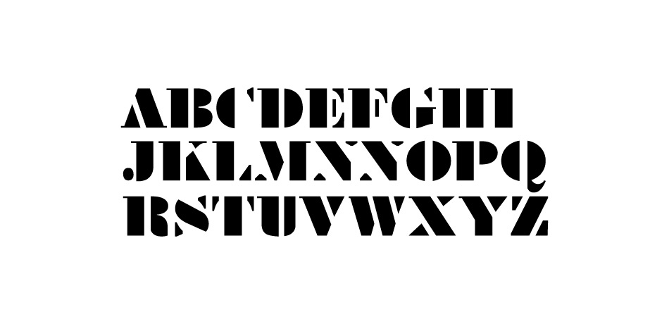
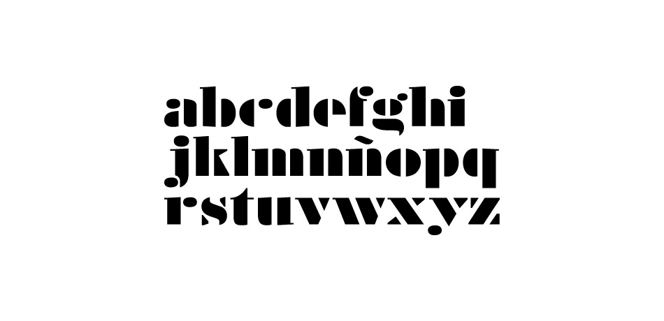
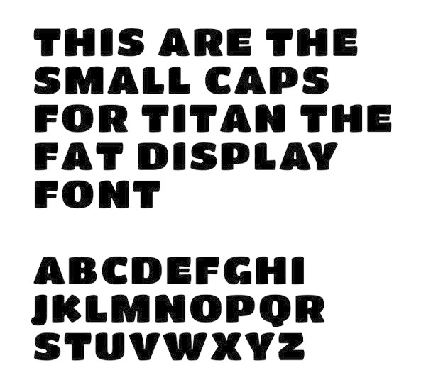
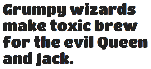
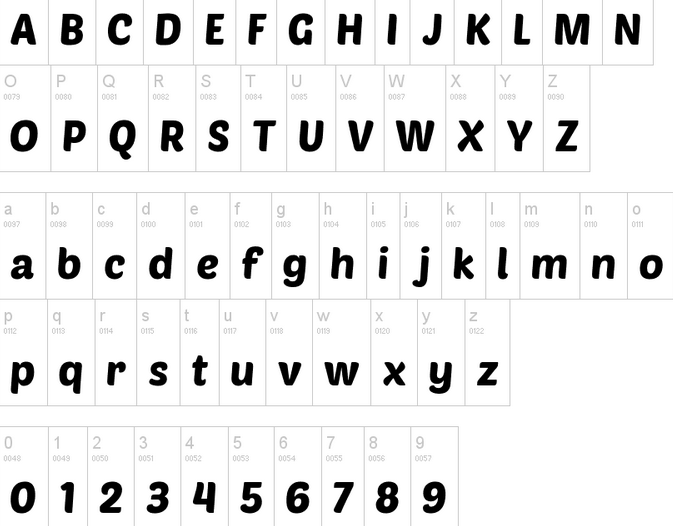
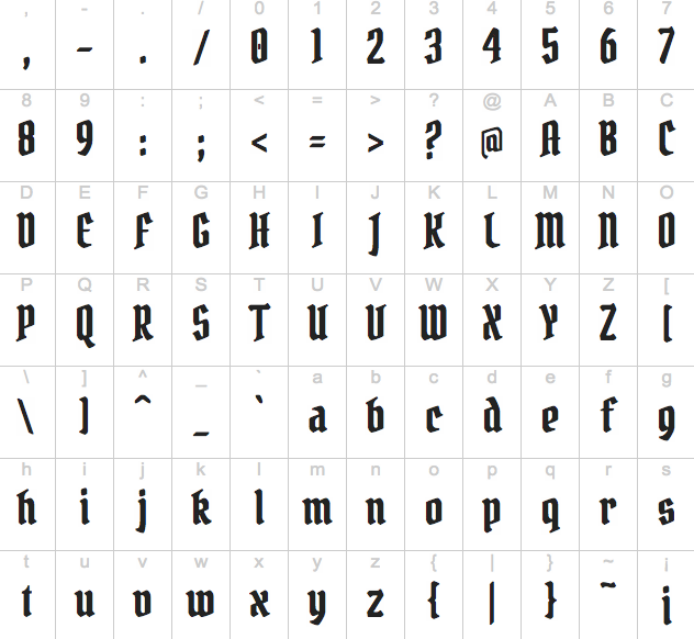
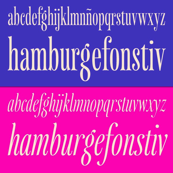
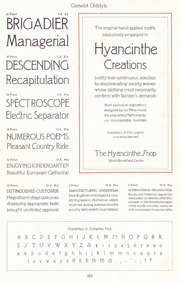
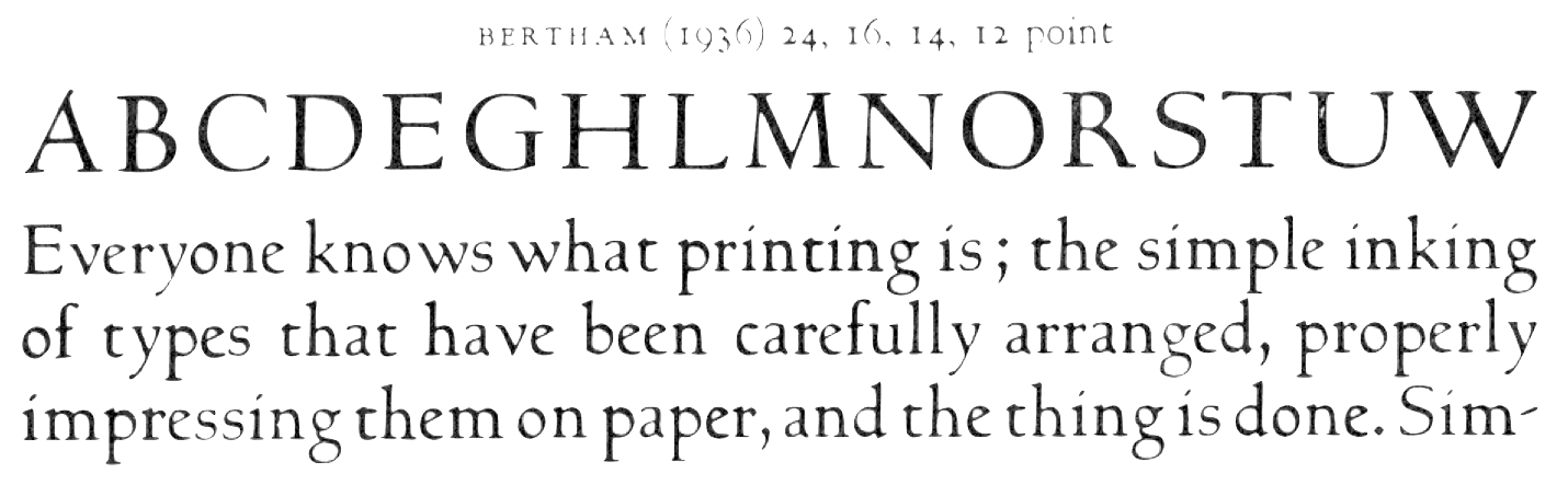
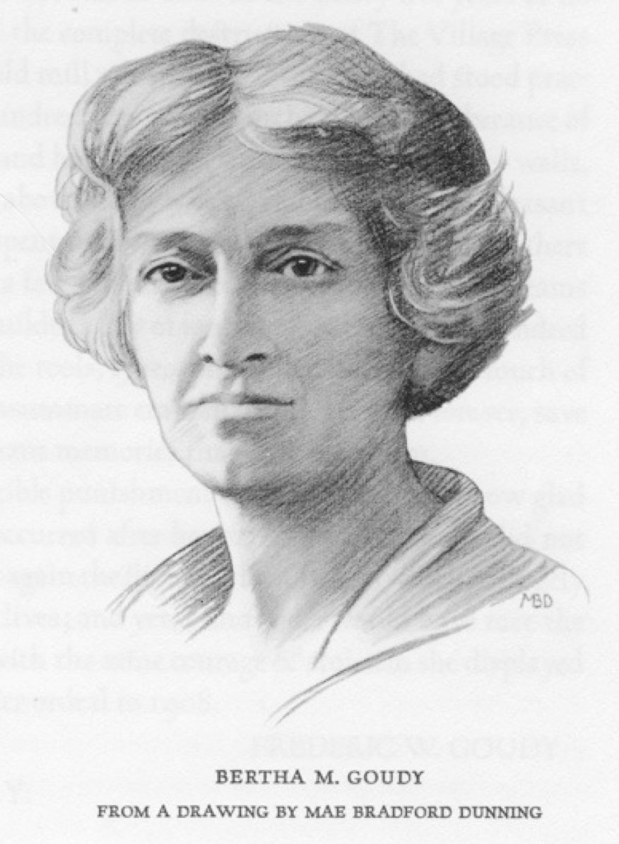
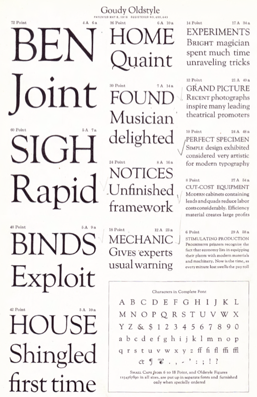
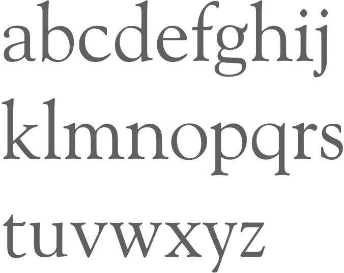
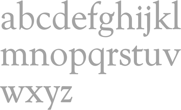
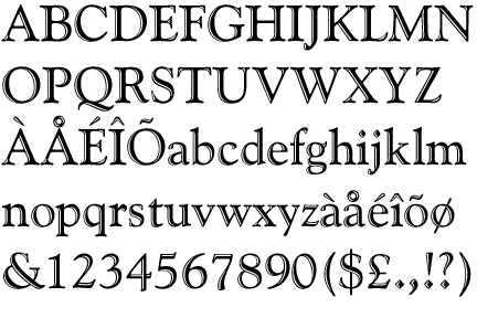
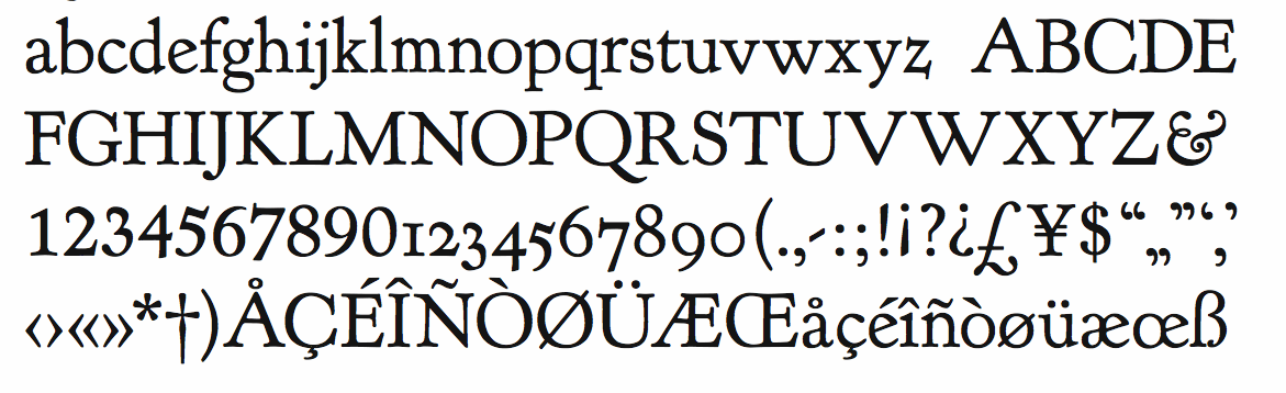
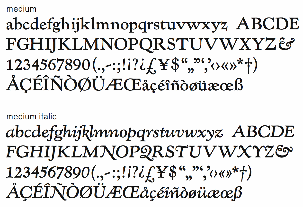
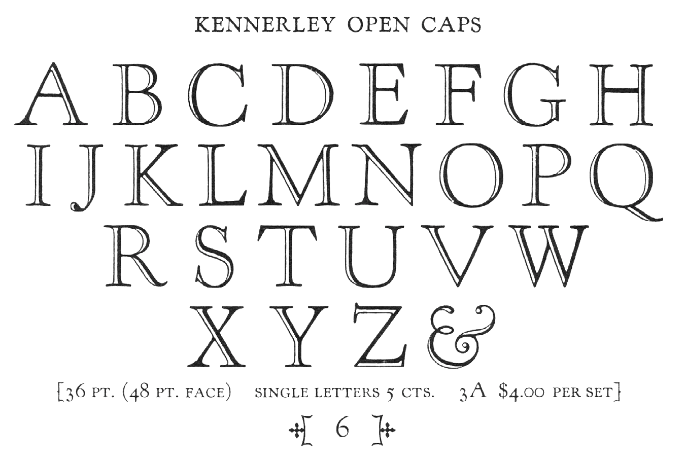
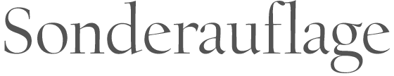
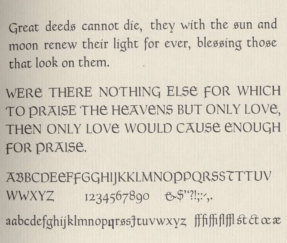
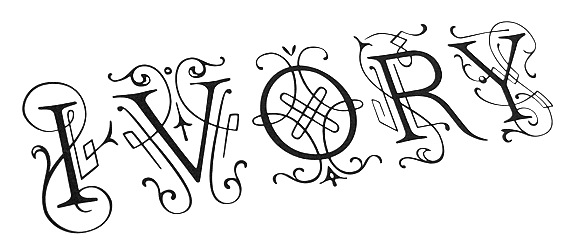
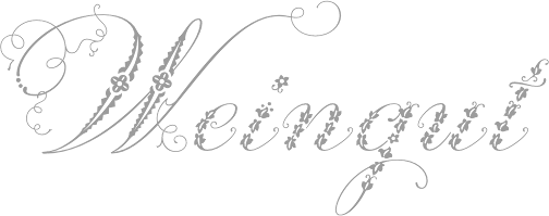
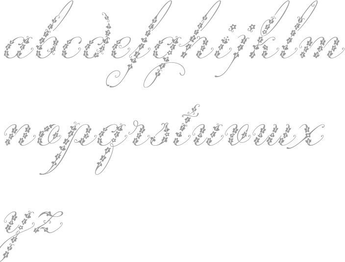
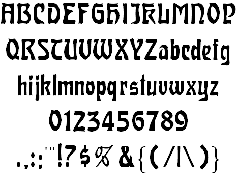
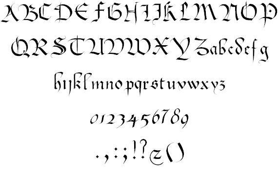
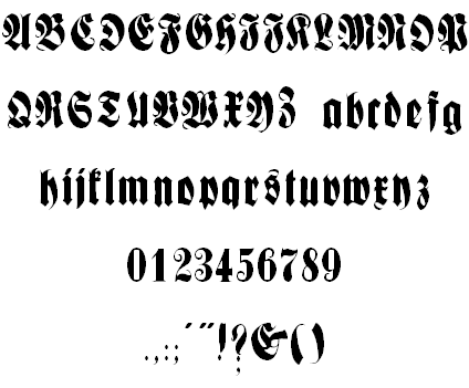
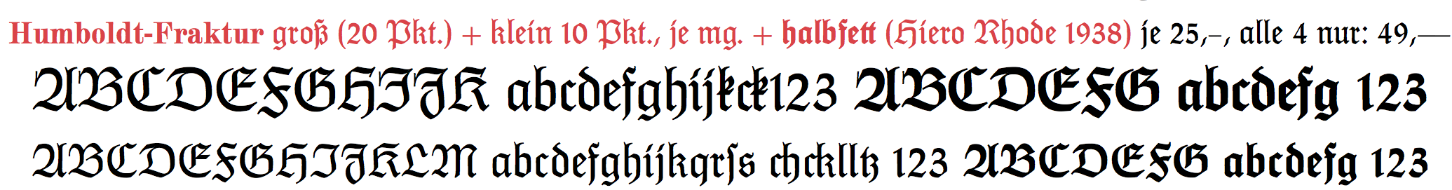
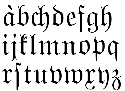
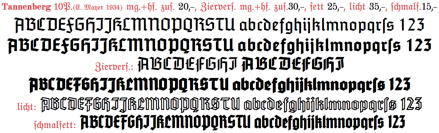
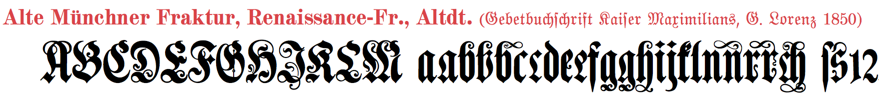
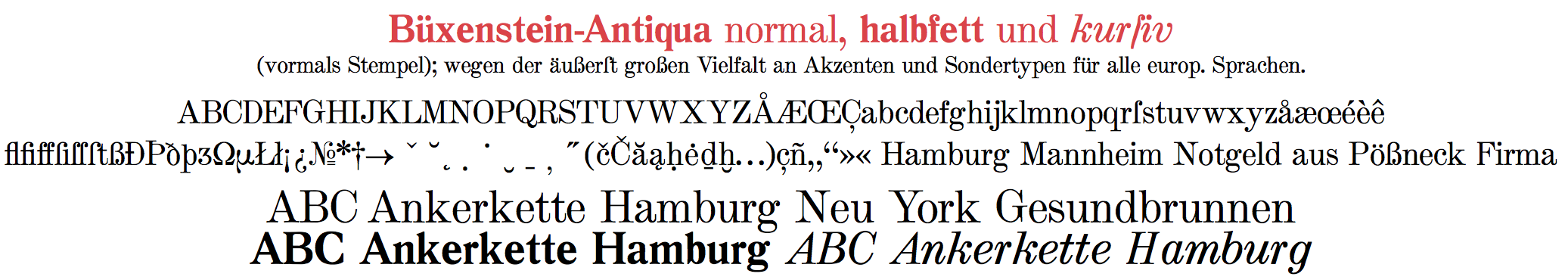
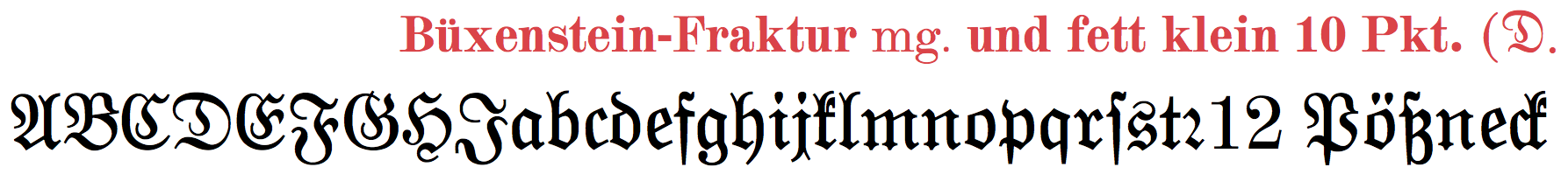
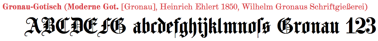
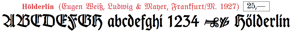
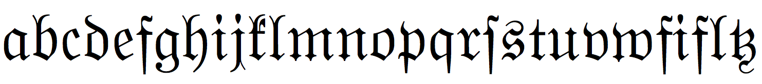
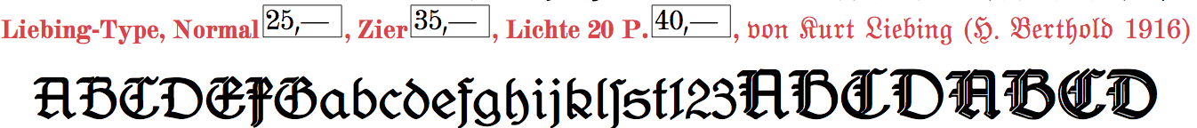
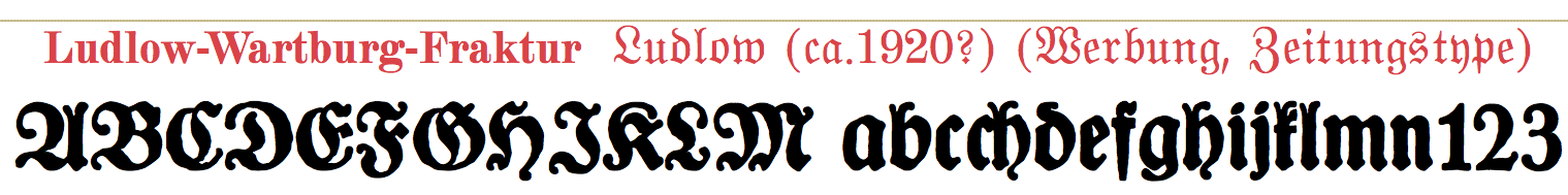
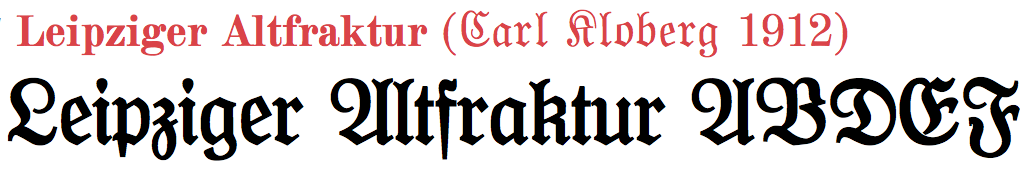
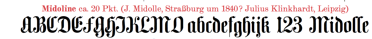
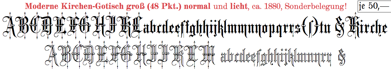
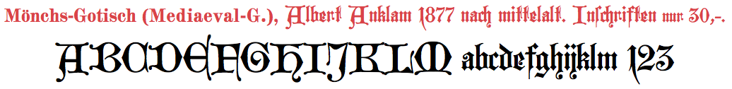
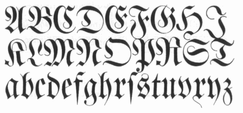
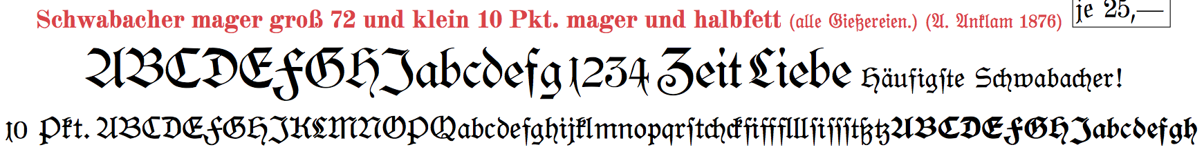
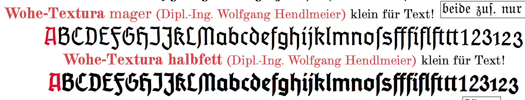
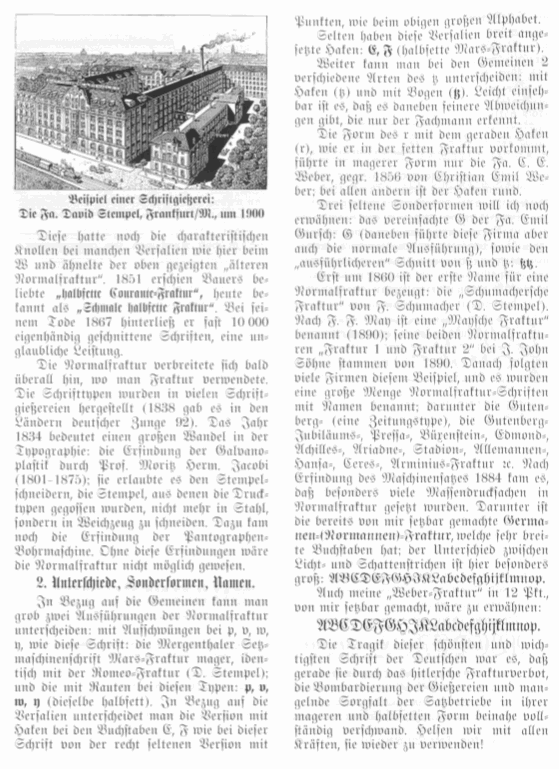
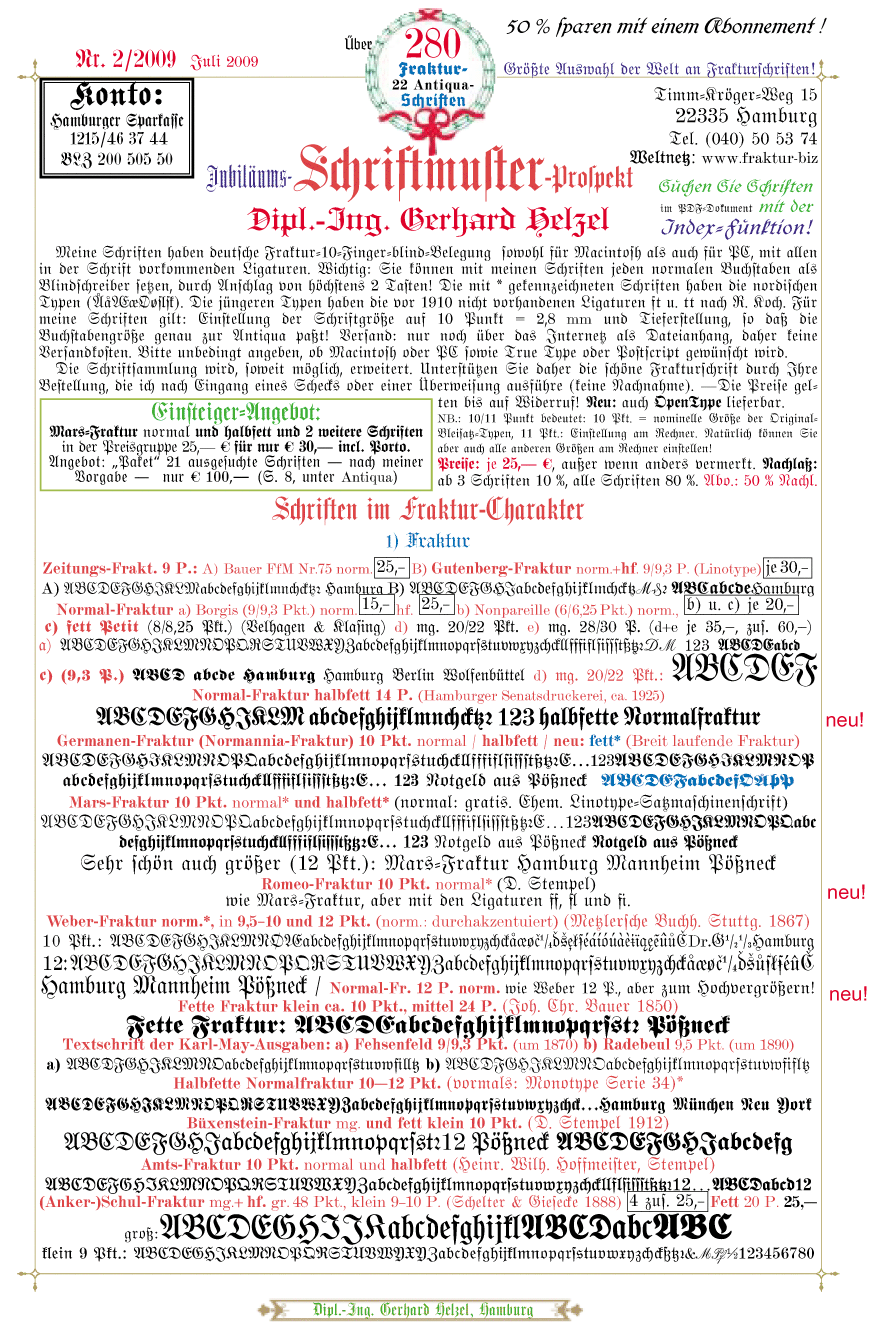
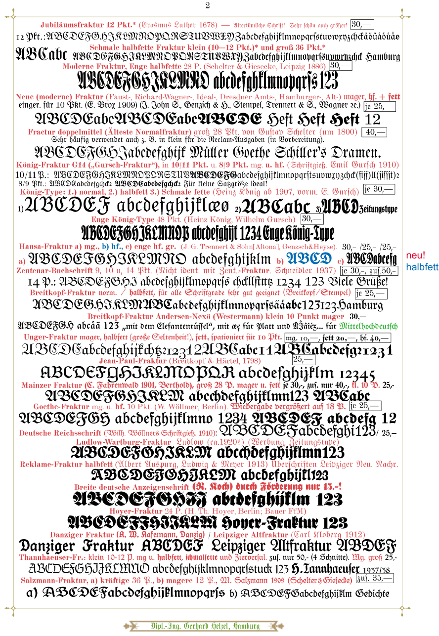
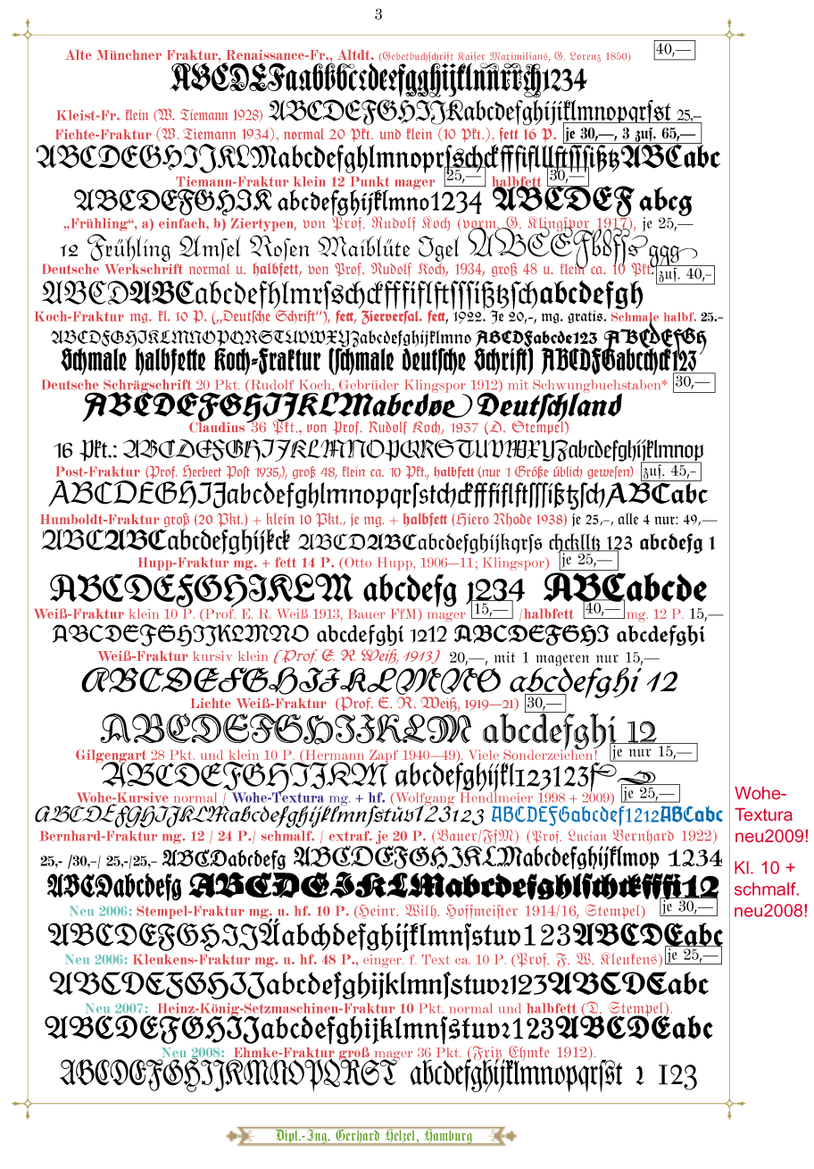
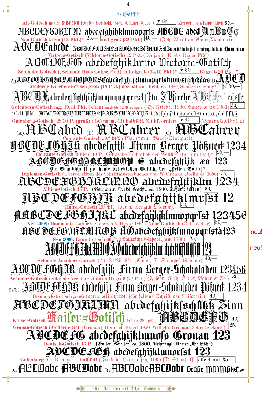
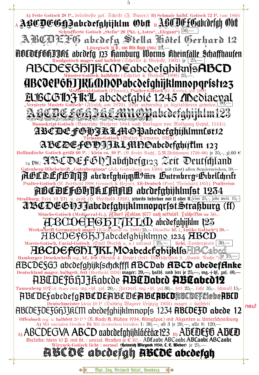
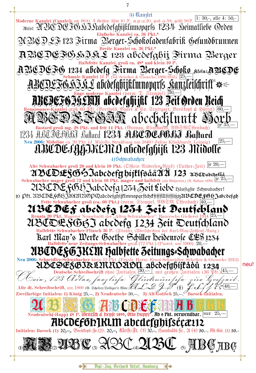
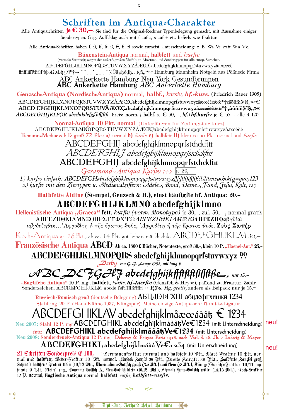
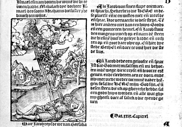
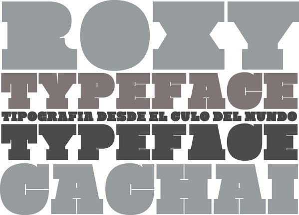
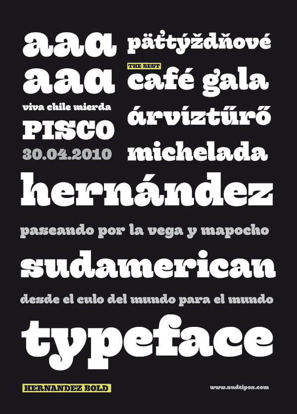
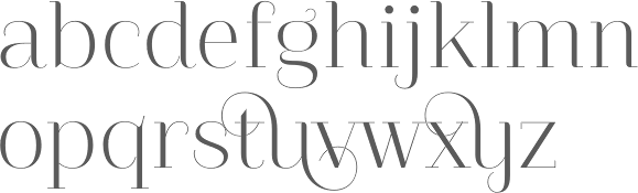
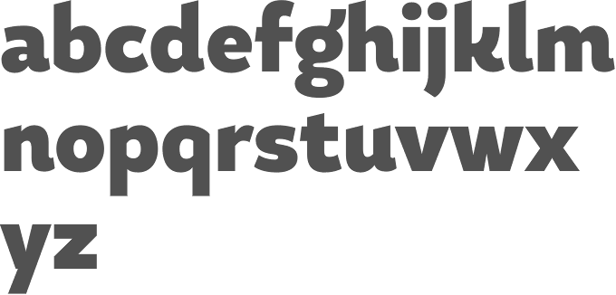
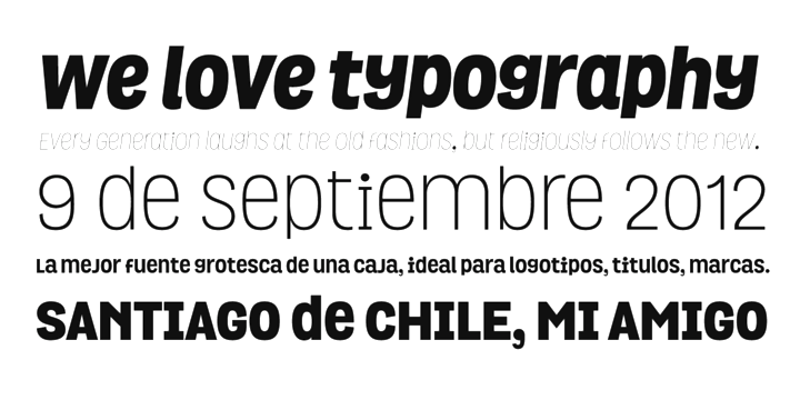
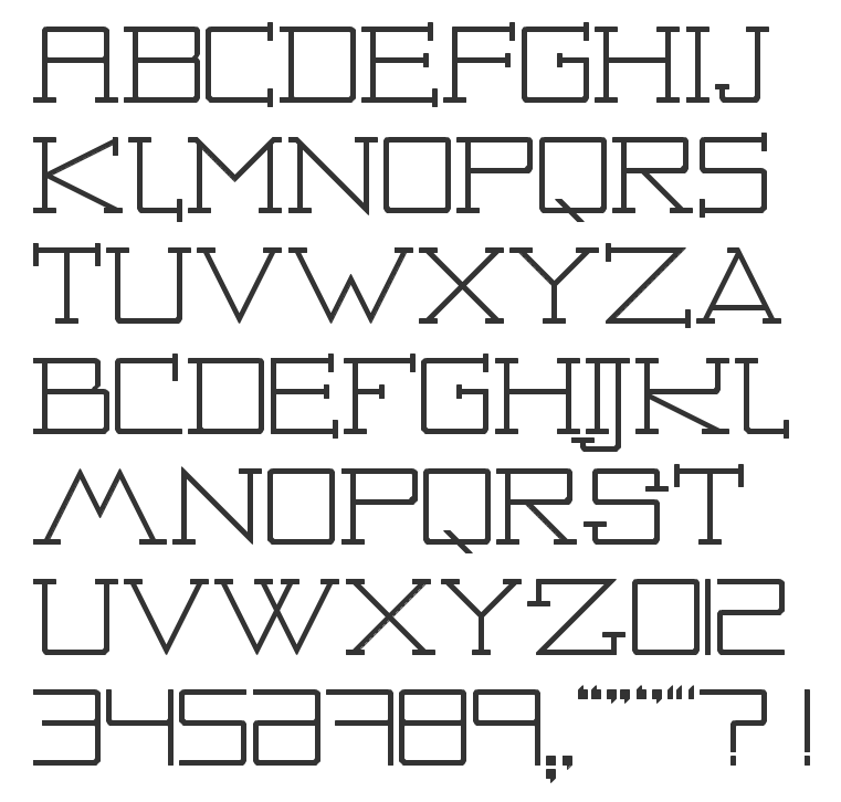
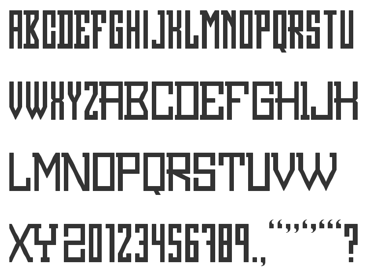
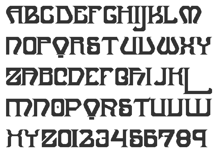
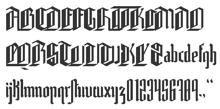
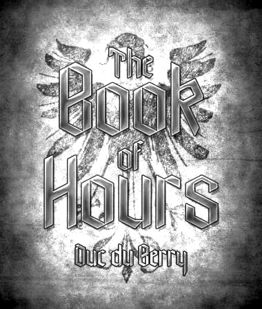
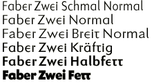
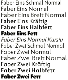
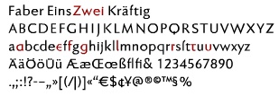
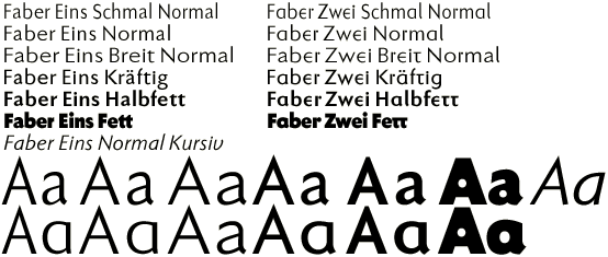
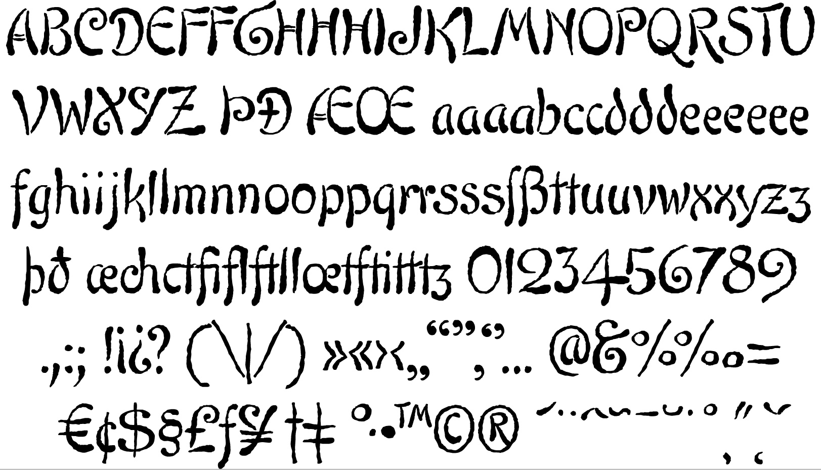
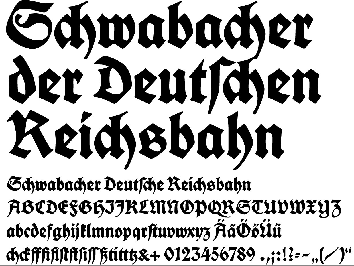
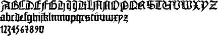
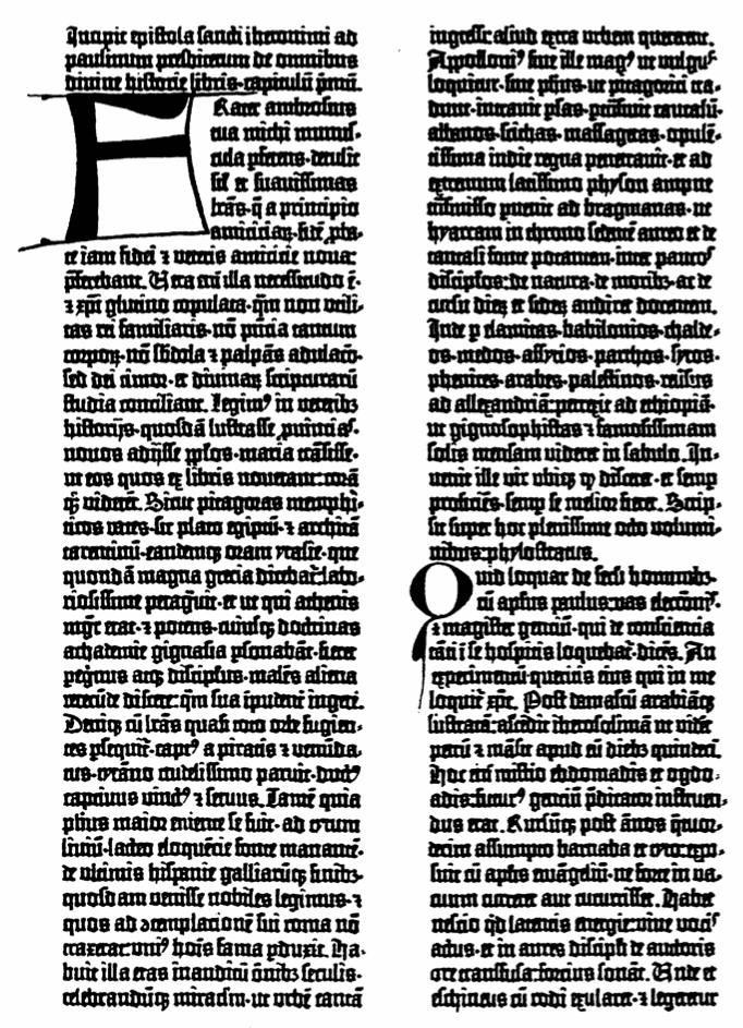
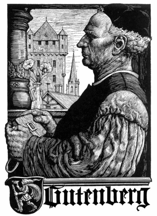
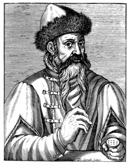
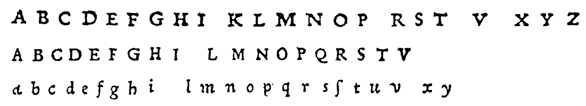
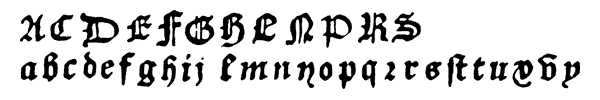
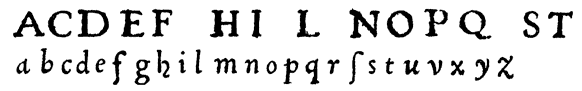
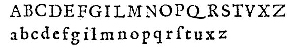
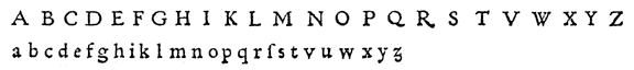
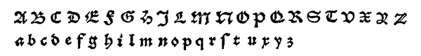
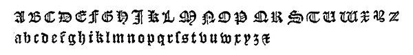
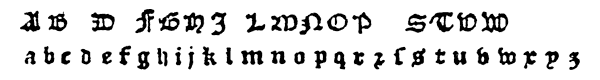
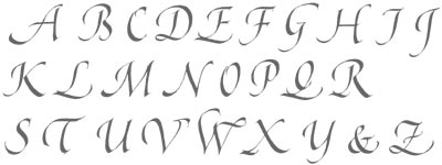
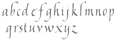
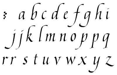
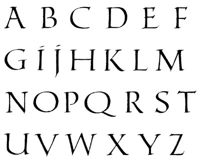
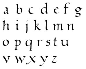
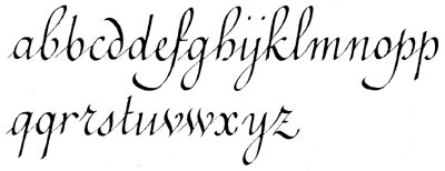
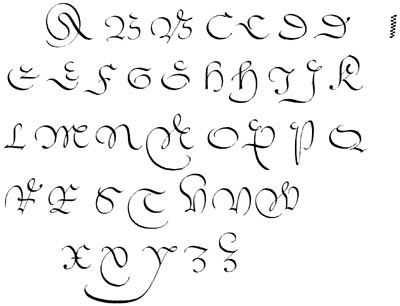
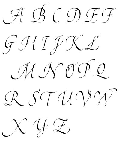
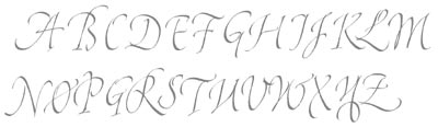
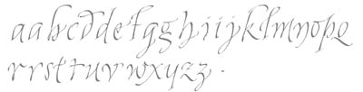
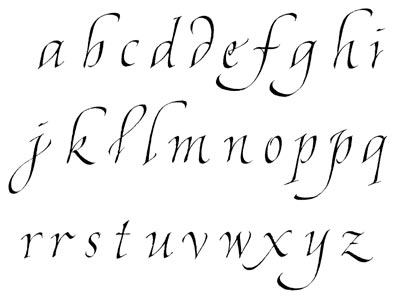
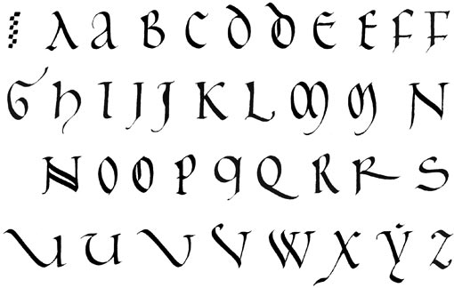
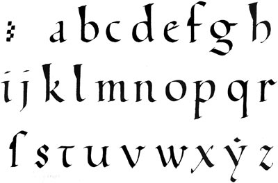
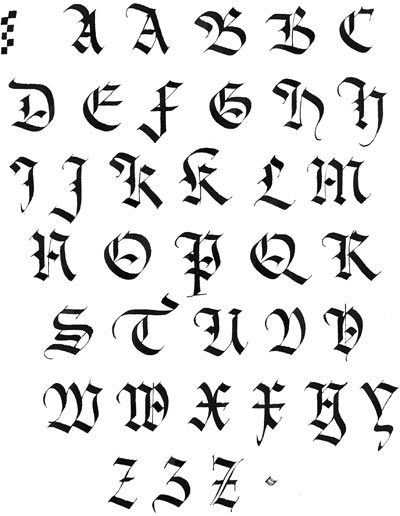
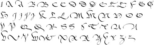
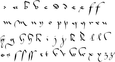
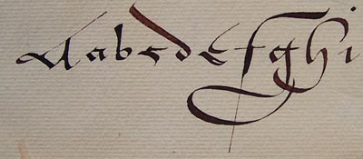
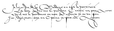
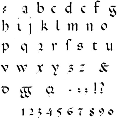
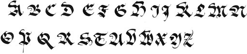
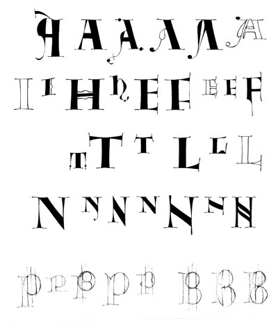
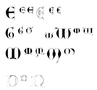
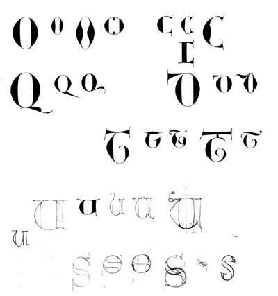
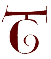
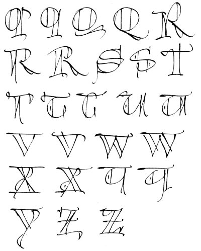
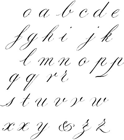
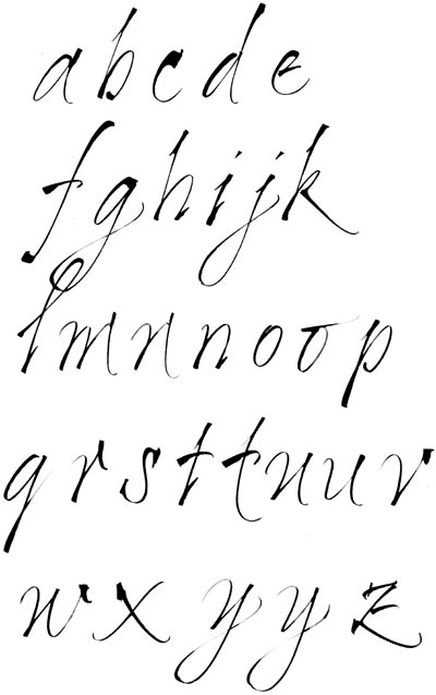
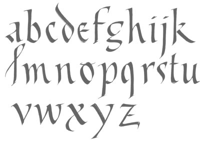
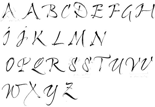
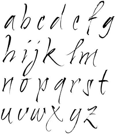
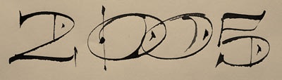
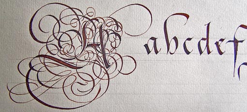
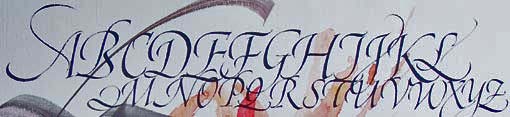
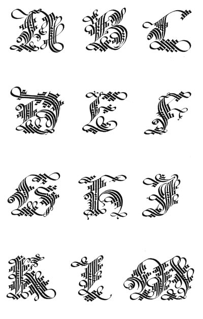
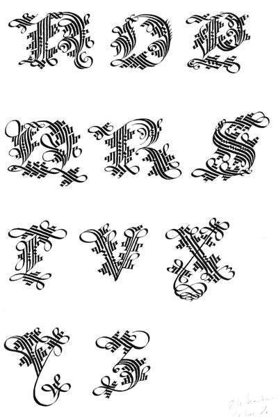
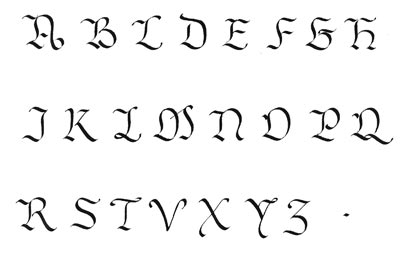
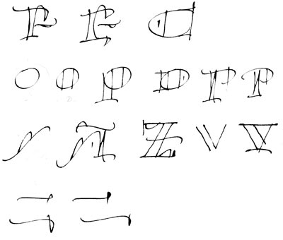
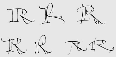
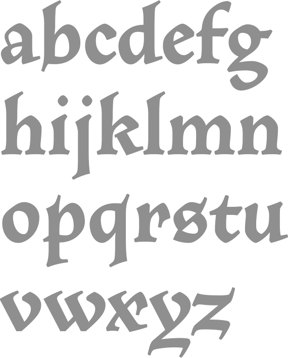
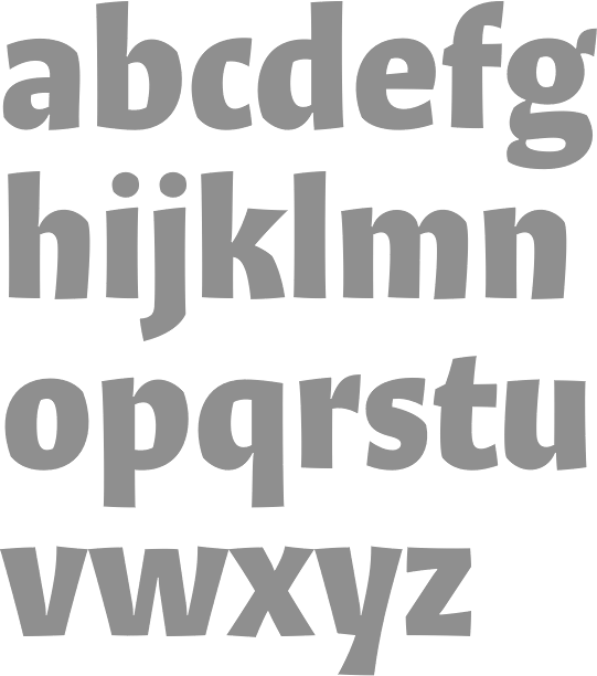
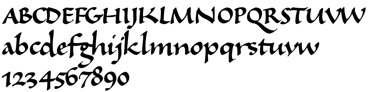
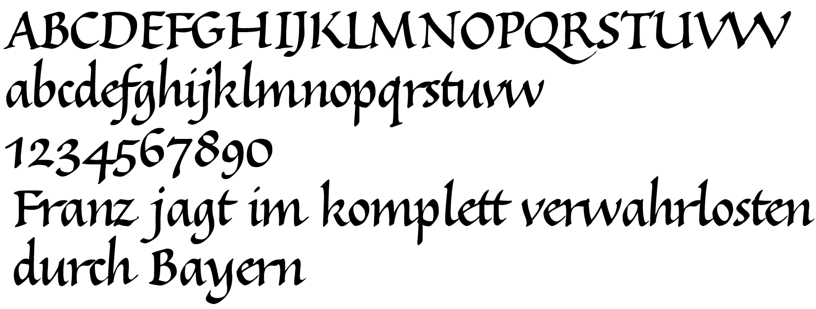
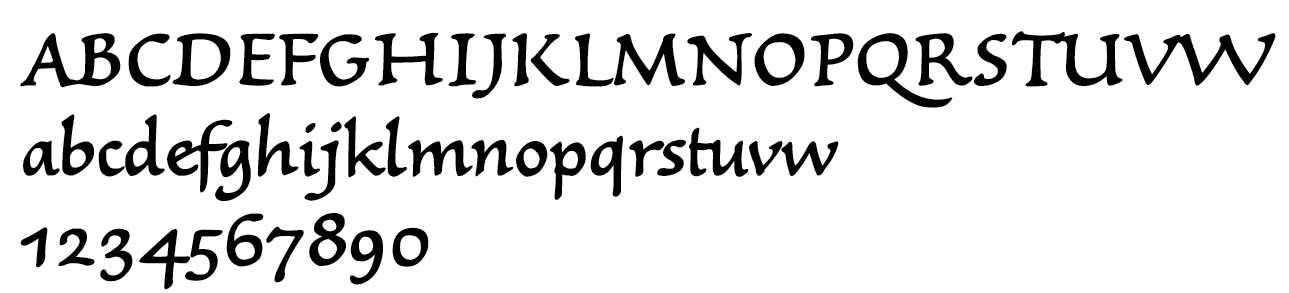
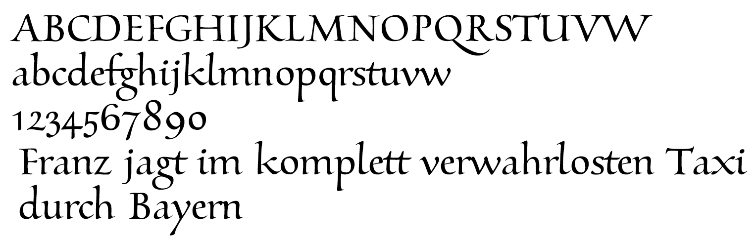
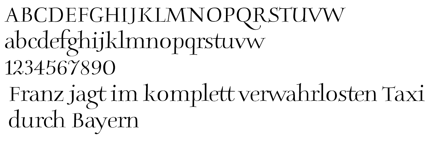
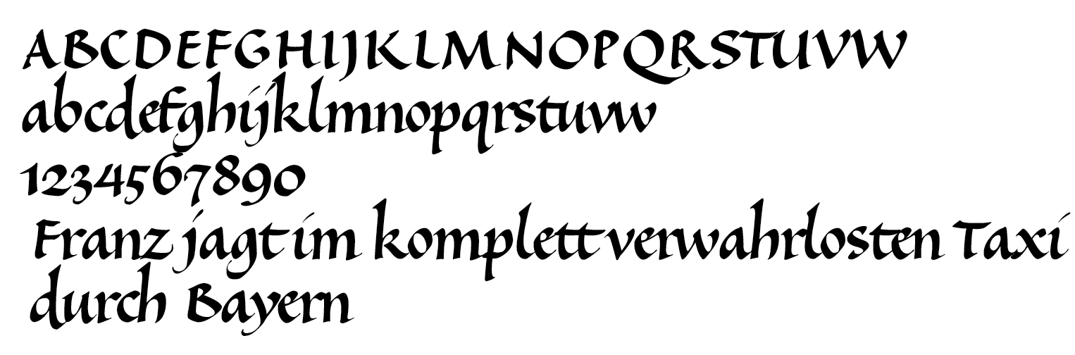
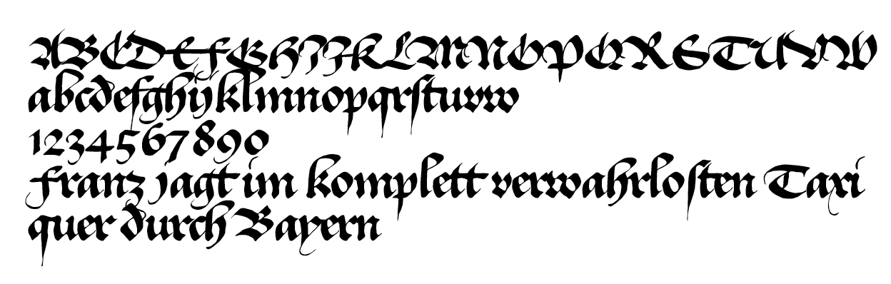
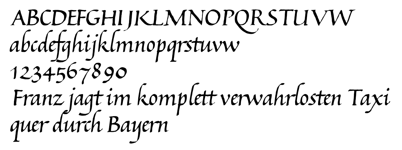
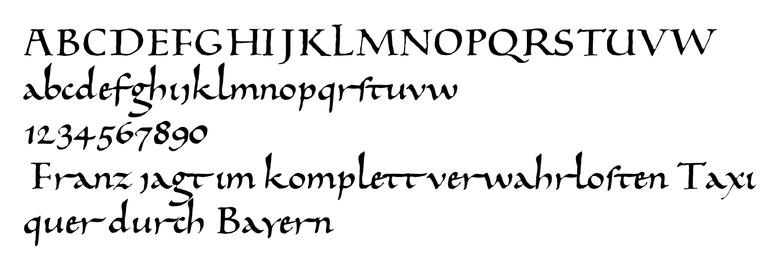
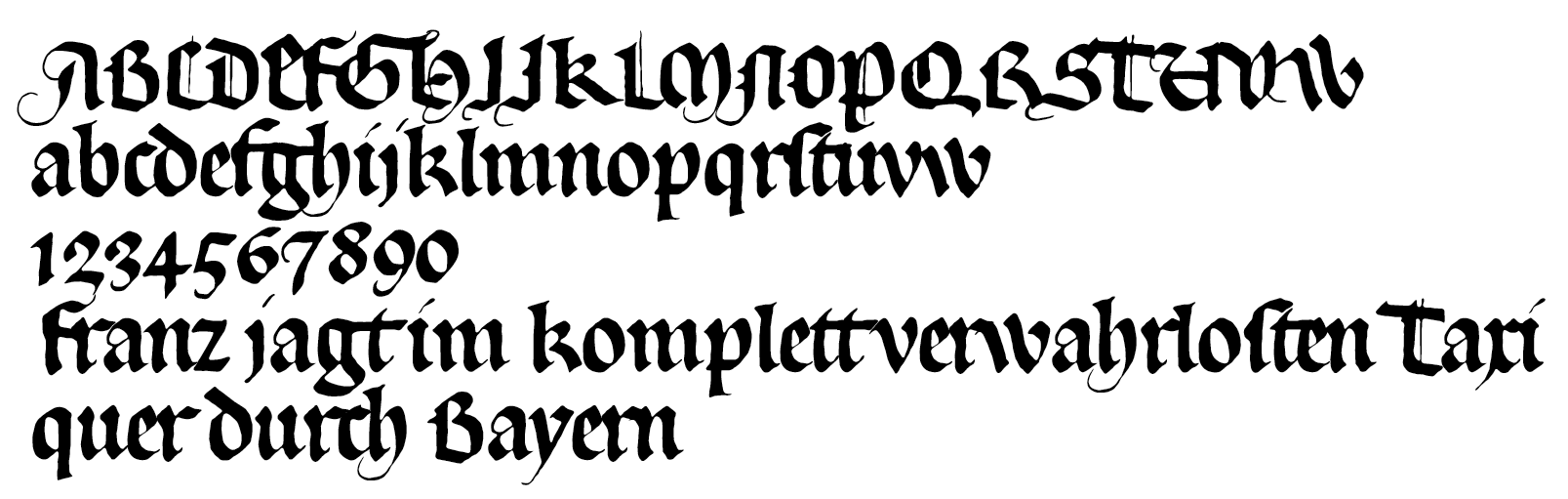
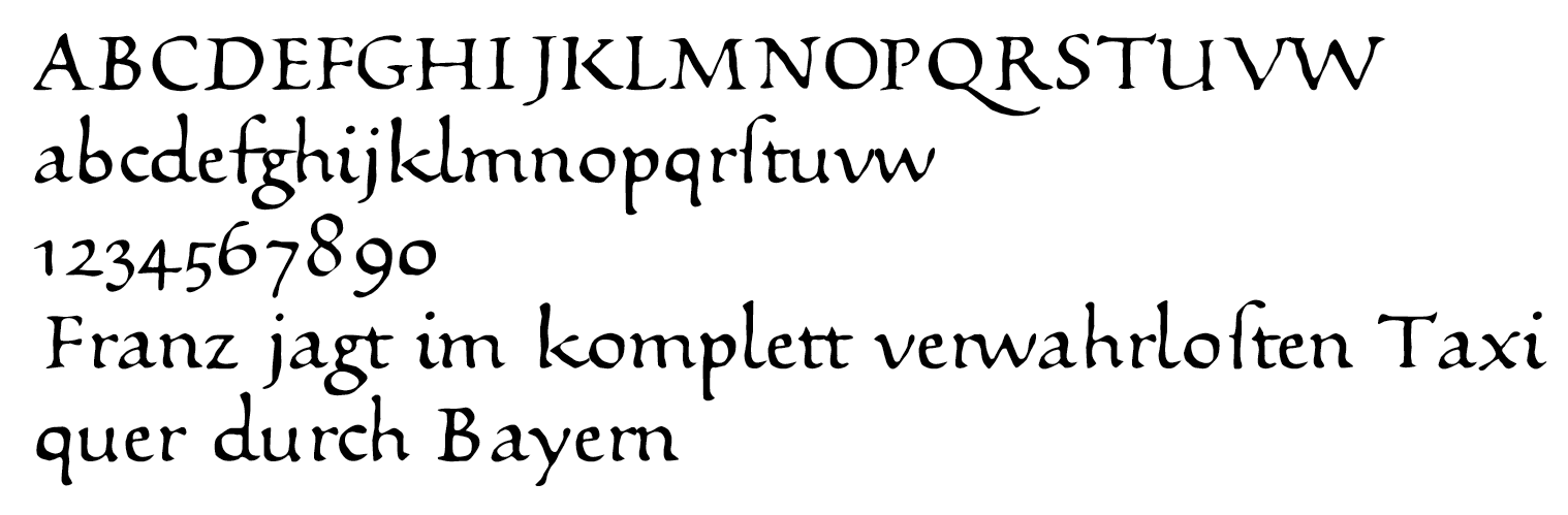
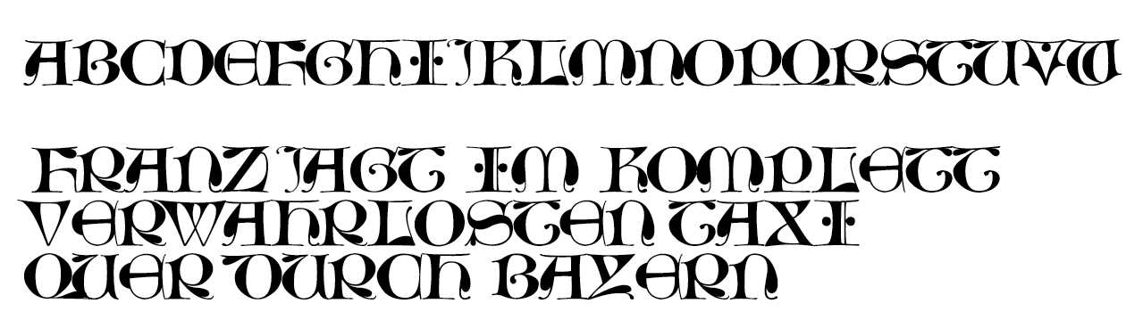
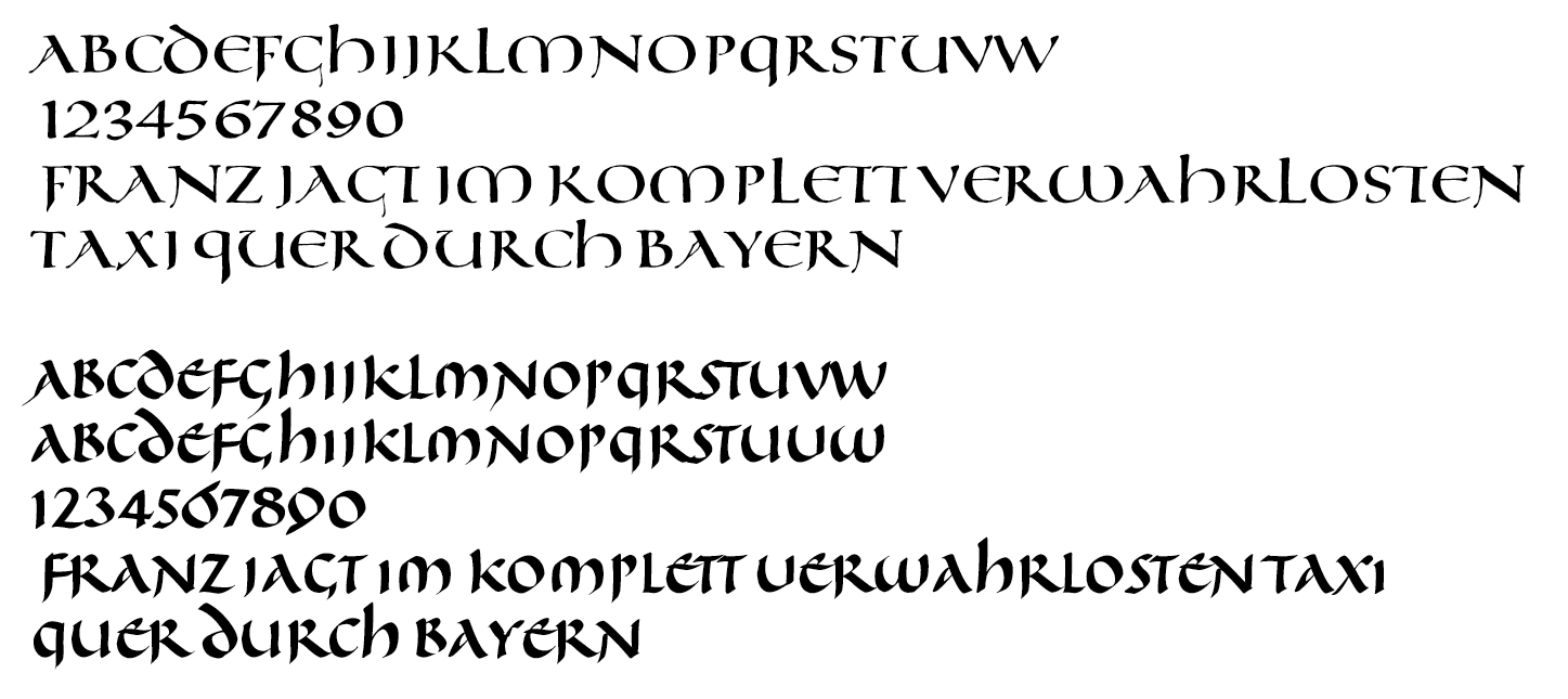
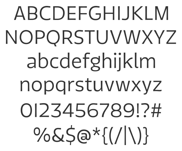
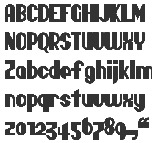
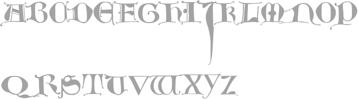
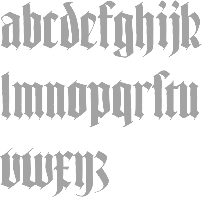
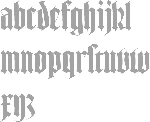
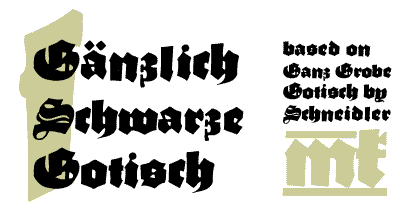
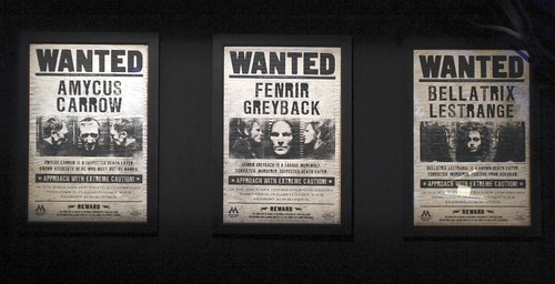
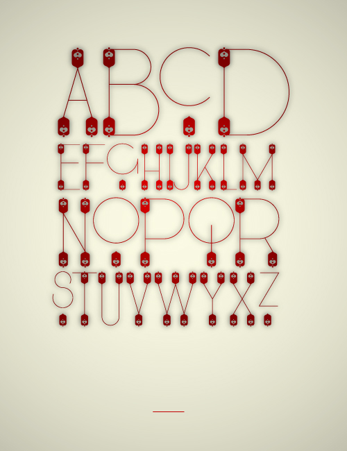
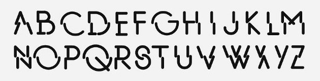
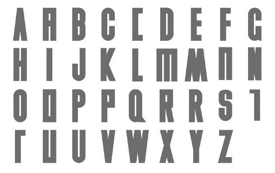
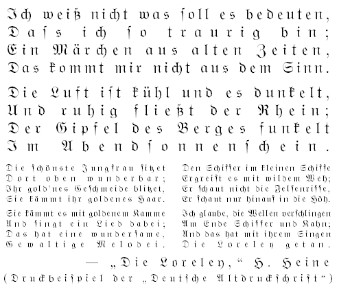
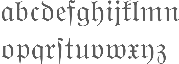
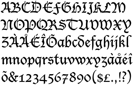
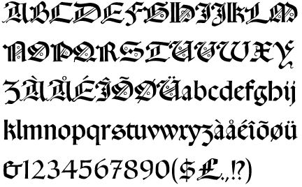
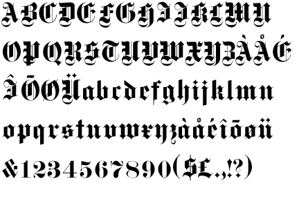
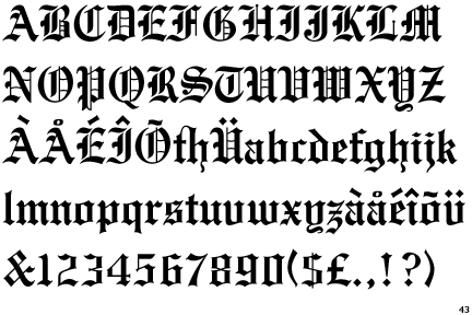
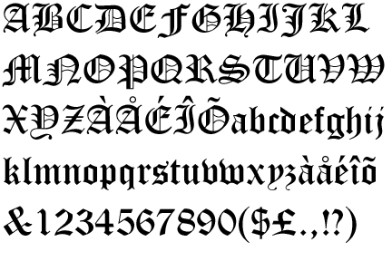
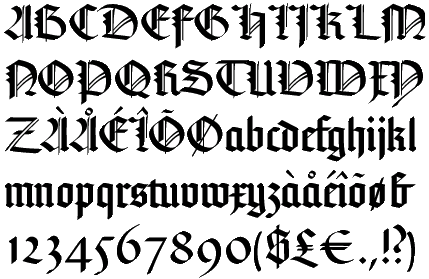
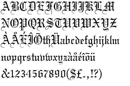
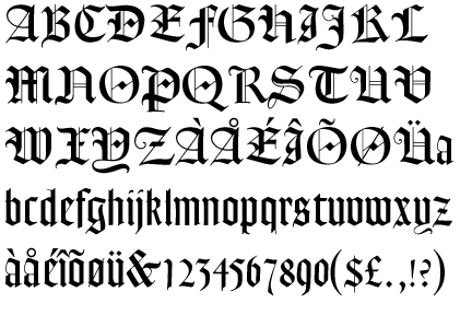
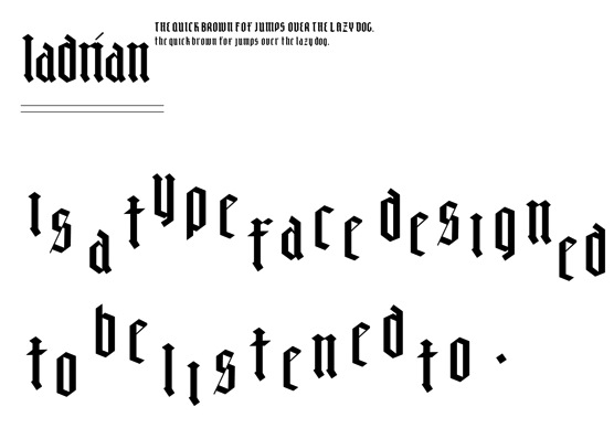
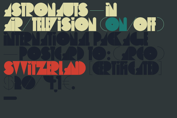
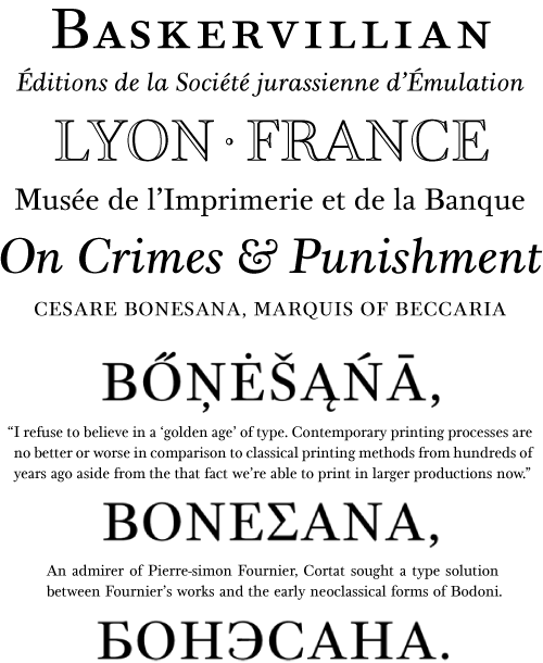
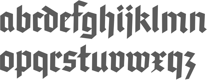
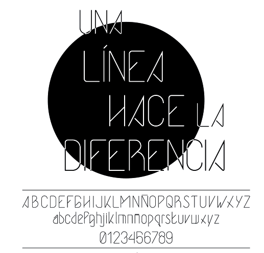
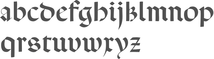
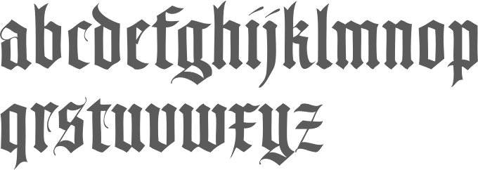
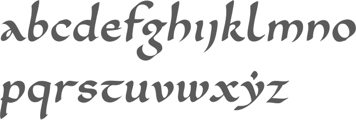
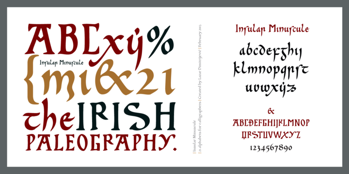
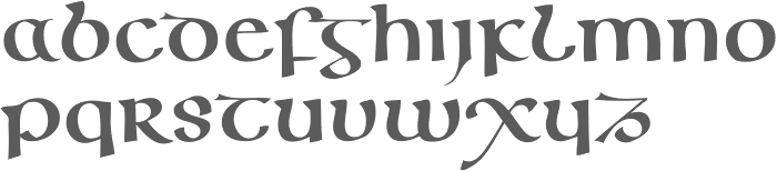
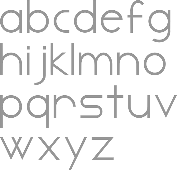
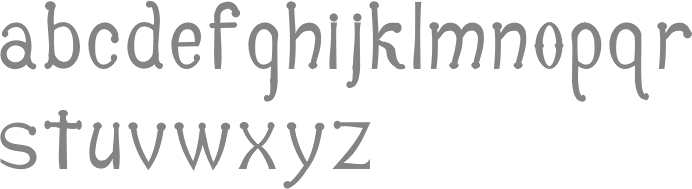
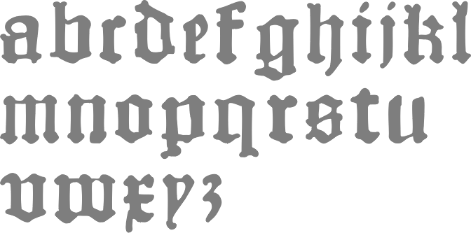
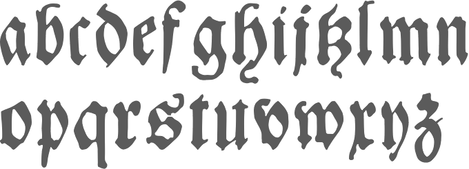
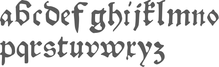
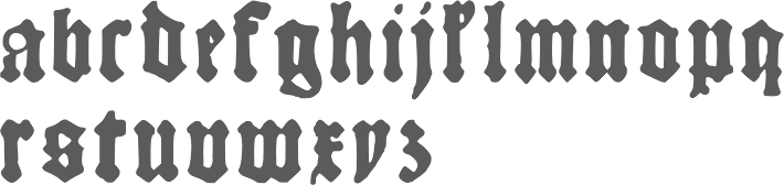
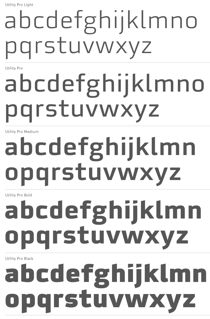
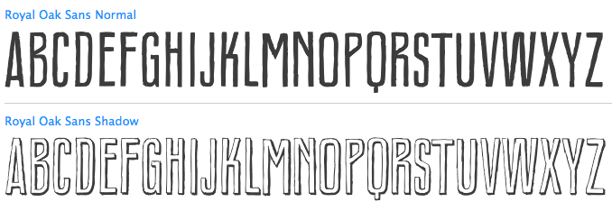
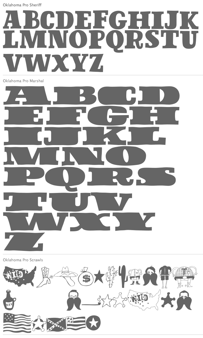
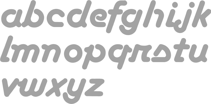
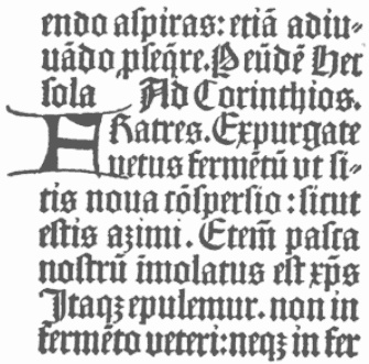
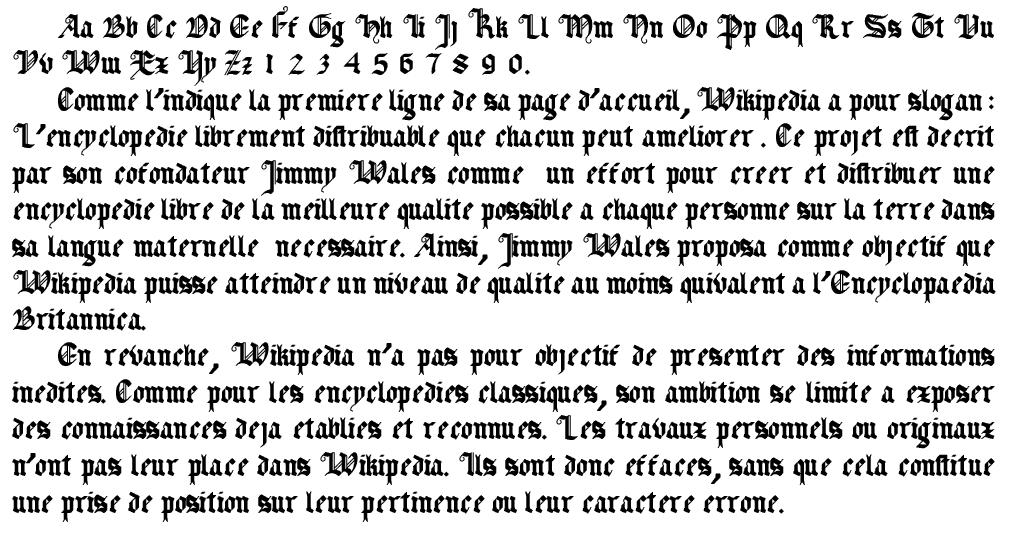
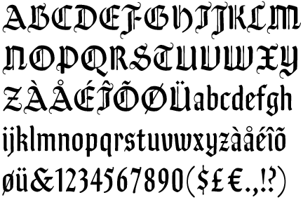
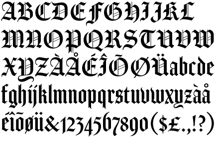
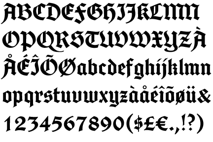
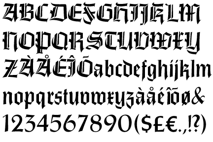
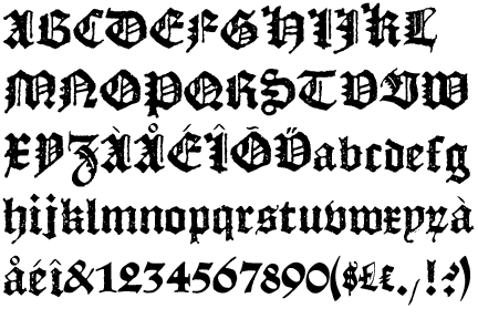
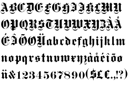
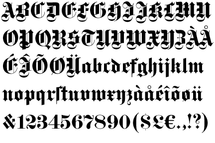
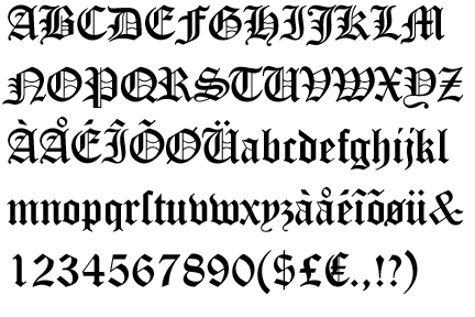
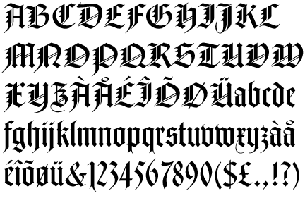
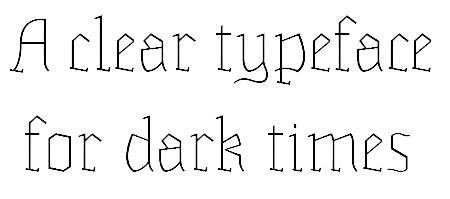
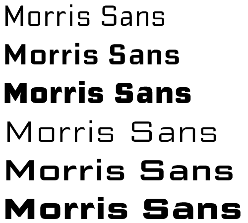
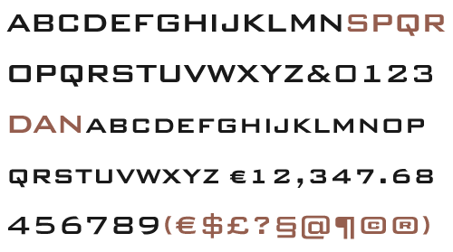
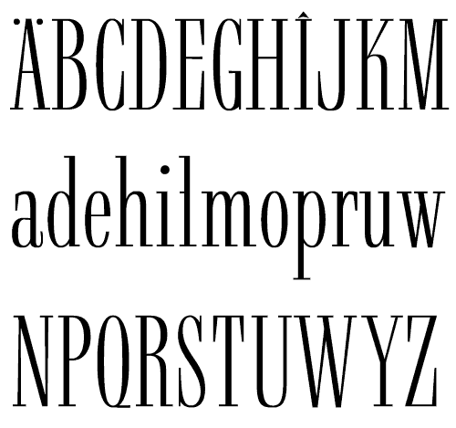
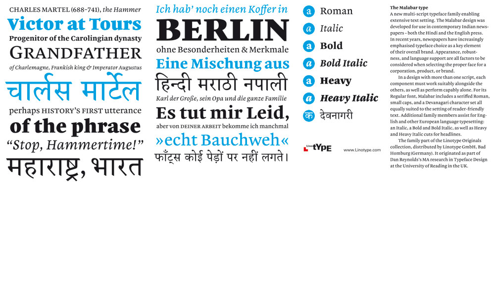
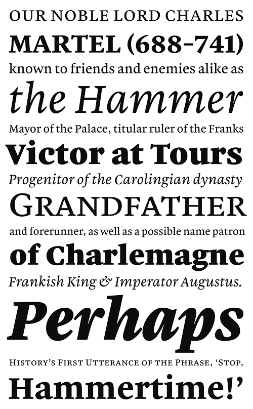
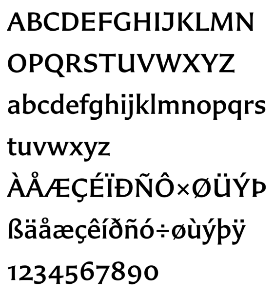
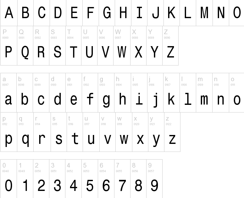
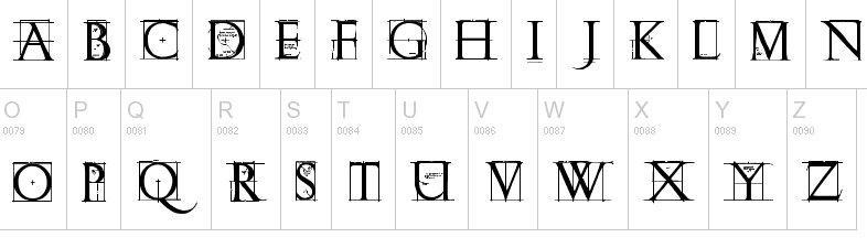
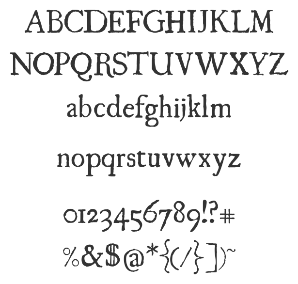
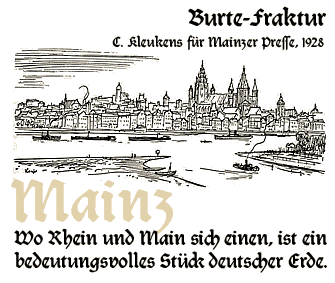
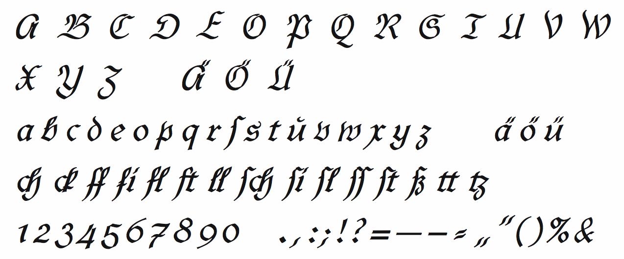
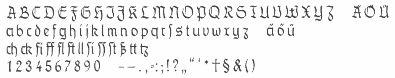
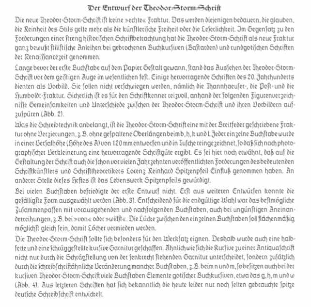
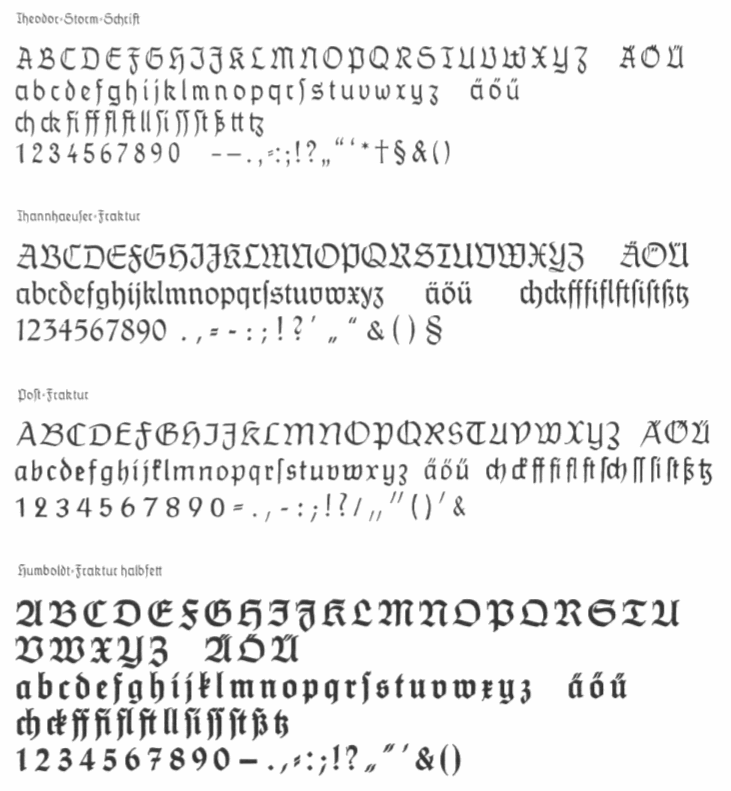
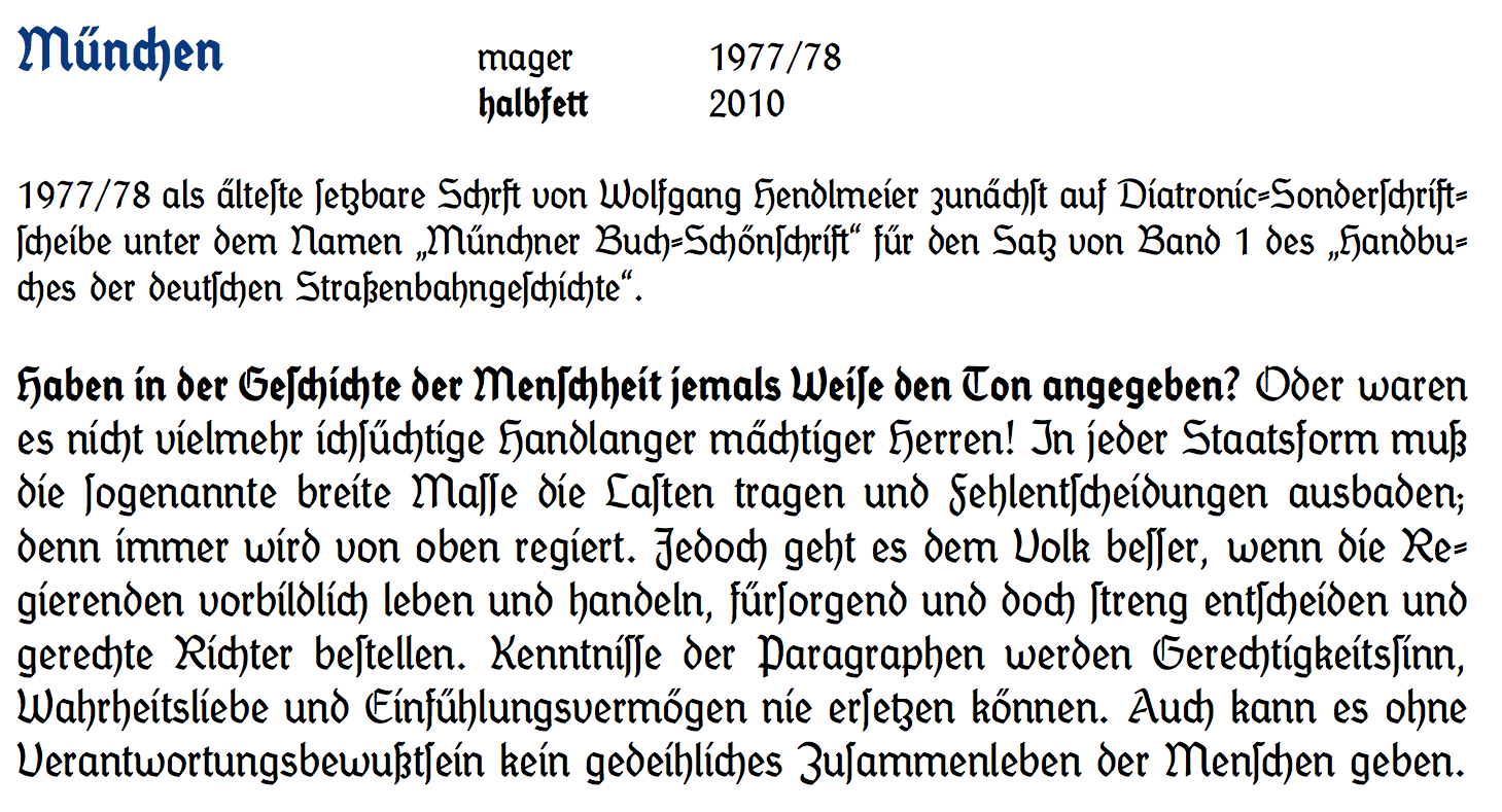
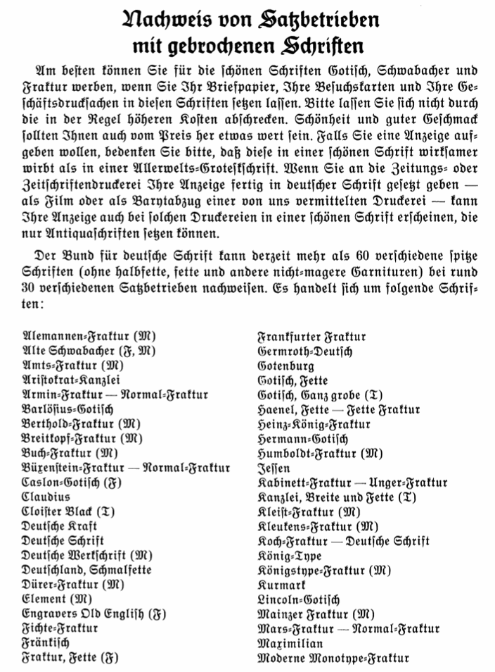
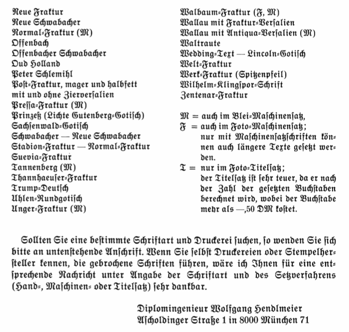
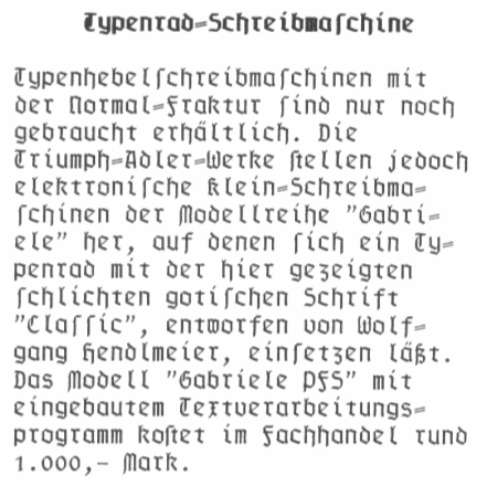
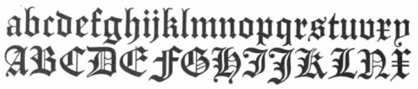
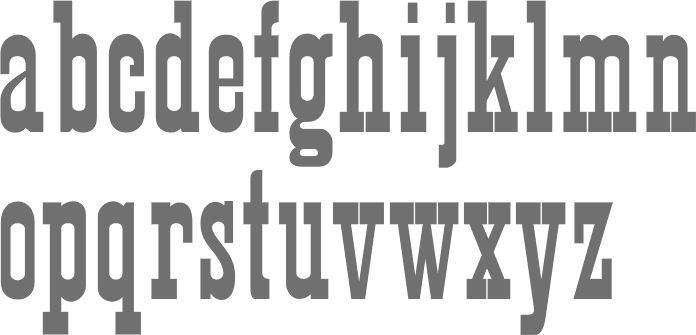
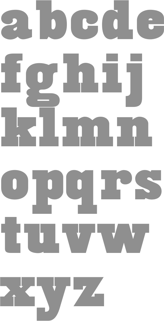
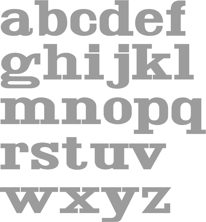
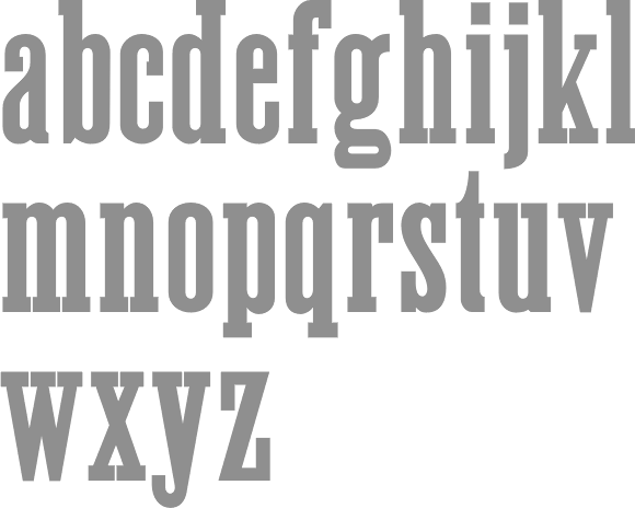
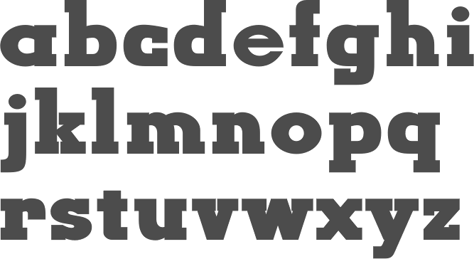