| | |
29 Letters
[Pascal Naji Zoghbi]
|
 Madrid (and before that, Lebanon)-based Arabic type designer who runs the Arab type news and blog site called Arabic Typography. KHTT link. An ex-student of the KABK in 2006, he currently is a part time instructor of design and typography at Notre Dame University, Louaize, Lebanon, as well as a part time instructor of typography at the American University of Beirut (AUB), both since 2007. His Arabic type foundry is called 29letters.
 At ATypI 2008 in St. Petersburg, he ran a workshop on the Arabic Kufi script. Speaker at ATypI 2010 in Dublin on the topic of political resistance and expression through graffiti in Lebanon and Palestine. His contributions to type design: - Massira. He has embarked on a project with Martin Majoor to design some Arabic fonts that fit Majoor's designs. He writes: Massira is my graduation typeface at Type&Media postgraduate course at The Royal Academy of Arts [KABK] in The Hague. Huda AbiFares contacted me while I was finalizing Massira and presented the opportunity to collaborate with the Dutch type designer Martin Majoor to design an Arabic typeface, which is part of the Typographic Matchmaking 01 project organized by Khatt Foundation. At first I was a bit worried due to the fact that it would be my first professional type design work and that the due date was too close. However, after taking a closer look at Martins type FFSeria and analyzing its characteristics, I noticed that the treatment of the stroke and the structure of the letters shared similarities with Massira. In both fonts the use of sharp broken curves and crispy feel is present. Consequently, I grew confident in project and decided to use Massira as a starting point for the new Arabic companion of FFSeria. Echo, which is Sada in Arabic, is the repetition of a sound caused by the reflection of sound waves from a surface. Accordingly, Sada is the echo of FFSeria. The modifications on Massira consisted of making Sada perform like FFSeria. It had to have the same point size, line space, color, contrast and feel as FFSeria. Concerning the details of Sada and the inclined angle of the vertical strokes, it was derived from the FFSeria Italic. So Sada has the same feel as the Roman but is inspired from the Italic. More on the Sada project. In 2009, Sada was renamed FF Seria and published by FontFont.
- Another project of Zoghbi involves a type family being developed for newspaper headlines.
- In 2007, he created a 3-style Phoenician type family called Fniqiya.
- Alef Pixel Caps Type for Alef Magazine (2008). Done with Huda AbiFares. This is a Latin ornamental type family.
- Al Rouiya Arabic Type for the Al Rouiah Newspaper in Kuwait, 2008.
- Bukra display type for Ibn Battuta Mall in Dubai, 2008. This Futura-like typeface saw a variable part added in 2020. Adrien Midzic and Swiss Typefaces aided with the Latin.
- A corporate font under the heading, Arabic for Univers (2008). Zoghbi: An Arabic corporate typeface for a global shipping and transport company. The Arabic is intended to work with the Latin type Univers. Unfortunately, I can't mention the name of the company nor the design firm I did this Arabic type work for. I was the Arabic type consultant/specialist and associate type designer alongside Leah Hoffmitz. The font will used in all Arabic publications, ads and packaging for the company.
- Baseet (2009) is a hybrid Neo-Naskh / Modern Kufi geometric typeface. It is a mixture of straight vertical, horizontal and diagonal pen stokes incorporated in-between curved corners and edges. In 2020, Pascal Zoghbi (29LT) and Ben Wittner released the monospaced Arabic / Latin typefaces 29 LT Baseet Variable and 28 LT Zawi Variable.
- At FontStruct, he made Arapix (2009).
- UAE Embassy Corporate Type (2010). This is a commissioned Latin typeface based on the same concept as of an Arabic font. Each of the 26 Latin letters has Caps, Initial, Medial and Final shape enabling the letters to connect as in the Arabic script. The drawing of the letters was all done using the Arabic calligraphic bamboo stick and based on the Naskh Calligraphic Style. Opentype help from Erik van Blokland.
- The Mathaf Corporate Arabic-Latin Font (2011). Mathaf Arab Museum of Modern Art opened its doors to contemporary Arab art lovers in December 2010 in Doha, Qatar.
- Nada Debs (2010): a contemporary geometric Kufi type commissionewd by Nada Debs.
- For Ascender, he did Droid Arabic Naskh (see OFL), Droid Persian Naskh, and Droid Arabic Kufi (2010, OFL).
- 29LT Azer, done with Ian Party and Wael Morcos: Azer in Arabic means friendly, ready to assist and lend a hand. This multilingual typeface combines simple lines with careful detailing to create a serious but approachable look. The Arabic is a Naskh / Kufi hybrid and retains a balance between calligraphic angular cuts and unadorned construction. The Latin is a humanist sans-serif with crisp cuts based on the broad nip pen calligraphic structure and contemporary outlines. The fonts include Arabic, Farsi, Urdu and Latin variants. Azer won an award at TDC 2014.
- Pascal Zoghbi revived the 1950s font system by Nasri Khattar called Unified Arabic as UA Neo B and UA Neo B.
- LT Makina. An old typewriter font.
- LT Kaff.
- LT Zarid (+Sans, +Stencil, +Slab, +Serif). Pascal Zoghbi designed all Arabic components. 29LT Zarid Display won an award at 23TDC in 2020. The whole family has variable styles since 2020. Jan Fromm designed the Latin for Slab, Sans and Stencil. Regarding the Latin parts: Zarid Serif Display and Text Upright were designed by Ramiro Espinoza; Serif Upright was designed by Ramiro Espinoza and Khajag Apelian; Serif Slanted and Text Slanted were designed by Jan Fromm. The Cyrillic and Greek extensions were designed by Krista Radoeva and released in July 2020. Finally, 20 LT Zarid Sans features a variable style with a single (weight) axis.
- LT Zeyn. A great high-contrast fashion mag style typeface.
- Other custom types include Expo 2020 Dubai, Swatch, Noor, MIA, Noto Naskh, Shawati, Hamsa, Fdx, Emirates Headlines, AlWatan Headlines.
Speaker at ATypI 2011 in Reykjavik. Speaker at ATypI 2013 in Amsterdam. Klingspor link. [Google]
[More] ⦿
|
A A Ngurah A Krisna Teja
[Anomali Creative]

|
[MyFonts]
[More] ⦿
|
Aan Kurniawan
[AK Desain (or: Bangun Studio)]
|
[More] ⦿
|
Abdul Hapiz Hilman
[Fizzetica Type foundry]
|
[More] ⦿
|
Abdullah Mabhal
[Mabhal Studio]
|
[MyFonts]
[More] ⦿
|
Ablaze Studio
[James Cianciaruso]
|
James Cianciaruso (Ablaze Studio) (b. 1967) lives in the UK. Dafont link. He created these fonts: Chaos Times (2007, grunge), Arkham (2007, Arabic simulation face), Leicester (2007, old typewriter face), and Veggi terra (2007, fruit and veggie dingbats). [Google]
[More] ⦿
|
Aceh Design (or: Mild Studio)
|
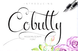 Studio in Banda Aceh, Indonesia. Creators of the Arabic simulation typeface Alkhalam (2015), the calligraphic Cobully Script (2016), Aventurine Script (2016), the handcrafted Skyfall (2016, marker pen style), Gondez (2016) and Asaina (2016), and the brush script typeface Sikula (2016). Behance link. Creative Market link. [Google]
[More] ⦿
Studio in Banda Aceh, Indonesia. Creators of the Arabic simulation typeface Alkhalam (2015), the calligraphic Cobully Script (2016), Aventurine Script (2016), the handcrafted Skyfall (2016, marker pen style), Gondez (2016) and Asaina (2016), and the brush script typeface Sikula (2016). Behance link. Creative Market link. [Google]
[More] ⦿
|
Adam C. King
|
Designer of the Arabic simulation (or "faux Arabic") font Imperialist (2003), a protest against the American approach in the Middle East. Adam C. King is based at UW-Stout in Menomonie, WI. [Google]
[More] ⦿
|
Adien Gunarta
|
 Adien Gunarta is an Indonesian type designer (b. 1995) who is based in Probolinggo, East Java, and who is studying at Airlangga University, Surabaya, class of 2014. His typefaces can be found under his name or under Teras Grafika (set up in 2015) and Fontastic Indonesia. Adien Gunarta's typefaces are brimming with Indonesian cultural heritage symbols and shapes.
 Typefaces from 2010, mostly made with FontStruct: the pixel typeface Benci Malaysia, the hand-printed Nyonya Gendut, the squarish typeface Hutan and the irrgularly sized Madura Regular. He also made the texture / knitting typeface Batik, FoOleD bY GaYUs, Probolinggo (organic), Smasasinema (display face), the texture typeface Serangkaian Pattern, Indo-Malay Confrontation (pixelish), Koruptor and the Bitches (gothic), Qurban Feast, and the curly native pattern typeface Mlungker. In 2011, he made Kabupaten (a sketch font), Social Monster, Buka Pusa Bersama, Ceria Lebaran, Pajarakan Studs, Batik Gangster, Maharani (hand-printed), Lovely Eunike Hans (hand-printed), the texture typeface Kawung Textile, Wildan Izzur Gunarta, Genius Jempolan Royal (scanbats), Pray For Japan, Quantum of Bali, X-Code from East (Javanese script), Hangeul (Korean simulation face), Halidians Blockserif, Moanday Earn Bored, the paper cut typeface Malingsia, Awesome Java, Mesin Hitung (an LCD face), Eenvoudige Batik (stitching face), Antique Paleoindonesia (patterned face), Kebencian (scratchy face), Kemasyuran Jawa (a display face with an Indonesian look), Probolinggo Sans, Londo Chino, Urban (paper cut face), Bikang Struck, Chana Remedy, Indonesian Woman (pixel dings), People Diverse (pixel dings), DBA Muslim (pixel dings), Turk and Nusa (ball terminal face), Jakarta Recycle (paper fold octagonal face), Halida Sans (a swirly version of Ubuntu), Buka Puasa Bersama (Arabic simulation face), Social Monster (grunge), Ceria Lebaran Normal (lava lamp typeface), Dukungan, Dukungan, Sanjaya Epoch, and Jakarta Sunken (angular face). In 2012, he created Halidians Blockserif, Penakut, Agoestoesan, Siti Maesaroh (Arabic simulation face), Turk and Nusa, Rest in Phuket (Thai simulation typeface), Chana Remedy, Bunaken Underwater, New Madura, Moro Seneng, Endutt Normal, Antibalon, Hayyu Kaget, Damai Kpk Polri, Damai Pelajar, Jangan Bersedih (hand-printed), Ikan Besar, Senyum (hand-printed), Catatan Perjalanan (fat finger face), Wizzta, and Quick Argani. Typefaces from 2013: Emilio 19 (athletic lettering font), Bangkit, Faishal Bakeries, Soerjaputera (avant-garde), Soerjaputera Doea (art deco), Sang Fatchurrohmah (lava lamp face), Aceh Darusalam (Arabic simulation face), Revolusi Timur Tengah (Arabic simulation face), Nurkholis (Arabic simulation), Kopleng (alchemic), Menjelajah Halmahera (a ronde font), Jakarta Highends, Smasasinema, Sanjaya Epoch, Mlungker, Dukungan, Thohir Ke Badreah (all caps sans face), Serangkaian Pattern, Endutt (fat finger face), Boutiques of Merauke (a curly typeface), Balinese Family, Zamrud & Khatulistiwa (curly font), Awesome South Korea (great oriental-look font), Freeport Go Away (poster font), Senang Banyol, Don Aquarel, Jawadwipa Adisastra, Si Kancil (fat finger font), Wortellina, Don Butique (hand-printed), Did You See That, Bimasakti. Typefaces from 2014: Rampung, Prabowo, Larasukma (an abstract shape font), Tafakur (Arabic simulation typeface), Syawal Khidmat (Arabic simulation face), Kurnia (curly script), Kota Surabaya (dingbats of buildings), Hutan Lestari, Kobarapi (spurred typeface), Mukadimah (Arabic simulation, based on ae Cortoba by Arabeyes), Huruf Maranti (upright connected script), Emilio 20 (athletic lettering). Typefaces from 2015: Gurindam (Dutch art deco), Upakarti, Tyree Friendly Face (rounded sans), Berantas Korupsi, Kanisah (Hebrew simulation font). Typefaces from 2016: Belacu, Cemong, Bungasai, Semringah, Binarung (masks), Surabanglus (beatnik style). Typefaces from 2019: Kembang (dingbats). Fontspace link. Home page at Fontastic Indonesia. Devian Tart link. Klingspor link. Dafont link. Behance link. [Google]
[More] ⦿
|
Afiq Anggriawan
|
Kediri, Indonesia-based designer (b. 1989) of the rounded squarish typeface Dixietal Basic (2018) and the straight-edged typeface Wkwkwk Land (2018). In 2019, Afiq published the children's handwriting fonts Jack No Fruit and My Scrawl. Typefaces from 2020: Skinny Buttom, Kediriku Bagus, Dagelan Malam (counterless), Pemburu Sinja (a children's hand), Al Faragh (Arabic emulation) and Al Ghazali (Arabic emulation). [Google]
[More] ⦿
|
Agung Yuwanda
|
Bandung, Indonesia-based designer (b. 1981) of Aloha Kufi (2011, Arabic simulation face). Dafont link. Klingspor link. [Google]
[More] ⦿
|
Agus Alfian
|
Bogor, Indonesia-based designer, b. 1985. Creator of the Arabic emulation typeface Arab Emang (2019). Typefaces from 2020: Some Brush, The Buzz (grungy), Sportypo, The Secret Love, and the pixel typeface Play Me Games. [Google]
[More] ⦿
|
Agus Muhammad
[Toko Press]
|
[More] ⦿
|
Agustina Ruiz
|
 Buenos Aires-based creator of an elegant ornamental Arabic simulation typeface called Mehndi (2013). [Google]
[More] ⦿
Buenos Aires-based creator of an elegant ornamental Arabic simulation typeface called Mehndi (2013). [Google]
[More] ⦿
|
Ahmad Ramzi Fahruddin
[Arterfak Project]
|
 [MyFonts]
[More] ⦿
[MyFonts]
[More] ⦿
|
Ahmad Zakiy
[DoubleZ Studio (or: Ode Arts)]
|
[MyFonts]
[More] ⦿
|
AK Desain (or: Bangun Studio)
[Aan Kurniawan]
|
 Makassar, Indonesia-based designer of these typefaces in 2017: Gaja Hidoep, Crashand, Blank (sci-fi), Fontolo (poster sans), Teratur (trekkie font), Hallows (pointy Halloween typeface), The Future, Legend, Asman Script, Trying Brush.
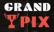
 Typefaces from 2018: The Shift (a modular monoline sans), Irisan, Boya (minimalist rounded sans), Lonjong, Akur, Tebal, Lhove, Bunga, Grand Pix (art deco), Balle (thin sans), Tulisan (signature font). Typefaces from 2019: Be Signature, Rama dan Karim (an arabic emulation font). [Google]
[More] ⦿
|
Akifatype Studio
|
Aceh, Indonesia-based designer of script typefaces. The Studio's fonts from 2018: the signage script typeface Merciana Script, the curly Maitlyn Script, Dallastic Script, Fantabulous Script, Hinella Script, Dealova Script, Funtastic Script. Typefaces from 2019: Instory (a dry brush script), Atlantic Script, Fallefi Script (a great upright calligraphic script), Mithana Script, Azzury Script, Molianty, Twenty One, About Loving, Farmfresh Script, Wonderfully Script. Typefaces from 2020: Mordibella (a dry brush script), Bastian (a fat finger font), Kailash (a dry brush font), Baver Brush, Holmeria, Anther Brush, Matteona (a dry brush script). Typefaces from 2021: Kynthia Script (upright and stylish), Asbatun (Arabic emulation), Qaboos (serif), Bollofora (a dry brush script), Fabulous Signature, Aprilous (a fat finger font), Shalleh (an Arabic emulation typeface), Abrupt (a dry brush script), Gibrella (a fat finger script). Typefaces from 2022: Bertone (a scrapbook brush script), The Brayland (a retro signature font), Rumbia (hand-crafted). [Google]
[MyFonts]
[More] ⦿
|
Alejandro Paul
[Sudtipos]
|
 [MyFonts]
[More] ⦿
[MyFonts]
[More] ⦿
|
Aleksandra Georgieva
|
Sofia, Bulgaria-based designer of several unnamed typefaces in 2013. These include octagonal typefaces, as well as Hebrew, Arabic and oriental simulation typefaces. [Google]
[More] ⦿
|
Alessandro Segalini
[Izmir University of Economics]
|
[More] ⦿
|
Alexei Chekulayev
[Double Alex Team]
|
 [MyFonts]
[More] ⦿
[MyFonts]
[More] ⦿
|
Ali Hamidi
[Noer Hadi]
|
[MyFonts]
[More] ⦿
|
Alit Design (or: Gurita Hitam)
[Alit Suarnegara]
|
 A graduate of Institut Seni Indonesia Denpasar Bali who is based in Denpasar, Bali, Alit Suarnegara (Gurita Hitam, b. 1986, Denpasar) created these typefaces:
 - 2022: Psychofun (psychedelic), Lhont Down (a bouncy baseline serif), Spidro Marley (a flared display serif), Bellyman (an art nouveau boutique serif), Hulahoy Typeface (a formal reverse stress script), Bulone (a display serif with curved stems and terminals), Mankey (glyphs with wavy kinks), April Blossom (a scrapbook script), Soka (a 28-style display sans), Mollyn (a 14-style casual sans), Mongek (a 13-style display serif with funky curves), Round Saetan (a ribbon typeface), Putrey (a 9-style display grotesk), Rosehot (a display serif), Maglony (a 9-style font with sharply cut edges and terminals), Nillota (a 13-style display serif), Romans Lovers (a 12-style decorative serif), Maboth Typeface (blackletter), Belong Faith (a spurred tattoo (?) blackletter), Hello Mytoys (a modernized blackletter), Belligoes (blackletter), Boiller (a 14-style Peignotian sans).
- 2021: Mybook Again (a great swashy calligraphic script meant for romantic events), Radja Lover (a calligraphic font with hairline connectors), Brohoney (a 13-style text family), Two Race (a race car font family), Piersob (a very wide display sans reminiscent of the old Porsche logo font), Black Mild (Victoriana), Decondor (a 14-style delicate mini-serif), Gathell (a 13-style fashion mag serif), Hero Beam (spurred, Victorian), Vaclice Script, Nokarin (a bold calligraphic script), Horseboy Boots (Western, with terminals that emulate hooves), Mokgech (blackletter), Sutray (a rather formal upright script), Mister Honey (Tuscan), Nandola (a fine calligraphic script), Bungker (a layerable hand-drawn slab serif), Brolimo (a 14-style Peignotian sans), Takashimura (a Japanese emulation font), Bunker (a layerable marquee font family), Dronefly, Miloner (a 14-style fashion mag serif), Mono and Friends (handcrafted and rounded), Roby Soho (a simple flared display sans in 12 styles), Saihat (emulating Arabic calligraphy), Gofienda (a calligraphic script), Rusty Store (Victoriana), Chalk and Friend (a sketched typeface), Grunge Decade (art nouveau), Kenoky Coffekan (a 15-style decorative sans and script duo), Botaky and Botaky Script (a wavy display font), Hidrofont (vintage), Roller Alika, Mistic (a decorative serif), Burgie (14 styles: an ink-trapped swashy and inky display serif), Hand Real (a thin monolinear script), Assox (a reverse contrast Tuscan typeface), Balian (a textured typeface that is based on Balinese carvings), Handy Quomte (calligraphic), Brohillo (a display serif).
- 2020: Karmila, Shary (a 52-style sci-fi sans font that could also be useful in sports), Brave Eighty One (techno, squarish), Mollas (a decorative serif), Crying, Milk and Balls (a 28-style display typeface with rhombic tittles, wedge serifs and razor blade edges---the connection with milk or balls will forever remain mysterious), Boiling, Mallent (brush script), Bemalla (script), Marons (a script/serif hybrid).
- 2019: Black Quality (inline, vintage), Caibojog (watercolor brush), Bonillo, Balimoon, Mofita, Nahye, Pintgram, Subscriber, Lovina Script , Bolehdong (script), Zamrack, Melloner, Melloner Fun, Beautiful Lovina, Localghost (a signature script).
- 2018: Controwell (a Victorian script and text collection), Raustila, Rollete Qaku (dry brush), Norffo, Nermola Scripcy Font, Braton Composer.
- 2017: the script typefaces Rumble Brave Script (as part of the vintage typeface Rumble Brave), Mellony (2017: dry brush script), Raph Lanok (brush style), Jandys, Jandys Dua, Billy Ohio (2017: dry brush), Localghost and Valledofas, and the vintage tattoo typeface Young Heart.
- 2016: the thin connected script typeface Mooglonk, the signage script Altoys, the decorative didone Florva, the connected script typefaces Asfrogas, Rofitaste (brush style), Qarvic (a sans), Qarvic Icon, Morva (a decorative didone), Young Heart (a free vintage typeface with spurs), and Brushgyo.
- 2015: Bromello (brush script), Vroffloow (in script and sans styles), Godfeem, Mooglonk, Floren (a display serif), Lawasth, Mooglonk Serif, the brush typeface The Faino, the tattoo font Alitide, the watercolor brush typefaces Roomfer and Norffo, the connect-the-dots typeface Circle Line, and Kemayu.
- 2014: the beveled typeface Piramid.
- 2013: the spurred signage typeface Starck.
Creative Market link. Another Creative Market link. Dafont link. Graphicrier link. [Google]
[MyFonts]
[More] ⦿
|
Alit Suarnegara
[Alit Design (or: Gurita Hitam)]
|
 [MyFonts]
[More] ⦿
[MyFonts]
[More] ⦿
|
Alphabetum
[Juan-José Marcos García]
|
Juan-José Marcos García (b. Salamanca, Spain, 1963) is a professor of classics at the University of Plasencia in Spain. He has developed one of the most complete Unicode fonts named ALPHABETUM Unicode for linguistics and classical languages (classical&medieval Latin, ancient Greek, Etruscan, Oscan, Umbrian, Faliscan, Messapic, Picene, Iberic, Celtiberic, Gothic, Runic, Modern Greek, Cyrillic, Devanagari-based languages, Old&Middle English, Hebrew, Sanskrit, IPA, Ogham, Ugaritic, Old Persian, Old Church Slavonic, Brahmi, Glagolitic, Ogham, ancient Greek Avestan, Kharoshti, Old Norse, Old Icelandic, Old Danish and Old Nordic in general, Bengali, Hindi, Marathi, Phoenician, Cypriot, Linear B with plans for Glagolitic). This font has over 5000 glyphs, and contains most characters that concern classicists (rare symbols, signs for metrics, epigraphical symbols, "Saxon" typeface for Old English, etcetera). A demo font can be downloaded [see also Lucius Hartmann's place]. His Greek font Grammata (2002) is now called Ellenike. He also created a package of fonts for Latin paleography (medieval handwriting on parchments): Capitalis Elegans, Capitalis Rustica, Capitalis Monumentalis, Antiqua Cursiva Romana, Nova Cursiva Romana (2014), Uncialis, Semiuncialis, Beneventana Minuscula, Visigothica Minuscula, Luxoviensis Minuscula, Insularis Minuscula, Insularis Majuscula, Carolingia Minuscula, Gothica Textura Quadrata, Gothica Textura Prescissa, Gothica Rotunda, Gothica Bastarda, Gothica Cursiva, Bastarda Anglicana (2014) and Humanistica Antiqua. PDF entitled Fonts For Latin Palaeography (2008-2014), in which Marcos gives an enjoyable historic overview. Alphabetum is not Marcos's only excursion into type design. In 2011, he created two simulation fonts called Sefarad and Al Andalus which imitate Hebrew and Arabic calligraphy, respectively. Cyrillic OCS (2012) is a pair of Latin fonts that emulate Old Church Slavonic (old Cyrillic). In 2013, he created Cuneus, a cuneiform simulation typeface. Paleographic fonts for Greek (2014) has ten fonts designed by Marcos: Angular Uncial, Biblical Uncial, Coptic Uncial, Papyrus Uncial, Round Uncial, Slavonic Uncial, Sloping Uncial, Minuscule IX, Minuscule XI and Minuscule XV. These fonts are representative of the main styles of Greek handwriting used during the Classical World and Middle Ages on papyrus and parchments. There is also a short manual of Greek Paleography (71 pages) which explains the development of Greek handwriting from the fourth century B.C. to the invention of printing with movable type in the middle of the fifteenth A.D. He wrote a text book entitled History of Greek Typography: From the Invention of Printing to the Digital Age (in Spanish; second edition, 2018). See also here and here. [Google]
[More] ⦿
|
Andika Fez
[Austin Signs]
|
[More] ⦿
|
Andreas Höfeld
[Fontgrube AH]
|
 [More] ⦿
|
Anomali Creative
[A A Ngurah A Krisna Teja]
|
Or just Krisna Teja. Bandung, Indonesia-based designer, b. 1982, of the techno or speed typeface Dash Horizon (2019), the brush typefaces Magnolia (2019) and Anarchaos (2019), the spurred typeface Motopica (2019), the blackletter typeface Omerta (2019), the script typefaces Retrovert (2019) and Balingkang (2019), the monoline script typefaces Papertua (2019), Barlingtton (2019) and Dastingtton (2019), the sans typeface Flooper (2019), the squarish Andromedia (2019), the cursive Aladina (2019), the signature font Gellattik Janggan (2019), and the shadowed typeface Gallagher Shadow (2019). Typefaces from 2020: Mumbai Curry (script), Rosanthie (script), Funyard College (a children's typeface), Armenicha, Chronosfer (a squarish typeface family), Manallagi (a fat finger font). Typefaces from 2021: Qamassan (a ten-style retro hyper-decorative serif), Omerta (a decorative blackletter), Magento (an 18-style display serif), Nur Hidayah (Arabic emulation). [Google]
[MyFonts]
[More] ⦿
|
Anthonie Van Hayu
[ARToni]
|
[MyFonts]
[More] ⦿
|
Antoine Miquel
|
Illustrator and typographer in Paris, who created the modular display typeface Impulsif (2014). [Google]
[More] ⦿
|
Arabic simulation typefaces
|
This list was compiled by "Character" in 2012: - Legend by F.H.E. Schneidler, 1937 for Bauer Type Foundry. Maybe the original in this genre.
- Legende (URW, B&PGraphics). The URW font is in its Profonts collection and is due to Ralph M Unger in 2002.
- Legend (1990, Softmaker/Brendel)
- Legacy (FontBank)
- Aladdin (WSI/IMSI)
- Sinbad (Bay Animation)
- Kobold (Brendel)
- Semia Script (SSI/SSK)
- Caliph (Scriptorium)
- Bavand (unattributed - came with old PrintShop)
- Khayyam (Type Revivals)
- KarlKhayyam (SoftHorizons)
- Sahara (Fantazia, IBS Future)
- Harem (as displayed in the Solotype Catalog - no digitized font with that name)
Other in the Legend style include L690 Script (Softmaker), Legende (by Fraktur.de, and Legende (by AR Types). [Google]
[More] ⦿
|
Aring Typeface
[Måns Grebäck]
|
 Måns Grebäck (Aring Typeface, Örebro, Sweden) is a prolific Swedish designer (b. Lindesberg, Sweden, 1990), who lives in Borlänge, Sweden. Måns Grebäck has a bachelor's degree in graphic design from the University of Dalarna (2012). In 2010, he went commercial, and started selling fonts through MyFonts. In 2011 he started Mawns Design. In 2013, that was renamed to Aring Typeface. In 2011 he already had over seven million downloads of his fonts, which were featured at websites such as Dafont and Myfonts. He also does custom type work. His typefaces, both free and commercial:
 - Acryle Script (2014).
- Actonia (2016). A monoline script.
- Adielle (2018).
- Aerofoil (2017). A vintage bottom-heavy script.
- Airways (2016). A signage script.
- Akayla Script (2018). Calligraphic.
- Aliey (2021). A 4-style Victorian copperplate serif.
- Aliment (2018). A sharp geometric sans.
- Amertha (2020). a fat finger font.
- Amplify (2013). A signage script.
- Angars Runes (2019: medieval, with gothic cathedral curves).
- Angilla Tattoo (2013). A connected spurred tattoo typeface. Followed by Angilla Script (2020).
- Antlers (2012). A calligraphic script.
- Aquate Script (2019).
- Arachnids (2011, graffiti face)
- Artely Inks (2016).
- Artisual Deco (2021). Pure art deco.
- Artographie (2020). An all caps art deco typeface family.
- Atelas (2015). Signage type, baseball script.
- Atures (2018). Futuristic and monoline.
- Autograf (2015) and Autografia (2021). Signature typefaces.
- Ave (2016) in styles called Ave Utan, Ave Betwan and Ave Fedan. A family of baseball scripts.
- Avelana. A connected script.
- Backpack (2014). A thick signage script typeface.
- Backyard (2016). A blackletter typeface.
- Barkants (2011, elegantly hand-printed family).
- Barley Script (2017). A signage script.
- Baystar Script (2021).
- Beautiful Trouble (2012). A rabbit-eared upright connected script.
- Beaked Tyrant (2014). A copperplate calligraphic script.
- Beckasin (2011, signage face)
- Before The Rain (2011, calligraphic) Before The Rain Arabic (2016).
- Belladio (2021). An urban script.
- Bellino (2018).
- Bezar (2020). A script.
- Billion Dreams (2020, by Mans Grebäck and Rangga Subekti). A heavy signage script.
- Billion Stars (2013). A tattoo script font.
- Bira (2012). A retro connected brush / signage script.
- Blaak (2019).
- Black Fox (2014). A sirupy brush face.
- Black Signature (2021). A bold signature font.
- Black Larch (2016) and Dark Larch (2016).
- Bloc Boy (2016). Like handwriting.
- Blockography (2011). A sketched typeface.)
- Block Talk (2011, with Zaydek Michels-Gualtieri)
- Blods (2011, a great blotty brush face)
- Blueberry Script (2017; with Noah Kinard).
- Botanink (2011)
- Bouncy (a cartoon font).
- Bourdos2022). A script typeface.
- Brannboll (2011, baseball signage face), Brannboll NY (2013), Brannboll Connect (2020), Brannboll Stencil (a baseball script) (2020).
- Bready (2011). A retro signage script with art nouveau aroma.
- Brev Script (2014). A connected secretary hand from the 19th century.
- Bronze Script (2014).
- Brother Tattoo (2012).
- Bumblebees (2012). A plump curvy script.
- Bunya (2016). A geometric slightly deco sans typeface family.
- Calendary Hands (2012).
- Caligraf (2020).
- Canela Bark (2015, co-designed with Luis Miguel).
- Caneletter Sans and Script (2013). Upright unconnected and connected scripts.
- Cantona Script (2019).
- Canyon (2021). A wide elliptical sans in 18 styles, featuring a coathanger lower case f.
- Capoon (2018). A ten-style sans family.
- Caprica Sans (2014) and Caprica Script. A plump script.
- Caravela (2020). A pirate map script.
- Casat Cap (2017). An all caps brush typeface family.
- Caster (2019). A heavy poster script.
- Castro Script (2012).
- Catchland (2021). A retro baseball script.
- Celebrater (sic) (2012). An oily font.
- Cellos Script (2013).
- Centeria Script (2012).
- Channel (2011, connected upright script)
- Chapel Script (216). For signage.
- Characteristic (2011).
- Chavenir (2011).
- Chinal (2018).
- Choko (2011, released in 2016). Chocolate and cream-themed decorative typeface.
- Christmas Miracle (2018), Christmas Reign (Tuscan, all caps) (2020), and Christmas Sparkle (2018).
- Chrysante (2020). A monoline flowing pen script.
- Clear Line (2012). A fat finger / signage typeface.
- Clipper Script (2011).
- Clothe (2017).
- Coneria Script (2012). A connected script.
- Conture Script (2018). Elegant, classical, and with exaggerated capitals.
- Crackin (2011).
- Crunchy (2016). An upright connected script.
- Cruz Quaste (2020). A handcrafted blackletter typeface.
- Cubest (2021). A squarish monospaced techno family.
- CutScript (2011, connected script).
- Danbury (2022). A speed-emulating sans.
- Dark Crow (2020). a dry brush script.
- Dollie Script (2013).
- Ebbing (2018).
- Echinos Park Script (2012).
- Ederson (2018). A vintage signage script.
- Ekologie Hand (2012).
- Ekorre 2021). Aa vintage decorative serif.
- Elaya Script (2019). A creamy signage script.
- Electronics (2017). A retro signage script.
- Elevate (2016).
- Emiral Script (2017). A baseball script.
- Encina Script (2016). A thin calligraphic typeface.
- Enlighten (2011)
- Delinquente (2012).
- Denigan (2011, hairline)
- Equal Sans (2012).
- Espesor Olas (2011, fine hand-printed calligraphic family)
- Esplanade Script (2015, by Mario Arturo).
- Ethernal (2017). A connected script.
- Europe Underground (2010, geometric sans with a hairline weight).
- Fabulous (2017) and Fabulous Gold (2017). Signage script.
- Falkin Sans (2016), Falkin Script (2016), Falkin Serif (2016).
- Faltura (2011, constructivist), Faltura Alien (grunge), Faltura Guerra (grunge)
- Faltura Animals (2011)
- Feathergraphy Decoration (2011, calligraphic).
- Duera (2016). A variable width sans typeface family.
- Fargo (2021). A cursive script.
- Fat Wandals (2018). A graffiti font.
- Feathergraphy Clean (2011).
- Fibography (2013). A caps typeface composed of fibers.
- Filbert Brush (2012), Filbert Color (2013, a soft brush font).
- Finition (2017). A connected brush script.
- Fireplace (2020). A connected script.
- Firstly (2020). A flowing calligraphic signature script.
- First Lyrics (2011).
- First Reign (2022). A medieval typeface. Second Reign (2022), Third Reign (2022) and Fourth Reign (2022) are further medieval typefaces.
- Flighter (2018). A retro airplane font.
- Fondy Script (2018).
- Frankentype (2013). An all-caps brush typeface for signage.
- From Skyler (2016).
- Funkygraphy (2011, fat and counterless).
- Gecko (2015, a fine creamy signage script).
- Geza Script (2017). A great angular almost Arabic-looking script.
- Ghang (2011, graffiti family).
- Gingo (2020). A script.
- Goatskin Brush (2015). A great brush typeface.
- Golden Hopes (2021). A signature script.
- Gonzi (an 31-style sans). Published in 2021.
- Graced Script (2016). A wide calligraphic connected brush script.
- Grandi (2016). A ten-style display sans.
- Gready (2021). A fat signage script.
- Greback Grotesque (2012). The Thin is very very thin.
- Gretoon (2011, cartoon family)
- Griphite (2018). A rough brush typeface.
- Guld Script (2015).
- Habanero (2016). A fat signage typeface.
- Handtalk (2010, silhouettes)
- Harbell (2013).
- Hard Block (2011, Western slab face).
- Hastafi (2022). An 8-style sharp-edged display serif.
- Haydon Brush (2016).
- Heavy Rain (2021). Decorative initials, and an all caps wedge serif.
- Hemicube (a wide squarish all caps sans) (2020).
- Hemmet (2013). A signage script.
- Hierograf (2016). A layered textured handcrafted poster typeface family.
- Hitalica (2011).
- Honeymoon (2017). A connected script.
- Housegrind (2013, connected script).
- House of the Dragon (blackletter). Published in 2021.
- Hoyle (2020). A slab serif.
- Hundred Miracles (a signage script). Published in 2021.
- Impregnable (2013). A connected script.
- Indiana Script (2017). A baseball script.
- Inked Bones (2019). a hand-painted blackletter font.
- Intrique Script (2013). A baseball script.
- Isle Body (2019), Isle Headline (2019).
- Jacked Eleven (2011), Jacked Eleven Highlight (2011), Jack Pirate (2020: a tattoo blackletter typeface), January Script (2013).
- Jaymont (2018). A sharp-edged wedge serif typeface family.
- Jengotan (2021). A dry brush script.
- Jumper (2021). A 13-style sans. Free download for personal use only.
- Kandira (2018). A sleek sans family.
- Kanvas (2020). A script typeface.
- Kerater (2011, sans)
- Lace 2.0 (2012). A thin connected script co-designed with Matteo Milazzo.
- Lacosta (2020). A signage script.
- Kompar (2018).
- Krinkes (2015, baseball script). A connected swashy signage script.
- Kurri Island (2020).
- Lakesight (2014). A connected script.
- Larch (2016). A crisp script typeface.
- Largelake (2021). A signage script.
- Las Enter (2013). A neon light script.
- Leaders (2020). A blackletter font.
- Ledare (2021). A 14-style bold and expressive sans.
- Letric (2021).
- Let Me Ride (2011)
- Levitee (2011, a lively connected script).
- Lighthouse (2013). A bold high-contrast script face.
- Lina Script (2012). A tattoo script done with Vicky Mardian.
- Lourino (2018).
- Low Casat (2017) and Low Casat Fat (2017).
- Lyrics Movement (2011, tall-ascendered hand).
- Lyster (2020).
- Mandoul Script (2021) and Mandoul Black (2021: a brush script).
- Mainland (2018). A sans family.
- Mainstream (2017). Graffiti style.
- Manofik (a 4-style warm retro serif with a coathanger lower case f; for Latin, Cyrillic and Arabic). Published in 2021.
- Martyric (2014, brush script),
- Masteries (2013). A connected formal script.
- Mastoc (2014).
- Mauritz Caps (brushed) and Mauritz (a great wild script family), both published in 2021. Followed by Mauritz Sans (a brush script with a strong personality and a cartoon vibe) in 2022.
- Mean Casat (2018).
- Medish Script (2018). A great calligraphic handwriting typeface.
- Together with Noah Kinard, he designed the calligraphic typeface Melay Script (2016).
- Middle Ages (2019). A Lomardic blackletter in Regular and Deco styles.
- Milasian Circa (2015) and Milasian. A connected script.
- Merry Christmas (2015). A retro script in Flake and Star styles. Followed in 2017 by the color script font Merry Christmas Color.
- Milkyway Hotel (art deco sans).
- Miraikato Hand (2022) and Miraikato Script (a rustic script) (2022).
- Mistuki (2015). An oriental brush simulation font.
- Mochary (2016). A signage or tattoo script.
- Molly Sans (2019). Caps only.
- Monsta Tag (2013): a graffiti font.
- Motion Picture (2013). A heavy connected retro script.
- Mount (2012).
- MAWNS Graffiti (2010) and MAWNS Serif (2010)
- MAWNS Handwriting (2010).
- Made With B (2011, sketched face).
- Mardian (2012). A calligraphic tattoo script done with Vicky Mardian.
- Markera (2011, marker pen family)
- Many Weatz (2011)
- Mawns Rock (2011)
- Monoment (2011). A fat upright connected script.
- Moneymachine (2022).
- Monosphere (2012-2016). A futuristic monospaced typeface.
- Murality (2022). A readable graffiti or mural typeface.
- Myteri Tattoo (2021) and Myteri Script (2021: a calligraphic script).
- Nacinth (2020). A script.
- Nino Script (2018). A tattoo font.
- Nobella (2021). A retro baseball script.
- Normale (2014). A set of distressed typewriter fonts.
- Notera (2014). A connected handwriting font. Followed by Notera 2 in 2018.
- Odenburgh (2020). A medieval calligraphic typeface.
- Optien (2011, techno face)
- Ordinatum (2011, a severe sans).
- Original Black (2021). A fat blackletter typeface.
- Ornamental Versals (2011, ornamental caps)
- Painter (2016). A sign painting script.
- Patched (2021).
- Pennybridge 1563 (2010, blackletter)
- Pharmount (2014). A calligraphic connected script.
- Phraell (2013). A great italic formal calligraphic script with optional swashes.
- Pigeon (2016).
- Pineapple (2012).
- Plates Napery (2015).
- Plicata (2016).
- Pligo (2016). A balloon or cartoon font.
- Preside (2017).
- Prime Script (2012).
- Prognostic (2011)
- Qaskin (2015). A semi-formal connected script typeface with Black and White (outlined) styles.
- Qhuman (2021). A 6-style Victorian serif.
- Qraxy (2016). Quache Variable (2020) and Quache (2020). A 28-style flexible sans family.
- Quanton (2022). An 8-style angular serif.
- Querino Sans (2019). A very bold sans. Followed by Querino Script (2019).
- Quickier Pro (2012). A swashy calligraphic script face.
- Quincho Script (2016).
- Quintal Script (2021). A retro signage font.
- R-2014 (2011, LED face).
- Rabento (2021). A 6-style condensed display slab serif.
- Race Fever Pro (2015, in Brush and Pen versions) and Race Fever Brush (2015).
- Radio 187.5 (2010, techno family)
- Rakoon (2014). A creamy ultra-fat upright script. Followed by Rough Rakoon in 2016.
- Rangly (2017-2018). A paint roll font.
- Raspberry Script (2017).
- Recorda Script (2013). A formal calligraphic script.
- Reditum (2014). A decorative script.
- Reeler (2014, with Noah Kinard).
- Remachine Script (2013). Retro signage script. In 2020, Mans added Remachine Script Arabic.
- Respective (2011, calligraphic script, +Swashes).
- Respondent (2021). A script.
- Rider (2011, a 30-style "versal" sans family)
- Ringer (circle and arc-based sans)
- Ristella (2017). A baseball script.
- Rivera 2022). A narrow sans in 10 styles.
- Rodrigues (2021). A script typeface.
- Roona Sans (2018: modernist and organic curves).
- Ropest (2018). A rope font.
- Roskrift (2011, calligraphic; + Roskrift Clean).
- Rougant (2021). An organic display font.
- Roughen (2020).
- Rurable (2015).
- Ruthless Wreckin (graffiti typefaces), Ruthless Drippin' (dripping paint family)
- Safir Script (2016). A fat baseball script.
- Saker Sans (2017).
- San Andre (2021) and San Andreas (2021), the free version. A baseball script.
- Santa Claus (2019). A blackletter typeface, accompanied by Santa Claus Deco, a snow crystal font.
- Scantype (2016).
- Sculptor's Hand (2011, connected chancery hand).
- Second Lesson (2022). A wide script.
- Second Lyrics (2011, Treefrog-style handwriting)
- Sequal (2020). Graffiti style.
- Sicret (2020) and Sicret Mono (2020). An all caps family.
- Servin' for Salute (2011)
- Shaded Larch (2016).
- Sharpe (2019). A sharp-edged high-contrast serif typeface family. See also Sharpe Variable (2020).
- Shenandoah (flowing signage script).
- Shimes (2015).
- Shipped Goods (2011). A copperplate calligraphic script.
- Shortbrush (2011)
- Signerica (2011, connected flowing hand)
- Sketchica (2011, sketchy face)
- Skyzhi (2016). An advertising headline typeface.
- Society Editor (2013, connected script).
- Snacker Comic (2013).
- Snowstreet (2013, an octagonal typeface) and Snowy (2013).
- Some Weatz (2011, calligraphic, copperplate; +Swashes)
- Sonika (2018).
- South African (2014). A movie poster brush typeface.
- Southern Aire (2013, connected script face).
- Specify (2016). A 40-style sans family. Download, free for personal use.
- Spoken (2019). A graffiti font.
- Sponger (2021). In the VAG Round genre.
- Square Worm (2011)
- Stackyard (2015). A script.
- Stainy (2013). A signage script.
- Starella Script (2019) and Starella Tattoo (2019).
- Starge (2019).
- Starkey (2020).
- Stormland (2021). A wide monoplinear sans.
- Stormline (2021). All caps, wide and outlined.
- Strawberry Script (2017).
- String Lines (2018).
- Stroke Dimension (2011). A 3d typeface.
- Struck Base (2021). A baseball script.
- Suecos Locos (2011---yummy!).
- Sultan Cafe (2014). An interlocking poster typeface.
- Sunny Sam (2020). A script typeface.
- Sverige Script (2012). Calligraphic wedding font.
- Tall Casat (2018).
- Tamoro Script (2014).
- Taylor Hand (2020). A signature script.
- Tevegraphy (2011, elliptical)
- The Hills (2017).
- The World is Yours (2011, quaint)
- Throwupz (2011)
- Toley Hand (2019).
- Tipbrush Script (2011).
- Tomino (2016).
- Top Comic (2013). A very fat cartoon bubble face.
- Treehouse (2011, upright connected script; +Snowhouse for a snow-covered version)
- Tusch Touch 1 (2011)
- Two and Three (2011: a tattoo parlor blackletter family)
- Typographic Onedalism (2011, graffiti simulation face).
- Undergone (2014). Decorative and calligraphic.
- Unthrift (2015). A pen script.
- Vacer Sans and Vacer Serif (2016). The latter is a slab serif.
- Validity Script (2020, with Misti Hammers).
- Ventography (2013). A bold signage script.
- Vinho De Amora (2021). A vintage all caps wedge serif and a stencil version.
- Waiter (2017).
- Walk Da Walk One
- Wandals (2018). A graffiti font.
- Wankstaberg Battles (2010, a tall fat script)
- White Dream (2021). A retro script.
- White Larch (2016). A connected script typeface.
- Wholecar (2021). An unerground train graffiti typeface family.
- Wild Growth (2011).
- Wildline (2021).
- Winfield Script (2019).
- World Series (2021). A baseball script.
- Xtreem (2012) and Xtreem2 (2014).
- Yanty, Yanty Big, Yanty Script, and Yanty Script Big (2012).
- Yaquote Script (2014).
- Yaty (2019).
- Yoghurt (2011).
- Zoney (2021).
View Mans Grebäck's typefaces. Abstract Fonts link. Fontspace link. MyFonts link. Another URL. Dafont link. Klingspor link. Buy fonts directly from Måns Grebäck. Old URL. [Google]
[MyFonts]
[More] ⦿
|
Arktype (was: Atelier René Knip)
[René Knip]
|
 Dutch type designer located in Bloemendaal. Jan Middendorp wrote about him in A.R.K. Ten Years of Type Related Projects 1994-2004 (2004), summarizing Knip's work at Atelier René Knip, mostly experiments in type design. Knip (b. 1963) is a graduate from the St. Joost Academy in Breda, class of 1990. Since 1992, Knip has operated a design studio in Amsterdam, Atelier René Knip.
 Recently, Knip and his brother Edgar formed a new company, Gebroeders Knip, which produces furniture and accessories in which letterforms are integral parts of the objects design. One of his experiments, a unicase typeface with an Arabic feel, was digitized by Nick Curtis as Turban Hey NF (2008). In October 2012, Knip and another Dutch designer cofounded Arktype, but by 2020, the other Dutch designer left that company. Typefaces at Knip's site as of 2020: - Retail faces in the Arktype collection jointly made by René Knip and that other Dutch designer, described as an architectural set of fonts, including many dot matrix, modular, monospaced and stencil typefaces: Square, Double Dot, Radius, Lineup, Brick Caps, Monoline, Street Stencil, Tangram, Tripple Dot, Laundry, Modular, Connect, Triplet, Body Stencil, Mono Roman, Line Dot, Oblong, Random Stencil, Angular, Curtain, Stretch, Concrete, Brick Roman, Unicase, Wood Stick.
- Custom typefaces: Africa Museum, Alphabets, Ark Stencil, BNO Books, Fryslan, Hema tile, Ijburg, Kunsthal, Lindenberg (squarish), Logotype, Marriage (stencil type), Milk (a squarish stencil), Municipal Office (wayfinding, for Den Haag), Nieuwspoort, Nuqat (a pixel script), Old Church 2, RCO Caps, Stitch, Textiellab, WFO.
[Google]
[MyFonts]
[More] ⦿
|
Arterfak Project
[Ahmad Ramzi Fahruddin]
|
 Ahmad Ramzi Fahruddin (aka Ramzehhh and as Ramz Fahruddin, b. 1993) established Arterfak Project in 2015. He is the Palembang, Indonesia-based designer of the display typefaces Aidah (2015, spurred), Temenyut (2015, spurred), Basenglah (2015, a geometric solid typeface), Local Genius (2015), Oropitem (2015, blackletter), Cakmacak (2015), Maeninaja (2015), Yagitudeh (2015, a free doodle font), Cagar (2015, free), Pletakrutuk (2015) and Beguyur (2015), the free experimental techno typeface Semravut (2015), the lava lamp typeface Cagar (2015) and the free spurred vintage typeface Outromoro (2015).
 Typefaces from 2016: Anehena (a beveled ornamental typeface), Bongoknian (spurred), Sebasengan (sketched, arched, stitched, textured, eroded and embossed substyles), Sekatoon (Victorian), Bekelakar (Victorian), Sambeltigo, Wayawaya (free bilined art deco), Geroboktuo, Bedengkang, Ringam, Cindo Kato (spurred Victorian typeface), Ngopi Doken (a layered handcrafted typeface family), Bedesau (Victorian), Temenyut (spurred Victorian style), Sirugino (a spurred tattoo / blackletter type), Buyanbengak (spurred), Geradakan (dry brush type). Typefaces from 2017: Martinez (Tuscan), Hughoney, Rockrace, Monabelia (Victorian), Philosophiya, Love Quake, Childwood, Circulat Decorative Frames, Dakmodal, Yasaman, Bsakoja, Meringam, Besigetz (Victorian), Bedempank, Ngamboel (a modern inline), Jemahok (an inline typeface), Sirunian (decorative blackletter), Belinjangan (brush style), Cerudikan, Kanjian (Victorian deco). Typefaces from 2018: Mirandah (monoline, vintage), Subversia (Victorian), Bertha (a free display family that includes Shadow Line, Sans and Spurred substyles), Quickers, Marchelle (art deco), Lourena, Mellynda, Leophard (octagonal), Wishteria, Slashback, Katheryna, Febiolla, Tropicane, Maretha (a monoline script). Typefaces from 2019: Requeiro (a spurred inline vintage font), Mourich (an all caps display typeface), Newston (a tall condensed news headline typeface family), The Black Sugare (blackletter-inspired), Magnies (an elegant stencil), Hermona (a spurred vintage label font), Bronzier (a sports font), Mayhena (a monoline script), Amnestia (a vintage all caps typeface), Highrush (font duo), Humeira (for children's books), Montheim (retro signage font), Hodgeson (a slab serif family), Delaroca, (a spurred black metal band font) Banda Niera, Bargers Distressed (spurred, Victorian), The Realita, Newston (a compressed skyline-style font), Ariestha Script, The Black Square, Requiem (Victorian or rococo inline caps), Invasible, Ferguson (an almost monoline slab serif family), Mirenath (a rounded vintage monoline typeface), Afolkalips (a tribal painted font inspired by the Papuan culture), Mellandry, Masterson (a slab serif western font), Marsheila (art deco), Kanjian, Belinjangan, Sirunian (a decorative spurred typeface), Quickers, Marcheile (slightly art nouveau), Marcheile, Monabelia, Nourishe (a fashion mag sans). Typefaces from 2020: Trashbone, Burgery (a monolinear all caps children's book font), The Brande and Lotaline (a decorative serif), Rimba Andalas (a tribal font), Bronela (a decorative serif), Wonder Night (a beatnik font), Malinsha (a signage script), Marones (spurred, vintage, all caps), Katenila (a fat finger font), Meliana Script (a brush script), Romelio (sans / script pair), Bondrians (a vintage label font), Black Ravens (a dry brush font), Shinkoya (vernacular lettering), Brothership, Novante (stylish caps), Almatine Script (a flat pen calligraphic script, with perhaps a touch of Arabic script emulation), Almatine Sans, Wargate (a military stencil font family), Bragley (a cartoon font), Varino (a rounded unicase sans family), Ranille (a bold display serif), Neilvard (a vintage label font family), Nagietha, Khodijah (an Arabic emulation font), Sometimes Rough, Savaneta (a vintage all caps typeface), Valmera (a Peignotian sans), Hargalia (classic calligraphy), Cherione (a unicase font), Revans (a display sans). Typefaces from 2021: Larantuka (an informal font with a dancing baseline), Bolandes (a weathered monoline sans), Delauney (a formal art deco typeface), Chieezy Burger (grungy, vernacular), Ranmor (a vintage slab serif), Andalia (a signage script), Insiders (a dry brush script), Granesta (a dry brush font), Abigral (a Peignotian serif), Suzanstein (a dripping blood font), Broken Console (a retro video game pixel font), Naluka (a tiki or nature park font), Lovatine (a scrapbook script), Rushen (vintage caps in curvy, regular, distressed, stencil and shadow versions), Siegra (futuristic), Komersie (a bold supermarket font), Borensa (a reverse stress font), Rashavine (a dry brush font), Blankone (a brush font), Montagna (a monolinear script), Hadnich (a heavy signage script), Sallomae (a scrapbook font), Vankours (a dry brush font), Wonderful Melanesia (a decorative serif), Albertson (a Tuscan font), Rantika (a bold brush script), Rusthack (a stylish brush typeface), Mustopha (an upright typeface in arabesque style), Marviona (a marker pen font), Marviona (a marker pen font), Niquitta Mirzani (script), Shikamaru (emulating a Japanese brush), Mortend (a 5-style expanded all caps sans), Barlock (an all caps and spurred varsity font), Northash (stencil), Motteka (a beatnik font), Sharely (a brush font), Rompies (a condensed titling sans), Beardsons (a vintage label font), Broken Crush (dry brush). Typefaces from 2022: Bradrock (a vintage semi-Tuscan Western font), Market Written (a fat finger font), Almalik (Arabic emulation), Vanitha (a brush script), Rambors (prismatic caps with four parallel lines), The Last Shuriken (emulating Japanese), Warzone (an all caps echno / sci-fi font), Kalidony (calligraphic with heart-themed tittles), Lemands (a stocky condensed display typeface). Dafont link. Creative Market link. Behance link. Graphicriver link. Creative Fabrica link. [Google]
[MyFonts]
[More] ⦿
|
ARToni
[Anthonie Van Hayu]
|
 Kabaro, Soppeng and/or Labokong, Indonesia-based designer of the squarish typefaces Fino (2019), Kardust (2019) and Kardust TS Condensed (2019), the monoline geometric sans typeface Shadeerah (2019: a display sans in three weights), the calligraphic typeface Khaleefa (2019), and the cursive fonts Lambola (2019) and Syifa (2019).
 Typefaces from 2020: Finto (a techno typeface inspired by jet airplanes), Nellyana Script (monoline). Typefaces from 2021: Yesslyn (a tall upright script), Kindheart (a monolinear signature script), Ratched (an inky script), Stitka (a rhythmic signature script with tall ascenders), Fionetta (a graceful calligraphic script), Heartway Signature (an upright signature script with personality), Safiya (a semi-formal calligraphic script), Olimate (a molecular typeface), Quakeland (a display font), Khaleefa (a calligraphic font that emulates Arabic), Syafiqa (an informal monolinear typeface), Maghfirah (calligraphic), Maghfirah Two (a bold calligraphic typeface), Hidayatullah (Arabic emulation), Cruisader II (a casual font), Cruisader (a speed font), Aeroblades (futuristic; or for emulating speed), Sketter (a speed font). Typefaces from 2022: Azteria (a retro blackletter-inspired script), Nearly Brush (a creamy brush script), Lillyberry (a scrapbook script). [Google]
[MyFonts]
[More] ⦿
|
Austin Signs
[Andika Fez]
|
 Solo, Jakarta, Indonesia-based designer of Centuries (2019), Belgian (2019: a free chocolate or signature script), Creation (2019), Sophia (2019), Joyful (2019), California (2019), Bale & Melanie (2018, a script), Displayed (2018), Austin Signs (2018), Dream Only (2018: a free signature font), Bold Year (2018: a rounded sans), Quick Dream (2018), Foreland (2018, free) and New French (2018, a free handcrafted typeface).
 Typefaces from 2019: Shopping (a signatue font), Le Havre City, Rocket Wildness (techno), Nicest Women (script and sans). Typefaces from 2020: Coconote (handdrawn), Greatney Script (monolinear), Antrian Script (monolinear), Lexa (a bean font), Black Rio (a bean font), Quote Line, Cyberpunk, Necks (a free dry brush font), Black Trio (brush), Summer Fun (free, interlocking), Lexa Display (brush), Kansas Retro (retro signage script), Pro Human (octagonal), Bean (a brush font duo), Suntime (an inky script font), Toress (a brush script), Crush (a brush font), Marinford (a variable width sans), Autumn Mood (Script, Sans), Little Mount (a comic book font), Guidelovely (an outlined script), Berlin Sans, Berlin Signature, Hello Galleria (Sans, Script). Typefaces from 2021: Home Rock, Grey Bear, Lyrics (handdrawn), Guide Lovely (script), Ramadhan Fest (faux Arabic), Le Havre City (a casual rounded sans). [Google]
[More] ⦿
|
Bachir Soussi-Chiadmi
|
 Designer of Bousni Carré LT (2002) and Bousni Ronde LT (2002) in the Linotype Taketype 5 collection. Bousni Ronde is a connected upright script with Arabic ingredients. And Bousni Carré is a squarish version of that. Bachir was a student at ESAD in Strasbourg, France, and a promising graphic designer. FontShop link. [Google]
[More] ⦿
Designer of Bousni Carré LT (2002) and Bousni Ronde LT (2002) in the Linotype Taketype 5 collection. Bousni Ronde is a connected upright script with Arabic ingredients. And Bousni Carré is a squarish version of that. Bachir was a student at ESAD in Strasbourg, France, and a promising graphic designer. FontShop link. [Google]
[More] ⦿
|
Barmee.com (was: Czcionki.com, or: Barme Fonts)
[Bartek Nowak]
|
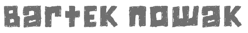
 Original fonts by Polishman Bartek Nowak (aka Barme, b. 1973) made in 2000-2001: BukwaNormal (Cyrillic), Nokian (pixel font), Passja, Xar, BarmeReczny, Elementarz (orthographic writing for kids) [see also here], Gotyk-Poszarpany (Fraktur, revamped in 2014 as Gotyk Nr 7), Afarat Ibn Blady (Arabic simulation face), Hieroglify, Kobajashi, Kwadryga, Magda (Basque), Maszyna (old typewriter), MaszynaAEG, Nerwus (scribbly, sketchy), Pascal, SecesjaPL (curly font: a revival of Herman Ihlenburg's ultra-Victorian typeface Nymphic, 1889), Zakret, RecycleIt, Sandwich, Keiser Sousa, Manifest.
 Alternate URL. Font list (with repetitions): 4Mini, BarmeReczny, Elementarz, Fiesta, GotykPoszarpany, GrubaBerta, Hieroglify, KeiserSousa, Kobajashi, Kwadryga, Magda, Manifest-Niski, Manifest, MaszynaAEG, MiniMasa, MiniSet, MiniSter, Nerwus, Nokian, Nokian2, Opeln2001-Prosty, Opeln2001, Opeln2001Szeroki, Pascal, Passja, Premiership, RecycleIt, Sandwich, SecesjaPL, Szablon, Wabene, Xar, Zakret, MiniForma, MiniStrzalki, Miniline, Minitot, Ulisson, Astalamet (2002), Gosford (2002), Volan (2002), Establo, QuatronFat, Infantyl (2002), Quatron (2002), YnduFat (2002), YnduOut (2002). URL not accessible to my browser (Mac+Firefox). This site carried these fonts in May 2008: 4Mini, Afarat-ibn-Blady, Astalamet, AstalametPure, BarmeReczny, Cyree, DorBlue, ElementarzDwa, Erton, Establo, EstabloFat, Fiesta, Gosford, GotykPoszarpany, GrubaBerta, Hieroglify, HongKong (oriental simulation), Infantyl, InfantylFat, InfantylItalic, InfantylOut, Jiczyn, KeiserSousa, Kobajashi, Komix, Kwadryga, Lola, Magda, Manifest-Niski, Manifest, MaszynaAEG, MaszynaRoyalDark, MaszynaRoyalLight, MiniBet, MiniForma2, MiniJasc, MiniKongo, MiniLine2, MiniMasa, MiniQuan, MiniQuanMniejszy, MiniSet2, MiniSter, MiniStrzalki, MiniTot, Nerwus, Nokian, Nokian2, Opeln2001-Prosty, Opeln2001, Opeln2001Szeroki-Metro, Opeln2001Szeroki, Pascal, Paskowy, Passja, Quatron, QuatronFat, RecycleIt, Sandwich, SecesjaPL, Sloneczko, Szablon, Tabun, TechnicznaPomoc-Italic, TechnicznaPomoc, TechnicznaPomocRound, Ulisson, Vaderiii, Volan, Wabene, Xar. In 2011, he established the commercial foundry GRIN3. Dafont link. Klingspor link. Fontspace link. GRIN3 link. Old free font URL. Showcase of Bartek Nowak's commercial fonts. [Google]
[MyFonts]
[More] ⦿
|
Bartek Nowak
[Barmee.com (was: Czcionki.com, or: Barme Fonts)]
|
 [MyFonts]
[More] ⦿
[MyFonts]
[More] ⦿
|
Betterfear.us (or: XXII Fonts, Or Doubletwo Studios)
[Lecter Johnson]
|
 Lecter Johnson (Betterfear.us) published many free fonts between 2007-2012. At Behance, we find the name John Thorn (Germany) and a mention of Hamburg, but also a reference to Greatwhite in Beirut, Lebanon.
 Typefaces: XXII Sinoz DSP (2010-2011, elliptical face), XXII Gory Bastard (2011), XXII BLACKMETAL WARRIOR (2010), XXII Menga (2010, a technical sans family), XXIIARMY (2007, stencil), XXIIDECONSTRUCTION-DESTRUCTION-AREA (2007, grunge), XXIIDONT-MESS-WITH-VIKINGS-HARDCORE (2007, octagonal), XXIISTRAIGHT-ARMY, Army Dirty (grunge stencil), XXIIUltimate-Black-Metal (2007, cracked metal look), XXII Scratch (2007, scratchy face), XXII DEVILS-RIGHT-HAND (hand-printed), XXII BLACK-BLOCK (grunge), XXII MISANTHROPIA (2008, a rigid geometric sans family), XXII Arabian Onenightstand (2008: Arabic or Indic simulation face), XXII Urban Cutouts (2009, grunge), and XXII Static (2007, futuristic). His web site has a threatening nazi sort of look, but the fonts are (were) free. Betterfear.us claims to be located in St. Pauli, Hamburg, and is also known on MyFonts, where some of its fonts can be bought, as Doubletwo Studios. These include XXII Yonia (rounded script family loaded with opentype features), XXII Goregrinder, XXII Grober Bleistift (2013, marker font), XXII Centar (a sans family with a free regular style), XXII Totenkult (2012), XXII Blackened Wood (2013), XXII Candylove (heavy signage or packaging script), XXII Centars Sans (2012), XXII Daemon Runes (2012), XXII Total Death (2012), XXII HandTypewriter (2012), XXII Daemon (2012), XXII Marker (2011), XXII BLACK BLOCK SERIFA (2008), XXII Mescaline (2009 Western style), XXII Misanthropia (2010, geometric sans), XXII Marker (2011), XXII Blasphema (2011) and XXII STREITKRAFT (2008, a stencil family with grungy versions added). Older list of fonts: Devils Right Hand (blackboard script), Black Block (grunge), Static (techno), Ultimate Blackmetal, Scratch, Don't Mess With Vikings, Army Dirty (grunge stencil), Army Straight, Black Block Eroded. Typefaces from 2014: XXII YeahScript (signage script). Typefaces from 2015: XXII Geom (a geometric sans typeface family), XXII Awesome Script (for signage). Typefaces from 2016: XXII Neue Norm (techno sans), XXII Cool Script, XXII Geom (a geometric sans typeface family), XXII Grober Pinsel (brush typeface). Typefaces from 2017: XXII Neue Norm Rounded, XXII InAshes (grungy blackletter). Typefaces from 2018: XXII Geom Slab. Klingspor link. Alternate URL. Behance link. Dafont link. Another Behance link. Old URL. Another Dafont link Yet another Behance link. And a final Behance link. [Google]
[MyFonts]
[More] ⦿
|
Callum Crew
|
Bristol, UK-based graphic designer who created Harmony (2012, an Arabic simulation typeface inspired by the Alhambra in Granada) and Diversity (2013), a grid-based geometric typeface. Behance link. [Google]
[More] ⦿
|
Canada Type
[Rebecca Alaccari]
|
 Foundry in Canada, est. 2004 by Rebecca Alaccari in Toronto, and run by her and Patrick Griffin. Interview with Rebecca. Her typefaces can be bought via MyFonts: Storyville (2015, a curly script), Centennial Script (2007, a revival of an 1874-1876 high-contrast calligraphic script by Hermann Ihlenburg), Valet (2006, superb art deco face), Freco (2006, an art deco typeface loosely based on designs and letters of Fré Cohen), Silk Script (2006, based on 1956 Helmut Matheis script called Primadonna), Dominion (2006, based on an early 1970s film type called Lampoon), Johnny (2006, an art nouveau poster typeface that revives the Harem/Margit typeface by Phil Martin, 1969), Guillotine (2007), Mayfair (2006, a calligraphic typeface based on Mayfair Cursive by Middleton, 1932), Happy Birthday (2006, script), Geronimo (2005, brush style poster font), Rostrum (2005, a revival and expansion of a type called Oleander, designed in 1938 by Julius Kirn for the Genzsch&Heyse foundry in Hamburg), Apricot (2005; based on A.R. Bosco's Romany for ATF, 1934, but a major extension with many ligatures), Heathen (2005), Cougar (2004, a digital version of Martin Wilke's 1968 handwriting typeface Konzept), Puma (2004, brush typeface based on Herbert Thannhaeuser's 1954 Kurier), Big Brush (brush), Diva (connected script), Odette (a high ascender display typeface after the Morris Fuller Benton 1918 American classic, Announcement Roman), Crucifix (2004, a severe octagonal face), Fore (2004, a bullethole face), Formula, Gamer (2004), Formula (2004), Kofi, Platoon (2004, a stencil face), Verso (2004), Secret Scrypt (2004, a handwriting face), Bluebeard (2004, blackletter by Patrick Griffin), Bolero (2004), Janice (2004, psychedelic), Jimi (2004, also psychedelic), Scroll (2004), Dominique (2004, upright script), Moxie (2004, a fat display family which includes a stencil), StockA (2004), StockB (2004, a fat stencil face), Stalker (2004, a destructionist face), Scroll (2004), Jonah (2005, a hippie typeface based on an early 1970s film type from Franklin Photolettering called Urban). MyFonts page. Phil Rutter and Patrick Griffin made Coffee Script (2004), the digital version of R. Middleton's Wave design for the Ludlow foundry, circa 1962. Phil Rutter and Rebecca Alaccari designed Almanac (2004), a script typeface based on Imre Reiner's London Script (1957) (and Rebecca did a subsequent redigitization in 2007 that led to Reiner Hand), Tiger Script (2004, based on Georg Trump's wild brush script Jaguar done in 1967 for C. E. Weber), and Ali Baba (2004), an Arabic simulation typeface originally designed by Georg Trump as Palomba (1955, C.E. Weber foundry). Patrick Griffin made Leather (2005, after Imre Reiner's 1933 blackletter face), Secret Scrypt (2005), Skullbats (2005), Slang (2004, a blood scratch face), Bluebeard (2004), Expo (2004, an octagonal family), and Dancebats (2004). Simone Wilkie designed Boyscout (2004) after the handwriting of her son. Helmut Matheis' Contact (1963, flowing script/brush) was digitized by Rebecca in 2004 as Bruschetta. Rebecca also made Steiner Special (2007, a revival of Swing, a film type by Peter Steiner, 1974), Genesis (2007, a digitization and extension of Grayda, a 1939 calligraphic script of Frank H. Riley at ATF), Evolver (2006, futuristic family), Redwood (2007, a calligraphic script based on Willard T. Sniffin's Raleigh Cursive (1929, ATF)), Orotund (2005, after the 1970s typeface Eight Ball; this was extended again in 2006 in her art nouveau typeface Huckleberry, which is a revival of the 1973 typeface of Gustav Jaeger called Mark Twain), Pendulum (2005, a fantastic flowing script based on Nebiolo's Americana, 1945), Jojo (2005, a flower child typeface after Spring, by Bernard Jacquet), Mascara (2004), Gala (2004, after Neon (1935, Giulio da Milano at Nebiolo)) and Bella Donna (2004, after a script made by Alessandro Butti in 1948, called Rondine).
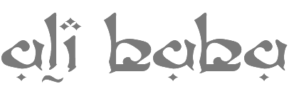
 Typefaces made in 2005: Jazz Gothic (Patrick Griffin), Showboat, Hunter (a revival of Imre Reiner's brush script Mustang, 1956), Quanta (stencil), Quiller (a script typeface based on J.J. Sierke's 1964 typeface Privat), Rhino (revival of Mobil, a 1960 typeface by Helmut Matheis for Ludwig&Mayer), Dominique (donated to FontAid), Secret Scrypt (donated to FontAid), Jackpot (2005, Western typeface remotely based on Cooper Playbill which in turn is related to Cooper Black, but it also has hippy 1968 influences), Sincerely (handwriting typeface based on Karlgeorg Hoefer's 1968 Elegance), Fontella (a digitization of Novarese's calligraphic script Elite), Boondock (digitization of Imre Reiner's Bazaar from 1956), Gumball (digitization of Papageno, a 1958 bubblegum font by Richard Weber for Bauer), Runway, Gamer, Dominique (OpenType handwriting face), Sterling Script (2005, by Alaccari and Griffin: a 7-weight digitization and extension of Stephenson Blake's 1952 clean copperplate script Youthline Script), Vox (2007, a 24-style monoline sans family done with Patrick Griffin), Vox Round (2013, a softer version), Swan Song (2006: a calligraphic typeface based on the hand of Alexander Nesbitt. A later document states that it is based on work by British artist Rachel Yallop from 1986), Evolver (2006, a 9-style futuristic family), Ambassador Script (2007, an Alaccari-Griffin revival of the angle-reduced calligraphic script Juliet by Nebiolo, 1955). In 2005, Philip Bouwsma joined Canada Type, and designed a great calligraphic blackletter-inspired family, Torquemada. He designed many other typefaces for Canada Type in subsequent years. VIP (2007, Rebeca Alaccari) is a humanist sans serif uppercase (and figures) combined with a freshly redrawn revival of the classic VGC Constanze initials originally designed by Harry Brodjian in 1970, and even further back, the Constanze Initials by Joachim Romann (1954-1956, Stempel). Chopper (2007, by Rebecca Alaccari) is a revival of Venture (a 1972 typeface for VGC by Harry Villhardt). Walter (2007, Rebecca Alaccari) is a digitization of Heritage (1952, ATF, a calligraphic script by Walter H. McKay). Celebrity (2007, Rebecca Alaccari) revives and extends the retro/techno typeface Latus (Willy Wirtz, 1971). Sympathique (2008, Alaccari) is an ultra-thin and ultra-tall typeface in the mold of Bernhard Fashion and other era poster or film typefaces (they say that it is rooted in the film typefaces Hairstreak and Mossman). Mullen Hand (2008) is a revival of Repro Script (1953, Jerry Mullen, ATF). Filmotype Giant (2011, a condensed sans) and its italic counterpart, Filmotype Escort (2011) were both co-designed with Patrick Griffin. In 2020, they released the variable informal sans typeface Bananas: Bananas was sourced from multiple American film era faces, all from 1950s and 1960s, when the casual sans genre was at its popular peak. Headliners' Catalina and its very similar cousin, Letter Graphics' Carmel, served as initial study points. Catalog of its typefaces. Klingspor link. [Google]
[MyFonts]
[More] ⦿
|
Carolina Rodríguez
|
Mexican designer of Hendrix (psychedelic) and Iyul (an Arabic simulation face), mentioned here. [Google]
[More] ⦿
|
Catharsis
[Christian "Cinga" Thalmann]
|
 Catharsis is located in Leiden, The Netherlands. Before that, Christian Thalmann's page Cinga.ch was run out of Switzerland, when he was a student at ETH Zürich. Thalmann is an astrophysicist by training.
 Catharsis had free typefaces such as the great Arabic simulation typeface Catharsis Bedouin (2004), CatharsisCircular, CatharsisRequiem (a unicase pair), CatharsisRequiemBold, CatharsisCargo, Cirnaja Bookhand and Cirnaja Calligraphy (made for his artificial language, Obrenje), Catharsis Macchiato (2005), CatharsisEspresso (2005). At Catharsis, the commercial foundry, he published Octant in 2013: Octant is an original steampunk display typeface drawing inspiration from Victorian-age steel and brass engineering, as well as from blackletter typography. Gryffensee (2013, in styles called Eins, Zwei and Drei) is designed to be the Futura of blackletter, combining the time-honored gravity and relentlessness of the Gothic script with the clean, contemporary freshness of the geometric sans. It also covers Cyrillic. Backstein (2013), baked brick, took its inspiration from the broken antiqua lettering in Berlin's old subway stations. Volantene Script (2013) is a (free) uncial display typeface inspired by the penmanship of Lady Talisa Maegyr-Stark as seen on HBO's Game of Thrones. Numina (2013, Glamour and Glory substyles) is an extensive condensed fashion-oriented typeface family related to Skyline and Corvinus. Maestrale (2013) adds calligraphic and flamboyant extenders to a decorative text typeface for a dramatic effect. Choose between Maestrale Manual (swashy) and Manuale Text. Blumenkind (2013) is inspired by an instance of metal-strip lettering found on the Bürgermeister Kornmesser Siedlung residential building complex in Berlin from the 1960s. Brilliance (2013) is a glamorous contemporary display blackletter combining the rich tapestry of Textura with a hint of the airy lightness of Spencerian script. Let's say that it is a light-hearted Textura. In 2015, he made the free 45-style classic serif typeface family Cormorant, which includes several unicase fonts. This typeface started out in 2014 as Paramond, a light, contrasted, space-taking Garalde with impossibly tiny counters and long extenders. Links to the Google Font directory: Cormorant, Cormorant Garamond, Cormorant Infant, Cormorant SC, Cormorant Unicase, Cormorant+UprightCormorant Upright. See also CTAN. In 2016, he created the humanist geometric sans typeface family Quinoa for Latin, Cyrillic, Greek and Hebrew. Typefaces from 2017: Tesserae (kitchen tile style), Traction. Traction was originally conceived and designed by Christian Thalmann. Chiara Mattersdorfer and Miriam Suranyi expanded, completed and produced the font family. This typeface sports signature serifs, soft edges and a fluid, organic design. In 2018, Christian started work on a blackletter-themed stencil typeface, first called Komik Ohne (the German for Comic Sans) and later named Kuschelfraktur (2019). Between 2016 and 2019, he developed Eau de Garamond---a sans distilled from the essence of Garamond---, which was later renamed Ysabeau. Github link. In 2020, we find another fork, Isabella Sans. Overbold (2019) is described by him as follows: Overbold is an unapologetic display typeface inspired by an illustration in Eric Gill's Essay on Typography (p.51), in which he demonstrates how not to make letters. In particular, he shows that increasing the weight of the downstroke in a serif A without structural adjustments yields an absurd, overbold result. I found the letter so charming that I decided to blatantly disregard Gill's wisdom and draw an entire overbold typeface. Here is the result. I'm not sorry. 1001 fonts link. Yet another URL. Fontspace link. Behance link. Klingspor link. Dafont link. Open Font Library link. Github link. [Google]
[MyFonts]
[More] ⦿
|
Choz Cunningham
[Exclamachine Type Foundry]
|
[MyFonts]
[More] ⦿
|
Christian "Cinga" Thalmann
[Catharsis]
|
 [MyFonts]
[More] ⦿
[MyFonts]
[More] ⦿
|
Christian Munk
|
 Danish designer (b. 1991), aka CMunk, who used FontStruct to create most of his typefaces. Dafont link.
 In 2008 he designed Flag Semaphore (+Smooth, Peace), Articulate, Font from NATO (military slab serif), Glockenwerk (pixel clock font), Glockenwerk Uhrzeit, Flags-and-NATO (dingbats), Font from NATO alpha, Tall, Flying-Circus (Western showtime typeface to imitate the Monty Python titling font), LCD-display, Simple (stencil font with 700 glyphs), TMNT, Tetris, sharp-pixels, Raster, Quad (nice stencil face), Inverted, Propaganda (Cyrillic font simulation), Empty Monospace, Pride, Stadium, Rounded, Dear God (script pixel face), Celtic Style. In 2009, he added 7x12 Pixel Mono, @bcde, Abstract Letter Patterns, Music, Texture, Diagonal, Gothic, Illusio, Unispace (typewriter type), Narrow Serif, Delta, Alien Double (great!), Donut, Flags-and-NATO, Simple-Fraktur-Initial, Simple-Fraktur, Texture, Friendly Serif, (+Soft), Invisible, Sharp, Heavy Diacritics, Concentrium, Continuous Digital Display, Elves, Pixies, Space Movie (+Ligatures), Flag Semaphore (+Smooth, +Peace), Articulate, BBT Biline Twist, Biline Twist, Empty Monospace, Unfix, Infix, Pride, Tyre Stencil (like tire threads---nifty...), and Overlap. FontStructions from 2010: Even (gridded), Brilliance, Slalom Vision, Quirky Serif, 7x12PixelMono, Ball Terminator, Gearbox, Prefix, Upside Down, Way Too Small (a minimalist pixel face), Butterfly, Ribbon Gymnastics, 2D Barcode, Horizon Stencil, Biline Twist, Blocktur, Symmetricus (alien writing?). FontStructions in 2011: 12 dice, Monotwist (tall, monospaced), Squarific (fat octagonal), Swirl (curly), Sweet (Victorian), Easter Eggs, 50 Fifty (experimental, geometric), Squarific (+Stencilious), Spiralix (spiral-themed for Latin and Cyrillic), Bloccus, Feet (monospaced). Creations from 2012: Düpbøl (German expressionist face), Slice, Blocktur, Alien Double, 7:12 serif (pixel face), Blick, Dry Heat (Isolates and Initials, Medials, Finals: an Arabic simulation family), FF9 Coin Slots, FF8 Untalic, FF7 w1de, FF6 Lean Mean, FF5 Bamana, FF4 Circulation, FF3 3times7, FF3 Runization, FF1 Glitchy, Squared, Puzzlish, Steep, Digitalis (octagonal), 50 Fifty (artsy and geometric), Monotwist, Infix. FF stands for Forgotten Fonts. Typefaces made in 2013: Ribbons And Banners, Digital Rome (pixel face), Censorship, Interlock, Bouma, Glaedelig Script, Hand XL Smooth, Vascomat, Spitzschtruct (emulation of Suetterlin), Neonic, Fish Scales, 7:12 Serif, Analogly, Squarific Fraktastic, Metro Sans (pixelish). Typefaces from 2014: Word Games, Shadows, Yuuroppuna pixel, Spines, Numbers, Tal Dansk, Zahlen Deutsch, Insular Typewriter, Nudge Nudge (dot matrix), 7:12 Serif (monospaced pixel font), Jovian, Squarafic Fraktastic, Computer Says No, Runic, Fluorescent (neon tube typeface). Typefaces from 2015: Hexagonia, Kapow (a comic book font), Fauxreign (a Thai emulation font). Typefaces from 2016: Ziplock (art deco), Vexillum (maritime signal flags). Typefaces from 2019: Drop Cap (Lombardic), Fun with Cubes (3d). [Google]
[More] ⦿
|
Christian-Heinrich Wunderlich
[Typografisches Cabinet]
|
[More] ⦿
|
Closefonts
[Simon Schmidt]
|
Closefonts is a foundry that was set up in 1997 by Simon Schmidt (b. 1968, Hamburg). He studied graphic design and typography at Parsons School of Design, New York and at Kunstschule Alsterdamm in Hamburg, Germany. After three years as an art director in advertising, he became aa self-employed graphic and type designer specializing in corporate design. His typefaces can be found at Fontomas and Closefonts. They include Monolith, Delay (2001, has kitchen tile weights), Beta, Hybrid, Ogra, Ograbic (Couscous, Falafel, Kebab: Arabic simulation typefaces), Hybrid, Schlager (50s diner font), Ness, Lorem Ipsum, Maxpo, Call (free), Gridder (1999, free), Dotter (free), CloseRaceDrive (2000), CloseRacePark (2000), CloseCall, CloseGridder. Some of Simon Schmidt's fonts can be bought at Fountain: Delay, Hybrid, Monolith, Ness, Schlager. He designed the pair Park and Drive in his Race series at fontomas.com in 2000. He created Hookline in 2001 at Fontomas. His 2007 fashionably elegant Vogue-style sans typeface Mondän is stunning. FontShop link. Abstract Fonts link. Klingspor link. [Google]
[MyFonts]
[More] ⦿
|
Coron's Sources of Fonts
|
Dead link. Stephan Baitz's informative page about Ancient Scripts and Fonts, including fantasy fonts, alien and sci-fi fonts, Blackletter fonts, uncials, runes, symbolic fonts, Indic simulation fonts, Arabic simulation fonts (such as Caliph) and exotic fonts. Lots of links are provided as well. Fonts are displayed an can be downloaded from an archive. His page looks great too. [Google]
[More] ⦿
|
Cozy Fonts Foundry
[Tom Nikosey]
|
 Type designer (b. 1951, New York) in New York City, who studied at Pratt. His type foundry, Cozy Fonts, is located in Bell Canyon, CA.
 Creator of the Arabic simulation typeface Aladdin (2012), Skratchbook (2012), Toms Finger (2013, hand-printed cartoon typeface, +Toms Pinky, +Toms Thumb), Noodlerz (2013), Posterface (2014, +Sans; modular poster font family), Speener (hand-printed), Victory Script (2015), Archiva (2016: a useful rounded yet squarish condensed typeface family, +Stencil, +Dropline), Slenderz (2016: a handcrafted sans family), and Ds Hand (2016, based on the hand of Danielle Nikosey). Typefaces from 2017: Civic Sans (a 13-style sans family for billboards). Typefaces from 2018: Irongate. Typefaces from 2019: Flintlock. Typefaces from 2020: Planetype (futuristic, modular), Slatz (an ultra-condensed sans and serif family). Typefaces from 2021: CF Cozyscript (a monolinear retro school script), CF Nixt (a seven-style simple monolinear geometric sans in the mid-century American and Swiss traditions, perhaps leaning closest to Avenir). Typefaces from 2022: Neuliner (a 7-style metro-retro font). [Google]
[MyFonts]
[More] ⦿
|
Creativework Studio (was: Creativework69 Studio)
[Daddi Daryawan]
|
 Bandung, Indonesia-based designer, b. 1969, of Skatter (2018: signage script), Indonesian (2018), The Beach Boy (2018), Bali Paradiso (2018), Betterday Calligraphic (2018) and Hartford (2018).
 Typefaces from 2019: Playground, Bellaviesta (script). Typefaces from 2020: Cheese Roll (a layerable comic book typeface), Freezone, Crunchy Croissant, Spooky Monster, Caramel Candy, Sketcher, The Centurion (a decorative blackletter), The King Of Romance (a rabbit ear script), Chicken Sticks (a fat finger font), Caramel Candy, Brigitte Eigner (a signature script), Black Eagle (a dry brush script), Chicken Soup, Homelike (an oily bubble or balloon font), Khalifah (Arabic emulation), Blackboard, Grandes (a fat script), Enchantee, Alessandra, Mellodious (a monoline script), Monkey+Banana, Mister Clown, Maheswari (a wild script) Blessing (script), Deathblood (brush). Typefaces from 2021: Blacksign (a dry brush script), Black Eagle (a dry brush script), Brigitte Eigner (a signature script), Caramel Candy (a creamy scrapbook script), Chicken Sticks, The Centurion (a frivolous decorative blackletter), The King Of Romance (a rabbit ear script), Grandes (a heavy retro signage script), Mister Clown (a children's book font), Enchantee. Creative Fabrica link. [Google]
[MyFonts]
[More] ⦿
|
CybaPeeCreations (or: Typoasis)
[Petra Heidorn]
|
 CybaPee is the nom de plume of Petra Heidorn who lives near Hamburg. She has created many typefaces (listed below) between 1997 and 2005 and has cooperated with several type designers on interesting projects. She is undoubtedly best known for her successful web site Typoasis (discontinued in 2016), where one could download her own creations, and those of her many friends. Petra was also heavily involved in several attempts to revive blackletter fonts, in cooperation with Manfred Klein, Dieter Steffmann, Paul Lloyd and others. She organized several revivals of the typefaces of Rudolf Koch and Ernst Schneidler. She also managed the extensive web presence of Manfred Klein.
 In 2016, she allowed me to host her fonts on my site. Download page. Download all her fonts in one zip file. Her typefaces: - AlphanatismConHeads (2001). Stamped style.
- ArabDancesMediumItalic (2002). An Arabic simulation typeface done with Manfred Klain's assistance.
- Azimech (1999).
- Bauernschrift (2004). After a 1911 typeface from Bauersche Giesserei.
- Bayreuth (2003). A nice scan-version of Bayreuth Fraktur by Ernst Schneidler for C.E. Weber in 1932.
- Bibelschrift (2004). Codesigned with Manfred Klein, Bibelschrift revives a Fraktur from 1926-1928 used by the Bremer Presse, est. 1911. The Bremer Presse was bombed by the Americans in 1944.
- BirthdayGreetz (1999).
- Brahms Gotisch (2005). A blackletter typeface co-designed with Manfred Klein. It is a revival of a 1937 Genzsch&Heyse typeface designed by Heinz Beck.
- Burte Fraktur (2003). After Christian Heinrich Kleukens for the Mainzer Presse, 1928.
- CalliBrush (1999).
- Camouflage (1999). Textured.
- Chaos-Theorie (2000). A Halloween or vampire font.
- Charon (1999). An angry and / or scary typeface.
- Crystopian.
- CursedKuerbis (1999).
- Cyclin (2000). An ironwork font.
- DecoCaps (1999). Ornamental caps.
- DeutscheDruckschrift (2004). A revival of Heinz König's 1888 blackletter typeface for Genzsch&Heyse.
- DeutscherSchmuck (2004). Codesigned with Manfred Klein, this ornamental dingbat font is a revival and extension of the Schmuck für Deutsche Druckschrift by Eduard Ege, Genzsch and Heyse, 1922.
- DiamondDreams (1999). A pearly all caps typeface.
- Ellipsoideogram (2000). An italic headline sans.
- Epitough (1999). A sans.
- Extemplary (1999).
- Funtastique (1999). An exagerrated, almost bubbkly, art nouveau typeface.
- Gondoliere (2000). A light-hearted poster typeface.
- Gotika (2005). After Reiner's 1933 blackletter typeface for Bauer.
- Greex (1999). A Greek emulation typeface.
- Hans Sachs Gotisch (2005). Based on a typeface by that name of Albert Auspurg, 1911, Genzsch&Heyse.
- Hartwig-Schrift (2005). A blackletter typeface that revives Hartwig Poppelbaum's Hartwig Schrift from 1927-1928.
- Hasenchartbreaker (1999). A handcrafted typeface.
- Heimat (2005). After Wilhelm Weimar's Heimat from 1917, Genzsch&Heyse.
- HelvAssim (1999). A naughty take on Helvetica to needle Linotype.
- Hohenzollern (2004). Based on Carl Albert Fahrenwaldt's blackletter typeface for Bauersche Giesserei, 1902.
- HollandGotisch (2005). Designed together with with Manfred Klein, this is a revival of the textura typeface Nederduits (aka Fleischmann Gotisch) by Johann Michael Fleischmann, ca. 1750.
- InkyDinky (1999).
- IsleOfTheDead (1999). An angular handcrafted typeface reminiscent of the movie titling of Dr. Caligari.
- Jaecker-Schrift (2005). Revival of the 1912 blackletter typeface by Wilhelm Jaecker for D. Stempel.
- Kleukens-Fraktur (2004). A Schwabacher based on a design by Friedrich Wilhelm Kleukens, 1910.
- KrasniFellows (1999). An old Slavonic emulation typeface.
- KuehneRevised (2003). A blackletter typeface.
- LadyIce-Italic, LadyIce-SmallCaps, LadyIce, LadyIceRevisited, LadyIceRevisitedUpper. An organic monoline sans typeface family developed together with Apostrophe.
- Leibniz-Fraktur (2003). A Schwabacher typeface based on a house font at Genzsch & Heyse, 1912.
- LeontineLoew. A warm and plump informal typeface.
- LightBats (1999). Dingbats.
- Lupinus (1999).
- Lurzing-Initials (1997). A decorative caps typeface based on a 1908 typeface by Karl Lürzing that depicts naked figures.
- Manuskript Gotisch (2004). A revival of a 1514 Textura typeface by Wolfgang Hopyl, which was a house typeface at the Bauersche Giesserei in 1899.
- ModerneSchwabacher (2005). After a ca. 1900 typeface by the Otto Weisert foundry called Moderne Halbfette Schwabacher.
- MonkeyHouseParty (2001).
- MothproofScript (1999). A calligraphic typeface. The name is a take on frostmoth, one of Petra Heidorn's early aliases.
- MuseAsis (2002). Artsy fartsy.
- Napapiiri (1999).
- Neudeutsch (2004). After a 1900 original by Otto Hupp for Genzsch&Heyse.
- NeueFraktur, NeueFrakturExtraBold (2004). Revivals of typefaces by Johannes Wagner Schriftgiesserei in 1927.
- NinjaLine (2000). An outlined graffiti typeface.
- Nordland (2005). Based on a typeface by Heinz Beck for Trennert&Sohn, 1935.
- Oetztype (1999). German expressionist. Named after the Tyrolian Iceman, Oetzi.
- Oktoberfest (1999).
- Pachyderm (1999). A nice ultra-fat typeface.
- PeesCelticItalic, PeesCelticPlain, PeesCelticOutline (1999). Ornamental Celtic caps.
- Pegypta, Pegyptienne (1999). Hieroglyph-inspired typewriter fonts.
- PostmoderneFraktur (1999).
- Rammstein (1999). A tall condensed typeface.
- ResPublica (2000).
- RoteFlora (1999). Garffiti style typeface.
- RoyalGothic (1999). A swashy set of initials.
- SadLisa. A kitchen tile font designed to support Lisa Jenkins in a copyright battle.
- Sagittarius (1999). An arrowed typeface.
- SailingJunco (1999). A stencil typeface.
- Scalper-Bold, Scalper, ScalperInk (2001). Grunge style.
- SchmalfetteGotisch (2004). Codesigned with Manfred Klein, this semi-Textura typeface is based on a type of Ernst Schneidler.
- SchneidlerInitialen (2004). After F.H.E. Schneidler.
- Schneidler Schwabacher (2004). After F.H.E. Schneidler.
- SchwabachDeko (2005). This is Verzierte Schwabacher by Carl Kloberg, Leipzig, 1891. In 2005, Petra co-designed a similar revival of Verzierte Schwabacher with James Arboghast, simply called Verzierte Schwabacher. Her SchwabachDeko attempted to be as close as possible to the original.
- Scoglietto (1999). A text typeface.
- SerpentisBlack (2004). Digitization of a typeface by E.W. Tieffenbach for Officina Serpentis, 1913. This in turn is based on a Gotico-Antiqua by Peter Schoeffers (Mainz, 1462) which was refined in the late 15th century by Creussner and Koberger.
- SlimlinerMicro (1999).
- Smoke-Rasterized-Medium (2001). Degraded and textured.
- SoftAutumn (1999).
- Stoertebeker (1999). A mediaeval typeface with a rough outline.
- SunnySide (2000).
- Symphonie (2005). A digitization of Imre Reiner's Symphonie from 1938 (renamed Stradivarius in 1945).
- TaraType (1999). A lapidary typeface named after Petra's friend, Sabine Taranowski.
- Teutonia (2004). Based on a typeface by Roos & Junge, ca. 1900.
- TipTop (2004). Based on a typeface from Schriftgiesserei Julius Klinkhardt, Leipzig, ca. 1900. Virtually identical to Teutonia.
- ToolTime (1999). Dingbats.
- TypesourceFanclub (2001). A heavy semi-slab serif.
- Urdeutsch (2004). A rounded blackletter typeface based on Urdeutsch (1924-1925, Adolf Heimberg for Genzsch&Heyse).
- Vogeler Caps (2002). Based on Heinrich Vogeler's decorative blackletter caps typeface Jugendstil Initialen (1905).
- Weiss-Gotisch (2004). A revival of E.R. Weiss's typeface by that name, published in 1936 at the Bauersche Giesserei.
- WelcomeY2K (2000). A casual typeface.
- XmasTerpiece, XmasTerpieceSwashes (2001). A Fraktur font based on Rhapsodie by Ilse Schuele.
Dafont link. Klingspor link. Fontspace link. [Google]
[More] ⦿
|
Daddi Daryawan
[Creativework Studio (was: Creativework69 Studio)]
|
[MyFonts]
[More] ⦿
|
Daffa Syarif
[Syukur Setiyadi]
|
Designer of Sparkling Khufis (2020: oriental emulation font), the brush scripts Iron Hearts (2020), Anny Graces (2020), Emphasize (2020), and the grungy script Youngers (2020). The designer is related to SSi Scraps. [Google]
[MyFonts]
[More] ⦿
|
DaFONT
|
Oriental, Arab and Indic simulation font archive. [Google]
[More] ⦿
|
Dan M. Zadorozny
[Iconian Fonts]
|
 [More] ⦿
|
Dan X. Solo
[Solotype]
|
 [MyFonts]
[More] ⦿
[MyFonts]
[More] ⦿
|
Daniel H. Evans
|
Assistant Professor in the Department of Art & Art History, University of Utah, in Salt lake City. As Fugitiveglue at FontStruct, he made Allemande (2010), and Havre (2009, gridded), as well as the more experimental Luggage Lifter (2010), Root Canal (2010), Unexamined Zipper (2009) and Gawe (2010). Routeo (2010) is art nouveau, and Ampul (2010) simulates Arabic. Perforane is a heavy mechanical/octagonal unicase typeface, while Guasco (2012) is a curly high-contrast face. Perforance became the basis of a large family of fonts, like PERF Blur (textured face), PERF Glow, PERF Solid, PERF Solid 3D, PERF Knockout 3D, PERF Punch1 3D, PERF Punch3 3D, PERF Punch1, PERF Punch2, Cuevita (2012). Typefaces from 2013: Apocalipsis, Boot Liquor (a western face), Galactica Alphabetz, Clownstruct, Ball Chain (texture face; +Light). Typefaces from 2014: Sunday Clothes. [Google]
[More] ⦿
|
David Fernando Espinosa Martínez
[Type Sailor]
|
 [More] ⦿
|
David Fleming Nalle
[Scriptorium (Ragnarok Press, Fontcraft)]
|
 [MyFonts]
[More] ⦿
[MyFonts]
[More] ⦿
|
David Kasidi
[Silverdav Studio]
|
[MyFonts]
[More] ⦿
|
David Kerkhoff
[Ensotype]
|
[MyFonts]
[More] ⦿
|
Dennis Ludlow
[Sharkshock]
|
 [MyFonts]
[More] ⦿
[MyFonts]
[More] ⦿
|
Double Alex Team
[Alexei Chekulayev]
|
 Cyrillic type outfit, whose fonts were mostly designed by Alexey Chekulaev in the mid 1990s as extensions of Latin fonts. Double Alex stands for Alexey Gunin and Alexey Chekulaev. The list of fonts, all in Cyrillic and many in Latin as well:
 - Decorative: Angelica (1996), Apostol, Arabskij (1993, Arabic simulation typeface based on an artwork of designer Oleg Snarsky), ArtScript, Blagovest (a series of Old Slavonic types), BorjomiDecor, CalipsoCyrillic, CalligraphRuss, Camerton, CooperDAT, CoventryCyr, Demosfen, Drops, E2, E4, Electronica, ElectronicaS, Eskiz, 1, Eskiz, 2, FavoritTraf, Finist, Hitman, Inicial, Italiansky, Jokey, Josephine, KeyFont, Kisty, Manuscript, Mistica, Mobul, Nelma, Ottisk, Petrovsky, PresentDAT, Radius, Repriza, SansDecor, Strob, SuvenirRus, TabloFont, Triline, Verbena, Vodevile.
- Sans serif: Acsioma (1996), AcsiomaNext, Apical (1995, based on Agfa Aurora; Apical Bold is identical to Bitstream's Aurora Bold Condensed; for another version, see Castcraft's OPTI-Aurora Grotesk No. 9), Bastion, BastionKontrast (1992; co-designed with Alexey Gunin, and based on Helvetica), Blits, Block A, Block B, Bloknot, CyberCyr, Ecyr, Eurofont, Favorit, Favorit, Condensed, Freestyle, Kekur, Mania, MetRonom, Normalize, Orenburg, PaperGothic, Pinta, Plastica, Positiv, Pravda, Priamoj, PriamojProp, Regina, Rostislav, Rotonda, Rubrica, Sistemnyj, TornadoCyr.
- Serif: Adamant, Alliance (1995, based on Berkeley Old Style by Frederic W. Goudy, 1938), APCCourier, APCGaramond, BaskervilleDAT, Bodoni Cyrillic (1970), Borjomi, ClassicRuss, Coliseum, Diet Didot (2006, published by Paratype in 2014 as DietDidot), Egypetskij, Grand, Grenader, Ideal, Jargon, Laguna, Latinskij, Legenda, Madrigal, Metropol, Shakula (1996, a heavy slab serif by Alexey Chekulaev, based on Monotype's Rockwell), Surpriz (1993, by Alexey Chekulaev, based on ITC Souvenir by Benguiat), Talisman, Vacansia.
- Special: Interfont, Plumb.
Alexei Chekulayev is the Russian designer of Rubrica (1996, Double Alex Font Studio), Angelica (1996, Double Alex Font Studio), Acsioma (1996, Double Alex Font Studio) and Alliance (1995, Double Alex Font Studio, a Cyrillic version of Goudy's Berkeley Oldstyle). He worked on these Linotype families: Univers, Sabon, Wiesbaden Swing, Stencil (1997, after the 1937 original by Gerry Powell), San Marco, and Linotype Bariton (1997: a great poster typeface in the Zeitgeist of the 1930s). In 2014, he designed these typefaces at Paratype: Suvenir Rus (inspired by (psychedelic) artwork of Grigory Klikushin; the original at Double Alex is from 1994), Demosfen (Greek simulation font). Still in 2014, Chekulaev and Akira Kobayashi (Monotype) won a Granshan 2014 award for the Cyrillic typeface SST. Typefaces from 2021: Ice Cream (a supermarket font), Altruiste (a ten-style decorative slab serif), Postulat (a 16-style geometric slab serif). Linotype link. Klingspor link. Another MyFonts link. Paratype link. View Alexey Chekulayev's typefaces. [Google]
[MyFonts]
[More] ⦿
|
DoubleZ Studio (or: Ode Arts)
[Ahmad Zakiy]
|
Based in Banda Aceh, Indonesia, Ahmad Zakiy set up Double Z Studio in 2015. He created the watercolor brush script typeface Greatesque and the script typeface Doodlesack in 2015. Designer of Better Rattler (2016, a dry brush font), Alejandra Script (2016), Aysheea Inline Script (2016) and Lovely Chaos Script (2016, dry brush). Typefaces from 2017: Tatyana Script, Belle Ame, Cute Trouble. Typefaces from 2018: Bestone, Broda Script (signage), Monique Vontana (script), Bride Vibes Script (wedding script), Ballies (marker script), Ana Maria. Typefaces from 2019: Bigtone Script, Fondant, Oullifar (a monoline script), Goozabumps. Typefaces from 2020: Kareem Mubarak (Arabic emulation), Auston. Typefaces from 2021: Belgian Chocolate (a fat finger script), Ballpoint Catalog (a ballpoint pen script). [Google]
[MyFonts]
[More] ⦿
|
D-Studio (Moscow)
[Nikolay Dubina]
|
 DStudio, or Design Studio, is run by Nikolay Dubina, a prolific type designer. He is also a graphic designer, book designer and journalistic writer. He also runs the educational web site ProDTP. Their original Latin/Cyrillic fonts are of the highest quality, and include: Werewolf (2003), Werewolf NU (2003), DS Cosmo, DS Yermak, DS Eraser, DS Showbill, DS Poster Pen, DS Progress, DS Podd Cyr, DS Down Cyr, DS Comedy Cyr, DS Japan Cyr, DS Standart Cyr, DS Zombie Cyr, NewDeli, Stylo, Scrawl, the wonderful DS Nadejda, and DS OlymPix (2001, a pixel font), DPix8Pt (2003, pixel font), DS-Diploma-Bold, DS-Diploma, DSArmyCyr, DSBroadBrush, DS Brushess, DSComedyCyrBold, DSCyrillic, DSDiploma-Bold-Outline-DBL, DSDiplomaArt-Bold, DSDownCyr, DSEraserCyr, DS Initials (ornamental caps), DSJapanCyr--Normal, DSKolovrat, DSMechanicalBold, DSMotterHo, DSMotterStyle, DS Nova Black, DSPixelCyr, DSPoddCyrLight, DS Poster, DSPosterPen, DSProgress-SemiBold, DSRada, DSRussiaDemo, DSSharper, DS Sholom (Hebrew simulation), DSStain, DSStampCyr, DSStandartCyr, DSUstavHand, DSVTCoronaCyr, DSZombieCyr, InavelTetkaCyr, NadejdaBold, NewDeli (great display font!), Scrawl, SeedsCyr-Medium, Stylo-Bold.
 Direct access. More direct access. Some fonts are here. DS Century (2000). Dafont link where one can find DS Goose, DS Motter, DS Arabic and DS Stamper. Old URL. Abstract Fonts link. [Google]
[More] ⦿
|
Eka Pamuji
[Eknoji Studio]
|
[MyFonts]
[More] ⦿
|
Eknoji Studio
[Eka Pamuji]
|
Denpasar, Bali-based designer (b. 1993) of the display typefaces Maldini (2019) and Serdane (2019), the dripping blood font Scarynizo (2019), and the upright rabbit ear script typeface Belatoni (2019). Typefaces from 2020: Hantoria Signature, Sunflowers (a wild script), Soubath Ambyar (a fat finger font), Ralgani, Hekayi, Amalia, Korian (a rabbit ear script), Enlova, Neon Bines, Bellove, Aloritma, Cagakara, Light Beach, Wadaw Mania, Mark Catynia, Hikata, Cutenes Monster, Dream Night, Arbiy, Ramadhani (Arabic emulation), Broolia, Valencia Script, Butter Pineapple (a scrapbook font). [Google]
[MyFonts]
[More] ⦿
|
Electric Typographer
[Judith Sutcliffe]
|
Judith Sutcliffe (Audubon, IA) is the Electric Typographer (est. 1986, Santa Barbara, CA). She has made absolutely exquisite highly original typefaces, which are sold by many foundries and vendors, including Will-Harris. Her typefaces: Abelard (1988, mediaeval), LeonardoHand (Da Vinci's handwriting--greeeeaaaat), Lutahline (clean hand-printed family), ArabiaFelix, Petroglyph (nice dingbat series), AuntJudy, BlockParty, PetroglyphHawaii, ItalianAElectric, TaglienteInitials (another great calligraphic font), TommysType (letters on a clothesline), Kiilani, and Troubador (1988-1989, mediaeval) and Troubador Initials (1989). Atomic Type sells her fonts. Other fonts: Petroglyph Hawaii (1993), Daylilies, Greene, GreeneGreene, Insecta, Leaves, OldstyleChewed, Finfont, Flourish, Hawaii Set, Maskerade, Santa Barbara Electric (1989, a Lombardic / uncial face; + Barbara Svelte, + Barbara Plump), Schampel, Electric Stamps, Daly Hand, Kiilani, Mesopotamia (1992). Emodigi site. At Will-Harris House, we find these fonts by Judith Sutcliffe: Catastrophe, Tommy, Daly Hand and Daly Text (based on the casual calligraphy of Pacific Northwest artist George Daly), Finfont (fish), Daylilies, Leaves, Flourish (calligraphic family), Greene&Greene (architectral lettering), a Hawaiian set consisting of Kiilani, Hibiscus (alphadings), and RockArt dingbats, Insecta (dings), Oldstyle Chewed, Leonardo (neat handwriting of DaVinci simulated), Petroglyphs, Schampel (blackletter), Serpent, Maskerade (masks), Tagliente (nice old-fashioned lettering and caps). FontShop link. Another FontShop link. Klingspor link. [Google]
[MyFonts]
[More] ⦿
|
Encodia
[Geoffrey Johnston]
|
From Noosa, Australia, Geoffrey Johnston's fonts, which include Araborical (an Arabic simulation typeface). Dafont link. FontSpace credits Ben tagain with the design of Araborical. [Google]
[More] ⦿
|
Ensotype
[David Kerkhoff]
|
Ensotype was established in 2018 by Dutchman David Kerkhoff, who also runs Hanoded. In 2018, he published the Japanese brush ink typeface Murasaki and the Arabic emulation typeface Ruhaniyat. Typefaces from 2022: Impending Distaster (a horror font). See also here. [Google]
[MyFonts]
[More] ⦿
|
EPS51
|
 Design studio of Ben Wittner, Sascha Thoma and Daniel Fürst, located in Berlin. Custom fonts made by them include Newface 51 (for M4 Models / Newfaces), Rayon51 (2011, a monoline sans for the magazine Animated), Futur-A-Script (2010), Bodoni Stencil (2009, for Chris Holzinger), Baseet (2009, an Arabic script typeface done with Pascal Zoghbi), Holzinger51 (2008), and the Talib family of typefaces (2008, Arabic simulation fonts). [Google]
[More] ⦿
Design studio of Ben Wittner, Sascha Thoma and Daniel Fürst, located in Berlin. Custom fonts made by them include Newface 51 (for M4 Models / Newfaces), Rayon51 (2011, a monoline sans for the magazine Animated), Futur-A-Script (2010), Bodoni Stencil (2009, for Chris Holzinger), Baseet (2009, an Arabic script typeface done with Pascal Zoghbi), Holzinger51 (2008), and the Talib family of typefaces (2008, Arabic simulation fonts). [Google]
[More] ⦿
|
Essqué Productions
[Stephen M. Knouse]
|
Stephen Knouse (Essqué Productions) is the Alaskan designer in Wasilla (b. 1976) of several free fonts. These include the display typeface Petal Glyph (2007), Avante Go (2008, avant-garde) and Avante Return (2008, avant-garde). He also created the free comic book fonts Happy Sans (2009, beatnik style) and Happy Serif (2008), Diagano (2012, monoline avant-garde sans), the trekkie typeface Dark Future (2011), and Neon 80s (2010, a rounded sans in the style of VAG Round but more so a faux neon font). Spyced (2012) evokes Arabian nights, lava lamps, and Indian mystery. In 2014, Stephen designed Geo Grid 9 (a kitchen tile font) and Tall & Lean. In 2016, he added the octagonal trekkie font Commander Edge. Typefaces from 2021: Power Talks (a bold tuxedoed art deco sans for Latin, Hebrew, Greek and Cyrillic). Dafont link. Fontspace link. Devian tart link. Creative Market link. Behance link. [Google]
[MyFonts]
[More] ⦿
|
Exclamachine Type Foundry
[Choz Cunningham]
|
Choz Cunningham (b. 1975, Santa Cruz, CA) is a Las Vegas and more recently, Nashville, TN-based designer and artist, who set up Exclamachine in 2005. Until 2012, exclamachine published free fonts. In 2012, it went commercial via MyFonts. Designer of Whiskey Songs (2007), Crass Roots, Crass Roots Alt (2016), and Crass Roots OFL (2007, stencil), Misqot (2006), The Troubles (2006), Limberjack (2006, an ornate wood titling font), this blackletter-inspired serif face (2006), Futurelic (2006, futuristic), Zugzwang (2006), Sketchy Times Bold (2005, grunge), Sketchy Times (2005, grunge), Basket of Hammers (2005, a nice wallpainting/graffiti font). His company, also called Exclamachine Foundry, where these fonts can be downloaded: The Black Bloc (2006, blackletter-inspired), MISQOT (2006), Kutura Frontalis (2006), PaulMaul (2006), Zugzwang (2006), Sketchy Times (2006), Carlos Caffeinated (2006), Basket of Hammers (2006), Disc Inferno (2006, LED simulation), Rosda Laevigata)2007, handprinting), and this heavy metal band font (2006). In 2012, Choz published the commercial typefaces MISQOT (scratchy) and Paul Maul XT (irregular hand-printed face). Typefaces from 2013: FinFang (comic book style caps), Lestatic Slashed (+Condensed), Lestatic Obsidian Outline (grungy), Lestatic Lashed (Arabic simulation face), Lestatic Celerite, Lestatic Carved, Lestatic CSS, Lestatic Withered Condensed, Lestatic Withered, Lestatic Sliced. Dafont link. Open Font Library link. Home page. Fontspace link. [Google]
[MyFonts]
[More] ⦿
|
Faruk Akin
|
Turkish type designer. His repertoire consists of a number of techno or modular typefaces, a contructivist typeface (Attack), some upright connected scripts (like the Arabic simulation typeface Alibaba), some geometric sans typefaces, a hexagonal face (Hexa). Scans: I, I, II, III, IV, V, VI, VII, VIII, IX, X, XI. [Google]
[More] ⦿
|
Fereydoun Rustan
|
Creator (b. 1972, Kerman, Iran) of some free typefaces, such as the Ugaritic typefaces Khosrau (2011), Kakoulookiam (2011) and Zarathustra (2011). His typeface Havlova Austral (2012) is based on the calligraphy of Czech-Australian photographer Sonia Havlova Makac. Mobitale (2012) is a large squarish type family. Finally, Prince of Persia (2012) is an Arabic simulation typeface based on the logo of a game by that name. Scriptus (2012) is a modification of Scriptina (Apostrophic Labs). Fereydoun explains the three differences: a more careful spacing, 2816 kerning pairs (Scriptina True Type has none) and soft hooks instead of large descender and ascender closed laces. Fontspace link. [Google]
[More] ⦿
|
Filippo Morara
|
Graduate of ISIA Faenza, Italy. Imola, Italy-based creator of the art deco typeface Italian Football (2010) and the Hebrew and Arabic simulation typeface Ryja (2015). [Google]
[More] ⦿
|
Fizzetica Type foundry
[Abdul Hapiz Hilman]
|
Born in 1988, Hilman lives in Depok City (Kota Depok), West Java, Indonesia, and runs Fizzetica Type foundry or Fizz-Labz Inc, Fizzetica TypeFoundary DepokAsiana Ltd. Creator of FTF Semar Poenakawan (2016), FTF Bali Myranthee Pro (2016), FTF Jiwarana Aroena 7 (2016), FTF Indonesiana Go Graffitiana (2016), FTF Robornesia (2016), FTF Indonesiana BatikRetrosphiana (2016), FTF Ahlan Ve Arabez (2010-2016, Arabic simulation font), FTF Minthee Distronesiana (2016, clothing dingbats), FTF Indonesiana Wanangkoe (2016, inspired by the wayang puppet), FTF Minthee Hewante (2011-2016, animal-themed caps in the style of Victor Garcia), FTF Aywave Arty (2016, a Treefrog style script), FTF Indonesiana Aruna Serif (2015), FTF Indonesiana Sans Serif (2015), FTF BALI Myranthee (2015), FTF Indonesiana BatikRetrosphiana Italic (2015, tweetware), FTF Inspillo Mystic (2011), FTF Instillo Packagee (2011), FTF Aywave Arty (2012), FTF Ahlan Ve Abra Retro vl1 (2007, circle-based), FTF Geng Kapak Merah (2013, scanbats), Indonesiana Khatulistiwania (2012), FTF Hutan Rantingee (2012), FTF Indonesiana Serif Hijauwana (2012), FTF Minthee Indonesiana 3th (2012), FTF Semar (2012), FTF Minthee Limo (2012), FTF Inspillo Packagee (2012), FTF Hutan Akarasiana (2011), FTF Leafy Lopstonesia (2011), LomonesiaDingbats (2010, scanbats of cameras), LostPopnicasiana (2010), IndonesianaGoGraffitiana (2010), IndonesianaIsland (2010), IndonesianaScout (2010), IndonesianaSerif (2010), IndonesianaSketchSerifv.1 (2010), the slightly curly serif typeface Indonesiana (2009), FTF Indonesiana Sans Javallonia (2010, grunge), Indonesiana Bramanangkoe Repack (2010), Cellul@rofIndonesianaIsland (2010, Indonesian communication logos), and IndonesianaSerif (2009). 1001Fonts link. Devian Tart link. Dafont link. Fontspace link. Another Dafont link. Facebook link. Fizzetica Type foundry. Behance link. Creative Market link. Klingspor link. [Google]
[More] ⦿
|
Flat-It
[Ryoichi Tsunekawa]
|
 Japanese foundry in Nagoya that offers free and commercial Latin fonts made by Ryoichi Tsunekawa, who also runs Bagel & Co, Dharma Type, HolidayType and Prop-A-Ganda. Most of his work was done at Flat-It. His typefaces:
 - 2021: Best Choice (a monospaced sans), Short Films (an art deco sans in twelve styles), Golden Decades (a 16-style sans that borrows from several sans genres).
- 2019: Mid Century Sans, Tamba Sans, Rama Gothic Rounded, Bio Sans Soft.
- 2018: Fairweather (clean sans), Kaneda Gothic (a basic severe condensed gothic), Vincente (a tall condensed display didone family).
- 2017: Calling Code (monospaced programming font), Commuters Sans (elegant wide sans), Mighty Slab, Rigid Square (octagonal), Taro.
- 2016: Bio Sans, Gomme Sans, Quiet Sans, Siro (sans).
- 2014: Pero (condensed rounded organic sans), Kiro (minimalist organic sans), Graphie (modern geometric sans), Compasse (semi-condensed sans), Como (rounded sans).
- 2013: Spoon (organic, rounded, monoline sans family), Antoinette Monogrammes (based on early 1900s embroideries by Janon Co; with frames), Clonoid (a sci-fi family that pays tribute to arcade game logos in 80s and 90s), All Round Gothic Demi (a sans based on perfect circles), Griffon (copperplate titling face), Antique Spenserian (based on Spencerian Script by Mackellar, Smiths and Jordan).
- 2012: Geom Graphic (a retro sci-fi family that can be considered as a squarish version of Eurostile), Sheepman (modular), House of Cards, Space Colony (a lovely monoline futuristic techno family), Rama Slab (an antiqued wood-style slab serif), Rama Gothic. An antiqued sans serif family that recalls the wood type era), Diamond Ring (an art deco typeface inspired by Japanese cosmetics-packaging designs and posters from the late 19th and early 20th centuries), Controller (techno meets organic in this rounded squaris sans family), Revolution Gothic (an extended version of PAG Revolucion), 2008, which was inspired by retro propaganda posters and wallpainting in Cuba from the 60s to 80s; Revolution Gothic P followed in 2014), Diamond Ring (art deco).
- 2011: Yummo (monoline organic sans), Sheepman (based on the wood type No. 506 of William Page), Onick (2011, an art deco neojaponist fat display face done for Wordshape), Shiva (2011, hairline sans), Mocha Mattari (2011, grunge), Dharma Slab (2011, inspired by 1800s-style wood type), Dharma Gothic (2011, +P), Rama Gothic (2011, also inspired by 1800s-style wood type), Dimensions (2011, squarish), Design System (2011, a large family based on 70s style techno typefaces), Speedometer (2011, condensed piano key face).
- 2010: Stereo Gothic (2010: an extended all caps slightly techno sans family), Behrensmeyer Vigesimals (2010, a pixel format connected script), Civilite Vigesimals (2010, pixelized Civilite), Flat10 Arts and Crafts (2010), Flat20 Hippies, Flat10 Segments (2010), Flat10 Antique (2010), Flat20 Gothic (2010), Flat20 Streamer (2009, pixelized ribbon font), Flat10 Fraktur, Flat10 holy, Flat10 Holly, Flat10 Stencil, Flat20 Headline, Flat10 Artdeco, Word From Radio (2008-2010). Cigarette (2007, Bauhaus/Peignot-style).
- 2009: African Elephant Trunk (2009), Concrete Script, Concrete Stencil (2009, a stencil calligraphic script), Perfect Magic (2009), HT Maison (2009, signage face), HT Farmacia (2009, connected school script), HT Espresso (2008, upright script), HT Cartoleria (2008, connected script), HT Cafe (2009), Sneaker Script (2009).
- 2007-2008: Bistro Mono (2007, an awkward monoline face), Thousands (2007), Balaghat (2008), Garash Script (2008, a Halloween face), Woodstamp (2008), Banana (2008, brush script), Rebel Train Goes (2007, a piano key font), Rouge (2007, an elegant lipstick-on-the-bathroom-mirror pair of typefaces), Yasashii (2007, a great geometric art deco Broadway-style family, famous for being used in Damien Chazelle's La La Land, the 2017 blockbuster movie), Lily Wang (calligraphic script), Nothing (2007), Garash (2007, Arabic simulation), Moon Star Soul (2007, Western saloon font), Grandes Vacances (+ Une, Deux) (2007), Pansy Bo (calligraphic), Dremie (2007, an art deco headline typeface with Open and Fill weights), Grandes Vacances (2007, based on 19th century billboard letters), Xesy (2007, a fantastic "ronde" high-contrast upright connected script), Deluta Black (2007, a soft blackletter), Cotoris (2007, a 4-style family that takes inspiration from Koch Antiqua and the art nouveau movement).
- 2006: Daisy Lau (calligraphic), Agedage Luxeuil (based on a monasteric script from the 8th century), Agedage Cancellaresca, Agedage Beneventan, Agedage Simple Versal (2006, Lombardic caps simplified), Amsterdam Modern (art nouveau influences), Flat10 [Holly, Holy, Stencil, Fraktur] (a set of pixel typefaces), Machiarge (a heavy connected brushed signage script), Chic Hand (connected script), Double Dagger (geometric stencil family), Fault (an art deco striped lettering face), Killernuts (headline serif typeface with brush stroke endings), Underconstructionism! (a rectangular look family with associated dingbats), Machia (decorative script), Kiwi (geometric hairline), Bagel (roundish comic book face), Jaguarundi (distressed), Boycott (distressed), Tokyotrail (futuristic techno family), Coconut (noisy outline face), Coconut Split, Fresh Tomato (LED simulation), El Piedra (letterpress emulation), Dried Tomato (LED simulation), Dutch Style, Mocha Harrar (great stencil face), 103 (experimental, Bank Gothic style), Airhead, ArealBlack, Awkward, BagelNew, BagelOld, Banbino, Bebas (2005, industrial sans), Bebas Kai (2014: free!), Bebas Neue (2010: free!), Bebas Neue Bold, Berlin89, Blackout (redesigned in 2011 as the ulta-narrow Dimensions), Boycott (grunge), Built-1970, Bunyan, Busted, Camera (2007), Canstop, Chiangmai (Thai simulation face), DBLline, Dijkstra, Dutchstyle, Fling, Graphite, Harcomaso, Hiexplosive, Hitech, Honeycomb, Junkmix, Kanatypo, KemikalHi, Machia (a calligraphic family), Meegoreng, Mikrob, Natsupopy, Overwork, Palsu, Plamo, Plasitico, REC001, REC002, REC003, Resistance, SQRT, STdigi (LED font), Shandy, Superstar, Tembaga, Tenaga, Tomodachi, Tragedia, Trucker, VRdigital, VRembroidery, Welcome2M, Workaholic, Zeebraa, plot-A, plot-K, Appendix 3, Gesso (grunge), Pusab (ultra round; one free weight), Sushitaro, Typewrong, Celtics Modern (a Celtic family of fonts). At T-26, he published CRZ (2006), Guppy, Ohana (octagonal), Picnica (2006), and Wearetrippin.
MyFonts link. Fontsquirrel link for their free fonts such as Bebas (2005, industrial sans), Boycott, Gesso, and Pusab. Typefaces from 2022: Senpai Coder, Madromit (a layerable futuristic font inspired by the early computer fonts), Tokyo Olive (art deco), Poipoi (a layerable 3d or bubblegum font). YWFT link. Bagel & Co. link. Klingspor link. Dafont link. Dafont link. Interview. View Ryoichi Tsunekawa's typefaces. Kernest link. Adobe link. [Google]
[MyFonts]
[More] ⦿
|
Font Diner (or: Stu's Font Diner)
[Stuart Sandler]
|
 Stuart Sandler (Minneapolis) runs six foundries: Font Diner (est. 1996), Sideshow, Breaking The Norm, the Tart Workshop, Font Bros (est. 2006), and Filmotype (est. 2006). He runs a handful of other companies and web shops as well, including Mister Retro (est. 2004). He is passionate about retro type. DaFont link for their free fonts. Fontspace link. Interview.
 Catalog of the best selling Font Diner fonts. Images of Stuart Sandler's best-selling fonts. Free fonts: Rickles (2007, script), AirConditioner (2002, fifties style upright script), BahamaSlim (2004), BlackNight (2002, blackletter), BlackWidow, BubbleMan, ChannelTuning, Corrupter, CreakyFrank, DecayingKuntry, FeaturedItem, FontOnAGrain, FontOnAStick, Fontdinerdotcom (one of the earlist beatnik style digital typefaces), FontdinerdotcomHuggable, FontdinerdotcomLoungy, FontdinerdotcomSparkly, Fontdinerdotcom Jazz Dark, Fontdinerdotcom Jazz Light, Hothead, KeeponTruckinFW, Leftovers (2002), MaverickBE (stencil face), Musicals, PickAx, Rickles (2009; upright script), RocketScript (2002, retro script), Schnookums, SinsofRhonda, Spacearella (2002), StencilGothicBE, ThatsSuper, Turnpike (2009), Witless, XerkerFW. Commercial fonts: Continental Railway (1998, retro connected script), Anastasia, Chatty Cocktails (1998, art deco), El Nino, Guest Check, Hamburger Sandwitch (1998), Jumping Bean (1998, comic book style), Lionel Classic (1998, an art deco all caps face), Milwaukee, Motor Oil, and the greatest of them all, Coffee Shop (1998, exaggerated ascenders), a must! Other typefaces: Permanent Waves (1998, + Expanded: retro connected script), Yarn Sale (curlies), Fat Sam (not bad!), Etiquette, Taylors (1998, another great display font; co-designed with Dan Taylor), Kentucky Fried (1998, comic book / signage style), Beer Wip, Seuss, Jack Bisio and FinerDiner, Shivering, Dry Cleaners (2002), Singlesville Script (2002), Dripping Blood, Bowlorama, Action Is, Automatic, Chicken King (2002), CocktailShaker (2002, at Chank), Concurso Italian and Concurso Moderne (2003), DoggieBagScript, Johnny Lunchpail (2000, comic book style), Kitchenette (connected retro script), Lil Tipsy (2003), Milwaukee Neon (1998), Milwaukee Neon Shadow (1998), Motorcar Atlas (2000), Regulator, Stovetop (2002), Swinger (2002), WARNING (2002, rough stencil), BEBlob, BECROSS, DecayingAlternate, Decaying, EvilBrew, TheBlob, Insane Asylum, Creepy Crawly, Crossover, Fire Baaaad!, Rotten Teeth, Candy Good, EvilOfFrankenstein, HMan, HManPt2, PlasmaRain, Chicken Basket (2004), Chowderhead (2004), Cocktail Script (2004, upright), Country Store (2004, Western style), Dairyland (2004), Emblem Chief (2004, fifties diner script), Motel King (2004), Queen Rosie (2004), Sweet Rosie (2004, blackboard bold), Secret Recipe (2004), Square Meal (+Hearty) (2004), Bahama Slim (2004), Space Immortalizer, Matchbook and BE Streetwalker. Many font have a cool retro/fifties look. The InFlight Meal font set (2001) includes Al's Motor Inn, American Highway, Kiddie Cocktails, Lionel Text, Mosquito Fiesta, New York to Las Vegas, Pink Flamingo, Refreshment Stand, Starlight Hotel, Volcano King. The LasVegas font set: El Ranchero (2002), Hamburger Menu, Hamburger Menu Marquee, Holiday Ranch, International Palms, Lamplighter Marquee, Lamplighter Script, Las Vegas to Rome (stone chisel face), Leisure Script, Leisure Script Marquee, Mirage Bazaar (2002), Mirage Zanzibar (Arabic theme face), Mister Television, StarburstLanes, Starburst Lanes Twinkle, Vegas Caravan. At ITC, he published ITC Kiddie Cocktail (2003), ITC Mosquito Fiesta (2003), ITC Volcano King (2003). In 2006, Font Diner acquired the Filmotype collection and its trademark, Filmotype. Sandler writes: Filmotype initially manufactured a simple manual phototype machine utilizing display typeface designs on 2-inch filmstrips. Additional films were sold to start-up typesetting companies in order to increase their product selection. Font Diner will create new digital versions of the Filmotype collection, recreating it to meet todays graphic design standards. [...] We intend to release the Filmotype library in OpenType format so the original designs can be fully realized with a dynamic feature set including alternate glyph forms and automatic substitutive ligatures. In 2007, Font Diner started publishing digitizations of the collection: Glenlake (condensed Bank Gothic, by Mark Simonson), MacBeth (script), Alice (casual script), Zanzibar (calligraphic), La Salle (brush writing originally by Ray Baker in the 1950s, named after Chicago's LaSalle Street), Ginger (Mark Simonson; masculine headline typeface genetically linked to Futura), Austin (paintbrush), Brooklyn (hand-printed), Honey (handlettered script), Jessy (handwriting), Modern, Vanity, Filmotype Ford. In 2010, Stuart Sandler published a book entitled Filmotype by the Letter, in which he details the company's history. Free fonts on the Google Directory, dated 2010: Fontdiner, Swanky, Cherry Cream Soda, Permanent Marker, Homemade Apple, Schoolbell. In 2012, David Cohen and Stuart Sandler published these typefaces at Neapolitan: Irish Grover Pro (2010, a bouncy face), Satisfy Pro (2011, a connected retro script face), and Slackey Pro (2010, a paper cut out style face). At the same place, he also published Crafty Girls Pro (2010, co-designed with Crystal Kluge). With Crystal Kluge, he also co-designed the flowing connected script typeface Aya Script (2012). At Sideshow, he published the pen-drawn connected script Mister Brown (2013) and the retro signage script typeface Cocktail Sauce (2014). View Stuart Sandler's typefaces. Jolly Lodger (2012, Google Web Fonts) is an informal retro script. Typefaces from 2018: Cherry Soda, Deviliette, Fat Sam, Doggie Bag Script, Cherry Soda, Deviliette, Fat Sam, Doggie Bag Script, Black Night (an eerie blackletter), American Cheese (retro display style). Typefaces from 2019: Madelinette Grande (by Stuart Sandler and Crystal Kluge: created by hand with traditional pointed pen, it includes calligraphic penmanship and rustic styles). Typefaces from 2021: Bon Marche (a curly vernaculat script by Stuart Sandler and Crystal Kluge), Los Angelino (a script by Stuart Sandler and Crystal Kluge), La Bohemienne deLuxe (a calligraphic script by Stuart Sandler and Crystal Kluge), Epicursive Pro (a script by Stuart Sandler and Crystal Kluge). [Google]
[MyFonts]
[More] ⦿
|
Fontgrube AH
[Andreas Höfeld]
|
 At Fontgrube AH, Andreas Höfeld, a protestant pastor from Erbach/Odenwald, designed these typefaces:
 - A Charming Font (with Graham Meade).
- Adam's Family (based on Addams by John Roshell).
- Annifont FG (2002) is an improvement of Annie de la Vega's Annifont (1997).
- Auptimagh.
- Brinkmann (Fraktur font, 2000).
- Brubeck (2001).
- CD Numbers.
- Civitype (2013, a civilité font).
- Dragonwick.
- Fanjofey and Fanjofey Leoda (2002, Tolkien-like fonts that can also be viewed as Arabic simulation typefaces).
- Gabriele Bad and Gabriele Ribbon (2013). Old typewriter font families that are based on David Rakowski's Harting.
- Gapstown (2002, to replace Comic Sans, he says).
- Gismonda (2013, art nouveau).
- HermanDecanusAH (medieval handwriting based on the kanzleischrift of Dekan Hermann zu Soest, 1269).
- Hymnus FG (2015, notes of a 5-line staff).
- Invisible.
- Jorvik Informal.
- Lansbury (2013, art nouveau).
- MojacaloAH (2002) and Mojacalo Relief (2013).
- PaternosterAH (uncial).
- SeferAH (2001, Hebrew simulation).
- Slim Fast (2002-2013).
- SlotMachine (no longer there, only put here for historical reasons).
- Traditio (2013, blackletter).
- Trinigan (2013, art nouveau).
- He improved Jörgen Gedeon's Vurt and calls it Tusch FG (2002).
Dafont link. Abstract Fonts link. Klingspor link. Fontspace link. [Google]
[More] ⦿
|
Francesco Fonteviva
|
Illustrator in Conegliano, Italy. He created the free modular typeface Rounded (2012) and Baba (2012, glyphs inspired by mosques). [Google]
[More] ⦿
|
Fraugerlach
[Verena Gerlach]
|
German designer (b. Berlin, 1971) who studied Visual Communication at Kunsthochschule Berlin Weissensee from 1993-1998. Shortly after finishing art school in 1998 and two visits to the UK as an exchange student, she founded her own studio for graphic design, type design and typography. She has lectured on type design and typography at Designakademie Berlin since 2003. In 2005, she started Fraugerlach. At ATypI 2006 in Lisbon, she spoke about type in the streets of Berlin (PDF of Verena's presentation). At ATypI 2010 in Dublin, she spoke about her personal experiences with cultural oppression (censorship) in Algeria in 2009. Speaker at ATypI 2013 in Amsterdam: Ala has a pen - a remixed type workshop in Katowice [a report on a type design workshop held in Poland in 2012]. Author of Karbid From lettering to type design (2013, coauthored with Fritz Grögel and published by Ypsilon Éditeurs). This book was released on the occasion of the ATypI 2013 conference. The PTL fonts in the list below were published at Primetype in 2002. Verena Gerlach created these typefaces: - LT Pide Nashi (1997). An Arabic simulation font.
- EF Aranea (1996). A script face.
- The FF Karbid family, 1999-2011. Includes FF Karbid Slab (2011) and Ff Karbid Display (2011). FF Karbid Text was published in 2011.
- She co-designed CstBerlin-West with Ole Schaefer in 2000 at FontFont.
- FF Citystreet Types East, FF Citystreet Types West.
- PTL Blinkenlights (2001). Free at Primetype, this pixel font commemorates a happening in Berlin organized by Verena's hacker friends who made a tall building in Berlin into a computer screen in which pixels could be controlled by cell phones).
- PTL Touja Sans, PTL Touja Slab (2002). These are comic book or dishwasher ad types.
- PTL Trafo (2002).
- PTL Tephe (2002).
- PTL Lore (2002). A stencil family.
- PTL Bugis (2002).
- In 2008, she published the 8-style sans family FF Chambers Sans (one free weight).
- In 2009, she finally completed Vielzweck at Primetype, described by Christoph Koeberlin as a DIN Schrift with personality.
- In 2017, she published the sans typeface FF Sizmo in which some rounded and foliate letterforms reveal an organic concept.
- In 2019, she released Kommune at Laic and wrote: Kommune is a display typeface inspired by the vernacular shop- and promotion letterings of Burkina Faso. Originally designed as a stencil typeface for the solo show and accompanying catalogue of Burkina Faso born Architect Francis Kéré (famous for his Laongo Opera Village and communal school buildings) at the Pinakothek der Moderne in Munich, it is now also available in a new version as a normal, non stencil typeface.
Klingspor link. Linotype link. Fontshop bio. View Verena Gerlach's typefaces. [Google]
[MyFonts]
[More] ⦿
|
Friedrich Hermann Ernst Schneidler
|
 Type designer, teacher, publisher and calligrapher, b. Berlin (1882), d. Gundelfingen (1956). He worked initially with J.G. Schelter&Giesecke in Leipzig and C.E. Weber in Stuttgart. In the 1930s, he published his type designs with Bauer. He studied at the school for applied arts in Düsseldorf under F. H. Ehmcke and Peter Behrens. From 1920 until 1948, he was head of the graphics division of the Akademie der bildenden Künste Stuttgart, where his students included Albert Kapr, Imre Reiner and Lilo Rasch-Naegele. His oeuvre resides now in the Klingspor Museum in Offenbach. He is famous for his Amalthea, Zentenar Fraktur, Schneidler Antiqua, Schneidler Mediaeval and Legende. In general, due to his calligraphic tendencies, his types have great rhythm. In his era, he was at the top of his craft (in my view). A list and samples of his work. His typefaces, by foundry:
 - C.E. Weber: Deutsch Römisch (1923; Berry et al give the date 1926 for this old face; the A has a flat apex; the M has thin slab serif; Q has the tail outside the bowl; in the lower case the round letters are condensed; f is narrow; g has an oval-like bowl and wide tail), Kontrast (1930, an art deco collection which was revived in 15 styles in 2007 by Iza W as Schneider (sic) Kontrast and which saw another revival, RMU Kontrast, by Ralph M. Unger in 2021), Bayreuth (1932: this blackletter font was remade from a scan by Petra Heidorn in 2003 as Bayreuth-Black; for a variation, see Manfred Klein's Bayreuther-BlaXXL (2005); see also the free orphaned typeface Bayreuth), Suevia-Fraktur.
- J.G. Schelter&Giesecke: Schneidler Schwabacher (1912-1913; revival in 2004 by Petra Heidorn and Manfred Klein), Schneidler Schwabach Initials (digitized by Manfred Klein in 2004 as SchneidlerSchwabachInitials), Buchdeutsch (1923; a blackletter revived in 2021 by Ralph Unger as Werbedeutsch), Buchdeutsch halbfett (1926), Schneidler-Deutsch [a blackletter revived in 2009 by Intellecta Design as Schneidler Halb Fette Deutsch], Schneidler Fraktur (1914-1916), Schneidler Kursiv (1921).
- Schneidler Latein, released in 1916, the bold version in 1920 and the italics in 1921. This typeface was first revived and extended by Lena Schmidt in 2019 as Schneidler Latein. Lena writes: Schneidler Latein is a sharp and elegant Antiqua based on the ductus of the broad edged pen with a strong character. Running perfectly in paragraph text giving it something quite special and being effortlessly legible at the same time, Schneidler Latein works great in headings as well. Each glyph is a piece of art ready to be used in branding and blowup combining beauty and personality in a kick-ass blend. It is absolutely new to the digital world as it never has been digitized before.
- Bauersche Giesserei: Ganz Grobe Gotisch (1930): this was revived by Ralph Unger as (FontForum) Ganz Grobe Gotisch (2006, URW), by Dieter Steffmann as Ganz Grobe, by Manfred Klein as TypoasisBoldGothic (2003), by Mars Attacks as Grobe Hand (2012, free), by Paulo W as Schneidler Grobe Gotisch (2008), and by Petra Heidorn as Bayreuth.
- Bauersche Giesserei: Graphik (aka Herald, 1934).
- Bauersche Giesserei: Schneidler Old Style (or Bauer Text), 1936.
- Bauersche Giesserei: Zentenar Fraktur (1937). So called to honor the 100th anniversary of Bauersche, est. 1837: Peter Wiegel (CAT Zentenar Fraktur, 2014), Delbanco (DS Zentenar Fraktur), Ralph M. Unger (Zentenar Fraktur mager, halbfett, 2010), Softmaker (2016) and Dieter Steffmann each have digital versions. See also Z690 Blackletter on the SoftMaker MegaFont XXL CD, 2002. Followed by Zeichen Zentenar Fraktur (1937; see also the 2007 digitization of the caps by AR Types entitled Zentenar Initialen).
- Bauersche Giesserei: Zentenar Buchschrift (1937-1938). Digital version by Delbanco.
- Bauersche Giesserei: Schneidler Mediaeval (1936). See URW Schneidler Mediaeval (2011).
- Bauersche Giesserei: Schmalfette Gotisch. Revived as SchmalfetteGotisch in 2004 by Petra Heidorn and Manfred Klein, and extended by Manfred Klein to SchmaleGotischMK, also in 2004.
- Bauersche Giesserei: Schneidler Initials (1937, a Trajan face). See the 2004 revival by Petra Heidorn as Schneidler Initialen, and Shango (1993, Castle Type), and Shango Gothic (2007, Castle Type), the free font Au Bauer Text Initials (1990, Auras Design), OPTI Bauer Text Initials (Castcraft), and the 1994 revival by GroupType as Schneidler Initials. Schneidler Initials is in fact originally known as Schneidler-Mediaeval mit Initialen.
- Schneidler Amalthea (1936). See A770 Roman on the SoftMaker MegaFont XXL CD (2002), OPTI Schneidler Swash by Castcraft, Stempel Schneidler by Bitstream, Amalthea SH by Scangraphic, Amalthea SB by Scangraphic, and URW Schneidler Amalthea (2011, URW).
- Bauersche Giesserei: Legende (1937). A faux Arabic script font digitized at Profonts/URW++ by Ralph M. Unger in 2002, by Brendel (as Legend) in 1990, by SoftMaker (as Legende Script) in 2012, By SoftMaker as L690 Script, and by Ari Rafaeli in 2006. Elsner and Flake published the script font Graphis (1934, revival by Jürgen Brinckmann).
- Bauersche Giesserei: Schneidler (1936). It was published in digital form by Bitstream, Adobe, and Elsner&Flake.
For Schneidler, the best source is the book by Max Caflisch, Albert Kapr, Antonia Weiss, and Hans Peter Willberg entitled F.H. Ernst Schneidler Schriftentwerfer Lehrer Kalligraph SchumacherGebler, München, 2002. FontShop link. Klingspor link. View F.H. Ernst Schneidler's typefaces. [Google]
[MyFonts]
[More] ⦿
|
Gartype Studio
[Gumilang Anggara Ruslan]
|
 Garut, Indonesia-based designer of the marker pen font Andalusya (2018), the upright script Rolanda (2018), Northon (2018), the monolined Henshin Script (2018), the layered poster font Barong (2018), the monoline script Hardolyn (2018), and the brush script typeface Autise (2018).
 Typefaces from 2019: Riangriung (a fun layered cartoon font family), Luxuria (an all caps sans), Meltland (a wide all caps sans family), Marthabak, Selamat Lebaran (Arabic simulation), Waltskul, Uyghur Retro, Nuevo, Henshin Sans, Thunderbold (retro sci-fi), Malin Kundang, Real Violet. Typefaces from 2020: Twentyone (a deco typeface by Gajana Aslanjan, Gumilang Anggara Ruslan, Slava Antipov, and Fidan Aslanova), Chunky Rosie, Malkuns (hand-drawn), New Victoria (a modern blackletter), Prosa GT (all caps, tall and condensed), Barokah Ramadhan (Arabic emulation), Tentang Nanti (a fat finger font), Minimalisty (monoline script). Typefaces from 2021: Jackal Nest GT, Playbus Bays GT, Aloha Obelic GT (a bulbous children's book script), Gangstown GT (graffiti), Waxedtown GT (a graffiti tag font), Jingle Balons GT (a scrapbook balloon font), Nesora GT, Nighty Tales GT, Windy Monday GT, Bigwogs GT (graffiti), History Walker GT (a fat finger font), Saturday Party GT, Story Maker GT (a marker pen font), Allissona GT, Rosallia GT, Syltica GT. [Google]
[MyFonts]
[More] ⦿
|
Geoffrey Johnston
[Encodia]
|
[More] ⦿
|
Gergely Bogányi
|
 Graphic designer in Budakeszi, Budapest, Hungary, who cofounded Typogravity Studio with Tamas Ilsinszki. Creator of the extreme contrast display typeface Slash Pro (2011), and the multiline prismatic typeface Grand Avant Garde (2011).
 In 2012, he designed Lineo Serif (thin geometric face). In 2013, he created a fantastic set of graph-based experimental capitals called Regenerative. Georabic (2013) is a calligraphic Arabic simulation font completely based on the principles of Arabic font design, i.e., with beginning, medial and end forms for each letter. He writes: Georabic Typface is my diploma work at Hungarian University of Fine Arts / Graphic Design Department. During my Erasmus studies in Istanbul I had the chance to learn a bit of Arabic language and typography and I realized that the logic of Arabic writing could be used for a calligraphic Latin typeface too. I started with calligraphy to find the right way to create the glyphs and the connections. [Google]
[More] ⦿
|
Ghassane Moutaoukil
|
Bozeman, MT-based designer, as a student at MSU, of the all caps sans headline typeface Robust Elegance (2017), the North African emulation typeface Tamazight (2017), and the geometric solid typeface Geometric Art Deco (2017). Behance link. [Google]
[More] ⦿
|
Guguh Gumantoro
[Letter Stock (was: Gumacreative)]
|
 [MyFonts]
[More] ⦿
[MyFonts]
[More] ⦿
|
Gumilang Anggara Ruslan
[Gartype Studio]
|
[MyFonts]
[More] ⦿
|
Gus Thessalos
|
Designer of Vegas Desert (2003, Arabic or oriental simulation face), and Retro Stereo (2010, a bilined display family in Wide and Thin styles). Retro Stereo Wide is a revival of Yagi Double (the CNN logo font) and Yagi Bold, and Retro Stereo Thin is a revival of Yagi Link Double. Abstract Fonts link. [Google]
[More] ⦿
|
Guzel Salikhova
|
Saint Petersburg, Russia-based designer of the (Cyrillic) Arabic simulation fonts Arabica Serif (2017), Arabica (2017) and Arabica Flower (2017). [Google]
[More] ⦿
|
Hardik Shah
|
Based in Ahmedabad, India, Hardik Shah designed the calligraphic typeface Scribble (2012) and the techno Arabic simulation font Abica (2012). [Google]
[More] ⦿
|
Harold Lohner
[Harold's Fonts]
|
 [More] ⦿
|
Harold's Fonts
[Harold Lohner]
|
 Harold Lohner was born in upstate New York in 1958. He received an MFA in printmaking from the University at Albany and is Professor of Visual Arts at Sage College of Albany. He began making fonts in 1997 and starting distributing them the next year through Harold's Fonts. He lives in Albany, NY, with his partner, Al Martino. Originally, most of his typefaces were freeware or shareware, but gradually, he started selling most on his site or via FontBros. His typefaces:
 Link at Dafont. . Abstract Fonts link. [Google]
[More] ⦿
|
Hedvanio Wysten
|
During his studiesin Lisbon, Hedvanio Wysten created the Arabic-themed typeface Dabletter (2014). [Google]
[More] ⦿
|
Hello Creative (or Hello Mart, or Hello Media)
[Margaret Harding Penney]
|
Saint Petersburg, FL-based web designer. Creator of the following commercial typefaces: - Roccio (2010, fat geometric face), Untoward (2010), Roco (2013, a slit font). Thes typefaces seem no longer available.
- Magik (2012, a geometric display face).
- Faceplant (2013).
- Boccaccio (2013, art deco, prismatic and multilined, named after the Belgian club Boccaccio Life, where New Beat was first played).
- Haext (2013, hand-printed; followed by Haext Pen and Haext Bold in 2015, Ten Dollar Fonts).
- In 2014, she created the Arabic simulation typefaces Maroque and Maroque Stencil: Maroque is a geometric type design inspired by the forms and pattern motifs found in Moroccan carpets, artwork and architecture. The pattern motifs most specifically associated with this font design are those found in the carpets of the Maghreb or Berber people of North Africa, these rugs have a kind of bold simplicity that appears decorative, detailed and grid-based.
Her companies are called Hellomart and Hello Creative Co. You Work For Them link. [Google]
[More] ⦿
|
Hendra Pratama
[HP Typework (was: Mikrojihad Inc.)]
|
 [MyFonts]
[More] ⦿
[MyFonts]
[More] ⦿
|
Holly Cornell
|
Graphic Design student at Anglia Ruskin University, who lives in Cabridge, UK. Creator of Arabic (2011), an Arabic simulation face. [Google]
[More] ⦿
|
HP Typework (was: Mikrojihad Inc.)
[Hendra Pratama]
|
 Banten or Serang, Indonesia-based designer (b. 1985) of Brookline (2020: sans), Hardome (2020: script), Sketsa Ramadhan (2020: Arabic emulation), Hoffermond (2020: script), Harvey Script (2020: monoline), Brotherline (2020: an upright monoline script), Shopie (2020), Sticky Notes (2020), Hugheid (2020: script), Rawk Brush (2020: dry brush style), Autography (2020: a signature font), Crossover, Sticky Notes (2020), Gillimore (2020: script), Nuchelle (2020: script), Bigfat Script (2020), Lovely Script (2020), Rottersand (2020), Birthland (2020), Quicklamb (2020), Alifia (2020), Rutheride (2020), Cartagena (2019: a dry brush script), Hisyam Facelift (2019), Hassanah (2019), Broderick (2019), Reactive (2019: a stencil font), Bellarina (2019: script), Sherlina (2019: script), Brushwell (2019: a dry brush script), Election Script (2019: monoline), Billgates (2019: brush script), Phallains (2019: a monoline script), Michland (2019: script), Blacktroops Stencil (2019), Hangover Brush, Colgneries, Spagheti (sic), Charmline Script (2019), Retrofunk (2019: a baseball script), Quick Signature (2019), Ramadhan Karim (2019: Arabic simulation font), Silent Fighter (2019), Groovy Script (2018, psychedelic signage script), Hisyam Script (2018), the free Barista Script (2018), the monolinear neon font Lazy Ride (2018), the free brush pen calligraphic typeface Azkia Script (2017), Knight Brush (2017), The Black Veil (2017, spurred), Hijrnotes (2016, connected script published at Aring), Banten Unfamous 2 (2016), Raven Script (2016, tattoo font), Nouradilla Script (2016), Bukhari Script (2015), Ababil Script (2015, tattoo script), Granada (2015, a wedge serif titling typeface), Al Ghifari (2015, brush script), MJ Zhafira (2015, a signage script; free demo font), Blacktroops (2015, a military typeface family with Basic, Rough, Inline and Stencil styles), Scriptonite (2015), Barber Kills (2015), Alisandra Script (2015, a brush pen signage script), Bukhari Script (2015, a free bold monoline cursive font), The Blackfat Script (2015, fat signage typeface), Granada (2015, spurred typeface), Fadli Script (2015), Jibriel (2015, ominous spurred vintage typeface), Umar (2014, a free spurred constructivist typeface), Aisha (2014, a spurred signage script), Rodja (2014, an Arabic simulation typeface), Banten Unfamous (2014), The Wahhabi Script (2014, free), The Black Veil (2014, a spurred font), Khadija Script (2014, free connected baseball script; +Khadija Spurs). Umar (2014) is an all caps font family that includes a stencil style and many athletic lettering styles. Dafont link. Home page. Behance link. Creative Market link. Fontspace link. Creative Fabrica link. Behance link for HP Typework. Dafont link for Hendra Pratama. [Google]
[MyFonts]
[More] ⦿
Banten or Serang, Indonesia-based designer (b. 1985) of Brookline (2020: sans), Hardome (2020: script), Sketsa Ramadhan (2020: Arabic emulation), Hoffermond (2020: script), Harvey Script (2020: monoline), Brotherline (2020: an upright monoline script), Shopie (2020), Sticky Notes (2020), Hugheid (2020: script), Rawk Brush (2020: dry brush style), Autography (2020: a signature font), Crossover, Sticky Notes (2020), Gillimore (2020: script), Nuchelle (2020: script), Bigfat Script (2020), Lovely Script (2020), Rottersand (2020), Birthland (2020), Quicklamb (2020), Alifia (2020), Rutheride (2020), Cartagena (2019: a dry brush script), Hisyam Facelift (2019), Hassanah (2019), Broderick (2019), Reactive (2019: a stencil font), Bellarina (2019: script), Sherlina (2019: script), Brushwell (2019: a dry brush script), Election Script (2019: monoline), Billgates (2019: brush script), Phallains (2019: a monoline script), Michland (2019: script), Blacktroops Stencil (2019), Hangover Brush, Colgneries, Spagheti (sic), Charmline Script (2019), Retrofunk (2019: a baseball script), Quick Signature (2019), Ramadhan Karim (2019: Arabic simulation font), Silent Fighter (2019), Groovy Script (2018, psychedelic signage script), Hisyam Script (2018), the free Barista Script (2018), the monolinear neon font Lazy Ride (2018), the free brush pen calligraphic typeface Azkia Script (2017), Knight Brush (2017), The Black Veil (2017, spurred), Hijrnotes (2016, connected script published at Aring), Banten Unfamous 2 (2016), Raven Script (2016, tattoo font), Nouradilla Script (2016), Bukhari Script (2015), Ababil Script (2015, tattoo script), Granada (2015, a wedge serif titling typeface), Al Ghifari (2015, brush script), MJ Zhafira (2015, a signage script; free demo font), Blacktroops (2015, a military typeface family with Basic, Rough, Inline and Stencil styles), Scriptonite (2015), Barber Kills (2015), Alisandra Script (2015, a brush pen signage script), Bukhari Script (2015, a free bold monoline cursive font), The Blackfat Script (2015, fat signage typeface), Granada (2015, spurred typeface), Fadli Script (2015), Jibriel (2015, ominous spurred vintage typeface), Umar (2014, a free spurred constructivist typeface), Aisha (2014, a spurred signage script), Rodja (2014, an Arabic simulation typeface), Banten Unfamous (2014), The Wahhabi Script (2014, free), The Black Veil (2014, a spurred font), Khadija Script (2014, free connected baseball script; +Khadija Spurs). Umar (2014) is an all caps font family that includes a stencil style and many athletic lettering styles. Dafont link. Home page. Behance link. Creative Market link. Fontspace link. Creative Fabrica link. Behance link for HP Typework. Dafont link for Hendra Pratama. [Google]
[MyFonts]
[More] ⦿
|
Hugo Dumont
|
 During his graphic and type design studies at Ecole Estienne in Paris (2013-2015), Hugo Dumont created the Arabic and/or Indic simulation typeface Humanist (2014). Still in 2014, Julien Priez, Hugo Dumont, Jérémie Hornus and Alisa Nowak co-designed Rowton Sans FY, a sans family patterned after Gill Sans in six weights, from Hairline to Bold---named after Arthur Eric Rowton Gill, it has the Gillian lower case g but italic lowercase is a bit too far afield for my own taste, especially the squeezed g.
 In 2015, he created the uncial typeface Scylla and the display sans Ban (named after Japanese architect Shigeru Ban, Ban was his graduation typeface). From 2015 until 2019, he is doing a Masters at Ecole Nationale Supérieure des Arts Décoratifs de Paris. In 2016, he designed the bitmap-inspired hipster typeface Building (2016). In 2020, he released the humanist sans family Synonym at Fontstore / Fontshare. [Google]
[More] ⦿
|
Hunt Brothers
[Walter Bernard "Ben" Hunt]
|
 Walter Bernard "Ben" Hunt (b. 1888, Greenfield, WI, d. 1970) was an American artist, outdoor educator and author. His books covered native American arts, woodworking, scouting, pioneering, jewelry making, metalworking, and calligraphy. Quoting wikipedia: Hunt was born in Greenfield, Wisconsin and grew up in a log cabin. He attended Milwaukee's South Division High School, but did not graduate, dropping out to become lithographic engraver at the Bruce Publishing Company. Hunt moved to Hales Corners, Wisconsin with his wife, Laura, in 1920. In 1924, Hunt, along with his father-in-law and his brother, Edwin C. Hunt, built a log cabin behind his home. The cabin, a 16x28-foot structure, made of tamarack logs, was the subject of Hunt's first article, How We Built Our Log Cabin. During the late 1930s, Hunt began to study the work of Native American artists. As part of his research, Hunt met with artists and leaders such as Nick Black Elk, Frank Smart (or Chief Gogeoweosh), and James F. "Buck" Burshears. Hunt shared his knowledge of "Indian lore" with Milwaukee's boy scout leaders and, in 1942, Hunt started writing articles for Boy's Life. He became a regular member of its staff, ultimately writing over 1,000 articles. Hunt's work for Boy's Life, led him to serve on the staff of the National Boy Scout Jamboree in 1950, 1953, 1957, and 1960.
 Edwin and Ben Hunt published Fifty Alphabets (1931), Lettering of Today (1935, revised in 1941), 60 Alphabets (1935, Bruce Publishing), and 101 Alphabets (1954, 1958). Several digital typefaces resulted from those publications. Grouped by type designer: - Pablo Mateu: HFF Hunts Deco (2012). Based on an alphabet designed by the Hunt Brothers in Lettering of Today.
- Nick Curtis: Moonshine Script NF (2004). A casual connected script patterned based on 60 Alphabets (Hunt Brothers, Bruce Publishing, 1935).
- Dick Pape created 11 fonts in 2012 that are based on 101 Alphabets, all named HuntBros101Plate followed by a plate number. Plate 02 is a Trajan typeface. Plate 5 is a Trajan face. Plate 6 is an art nouveau face. Plate 7 is a flared caps typeface. Plate 10 is a textured poster typeface. Plate 11 is an ornamental caps face. Plate 13 is a condensed caps face. Plate 14 could be considered as a Mexican vernicular typeface. Plate 18 is an antique italic face. Plate 25 is an upright script. Plate 26 Brush is fifties brush signage at its best. Plate 29 (octagonal), Plate 46 (Celtic), Plate 52 (German expressionist), Plate 54 Blackletter, Plate 56 (Lombardic), Plate 62 (uncial), Plate 63 Script, Plate 65 (Victorian ornamental caps), Plate 66 (Western typeface), Plate 74 (Mexican fiesta font), Plate 68 (Arabic simulation), Plate 71, Plate 76 (architectural lettering), Plate 77 (inline caps) and Plate 83 (stencil face) complete the collection.
Download some typefaces based on the latter publication. Flickr site sith images of 101 Alphabets, courtesy of Diane Zerr. Local download of 101 Alphabets. Download link for Pape's typefaces. [Google]
[More] ⦿
|
Hylkje Kroon
|
Groningen, The Netherlands-based graphic designer who created the display typeface Newone in 2017 for a project at the Aluo Arts Academy Ljubljana. She also designed an Arabic simulation typeface in 2017 that was inspired by Syrian refugees. [Google]
[More] ⦿
|
I2f
|
Original fonts, mostly katakana and hiragana, but also some Latin alphabets. Some pixel and manga fonts, but overwhelmingly, this collection is techno. The font names: ArabiaConsole (2002), ArtificialSatellite, AstroN, AstroT, BiscuitBank, Cocoon, ComBattler, CyborgClassic, DanceMixN, DanceMixR, Discotic, DragonBird, EosE, EosK, FatManLite, FirstGundam, FuwafuwaFururuHS, FuwafuwaFururuHW, FuwafuwaFururuKS, FuwafuwaFururuKW, GalaxyI, GalaxyN (2002, pixel font), HappyChicken, Hearts (parts one and two), HyperLalabellEI, HyperLalabellEN, HyperLalabellJI, HyperLalabellJN, Ideon, JointBump, Jojomix, KoukakuE (2002, pixel font), KoukakuJ, MacrossE (2002, pixel font), MacrossJ, MechaPlate, MobileSuit, Potted, PrePrePretty, Raideen, Robodatch, ShortPart, SpaceResortLite, Sunplaza, SuperLovelyI, SuperLovelyN, TechBonR, TechBonS, TechnoBrush, Thoroughbred, TrigunMaximumE, TrigunMaximumJ, TumblinDiceE (dice: note that there are errors in the dice!), TumblinDiceJ, Vifam, VitaminTabletE, VitaminTabletJ, Xanadu (2000, pixel font), Zambot J Lite. [Google]
[More] ⦿
|
Ibnu Utomo
[Omotu]
|
[MyFonts]
[More] ⦿
|
Iconian Fonts
[Dan M. Zadorozny]
|
 Born in Philadelphia and a resident of McKinney, Texas, Dan Zadorozny's creations at Iconian. He is a prolific type designer who specializes in techno and sci-fi typefaces. Dafont link. Fontsy link. Abstract Fonts link. Font Squirrel link. His fonts in alphabetical order:
 - #44 font (2002), 00Starmap (2001, pixel font), 1968 Odyssey (2016), 1st Cav (2008), 1st Enterprises (2017), 2-Tech, 21 Gun Salute (2013), 2nd Amendment (2007, guns), 2nd Amendment 2050 (2009, more gun silhouettes), 2Toon, 300 Trojans (2008, comic book family), 4114 Blaster (2008, futuristic), 5th Agent (2008, techno), 7th Service (2002), 8th Element (2013), 911Porscha, 98 Bottles of Beer (2016).
- Achilles, Action-Men (2008), Action Women (2008, female outlines), Aegis (2010, Greek simulation family), Aetherfox (2013), AirCobra (2002), Aircruiser (2011, trekkie family), AirForce (planes and copters), Airstrike (2013), Airstrip One (2003), Aldo's Moon, Aldo's Nova, Alexis (2001), Alien League, Alpha Century (2020), Alpha Men (2015), Alpha Sentry, Alpha Taurus (2007, octagonal, athletic lettering), Amalgam, American Kestrel (2019), Americorps (2012), Ampire (2019), Anakefka (2009, ultra-fat family), Annapolis (2016), Antietam (2015), Antikythera (2013, Greek simulation face), Antilles (2009, sans family), Arctic Guardian (2019), Argosy, Arilon (2008), Armed Lightning (2017), Army Rangers (2013, octagonal), Assassin Nation (2015, scary and perhaps referring to the "tradition" of school shootings in the USA), Astro Armada (2020: sci-fi), Astropolis (2009), Atlantia (2012, futuristic), Avenger (2008, futuristic).
- Babes&Bond (2009, erotic silhouettes), Babe-alicious (2002, erotic outlines), Bad Axe (2017), Bad Robot (2007, computer game look), Bal-Astaral (2016, octagonal), Bamf (2011, techno family), Banjin (2016), Banshee Pilot (2016), Barcade (2018), Battlefield, Battleworld (2016), Beam Rider, Beam Weapon (2015), Beastian (2011), Behemoth (2018), Ben Zion (2008, Hebrew simulation), Berserker (2008, grunge), Beta Biergärten (2008), Big Blue Bug (2021), Bio-disc, Bio-discSolid, Bio-discThin, Bionic Comic (2002), Bionic Type (2002), Birds of a Feather (2007, dingbats), Black Bishop (2015), Black Gunk (2016), Blade Singer (2021), Blizzard Shaft (2020), Block, Blood Crow (2009), Blood Drenched (2020), Bloodlust (2011, dripping blood face), Blue Cobra (2020), Blue July (2009), Body Swipers (2014, Halloween font), Bog Beast (2013), Bomber Escort (2020), Boomstick (2015), Borgsquad (2014, mechanical/octagonal), Bretton (2018), Brin Athyn (2008, uncial/Celtric), Broken Cyborg (2019), Bronic (2004), Bubble Butt (2014, bubblegum typeface), Buchanan (2016), Buddy Champion (2015), Bummer (2007, octagonal), Bushido (2008, oriental simulation), Butch and Sundance (2013), Buttons the Bear (2008, children's hand), Byte Police.
- Camp Justice (2018), Capella (2011, a wide techno family), Capricus (2018), Captain Canaveral (2019), Carnival Corpse (2016), CasperComics, Centaurus (2015), Chardin Doihle (2008), a useful informal handprinting family), Charlemagne, Charlie's Angles (2018: octagonal), Charmling (2019), Cheyenne Hand (2008), Chicago Express (2016), Christendom, Classic Cobra (2016), Clubber Lang (2013, grungy), Cobalt Alien (2015), C.O.D.E.R. (2012), Coffin Stone (2019: a stone age font), College Collage (2017), Colony Marines (2017), Colossus (2011, old chipped stone look), Combat Droid (2019), ComicBookCommando, ComicFX, Commonwealth, Concielian, Concielian Break (2015), Concielian Classic (2018), Concielien Jet (2015), Contour of Duty (2016), Corinthian, Count Suckula (2015, horror font), Covert Ops (2012, army stencil), Coyote Deco (2007, art deco), Crappity-Crap-Crap (2007), Crazy Ivan (2017: constructivist), Creepy Crawlers (2015, horror font), Crime Syndicate (2013), Crixus (2011, a squarish sans that includes an athletic lettering style), Cro-Magnum (2003), Cruiser Fortress (2016), CryUncial, Cyberdyne (2016), Cyberia (like Soviet: neat Russian imitation letters), Cyborg Rooster (2015), Cydonia Century (2017), Cyrus The Virus (2012, grungy, hand-printed).
- DS Man, Daedalus (2008), Daemonicus (2012), Dagger Dancer (2020), Dameron (2016), Dangerbot (2016), Danger Flight (2015), Dan Stargate (2008), Dan'sHand, Dark Alliance (2014), Dark Dominion (2019), Dark Hornet (2020: a great blocky mechanical typeface family), Dark Horse (nice brush font), Darklighter (2018), Darkwind, Dassault (2013), Deathblood (2014, Halloween font), Deathshead (2019: a metal band font), Deceptibots (2019: stencil), Defcon Zero (2016), Dekaranger (2015), Delta Phoenix (2019), Delta Ray, Demon Priest (2013), Department-K, DepartmentH, Deranian (2008), Devil's Tongue (2019), Detonator, Devil Summoner (2014), DiegoCon (2004), Digital Desolation (2014), Ding-o-saurs (2007), Direktor (2008, Cyrillic simulation techno), Dire Wolf (2013), Disco-Dork, Disco Deck (2005), Disco Duck, Discotechia (2015), Dodger, Dokter Monstro (2017: a great fat hand-painted typeface), Domino Jack (2016, an octagonal stencil typeface), Domino Mask Condensed (2016), Dotcom (2002), Drafting Board (2008), Drafting Table (2008), Dragon Order (oriental simulation), Dread Ringer (2015), Drid Herder (2002), Drive (2015, techno font), Droid-Lover (2008), Drone Tracker (2016), Drosselmeyer (my favorite), Dusk Demon (2020: grungy).
- Eagleclaw (2009), Eaglemania, Eagle Strike (2015), Early Warning (2021), Earth Orbiter (2016), Earthrealm (2013), Earthshake (2013), Earth's Mightiest (2002), East West (2015, constructivist), Echo Station (2017), Eco-files, Edge Racer (2917), Egg Roll (2016, oriental simulation), Elastic Lad (2020), Eldebaran (2012), Elder Magic (2009), Election Day (2009), Elephant Gun (2021), Elite Danger (2017), Emissary (2014, sci-fi), Empire Crown (2011, blackletter), Enduro, Ensign Flandry, Ephesian (2007), Eridanus (2015, octagonal / mechanical), Erin Go Bragh (2009, Celtic/uncial), Escape Artist (2015), Eskindar (2013), Eternal Knight (2013), Eurofighter (2015), Eva Fangoria (2018: a dripping blood font), EverettSteele'sHand, Excelerate, Excelsior, Excelsior Comics, Exedore (2008), Exoplanet (2013, techno), Extechchop (2005), Eyes Only (2018).
- Factor (2016), Falconhead, Falcon Punch (2015), Famous Spaceships (2007), Famous Spaceships 2 (2019), Fanfare Ticket (2018: dot matrix family), FantasticCreatures, Fantazian (2003), Fantom (2009, bad handwriting), Federal Blue (2019), Federal Escort (2014), Federal Service (2011), Federapolis (2008, octagonal techno face), Fedyral (2019), Fedyral-II (2019), Feldercarb (2003, octagonal font), Ferret Face (2013), Fiddler's Cove (2012), Fight Kid (2009), Final Front (2019), First Order (2001), Flash Rogers (2016), Flesh Eating Comic (2013, grunge), Flight Corps (2008, techno/pixelish), FlyingLetaherneck (2002), Force Commander (2019), Force Majeure (2016), Foreign Alien (2020), Foucault (2014, uncial), Fox on the Run (2018), Fox on the Run Academy (2018: athletic lettering), Frank-n-Plank (2013, a wooden plank font), Freakfinder (2014: Halloween font), Free-Agent (2008), Freedom Fighter (2013, stencil), From Bond With Love (2014: military stencil), Front Runner (2019), Frost Giant (2019), Frozen Crystal (2016, LED font), Funk Machine (2016, a great ultra-black techno family of typefaces), FunnyPages, Furiosa (2019), Future Forces (2015), Futurex Grunge (2005).
- Galactic Storm (2014), Galant, Galaxy-1 (2008), Galaxy Far Far Away (2009, futuristic dingbat font), Galaxy Force (2014), Galga (2008, futuristic), Gamma Sentry, Gemina (2011, sci-fi / techno family), Gemina2 (2013), Generation Nth, Gentleman Caller (2014), GeoBats (2007), Gearhead (2013, octagonal), Ghost Clan (2014), GI Incognito (2012), Global Dynamics (2014), Globe Trekker (2021), Goalie (2008, hockey mask alphading), Goblin Creek (2016: Halloween font), Gods of War, Gotharctica (2015, blackletter for horror flicks), Governor (2017), Graffiti Street (2019), Grand National (2015), Grand Sport (2015), Graymalkin (2011, trekky), Grease Gun (2012), Grendel's Mother, Grim Ghost (2013), Ghoulish Intent (2016: Halloween font), Grimlord (2009), Groovy Smoothie (2018), Guardian (2008), Guardian-Laser (2008), Guardian-Pro (2008), Guardian-Shadow (2008), Gunner Storm (2015), Gunrunner (2016: techno), Gunship, Gunship V2 (2002), Gypsy Killer (2013), Gyrfalcon.
- Hadriatic (2008, roman lettering), Half Elven (2013), Halfshell Hero (2013), Hall of Heroes (2007), Halo, Hanging Tree (2019: a wood print emulation font), Han Solo (2013), Hard Science (2019), Harrier (2002), Hawkmoon (2011), Head Human (2021), Heavy Copper (2020), Heavy Falcon (2019), Hello Copters (2013: helicopter dingbats), Hemogoblin (2017: spooky font), Heorot (2009, stone age fonts), Hermetic Spellbook (2017: alchemic), Heroes Assemble (2011), Heroes Assemble Dingbats (2014: all Avenger characters), Hero Worship (2021), Hexgon (2018), Hexkey (2020), Highrise Heaven (2007, city skyline dingbats), Hip Pocket (2014: psychedelic), Hitchblock (2017), Hollow Point (2015), Holly Dingle (2015), Holy Empire, Home Base (2020), Homemade-Robot, Holo Jacket (2016), Homebase (2020: heavy, octagonal), Homelander (2020), Homeworld (2003), Homeworld Translator (2003), Hong Kong Hustle (2015), Horroroid (2015), Horroween (2013, Halloween font), Hot Kiss (2017: paint splatter font), Howlin Mad (2017), Hula Hoop Girl (2019), Hulkbusters, Hydronaut (2019), Hydro Squad (2014), Hyper Vyper (2019: octagonal), Hypno Agent.
- Iapetus (2014, sci-fi), Icebox Art (2012), iChrono (2018), IWantMyTTR!, Iconian (2002), Iconified, iDroid (2020), Illuminati, Illumino (2016), Imaginary Forces (2008, mythical dingbats), Imperial Code (2003, Startrek style face), Imperium, Incubus, Incubus-Italic (2008), Incubus-Shadow (2008), Indigo Demon (2017), Infinity Formula (2003, super techno), Infobubble, Inhumanity (2014), I-House Edition (2014), Inspector General (2020), Instand Zen (2016: Halloween font), Inter Bureau (2019), Interceptor (2008), Interdiction (2012), Intergalactic (2017), International Super Hero (2002), Intrepid, Iron-Cobra (2008), Iron Forge (2012).
- Jack's Candlestick (2013), Jackson, Jannisaries, Jedi Special Forces (2012), Jeebra (2018), Jerusalem (1999, Hebrew font simulation)[see also here], Jetta, JettaTech, Jetway (2012, a stencil face), Johnny Torch (2012), Joy Shark (2018), Judge, Judge Hard, Jugger Rock (2018), Justice (2009), Jumpers (2017), Jumptroops (2003-2015), Justinian.
- Kahless, KameraDings (2009), Kangaroo Court (2018), KarateChop (2009), Kartoons (2008), Katana, Kaylon (2019), Kennebunkport (2013, script), Keystone (pixel font), Khazad-Dum (2011), Kid Cobalt (2008, comic book face), Kinex, King Commando (2011), King's Ransom, Kinnihuman (2020: dingbats), Knievel, KnightsTemplar, Kittrick (2019: a heavy octagonal type), Knock Furious (2003, dingbats), Kobold (2008, futuristic), Kondor (2013), Kountry Kodes (2008, international license plate lettering), Kovacs (2018), Kovacs-Spot (2016), Kreature Kombat (2018), Kreeture (2002), Kubrick (2008).
- Lamprey (2012, techno family), LandShark (2001), LandWhale (2001), Laredo Trail (2013, a Western face), Laser Corps (2020), Laserian, Laser Wolf (2018), Law and Order (2005, dingbats), League Wars (2013, sci-fi stencil), Leatherface (2013), LED Sled (2016, LED font), Left-Hand Luke (2016), Legacy Cyborg (2019), LegalTender, Legion, Legionnaires (2017: silhouettes), Legio Sabina (2017), Lethal (2014), Liberty Island (2013, sci-fi), Liberty Legion (2015), Lifeforce (2018), Light Brigade (2018), Lightsider (2011, Star Trekkish family), Lincoln Lode, Livewired (2015, sci-fi), Lionel (2009), Low Gun Screen (2008, a totally square screen type family), Lincoln Chain, Lionheart, Lobo-Tommy (2008), Lord of the Sith, Loveladies, Low Gun Screen (2008, screen face), Lux Contra Tenebras (2018: a fat Textura typeface).
- Machiavelli, Mad Marker, Magic Beans (2007), Major Force (2016), Mandalore (2019: squarish), Marathon-II, Marathon, Marsh Thing (2014, Halloween font), Masked Marvel (2002), Master Breaker (2017), Masterdom (2004), Merri Christina (2015, children's hand), Metal Storm 3D (2008), Metronauts (2013), Metroplex, MetroplexLaser, MetroplexShadow, Michaelmas, Michigan (2015), Milk Bar (2003), Micronian (2008, extensive pixel-based family), Military-RPG (2008), Mindless Brute (2015), Miracle Mercury (2017), Missile Man (2002, futuristic), Miss Amanda Jones (2004, brush style), Mister Twisted (2018), Mobile Infantry, Modi Thorson (2013, techno), Monsterama (2011, scary face), Monster Hunter (2017), Montroc (2015: squarish and varsity style), Moon Dart (2008), Moon Runner (2016), Morse Kode, MorseNK, Motorama (2018: car maker icons), Movie Gallery (2008, dingbats), Mrs. Monster (2013, Halloween brush font), Mystery Mobile (2015), Mystic Singler (2008, rough brush face).
- Nathan Brazil (2013, art deco), National Express (2003), Native Alien, Navy Cadet (2016), Nemesis Enforcer (2013), Neo-Geo (like the letters on the Neon cars), Neo Navy (2015), Neuralnomicon, Neuralnomicon (2018), Neutron Dance (2020), New Come Title (2016), New Mars (2015), New York Escape (2015), Nextwave (2014), NGC 292 (2020), Nick Turbo (2001), Nicomedia (2020), NifeFite, NifeFiter, NifeFites, Nightchilde (2013), Nightmare Alley (2016: Halloween font), Nightrunner (2008, sci-fi), Night Traveler (2020), Nightwraith (2011, techno family), Ninja Garden (2018), Ninjas (2002), Nobody's Home (2014: poster font), NoloContendre, Northstar (2014), Nostromo, Nuevo Passion (2013), Nyet (2002, Soviet letter simulation).
- Oberon, Oberon-Deux, Obsidian Blade (2020), Obsidiscs (2003, dingbats), Oceanic Drift (2013), October Guard (2013, Cyrillic simulation face), Odinson (2007, runes), Oh Mighty Isis (2014, Greek simulation family), Olympic Carrier (2017), Olympicons (2003), Omega 3 (2010, futuristic), Omega Flight (2020), Omega Force (2013, octagonal / mechanical), Omega Sentry, Omni Boy (2019), OmniGirl (2003, techno), Opilio (2012), Opus Magnus (2013, metal band font), Opus Mundi (2015), Oramac (2004), Ore Crusher (2013), Oubliette (2020), Outlands-Truetype (2001), Outrider (2013), Overstreet Bible (2014, hand-printed), Ozda (2011, a fat techno family with several horizontally striped styles), Ozymandias.
- Psyonic VII (2012), Paladins (2015), Pandemonious Puffery (2002), Parker's Hand (2002, handwriting), Peace & Houston (2019: squarish), Pepperland (2019), Perdition, Peregrine, Phantacon (2017), Phaser Bank (2008, techno), Philadelphia, Philly Dings (2003), Phoenicia (2015), Piper Pie (2007), Pistoleer (2011), Planet N (2016), Planet S, Planet X, Player 1 Up (2012: architectural family), Pocket Ball (2016, dot matrix style), Pocket Monster (2016), Police Cruiser (2013), Postmaster, Power Lord (2011), Predataur (2019), Presley-Press (2007), Press Darling (2012), Procyon, Prokofiev (2009, rounded and squarish), Promethean (2008), Protoplasm, Prowler (2013), Pseudo Saudi (1999, Arabic simulation), Psycho Butcher (2014, ransom note font), PuffAngel, Pulsar Class (2018), Pulsar Class Solid (2018), Pulse Rifle (2009), Punch (2020), Pyrabet.
- QTs (2013: erotic silhouettes), Quake-&-Shake, Quantum of Malice (2013), Quark Storm (2013), Quarrystone (2015), Quartermain (2002), Quasar Pacer (2018), Quasitron (2009, futuristic), Quatl (2002, an Inca font), Queen&Country (2009), Quest Knight (2009), Questlok, Quicken (2013, horizontal stencil), Quickening (2014), QuickGear (2019), Quickmark (2004), Quick Quick (2019), Quick Strike, QuickTech, Quill Sword (2016: soft blackletter style).
- RCMP, Racket Squad (2017), RadZad, Radio-Space, Raider Crusader (2016), Raise Your Flag (2013), Range Paladin (2018), Ranger Force (2020), Realpolitik, Rebecca, Rebel Command (2012, Star Trek family), Redcoat (2008, blackletter), Red Delicious (2019), Redline (2015), Red Rocket (2011, techno), Red Undead (2016: Halloween font), Regulators, Renegado (2014), Replicant, Repulsor (2013, pixelish), Rhalina (2011, a nice upright script), Rhinoclops (2019), Righteous Kill (2009), Right Hand Luke (2016), Robo Clone (2018), Robotaur (2008), Rocket Junk, Rocket Pop (2016), Rocket Type (2002), Rockledge (2019: an eroded stone look font), Rogue-Hero, Roid Rage (2003), Ro'Ki'Kier (2008), Rosicrucian (2009, stone age font), Royal Samurai (2018), Rubber Boy (2013, poster font family), Rumble Tumble (2020: a rough military stencil), Rune Slasher (2019).
- Sable Lion (2002), Sagan (2008, futuristic), Samurai Terrapin (2018: blocky), Scarab, ScarabScript, Sci-Fi (2008), SDF (2013), Sea-Dog, Searider-Falcon (2008), Secret Files (2011), Sever, Shablagoo (2015: thick creamy poster font), Shining Herald (2013), Shogunate (2019: a heavy octagonal typeface), Singapore Sling (2014), SisterEurope, Skirmisher (2014), Sky Cab (2017), Skyhawk (2014), Sky Marshal (2015), Sky Ridge (2020), Snubfighter (2009, sci-fi), Soldier (2011), Soloist (2018), Sound FX (2003), Soviet, Space Cruiser, Space Junker, Space Ranger (2013), Space Runner (2019), Spartaco (2016), Speed Phreak (2020), Speedwagon (2015), SPQR (2008, grunge roman), Spy Agency (2012), Spy Lord (2001), Starcruiser (2019), Starduster (2011), Star Eagle (2014), Star Fighter (2017), Star Guard (2019), Star Navy (2009: dingbats), Star Nursery (2018, fat stencil), Stranger Danger (2014: grunge), Strike Fighter (2017), Strikelord (2011, trekkie family), Stuntman, Subadai Baan (2013), Super Commando (2015), Super Soldier (2014, silhouettes), Super Submarine (2017: stencil), SuperUltra911, Superago (2002), Swordtooth (2017).
- Talkies (2008, dingbats), Tarrget (2013, based on the Tekken "Tag Tournament" logo), Taskforce (2008), Tauro (2012), Team America (2014), Team Galaxy (2020), Tele-Marines, Tempest Apache (2018), Terra Firma, Terran, Terror Babble (2017), Texas, Texas2, The Immortal (2019), TheRifleman, The Shire (2009), The Shooter (2012: gun dingbats), Texas Ranger (2014: Western font), Thundergod, Thundergod II (2013), Thunder-Hawk (2011, an aviation techno face), Thunderstrike (2016), Thunder Titan (2017), Thunder Trooper (2017: stencil), Tigershark (2013), Timberwolf (2011), Time Warriors (2007), Tokyo Drifter (2016), Tool (2012, dingbats of tools), Toon Town Industrial (2005, comic book font), Tower Ruins (2014: stencil), Tracer (2015), Trajia (2008, a techno/stencil/athletic lettering family), TransAmerica (2015), Traveler (2008), Travelicons (2009), Travesty (2003, scrawly handwriting), Trek Trooper (2008, Startrek font), Trigger Man (2013, octagonal and mechanical), Trireme (2011, Star trek family), Tristram (2008, uncial), Troopers (2011, futuristic), Trueheart (2009, Celtic), Turbo Charge (2016), Turtle Mode (2020: heavy octagonal), Tussle (2002), Typeecanoe (hand-printed), Typhoon (2013).
- Uberholme, Uberholme Lazar (2001), UFO Hunter (2009), Uglier Things (2018), Ultra 911, Ultramarines (2013), Underground Rose (2014, connect-the-dots), Union Gray (2015), Unisol, United Palanets (2014), UniversalJack, Uno Estado (2009, constructivist), Urban Defender (2019), U.S.A., US Angel (2017), USArmy, US Army II (2013), US Marshal (2012), US Navy (2007), U.S.S. Dallas (2008), Usuzi.
- Valerius (2009, uncial), Valiant Times (2021), Valkyrie (2008), Valley Forge (2008), Vampire Bride (2016: Halloween font), Vampire Games (2001), VariShapes (2001), Viceroy of Deacons (2016), Vicious Hunger (2014, grunge), Victory Comics (2017), VideoStar, Vigilante Notes (2003), Viking Squad (2015, stencil), Villain Team-Up (2020: a fat finger font), Vilmos Magyar, Vindicator (2012, techno), Virgin Hybrid (2014), voxBOX, Voortrekker Pro (2009: octagonal and athletic lettering family), Vorpal (2012: sci-fi stencil face), Vorvolaka (2013), Voyage Fantastique (2013), VX Rocket (2014, fat octagonal face), Vyper (2008, futuristic stencil).
- War Eagle (2009), Warlock's Ale (2014), War Machine, War Priest (2012), Warp Thruster (2013: military or Star Trek stencil), Warrior Nation (2011), Wars of Asgard (2009), Watchtower (2012), Weaponeer (2008, military lettering), Ween Dings (2918: Halloween dingbats), Were-Beast (2008), Westdelphia (2015, blackletter), Western Rail (2015), Wet Works (2013, grungy stencil), Whatafont, Ensign Flandry (2003), Whiskey Bravo (2003), Whovian (2015, scanbats of all Dr. Who characters owned by the British Broadcasting Corporation), Wiccan Ways (2020: alien writing), Wicker Man (2017), Wildcard (2011, Star trek family), Wimp Out (2004), Winter Solstice (2016), Wolf Brothers (2015), Wolf's Bane (+II, +Super-Extended, 2013), Woodgod (2013), Worldnet (great), Worm Cuisine (2016), Write Off, Writer's-Block, WyldStallyns.
- Xaphan (2003), XBones (2018), XCryption (1999, a hacker face), X-Fighters (2014), XPED, Xcelsion (2002), Xeno Demon (2017), Xenophobia, Xephyr, Xeppelin (2005, zeppelin dingbats), X-Grid (2008), Xiphos (2007), Xmas Xpress (2013), Xoxoxa, X-Racer (2012).
- Yahren, Yamagachi 2050 (2019), Yama Moto (2009: oriental simulation), Yankee Clipper (2011), Yay USA (2013), Year 2000, Year3000 (2001), Yellow Jacket (2002), Yeoman Jack (2021), Y-Files (2016), Yiroglyphics (2004), Yorstat (oriental simulation), Younger Brothers (2014), Younger Blood (2017), Young Frankenstein (2013), Young Patriot (2019: squarish), Youngtechs (2008, futuristic), Yukon Tech, Yummy Mummy (2018).
- Za's Vid (2001, pixel font), Zado (2002, dot-matrix font), Zakenstein (2011, caps only grunge), Zamboni Joe (2002, hand-printed)), Zealot (2008), Zee Lance, Zen Masters (2002, pixelish), Zero Prime (2019), Zeta Reticuli (2019), Zeta Sentry (2009, techno/futuristic), Zirconian (2021), Zollern (2013), Zombie Control (2013: a bloody paint drip face), Zone Rider, Zoologic (2009, animal dingbats), Zoomrunner (2016), Zounderkite (2017), Zyborgs, Zymbols.
[Google]
[More] ⦿
|
Ikiiko Type (was: wep)
[Wahyu Eka Prasetya]
|
Madiun/ Surabaya, Indonesia-based designer (b. 1982) of the script typefaces A Auto Signature (2019), A Apollo (2019), A Autoeyes Closely (2019), A Black Crown (2019) and A Baster Rules (2019). Script typefaces from 2020: a Apotik (a signature script), a Alam Raya, a Assassin Ninja (a brush script), a Berlari, Agen Giveaway, a Andai Kata (brush), a Ancen (brush), A Alley Garden, A Adistro, A Amazing Mother, A Ambyar Sobat, A Antara Distance, a Ahlan Wasahlan (Arabic emulation), Annyeong Haseyo, a Bators Growth. Non-script typefaces from 2020: a Asian Ninja (oriental emulation), a Barbeque Grill, a Big Deal (a heavy sans titling typeface), a Autobus Omnibus, a Aksi Mosi (brush), a Art Paper (a paper cutout typeface), a Ambang Resesi, a Among You, a Augustus Merdeka (painted), A Anggaran Dasar (an ornamental blackletter), A Black Lives, A Area Stencil, A Atmospheric, A Arush Shiny (a brush font), aAidilfitri (Arabic emulation), A Aha Wow, A Ablasco, Plat Nomor, A Annyeong Haseyo (Korean emulation), a Anterobot, A Abrushow, A Alloy Ink (a bubblegum font), a Attack Graffiti, A Arigatou Gozaimasu (oriental emulation), A Awal Ramadhan (Arabic simulation), a Arbei Berry, a Anti Corona, A Absolute Empire, A Asian Hiro (oriental emulation), a Abrigy Think, a Always Smile (a dry brush script), a Area Kilometer 50 (sans), A Atomic Md (sans), A Anggota, A Adelfa (a watercolor brush script), A Adulsa Script, A Acorn Squash, A Awake Hearts, A Ahay Hore, A Ape Mount (painted), A Arang (painted), A Bapakmu, A Aja Males, A Ampun Bang, A Akuilah, A Buster Down, A Atos (a brush font), A Anekdot (a dry brush font), A Aksentuasi, A Amne Sans, A Akar Rumput (a dry brush font), A Applicant Signature, A Agreement Signature, A Affirmation, A Aneka Satwa, A Alonia (a dry brush script), A Angkanya Sebelas, A Anak Cute Bonus, A Anak Cute, A Asalkan, A Aihao (painted), A Ai Love (painted), a Acakadut, a Semongko, A Alangkah, A Awanipun, a Abstract Groovy (oily), A Angkatan Bersenjata (stencil), a Artinya, a Sumpah Masih Muda, A Anoman Obong, A Api Nyala, A Another Tag. Typefaces from 2021: A Arena Graffiti, A Arus Balik, A Amaryllis Flower, A Astaga Dragon, A Apa Bedone 11 12, A Aromanis (a textured shadow font), A Amenity Kits, A Authorized Signature, A Andragogy, A Arrange Signature, A Amylase Script, A Artlazies, A Ahead Lettering, A Advice Quotes, a Accountant Signature, A Avocado Taco (textured), A Abrasion (grungy caps), A Agressive Winter (sketched caps). Typefaces shown at Ikiiko Type in 2021, with a trend away from script fonts and towards display type: Arka, Afrocultures, Bachroque, Beach Sound, Brooklyn Pirates (a baseball script), Brownie Fox, Cameo (a display sans), Eleanore, Felicidade, Fielke, Hellofolks (a monoline script), Kaivalya, Kooltura, Le Cirque, Lebron Slab, Maxmillion, Nevermine, New Kids Crew (graffiti), Newaves, Silvercrush, Southern Clan, The Archies, The Rascals, Tjoekil Kajoe (linocut), vernacular, Tropicalismo (script), Wolfgang Krauss (blackletter). Creative Fabrica link. Google]
[More] ⦿
|
Ine Beerten
|
Graphic design student in Antwerpen, Belgium, who made this gorgeous faux Hebrew and faux Arabic typeface in 2004. Hrant Papazian raves about it, and calls its competitor, FF Falafel (Per Jorgensen, 2002), unsatisfying. [Google]
[More] ⦿
|
Izmir University of Economics
[Alessandro Segalini]
|
Type design projects (June 2007) by Alessandro Segalini's students at Izmir University of Economics: - Nil Kip: Kememnce.
- Alp Koca: Doner.
- Tolga Gunyuzu: Pestemal.
- Aycin Turan: Delight, Nargile (faux Arabic).
- Merve Ayse Caglayan: Henna night.
- Burak Besen: Cig Kofte (grunge stencil).
- Deniz Kuru: Kunefe, Nalin.
- Melih Altinkut: Cop Sis.
- Ersa Kiray: Kokorec.
- Arzu Sohoglu: Nazar Boncugu.
[Google]
[More] ⦿
|
James Cianciaruso
[Ablaze Studio]
|
[More] ⦿
|
John Desrosiers
[Soft Horizons]
|
[More] ⦿
|
Joko Setiono
[JS Studio (was: Arttype7)]
|
[MyFonts]
[More] ⦿
|
Jony Suharsono
[Ony Studio (or: Solutype)]
|
[More] ⦿
|
Jorgensen Fonts
[Per Baasch Jørgensen]
|
 Foundry in Copenhagen which sells the fonts made by Per Baasch Jørgensen: Escale (2010, humanist sans), Applejack (2008), Drakkar (2010, runic simulation face), FF Falafel (2002, simulation of Arabic), FF Bagel (2002 simulation of Hebrew), FF Holmen (2007, 19 styles in this didone family), Escale (sans). Other fonts by him include Versus (1994, his graduating project at EMSAT, Paris, a very fresh sans face).
 MyFonts link. Klingspor link. [Google]
[MyFonts]
[More] ⦿
|
Joshua M. Smith
[Legacy of Defeat]
|
 [More] ⦿
|
JS Studio (was: Arttype7)
[Joko Setiono]
|
Demak, Indonesia-based designer (b. 1989) of the spurred typeface Fozmi (2019) and the script typeface Mosttie (2019). In 2020, he released the formal script typeface Cathena, the Arabic emulation typeface At Tupats, the eerie typeface Stooha Mainstream, the display typeface Astone Royal, the script typefaces Cinchin, Green Afocado, Christmas Deer and Bawnee, the oriental emulation typeface Yoben, Vallenia, Vallenia Love, Crufty Craf, the soft bulky script Syarom Gladies and the script typefaces Brother Siam and Wandita. Typefaces from 2021: Sunia Rabica (Arabic emulation), Emoli (a 10-style rounded display sans), Original Taste (a signage script), Esdoria Journey (a swashy formal calligraphic script), Force Battle (a speed or sports font), Morning Miow (a cartoon font). [Google]
[MyFonts]
[More] ⦿
|
Juan-José Marcos García
[Alphabetum]
|
[More] ⦿
|
Judith Sutcliffe
[Electric Typographer]
|
[MyFonts]
[More] ⦿
|
Julia Kan Wah
|
Graduate of University of Technology, Sydney, Australia. Vacoas, Mauritius-based designer of the Arabic simulation typeface Kashmir (2015). [Google]
[More] ⦿
|
K22 Fonts
[Toto]
|
 Quezon City or Kyusi (Philippines)-based designer of revivals and opportunistic typefaces, who is quite active on newsgroups like alt.binaries.fonts. His production is impressive:
 - Typefaces from Dan Solo's books: Pluto Outline (2012), a 3d beveled typeface from page 82 of Solo's Outline Alphabets. K22 Angular Text (2012, an interpretation of Herman Ihlenburg's 1884 Victorian typeface Angular Text at MacKellar, Smiths and Jordan), K22 Helve Cursive (based on Helvetica Serif by Dan Solo; other digitizations include Pen Tip (WSI) and Renania (Intellcta)), K22 Spiral Swash (Victorian), K22 Athenian Wide (2011: K22 Athenian Wide is Athenian Wide on page 5 of Circus Alphabets: 100 Complete Fonts by Dan X. Solo; see also Tobias SSK), K22 TriLine Gothic (2011, a multiline art deco typeface based on Ross F. George's TriLine Gothic from 1956), K22 Timbuctu (2011: this is the Arabic simulation typeface Timbuctu on page 73 of The Solotype Catalog of 4,147 Display Typefaces and on page 95 of Special Effects and Topical Alphabets: 100 Complete Fonts by Dan X. Solo), K22 Didoni (2011, + Swash: a fat typeface based on Didoni from page 33 of Swash Letter Alphabets: 100 Complete Fonts by Dan X. Solo and also on page 140 of The Solotype Catalog of 4,147 Display Typefaces), K22 K22 Eureka (2010, based on Eureka from Dan X. Solo's book "Circus Alphabets, 100 Complete Fonts"), K22 Monastic (2010, based on Monastic from Victorian Display Alphabets by Dan X. Solo), Solo Ornaments (2003, based on Solo's books), K22 Eclair (2010, a decorative Western typeface Toto found in Dan X. Solo's book on Victorian alphabets, but which in fact dates back to Hans Brehmer in 1868), K22 Karnak Deco (2009, a slab serif based on Karnak Deco from the Moderne Alphabets by Dan X. Solo and published by Dover Publications in 1999).
- Revivals of Letraset phototypes: K22 Lucifer No. 1 (2012, a beveled neon-look face).
- Typefaces from 101 Alphabets (W. Ben. Hunt and Ed. C. Hunt, The Bruce Publishing Company, New York, 1958): Saisa (2011, art deco face), K22 Amihan (2011, an art deco face, after this original).
- MICR fonts: K22 GKW Computer (2011, a MICR font which is based on KW Computer from ATF, and looks very similar to Moore Computer), Auto Mission (2011, after Auto Mission was derived from the MICR font Automation Shaded on page 3 of Solo's Special Effects and Topical Alphabets, and is more complete than Otto Mason SH, the Soft Horizon digitization of Automation).
- Fonts based on work by Ross F. George: K22 TriLine Gothic (2011) is based on Tri-Line Gothic by Ross F. George in Speedball Text Book, 17th Edition, 1956.
- K22 Xanthus (2012, based on Xanthus Computer, a dry transfer (or rub-on) font from Mecanorma).
- K22 Stile Ballmer (2011, after an art deco typeface made by Walter Ballmer for Olivetti), Mallary (2011, based on Mallary from page 43 of Dan X. Solo's Moderne Alphabets).
- K22 Landi Linear (2011, after Nebiolo's Landi Linear).
- Le Pochoir (2011, an art deco stencil typeface (à la Futura Stencil) based on an alphabet from Plate 40 of La Lettre dans la Peinture et la Publicité by Jean Joveneaux, Paris, 1987), Le Pochoir Creux (2011), Lettre dans le decor (2011, based on an alphabet from "La Lettre dans le Decor et la Publicité Modernes").
- Splash Gordon (2011, +Inline; after the title of Flash Gordon, the movie).
- Soccer shirt fonts: Brooks Chile (2011, used by Chile in the 2010 world cup), SwitchImage FC Copenhagen (2011, used by FC Kopenhagen), Azmie WC2010 South Korea (2010), SwitchimageACMilan (2010), FCBarcelona (2010), Azmie WC2010 United States (2010), Azmie WC2010 England (2010), Azmie WC2010 Australia (2010), Azmie WC2010Brazil (2010, based on a vector image by Kuala Lumpur-based Azmie for the Brazilian World Cup team), Azmie WC2010Portugal, Azmie WC2010Netherlands, Azmie2Slovenija-2010, Real Madrid 2011 (2010), ABFonts RCD Mallorca 2012 (based on the shirts of Real Club Deportivo Mallorca, for the 2012-2013 season).
- K22 EricGill Shadow (2011, after Gill's 1929 face, Gill Sans Shadow 338; and K22 EricGill Shadow Line, an inline version).
- Sajou Fancy Gothic (2011, based on pages 3 and 4 of Sajou No. 236, a late 19th century French embroidery booklet).
- RAWB (2010, ultra fat family).
- Linyat Bilog (2010). A geometric monoline typeface.
- K22 Ambelyn Condensed (2010, based on Ambelyn Condensed, page 2 of Condensed Alphabets: 100 Complete Fonts by Dan X. Solo and also page 21 of The Solotype Catalog of 4,147 Display Typefaces where it is called Ambelyn), K22 Spiral Swash (2010, based on Spiral Swash from Dan X. Solo's Swash Letter Alphabets (p79)).
- Art Jam MakingFaces (2003, a great dingbat font based on designs found in Image Club Graphics' volume 30, called Art Jam).
- Town Sketches Bandstand (2003, based on volume 35 (Sketches On The Town)).
- Fonts based on Aridi's designs: Nabel Initials (2005, based on Marwan Aridi's Nabel from the Initial Caps Vol I), Anabel (2005, a simpler version of Nabel Initials), Blister Caps (2005, based on the Blister set from the Aridi Initial Caps Vol. 1), RegalAlt, RegalInitials (2005, based on the Regal set from the Aridi Initial Caps Vol. I), SpringAlt, SpringInitials (2005, based on the Spring set from the Aridi Initial Caps Vol. I), VictorianaAlt, VictorianaInitials (2005, based on the Victoriana set from the Aridi Initial Caps Vol. III), Tuscan Initials (2005, based on more of Marwan Aridi's alphabets), Napoli Initials (2009, more Aridi capitals), Gothic Initials (2009, Aridi-based), Romant Initials (2009, Aridi-based), Royal Initials (2009, Aridi-based), Stone Initials (2009, also based on Aridi).
- K22 You Know Who (2004, dingbats based on Dark Mark from the Harry Potter books).
- Gidget Cameo (2004).
- K22 Xerxes (2003, a stone carving typeface).
- Dover Birds (2012, based on the Birds Alphabet Coloring Book by Ruth Soffer, Dover Publications).
- K22 Spotty Face (2012, +Cyrillic) is a dot matrix font based on Tony Huggett's Spotty (Zipatone).
- K22 Gadget Lined (2012) is an art deco typeface based on Gadget Lined by Peter Bennett at Zipatone. See also K22 Gadget (2014).
- K22 Lawenta (2012). A teepee-styled typeface (check also Nick Curtis's Wigwam NF). He says: The font is based on the alphabet on page 63 of 101 Alphabets by W. Ben. Hunt and Ed. C. Hunt (The Bruce Publishing Company, New York, 1958).
- K22 My Didot (2012). This is one of three known digitizations of CBS Didot.
- K22 Aking Didot (2012). free.
- K22 Plural (2013) is a revival of the op-art font Plural made in 1971 by Vicente Rojo for the Mexican magazine Plural.
- Sabbath Paranoid (2018). It is based on the letters used in Paranoid, the 1970 album of Black Sabbath.
- UP Fighting Maroons (2018). An unreleased custom font based on the sports font on the shirts of the Fighting Maroons at the University of the Philippines. The original Fighting Maroons font, called Maroons (Sharp Strong, Wide) is an octagonal family by AJ Dimarucot, Joanna Malinis of Plus63 Design Co., and Dan Matutina of Plus63 Design Co.
Alternate URL. Fontspace link. Partial catalog from 2010. Dafont link. Abstract Fonts link. [Google]
[More] ⦿
|
Katarzynow
|
Graphic designer and illustrator in Poznan, Poland, who created the Cerna Hora and Shakira (Arab look glyphs) typefaces in 2009. In 2010, he did the sans typeface Katika. [Google]
[More] ⦿
|
Kevin King
[Kingthings]
|
 [MyFonts]
[More] ⦿
[MyFonts]
[More] ⦿
|
Khalid Jassim
|
Type designer from the UAE. Creator of the 3d hand-printed typeface New Way (2012), the Arabicized Wahed (2012), and the scratchy stick-based typeface Nest (2012). Klingspor link. [Google]
[MyFonts]
[More] ⦿
|
Kingthings
[Kevin King]
|
 Keven King (Kingthings) is the British designer (born in Kent in 1959, educated at the Graphic Design College in Exeter/Devon, and based in Exeter) of these fonts, many of which have Celtic influences. His typefaces:
 - 2002: Kingthings-Gothique (oranmental face), Kingthings-Hand, Kingthings-Hand-Light, Kingthings-Organica, Kingthings-Petrock, Kingthings-Petrock-Light, Kingthings-Xander, Kingthings-Xander-Outline.
- 2003: Kingthings-Calligraphica, Kingthings-Calligraphica-Italic, Kingthings-Calligraphica-Light, Kingthings-Chimaera, Kingthings Flashbang, Kingthings Flourishes (Arabic simulation face), Kingthings-Italique (blackletter), Kingthings-Kelltika---Kevin-King.-2003 (fantastic Celtic style caps face), Kingthings-Sans, Kingthings-Whizzbang, Kingthings-Xander-Outline.
- 2004: Kingthings Linear K, Kingthings Pique'n'meex, Kingthings-Annex (started in 1981: ornamented letters), Kingthings-Printingkit (old typewriter), Kingthings-Spike (blackletter), Kingthings-Typewriter (old typewriter), Kingthings Versalis, Kingthings Wrote, Kingthings-Xstitch. Some fonts have calligraphic/medieval or Celtic influences.
- 2005: Kingthings Poppalok (ornamental dot matrix face), Kingthings Embroidery, Kingthings Spikeless, a blackletter face.
- 2006: Kingthings Petrock, KingthingsChristmas (ornamental).
- 2007: Kingthings Willow (great ornamental face; a commercial Pro version exists at CheapProFonts), Kingthings Willowless, Kingthings Exeter, Kingthings Extortion (ransom note face), Kingthings Facetype, Kingthings Lupine (the Pro version was done in 2009 at CheapProFonts), Kingthings Lupineless.
- 2008: Kingthings Wrecktangle (piano key font), KingthingsSerifique, Kingthings Clarity, Kingthings Gutenberg, Kingthings-Conundrum (oriental simulation face: the Pro version follows in 2012), Kingthings-Eggypeg, Kingthings-Inkydinky, Kingthings-Knobson, Kingthings-Spirogyra, Kingthings Bloone, Kingthings Tendrylle, Kingthings Foundation.
- 2009: Kingthings Slippery Lips, Kinthings Spike Pro (blackletter, commercialized by Cheap Pro Fonts).
- 2010: Kingthings Lickorishe, Kingthings Scrybbledot.
- 2011: Kingthings Scrybbledots Pro and Kingthings Scrybble Pro (sketch typefaces).
- 2012: Kingthings Frontwards, Kingthings Sans, Kingthings Kurllie (curly Victorian caps).
Alternate URL. Cheap Pro Fonts catalog. Klingspor link. Fontspace link. Abstract Fonts link. [Google]
[MyFonts]
[More] ⦿
|
Leandro Nogueira
[Noinfonts]
|
[More] ⦿
|
Lecter Johnson
[Betterfear.us (or: XXII Fonts, Or Doubletwo Studios)]
|
 [MyFonts]
[More] ⦿
[MyFonts]
[More] ⦿
|
Leen Naffa
|
Beirut, Lebanon-based designer of Okad (2016), an Arabic emulation typeface. [Google]
[More] ⦿
|
Legacy of Defeat
[Joshua M. Smith]
|
 This web site, related to Joshua Smith's Hydro 74 foundry in Orlando, FL, offers original creations, both free and commercial. They specialize in vintage signage type, display type, the Western look, scary typefaces, art nouveau, tattoo type, psychedelic and Victorian styles. The catalog as of 2011: Anarchy Script, Aphex Script, Apocalypse, Avante, Black Mail Sect, Black Mamba, Black Plague (blackletter), Burial Black, Cadaver Ink (tattoo font), Cadaver Script, Calypso, Catalyst, Cortez, Dayton Black, False Idols, Golden Age, Heresy, Hood Black, Hydro Script, Imperial Black, Iron Fist, Kremlin Ink, Kustom Style, La Calavera Catrina, La Santsima Muerte, Le Venom, Lucky's Flash, Martyr Black, Muerte Black, Napalm Vertigo, Nue Black, Nue Goth, Norway Black, Razor Black, Royal Baron, Sacred Black, Sailor Jerry, Salem Witch Hunt, Sentry Black, Spitfire, Skid Row, Thai Black, The Clique, The Thickness, Thunder Script, Tramp Stamp, Tyranny Gothic, Uber Black, Vahalla, Venice Black, Viper Black, War Machine, West Coast Soul, Wolfstien Electro, Working Class Hero, Zombie Allegiance, Zombie Attack, Slash Black, Suture Set, Corpse, Czar, Proclivity, Uber Black Caps.
 Free and commercial typefaces from 2013: Pricks, Ocelot Piss, The Witches, Wizard Tit, Wizard Dick, Riverside, Dirty Sanchez, Corpus Delicti, Warlock, Ghetto Wolves, Spitfire, Cheap Deal, Shwarma (Arabic simulation), Alderaan (alchemic), Surplus (spurred), Goth Bitch (blackletter), Siberian Vodka (alchemic), Scalliwag (2015, a fat brush), Zombie Headshot (2015), Counter Strike (2015), Bitch Please, Dirty Whore (brush script), Skeleton Key (EPS), Old School (EPS), Forty Thieves (EPS; Arabic simulation), Conquest (EPS), The Sailors Creed (EPS), Achilles (constructivist), Gold Chain (EPS), Bootleggers (Western), Blood Clot (dripping blood face), Hernandez (Latino style), The Order (spurred), Kuso, Pinche Muerte, Chingon, Nomad, Major Jackov, Sinner, Mayhem, Outlaw (Western), Absinthe, Zombie Headshot, Black Diamond, Alcazar, Eastern Star, El Librador (Cuban colonial style), Monniker, Her Majesty, Kobra, Dishonor, Ghetto Hawk, Kings Wrath, Fraternal, Wizard Taint, Rinzler (inspired by TRON), Dream Weave. Behance link. Creative Market link. [Google]
[More] ⦿
|
Lenny Hudson
|
 Montreuil, France-based designer of Malesuko (2015, an experimental typeface based on inline railroad station lettering used by Northern Italy's Vigezzina railway), Beluga (2015, a bold blackletter typeface), and Craignos (2015, a collection of comic book style typefaces inspired by the lettering in 1950s monster movie posters).
 In 2016, during his studies at ESAD Amiens, he designed the creamy black italic typeface Makaar, which is inspired by Arabic and Hindi writing systems. [Google]
[More] ⦿
|
Letter Stock (was: Gumacreative)
[Guguh Gumantoro]
|
 Bandung, Indonesia-based designer (b. 1982) of Masura (2016, brush style), Space Cake (2016, sci-fi style), Caroline Script (2016), Morning Fever (2016), Binzo (2016), Morning Cloud (2016, handcrafted), Rancha (2016: grungy style), Alkhali (2016), Gath Is A Robot (2015) and Scarlet (2015, textured typeface).
 Typefaces from 2018: Vanhala (Tuscan), Orchard, Solitaire, Founder (a thin script), Elanor, Callous (signature script), Keith (script), Subsky (script), Hamburger (artsy script), Smith (monoline rounded sans). Typefaces from 2019: Steven Mattew, Romansa (script), Pianicas, Infamous, Voltras, Faddox, Slayer Creeper (a dripping blood blackletter font), Hellioum (a balloon font), Grootten Beast (a wooden plank font), Lazarrous (beatnik), Salmounth (a clean script), Damaskush (a blackletter), Neurotic (spurred, blackletter), Maclucash, Neowave, Throoper, Maldivine, Morrisette (signage script), Descrendent (sans), Athlenstan, Hole Script, Cardigan, Lenox, Aero Space, Esentrik (over-decorated), Lethal (sans), Markwell (script), Hallmark, Fymous (signature script), Brighford (spurred), Bulb (a bubblegum font), Wavecraft. Typefaces from 2020: Flinch (a stone cut Flintstone font), Jack Miller (a signature script), Jaguar Jugglers (squarish, constructivist), Lazarrous (beatnik style), Jane Frediction, Grindmore (a calligraphic blackletter typeface), Descendent (a monolinear rounded coffee shop sans), Oliver Queen (a fat brush script), Orangutan, Chadwick (a Halloween font), Oakleaf, Buckles, Hackwell, Susan Brooks, Jacqueline, Alistair Morrison, Gibson Walsh, Slapstick, Monkey Werch, Rooselyn, Northway (lettering for outdoor or nature trail signage), Ghotana, Apija, Rawkin Pickles, Lockdown, Linger (a curly delight), Nuttyclash (a dry brush typeface), Ghosie, Kuro (a brush script). Typefaces from 2021: Bellamind (a decorative serif), Bingana (a playful typeface with oriental influences; appropriate for toys), Cheshire (sketched, textured), Creepycall, Croftler (a grungy athletic shirt font), Goldenwick (a vintage decorative serif), Karlburns (an ultra-decorative font by Vic Carless), Shorelly (an arts and crafts all caps serif), Walkingblue (a round vernacular slab serif), Garlicha (a great formal copperplate calligraphic font that unfortunately features a lower case r that can be confused with a lower case n), Hamingduck (copperplate calligraphy), Antucious (an ornamental serif), Monkeymod (a textured reverse srtress display font), Eightbit (a retro pixel font), Maloney West (art nouveau), Adamovick (a spurred Halloween font), Grindleaf (organic), Cronicalypse (a reverse stress elephant foot display font), Houston Palace (a monolinear retro script), Raceryouth (a weathered stencil font), Lyonade (a monolinear script based on retro motorbike posters), Alleysondust (a calligraphic script), Carlosberg (a spurred Victorian typeface), Clubeight (a trilined neon typeface that is reminiscent of Wyman's designs for the 1968 Olympics in Mexico), Slacksluger (a decorative inline typeface with medieval terminals), Beckmarine (a rough typeface inspired by retro cartoon and retro motorbike posters), Bullmars (a heavy font), Sinofluck (a stylish brush script inspired by a samurai poster), Scandlers (a dry brush script), Melvines (a thick paint brush font), Rockapolis (stencil), Lexaviers (a rune simulation font), Mylo (a dry brush typeface), Meckatler, Machiates (a vintage signage font), Fluxion (a dry brush script), Black Marilyn (blackletter), Palermosh, New Kids on the Font, Psychonaut (a reverse contrast, or even a Western, font), Black Valentine (a decorative blackletter), Buckles (a dry brush font), Smegh Mouth (a dry brush font), Armthadore, Brookland (a dry brush script), Khian Shantang (a decorative blackletter), Laekar (a hand-drawn blocky poster font), Schoutler (an ornamental fantasy font), Sonoxa (a heavy and creamy dry brush typeface), Classicloud (a decorative and festive blackletter). Typefaces from 2022: Gavin Zoo (a vintage decorative serif), Sallam (Arabic emulation), Sururim Maudunah (emulating Arabic), Ar Rayyan (Arabic emulation), Hollybucks (a round handprinted typeface), Mack Dutch (a weathered elephant foot serif), Obidel (a squarish vernacular typeface), Pinkerton (a playful cartoonish font), Sloopy Joe (a condensed sans with some curly terminals), Xylo Macloud (a decorative serif), Hickenwitch (a decorative serif), Parkwilson (a decorative serif), Buckedtalk (an inline blackletter typeface), Buckedtalk (an inline blackletter typeface). Creative Fabrica Script. [Google]
[MyFonts]
[More] ⦿
|
Letterhanna Studio (was: Hastype)
[Rinaldo Hasibuan]
|
Sleman / Yogyakarta, Indonesia-based designer (b. 1986) of a number of Kufic emulation typefaces in 2021: Kuficology Unica, Kuficology Root, Kuficology, Kufication, Kufication Root, Kuficality Root, Kuficality Unica, Kuficality. Other typefaces include the childish scripts Little Aliyya (2021) and Little Maryam (2021). Typefaces from 2022: Brave Youthquakes (a scrapbook script), Groovy Soumaya (a scrapbook script), Majestic Wisteria (a wild script), Versatile Azalea (brush script). Typefaces from 2022: Blooming Valerian (a dashing and confident rabbit ear script), Lovely Hydrillas (an inky handwriting font). [Google]
[MyFonts]
[More] ⦿
|
Linotype: Arabic
|
Arabic typefaces in the Linotype library: AlHarf AlJadid (a black titling font by Ismet Chanbour, 1985), Hassan (H. Sidahmed, 1993), Hisham (Ahmed Maged, 1993), Karim (Tim Holloway, 1994, in a generic Naskh style), Qalmi (a Nastaaliq font with horizontal stress), Lotus (Linotype staff, 1978; classic Ottoman Naskh book style font with extra glyphs for Kurdish, Farsi and Jawi), Maged (Linotype staff, 1956, 1987), Mariam (a modern headline font by Ismet Chanbour, 1992), Mofid Mahdi (Mofid Mahdi, 1985), Nazanin (Linotype staff, 1978; this was first called Haghighi), Qadi (Linotype staff, 1985, under the direction of Walter Tracy), Yakout (Linotype staff, 1911), Ahmed (simplified face, early 80s), Ahmed Outline, Amer (originally designed for dry transfer and licensed from Lettera Arabica; redrawn by Adrian Williams and then digitized; published in 1992), Badr (traditional Naskh style, early 70s), Jalal (1977), Kufi (Georges Dib, 1987), Kufi Outline (Linotype staff), Mitra (partially based on the Persian Naskh style, 70s). LinotypePideNashi is an Arabic simulation font. [Google]
[More] ⦿
|
Lita Faolina
[Product Type]
|
[MyFonts]
[More] ⦿
|
Liz Jeri
|
Chicalyo, Peru-based designer of ArabicL (2015), an Arabic simulation typeface. Behance link. [Google]
[More] ⦿
|
Louis Renou
|
French designer of the Arabic emulation typeface Eurokufic (2021). [Google]
[More] ⦿
|
Mabhal Studio
[Abdullah Mabhal]
|
 Abdullah Mabhal is the Serang, Indonesia-based designer of these typefaces in 2019: Mallorca, Remaglide, The Bregym, Shamble, Andeldow, Firnaily, Beveled (monoline script), Cikandei (a straight-edged poster typeface), Taryland, Browrie, Happy Birthday (monoline script).
 Typefaces from 2020: Raumaly, Baby Gumbout (a fat finger font), Wayslake, Arabian (Arabic emulation typeface), Nowyal, Onechux (a brush font), Rocky Brie, Engind, Squarei, Tarykland, Sachyma, Heimeiry, Fusha Brush (a dry brush font), Bailiry (a monoline script). [Google]
[MyFonts]
[More] ⦿
|
Manfred Klein
[Manfred Klein's Fonteria]
|
[MyFonts]
[More] ⦿
|
Manfred Klein's Fonteria
[Manfred Klein]
|
 Frankfurt-based designer (b. 1932, d. 2018) whose creative output is so large that he deserves a separate web page. His URL at Moorstation from 2000-2007. New page on him by Florian Rochler. Font squirrel link. Dafont link. [Google]
[MyFonts]
[More] ⦿
Frankfurt-based designer (b. 1932, d. 2018) whose creative output is so large that he deserves a separate web page. His URL at Moorstation from 2000-2007. New page on him by Florian Rochler. Font squirrel link. Dafont link. [Google]
[MyFonts]
[More] ⦿
|
Manifestoyz (or: Alghorie Std)
|
Indonesian creator from Jatiwangi (b. 1985) of Alghorie Syawal (2013, Arabic simulation face), Alghorie Bald (2013), Alghorie Std (2012) and Alghorie Neue (2011). Latin and Cyrillic. Aka Manifestoyz. Dafont link. Old URL. [Google]
[More] ⦿
|
Manuel Ramos
|
 Based in Valencia, Spain, and born in Madrid in 1969, Manuel Ramos is the creator of these free and commercial typefaces in 2012: Astralia (oblique monoline sans), Datura (upright unconnected script), Humana (fat finger face), Fantastica (hairline), Cristal, Vernissage (display face), Humate (thin script), Graff, Retorica (an elegant wide techno face), Arsone (graffiti font), Future, Artesana, Subatomic, Aura (caps only), Radiance (thin face), Romantica, Alameda (an Arabic simulation typeface that conjures up Granada), Abstracta (textured techno face), Understand (an elegant lachrymal typeface), Metropolis (a stiletto deco typeface), Aritmetica (angular), Regard (hairline display face), Artistica (art deco), Iniciatica (bilined), Isabel (bilined caps-only face), Regard (hairline), Glubgraff (graffiti), Graffont (graffiti font), Extraterrestrial, Expresiva, Rotorica (spiky), Passion (a hairline avant-garde typeface), Infinita (hairline avant-garde sans), Cosmonautica (fashion mag typeface with just capitals; also called Eternal), New World (thin octagonal), Modes (condensed and straight-edged), Lavande, Modesta (thin octagonal) and Garbage.
 Typefaces from 2013: Transient, Evaow, Stella, Oval, Koda, Amaral (a technical pencil font), Astralasia. Typefaces from 2014: Radiance (avant garde), Valerie, Akasic, Destiny, Ensure (a casual sans), Exacta, Oldskool. Typefaces from 2015: Arsone (graffiti style), Manuscripta (script), Valerie (high contrast cursive typeface), Bertica, Exacta, Manuscripta, Spirituality, Bertica, Pleiadian, Positive Thinking, Lovelica, Dawn (sketched), Picasa (sketched painter's font), Abstracta, Future, Akasic. Typefaces from 2016: Artesana, Graff, Astralia, Idilica (avant garde), Yass, Sharik. Typefaces from 2017: Magnetic, Soma (an elegant tall display font), Solar (avant garde), Reason (a geometric hairline sans). Typefaces from 2019: Zen Garden (oriental simulation), Sistematica, Inedita, Galaxy, Existence (art deco), Amaral (architectural lettering), Kasparosky, Destiny (graffiti letters), Yes (a hairline art deco sans). Dafont link. Fontspace link. Behance link. Old URL. View Manuel Ramos's commercial typefaces. Newer Behance link. [Google]
[MyFonts]
[More] ⦿
|
Manuela Nassr
|
Manuela Nassr (Sydney, Australia) designed the Arabic simulation typeface Aladdin's Flamingo in 2014 for a university project. [Google]
[More] ⦿
|
Margaret Harding Penney
[Hello Creative (or Hello Mart, or Hello Media)]
|
[More] ⦿
|
Måns Grebäck
[Aring Typeface]
|
 [MyFonts]
[More] ⦿
[MyFonts]
[More] ⦿
|
Marissa Iversrud
|
At Minnesota State University Moorhead, Minneapolis, MN-based Marissa Iversrud designed the Indo-Islamic and Hindu-style typeface Alai (2017). [Google]
[More] ⦿
|
Marit Angenita Otto
|
 Dutch type designer who published the experimental typeface Jazmo in 2012 at URW: Jazmo is an offspring of an assignment I did for a Dutch architect. A classic building and coincidently the place of my studio in my hometown Zwolle, Netherlands, needed to be renovated. My job was to design the house numbers and signs for this building. This building I refer to was built in 1932 and designed according to the New objectivity architecture. Now it accommodates several artist and craftsmen and also houses students. In my design I used elements of the Art Nouveau.
 In 2013, she published Smooth Buggaloo (URW++), a typeface that was inspired by the music of the sixties. Le Rock (2013, URW++) is a bouncy freeform display typeface. Labyrindo (2013, URW++) is inspired by Greek labyrinths. In 2014, Marit published Pipeline (URW++), a gaspipe or paperclip typeface, Filistique (URW++, a flowing informal unconnected script typeface), and Nipon (URW++), a display typeface. In 2015, still at URW++, she created the stylish display typeface Democrazia, the hybrid oriental/Arabic emulation typeface Eurabia, the display typeface family Kosmique, the meccano typeface C-Nation, the squarish stencil typeface Constructa, the squarish revolutionary typeface Picastro (the name is a contraction of Picasso and Castro; not to be confused with Leon Hulst's signage typeface Picastro, made a year earlier), and the display typeface New Daily. Typefaces from 2016: Roundabout (an elliptical sans, URW++), Beyond Babylon (an Arabic simulation typeface, URW++) [Google]
[MyFonts]
[More] ⦿
|
Marrium Usman
|
 Graphic designer and photographer in Karachi, Pakistan. She created the QAT Latin script typeface in 2011, which has several Arabic traits. She says: Qat is a display typeface that has been designed as my graphic design thesis. The purpose is to create awareness among Pakistani graphic designers to embrace their cultural identity by using typefaces that are more representative of us and our culture. This typeface encourages them to promote Pakistan's own typographic movement that is unique and one of a kind. It is available for sale at the Typerighter Foundry. [Google]
[More] ⦿
Graphic designer and photographer in Karachi, Pakistan. She created the QAT Latin script typeface in 2011, which has several Arabic traits. She says: Qat is a display typeface that has been designed as my graphic design thesis. The purpose is to create awareness among Pakistani graphic designers to embrace their cultural identity by using typefaces that are more representative of us and our culture. This typeface encourages them to promote Pakistan's own typographic movement that is unique and one of a kind. It is available for sale at the Typerighter Foundry. [Google]
[More] ⦿
|
Martin Kausche
|
Designer (b. 1915, Stettin) at D. Stempel of Mosaik (1954), a bold irregular sans serif caps font. Revived digitally by Canada Type as Sultan (2005). Canada Type writes: This design highlights the unmistakable Arabic/Moorish calligraphy influence on Celtic lettering, by way of the highly active Andalusian culture from the ninth century until the crusades in the early eleventh century. Nick Curtis's version of this is called Aethelred NF (2007). [Google]
[MyFonts]
[More] ⦿
|
Martyna Talaga
|
As a student in Poznan, Poland, Martyna Talaga designed the paper cutout typeface Gaga (2016), the counterless typeface Chomik (2016), and the Arabic simulation typeface Arabica (2016). [Google]
[More] ⦿
|
Masoud Nejabati
|
Iranian designer, born in Teheran. An expert in calligraphy, he won first prize at the 1st Islamic World Calligraphy Festival in 1996. He now teaches graphic design at Tehran Art College. At Bitstream, he published the Arabic simulation font Persia (2002). See also here. FontShop link. [Google]
[More] ⦿
|
Merle Scholtz
|
 Born in Durban, South Africa, in 1947, Merle Scholtz specializes in designing African and Indian ethnic patterns and logos. Her work with ethnic patterns began as a result of her fascination with, and collection of, ethnic African masks and beadwork. Together with Anton Scholtz, she runs Scholtz Fonts. Her typefaces include:
 - African Shield (2005). Patterned after the cow-hide shields of the Zulu tribe.
- Crime Inc (2012). A grungy sans.
- Crostini (2011). A script for menus and invitations.
- Fragrance (2011). A cosmetic industry or wedding invitation calligraphic face.
- Gatsby SF (2007). A gorgeous art deco face.
- Giraffe Skin, LeopardSkin.
- Girl Script and Girltalk. These are curly typefaces.
- Nordika (2007). A condensed sans.
- Palm Court (2007).
- Qotho (2010). She codesigned the versatile almost architectural sans family Qotho with Anton Scholtz.
- Romi. A curly face.
- Smart Casual (2007). An artsy architectural face.
- Stoan: a texture face.
- Tertius (2008). A Carolingian style family that could also be mistaken for an Arabic simulation face. Codesigned with Anton Scholtz.
- ZebraSkin.
- Zim.
- Zulu-Ndebele Pattern (2007). Zulu-Ndebele Pattern is based solely on the traditional decorative patterns of the Zulu and Ndebele tribes of South Africa.
Klingspor link. [Google]
[MyFonts]
[More] ⦿
|
Mevstory Studio (or: Mandeh Studio, or: Eleanor Studio, or: Mevricks Studio, or: Lettercorner Studio)
[Muhammad Afif Ersya]
|
 Padang, Indonesia-based studio and designer that changes its name almost monthly: Mevstory Studio, Mandeh Studio, Eleanor Studio, Mevricks Studio, Lettercorner Studio, Mhdafifersya, take your pick. Designer of these typefaces:
 - Signage script: Retroshoes (2021), Pokechu (2021), Stanok Valley (2020: a retro signage script), Sunnylise (2020), Cansast (2020), The Bellerin Script (2020), Bealiva Vintage (2020), Retropus (2019), The Dreamstars (2019), Codename (2018).
- Script: Scripted (2021), Tropical Smoothie (2021), Adelynn Display (2020), Babyla (2020), La Rosaleda (2020: a creamy rhythmic script with some personality, accompanied by La Rosaleda Serif), Sunnylise (2019), Toulouse (2019) Kick Slide (2019), Speakup Script (2019), Hendys Playfull (2019), Pandal Sikek (2019), North Landon (2019), Natash Sena (2019).
- Brush style: Litch in Holland (2020), Bryana (2020), Little Linka (2020: kawaii style), Tormanted (2019), Future Enforcer (2019), Jorge (2019), Kafka (2019), Kick Slipe (2019), Royal Dutch (2019).
- Monoline script: Mocha Frappuccino (2020), Pergola (2020), Breachery (2019).
- Signature script: Danisya (2019).
- Eerie fonts: The Tormanted (2019).
- Vintage: Satisfice (2021: a chunky didone display serif), Akira Jimbo (2020: spurred), Revicil (2019: spurred), Tropper (2019: spurred).
- Stencil: The Time Machine (2020), Cosmos (2020: futuristic).
- Squarish, techno: Crizen (2021), Raceline (2021: a speed font), Time Machine (2020), Astroman (2019), Droping Sans (2019).
- Decorative serif: Devitos (2020: free)), Pulchella (2020), Vikendi (2020: a free chubby serif), Cholens (2020), Kiano (2020).
- Font duo: Nyctaghina (2021), Javelin (2021), Lachi (2020), Futusicia (2019).
- Arabic emulation: Al Risalah (2019).
- Sans: Lichfield (2021), Nomz (2020), Molina (2020), Gelael (a 16-style artistic sans loosely related to Peignot) (2020), Bechtlers (2020), Garuda Kencana (2020). Giagonic Regular (2019), Muvcix (2019), Fourty (2019), Hello World (2018: a display sans).
- Western: Stinky Pete (2020).
- Alphadings: Christmasland (2020).
- Speed emulation fonts: Super Drift (2021).
- Deco typefaces: Beatrick (2022).
- Miscellaneous: Fantasea (2021), Crafton (2021: an octagonal mechanical typeface), Varane (2021).
Behance link for Lettercorner Studio. [Google]
[MyFonts]
[More] ⦿
|
Michael Fiore
|
 Worcester, MA-based designer of the Arabic simulation typeface Muad'Dib (2015), which is inspired by Frank Herbert's Dune. [Google]
[More] ⦿
Worcester, MA-based designer of the Arabic simulation typeface Muad'Dib (2015), which is inspired by Frank Herbert's Dune. [Google]
[More] ⦿
|
Michael Parson
[Typogama]
|
 [MyFonts]
[More] ⦿
[MyFonts]
[More] ⦿
|
MJ Studio
|
Designer in 2017 of these display typefaces: The Razor One (spurred tattoo font), The Razor Blade, Bahala, Ring (medieval), Qalam (Arabic emulation?), Rota (with multiline Victorian curls as in Kismet), Naku. Hollom, Hello Smile. [Google]
[More] ⦿
|
Moonstar
|
A star-studded Arabic simulation typeface made in 1999 by an unknown designer. [Google]
[More] ⦿
|
Mozyen Studio
[Muhamad Ali Hasan]
|
Sleman, Indonesia-based designer (b. 1992) of these script typefaces in 2018: Sabareh, Besok Lusa, Masrodi, Larissa, Buffalo Herder, Satriya Maya Hanwriting, Semayane Handwriting, Asmarandana, Samarasa Handwriting, Brekele, Nglengkuwerr (a curly font), Credibility. Typefaces from 2019: Strakle (script), Harjuna, Saharia (script), Dirandra (a signature script), Samiruk, Batullistiwa, Palleto, Nemetric, Angellida, Fastfood, Make Peace, Brajandala, Peacelove (a wide signature script), Prettigel, Fastfood, Fellicita, Pellittora, Bandem, Guwatel, Copalanga, Kluban (monoline script), Samarasa, Mendowan, Gulali (a monoline marker font), Gandul Matheng, Sigaharu. Typefaces from 2020: Dot Zero, Samureix, Lestyam Yonitta Signature, Hot Nice, Leluhur, Shorter, Gelowing, Sinawane, Medicali (a monoline script), Sellia, MalvineW, Sufhia (Arabic script emulation), Kambia, Terecia (a signature script), Mbokmenawa (a signature script), The Bright Road, Droph, Prewedding, Ramsella. Typefaces from 2021: Naturaliste. Home page. [Google]
[More] ⦿
|
Muhamad Ali Hasan
[Mozyen Studio]
|
[More] ⦿
|
Muhammad Afif Ersya
[Mevstory Studio (or: Mandeh Studio, or: Eleanor Studio, or: Mevricks Studio, or: Lettercorner Studio)]
|
[MyFonts]
[More] ⦿
|
Nada Al-Siyabi
|
Student in Muscat, Oman, in 2013. Creator of an Arabic typeface (2013) and of two Arabic simulation (Latin) typefaces, Islamic Font (2013) and Omani Khanjar Font (2013). [Google]
[More] ⦿
|
Nadhirah Rafidi
|
During her studies in Bandar Seri Begawan, Brunei Darussalam, Nadhirah Rafidi designed the free Arabic style typeface Balm Serif (2016). [Google]
[More] ⦿
|
Nawal Al-Adasani
|
During his studies at the University of Ballarat, Australia, Nawal Al-Adasani created the sharp-edged display typeface Aris (2013). Aris borrows ornamental details from Arabic. [Google]
[More] ⦿
|
Neale Davidson
[Pixel Sagas (was: Protoform Project, and Fontshack)]
|
 [More] ⦿
|
Nicholas Joseph Werner
|
 Born in Belleville, IL, in 1858. He died in 1940. Typefounder, author, artist, editor and printer, all in one. Involved at some point with the Inland Type foundry and the Central Type Foundry. His typefaces:
 - Antique No. 6 (ca. 1883, Inland Type Foundry).
- Avil (1904, Inland Type Foundry).
- Becker Series (1899, Inland Type Foundry), blackletter face.
- Bizarre Bold (1895, Inland Type Foundry) oe Edwards (the original name) or Inland Series. This typeface adds many Victorian or steampunk elements to a didone skeleton. McGrew says: It was renamed, most appropriately, by BB&S in 1925 after that foundry took over Inland. A companion typeface called Inland, by the same designer, was produced at the same time using some of the same characters but with even more unusual twists to others. Compare Francis. In 2010, Claude Pelletier made two digital versions, called Bizarre and Bizarrerie. Vivien Gorse (Toulouse, France) revived Inland Series in 2014-2015.
- Brandon (1898, Inland Type Foundry): According to McGrew, "a thick-and-thin title face, similar to Engravers Roman, named for a printer in Nashville, Tennessee. Like a number of other such typefaces, it has no lowercase but was cast in several sizes on each of several bodies so numerous cap-and-small-cap combinations could easily be made. This style was popular for stationery and business forms. Hansen called the typeface Plate Roman. On Linotype and Intertype Bold Face No.9 is essentially the same typeface but a little narrower; typesetters not infrequently call it Engravers Roman. There was also a Brandon Gothic, cut only in two small 6-point sizes, which was similar to Combination Gothic, but with a letterspaced effect."
- Bruce Title / Menu Roman / Skinner: McGrew reports that Menu Roman is the BB&S rename, for the 1925 specimen book, of Skinner, which was shown by Inland Type Foundry about 1885, and ascribed to John K. Rogers as well as to Nicholas J. Werner. Menu Title, formerly Lining Menu, was Inland's Bruce Title, by Werner. Menu Shaded was Acme, designed in 1886 or earlier. The latter has only a very general relationship to the other typefaces which are nearly monotone, with long serifs tapering to sharp points. Compare Paragon.
- Caxton Bold (Marder, Luse). Codesigned with William F. Capitain.
- Central Lining Antique (ca. 1892, Central Type Foundry).
- Corbitt (1900, Inland): McGrew states [...] a heavy, thick-and-thin typeface with tiny serifs [...] Although still showing many of the quaint design details of nineteenth-century types, it is somewhat more mature. Condensed Corbitt was advertised by Inland in 1902 as their "latest addition." Both versions were cast by ATF after Inland merged with that foundry in 1911, but only the Condensed seems to have survived until matrices were inventoried in 1930. Digital revival by Chuck Mountain in 2020 as Murden CF.
- Courts (1900, Inland): later renamed DeVinne Recut Italic.
- De Vinne: McGrew writes about this: DeVinne, the display face, is credited with bringing an end to the period of overly ornate and fanciful display typefaces of the nineteenth century, and with restoring the dignity of plain roman types. It is derived from typefaces generally known as Elzevir or French Oldstyle (q.v.). DeVinne says of it, "This typeface is the outcome of correspondence (1888-90) between the senior of the De Vinne Press (meaning himself) and Mr. J. A. St. John of the Central Type Foundry of St. Louis, concerning the need of plainer types of display, to replace the profusely ornamented types in fashion, of which the printers of that time had a surfeit. The DeVinne Press suggested a return to the simplicity of the true old-style character, but with the added features of thicker lines and adjusted proportion in shapes of letters. Mr. St. John approved, but insisted on grotesques to some capital letters in the belief that they would meet a general desire for more quaintness. Mr. Werner of the Central Type Foundry was instructed to draw and cut the proposed typeface in all sizes from 6- to 72-point, which task he executed with great ability. "The name given to this typeface by Mr. St. John is purely complimentary, for no member of the DeVinne Press has any claim on the style as inventor or designer. Its merits are largely due to Mr. Werner; its few faults of uncouth capitals. ..show a desire to please eccentric tastes and to conform to old usage. The new typeface found welcome here and abroad; no advertising typeface of recent production had a greater sale. Thus De Vinne himself credits the typeface to Central Type Foundry and its design to Nicholas J. Werner, but Werner says, "To correct the general impression that Theodore L. De Vinne was the designer of the typeface named after him, I would state that it was the creation of my partner, Mr. (Gustav) Schroeder." The design was patented under Schroeder's name in 1893. Central was part of the merger that formed American Type Founders Company in 1892, but continued to operate somewhat independently for a few more years. Meanwhile, DeVinne was copied by Dickinson, BB&S, Hansen, and Keystone foundries, and perhaps others-in fact, Keystone advertised that it patented the design in 1893, Connecticut Type Foundry copied it as Saunders, and Linotype as Title No.2. Dickinson called it "a companion series to Howland" (q.v.). When Monotype developed an attachment in 1903 to cast display sizes, DeVinne was the first type shown in their first announcement. Later ATF specimens showed this typeface and several derivatives as DeVinne No.2, probably because of adjustments to conform with standard alignment. DeVinne Italic and DeVinne Condensed were drawn by Werner and produced by Central in 1892 and copied by some other sources. Howland, shown by Dickinson in 1892, is essentially the same as DeVinne Condensed No.3, later shown by Keystone. ATF introduced DeVinne Extended in 1896, while BB&S showed DeVinne Compressed, Extra Compressed, and Rold in 1898-99. Keystone's DeVinne Title is another version of bold, not as wide as that of BB&S. In 1898 Frederic W. Goudy was asked to take the famous display type and make a book typeface of it. The resulting DeVinne Roman, Goudy's second type design, was cut the following year by the Central branch of ATF. DeVinne Slope, essentially the same design but sloped rather than a true italic, was cut by the foundry about the same time, perhaps from the same patterns as the roman. DeVinne Open or Outline and Italic also originated with Central. In the roman and smaller sizes of italic only the heavy strokes are outlined; in larger sizes of italic, certain thin strokes are also outlined. Monotype cut the open typefaces in 1913. DeVinne Shaded is another form of the outline, created by Dickinson in 1893; parts of the outline are much thicker than others. DeVinne Recut and Recut Outline, shown by BB&S, are not true members of this family, but are a revival of Woodward and Woodward Outline, designed by William A. Schraubstadter for Inland Type Foundry in 1894; there were also condensed, extra condensed, and extended versions, all "original" by Inland. DeVinneRecutItalic was a rename of Courts, by Werner about 1900, also from Inland. Compare McNally. There are several modern day interpretations, such as C790 (Softamker), Columbus, Roslindale (2018, David Jonathan Ross) and ITC Bernase (1970, Thomas Paul Carnase).
- Edwards (1895, Inland Type Foundry). Revived and interpreted in digital version by Nick Curtis as Inland Edwards NF.
- Era Condensed No. 5 (with Gustav F. Schroeder) (1891, Barnhart Bros & Spindler).
- Flemish Condensed (1905), a typeface bought by Stephenson Blake from the Inland Type Foundry. Flemish Expanded (1890, Stephenson Blake; co-designed with Eleisha Pechev).
- Gothic No. 8 (1890, Inland Type Foundry).
- Hermes (1887, Central Type Foundry). This pure art nouveau typeface was co-designed with Gustav F. Schroeder.
- Inland (1895, Inland Type Foundry).
- Johnston Gothic (1892, Central Type Foundry). A pre-art nouveau typeface codeveloped with Gustav F. Schroeder.
- Mid-Gothic (1892, Central Type Foundry): According to McGrew, Mid Gothic was designed by Nicholas J. Werner for Central Type Foundry, probably just before that St. Louis foundry joined the merger that formed American Type Founder s in 1892. It is an undistinguished gothic of nineteenth-century style, but is an intere sting example of the way many of the earlier types were modified for Monotype. The original copy of this typeface for machine typesetting (6- to 12-point) was necessarily reproport ioned to meet mechanical requirements; the same patterns were then used for display size s and the result is series 176. Later the foundry design was copied much more exactly, w ith little or no modification, as series 276. Both versions have been shown in Monotype literature as Lining Gothic, Mid-Gothic, or Mid-Gothic No.2 at various times. The No.2 designation was applied to many foundry typefaces around the turn of the century when they were adapted to standard alignment or when other slight changes were made. Hansen copied this typeface as Medium Gothic No. 7, and made an inline version as Boston Gothic (q.v.).
- Multiform No. 1 through No. 4, with Gustav F. Schroeder (1892, Central Type Foundry).
- Novelty Script (ca. 1891, Central Type Foundry). An Arabic simulation typeface co-designed with Gustav F. Schroeder.
- Pastel series: according to McGrew, "Pastel began as Era, designed for BB&S about 1892 by Nicholas J. Werner and Gustav Schroeder. Lightface Era and Era Open were added about 1895, and Era Condensed about 1898. Around the turn of the century the name was changed to Pastel, perhaps when Pastel Bold was added in 1903. Era and Pastel are identical, except that Era had only the characters with extended strokes, shown as Auxiliaries with Pastel, where they were replaced with more conventional characters in regular fonts. Pastel is virtually a monotone design, with tiny, pointed serifs. There are several unusual characters, including the splayed M and the N with the curved diagonal. Pastel was quite popular for subtitles in motion pictures, before the advent of sound. It was recast by ATF in 1954. Intertype's cutting of Pastel is essentially the same as the foundry's Pastel Lightface. Intertype also cut a sloped version as Pastel Italic."
- Quentell (1894, Central Type Foundry): Quentell was drawn for ATF's Central Type Foundry branch in St. Louis; it has been ascribed to N. J. Werner, but a design patent was issued in 1895 to William S. Quentell, advertising manager of Armour&Company of Chicago, for whom the typeface was made. Two years later it was redrawn as Taylor Gothic by Joseph W. Phinney for ATF, and later redesigned as Globe Gothic (q.v.). Meanwhile, the original Quentell was slightly modified as Quentell No.2, and in that form continued to be shown in specimens along with its altered forms. See Pontiac. (McGrew)
- Skinner (1896, Inland Type Foundry).
- Victoria Italic (1891, Central Type Foundry). With Gustav F. Schroeder. Mac McGrew: Victoria Italic is a nineteenth-century design that retained its popularity for many years, and has been made under several names by a number of sources. ATF's Central Type Foundry branch showed it as early as 1893, in usual form without lowercase, but with several sizes on each of several bodies in the manner of Copperplate Gothic. In 1898 the Pacific States Type Foundry in San Francisco showed the typeface with lowercase as Pacific Victoria Italic, and about the same time ATF showed Regal Italic with essentially the same lowercase. Victoria Italic without lowercase has also been shown by Keystone and Hansen, as well as Monotype and Ludlow. It is a wide, monotone design with thin, pointed serifs, and was popular for a time for business forms and stationery as well as general printing. Compare Paragon Plate Italic. Keystone also had Keystone Victoria, a similar upright design, without lowercase.
- Woodward Condensed and Extended (1894) and Woodward Extra Condensed (1901), all published by Inland Type Foundry.
Klingspor link. Read about Werner in The Inland Printer in 1898-1899, in an article by William E. Loy entitled Designers and Engravers of Type. No. XIX, Nicholas Joseph Werner. [Google]
[More] ⦿
|
Nick Curtis
|
Nick Curtis (b. Chicago, 1948) lived in Texas from 1952-1997, and lives since 1997 in Gaithersburg, MD and Alexandria, MD. From ca. 1990 onwards, he has been designing fonts, first for free, and then commercially. He had a great reputation as a "revivalist" type designer, with a particular interest in retro fonts and art deco types. In 2003, his site had become too popular and too expensive to maintain, and thus he went commercial as Nick's Fonts. In 2013, he stopped making fonts, and donated his collection of rare books and type material to the University of Virginia. Interview. Complete list of names and other info, maintained by Sander de Voogt. Interview in which we learn about his fondness for Corel Draw as a type design tool. Near the end of 2012, he posted this comment on his web site: Fifteen years ago, I embarked on a wonderful voyage of discovery, when I created my very first font with Fontographer 3.15. My maiden voyages were, frankly, rather clunky and amateurish, but I have been told that they showed promise. Well, sure enough, thanks to the diligent (and patient) efforts of Ilene Strizver, I polished up my craft enough to sell my humble efforts---first as a sideline business and, since 2006, as my full-time job. In total, I have produced over eleven hundred fonts---almost five hundred of them freeware fonts, which I conservatively estimate have been downloaded and enjoyed by over three million people worldwide. Unfortunately, this past year has brought a series of unanticipated setbacks, culminating in the loss of my wife's beautiful mind and soul to the scourge of alcoholism. In an effort to generate extra income to cover the expenses for her long-term care, I have proposed a number of, I believe, innovative ways to revamp the online font business; unfortunately, those efforts have fallen flat, primarily due to the professional font community's abject fear of crossing the $165 million Elephant in the Room. I even offered a special discount rate of 75% off retail price for full-time students of Typohile Forum. To date, there have been zero takers. Hell: even the webfont kit of one of my own fonts which I purchased from myfonts.com turned out to be an empty folder. Talk about a run of bad luck. Which leaves my with you, dear readers. If you or someone you know has had fun or made a buck from my humble efforts throughout the years, please donate whatever you can---even a lousy dollar would help---to help me out. I would greatly appreciate it. Home page. Dafont link. FontShop link. Klingspor link. Abstract Fonts link. View the typefaces designed by Nick Curtis. [Google]
[MyFonts]
[More] ⦿
|
Nick Curtis
[Nick Curtis: Commercial typefaces]
|
[MyFonts]
[More] ⦿
|
Nick Curtis: Commercial typefaces
[Nick Curtis]
|
Nick Curtis (b. Chicago, 1948) lived in Texas from 1952-1997. Since 1997, he is in Gaithersburg, MD and Alexandria, MD. Since the 1990s, he has been designing fonts, first for free, and then commercially. He had a great reputation as a "revivalist" type designer, with a particular interest in retro fonts and art deco types. In 2003, his site had become too popular and too expensive to maintain, and thus he went commercial as Nick's Fonts. Interview. Free downloads at TypOasis. Complete list of names and other info, maintained by Sander de Voogt. Interview in which we learn about his fondness for Corel Draw as a type design tool. Home page. His free fonts are listed elsewhere. On MyFonts, he says this about himself: Nick's Fonts is a modest little foundry dedicated to the preservation of our rich typographic heritage. Most of the foundry's designs are based on authentic historical sources, gleaned from the massive collections of the Library of Congress. If you are looking for a font that captures the essence of the Wild West, the Gay Nineties or the Jazz Age, look here first: if it is not in the catalog, it will be soon. [Google]
[MyFonts]
[More] ⦿
|
Nikolay Dubina
[D-Studio (Moscow)]
|
[More] ⦿
|
Nirmana Visual
[Sigit Dwipa]
|
Or Sgt. Nirmana. Denpasar, Bali-based designer (b. 1989) of the script typefaces Classy Beautiful (2018), Ballistick (2018), Britson (2018) and Absolute Neon Script (2018), the brush typefaces Raskhal (2018), Marker Brush (2018), Raskhal (2018) and Khalif Irsyad (2018), Halowen (sic) (2018), Corona (2018: Victorian), and Neon Absolute (2018). Typefaces from 2019: Sharoe (brush), Loveyou (script), Club Style (a fat finger font), Halentine (script), The Absolute, The Absolute Brush, The Prestige Signature, Helowen Monsta, Naibacarte, Jabetta, Antreh (a brush font), Mellurack, Laryo (script), Jokowi Prabowo, Ralisto (signature script), Urban Retro, Brashio, Diary Kidies, Bakusho (a dry brush typeface), Bigarus (a rough brush type), Summer Kidoza (a marker pen font), Rikabrush, Sabrva (free; hyper-ornamental, Victorian), Retroholic, Yavato (a great all caps dry brush), David Elika (brush type), Fatye (signature script), Hesrat (rough brush font), Angel Bilsh (a curly vampire font), Artistik (a painter's font), Brushot, Retro Type (post-psychedelic), Angel Brish, The Rustic (or Rusteak). Typefaces from 2020: Retro Signature, Summer Magic, Lovely Girl, Gatkins (a signature script), Shettricka, Star Light, Rustgia (script), Kallisha, Gilas (wild calligraphy), Belagia (a sweeping script), Gelathy (script), Bentho (wild calligraphy), Playfull, Ramadhan (Arabic emulation font), Craft Holic, Awesome Brush, Blooms, Crafter, Hiromi (calligraphic), Sketchy. Typefaces from 2021: Vako Mave (a display serif with a coathanger f), Airthay, Regist Bong (all caps, hand-drawn). Typefaces from 2022: Handsta Signature, Retro Boldy (a vintage bold display serif accentuated by deep penetrating inktraps). [Google]
[MyFonts]
[More] ⦿
|
Noer Hadi
[Ali Hamidi]
|
 Serang, Indonesia-based designer (b. 1992) in 2019 of these free typefaces at his own type foundr: Faester, Lafiatika (script), Dafiati (brush script), Almanar (Arabic emulation), Ngosngos Sans, Carlos (script), Junaedi (a signature script), Mini Moment, Ovalis, Commemorate, Digress (a brush font), Digital Signature, Shallows (a dry brush script), Dear Rialy (a free signature font), Bacoter (dry brush), Anndanlusia, Upil Kering, Kunette Kid, Adhelpia, Belinda, Seneca (a block sans typeface), Thunaedy, and Rikailu.
 Retail typefaces from 2019: Rosmatika (a decorative didone). Typefaces from 2020: Galloped, Mango Drink, Jet Brush, Cardias, Fearlessly, Gultan Bonte, Qaphiten, Redotika, Onagri. In 2020, he founded Brithos Type with Abdullah, where he published additional typefaces such as Bray Notes (2020). [Google]
[MyFonts]
[More] ⦿
|
Noinfonts
[Leandro Nogueira]
|
Noinfonts is the foundry of Brazilian type designer and teacher Leandro Nogueira, who is based in Sao Paulo. He studied graphic design at UNESP Baura from 1996-2001. Leandro designed these fonts: - Nabirinto, a labyrinthine experimental typeface.
- Merlim, a vernacular gothic typeface.
- Broto.
- Bzorro, a tattoo font.
- Cavinette, a condensed hand-printed typeface.
- Nadaco, a techno / signage typeface.
- Nasfaia.
- Natelle, a bubblegum typeface.
- Neurostyle (+Condensed).
- Nilarab, an Arabic simulation typeface.
- Noin and Noin Minus, a hyper-experimental sci-fi pair of typefaces.
- No Playground.
- Naskov (Cyrillic simulation face).
- Nuneline.
- Nelitza, a sci-fi typeface.
- Newold, a rounded monoline sans.
- Nix and its swashy version, Nixoton.
- Nongalilei.
- Nother.
- Nuglube.
[Google]
[More] ⦿
|
Nur Faidin
[Nurf Designs]
|
[MyFonts]
[More] ⦿
|
Nurf Designs
[Nur Faidin]
|
 Indonesian designer, b. 1985, of the modular typefaces Spantaran (2018, meant for sports) and First Job (2018), and the handcrafted Cipthayasa (2018) and Agnella (2018).
 Typefaces from 2019: Quillain (script), Lauthan, Averus (a speed font), Jobless, Boorush, Under Rock (dry brush), Antown (a sans family), Andhyta (script), Kahfi (Arabic emulation), BooRush, Austere (modular), Allanis (monoline script), Dephiana, Stricken Brush, Madonnina (a monoline marker pen font), Bashira (script), Abingdon (rounded sans), Raphtalia (a free signage script), Big Space (techno), Alleyster (script), Kaibon (monoline script). Typefaces from 2020: Allentown (a retro script), Buree Chalk, Culington (a signage script), Bellanovie (a brush script), Hello Farmer (a fat finger font), Brickhand, Raytone, Albertiny, Better Land, Wishper Script, Rottweiler (script), Mallorist. Typefaces from 2021: Rapidone (a modular typeface), Pottery (a heavy monolinear script), Baby Born (a plump scrapbook font), Raghill (a display typeface), Karasha (oriental brush emulation). Creative Fabrica link. [Google]
[MyFonts]
[More] ⦿
|
Oleg Snarsky
|
Russian designer. His creations were used by Alexei Chekulayev (Double Alex Font Studio) in 1993 to make the Arabic simulation typeface Arabskij (1970s). Most of his fonts were co-designed with Dubina nikolay. [Google]
[More] ⦿
|
Omotu
[Ibnu Utomo]
|
Kota Bekasi, Indonesia-based designer (b. 1983) of the handcrafted typeface Mr Kebab (2018) and the script typefaces Tracer Script (2018) and Beautype (2018). In 2019, he published Chips Snack, Gondess (script), Hallimah (script), Black+Blue, Fresh Hot (brush style), Salim (a dry brush script), Hibrush, Hijrah (a spurred Victrian typeface), Black & Blue (an urban brush font), Huge, Retroville (monoline script), Guthers (a textured monoline script), Canting (a decorative serif font), Crown, Sweet Candy (a marker pen font), Alitta and Sattay. Typefaces from 2020: Collins Butter (a display sans), Gutters Butter, Optimust (dry brush), Billy Signature, Ceria (a dry brush script), Sabilla Solid (a dry brush script), Broneo, Manees, Matross, Tropical Thunder, Happiness (a dry brush script), Sore (all caps, dry brush), New Crown, Finch (a monoline script), Genesiss, Olive, Alisa, Beautifully, Naura, Namira, Bonitto (a dry brush font), Fresh Milk, Rhodeport (brush), Samuell (brush script). Typefaces from 2021: Thalib (a creamy signage script), Midtown Black (a blackletter), Marhaban Ramadhan (Arabic emulation), Wardah (a monoline script), Better Faster (an all caps rough brush typeface), Otista (a bold script). Typefaces from 2022: Sephiro (a dry brush script with some pizzazz). [Google]
[MyFonts]
[More] ⦿
|
Ony Studio (or: Solutype)
[Jony Suharsono]
|
Sidoarjo, Indonesia-based designer (b. 1983) of typefaces. The 2022 catalog showed Camping Plan (script), Deflexure (script), Go Summer (script), Kalamkari (script), Morning Rainbow (a bold marker pen font), Note Planner, Qaleed (Arabic emulation), Shy Cat (a monoline script), Spooky City (blackboard bold). [Google]
[More] ⦿
|
Page Studio Graphics (or: Pixymbols)
[Roger Vershen]
|
 Page Studio Graphics is Roger Vershen's Oro Valley, AZ-based company specializing in symbols and symbol fonts, founded by him in 1986. Roger Vershen died in Tucson, AZ, in 2003.
 The fonts (grouped under the name PIXymbols) include ADA symbols v.2.0, Africa, Alphabox, Alphacircle, Ameslan (ASL), Antorff (blackletter), Antorff Fractions, Apothecary, Arrows, Astrology, Backstitch, Boxkey, BoxNLines, Braille grade 2, Casual, Chalk Casual, PIXymbols Chess, Command Key, Courex (typewriter family), Crossword, PIXymbols Deco Glass (2001), Digit&Clocks (+LED symbols), Dingbats&Online, DOSScreen, Fabric Care, FARmarks (Federal Aviation Regulations lettering), Flagman (semaphore), Fractions, Gridmaker, Highway Gothic (U.S. Department of Transportation's Standard Alphabets for Highway Signs), PIXymbols Highway Gothic 2002, Highway Signs (U.S. Department of Transportation), Hospital&Safety, LCD, Linea (2002, prismatic), Luna, Malkoff (calligraphic font), Marina, Meeting, Mejicana (2001, a Mexican party font), Menufonts, Morse, Musica (instruments), Newsdots, Orchestra, Passkey, Patchwork, PCx, Phone, PIXymbolsMusica, Prescott (2001, Western), Penman (2001, connected script), PrimerD (letters with lines), Recycle, Roadsigns, Shadowkey, Signet (family), Signet Shadow, Squared, Strings, Stylekey, Tolerances&Datum, Travel&Hotel, TV List, Unikey, US Map, Vershen (2001), Xcharting, Xstitch. They also sell EPS files of all Arms of Swiss cantons, and many nice initial caps. Look also for Faux Hebrew (simulated Hebrew), as part of the Faux package that also includes Faux Sanskrit, Faux Runic, Faux Hebrew, Faux Japanese, Faux Arabic, Faux Chinese and Faux Chinese Sans. Alternate URL. Previews at MyFonts. Klingspor link. View the Page Studio Graphics typeface library. [Google]
[MyFonts]
[More] ⦿
|
Panco Sassano
|
 Illustrator from Mar del Plata, Argentina, who is now based in Buenos Aires. He designed these typefaces:
 - An Arabic simulation typeface (2014).
- The wide connected semi-calligraphic handwriting typeface Horizontes Script (2014, with Alejandro Paul at Sudtipos), which won an award at Tipos Latinos 2016.
- Merengue Script (2015). A creamy script, designed together with Alejandro Paul at Sudtipos.
- Speckle (2019). A color SVG font with speckled texture.
- Balneario script (2021, with Alejandro Paul). A friendly rhythmic retro sign painting script.
Behance link. [Google]
[MyFonts]
[More] ⦿
|
Pascal Naji Zoghbi
[29 Letters]
|
 [More] ⦿
|
Paymon Husayni
|
Brisbane, Austrlia-based designer of the Arabic simulation typeface Dune (2015). [Google]
[More] ⦿
|
Per Baasch Jørgensen
[Jorgensen Fonts]
|
[MyFonts]
[More] ⦿
|
Peter Vajda
[Typeflash (or: Type+Play)]
|
[More] ⦿
|
Petra Heidorn
[CybaPeeCreations (or: Typoasis)]
|
 [More] ⦿
|
Phil Rutter
|
Designer at Canada Type of Coffee Script (2004, with Patrick Griffin), the digital version of R. Middleton's Wave design for the Ludlow foundry, circa 1962. [Patrick Griffin revived Coffee Script in 2010 as Middleton Brush.] Phil Rutter and Rebecca Alaccari designed Almanac (2004), a script typeface based on Imre Reiner's London Script (1957) (in 2007, superseded by Reiner Hand, a new digitization by Rebecca Alaccari), Tiger Script (2004, based on Georg Trump's wild brush script Jaguar done in 1967 for C. E. Weber; done with Rebecca Alaccari), and Ali Baba (2004), an Arabic simulation typeface originally designed by Georg Trump as Palomba (1955, C.E. Weber foundry). [Google]
[MyFonts]
[More] ⦿
|
Picnic Paradise
|
Graphic and experimental type design studio in Berlin, with an interesting web site. Typefaces: Picnic Only (2004-2008), Industry Talk (2004-2008, dingbats), Alu II (2006, a simple filled-in-counters type), Barcode (2003), ECG (2003), Bricks (2003), TEU (2003), Antibody (2006), T.I.N.A. (2006, Arabic simulation typeface by Frauke Boggasch and Dominik Sittig), S-TAG-S (2005). [Google]
[More] ⦿
|
Pixel Sagas (was: Protoform Project, and Fontshack)
[Neale Davidson]
|
 Free original designs, often with a science fiction feel, by Neale Davidson (b. 1971). Does some custom font work. Adventure.
 Neale Davidson's typefaces: - 4E Dings (based on those used in WotC's 4E Dungeons and Dragons game).
- AdventureNormal (1998), AdventureSubtitlesNormal, Alpha Mutation (2012, based on the title logo to the 2011 version of "Gammaworld"), Algol (2013, based on the logo for R Talsorian's "Mekton Zero" role-playing game), Alternity, Amuro (2013, +Condensed: an ocragonal typeface), Anayanka (2013, Cyrillic simulation font), Ancient Thorass (2013), Angel Arms (2012, a shothole font), Anglo Celestial (2014, connect-the-dots typeface), Anglorunic (2011), AngloYsgarth (2014), Angolmois (2013, based on the Hasbro 'Dark Energon' exclusive toy line), Armorhide (2013, sci-fi face), Arneson (2013), Artifact (2011; became Ravenwood), Aurebesh (2013, based on the WEG version of Star Wars Imperial Writing).
- Bantorain (2013, spurred), Barazhad (2014, flourished, runic typeface based on the demonic and occult and necrotic languages from Wizards of the Coast's Dungeons and Dragons game), BattleBeasts (2000), Bayformance (2014), Beastformer (2011, based on the long-ago logo of Hasbro's "Battle Beasts"), Bayformance (2014), Beast Wars (2011, based on the logo of the show of the same name), Betazed (2013, for Star Trek betazoids), Bidan (2013, constructivist), Bienvenu (2011, pixel face), Blitzwing (2013, octagonal family), Blofeld (2013, a distressed font based on the title logo of Exile's cult-classic "Evil Genius"), Bloomingworth (2013), Braddington (2013, art deco), Britannian (2014, runes), Broadmoor (2012, art deco).
- Callie Mae (2013: a rounded organic sans), Cardosan (2013, runic script), Carlton (2012), Celestial, Chapleau (2012, art deco), Chinyen (2005, oriental simulation), Clark (2013), Classic Robot (2011), Coburn (2013: military stencil), Colony Wars (replaced by Gallonigher), Comic Book, Constitution Class Hull, Convoy (2011, based on the logo for "Armada" and "Robots in Disguise"), Counterfire (2014, stencil), Crichton (2013, an avant-garde font based on the title logo from the "Farscape" television series), 2015 Cruiser (2013, based on the police-car lettering used in the move "Back to the Future II"), Crystal Deco (2008, based on the logo for much of the merchandising for "Indiana Jones and the Crystal Skull"), CuniformEnglishNormal, Cyberfall (2013, octagonal / mechanical typeface based on the logo of the console game "Fall of Cybertron"), Cybertron Generations (dingbats, now replaced by Transdings), Cybertron Metals, Cybertron OpCode (2014), Coulson (2014, stencil), Cyberverse (2011, futuristic), Cyrodiil (2014).
- Daedra (2012: based on the Elder Scrolls series of games), Dai Atlas (2013, based on the original Transformers logo from Hasbro), DalelandsNormal (a Celtic typeface based on the lettering used in early TSR Dungeons and Dragons products), Datacron (2013: based on the Fall of Cybertron toyline), Davek (2014, based on the dwarven and "under-mountain" runic scripts found in Wizards of the Coast's Dungeons and Dragons fourth edition role-playing game), Decahedron (2012), Destronic Graffiti (2013), Dethek Stone (2011, runes), DiamondFantasyNormal, Dinobots (based on the Dinobots logo from Hasbro's Beast Machines line), Dodecahedron (2012), Downlink (2013, techno), Dragonmaster, Droid (2015), Dunkin and Dunkin Sans (2012, based on the rounded fat letters of the Dunkin Donuts logo), Dovahkiin (2013), dPoly (2013, polyhedra and game dingbats), Duodecahedron (2012), Dwemer (2013), Dynotherm (2013, a heavy octagonal face).
- Eladrin (2011, based on the third edition version of the Elven font used in Dungeons and Dragons), Electrorocket (2012, art deco), Elminster, Emotion Engine (2012, based on the Playstation 2 logo from Sony), Empanada (2013), Emulator (based on the old Nintendo game font), Energon (2011), Equestria (2012: based on the My Little Pony Line), Erte (2013), Espruar (2011, based on the Elvish script found within TSR's "2nd Edition: Dungeons and Dragons" Forgotten Realms Elvish script), Eurocorp (2012, based on the logo and menus within the classic "Syndicate Wars" game from Bullfrog Entertainment), Exodite Distressed (2013, a custom design for LPJ's "Neo-Exodus" Pathfinder campaign world), Explorien (2014), Eyvindr (2014, rune simulation font).
- Falmer (2013), Fhokki (2014), Flipbash (2012, an octagonal typeface that is based on the logo of Hasbro's Bot Shots), Flynn (2011, futuristic stencil face), Fontana (2011, techno-futuristic), Fractyl (2013, used for the Predacons' speaking bubbles in the BotCon "Ground Zero" comic in 1997), Furmanite (2011).
- Gaiking (2012: Based on the logo of Mattel's Giant Robot toyline, Shogun Warriors), Galaxy Force (2011, based on Hasbro's Transformers: Cybertron logo), Gallonigher (was Colony Wars), Gamedings, Gargish (2013), Gargoyles, Garriott (2013, runic), Geddes (2011, art deco sans related to Futura), Gemcut (2013), Generation Two, GIColton (2014), GiediAncientAutobot (2014), GiediDecepticonGraffiti, GiediGoldenDisk, GiediMaximal, GiediPredacon, Gin Rai (2011, based on the logo of Hasbro's latter-era "Generation One" Transformers series), Gold Box (2012, a pixel typeface based on the in-game lettering from the classic SSI "Gold Box" game collection, featuring Dungeons and Dragons: Pool of Radiance, Curse of the Azure Bonds, and so on), Gosub (2011, a pixel typeface similar to the on-screen lettering of the Timex Sinclair), Gotham Nights (2011, based on the lettering used in "Batman: The Animated Series"), Green Martian (2013), Gutcruncher (2011, based on the logo from the famous Blood Bowl game), Graalen (2013: an alien-glyph typeface based on the Andorian writing found in Last Unicorn Games' Among the Clans supplement for their Star Trek: Roleplaying Game).
- Harker (2013), Harpers (runes), Hauser (octagonal, futuristic; Former "Action Force", based on the logo of GI Joe), Hellpoint (2013, based on some of the plate markings founds in IDW's "Transformers" comic series), Hetfield (2013: a spurred typeface), Hexahedron (2012: dice), Hexahedron Rounded (2013), Hyperspace (2012, thin monoline octagonal, based on the original Atari vector font from Battlezone, and on Asteroids).
- Imaki (2011, futuristic; was Cybertron Metals; based on the logo of the Japanese Beast Wars Metals series), Indiana (2012, from the titling for the Indiana Jones movies and comics), Instruction (2012, monospaced and monoline caps typeface for engineering applications), Interceptor (2014, sci-fi), Invaders (2012, based on posters for the 1960s movie), Iokharik (2014, a Mandarin-stylized runic typeface based on the language described in Wizards of the Coast's Dungeons and Dragons), Iori (2013, octagonal stencil family).
- Jedi (2012: Star Wars logo font), JediHollowNormal, JediSolidNormal, Jefferies (former Constitution Class Hull, based on the original Star Trek Enterprise lettering), Jhiaxus (2011, based on the logo of "Transformers: Generation Two"), Joystick (2011, based on the lettering used from Sears' Tele-Games cartridges), Jumpman (2012, based on the logo of the original Donkey Kong game from Nintendo).
- Kanno (a geometric sans formerly called Sharon Apple), Kargi (2014), Kentaurus (2013, Greek simulation typeface; he writes: This 'microgramma-like' font is based on the "Kentaurus" writing found within Franz Joseph's "Star Trek: Technical Manual"), Ketchum (2011, a comic book typeface based on the logo of the popular Pokemon franchise), Kehdrai (2014), Kreon (2011, a round techno typeface based on the logo of Hasbro's Kre-O line).
- LaBoeuf (2011, techno: based on Indiana Jones subtitles), Laser Rod (2011, based on the Transformers line), Lassiter (2012, a spurred Western typeface), Lorre (art deco).
- Mage Script (2013), Majel (2013, an avant-garde typeface), Majoram (2012, a hairline avant garde typeface), Majoram Serif (2012), Manga (2011, oriental simulation), Mara's Eye (2013, based on the lettering used on Disneyland's Indiana Jones "Forbidden Eye" ride), Marston (2013, on the title logos of numerous Spaghetti westerns), Masterforce, MasterforceHollow, MasterforceSolid, MaximalBeasts, Maximus, Mechalock (2013, based on the "Combiners" subline logo from Hasbro's "Robots in Disguise" Transformers series), Mech Tech (2013, based on Hasbro's "Transformers: Dark of the Moon's" toys' "Mech Tech" logo), Medabots (based on the Hasbro toy line), Megatron (2011, based on the logo of the live-action Transformers movies), Microgramma Extended (later replaced by Probert), Minerva (2012: based on the logos used for Shout's releases of Transformers: Headmasters, Masterforce, and Victory), Mission GT-R (2013, based on Takara's "Transformers: GT-R"), Mode X (2012, based on lettering from classic "Mode X" games of the early 1990s), Modern Cybertronic (2013: an alien-dings font based on Jim Sorenson's "Ancient Autobot" script), Modern Destronic (2013: based on Jim Sorensen's "Ancient Decepticon" script), Modern Iaconic (2014: based on the 'runic' letting found in Transformers: Legacy), Mons Olympia (2014, sci-fi), Montalban (2011, based on the title credits of Star Trek II: The Wrath of Khan), Moria (runes), Morse Tech, MysticEtchingsNormal.
- Nakadai (2011, a unicase techno font based on Hasbro's Transformers: Prime figures), Neo Gen (2011, based on the logo for the SD Gundam series of games), Neostar (2012, sci-fi), Neverwinter (2011, based on the logo of the popular "Neverwinter Nights" computer game from Bioware) (see also here), Night Warrior, Nippon Tech (faux oriental), Nite Club (2011, dot matrix), Nyctographic (2014).
- Octohedron (2012), Okuda (formerly Okudagrams; based on the LCARS characters from Star Trek: The Next Generation), Omnicron, Ophidian, Optic (2011), Optimus (2011, based on the original Transformers logo from Hasbro), Orion (2012, a techno-style font based on the "Robots in Disguise" logo from Hasbro's 2012 Transformers toyline), Overseer (2011).
- Pacmania (2013), Palisoc (2013), Pcap Terminal (2014, sci-fi face), Phoenixians (2012: based on the logo of Centuri's Phoenix arcade game), Pixel Cowboy (2015), Pixel Musketeer (2013, based on Sony's Wild Arms and Wild Arms 2 games for the Playstation), Pixel Azure Bonds (2015), Pixel Combat (2015), Pixel NES (2013: based on screen fonts of Colecovision, Timex Sinclar, Nintendo, SimTech's ModeX VGA, Tandy Color), Planewalker (formerly called Magic Cards. Based on the text used in older Magic: The Gathering cards), PlanewalkerDings (2014), Plavsky (2013), Pokemon, Politik (2014, constructivist), Powerpuff (based on the logo of "The Powerpuff Girls" from Cartoon Network), PredaconBeasts, Probert (replaces Microgramma Extended), Protoculture (2012, based on the franchise logo of Robotech).
- Qijomi (2013), Quintanar (2011), Quantum (2013: based on the title credits of the James Bond movie "Quantum of Solace").
- Rapier Zero (2013), Ravenwood (2011), Razorclaw (2013: based on the logo of the Beast Hunters Transformers line), Reanaarian (2014), Reconstruct (2013), Red World (2014), Regen (2012: a science-fiction font based on the logo used on the cover of the Transformers: Regeneration One comics), Rellanic (2014), Renegade (2013, techno stencil, based on FASA's "Renegade Legions" gaming line), Resavy (2012, a Broadway style art deco beauty), Rio Oro (2012, a Far West Tuscan marquee font), Robot Masters (now called Takara), Roddenberry (2011, based on the StarTrek logo), Roughknight (formerly Materia Arms. Based on the Wild Arms 5 video game logo---it simulates wood type and is Western in concept), RubCaps (2013), RunicEnglishNormal.
- SandsofFireNormal, Schnaubelt (2011, rounded technical caps face), Semphari (2014), SharpAvienne (2014), Sierra Madre (2012: an avant-garde typeface based on the Sierra Madre casino's logo from Fallout: New Vegas: Dead Money), Silverball Oblique (2012, LED font), Simple Runes, Sinescript (2013), SkeksisNormal, Skir, Sorenson (2013, a stencil typeface), StarburstPips (2014), StarcraftNormal, Starfleet (2004), Stark (2012: based on the title logo of the Iron Man and Iron Man 2 movies), Steamcog Caps (2013), Steampuff (2012), Steamwreck (2012), Steiner (2014), Sternbach (2011), Straczynski (2011, based on the opening credits for the classic television series "Babylon 5"), Strongarm (2014, based on the title logo of Hasbro's Transformers: Robots in Disguise (2015) line), Suchet (2013: a nice art deco typeface inspired by the material of BBC Production's legendary "Poirot" series starring David Suchet), Symtext (2012, a faux 5x5 bitmap font based on the lettering used in early VGA games, such as Syndicate).
- Taibaijan (faux Arabic), Takara (former Robot Masters; based on the "Robot Masters" logo from Takara's Transformers), Tandysoft (2011, based on the old typeface of the MC-10 computer), Tellarite (2013: based on the canonical glyphs of the "Tellarite" language from Paramount's Star Trek franchise), Tetrahedron (2012), Thorass (runes), Thundara (the old name was Thundercats), Tirolese (2013, an alien glyph font), Tonopah (2012, western font), Toril (2011), Transdings (replaces Cybertron Generations: based on Transformers logos from Hasbro), Transformers, TransformersHollowNormal, TransformersSolidNormal, Transmaidens, Transmetals (based on Hasbro Inc's, "Beast Wars: Transmetals" logo), Trek Arrowheads (2013), Trek Arrowcaps (2013), Tsa Script (2011, based on logos used within TSR's classic "Dragon Magazine"), Turok (2011, based on the logo of the "Turok" video game), Turtles (2011, based on the popular classic "Teenage Mutant Ninja Turtles" logo; for an extension, see Dieter Steffmann's Turtles), Twobit (2013, LCD font).
- Vector Sigma (2011, based on the secondary "Beast Machines" logo), Vecna (2014), Videopac (2013, a stencil typeface based on a Philips gamme from the 1970s), Virtucorp (2014), Visionaries, Visitor Script (2013), Volkoff (2013, a Russian style tencil face).
- Warlords (2011, based on the logo of the game series), Whitestone (2014, octagonal), Whittle (2013, octagonal), Winslett (2012, Far West face), Wreckers (2013, octagonal).
- XBall (2013, loosely based on several title logos from Electronic Arts's (EA's) sports gaming titles).
- YsgarthEnglishNormal (2011, almost blackletter).
- Zarathos (2012, based on the titles for the Ghost Rider movie series), Zebulon (2013, sci-fi typeface based on the title logo of TSR's classic "Star Frontiers" game series), Zentran (2013, based on the Zentraedi glyphs found in Harmony Gold's "Robotech" franchise).
- Typefaces from 2014: Rebellion, Politik (squarish).
- Typefaces from 2015: Diner Bold, RPM, Pixel Calculon, Pixel Intv, Pixel Digivolve (based loosely on the title logo from the classic Digimon), Mechfire (military stencil and octagonal styles), Aurabesh Cantina (Star Wars font), Huggy Bear, Sigma Five, dPoly Block Dice, dPoly Imperial, dPoly Steampips (steampunk genre), Pixel Gosub, Pixel Symtext, Strongarm (circled glyphs), Chromia, Pixel Countdown, Pixel Tactical, Pixel Azure Bonds, Pixel Combat, Pixel Cowboy, IDroid.
- Typefaces from 2016: Hastings (art deco), Timepiece, Norfolk (octagonal; based on US Navy ship lettering), Nuffle (slab serif), Nuffle Dice, Outland (octagonal), Subspace (based on the early logo for CBS/Paramount's 2017 Star Trek television series), Spellweaver Nodes (a simple runic connect-the-dots font based on Dragon Magazine's fantasy hieroglyphics), Gobotronic (based on a design from Jim Sorenson, Gobotronic is a symbolic interpretation of the language of Hanna-Barbera's own take on robots in disguise), Kaplah (angular sans), Brainstorm, Manhattan Tower, Persis, Exostencil, Phelps (based on the Mission Impossible series), Inquisitor (insipired by the Dark Heresy sub-titles from Fantasy Flight Games), Steamwheel (steampunk style), Horizon, Thirty-Seven (art deco), Draconis (loosely on the title logos of Wizards of the Coast's Dungeons and Dragons: Fifth Edition game line).
Dafont link. See also here and here, here, and here. Klingspor link. Abstract Fonts link. Devian Tart link. Fontspace link. [Google]
[More] ⦿
|
Plu Victorien
|
 Parisian type designer, b. 1988. He created the calligraphic Arabic look type family Amal (2012).
 Dafont link. [Google]
[MyFonts]
[More] ⦿
|
Product Type
[Lita Faolina]
|
Indonesian designer of Rawuh (2022: a devil-themed blackletter font), Noytur (2022: an Arabic emulation font), Reywak (2022: an Arabic emulation font), Genia (2022: an 18-style display sans). [Google]
[MyFonts]
[More] ⦿
|
Quittard
|
100-font archive. Contains Baubau (Koen Hachmang, 1999), PPHip20s, PsuedoSaudi. [Google]
[More] ⦿
|
Raneem Ghourab
|
During her studies at the German University in Cairo, Raneem Ghourab created several typefaces such as Araben (2013, an Arabic simulation typeface with a brushy feel), Yadour (2013, Arabic) and Construct (2013, a Latin/Arabic techno face). [Google]
[More] ⦿
|
Raphael Quélin
|
During his studies at Les Gobelions in Paris, Raphael Quélin designed the free font Mosaique (2017), which is based on the Hagia Sophia monument in Istanbul. [Google]
[More] ⦿
|
Rasmus Hetoft
|
Copenhagen, Denmark-based designer of Shahna Sans (2018). Developed as part of a course by Trine Rask, it was used in an exhibition about Persian art at the Copenhagen-based museum Davids Samling. [Google]
[More] ⦿
|
Rasul Hasanov
|
 Designer and illustrator in Baku, Azerbaijan.
 He created the elegant Retro Baku (2018; for Latin and Cyrillic), the free experimental font Delogy (2018), a Cryptocurrency Icon set (2018), the free modular typeface Protos (2017), free stone age script Gobustan (2016: named after the 40,000 year old rock art found in Gobustan), the free gaspipe font Big Font AZ (2012), Gazal (2012) and Sharq (2012, Arab simulation face). Home page. Behance link. [Google]
[More] ⦿
|
Rebecca Alaccari
[Canada Type]
|
 [MyFonts]
[More] ⦿
[MyFonts]
[More] ⦿
|
Reece Duncan
|
Australian designer (b. 1979). He created Regime Change (2006, an Arabic simulation face). Home page. [Google]
[More] ⦿
|
Reiza Risandy
|
Jakarta-based designer of the Arabic simulation typeface Sultanahmet (2014), which was created for Istanbul. [Google]
[More] ⦿
|
René Knip
[Arktype (was: Atelier René Knip)]
|
[MyFonts]
[More] ⦿
|
Rina Kartina
[Saxofont]
|
[MyFonts]
[More] ⦿
|
Rinaldo Hasibuan
[Letterhanna Studio (was: Hastype)]
|
[MyFonts]
[More] ⦿
|
Rivian Art
|
Tulungagung, Indonesia-based designer of the Arabic simulation font Rambra (2020) and the 4-style monolinear geometric sans typeface Momcake Pro (2020). [Google]
[MyFonts]
[More] ⦿
|
Rocio Borrayo Arteaga
[Rocio Paradox]
|
[More] ⦿
|
Rocio Paradox
[Rocio Borrayo Arteaga]
|
 Mexico City-based designer of the Arabic emulation typeface Roshana (2016). [Google]
[More] ⦿
Mexico City-based designer of the Arabic emulation typeface Roshana (2016). [Google]
[More] ⦿
|
Roger Vershen
[Page Studio Graphics (or: Pixymbols)]
|
 [MyFonts]
[More] ⦿
[MyFonts]
[More] ⦿
|
Rozikan Rozikan
[Twin Letter (or: Twin Design)]
|
[MyFonts]
[More] ⦿
|
Ryoichi Tsunekawa
[Flat-It]
|
 [MyFonts]
[More] ⦿
[MyFonts]
[More] ⦿
|
Saiful Anwar
[Sealoung (was: Masay Letter)]
|
[MyFonts]
[More] ⦿
|
Sakina Khan
|
Designer in Groningen, The Netherlands, of the Urdu emulation typeface Harf (2016). [Google]
[More] ⦿
|
Sam Sung Ho Kim
|
New York City-based creator of the Arabic simulation typeface Al Rahman (2013). [Google]
[More] ⦿
|
Sascha Thoma
[Talib Intercultural Type Research]
|
[More] ⦿
|
Saxofont
[Rina Kartina]
|
Indonesian designer of Aulian (Arabic emulation) (2021), Lesham (a squarish display font) (2021), Chatara (an all caps fashion mag sans) (2021), Cheyra (a mono-height fashion mag typeface) (2021) and Zeo Xay (a modular display typeface) (2021). [Google]
[MyFonts]
[More] ⦿
|
Scriptorium (Ragnarok Press, Fontcraft)
[David Fleming Nalle]
|
 Dave Nalle was born in Beirut on March 19, 1959, and died on February 13, 2021 from COVID in his home town of Manor, Texas. From his wiki page: Dave Nalle is a political writer, game author and font designer who was active in the early history of the development of the internet. Nalle was at one time Chairman of the Republican Liberty Caucus, a group that promotes libertarianism within the Republican Party, Senior Politics Editor at Blogcritics online magazine, and was the CEO of Scriptorium Fonts. Obituary [PDF] by Steve Jackson at the Daily Illuminator. Obituary by Shannon Appelcline at RGG Net. Obituary [PDF] at Dungeon Master Magazine.
 A creative and prolific designer, he has made hundreds of beautiful (often historic) fonts. His outfit, Scriptorium (based near Austin, TX, est. 1989), also does custom font and logo design. At some points, Scriptorium was also known as Ragnarok Press and Fontcraft. It specializes in artsy and ancient typefaces. Some subset of the fonts is made by Michael Scarpitti. Free font demos. Images of his best selling fonts. Special subpages: - Three free fonts: Onuava (a mini-serifed hybrid fixed-width font), Divona (sans), Sirona (based on Lombardic calligraphy).
- Lombardic: Aneirin, Benevento (8th century Lombardic), Cymbeline, Fabliaux, Formidable, Locksley.
- Decorative initials such as the 20th century sign lettering initials set Pencraft Initials (2009), New Saxon Initials (2016, based on work by F.G. Delamotte), Delamotte Initials One (2016), Delamotte Initials Two (2016), Holly Initials (2010, based on Real PenWork (1880s, Knowles and Maxim), Vyones (2010), Vergennes (2001), Cascade (2009), Bergling (2010; based on initials by John M. Bergling).
- Steampunk typefaces: Clockwork, Gearhead, Gears, Verne, Draughtwork, Belgravia, Boetia, Blackthorn, Linthicum, Good-fellow, Necromantic, Mephisto.
- Wild West fonts: Academy, Alcalde, Atkinson Boomtown (2009, after the lettering of Frank Atkinson), Atkinson Eccentric (2009), BigIron, Cibola, Del Norte, Lachesis, Perdido, Plowright, Primer, Riudoso, Niederwald, San Lorenzo (2011, with a Mexican and Tuscan look), Stonehouse, Manquo, Rochambeau, Purcell, Vaquero.
- Arabic simulation fonts: Samaritan is based on the poster lettering of Alphons Mucha from his poster for the play La Samaritan. Serendib and Waziri are based on the hand lettering of René Bull from his edition of the Arabian Nights. Caliph (1993) is derived from Ernst Schneidler's classic Legende font, with variant characters based on his original lettering. Also: Satampra, Jerash, Samarkand, Isfahan.
- Celtic fonts: the fonts include Constance, Durrow (1993, traditional rendering of Insular Minuscule calligraphy), Malvern, Glendower (based on the most common lettering in the Book of Kells), Knotwork (caps based on Celtic knots), Alba Text (modernized text font based on Celtic uncial lettering), Lindisfarne (based on a square uncial style), Stonecross (1997, derived from Celtic cross and gravestone inscriptions), Celtic Spirals (dingbats), Celtic Borders font (lets you combine key strokes to form decorative borders; many frames and borders are original Celtic designs by Arts&Crafts period artists like Evelyn Paul and Louis Rhead), Spiral Initials, Brigida (based on Rudolph Koch's interpretation of a squared uncial), Macteris Uncial, Coverack (heavy non-traditional uncial), Dahaut (modernized uncial), Dunsany, Glendower, Morgow (1999, spiral uncial), Teyrnon (elaborate spurred uncial), Padstow (heavy uncial), Vafthrudnir (2011, uncial), Sualtim and Columba (decorative initials based on characters found in the Book of Kells), Albemarle (2001).
- Oriental simulation fonts: Yoshitoshi (2003, based on the 1900-style writing by Yoshi Toshi.
- Gothic fonts, including Alt Gothic, Koch Gothic, Barnabas (2011), Sternhagen (2014), Montgisard (2010, roman capitals with blackletter lower case), Serenissima, Gelderland, Alcuin, Monumental, Goldwork, Waldeck, Roncesvalles, Montressor (2010, ornamental blackletter capitals), T4C Beaulieux (1998, a free copy here), Bastarda (2011), Burgundian, Cadeaulx, Collins Old English, Courtrai, Descant, Ereshkigal, Faustus, Franconian (1993, a Schwabacher), Froissart (2000), Ghost Gothic, Katisha, Koch Gothic, Ligeia, Magdeburg, Magdelena, Melusine, Pyle Gothic, Rheingold, Sanctum, Stuttgart Gothic (2010), Textura, Theodoric, Yngling (2002).
- German expressionist: Dromon.
- Renaissance fonts: Monumental Gothic, Caswallon (a Caslon family), humanist cursive (Palmieri, Castiglione and Hanes Italic), quirky Italian cursives (Fiorenza and Alleghieri), a Roman style hand-lettered font (Rudolfo and Rudolfo Swash), a Trajan-style Roman lettering (Hadrianus), a classic flourished cursive (Trinculo) and a set of floral intials from the Quattrocento (Fraticelli).
- Modern poster fonts: Ascelon, Bilitis, Cosmic Dude, Dromon, Ducatus Rough, Eglantine (after Central Type Foundry's Quaint Roman), Ekberg (2002, based on Samuel Welo's posters), Fortinbras, Hamilton, Jambon, Oblivion, Posada (2008, based on the poster lettering of Mexican artist José Guadalupe Posada), Squiffy, Suspicion, Magnin (2003).
- Mapmaker fonts: building elements are available in Basilica; Ortelius is a map dingbat font; Queensland (based on lettering by artist and calligrapher Eric Sloane), is bold, hand-drawn and reminiscent of medieval writing on maps. There are also Brandywine, Daresiel, Hesperides, Longhorne, Windlass (1996), and Cityscape. Orford (2008) is based on samples of hand lettering from a 1693 manuscript collected by Lewis Day in his classic book on historical paleography, Alphabets Old and New.
- Calligraphic fonts: Albemarle (2001), Azariel, Moncrief (2011, based on the calligraphy of J.M. Bergling), Pavane, Rasael (2009), Abdiel (2005), Roncesvalles, Gazardiel (2003, connected script), Spoonbill (2003, arts and crafts), Macteris (Roman uncial font), Antioch Uncial (Roman uncial font), Burgundian (Classic black letter font), Franconian (993, a classic black letter font), Castiglione (Attractive Renaissance lettering), Cicero (Roman Rustica font), Formidable (1993, very bold late medieval / Lombardic style), Collins Old English (Classic Old English style gothic), Corbei Uncial (Roman uncial font), Cymbeline (late medieval lettering), Durrow (Standard insular minuscule uncial font), Theodoric (Classic black letter font), Gazardiel, Ghost Gothic (Unusual gothic font), Glendower (Uncial font based on Book of Kells), Gloriana (Interesting hand lettering style), Folkard (from the hand-lettering of Charles Folkard), Offenbach Chancery, Ranegund Merovingian Courthand, Benevento (8th century Lombardic), Hesperides.
- Art deco typefaces: Imperatore (2018: based on a hand lettered design from California art deco master designer Pedro de Lemos in the 1920s), Speakeasy (2018), Gates of the West (2018), Lyceum (2014), Borealis (2009), Criterion (2011), Illuminata, Madding (2009, a bold poster font that grew out of Aventine), Alexandrine (2009), art Deco Stencil (2009, based on samples of Art Deco stencil lettering by Pedro Lemos), Falmouth.
- Art nouveau typefaces: Acadian, Agravain (2009), Amphitryon (2009), Ariosto, Asphodel, Averoigne, Beaumains (2011, based on J.M. Bergling's lettering), Beauvoir, Belgravia (based on J.M. Bergling), Bernhardt (based upon the lettering of the Czech art-nouveau artist Alphonse Mucha), Bentham, Berenicia, Boetia (2003, based on J.M. Bergling's lettering), Bruges, Bucephalus (1993), Burd Ellen (2009), Butterfield (1993; in Alfred Roller's style), Cafe Society (2018), Curetana, Damariscotta, Elsene (2011, based on lettering by early 20th century illustrator Clara Elsene Peck), Elysian, Exotique, Flaubert, Gaheris, Ganelon, Gehenna, Goodfellow, Grammophon (2019: a bold Jugendstil poster font), Harbinger, Huyot (2016, after Georges Auriol's types), Jugendstil Kunsthand (2003), Lysander, Maginot (1993; after Peter Schnorr, 1898), Munich (after the Munchner Jugend magazine), Norumbega, Odeon, Ormandine (2010), Pantagruel, Phaeton, Reggio, Rochmbeau, Rockne (2009), Rudolfo, Setebos, Sprite, Summerisle, Sylphide (2005), Undine, Valentin (2008), Vambrace (2010), Walhal, Wendingen (2016), Wormwood (2018), Zeitschrift (2016, based on the Ver Sacrum magazine).
- Modern poster fonts: Field Day (2003), Ascelon, Bilitis, Cosmic Dude, Dromon, Ducatus Rough, Eglantine (after Central Type Foundry's Quaint Roman), Ekberg (2002, based on Samuel Welo's posters), Fortinbras, Hamilton, Jambon, Oblivion, Squiffy.
- Constructivist fonts: Krasny Mir (2009), Vrubel, Structura (1997).
- Futuristic fonts: Alecto, Angelus, Circuit, Culdrose, Gearhead, Ironclaw, Parika, Sanhedrin, Semiramis (1997), Slither, Structuro, Yazata, Adastra (dings).
- Borders and ornaments. These include New Arets and Crafts Borders (20912, based on The Calendar of Golden Thoughts (Barse and Hopkins Publ, 1911).
- Boneyard fonts: Undertaker (2014), Antrobus (2010), Sepultura (2002), Halloweenies, Dementia, Boneyard, Skull and Bones, Malagua (1999-2013), Paleos (2002, from titling of B movies in the cave girl genre), Carmilla, Abaddon, Black Cow (1998), Valdemar, Cuede, Ligeia, Mayhem, Mephisto, Golgotha, Sanguinary, Ironworks, Moravia, Gehenna, Nosegrind (2005, graffiti), Corpus, Ghostly.
- School fonts: Schoolhand (2010).
- Arts and Crafts movement (late Victorian period, 19th century), based on work and lettering by Walter Crane, William Morris, Charles Rennie Mackintosh and Elbert Hubbard. The Arts&Crafts movement was enormously influential on the works of designers, artists and architects of the 20th century, and inspired the Art Nouveau and Art Deco movements. Fonts include William Morris' Kelmscott (based on Morris' Troy type), and True Golden, fonts from the Glasgow branch of the movement like Chelsea Studio (1997), which is based on Charles Rennie Mackintosh's lettering, fonts from the Roycrofters of New York like Semiramis and Ganelon, fonts based on Walter Crane's work such as Crane Gothic, Pencraft Initials (2009) and Walter Crane, and even fonts from the California Arts&Crafts period of the early 1900s like Coloma. Other typefaces: Jesse M. King (refreshed in 2015, and based on hand lettering from a frontispiece design by Glasgow-based Jessie King who was known for her lavish book covers), Aylward, Palmyra (based on work by the Roycrofters, a design community founded by Elbert Hubbard), Aylward (2010, Victorian), Hyacinth Initials, Spoonbill, Adresack (1996: inspired by the arts and crafts lettering styles of designers like Charles Rennie MacKintosh and Jessie M. King), Brandywine, Changeling (2009, based on lettering by fairy artist Fanny Railton), Goddard, and Advertising Gothic (2003), Valentin, Gaheris, Agravain (2009). Delaguerra (2001-2009) is based on a lettering style originating in the California Arts&Crafts period commonly associated with Mission Style. It is still in common usage in signage at historical sites in California.
- Victorian: Beaumarchais, Berenicia, Bilibin, Brandywine, Brigidis, Curetana, Durendal, Elphinstone, Flaubert, Folkard, Gjallarhorn, Gloriana, Hermia, Ironclaw, Magnus.
- Typewriter: Fontcraft Courier.
- Anthroposophic: Ekberg (2002, based on a sample of poster lettering by Samuel Welo).
- Medieval fonts of Scriptorium, critiqued by Marc Smith, page 65: Batwynge is based on lettre gffe by Geofroy Tory (1529), and not on an illuminated manuscript of the tenth century as claimed by Scriptorium. Perigord (1993) is based on a Carolingian alphabet drawn by Ernst Bentele in 1952. Allencon is a calligraphic font based on an interpretation of 6th century Ostrogothic Italian calligraphy.
Some selected fonts: Finchley (psychedelic), Captain Kidd (2012, an original font design based on the title lettering from the classic pirate movie starring Charles Laughton), Aerobrush (2011), Fondry Ornament (2009), Atkinson Egyptian (2008, after the lettering of Frank Atkinson), Verne (2008: remade in 2020 into Covid19), Goldwork (almost blackletter), BigBlok (2010), LetterpressGothic (2010), Plymouth (2010, in the style of Cooper Bold), Broadley (2008, an architecturally inspired script based on lettering by British architect and designer C.F.A. Voysey), Locksley (2004, medieval lettering), Tuscarora (curly lettering), Fiorenza (Renaissance calligraphy), Hesperides (old colonial calligraphic script), Angelus (beautifully printed monospaced script), Esperanza (1996, connected medieval handwriting), Ithuriel (2002), Alleghieri (2002), Hamilton (2002), Spiral Initials, Zothique (great font, based on hand lettering from a map of Clark Ashton Smith's fantasy world of Zothique), Reynard (semi-Celtic), Daresiel (elegant script), Caliph (1992, Arabic simulation), Bassackwards, Rosalinde (1999, handwriting), Arakne (2000, connected handwriting), Falconis (by Michael Scarpitti), Asrafel (semi-Celtic), Swithin (2004), Tyrfing (Art Nouveau/Fraktur, 1999), Waldeck (2008, blackletter), Woburn Initials, Stampwork, Draughtwork, Roughwork (a codex font derived from Nalle's own True Golden which is based on a=n earlier typeface by arts and crafts master William Morris), Melusine (gothic calligraphy), Corbei (uncial), Niederwald (hand lettering), Gjallarhorn (great uncial), Gaiseric (early medieval uncial), Taranis (1987, an uncial first drawn as a font for the cover of the old Ysgarth roleplaying system), De Bellis (roman era, by Michael Scarpitti), Engravers Gothic, Monimental Initials, Sanhedrin (Enemy of the State font), Vespasiano (roman capitals, by Michael Scarpitti), Bilitis, Hendrix (2002), Collins OE (old English), Samedi, Praitor, Evadare (1993, based on a character set which was hand calligraphed by Rudolf Koch), Koch Fantasie (1993), Black Cow (1998). Zothique, Ruritania, Mariner (2004, based on hand lettering originally done by Willy Pogany), Trinculo (a swinging cursive font), Texas Star (2002), Octavian (antique demi-serif font), Ruffian (antique type font), Ascelon (thin sans serif font), Munich (title lettering from Munchner Jugend magazine), Necromantic (bizarre bold titling font), Titania (romantic decorative lettering font), Oberon (bold romantic font), Knotwork, Guede (1993), Pullman, Purcell (Victorian circus poster style font), Allegheny, Carmilla, Malagua (1999-2013), Ardenwood, Platthand, Buccaneer, Cochin Archaic (2010), Boswell (1994), Guilford (based on lettering by artist and calligrapher Eric Sloane), Death Ray (2012, constructivist), Alecto (futuristic), Candlemas (2003), Bridgeport (2003, based on lettering by artist and calligrapher Eric Sloane), Medieval Tiles (2003), Linthicum (2003), Draughtwork (2003), Yngling (Fraktur, 2003), Rheingold (elaborate Fraktur: Music Hall Text elsewhere; see also Teuton Text, Cincinnati Type Foundry, 1877), Kidd (2003), Belgravia (2004), Peck Shields (2004), Scrawlies (2000, handcrafted), Albrecht Durer Gothic (2004), Orpheus (2004), InduXtrial (2004, a grunge face), Yoshitoshi (2003), Veronique (2004), Veneto (2006), Vidilex (1993, monospaced), Abelarde (2006), John Speed (1993: a mapmaker font), Furbelow (2006), Estoril (2006), Tangle, Aventine (sans), Texas Star (2002), Groningen (Bauhaus design), Nevins Hand, Scrapple (2011, Victorian, ornamental), Leodegar (2011, based on samples of 7th century Frankish hand lettering), Candlemass (2012). Fonts from 2013: Doge (a Venetian font based on a J.M. Bergling revival), Original Django (after the titling font in Quentin Tarantino's movie Django Unchained). Fonts from 2014: Highball, Carillon (based on a typeface by Samuel Welo), Edifice (based on lettering by J.M. Bergling). Fonts from 2015: Gods of Mars (an inline sci-fi typeface), Rykov (based on a 1930s Ukrainian constructivist style; Latin and Cyrillic), Vie Moderne (French art deco), Dahlgren, Grand Concours (art deco), Tantalus, Power Tie (art deco), Marquis Greeking. Fonts from 2016: Ekberg Modern (based on lettering samples by Samuel Welo from poster designs of the 1920s), Knuckleduster, Tzaphkiel, Sarandiel, Primrose Initials, Elizabethan Script (chancery style), Zeitschrift (an art nouveau font based on the Ver Sacrum magazine), Wendingen (Dutch deco), Memento Mori (Tuscan), Rounders (art deco). Fonts from 2017: Buzzmill (wooden plank font), Pumpkin Patch Initials, Talinn, Reliquary, Nopalito, Scattershot (script). Typefaces from 2018: Marionettas (a Mexican horror movie poster font), Fascination, Architextura, Santa Sangre, Glyphos. Typefaces from 2019: Cafe Corso (art nouveau), Comic Classix. Fnts released in 2020: Epigramatic (based on lettering by Dard Hunter for the Roycroft Press in the early 1900s), Cryptos (graffiti). Klingspor link. Abstract Fonts link. Dafont link. View David Nalle's typefaces. Scriptorium's library. [Google]
[MyFonts]
[More] ⦿
|
Sealoung (was: Masay Letter)
[Saiful Anwar]
|
Mojokerto, Indonesia-based designer (b. 1986) of these typefaces in 2020: Abimoty, Agoxes Game (octagonal), Amellya (wild calligraphic), Arahma, Asgore (a horror font), Assiaam, Aulidah, Battom Glory (a curly blackletter), Blapuhy (a dry brush script), Blondie, Bodihel, Brithny (a plumpish upright script), Busero (a speed emulating sports font), Christmas (a signage script), Deuglas (a wide monolinear sans), Domino, Duralit, Endellia (dry brush), Fastrace (a race car font), Gladish, Gondes, Hello Father (a heavy upright script), Kafenot, Kehraut, Killega (a decorative serif), Kris Kringle (Christmas-themed caps), Little Aliens, Love Money (an upright script), Merry Santa, Miss Mince, Moody, Queen, Rayhed, Sadish (a spurred decorative blackletter all caps typeface), Challiren (a Valentine's day script), Sakurata (oriental simulation), Santomyse Eridupes (a heavy rabbit ear script), Stiffeny Maritta (a rhythmic script), Tehisa, The Backro, Time Christmas (a retro signage script), Wuudy Cow, Yogurt Luber (a dripping paint font). Typefaces from 2021: Saevul (an elegant inline typeface), Maferic (a display serif and script), Liferdas (an 18-style transitional serif), Adeston (a fashion mag serif), Edhan Martine (luxury serif), Abygaer (a refined display serif), Asbigan (a ligature serif), Maguire (a display sans), Angela (a swashy display serif), Nergisha (a trendy fashionable serif typeface), Weatsyam (a stylish signature script), Weatsyam (a stylish signature script), Mansdefia (a formal calligraphic script), Romantic (a script with personality), Bandes (an upright supermarket script), Love Rysma (a scrapbook font), Adaniya (a calligraphic signage script), Alyesina (calligraphic), Hay Monster (a scrapbook font), Balloon Duwoor (a scrapbook font), Crazy Robot (a blocky all caps typeface), Belyna (an upright script), Lovelys (a textured script), Sanderyna (a signature script), Magemin (a decorative serif), Hello Bucin, Founder Christmas, Amania (a bold signature script). Typefaces from 2022: Sugela (a display serif), Ramadhan Amazing (Aarabic emulation), Algoria (a 36-style sans), Sageyl (a spider web serif). [Google]
[MyFonts]
[More] ⦿
|
Sharkshock
[Dennis Ludlow]
|
 Dennis Ludlow (Sharkshock Productions, Raleigh, NC) started making mostly free fonts in 1999. On August 28, 2001, Dennis announced that he would stop producing fonts, forever. To prove himself wrong, he became more prolific trhan ever, and ultimately started designing retail fonts as well.
 His early typefaces include Hot Pizza (2001), Hawaiian Punk, Royal Acidbath, Little Caesar, Subway, Holiday India, Mobsters, Dallas Cowboys (Western look, 2004), Dark Crystal, Queen of Camelot (2015), Green Eggs and Spam (2015), Ludlow Strong Ale (2015, German beer label font), Space Angel (2014), Electrox, Cowboys, Dolphins, Viking Stencil, Lexust (2002), Padaloma (2002), Fujita Ray (2002), Willy Wonka, Hursheys, Grinched (a Halloween or beatnik font), Honda, Busch Gardenz, Holiday India (2000), Simpsons, Blockbusted, IHOP, Chicken Fool A, Playtoy (2000: like the masthead of Playboy), Cowboys (2001), Dreamscar (2001, has a Cyrillic version), Mr. Goodbaur, Dr. Peppers, Oreos, Air Millhouse, Fruitopia, Raiders, TGI Friday, Jolly-Raunchy, Mouser, Pirate-Keg, Fujita Ray (2015), Modeccio (2015, art deco), Wendyville (2015, Western), Vonique 64 (2015, avant-garde style), Your Royal Majesty (2015, a unique blackletter-inspired vampire script), Hackney Block (2015), Thunder Lord (2015, an outlined variant of Raiderfont), Republica Minor (2015), News of the World (2015: a news headline font), TH3 Machine (2015), Funkrocker (2015, inky, grungy), Tiki Tropic (2015: a tiki font), TypoGraphica (2015, a strong geometric sans), Vonique 92 (2015, circle-based fashion sans), Reisenberg (2015, a black titling sans; v2.0 dates from 2018). There is also a medium-sized categorized archive, with subsections such as cartoon fonts and movie fonts. Typefaces from 2016: Twiddlestix, Konigsberg (rounded sans), Wicked Mouse (looney tunes typeface), Heathergreen (a tall condensed sans), Wonderbar (psychedelic), College Block (athletic lettering), Death Star, Ring of Kerry (uncial style), Blockletter (octagonal), Café Françoise, Cronus (round monoline sans), Suissnord (a wide sans display typeface), Grinched 2.0 (an update of Grinched), Red Seven (futuristic), Enchanted Land (derived from the blackletter genre), Freakshow (ornamental ransom note font), Deutschlander (a condensed sans for movie credits and similar applications). Typefaces from 2017: Lemonade Stand, Dark & Black, Hennigar (a heavy compact sans in the spirit of Impact), Durango Western, Banbury (a heavy display didone), United Kingdom (techno), Goldoni, Kingsmen. Typefaces from 2018: Bloomsburg (a 6-style organic sans; +Cyrillic), Stupid Meeting (an all caps display typeface), Medusa Gothic, Carson (tall grotesque), Collegeblock 2 (an octagonal varsity font), Medusa Gothic, Royal Crescent (sans), Praetoria, Papaya Sunrise, Helmswald Post (blackletter). Typefaces from 2019: Deutschlander 2.0 (an organic monoline sans, with coverage of Cyrillic and Greek), Zanzabar (a genie lamp or Arabic emulation typeface), Vonique 43 (an organic fashion mag sans), Delacorso Outlines (tall decorative caps), Kwixter Sketch (for Latin and Cyrillic). Typefaces from 2020: Stupid Meeting (an all caps sans with a comic book feel, appropriately named to describe most COVID era Zoom work sessions), Toyster (a plumpish typeface), Wonderbar 2 (psychedelic, all caps), Boldstrom (a tightly spaced heavy industrial sans), Reisenberg, Snicker Snack, Crosshatcher (a sketched font), Czesko (a skyline font), Storybook Ending (a mix of uncial and Tuscan), Toyster (a bubblegum font). Typefaces from 2021: Kamryn (a display serif), Mouser (an organic geometric sans in six styles), Dottingham (a Victorian typeface), Tempestua (a sharp bold display sans), Lemonade Stand, Brontoburger (a vernacular typeface). Typefaces from 2022: Jumbalo (a bubblegum font). Abstract Fonts link. Creative Fabrica link. [Google]
[MyFonts]
[More] ⦿
|
Sheila Dorje
|
Sheila Dorje (from Cape Town, South Africa) designed the Arabic simulation font Halaal (2000), which appeared in the pages of Orange Juice Design, the Durban, South Africa-based company of Garth Walker. [Google]
[More] ⦿
|
Sibe Kokke
[Type Generator]
|
[More] ⦿
|
Sigit Dwipa
[Nirmana Visual]
|
[MyFonts]
[More] ⦿
|
Silverdav Studio
[David Kasidi]
|
Wajo, Indonesia-based designer of the script typefaces Richello Same (2020: a Victorian script), Marilyne (2020), Marlina Melvin (2020), Hessley Andreas (2020: a signature script), Brilliant Starlight (2020: Treefrog style), Flowerbloom (2019), Love Florida, Hello Sunday (2019), David And Sovhie (2019: calligraphic; +Sans), Heydhar (2019: dry brush), Bellandha (2019), William (2018), Seventeen (2018), Amarilis Script (2018) and The Queenthine (2018). He also made the display serif typefaces Fragille (2020), Rockabye (2020) and Backslash (2020). Typefaces from 2021: Alexandra Calligraphy (formal calligraphy), Bellagium (a creamy display serif), Richard + Caroline (stylish roman caps), Backnotes (a marker typeface), Safirah Moon (script). Typefaces from 2022: Ramadhan Mubarok (emulating Arabic). Home page. [Google]
[MyFonts]
[More] ⦿
|
Simon Schmidt
[Closefonts]
|
[MyFonts]
[More] ⦿
|
SinHee Park
|
Bucheon, Korea-based designer of Turkey (2014, an Arabic simulation typeface). [Google]
[More] ⦿
|
Soft Horizons
[John Desrosiers]
|
A font collection by this Los Angeles outfit of John Desrosiers has flooded many archives. All fonts have the SH letters in their names. There is a fair amount of cloning, but there are also many first-time revivals (such as Lainie Day, based on a 1943 script by Bluemlein). The list of fonts: AceBinghamS, AceBinghamSH, AddisonLibbySH, AlfonsoWhit, AlfonsoWhiteheadSH, AndyMacarthurSH, AnneBoleynSH, AntonioMountbattenS, AntonioMountbattenSH, ArrowsAPlentySH, AssadSadatS, AssadSadatSH, AutomationRimmed, OttoMasonSH, BIGCSHAD-Normal, BIGCSHAD-NormalEx, BIGCSHAD-NormalWide, BIGCSHADLefty, BeauTerrySH, BennieGoetheSH, BibiGodivaSH, BibiNehruSH, BlondieBurtonSH, BookwomanDemiItalicSH, BookwomanDemiItalicSH, BookwomanDemiSH, BookwomanDemiSH, BookwomanExpLightSH, BookwomanExptLightSH, BookwomanLightItalicSH, BookwomanLightItalicSH, BookwomanLightSH, BookwomanLightSH, BookwomanMonoLightSH, BookwomanMonoLightSH, BookwomanSwashDemiSH, BookwomanSwashDemiSH, BookwomanSwashDemiSH, BookwomanSwashLightSH, BookwomanSwashLightSH, BrailleS, BrailleSH, BuckyMerlinS, BuckyMerlinSH, CameronStendahlSH, CarlTellerSH, CarrieCattSH, CassTaylorSH, ChartreuseParsonsSH, ChasThirdSH, ChaseCallasSH, ChaseCallasSH, ChildBonaparteSH, ChuckWarrenChiselSH, ChuckWarrenDesignSH, ChuckWarrenDesignSH, ClaudeCaesarS, ClaudeCaesarSH, CluKennedySH, CoffeeCamusInitialsSH, ColetteColeridgeSH, CooperPlanck2LightSH, CooperPlanck4SH, CooperPlanck6BoldSH, CooperPlanck8HeavySH, CybilListzSH, DizzyDomingoSH, DizzyFeiningerSH, DocTermanBoldSH, DodoCasalsSH, DodoDiogenesSH, EdithDaySH, EmGravesSH, EngelEinsteinSH, ErnestBlochSH, ErnestBlochSH, ExxPresleySH, FarEast, FleurFordSH, ForefrontBookObliqueSH, ForefrontBookObliqueSH, ForefrontBookSH, ForefrontBookSH, ForefrontDemiObliqueSH, ForefrontDemiObliqueSH, ForefrontDemiSH, ForefrontDemiSH, FractionsAPlentySH, FredFlahertySH, GabbyGauguinSH, GarryMondrian3LightItalicSH, GarryMondrian3LightSH, GarryMondrian4BookItalicSH, GarryMondrian4BookSH, GarryMondrian5SBldItalicSH, GarryMondrian5SBldSH, GarryMondrian6BoldItalicSH, GarryMondrian6BoldSH, GarryMondrian7ExtraBoldSH, GarryMondrian8UltraSH, GarryMondrianCond3LightSH, GarryMondrianCond4BookSH, GarryMondrianCond5SBldSH, GarryMondrianCond6BoldSH, GarryMondrianCond7ExtraBoldSH, GarryMondrianCond8UltraSH, GarryMondrianExpt3LightSH, GarryMondrianExpt4BookSH, GarryMondrianExpt5SBldSH, GarryMondrianExpt6BoldSH, GarryMondrianSwashSH, GeorgeMelvilleSH, GraceAdonisSH, HankKhrushchevSH, Heavenetica2ULtOblSH, Heavenetica2ULtSH, Heavenetica3ThinOblSH, Heavenetica3ThinSH, Heavenetica4LtOblSH, Heavenetica4LtSH, Heavenetica5OblSH, Heavenetica5PSBldOblSH, Heavenetica5PSBldSH, Heavenetica5SH, Heavenetica6MedOblSH, Heavenetica6MedSH, Heavenetica7BoldOblSH, Heavenetica7BoldSH, Heavenetica8HvyOblSH, Heavenetica8HvySH, Heavenetica9BlkOblSH, Heavenetica9BlkSH, Heavenetica9PUBlkOblSH, Heavenetica9PUBlkSH, HeaveneticaBoxedBoldSH, HeaveneticaCond2ULtOblSH, HeaveneticaCond2ULtSH, HeaveneticaCond3ThinOblSH, HeaveneticaCond3ThinSH, HeaveneticaCond4LtOblSH, HeaveneticaCond4LtSH, HeaveneticaCond5OblSH, HeaveneticaCond5SH, HeaveneticaCond6MedOblSH, HeaveneticaCond6MedSH, HeaveneticaCond7BoldOblSH, HeaveneticaCond7BoldSH, HeaveneticaCond8HvyOblSH, HeaveneticaCond8HvySH, HeaveneticaCond9BlkOblSH, HeaveneticaCond9BlkSH, HeaveneticaCond9PUBlkOblSH, HeaveneticaCond9PUBlkSH, HeaveneticaExtd2ULtOblSH, HeaveneticaExtd2ULtSH, HeaveneticaExtd3ThinOblSH, HeaveneticaExtd3ThinSH, HeaveneticaExtd4LtOblSH, HeaveneticaExtd4LtSH, HeaveneticaExtd5OblSH, HeaveneticaExtd5SH, HeaveneticaExtd6MedOblSH, HeaveneticaExtd6MedSH, HeaveneticaExtd7BoldOblSH, HeaveneticaExtd7BoldSH, HeaveneticaExtd8HvyOblSH, HeaveneticaExtd8HvySH, HeaveneticaExtd9BlkOblSH, HeaveneticaExtd9BlkSH, HeaveneticaMonoBoldSH, Hebroid, HeleneHissBlackSH, HenryPatrickSH, KarlKhayyamSH (Arabic simulation face), KarlaJohnson5CursiveSH, KarlaJohnson5RegularSH, KarlaJohnson6BoldCursiveSH, KarlaJohnson6BoldSH, KarlaJohnson7ExtraBoldCursiveSH, KarlaJohnson7ExtraBoldSH, KarlaJohnson8HeavyCursiveSH, KarlaJohnson8HeavySH, LainieDaySH, LatinoPal3LightItalicSH, LatinoPal3LightSH, LatinoPal4ItalicSH, LatinoPal4RomanSH, LatinoPal5DemiItalicSH, LatinoPal5DemiSH, LatinoPal6BoldItalicSH, LatinoPal6BoldSH, LatinoPal7ExtraBoldSH, LatinoPalBlackSH, LatinoPalCond4RomanSH, LatinoPalCond5DemiSH, LatinoPalCond6BoldSH, LatinoPalExptRomanSH, LatinoPalSwashSH, LeeToscanini3LightSH, LeeToscanini5RegularSH, LeeToscanini7BoldSH, LeeToscanini9BlackSH, LeeToscaniniInlineSH, MarcusHobbesSH, MartinMaxxieSH, MaudeMeadSH, MikePicassoSH, NealCurieRuledSH, NealCurieSH, NewMilleniumSchlbkBoldItalicSH, NewMilleniumSchlbkBoldSH, NewMilleniumSchlbkExptSH, NewMilleniumSchlbkItalicSH, NewMilleniumSchlbkRomanSH, NewMilleniumSchlbkSHBold, NewMilleniumSchlbkSHBoldItalic, NewMilleniumSchlbkSHItalic, NewMilleniumSchlbkSHRoman, NigelSadeSH, OttoMasonSH, PaulPutnamSH, PcEncodingLowerSH, PcEncodingSH, PennSilvaSH, PhilSimmonsSH, Polonaise, RobWebsterExtraBoldSH, SalTintorettoSH, SamBarberInitialsSH, SamPlimsollSH, ShellyMarisSH, ShlomoAleichemSH, SissyRomeoSH, SlimStravinskySH, SpruceByingtonSH, SueVermeer4LightItalicSH, SueVermeer4LightSH, SueVermeer5MedItalicSH, SueVermeer5MediumSH, SueVermeer6DemiItalicSH, SueVermeer6DemiSH, SueVermeer7BoldItalicSH, SueVermeer7BoldSH, SunYatsenSH, SuzanneQuillSH, SymbolsAPlentySH, TamFlanahanSH, TempsExptBoldSH, TempsExptItalicSH, TempsExptRomanSH, TempsSwashSH, TessHoustonSH, TexCatlinObliqueSH, TexCatlinSH, TonyWhiteSH, WaltHarringtonSH, WesHollidaySH, WesHollidaySH, XavierPlatoSH, YuriKaySH, ZappedChancellorMedItalicSH, ZappedChancellorSHMedItalic, The Heavenetica family, for example, is a clone of Helvetica. [Google]
[More] ⦿
|
Solotype
[Dan X. Solo]
|
 Dover Press sold Oakland's Dan X. Solo's digitizations. Dan Solo (b. 1928, d. 2012) has collected over 13,000 sets of metal fonts, starting when he was 9 years old and growing up in Oakland, CA. Finally, in 2002, he stopped doing that and began converting all of his fonts to computer type. Solotype, his company, was established in Alameda, CA. He printed 30 books on fonts (with Dover), including The Solotype catalog of 4,147 display typefaces, and created hundreds of fonts. In 2007, Dan Solo retired from the font business. He died in 2012.
 Robert Trogman writes: I know Dan X. Solo personally. He ran a typographic studio in Berkeley for over 30 years. He had a large collection of film fonts, including some of my own. He created thousands of fonts and is now retired and is an avocational prestigitator. Copyrights have run out on most of his fonts. He also protected himself by creating pseudonyms on the questionable font names. Stuart Sandler confirms that many of the fonts in Solo's Dover books are in fact from the Filmotype collection, which Stuart is digitizing right now. Gene Gable writes: Dan Solo of Solotype in Berkeley was experimenting with photo type as early as 1945 and started doing optical special effects in the early '60s. And a number of the larger display-type shops developed their own techniques. But in terms of opening up new markets for display type (and giving designers more control over type setting), Visual Graphics and Letraset lead the way. These companies were proud of, and promoted, the fact that that their products could be used by non-typesetters with little training. Bio. He wrote about himself: Dan X. Solo The Solotype Archive was begun in 1942 when I was 14. I was a kid printer for several years before that. At 16, after a quick three months of training, I dropped out of school and went to work full time as a radio actor and announcer in San Francisco. (Easy to get jobs in those days, due to the war-induced manpower shortage.) In 1949 and 1950, I created a magic show which played West Coast theatres with some success. After that, back to broadcasting. By 1962, I was completely burned out on radio, so I decided to see if I could make a living with my collection of antique types, which numbered about a thousand fonts at that time. In 1962, I sent out 4,000 catalogs showing the type to ad agencies all over the U.S. The timing was perfect (no thanks to me) because there was developing at that time a renewed interest in the old types. Business took off immediately. The Solotype collection was one of four commercial collections at the time, but I seemed to have been more aggressive in marketing than the other chaps. (Well, Morgan Press certainly knew how to market.) Two years into the business, I began to collect alphabets on paper for conversion to photo lettering, which was just becoming mainstream in the type business. We closed the shop for a month every year and went on a type hunt, mostly in Europe where there didn't seem to be much competition among collectors. Other typographers couldn't understand how we could do this, but I believe it made people appreciate the resource we offered even more. Over the years, the collection became quite large. When I closed Solotype a couple of years ago, I got rid of about half the archive (because the fonts were dull, or already digitized, or for a variety of other reasons) leaving me with about 6,000 fonts on paper or film. In 1974, I began to supply Dover Publications with mechanicals for books of 100 alphabets on a particular theme. I did 30 of these books over the years, and 30 more of printers' ornaments, borders, and so forth. Sometime in the 1990s, Dover asked me to digitize books of 24 fonts each, to be sold with a disk in the back. I did 12 of these. The Dover relationship came to an end when Hayward Cirker, the owner and my special friend, died and the company was sold to another publisher. Dover felt that they had covered the type field thoroughly. Now in my old age, my wife and I have a mindreading act that is great fun and good for the ego. Even so, when not traveling, I digitize type for relaxation and enjoyment, but have made no effort to sell it. Until now. Solo's wood type/Western/ headline/ Victorian collection includes Acantha, Bindweed, Dime Museum (2004, a French Clarendon revived by ATF in 1933 under the name P.T. Barnum), Egyptian Oldstyle, Excelsis, Extravaganza, Rigney, Assay, Baraboo Banner, Beijing, Brevet (after a Victorian typeface from 1887 by Ernst Lauschke), Brussels, Cathedral, Cleopatra, Cognac, Crossroads, Dainty Lady, Dangerfield, Diablo, Dutch Treat, Grecian, Lord Mayor, Malibu, Minnesota, Moulin Rouge, Penny Arcade (1992, a Victorian face after an 1890 original called Mural by Boston Type Foundry), Trixie, Valerie, Valjean, and Zorro. Alaska is based on an 1890 design of Marder, Luse and co. Arcade imitates an 1888 design of Barnhart Brothers&Spindler. Bamboo (oriental simulation face) is based on a 1889 creation of Barnhart Brothers&Spindler. Behrens Antiqua and Behrens schrift are revival of early 20th century typefaces by Peter Behrens. Eccentric is a digitization of a 1898 arts and crafts typeface by Kingsley/ATF. Hansard is a revival of a display type published in 1887 by MacKellar, Smiths,&Jordan. Pekin is a digitization of a face, first designed by Ernst Lauschke in 1888 and issued by Barnhart Bros.&Spindler foundry in Chicago under the name Dormer, and revived by them in 1923 under the name Pekin. Charles Henry Beeler made a condensed sans serif issued by Mackellar, Smiths&Jordan foundry in 1887: it was digitally revived as Roundhead. Monument is a revival of a 1893 typeface by the Boston Type Foundry, but was also cast at the Central Type Foundry. Vienna Light is a delicate early 1900s type originally created by the German foundry of Schelter&Gieseke. Other designs: Bareback, Campaign (ca. 1970), Cigar Label (1997), Estienne, Farringdon (a western face), Goodfellow (digitization of wood type from 1895 found at Hamilton and probably due to W.H. Page), Harlem Text (blackletter), Houdini (ca. 1992), Memorial, Quadrille 2 (a simplified Tuscan face), Sparticus, Vanities (a Victorian type), Whirligig. In 2005, MyFonts added Seminary (after a Victorian font from 1885 by Bruce Type Foundry), Margie (formal script based on Marggraff Bold Script by the Dresden foundry vormalig Brüder Butter, 1920s), Fancy Dan, Bamberg (2005, after a condensed wood type from ca. 1850), Fat Face No. 20, French Ionic (quite ugly--based on an 1870 Clarendon derivative by the Cincinnati Type Foundry), Hearst Italic (based on a 1904 typeface by Carl Schraubstadter of the Inland Type Foundry), Hearst Roman (based on a typeface from the Inland Type Foundry allegedly stolen from a hand lettering job done by Goudy, acccording to Goudy himself), Tally Text (early photolettering type of the comic book style), Welcome 1 (based on Van Loey-Nouri's art nouveau typeface from 1900). A list of some digitized fonts: - Art Deco: Advertisers Gothic Light, Alex, Beverly Hills, Boul Mich, Capone Light, Chic (after Morris Fuller Benton's Chic, 1927), Clyde, Eagle Bold, Eagle Narrow, Eden Bold, Eden Light, French Flash, Gallia, Graybar Book, Grock, Matra, Modernique (art deco), Parasol, Parisian, Phoenix American, Plaza Suite, Publicity Gothic, Salut, Stymie Obelisk, Zeppelin.
- Victorian: Anglo, Arboret, Campanile, Chorus Girl, Fancy Celtic, Ferdinand, Floral Latin, Glorietta, Grant Antique, Gutenberg, Hogarth, Jagged, Katherine Bold, Lafayette, Meisteringer, Olympian, Phidian, Ringlet (1998, a Victorian typeface after an 1882 original by Hermann Ihlenburg), Romanesque, Rubens, Stereopticon, Templar, Wedlock, Zinco.
- Script/Cursive: Amapola, Artists Script, Carpenters Script, Certificate Script, Commercial Script, Conway (an architectural script), Elegance, Engrossing Script, Figaro, Flare, Gloria Script, Hanover, Helvetica Cursive, Holly, Kunsteler Bold, Liberty, Manuscript, Orion Script, Pantagraph Script (+No2, +No3), Park Avenue, Romany Script, Trafton Script, Typo Upright, University Script, Virginia Antique.
- Art Nouveau: Ambrosia, Argus, Artistik, Auriol, Baldur, Bocklin, Cabaret (2003, as in Murder She Wrote), Carmen, Childs, Edda Black, Excelsior, Francomia, Giraldon, Harrington, Isadora, Metropolitan, Murillo, Oceana, Odessa, Orbit Antique, Palmetto (2005; an art nouveau typeface based on a 1887 typeface called Palm from the A.D. Farmer Foundry), Siegfried, Skjald, Spartana, Titania.
- Gothic/Medieval: Academy Text, American Uncial, Antique Black, Becker Bold, Bradley, Castlemar, Celebration Text Fancy, Church Text, Engravers Old English, Frederick Text, Freehand, Hingham Text, Initials-Bradley and Caxton, Kanzlei Light, Lautenbach, Lautenbach Fancy Caps, Libra, Morris Black, Nicholini Broadpen, Rhapsodie Swash Caps, Scottford Uncial, Solemnis, Washington Text, Wedding Text.
- Celtic: Anglo Text, Camden Text, Chappel Text, Cimbrian, Colchester Black, Durer Gothic, Durwent, Fenwick, Genzsch Initials, Gloucester Initials, Gutenberg Gothic, Hansa Gothic, Harrowgate, Kaiser Gothic, Kings Cross, Konisburg, Malvern, Medici Text, Middlesex, Progressive Text, Tudor Text, Warwick, Westminster Gothic, Yonkers.
- Special-Effects Display Fonts: Azteca Condensed, Buddha (oriental simulation face, after a Schelter&Giesecke type), Burst, Campaign (1970), Chinatown (oriental simulation), Cigar Label (1997-2002), Colonial Dame, Contract Banner (2004, a take on Mezzotint from 1880), Direction, Fillet, Filmstar (1999), Firebug, Headhunter, Hollywood Lights, Igloo Solid, Import, Lariat, Needlepoint, Old Glory, Protest, Rustic, Scimitar (Arabic simulation face), Scoreboard, Skyline, Starburst, Sundown Shadow, Tableau, Tonight, Xerxes.
- Other: Acantha, Assay, Baraboo Banner, Beijing, Bindweed, Brevet (after a Victorian original by Ernst Laushke, 1887), Brussels (positioned inbetween Stephenson Blake's Flemish Expanded and Flemish Condensed), Cathedral, Cleopatra, Cognac, Crossroads, Dainty Lady, Dangerfield, Diablo, Dime Museum, Dutch Treat, Egyptian Oldstyle, Excelsis, Extravaganza, Grecian, Lord Mayor, Malibu, Minnesota, Moulin Rouge, Penny Arcade, Rigney, Trixie, Valerie, Zorro.
Images of selected typefaces: Agency Gothic, Alpha Midnight, Alpha Twilight, Anita Lightface (1977), Art Deco Display Alphabets, Ashley Crawford, Ashley Inline, Astur, Bamberg, Banco, Beans, Blackline, Bobo Bold, Braggadocio, Broadway Engraved, Busorama Bold, Busorama Light, Bust, Charger, Checkmate, Colonel Hoople, Corral, Dudley P Narrow, Dynamo, Earth (a futuristic / prismatic typeface revived by nick Curtis in 2015 as Terranova NF), Eclipse, Empire, Ewie, Fat Cat, Fatso, Festival, Futura Black, Futura Inline, Gillies Gothic Bold, Greeting Monotone, Grooviest Gothic, Hess Neobold, Hotline, Huxley Vertical, Inkwell Black, Joanna Solotype, Joyce Black, Koloss, Lampoon, Mania, Mania Contour A, Mania Contour B, Margit, Mindy Highlight, Modernistic, Monograms Stencil, Mossman, Neon, Neuland (+Inline), Phosphor, Piccadilly, Pickfair, Polly, Prismania P, Quote, Rhythm Bold, Shady Deal, Sheet Steel, Sinaloa. The Solotype Catalog is a file with information on Dan Solo's typefaces, annotated with remarks about name equivalences and digitizations. The original file was due to Thibaudeau, but typophiles on alt.binaries.fonts have added to it in 2010. PDF version. Excel version. Text version. See also here. View Dan Solo's typefaces. Another page on Solotype. Dan Solo's typefaces listed in decreasing order of popularity. View Dan Solo's typefaces. View Dan Solo's typefaces. [Google]
[MyFonts]
[More] ⦿
|
Stefano Polli
|
Italian designer who lives in Milan. He has made an "Arabian funky fraktur font" (sic) in 2009. [Google]
[More] ⦿
|
Stephen M. Knouse
[Essqué Productions]
|
[MyFonts]
[More] ⦿
|
String Labs Creative Studio
[Virgiawan Listanto]
|
Serang, Indonesia-based designer (b. 1993) of handcrafted and script typefaces: Weatpoint (2019), Oaklash (2019), Marelan (2019), Blackway Brush (2019: a dry rough brush), Wreckout (2019: a wooden plank typeface), Charlotte (2019), Hallywood (2019: monoline), Hollywise (2019), Williamson (2019), Hillbear (2019), Northgate (2019), Geovanice (2019), Caramelia (2019), Gabrielle (2019), Karltown (2019), Andovine (2019: brush style), Calledliner (2019: monoline), Russeline (brush script), Blood Bold (2019: a dripping blood Halloween font), Mayestica (2019: font duo), Chellyne (2019: a clean brush script), Flavellya (2019), Southiya (2019), Gotten (2019). Typefaces from 2020: Aerillyo, After Breaking, Agenda King, Agies Fresh (a signage script), Aginoe Sans (a geometric sans), Agise Rujdi (blackletter), Aisbum Slashey, Ajuslly, Allise (a signature script), Alvens, Amazing Kids (a cartoon font), Amellis Path, Amelliz, Anasite Malela, Andy Tusvah, Angel Rhapsody (blackletter), Angelicy, Angeliny, Angelwine, Angel Wish, Angika Jaya, Anhattan (a fat script), Anjelica, Ansagia Metta, Anttariksa, Anythings, Aquilla, Arionna, Austhind, Avenus Type, Awely Shiny, Azingdar, Baby World, Bagus Stanlley, Bahisey, Balhgi Rizetons, Baliung, Ballerina, Banyu Langits, Baster Monky, Basuhed, Beautiful Vibes, Beauty Heart, Belinday, Bellamy Signature, Bethan White, Betty Finty, Binttang Selfianto, Black Ink (a dripping paint font), Black Rose, Brightly Crush, Brightside, Brittany Angella, Brogads, Bulgaria, Butterfly, Calvin Fallen, Cameliya, Candy Qelling, Candy Yefumy, Carmelia, Catthy Wellingten, Chalkboard, Chaybree, Chellyne, Chivel Mind (spurred), Cinthya Einzberg, Comic Boys, Comic Dylans, Daisuky Fancy, Dark Phoenix, Dattge Hurty (a monoline script), Dianora, Dilan Whemsy, Dirly Belly, Dulan Anzelica, Emixvade, Fatin Gengky, Fendysa, Feri Candi, Firsta (dry brush), Fortunate, Frangklin, Freedam Theory (a retro signage script), Funcy Kids, Fun Games, Geng Rimba, Girdens, Gweneth (supermarket script), Haredang, Hey Kidos, Hey Sweety, Holland Gateway, Honuzima (brush script), Hunthers Dwayne, Hysteria (dry brush), I Am Cool, Ingkar Janji, Islamic Romance (Arabic emulation), Jacmax (a horror font), Jacyking (a curly script), Jangkids, Janji Cinta, Janyss Brush, Jarida, Jasmine Daily, Jelly Belty, Jerhiyof, Jodaguz, Justhin, Kangtoni, Karltown, Kinder Boys, Lazyday, Lazy Monday, Livingstone (blackletter), Lovely-Kids, Mady Risaw, Magic Wand, Manthesy, Marelan, Marvelous Photograph, Mashiya, Mathulesy, Megahunt, Melvina Wayne, Mentari, Milky Nice, Miny Fellas, Miya Wayne, Montages (retro script), Mortal Wave, Mystic Darling, Mystique, Osake, Oyange, Pagi Senja, Pejuang-Cinta, Phoenix Squad, Playkidos, Pomthing (a dry brush script), Rachelyne, Rademos, Ratih Hyun (script), Rantliyer, Rantting Tjinta, Rathury (a curly script), Ratih Hyun, Rattnugidari, Rattu Aqilla, Rayhue, Recollect (retro script), Regalhisa, Reinstay, Renitah, Restu Bundah (a retro brush script), Revij Anovik, Rhieknuza (a cartoon or graffiti font), Rindu Alam, Roguedash, Romantika Hidup, Russel Dexter (vintage), Sabina Angellica, Sang Dewi, Sangkury, Santy-Ehisa, Sany Cimahen, Seindah Cinttya, Sellviny, Sellviny Queen, Shanta Creny, Shiny-Aisyah, Sportive (an Escher font), Stilda Script, Sugih Janji, Super Kids, Super Maizen, Taniya Relly (a signature script), The Angellica, The Anthelope, The Antique, The Austin, The Banten, The Bugatten, The Comic Struve, The Frangklin, The Gallery, The Lastring, The Saily (a monoline script), Tukiyem (a fine wild script), Twenty Senja, Vagnotie, Vezthisory, Ving Smith, Vires Gollem, Virgi Ella, Virgiluna, Vivy Aquilla, Vuttaline, Walentiny, Walytime, Weatpoint, Welingtom (bilined), Wenykidos, White Mellow, Wilson Wells (blackletter), Winsthen, Wreckout, Wynter Sandy, Zenghief. Creative Fabrica link. [Google]
[More] ⦿
|
Struvictory Art
[Viktoryia Strukouskaya]
|
 Struvictory Art (Hrodna, Belarus) is run by Viktoryia Strukouskaya and Viktor Strukovski. Most of their typefaces are jointly designed. Their creations include the patterned typeface Endless Hygge in 2017. In 2018, they designed the decorative Mexican flavor typeface Mexico, the textured Nordic Tale, the tribal font Solaris, the color font Jazz, the floral typeface Gardenia, Insectarium, Folk Tile, the alchemic typeface Majolica (released in 2019 as Maiolica), Rustic Spring, Africa, and the tribal African font Tabu.
 Typefaces from 2019: Runista, Runista Symbols, Wigwams, Aronia, Norwolk (a Nordic folklore font, +Symbols), Solarica (a tribal font family), Agnostic Font (a hipster font), Modesto (arts and crafts style font), Wigwam and Wigwam Symbols (a tribal font), Sealife. Typefaces from 2020: Moonwild (a celestial font and symbol set), Moonwild Decorative, Okaeri (a Japanese emulation foint), Quizles (a stencil serif), Doubleganger (a Peignotian typeface for fashion magazines that plays on two different widths), Hedonist (a great modern poster sans). Typefaces from 2021: Hygge Adore (a hairline slab serif), Geonica (a great geometric deco typeface), Le Tarot (a spurred celestial font), Stonage (stone age letters and patterns), Foliart (floriated, blackboard bold; originally called Foliar), Mystyline Decorative, Ajoure (a folk art font that includes a set of symbols). Typefaces from 2022: Nomad Decorative (a decorative boho font). [Google]
[MyFonts]
[More] ⦿
|
Stuart Sandler
[Font Diner (or: Stu's Font Diner)]
|
 [MyFonts]
[More] ⦿
[MyFonts]
[More] ⦿
|
Stuart Toon
|
UK-based FontStructor (student at Bristol UWE) who created Hybrid, Hybrid Lower, and Hybrid 2 in 2009. He writes about his Arabic simulation fonts: A Hybrid font based on the idea of the decay of the reputation of Islam in Western society since the media have taken grasp since the 9/11 and 7/11 bombings. [Google]
[More] ⦿
|
Sudtipos
[Alejandro Paul]
|
 Alejandro Paul's Argentinian foundry is called Sudtipos. Veer writes about Paul: Alejandro Paul is one of the founders of the Sudtipos project, the first Argentinian type foundry collective. He taught graphic design and typography at the Universidad de Buenos Aires from 1996 until 2004 and has worked as an art director in prestigious Argentina-based studios, handling high-profile corporate brands such as Arcor, Marta Harff, Morph, SC Johnson, Danone and Movicom. He has walked away with awards from several design competitions. In 2003, he began working with artist Angel Koziupa, designing fonts and lettering for several top packaging agencies. In 2006 he was a speaker at TMDG06, the largest Latin American graphic design event - more than 4,000 designers were in attendance. His work has been featured in publications around the globe, including Step and Creative Review. He has walked away with awards from numerous design competitions. He has received two Type Directors Club TDC2 awards, in 2008 for Burgues Script and in 2009 for Adios Script. He teaches a postgraduate typography program at the University of Buenos Aires, where he previously taught graphic design.
 Sudtipos has made a reputation as the place to go to for script and signage type. Faces include Brownstone Sans (2010), Brownstone Slab (2013), Politica (2008, an architectural lettering superfamily, used, e.g., by Discovery Channel), Domingo (by Ariel Garófalo), Plumero (connected handwriting font by Diego Giaccone, which is also in the Umbrella Type collection), Murga (display font by Alejandro Paul based on lettering of Angel Koziupa, 2003), and these typefaces by Alejandro Paul: Tierra, Latinaires (2003-2018), Reflex (unicase), Downtempo, and Stardust. Free fonts: Mosaico (2003, pixel typeface by Alejandro Paul), Mabella (2001, Ramiro Espinoza), Rolinga (Carlos Carpintero). Divina (2004) is a Latinized digitization of Kurrent (designed by Rudolph Koch in 1927 and cut in 1935). Myfonts link. Pictures of their fonts in use. YouWorkForThem link. Blog / Facebook group. Additions in 2010: Business Penmanship (which is based on models of American business education penmanship, ca. 1900). Poem Script is another Spencerian face---it won an award at TDC2 2011 and at Tipos Latinos 2012. Fonts from 2011: Calgary Script (brush signage face), Viento (a lively version of Brisa, 2004, another font done with Angel Koziupa), Semilla (2011, a retro script based on an alphabet drawn by Ernst Bentele in 1953). Fonts from 2012 include the angular pair Bayoneta Pro and Machete Pro, both co-designed by Alejandro Paul and Angel Koziupa. Platinus Script Pro (done with Angel Koziupa) is a wedding font. His Hipster Script won an award in the TDC 2012 competition and at Tipos Latinos 2012. In 2013, he created Seashore Script (described as a feminine script, it has horizontal stress and is backslanted; some may consider it an Arabic simulation typeface). At Tipos Latinos 2014, Alejandro Paul cleaned up, winning awards for Bellissima Script, Seashore Script, Auberge Script (a penmanship font in the style of the French bâtarde and coulée), and Bayoneta. Typefaces from 2014: Jugo Script (a supermarket script, done with Angel Koziupa), Courtesy Script (a connected Zanerian script based on a model from 1876). Typefaces from 2015: Blog Script (an informal handwriting font, with Carolina Marando), Auberge Script (which was started in 2014). Typefaces from 2016: Wink (a connected script font co-designed with Joluvian), Henderson Slab and Henderson Sans (a large slab serif family loosely based on an alphabet drawn in 1906 by Albert Du Bois for the Henderson Sign Painter Book), Prangs (a thinly connected italic didone named after Prussian-American printer and lithographer Louis Prang (1824-1909)). Typefaces from 2017: In 2017, Tropical (with Joluvian: this package contains a bold, wet-looking display script, an inky, textured brush script, and hand-penned capitals with a felt-tip look). Typefaces from 2018: Fixture (a 72-font grotesk family published by Sudtipos). Typefaces from 2019: Replete Sans (a seven-style mainly art deco typeface inspired by early 20th century lettering on metropolitan buildings all over the world), Tafel Sans (a contemporary take on early- to mid-century geometric fonts). Typefaces from 2020: Antica (a wedge serif based on Latin poster and billboard typefaces from the 19th century). Typefaces from 2021: Statement Sans (an 18-style neo-humanist sans with an exquisite Black weight, by the Sudtipos team; it includes a variable font). Klingspor link. View Alejandro Paul's typefaces. Adobe link. [Google]
[MyFonts]
[More] ⦿
|
Syukur Setiyadi
[Daffa Syarif]
|
[MyFonts]
[More] ⦿
|
Takeshi Ikegami
[Vader (was: Pera)]
|
[More] ⦿
|
Talib Intercultural Type Research
[Sascha Thoma]
|
 Talib (2004) is a type project of eps51, a Berlin-based graphic design studio founded in 2004 by Sascha Thoma and Ben Wittner. They developed these faux Arabic fonts: Talib Old Style (calligraphic), Talib Kulkufi, and Talib Mohandes. [Google]
[More] ⦿
Talib (2004) is a type project of eps51, a Berlin-based graphic design studio founded in 2004 by Sascha Thoma and Ben Wittner. They developed these faux Arabic fonts: Talib Old Style (calligraphic), Talib Kulkufi, and Talib Mohandes. [Google]
[More] ⦿
|
Tehmina Rafique
|
British artist, aka Tehmina Rauf. Designer of Linotype Araby Rafique (1997), a mix between scribbly handwriting and Arabic font simulation. FontShop link. Linotype link. [Google]
[MyFonts]
[More] ⦿
|
Teresa Juste Gort
|
Massalcoreig, Spain-based designer of the Arabic simulation typeface Blaine (2015). Behance link. [Google]
[More] ⦿
|
Tibor Lantos
|
 Budapest-based creator (aka Frodo 7) in 2009 at FontStruct of FontMoot 01 (pixel face), Brego, Magor (minimalist, De Stijl typeface), Andromeda Strain, Elrond (Tengwar font), Oil Stencil, Optill 2A and 2B and 3A and 3B (optical illusion fonts), Rivendell (Celtic weaving), Cubeology (patterned cubes), The Two Towers, Mike Wazowski (emoticon face), Edoras Stencil, Elessar, Earendil, LE Meta (dot matrix), Coccinella (dot matrix), +Two, +TwoB, Picosec, Picosec Rounded (ultra fat retro), Palindrome, Valimar, Fundin Eco, Fundin Regular, Lost Entropy (series of rectangular fonts), Bombs and Men (2009, modular and blocky), Eärendil, Chromosomes, Denethor-Sans (octagonal), Edoras-, Elspeth-, Elspeth-Grey, FontMoot-01 (pixel face), French-Defence-v2 (chess font), French-Defence (chess font), Gilgalad-v2, Gilgalad (octagonal), Hommage-a-Escher-LC1, Hommage-a-Escher-LC2, Legolas-Codex-Stencil, Legolas-Codex (blackletter family), Legolas-Stencil (+v2; art nouveau style), Mirkwood-Regular and Mirkwood Outline (pixel typefaces), Nimrodel-FS, Faramir (gridded), Faramir Black (octagonal, mechanical), Elessar, Vertebrae, Etudes Pour Noir et Blanc (01, 02, 02 Vertebrae), Eomer FS, Karyotype (horizontal stripes), Snooker Ball, Aragorn, Mirkwood Nano (pixel face), Mirkwood Second Iteration, Mirkwood First Iteration, Haldir (pixel face).
 Creations in 2010: Hasta Siempre (military stencil), Hasta Siempre Supplement (Fontstruct rendering of the iconic photograph of Che Guevara by Alberto Korda), Belfalas, Fractal Font, Sierpinski White, Sierpinski Black, Sierpinski Dalmatian, Remolino Stencil, Boikot Stencil, Legolas Pixel, Brego, Vortices (dings), Gamling, Coccinella Two (+B), Cyrillic 02, Waves, Hommage à Escher v2 extLat. Creations in 2011: Midori Dot (2011, a dotted kana face), Sierpinski Black Initials (a stunning decorative caps typeface based on Sierpinski triangles), Fontstructivism (constructivist Latin/Cyrillic face), Sierpinski White Initials, Vasarely Squares (experimental---letters based on Victor Vasarely's work), Hurin (counterless, created after Nagasaki by Tom Muller), Strider (an optical illusion 3d multilined face), Dot Dot White (texture face), Dot Dot Black (texture face), Garamond Italic SP (a pixelized version of Garamond Italic), Rohan (+NE01, +NE03: a textured lined 3d logotype family, +NE04, +NE10), Gray Scale (a very interesting texture experiment in which gray scales are "simulated" by simple font mechanisms). Fonts made in 2012: Font Neuf, Khazad (stencil font), Oktogon Stencil, Oktogon Outline, Thorin Stencil (army stencil), Deagol Stencil. Typefaces from 2013: the Voxelstorm family (3d, Escher-style), Elendil (3d face), Denethor Sans (strong mechanical sans), Mirkwood Nano (pixel face), Waves (op art). Typefaces from 2014: Wrath of Mordor (video game font), Gray Scale, Luthien Pixel (blackletter pixel), Gimli (Bevel Black, Inline Shadow, Inline, Bevel Shadow, Shadow), Zebroid, Hunor, Denethor Sans v2, Vasarely Squares (op-art), Waves (op-art), Ecthelion, Hast Siempre (octagonal stencil). FontStruct link. [Google]
[More] ⦿
|
Tim Ryan
[Type Revivals (or: SourceNet)]
|
[MyFonts]
[More] ⦿
|
Toko Press
[Agus Muhammad]
|
Designer of commercial display typefaces. Typefaces from 2021: Avenida (art deco), Beach Vibe, Big Jano (a children's book font), Bozart, Burges, Casa Pinada, Caveman (a stone cut font), Claire Story, Comication (a children's book font), Corduroy (retro), Creampuff, Dudley, Girls Story, Hood Rulez (a graffiti font), Kinderplay, Larman, Mark Squad (a graffiti font), Marmalede (sic) (art deco), Mars Landing (futuristic), Maximum Profit, Morton (a techno / space font), Musandam (Arabic emulation), Overfield, Paint on the Wall, Paleo Kids (a children's book font), Planet 37 (sci-fi), Quick Blast (a graffiti font), Quickstarter, Raiden King, Rebelious (a graffiti font), Sheriff Bounce (a natural park font), Sound of Nature, Space Explorer, (sci-fi) Travel Journal, Victorius. [Google]
[More] ⦿
|
Tokokoo Studio
|
 Malang, Indonesia-based designer of these free fonts in 2020: Jungle Adventurer, Fun Blob, Pure Joy, Saikyo (oriental simulation), Okashi (oriental emulation), Chubby and Groovy (psychedelic), Your Groovy Font (psychedelic), Flowerista, Sasha Play (beatnik), Quirky Scandi (beatnik), Happy Hints, Your Doodle Font, The Bomb Sound (octagonal), Black Knight (a horror font), Enigmatic (futuristic), Ethnique (patterned), Gameria (paper cutout), Karl Zone (modular), La Pirata, Monocoque (squarish), Organico, Quincy Jhons (brushed), Sunrize (oriental emulation), Ungai (oriental emulation), White Pearl (spurred), Woody Wood (a plank font).
 Commercial fonts from 2020: Boho Lifestyle, Chuckle Some (a cartoon font), Fifth Grader, Gumdrop, Monstarize, Scary & Spicy, Sharp Shooter (a stencil font), Tricky Jimmy, Sgt John O (a military stencil), Tharwat (Arabic emulation), Rakhisa. Catalog as of 2021: Attack of Monster, Aye Matey, BLACK KNIGHT, BRAZIE, Big Shout Bob, Blobber (a children's book font), Boho Lifestyle, BoldenVan, Bowreghul, Bronson, CEDRIC, CHINGCHAY, CHUCKLESOME, Cartoo, Cartos, Chibold, Child Dream, Chubby and Groovy, Clint Marker, Cocola (a plump children's book font), Cotton Cloud, Crestone, Cute Dolphin, DJADOEL, Dale Adventure, Dankosaurus, EL PIRATOS, ENIGMATIC, ETHNIQUE, El Durango, FUZION, Feeling Good, Fifth Grader, Frisky Puppy, Fun Blob, GAMERIA, Girly Minnie, Green Tea, Gruesome, Gruvilicious (psychedelic), Guava Candy, HOT GRILL, Hakuno, Happy Hints, Hey June, JUGGLER, Jagatraya, Jungle Adventurer, Kartooni (a cartoon font), Kiddy Play, Knuckle Ball, LUPINES, La Pirata, Light and Airy, MALIBU, MAUIKEA, Military Kid (a military stencil for children's books), Miss Nelly, Monstarize, Mummified, Munsteria, Nordic Light, OKASHI, PAMPARAY, POPKORN, Party Kids, Phataya, Pitchfork, Pure Joy, Quirki Scandi, RAMONES, RETRO BADGER, Rakhisa (Arabic emulation), Rebel Nation, River Adventurer, Rock Boulder, Rocky Age (a 3d Flintstone font), SAIKYO, SGT. Jhon O, SHARKBIT, SOPHIA, STARBLASTER, SUNRIZE, Sasha Play, Scary And Spicy, Scary Feet, Scrubland, Sharpshooter, Shockwave, Skreeble, Smithsonian, Snowy Season, Southpaw, Spicy Tuna, Spotnik, Starlight, Street Ruler, Stupendous Jack, TRAVELNESIA, Terbaang, Tharwat, The Bomb Sound, The Flesh, The Hound (a black display typeface), The Outskirts (a double-width font), The Tide, Tingee, Tree D Wannabe, Tricky Jimmy, UNGAI, Vintagio Classico, White Pearl, Wizardry Night (beatnik), Wolfskin, Wooden Log, Woodpecker, Woody Wood, Your Doodle Font, Your Groovy Font, Zombified, Zoombieland. [Google]
[More] ⦿
|
Tom Nikosey
[Cozy Fonts Foundry]
|
 [MyFonts]
[More] ⦿
[MyFonts]
[More] ⦿
|
Toto
[K22 Fonts]
|
 [More] ⦿
|
Twin Letter (or: Twin Design)
[Rozikan Rozikan]
|
 Semarang, Indonesia-based designer (b. 1990) of these script typefaces in 2020 (except if explicitly described otherwise): Alaymen, Amazing Qukers, Angles, Antoge, Aquatic (all caps, for children's books), Aragel, Arcade, Arumi, Babang, Babie, Back Home, Ballyst, Barier Signature, Barrets, Bathi, Be Crafter, Bebast, Bester Keefi, Betroly, Big Dreams (an informal monolinear sans), Bigswash, Billark, Bintank, Bojimtes, Bounce Emaciated, Bregedel, Bregudul, Broqi (a supermarket pricing font), Butany, Confirm (an almost monolinear display sans), Cute Funny, Dashing (a bold monolinear sans), Dawned (a bold monolinear sans), Duffel Bag, Ematane (a comic book font), Entog (an oriental brush font), Fabrik, Fairy, Festina (a monolinear display sans), Flower Signature, Galont, Galvendish, Gamking (a cartoon font), Gathers, Gayeng, Gerdingan, Gigihpu, Gineva, Glamor Signature, Golden Dance, Gongbar, Good Butter, Gorgeous Girl, Gostab, Grabah, Great Safira (Productype), Grefy, Helena, Hight Attrida, High Beginning, High Mount (a confident all caps sans), Hindigo, Honzo, Inner Vintage (a fat script), Jagiq, Jirut, Juwita Night, Kanagif, Kentya, Kreteg, Kuebeg, Maybe, Megamind, Moduss, Necis (a one-style geometric sans), Nesting (a comic book font), Nicky Script, Nimble (an almost monolinear display sans), Nwgate, Olive Remaine, Podoradog, Qoprol Roll, Quenty Yellow, Rapid Squad, Rasia, Rawyfi, Raxey, Renanty, Restrict, Resty (a creamy script), Right Beginning, Rolam (a cartoon font), Roytafa, Sadist, Seatyio (a signage script), Settikef, Shorter, Slab Barrets Script, Slaras, Sleeky, Soegja (a modular sans), Sutiya, Swedish, Sweet Dream, Swingset, Tapak Diana, Teny (a comic book font), Tetteg Heart, The Best, The Lesson, The Penyet, The RainK (a comic book font), Thumbler, Verbally, Viable Logic (sans), Wasyek, Weetton, Yahatsu, Yegufet.
 Typefaces from 2021: Dezaru Faux (Japanese emulation), Kesora Faux (emulating Japanese), Qatora Faux (emulating Japanese), Tadashi Faux (emulating Japanese), Jinkay Faux (spoof Japanese), Kitetsu Faux (spoof Japanese), Decaf (a graffiti font), Jatiny (a graffiti font), Bukama (emulating Japanese), Gayana Faux (oriental emulation), Jansina (emulating a Japanese brush font), Jumiko Faux (oriental emulation), Qewur (a brush script), Qoroshi (Japanese emulation), Zoysia (for graffiti; also called Reach You Graffiti Font), Ramisa Faux (emulating Japanese), Usagi Faux (emulating Japanese), Bamew (a bean font), Cutney (round and playful, as for children's video games), Hekaz (a stone / chiseled graffiti font), Mareka Japanese Style (emulating Japanese), Menor (a graffiti font), Suxan (graffiti), Bejo (a thick Japanese brush script for Latin), Bomadha (a Japanese emulation font), Hamiba (a Japanese emulation font), Hogata (a Japanese emulation font), Jakosta (a Japanese emulation font), Kogama (a Japanese emulation font), Okasa (a Japanese emulation font), Revoka (a Japanese emulation font), Sukoro (a Japanese emulation font), Caskey (a graffiti font), Payu (a graffiti font), Swath Trees (a bubblegum font), Arogun (a graffiti font), Dark Light (a graffiti font), Esgard (grunge), Gowes (a bold display font inspired by graffiti), Kinger (a graffiti font), Sambar (a graffiti font), Sujoka (emulating Japanese), Angombe (a bold graffiti font), Cagtus (a cactus emulation font), Pethuk (a bamboo-themed font), Backeth (a vernacular park signage font), Danki (a video game font), Geyalu (a scrapbook font), Qindars (a playful font, perhaps to illustrate children's books), Semanko (a hand-crafted 3d font with watermelon texture), Laout Beauty (a bean font), Black Foroth (a bold display font), Dino Jumps (a children's cartoon font), Thertole (a Flintstone font featuring many interlocking pairs), Weroth (a rounded informal sans), Allay (a bold rounded hand-printed typeface), Good Castyll (a chunky hand-crafted font), Siller (a supermarket or cartoon font), Adigussto, Boostnia (a signature script), Bossthy (an upright script), Rydhesti (a thin script), Sethasso (a wild script), Adiystas (a script font), Roothinkyu (a fine script with small x-height and heavy contrast), Soothing (a script), Miguna (a clean sans), Anethysta (a bold upright script), Bosskuy (a brush script), Outedis (script), Radish (script), Shyness (script), Jreng (textured caps), Jukotha (painted caps), Brefa (stamp emulation), Digofa (an organic sans), Feruka (a titling sans), Gadeg (a stocky monolinear mini-serif), Jacbos (a polygonal Jurassic Park font), Jefith (a vintage condensed headline font), Radugo (a stamp emulation font), Goda (a geometric sans with some techno features), Brifa (a bold monolinear serif), Cathra (an experimental interlocking sans), Sajola (a poster sans), Therok (a display sans), Waghu (a casual sign painting sans), Bequest (a display sans), Giroji (hand-printed), Petugas (a bold script), Barbeque (a marker pen font), Gamy (squarish), Gasted (octagonal), Langith (a wide monolinear sans), Stigo (a wide monolinear sans), Telone (a squarish monolinear sans), Thole (a wide monolinear sans), Acmatic (emulating the techno style of the 1980s), Bosan (a monolinear sans), Abesif (an artsy display sans), Amenable (a heavy organic monolinear geometric typeface) Battiest, Ramesty (an upright script), Astringe, Bentto (a bold monolinear sans), Bewitched, Asegunt (a fat finger font), Destain (upright handwriting), Estung (a sturdy sans serif), Gabust (an upright script), Newest (an upright script), Goldest (an upright rabbit ear script), Sovett (script). Typefaces from 2022: Ashety (an 18-style squarish techno sans), Atiku (an 18-strong stylized sans family), Buwah (emulating Arabic), Dovens (a wide soft-cornered sans with 16 weights), Rowit (emulating Arabic), Syakifah (emulating Arabic), Jiwez (emulating Arabic), Fakodi, Kuzimy (emulating Arabic), Rikafu (emulating Arabic), Zekat (emulating Arabic), Ahuta (emulating Arabic), Asyatu (emulating Arabic), Benar (a squarish sans), Kastibu (emulating Arabic), Qojarun (emulating Arabic), Godysun (emulating Arabic), Kebagh (emulating Arabic), Makwus (emulating Arabic), Qobliyah (emulating Arabic), Edangu (emulating Arabic), Keswah (Arabic emulation), Bassun (emulating Arabic), Gavora (a modular bold sans with a sci-fi touch), Sungar (a wide sans), Katuku (emulating Arabic), Kufwan (emulating Arabic), Rosyidun (emulating Arabic), Mageri (a modern display typeface), Puntodewa (a quirky sans), Akuina (a modern sans with 18 styles), Lancar (a display sans), Sharung (an 18-style sans), Gediya (a forceful bold display sans), Mugio (a wide 18-style sans), Asetin (a stressful sans) Madeni (a flared sans), Akute (sans), Dahyu (sans), Fhayu (sans), Metuo (octagonal), Racoti (a 4-weight geometric display sans), Viprox (an informal monolinear sans), Moveri (a sans with blocky miniserifs), Mulane (sans), Agree (an experimental sans), Benah (a plump hand-crafted typeface), Mantrap (a display sans), Remhu (a stylized sans), Sadyan (a bold display sans), Segira (a display font), Sogeh (a rounded squarish sans), Gefuh, Gurinda, Rebog (a rounded monoline sans), Zimeta (a sans), Efrida (a modulated sans), Haigo (a bold rounded monoline sans),Kimora (a medium weight rounded monoline sans), Mondera (sci-fi), Refinu (an 8-style monoline sans), Akisa (Japanese emulation), Badora (Japanese emulation), Eragu (Japanese emulation), Mixiwa Faux (Japanese emulation), Nesuka Faux (Japanese emulation), Onari Faux (Japanese emulation), Samuri (Japanese emulation), Toneri (Japanese emulation). Creative Fabrica link. [Google]
[MyFonts]
[More] ⦿
|
Type Generator
[Sibe Kokke]
|
Type Generator is a very interesting software project by Dutchman Sibe Kokke. It generates fonts based upon a set of parameters such as contrast, x-height, point positioning and curves, a bit in the style of metafont, and was developed with the help of tools like Drawbot and Robofab. Sibe Kokke is also the designer of experimental typefaces such as The King (pixel family), Mullerpier (grunge), Glue Print (grunge) and Arab (Arab type simulation in Latin handwriting). Sibe obtained a Masters in type design at KABK. [Google]
[More] ⦿
|
Type Revivals (or: SourceNet)
[Tim Ryan]
|
 Tim Ryan is a Thousand Oaks, CA-based type designer and font enthusiast, who has helped me out generously with font links in the 1990s. FontShop link.
 His fonts are distributed by ITF and Monotype and Precision Type. Font list: AES, AcmeTR, AdmiralTR, AlpineWhiteTR, AncientTextTR, AssayTR, August family, AutomationTR, BinnerGothicTR, BinnerTR, BlackboardLinedTR, BlackboardTR, BoboCapsTR, BonGuia, Bondage-Oblique, Bondage-Regular, BoomerangTR (1995, a typical art nouveau face), CameraStencilTR, CartoonPartyCapsTR, ChopinTR, CiviliteTR, ClaudiusTR, CollegeCapsTR, CoreDumpTR, DirectionTR, EclipseCapsTR, EngravedTR, ExpressTR, FlairTR, FrenchCapsTR, GabrielleTR, GaelicCapsTR, GoudyMediaevalTR, HelvinBlackTR, HelvinTR, HostessTR, KhayyamTR (Arabic simulation face), KiddoKapsTR, KleukensTR, LadyDawnTR, MaximeTR, ModTR, PencilCapsTR, PlayBlocksTR, SaltinoTR, SansPlateCapsTR, SchoolScript-Bold, SchoolScript (1994), SchoolScriptDashed, SchoolScriptLined-Bold, SchoolScriptLined, ShalimarTR (Indic simulation), ShalomTR (Hebrew simulation), SimplexTR, SpringtimeTR, SukiakiTR (Japanese simulation), SusieQTR, VarianteInitialsTR, WashingtonTextTR, XerxesTR (Greek simulation face, now at Monotype), SchoolOblique. Santa Barbara, CA-based SourceNet used to market school fonts, ca. 1992-1994, such as those listed above: SchoolScript-Bold, SchoolScript (1994), SchoolScriptDashed, SchoolScriptLined-Bold, SchoolScriptLined, but also DnealianCursive, DnealianCursiveLined, DnealianManuscript, DnealianManuscriptLined. [Google]
[MyFonts]
[More] ⦿
|
Type Sailor
[David Fernando Espinosa Martínez]
|
 Type Sailor is David Espinosa (born in 1986) who lives in Bogotá. He graduated from the Universidad de Bogotá Jorge Tadeo Lozano as graphic designer and advertiser. He is a descendant of Antonio Espinosa de los Monteros, first royal printer of the viceroyalty of Nueva Granada.
 He designed these typefaces: - In 2021: Chapinero (blackletter, serif and sans system).
- In 2020: AmaLita (handcrafted), Font Negra (a spurred blackletter typeface done for a client, Mao Fonnegra).
- In 2019: Monteros (text typeface), TS Chapinero (blackletter).
- In 2017: Monteros (a revival of an old style typeface by Antonio Espinosa de los Monteros), Gautama (an organic sans).
- In 2014: Internerd, Old Providence New Roots (a poster typeface co-designed with Mateo Rivano), Santander (a great didone family).
- In 2013: Vercingetorix (monoline informal sans), Persifal (calligraphic typeface), Ygraine, Urania, Zephiroth (a semi-connected script), X-Classified (very grungy typewriter typeface), Salme (Treefrog-style script), Joyeux, Fugitiva (an ornamental Western saloon or circus font), Tomsk.
- In 2012: Pelida, Valpuesta, Walkiria (an informal blackletter), Quattro (a techno family), Olimpia, Luisa, Merlot (like caps in the style of William Morris), Bizancia (Arab simulation face), Imelda, Epifanía, Nero d'Avola (a great calligraphic script), Round, Avanti (calligraphic), Street Dork (stencil face).
- In 2011: Daniela (hairline sans), Glamourousse (sans), Caro (pixel), Carolina (sans), Kermesse (an octagonal font).
- In 2010: Davidcito (handwriting) and Hug Femmes (sans).
He says that his inspiration comes from the female form, which always has been associated with classic typography. Dafont link. Iphoneruler link. FontM link. Facebook link. Issuu link. Behance link. [Google]
[More] ⦿
|
Typeflash (or: Type+Play)
[Peter Vajda]
|
Type examples in Flash, by Budapest, Hungary-based Peter Vajda. Examples from 2015-2016 include a Hebrew simulation alphabet and an experimental blackletter alphabet. The names: Hungarian, Greek, German, English, Zion, Arabic, Typeflash Sex. Still in 2016, he designed the pixelish Modul and Typeflash Digital, the 3d Typeflash Cube, the blackletter typefaces Box and Gothic, the experimental Loop, the arrowed typeface Sex, and the dot matrix typeface Chain. Typefaces from 2017: Figyelem (pixel typeface), Line (octagonal), Dot. [Google]
[More] ⦿
|
Typogama
[Michael Parson]
|
 Typogama is the personal foundry of Swiss designer Michael Parson (b. Geneva, Switzerland, 1979), who published these fonts in 2003 as part of Linotype's Taketype 5 collection: Anlinear LT Std Bold, Anlinear LT Std Light, Anlinear LT Std Regular, Arabdream LT Std (Arabic simulation face), ClassicusTitulus LT Std, Hexatype LT Std Bold, Morocco LT Std, Jan LT Std, Ned LT Std, Pargrid LT Std Cross, Pargrid LT Std Regular, Pargrid LT Std Trash, Piercing LT Std Bold, Piercing LT Std Code, Piercing LT Std Regular, Raclette LT Std.
 Most of Parson's fonts cover both Latin and Cyrillic. In 2004, he made Clans (T-26, blackletter) and Boulas (T-26). In 2006, he released these at T-26: Boutan (Indic simulation face), Heraldry (dingbats), Palm Icons (dingbats for golf), Wingbat (aircraft dingbats). In 2007, still at T-26: Heraldry, Thunderbolt 73 through 76 (from techno stencil to techno sans). In 2008, at T26: Ealing (geometric sans family, with a hairline), Bauhau (6 weights), Jane (a rounded sans in 12 weights), Quean, Halja (a modular sharp-edged blackletter with illuminated capitals), Faddish (a high-contrast vogue family), Big Boy (11 styles, a slab family from grunge to regular, accompanied by BigSigns, a hand sign font). Fonts from 2010: Tinsel (condensed), Rusty (Latin / Cyrillic constructivist typeface inspired by snowboarding), Vindaloo (+Outline, T26), Kimbo (octagonal slabby family), Cyrus (for Latin, Greek and Cyrillic), Calvin (a monoline sans family, +Hairline), Checkpoint (rounded display sans that won an award at Modern Cyrillic 2014), Fuera (2011: a bilined typeface, T26). In 2013, he published Selecta (an organic rounded sans, T26), Thunderbolt (an octagonal army style typeface family with a military stencil, T-26), Xcetera (2011), Ignorance (an American 19th century style penmanship font), Psalta (an octagonal blackletter typeface), Nadsat (a geometric display sans with some interlocking letters), Cobono (organic sans), Prox (sans face), Zurika (a wonderful crazy script face), Faddish (T26: a fashion mag typeface), Heraldry (T26), Cedi (YWFT: a hand-printed typeface family with huge multi-character ligature set to simulate real handwriting), Tcho (T26: a soft rounded sans family that covers Latin, Thai, Arabic, Greek and other scripts), Dejecta (a striking scratched titling face, T26), Nedo (2011, a bold prismatic display typeface inspired by the work of Nedo Mion Ferrario in Venezuela), Quam (2012, an elliptical sans family), Pictypo (2012, a useful icon typeface). In 2014, he updated the interlocking poster display typeface Tinsel (T26---original from 2010) and published the fantastic cartoon / comic book typeface family Bangbang. Siggy (2014) is a funky typeface. Lale (2014), which won an award in the TDC 2015 Type Design competition, uses the opentype features to set up a font system for flowers. Jane (2014) is a rounded sans typeface family. Vulgat (2014) is a vibrant display typeface based on uncial letterforms. Elsuave is a free rounded piano key typeface. Typefaces from 2015: Chickenz, Framez, Jackazz, Raubam (free), Martinaz (signage script). Typefaces from 2016: Auro (rounded sans), Dejecta (rough and ragged), Apollonius (a swashy didone), Rosengarten (vintage type influenced by Lucian Barnhard), Deleplace (influenced by didones), Furius (Tuscan style). Typefaces from 2017: Kurstiva (an informal sans family), Banja (a plump signage script), Bignoy (Wild West, modernized), Kimbo (octagonal), Mensrea (organic sans with beveled, inline, and various layered and graffiti styles), Nibbles (a food truck-inspired dingbat typeface), Huggy (an art nouveau typeface influenced by the work of Heinrich Heinz). Typefaces from 2018: Brinnan (a wide sans), Zoltana (a floriated, abll terminal-laden fancy titling typeface), Genesa, Kufin (a free Kufic emulation typeface), Madden (an angry dry brush poster typeface). Typefaces from 2019: Ahsing (oriental look font), Convexion (a creamy display typeface), Vidocq (based on 19th century woodcut styles). Typefaces from 2020: Fiducia (inspired by the first Swiss banknotes), Gorgonzo (a creamy bold typeface designed for attention grabbing headlines), Thrifty (a clean minimalist sans family). Typefaces from 2021: Oildale (an oily and creamy display typeface), Conica (a fine extra bold condensed poster typeface). Typefaces from 2022: Xotor (a double-inline or prismatic font with octagonal outlines). Behance link. Klingspor link. Hellofont link. MyFonts link. View Michael Parson's typefaces. [Google]
[MyFonts]
[More] ⦿
|
Typografisches Cabinet
[Christian-Heinrich Wunderlich]
|
From Christian-Heinrich Wunderlich's announcement: I have a gift for all non-commercial users: 4 good fonts : a) Dada.ttf: A very basic type, like Helvetica b) gutenberg.ttf: The original Types of Gutenbergs Bible c) Rhenania.ttf: A decorative font from the Rhineland d) Arabica.ttf : Looks like Arabian, but it is Latin. Gutenberg Bibelschrift (1996, Fraktur) is also here. [Google]
[More] ⦿
|
Typophiles: Oriental flavour
|
The typophiles discuss some fonts with an oriental/Arabic flavour. Related discussion. Types include Ondine (Fontshop), FF Falafel, Legende (Friedrich Hermann Ernst Schneidler), Caliph (a Legende clone by David Nalle), Persia (by Masoud Nejabati), Khayyam (by Type Revivals), Petras Script (Elsner&Flake), Pide Nashi (Linotype), ITC Braganza (Phil Grimshaw), Faux Arabic (Roger Vershen). [Google]
[More] ⦿
|
Umer Ahmed
|
Oslo, Norway-based designer of the Urdu simulation typeface Alif (2015) and the high-contrast poster typeface Modest (2016). Behance link. [Google]
[More] ⦿
|
Upan Sulfan
|
Serang, Indonesia-based designer (b. 1993) of Miiy (2020), Miiythin (2020), Sting (2019), Double Thin (2019), Brusher (2019), Balox (2019: octagonal), Brush Marker (2019) and the Arabic simulation font Alkhoufi (2019). [Google]
[More] ⦿
|
Urvi Gokani
|
Thane, India-based designer of an Arabic simulation font in Devanagari (2015) and a tree branch emulation font (2015). [Google]
[More] ⦿
|
Vader (was: Pera)
[Takeshi Ikegami]
|
Fonts by Takeshi Ikegami for Mac and PC: Chung King, Ashura, Buddha, Onji, Mohammed (1998, Arabic simulation font). Mostly Latin fonts with letters that resemble other scripts. Dafont link. [Google]
[More] ⦿
|
Verena Gerlach
[Fraugerlach]
|
[MyFonts]
[More] ⦿
|
Veronica-Shiva KCB
|
Designer of the Arabic simulation typeface Farsi Inspired (2011). [Google]
[More] ⦿
|
Viktoryia Strukouskaya
[Struvictory Art]
|
 [MyFonts]
[More] ⦿
[MyFonts]
[More] ⦿
|
Virgiawan Listanto
[String Labs Creative Studio]
|
[More] ⦿
|
Vladimir Nikolic
|
 Belgrade, Serbia-based designer (b. 1981) of these typefaces:
 - The dingbat fonts Canavarlar (2020: funny men), Haircut (2020: women's hairdos), Ornament Borders (2020), Gourdy (2020: birds), Lizards (2020), Mantra (2020), All Star (2020), Speel (2020), Soavely (horses) (2020), Forma (2020), Hell Beasts (2020), Mistresses (2020), Paraiso (2020), Crow (2020), Traverser (2020: crosses), Cats (2020), Dogs (2020), Negative-Heads (2020), Otu (2020), Wakazi (2020), Risk (2020), Wurm (2020), Beard Man (2020), Hoder (2020), Damen (2018), Damen 2 (2020), Foliga (2020), Solo Drinker (2020), Congress (2020), Farmacy (2020), Elections (2020), Emergency (2020), VN Arrows (2020), Hexagonos (2020), Automobiles (2020), Cars (2020), Emoji Boom (2020), Bestia (2020), Aliens (2020), Insect (2020), Bytost (2020), Monstero (2020), Aveto (2020), Dancing Cat (2020), Atradimas (2020), Womanhood (2020), Figur (2020: an alien insect font), Halfwits (2020), Silly Donkey (2020), Crazy Monkey (2020), Round Masks (2020), The Quick Dog (2020), Flying Birds (2020), Maskid (2020), Monstra (2020), Bull Skulls (2020), War Items (2020), Public Transport (2020), Loomad (2020), Mokhabiso (2020: African patterns), Record (2020), Mulher (2020), Heroez (2020), Bulls (2020), Madarak (2020: birds), Bold People (2020), Munari (2019: a collection of drawings based on Bruno Munari's book "Artista e designer" from 1966), Screws (2019), White Mouse (2019), Schepselen (2019), Glatze (2019), Crosses (2019), Chefs (2019), Diamond Blocks (2019), Hexagons (2019), Maumbo (2019), Circles (2019), Enfeite (2019), Pigs (2019), Mythos (2019), Kreaturen (2019), Baby Alien (2019), Body Moving (2019), Various Boys (2019), Lines and Objects (2019), Mouvman (2019), Watch (2019), Credit Card (2019), Cycles (2019), Devil Emoji (2019), Fare (2019), Mund (2019), Labbra (2019), Circular Ornaments (2019), Cranium (2019), Ugok (2019), Ansigter (2019), Tsim (2019), Schmetterlinge (2019), Jungfrau Maria (2019: religious icons), Knights Helmets (2019), Kinderskizzen (2019), Wolves (2019), Various Cats (2019), Owls (2019), Spiral Object 3D (2019), Zodiac Signs (2019), Cyborg (2019), Duck (2019), Cat 3D (2019), Object 3D (2019), Circle and Line (2019), Various Girls (2019), Dulcet (2019), Erotic Symbols (2019), Frauen (2019), Pierre the Vampire (2019), Robotter (2019), Middle Finger (2019), Claudio The Cat (2019), Medusa (2019), Veggie (2019), Pablo (2019), Fishes (2019), Dream of Picasso (2019), Stam (2019), Animality (2019), Ink Drops (2019), Faces (2019), Bayan (2019), Froggy (2019), Senhoras (2019), Diamondo (2019), Skallen (2019: skulls), Swimmers (2019), Churches (2019), Easter Icons (2019), Lippen (2019), Gullar (2019), Bankwesen (2019), Creatures with Horns (2019), Vehicles (2019), Various Hands (2019), 3D Animals (2019), Abantu (2019), Herr (2019), Menge (2019), Funny Aliens (2019), Mustachos (2019), Kids Drawings (2019), Tierfarm (2019), Troep (2018), Women Heads (2018), Cats and Dogs (2018), Wanita (2018), Eyez (2018), Animales (2018), Peoples (2018), Mobile Icons (2018), Controllers (2018), Womano (2018), Lost in Space (2018), Blumen (2018: flowers), Tetriso (2018), Snowflake (2018), Meine (2018: masks), Horoscopicus (2018), Esoterica (2018), Astrologicus (2018, astrolical symbols), Abbild (2018: African masks), Being (2018: monsters), Gebell (2018), Headed (2018), Falter (2018), Filling (2018), Anichka (2018), Cyclopia (2018), Buggus (2018), Opa (2018), Messe (2017), Head of Idol (2018), Diavolo Nero (2017: funny silhouettes).
- The boxed or encircled alphabets Audience Capitals (2020), Galileo (2020), Compare (2020), Compare-Light (2020), Hexagonas (2020), Select (2020), Before (2020), Before-Dark (2020), Boxes (2020), Boxes-Extravagant (2020), Boxes-Fancy (2020), Calf-Negative (2020), Capital-Relationship (2020), Pyxidas (2020), Capitalica (2020), Tundra (2020), Ordinary Capitals (2020), Broadway Capitals (2020), Browser Capitals (2020), Capitalismo (2019), Schwarzenberg Capitals (2019), Retrospective Capitals (2019), Official Capitals (2020), Impression (2020), Oriental (2020), and Letters in Circles (2018).
- Shadowed caps: Cleopatra (2021), Farmers Market (2021), Erkekler (2021), Assignation (2021), Greek Tragedy (2021), Distorted (2021), Lightshow (2021), Credenza (2021), Ragusa (2021), Comunismo (2021), Scordia (2021), Gazelle (2021), Organ (2021), Strizhi (2021), Umoya (2021), Ninja Justice (2021), Unlimited (2021), Unicorns (2021), Labyrinth (2021), True Artisans (2021), Poker (2021), Donald (2021), Ferrari (2021), Booster (2021), Madness (2021), Favorita (2021), Vitamin (2021), Robot (2021), Robust (2021), Engine (2021), Whether (2021), Nucleus (2021), Trunk (2021), Ombre (2021), Viscosus (2021), Jewelry (2021), Verge (2021), Pursue (2021), Keener (2021), Visor (2021), Korvo (2021), Squash (2021), Scum (2021), Darker (2021), Education (2021), Cimice (2021), Tomb (2021), Bambola (2021), Calla (2021), Rump (2021), Complex (2021), Razor (2021), Driveller (2021), Karambol (2021), Princino (2021), Berger (2021), Adopted (2021), Bugbear (2021), Samara (2021), Talisman (2021), Waterway (2021), Megabus (2021: a marquee font), Roller (2021), Numerica (2020), Bond (2020), Gloom (2020: a marquee font), Chalkboard (2020: sketched), Unboxing (2020: techno), Antennas (2020), Secca (2020), Umfo (2020), Sabbia (2020), Squirrel (2020), Byzan (2020), Debtor (2020), Bridge (2020), Familie (2020), Lake (2020), Roma (2020), Tissue (2020), Bombay (2020), Osteology (2020), Restroom (2020), Speaker (2020), Bebika (2020), Center (2020), Gismo (2020), Fierce (2020), Gambler (2020), Afterparty (2020), Birdbrain (2020), Boner (2020), Divine (2020), Gelatin (2020), Lost (2020), Marshland (2020), Quadri (2020), Shadow (2020), Stairs (2020), Superba (2020), Techno (2020), Underman Book (2020), Wired Capitals (2020), Fineliner (2020), Fictive Kinship (2020), Exotica (2020), Ural (2020), Devianza (2020), Kultur (2020), Unmute (2020), Antiqua (2020), Chains (2020), Scheme (2020), Stumble (2020), Aroma (2020), Beans 2 (2020), Cover (2020), Cronica (2020), Fundament (2020), Horna (2020), Loce (2020), Mademoiselle (2020: art nouveau), Melodia (2020), Penny (2020), Taikun (2020), Assault (2020), Athletica (2020), Baraka (2020), Brassica (2020), Builder (2020), Chancellery (2020), Gwara (2020), Pliez (2020), Recinzione (2020), Right (2020), Rimes (2020), Seal (2020), Service (2020), Scorpions (2020), Terraces (2020: American flag font), Wedding Cabbage (2020), Wild Girl (2020), Tragedy (2020), Indos (2020), Starfish (2020), Vintage (2020), Adriatica (2020), Funeral (with American flag texture) (2020), Voleur (2020), Calzino (2020), Peshkop (2020), Metzger (2020), Asshole (2020), Puppet (2020), Broeksel (2020), Hals (2020), Escort (2020), Vortex (2020), Dades (2020), Boild Hedgehog (2020), Mermer (2020), Grower (2020), Rainbow (sketched) (2020), Baise (2020), Necklace (2020), Angels (2020), Smuggler (2020), Dommage (grungy) (2020), Squalor (2020), Fusto (2020), Course (2020), Fisheye (2020), Baiser (2020), Banda (2020), Cantaloupe (2020), Canto (2020), Begriff (2020), Trapeze (2020), Arabeska (2020), Silver (2020), Wasco (2020), Kosaken (2020), Triangle (2020), Banquet (2020), Demode Capitals (2020), Cultus Capitals (2020), Idiot Capitals (2020), Granary Capitals (2020), Liberta (2020), Montblanc (2020), Granary (2020), Blanket (2020), Tuyaux (2020), Wolf (2020), Comeback (2020), Oliba (2020), Idiot (2020), Trailer (2020), Bricks (2020), Toys (2020), Luxury (2020), Hertz (2020), Signal (2020), Serenada (2020), Kurven (2020), Schnecke (2020), Mona (2020), Sierra (2020), Search (2020), Tranchante (2020), Eccentric (2020), Fast (2020), Mosquito (2020), Speed-of-Light (2020), Thanks (2020), Album (2020), Boyhood (2020), Ending (2020), Trend (2020), Universal-Serial-Bus (2020), Fixed (2020), Kings (2020), Holiday (2020), Range (2020), Numbers (2020), Shipman (2020), Officer (2020), Video (2020), Order (2020), Route (2020), Cosa-Nostra (2020), Clowns (2020), Unique (2020), Voyeur (2020), Shape (2020), Brigadier (2020), Allora (2020), Spartacus (2020), Advisor (2020), Ambis (2020), Cables (2020), Genesa (2020), Horse (2020), Laptop (2020), Pork (2020), Mafioza (2020), Mucho (2020), Athens (2020), Audience (2020), Rotor (2020), Mundo (2020), Olympus (2020), Border (2020), Scale (2020), Survival (2020), Trouble (2020), Turnabout (2020), Catharsis (2020), Parade (2020), Discoteque (2020), Rude (2020), Fame (2020), Safran (2020), Ausweis (2020), Mechanica (2020), Moscowian-Party (2020), Beers (2020), Strengthen (2020), Tempo (2020), Unreal (2020), Poetico (2020), Bach (2020), Bach-Fat (2020), Energy (2020), Alexandra (2020), Basket (2020), Cushion (2020), Model (2020), Organiser (2020), White (2020), Anabela (2020), Cannibal (2020), Casablanca (2020), Castle (2020), Control (2020), Crazy (2020), Crazy-Gradient (2020), Emotion (2020), Honey-Bunny (2020), Knockout (2020), Linearo (2020), Murmure (2020), Polished (2020), Reon (2020), Sparrow (2020), Storms (2020), Street-Stars (2020), Franchise (2020), Pencil (2020), Ruanda (2020), Pepito (2020), Megalomania (2020), Rouleaux (2020), Frozen (2020), Together (2020), Saldo (2020), Museum (2020), Network (2020), Hunk (2020), Cultus (2020), Creator (2020), Flow (2020), Blocchi (2020), Possession (2020), Bad Germans (2020), Discounted (2020), Traversal (2020), Mangalica (2020), Murmansk (2019), Summer Candy (2019), Question (2019), Second Channel (2019), 3D Models (2019), Memory (2019), Computer (2019), Diversity (2019), Elastic Letters (2019), Businessman (2019), Kuchen (2019), Demode (2019), Objective (2019), Medication (2019), Nonsense (2019), Plagiat (2019), Toledo (2019), Tricks (2019), Common (2019: a trompe-l'oeil font), Mafia (2019), Releases (2019), Extradition (2019), Shoot To Kill (2019), Groowing (2019), Enough (2019), President (2019), Silence (2019), Dressed (2019), Already (2019), Hocus Pocus (2019), Password (2019), Ready (2018) and Messages (2017).
- The ornamental caps typefaces Mahal (2021), Stamp (2021), Hell Door (2021), Tangram (2021), Custom (2021), Remake (2021), Studio (2021), Adagio (2021), Oxidizer (2021), Mondial (2021), Paraglide (2021), Tattoo (2021), Developer (2021), Dama (2021), Lobby (2021), Gabaritos (2021), Sence (2021), Ombre (2021), Cresa (2021), Anniversary (2021), Wire (2021), Triton (2021), Lamina 92021), Hangup (2021), Years (2020), Dowry (2020), Sephora (2020), Jewels (2020), Straightforward (2020), Dance (2020), Necklace (2020), Maria (2020), Taxi2 (2020), Outlaw (2020), Combat (2020), Chewed (2020), Fantasy (2020), Observation (2020), Cure (2020), Pioneer (2020), Near (2020), Kleid (2020), Unitas (2020), Tomato (2020), Blader (2020), Canal (2020), Baked Snails (2019), Alcoholic (2019), Bonjour (2019), Zylinder (2019), Phenomenal (2019), Surfaces (2019), Success (2019: as in De Stijl), Retailer (2019: multilined), Havana (2019: multilined), Mechanismo (2019) and Pencil Letters (2019).
- The display typefaces Trader (2020), Oysters (2020), Furious Ride (2020), Portfolio (2019), Pontos (2019), Swordsman (2019), Regular (2019), Andrey (2019), Retrive (2019), Connected (2019), Locator (2018), Tracking (2018), Iceberg (2018: snow-capped letters), New Amsterdam (2018), Ana (2018), Enemy (2018), New Yorkers (2018), Happy Day at School (2018), Focused (2018), Modish (2018), Beholder (2018) and Principality (2017).
- The alphadings Birthdays and Parties (2021), Bahanalia (2020), Icecreams (2020), Brailler (2020), Night Dreams (2020), Flower Capitals (2020), Jingle Bells (2020), Neuron Capitals (2020), Easter Time (2020), Hearts and Arrows (2018), Penguins (2018), Kitties (2018), Doggy (2018), Teddy Bears (2018), International Capitals (2018), Aafia Capitals (2018), Answer Capitals (2018), Beholder Capitals (2018).
- The circuit font Simple Repairs (2021).
- The 3d typefaces Sharp (2021), Edited (2021), Three Dimensions (2020), Rental (2020), Shiny Blocks (2020), Turbulence (2020), Labor (2020), Worship (2020), Fantasy-3D (2020), Zucker (2020: stacked blocks) Perfetto (2020), Rude-3D (2020), Lover (2020), Kasten (2020), 3D Models (2019), Tricks (2019) and Metallic (2019).
- The multiline typefaces Yiphi (2021), Porker (2020), Formula (2020), Laguna (2020), Hypochondria (2020), Majestic (2020), Vibes (2020), Tubes (2020), Yogurt (2020), Turkish (2020), Question (2019), Pancake (2019), Remained (2017), Liquidrom (2018), Second Channel (2019), 3D Models (2019), However (2019), Confarreatio (2018) and Fudged (2018).
- The textured typefaces Incompetent (2021), Autumn (2021), Sangria (2021), Studio (2021), Kino (2021), Elixir (2021), Espace (2020), Mistress (2020), Heritage (2020), Silicone (2020), Hornettio (2018), Ignorant (2018), Americans (2020: the American flag embedded into the glyphs), Pollution (2020), Jakob (2019), Diversity (2019), Townscape (2019), Patriotic (2019: American flag theme), Meshes (2018), Complained (2019), Duration (2018) and its solid counterpart, Duration Book (2018).
- The Slavonic emulation typeface Russian Land (2017) and the Cyrillic emulation typefaces Monarch (2021), Cold War (2021), Beograd (2020), Ukrainian Princess (2019), Territory (2019), Kalinka (2019), Rubles (2018), Maniac (2018), Jurij (2018), Kachusha (2018), Soviet Program (2018), Armenia (2017), Fontograd (2018) and Russian Spring (2017).
- The constructivist typefaces Tokarev (2017), Russiano (2018), Suggested (2018), Hungaria (2018) and Schwachsinn (2018).
- Art deco typefaces: Cavalier (2021), Performer (2021), Angelica (2019), Protocol (2019), Retrospective (2019), Leculier (2018, after an alphabet in Georges Leculier's art deco lettering book from ca. 1930), Better (2018), Critical (2017).
- Art deco caps: Reverse (2020), Bathroom (2019), Idiotism (2019).
- The chess fonts Schach (2020) and Wisdom Chess (2020).
- The weather icon font Weather Symbols (2020).
- The decorative sans typefaces Shock (2021), Energia (2021), Pitviper (2021), Nemesis (2021), Addiction (2021), Nehad (2021), Chewer (2021), Nightfall (2021), Gourmet (2021), Flipside (2021), Layered Letters (2019), Imbecile (2019), Answer (2018), Hours (2018), Abandoned (2018), Sea Gardens (2017), Forvertz (2018), Yeysk (2018) and Closeness (2018).
- Sans: Wollicht (2021), Ministro (2021), Lonely (2021), Noix (2021), Messina (2021), Samara (2021), Rickrack (2021), Broadcaster (2021), Catamaran (2021), Official (2019).
- Comic book fonts: Reset (2021).
- Artsy fonts: Hornstick (2021), Kikundi (2021), Shanghai (2021), Skewed (2021), Company (2021), China (2020).
- The headline sans typefaces Finance (2020), Marija (2020), Fashion (2020), Magazine (2020), Policemen (2020), Impressum (2019), Educated Deers (2019), Hindenburg (2019) and Fixation (2018).
- The rounded organic sans typefaces Hofmann (2020), Adelino (2020), Available (2018) and Biysk (2018).
- The handcrafted typefaces Diana (2020), Flood In London (2019), Milord (2018), Sex and Breakfast (2018), Sweet Handwrite (2018), Industrial Revolution (2018), Oh Maria (2017), Sofija (2017) and Travelling (2017).
- The bubblegum typefaces Roller (2020), Jellies (2020), Designero (2019), Bubblicious (2019) and Icecreamer (2017), and its oily companions Gummy (2018) and Liquid (2018).
- The heavy deco typefaces Guest (2019), Bigger (2018), Hours (2018), Intransitive (2018: Dutch deco), Theatrical (2017) and Consequences (2017).
- The beveled fonts Iron (2020), Rising (2020), Novgorod (2020), Troy (2020), Fake Hope (2019), Diamond Ring (2019), Playback (2018) and Member (2018).
- The starred caps typefaces Farmers Market (2021), Donald (2021), Citizen (2021), Wizard (2021), Adrenaline (2021), Diabolo (2021).
- The stencil fonts Browser (2019), Serbia (2019), Belgrado (2019), Further (2019), Generals (2018), Mayor (2018) and Olga (2018).
- The semi-stencil all caps typefaces Restaurant Menu (2019), Queen Dea (2019), Latest (2019) and Large (2019).
- The fat rounded sans typefaces Guest (2019) and Subscribe (2019).
- The Western fonts Newlywed (2020) , Tombola (2019), Permission (2019), Alexander (2019), Retrosonic (2019), Kasplysk (2019).
- The experimental typeface Typo Layer (2019).
- The German expressionist outline typeface Robert (2018).
- Current Moment (2019): a digitized "Zuccini" plate by Frits Jonker.
- The LED fonts Remaster (2021), Ringing (2022), Gigabytes (2020), Error (2020) and Technology (2018).
- The octagonal athletic lettering fonts Academy (2021), Junk (2020), Barbara (2019), Soccer (2020), and Soccer League (2018) and the outlined athletic font Onderneming (2018).
- Leculier (2018). After an alphabet in Georges Leculier's art deco lettering book from ca. 1930.
- The speed fonts Live News (2020) and Speed Racing (2019).
- Essere (2018).
- The squarish typefaces Archipelago (2021), Haine (2020), Augsburg (2020), Legionary (2020), Cyber Princess (2019), Professor (2019), Layers (2018) and Cataclysmo (2017).
- Driving Around (2018).
- The decorative floral caps typefaces Floral Capitals (2018) and Narcissus (2018).
- Gradientico (2018). A textured didone.
- The Greek simulation font Meteora (2018).
- Griddy Blocks (2018) and Blocky Letters (2018).
- Decorattio (2018).
- Ordinary (2018) and Mina is Gone (2018).
- The trilined typeface Trio (2017).
- The connected handwriting typeface Eric's (2016).
- The military typefaces Login (2018), Commanders (2017) and Hunt (2017, after an alphabet by the Hunt Brothers in their 1930s book Lettering of Today).
- The neon typeface Bubble 3D (2017), and the neon and shadow font family Magia (2019).
- Schaeffer (2017). A revival of the famous multiline typeface Fatima (1933, Karl Hermann Schaefer).
- The grungy typefaces Horizont (2020), Cosmas (2020), Drunk Millionaire (2019), Leave No Fingerprints (2018), Haziness (2017) and Victorious (2017).
- The molecular typeface Neuron (2019).
- The inline caps typefaces Panther (2021), Africa (2021), Look (2019) and Speed (2019).
- The inline typefaces Green (2020), Bernard (2020), and Games (2017).
- The display serif typefaces Kandinsky (2021), Funia (2021), Army Guys (2021), Hoodie (2019).
- The marquee typefaces Squad (2021), Grotto (2021), Megabus (2021), Plagiat (2019), Dropped (2019), Casino (2018) and Chicago (2018).
- The layerable marquee font Rockefeller (2018).
- Movie fonts: Film Letters (2018).
- The outlined typeface Important (2018).
- The white-on-black typeface Circusant (2019).
- The didone typeface Vogue (2018).
- The geometric solid typeface family Ivan (2019).
- The geometric sans typeface Occupied (2017).
- Rise of Kingdom (2017).
- Cartoonish (2017).
- Hesitation (2017). A rounded handcrafted poster font.
- Leben and Leben Shadow (2018).
- Braillenum (2018).
- The condensed grotesks Around (2020), Heinrich (2019) and Schwarzenberg (2019).
- Schreibmaschine (2017). A dusty old typewriter font.
- The vintage initial caps typefaces Nautiica 3d (2018), Fantasy Capitals (2018) and Herne Capitals (2018).
- The Arabic emulation typefaces Bayram (2020) and Sinbad (2018).
- Herne (2018).
- Passage (2018).
- Knotty (2018).
- The Mexican style font Mexicanera (2018), Dilemma (2018: Mexican Calavera skulls), and Mexican Tequila (2018).
- The techno typefaces Flight 21 (2019), Cyber Princess (2019), Passionate Relationship (2019), Neighbor (2018), Bombardment (2018) and Leprosy (2018).
- The avant-garde typeface Typolino (2018).
- Regensburg (2018).
- The ultra-fat typefaces Crime (2020), Owners (2018) and Housebreak (2019).
- The prismatic typefaces Jumble (2020), Boogie Woogie (2019), Running (2019), Bigger Italic (2018; based on Bigger Book), Linerine (2018) and Cosmology (2018).
- Failed (2018).
- The codex typefaces Grille (2020), Compass (2020) and Measurements (2018).
- Damages (2018).
- The circle-themed fonts Sparks (2020) and Condition (2018).
- The textured typefaces Mitesser (2020), Object (a meshed font) (2020), Noisy Walk (2020), Brightness (2020), Mistress (2020), Heritage (2020), Silicone (2020), Hornettio (2018) and Ignorant (2018).
- The oriental simulation fonts Dasvidaniya Book (2020), Pearl Harbor (2020), Chinese Dragon (2019), Sudoku (2019), Hiroshima (2019) and Kamikaze (2018).
- Monograms: Quintete (2020), Formogram (2020), Diamond Monogram (2020), Ribbon-Monogram (2020), Bulged Monogram (2020), Monogramus (2019), Blocky Monogram (2018) and Monograma (2018).
- Blackletter: Bramble Princess (2021), Drunks (2021), Cosmopolite (2020).
- Fists: The-Point (2020).
- Scanbats: Retro-People (2020), Vladimir (2019: Putin scanbats), Portraits de Femmes (2019: scanbats), Notre Dame and Notre Dame de Paris (2019: scanbats), Hollywood Actors (2019: scanbats), European Leaders (2018: scanbats), Trumpolina (2018: Trump scanbats).
- Word fonts: Black-Lives-Matter (2020).
- Plank fonts: Wooden Planks (2020).
- The outlined typefaces Carwash (2020), Hypno (2020), George (2020), 3D Letters (2018), Milk & Chocolate (2018: trilined), Czar (2018), Classica (2018) and Created (2018).
- The glitch fonts Elderberry (2021), Sparkle (2021), Eclairages (2021), Nectar (2021), Check Your Connection (2020), Horizons (2020) and Searching For Signal (2019).
- The glaz krak font Smashed (2018).
- The circus font Amigo (2020).
- The kitchen tile font New Message (2020).
- The 3d dingbats typefaces Basic Objects (2020: geometric shapes) and Jigsaw Puzzles 3D (2018).
- The modular typefaces Orenburg (2018), Broadway (2018) and Assyrian (2018).
- Escher style: Illusion (2019), Vologda (2019).
- Slinky typefaces: Rings (2020), Zylinder (2019), Pipes (2019).
- Lombardic caps: Moher (2020), Dublin (2020), Moderno (2020).
- Ransom note caps: Today (2020).
- Artistic font: Meute (2020).
- Halftone fonts: Tourner (2020), Cinquecento (2020), Devotion (2020), Gulliver (2020), Bamboo (2020).
- Ornaments: Adornos (2020).
- Antique caps: Grandes (2020), Reveler (2020: from Draughtsman's Alphabets (1877) by Hermann Esser)).
- Funny faces: Isitolo (2020).
- Angular caps: Milk (2020), Strike (2020), Worldwide (2020).
- Tall sans caps: Bungler (2020), Shakeout (2020).
- Mecano typefaces: Shakers (2020).
- Titling sans: Steinberg (2020).
- Titling serif: Love (2020).
- Break (2020).
- China (2020).
Creative Fabrica link. [Google]
[More] ⦿
|
Wahyu Eka Prasetya
[Ikiiko Type (was: wep)]
|
[More] ⦿
|
Walter Bernard "Ben" Hunt
[Hunt Brothers]
|
[More] ⦿
|
Weknow
[Wino Sutarmin Kadir]
|
 Weknow is the foundry of Indonesian type designer Wino Sutarmin Kadir (b. 1979), who is based in Bogor, Jakarta. Weknow produced a large collection of free fonts from 2009 until 2012. He started making commercial fonts in 2012.
 Creator of the unicase sans typeface Weknow (2009) and the roundish MisstyPoland (2009). From 2010: Helenfont (2010), Dennis Vallera (2010), Kasumichan, Karitza, Mozzie, Wings, Sharon, Noakatz, dearladysandra, arachnidlove, Alexandra, Monica (2010), Natalie, Wayner 8088, Anime Queen (2010, pixelized), Nano (2010, pixel face), Glover (2010, circular face), Frozen Pandaman (geometric), Joenine (circular), Fun Record (geometric), Gembira (circular), Gabrielle, Solgas (circular), lifeforfun (2010), znowwhite (2010), Snowmask (2010), Nine (2010), Znowwhite (2010), Cecile (2010, experiment with triangles), Coreldraw (2010, geometric, monoline), DennisVallera (2010, inspired by the vector art of Canadian Dennis Vallera), Helenfont (2010). Designs from 2011: Michelle (circle-based), Emmilia (circle-based), Raynaliz, Polysoup, Seba, Selfregion (concentric glyphs), Wings of the dragons (octagonal), Spider, The Training Artist, Chewed Kandi, Sandra, Saintfighteraqua (geometric), Alexey (circle-based), Kristina (circle-based), Graphic Dream, Crystalcore (techno), Dominique (fat rounded), Formalart, Henderson (circle-based), Intanputripratiwi (circle-based), Kioshima (geometric), Gitchgitch (geometric), Justta, Dismecha, Self Region (labyrinthine), Alberto (monoline geometric), Abstrasctik (rounded and experimental), Nicole, Robotoc, Laggastic, Masterpanda, Mohr, Maruciel, Gabrielle, Carlos (a circle-based face), Life For Fun (geometric monoline sans), Lois Cesarano (hexagonal), Heather Thomas (circles and lines), Picaee (modular and leafy), Owaikeo (a circle and arc face), Celeste, The World, Future, Lanitta, Earthearth, Basic, Beautiful, Internationalist (monoline rounded sans caps face), Midnight Show, Plastic, Victory, Perfect, Superpower, Katarzyna, Invasion, Block, Wonderfull, Sweetest, Direction, Funrecord, Eternal Flame, Coreldarw, James Glover (circle-based), Superstar, Inside, Parallel, Million, Ocean, Never Ending Maze, Silverbend, Dragon Fly, Whatever You Want, Swinging Swan, Funatic, Soulmate, Superhero, Zetland, Letting The Cable Sleep, Weknow World, Universalisme, Ocean, Smiley Turtle, Family&Friend, Flower in the window, You&Me&Everyone Else, Astonishing, Grass Hopper, Merpati Putih, Extra Hot, Trees of Happiness, Blowing Bubble, Brain Storm, Good Morning, Flower Lover, Honestly, Jaguar, Modern Aristocrat, Pure and Simple Everytime, Ride the lightning, Proffesional (sic), Flight Stewardess, Antique Retro, Natural Technologies, Ethereal Sky, Conversation, Earth Heart. Free typefaces from 2012: Serta Kayu (multiline script), Emerald, Sweater (texture face), Fish Bone, Delicious Ketchup. The Dark Knight, String and Wire, Little Ant, Xtrapower, Standard International, Nice dream come true, Bavaria, Queen of the modern age, Science Fiction, Greatest View, Queen of the Modern Age, Made in earth, Arabian Knight, Emperor of Japan, Bill Gates Windows, Maximum Kilometer, Mineral Oil Resources, Motorcycle (curly caps), Eskimo and Polar Bear, Gladiator Sport, Aero Dynamic, Optical Fiber, High Logic, Generation (a nice all-caps shadow face), My Heart, Play Ground (multiline face), Cartoon Character, Windows in Japan, Quantum Leap (dymo label face), Computer Love, Electric City, and Copper, Valentine In Love, Weknow Windows, Punk, Graphic Design, Billy Jean Style, LMAO (rounded bold sans face), Take and Give, Indonesia Tanah Air, Swimmer Browser, Diamonds are forever (hexagonal and rounded), Tortoise, My Dear, Get Ready, Export Import, Miracle, Digital Ninja, Funtastic Million Moment, Funny and Cute, Samurai in UK, Bookmark, Once Upon A Time, Bird Feather, Respect, Aruna Aira Jasmine, Extra Cheese, Beauty and the beast, Kung Fu Master (oriental simulation typeface), Game Player (art deco), Modern Building, Trade and Mark, Grovy (sic) Kind of Life, King of Font and Typography, ABC (comic book face), Metro City (extended monoline typeface), The Art, Sprout and the bean, Scooter experiment, Sundown Sunrise (a rounded monoline sans), Art Heart, WindowsObject, Authentic Love, Dolphin Ocean Wave, British Pop Music, Master (sci-fi), Sneak Peeks, Like This, Crumble, Zebra Cross, Star Constellation, Water and Gasoline, Autumn, Aviator, So Cute, Crow Chief (bow and arrow font), Beard Rider, Skateboard, Panel, Swallow Sky Night, Hotel Motel (fat finger face), Techno Various, Zooming Track, Robo Cop, Dance Fever, West Java, Ivory Culture, Push The Button (art deco), Highway Patrol (blocked black typeface), Sausage, Little Atom, Mick Jagged, Life Is Final (copperplate), Total Hammer, Cybertooth, Modern Craft, Riding The World, Boarder (counterless), Essential Arrangement, Sensation, Helmet, Smile, Little Think Big Impact, Airplane, Young and Free, The Futurist, Creative Mind, House Builder, Falling in love, My Font (a rounded monoline oblique sans), Proffesional (sic) Edition, Young Forever, Brown Fox, We Know, Prehistoric, Frankenstein Monster, Great Adventure, You Makes Me Happy, The One and Only Me, Wireframe (3d face), Ceramic (3d face), Winner, The Amazing Me, Cycle, Asia Pacific, Written on the hand, Love is blind, Luxurious Sexy, Robotic, Nano (dot matrix face), King Of The World, Roller Blade, Antelope Run, Elemental, Champion Coffee Cup, Bandit, Arcade, Zetland, The Training Artist, Technique, Neon Glow, Fruit Vegetable, Archieve, Experiment Butterfly, French Fries, Remember Memory, Rocksteady, Electro Static Rain, Science Channel (stencil face), Surfing and Play, Umbrella, The Wizard, Great Leader, Bare Knuckle Fight, The Wizard of One Click, Extra Large, Stabilo Spidol, Onion Rings, Strawberry, Lets Do It Again, Modern Script, Amazing Symphony, Psychedelic, Jump Street, The Earth (modular), Brigade Army, Extraordinary, Cobra on Coconut Tree, Natural Beauty, Anything Mean Everything, Smoke on the water, Write A Letter, Everybody, Together, Planting And Seeding, Savior Light Our Way, All Around The World, Think More For Solution, Yesterday, Techno Tech, Prudent, Metamorphosys, Keep quite and simple (sic), India Hair Style, Catalyst, Bamboo Shoot, Global Capitalism, Water Drop, Thunder Jagger, The Science Archaeologist, The Happy Face Smile, Pyramid Inverted, Jailbreak, Game of Life, Fun Raiser, Athletic, Android Robot (sci-fi), Croissant Sandwich, Ocean Free, Thursday, Crochet Pattern, Firework, Futuristic, Pocket (rounded bold sans), Entertainment, Technology (bubblegum face), So This Is It (inline caps face), Everything (circle-based font), Auto Mobile, Futurism, Rhinoceros Break, Enormous (angulat headline face), The Quick (octagonal), Over The Mountain (wavy face), Frame Work, Interplanetary, Antariksa (rounded sans), Airwaves, Strong in the Heart, Pure And Simple Everytime (rounded organic sans), Gitchgitch (rounded organic sans), Monica, The Lazy Dog (grunge), True Self Reliant, Think Techno, Street, Symbol (constructivist), Post Rock, Moon Light (plump and round), Jumping Running, Green Avocado, Bunga Melati Putih, Bizzare, World Word, Little Rainy Day (dot matrix), Animaline (animal dingbats), Smart Watch, At Most Sphere, Sweet Lollipop (curly), Painting The Light, Flattered, Earth Aircraft Universe, Daydreamer, Earth Aircraft Universe, Flattered, Welcome to Planet Earth, People Quark, Friendly Robot, Biological, Splashing, Freezer, Ragatnia Clara (a nice script), The Happy Face Return. Typefaces from 2013: Cat Eyes, Stay True, Where Wolf, The Sound, Royal Jelly, Grumpy Cat, Aku Cinta Kamu, Yellow, Innovation, Invisible Man, Archieve, Electro Magnet, Bamboo Chopsticks, Valentine's Day, True Love, Club Golf, Your Smile, Guitar On Stage, Karate (oriental simulation), Recognition, Sleeping Beauty (plump lettering), Gelombang Radio, Frozen Ice, Sport Center, Reflection, Enjoy The Time, Fillet O Fish (brushed caps), Artistic, Flower Generation (psychedelia), Heart Shaped, Adore You, Jelang (textured typeface), Stargazer, Army Of Me, Xtreme Bike, Atomic, Fancy Curly, Mastermind, Scientist, Brother, Bahasa Indonesia (sans), Cyber, Photography, Super Creative, Black Stallion (script), Cartoon, Exposure (shadow face), The Ticket, Mercury (retro-futuristic), Agriculture (lava lamp typeface), Electronic, Transformation, The Night (gothic typeface), King Cobra, Bionic Heart, Goddess of Fortune, Guitar Acoustic, Magenta Flower, Java Island (lava lamp typeface), Ready Steady Go, Cute Monster, High Speed, Machine Gun, Random Face 1 (dingbats), Dear Diary, Shinobi Ninja, Stranger (octagonal), Discovery, Translation, Japan (oriental simulation), Digital Gothic, Techno, Butterfly (lava lamp typeface), Candlelight (eax drip face), Maverick, Movie Script Ending, Monochrome, Japan, Chunky Bar, The Greatest High (blackboard bold), Featured, Random Thing 1 (cartoon dingbats), Straw Hat, Where Are You, Plant On Lawn, The Innocent Face, Beat of Drum, ASDFA, Creamy Butter, Monster Rock, Plumbing, Mexicano Chili Sauce, Air Show (bubblegum face), This Is True, Fresh Mint, Laser Gun, My Game, Black Mamba, Drako Heart, Children Stories, Play The Game (with a McDonald's M), Let it be, Everlasting Song, Logotype, Blessing Son, Wino Sutarmin Kadir, Bad Boy, Bold and Blue, Quantum (sci-fi face), Oceanography, Elementary, Sailorman, Heart And Love, High Thin Light, Vintage Postcard (spurred), The Bartender (spurred), Inside The Boxes (rhombic type), Herbalism, Happy Home (lava lamp typeface), Wave Zone, Market Leader, The Monkey, Engine Power, Gamer, Story Telling (lava lamp typeface), High Flagship, Back to Nature, The Quick Motorcross (bilined, caps only, with a McDonalds M), Fisherman (lava lamp typeface), Step Forward, King of Pirate (art nouveau caps), Heritage, High in Love, Thin Decorative (spurred typeface), Little Cowboy, What The Fun, Aha Experience, Glitch (pixel face), Portable. Typefaces from 2014: Enjoy The Show (bubblegum font), Right Power, Xerxes, Selamat Hari Raya, Sincere Heart, Thermometer, My Angle (fat script), Restaurant, Life is font, Material Science, Wave Zone, Everything is a test, The kind of feeling, The President, Blue Ocean, Heavy Metal Gaze, Air-Planet, FOREST-THING (a black poster font), Here-Comes-The-Sun, VICE-VERSA, Wajah-mu-Malaikat, The Miracle, Over The Sky, Eternal Love, Under Stand, Lets Get It On, Salute, Please Forgive Me, Forest Jump. Dayak Shield, Golden Bar (piano key stencil face), Life To Find, Make Peace, Rocket Brothers, Space Truckin, Silver Knight, Zeppelin, Banana Split, Funny Sport, Material Science, Cinta Adalah Perhatian, Love is Attention, Philosophy, Swampthing, Something, Great Job, I Love You, Baby Metal, Millenium 3, White Sock, Liberate, Life Is Font, Chasing Tail, Listening, Sghining Pearl, Hall of Fame, The Good Life, Funky Claw, Pretty Clever, Breath, Continue, Eyes Believer, Samurai Sword, About, God is Watching us, Smile at face, Guitar Rumble, Si Cantik, She is Beautiful, Joker Shoes, Welcome to the jungle (brush face), Maximum High Tension, First Love, Great Heart, Computer Robot, Question of Science, Book Shelves, Billy The Kid (Western font), Times New Romance, Techno Capture, Chemistry, City Shine, Samurai and Blade, Hexagonal. Typefaces from 2015: Brigade of Love, Creative Culture, Axe For Warrior (dingbats), Bogor, Teleport Machine, Construction, Architecture, Underground (octagonal), King will be king, Knight of Light (medieval), Barbarian, Every Day, Thumbs Up, Defragmented (pixel face), Garden of Rose, House Music, Giant Universe, Element (a connect-the-dots typeface), Kingdom of Heart, Smart Talk, Take On Me, Symbolism, The Happiness, Dark Empire, Space of Time, Game Robot, Made in Indonesia, Morning Sunshine (art deco), Gravity Relationships, All About Love, City of Rock, Dear Baby, My Pleasure, Dear Lovely, Drea Reality, Charming Prince, Warehouse Project (geometric solids), Stone Rock, Script Machine, Pray Boy, Copy Paste, Baby Cuttie, Treasure Island, Impulse of Heart (fat rounded stencil), Extraordinary Craft, Brand New Colony (connected script), Digital Handmade, Learning, Aero Glass, Rainbow In Love, Catatan Harian, Sky Liner, A Lot of Love, Take Me Home, Shake It Off, Everything More, Qualified Good, We are the Word, Tshirt, Valuable, Weknow, Metal Kingdom, Phytoplankton, Kissing The Rain, Sunset Beach, Jazz Music, Dear Lovely, Dream Reality, My Pleasure, Boarder, Entertaintment-Show, Guardian, Indonesia, This-is-internet, Picture-of-you. Typefaces from 2016: Big Burger, Blues Melody, Kangaroo Punch, Dark, Amazing Day Everyday, Delicious Choice (lava lamp script), Panda Robot, Wijaya Fresh, Megapolitan Jakarta, Chalk Board, Mother Father, Knowledge Power, Singing Bird, Extra Machine (stencil), Airwave (rounded sans), Human Alter Ego (octagonal), Grand Prix, Serat Kayu, Daniel, Greatest Map, Jazz Sound, Amazing Sound, Algorithm (techno), Brother Army (upright connected script), Cannon Ball, Senorita Spain, Billionaire, Most Famous, The Innocent Army, Guitar Electric, Bracelet, Batman, Phenomenon, Arabian Prince, Taring Serigala, Happy Everydays Day, Coffee Time, Revolver (Western style), Space Object, Black Arrow, Candle-Light, Evergreen, Green Tea (foliate typeface), Harley Queen, Masquerade. Typefaces from 2017: Red Light Special, The Brain, Entrance, Auto Bots, Alive in Science Fiction, Harmonic Vibration, Hydraulics System, Mountain Dew, Flying Bird, Next Century (outlined), Read Book (trilined), Just Do Good, Purpose, Kasih Dan Sayang, Tobacco (scratchy typeface), Baby Superhero, Life in Digital Age, Black Star, Start Revolution, Artistic, Army of Me, Anything Mean Everything, Antariksa, Animaline Dingbats, Android Robot, Amazing Symphony, A Lot of Love, All Around The World, All About Love, The Ugly Font, Switch System, Across The Night, I Am A Robot, Polygon Star, The Creation, Amazing Day Everyday, A Lot of Love, Western Eastern (Far West font), Gangsters, Armored, All Around The World, Great Britain, Chintya Awuy, King and Queen, City of Rain, Sub Urban City, Spicy Paprika, King of Everything, Pondok Ratu Intan, Celestial Love, After Party, Underground 2. Typefaces from 2018: Age of Science and Technology, Autopilot, Age of Awakening. Typefaces from 2019: Primitive Heart. Typefaces from 2020: Thefotosintesis. Alternate URL. Behance link. Dafont link. Fontspace link. Klingspor link. Fontm link. Creative Market link. [Google]
[MyFonts]
[More] ⦿
|
Wino Sutarmin Kadir
[Weknow]
|
 [MyFonts]
[More] ⦿
[MyFonts]
[More] ⦿
|
Wizardworks Group
|
Creators in 1993 of Arabia, an Arabic simulation typeface in the style of Schneidler's Legend from 1937. Download site. [Google]
[More] ⦿
|
Yan Yehying
|
 Yan Yehying (UK) created the oriental simulation face Propaganda (2011) based on images of the Chinese propaganda machine. Thawra (2011) is an Arabic simulation face. [Google]
[More] ⦿
Yan Yehying (UK) created the oriental simulation face Propaganda (2011) based on images of the Chinese propaganda machine. Thawra (2011) is an Arabic simulation face. [Google]
[More] ⦿
|
yaneczech
|
Fontstructor who made Typix (2011, pixel face), Lewel (2011), and kasima (2011, inspired by Arabic kashida, including Latin and Cyrillic). [Google]
[More] ⦿
|
Zeina Georges Baaklini
|
Born in Beirut, Lebanon in 1986, Zeina graduated in 2008 from NDU (Notre Dame University Lebanon). Presently she is a print and media designer in Florence, Italy. Creator of the Arabic simulation typeface Gibran (2012), which was created for Lebanese author Gibran Khalil. Behance link. [Google]
[More] ⦿
|

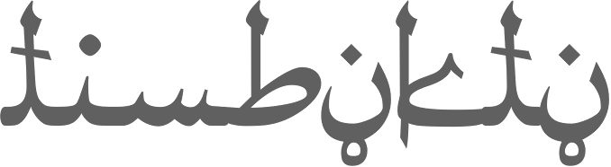
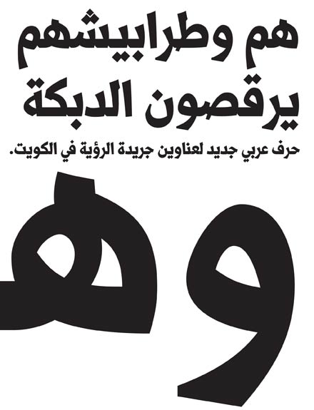
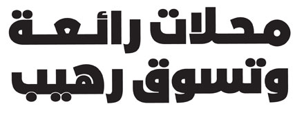
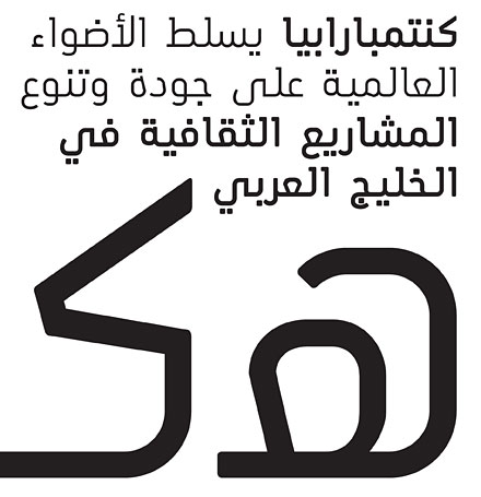
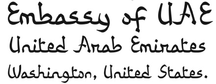
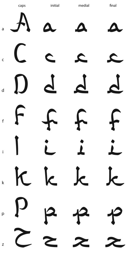
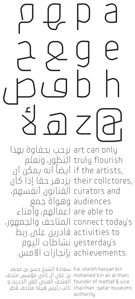
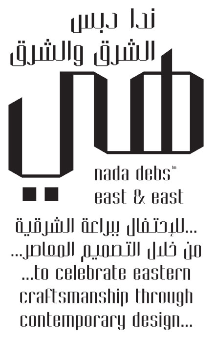
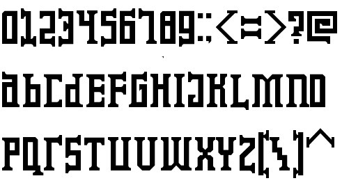
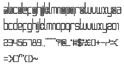
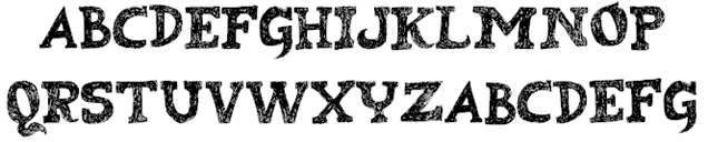
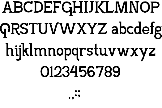
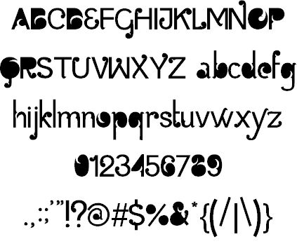
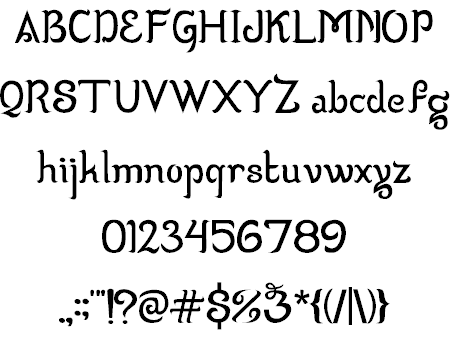
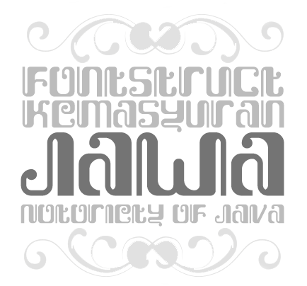
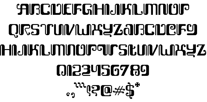
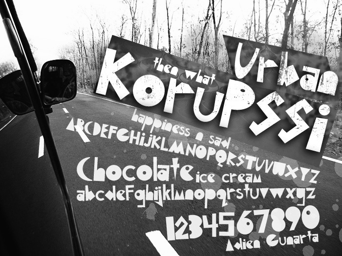
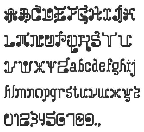
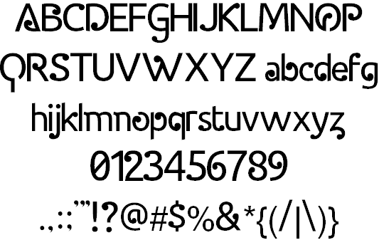
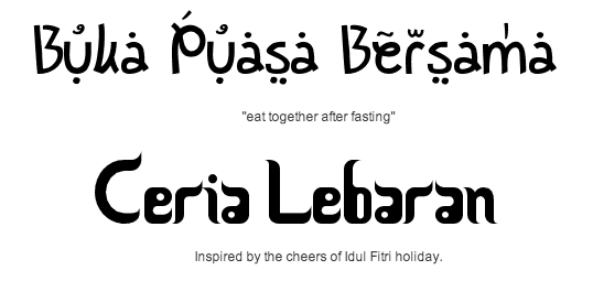
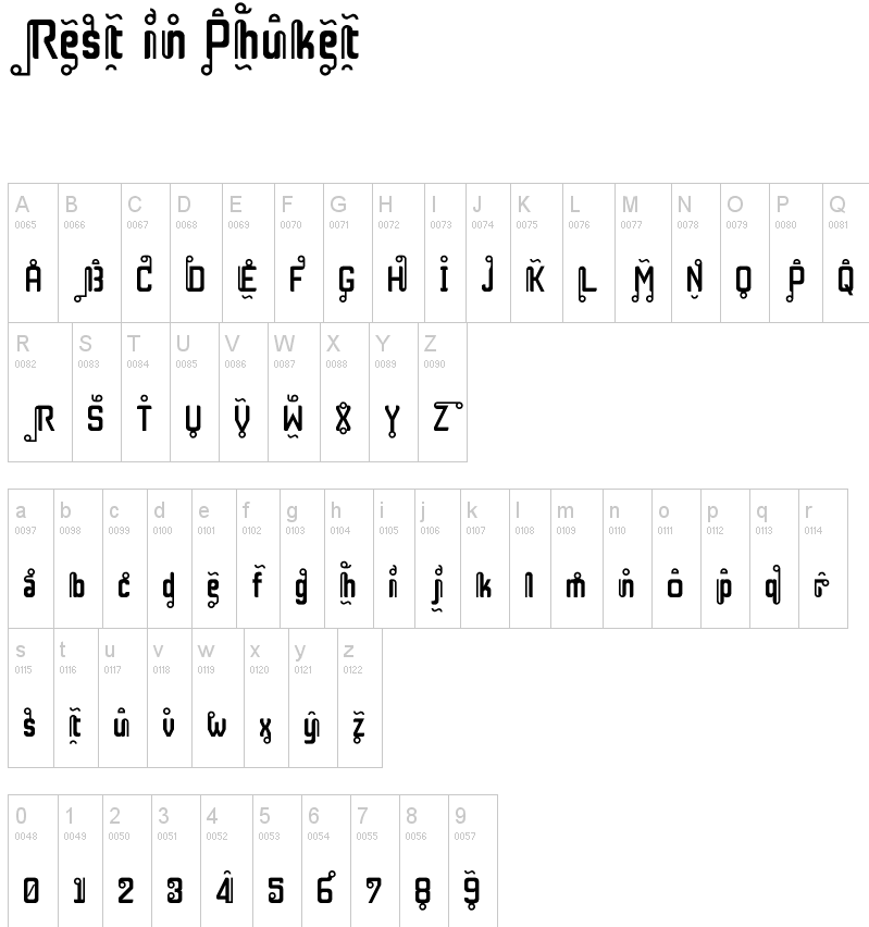
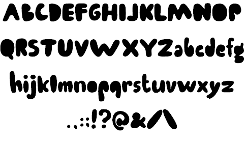
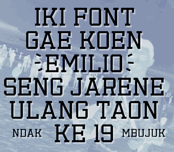
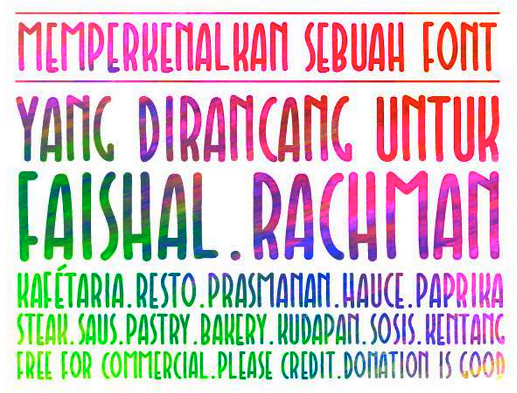
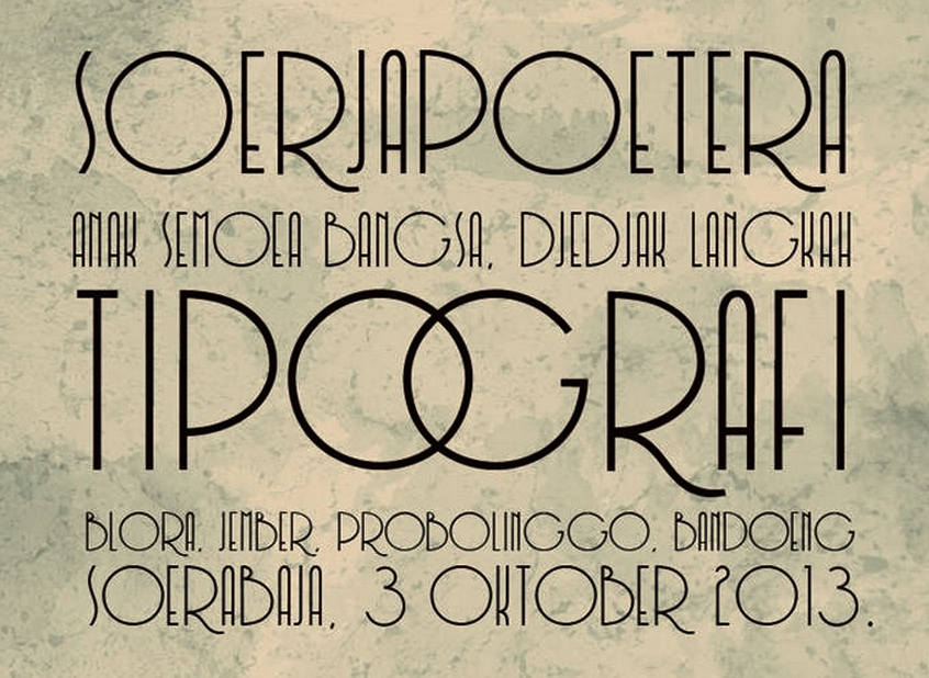
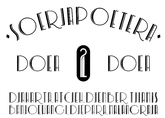
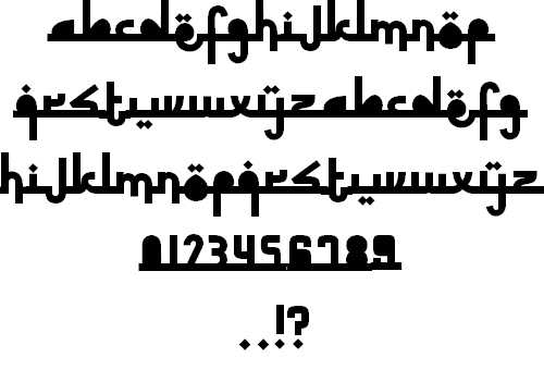
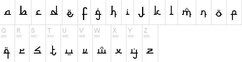
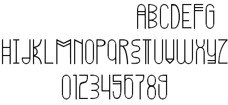
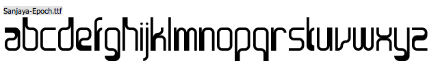
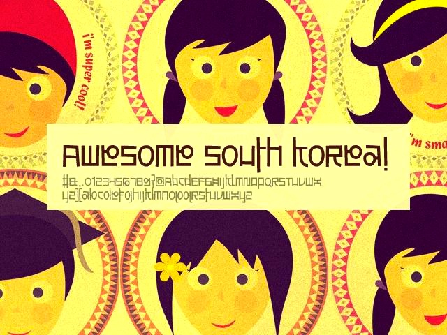
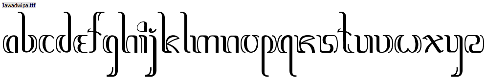
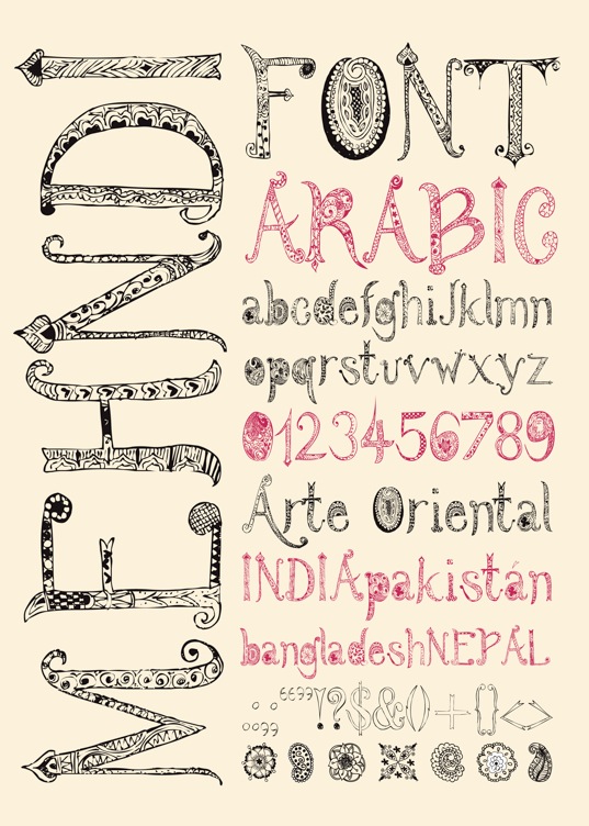
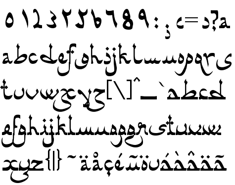
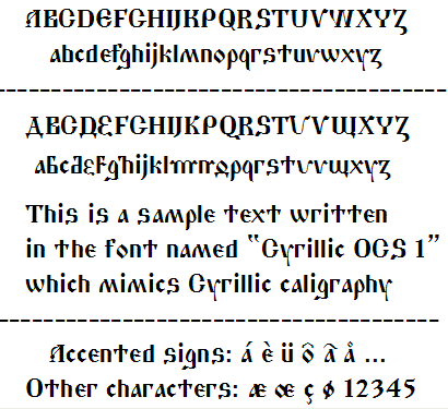
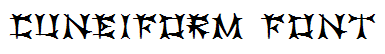
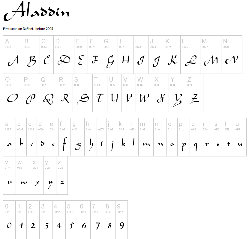
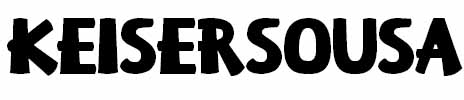
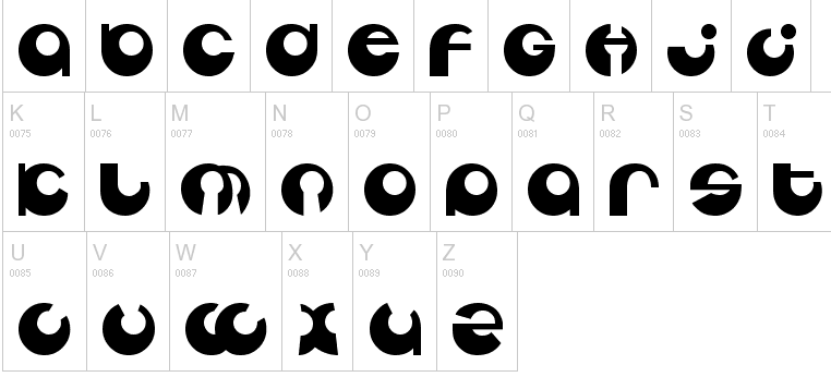
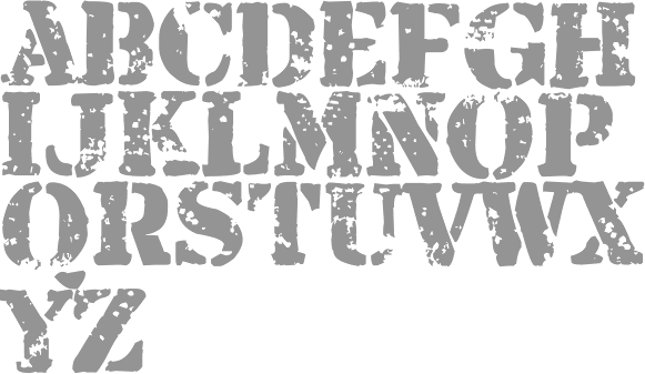
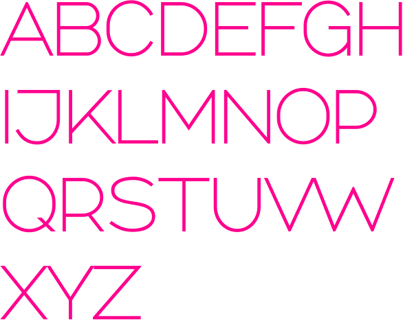
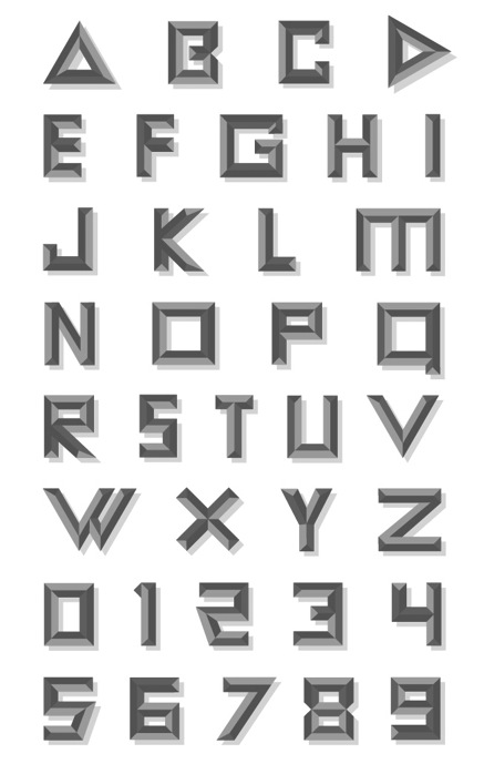
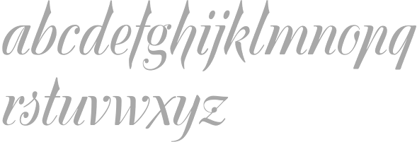
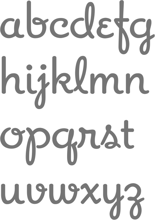
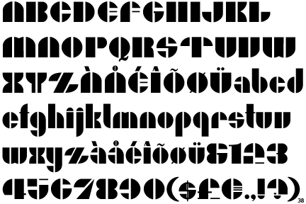
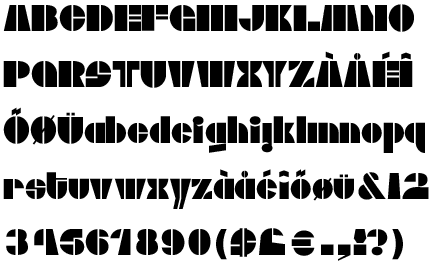
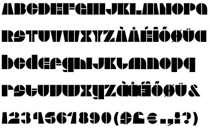
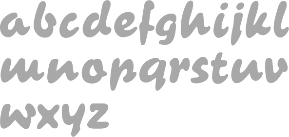
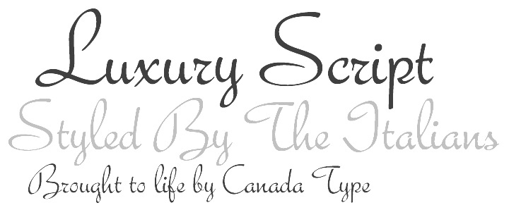
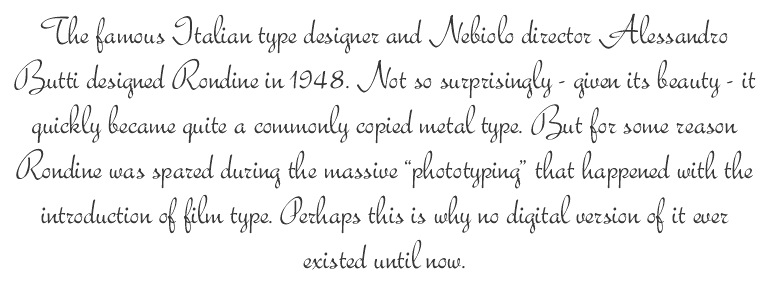
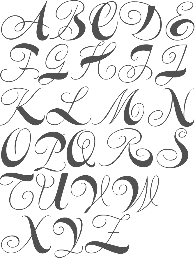
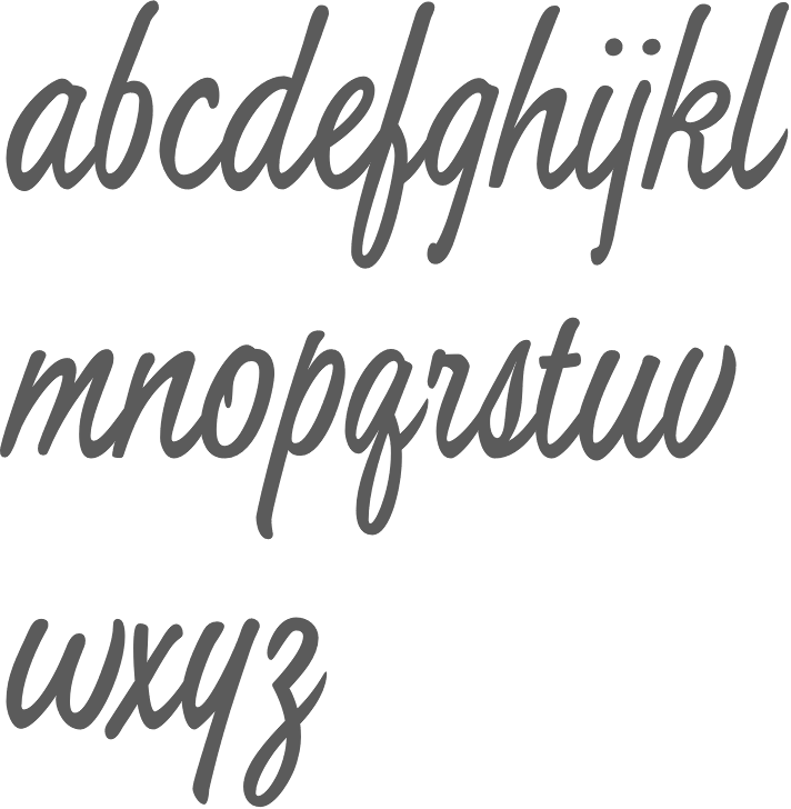
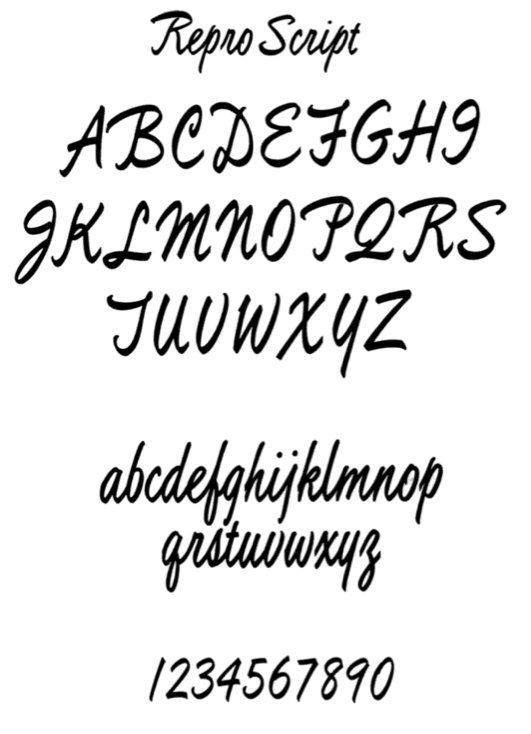
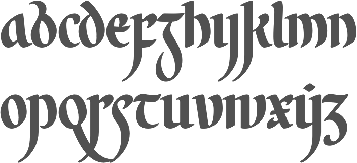
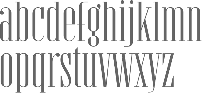
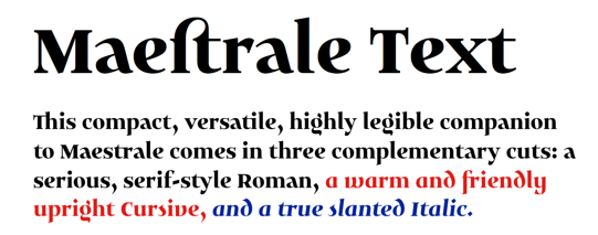
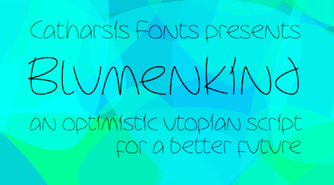
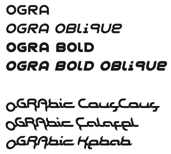
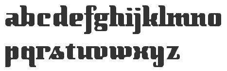
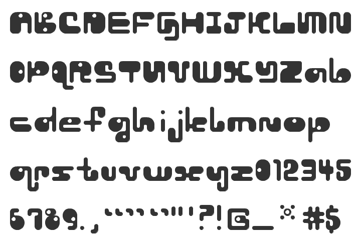
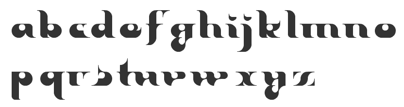
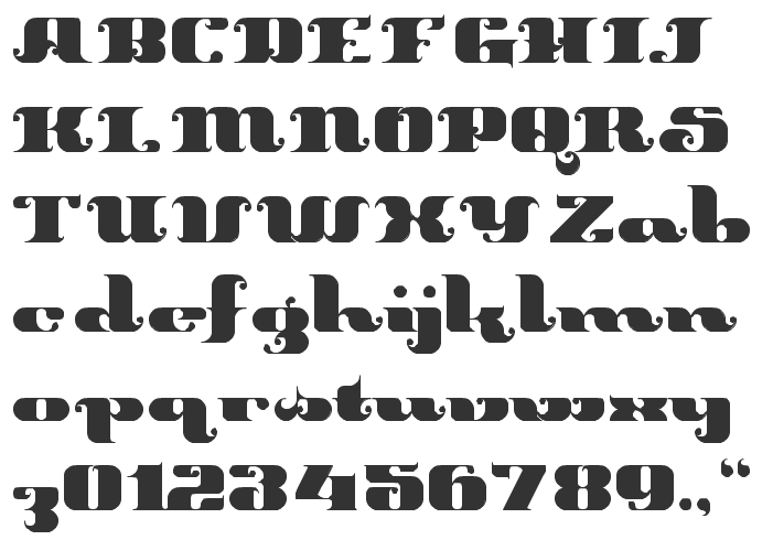
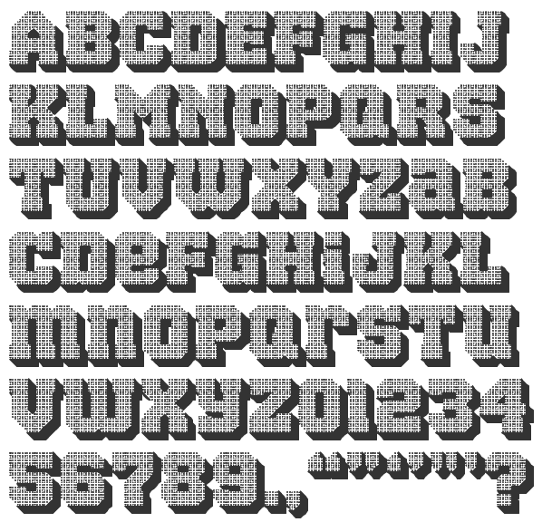
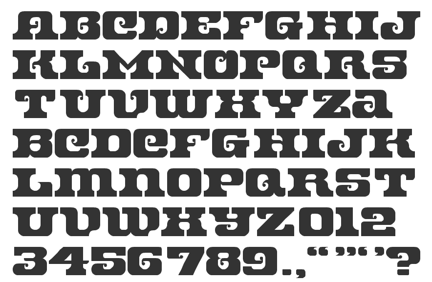
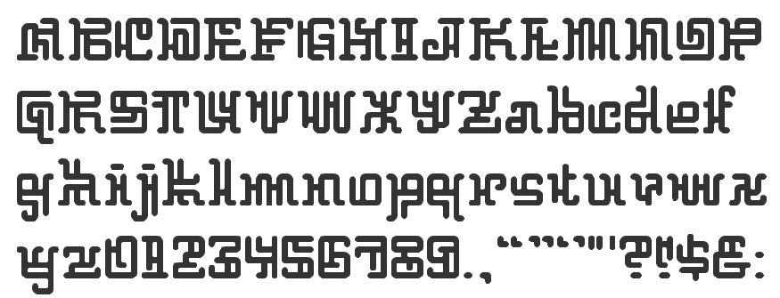
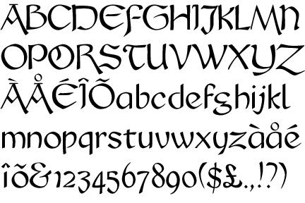
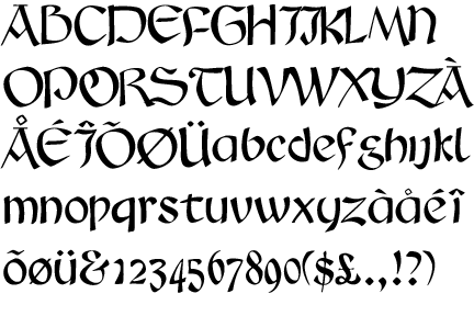
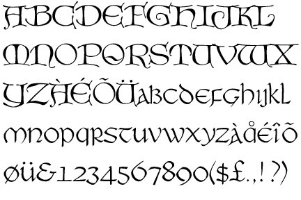
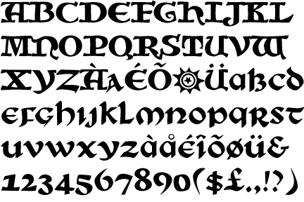
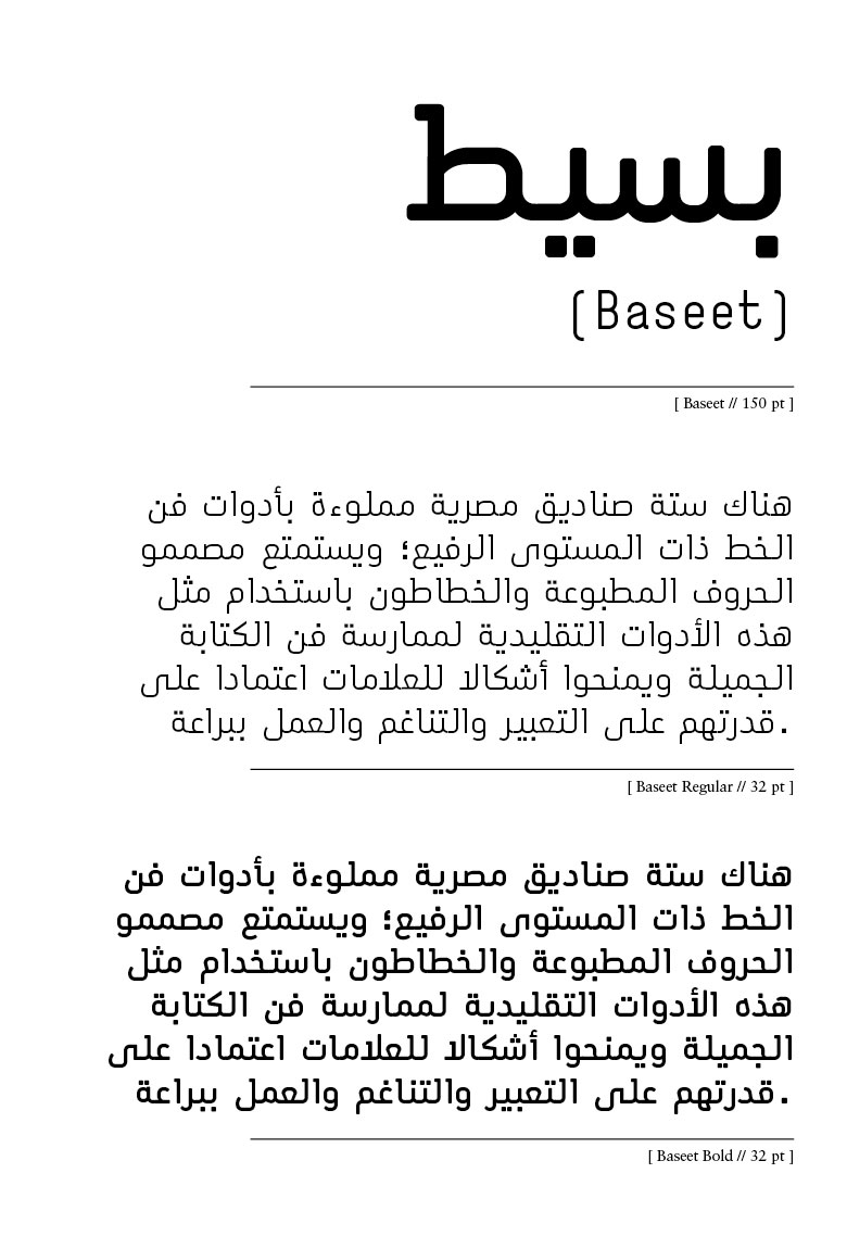
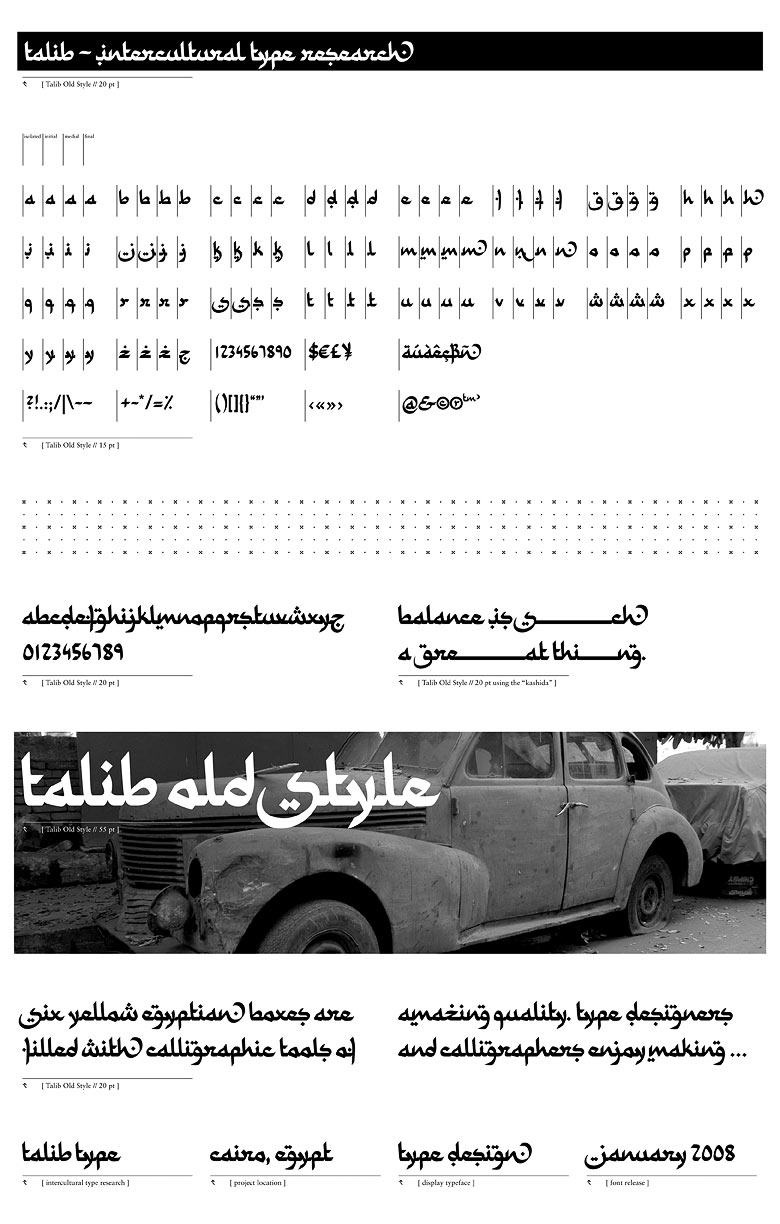
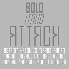
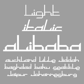
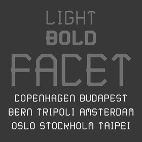
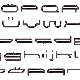
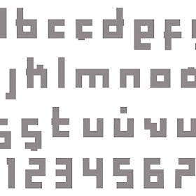
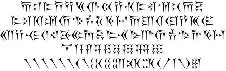
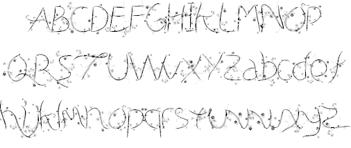
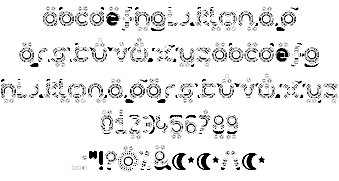
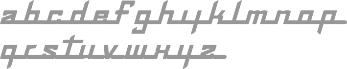
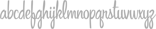
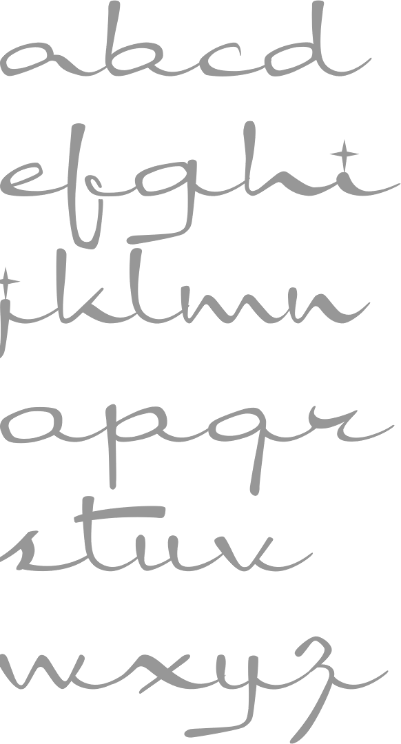
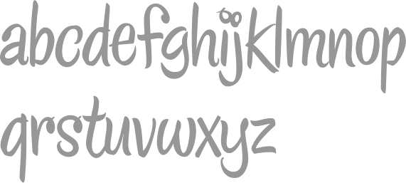
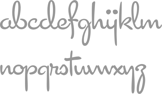
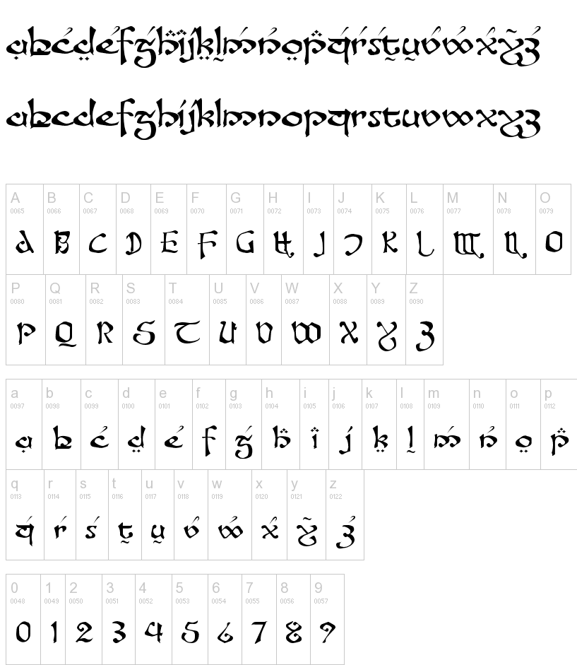
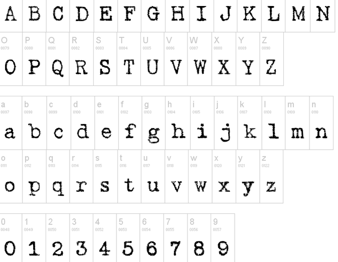
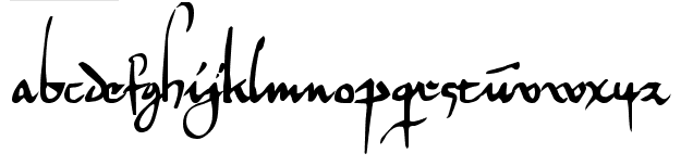
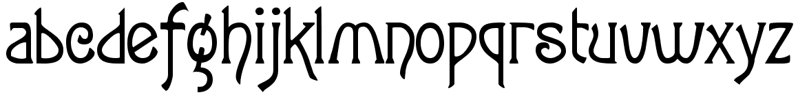
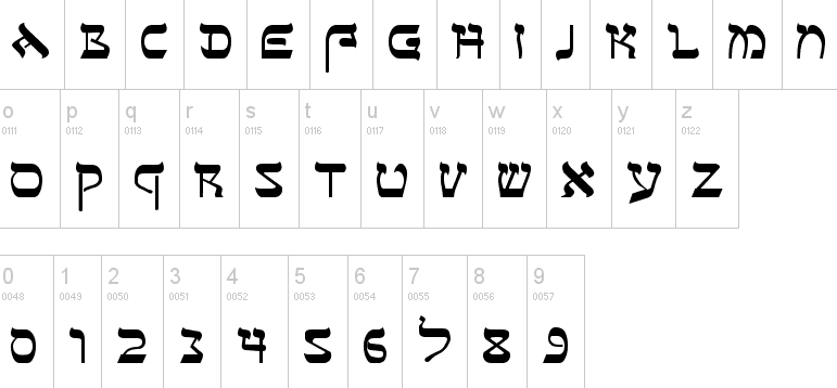
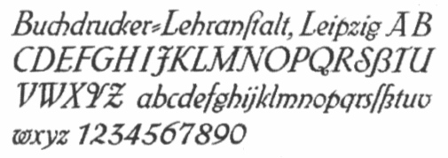
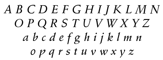
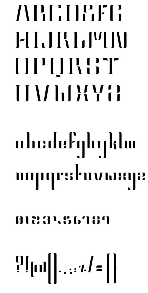
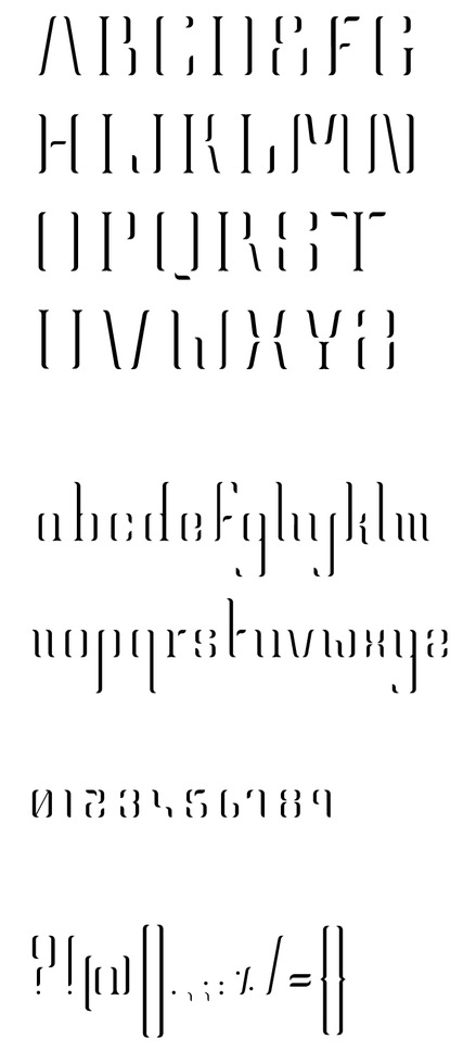
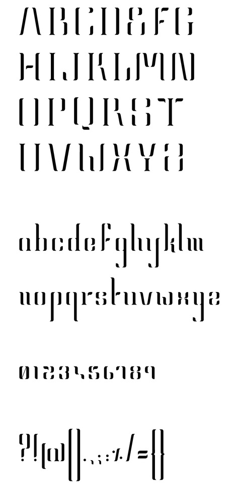
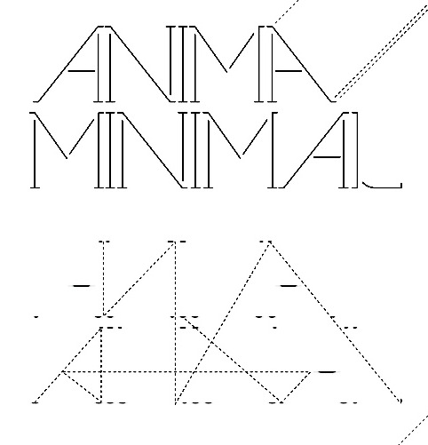
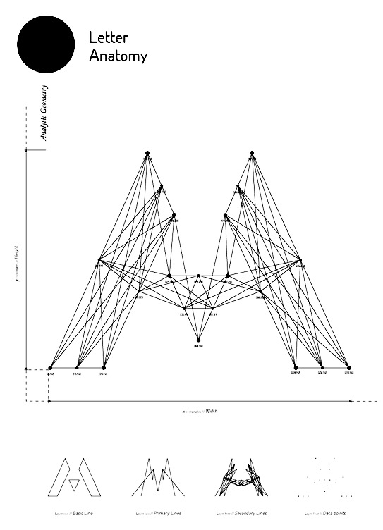
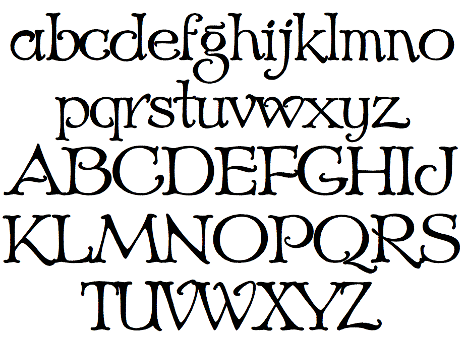
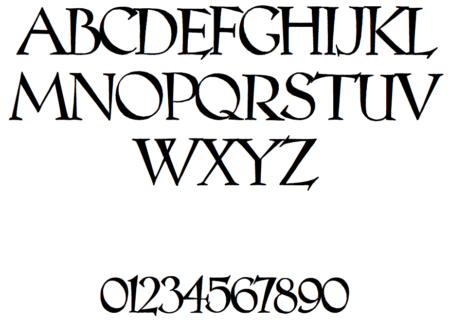
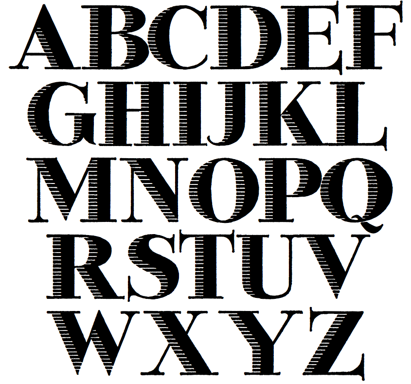
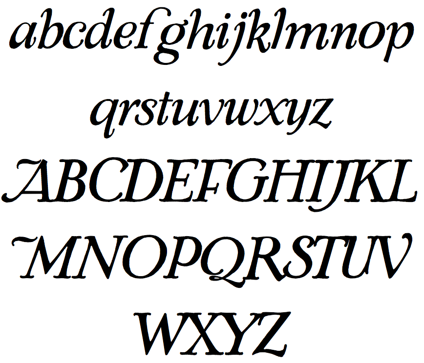
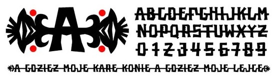
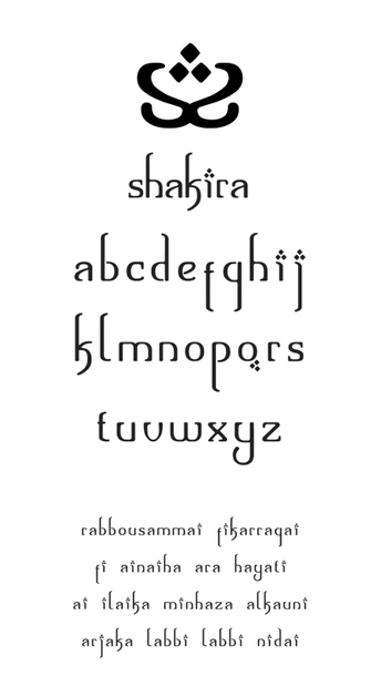
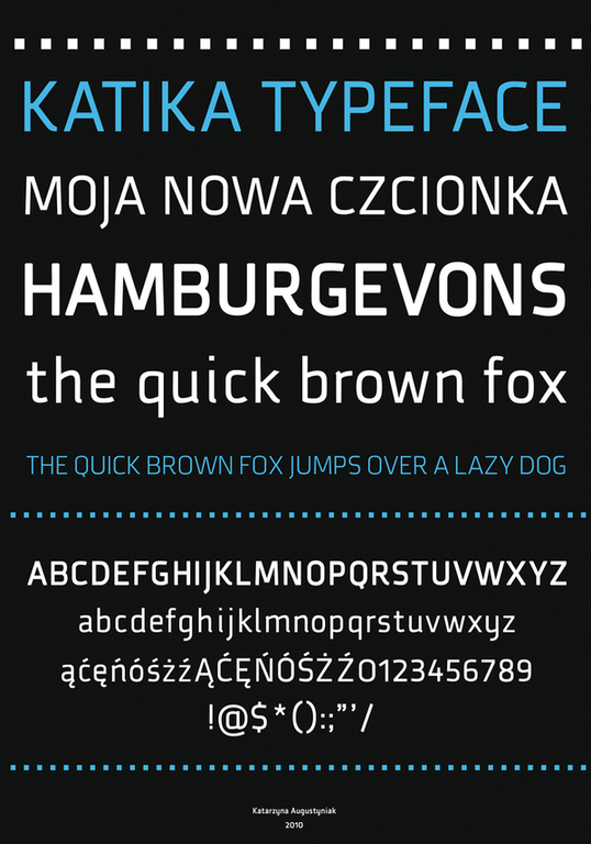
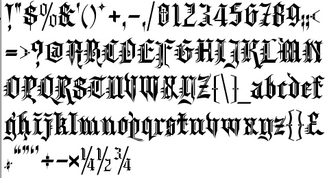
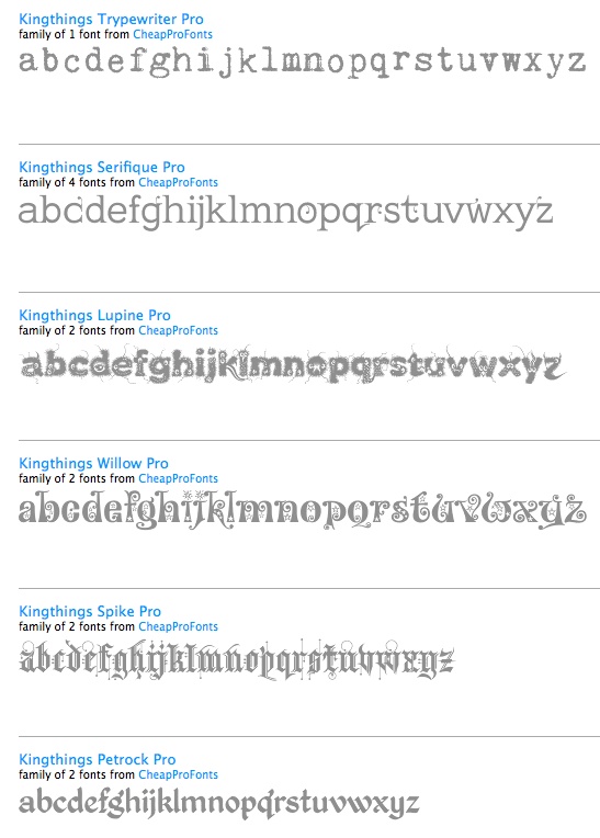
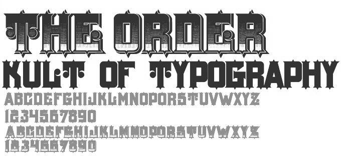
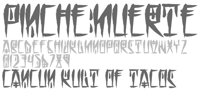
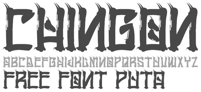
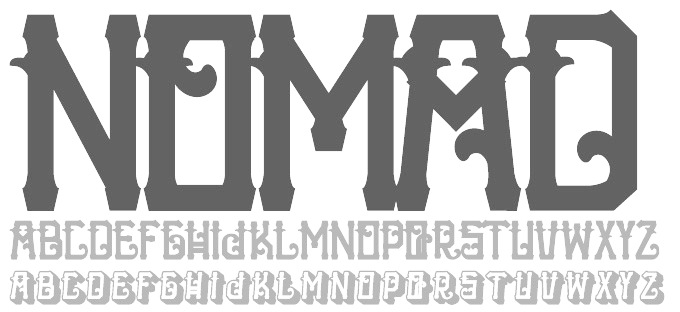
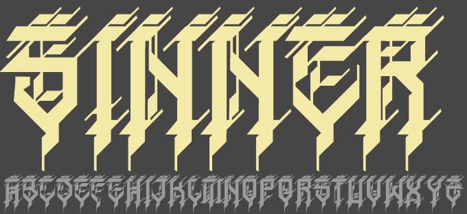
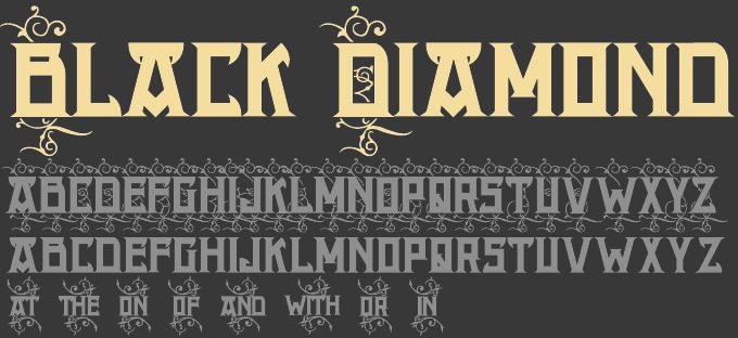
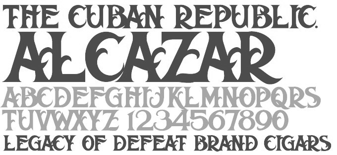
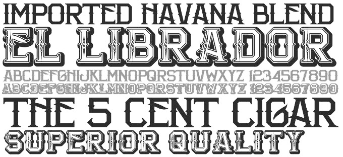
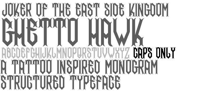
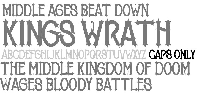
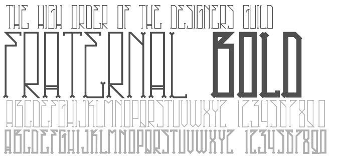
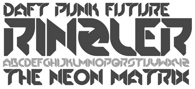
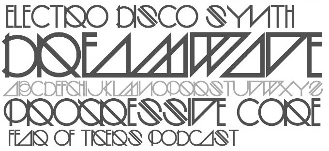
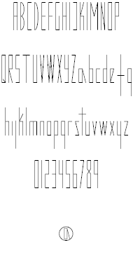
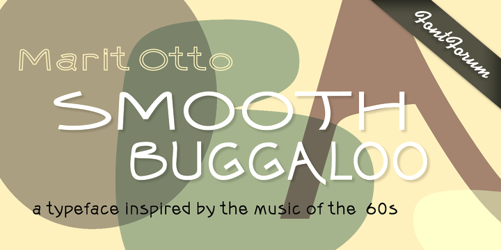
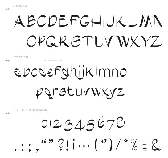
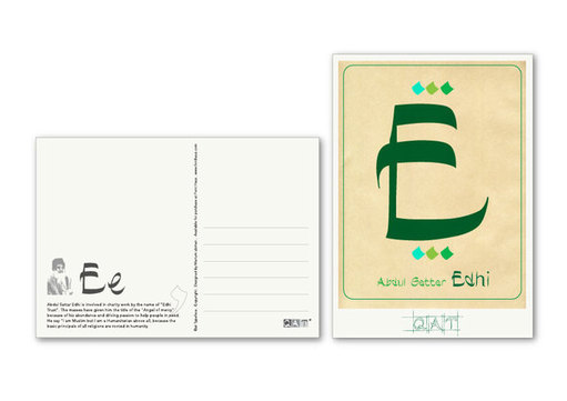
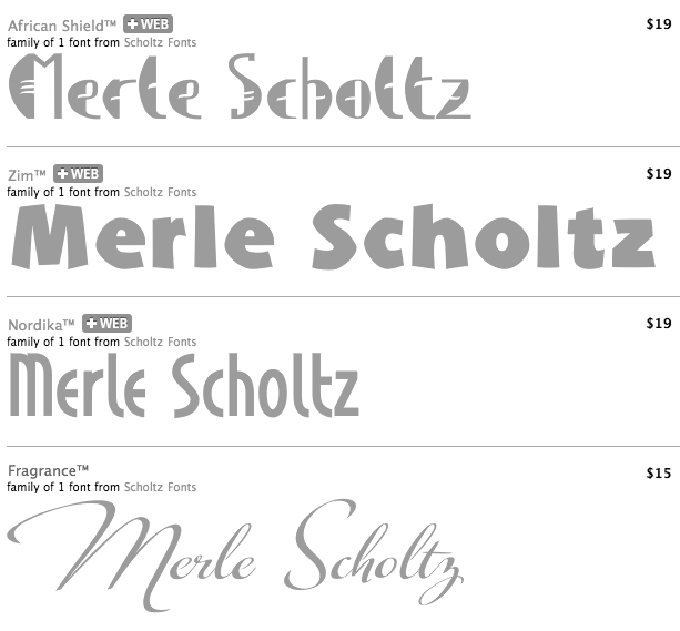
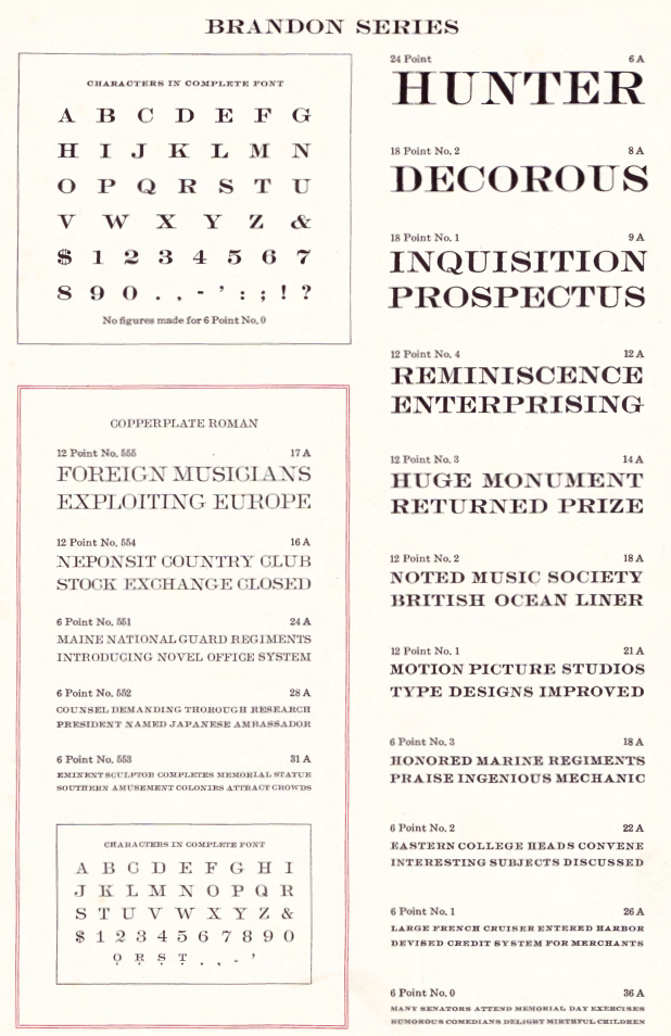
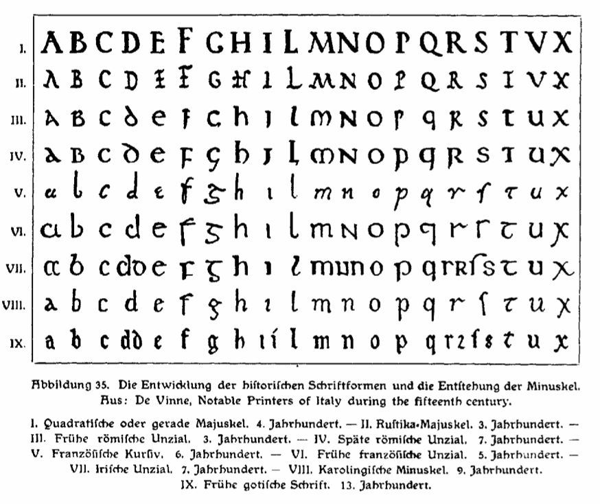
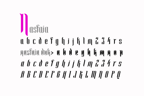
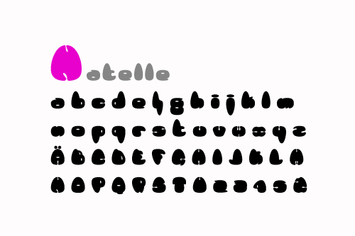
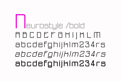
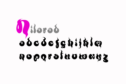
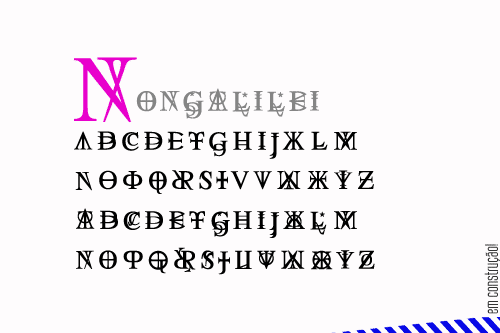
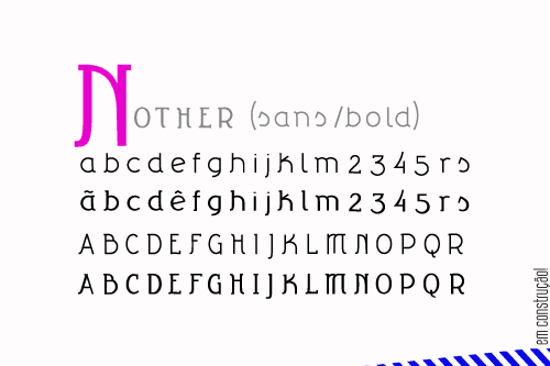
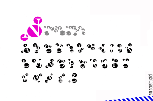
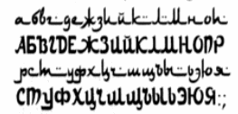
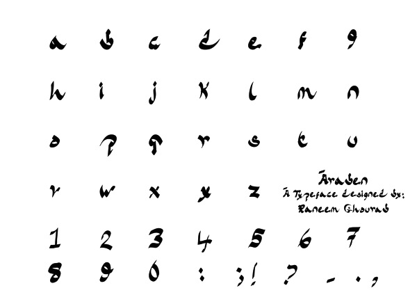
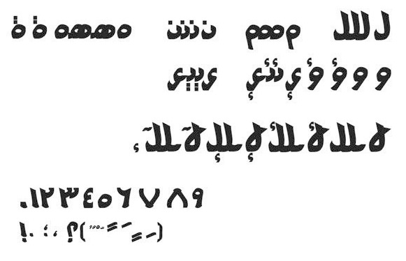
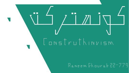
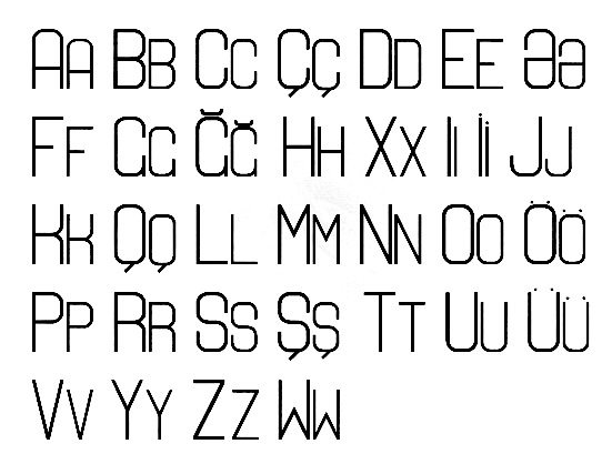
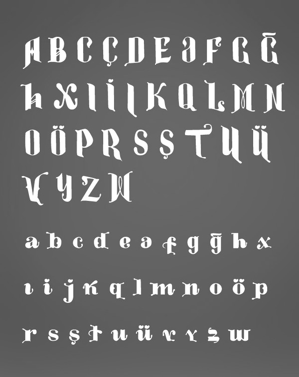
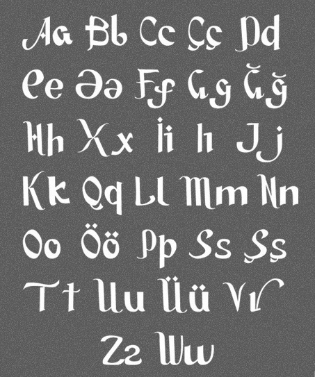
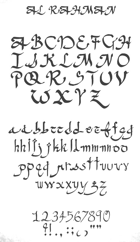
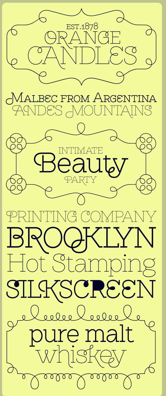
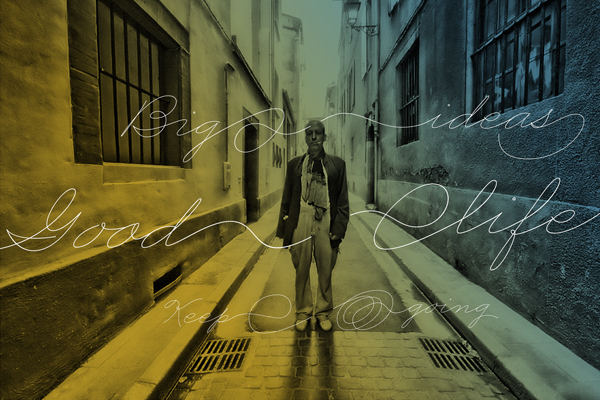
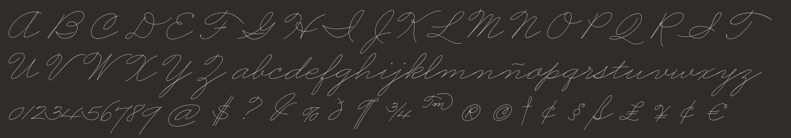
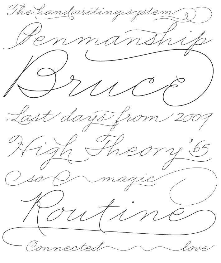
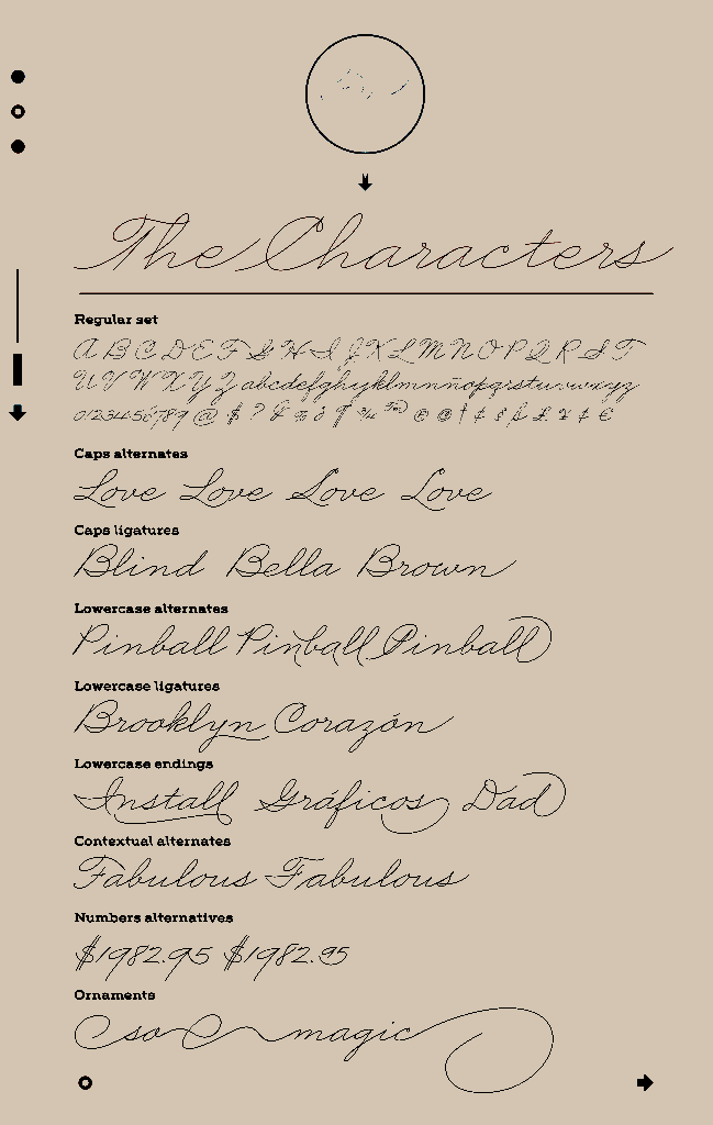
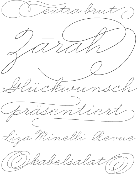
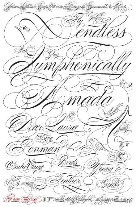
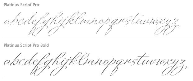
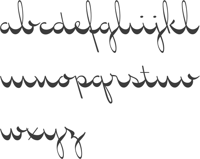
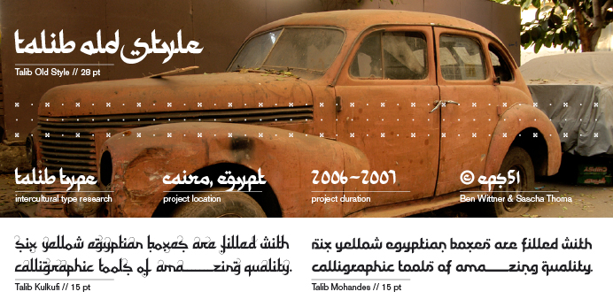
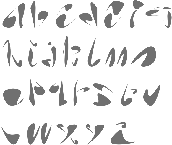
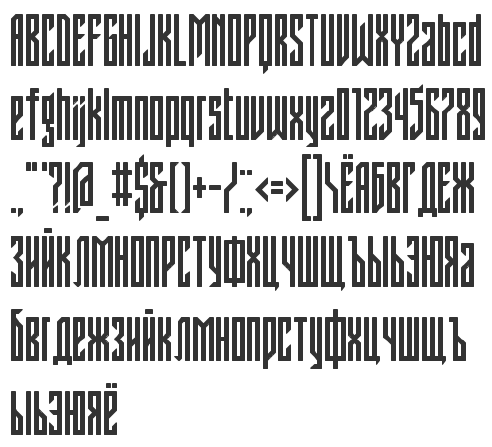
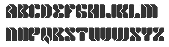
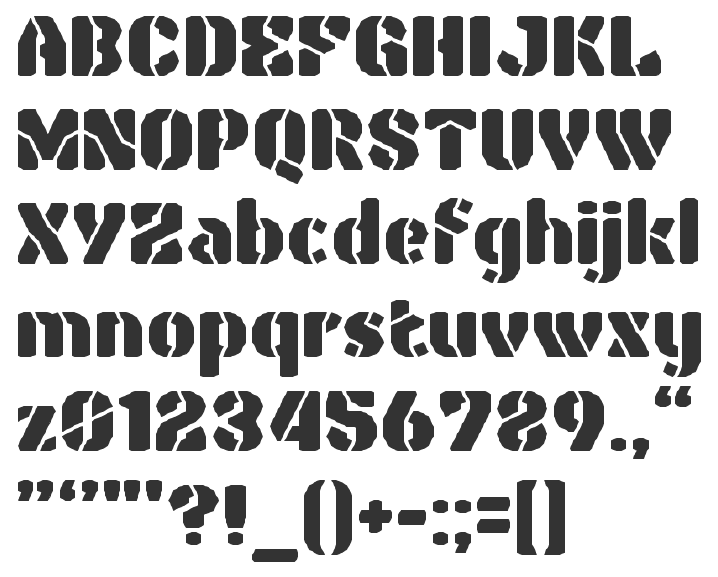
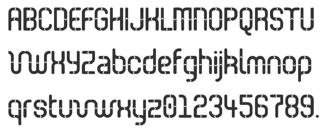
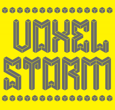
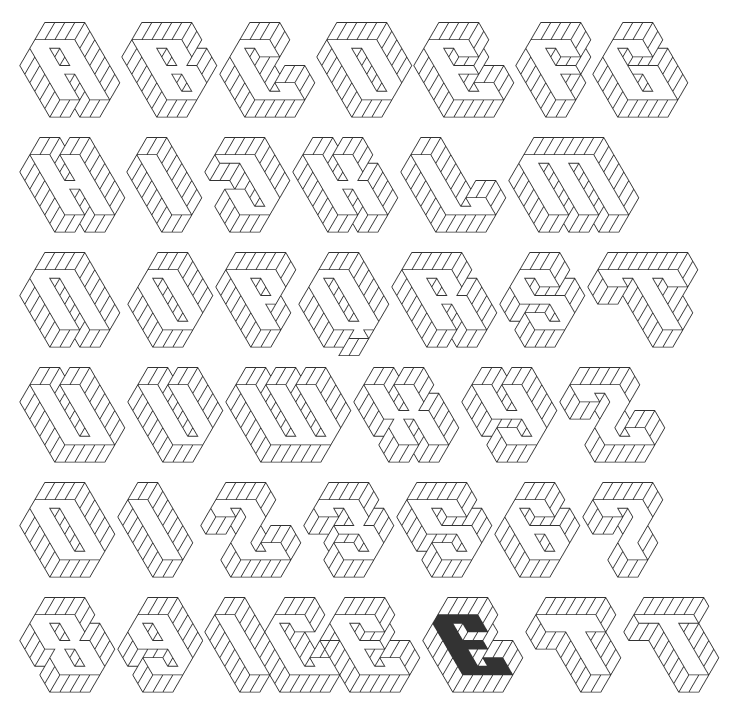
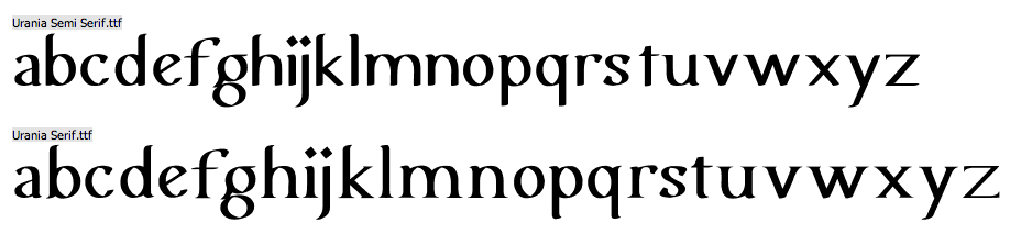
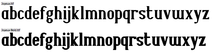
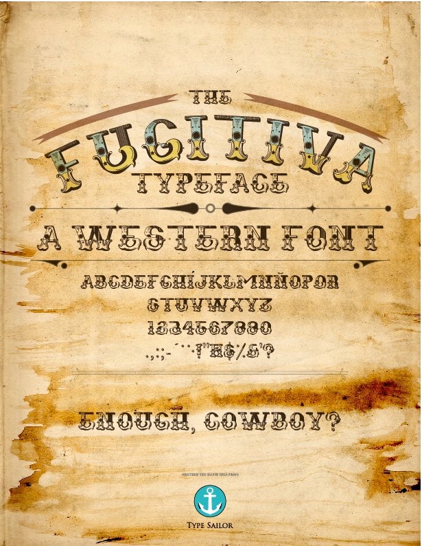
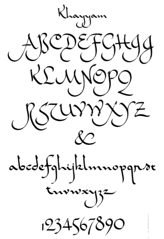
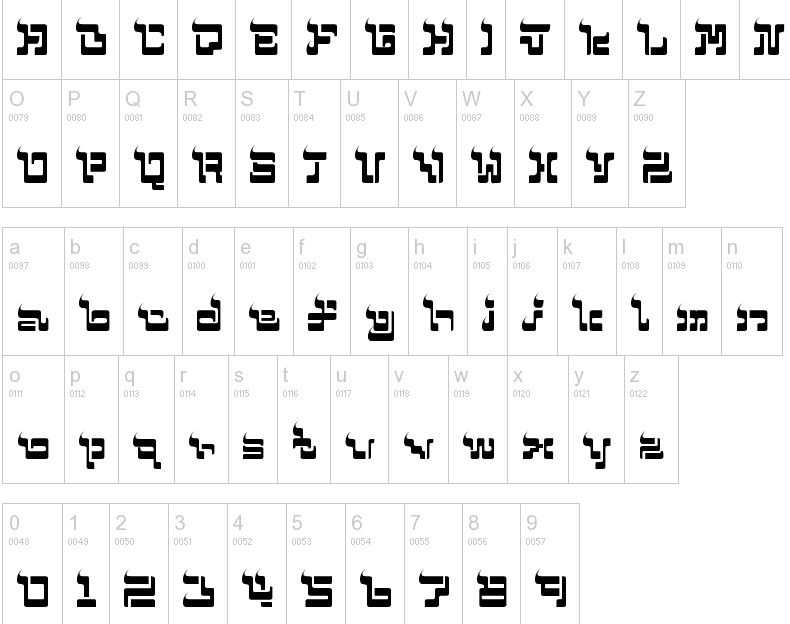
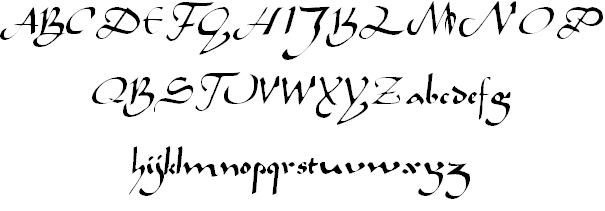
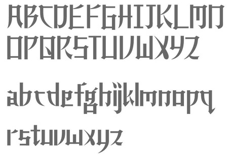
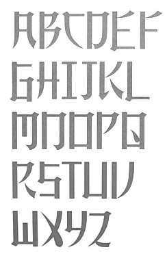
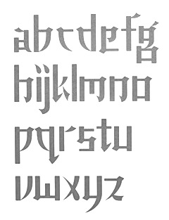
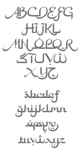