TYPE DESIGN INFORMATION PAGE last updated on Mon Jun 8 17:44:07 EDT 2026
FONT RECOGNITION VIA FONT MOOSE

|
|
|
|
|
Kitchen tile fonts | ||
|
|
|
|
SWITCH TO INDEX FILE
Designer who used FontStruct in 2008 to create the tall piano key fonts Palo Alto and Palo Alto Rounded, the pixel font Fixedsys, the filled in black geometric typeface Fiasco, and the quite original SquareDotDot. In 2009, he added SSSeriffff (Western saloon face), Pamplinas (ultra black counterless display face), Fisko, aBus (kitchen tile), 123r1c (squarish). [Google] [More] ⦿ | |
538Fonts
| Or Daniel Lyons. American founder of Story Choice 102. Creator of the series The Rodfellows and Tequila and Cider, and the three family movies Greeny Phatom ABC's, The Rodfellows Marathon Movie, and Tequila and Cider 20-Episode Marathon. As a type designer active at FontStruct between 2014 and 2021. His typefaces there include DLEFS Lowblock (a squarish family), DLEFS Boulder, DLEFS Boxing (stencil), DLEFS Three Dee, DLEFS Initials (+Solid), DLEFS Mobile Gap (mosaic), DLEFS Shine, Corefont (Solid, Outlined) and Font (a kitchen tile font). At Fontspace, he showed 280 free fonts at the end of 2021, most of whgich were made around 2016: 4Music, 5-Text-Uppercase, 538EurofanEurovision, 538LyonsFont, 538LyonsLogoText, 538LyonsRounded, 6061, AFLD, AcerSupplement, AdigianaExtreme, AdigianaToybox, AdigianaUltra, AfricanCulture, Akalai, Anodyne, Armegoe, ArtificialBox, AutoToyfont, AverageCustomLevel2, AverageCustom, Azbuka-Lowers-538Lyons, Azbuka, BRFCaps, BSBTextClassic, BTTelecom, Backflash, Backstreet, BeachResort, BigOrangeCyrillic, Bloq, Blurry, Bubblewump, Burger-Queen, Busch-Three, CCColon, Cheese, Chevelure, Chicken-Butt, ChildsSans, Chompy, Circle-Outline, Cloud-World, Comial4448, ComialUnicode, Comial, ComicStrip, Condension-Pro, ConstructiveBuddy, Coolwonder, CountandSpell, Crayawn, CustomHandwriting#1, DLEDigital, DLE-Futuristic, DLEGeometWeb, DLEGeomet, Dan'sDisneyUI, DansDisney, Daniel'sHandwriting-BoldItalic, Daniel'sHandwriting-Bold, Daniel'sHandwriting-Italic, Daniel'sHandwriting, DanielDeluxe, DeejayDisco, DennorLight, Dennor, Dinamight, DobotoBlackItalic, DobotoBlack, DobotoBoldItalic, DobotoBold, DobotoItalic, DobotoLightItalic, DobotoLight, DobotoThinItalic, DobotoThin, Doboto, DokiLowercase, Doki, DooperWhooper, DressedlessProRegular, DressedlessRegular, Dressedless-Three, DuoCircle, E4ASCII, E4Craze, E4-Digital-(Lowercases), E4-Digital-Arcade-V2, E4DigitalCondensed, E4DigitalExtended, e4digitalv2, e4digitalv2, E4DigitalV2Hollow-Italic, e4digitalv2hollow, E4DigitalV2-Italic, E4-Digital-V2-Light-Italic, e4digitalv2light, e4digitalv2, EMEN-Text, EOne, EarlyHalloweenAdventures, EasterABCEggTwo, EatFreshLowercase, EatFresh, EgNew-Thick2, EgNew-Thick, EggsFor3Yrs, EgmontText-BoldItalic, EgmontText-Bold, EgmontText-Italic, EgmontTextLight, EgmontText, ElPerroYElGatoWords, ElPerroYElGatoWords, Election2016, E4DigitalFinal, Eurotype2016, EurovisionChoir2017, EurovisionSongContest2015V2, EurovisionVienna2015, Every-Movie-Every-Night, FS-Serif-Condensed, Familex, Fintaro, FlashingLights, Florid, Florid, FontCreatorProgram4-1, FreebrushScript, Fridays, Funhana (a wide sans from 2016), FunZone3Pro, FunZoneThree, FunZoneTwoAlternates, FunZone-Two-Bold-Italic, FunZoneTwo, FunZoneTwoCondensed, FunZoneTwoEPYEG, FunZoneTwoHelv, FunZoneTwo-Italic, FunZoneTwoLight, FunZoneTwo, FunZoneTwoProCondensed, FunZoneTwoProExtended, FunZoneTwoProRegular, FunZoneTwoSerifBold, FunZoneTwoSerifCondensed, FunZoneTwoSerifWide, FunZoneTwoSerif, FunZoneTwoWide, FunZoneTwo, Garde, Garinty, GarintySkew, HBOFamily, HalloweenTime, Handpower, Hargroty, Hearts, Hemico-Greek, High-Five-Techno, Highstruct, Hisel, History-Lowercase, Homestile, Hopscotch, Hotpepper, InsideOutLowercase, InsideOut, Into-the-Future, Irresistible-Hollywood, JonesCombo, JonesOutline, Jones, Kazuke, KidZonePro, KidZone, KidsClub, Kon-System, LateNite, Lecid, LegibSqueeze, Legibility, LifeIsARightTime, LifelogoEasy, LifelogoHard, Light-Your-Fire, Littoral, LivedMasNEW!WithNumbers, LyonsPrint, 629Supplement-V2, LyonsSecondaryBold, LyonsSecondaryLight, LyonsSecondaryRegular, LyonsSerifBlack, LyonsSerifBold, LyonsSerif-Italic, LyonsSerif, Lyons, MTVLowercase1, MTVLowercase2, Made-with-Paint, MandarianFood, Meerken, MemoriesAngular, MemoriesRoundBold, MemoriesRoundExtraBold, MemoriesRoundLight, MemoriesRound, Memories, Mentabrush, MicEdge, Mickorama, Mixmatch, MockLatin, More4-Logo, MoreFour-v2, MotivotaCombo, Motivota, MovieBill, Mraz, Musieer, MyShapes, NES-Lowercase, NES2, NeonFeel, NewFlourinaFontfor2014, New-LiteBulb, New-Walt-Disney-Font, NewWaltDisneyUI, Nine-Network-logo-font, Nine-Network-logo-font-v2, NiseBuschGardens2, NiseBuschGardens, NoUndo, Oilpainter, OrderPizza, OutofCn'R, POEFoo, POEGalaxy, POEHeadlineBold, POEHeadline-Italic, POEHeadlineOutline, POEHeadline, POEMonospace, POENewUnicaseMedium, POERedcoatNewBold, POERedcoatNew, POESansDemo, POESansDemo, POESansNewBlackItalic, POESansNewBlack, POESansNew-BoldItalic, POESansNew, POESansNew-Italic, POESansNew, POESansPro-BoldItalic, POE-Sans-Pro-Bold, POE-Sans-Pro-Condensed-Bold-Italic, POE-Sans-Pro-Condensed-Bold, POESansProCondensedItalic, POESansProCondensed, POE-Sans-Pro-ExpandedBoldItalic, POE-Sans-Pro-ExpandedBold, POESansProExpanded-Heavy-Italic, POESansProExpanded-Heavy, POESansProExpandedItalic, POESansProExpanded, POESansPro-Extra-Light-Italic, POESansProExtraLight, POESansPro-HeavyItalic, POESansProHeavy, POESansPro-Italic, POESansPro-Light-Italic, POESansProLight, POESansPro-MediumItalic, POESansPro-Medium, POESansPro-Semi-boldItalic, POESansPro-Semi-bold, POESansPro-ThinItalic, POESansPro-Thin, POE-Sans-Pro-Ultra-Condensed-Bold-Italic, POE-Sans-Pro-Ultra-Condensed-Bold, POESansProUltra-Condensed-Italic, POESansProUltra-Condensed, POESansPro, POEText, POEUnicaseCondensed, POEUnicaseToo, POEUnicase, POEVeticaMonospaceBold, POEVeticaMonospace, POEVeticaNewReincarnatedBoldItalic, POEVeticaNewReincarnatedBold, POEVeticaNewReincarnatedCondensedBold, POEVeticaNewCondensed, POEVeticaNew-Italic, POEVeticaNew-LightItalic, POEVeticaNewLightReincarnated, POEVeticaNewMediumItalicReincarnated, POEVeticaNewMediumReincarnated, POEVeticaNewMono, POEVeticaNewThinItalicReincarnated, POEVeticaNewThinReincarnated, POEVeticaNewReincarnated, POEVeticaUI, Paintbrush, Paramountain, Paris-France, Paul, Pelham, PennyPinch, PersonalFontMix, PlayoffsSerif, Playoffs, PoorLittlePeppina, PowerhouseSansBold, Powerhouse-Sans, PresarioText, Presario, Proudance, Radeon, RaiText1983Lowercase, RaiLowercaseRegular, Remedy, Retrahaus, RodfellowsWacky, RodscriptTwo, Rodscript, RollerCoaster, RollyOlly, RollySqueeze, RoundFitLowercaseExtended, Roundling, SM-Grid-Text-Rounded, ScriptME3, ScriptMENew-Bold, ScriptMENew, Scroller, Seez, Serioucity-3, Serioucity, Seuss, Sigg, SillyDilly, Simplicity, Simplicity, Smear, SomethingRandom, Spikes, Splotch, Starzy3, StarzyDarzylowercaseletters, StarzyDarzy, StoryChoiceSansSerif-BoldItalic, StoryChoiceSansSerif-Bold, StoryChoiceSansSerifHeavy-Italic, StoryChoiceSansSerifHeavy, StoryChoiceSansSerif-Italic, StoryChoiceSansSerifLight-Italic, StoryChoiceSansSerifLight, StoryChoiceSansSerif, StoryStrip, SuperMario286, TUBAn, TWOHeadline, TY, Technomite, Teereks, TeknoBeat, TeletoonLowercaseV2, TeletoonLowercase, TertiaryWriting, Thanksgiving2016, TheCheddarCakeFactory, TheRealWoman, TickleToesInfanity, TightMan, Tootall, ToySans, Trans-AtlanticFilm, Triangleshape, Tricrown, Turbo, Turkishye, Ursula, VertaboyAmore, Vertaboy, Weaselic, Wilde, Wood, WoodyDLE, Work-of-Fortress, World'sHeaviestFontEver, YG-Lowercase, YTV2000, YTVPresent, ZiricIsComing, dvcc, E4DigitalFinal, Vivendi-caps. [Google] [More] ⦿ |
55cards
| Brett Gilbert ("55 cards") is the designer at FontStruct in 2008 of minima55, minima55_grid. His Lattice is a gorgeous rhomboid-patterned caps face. Others include Double Six (domino pieces), Square Jaw, Halftone. [Google] [More] ⦿ |
Graphic designer and illustrator studying Graphic Communication at UCA, Farnham, UK. He created Modular (2011, a kitchen tile face). [Google] [More] ⦿ | |
Afrojet Type Foundry
|
FontStructions in 2008: Playtime (an original stencil family), Playtime Pattern Motifs (dings), Playtime Rounded (+Bold), Playtime Cutouts, Mango Solid (ultra fat, rounded), Mooch (experimental), Mooch Squared, Zombies Are The New Black, Jettison Stencil, Micromoog, hewett, hewett_bold, hewett_extended, Mikey (a Mickey Mouse font). Other creations there include Summer Grillz (about which he writes More gangster than Gill with more gold than Garamond, Summer Grillz is type jewelry for your mouth. All letterforms are diamond-kut using the finest type constructing software on the market today. Customize your grill with different fills., Lovestruc, Konstruct (multiline face), Steeplechase, Sawhorse, Sawhorse Braumarks (dingbats of a brewery), Alfred, Chesterfield, Hydroplane, Jettison-Stencil, Pop-Drops (kitchen tile face), Starstruc, Lovestruc, Chesterfield Prince, Chesterfield King, Chesterfield Queen (piano key font), Brainfreeze (ultra fat). Fontstructions in 2009: the Sans Serious family (a tribute to Dutch Bauhaus designer Jurriaan Schrofer), Factory (stencil), Hunstrüct (blackletter), Slug, Micromoog Remix, Get To The Falcon, Jetstream and Perforate (octagonal, loosely based on several styles of letter and numeral forms observed on various aircrafts at the Evergreen Aviation&Space Museum in McMinnville, Oregon), Get To The Falcon (multiline face), StacheStruct (moustache font), Factory (stencil), Playtime Bolda, Thunderball, Gaga, Gaga Stencil, Pinpression, Sessions (a take on type by Josef Albers; he writes: Having previously played around in Fontstruct with Anni Albers' textile patterns, I thought it time to turn my attention to her husband Josef's work. Josef Albers' constructivist typographic experiments are a perfect match for Fontstruct. Other Fontstructors have done great work with Alber's ideas. Most notably, Saberrider's fontsract and Stewf's Leaflet family. Using Josef Albers' Kombinationsschrift alphabet (1928-1931) as my foundation, I've been having a lot of fun remixing and experimenting with his letters.). Fonts made in 2010: Whoopee (piano key face), Prog. Commercial fonts: Sessions (2009, modular). The commercial fonts by Afrojet type foundry include Sessions, Playtime, Hydroplane, Lovestruc, Dansa, Pinpressions, Micromoog, Widjiwagen, Mooch, Hunstrüct, Slug, and Brutal Exchange. Cargocollective link. Behance link. Home page. Dafont link. [Google] [MyFonts] [More] ⦿ |
Agent J
| Lisa D. Jenkins designed some beautiful fonts, such as Xanadu, Laser Systems (1998) and Kitchen Tiles. Explanation provided by her the gorgeous Kitchen Tiles: "This font was originally designed by Boris Mahovac of Abeceda dizajn. I liked the look of it, and thought it should be a fairly easy font to re-create in order to test out the Softy software. I changed a great number of the characters from his original design mostly for readability reasons. This font includes pretty much all the international characters so that everyone can enjoy it." The free stuff is only a sample of the full families. She also made Cat Silhouettes. All of Lisa's fonts are first rate and beautiful, so please support her. On February 9, 1999, she removed Kitchen Tiles. Go here for the story. She also runs AJ's Catz, a cat font archive. [Google] [More] ⦿ |
Commercial fonts include these made by Atelier Télescopique: Stone Heure (2007, multiline), Ader, Bepierre (pixel), Beye (pixel), Birinte (experimental), Boureuse (an elegant geometric sans), Byme, Capulco, Ciceron (dot matrix), Delory (clean sans), Dicion (dot matrix), Dixca (pixel), Fisher, Fluo (2012-2014, a stencil font by Xavier Meurice and Sébastien Delobel), Hic, Kune (sans family), Lailuya, Lienne, Mentable (dot matrix), Mento (clean sans), Merik, Miante, Micale, Mulette, Naconda, Nalfabait (dings), Natomi (techno), Nibalsmith (ultra-fat), Norak, Normal, Peindice, Rabik (paperclip face), Raoul, Rijsel (2013, sans), Rondie (kitchen tile), Rubal, Scard, Screenex, Stone Heure (prismatic), Singolo, Sphiquesy, Steroid, Stuce, Tino, Tomica, Treen, Varo, Velinge (dings), Veu, Vrette, Vure, Yoli (dings), Xatif, Zofage. Corporate typefaces by them include the Quechua family (for the sports company Quechua in Domancy, France), which consists of four typefaces, Bionnassay (for cross-country skiing), Forclaz (mountain hiking), Arpenaz (for recreational hiking) and Capcir (for Nordic skiing). | |
Alessandro Fulciniti (Axel or Alex Fulton) is the designer at FontStruct in 2008 of Digg (based on the Digg.Com logo), SmartShop, Triple-X, Last Brick (3d brick face), Last Brick Neon, Bubble Gum, Maxxell, Pico (pixel face), Omino (dingbats of men), jelly_fish_1, pixel_runner, red_light_district (dot matrix face), three_am. Son of Statement and Statement are heavy block fonts. Other typefaces: Acchooga (condensed), Dottic (2008, pixel face), Headshop (2008), Three AM (2008), Red Light District (2008, dot matrix face) and Fat Bit Lova (2008, pixel face), Brooklin Bros (2008, octagonal), Absurd, Dottic (pixel face), Hybrid Boost, Five AM, Futuristica (Bank Gothic-inspired), HeadShop, Americana (American flag-themed glyphs), Elevator (lightbulb signage font), Bombay (Indic simulation), Regent (octagonal, between two horizontal lines), Spaceman (pixel meets kitchen tile), Faster Baby, Fontharrt, Subpixel, Promises, Best-before-end (horizontal stripes), Weekend (fat headline face), Predator's Alphabet, Futures, Magnus (constructivist), Zeppa (great---Far West meets LED), Wide Horizon, Pixelity, Wide Horizon Rounded, Snipers' Font, Gunny (heavy metal stencil), Pinball Special 5, Gallop, Horizon Condensed, Western Zappa (Far West font), Wide Horizon Rounded, Nano Spaceman (nice fat kitchen tile style), Black Sheep, Best-before-end, Black-Sheep, Bubble-Gum, Crazy-Pixel, Faster,-baby!, Gallop, Horizon-Condensed, Last-Brick, Little-Spaceman, Magnus, Pinball-Special-5, Promises, Teenage-Mutant-Ninja-Font, Weekend, Zeppa, maxxell, pic. Born in 1975 in Northern Italy, he is a columnist for the Italian web design portal html.it since 2003, who has written extensively on CSS, javascript and web design. Web site. [Google] [More] ⦿ | |
Designer, aka shadowmask, of Shadowmask Decorative (nice grunge), Quark The Derivative, and Shadowmask Gridified (kitchen tile), all in 2008 at FontStruct. [Google] [More] ⦿ | |
Alexander Colby
| |
Designer who used FontStruct in 2009 to make Checkers (kitchen tile face). [Google] [More] ⦿ | |
Alphabet Design
|
Other creations: Pixelina, Borek, Duckling, Fat Trace, Kloi (now Kloi BT (2004)), Tabita BT (2005, an informal font), and the great patterns of the Symbols font, JechoTecho. From the web site: He started working with digital fonts back in the days of bitmap fonts, sometime in 1988. At that time the studio operated in Zagreb, (former) Yugoslavia, which later became the capital of independent Croatia, under the name PixelPrint. The name changed to Abeceda Dizajn in 1992 while establishing itself as a successful typographic studio that specialized in font localization and type consulting. Abeceda Dizajn studio was the official distributor and manufacturer for Bitstream Inc. for Croatia and Slovenia from 1995 until 1997, when it relocated to Canada. Today, Alphabet Design is again a Bitstream re-seller. In 2005, Bitstream published Kloi, Borhand Tabitha, Duckling, as well as JechoTecho1 (the latter typeface was made by Evzen Jecho). Alphabet Design is donating all its proceeds of January 2005 to tsunami aid. In 2005, cartoonist Branimir Zlamalik created Smiles (dingbats) and Ulixa (comic book family). [Google] [MyFonts] [More] ⦿ |
Amondo Szegi
| |
Rio de Janeiro-based designer of the kitchen tile typeface Clara (2013). [Google] [More] ⦿ | |
Andrea Zucca (Livorno, Italy) created the kitchen tile typeface Looz (2012) and the modular circle-based typeface Spikkio (2012). [Google] [More] ⦿ | |
Andreas Pihlström
| |
| |
Australian creator of ModeSeven (1998, pixel font based on the Teletext bitmap font) and the splendid Flicker family (2002), pixelized in the format of kitchen tiles. Bulhak runs the news blog Null Device, and is lecturer in Computer Science at Australia's RMIT University. Fontspace link. [Google] [More] ⦿ | |
Andrey Damo (DEZ Propaganda, Porto Alegre, Brazil) co-designed the kitchen tile typeface Black Saul with Juliano Weide in 2013 as a present for Saul Duque. Behance link. [Google] [More] ⦿ | |
Angus R. Shamal
| |
Anke van der Meer
| |
Mataro, Catalunya-based designer of the kitchen tile font Arc (2016) and the free text typeface Atia (2016). Behance link. [Google] [More] ⦿ | |
Dafont link. [Google] [MyFonts] [More] ⦿ | |
Fonts from 2010: Full Deck (playing card font), Scrollboard, Power Up (piano key face), Groovy Fu, Formality, Union New (+Sans, +Flat), Angle Tutorial, Aurora Light (elliptical monoline sans), Pushpins, Aurora Light, Scrawl (marker face), Evity (a grotesk face), Altipen (upright script). Fonts from 2011: Obleak (oblique techno face), Likea (a heavy mechanical sans), Uptake (elliptical). Fonts from 2012: Omit (a bilined stencil face). Fonts from 2013: Emblazoned. Typefaces from 2014: Game Over, Aurora Light, Flowidity, Oxquad (textured, octagonal). [Google] [More] ⦿ | |
Ariel Di Lisio
| |
ARS Type (was ARS Design)
|
The fonts: AudioVisual1, Code, Kamp, Kamp Serif, Retro City, OCRU, Toycube, Mortal, Maquette (1999-2000), Angelring, ARS Bembo, Contrast, Dandy, EcologyModern, Hartu (handwriting), Temper, ARS Novelty (2011, a free hybrid style face), ARS Polythene (pixel font family), Misanthry, Syntax (OsF format sans serif), CensorSans (1994), CensorSerif (1994), Credit (1995), Epilogue.pfa (1995), Exert (T-26), Humain-Graphica (1995), Humain-Synthetica (1995), Platrica (1994), Roscent (1995), ARSFortune (2000, futuristic), ARS Region (2002, Bauhaus sans), District (experimental), Descendiaan (1998), Zero Rate (futuristic), Tegel (1998, stencil, kitchen tile), Twenty (octagonal, techno), Trio (dot matrix fonts), Maquette (1999), Region, Product (2007, sans typefaces), Mr Archi, Prime (display), Deviata (unicase face), Forum I-AR (after Forum I, a 1948 font by Georg Trump), Freie Initialen-AR (2007, after a 1928 set of caps for Stempel Garamond), Fry's Ornamented (2007; a revival of Ornamented No. 2 which was cut by Richard Austin for Dr. Edmund Fry in 1796), Graphique-AR (2007; a shaded typeface based on a 1946 design by Eidenbenz for Haas), Gravur-AR (2007; a digital version of a type designed by Georg Trump and issued as Trump-Gravur by Weber in 1960), Initiales Grecques (after a Firmin Didot design, ca. 1800), Lutetia Open (2007; based on Jan Van Krimpen's Lutetia), Old Face Open (2007; a digitization of Fry's Shaded, an open all caps Baskerville cut by Isaac Moore for Fry, ca. 1788), Open Capitals (2007, after Jan Van Krimpen's 1928 typeface for Enschedé called Open Kapitalen), Romulus Capitals (2007; after the caps series by Jan Van Krimpen, 1931), Romulus Open (2007; after the Open series by Jan Van Krimpen, 1936), Rosart 811 (2007; open caps after Enschedé no. 811 by Rosart), Zentenar Initialen (2007; based on blackletter initials of F.H.E. Schneidler, ca. 1937). Fontshop link. Designer link at FontShop. [Google] [MyFonts] [More] ⦿ |
Arvan Fatwa
| |
Typefaces made in in 2008 as thalamic: Hello (connected upright script), Epilogie (blocks), WimSoft (+U/C), Chunk Chip, Konstruct (Russian constructivism face), Sensei Says, FS Tributary, Twotype Font, Urge (fat octagonal), Subliminal, FS United One, The Game of Type, Anaximander Zooom!, Corrupt and Corrupt Ed (piano key stencil fonts), Blueprint, Monomum, Synergy, Insert Coin Italic, Write I Careful, Write I Casual, Write I Dump, Loop UC, Loop LC, Emergic, Prick!, Insert Coins Pixels, Retro Electro, Bubble Lab IJ, Bubble Lab Bang, A Needle Pulling Thread, Send, Scan (IBM logo look), Intermittent and Intermittent Sans (stencil typefaces), Melt x DR and Melt x tDR (dot matrix), Oval x DR and Oval x tDR (original design by theDesignersRepublic for Issey Miyake), On Grid, Indigo (almost blackletter), orange_2 (dot matrix), Scan (horizontal stripes), Bass, Grape (simple pixel face), Nachahmung and Nachahmung Block (fat and extra condensed, Wim Crouwel simulation typefaces), Nachahmung Block Serif, Conjunction, Interjection, Is It, Sangular (nice experiment), Anonon (nails in square letters), Purple and Purple Very (slab serif headline typefaces, pixelized), Arc Echo (biline and strutted), The Question (a fantastic 3d paper fold imitation face), FS Minimal (a fantastic ultra fat decorative face), FS FontStructor, Vibrant (multiline labyrinthine or op-art face), Writ (upright pixel script), Castor, Ooki (octagonal), Industrial, The I Flat, The I, Indiscrete, Analog (connected script), Dent (mechanical), Digital (connected script), Hello Hello, and Sensei Says. In 2009, he made Clone It, Entwined, C64, Helix, Fontsration, Bent, Stripe Zoo, Dull, Indent (stencil), Quartertined (kitchen tile), Firox, Orfix, A Priori, Ignore, Confused, S-Ookii, Ookii (octagonal), Very Becoming, Crisis Averted, Crisis (neat bold octagonal face), Penmanship, Up All Night, Sleep All Dayi, Chunk Chip, Grayletter (upright script), Soso, Mostly Harmless (textured face), Etched, La Cross, Twotype, Etched Bare, Aught (One, Two, Three), as: Inflate (Pop, Pfft, Puff, Poof), Istic, Very Becoming, Ignore, Ought, Balance, Broken, Dry Flat (dot matrix), La Cross, Etched (+Bare), Fontsration (+Refined: multilined beauties), FS Institutional (fat multiline face), FS Industrial, FS Pixelayers. Additions in 2010 as thalamic: fs Section, fs Reboot, fs Easy DNA Auto Stencil, fs Institutional (+Ho, +Elements), fs Quartertined, fs Stencil 2.0, fs Rivet, fs Intaglish, fs Dumb Italic, fs Loop Gap, fs GoTeam (stencil), fs ITilic, fs Kerplunk (Startrek face), fs Dumb Italic, fs Ribbon, fs Beringer, fs Ooki Woodcut, fs Croissant (stencil), fs 45 (octagonal stencil), fsXO, fs Pipe, fs Confused Less. Fonts from 2011 as thalamic: fs Xenon (a paperclip face), fs Instant, fs Twist, fs WIP (blackletter), fs Sparc, fs Reboot (texture face), fs Pod, fs Flute Tune, fs Special, fs Watch Out (stencil), fs Etched Nyle (labyrinthine face), fs No Kerning Required (2011, connected upright script). Creations in 2012 as thalamic: fs Flip, fs Mom, fs Noise, fs Noise II, fs Junk, fs You Are Here, fs Flash (outlined), FS Easy Too (paperclip face), FS Strict, FS Fix, fs in three (octagonal stencil face), fs Single, fs Wakarimasen, fs r-failed (white on black), fs Permutation X, fs Pan Am, fs Institutional, fs Institutional 2, fs Chunky (counterless), fs Grayletter (textured face), fsXply (op-art). Creations in 2013 as thalamic: fs So Not Right, fs Grid Urdu (pixel face), fs Not So Right, fs Six Sticks, fs Half (octagonal family), fs Bored, fs Make it Happen, fs Salvage, fs To Be Discarded, fs Connect (stencil), fs Whomp, fs Praxis, fs Fez (3d face), fs Input, fsTramp, fs Five Alive, fs Hote-Zyd (labyrinthine), fs Patterns (Layers, Quarters), fs Five Alive (origami font), fs Go To Sleep (retro speed font), fs Vaerktoj (inspired by the brand identity of Hoejmark Cycles), fs Permutation B, fs Jester, fs Permutation XII (op-art), fs Insatiable, fs Electronic, fs Carbon (a nice chequered face), fs When We Were Young (multiline typeface), fs Shogun Tiny (a lined kitchen tile typeface), fs Optical, fs When We Were Young (multilined), fs Slate, fs Shogun (gridded), fs Iie (+Filled), fs Blocky (dot matrix), fs Thalamic. Creations in 2014 as thalamic: fs Perhaps, fs Perhaps Perhaps, fs Stability (Turmoil, Flux), fs Industrial (an artsy fat dot matrix face), fs Rehash, fs Ah, fs Curly, fs So, fs Flint, fs ICK (blackboard bold style), fs Wiggle, fs Grid, fs Ah. Creations from 2015 as thalamic: fs B-Chain (bike chain font), fs Risque (art deco), fs Squangular (Impair, Square, Flair, Pair), fs Oval, fs MIP, fs Flower (kitchen tile face). Creations as minimum: fs Chips (2014), fs Oh (2014, piano key style), fs Stack (2014, +Overflow), fs llljjj (2014), fs Turn Off The Sun (2014, beveled), fs Zag (2013 textured), fs Zig (2013, textured), fs Mullions (2013), fs The Italic (2013), Gridlock (2009), Mingle Minx (2009), Mingle Co (2009), Mingle (2009, gridded letters), Bevel (2009, 3d beveled family), illiij (2009, multiline family), m.ove.r (2009, multiline family), Grayscale (2009, multiline family), fs Cubed (2010, 3d-face), Bas Relief (2009, 3d face), Silver (2009, 3d face), Tin (2009), Lead (2009), Bevel (2009), Bevel Just (2009), Bevel Just Shadowed (2009), Ceci n'est pas une vague (2009), A Fault in Reality (2009, optical effect font), Blit Slash (2009, experimental), Blit Hack (2009), Dot Dot Hex (2009), Super Black (2009), fs Overlap (2010), fs Fabric (2010, texture font), fs Original (2010), fs Ink Blot (2010), fs Dots and Dashes (2010), fs I Square (2010), fs Squared Up (2010), fs Super Black (2010), fs Unoriginal (2010), fs Minimum (2010, geometric stencil face), fs Pin and Thread (2010, stitching face), fs Shade (2012, 3d face). FontStructions from 2011: fs Perpetual (dotted line face), fs Slither, fs No Escape, fs Prompt (a DNA-inspired biochemical lab face), fs Plus H (horizontally striped face), fs Arc Test 2:2 (a modular blackboard bold face), fs V Simple (2010, textured face), fs Instant, fs Permutation V, fs Rehash Monoic (labyrinthine), fs Meta (texture face), fs Scroll, fs Scroll Not (stencil). FontStructions from 2012: fs Translucent (a texture face), fs Bank, fs Shade, fs Confined (white on black), fs Institutional (+Vo, +HeVe, +Ho, +He, +Ve: texture typefaces), fs Bang, fs Random (textured face), fs Random Pattern, fs Lead, fs Tin, fs Silver, fs Tungsten. Klingspor link. Abstract Fonts link. Behance link. [Google] [More] ⦿ | |
Designer at FontStruct in 2008 of signed (a fantastic fist and pointing hands font), round_piece, Six Piece Chicken Nugget (pixel face), Stroked (paper clip font), Pointalism, Quad Light, Quad (octagonal), Blocks, Swerve (kitchen tile), and Old School (Big Mario dingbats). [Google] [More] ⦿ | |
Russian type foundry. Their Cyrillic/Latin fonts include: AZ HighWay (Leonid Silkin, 1990-1995, based on Broadway by Morris Fuller Benton, ATF, 1928), AZ LatinWide (1990-1995, by Kirill Tchouvashew, based on Stephenson Blake's Wide Latin), AZ LifeSigns (1990-1995, Serge Agronsky: astrological symbols), AZ McLeud (1990-1995, by Victor Kuchmin, based on American Uncial by Victor Hammer, 1943), AZ NewsPaper (1990-1995, by Andrey Andreev, based on News Gothic by Morris Fuller Benton, ATF, 1908), AZ ParagonNord (1990-1995, by Serge Agronsky, based on Elizavetinskaya, Lehmann type foundry (St. Petersburg, 1904-1907), which in turn was based on Russian metal typefaces of the mid-18th century), AZ Poligon (1990-1995, by Leonid Silkin: a kitchen tile font). [Google] [More] ⦿ | |
Attila Horvath
| |
| |
Designer in 2008 at FontStruct of NuGothicA (blackletter), BauForm, DINAMO (mechanical), Magnum (great industrial strength slab serif headline face), Cocoa (rounded and ultra fat), EUROstruct (thin and architectural), Kaotic (graffiti), Weimar (pixel face), Rondo, Rondo Tail, Fabrica (octagonal), Fabrica Rotula (stencil, octagonal), Quadrat, Electrica, Electrica Dots, Fabrica Screen (horizontally striped octagonal face), Block Black, Bloop, Blackwolf, Guru Blackletter (Indic simulation face), Inslab (slab serif), Inslab II, Minima (stencil), Boxer (ultrafat, octagonal), Bloko (nice ultra-fat face), Steel (macho slab serif), Nextar (pixelish but elegant), Simplex, Ulises 7 (+Serif) (pixel typefaces), Digita (kitchen tile) and Block (ultra fat), June Cleaver. See America (2008, octagonal) is an octagonal lettering font that was inspired by a travel poster (WPA, 1936) designed by Jerome Roth. Faces made in 2009: Morgana (a beautiful fat piano key face), Manitoba, Machina (+Slab), Old Monk (uncial), NughoticA Brush, LUBA 8 Lowercase (after Lubalin), Nugothic A (blackletter), Dinamo, Ross (strong mechanical face). Faces made in 2010: Sketch Pix and Sketch Pix 2. [Google] [More] ⦿ | |
Australian type and graphic designer, b. 1983. He specializes in experimental typefaces (examples: Angel, Back, Blank, Block, Flip, Flow, Game, Intercom, Iris, Length, Maze, Missing, Found, Neutral, Newt, Origami, Quilt, Shift, Soviet, Spiral, Switch, Takara, Thai, Womb, Woven). Build is a kitchen tile/stencil face. [Google] [More] ⦿ | |
For the rebrand of Diversion Dimensions, Beau Thein (Sydney, Australia) created a kitchen tile typeface (2017). Behance link. [Google] [More] ⦿ | |
Designer at FontStruct in 2008 of Halfmoon (kitchen tile font), Halfmoon Sq, Kettle Kurve (art deco), BLAHP (an artsy techno face) and Fonti1 (horizontally striped). [Google] [More] ⦿ | |
Bob Wertz
| |
FontStructor who made the modular kitchen tile typeface Segments (2010), Wispy, Eccentricity and Rounded Smooth. [Google] [More] ⦿ | |
Boris Mahovac
| |
Designer at FontStruct in 2009 of Passinjo Pixel Condensed (kitchen tile face) and Blokinjo (+Bastard). [Google] [More] ⦿ | |
Brett Gilbert
| |
Designer who used FontStruct in 2008 to create the kitchen tile typeface Hypno. [Google] [More] ⦿ | |
burodestruct (or: Typedifferent.com)
|
Free fonts include(d) the gorgeous GalaQuadra (by Angela Pestalozzi, 1999), Eject Katakana (1998), Dippex (1995, grunge font), Ticket (1995), Rocket 70 (1996), Ratterbit (1995, pixel font), Plakatbau (1995), Lodel Fizler (1996), Flossy (1995), Faxer (1995), Console Remix (1998), Cravt (1998, by "Katrin"), Stereotype (1998, by M. Brunner), Brockelmann (1995, free), Kristallo (1997, very original display face) and Billiet (1996). Other fonts: Acidboyz (1998), Alustar (1999), BD Asciimax (1999, ascii art font), BD Billding, Bdr_mono (1999), Brick (1996, like Kalendar), Cluster (1996), Console (1997), Doomed (1998), Eject (1998), Electrobazar (1995), Elside (1995), Globus (1996), Fazer (1996), Lofi (1997), Medled (1995), Paccer (1995), Solaris (1998), Spicyfruits_brush_rmx (1998, a nice high-contrast face), Spicyfruits_rmx, Wurst (free, by Heiwid, 2000), Relaunch (2000), Relaunch Katakana (2000, free), Rainbow (2000), DeLaFrance (2000, free, by Heiwid), Electronic Plastic (2000), Colonius (2001), Cash (2001), Cashbox (2001), Bilding (2001), Meter (2001), Mustang (2001), Bankwell (2001), BD Alm (2001), Balduin (2001), Tatami (2001, oriental look font), Hexades (2001, free), Nippori (2002, techno), Jura (2002), Bonbon (2002, free), Band (2002, free), Navyseals (2002, kitchen tile font), Ritmic (2002), BDR Mono (1999, OCR-like font), Mann (2003, ultra fat stencil), Aroma (2003), Zenith (2003), Nebraska (2003), BD Equipment (2004), BD El Autobus (2004), BD Unexpected (2004), BD Wakarimasu (2004, free kana face), BD Bernebeats (2004, futuristic), BD Deckard (2004), BD Spinner (2004), BD Victoria (2004), BD Designer (2004), BD Kalinka (2005, a curly ultra-fat display face), BD Equipment (2004), BD El Autobus (2004), BD Unexpected (2004), BD Varicolor (2005, stencil), BD Chantilly (2005), BD Memory (2005), BD Emerald (2005, beveled), BD Kalinka (2005, Cyrillic simulation), BD Extrwurst (2005), BD Aquatico (2005), BD Mandarin (2005), BD Polo (2005), BD Beans (2005), BD Tiny (2005, pixel face), BD Times New Digital (2006), BD Panzer (2006), BD Jupiter, BD Jupiter Stencil (2006), BD Pipe (2006), BDR Mono 2006 (2006), BD Fimo Outline (2007, free, by Nathalie Birkle), BD Bermuda (2007, experimental and geometric), BD Smoker (2007, psychedelic), BD Radiogram (2007), BD Mother (2007, exaggerated black Egyptian), BD Fimo Regular (2007, free), BD Demon (2007), BD Reithalle (2007, free), BD Halfpipe (2007, free), BD Broadband (2008, free; not to be confused with the much older fonts BroadbandICG or FLOP Design's Broadband), BD Viewmaster and BD Viewmaster Neon (2008), BD Electrobazaar (2008), BD Motra (2008, stencil), BD Virtual (2008), BD Spacy 125 (2008), BD AsciiMax, BD ElAutobus (2004), BD Equipment (2004), BD Ramen (2003), BD Retrocentric (2009), BDR A3MIK (2009, virile Latin and Cyrillic slab), BD HitBit (2009), BD Unicorse (2010, unicase and techno), BD Telegraph (2011), BD Schablone (2012, stencil face), BD Pankow (2013, stencil), BD Algebra (2014), BD Hiragana Kuro (2014), BD Qualle (2014, a fat poster typeface), BD Tribler (2015, a tribal font). Alphabetical listing of their pre-2015 free typefaces: Algebra, Alm, Apotheke, AsciiMax, Baldrian, Band, Bankwell, Bardust, Beans, Billding, Billiet, Bonbon, Brockelmann, Burner, Cash, Cashbox, Chantilly, Circo, Console, Console Remix, Cravt, Delafrance, Designer, Destination, Dippex, Eject Katakana, ElAutobus, Elmax, Elside, Equipment, Faxer, Fazer, Fimo, Flossy, Fluke, Galaquadra, Geminis, Halfpipe, Hexades, Hiragana Kuro, Jayn Fonta, Kristallo, Lodelfizler, Lofi, Medled, Meter, Mustang, Outline, Paccer, Pipe, Plakatbau, Plankton, Polo, Ragout, Ramen, Ratterbit, Reithalle, Relaunch, Relaunch Ktna, Rocket70, Sirca, Sirca Rmx, Solaris, Spacy125, Spicyfruits, Spinner, Stella, Stencler, Stereotype, Ticket, Times New Digital, TinyFont, Tribler, Unfold, Wakarimasu. Alphabetical listing of their pre-2015 commercial typefaces: A3mik, Acidboyz, Alustar, Aquatico, Aroma, Balduin, BDR Mono 2006, Bermuda, Bernebeats, Breakbeat, Brick, Broadband, Calamares, Central, Cluster (Corporate), Colonius, Deckard, Demon, Discount, Doomed, Edding850, Eject, Electrobazar 2008, Electronicplastic, Elk, Emerald, Endless, Extrawurst, Fontabello, Globus, Good Wood, Hell, Hitbit, Jupiter, Jura, Kalinka, Kameron, Kinski, Las Palmas, Mandarin, Mann, Memory, Mother, Motra, Naranino (2012: a children;s script), Navyseals, Nebraska, Nippori, Nokio, Orlando, Pankow, Panzer, Qualle, Radiogram, Rainbow, Retrocentric, Ritmic, Robotron, Schablone, Showlong, Smoker, St.Moritz, Stalker, Stonehenge, Sweethome, Tatami, Telegraph, Unexpected, Unicorse, Varicolor, Victoria, Viewmaster, Virtual, Wotka, Wurst, Wurst Directors Cut, Zenith. In 2015, Gianfreda designed BD Barbeaux (a condensed typeface with the fashionable chic of the French art nouveau or film noir). Typefaces from 2016: BD Kickrom Mono (LED emulation type). Typefaces from 2018: BD Westwork. Typefaces from 2020: BD Aubergin (an experimental poster font with Bauhaus elements), BD Microna (a pixelish variable font), BD Micron Robots (dingbats). Typefaces from 2021: BD Supper (a food packaging sans), BD Roylac (a stylish poster font that evokes modern furniture), BDRmono 2021 (hipster style techno). Alternate URL. Dafont link. Behance link. View the Typedifferent typeface library. [Google] [MyFonts] [More] ⦿ |
Sneak Pick (2012) depicts sneakers from all major brands (Airmax 90, Airforce1high, Airforce1low, Adidassuperstar, Timeberland, Conversechucks, Reebokcielo, Adidasforumhigh, Nikeairjordan, Newbalance574, Pumasuedemidhi, Ponyslamdunk, Ponytopstar, Asicsmexico66, Lecoqsportif, Nikeairmax1, Vans, Asicstigergt2). [Google] [More] ⦿ | |
Carles Prats (Barcelona) created a kitchen tile typeface for the identity and the menus of Relliros Restaurant (2013). [Google] [More] ⦿ | |
Visual designer at Sesame Workshop in New York City, who created Brandless Typeface in 2012. [Google] [More] ⦿ | |
Catharsis
|
Catharsis had free typefaces such as the great Arabic simulation typeface Catharsis Bedouin (2004), CatharsisCircular, CatharsisRequiem (a unicase pair), CatharsisRequiemBold, CatharsisCargo, Cirnaja Bookhand and Cirnaja Calligraphy (made for his artificial language, Obrenje), Catharsis Macchiato (2005), CatharsisEspresso (2005). At Catharsis, the commercial foundry, he published Octant in 2013: Octant is an original steampunk display typeface drawing inspiration from Victorian-age steel and brass engineering, as well as from blackletter typography. Gryffensee (2013, in styles called Eins, Zwei and Drei) is designed to be the Futura of blackletter, combining the time-honored gravity and relentlessness of the Gothic script with the clean, contemporary freshness of the geometric sans. It also covers Cyrillic. Backstein (2013), baked brick, took its inspiration from the broken antiqua lettering in Berlin's old subway stations. Volantene Script (2013) is a (free) uncial display typeface inspired by the penmanship of Lady Talisa Maegyr-Stark as seen on HBO's Game of Thrones. Numina (2013, Glamour and Glory substyles) is an extensive condensed fashion-oriented typeface family related to Skyline and Corvinus. Maestrale (2013) adds calligraphic and flamboyant extenders to a decorative text typeface for a dramatic effect. Choose between Maestrale Manual (swashy) and Manuale Text. Blumenkind (2013) is inspired by an instance of metal-strip lettering found on the Bürgermeister Kornmesser Siedlung residential building complex in Berlin from the 1960s. Brilliance (2013) is a glamorous contemporary display blackletter combining the rich tapestry of Textura with a hint of the airy lightness of Spencerian script. Let's say that it is a light-hearted Textura. In 2015, he made the free 45-style classic serif typeface family Cormorant, which includes several unicase fonts. This typeface started out in 2014 as Paramond, a light, contrasted, space-taking Garalde with impossibly tiny counters and long extenders. Links to the Google Font directory: Cormorant, Cormorant Garamond, Cormorant Infant, Cormorant SC, Cormorant Unicase, Cormorant+UprightCormorant Upright. See also CTAN. In 2016, he created the humanist geometric sans typeface family Quinoa for Latin, Cyrillic, Greek and Hebrew. Typefaces from 2017: Tesserae (kitchen tile style), Traction. Traction was originally conceived and designed by Christian Thalmann. Chiara Mattersdorfer and Miriam Suranyi expanded, completed and produced the font family. This typeface sports signature serifs, soft edges and a fluid, organic design. In 2018, Christian started work on a blackletter-themed stencil typeface, first called Komik Ohne (the German for Comic Sans) and later named Kuschelfraktur (2019). Between 2016 and 2019, he developed Eau de Garamond---a sans distilled from the essence of Garamond---, which was later renamed Ysabeau. Github link. In 2020, we find another fork, Isabella Sans. Overbold (2019) is described by him as follows: Overbold is an unapologetic display typeface inspired by an illustration in Eric Gill's Essay on Typography (p.51), in which he demonstrates how not to make letters. In particular, he shows that increasing the weight of the downstroke in a serif A without structural adjustments yields an absurd, overbold result. I found the letter so charming that I decided to blatantly disregard Gill's wisdom and draw an entire overbold typeface. Here is the result. I'm not sorry. 1001 fonts link. Yet another URL. Fontspace link. Behance link. Klingspor link. Dafont link. Open Font Library link. Github link. [Google] [MyFonts] [More] ⦿ |
Cheapskate Fonts (was: Dfonts)
| Cheapskate Fonts has original fonts and font links, all by Dustin Norlander. His fonts fall under the general GNU public license. List: Domestic Manners (2003, handwriting), El Abogado Loco (2003), Dustismo (2002, sans), Dustismo-Roman (2003), Balker (2000), Incarnate (2000), Itwasn'tme (2001, stencil), Markedfool (2000), Swift (2000), Wargames (2001, kitchen tiles), Flatline (2000), Progenisis (2001), WinksFilled (2000), yourdadsmells (2000), Junkyard (2000), WinksOutline (1998), Hexadonald, pillsaregood, PenguinAttack (2003). Alternate URL. Alternate URL. Direct download. Font Squirrel link. [Google] [More] ⦿ |
Christian "Cinga" Thalmann
| |
Creator of Liposuction (2010, a kitchen tile face). Christian is an art director in Madrid. [Google] [More] ⦿ | |
Illustrator and designer at the Kern&Letter Company in Missouri. Behance link. Home page Creator of various display typefaces including the kitchen tile typeface Voltrona (2011, a kitchen tile typeface), Hate (2012), the kitchen tile typeface Metgeo (2012), the monoline sans typeface Duplica (2012), the piano key typeface Lucreow (2012: Lucreow is a permutation of Crouwel), Caladan (2012, fat blackletter), Hague (2012, angular), the Bauhaus-style typeface Joi (2012), the blackletter typeface Caladan (2012), Rid-G (2012, experimental), Sugar (2012), Cumo (2012, a happy children's book typeface), Domm (2012, stencil face), Zukunft, Iron (2012, an old film typeface), Freight (2012, stencil face), Noir, Shamrock (2012, octagonal athletic shirt typeface), Unison (2012, sans), Basic (2012), Sexy (2012, hairline), Gitter (2012, rounded), Modo (2012, monoline techno face), and SF Mono (2012). [Google] [More] ⦿ | |
At E-Art Sup in Paris in 2016, Clémence Poitras created a kitchen tile typeface, and a blackletter typeface (called Cersei Lannister). [Google] [More] ⦿ | |
Closefonts
| Closefonts is a foundry that was set up in 1997 by Simon Schmidt (b. 1968, Hamburg). He studied graphic design and typography at Parsons School of Design, New York and at Kunstschule Alsterdamm in Hamburg, Germany. After three years as an art director in advertising, he became aa self-employed graphic and type designer specializing in corporate design. His typefaces can be found at Fontomas and Closefonts. They include Monolith, Delay (2001, has kitchen tile weights), Beta, Hybrid, Ogra, Ograbic (Couscous, Falafel, Kebab: Arabic simulation typefaces), Hybrid, Schlager (50s diner font), Ness, Lorem Ipsum, Maxpo, Call (free), Gridder (1999, free), Dotter (free), CloseRaceDrive (2000), CloseRacePark (2000), CloseCall, CloseGridder. Some of Simon Schmidt's fonts can be bought at Fountain: Delay, Hybrid, Monolith, Ness, Schlager. He designed the pair Park and Drive in his Race series at fontomas.com in 2000. He created Hookline in 2001 at Fontomas. His 2007 fashionably elegant Vogue-style sans typeface Mondän is stunning. FontShop link. Abstract Fonts link. Klingspor link. [Google] [MyFonts] [More] ⦿ |
St. Louis, MO-based designer of the kitchen tile typeface Disco (2016), which as finished during her studies at the University of Missouri at Saint Louis. [Google] [More] ⦿ | |
Designer of Compunabula (2015: a low resolution, 8-bit alphabet imagined for our high resolution world), NE10 (2010, a stencil / neon tube typeface), This (a stencil typeface), Area (2008, Umbrella Type, an art deco nightclub face; hints of Avant Garde), Mode (2007, experimental modular type, Umbrella and later Canada Type, Babbage (2005, Umbrella Type, a capricious typewriter font), Sange (2002, a dot matrix blackletter font), Brea and Brea Light (2004, a dot matrix blackletter family at Umbrella Type; republished in 2021 at Canada Type), Mince and Mince Shadow (2004, Umbrella Type), DecadesOS (2002, for Decades Inc), Air-Port (1999), Attractor (2001, based on Alexei Tylevich's NoGlow), Granule (2009, fat rounded sans), Cartridge (2001), Claes (2001, based on a Wim Crouwel design), Consume (1996), Den (1998, for the Digital Entertainment Network), Digital (1997, for "The Apartment"), Empire (1995), Fascia (2002), Hobart (2001, a kitchen tile font), Pea (2005, Veer: letters made up of springs), Phia (another kitchen tile font), Progress (2001, for Progress City), Rasputin, RMX, Savante (1999), Sears (2000), Stencil, Thirty, Untitled and WebType (2000). Many of these fonts are futuristic, experimental, logo-inspired or minimalist. Behance link. [Google] [MyFonts] [More] ⦿ | |
Designer of Section Intersection (2001), Sinking Ship (2002), Valentine's Day, Vic Stellar, Lite Brite (pixelized face), Track Star (almost a kitchen tile font), Densmore, God to Granite, Singer Mears, Slow Loris (based on handlettering by Jessica Lynch). Font Squirrel link. Dafont link. Font Squirrel link. [Google] [More] ⦿ | |
Cornel Windlin
| |
Fontstructor who made Squares and Triangles (2010, kitchen tile face). [Google] [More] ⦿ | |
CybaPeeCreations (or: Typoasis)
|
In 2016, she allowed me to host her fonts on my site. Download page. Download all her fonts in one zip file. Her typefaces:
Dafont link. Klingspor link. Fontspace link. [Google] [More] ⦿ |
Designer who used FontStruct in 2009 to make Blocks (kitchen tile face) and HardPix System (pixel face). [Google] [More] ⦿ | |
Graphic designer in Toulouse, France, who created the kitchen tile typeface 50Cinq in 2015. In 2017, he created the dry brush typeface Brush Grotesk. [Google] [More] ⦿ | |
Dan P. Lyons
| |
Dan Pike
| |
Designer at FontStruct in 2008 of Dan Serif and Dan Serif Black (a gridded face). [Google] [More] ⦿ | |
Daniel Reed
| |
Cloer (kitchen tile font from FLOP Design), Humanbuilding, Pilgi2 (Hangul font), SAKURAhira (kana font), SnowDream, Toon-Plain, VintageDingbats, ZingDing. [Google] [More] ⦿ | |
Dave Lawless
| |
List of his typefaces, or revivals, at MyFonts: Bordeaux (Elsner+Flake), Bronx (Elsner+Flake), Agincourt (ITC), Aquinas (ITC), Blackmoor (ITC), Bordeaux (ITC), Bronx (ITC), Coptek (ITC), Digitek (ITC), La Bamba (ITC), Lambada (ITC), Latino Elongated (ITC), Letraset Arta (ITC), Marguerita (ITC), Mekanik (ITC), Milano (ITC), ITC Quay Sans (ITC), Robotik (ITC), Santa Fe (ITC), Scriptek (ITC), Teknik (ITC), Vegas (ITC), Titus (Linotype), Kade (Re-Type), Metallic Sky (SoftMaker), Foundry Sans (The Foundry), VLNL Hollandsche Nieuwe (VetteLetters). View David Quay's typefaces. Klingspor link. FontShop link. Linotype link. View David Quay's typefaces. [Google] [MyFonts] [More] ⦿ | |
David Rust
| |
Device Fonts
|
FontShop link. Klingspor link. [Google] [MyFonts] [More] ⦿ |
Creator at FontStruct in 2008 of Super Young Team (kitchen tile face), and offcuts (an interesting ide of letters around an empty circle). [Google] [More] ⦿ | |
Discourse Type
|
Alternate URL. Dafont link. [Google] [MyFonts] [More] ⦿ |
| |
Paris-based designer of the kitchen tile font Abbesses (2015). His inspiration though came from the French subway signs: Typographic play inspired by the tile metro signs on my commute and shitty metro posters. Behance link. [Google] [More] ⦿ | |
DR Foundry
|
|
Romanian designer. FontStructor known as grafician who made the kitchen tile font d-struct (2010). [Google] [More] ⦿ | |
FontStructor who made Mini Display (2011, pixel face) and Rounded Display (2011, kitchen tile face). [Google] [More] ⦿ | |
Laguna, The Philippines-based designer of Circles Boxes Type (2014, a ktichen tile typeface). [Google] [More] ⦿ | |
Dustin Norlander
| |
Eben Sorkin
| |
Happy graphic designer in Manchester, UK, who created a number of typefaces in 2012. Via Hellofont, he sells Slabfont, Sectional (kitchen tile font), Extraordinary (hipster font) and Modern Font (sans family). Hellofont link. [Google] [More] ⦿ | |
| |
Lisbon-based designer of the kitchen tile typeface Modular (2014), which was a school project at the University of Lisbon. Behance link. [Google] [More] ⦿ | |
Ekloff Design (was: Liquid Parallax)
| Ekloff Design by Joseph Ekloff (aka F. Folke) grew out of Liquid Parallax. It has free and commercial fonts created by Joey, who has a BFA in Visual Communications with a Marketing minor from the University of Arizona. He is based in Seattle. His fonts: Times New Rhombus (2005, handwriting), Jupiter Jellypop and Jupiter Jellyrock (2005, grunge), Dinosaur Skin (2005), Abdomentality, Cactus Milk, Derivia (based on a public domain serif font called Livia Medium by S.G. Moye, 1992), Remodula (gridded, kitchen tile face, FontStruct), Electric Pencil (hand), Lower Optic Fibercase, Qualymer Beanpole, Qualymer Husky, Hopskotch (monoline sans with long swashes), Prevek, Rooty Voutee. In 2013, he designed the commercial typeface Fervent Sans. In 2014, he created White Label (hand-printed) and Remejug (hand-printed). Typefaces from 2015: Hudso (handcrafted multiline typeface), Haywire, Baystyle. Typefaces from 2016: Fullford (a warm handcrafted poster typeface family), Aweswell (handcrafted). Dafont link. Fontspace link. Behance link. Creative Market link. [Google] [More] ⦿ |
During her studies in Barcelona, Elena Campos Pascual designed the modular kitchen tile typeface Cane Type (2016). [Google] [More] ⦿ | |
Emil Karl Bertell
| |
Makati City, The Philippines-based creator (b. 1978) of MKF Tiler (2008, kitchen tile face). Behance link. Home page. [Google] [More] ⦿ | |
Essqué Productions
| Stephen Knouse (Essqué Productions) is the Alaskan designer in Wasilla (b. 1976) of several free fonts. These include the display typeface Petal Glyph (2007), Avante Go (2008, avant-garde) and Avante Return (2008, avant-garde). He also created the free comic book fonts Happy Sans (2009, beatnik style) and Happy Serif (2008), Diagano (2012, monoline avant-garde sans), the trekkie typeface Dark Future (2011), and Neon 80s (2010, a rounded sans in the style of VAG Round but more so a faux neon font). Spyced (2012) evokes Arabian nights, lava lamps, and Indian mystery. In 2014, Stephen designed Geo Grid 9 (a kitchen tile font) and Tall & Lean. In 2016, he added the octagonal trekkie font Commander Edge. Typefaces from 2021: Power Talks (a bold tuxedoed art deco sans for Latin, Hebrew, Greek and Cyrillic). Dafont link. Fontspace link. Devian tart link. Creative Market link. Behance link. [Google] [MyFonts] [More] ⦿ |
In 2013, he added fs Slyte, fs Kingsletter (blackletter), fs Gardenia, fs Accordion, fs Badminton (+Mono), fs Lollipop Script, fs Monopixel (Serif, Regular), fs Sphinx, fs Quotable, fs Recalibur, fs Informe 04, FS Typewriter (a huge font that covers Latin and Cyrillic), FS Uno (monospaced), Menora, Excalibur, Cirplex (a circular font), 5x5 Monopixel, Medievia, fs Tahoma 8px, Standard Serif, Zapphire Round (kitchen tile face), fs Smilies, fs Gridded (+lc), fs Midnight Gambler, fs Semiserif Mono, fs Almostencil, fs Glass (textured face), fs Will I Am Not, fs Magnifique (a connected script), fs Karmina, fs Kursiv, fs Handwritten, fs Markitaraz, fs Neon, fs Himali (a connect-the-dots typeface), fs Fontstruct, fs Phille (kitchen tile font), fs Phoneta, fs Curves, fs Wizdom, fs Handwritten, fs Sly Small, fs Quark, Williomnot, fs Sanstruct, fs Direction (arrowed letters). Typefaces from 2014: FS Score 3D, FS Vincent, FS Vandyx, FS Wizdom, FS Dot Serif, FS Handwritten, FS Lost (a labyrinthine font for Latin and Cyrillic that won an award in the 2014 FontStruct InLine Font Competition). Other typefaces from 2014 include FS Cookie, FS Cookie Clean, FS Pentagale, FS Gardenia, FS Monopixel Regular, FS Shattern (glaz krak face), FS Zeblin, FS Intrepid (labyrinthine). Typefaces from 2015: FS Pentagale (a marker pen font). [Google] [More] ⦿ | |
Ewald Strassmann
| |
Famished.org
| John Baichtal (Famished.org) is the designer (b. 1971) of the art deco typeface Cronus (2002), Globe (a pixel font), Addled, Creamed Corn, 121, Boa Hamata, One Twenty One, November 14th, Peanut, Pinnacle (a deformed font), Plateau, Quigley, Skinny, Stogie, the kitchen tile typeface Abacus (2002), Equanimity Stencil (2002), Ripsaw (a Tuscan display font, 2002), Girder (2002), Equanimity Linked (2002), Faxt (2002, pixel font), Purvey Grecian (2002), Gold (2002, sans serif), Mullet (2002), Eidolon (2002), Sloth, Tourmaline (a great art deco typeface with many gorgeous ligatures), Transaction, Octuple, Mullet (2002, sans), Hellios (2002, a bitmap stencil font with spikes), Nairoby (2002, experimental), Tray (2002), and Dactylic (2003, octagonal). Some free Mac fonts are supposed to be here. [Google] [More] ⦿ |
American FontStructor who made these typefaces in 2010: Tetris Block, Chibi (kitchen tile), PixelIt, FontStruct (kitchen tile), Mech Scape. Devian Tart link. [Google] [More] ⦿ | |
Fenotype
|
Typefaces made in 2002: Disco (prismatic), Lakmus, Valimo, FUTU, Test1, Foton Torpedo, Cheaptype, Personal Computer, Copycut, Unicode 0024, HKI Metro, HKI NightLife, Digital Kauno, Fenotravels (dingbats), Tivoli, Kosmonaut, 10124, JouluFonttiFenotype, Testi, 1laitos, 1120, 0629 (2002, a kitchen tile font), 0927, 0210, FTdingsprevi, Fenotypedings#lego3, Genotype, NeoPangaia, NeoPangaia 2, Nipponblocks, Pectopah, Personalcomputer, Pouttu, Samarin (2002, athletic lettering), Unicode0024, URALphat, URALthin, URAL, URAL3d (all Latin/Cyrillic fonts with incomplete punctuation though), Automania (multiline), Copycut, Halo, 222_2003, Tantor, Letters, Rikos, Lastu, ThreeTheHardWay, Bukkake, Halo. Emil's brother Erik designed Neon (paperclip face), Mama and Mama Round (paperclip typefaces). In private email, he calls himself Carl. The foundry evolved from 2theleft. Fonts made in 2003: Military Dingbats, 08 02 03 Fenotype, Projectsfenotype, Rock-it. Fonts made in 2004: Scandinavian Titan white, Scandinavian Titan, Acid Test 2, Acid Test (texture typefaces), 080203, Letters11, Linja, Projects, Rock it, Simpletype. Commercial typefaces: Sapluuna, Shortcut, Transeuro-Express, Omega-Uros, Fenotype Dings, Military Dingbats, Nippon Noodle. Typefaces made in 2004: Kolari, Kolari Light, FTfaces, Twisted Ontogenesis. Alternate URL. In 2005: RoundAbout, Nihilist Philosophy, Boogie Monster, Chunky Hunk (Western), Diy Typeface (kitchen tile style), Futuretro (stencil-like), 3TheHardWayOverrun, Pedant Dilettante, FT Rosecube, FT Blockbuster, 3TheHardWayRMX, Adios Gringo (Western face), Helsingfurt (3d oil glow face), Cream Soda (liquid), Thashed Paper Bag, Big Medium. In 2006: Rock It Deluxe (grunge), Cassette (dingbats), Kings Garden (Japanese trees as dingbats). MyFonts link, opened in 2009, where one can buy 080203, 3 The Hard Way Overrun, 3 The Hard Way RMX, Adios Gringo, Depth Charge, FT Helsingfurt, FT Roundabout, FT Scandinavian Titan, FT Twisted Ontogenesis, Ice Cream Soda, Kings Garden, Kolari, Nihilist Philosophy, Old Note, Rock It, November Script, and Majestic Mishmash (ransom note caps), Digital Kauno (2002, upright script), 10.12, EB Vintage Future, Fenotype Dingbats, FT Forest, FT Funghis, FT Military Dingbats, FT Weapon of Choice, Motel Xenia, URAL, Valima. Additions in 2010: Linguine (connected script), FT Telegraph (slab serif), FT Brush, FT Industry Machine, FT Giorgio, Killer Elephant (signage), FT Supervisor (ultra-condensed), FT Dead Mans Diary (scribbly), FT Grandpa Script (grunge calligraphy), FT Stamper (angular lettering), FT Tantor (fat, rounded), FT Bronson (fat display typeface with mustache dings thrown in), FT Master of Poster (bi-level display typeface with many ligatures and interlocking letters), FT Hidden Forest (tree dingbats), FT Mammoth (grotesque headline face), Rikos (futuristic), Squarendon Extra Bold (2010, a Clarendon), FT Moonshine Script (a Treefrog style face), Billboard (a hand-printed rounded caps family), EB Bellissimo Display (rounded monoline sans), Malamondo (an all caps display typeface with a large number of interlocking ligatures), Linja (2002 and 2010, a rounded ultra condensed family), Punavuori (2002 and 2010: a monoline sans family), Signor (2010, a rounded all caps family), Mrs. Lolita (connected script), Funghi Mania (mushroom dingbats), Funghi Mania Script, Darlington (very open upright connected script family), Archipelago (+Caps: an upright connected script), Tower (pieces that enable one to modularly construct towers when stacked; created as a school assignment at the University of Industrial Art&Design Helsinki in 2006), Monster (just as Tower but for monsters), Verna (informal face with ball terminals), Verner (2010, a connected script version of Verna), Verner (2010, a connected script version of Verna). Typefaces from 2011: Pepita Script (an upright connected script with small lachrymal terminals), Pepito (its nonconnected version), Barber (upright script family), Banzai Bros (a fat caps-only signage face), Mishka (an upright connected script with tear drop terminals). In 2012, he created Salamander Script, Taiga (connected upright script), Mercury Script (a set of upright connected script typefaces), Slim Tony (a bubblegum retro signage face) and Mercury Ornaments. Typefaces from 2013: No. Seven (a successful brushy signage or baseball script), Alek and Alek Ornaments (an upright signage script), Voyage (a vintage script), Barracuda Script (brushy signage face), Bonbon (signage script), Bonbon Ornaments, Scaramouche (a playful connected script). Typefaces from 2014: Larry (sturdy connected script), Silver (upright connected script), Powder Script, Peaches And Cream (creamy signage or baseball script), In and Out (a connected retro signage script), The Carpenter (a script family in the style of Mercury Script). Typefaces from 2015: HMS Gilbert (a collection of 14 hand-crfated vintage types), Lager (a signage script family with adaptable swashes and other opentype goodies), Vanilla Shot, Journey (a smooth and elegant vintage script family of four weights and a matching ornament set, packed with alternate characters, and, in Bertell's style, perfect connections between glyphs), Tea Biscuit (signage script), Skipper, Skipper (connected script), Frost (a signage typeface that is just right, a sure award winner), Monday (sign apinting typeface). Typefaces from 2016: Jazz Script, Fragola (sign painting font), Syrup (sign painting font), Cosmopolitan (monoline connected script), Bluebell (copperplate calligraphic script), Inkston (vernacular brush script together with the standard handcrafted sans and text styles), Beaujolais (brush script), Black Script (a heavy signage script), Beaujolais (an organic brush script), Cold Brew (signage script), Inkheart (tattoo style). Typefaces from 2017: Camper (monoline script, accompanied by Camper Print), Aether Rain (thin script), Thang, Big Fish, Bolton (Bolton Script and Bolton Script, and the degraded Bolton Print pack), Vodka (Slab, Sans, Pen and Brush), Poster Brush, Fresh Press (signage style), Praktika (grotesk), Praktika Rounded, Blossoms, Kitchen (sign painting brush), Letterpress Studio, Takeaway, Aether Rain, Pitcher (baseball script), Karu (a workhorse sans), Bluebell (calligraphic), Roster (signage script), Dog Days, Catsy, Alfons (in Script, Display, Sans, Serif, Tiki, Extras and Ornaments subfamilies), Cosmopolitan (monoline script and sans pair), Snooker (retro signage script), Salty (a creamy brushed signage typeface). Typefaces from 2018: Aster Script, Audrey (a monoline script and sans duo), Galatea (a 48-style sans family by Erik and Emil Bertell), Double Porter (an 18-style font collection with scripts, sans, and grunge faces thrown in the mix), Matchstick, Fruitos, Corner Deli (a layerable set of fonts in script and sans styles), Bayamo (a brush script done for Monotype), Sidecar (a connected monoline neon sign script, and a matching sans), Ginger John, Brush Marker, Shirataki (monoline soft pen script), Ash (a crayon font), Breakfast Script, Dallas Print Shop (a display family by Teo Tuominen and Emil Karl Bertell), Capital (a sans and serif family by Teo Tuominen, Erik Jarl Bertell and Emil Karl Bertell). Elixir, Maestri (a classical connected scrupt by Teo Tuominen and Emil Karl Bertell), Popcorn (brush script), Cherry (signage script), Goodwater, Signature Script, Kingfisher (a beer botle signage script), Sonder (brush script). Typefaces from 2019: Taurus (an all caps logotype family by Emil Bertell, Erik Bertell and Teo Tuominen), Ex Libris (a high contrast flared serif titling font), Riley (a retro sign painting script), Allison Script, Milky (a sign-painting brush script), Portland (a reverse contrast typeface by Emil Bertell, Erik Bertell and Teo Tuominen), Zeit (a transitional text typeface by Emil Bertell, Erik Bertell and Teo Tuominen), Boardwalk Avenue Rough (a monoline script and a weathered all caps sans), Avion (a sans family by Emil Bertell, Erik Bertell and Teo Tuominen), Yes Script, Gainsborough (script), Florian (a roman typeface with crisp edges and some contrast), Vogue Sans (a haute couture all caps contrast sans), Fabrica (a decorative frilly didone by Emil Bertell, Erik Bertell and Teo Tuominen), Chai (an expressive sans / serif hybrid), Rainmaker Script (monoline), Aequitas (a stylish sharp-edged roman typeface family), Tapas (by Emil Bertell, Erik Bertell and Teo Tuominen: a Serif, Sans, Deco and Script collection), Lawrence (a stylish roman typeface), Kallio Brush (a signage brush script), Morison (a great 32-style wedge serif typeface by Erik and Emil Bertell and Teo Tuominen), Felicity Serif (a juicy bold high-contrast serif), Las Palmas (Brush, Pen, Slab, Condensed), Honey Drops, Explorer, Boardwalk Avenue (a sans/script font duo), Skye (a heavy decorative didone), Leftfield (a retro baseball script), Steak And Cheese, Agile Sans (a humanist sans by Emil Karl Bertell, Erik Jarl Bertell, and Teo Tuominen), Punk Rocker, Silverline, Perfume (Pen, Brush and Sans), Hops And Barley, Allison. Typefaces from 2020: Laurel (by Teo Tuominen, Emil Bertell and Erik Bertell: a 4 style sans with amnay wedge elements), Omnipop (Sans, Brush, Script), Paper Tiger (a Victorian Script accompanied by a condensed flared serif in two weights and a chunky sans serif), Resolve Sans (by Teo Tuominen, Emil Bertell and Erik Bertell: an extensive grotesk super family of 124 fonts: from compressed to extended, thin to black), Gambler (a 14-style display type collection), Rockford Sans (2020: an 8-style geometric sans with large x-height and slightly rounded corners; Emil Bertell, Erik Bertell and Teo Tuominen), Slacker (a brush script), Grand Atlantic (a vintage display package), Magnolia (Brush, Serif), Walden (a heavy rustic serif typeface by Emil Bertell, Erik Bertell and Teo Tuominen), Klik (a geometric sans family with Bauhaus influences, by the dynamic trio of Emil Bertell, Erik Bertell and Teo Tuominen), Rose Garden Deluxe (a font duo), Felicity (a heavyweight display sans). Typefaces from 2021: Alonzo (a 24-style Peignotian sans by Emil Bertell, Erik Bertell and Teo Tuominen), Imagist (a 12-style sharp-edged serif by Emil Bertell, Erik Bertell and Teo Tuominen), Maine (a 12-style modernized book antiqua by Emil Bertell, Erik Bertell and Teo Tuominen), Briston (a bold creamy serif in the Windsor genre), Lagom (a 16-style slab serif with some Clarendon charm; by Emil Bertell, Erik Bertell and Teo Tuominen), Skillet (a chubby Cooper Black-genre typeface full of hedonism and joie de vivre), Kings Valley (a decorative serif), Shaker Script (monolinear), Wonder (a 12-style rounded serif in the style of Windsor; by Emil Bertell, Erik Bertell and Teo Tuominen), Ellie Script (a signature script), Dirty Sundae (a casual font), Grand Cru (a refined serif family with 36 styles; by Emil Bertell, Erik Bertell and Teo Tuominen), Kiosk (a 4-style vintage headline typeface family in Script and Sans versions). Typefaces from 2022: Blood Orange (in the Cooper Black / Windsor / Souvenir genre), Tomato Ketchup (supermarket kitsch in the fat rounded Windsor genre). Dafont link. Behance link. Creative Market link. MyFonts interview. |
Fine Display Type
|
Typefaces from 2020: Geos (a textured typeface based on old airport and train station signage). Typefaces from 2015: Parisienne (dot matrix style). Creations from 2011: GVB Bus PID (a vertically striped family) in versions 7x4, 13x8, 13x6, 5x3, 7x3, 10x7. He made these fonts in 2010: Combino Klein and Combino Groot, both based on the font used on the front displays of the GVB Siemens Combino trams. In 2009, he fontstructed Citaro Voor DM II, Citaro voor DB (dot matrix typefaces), Citaro voor DS, Citaro Zij DS, Citaro Voor EB, Flappen Regular (white on black), GVB Metro PID, Sevebyseven (+Monospaced, +Bold Monospaced, +Proportional: dotted pixel typefaces), Bus Destinations, Aeroport (MICR font), GVB Bus PID, Arriva 9x6, Arriva 7x3, 7 segments (LED simulation face), 9 Hoog Arriva, Dice. In 2008, he made Binnen Display 5, 6 and 7 (all for the RIS displays in GVB trams and buses), and 15x5 and 07x5. In 2007, before FontStruct existed, he made the kitchen tile font Metro (2007). Dafont link. Abstract Fonts link. [Google] [MyFonts] [More] ⦿ |
Flop Design
|
In 1999, he published the AMI screen pixel font series in Digitalogue's DPI72 package. Other commercial fonts: Pine Apple, the WM family, Cutie Girl, Astratic, PictPlasma, Minivan, Frontbit 7, Ginza, Zoological. Free fonts as of 2007: Aiko, a 4-weight rounded sans with support for Latin and kana (see also here). Fonts made in 2007-2008: MobileDisco, AbbeyRoad-Alternative, HighwayStar, Kompakt, AbbeyRoad, Prefuse, Readymade (didone inspired by Corvinus and Giorgio). Additions in 2009: Kanna W4, Sweet Doughnuts (rounded sans). Fonts made between 1998 and 2008: 321, AirExpress, AirTickt, AMAYADORI, AMIFONT, APPLE, ASTRA, AYANO, BeHappy, bitneon, BORDER7, BREAKFONT, BroadBand, BUNNY, CALENDER, CheerScript, CinemaTime, CLIQUE, CLOVER, CutieGirl, Departure, DIGIT, ELECTRON, FlyerMix, FolkDance, FOLKDANCE2, FrontBit, FRONTLINE, FRONTLINE01, FUYUCOMI, GINZA, HANKO, HappyEnd, hiFive, HumanBuild, IceCream, ICHIGO, JAPON2, KAKIZOME, KEYMODE, LabLife, LongVacation, LoversMINIMONO, MKCUTTER, MOMOKAN, MooFont, MusicNet, NATSUCOMI, Nenga, Noodele, OnePiece, oneBox, Origami, ParisMatch, Pers, Pickett, PICTdings, PictPlasma, PineApple, PingPong, pokkaman, Polaris, PopStar, Puzzle, Recoya, REGO, ROUND, SAKURA, SAMACAN, Seazons, Shopping, SIDE5, SIDE51byte, SIDE6, SIDE61byte, SIDE7, SPEED, STAMPER, SteelType, SummerBeauty, SummerDrive, SuperCar, Template5, TenTen, Ticket2, UltraComic, WHITEday, Yabako, Yago, Yakitori (handwriting of Mayumi Kakegawa), Yothic, Zoological, Nippondings, Caredings, TraficSignsWLD, TraficSigns, JPN, Kamondings, Kamondings2, Kurashidings, Okonomi, FunnyFace, Hotsuma, Toyokuni, Constellation, SunnyDay, BOXdings, Machinedings, CLICKdings, Berrys, Container Box, Twinkleline, Minivan, Akachan. Dingbats: Kurashidings, IchigoC, TraficsignsWLD, TraficsignJPN, Nenga, Kamondings2, Kamondings, Breakstyle, Pictdings, Zoological, Caredings, Clickdings, Funnyface, seasons, Pictplasma, Humanbuilding, Nippondings, Yago, Boxdings, Toyokuni, Constellation (astrological symbols), Machinedings, Hotsuma, Folkdance, Calender. Japanaese handwriting fonts: Aiko, Haruka, Syuntaro, YUKI, Ryunosuke. Futuristic/ geometric fonts: MobileDisco, AbbeyRoad-Alternative, HighwayStar, Kompakt, AbbeyRoad, Prefuse. "Funny" fonts: IchigoR, Ultracomic, Amayadori, Parismatch, hanko, LongVacation, Cinamatime, Natsucomi, Okonomi, IceCream, Yakitori, Cutiegirl, Monokan Wa, Shopping, Lovers, Fuyucomi, Berrys, Akachan, Bunny, Clover, Pokkaman, Pickett, Electron. Cool fonts: Sunnyday, HiVision AirTicket, Lablife, Flyermix, Popstar, AirExpress, Broadband, Recording, Breakfont, Frontline, Ami, Minivan, Side5, Side6, Summerdrive, Digit, Supercar, Frontline00, BeHappy, Steeltype, Onepiece, Puzzle, Astlatic, Stamper. Download page of their free silhouette dingbat images. In 2014, they created the free art deco typeface Jazzkissa. In 2018, they published the full CJK font Soukou Mincho (by Ken Lunde and Masataka Hattori) at Fontsquirrel for free download. Dafont link. Abstract Fonts link. Fontspace link. Direct access. Alternate URL for free stuff. And another URL. Klingspor link. Fontsquirrel link. [Google] [More] ⦿ |
fonderie du tricycle
| Shareware fonts (50 USD a piece) designed by Patrick (Mac) Lindsay in Marseille: Cagna (2001), Digest, Indigest (1999), BogglesDark, Boggles (1999), Ossobuco, Pipo3D, Pipo (kitchen tile font), Pousse, Shift (2000). Direct access. His fonts are also part of Typotek. Other URL. [Google] [More] ⦿ |
Fontan2.com
|
|
FONTana Typestudio
|
Free typefaces: Zodiac (2000), Cards (Gyula Zsigri, 2001), Maldoror, Domino (Gabor Kóthay), Count, Csenge (a Hungarian rune font by Csaba Dávid), Qwerty (Gabor Kóthay, 2000), Y2K (Gabor Kóthay, 2000). Early commercial fonts: Woodini (caps), Sleeping Beauty (caps), Zimbalo (1999, Amondó Szegi), Pacalsone (1999, Amondó Szegi), Paradox (1999, Amondó Szegi), Construct (2001, Amondó Szegi), Binario (2000, Amondó Szegi), Bikewrench (2001, Amondó Szegi), Cabin (2001, Gábor Kóthay). At T-26, in 2001, Amondó Szegi published the commercial typefaces MuseFace (art nouveau), Glosso (2003), Xodus (2001, Regular, Italic, Forgotten), Kozma-Ornaments, all showing old Slavonic and/or Armenian influences in Latin letters. In 2000, he made Alian Ornaments (floral ornaments) for T-26. At T-26, Gábor Kóthay published Adagietto (2000), Minerva (2000), Archetype (2000). At PsyOps, Gábor Kóthay published the formal script Anglia (2001), Berill (2001), and Plexo (2001). Amondó Szegi's typefaces at T-26: Nexodus (2008, medieval style), Zenthes (2008), Alien Ornaments, Glosso, Iskola (2002, a Victorian typeface done with Silas Dilworth), Kozma (great ornaments), Melico, Melico Ornaments (2004, another great set), Xodus. At P22, Szegi designed the curly typeface Mantra (2005). Amondó Szegi's Telegdi family is since 2001 available from P22. At The Type Trust, he created the playful Gepetto (2006). Typefaces from 2013: Ma (avant-garde, constructivist, done as an hommage to Lajos Kassak), Overdose, Sorry (kitchen tile typeface), Atett (hommage to Lajos Kassak), Street Soul, Samizdat, Velorex (brush script), Zsir (fat octagonal face), Kedves (hipster font). Typefaces from 2014: Iseum, Pix Gotisch. Among their custom corporate identity jobs, the Losonczi Hair Salon work (2012) is quite outstanding. Dubstep (2012) is an experimental triangulated grid-based typeface. In 2013, Glosso Novum (2013, Fontana Type Foundry), a remastering of Glosso (2003), was published. Nexodus (2013) is a reworking of his 2001 typeface Xodus, with new ornaments and zodiac signs, and more weights. Xodus (2001, Regular, Italic, Forgotten) revives work by Miklós Kis Misztótfalusi (Nicholas Kis), who was one of the first designers of Armenian type: He prepared his first set of exotic types before September 1685 for the Armenian printing house in Amsterdam. It was the knowledgeable mayor of Amsterdam who requested that those types be founded. These types were used to print the mayor's (Nicolaes Witsen) work entitled Noord en Oost Tartarye. Misztótfalusi's name appears in the colophon of the book. Later, in 1687, he found Georgian types, which were, in many respects, similar to the Armenian set. Since there was no printing house in Georgia, he designed the types on the basis of some manuscripts. Unfortunately, as legend has it, the types never reached the Georgian court, which had commissioned Misztótfalusi to design them. They were either lost or stolen somewhere in Sweden. However, a sample sheet survived and was found in 1980 in Amsterdam. It may seem to make no sense to re-Latinise the types of Misztótfalus, who himself was a great master in founding Latin types, and for whom Armenian types meant the first step in a new direction. Typefaces from 2016: Crave Sans. Klingspor link. Fontspace link. Behance link. Dafont link. Creative Market link. [Google] [MyFonts] [More] ⦿ |
FontBlast
|
Typefaces from 2013: Slink, Tuning Fork, Dicey (dice font), Septober, Pico Pop (kitchen tile), Plano (kitchen tile), Dolphin Sans (hairline), New English (stencil), Gadget, Curvaceous Script, Avant Pixel, Barkode, Brailled, Haus (counterless), Zapadni, Curvaceous Script, Metric (a piano key Futura-like stencil face), Mocha, Mocha Book, dm FB Solidis, Tapedeck, Gridder Bold (kitchen tile face), Modulator, Turning Fork, Zapadni (Western), FontStrukt2, Metric (piano key face), Monaco (pixel face), Blackfoot (Pac-Man style), FB Catbop, Peach Condensed, Noodle, Peach Squared, Vaquero, Haus, fb Academy Sans, Peach, Rider. Dafont link. [Google] [More] ⦿ |
Fontmill Foundry (or: Studio Liddell Ltd Graphic Design)
| Fontmill is the Manchester, UK-based foundry run by Dave Lawless (b. Liverpool, 1974). MyFonts sells David's typefaces. Designs include ABC (techno), Loop (2004, techno), Train (kitchen tile), Bubble Wrap, Suredog (sans), Emmie (2014), Bomb, Flat Pack (2007, at T-26), Imaginer (2006, paperclip style techno family), Train, Bloxed Rounded, 3D Bloxed, British Rail, Orcin Sans (2006, 6 styles), Invaded 2600 (2006: based on the Atari 2600 arcade classic Space Invaders). Before Fontmill and Studio Liddell, Dave Lawless ran Tealeaf Digital Type Foundry (also called Little Red Circles). The Tealeaf fonts, created by a number of designers included: 3DBloxed, Architext, AU79, BaskerSans4, Bitmapbreakfast, breathe, Bubblewrap, Bull, Butter, Calliglession, Calligruffy, CarlSeal, Chewy, Crushedtalc, DuoGypsy, EasyLino, Forma, Geek, Grivant, Growbag, Gypsy, Inbreed, Index, Instamatik, Kyleaged5, Kyleaged5half, Ladyboy, Leavingglassvegas, Litrecs, Matrix, Mend, Metis Rota, Mr.fish, Munch, Next, NuChina, Nudgeashak, NuEngland, NuJapan, Number, Optimistic, Passion, Phobia (by Mark Bradley), Print is dead, Raygun, Reop-sans, Rupture, Scritch, Shakasonik, Shati, SheMale, Skript, Something, Stamp, Synsis, Timig, Tweak, Typeone, Underworld, Unruly Cucumber, Unstuklino, Untitled, User-unknown, Whanted, Yatta, Yuleo (Tony Howell). Free demos. Some were entirely free, such as Yatta, Tweak, Synsis, Skript, RepoSans, MrFish, Leavingglassvegas, Kyleaged5, Instamatik, Grivant, Geek, Crushedtalc. Working on ES811 (2006, a sans). |
Fontyoufonts.com
| Nearly all (Mac only) fonts at Fontyoufonts.com are made by Henrik Kubel, who works at the London-based design studio A2-GRAPHICS/SW/HK in London, which was founded in 2000 by Royal College of Art graduates Scott Williams and Henrik Kubel. Henrik Kubel is visiting lecturer at Royal College of Art since 2009. In 2010, Kubel and Williams set up A2 Typwe. Kubel's text fonts include FY-Battersea, FY-Klampenborg, FY-Neon, FY-ParsonsGreen, FY-M.Carpenter, FY-Gt.Eastern, FY-Stencil, FY-Typewriter, FY-Centera, FY-Cubitt Fax, FY-S.Staton. The display fonts include FY-Grot-7, FY-Boing, FY-Army, FY-Woodblock, FY-Rodeo, FY-Ornamenta, FY-Italic One, FY-Signsystem, FY-Black, FY-Stencil. There are grid-based/pixel fonts such as FY-Lego-Logo, FY-Bauhaus (a kitchen tile font), FY-Link, FY-Optic, FY-Graduate, FY-MeSoHungry, FY-Buckminster, FY-3D (2001), FY-Dictate, FY-Angel, FY-DotZero, FY-Square. Finally, there are the dingbat fonts FY-Pictogrammes, FY-Early Learning Dingbats. Kubel is also the designer at ACME of 4590, AF-Battersea (1999, a grotesque family), AF-CENTERA, AF-Copenhagen, AF-Klampenborg (1997-1999, grotesque sans, done with Scott Williams), CPH-ArabicNumbers, CPH-Medium, Grot-25. With Margaret Calvert, he updated the British Rail fonts in 2009, adding East European characters, for example. At ATypI 2010 in Dublin, he spoke about New Rail Alphabet, a revival of that typeface, still with Margaret Calvert. During the Expert Type Design Class (2011, Plantin Genootschap, Antwerp), he created the text family called Antwerp. [Google] [More] ⦿ |
French graphic designer whose studio is called Pour La Gloire. He created a free kitchen tile font with FontStruct in 2009 called Macrobloc. [Google] [More] ⦿ | |
funfontshop
| Anke van der Meer (Heerlen, The Netherlands, b. 1981), aka Ankepanke, is an illustrator and graphic designer. She sells her typefaces under the label funfntshop. In 2013, she created some free hand-drawn typefaces such as I Love Snailmail, Lieve Letters, and Stripe 3D. In 2015, many of her typefaces became commercial. The initial offering from 2015 includes Read A Book, Crystals (octagonal font), Measuring Tape, Merry Christmas, Building Blocks Font, Old Knitting Lady, Side View (3d typeface), Noodles, Wonderland, Bead Necklace, Snailmail Mag (fat finger font), Delightful, Seeing Double (bilined), Cherry Pie, Pretty Random I and II (ransom note fonts), Polkadots I and II, Morse Code, High Altitude, Fold It (origami), Cubes I and II, Crazy Cat Lady, Build It, Blocks, Skipping Ropes, Deco Borders, Drop Out Handmade, I Heart Snailmail, Sweet Letters, Skinny Chips, Picnic Handmade, Earn Your Stripes, Stripe 3D Handmade, Cut It Out, Teqniq, Tell Me About It, Sweet Pancakes, Strike A Pose, Papercut, Monkey Tails, Little Friends, Lets Go To Paris, Halfway, Full Of It, Daydreas, Creppy, Connect It, Basic Fun, Backstage. Dafont link. Creative Market link. Creative Market link for funfontshop. [Google] [More] ⦿ |
Brazilian designer in 2009 over at FontStruct of fonts such as Cube Style (kitchen tile face). [Google] [More] ⦿ | |
Ganlo R. Ithsm
| |
| |
Designer at FontStruct in 2008 of some wonderful kitchen tile style typefaces (as well as a pixel face): frau_heinrich, frau_hermann, glueworm, invertia, minimax (oriental simulation), qwerty_revisited (applause!). [Google] [More] ⦿ | |
Manila, The Philippines-based designer of Focal Project Logotype (2016, octagonal) and Half Project Logotype (2016, kitchen tile style). [Google] [More] ⦿ | |
New York-based art director and type brander. He created the identoty for New York-based industrial designer Lucy Tupu in which he makes frequent use of squares and quarter circles in his kitchen tile types (2008). [Google] [More] ⦿ | |
Graphic design student in Los Angles in 2015. While interning, also in 2015, he created a custom kitchen tile font for Playboy. [Google] [More] ⦿ | |
Creations in 2011: Generic Video Game Font 01 and 02, Take A Walk Man (based on the original logo for the Sony Walkman Cassette Tape Players from the 1980s), 21st Century Dot Matrix, Diamond Plate (texture face), Extrude (an experimental 3-D/geometric font, inspired by Mynameiscapo's "Metal Hammer [beta]"), Backtrude, OneQuarterTrude, OneQuarterTrude Inverse, MidTrude, ThreeQuarterTrude, ThreeQuarterTrude Inverse, InTrude, FrontTrude, Diamond Plate, Qbet, Fun With Curves. Creations in 2012: Titanium Mines (an octagonal typeface based on the logo of Outland, 1981). Creations from 2014: Medieval Pixel (for use in the graphic adventure game "Quest For Infamy" by Infamous Quests), New Dot City, Getting Away With It 2 (a variation of Wim Crouwel's "Stedelijk" alphabet, used on his 1966 Vormgevers poster for the Stedelijk Museum in Amsterdam). [Google] [More] ⦿ | |
Creator at FontStruct of Optical Contusion (2009), Goggora (2009). The stencil/ kitchen tile typeface Abstrid (2009) and the dotted line typeface Leaves In Spring (2009). [Google] [More] ⦿ | |
In 2015, he made the experimental Prime Font and the paleolithic writing style font Paleo (2015). Behance link. [Google] [More] ⦿ | |
FontStructor who made the kitchen tile typeface Cubefont (2009). [Google] [More] ⦿ | |
Designer who used FontStruct in 2009 to make the kitchen tile family Fraille, and the bold family Buttslamming, as well as the octagonal Joris is My Homeboy. Aka The Kiejoom. [Google] [More] ⦿ | |
Halfproject
| Jeff Javier (Halfproject) designed a kitchen tile face, Half Project Logo (2002). Dafont link. [Google] [More] ⦿ |
Leeds, UK-based graphic designer. Behance link. Creator of the kitchen tile typeface Cakehole (2011). [Google] [More] ⦿ | |
Japanese foundry, also called "Noize of Zappin". Their free Mac and PC fonts, all made in 2002-2003, include 25th-Miseducation, Bit-Boy!---d, Bit-Boy!, Dockin'-Dots-Bold, Dockin'-Dots, Don't-Make-Me-Blue, Go-Right!!---italic, I-wanna-be-a-Happy-Star!, It-is-so-Busy, Laser-Grill, Mozaix-Matrix-reMix---d, Mozaix-Matrix-reMix, Open-----Bind-*advanced---d, Open-<->-Bind-*Advanced, Open-<->-Bind, Piled-Boy,-Stackin'-Girl---d, Piled-Boy,-Stackin'-Girl, Pinch-Up-Bold, Pinch-Up, Shi-No-Bi---d, Shi-No-Bi, TYO-Jimbouchoh, TYO-Kamata, TYO-Kameido, TYO-Kichijohji, TYO-Monzen-nakachoh, TYO-Nishi-Shinjuku, TYO-Shiodome, TYO-Tsukiji, TYO-Udagawachoh, Transforming-Trancer, Vivid-*-Curry---d, Vivid-Curry, Vivid-Stew---d, Vivid-Stew, Wipe-in, Wipe-in, blinkin'-blicks, chill-out---c, chill-out---f, degaussed-pipeline, diecut, trickish-tribute. The Mozaix series is in a kitchen tile style. Most others are pixelized. Update in 2004: TYO-Jimbouchoh (gorgeous oriental simulation font), TYO-Kichijohji, TYO-Kameido, TYO-Kamata (pixel face), TYO-Monzen-nakachoh (labyrinth face), TYO-Nishi-Shinjuku (3d blocky look), TYO-Shiodome (multiline face), TYO-Tokiwa (oriental simulation face), TYO-Tsukiji, TYO-Tokyo (pixel face), TYO-Tokyo---d, TYO-Udagawachoh. [Google] [More] ⦿ | |
Harold Lohner
| |
Harold's Fonts
|
|
Heiko Hoos
| |
Henrik Kubel
| |
HGO
| Heiko Hoos (b. Neustadt, 1974), who founded HGO in Karlsruhe, Germany, in 2009, is a graphic and type designer. He created Lyps (2009, organic family), Bath (2001, kitchen tile pixel family at Fontomas), Charifa Serif (2002, a beautiful Egyptian family published by T-26) and Charifa Sans (2006). At Union Fonts, he designed Swingo, Barbapapa, Minuit, Rigolette, Normograt, Phucy (2003, big family), Ixtan, and 150% (pixel font). Since 2005, he is the co-owner of dworschak&hoos in Karlsruhe. At HGO, he published (or republished) 150 (2009, 16-style pixel family), Charifa Sans (2006), Ixtan (2009), Labolg (2009, techno), New (2004, futuristic), Lyps (2009) and Phucy (2009, organic techno). View Heiko Hoos Roe's typefaces. [Google] [MyFonts] [More] ⦿ |
| |
Faces from 2009: Infrastruct Hairline, Untag, Scansion, Manganesi, Curly Queues, Culdeslack, Clerestory, Snurkle, Arabica, Mishmash, Processor, Insomnia, Spatial Test, Furtiva, Wedgistry, Semiotica, Prince Edward, Imprimatur, Reverie, Spikenard (octagonal), Brusque (heavy slab serif), Flikki Crude, Crudenza, Arvid, Makizmo (black mechanical), Purdy, Whaddya, Timaru, jehoshophat, Octane, Purdy, spikenard, Slabba Dabba Doo, Attempa, Meshugge, Shvoss, Ruffian, Leterodoxi, Anuva, Jehoshophat, Tagliana (typewriter style), Mocktura (fat octagonal), Pustulate, Fuego, Souvlaki, Palimpsest, Onsquared (about which he writes Please excuse the X. He badly needs to go for a pee), Octavia (octagonal art deco face), Queasy Peasy, Slubgob, Squibnib, Micro Splotchika, Mixter (octagonal), Odile, Transept. Typefaces from 2010: Ropey Sans, Compositor, Dooble Trouble, Flopsical, Dulcet, Sprig Latin, Flux, Yabadaba, Holdem (Western style), Elvira (octagonal), Adhoc, Little Schema, Fiddledy-Dee, Triplecheck, Rusty Blades, Crudenza, Zingaling (kitchen tile), Ornery, Strictly Boardroom, Serif Test, Merenge, Ugly Sister, Cholestera (heavy mechanical face), Prefab. Production in 2011: Albedo (Egyptian), Candyrock Mountain, Cooperite (Cooper Black relative), Ran Tan, Rangitoto (fat, almost-blackletter face), This Little Piggy, Boxica (an angry angular face), Carpathian (almost blackletter), Kinnybuns (almost art deco), Wallachia (stencil blackletter), Ubend (organic, almost LED face), Quickstep, Basket Case, Flik Flack, Effigy, Laguna, Barbary. Typefaces from 2012: Vertical Hold, Heresy Arcfun (a play on positive and negative spaces), Morphology (wide elliptical display face), Sausinges. | |
Ivan Hristov
| |
Music Producer&Graphic Designer from Guadalajara Mexico, who has a band called Somnus Corporation. Creator at FontStruct of the kitchen tile typeface Electrica Grid. [Google] [More] ⦿ | |
Ennis, Ireland-based FontStructor who made these typefaces in 2012: Coffee, Arnold, Puncher, Fontstrome Centred, Flora New (kitchen tile face), Square Cutter, Ancientica, Flora, Abacus, JM Squers, JM Aleksandra, JM Dominik, JM Daniels (dot matrix face), JM Beata (experimental). In 2013, he designed Jacek Daniel's by taping up holes of a Jack Daniels No7 bottle case. [Google] [More] ⦿ | |
Swiss type designer at Fontnest who designed these fonts: Crux (a gothic bitmap font), Keytype, Frankental (LED simulation), Padsans (dot matrix), Padtype (dot matrix), Multitool (a dingbat font with firemen's tools), Hexagonipus (a kitchen tile font based on lettering on Spitfires), Code. Cofounder of Home Clothing in Switzerland and Canada. [Google] [More] ⦿ | |
Typefaces from 2012: Amens (bold grotesk). [Google] [More] ⦿ | |
Jakob Fischer
| |
Jamie Place
| |
In 2014, he set up Citype. At Citype, he published the free pixelish typeface Amsterdam. Old URL. Behance link. [Google] [More] ⦿ | |
Jason Arber
| |
Jay J. Marley (b. Bangkok, 1972) is based in Tampa Bay, FL (was: Orlando, FL). Designer of Pyrostyle (2000, a free stencil techno face), Zorkon and 9squaregrid (2001, a kitchen tile bitmap font) at Fontmas.de. Dafont link. Old Fontomas link. [Google] [More] ⦿ | |
Jeff Javier
| |
Jeffrey Visser
| |
At Ravensbourne University, Jessica Greenfield (Stretton, UK) designed the kitchen tile font Cheerful (2019). [Google] [More] ⦿ | |
| |
Joe Talisic a Cebuano Filipino graphic designer, who is currently working with brand advertising in Doha Qatar. Photo page. He created the kitchen tile modular typeface Organik (2010). [Google] [More] ⦿ | |
Designer who experiments with type design. An example: his kitchen tile typeface Space (2009). He was born in Bengtsforce, Daisland, Sweden, and lives in Gothenburg. His type projects include Mastodon, Burn, Fatso, Mother (upright script), and UniTight. [Google] [More] ⦿ | |
Designer at FontStruct in 2008 of the kitchen tile font Leafless Gap, cloned from Stephen Coles' Leaflet Gap. [Google] [More] ⦿ | |
Fontstructor who made Screen Vision (2010). [Google] [More] ⦿ | |
John Baichtal
| |
Designer of the kitchen tile typeface Vitikon (2008, FontStruct). [Google] [More] ⦿ | |
FontStruct artist who made the upright retro connected script typeface Flapjacks (2008), the filled-in octagonal typeface Oppression (2008), the heavy display typefaces Private Dick (2009, +SmallCaps), Facestomper (2009), Science Fiction (2009), Oppression (2009), Dystemic (2009), the pixel typeface Pixco (2009) and the kitchen tile typeface Nine (2008). Latest fonts from 2009: Rodney (alarm clock letters), Sophisticate (pixelish), Rhodesia (piano key font). [Google] [More] ⦿ | |
Manchester, UK-based designer of the geometric font Concentrik (2010), the circle-based font Hijack (2014) and the kitchen tile font Broadcast (2014). Behance link. [Google] [More] ⦿ | |
John Skelton
| |
Johnny Martz
| |
Jonathan Bennett
| |
Belgian (?) FontStructor in 2011 of Wine Gums, Chuck Barry (kitchen tile face), Jungen Werther (pixel face), Chicago Shootout, Contagious Basterds, and Kwartel. [Google] [More] ⦿ | |
Graphic designer in Utrecht. In 2010, he created the kitchen tile typeface Geo. In 2011, he designed the illustrative caps typeface Illustrato. In 2012, Jorrit designed Blocko. Behance link. Dafont link. [Google] [More] ⦿ | |
Joseph Ekloff
| |
Designer at FontStruct in 2008 of the squarish typefaces SFmunicipal M and N (squarish, and a kitchen tile version), inspired by lettering on the older MUNI trains in San Francisco. [Google] [More] ⦿ | |
Juliano Weide (Porto Alegre, Brazil) co-designed the kitchen tile typeface Black Saul with Andrey Damo in 2013. Behance link. [Google]
[More] ⦿
| |
Julien Gionis
| |
At Fontyou in 2014, he published the modular kitchen tile typeface Dorum FY with Gia Tran. Behance link. [Google] [MyFonts] [More] ⦿ | |
Graphic and web designer from Cardiff. He created the kitchen tile face S, the wire frame typeface WireFrame, and the ultra black art deco typeface Black and White in 2009. [Google] [More] ⦿ | |
Foundry in the UK. Creators of the modular or gridded typefaces K&T Heidi (2009, an almost stencil typeface inspired by the pennant numbers on British Royal Navy warships), K&T Martine (2009, octagonal) and K&T Sasha (2009, tile face). [Google] [MyFonts] [More] ⦿ | |
Budapest-based graphic designer (aka drez) who makes custom logos and type. Free typefaces can be had here, such as Cellie (2007, kitchen tile) and Ruudawakenin (2007). Behance link. Flickr site. Another URL with examples of his posters and type work. Dead link? [Google] [More] ⦿ | |
Beaconsfield, UK-based creator of an untitled kitchen tile typeface in 2014. [Google] [More] ⦿ | |
Kato Masashi
| |
Melbourne-based designer of the solid geometric figure typeface Azpac (2013) and of the kitchen tile typeface Geometric (2013). Behance link. [Google] [More] ⦿ | |
Kim Stassar works at Blanco Design in Amsterdam as graphic designer. Her first font, Blanco (2010), is a geometric stencil face. [Google] [More] ⦿ | |
Kitchen tile fonts are display fonts in which letters have been rectangularly tiled. One of the original kitchen tile fonts was Boris Mahovac's Kalendar. [Google] [More] ⦿ | |
In 2019, he published Thin Stroke, Alien, the kitchen tile typeface Blocks, the organic typeface Swan, the blocky typeface Bagur, the prismatic typeface Baton, the rounded stencil typeface Stencil, the experimental typeface Geometric, the piano key typeface Darling, and the techno typeface Aquarius. Creator of these display typefaces between 2015 and 2021: Aquarius, Black (piano key style), Blocky (kitchen tiles), Computer, Futuristic, Geometric (prismatic), Martian, Organic, Sliced, Stencil, Striped, StrokeLine, Thinline. [Google] [More] ⦿ | |
Kreative Korporation (was: Relay Fonts, or: Kreative Software)
| Relay Fonts (Rebecca Bettencourt, aka Beckie RGB, and also known as Kreative Korporation and Kreative Software) offers a number of free fonts.
Dafont link. Fontspace link. Abstract Fonts link. Klingspor link. Open Font Library link. [Google] [More] ⦿ |
KRFX Kazekami
| Greek graphic designer who has created some experimental typefaces such as Krok (2009, octagonal), MDMX (2009, kitchen tile), AFEX Box Type (2009; see also here, here, here, here, and here). In 2014, Julien Gionis at KRFX designed the hyper-modular robotics typeface MDMX. Alternate URL. [Google] [More] ⦿ |
FontStructor who made Kubik Rubik (2010, a grid face). [Google] [More] ⦿ | |
Ladilla
| |
Lars Harmsen
| |
| |
Creator of the tiled typeface Retro Party (2008, FontStruct). Fontsy link. [Google] [More] ⦿ | |
Behance link. [Google] [More] ⦿ | |
Lee Wai Kei
| |
Libbie Bischoff
| |
Lineto
|
FontFont write-up. Fonts by designers. The Lineto collection has many beautiful trend-setting digital-look typewriter typefaces. From other designers:
|
Lisa D. Jenkins
| |
LittleWind Studio
| Indonesia-based designer of these typefaces in 2020: Hambalang (squarish), Brownies Pie (squarish), Buitenzorg (blackboard bold), Fighter Brick (a nice modular octagonal stencil font), Madja Fruit (octagonal). [Google] [More] ⦿ |
At the Art Institute of California in San Diego, Lorena Corona designed a modular kitchen tile typeface (2016). [Google] [More] ⦿ | |
Lore Sanchez (Mexico City) designed a kitchen tile typeface in 2014. [Google] [More] ⦿ | |
FontStructions from 2011: FS Fluze, FS Hommage a Frodo (3d face), FS Pixel Portrait (ultra-fat), FS Rinali (wavy), FS Gritta (a great stacked 3d face). [Google] [More] ⦿ | |
Lorenz Lopetz Gianfreda
| |
Lovedesign Company
| Lovedesign offers free fonts, mostly by Wataru Osakabe (aka J. Brain). Many are techno typefaces. A partial list: Fool22, CommonPixel, Haris, SecretPassage, SucideNote, Vanilla, Arupino (2001, kana), CherryBlossom (futuristic, 2001), Metropolis (Bauhaus style, 2001), Lovedesign 99 font kana, Gulico Extra Bold, Han-Rice (2000, Asian lookalike font), Tytyle kana, Tytyle Regular (kitchen tile face), Cobra-Ld Regular, ErisKana, MonnaLisa, LovelyDesign, Aurora Devil, Tonight Tonight, Cobra2, GENOCIDERMX, GameOver, HEIGHt, Loedesign99HIRABold, Metamorphose, SweetDays, Poo, tonighonigh, Tytyle, Romantic9 (2004, with Junichi Kato), Papicon (techno), Gameboy gamegirl, Ookami-girl, Hirakumo, Ikkoue, TKO Crazy, F39 Gold (stencil), Fickle, Mr. Chan, Aurora Dance, Masshimo (dingbats of figures made by Akiko Yaeshima). As of January 2004, these can be downloaded: LVDCCLASSIX, LVDCCobra4AL, LVDCCobra4KN, LVDCDisco02, LVDCDubKana, LVDCErisSQ, LVDCFool22, LVDCGOLD, LVDCGulico3, LVDCIKKOUE, LVDCLovelydesign, LVDCMirinda, LVDCNextGames, LVDCOtsukaDream, LVDCPapicon, LVDCPoo3, LVDCSecretPassage, LVDCSucideNote, LVDCSweetDays, LVDCTonightTonight, LVDCVanilla, LVDCauroradance, LVDCver5, LVDCArupino, LVDCBloodyValentine, LVDCCommonPix2, LVDCDubKana, LVDCHaris, LVDCauroradevil, LVDCHanricever3, LVDCMrsChan, LVDCGarnet (2004), LVDCMelos (2004), LVDC Berlin, LVDC Rebirth, LVDC Parthenon, LVDC Nina. Dafont link. [Google] [More] ⦿ |
Vienna-based creator of the kitchen tile typeface Modulartype (2011). Luuisa studied at the Fashion Institute of Vienna (2006) and at the University of Vienna (2008), where she specialized in art history. Behance link. [Google] [More] ⦿ | |
Georgian designer of the Georgian kitchen tile font Kartuli (2020). [Google] [More] ⦿ | |
Lukas Schneider
| |
FontStructor who made the kitchen tile typeface Blocos (2011). In 2012, he made Pixel, Pixel 2, and Pixel 3. [Google] [More] ⦿ | |
Designer at FontStruct in 2008 of Around The Block (fat octagonal), Wave (kitchen tile), Nu Edge (kitchen tile), One More Time (crosshair font), Techno mouse (white on black and pixelish), and Techno Dog. [Google] [More] ⦿ | |
During her graphic design studies in Grenoble, France, Manon Rouzier created the kitchen tile font Les Moutons Du Berger (2013). In 2014, she added the experimental typeface Eliotte. In 2016, she created The ctcher. Behance link. [Google] [More] ⦿ | |
Dutch FontStruct artist who made the kitchen tile typeface Sonar (2008). [Google] [More] ⦿ | |
Martin Wenzel
| |
MartinPlusFonts
|
|
Graduate of of Atelier, OFFF 2015. English graphic designer who lives in Barcelona. Designer of the square-tiled typeface Feed (2015). Behance link. [Google] [More] ⦿ | |
Matthew Aaron Desmond
|
Free types as of 2010: Marble Roman, Environ regular, Dorkbutt, Europa, Exsect, Inthacity, Liquidy Bulbous, Lustria (2012, Google Web Fonts), Stomper. Commissioned types: 77kids (2007, for the children's brand; the sketched typefaces were done with Justin Thomas Kay), AE Aerie (2005-206, American Eagle Outfitters), AE Newburgh (2005-206, American Eagle Outfitters), AE Summer Fonts (2007, all for American Eagle Outfitters), EEL Futura (2006, for Enjoying Everyday Life), Nike World Cup (2006), Virgin America (2006). Typefaces from 2019: Starfire (2019, a retro geometric sans). Orphaned types that disappeared or were planned but never executed: BrotherMan, Caprice, Convolve, HipstersDelight, Lugubrious, ModestaSmallCaps, Serifity, Skitzoid, Sliver, ThrowupSolid, Auresh (1998, futuristic; Test Pilot Collective), Kcap6 (1998, with Cina; Test Pilot Collective), Epiphany (1997; Test Pilot Collective), Testacon (with Kral and Cina; Test Pilot Collective), Civicstylecom (1999; Test Pilot Collective), Lutix (1998; Test Pilot Collective), Xerian (1997; Test Pilot Collective), Swoon, Furtive (2004, a sans), the display typeface Flathead (2004), the blackletter typeface Bahn (2004), Mesotone BT (2006, Bitstream, a monoline sans), Practical (a monoline connec script, planned in 2007 but not published), Poliphili (planned in 2007, as a revival of an Aldus/Griffo font), Wutupdo (1996, Garage Fonts), GFDesmond (Garage Fonts), Drone, Golden Times (2014, a corporate small caps typeface for the University of Minnesota), Vapiano (2014: hand-printed typeface for Vapiano International). Behance link. View Matt Desmond's typefaces. Fontspring link. Fontsquirrel link. [Google] [MyFonts] [More] ⦿ |
Matthew Desmond
| |
Matthew Wahl is a graphic designer and art director with an interest in typography and identity design. He graduated from The Corcoran College of Art + Design in 2001 with a BFA in graphic design and is currently art director at Sovereign Grace Ministries, and freelancing in his spare time. At You Work For Them, one can buy these typefaces: Second Wave (2009: a piano key font, i.e., a 1960s modular font), Second Bit (2009, kitchen tile face). Designer of Blocks+Blocks (2009, kitchen tile), and Next (a piano key font based on a style due to Ken Garland), which may well have been precusors of the YWFT fonts. [Google] [More] ⦿ | |
Mean Tangerine
| Pixel foundry run by Santa Cruz, CA-based (was: Calgary, Alberta-based) designer Tyler Young. He writes about his Mean tangerine foundry: Mean Tangerine began in 2003, when founder Tyler Young recognized a need for fonts that would hold their shape in small sizes on screen. Running an online motocross/supercross magazine at the time, he found himself wanting all the selection of traditional PostScript type but within the pixel font world. Without many options, Young began designing his own fonts by hand, translating his designs into published fonts. Mean Tangerine was named for one of his favorite childhood songs by the Beatles, "Savoy Truffle" His typefaces include the kitchen tile pixel typeface Trixie&Blinker (2004, pixel versions of kitchen tile letters), the pixel typeface Slim (2006, very readable!), the pixel typeface Minus (2005), the dot matrix family Soda (2005), the pixel typeface Consist, the pixel typeface Tex Standard 7 (2007), the script pixel typeface Katie (2005), the futuristic display typefaces Flipper (2004), Atom (2003), Nuetron (2003, "inspired by Andreas Lindholm's industrial work"), the pixel typefaces Fredman (2004), Checker (2004), Belleville (2004), Errata Properus (2003), Dorothy (2003), Dope (2004, pixel font), Khaki (2004, pixel family), Commence (2004, pixel family), Biceps (2004, pixel family) and Rolos ( (2002-2003), Shale Modern (2003, pixel face), Arc Classic, Astromo 2017, Chip Classic, Chip Modern, Astromo 2018, Biceps, Bri++LeModern, Celophane Classic, Chain, Chain Unicase, Chaos, Clarus, Clarus even, Clarus Hi, Clarus Lo, Cursor, Disclosure, Dope Classic, Dope Short, Dorothy, Electron Classic, Gumdrop Bubble (2002-2003), Ice Classic, Montessa, Money Narrow, Resolution, Roma, Roma Mini, Screen Sans, Screen serif, Sheriff's Girl Tight, Troy, and Raster (2004). He also runs Tyler Young Creative, an impossible site that does not display at all on my browser. Behance link. Their 142-font library can be had for 100 dollars. Elsewhere, we read that he is located in Santa Cruz, CA. [Google] [MyFonts] [More] ⦿ |
Italian esigner of the kitchen tile font Calendra (2019). [Google] [More] ⦿ | |
Miguel Angel Padriñán Alba
| |
Polish American illustrator in Chicago. Creator at FontStruct in 2009 of Prof. Downer's Iowa Tonic (inspired by Brothers and Council, by Downer), Fleet (alomost octagonal), Bankowy Gotycki (outline typeface patterned after Ban Gothic), Bolt Plate, Garibaldi (+Bold, +Black), Nocturnis, Lastustruct (kitchen tile) and Macrogular. In 1999, he created the very original Aborigine (1999). Additional URL. Home page. Klingspor link. [Google] [More] ⦿ | |
Polish designer of the futuristic typefaces Deltafonte (2004), Ryszard (2004). He also made the handwriting typefaces Gleitpfad (2004) and Glidepath (2004), the informal printing typeface Mikolajf (2004), and the kitchen tile typeface Hopscotch (2004). [Google] [More] ⦿ | |
Milan Zrnic (b. 1984) is a self-taught graphic designer who now lives in New York. In 2002, Milan created Idyll (2002, commercial sans serif font) while in the Chank Army. In 2003, Milan created and released the free typeface Raedr. [Google] [More] ⦿ | |
Morelia, Mexico-based designer of the kitchen tile font Ibiza (2015). [Google] [More] ⦿ | |
Fantastic commercial fonts by Mohr Design, located in Santa Barbara, CA: JM Tiles Round / Tiles Block are great kitchen tile fonts for making logos, JM Elements Mono / Elements Duo is hip and JM Janomo Dot / Janomo Line is futuristic. The company has been in design since 1974, but has only ventured into type design recently. [Google] [More] ⦿ | |
| |
Mr. Black Fonts
|
In 2016, Ayi Studio (Mexico City) published the constructivist typeface family Alek Rodchenko, which was jointly designed by Miguel Angel Padrinan Alba and Victor Manuel Flores Lopez. One must assume that they run Ayi Studio. Behance link. Newer Behance link. Old Wordpress link. Newest MyFonts link. [Google] [MyFonts] [More] ⦿ |
| |
Illustrator in Madrid, who created the kitchen tile typeface Surf70 (2011), the graffiti style Naone Retro Russian (2013, +3D) and NY Russian Gothic (2015), the grungy typeface Naone Neue Serif Bold (2013), the striped typeface Sportiva (2014), and Smonkers (2015). Behance link. [Google] [More] ⦿ | |
Designer at FontStruct of Evil Clone Empire (2009, pixel face) and Bucky (2009, kitchen tile face). Aka Forzorama24. [Google] [More] ⦿ | |
Designer at FontStruct in 2008 of the excellent triline typeface Letra Libre, bevel_1, bevel_condensed, dairy, dugout, dugout_fill, epyt, ice_box_1, lego_2, luchador (Mexican wrestling masks), muni_1, muni_tall, new_haven, new_haven_line, Plump, uniball_serif. The Bevel series is 3-d. The Muni series is a kitchen tile family based on lettering found in San Francisco's MUNI Transport System. Ice Box os a connected fifties diner style script, Lego is a shaded pixel typeface and Plump is ultra heavy and rounded. [Google] [More] ⦿ | |
Fonts from 2011: En Simple Black, En Zelo (modular and pointy), En Drawn n Cut, En Brushah (+Connected). Fonts from 2012: En Chyn (Chinese simulation face). Fonts from 2014: En Word Puzzle, En Pelger. Dafont link. [Google] [More] ⦿ | |
Typefaces from 2011: Recused, Recused 3x3, Trec Funch (an artsy stencil face), Tied Lance, Curdevic. [Google] [More] ⦿ | |
Negro
|
His typefaces from before 2010: Marzo (2008: a hairline vogue typeface commissioned by the Argentinian mag Atypica), Donuts (2008: a layer of round upon a layer of round), Paz (2008: a stylish night club or fashion magazine family---stunning), Lynda (2008: an octagonal/mechanical face), Lunes (2007: art deco), Day (2007: art deco), Friday (2007: art deco), Nigga (2007: an ultra-fat art deco typeface with an experimental edge), Love (2007: a mini-serifed geometric beauty), Santino (2008: trying to bring waves into a simple sans face), Normal (2008: gorgeous, geometric and galant), Mate (2008: a geometric all caps typeface for magazine headlines), Caracas (2008), Soko (2009), Stola (2008), Pink (2008: experimental), Cascabel (2009: a kitchen tile typeface digitized by Alejandro Paul at Sudtipos), James (2009: a bullet hole-themed face), Inlove (2009, Sudtipos: a Lubalin-style poster face designed by Di Lisio and digitized by Alejandro Paul). Typefaces shown in 2010, mostly experimental / geometric / art deco: Destiny, Drimpy, Hongki, Mobile, Moonglow, Normal, Vincent. In 2011, Ariel published the futurismo face Saturna at Sudtipos [and I do not understand HypeForType's claim that it is an exclusve HypeForType font]. Their offices are in Buenos Aires and Caracas. Typefaces from 2012 include Uma (with Alejandro Paul at Sudtipos: a gorgeous two-weight monoline sans family). In 2013, he created the stencil typeface Anima for a housing project in Punta Chica, San Fernando, Argentina. In 2015, he designed the cold sans typeface family Stockholm Type, and the display typeface Roska. In 2015, he set up Nodo Type Foundry in Buenos Aires together with Mexican designer Aldo Arillo. Negro Nouveau link. [Google] [MyFonts] [More] ⦿ |
German graphic designer and photographer. His free fonts, all dated 2008: Reclaim (grunge), Space Pez (2008, dot matrix, almost kitchen type), Starry Stitch (stitching font), L-MEN-RAVE-IT (handwriting), Neon (Neon sign font; also reminds me of the logo of the Neon car), Reclaim (stencil), Urban Brush (2008), Urban Rubber, Urban Sketch, Stahlbetontraeger-College (athletic lettering), Stahlbetontrger-Compressed, Stahlbetontrger-Outline, Stahlbetontrger-Stripes (all inspired by Patric Schwarz's original Stahlbeton), Urban-Sketch, Urban-Constructed. At FontStruct, he made the pixel typeface SPACE PEZ (2008). Fonts from 2009: Defatted Milk (condensed sans). In 2012, he published the striped typeface Zebretica, and the hand-printed outline typeface Kalligedoens. In 2016, he added Karopapier (octagonal typeface). Behance link. Dafont link. Klingspor link. [Google] [More] ⦿ | |
Graduate of the Parsons School of Design. In 2013, she created a children's typeface of the kitchen tile style called Celio. Behance link. [Google] [More] ⦿ | |
Typefaces from 2013: 5Zanin, 5Tintin, Chyldren, 5 Goldminer (Western font), 5 Circuit Board, 5 Mikrothin (pixelish), 5 Crayoned, 5Blockletter, 5 Mikropix, 5 Computron, 5 Letterblack, 5 Singlebrik, 5 Kitty, 5 Mikrodotz, 5 Didgit (+Solid, +Stencil), 5 Microchip, 5 Hexpix, 5 Band (ultra-condensed), 5 Futurex, 5 Zero, 5 Pixwriter, 5 Caveman, 5 Ultramini, 5 Foundation, 5 Structonix, 5 Stenserif, 5 Psycho (labyrinthine), 5 Med Grids, Skribal, 5 Carnival (Western, slab serif), Undersea, Jester, 5 Winter Sans, 5 Zlash, 5 Darius, 5 Drop That Bass, 5 Computerized (LED face), 5 Kallum Sans Neue (octagonal), 5 Final Frontier, 5 Muta Sans, 5 Med Grid, 5 Dagger Unicase, 5 Threezy, 5 Curvo, 5 Railway Script (upright connected script), 5 Champagne, 13/5 Atom Sans, S Tekknosystem (techno), 5 Maach, 5 Dotmatrix 1979, 5 Skware cat Scratch Fever, 5 Pixdeath, 5 Metrik (octagonal), Droido, Skribble Black, Kindergarten, 5 Recieptprint (pixel face), 5 Monopix (pixel face), 5 Contrastio, 5 Beans, 5 Beans II, 5 Geomedings, 5 Fatal Error, 5 Identification Mono, 5 Megabam, 5 Futurebit, 5 Space Station, 5 Computers in Love. Typefaces from 2014: 5 Kreeper, Mad Pixels, 5 Zonex, Robot Killer, Roman New Times (grunge), Devastation. Dafont link. Another Dafont link as Noah the Awesome. Aka Winter Design Studio. [Google] [More] ⦿ | |
Official Classic
|
Attila Horvath designed these rounded display headline typefaces in 2012: Multivac, Shingo, Unoa. In 2016, he designed Reticuli. Typefaces from 2017: Mazura (a multiline prismatic creation that is equally useful for sports, car races, discotheques, sci-fi and op-art). Behance link. YWFT link. Hypefortype link. [Google] [More] ⦿ |
Pixel font specialist who created these pixel typefaces using FontStruct in 2013: fs Inspira 2 (pixel face), fs Mikibit, FS Tacticalreminds, FS Terc.butyl (slab serif), Fin Competition, Opipik's Caps, Stencil, Cond, Alter Ego, Anakin, Nonsense Remix, Simple, Fluid PX (pixelish), Fluid, Shamewriting (wide techno face), The FS Ion (stencil), Opirus Semi-Serif, Launching a similar one, F Serif Q, Opirus OPIK, Sans Tai Na, Leftleaning, FSPx Kayah D70, 1234 Font, Random Regular. Other typefaces made in 2013 include fs Logo, fs Mansion, fs Kismet, LASO Serif, fs Ad, fs Groszak's Dreams, fs Road Sans, fs Connet (retro automotive script), fs Large, fs Mico, fs Use, fs By, fs Part, fs Strongness, fs Permutoo 1 through 7 (op-art), fs Ethstruct, fs Ais (wood type simulation), fs Eng (like fs Ais), fs 01, fs Jim Jam (sencil), fs Sor, fs Nothing (blackletter), Anakin Mono (a sci-fi face), Shaak Sans, LASO Serif, 42 Stencil, 42 Sten Grid (kitchen tile face), 42 Bold (piano key face), 42 Sten Vert, Sten Bold Vert, 42 Light Vert, 42 Bold Vert, 42 Light Grid, 42 Cond, 42 Light, 42 Black, Iont Slab (monospaced), Experiment Elongated Ears, Pixel Old English, Check It, Trifolium Stencil (like a Bauhaus stencil), Avatars New, Shaakmono, and Better Sans. Typefaces from 2014 include fs Pixalic (a great textured typeface), fs Weighted, fs Monital, fs Pixnod Serif, fs Gaelpix, fs Jenson 1 (+Italic), fs Hand2, fs Wood Type 1, fs135 Opinno Serif, fs135 Inno Huge, fs Dotnudge Biggerterm, fs Nudgershoots, fx 8x6, fs Eng, fs Streetsign, fs Fassyrian, fs Apjop, fs Jenson 1, fs Stenserife, fs Recover, fs Lapa 1 Bold, fs Dotital, fs Lapa 1, fs Hikinspot, fs Geofut, fs Samil, fs Pxalic, fs Stdb Regular, fs Papeda, fs Greekpix, fs Stylized Arpeggios, fs Teimodern, fs My Take on Parsifal 1, fs Samil, fs Eco, fs Dotmatrix Serif Mono, fs Dotmatrix Sans, fs Uahkoch, fs Fluffy, fs Computer Says No Mild Italic, fs Paseky Ideograms, fs Eatit Bold, fs Mind, fs Switch, fs Dotty Serif, fs Smallmicro, FSerifQ, fs Afterline, fs FontstrFillersMono, fs Four Ideas. Typefaces from 2-15: fs Konhex. FontStruct link. [Google] [More] ⦿ | |
Optimo
| Optimo is a Lausanne-based foundry established in 1997 by ECAL graduates Stéphane Delgado, Gilles Gavillet and David Rust. In 1998, they relocated to Geneva. Over the years, the foundry slowly developed a library of classic typefaces available for print, web, and mobile environments. The company publishes original typefaces designed by type designers such as François Rappo, Ludovic Balland, Joost Grootens and Team 77. All Optimo fonts are available exclusively from their web site. Their early typefaces included Aerial, Chip, Flexo MM (1998, David Rust), Circuit (2002, David Rust; on the CD in Nathan Gale's type 1 book), Didot Elder (2004, a true revival of a family by Pierre Didot, 1819; it has devil-tailed S's and is similar in many places to Porchez's Ambroise. It was designed by François Rappo), Kornkuh, Nova MM, Steiner, Autologic, Detroit MM (1997), Kabin, Normal, 2000, Optimal (a kitchen tile font), Politics (squarish typeface by Gilles Gavillet), Montana (stencil by Gilles Gavillet), CEO (typewriter style by Rappo), Veglia, Zero. Most fonts are futuristic or experimental, with a few sans serif fonts thrown in at well. In 2003, David Rust and Gilles Gavillet co-designed Cargo (stencil), Hermes (typewriter type), Index and Politics. In 2006, Philipp Herrmann created the slab serif typeface Piek. [Google] [More] ⦿ |
Designer who used FontStruct in 2008 to create Cyclopic (an elegant tiling font), Eyesore (another tiling font), and Dogear (yet another one). All are great. [Google] [More] ⦿ | |
Fontstructor who made Big Bang (2012, a kitchen tile typeface). [Google] [More] ⦿ | |
Italian designer (b. Fermignano, 1973) of the experimental font Elise (2000). He lives in Fermignano. At the School of Graphic Design in Urbino, he wrote a thesis on Wim Crouwel. As a result, his fonts are expertimental and geometric: Zen (2002, looks like lego blocks), Eroi (2001, artistic stencil font), Rainbow Type (2001, dot matrix font), CuboType (2001), Paradise (2001, fonts nailed to the wall), Ale (2000, only circles and lines, a cross between a kitchen tile and a Codex font). [Google] [More] ⦿ | |
Lyon, France-based student-designer of a kitchen tile typeface in 2015. [Google] [More] ⦿ | |
Patrick Lindsay
| |
FontStructor whose fonts include Gridsix (2010, a unicase kitchen tile face), Blockhead (2008, the ultimate fat face), and Quadrants (2008, modular). [Google] [More] ⦿ | |
British logotype and type designer (b. 1979) who created the avant garde typeface Evolution (2007-2008). In 2010, Paul made the modular kitchen tile typeface Consume Or Die, the octagonal typeface Wipeout, and the geometric arc-based MSD10. See also here. The copyright notice says that the font is co-designed by Matt Schoch. [Google] [More] ⦿ | |
Montlignon, France-based designer of the kitchen tile typeface Hesitaton (2018). [Google] [More] ⦿ | |
Designers of the Kalendar clone, Sadlisa (truetype). [Google] [More] ⦿ | |
From Sweden, Per Ekengren proposed a very interesting sans font, Heaventica (2002). He also made the kitchen tile font Blocklyn (2002), Frestelse (2003), and the geometric sans Bloodprints on the Veranda (2003). [Google] [More] ⦿ | |
Leuven, Belgium-based designer of an untitled kitchen tile style party font (2013). [Google] [More] ⦿ | |
Designer in 1976-1977 at Berthold of some phototypes. These include the elegant artsy display typefaces Austrian Watzlline (bi-line face), Fat Watzlline, Watzlcross (stencil, almost a kitchen tile face), Watzlsnap, Watzlform Full, and Watzlform Open. [Google] [More] ⦿ | |
Petra Heidorn
| |
Pixelstaub
| Student at the Köln International School of Design who published Dampwalze (2001) at Fontomas in 2001. He worked at plattform jørg. Other fonts: Rund (2002, elegant futuristic design), Grid 2 (2005, almost a kitchen tile face) and Taschenmesser (2006, handcarved face). All the fonts except Grid 2 can be downloaded. [Google] [More] ⦿ |
Pixelsurgeon fonts (was: Phont Typographics)
| Pixelsurgeon has pixel and other fonts by Jason Arber, a typographer/designer based in London. Partially commercial. Free fonts: Teenage Delinquent, Pancake, Good Advice, Chinese Whisper (neat Chinese seals by Rina Cheung). Commercial: Waikiki, Tekno, Surgery, San Francisco, Rubbish, Protopixel, Pixelbitch, PhutureBelly, Octopuss, Offender, Los Mutantes, Eviltype, EqualRights, Buddha's Teeth, Boxy 35, Boxy 5, Bongo, 3Some, Area 51. old Phont Typographics page. Other fonts that were at Phont Typographics include Phont Threesome (like Mahovac's Kalendar), Poopy (by Funny Satan), Fantazija (by Jason Arber), Crunchy Fax Phont, Death Phont (Jason Arber) and Nobby Phont (by Jason Arber), as well as Iron Forge Phont (1999, free at Chank's). [Google] [More] ⦿ |
PizzaDude
|
View Jakob Fischer's typefaces. View Pizzadude's typefaces. [Google] [MyFonts] [More] ⦿ |
Place to buy fonts made by E-type designers. Located in Vesterbro / Copenhagen, it was started in 2006. Another URL. The typefaces were designed by Jonas Hecksher (JH), Henrik Kubel (HK), and Jens Kajus (JK). By category:
| |
Mesolongi, Greece-based designer of the kitchen tile typeface Square Break (2017). [Google] [More] ⦿ | |
FontStructor whose fonts in 2011 include several pixel typefaces, as well as Kinex (dotted outline face), Amazeling (white on black mazed letters), Blocked, Way Too Long (super-tall letters), Sketch, Split, Block Stack, TI-83 (based on the Texas Instruments TI-83 calculator), Impossibly Thin (the tallest pixel font in existence), Xtra Wide, 3 by 3 smooth, Blah, Royal Tile, Space Out, Triangular and Gridlines, Stripes, FS Logo Deco Version, Tilt A Grid, Grille, Outline, Px 7x13, Mission (dot matrix face), Simple (stencil), Easygoing (mechanical / octagonal), PX 8x8 (pixel face), Nine Zero (squarish), Insanity (labyrinthine), Mainframe (an octagonal typewriter face), Highlight (3d shadow face), Ribbon (piano key face), Paper Cut (kitchen tile face). Creations from 2012: Double Vision, Brackets, Super 8, Chunky, Pipeline (outlined), Fontstruct2 (monospaced fat pixel face), No Signal, Machete. | |
RAH Creative used to be ROBYNA.COM, and before that, Robyn's Fonts. The owner is Robyn Harton (b. 1964, North Carolina). She has a Bachelor of Fine Arts from Virginia Commonwealth University. Based in Richmond, VA, Robyn Harton's commercial dingbat creations and borders include RA Lotus (for Mandalas), RA Holiday (Xmas font), RA Lotus2, RA Seichim Hand, RA Seichim Regular, RA Protection, RA Mandalas, RA Eye Frames (free sampler font), RA Hand, RA Crystals, RA Ganesh, RA Egypt Web Sites, RA Eye Menus, RA Geo Borders, RA Geo Menus, RA Geo Buttons, RA Sea Life, RA Reiki-Seichim Plus Hand, Butterflips (great butterflies!!), Capsulated, EShopper, LuvNKisses, Paisley, Quilter's Delight, RunningNcircles, Seperates, SunNMoon, ToAndFrom, Bauble (I through IV), Interfacer, Kitchen Tile, Scrollworks, Whirlygigs, RA AllSmiles, RA Aten, RA Cats, RA Happy Things, RA Unknown Symbols, RA WebFrExtras, RA Fatima, RA India Borders, RA Masks, Flakey, Geared Up, Petey Rone, RA Web Frames, Amenti RA (2001). The fonts can also be purchased at MyFonts.com. Catalog of some typefaces. [Google] [MyFonts] [More] ⦿ | |
Typefaces from 2012: Dequatrion (fat stencil face), Konnekto (electrical circuit font), Devoltas, Forsid (cubist painting font), Etnis (squarish), Electro (counterless and octagonal), Mr. Ken (very fat face), Squadlest (squarish), Neonize (dot matrix face), Simplicity (kitchen tile face), Sound System (squarish), High Volume, Bajaj Sans (gaspipe sans), Bulat (fat counterless typeface), Elektro (blocky, counterless), Elektro Forest, The Slabbers (Egyptian), Kotakisme (counterless and geometric), Bhekhathe (thin geometric typeface), Insomnia, Siliko (metal band logo font), Motakku (labyrinthine, op-art). Typefaces from 2013: Yamko Rambe Yamko (alchemic typeface), Farmhand Script (poster script), Luikeza, The Ugly Script, Gerobak (fat, counterless). Aka cablecomputer. Fontspace link. FontStruct link. [Google] [More] ⦿ | |
American designer of the kitchen tile font Modulated (2019). [Google] [More] ⦿ | |
Rebecca Bettencourt
| |
Designer who used FontStruct in 2009 to make Remygius (kitchen tile face) and Remy-San (pixel face). [Google] [More] ⦿ | |
Revolver Type Foundry
|
At Typeoff.de, he created the Western billboard typeface Jeans (2004), AT Stencil (2004) and the kitchen tile typeface Disco3000 (2004). At the Hochschule, he created Gazoline, a grotesk face. Lukas Schneider has free-lanced for companies in Frankfurt as well as for the magazine form and for Linotype. He runs his own studio in Frankfurt, called Protago Graphic, and most recently started Snider Inc, also in Frankfurt. In 2007-2008, his masterpiece appeared in the FontFont collection: FF Utility, 15 styles of Bank Gothicalized alphabets specially made for information design. See also YB Utility Slab. He custom designed in 2006-2007, under the supervision of Prof. Johannes Bergerhausen and Prof. Ulysses Voelker at Fachhochschule Mainz the Plus family (for the Plus supermarket). In particular, one font is called Plus Exklusiv Medium. Another custom design is DRAFTFB for Eikes Grafischer Hort, a hand-printed typeface that covers Latin and Cyrillic. In 2013, he graduated from the Type and Media program at KABK in Den Haag. His graduation typeface was the delicate and quite readable text family Damien, which was created for editorial design. In 2016, Lukas published Expose at Indian Type Foundry. This 4-style sans typeface is "constructed" or "engineered" for use in headlines. Free version at Fontshare. Typefaces at Revolver Type Foundry: Damien (2017, in Display and Text subfamilies), Dinamit (2016: a terrific DIN Breitschrift, abandoned by the German DIN norming institute around 1936), Mondial Text (2016: a striking didone based on Hans Bohn's Mondial from 1930), Mondial Display (2016), Newson (a low contrast wayfinding sans with plenty of dingbats---hey, Frankfurt Airport managers, is anyone paying attention?). Designer of DTL Gros Canon at Dutch Type Library, which writes: The first part of the DTL [Gros] Canon Project included the digitization of three types by the Flemish Renaissance punchcutter Hendrik van den Keere (ca.1540-1580): Gros Canon Flamande (textura type, 1571), Gros Canon Romain (roman type, 1573), and Canon d'Espaigne (rotunda type, 1574). The latter is almost ready for release. Typecache link. Klingspor link. FontShop link. Type Network link. Old Snider Inc link. [Google] [MyFonts] [More] ⦿ |
Rian Hughes
| |
Fontstructor who made Rieskee (2011, kitchen tile face). [Google] [More] ⦿ | |
[T-26] designer of the kitchen tile font Unit 3. [Google] [More] ⦿ | |
Robot Johnny (was: Robotic Attack Fonts)
|
Dafont link. Klingspor link. Abstract Fonts link. [Google] [More] ⦿ |
Ron Ruedisueli
| |
Kanagawa, Japan-based designer (b. 1995) of the kitchen tile font H19A Luna (2014). Dafont link. [Google] [More] ⦿ | |
During his studies in Sydney, Australia, v crteated Universaal Typeface (2014, kitchen tile font). [Google] [More] ⦿ | |
| |
Sed4 Type Foundry (or: Sed4tives)
|
FontStruct link. [Google] [More] ⦿ |
| |
Simon Schmidt
| |
Sketchbook B
|
Powerlane (2012), his first commercial typeface, is an octagonal constructivist typeface family. He writes about himself: Bob Wertz is a graphic designer and art director living in Columbia, SC. In addition to working as designer, Bob has been an adjunct professor at the University of South Carolina. He was a founding member of the AIGA South Carolina board, serving as vice president for two years and then as president for two years. He also made some fonts with iFontMaker in 2010: SketchPad, LilyPad. Fonstructions in 2011 include Dingbots and Monsters XL. In 2013, he co-designed the grungy typeface Valdes Clarendon with Marius Valdes. Typefaces from 2014 include Callsign Narrow (octagonal stencil font), Power Grid 2.0 and Saluda (rounded sans). Typefaces from 2020: SbB Powertrain (101 techno fonts). [Google] [MyFonts] [More] ⦿ |
Arnold, MO-based designer of the kitchen tile typeface Casting Stones (2015). [Google] [More] ⦿ | |
FontStructor who made Tolkien Dwarvish (2010), Regality (2011, kitchen tile face), Regal (2011), Bit Trip (2011, from the Bit Trip series of games), TRON Legacy (2010, +Full, +UC: futuristic, after the movie), Negative UC (2010), Razorback UC (2010). [Google] [More] ⦿ | |
FontStructor who made the gridded paper fold typeface o405 (2011), the dot matrix typefaces Solaris (2012), Thin Solaris (2012) and LED (2011), and the horizontally striped typeface WEB 120/121 (2012). | |
During her graphic design studies in Santiago, Chile, Sophie Traeger created a modular kitchen tile typeface (2015). [Google] [More] ⦿ | |
Sorkin Type (was: Eyebytes)
|
Fontspace link. Fontsquirrel link. FontStruct link. Klingspor link. Dafont link. Eben spent February and March 2011 learning how to carve letters in stone from Lida Cardozo at the Cardozo Kindesley workshop, Cambridge UK, and collaborating with Lida on the typeface Pulle. The photographer photographed (in 2011, by Ralph Herrmann). |
Bulgarian branding designer and type designer who lives in Sofia. His oeuvre includes organic futuristic typefaces such as Modulizm (2008), Ovalizm (2008), and the kitchen tile typeface Pixelizm (2008). No downloads. [Google] [More] ⦿ | |
Stephan Wissner
| |
Author of The Anatomy of Type: A Graphic Guide to 100 Typefaces (2012, Harper Design) and The Geometry of Type: The Anatomy of 100 Essential Typefaces (2013, Thames & Hudson, UK). Amazon link. Speaker at ATypI 2017 Montreal. His typefaces:
| |
Stephen M. Knouse
| |
Creator of Lower Face, and Tiny Rounded (+Blocks, +Slices) (2008, FontStruct), rounded fat typefaces with stencil effects in Tiny Rounded Blocks. This was followed by the slab serif display typeface ChilliStrict. [Google] [More] ⦿ | |
Subtype (was: Typisc or Suprb)
| Swedish commercial foundry, est. 2006, earlier called Suprb or Typisc. Commercial fonts: NTMY (2009, ultra-black), Alasca (2008), Quick16 (2008: pure geometry), ASCA (2008, "the cousin of OCR"), Myld (2008, avant garde ideas), Wyld (2010, hairline version of Myld), DIRR (2007, an unreadable extra black concoction), ASCA and ASCA-D (2007, rounded octagonal), LIW (techno, in bold and regular versions), Wyld (2007, Avant Garde to the extreme), Quick16 (2008, experimental), Alkasca (2008), Building (2006), Asphalt (2007, avant garde). Free fonts: Quart (2008, kitchen tile style), SWEM (2007, experimental), Cloud (2006, hairline font with connected letters, by Andreas Pihlström). Alternate URL. YWFT link. [Google] [More] ⦿ |
Foundry where one finds these typefaces: Sampler, Mother (comic book style), Fun Fair (merry-go-round lettering), 1971, Construct (two stencil typefaces), Midnite Cowboy, Cheap, Unit Three (T26, kitchen tile lettering), Mundane (rubber stamp lettering), Mindgap, Sit! (squarish lettering), Problematic2000 and Scaffold. The design of their main page is fantastic! Scan of an event poster. [Google] [More] ⦿ | |
American designer of the kitchen tile display typeface Spot (2016). [Google] [More] ⦿ | |
Graphic design student in Singapore. Baba Sans (2010) is a gridded typeface inspired by Paranakan floortiles with angular features. [Google] [More] ⦿ | |
The Letter D (was: Entica Typograffiti)
|
|
The sad story of how Lisa Jenkins ended up removing KitchenTiles from her site. [Google] [More] ⦿ | |
Australian designer (b. 1988) of the kitchen tile font Ogive Curvature (2007). [Google] [More] ⦿ | |
Designer of the kitchen tile typeface Belfast (2008). [Google] [More] ⦿ | |
Tim Hutchinson
| |
Tim Hutchinson Design
|
|
Marsaskala, Malta-based designer of the kitchen tile typeface Modularity (2016). Behance link. [Google] [More] ⦿ | |
Additions in 2010: Punchline Filled (athletic lettering), High Voltage, Punchline (ultra heavy octagonal slab; +Filled), Nicotiana (slab serif), Exempla Slab Medium, Punched Out, Exempla Sans Medium (fat octagonal), Pixel Pandemonium, Tradita, Frostletter (blackletter), Scrambled Script (blackletter), Circle Cult (circle-themed sans). Typefaces made in 2012: Apodosa (octagonal). Dafont link. Fontspace link. Blogspot link. Klingspor link. Abstract Fonts link. [Google] [More] ⦿ | |
Polish designer of Neogeo (2008, FontStruct: gridded solid letters), Sonny Boy Williamson (2008, FontStruct) and Superlue (2008, FontStruct, rounded octagonal). [Google] [More] ⦿ | |
Hanoi, Vietnam-based designer of the kitchen tile font Union (2019). [Google] [More] ⦿ | |
TS Design Media Agentur
|
|
Macon, GA-based graphic designer who made the kitchen tile typeface TY Psychology (2006), and the modular trapezoidal typeface TY Krypton (2006). [Google] [More] ⦿ | |
Tyler Young
| |
Type du Nord
|
In 2021, Libbie started a font-a-week program for 52 consecutive weeks, in the spirit of The Pyte Foundry: Frostie, Fan Gurl, Mercredi (a text typeface), Buds (an alphading font), Stockinette (a knitting magazine script), Spook City, Drench, Drench II, Cruz Control, Squiggees (doodles), Backflip (a slab serif), Backflip2, Backflip Mono, Byffy (blackletter), Rogier (an italic caps font with vampire serifs), Pattern Dingbats (including kitchen tile numbers), Shellphone (a Tuscan Western typeface with mermaid curves), Stilt House (numbers only), Stilt House II, Mort (Dutch deco), Mort Variable (with a rotation axis), Trimmies (borders), Rhub, Roundy Road, Yolker (inspired by egg yolks), Knotical, Knotical II, Mr. Rightside, Piecees (a dingbat font), Scraps2, Dazzle Razzle, Dazzle Razzle II, Mrs. Barb, Alexander The Babe, Scraps. Continuing that list in 2022: BudsII, Designer Dingbats (Sunbursts and Squiggles; Shapes), 414 (beveled numbers), Pulp, Socko, Ms Sherwood (a monospaced script), Clay Class, Lavandula (her graduation typeface at Type West in 2020), Backflip3, Backflip4, Pointees (an arrow font), Maede. |
Creator at FontStruct in 2008 of the Balder family (heavy rounded), Rooftiler (experimental), Staccato Swash Caps (experimental), Peghole (+Wide), Carpetknife, Atomic Scissors, Safehouse (stencil), Kraakhaas (dirty stencil), Tyrone, BOP Closer (kitchen tile), BOP Carré (kitchen tile). Home page. [Google] [More] ⦿ | |
Bas Jacobs and Akiem Helmling designed Dolly (2001), a 4-font book typeface with flourishes, brushy, sturdy, Dutch. They created Sofa, a precursor of Sauna (2002; +Sauna Mono Pro), which won an award at the TDC2 2003 competition. In 2002, they made Stool for a Finnish printing house, Salpausselän Kirjapaino Ltd. Ulrika is a custom display typeface designed for Proidea Oy (a Finnish film and video production company). Unibody 8 and 10 (2003) is a free OpenType pixel font optimized for FlashMX. In 2004, they created Auto, about which they write: Auto is a sans serif typeface which has three different models of italics, each with its own flavour. The font family consists of 3 x 24 fonts. With its three italics, Auto creates a new typographic palette, allowing the user to drive through unknown typographic and linguistic possibilities. Auto is fully loaded with both full Western and Eastern European character sets. Auto won an award at the TDC2 2005 type competition. Additional material on the web page: a wonderful intro to type basics, and an intro to OpenType. In 2004, they published the comic book / signage family Bello, which won an award at the TDC2 2005 type competition. In 2005, Underware joined the type coop Village. In 2006, they published Fakir, a blackletter family with Hindi inspirations. Fakir won an award at TDC2 2007. Interview in 2008. In 2009, they published the connected script brush typeface Liza (+Text, Display, Caps, Ornaments), which has several versions for each letter. In 2015, Bas Jacobs, Akiem Helmling and Sami Kortemäki published the stencil family Tripper Pro. Zeitung Pro (2016) is a substantial sans family, designed for micro and macro use, with optical sizes, and a Zeitung Flex variable Opentype font to boot. Custom types: Stockmann Sans (2012, with Kokoro & Moi: for the Scandinavian department store), Kone (2012: for the elevator company), Mr. Porter (script with a dozen alternatives for each glyph to better simulate real handwriting; it was awarded at TDC 2012 and at Tokyo TDC 2012), Stool (Headline, Thin, Grand), Sauna Mono (for the Danish Jyske Bank), Fated (fat), Ulrika (rounded and informal, slightly plump: for Proidea Ltd, a Finnish video production company), Suunto (2012; for sports watches, i.e., Suunto's Cobra2, Vyper2 and Elementum). Underware received a prize in the TDC Tokyo Type Directorts Club 2020 awards for Grammato, a contribution in the area of animated and automated typography. Their typeface Y (2020) is an OpenType Variable Display typeface, based on higher order interpolation. It won an award at 23TDC. In 2021, Underware released Plakato Pro, a stencil family that expanded into the neon, outline, inline, video game, grunge, kitchen tile and prismatic versions. MyFonts interview. Type Network link. View Underware's typeface library. Speaker(s) at ATypI 2019 in Tokyo, where they introduce the notion of grammatography: writing with letters that are not prefabricated, but that react to the user and reader---grammatos. [Google] [MyFonts] [More] ⦿ | |
V. Sarela
| |
| |
Fontstructor who made the kitchen tile typeface AIFirst (2011). [Google] [More] ⦿ | |
During his studies at PUC in Rio de Janeiro, Victor Chagas created the kitchen tile typeface Circus (2014). [Google] [More] ⦿ | |
German designer (b. 1987) in 2007 of Avant Garde Black (kitchen tile style, no downloads) and Cow.Cow (2007, ultra-black wood style Egyptian). The guts of the font have the font name Cowboys and the designer name of Dennis Ludlow, so this may be derived in some way, I guess. [Google] [More] ⦿ | |
Volcano Type (MAGMA)
| Magma Brand Design in Karlsruhe, Germany evolved in 2004 into Volcano Type. Magma is headed by Lars Harmsen (b. Hannover, 1964) and Ulrich Weiss. Lars Harmsen spent the first four years of his life in Chicago. He then moved to Geneva with his parents for eight years, and then moved to Karlsruhe. He completed his schooling at the French section at the European School. He first studied history and Germanics in Freiburg before beginning to study design at Basel, Boston, Saarbrücken and Pforzheim. He got his degree in graphic design, and in 1996 he founded MAGMA [Büro für Gestaltung] together with Ulrich Weiß. He is the co-founder of STARSHOT GmbH, a design company for sports products, now based in Munich. MAGMA created Type Foundry Volcano-Type.de and the internet forum Slanted.de. In the meantime, Slanted.de has become the most active German typography forum. Volcano Type offers commercial and some free typefaces: DigiBo (Boris Kahl), Objects (free ransom typeface by the house), MonoPoint and DoublePoint (monospace dot matrix families by the house), Amiga Normal and Rounded (pixel typefaces by Boris Kahl), Screeny, Pixel and C64 Style (pixel typefaces by Boris Kahl), Fette Pixel (pixel typeface by Florian Gärtner), Teckbo (digital typeface by Boris Kahl, who writes: Retro-Avant-Garde for Club-Flyer-Honks and Plastic-Pussy-Chicks), Psycho (grunge by Boris Kahl), Wald Ast (tree branch look by Sandra Augstein), Wald Blatt (tree leaf look by Tanja Rastätter), Rollerblind (a pair of dot matrix typefaces by Boris Kahl), Chaucer (uncial by Boris Kahl), Glossy (dot matrix typeface by Sandra Hofacker), Brüll (a funny frog dingbat typeface by Andre Rösler), Pax (a free peace symbol typeface by Heidrun Weißschädel and Alexander Kassel), Mud (free typeface by Boris Kahl). And these display typefaces by Florian Gärtner: Republic, Tacora. And finally the Fone 1 through 3 grunge typefaces by Florian Gärtner. The typefaces of Lars Harmsen (or co-designed by him) at Volcano:
Behance link. Klingspor link. Volcano Type link. MAGMA Brand Design link. Their bestsellers at MyFonts. View Volcano's complete typeface library. See also here and here. [Google] [MyFonts] [More] ⦿ |
Vz Lala, an illustrator and digital artist in Pereira, Colombia, designed the kitchen tile typeface Lala Bauhaus in 2015. [Google] [More] ⦿ | |
Wataru Osakabe
| |
Surabaya, Indonesia-based designer of the EPS format kitchen tile typeface Artchitecture (2013, free). Hellofont link. [Google] [More] ⦿ | |
Fonts made as Will I in 2010 include Slab, Asgard Annarr, Slubscript, Jettletter, Zingaling LC, MiniMallow, LitBit, WPA Go Thin (nice mechanical typeface cloned from Stephen Coles' WPA Gothic), Spark Bit, Fat Bit, Frosty Bit, Esau, iChip (pixel face), Allegorica 2.0b, Spark Bit, Stampede (Western face). Creations from 2011: Sketch Bit (grunge), fs Kronos (angular), Geodoni Extra Black Condensed (in the piano key genre), Archly Gothic, Zingaling LC (art deco kitchen tile typeface cloned from Intaglio's Zingaling), W Stripes The Font (texture face), Polygonal ii (octagonal and counterless), Ohm Run Slab, fs Cogni (bike chain font), fs Cognate (similar), fs Pythagoras, fs Rondeau. In 2012, he revised RM Uncialic (by Ray Meadows) to RMUncialic+, and added fs Light (white on black), fs Galactica and fs Isthmus (piano key stencil family in several styles). In 2013, he published fs Floresta, fs UnStruct, fs Fermat (roman lettering), fs Alhambra, fs Radiata and 1/8ish center square (gridded). [Google] [More] ⦿ | |
In 2012, he added these fonts at MyFonts: Architect, Black Tie, Carousel, Check Mate, Cobblestones, Cruise, Dog Tag, Edgar Fernhout (2012), Fifty Famous Fairy Tales, Fratturato Digitale (pixelish blackletter face), Ghost Town, Jackpot, Jelly Bean, Keyboard, Kingdom (a castle font), Lagniappe (Victorian), Lyrical, Madie, Matchstick, Menagerie, Q Typ, Scaffo, Sprinkle, Stained Glass, Stencillated, Stensei (stencil), Sweet Valley, Toothpaste, Vibration MF, Yoyo, Zephyrelli. Typefaces from 2013 (no longer freely downloadable!): Pome (dot matrix), Cow Poke (dot matrix), Sausalito Nautica, Cut Here (stitching typeface), Belly Button (dot matrix face), Rouletto (bejeweled typeface), Picnic Basket (alphadings), Fandangle (dot matrix), Trace Remains (dot matrix), Billiards (dot matrix), Cross Worded, Script Town, Schematode (connect-the-dots), Electrifunkified, Aloha, Signal Strength, Ink Well, Satellite, Supper Time (alphadings), Mike (alphadings), Licorice, Conga Lounge OF, Monkey Bars, Daisies, Fractal OF (textured face), Saloon OF, Ball and Chain, Say What. Typefaces from 2014: the multilined or inline typefaces Ozmosis, Ozian, Cardinal, Hollow Branch, Emblem, and Oblio. The alphading typefaces Rat Race and Picnic Basket. The pearly dot matrix typeface Rouletto and Crawler. The video game typefaces Pod Invasion and Zogg Domination. The stitching typeface Cut Here. The pixelized typeface Code Hijack. Klingspor link. Dafont link. Fontspace link. Additional URL. Myfonts link. MyFonts foundry link. View Wilson Thomas's commercial typefaces. [Google] [MyFonts] [More] ⦿ | |
wkklee
| Lee Wai Kei's Canadian foundry. Creator of the super art deco font Bohy (2007). Klingspor link. [Google] [MyFonts] [More] ⦿ |
Xenophilius
|
Typefaces from 2010: Aztec, Barely, Braille, Digital Watch, Game Serif (+Outline), Serifial, Future Sans Tall, Future Watch Monospaced (LED face), Minimalist Everything, LegiPixel, Outlinecial, Teencial, Technically Pixels, Digital Watch, Minimal, Interest, and a few other pixelish typefaces. Typefaces from 2011: LusumTypus (octagonal, mechanical), Italic Dotts, Stretchy (stretched pixel face), Modernistical, Pactim, Elite (constructivist), Shiny Dotts, Game Serif Italic, Garamond Pixelle, Performa (pixel face), Simpole Mono (pixel face), Slaant (angular face), Konsul Mono (pixel typeface based on Monaco), Thinnest Slats, Thin Slats, Lateral Slats, Kanureed Thys (pixel face), X Marks The Font, Habimo, A Stroke of Geneus (blackletter), Kurcive, Quasoid (kitchen tile, piano key face), Target Aims The Font (dotted), Uncialogo (kitchen tile face), xe Callig Better (blackletter), xe Dotcial (dot matrix typeface based on American Uncial), xe Dogma, xe Inktrap, xe Inktrap Bold, Koch Black (a remake of one of Koch's blackletter typefaces), xe Bard (blackletter), xe Micropolis (city dingbats). |
Xpaider
| Free Mac type 1 and PC truetype fonts by Ladilla: Dirtygotic (2001), Noise (2001), Spaiderfacesfaces (2001), Spaidersimbol (2001), The Summer Edition (kitchen tile font), and the pixel fonts Spaider (2001), Spd04 (2001), Spd06 (2001), Spdr02 (2001), Spd03 (2001). Dafont link. [Google] [More] ⦿ |
xyz.ch
|
|
Yautja
|
Typefaces from 2011: Teotihuacan (inspired by a Mexican poster), Micra (a monospaced OCR-A font), Fast Driving, Rendez-Vous (a condensed serif font inspired by the cover of "The Essential Jean Michel Jarre"), Carat Condensed, Carat, Wolfen (a copperplate style condensed face), Futuroid (sci-fi), Instrumenta (after Neville Brody's Industria), Modern Vision (based on the opening credits from The Terminator and The Running Man), Future Earth (futuristic: based on a typeface used in The Terminator logo which is also the base for the font "Earth"), Phatprogy (+Extra Phat). Typefaces from 2012: Modus Operandi, Ikonomi (squarish sans), Genera, Hexathrone, Liquid Crystal Serif, Wulthraesk (constructivist), Electionale, Major (a high contrast didone), Commandant (2012, like Futura Stencil), Comfutur (a beautiful stencil typeface with a bit of Futura Black), Qode (a retro-futuristic LED style typeface), Graphyto (a heavy slab face), Heavy Royale, Thiage (Thai simuation face), Bravis, Cirquetry, Solidis, Velocifero (bilined), Heavy Royale, Jet Set Groove, Reactor A1 (futuristic stencil), Polymoda (an abstract font), Lino II, Sequencer (+Condensed), Hertzace (square retro-futurist), Cifira (art deco), Saturation (monoline sans), Katana (+Bold, +Condensed), Countura (abstract and minimalist), Stripelane (horizontally striped), Vortexa (in the style of Data 70), In Nomine Matrix, Afterburner, Afterburner Phase II, High Rise (Western typeface), Sulaco, Polaroid, Tech Noir (a dot matrix typeface based on the nightclub sign from The Terminator), Slabbers II, Windician (art deco), Cryptocube, DMC 12, Ken Jp (oriental simulation typeface), PxlSQ, Scorpione, Monotronic, Advancer (dot matrix face), Avico, Discolyde, Film Sequence, Modern Vision (based on an unknown typeface which was used in the opening credits of The Terminator, The Running Man, Class of 1999, and also used on Robert A. Heinlein's book covers (there's a font called Heinlein which is similar)), Cromagnon, Gace, Midora Sans, Squarium (constructivist), Cheque Matte (octagonal; athletic lettering), Plusminus, Advancer Lite, Magnetofunk (retro-futuristic), Integrafia (piano key stencil face), Network9, Cechida, Rendez-Vous (condensed square slab face), Rendez-Vous II, Equantum, Karelian Stencil, Cryptocube, Neolexia, Ambiente, Stencilae (stencil), Linearis (horizontally striped), Contrafacia A and B (horizontally striped typefaces), Stereovision, Hypetron (based on the TRON logo), Degré (hexagonal), Typorabilis, Wunderkind (kitchen tile face), Kiova Captura, Biomehanika. Typefaces from 2013: Starast Maxi, Starast Next, Lugar, Siquid (dot matrix face), Devico (constructivist), Meco (based on Meco's logo), Confiant A, Confiant B, Zerusta, Carat, Combonaut, Jet Set Groove, Cifira, Gace, Condensbit, Synditon, Abciria, Vulthraesk, Rendez-Vous (+II), Instrumenta (based on Neville Brody's Industria), Saturation, RndEX, Rewinder, Power Electronics (an octagonal typeface based on the Captain Power logo), Obsidian Deco (a gorgeous fat piano key typeface), Electrone, Plusminus, Connector Module, Scorpione, Perficio, XOX Design, Da Capo (bold slab serif), Gradiator, Phatprogy, Genexus, Finica Sharp Script, Power Electronics (based on the Captain power logo), Aftertouch (a wide sans), Telecharger, Vicenti, Modicea, Submachine (based on Stanley Davis's Amelia), Genera Deux (a computer font), Genexe, Network 9 (connect-the-dots), Square Earth, Future Earth (trekkie font based on an old Terminator logo), Cechida, Supernature, Siberiada (a great Russian simulation typeface with a medieval touch), Defigma (bilined), Carat, Back to the future (based on the movie logo; called Rewinder on FontStruct), Vibrion (techno face), Connector Module, Wunderkind (a tiled typeface), Yaguar, Pacific Serif (slab serif), Aerogenes (wide techno font), Windician, Commandant (a wide art deco stencil face). Typefaces from 2014: Brigadier, Freelight (rounded stencil), Stencilae, Protocol Sans, Vicenti, Submachine, Dalecarian, Equantum, Twiphex, Waremann, Wolfen, Waltraud, Carat, Teotihuacan, Rendez-Vous (+II), Major (didone), Ambiente, Kiova Captura (based on the font used in Kiev camera manuals), Glissando, Vibrixean (sci-fi), Licoricette, Protagon (Greek simulation), Rewinder, Ardeus (futuristic, LED simulation), Techsyna (sci-fi), Rezonans (piano key style), Modern Vision, Trideko Display (multilined typeface), Xeometro (octagonal), Verbica, Megalith (a great black slab), Calibro. Typefaces from 2015: Coffee,-Juice,-Food-2, Electric-Blue, Karakteristika (blackletter tattoo font), Memogo (horizontally-lined font), Proximitro, Stratus, Super-Eurobeat, Verdisquo, HI-NRG, Modern Vision (based on a font used in the opening credits of The Terminator, The Running Man, Class of 1999), Workflow (stencil), Blackwing. Abstract Fonts link. Behance link. Dafont link. [Google] [More] ⦿ |
Metalhead (2002) is a kitchen tile font made by Yohannes Camps-Campins at [T-26]. Also at [T-26], he made the pixel font Estetica (2002). Klingspor link. [Google] [MyFonts] [More] ⦿ | |
FontStructor who made the kitchen tile typeface Small (2012). [Google] [More] ⦿ | |
Graphic designer in Tokyo who created various display typefaces in 2015 such as Partition (kitchen tile), Mosaic, Line and Contrast. Behance link. [Google] [More] ⦿ | |
FontStructor who made Minecraft Title Cyrillic (2013) and Metro (2013, kitchen tile face). [Google] [More] ⦿ |

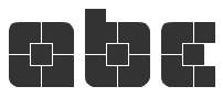 John Skelton is a
  French digital type foundry, est. 2007, located in Lille. The type coop includes Stéphane Meurice, Xavier Meurice, Sébastien Delobel (the three founders), as well as Jérémie Perrin and Baptiste Servais.
 Andrew Byrom was born in Liverpool, England in 1971. After Graduating from the University of East London in 1996 he opened his own design studio and worked for various clients including Penguin Books, The British Academy of Composers and Songwriters, The Industrial Design Centre, Time Out Online and The Guardian Newspaper. Around this time he also began teaching graphic design at The University of Luton and Central Saint. Martins. Byrom moved to the USA in 2000 to teach at Northern Illinois University in DeKalb, IL. He has recently been commissioned to design typefaces and type treatments for Elle Decoration, The New York Times Magazine, McGraw-Hill, and Turner Classic Movies. In 2006 he moved to Long Beach to take up an Associate Professor position at California State University, where he is currently the Area Head of the Graphic Design Department. He created the experimental typeface
  Antonio J. Morata (Almeria, Spain, b. 1968) is a FontStructor (aka elmoyenique) who used FontStruct to make several modular typefaces starting in 2010. The typeface names start with z. We list them alphabetically:
 Designer at FontStruct in 2008 of Interest (dot matrix), Order (constructivist), Attica, Continuum (rounded bold), Fairway (+Slab, +Serif), Slant (techno), Cowboy (2008, Western-themed), Lights in the sky, Olymia Bold, Solida (psychedelic), Digi (pixel face), Villa (heavy slab serif) and Olympia Light. In 2009, he added Versional, Crown, Vend, Reed (Slab, Sans, both octagonal), Spaced Out (Bold, Italic, Regular), Jingle, ReMix (kitchen tile), Squire (3d face), Garage Sale (stencil), Signage, Futility (blackletter), Expearemint, Textual, Callout, tweedie, Embolden, Clipped, Economical, Emphasis, Vessel, Honest, Union (+Flat, +Sans, +
 [
[ Ata Syed (Karachi, Pakistan) has a dual identity at FontStruct, where he is one of the most prolific contributors. He is known there as
  [
[ Barcelona, Spain-based designer of Kitchen Stencil (2014). [
 [
[
 Designer at FontStruct in 2008 of In Dust Reality (pollution and city dingbats), Schneider Weisse (inspired by a German beer logo), Vieille Gare,
  Catharsis is located in Leiden, The Netherlands. Before that, Christian Thalmann's page
  [
[ Graduate from Cal Arts (1996), who runs
  CybaPee is the nom de plume of Petra Heidorn who lives near Hamburg. She has created many typefaces (listed below) between 1997 and 2005 and has cooperated with several type designers on interesting projects. She is undoubtedly best known for her successful web site
  [
[ British type and graphic designer (b. 1948, London) who graduated from Ravensbourne College of Art&Design in 1967, and after working as a graphic designer in London, founded Quay&Gray Lettering with Paul Gray in 1983. David Quay Design started in 1987, and finally, in 1990, he co-founded
  Foundry, est. 2007 by Jonathan Bennett, who is located in Caerphilly, Wales. Bennett designed these typefaces:
  Designer at FontStruct in 2008 of Waffle, Nice Shot (target alphading face),
  Everything he touches turns to gold. Manchester (was: Sheffield), UK-based creator of these typefaces:
  Dutch painter, 1912-1974. In 1963, the Van Abbemuseum asked Wim Crouwel to prepare a poster for an exhibition on Edgar Fernhout. Wim Crouwel designed an incomplete kitchen tile alphabet for the occasion, and explained: It refers back to the system in the Hiroshima and the Triennial posters. The form is inspired by the abstract landscapes that Edgar Fernhout was making when I first met him. They were built up with short brushstrokes, in beautiful structures. There is a clear division in four sections, all with elements of the same height. Because of Fernhout's landscapes, I also introduced a horizon. I also wanted to bring in that reflexion, that Dutchness, here. Crouwel's lettering in turn led to the design of a few complete typefaces:
  [
[ Fontstructor who made
 Dutch
Dutch  Japanese site with original fonts by Kato Masashi (b. 1973), who lives in Takasaki (Gunma prefecture, Japan): Parismatch (2004), SAKUalp (2000, handwriting), Steeltype, Broadband, Hivision, Cinematime, Ultracomic, Ice Cream, Be Happy, Summer Beauty, Flyermix, Cheerscript, Breakstyle, Breakfont, Round, H-Five, Natsucomi, Long Vacation, Lovers, Breakfont (2003, graffiti style), Pokkaman, BeHappy, Natsucomi, Momolcan, Seasons Dings, Electron, Round, Lovers, FlyerMix (fifties style), CheerScript (comic book style), Hi-Five (pixel font), Summer Beauty, SummerDrive, White Day, Long Vacation, Amayadori (high contrast kana font), Fuyucomi, Icecream, Pickett, 321, Pingpong, Frontline, Ginza, Yago (nice free dings), Polaris, 321eng, 321kana, APPLE, CLIQUE, Clover (kitchen tile font, 1998), DIGI, Eneneng, Enenhira, FDalp, FDwhie, Hnoodle,
  Interesting geometric and experimental typefaces by
  FONTana is a font design studio in Szeged, Hungary, started in 1999.
  Jamie Place (aka FontBlast, b. 2002) is a UK-based FontStructor, allegedly born in 2002 (?), who made these typefaces in 2012:
  Gene Buban (aka geneus1) is the creative and prolific designer at FontStruct in 2008-2009 of these typefaces:
  Creator at FontStruct in 2009 of mostly pixel font families such as IMSureItSBeenDoneBefore (in many styles). He also made Material Electrons, as well as The Video Game Arcade Font, CASIOpeia ((+Menus), based on the CASIO fx-7700G Power Graphic Scientific Calculator) and Data Entry (inspired by TechnoDisplayCapsSSK, (C) 1992 Southern Software, Inc. [and 4 glyphs from the MICR font E-13B]). Other fonts: Futuristic Terminal Display (2009, great!), Mag Not Mad Solid (2009, pixel face), Mag Not Max (2009, horizontally striped pixel face), Son of Zaxxon (2009, horizontally striped, +Solid; both based on the 1984 Sega game Future Spy), Goin'Commando (2009, based on a 1985 Capcom game called Commando), Zenny Coins (2009, based on a 1987 Capcom game called Black Tiger), Smoking Gun (2009, based on the game Gun.Smoke (1985, Capcom; used again for 1943: Battle Of Midway, 1987, Capcom)), Bentley Bear (2009, based on 1983 Atari game called Crystal Castles), Temporal Aviator 84 (based on the 1984 Konami game Time Pilot 84), Reindeer Flotilla, Jet Bradley (inspired by the video game logo for "TRON 2.0", 2003 Buena Vista Interactive / Monolith Productions), Alan One (Font from TRON, 1982 Bally Midway Mfg Co), Buzzard Bait (font from Joust, 1982 Williams Electronics Inc., and its sequel, Joust 2: Survival of the Fittest, 1986 Williams Electronics Games, Inc), Genetic Engineering Error (from Robotron: 2084, (C) 1982 Williams Electronics Inc., and its sequel, Blaster, (C) 1983 Williams Electronics Inc), Mutant Bender (from Defender, (C) 1980 Williams Electronics Inc), Stargate Immortals (from Stargate, (C) 1981 Williams Electronics Inc), Separate Ways (from Journey, (C) 1983 Bally Midway Mfg), Deadly Disks (from Discs Of TRON, (C) 1983 Bally Midway Mfg Co), Jerry Belvedere (from Satan's Hollow, (C) 1981 Bally Midway Mfg Co, and from Satan's Hollow, (C) 1981 Bally Midway Mfg Co), Tortuga (from 600, (C) Konami 1981; Turtles, (C) 1981 Stern Electroncs/Konami; and Turpin, (C) 1981 Sega/Konami), OCRA Pixel 15x10, Intelligent Television Dings (Right, Left), Hand Aviator (Palm pilot font family), Intelligent Television (based on typeface used in Intellivision games by Mattel Electronics, and the True Type Font "Intellect"), DMP-200RS (based on the output of the Radio Shack DMP-200 printer), Bubbles (based on Bubbles, (C) 1982 Williams Electronics Inc), Mukor Rules All Galaxies (from Blasteroids, (C) 1987 Atari Games), Futuristic Terminal Display, Winky and the Hallmonsters (from Venture, (C) 1981 Exidy), Bubble City (from Road Blasters, (C) 1987 Atari Games), Mag Not Mad (from Mag Max, (C) 1985 Nichibutsu / Nihonbussan Co., Ltd), The Bacterian Empire (from Thunder Cross, (C) 1988 Konami, and its sequel, Thunder Cross II, (C) 1991 Konami), Solvalou Combat Aircraft (from Xevious, (C) 1982 Namco Ltd / Atari, and its sequel, Super Xevious, (C) 1984 Namco), Red Falcon Organization (from Super Contra, (C) 1988 Konami), Lucas Readies The Lawyers (from Star Fire, (C) 1979 Exidy), Cheese Was The Bait (from Mousetrap, (C) 1981 Exidy), Thunder and Lightning (from Raiden, (C) 1990 Seibu Kaihatsu Inc), Pepper The Zippering Angel (from Pepper II, (C) 1982 Exidy Incorporated), Beware I Live (from Sinistar, (C) 1982 Williams Electronics Inc), Goin Commando (from Commando, (C) 1985 Capcom), The Monkey Biz Gang (from Kangaroo, (C) 1982 Sun Electronics Corp. / Atari), Vic Viper (from Gradius / Nemesis, (C) 1985 Konami), Diskarmor Attack (from Rygar, (C) 1986 Tecmo), Benkin The Jogging Elf (from Mystic Marathon, (C) 1984 Williams Electronics Inc), Qix Are For Kids (from Qix, (C) 1981 Taito America Corporation), Omni Consumer Products (from ROBOCOP, (C) 1987 Data East Corporation), Mister Not Undo (from the Mr. Do series, Lady Bug and Jumping Jack: Lady Bug, (C) 1981 Universal; Mr. Do, (C) 1982 Universal; Mr. Do's Castle, (C) 1983 Universal; Mr. Do's Wild Ride, (C) 1984 Universal; and Jumping Jack, (C) 1984 Universal), Micro Police Pgo Stick Division (from Hopping Mappy, (C) 1983, 1986 Namco), Great Demon World Village (from Ghouls 'N Ghosts, (C) 1988 Capcom), Demon World Village (from Ghosts 'N Goblins, (C) 1985 Capcom), Secret Agent Dabney Coleman (from Cloak&Dagger, (C) 1983 Atari), Getting Away With It (from Electronic's 1991 self-titled album; a variation of Wim Crouwel's "Stedelijk" alphabet, used on his 1966 Vomgevers poster for the Stedelijk Museum in Amsterdam), Galden Tribe Attacks Mu (from Last Duel, (C) 1988 Capcom), Superior Scientists (from Vastar, (C) 1983 Sesame Japan Corp), Keeper of the Zoo (from Zookeeper, (C) 1982 Taito America Corp), Taito 1982 (Font used in the following Taito games: Elevator Action, (C) 1982 Taito Corp; Front Line, (C) 1982 Taito Corp; Jungle Hunt, (C) Taito America Corp / Jungle King, (C)1982 Taito Corp; and Wild Western, (C) 1982 Taito Corporation), Howard Fine&Howard (from The Three Stooges, (C) 1984 Mylstar Electronics), TwinBee And WinBee (from TwinBee, (C) 1985 Konami), Quest For Honor (from Last Mission, (C) 1986 Data East USA, Inc), Street Justice (from Vigilante, (C) 1988 Irem Corp), Colwyn's Glaive (from Krull, (C) 1983 D. Gottlieb And Co.), Command Prompt (a family based on Microsoft system fonts), Temporal Aviator 84 (from Time Pilot '84, (C) 1984 Konami; used again for Contra, (C) 1987 Konami), Helicopter and Jeep (from Silkworm, (C) 1988 Tecmo Ltd), A Different Space Odyssey (from Space Odyssey, (C) 1981 Sega Enterprises Ltd), Cosmic Cruiser (from Kozmik Krooz'r, (C) 1982 Bally Midway Mfg Co), Kaptn Kroozr Goes Wacko (from Wacko, (C) 1982/1983 Bally Midway Mfg Co), Rescuing Astronauts (from S.R.D. Mission, (C) 1986 Taito Corp), Super Joe (from The Speed Rumbler, (C) 1986 Capcom), Alex Murphy (inspired by the RoboCop movie logos), Blazer of Trails (Chevy logo font),
 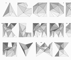 Kuala Lumpur, Malaysia-based creator of vector format fonts such as RoundCondensed (2014: piano key style), Hue Font (2014: op-art), Foury (2014: kitchen tile font), Trimental (2014: a 3d typeface), Playful Kid (2014), Maze Font (2014), Roundty Condensed (2012), Shape Guide (2014: a compass-and-ruler font), Veuz Italic (2014: poster font), Reel Love Joining Font (2014).
  [
[ Harold Lohner was born in upstate New York in 1958. He received an MFA in printmaking from the University at Albany and is Professor of Visual Arts at Sage College of Albany. He began making fonts in 1997 and starting distributing them the next year through Harold's Fonts. He lives in Albany, NY, with his partner, Al Martino. Originally, most of his typefaces were freeware or shareware, but gradually, he started selling most on his site or via
  Designer who used FontStruct in 2008-2010 create these fonts:
  Prolific designer of these typefaces at FontStruct in 2008: Mausoleum, Quarantino, Strontium (heavy octagonal), Redactor (inline; athletic lettering), Coppertones, Copperthief Gothic, Disarticulate, Adamantine, Spindlery, Thalamicus, Monolog, Abstruction, Banned Rotunda, Less Rotunda, Blabbermouth, Hackney, Circumfence, Circle Play, Outlandish, Cannibaal, Valedictory, Hegemony, Sansibal, Shoptima, Toobatu, Dwarven, Evonce, Magog, Fuego, Empyreus, Upscale, Quickie, Svengali, Amanuensis (hairline), Whitechapel, Interzone, Annexia, Mugwump, Misterioso, Slitcom, Mud Indigo, Integer, Optimist, Interim, Tredd (athletic lettering face), Brilliant Corners, Palimpsest, Trudge Fix, Plangent Shaven, Plain James Bond, Spikeful, Plain James, Portia, Juliette, Rotunda One, Dystopian, Fed Up, Mag Lev, Eensy, Simpatico, Afterburn, Fongeray, Less-Sirvere, Levio-sah, Oddity-oldstyles, Planar-light, Plangent, Plangent-semi-serif, Plangent-shaven, Prester-John, Spin Doctrine, Tabula, X-Sirvere, abricado, aubrey, chunki-phat, chunki-slim, chunki, cold-shoulders, emerald-city, epistrophy, experiment, flawa-pawa, fongamatah, gematria-experiment1, gematria, malinki, massif, modnera, nutty-slab, okey-dokey, patina, planar-book, planar, plangent, simplex-b, slantfest, slinky, solidad, solitude, souvlaki, space-oddity, spin-doctrine, splayful, too-much-caffeine, travelclock-alt, travelclock, tredd, trudge-fix, Zinzan (blocky headline face), Sir Vere (haha---he writes A Bodoni that won't take its meds; still, a great-looking simulation of Bodoni's balls), More Sirvere and Less Sirvere (derived from Sir Vere), Ugly Beauty, Tito Puente, Plain James Bold (octagonal), and First Sampler.
  FontStructor who made
  [
[ Dutch graphic designer in Amsterdam who has many typographic projects and occasionally creates a typeface. His typefaces are experimental and functional. One, called Puzzle, leaves it up to the user to position the sliding letters---quite an ingenious idea. Get Busy (2006) is artsy and futuristic. Escape (2006) is pixelish grunge. Union (2006), Get1 (2006, modular, computerized),
  In 2009, "jlb" designed these geometric fonts at FontStruct: Geometro (stencil), Geo Extended (stencil), Neotro (poster sans face), Structacon (metal&techno). [
 Frenchman from Montpellier who left France for North America in 2009. He created the display typefaces
  [
[ Graphic designer in Budapest, Hungary. Graduate of Loughborough University, class of 2018 (with a bachelor's degree), and Moholy-Nagy University of Art and Design in Budapest in 2021 (with a master's degree). At Loughborough University (UK), Kornel Faludi designed a set of generative typefaces (2016), i.e., typefaces that are very modular and computer-generated to a large extent. His typographic oeuvre is quite experimental. Many of his fonts use just basic geometric structures such as circles, arcs and rectangles.
  Colombian creator (b. 1992) of the kitchen tile typeface
 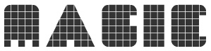 Darmstadt, Germany-based graphic designer who used FontStruct in 2009 to create Afrobeat (+II, a piano key family),
  Since 1993, Swiss type designer
  Lorenz Fidel Huchthausen (aka Tylo at
  [
[ [
[ [
[ MartinPlusFonts is the Berlin-based foundry of Martin Wenzel, a
 [
[ [
[ Fontstructor who created Puppy (2009, a kitchen tile puppy dingbat face---cute!), T-Shirt (2010) and Primitive Man (2010). [
 Iztapalapa, Mexico City-based graphic designer. Creator of Pixa Square (2014: a dot matrix typeface family that includes some arcade game dingbats as well), Domino (2014: digitization of a typeface by Sabino Gainza), Norma Script (2014, avant-garde sans), Norma Cursiva (2014), Macmillan (2014, sans), El Corondel (2014, signage script), Taller (2014, done with Manuel Flores), Mr. Pascal (2014: LED or kitchen style typeface for numbers on watches), Britannia Capital (2014: a calligraphic copperplate typeface), Alfaomega (2014, avant-garde sans), Alfaomega Cursiva (2014, school script font), Espiral (2013, a Victorian school project font at Escuela Nacional de Artes Plásticas UNA).
  FontStructor who made Acrobat Bold (2011), Breakers (2011, texture face), Roman (2011),
  Indian designer in Tiruchirappalli, b. 1989. FontStructor who made these typefaces in 2010:
  FontStructor who made many fonts, including the unicase typeface
  Negro is a design site where some commercial fonts can be found, all designed by
  Californian FontStructor (aka winty5, b. 2002) who made these typefaces in 2012: 5Stenserif, 5Stencipix,
  Hungarian outfit established in 2008 by graphic designers Mark Zador and Attila Horvath. Typefaces created by them are mostly techno or minimalist:
  [
[ The Great Dane from Copenhagen,
  Raihan Nizar (b. 1977) is the Indonesian
  German type designer born in Frankfurt in 1973. He studied in Offenbach at the Hochschule für Gestaltung. He assisted Akira Kobayashi with some projects, and still lives in Frankfurt. In 2017, Lukas Schneider set up Revolver Type Foundry.
  [
[ Original shareware fonts designed by Johnny Martz of Kitchener, Ontario. Font list:
  [
[ Parisian graphic and web designer. He created the kitchen tile typeface
  Dutch professional music producer and audio engineer who founded his own record label. He also makes (mostly free) fonts. His work:
  Korean designer (aka pear94210) who used FontStruct in 2009 to make Shadow (shadow font), Outside (bilined), Squaline (gridded), 5to5 (pixel), Shine, Heart Negative, Heartbreaker (octagonal), Octagon, Basic, Neos, Heaven, Remember (kitchen tile), Genie (bold, condensed), and Heaven. In 2010, these fonts were added: Chocolate, Piece (dotted font). [
 Free font outfit by Bob Wertz that started production in 2009, mostly based on FontStruct:
  Eben Sorkin obtained an MA in typeface design from
  Aka
Aka  Aussie design and type company, est. 2003 by Dan Pike from Brisbane (and now based in Melbourne). Their typefaces include Airport (2004, fantastic airport tile font), FourFive (2001, thin octagonal face), Block (2004), Pixel (2002), Route (2006), Slabamond (2002), Stencil (1999), Theo Fine (2005) and Theo (2000, inspired by the work of two great Bauhaus movers, Theo van Doesburg [1883-1938] and Theo Ballmer [1902-1965] both of whom created an alphabet based on a basic 5x5 grid system), Font 705 (2003, pixel face), Schwarz*Weiss (2003, swooshy face), Grave Archaize (2003, this is unbelievable--to be seen!), Flip&Rotate (2003), Valetta (2003). Most fonts are by Dan Pike. Some are by "Phil". Designer at
  Britsh graphic, branding and type designer. His typefaces:
  Tobias Sommer ("Shasta") is the Geneva, Switzerland-based designer (b. 1986) at FontStruct in 2008 of Great Depression (influenced by headline fonts from 1929), Brutto (headline slab serif), Lame Dude (dripping paint), Toytype (an interesting Indic simulation typeface based on an earlier block font by him called Block On),
  Graphic design studio in Höxter, Germany. At
  TDN (Type du Nord) is a San Francisco (was: Minneapolis)-based foundry that produces funky fonts for designers who like to keep it friggity fresh. Typefaces designed by Libbie Bischoff, who finished the
  Underware is a (typo)graphic design-studio which is specialized in designing and producing typefaces. These are published for retail sale or are specially tailor-made. The company was founded in 1999 by Akiem Helmling, Bas Jacobs and Sami Kortemäki. Since 2002 Hugo Cavalheiro d'Alte is also part of the studio. They are based in Den Haag, Helsinki and Amsterdam. In 2017, they joined
  [
[ During her studies in Barcelona, Valentina Rueda designed the kitchen tile typeface Selah (2018), the fine all caps display typefaces Mufasa (2018), Pumba (2018) and Skar (2018), and the all caps titling typeface Fallen (2019). [
 Designer (aka Funk King, b. Fort Knox, KY) who lives in Orlando, FL, and/or Apopka, FL. He used FontStruct in 2008-2009 to make over 550 decorative fonts, and became one of the world's top experts on FontStruct, FontShop's on-line font editor. Most of his fonts were withdrawn in 2012. He did a few commercial typefaces at his commercial foundry, Funk King. His creations include
  American Fontstructor who also uses
  Alexandfer Meyer is the Zürich-based
  This is one of the most talented FontStructors, but also an active musician. On
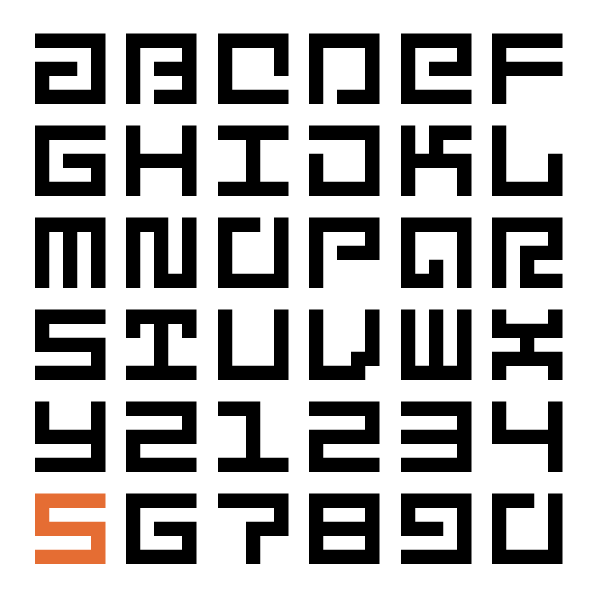
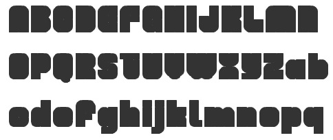
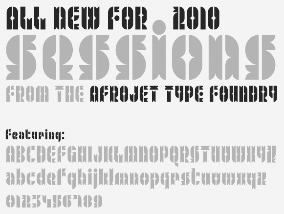
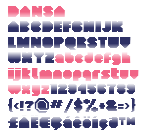
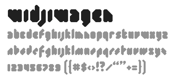
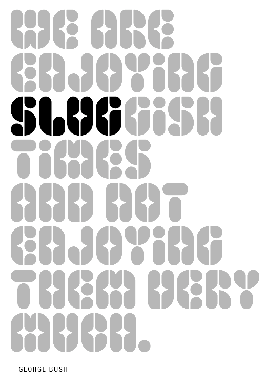
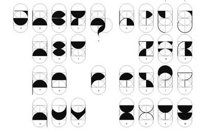
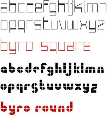
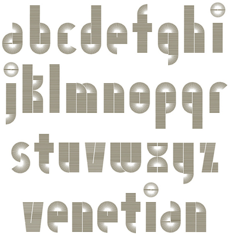
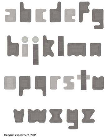
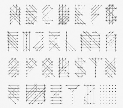
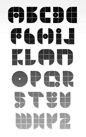
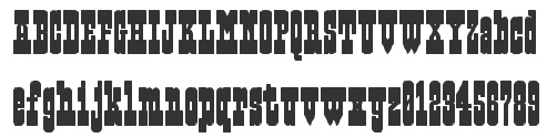
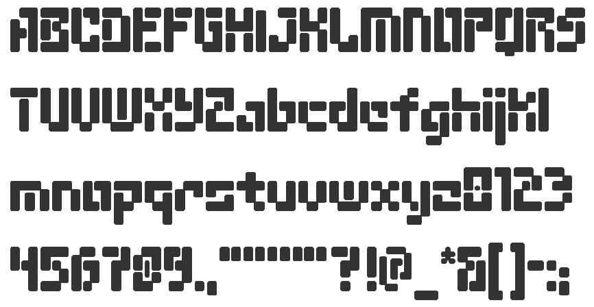
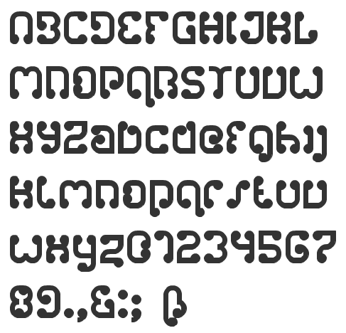
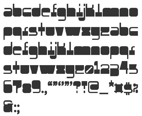
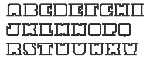
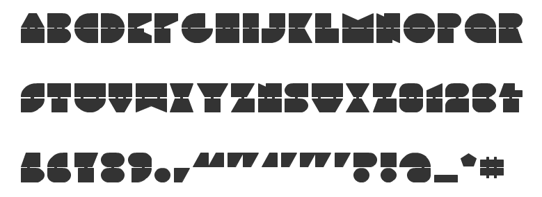
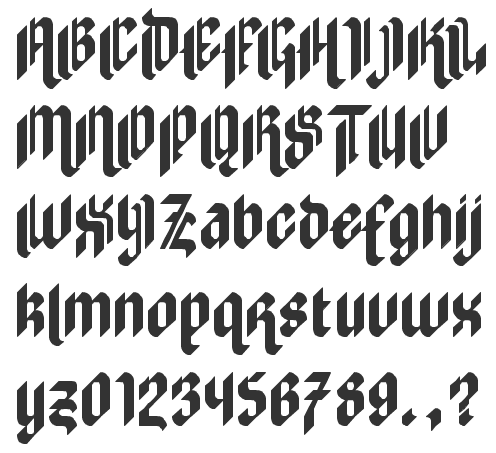
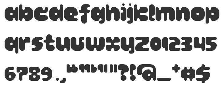
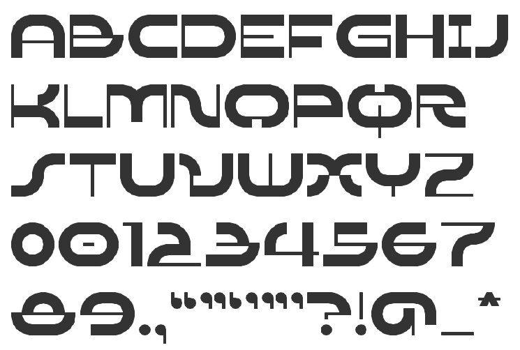
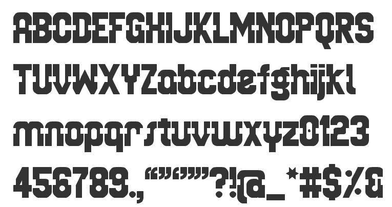
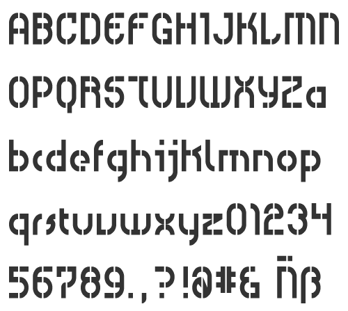
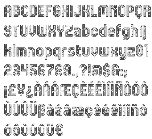
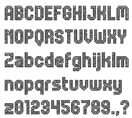
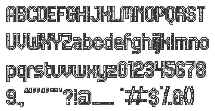
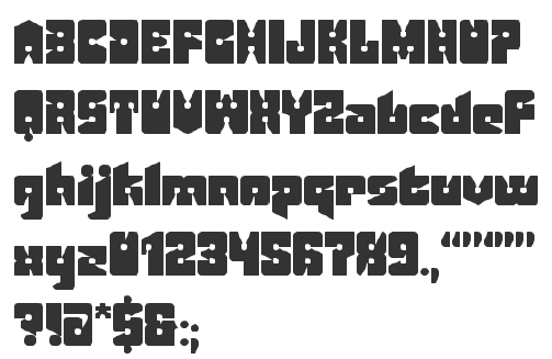
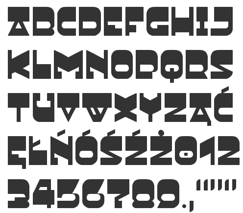
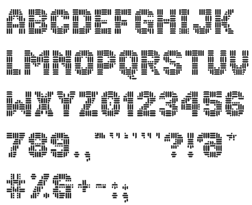
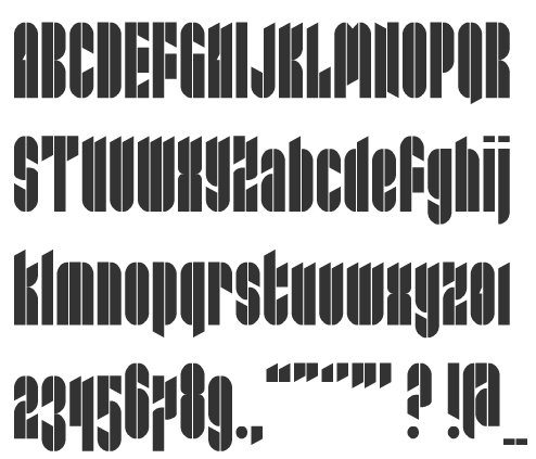
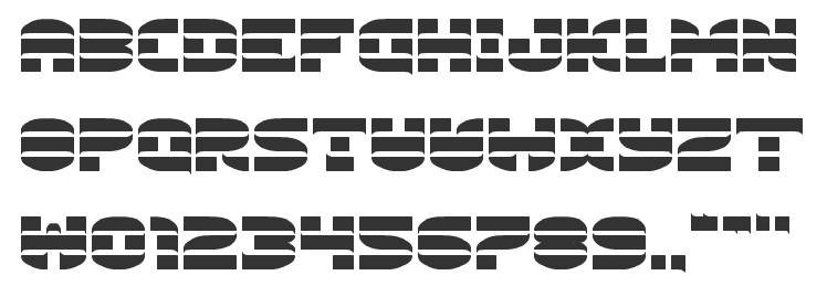
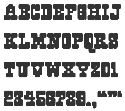
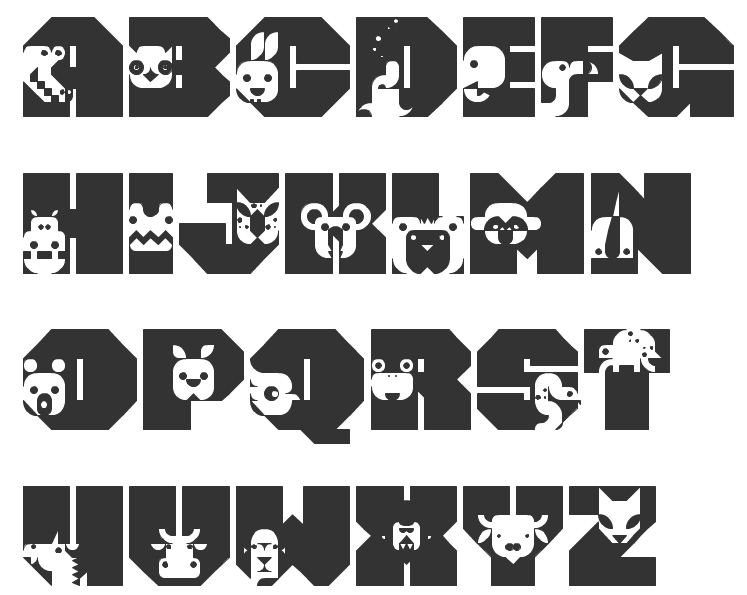
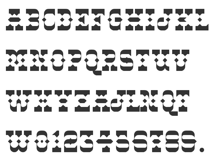
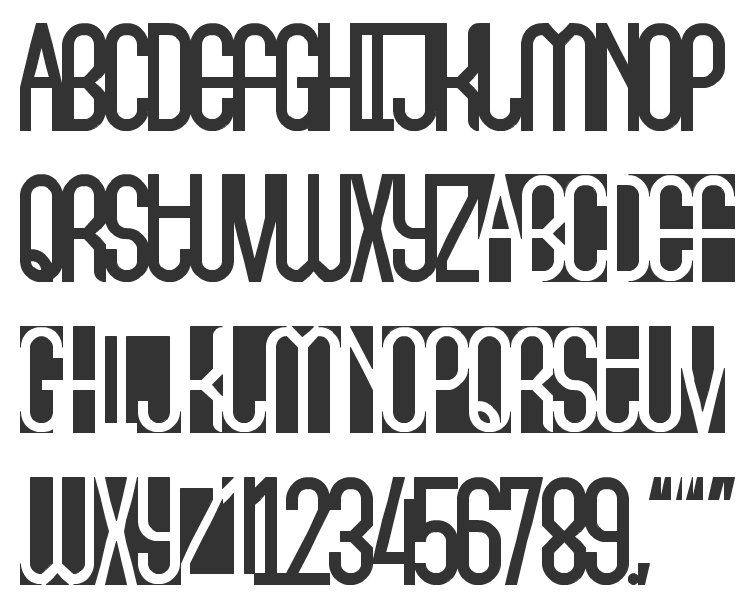
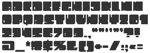
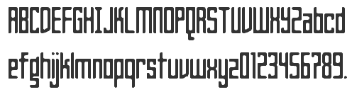
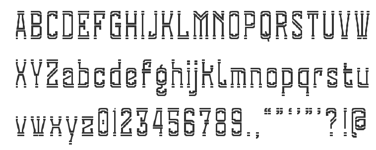
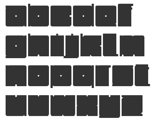
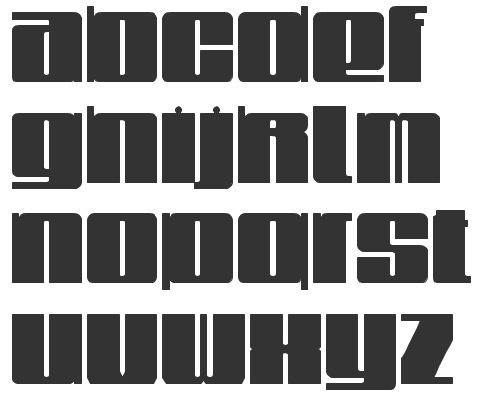
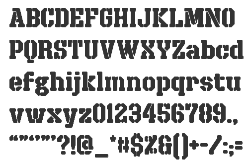
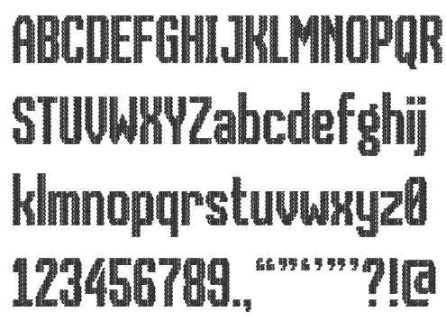
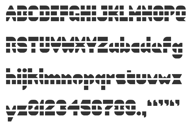
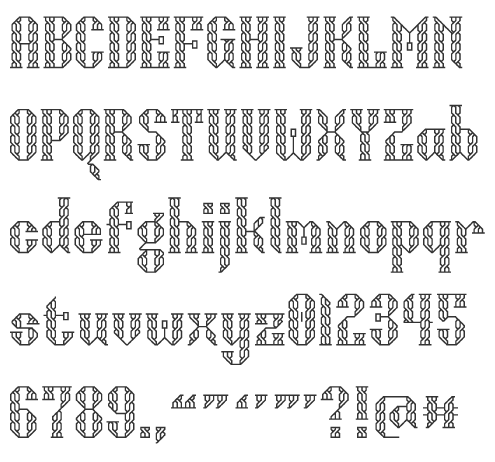
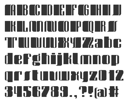
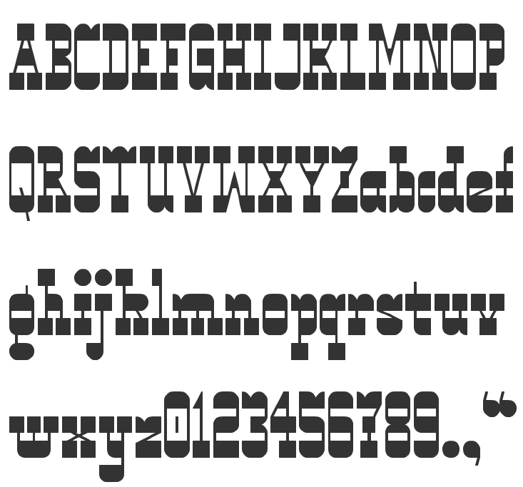
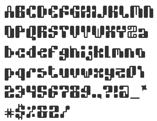
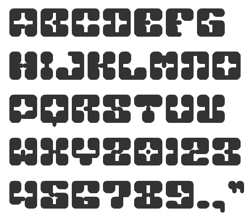
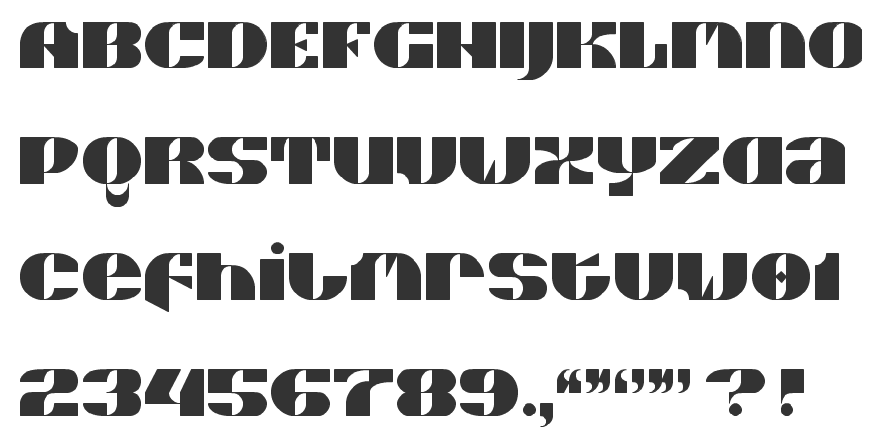
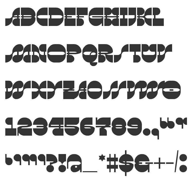
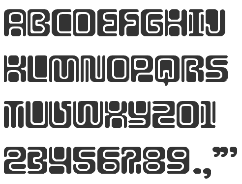
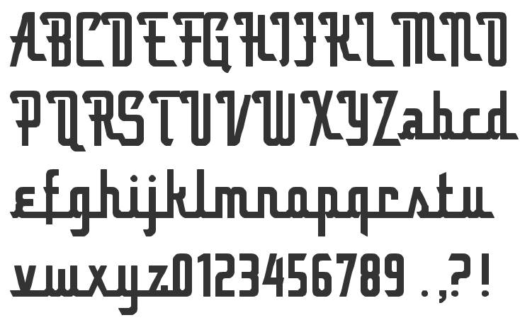
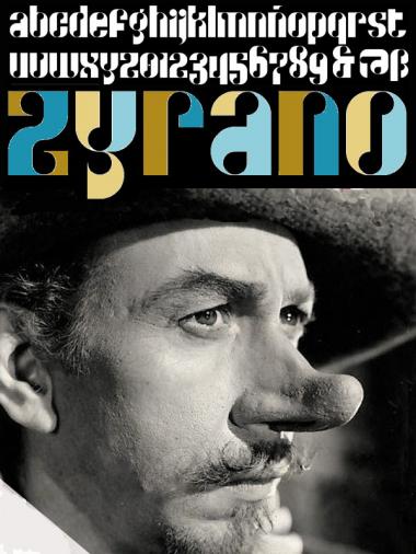
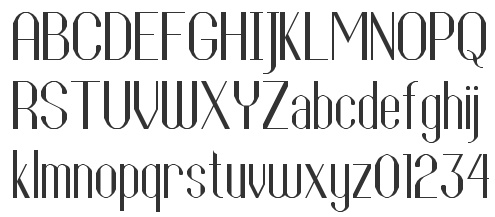
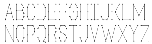
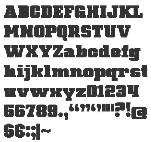
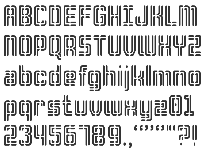
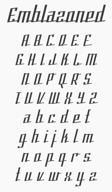
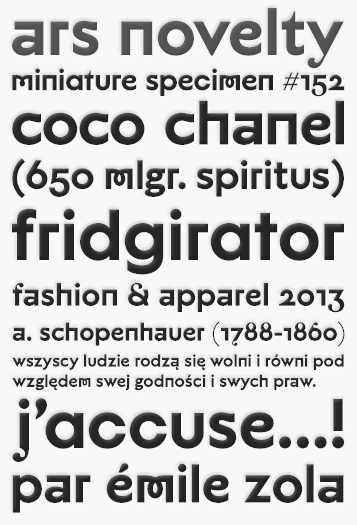
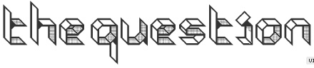
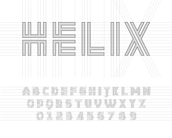
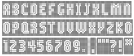
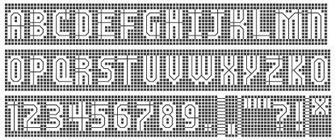
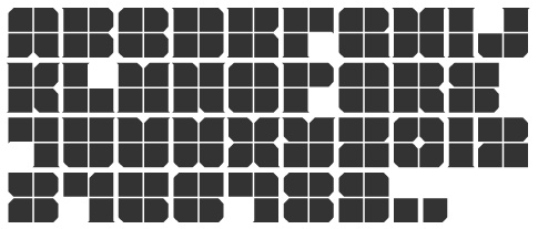
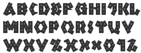
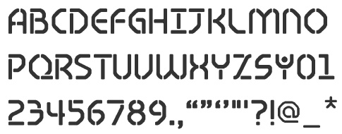
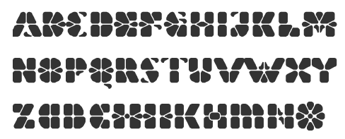
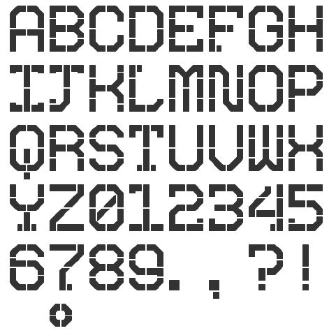
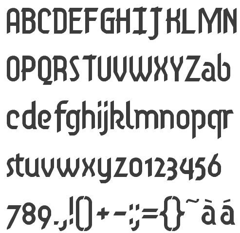
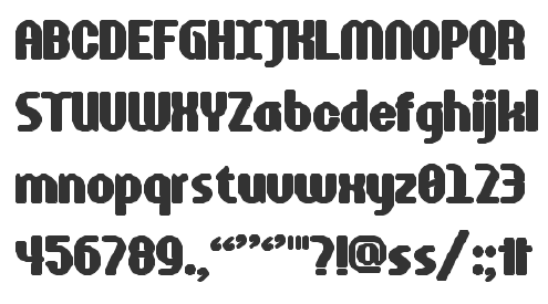
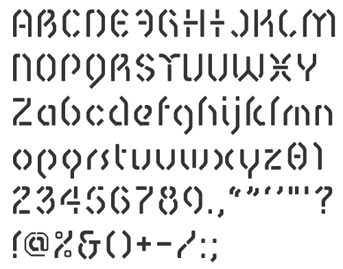
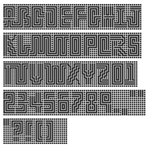
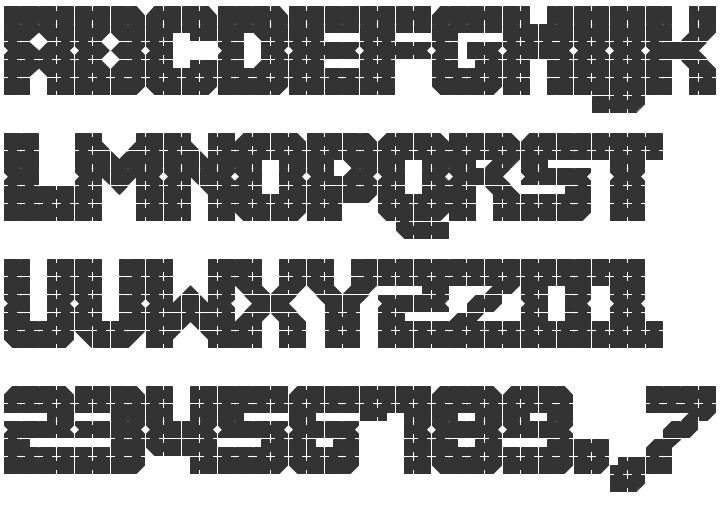
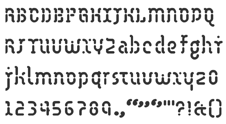
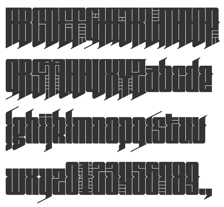
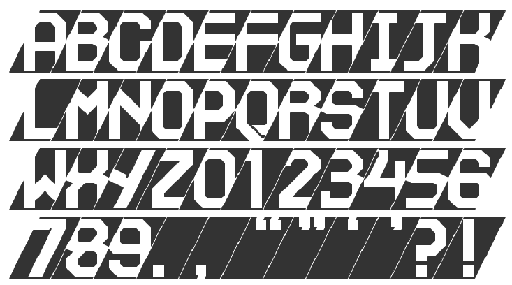
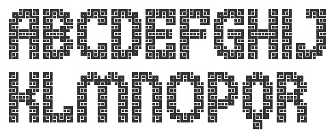
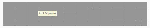
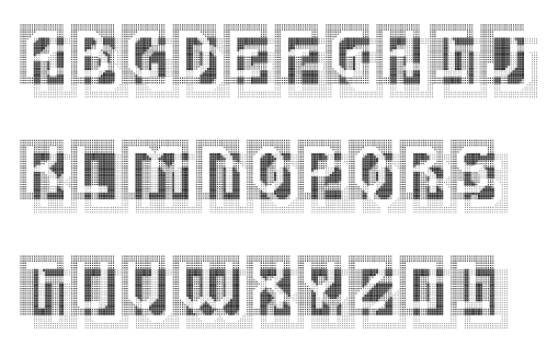
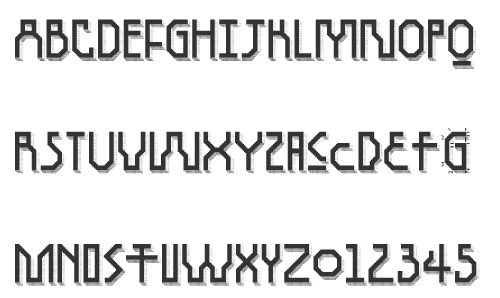
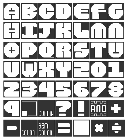
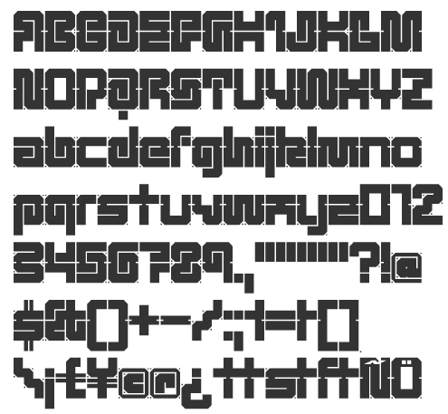
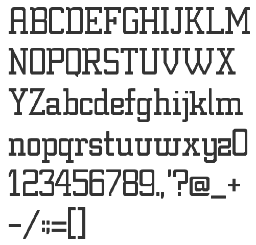
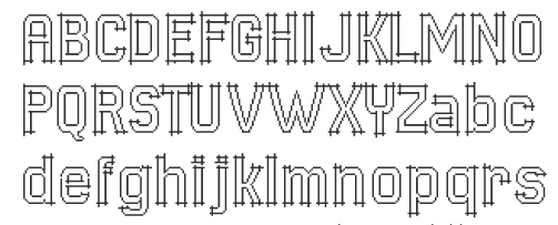
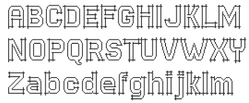
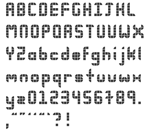
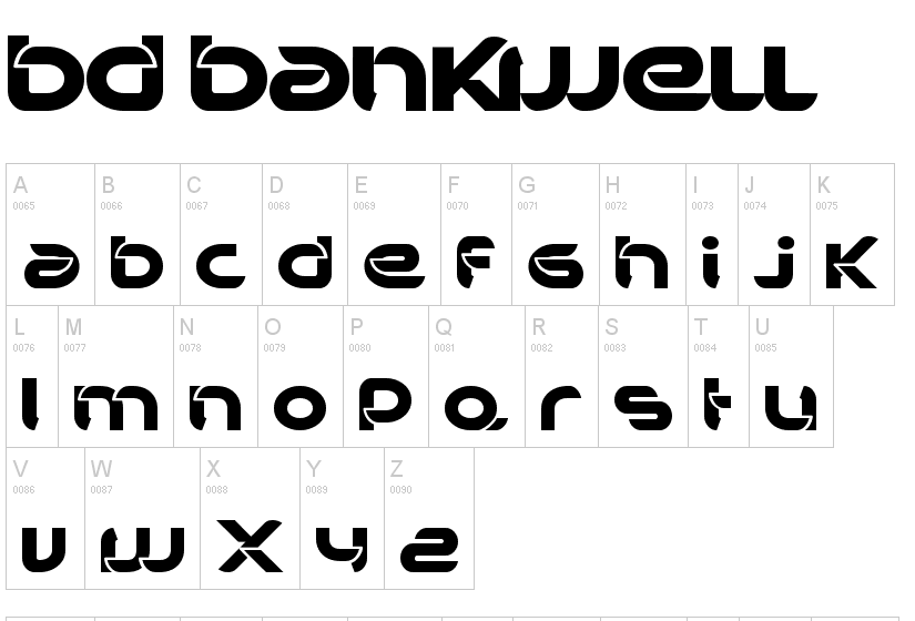
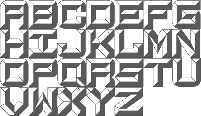
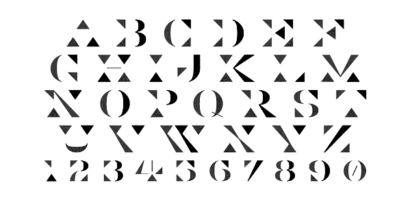
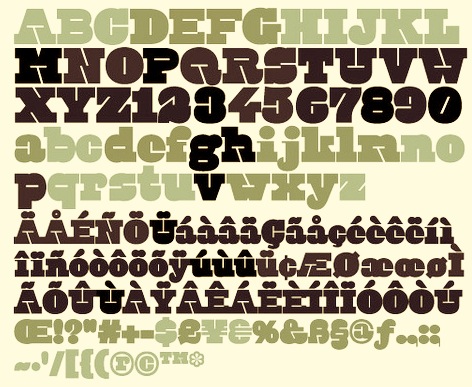
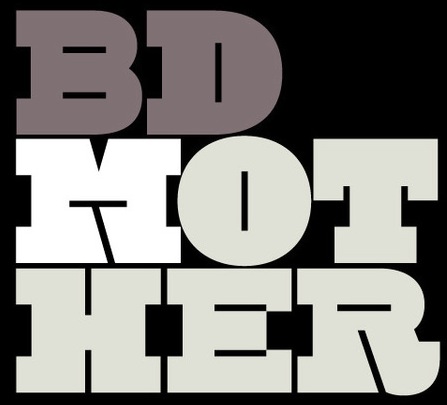
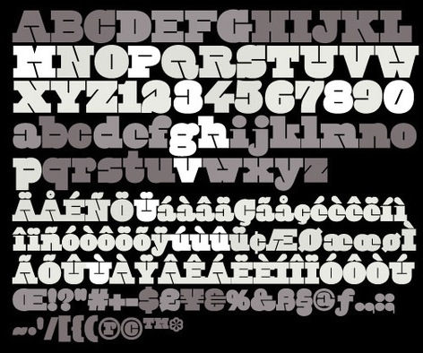
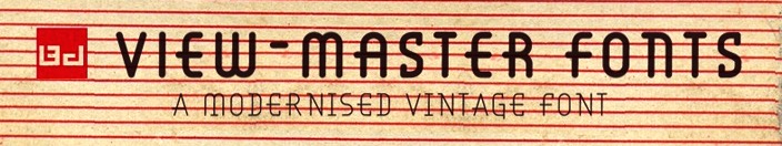
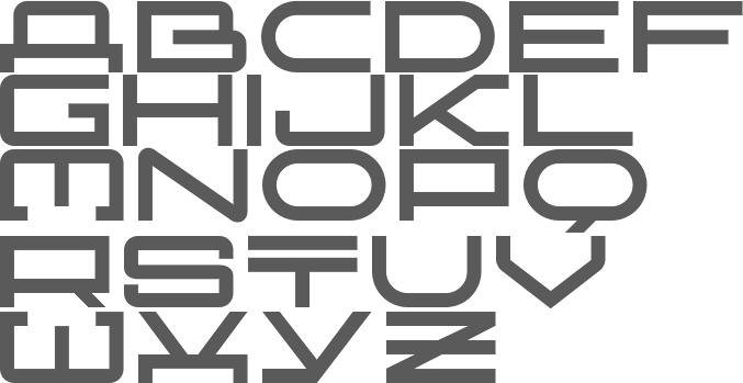
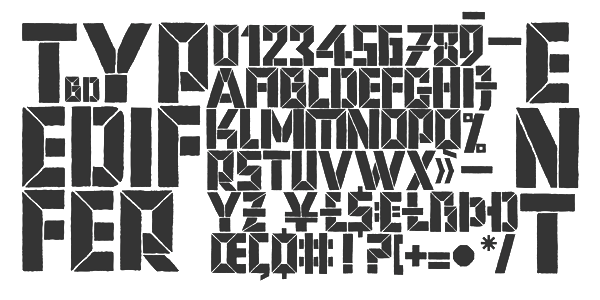
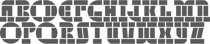
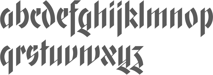
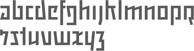
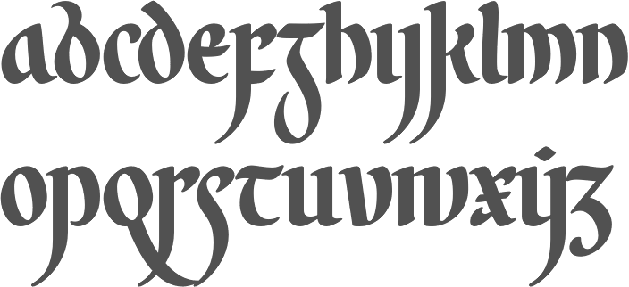
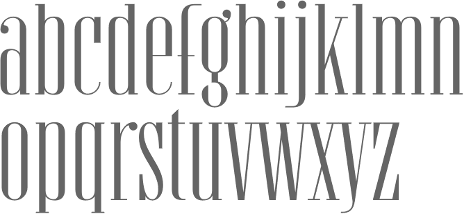
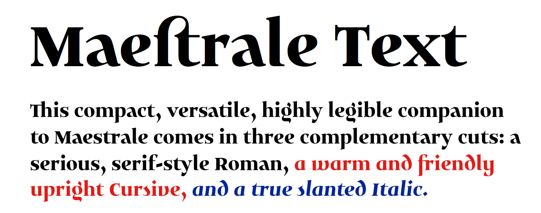
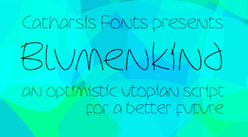
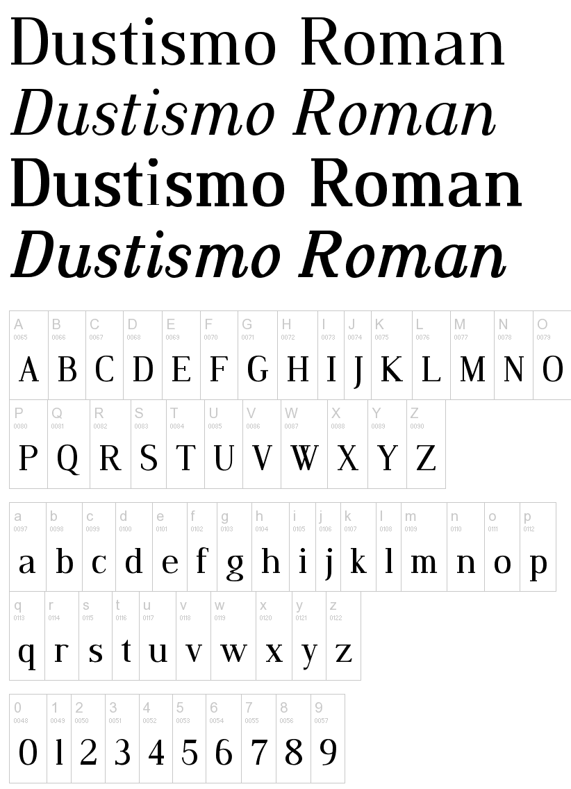
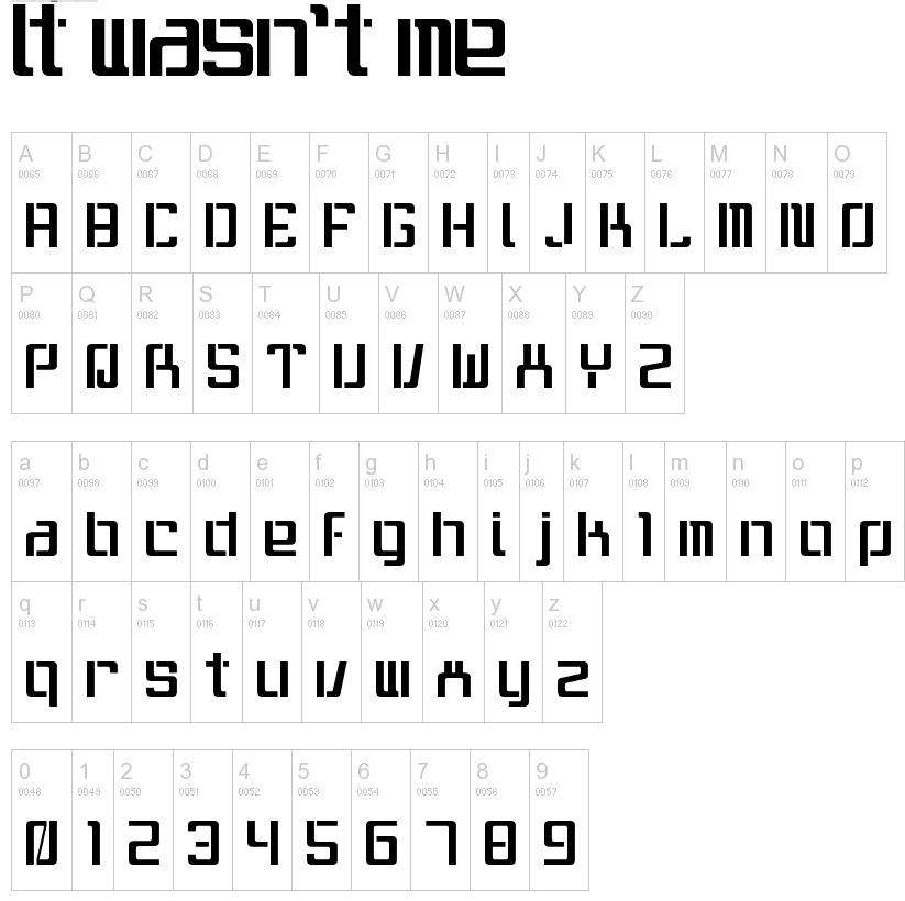
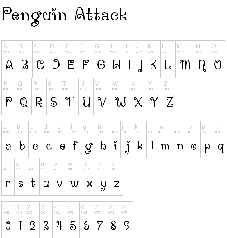
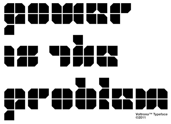
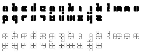
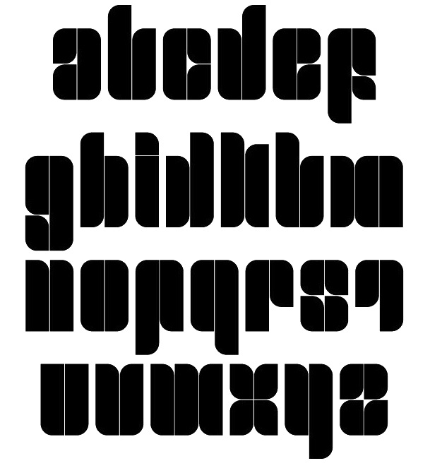
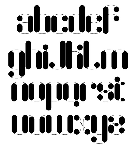
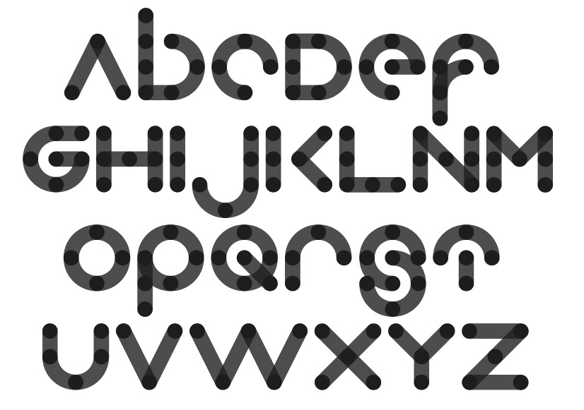
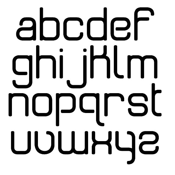
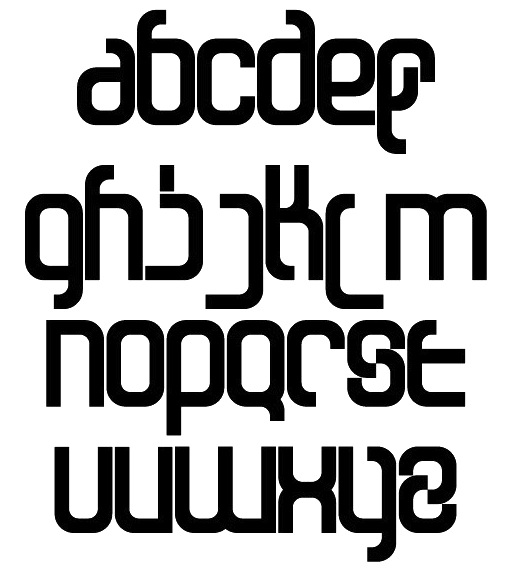
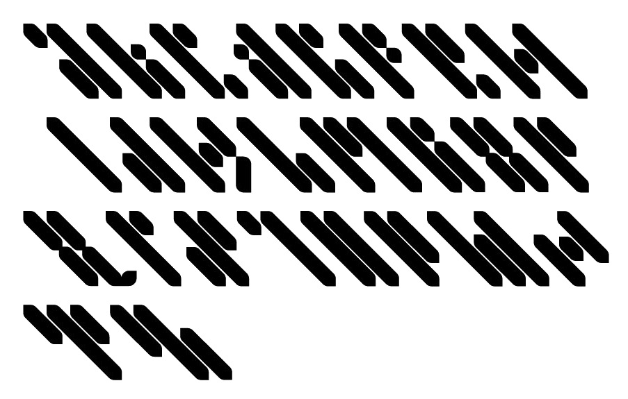
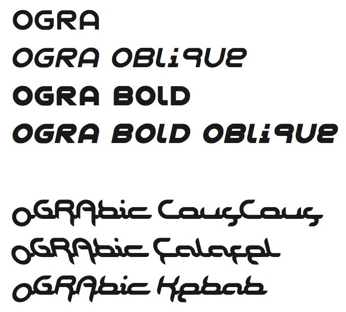
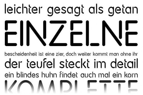
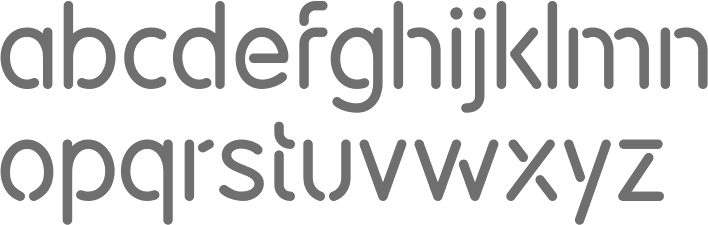
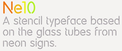
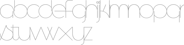
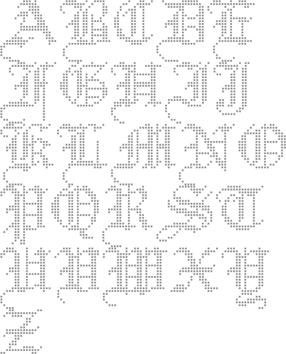
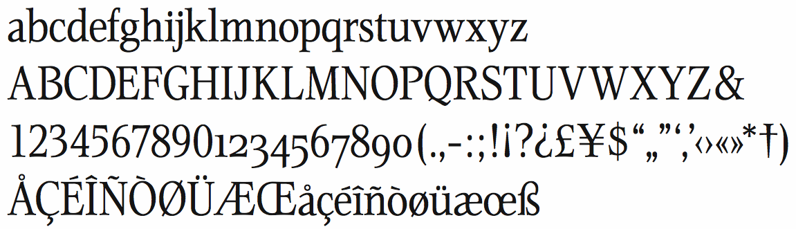
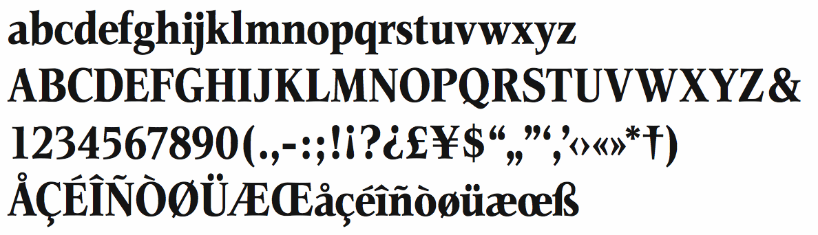
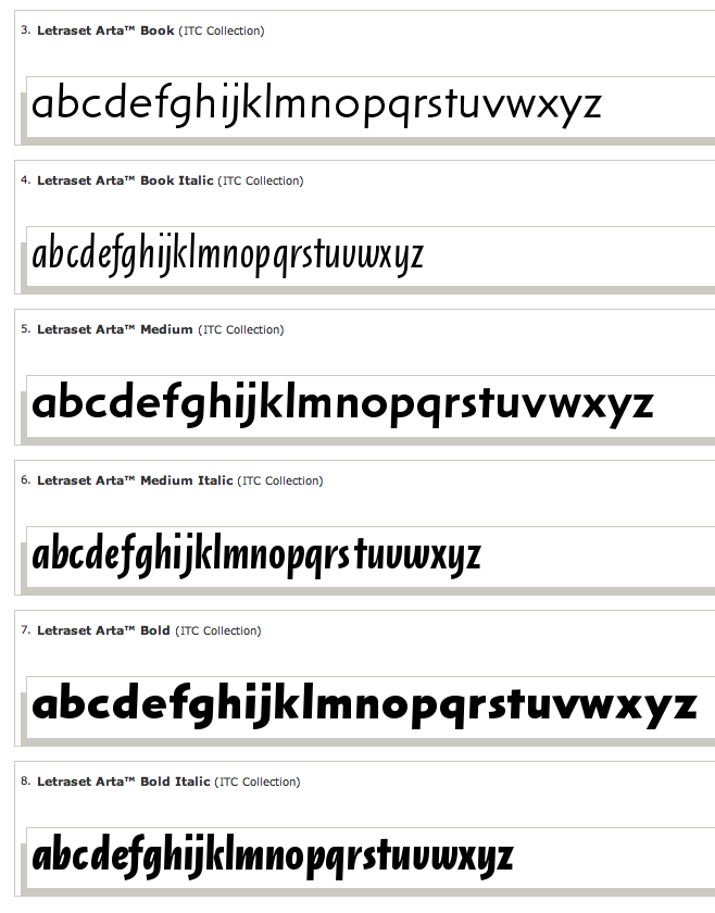
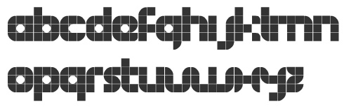
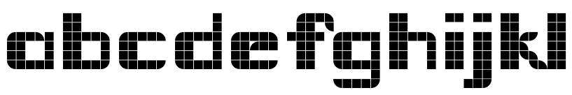
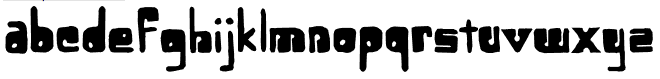
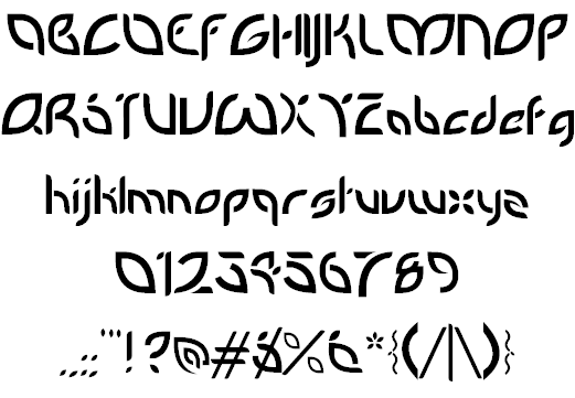
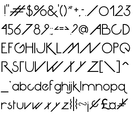
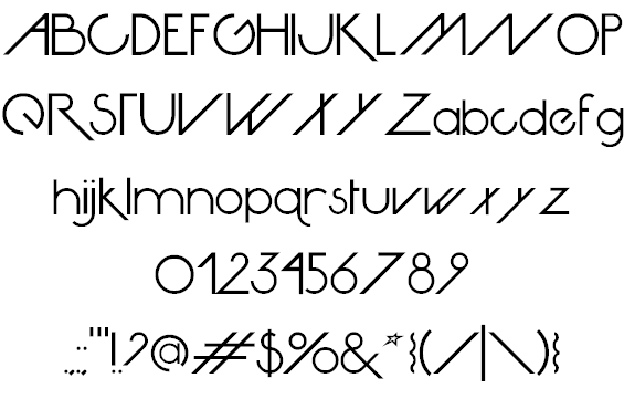
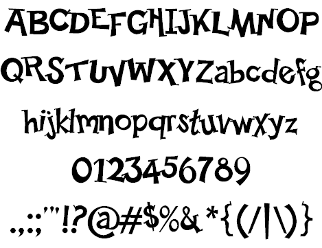
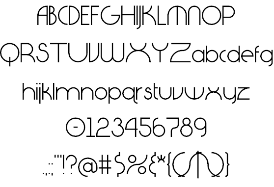
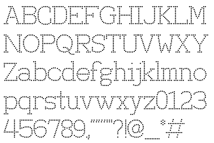
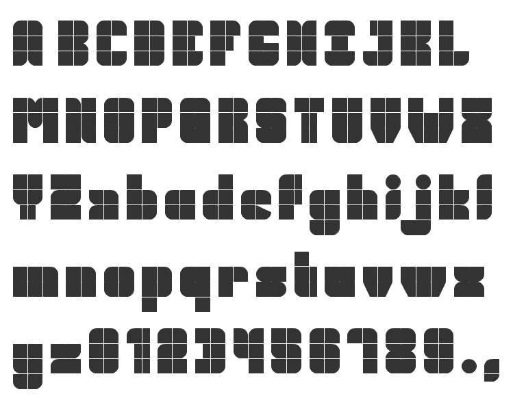
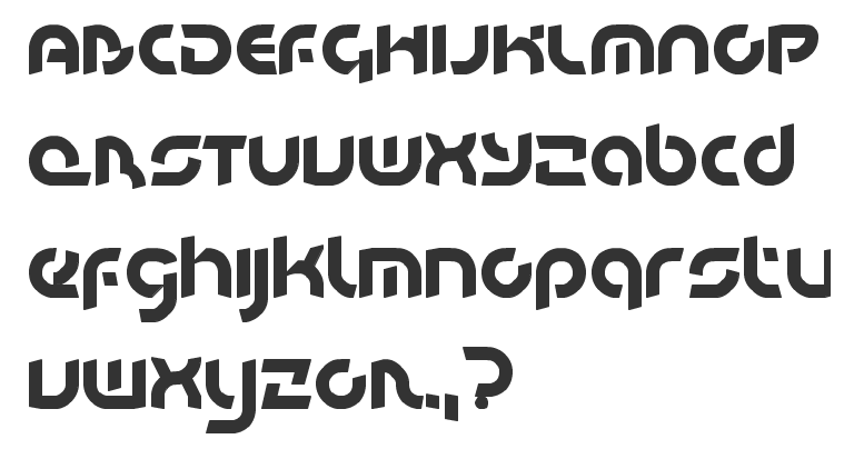
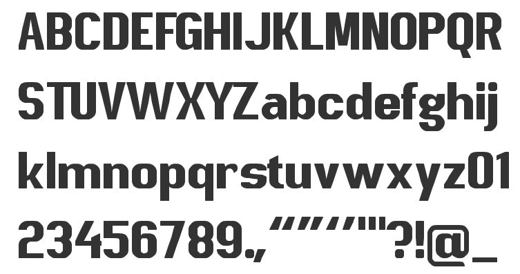
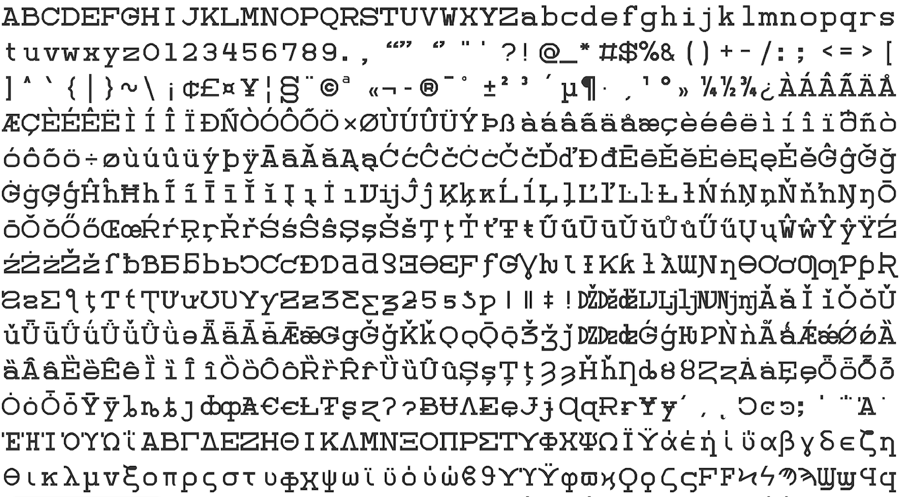
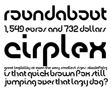
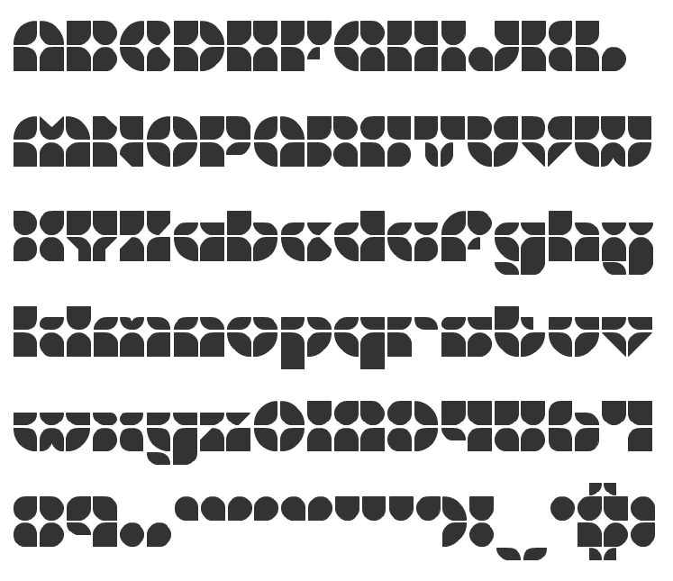
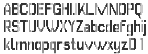
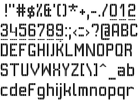
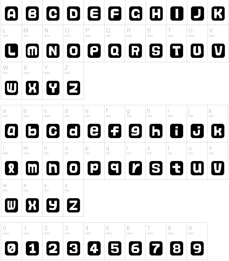
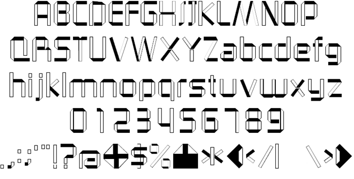
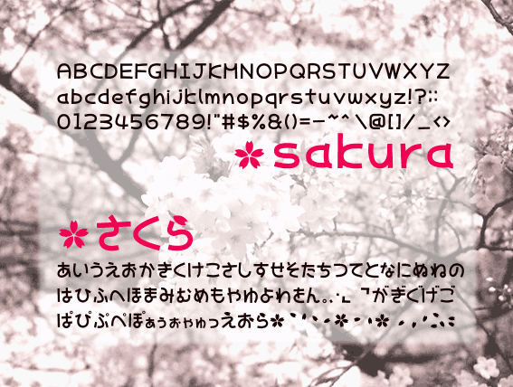
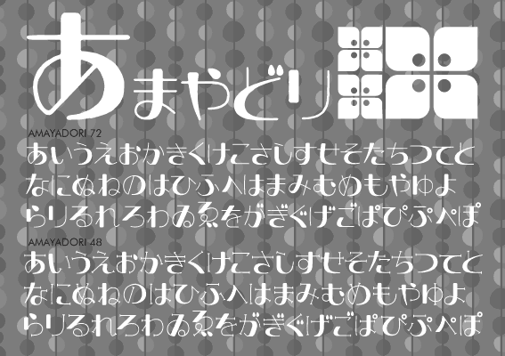
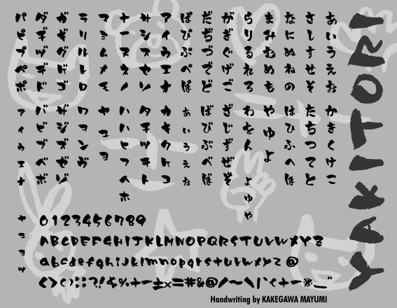
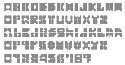
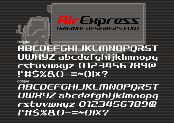
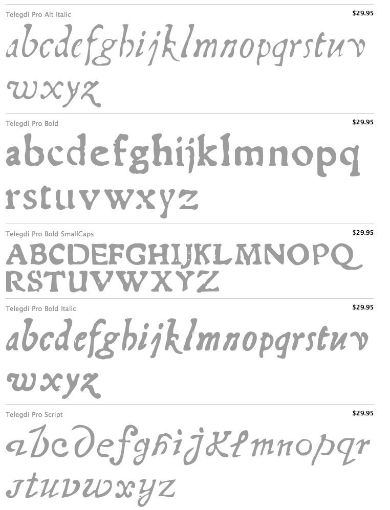
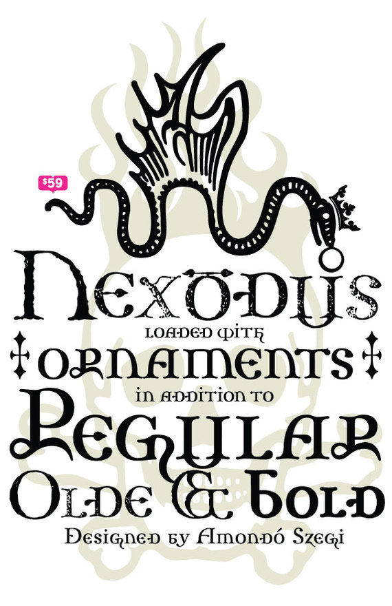
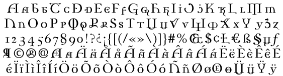
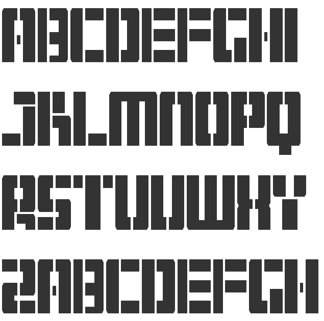
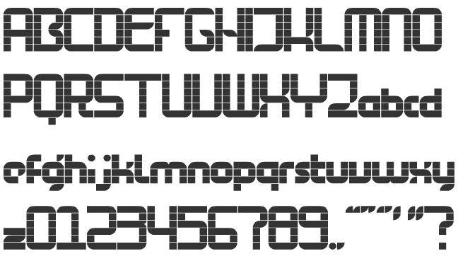
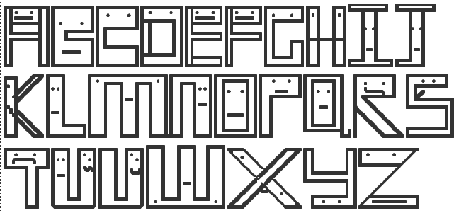
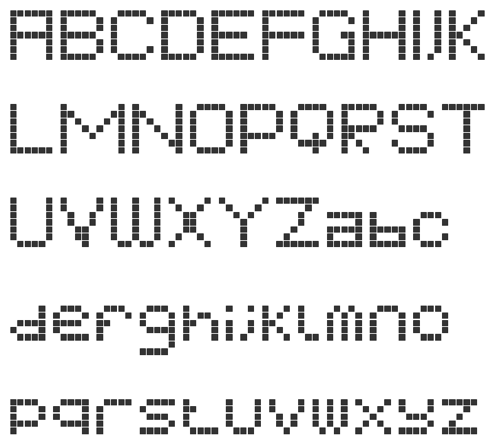
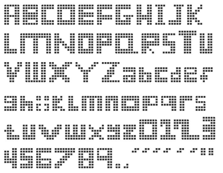
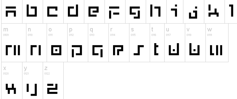
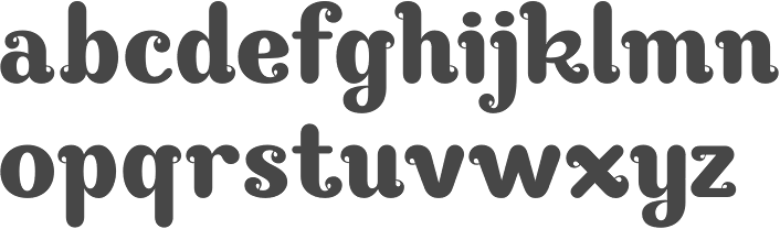
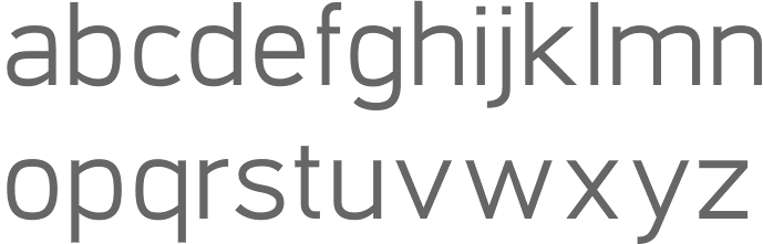
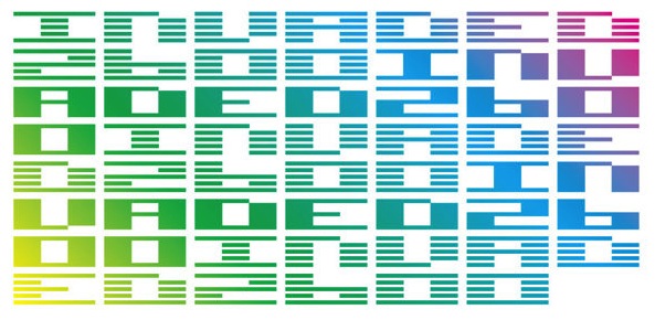
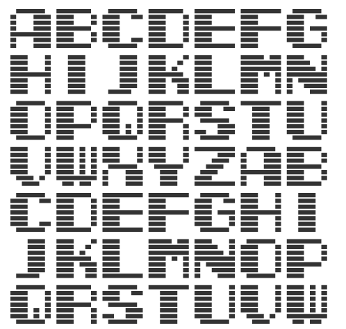
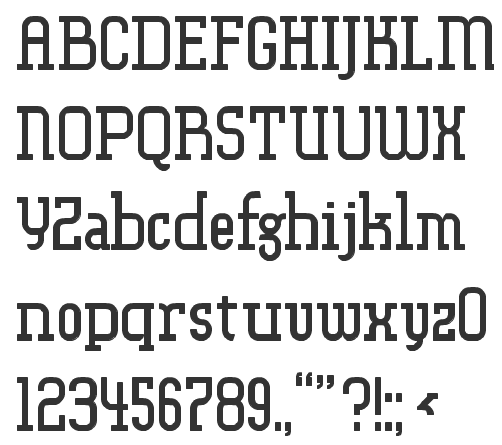
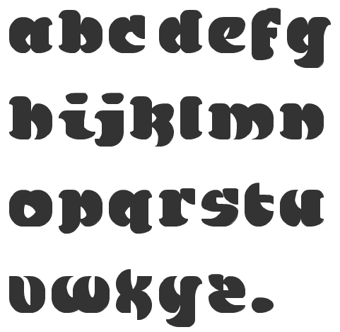
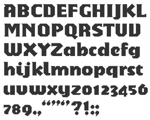
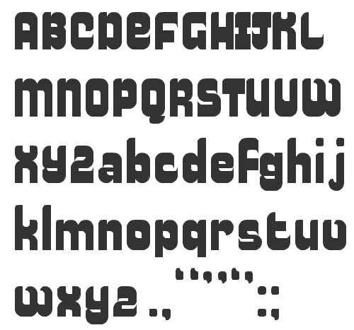
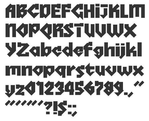
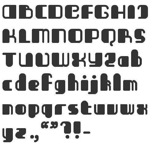
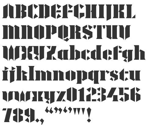
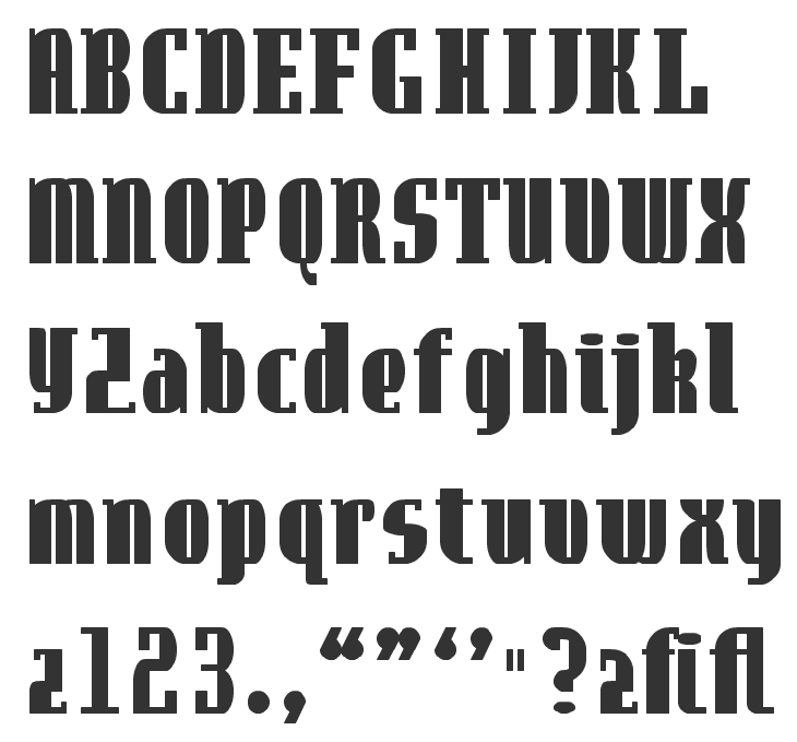
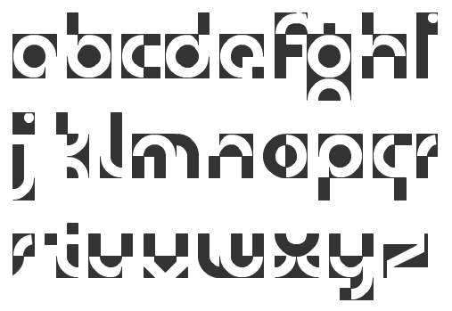
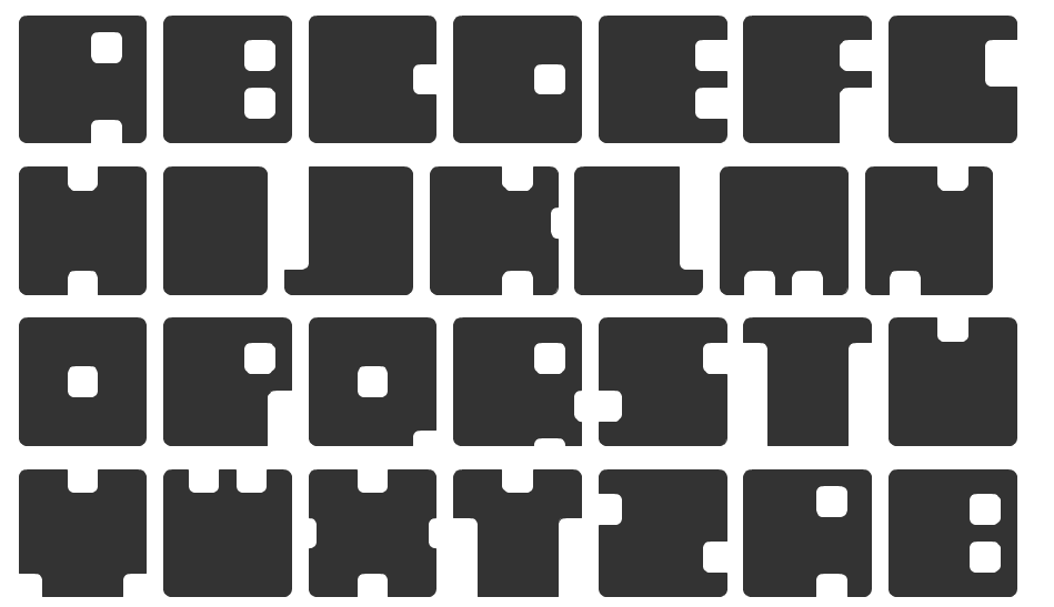
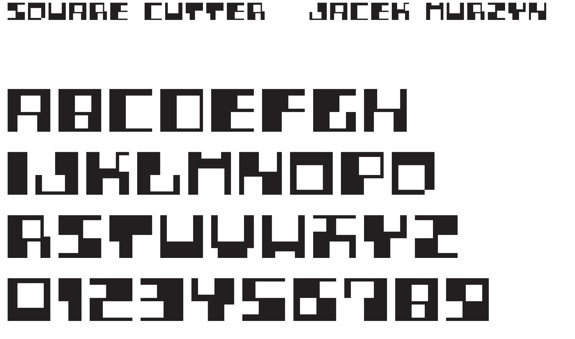
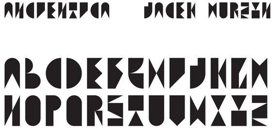
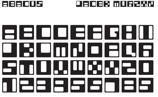
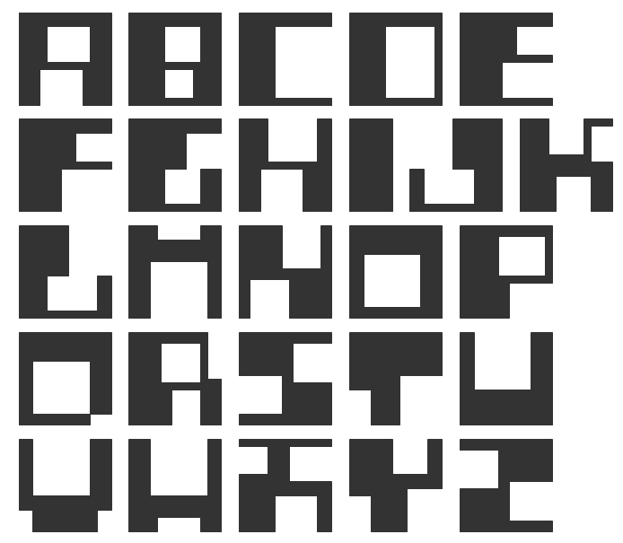
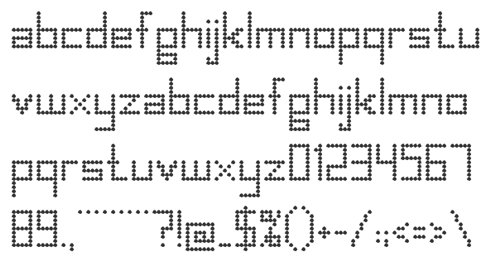
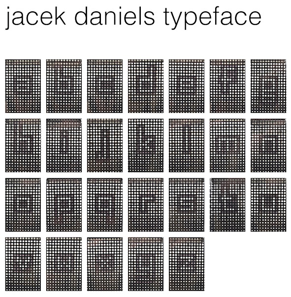
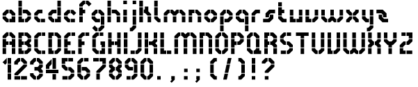
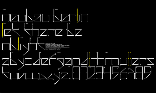
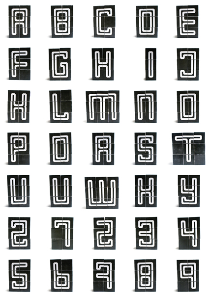
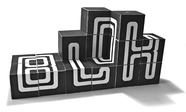
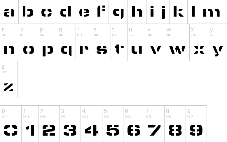
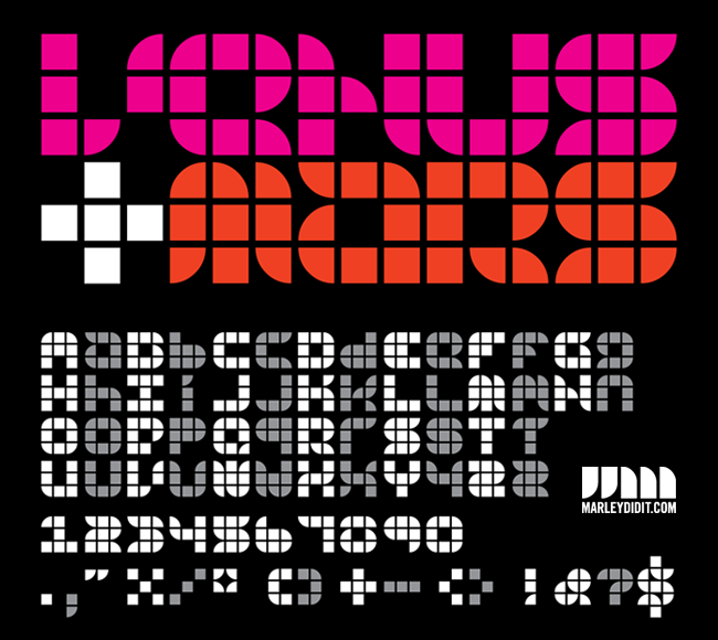
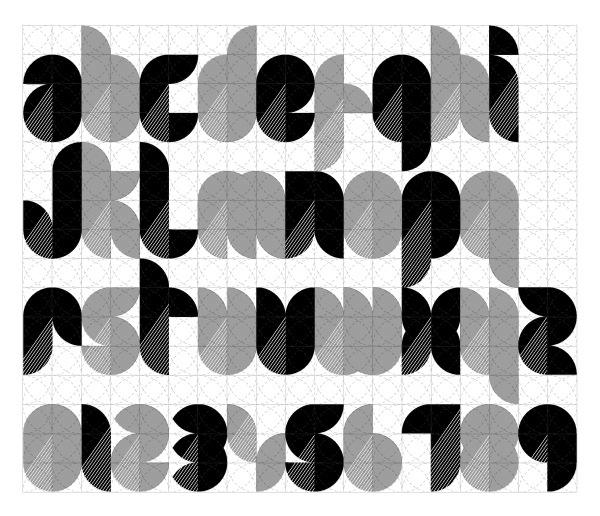
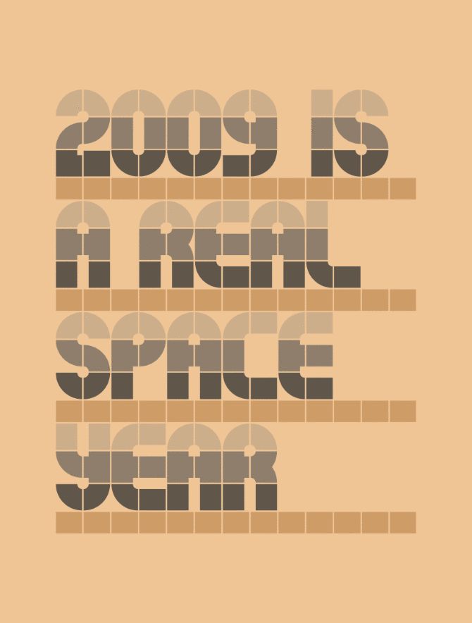
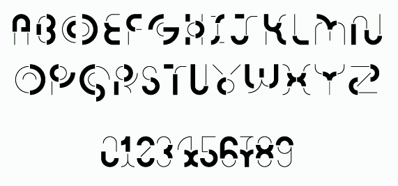
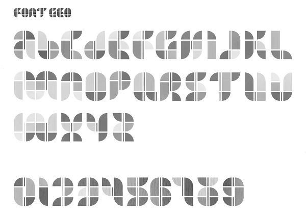
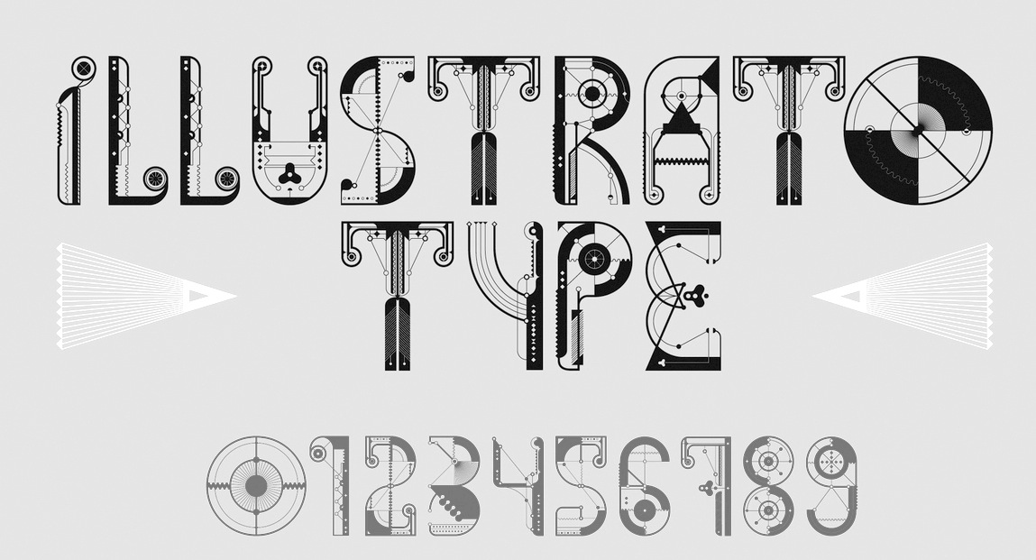
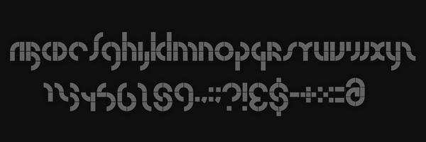
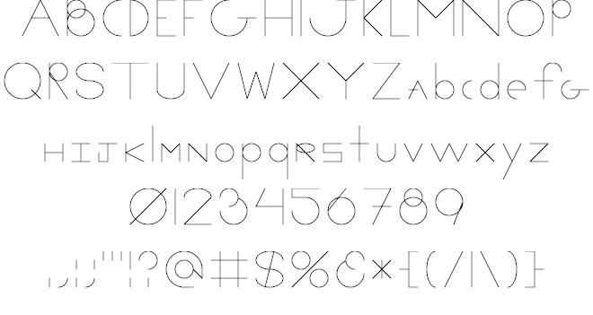
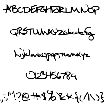
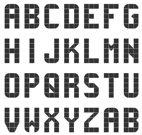
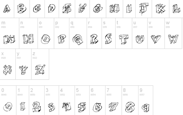
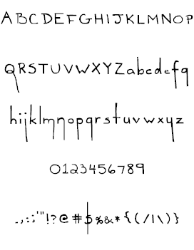
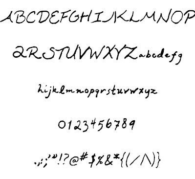
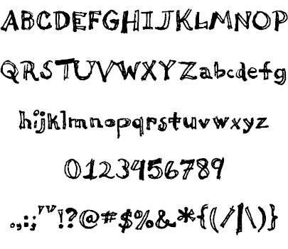
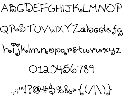
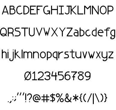
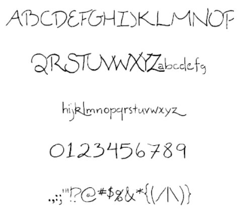
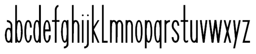
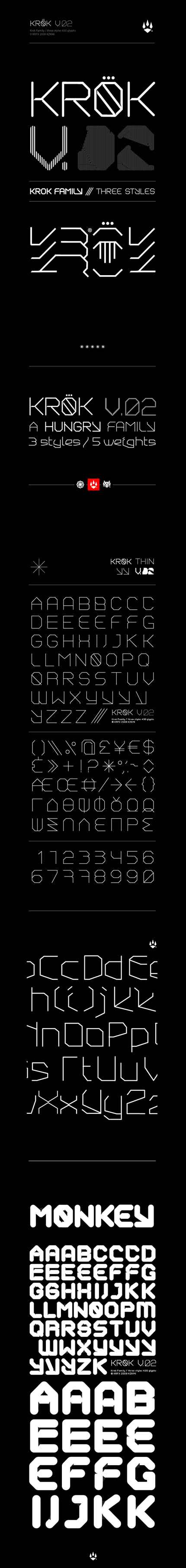
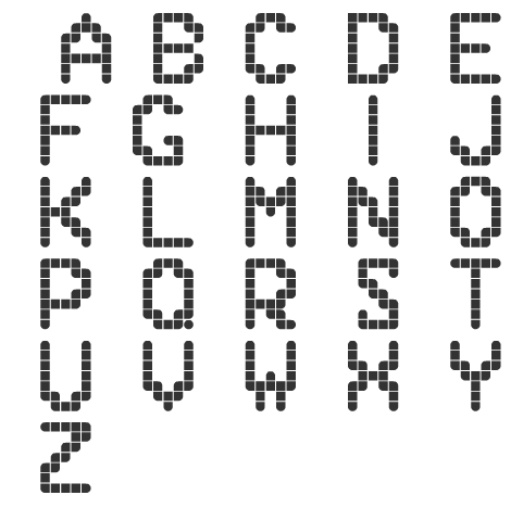
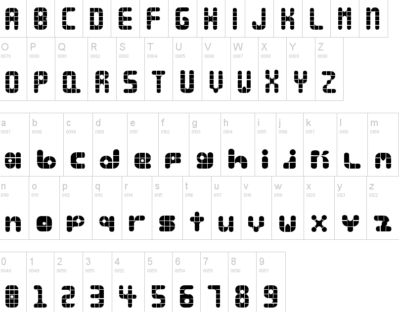
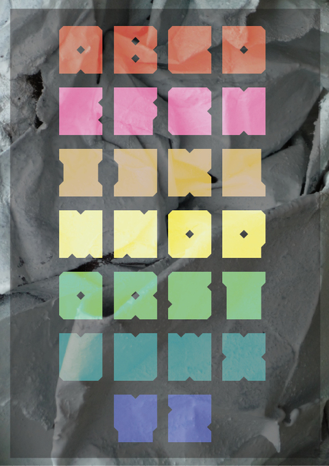
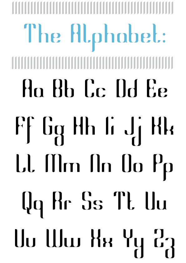
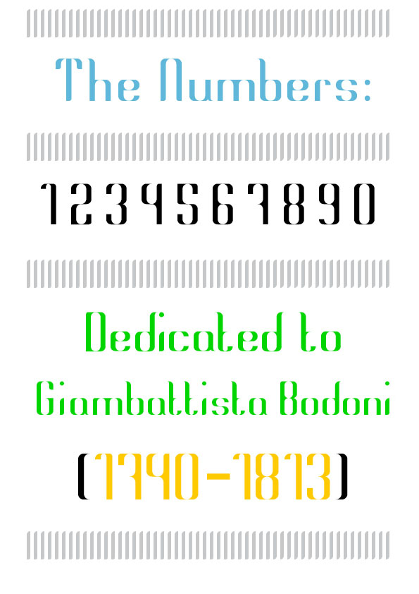
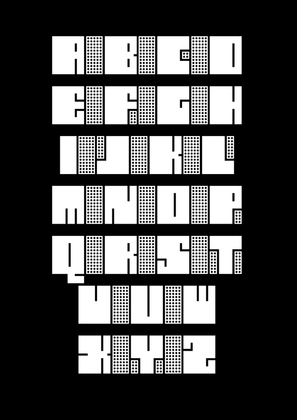
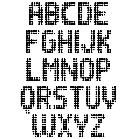
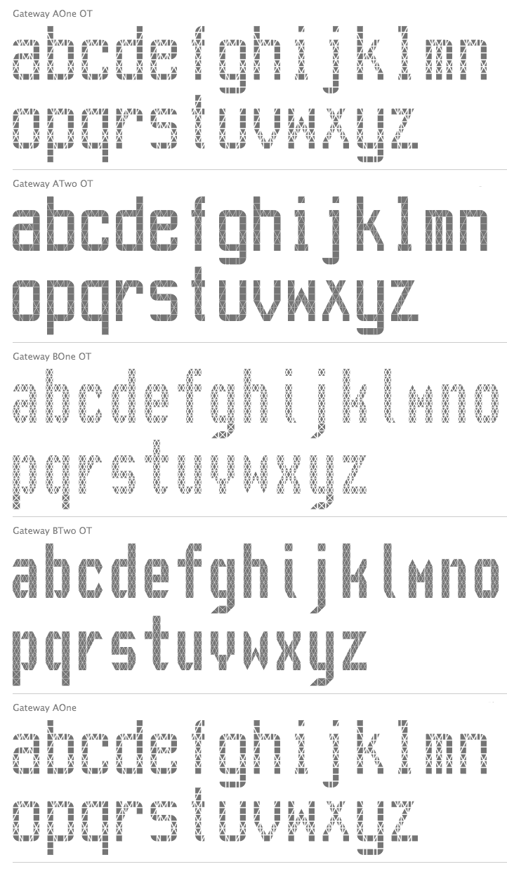
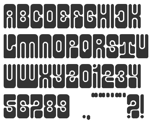
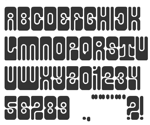
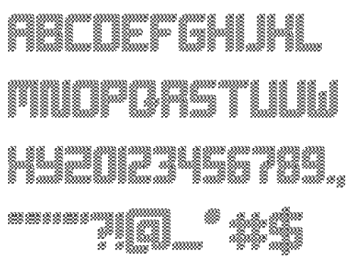
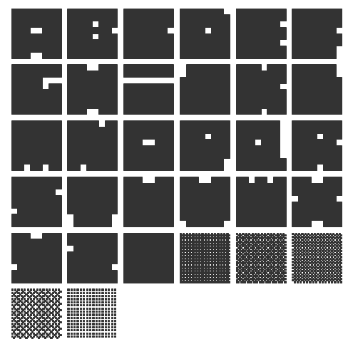
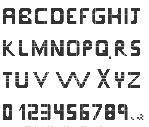
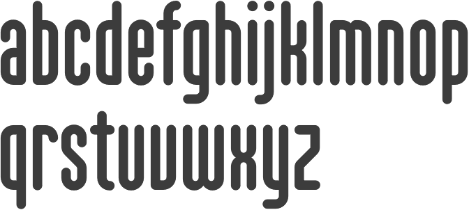
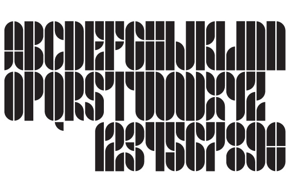
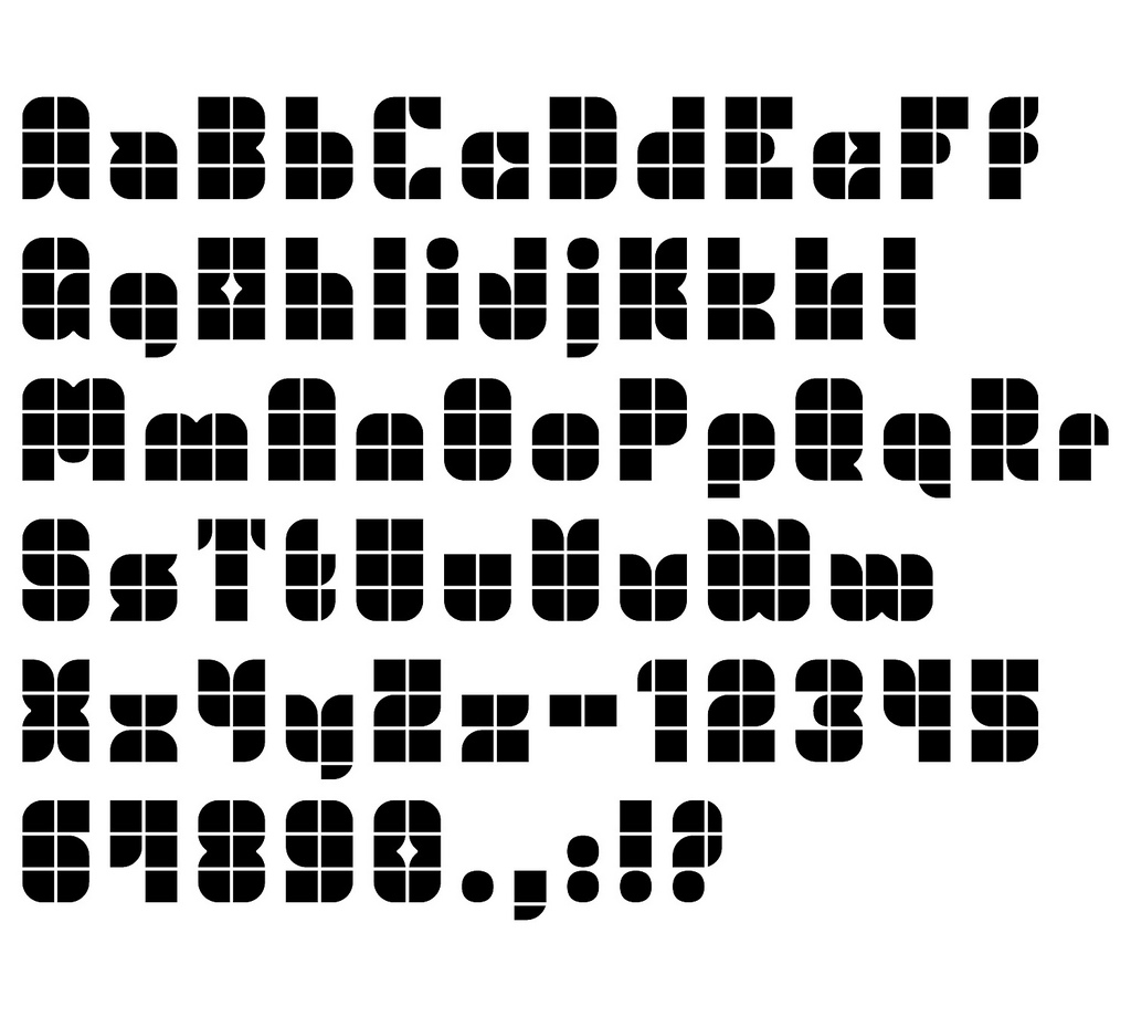
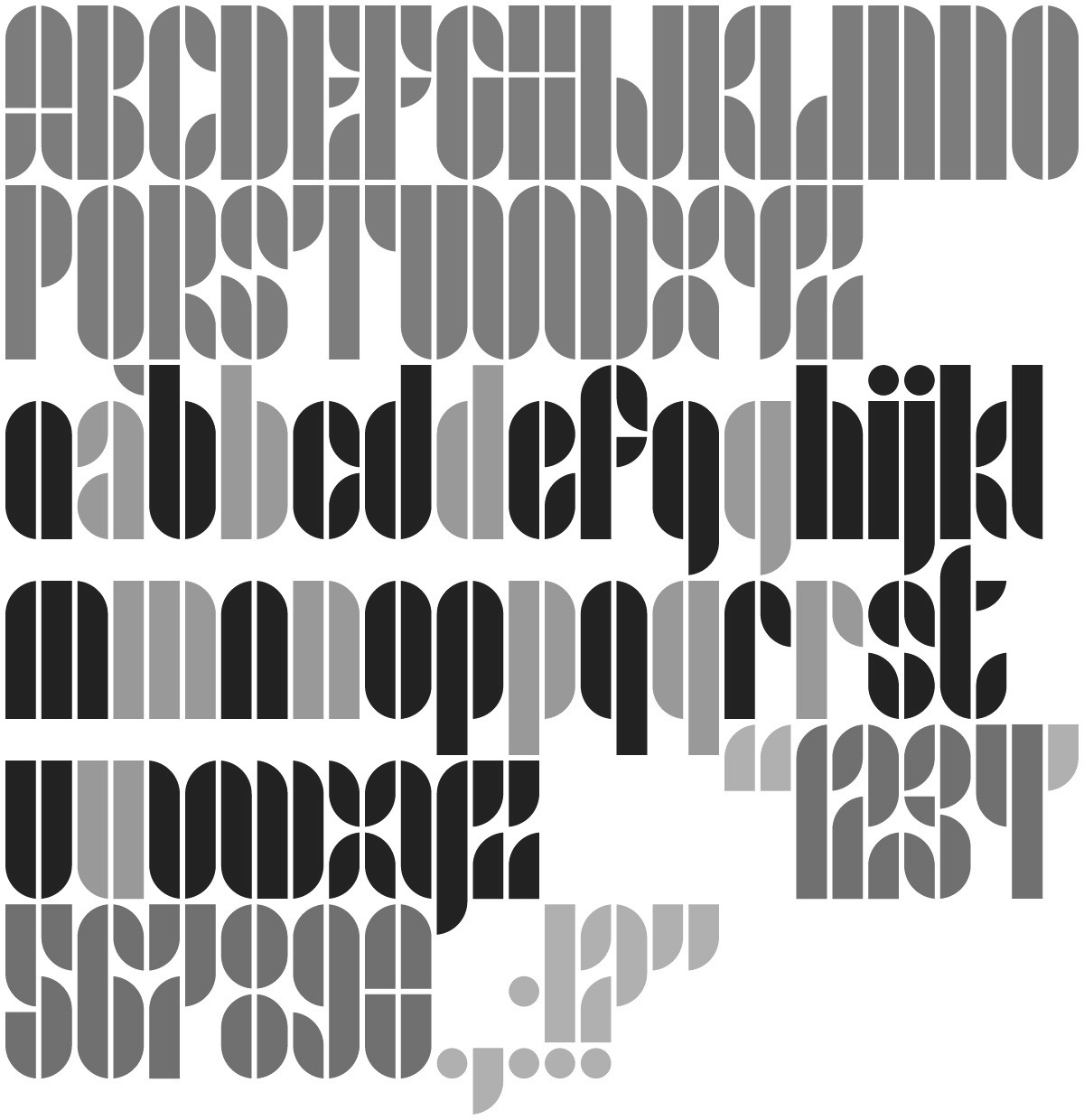
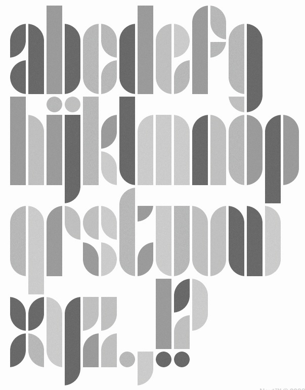
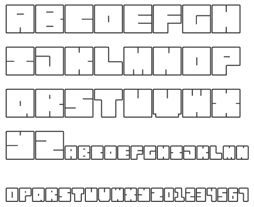
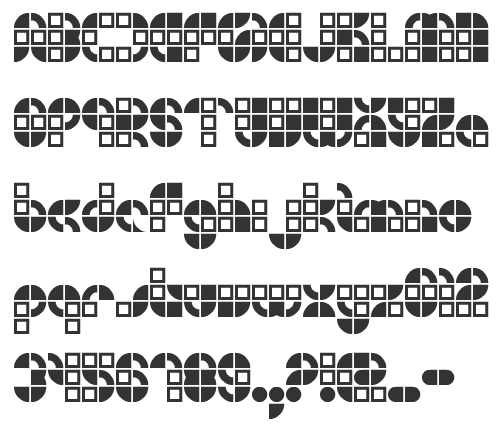
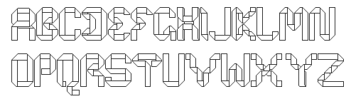
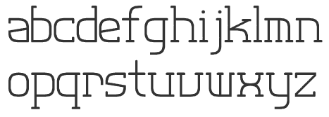
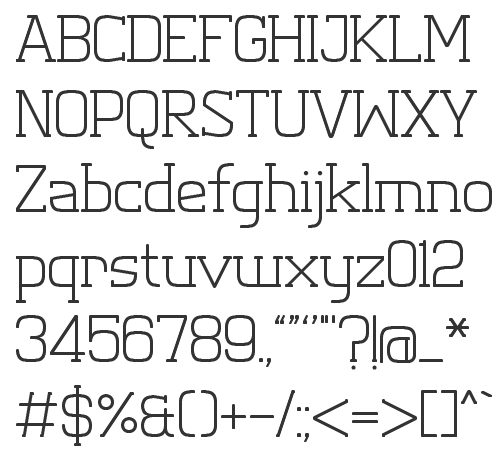
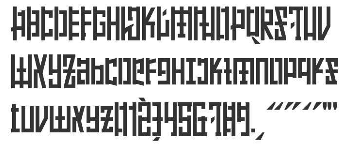
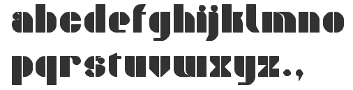
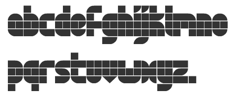
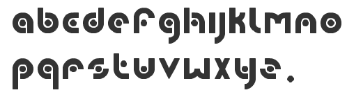
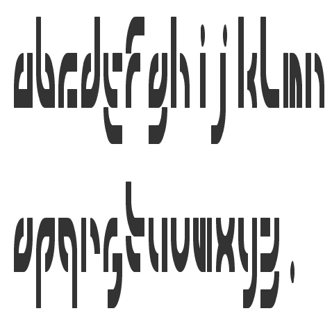
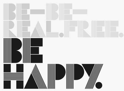
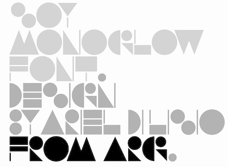
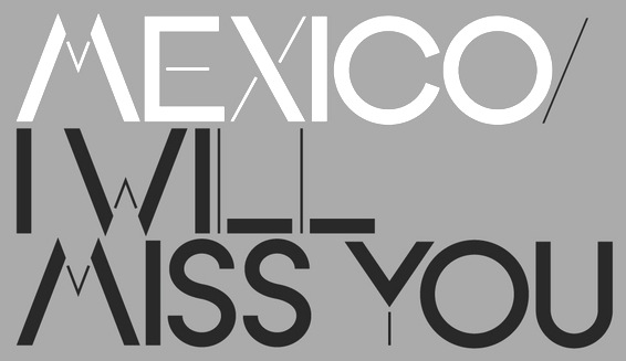
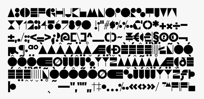
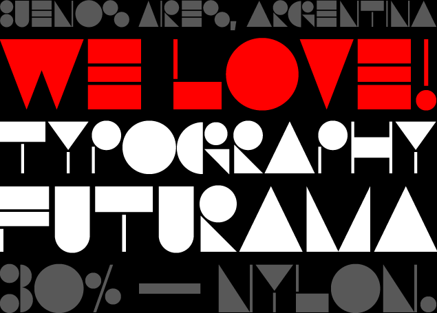
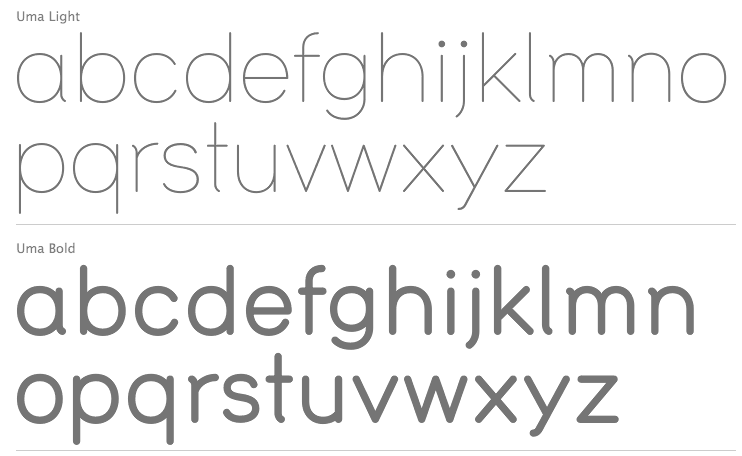
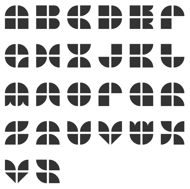
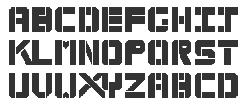
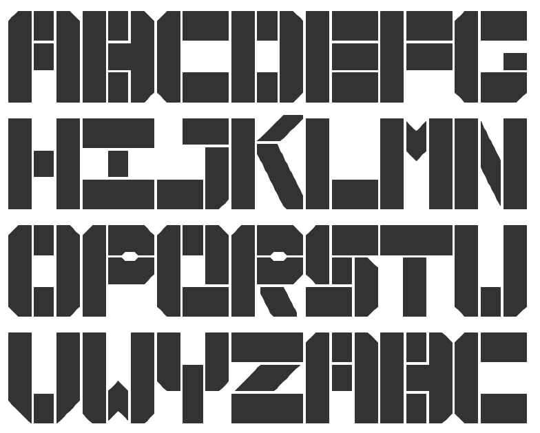
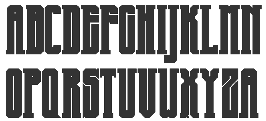
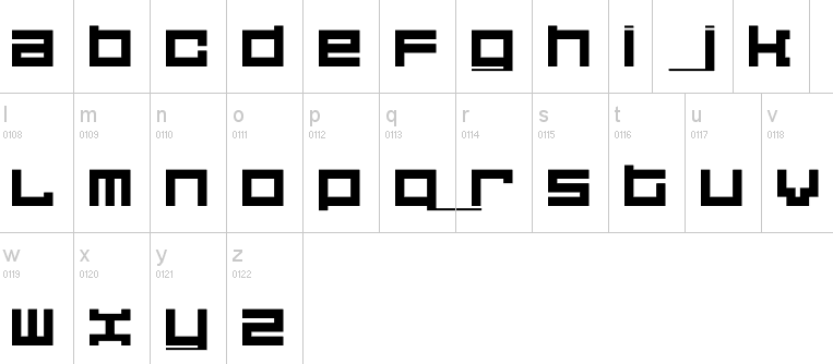
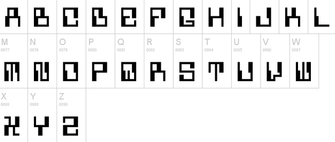
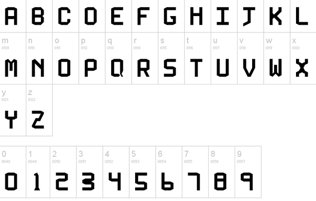
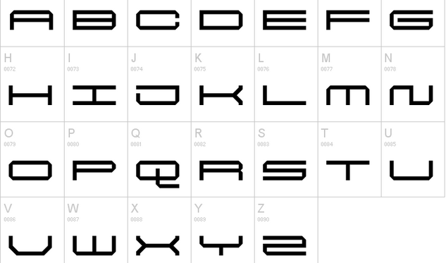
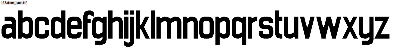
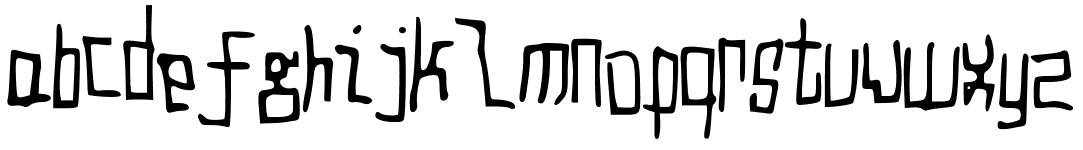
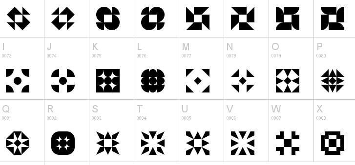
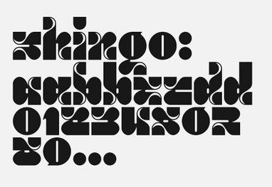
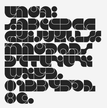
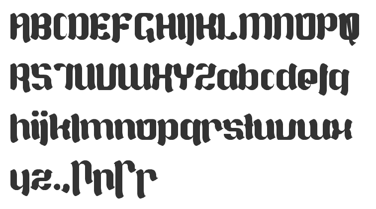
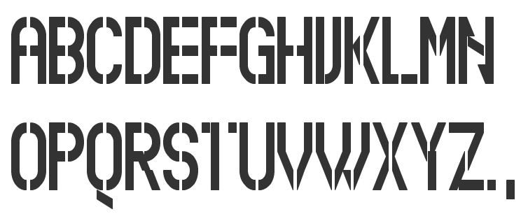
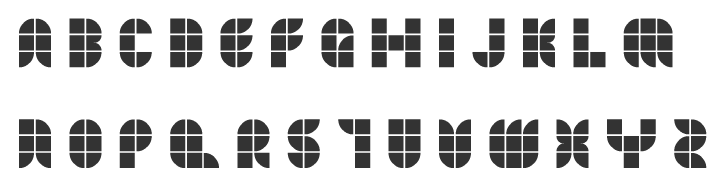
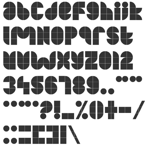
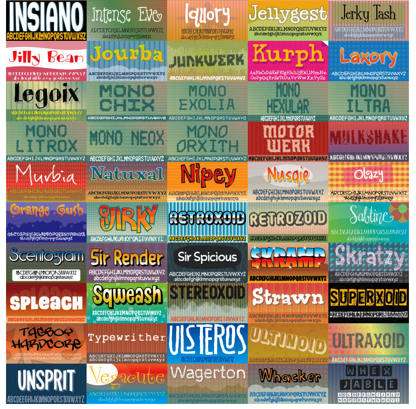
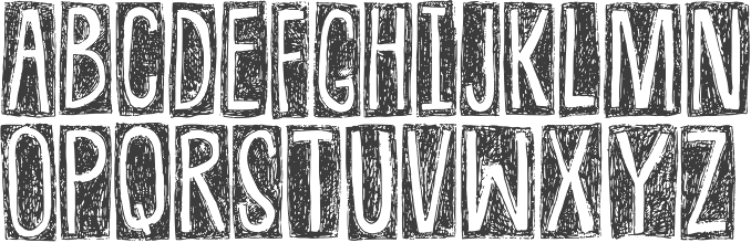
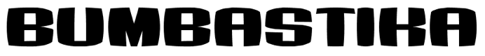
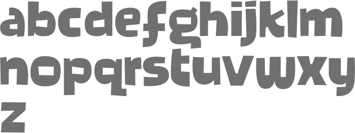
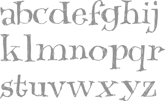
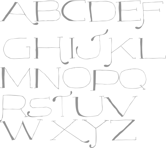
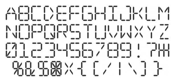
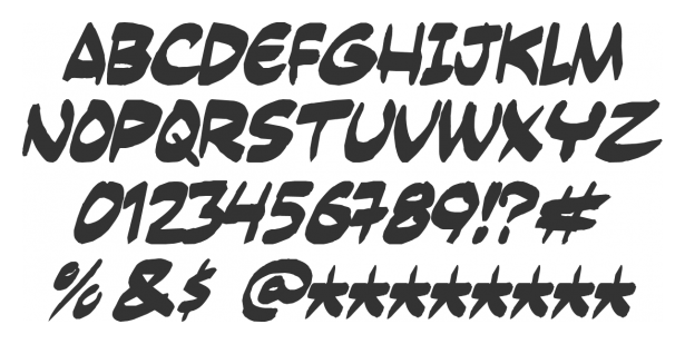
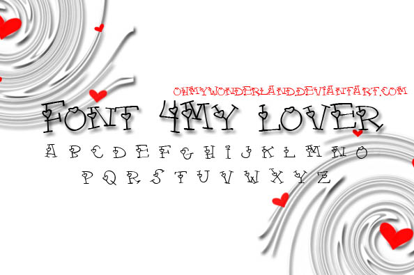
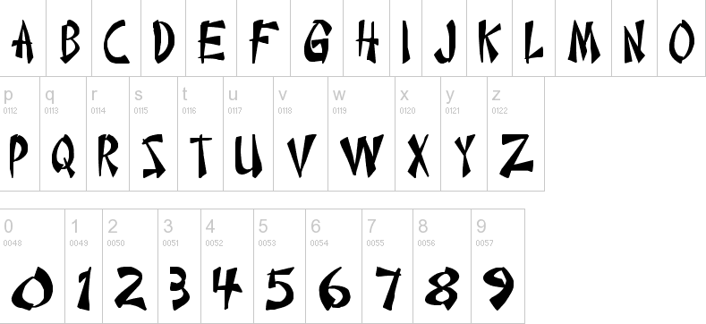
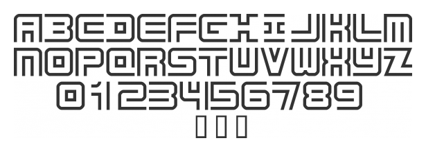
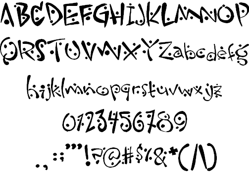
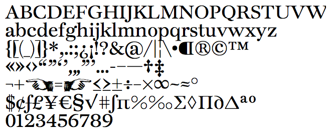
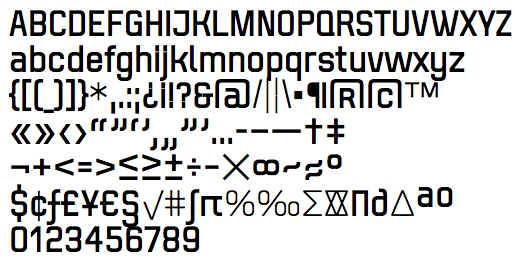
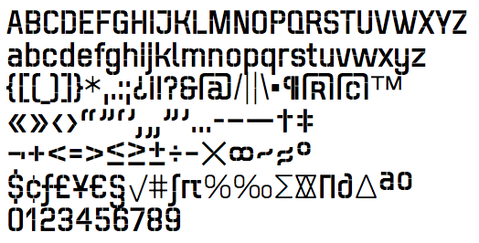
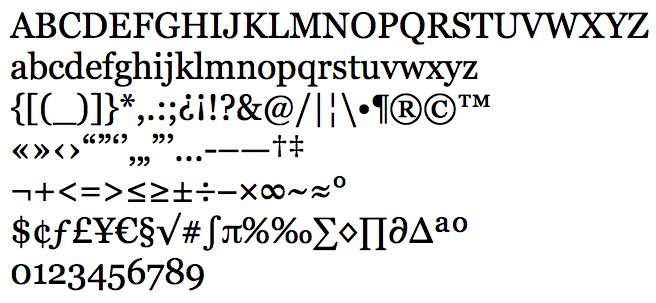
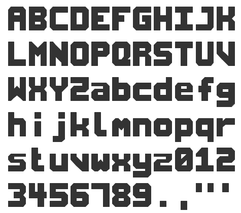
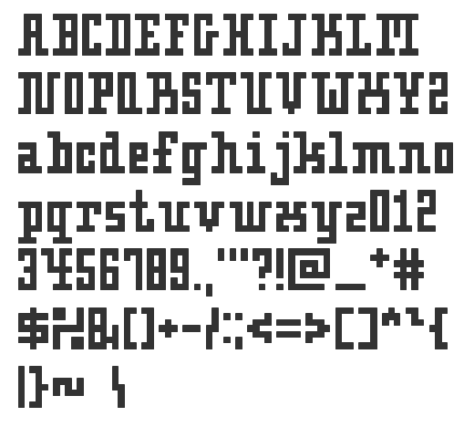
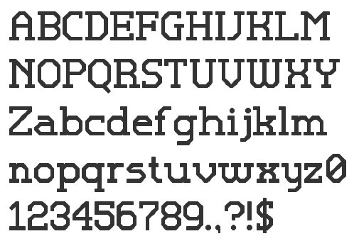
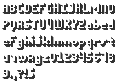
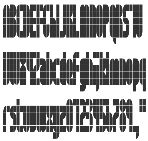
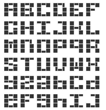
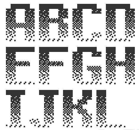
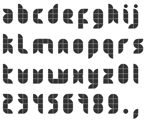
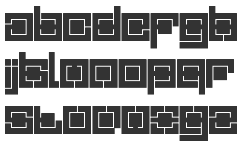
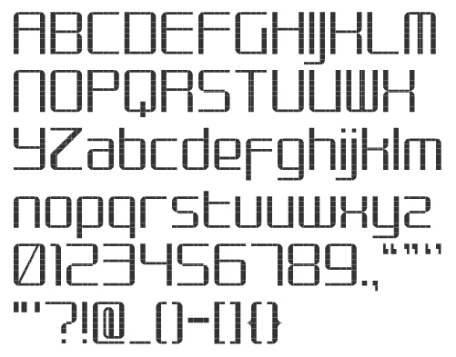
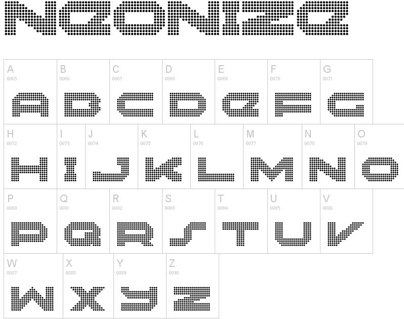
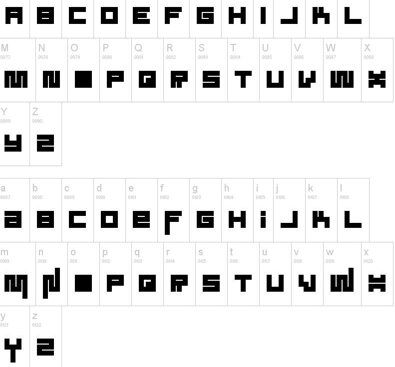
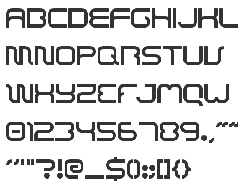
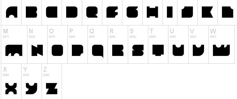
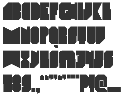
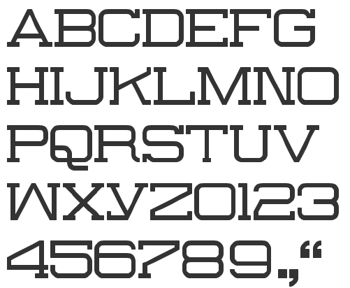
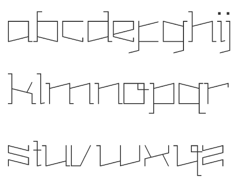
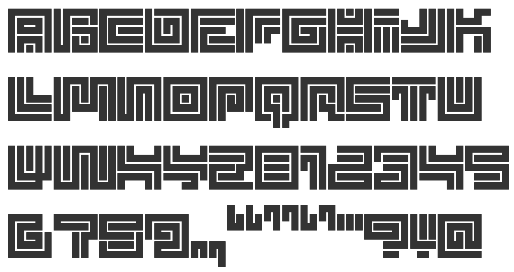
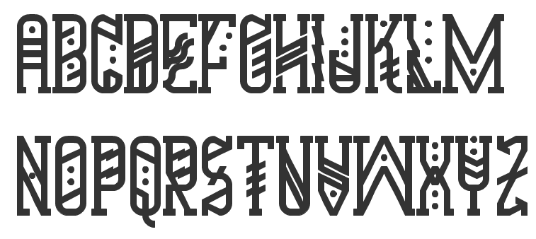
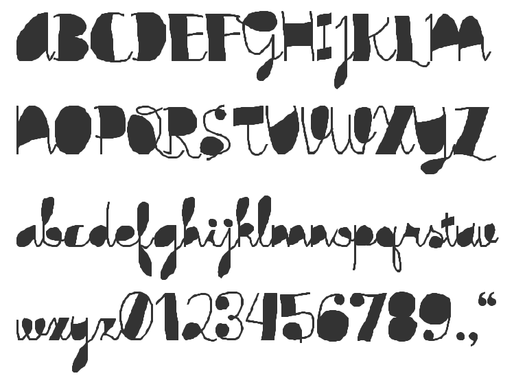
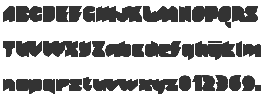
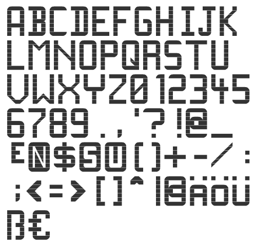
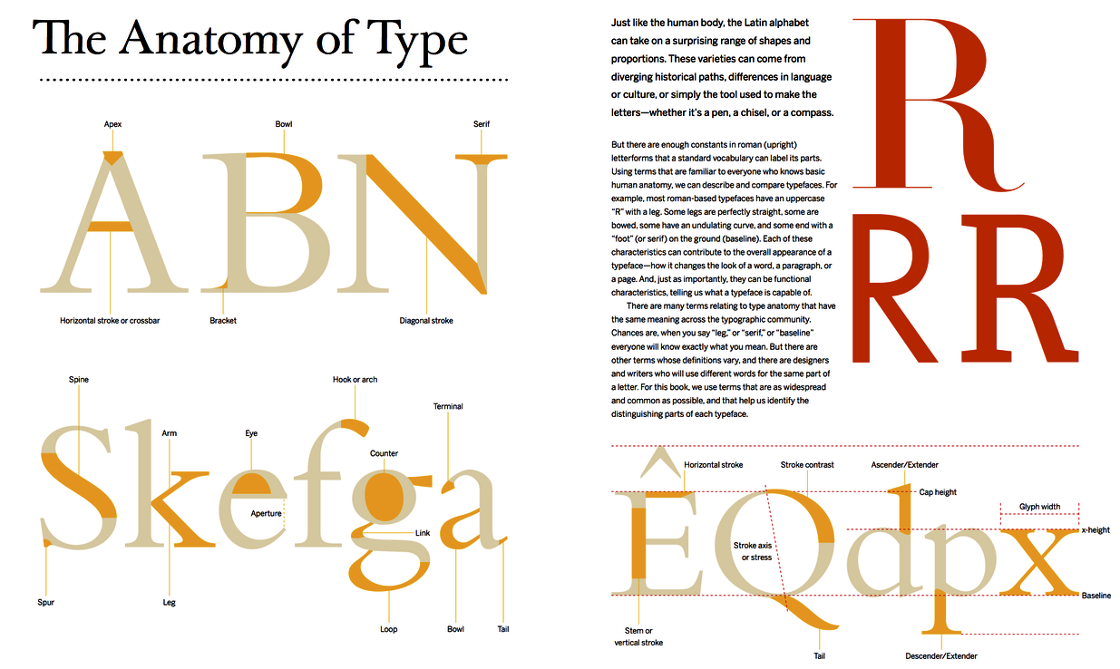
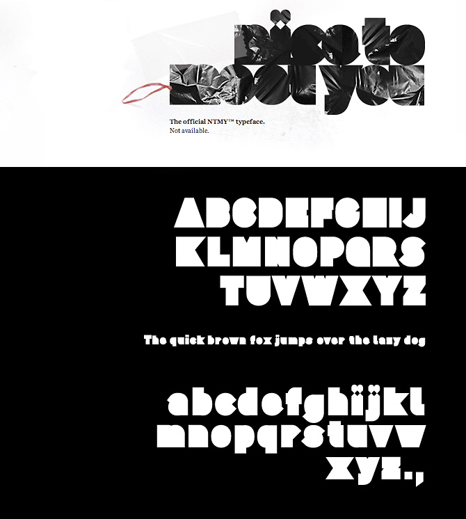
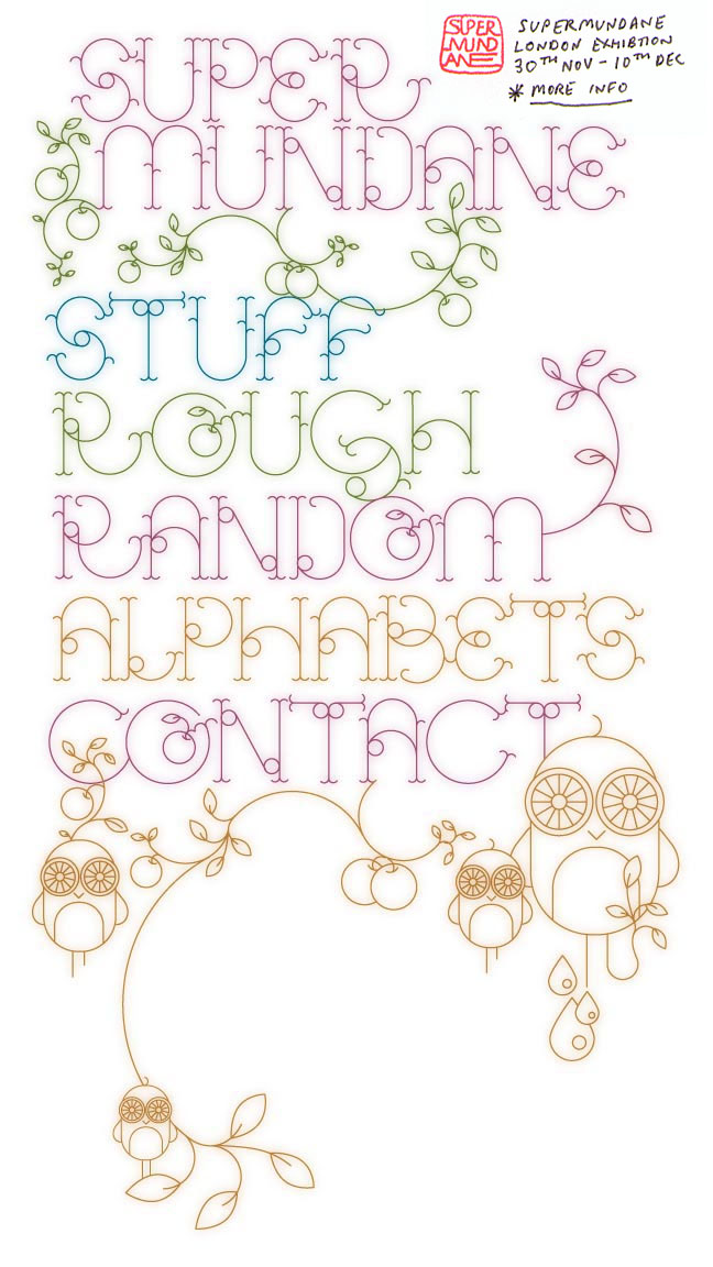
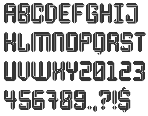
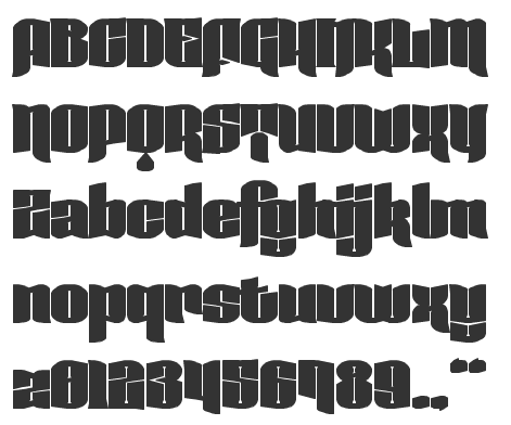
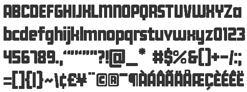
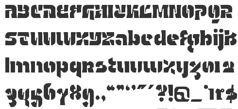
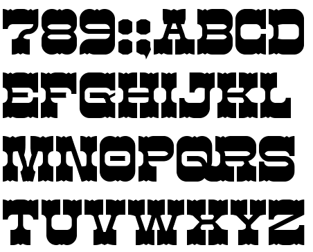
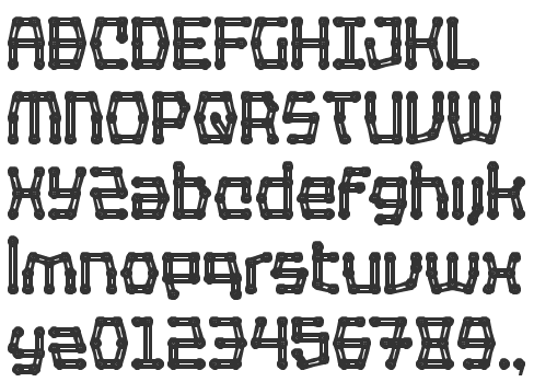
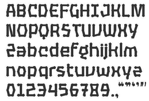
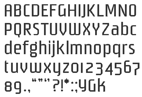
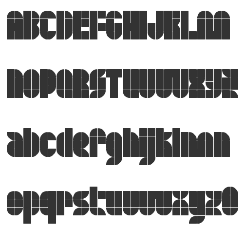
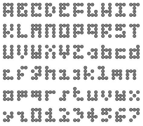
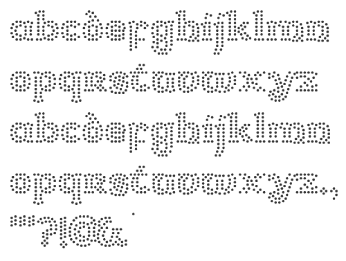
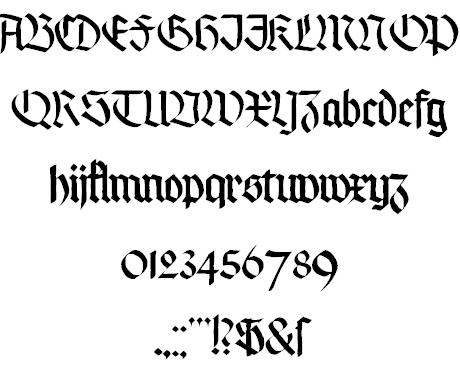
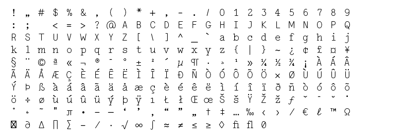
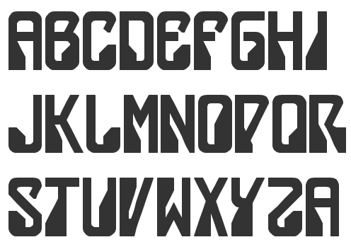
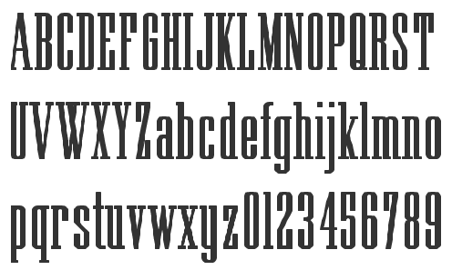
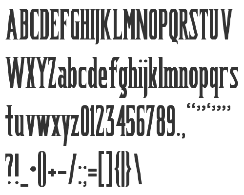
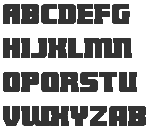
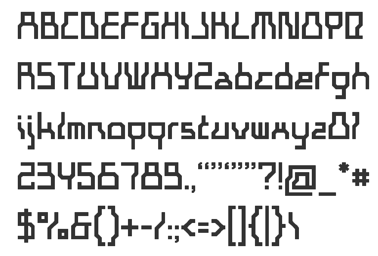
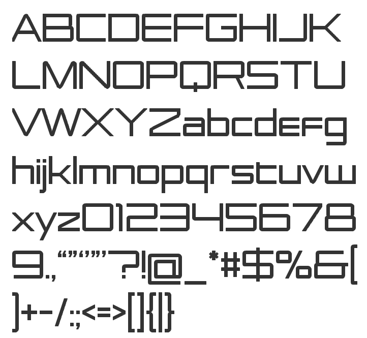
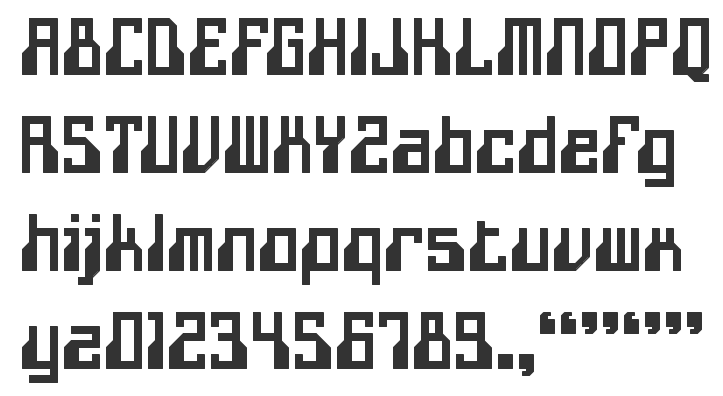
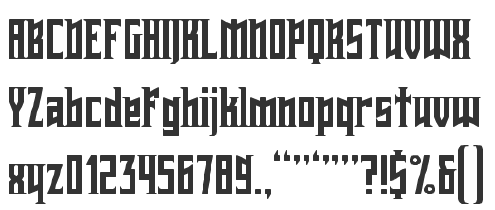
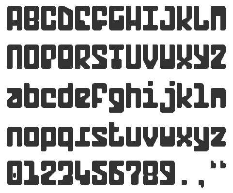
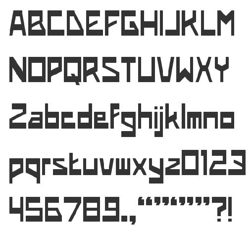
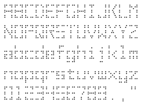
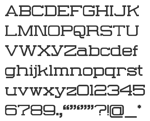
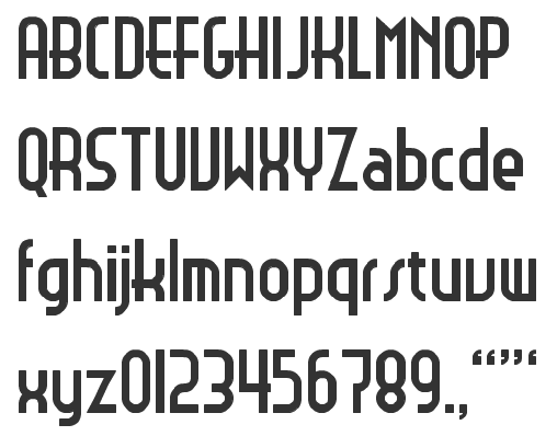
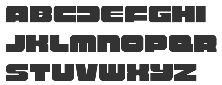
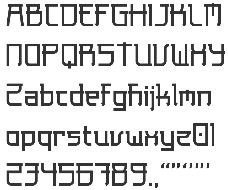
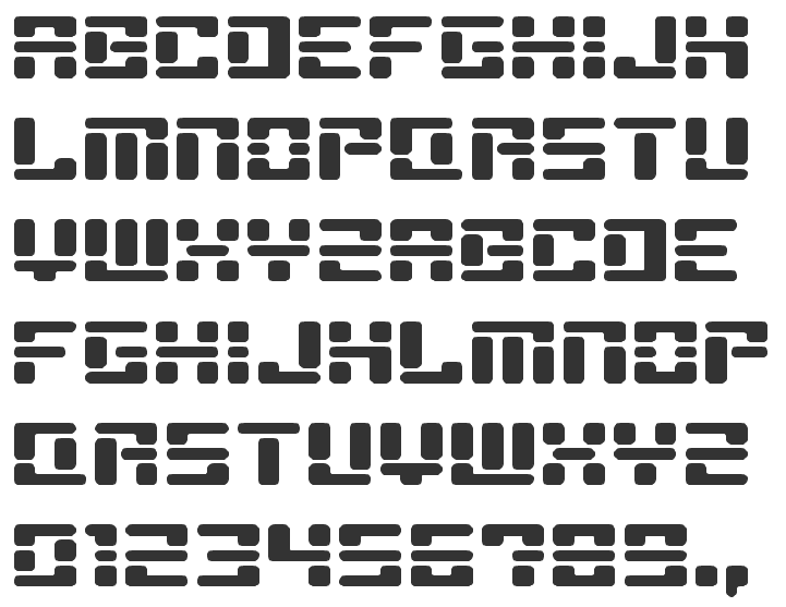
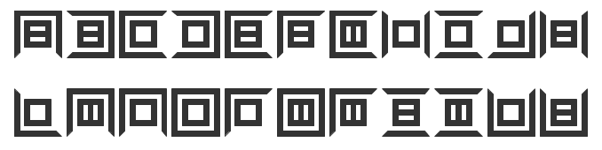
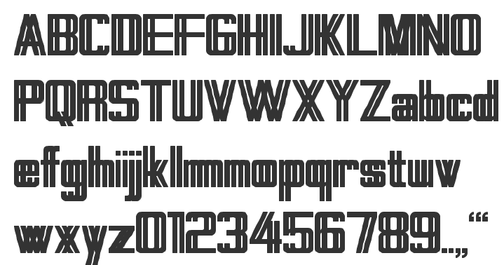
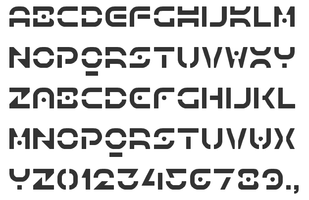
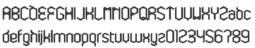
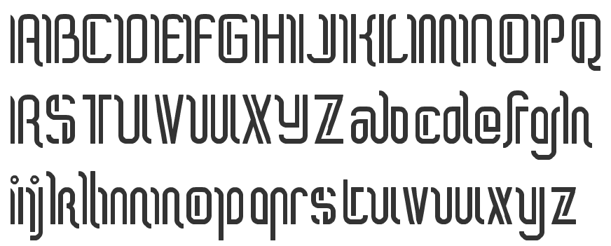
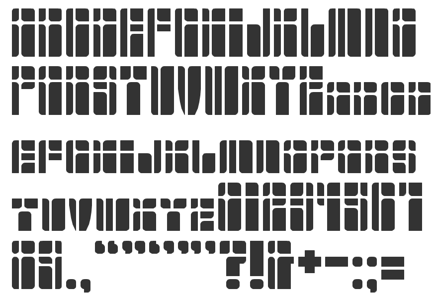
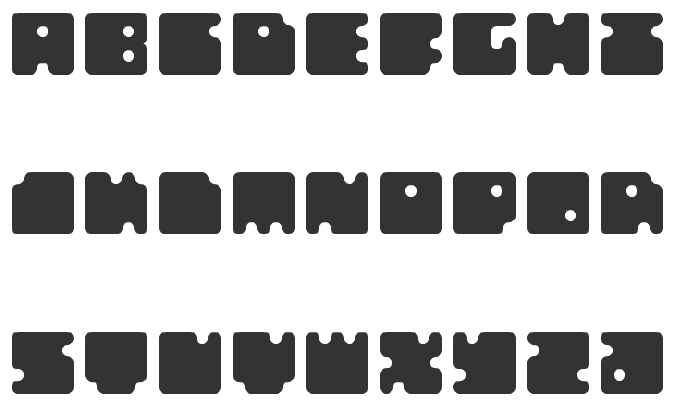
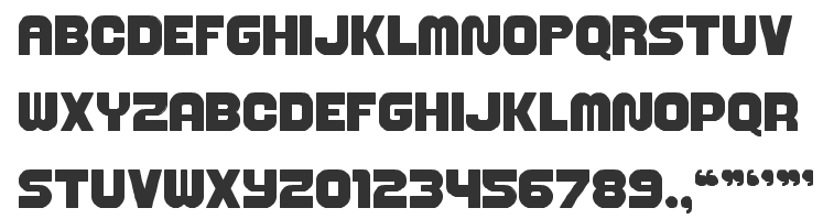
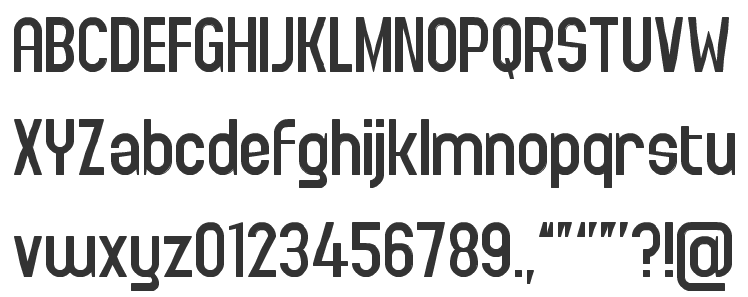
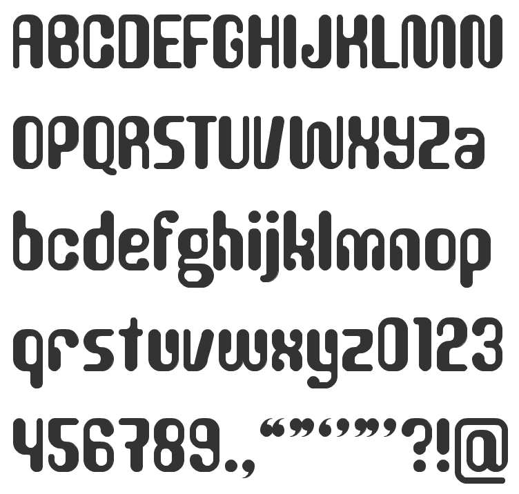
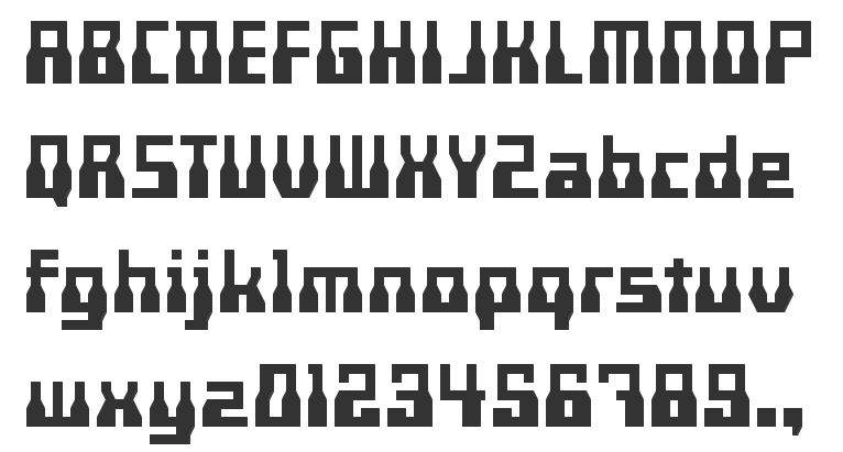
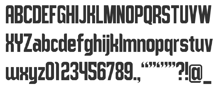
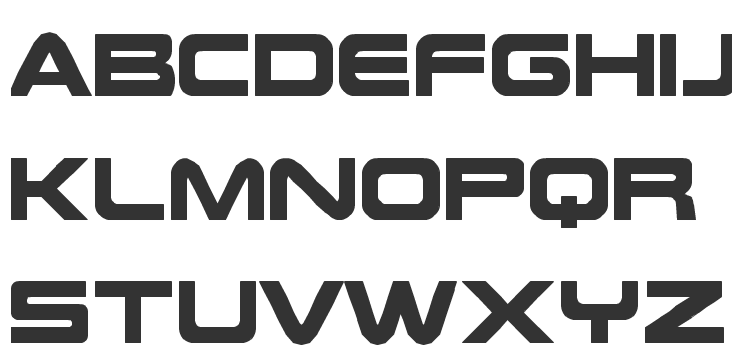
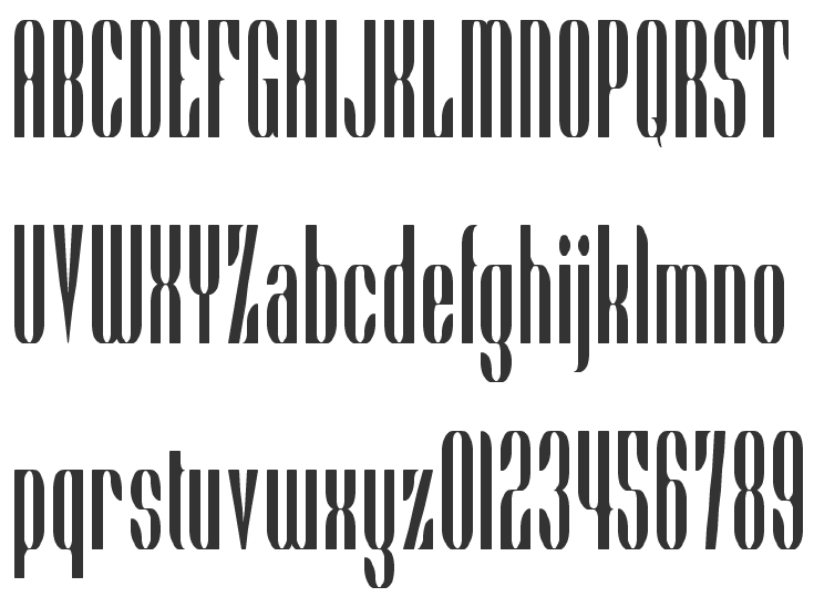
|
|
|
|