| | |
A.A.S. Charles
|
Author of Steel Pen Trade 1930-1980 (1983). [Google]
[More] ⦿
|
Adam Fathony
[AF Studio]

|
 [MyFonts]
[More] ⦿
|
AF Studio
[Adam Fathony]

|
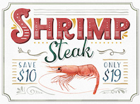
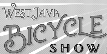 Adam Fathony (or Adam Fathoni Haris; AF Studio, Bandung, Indonesia) created the vintage typeface Grandesa (2014), the signage typeface Magnifika (2014) and the Victorian typeface Marema (2014).
 In 2015, he published the connected swashy script typeface Octavia Script, the brush scripts Carbonera and Shallom, the hand-lettered Vanilla Daisy Script and Mightype, the watercolor script Hollycakes, and the connected Brayden Script (and Sans). Typefaces from 2016: Drustic Daily, Karlberg Script, Ecosmith Script, Halosense Script (calligraphic), Lunar Cone (connected layered script), Clarkson Script, Salvador Script, Salvador Serif, Salvador Condensed, La Venice Script (retro signage lettering). Typefaces from 2017: Clarkson Script (brush lettering), Bignord Vintage (with Fauzan Rafhy), Douglas Collection (12 fonts: Aaronade Script, Ancaster Script, Burlington, Calgury, Montreal Rounded, Morphic 60s, Norwood Old, Ogdensburgh, Palmeira, Rutland Extended, Wolves Sans, Wolves Serif), Almost Lover, Rhythmic Dances (rough script), Sevastian (layered font set), Rustling Trees (dry brush), Little Karla Script. Typefaces from 2018: Figuera Variable (a late Victorian, early art nouveau typeface family; variable font format), Brignola (a calligraphic penmanship script), Eastside Brush (a brush signage script done with Angga Kristiandri), Marshfield (a retro cursive typeface by Adam Fathoni Haris and Renov Olivian), C'est La Vie (font duo), Chivels (a vintage typeface done with Angga Kristiandri at Abbassy Studio), Sevastian (a layered font family), Drustic Dialy (weathered; with Angga Kristiandri), Elli Bellie (calligraphic). Typefaces from 2019: Scottsdale Serif (at Typeverything), Scottsdale Desert (an opentype feature-laden display serif), Norfolk (Narrow, serif), Tiverton (Sans, Serif, Script: by Adam Fathony Haris and Angga Kristiandri), Havard (a layerable athletic lettering set of 12 fonts), Gorga Grotesque. Typefaces from 2020: Auvelle (a hairline sans), Windsore (a font trio), Howli (layerable, rounded; sans, serif and script), Genty (a creamy retro signage script typeface by Ilham Herry and Adam Fathoni Haris), Burnest (a vintage typeface by Adam Fathoni Haris and Renov Olivian), Glaw (a psychedelic font by Ilham Herry and Adam Fathoni Haris), Oliviar Sans (28 styles and a variable font), Budge (a layerable retro signage script by Ilham Herry and Adam Fathoni Haris), Stanlow, Muray House (a bold swashy bathroom towel typeface by Ilham Herry and Adam Fathoni Haris), Esteric (a playful tapered font by Ilham Herry and Adam Fathony). Typefaces from 2021: Alstera (an oblique serif), Monvar (a layerable Cooper Black style typeface by Ilham Herry and Adam Fathoni Haris), Rische (a 6-style display serif with huge counters and an enormous x-height; by Ilham Herry and Adam Fathoni Haris), Ottenthic (script and serif), Mionic (a reverse contrast slab serif by Adam Fathoni Haris and Angga Kristiandri), Matchbox Font Collections (a set of vintage fonts based on lettering on matchboxes; it includes substyles called Linea, Lettre, Deco, Scriptura, Ornato, and Graso). Typefaces from 2022: Balide (a 70s style display typeface), Norsy (a 21-style and variable flared font family). [Google]
[MyFonts]
[More] ⦿
|
Afri Giani
[Gian Studio]

|
[MyFonts]
[More] ⦿
|
Afrizal Hidayat
[Ejhaa]

|
[MyFonts]
[More] ⦿
|
Al Imelli
|
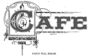 Author of The Book of Alphabets and Layouts, Designs, Scrolls, Panel Ends, Descriptive Matter: The Art of Metal Etching for Ornamental and Sign Purposes, Written and Illustrated by Al. Imelli (1922, Signs of the Times Publishing Co, Cincinnati, OH) and Imelli's Alphabets and Layouts (1922). Alternate link. Hathi Trust link. For a list of the alphabets in the book, scroll down and check the current page.
 Some of Imelli's alpabets inspired others to create digital typefaces. Examples: [Google]
[More] ⦿
|
Alcode
[Sukjana Almunandar]

|
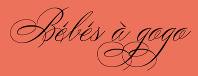 Banda Aceh, Indonesia-based designer (b. 1993) who specializes and excels in formal calligraphic typefaces. Creator of the thin calligraphic typefaces Yesterday (2017: upright) and Jazzi Script (2017), and the swashy formal calligraphic typefaces Peaches (2017), and Sinday College (2017).
 Typefaces from 2018: Malikon, The Duality, Karmila Script (a signature font), William Duke (a great formal calligraphic script), Differenlight (Spencerian calligraphic), Stipa Willington (formal calligraphic), Gatlik Saphir (formal calligraphic), Lile Dahliya (formal penmanship calligraphy), Bulgattie (copperplate calligraphy). Typefaces from 2019: Laront Monoline, Claristy, Graceful (a thin Spencerian script), Beduga (a signature script), Desirable Calligraphy (Spencerian), Fantera (a baseball script). Typefaces from 2020: Colfige (a fashion mag typeface), Claristy, Dalgond Script (formal calligraphic), The Duality (a formal calligraphic script), Peaches (a penmanship script), Imagine (calligraphic), Willmaster Calligraphia (a Spencerian penmanship script), Quntas Script (a hairline calligraphic font), Kota Datoma (wild calligraphy). Typefaces from 2021: Betting Soker (a brush script), Tugafy (fashion mag font), Mole Display (a distorted font), Avole (a hipster fashion mag font), Qanthorely Castigra (a wild Tree Frog genre script), Bolgifam (a triptych of stylish typefaces including a formal copperplate calligraphic style), Matilost Wikly (script), Silta The Farming (a brush script), The Kaluge (a feminine display typeface), Silta The Farming (a brush script), Tylaco (an art nouveau typeface), Dofta (a high-contrast decorative typeface), Dofta (a high-contrast decorative typeface), Batick Rodist (a wild script in a font duo), Blosta (a fashion serif and a copperplate calligraphic script), Piguet Script, Migueto (a fashion mag typeface), AvOle Serif (a fashion mag typeface; identical to Migueto). Typefaces from 2022: Roti Brown (an elegant wild script). [Google]
[MyFonts]
[More] ⦿
|
Alejandro Paul
[Sudtipos]

|
 [MyFonts]
[More] ⦿
|
Alejandro Paul

|
 Designer who lives in Buenos Aires and who teaches graphic design and typography at the Universidad de Buenos Aires. He has worked as an art director in prestigious Argentina-based studios, handling high-profile corporate brands such as Arcor, Marta Harff, Morph, SC Johnson, Danone, and Movicom. He runs Estudio Paul. Professor at Facultad de Arquitectura, Universidad de Buenos Aires. Co-creator, with Apostrophe at Apostrophic Laboratory, of Usenet (2000), FontCop I through IV (2000) and the pixel font family Cayetano. Published the dot matrix font Stardust with T-26 in 2000. Designed the gorgeous font Elektora in 2000. He developed with Michael Lynch a 17-font Tennis set of grid-based pixel fonts. At Typeworx, he published Reflex (2002), a commercial 6-style unicase font family. Another web site by Alejandro. Cofounder of DAS, a design studio in Buenos Aires.
 Cofounder of Sudtipos (2003), where he does custom work and creates new typefaces. His work there includes Tierra (a titling face), Latinaires (2003-2018: originally called Latina Sans), Reflex, Downtempo (2003), Stardust and Mosaico (1999, pixel face). Still at Sudtipos, he digitized the beautiful handwriting/calligraphic typefaces by Angel Koziupa called Alma (2005), Murga, Habano and Tiza, which together with his script typeface Argenta (2004), Oxida (2005), the medieval script typeface Mama Script (2004, designed with Alfredo Graziani), Divina (2004, with Alfredo Graziani), and the sans family Kautiva (2004) can be bought via Umbrella Type. For children's orthography, he developed Estrada Hand, on commission for Editorial Estrada. He was working on the serif family Libertina (2004). Herencia (2004, a handwriting typeface done with Diego Giaccone), Grover (2004, slab serif), Milk Script (2004, with Alfredo Graziani), Mama Script (2004, with Alfredo Graziani), Politica (2004, a techno typeface with a very thin Thin weight) are at Sudtipos. The Bluemlein Scripts (2004-2005, Umbrella and Veer) are based on the calligraphic renderings of Charles Bluemlein, shown in a 1943 ink catalog: Miss Le Gatees, Mr Rafkin, Mr Keningbeck, Mr Lackboughs, Lady Dawn, Mrs Von Eckley, Mr Sheppards, Mr Dafoe, Mr Canfields, Mr Stalwart, Mr Sandsfort, Mr Leopolde, Mr DeHaviland, Mr Blaketon, Miss Stanfort, Miss Packgope, Miss Fajardose, Mrs Saint-Delafield, Mrs Blackfort, Mr Sopkin, Mr Sheffield, Miss Lankfort, Herr Von Muellerhoff, Dr Sugiyama, Dr Carbfred. (Note: Soft Horizon's Lainie Day (1993) is an earlier free font in the style of Lady Dawn and Mr Lackboughs). In 2011, that series was made available at Google Web Fonts. Sudestada (2005, Sudtipos) is a handwriting script developed with Diego Giaccone. Cuisine (2005, Umbrella Type) is an informal bold script. Mousse Script (2005, Sudtipos) is based on Glenmoy, a 1932 Stephenson Blake typeface. Suave Script (2005) is a 4am jazz bar script. Ministry (2005) is related in style but less funky, Chocolate (2005) is for sales ads, and Cenizas (2005, with Angel Koziupa) is straight from an old manuscript. Whomp (2006, Umbrella) was based on a partial sign-painting font by Alf Becker (1930s), and so was Buffet Script (2006, Sudtipos). Affair (2006, Umbrella) is swashy and calligraphic, while Candy Script (2007) and its italic version Sugar Pie (2011) are based on Argentina's market lettering. Galgo Script (2007) is a brush calligraphic font based on a design of Angel Koziupa. Burgues Script (2007) is an ornate calligraphic script based on the lettering of calligraphy teacher Louis Madarasz (1859-1910) (award at TDC2 2008). Burgues Script, Adios Script (2008: it won an award at TDC2 2009), Feel Script and Sugar Pie all won awards at Tipos Latinos 2008. Sinfonieta (2006) and Buffet Script are fifties style connected scripts. Feel Script (2007) is based on lettering that calligrapher and logo designer Rand Holub created in 1950 and that was subsequently captured in Intertype's typeface Monterey (1958). Some letterforms were redrawn from vintage American magazine ads (some by Holub himself), Cuisine (2008, food advertising script), Pronto (2008, comic book style, by Alejandro Paul and Angel Koziupa), Grover (2004, rounded sans family), Grover Slab (2004). Burgues Script, Adios Script, Feel Script and Sugar Pie all won awards at Tipos Latinos 2008. Calgary Script (2008, Umbrella) is a pure signpainting job. Accolades from all typophiles for his calligraphic wunderkind, Compendium (2008). The 2009 haul: Sugar Pie (signage font), Bravissima Script, Theorem (upright semi-script). Speaker at ATypI 2009 in Mexico City. The year 2010 starts off with a bang, five awards at Tipos Latinos 2010: a grand prize for Brownstone Sans, and four standard awards, for Semilla, Kewl Script (for food packaging and store windows), Calgary Script, and for Business Penmanship. Typefaces from 2010 include the baseball lettering typeface Fan Script and the tattoo script face Piel Script (piel=skin), which was influenced by Burgues Script and more remotely by showcard lettering by B. Boley (1930s, Sign of the Times Magazine). Piel Script won an award at Tipos Latinos 2012. In 2011, he and Koziupa made the fat signage typeface Aventura and Viento (a grunge version of their earlier 2004 face, Brisa). He added one retro connected signage font to the Filmotype collection in 2012, called Filmotype Kitten (original from 1955). Filmotype Zephyr (2012) is an italic roman formal script. Filmotype Yukon (2012) is inspired by the classic Palmer style of penmanship. Storefront (2012) is a swashy signage typeface based on an incomplete alphabet by Alf Becker. His signage script typeface Hipster Script won an award in the TDC 2012 competition and at Tipos Latinos 2012. Typefaces from 2013: Rolling Pen (a connected script that recalls the business penmanship genre), Bellissima Script (based on a copperplate calligraphic alphabet from Bellezas de la Caligrafía by Ramón Stirling, 1844). In 2014, he helped Panco Sassano, a lettering artist and illustrator from Mar del Plata, who designed the wide connected semi-calligraphic handwriting typeface Horizontes Script (Horizontes subsequently won an award at Tipos Latinos 2016). Still in 2014, he published the fat packaging or signage script Bowling Script, which is based on Freely Drawn Italic, a non-font alphabet by Ernst Bentele (1953). In 2015, Alejandro Paul, Yani Arabena and Guille Vizzari combined forces in the signage script typeface Quotes (Script+Caps) (2015, Sudtipos). Merengue Script (2015, with Panco Sassone) is a fun creamy script, ideal for pastry shops, tea rooms or supermarkets. Steak (2016) is a connected vintage signage script based on an Alf Becker design. Envelove (2017) is a script typeface family consisting of Script, Icons, and Caps, designed at Sudtipos by Yani Arabena, Guille Vizzari, and Alejandro Paul. Winner at Tipos Latinos 2018 of a type design award for Envelove. Still in 2017, Guille Vizzari and Alejandro Paul co-designed the great Moleskine notebook-inspired typeface family Proprietor. Proprietor comes in Script, Icon, Deco, Wide, Open and Roman styles. It won an award at Tipos Latinos 2018. Rigatoni (2017): A skyline didone based on mid-20th century example by Eugen Nerdinger. Bibliophile Script (2017). A pair of copperplate calligraphic typefaces. Fixture (2018: a 72-font grotesk family published by Sudtipos). Newbery Sans Pro (2018). A simple workhorse sans typeface family that is inspired by German industrial design and the lettering of Eugen Nerdinger. Winner at Tipos Latinos 2018 of a type design award for Tennis Set, Bibliophile Script, French Bulldog, Envelove, La Taqueria, and Speakeasy Set (a collection of (copperplate) script, sans, modern, flare and gothic substyles). From 2019: Hot Salsa (a retro brush script; with Ximena Jimenez), Old Letterhand, Clockmaker (arts and crafts style), Steak Script (inspired by an old alphabet by Alf Becker), Address Sans Pro (a sans family inspired by Butti and Novarese). In 2019, Alejandro Freitez and Claire Menager, under the art directoship of Alejandro Paul, designed the multistyle wood type look / Western / Victorian / reverse stress / hyper-decorative Presley Slab. Typefaces from 2020: Apothicaire (a wonderful quaint serif family in the frivolous didone genre; three variable fonts, 16 styles in all), Inglesa (a penmanship script), Dilemma, Dilemma Serif (Dilemma is a sans/serif type system with 42 styles; it is inspired by the anonymous Polyphème, Cyclopéen and Extra Condensé designs from the early 1900s at the Peignot Fonderie; two variable fonts are included), Sporty Pro (a large sports / athletics font family). Typefaces from 2021: Plethora (an 18-style family and two variable fonts that build on Julius Herriet's Old Style Ornamented for Bruce Type Foundry; Alejandro added various frills, ligatures, weights, exaggerating in true Victorian spirit), Magari (a fat face or Normande; Alejandro likens it to Italian classics of the 19th century though), Regional (27 styles, plus variable styles). Typefaces from 2022: Wienerin (a revival and expansion of Olympia (1929) by Carl Otto Czeschka, one of the members of The Wiener Werkstätte). [Google]
[MyFonts]
[More] ⦿
|
Alex Ivanov
[Vates Design]
|
 [More] ⦿
|
Alexander Nedviga
|
Aka Saint-Sanches. Saint Petersburg, Russia-based designer of Italian Roundhand (2017), a Latin / Cyrillic typeface based on the work of C.P. Zaner, ca. 1900. Other typefaces from 2017 include Unadorned Hairline (perhaps a silent movie font) and Skeleton Letters (a curly decorative monoline typeface family, with monogram ornaments). Creative Market link. Behance link. Graphicriver link. [Google]
[More] ⦿
|
Alexandra Leopoldovna Gophmann
|
 Russian designer of typefaces who collaborates with Ivan Zeifert and specializes in revivals, cyrillizations and beautiful digitizations, some of them done with Anatole Gophmann. There have been complaints about her practice of borrowing fonts from type designers without asking. One typophile writes: I have cracked open fonts she claims as hers, Bolero, Bickham and others, she has copied and pasted glyphs, copyright data, added Cyrillic and changed the copyright string. As an example, Angelica is a copy of Alejandro Paul's Miss Fajardose. Alejandro has drawn the numerals in his font in 2004 to accompany the letters found in an old catalog of alphabets. There is no other source of the numerals, and Angelica has them. Michael Clark writes: I initiated a battle with the illustrious Alexandra "Bitch" from Russia who has renamed Pouty (FontBureau) and copyrighted [it as] Bolero. She and her partner Anatoly shithead. Available on Fonts101.com for anyone who wants it free. The ass's site, Jagdesh, is in Pakistan and we cannot touch him. 260+ viewings and 140+ downloads. Let's see that is 1400$ I will never see! Others have complained as well about her practice of taking and extending fonts without permission. Anyway, her "fonts" are:
 - A: Adine_Kirnberg (2005, the Cyrillic version), Advokat Modern (2008), Afisha, Afisha Cap, Agatha-Modern, AlexandraScript, Amadeus, American Text C, American-Retro (2008), Ametist [based on Lorelei] (2008), AmpirDeco, Andantino-script (2008), Andantinoscript, Anfisa Grotesk (2008), Angelica, Annabelle, Antikvar (2008), Antikvar Shadow (2008), Antonella Script (2008), Antonella Script X (2008), Antract, Aquarelle, Ariadnascript, Ariston-Normal, Arkadia (2008), Arkhive, Arlekino, Art-Decoretta (2008), Art-Decorina (2008), Art-Metropol, Art-Nouveau Initial (2008), Art-Nouveau1895, Art-Nouveau1895-Contour, Art-Nouveau1900, Art-Nouveau1910, Art-Victorian (2008), ArtNouveau-Bistro, ArtNouveau-Cafe, Artemis Deco (2008), Artemon (2008, psychedelic), Arthur Gothic, Artist-Modern, Astoria Deco (2008), Atlas Deco A (2008), Atlas Deco B (2008), Auction, Augusta One, Augusta Two, AvalonMedium.
- B: Ball-Point Pen, Bankir-Retro, Barocco Floral Initial (2008), Barocco Initial (2008), Baron Munchausen, Batik Deco (2008), Belukha, BelukhaCapital, BickhamScriptAltFour, BickhamScriptAltOne, BickhamScriptAltThree, BickhamScriptAltTwo, BickhamScriptOne, BickhamScriptThree, BickhamScriptTwo, Birusa (2008), Bodoni Initials (2008), Boleroscript, Bonapart-Modern, Briolin, Brokgauz&Efron, Brokgauz&Efron-Italic.
- C: Caberne, Cafe Paris C, Calligraph-Medium, Campanella (2008), Capitol Deco (2008), Carmen, Carolina, Casanova (art nouveau) (2008), Cassandra, Castileo (2008), Certificate of Birth (2008), Chocogirl (2008), ClassicDecor (ornaments), Classica-One (2008), Classica-Two (2008), Cleopatra (2008), Conkordia (2008), Cordeballet, Corinthia, Corleone, CorleoneDue.
- D: Dama Bubey (grunge) (2008), Debut (art deco in the style of Broadway) (2008), Decadance Cursiv (2007), Decor Initial (2009: decorative caps, a Cyrillic extension of a typeface by Pampa Type), Decor Line (2008), DeutschGothic (blackletter), Donaldina (2008).
- E: Edisson (blackletter), Egipet-Bold, Ekaterina_Velikaya_One (2005), Ekaterina_Velikaya_Two (2005), English Rose (2008), EnglishScript, EseninscriptOne, EseninscriptTwo, Evgenia Deco (2008).
- F: Fairy Tale (2008), Fantasia (2008), Fata Morgana, Favorit, Favorit Grotesk (2008), Flamingo (2008), Fortuna Gothic FlorishC (2009, blackletter).
- G: Geisha (2006), Gertruda Victoriana (2008), Globus (2006), Gloriascript, Goudy Decor InitialC (2009, ornamental caps), Goudy Decor ShodwnC, Goudy OrnateC, Graceful Mazurka (2008).
- H: HeatherScriptOne, HeatherScriptTwo, HeinrichText, Hogarth_script (2005).
- I: Isabella-Decor, Italy-A (2008), Italy-B (2008), Izis One (monoline sans), Izis Two.
- K: Kabriolet Decor (2009), Kamelia (2009, Victorian face), Kareta-A (2007), Kareta-B (2008), KarnacOne, KarnacTwo, Konkord-Retro, Konrad-Modern (2008), Konstrukto-Deco (2008) (2008), Kot Leopold (2008), Kumparsita.
- L: Lastochka (2008), Le Grand, Leokadia Deco (2008), Lombardia, Lombardina One, Lombardina Two, Lombardina-Initial-One (2008), Lombardina-Initial-Two (2008), Lombardina-One-Roman (2008), Lombardina-Two (2008), Ludvig_van_Bethoveen (sic) (2005).
- M: Majestic X-2, Majestic-, MajesticX, Malahit-Bold, Margaritascript, Marianna, MarkizdeSadscript, MartaDecor One and Two, MartaDecorTwo, Martina Script C, Masquerade (2008), Matilda, Matreshka, Maya (2008), Medieval English, Melange Nouveau (2008), Menuetscript, Metro Modern, Metro Retro B (2008), Metro Retro C (2008), Metro-Retro A (2008), ModernistNouveau, ModernistOne, ModernistThree, ModernistTwo, ModernoNouveau, ModernoOne, ModernoThree, ModernoTwo, Modestina (Victorian), Mon Amour Two (both jointly copyrighted with David Rakovsky) (2008), Mon Amoure One (2008), Monte-Carlo, Monte-Kristo, Monti-Decor A B, Moonlight, Moonstone, Moonstone Stars, Morpheus, Moulin Rouge (2008).
- N: Nocturne (2005), Nostalgia (2008).
- O: Old Comedy, OldBoutique, Olietta-script-BoldItalic (2008), Olietta-script-Lyrica-BoldItalic (2008), Olietta-script-Poesia-BoldItalic (2008), Orpheus, Ouverture Script (2004, calligraphic).
- P: Parisian, Picaresque One, Picaresque-Two (2008), Pilotka (2008), Plimouth, Port-Arthur (2008), Poste Retro (2008), Postmodern One, Postmodern Two, Promenad Deco (2008), Prospect-Deco (2008), Pudelina (2008), Pudelinka (2008).
- R: Red Sunset, Regina Kursiv (2008), Renaldo Modern, Rochester, RochesterLine, RockletterSimple, RockletterTransparent, Romantica Script, Romashka Deco (2008), Romashulka (2008), Rondo Ancient One (2008), Rondo Ancient Two (2008), Rondo Calligraphic (2008), Rondo Twin (2008), Rosa Marena, Rosalia (2008), RosamundaOne-Normal, RosamundaTwo, Rotterdam, Rubius, Rurintania (sic) (2005).
- S: Samba DecorC (2006), San Remo, Sapphire C (2008), Scriptorama (a clone of Scriptina), Secession-Afisha, Sevilla Decor X, SevillaDecor, Sladkoeshka (2008), Stereovolna (2008), Stereovolna Black (2008), Stradivari Script (2008), Stradivari Script [the Latin part copyrighted by Grosse Pointe Group] (2008), Stravinski Deco (2008).
- T: Taverna, Teddy Bear [Latin by House Industries] (2008), Telegraph, TelegraphLine, TelegraphShodwn, TelegraphSmall, Terpsichora (2008, psychedelic), Theater (2009, Victorian), Theater Afisha, Topaz, Trafaret Kit (2008), Trafaret Kit Hatched (2008), Trafaret Kit Transparent (stencil) (2008), Traktir-Modern, Traktir-Modern3-D, Traktir-ModernContour, Turandot.
- V: Valentina (2008), Variete (2008), VenskiSadTwo-Medium, VenskisadOne-Medium, Vera Crouz, VeronaGothic (blackletter), VeronaGothicFlourishe (blackletter), Veronica-script-One (2008), Veronica-script-Two (2008), Victorian-Gothic-One (2007), Victorian-Gothic-Two (2008), Victoriana, Vizit (2010, engraved face).
- W: Wolfgang Amadeus Mozart (2005), Wonderland (2008), Wonderland Star (2008).
- Z: ZanerianTwo, [Google]
[More] ⦿
|
Alfiyan
|
Aka Logo Labs. Tangerang, Indonesia-based designer of the signage typeface Ready For Fashion (2016), the handwriting font Marseille (2018), Swag Marker (2017), and the futuristic / techno typeface Hermes (2017). In 2018, he designed the free script typeface Billie Harley and the signature font family Sam & Sally. Typefaces from 2020: Marmoreal (calligraphic), Herschel (font duo), Gorga, Diandra (a signature font), Fringland (calligraphic), Chasmophile (calligraphic), Behofeel (calligraphic), Candelion (calligraphic), Avital, Bandakala (script), Andamar (sans), Andamar Script (a signage script), Anaximander (a display serif), Almerian (a monoline script), Jansky (a signage script), Raya (vintage), Milestone (a signage script), Malbrouck (a penmanship script). [Google]
[More] ⦿
|
Alfred John Fairbank

|
English calligrapher, b. 1895, Grimsby, d. 1982, Hove, Sussex. Student at the Central School of Arts and Crafts, disciple (in his own words) of Edward Johnston. In 1921, he co-founded the Society of Scribes and Illuminators, and was honorary secretary from 1931 to 1933. He wrote several books on handwriting, including A Handwriting Manual (1932), many times reissued, e.g., in 1954 by Faber and faber in London. In 1960, Alfred Fairbank and Berthold Wolpe co-authored Renaissance handwriting: An anthology of italic scripts (Cleveland: World Publishing Co). His last book was A Book of Scripts (1968, London: Pelican Books). In 1932, Alfred Fairbank proposed Dryad Writing for schools. It is a connected regular and legible style of writing that was influenced by Francisco Lucas (16th century, Spain), and could be called chancery script. After the Second World War he founded the Society for Italic Handwriting. His only typeface was the first italic for Monotype, Bembo. This was not the italic that was put out for general use, and was eventually released (in 1928) as Bembo Narrow Italic. It is sometimes referred to as Fairbank Italic. The Bembo family is of course due to Stanley Morison at Monotype, after models of Francesco Griffo and Giovanni Tagliente. It has digital reinterpretations such as Bamberg Special (Softmaker) and Bergamo (Softmaker). It is possible that Fairbank MT (2003, Robin Nicholas) is named after him. [Google]
[MyFonts]
[More] ⦿
|
Alpha Bento
[Rinaldi Novianda]

|
Indonesian designer Rinaldi Novinda founded Alpha Bento in 2020. In 2021, he released Bentara Script (formal calligraphy), Generale Script (a formal penmanship script), Putteri Script (calligraphic) and the script / sans / doodle triplet Hello Master. Typefaces from 2022: Berlianda Script (a scrapbook script). [Google]
[MyFonts]
[More] ⦿
|
Ambrosius Perlingh
|
Dutch penman (b. Utrecht, 1657 or 1658-1718) who published Exemplaar-Boek Jnhoudende Verscheyde nodige Geschriften. Geschreven en Gesneden in Amsterdam in 1679, and Schat-Kamer van Verscheyde Geschriften in 1685. Perlingh became a citizen of Amsterdam in 1683. He kept a boarding school where calligraphy was taught. The first issues of the books written by Perling were published at his own expenses, the later ones were published by members of the family De Broen, engravers and publishers in Amsterdam. Ambrosius Perling reached a high fame during his lifetime as the last writing master who could hold in honor the calligraphic tradition of the Dutch republic. De Broen advertised his scripts as produced by the jewel of the writing masters and in fact the fame of Perling as unsurpassed calligrapher lasted well into the XIXth century, both in Holland and abroad. Croiset van Uchelen writes: While 16th and early 17th century Italian handwriting had still been formed in a rather compressed and angular manner, the Dutch masters developed a broader and more rounded variant which, so far as writing line is concerned, was written at a wider sloping angle. This hand, which could be written more quickly, was imitated and developed further by a number of English masters .... S. Morison in his introduction to the book of Heal on the history of 26 27 calligraphy in England stresses the important role played by Perling alongside the Frenchmen Barbedor and Matherot. Specimens of Perling's writing were reproduced by English masters as Snell, Champion and Bickham. Also in Spain Perling's influence was felt, as demonstrated by the insertion of a letter by him in the manual of Servidori (1787). Bibliography by T. Croiset van Unchelen in The writing master Ambrosius Perling (in: Quaerendo, vol. 26, no. 3, pp. 167-197). [Google]
[More] ⦿
|
Andres Brun
|
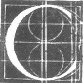 Spanish penman who produced two writing books between 1583 and 1612. A facsimile of these was printed by Mardersteig (Officina Bodoni) for The Pegasus Press in Paris in 1928, in a 32-page book edited by Henry Thomas and Stanley Morison: Andres Brun, Calligrapher of saragossa, Sme account of his Life and Work, with a Facsimile in Collotype of the Surviving Text and Plates of his two Writing Books, 1583-1612. [Google]
[More] ⦿
|
Ann Camp
|
Author of Pen Lettering (1958), an interesting penmanship book. The construction of an alphabet as presented by Ian Taylor on his blog, based on Ann Camp's book, is fascinating. It all starts with a square, and within it, an inscribed circle and an oblong rectangle of area equal to the circle. All letters relate, as Ann Camp shows, to that basic structure. Ann's all caps skeleton alphabet obtained in this manner predates Avant Garde and Herb Lubalin by almost twenty years! [Google]
[More] ⦿
|
Ann Wroe
[Handwriting: An Elegy]
|
[More] ⦿
|
Antonio Jacinto de Aroujo
|
Aroujo was a Portuguese calligrapher and a professor of writing and arithmetic. He also was a correspondent of the Imperial Academy of Science in St. Petersburg. Author of Nova arte de escrever offerecida oa Principe Nosso Senhor, para instrucção da mocidade... (1794, Lisboa, na officina de Antonio Gomes). [Google]
[More] ⦿
|
Antonio (Tony) DiSpigna
[Thinstroke]

|
[MyFonts]
[More] ⦿
|
Antonio Vignali
[RM WD]

|
 [MyFonts]
[More] ⦿
|
Archive Type
[Matevz Medja]

|
 Slovenian foundry which specializes in old typefaces found in old prints, books and samples. Typefaces are reproduced as they appeared in print. In order to preserve the original feel of typefaces, no additional characters were added to originals therefore most of fonts consist just of basic character set. Upper case letters, lower case letters, numerals and basic punctuation. It was set up in 2000 by Matevz Medja. Engraving style typefaces: Kludsky (2006), Garfield (2005), Copperplate Head (2005), Western Iron (2005), Cider (2005), French Shaded (2005), Tilt (2005). The blackletter typefaces: School Text (2005), Harlem Title (2005), Copperplate Text (2005), Black Title (2005), Chased Black (2005), Tinted (2005), Steeler (2005), Blackcap (2005). Calligraphic typefaces: Petite Script (2005), Autograph Script (2005), French Script (2005), Penman Script (2005), Magnolia Script (2005), Roundface Script (2005), Roundhand Script (2005). Other typefaces: American Shadow (2005), Lightface Extended (2005), Grotesque Shaded (2005), Gothic Ornate (2005), Antique Extra Condensed (2005), Antique Extended (2005), Ironlace (2005), Atlantique (2005), Mann (2005), Old Style Condensed (2005), Ribbon (2005), Salisbury Script (2005), Black Title Text (2005, blackletter), German Text (2005, blackletter), Archive Hands (2006, pointing fingers), Archive Woodchild (2006). Distressed typefaces: Archive Tale (2006), Archive Egipt Compressed (2006). In 2011, he published the Archive Garamond family, which is closer to the unpolished originals. The 2010 catalog has three parts:
 - The Archive 40: Archive Western Iron, Archive American Shadow, Archive Antiqua Extra Cond, Archive Antique Extended, Archive Atlantique (avant garde sans), Archive Autograph Script, Archive Black Title Text, Archive Black Title, Archive Blackcap, Archive Chased Black, Archive Cider (engraved; a vintage money font), Archive Copperplate Head, Archive Copperplate Text, Archive Egipt Compressed, Archive French Script, Archive French Shaded, Archive Garfield (2005), Archive German Text, Archive Gothic Ornate, Archive Grotesque Shaded, Archive Harlem Title, Archive Ironlace, Archive Kludsky, Archive Lightface Extended, Archive Magno Script, Archive Modern II Open, Archive Modern II, Archive Old Style Condensed, Archive Penman Script, Archive Petite Script, Archive Ribbon, Archive Roundface Script, Archive Roundhand Script, Archive Salisbury Script, Archive School Text, Archive Steeler, Archive Tale, Archive Tilt, Archive Tinted.
- Archive Americana: Archive American Shadow, Archive Steeler, Archive Tilt, Archive Grotesque Shaded, Archive Black Title (blackletter), Archive Mann (an industrial 3d typeface), Archive Autograph Script, Archive Tinted, Archive Harlem Title (blackletter).
- Archive Western: Archive Egipt Compressed, Archive French Shaded, Archive Western Iron, Archive Antique Extended, Archive Copperplate Head, Archive Ribbon, Archive Gothic Ornate, Archive Oldstyle Condensed, Archive Lightface Extended, Archive Ironlace.
Creative Market link. View Archive Type / Matevz Medja's typefaces. [Google]
[MyFonts]
[More] ⦿
|
Archive.org: Americana
|
Penmanship texts that can be read on-line. [Google]
[More] ⦿
|
Arno Drescher

|
 Type designer (b. Auerbach, Germany, 1882, d. Braunschweig, 1971) who studied at the Akademie für Kunstgewerbe in Dresden, and became professor there in 1920. During World War II, Arno Drescher was director of the Akademie für graphische Künste und Buchgewerbe in Leipzig. After a period as freelance designer, he finally moved to Braunschweig in 1960.
 Drescher is best known for his large geometric Super Grotesk family (Schriftguss, 1930). The list of his typefaces: - Appell (1933, Schriftguss).
- Arabella (1936, Ludwig Wagner) and Arabella Favorit (1939, Ludwig Wagner). A cursive pair of typefaces. Digital revivals include Arabella (ca. 1999) by Dieter Steffmann and Arabella Pro (2006) by Ralph M. Unger.
- Drescher Eilschrift (1934, Wilhelm Woelmer).
- Drescher Versalien (1927, Schriftguss). Aka Drescher Initials. An open lineale titling typeface.
- Duplex (1930, Typoart and 1937, Schriftguss). An all caps inline typefaces.
- Energos (1932, Schriftguss). An early brush script. Revived by Ralph M. Unger in 2008 as Energia Pro (2008).
- Fundamental Grotesk (1938-1939, Ludwig Wagner) and Fundamental Kursiv. In several weights.
- Helion (Schriftguss, 1935, and Fonderie Française, 1935, a 3-d shaded outline font). Digitally revived by Ralph M. Unger in 2020 as RMU Helion.
- Manutius Antiqua (1935, Ludwig Wagner), Manutius Kursiv (1935, Ludwig Wagner). This typeface is idenitical to Johannes Wagner's Antiqua 505 (1955).
- Milo (1940, Schriftguss). A shadow typeface.
- Onyx (1936, Schelter & Giesecke). A multiline art deco titling typeface.
- Schreibmeister Kursiv (1958, at Ludwig Wagner). A formal cursive font. Schreibmeister (2021) is Ralph Unger's interpretation.
- Super Grotesk (1930, Schriftguss). This geometric typeface family was revived at FontShop in 1999 by Svend Smital as FF Super Grotesk, and at Bitstream in 2001 by Nicolai Gogoll as Drescher Grotesk BT. Super Grotesk Schmalfett (1933) was revived in 2020 by Ralph M. Unger as RMU Gong.
- Super Blickfang (1932, Schriftguss), Super Elektrik (1931, Schriftguss), Super Reflex (1931, Schriftguss). For a digital revival, see FF Super.
Klingspor link. [Google]
[MyFonts]
[More] ⦿
|
Arthur S. Osley
|
Author of Luminario: an introduction to the Italian writing books of the 16th and 17th centuries (Nieuwkoop, 1972). This book surveys the Italian writing-manuals, 1514-1660. He also wrote Mercator. A Monograph on the Lettering of Maps, etc. in the 16th century Netherlands. With a facsimile and translation of Ghim's Vita Mercatoris (London, 1969). [Google]
[More] ⦿
|
A.S. Barnes
|
Author of the penmanship book Barnes's National Vertical Penmanship (New York: American Book Co., 1899). [Google]
[More] ⦿
|
Ata Syed
|
 Ata Syed (Karachi, Pakistan) has a dual identity at FontStruct, where he is one of the most prolific contributors. He is known there as thalamic and as minimum. Behance link.
 Typefaces made in in 2008 as thalamic: Hello (connected upright script), Epilogie (blocks), WimSoft (+U/C), Chunk Chip, Konstruct (Russian constructivism face), Sensei Says, FS Tributary, Twotype Font, Urge (fat octagonal), Subliminal, FS United One, The Game of Type, Anaximander Zooom!, Corrupt and Corrupt Ed (piano key stencil fonts), Blueprint, Monomum, Synergy, Insert Coin Italic, Write I Careful, Write I Casual, Write I Dump, Loop UC, Loop LC, Emergic, Prick!, Insert Coins Pixels, Retro Electro, Bubble Lab IJ, Bubble Lab Bang, A Needle Pulling Thread, Send, Scan (IBM logo look), Intermittent and Intermittent Sans (stencil typefaces), Melt x DR and Melt x tDR (dot matrix), Oval x DR and Oval x tDR (original design by theDesignersRepublic for Issey Miyake), On Grid, Indigo (almost blackletter), orange_2 (dot matrix), Scan (horizontal stripes), Bass, Grape (simple pixel face), Nachahmung and Nachahmung Block (fat and extra condensed, Wim Crouwel simulation typefaces), Nachahmung Block Serif, Conjunction, Interjection, Is It, Sangular (nice experiment), Anonon (nails in square letters), Purple and Purple Very (slab serif headline typefaces, pixelized), Arc Echo (biline and strutted), The Question (a fantastic 3d paper fold imitation face), FS Minimal (a fantastic ultra fat decorative face), FS FontStructor, Vibrant (multiline labyrinthine or op-art face), Writ (upright pixel script), Castor, Ooki (octagonal), Industrial, The I Flat, The I, Indiscrete, Analog (connected script), Dent (mechanical), Digital (connected script), Hello Hello, and Sensei Says. In 2009, he made Clone It, Entwined, C64, Helix, Fontsration, Bent, Stripe Zoo, Dull, Indent (stencil), Quartertined (kitchen tile), Firox, Orfix, A Priori, Ignore, Confused, S-Ookii, Ookii (octagonal), Very Becoming, Crisis Averted, Crisis (neat bold octagonal face), Penmanship, Up All Night, Sleep All Dayi, Chunk Chip, Grayletter (upright script), Soso, Mostly Harmless (textured face), Etched, La Cross, Twotype, Etched Bare, Aught (One, Two, Three), as: Inflate (Pop, Pfft, Puff, Poof), Istic, Very Becoming, Ignore, Ought, Balance, Broken, Dry Flat (dot matrix), La Cross, Etched (+Bare), Fontsration (+Refined: multilined beauties), FS Institutional (fat multiline face), FS Industrial, FS Pixelayers. Additions in 2010 as thalamic: fs Section, fs Reboot, fs Easy DNA Auto Stencil, fs Institutional (+Ho, +Elements), fs Quartertined, fs Stencil 2.0, fs Rivet, fs Intaglish, fs Dumb Italic, fs Loop Gap, fs GoTeam (stencil), fs ITilic, fs Kerplunk (Startrek face), fs Dumb Italic, fs Ribbon, fs Beringer, fs Ooki Woodcut, fs Croissant (stencil), fs 45 (octagonal stencil), fsXO, fs Pipe, fs Confused Less. Fonts from 2011 as thalamic: fs Xenon (a paperclip face), fs Instant, fs Twist, fs WIP (blackletter), fs Sparc, fs Reboot (texture face), fs Pod, fs Flute Tune, fs Special, fs Watch Out (stencil), fs Etched Nyle (labyrinthine face), fs No Kerning Required (2011, connected upright script). Creations in 2012 as thalamic: fs Flip, fs Mom, fs Noise, fs Noise II, fs Junk, fs You Are Here, fs Flash (outlined), FS Easy Too (paperclip face), FS Strict, FS Fix, fs in three (octagonal stencil face), fs Single, fs Wakarimasen, fs r-failed (white on black), fs Permutation X, fs Pan Am, fs Institutional, fs Institutional 2, fs Chunky (counterless), fs Grayletter (textured face), fsXply (op-art). Creations in 2013 as thalamic: fs So Not Right, fs Grid Urdu (pixel face), fs Not So Right, fs Six Sticks, fs Half (octagonal family), fs Bored, fs Make it Happen, fs Salvage, fs To Be Discarded, fs Connect (stencil), fs Whomp, fs Praxis, fs Fez (3d face), fs Input, fsTramp, fs Five Alive, fs Hote-Zyd (labyrinthine), fs Patterns (Layers, Quarters), fs Five Alive (origami font), fs Go To Sleep (retro speed font), fs Vaerktoj (inspired by the brand identity of Hoejmark Cycles), fs Permutation B, fs Jester, fs Permutation XII (op-art), fs Insatiable, fs Electronic, fs Carbon (a nice chequered face), fs When We Were Young (multiline typeface), fs Shogun Tiny (a lined kitchen tile typeface), fs Optical, fs When We Were Young (multilined), fs Slate, fs Shogun (gridded), fs Iie (+Filled), fs Blocky (dot matrix), fs Thalamic. Creations in 2014 as thalamic: fs Perhaps, fs Perhaps Perhaps, fs Stability (Turmoil, Flux), fs Industrial (an artsy fat dot matrix face), fs Rehash, fs Ah, fs Curly, fs So, fs Flint, fs ICK (blackboard bold style), fs Wiggle, fs Grid, fs Ah. Creations from 2015 as thalamic: fs B-Chain (bike chain font), fs Risque (art deco), fs Squangular (Impair, Square, Flair, Pair), fs Oval, fs MIP, fs Flower (kitchen tile face). Creations as minimum: fs Chips (2014), fs Oh (2014, piano key style), fs Stack (2014, +Overflow), fs llljjj (2014), fs Turn Off The Sun (2014, beveled), fs Zag (2013 textured), fs Zig (2013, textured), fs Mullions (2013), fs The Italic (2013), Gridlock (2009), Mingle Minx (2009), Mingle Co (2009), Mingle (2009, gridded letters), Bevel (2009, 3d beveled family), illiij (2009, multiline family), m.ove.r (2009, multiline family), Grayscale (2009, multiline family), fs Cubed (2010, 3d-face), Bas Relief (2009, 3d face), Silver (2009, 3d face), Tin (2009), Lead (2009), Bevel (2009), Bevel Just (2009), Bevel Just Shadowed (2009), Ceci n'est pas une vague (2009), A Fault in Reality (2009, optical effect font), Blit Slash (2009, experimental), Blit Hack (2009), Dot Dot Hex (2009), Super Black (2009), fs Overlap (2010), fs Fabric (2010, texture font), fs Original (2010), fs Ink Blot (2010), fs Dots and Dashes (2010), fs I Square (2010), fs Squared Up (2010), fs Super Black (2010), fs Unoriginal (2010), fs Minimum (2010, geometric stencil face), fs Pin and Thread (2010, stitching face), fs Shade (2012, 3d face). FontStructions from 2011: fs Perpetual (dotted line face), fs Slither, fs No Escape, fs Prompt (a DNA-inspired biochemical lab face), fs Plus H (horizontally striped face), fs Arc Test 2:2 (a modular blackboard bold face), fs V Simple (2010, textured face), fs Instant, fs Permutation V, fs Rehash Monoic (labyrinthine), fs Meta (texture face), fs Scroll, fs Scroll Not (stencil). FontStructions from 2012: fs Translucent (a texture face), fs Bank, fs Shade, fs Confined (white on black), fs Institutional (+Vo, +HeVe, +Ho, +He, +Ve: texture typefaces), fs Bang, fs Random (textured face), fs Random Pattern, fs Lead, fs Tin, fs Silver, fs Tungsten. Klingspor link. Abstract Fonts link. Behance link. [Google]
[More] ⦿
|
ATF: Typo Script and Typo Gothic
|
Typo Script is a Spencerian script in the ATF library, cut by them in 1902. However, many similar scripts existed around that time. Mac McGrew explains: Typo Script is a group of ATF typefaces, most of which have little or no relation to each other except that all are intended for use on stationery, invitations, and other social printing, and are imitative of the work of copperplate and steelplate engravers. Several members of the group were originally named Tiffany; the name apparently was changed late in 1906, although a few typefaces were still shown with the earlier name as late as 1909. Typo Gothic is the oldest of the group, and has been made by many founders. It is a plain, square, monotone gothic with very small serifs, cast in several sizes of caps and figures on each of several point sizes. He continues about the origins of Typo Gothic: The earliest showing seems to have been offered as Lining Antique by Illinois Type Foundry in 1889; Keystone Type Foundry later used the same name. Subsequently it was shown as Cleveland by Standard Type Foundry, as Standard Lining Antique by Marder, Luse, and as Olympia by Inland, all before 1900. ATF showed it as Tiffany Gothic from 1901 to 1909 and later as Typo Gothic. BB&S took over Olympia and renamed it Engravers Gothic. Damon&Peets called it Franklin Card Gothic, which is the cap alphabet shown in the specimen here. Hansen called it Steel plate Gothic. From all sources it is essentially the same design, although there are some slight differences. Some versions have a horizontal crossbar on the G " some lack this on certain sizes. Now back to ATF. McGrew: Typo Roman was designed by Morris F. Benton for ATF in 1926; it is a narrow modern roman with small lowercase and very long ascenders. The M is splayed with a short vertex. Figures are much the same as Bodoni. Typo Roman Light was cut by Intertype in 1939. Typo Roman Shaded was the first of this group; it is said to have been designed by Morris F. Benton in 1921, adapted from engravings, but was not released by ATF until 1924. Typo Script and Typo Script Extended were designed by Benton and cut by ATF in 1902, originally as Tiffany Script and Extended, when they were called "as close a copy as possible to reproduce in type the work of the artist who did much of the copperplate engraving for the Pan-American exposition." But Middleton says Tiffany Script was the "first typeface engraved by Wiebking (and Harding) on their engraving machine brought from Germany." They are a refinement of popular nineteenth-century scripts; like some of them, these two typefaces share the same capitals, figures, and punctuation marks-only the lowercase differs. They are similar to Bank Script and Commercial Script, but lighter and more delicate. Inland's Invitation Script was very similar to Typo Script Extended. Also see American Script, Formal Script, Plate Script. Typo Text is a shaded Old English design, first shown by ATF as Tiffany Text in 1901, although this may be the same typeface shown by Bruce Type Foundry as Invitation Text a short time earlier, just before that foundry merged with ATF. Hansen copied it as Card Text. Also see Plate Text, Inland Copperplate. For a digital revival of Tiffany Gothic, see Tiffany Gothic CC (2020, Owen Earl). [Google]
[More] ⦿
|
August E. Woerner
|
Punchcutter born in Frankfurt am Main (1844), who died in New York in 1896. He worked for some time at A.D. Farmer&Son in New York, as well as at Conner Type foundry, and at Bruce Type foundry after his emigration to the USA in 1868. In Germany, he was a punchcutter at Flinsch and from 1864-1868 at Haas in Basel. McGrew says: Merrymount was designed by Bertram G. Goodhue for Daniel B. Updike's Merrymount Press in Boston, and was cut only in 18-point. This was used in an impressive Altar Book, which established the reputation of Updike and his Press. Steve Watts says the typeface was cut by Mr. [August] Woerner of A. D. Farmer&Son Type Foundry in New York. The original punches and matrices are preserved by the Providence (Rhode Island) Public Library as part of its extensive Updike Collection, where a note with the mats says, "Cut by A. Woener (sic), June 21st, 1895." His typefaces: Bruce No. 11, No. 13 and No. 21 (Bruce Type foundry), German no.91 (1876, Bruce), Penman Script No.2053 (Bruce), Merrymount (1896, Merrymount Press), and the following typefaces published at Farmer, Little & Co: Card Gothic (1893), Gotham (ca. 1890), Lightface, Old Style No. 5 (ca. 1887), Old Style No. 5 Italic, and No. 6, 15, 17, 18, 20 21, 22 and 23. [Google]
[More] ⦿
|
Austin Norman Palmer
[Portfolio of Ornate Penmanship]
|
[More] ⦿
|
Austin Norman Palmer
|
Born at Fort Jackson, New York, in 1860, this well-known penman died in 1927. After studying at Gaskell's Business College in Manchester, NH, Palmer first worked in Indiana, Missouri and Iowa, before founding the A.N. Palmer Company in New York City to teach and practice penmanship. He introduced the Palmer Method of business penmanship, which soon became the most popular handwriting system in the United States. Author of these books: Reference: In Spencerian Script and Ornamental Penmanship, Volume I (1989), by Michael R. Sull, we find a chapter on his life. [Google]
[More] ⦿
|
Austin Owens
|
 Snellville, Atlanta, GA-based designer (b. 1977) of the playful fonts Austie Bost Dreamboat (2015), Austie Bost There For You (2015), Austie Bost Envelopes Print (2014), Austie Bost Take A Chance (2014), Austie Bost Lifted Up (2014), Austie Bost Arrow Mania (2014, arrows), Austie Bost Envelopes (2014), Austie Bost Versailles (2014: thin curly script), Austie Bost Chunky Description (2014), Austie Bost Descriptions (2014), Austie Bost Wibbly (2014: a great curly poster typeface), Austie Bost Somersaults (2014), Austie Bost Cartwheels, Austie Bost Roman Holiday Sketch (2014), Austie Bost Matamata (2014), Austie Bost Serifina (2013, a curly script), Austie Bost Happy Holly (2013), Austie Bost Bumblebee (2013), Austie Bost Toy Chest (2013), Austie Bost All My Love (2013), Bost Chunkilicious (2013), Austie Bost in Wonderland (2013), Austie Bost You Wear Flowers (2013), Austie Bost Rest of Our Lives (2013, penmanship font), Austie Bost Simple Simon (2013, a curly face), Austie Bost Dust Into Diamonds (2013), Austie Bost Small World (2013), Austie Bost High Altitudes (2013), Austie Bost Marketplace (2013), Austie Bost Starlit Beach (2013), Austie Bost Cherry Cola (2013), Austie Bost Hooked on a Feeling (2013), Austie Bost in a Rush (2013), Austie Bost Blueberry Muffins (2013), Austie Bost Kitten Klub (2013), Austie Bost Mud Pies (2013, a connect-the-dots typeface), and Austie Bost Crazy Days (2012) and of the dingbat typeface Austie Bost Christmas Doodles (2012).
 Home page. Dafont link. [Google]
[More] ⦿
|
Autographis
[Gert Wiescher]

|
 München-based foundry, est. 2008 by Gert Wiescher, whose main font foundry is Wiescher Design. Myfonts link. Specializing in handwritten scripts and rough fonts, they created Obsession A through F (2012, a penmanship typeface family), Pigalle Swing (2012), Amaro (2011, a signage script family; + Amaro Block, +Amaro Fleurie), Obsession (2011, a calligraphic family), Astara (2010), Golden Love (2010), Homer (2010, a comic character script), Moon Love (2010), Perfecto (2010), Nikita (2009, upright connected script), English Lazy Bird (2009), Script Hand (2009), Angel Eyes (2009), Cheap Thrill (2009), Viva Maria (2009), True Love (2009), WildThing (2009), Doria (2009), Verena (2009), Astria (2009), Chloe (2009), Bea (2009, brush), Xan (2009, rough Japanese-style script), Fat Sally (2009, comic book face), Wally (2009, calligraphic), Ysadora (2009, calligraphic), Zoe (2009, calligraphic), Joyosa (2009), Ulissia (2009, hand-drawn slab serif), Querida (2009), Riana (2008), Quiana (2008), Quirina (2008, calligraphic), Naomi (2009, calligraphic; based on his Nana), Don Julio (2008, calligraphic), Donna Julia (2008, calligraphic), Novita (2008, calligraphic), Novido (2008), Flatpen (2008, a rounded sans face), Kato (2008), Leona (2008, brush script), Tina (2008, fat brush), Maeva (2008, calligraphic script), Oona (2008, like Maeva), the brush script Paula (2008), the upright cursive typefaces Grazia (2008) and Greta (2008), the brush script Juliana (2008), the comic book style typefaces Carina (2008), Isara (2008), Kiki (2008), and Fanny (2008), and the calligraphic script typefaces Dalia (2008), Elisara (2008), Simona (2008), Helenia (2008), Annabella (2008), Brigitta (2008) and Constanza (2008). Gert writes about himself: I went to Paris when I was very young, just for the sake of art. That caused many a sleepless night to my beloved mother, but she accepted my decision. Once I met Salvador Dalí, but he did not take me very seriously. To this day I dont know why! After some years I decided to start a serious life. I got married and studied graphic design at the Hochschule der Künste in Berlin. Making detours, once more to Paris, then to Barcelona, where I designed the OECD pavillion for the Osaka World Expo at the office of Harnden&Bombelli, I reached South Africa. Grey and Young advertising got to know me! I had to fiddle around with Agfa cameras and films, Epol dog-food, several kinds of toilet paper, unbelievable insurance companies and I-dont-know-what. Sometime on a holiday in Munich I stayed there. Someone made me an offer I did not want to refuse. DFS&R-Dorland bought me out of South African slavery! I now became an art-director for Paulaner, CMA, Phillip Morris, and Peugeot. Being a young adventurous man, I changed to the Herrwerth&Partner agency, which at that time was supposed to be the most creative outfit in town. Mister Herrwerth taught me to think simple. I was allowed to introduce IKEA into the German market. Afterwards I became Creative Partner with Lauenstein&Partner. That was OK, til someone discovered his love for horses! Thats when I rented my own office in 1982! Since then I design some typefaces per year, I guide a couple of nice young people (apprentices) along to designer stardom. I write a couple of books and newspaper articles about design, computers, food, drink and crime! As a graphic designer I have nothing but happy clients! I am open to every challenge! [Google]
[MyFonts]
[More] ⦿
|
Bartolomeo Sanvito
|
Bartolomeo Sanvito (1435-1518) was a scribe from Padua, Italy, who was trained in Rome. A master of the humanist italic script, his style is characterized by wquare capital letters alternating colored and gold. Books on Sanvito include Bartolomeo Sanvito: the Life and Work of a Renaissance Scribe (A.C. de la Mare and Laura Nuvoloni, Paris: Association internationala de Bibliophilie, 2009) and The Script of Humanism: Some Aspects of Humanistic Script 1460---1560 (James Wardrop: Oxford University Press, 1963). Many digital typefaces were modeled or named after Sanvito. These include [Google]
[More] ⦿
|
Ben Alexander
|
Author of The Ornamental Penman's Pocket Book of Alphabets (1900). [Google]
[More] ⦿
|
Ben Jones
[Protimient.com]

|
 [MyFonts]
[More] ⦿
|
Benedikt Gröndal
[Handwriting Models]
|
[More] ⦿
|
Berthold Ulrich Hofmann
|
German penman who published Gründliche and leichte Anweissung zur Zierlichen Schreib-Kunst der lieben Jugend zum besten und auf vielfaltiges Zegehren an den Tag gegeben von Berthold Ulrich Hofmann Schreib und Rechenmeister in Nürnberg in Nürnberg in 1694. [Google]
[More] ⦿
|
Best fonts of 2006 (MyFonts)
|
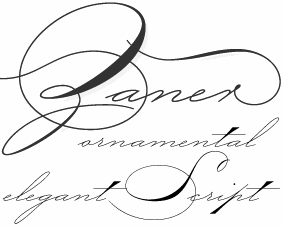 Based on sales, MyFonts ranks the best fonts for 2006, from first to tenth:
 - Swan Song: calligraphic, Canada Type.
- Boycott: grunge, Ryoichi Tsunekawa.
- The NautiGal: brush script, Rob Leuschke.
- Dear Joe Four: handwriting by Joe Bob Graphics.
- P22 Zaner: a penmanship font by Paul Hunt.
- Cyan: a roman typeface by Wilton Foundry.
- Korotaki: techno typeface by Ray Larabie.
- Fleurons Two: ornaments by Gert Wiescher.
- Estilo Script: art deco, DS Type.
- Camingo: flexible family, by Jan Fromm.
[Google]
[More] ⦿
|
Blessed Print
[Dmitrii Mikitenko]

|
 Dmitrii Mikitenko (Blessed Print, Chisinau, Moldova) created the connected brush script typefaces BetterFly (2015) and Miletta, and the calligraphic (wedding) scripts TheSecret and Flamingo in 2015. Other early typefaces include Draft Cheese, Graficx, Holiday, Kiss Me, Linella, Masterink, Modern Script, Patteson, Rotundio, Shrifton, Sunse Fun, TheSecret, Trajan, and Zippy.
 Typefaces from 2016: Mozart Script (formal calligraphic or wedding script), Blessed Script, Blessed Appetite Sans, Blessed Mamaliga Condensed Serif, Amelia Script. Typefaces from 2017: The Wedding Script (Spencerian), The Creative, Sophia Script (a great swashy calligraphic typeface family), Dorotthy Script. Typefaces from 2018: Betterfly, Cardinal (a great weathered medieval calligraphic script), Charlotte (free script font). Typefaces from 2019: BP BlackWhite (a copperplate calligraphic script typeface by Dmitrii Mikitenko and Sabina Aliyarova), Outstanding Victoria (calligraphic script). Typefaces from 2020: Creative Vintage (in the orbit of Cooper Black). Typefaces from 2021: Ecatherina (a 15-style copperplate calligraphic script). [Google]
[MyFonts]
[More] ⦿
|
Brian J. Bonislawsky
[Monogram Fonts Co]

|
 [MyFonts]
[More] ⦿
|
C. Lee
|
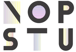 Honolulu, HI-based lettering artist and typographer. C. Lee created Vintage Alphabet in 2013. In 2014, he designed Cassandre Alphabet (2014, art deco, named after Cassandre) and Ornate Alphabet (decorative blackletter caps, which was inspired by Williams and Packard's Church Text). [Google]
[More] ⦿
|
C. van der Post Jr
|
Book shop owner in Utrecht, The Netherlands, in the 19th century. In 1855, he published the popular lettering model book Alphabeths voor steenhouwers, schoonschrijvers, schilders, graveurs, lithegraphen. In his book Nederlandse Belettering, Mathieu Lommen deduces that the alphabets in this book were developed in the atelier of lithographer P.W. van de Weijer in Utrecht in cooperation with van der Post. Reference: Nederlandse belettering negentiende-eeuwse modelboeken (2015, Mathieu Lommen, de Buitenkant, Amsterdam). [Google]
[More] ⦿
|
C.A. Barnett
|
Coauthor with J.T. Henderson and J.N. Yocom of Oberlin Business College - Compendium of Penmanship (1901). [Google]
[More] ⦿
|
Calligraphic drawings: XVIIth century
|
Samples of calligraphic penmanship: a devil, a dog, an emu, a half-man. [Google]
[More] ⦿
|
Calligraphy and Penmanship in History 42 Books
|
Alternate URL. Alternate URL. These files have 42 e-books on penmanship, for a total of 300MB. The list: - 1.Ames, Daniel T., 1884, Ames' Guide to Self-Instruction in Practical and Artistic Penmanship
- 2.Ames, Daniel T., The Daniel T. Ames Notebook, A wonderful collection of penmanship from the early 1860s from one of America's preeminent penmen and teachers
- 3.Behrensmeyer, H.P, Lessons in Practical Penmanship
- 4.Barnett, C.A., J.T. Henderson and J.N. Yocom, 1901, Oberlin Business College - Compendium of Penmanship.
- 5.Bloser, P.Z. (Copies by E.A. Lupfer), 1948, Lessons in Ornamental Penmanship.
- 6.Canan/Zanerian College, 1921, C.C. Canan Collection of Penmanship - The Canan Book, Copyright by Zaner-Bloser, Inc. Used with permission. All rights reserved.
- 7.Champion, Mary L., Champion Method of Practical Business Writing
- 8.Charles, A.A.S., 1983, Steel Pen Trade 1930-1980 Used with permission. All rights reserved.
- 9.Clark, Clinton H., The Clinton Clark Scrapbook Part One, Part Two, Part Three.
- 10.Comer, George and Oliver Linton, 1864, Penmanship Made Easy
- 11.Courtney, F.B., The Francis B. Courtney Scrapbook, courtesy of Bob Hurford
- 12.D'Avignon, L'ecriture Americaine, "Writing American" by D'Avignon, circa 1840
- 13.Dennis, W.E., 1914, Studies in Pen Art
- 14.Gaskell, G.A., 1883, Gaskell's Compendium of Forms (the section on writing)
- 15.Huntington, Eleazer, 1821, Art of Penmanship
- 16.IAMPETH Scrapbooks - A remarkable collection of Golden Age penmanship, PDF Number 1, PDF Number 2.
- 17.Jenkins, John, 1813, The Art of Writing
- 18.Jones, C.W., editor, 1914, Lessons in Engraver's Script
- 19.Jones, C.W., editor, 1914, Ninety-five Lessons in Ornamental Penmanship
- 20.Kelchner, Lloyd M., 1901, Complete Compendium of Plain Practical Penmanship
- 21.Knowles and Maxim, publisher, 1881, Real Pen Work - Self Instructor in Penmanship
- 22.Madarasz, Louis, Lessons in Advanced Engraver's Script, published by C.W. Jones
- 23.Madarasz/Zanerian College, 1911, The Madarasz Book - The Secret of the Skill of Madarasz, Copyright by Zaner-Bloser, Inc. Used with permission.All rights reserved.
- 24.McDonald Business Academy, 1894, Penman's Leisure Hour
- 25.Meyrat, P., circa 1920's, Recueil Methodique de Principes d' Ecriture ("A Methodical Collection of Principles of Writing"
- 26.Mills, Edward C., 1903, Modern Business Penmanship
- 27.Noyes, Enoch, 1839, Noyes's Penmanship
- 28.Palmer, A.N., 1935, The Palmer Method of Business Writing
- 29.Palmer, A.N., 1919, Palmer's Penmanship Budget
- 30.Palmer Company, The A.N., Portfolio of Ornate Penmanship
- 31.Real Pen-Work Publishing, 1867, Bible Pearls of Promise
- 32.Spencer Authors, 1874, Theory of Spencerian Penmanship
- 33.Spencer Brothers, 1881, New Standard Practical Penmanship
- 34.Spencer, Platt Rogers, Sr., 1866, Compendium of Spencerian or Semi-Angular Penmanship
- 35.Spencerian Authors, 1879, New Spencerian Compendium
- 36.Stacy, L.E., 1907 (compiled by), The Blue Book
- 37.Sull, Michael R., 1989, Spencerian Script and Ornamental Penmanship, Volume I, Chapters 1,2 and 8.
- 38.Sykes, circa 1885, Sykes's Manual of Penmanship
- 39.Williams, J.D. and S.S. Packard, 1867, Gems of Penmanship
- 40.Zaner, C.P., 1888, Gems of Flourishing
- 41.Zaner, C.P., 1920, Lessons in Ornamental Penmanship
- 42.Zaner, C.P., 1900, The New Zanerian Alphabets
[Google]
[More] ⦿
|
Camilla Wiedemann
|
During her studies, wiesbaden, Germany-based Camilla Wiedemann designed The New Palmer, a deco typeface influenced by and named after famous American penman Norman Austin Palmer, who suggested a similar script ca. 1888. Behance link. [Google]
[More] ⦿
|
Carine de Wandeleer

|
 Carine de Wandeleer was born in Argentina to a French-Belgian immigrant family. She studied fine arts and graphic design at University of Buenos Aires, but lives and works in Spain.
 Kycka (2011) is a hand-printed slab serif family designed for children's books. Karty (2011, Eurotypo) is a blackboard bold pair of typefaces inspired by Baskerville. Marilyn (2011, Eurotypo) is an informal bouncy heavy sans face. Natalie (2011) is a condensed slab serif face. In 2012, she published the connected script family Gilda, the informal cursive typefaces Zanya, Miss Seshat (Eurotypo) and Belha, the script typeface Lirio (Eurotypo), the hand-printed Pimpin, and the fat finger family Souffle. Typefaces from 2013: Aleka (a vampire script in the style of Bombshell Pro), Mots (a light feminine script), Vernaccia, Eydis (connected script), Bonna (a successful calligraphic family), Rocha (funky cartoon style), Mussa (a curly children's book font), Onna (multiline script), Blondy (curly signage script), Gemma (connected script), Gemmadonati (another connected script), Lavinia (signage script), Ameglia (seductive upright flourished vernacular script). Typefaces from 2014: Juliette, Urbis (curly script), Tansy (a charming connected script), Flamenca (connected script), Mde Sade (flowing wedding script), Nubila, Gardeny (script), Eroli (connected calligraphic script), Andria (script), Kumma (script), Tout, Tout Web Icons, Tout Restaurant Icons. Typefaces from 2015: Parisi (calligraphic script), Scintillae Script, Santa Rita (signage script), Kira (brushy font), Amorino, Aprilis (signage script), Redbird (brush script), Muscari (connected script), Ambar (connected script with a roman caps set called Ambar Serif). Typefaces from 2016: Lyllo, Redmoon Basic, Sond (brush script), Nuit (an informal typeface based on hand-printing), Wildly (brush type), Bloem (Script and Sans), Brun (brush typeface), Joias, Scriptum (brush script). Typefaces from 2017: Halley, Brighten (brush script), Decize (an ornamental didone), Tapa (a sharp-serifed text family), Serenus, Pasteque, Galia, Mikha, Mikha Sans, Junius. Typefaces from 2018: Anemos (a powerful retro signage script), Bernyck (retro script), Mathylda Script (a calligraphic signature font), Cinefile, Stanffords (a brush script paired with Stanffords Sans), Clauques Script and Sans (a signature script), Jacine (Sans+Script), Pial, Mont Rose (based on examples published in Script Lettering (1957, M. Meijer)), Barcares, MyBella (a casual calligraphic script), Skyr Pro (handcrafted), Gageac (a decorative didone), Atmosfera (a glamour sans based on didone contrast), Waylom (script). Typefaces from 2019: Novata, Violant (a medieval script), Manises (inspired by a text written on a 16th century tile), Mostaza (a signage script), Trauville (calligraphic), Magie, Magie Slim, Beauville Script (a retro script), Bovary (a calligraphic script). Typefaces from 2020: Turer (all caps, in the Tekton or Koch Antiqua genre), Indalo (a casual script), Rhodes (a calligraphic typeface), Calinda, Aulas (a decorative serif), Raspail (copperplate calligraphy), Calagio (a casual script), Clichy (a casual sans), Colomby (copperplate round English handwriting), Rembord (an inclined script), Montigny (emulating an 18th century roundhand script). Typefaces from 2021: Verbum (a casual bold script), Grao (a casual script), Tarnese (a calligraphic script), Real Blues (script), Brabon (a heavy signage script), Escaut (a wide inky script). Typefaces from 2022: Cockcrow (a connected sans), Castagna (a calligraphic script). [Google]
[MyFonts]
[More] ⦿
|
Carleton V. Howe
|
Penman from Philadelphia who drew an engravers alphabet that was shown in Lessons in Advanced Engraver's Script (Louis Madarasz, published by C.W. Jones in Brockton, MA). [Google]
[More] ⦿
|
Carolyn Porter

|
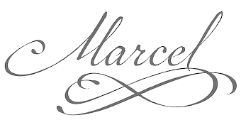 Carolyn Porter is a St. Paul, Minnesota-based graphic designer, type designer, and author.
 At P22, Carolyn Porter published P22 Marcel Script in 2014. This stylish fountain pen script comes with a story: The font Marcel is named in honor of Marcel Heuzé, a Frenchman who was conscripted into labor during World War II. During the months Marcel was in Germany, he wrote letters to his beloved wife and daughters back home in rural France. Marcel's letters contain rare first-person testimony of day-to-day survival within a labor camp, along with the most beautiful expressions of love imaginable. The letters---stained and scarred with censor marks---were the original source documents used by designer Carolyn Porter to create a script font that retains the expressive character of Marcel Heuzé's original handwriting. The letters were found in an antique shop in Stillwater, Minnesota, and the 1300-glyph font was developed from 2011 until 2014. It comes with a set of filets and calligraphic ornaments, P22 Marcel Ornaments, and a set of capitals, P22 Marcel Caps. Marcel Script won an award at TDC 2014. Speaker at ATypI 2017 Montreal. The story of Marcel Heuzé is captured in her award-winning book Marcel's Letters: A Font and the Search for One Man's fate. [Google]
[MyFonts]
[More] ⦿
|
Cecilia Marina Pezoa

|
 Codesigner with Jeremy Dooley of the penmanship script typeface Enocenta (2013). [Google]
[MyFonts]
[More] ⦿
|
Charles Paillasson
|
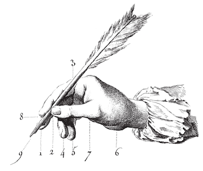 French engraver, penman and calligrapher, 1718-1789. Author of Notice historique sur les hommes célèbres de toutes les nations de l'Europe, qui depuis la renaissance des sciences et des arts, se sont distingués dans la configuration des caractères qui composent les diverses Ecritures, which appeared in J. H. P. Pouget, Dictionnaire des chiffres et de lettres ornées à l'usage de tous les artistes (Paris, 1767).
 In 1796, Charles Paillasson wrote L'arte di scrivere: tratta dal Dizionario d'arti e mestieri dell' Enciclopedia metodica (Padova, Appresso Niccolo Bettinelli). The date, 1796, is a bit puzzling, but The Getty Research Institute writes: The text is a separate publication of the section on handwriting from an Italian edition of the Encyclopédie méthodique, originally published in Geneva by C.J. Panckoucke, 1783-1790. The 15 leaves are copies of those first published in: Encyclopédie, ou, Dictionnaire raisonné des sciences, des arts et des métiers. Recueil des planches, v. 2. Paris, Chez Briasson, David, Le Breton, Durand, 1763. The engraved leaves consist of 2 leaves showing position of the hand and writing posture, and 13 writing samples, engraved by Pasquali. Local download. [Google]
[More] ⦿
|
Charles Paxton Zaner
|
 Famous American teacher of penmanship, b. 1864. Author of Lessons in Ornamental Penmanship (1920), Gems of Flourishing (1888), and The New Zanerian Alphabets (1900, Zaner & Bloser, Columbus, OH). This site describes his story: In 1888, Charles Paxton Zaner founded the Zanerian, College of Penmanship, in Columbus, Ohio. The schools curriculum included courses that prepared students for careers as penmen who, at that time, wrote by hand most of the documents used by business and industry. The school also trained students to become teachers of penmanship, illustrators, engravers, and engrossersspecialists in the kind of ornamental writing used for diplomas and certificates. In 1891, Zaner sold a share of the Zanerian to Elmer Ward Bloser, whom he met in 1883 while the two men were students at Michaels Pen Art Hall. Bloser, who had been working as an instructor at the Spencerian Business College in Cleveland, was a superb penman, and he had accumulated the capital necessary to sustain the college in its early days (when its three instructors had only three pupils). By 1895, the Zanerian College of Penmanship had become the Zaner-Bloser Company, an institution that offered courses in penmanship, published professional materials about handwriting and illustration, and sold handwriting supplies. In 1904, Zaner-Bloser published The Zaner Method of Arm Movement, a landmark text that taught the simplified style of writing learned by students at the Zanerian to children in elementary schools all over the United States. This book also applied the findings of psychologists who had discovered that young children completed manual tasks more easily if allowed to use the large arm movements that were natural to them at their early stage of motor skills development.
 In 2006, Paul Hunt designed a set of connected calligraphic scripts, called P22 Zaner. Link to some of his books. [Google]
[More] ⦿
|
Charles Snell

|
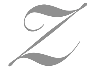 English writing master in the 17th century. Matthew Carter revived his roundhand in 1966 for photocomposition and extended it by adding weights. It became Snell Roundhand Script (Linotype) and Roundhand BT (Matthew Carter, Bitstream). [Google]
[MyFonts]
[More] ⦿
|
Charles T. Luthy
|
Author of Luthy's Scientific Handwriting: Being an Analysis of Roman Script Form and Execution (1918, C.T. Luthy). See also here. C.T. Luthy was based in Peoria, IL. [Google]
[More] ⦿
|
Chyrllene Albuquerque

|
 Aka Chyrllene K. Daughter of Iza W, who designed many typefaces at Intellecta Design starting in 2010. She studied applied mathematics and graphic design, and works as COO of Intellecta Design. In 2013, she wrote a thesis entitled Revival Tipografico at Faculdades Integradas Barros Melo, Brazil. Based in Recife, Brazil, she is credited with these typefaces:
 - Naive Ornaments (2012, with Iza W).
- Calligraphic Birds (2012, with Iza W).
- ABC Hand (2011). A sign language face.
- Pencraft (2010): a penmanship typeface with uppercase based on Swagger Capitals (Carl Stephen Junge, at Barnhart Brothers&Spindler), and lowercase based on Sidney Gaunt's Pencraft Oldstyle series (1914), as displayed in the BBS catalog from 1922.
- Eingraviert Dutch Capitals (2009). An engraved typeface.
- Vintage Hands (2012). A set of fists and penman's hands.
- Bonsai Paufo (2010): a dingbat face.
- Floreart (2012). With Iza W.
- Jugendstil Flowers (2011).
- Libertee Ornaments (2011): an elegant art nouveau typeface done with Paulo W.
- MesoAmerican (+Two) (2011): native Indian dingbat typefaces.
- Tribalism (2011): three typefaces with ornaments and fleurons, done together with Iza W and Paulo W.
- Cripto (2011). With Paulo W.
- Soft Garden (2012). With Iza W.
- Bruce 1065 Soft Serifs (2011). Very Victorian. With Iza W.
- Victorian Advertizing (2011).
- Gothic Revival Layered (2012). One of the first layered blackletter typefaces anywhere.
- Forte (2013) is a fee brush font in the style of Forte MT (1962, Carl Reissberger).
- Tribalism (2011). Three fonts with penmanship-style flourishes.
- Enchiridion (2012).
- Azalleia Ornaments (2012). With Iza W.
Behance link. [Google]
[MyFonts]
[More] ⦿
|
Clément Perret
|
Belgian penman. Clément Perret published the first writing manual in the low countries: Exercitatio alphabetica nova et vtilissima, varjis expressa linguis et characteribus, raris ornamentis, umbris&recessibus, picture, architecturaeque, speciosa (1569, Antwerp---some sources mention Brussels though). [Google]
[More] ⦿
|
Clinton C. Canan
|
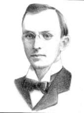 The Columbus, OH-based Zaner-Bloser Company published a penmanship book to celebrate the life of a Zanerian scholar, C.C. Canan, C.C. Canan Collection of Penmanship---The Canan Book (1921, The Zaner-Bloser Company, Columbus, OH). Clinton C. Canan was a penman born in Pleasantville, PA, in 1873. In bad health, he died at a young age in 1904 in Bradford, PA. Sull writes about him that he was equaled by no living penman in delicate, accurate, free-hand ornamental penmanship. He attended the Zanerian College in 1893, and taught penmanship for two years at Cleary College in Ypsilanti, MI. Later he taught penmanship at Cedar rapids Business School in Iowa and at the Shissler College in Norristown, PA. Samples of his penmanship: i, ii, iii. Letterhead. [Google]
[More] ⦿
|
Clinton H. Clark
|
American penman, b. New York, 1864, d. 1937. He taught in business schools in san Antonio, TX, Buffalo, NY, Hutchinson, KS, and Sioux City, IA. From 1916 until his death he was at the Strayer's Business School in Philadelphia. In 1893 he won first prize in a world-wide contest conducted by the Penman's Art Journal. Author of The Clinton Clark Scrapbook. Parts two and three are here and here. [Google]
[More] ⦿
|
Commercial Script
|
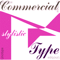 Commercial Script is a typical Spencerian (connected) script, with early versions available from the Chicago and Inland typefoundries, ca. 1888. The most famous, and very popular, implementation is due to Morris Fuller Benton in 1906 and cut by ATF in 1908. It is similar to Bank Script, but heavier and with fewer flourishes. It also is similar to Typo Script. Some modern day digital versions:
 [Google]
[More] ⦿
|
Corien Bennink
[Corien's Handwritingfonts]

|
[MyFonts]
[More] ⦿
|
Corien's Handwritingfonts
[Corien Bennink]

|
Corien Bennink (Corien's Handwritingfonts) is a Dutch portrait photographer and pencil artist, b. 1980. She lives in Diever. Corien has been making custom handwriting fonts since 2005. Creator of the comic book / chalk board font Whiteboard (2007). She is the designer of Heroes Font (2006, hand-printed, made based on screenshots of the Heroes TV series; see also here) and House Whiteboard Font (2006). Commercial fonts include Spidery Elegance (2008), Dausby (2012, based on a secretary's hand from the 1850s), Ashby (2015, a Spencerian script), Concinnitas (2015, a neat upright handcrafted typeface), Deveren (2017, based on goosefeather writings from the late 1600s), Notetaker (2019) and Yarker (2019, a business hand of the late 19th century). She also offers a commercial handwriting font service (40 USD), and has some free handwriting demo fonts from 2005 and 2006: Angela, Bob-H., Escribiente, Heroes-font, Kendall-j, Krusoe, Nongtung, R.-Bruce, Whiteboard, richie. Alternate URL. Yet another URL. [Google]
[MyFonts]
[More] ⦿
|
Crystal Kluge
[Tart Workshop]

|
 [MyFonts]
[More] ⦿
|
C.W. Jones
|
Jones lived in Brockton, MA. Author of Alphabets for Practical and Ornamental Engrossing (1914), Lessons in Engraver's Script (1914), American Method of Business Writing, and Ninety-five Lessons in Ornamental Penmanship (1914). The second book contains one full formal calligraphic alphabet by Jones himself. [Google]
[More] ⦿
|
D. Bolle
|
Dutch printer located in Rotterdam, who published the lettering model book Calligrafische voorbeelden ten dienste van schlders, steenhouwers, lithographen, bouwkundigen enz in 32 genres (1888). Reference: Nederlandse belettering negentiende-eeuwse modelboeken (2015, Mathieu Lommen, de Buitenkant, Amsterdam). [Google]
[More] ⦿
|
D. Duvillé
|
D. Duvillé was a professor at Ecolesdes arts de Paris. Author of Art du tracé rationnel de la lettre (1934, Société Française d'Éditions Littéraires et Techniques, Paris). The text shows how to trace letters in different styles. There are some digital typefaces that are based on Duvillé's alphabets: [Google]
[More] ⦿
|
Dai Foldes

|
 Painter turned type designer in Baltimore, d. 2021. Creator of Velocipede Stencil (2011), an art deco typeface made for a bike shop in Baltimore. At Lost Type Coop, he published the humanist remaissance italic typeface Pigeon (2011) and the calligraphic script Cylburn (Lost Type): Cylburn is a semi-connected script, structurally based on Roundhand but written with a pointed brush and restrained tension that separate it from its traditional roots.
 In 2014, he created the commercial signage typeface Globe Script, which was renamed Eubie Script (dedicated page). Eubie Script draws from the many lettering styles of Harry Knorr, an artist at Globe Poster for over 50 years. In 2016, Dai Foldes and Laura Worthington designed the connected script typeface family Adorn Garland Smooth. Fairwater (2016), co-designed by Laura Worthington and Dai Foldes, has Script, Sans, and Serif subfamilies, as well as several sets of Ornaments. The Serif subfamily conjures up tattoo lettering, but also mathematical blackboard bold style and art deco. And still with Laura Worthington, Dai designed Renata (2016), a connected calligraphic script. He started the Spencerian calligraphic typeface Kadabra, which was finished and released by his partner, Victoria Rushton, at Future Fonts in 2021, a few months after Dai's passing. [Google]
[MyFonts]
[More] ⦿
|
Damelev Studio (was: Logo Labs, Tanziladd, Rawi Project)
[Nyapa Tanzil]

|
 Yogjakarta, Indonesia-based type foundry, est. 2016, whose designer is Nyapa Tanzil, who also used the alias Tanzil Adduha (b. 1991), who operated as Logo Labs before changing the name to Damelev Studio.
 Their first typefaces include Fadillah (2016, brush script), Raya (2016, spurred Victorian style), and Cabe Brush (2016). Typefaces from 2017: Candelion, Audrey Script, Mentkent (monoline connected script), Jansky Script (signage brush font), Bandalaka Script (connected brush script). In 2018, he designed Malbrock (or Malbrouck Script: a classic calligraphic penmanship script), Nayland Script, Avital (font duo), Windpeak Script, Andamar (Script, Serif), Montante (calligraphic), Adamantine, Caernarfon, Diandra (signature script) and Quinshawna. Typefaces from 2019: Behofeel (a gorgeous crisp calligraphic script), Marmoreal (formal calligraphic), Munchen Script (script font), Chasmophile (a formal calligraphic script). Typefaces from 2020: Daizen Script, Alqaisumah Script (formal calligraphy), Brandoneir Signature, Elika Gorica, Bornice (a decorative serif), Broger Display (hipster meets arabesque, The Herera (a baseball script), Roberston Display (intestinal style), Armies Display, Dalglish (a display serif with clean lines), Anaximander (a condensed swashy fashion mag wedge serif typeface), Herschel (font duo), Gorga, Fringland (calligraphic), Almerian (a monoline script), Milestone (a signage script). Typefaces from 2021: Naguboty (art nouveau), Bayanaka, Noeran (a dashing display serif with exaggerated ink traps), Avaunt, Merson, Claude, Rokurou, Reinhart Script, Monfem, Gunsan Serif and Script (an art nouveau-inspired font duo), Northway (a dramatic bold display typeface), Ardmore Display (psychedelic). [Google]
[MyFonts]
[More] ⦿
|
Daniel T. Ames
|
American penman. Author of Compendium of Practical and Ornamental Penmanship (New York, ca. 1883) and Ames' Guide to Self-Instruction in Practical and Artistic Penmanship (1884). The latter book contains some explicit alphabets: Roman, Italic Roman, Gothic, German text, Old English, Church Text, Medieval, Egyptian, German Round Hand, Marking and Rustic (elaborate caps). One of the initial caps in that text led Robert Fauver to create the free font Dirty Ames (2006). In 1890, Ames wrote Ames' Book of Flourishes. Handdrawn portrait of Ames found in "Real Pen Work" (1881, Knowles and Maxim). [Google]
[More] ⦿
|
Darwin Huayan Harahap
[Royaltype]
|
 [More] ⦿
|
Dave Fenwick
[SchoolHouse Fonts]
|
[More] ⦿
|
Dave Fenwick
[Signature Software (or: Vletter Inc.)]
|
[More] ⦿
|
David A. Hobbs
[David A. Hobbs, Inc.&Tolley Studios]
|
[More] ⦿
|
David A. Hobbs, Inc.&Tolley Studios
[David A. Hobbs]
|
David Hobbs (b. Midland, MI, 1943) worked for and with William E. Tolley, a noted Engrosser, the son of A.B. Tolley, the White House Calligrapher for several presidents. He opened his own studio in 1976, and says that he "has done work for kings and presidents". David A. Hobbs, Inc.&Tolley Studios in Washington DC provides calligraphic lettering services. They have developed their own in-house fonts, like Engravers Script, Gothic, Readable Text, Cursive, Old English, Simplified Old English, Roman and Stump Script. He has developed Hobbsian Script (Based on Zanerian script), Hobbsian Stump Script, Hobbsian Old English, Hobbsian Roman Cap and Hobbsian Readable Text. [Google]
[More] ⦿
|
David Roelands
|
Belgian penman who published t'Magazin OftTac-huys der Loffelycker Penn-const . . . Ghepractizeert Door David Roelands van Antwerpen, Fransoijschen School-Mr. binnen Vlissinghen in 1616. [Google]
[More] ⦿
|
D'Avignon
|
Author of the penmanship and calligraphic script manual L'Écriture Américaine, published in Paris in the nineteenth century. [Google]
[More] ⦿
|
Depression Press
[K. James]
|
K. James is an aficionado of old lettering and type. Based in Chicago, he posts many useful photographs on Flickr. [Google]
[More] ⦿
|
Dino dos Santos
[dstype]

|
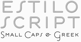 [MyFonts]
[More] ⦿
|
Dira Chaira
[Dira Studio]
|
[More] ⦿
|
Dira Studio
[Dira Chaira]
|
Dira Kuntum Chaira (Dira Studio, Banda Aceh, Indonesia), b. 1999, created Attention (2016, a confident upright script), Penmanship (2016), the brush typeface Direction (2016) and the connected Hammock (2016), Lavender (2016), Hailey (2016), Photograph Script (2016) and Beloved Script (2016). Typefaces from 2017: King And Queen (connected script), Bianca Script, Number One. Typefaces from 2018: Seafaring, Something Sweet, Thelma (a broad script). [Google]
[More] ⦿
|
Dmitrii Mikitenko
[Blessed Print]

|
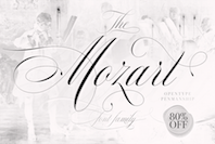 [MyFonts]
[More] ⦿
|
D'Nealian Handwriting
|
Commercial outfit marketing D'Nealian handwriting fonts and software. Based in LaSalle, MI. [Google]
[More] ⦿
|
Doyald Young
[Doyald Young: Logotypes and Letterforms]

|
 [MyFonts]
[More] ⦿
|
Doyald Young: Logotypes and Letterforms
[Doyald Young]

|
 Graphic designer, typographer, type designer, author, teacher and lecturer, born in 1926 in Holliday, TX. He died on February 28, 2011 due to complications following a heart operation. He attended Los Angeles City College, Los Angeles Trade Technical Jr. College, and Art Center College of Design where he has taught for 27 years and holds the honorary title Inaugural Master of the School. Doyald drew characters, often of a calligraphic or handlettered nature. He was deeply influenced by his mentor, Hermann Zapf.
 Steve Heller writes: When digital programs like Fontographer made it easy for anyone with a computer to create typefaces, many of them purposefully inelegant, he advocated a high level of craftsmanship that he believed had been lost. In so doing, Mr. Young challenged a new generation to reject so-called grunge design in favor of precision. When the American Institute of Graphic Arts awarded Young its 2009 Medal for Lifetime Achievement, Marian Bantjes wrote Taste. Practicality. Formality. Understated prestige. The combination of those qualities forms as perfect a descriptor of Young's work as any you are likely to find, both in the process and the result. Although he is widely known for his elegant curves and scripts, he has never been a showy designer---there is not a trace of ego in his work. The range of letterforms able to flow at any time from his hand is great, and there is no way to particularly define Young's mark unless you have seen the hand-drawn comp. That is where his work is unmistakable: perfect letterforms drawn in pencil at a surprisingly small size without so much as a mark of hesitation or awkwardness. The style varies but the fluidity and perfection do not. Links and media: Scott Erickson's movie on Doyald Young. FontShop link. Klingspor link. Short obituary and video. Longer video about his life. Steven Heller's obituary in the New York Times. Obituary by Marian Bantjes for AIGA. He was adored and respected for his craft and gentleness. Portrait. Another portrait (credit: Louise Sandhaus). Author of several influential texts: - Logotypes and Letterforms (1993, Delphi Press). Review. It includes the corporate typefaces and original and revised logotypes he created for General Electric, Sony, Hilton International, John Deere and other businesses. Steve Heller: It was well received by designers for its defiance of fashionable trends.
- Fonts&Logos (1999, Delphi Press, and 2000, Sherman Oaks). A book of examples, it includes many logos designed by him for the cosmetic, fashion and entertainment industries. Review. Bette Midler logo (2002). Grammy Awards logo (1988). Prince, The Hits Collecton, cover (2000). Sinatra, The Man and his Music TV Special (1981). Logo for Apex Engraving (1974).
- The Art of the Letter (2003, Smart Papers, Hamilton, Ontario).
- Dangerous Curves Mastering Logotype Design (2008, Delphi Press). Delphi Press was his own company.
His typefaces include the extra bold condensed sports scripts fonts Home Run Sanscript (1999) and Home Run Script (1999, a connected bold retro signage script), Young Gallant (2010, a formal calligraphic script based on the alphabets his teacher, Leach, trained him on), ITC Eclat (1985, 1992, fat script face, which was used for titles by Comedy Central and the Queen Latifah movie Beauty Shop), Young Finesse (2003, an Optima-inspired thin headline typeface used in his book, Fonts&Logos), Young Finesse Italic (2006), Guts (1976, VGC), and Young Baroque (1984, 1992, Letraset; calligraphic Spencerian copperplate script; this is copied by Castcraft as OPTI Yen Script). [Google]
[MyFonts]
[More] ⦿
|
dstype
[Dino dos Santos]

|
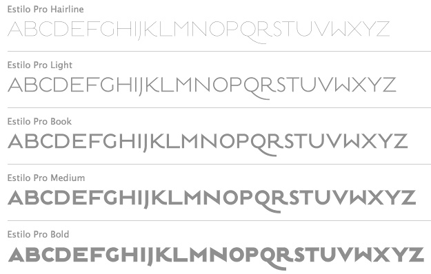 Established in 1994, dstype used to offer free fonts but has gone commercial now. It is run by Dino dos Santos (b. 1971, Oporto) from Oporto, Portugal. He graduated in Graphic Design at ESAD, Matosinhos. He received a Masters degree in Multimedia Arts at FBAUP, Porto. MyFonts place. In 2006 he won the Creative Review Type Design Competition in the Revival/Extension Family. At ATypI 2006 in Lisbon, he spoke about Portuguese lettering since 1700. Interview in 2007. Klingspor link. Author of A Letra Portuguesa, a book about Portuguese calligraphy. Dino created these typefaces:
 - Access (1997).
- Acta, Acta Display and Acta Poster (2011, +Poster swashes). A didone fashion mag family. First designed for Chilean newspaper La Tercera in 2010, DSType's Acta family is a clean information design type system. It includes Acta Symbols, an extensive dingbat family. Acta Var (2020) has two axes, weight and optical size.
- Acto (2012). Acto is a type system designed as the sans serif counterpart of the previous released Acta. Both type families were designed in 2010 for the redesign of the Chilean newspaper La Tercera.
- Andrade Pro (a modern) and Andrade Script Pro: based on the calligraphy of Andrade de Figueiredo, ca. 1722.
- Anubis (2003): a unicase face.
- Aparo (2013). A plumpish elegant high-contrast script face.
- Apice (2022). A highly structured calligraphic typeface with five optical sizes.
- Apud and Apud Display (2010): a high-contrast serif family.
- Aquila (2004).
- Ardina (2016). Done with Pedro Leal, this text typeface family has three optical sizes.
- Boldina (2004). A fat informal poster family with 18 weights and styles.
- Braga (2011, Dino dos Santos and Pedro Leal). This is a layered font design family. Dino writes: Braga is an exuberant baroque typeface, named after a portuguese city, also known as the baroque capital of Portugal. Our latest typographic extravaganza comes with a multitude of fonts designed to work like layers, allowing to insert color, lines, gradients, patterns, baroque, floral swashes, and many other graphic elements. Starting with Braga Base, you can add any of the twenty-three available styles, to create colourful typographic designs.
- A type system from 2014: Breve News, Breve Display, Breve Slab Title, Breve Sans Title, Breve Title, Breve Slab Text, Breve Sans Text, Breve Text. The Breve system includes modern design elements in the skeleton and ball terminals, transional elements, almost wedge-serifs in the serifed styles. As with most of dos Santos's typefaces, even the sans and slab styles exhibit Latin warmth and exuberance.
- Capsa (2008): a family that was inspired by, but is not a revival of the Claude Lamesle types Gros Romain Ordinaire and Saint Augustin Gros Oeil.
- Ception (2001): a futuristic sans family.
- Cimo (2017). A distinguished condensed sans.
- Cultura, and its improved version Cultura New (2013), a text book typeface family.
- Decline (1996).
- Denso (2019). By Dino dos Santos and Pedro Leal: a great condensed variable font with weight, serif and optical size axes.
- Digno (2022). A fuzzy text typeface family.
- Dione (2003): a sans; redone in 2009 as Dobra at TypeTrust. See also Dobra Slab (2009).
- Enorme (2020). Ultra massive and modular 3000-glyph mastodont of a constructivist font, by Pedro Leal and Dino dos Santos.
- Esta (2004-2005): extensive (transitional) text and newsprint family.
- Estilo (2005): a gorgeous and simple art deco-ish geometric headline face. This was accompanied by Estilo Script (2006), Estilo Text (2007, a 6-style rounded sans family), and later, Estilo Pro (2010, +Hairline).
- Ezzo: a sans family.
- Factor (1997).
- Finura (2009): this typeface has hints of University Roman.
- Firme (2014). A geometric sans for corporate use.
- Fragma (2003): squarish techno family.
- Girga (+Italic, +Engraved, +Banner, +Stencil) is a strong black Egyptian family designed in 2012 together with Pedro Leal at DS Type.
- Glosa (2008): Glosa is a meaty multi-style didone family. Glosa Text and Glosa Headline all followed a bit later in 2008, and Glosa Display in 2009.
- Hades (2012). A yummy and free blackletter typeface.
- Hypergrid (2002): octagonal.
- Ines (2015). A classic 7-style text typeface.
- Isento and Isento Slab (2017). Both are loosely based on ATF's Times Gothic.
- Lucius (Sans, Serif) (2022). The Lucius type family began as an attempt to reproduce the Principios Methodicos para as Letras Aldina e Roman---Typo Portuguez, but went went way beyond that in its multi-faceted execution.
- The Quase family (2017): Quase is a very free interpretation of the types found in the Specimen of Printing Types by William Caslon from 1785. We wanted to start with Caslon and then transform it into an editorial typeface, hence the increase of the x-height and the radical reduction of the ascenders and descenders. Subfamilies: Quase Headline (12 styles), Quase Poster, Quase Display, Quase Text.
- Idem and idem Display (2021).
- Dino dos Santos and Pedro Leal published Jules in the summer of 2015---a fat fashion mag didone 45-style family inspired by several plates from Portuguese calligrapher Antonio Jacintho de Araujo; it comes in Big, Colossal and Epic. They followed up in 2017 with Jules Text.
- Kartago (2005): based on Roman inscriptions from Cartago.
- Keiss (2017) and Keiss Text (2021). A Scotch roman with a lot of contrast. Keiss Text comes in twelve styles and features short descenders and ascenders, along with three very distinct optical sizes. It was designed with contemporary newspapers in mind. In 2021, he added Keiss Title, Keiss Condensed, Keiss Big (14 styles) and Keiss Condensed Big.
- Large (1999) and Large Pro (2006).
- In 2020, Dino dos Santos and Pedro Leal designed Larga, which was inspired by the typefaces shown in the specimens of the Fundiçãao Typographica Portuense from 1874. Larga is a wide all caps family and comes with a variable opentype format.
- Leitura, Leitura Headline, Leitura News, Leitura Sans, Leitura Symbols, Leitura Display (2007): the 31 styles were all made in 2007.
- Logica (2016). A classical text typeface.
- Maga (2012). A text family.
- Methodo (2005): calligraphic penman typefaces.
- Missiva (2004).
- Monox and Monox Serif (1998-2000): a monospaced family.
- Ni Sans, Ni Slab, Ni Serif (2018).
- Musee (2006): a transitional family with ornaments and borders.
- Nerva (2004). A subdued Trajan typeface with flaring.
- Nitida (2017). A 114-font family with five optical sizes.
- Nyte (2012). A serifed text family.
- Otite (1995).
- Outside (1996): grunge.
- Parco (2021). A compact headline typeface with large x-height.
- Plexes (2003). See also Plexes Pro (2006).
- Pluma (2005): a series of three exquisite calligraphic flowing scripts called PlumaPrimeyra, PlumaSegunda and PlumaTerceyra). Inspired by the typographic work of Manuel de Andrade de Figueiredo that was published in 1722: "Nova Escola para Aprender a Ler, Escrever e Contar, offerecida a Augusta Magestade do Senhor Dom Jao V, Rey de Portugal".
- Poesis (1999).
- Pratico UI and Pratico Slab UI (2022).
- Prelo (2008): A sans family for magazines, it has styles that include Hairline, Hairline Italic, Extra Light, Extra Light Italic, Light, Light Italic, Book, Book Italic, Medium, Medium Italic, Semi Bold, Semi Bold Italic, Bold, Bold Italic, Extra Bold, Extra Bold Italic, Black, Black Italic, Slab and Prelo Condensed.
- Priva Pro (2006): a sans family that includes Greek and Cyrillic).
- Prumo (2011-2012). A 92-font family originally created for the redesign of the Argentinian newspaper La Nacion. Released to the public in 2013, it covers low and high contrasts, and has slab serif styles as well as Scotch Roman styles. So, it is more a type system or type collection than one single typeface: Prumo Banner, Prumo Deck, Prumo Display, Prumo Poster, Prumo Slab, Prumo Text.
- Quadricula (1998).
- Quaestor and Quaestor Sans (2004). Roman inscriptional typefaces.
- Recita (2019). A sturdy oldstyle text typeface family.
- Resea (2004) and Resea Consensed: Bank Gothic style typefaces.
- Solido (2012) is a versatile type system with five widths: Solido, Solido Constricted, Solido Condensed, Solido Compressed and Solido Compact. In total there are 35 fonts. In 2020, a variable font was added to Solido. Codesigned with Pedro Leal.
- Synuosa (1999): an experimental typeface showing only the top half of the characters.
- Tecla (2018). After Printype, a typeface developed in the early twentieth century for the Oliver Typewriter.
- Terminal (1996).
- Titan and Titan Text (2003).
- User (2012), User Upright (2012), and User Stencil (2012). Monospace type families.
- Velino (2010): an extensive family including Velino Text, Velino, Velino Condensed, Velino Compressed, Velino Poster, Velino Sans, Velino Sans Condensed, Velino Display (+Compressed Display, +Condensed Display). This didone superfamily is sure to win a ton of awards.
- Ventura (2007): based on the calligraphy of Portuguese calligrapher Joaquim José Ventura da Silva, ca. 1802, who wrote Regras methodicas para se aprender a escrever os caracteres das letras Ingleza, Portugueza, Aldina, Romana, Gotica-Italica e Gotica-Germanica in 1820. It had a "Portuguese Script". Do not confuse Ventura with Dieter Steffmann's font by the same name made many years earlier. Ventura won an award at TDC2 2008).
- Viska (2015, by Dino dos Santos and Pedro Leal) is designed for small print.
- Volupia (2005): a connected advertising face.
DS Type also has typefaces by other type designers, such as Pedro Leal. They worked with leading companies, world scale events and well-known design agencies including: Appetite, Banco CTT, Banco Economico, BBDO, CondéNast, CTT Correios de Portugal, Electronic Arts, Errea Communicacion, Erste Bank, ESPN, Expo 2020 Dubai, Fifa World Cup 2018 Russia (the Ducha typeface), Garcia Media, Gatorade, Gruner + Jahr, Hearst, Innovation, King Games, McCann-Erickson, Meredith, Palmer Watson, Pentagram, Sagres, Starbucks, The New York Times (the Nyre typeface), Vox Media and Wolff Olins. View Dino dos Santos's typefaces. DS Type's typeface library. [Google]
[MyFonts]
[More] ⦿
|
Dutch penmen of the 17th century
|
The seventeenth century saw The Netherlands flourish in all respects, after the fall of Antwerp in 1585. Between 1590 and 1650, teachers and professionals taught and developed penmanship in the Low Countries---Penneconste in old Dutch. The most talented of them was Jan van den Velde. Others included Lucas Fopsz Lely, Abraham van Overbeke, Maria Strick and Felix van Sambix. [Google]
[More] ⦿
|
E. Ventris
|
Author of The Writer's Guide (1830, publ. G. Berger, London). [Google]
[More] ⦿
|
Earl A. Lupfer
|
Born in Irvona, PA, in 1890, Earl Lupfer studied at the Zanerian College of Penmanship in 1908 and 1908, and joined the faculty there afterwards. He taught penmanship into the 1950s and was known as an inspirational teacher. He was the last principal of the Zanerian College. He died in 1974. [Google]
[More] ⦿
|
Eduardo Recife
[Misprinted Type]

|
 [MyFonts]
[More] ⦿
|
Edward C. Mills
|
Master of business writing and business penmanship, b. 1872, Illinois, d. 1962. He worked mostly in Rochester, NY first for The Williams & Rogers Company and later as an independent penman. Author of Modern Business Penmanship (1903, American book Company). [Google]
[More] ⦿
|
Edward Cocker
|
English author of Writing Book (1660), in which we can find wonderful flourish work. Other books include The Pen's Transcendency: or Fair Writings Store-house Furnished with examples of all the Curious Hands practised in England and the Nations adjacent (London, 1660), The pen's triumph: a copy-book (1658), and Magnum in Parvo or the Pen's Perfection (probably 1675). Local download of The Pen's triumph. [Google]
[More] ⦿
|
Edward Rondthaler
[Photo-Lettering Inc.]

|
[MyFonts]
[More] ⦿
|
Edwin L. Brown
|
American penman, b. Camden, ME, 1869, d. Rockland, ME, 1958. He studied at Rockland Commercial College in Rockland, ME, 1887-1888. In 1888, he met penman A.R. Dunton who employed him to assist in engrossing the diplomas of the Boston Public Schools. He entered in a partnership with his penmanship teacher, H.A. Howard in 1902 until Howard's death in 1952. Howard & Brown had a thriving engrossing and designing business that covered all of the United States and Canada. [Google]
[More] ⦿
|
EFI Fonts
|
EFI makes and sells D'Nealian-style, Zaner-Bloser-style, Harcourt Brace-style, Peterson Directed Handwriting-style, McDougal, Littell-style, Getty-Dubay Italic (handwriting method developed by Barbara M. Getty and Inga S. Dubay), and Palmer style handwriting fonts. The Harcourt and Brace HB Cursive and HB Manuscript font families are useful for connect-the-dots and orthographic exercises. 250USD for the HB family for one school. They mention that their fonts are in over 8600 schools. At 4 styles per school, that looks like a 8.6 million dollar affair... Also, two Braille fonts at 10 USD a shot. [Google]
[More] ⦿
|
EFI Home Page (Educational Fontware)
|
Sells handwriting-fonts designed to exactly replicate many educational handwriting styles. In particular, they have these: - D'Nealian: DN Cursive and DN Manuscript.
- Zaner-Bloser: ZB Manuscript, ZB Cursive, OZ Manuscript, OZ Cursive.
- A Beka: AB Cursive and AB Manuscript, based on the style shown in workbooks developed by A Beka Book, Inc.
- Bob Jones University: CCU Cursive and CCU Manuscript, ugly fonts based on materials copyrighted by Bob Jones University.
- DKL Cursive and DKR Cursive, patterned after the handwriting methods in the workbooks Cursive Writing Skills (Educators Publishing Service, Inc, 31 Smith Place, Cambridge, MA), by Diana Hanbury King.
- Frank Schaffer: FS Classic, FS Contemporary, and FS Manuscript, developed using materials copyrighted by Frank Schaffer Publishing.
- Getty-Dubay Italic: GDI Basic, GDI Combined, and GDI Cursive, a handwriting method developed by Barbara M. Getty and Inga S. Dubay at Portland State University, Continuing Education Press. EFI worked with Getty and Dubay to develop its GDI fonts.
- Handwriting Without Tears: HWT Cursive and HWT Manuscript, pretty upright cursives and a hairline geometric sans. Handwriting Without Tears is a registered trademarked of Jan Z. Olsen.
- Harcourt Brace: HB Cursive and HB Manuscript.
- Loops and Groups: LG Cursive, based on the handwriting samples in the copyrighted Instructor's Manual Loops and Other Groups---A Kinesthetic Writing System by Mary Benbow.
- McDougal, Littell: McD Cursive and McD Manuscript, based on materials copyrighted by McDougal, Littell&Company.
- Palmer: Palmer Manuscript (simple hairline sans), Vintage Palmer and New Palmer, which include several variations of the cursive handwriting style that constitute the Palmer Method. Vintage Palmer is based on a 1923 workbook, and New Palmer on a 1987 workbook.
- Pentime: PT Cursive and PT Manuscript, developed for use by the Amish communities, through workbooks rather than directly with computers. The fonts were created for JKL Services, who use the fonts to produce handwriting materials for the Amish community.
- Peterson Directed Handwriting: PM Cursive, PM Block, and PM Slant.
- Queensland: QM Cursive and QBA Manuscript, based on samples from workbooks by Horowitz Martin Education.
- Russian: RU Cursive and Manuscript families (9 fonts) for Cyrillic.
- Seattle School District: SSD Cursive and SSD Printscript, based on handwriting samples and methods developed by Patricia Heller and Elaine M. Aoki for the Seattle Public Schools. samples were found in a 1993 K-5 handwriting manual called Write It Right (Seattle Public Schools).
- Steck Vaughn: SV Cursive and SV Manuscript, developed using materials copyrighted by Steck Vaughn Company.
- Specialty Fonts: four Ball-and-stick and Dashes fonts, Braille 24 and Braille 24 Hollow, Clocks, EFI Count Dots on Numbers, EFI Direct Instruction, EFI Music Symbols, Emo-faces, Fingerletters (for American Sign Language), Lettersound Pictures, Morse Code, Phonetics Phont, POSTNET-16.
[Google]
[More] ⦿
|
Ejhaa
[Afrizal Hidayat]

|
Meureudu, Indonesia-based designer, b. 1989, of Valecia (2019: a calligraphic script), Morena (2019: formal calligraphy) and Violete (2019: watercolor brush script). Typefaces from 2020: Pouri (a penmanship calligraphic script), Remedios (a formal calligraphic typeface). [Google]
[MyFonts]
[More] ⦿
|
Elaina DeBoard

|
 Spencerian calligrapher. In 2017, Elaina DeBoard, Eliza Gwendalyn, and Jim Lyles (Studioways) published Madison Street, which consists of four Spencerian fonts and is accompanied by three styles that are based on the handwriting of Elaina DeBoard. [Google]
[MyFonts]
[More] ⦿
|
Eleazer Huntington
|
Author of Art of Penmanship (1821, Hartford, CT). [Google]
[More] ⦿
|
Eliza Gwendalyn
[Studioways]

|
 [MyFonts]
[More] ⦿
|
Elke Reisenbichler
|
Heilbronn-based creator of a nice script alphabet in 1985. [Google]
[More] ⦿
|
Elmer Ward Bloser
|
 Pennsylvanian penman, 1865-1929. He became penmanship instructor at G.W. Michael's Pen Art Hall in Oberlin, OH. The school and Bloser relocated to Delaware, OH. He worked briefly with Platt Spencer Rogers in 1885. He purchased a third interest in the Zanerian Art College in 1891---the latter was founded in 1888 by C.P. Zaner (who also had a third). The third third belonged to Zaner's cousin, Lloyd M. Kelchner. After Kelchner left, Zaner and Bloser were partners of the Zanerian College and the Zaner and Bloser Company. Zaner died in 1918 or 1919, and Bloser ran it by himself until his own death in 1929. He wasa gentle hard-working and talented penman and a great teacher. Bloser and Zaner were two of America's most influential penmen. Picture of Bloser, Zaner and Kelchner. [Google]
[More] ⦿
|
E&M Cohen
|
Dutch book shop active in the 19th century in Arnhem and Nijmegen, which was run by two brothers. In 1887, they published a lettering model book, Modelboek. Reference: Nederlandse belettering negentiende-eeuwse modelboeken (2015, Mathieu Lommen, de Buitenkant, Amsterdam). [Google]
[More] ⦿
|
Enoch Noyes
|
Author of Noyes's Penmanship (1839, Jenks&Palmer, New York). Samples from that book: calligraphy, German text, hand exercises, Old English. [Google]
[More] ⦿
|
ES Typography (or: ES Fonts)
|
 Outfit known for its formal script fonts (which all have "ES" in their names). A list of their typefaces: CenturionES (1998), CynthiaScriptES (1998), GrandPrixES (1998), Perplexity (2001), Augusta ES (1998), BeautifulCapsESSwashCapitals (1998), BeautifulES (1999), Cancellaresca-ES (1998), Helena Script-ES (1998), La-Jolla-ES (1998), Olde-European-ES (1998), Original-Script-ES (1998), Sorrento-Script-ES (1998), Splendid-ES (1998), Ville-de-Geneve-ES (1998), Wedding-Bliss-ES (1998), York-Script-ES (1998, calligraphic), Young-Love-ES (1998), Zenith-Script-ES (1998). Most (all?) of these are plain copies of other scripts: Augusta ES is Augusta Cancelaresca Schnurkl (1998, by Julius De Goede), Perplexity is Perpetua, Olde European is OPTI Venetian Script, Original Script is OPTI Original Script, Beautiful ES is Bickham Script, Sorrento Script is Agfa's Florentine AT Script, Ville de Geneve is AT Old Fashion Script (1992, Miles Inc), Wedding Bliss is Aristocrat LET Plain (1994, Letraset), York Script is Yorkshire (1990, Brendel Informatik), Young Love is Young Baroque LET Plain (1990), Zenith Script is Zither Script (1999, FontShop), and so forth. [Google]
[More] ⦿
|
Eurotypo
[Olcar Alcaide]

|
 Institute in Benalmadena, Spain (was: Santa Severa), where one can take 4-week courses at 1450 Euros a shot on the Etruscan alphabet, Trajan, Cuadrata and Rustic Roman Capital letters, and related subjects. They also organize lettering tours in Italy and guided tours in various musea. The teachers are Alberto Di Santo (Professor of the visual communication, Tor Vergata University, Rome; Professor of Graphic Design, Istituto Europeo di design, Rome; Professor of editorial design, La Sapienza University, Rome; Professor of Typography, C.F.P. Sinalunga, Siena) and Olcar Alcaide (b. 1952, Argentina, Professor of Graphic and Typography Design, University of Buenos Aires; Professor of Typography, University of Lanús, and Professor of Graphic Design, Marbella Design School, Spain). Type link jump page.
 Eurotypo is also the foundry of Olcar Alcaide. Catalog of Olcar Alcaide's typefaces. In 2010, he published the text family Antium and the warm signage typefaces Mijas Ultra and Lila Pro Heavy. Typefaces from 2011 include Lila pro, Atenea (a humanist sans family), Agerola Script (a fat flowing signage face), Teja (signage face), Zalea (yet another signage face), and Nabu Pro (a connected signage script). Equalis (2011M, with Juan Lavalle) is a monoline slab typeface with a huge x-height and wide open counters. It was followed by Equalis Stencil (2011). Ravel (2011) is a fat signage script face. Atenea Egyptian (2011) is a solid slab serif family. Berta (2011) is a signage brush typeface with connected and unconnected versions. Optic Art (2011) is an ornamental typeface with building blocks that can be used for overlays. Creator of Eurotypo Bodoni Bold (2011). Typefaces from 2012: Cubus (dingbats), Saxo Deco (art deco), Moliere (2012, an elegant didone family with outspoken ball terminals), Melon Script (a fat curvy signage script family), Riky (comic book family), Chipa (a signage and package design script), Heket (an expressive curly script), Lenga (a slab serif typeface family), Mikal (brush script). Duktus is a 1940s style script in the style of Donatello (1935, Wagner & Schmidt), Troubadour (1927, Wagner & Schmidt), Liberty Script (1927, Willard T. Sniffin), Trafton Script (1933, Howard Allen Trafton), and Coronet (1937, R.H. Middleton). Picture. Typefaces from 2013: Dignus (influenced by Bank Gothic and Eurostile), Bague (old Dutch style with little contrast, in the style of Jan Van Krimpen), Lugo (a heavy signage or advertising script), Brittes (copperplate script), Talis (contrast-rich sans family), Fiesole (display family with an awkward back-curled lower case d), C Duflos (after a bâtarde coulée by Claude Duflos, a French engraver who was acitve around 1690). Typefaces from 2014: Talks (creamy signage script), Fiume (calligraphic script), Predy, Daevon (copperplate script), Beily (letterpress style), Ritts (a heavy script-like display family), Ritts Cursive (in the style of the brush signage scripts descending from Robert E. Smith's Brush Script for ATF in 1942). Typefaces from 2015: Valentia (a semi-copperplate calligraphic script followed by Valentia Condensed in 2016), Stabia, Digatte Quill (connected script), Digatte (connected monoline cursive script). Typefaces from 2016: Duero (signage script), Turia (calligraphic script), RRollie (a lapidary typeface based on the roman inscriptions), Valentia Nit (a copperplate typeface enriched with swashes and extensions). Typefaces from 2017: Citix (a great calligraphic / penmanship script), Citix Two Condensed, Alfabetica (humanist sans), Merick. Typefaces from 2018: Fortezza (a stiifened didone), Portoluce, Hotdogger (a cursive brush font family), Hotdogger Extras (dingbats), Favarotta, Vikive (a grotesque family), Aretino (a renaissance text typeface), Mirabella, Lectio. Typefaces from 2019: Palio (a condensed tall didone), Fractus (blackletter), Blackduck (blackletter), Sgraffio (copperplate script). Typefaces from 2020: Eolia A (a 12-style low contrast grotesque typeface), Breda (a 12-style geometric sans), Breda Two (six additional condensed styles), Marcus Traianus (in the Trajan style, with lowercase included as well), Eurotypo Sans, Eurotypo SII, Eurotypo BKL (a Baskerville-inspired family), Cannoli (a retro brush lettered signage script). Typefaces from 2021: Zornale (a 7-style text family inpsired by the Zornale, an original manuscript that contains a daily record of the books acquired by the Venetian bookseller Francesco de Madiis, between 1481 and 1488), Alacant (a 14-style slab serif with elliptical shoulders), Tre Giorni (a carefully designed script in solid and outline styles), Due Giorni (a rhythmic calligraphic script), Sagasti (a text typeface with straight serifs), Calcis (a 10-style sans), Rufolo (an 8-style lapidary typeface influenced by Robert Hunter Middleton's Stellar (1929), William A. Dwiggins' Albertus (1932) and Hermann Zapf's Optima (1952)). Typefaces from 2022: Zornale Title. Creative Market link. Klingspor link. [Google]
[MyFonts]
[More] ⦿
|
Fielding Schofield
|
Off-hand flourishing artist, b. Poughkeepsie, NY, 1845, d. 1924. He worked in many eastern states but reached the peak of his craft while teaching from 1883 until 1890 at the Gem City Business College in Quincy, IL. After that, he taught in San Francisco, Utica, NY and Boston, MA. [Google]
[More] ⦿
|
Flat-It
[Ryoichi Tsunekawa]

|
 Japanese foundry in Nagoya that offers free and commercial Latin fonts made by Ryoichi Tsunekawa, who also runs Bagel & Co, Dharma Type, HolidayType and Prop-A-Ganda. Most of his work was done at Flat-It. His typefaces:
 - 2021: Best Choice (a monospaced sans), Short Films (an art deco sans in twelve styles), Golden Decades (a 16-style sans that borrows from several sans genres).
- 2019: Mid Century Sans, Tamba Sans, Rama Gothic Rounded, Bio Sans Soft.
- 2018: Fairweather (clean sans), Kaneda Gothic (a basic severe condensed gothic), Vincente (a tall condensed display didone family).
- 2017: Calling Code (monospaced programming font), Commuters Sans (elegant wide sans), Mighty Slab, Rigid Square (octagonal), Taro.
- 2016: Bio Sans, Gomme Sans, Quiet Sans, Siro (sans).
- 2014: Pero (condensed rounded organic sans), Kiro (minimalist organic sans), Graphie (modern geometric sans), Compasse (semi-condensed sans), Como (rounded sans).
- 2013: Spoon (organic, rounded, monoline sans family), Antoinette Monogrammes (based on early 1900s embroideries by Janon Co; with frames), Clonoid (a sci-fi family that pays tribute to arcade game logos in 80s and 90s), All Round Gothic Demi (a sans based on perfect circles), Griffon (copperplate titling face), Antique Spenserian (based on Spencerian Script by Mackellar, Smiths and Jordan).
- 2012: Geom Graphic (a retro sci-fi family that can be considered as a squarish version of Eurostile), Sheepman (modular), House of Cards, Space Colony (a lovely monoline futuristic techno family), Rama Slab (an antiqued wood-style slab serif), Rama Gothic. An antiqued sans serif family that recalls the wood type era), Diamond Ring (an art deco typeface inspired by Japanese cosmetics-packaging designs and posters from the late 19th and early 20th centuries), Controller (techno meets organic in this rounded squaris sans family), Revolution Gothic (an extended version of PAG Revolucion), 2008, which was inspired by retro propaganda posters and wallpainting in Cuba from the 60s to 80s; Revolution Gothic P followed in 2014), Diamond Ring (art deco).
- 2011: Yummo (monoline organic sans), Sheepman (based on the wood type No. 506 of William Page), Onick (2011, an art deco neojaponist fat display face done for Wordshape), Shiva (2011, hairline sans), Mocha Mattari (2011, grunge), Dharma Slab (2011, inspired by 1800s-style wood type), Dharma Gothic (2011, +P), Rama Gothic (2011, also inspired by 1800s-style wood type), Dimensions (2011, squarish), Design System (2011, a large family based on 70s style techno typefaces), Speedometer (2011, condensed piano key face).
- 2010: Stereo Gothic (2010: an extended all caps slightly techno sans family), Behrensmeyer Vigesimals (2010, a pixel format connected script), Civilite Vigesimals (2010, pixelized Civilite), Flat10 Arts and Crafts (2010), Flat20 Hippies, Flat10 Segments (2010), Flat10 Antique (2010), Flat20 Gothic (2010), Flat20 Streamer (2009, pixelized ribbon font), Flat10 Fraktur, Flat10 holy, Flat10 Holly, Flat10 Stencil, Flat20 Headline, Flat10 Artdeco, Word From Radio (2008-2010). Cigarette (2007, Bauhaus/Peignot-style).
- 2009: African Elephant Trunk (2009), Concrete Script, Concrete Stencil (2009, a stencil calligraphic script), Perfect Magic (2009), HT Maison (2009, signage face), HT Farmacia (2009, connected school script), HT Espresso (2008, upright script), HT Cartoleria (2008, connected script), HT Cafe (2009), Sneaker Script (2009).
- 2007-2008: Bistro Mono (2007, an awkward monoline face), Thousands (2007), Balaghat (2008), Garash Script (2008, a Halloween face), Woodstamp (2008), Banana (2008, brush script), Rebel Train Goes (2007, a piano key font), Rouge (2007, an elegant lipstick-on-the-bathroom-mirror pair of typefaces), Yasashii (2007, a great geometric art deco Broadway-style family, famous for being used in Damien Chazelle's La La Land, the 2017 blockbuster movie), Lily Wang (calligraphic script), Nothing (2007), Garash (2007, Arabic simulation), Moon Star Soul (2007, Western saloon font), Grandes Vacances (+ Une, Deux) (2007), Pansy Bo (calligraphic), Dremie (2007, an art deco headline typeface with Open and Fill weights), Grandes Vacances (2007, based on 19th century billboard letters), Xesy (2007, a fantastic "ronde" high-contrast upright connected script), Deluta Black (2007, a soft blackletter), Cotoris (2007, a 4-style family that takes inspiration from Koch Antiqua and the art nouveau movement).
- 2006: Daisy Lau (calligraphic), Agedage Luxeuil (based on a monasteric script from the 8th century), Agedage Cancellaresca, Agedage Beneventan, Agedage Simple Versal (2006, Lombardic caps simplified), Amsterdam Modern (art nouveau influences), Flat10 [Holly, Holy, Stencil, Fraktur] (a set of pixel typefaces), Machiarge (a heavy connected brushed signage script), Chic Hand (connected script), Double Dagger (geometric stencil family), Fault (an art deco striped lettering face), Killernuts (headline serif typeface with brush stroke endings), Underconstructionism! (a rectangular look family with associated dingbats), Machia (decorative script), Kiwi (geometric hairline), Bagel (roundish comic book face), Jaguarundi (distressed), Boycott (distressed), Tokyotrail (futuristic techno family), Coconut (noisy outline face), Coconut Split, Fresh Tomato (LED simulation), El Piedra (letterpress emulation), Dried Tomato (LED simulation), Dutch Style, Mocha Harrar (great stencil face), 103 (experimental, Bank Gothic style), Airhead, ArealBlack, Awkward, BagelNew, BagelOld, Banbino, Bebas (2005, industrial sans), Bebas Kai (2014: free!), Bebas Neue (2010: free!), Bebas Neue Bold, Berlin89, Blackout (redesigned in 2011 as the ulta-narrow Dimensions), Boycott (grunge), Built-1970, Bunyan, Busted, Camera (2007), Canstop, Chiangmai (Thai simulation face), DBLline, Dijkstra, Dutchstyle, Fling, Graphite, Harcomaso, Hiexplosive, Hitech, Honeycomb, Junkmix, Kanatypo, KemikalHi, Machia (a calligraphic family), Meegoreng, Mikrob, Natsupopy, Overwork, Palsu, Plamo, Plasitico, REC001, REC002, REC003, Resistance, SQRT, STdigi (LED font), Shandy, Superstar, Tembaga, Tenaga, Tomodachi, Tragedia, Trucker, VRdigital, VRembroidery, Welcome2M, Workaholic, Zeebraa, plot-A, plot-K, Appendix 3, Gesso (grunge), Pusab (ultra round; one free weight), Sushitaro, Typewrong, Celtics Modern (a Celtic family of fonts). At T-26, he published CRZ (2006), Guppy, Ohana (octagonal), Picnica (2006), and Wearetrippin.
MyFonts link. Fontsquirrel link for their free fonts such as Bebas (2005, industrial sans), Boycott, Gesso, and Pusab. Typefaces from 2022: Senpai Coder, Madromit (a layerable futuristic font inspired by the early computer fonts), Tokyo Olive (art deco), Poipoi (a layerable 3d or bubblegum font). YWFT link. Bagel & Co. link. Klingspor link. Dafont link. Dafont link. Interview. View Ryoichi Tsunekawa's typefaces. Kernest link. Adobe link. [Google]
[MyFonts]
[More] ⦿
|
Font Diner (or: Stu's Font Diner)
[Stuart Sandler]

|
 Stuart Sandler (Minneapolis) runs six foundries: Font Diner (est. 1996), Sideshow, Breaking The Norm, the Tart Workshop, Font Bros (est. 2006), and Filmotype (est. 2006). He runs a handful of other companies and web shops as well, including Mister Retro (est. 2004). He is passionate about retro type. DaFont link for their free fonts. Fontspace link. Interview.
 Catalog of the best selling Font Diner fonts. Images of Stuart Sandler's best-selling fonts. Free fonts: Rickles (2007, script), AirConditioner (2002, fifties style upright script), BahamaSlim (2004), BlackNight (2002, blackletter), BlackWidow, BubbleMan, ChannelTuning, Corrupter, CreakyFrank, DecayingKuntry, FeaturedItem, FontOnAGrain, FontOnAStick, Fontdinerdotcom (one of the earlist beatnik style digital typefaces), FontdinerdotcomHuggable, FontdinerdotcomLoungy, FontdinerdotcomSparkly, Fontdinerdotcom Jazz Dark, Fontdinerdotcom Jazz Light, Hothead, KeeponTruckinFW, Leftovers (2002), MaverickBE (stencil face), Musicals, PickAx, Rickles (2009; upright script), RocketScript (2002, retro script), Schnookums, SinsofRhonda, Spacearella (2002), StencilGothicBE, ThatsSuper, Turnpike (2009), Witless, XerkerFW. Commercial fonts: Continental Railway (1998, retro connected script), Anastasia, Chatty Cocktails (1998, art deco), El Nino, Guest Check, Hamburger Sandwitch (1998), Jumping Bean (1998, comic book style), Lionel Classic (1998, an art deco all caps face), Milwaukee, Motor Oil, and the greatest of them all, Coffee Shop (1998, exaggerated ascenders), a must! Other typefaces: Permanent Waves (1998, + Expanded: retro connected script), Yarn Sale (curlies), Fat Sam (not bad!), Etiquette, Taylors (1998, another great display font; co-designed with Dan Taylor), Kentucky Fried (1998, comic book / signage style), Beer Wip, Seuss, Jack Bisio and FinerDiner, Shivering, Dry Cleaners (2002), Singlesville Script (2002), Dripping Blood, Bowlorama, Action Is, Automatic, Chicken King (2002), CocktailShaker (2002, at Chank), Concurso Italian and Concurso Moderne (2003), DoggieBagScript, Johnny Lunchpail (2000, comic book style), Kitchenette (connected retro script), Lil Tipsy (2003), Milwaukee Neon (1998), Milwaukee Neon Shadow (1998), Motorcar Atlas (2000), Regulator, Stovetop (2002), Swinger (2002), WARNING (2002, rough stencil), BEBlob, BECROSS, DecayingAlternate, Decaying, EvilBrew, TheBlob, Insane Asylum, Creepy Crawly, Crossover, Fire Baaaad!, Rotten Teeth, Candy Good, EvilOfFrankenstein, HMan, HManPt2, PlasmaRain, Chicken Basket (2004), Chowderhead (2004), Cocktail Script (2004, upright), Country Store (2004, Western style), Dairyland (2004), Emblem Chief (2004, fifties diner script), Motel King (2004), Queen Rosie (2004), Sweet Rosie (2004, blackboard bold), Secret Recipe (2004), Square Meal (+Hearty) (2004), Bahama Slim (2004), Space Immortalizer, Matchbook and BE Streetwalker. Many font have a cool retro/fifties look. The InFlight Meal font set (2001) includes Al's Motor Inn, American Highway, Kiddie Cocktails, Lionel Text, Mosquito Fiesta, New York to Las Vegas, Pink Flamingo, Refreshment Stand, Starlight Hotel, Volcano King. The LasVegas font set: El Ranchero (2002), Hamburger Menu, Hamburger Menu Marquee, Holiday Ranch, International Palms, Lamplighter Marquee, Lamplighter Script, Las Vegas to Rome (stone chisel face), Leisure Script, Leisure Script Marquee, Mirage Bazaar (2002), Mirage Zanzibar (Arabic theme face), Mister Television, StarburstLanes, Starburst Lanes Twinkle, Vegas Caravan. At ITC, he published ITC Kiddie Cocktail (2003), ITC Mosquito Fiesta (2003), ITC Volcano King (2003). In 2006, Font Diner acquired the Filmotype collection and its trademark, Filmotype. Sandler writes: Filmotype initially manufactured a simple manual phototype machine utilizing display typeface designs on 2-inch filmstrips. Additional films were sold to start-up typesetting companies in order to increase their product selection. Font Diner will create new digital versions of the Filmotype collection, recreating it to meet todays graphic design standards. [...] We intend to release the Filmotype library in OpenType format so the original designs can be fully realized with a dynamic feature set including alternate glyph forms and automatic substitutive ligatures. In 2007, Font Diner started publishing digitizations of the collection: Glenlake (condensed Bank Gothic, by Mark Simonson), MacBeth (script), Alice (casual script), Zanzibar (calligraphic), La Salle (brush writing originally by Ray Baker in the 1950s, named after Chicago's LaSalle Street), Ginger (Mark Simonson; masculine headline typeface genetically linked to Futura), Austin (paintbrush), Brooklyn (hand-printed), Honey (handlettered script), Jessy (handwriting), Modern, Vanity, Filmotype Ford. In 2010, Stuart Sandler published a book entitled Filmotype by the Letter, in which he details the company's history. Free fonts on the Google Directory, dated 2010: Fontdiner, Swanky, Cherry Cream Soda, Permanent Marker, Homemade Apple, Schoolbell. In 2012, David Cohen and Stuart Sandler published these typefaces at Neapolitan: Irish Grover Pro (2010, a bouncy face), Satisfy Pro (2011, a connected retro script face), and Slackey Pro (2010, a paper cut out style face). At the same place, he also published Crafty Girls Pro (2010, co-designed with Crystal Kluge). With Crystal Kluge, he also co-designed the flowing connected script typeface Aya Script (2012). At Sideshow, he published the pen-drawn connected script Mister Brown (2013) and the retro signage script typeface Cocktail Sauce (2014). View Stuart Sandler's typefaces. Jolly Lodger (2012, Google Web Fonts) is an informal retro script. Typefaces from 2018: Cherry Soda, Deviliette, Fat Sam, Doggie Bag Script, Cherry Soda, Deviliette, Fat Sam, Doggie Bag Script, Black Night (an eerie blackletter), American Cheese (retro display style). Typefaces from 2019: Madelinette Grande (by Stuart Sandler and Crystal Kluge: created by hand with traditional pointed pen, it includes calligraphic penmanship and rustic styles). Typefaces from 2021: Bon Marche (a curly vernaculat script by Stuart Sandler and Crystal Kluge), Los Angelino (a script by Stuart Sandler and Crystal Kluge), La Bohemienne deLuxe (a calligraphic script by Stuart Sandler and Crystal Kluge), Epicursive Pro (a script by Stuart Sandler and Crystal Kluge). [Google]
[MyFonts]
[More] ⦿
|
Fontforecast
[Hanneke Classen]

|
 Fontforecast is a type foundry in the Netherlands that was set up by Hanneke Classen in 2013. Hanneke designed Graduate Script (2013, a connected script), Graduate Ornaments (2013), Bachelor Script (2013), Tyfoon Script (2013) and Tyfoon Sans (2013).
 Her greatest work to date is the 16-font Chameleon family (2013). It includes Chameleon Basic (a calligraphic script that can be used for layering), Chameleon Pen, and Chameleon Sketch. This combination of poster styles was also seen in Laura Worthington's Charcuterie a few months earlier, so a trend seems to be developing. Santa's Pen (2013) is derived from Chameleon. Typefaces from 2014: Wingman Brush and Wingman serif, Wallet, Perron (hand-drawn contrasting designs for use on posters). Typefaces from 2015: Bambusa Pro (a great bamboo pen script collection), Mucho Sans (a 12-style geometric sans), Stylist Pro (a great dip pen connected calligraphic typeface), Salt & Spices Pro (a script family). Typefaces from 2016: Dragonflight Pro (brush script, +Sans), Salt + Spices Mono (the monoline version of Salt & Spices Pro), Kinfolk Pro (brush script accompanied by many ornamental fonts containing arrows and flowers). Typefaces from 2017: Somersault (a brush script duo), Delish Pro (brush script), Les Tulipes Pro (a layered calligraphic typeface family). Typefaces from 2018: Sabbatical. You Work For Them link. Creative Market link. [Google]
[MyFonts]
[More] ⦿
|
François Desmoulins
|
French penman who published Le Paranimphe de Lescriture Ronde financière & italienne de nouuelle formes prompte enriches de diuers traictez des inuentions de françois Desmoulins escriuain. Le tout faict & grauépar luy mesme in Lyon in 1625. [Google]
[More] ⦿
|
François Weyren
|
French penman. Author of Cahier d'écriture fait par François Weyren, élève des Frères de l'école Chrétienne de la ville de Carpentras (Carpentras, 1838), a book that showcases calligraphic alphabets and includes penmanship drawings of birds. [Google]
[More] ⦿
|
Francesco (Felice) Polanzani
|
Francesco (Felice) Polanzani (1700-1783) entered into an engraving apprenticeship in Venice under the tutelage of Giovanni Pitteri before settling in Rome in 1742. The following 20 years are regarded as Polanzani's most active professional years, with the majority of his engraving and etching output being modelled after paintings by the Masters (see, for instance, this web set at Thorvaldsens Musem in Denmark). While in Rome, Polanzani became a friend---and/or student---of the renowned architectural illustrator, Giovanni Battista Piranesi. Polanzani is perhaps best remembered for his eccentric portrayal of Piranesi. La Penna da Scrivere (The Writing Pen) (1768, Rome) was designed by Felice Polanzani and published by P&G Samonati. This copybook consists of a title page and nineteen engraved plates featuring alphabets and writing samples reflecting contemporary business and letter styles. [Google]
[More] ⦿
|
Francis B. Courtney
|
American author (b. 1867, Worcester, MA) of The Francis B. Courtney Scrapbook. Elsewhere, in 1896, he showed these swashy penman's capital alphabets drawn by him: i, ii, iii. [Google]
[More] ⦿
|
Francisco Xavier de Santiago Palomares
|
Spanish penman who published Arte nueva de escribir, inventada por el insigne maestro Pedro Diaz Morante e illustrada con Muestras nuevas, y varios discursos conducentes al verdadero Magisterio de Primas Letras, por D. Francisco Xavier de Santiago Palomares etc in Madrid (Antonio de Sancha) in 1776. His Arte de Esrcibir was published by Benito Cano in Madrid in 1789. Local download. [Google]
[More] ⦿
|
Free School Fonts
|
Archive and discussion of free school fonts such as Jarman, Jardotty, Primer Print, Print Clearly, Penmanship Print, Zyia Learns Letters, Learning Curve BV. Also a listing of shareware and commercial school fonts. A nice start page if you need such fonts. [Google]
[More] ⦿
|
Friedrich Soennecken
|
Friedrich Soennecken (b. 1848, Iserlohn-Dröschede, Sauerland; d. 1919, Bonn) was an entrepreneur and inventor. He was the founder of Soennecken, a German office supplier. In 1875 he founded F. Soennecken Verlag, a commercial enterprise in Remscheid, Westphalia. His main invention is the round writing style of calligraphy and the pen nib associated with it. In 1878, Soennecken developed a method for creating glyphs, based on metal elements that are arcs or straight lines. The center lines of the glyphs are aligned with a grid. This was introduced in the German educational system in 1913. He wrote didactic texts on his construction method and on penmanship for the classroom. For example, he authored Methodical Text Book to Round Writing, A. Eltzbacher & Co., 1879. [Google]
[More] ⦿
|
G.A. Gaskell
|
Author of Gaskell's Compendium of Forms (1883, G.W. Borland&Co, Chicago). Number 1. Number 2. Image from the 1883 book. A drawing of Platt Rogers Spencer, also found in the 1883 book. [Google]
[More] ⦿
|
Gabriel Martinez Meave
[Kimera Type (was: Diseño Kimera)]

|
 [MyFonts]
[More] ⦿
|
Gary Godby
|
 Sign painter and gilder now located in Blue Ridge, GA. He made the Victorian signage font families Tyler (2003, inspired by a typeface by E.L. Brown from the late 1800's), Palmer, Brien (2003, inspired by the Clive Barker "Imajica" book cover by lettering artist Iskra Johnson), and Dixie at Letterhead. Tyler was inspired by E.L. Brown who taught penmanship and engrossing in the late 1800's.
 At SignDNA, he published the script typeface Monika. At Carmel Type Co in 2015, he published the decorative Victorian typefaces Calliope [not to be confused with the 2005 font MVB Calliope], Bronwyn, and Vintage Design Elements in 2015. Letterhead had this bio: Gary Godby's career as a sign artist has spanned nearly 28 years. He has worked in commercial sign shops in Virginia and Florida. While in Florida he spent thirteen years at Disney's in-house sign shop. In 1995 he returned to his native Virginia to work for Graphic Services, Inc., a large commercial shop in Manassas. Graphic Services is a full service sign and display company that primarily works for builders and developers. The shop employs 42 people with Gary's primary role as designer. "When you're designing," Gary says, "you see a project go from concept to reality, and I get alot of gratification out of that." Klingspor link. Behance link. [Google]
[More] ⦿
|
Gems of Penmanship by Williams&Packard
|
 Penmanship book written in New York in 1867 by D. Williams and S.S. Packard. It has a few blackletter and other alphabets, and many freehand drawings of birds and animals. Selected alphabets: Grand Capitals, Italian Capitals, Ladies Hand, Roman Capitals, Italian, Half Block, Williams Style German Text, Williams and Packard's Steel Pen German Text, Old English, Williams and Packard's Church Text [this inspired C. Lee's Ornate Alphabet], Beveled Alphabet, Ribbon Alphabet, (continued), Soft and Twisted Alphabet, (continued), Rustic Alphabet, (continued). Selected drawings: a hand, a bird, a deer, a swan.
 Digital revivals include Vintage Ornamental (2016) and Gothic Ornamental (2016) by Ludmila Riumina. [Google]
[More] ⦿
|
Georg Scheurer
|
German penman who published Gründliche Unterricht der edlen Schreib-Kunst in Verlegung Georg Scheurers Kunst-Händlers in Nürnberg. [undated]. [Google]
[More] ⦿
|
George Bickham

|
 UK engraver and penman, 1684-1769, who wrote the manual The Universal Penman (published in parts from 1733 to 1741, reprinted in its entirety in 1743). The full title is The Universal Penman Or the Art of Writing Made Useful To the Gentleman and Scholar, as well As the Man of Business . . . Written With the friendly Assistance of several of the most Eminent Masters And Engraved by Geo. Bickham. That book also contains work by Bickham's collaborators, such as Joseph Champion, Wellington Clark, Nathaniel Dove, Gabriel Brooks, and William Leckey. Book cover. Other books by Bickham include Penmanship in its utmost Beauty and Extent (Overton & Hoole, London, 1731).
 A free interpretation of the copperplate script styles of The Universal Penman can be seen in the monumental font Penabico (2010, Intellecta Design). Images: From The Universal Penman, Roundhand Script (ca. 1740), Greek Writing (1743). Digital typefaces based on Bickham's scripts include 1739 Bickham (2010) and 1741 Bickham (2013) by Klaus-Peter Schäffel, Bickham Script (1997, Richard Lipton), Bickham Script 3 (2014, Richard Lipton), Penabico (Intellecta Design), and loose interpretations such as Poem Script (Sudtipos). [Google]
[MyFonts]
[More] ⦿
|
George J. Becker

|
 Philadelphia, PA-based author of The American system of penmanship ... In ... ten numbers (1842, Uriah Hunt and Son, Philadelphia), Becker's System of Penmanship, Comprising Manual and Elementary Excercises, Business and Epistolary Writing, and Ornamental Penmanship. In Twelve Numbers. No. 10 (1856, Uriah Hunt and Son, Philadelphia), Becker's Ornamental Penmanship (1854), and Ornamental Penmanship Analytical and Finished Alphabets (1854, Uriah Hunt and Son), a lettering manual.
 In 2013, James Puckett (Dunwich Type Founders) revived five typefaces from this manual as digital typefaces in his Becker Gothics collection. They include Egyptian, Egyptian Rounded, Stencil, Tuscan and Concave. All have Western and wood type influences. In 2009, Becker's 1854 book was used by Monogram Fonts Co in the creation of Noir Monogram (2009), which was based on Becker's Pearl type. Downloads of his 1854 book: University of Michigan scan. For a Facsimile, see Becker's ornamental penmanship. A series of analytical and finished alphabets [FACSIMILE]. Free PDF file of the latter book. In 1993, Dover reprinted 23 complete alphabets in Ornamental Calligraphy [With 50 Plates] (Dover Books on Lettering, Graphic Arts & Printing). Local download of his 1854 book. [Google]
[MyFonts]
[More] ⦿
|
George Shelley

|
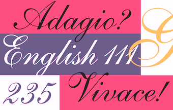 English writing master, 1666 (?)-1736 (?).
 Author/editor of The Penmans Magazine. Author of Natural Writing in all the Hands, with Variety of Ornament (1709) and Alphabets in All the Hands (1715). In 1730, he wrote several pages for Bickham's Universal Penman. English writing masters including George Bickham, George Shelley and George Snell helped to propagate Round Hand's popularity, so that by the mid-18th century the Round Hand style had spread across Europe and crossed the Atlantic to North America. The typefaces Snell Roundhand and Kuenstler Script are based on this style of handwriting. The famous Shelley Script is named after him. Linotype's version, also called Shelley Script, was implemented by Matthew Carter in 1972 at Letraset and was split into Allegro, Andante and Volante styles. The Bitstream "copy" is called English 111. Sample of a copperplate alphabet done in London in 1709. [Google]
[MyFonts]
[More] ⦿
|
George Thomas
[Liberty Type Foundry]
|
[More] ⦿
|
Gerardus Mercator
|
Flemish cartographer, b. Rupelmonde (as Gheert Cremer), 1512-1594. Educated at the University of Leuven, the alma mater of Luc Devroye, he lived in Duisburg (now Germany) from 1552 and is remembered for the Mercator chart named after him. Author of Literarum Latinarum, quas Italicas cursorias que vocant, scribendarum ratio (1540), which contains some beautiful alphabets, and teaches cursive writing [see Cursiv Latein]. Digital mapmaking fonts based on Mercator's chancery hand include Mercator (1995, Arthur Baker; see also the P22 version from 2001), and Ribbon Cursive (2009, Natsuko Hayashida). A scan of his 1540 book led Gilles Le Corré to 1540 Mercator Script (2010). A full scan of Gerardus Mercator's 1595 cosmographic atlas. Portrait. View typefaces related to Mercator. A list of typefaces related to Mercator. More typefaces based on Mercator's chancery hand. [Google]
[More] ⦿
|
Gert Wiescher
[Autographis]

|
 [MyFonts]
[More] ⦿
|
Gert Wiescher
[Wiescher Design]

|
 [MyFonts]
[More] ⦿
|
Gia Tran

|
 Gia Tran is a self-taught calligrapher and type designer. He has worked for Dragon Rouge, 4uatre and A&Mcreative in Paris, as well as Saffron Brand Consultants in Madrid. Gia was the Type Director at the French foundry FontYou, which was founded by Gregori Vincens in 2013. He also teaches calligraphy and type design at various graphic design and visual communication schools such as Strate College Designer, Intuitlab and ESAV Marrakech. With Brahim Boucheikha, he founded the Paris and Casablanca-based design studio Babelfont.
 Under the cover of Type Lovers and/or Fontyou in Paris, Gia Tran created the medieval typeface Court Hand (2012) and the blackletter typeface Gothic Fraktur (2012). He also did some great calligraphic pieces. In 2013, together with Gregori Vincens, Alisa Nowak, Valentine Proust, and Elvire Volk at FontYou, Gia Tran created the monoline geometric sans typeface Younion FY. Younion One FY is free at Dafont. With Franck Montfermé, he co-designed the ball terminal beauty Squirrel FY. The letters of this ultra-fat didone reveal audacious geometric smoothness at large sizes. Codesigner of Kaili FY (2013: an exotic typeface with crazy ligatures, inspired by Indian scripts, by Gregori Vincens, Bertrand Reguron, Gia Tran and Alisa Nowak) at Fontyou. The EPS format display typeface Alice FY (2013) was co-designed by Alisa Nowak, Micaela Neustadt, Gia Tran, Bertrand Reguron and Valentine Proust at Fontyou. It was inspired by Adrien Genevard's lettering. Sub-themes are Alice in Wonderland and playing cards. The EPS format frilly script typeface Lullaby FY (2013) was co-designed by Alisa Nowak, Micaela Neustadt, Gia Tran, Bertrand Reguron and Valentine Proust at Fontyou. It too was inspired by Adrien Genevard's lettering. Exquise FY (2013) is a fashion mag didone co-designed by Bertrand Reguron, Alisa Nowak, Valentine Proust, Elvire Volk and Gia Tran at Fontyou. Gia Tran and Jason Vandenberg created the decorative typeface Ella FY (2013, Fontyou). Gia Tran, Alisa Novak, Micaela Neustadt, Bertrand Reguron and Grégori Vincens co-designed the curvy stressed elliptical sans typeface Bruum FY (2013). Beaurencourt FY (2013) is a 19th centery secretary's hand co-designed with Jeremie Hornus. Gregori Vincens, Gia Tran, J&eacxute;rémie Hornus and Alisa Nowak co-designed the humanist sans typeface Klaus FY (2013). At Fontyou, Benjamin Lieb, Gia Tran and Julien Priez co-designed the hand-drawn typeface Brixton FY (2013). Not to be confused with two earlier typefaces called Brixton, one by Tom Chalky, and one by Luke Ferrand. Since two of the three Brixtons are commercial, I expect FontYou to change the name imminently. In 2014, Gia Tran and Bertrand Reguron co-designed the zombie script Vidok FY (free at Dafont). Together, Elliott Amblard (France) and Gia Tran created the bold signage / retro baseball script typeface Paname FY at FontYou in 2014. Minuit FY (2014, by Jason Vandenberg and Gia Tran) is a beautiful angular angry calligraphic display typeface. The punchy poster typeface Kraaken FY (2014) was designed by the FontYou team of Bertrand Reguron, Alice Resseguier, Valentine Proust, Julien Priez, Gia Tran, Jérémie Hornus, and Alisa Nowak. Bertrand Reguron, Alice Resseguier and Gia Tran co-designed the retro signage script typeface Coco FY (2014). Alice Resseguier and Gia Tran co-designed the girly script typeface Lola Lola FY (2014). This typeface was forcibly renamed Chelly FY a few days after its first appearance, possibly because there already was a typeface called Lola by Laura Messeguer. Codesigner with illustrator Quentin Vijoux of the hand-printed typeface Léon FY (2014). In 2014, he published the modular kitchen tile typeface Dorum FY with Julien Thébault. Benjamin Lieb and Gia Tran co-designed the 4-style retro display family Belleville FY (2014). With Evgeny Tkhorzhevsky, he designed the creamy signage script typefaces Maio FY (2014) and Kumiz FY [Maio renamed]. Hansom Slab FY (2014, Gia Tran, Jeremie Hornus and Alisa Nowak). Another URL. Behance link. Dafont link. [Google]
[MyFonts]
[More] ⦿
|
Gian Studio
[Afri Giani]

|
Indonesian designer of Samuel (2019: a brush font), Sarlista Script (2019) and Avelon Script (2019: a formal calligraphic typeface). In 2020, Giani released Andena (a script) and the calligraphic typeface Zathira. Typefaces from 2021: Antares (a signature script), Samuel (a brush font), Bambe (all caps; dry brush). Typefaces from 2022: Kriztina (a swashy formal calligraphic script), Asoka (a scrapbook script), Cattleya (a calligraphic script), Hello Anggela (a formal calligraphic penmanship script), Barna (a formal signage script). [Google]
[MyFonts]
[More] ⦿
|
Gigofonts--Gigodesign
[Matevz Medja]

|
 Gigofonts is a Ljubljana-based foundry run by Matevz Medja (b. 1966, Kranj). He set up design studio Medja & Karlson in 1990 and Gigodesign in 2000. He founded Gigofonts and Archive Type typefoundries.
 Matevz designed Compressor (1997, T-26), Gf Blackmail (2004, ransom note font), Gf Patetica (2004, an elegant renaissance serif with tall ascenders), Gf Scribbles (2005, hand-printed family), Gf Script No 2 (2005), Gf Script No 4, Gf Script No4 Scratch (2004, based on Penman Script), Gf Script No. 5 (2005), Gf SelfcensorShit (2004, T-26, and later at Gigofonts, now simply called Gf Selfcensor---a unicase family), Gf Spacetrash (2004), Gf Special (2005, 22 funky disco fonts, many of which are piano key typefaces), Semafor (1997, dot matrix, at T-26 since 2002), Gf H2O (2005, a humanist sans family done with Mitja Miklavčič). MyFonts link. Creative Market link. Linotype link. Identifont link. Klingspor link. View Matevz Medja's typefaces. [Google]
[MyFonts]
[More] ⦿
|
Giorgio Sellari
|
Calligrapher and writing master in Italy, who drew this and this in one stroke. [Google]
[More] ⦿
|
Giovanantonio Tagliente

|
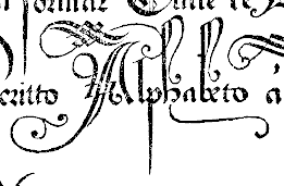 Or Giovanni Antonio Tagliente. Calligrapher and writing master, born in Venice, 1468-1527. Author of Lo presente libro insegna la vera arte de lo excellente scrivere de diverse varie sorti de litere (1524). Sample images from that penmanship book, which includes scripts for Latin, Hebrew and Greek: i, ii, iii, iv. Also: Chancery, Florentine, Florentine bastarda, Lettera bollatica, Lettera imperiale. Sets of ornamental capitals: Italian gothic Initials and Italian Renaissance Capitals. Picture of Tagliente's title page of his book in 1531. PDF of his work by Toni Pecoraro. Digitizations:
 - A scanfont based on his chancery is 1491 Cancellaresca Formata (2009, GLC).
- Stanley Morison's metal Bembo (1929) is based on Tagliente's letters. Bitstream's Aldine 401 is the first digital take of Bembo, which is attributed jointly to F. Griffo and G. Tagliente. JY Aetna (1994) is Jack Yan's version. Other revivals include Bembo MT (Monotype), Bamberg Serial (Softmaker), Bergamo and Bergamo Osf (Softmaker), Bergamo (Infinitype) and Bergamo (FontSite).
FontShop link. [Google]
[MyFonts]
[More] ⦿
|
Graphology: Online Books Page
|
Search on-line for books on graphology. [Google]
[More] ⦿
|
Gruso
|
Gruso Schriftenmappe: Eine Auswahl schöner Gebrauchsschriften für Maler, Graphiker, Schaufensterdekorateure und verwandte Berufe. Heft 3 and Heft 4 (1952) are booklets with tens of alphabets. They were scanned in by Michael Stoll. I cleaned up a subset of the scans, reorganized the set, and commented on them. [Google]
[More] ⦿
|
Gulya Yeap
[Peach Creme]

|
 [MyFonts]
[More] ⦿
|
Handwriting: An Elegy
[Ann Wroe]
|
A wonderful article by Ann Wroe in the November 2011 issue of Intelligent Life. She celebrates the dying art of writing. The first two paragraphs set the tone: Take a sheet of paper. Better still, take a whole sheaf; writing prospers with comfort and cushioning. The paper may be deliciously thick, with ragged edges and a surface capillaried with tiny fibres of the rags that made it. It may be thin, blank, industrial A4, one of a thousand in a cut-price pack from Staples. It may be wove paper, vellum-smooth and shiny, or a bit of scrap, torn not quite straight, with a palimpsest of typed meeting-minutes showing through. But write. The instrument matters but, for the moment, seize anything. The old fountain pen, so familiar that it nestles like a warm fifth finger in the crook of the thumb, its clip slightly shaky with over-use; the pencil, its lead half-blunt and not quite steady in that smooth cone of wood; the ultra-fine felt tip from the office cupboard, with its no-nonsense simplicity, or the ancient mapping pen, nibbed like a bird's claw, which surely writes only in copperplate, scratching fiercely as it goes. Seize even a ball-point, though its line is mean and thin, and though teachers will tell you that nothing ruins writing faster. Dip, fill or shake vigorously; and write. [Google]
[More] ⦿
|
Handwriting font styles
|
Jacci Howard Bear discusses the various styles of cursive and manuscript fonts used to teach handwriting: - D'Nealian
- Getty-Dubay Italic
- Harcourt Brace
- McDougal, Littel
- Palmer
- Peterson Directed Handwriting
- SSD
- Zaner-Bloser (old style)
- Zaner-Bloser (new style)
- UK handwriting
- Australian handwriting
[Google]
[More] ⦿
|
Handwriting Models
[Benedikt Gröndal]
|
Handwriting Models An Icelandic Manual, 1883 [fre download] was written by Benedikt Gröndal (1826-1907), an Icelandic poet, painter, draftsman, calligrapher and library historian. After a master's degree in Scandinavian Studies from the University of Copenhagen in 1863, he taught, wrote, and published a periodical, Gefn. In 2007, a foreword and useful introduction to handwriting models was added by Gunnlaugur Briem, and he placed all on his web site for free download. I quote: In 1875, Denmark changed handwriting models, replacing blackletter cursive by copperplate. This extended to its Icelandic dominion, where copybooks and model sheets in the new style were in short supply. Eight years later, a much needed handwriting manual by Benedikt Gröndal was published. The old style and the new are similar in appearance but have different letterforms. This picture shows the old blackletter cursive (top) and the new copperplate (bottom)---it was taken from Almanak Hins íslenzka þjóðvinafélags, Copenhagen (1877). Gröndal's copperplate and Gröndal's ronde. The foreword by Briem also shows a Danish ronde that appeared in Rundskrifts-Bogen; til Skolebrug og Hjemmeøvelse, ca. 1880. He also grabs the opportunity to showcase the most handsome of all Icelandic copperplate models done by Jón Þórarinsson in Skrifbók með forskriftum, 1. hefti (Reykjavík, ca. 1896). The American Palmer method, more open but less gracious, is illustrated in this alphabet from 1922 by Steingrímur Arason (from Litla skrifbókin, Reykjavík. Variants of this are shown in the alphabets of Guðmundur I. Guðjónsson, published between 1939 and 1953. Briem concludes: Handwriting based on copperplate was largely abandoned in Icelandic schools in 1984. It was replaced by italic, a modern monoline version of renaissance handwriting that owes much to Ludovico Arrighi's approach. A large selection of model sheets in this style is available for free download from the internet. He also shows Italiuskrift05, his own suggestion for schools. [Google]
[More] ⦿
|
Hanneke Classen
[Fontforecast]

|
 [MyFonts]
[More] ⦿
|
Héctor Gatti
[Omnibus Type]
|
 [More] ⦿
|
Hendry Juanda
[Letterhend Studio (or: Magang Letterhend)]

|
 [MyFonts]
[More] ⦿
|
Henry Dean
|
American calligrapher, 1788-1849. He wrote Dean's Analytical Guide. Containing A Variety of Plates in which are exhibited A Complete System of Practical Penmanship (1805, second edition 1808), a calligraphic primer containing many alphabets. In 2007, Jane Rodgers Siegel writes in APHA, vol. 163: The 1805 first edition of Henry Dean's Analytical Guide is the first ambitious American handwriting manual, a handsome quarto of 56 pages and 18 engraved plates. It may be of interest that Dean, as Nash tells us, not only was a writing master, teacher, and bookkeeper (writing and arithmetic, the two skills needed for com- merce, went hand in hand for centuries), but also had run a copperplate printing business in Salem, Mass. [Google]
[More] ⦿
|
Henry P. Behrensmeyer
|
Respected American penman, b. 1868, Quincy, IL, d. 1948, Quincy, IL. Author of Lessons in Practical Penmanship (publ. D.L. Musselman, Quincy, IL). He taught penmanship his entire life in Quincy, IL, at the Gem City Business College. He is remembered for his exceptionally graceful flourished birds and swans. [Google]
[More] ⦿
|
Henry W. Troy
|
 Designer of the ornamental blackletter alphabet Trojan Text (1884). He also has some instructions on penmanship.
 His work inspired several digital typefaces, including Blaq (2012, Giuseppe Salerno). [Google]
[More] ⦿
|
Hermann Ihlenburg

|
 German-American type designer (b. 1843, Berlin) who apprenticed at the Trowitzsch & Son type foundry in Berlin, and then worked as a punchcutter in Dresden and at the G. Haase & Sons foundry in Prague. After positions at the Flinsch foundry in Frankfurt, the Battenburg foundry in Paris, and the Fonderie Haas in Basel, Ihlenburg moved to the United States in 1866 to work for the L. Johnson & Company foundry in Philadelphia, which became MacKellar, Smiths & Jordan some time later. Specializing in ornamental (Victorian) fonts and borders, he designed over eighty typefaces for that Mackellar and a few more for American Type Founders after it purchased MacKellar, Smiths & Jordan in 1901. Ihlenburg became an American citizen in 1874, and died in Philadelphia in 1905. He will be remembered as the prototypical Victorian type designer.
 His typefaces at MacKellar: - American (1876), Angular Text (1884, a Victorian blackletter at MacKellar, Smiths & Jordan; digitally interpreted by Toto in his free font K22 Angular Text (2012) and by Alan Jay Prescott as Angolan Text (2017)), Arboret (1884), Arboret No. 2 (1885), Archaic (1888), Artistic (1886), Attic (1879). Artistic was revived by Alan Jay Prescott in 2017 as Beltane Roman. He wrote: this letterform started out in 1886 as drawn by the great Herman Ihlenburg as Artistic and assigned to MacKellar Smiths & Jordan. Dan Solo called this face Belmont but only showed caps and was suspect anyway. I was able to find specimens elsewhere and a motherlode of other interesting things in the Inland Printer. I developed my first full-featured OTF using this typeface and designed Greek and Cyrillic glyphs as well. I also fitted it out with a set of small caps to make a font that now has 4,000 glyphs for nearly every non-Asian language. To top it off, Robert Donona revived the decorative caps for this typeface, an excruciating task that I once considered for myself but was lucky enough to have this other crazy person take up. The number of hours dedicated between Robert and myself in reviving this complete series digitally is probably unprecedented.
- Bijou (1883: digital copies include Bangle (1990-1991, FontBank), Riccio Display Script by Southern Software (1994, SSi, SSK), Grebe (1994, by an anonymous designer) and Mexacali by Swfte), Black Ornamented (1873), Broadgauge Ornate (1868: a spurred Western typeface at MacKellar Smiths & Jordan; revived by Michael Hagemann), Byzantine (1868).
- Centennial Script (1874, a spectacular high-contrast script digitized in 2007 by Canada Type and in 2011 as a free font called Mortem Stylus by Stylus, and by Intellecta Design as Centennial Script), Chaucer (1883), Childs (1892, revived by R. Beatty, and by Ingo Preuss as Daring), Circular Black (1883), Columbian (1891), Columbus (1890: for metal recuts, see Victor Hugo by Nebiolo and Columbia (1909) by Urania); for digital revivals, see Cristoforo by Thomas Phinney, 2012, Cristoforo (2012) by SoftMaker, F37 Drago (2021, Rick Banks) and Colombo by Ingo Preuss), Columbus No.2, Columbus Outline (1892), Copperplate (1877), Crayon (1886), Culdee (1885).
- Dado (1882), Drapery Border (1876), Dynamo (1891).
- Elliptical Border (1878), Eureka Text (1870, blackletter), Eureka Shaded (1870).
- Ferdinand (1892, now at Dover), Filigree (1878), Fillet (1890), Flourish Ornaments (1884).
- Glyptic, Glyptic No. 2 and Glyptic Shaded (1878), Gothic Ornate (?), Greenback (1871), Grolier (1887), Gutenberg (1888).
- Houghton (ca. 1880). Same as Edison. Revived by Jim Spiece as Edison Swirl SG.
- Illuminated and Illuminated No. 2 (1876), Isabella (1892, a bastarda face; digital version at Agfa, Adobe, and Linotype, 2001), Italic Copperplate (1878).
- Japanesque and Japanesque No. 2 (1877, oriental simulation typefaces), Johnson (1892).
- Lady Text (1884, blackletter), Lippincott (before 1895).
- MediaevalText and Mediaeval Text Ornate (1870, blackletter), Minaret (1868), Minster (1878), Mortised and Mortised No. 2 (1884).
- Newfangle (1892, revived in 2015 by Nick Curtis as Newfangle NF), Nymphic (1889 [Ruffa says 1884], revived by Barmee in Secesja Pro (2013), and by Paul D. Hunt (2004), who published it as Kilkenny (2005, P22)).
- Obelisk (1881), Oxonian (1881). Digital revival of Obelisk in 2014 by Robert Donona.
- Pencraft (1885; digital revival in 2013 by Robert Donona), Pencraft No.2, Phidian (1870, redone by Dan X. Solo), Philadelphian (1867; digital revival by Michael Hagemann as Philadelphian in 2020), Pynson (1887).
- Quenn Bess Script (1882).
- Radiant (1876), Radiant Antique (1876: a money font), Radiated (1871), Relievo (1878), Relievo No. 2 (1879), Rimpled (1895), Ringlet (1882, the prototypical Victorian typeface; Dan X. Solo and George Williams made different digital versions in 1998 which are both also called Ringlet), Romanesque (1874).
- Sansom Script (1888), School Text (1876), Spiral (1890, revived by R. Beatty), Stipple (1890), Stylus and Stylus No. 2 (1883).
- Tendril (1878), Tilted (1886), Treasury (1874), Treasury Open (1875).
- Unique (1874), Unique No. 2 (1875).
- Zinco (1891, revived by Jim Spiece in 2002 as Zinc Italian SG).
At ATF: Taylor Gothic (1894), Schoeffer Old Style (1897: revived and extended by Alfonso Garcia in 2020 as Spirits), Roundhand Series (1902), Post Oldstyle Roman No. 2 (1901---possibly made by E.J. Kitson and/or Guernsey Moore), Post Oldstyle Italic (1901), Ihlenburg Series (1900?), Bradley Series (1895-1897, now at Dover), American Italic (1902). Ludlow offers a digital version of Hannibal. Comments on some typefaces by Mac McGrew: - American Italic is a heavy, novel design by Herman Ihlenburg introduced by ATF in 1902, as a companion to Columbus, which had been designed for ATF's MacKellar Smiths&Jordan branch in 1892. The italic survived its roman mate, being shown by itself in 1906, but was gone by 1912. It is essentially a nineteenth-century design.
- Bradley (or Bradley Text) was designed by Herman Ihlenburg-some sources credit it to Joseph W. Phinney--from lettering by Will H. Bradley for the Christmas cover of an Inland Printer magazine. It was produced by ATF in 1895, with Italic, Extended, and Outline versions appearing about three years later. It is a very heavy form of black-letter, based on ancient manuscripts, but with novel forms of many letters. Bradley and Bradley Outline, which were cut to register for two-color work, have the peculiarity of lower alignment for the caps than for the lowercase and figures, as may be seen in the specimens; Italic and Extended align normally. The same typeface with the addition of German characters (some of which are shown in the specimen of Bradley Extended) was sold as Ihlenburg, regular and Extended. Similar types, based on the same source and issued about the same time, were St. John by Inland Type Foundry, and Abbey Text by A. D. Farmer&Son. They were not as enduring as Bradley, which was resurrected for a while in 1954 by ATF. Also compare Washington Text.
- Round Hand was designed for ATF about 1900, and has been ascribed to Herman Ihlenburg. It has the appearance of handwriting with a broad pen, but letters are not quite connected.
- Schoeffer Old Style [No.2] was designed by Herman Ihlenburg for ATF in 1897. It is typical of a number of typefaces of the day-a plainly lettered roman with small, blunt serifs. Some references list Schoeffer Condensed, cut in 1902; this is probably the typeface shown a little later as Adver Condensed (q.v.). On Linotype, Schaeffer Oldstyle was called Elzevir No.2.
In 2021, Noah Bryant set out to revive many of Ihlenburg's Victorian typefaces. Ihlenburg at the Rochester Institute of Technology's Cary Graphic Arts Collection. [Google]
[MyFonts]
[More] ⦿
|
Hubert Jocham

|
 German über-type designer (b. 1965, Memmingen) who studied graphic design in Augsburg (Germany) and Preston (England). His degree project dealt with the history of the italic type of the renaissance and the relationship between roman and italic. In 1998 he moved to London to work for Henrion, Ludlow and Schmidt in corporate branding. He worked at one point for Frank Magazine in London. Today Hubert Jocham is a freelance designer located once again in Memmingen, Germany. He develops brandmarks and logotypes for leading brand agencies like Interbrand, Landor, Enterprise and Futurbrand. He designs text and headline systems for international magazines like GQ London, Vogue Moscow, Vogue France (2010), Vogue Turkey, L'Officiel Paris, and New York and German publishers like Milchstraße and Gruner&Jahr. He is responsible for the corporate type of Bally in Switzerland, the Kunsthaus Graz and Agfa Photo. He set up Hubert Jocham Type in 2007. MyFonts link. FontShop link. His typefaces:
 - Adonis.
- The ecccentric serif families Alida Text and Display (2007).
- Becca (2018). An extensive slab serif family.
- Bent (sans family).
- Bravery. A curvy wedge serif. Accompanied by Bravery Sans.
- The Contra Sans and Contra Serif families.
- Contura. Inspired by Jakob Erbar's Feder Grotesk, and designed with the fashion industry in mind.
- The Crema family (2012) has various flowing thick signage script styles.
- Debra. A modern grotesque.
- Dolce.
- Element.
- Elsner&Flake fonts: EF Havanna (1996), EH Herbert (1996), EF Panther, EF Sahara, EF Keule and EF Tabard.
- Esquina. An open and attractive sans.
- The TV-screen-curved Fernseher family.
- Fire.
- The signage brush script typeface Flavour (2004).
- Flow. A sharp-edged sans.
- Glanz (2018). A high contrast fashion mag typeface family.
- Glenda (2009). A script face.
- Granat (2009). A 14-style rounded sans family related to Jocham's own Teleplu and Teleneue.
- Jocham (2012). A fat connected signage script family that won an award at TDC 2013.
- June, New June and New June Serif (1999, after the large x-heighted June, used in W-magazine and Harvey Nichols magazine).
- Keks (2009). A broken angular type.
- The industrial sans family Konsens (with related Konsens Stencil).
- Leaf. A playful serif.
- Legau (2007). A sans with lots of stroke modulation.
- Libris, Bally Libris.
- LTA Identity.
- Madita (2011). An upright connected script family.
- Magazine.
- Matrona (2010). An ultra fat rounded family, awarded at TDC2 2011.
- The display serif typeface Mighty.
- Mommie (2006) was originally designed as a display typeface for L'Officiel magazine in Paris in 2003. It won a display typeface award at TDC2 2008, and was followed in 2008 by MommieBrush. Boris Bencic, the art-director asked Jocham to design a script with high contrast in the stroke, in the tradition of Spencerian Hand.
- The wide basic sans family Monday.
- Motora Sans (2011). A simple sans family which according to Hubert is pure gasoline and sweat.
- Narziss (a beautiful high-contrast ornamental didone headline typeface, winner at TDC2 2010). Followed in 2012 by Narziss Pro Cyrillic. See also Narziss Grotesk and Narziss Text.
- Neopop (2009). A circular type experiment.
- New Libris Sans. This is a multi-weight extension of Libris, the corporate typeface of Bally, Switzerland, designed by Jocham in 1999. New Libris Serif.
- Oktober.
- Other Sans, Other Oldstyle.
- Perfetto (2008). A classic serif family based on a typeface penned by Giovanni Francesco Cresci with an x-height of 8 mm, and published in his book Il perfetto Scrittore in 1570 (also seen in Tschichold's Meisterbuch der Schrift).
- Polia (2014).
- Ramon (2014).
- Riccia (2010). A grotesk family with schizophrenic "a" and "g".
- The angular serif typeface Rudolph.
- Safran (2009). A solid 18-style sans family.
- In 2005, he made the brush script headline typefaces Schoko and Drop.
- In 2008, he added the brush signage families Schwung and Milk.
- September.
- Softedge.
- Spring Sans (2008).
- Susa (2009). A connected script face.
- Tantris Sans (2014). Created for the book about the famous restaurant Tantris in Munich.
- The comic book family Tasty (2005).
- Teleneue.
- Televoice (2018). A sans with elliptocal curves.
- Venturio (50s diner face).
- Verve Sans and Serif (2006-2007) are a pair of fun birds, especially the frivolous serif originally planned for a women's psychology magazine called Emotion. A few days after their publication, they were renamed Verse Sans and Verse Serif, probably because the name Verve clashed with Adobe's VerveMM font made in 1998 by Brian Sooy (by the way, there is also a Verve type family by Dieter Steffmann, dated 2000).
- Vivid (2009).
- Voice (2004-2005, elliptical sans). Subfamilies include Voice Edge, Voice Sans and Voice Shoulder, all done at URW. In 2007, Voice was removed from URW and is solely available at Hubert Jocham Type&Design. The family was extended and now includes many styles, subdivided in Voice (sans), VoiceEdge, VoiceShoulder, VoiceSerif, Voice Heavy, Voice Medium, Voice Ultra Bold, and TeleVoice.
- The very interesting asymmetrically rounded Volt (2007), a sans family he claims improves on similar typefaces such as Bernhard Gothic, Barmeno, Dax, Prokyon, Voice Shoulder, and Phoenica.
- Weekend.
- Work ahead: this serif face (2005).
- Xmas Rudolph (2006). A free display serif face.
- Yuri (2017). A predominantly didone typeface with gently sloped serifs.
View Hubert Jocham's typefaces. Another view. Klingspor link. MyFonts interview. Volcano Type link. [Google]
[MyFonts]
[More] ⦿
|
Iampeth
|
Free copies in PDF format of many rare books on calligraphy and penmanship, typically from the 19th century: | Ames' Guide to Self-Instruction in Practical and Artistic Penmanship, Daniel T. Ames, Author and Publisher, 1884 | | Ames - The Daniel T. Ames Notebook, A wonderful collection of penmanship from the early 1860s from one of America's preeminent penmen and teachers | | Arm Movement Method of Rapid Writing, The, Charles Paxton Zaner, 1904 | | Art of Penmanship, Eleazer Huntington, 1821 | | Art of Writing, The, John Jenkins, 1813 | | Bible Pearls of Promise, Real Pen-Work Publishing, 1867 | | The Blue Book, Compiled by L.E. Stacy, 1907 Text-converted PDF | | C.C. Canan Collection of Penmanship - The Canan Book, Canan/Zanerian College, 1921, Copyright by Zaner-Bloser, Inc. | | Champion Method of Practical Business Writing, Mary L. Champion | | Clinton Clark Scrapbook, Clinton H. Clark: Part One, Part Two, Part Three. | | Compendium of Spencerian or Semi-Angular Penmanship, Platt Rogers Spencer, Sr., 1866 | | Complete Compendium of Plain Practical Penmanship, Lloyd M. Kelchner, 1901 | | Francis B. Courtney Scrapbook, F.B. Courtney, courtesy of Bob Hurford | | Gaskell's Compendium of Forms (the section on writing), G.A. Gaskell, 1883 | | Gems of Flourishing, Charles Paxton Zaner, 1888 | | Gems of Penmanship, John S. Duncun, 1858 | | Gems of Penmanship, J.D. Williams and S.S. Packard, 1867 | | How To Become A Good Penman, An advertising packet by F.W. Tamblyn | | IAMPETH Scrapbooks, A remarkable collection of Golden Age penmanship: Scrapbook 1, Scrapbook 2. | | L'écriture Américaine par D'Avignon - "American Writing" by D'Avignon, circa 1840 | | Lessons in Advanced Engraver's Script, penned by Louis Madarasz, published by C.W. Jones | | Lessons in Engraver's Script, C.W. Jones, editor, 1914 | | Lessons in Ornamental Penmanship, C.P. Zaner, 1920 | | Lessons in Ornamental Penmanship, P.Z. Bloser (Copies by E.A. Lupfer), 1948 | | Lessons in Practical Penmanship , H.P. Behrensmeyer | | Madarasz Book, - The Secret of the Skill of Madarasz, Madarasz/Zanerian College, 1911, Copyright � by Zaner-Bloser, Inc. | | Metodo Palmer de Caligrafia Comercial, A.N. Palmer Company, 1949. Donated by Mauricio Aguilar. Please visit his website www.VintagePen.net | | Modern Business Penmanship, Edward C. Mills, 1903 | | Muster Alphabete, circa 1885 | | New Spencerian Compendium, Spencerian Authors, 1879 | | New Standard Practical Penmanship, Spencer Brothers, 1881 | | New Zanerian Alphabets, C.P. Zaner, 1900 | | Ninety-five Lessons in Ornamental Penmanship, C.W. Jones, editor, 1914 | | Noyes's Penmanship, Enoch Noyes, 1839 | | Oberlin Business College - Compendium of Penmanship, C.A. Barnett, J.T. Henderson and J.N. Yocom, 1901 | | Palmer Method of Business Writing, A.N. Palmer Company, 1935 | | Palmer's Penmanship Budget, A.N. Palmer, 1919 | | Penmanship Made Easy, George Comer & Oliver Linton, 1864. See also here. | | Penman's Leisure Hour, McDonald Business Academy, penwork by F.F. Wildish, 1894 | | Portfolio of Ornate Penmanship, The A.N. Palmer Company | | Practical Penmanship Being A Development of the Carstairian System, Benjamin Franklin Foster, 1830 | | Real Pen Work - Self Instructor in Penmanship, Knowles and Maxim, publisher, 1881 | | Real Pen Work Compendium of Penmanship, Ivison, Blakeman, Taylor and Co., publisher, 1880 | | Recueil Méthodique de Principes d' Ecriture "A Methodical Collection of Principles of Writing", P. Meyrat, circa 1920's | | Spencerian Script and Ornamental Penmanship, Volume I, Chapters 1,2 and 8, Michael R. Sull, 1989. . | | Steel Pen Trade 1930-1980, A.A.S. Charles, 1983. . | | Studies in Pen Art, W.E. Dennis, 1914 | | Sykes's Manual of Penmanship, Sykes, circa 1885 | | Theory of Spencerian Penmanship, Spencer Authors, 1874 | | 19th Century Swedish Copybook, dated December 9, 1858 and penned by Carl Damm, a tutor, this copybook contains 12 pages of handwritten forms of Copperplate/Engraver's Script. Contributed by Evan Lindquist. | [Google]
[More] ⦿
|
Insigne Type Design Studio (was: Dooley Type)
[Jeremy Dooley]

|
 Insigne Type Design Studio (est. 2006) is run by Jeremy Dooley, b. Columbia, SC, 1981, who received a masters in graphic design at Savannah College of Art and Design in 2005. He lived in Atlanta, GA, and is now in Knoxville, TN. From 2004 until 2006, he ran Dooley Type in Greenville, SC. Behance link. Klingspor link. Font squirrel link. Creative Market link. MyFonts interview. His fonts:
 - 44th President (2009, based on Obama's handwriting).
- Aberlyth (2006). An informal script face.
- Ainslie (2014), Ainslie Slab (2014), Ainslie Sans (2014) and Ainslie Contrast (2020: a 42-style sans).
- Antigen (2007) is futuristic.
- Arendahl (2007) is a connected but irregular handwriting font.
- Ashemore (2012). Production assistance for Ashemore was provided by Lucas Azevedo and Marcelo Magalhaes. Followed by Ashemore Softened (2012).
- Avaloc (2006) is an expanded sans.
- The Aviano superfamily. Aviano Wedge (2012), Aviano Slab (2007), Aviano Serif (2008), 2009 Aviano Didone (2009), Aviano Flare (2010), Aviano Sans (2010), Aviano Future (2011), Aviano Contrast (2012), Aviano Gothic (2013), Aviano Sans Layers (2013), Aviano Copper (2018), Aviano Didone (2019). Aviano Titling (2007) is inspired by Trajan. Aviano Silk (2015) is a bilined decorative titling typeface. Aviano Royale followed in 2016.
- Barcis (2013). An organic sans family.
- Beastias (2006). An informal script face.
- Belda (2017). An elegant serif family of fonts that grew from the ancient roman capital. Followed by the 54-style Belda Didone (2020). A 54-style didone family without ball terminals.
- Biortec (2004).
- Biscuit Boodle (2008) is a fun and crazy script from Portland Studios illustrator Justin Gerard. Biscuit Boodle Ornaments (2009, dingbats).
- Blue Goblet (2005) is a Treefrog-style script developed for the pending illustrated childrens book from Portland Studios, The Blue Goblet. It was co-designed by Cory Godbey of Portland Studios and Jeremy Dooley. In 2011, Cory Godbey added Blue Goblet Christmas Ornaments.
- Boncaire Titling (2012) was iInspired by the type elements of 17th century map of Curacao made by Dutch cartographer Gerard Van Keulen.
- Brigette (2007) is an ink-splattered calligraphic script.
- Cabrito (2013). A typeface for children's books. Followed by Cabrito Inverto (2014) for reversed stroke stress---some of its heavier styles have a Western appearance. In 2014, Cabrito Sans was added to the set. Cabrito Semi followed in 2015, the playful Cabrito Didone in 2016, Cabrito Contrast in 2018, and Cabrito Flare and Cabrito Serif in 2019.
- Caridade.
- Carta Marina is a family of medieval map text typefaces and dingbats (2007).
- Cartes (2020). A charming 54-style family with chancery ascenders, and a roaring twenties handcrafted appeal.
- Cavole Slab (2011).
- Celari Titling (2014).
- Chatype is a geometric slab serif typeface family designed in 2012 for the city of Chattanooga, TN, by Robbie de Villiers and Jeremy Dooley.
- Chennai and Chennai Rounded (2007) are playful display sans typefaces. Chennai Slab (2009).
- Chypre (2017). A techno sans family.
- Civane (2017). A flared inscriptional typeface family.
- Coegit (2012). A sans family that offers Compressed, Compact and Condensed subsets.
- Cohort (2010, elliptical sans).
- Coupe (2003).
- Dever (2015) is a 107-style family of rough and weathered letterpress typefaces with industrial octagonal skeletons.
- Dienstag (2008, 8 styles).
- Daito (2018). A welcoming soft slab serif typeface family.
- Donnerstag (2010, extended slab serif).
- Dulcian (2017). A bright open sans family.
- Eigerdals (2010, rounded sans family).
- Enocenta (2013). A penmanship typeface family done with Cecilia Marina Pezoa.
- Enzia (2009, an elegant sans family).
- Evalfey (2021). Formal calligraphic.
- Fizgiger (2006). An informal script face.
- Florencia (2007) is a vintage script.
- Foverdis (2010, a calligraphic family that includes a hairline).
- Gineso (2016). A set of 48 slightly condensded and squarish headline typefaces. Followed by Gineso Titling (2016) and Gineso Soft (2018).
- Grayfel (2015). A 42-style sans typeface family characterized by flush horizontal or vertical terminal endings.
- Grenale (2013). A flashy in-your-face didone family from Thin to Heavy. Grenale #2 (2013) is a curvy sans that is almost a monoline. In 2015, Dooley launched Grenale Slab.
- Haboro (2016). A 54-font strong didone family with wedge serifs replacing the standard rectangular ones. It has no ball terminals. Followed by Haboro Slab (2016), Haboro Soft (2016), Haboro Serif (2016), Haboro Sans (2016), Haboro Contrast (2017), and Haboro Slab Soft (2020).
- Honeydrop (2017). A brush script.
- Insigne Abstractions (2007) and Insigne Fleurons (2008) are dingbats.
- Jon Cary (2004, the handwriting of John Kerry).
- Kairengu (2007) is a comic book family.
- Kasuga (2008) and Kasuga Brush (2009) are fresh new scripts with oriental undertones.
- Kidela (2007) is a sassy scrapbook family. Kidela Sketch (2009).
- Kochi (2015). A 54-font rounded organic sans typeface family.
- Le Havre (2008) is a gorgeous 8-style geometric art deco sans with tall ascenders. In 2010, the Le Havre Sketch family was added. We also have Le Havre Rough (2014, a bit of letterpress feel thrown in), Le Havre Rounded (2009), Le Havre Titling (2012), Le Havre Layers, Le Havre Hand (2015) and Le Havre Width (2017).
- Look (2015). In Sans, Script, and Serif subfamilies, this super-collection blends a bit of vernacular signage with weathered letterpress.
- Lorelei (2007, Insigne) is a bouncy script family.
- Lourdes (2007) is an informal script.
- Madeleine (2007) is a basic handwriting face.
- Madurai (2012). A simple monoline sans superfamily. Madurai Slab (2013) has 54 styles.
- Mahalia (2008) is a retro script.
- Majidah and Majidah Potens (2006) are medieval scripts.
- Mandrel (2017). A typeface with sharp serifs. Followed by Mandrel Didone (2021: a 54-style didone).
- Marintas (2012).
- Maris (2015). A curly script.
- Massif (2008) is an aggressive sans family.
- Metairie (2018). A connected high-contrast script.
- Mirantz (2019). A 54-style text typeface family.
- Mittwoch (2009, organic serif).
- Montag (2007) is a casual rounded sans family in six styles.
- Mr Darcy (2015). A Tuscan all-caps typeface.
- Mynaruse Flare (2018). An update of Mynaruse (2010), which is a roman inscriptional titling family---it is characterized by skinny flared serifs.
- Nanumunga (2007) is a comic book style face.
- Natalya (2007) is a connected calligraphic script. Natalya Monoline (2007). Natalya Swashes (2009, calligraphic).
- Newcomen (2008) is a 4-style roman titling face.
- Obline (2004, sans).
- Oita (2014). An octagonal typeface family.
- Olidia (2008) is calligraphic.
- Orewelia (2004, grunge face).
- Pauline Didone (2011, a curly didone family). Pauline Script (2008) is a monolinear retro script.
- Pershal (2021). A 54-style family, described as an oddball sans.
- Plathorn (2014). Inspired by the Wild West, this generous typeface family uses flaring in a thousand ways to recreate the feel of that era.
- Promethian (2005, futuristic).
- Quarca (2013). A 36-font sans family with a sturdy rounded square look.
- Quatie (2013). A curvaceous family: Quatie draws much of its inspiration from the industrial brawn of the railroad and the unique characteristics of Cherokee letterforms, giving it an atypical form not usually found in an industrial slab (accring to Dooley).
- Questal (2007) is a unicase serif face.
- Qurillian (2006, legible sans).
- Radona (2021). A 54-style geometric sans described as the typeface version of Synthwave.
- Ranelte (2016). A condensed sans series with techno or DIN appeal. The textured versions are collected in Ranelte Deco (2017).
- RendtPhysic (2006).
- Ript Cure (2005).
- Sabler Titling (2016). An all caps typeface family with tapered flared strokes.
- Sancoale (2011, an organic sans family, from Thin to Black). Sancoale Narrow (2011). Sancoale Softened (2012). Sancoale Slab (2012). Sancoale Slab Soft (2013), Sancoale Gothic (2022: 48 styles; a subdued and calming version of Sancoale, with quiet futurism).
- Sangli (2015). A 54-style rounded organic sans typeface family.
- Savigny (2011). Images: Savigny Black Extened, Savigny Regular Condensed.
- Savory Paste (2007). Grunge.
- Schorel (2019). A 54-style Scotch roman.
- Senlot (2018). A 54-strong sans family. In 2019, Senlot Sans and Senlot Serif (2019) were added. Senlot Didone followed in 2021.
- Serofina (2010, a calligraphic face).
- Shrike2003 (2003).
- Sildetas (2010, a high-contrast script typeface with tear drop terminals).
- Sociato (2022). A 54-style baroque text family with didone roots. The typeface was inspired by a declaration published during the French Revolution that extolled the development of a new religion, the cult of the Supreme Being.
- Solitas (2015). A rounded 42-style geometric sans family. Followed by Solitas Slab (2015), Solitas Serif (2017) and Solitas Contrast (2021; a 42-style display sans family described as sensual by Jeremy Dooley).
- The sans family Sommet (2008; see also Sommet Rounded (2008), Sommet Slab, 2010, and Sommet Serif (2011, a wedge serif family)) is futuristic. Sommet Slab Rounded (2011).
- Sophima (2021). A weathered script family.
- Soprani (2020). A 54-font set with considerable flaring and thorny serifs, based on a vintage plaque from the 1920s.
- Sovba (2009, upright italic).
- Steagal (2013). A geometric sans with a 1930s American feel.
- Steam Court (2015). A combination of steam punk and blackletter.
- Stefania (2007) has two calligraphic/chancery styles. Its aged version is called Stefania Antique (2008).
- Stratham (2007) is a medium to black family of legible sans typefaces.
- Terfens (2007) is an informal and quite rounded sans serif with inspiration from chancery scripts like Stefania. Terfens Contrast (2021) is an 48-style sans with calligraphic traits.
- Torcao (2013). An elliptical anthroposophic typeface family.
- Ultine (2016), an utilitarian sans family.
- Valeson (2020). A vintage display typeface with a kneeling art nouveau lower case n.
- Valfieris (2006). Valfieris Aged (2007) imitates medieval printing.
- Varidox (2019). A variable font with a roundish slab serif design.
- Verao (2018) and Verao Ornaments. A calligraphic script.
- Vergils (2021). A 54-style sans that tries to instill the spirit of the eighties and electronic music genres like Synthview.
- Waialua (2019). A script typeface with a variable font option.
- Waimea (2019). A variable script font produced with the help of Lucas Azevedo.
- Winsel (2019). A flared typeface influenced by British nostalgia, vintage signage and typographic ancestors like Edward Johnston and Eric Gill. Perfect for typesetting speeches by Winston Churchill.
- Wreath (2016). A script typeface family.
- Xalapa (2008) is a grunge family.
- Yevida and Yevida Potens (2006, scripts).
- Yorkten (2015): 54-style monoline sans family. See also Yorkten Slab (2017).
- Youngblood (2008, +Youngblood Antique, 2010) is non-connected.
Catalog of their typefaces. View Jeremy Dooley's font library. View Jeremy Dooley's typefaces. Adobe link. [Google]
[MyFonts]
[More] ⦿
|
Intellecta Design (or: Monocracy Types)
[Paulo W]

|
 Intellecta Design is a design company in Brazil run by Paulo W (b. 1970) from Recife. In 2020, he also set up Monocracy Types. Paulo W is a gaúcho (Brazilian southerner), with interests in multiple areas, including poetry (he has published the digital opus Magical Book), graphic design and, most recently, type design.
 Dafont link. MyFonts. MyFonts link. Abstract Fonts link. YWFT link. Behance link. Blog. Home page. Fonthaus. Monotype. Eshops. Facebook. Flickr. Klingspor link. Wordpress. Devian tart. T26. Linkedin. Identifont. Linotype. ITC. Faces.co. His typefaces: - Free fonts: Inductive Resonance (2014: connected script), Retrodings (+Two, 2014), Living In The Past (outlined Tuscan face), Rough Ornaments Free (2014), CornPop Three (borders), Too Good To Be True (2013, retro script), Blanchard Inland (2013), Living Together (2013), Arresto (2013, brush script), Hertziano (2013, non-connected fat script), Japanese Tourist (2013), Nouveau Never Dies Free (2013), The Beat Goes On (2012, fifties script), Stencix (2012), Figgins Brute Trash (grunge), Fontaniolo Beveled (2011, ornamental caps), Czech Gotika (2011), Random Dingbats (2011), Victorian Free Ornaments (2011), Rustic (2011), Armorial (2011), Woman Silhouettes (2011), The Nile Song (2010, hieroglyphics), Smith Typewriter (2009), Sign Flags (2010, semaphore dingbats), Senectus Morbus (2010), MesoAmerica (2010, Indian symbols), ClassicSketches (2010, dingbats), Columns (2010, dingbats of Greek and Roman columns), EasyCuneiform (2010), EasyLombardicTwo (2010), EasyOpenFace (2010, blackboard bold style), Egidia (2010), Significante (2010, dingbats with, e.g., gender symbols), WhiteDominoes (2010, domino pieces), Easy Heraldics (2010), Intellecta Heraldics (2010), Heraldic Devices (2011), KidingsFree (2010, dingbats), RoughTuscan (2010), The French (2009, Fleur de Lys dings), AprendizCaligrafico (2010), Volitiva (2006, Trajan caps and chancery lower case, all based on work by Ludovico Vicentino Arrighi), Gaivota (2006), KurrentKupferstichThin (2006), PaulKlein (2010), PaulKleinTwo (2010), PortuguesArcaicoLectura (2005), ReproxScript (2009, based on Jerry Mullen's Repro Script from 1953-1954), RickGearyHomage (2007, scanbats), WestBalaio (2006, ornamental caps), Corto Maltese (2006, scanbats), Renaissance Coiffure (2006), Renaissance Ornaments (2007), Renaissance Shoes (2012, free), TTF Tattoef (2006, tattoo-inspired dingbats), ExperiTypo5 (2006), Lower Metal (2006), Geometric Serif PW (2006), Geometric (2006), Geometric Petras PW (2006), War II Warplanes (2005), Carbono (2005), Times New Vespasian (2005), BoldBold (2005), Vengeance (2005), Doppleganger (2005), Chancelaresca (2005), Cursivo Saxonio (2005), Gotische Minuskel 1269 (2005: a Kanzlei Schrift after Dekan Hermann zu Soest, 1269) and Guto Lacaz (2005, dingbats).
- Richard Gans revival project: Gans Tipo Adorno, Gans Lath Modern, Gans Titular Adornada (2006), Gans Ibarra (2006, after Carlos Winkow's Elzeviriano Ibarra), Gans Antigua (2006), Gans Antigua Manuscrito (2006), Gans Radio Lumina (2006), Gans Fulgor (2006), Gans Carmem Adornada (2006), Gans Italiana (2006, extensive Italian-style slab serif family), Gans Titania (2007), Gans Titania Adornada (2007), Gans Titular (2007), Gans Gotico Globo (2007: 9 styles by Iza W), Gans Royality (2007: 3 styles by Iza W), Gans Headpieces (2008), Gans Rasgos Escritura (2010: filets---followed in 2011 by Rasgos Escritura Nuevos), Gan Esquinazos (2010, frames), Gans Blasones (2010, shields), Gans Neoclassic Fleurons (2008), Gans Classical Fleurons, Gans Ding.
- Wood-inspired typefaces: Dead Wood Rustic (2007), Taranatiritza (5 wood type styles, after William Hamilton Page), Majestade (2007, by Iza W---two Tuscan style typefaces), Decorative Tuscanian (2007), Concave Tuscan (2010, wood type), Palermo (2007, by Iza W---Tuscan style family), Teatro (2009, Tuscan), Bruce Double Pica (2009, Tuscan; the Beveled weight is free), Antique Extended (2010, slab serif wood type), Dark Wood (2009, gothic), Dark Wood Beveled (2011).
- Charles Bluemlein's script revivals: Bluelmin Kisaburo (2013), Bluelmin Ralph (2012), Bluelmin Ronald (2012), Bluelmin Sandsfort (2012) and Bluelmin Benedict (2012). (2012).
- Blackletter: Salterio (2012, +Trash, +Three, +Gradient, +Shadow, +Shadow Two), Leothric (2011, bastarda), Bruce 532 Blackletter (2011, after George Bruce), Schneider Buch Deutsch (2007, +Trash, +Shadow, +Shadow Two), Schneidler halb fette Deutsch (2009, +Beveled), Schneidler Zierbuchstaben, Hostetler Fette Ultfraktur Ornamental (2007, blackletter caps), Gothic 16 CG (2007), Gothic 16 CG Decorative (2007, blackletter caps), Schneidler Grobe Gotisch (2008, Iza W, T-26), Allerlei Zierat (2008, ornament fonts based on a 1902 catalog of Schelter & Giesecke), Allerlei Zierat Capitals (2007), Psalter Gotisch (2009, a blackletter after the Benjamin Krebs blackletter face by the same name, ca. 1890), Münster-Gotische (2009, a blackletter family after a 1896 typeface by the same created by Schelter&Giesecke), Koberger N24 Schwabacher (2007), Student's Alphabet (2007, blackletter), Like Gutemberg Caps (2007), Nürnberg Schwabacher, Gotische Frame (2007: four framed blackletter styles by Iza W), Gotische (2007: ten ornate blackletter styles by Iza W), Gothic Garbage, Gothic Shadow, Gothic Trashed, Gothic Flourish (2009), Gotica Moderna (octagonal, blackletter), AltDeutsch (2007, four severe blackletter fonts by Iza W), Fin Fraktur, Gotische Bouffard, Heimat RGS, Gothic Handtooled Bastarda (2006), HostetlerFetteUltfrakturOrnamental (2007, blackletter caps), Gothic Handtooled Bastarda (2006).
- Historical revivals: Pantographia (2010: a digitization, as is, of several alphabets from Edmund Fry's Pantographia, 1799), Caslon2000, Caslon B, Delamotte Large Relief (2010), Figgins Brute (2007: 8 heavy Egyptian styles by Iza W based on Figgins' 1817 specimen book), Erased Figgins Brute (2007), Gras Vibert (2007, a didone family; followed by Gras Vibert Two in 2009).
- Erotic or human alphabets: American Way of Life (2011), Roman Silhouettes (2011), Silvestre Weygel (2007, named after Martin Weygel'a erotic alphabet from 1560, which in turn was based on Peter Flötner's 1534 alphabet), Gravure (caps typeface made of human silhouettes), Innocence (2007, dingbats of girls).
- Medieval chancery hand: Portugues Arcaico (2005, three medieval handwriting styles), Kurrent Kupfertisch (2006, a medieval hand done with Fernanda Salmona), Dovtrina Christam 1622 (authentic old manuscript face), Catania (2007, exquisite medieval caps in 3 styles by Iza W).
- Typewriter typefaces: Remix Typewriter (2012), Smith Trash (2012), Neo Bulletin (2010, +Trash), Remington PW (old typewriter face), Olivetti Linea (old typewriter face), Erased Typewriter 2 (2007: 4 styles by Paulo W), RIP Typewriter (2009), Shadow Typewriter (2007), Underwood Typewriter (by Iza W).
- Calligraphic: Broken Kiss (2015), Derniere Script (2015), Bradstone Parker Script (after Zaner's penmanship), Jan van den Velde Script (2011, based on the penmanship of Jan van den Velde as illustrated in vna den Velde's 1605 book Spieghel der schrijfkonste; developed jointly by Paulo and Iza W), Penabico (2010, with Iza W); Penabico is a free interpretation of the copperplate script styles to be found in the Universal Penman, London, 1741, by George Bickham---it contains over 1500 calligraphic glyphs and 250 ornaments. Samples of Penabico: i, ii, iii, iv, v, vi, vii, viii, ix), Easy Calig, Intellecta Mixed Script (2008), Spencerian Constancia (2008), Calligraphia Latina Soft4 (2010, quilled ornaments), Intellecta Script commercial (2009), Spencerian By Product (2009), Spencerian Palmer Penmanship Pro (2010), Indenture English Penman (2010), Calligraphia Latina (2008-2010, in weights called Soft2, Dense, 3, Soft4, Mixed, Square Edition).
- Victorian, Edwardian: Engel (2007, by Iza W in 15 styles that have a 1870s look), Compendium (Victorian), Costado (2009, a Victorian / Western face).
- Ornamental caps: Campi (2009), Doppel Mittel Lapidar Azure (2012), Musirte Antiqua (2012), The House of Usher (2012), Peterlon (2012), Dolphus Mieg Alphabet (2011, +Two), Dolphus Mieg Monograms (2011), Human Nature (2011), English Arabesque Revival 1900 (2011), Imprenta Royal Nonpareil (2011), XVI Century Shaw Woodcuts (2011), Ichweis Caps (2011), Cherubim Caps (2011), Rara Beleza (2011), Gothic 1880 Revival (2011), Angelicaps (2010), Unnamed Caps Two (2010), VertiCaps (2010) Rebimboca Caps (2010), Rebimboca Beveled (2012, free), Rebimboca Gradient (2012, free), Rebimboca Trash (2012, free), Rebimboca Outlined (2012, free), Republica Presente (2010), Speedball Metropolitan Caps (2010, after a design by Ross F. George), Nice Initials (2010), Morphelic (2010), DurerGotischCapitals (2010), Egmontian (2007, ornamental caps family), Saducismus Triumphatus (ornamental caps), Vogus (Victorian caps), Victorian Ornamental Capitals (2009) and Frompac 1889 Arabesque (2007) [both are classical arabesques published in Ludwig Petzendorfer's Schriften-Atlas. Eine Sammlung der wichtigsten Schreib- und Druckschriften aus alter und neuer Zeit nebst Initialen, Monogrammen, Mappen, Landeskarten und heraldischen Motiven fur die praktischen Zwecke des Kunstgewerbes, 1889], Lettrines Petin (+Ornée), Numa Initials (2006), Gradl Initialen, Vampirevich (2009, ornamental caps), Paulus Franck 1602 (2006, ornate caps), Geodec (2006, baroque caps), HostetlerFetteUltfrakturOrnamental (2007, blackletter caps), Cadels (2007, ornate caps by Iza W), Manuscript XIV Century (2007, by Iza W--four Lombardic caps), Merona (2007, by Iza W--ten Lombardic caps fonts), Selena (2007, by Iza W---ornate Victorian caps), Leyenda (great Victorian era ornamental caps), Mixed Capital Style (2007, caps), Lenda (2008, capitals), Kidnaped at Old Times (2008, ornamental caps, ransom note style), Mortised Capitals, Is Not ABrazilian Font (hand-printed blackboard bold caps), Robur The Conqueror (2009, ornamental caps), Georgia Capitals (2009), Decadence avec Elegance (exaggerated ornamental caps).
- The American Advertise series: American Advertise No. 9 (2008), American Advertise No. 17 (2007, 19th century caps), American Advertise 018 and 019 (2008), American Advertise Square Series (2007), American Advertise 003 (2012), American Advertise 004 (2010), American Advertise 005 (2010), American Advertise 006 (2010, alphadings), American Advertise 007 (2010, ornamental caps).
- Ornaments, fleurons: Transportation Dings *2015), Cornucopia of Dingbats Eight (2015), Animals Old Cuts Two (2015), Unpublished Ornaments Two (2013), Classix (2012), Cornucopia of Dingbats (2012-2014, +Two, +Three, +Four, +Five, +Six, +Seven), Cornucopia of Ornaments (2013; +Two, +Three, +Four, +Five, +Six, 2014), Cornucopia Caligrafica (2012), Vintage Hands (2012), Human Silhouettes (2012; +Free, 2013; +Two, 2013; +Human Silhouettes Three, 2013; +Four, 2013; +Five, 2014; +Six, 2014; +Seven, 2014; +Eight, 2014; +Nine, 2015), Easy Fleurons (2012), Floreale Two (2012), Neoclassic Fleurons Free (2011), Calligraphic Frames Soft (2011, +Two), Jugendstil Flowers Free (2011), Easy Ornaments (2011), Blasons (2011), Blasons Free (2012), Armorial (2011), Monograms Soft (2010, with Iza W), Easy Tiles (2010), Free Tiles (2010), Rough Fleurons Two (2010), Vegetable Breathe (2010), Corn Pop Plus (2010), Mortised Fleurons (2010), Mortised Ornaments (2011), Mortised Ornaments Free Two (2013), Golden Times (2010), Stahlhelme und Kronen (2010), Rough Fleurons (2006), Nouveau Never Dies (2009, ornaments), GeodecBruceOrnamented6 (2006, after a sample from the Bruce Type Foundry), Grave Ornamental (2006), BlackOrnaments (2008), Hera Hedelix (2009, ornamental tiles), Mortised Ornaments (2009), Soft Fleurons (2007), Half Flower (2007), Frames 1 (2007, by Iza W), Flower Essences, Micro Fleurons (2009), Naturella (2009, leaf and grape dingbats by Iza W), Black Fleurons (2010), Easy Fleurons Two (2011), Intellecta Borders (2008, by Iza W), Intellecta Style (2007, borders).
- Fonts made before 2007: Brute Aldine (2007, Western family), Bad Situation (2007, after a design by Freeman Delamotte from 1864), Benjamin Franklin (2007), Geodec Petras Enhanced (2006), Deutsche Poster (2006), FatFontGrotesk (2006), Orchis (2006, an art deco family by Iza W), Fantis (2006), Frompac (2006, with Iza W), Geodec Fog (2006), Intellecta Modern (2006), Intellecta Modern 2 (2006), Intellecta Romana Humanistica (2006), Advantage (2006, together with Iza W), Biza (2006, together with Iza W), Elegancy (2006, together with Iza W), Estiliza (2006, a sans family together with Iza W), Experitypo 4, Stairway to Heaven, Copperplate PW, Dings PW, Roger Dean, Gliphs PW, Luxeuil, Watchtower Bible 1965, Gabinete Portugues (11 fonts), Elara (2009), Xilografuras (dingbats), Beta, Alta, Paleolitica Nacional, Shakespeare Studs, Copperplate collection (5 fonts), Wine, Ampersamp, James Poem, Leal Conselheiro, Haeckel Enygma, Iza B, Of, Lementa (2006, ornate family), Pirates (dingbats), Wire Clip (2009), Divina Proportione (2009, dingbats), Tharagaverung (2007), Correo (2009, a nice manly bold face), Titivilus (2007, Roman lettering), Pirates De Luxe (2007, dingbats), Geodec Minuskel (2006), Geodec Spyral (2006), Copperplate Decorative (2006), Feosa (2006), Francesco Decorative (2006, Iza W), Geodec Petras Enhanced (2006), Ibarra Flourished (2006), Intellecta Decorative 017 (2006), Intellecta Decorative 018 (2006), Intellecta Slab Bold (2006), Kansas Decorative (2006), Pingente (2006), Sixties Living (2006), Caractere Doublet (2007), DeutschePosterSteinschrift (2007; by Iza W), Bailarina (2007), GP Casual Script (2007), Colonia Portuguesa (2007), Contouration (2007), Deco Experiment 3 (2007), Floresco (2007), Flower Jars (2007, by Iza W---a very nice idea), Frutisis (2007), Intellecta Monograms (2007: 19 monogram fonts by Paulo W), Intellecta Monograms Random Sample (2012-2013: several typefaces), Peloponeso (2007, by Iza W), Porcupine (2007, by Iza W), Southern Flight (2007, by Iza W---condensed), TTF TTTOEF 4 (2007, by Iza W---dingbats), GeodecBruceFlourished, HostetlerNormande, Victorian Ultra Parphernalia (2007), Angels (2007), Angels Free (2013), Mondrongo (2007), Oorlog (2007).
- Fonts in 2008: Das Riese (3d engraved caps, +Shadow), Economica (sans, T26), Antiqua Double 12, Bad Baltimore (+Beveled, +Typewriter), Calligraphia Latina (2008-2009, in weights called Soft2, Dense, 3, Mixed, Square Edition, Free), Fry's Alphabet, Grissom (bug dingbats, by Iza W), Latinish (by Iza W), Lettering Deco (by Iza W), Litho Romana Inland, Quadratta Serif (a slab serif by Fernando Diaz), TTF TATTOEF 7 (by Iza W).
- Fonts made in 2009: Eingraviert (engraved; scans: i, ii, iii), Eingraviert Beveled (2011), Greko Roman Oldstyle, Ortodoxa do oriente, Sans Square, Speedball (by Iza W, Victorian style), Speedball Western Letters (after Ross F. George's lettering), Elara (2009), Intellecta Roman Tall, Force Brute & Ignorance, Sunamy Caps, Starret, The Pilgrim (alphadings), Renaisperian (alphadings), Real Caps Two, Mateus Bold (4 bold styles), Intellecta Crafts (arts and crafts family), Bruce 1490, Bradley Dingies (five dingbat typefaces, after William H. Bradley), Allerlei Zierat Renaissance, Grave Plus, the grungy Monkey series (Victorian Monkey, Monkey Poesy, Monkey Messed Gutenberg Caps, Monkey Was Here, Monkey Insinuation, Monkey In The Middle Ages), Montezuma (dingbats), Grotesque and Arabesque, Calhambeque (old car dingbats), Eiger (2009, a 3d sketched headline face).
- Faces made in 2010: Polen, Pencraft (capitals were inspired in Swagger Capitals, an original design from Carl Stephen Junge, at Barnhart Brothers & Spindler; lowercase based Pencraft Specials, an ornamental variation of the Pencraft Oldstyle series, as displayed in the BBS catalog from 1922), Salamemingoe (children's hand), BarberPoles, Beware the neighbors (scary), BlackInitialText, CaligrafiaDivina, CornPop, CowboyHippie Pro, Grotesca3-D, Nardis, Senzacuore, Speedball Metropolitan Poster (2010, after a design by Ross F. George), TagWood, Tosca, TypographyTribute, Zooland, Bubbleboddy-Fat, bubbleboddylight-Light, Pretoria Gross (a Victorian family done with Iza W), Wood Font Five (wood plank font), Wood Font Four, Herr Foch (art nouveau), Rebimboca, Octagon French (a 3d beveled typeface due to George Nesbitt, 1838), Picuxuxo (retro futuristic, comic book style), Large Old English Riband, Ornamental Riband, Kidings (Dutch dingbats), Hostil (originally done in 2007: a headline family; followed by Hostil Shadow Two (free, 2012) and Hostil Gradient (free, 2012)), Grotesca, Heptagon French, Antiquariaat (condensed), Cortinado, Sanoxio (3d headline face), Violentia (grunge), Swirlies (spiral dings).
- Faces from 2011: Dia de los Muertos (fantastic skeletal masks), Inland Becker, Rasgos Escritura Nuevos, Jaggard (2007, a renaissance penmanship caps typeface modeled after Joachim Romann's Queen (1954-1956, Stempel)), Jaggard Two, Naive Ornaments Black, Augustus (+Beveled: roman letters), Sayonara (oriental simulation face; the Beveled style is free), Trash Barusa (inline ornamental face), Free Ribbons, Black Ornaments Three, Calligraphia Latina Soft 5, Heraldic Devices Premium, Ornate Blackboards, Benjamin Franklin Beveled, Baltimore Typewriter Beveled, Bernardo Beveled, Van den Velde Script (a free interpretation of the work of the famous master penman Jan van den Velde, found in the Spieghel der schrijfkonste, in den welcken ghesien worden veelderhande gheschrifften met hare fondementen ende onderrichtinghe (Haarlen, 1605)), Indenture English Penmanship, Penmanship Birds and Ornaments (2012), Beware The Neighboors Shadow (texture face), White Free (shadow face), Delamotte Large Relief Beveled.
- Typefaces made in 2012: Porosa, Presto, Derradeira (signage script), About Sweet Memories (brush script), Intellecta Ribbons, Irrelevante (beveled caps), Laus Sus Chris (Christian dingbats), Unpublished Ornaments, Heavy Squared Writing (brush face), Mezcla Titan, Sweet About (retro script), Publicité, Hard to read monograms, Free Medieval, Doctor Polidori (initial caps), Mixed Silhouettes (One through Five), Glosilla Castellana Cursiva (inline type family), Sayonax (a textured version of the oriental simulation typeface Sayonara), Wood Stevens (free), Rockabilly (fifties script), Interdite Script (heavy calligraphic face), Prismatica (free), Cristalid (free prismatic face), Zed Leppelin (free), Neo Bulletin Outline (free), Neo Bulletin College (2012), Victorian Free Ornaments (+Two), Spanish Army Shields (+Two), Varius Multiplex, Stephens Heavy Titling.
- Typefaces from 2013: Face of Yesterday (calligraphic script), Ribbon in the sky, Dreamer (a flowing upright semi-connected script), Vorname (blackletter), Barocque Capitals, Close To You (a rabbit-eared script), Wappen (heraldic shields), Eletroz (hand-printed), Morcrepito (blackletter), Metropolitan Poster Black, Animal Silhouettes, Intellecta Pointers and Hands, The Loyalist (script), Vonnegut (a left-leaning script), Perhaps Love (left-leaning script), So Lonely (script), Exposition (upright script), Plaster of Paris (connected script), Volstead (connected script), Versitia (connected script), Porongo (heavy brush script), Fat Fantasy, Das Krieg (soldier dingbats), Corn Pop Two (ornamental corners), Corn Pop Four, Corn Pop Five, Astrodings, Vulnavia Sans (comic book face), Capitular Heraldica, Mirella Initials Ornamntals (a swashy calligraphic script; with Iza W), Carpete (retro script), Free Writer, Round Hand, Exclusivite (fifties script), Hertz Oscillations (fat retro script), Heavy Rock (fifties script), Raindrops (retro script), Ralph Walker (ronde), Exiles (retro signage script), Mr. Richmond Caps (art nouveau alphadings), Berengard Caps Two.
- Typefaces from 2014: Prester John, Animals Old Cuts, Take a Pebble, Corn Pop Five (borders), Kidnapped at German Lands (ransom note font), Kidnapped at German Lands 2, Kidnapped at German Lands 3, Kidnapped at German Lands 4 (finished in 2016).
- Typefaces from 2015: Rogeer (script), Chart Moss, Eliensee, Speedball Ragged, State Bridge, Derniere Script, Grissom Four (dingbats of critters), Das Modern, Zona Pro (a sans family).
- Typefaces from 2016: Ares Modernos, Soldier William Holmes (vintage handwriting), Doctor Russel (script), Hollandisch Closed (blackletter), Rough Flowers (floral ornaments), Equis (crosses), Mattaaus (a counterless poster font), Holland Morleau (a Kanzlei style blackletter font), Rough Vignettes, Rechnung (a bejeweled didone), Alphabet Fantasie (decorative caps), Phantasinian (blackletter), Loosing Memory (blackletter), Laandbrau (blackletter), Lord Radcliff.
- Typefaces from 2019: Penmanship Feather.
- Typefaces from 2020: Victorian Alphabets (a weathered engraved money font; despite its name, this is just one alphabet), Mortised Vignettes, Mortised Caps, Monocracy Cuts And Clips, Sincelo Ornaments, Augusta Torino Ornaments (based on art nouveau ornaments from Societa Augusta Torino), Renouveau (art nouveau).
Typefaces from 2021: Gotteslob (blackletter), Cotton Mather (a medieval blackletter), Josef Wein Moderne Blackletter (after an alphabet by Josef Heim from the 1900 book Moderne Schriften / herausgegeben und verlegt von Josef Heim, Supernouveau (art nouveau ornaments). Showcase of Intellecta Design's fonts, numbering 554 as of early 2017. [Google]
[MyFonts]
[More] ⦿
|
Italian penmanship and calligraphic teaching books
|
Nice set of articles by Gio Fuga on some Italian penmanship books from the late 19th and 20th centuries---see also here and here. He discusses - Modello di Calligrafia---Metodo La Manna (Prof. Francesco La Manna 1947-1948, Casa Editrice Carlo Signorelli di Milano).
- Modelli di Calligrafia (Prof. Primo Scapellato, 1953, Casa Editrice Giuseppe Principato di Milano).
- Stile---Corso di bella scrittura (Enrica Magenta Piatti and Sergio Franchini, 1950s).
- La Calligrafia nelle Scuole medie (Prof. Angelo Mona).
- Modelli di Calligrafia per le Scuole Medie. Metodo Lamanna (approvato dal Ministero della Pubblica Istruzione) (Prof. Cav. Francesco La Manna). La Manna worked at the Reale Scuola tecnica Bonaventura Cavaliera di Milano. [Sample of the Metodo La Manna.]
- Metodo razionale di calligrafia, ad uso delle scuole tecniche, normali, complementari, commerciali e degli aspiranti al diploma di calligrafia (1921, Prof. Tullio Giaconi edited in Livorno by R. Giusti).
- Metodo di Calligrafia (1938, Prof. Gaetano Filosa). Other publications by Filosa include Trattato di calligrafia (1904, Litografia Democratica), Corso completo di calligrafia, per le scuole medie, professionali, commerciali e militari (1911), L'arte calligrafica nelle scuole medie: Raccolta di prospetti, intestazioni commerciali e composizioni calligrafiche (1913, Tipografia G. Federici), and Metodo di calligrafia (1958, ed. A. Garzanti).
- Modello di calligrafia (1899, Eliodoro Andreoli, Milano). Andreoli was a renowned calligrapher.
- La Calligrafia. Metodo teorico pratico (Prof. Giovanni Tonso). Tonso taught at Regio Istituto Sommeiller and at la Scuola Lagrange di Torino at the end of the 19th century. This book is not just about teaching calligraphy---it also covers writig for professionals, for the industry, the government and schools, and is a comprehensive manual on penmanship.
- Il bello scrivere. Studio completo di calligrafia svolto con i più moderni sistemi e con procedimento teorico, pratico, nazionale (Giuseppe Ferrini, ca. 1902). This is a series with instructions for English, gothic (blackletter), Lapidary, Aldine, and Rotunda. Samples: i, ii, iii.
- Calligrafia Moderna (Prof. Nicola D'Urso): this was used in high schools and graphic arts schools. [Sample of scrittura italiana, and of scrittura rotonda.]
- La Calligrafia per le Scuole Medie. Metodo teorico-pratico diviso in 15 quaderni (Antonio Agostini): published in the early part of the 20th century in Treviglio, this book won a silver medal at the Fifth Esposizione Internazionale di Roma in 1903.
- Manuale di Calligrafia per uso delle classi elementari (Cav. Michele Favaloro, Palermo).
- The didactical worksof Bologna-based Fausto Saggiotti such as Esemplare di scrittura con massime di ben vivere per uso delle Scuole tecniche e normali (1882, Litografia G. Wenk, Bologna), Metodo per apprendere con facilità l'arte dei contorni per saggi di calligrafia, disegni, ecc. (1888, Stab. Litografico F. Barbieri, Bologna), Metodo di calligrafia (1888, Lit. G. Wenk, Bologna).
- Metodo teorico---pratico illustrato (Prof. Giovanni Mundici, Società Tipografica Modenese). Sample of calligrafia inglese.
- Metodo Teorico Pratico di Calligrafia (Prof. Ettore La Creta, Libreria Editrice Baroni, Lucca).
- Metodo Cobianchi (Pietro e fratelli Cobianchi, Intra).
- Metodo di calligrafia per le scuole elementari (Carlo Rossi). This book series was approved in Udine in 1878 and used in Friuli.
- Metodo di Calligrafia (1889, Torello Bianchi): used in Umbria.
[Google]
[More] ⦿
|
J. de Haan
|
Dutch architect in Amsterdam who edited the lettering model book Alphabet: letters van allerlei vorm (1895-1898), which, according to Mathieu Lommen, is the prettiest and most ambitious model book ever published in The Netherlands. The text has lettering examples from many contributors, such as Jan Boerma, C.L. Stal, and J.B. Heukelom (1875-1965). Heukelom's contributions include Sierletters (Dutch art nouveau style) and Perspectiefletters. Reference: Nederlandse belettering negentiende-eeuwse modelboeken (2015, Mathieu Lommen, de Buitenkant, Amsterdam). [Google]
[More] ⦿
|
J. W. Payson
|
American penman. J. W. Payson, S. Dunton, W. M. Scribner, G. H. Shattuck and A. S. Manson published The Payson, Dunton, & Scribner manual of penmanship (1873, Woolworth, Ainsworth, and company, New York). See also here. Several typefaces are named after Payson: Payson Script (1882, Cincinnati Type Foundry), Payson Script (Chicago Type Foundry), and payson (2009, Jeff Levine). Local download. [Google]
[More] ⦿
|
Jacobus Houthusius
|
Belgian penman who published Exemplaria sive Formulae Scripturae Ornatioris XXXIV. In quis, praeter diuersa Litterarum genera, varij earumdem ductus structurae & connexiones in Antwerp in 1591. [Google]
[More] ⦿
|
James West

|
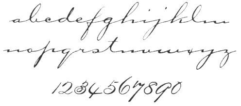 Born in 1830, this American punchcutter designed fonts for ATF. Bank Script No. 1, 2 and 3 (1895) is a formal script that is now in the Scangraphic collection. Many other 19-th century typefaces are due to him. McGrew writes: Bank Script is a formal, traditional Spencerian script, designed in 1895 for BB&S by James West. It is of medium weight, and seems to have served as a model for the heavier Commercial Script and the lighter Typo Script, which came along later. Like many scripts of the day, it was designed with several lowercase alphabets to be used with the same capitals; of these only the original (No.1) set has endured, some sizes still being shown in the most recent ATF catalog. No. 2 lowercase had a larger x-height than No.1, while No.3 was both higher and wider.
 His Carpenter is a connected flowing script typeface that was digitized by ICG in 1995 and called Carpenter ICG. The GroupType revival is called Carpenter Script (1993-2006). Image Club Graphics also revived the wide connected script Cariola Script Std (2016). FontShop link. Klingspor link. [Google]
[MyFonts]
[More] ⦿
|
Jan van den Velde

|
Or Jan van de Velde the Elder. Famous Dutch (Belgian?) calligrapher and penman (b. 1568, Antwerp, d. 1623, Haarlem) who worked first in Rotterdam (1592-1620) and then in Haarlem (1620-1623). Author of the writing manual Spieghel der Schriftkonste in den welcken ghesien worden veelderhande Gheschriften met hare Fondementen ende onderrichtinghe. Ut ghegeven door Jan van den Velde Fransoysch-School M. binnen Rotterdam (1605, Haarlem). He wrote a second penmanship book, Exemplaer-Boec Inhoudende alderhande Geschriften zeer bequaem ende dienstelijck voor de Joncheydt onde' alien Liefhebbers der Pennen (1607, Haarlem). Samples of his engravings: Duytsche Exemplaren (1622). Sample of his calligraphy on paper, done in Antwerpen in 1622. [Large image at the University of Amsterdam Special Collections]. His work is extended---modernized---in the extensive ligature-laden Jan van den Velde Script type family by Intellecta Design (2011) and in DTL VandenVelde (2015, Jeroen Koning). [Google]
[MyFonts]
[More] ⦿
|
Jan Visser
|
Lithographer in Groningen, The Netherlands, who studied at Academie Minerva in Amsterdam. Born in 1856, he taught at two schools, the Quellinusschool and the Teekenschool, and died in 1938. He published the lettering model book Lettervormen voor school en werkplaats, ca. 1885, published the lettering model book Lettervormen voor school en werkplaats, ca. 1885. Reference: Nederlandse belettering negentiende-eeuwse modelboeken (2015, Mathieu Lommen, de Buitenkant, Amsterdam). [Google]
[More] ⦿
|
JB Foundry
[Jean Boyault]

|
 JB Foundry was established by Jean Boyault (b. 1960, Suilly La Tour, France), a type designer who lives in Suilly La Tour. He is the designer of the cursive and other school fonts for teachers, all free and made in 2006-2007: JBCursive, JBEtude-Regular, JBMatrice, JBBatonRond-Bold, JBBatonRond-Extra, JBBatonRond-Italic, JBBatonRond-Regular, JBChantier, JBCursive++Feutre, JBCursive++Marqueur, JBCursive++Normal, JBFil, JBRond, JBScolaireT1-Bold-Italic, JBScolaireT1-Bold, JBScolaireT1-Italic, JBScolaireT1, JBScolaireT2-Bold-Italic, JBScolaireT2-Bold, JBScolaireT2-Italic, JBScolaireT2.
 Typefaces made after 2007: Simple Ronde (2011, upright connected script), JB Etude (2007), JB Script (2010), JB Haut>, JB Lames (2008), JB Elegant (2008), JB Cursive, JBStyle (2008), JB Fil Std (2009) and JB Calli (2008). Commercial typefaces: JB Davayé (2010, connected upright script), Belladone (2010, a graceful display family), Maceriam (2010, +Nova, +Putri, +Lapide: letters cemented into walls---a great idea). From 2011: Old French School Bold (upright connected script), Filature (a monoline connected upright script). Typefaces from 2012: Only One Dollar (a shaky script), JB Cursive 3, Purple Line, Purple Deco, Suilly La Tour, Typha Latifolia, Bouclettes (a curly upright typeface). Typefaces from 2013: Friandise (a decorative typeface reserved for chocolate enthusiasts), Capucine (a chocolate store pair of typefaces), Cuivrerie (a flared interlocking typeface based on lapidary inscriptions found in Bourgogne), Suilly La Tour (calligraphic script), Gaston (a large script family), Typha, Centaurea (a beautifully executed layered type system based on a didone with curved serifs), Toubib (hand-printed). Typefaces from 2014: Hirondelle (connected script), Lecteur Heureux (connected upright loopy script), Happy Reader (connected script), Hopeful Giraffe (a very tall and thin upright script). Typefaces from 2015: HopefulGrasshopper (a fun printed script), Henri Modeste (an experimental didone typeface), Gaston (upright connected ronde script), R+C (the ultimate explicit ruler-and-compass technical drawing typeface with filled, outlined and sketched substyles). Typefaces from 2016: Belle Allure (connected upright school script). Typefaces from 2017: Badinerie (flowery semi-connected connected script), Badinerie Love (with hearts added), badinerie Christmas. Fontsy link. Klingspor link. Dafont link. [Google]
[MyFonts]
[More] ⦿
|
J.C. van Lunteren
|
Dutch penman and teacher in Den Haag, d. 1848. According to Mathieu Lommen, he was probably the first one to publish a lettering model book in The Netherlands, Alphabet-album: collection de différentes feuilles d'alphabets historiés et fleuronnés (ca. 1846). Reference: Nederlandse belettering negentiende-eeuwse modelboeken (2015, Mathieu Lommen, de Buitenkant, Amsterdam). [Google]
[More] ⦿
|
J.D. Williams and S.S. Packard
|
Authors of Gems of Penmanship (1867). [Google]
[More] ⦿
|
Jérémie Hornus

|
 Frenchman Jérémie Hornus studied typography at Le Scriptorium de Toulouse, France and the University of Reading, where he graduated in 2006. He worked at Dalton Maag, where he designed Tornac (which became a retail typeface in 2013 at Dalton Maag), a connected script face, and was involved in brand identity for clients such as Burberry, Toyota, HP, Nokia, Danish Industries, Dubai Metro, Manchester Metrolink, and the city of Southampton.
 Currently located in Paris, he set up his own commercial foundry in 2013. He also started publishing some of his typefaces at the French type coop Fontyou in 2013. His typefaces: - Kefa (2006), a Latin/Ethiopic family with slab serif origins and a futuristic twist. Kefa is an Apple system font. In 2013, he published Kefa II Pro and in 2020 Kefa III (at Black Foundry).
- Schoiffer Sans. A soft slightly flared sans inspired by Enschedé's Roman No6, also known as the Scheffers or Quentell types.
- Together, Jérémie Hornus and Franck Montfermé designed the feminine italic typeface Maryleen FY (2013, Fontyou).
- The connected script typeface Tornac (retail typeface from 2013 at Dalton Maag).
- Beaurencourt FY (2013). A vintage 19th century connected secretary's hand script codfesigned with Gia Tran.
- Booster FY (2013, with Alisa Nowak and Luis Gomes). Luis Gomes, Jérémie Hornus and Alisa Nowak co-designed the rounded sans typeface family Booster Next FY in 2014.
- Gauthier FY (2013, with Alisa Nowak). A transitional typeface family. In 2014, Jeremie Hornus and Julien Priez co-designed the hairline typeface Gauthier Display FY.
- Lean-O FY (2013, with Alisa Nowak and Benjamin Lieb). A slab serif with leaning asymmetrical brackets. Has a hairline weight. See also LeanO Sans in 2014.
- Marianina FY (2013, with Alisa Nowak). A contemporary condensed 24-style headline sans family with simple strokes. Characterized by kinks in the ascenders.
- The slender display typeface Sérafine FY (2013) was co-designed by Jason Vandenberg, Jérémie Hornus and Alisa Nowak.
- Gregori Vincens, Gia Tran, J&eacxute;rémie Hornus and Alisa Nowak co-designed the humanist sans typeface Klaus FY (2013).
- At the end of 2013, Jason Vandenberg and Jérémie Hornus co-designed the groovy poster typeface Jack FY.
- In 2013, he collaborated with Alisa Nowak and Fabien Gailleul at FontYou on the design of the astrological simulation typeface Astral FY. The same group of three collaborated in 2014 on Naive Gothic FY.
- In 2014, Adrien Midzic, Jason Vandenberg, Jérémie Hornus, Julien Priez and Alisa Nowak co-designed the creamy script Vanilla FY. With Midzic and Nowak, Hornus co-designed the very humanist sans typeface family Saya FY (2013) and Saya Semisans FY.
- Joao Costa co-designed the thin lachrymal typeface Zitrone FY in 2014 at FontYou with Jérémie Hornus and Alisa Nowak.
- In 2014, Monica Munguia, Alisa Nowak and Jérémie Hornus co-designed the blackletter typeface Blackmoon FY.
- In 2014, Matthieu Meyer, Alisa Nowak and Jérémie Hornus co-designed the wedge serif typeface Ennio FY at FontYou.
- The punchy poster typeface Kraaken FY (2014) was designed by the FontYou team of Bertrand Reguron, Alice Resseguier, Valentine Proust, Julien Priez, Gia Tran, Jérémie Hornus, and Alisa Nowak.
- In 2014, Joachim Vu, Jérémie Hornus and Alisa Nowak co-designed the classical copperplate script typeface Vicomte FY.
- Wes FY (2014). A sans family modeled after Futura.
- Hansom FY (2014) and Hansom Slab FY (2014, Gia Tran, Jeremie Hornus and Alisa Nowak). An organic sans and slab with very large bowls.
- In 2014, Julien Priez, Hugo Dumont, Jérémie Hornus and Alisa Nowak co-designed Rowton Sans FY, a sans family patterned after Gill Sans in six weights, from Hairline to Bold---named after Arthur Eric Rowton Gill, it has the Gillian lower case g but italic lowercase is a bit too far afield for my own taste, especially the squeezed g.
- In 2015, Jérémie Hornus, Clara Jullien and Alisa Nowak co-designed the spurless / organic slightly inflated sans typeface family Diodrum at Indian Type Foundry.
- In 2015, Jérémie Hornus and Clara Jullien co-designed Eurosoft (Indian Type Foundry). Eurosoft is an elliptical monoline techno sans typeface family that is especially attractive in the heavier weights.
- Volkart (2015, Indian Type Foundry). An 18-style neo-grotesk.
- At Indian Type Foundry, Jérémie Hornus and Julie Soudanne co-designed the Spencerian calligraphic copperplate style script typeface Spencerio (2016).
- Tabular (2016): a monospaced programming font by Jérémie Hornus and Julie Soudanne for Indian Type Foundry.
- Intercom (2016). A bare bones sans with tapered terminals and very short ascenders and descenders.
- In 2016, as Black Foundry, Jeremie Hornus, Gregori Vincens, Yoann Minet, and Roxane Gataud (and possibly Riccardo Olocco) designed the free Google web font Atma for Latin (in comic book style) and Bengali.
- Switzer (2015-2021, Fontshare). A free 18-style neo-grotesk, named Switzer for its Swiss style roots. The terminals are slightly rounded and the appearance is timeless. This seems to Hornus's take on Helvetica.
- In 2016, Google Fonts published the free Latin / Bengali signage font Galada (2015). It is based on Pablo Impallari's Lobster (for Latin). The Bengali was developed as a studio collaboration by Jeremie Hornus, Yoann Minet, and Juan Bruce at Black Foundry in France.
- In 2016, he designed the connected calligraphic script typeface Rosaline (free version at Fontshare) and the heavy slab serif poster typefaces Thug and Thug Rough for Indian Type Foundry. Github link.
- In 2016, Julie Soudanne and Jérémie Hornus designed the condensed movie title and credit typeface Title.
- Alpinist (2016) is a humanist sans with a small x-height optimized for magazine design and other editorial applications. The edges are slightly rounded for easy reading. Designed by Jeremie Hornus and Alisa Nowak. Somehow, it evolved into Alpino at Fontshare.
- In 2016, Gaetan Baehr and Jeremie Hornus co-designed Hate at Indian Type Foundry. This is the best Halloween and horror movie font ever made, period. The font has 510 glyphs, and each letter has three variants. Letters have spooky-looking hairs or roots sprouting from their zombie outlines.
- Supreme (2016-2021, by Jérémie Hornus and Ilya Naumoff at Fontshare). A 14-style engineering sans with straight-sided almost monolinear letters.
- In 2017, Jérémie Hornus, Théo Guillard, Morgane Pambrun, Alisa Nowak and Joachim Vu co-designed Bespoke Sans, Bespoke Serif and Bespoke Slab at Fontstore / Fontshare. In 2020, Bespoke Stencil was added.
- In 2017, Jérémie Hornus, Julie Soudanne and Alisa Nowak designed the attractive titling didone typeface Zesta.
- Associate Sans (2019, Jérémie Hornus and Alisa Nowak). A sans family with an American gothic look. Matching font families include Associate Slab, Associate Sans Stencil, Associate Slab Stencil, and Associate Sans Mono.
- Diodrum Rounded (2020, by Manushi Parikh, Jérémie Hornus, Clara Jullien and Alisa Nowak). A spurless organic sans family.
- Zodiak (2021, Jérémie Hornus, Gaetan Baehr, Jean-Baptiste Morizot, Alisa Nowak, and Théo Guillard at Fontshare). A free 24-style text family with Century-like newspaper roots and sturdy bracketed slab serifs that was originally named Claire (2020).
Klingspor link. Old URL. Behance link. [Google]
[MyFonts]
[More] ⦿
|
Jean Baptiste Allais de Beaulieu
|
French penman who published L'art d'Ecrire ov Le moyen d'exceler en cet Art sans Maistre in Paris in 1680. The manual of the Parisian writing master Jean-Baptiste Alais (or Allais) de Beaulieu is an important monument in the history of 17th century calligraphy. While keeping alive the great traditions of the Renaissance, Alais emphasizes technical skill in achieving fluency and speed, thus paving the way towards the later developments of cursive writing which eventually culminated in Spencerian script. Besides alphabets and single letters, the engravings show drawings of children writing at a table, writing materials and hands. Alais' work was shown to Grandjean, engraver of the Romain du Roi and served as the basis for the new italic "du roi". [Google]
[More] ⦿
|
Jean Boyault
[JB Foundry]

|
 [MyFonts]
[More] ⦿
|
Jean de Beauchesne
|
Influential French master penman, 1538-1620. Jean de Beauchesne and John Baildon published the first writing manual in England: A Booke containing divers sortes of hands, as well the English as French secrataries with the italic, roman, chancelry&court hands (1570-1571, London: Thomas Vautrollier). In 1580, he published Le Tresor d'escriture, auquel est contenu tout ce qui est requis&necessaire à tous amateurs dudict art. His third book was La Clef de l'escriture laquelle ouvre le chemin à la jeunesse, pour bien apprendre à excrire la vraye lettre françoyse&italique (1595, London: G. Boulengier). He also published Specimens manuscrits anglais dédiés à Mme Elizabeth fille unique du roi de Grande Bretaigne (1610, England). Sample of his batarde angloise (1570). Digital typefaces based on his examples include Piacevole (2008, Marc H. Smith). [Google]
[More] ⦿
|
Jean de Beaugrand
|
French penman. An undated book by him is Poecilographie Ov diverses escritures propres pour L'Usage Ordinaire avec une methode fort breve et facile pour les bien apprendre par Jean de Beaugrand Parisien Secretaire . . . de la chambre de Roy etc (Paris). [Google]
[More] ⦿
|
Jean De La Chambre
|
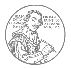 Dutch penman who published Verscheyden geschriften geschreven ende int'Koper gesneden door Jean de la Chambre Liefhebber ende beminder der pennen tot Haarlem in 1638. [Google]
[More] ⦿
|
Jean-Baptiste Werdet
|
Or Werdet ainé, le père Werdet, Joseph Werdet, or Joseph Verdet. French penman, b. ca. 1770, d. 1854. As a writing master, penman, school script developer and calligraphy expert, he wrote several writing manuals: - Innovation: leçons d'écriture simplifi. Paris, Werdet aîné, 1841.
- Cahier complet d'écriture, contenant en soixante-douze modèles la bâtarde, la coulée, la ronde, la gothique et la cursive, avec l'explication raisonnée des principes particuliers à chaque genre et de la taille de la plume. Paris, L. Hachette, 1852, and Paris, L. Hachette, 1858.
- Manuel d'écriture cursive française à l'usage des écoles primaires. Paris, Clément, 1833.
- Méthode rationnelle pour l'enseignement de l'écriture, contenant les préceptes et les modàles des cinq genres: cursive, bâtarde, coulée, ronde et gothique. Paris, L. Hachette, 1840.
- Modèles de Lettres.
- Nouveau cahier d'écriture, composé de cent vingt modèles... avec l'exposé des principes. Paris, L. Hachette, 1847. and Paris, L. Hachette, 1858.
Werdet taught penmanship at the Kycée de Bordeaux in 1809. In 1812, he became professor at Ecole Normale Suoérieue in Paris. One of his bâtarde copperplate calligraphic alphabets inspired Josep Patau's Werdet Script in 2017. [Google]
[More] ⦿
|
Jeremy Dooley
[Insigne Type Design Studio (was: Dooley Type)]

|
 [MyFonts]
[More] ⦿
|
Jim Wasco

|
 Type designer who worked at Adobe from 1989-2002 and for Monotype from 2003 until today. His typefaces in chronological order:
 - 1974 to 1989: As a freelance, he assisted Jim Parkinson in the Cochin, and Kennerley revivals, an old Perspective metal type design, and Rolling Stone alphabet additional weights Elephant, Italics and Condensed, done in pen and ink. For several ad agencies, he designed the Franzia winery logo, and many other logos for packaging and advertisementsi and was mainly a lettering a logo artist.
- 1985: He produced font designs for DHL Express and SFO International Airport at Primo Angeli Inc.
- 1986 to 1989: He produced various font families like Garamond, Goudy, Eras, American Typewriter, Futura and Stymie at SlideTek using a B-Spline vector graphic system.
- 1989 to 2002: He produced fonts at Adobe Systems in Redwood City, CA. There, he designed Tekton Bold, Mythos (1993: a mythical figure caps face done together with Min Wang), Tekton GX (with David Siegel), Waters Titling word ligatures. He designed and produced the Romaji Latin characters of Heisei Maru Gothic W4 and W8, Adobe Sans and Adobe Serif. He did font production work on ITC Garamond, ITC Cheltenham, Albertus, Castellar. He helped expand Adobe Originals to Pro character sets in Jenson Pro, Minion Pro, Kepler, Sanvito Pro, Cronos, and Calcite Pro. He played an important role in the production of Multiple Master fonts.
- 2003 to present: He produced fonts at Monotype Imaging:
- For Microsoft, he designed the family of five weights of Segoe based on Segoe Regular.
- He directed design production and programmed OpenType features for Segoe Script and Segoe Print.
- He designed Wasco Sans a font for the gaming and flight simulator groups at Microsoft.
- He designed AT&T Sphere Gothic Sans fonts.
- He designed a new slab serif family for Gatorade.
- He directed a new design for General Electric called GE Sans.
- He designed and directed production of various non-Latin scripts for Monotype for Armenian, Ethiopic, Khmer, Thai, Arabic, Hebrew and African language scripts including Tifinagh, N'Ko and Bamum.
- He designed the original geometric sans font family Harmonia Sans (2011), which is a blend of contemporary geometric sans serif lettershapes and classic calligraphic proportions. Jim Wasco was aided by George Ryan in the production of the typeface family. He said: I wanted to create a simple and legible typeface by pulling the best aspects of classic geometric sans designs, such as Futura and ITC Avant Garde Gothic.
- He directed a language expansion project for Edward Johnston's London Transport fonts, adding Cyrillic and Greek.
- He designed a script typeface based on Ed Benguiat's calligraphy for the ITC logo in 1970 called Elegy (2010-2011). Elegy has 1546 glyphs, and was awarded at TDC2 2011.
- He designed nine new weights for the Neue Aachen font family (2012) expanding it to 18 fonts including Italic.
- He designed swash caps and directed Morris Freestyle.
- He designed ITC Avant Garde Pro ligatures for the new OpenType version.
- He designed Baskerville Cyrillic and Greek for E reader fonts (2012).
- Daytona (2015) is a sans family that grew out of a desire to provide improved fonts for use in televised sporting events.
- Elicit Script (2018, by Laura Worthington and Jim Wasco). A hybrid (casual and formal) scrpt typeface based on pointed pen Spencerian Script handwriting.
Linotype link. Linotype interview. FontShop link. Pic. His talk at ATypI 2014 in Barcelona was entitled OpenType features for Script Typefaces. Linotype link. Klingspor link. [Google]
[MyFonts]
[More] ⦿
|
Joachim Romann

|
 Type designer (b. 1916, Dantzig, d. 1996, Kronberg). He studied lithography from 1933-1937 in Dantzig, and typography in Offenbach until 1944. After that he was associated loosely with Gebr. Klingspor, and was a freelance graphic designer from 1948 onwards.
 Romann designed fonts at Klingspor. Chief among these is Constance or Constanze (1954, a light script). Several digital revivals exist such as Stanzie JF at Veer, Constanze Pro (2012, Ralph M. Unger)), and Constanze Initialen (calligraphic; digitally revived as Constanze Initials (2010, Claude Pelletier) and as VIP (2008, Canada Type)). Other typefaces at Klingspor include Doppelmittel halbfette Constanze, Doppelmittel fette Constanze, Queen (1954, outline and decorated renaissance penmanship initials typeface revived as Jaggard (2007) by Paulo W at Intellecta Design), Variante (1951, formal script without lower case). Various typefaces remained unpublished such as Constanze fett, Constanze halbfett (1956) and Kronberg (blackletter). At the Ernst Engel Presse, he created a Schwabacher in 1940 and an Antiqua in 1941. Alternate image from Klingspor. Revivals of his work also include Jaggard (2007), a renaissance penmanship initials typeface developed by Paulo W at Intellecta Design. Klingspor link. [Google]
[MyFonts]
[More] ⦿
|
Joan Lundell
|
Designer in Portland, OR, where she studies at the Pacific Northwest College of Art. Joan drew a calligraphic penman script unfortunately called Grunge in 2010. Home page. [Google]
[More] ⦿
|
Joannes Weenink
|
Dutch penman and lettering artist (1797-1879), who published the lettering model book Alphabeth in onderscheiden soorten van oude, nieuwe en ornament letteren, ca. 1843. Some of his work is close to earlier model book work of Jean Midolle in Switzerland. Reference: Nederlandse belettering negentiende-eeuwse modelboeken (2015, Mathieu Lommen, de Buitenkant, Amsterdam). [Google]
[More] ⦿
|
Jodocus Hondius
|
Penman. Author of Theatrvm Artis scribendi, Varia Svmmorvm Nostri Seculi, Artificum exemplaria complectens (1594), a book with many European script specimens. [Google]
[More] ⦿
|
Joh. A. Moesman
|
Lithographer and calligrapher in Utrecht, The Netherlands, 1859-1937. He published an untitled lettering model book in 1877. [Google]
[More] ⦿
|
Johann Christoph Stossel
|
German penman who published Kunst-richtige so wohl Deutsche als Lateinische Sachsiche Vorschriften bestehend in allerhand Current--Cantzelen--fractur--Verfal--Romanischen Quadrat-Buchstaben und Zugwerk so insgemein in Ueutschland in sonderheit aber in oberwehnten Sachsischen Landen am gebrauchlichsten, etc. Franckfurth und Leipzigk bey Johann Christoph Stosseln (1702). [Google]
[More] ⦿
|
Johann Georg von Schwandner

|
Austrian calligrapher and penman (1716-1791) who created many calligraphic alphabets, often of capitals. MyFonts link. Author of Calligraphia Latina (1755), reprinted by Dover in 1958. This book has twelve full alphabets, over 300 initials and many exquisite borders and frames. Samples from that book: i, ii, iii, iv, v, vi, vii. Digital remixes: Schwandner Versalia (2010, Iza W, Intellecta Design). [Google]
[MyFonts]
[More] ⦿
|
Johannes Missillie
|
Painter in Sluis, The Netherlands (1830-1857) [at least, this is the educated guess of type historian Mathieu Lommen], who published the lettering model book Verzameling van letteren ten gebruike voor schilders en teekenaars (ca. 1855). Reference: Nederlandse belettering negentiende-eeuwse modelboeken (2015, Mathieu Lommen, de Buitenkant, Amsterdam). [Google]
[More] ⦿
|
John Ayres
|
British penman who published A Tutor to Penmanship ; or, the writing master: a Copy Book shewing all the Variety of Penmanship and Clerkship as now practised in England in London in 1698. [Google]
[More] ⦿
|
John Baildon
|
British penman, Together with Jean de Beauchesne, he published the first writing manual in England: A Booke containing divers sortes of hands, as well the English as French secrataries with the italic, roman, chancelry&court hands (1570-1571, London: Thomas Vautrollier). The digital typeface Mala Testa (2012, Pia Frauss) is a chancery hand based on a writing sample titled Lettere piacevolle in that book. [Google]
[More] ⦿
|
John Clark
|
British penman who published Writing Improv'd or penmanship made easy, in its useful and ornamental parts. With various Examples of all the Hands now Practis'd in Great Britain. Engraved by George Bickham in London in 1714. [Google]
[More] ⦿
|
John Davies of Hereford
|
British penman who published The Writing Schoolemaster, or the Anatomie of faire writing, Wherein is exactlie expressed each severall Character. Together with other Rules and Documents coincident to the Art of Faire and speedy writing in London in 1648. [Google]
[More] ⦿
|
John Heinrigs
|
Penman who wrote Examples Written by John Heinrigs, Fourth Book Containing Sets of Round Text in 1812. He was based in Creveld in Germany's Ruhr region. [Google]
[More] ⦿
|
John Jenkins
|
Self-proclaimed writing master who wrote the pompous, childish and utterly useless The Art Of Writing (1813). [Google]
[More] ⦿
|
John Nahmias
[Jonah Fonts]

|
 [MyFonts]
[More] ⦿
|
John Seddon
|
 John Seddon (1644-1700) was a master at Sir John Johnson's Free Writing School at Priest's Corner, Foster Lane, London. Author of The Ingenious Youth's Companion (1690), The Pen-man's Paradise both Pleasant and Profitable (1695), and The Penman's Magazine (1705, published posthumously---its subtitle is a new copy-book, of the English, French and Italian hands, after the best mode; after the originals of John Seddon. Perform'd by George Shelley).
 The second book was republished in a facsimile edition produced by Jan Tschichold in 1966. The plates in his first two books were engraved by John Stuart. In the third book, Seddon only contributed the decorative flourishes---all writing exemplars were by George Shelley. Bestiario (2011, Iza W, Intellecta Design) is a digital typeface based on John Seddon's work. Seddon Penmans Paradise Capitals (2011, Iza W) is an elaborate initial caps typeface along the lines of Bestiario. [Google]
[More] ⦿
|
Jonah Fonts
[John Nahmias]

|
 Type and logotype company in Polanco (and now Mexico City), Mexico, run by John Nahmias (b. 1935, New York City). John is a graphic designer who started his career in 1952 in a New York studio with Lucian Bernhard. He left that company in 1958. He now lives in Mexico where he paints and runs his own studio. John's typefaces, mostly but not exclusively scripts, are sold by MyFonts.
 - A: Advent (2015: slab serif), Agave (2017: sans), Altura (2007, a serif family for covers), Amplia (2008, connected script in the style of Mistral; see also New Amplia (2010) and Amplia Pro (2017)), Angelviews (2020), Annabel Lee (2011, upright connected monoline script), Applaud (2017), Aquarel (2014), Aristide (2007, grunge), Aros (2009) Arroba (2010, a directionally challenged heavy slab serif), Artichoke (2011, fat signage script), Artistica (2019), Atlantica (2021: a ten-font sans with surgical cuts).
- B: Bernhard Signature (2019: after the letters in a small logo that Lucian Bernhard used on his art), Bonafide (2009, sans family), Bonnie Bay (2017), Bonnie Bay Roman (2017), Botegga (2018), Brougham (2012, techno), Brush Swipe (2016), Buggy Ride, Bulwark (2011, oddly-serifed), Burgerbun (2014).
- C: Caravan Script (2007), Caseta Slab (2014), Caseta Sans (2014), Caseta Regular (2014), Casual Brush (2007), Catapult (2020), Chatter Pro (2010-2019, influenced by signage), Cherry Lane (2011, fat round signage face), Chit Chat (2009, comic book style), Circuitry (2007, rounded octagonal face), Claxon (2009), Clic (2012: rounded comic book style family), Coliseum (2007), Cornerstone, Cornerstone Flair, Cornerstone Pro (2014), Credititle (2009), Crotona (2014), Crotona Sans (2014), Cuppa Tea (2015, cursive script).
- D: Designers Gothic (2009, a poster sans family), Dogwood (2019).
- E: Epoch (2009, organic), Espada (2015), eSpectrum (2019), Etiquette (2009, casual script).
- F: Fabius (2008, a fat-nibbed pen face), Feather Pen (2007), Fidelity Caps (2009), Flavian (2013, a text typeface), Fountain Pen (2007), Front Page (2011; followed in 2015 by Front Page Pro), Frugality Pro (2014, an antiqua).
- G: Gallivant (6 styles), Garabato (2008, informal hand), Gavel (2016), Georgie (2011, upright connected script), Gianna (2016: a connected calligraphic script), Goya (2012, a heavy signage script), Granada (2014).
- H: Hacienda (2008, hand-printed), Honcho (2007). Lucian Bernhard's Magnetype font series is being revived in 2010 by John Namias, starting with Bernhard's Community Low and Community Condensed, which is called Harpsichord. Hebron Hebrew (2019). Hi Five is an art deco typeface.
- I: Interum (2007).
- J: Janagrace (2007, flowing script), Jonah Brush (2010, basic signage font), Jonahpad (2008, hand-printed), Joyscript (2007; Joyscript Two was done in 2013), Juggler (2010, signage / comic book face), Juke Box (2009, calligraphic).
- L: La Quinta (a creamy cursive typeface) (2021), La Rotonda (2009), Lyanna (2008, brush script).
- M: Manor Script (2013, connected), Mark (2010, a grungy marker script), Mavin (2015, a vintage serifed typeface), Medalist (2008, flat-nibbed pen script), Meridia Script (2009), Metrolite (2011), Metrolite Pro (2014), Micron (2016), Monoreal (a monospaced programming font) (2022), Montego (2014, monoline sans), Mulberry Road (2011, fat retro diner script).
- N: Nebbiolo (2012, a monoline fashion mag sans family), New Epoch (2020: a solid sans), Newmark (2014: techno sans), Newmark Hebrew (2018), Novela (uncial) (2021).
- O: Open Air (2014, a stencil font---caps only), Organo, Oregano Sans.
- P: Pageantry (2020: based on Souvenir), Pageantry Hebrew (2021), Palazzo (2007), Paloma (connected script), Palomar (2012, condensed organic sans), Papagayo (2020: a 4-style sans with almost amputated descenders and ascenders), Pantext (2015), Pedigree (2020), Pennyscript (2014, a connected brush script), PenPal (penmanship script), Pine Nuts, Pine Nuts United (2017), Pinot Noir (2009, calligraphic), Poncho (2013, signage script), Pony Tale (2009, signage face; the Pro and Pony TailLight Pro versions appeared in 2014), Potus Uncial (2021), Puzzle Face (2019).
- Q: Qualico (2009, semi-serif 1970s family), Quickline Slab,(2020), Quickline (2020: a sans), Quintana (2017). The Hebrew verson of Quintana Light is Komunidad Hebrew Script (2019).
- R: Ratatouille (2020: inspired by wood type), Rave (2011), Regalo (2010, an organic family; see also Regalo Pro, 2014), Reto (2012).
- S: Saguenay (2017), Scriptonah Pro (2014), See Saw (a dancing baseline font) (2022), Sevoya (2012, fat signage script), Scriptelle (2007), Scriptonah (2007; John Downer writes: Scriptonah, in any of its four weights, is not particularly pretty or delicate, but it is far from homely. It is firm and fibrous. It is raw.), Scriptonite (2010, a packaging script), Showtime (2011), Sideline (2018, a music nib font), Sign Brush (2010, a lively signage face), Single Tyne (a display serif) (2021), Singular (2009), Snowpuffs (2013), Stage (2015), Starlette (2009), Starry Eyed (2018), Steletto (2007, condensed), Steletto Oldstyle, Steletto OS Flair, Steletto Serif, Steletto Neue (2015), Stumpy (2011, display sans), Suite Slab (2011), Summit (2015, hexagonal circuit font).
- T: Taglocaps (2017), Talento (2007, script), Tiggly Wiggly (2009, hand-printed), Tingle (2009, comic book face), TransRim Display (2018), Trebla Square (2020), Trumpet (2013), Tubo, Twiggs (2009, hand-printed), Twopenny (2013, bilined), TypeOgraf Pro (2018), Typogravure (a flared family, in 12 styles) (2020).
- U: Unico (2013: a condensed geometric sans), Unigram (2011, monoline unicase family).
- V: Vantage (2013, a humanist sans).
- W: Whisk (2017), Wordscript (2007, almost a brush script).
- Y: Yacqui (2009, Mayan look face), Yom Tov (Latin and Hebrew) (2021), Yonkers (2014).
- Z: Ziggy (2007).
View John Nahmias's typefaces. [Google]
[MyFonts]
[More] ⦿
|
Jose Castro
|
 Castro obtained a Master's degree in Communication Design and Multimedia at the Escola Superior de Artes e Design (ESAD) in 2011. He lives in Vila Nova de Gaia, Portugal. Under the guidance of Dino dos Santos, his study project was entitled The typographic process in Pedro Diaz Morante. Related to that project, he created a sweet, delicate and absolutely stunning penmanship typeface called Morante (2011), named after Spanish penman Pedro Diaz Morante, whose calligraphy inspired the typeface. His illustrations and graphic design work are equally impressive and perfect. [Google]
[More] ⦿
|
José Francisco de Iturzaeta
|
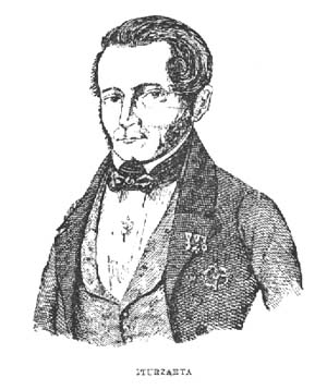 Basque penman, 1788-1853. His designs were engraved in 1833 by Giraldos and Nicolás de Gangioti and dedicated to the Queen Governor. That work was published in Colección General de los Caractéres de Letras Europeas (see here).
 Author of Arte de escribir la letra bastarda española (1827). The second edition, dated 1835, was published by Imprenta de don A. Mateis Muñoz in Madrid. Local download of that book. [Google]
[More] ⦿
|
Josep Pep Patau i Bellart
[Tipo Pepel (was: Antaviana Typeface Division, or: Astramat)]

|
 [MyFonts]
[More] ⦿
|
Joseph Champion
|
 Joseph Champion (b. Chatham, 1709, d. 1765) was a British calligrapher and penman. Champion contributed many plates to Bickham's Universal Penman. His most important work, The Parallel or Comparative Penmanship Exemplified, was published in 1750. It consists of reproductions of the work of foreign masters like Materot, Barbedor, Van den Velde, Perlingh and Maria Strick, with corresponding plates by Champion. Following these plates come some alphabets by Champion. His last published work was The Penman's Employment (1762).
 The first known attempt to digitally implement Champion's alphabets, was in 1989 by French type designer François Boltana, who in Ligatures&calligraphie assistée par ordinateur (1995) proposed three copperplate calligraphic alphabets based on Champion. These did not result in a commercial font however. PF Champion Script Pro (Panos Vassiliou, 2004-2008; a winner at Paratype K2009) on the other hand has 4280 glyphs in each of its two styles, and it supports Latin, Greek and Cyrillic. One of Champion's alphabets, dated 1733-1741. Samples of his penmanship from The Universal Penman (1730): i, ii. [Google]
[More] ⦿
|
Joseph de Anduaga y Garimberti
|
Spanish penman and writing master, 1751-1822. Author of Arte de escribir por reglas y sin muestras, establecido de Orden Superior en los Reales Sitios de San Idlefonso y Valsain despues de haberse experimentado en ambos la utilidad de su ensenanza, y sus ventajas respecto del metodo usado hasta ahora en las escuelas de primeras letras (1781, Madrid, Imprenta Real). [Google]
[More] ⦿
|
Joseph de Casanova
|
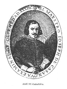 Also, José de Casanova. Noted Spanish calligrapher from the mid 17th century, who had the title examinador de los Maestros de Arte de la Caligrafía en la villa de Madrid. He was a highly regarded penman. Author of Arte de escribir todas formas de letras, impressa (Madrid, 1650). Local download of that book.
 Samples of his work. Curlicues from 1650. Signature ornament. [Google]
[More] ⦿
|
Joseph J. Bailey
|
Well-known Canadian penman (1879-1970) who studied under Edward C. Mills. He graduated from the Zanerian College of Penmanship in 1910, and became involved in teaching penmanship in high schools. Author of The Bailey Method of Penmanship, which was used in high schools throughout Ontario, Alberta and Saskatchewan for over 40 years. One of the founding members of the International Association of Master Penmen, Engrossers and Teachers of Handwriting. He significantly influenced the education of handwriting in Canada during the first half of the twentieth century. [Google]
[More] ⦿
|
Juan Bautista de Morales
|
Spanish penman, who lived around 1600. He published Pronvnciaciones generales de lenguas, ortografía, escuela de Leer, Escriuir y Contar, y Sinificación de letras en la mano (1623, Montilla). [Google]
[More] ⦿
|
Juan Claudio Aznar de Polanco
|
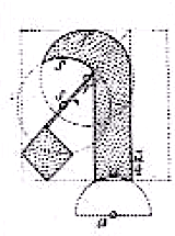 Spanish penman who published Arte Nueva de Escribir por preceptos geometricos, y reglas mathematicas at Imprenta de los Herederos de Manuel Ruiz de Murga in Madrid in 1719. Victoria and Albert write: Aznar de Polanco was not only a writing master and callig- rapher, but also a mathematician, architect and fencing master. Arte nuevo de escribir was his most important work on calligraphy. It is based on the firm belief that writing should depend on geometrical principles. [Google]
[More] ⦿
|
Juan Santiago Salazar
|
Ecuadorian designer of the penmanship typeface Guayaquil 1800 (2017), which is based on calligraphic pieces from the 19th century in Ecuador. [Google]
[More] ⦿
|
Juan Sebastian Rincon
|
 Or Juan Sebastian Rincon Redondo. Bogota, Colombia-based designer of the (very beautiful) Dutch krul letter font Morgan (2014). He also creates wonderful calligraphic lettering pieces. In 2014, he co-designed Beauty Script with Manuel Corradine. His penmanship typeface Alexandria Script (2015) won an award at Tipos Latinos 2016.
 In 2016, he made the great humanist sans typeface Piloto Sans for the identity of the Universidad Piloto de Colombia. [Google]
[More] ⦿
|
Julie Green
[Up Up Creative]

|
 [MyFonts]
[More] ⦿
|
Julie Soudanne

|
 French type designer. Her typefaces include:
 Behance link. [Google]
[MyFonts]
[More] ⦿
|
K. James
[Depression Press]
|
[More] ⦿
|
Kathy Saunders
[Rare Books on Calligraphy and Penmanship]
|
[More] ⦿
|
Kim Wilson
|
Brisbane, Australia-based designer of Penman Vintage Victorian Styles for Illustrator (2017). [Google]
[More] ⦿
|
Kimera Type (was: Diseño Kimera)
[Gabriel Martinez Meave]

|
 Kimera Type (was: Diseño Kimera) is a commercial Mexican design firm founded in 1994 by Gabriel Martinez Meave (b. Mexico City, 1972), who is by far Mexico's most prolific and talented type designer. The only freebie is Presidencia at the Mexican Government site.
 Meave.org deals with illustrations and other occult arts. Behance link. Speaker at ATypI 2009 in Mexico City. Interview. Some of his early typefaces were published at Tiypo. Diseño Kimera has made numerous custom fonts for Mexican clients. His typefaces: - Arcana (2000, +Manuscript) won an award at Bukvaraz in 2001. The script font Arcana was traced out with a pointed metal quill and then digitized to give it a thoroughly 19th century look. It won an award at TDC 2000.
- In 2006, he made the powerful serif typeface Artifex.
- Aztlan (1998) is a fun artsy slab serif.
- Basilica (1999, +Rotunda) is an extra-condensed experimental font based on a modern high-contrast design. Award winner at TDC2.
- Comanda (handwritten).
- Darka (2005) is a roman blackletter face. This typeface won an award at TDC2 2006.
- Economista is a text typeface created for the Mexican business newspaper El Economista.
- Ferra Sabs, commisioned by the department stores El Palacio de Hierro.
- Fulgora. Inspired by late-medieval Basarda and Civilité blackletter styles, the Kannada and Sinhala writing systems from Southern India, Celtic uncials, and diverse vernacular Mexican scripts, it includes a Black and a Negra style. Released by Sudtipos in 2019.
- Indio (handwriting). Commissioned for a beer ad.
- Integra: a contemporary roman sans family. It was republished by Sudtipos in 2019.
- Jumex Sans (2012). Custom font for a fruit juice advertising campaign.
- For Lagarto (2001) is based on the hand of Luis Lagarto, a colonial illuminator and scribe, working in Mexico City and Puebla in the late 1500s. It won an award at Bukvaraz 2011 and an Award of Excellence at the Type Directors Club of New York annual competition.
- Liverpool Sans (2015). A corporate avant garde sans family of fonts for Liverpool, a Mexican chain of department stores.
- Mexica (1996) is a large octagonal font family created to set text in náhuatl, the tongue of the Aztecs, but also the lingua franca of ancient Mexico. Mexica received an Award of Excellence at the Type Directors Club of New York annual competition. It was republished by Sudtipos in 2019.
- Mystix is a rune font based on a secret alphabet for a Delaware Punch promotional program.
- Neocodex (1996) is an organic family.
- At Adobe he designed Organica (2000), a display semiserif. That typeface family was republished in 2021 by Sudtipos as Organica Pro.
- Pearson Calligraphic (1999).
- Presidencia (2008, free at the Mexican Government site) won an award at TDC2 2008 and at Tipos Latinos 2008 (for extensive text family). He writes about Presidencia Sans: Inspired by Toltec and Aztec architecture, the letterforms of Presidencia follow a humanist sans-serif scheme that combines Mexican character with Latin structure. This grand family was commissioned by the Mexican Federal Government, to suit its new identity program, impeccably designed by Mexican firm Ideograma. The type family comprises twenty variants, to cover a full spectrum of possibilities, from official documents to corporate signage, billboards and nation-wide campaigns in all media.
- Puuc, according to Meave, was inspired by the Mayan puuc style of modular architecture.
- Rondana (2002) is a rounded character family in the style of VAG Round. It was republished by Sudtipos in 2019, which writes that Rondana is a typographic tribute to the retro-futuristic aesthetics of the 1960s and 70s, as well as an exercise in purity of line.
- Sol and Solida. Sol was made for a beer ad.
- In 2011, he created the Telcel Sans family, which was commissioned by Mexico's main telecommunications company for use in corporate communication, advertising and printed matter, as well as billboards, television and many other visual media. It won an award at Tipos Latinos 2012.
- Tlatoani Sans won an award at Tipos Latinos 2010.
- Tolteca.
- Wordless Script (2019, at Sudtipos). A penmanship script with weathered outlines. Sudtipos writes: Wordless Script is the font of choice for writing those things that go beyond words. Based on the connected-scripts of the late 18th-century England, this typeface preserves the irregular finish and stroke gestures of the pointed nib. It is, so to speak, a personal rendition of the English roundhand as originally executed with the bird's quill. Imbued with a rococo, neoclassic, romantic spirit, Wordless Script radiates the gallantry of a time when the celebrated douceur de vivre that Talleyrand was so fond of was still alive and well; echoes of which still haunt us in our eclectic 21st-century, that now has once again come to appreciate again these magnificent styles of old. Wordless Script [...] is meant to be read with the eyes only or to be whispered into someone's ear.
Klingspor link. Behance link. Old Kimera type link. [Google]
[MyFonts]
[More] ⦿
|
Klaus-Peter Schaeffel
[KPS Fonts]
|
 [More] ⦿
|
Knowles and Maxim
|
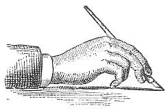 Authors in Pittsfield, MA, of Real Pen Work---Self Instructor in Penmanship (1881). Selected alphabets: Slanted Letters, Business Letters, Capitals, Ornamental Alphabet, Rustic Alphabet, German Text, Old English, Marking Alphabet, Steel Pen Capitals. Additional drawings: Fists, afish, a lion, a deer, a horse, two horses, flourished heads.
 They also wrote Golden Gems of Penmanship (1884). Digital typefaces influenced by Knowles & maxim include Holly Initials (2010, David Nalle). [Google]
[More] ⦿
|
Kousuke Nagai
|
Aka Kyosuke Nagai. Japanese designer of the free Japanese hand-printed Mincho style Google font New Tegomin (2021) and the free (variable) Latin penmanship font Kapakana (2020). [Google]
[More] ⦿
|
KPS Fonts
[Klaus-Peter Schaeffel]
|
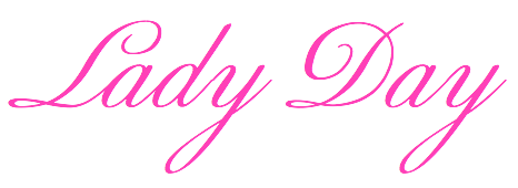 Swiss calligrapher in Basel who made and sells various medieval and historically important script fonts. Dedicated page. These included the paleographic (PAL) series and the KPS series. He lives in Ühlingen--Birkendorf, Germany. His fonts are uniformly of high quality and are usefl for illustrating historical alphabets.
 His early commercial collection: KPS Anglaise (calligraphic script), KPS Antiqua (+Kapitälchen), KPS Capitalis (classic Trajan caps), KPS Cicero, KPS Epona (calligraphic), KPS Fein (hand-printed), KPS Hand (calligraphic), KPS Horaz (calligraphic), KPS Iris (calligraphic), KPS Petit (calligraphic), KPS Plinius, KPS Spitzfelder, KPS Vitruv (calligraphy), PAL Bastarda, PAL Cancellaresca, PAL Carolina, PAL Gotisch, PAL Humanistica, PAL Lombarden, PAL Quadrata, PAL Rotunda, PAL Rustica, PAL Textura, PAL Uncialis, PAL Uncialis Roemisch, Weissranken Initialen, Ranken Initialen (Celtic capitals). Since September 2013, all of his fonts are free. They were renamed and have conveniently the date of original creation in the font name. The fonts dated in the 1990s and 2000s are new typefaces or creative revivals by Klaus-Peter. The list of revivals: 0100DeBellisMacedonicis [Pre-uncial letters from the fragment "de bellis macedonicis", ca. 1st century], 0300Petros [Greek hand from the oldest surviving copies of St. Peter's epistles, dated 3th / 4th century], 0362Vitalis [Roman Minuscule Cursive from the so called Vitalis letter, written before 362 on papyrus (Strasburg)], 0480VergiliusRomanus [Capitalis Rustica from the Vergilius Romanus written in Rome, ca. 480], 0500VergiliusSangallensis [Capitalis Quadrata from the Vergil fragments in Stiftsbibliothek St.Gallen], 0512Dioskurides [Greek Uncials from the Vienna Dioskurides (about 512)], 0746Beda [from Beda Venerabilis: Historia ecclesiastica gentis Anglorum, Northumbria, dated 746], 0800Kells [Half Uncials from the Book of Kells], 0800Remedius [So called "Lombardic-Raetic Minuscule" from Codex 348 of the Stiftsbibliothek St. Gallen], 0800 Theophanes [Greek Hand after a 9th century Theophanes manuscript], 0850CarolinaTours [Carolingian Minuscule], 0850Carolinaundulata [Carolingian Minuscule from the Scriptorium of Tours], 0864Folchart [St. Gall Carolingian from the Folachart Psalter], 1012Otto [Late Carolingian Minuscule from the Perikopes of Heinrich II, written at the Reichenau, donated to the dome of Bamberg in 1012], 1258FridericusII [Gothic Rotunda from the falcon book of Emperor Friedrich II, Southern Italy 1258-1266], 1400Wenzel [Bohemian Textura from Vienna], 1450Sebastos [Humanistic Greek hand from Homer, Ilias, Vatican Library], 1455GutenbergB42 [Gothic Textura types from the 42 line Gutenberg Bible], 1458GutenbergB36 [Gothic Textura types from the 36 line Gutenberg Bible], 1470Jenson [an antiqua by Nicolas Jenson], 1475HumanisticaCursiva [Humanistic Cursive of the kind Bartolomeo Sanvito of Padua wrote, after Cod. Pal. Lat. 1508], 1480Humanistica [Humanistic Book Hand from Valerius Maximus: Facta et dicta memorabilia, ca. 1480-1485. The calligraphy is attributed to Antonio Sinibaldi from Florence and the titling capitals to Bartolomeo Sanvito from Padua], 1483Koberger [Incunabula type from the Koberger Bible, printed in Nuremberg in 1483], 1485Grueninger [Incunabula type from the Grueninger Bible, printed in Strasburg in 148], 1493SchedelRotunda [Incunabula type from the Latin edition of Hartmann Schedel's World Chronicles, printed by Koberger at Nuremberg in 1493], 1501Manutius [First printed Italic Antiqua by Aldus Manutius (Venice 1501)], 1513Gebetbuch [Fraktur from Emperor Maximilian's Prayer Book, printed in Augsburg in 1513], 1517Gilgengart [Fraktur type from Emperor Maximilian's 1517 private print "Gilgengart"], 1517Teuerdank [Fraktur type from Emperor Maximilian's "Teuerdank", printed at Augsburg in 1517], 1519NeudoerfferFraktur [Fraktur alphabet from a woodblock model in Johann Neudoerffer the Elder's Calligraphy book "Fundament", Nuremberg 1519], 1739Bickham [Copperplate or running hand after models from "The Universal Penman" by George Bickham, printed in London 1743], 1741Bickham [Bickham's round hand from Universal Penman], 1782Thurneysen [Baroque Antiqua Type of J. Jacques Thourneysen fils, Basel 1782]. Original versions by Schaeffel, with date of design in the font name: 1999Anglaise1, 1999Anglaise2, 1999Cancellaresca, 1999Carolina (Carolingian minuscule), 1999Livius, 1999LiviusBold, 1999LiviusItalic, 1999LiviusSmC, 1999LiviusTitel, 1999Ovidius, 1999Stylus, 1999Textualis, 2000Bastarda, 2000Cicero, 2000Humanistica, 2000Plinius, 2000PliniusItalic, 2000Seneca-Italic, 2000Seneca, 2000TextualisFormata, 2000Uncialis, 2001RotundaFormata, 2002Cato, 2002Horatius, 2002Vitruvius, 2003Epona, 2003Lombarden, 2004CapitalisQuadrata, 2004CapitalisRustica, 2004Iris, 2004UncialisQuadrata, 2004UncialisRomana, 2008-Noeuds-1 [for making Celtic knots], 2008-Noeuds-2, 2008-Noeuds-3, 2009Xenophon, 2010Filigrane, 2010Gouttes, 2010Labyrinthe [squarish], 2010Pointu [a calligraphic blackletter], 2010Vergilius [a great calligraphic face]. Old URL. [Google]
[More] ⦿
|
Ksenia Belobrova

|
 Type designer, calligrapher and lettering artist in Moscow. Initially, she was working for Artem Gorbunov Design Bureau. Her typefaces there:
 - Bureauserif (2015-2016). A text typeface family. The Greek part was done by Anna Danilova.
- Galochki (or: Checkmarks). Done in 2013.
- Voltaire (2015). A script typeface based on illustrations in one of Voltaire's books from 1734. Voltaire covers Latin and Cyrillic.
In 2015, she designed Di Mare, a layered script inspired by Italian restaurant and cafe signs. In 2016, she designed MT Brush, Allister Rough, the brush signage typefaces Mixed Tape and Mixed Tape Rough, and the heavy monoline script typeface Jonesy. Typefaces from 2017: Eldwin (The Northern Block: a connected script), New Jonesy Latin, Luna Brush (brush script). Typefaces from 2018: Frederik (a great Latin / Cyrillic humanist sans family published by The Northern Block in 2019), Garnet (Capitals and Script, with a great Inline). [Google]
[MyFonts]
[More] ⦿
|
Laura Worthington
[Laura Worthington Design]

|
 [MyFonts]
[More] ⦿
|
Laura Worthington Design
[Laura Worthington]

|
 Laura Worthington of Bonney Lakes, WA, is a letterer, illustrator and graphic designer. Her script typefaces became quite popular in recent years. In 2010, she set up shop at MyFonts. Catalog. In 2021, she started licensing her typefaces via The Type Founders".
 Her typefaces: - Adorn (2014), Adorn Smooth (2015), Adorn Garland Smooth (2016, with Dai Foldes). Adorn is a hand-drawn poster font family larger than Charcuterie. It contains subfonts called Pomander, Coronet, Garland, Bouquet, Solo (monograms), Duo (monograms), Catchwords, Banners, Frames, Ornaments, Roman, Condensed Sans, Expanded Sans, Slab Serif, Serif, Copperplate, Engraved.
- Al Fresco (2013). A breezy exuberant script loaded with opentype features.
- Alana (2011, +Ornaments). A connected script.See also Alana Smooth (2017).
- Alisha (2017).
- Azalea Rough, Azalea Smooth
- Beloved (2015)
- Bianca (2010). A flowing calligraphic typeface.
- Blithe (2017).
- Boucherie (2014). In the "collection of vintage fonts" mould of Charcuterie, Boucherie captures the lively essence of 19th-century French advertising typography with a collection of original designs, rather than strict historical revivals.
- Buckley (2012).
- Caprizant (2016).
- Charcuterie (2013). A large set of hand-drawn typefaces for vintage signage.
- Congenial (2015). A legible soft unpretentious sans family originally designed for her own web site.
- Ed's Market (2015). A grocery store and sign painting font family.
- Elaina (2018). Script and Semi-Serif. Laura claims that Elaina Script is closest to her own handwriting.
- Elicit Script (2018, by Laura Worthington and Jim Wasco). A hybrid (casual and formal) scrpt typeface based on pointed pen Spencerian Script handwriting.
- Fairwater (2016). Designed together with Dai Foldes, this typeface family has Script, Sans, and Serif subfamilies, as well as several sets of ornaments. The Serif subfamily conjures up tattoo lettering, but also mathematical blackboard bold style and art deco.
- Funkydori (2012). A fat retro signage script.
- Ganache (2014). A packaging and logo script.
- Gioviale (2012). A calligraphic script.
- Greeting Cards (2010).
- GrindelGrove (2009). A vampire font.
- Harlean (2013). A rough-edged, powerful, and slightly sinful script face---originally named Harlowe.
- HoneyBee (2012). An all caps pirate ship font.
- Hummingbird (2012). A penmanship font.
- Juicy (2015). A plump and yummy candy store font.
- Ladybird (2010). A curly script.
- Liam (2011). Bouncy and curly script.
- Mandevilla (2013). Pure Americana, useful for signage.
- Milkshake (a creamy retro script).
- Modish (2016). A smooth brush script font.
- Nelson (2011). A notched eroded family, almost for Mexican simulation.
- Number Five.
- Origins (2010). An antiqued typeface hand-lettered with a crow quill pen. Followed by Origins Smooth (2016).
- Recherché (2010). A delicate script typeface.
- Regina (2010). A delicate script typeface.
- Renata (2016). A connected calligraphic script co-designed with Dai Foldes.
- Rosarian (2011). A pointed brush connected script typeface.
- Samantha (2011): 2700 flourished glyphs in the classical ronde upright script style and in an italic style; +Swash.
- Sepian (2010). A pointy Textura font.
- Sheila (2010). A connected calligraphic script.
- Shelby (2011). A monoline, semi-connected script typeface based on hand lettering created with a Speedball B metal nib.
- Spumante (2015).
- Tangelo (2017).
- Tiva (2010). A handcrafted and almost connected script.
- Voltage (2014). A retro fat signage script.
- Wallflowers (2011), Wallflowers II, Wallflowers III, Winter Wallflowers (2012).
- Winsome (2016). A casual script.
- Yana (2010). A spurred serif typeface.
Interview by MyFonts in 2010. I Love Typography link. FontBros link. Creative Market link. Klingspor link. Behance link. Fontspring link. Picture. View Laura Worthington's typefaces. Images of her typefaces. [Google]
[MyFonts]
[More] ⦿
|
Leopardo Antonozzi
|
Italian penman, who wrote De Caratteri in 1638 in Rome. A facsimile was published in 1971 by Nieuwkoop. [Google]
[More] ⦿
|
Letterhend Studio (or: Magang Letterhend)
[Hendry Juanda]

|
 Hendry Juanda runs Letterhend Studio in Yogyakarta, Indonesia. He designed the signage script typefaces Redoura (2016) and Kadisoka (2016), and the accompanying Redoura Serif (2016) and Kadisoka Monoline (2016). Hendry also designed the handcrafted typefaces Signerella Script (2016, +Sans), Motherline (2016), Motherline Sans (2016), Mukadua (2016: a beatnik serif and a script), Sakra (2016) and Sakra Script (2016).
 Typefaces from 2017: Kaylar Script (formal calligraphy), Keylar Serif, Legion, Hipsterious (signage script), Megattor, Dear Jane (a signature script), Wonder Stark (a rhythmic script), Kingbirds (monoline script), Mandatory (Sans+Script), Modesta Script, Romzul Sans (a fat finger font by Muhammad Romzul Khoir), Kanuda (by Galih Prasetyo), Aamonoline (by Ageng Jatmiko), Fad Script, Ageng Sans (by Ageng Jatmiko), Anisa Sans, Morsel, The Lentigo, Quinible, Storytella, Rose Colored, Swiftone, Antone (letterpress family), Retrology (monoline script), Claytonia, Pipetton (brush Script and Sans), Marttabuck (retro), Gloriant Signature Script, Jouska, Brooklyn (dry brush), Holiday, Take Easy (dry brush), Larizo (brush script), Vanillate (monoline retro script). Typefaces from 2018: Sabatons, Autogate (font duo), Sharon Baker, Blue Phantom Script, Dologan, Bolica, Jaceline, Youther (brush script), The Goldies, Carllosta (curly), Black Space (brush style), Anjani Script, Melania Monoline, Calasans (retro layered), Arlington (spurred, Tuscan), Pastelle (SVG brush font), Diana Webber, Caligor (a vintage headline typeface), Greatly, Belymon Script (a great signage script), Majestika Script (signage script), Nagoya (monoline script), Charlotta Script, Stronger (vintage style), Vanillate (connected monoline script), Pipetton (script), Roseville (calligraphic: by Hendry Juanda and Sarid Ezra), Rupture, Gustolle (a great watercolor brush font in OpenType SVG format), Riverside (monoline script), Bulgaria Script, The Majority (calligraphic script), Blacklite (signage script), Athalia Script, West Hood (Western), Fort Collins (font duo, by Sarid Ezra at Letterhend), Flanders Script (a signage script), Thirdlone (a monoline script), Bigstorm, Melania Script (named after the first golddigger), Motherline, Harsey (a 16-font toolbox of signage scripts and dingbats), Dearday Script, Dearday Sans, Blodders, Callonsky Script, Kulon, Quicken, Reklase, Skizzle, Storytella, Brighter. Typefaces from 2019: Shockbar (a Halloween font), Chanide Script, Girly Moods, Padlock (a great retro script), The Rouged (monoline script), Karatone, Kingdrops, William Letter Signature, Billskates, Dorothy Clark, Chord Brights (a Victorian typeface), Sequents, LS Olive 01 Script, Bargitta (an SVG brush script font by Hendry Juanda and Sarid Ezra), Hellone Script, Sharon Baker (by Hendry Juanda and Sarid Ezra), Daniella Evans (a display serif by Hendry Juanda and Sarid Ezra), Leafstar, Righton (a signage script by Hendry Juanda and Sarid Ezra), Lotustail (by Henry Juanda and Sarid Ezra), Radicals, Seriously (a display sans), Rupture, North Avellion, Majestika Script, Palmbell (a signature font by Hendry Juanda and Sarid Ezra), Fokers (Victorian), Frankest (Script, Serif; with a Victorian feel), Danielle Harris, Callonsky Script, Murphy Script, Lanoline Script, Bittergrace Script (by Hendry Juanda and Sarid Ezra), Bordemile (a copperplate calligraphic script by Henry Juanda and Sarid Ezra), Daybird Script, Amerta Misty, Wonderstory, Kingbirds Rough (monoline), Rupture Stamp (for signage), Gorgone (a one-style didone by Henry Juanda and Sarid Ezra), Stomper, Caligor, Asterone (a wide all caps sans), Venettica Script (a signature script), Hougbon Script, Philomena Script, Cephalonia, Birmingham Script (calligraphic), Hillstown (Sans and Script). Typefaces from 2020: Billrocks (a condensed all caps sans), Greybridge (a fine retro script), Lava Cookies, Just Because, Moraline Script (a baseball signage script), Lemonade Peach, Mayburn (a retro signage script), Fillerglad (a signature script), Breadfast, Della Brian (script), Sailritme (wild, calligraphic), Stacylia, Stacylia, Salty Unicorn (a monolinear marker pen font), Super Giants, Gingerly, Creeplens, Donthank (a fat finger font), The Viperion, Blantika, Maritosca (wild, calligraphic), Thirtylane Script, Winland (a brush script), Ballmarks (wild, calligraphic), Mellodate, Braleno (a shaky font), Siregar, Camie (a wedge serif), Hugiller (a high contrast ball terminal fashion mag serif), Mildistance (a tall calligraphic script), Midgeto (a casual all caps typeface), Crimson Black (a brush typeface), Duke Charming (a decorative serif), Lucky Spark, Blue Jones, Sunshine Valley, Hello Christine (a rough-edged script), Revalina (a wild calligraphic script), Ranshell (a chalky script), Malliandra Script (a wild calligraphic script), Vistaria Notes (a wide flowing calligraphic script), Achiever, Bullgine (blackletter), Billion Reach (a signature script), The Randi (a monoline script), Yorkson (a signage script), Laverty Castaroza (all caps, art nouveau), Kandani (a creamy signage script), Fragtude (a creamy script), Quick Counters, Kaeliwritten, Heaven Wanders (a lively vintage hand-printed typeface), Chillday Script, Redberries, Foretelling Script, The Stegris (a decorative serif), Bayland (a signage script), Darthon, Caligonia, Deluge (a heavy script), Laterlocks (a display typeface), Baille Simpson (a dry brush script), Kanote (an all caps cartoon font), Black Ground, Franceur, The Wanters, Alburgone (an all caps quaint shop front lettering typeface), Annette Bradford, Winstreak (a brush font), Madegra (a decorative serif), Samrose (a dry brush font), Dehors (a Tuscan circus font), Compania (a wild script), Neography (a formal script), Shakuro Brush (oriental brush), Rascals, Wednesdom, Chirpy, Altia (Script, Sans, Slab Serif, Signature, Hand, Brush, Dingbats), Stargation, Buttoni, Radgrows, Linkgray, Monday Bay, Brown Chunkers (a vintage label font), Squiborn (a hand-drawn athletics font), Brilliantly, Holystone, Detroit (a handcrafted slab serif), Spring Note, Bigtown (a heavy hand-lettered slab serif), Naville (a 6-style all caps sans family), The Proactive (script), Wardrum Pro (a wide sans) and Wardrum, Kinderline Script (monoline), Kingdrops, The Kogles Script (retro), Conseration (a condensed sans). Hopkins Angela, Blue Phantom, Gladiolus Script, Calvous (spurred and weatheed), Fort Smith (penmanship calligraphy), Ramdone (a creamy signage script), Devilion (a signage script), Cortair (a vintage typeface), Kingbirds (a monoline script), Purefell Script, Rangkings (serif), The Holloway (Victorian), Roquen (a rustic typeface), Gloriant. Typefaces from 2021: The Riskeys (a tall stylish serif), Brandice (blackletter), Carllosta (a Victorian font), Dountyland (a monoline script), Garten House (Victoriana), Hello Sierra Sans (a child's hand), Marla Griselda (a formal script), Nachinta (script), Winter Rosetta (a curly script), Distoniare (a thin calligraphic script), The Moon Milter (a vintage all caps display font), Asper Crown (a nature park display font), Delgian (script), Astropicks (a marker bpen font), Cerlistine (a fat finger script), Fintbar (a fat all caps display font with an oversized chin), Madre Rose (a stylish unicase typeface), Norvin (vintage caps), Roundkind, Sentra (a wide hand-crafted display font), Stone Masher (script), Beast Party (a Halloween font), Hollow House (a Halloween font), Blowsters (a dry brush mural font), Rumble Born (a bean font), Stano Sans (rounded), Amillia Rochete (a delicate signature script), Shopie Minclair (a fine pencil script), Sign Paintoh (a sign painter's font), Wednesday Island (script), Sinister Mind (a horror font), Divine Stone (a brush font), Pinsmalle (a signage script), Radnick (a plumpish retro font), Wackets, The Royal Chambers (decorative caps, with a hint of art nouveau), Shopie Minclair (a refined script), The Morshine (Victorian), Beauty Culture (an angled calligraphic script), Allarmante (a horror font), Billanta (a retro signage script), Galpike (a 9-style sans with modulated stems), Magnitude (a stylish display sans with large x-height), Romans Story (stylish caps), Stay Strong (a dry brush script), Cardila (a monoline retro signage script), Explore Magic (hand-printed), Kingslayer (a graffiti font), Marina Bullock (a flowing rabbit ear script), Dustland (a retro signage script), Haystack (script), Sakura Town (Japanese brush emulation), Boldistrike (a retro signage script), Maleryan (a delicate formal calligraphic script), Sellina Word (a calligraphic script with irregular line thickness), Servegin (a display serif), Shelbie Roger (Victorian), Stumble (a signage script), Foresight (a vintage script), Cordoba Sans (vintage caps), Badgear (a monoline script), Edellyn Script (tall and elegant), Glorify Sans (an 8-style decorative sans), Wellytonia Package (a scrapbook script), Turesco (a creamy caps typeface), Black Space (a horror brush SVG font), Slime Yogurt (a fat finger font), Black Hymned Script, Pompano (a lively almost vernacular headline sans), California Quotes (brush script), Rosterine (a vintage condensded display font), Between Days (a display serif), Crescent Slim (a stylish display serif), Captivate (script), Flumbery White (a thin tilted script), Modern Prestige, Olive Vine (a lively brush script), Graystera (an elegant script), Morning Glints (a marker pen font), Native Roast (a vintage layered typeface), Menleader (script), Neophyte (a flared vintage typeface), Dankfield (condensed, squarish), Sogate (a bold script), Hollow Sky (a thin script), Boosley (a condensed supermarket script), Killviners (blackletter), Chenile Deluxe (a vernacular supermarket font) Silvestern (a vintage display font), Arnette Script (a calligraphic script), Margoline (an elegant formal calligraphic script), Pinmold (a geometric stencil font), Eligated (all caps, vintage), Garmouth Display (a Victorian era advertizing font), Bugheds (blackletter), Candleton, Riotous, Baverley Astone (script), Belmistate (a fine rhythmic brush script), Hulberk (an all caps slab serif), Mogaster (a monolinear script), Black Rockets (a dry brush script), Glady Script (a bold signage script), Yesternight (a bottom heavy script), Welroseltone (a stylish calligraphic font), Bold Garage (an inky unusually elegant typefacre), Bright Clones (hand-printed) Grand Wilson (a font duo), Merodine (calligraphic), Appears (a decorative serif), Mounties (tall caps with flared terminals), Quatro, Ground Castle (a display serif), Linestay (a signage script), Alessia Harvey (a signature font), Caramel Chestnut, Londers (an upright bold script), Hubstone (a brush font), Oversouth (vintage, hand-drawn), Bright Gesture (a lachrymal font), Center Voyage (an all caps display typeface), Asteria Royalty, Georude (hand-printed), Raksana (a bold upright script), Aesthetic Notes, Broadley (a vintage font duo), Chopader (a vintage font duo), Wimp Stars (a beatnik font), Brown Holmes, Mortina (a vintage font duo), Dustown (a rounded handcrafted sans), Holymore, Lamberds (a rhythmic script), North Mountain (a decorative flared typeface), Butter Slices, Portalica (an all caps italic font with plenty of ball terminals), Evening River (an optimistic and playful script), La Graziela (formal copperplate calligraphy), Metro Capitals, Davenvale, Earthgate (a vintage penmanship font), Vindale (a retro reverse stress script), Better Hobby (a layerable cutout font), Bouldster (a bottom-heavy psychedelic script), Melorist (a display sans), Benorante, Millgrove (a condensed spurred typeface), Asterluck (a fat finger font), Boinger (wide, octagonal), Rimeland (calligraphic), Ansylia, Mantaray. Typefaces from 2022: Arturico (a frivolous art deco font), Calmine Font Duo (a bold vintage script), Foresight, Penster Bross, Mayhome (script), Rivervale (flared hand-crafted caps), Rontage (a late 19th century-style display typeface), Bert Watson (a tall thin upright script), Honnie (Greek emulation), Livemono (6 styles), Caldeisa (a creamy script), Coral Candy Regular Slant (a blocky plump unicase typeface), Hanstone (script), Hintown Slant (arts and crafts era caps), Liviatica (a wavy display serif), Rosie Brown (a font duo), Growline (an all caps display sans), Lion Parade (a vintage apothecary script), Praysire (a sharp-edged display serif), Bashiton (a monolinear script), Crainzel (notched caps), Garetra (a stylish serif), Moon Slayer (a scrapbook brush font), Growlies (a fat finger script), Ridge Cliff (a massive slab srif), The Bristers Sans (a font duo), Augify (a hipsterish display serif), Dustyland (a monoline script), Primore Castle (hand-crafted), Merry Brook (script), Monstroux (a brush font), Blue Carousel (an informal brush script), Bastinson (a thin monoline script), Happy Sparkle (an inky treefrog script), Arinkoln, Backdown (script), Krostenia (a monoline script), The Bardian (script), Black Rocket (hand-printed), Kaglia (script), Cyberion (sci-fi), Groovy Friends (hand-printed), Calfine (a bold condensed poster typeface with small wedge serifs), Fountencil (a blackletter stencil), Logirent (a minimalist logo font), Logirent, Hermush (art nouveau caps). Aka Magang Letterhend. Behance link. Dafont link. Graphicriver link. Dafont link. Creative Market link. Fontesk link. [Google]
[MyFonts]
[More] ⦿
|
Lettering Library Mega Bundle
|
These vintage lettering and penmanship books are available for download on Jada Guselnikov's site: - 101 Alphabets - Ben and Ed C. Hunt - 1954
- 60 Alphabets - Ben & Ed Hunt - 1935
- 600 Monogramme Und Zeichen - Alexander Koch - 1920
- Allegorien und Embleme - Martin Gerlach - 1882
- Alphabets & Letters - Milton Bradley - 1924
- Alphabets and Lettering - Esterbrook Pen Company - 1930
- Alphabets and Other Materials Useful to Letters - Charles Rollinson - 1912
- Alphabets de Style - Unknown Author - Unknown Date
- Alphabets for Practical and Ornamental Engrossing - C.W. Jones - 1914
- American Text Book For Letters - N.S. Dearborn - 1873
- Ames' Book of Flourishes - Daniel T. Ames - 1890
- Art Alphabets & Lettering - J.M. Bergling - 1923
- Art Monograms and Lettering - J.M. Bergling - 1916
- AtkinsonsSignPainting - Frank Atkinson - 1915
- Basiks of Lettering - Bill Boley - 1952
- Becker's Ornamental Penmanship - George J. Becker - 1854
- Beginner's Course in Show Card Writing - Ray J. Matasek - 1924
- Book of Alphabets - Powner - 1946
- Book of Monograms and Fancy Lettering - D.M. Campana - 1900
- Brodie & Middletons Plain, Ornamental, and Mediaeval Alphabets - Edward Cover - 1871
- Constructive Lettering - William Day Streetor - 1929
- Copley's Plain & Ornamental Alphabets - Fredrick S. Copley - 1870
- Das Gwerbe Monogramm - Martin Gerlach - 1881
- Das Neue Monogramm - Emil Franke - Unkown Date
- David's Practical Letterer - Arnold Binger - 1903
- Design of Monograms, Inscriptions, and Alphabets - Emil F. Hornikel - 1904
- Designs for Letters and Monograms - John B. Wiggins - 1893
- Dick's Alphabets - Dick and Fitzgerald - 1900
- Display Material Catalogue - 1930
- Distinctive Lettering and Designs - A.J. Hewett - 1919
- Draughtsman's Alphabets - Hermann Esser - 1877
- Exercises in Lettering - Architectural and Other Alphabets - George G. Greene - 1925
- Faust's 75 Alphabets - Charles Ayers Faust - 1920
- Gems of Penmanship - Williams & Packard - 1866
- Gerlach & Schenk Brochure - Gerlach & Schenk - 1888
- Golden Gems of Penmanship - Knowles & Maxim - 1884
- Heberling's Basic Lettering - W.A. Heberling - 1922
- Henderson's Sign Designs and Alphabets - R. Henderson - 1905
- Henderson's Sign Painter - John G. Ohnimus - 1906
- Heraldic Designs & Engravings - J.M. Bergling - 1913
- How to Paint Signs and Sho' Cards - E.C. Matthews - 1928
- How to Render Roman Letter Forms - Tommy Thompson - 1946
- Illuminated Ancient and Modern Alphabets - Unknown Author - Unknown Date
- Imelli's Alphabets & Layouts - Al Imelli - 1922
- Instruction Course in Show Card Writing - Lessons Nine & Ten - The Menhennitt Company - 1927
- Instruction Course in Show Card Writing - Lessons Seven & Eight - The Menhennitt Company - 1927
- Instruction Course in Show Card Writing 1-6 - The Menhenitt Company - 1927
- Instructions on Modern Show Writing - J.G. Bissell - 1921
- John M. Clark's Alphabets - Book 1 - 1906
- John M. Clark's Alphabets - Book 2 - 1907
- Kibbe's Alphabets - H.W. Kibbe - 1900
- L'Artiste - Peintre de Lettres - Monroco Freres
- Landa's Alphabets - Excelsior - 1870
- Layouts and Letterheads - Paul Carlyle & Guy Oring - 1938
- Learning to Letter - Paul Carlyle and Guy Oring - 1939
- Le Peintre de Lettres - Recueil D'Alphabets - 1850
- Lessons in the Art of Illuminating - W.J. Loftie-1880
- Lettering - J. Albert Cavanagh - 1946
- Lettering - Modern & Foreign - Samuel Welo - 1946
- Lettering Plates - Charles L. Adams - 1902
- Lettering for Commercial Purposes - William Hugh Gordon - 1918
- Lettering for Draftsmen, Engineers & Students - Chas W. Reinhardt - 1917
- Lettering for School and Colleges - Frank Steeley - 1902
- Luminous Advertising Sketches - Phillip DiLemme - 1953
- Martin's Ideas - Book One - H.C. Martin - 1935
- Martin's Ideas - Book Three - H.C. Martin - 1937
- Martin's Ideas - Book Two - H.C. Martin - 1936
- Martin's Modern Ideas - Book Four - H.C. Martin - 1935
- Modelli Di Calligraphia - Giovanni Tonso - 1898
- Modern Brush Lettering - Harold Holland Day - 1931
- Modern Lettering - Foulsham & Co. - 1940
- Modern Ornament & Design - J.N. Halsted - 1927
- Moderne Firmen Schilder - Arthur Schulze - 1913
- Monogrammbuch - P. Buttgen - 1885
- Monogrammes en Relief - M. Rawski - 1911
- Monograms & Heraldic Designs - Wilkonson, Heywood, & Clarke - 1912
- Monograms, Crests & Scrolls - Conrad W. Schmidt - 1895
- Morgan Press Wood Type Catalog
- Muster Alphabete - Stuttgart - 1883
- Neues Vollständiges Monogramm Alphabet - F. Weber & Co. - 1886
- Patterson & Heward - Art Brass & Bronze Tablets & Signs - 1917
- Plain & Ornamental Alphabets - H.D. Smith - 1840
- Plain Alphabets for Office and Schools - C.G. Wrentmore - 1898
- Poster Design - J.I. Biegeleisen - 1946
- Prangs Standard Alphabets - Louis Prang - 1878
- Prangs Standard Alphabets - 1901
- Real Pen Work - Self Instructor in Penmanship - 1884
- Rightmeyer's Penman's Paradise - Knapp & Rightmeyer - 1852
- Schriften Atlas - Petzendorfer Hoffman - 1909
- Scroll Book - Excelsior Publishing - 1876
- Showcard Layout & Design - Edgar Bond - 1937
- Spajner Bros. Catalog E - 1909
- Spajner Bros. Catalog S - 1927
- Spanjer Brother Catalog 41 - 1941
- Speedball Textbook 8th Edition - Ross F. George - 1925
- Speedball Textbook 10th Edition - Ross F.George - 1927
- Speedball Textbook 11th Edition - Ross F. George - 1929
- Speedball Textbook 12th Edition - Ross F. George - 1935
- Speedball Textbook 13th Edition - Ross F. George - 1938
- Standard Amercian Lettering Book - P.Idarius - 1911
- Strong's Art of Show Card Writing - C.J. Strong - 1919
- Strong's Book of Design - C.J. Strong - 1917
- Studies in Pen Art - W.E.Dennis - 1914
- The Art of Lettering and Sign Painting Manual - A.P. Boyce - 1878
- The Artist and Decorator - Campana - 1924
- The Book Of Ornamental Alphabets Ancient & Modern - F. Delamotte - 1858
- The Essentials of Lettering - Thomas E. French - 1912
- The Menhenitt Company - Instruction Course in Show Card Writing - Lessons 11 & 12 - 1927
- The Menhenitt Company Demonstration Folio - 1927
- The Ornamental Penman's Pocket Book of Alphabets - Benjamin Alexander - 1900
- The Palmer Method of Business Writing - A.N. Palmer - 1915
- The Signists Modern Book of Alphabets Franklin Gage Delamotte - 1906
- The Writer's Guide - E. Ventris - 1830
- Thompson's Roman Alphabet - W.M. Thompson - 1878
- Ticket and Show Card Writing - F. A. Pearson - 1924
- Vel Vet Show Cards - Harry Lawrence Gage - 1924
- Wagner - BluePrint TextBook - 1946
[Google]
[More] ⦿
|
Lewis Foreman Day
|
 Lettering artist and author, 1845-1910. His books include Alphabets Old and New: Containing Over One Hundred and Fifty Complete (1902, B.T. Batsford), which has a large number of historic alphabets, initials, blackletter examples, and new alphabets by the author himself. Other books: Alphabets Old And New For The Use Of Craftsmen (1910, B.T. Batsford, London), Lettering in ornament (B.T. Batsford, 1902), The anatomy of pattern (B.T. Batsford, 1895), Penmanship of the XVI, XVII&XVIIIth centuries (1911, B.T. Batsford, London: Local download), and Nature and Ornament (B.T. Batsford, Charles Scribner's Sons, 1892).
 He created numerous pen-drawn alphabets. I am using the descriptive names he used in his own book, Alphabets Old and New: Modern Brush Letters, Blunt Brushwork, Blunt Twisted Brushwork, Japanese Brushwork, Modern Capitals for engraving on metal, Modern Capitals, more Modern Capitals, and yet more Modern Capitals, Modern early Gothic Capitals for engraving on metal, Modern Early Spanish Letters, Modern Foliated Capitals, Modern Gothic Capitals, Modern Minuscule Gothic, Modern Roman Capitals, Modern Roman Italics, Modern Twisted Letters, Numerals (set 1), Numerals (set 2), and Numerals (set 3). In 2012, Dick Pape created a number of typefaces based on alphabets found in Alphabets Old And New For The Use Of Craftsmen (1910). These include LFD14thCItalian75 (drawn by J. Vinycomb), LFD15thCFrenchRelief91, LFDAlphabetUndOrnamente216 (after roman capitals by Otto Hupp), LFDAsianStencilling205 (an art nouveau stencil based on an original by E. Grasset and M. Verneil), LFDBlockCapitals213 (based an alphabet by Walter John Pearce), LFDEngravingonSilver196 (a Foreman Day original designed for engraving on silver), LFDFreehand170 (based on an alphabet by Bailey Scott Murphy, architect), LFDFrenchPrintedType189 (based on a type by E. Grasset), LFDFrenchType209 (a caps typeface by Lewis Foreman Day), LFDIncisedinWood114 (a Foreman Day original Elizabethan lettering aklphabet based on an inscription incised in wood at North Walsham, Norfolk), LFDMetalEngraving187 (another original by Foreman Day, for engraving on metal), LFDModernCaps210 (an original), LFDPainted148 (a sketched typeface that was painted in 1727 on the wooden drug-drawers of an old apothecary's shop and kept in the Germanisches Museum, Nuremberg), LFDPenAlphabet222 (an art nouveau alphabet by Foreman Day), LFDPenwork160 (after an original monstrosity by Walter Crane), LFDPenwork181 (based on an alphabet of Roland W. Paul), LFDPenwork206 (based on lettering by Franz Stuck), LFDQuasiJapanese203 (an oriental art nouveau design by Foreman Day), LFDRomanCapitals224 (based on lettering by Franz Stuck), LFDScriptStencil219 (an oriental art nouveau design by Foreman Day), LFDSquareCut202 (an original pixelish typeface by Foreman Day), LFDThinFrench208 (based on an alphabet by John Vinycomb). [Google]
[More] ⦿
|
Liberty Type Foundry
[George Thomas]
|
 Commercial type foundry of George Thomas (Dallas, TX), whose fonts include Pendula (2014, art nouveau). They write: Pendula is an adaptation of Pittoresques Droites (Scenic Casual) found in the circa 1924 specimen book of La Fonderie Typographique Française. Changes to a very small number of the original characters were made to make the typeface work better with more languages, as well as for aesthetic reasons. A newly designed Cyrillic character set was added.
 In 2015, he released the penmanship font Smith Spencerian, which is a revival of a 1878 script by Richard Smith for MacKellar, Smiths & Jordan, which is possibly the most decorative Victorian script. [Google]
[More] ⦿
|
Lipton Letter Design
[Richard Lipton]

|
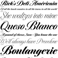 Calligrapher, sign painter, and graphic and type designer from Milton, Mass., who was born in New York, studied design and photography at Harpur College there (graduating in 1975), did some lettering in Syracuse until 1977, worked for Bitstream in Boston from 1983-1991, and made a career afterwards as a staff type designer at Boston's Font Bureau. In 2016, he joined Type Network, where his fonts can be bought. Since 2021, Richard Lipton is senior type designer at The Type Founders in New York. MyFonts page. MyFonts interview in which his modesty comes to the fore. His typefaces:
 - Alhambra: a calligraphic typeface.
- Apotek: based on lettering on old medicine bottles seen in Oslo.
- Arrus BT (Bitstream, 1991). This is a serif typeface with heavy calligraphic influences. The capitals are roman inscriptional. More typefaces in this style are to come, he promised in 2010.
- Avalon (1995, calligraphic): based on the calligraphic writing of Austrian artist Friedrich Neugebauer.
- Bennet Text, Bennet Display (36 styles: a wedge serif news text family), Bennet Banner (36 styles). This high contrast didone-themed superfamily (but for the wedge serifs) can't shed that "look at me" vibe. The initial idea for Bennet came from Moth Design's logotype and stationery system for the North Bennet Street School in Boston.
- Benton Modern Display (2008, co-designed with Richard Lipton at Font Bureau: Benton Modern Text was first prepared by Font Bureau for the Boston Globe and the Detroit Free Press. Design and proportions were taken from Morris Fuller Benton's turn-of-the-century Century Expanded, drawn for ATF, faithfully reviving this epoch-making magazine and news text roman. The italic was based on Century Schoolbook.). See also here.
- Bickham Script (1997, Adobe): The 2004 OpenType Pro version has hundreds of ligatures and substitute forms. See also Bickham Script 3 (2014). Review of Bickham by Timothy Rolands. Bickham Script is based on examples from Bickham's The Universal Penman. Poster by Fernanda D'Andrea (2013). Bickham Script 3 won an award at Modern Cyrillic 2014.
- Bodoni FB (1992, Font Bureau, a headline bold based on Benton's 1933 Ultra Bodoni).
- Bremen (Bitstream), Bremen (1992, Font Bureau). This German art deco face was influenced by the poster lettering of Ludwig Hohlwein in 1922. Munich is an angular version of Bremen.
- Bureau Grot. One of Font Bureau's bestsellers.
- Canto (2011, Font Bureau) is a 32-style roman family that started out from the Trajan inscriptions via a few styles called Canto Brush to smooth and delicate styles such as Canto Pen. New styles were added in 2017.
- Cataneo BT (Bitstream, 1993; with Jacqueline Sakwa): an elegant chancery cursive based on the calligraphic work of the 16th-century writing master Bernardino Cataneo.
- Ecru
- Escrow Banner (2016). An extension of Cyrus Highsmith's Scotch Roman, Escrow (2006).
- Hoffmann (1993): a display family that is based on lettering by Lothar Hoffmann.
- Meno (1994, Font Bureau). Lipton explains his oldstyle design: the romans gain their energy from French baroque forms cut late in the sixteenth century by Robert Granjon, the italics from Dirk Voskens' work in seventeenth-century Amsterdam. In 2016, he extended Meno to a 78-style superfamily. In 2021, MyFonts released Meno Text and in 2022 Meno Display (36 styles) and Meno Banner (36 styles).
- Miller Banner (2010, Font Bureau): a completion of Matthew Carter's Scotch family Miller, that has banner and titling styles, and adds styles with extreme contrast and hairline serifs.
- Moderno FB
- Munich.
- Nutcracker.
- Rocky (2008, Font Bureau, with Matthew Carter).
- Savanna Script (2013). A connected tightly spaced calligraphic script in three weights.
- Shimano: an industrial geometric font.
- Shogun (with Margo Chase, 1995).
- Sloop Script (a penmanship script, 1994), inspired by the lettering of Raphael Boguslav. Sloop Script won an award at Modern Cyrillic 2014. Type Network published Sloop Script Pro in 2018. MyFonts relesed Sloop Script Pro in 2021.
- Talon
- Tangier (2010, Font Bureau): a Spencerian calligraphic family that was part of the 2008 redesign of Glamour Magzine.
A redesign of Matthew Carter's Postoni (1997), called Stilson (2009, with Jill Pichotta and Dyana Weissman): Since 1997, The Washington Post's iconic headlines have been distinguished by their own sturdy, concise variation on Bodoni, designed by Matthew Carter. For the 2009 redesign, Richard Lipton, Jill Pichotta, and Dyana Weissman expanded the family with more refined Display & Condensed styles for use in larger sizes. Originally called Postoni, the fonts were renamed in honor of The Post's founder, Stilson Hutchins. - Delaney (2016).
- Collier (2018). A 150+-style lapidary flared stem typeface family ranging from Compressed to Extra Extended widths.
- Englewood (2022). A script whose inspiration for Englewood came from the calligraphic hand of Philip Grushkin.
I Love Typography link. Klingspor link. FontShop link. Type Network link. MyFonts interview. View Richard Lipton's typefaces. [Google]
[MyFonts]
[More] ⦿
|
Liu Yinbin
[LYB Design (or: Liu Yinbin Design)]
|
[More] ⦿
|
Lloyd M. Kelchner
|
American penman (1862, Light Street, PA-1948, Seattle, WA). Author of Complete Compendium of Plain Practical Penmanship (1901). He studied at G.W. Michael's Pen Art Hall in Oberlin, OH, in the early 1880s. In 1883 he met C.P. Zaner and E.W. Bloser. Bloser and Kelchner taught in Delaware, OH, and in Cleveland, OH. In 1889, Kelchner purchased a half interest in the Zanerian College of Penmanship in Columbus, OH. He sold his interest in 1892 and left for teaching positions in Dixon, IL, and later in Des Moines, IA. In 1909, he moved to Seattle to teach at Seattle Business College. [Google]
[More] ⦿
|
Lodovico Curione
|
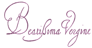 Italian writing master, b. Bologna, d. Roma 1617. Examples of his work date from 1582 and 1588. Author of II Cancelliere di Ludovico Curione ornato di lettere corsiue et d'altre maniere di caratteri vsati a scriuersi in Italia. Libre Quarto (Roma, 1609). [Google]
[More] ⦿
|
Lorenzo Ortiz
|
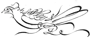 Spanish penman, 1632-1698. Author of El maestro de escrivir: la theorica y la practica para aprender y para enseñar este vtilissimo arte: con otros dos artes nuevos, uno para saber formar rasgos, otro para inventar innumerables formas de letras (1696, Venice: Presso Paolo Baglioni). Local download. [Google]
[More] ⦿
|
Louis Barbedor
|
Influential French master penman, b. 1589, d. 1670. He published several texts including Les Escritures Financieres Et Italienne Bastarde Dans Leur Naturel (ca. 1650). He is known for his round hand, or "ronde". Hans Eduard Meier's Barbedor (1987, URW) is named after him. The ronde typeface La Petite Ronde (2008, Marc H. Smith) is based upon examples by Barbedor. Portrait. Specimen from 1640. Specimen from 1659. [Google]
[More] ⦿
|
Louis Madarasz
|
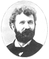 Penman, b. 1859, San Antonio, TX, from Hungarian parents. [Some say January 20, 1860] His maternal grandfather, Ladislaus Ujhazi, was Governor of Kameron and the Count of Saros. He traveled a lot and was a versatile and multi-dimensional person. He worked in Sterling, IL, Jersey City, NJ, and Poughkeepsie, NY. He spent most of his life in New York, and died in 1910 in San Francisco. Author of Lessons in Advanced Engraver's Script, published by C.W. Jones in Brockton, MA. Zaner&Bloser published The Madarasz Book - The Secret of the Skill of Madarasz in 1911, based on documents and sources given to them by Louis Madarasz's widow, Clara K. Madarasz. Scan of a calligraphic alphabet called Commercial College. Scans from the 1911 book: capitals drawn in 1909, death notice from 1910, engraved capitals, instructions, image, letter in 1902 to zaner and Bloser, lower case alphabet, Madarasz Script, Plate five alphabet, sample, signature, another signature, yet another signature, teachable capitals, portraits at ages 25, 35 and 45.
 His work influenced Burgues Script (2007, Sudtipos) and Jamaica script (2018, Alex Ivanov, Vates Design). [Google]
[More] ⦿
|
Lucas Benjamin Sharp
[Sharp Type]

|
 [MyFonts]
[More] ⦿
|
Lucas Materot
|
French penman who published Les Oeuvres de Lucas Materot Bovrgvignon Frangois, Citoyen d'Avignon. Ou lon comprendra facilement la maniere de bien et proprement escrire toute sorte de lettre Italienne selon I'vsage de ce siecle in Avignon in 1608. [Google]
[More] ⦿
|
Luciana Paiva
|
Graduate from FADU, University of Buenos Aires, who created the swashy penman's script typeface Backigham Palace (2009). [Google]
[More] ⦿
|
Luis Fernando Espinosa
|
Designer of the monoline script typeface Fespi Palmer (2020). [Google]
[More] ⦿
|
LYB Design (or: Liu Yinbin Design)
[Liu Yinbin]
|
Liu Yinbin graduated from the Xian Academy if Fine Arts in 2007. Director at Meitu Design Company since 2013. Creator of these typefaces in 2014: Calliraphy (sic) (oriental brush font), Lake Font (art deco), Rough (sans caps). In 2015, he made Gorgeous (a penmanship style calligraphic script), Dense Forest, Christmas Font (handcrafted script), Arrow, Vertical Line (sans) and Imagine (handcrafted bold typeface). Typefaces from 2016: Indisinct Shine (a thin all caps typeface with interrupted strokes), Procession (bilined sans). Creative Market link. [Google]
[More] ⦿
|
Lyman P. Spencer
|
Son of Platt Rogers Spencer, one of the most famous American penmen, 1800-1864. Lyman was born in 1840 and fought in the Civil War. In 1876, Lyman Spencer and Henry Flickinger (b. Ickesburg, PA, 1845), both among the finest penmen of their age, wrote New Spencerian Compendium of Penmanship (1879), which continued to explain the Spencerian system of penmanship that originated with Lyman's father, Platt Rogers Spencer. In Spencerian Script and Ornamental Penmanship, Volume I (1989), by Michael R. Sull, we find an extensive biography. Lyman Spencer died in 1915. Images from the 1879 book: Capital exercises, Construction of roman letters, Free italic, French round hand, Half Block or Egyptian, Italian Script, Morse, Old English, Spencerian Ladies Hand, Spencerian Medium Hand. [Google]
[More] ⦿
|
Mannerism
|
Mannerism is a period of European art that evolved from the Italian high renaissance around 1520. It lasted until about 1580 in Italy, when the baroque style began to replace it. Northern mannerism continued into the early 17th century throughout much of Europe. Mannerism is characterized by elongated proportions, very stylized poses, and a lack of clear perspective. In typography, this is the era of early penmanship in the style of Palatino, and of styles like Civilté. [Google]
[More] ⦿
|
Manoel Andrade de Figueiredo
|
 Portuguese penman of the 17th century, 1670-1722. Some say 1670--1735. Andrade de Figueiredo was born in Espirito Santo, where his father was Governor of the Capitania. His work follows the style of the great Italian masters in its use of clubbed ascenders and descenders, and of Diaz Morante, the famous Spanish writing master, in its very elaborate show of command of hand. He was known as the Morante portugues.
 Author of Writing Book (1721, in Portuguese), in which we can find exceptional flourish work. This horseman was drawn in one stroke in 1722. See also these Versalien (1722). Author of Nova Escola para aprender a ler, escrever, e contar. Offerecida a Augusta Magestade do Senhor Dom Joao V. Rey de Portugal (Lisboa Occidental: na Officina de Bernardo da Costa de Carvalho, Impressor do Serenissimo Senhor Infante, 1722). His work inspired Ventura da Silva, a Portuguese typographer who published Regras Methodicas in 1803, who redesigned some of Figueiredo's type specimens. Digital descendants include Dino dos Santos's Pluma (2005), Andrade Pro (2006, a modern) and Andrade Pro Script (2006) typefaces. Intellecta Design's Invitation Script (2013) is based on Andrade's 1722 book. Miguel Bernardino's Manoel Display (2016) is named after Andrade. [Google]
[More] ⦿
|
Manushi Parikh

|
 Indian type designer associated with the Indian Type Foundry. Manushi's typefaces:
 - Torrent (2015). An angular wedge serif text typeface with large x-height.
- Director (2015). A modular Latin techno typeface family.
- Begum (2015; a text typeface related to Caslon, Fleischmann or Times). It supports Latin, Devanagari and Tamil. In 2020, he added Begum Sans, a tapered lapidary high-contrast sans inspired by Florentine inscriptional lettering during the Renaissance; developed together with Heidi Rand Sørensen.
- Teko (2014: Google Fonts). Teko is an Open Source typeface that currently supports the Devanagari and Latin scripts. This font family has been created for use in headlines and other display-sized text on screen. Five font styles make up the initial release. Codesigned with Jonny Pinhorn.
- Hind (2014: Google Fonts). Hind is an Open Source typeface supporting the Devanagari and Latin scripts. Developed explicitly for use in User Interface design, the Hind font family includes five humanist sans styles. Each font in the Hind family has 1146 glyphs, which include hundreds of unique Devanagari conjuncts. These ensure full support for the major languages written with the Devanagari script. Codesigned with Satya Rajpurohit.
- Sarpanch (2014, Indian Type Foundry is an Open Source squarish typeface supporting the Devanagari and Latin scripts. The Medium to Black weights of the Sarpanch family were design by Manushi Parikh at ITF in 2014. Jyotish Sonowal designed the Regular weight. Download at Google Web Fonts.
- Mute (2015, Indian Type Foundry). A humanist sans family in the spirit of Jim Lyles's Prima Sans.
- Hind Guntur (2015) is a free Google Font designed by Manushi Parikh and Hitesh Malaviya at Indian Type Foundry for use in Telugu. Github link.
- At Type@Paris 2016, Manushi Parikh designed the contemporary slab serif typeface Format.
- Manushi Parikh and Barbara Bigosinska released the octagonal athletics font Fielder at Indian Type Foundry in 2019. Somehow this octagonal typeface seems to have been evolved into the 5-style free typeface Nippo at Fontshare.
- Chillax (2019-2021) is a free 6-style monolinear minimalist geometric Bauhaus sans family that comes with a variable font on the side.
- Diodrum Rounded (2020, by Manushi Parikh, Jérémie Hornus, Clara Jullien and Alisa Nowak). A spurless organic sans family.
- Syphon (2020: a neo-grotesk).
- Pencerio (2021). A hairline monolinear Spencerian script.
[Google]
[MyFonts]
[More] ⦿
|
Maria Strick
|
Dutch penman who published Tooneel der loflijcke Schrijfpen Ten dienste van de Constbeminnende Jeucht int licht gebracht Door Maria Strick Fransoysche School-houdende binnen . . . Hans Strick (1607). [Google]
[More] ⦿
|
Martin Billingsley
|
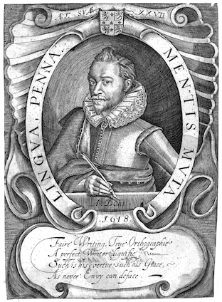 Martin Billingsley (1591-1622) was an English writing master based in London. Author of The Pens Excellencie, or the Secretarys Delight (1618).
 The number of hands set out by Billingsley in examples was six, with some additional subdivisions. The six were the Secretary ["the usuall hand of England"]; the Bastard Secretary, or Text; the Roman [the hand "usually taught to women"]; the Italian; the Court [used in the courts of King's Bench and Common Pleas]; and the Chancery. [Google]
[More] ⦿
|
Martin Kotulla
[SoftMaker Software GmBH (or: freefont.de)]

|
 [MyFonts]
[More] ⦿
|
Mary L. Champion
|
Des Moines, IA-based author of Champion Method of Practical Business Writing. Alphabet. The Champion Method. Picture. [Google]
[More] ⦿
|
Matevz Medja
[Gigofonts--Gigodesign]

|
 [MyFonts]
[More] ⦿
|
Matevz Medja
[Archive Type]

|
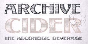 [MyFonts]
[More] ⦿
|
Mathieu Lommen
[University of Amsterdam: Special Collections]
|
[More] ⦿
|
Max.co Studio
[Teuku Rinaldi Novianda]

|
Aceh, Indonesia-based designer of the baseball signage script font Shailent Script (2018), Rhapson Script (2019: retro signage), the retro signage script typeface England Script (2019), the brush script Sparrowhawk Script (2019) and the calligraphic typefaces Brainly Script (2019), Maldini Script (2019) and Athan Script (2019). Typefaces from 2020: The Moritza (formal calligraphy, with elaborate swashes and elements of copperplate; accompanied by penmanship style ornaments). [Google]
[MyFonts]
[More] ⦿
|
Maximiliano Sproviero
[Sproviero Type (was: Lián Types)]

|
 [MyFonts]
[More] ⦿
|
May 30 2016
[William Hugh Gordon: Lettering For Commercial Purposes (1918)]
|
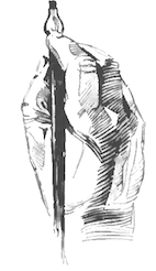 [More] ⦿
|
McDonald Business Academy
|
Company in Milwaukee, WI, that published Penman's Leisure Hour (1894). [Google]
[More] ⦿
|
Mel Drake
[Musimon Fonts]
|
[More] ⦿
|
Meyer M. (Dave) Davison

|
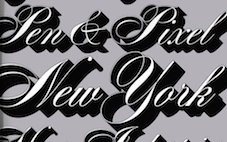 American letter designer in the phototype era. He contributed to the Photo-Lettering library with many Spencerian designs. His typefaces include
 - Western typefaces: DavisonBaroque (this Western / Tuscan typeface was revived by House Industries in 2012), Davison Variety A through J (pre 1954), Davison Carousel A though H (pre 1954).
- The spurred Egyptian wood type simulation font ATDavison Americana (1965, Monotype). The digital Photolettering revived it as PL Davison Americana.
- The fat brush typeface Davison Zip (1965) or Davison Swash Zip, which was digitally revived as PL Davison Zip.
- Dimensional, a 3d beveled typeface done in the 1970s. We had to wait until 2010 for a proper digital version, when Nick Curtis published Double D NF in Fill and Outline versions. Caps only.
- A Spencerian scripts done in or before 1946: Davison Condensed Spencerian, No. 1 Davison Spencerian, No. 2 Davison Spencerian No. 3 Davison Spencerian. The alphabet made its first appearance in Photo-Lettering's 1946 catalog and remains a benchmark of the ornamental script genre. Digitally revived as Davison Spencerian by House Industries type designers Mitja Miklavcic, Ben Barber and Ken Kiel.
- Other formal scripts done in or before 1954: Davison Victorian Script, Davison Victorian Backhand, Davison Vanity, Davison Vanity Fair.
Other Photo-Lettering typefaces, all done before 1954: Davison Airfield Medium, Davison Ebony, Davison Steno Antique, Davison Antique Gothic, Davison Harlequin (+Black), Davison Julien Condensed. Author of the article Notes on Designing for Photo-Lettering (Print Magazine, Volume IX, Number 1, June-July 1954). A second MyFonts link. [Google]
[MyFonts]
[More] ⦿
|
Mia Cinelli
|
 Mia Cinelli is a designer, who obtained a BFA from Northern Michigan University (2011) and finished her graduate studies at the University of Michigan in Ann Arbor. Currently, she is a Professor of Digital Media and Design in University of Kentucky's School of Art and Visual Studies in Lexington, KY. Her typefaces:
 - The connected script typeface Fayette (2012).
- The free penmanship font Mackinac 1895 (2020), which she drafted during Michigan's 2019 Mackinac State Historic Parks Artist-In-Residence Program. Mackinac 1895 is a script typeface inspired by handwriting discovered in a ledger from 1895, the year the Mackinac Island State Park Commission was founded.
[Google]
[More] ⦿
|
Michael Baurenfeind
|
German penman who published Vollkommene Wieder-Herstellung der Schreib-Kunst in Nürnberg in 1716. Pia Frauss made a blackletter typeface called Love's Labour in 2007 based on his work. [Google]
[More] ⦿
|
Michael Ferrari
|
Surabaya, Indonesia-based designer (b. 1998), who, during his studies at Petra Christian University, designed the Spencerian script typeface Mike Ferrari 16017 (2017). [Google]
[More] ⦿
|
Michael Gene Adkins
[The Fontry]

|
 [MyFonts]
[More] ⦿
|
Michael Parson
[Typogama]

|
 [MyFonts]
[More] ⦿
|
Michael R. Sull
|
 Author of Spencerian Script and Ornamental Penmanship, Volume I (1989). He lived in Prairie Village, KS. That book has nice chapters on Austin Norman Palmer, Platt Rogers Spencer, Styles of penmanship, Penmans Hall of Fame, and Penmanship in a New Land. [Google]
[More] ⦿
|
Michael R. Sull: Penmanship Hall of Fame
|
Michael R. Sull's Penmanship Hall of Fame from his 1989 book Spencerian Script and Ornamental Penmanship discusses 26 master penmen from the golden era of American penmanship (between the Civil War and World War II). [Google]
[More] ⦿
|
Mira Kartika Sari
[Papermode Co]

|
 [MyFonts]
[More] ⦿
|
Misprinted Type
[Eduardo Recife]

|
 Misprinted Type (est. 1998) offers free and commercial old typewriter and grunge fonts designed by Eduardo Recife, an illustrator and graphic designer from Belo Horizonte, Brazil, b. 1980. Although his main work is in illustration, he became well-known in the early 2000's for his original grunge type designs. Typefaces:
 - Max Rhodes (based on the handwriting of Max Rhodes), Nasty, Shortcut, Carimbo (2003), Mosh (2004), Trashold (2004), Great Circus> (2004, a five-weight calligraphic decorative family), Pastelaria, Downcome (2002), DIESEL, DirtyEgo (2001), Mialgia, OverBored, PrintError, RecifeDings, ThirdWorldBuzz, Besign, HorsePuke, Lhabia, MemoryLapses, misprintedtype, NoMoreTypewriters, PrintFuck151, Selfish (2001), Misproject, Porcelain, Rochester (old typewriter), NailScratch, Astonished, Broken15, DisgustingBehavior, Guilty (2011, grunge).
- NeasdenPIP was designed with Steve Smith (2001).
- At Visuelle Orgasmus, we find Superphunky, Superload and Superaircraft, all made in 2001.
- Here, we find DirtyEgo, Downcome, Porcelain, Selfish, Shortcut.
- Myfonts sells Rapid Writing (a penmanship font), Magic 1985 (2017, grunge), King Bloser (2014, a calligraphic penmanship font named after E.W. Bloser), Bloser Serif (2014), King Bloser X (2014, ornaments), Mercy (2013, a set of connected Spencerian penmanship style fonts, with ornaments and flourishes if needed), Revanche (2013, a grunge stencil font), Grandpas Typewriter (2013, old typewriter font family), Monster Days (2007, grunge calligraphy), Kyoto (grunge), AntiRomantic (2006), Toscography (2007, slightly Kafkaesque), LeKing (2007: Eduardo calls it the Frankenstein of vintage ornamental typefaces of the past centuries), HandMade (2007, hand-drawn ornamental caps), Nars (2003, grungy script).
Earlier versions of this site could be found at TypOasis (dead link) and Dafont. Many of his fonts are also here and here. Klingspor link. Creative Market link. Fontspace link. Dafont link. [Google]
[MyFonts]
[More] ⦿
|
Mitja Miklavčič

|
 Slovenian designer who lives in Postojna. His typefaces:
 - He created Gf H2O Sans in 2005 font at Gigofonts. This is a humanist sans done with Matevz Medja.
- Tisa is a slab-serif inspired text family that won an award at TDC2 2007. It has useful features such as ink traps and uiformized math symbol and number widths across all styles in the family. In fact, the Latin/Cyrillic type family Tisa was his project at the University of Reading, where he graduated in 2006. He wrote a nice essay on the history of Clarendon (2006). In 2008, he published Tisa as FF Tisa at FontFont. Tisa won a TDC award. In 2012, he added the superfamily FF Tisa Sans (FontFont).
- Mitja worked full-time at Fontsmith and now continues to collaborate with the team on some type design projects. His Fontsmith cooperation led to these typefaces:
- FS Rufus (2009). A slab serif by Mitja Miklavcic, Jason Smith and Emanuela Conidi. Described by them as benevolent, quirky, peculiar, offbeat, jelly beans and ice cream, a retro eco warrior.
- FS Me (2009). A sans family designed for readers with a learning disability. It was co-designed by Mitja Miklavcic, Jason Smith, Emanuela Conidi, Fernando Mello and Phil Garnham. FS Me was researched and developed in conjunction with---and endorsed by---Mencap, the UK's leading charity and voice for those with learning disability. Mencap receives a donation for each font licence purchased.
- FS Albert (2002). A soft-edged sans family by Jason Smith, Mitja Miklavcic and Phil Garnham. FS Albert supports 60 languages, including Greek, Cyrillic and Latin.
- FS Rome (Mitja Miklavcic and Emanuela Conidi). An all caps Trajan typeface.
- At House Industries, Jess Collins and Mitja Miklavic revived Ed Benguiat's great fat face didone typeface (Benguiat) Montage in 2018. In 2014, House Industries, Christian Schwartz, Mitja Miklavcic and Ben Kiel co-designed Velo Serif Text and Velo Serif Display. In 2017, he revived Dave west's 1960s classic at PhotoLettering Inc, Banjo, as Plinc Banjo. Still at House Industries, Christian Schwartz, Mitja Miklavcic and Ben Kiel co-developed Yorklyn Stencil.
- In 2020, he published the experimental modular typeface Trico Script at Fleha Type.
- Davison Spencerian (at House Industries, by Mitja Miklavcic, Ben Barber and Ken Kiel). A digital revival of Dave Davison's 1946 Spenerian script Davison Spencerian.
[Google]
[MyFonts]
[More] ⦿
|
Monogram Fonts Co
[Brian J. Bonislawsky]

|
 Commercial foundry, est. 2009 by Brian J. Bonislawsky (Las Vegas, NV), known for his participation in the Astigmatic One Eye Typographic Institute, the Breaking the Norm Font Library, VersusTwin Type Foundry, and Foundry-X. Most of the fonts done after 2013 were in cooperation with Jim Lyles. Fonts made in 2009 include MFC Franklin Corners (based on Metal Corners from the 1889 "Convenient Book of Specimens" from Franklin Type Foundry in Cincinnati), MFC Manoir Monogram (2009, Victorian initials), MFC Bijou Monogram, MFC Escutcheon Monogram, MFC Pantomime Monogram, MFC Peony Monogram (2009), MFC Vice Monogram (an Art Deco letterset (capitals only) from a 1915 publication by Cartier-Bresson of Paris), MFC Viper Monogram (based on Hollywood Combination Initials, found in a 1934 ATF book), MFC Carson Monogram (from Art Monogram and Lettering by J.M. Bergling, Vol. 1, Fifth Edition, 1912), MFC Semicirculus Monogram, MFC Royaume Monogram (after lettering from the 1884 Ames' Guide to Self Instruction in Practical and Artistic Penmanship by Daniel T. Ames), MFC Bindi Monogram (after a 1915 publication by Cartier-Bresson of Paris), Carson Monogram (a letter set from the book Art Monogram and Lettering by J.M. Bergling, Vol. 1, Fifth Edition published in 1912, where it was simply labeled New Antique 53), Noir Monogram (after the "Pearl" letterset from the 1854 Becker's Ornamental Penmanship and Draughtsman's Letter Book by George J. Becker), Distinto Borders (after the Black&White and Running Borders from the 1906 Abridged Keystone Type Foundry Specimen Book), Tagliato Monogram (after a decorative letterset (capitals only) from the 1899-1900 Treatise on Embroidery, Crochet and Knitting booklet by M. Hemingway&Sons Silk Co), Mouchoir Monogram, Memoriam Initials (based on University Initials in the 1934 Book of American Types by ATF), Moissanite Monogram (based on Diamond Combination Monograms from the same book), MFC Monarchy Initials (based on Diamond Combination Monograms from the same book), Morningside Monogram and Neuport Monogram (both based on letters found in the 1934 Book of American Types by American Type Founders), Diamant Monogram, Distinto Borders (based on borders found in the 1906 Abridged Keystone Type Foundry Specimen Book), Ruse Monogram (an all caps typeface based on DeRoos Inline), MFC Tagliato Monogram (from the 1899-1900 Treatise on Embroidery, Crochet and Knitting booklet by M. Hemingway&Sons Silk Co), and Tryst Monogram. MFC Franklin Corners (2009) is a series of three border dingbat fonts.
 MFC Hills Medieval (2010) was developed from an overly ornamental blackletter type specimen found in the 1882 Hills Manual of Social and Business Forms. The interesting Victorian outline family Sappho Monogram (2010) was inspired by an alphabet set from the book, Monograms and Alphabets for Combination by Dollfus Mieg&Cie, first published in the 1890s. Typefaces from 2012: MFC Bruce Corners. Typefaces from 2013, all done with Jim Lyles: MFC Baelon Monogram (an 800-character monster font with outlined spurred letters from Dollfus Mieg's book, ca. 1890), MFC Bontebok Monogram, MFC Carnivale Monogram (known as Romantiques No. 3 and Ornate No. 2), MFC Thornwright Monogram (from the Manuel de Broderies No. 179 by N. Alexandre & Cie. from the late 1800s), MFC Zulu Monogram (an African-themed font inspired by Bibliothèque D.M.C: Alphabets et Monogrammes 2nd Series), MFC Jewelers Monogram (based on a decorative alphabet designed in 1901 by Marcus Goldsmith, an inventor of elegant accessories), MFC Verre Monogram, MFC Triangulus Monogram (based on a vintage publication called "Bibliotheque D.M.C: Alphabets et Monogrammes 2nd Series"), MFC Chaoxiang Monogram, MFC Fantasie Monogram, MFC Mastaba Monogram, MFC Voyeur Monogram (based on Broadway Monogram Initials in Book of American Types (1893, ATF)), MFC Haute Monde Monogram, based on Elite Monogram Initials in Book of American Types (1893, ATF)), MFC Budding Monogram, MFC Hardwood Monogram, MFC Almond Monogram, MFC Brass Rules Petit (based on filets from the Franklin Type Foundry), MFC Damask and MFC Damask Flourish (by Brian J. Bonislawsky and Jim Lyles, a Victorian capitals and floriated caps pair of typefaces based on Oxford No. 2 from the 1893 catalog of the Cleveland Type Foundry). Typefaces from 2014: MFC Medieval Monogram (a Lombradic caps typeface based on Book of American Types (1934, American Type Founders)), MFC Chaplet Monogram (from Dessins de Broderies---Album No. 486 (Sajou, late 1800s)), MFC Capulet Monogram (based on Monograms and Alphabets for Combination (Dollfus Mieg & Cie, 1890s)), MFC Klaver Monogram, MFC Billow Monogram (from Manuel de Broderies No. 179 by N. Alexandre & Cie. from the late 1800's), MFC Aldercott Monogram (by Brian J. Bonislawsky and Jim Lyles, after a 1901 alphabet by Marcus Goldsmith, an inventor of elegant accessories of personal nature). Typefaces from 2015: MFC Tattersaw Monogram, MFC Livermore Monogram (based on Victorian alphabets shown in Charles J. Strong's The Art of Show Card Writing, 1907), MFC Ringold Monogram (based on Strong's Book of Designs, 1917), MFC Petworth Monogram, MFC Piege Monogram, MFC Gilchrist Initials, MFC Gilchrist Monogram, MFC Arteaga Borders One, MFC Arteaga Borders Two, MFC Arteaga Borders Three, MFC Brass Rules Grand (based on Franklin Type Foundry's brass rules in Convenient Book of Specimens, 1889). Typefaces from 2016: MFC Diresworth Monogram (based on an alphabet set from the book, Monograms and Alphabets for Combination by Dollfus Mieg & Cie, first published in the 1890's), MFC Spindler Borders, MFC Imperator Monogram (based on Monograms and Alphabets for Combination by Dollfus Mieg & Cie, 1890s), MFC Mercer (an initials set from the book Monograms and Alphabets for Combination by Dollfus, Mieg & Cie, first published in the 1880s), MFC Botanical Borders (based on a collection of border treatments from the 1886 Spécimens de caractères d'imprimerie by E. Houpied a Paris), MFC Diamondside Monogram, MFC Redding Monogram (a highly ornate lettering style from Letters and Lettering by Carlyle & Oring), MFC Rodizio (a layered chromatic typeface family inspired by wood types by William H. Page), MFC Falconer Monogram, MFC Glencullen Monogram, MFC Bruce's Corners Two (based on Metal Corners found in Specimens of Printed Types (1882, Bruce Type Foundry)), MFC Westport Monogram, MFC Arkena Monogram (art nouveau font based on Strong's Book of Designs (1917)). Typefaces from 2017: MFC Enschede Borders (based on floral borders in the 1904 Ornamenten Hoofdlijsten en Sluitstukken book by Joh. Enschedé & Zonen, Haarlem), MFC Keating Monogram (based on Monograms and Alphabets for Combination (1890s, Dollfus, Mieg & Cie)). Typefaces from 2018: MFC Stencil Borders Six, MFC Elmstead Monogram and MFC Endeavor Monogram (both based on Dollfus, Mieg & Cie, 1890s), MFC Blossom Monogram (a chromatic layering font), MFC Buttergin Monogram (based on Tuscan typeface shown in Letters and Lettering by Carlyle & Oring), MFC Stencil Borders Five, MFC Stencil Borders Four, MFC Stencil Borders Three, MFC Stencil Borders Two, MFC Stencil Borders One (all by Brian Bonislawsky), MFC Diamondstack Monogram, MFC Sansome Monogram (an art nouveau typeface based on John F. Irwin's Rustic Roman from 1906). Typefaces from 2019: MFC Joliet Monogram (2019: based on a vintage McCalls Kaumagraph Transfer), MFC French Roman (an all caps typeface based on French Roman Light in an 1899 lettering publication by International Correspondence Schools), MFC Diamerrick Monogram (diamond-shaped monograms), MFC Ambeau Monogram (2019, based on the decorative art nouveau alphabet called American Beauty in J.M. Bergling's Art Alphabets and Lettering, 1914), MFC Diamas Monogram (diamond-shaped monograms), MFC Nadall Medieval (an uncial/blackletter font based on Bernd Nadall's Faust from 1898). Typefaces from 2020: MFC Patisserie Monogram (from Letters and Lettering by Carlyle & Oring), MFC Decatur Monogram (after an alphabet seen in J.M. Bergling's book Monograms and Engraving Alphabets). Typefaces from 2021: MFC Deco Diamond Monogram. View the typefaces made by Brian Bonislawsky. Typefaces from 2022: MFC Heathcliff Monogram (2022: rhombic monograms). Creative Market link. [Google]
[MyFonts]
[More] ⦿
|
Muntab Art
[Satriyo Hutomo]
|
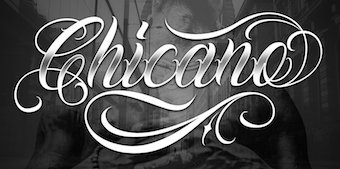 Malang, Indonesia-based designer of the serif typeface Lorena (2019: for fashion mags featuring skinny models), Orlando Sign (2019), Banana Caroline (2019: font duo), Salvages Bold (2019), Davinci (2019), the loud typeface Dogtown (2019), the blackletter typeface Tribal (2019), the black metal blackletter font Southside (2019), the brush script fonts Selfakia (2019) and Destroit (2019), the multi-font Good Vibes (2019), the monoline scripts Freeflow (2019) and Lemonade (2019), the curly tattoo script typeface Chicano (2019), the tattoo font Brigade (2019), the sans font Walker (2019), the spurred tattoo script Dayles Script (2019) and the script font Hanselle (2019).
 Typefaces from 2020: Esteban (Tuscan), Aquatone, Oakle, Familia (a tattoo font), Gangsta (a blackletter typeface with decorative spurs), Martyr, Santiago (decorative), Mayhem, Westcoast (spurred), Mexicanos (a tattoo or cigar box font), Florida (a wavy font), Aveden (an all caps avant garde typeface), Skyload, Black Sails (brush), Hardcore (dry brush), Mood, Caithlyn (a great inky calligraphic script), Lestly (a curly text typeface). Typefaces listed by early 2021: Aeromono (a futuristic semi-stencil), Akasara (a decorative serif), Amerald, Anomaly, Aquatone, Armora, Aveden, Balmonte, Baltre, Banana Carolline, Becko (futuristic, sci-fi), Befaro, Berlin (a sci-fi stencil typeface), Black Sails, Brigade, Caithlyn, Carl Brown (a decorative serif), Chicano Font, Chicano Vol. 02, Davinci, Dogtown, Dayles Script, Defrozo, Destroit, Eastside, Esteban, Evalter, Exposure, Familia Tattoo Lettering Font, Farware, Fenomeno (futuristic), Florida, Freeflow Monoline Script, Good Vibes, Gangsta Typeface, Glenca, Hardcore, Havox, Herlik, Herofin, Lemonade Signature Font, Leoni, Lestly Fonts, Lorena, Magna (a decorative serif), Maldito Font, Mandora, Martyr, Maverick, Mayhem, Metrolic, Mexicanos, Mijuo, Minerva, Monica, Monreal, Mood Font, Nordik (a sci-fi stencil typeface), Nova, Oakle, Orlando Sign, Phoenix, Quadron, Quincy, Rebelion, Reforma, Reviews, Roman, SALVAGES BOLD, SOUTHSIDE, Santiago, Selfakia, Skyload, Tribal Font, Valkrye, Velta, Westcoast, Wilyam, Zemora. Typefaces added in 2021: Anabele (decorative serif), Arizona (a stylish all caps typeface), Avander (a stylish serif), Babylon (an all caps blackletter), Badgiek (decorative serif), Bandito Script (for tattoos), Bestie, Boston (retro baseball script), Bravado (decorative serif), Brescia (decorative caps), Brown Sugar (an all caps decorative serif), Calya (decorative serif), Carl Brown (a decorative serif), Carola (an art deco mini-serif), Caterina (an all caps display typeface), Cigero (a decorative all caps serif), Dectro (decorative caps), Dream Avenue (a decorative serif), Elmo (a decorative serif), Elva, Felicio (an art gallery serif), Gamero (a monolinear paperclip font), Ghania, Hexagon, Katrine (a decorative condensed serif), Le Monte (a high contrast jewelry store typeface), Lemonia (a reverse stress serif), Love Story Self Made, Lower Coast, Macron (a spurred Victorian tattoo font; why it is named after the French president beats me), Margate (a sword-serifed display typeface), Matrix (a bullet hole font), Molten (a display caps typeface), Monstar (an all caps typeface for fashion mags), Musa, Pleasure (blackletter), Qaigero (a display serif), Qureka (a glamour font), Ragesta (decorative with wavy junctions), Reno (cyberpunk), Rhapsody (a swashy penmanship script), Rioky (a lovely wedge serif display typeface with a vaguely tribal vibe), Romance (display caps), Rosalia (a fashion mag typeface), Stachy, (elephant-footed caps) Tropico Salte (art nouveau genre caps). [Google]
[More] ⦿
|
Musimon Fonts
[Mel Drake]
|
Mel Drake (Musimon Fonts) is the designer of Groceries (2010, hairline hand-printed face) and Hopes are free (2010, calligraphic penmanship face). [Google]
[More] ⦿
|
MyFonts: Bickham
|
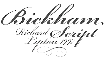 View a small collection of digital versions of Bickham Script and typefaces related to Bickham's penmanship. [Google]
[More] ⦿
|
MyFonts: English Roundhand
|
A list of English round hand typefaces. [Google]
[More] ⦿
|
MyFonts: Penmanship fonts
|
A collection of fonts in the penmanship style, harvested by a user on MyFonts. [Google]
[More] ⦿
|
MyFonts: Roundhand typefaces
|
A selection of commercial roundhand typefaces. [Google]
[More] ⦿
|
MyFonts: Spencerian typefaces
|
Spencerian penmanship typefaces, as culled from the MyFonts library. See also here. [Google]
[More] ⦿
|
MyFonts: Typefaces like Bickham Script
|
 A list of penmanship typefaces in the style of Bickham. [Google]
[More] ⦿
|
MyFonts: Zanerian typefaces
|
Zanerian script typefaces, as selected from the MyFonts library. [Google]
[More] ⦿
|
My-Lan Thuong
|
 Thuong attended ESAD Amiens for Graphic Design and later pursued a career in type design. In 2018, she received an MFA in Type Design from the Ecole Estienne in Paris. She collaborated with type foundries Coppers and Brasses and Type Network prior to joining New York City-based Sharp Type as a type designer in 2019. Her typefaces:
 - Maple Leafs (2017). Co-designed with Etienne Aubert-Bonn at Coppers and Brasses in Montreal, Maple Leafs is a fast and aggressive typeface commissioned for the Toronto Maple Leafs as a display face to use along with their existing typefaces.
- Mammouth (2017). Done together with Etienne Aubert-Bonn at Coppers and Brasses, Mammouth is a commissioned typeface family for a gala on Tele Quebec where teenagers can vote for the people, events, and causes that influenced them the most during the year. Mammouth contains a heavy and an ultra-fat style.
- In 2018, she released the shaky outline typeface Royal at E162.
- She assisted Justin Sloana at Sharp Type with Simula (2019).
- In 2020, Etienne Aubert Bonn and My-Lan Thuong co-designed Baryton at Coppers and Brasses, a revival of Frank Bartuska's playful photo era didone typeface Century Bartuska.
- Carta Nueva (2020). A copperplate penmanship font released at Sharp Type.
- In 2021, Lucas Sharp and My-Lan Thuong, assisted by Wei Huang and Marc Rouault, designed Salter. Salter Roman is based on calligraphic book jackets by Georg(e) Salter from 1941, and Salter Italic is inspired by two of Oscar Ogg's book jacket alphabets from 1942.
[Google]
[More] ⦿
|
Naldi Studio (or: Naldy Studio)
[Riki Rinaldi]
|
 Banda Aceh, Indonesia-based designer of these connected calligraphic typefaces in 2017: Ganitalia (condensed, formal calligraphy), Beruntung (upright script), Dandanga (upright), Pemberani (penmanship style), Saphira, Barokah, Angelisa, Lynelli, Badger, Charlie, Gabriella, Demanding, Knowledge, Melanie, Morinda. Creative Market link. Graphicriver link. [Google]
[More] ⦿
|
Nathaniel C. Knapp & Levi Rightmeyer
|
Publishers of Rapid Writing: Rightmeyer's Penman's Paradise (1852, New York). [Google]
[More] ⦿
|
NF Fonts (or: Nicole Fally Fonts)
[Nicole Fally]

|
 Nicole Fally started NF Fonts in 2012. She is an Austrian-born graduate of the type design program at the University of Reading in 2010.
 She created the typeface Miss Informed there. It has Latin styles (regular, italic, connected script), as well as Hebrew styles (regular and script). The Latin has one-sided serifs to fit in with the Hebrew. The italic and script styles are soft, smooth and balanced. In 2011, she published Hammersmith One with Sorkin Type / Google Font Directory: Hammersmith One is a very low contrast typeface inspired by the Johnston UK lettering tradition. Hammersmith One shows the quirks of a somewhat naive, handmade, brush written letters including a wider than normal "e" and "s" as well as dark joins between stroke which are normally compensated for in type. The sources for this design have been adapted not just for type but specifically for use as a web type. This font works well to even smaller sizes than was originally expected. Nicole Fally's elegant art deco typeface Limelight (2011, Sorkin Type) can also be found on the Google Font Directory, as well as Ovo (2011). Vast Shadow (2011) is a Victorian slab serif advertising type. Pinyon Script (2011, Sorkin Type) is a (free) romantic round hand script style font. BUT (2012) was first drawn as a logotype for the magazine BUT Bilder und Texte, which was published by an experimentally-oriented non-commercial initiative. This fat poster / headline typeface became the first commercial typeface at NF Fonts. Oldenburg (2012, Google web fonts) is a slabby bouncy poster face. Stoke (2012, Google Web Fonts) is a semi-wide high contrast serifed text typeface. Rye (2012, Google Web Fonts) is a medium contrast design inspired by posters using wood type, and is in the Western style. Google Plus link. Klingspor link. Fontspace link. [Google]
[MyFonts]
[More] ⦿
|
Nick Curtis
[Nick Curtis: Calligraphic typefaces]

|
[MyFonts]
[More] ⦿
|
Nick Curtis: Calligraphic typefaces
[Nick Curtis]

|
 Nick Curtis's foray into calligraphic typefaces, and penmanship.
 - His Nibs NF (2007) was inspired by an American roundhand presented by John M. Bergling in his Art Alphabets and Lettering, first published in 1914.
- Shishka Bob NF (2005). Based on the calligraphy of Paul Carlyle and Guy Oring.
[Google]
[MyFonts]
[More] ⦿
|
Nicole Fally
[NF Fonts (or: Nicole Fally Fonts)]

|
 [MyFonts]
[More] ⦿
|
Novi Ananda
[Novi Souldado]

|
 [MyFonts]
[More] ⦿
|
Novi Souldado
[Novi Ananda]

|
 Yogyakarta, Indonesia-based designer (b. 1989) of the copperplate calligraphic typeface NS Champtone (2019), the spurred Victorian Americana typeface NS Emhericans Vintage (2019).
 Typefaces from 2020: NS Bullsmith (a Victorian typeface), NS Mudolf (a script/sans/serif vintage type package). Typefaces from 2021: NS Gibswing (a spurred Victorian extravaganza, with a dingbat font that contains Victorian panels and flowers), NS Blackbooks Victorian, NS Lasttown (a penmanship script, and vintage capital and serif styles). Typefaces from 2022: NS Deckpress (a layerable Victorian label font). [Google]
[MyFonts]
[More] ⦿
|
nq2u
|
A 1.3MB file with D'Nealian fonts (for orthography) by EFI. [Google]
[More] ⦿
|
Nyapa Tanzil
[Damelev Studio (was: Logo Labs, Tanziladd, Rawi Project)]

|
 [MyFonts]
[More] ⦿
|
Oberlin Business College
|
This college in Oberlin, Ohio, was well-known in the 19th century for its penmanship studies. C.A. Barnett, J.T. Henderson and J.N. Yocom published the Oberlin Business College Compendium of Penmanship (1901). [Google]
[More] ⦿
|
Olcar Alcaide
[Eurotypo]

|
 [MyFonts]
[More] ⦿
|
Oliver Weiss
[Walden Font]

|
 [MyFonts]
[More] ⦿
|
Omnibus Type
[Héctor Gatti]
|
 Hector Gatti, aka Pocho Gatt, is an Argentinian who runs Gatti Studio and Omnibus Type, and who co-designed the sans typeface Patagonia (1994) with Pablo Cosgaya. Omnibus (est. 2011) is a coop that focuses on web typography and high quality web fonts. All typefaces can be found at the Google Font Directory. All designers are from Argentina and Mexico. Their typeface library:
 Another URL. Google Plus link. Fontspace link. Fontsquirrel link. Behance link. Klingspor link. Open Font Library link. Catalog of typefaces. [Google]
[More] ⦿
|
P. Meyrat
|
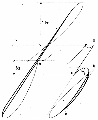 French author of Recueil Méthodique de Principes d' Ecriture (ca. 1920, Limoges). Samples: Fine Cursive, Fine Cursive Droite, Majuscules, Teaching tracing. [Google]
[More] ⦿
|
Page Studio Graphics (or: Pixymbols)
[Roger Vershen]

|
 Page Studio Graphics is Roger Vershen's Oro Valley, AZ-based company specializing in symbols and symbol fonts, founded by him in 1986. Roger Vershen died in Tucson, AZ, in 2003.
 The fonts (grouped under the name PIXymbols) include ADA symbols v.2.0, Africa, Alphabox, Alphacircle, Ameslan (ASL), Antorff (blackletter), Antorff Fractions, Apothecary, Arrows, Astrology, Backstitch, Boxkey, BoxNLines, Braille grade 2, Casual, Chalk Casual, PIXymbols Chess, Command Key, Courex (typewriter family), Crossword, PIXymbols Deco Glass (2001), Digit&Clocks (+LED symbols), Dingbats&Online, DOSScreen, Fabric Care, FARmarks (Federal Aviation Regulations lettering), Flagman (semaphore), Fractions, Gridmaker, Highway Gothic (U.S. Department of Transportation's Standard Alphabets for Highway Signs), PIXymbols Highway Gothic 2002, Highway Signs (U.S. Department of Transportation), Hospital&Safety, LCD, Linea (2002, prismatic), Luna, Malkoff (calligraphic font), Marina, Meeting, Mejicana (2001, a Mexican party font), Menufonts, Morse, Musica (instruments), Newsdots, Orchestra, Passkey, Patchwork, PCx, Phone, PIXymbolsMusica, Prescott (2001, Western), Penman (2001, connected script), PrimerD (letters with lines), Recycle, Roadsigns, Shadowkey, Signet (family), Signet Shadow, Squared, Strings, Stylekey, Tolerances&Datum, Travel&Hotel, TV List, Unikey, US Map, Vershen (2001), Xcharting, Xstitch. They also sell EPS files of all Arms of Swiss cantons, and many nice initial caps. Look also for Faux Hebrew (simulated Hebrew), as part of the Faux package that also includes Faux Sanskrit, Faux Runic, Faux Hebrew, Faux Japanese, Faux Arabic, Faux Chinese and Faux Chinese Sans. Alternate URL. Previews at MyFonts. Klingspor link. View the Page Studio Graphics typeface library. [Google]
[MyFonts]
[More] ⦿
|
Panji Nugraha
[Storic Type (or: Flavor Type, or: Flavortype)]

|
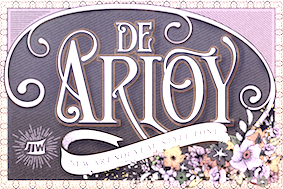 [MyFonts]
[More] ⦿
|
Papermode Co
[Mira Kartika Sari]

|
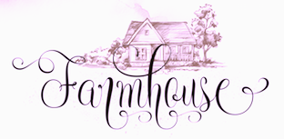 Indonesian designer of Emely (2019: a classy calligraphic font), Drama Quality (2019: a monoline script), Firestone (2019: a vintage serif), and Tritonal (2019: a curly calligraphic typeface).
 Typefaces from 2020: Permacultur (a spectcular wild calligraphic script), Seila (a wild penmanship script), Matic and Colge (a monoline script with a serious slope), Andit (stylish wild calligraphy), Bon Apit (a monoline script). Typefaces from 2021: Kafutey (an excellent inky script; at Siwox Studios). Typefaces from 2022: La Fiola (a great wild and inky script). [Google]
[MyFonts]
[More] ⦿
|
Paul D. Hunt
[Pilcrow Type]

|
 [MyFonts]
[More] ⦿
|
Paulo W
[Intellecta Design (or: Monocracy Types)]

|
 [MyFonts]
[More] ⦿
|
Paulus Franck
|
Designer of a set of curly baroque initials in Nürnberg in 1601, published in Schatzkammer. Allerhand Versalien. The original book was scanned in at the BSB (Bayerische Staats Bibliothek and can be downloaded. Joseph Kiermeier-Debre and Fritz Franz Vogel published a facsimile that can be seen at Google Books and at Amazon (Ravensburger Buchverlag, 1998). A penmanship book due to Paulus (or Paul) Franck from 1655 under the title Kunstrichtige Schreibart: allerhand Versalien oder AnfangsBuchstaben der teütschen, lateinischen und italianischen Schrifften aus unterschiedlichen Meistern der edlen Schreibkunst zusammen getragen was published in 1655 in Nürnberg by Paul Fürst (ca. 1605-1666) and printed by Christoph Gerhard (1624-1681). This text, of which some pictures can be viewed here, consists largely of hyper-ornamental blackletter initials. Franck's über-ornamental decorative caps were revived digitally in several typefaces: - PaulusFranckInitialen (2002) was created by Dieter Steffmann based on those initials, but they are apparently incomplete.
- Paulo W (Intellecta Design) created the font Paulus Franck 1602 (2006).
Open Library link. [Google]
[More] ⦿
|
Pavel Korzhenko
[Vintage Voyage Design]

|
 [MyFonts]
[More] ⦿
|
Pawel Burgiel

|
 Kielce, Poland-based type designer who was born in 1971 in Kielce. Since 2010 he has been working as a freelance graphic and type designer. He created these typefaces:
 - Peppo (2012). A feisty informal script family.
- Arsinoe (2012). A condensed geometric typeface noted for its unorthodox long ascenders and low x-height.
- Althea (2015). Free.
- Ethlinn. A Gaelic uncial typeface.
- Carbonium (2015) and Carbonium OSF (2015). Cursive text typefaces.
- Longa Iberica (2015). A tall-ascendered mediaeval typeface.
- Uranos (2016). A geometric display typeface.
- Fusione (2016). A scribbly multiline typeface.
- Rufus Script (2016). A connected penmanship font inspired by Palmer method of business writing.
- Hamerslag (2017). A very condensed serif typeface.
- PB Roman Uncial IIc (2018).
- PB Capitalis Rustica IVc (2018). A fourth century roman calligraphic script.
- PB Carolingian Xc (2018). A Carolingian miniscule typeface that imitates manuscripts from the 10th century.
- PB Beneventan XIc (2018). In the style of the Beneventan minuscule (also called Lombardic, Casinense, Langobarda, Littera Longobarda and Longobardisca) from southern Italy found in 11th century manuscripts.
- PB Roman Uncial Vc (2018). Based on Roman uncial writing style found in manuscripts from the 4th and 5th centuries.
- Red Amaretto (2018). A nibbed pen font.
[Google]
[MyFonts]
[More] ⦿
|
Peach Creme
[Gulya Yeap]

|
 Gulya Ju or Gulya Yeap is a Kuala Lumpur, Malaysia-based designer who specializes in calligraphic, penmanship and wedding script typefaces. Her fonts in 2017: The Styled Edit, Maison de Fleur, Adora Boutron, Wild Moon, Oh Darling, Eternal Paris Script.
 In 2018, she designed Balzak, Faustine, Antoinetta (a wonderful wild calligraphic script), Breathe Poetry (boudoir calligraphy), Bonjour (a modern calligraphic typeface), Agonia Lyubvi (a calligraphic script for Latin and Cyrillic), Darling Modern, Floral Theory, Roseberry&Beatrice, Santorini (a luxury signature font), Blush Society, Sophia Ronald, Beloved Gray (a delicate swashy calligraphic script) and Floral Hearts. Typefaces from 2019: Modernista (script), Sugar Bade, Elegantessa, Haute Atelier, Hermitage (calligraphic script), Lolita (script), Blackstone (an inky script), Manuscript 1284 (fine art calligraphy), La Bohemia, Saint Gerald, Bellmont, Dostoevsky (calligraphy), Feminist, Bloom Pretty. Typefaces from 2020: Chic Societe, Abramo (Serif, Script), Houstonfield, Baltazak (an inky and wonderfully messy script typeface; this is just Balzak), Leyla Mark, Julie Edgar (a signature script), Printed Moments, Adorn Story (a delicate decorative serif and script pair). Typefaces from 2021: Palm Honey (an inky script), Romes (a stylish mini-wedge serif), Floristica (script), Chelsie Hilton (a signature script), Honey Vineyard (script), Chocolate Peaches (a scrapbook script), Luxe Atelier (a signature script), Printed Moments (script), Raks (a curvy display typeface), Petite Kisses (script), Palm&Honey (script), August Roma (a font duo). Typefaces from 2022: The Stylish Babes (a thin script), Autumn Melody (a wild script), Blackberry Macarons (a script family for Viennese coffee shops or quaint Cape Cod stores), Small Business Club (a fat finger script), Vintage Heirloom (a stylish wild penmanship script), Southern Margarita (a great wild calligraphic script), Maribon Script (a font dup consisting of a script and a fashionable all caps sans). [Google]
[MyFonts]
[More] ⦿
|
Pedro de Flórez
|
Spanish Jesuit father and penman, who lived around 1600. He published Método del Arte de Escribir (1614, Madrid, Luys Sánchez), a book in which he teaches how to write and draw Bastarda. [Google]
[More] ⦿
|
Pedro de Madariaga
|
Author in Valencia of Libro Subtilissimo intitulado Honra de escribanos (1565), a writing manual. [Google]
[More] ⦿
|
Pedro Díaz Morante
|
Spanish penman, calligrapher and engraver, 1565-1636. He lived in Toledo from 1591 on and moved to Madrid in 1612. He published Arte nueva de escribir in which he explains his system for teaching cursive writing, published in five volumes between 1615 and 1631. He was respected as a great penman, who, incidentally, was ambidexterous. Scans: a calligraphic drawing of Felipe IV in 1624, a Spanish Bastarda (1624), a chancery hand (1630). For digital typefaces based on Morante's work, check out Ramiro Espinoza's Dulcinea (2012). Picture. [Google]
[More] ⦿
|
Pedro Leal

|
 Pedro Leal graduated in graphic design and advertising from the ESEIG-Escola Superior de Estudos Industriais e de Engenharia in Vila do Conde, Portugal, and lives in Porto. In 2010 he obtained a degree in type design at ESAD (Escola Superior de Artes e Design, Matosinhos) and started working at DSType. MyFonts link. Behance link.
 He used FontStruct in 2008 to create the pixel typeface Minimal 8pt (514 glyphs!). In 2010, he created the text family Mafra at DSType. This was followed a bit later by Mafra Display (2010; +Medium, +Black). Apud and Apud Display (2010, DSType) are high-contrast typefaces. Penna (2011) is a calligraphic type system. Braga (2011, Dino dos Santos and Pedro Leal, DS Type) is a layered font design family. Dino writes: Braga is an exuberant baroque typeface, named after a Portuguese city, also known as the baroque capital of Portugal. Our latest typographic extravaganza comes with a multitude of fonts designed to work like layers, allowing to insert color, lines, gradients, patterns, baroque, floral swashes, and many other graphic elements. Starting with Braga Base, you can add any of the twenty-three available styles, to create colourful typographic designs. In 2012, he designed User, User Stencil and User Upright>/a>, a monospaced type family with 30 styles, from Hairline to Bold. This too will many awards. Girga (+Italic, +Engraved, +Banner, +Stencil) is a strong black Egyptian family designed together with Dino dos Santos at DS Type. Solido (2012, with Dino dos Santos, DS Type) is a versatile type system with five widths: Solido, Solido Constricted, Solido Condensed, Solido Compressed and Solido Compact. In total there are 35 fonts. In 2020, a variable font was added to Solido. In 2012, he created the sans family Global, with its own dedicated web site, The Global Font. In 2013, he followed that up with the Global Stencil typeface family. In 2013, Dino dos Santos and Pedro Leal published Diversa, a set of nine very different fonts that are jointly kerned so that letters can be swapped out and replaced at will. Diversa Std (2014) extends this to include Stencil, Inline and other decorative styles. Pedro Leal's main typeface of 2013 is Aparo, a script that is calligraphic, yet keeps the characteristics of penmanship scripts, and the pizzazz of a good fashion font. In 2014, he published Ocre and Ocre Poster in sans and slab serif substyles inspired by W.A. Dwiggins, Torio, a penmanship script based on a style used in Arte de Escribir por Reglas y con Muestras (1798, by Spanish penman Torcuato Torío de la Riva y Herrer). Torio received the Communication Arts Type Award of Excellence in 2014. In 2015, he created the large Rudo and Rude Slab typeface families that exhibit many humanist traits: Rude ExtraWide, Rude Icons, Rude SemiCondensed, Rude SemiWide, Rude Wide, Rude, Rude Condensed, Rude ExtraCondensed, Rude Slab, Rude Slab Condensed, Rude Slab ExtraCondensed, Rude Slab ExtraWide, Rude Slab SemiCondensed, Rude Slab SemiWide, Rude Slab Wide, Rude Slab, Rude Slab Condensed, Rude Slab ExtraCondensed, Rude Slab ExtraWide, Rude Slab SemiCondensed, Rude Slab SemiWide, Rude Slab Wide. Early in 2015, he also did a custom typeface family for the Jornal de Notícias, including sans, serif and micro sub-styles. Dino dos Santos and Pedro Leal published Jules and Jules Text in the summer of 2015---a fat fashion mag didone 45-style family inspired by several plates from Portuguese calligrapher Antonio Jacintho de Araujo; it comes in Big, Colossal and Epic. Ecra is a workhorse slab serif, also done in 2015. Viska (2015, by Dino dos Santos and Pedro Leal) is designed for small print. Finally, TCF Zellige (2015, TypeCult) is a modular typeface inspired by the tiles that can be found in Southern Europe and North Africa. Typefaces from 2016: Oposta (Italian, Western style pushed to the esthetic extreme; received the Communication Arts Type Award of Excellence in 2017), Ardina (with Dino dos Santos: a text typeface family with three optical sizes). Typefaces from 2017: Scrittore (a heavy dark Italian bastarda influenced by the connected hand of Giovanniantonio Tagliente and Robert Granjon's Civilité; at DS Type), Zart (a voluptuous ebullient black didone, or fat face; +Script). Fusta (a gorgeous wood-type inspired poster typeface), Ordem (a low-contrast contemporary Capitalis Monumentalis). Typefaces from 2018: Glitched (an experimental variable spacing font), Striver (a crisp contrasted curvy display typeface), Certo Slab and Certo Sans, Foreday (a forward-looking typeface family with associated variable font, covering sans, serif, semi-sans and semi-serif), Perfil (an inline and swashy high end script). Typefaces from 2019: Akut (a purely angular typeface with some rounded corners), Denso (by Dino dos Santos and Pedro Leal: a great condensed variable font with weight, serif and optical size axes), Jornada (a multistyle family with a Fraktur, a chancery, a bookish style called Libro, a news text serif, a clean sans, a slab serif, a monospace, and a penmanship script, all in one family dubbed hygienic post-punk by Leal). In 2020, Dino dos Santos and Pedro Leal designed Larga, which was inspired by the typefaces shown in the specimens of the Fundiçãao Typographica Portuense from 1874. Larga is a wide all caps family and comes with a variable opentype format. Pedro also designed Effigy (a text typeface with slightly ballooning stems), Haste (a typeface that flirts with reverse contrast), Mescla and Enorme (an ultra massive and modular 3000-glyph mastodont of a font, together with Dino dos Santos; based on constructivist principles) in 2020. Typefaces from 2021: Orla (a straightforward interpretation of the Skeleton Antique No2 from the Stephenson, Blake & Co. foundry; for the sans, the serifs were removed), Elaine (+Ombre, +Fleurer; a complete baroque / Elzevir family influenced by Jacques-François Rosart in its ornamental styles). [Google]
[MyFonts]
[More] ⦿
|
Penman's Hall of Fame
|
An article that appeared in Spencerian Script and Ornamental Penmanship, Volume I (1989), by Michael R. Sull. [Google]
[More] ⦿
|
Penmanship Made Easy
|
Book published in 1864 by George N. Comer and Oliver E. Linton in Boston, MA. They were affiliated with Comer's Commercial College in Boston. Image from that book. [Google]
[More] ⦿
|
Peter Gery
|
British penman who published Gerii Viri in Arte Scriptoria quondam celeberrimi opera. Or a copie Book of all the hands now in use Performed according to the naturall Freenes of the Pen by that excellent Mr. of writing PeterGery. EngravedbyWm.Faithorne in London in 1670. [Google]
[More] ⦿
|
Photo-Lettering Inc.
[Edward Rondthaler]

|
New York based photocomposition, lettering and digital type business active from 1936-1997, cofounded by Harold Horman and Edward Rondthaler in 1936 (in 1928, but only open for business in 1936). Its designers included Bob Alonso, Vincent Pacella, Vic Caruso, Herbert Post, Holly Goldsmith, and Ed Benguiat. It sold type drawn by the likes of Herb Lubalin, Milton Glaser, Seymour Chwast and many others. It was one of the earliest and most successful type houses to utilize photo technology in the production of commercial typography and lettering, employing over 200 people at its peak. It folded ca. 1990. Ed Benguiat: The alphabet styles in this collection, many of which took over 200 hours to complete, were drawn with pen and ink to exacting standards by veteran lettering artists. I know....during my 35 years employed by Photo-Lettering I produced over 500 complete fonts. In all, 6500 fonts were produced. A partial time line was offered by Peter Bain (italics are quotes from Bain): - World War II: Photo-Lettering was a combination of aesthetic, technical and marketing efforts. Horman was a competent letter designer, Rondthaler an experienced typographer; both they and the other staff shared a keen interest in mechanical devices. Photo-Letterings initial client, advertising agency J. Walter Thompson, was brought in by their corporate parent. It was the Rutherfords always freshly exposed characters, precision variability, and consistency that kept the agency as a client. The firms initial stock of typefaces was built both by Horman and by photographing existing metal designs. During World War II the firm supplied headlines for wartime posters. The full capabilities of the process became steadily realized. The ability to italicize, reproportion, outline, and add weight to type increased the attractiveness of Photo-Letterings service.
- 1944: In 1944 Tommy Thompson, perhaps the pre-eminent New York lettering designer of the day, approached Photo-Lettering. He had been asked by The Saturday Evening Post, a national weekly, to furnish hand-drawn lettering in a consistent, distinctive style for their headlines and bylines. The volume made a compelling case, and a royalty agreement, the first with an outside artist, was made. From this beginning, the type library at Photo-Lettering tapped into a pool of lettering artists who ordinarily would not have had their work become type.
- 1946: Publication of a catalog with 979 alphabets called Photo-Lettering's Basc 979 Alphabets. Most of the original designs were by Harold Horman, including the ten-weight Photo-Futura Condensed (based on a Bauer typeface). Other early designers included J. Albert Cavanagh and M. M. (Dave) Davison (who made Spencerian types).
- 1950: The 1950 catalog features the Pete Dom series in three weights, Twixt, Husky and Darky. Bain comments: Peter Dombrezian's highly skilled, informal brush-written type was furnished with numerous alternates. There were at least three versions of each capital and lowercase letter, and two sets of figures for the Twixt weight alone. The restricted number of alternates offered by metal typefounders, combined with the handmade competition, may well have encouraged early display phototype families to be as expansive as possible. In the case of ATFs Dom Casual, completed in 1952, the more reserved letters from the Twixt were chosen for metal type. Other designers mentioned in the catalog include Alfred Bosco, Hollis Holland, Oscar Ogg and Tony Stan. The catalog lists 1631 typefaces.
- 1960: Publication of Alphabet Thesaurus Nine Thousand. This catalog has over 700 pages. Contributing letterers and artists for the 1960 book include Josef Albers, Alexey Brodovitch, J. Albert Cavanagh, Joseph Binder, Edward P. Diehl, Harold Hite, Harry Winters, Albert E. Nolan, Albert Soroka, Charles J. Freericks, George Suman, Herbert Feuerhake, Pete Dom, Gustav V. Meidel, William H. Millstein, Emil A. Schaedler, M. M. Davison, Tommy Thomson, C. E. Coryn, Tony Stan, George F. Trenholm, Sol I. Immerman, Oscar Ogg, Edwin W. Shaar, Garnett Megee, Herman Spinadel, Hollis Holland, Saul Haupt, Denis A. Edridge, Sidney Lisson, Sol Nodel, J. J. Karle, James D. Brooks, Victor Lamkay, Nasri Khattar, Alfred R. Bosco, John A. Karafa, Milton Crown, L?~@~YHarl Copeland, David B. Hills, Milton K. Zudeck, Melvin M. Tuch, M. R. Kaufmann, Maximilian R. Kerr, S. E. Norton, Frederick Blakeslee, Arthur Ohlman, George Piscitelle, Rodolfo Wallenberg, John S. Allen.
- 1965: A 970-page catalog with 5474 typefaces is published. Of these, 146 appear to be exclusive.
- 1970: Ed Rondthaler cofounds ITC with Herb Lubalin and Aaron Burns. Bain: Ed Benguiat, a longtime letterer and type designer at Photo-Lettering, became known for his renovation of The New York Times masthead, and for his typefaces released by ITC. The growing success of computerized composition offered stylistic and financial incentives for new typefaces that could be used for display as well as text. ITC was well positioned to exploit that opportunity worldwide. This connection with ITC leads to many ITC typefaces with roots in Photo-Lettering.
In 2003, the entire collection was bought by House Industries. Its fonts included ITC Flatiron (a very wide caps typeface published by ITC in 1997), BenguaitCharisma (1993), FourthOfJuly (1992), Swinger (1992), Parchment (1993), ITC Musica (1996, which was Bel-Canto at Photo Lettering in 1968), and ITC Static (1996; called Bounce at Photo Lettering). Photo-Lettering Collection Revival link at MyFonts. View their typeface library. More images of digital typefaces based on the Photo-Lettering collection. [Google]
[MyFonts]
[More] ⦿
|
Pieter L. Folmer
|
Book seller in Groningen, The Netherlands, who published the anonymous lettering model book Letter-album: verzameling van de nieuwste lettersoorten ten dienste van architecten, huisschilders & steenhouwers (1885-1886). According to Mathieu Lommen, Folmer borrowed / copied heavily from Ecritures modernes (1885, Emil Frankes, published by Orell-Füssli & Co in Zürich) Reference: Nederlandse belettering negentiende-eeuwse modelboeken (2015, Mathieu Lommen, de Buitenkant, Amsterdam). [Google]
[More] ⦿
|
Pieter van Looy
|
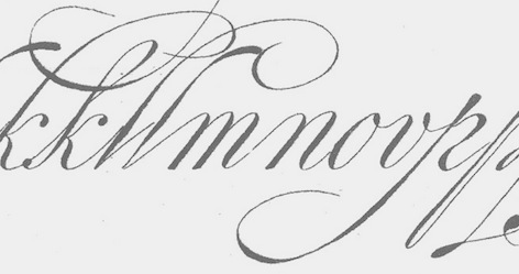 Drawing and lettering high school teacher in Haarlem (1853-1930) who studied at the Rijksakademie van beeldende kunsten in Amsterdam. He published the lettering model book Letters en hare grondvormen (1885, Scheltema & Holkema, Amsterdam). Remarkable in this book is an example of the Dutch krulletter found on the windows of cafes in Amsterdam in the 20th centurys---the Oud Hollandsche Schrijfletter that has its roots in the 17th century Dutch neorenaissance.
 Reference: Nederlandse belettering negentiende-eeuwse modelboeken (2015, Mathieu Lommen, de Buitenkant, Amsterdam). [Google]
[More] ⦿
|
Pilcrow Type
[Paul D. Hunt]

|
 Type and graphic designer from Joseph City, AZ. His first degree was from Brigham Young University. He was a type designer at P22/Lanston from 2004-2007. In 2008, he obtained an MA in typeface design from the University of Reading where he designed the typefaces Grandia and Grandhara (Indic). In January 2009, he joined Adobe just after Thomas Phinney left. He lives in San Jose, CA. His talk at ATypI 2014 in Barcelona was entitled The history of non-Latin typeface development at Adobe.
 He created Howard (2006, a digitization of Benton's Sterling), P22 Allyson (2006, based on Hazel Script by BB&S; a winner at Paratype K2009), the P22 FLWW Midway font family (2006-2018: Midway One, Two and Ornaments; based on the lettering found on the Midway Gardens working drawings of Frank Lloyd Wright from 1913---tall-legged and casual), Kilkenny (2005, P22), a Victorian-style font based on the metal types named Nymphic and Nymphic Caps which were designed by Hermann Ihlenburg in 1889. This typeface has almost 1000 glyphs and comes in OpenType format. It includes Cyrillic characters. Check the studies here and here. For another revival of Nymphic Caps, see Secesja by Barmee. Designer of the display typefaces Seventies Schoolbook (2004) and Interlocq (2004). Hunt also digitized Goudy's Village (2005). Village was originally designed by Fredric Goudy in 1903 for Kuppenheimer & Company for advertising use, but it was decided it would be too expensive to cast. It was later adopted as the house face for Goudy's and Will Ransom's Village Press. The matrices were cut and the type cast by Wiebking. The design was influenced by William Morris's Golden Type. This Venetian typeface was digitized by David Berlow (1994, FontBureau) and by Paul D. Hunt (2005). Hunt's version was eventually released in 2016 by P22/Lanston as LTC Village. He revived Hazel Script (BB&S), which he renamed Allyson (2005). Still in 2005, he created a digital version of Sol Hess' Hess Monoblack called LTC Hess Monoblack. In 2006, he published a nice set of connected calligraphic script fonts, P22 Zaner. Bodoni 175 (2006, P22/Lanston) is a revival of Sol Hess' rendition of Bodoni. He was working on Junius (2006), a revival/adaptation of Menhart Antiqua. Frnklin's Caslon, or P22 Franklin Caslon, was designed in 2006 by Richard Kegler and Paul Hunt in collaboration with the Philadelphia Museum of Art. This slightly eroded font set includes faithfully reproduced letterforms digitized directly from images of impressions made by Benjamin Franklin and his printing office circa 1750. It comes with a set of ornaments. In 2007, he used Goudy's 1924 typeface Italian Old Style in the development at P22/Lanston of LTC Italian Old Style. That typeface was remastered and extended to cover several languages by James Grieshaber in 2011. In 2014, Paul Hunt finished work on the wood type revival font HWT Bulletin Script Two (P22 & Hamilton Wood Type). This backslanted psychedelic typeface can be traced back to the wood type manufacturers Heber-Wells (Bulletin Condensed, No. 5167), Morgans and Wilcox (Bulletin Script No. 2, No. 3184), Empire Wood Type (1870: Bulletin Script), Keystone Type Foundry (1899: Bulletin Script), Hamilton (117), and Wm. H. Page & Co (No. 111 through No. 113). Free fonts at Google Web Fonts: Source Sans Pro (2012; Source Sans Pro for the TeX crowd), Source Code Pro (2012, a companion monospaced sans set by Paul D. Hunt and Teo Tuominen). Source Serif Pro, its Fournier-style relative, was developed at Adobe by Frank Grießhammer. They can also be downloaded from CTAN and Open Font Library. Fun creations at FontStruct in 2008-2009: Possibly (a stencil loosely based on the Mission Impossible series logo), Probably (same as Possibly but not stenciled), Med Splode, Arcade Fever, negativistic_small, New Alpha_1line, New Alpha_4line, New Alpha_bit, New Alpha_dot [dot matrix font], New Azbuka [after Wim Crouwel's New Alphabet from 1967], positivistic, slabstruct_1, slabstruct_too, structurosa_1, structurosa_bold, structurosa_bold_too, structurosa_caps, structurosa_faux_bold, structurosa_leaf, structurosa_script, structurosa_soft, structurosa_tape, structurosa_too, structurosa_two, Slabstruct Too Soft, Structurosa Clean Soft, Structurosa Script Clean, Structurosa Clean, Structurosa Clean Too, Structurosa Clean Leaf, Structurosa Boxy, Stucturosa Script Heavy. In 2010, he designed he programming font Sauce Code Powerline. Well, this is probably a renaming of Source Code by some hackers. Just mentioning that sauce Code is on some Github pages. Klingspor link. Google Plus link. [Google]
[MyFonts]
[More] ⦿
|
Platt Rogers Spencer
|
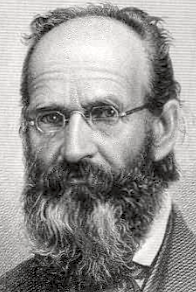 Platt Rogers Spencer (b. East Fishkill, NY, 1800, d. Geneva, OH, 1864) created what would become the most widely accepted and prized cursive writing method used in business, now known as "Spencerian writing". As an outspoken supporter of American business education, his influence insured that by the late 1800s business education in America included some courses on penmanship. He taught at the Bryant&Stratton Business College in New York. His son was Lyman P. Spencer. Lyman's book, New Spencerian Compendium of Penmanship (1879) can be considered as an extension of the work of Platt Rogers Spencer. [Google]
[More] ⦿
|
Portfolio of Ornate Penmanship
[Austin Norman Palmer]
|
 Penmanship book by the Austin N. Palmer Company in Cedar Rapids, IA, probably published in 1896, and edited by Austin N. Palmer. It contains numerous hand-drawn alphabets. Contributors include F.A. Curtis of Hartford, CT (blackletter faces and a marking alphabet), F.B. Courtney (swashy capitals), F.W. Martin of Boston (several blackletter alphabets, one of which is called Rapid German Text, and another is is for diploma filling), W.E. Dennis of Brooklyn, NY (a bird, his signature, Austin N. Palmer's name hand-printed), E.L. Brown of Rockland, ME (a bird, several calligraphic alphabets, a woody caps face, and several blackletter alphabets), G.N. Bretscher of New York (several blackletters, one of which is called Western Penman), G.W. Wallace (Normandie Script), W.C. Henning of Cedar Rapids, IA (swashy caps and a blackletter face). [Google]
[More] ⦿
|
P.R. Spencer's Sons
|
Authors in 1879 of New Spencerian Compendium of Penmanship (1879), in which they continue the work of their famous father, Platt Rogers Spencer. [Google]
[More] ⦿
|
Primedia Scrapbooking
|
Scrapbooking company related to the brand Creating Keepsakes (or: CK), which in turn is run by Tracy White. Creating Keepsakes made fonts which lead to the web site Scrap N Fonts. They are selling over 1,000 fonts whose names all start with CK or LDJ. They are of the playful kind. The older fonts: CKAnythingGoes, CKArrows, CKArtisan, CKAshleyAlpha, CKBabyBottle, CKBalloons, CKBamboo, CKBarbedWire, CKBeachcomber, CKBella, CKBlackTie, CKBlock, CKBlockRose, CKBouquet, CKBreeze, CKBroadPen, CKBubbles, CKButterfly, CKBuzz, CKCalligraphy, CKCalligraphy, CKCalligraphy, CKCamp, CKCandles, CKCandyCorn, CKCatsDogs, CKCelebration, CKChecks, CKChemistry, CKChick, CKChildsPlay, CKChoppyBlock, CKChristmasBerries, CKChristmasMemories, CKChunky, CKChunkyBlock, CKClassic, CKColumn, CKConcave, CKConstitution, CKContemporaryCapitals, CKContemporaryCapitals, CKCorners, CKCorral, CKCracked, CKCrayons, CKCrescent, CKCrookedClassic, CKCurly, CKCursive, CKCute, CKDaydream, CKDelight, CKDiva, CKDoodles, CKEasyGoin, CKEclectic, CKElegant, CKElusive, CKEvolution, CKExpedition, CKExtra, CKFairytale, CKFanClub, CKFantasy, CKFiesta, CKFillIn, CKFishBones, CKFishingPole, CKFlair, CKFlourish, CKFlowerGarden, CKFlowerPower, CKFootnote, CKFortune, CKFrankenstein, CKFraternity, CKFrayed, CKFreedom, CKFreestyle, CKFreezing, CKFresh, CKFriend, CKFrosting, CKFun, CKFunBoxes, CKFunkieFun, CKFunkyWave, CKGala, CKGameNight, CKGardenVariety, CKGeometric, CKGifts, CKGirl, CKGlyph, CKGrandstand, CKGrandstand, CKGrapevine, CKGroovy, CKGutenberg, CKHandprint, CKHandprint, CKHappyCamper, CKHappyKids, CKHarvest, CKHearts, CKHigginsHandprint, CKHollyBerries, CKHopscotch, CKHunting, CKHustle, CKIndigo, CKInky, CKItalic, CKJot, CKJournaling, CKJuneBugs, CKJustPlainWide, CKKeystroke, CKKiddo, CKKinder, CKKittyScratch, CKLala, CKLazyDays, CKLeafyCapitals, CKLeftyLisa, CKLetterHome, CKLogs, CKLongLanky, CKLoveLife, CKLumpy, CKMansPrint, CKMarker, CKMonogram, CKMuddy, CKMystery, CKNewsprint, CKNoah, CKNostalgia, CKOffRoad, CKOrnament, CKOuch, CKOverall, CKPaintbrush, CKPeekingPosies, CKPencils, CKPenman, CKPicketFence, CKPillow, CKPink, CKPlainJane, CKPlayBall, CKPopsicle, CKPorridge, CKPosies, CKPretty, CKPrimary, CKPrint, CKPumpkin, CKPumpkinPatch, CKQuake, CKQuick, CKQuickStitch, CKQuiltSquares, CKQuirky, CKRanch, CKRansom, CKRocketShips, CKRoses, CKRubberPencil, CKRugged, CKSassy, CKScript, CKScript, CKShadowedBlock, CKShearMadness, CKShiver, CKSignature, CKSimple, CKSimplicity, CKSimplicity, CKSingleSerif, CKSinkOrSwim, CKSketch, CKSkinnySerif, CKSlice, CKSlime, CKSloppy, CKSmokey, CKSmoothRock, CKSnow, CKSnowman, CKSouthwest, CKSpikyBlock, CKSpikyClassic, CKSpirit, CKSplitBox, CKSportsBalls, CKSportsBasketball, CKSportsBowling, CKSportsFootball, CKSportsGolf, CKSportsHockey, CKSportsPlain, CKSportsSoccer, CKSportsTennis, CKSportsVolleyball, CKSpringtime, CKSpringtime, CKSquiggle, CKStacks, CKStalk, CKStenography, CKStitches, CKStoneAge, CKStorybook, CKStrips, CKSugarCookie, CKSummerDays, CKSunshine, CKSweetBows, CKSweetDreams, CKSwirl, CKTags, CKTakeaHike, CKTallTrees1, CKTallType, CKTeachersPet, CKTemplate, CKTies, CKTimeless, CKTipsy, CKToDoList, CKToddler, CKToggle, CKTools, CKTrellis, CKTulips, CKTwiggy, CKTwigs, CKTwilight, CKTypeset, CKTypewriter, CKUrban, CKVogue, CKVoluptuous, CKVoluptuous, CKWanted, CKWavey, CKWedding, CKWeddingRose, CKWendy, CKWhereItsAt, CKWhirl, CKWildnCrazy, CKWildnCrazy, CKWindsong, CKWinter, CKWired, CKWrangler, CKWreaths, CKZigZag, CkBlockhead, CkCircleSerif, CkStars, CkStarsStripes, Frankieghost, LDSpecs, ck_jewels. Their designers: Ali Edwards, Allison Kimball, Andie Smith, Ashley Bennett, Becky Higgins, Beth Opel, Candice Stringer, Candice Stringham, Cherie Mask, Cindy Knowles, Deb Anderson, Deb Perry, Elizabeth Cass, Elsie Flannigan, Emily Magleby, Francesca Saccarola, Jennifer Antoini, Jillustratin, Jillustration, Kim Crothers, Kim Hughes, Kim Shields, Leora Sanford, Lettering Delights, Jillustration, Lisa Botte, Lori Buehrig, Maegan Jenn, Marna Hill, Monica Moss, Peay Carter, Rebecca Sjonger, Renee Senchenya, Sara Winnick, Shannon Zickel, Simple Scrapbooks, Stacy McFadden, Stephanie Ford, Susan Cyrus, Talia Audenart, Tammy Moore, TexType, Tiffany Tillman, Tracey Odachowski, TXT Type, TxType, Wendy Groff. [Google]
[More] ⦿
|
Print and Penmanship 1450-1830
|
Course by James Mosley at l'Institut de l'Histoire du Livre (IHL) in Lyon, France, from October 14-17, 2002. Limited to twelve persons. 450 Euros. A beautiful course content: Introduction---the writing, of the Roman capital to the tiny Gothic. The discovery of the Roman capital in Italy to the 15 E century. L B Alberti, Felice Feliciano, Luca Pacioli, Geoffroy Tory, Albrecht Dürer. The invention of printing works and Gothic character. The Italian writing: scrittura umanistica and corsiva cancellaresca. Roman characters and italics in Italy and France, 1470-1600. Nicolas Jenson, Francesco Griffo, Claude Garamond, Pierre Haultin, Robert Granjon, Guillaume Bé. Literature of the engraving of the punches and the foundry of the characters: Joseph Moxon (London, 1683), Jacques Jaugeon (Paris, 1704) Pierre-Simon Baker (Paris, 1764). Characters with the "taste hollandois". Hendrik van den Keere, Nicolas Briot, Christoffel van Dijk, Nicolas Kis, Joseph Moxon, William Caslon. Towards a new penmanship 1560-1740 G.F. Cresci, Lucas Materot, Louis Barbedor, Charles Snell, George Bichkam. Of the "Roman of the roi" in Didot. Philippe Grandjean, John Baskerville, Pierre-Simon Baker, François-Ambroise (and others) Didot, Giambattista Bodoni. A new typography: use of the conceited person-face, antique and the Egyptian woman in printed publicity. [Google]
[More] ⦿
|
Protimient.com
[Ben Jones]

|
 Ben Jones (b. 1980, Buckinhamshire, UK) was a student of typography and graphic communication in Reading (2000-2004). He got his Masters in Typeface Design from the University of Reading in 2011. MyFonts link for Protimient.
 His typefaces: - Billingsley (2005, Protimient: a script based mainly on a writing specimen of the penman Martin Billingsley, originally published in 1618).
- Buxus (2005, T26: a shaded display family).
- Cale (2004).
- Caligne (2004), Caligne Sans (2004).
- Clarence (2007) is a sturdy 2-style serif family.
- Eksja (2009) is a humanist slab serif family which to me feels a lot like a sans family---the slabs added as an afterthought.
- Emrys (2011) is his graduation typeface at Reading: Emrys is a modulated sans typeface for scripts including Latin, Greek, Armenian, Arabic and Cyrillic. Emrys won Third Prize at Granshan 2011. Emrys morphed into Amrys, which was published in 2019 by Monotype.
- Gilibert (2005, T-26, a decorative didone face).
- Greenwood (2006, Protimient: a monospaced, cursive typewriter script, based on a typewritten letter from a Mr J. G. Greenwood Esq. to a branch of the National Westminster bank in Oxfordshire, Great Britain, dated 6th June 1904).
- Joanna Nova (2015, Monotype). A great 18-font update of Gill's original slab serif, Joanna. There is coverage now of Greek and Cyrillic.
- Lightbox (2004, Protimient). A legible monoline sans family. See also the different later design Lightbox 21 (2021: an 18-style rather pure geometric sans family that runs the range from hairline to very black).
- ModernModern (2004, Protimient: a squarish didone).
- Nosta (2006, a nice modern text family).
- NotanuthaSerif1 (2005, text face; see also here).
- Pasquinade (2005, blackletter).
- Stobart (2006) is a script font based on the characters written in a letter by Henry Stobart, dated 1899. It is an Opentype handwriting typeface with 1200 glyphs with heavy character substitution.
- Travis (2005, Protimient: a legible sans family).
View Ben Jones's typefaces. [Google]
[MyFonts]
[More] ⦿
|
R. Wyss
|
Swiss penman who wrote Libellus valde doctus elegans utilis, multa varia scribendarum litterarum genera complectens (Zürich, 1549). [Google]
[More] ⦿
|
Ralph Smith
[RSFS - Ralph Smith's Formal Script Symbol Fonts]
|
[More] ⦿
|
Ramiro Espinoza
[Re-Type]

|
 [MyFonts]
[More] ⦿
|
Ramon Stirling
|
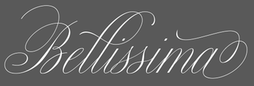 Spanish author of the calligraphy and penmanship book Bellezas de Caligrafia (1844, Joaquin Verdaguer, Barcelona). Stirling was active in Barcelona.
 This book led to the development of various modern script typefaces, such as Alejandro Paul's Bellissima Script (2013). Ramon's influence can also be seen in Ramiro Espinoza's Medusa (2013). [Google]
[More] ⦿
|
Rare Books on Calligraphy and Penmanship
[Kathy Saunders]
|
Kathy Saunders posts scans of many beautiful old calligraphy and penmanship books. Quite remarkable! There are also many images of beautiful penmanship. A true treasure trove. [Google]
[More] ⦿
|
Ray Nash
|
graphic art historian in Hanover, NH. Many say that Ray Nash's book American Penmanship, 1800-1850. A History of Writing and a Bibliography of Copybooks from Jenkins to Spencer (1969, Worcester: American Antiquarian Society) is the best bibliography on the subject. The book is 303 pages long. [Google]
[More] ⦿
|
Real Pen-Work
|
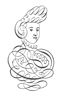 A penmmanship instruction manual with the subtitle Self-Instructor In Penmanship, published by Knowles & Maxim, Pittsfield, Mass., and St. Catharines, Ontario, Canada. PDF file. [Google]
[More] ⦿
|
Real Pen-Work Publishing
|
This company published Bible Pearls of Promise (1867). [Google]
[More] ⦿
|
Re-Type
[Ramiro Espinoza]

|
 Argentinian designer Ramiro Espinoza (b. Santa Fe, 1969) studied at the Universidad Nacional del Litoral in Santa Fe. He dabbled in fonts at his gorgeous (but now defunct) Jazz Futurezone site. In 2007, he founded Re-type, where he heads a group of designers including Yomar Augusto, Leo Beukeboom and Ricardo Rousselot. Ramiro graduated from the Type and Media's KABK (Den Haag) in 2004. He taught typography at the Universidad Nacional del Litoral, Universidad de Buenos Aires and the Escola d'Art i Superior de Disseny in Valencia, Spain. At FontShop International, he was in a team that converted more than 50 font families to OpenType. He freelances occasionally for David Quay's studio. He joined Type Network in 2017. He is currently located in Amsterdam. His typefaces:
 - Mabella (2001), a free font dedicated to the Argentinian feminist activist Mabel Bellucci. It was for some time available at Sudtipos but discontinued there. It is still at Dafont.
- Bellucci (2008), a commercial redesign of Mabella.
- The display font Mariabrug (2002). This too is no longer available--it was redesigned and marketed as Kurversbrug, one of the ReType's fonts. Kurversbrug (2007) is a revival of the famous letters appearing on Amsterdam's bridges: the letters were probably designed by Anton Kurvers (b. Den Haag, 23 July 1889; d. Amsterdam, 29 January 1940).
- At Union Fonts: Lula (2002-2003).
- Maitena (2003), a free font based on the hand of an Argentinian comic artist, Maitena Burundarena.
- Lavigne (2004-2010): Lavigne Display is the first release of a type-family aimed at publications such as interior design and women magazines-anywhere a touch of distinction is to be desired. Lavigne Display won an award at TDC2 2010. Lavigne Display and Lavigne Text (a modern serif family) were both winners at Tipos Latinos 2010.
- Tomate (2008) is a brush lettering / signage script font influenced by Goudy Heavyface Italic. It won an award at Tipos Latinos 2010.
- Barbieri (2009) is a signage face.
- Work on Severino (2004) has been abandoned.
- Smidswater Italics (2009): Smidswater is a Dutch graphic design studio with offices in The Hague and Breda. They had a corporate font (designed by Paulus Nabbe and Onno Bevoort) but wanted to expand the package adding italics and light weights. Ramiro Espinoza was commissioned for this and now Smidswater Font is a complete set extensively used in the studio's indentity.
- Bath (2010-2011) is a Dutch typeface developed with David Quay for the signage and orientation in the city of Bath.
- Winco (2012) is a glyphic (flared, incise) type family created from scratch. Espinoza mentions Arpke Antiqua and Globus Cursive as indirect influences on his new type family. It won an award at Tipos Latinos 2012.
- Krul (2012) is an interpretation of the Amsterdamse Krulletter style of calligraphic signage. This was presented at ATypI 2013 in Amsterdam. A book entitled Amsterdamse Krulletter by Rob Becker and Ramiro Espinoza was published by Lecturis.nl in 2014. The English edition, The Curly Letter of Amsterdam followed in 2015.
- Dulcinea (2012), a chancery / penmanship typeface. He writes: Dulcinea looks at Spanish Baroque calligraphy's most extreme tendencies, and especially at some of those produced by the writing masters Pedro Diaz Morante and Juan Claudio Aznar de Polanco. These 17th and 18th century alphabets with their plentiful calligraphic flourishes represented a marked break with the harmonic and angular Renaissance Cancellaresca style. It was Morante who first introduced and popularized the use of the pointed quill in Spain, and although his famous text entitled Arte Nueva de escribir(first volume published in 1616) contains alphabets that have much in common with traditional broad nib Cancellaresca calligraphy, most of the examples therein are outgrowths of the new models put forward by the Italian master Gianfrancesco Cresci. The swashes are complex and intricate, but at the same time they feature a profusion of defects. Many of them sometimes come close to ugliness. However, these pages contain an artistic essence that bears a relationship to the ironic and sometimes somber character of Spanish Baroque.
- Medusa (2013) is a delicate copperplate penmanship script based upon renowned master Ramón Stirling. Helped in the type production by Paula Mastrangelo, Ramiro looked very carefully at the original manner in which glyphs connected. This typeface will win awards. Well, I wrote the previous sentence on the day I first saw Medusa. Medusa won an award at TDC 2014. In March 2014, it won an award at Tipos Latinos 2014.
- Laski Slab, co-designed with Paula Mastrangelo, won an award at Tipos Latinos 2014. It is based on Paula's thesis work in 2012. Ramiro Espinoza kept on developing that typeface and published Laski Sans in 2016.
In 2017, he published Guyot Headline (a revival of Françcois Guyot's types). Guyot Text followed later in 2017---it is very legible even at small print sizes and is a sturdy workhorse overall. Winner at Tipos Latinos 2018 of a type design award for Guyot. Guyot also won an award won an award at TDC Typeface Design 2018. In 2020, Guyot was selected as a typeface for Garcia Media's redesign of the major German finacial newspaper, Handelsblatt. - Reiher Headline (2018). A typeface family inspired by two fonts displayed in the famous Ploos van Amstel specimen, first printed in Amsterdam in 1767. The Reiher Headline romans were based on the handsome N° 1 Groote Paragon Romein, a rather condensed typeface whose punchcutter has not yet been identified. Reiher Headline's italics were based on the Aszendonica types attributed to Nicholas Kis. Several of the ornaments included in the Reiher types have been ascribed to J.F. Rosart. Espinoza further expanded the possibilities of his new family with Reiher Headline Open, a decorative inline version of Reiher Headline Bold. Reiher Headline was designed for magazine and newspapers.
- Dejanire and Dejanire Headline (2019), a typeface family loosely inspired by an anonymous display typeface found in the type specimen of Claude Lamesle, published in Paris in 1742. It takes its name from Deianira, a Calydonian princess in Greek mythology and the wife of Heracles. Lamesle introduced it under the blah name of Gros canon deux points de gros romain. Ramiro Espinoza set out to improve Lamesle's typeface by fixing its flaws while preserving its freshness. It was followed in 2020 by Dejanire Sans and in 2022 by Dejanire Text and Dejanire Jewel (a baroque, profusely ornate set of capitals inspired by a set of titling capitals found in a religious decree printed in 1800 by Pedro Battle in Barcelona).
- Kranto (2021). A 144-style sans serif typeface inspired by British and German grotesque typefaces from the first half of the twentieth century. It features weights from thin to black, widths from regular to condensed, and x-heights from small to large (called text, normal and display).
MyFonts interview in 2012. Speaker at ATypI 2018 in Antwerp. Fontspace link. Dafont link. Behance link. Type Network link. [Google]
[MyFonts]
[More] ⦿
|
Richard Daniel
|
 British penman who published Daniel's Copy-Book: or A Compendium of the most Usual Hands of England, Netherlands, France, Spaine, and Italie etc in London in 1664. [Google]
[More] ⦿
|
Richard Douglas
|
Richard Douglas is the designer of Penmanship, a font with letters between lines. See also here. [Google]
[More] ⦿
|
Richard Gething
|
 British penman who published Chirographia or A Booke of Copies containing sundrie Examples for such as are desirous to better their hands and attaine to perfection in the Art of commendable Writing, with certaine peeces of Cursorie hands (not heretofore extant) newlie com in vse amongst the gentrie especiallie with secretaries and their Clearks, and are of excellent facilitie and dispatch for any manner of imploinients whatsoever in 1645.
 In 1619, he wrote Calligraphotechnia or The Art of faire writing. Sett forth and newly enlarged by Ri: Gethinge Mr: in the said Art dwelling in Fetter-lane, at the hand and Penne, and are to be soulde by George Humble at the white horse in Popes head alley over against the roiall Exchange in London. [Google]
[More] ⦿
|
Richard Lipton
[Lipton Letter Design]

|
 [MyFonts]
[More] ⦿
|
Richard Smith
|
 Richard Smith was one of the owners of the Philadelphia-based foundry MacKellar, Smiths and Jordan, which evolved in 1860 from the Johnson Type Foundry, which in turn evolved from Binny&Ronaldson. The proprietors were Thomas MacKellar (1812-1899), John F. Smith, Richard Smith, and Peter A. Jordan. MacKellar became one of the foundries merged into ATF in 1892.
 He patented typefaces such as Cameo (1874), Plain Shade (1874) and Light Shade (1874). The latter decorative typeface appeared in Dan X. Solo's The Solotype Catalog of 4,147 Display Typefaces on page 17 as Night Shade. The first known digital version of this typeface was Nigel SadeSH (1993, Soft Horizons). Other versions include Shadowed Serif (1994, James Fordyce), Cameo Antique (2009, by Character), and Outstanding (2012, Bobistheowl). In 2016, Bobistheowl published Cabbagetown, a large typeface family started in 2014. It extends Light Shade in many directions, and is digitally fine-tuned. A penmanship script by Richard Smith from 1878 was revived in 2015 by George Thomas at Liberty Type Foundry as Smith Spencerian. [Google]
[More] ⦿
|
Riki Rinaldi
[Naldi Studio (or: Naldy Studio)]
|
 [More] ⦿
|
Rinaldi Novianda
[Alpha Bento]

|
[MyFonts]
[More] ⦿
|
RM WD
[Antonio Vignali]

|
 Graphic designer designer, b. 1959, Parma, Italy. He studied at the Art Institute in Parma. After graduation in 1983 from the Urbino ISIA Academy, Antonio spent 20 years working as Senior Art Director and Creative Director for various international advertizing agencies in Milan (Pirella Lowe, Armando Testa, Young & Rubicam).
 In 2016, he designed the calligraphic typeface Gerolinda. This OpenType-feature-laden typeface family, at 1900 glyphs per weight for six weights, leaves all other calligraphic typefaces from the past decade in the dust. It is as if the Italian penmen from the renaissance period are being reborn through Antonio's hand. In fact, he intended something very specific---the recreation of an Italian gentlewoman's hand (his own words). One of his projects was inspired by the Italian Futurismo artists in the early 1900s whose style is close to Italian art deco. Typefaces in the project include Italiano Doc (2018), Italiano Fushion Color (2021: the color version of Italiano Fushion) and Italiano Fushion New (2021: all caps). Typefaces from 2018: Ziletti Pop (a layerable pre-psychedelic font influenced by Girolamo Ziletti (1552-1583) in Venice) and Eletric Lady (a light copperplate calligraphic script). In 2020, he published Parmesan Revolution (a didone with mirrored letters, perhaps in the hope of emulating Cyrillic), Venice Revolution, Jannson Map (a wonderful 18th century map font about which Antonio writes: This font is inspired by Johannes Janssonius, well known as Jan Janszoon or Jan Janssonius (b. Arnhem, 1588, d. Amsterdam, 1664), a Dutch cartographer, publisher and engraver who was married to Hondius's daughter. He authored many masterpieces of cartography just like Willem Blaeu and Hondius). [Google]
[MyFonts]
[More] ⦿
|
Roberlan Borges
|
 Illustrator, lettering artist and graphic designer in Vitoria, Brazil. Creator of the great bold poster sans typeface Condensa (2016) and the vintage (art deco) display font Calzone (2013).
 Behance link. Devian Tart link. [Google]
[More] ⦿
|
Roger Vershen
[Page Studio Graphics (or: Pixymbols)]

|
 [MyFonts]
[More] ⦿
|
Roland W. Paul
|
 British architect actve ca. 1900, known for his penmanship. His lettering led Nick Curtis to develop a font called Chantilly Lace NF (2005).
 In 2012, Dick Pape made the free font LFD Penwork 181 based on Paul's work. [Google]
[More] ⦿
|
Royaltype
[Darwin Huayan Harahap]
|
 Aka Darwinoo, and revitalized in 2019 as Royaltype. Medan, Indonesia-based designer of these (mostly calligraphic) typefaces:
 - 2015: Violina (rounded sans), Alien (textured typeface).
- 2016: Santa Rose (swashy script), Beautiful Friends (über-curly tall calligraphic script), Metalick (hexagonal), Australian Script (a swashy pirate map or upright penman script), Simplisicky Script (a creamy connected script in outlined and filled versions), Von Halent (thick brush font), Marie Bella (an attractive watercolor brush font), the curly 950+-glyph script typeface Cymbidium Script, Brazilian Script, the handcrafted Handwritten Sans and Lazy Gogo, Chrysanthin (curly), Daslan Script (very curly), Old Story Bold, the scary Blunt Brush, the children's font Kid Type, the cute curly calligraphic Wedding Font, Shyntia Bella.
- 2017: Children Handwritten, Bargain Script, Rasterize Script, Elegant Sans, Dastan Script, Asteroidea, Perfectos Script, Nostar Script (dry brush), Senior Artist, Argentina Script, Artisoya Script, Frizzy Bella, Comic Land, Philosophy Script, Simple Chalk, Garden Sans, Handwritten Bold, High Desert Script, Comic Font, American Script (a free swashy calligraphic typeface), Sweeter Than Candy (swashy calligraphic script).
- 2018: Arabian Script, Artisoya Two, Artisoya Three, Simplisicky (a yummy creamy script), Kindergarten Memories (a children's script), Recognition Script, Wonderland Scratch.
- 2019: Violina (sans), Rasterize Script, Children Signature, Nostar Script (a chalk or dry brush font), Monogram Script, Bittermilk, Champigna, Cream Soup, Comic, Mozzarella, Mythical Garden, Forsythia Garden, Santa Rose, Marie Bella, Peanut, Senior Artist, Sweet Baby, Naturalistic Playground, Instine Sans, Handwritten, Rock Stair.
- 2020: Watermelon, Sambalado, Instine Script.
Creative Fabrica link. [Google]
[More] ⦿
|
RSFS - Ralph Smith's Formal Script Symbol Fonts
[Ralph Smith]
|
In 1999, UCSD's Ralph Smith developed METAFONT sources for fonts of uppercase script letters for use as symbols in scientific and mathematical typesetting. His glyphs are based on the so-called Spencerian or Copperplate hand lettering which prevailed in the eighteenth century. Type 1 sources now available as well. A follow-up package with integration into TeX was developed by Michael Sharpe in 2021, simply caleed rsfso. [Google]
[More] ⦿
|
Ryoichi Tsunekawa
[Flat-It]

|
 [MyFonts]
[More] ⦿
|
Safri Fajar
[Sapre Studio]

|
[MyFonts]
[More] ⦿
|
Samuel E. Bartow
|
American penman, 1868-1938. He was associated with the A.N. Palmer Company for pver twenty years. Regarded as one of the masters of business penmanship in America, he served as the editor of American Penman and was a principal of the Palmer School of Penmanship in New York. [Google]
[More] ⦿
|
Sapre Studio
[Safri Fajar]

|
 Indonesian designer of the copperplate calligraphic script typeface Geshane (2019) and the connected script fonts Ballesha Script (2019), Bunglon (2019), Sunkist, Singles (2019) and Dethalia (2019).
 Typefaces from 2020: Gravitafont (a retro script), Standerfont (a smooth script font), Anastasiya (a swashy penmanship-style calligraphic script). Typefaces from 2021: Sehatie (calligraphic, with an uneven baseline), The Shooter (a dry brush script). [Google]
[MyFonts]
[More] ⦿
|
Satriyo Hutomo
[Muntab Art]
|
 [More] ⦿
|
SchoolHouse Fonts
[Dave Fenwick]
|
Commercial educational fonts from Signature Software, aka vLetter, run by Dave Fenwick. Includes D'Nealian and Zaner-Bloser style schoolhouse fonts. All demos are complete except for the lower case a. Defective web page. Schoolhouse Fonts is a product of vLetter, Inc., 509 Cascade, Suite H, Hood River, OR 97031, USA. [Google]
[More] ⦿
|
Sharp Type
[Lucas Benjamin Sharp]

|
 Lucas Sharp is a designer (b. 1986, San Francisco) set up Sharp Type in Brooklyn, NY, and later in New York City proper. Before that, Lucas Sharp was involved with Typeslashcode in New York. In 2011, he and Juan Carlos Pagan set up Pagan&Sharp in Brooklyn, NY, but they split a few years later. In 2015, Lucas Sharp and Chantra Malee [at Sharp Type, Malee handles business, brand management, marketing, graphic design and sales] started Sharp Type in New York City. In 2020, the collaborators and type designers included Josh Finklea, Connor Davenport, Marc Rouault, My-Lan Thuong, Calvin Kwok, and Justin Sloane. Lucas Sharp's typefaces:
 Type catalog, 2010. [Google]
[MyFonts]
[More] ⦿
|
Sidney Clyde Gaunt

|
Artist and type designer at Barnhart Brothers&Spindler, 1874-1932, who lived in Chicago. Creator of many typefaces: - Adstyle&Italic (plus Condensed, Extra Condensed&Headletter, Wide, Lightface, Black, Black Outline, Shaded: 1906-1920, BB&S).
- Authors Oldstyle&Italic, Authors Oldstyle Bold, Authors Roman&Italic (plus Condensed, Wide, Bold, Bold Condensed). Mac McGrew writes: Authors Roman Italic, and Authors Roman Wide were designed by Sidney Gaunt for BB&S in 1902, with other versions added in 1909 to 1915. It is a legible but generally undistinguished face, perhaps best in the Wide version. The italic includes a number of quaint swash characters. and was one of the first BB&S italics to be cast on its offset body, described elsewhere (see "The Third Dimension of Type" in the Introduction); the bold typefaces provide restrained complementary display for headlines. Authors Oldstyle, shown by BB&S in 1912, bears little resemblance to Authors Roman.
- Barnhart Oldstyle&Italic (and a No. 2 version). Mac McGrew writes: Barnhart Oldstyle was designed in 1906 by Sidney Gaunt for BB&S, followed by the italic and Barnhart Oldstyle No.2 the next year. The latter appears to have the same caps as the first typeface but larger lowercase with shorter ascenders. There is also Barnhart Lightface, advertised in 1914 but perhaps designed earlier. This series seems undistinguished, but the original roman and italic were popular enough to be shown as much as twenty years later. Ascenders are long, and some characters have a bit of the irregularity that was popular at that time. The italic apparently was one of the first typefaces cast by BB&S on its offset body, which provided mortises to avoid overhanging kerns in italic designs.
- Barnhart Lightface.
- Cardstyle. Mac McGrew writes: Cardstyle is an unusual typeface designed in 1914 by Sidney Gaunt for BB&S. It is a medium weight monotone, rather narrow, with tiny serifs, and was intended for use on announcements. There is no lowercase, but caps are cast in several sizes on each of three bodies, for cap-and-small-cap combinations. Notice the logotypes, which were more common around the turn of the century.
- Chester Text (1914, blackletter). Mac McGrew writes: Chester Text is a fancy shaded letter designed by Sidney Gaunt in 1914 for BB&S. It features caps and small caps, and is intended for stationery and social work, but is hard to read and not suited to anything but a few simple names or words.
- Engravers Old Black, Engravers Roman Shaded (1914, BBS, formerly Chester Title).
- French Plate Script. Mac McGrew writes: French Plate Script (or French Plate) was designed by Sidney Gaunt for BB&S in 1904. It is an upright script, otherwise similar to the same founder's Wedding Plate Script, both derived from types cut by Mayeur of Paris which were based on eighteenth-century engraving. Both are connecting scripts, the former being similar to Typo Upright (q.v.). Inland Type Foundry showed a similar French Script in 1905, patented by William Schraubstadter, and later listed by ATF. Douglas C. McMurtrie, in his book Type Designs, calls this "one of the finest script types ever produced."
- Mission. Mac McGrew writes: Mission was designed for BB&S by Sidney Gaunt in 1905, but patented by George Oswald Ottley. It is a rather novel face, with long ascenders and short ascenders. Serifs are triangular, like some members of the Latin series. Most noticeable is the way some strokes in the capital letters are joined with curves, especially in the B. Compare Viking.
- Old Roman Condensed (plus Bold, Bold Condensed, Black&Italic, Semitone).
- Parsons Swash Initials.
- Pencraft Oldstyle&Italic (1914, plus Bold, Shaded), Pencraft Text (1916, blackletter). Pencraft Oldstyle and its ornamental version (Pencraft Specials), as printed in the 1922 BBS catalog, inspired the lowercase of Pencraft (2010, Chyrllene K, Intellecta Design). Mac McGrew writes: Pencraft Text was designed by Sidney Gaunt for BB&S in 1916. It has somewhat the character of Pencraft Oldstyle, by the same artist at about the same time, but it can hardly be considered a part of that family. It has just a suggestion of the angularity of Text or Old English typefaces, but retains more of the character of simple hand-lettering. Mac McGrew writes: Pencraft Old Style and Pencraft Italic were designed by Sidney Gaunt for BB&S in 1914, with the bold and shaded versions following over the next two years. The Oldstyle is a rather charming interpretation of lettering styles popular at that time, but the other versions are not as impres- sive. Pencraft Oldstyle is notable for the large number of Auxiliary charac- ters, some of which were commonly included with other similar typefaces, and the unique Pencraft Specials, which consisted of a variety of swash strokes to be used to extend the special ascending and descending letters. Pencraft Italic included several swash caps among its Auxiliaries, and Pencraft Bold had Auxiliaries comparable to the roman, but without the flourishes or Specials. Compare the long ascenders and descenders of Parsons and Stymie.
- Publicity Gothic (1916). Free versions called Lemiesz by David Rakowski and Dieter Steffmann. Publicity Gothic was digitally extended to a commercial all-caps face, Publicity Headline, in 2006 by Tom Wallace (HiH). See also the revival in 1995 by Image Club Graphics: Publicity Gothic ICG Out and Solid. Holy Ravioli NF (Nick Curtis) is also based on Publicity Gothic. Library Book Initials JNL (2018, Jeff Levine) was modeled after examples of Sidney Gaunt's Publicity Initials, which was originally sold in metal type by Barnhart Brothers and Spindler as a companion to the Publicity Gothic typeface. Other digital versions: OPTI Publicity Gothic (Castcraft), Publicity Gothic (by SoftMaker). Mac McGrew writes: Publicity Gothic was designed by Sidney Gaunt in 1916 for BB&S. It is basically a bold gothic, but with many deep irregularities designed into the edges of strokes, which are the same in all sizes. There are no descenders. characters which normally have descenders being designed within the x- height. Caps and ascenders are nearly the full body size, making the typeface considerably oversize by usual standards. Lowercase q has a capital form and is made only in combination with u. The colon and semicolon are full cap height, and there are a number of special characters as shown. ATF revived it for a short time about 1933. Compare Advertisers Gothic.
- Stationers Semiscript. McGrew: Stationers Semiscript as offered by BB&S was a renaming of Palmer Series, introduced by Inland Type Foundry in 1899. It has been ascribed to Sidney Gaunt. It is similar to the BB&S Wedding Plate Script in slope, proportions, and general appearance, but characters do not join. This typeface was revived and extended by Canada Type in 2010 as Siren Script.
- Talisman&Italic. Patented in 1903 and 1904 resopectively.
- Wedding Plate Script. Mac McGrew writes: Wedding Plate Script was designed by Sidney Gaunt for BB&S in 1904. It is much like the same founder's French Plate Script, but sloped, and similar to Typo Slope, produced the following year by ATF.
Images of some of his typefaces when they were patented by BBS: 1908, 1908, 1908, 1906. Klingspor link. [Google]
[MyFonts]
[More] ⦿
|
Sigismondo Fanti
|
Italian mathematician and astronomer from Ferrara. He published Theorica et Practica de modo scribendi fabricandique omnes litterarum species (Venice: Giovanni Rosso, 1514). In 1535, he published the penmanship book Thesauro de scrittori: opera artifisiosa laquale con grandissima arte si per pratica come per geometria insegna a scrivere diversa sorte littere.... Quoting this site: Fanti published this work so that secretaries, copyists, merchants, and artisans could learn techniques of applying geometry to the construction of letterforms. These woodcuts of the capital letters "D" and "E" are examples of how Fanti used geometric patterns in the design of his letters. The circle and the square, the building blocks of classical architecture and the basis for letter designs that appeared in Luca Pacioli's Divina proportione, published in Venice in 1509, provide a starting point for Fanti. He, however, pushed past the limits of Pacioli's theory of proportion by applying principles of geometry to extend the lines of his letterforms beyond the limits imposed by the proportionality of the circle and the square. [Google]
[More] ⦿
|
Signature Software (or: Vletter Inc.)
[Dave Fenwick]
|
Expensive, so-so quality signature/custom handwriting fonts at this company run by Dave Fenwick. Signature Software, Inc., 489 N. 8th St. Suite 201, Hood River, OR 97031. About 100 US dollars per handwriting font. West Europeans pay almost double. Demo fonts for personal handwriting, as well as D'Nealian and Zaner-Bloser style schoolhouse fonts. All demos are complete except for the lower case a. Alternate URL. The company is also called Vletter Inc What I find incredible is that the home page says that over 75,000 handwriting fonts have been sold. That adds up to a nifty 7.5 million dollars in raw income over a twelve year period. Alternate URL. Their children's font series DMOACursive (2000) and DMOBCursive (2000) was posted on alt.binaries.fonts in November 2002. It also sells handwriting fonts of US presidents such as Abraham Lincoln, George Washington, Thomas Jefferson, John Adams, as well as a font in the style of the Declaration of Independence. In 2017, they published the handcrafted typeface family Dakota. Inside that font, the dates are 1994, 1999 and 2015, and the design is attributed to Dave Fenwick and Doug Dyer. [Google]
[More] ⦿
|
SoftMaker Software GmBH (or: freefont.de)
[Martin Kotulla]

|
 SoftMaker, Martin Kotulla's German foundry in Nürnberg, is selling the 10,000-TrueType font Megafont XXL CD (50 USD, www.megafont.de). Every month, a different font or font family (TT and T1) is given away for free. The MegaFont XXL has most standard Monotype/Adobe/Linotype families (up to 1995/1996). They say that most fonts are licensed from URW++ and Brendel Informatik (Cologne). Contents of MegaFont XXL's predecessor, MegaFont Profi CD, here. Since early 2001, you can download one font family from the CD MegaFont XXL here. Martin Kotulla also started infiniType, a collection of 5050 fonts at a good price (Mac and PC). That collection grew to 7444 fonts in InfiniType 4 in 2016. The XXL series has character sets for Western and Central European languages, Turkish, and Celtic, and comes with many expert sets. For historical accuracy: older packages by Softmaker include the 3333-font (TT and T1) MegaFont Profi CD-2.0 (99DM), the 5000-font MegaFont Euro (50 Euro), the Truepack Profi-CD and the 500-font TypeMaker 5.0 Profi-Pack (10DM).
  Their early fonts were renamed and had the attribute Serial in the name. Samples of some of these fonts/families: Adelon Serial (1996, after Albertus MT), Melbourne Serial, Nashville Serial (+Heavy), Nevada Serial, On Stage Serial, Ornitons Serial, Penthouse Serial, Plakette Serial, Priamos Serial, Quadrat Serial, Quebec Serial, Riccione Serial, Rochester Serial, Salzburg Serial, Stafford Serial, Sunset Serial, Sydney Serial, Thames Serial, Toledo Serial, Valencia Serial (Heavy), Valencia Serial (Xlight), Verona Serial, Volkswagen Serial, Wichita Serial. Their early fonts were renamed and had the attribute Serial in the name. Samples of some of these fonts/families: Adelon Serial (1996, after Albertus MT), Melbourne Serial, Nashville Serial (+Heavy), Nevada Serial, On Stage Serial, Ornitons Serial, Penthouse Serial, Plakette Serial, Priamos Serial, Quadrat Serial, Quebec Serial, Riccione Serial, Rochester Serial, Salzburg Serial, Stafford Serial, Sunset Serial, Sydney Serial, Thames Serial, Toledo Serial, Valencia Serial (Heavy), Valencia Serial (Xlight), Verona Serial, Volkswagen Serial, Wichita Serial.
In 2008, SoftMaker started selling fonts on MyFonts: fonts there include the 28-style Suetterlin family (2008), based on the handwriting taught in German schools in the first half of the 20th century, Harald Handwriting (2009), Agilo Handwriting (2009), Wally Handwriting (2009), Vittorio Handwriting (2009), Turandot Handwriting (2009), Tommi Handwriting (2009), Veneto Handwriting (2009), Tolomeo Handwriting (2009), Sarx Handwriting (2009), Salew Handwriting (2009), Roxana Handwriting (2009), Renate Handwriting (2009), PizPaz Handwriting (2009, Mexican style), Schneid Handwriting (2009), Pietro Handwriting, Phil Handwriting, Nadine Handwriting, Kuno Handwriting, Larissa Handwriting, Lizzy Handwriting, Juri Handwriting, Jeff Handwriting (2009), Josh Handwriting (2009), Jelena Handwriting (2009), Jaro Handwriting (2009), Jacques Handwriting (2009), Hilly Handwriting (2009), Harico Handwriting (2009), Hakon Handwriting (2009), Stone Handwriting (2009), Federico Handwriting (2009), Fabio Handwriting (2009), Emmi Handwriting (2009), Davio Handwriting (2009), Alec Handwriting (2009), Brian Handwriting (2009), Armand Handwriting (2009), Claude Handwriting (2010), Cathy Handwriting (2010), Clay Handwriting (2010), Danielle Handwriting (2010), Feliks Handwriting (2010), Foster Handwriting (2010), Giorgio Handwriting (2010), Giovanna Handwriting (2010), Guga Handwriting (2010), Giuliano Hanriting (2010), Carlo Handwriting (2009), Brouet Handwriting (2010), Bjarne Handwriting (2009), Fuego (2015: a retro script, after Letraset's Flamenco), Agnieszka Handwriting (2009) and Thery Handwriting (2009).  Additions in 2010: Tabasco (a geometric based on the phototype font by John Schaedler), Tabasco Twin (a bilined typeface after John Schaedler's Paprika), Advertisers Gothic (a revival of a 1917 typeface by Robert Wiebking), Ad Lib (a revival of a quirky 1961 typeface by Freeman Craw for ATF), Accent (brush face), Flagstaff (oblique techno face), Cornered (with angular pieces), Abilene (Western; caps only), Comix, Cathedral Open (nice open face), Boa Script (2010), Bryce (2010, brush script), Brush Script (2010, after the original ATF font by Robert E. Smith from 1942), Bernhard Fashion (2010), Abbott Old Style (2010, after a 1901 semi-Victorian font by Joseph W. Phinney), Artistic (2010, after Ariston, a 1933 typeface by Martin Wilke), Elegant Script (2010, a revival of Berthold's Englische Schreibschrift), Garamond Serial (2011), the Suetterlin family. Additions in 2010: Tabasco (a geometric based on the phototype font by John Schaedler), Tabasco Twin (a bilined typeface after John Schaedler's Paprika), Advertisers Gothic (a revival of a 1917 typeface by Robert Wiebking), Ad Lib (a revival of a quirky 1961 typeface by Freeman Craw for ATF), Accent (brush face), Flagstaff (oblique techno face), Cornered (with angular pieces), Abilene (Western; caps only), Comix, Cathedral Open (nice open face), Boa Script (2010), Bryce (2010, brush script), Brush Script (2010, after the original ATF font by Robert E. Smith from 1942), Bernhard Fashion (2010), Abbott Old Style (2010, after a 1901 semi-Victorian font by Joseph W. Phinney), Artistic (2010, after Ariston, a 1933 typeface by Martin Wilke), Elegant Script (2010, a revival of Berthold's Englische Schreibschrift), Garamond Serial (2011), the Suetterlin family.
The typefaces remastered in 2012 include Chandler Pro (this is Rofer Excoffon's 1955 brush typeface Choc; see also Staccato 555 by Bitstream and Chalk by Corel), Cheltenham Pro, Cleargothic Pro (after Morris Fuller Benton's flared version of Clearface, Clearface Gothic, 1907), Cooper Black Pro (+Stencil), Bristol Pro, Tioga Script Pro (after Georg Trump's 1956 script by that name, but aka Time Script). Free download: Huntington-Bold [-> Handel Gothic], Huntington-Light, ImperialStd-Bold [-> URW Imperial] ImperialStd-BoldItalic, ImperialStd-Heavy, ImperialStd-HeavyItalic, ImperialStd-Italic, ImperialStd-Medium, ImperialStd-MediumItalic, ImperialStd-Regular, ImperialStd-Xbold, ImperialStd-XboldItalic, KremlinScript-Bold [-> Kuenstler Script], RaleighSerial-Bold, RaleighSerial-Heavy, RaleighSerial-Regular, Scott [-> Stop], TiogaScript-Bold [-> Time Script], TiogaScript-Light, TiogaScript-Medium. Handwriting fonts shown at MyFonts in 2013: Allan Handwriting, Andrew Handwriting, Eleanor Handwriting, Enrico Handwriting, Estelle Handwriting, Jay Handwriting, Jaz Handwriting, Jesco Handwriting, Justine Handwriting, Kris Handwriting, Laszlo Handwriting, Lennart Handwriting, Luitpold Handwriting, Manolo Handwriting, Marbo Handwriting, Marcello Handwriting, Murielle Handwriting, Pablo Handwriting, Paolo Handwriting, Pascal Handwriting, Picto Handwriting, Rainer Handwriting, Reyno Handwriting, Ronaldo Handwriting, Teje Handwriting, Theo Handwriting, Valerian Handwriting, Vincent Handwriting, Vogel Handwriting, Volker Handwriting, Wilma Handwriting. The blackletter collection published in 2016 by SoftMaker includes these typefaces: Albrecht Duerer Fraktur Pro, Barock 1720, Breitkopf Fraktur Pro, Coburg No1, Coburg No2, Coelnische Current Pro, Diamant Gotisch Pro, Fleischmann Gotisch Pro, Fraktur No2 Pro, Fraktur No3 Pro. Later in 2016, SoftMaker published its revival collection, which includes Alternate Gothic Pro, Amsterdamer Garamont Pro, Antiqua Pro, Balloon Pro (brush), Caslon Antique Pro, Century Old Style Pro, Elmore Pro (architectural hand), Falcon Pro (retro brush), Cheltenham ExtraCondensed Pro Bold, Casual Pro (a copy of Thomas Nevison's Casual Pro from 1935), Garamond Nova Pro, Giulio Pro (a copy of Gillies Gothic), Josephs Brush Pro (a copy of Joseph Churchward's Churchward Brush), Malaga Pro (a copy of Roger Excoffon's Mistral), Melville Pro (after Murray Hill), Pedro Pro (a revival of the brush script Dom Casual by Peter Dombrezian, 1950-1953, at ATF), Salmon Pro (a revival of François Boltana's Stilla from 1973), Soledad Pro (based on Helmut Matheis's Slogan (1959, Ludwig & Mayer)), Somerset Pro (a revival of the Letraset font Shamrock designed in 1978 by Alan Withers), Sterling Pro (based on Stentor, designed in 1964 by Heinz Schumann at Typoart), Violin Script Pro (based on Vladimir Script by Vladimir Andrich, 1978). Typefaces from 2019: American Text (after an original condensed textura by Morris Fuller Benton), Angelo (after a Victorian typeface called Anglo by Barnhart Brothers ans Spindler, ca. 1895), Balloon No2 (just like SoftMaker's Balloon, based on Max Kaufmann's Balloon from 1939 at ATF), Balzac (after Johannes Boehland's Balzac from 1951), Amber (after Amelia by Stanley Davis, 1964), Karin Pro (a revival of OttoWeisert's art nouveau script Kalligraphia), Beale Charming (2019, after an art deco typeface by Collis Clements, ca. 1974), Bernhard Condensed No2, Bluff No2 (2012-2019, after Julius Kirn's brush script Bison, 1938), Boss (2012, after the sci-fi typeface ITC Bolt (1970, Tom Carnase and Ronne Bonder)), Broadway No2 (2012), Cavalier (2012), Century Schoolbook Pro (2019: after Morris Fuller Benton's typeface from 1919), Century PS Pro (2019: after New Century Schoolbook), Commercial Script No2 (2012, after Morris Fuller Benton's Spencerian script), Cristoforo (2012: after Columbus, a Victorian typeface by Hermann Ihlenburg), Dillon No2 (2012, after Jan Van Dijk's Demian), Disco (2012), Dom (2012; after Peter Dombrezian's Dom, 1952), Durango No2 (2012; after K. Sommer's Dynamo, 1930), Egyptian Wide (2012, after walter H. McKay's Egyptienne from 1952), Eller Initials (2012), Entebbe (2012: after F. Scott Garland's Enviro, 1982), Estelle (2012, based on Vince Whitlock's Equinox from 1988), Florentine (2012, after Ludvig S. Ipsen's ATF Florentine Old Style (1896)), Fraktur No2 (2012, after Johann Christian Bauer's Fette Fraktur, 1850), Frenzy (2012), Giulio No2 (2012, after William S. Gillies's Gillies Gothic, 1935), Greyhound (2012), Harlekin (2012, after Colin Brignall's retro script Harlow Solid (1977)), Hobo No2 (2012, after Morris Fuller Benton's Hobo, 1910), Hubert (2012, after Jan van Dijk's Van Dijk from 1982), Hudson (2012, a brush script), Ingrid (2012), Inverserif (2012), Japanette (2012, an oriental simulation face modeled after Barnhart Brothers and Spindler's 1893 font, Wedge Gothic ML, aka Japanet), Kalligraphia (2012, after Otto Weisert's art nouveau script, Kalligraphia, from 1902), Legend Script (2012, after F.H. Ernst Schneidler's faux Arabic simulation font Legende from 1937), Looking Glass (2012, after Phil Martin's Introspect, 1971), Messing (2012, after W. Schwerdtner's Metropolis from 1928), Metallic Sky (2012, after Mekanik, a Letraset typeface from 1988 by David Quay), Mister Big (2012, after Juergen Riebling's Mr. Big from 1972), Openface No2 (2012, after Augustea Open done in 1951 by Alessandro Butti and Aldo Novarese), Organ Grinder (2019, based on Franz Heigemeir's Organda from 1972), Paladin (2012, a blackletter, also called P650 Blackletter and Excalibur), Pergamon (2012, a deco hairline sans modeled after Premier Lightline (1969, Colin Brignall for Letraset)), Pinocchio (2012, based on a psychedelic typeface by Gustav Jaeger from 1973; earlier called P732 Deco by SoftMaker), Pretoria (2012, earlier called P820 deco by SoftMaker; a revival of the Edwardian typeface Pretorian by P.M. Shanks and Sons, ca. 1880s), Publicity Gothic (2012, based on Sidney Gaun's 1916 typeface for BBS), Quartz (2012, after Alan Birch's LCD from 1981), Reflex (2012, based on Refracta, made in 1988 by Martin Wait), Regency Script (2012: was R690 Script), Rosa (2019, after Herb Lubalin's ITC Ronda, 1970), Rough Script (2012, based on Imre Reiner's Reiner Black, 1955), Rovinj (2012, after a font by Phil Martin), Shotgun (2019, based on a film font from 972 by J. Looney for VGC), Siegfried (2012, art nouveau style), Slager (2012, based on Flash by Edwin Shaar, 1937), Sprint (2012, after Aldo Novarese's Sprint from 1974), Station Script (2012, after a 1946 typeface pair, Studio and Flambard, by Adolf Overbeek), Status (2012, after Michael Neugebauer's Squire from 1980-1987), Tico (2019), Unziale (2012), Yorkshire (2019, formal calligraphy), Zanzibar (2019, after a 1950s Filmotype font), Zephyr (2019; after Rofger Excoffon's Mistral, 1953). View the Softmaker library of typefaces. See also here. [Google]
[MyFonts]
[More] ⦿
|
Sonja Steiner-Welz
|
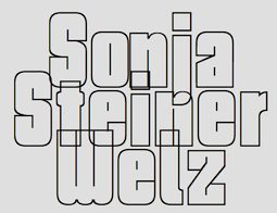 Author of Von der Schrift und den Schriftarten (Reinhard Welz Vermittler Verlag, Mannheim). These have a history of type and lettering, instructions on lettering (e.g., stroke guide for Antiqua Majuskeln, Lombardische Versalien, and Gotische Majuskeln), some type specimen (mainly German, from the early part of the 20th century), some alphabets, drawn by her, information on the German school scripts, and a German type and lettering glossary: i, ii, iii, iv. It was probably published between 1956 and 1959.
 In 2010-2012, Dick Pape created a number of (mostly caps-only) typefaces based on that book. These include SSWAntiquaPionsel, SSWAntiquaVersalien (a caps set based on Ludovico Vicentino, 1523), SSWCelticAntiquaOutline, SSWFederAntiqua, SSWHollowScript, SSWHolz (Lombardic caps), SSWJensonsAntiqua, SSWLeopoldAntiqua, SSWLombardischeVersalien, SSWMannheimOrnament, SSWPlakatschrift (a useful outline alphabet), SSWRoundPrinting, SSWRusticAlphabet, SSWRusticScript, SSWSchablonenschrift (Bauhaus-style stencil face), SSWUrbanAntiqua-Versal, SSWWoodcuts. Download Pape's fonts here. [Google]
[More] ⦿
|
Speedball
|
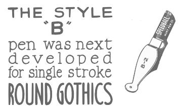 Speedball pens were invented by Hunt Corporation (or Hunt Company) which was located in Camden, NJ and later (since 1958) in Statesville, NC. The highlights of that company:
 - In 1899 C. Howard Hunt formed his own company, which he incorporated in 1901. George E. Bartol, a Philadelphia grain and commodities exporter and founder of the Philadelphia Bourse, a merchants exchange and business center, was among the first 28 shareholders. In 1903, Mr. Bartol was elected president and a director of the Company and served until 1917.
- The C. Howard Hunt Pen Company invented the smooth gliding round pointed pen, which required about 15 operations in the manufacturing. Expert cutters used cutting presses to produce almost 45,000 pens a day from rolled sheets of steel. Pictured from left, workers imprint, grind and ship 25 pens per minute.
- The C. Howard Hunt Pen Company began in this building in Camden, NJ. The factory moved to Statesville, NC, in 1958. The office moved from Camden to Pennsauken, NJ, in 1963 and then to Philadelphia in 1965. Also pictured here is Benjamin Newman, one of the expert pen makers C. Howard Hunt brought to Camden from Birmingham, England, in 1899.
- The Speedball Pen was developed and patented by sign letterer Ross F. George of Seattle. His square-tipped pen could make broad and thin lines. George took the patent to the C. Howard Hunt Pen Company in 1915.
- In 1916, George E. Bartol resigned as President of the C. Howard Hunt Company. His son George Bartol, Jr., succeeded him and was elected Vice President and then Chairman of the Board in 1926. He led the Company for 50 years. George Bartol, Jr., retired in 1969 and died in 1972 at the age of 80.
- The Hunt Company expanded and branched out. In 1997, Speedball Art Products was born, with headquarters in Statesville, NC.
[Google]
[More] ⦿
|
Spencer Brothers
|
The sons of Platt Rogers Spencer are the authors of Theory of Spencerian Penmanship (1874), New Standard Practical Penmanship (1881) and New Spencerian Compendium (1879). See also here. [Google]
[More] ⦿
|
Spencerian penmanship
|
From Encyclopaedia Britannica: Style of cursive script developed by Platt Rogers Spencer (d. 1864) of Geneva, Ohio. Energetically promoted by five sons and a nephew, the Spencerian method became the most widely known system of handwriting instruction in the third quarter of the 19th century. [Google]
[More] ⦿
|
Spencerian Script typeface
|
A calligraphic copperplate typeface by Mackellar, Smiths and Jordan. For a digital revival, see Opti Swallow (Castcraft, 1990-1991). [Google]
[More] ⦿
|
Sproviero Type (was: Lián Types)
[Maximiliano Sproviero]

|
 Argentinian foundry located in Buenos Aires, est. in 2008 by Maximiliano Sproviero (b. 1987, Buenos Aires) as Lian Types (old link), mainly specializing in gothic, uncial, script and handwriting typefaces. Rennamed Sproviero Type, his typefaces can be licensed since 2021 via The Type Founders.
 Sproviero graduated from FADU, University of Buenos Aires in 2008 with a script thesis typeface called Colofon. His fonts from 2008 include Devil Kalligraphy, Pumba (great futuristic rounded look), Tobogan (retro), Kiwi Sans Serif, School Rainbow, Suave Calligraphy, Tonika (handwriting), Goddess (handwriting), Cursivessca (calligraphic; 4 styles), Friendship (6 styles), Chechelo Lawyer (modern italic condensed), Quijote Italic (calligraphic with tall ascenders and descenders), Miscelanea (arabesques), Lunga (a condensed hairline family consisting of Real Ligada, Exacta, Versalita and Extras), Mabela (a rounded fat display font), Red Wagon (ultra-condensed), Valeria Script (swashy), Kalligrand (2008, a tall calligraphic face), Intima Script One, Two and Three (described by him as a sensual calligraphic script family), and Paradise Script (96 styles, all calligraphic). Creations from 2009: Kaligrafia, Galana, Mon Amour Script (hyper-calligraphic), Oh Lara (also hyper-calligraphic), and Quijot sauvage (a 7-style calligraphic feat). In 2010 he made these typefaces: Parfait Script (a high-contrast calligraphic script), Kanikama, Breathe Pro (calligraphic with didone serifs), Boston Script. Creations from 2011: Reina (a curvaceous didone family, +Engraved). He updated this in 2021 to the 45-style Reina Neue. At Tipos Latinos 2012, Maximiliano Sproviero won awards in the display type category for Aire (2012, a thin curly didone family), Breathe Pro, and Reina. At TDC 2013, he won an award for the copperplate script Erotica. Erotica also won an award at Tipos Latinos 2014. Typefaces from 2013: String (a hairline Spencerian script), Brand (a signage script family), Agile Pro (a hairline swashy calligraphic family), Bird Script (which an award at Tipos Latinos 2014), Live Pro. Typefaces from 2014: Selfie (connected monoline signage script), Heroe (a script that takes Lubalin and Caslon to the extreme), Dream Script (a chancery script that won an award at Tipos Latinos 2016), Dream Caps (Trajan capitals), Beatle (a Spencerian script with psychedelic touches). Typefaces from 2015: Seventies (a funkadelic typeface), Indie (a signage script family that won an award at Tipos Latinos 2016), Model (a hairline fashion mag calligraphic script family). Typefaces from 2016: Lubaline (decorative caps inspired by Herb Lubalin), Skill (signage type: winner at Tipos Latinos 2018 of a type design award). Typefaces from 2017: Posh (a fat didone), Fluire and Fluire Caps (a greeting card font pair), Preta (almost psychedelic script), Vinyle (a remarkable monoline decal script). Winner at Tipos Latinos 2018 of a type design award for Lubaline, Posh and Preta. Typefaces from 2018: Burger (a fast food slab serif bonanza), Fleur (inspired by some lettering in Palais Garnier in Paris---Sproviero calls this the Napoleonic style), Pantera (a lively pointed brush calligraphic typeface family), Girasol (based on sketches by Susana Maurette), Rafaella (all caps---described by Sproviero as coquette). Typefaces from 2019: Hot Script (monoline), Elipses (a Peignotian sans family in 7 styles), Fabulous Script, Breathe Neue. Typefaces from 2021: Selfie Neue Rounded (40 styles), Selfie Neue Sharp (39 styles), Ballet VF (Maximiliano Sproviero: a variable Spencerian penmanship font with optical sizing from 16pt to 72pt---a technical feat accomplished with the help of Eduardo Tunni and the Omnibus team; free at Google fonts; Github link), Klingspor link. Behance link. Interview by MyFonts in 2014. [Google]
[MyFonts]
[More] ⦿
|
StartWrite
|
Handwriting Software to trace dots, intended for kids. Software comes with three trace-the-dot fonts. "Included with StartWrite are the Manuscript (Zaner Bloser), Modern Manuscript (D'Nealian), and Italic (Getty-Dubay or Portland Italic) font styles." With an additional cursive font, 50USD. Based in Salt Lake City. [Google]
[More] ⦿
|
Storic Type (or: Flavor Type, or: Flavortype)
[Panji Nugraha]

|
 Flavor Type was an Indonesian design studio located in Bandung in which Panji Nugraha, Ilham Herry and Maghrib Lab were involved. In 2017, Panji Nugraha set up Storic Type.
 Panji Nugraha is the Bandung, Indonesia-based designer of Caferus (2014), Murmers (2014, Victorian), Bonerica (2014, a Victorian typeface), Vanderchalk (2014) and Glowist (codesigned in 2014 with Ilham Herry and Maghrib Lab at Flavor Type). In 2015, he made My Dear Script (penmanship script), Hava Shine (Victorian signage face), Lovile, La Chalk (chalk writing emulation), Carneval (a fun hand-drawn typeface family with a possibility of layering), To Dear (brush script typeface), Allic (brush typeface), Vidiz (a swashy slab serif poster typeface), Levitte Script, Leila, Holisun (brush face), Vacamous, Summerica, Callalily, Vicent (watercolor brush), Morning Sugar (brush script), Blacky, Lonssa (hand-drawn type, with ornaments), Heartwell (a wonderful brushy poster script), Noside (a splashy brush), Toxine and Fruty. Typefaces from 2016: Enlighten (bouncy sans), Bite Chalk, Stay Alive (Victorian), Dafodil (Western), Vercha, De Arloy (art nouveau), Herald Bouncy, Mon Cheri (signage script). Typefaces from 2017: Relove (Victorian), Floresh, Chester (a layered spurred vintage typeface), Recipe Daily (free), Glandish, Moody Blue (a curly Victorian typeface), Reborn (ornamental Victorian typeface), Recipe Diary. Typefaces from 2018: Limit Corner (Victorian), Bride Chalk (sans and serif). Typefaces from 2019: Borest (a luxurious flared sans by Ilham Herry and Maghrib Lab), Fulgate (by Ilham Herry and Adam Fathony). Typefaces from 2020: Muray House (a bold swashy bathroom towel typeface by Ilham Herry and Adam Fathoni Haris), Esteric (a playful retro jazz typeface). Flavortype's catalog in 2022 showed these typeface families: - Barlon (2022). Art nouveau, modernized. By Ilham Herry and Adam Fathony Haris.
- Borest (2019). A luxurious flared sans by Ilham Herry, Adam Fathony Haris and Maghrib Lab.
- Budge (2020). A layerable retro signage script.
- Bumsy (2021). A bold display serif by Ilham Herry and Adam Fathoni Haris.
- Esteric (2020). A playful tapered retro jazz font. By Ilham Herry and Adam Fathony Haris.
- Fulgate (2019). A luxury display family by Ilham Herry and Adam Fathony Haris.
- Genty (2020). A creamy retro signage script typeface by Ilham Herry and Adam Fathoni Haris.
- Glaw (2020). A psychedelic font by Ilham Herry and Adam Fathoni Haris.
- Monvar (2021). A layerable Cooper Black style typeface. By Ilham Herry and Adam Fathony Haris.
- Muray House (2020). A bold swashy bathroom towel typeface. By Ilham Herry and Adam Fathony Haris.
- Rische (2021). A 6-style display serif with huge counters and an enormous x-height. By Ilham Herry and Adam Fathony Haris.
Creative Market link for Flavor Type. Another Behance link. Behance link. Another Behance link. Another Creative Market link. [Google]
[MyFonts]
[More] ⦿
|
Stripes Studio
[Yur Lis]

|
Aceh, Indonesia-based designer of the calligraphic script typefaces Wellington (2018: a penmanship font), Starlight (2018) and Smoothline (2018). In 2019, they published the curly calligraphic script Syarlina, the wild calligraphic script font Angola Script (2019), the dry brush fonts Ringster, Lost Brush, Horbelly and Gruffly, and the calligraphic fonts Melya, Murchison Script (with many swashes) and Melisenda Script. Typefaces from 2020: Dear Story (a wild script), Misyela, Jasmitha Script (a formal calligraphic script), Basting Brush (a dry brush script), Fellya, Black Mud (a dry brush font), Heliconia, Aster Love (a dry brush script), Flower Garden (a brush script), Hot Ink (brush script), Push Thing Script, Hugbirds (dry brush script), Brightime Script, Ink Hill, Gempita Brush, Schuyler Script, Birthday Script, Agustin Script, Madelis Script, Holland Script, Fabulous Script (penmanship script), Starlight Script, Marstain (a dry brush), Emilston (a dry brush script), Konsteady, Clock Bird (a dry brush script). Catalog as of 2020: Agustin Script, Angola, Aster Love, Basting Brush, Birthday Script, Black Mud, Brightime, Clock Bird, Emilston, Fabulous Script, Fellya, Flower Garden, Gempita Brush, Gruffly, Heliconia, Holland, Horbelly, Hot Ink, Hugbirds, Ink Hill, Jasmitha Script, Konsteady, Madelis Script, Marstain, Melisenda Script, Melya, Murchison, Push Thing, Ringster, Schuyler, Smoothline Script, Starlight, Syarlina, Wellington. Typefaces from 2021: Anstolina (a dry brush script), Anstolina (a dry brush script), Wiltona Brush (a dry brush script), Meyola (script), Celtia Script, Molynia Script, Strong Brush (a dry brush script), Revanie Script, Better Night (a dry brush font), Hello Yasmin (an upright script), Hello Yasmin (an upright script), Young Style (script), Love Style (a scrapbook script), Marthoni Brush (a dry brush script), Hello Marlisa (script), Choose Time. Typefaces from 2022: Mitabela (script), Deysia Brush (a dry brush script), Deysia Brush (a dry brsuh script). [Google]
[MyFonts]
[More] ⦿
|
Stuart Sandler
[Font Diner (or: Stu's Font Diner)]

|
 [MyFonts]
[More] ⦿
|
Studies in Pen Art
[William E. Dennis]
|
 A PDF file of the book Studies in Pen Art (by Brooklyn, NY-based penman William E. Dennis, 1914, A.N. Palmer Co). This 95-page booklet has beautiful specimens of alphabets, from display typefaces to calligraphic scripts, blackletter types and ornamental types. There are also reproductions of flowery ornaments such as the acanthus ornaments popular in the early 20th century. He created Sickels alphabet, ca. 1899.
 Additional link. Another PDF file. Examples of Dennis's hand: a bird (1896), his signature (1896), Austin N. Palmer's name hand-printed (1896). [Google]
[More] ⦿
|
Studioways
[Eliza Gwendalyn]

|
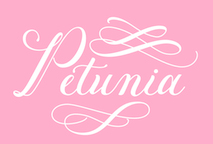 Calligrapher in New York City. In 2016, she published the copperplate calligraphic script typeface Petunia (Great Lakes Lettering).
 In 2017, she teamed up with Boston-based type designer Jim Lyles to form the Studioways Studio, which specializes in calligraphic typefaces. Studioways features Eliza's own lettering as well as that of other popular calligraphers. Typefaces from 2017: Madison Street (a Spencerian set of fonts by Elaina DeBoard, Eliza Gwendalyn, and Jim Lyles, accompanied by a few styles that are based on the handwriting of Elaina DeBoard), Hart (by Virginia Lucas Hart, Eliza Gwendalyn and Jim Lyles), Boronia, Lady Slippers. Typefaces from 2018: Petunia Monogram (with Jim Lyles). Typefaces from 2019: Little Sprout (script; with Jim Lyles). Typefaces from 2020: Nerine (a brush-lettered script). Creative Market link for Studioways. Another Creative Market link for Studioways. [Google]
[MyFonts]
[More] ⦿
|
Sudtipos
[Alejandro Paul]

|
 Alejandro Paul's Argentinian foundry is called Sudtipos. Veer writes about Paul: Alejandro Paul is one of the founders of the Sudtipos project, the first Argentinian type foundry collective. He taught graphic design and typography at the Universidad de Buenos Aires from 1996 until 2004 and has worked as an art director in prestigious Argentina-based studios, handling high-profile corporate brands such as Arcor, Marta Harff, Morph, SC Johnson, Danone and Movicom. He has walked away with awards from several design competitions. In 2003, he began working with artist Angel Koziupa, designing fonts and lettering for several top packaging agencies. In 2006 he was a speaker at TMDG06, the largest Latin American graphic design event - more than 4,000 designers were in attendance. His work has been featured in publications around the globe, including Step and Creative Review. He has walked away with awards from numerous design competitions. He has received two Type Directors Club TDC2 awards, in 2008 for Burgues Script and in 2009 for Adios Script. He teaches a postgraduate typography program at the University of Buenos Aires, where he previously taught graphic design.
 Sudtipos has made a reputation as the place to go to for script and signage type. Faces include Brownstone Sans (2010), Brownstone Slab (2013), Politica (2008, an architectural lettering superfamily, used, e.g., by Discovery Channel), Domingo (by Ariel Garófalo), Plumero (connected handwriting font by Diego Giaccone, which is also in the Umbrella Type collection), Murga (display font by Alejandro Paul based on lettering of Angel Koziupa, 2003), and these typefaces by Alejandro Paul: Tierra, Latinaires (2003-2018), Reflex (unicase), Downtempo, and Stardust. Free fonts: Mosaico (2003, pixel typeface by Alejandro Paul), Mabella (2001, Ramiro Espinoza), Rolinga (Carlos Carpintero). Divina (2004) is a Latinized digitization of Kurrent (designed by Rudolph Koch in 1927 and cut in 1935). Myfonts link. Pictures of their fonts in use. YouWorkForThem link. Blog / Facebook group. Additions in 2010: Business Penmanship (which is based on models of American business education penmanship, ca. 1900). Poem Script is another Spencerian face---it won an award at TDC2 2011 and at Tipos Latinos 2012. Fonts from 2011: Calgary Script (brush signage face), Viento (a lively version of Brisa, 2004, another font done with Angel Koziupa), Semilla (2011, a retro script based on an alphabet drawn by Ernst Bentele in 1953). Fonts from 2012 include the angular pair Bayoneta Pro and Machete Pro, both co-designed by Alejandro Paul and Angel Koziupa. Platinus Script Pro (done with Angel Koziupa) is a wedding font. His Hipster Script won an award in the TDC 2012 competition and at Tipos Latinos 2012. In 2013, he created Seashore Script (described as a feminine script, it has horizontal stress and is backslanted; some may consider it an Arabic simulation typeface). At Tipos Latinos 2014, Alejandro Paul cleaned up, winning awards for Bellissima Script, Seashore Script, Auberge Script (a penmanship font in the style of the French bâtarde and coulée), and Bayoneta. Typefaces from 2014: Jugo Script (a supermarket script, done with Angel Koziupa), Courtesy Script (a connected Zanerian script based on a model from 1876). Typefaces from 2015: Blog Script (an informal handwriting font, with Carolina Marando), Auberge Script (which was started in 2014). Typefaces from 2016: Wink (a connected script font co-designed with Joluvian), Henderson Slab and Henderson Sans (a large slab serif family loosely based on an alphabet drawn in 1906 by Albert Du Bois for the Henderson Sign Painter Book), Prangs (a thinly connected italic didone named after Prussian-American printer and lithographer Louis Prang (1824-1909)). Typefaces from 2017: In 2017, Tropical (with Joluvian: this package contains a bold, wet-looking display script, an inky, textured brush script, and hand-penned capitals with a felt-tip look). Typefaces from 2018: Fixture (a 72-font grotesk family published by Sudtipos). Typefaces from 2019: Replete Sans (a seven-style mainly art deco typeface inspired by early 20th century lettering on metropolitan buildings all over the world), Tafel Sans (a contemporary take on early- to mid-century geometric fonts). Typefaces from 2020: Antica (a wedge serif based on Latin poster and billboard typefaces from the 19th century). Typefaces from 2021: Statement Sans (an 18-style neo-humanist sans with an exquisite Black weight, by the Sudtipos team; it includes a variable font). Klingspor link. View Alejandro Paul's typefaces. Adobe link. [Google]
[MyFonts]
[More] ⦿
|
Sukjana Almunandar
[Alcode]

|
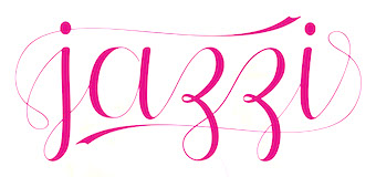 [MyFonts]
[More] ⦿
|
Symon De Vries
|
Dutch penman who published Lust-Hof der Schrijft-Konste (1619). [Google]
[More] ⦿
|
Tart Workshop
[Crystal Kluge]

|
 Minneapolis, MN-based illustrator and lettering artist. Designer who sells her script fonts through Font Bros, where she receives digitization support from Stuart Sandler. Her work is also sold via Tart Workshop. Alternate URL. Another URL. MyFonts link.
 In 2007, she made Silverstein and Seasoned Hostess. In 2008, she added Henparty Sans and Serif (casual curly scripts), and Darling Monograms. The calligraphic Nelly Script (copperplate script) and Nelly Script Flourish followed in 2009. Carrotflower (2009, hand-printed) comes with Carrotflower Christmas Icons, Carrotflower Invitation Icons, and Carrotflower Celebration Icons. Her designs in 2010 include Barocca (a monogram font, done with Stuart Sandler) and Nelly Frames. In 2011, she published the quaint teahouse typefaces Bookeyed Jack and Bookeyed Suzanne. At Google Web Fonts, we find Chelsea Market (2012), Butterfly Kids (2012, a curly script) and Princess Sofia (2012, a tipsy script). Crystal Kluge and Stuart Sandler made the children's party font Crafty Girls Pro (2010, with Stuart Sandler at Neapolitan). Typefaces from 2012: Emily's Candy (a curlified didone: free at Google Web Fonts), Madelinette (connected script). Codystar (a dot matrix face) is free at Google Web Fonts. Sugarplum (with Stuart Sandler) is a cheerful casual typeface. Aya Script (with Stuart Sandler) is a script with adjustable ribbons at front and rear of the letters. San Rafael is an upbeat curly script. Bookeyed Nelson is a tall caps only poster typeface. The teenage script typefaces Princess Sofia Royale Pro, Butterfly Kids Pro and Emily's Candy Pro and the bohemian typefaces Chelsea Marketplace Pro and Chelsea Market Open Pro were published by Crystal Kluge and Stuart Sandler at Neapolitan. Typefaces from 2013: Bookeyed Sadie (a quaint curly ball terminal typeface). Typefaces from 2014: Amoretta (a curly font family, co-designed with Stuart Sandler), Bookeyed Martin (another vintage curly script, with Stuart Sandler). Typefaces from 2016: Cherripops (by Crystal Kluge and Stuart Sandler). Typefaces from 2019: Madelinette Grande (by Stuart Sandler and Crystal Kluge: created by hand with traditional pointed pen, it includes calligraphic penmanship and rustic styles), Bella Monograms. Typefaces from 2021: Bon Marche (a curly vernaculat script by Stuart Sandler and Crystal Kluge), Los Angelino (a script by Stuart Sandler and Crystal Kluge), La Bohemienne deLuxe (a calligraphic script by Stuart Sandler and Crystal Kluge), Epicursive Pro (a script by Stuart Sandler and Crystal Kluge), Hey Eloise (hand-crafted). Klingspor link. View Crystal kluge's typefaces. Google Plus link. Creative Market link. [Google]
[MyFonts]
[More] ⦿
|
T.E. Jansen
|
Dutch wood engraver and printer located in Nijmegen, who lived from 1809 until 1863. He published the lettering model book Cahier van acht en dertig lettermodellen, ten dienste van huis- en rijtuig-schilders, enz. (1854) Reference: Nederlandse belettering negentiende-eeuwse modelboeken (2015, Mathieu Lommen, de Buitenkant, Amsterdam). [Google]
[More] ⦿
|
Teuku Fahruddin
[Typehill]

|
[MyFonts]
[More] ⦿
|
Teuku Rinaldi Novianda
[Max.co Studio]

|
[MyFonts]
[More] ⦿
|
Teweka
[Tuanku Muhammad Iqbal]

|
 Banda Aceh, Indonesia-based designer, b. 1993, of the brush script typeface Liberty Brush (2016), and the calligraphic typefaces Shania (2016), Silicia (2016) and Median Script (2016).
 Typefaces from 2017: Blackpool, Slavelake, San Francisco, Palestine (thin calligraphic typeface), Camelia (calligraphic), Stalingrad (calligraphic), Washington (calligraphic), Society Script, Anatasha (calligraphic), Paradise (calligraphic), Phoenix (calligraphic script). Typefaces from 2018: Syndicate. Typefaces from 2020: Nightingale (a Spenerian calligraphic script), Galisha (a fine script). Typefaces from 2021: Columbia (wild calligraphy). [Google]
[MyFonts]
[More] ⦿
|
The Fontry
[Michael Gene Adkins]

|
 The Fontry is a Watts, OK, based outfit, est. 1992 by Michael Gene Adkins (b. 1965, OK) and James L. Stirling (b. 1964, OK): Digital type for computer-aided signmaking, with fonts designed for signmakers by signmakers.
 Since 2009, they have been producing various digitizations of alphabets designed by Alf R. Becker in the 1930s and 1940s. Gene Adkins designed ARB-187 Moderne Caps AUG-47 (2013, didone), ARB 85 Modern Poster JAN-39 (2011, after Modern Poster Script, 1939), ARB-70 (1995), ARB-67 (1998), ARB-66 Neon (2010, +Block, +Line), ARB-44 (1995), ARB-96 Jitter Display DEC-39 (1999), SCRIPT1 ARB-85 Poster Script Normal (2000), ARB-66 Neonline Block, ARB114 Hillbilly Roman JUN-41 Normal (1999), ARB-187 Moderne Caps AUG-47 CAS family (2009, a beautiful didone display face), the ARB 08 Extreme Roman AUG-32 CAS family (2009), ARB-218 Big Blunt (2010), ARB-218 Neon Blunt. Another product is the Wild Bunch Pak #3: Danthr Skal, Kastaka, Gas Bumps, Skrawl 613, Sharrpe Gothik, Levo Fraz, Kommerce, Stellar Spice, Infected Hurt. Wild Bunch Pak #2 (50 USD) has Marbles&Strings, Keetoowah, Peppermint, Ghixm (2008: a retrospective of the horror comics and movie posters of the 1960s and the 1970s), Klash, all outline fonts. In Wild Bunch Pak #1, look for Toxia. Race Pak #1 contains 5 chiseled fonts, including ARB67, Brannt Chiseled, Excursions, JLS Ultra, and Race Checkers. 50 USD. There are also Greek Pak #1 (12 Greek fonts for 25 USD, including GRK Orbit, GRK Universe City, GRK Albert, and GREK Bodnaut) and Signfaces Narrow Pak #1. At Garagefonts, Wild Larra, Wild Ruts, Wild Toxia, Wild Nobody families (1999), Jackport (2014, athletic lettering and Western typeface family). Adkins also designed the commercial font First Vision at GarageFonts in 1998. Review at &Type. List of the fonts on his CD. MyFonts sells FTY Garishing Worse (2011---there is a free version at Dafont), SCRIPT1 Team (2010), SCRIPT1 Toon (2010), SCRIPT1 Voodoo Script (1999-2009, signage script), What Sound Pounds (2009), WILD3InfectedHurtNormal (2010), WILD1 Firstvision (1997), WILD1 Larra (1997, grunge), WILD1 Nobod (1997, grunge), WILD1 Ruts (1997), WILD1 Toxia (1997) and the blackletter typefaces Ironhorse and Ironrider (2007), revivals of classic wood type typefaces. FontShop link. Some fonts are inspired by sign painter Frank H. Atkinson. These include the Broken Poster series done in 2010, FHA Modernized Ideal Classic (2011), and FHA Nicholson French (1999-2014: art nouveau). In 2008, The Fontry published the Greek Font Set, Copper Penny DTP (after Copperplate Gothic, but with lower case included), Droeming (an eerie family) and Earth A.D. (more eerie stuff, metallic, and with sharp serifs). It then generated a break-away subfoundry that carries fonts solely designed by James Stirling, Fontry West. Fontry West is located in Tulsa, OK. At MyFonts, these Fontry West fonts can be bought: Iron, WILD1 Firstvision, WILD1 Larra, WILD1 Nobody, WILD1 Ruts, WILD1 Toxia, WILD2 Ghixm, Greek Font Sets 1 and 2 (not Greek, only Geek-ish, made for fraternity use), and a large Comic Fanboy set which includes glyphs painted with stars and stripes (CFB1 American Patriot, CFB1 Captain Narrow, CFB1 Shielded Avenger, all made by Adkins). The CFB1AmericanPatriot family (2009), and the SCRIPT1 Rager Hevvy family (2009) are free here. JLS Overkill (2009, Bloque, Stencil, Grunge, Champion [athletic lettering], Hammer) is a sturdy family covering everything from SUV-strength stencils to grunge stencils and macho slab serif headline typefaces. After Disaster (2008), FHA Eccentric French Normal (2008, wood type after an alphabet created by Frank H. Atkinson in 1908), WHATSOUNDPOUNDS?Normal (2009) are free at Dafont. Sinder (2010) is a grunge face. FTY Konkrete (2010) is constructivist, and has a beveled weight. FTY Strategycide (2010-2018) is a similar severe headline sans family. Sinder (2010) and Demon Sker (2011) are free grunge typefaces. American Purpose (2011) is a grotesk family. American Purpose Casual and American Purpose Stripe (2011) are follow-ups. Garishing Worse (2011) is a casual bold face. Sharpe Gothik (2011) is hand-drawn. American Captain (2011, a manly retro squarish propaganda headline face; see also American Captain Patrius 02 FRE). Deathe Maach (2012) is a sturdy 6-style display family. Avengeance (2012) is a techno typeface. FHA Condensed French (2012, by Michael Gene Adkins and James L. Stirling) and FHA Nicholson French (1999-2014, art nouveau) are based on Frank H. Atkinson's examples. Typefaces from 2013: FHA Broken Gothic (a layered chiseled family done with James Stirling, based on Broken Poster by Frank H. Atkinson), FTY SKRADJHUWN (a flared family), Iron Man of War (with layering effects, +001Rivet), Iron Man of War 2 NCV, RACE1 Brannt (prismatic, beveled, art deco), FTY Skorzhen (mini-spurred), FTY Speedy Casual, FTY Skradjhuwn NCV (comic book family). Typefaces from 2014: FHA Tuscan Roman (2014, Michael Gene Adkins, James L Stirling), FTY Varoge Saro Noest. Typefaces from 2015: FHA Sign DeVinne (after a popular sign painting design by Frank H. Atkinson named after DeVinne). Typefaces from 2016: FTY Delirium (+Neon), Delirium NCV. Typefaces from 2017: FTY Galactic VanGuardian. Typefaces from 2021: Fty Old Sport (a slab serif athletic lettering font family, one of the best in this genre). Typefaces made by Fontry West. Typefaces by Mike Adkins. Fontspace link. Klingspor link. Dafont link. Abstract Fonts link. Creative Market link. [Google]
[MyFonts]
[More] ⦿
|
Thinstroke
[Antonio (Tony) DiSpigna]

|
 Italian type designer, b. 1943, Forio d'Ischia, Italy, who emigrated to the USA. Di Spigna graduated from from New York City Community College in 1964 and then from Pratt Institute in 1967. His first design job was at Bonder&Carnase. In 1969, he joined Lubalin Smith Carnase Inc. He founded his own studio, Tony DiSpigna Inc in 1973. DiSpigna taught typography at the Pratt Institute, the School of Visual Arts and the New York Institute of Technology. In 2009, Tony Di Spigna and Bill Hilson (a colleague at Pratt) founded Thinstroke, which joined Type Network in 2021.
 DiSpigna's typefaces: - ITC Serif Gothic. Designed in 1972 by Herb Lubalin and Tony DeSpigna for the International Typeface Corporation, it is a "cold" almost copperplate typeface. Serif Gothic started as a scribble sketch for a French shirt company, Hechter Chemise, a client of Herb Lubalin. The sketch made it into a presentation by Tom Carnase, but was rejected by the client. Type Network writes: During a rare slow day at the office, Di Spigna decided to develop and sketch the remaining capitals, adding a lower case and some alternate characters. In his free time, he decided to finish the design with ink and white paint. Despite it being Di Spigna's first full typeface, Serif Gothic went on to become quite popular. Serif Gothic was used for the original Star Wars films's posters.
- Playgirl.
- ITC Lubalin Graph (with Herb Lubalin).
- Fattoni (1968).
- DiSpigna Roman (1969). One of his arly typefaces at Lubalin Smith Carnase Inc. He writes: When I got out of school at Pratt in 1967, I fell in love with Herb Lubalin's posters of his new typefaces, especially Pistilli Roman. (See page 34 of the Herb Lubalin book by Alan Peckolick.) I vowed that someday I would do one even better and heavier in weight. So, in 1969, I designed DiSpigna Roman in pencil on tracing paper, and executed it on heavy stock bond paper with the traditional ink and white clean up paint-the way we did all executions of letterform and typefaces back then. It became one of the first faces we digitized when we created Thinstroke. This typeface harkens directly back to 1969. I still love Pistilli, but I do think my DiSpigna Ultra is heavier with more luscious curves. DiSpigna Ultra (2022) can be found at Type Network.
- ITC Korinna (1974). Designed together with Ed Benguiat).
- WNET.
- Spignarian Script (2021). A creamy formal calligraphic script published by Thinstroke.
- DiSpence Script (2021). A Spencerian script published by Thinstroke.
FontShop link. Another MyFonts link. Logo. Klingspor link. Linotype link. [Google]
[MyFonts]
[More] ⦿
|
Thomas Weston
|
Penman who wrote Illustrissimo Principi C. Ruperto Comiti Palatino Rheni ... in Arte Scriptoria Tentamen imperfectum Submisso cultu (1681). [Google]
[More] ⦿
|
Tipo Pepel (was: Antaviana Typeface Division, or: Astramat)
[Josep Pep Patau i Bellart]

|
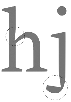 Antaviana Typeface Division is a Catalan foundry, est. ca. 2002. It went also under the name Astramat and was also known as ANTAVIANA SERVEIS INTERACTIUS, SCCL. Located in Lleida, it is run by Josep Patau i Bellart (b. 1971, Les Borges Blanques, Lleida). Patau i Bellart offered free fonts, as well as commercial fonts. He has emerged as one of the most talented contemporary Spanish type designers. In 2011, he started Tipo Pepel [MyFonts link] in Les Borges Blanques. Josep Patau's typefaces:
 - Free typefaces: Lletraferida (2011, a didone), Negrona (2011, a revival of Lucian Bernhard's Bernhard Negro, 1930), Perolet, Lango, Gimenells, Arbeka, Rosango, Antaviana, FoxScript (1996, old typewriter), Unregistered, and FistroRatted (grunge).
- At Astramat, one could download these fonts: Anmari (2002), Antaviana (1996), Arbeka (2002), FAXADA (2001, by Cel Tico Petit), FoxScriptNormal (1996, old typewriter), Gastada (2001, another grunge font by Cel Tico Petit), Gimenells (2001, pixel font), Gorchs (2007, script font), Klander (1999, pixel font), Lang (2001, pixel font family), Masterfly (2007, T-26), Omellons (2001, pixel font family), Perolet (2001, Bauhaus style), Pixelade (2001, pixel font), Rosango (1996), Tiquet (2001, grunge font by Cel Tico Petit), Ultrafat (2007, T-26), Fistro Ratted. Fontspace link for Astramat.
- T-26 fonts: the screen typeface PixScript (2004), the screen icon dingbat font Pixelade Icons (2003), the art nouveau headline font Gisele (2003, angular art deco titling face), Masterfly (2007), Gopal (2004), Gourmet (2004, based on a type from the 1923 ATF catalog), Confetti (2006, connected fifties style face based on a 1930 type called Escritura Maravilla and Escritura Energica by the José Iranzo foundry in Barcelona), the pixel family Bit Kit (2003), Houdini Icons (20 pixel web icon dingbat typefaces, 2004).
- At ATypI 2009 in Mexico City, he explained the typographic work of the goldsmith Manuel Peleguer: The aim of this paper is to give an account of the project Peleguer, the recovering and digitialization of the work of the goldsmiths Manuel Peleguer, both father and son, who cut some printing characters between 1780 and 1784 in response to an order of the "Real Sociedad Económica Valenciana de Amigos del Pais". The result was a modern transitional typeface, with good legibility and neoclasical forms, equal in quality to those made by the Real Press (Imprenta Real) in Madrid by Pradell, Espinosa or Gerónimo Gil. Peleguer founded a press and a font foundry in 1784. Patau Bellart created a type family based on Peleguer's work called Peleguer (2009, + Ornaments).
- Anduaga, a calligraphic typeface from the 18th century, won the Laus Prize (said to be the Spanish equivalent of the type Oscars). Anduaga is the interpretation of the script that Joseph of Anduaga proposed for teaching the first letters in the 1780 book Arte de escribir por reglas y sin Muestras ...
- Valliciergo (2011) is a 100+-glyph calligraphic / copperplate script font that is inspired by samples from Caligrafía inglesa published in Madrid in the late nineteenth century by Spanish calligrapher Vicente Fernández Valliciergo.
- Dafont page, where one can download Ventura Edding (2008, hand-printed).
- Kids Script (2011). An upright connected school script.
- Trajana Sans (2011) is a sans-serif typeface family based on the shapes and proportions of the characters on the Trajan Column in Rome.
- Farrerons Serif (2011) is a very readable family with angular and humanist underpinnings.
- Chupada (2012) is an ultra-condensed font family noted for their exaggerated x-height, which consists of five different weights.
- Chopped Black (2012) was inspired by the font Pabst Heavy, designed by Chauncey Hawley Griffith in 1928 for Linotype. It was Linotype's version of ATF's popular Cooper Black.
- Paralex (2012) is a 12-style geometric slab typeface family.
- Boxed (2013) is an 18-weight squarish sans family. Followed in 2017 by Boxed Round.
- Cinta (2013). A large humanist sans family with a full range of weights starting with hairline. It also has Cyrillic.
- Bridone (2013), for British didone. A didone family that inherits some features from Victorian era British slab serif typefaces. Fashionable, beautiful, and useful.
- Sisco (2014) is an 18-style elliptical techno family with large x-height.
- Book Cover (2014) is a fat headline typeface.
- Tiquet (2014). A dot matrix typeface.
- Milio (2014). A ten-style wedge-serif transitional typeface family for newsprint and magazines.
- Naste (2014). A sixteen-style geometric sans family that adds details and character to the classical geometric sans typefaces such as Futura. It is a bit wider than usual and covers Cyrillic.
- Pobla (2015). A text serif with angular, almost fractured.
- Dupla. A large multilingual sans family.
- Trepa (2015). A stencil family with various choices of textures, which was inspired by commercial signs and the 1960s French art movement Graphie Latine.
- Itaca (2016). A 48-style sans family with very open counters.
- Mario (2017). A typeface family for arcade games and children.
- Werdet Script (2017). A calligraphic penmanship script which is named after calligrapher Jean-Baptiste Werdet who was a penman in Bordeaux in 1809 and later a professor at Ecole Normale Superieure in Paris.
- Geo Deco (2019). A geometric art deco sans family.
- Frontis (2019). A transitionl roman typeface family inspired by the roman lettershapes that Asensio y Mejorada drew in 1780.
- Kongress (2019). An elliptical sans family for corporate identities.
- Labernia (2019). A large didone family based on the font used in Diccionari de la Llengua Catalana (1864, by Pere Labernia, Barcelona): Labernia and Labernia Titling are characterized by ball terminals that are turned inwards.
- Indecise (2020). A nostalgic 50-style sans family that reminds us of type designs by Enric Crous-Vidal and José Mendoza y Almeida.
- Frenchute (2020). A great 36-style garalde family inspired by the type used in the 1727 text Le Chemin Royal de la Croix.
- Gina (2020). A great readable 16-style humanist sans family. Sixteen styles including a hairline.
- Samplex (2020). Bellart's take on the neutral Swiss sans genre.
- Bauen (2020). A Bauhaus-inspired geometric sans typeface family.
- Bazinga (2020). A display typeface family characterized by square counters. Perhaps a children's book font.
- Romulo (2020). A 12-style transitional roman typeface.
- Kheops (2020). A 14-style slab serif.
Additional links: Dafont. MyFonts page. Alternate URL. Fontspace link. Fontfreak page. Patau Bellart is also involved in the type information site Unos Tipos Duros. Klingspor link. Abstract Fonts link. Interview by Unostiposduros. Fontspring link. [Google]
[MyFonts]
[More] ⦿
|
Tipos Latinos 2010
|
 The Fourth Bienal de la Tipografía Latinoamericana comprised a type competition, Tipos Latinos 2010. The jury consisted of Paco Calles (Mexico), José de los Santos (Uruguay), Juan Heilborn (Paraguay), Fabio López (Brazil), César Puertas (Colombia), Hugo Rivera Scott (Chile) and Marcela Romero (Argentina). The awards have in each category, if applicable, a first prize (certificado de excelencia, CdE below) as well as regular awards:
 - Type families:
- CdE: Isac Correa Rodrigues (for Monarcha), Raúl Plancarte (for Kukulkan), Cristóbal Henestrosa (for Espinosa Nova).
- Ordinary: Johnatan Cuervo (for Corvus), Eduardo Manso (for Geogrotesque, and for Sunday Times Modern), Veronika Burian and José Scaglione (for Adelle and for Karmina Sans), Alejandro Lo Celso (for Perec), Fernando Mello and Jason Smith (for FS Jack), Ramiro Espinoza (for Lavigne Display and Lavigne Texto), Raúl Plancarte (for Sedna), Fernando Caro (for Arauto), Juan Pablo del Peral (for Kalidoscopio).
- Text typefaces (ordinary awards only): Ana Paula de Bragança Megda and Pablo Ugerman (for Voces), Juan Montoreano (for Kalu), Sol Matas and Juan Pablo del Peral (for Parque Chas), Carlos Zinno (for Latinité Roman), Horacio Mella (for Fedora Regular), Martín Sommaruga (for MVD Rambla), Viviana Monsalve and Gustavo J. Ibarra (for Enriqueta Book), Diana Edith Domínguez Ruiz (for Kafka Regular), Sebastián Salazar (for Sedán), Fernando de Moraes Caro (for Petra), Miguel Reyes Cabrera (for Sancho Regular), Rodrigo López Fuentes (for Amaranta Regular).
- Script / signage typefaces:
- CdE: Alejandro Paul (for Brownstone), Oscar Yáñez (for Carlota).
- Ordinary awards: Carlos Fabián Camargo Guerrero (for Modelia Black), Ramiro Espinoza (for Tomate), Darío Muhafara and Eduardo Tunni (for Lassi Display), Julio Palacio (for Todo Todo), Alejandro Paul (for Semilla, Kewl Script, Calgary Script, and for Business Penmanship), Pedrina Reis (for Boneca de Pano), Diego Negrete (for Picacho), Alejandro Valdéz Sanabria (for López), Leonidas Loyola Valenzuela (for Elolinea), Eduardo Tunni (for Changa), Mariana Pariani and Eduardo Tunni (for Club Universo), John Moore (for Victorina and for Radio Time), Marconi Gomes Lima (for Adriane Lux), Macarena Budín Acevedo (for Juanita la envidiosa), Miguel Reyes Cabrera (for Plastilina), Eli Castellanos Chávez (for Barrilito), Daniel Hernández (for Pincoya Black), Ricardo Esteves Gomes (for Force), Gabriel Martínez Meave (for Tlatoani Sans), Alejandro Lo Celso (for Margarita).
- Experimental typefaces:
- CdE: Rodrigo Fuenzalida (for Khubo), Manuel Guerrero (for Optica).
- Ordinary awards: Diego Sanz Salas (for Quincha), Rodrigo Valenzuela (for Maipo Regular), Rodrigo Fuenzalida (for Isosibilia), Luis Bolaños (for Chacana Regular), José Luis Coyotl Mixcoatl (for Zoomanic), César Rodríguez (for Masiva), Manuel Guerrero (for MiniBlock), Edgar Alejandro Reyes Ramírez (for Ps Pronts OS29).
- Screen / pixel typefaces (ordinary awards only): Roberto Robles Quiroz (for Verpix), Mauricio Vital (for Coqueta), Elí Castellanos Chávez (for Lucecita Maniac), Jorge Iván Moreno Majul (for Wixarika).
- Miscellaneous: Diego Cataldo and Sergio Rodríguez (for Uruguay 1976), Víctor García (for Garcia Toons), José Luis Coyotl Mixcoatl (for Cubomatics Icons), Rodrigo Araya Salas (for Globeface).
- Designs that use Latin-American typefaces: Several awards were given.
[Google]
[More] ⦿
|
Torquato Torío de la Riva y Herrero
|
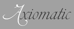 Or Torcuato Torio de la Riva. Spanish writing master (b. 1759, Villaturde, d. 1820) who studied Latin, theology and law at the University of Valladolid in 1773. He published these books:
 Digital revivals of his chancery scripts include Torio (2014, Pedro Leal). [Google]
[More] ⦿
|
Tuanku Muhammad Iqbal
[Teweka]

|
[MyFonts]
[More] ⦿
|
Typehill
[Teuku Fahruddin]

|
 Indonesian designer of these connected brush script typefaces in 2017: Stephanie, Austin Script, Navisha. In 2018, Typehill designed Typehill (dry brush script), Intybus Script, Sunlight Script (copperplate calligraphy), Bougenvil (formal calligraphy), Ephorbia (calligraphic), Angelina and Natural.
 Typefaces from 2019: Fantasia Script, Austin Script, The Fraga Script (a semi-curly retro signage script), Forestry Script, One Day, Graphitel (a formal calligraphic script), Marysha Script, Lemons, Floural Script, Warrior Script. Typefaces from 2020: Straight Script (a calligraphic font duo, with penmanship ornaments), Malaka Script. Typefaces from 2021: Lovey Dovey (an upright script), Sweet Love Script. [Google]
[MyFonts]
[More] ⦿
|
Typogama
[Michael Parson]

|
 Typogama is the personal foundry of Swiss designer Michael Parson (b. Geneva, Switzerland, 1979), who published these fonts in 2003 as part of Linotype's Taketype 5 collection: Anlinear LT Std Bold, Anlinear LT Std Light, Anlinear LT Std Regular, Arabdream LT Std (Arabic simulation face), ClassicusTitulus LT Std, Hexatype LT Std Bold, Morocco LT Std, Jan LT Std, Ned LT Std, Pargrid LT Std Cross, Pargrid LT Std Regular, Pargrid LT Std Trash, Piercing LT Std Bold, Piercing LT Std Code, Piercing LT Std Regular, Raclette LT Std.
 Most of Parson's fonts cover both Latin and Cyrillic. In 2004, he made Clans (T-26, blackletter) and Boulas (T-26). In 2006, he released these at T-26: Boutan (Indic simulation face), Heraldry (dingbats), Palm Icons (dingbats for golf), Wingbat (aircraft dingbats). In 2007, still at T-26: Heraldry, Thunderbolt 73 through 76 (from techno stencil to techno sans). In 2008, at T26: Ealing (geometric sans family, with a hairline), Bauhau (6 weights), Jane (a rounded sans in 12 weights), Quean, Halja (a modular sharp-edged blackletter with illuminated capitals), Faddish (a high-contrast vogue family), Big Boy (11 styles, a slab family from grunge to regular, accompanied by BigSigns, a hand sign font). Fonts from 2010: Tinsel (condensed), Rusty (Latin / Cyrillic constructivist typeface inspired by snowboarding), Vindaloo (+Outline, T26), Kimbo (octagonal slabby family), Cyrus (for Latin, Greek and Cyrillic), Calvin (a monoline sans family, +Hairline), Checkpoint (rounded display sans that won an award at Modern Cyrillic 2014), Fuera (2011: a bilined typeface, T26). In 2013, he published Selecta (an organic rounded sans, T26), Thunderbolt (an octagonal army style typeface family with a military stencil, T-26), Xcetera (2011), Ignorance (an American 19th century style penmanship font), Psalta (an octagonal blackletter typeface), Nadsat (a geometric display sans with some interlocking letters), Cobono (organic sans), Prox (sans face), Zurika (a wonderful crazy script face), Faddish (T26: a fashion mag typeface), Heraldry (T26), Cedi (YWFT: a hand-printed typeface family with huge multi-character ligature set to simulate real handwriting), Tcho (T26: a soft rounded sans family that covers Latin, Thai, Arabic, Greek and other scripts), Dejecta (a striking scratched titling face, T26), Nedo (2011, a bold prismatic display typeface inspired by the work of Nedo Mion Ferrario in Venezuela), Quam (2012, an elliptical sans family), Pictypo (2012, a useful icon typeface). In 2014, he updated the interlocking poster display typeface Tinsel (T26---original from 2010) and published the fantastic cartoon / comic book typeface family Bangbang. Siggy (2014) is a funky typeface. Lale (2014), which won an award in the TDC 2015 Type Design competition, uses the opentype features to set up a font system for flowers. Jane (2014) is a rounded sans typeface family. Vulgat (2014) is a vibrant display typeface based on uncial letterforms. Elsuave is a free rounded piano key typeface. Typefaces from 2015: Chickenz, Framez, Jackazz, Raubam (free), Martinaz (signage script). Typefaces from 2016: Auro (rounded sans), Dejecta (rough and ragged), Apollonius (a swashy didone), Rosengarten (vintage type influenced by Lucian Barnhard), Deleplace (influenced by didones), Furius (Tuscan style). Typefaces from 2017: Kurstiva (an informal sans family), Banja (a plump signage script), Bignoy (Wild West, modernized), Kimbo (octagonal), Mensrea (organic sans with beveled, inline, and various layered and graffiti styles), Nibbles (a food truck-inspired dingbat typeface), Huggy (an art nouveau typeface influenced by the work of Heinrich Heinz). Typefaces from 2018: Brinnan (a wide sans), Zoltana (a floriated, abll terminal-laden fancy titling typeface), Genesa, Kufin (a free Kufic emulation typeface), Madden (an angry dry brush poster typeface). Typefaces from 2019: Ahsing (oriental look font), Convexion (a creamy display typeface), Vidocq (based on 19th century woodcut styles). Typefaces from 2020: Fiducia (inspired by the first Swiss banknotes), Gorgonzo (a creamy bold typeface designed for attention grabbing headlines), Thrifty (a clean minimalist sans family). Typefaces from 2021: Oildale (an oily and creamy display typeface), Conica (a fine extra bold condensed poster typeface). Typefaces from 2022: Xotor (a double-inline or prismatic font with octagonal outlines). Behance link. Klingspor link. Hellofont link. MyFonts link. View Michael Parson's typefaces. [Google]
[MyFonts]
[More] ⦿
|
University of Amsterdam: Special Collections
[Mathieu Lommen]
|
The library of the University of Amsterdam has many on-line and hard copy collections. Among these, the following stand out: - Archief Jan van Krimpen.
- Collectie Bram de Does. Bram de Does designed Trinité (1982) and Lexicon (1992). His original drawings of Lexicon, for example, have been scanned in and can be viewed (but not downloaded). For a digital descendant of Lexicon, see Lucas Sharp's Eros.
- Collectie Gerrit Noordzij.
- Collectie S.L. Hartz. Sem Hartz worked for Johan Enschedé en Zonen in Haarlem. This collection includes archive material on the typeface Juliana (1958).
- Collectie Tetterode. This collection dating from 1971 is quite extensive (17,000 items), including a lot of material on S.H. de Roos. It covers Tetterode's type work from 1851 onwards.
Mathieu Lommen is an author and book historian who works as a curator at the Special Collections department of the Amsterdam University Library. Mathieu regularly publishes on 19th and 20th century book typography and type design. He is also editor of the scholarly magazine Quaerendo. His books include Dutch Alphabets (2016, De Buitenkant, Amsterdam), Letterproeven van Nederlandse gieterijen / Dutch typefounders specimens (1998, Amsterdam), Bram de Does: Letterontwerper and Typograaf (2003, De Buitenkant), and Nederlandse Belettering Negentiende-Eeuwse Modelboeken (De Buitenkant, Uitgelezen Boeken, Jaargang 17, Nummer 3, 2015). Mathieu Lommen's talk at ATypI 2013 in Amsterdam was entitled Highlights of Amsterdam type design. [Google]
[More] ⦿
|
Up Up Creative
[Julie Green]

|
 Julie Green (Up Up Creative) is a graphic designer, illustrator, font designer, and letterer, based in Rochester, NY. She designed the thin connected script typeface Bundt Cake in 2015. Bundt Cake comes with more than eleven hundred glyphs. Later in 2015, she designed the poster typeface Pinafore.
 Typefaces from 2017: Holla (brush script). Typefaces from 2018: Stoic (a calligraphic script). Typefaces from 2019: Flatline (a stylish sans family), Thrift (a decorative high-contrast typeface with huge ball terminals), Meritocracy (a monoline script), Slight (a great formal penmanship font), Porcelain, Zoxi (calligraphic). Typefaces from 2020: Auteur (a flowing script), Kindly, Filia (a bold serif). Typefaces from 2021: Radiograph (a stylish serif), Think (a fine monolinear sans that plays on the the theme of wide and narrow), Ingo (advertized as a sultry display font), Ten Pounds (a vintage italic typeface), Flatline Serif (16 styles). Typefaces from 2022: Fifty Fifty (a stylish display serif), Filk (an ultra-bold script), Coax (a stylish sans with modulated stem widths). [Google]
[MyFonts]
[More] ⦿
|
Vates Design
[Alex Ivanov]
|
 Moscow-based illustrator specializing in vintage style, calligraphy, ornate crests and emblems. In 2014, Vates Design created the commercial copperplate script typeface Bodega Script and the engraved currency font Bold Price. In 2015, Vates added the copperplate gothic typeface Barracuda Display and the curly Austen Display. In 2016, they published the calligraphic chancery style November Script. Fonts from 2017 include Achievement (a brush script) and Black Spot (vintage style).
 In 2018, he designed the beautiful Spencerian penmanship font Jamaica Script, which was inspired by Louis Madarasz. In 2019, he released Rough Antiqua and Viking Caps (a rune and rune emulation typeface). Typefaces from 2020: Lodbrok (Celtic). Typefaces from 2021: Marquise (a calligraphic script). Link to a business that makes vintage coat-of-arms logos. [Google]
[More] ⦿
|
Vere Henry Louis Foster
|
In the early part of the 20th century, British calligrapher Vere Foster (1819-1900) designed a set of figurative initials for one of his calligraphy workbooks. These were turned into a font simply called Foster Figurative Initials by David Nalle in 2016. Vere Foster called it Comic Alphabet in his book. Foster was also active as a penman. In the UK in the 1940s, children were taught the Vere Foster Civil Service Script which was a simplified form of copperplate (roundhand). It was written with a straight pen fitted with a moderately flexible dip nib. That script was promoted in Vere Foster's New Civil Service Copy Book Series (ca. 1919, Blackie and Son, London), about 50 books in total. PDF file of Vere Foster's Copy Books Lettering, Plain and Ornamental (ca. 1900). Local PDF file for that same book. [Google]
[More] ⦿
|
Vicente Fernandez Valliciergo
|
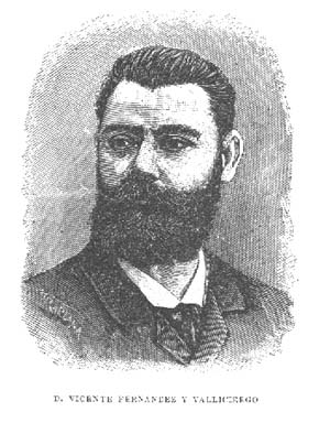 Spanish author of various books on calligraphy and penmanship. These include:
 - Nuevo metodo de caracteres goticos y de adorno (1905, Madrid).
- Nuevo metodo grafico del escritura inglesa (1896, Madrid).
- Nuevo metodo de ensenanza de la letra inglesa. Caligrafo de la Real Casa premiado con diferentes medallas de oro y plata.
- Caligrafia Francesa : primer metodo de ensenanza de la letra redondilla: para uso de los colegios y academias, y de todo aquel que desee aprender por si solo (Madrid, ca. 1887).
[Google]
[More] ⦿
|
Victoria Rushton
|
 After attending high school in Singapore, Victoria Rushton (New York City) studied at RISD (the Rhode Island School of Design) and graduated in 2013 with a degree in Illustration. In 2014 she joined Font Bureau and later Type Network as a staff designer, and lived in Boston. Under the guidance of Cyrus Highsmith at RISD, she created the text typeface Sylvia in 2012 for the poems of Sylvia Plath who committed suicide in 1963.
 In 2015, she designed the Font Bureau font Marcia, a didone with many quirks and curvy surprises. In 2016, she designed Embury Text. Victoria explains: Contrasting characteristics like soft round curves, sharp end strokes, exaggerated oval counters, punched in slab-like serifs, and swelling swashes play subtly off of each other, offering an unexpectedly immersive experience to the reader. In 2017, she designed the connected script typeface Gautreaux, which is inspired by a lettering style from Tommy Thompson's The Script Letter called "free style lettering." In 2021, Victoria, together with Type Network and Kerns&Cairns, designed the corporate typeface Peacock Sans for NBC. At Future Fonts in 2021, she released the Spencerian script typeface Kadabra, which was started by (her late partner) Dai Foldes, who in turn was inspired by the work of calligrapher Jean Larcher. Lovegrove (2021) is a display typeface designed by Dai Foldes and Victoria Rushton for their wedding invitations. It was inspired by the calligraphy of Raymond DaBoll and has been expanded into a variable font with a swash axis. Interview in 2015 by Type Thursday. Font Bureau link. Type Network link. Future Fonts link. [Google]
[More] ⦿
|
Vintage Voyage Design
[Pavel Korzhenko]

|
 Aka P. Rudakov and Pasha Korzhenko, and operating as Vintage Voyage Design from Perm, Russia. Since 2021, its fonts can be licensed by New York-based The Type Founders.
 Designer of the vintage handcrafted typefaces West End (2015, spurred Western typeface family), Winter Holidays (2015), The Sugar Cane (2015, eroded signage script), Montana (2015), Canyons (2015), Forest Tramp (2015), Heart of Gold (2015, a think inky brush), La Fa Salt (2015, a connected monoline script), Robinson (2015, handcrafted), Rise (2015, rough brush), Stout (2015, +Stout Roughen), Jack's Guitar (2015) and Bough (2015). Typefaces from 2016: Chameleon (rough brush), Les Paul (beatnik style), 1994 Fancy, The First Division (an elegant handcrafted Peignotian typeface family), The Aviator, Ocean Beach (weathered athletic lettering font), Fenway Script (baseball script), Fenway Sans, Octanis (display family in Sans, Slab, Serif, and Rounded Sans sub-styles), Compare (a vintage wedge serif typeface inspired by the mafia), Unchained (Western typeface), The Selvedger (signage script), Driver (a retro speed emulation typeface family), Pasternak Script. Typefaces from 2017: The Bartender (a 14-font vintage typeface family with some letterpress styles), Easy Rider (a layered road movie brush script font), The New America (penmanship script), Ace of Spades (grungy), Cavalcade (a layered serif typeface inspired by American and European typography of early 20th century, from movie posters to design of alcohol bottles like Martini, Cinzano and Campari), Old Standard (sans, script), Season Times (Sans+Script), Roadstar (a vintage speed emulation techno font). Typefaces from 2018: VVDS Pacifica (a hand-lettered bold signage script inspired by American branding typography from the end of the 20th century), Le Bonjour (a retro sans), The Voyage Culture (font duo), Afterglow (a didone), VVDS The Bimbo (circus fonts), Two Letter Monogram, Diamond Monogram, Circle Monogram, Circle Frames, Harbour (a free decorative blackletter, +Harbour Decor: 2017-2018), Sandwich (a large 3d beveled typeface family), The Telegraph (transitional newspaper type), Golden Horn (a layered vintage typeface). Typefaces from 2019: VVDS Organum (a decorative typeface for operas and phantasms), The Pretender (a package inspired by vintage American sign painting), VVDS Praliner (an all caps sans for display), Le Bonjour (Peignotian), Kristopher (a fancy serif), Nurnberg (an expressionist, modernized blacletter), The British Telegraph (based on vintage British headline type), Halau (a tiki font), Halau Serif, Sign Painter (a monoline Script, a layerable Sans, and two Decor ornamental styles, all based on Victorian era signs). Typefaces from 2020: The Ruby (a 56-font and icon collection), VVDS Minorica (a handrwritten collection in ten styles), VVDS Rashfield (in the soft serif genre), VVDS London Oatmeal (Sans, Script), VVDS Sunshine Bridge (a creamy brush script), VVDS Benigne Sans (a wide geometric sans), VVDS La Truffe (a bold decorative didone), VVDS Big Tickle (a handcrafted retro family). Typefaces from 2021: VVDS Clementia (a stylish condensed serif), Urbanchrome (an SVG letterpress emulation font), VV Neonica (a 12-style neon font family), Grodsky (a stylish 4-style antiqua), The Country Blues (a throwback to the fifties), Surfbird (a 30-style western family), VVS Nobleman (a stylish serif in four styles). Behance link. Creative Market link. Vintage Voyage Design. You Work For Them link. Creative Market link. [Google]
[MyFonts]
[More] ⦿
|
Walden Font
[Oliver Weiss]

|
 Walden Font (est. 1997) sells historical typefaces&clip-art by Oliver Weiss from Winchester, MA. Walden's site includes a brief history of blackletter, as summarized in the PDF document The Gutenberg Press: Five Centuries of German Fraktur (1997). Typefaces by categories:
 - The nice 14-font package called Civil War Press.
- The free art nouveau font Jugend WF (2006).
- Kraftwerk Press (2016-2017), a collection of 25 German industrial fonts emulating the era from 1920-1930:
- WFBorderBergland, WFBorderLineal, WFBorderLorbeer, WFBorderRauhreif, WFBorderRiesel, WFBorderSaftig, WFBorderSandmann, WFBorderSchnuppe, WFBorderWolkig, WFBorderZahnung, WFKraftwerkOrnamente, WFKraftwerkVignettenFett, WFKraftwerkVignettenLicht. Great borders and ornaments that were mainly revived from Neues Schmuckmaterial (Schriftguss AG, formerly Brüder Butte).
- WFFettdruck, WFHochdruck, WFNormdruck: Examples of Reklameschrift originally designed in 1908, 1926 and 1920, respectively.
- WFFetteKrause. Inspired by an advertisement for printing machinery in a 1924 issue of the Hungarian trade magazine Magyar Grafika.
- WFKaracho: Inspired by a bit of hand-lettering from a 1926 issue of the German advertising art periodical Gebrauchsgrafik.
- WFLuftpost. Based on lettering samples for sign painters.
- WFNeueOhioSchrift. Weiss writes: The Brüder Butter foundry in Dresden had a good working relationship with ATF, and thus several American typefaces found their way into the Butter catalog. Among them was Pabst Oldstyle, designed in 1902. Brüder Butter changed the erect peak of Pabst's A to a flaccid one, and distributed the result as Ohio Schrift, starting about 1913. Throughout the 1920s, Brüder Butter marketed the Ohio family through a series of leaflets that put the typeface through its paces in innovative ways. WFNeueOhioKursiv is the Italian companion. In 1922, Brüder Butter added a bold typeface to the Ohio family. This was not an ATF transplant, but a new design by Eduard Lautenbach. It was available with a set of swash capitals, and several curly-cued, lowercase alternates, ideally suited for children's books. Weiss's revival is WFNeueOhioKraft.
- WFNeueWerbeKraft. Based on Arthur Schulze's Werbkraft (1926).
- WF Paletti. Loosely based on the popular monoline silent movie script typeface Tango-Kursiv (1913, Ernst Deutsch).
- WF Vulkan. A loud all caps typeface based on an advertisement in the April 1926 issue of Gebrauchsgraphik.
- Their Renaissance&Handwriting font pack has nine different handwriting fonts from 1450 to 1700.
- The Minuteman Printshop set contains 18 colonial fonts: Ancient Black, Caslon Book, Caslon Book Italic, Caslon Swash Italic, Webster Italic, Webster Roman, English Hand, Rev.War Heroes, Signers of the DoI, Colonial Bullets, Daisy Border, Lily Border, Marigold Border, Needlepoint Border, Pine Cone Border, Quilt Border, Rose Border, Tulip Border.
- Eighteen blackletter fonts, called the Gutenberg Press series: Alte Schwabacher, Breitkopf Fraktur, Coelnisch Current, Fette Haenel Fraktur, Ganz Grobe Gotisch, Grossvater Kurrent, Gutenberg Bibelschrift, Kurrent Kupferstich, Luthersche Fraktur, Maximilian Gotisch, Neue Schwabacher, Peter Schlemihl, Suetterlin, Theuerdank Fraktur, Unger Fraktur, W'bg. Schwabacher, Zentenar Fraktur.
- Wood type, the Wild West Press series (2010, 47 fonts), and related fonts: Sawtooth WF (2002), Acanthus Border, Ashwood Condensed, Ashwood Extra Bold, Asphaltum, Aubrey Landing, Baubles Border, Bear Gulch, Brass Rules, Bullion Extra Condensed, Bullion Italic, Bullion, Cattle Brands, Chalk Bluff, Clifford Eight, Cut and Shoot, Dead Man's Hand, Faywood Extra Condensed, Faywood Italic, Faywood, Fringe Border, Garland Border, Gatlin Bold, Grid Border, Heroes and Villains, Jawbones Condensed, Lace Border, Langtry, Matchwood Bold Italic, Matchwood Bold, Matchwood Italic, Matchwood, Muleshoe, Ophir, Rawhide, Round Mountain, Royal Nonesuch, Sageland, Sawtooth, Seal Border, Shelldrake, Stockton, Thousandsticks, Thunder Mountain, Vine Border, Western Bullets, Whitecross, Wildwash.
- Art nouveau revivals. His Art Nouveau Printshop Vol. 1 (2020) includes these fonts:
- WF Border Edellinien: Based on borders by Schelter & Giesecke, 1901.
- WF Border Eos.
- WF Border Flach: After a specimen seen in a 1915 specimen book at Bauersche Giesserei.
- WF Border Nimbus.
- WF Border Patriz Huber: After a Schelter & Giesecke design from 1906 called Patriz Huber Ornamente, which was named after designer, goldsmith and furniture maker Patriz Huber, 1878-1902.
- WF Border Peacock: Based on borders by Schelter & Giesecke, 1904 (or earlier).
- WF Border Seerosen.
- WF Border Ver Sacrum: Based on borders by Heinz Keune for Schelter & Giesecke, 1901 (or earlier).
- WF Dahlia: Closely based on a draft for F. Schweimann's Wodan, first issued by Stempel & Co in 1902.
- WF Fafner: After a poster typeface by Schelter & Giesecke first seen in 1905. Unknown designer.
- WF Habsburg: After an original by Heinz Keune from 1903 for Schelter & Giesecke.
- WF Jugendstil Ornaments.
- WF Liane Semibold: A condensed Plakatschrift that revives Liane Semibold (1908, Schelter & Giesecke).
- WF Maria Theresia: After Maria-Theresia-Versalien (1903, Heinz Keune for Schelter & Giesecke).
- WF Meierschrift: Based on Meierschrift (1903, C.F. Meier), which was produced by Schelter & Giesecke in 1904.
- WF Ovid: After an original by Heinz Keune from 1903 for Schelter & Giesecke.
- WF Radium: After an original white on black typeface by Schelter & Giesecke (1905).
- WF Rienzi Versalien: After Versalienschrift Rienzi (1901).
- WF Schelter Antiqua: A revival of Schelter Antiqua (1905, Schelter & Giesecke).
- WF Wallenstein: Based on an original by Heinz Keune (1904), who intended it as a heavy weight companion of Habsburg and Wittelsbach,
- WF Wittelsbach: After an original by Heinz Keune from 1903 for Schelter & Giesecke.
- Gnomos is a grungified merovingian typeface [Walden Font claims that it was found in a 16th century house].
- Magick: A series of 11 alchemic and medieval typefaces, including custom creations by Australian calligrapher Mark Calderwood: Astaroth, Bastarda, Batwynge, Gnomos, Luxeuil, Orgeuil, Runor, Salem 1692, Alchemy Symbols, Astrological Symbols.
- Diverse Handes: Nine historically accurate script fonts from the Renaissance era: 10th Century Bookhand WF, Bastarda WF, Copperplate 1672 WF, English Hand WF, German Latin WF, James the Second WF, Spanish Court Hand WF, Uncial WF, William Shakespeare WF.
- A collection of 62 American poster fonts of World War II, heavily influenced by art deco, was created in 2013: Acie WF, Almanzo WF, Balfrey WF, Bellofatto WF, Bleecker WF, Bleecker WFShaded, Bobbin WF, Bullshorn WF, Calt WF, Cassino WF, Cephus WF, Chippett WF, Cutright Bold ItalicWF, Cutright Bold WF, Cutright WF, Dickie WF, Dragoo WF, Elbie WF, Eldon WF, Elmira WF, Enlow WF, Epsom WF, Falaise WF, Fansler WF, Fustian WF, Glancy WF, Golden WF, Graveney WF, Greenlaw WF, Hackett WF, Hardwick WF, Harlie WF, Huntley WF, Irby WF, Iva WF, Jowdy WF, Kilroy WF, Kododa WF, Lacar WF, Maximino WF, Nelda WF, Nuisance WF, Odon WF, Olindo WF, Payson WF, Payson WFBold, Payson WFBold Italic, Payson WFItalic, Perlina WF, Poster Bullets WF, Remely WF, Reny WF, Sharkey WF, Sheffie WF, Telmoss WF, Tilmon WF, Toxie WF, Ula WF, Wallington WF, Wilber WF, Wylie WF, Zipnut WF.
- Other fonts in the collection: 10thCenturyBookhand, AcanthusBorder, Alchemy-Symbols, Alte Schwabacher, AncientBlack, AshwoodCondensed, AshwoodExtraBold, Asphaltum, Astaroth, Astrological-Symbols, AubreyLanding, Bastarda, Batwynge, BaublesBorder, BearGulch, BrassRulesBorder, BreitkopfFraktur, Bullion, BullionExtraCondensed, BullionItalic, BullionRoman, CWP_TypeNo08, CWP_TypeNo09, CaslonBook-Italic, CaslonBook, CaslonSwashItalic, Cattle Brands, ChalkBluff, CliffordEight, CoelnischCurrentFraktur, ColonialBullets, ConfederateSignatures, Copperplate1672, Cut&Shoot, DaisyBorder, Dead Man's Hand, EnglishHand, Faywood, FaywoodExtraCond, FaywoodItalic, FetteHaenelFraktur, FinalFrontierShipside, FringeBorder, GanzGrobeGotisch, GarlandBorder, GatlinBold, GebetbuchFraktur, GermanLatin, Gnomos, GridBorder, GrossvaterKurrent, GutenbergBibelschrift, Heroes & Villains, JamesII, JawbonesCond, Jugend, KurrentKupferstich, LaceBorder, Langtry, LilyBorder, LutherscheFraktur, Luxeuil, MarigoldBorder, Matchwood, MatchwoodBold, MatchwoodBoldItalic, MatchwoodItalic, MaximilianGotisch, Muleshoe, NeedlepointBorder, NeueSchwabacher, OldStateHouse, Ophir, Orgeuil, Pangho, Panghobl, Pangolin, Pangbl, PeterSchlemihl, PineConeBorder, QuiltBorder, Rawhide, RevolutionaryWarHeroes, RoseBorder, RoundMountain, RoyalNonesuch-Bold, Runor, Sageland, Salem1692, Sawtooth, SealBorder, Shelldrake, SignersoftheDOI, SpanishCourtHand, Stockton, Sütterlin, TheuerdankFraktur, Thousandsticks, ThunderMountain, TulipBorder, TypeNo1, TypeNo2, TypeNo3, TypeNo4, TypeNo5, TypeNo6, TypeNo7, TypeNo8, TypeNo9, TypeNo10, TypeNo11, TypeNo12, TypeNo13, TypeNo14, Uncial, UngerFraktur, UnionSignatures, VineBorder, WebsterRoman, Western Bullets, Whitecross, WilliamShakespeare, WittenbergSchwabacher, ZentenarFraktur.
- The New Victorian Printshop collection (56 fonts): Absalom, Adelar, Amaltea, Amilcar, Augur, Banter, Baretto Italic, Baretto Shaded, Baretto, Barettoshaded Italic, Beamish, Blaisdell, Blinov, Braham, Brinton, Brunel Script, Chatelaine, Cupboard, Devough, Dewitt, Ephinol, Gano Extended, Giglio, Gresley, Grubb Script, Hester, Hipolon, Hiram, Inigo, Isherwood, Jasper, Jophet, Klabasto, Lightburn, Medola, Monboddo, Nestor, Oldkirk Italic, Oldkirk, Ormsby, Pennyfarthing, Phectic, Pomeroy, Rebstock, Rudyard, Rungholt, Sedgwick, Steam Border Medium Aztec, Steam Border Medium Bar and Balls, Steam Border Medium Bar and Curls, Steam Border Medium Bar and Leaves, Steam Border Medium Baroque, Steam Border Medium Belgian Lace, Steam Border Medium Dish and Wire, Steam Border Medium Drainfly, Steam Border Medium Flourish, Steam Border Medium Frill, Steam Border Medium Geometric, Steam Border Medium Leaf, Steam Border Medium Loops, Steam Border Medium Picture Frame, Steam Border Medium Quatrefoil, Steam Border Medium Ribbon, Steam Border Medium Shells, Steam Border Medium Spruce, Steam Border Medium Tiles, Steam Border Medium Triangles, Steam Border Medium Woody, Steam Border Thin Brick Bar, Steam Border Thin Cordula, Steam Border Thin Double Wavy, Steam Border Thin Double, Steam Border Thin Fine Dots, Steam Border Thin Forward Wave, Steam Border Thin Oscillations, Steam Border Thin Scallop, Steam Border Thin Straight Rule, Steam Border Thin Tight Oscillations, Steam Border Thin Triple, Steam Border Thin Undulations, Steam Border Wide Arch and Vine, Steam Border Wide Argent Leaf, Steam Border Wide Bar and Acanthus, Steam Border Wide Bower, Steam Border Wide Knots and Weeds, Steam Border Wide Lattice, Steam Border Wide Mephisto, Steam Border Wide Peacock, Steam Border Wide Rebstock, Steam Border Wide Roccoco, Steam Border Wide Shield and Acanthus, Steam Border Wide Shield and Vine, Steam Border Wide Stipple, Steam Border Wide Stone Leaf, Steam Border Wide Vault, Steam Charms, Steam Flourishes, Steam Gems, Steam Logotypes, Steam News Cuts 1, Steam News Cuts 2, Steam News Cuts 3, Swartwood, Tempris, Tilson Initials, Tivadar, Trowbridge, Twiselton, Whitcomb, Whittle, Winan.
Dafont link. [Google]
[MyFonts]
[More] ⦿
|
W.E. Dennis
|
Penman in Brooklyn, N, who wrote Studies in Pen Art (1914). [Google]
[More] ⦿
|
Wellington Clark
|
Scribe / penman whose work can be seen on a few pages of Bickham's The Universal Penman (ca. 1736). [Google]
[More] ⦿
|
Wiescher Design
[Gert Wiescher]

|
 Gert Wiescher was born in Braunsbach am Kocher, Germany, in 1944. Based in München, Gerd Wiescher designed many classy and classic Bodoni families, as well as New Yorker Type (1985). All of his typefaces are carefully fine-tuned and balanced. Wiescher founded first Munich Type and then Wiescher Design and Autographis. He is known as a hard, fast and prolific worker. His exquisite typefaces can be bought at MyFonts. Catalog of his bestselling typefaces. Interview in 2008. Wikipedia page. Creative Market link. List of typefaces:
 - Scripts: Prima Script (2017: for menus and cookbooks), Marmelade (2015, +Fruits, a set of dingbats), Triana (2014, a thin monoline penmanship script named after a Spanish sailor on the Pinta who in 1492 was the first to see America---in this case the Bahamas), Floral Script (2014, copperplate style script), Sherlock Script (2014: this comes with Sherlock Stuff (fingerprints) and Sherlock Stuff Dots (ink stains)), Felicita (2013, a swashy copperplate script), Vividangelo (2013, after the handwriting of a real person), Dreamline (2013, connected monoline cursive wedding scripts in A, B and C styles), Fiorentina (2012, a renaissance style script with 650 characters), Excelsia Pro (2012), Delicia Pro (2012, a fat brushy signage script), Nono (2011, formal swashy calligraphic family), Dyane (2011), Penn (2011), Lettera (2011, hand-drawn formal face), Tosca (2010, a high-contrast calligraphic typeface with 730 glyphs), Grandcafe (2010), Loulou (2010, curly and of extreme contrast), Schoolblock (2010, hand-printed school font), Grandezza (2010, calligraphic family; +Xtra), Sixtra (2010, a curly didone script), English Script (2010, classic Spencerian calligraphic script), Savage Initials (2009), Morning News (2009), Revolte (2009, a brush script for demonstration signs), Estelle (2009), Scriptofino (2008, 4 calligraphic styles to give Zapfino a run for its money), Exprima (2008), Daiquiri (2008), Lisa Bella, Lisa Fiore and Lisa Piu (2008, connected and calligraphic), Tati (2008), Movie Script (2007), Cake Script (2007), Eddy (2007, grungy calligraphy), Pointino (2007), Bohemio (2007, a great oriental-brush script), Artegio (2007, two calligraphic scripts), Xylo (2006, in the tradition of the 18th-century English calligrapher George Bickham and the 19th-century American calligrapher Platt Rogers Spencer), Tamara (2005, art-deco script based on some initials for Semplicita made in the 1930s by the Nebiolo foundry), Tecon, Ellida (2005, inspired by the elaborate scripts of 18th-century English calligrapher George Bickham, with additional influences from 19th-century American calligrapher Platt Rogers Spencer), Eloise (2009, a high-contrast version of Ellida), Nadine Script (2005, an elegant script inspired by a set of initials the French designer and artist Bernard Naudin drew for Deberny&Peignot in the 1920s), Royal Classic (2005, unbelievable script based on a design that has initially been comissioned by King Ludwig I of Bavaria for in-house-use), DesignerScript, Filzer Script (1995, handwriting), Futuramano-Condensed-Bold, Futuramano-Condensed, Futuramano-Plain, Futuramano-Thin, Giambattista, Scriptissimo-Plain, Scriptissimo-Forte, Scriptissimo-Swirls, Squickt (1989), Konstantin A, B and C (2005), Konstantin Forte (2005), MyScript, GrocersScript, Swanson (2006). Scriptissimo (2004) has versions named Start, Middle and End, tweaked for their position in the word, and there are plenty of ligatures. Check also Bodoni Classic Chancery (2007) and Bodonian Script (2012).
- Sans: Brute Sans (2018), Xpress (2018), Xpress Rounded (2019), Classic Sans (2017, a revival of Theinhardt Grotesk), Classic Sans Rounded (2017), Maxi (2017), Nic (2017), Azur (a large almost geometric sans famly with 1950s Roger Excoffon-style French flavours, called a Medterranean grotesk by Wiescher himself), Royal Sans (2017, after Theinhardt's Royal Grotesk---the forerunner of Akzidenz Grotesk--- from 1880), Docu (2016, a workhorse elliptical sans family), Viata (inspired by Bauhaus), Noticia (2016, in the Bauhaus tradition, with very pointy v and w, and a bipartite k; not to be confused with the 2011 Google Web Font Noticia Text by José Solé; followed in 2019 by Noticia Rounded), Avea (2015), Aramis, Nota Bene (2015: squarish, narrow, technical), Nota (2015, technical and cold: the rounded version, Nota Rounded, followed in 2019), Dylan Condensed (2014), Dylan Copperplate (2014), Supra (2013, grotesk: Supra Thin is free. See also Supra Condensed (2013), Supra Mezzo (2013, between regular and condensed), Supra Extended (2013), Supra Rounded (2015), Supra Classic (2014), and Supra Demiserif (2013, slab serif derived from Supra)), Dylan (geometric sans), Franklin Gothic Raw (2013, like Franklin Gothic but with raw, not rough, outlines, only visible at very large sizes), Blitz (2012, a flared family), Blitz Condensed (2012), Contra Sans (2011, which led to Contra Slab, Contra Condensed and Contra Flare), Vedo (2011, a Bauhaus style family that include a hairline weight), Germania (2011, a useful and beautiful monoline sans family), Geometa (2011, +Rounded, +Rounded Deco, +Deco: all based initially on Renner's Futura), Geometra Rounded (2011, a rounded family based on Futura and "much less boring than DIN"), Bombelli (2010, ultra-wide architect's hand), Bluenote Demi (2010, a grungy Franklin Gothic Condensed), Perfect Sketch (2010, sketched grotesque), Unita (2009), Antea (2009), Eterna (2009, sans with a swing), Pura (2008, an uncomplicated grotesk family), Purissima (2010, a decorated extension of Pura; +Bold), Copperplate Gothic Hand (2009, after a 1901 design by Goudy), Copperplate Alt (2011), Copperplate Wide (2011), FranklinGothicHandDemi (+Shadow), Franklin GothicHandCond (2009), Franklin Gothic Condensed Shadow Hand (2010), and Franklin Gothic Hand Light (2009, a hand-drawn version of Franklin Gothic), Papas (2005, sturdy, slightly curly), Julienne (2005, a condensed sans family; see the new versions Moanin and Julienne Piu, 2017), Cassandra (1996, an art deco style after Adolphe Mouron Cassandre), Futura Classic (2006), Cassandra Plus (2012), Ela Sans (2005, a large family), Mondial-Bold (2004), Mondial-Demi, Mondial-Light, Mondial-Medium, Mondial-Normal, Mondial-XBold, Monem-Bold, Monem-Medium, Monem-Normal, Monem-Roman.
 Serif: Imperia (2011, a Trajan column caps face), Monogramma (2012, a Trajan family for monograms), Imperium (2005, a precursor of Imperia with a Relief shadow style included), Hard Times (2011), Fat Times (2011, retraced Times), Elegia (2011, slightly Victorian family), Breathless (2010, a spiky family, inspired by nouvelle vague movie posters), Bodoni Classic 1, Bodoni Classic 2, Bodoni Classic 3, BodoniClassic-Condensed, BodoniClassic-Handdrawn, BodoniClassic-Swashes, BodoniClassic-Text, Bodoni Classic Deco, Bodoni Classic Swirls (2009), Bodoni Classic Pro (2011), Bodoni Classic Inline (2012), Bodoni Classic Fleurs (2014, ornamental caps), Bodoni Comedia (2010, one of my favorites: a funny "live one day at a time" curly Bodoni cocktail), Bodoni Classic Swing (2010), Bodoni Classic Free Style (2010, curly), Bodoni Classic Ultra (2010), La Bodoni Plain (+Italic, 2008), Take Five (2005, a jazzy take on Bodoni Classic), DonnaBodoniAa, DonnaBodoniBe, and DonnaBodoniCe (three scripts named after Bodoni's wife, Margharita dell'Aglio, who published his complete works, the Manuale Tipografico, in 1818, five years after his death), Edito, Robusta. A great series, some of which were originally published at Fontshop, see, e.g., FFBodoniClassic (1994). MyFonts: When the first of Wiescher’s Bodoni Classic fonts came out in the 1993, there was nothing like it. Up to then, virtually all Bodoni revivals had been given clear-cut forms and square serifs. But Bodoni’s originals from the late 1800s were never as straight and simplistic as is often assumed: they had rounded serifs and slightly concave feet. Wiescher digitized a wide range of Bodoni letterforms, including a wonderful script-like family called Chancery and a nice series of Initials. Having accomplished his mission twelve years later, he began making personal additions to the family, such as the more decorative Bodoni Classic Swashes. Recently a useful little family was added to the clan: LaBodoni is sturdier and less optically delicate than most Bodonis, and therefore more usable as a text face. Wiescher made Metra Serif (2009), Principe (2008) and Paillas (2009). Prince (2009) is a curlified didone. Serif: Imperia (2011, a Trajan column caps face), Monogramma (2012, a Trajan family for monograms), Imperium (2005, a precursor of Imperia with a Relief shadow style included), Hard Times (2011), Fat Times (2011, retraced Times), Elegia (2011, slightly Victorian family), Breathless (2010, a spiky family, inspired by nouvelle vague movie posters), Bodoni Classic 1, Bodoni Classic 2, Bodoni Classic 3, BodoniClassic-Condensed, BodoniClassic-Handdrawn, BodoniClassic-Swashes, BodoniClassic-Text, Bodoni Classic Deco, Bodoni Classic Swirls (2009), Bodoni Classic Pro (2011), Bodoni Classic Inline (2012), Bodoni Classic Fleurs (2014, ornamental caps), Bodoni Comedia (2010, one of my favorites: a funny "live one day at a time" curly Bodoni cocktail), Bodoni Classic Swing (2010), Bodoni Classic Free Style (2010, curly), Bodoni Classic Ultra (2010), La Bodoni Plain (+Italic, 2008), Take Five (2005, a jazzy take on Bodoni Classic), DonnaBodoniAa, DonnaBodoniBe, and DonnaBodoniCe (three scripts named after Bodoni's wife, Margharita dell'Aglio, who published his complete works, the Manuale Tipografico, in 1818, five years after his death), Edito, Robusta. A great series, some of which were originally published at Fontshop, see, e.g., FFBodoniClassic (1994). MyFonts: When the first of Wiescher’s Bodoni Classic fonts came out in the 1993, there was nothing like it. Up to then, virtually all Bodoni revivals had been given clear-cut forms and square serifs. But Bodoni’s originals from the late 1800s were never as straight and simplistic as is often assumed: they had rounded serifs and slightly concave feet. Wiescher digitized a wide range of Bodoni letterforms, including a wonderful script-like family called Chancery and a nice series of Initials. Having accomplished his mission twelve years later, he began making personal additions to the family, such as the more decorative Bodoni Classic Swashes. Recently a useful little family was added to the clan: LaBodoni is sturdier and less optically delicate than most Bodonis, and therefore more usable as a text face. Wiescher made Metra Serif (2009), Principe (2008) and Paillas (2009). Prince (2009) is a curlified didone. - Romain du roi: In 2008, Wiescher designed the two-style Royal Romain, which is based on the Romain du Roi of Philippe Grandjean, which was completed in 1745 after Grandjean's death by Grandjean's successor Jean Alexandre and Louis Luce. Wiescher: The Romain du Roi was for the exclusive use of the Louis XIV. It was never sold or given to any other king or government. The king of Sweden tried to scrounge a set, but the king refused. This font is the basic design for such famous fonts as the Fournier and Bodoni. Just so the Romain du Roi doesn't get lost in the digital turmoil I set out to redesign it in 2004 and finished now in early 2008. I did a lot of research in France's National Library. A good excuse to visit Paris is always welcome!!!
- Engravers: Dylan Copperplate (2014), Cavaliere (2010), Guilloche A (2009), Guilloche B (2013, op-art borders), CopperplateClassic-Plain, CopperplateClassic-Round, CopperplateClassic-Sans, Copperplate Classic Light Floral (2009), Cimiez-Bold, Cimiez-Roman (2004), Ela-Demiserif, Ela-Sans (2004), Eleganza (2008).
- Blackletter/Fraktur: Renais (2011, renaissance initials), Flipflop (2011), Fraktura and Fraktura Plus (2008), Royal Bavarian (2004, based on a typeface commissioned by King Ludwig 1st of Bavaria about 1834), Royal Blossom (2009), Royal Bavarian Fancy (2004), Bold Bavarian (2010, a heavy version of Royal Bavarian), Monkeytails (2008), Fat Fritz (2006, rounded endings), Ayres Royal (2005, blackletter typeface based on drawings of London's calligrapher John Ayres, ca. 1700; to be used with RoyalBavarian; followed in 2010 by BoldAyres).
- Slab serif: Slam Normal (2017), Slam Rounded (2017), Suez (2017: with extra tall ascenders and descenders), Egyptia (2010), Egyptia Rounded (2010).
- Typewriter: Lettera (2014), Lectra (2011), QuickType-Bold, QuickType-Plain, QuickType-Sans.
- Decorative: Tric (2017, art deco), Franklin Gothic Raw Semi Serif (2015), Frank Woods (2013, letterpress simulation based on Franklin Gothic Heavy), Ohio Bold (2012, a rough headline type in the tradition of Louis Oppenheim's Lo-Type from 1913), Viking Initials (2012), Cannonball (2012, a psychedelic typeface derived from a jazz record-sleeve for Cannonball Adderley), Byblos (2011, derived from the logo of St. Tropez's famous Hotel Byblos), Blockprint (2013, early 1900 German expressionist grunge face, renamed Bannertype after 24 hours), Ferrus (2010, inspired by Cassandre's Acier Noir, 1936), Petite Fleur (2009, flowery embellishments and the capitals of his redesigned Royal Romain, which in turn is based on the famous romain du roi), Glass Light (2012, a decoirative art nouveau type family based on Glass Light by Franz Paul Glass, 1912), Penstroxx (2009, 5 fonts that are based on the powerful, expressive Traits de plume (penstrokes) designed in Paris around 1930 by Alfred Latour), Liquoia A, B and C (2008, decorative scripts), Modernista (2008, an art nouveau headline face, based on an 1898 sample by Peter Schnorr), Ornata A, B, C, D, E, F and G (2008-2009: ornaments), Fleuraloha (2008), Floralissimo (2008: flowery ornaments), Frank Flowers (2011), Scrolls A (2010, penman's dingbats), Bacterio (2007), Alpha Bravo, Alpha Charlie, Alpha Echo (2006), Barracuda, Cacao (2005, fifties style), Cassandre Initials (2004, Elsner&Flake, after the 1927 original by Adolphe Mouron Cassandre), Contype, Fleurie (2005), Fleurons Two (2006), Fleurons Three (2006), Fleurons Four (2006), Fleurons Initials (2007), Fleurons Six (2008), Fleuron Labels (2008), HebrewLatino, Julius, Lunix (2006), MyHands, NewYorkerType (1985; extended in 2011 to NewYorker Plus, and in 2020 to New Yorker Type Classic and New Yorker Type Pro; after Rea Irvin's well-known typeface for The NewYorker), Venice Initials (2006, after a 15th century find, but Wiescher added about half of the caps), Ventoux, Vivian (2005), Woody.
- Pixel and/or futuristic: Nexstar (2013: this octagonal typeface is also useful or athletic lettering), Alpha Fox (2007), Alpha Juliet (2010), Alpha Papa (2010), Alpha Square (2010), Alpha Jazz (2010), Alpha Papa (2010, LED meets stencil).
- Stencil typefaces: Dripps (2010, handpainted, perhaps brutalist), Red Tape Plus (2014).
- Comic book fonts or brush fonts: Breezy (2015), Caboom (2014).
- Dingbats: Wayside Ornaments (2012), XX Century Ornaments (2012), Thistle Borders (2012), Greenaway Mignonettes (2012, after Kate Greenaway (1846-1901), author and illustrator of childrens books), Collins Florets (2012), Flourishes A (2010), Jingle Doodles (2010).
- Art deco: Trix (2017), Zelda (2017, named after F. Scott Fitzgerald's wife).
- Commissioned and special typefaces include a version of the logotype for the Munich's newspaper Abendzeitung, Maxi (variable width sans), NIC Grotesk, Tric (art deco), a Cyrillic version of Bodoni Classic for Vogue Moscow, a special Bodoni Classic for Ringier Publishers in Zurich, and Red Tape, a typeface that is on permanent exhibition at the German National Library in Leipzig.
- Typefaces from 2019: Elita (a condensed sqaurish typeface), Artis Sans, Sigma Condensed and Sigma (simplified readable sans families), Cosma (an elegant high-contrast text family with tapered upstrokes and crossbars, but otherwise didone roots), Quincy (a bebop typeface that started from some letterutouts), Phoebe (an elliptical techno family), Phoebe Rounded, Polygon A, Polygon I, Polygon X.
- Typefaces from 2020: Bullets Bannertype, Alpha One (a counterless experiment), Exec (a 14-style sans family), Exec Corners, Exec Demiserif, Penta (a grotesque family with large counters that make the ExtraLight style quite striking), Penta Rounded.
Author of many books, including Zeitschriften & Broschüren (Systhema-Verlag, München, 1990), Schriftdesign (Systhema-Verlag, München, 1991), and Blitzkurs Typografie (Systhema-Verlag, München, 1992). The following text was excerpted from his wikipedia page: At 14 years of age, Wiescher went to Paris to study fine art. He financed his stay by doing portraits on the Place du Tertre on Montmartre. In the sixties Wiescher studied graphic design at the Berlin Academy of Fine Arts. (Since November 2001, Berlin University of the Arts.) He financed his studies by sidewalk painting and drawing portraits. While doing sidewalk paintings, he met the typeface designer Erik Spiekermann, who inspired his love of this branch of design. After two years he quit his studies, and went to Barcelona where he worked at the offices of Harnden & Bombelli, for whom he designed the OECD-Pavilion of the 1970 Osaka World Expo. In 1972 he moved on to Johannesburg working as an art director at Grey and Young advertising . In 1975, he returned to Germany, working first for DFS+R-Dorland, and then for the "Herrwerth & Partner" ad agency. At Herrworth, he was involved in introducing IKEA into the German market. In 1977 he became a creative partner in the Lauenstein & Partner ad agency, creating mainly campaigns for large German retail chains. In 1982 he started his own design office, creating work for editors (Markt & Technik, Systhema and Langen-Müller-Herbig), computer companies (House of Computers, FileNet) and he worked for Apple Computers designing their publications (Apple-Age and Apple-LIVE). View Gert Wiescher's typefaces. Wikipedia link. [Google]
[MyFonts]
[More] ⦿
|
Willem Tietsema
|
Lettering and writing teacher in Groningen, The Netherlands, 1809-1882. He published two lettering model books, Handleiding bij het vervaardigen van onderscheidene soorten van schrijf-model en kunstletters (1869, P. van Haren, Groningen) and Alphabet voor bouwkundigen enz in 12 voorbeelden. Reference: Nederlandse belettering negentiende-eeuwse modelboeken (2015, Mathieu Lommen, de Buitenkant, Amsterdam). [Google]
[More] ⦿
|
William Brooks
|
Scribe / penman whose work can be seen on a few pages of Bickham's The Universal Penman (ca. 1730). [Google]
[More] ⦿
|
William Cippax
|
Or William Kippax. Scribe / penman whose work can be seen on a few pages of Bickham's The Universal Penman (1736). [Google]
[More] ⦿
|
William E. Dennis
[Studies in Pen Art]
|
 [More] ⦿
|
William E. Henning
|
Author of An Elegant Hand, The Golden Age of American Penmanship and Calligraphy (2006, Oak Knoll Press). Edited by Paul Melzer. Oak Knoll writes: This work chronicles the history of the Golden Age of American penmanship and calligraphy. The author guides the reader through the lives and careers of some of the most important American penmen, including Platt Rogers Spencer, the Father of American Handwriting, and Spencer's gifted student, George A. Gaskell, whose books and periodicals reached hundreds of thousands of students throughout the second half of the 1800s. Paul Melzer, the editor of this work, added more than 400 examples taken from original specimens to handsomely illustrate Henning's manuscript. [Google]
[More] ⦿
|
William Hugh Gordon: Lettering For Commercial Purposes (1918)
[May 30 2016]
|
 Images of Lettering for Commercial Purposes, Cincinnati, Ohio, 1918, a Speedball pen book written by William Hugh Gordon (1860s-1920), who was Ross F. George's teacher. Warning: immense page. [Google]
[More] ⦿
|
Willis A. Baird
|
Disciple of Charlton V. Howe, who together with Howe was considered as the master of the engraver's script. Born in Santa Cruz, CA, in 1882, he died in Brooklyn, NY, in 1954. Partly educated by C.P. Zaner in 1909, he met William E. Dennis (for whom he penned some diplomas and did some other artwork) and became a partner in The Dennis and Baird Studio in Brooklyn. [Google]
[More] ⦿
|
Yur Lis
[Stripes Studio]

|
[MyFonts]
[More] ⦿
|


 [
[ Adam Fathony (or Adam Fathoni Haris; AF Studio, Bandung, Indonesia) created the vintage typeface Grandesa (2014), the signage typeface Magnifika (2014) and the Victorian typeface Marema (2014).
  Author of
  Banda Aceh, Indonesia-based designer (b. 1993) who specializes and excels in formal calligraphic typefaces. Creator of the thin calligraphic typefaces Yesterday (2017: upright) and Jazzi Script (2017), and the swashy formal calligraphic typefaces Peaches (2017), and Sinday College (2017).
  [
[ Designer who lives in Buenos Aires and who teaches graphic design and typography at the Universidad de Buenos Aires. He has worked as an art director in prestigious Argentina-based studios, handling high-profile corporate brands such as Arcor, Marta Harff, Morph, SC Johnson, Danone, and Movicom. He runs
  [
[ Russian designer of typefaces who collaborates with Ivan Zeifert and specializes in revivals, cyrillizations and beautiful digitizations, some of them done with Anatole Gophmann. There have been complaints about her practice of borrowing fonts from type designers without asking. One typophile writes: I have cracked open fonts she claims as hers, Bolero, Bickham and others, she has copied and pasted glyphs, copyright data, added Cyrillic and changed the copyright string. As an example, Angelica is a copy of Alejandro Paul's Miss Fajardose. Alejandro has drawn the numerals in his font in 2004 to accompany the letters found in an old catalog of alphabets. There is no other source of the numerals, and Angelica has them. Michael Clark writes: I initiated a battle with the illustrious Alexandra "Bitch" from Russia who has renamed Pouty (FontBureau) and copyrighted [it as] Bolero. She and her partner Anatoly shithead. Available on Fonts101.com for anyone who wants it free. The ass's site, Jagdesh, is in Pakistan and we cannot touch him. 260+ viewings and 140+ downloads. Let's see that is 1400$ I will never see! Others have complained as well about her practice of taking and extending fonts without permission. Anyway, her "fonts" are:
  Spanish penman who produced two writing books between 1583 and 1612. A facsimile of these was printed by Mardersteig (Officina Bodoni) for The Pegasus Press in Paris in 1928, in a 32-page book edited by Henry Thomas and Stanley Morison: Andres Brun, Calligrapher of saragossa, Sme account of his Life and Work, with a Facsimile in Collotype of the Surviving Text and Plates of his two Writing Books, 1583-1612. [
 [
[ Slovenian foundry which specializes in old typefaces found in old prints, books and samples. Typefaces are reproduced as they appeared in print. In order to preserve the original feel of typefaces, no additional characters were added to originals therefore most of fonts consist just of basic character set. Upper case letters, lower case letters, numerals and basic punctuation. It was set up in 2000 by Matevz Medja. Engraving style typefaces: Kludsky (2006), Garfield (2005), Copperplate Head (2005), Western Iron (2005), Cider (2005), French Shaded (2005), Tilt (2005). The blackletter typefaces: School Text (2005), Harlem Title (2005), Copperplate Text (2005), Black Title (2005), Chased Black (2005), Tinted (2005), Steeler (2005), Blackcap (2005). Calligraphic typefaces: Petite Script (2005), Autograph Script (2005), French Script (2005), Penman Script (2005), Magnolia Script (2005), Roundface Script (2005), Roundhand Script (2005). Other typefaces: American Shadow (2005), Lightface Extended (2005), Grotesque Shaded (2005), Gothic Ornate (2005), Antique Extra Condensed (2005), Antique Extended (2005), Ironlace (2005),
  Type designer (b. Auerbach, Germany, 1882, d. Braunschweig, 1971) who studied at the Akademie für Kunstgewerbe in Dresden, and became professor there in 1920. During World War II, Arno Drescher was director of the Akademie für graphische Künste und Buchgewerbe in Leipzig. After a period as freelance designer, he finally moved to Braunschweig in 1960.
  Ata Syed (Karachi, Pakistan) has a dual identity at FontStruct, where he is one of the most prolific contributors. He is known there as
  Snellville, Atlanta, GA-based designer (b. 1977) of the playful fonts Austie Bost Dreamboat (2015), Austie Bost There For You (2015), Austie Bost Envelopes Print (2014), Austie Bost Take A Chance (2014), Austie Bost Lifted Up (2014), Austie Bost Arrow Mania (2014, arrows), Austie Bost Envelopes (2014), Austie Bost Versailles (2014: thin curly script), Austie Bost Chunky Description (2014), Austie Bost Descriptions (2014), Austie Bost Wibbly (2014: a great curly poster typeface), Austie Bost Somersaults (2014), Austie Bost Cartwheels,
  München-based foundry, est. 2008 by Gert Wiescher, whose main font foundry is Wiescher Design.
  [
[ Based on sales, MyFonts ranks the best fonts for 2006, from first to tenth:
  Dmitrii Mikitenko (Blessed Print, Chisinau, Moldova) created the connected brush script typefaces BetterFly (2015) and Miletta, and the calligraphic (wedding) scripts TheSecret and Flamingo in 2015. Other early typefaces include Draft Cheese, Graficx, Holiday, Kiss Me, Linella, Masterink, Modern Script, Patteson, Rotundio, Shrifton, Sunse Fun, TheSecret, Trajan, and Zippy.
  [
[ Honolulu, HI-based lettering artist and typographer. C. Lee created
  Carine de Wandeleer was born in Argentina to a French-Belgian immigrant family. She studied fine arts and graphic design at University of Buenos Aires, but lives and works in Spain.
  Carolyn Porter is a St. Paul, Minnesota-based graphic designer, type designer, and author.
  Codesigner with Jeremy Dooley of the penmanship script typeface
  French engraver, penman and calligrapher, 1718-1789. Author of Notice historique sur les hommes célèbres de toutes les nations de l'Europe, qui depuis la renaissance des sciences et des arts, se sont distingués dans la configuration des caractères qui composent les diverses Ecritures, which appeared in J. H. P. Pouget, Dictionnaire des chiffres et de lettres ornées à l'usage de tous les artistes (Paris, 1767).
  English writing master in the 17th century.
  Aka Chyrllene K. Daughter of Iza W, who designed many typefaces at Intellecta Design starting in 2010. She studied applied mathematics and graphic design, and works as COO of Intellecta Design. In 2013, she wrote a
  The Columbus, OH-based Zaner-Bloser Company published a penmanship book to celebrate the life of a Zanerian scholar, C.C. Canan,
  Commercial Script is a typical Spencerian (connected) script, with early versions available from the Chicago and Inland typefoundries, ca. 1888. The most famous, and very popular, implementation is due to Morris Fuller Benton in 1906 and cut by ATF in 1908. It is similar to Bank Script, but heavier and with fewer flourishes. It also is similar to Typo Script. Some modern day digital versions:
  [
[ Painter turned type designer in Baltimore, d. 2021. Creator of
  Yogjakarta, Indonesia-based type foundry, est. 2016, whose designer is Nyapa Tanzil, who also used the alias Tanzil Adduha (b. 1991), who operated as
  [
[ [
[ [
[ [
[ Graphic designer, typographer, type designer, author, teacher and lecturer, born in 1926 in Holliday, TX. He died on February 28, 2011 due to complications following a heart operation. He attended Los Angeles City College, Los Angeles Trade Technical Jr. College, and Art Center College of Design where he has taught for 27 years and holds the honorary title Inaugural Master of the School. Doyald drew characters, often of a
  Established in 1994, dstype used to offer free fonts but has gone commercial now. It is run by
  [
[ Spencerian calligrapher. In 2017, Elaina DeBoard, Eliza Gwendalyn, and Jim Lyles (Studioways) published
 Outfit known for its formal script fonts (which all have "ES" in their names). A list of their typefaces: CenturionES (1998), CynthiaScriptES (1998), GrandPrixES (1998), Perplexity (2001), Augusta ES (1998), BeautifulCapsESSwashCapitals (1998), BeautifulES (1999), Cancellaresca-ES (1998), Helena Script-ES (1998), La-Jolla-ES (1998), Olde-European-ES (1998), Original-Script-ES (1998), Sorrento-Script-ES (1998), Splendid-ES (1998), Ville-de-Geneve-ES (1998), Wedding-Bliss-ES (1998), York-Script-ES (1998, calligraphic), Young-Love-ES (1998), Zenith-Script-ES (1998). Most (all?) of these are plain copies of other scripts: Augusta ES is Augusta Cancelaresca Schnurkl (1998, by Julius De Goede), Perplexity is Perpetua, Olde European is OPTI Venetian Script, Original Script is OPTI Original Script, Beautiful ES is Bickham Script, Sorrento Script is Agfa's Florentine AT Script, Ville de Geneve is AT Old Fashion Script (1992, Miles Inc), Wedding Bliss is Aristocrat LET Plain (1994, Letraset), York Script is Yorkshire (1990, Brendel Informatik), Young Love is Young Baroque LET Plain (1990), Zenith Script is Zither Script (1999, FontShop), and so forth. [
 Institute in Benalmadena, Spain (was: Santa Severa), where one can take 4-week courses at 1450 Euros a shot on the Etruscan alphabet, Trajan, Cuadrata and Rustic Roman Capital letters, and related subjects. They also organize lettering tours in Italy and guided tours in various musea. The teachers are Alberto Di Santo (Professor of the visual communication, Tor Vergata University, Rome; Professor of Graphic Design, Istituto Europeo di design, Rome; Professor of editorial design, La Sapienza University, Rome; Professor of Typography, C.F.P. Sinalunga, Siena) and
  Japanese foundry in Nagoya that offers free and commercial Latin fonts made by
 Fontforecast is a type foundry in the Netherlands that was set up by Hanneke Classen in 2013. Hanneke designed
  [
[ Sign painter and gilder now located in Blue Ridge, GA. He made the Victorian signage font families Tyler (2003, inspired by a typeface by E.L. Brown from the late 1800's),
  Penmanship book written in New York in 1867 by D. Williams and S.S. Packard. It has a few blackletter and other alphabets, and many freehand drawings of birds and animals. Selected alphabets:
  UK engraver and penman, 1684-1769, who wrote the manual
  Philadelphia, PA-based author of
  English writing master, 1666 (?)-1736 (?).
  [
[ [
[ Gia Tran is a self-taught calligrapher and type designer. He has worked for Dragon Rouge, 4uatre and A&Mcreative in Paris, as well as Saffron Brand Consultants in Madrid. Gia was the Type Director at the French foundry
  Gigofonts is a Ljubljana-based foundry run by
  Or Giovanni Antonio Tagliente. Calligrapher and writing master, born in Venice, 1468-1527. Author of
  [
[ [
[ [
[ [
[ Designer of the ornamental blackletter alphabet
  German-American type designer (b. 1843, Berlin) who apprenticed at the Trowitzsch & Son type foundry in Berlin, and then worked as a punchcutter in Dresden and at the G. Haase & Sons foundry in Prague. After positions at the Flinsch foundry in Frankfurt, the Battenburg foundry in Paris, and the Fonderie Haas in Basel, Ihlenburg moved to the United States in 1866 to work for the L. Johnson & Company foundry in Philadelphia, which became MacKellar, Smiths & Jordan some time later. Specializing in ornamental (Victorian) fonts and borders, he designed over eighty typefaces for that Mackellar and a few more for American Type Founders after it purchased MacKellar, Smiths & Jordan in 1901. Ihlenburg became an American citizen in 1874, and died in Philadelphia in 1905. He will be remembered as the prototypical Victorian type designer.
  German über-type designer (b. 1965, Memmingen) who studied graphic design in Augsburg (Germany) and Preston (England). His degree project dealt with the history of the italic type of the renaissance and the relationship between roman and italic. In 1998 he moved to London to work for Henrion, Ludlow and Schmidt in corporate branding. He worked at one point for Frank Magazine in London. Today
  Insigne Type Design Studio (est. 2006) is run by
  Intellecta Design is a design company in Brazil run by
  Born in 1830, this American punchcutter designed fonts for ATF.
 Frenchman Jérémie Hornus studied typography at Le Scriptorium de Toulouse, France and the University of Reading, where he graduated in 2006. He worked at Dalton Maag, where he designed
  [
[ Dutch penman who published Verscheyden geschriften geschreven ende int'Koper gesneden door Jean de la Chambre Liefhebber ende beminder der pennen tot Haarlem in 1638. [
 [
[ Type designer who worked at Adobe from 1989-2002 and for Monotype from 2003 until today. His typefaces in chronological order:
  Type designer (b. 1916, Dantzig, d. 1996, Kronberg). He studied lithography from 1933-1937 in Dantzig, and typography in Offenbach until 1944. After that he was associated loosely with Gebr. Klingspor, and was a freelance graphic designer from 1948 onwards.
  [
[ John Seddon (1644-1700) was a master at Sir John Johnson's Free Writing School at Priest's Corner, Foster Lane, London. Author of The Ingenious Youth's Companion (1690), The Pen-man's Paradise both Pleasant and Profitable (1695), and The Penman's Magazine (1705, published posthumously---its subtitle is a new copy-book, of the English, French and Italian hands, after the best mode; after the originals of John Seddon. Perform'd by George Shelley).
  Type and logotype company in Polanco (and now Mexico City), Mexico, run by
  Castro obtained a Master's degree in Communication Design and Multimedia at the Escola Superior de Artes e Design (ESAD) in 2011. He lives in Vila Nova de Gaia, Portugal. Under the guidance of Dino dos Santos, his study project was entitled The typographic process in Pedro Diaz Morante. Related to that project, he created a sweet,
  Basque penman, 1788-1853. His designs were engraved in 1833 by Giraldos and Nicolás de Gangioti and dedicated to the Queen Governor. That work was published in Colección General de los Caractéres de Letras Europeas (see
  [
[ Joseph Champion (b. Chatham, 1709, d. 1765) was a British calligrapher and penman. Champion contributed many plates to Bickham's Universal Penman. His most important work, The Parallel or Comparative Penmanship Exemplified, was published in 1750. It consists of reproductions of the work of foreign masters like Materot, Barbedor, Van den Velde, Perlingh and Maria Strick, with corresponding plates by Champion. Following these plates come some alphabets by Champion. His last published work was The Penman's Employment (1762).
  Also, José de Casanova. Noted Spanish calligrapher from the mid 17th century, who had the title examinador de los Maestros de Arte de la Caligrafía en la villa de Madrid. He was a highly regarded penman. Author of
  Spanish penman who published Arte Nueva de Escribir por preceptos geometricos, y reglas mathematicas at Imprenta de los Herederos de Manuel Ruiz de Murga in Madrid in 1719. Victoria and Albert write: Aznar de Polanco was not only a writing master and callig- rapher, but also a mathematician, architect and fencing master. Arte nuevo de escribir was his most important work on calligraphy. It is based on the firm belief that writing should depend on geometrical principles. [
 Or Juan Sebastian Rincon Redondo. Bogota, Colombia-based designer of the (very beautiful) Dutch krul letter font Morgan (2014). He also creates wonderful calligraphic lettering pieces. In 2014, he co-designed Beauty Script with Manuel Corradine. His penmanship typeface Alexandria Script (2015) won an award at
  [
[ French type designer. Her typefaces include:
 [
[ Authors in Pittsfield, MA, of
  Swiss calligrapher in Basel who made and sells various medieval and historically important script fonts.
  Type designer, calligrapher and lettering artist in Moscow. Initially, she was working for Artem Gorbunov Design Bureau. Her typefaces there:
  [
[
 Hendry Juanda runs Letterhend Studio in Yogyakarta, Indonesia. He designed the signage script typefaces
  Lettering artist and author, 1845-1910. His books include
  Commercial type foundry of George Thomas (Dallas, TX), whose fonts include Pendula (2014, art nouveau). They write: Pendula is an adaptation of Pittoresques Droites (Scenic Casual) found in the circa 1924 specimen book of La Fonderie Typographique Française. Changes to a very small number of the original characters were made to make the typeface work better with more languages, as well as for aesthetic reasons. A newly designed Cyrillic character set was added.
  Calligrapher, sign painter, and graphic and type designer from Milton, Mass., who was born in New York, studied design and photography at Harpur College there (graduating in 1975), did some lettering in Syracuse until 1977, worked for Bitstream in Boston from 1983-1991, and made a career afterwards as a staff type designer at Boston's Font Bureau. In 2016, he joined
  Italian writing master, b. Bologna, d. Roma 1617. Examples of his work date from 1582 and 1588. Author of II Cancelliere di Ludovico Curione ornato di lettere corsiue et d'altre maniere di caratteri vsati a scriuersi in Italia. Libre Quarto (Roma, 1609). [
 Spanish penman, 1632-1698. Author of
  Penman, b. 1859, San Antonio, TX, from Hungarian parents. [Some say January 20, 1860] His maternal grandfather, Ladislaus Ujhazi, was Governor of Kameron and the Count of Saros. He traveled a lot and was a versatile and multi-dimensional person. He worked in Sterling, IL, Jersey City, NJ, and Poughkeepsie, NY. He spent most of his life in New York, and died in 1910 in San Francisco. Author of
  [
[ Portuguese penman of the 17th century, 1670-1722. Some say 1670--1735. Andrade de Figueiredo was born in Espirito Santo, where his father was Governor of the Capitania. His work follows the style of the great Italian masters in its use of clubbed ascenders and descenders, and of Diaz Morante, the famous Spanish writing master, in its very elaborate show of command of hand. He was known as the Morante portugues.
  Indian type designer associated with the
  Martin Billingsley (1591-1622) was an English writing master based in London. Author of
  [
[ [
[ [
[ [
[ [
[ American letter designer in the phototype era. He contributed to the Photo-Lettering library with many Spencerian designs. His typefaces include
  Mia Cinelli is a designer, who obtained a BFA from Northern Michigan University (2011) and finished her graduate studies at the University of Michigan in Ann Arbor. Currently, she is a Professor of Digital Media and Design in University of Kentucky's School of Art and Visual Studies in Lexington, KY. Her typefaces:
  [
[ [
[
 [
[ Misprinted Type (est. 1998) offers free and commercial old typewriter and grunge fonts designed by

 Malang, Indonesia-based designer of the serif typeface Lorena (2019: for fashion mags featuring skinny models), Orlando Sign (2019), Banana Caroline (2019: font duo), Salvages Bold (2019), Davinci (2019), the loud typeface Dogtown (2019), the blackletter typeface Tribal (2019), the black metal blackletter font Southside (2019), the brush script fonts
  View a small collection of digital versions of Bickham Script and typefaces related to Bickham's penmanship. [
 Thuong attended ESAD Amiens for Graphic Design and later pursued a career in type design. In 2018, she received an MFA in Type Design from the Ecole Estienne in Paris. She collaborated with type foundries Coppers and Brasses and Type Network prior to joining New York City-based
  Banda Aceh, Indonesia-based designer of these connected calligraphic typefaces in 2017: Ganitalia (condensed, formal calligraphy), Beruntung (upright script), Dandanga (upright), Pemberani (penmanship style), Saphira, Barokah, Angelisa, Lynelli, Badger, Charlie, Gabriella, Demanding, Knowledge, Melanie, Morinda.
  Nicole Fally started NF Fonts in 2012. She is an Austrian-born graduate of the type design program at the
  Nick Curtis's foray into calligraphic typefaces, and penmanship.
  [
[ [
[ Yogyakarta, Indonesia-based designer (b. 1989) of the copperplate calligraphic typeface
  [
[ [
[ [
[ Hector Gatti, aka Pocho Gatt, is an Argentinian who runs Gatti Studio and Omnibus Type, and who co-designed the sans typeface
  French author of Recueil Méthodique de Principes d' Ecriture (ca. 1920, Limoges). Samples:
  Page Studio Graphics is Roger Vershen's Oro Valley, AZ-based company specializing in symbols and symbol fonts, founded by him in 1986. Roger Vershen died in Tucson, AZ, in 2003.
  [
[ Indonesian designer of Emely (2019: a classy calligraphic font),
  [
[ [
[ [
[ Kielce, Poland-based type designer who was born in 1971 in Kielce. Since 2010 he has been working as a freelance graphic and type designer. He created these typefaces:
  Gulya Ju or Gulya Yeap is a Kuala Lumpur, Malaysia-based designer who specializes in calligraphic, penmanship and wedding script typefaces. Her fonts in 2017: The Styled Edit, Maison de Fleur, Adora Boutron, Wild Moon, Oh Darling, Eternal Paris Script.
 Drawing and lettering high school teacher in Haarlem (1853-1930) who studied at the Rijksakademie van beeldende kunsten in Amsterdam. He published the lettering model book Letters en hare grondvormen (1885, Scheltema & Holkema, Amsterdam). Remarkable in this book is an example of the Dutch krulletter found on the windows of cafes in Amsterdam in the 20th centurys---the Oud Hollandsche Schrijfletter that has its roots in the 17th century Dutch neorenaissance.
  Type and graphic designer from Joseph City, AZ. His first degree was from Brigham Young University. He was a type designer at
 Penmanship book by the Austin N. Palmer Company in Cedar Rapids, IA, probably published in 1896, and edited by Austin N. Palmer. It contains numerous hand-drawn alphabets. Contributors include F.A. Curtis of Hartford, CT (
 Ben Jones (b. 1980, Buckinhamshire, UK) was a student of typography and graphic communication in Reading (2000-2004). He got his
  [
[ Spanish author of the calligraphy and penmanship book Bellezas de Caligrafia (1844, Joaquin Verdaguer, Barcelona). Stirling was active in Barcelona.
  A penmmanship instruction manual with the subtitle Self-Instructor In Penmanship, published by Knowles & Maxim, Pittsfield, Mass., and St. Catharines, Ontario, Canada.
 British penman who published Daniel's Copy-Book: or A Compendium of the most Usual Hands of England, Netherlands, France, Spaine, and Italie etc in London in 1664. [
 British penman who published Chirographia or A Booke of Copies containing sundrie Examples for such as are desirous to better their hands and attaine to perfection in the Art of commendable Writing, with certaine peeces of Cursorie hands (not heretofore extant) newlie com in vse amongst the gentrie especiallie with secretaries and their Clearks, and are of excellent facilitie and dispatch for any manner of imploinients whatsoever in 1645.
  [
[ Richard Smith was one of the owners of the Philadelphia-based foundry MacKellar, Smiths and Jordan, which evolved in 1860 from the Johnson Type Foundry, which in turn evolved from Binny&Ronaldson. The proprietors were Thomas MacKellar (1812-1899), John F. Smith, Richard Smith, and Peter A. Jordan. MacKellar became one of the foundries merged into ATF in 1892.
  [
[ Graphic designer designer, b. 1959, Parma, Italy. He studied at the Art Institute in Parma. After graduation in 1983 from the Urbino ISIA Academy, Antonio spent 20 years working as Senior Art Director and Creative Director for various international advertizing agencies in Milan (Pirella Lowe, Armando Testa, Young & Rubicam).
  Illustrator, lettering artist and graphic designer in Vitoria, Brazil. Creator of the great bold poster sans typeface Condensa (2016) and the vintage (art deco) display font
  [
[ British architect actve ca. 1900, known for his
  Aka Darwinoo, and revitalized in 2019 as Royaltype. Medan, Indonesia-based designer of these (mostly calligraphic) typefaces:
  [
[ Indonesian designer of the copperplate calligraphic script typeface
  [
[ Lucas Sharp is a designer (b. 1986, San Francisco) set up Sharp Type in Brooklyn, NY, and later in New York City proper. Before that, Lucas Sharp was involved with
 Their early fonts were renamed and had the attribute Serial in the name. Samples of some of these fonts/families:
  Additions in 2010:
  Author of Von der Schrift und den Schriftarten (Reinhard Welz Vermittler Verlag, Mannheim). These have a history of type and lettering, instructions on lettering (e.g.,
  Speedball pens were invented by Hunt Corporation (or Hunt Company) which was located in Camden, NJ and later (since 1958) in Statesville, NC. The highlights of that company:
  Argentinian foundry located in Buenos Aires, est. in 2008 by
 [
[ Calligrapher in New York City. In 2016, she published the copperplate calligraphic script typeface
  [
[ Minneapolis, MN-based illustrator and lettering artist. Designer who sells her script fonts through
  Banda Aceh, Indonesia-based designer, b. 1993, of the brush script typeface Liberty Brush (2016), and the calligraphic typefaces Shania (2016), Silicia (2016) and Median Script (2016).
  The Fontry is a Watts, OK, based outfit, est. 1992 by
  Italian type designer, b. 1943, Forio d'Ischia, Italy, who emigrated to the USA. Di Spigna graduated from from New York City Community College in 1964 and then from Pratt Institute in 1967. His first design job was at Bonder&Carnase. In 1969, he joined Lubalin Smith Carnase Inc. He founded his own studio, Tony DiSpigna Inc in 1973. DiSpigna taught typography at the Pratt Institute, the School of Visual Arts and the New York Institute of Technology. In 2009, Tony Di Spigna and Bill Hilson (a colleague at Pratt) founded
 The Fourth Bienal de la Tipografía Latinoamericana comprised a type competition, Tipos Latinos 2010. The jury consisted of Paco Calles (Mexico), José de los Santos (Uruguay), Juan Heilborn (Paraguay), Fabio López (Brazil), César Puertas (Colombia), Hugo Rivera Scott (Chile) and Marcela Romero (Argentina). The awards have in each category, if applicable, a first prize (certificado de excelencia, CdE below) as well as regular awards:
  Or Torcuato Torio de la Riva. Spanish writing master (b. 1759, Villaturde, d. 1820) who studied Latin, theology and law at the University of Valladolid in 1773. He published these books:
  Indonesian designer of these connected brush script typefaces in 2017: Stephanie,
  Typogama is the personal foundry of Swiss designer
  Julie Green (Up Up Creative) is a graphic designer, illustrator, font designer, and letterer, based in Rochester, NY. She designed the thin connected script typeface Bundt Cake in 2015. Bundt Cake comes with more than eleven hundred glyphs. Later in 2015, she designed the poster typeface Pinafore.
  Moscow-based illustrator specializing in vintage style, calligraphy, ornate crests and emblems. In 2014, Vates Design created the commercial copperplate script typeface Bodega Script and the engraved currency font Bold Price. In 2015, Vates added the copperplate gothic typeface Barracuda Display and the curly Austen Display. In 2016, they published the calligraphic chancery style November Script. Fonts from 2017 include Achievement (a brush script) and Black Spot (vintage style).
  Spanish author of various books on calligraphy and penmanship. These
  After attending high school in Singapore, Victoria Rushton (New York City) studied at RISD (the Rhode Island School of Design) and graduated in 2013 with a degree in Illustration. In 2014 she joined Font Bureau and later Type Network as a staff designer, and lived in Boston. Under the guidance of Cyrus Highsmith at RISD, she created the text typeface
  Aka P. Rudakov and Pasha Korzhenko, and operating as Vintage Voyage Design from Perm, Russia. Since 2021, its fonts can be licensed by New York-based
  Walden Font (est. 1997) sells historical typefaces&clip-art by Oliver Weiss from Winchester, MA. Walden's site includes a
  Gert Wiescher was born in Braunsbach am Kocher, Germany, in 1944. Based in München,
  Serif:
  [
[