TYPE DESIGN INFORMATION PAGE last updated on Mon Jun 8 17:30:07 EDT 2026
FONT RECOGNITION VIA FONT MOOSE

|
|
|
|
|
Typefaces for alchemy | ||
|
|
|
|
SWITCH TO INDEX FILE
Creator of Treeline (2013, an alchemic typeface), which was designed during her studies at the University of Georgia in 2013. In 2017, at FontStruct, she published the free techno typeface Pooling duting her studies at Southern Illinois Unversity in Carbondale, IL. FontStruct link. Behance link. [Google] [More] ⦿ | |
Active Images (or: Comic Book Fonts, or: Comicraft)
| Rita Simpson and Richard Starkings' company which specialized in comic book fonts. The newest Tekton-lookalike font, Hellshock, was designed by Dave Lanphear. Some typefaces: Achtung Baby (1997), Adamantium, Chills, DivineRight, DoubleBack, DutchCourage Elsewhere, IncyWincySpider, RunningWithScissors, Spills StandBy4Action, Stormtrooper, TheStorySoFar, Thrills, ToBeContinued, Alchemite, Astro City, Bithead, Bronto Burger, CarryonScreaming, ClobberInTime, Comicrazy, Flameon, Frostbite, GrimlyFiendish, JimLee, JoeMad, Meltdown, MonsterMash, PhasesOnStun, PulpFictioon, ResistanceIs, SezWho/SezYou, SpookyTooth, Splashdown, TimSale, Wildwords (129 USD!), YuleTideLog, Zoinks. Most fonts by John Roshell. [Google] [More] ⦿ |
| |
Prague-based designer of the straight-edged typeface Fabrikon (2015), the avant-garde sans typeface Counter (2013), Wladiwostok (2013, constructivist), Alma (2013, a wavy typeface), Illumination (2013, an alchemic typeface), Ambush (2013, an alchemic typeface) and Play Font (2013). He studied in Pilsen. Behance link. Another Behance link. [Google] [More] ⦿ | |
Aday Falcón
| |
Adi Dizdarevic
| |
Typefaces from 2010, mostly made with FontStruct: the pixel typeface Benci Malaysia, the hand-printed Nyonya Gendut, the squarish typeface Hutan and the irrgularly sized Madura Regular. He also made the texture / knitting typeface Batik, FoOleD bY GaYUs, Probolinggo (organic), Smasasinema (display face), the texture typeface Serangkaian Pattern, Indo-Malay Confrontation (pixelish), Koruptor and the Bitches (gothic), Qurban Feast, and the curly native pattern typeface Mlungker. In 2011, he made Kabupaten (a sketch font), Social Monster, Buka Pusa Bersama, Ceria Lebaran, Pajarakan Studs, Batik Gangster, Maharani (hand-printed), Lovely Eunike Hans (hand-printed), the texture typeface Kawung Textile, Wildan Izzur Gunarta, Genius Jempolan Royal (scanbats), Pray For Japan, Quantum of Bali, X-Code from East (Javanese script), Hangeul (Korean simulation face), Halidians Blockserif, Moanday Earn Bored, the paper cut typeface Malingsia, Awesome Java, Mesin Hitung (an LCD face), Eenvoudige Batik (stitching face), Antique Paleoindonesia (patterned face), Kebencian (scratchy face), Kemasyuran Jawa (a display face with an Indonesian look), Probolinggo Sans, Londo Chino, Urban (paper cut face), Bikang Struck, Chana Remedy, Indonesian Woman (pixel dings), People Diverse (pixel dings), DBA Muslim (pixel dings), Turk and Nusa (ball terminal face), Jakarta Recycle (paper fold octagonal face), Halida Sans (a swirly version of Ubuntu), Buka Puasa Bersama (Arabic simulation face), Social Monster (grunge), Ceria Lebaran Normal (lava lamp typeface), Dukungan, Dukungan, Sanjaya Epoch, and Jakarta Sunken (angular face). In 2012, he created Halidians Blockserif, Penakut, Agoestoesan, Siti Maesaroh (Arabic simulation face), Turk and Nusa, Rest in Phuket (Thai simulation typeface), Chana Remedy, Bunaken Underwater, New Madura, Moro Seneng, Endutt Normal, Antibalon, Hayyu Kaget, Damai Kpk Polri, Damai Pelajar, Jangan Bersedih (hand-printed), Ikan Besar, Senyum (hand-printed), Catatan Perjalanan (fat finger face), Wizzta, and Quick Argani. Typefaces from 2013: Emilio 19 (athletic lettering font), Bangkit, Faishal Bakeries, Soerjaputera (avant-garde), Soerjaputera Doea (art deco), Sang Fatchurrohmah (lava lamp face), Aceh Darusalam (Arabic simulation face), Revolusi Timur Tengah (Arabic simulation face), Nurkholis (Arabic simulation), Kopleng (alchemic), Menjelajah Halmahera (a ronde font), Jakarta Highends, Smasasinema, Sanjaya Epoch, Mlungker, Dukungan, Thohir Ke Badreah (all caps sans face), Serangkaian Pattern, Endutt (fat finger face), Boutiques of Merauke (a curly typeface), Balinese Family, Zamrud & Khatulistiwa (curly font), Awesome South Korea (great oriental-look font), Freeport Go Away (poster font), Senang Banyol, Don Aquarel, Jawadwipa Adisastra, Si Kancil (fat finger font), Wortellina, Don Butique (hand-printed), Did You See That, Bimasakti. Typefaces from 2014: Rampung, Prabowo, Larasukma (an abstract shape font), Tafakur (Arabic simulation typeface), Syawal Khidmat (Arabic simulation face), Kurnia (curly script), Kota Surabaya (dingbats of buildings), Hutan Lestari, Kobarapi (spurred typeface), Mukadimah (Arabic simulation, based on ae Cortoba by Arabeyes), Huruf Maranti (upright connected script), Emilio 20 (athletic lettering). Typefaces from 2015: Gurindam (Dutch art deco), Upakarti, Tyree Friendly Face (rounded sans), Berantas Korupsi, Kanisah (Hebrew simulation font). Typefaces from 2016: Belacu, Cemong, Bungasai, Semringah, Binarung (masks), Surabanglus (beatnik style). Typefaces from 2019: Kembang (dingbats). Fontspace link. Home page at Fontastic Indonesia. Devian Tart link. Klingspor link. Dafont link. Behance link. [Google] [More] ⦿ | |
Parisian graphic designer. Creator of Evolutive Typeface (2013, alchemic). [Google] [More] ⦿ | |
Agung Maskund
| |
Madrid-based designer of Fusion (2014, a 3d font), Black (2014, an alchemic typeface) and Magma (2014, an experimental geometric typeface). [Google] [More] ⦿ | |
Liebe Lorraine (2012) is an alchemic typeface. Espina (2012) is a spurred caps-only typeface. Mum Italic (2012) is in the planning stages. | |
Italian photographer who works in London. He created the alchemic typeface Universe (2013), a custom typeface made for Feel Good Inc. Collective in Genoa, Italy. [Google] [More] ⦿ | |
Snmall archive with fonts related to alchemy: Alchemy, Astro, Greek, Hebrew-Regular, Hermetic-Regular. [Google] [More] ⦿ | |
Aldo Pulella
| |
Graduate of the Miami Ad School in Madrid who lives in Murcia, near where many spaghetti westerns were filmed. No surprise then that she created the Western look typeface Bandido and the counterless display typeface Cactus in 2012. Architecture font is a wide techno face. For something completely different, she turned to alchemism with the nutty Nick Minaj font (2012). | |
iFontmaker who designed the alchemic typeface Electric Soul in 2020. [Google] [More] ⦿ | |
As a student in the TypeType education program in 2016-2017, she designed the Venetian antiqua Foundata. [Google] [More] ⦿ | |
Typefaces from 2015: Sacred (alchemic, mysterious), LAM and Larch Brush. Typefaces from 2016: Line Flat (circuit font), Line Flat Icons. Typefaces from 2018: Volos (a great textured poster font), Ancient Geometry (alchemic), Slowik Emphasis (a geometric logo font). She also specializes in alchemic symbolism, with sets of ornaments called Golden Section, Unalome (a script with Buddhist symbols) and Sacred Symbols. [Google] [More] ⦿ | |
Aka Alex Gorilla. Alex Gart (Chelyabinsk, Russia) created the commercial alchemic typeface The Elementarity (2013). It can be bought here. He also made Weather Icons (2013). Behance link. Graphic River link for buying his typefaces. [Google] [More] ⦿ | |
Alex Haigh
| |
| |
In 2014, he published the prismatic typeface Maquinista, which can be bought at Hype For Type. It won an award at Tipos Latinos 2014. Winner at Tipos Latinos 2018 of a type design award for Isografia. In 2015, together with Michelle Benaim Steiner, he co-founded In-House International Design in Austin, TX. In 2020, he released Troptical (a 48-style prismatic or op-art typeface), and he co-designed Ragtag (a ragtag of capitals) with Rodrigo Fuenzalida for In-House International. In 2020, Rodrigo Fuenzalida, Alexander Wright and Michelle Benaim Steiner co-designed the exaggerated reverse stress (or: Italian) typeface Pata Slab at In-House International. All uppercase characters were built to fit precisely inside a square, so they are all the same width and height. In 2022, Rodrigo Fuenzalida and Alexander Wright published the decorative angular typeface family Broker at In-House International. HypeForType link. [Google] [MyFonts] [More] ⦿ | |
Alexandros Mavrogiannis
| |
Alif Devan
| |
Bogor, Indonesia-based designer of the free alchemic typeface Asteroid (2016). Behance link. [Google] [More] ⦿ | |
With Sebastien Degeilh, she is a partner in Nowak & Degeilh, a French type foundry started in 2012. At Nowak & Degeilh, she created the 3d geometric overlay font family Carton (2012). For the next few yours, her work was published by Fontyou:
In 2015, Jérémie Hornus, Clara Jullien and Alisa Nowak co-designed the spurless / organic slightly inflated sans typeface family Diodrum at Indian Type Foundry. Diodrum Rounded (2020, by Manushi Parikh, Jérémie Hornus, Clara Jullien and Alisa Nowak) is a spurless organic sans family. In 2016, Alisa Nowak, Julie Soudanne and Jean-Baptiste Morizot co-designed Graphico (Indian Type Foundry): Its letterforms are industrial and square-sided. The typeface looks like the product of precision mechanics: it should be featured together with tech---either old tech like appliances or watches, or new tech like apps and laptop stands. In 2016, Alisa Nowak designed the all caps art deco / avant garde typeface family Inbox that comes with many great ligatures and interlocking glyph pairs. It was published at Indian Type Foundry. Alpinist (2016) is a humanist sans with a small x-height optimized for magazine design and other editorial applications. The edges are slightly rounded for easy reading. It was designed by Jeremie Hornus and Alisa Nowak. Somehow, it evolved into Alpino at Fontshare. In 2016, Jeremie Hornus and Alisa Nowak released Associate Sans and Slab (+Stencil), and Associate Mono at Indian Type Foundry. This is a family with an American gothic look. Vesterbro (Jeremie Hornus, Alisa Nowak, Ilya Naumoff, Black Foundry, 2017) is a high-contrast Latin / Cyrillic typeface with a Viking feel that won an award at Granshan 2017. Papelli (2016) is an informal typeface family by Alisa Nowak and Julie Soudanne. At Fontstore / Fontshare, she released the 6-weight sans typeface Excon in 2017. Excon is named after and a tribute to French designer Roger Excoffon (1910–1983). Excon's letters are top-heavy, a rarely-explored idea in type design Excoffon himself experimented with. In 2017, Jérémie Hornus, Théo Guillard, Morgane Pambrun, Alisa Nowak and Joachim Vu co-designed Bespoke Sans, Bespoke Serif and Bespoke Slab at Fontstore / Fontshare. In 2020, Bespoke Stencil was added. In 2017, Jérémie Hornus, Julie Soudanne and Alisa Nowak designed the attractive titling didone typeface Zesta. Zodiak (2021, Jérémie Hornus, Gaetan Baehr, Jean-Baptiste Morizot, Alisa Nowak, and Théo Guillard at Fontshare) is a free 24-style text family with Century-like newspaper roots and sturdy bracketed slab serifs that was originally named Claire (2020). In 2020, Jeremie Hornus, Theo Guillard, Morgane Pambrun, Alisa Nowak and Joachim Vu co-designed Bespoke Stencil (2020, Fontstore). [Google] [MyFonts] [More] ⦿ | |
ALT Foundry
|
He created Foldgami, Apollo 13 (techno, futuristic), Fatgami, Origamia, Paper Roll, Alt Retro (2010, multilined family), Alt Tiwo (2010, fat counterless), Alt Matey (2010, a family that includes a multiline style; the piano key typeface Alt Matey V2 followed in 2012), ALT Lautus (2010, a minimalistic monoline sans family), Japanese Cities Type Experiment (2010), ALT Alternatice (2010), ALT Vxt11 (2010, a high-contrast art deco octagonal face), ALT Aeon (2010, a unicase but multiline family), Alt Re 32 (2010, techno), ALT Mun (2010, a curlified family), ALT Breo (2011, octagonal family), ALT Exline (2011), Jun Script (2011, connected contemporary upright script), ALT Ayame (2011, condensed squarish family ain the piano key style, +Long), Alt UAV31 (2011, an octagonal experiment), Alt Moav (2011, a striking geometric caps face. Images: i, ii, iii), Alt Geko (2011, an art deco caps face), and Archetype (unicase, Bauhaus). Free fonts at Devian Tart: Alt Retro (2010, multilined family), ALT Hiroshi (2011, ornamental), ALT Deville (2011, spurred). Typefaces made in 2012: DNR001 (hipster style), ALT Kora (for the identity of Drone), ALT Fat (monospaced squarish caps face), ALT Exodus (sci fi face), Alt Wet (a paint splatter face), Alt Sku (ornamental didone face), Alt Robotechnica (pixel face), Exodus (a blackletter style straight-edged typeface), Juk01 (an ornamental mechanical, or steampunk, typeface), Alt Sake (a thin condensed poster typeface). Typefaces from 2013: Modu (alchemic, hipster style), Modu Deco, Bely (a severe-looking almost constructivist Latin/Cyrillic typeface). Typefaces from 2014: Ren (a free vintage display typeface family). Typefaces from 2015: ALT Hazer (a great free shadow sans), ALT Smaq (a family of eight free beveled styles for Latin and Greek). The free fonts as of 2015: ALTBELY, AltJoli, AltPixelsGoneBad, AltRe32-Duo, AltRe32-Normal, AltRenDuo, AltRenRegular, AltRenRetro, AltRenShadow, AltRetroBlack, AltRetroBold, AltRetroLight, AltRetroRegular, AltRetroThin, Alt-Twitchy, AltVxt11, Altapollo13, AltAeon-Black, AltAeon-Bold, AltAeon-Light, AltAeon-Medium, AltAeon-Thin, AltAeonRegular, AltAxlDeco, AltAxlRegular, AltDEVILE, AltGeko-AltGeko, AltMateyv2-Black, AltRobotechnica, AltSku, AltSkuItalic, AltUAV31, AltWet, Altapollo13-Black, Altapollo13, althazer, altsmaq2.8, altsmaq4.8, altsmaq6.8, altsmaq8.8, altexodus, altfatgami, altfatitalic, altfatregular, altfoldgami. Typefaces from 2016: Sadistic (a free scratchy font), System Code (free programming font). Typefaces from 2017: Rekt, Rogue (free). Typefaces from 2018: Alt Catwalk (a fashion mag typeface family), Frantic, Looper (a compass-and-ruler font), Silent Scream (a free dry brush font). free). Flickr link. Behance link. Hellofont link. Devian Tart link. Klingspor link. Creative Market link. View Andreas Leonidou's typefaces. Home page. [Google] [MyFonts] [More] ⦿ |
Alumia
|
Behance link. [Google] [More] ⦿ |
Alva Aur (Valencia, Spain) designed the Witch Lab typeface (2012, alchemic). [Google] [More] ⦿ | |
Madrid-based designer of the alchemic / hipster typeface TCCM (2013). Behance link. [Google] [More] ⦿ | |
Wellington, New Zealand-based designer of the free alchemic typeface Transmission (2013). [Google] [More] ⦿ | |
Amaury Hamon (Lille, France) created the alchemic typeface Modulando in 2013 during his graphic design studies. Behance link. [Google] [More] ⦿ | |
Behance link. [Google] [More] ⦿ | |
Designer in Athens, Greece, who created the alchemic Latin/Greek typeface family Bohemian Rhapsody (2014). [Google] [More] ⦿ | |
During his studies in Nottingham, UK Andonis Moushis designed the alchemic typeface Circus (2013) for the Museum of the Circus. [Google] [More] ⦿ | |
Tallinn, Estonia-based designer of the alchemic typeface Mermera (2012). [Google] [More] ⦿ | |
Milan-based creator of the hexagonal typeface Slight (2012), the thin experimental typeface Rim (2012) and the thin straight-edged Linea (2012). He studies at NABA University in Milan. In 2013 he designed the alchemic typeface Alter. Behance link. [Google] [More] ⦿ | |
Mount Pleasant, MI-based designer of the alchemic typeface Time Travel (2014). Behance link. [Google] [More] ⦿ | |
Quebec City-based designer of the alchemic typeface Absolu in 2013, the stencil typeface Soft Ocean in 2017, and the decorative stencil typeface ABC in 2016. Creative Market link. [Google] [More] ⦿ | |
Andreas Leonidou
| |
Andreas Stötzner
| |
During her studies in Lisbon, Andreia Costa designed the circle-based alchemic typeface Oculta (2014). [Google] [More] ⦿ | |
Illustrator and animator in Brussels. Creator of the covers for Pablo Andres, for which he used his own (unnamed) alchemic typeface (2012). [Google] [More] ⦿ | |
Andrew Pixel (was: Timm Design)
|
Envato link. [Google] [More] ⦿ |
Andrew Timothy
| |
Graphic designer in Las Palmas de Gran Canaria who created Rising Typeface in 2013, for which he took inspiration from samurai warriors. Artyca (2013) is Gill Sans, adapted to various symbologies. In 2015, he designed the minimalist hipster typeface Nara, which is inspired by the architecture of Japan's second historical period known as Nara. [Google] [More] ⦿ | |
In 2017, Tatiana Gancedo and Angelica Baini co-designed the free modular typeface Renasci. Behance link. Cargo Collective link. You Work For Them link. [Google] [More] ⦿ | |
Annette Ruchala, a freelance designer in Phoenix, AZ, created the alchemic typeface Cult Font in 2013. [Google] [More] ⦿ | |
Freelance illustrator and graphic designer in Eskilstuna, Sweden. Creator of the alchemic typeface Aber Grotesque (2012). [Google] [More] ⦿ | |
| |
Applied Meta Projects (was: Tunera Type Foundry, Ariel Graphisme)
|
In 2018, he designed the display typeface CMT and the free typeface Ouroboros (at Velvetyne), a font for alchemists, witches, heretics and outsiders that has art nouveau elements. In 2021, he improved some curves and added some symbols suggested by artist Hélène Mourrier. Typefaces at Tunera:
Behance link. Open Font Library link. Old link to Ariel Graphisme. Ariel Martin Pérez at Velvetyne. [Google] [More] ⦿ |
Aqueno Design (Burgos, Spain) created the hipster / alchemic typeface Euforia in 2013. Behance link. [Google] [More] ⦿ | |
Ariel Martin Perez
| |
Design student in Birmingham, UK. Creator of Forma (2012), an alchemic typeface that was inspired by Aztec and third century Coptic symbols and signs. [Google] [More] ⦿ | |
Art Platanao
| Aday Falcón (Art Plataneo, Las Palmas de Gran Canaria) is the Spanish designer who created the free alchemic typeface Boyuna (2012) at FontStruct. He also made the wavy Alisios (2012) and the art deco typeface Frank Wayne (2012). Dafont link. Art Plataneo link. Behance link. [Google] [More] ⦿ |
Designer located in Moscow. Behance link. Creator of the free alchemic typeface Indi Bonga (2012). [Google] [More] ⦿ | |
Aston Rose (London, UK) designed the alchemic typeface Hunter (2012) and the inline athletic lettering typeface Dunamai (2014). [Google] [More] ⦿ | |
Archive with an alchemy, American Indian and astrology symbol font from Laser Printing Solutions. [Google] [More] ⦿ | |
Atelier Olschinsky
|
In 2017, he published the bespoke typeface BirdYard, the free AO Grotesk (with poygonal outlines), free display sans typeface family Matol, the free geometric solid typeface AOX, which comes in Stencil and Regular styles, the free polygonal typeface family AO Mono, and the free monospaced Minimal Mono. Typefaces from 2020: Kaomo (monlinear, monospaced), AO Mono (polygonal). Behance link. [Google] [More] ⦿ |
Nantes, France-based co-designer of the trekkie / alchemic typeface family Yoda (2018), which was developed together with Yuting Tang, Oriane Noguès-Lassaigne and Doriane Ono-Dit-Biox at ECV Nantes. [Google] [More] ⦿ | |
Aviv Studio
|
|
Amsterdam-based studio that created the mysterious display typeface Unbark (2014), the experimental Antitype (2014), and the labyrinthine Lockwork (2014). Behance link. [Google] [More] ⦿ | |
Beatriz Cóias
| |
Based in Burgos, Spain, Beatriz Izquierdo designed Euforia (2013, an alchemic typeface) and Balum (2014, a curly all caps typeface). Behance link. [Google] [More] ⦿ | |
Terni, Italy-based creator the monospaced alchemic typeface Chroma (2013). Behance link. [Google] [More] ⦿ | |
Graduate of Escuela de Arte Diez in Madrid, who is based in Madrid. Benito created the hip free typeface Totem (2014, FontStruct) and the free modular typeface Rise (2014, FontStruct). In 2015, he made the free typeface Poniente. [Google] [More] ⦿ | |
Benjamin Rivera (b. 1987, Santiago, Chile) created the alchemic typeface Paihuen Mapuche (2013), which was inspired by native symbologies. Dafont link. [Google] [More] ⦿ | |
Bernat Gramage/Toni Benlliure
| |
Beta
| Beta is the company of Tanawat Sakdawisarak, a graduate of the Faculty of Visual Communication Arts and Graphic Design at Assumption University in Bangkok. It sells fonts and EPS format typefaces through YWFT, all more or less alchemic in nature. In 2009, Tanawat designed several Latin and Thai typefaces such as Bedhead Sweet (avant-garde face) and Bedhead Sway (paper-fold face). In 2012, he and Praire Kongpairin co-designed the alchemic hieroglyph-inspired typeface Saita (available at Ten Dollar Fonts). Still in 2012, he created YWFT Roland (an EPS format ornamental caps face), Baltic and Whiskey in a related style. YWFT Dogma (2012) is an EPS caps typeface based on the same design principles. In 2013, he published the EPS vector set YWFT Pipe and writes: It's not a flatbed truck, it's a series of tubes, and this totally tubular Pipe will carry you down the water slide to bubble town before you can say "pop art." A little touch of Nintendo, some extra olive juice, and a green Jell-o chaser make for this bubbling EPS vector handset, containing two different styles: flat and glossy/reflection. In 2015, a regular font family was published. King (2013) is an alchemic EPS forrmat typeface family. Behance link. [Google] [More] ⦿ |
During his studies in Auckland, New Zealand, Brandon Whiteman created the hipster typeface Obtuse (2014). [Google] [More] ⦿ | |
Bruno Capezzuoli
| |
Graphic designer in Barcelona, who created Fedora Serif in 2012 and Ritual Serif (an esoteric typeface based on ancient blood rites and a bit of alchemy---think Jonathan Barnbrook) in 2013. [Google] [More] ⦿ | |
Wellington, New Zealand-based creator of the alchemic typeface Mercy (2013), which was designed during his studies at Yoobee School of Design (formely Natcoll Design Technology). [Google] [More] ⦿ | |
Freelance graphic designer in Porto who made a stunning tall condensed poster font in 2012 called Vallentina. In 2013, he designed Ragazza (an alchemic typeface). [Google] [More] ⦿ | |
| |
Typefaces from 2017: Old Maple, Jelani (free African motif font), Keril Devil (rounded fat comic book style), Tino Script, Fun Bang, Alsynya (fat finger font), Miss Lavanda, Demetriss, Sacral Town (alchemic), Mr. Lonely, Malanya, Retano Script, Black Shepherd (a skeletal bones font), Summerrine, The Nordlike, Bekabuga Display, Basnow Grunge, Inversus (grungy slab serif), Raisia Script, Disquise Brush. Typefaces from 2018: Forgotten November, Thirty One, Immensely, Spring Feel, Cracky (glaz krak), Jelani Display (tribal), Frisky Wind (brush), Lovely Valentine, Blue April (scratchy), New Years Story. Typefaces from 2019: Coffee Bear (a dry brush font). Typefaces from 2020: Mister Burn, Jack Simple, Fragile Bones. Typefaces from 2021: Lonely Angels (brush script). [Google] [More] ⦿ | |
Milnthorpe, UK-based designer of the hipster typeface Red Dawn (2014). [Google] [More] ⦿ | |
| |
Christian Cuesta (Palma de Mallorca) created the alchemic typeface Square (2013). Behance link. [Google] [More] ⦿ | |
Christopher J. Noyes
| |
Easton, MA-based designer of the alchemic typeface Geo Easton (2013). [Google] [More] ⦿ | |
Istanbul, Turkey-based designer of the straight-edged almost alchemic typeface Nomad (2015). [Google] [More] ⦿ | |
Lawrence, KS-based designer of Homeward (2013, an alchemic typeface), which was created during her studies there. It can be bought at Ten Dollar Fonts. [Google] [More] ⦿ | |
Clément Barbé
| |
Creator of the alchemic / hipster typeface family Line (2014). [Google] [More] ⦿ | |
Comicraft (was: Active Images)
|
In 2014, John Roshell published the school font Dash To School. Typefaces from 2015: Samaritan Lower (by Richard Starkings and John Roshell), Dusk Till Dawn Buried (expressionist). Typefaces from 2016: Questionable Things (with John Roshell: a question mark font). Typefaces from 2017: Evil Schemes (by Richard Starkings and John Roshell), Regeneration, Obey Obey Obey (by Starkings and Roshell). Typefaces from 2018: Samaritan Tall Lower (by Starkings and Roshell), Blah Blah Upper (by John Roshell and Richard Starkings), Evil Doings (by Richard Starkings and John Roshell). Typefaces from 2020: Elektrakution (a Greek simulation font family by Richard Starkings and John Roshell), This Man This Monster (by John Roshell and Richard Starkings). Typefaces from 2021: Richard Starkings Brush (2021; a comic book typeface by Richard Starkings and John Roshell), Scoundrel (a comic book face by Richard Starkings and John Roshell). Creative Market link. View Comicraft's typefaces. Fontsquirrel link. [Google] [MyFonts] [More] ⦿ |
Comoon Laboratorios
| Madrid and/or Badajoz-based designer David Serrano (Comoon Laboratorios) published the counterless dadaist typeface Ardua (2012), Footter (2012, free), Mariana (2012, alchemic), the titling typeface Cuadrate (2012) and the display typefaces Robusta (2012) and Rea Time (2012). In 2013, he drew the Fubika alphabet. Behance link. [Google] [More] ⦿ |
Computer Safari
| Computer Safari (located in Woodland, CA) is a foundry whose early-90s fonts, all made by Jay Pierstorff, are still around in some archives. Look for Airlock-Regular (a trekkie stencil face), Alchemi, Cappiona, LeroyFont, MotorCity, NCC1701A-Regular, NCCINLINE-Regular, Quadrant, Romulus-Plain, Safari-Plain, Sashimi-Regular. Free fonts at the site, all made in 1992: Cappiona, College, LeroyFont, MotorCity, Quadrant. The other fonts can be bought on the SafariGold CD. |
Cosmorama (or: Laser Printing Solutions)
| Esoteric fonts and special symbols by Kenneth Hirst. Includes shareware and full version ($$) fonts such as Astro (1993), Alchemy, American Indian (2001, dingbats), Arabic, Flowchart, SpecialPi, Sequoyah (for Cherokee), CircleBullets, ArrowBullets, GD Enochian (2011, Enochian and Astrology symbols based on the Golden Dawn system), Siddiqua (Arabic: Laser Printing Solutions. P.O. Box 5362, Irvine, CA 92616), Starfisher Uni (2014, an astrological & sans font originally designed by Laser Printing Solutions). Some of his fonts. Fontspace link. Another Fontspace link. Open Font Library link. [Google] [More] ⦿ |
Craig Ward is a British graphic designer and art director wjho moved to New York City in 2009, where he set up Words and Pictures in 2011. In 2015, he created the experimental typeface Fe203, and wrote: To form the glyphs, a tiny amount of ferrofluid was placed between two glass plates and subjected to a combination of spinning vertical and horizontal magnetic fields. The result is an array of complex hieroglyphics and shapes - each one as unrepeatable as a snowflake - that simultaneously call to mind ancient indigenous markings or symbols from science fiction. Designer of nice typographic examples, such as his Hairy Futura (2008). He designed the fat didone display typeface Lovechild (2009) and the spurred typeface Killer (2013). Other typefaces: Go Vote (2012, a brush poster and modular typeface for the American elections), Dark White (didone), Epitaph (alchemic), NM Serif (2015, for the branding of Dior's new perfume, Sauvage), England World Cup Kit (2018). | |
CRFT
|
Typefaces from 2013 include Lunar9 and Narma. In 2015, he made the deco typeface Mont Blanc. Behance link. Fontspring link. [Google] [More] ⦿ |
Cumberland Fontworks
|
Fontspace link. Dafont link. Klingspor link. Abstract Fonts link. Wikipedia link. [Google] [More] ⦿ |
Dani Romero (Madrid) created the beautiful geometric alchemic typeface Nibiru (2012), and the experimental typeface Asfalto (2012). [Google] [More] ⦿ | |
Designer in Mexico City. In a workshop led by Frantisek Storm in 2015, he created an alchemic typeface. [Google] [More] ⦿ | |
As a graphic design student in Rome, Daniele Bruno designed the alchemic typeface family I Shut My Eyes In Order To See (2013). [Google] [More] ⦿ | |
Graphic designer in Santo Domingo City in the Dominican Republic. In 2012, she created the alchemic typeface Secreta (2012). [Google] [More] ⦿ | |
Dave Lanphear
| |
David Alexander Slaager
| |
David is Creative (was: Fonts of Chaos)
|
In 2012, he started Hand Drawn Font with cheap (ten dollar) quickie fonts. The initial offering in the Fall of 2012 includes Blackwood, Black 45, Royal Goblin, List of Faith, Gazoline, Natural Born Designer, Pulp Hill, Stylo Standard, Atlantic Avenue (a font made with paint brush on wood), Kancell (free) and Zombie Sunrise. Typefaces from 2013: Supernational 261/262, Signs of Faith, Hollywood 99, Hollywood69, National, Enfant du Chaos (gothic, dark), Brutaal (+XX, +VV: one weight of this dquarish typeface is free), Bliss Yeah, Traum-A (a hand-drawn poster font), Enfant du Kult (alchemic), Daryl is Parano. Typefaces from 2014: Koton, Supernational 264, Super Head Club (sketched typeface), Nina Ketchup (scratchy hand), Dead Meal, Opus Theorem (a condensed squarish typeface family), We Are Tom Jones (described as a disoriented typewriter font), Shay Man (an alchemic typeface), Hackney Night, Arizona Futur (pixel alphadings), Atuvuta (heavy metal band font). Typefaces from 2015: Hello Bravo (squarish), King Kong Street Propaganda. Typefaces from 2016: Cake Sans (octagonal), Jimgarr, Tokyo Sam (slabby poster typeface), Bambi Neue (brush font), Queens 68. Typefaces from 2019: Hello Walter. [Google] [MyFonts] [More] ⦿ |
Australian who made several typefaces between 2009 and 2012, some of which are freely downloadable in EPS format. He created the alchemic typeface Framework in 2012. Shortcut (2012) is a minimalist experimental typeface. [Google] [More] ⦿ | |
David Serrano
| |
Art director in Rome, Italy. Creator of the alchemic typeface Carma (2014). Behance link. [Google] [More] ⦿ | |
Graphic designer in Rome (and before that, Milan), b. 1987, Ascoli Piceno. Creator of the hipster font Pentothal (2013). [Google] [More] ⦿ | |
Typefaces from 2014 include Schelling, Friedrich (blackletter) and Youngzarro (hipster face). [Google] [More] ⦿ | |
Stains, France-based creator of the free hipster font New Vera (2014) and the free alchemic typeface Totem (2015). Behance link. [Google] [More] ⦿ | |
DCO (or: dcoxy medina, or: Atelier Oxydes)
|
Typefaces from 2013: Felicity (ornaments), Gross Brush (grunge), Dark Forest, Follow The Arrow, Snow for Santa, Eat My Cookie, Cooking Set (dingbats), Florality, Big Bang Comix, Babydoll (geometric monoline sans, with a shadow style), Dirty Macadam, Elegance Two (frames), My Sweet Sunshine, Lucie Mandragore, Pimp My Christmas (dingbats), Magic Kiss, Women and Shoes, Halloween Bell, Dust Scratches, Elegance (ribbon ornaments), Dumbass Town, Meaning of Life, Life Style Memory, Tribal Tattoo Addict, Ornaments Soul, Lost Area, Funny Toys, Space Dude, Sick Crew, Teubé 5, Teubé 3, Teubé Hat, Teubé Bot, Plastic Pets, Girl Power, Alien Dude, Formes 2, Alien DCO2, Teubé2. Typefaces from 2014: Gants de Soie, Anne Exilum, Kaboom & Bang, Dcoxy Stamp (a baby-themed dingbat font), Rooster Serif, King Rooster (constructivist), Speak Easy, Skater Girls Rock, TheCinthia Edito, Bad Spirit, Birdy Game (creamy typeface), Shell Gate (tattoo font), Mandala Home, Macaroni&Cheese, Holy Moly (rounded comic book sans), Delphine et Mathias Script (tattoo font), Limonade de Camomille (signage script), Indians Lives (signagecscript), Ether Cute Poison (signage script), Tartare de Violettes (vampire or tattoo script), Karl Wright Script, Bubble & Soap, Break The Silence, Spooky Night, Right Balance, Peanut Butter Cookies, Rabbit Hole (brush script), Smile Parade, Radio Trust, Oakland Sista, Dust & Blast, Psycho (weathered shadow typeface), Bowling Shoes (connected script), Ornament Mix (dingbats), Shuriken Dance Like A Tiger (script), Arthus Hightone (tattoo script), Dark is the Night, City of Angel, From Brush to Caps, Donovan Quidaw (a ronde), Not A Drope (brush face), Karl Wright, Kerala Quest, Rock and Roll Street, Ray Morgan Style, Wind of Change, Mama Love, Mama Punch (athletic lettering), Queen Luna, Kelly Brush The World, Shadow Boxing (an upright connected script), Header Ornament, Sweet Dreamz, Zombie Morning (brush typeface), Dragonfly on my Nose, Estella Cello, Djah Beat, Roses Kingdom (uopright connected script), Buddha Moon, War Brush, Icarus Kharma, Cheese Cake, Badiane (upright loopy script), Meny Please, Young Shark (spurred typeface), Keep It Up (heads), Purple Shadow (Victorian decorative typeface), Tears of Joy (flourishes), Hilarious, Teubé Tribute. Typefaces from 2015: Radical Beat (tattoo script), Raisin des Sables (script), Bandits (tattoo script), Vinegar Stroke, Mad Rats, Sliced by Hand, Ready to Ride, Chardons, Mr Sunshine, Chardons Brush, Gueules de Loup, Atlantic Mail (rhythmic script), Daily Quantum, La Maison de Papier, Friday Night (supermarket signage style), Butter Kings (tattoo script), Lady Bohemia (tattoo script), Kilowatts, Akodia (a lava lamp typeface), Moustache Club, Brioche au Potiron (avant garde sans), Bisous (signage script), Deadly Inked (tattoo script), Spider Monkey (poster font), Qualité Deluxe Platinium (signage script), Distillated, Blood Shade, Ribambelle (thin script), Burning Man, Amandes Salées (tattoo script), Bring Me That Glyph (alchemic), Mad Potato Bill, Authentic Ratatouille, Fugu + Maki (a great set of thin-veined poster fonts), Une Sale Histoire de Yak (script), Pamela Wants to Ride, Sani Andrew des Kiwis, Grilled Chicken, Ancestral Katana Sword, Magic Bean Salade, Alice And The Wicked Monster, Rhum Banane, Honey Moon (borders and filets), Rookies Showtimes (signage font), Digging The Grave. Typefaces from 2016: Watch Out (brushed typeface), America Stars, Grown Localy (sic), Winter in Alaska (glaz krak style), Dusty Muffin, Gillie & Hilda, Chatelain des Radis, Manhattan Avenue (heavy script), Seasider, Suburban Pledge, Baldaquin, Original Woody, Your Fear (vampire script), Drone Nation, Big Car Short Gun, Cameltoe Kalypse, Doctor Cosmicucumber, La Cithare (connected script), Agatha Needs Flesh (script), Bostella (script), Jonquilles, La Cité des Mille Reines, Shotgun, Thunder Strike, Atelier Omega, Aldebaran, Bichette, Bulldozer (brush font), La Citadelle des Papillons. Typefaces from 2017: Polibrush (monoline sans), Endless Wall, Chicken Socks, Barry Kades, Sansaul Petronika, Stubborn Shark, Sharky & Meduza, Oblivion (script), Brainfish Rush, Summer Fever, Bethanie Snake, Last Shade (weathered), Raku (heavy brush), Lily of the Valley, The Bully (grungy signage script), Stick & Kick, Sketch (brush script), Joly Death (blood drip type), Bambino, Gatalike, Lucia (connected monoline script), Gatalike, Island of Dreams, Snow Riders, Amtrash, Stardust (signage script). Typefaces from 2018: Mustardy, Wawie Patch, Anathematise, Delich (an SVG dry brush font), Sweet Spot (doodles), Detrimental, Shitzu & Porko (a comic book font family), Detective Bildo, Daylight & Moonlight (brush script), Deadline Countdown, Rotten Pumkin (sic), Rhapsodize, Chunks (heavy script), Shenanigans (dry brush), Cassandre, Ridiculous, Slam, Lithium Hill (dry brush), Litchis Island (a painted script), Snowballs City, Litchis on Velvet, Brainfish, Burglar, Action Protocol, Snowballs Season, Shania & Heinz (brush script), Slamers, Madera studio, Chaude Sourie, Barber Street. Typefaces from 2020: Pickle Juice, Klaxon Gaston, Mezalia Sumatra (hatched), Bozos (squarish), Niktalope, Livie (a fat finger script), Ornamentis, Artisanalerie, Marbles Trick, Komou, Black Swan, Historic Seattle, Iconic Poopies (yes, poop-shaped icons!), Thurdy Sticks, House Marker, Zorgho, Blue Mist, Dreambats (dingbats), Strike Block (dingbats), Esteban+Solina, Rusty+Gosh. Typefaces from 2021: Shelter (script), Seekers, Game On (sketched, 3d), Green Room (a marquee font), Madame Viviane (script), Lemon Sangria (inline), Chicken Pot Pie (arched), Wombats (squarish), Chico Rocket (inline), Red Bee (a half-black typeface). Dafont link. Old URL. [Google] [More] ⦿ |
Decade Type foundry
|
In 2013, they published Reckless (by Gilang Purnama: a retro car font), Fabulous Drop Cap (with a free demo font), Los Santos (graffiti style), Logotype Frenzy (brushy signage face), Insurance Maps (inspired by the Sanborn Map Company's 1909 insurance map catalog), Basingstoke (a spurred display typeface by Gilang Purnama Jaya), Hustlers Rough (Western Tuscan signage font), Lakester (another Tuscan signage font with layering), and Griba (alchemic typeface). Another great typeface project is the National Currency Font (2013), which features spurs and an engraved look. Stay Gold Script (2013) is a vintage signage typeface. Aesthetique (2013) is a Victorian ornamental Tuscan design. Typefaces from 2014: Stanwood (Victorian), Herschel. Typefaces from 2015: Tervia (spurred vintage typeface), Edmond (vintage typeface), Pretty Script. Typefaces from 2018: Versica (by Irma Asharini and Agung Gumilang Sugih). Typefaces from 2020: Voska (a bold display serif family), Breland (a titling typeface, and decorative borders and ornaments by Agung Gumilang Sugih and Irma Asharini). Cofounder of Image Type with Ihsan K. Lazuardi and Gilang Purnama. Behance link. Creative Market link. Fontspace link. Behance link for Agung Maskund. Another Creative Market link. [Google] [MyFonts] [More] ⦿ |
Deerhead Studio (was: Micromove Design)
| Studio in Denpasar (Bali) and Jakarta, Indonesia, run by Alif Devan (b. 1996, Jakarta). Alif created the signage typefaces Venetian Regular (2016), Vendetta (2016) and Venture Script (2016), the rough brush fonts Alaska Handstylish (2016) and Sidekick (2016), the brush script Moksha (2016), and the handcrafted typefaces Valentia (2016), Kudeta (2016) and Salient (2016). Typefaces from 2017: Westland, Vandella, Vandals, Ornacle (hexagonal, hipster), Carnicus (blackboard bold), Elmore (brush), Troophs, The Sinatra, Thousand Lake (rounded all caps sans), Vaughan Handstylish, Goldiana, Vagabond, Monseur (hipster style), Paraoh (an alchemic font), Brush Pen, The Risk (brush font), Vendetta, Extraordinary, Tayledic (script), Vincentia, Veronica, Verbena (brush script), Vienna (handcrafted), Vattican (sic) (brush script). Typefaces from 2018: Vontage (a monoline script), Vaughan (brush script). Creative Market link. Sellfy link. Behance link. A more recent Behance link. Creative Market link for Deerhead. [Google] [More] ⦿ |
Deniart Systems
|
List of font packages: Aglab, Alchemy Symbols, American Sign Alphabet, Ancient Writings Vol. 1, Ancient Writings Vol. 2, Angelica, The Astrologer Bundle, Astrologer, Aztec Day Signs, Black Magick, Braille Alphabet, Castles&Shields, Celestial Writing, Celtic Astrologer, Certar, Chinese Zodiac, Coptic Alphabet, Daggers Alphabet, Dendera, Dinosauria, Dragons, Egyptian Deities, Enochian Writing, Egypt. Hieroglyphics Vol 1, Egypt. Hieroglyphics Vol 2, Egypt. Hieroglyphics Vol 3, Egypt. Hieroglyphics Vol 4, Futhark, Greco, Hebrew Basic, Hypnotica, Magi Writing, Magick&Mystic, Malachim Writing, Masonic Writing, Maya Day Names, Maya Month Glyphs, Meso Americano, Meso Deko, Morse Code, Old Persian Cuneiform, Passing the River, Phaistos, Pike's Alphabets, Powers of Marduk, Sanskrit Writing, Semaphore Code, Signals&Signs, Skeleton Alphabet, Sublimina, Tengwanda Gothic, Tengwanda Namarie, Theban Alphabet, The Egyptologist, Tolkien Scripts, WhiteMagick, Skeleton Alphabet, Hebrew Basic, Sanskrit Writing. Note: I cannot find an entry for Jan Koehler at MyFonts, where all Deniart fonts are said to have been made by Denise Koehler. [Google] [MyFonts] [More] ⦿ |
During his studies in UNISO, Sorocaba, Brazil, Denis Angheben designed an alchemic typeface (2013). [Google] [More] ⦿ | |
French type designer affiliated with FontYou. In 2013, Denis Moulin, Bertrand Reguron, Valentine Proust and Laurène Girbal co-designed the hipster typeface Theory FY (2013, alchemic). [Google] [MyFonts] [More] ⦿ | |
| |
Mannheim, Germany-based creator of Surya Grotesque (2013, an alchemic typeface created during his studies at the University Of Applied Sciences in Mannheim). Behance link. [Google] [More] ⦿ | |
German designer (b. 1961) of Moclan (2020), Ding Trek II (2020), Pepsi Perfect (2014), Marty (2014, a Back to the Futrure font), Observer (2012, an alchemic font), Anime (2012, a mysterious alphabet), Galactica-Pyramid-Card-Game (2009, dingbats), Lost Font (2007), Sci-Fi-Logos (2006) and DingTrek (2006, Star Trek font). [Google] [More] ⦿ | |
Typefaces from 2012 include Barceloneta (an alchemic typeface at Ten Dollar Fonts) and Magna (a gorgeous fat didone typeface). Cargocollective link. Klingspor link. [Google] [MyFonts] [More] ⦿ | |
Diogo Vareta
| |
Student at NABA (Nuova Accademia Belle Arti) in Milan. Creator of the elegant bilined typeface Jadore (2012) and of the rune simulation / hipster font Quarz 974 (2012). In 2012, he started his own foundry. In 2013, he published the alchemic typefaces Blazer and Quarz 974 Light (a free font). Hellofont link. [Google] [MyFonts] [More] ⦿ | |
Donia Farid
| Donia Tarek (or Donia Farid, Cairo, Egypt) created the Latin sans typeface Taweel in 2016. [Google] [More] ⦿ |
Donia Tarek
| |
Graphic designer and typographer in Toronto. In 2009, she created the experimental geometric typeface Kolo (This typeface design was inspired by tin can pull tabs. Thank you chicken of the sea.), the cool Newmar (Newmar was designed to compliment the symbol above. Influences: paperclips, Julie Newmar 1966&a gold belt. This typeface has two ascender lines&three descender lines.), and the curly display face Gallnut (gallnut---a round gall produced on the leaves and shoots of various species of the oak tree.). Home page. About Newmar, she writes: Newmar was designed to compliment the symbol above. Influences: paperclips, Julie Newmar 1966&a gold belt. This typeface has two ascender lines&three descender lines. In 2012, Dorothy published the fun alchemic family Gelato (2012). [Google] [More] ⦿ | |
Dos BCN
| Creative studio in Barcelona run by Jimmie Zu. In 2013, they published Loopita Complex, the hexagonal display typeface Hexelia, the alchemic Benet Doble Line, the free alchemic / hispter typeface DOS Amazigh, the experimental typeface Tipos Dobles, and the compass-and-ruler typeface Sensilist. Rainbow is a fun display typeface. Typefaces from 2014: Magnetype (experimental typeface). Behance link. Another Behance link. Hellofont link. Dafont link. [Google] [More] ⦿ |
Tenfold Visual is Dustin Kemper's Philadelphia-based design studio specializing in branding, graphic design, web design, art direction, and digital illustration. Dustin created the occult alchemic typeface Dark Harbor (2012), and the display typeface Solid Gold (2012). Behance link. Behance link. [Google] [More] ⦿ | |
DYYA Fonts
| Adi Dizdarevic (DYYA Fonts) is a graphic designer in Bihac, Bosnia and Herzegovina. Creator of the ultra fat Quincha-look typeface QUB (2010) and of the experimental scanbat font Bacteria (2012). In 2013, Ari designed the hipster typeface Mowai, as well as Basit, Flont, QHome, Ubud, Angleline, DYYA, GenDot, Konector, Ahoi, Linen, 99A. Typefaces from 2016: Linq (paperclip style), Konektor (free). Behance link. Hellofont link. Behance link for DYYA. Klingspor link. [Google] [More] ⦿ |
Sao Paulo-based designer, b. 1985. Creator of the experimental typeface Jesus Chorou (2010), the alchemic typeface Shuv (2013), the art deco typeface Terecodeco (2012) and the poster face Grossa (2010). In 2013, he designed Cities in Construction. Home page. Dafont link. Behance link. Hellofont link (for buying his fonts). [Google] [More] ⦿ | |
Eduardo Higareda
| |
Aka Animagis. Guangzhou, China-based creator of the alchemic typeface Eureka (2014). Behance link. [Google] [More] ⦿ | |
Eldelentes
| During his graphic design studies in Monterrey, Mexico, Eduardo Higareda (Eldelentes) created the alchemic typefaces Multiphorm (2013) and Jacinto (2013), the experimental typeface Gariola (2013), and the geometric sans Isabel (2013). In 2015, he made the handcrafted all caps poster typeface Huge, the free squarish sans typeface family Ranger, and Carmesi Script. |
Attitude (2013) is a 7-style semi-alchemic typeface family. Random (2014) is a large and very pretty ransom note family. In Project Seen (2014), he provides three free typefaces, See Underline, Seen Strikethrough, and Seen Blackout, that make use of Opentype tables to automatically censor words the NSA is looking for in text monitoring programs according to an NSA Prism database of terms originally leaked by Edward Snowden in 2013. In 2015, he designed the monospaced typewriter typeface Resolution at The Designers Foundry. Ten Dollar Fonts link. Cargocollective link. Behance link. [Google] [MyFonts] [More] ⦿ | |
| |
Senior designer in Madrid whose studio is called Yido. He created the alchemic circle-based typefaces Laatz Nuu (2013) and Ciclo in 2013. Behance link. [Google] [More] ⦿ | |
As a student at the Art Institute of Houston, Erick Williams designed the free alchemic crop circle font Zeta Reticuli (2015). In 2016, he designed the display typeface Chareau. [Google] [More] ⦿ | |
Graphic designer in Alicante, Spain, b. 1988, Elda. Graduate of Escuela de Arte y Superior de Diseño de Alicante. His typefaces include Almacen Display (2016), Varry (2012, a multiline art deco typeface), Frank (2011-2012, a textured typeface), the hairline art deco typeface Alambre (2012), Typohobia (2012, alchemic typeface), Alicante (2013, a blackboard bold typeface inspired by Alicante City and designed by Erre Gálvez and Almodovar---but not the Almodovar, but Fernando, the one running Demokratica---for the ALC III exhibition). Behance link. [Google] [More] ⦿ | |
Italian archive with old language fonts, alchemy symbol fonts, rune fonts, and dingbats. Contains MarseilleTarotA (1997). [Google] [More] ⦿ | |
Estudi Xarop
| A Xàtiva, Valencia-based graphic design studio founded in 1993 by Toni Benlliure and Bernat Gramage. They designed Alquimia (1995, grunge) at Garcia Fonts. [Google] [More] ⦿ |
Parisian designer of Stretch (2013, alchemic typeface) and Igygraphie (2015, an artificial language font). Behance link. [Google] [More] ⦿ | |
Portuguese student of graphic design at London College of Communication. His typefaces include Rounded Regular (2011), Mariana (2011, wavy), London Fields (2011), Pontocruz Smallcaps (2011), Colher V3 (2011, hipster typeface) and Colher Rounded (2011). One can buy Eurico's typefaces via HypeForType. Behance link. [Google] [More] ⦿ | |
Cluj-Napoca, Romania-based student-designer of the alchemic typeface Kashmir (2016). [Google] [More] ⦿ | |
Elias Fausto, Brazil-based designer of an alchemic typeface. Behance link. [Google] [More] ⦿ | |
Designer in Antofagasta, Chile, who created an alchemic typeface in 2012. Cargo collective link. [Google] [More] ⦿ | |
Design student in Tomar, Portugal, who made the straight-edged display typeface Downtown (2013) and the alchemic typefaces Natura (2013), Brig (2013), Parley (2013) and High Tide (2013). Typefaces from 2014: Adorn (hipster-style sans). | |
A collective of mostly Swiss type designers who showcase their designs. The designers are Aimée Hoving, Franz Hoffman, Jacques Borel, Harry Bloch, Matthias Gehri, Sylvain Aerni, Jacques Dousse, Thomas Eberwein, Juerg Lehni, Fabian Monod, Émilie Renault, Jérôme Rigaud and Pierre Terrier. No downloads yet. The list of fonts: Jawut (2002, Franz Hoffman, Juerg Lehni, Jérôme Rigaud, Pierre Terrier): a typeface inspired by André Baldinger's Newut / Puzzle (Fabian Monod) / Troyd (Sylvain Aerni) / Encoda MM (Sylvain Aerni): sans serif / Encoda Anfang (Sylvain Aerni): sans serif / Absinthia (Sylvain Aerni) / Punebot (Sylvain Aerni) / Alchemia (Sylvain Aerni) / Basicrounded (Sylvain Aerni) / Bacted_Flagada_Trigger (Sylvain Aerni): a dirty look font / Crux (Jacques Dousse): a gothic bitmap font / Frankental (Jacques Dousse): a dot matrix font / Multitool (Jacques Dousse): a dingbat font with firemen's tools / Hexagonipus (Jacques Dousse): a kitchen tile font based on lettering on Spitfires / TGV (Jérôme Rigaud) / Lafrui (Jérôme Rigaud): a connected lettering font / Plan De Paris (Jérôme Rigaud): lettering from an old plan of Paris / ScriptedPix (Jérôme Rigaud): a connected screen font / Rhizompix (Jérôme Rigaud): a screen font / Pix2x (Jérôme Rigaud): an experimental screen font / Condpix (Jérôme Rigaud): a screen font / handled_Matrix (Jérôme Rigaud): a dirty screen font / Soul&Funk (2002, Jérôme Rigaud) / Russian (2002, Jérôme Rigaud): a Cyrillic simulation font / mtrxs (Sylvain Aerni and Jérôme Rigaud): a dot matrix font / wellKrau (Pierre Terrier and Jérôme Rigaud): an irregularly tiled font / Minaco (Thomas Eberwein): a screen font family / Tilt (Thomas Eberwein): a dot matrix font. Blog. [Google] [More] ⦿ | |
Fontikon
|
Her Symbolikon set (2020) contains over 800 symbols / icons from the following cultures: Adinkra, Africa, Alchemy, American Native Rock Art, Ashtamangala, Asia, Astrology, Aztec, Buddhism, Celtic, Central America, Central Europe, Chakra, Christianity, Egyptian, Flowers, Greek Mythology, Hopi, Inca, Islam, Lakota Sioux, Latvian, Lovecraftian Mythos, Maori, Mapuche, Maya, Mu, Norse, Norse Runes, North America, North Europe, Pacific Area, Sacred Geometry, Slavic, South America, South Europe, Taino, Tarot Major Arcana. [Google] [More] ⦿ |
I am a bit confused, as most of these typefaces also show up in the portfolio of Pancho Lopez, also of Guadalajara. And to top it off, the Behance link now mentions that the designer is Frank Gutierrez from Monterrey. [Google] [More] ⦿ | |
Typefaces from 2014: Odin Rounded. Typefaces from 2015: Porter (sans). Typefaces from 2017: Untitled (extreme contrast display typeface based on the work of Jan van Krimpen's Romulus. Behance link: https://www.behance.net/hemmekam. Dafont link: https://www.dafont.com/frank-hemmekam.d4692. [Google] [More] ⦿ | |
Frantisek Storm
| |
Graphic designer in Coimbra, Portugal. His first typeface is the alchemic Lux (2013). [Google] [More] ⦿ | |
At this astrology site, we find three astrological fonts, Alchemy and Astro (2 weights), by Cosmorama Enterprises. [Google] [More] ⦿ | |
Friso M. Roest
| |
Creator of the alchemic typeface Rovas Kiterjesztett (2012). Inside the font, we also find a reference to three other people, Gyozo Libisch, Sandor Ver, and Tamas Rumi, and the date is 1995-2009. [Google] [More] ⦿ | |
Designer in Monterrey, Mexico, who created Boulder (2013, a geometric sans with an alchemic alternate version), Healthy Icon Set (2013), Eterna (2011) and Stellar (2011, art deco). [Google] [More] ⦿ | |
Gilles Le Corre
| |
GLC --- Gilles Le Corre
|
|
Glyph44 (or: Swash Hub)
|
Petros is also a talented typographic illustrator---see, e.g., his Blue Heron (2011). An example of his typography for information design: Table Tennis for the 2012 Olympics. At Studio SAP in London, he had a hand in many illustrations and illustrative typefaces such as Sleipnir (2012). In 2018, he designed the alchemic or hipster typeface family Geometrica, which comprises Arcane, Orion and Gravity. He also created the hipster font Bastion (2018, with Kimmy Lee and Matthew James) and the blackboard bold typeface Trindle Sans. As Swash Hub, he designed the hexagonal Elixia (2018), the hipster font Avion (2018, with Joshua Baron), and the rounded lowercase sans Kaige (2018). It is possible that SwashHub is Kimmy Lee (London). Still in 2018, Matthew James and Petros Afshar co-designed the Japanese emulation font Okami. Typefaces from 2019: Bael (sans, by Petros Afshar and Matthew James), Berman Bold (a blackletter font by Petros Afshar and Matthew James). Behance link. Home page. [Google] [More] ⦿ |
Golden Dawn Research Center
| Links to rune fonts, medieval fonts, and fonts for alchemy and astrology. [Google] [More] ⦿ |
Graphitèque
| Diogo Vareta (Graphitèque) is a photographer and graphic designer from Porto, Portugal. Alternate URL. He used only circles and lines in the creation of Honor Type (2011). Barricud (2012) is an alchemic typeface. |
Greg Médina
| |
| |
Gumpita Rahayu
| |
Gustavo Garcia
| |
Parisian designer. Behance link. Creator of various typefaces such as Neeo (2012, avant-garde), E-Pure (2012, geometric), Pixa (2012, hexagonal), Recompose (2012), TypEra (2012), and an unnamed alchemic typeface (2012). In 2013, Hadrian published the experimental typefaces Texta and Beyond Font and the display sans Modular. In 2015, he designed Deconstruct (experimental type) and Wide (a very narrow pixacao graffiti-inspired font created for the Graphic Design Festival Scotland competition). | |
Brisbane, Australia-based designer of Saber (2014, a stencil typeface with maori symbolism) and of the alchemic Symbols Typeface (2014). [Google] [More] ⦿ | |
During her studies at the University of South Wales, Hannah Sherratt (Cardiff, Wales) created the modular alchemic typeface Cryptic Promenade (2013). [Google] [More] ⦿ | |
Graphic designer in Manchester, UK, who created the custom alchemic Folk typeface (2012). | |
During his studies in Athens, Greece, Haris Bekrakis created the hexagonal alchemic typeface Inguz (2013) for Latin and Greek. [Google] [More] ⦿ | |
HelloMe
|
In 2014, they made the bespoke typeface Blom & Blom. In 2015, they published the children's block typeface Tiny. [Google] [More] ⦿ |
Graphic design student in Haderslev, Denmark, who for a school project created Drone Sans (2012), a typeface with alchemic influences that are so "in" in 2012. [Google] [More] ⦿ | |
Baltimore, MD-based creator of Annown (2014), an alchemic sans typeface inspired by Jeffrey Dochery's Electric Wire Hustle poster. This typeface was developed while she was studying at the Maryland Institute College of Art. Behance link. [Google] [More] ⦿ | |
Graphic designer in Reykjavik. He created the monoline rounded all-caps rounded typeface Gelato (2011, Ten Dollar Fonts) and Live A Lot (2012, alchemic; at Ten Dollar Fonts). [Google] [More] ⦿ | |
During her studies in London, Holly Bloomfield created the alchemic caps typeface Final Type (2014). [Google] [More] ⦿ | |
Student at Pennsylvania College of Art & Design in 2013 who is based in Reading, PA. Designer of the alchemic typeface Revamp (2013). [Google] [More] ⦿ | |
Hugo Portinha (Lisbon, Portugal) designed the free thin compass-and-ruler vector format typeface Bouh and the squarish typeface Pok in 2013 during his studies. In 2014, he designed the free hipster typeface Oko, and Adilia Hellofont link. Dafont link. [Google] [More] ⦿ | |
Ibram Syah
| |
Ibramsyah Ibram
| Aka Jehan, Ibram Syah, and Jehan Syah. Banda Aceh, Indonesia-based designer (b. 1992). Typefaces designed by him in 2020: the decorative caps typefaces Relic Island and Romes Palace, the squarish typeface Space and the script typefaces Holin Jusi, The Masquito (a spurred vampire or pirate script), Rocklands and Ecalyars. Typefaces from 2019: Nastar Pie (decorative caps), Crackers (textured caps), Garden Wood (Tuscan, textured), Love and Beach (textured). Typefaces from 2018: Arakunda, Simposiuf (a vampire font), Blackfire (blackletter), Spirazi. An alphabetic list of fonts released before June 2020: Aladine, Albias Smug, Alexandiya, Aloe Vera, Ancient Sword, Andro Medas, Arakunda, Armada, Asdema, Athenos, Avmo, Azura, Baloon Dory, Barber Lan's, Barista, Bear Cool, Beckyard, Black Widow, Blackfire, Blink Jumps, Bodyguard, Bonamcy, Boy and Friend, Break Times, Brisk Charity, Buzhera, Camelia Script, Campink, Children Day's, Claudya, Clover, Comprest, Contrash, Crackers, Creative Kids, Dragonfly Script, Dunheall, Ecalyars, Etihad, Falmediyar, Fight Stick Family, Forester, Garden Wood, Gardens, Gear, Hamsey, Hello Celvins, Hi Girl's, Hi Prety's, Holiland, Home City, Huming Book, Huringthon, Jack Matras, JockerLand, Julia Swanlya, Kevlac, Levarolls, Love and Beach, LoveBirds, Lyche, Maxce, Merry Love, Moneva, Monogram, Monogram Carnaval, Monograme Party, Morthen, Nastar Pie, Nemo Hunter, Orange Punch, Original Hunting, Paradox, Phanter, Pine Jungle, Poined, Prado, Pumpkin Hollowens, Raiderman, Relic Island, Relick Island, Resya Esdaz, Rocklands Original, Romes Palace, Rosnacy, Samoray, Sape, Scampers, Selimky, Shootink, Silver Gold, Simposiuf, Single Ghost, Slam Monkey, Sleep Charm, SliterD, Snackleaf, Space, Spirazi, Starchild, Sticky, The Brandals, The CheEsS, The Crown Royal, The Last Night, The Masquito, The Modish, The Parthenon, The Razor Blade, The Razor One, The Sallmode, The Suster, Viola, Wild Cruger, Winstone, Zafire, Zaflay, Zarcas, Zimuras, Zulva. Typefaces from 2021: Lets Study, Ghost Childs (a scrapbook font), Yulia Khaira (a scrapbook script), Radish + Garlick (bouncy, hand-crafted), Listing PacksHalloween School, Koska Esko (a bold decorative typeface), Relic Island 1 (hyper-decorative initial caps), Royal Paradise (a display font with snakehead terminals), Air Leving (a squarish display typeface with a tall body and short neck), Beautiful Place (a scrapbook font), Cheer Up (a fat finger font), Joined Tightly (an interlocking font), Bread Crackers (an adventurous blackboard bold font), Comfort (a techno font), Monogram Challigraphy, Rocker Stage (a monumental typeface for bullies, slightly influenced by graffiti), Relic Island 2 (an alchemic / tribal font), Black Street (a Western font), City Tour (a city-themed textured font), Kevlac (a display sans with art deco elements). Typefaces from 2022: Axmiq Richard (a 7-style decorative serif), Black Octopus (a graffiti font). [Google] [MyFonts] [More] ⦿ |
Ill Type
| Ill Type is a type foundry set up by two friends, Emraan (an architect) and Nabeel (a product designer). Santora and Cypher are fronts created out of a decade long collaboration between them. During his studies in Birmingham, UK, Nabeel Khalid designed the free alchemic typeface Yuknoh (2014-2016), Apollo (2013, a display sans inspired by Bauhaus), Blast Font (2012) and Cypher Font (2013, in the Bauhaus style). Nabeel is now based in London. [Google] [More] ⦿ |
Graphic designer in Bucharest, Romania. Creator of the alchemic typeface Romaniology (2012). Behance link. [Google] [More] ⦿ | |
Venezuelan creator of the experimental / alchemic typeface Carnada (2011). [Google] [More] ⦿ | |
Moscovite graphic designer who made these Latin / Cyrillic typefaces in 2013: Kin Dza Dza (alchemic), and DecoFont (an amalgamation of Fatface and Conqueror Slab). [Google] [More] ⦿ | |
During his studies in Vienna, Austria, Jacob Ritt created the alchemic typeface Tapir (2013), which he desribes as follows: Tapir is a monospaced, post-contemporary, runic, angular, weird, font. [Google] [More] ⦿ | |
Jacopo Severitano
| |
Scottish scholar (1573-1620) who in 1616 in Roma published The Virga Aurea---Seventy-two magical and other related alphabets. The Virga Aurea was published as a large engraving. The engraving consists of a listing in four columns of the 72 alphabets, which include various Latin and Greek alphabets, as well as Hebrew, Arabic, Etruscan, Assyrian, Armenian, Gothic, Scythian, Scottish, Hibernian, Coptic and Chaldaic. [Google] [More] ⦿ | |
Edinburgh, UK-based designer of the alchemic typeface Evolution (2013). It was an experiment for his thesis: Based on Paul Renner's Futura (1928), it begins as archetypal Roman letterforms and gradually disintegrates into abstraction and illegibility. The aim was to represent how current typographers have taken what we recognise through association & cultural agreement to be our alphabet and modified it through ornamentation, subtraction or deviation to unreadable extents. This typeface, in its journey from perfect alphanumeric characters to illegible symbols, brings the notation of language to paradoxically its most abstract and most core forms: coded visual marks, decrypted into linguistic and semantic meaning. [Google] [More] ⦿ | |
Australian creator of the alchemic alphabet typeface Deer Sue (2011). [Google] [More] ⦿ | |
Graphic design student in Manchester, UK, who created Two Toned (2012) and the free wavy alchemic display typeface Maxim (2014). She also created a free set of 70 AI format pictograms. Behance link. [Google] [More] ⦿ | |
Aka Jango Tango, Jan Grastorf is located in Hamburg, Germany. Designer of the free oriental simulation typeface Yakuzo (2014), free alchemic or hipster style typeface Clubber Light (2014). In 2016, he published the free typeface Circlone (designed in 2013). [Google] [More] ⦿ | |
Jan Koehler
| |
During her studies, Gatineau, Quebec-based Janie Legault created the alchemic typeface Eska (2014). Behance link. [Google] [More] ⦿ | |
As a student at Grafisch Lyceum Rotterdam, Janine Otte designed an alchemic typeface (2018). [Google] [More] ⦿ | |
During his studies at the University of Pretoria, South Africa, Johannesburg-based Jared van Damme created an alchemic / hipsterish typeface (2015). [Google] [More] ⦿ | |
Jay Pierstorff
| |
Indian co-designer, with Lisha Joseph (Fontastica) of HollaBear (2020: a plump rounded sans), Vegas Nova (2020) and Groteska (2020). She also created Visia Pro (2018: a 14-style geometric sans), Black Magica (2020) (an all caps movie poster family with cosmic or alchemic elements), the fat rounded sans typeface Boltz (2020) and the all caps hipster typeface Bordeaux Nova (2020). Typefaces from 2021: Einer Grotesk (a 16-style grotesk by Jean Johnson), Univa Nova (a 16-style minimalist sans ), Spacia (a simple monolinear sans in ten styles), Luxora Grotesk (a 14-style geometric sans), Astrida (an upright script). Typefaces from 2022: Bremenoff (a 14-style geometric sans), Kross Neue Grotesk (a 12-style modernist sans). [Google] [MyFonts] [More] ⦿ | |
Manila, The Philippines-based designer, with Aaron Amar, of the alchemic typeface Alta Kratos (2018). [Google] [More] ⦿ | |
Jefferson Cortinove
| |
During her studies at the University of South Wales, Atrium, in Cardiff, Wales, Jennifer Williams designed the alchemic typeface Crytpic Promenade (2013). Another Behance link. [Google] [More] ⦿ | |
Los Angeles-based designer of the alchemic or hipster typeface High Tighto (2014). Behance link. [Google] [More] ⦿ | |
Jeremy Tankard
| |
Jeremy Tankard Typography
|
Fontfont write-up. Alternate URL. Interview by Planète Typographie. Interview by Brendan Staunton. I Love Typography link. FontShop link. Klingspor link. MyFonts link. [Google] [MyFonts] [More] ⦿ |
Jeroen de Jonge (Rotterdam, The Netherlands) created the alchemic typeface Support in 2013 during his studies. [Google] [More] ⦿ | |
Designer from Quezon City, The Philippines, b. 1993, who used FontStruct in 2009 to make Pointers and Pointersoft (pixel arrow fonts), Eleaves, AcidSpeed, Parallelofont (octagonal), Missing Block, Acid Square, The First Font, Danubee (organic), Thorns, ReilyBill Richkid, Tabloid, StillAliveForNow, StillAlive, and The Curve. In 2009, he added Unbranded, Nokia 6000, Quickening, Bump it up, Corte (3d shadow face), Unbranded, Piloton (techno; +Piloton G, 2012), Tahoma (pixel family), Raft, Paper Company (octagonal), Afro Style, Arko, 7th Service (stencil), Thorns, and Afro Superstar. In 2012, he created Afro Superstar, Malibata Neue, a modernized and simplified Baybayin/Alibata (ancient Filipino writing), Gumball. In 2014, he designed the free gravestone typeface Furgatorio and an ancient Filipino script font, Malibata (2014, FontStruct). In 2015, he added XOX, the futuristic Babayin typeface Maria Stellar, and the techno sans typefaces Dozer One and Dozer Two. In 2016, he designed the marker pen font Jeboy and the coffin font Furgatorio Sans. Typefaces from 2017: Alta (a fashion design sans). Typefaces from 2018: Matatas One (a free Baybayin typeface), Cubao (free; inspired by the signboards hanged on Jeepneys, SUVs, buses and other transport vehicles within and outside the Metro; in 2022, a variable font was added), Quiapo (handcrafted all caps sans), Alta Kratos (alchemic; with Jean Pierre Cruz). He explains the genesis of Quiapo which is based on signs hanging in jeepneys: Quiapo Free is a brush typeface dedicated to the Filipino sign makers, Jeepney drivers, and the daily commuters in the streets of Metro Manila and anywhere in the Philippines. Typefaces from 2019: Maria Stellar X (a futuristic font for Latin and Baybayin). Typefaces from 2020: Hayskul, Kawit (a brushed lava lamp font), Dangwa (brush script), HPB (a stylish all caps sans created for the Christian Fellowship Church founded in Plaridel, Bulacan, Philippines), and the Baybayin fonts Malibata Redux (prismatic), Titulo Tagalog, MKBYN Clara (cursive, pixelized), Malamaya. Typefaces from 2021: Goth Gothic (a free blackletter / tattoo font), Copula (a retro inline typeface). [Google] [More] ⦿ | |
Creator of the alchemic typeface Adventure Alphabet (2015), whih is based on the secret code created and used by Madeon in his music videos. [Google] [More] ⦿ | |
Jimmie Zu
| |
During her graphic design studies in Paris, Joanna Angola Soria created the alchemic typeface Metropolis (2014). [Google] [More] ⦿ | |
Graphic designer in Cascais, Portugal, who created the free alchemic / hipster typeface Sequi (2013). Cargocollective link. [Google] [More] ⦿ | |
Jody Moon
| |
Graphic designer in London who created the alchemic typeface Afromosia in 2013. It was inspired by West African wooden masks. [Google] [More] ⦿ | |
Johannes König
| |
Irvine, CA-based designer of the alchemic typeface Runes (2015). [Google] [More] ⦿ | |
Some fonts: Altogether OOky, Addams-AltogetherOoky, Addams-Capitals, Addams-Regular, CCBithead-Bark, CCBithead-Byte, CC Bryan Talbot (2008, created for Bryan Talbot's Alice in Sunderland), CCHooky-Open, CCHooky-Solid, CCAlchemite, CCChills, CCDigitalDelivery, CCDivineRight-Regular, CCDoubleBack-Future, CCDoubleBack-Past, CCElsewhere-Regular, CCFlameOn, CCFrostbite, CCGrimlyFiendish-Regular, CCJimLee, CCJoeMadInt, CCLosVampiros, CCMeanwhile, CCMeltdown, CCMonsterMash, CCSpills, CCSplashdown, CCStormtrooper (1997), CCTheStorySoFar-Regular, CCThrills, CCToBeContinued, WildAndCrazySFX. With Richard Starkings, he designed Achtung Baby (2001), Adamantium and DoubleBack in 2001 for Agfa/Monotype. Other designs: Dave Gibbons (2006), UpUpAndAway (2005), Forked Tongue (2005), Paranoid Android (2005), Snowmany Snowmen (2005), Gibbous (2006), Astronauts in Trouble, Chatterbox, Red Star, Tough Talk, Sean Phillips, Atomic Wedgie, Pass The Port, Divine Right, Shoutout, Battle Scarred, Danger Girl, Primal Scream, PhaseSonStun, Yeah Baby, Nuff Said (2005), Trick Or Treat, MonsterMash, CarryOnScreaming, Chills, Goosebumps, CreepyCrawly, GrimlyFiendish, IncyWincySpider, Spookytooth, Meltdown and TrickOrTreat dingbats, BiffBamBoom, Spellcaster, Cheese And Crackers, FaceFont, Hedge, Meanwhile, Wildwords International, Comicrazy, Storyline (2006), Happy Holidays (2007), Foom (2007). MyFonts sells these fonts by him: Adamantium, Alchemite, Altogether Ooky (vampire script), Area51, Aztech, Battle Cry, Bithead, Chills, Dave Gibbons, Dead Mans, Destroyer, Digital Delivery, Divine Right, Drop Case, Elsewhere, Euphoria, CC Fairy Tale (2007), Face Front, Fighting Words, Flame On, Foom, Frostbite, Gibbons Gazette (2009, Gobbledygook, Golem (2002), Grimly Fiendish, Happy Holidays, Hellshock, Hip Flask, Holier Than Thou, Hooky, Hyperdrive, Joe Kubert, Meanwhile, CCMild Mannered (2007), Monologous, Near Myth, Overbyte, Phat Boi, PhilYeh, Rough Tongue, Sanctum Sanctorum, Scott McCloud, Smash, Speeding Bullet, Spills, Splashdown, Spookytooth, Stonehenge Runes, Stormtrooper, Storyline, Thats All Folks, The Story So Far, Thingamajig, Thrills, Tim Sale, Tim Sale Brush, Timelord, Treacherous, Treasure Trove (2007), Up Up And Away, Wild And Crazy, Zzzap, Deadline (2007), Kickback (2007, with David Lloyd), Sticky Fingers (2007, scary). Typefaces made in 2008: Ratatatat (2008), CC Mad Scientist (2008), HammerHorror (2008), EnemyLines (2008, based on WWII lettering used by the nazis), Cutthroat Lower (2008), Philyeh (2008), Doohickey Lower (2008), CC Sign Language (2008, fruit vendor lettering). Typefaces made in 2009: SpillProof (2009), Slaphappy (2009), Hooky (2009, spraycan style), Long Underwear (2009), Digital Delivery (2009), Grande Guignol (2003, art nouveau), Bronto Burger (2009), Elsewhere (2009, art nouveau), Exterminate (2009, stone carving face), You Blockhead (2009), CC Rugged Rock (2009), Creations in 2010: Wild Words Lower (2010), Back Beat (2010), Rick Veitch (2010, based on the lettering of comic book artist Rick Veitch), Credit Extension (2010), Shiver (2010, with Richard Starkings), Shake (2010, with Richard Starkings), Elephantmen (2008-2010, squarish family). Contributions from 2011: Knobbly Knees, Ed McGuinness (comic book script family), Big Top, Clean Cut Kid, Dash Decent (a very round almost-bubblegum family), Fancy Pants (connected script), Goth Chic (blackletter). Fonts from 2012: Lunar Modular, Lunar Orbiter, Lunar Rover, Geek Speak, Ancient Astronaut, Totally Awesome (comic book caps face). Fonts from 2013: Samaritan and Samaritan Tall (with Richard Starkings), Ghost Town (a family of seven gold rush era typefaces), Colleen Doran (a comic book family: A Distant Soil is a classic bold and beautiful science fiction/fantasy comic book series by creator, writer, artist and letterer Colleen Doran. A Distant Soil is being remastered and re-released by those awfully nice chaps at Image Comics and Colleen commissioned Comicraft to create the definitive bold and beautiful Colleen Doran font, based on her original pen lettering), Mega City (an elliptical in-your-face advertising signage typeface family), Soliloquous (fat rounded hand-printed comic book family), Excalibur Stone, Excalibur Sword, Legendary Legerdemain (+Leggy), Cool Beans (beatnik font). Fonts from 2014: Shaky Kane (based on the comic books by that name), Resistance Is Lowered (techno), Hero Sandwich Ingedients, Hero Sandwich Combos (a layered set of informal typefaces combined in many ways), Monstrosity (a ghoulish typeface), HighJinks, Onomatopedia, Killzone, Killswitch, Killjoy. Fonts from 2014: Mike Kunkel (based on the hand of comic book artist Mike Kunkel). In 2015, John Roshell (Comicraft) created the comic book typeface family The Sculptor based on Scott McCloud's lettering. Other fonts from 2015 include AB Flock Poster, Hypnotique, Samaritan Lower (by Richard Starkings and John Roshell), Graveyard Smash, Maladroit, Extra Extra (pen-lettered newspaper headline font family), Merry Melody, Temporal Shift and Temporal Gap (computer emulation typeface), Temporal Shift and Temporal Gap Expanded, Temporal Shift and Temporal Gap Compressed, Danger Girl Hex (with Jeffery Scott Campbell), J. Scott Campbell Lower (with Jeffery Scott Campbell). Typefaces from 2016: Victory Speech Lower, Man Of Tomorrow, Thrills, Holy Grail, A Likely Story, Victory Speech, Questionable Things (with Richard Starkings), The Story Begins + Ends, Pixel Arcade (video game font), Schadenfreude (octagonal style), Vengeance Is Mine. Typefaces from 2017: Right In The Kisser, Music To My Eyes">, True Believer. Typefaces from 2018: Metcon (+a stencil version, Metcon Rx), Summer Fling, Samaritan Tall Lower (by Starkings and Roshell), Blah Blah Upper (by John Roshell and Richard Starkings), Ultimatum, Wuxtry Wuxtry (art nouveau), Single Bound (a sans), Evil Doings (by Richard Starkings and John Roshell), Prince of Darkness (a gothic layered font family), Empire State Gothic, Empire State Deco. Typefaces from 2019 by John Roshell: Whatchamacallit (a variable cartoon sans with weight, width and italic axes), Ask For Mercy, Excelsius, Space Race, When Suddenly. Typefaces from 2020: FX Machina (squarish, octagonal), Origin Story, Cybervox, CCQuigglesmith (a beatnik font), Ripped Bam Boom, Dynamic Duo, If This Be Doomsday, Elektrakution (a Greek simulation font family by Richard Starkings and John Roshell), Whatchamacallit, CCMighty Mouth, This Man This Monster (by John Roshell and Richard Starkings), Simply Marvelous, Meanwhile Uncial, Transylvanian (a jungle font), Shark Snack, Letterhack Sans, Letterhack Serif. Typefaces from 2021: Ultimatum MFV (a 21-style chamfered military typeface family including several stencil fonts), Grim N Gritty, Richard Starkings Brush (a comic book typeface by Richard Starkings and John Roshell), Scoundrel (a comic book face by Richard Starkings and John Roshell), Tall Tales (a fat finger font). Typefaces from 2022: Beyond Belief. | |
Designer of the vector format alchemic typeface Outter Space (sic) (2013). [Google] [More] ⦿ | |
Jonathan Giuntini (Montplellier, France) is a freelance graphic designer. He created the slabby modular headline typeface L'Estoquefiche (2012) and the alchemic hipster typeface Valstarr Neue (2014). Behance link. [Google] [More] ⦿ | |
Creator of the alchemic typeface Ambicase Sans Display (2012), the double case typeface CO2 Display (2012), Facade Sans (2012, a combination of art deco and Futura), Facade Display (2012), Facade Display Stencil (2012), Facade Novelty (2012), and Twofaced Display Type (2012, Ten Dollar Fonts). In 2014, the entire Facade series was renamed Fassade---I think, but am not sure, that pressure must have come from Ascender / Monotype, which has a typeface called Facade by Steve Matteson. Typefaces from 2013 include Hadron (a strong-willed display typeface), Old Railway Type (revival of early 1900s sans serif lettering found on railway signage of the this period all across the UK). In 2017, he published the outlined Del Agua icons. In 2018, he designed the logotype Orshon. [Google] [More] ⦿ | |
Born in 1987 in Las Palmas de Gran Canaria, this graphic designer worked in Bacelona for two years at Folch Studio and Clase BCN. Today, he lives in the Canary Islands. He created Foster (2010, a didone italic) and the display typefaces Joker Serif and Joker Slab Serif (2010). Tauromaquia (2012) was inspired by bull fights. Futura and medieval symbology influenced Jorge in the creation of the alchemic typeface Avariciya (2013). Tiempo (2013) is a Peignotian sans. Behance link. [Google] [More] ⦿ | |
Guatemalan graphic designer in Mixco. Creator of the alchemic typefaces Balam (2011: inspired by the Mayan culture; can be bought at Ten Dollar Fonts), Imperio Pastel (2012), Teepee One and Two (2012, Ten Dollar Fonts), Confusa (2012), and Hunab Ku (2012). [Google] [More] ⦿ | |
Born in the Dominican Republic, Jose Gonzalez lives in Peabody, near Boston, MA. During his studies, he created the alchemic vector format typeface Trian (2013). [Google] [More] ⦿ | |
Creator of the alchemic typeface Alquimia (2012). [Google] [More] ⦿ | |
José Antonio Garrido Izquierdo
| |
Manchester and before that Leeds, UK-based designer of Hardbaq (2013), a free font inspired by the shapes of blinds and windows that served as a school project at Leeds Metropolitan University. Blockbaq (2013) is a 3d typeface. Alpha (2013) is an outlined alchemic typeface. Showcase (2013) is a circle-based font inspired by the world of casinos. Watermelon (2014) is a script typeface. Typefaces made in 2016 include the custom font Hayley Nye for the fashion industry. [Google] [More] ⦿ | |
Typefaces made in 2012: Metropolis (a superb bilined retro type family, ideal for posters---free download). Behance link. Hellofont link. [Google] [More] ⦿ | |
Juan Guillermo Navarro Barrios
| |
In 2014, Julia Joffre and the FontYou crew co-designed Sergio FY, an antique wedge serif Latin font family inspired by a 19th century wooden type font found in Gazetta Musicale di Milano, 1897. It is possibly named after spaghetti Western master Sergio Leone. [Google] [MyFonts] [More] ⦿ | |
Junli Kato (Miami, FL) designed the alchemic display typeface Avian in 2013 during her studies at New World School of the Arts. [Google] [More] ⦿ | |
In 2012, he created a sans face, Pelago, and added a couple of alchemic versions. Typefaces from 2013: Here & There (poster typeface), Reynard (bejeweled typeface), Northerly (angular), Rime (ornamental display face). Behance link. [Google] [More] ⦿ | |
Student of Graphic & Web Design at DMACC (Des Moines Area Community College). FontStructor who made Emma Witchson (2012, alchemic typeface). [Google] [More] ⦿ | |
| |
Bergen, Norway-based designer of the Latin and Cyrillic connect-the-dots typeface Alchelys (2019). It was inspired by Malachim. [Google] [More] ⦿ | |
Siberia-based designer of display typefaces. These include Cameron (2021: stylish caps), Dream Catcher (2020: tribal, alchemic), Flora (2021: floriated caps), Cathleen (2021: a stylish hipster font), Dekart (2021: an art deco piano key typeface), and Spring Tales (2020). [Google] [More] ⦿ | |
Los Angeles, CA-based designer of the alchemic typeface Cogni (2016). Behance link. [Google] [More] ⦿ | |
| |
Kenneth Hirst
| |
Collo, Skikda, Algeria-based designer (b. 1995) of the techno typeface Accedent (2013) and the artsy textured typeface KH Tempery (2013). In 2014, he created KH Erza Script (upright connected script), KH Faygt (circus font), KH Faygt SP, Masiode (avant-garde typeface family), KH Idonx (alchemic typeface) and KH Cosan. [Google] [More] ⦿ | |
Kickingbird
|
Typefaces from 2013: Bathysphere. This is a steampunk sans described as follows: This steam era typeface, created by Gustav Schroeder in 1884, found popular use on soap box labels and tobacco tins during its initial release. Then, later, a successful and stout revival of Gustav's face, named Othello, was carried out by Morris Fuller Benton in 1934, and the typeface's appeal widened to include items such as broadside posters featuring Boris Karloff's Frankenstein. After metal gave way to film type, Gustav's creation experienced a brief fashion moment in the 1960's, but then disappeared entirely, never re-surfacing as a full digital typeface. With the release of Bathysphere, the typeface comes full circle, having been completely redrawn from scratch using Gustav's original specimens. The new extended language support establishes the typeface firmly in the modern era, while Bathysphere's refinement of subtle blunt corners restores a deep-sea grace to this iron giant. However, Nick Curtis's Iago NF (2011) is also based on Othello, and is close in execution. In 2016, Caprice designed Trop Magus and writes: Trop Magus is a rugged typeface following in the tradition of Ramon Llull and Jean Jannon. Llull's illuminated manuscripts from the Middle Ages inspired many later Alchemical texts in the Renaissance. And it was during this era, in 1615, that Jannon cut the matrices for Typi Academiae. Sixty-five astrological and alchemical symbols are included. Klingspor link. [Google] [MyFonts] [More] ⦿ |
Kim Sandford (Leeds, UK) created the alchemic typeface Vielko in 2013. Behance link. [Google] [More] ⦿ | |
Konrad Bednarski
| |
Koray Özbey
|
In 2020, he published the squarish typefaces Ankara and Ankara Texture. [Google] [MyFonts] [More] ⦿ |
Koray Özbey
| |
During his studies at the University of Kansas, Kyleigh Rowe (Lawrence, KS) designed the native American symbolism typeface Roweboat (2015, FontStruct). Behance link. [Google] [More] ⦿ | |
An orphaned alchemic typeface made in 2012. [Google] [More] ⦿ | |
Graphic designer who studied at Universidade de Sorocaba in Brazil. She created the alchemic typeface Helvetian (2012). [Google] [More] ⦿ | |
| |
Laura Pol
| |
In 2014, Laurène graduated from ESAD in Amiens, France. Her graduation typeface there is Gustave (2014). Gustave is a text typeface family that keeps on referring to calligraphic roots. It is crisp, and contains two stencil styles (pochoir) to boot. [Google] [MyFonts] [More] ⦿ | |
London-based graphic designer and illustrator. Creator of Conspiracy (2012), an alchemic typeface. [Google] [More] ⦿ | |
Leonardo Prause graduated from the University of Passo Fundo - UPF (Southern Brazil). Creator of the alchemic typeface Dicto (2012, Ten Dollar Fonts). [Google] [More] ⦿ | |
Brooklyn, New York-based designer of Connectivity (2013), an alchemic typeface. Behance link. [Google] [More] ⦿ | |
In 2017, she designed the alchemic / hipster typeface Artemis, the ransom font The Many Faces (2017), and the geometric outline typeface Friendly. [Google] [More] ⦿ | |
LJ Design
|
Typefaces from 2016: Zilap Urban (hipster style), First Christmas (snowy font), Shadows of Security, Hellion (textured), Blade, This Is Who We Are (grungy sans), GE Body (a sharp-edged sans), IS (unfortunately named, IS stands for Independent Style; it is a techno sans), Start With Today, The Sound of Truth, Zilap Geometrik, Silver Forte Grunge, Leal (monoline sans), The Frontman (free), The Frontman 2 (free), Primera (caps only sans), Zilap Oriental (oriental simulation typeface). Typefaces from 2017: Robusta (dry brush font), Dulkanyca, Factory LJDS, Murderess, Zilap Monograma, Zilap Black Storm, Red Out Reloaded, Zilap Sleep, Melibrush, Ligera Rouden. Typefaces from 2018: Geobin, Striker Eureka (stencil), The Darkest Night, Demon Killer. Typefaces from 2019: Daily Reading (a text typeface). Behance link. Fontspace link. Blogspot link. Dafont link. Newest Behance link. [Google] [More] ⦿ |
French designer (b. 1993) of the straight-edged alchemic typeface Symbolïzm (2014). [Google] [More] ⦿ | |
During his studies in Rome, Ludovico Cesetti created the alchemic typeface Rigel (2013). [Google] [More] ⦿ | |
Luis Jaramillo
| |
Luis Miguel Torres
| |
During her studies in Baltimore, MD, in 2013, Luisa Empis created the alchemic typeface Slowsand (2013). [Google] [More] ⦿ | |
Spanish graphic and type designer who made the experimental typeface Vinagre (2008) and of the alchemic typeface Dolor Lacus (2011). He is based in Madrid. | |
Luke Lung
| Jody Moon (aka Luke Lung) (b. 1991) created the alchemic typeface Far East Movement (2014) and the medieval typeface Forget Me Knot Roman (2014). All typefaces are free. [Google] [More] ⦿ |
Leicester, UK-based designer of an alchemic and an experimental geometric typeface (2014). [Google] [More] ⦿ | |
During his studies in Luxembourg, Lynn Harles created the alchemic typeface Quadratur des Kreizes (2013). [Google] [More] ⦿ | |
Maarten van 't Wout
| |
Santiago, Chile-based designer of the free alchemic typeface Moctezuma (2012). [Google] [More] ⦿ | |
During her graphic design studies in Belgrade, Maja Udilovic designed the alchemic typeface Typo Try (2013). [Google] [More] ⦿ | |
During her studies at UAL in London, Manasi Mehta designed an alchemic typeface (2016). [Google] [More] ⦿ | |
Manfred Klein
| |
Manfred Klein
| |
Manfred Klein: Eyes
|
Download page. Download all these fonts in onze zip file. |
Malang and/or Bandung, Indonesia-based designer of the modular poster typeface Ghozai v2 (2013), the modular circle-based typeface Uzumaki (2013, based on the logo of the Uzumaki clan in the anime manga Naruto by Masashi Kishimoto), the spurred typeface Kalimantan (2013), and the grid-based compass-and-ruler typeface Hebat (2013). In 2014, Manzur made the sans typeface Saluja and the grunge typeface Parang. | |
Creator of the geometric sans typeface Selvage (2012, in Raw (pure forms) and Worn (filled in ink trap form) styles), the architectural lettering font Resoluut (2012, +Cyrillic), the tattoo font Galera (2012), and the monoline typeface Monodrone (2012, Ultratypes). In 2013, he published Fat Boy (a grotesk display face), Optic (alchemic). [Google] [More] ⦿ | |
| |
Typefaces from 2014: Freschezza, Milano (a free sans typeface). Typefaces from 2017: Friki (a free geometric solid style font). Behance link. Hellofont link. Additional URL. [Google] [More] ⦿ | |
For a school project in 2013, Marie Osscini (Aix-en-Provence, France) designed the alchemic typeface Apache. [Google] [More] ⦿ | |
| |
Graphic design student at Westerdals School of communication. In 2012, she created the alchemic typeface Droste. She also made pictogram set for Vestfjorden restaurant and catering in collaboration with Petter Bergundhaugen. In 2013, Martine Hage and Guro Waagene co-designed Throne Sans, which is named after Johan Throne Holst (1868-1946). Behance link. [Google] [More] ⦿ | |
Stoke, UK-based graphic designer. Behance link. Magnum Opus (2011) is an experimental typeface inspired by alchemy and black magic. [Google] [More] ⦿ | |
Parisian graphic designer who created the display typefaces Damn New Roman, La Ménagerie (alchemic typeface) and Pop Eye Font (with Nicolas Barlier) in 2013. Behance link. [Google] [More] ⦿ | |
Small archive of medieval/gothic fonts: Alchemist (Computer Safari, 1995), AromatCapsSSK, FrankensteinPSMT, KellyAnnGothic, OldEnglishTextMT, Parchment-Regular (PhotoLettering, 1993), Ruritania. [Google] [More] ⦿ | |
Christchurch, New Zealand-based creator of the alchemic typeface Ulteria (2013). [Google] [More] ⦿ | |
Melville Brand Design
| Led by Michael Schmidt, with participation of Florian Brugger, Lars Hamsen and Johannes König (art director, b. 1979). This German design studio made the free font Melville Too Bold (2009). After Johannes König graduated from the University in Salzburg as a "Magister for Multimedia-Arts", he worked for Fantomas and Starshot Munich as a free-lance art director and illustrator. In 2010, Johannes published the art deco all caps typeface Abracadabra and the variable stroke size typeface Trick Pony at Volcano. In 2012, he created the alchemic typeface Mestizo, which was published by Volcano. Accius, Alerio and Amias are three substyles that deal with the basic geometric shapes, while the Balbo, Belus and Borba styles are for playful icons. Some of the guys are involved in Karlsruhe-based MAGMA Brand Design (Behance link). The successful Slanted magazine is published by MAGMA Brand Design. Home page. Klingspor link. Volcano Type link. [Google] [MyFonts] [More] ⦿ |
Michael Cina
| |
Michael Nunes (Michael Nunes Design, Lisbon, Portugal) created the tweetware alchemic typeface Portica (2013). In 2014, he created the tweetware Round Around Icon Set. Behance link. [Google] [More] ⦿ | |
Michela Graziani
| |
Mexico City-based designer of Tourist (2012, an inline typeface), Holy Type (2012, experimental typeface), Lemon (2012, display typeface) and Profane (2012, alchemic typeface). [Google] [More] ⦿ | |
| |
Typefounder in Providence, RI. He created the display caps typeface Babel (2011). [Google] [MyFonts] [More] ⦿ | |
Romanian designer of the alchemic typeface Farnsworth (2012, Ten Dollar Fonts). [Google] [More] ⦿ | |
Student at DMACC in Des Moines, IA, in 2013, who designed the alchemic typeface The Sharpness (2013, FontStruct). [Google] [More] ⦿ | |
During her studies in Market Drayton, UK, Molly Woodfield designed the alchemic typeface Hipster Shit (2013). [Google] [More] ⦿ | |
Varea (2013) was created for the identity of Irene Varea. Behance link. [Google] [More] ⦿ | |
Spanish type designer affiliated with FontYou. Codesigner with Alisa Nowak of the alchemic hipster font Pyrenees FY (2013). [Google] [MyFonts] [More] ⦿ | |
Bandung, Indonesia-based designer of the semi-alchemic typeface Arcaditya (2019). [Google] [More] ⦿ | |
Nabeel Khalid
| |
Illustrator and designer in Lynchburg, VA, who created the alchemic Future Viking font in 2013 while studying at Liberty University. [Google] [More] ⦿ | |
Digital photographer and typographer in Braunschweig, Germany. He created the alchemic typeface Crescent (2012). [Google] [More] ⦿ | |
Behance link. [Google] [More] ⦿ | |
Nikki Rodriguez Lima (Tegucigalpa, Honduras) is the creator of the hand-printed typefaces Fickle (2013), Nova (2013, an alchemic typeface), Arccos (2013: triangular typeface), Asswipe (2013), Tickle Shits (2012) and Shithead (2012). Fontspace link. Behance link. FontM link. [Google] [More] ⦿ | |
Design studio in Toledo, Spain, who created the hipster typefaces Anfora (2014, Greek simulation) and Prenzlauer (2013). In 2014, Nimio created a decorative set of numerals called Numerologia (2014) and the custom avant-garde sans typeface Geome. Behance link. [Google] [More] ⦿ | |
| |
Polish graphic designer who is based in Krakow. Nina is exploring geometric concepts such as in her Alfabetczi White (2012), My Republic, Teleport (2011, monoline hexagonal), in her Stripes typeface (2010), in Do Not Cut (2011), in CLN 3000 ID (2011), in the multiline typeface Pink Twist Alphabet (2011), in the hand-printed poster typeface Bambi Letters (2011), and in Garaz (2011). Ksavery (2011) is an architectural typeface designed for the logo of the Krakow School of Art and Fashion Design's blog. In 2012, she created the alchemic typeface Keep Going. Fruits of the Forest (2013) is an alchemic typeface family. Classic Geometry (2013) also uses geometric patterns. In 2014, she created the geometric display typeface Baltazar, the multilined typeface Wake Up, and the avant-garde Proste Wnetrze (for the interior design studio by that name). In 2015, Nina designed the free EPS format polygonal typeface Kendrick. Home page. Home page. Hellofont link. Behance link. [Google] [More] ⦿ | |
No More Faith Fonts
|
|
Noem9 Studio
|
He created Avanth (2012), a modular experimental typeface that is very useful for logos and titles. Typefaces from 2012 include Ballege (a partially free slab serif family that uses details often seen in college sports and that was inspired by the film MoneyBall by Bennet Miller). Typefaces from 2013: Chronic (a free alchemic / hipster font inspired by native American legends), Essay (a copperplate headline sans published by Avondale). In 2016, he made the custom prismatic typeface Happy Ending, and 36 days of Type (decorative caps). They also published the layered multiline retail typeface family eNeon (2016). Typefaces from 2017: Kick Off (based on sports graphics from the 1970s). Typefaces from 2029: Inndam (modular). Typefaces from 2020: Locker Numerals, Creattica link. Creative Market link. Behance link. Dafont link. Graphicriver link. [Google] [MyFonts] [More] ⦿ |
Buenos Aires-based designer of the alchemic typeface Don't Bite (2012). [Google] [More] ⦿ | |
Olio Studio (was: Pol Designs)
| Graphic designer in Venice, CA, and before that, in Miami, FL. During her studies, Laura Pol (Pol Designs) created the free blackboard bold display typeface Wamed001 (2013) and the modular typeface Aroma Bold and Light (2013, free). In 2014, she designed the alchemic typeface Tyde, the sans typeface Kohmar, and the free geometric sans typeface Aqua Grotesque that reminds us of the 1940s. In 2015, she designed the free squarish typeface Novu-M. In 2019, she designed the sci-fi typeface Brutux OL at Olio Studio. In 2021, she published Poster West and the monospaced pixel fonts Digi A and Mono B at Olio Studio.. Personal home page. Behance link for Pol Fesigns. [Google] [More] ⦿ |
Oliver Weiss
| |
| |
Graphic designer in Madrid who created Totem Type (2013), a squarish alchemic hipster typeface. [Google] [More] ⦿ | |
Oriol Armengou
| |
During his studies in Brisbane, Australia, Paige Gannon created the alchemic typeface Wired (2013). Behance link. [Google] [More] ⦿ | |
| |
Papanapa
|
In 2020, Thiago Bellotti released Tocco (which is based on chunks of wood type; it includes a variable style) at Papanapa. Thiago also created the custom typeface Bib Sans (2021) at Papanapa. Behance link. [Google] [MyFonts] [More] ⦿ |
Passport is a young and independent design bureau founded by Jonathan Finch & Rosalind Stoughton, based in Leeds, UK. Creators of the alchemic (hipster) typeface Fonecian (2012, Ten Dollar Fonts). For an application of Fonecian, see Daria Andreeva's project on the art of Nikolay Makarovich Oleynikov. [Google] [More] ⦿ | |
Patrick VonSpreckelsen
| |
Pedro Lobo
| |
Portuguese art director and graphic designer, who created Type I (2012, a font composed of basic shapes) and Type II (2012, a semi-alchemic typeface). Behance link. Home page of Changing Lines, where one can buy the typefaces. [Google] [More] ⦿ | |
Student in Auckland, New Zealand, who created the alchemic typeface Xui (2013), the hipster typeface Ikawai (2014), and the experimental typefaces Ka Tiritiri O Te Moana (2014), Arapito (2014), Maungataniwha (2014) and Hapua Waikawa (2014). [Google] [More] ⦿ | |
During his studies at the School of Visual Arts in New York City, Pete Russo (aka Voodo Bownz) created the arts-and-crafts typeface Bownz (2013). He writes: "Bownz" is a decorative sans-serif typeface that borrows elements from mystical voodoo symbols known as veve's as well as the distinct style of artist Charles Rennie Mackintosh. He also made NYC Marble Cemetery Type (2013), based on letters found at the entrance of that cemetery. Behance link. [Google] [More] ⦿ | |
Peter Olschinsky
| |
Peter Rempel
| |
Petros Afshar
| |
Graphic designer in Spokane, WA. Creator of How To Font (2013, alchemic style). [Google] [More] ⦿ | |
In 2015, he made the free fashion mag (art deco) display typeface Bauru (2015). Behance link. [Google] [More] ⦿ | |
Barcelona-based creator of Galang (2012, an alchemic typeface). Behance link. [Google] [More] ⦿ | |
Pixel Orchestra
| Bruno Capezzuoli (Pixel Orchestra, Rome) created the typefaces Glitch (experimental) and Ettore (alchemic) in 2013. [Google] [More] ⦿ |
PR Fonts
|
He writes about himself: educated in music composition and visual design. In his family home, there were many wall plaques with German Bible verses, rendered in a variety of gothic and fraktur lettering styles. In the 1980s he discovered the art of calligraphy, first through the speedball lettering textbook, and later by joining the calligraphers Guild of Manitoba. He has studied a variety of lettering styles, but his strongest interest is in the letter styles of the Middle Ages, starting with the German Fraktur styles he knew from childhood, and extending back, into uncials, runic shapes, and the Classical Roman Letter. The Chancery cursive, or Italic hand, which to many people is synonymous with calligraphy, never held much interest for him. He released his first shareware fonts in 1996. In 2010, he went partially commercial. His first pay font is PR Pointers (2010, an arrows font). In 2011, he designed the commercial typefaces PR Mapping and PR Stars. In 2012, he published PR Arco (arcs for framing curved lines of text, in a style common on Victorian posters and almanac covers) and PR Hydra (a Greek simulation font). Typefaces from 2013 include PR Snowflakes 01, PR Bramble Wood 1 and 2, PR Valendoodle 01 (Valentine's Day ornaments), PR Swirlies (in series numbered 01 through 13), PR Swirlies Frames, PR HallowDoodles (Halloween dingbats), PR Nouveau Ornaments (art nouveau), PR Viking (a rune simulation face), PR Foxtail 01, PR Foxtail 02, PR Scrolls 03, 04 and 05 (2014), PR Sprucewood (2014), PR Swells One (2014), PR Xmas Doodles (2014), PR Hearts Take Wing 01, PR Mysticon 01 (star dingbats), PR Pointers 01 (arrows), PR Valknut (Norse god symbolism), PR Scrolls, PR Uncial (1998), PR Dim Sum (brush face), PR Columban (a Celtic uncial, named after Irish monk Columbanus), PR Columbian. Typefaces from 2014: PR Cauldron (a scary Celtic style font), Vanaheim (a flared display typeface influenced by Nordic runes). Typefaces from 2015: PR Hallow Doodles 03, PR Ex Cathedra (Trajan capitals). MyFonts link. MyFonts foundry link. Klingspor link. Fontsy link. Dafont link. Castles&Crypts link. [Google] [MyFonts] [More] ⦿ |
Bangalore, India-based creator of the alchemic typeface Tricul (2014), for which inspiration came from semaphore signals. [Google] [More] ⦿ | |
Quentin Bohn, a graffiti artist and student at ECV in Lille, France, designed an untitled hipster typeface in 2014. Behance link. [Google] [More] ⦿ | |
Other fonts by him from 2012 include Geoda (a geometrically designed font), Modula Mono (a monospaced bold organic caps set, available from Ten Dollar Fonts), Mana (alchemic), and Marina (this three-style text family is his final project for the Masters in Advanced Typography at EINA). In 2013, he designed the 900-glyph geometric display sans typeface Sifonn Pro (Ultra Types), which is loaded with interlocking pairs. There is a basic tweetware version. In 2015, he published Yorokobu Isometric for the Yorokobu cover---it is a 3d Escher-style typographic piece. In that year, he also made a set of travel / wayfinding icons called Trippeo, the circle-based Rotula Display. Typefaces from 2016: 36Dot (colorful 3d caps set), Bosanova (prismatic titling typeface). Behance link. Home page. Utratypes link. [Google] [More] ⦿ | |
Rafaela Rolfsen
| |
Typefaces from 2012: Dequatrion (fat stencil face), Konnekto (electrical circuit font), Devoltas, Forsid (cubist painting font), Etnis (squarish), Electro (counterless and octagonal), Mr. Ken (very fat face), Squadlest (squarish), Neonize (dot matrix face), Simplicity (kitchen tile face), Sound System (squarish), High Volume, Bajaj Sans (gaspipe sans), Bulat (fat counterless typeface), Elektro (blocky, counterless), Elektro Forest, The Slabbers (Egyptian), Kotakisme (counterless and geometric), Bhekhathe (thin geometric typeface), Insomnia, Siliko (metal band logo font), Motakku (labyrinthine, op-art). Typefaces from 2013: Yamko Rambe Yamko (alchemic typeface), Farmhand Script (poster script), Luikeza, The Ugly Script, Gerobak (fat, counterless). Aka cablecomputer. Fontspace link. FontStruct link. [Google] [More] ⦿ | |
Torcy, France-based designer of the alchemic typeface Tsunami (2013). [Google] [More] ⦿ | |
Manila-based graphic designer, who created the alchemic typeface Prime (2012). [Google] [More] ⦿ | |
UK-based designer of the alchemic typeface Illusive (2012). [Google] [More] ⦿ | |
Student at Central St Martins in London, who is working on an alchemic typeface called Aztec (2012). She also designed an illustrated capitals alphabet with drawings related to countries. Behance link. [Google] [More] ⦿ | |
Graphic designer in Seoul. Creator of the alchemic / withcraft / magic / connect-the-dots font SIGIL (2013). [Google] [More] ⦿ | |
Aka Ricky Thump. Milan-based creator of Ottoplus 8 (2013, a display sans typeface) and Catafraktor (2013, alchemic typeface). [Google] [More] ⦿ | |
In 2015, he created the typeface family Native for the graphic novel Indian Tales by Passenger Press, for cover and chapter headings. Sub-styles are Wisakedjak (alchemic), Croatoan (like wood carvings), and Wendigo. Typefaces from 20165: Spike (a monospaced spurred typeface). [Google] [More] ⦿ | |
Richard Starkings
| |
Bandung, Indonesia-based designer of the free display typeface Deslavu (2015), the display typeface Typ (2015), and the geometric solid typeface Jhon (2015). In 2016, he designed the alchemic typeface Namory. [Google] [More] ⦿ | |
Roger Hartley
| |
Bordeaux, France-based creator of the high-contrast typeface Virgule (2011). Vekst (2013, with Lucile Cazanave) is in the hacker type and/or alchemic type categories. [Google] [More] ⦿ | |
NEUE is the design practice of editorial graphic designer Rosalind Stoughton (Leeds, UK) who is studying at Leeds College of Art. In 2012, she created Fonecian (with Jonathan Finch), a futuristic display typeface with two character sets and two widths that was inspired by the ancient Phoenician alphabet. It can be bought at Ten Dollar Fonts. In 2013, she published the alchemic typeface Dakota at Ten Dollar Fonts. Behance link. [Google] [More] ⦿ | |
Creator of the alchemic / alien typefaces Phoenix Glyph (2012) and Ancient Glyph (2012). [Google] [More] ⦿ | |
In 2013, Rouli designed the tall thin typeface Sentient Adult. Behance link. [Google] [More] ⦿ | |
Los Angeles-based graphic and type designer, b. 1975. MyFonts link. He created these typefaces: Fairport (2007, an all caps poster typeface), Pentangle (2009, art deco), Fortress (2009, ultra black), Calendaar (2009, monospaced), Occidental (2009, sans), Sir Lord Baltimore (2009, serif family). Fonts from 2010: Auberon (2010, a fat didone display face). His latest typefaces include Abraxis (2013, a decorative alchemic typeface) and VolumeFour (2018: a heavy, geometric art deco sans-serif display typeface inspired by the custom lettering of Black Sabbath's Vol 4 album). Klingspor link. [Google] [MyFonts] [More] ⦿ | |
Graphic design student in Valencia, Spain. Together with Samantha Di Prospero, she created the alchemic display typeface Pintadera (2013). Behance link. [Google] [More] ⦿ | |
Student in Bristol, UK, in 2014. Designer of the alchemic typeface Analogue Future (2014). Behance link. [Google] [More] ⦿ | |
London-based graphic designer and art director, who created the alchemic typeface Rebeau in 2012. He also designed the stencil family VigrosM (2012). [Google] [More] ⦿ | |
Illustrator in Rome, Italy. Together with Sabina Alcaraz, she created the alchemic display typeface Pintadera (2013). She also created an experimental watercolor typeface in 2013. Behance link. [Google] [More] ⦿ | |
London-based creator of the alchemic typefaces Atelier Neue (2013, dedicated web site) and Echelon (2012, Ten Dollar Fonts). [Google] [More] ⦿ | |
Samuel John Ross
| |
Lodz, Poland-based designer of FT (2014), Geometry (2014), Abc (2014, hipster font), Ukrainian Alphabet (2014), Medicine Icons (2014), and Imopossible Figures (2014, Escher-style dingbats). Behance link. [Google] [More] ⦿ | |
Aubrey Blumsohn's archive with Marvosym Font (Martin Vogel), Alchemist Font (Jay Pierstorff, Computer Safari, 1995), Healthcare Font, Medical Font, Hazard Font. [Google] [More] ⦿ | |
Sea Types
|
Typefaces from 2014: Nautikka, Metric Navy (a thin monoline architectural lettering font, followed in 2015 by Metric Navcy Pro), Cambirela (a 12-style superelliptical typeface family for Latin and Cyrillic). Typefaces from 2015: Buozzi (a text typeface inspired by sketches and notes by Sao Paulo-based printer Walter Buozzi), Add (circle-based decorative typeface). Typefaces from 2016: Kareemah (humanist sans typeface family), Hercilio (inspired by the architectural forms of the Hercilio Luz Bridge in Florianopolis). Typefaces from 2017: DiGrado (after the book cover lettering in the 1960s by Brazilian designer Vicente Di Grado). Typefaces from 2018: Ballarih (humanist sans), Agake (a comic book or cartoon font), Selma. Behance link. Dafont link. Another Dafont link. Another Behance link. [Google] [MyFonts] [More] ⦿ |
Eskisehir, Turkey-based designer of the alchemic typeface Axsttype (2013). Behance link. [Google] [More] ⦿ | |
Ekaterinburg, Russia-based designer of Xeno (2014, a Latin/Cyrillic hipster font). [Google] [More] ⦿ | |
Seymour Caprice
| |
Shadz XIII
|
In 2013, Rafaela designed TUA (hexagonal typeface: free download). [Google] [More] ⦿ |
SIAS (or: Signographical Institute Andreas Stötzner)
|
He created Andron Scriptor (2004, free), with original ideas for Greek and Cyrillic alphabets. The Andron project intends to extend this Venetian text typeface in many directions: right now, it covers Latin, Greek, Coptic, Gothic, runes, Cyrillic, Etruscan and Irish scripts, musical symbols, astronomical and meteorological symbols, and many dingbats. The Andron MC Corpus series (2012) contains Uncial, Mediaeval and Capital styles. He also created Andron 1 Monetary (2014), Andron 1 Alchemical and Andron 2 ABC (2014, for children's literature). On or before 2006, he created a few typefaces for Elsner & Flake. These include EF Beautilities, EF Ornamental Rules, EF Squares, EF Topographicals, EF Typoflorals, EF Typographicals, EF Typomix, EF Typosigns, EF Typospecs, EF Typostuff. Fonts from 2007-2010: Gramma (2007, three dingbats with basic geometric forms), Andron Corpus Publix (2007, dingbats including one called Transport), SIAS Freefont (2007, more dingbats), SIAS Lineaturen (2007, geometric dingbats) SIAS Symbols (2009), Andron Freefont (2009, text font), Andron 1 Latin Corpus (2009), Andron 1 Greek Corpus (2009), Andron Kyrillisch (2009, consisting of Andron 1 CYR, Andron 2 CYR and Andron 2 SRB where SRB stands for Serbian), Andron 2 English Corpus (2010, blackletter-inspired alphabet), Andron 2 Deutsch Corpus (2010), Andron Ornamente (2012), Reinstaedt (2009, blackletter family), Crisis (2009, economic sans). Lapidaria (2010) is an elegant art deco sans family that includes an uncial style and covers Greek. Hibernica (2010) is a Celtic variant of Lapidaria. Symbojet Bold (2010) is a combination of a Latin and Greek sans typeface with 400 pictograms. Rosenbaum (2012) is a festive blackletter face, obtained by mixing in didone elements. In 2013, he published Arthur Cabinet, a six-style inline art deco caps collection of typefaces, with accompanying Arthur Ornaments and Arthur Sans. Meanwhile, Andron Mega grew to 14,700 unicode glyphs in 2013. Typefaces from 2014: Behrens Ornaments (art nouveau ornaments based on Behrens Schuck by Peter Behrens, 1914), Fehlian (an open capitals typeface family with Plain, Gravur and Precious styles), Happy Maggie (a hand-drawn script based on Maggie's sketches when she was 13 years old), Abendschroth (for lullabies, girl's literature, murder poems, short stories and Christmas gift books), Abendschroth Scriptive, Albyona English No. 1 (as Andreas writes, suitable for children's books, fantasy literature, crime novels, natural food packaging and poison labeling, for infancy memories, vanitas kitsch items, dungeon museum bar menu cards, introductions to herbalism and witchcraft manuals), Lindau (a Venetian Jensonian typeface with considerable flaring in the ascenders), Grund (based on the 1924 art deco signage in Leipzig's Untergrundmesshalle Markt whose architect was Otto Droge), Leipziger Ornamente (based on variopus buildings in Gohlis, Leipzig, dating from the 1920s-1950s), Kaukasia Albanisch (ancient writing system of the Caucasus region, allegedly created by Mesrop Mashtots who also invented the Armenian alphabet in 405). Commissioned fonts include Runes (commission by Ludwig Maximilian University Munich), Lapidaria Menotec, Old Albanian, Dania (a special notation for Danish dialectology. Font extension of Latin Modern Italic (Open source), commissioned by the Arnamagnanean Institute, Copenhagen Universit). Typefaces from 2015: Andron 2 EIR Corpus (uncial, Gaeli), Artemis Sans (Greek version of Arthur Sans), Ardagh (a Gaelic / Irish version of Arthur Sans). Don Sans (a sturdy sans). Typefaces from 2016: Popelka (an uncial fairy tale font modeled after the opening sequence of the 1973 movie Drei Haselnüsse für Aschenbrödel). MyFonts. Behance link. Abstract Fonts link. Klingspor link. Showcase of Andreas Stötzner's typefaces at MyFonts. View the SIAS typeface library. [Google] [MyFonts] [More] ⦿ |
Silver Graphics
| Company run by Roger Hartley, Pennington Gap, VA. The link went dead--its parent is The Design Center / DT&G. Some of the fonts are shown here: the Western fonts Hoedown and Laredo, the blackletter fonts Showcard, Water Lily, the caps font Penelope, the medieval script font Hemingway, the athletic lettering font Yorktown, and display typefaces Wellington (round hand calligraphy), Rumrunner, Rathskeller, Norseman, Almanac, Apothecary, Applegate, Archer, Archer Shadow, Carrie Lane, Dutch Master, Emporia, Flavius, Gigabyte and Hapsburg. All these are on their 60 USD CD called "The Great American Font Works", which has (had!) 132 nice decorative display fonts in all. In the old days, the font Jaclyn could be downloaded for free. The list of fonts, all made in the period 1992-1995: AceReporter-Bold, AceReporter-BoldItalic, AceReporter-Italic, AceReporter-Normal, Alchemy-Black, Alchemy-Bold, Alchemy-Light, Alchemy-Normal, Almanac, Antigone, Apothecary, Applegate, Archer, ArcherShadow, Aztek, Bandit, BaroniPoster, Bastion-Bold, Bastion-BoldItalic, Bastion-Italic, Bastion-Normal, Bebop, BerniesJukeJoint, BrightSky, CarrieLane, Chiaroscuro, Compute, Delphi, Derby, Duffy, DuffyInline, Durham, DutchMaster, Emporia, Entendre, Enterprise, EuroBold, Fairlane, Fatso, Figment, Flavius-Wide, Flynn, FlynnHollow, FriarTuck, Galaxy, Gigabyte, Gorky, GravureText, GuildSans-Bold, GuildSans-BoldItalic, GuildSans-Italic, GuildSans-Normal, Hapsburg, Hemingway, Hoedown, IBeam-Extruded, Inagodda, Ivanna-Mediaeval-Bold, Ivanna-Mediaeval-BoldItalic, Ivanna-Mediaeval-Italic, Ivanna-Mediaeval, Jaclyn, Jalopy, Jamaica, Jitterbug-Bold, Jitterbug-BoldItalic, Jitterbug-Italic, Jitterbug-Normal, Jitterbug, JitterbugB, JitterbugBO, JitterbugO, Kapanti, Kashmir, Kasparov, KeyWest, Keyclick, Krypton3, LED, Laredo, Layla, MardiGras, Marilyn, Matinee (their name for Busorama), Metro, Monica, NewWorldText, Norseman, Obsidian, Parade, Peacenik, Penelope, Phoebe, Pompeii, PompeiiB, PompeiiBold, Projectile, Publisher, Quasar, Radical, Rathskellar, Rathskeller, Recycler, RibaldEncounter-Bold, RibaldEncounter-Normal, Roundup, Rumrunner, Sailing-Freehand, Sanford, Satchmo, Scratch, Secret, Serenade, ShowBiz, Showcard, Sigmond, SilverDollar, SkinnyDip, Sophocles (Greekish stone-cut writing), Sport, StCroix, Sunshine-Bold, Sunshine, SunshineB, Superbowl, Taiwan, ThisEndUp, Toons, Tophat, TophatEngraved, TraciJo, TwinTubes, Twizzler, VanRose, WaterLily, Wellington, Westchester, Westside, Yorktown. [Google] [More] ⦿ |
During his graphic design studies in Montreal, Simon Langlois designed the alchemic typeface Swing Sans (2013). One can buy it here. Behance link. Hellofont link. [Google] [More] ⦿ | |
Designer of the free alchemic font The Calling (2019): The Calling font is based on the alien (code) text [that] appears in The Fat Rat's video for the song "The Calling" (https://youtu.be/KR-eV7fHNbM). [Google] [More] ⦿ | |
In 2012, he designed the hand-printed typefaces Scrappy Le Doot, On Kayak, The Low Down, Lunar Oatmeal, Datamost, Retro Supermarket, Konata, Luna Graph, Clark Summit, Real Toyz, Nocturne, The Snails, StPauls, Arking (graffiti style), Conspiracy, Skeluna, Lava Lamp, Summertime Lovin (outlined signage typeface), and Nonsense. Wub Machine and Spikes are playful typefaces. Penn Avenue and The Enemy Gene are fattish poster fonts. Get The Fuck Up and Des Pot) are outlined comic book typefaces, while Nammy Sans is a comic book typeface designed for balloons. Centipede is a squiggly typeface. Mega Sans and Ursa Cape) are outlined shaded typefaces. Ursa Minor is a sci-fi typeface. Retro Gamer is a horizontally-striped geometric typeface. Raditad) is a horizontally-striped sketch face. Iron Furnaces) is ultra-condensed. Nite Owl) is an avant-garde typeface. Red Fish) is a grunge typeface based on napkin writing. Ded End) is a grungy typewriter typeface. In Metro Caves is a grungy textured typeface. Super Rad) is a geometric sans typeface. Further typefaces from 2012 include Red Snapper, Metro Skies, Belle West, The Moon, Fisher, Alisky, Enjoy The Alien, Whisperings, The Real World, Swift Death, Tall Trees, Windsor Hand, Distort Me, Split The Atom, Ursa Drop, Klondike7, Belle West, Nammy Sans, Pixel This, Summertime Lovin (comic book lettering), Spikes, Monday Morning, Where My Keys, Firefly Navigator, Coconut Point, Clarks Summit Panic (blood drip typeface), First Impressions (hand-printed), Ocean City Park (hand-printed), Limit Break, Space Game, Sky Metropolis (hand-printed), California Rad (poster face), Yellowjackets (hand-printed), Organic Fear (scary typeface), Frenzy (ornamental caps), Green Surf, Sky Fanci, Killin It, Fix You (outlined face), Punkin Pie (3d outline font), Alligator Sky (hand-printed), Freaking Strange (grunge), Oh God Why (sketched face), In The Know (condensed and hand-printed), Kamikaze (brush face), Wintered Debts, Overhead (alchemic), Wintermint, Festivala, Freaking Strange, Whale Watching, Everything's Fine, Goodnight Freak, Twilight Ozone, Distort Me, Snow Fox, Bouncing on the walls, Sleeping on a cloud, Sketchbook Nasty, On the edge, Outta Da Box, Bold Universe, Splendid Stencil, First Impressions, Strange Rituals (an avant-garde geometric sans), Regular Font (hand-printed outline and shadow font), Shanty Hand, Strawberry Avalanche, Take Warning (blood drip face), Playtitle, Hairliner, Over Atlantic City (tall hand-drawn poster font), Skyliner (tall poster font), Retroland, Owl Creek (a campground font), Insanity, Lake Script, Lakeshore Drive (poster font), Gorilla Comix, Bamboo Brisk, Scranton Fancy, Ruby Glow, Happy Dreams Med Mono, Lost in the Sound (chalk font), Ice Cream Sandwich, Art Center, Shark Fighter, Minds Alike, Supersonic Love, Brushie Brushie, Rainy Day (thin poster font), Maggie Moo (comic book font), Kinda Messy, Midsummer Circus, Ocean Coastlines, Hillside Vista, Fox Connection, Cheap Frames, Problems, Rustik (grungy), Tribal Type, Songbird, Angry Mob, New Visions, Parachutes, Loud and Clear (scratchy typeface), From The Woods. Typefaces designed in 2013: Brinetext Black (a poster font), The Grand Staircase, Windsor, Spacecraft, Nevermore, Paper Airplanes, Whipped Scream, Paper Airplanes, Sing Out, Bright and Beautiful, Into The Vortex, Embxz, Awkward, Summer Jams (outlined face), Sombody (sic) to Love, Tekno Trance, Spinning Around, Up with the Birds, Campground, Linemaster (outline face). Typefaces from 2014: Supersonik, Whirly Birdie, The Ramble, Lazy Summer, Red Moon Rising (alchemic font), The Perfect Wave, Realistik (upright script), Brinetext Pattern (textured typeface). Typefaces from 2015: Wednesday Lettering Practice, Roundmarker, Dragon Night, Sinister Black (heavy brush), February 11 2015, February 10 2015. Typefaces from 2018: Spindle Refined, Moonrise (a geometric mulilayered hipster font), Clam Shack, Nicholson Gothic, Lake Giles, Anitype Journal (a fat finger font), Anitype Redwood, Wednesday Lettering Practice, Sinister Black, Garden (lapidary vintage caps, aka Lake Giles 26). Creative Market link. Old URL for Skyhaven Fonts. Dafont link. Fontspace link. [Google] [More] ⦿ | |
Navajo tribal symbols inspired Barcelona-based Sofia Dezaki's typeface Navajo (2014). [Google] [More] ⦿ | |
Graphic designer in the UK, who created the alchemic caps typeface Forest Spirits (2012). [Google] [More] ⦿ | |
Designer in Madrid, who created the alchemic typeface Superimposed (2012). Behance link. [Google] [More] ⦿ | |
Sonic Savior
| Soest-based Friso Roest (Sonic Savior) is the Dutch designer of the free futuristic typeface Antediluvian (2005-2006). The commercial typeface Sonica (2006) grew out of this. His third typeface, Archemy (2007), evokes medieval magic and alchemy. Sonic Savior is a collaborative project of a Dutch designer, a sound engineer, and an alchemist by the name of Senior Zadith. The company is based in Jakarta, Indonesia, according to MyFonts. [Google] [MyFonts] [More] ⦿ |
During her studies in Melbourne, Australia, Sonja Petrovic designed the alchemic Penny Font (2012). [Google] [More] ⦿ | |
Cofounder (b. 1975, Bueckeburg) and type designer at Typonauten, a Bremen-based commercial font foundry started in 1998. Creator of SingapurFlash, SingapurHeavy, SingapurHeavyColor, SingapurLight, SingapurLightExpert, SingapurWords in 2003, a collection of dingbats and fun tattoo scripts that evoke Asia. Codesigner in 2005 with Ingo Krepinsky of Toon Town (2005, a comic book face). Creator of the grotesk family Sheffield (2003) and of the Cyrillic simulation font Dimitri (2001). In 2006, he added the Witchfinder family (2006), which has handwritten scripts, and fonts for alchemy, astrology, icons, demons, and necronomicons. In 2007, he co-designed the brush font series BMovie Retro with Ingo Krepinsky and Florian Schick. Creator (with Gunnar Link and Ingo Krepinsky) of Royal Oak Decor (Victorian ornaments), Royal Oak Sans (2009, Edwardian headline sans) and Royal Oak Serif (Western headline face). Klingspor link. [Google] [MyFonts] [More] ⦿ | |
[T-26] designer of the futuristic More Modern family (2005) consisting of Light, Medium, Black and Pixel. In 2007, she added More Modern Flow. In 2008, she created FF Polymorph, a fun family that includes the alchemic typeface FF Polymorph North. In 2015, Stefanie Schwarz and Dirk Wachowiak designed the rounded sans typeface family Weissenhof Grotesk at the Indian Type Foundry. It is characterized by a striking similarity between many letters, and a lower case g with its ear perked up. In 2020, Dirk Wachowiak and Stefanie Schwarz released Referenz Grotesk at Sudtipos. They write: Made in Germany, Referenz Grotesk is a typeface full of references referring to the type design history of Stuttgart State Academy of Art and Design. Its typographic history holds a broad spectrum of shapes and characters, including F.H. Ernst Schneidler (1882?~@~S1956), Imre Reiner (1900-1987), Walter Brudi (1907-1987), Kurt Weidemann (1922-2011) and Frank Heine (1964-2003). [Google] [MyFonts] [More] ⦿ | |
Designer in Lima, Peru, who created the alchemic typeface Mochica (2012). [Google] [More] ⦿ | |
Provo, UT-based designer of the alchemic typeface Totem (2016). [Google] [More] ⦿ | |
Storm Type Foundry
|
Alternate URL. Myfonts write-up. At ATypI 2004 in Prague, he spoke about his own Czech typefaces, on his Czech Typeface Project, and on the life of Josef Týfa. Linotype link. FontShop link. Klingspor link. [Google] [MyFonts] [More] ⦿ |
Struvictory Art
|
Typefaces from 2019: Runista, Runista Symbols, Wigwams, Aronia, Norwolk (a Nordic folklore font, +Symbols), Solarica (a tribal font family), Agnostic Font (a hipster font), Modesto (arts and crafts style font), Wigwam and Wigwam Symbols (a tribal font), Sealife. Typefaces from 2020: Moonwild (a celestial font and symbol set), Moonwild Decorative, Okaeri (a Japanese emulation foint), Quizles (a stencil serif), Doubleganger (a Peignotian typeface for fashion magazines that plays on two different widths), Hedonist (a great modern poster sans). Typefaces from 2021: Hygge Adore (a hairline slab serif), Geonica (a great geometric deco typeface), Le Tarot (a spurred celestial font), Stonage (stone age letters and patterns), Foliart (floriated, blackboard bold; originally called Foliar), Mystyline Decorative, Ajoure (a folk art font that includes a set of symbols). Typefaces from 2022: Nomad Decorative (a decorative boho font). [Google] [MyFonts] [More] ⦿ |
Studio B (or: La Station B)
|
In 2013, he made the alhemic typeface Black. Hellofont link, where his fonts can be bought. In 2019, he set up Studio B and promptly released the icon set Tropical (2019) and the great art deco bold poster and display typeface Coquette (2020). In 2020, he designed the art deco typefaces Yangi, Helite and Richart, and the unicase display typeface Boala. |
Studio Big Horror
| Art director, illustrator and designer based in Athens, Greece who set up Big Horror Studio in 2010. Before that, he was assistant art director at Esquire magazine. He made some fun type plays in 2009. His typefaces:
Cargocollective link. Behance link for Big Horror Athens. [Google] [More] ⦿ |
In 2013, they published yet another alchemic typeface, Insomniak. Behance link. [Google] [More] ⦿ | |
Swiss type designer at Fontnest who designed these fonts: mtrxs (with Jérôme Rigaud: a dot matrix font), Troyd, Encoda MM (sans serif), Encoda Anfang (sans serif), Absinthia, Punebot, Alchemia, Basicrounded, Bacted_Flagada_Trigger (a dirty look font), Helveliga (with Jerome Rigaud and Fabian Monod). [Google] [More] ⦿ | |
Tanawat Sakdawisarak
| |
During her studies at ESAD, Tania Franco (Porto, Portugal) created the pixelish typeface family Structure (2014), the scary poster font The Walking Dead (2015), and the stencil typeface Triceratops. [Google] [More] ⦿ | |
Graphic designer in Orlando, FL, whon is from Tannersville, PA. He created the alchemic typeface Fornix (2012). [Google] [More] ⦿ | |
Zephyr (2013) is a striped ornamental caps typeface. In the ornamental caps style, Tano also made Las Mejores Cosas De La Vida No Son Cosas (2013). Boxing (2013) is a condensed sans headline face. In 2014, he made the free multicolored vector format typeface Mondrian, which is named after De Stijl artist Piet Mondrian. In the same vane, he made the decorative caps typeface Kandinsky (2014). Keplerian (2014) is an alchemic typeface. In 2014, Tano Veron and Yai Salinas co-designed the free vector format colored display typeface Carioca. In 2015, he published Natureza (alchemic / hipsterish), Theremin (great variable-width san; free download), Mapuche (a free native symbol font), Pettoruti Type (a colorful cubsy typeface influenced by the cubist Argentinian painter Emilio Pettoruti (1892-1971), Sandre (based on Cassandre's Bifur), Dionisia (a great free art deco poster typeface), Jekyll & Hyde (a free EPS format vintage display pair of typefaces), Binary Font (free), the free sci-fi typeface Houston, the free hipster typeface Belladona, the tweetware constructivist font Moscu, the decorative caps typeface Guernica (named after Picasso's famous civil war painting from 1937), the free vector format typeface Miro and the tweetware colored circus font Circo. Typefaces from 2017: Hot Rod (free art deco style), Hangar (rounded sans), Belladona Stencil, Bardo (an all caps typeface described as classic, transgressive and badass as Shakespeare, it has a bit of the art deco charm of the The New Yorker typeface). Behance link. Dafont link. [Google] [More] ⦿ | |
In 2012, he designed Rush, a typeface in which letters are sliced and reconstructed. Behance link. Hellofont link. Klingspor link. [Google] [More] ⦿ | |
Student in Madrid who created the alchemic typeface Izzy (2012). [Google] [More] ⦿ | |
Gent, Belgium-based designer of the alchemic typeface TatsFont (2014). Behance link. [Google] [More] ⦿ | |
Balarussian designer of the alchemic or geometric doodle typeface Cosmic (2015). [Google] [More] ⦿ | |
During her studies at FAAC, UNESP in Bauru, Brazil, Thais Rehder created the alchemic typeface Altius (2013). [Google] [More] ⦿ | |
Athens-based designer of the circle-themed Latin/Greek typeface Cyberia (2012) and the (free) alchemic typeface The Quantum (2013). In 2016, he designed the Latin / Greek titling typeface Rode Sans, which was influenced by Gotham, Hurme and Neutraface. A second Behance link. [Google] [More] ⦿ | |
Theodor de Bry (1528-1598, Johann's father) had been a goldsmith in Liège (in present day Belgium). As a Protestant, he was forced to leave that catholic city in 1570. After living in Strasbourg for several years, he moved to Frankfurt in 1588, where he established himself as a bookseller and publisher. Many of his volumes were illustrated with engravings by his own hand. He was aided in this by his sons Johann Theodor (1561-1623) and Johann Israël (ca. 1570-1611). The de Bry firm issued almost two hundred books, including a renowned series of illustrated accounts of the Americas, emblem-books, and the mystical&alchemical works of Robert Fludd and Michael Maier. He designed the intricate set of caps New Kunstliches Alphabet (1595). In 1596 in frankfurt, they published Human Alphabet. De Bry together with his sons created many non-Latin alphabets as well. [Google] [More] ⦿ | |
Thinkdust
|
In 2009, some of their fonts, such as Miyagi (paperclip type) seem to survive at HypeForType. YouWorkForThem carries BAQ, Hiruko, Miyagi, Amaya (2009, grunge), Gen (2009, ink spill grunge), Taku and Yume (2009, ultra fat retro). Additions in 2010: Rika (a strong condensed sans), Saki Medium (a headline sans that builds on Ebisu), Sho Medium (an elegant expanded sans, also for headlines), Toshiko (techno face), Vow (extra thin, avant garde), Lippy (a lipstick brush face; see also Lippy Sans, 2012). Typefaces from 2012: York Handwriting (a poster face), Headlined (a grungy bold grotesk in the style of Veneer), Electro (a paperclip typeface), Soto, Mr Chalk (done with Dawn Lewandowski), Letro (a modern slab done with Dawn Lewandowski), Vow Neue, Sobek (alchemic), Patisserie. Typefaces from 2013: Gongo (rounded monoline all caps sans), Headlined Solid, Nanami (2013, avant-garde sans in 18 styles), Nanami Rounded, Crop (a rounded stencil family). Typefaces from 2014 include Primiterus (a hipster style typeface by Maciej Swierczek), Toggle, Rustick (hand-drawn poster family), Nanami Handmade. In 2015, Alex Haigh published the avant-garde typeface family Nanami Pro, an extension of Nanami, the free shadow typeface Nanami 3D, and Nanami Rounded (which in turn was followed by Nanami Rounded Pro in 2016). I finally understood the name Thinkdust. Upon blowing up the characters, one notices that all the glyphs are sprinkled with dust---see, e.g., Kono, Yumo, Yuko, Yoko, Soto, Roka, Mikagi (paperclip face), Hiroko, and BAQ Metal. Klingspor link. [Google] [MyFonts] [More] ⦿ |
During his graphic design studies in Wellington, New Zealand, Thomas Richardson created the alchemic typeface Rometric (2013). Rometric draws inspiration from the Wellington City Gallery and has many clean geometric and circular forms. [Google] [More] ⦿ | |
Graphic designer in London who created the experimental alchemic typefaces Ions (2016) and Kalopsia (2014). Behance link. [Google] [More] ⦿ | |
Thrashin
| Beatriz Cóias (Thrashin) is the Lisbon-based creator of an alchemic typeface for the band Lulemon (2012). [Google] [More] ⦿ |
Behance link. Hellofont link. [Google] [More] ⦿ | |
Till Wiedeck
| |
Poitiers, France-based designer of the alchemic typefaces Avlib (2013) and Okey (2013). Behance link. [Google] [More] ⦿ | |
| |
Toko Type (was: Formika Labs, or: Studio Formika, or: Absolut Foundry)
|
Creator of the rounded sans typeface Tracks Type (2013, free at Fontfabric). Yuma is a free tweetware alchemic typeface. It is based on navajo patterns. Kurve (2013) is a sans headline typeface. Biere (2013) is a modular display typeface. Mojave (2013) is an all caps sans typeface. In 2013, he created Rocca, which is modeled after spurred wood type display styles from the Victorian era. Warenhuis de Vries is inspired by the signage on a 19th century colonial Dutch heritage building---the De Vries building, which today houses the OCBC NISP Bank---in Bandung, Indonesia. This font was renamed Oud Warenhuis (2013). Dutch colonial tropical architecture in Bandung led to the West Indian art deco typeface Bandoengsche (2013). Companion League (2013) is an octagonal Latin / Cyrillic signage typeface. Driekleur (2013) is pure Dutch colonial deco based on signage in a 1930s building (called De Driekleur) in Bandung built by Dutch architect A.F. Aalbers. March (2013) is a display family that includes beveled and inline styles. Free typefaces from 2013 include Swarha (in Neue and Rounded styles; an art deco sans named after the Swarha Islamic Building in Bandung made by Dutch architect Wolff Schoemaker between 1930 and 1935), Mohave (all caps sans, expanded in 2018 to a free typeface) and Flagship Slab Rounded. Typefaces made in 2014: Metrisch (a wide tall x-height geometric sans family; the Behance page attributes it jointly to Gugum Gumpita Rahayu and Deni Anggara), Luzern (a neutral industrial Swiss sans family---two free weights), Dealers. Typefaces from 2015: Catesque (grotesque). Typefaces from 2017: Celaras (flared, lapidary; renamed Celaraz), Monier (wayfinding sans), Eksikal (sans), Makro XM, Nomina (a 16-style + variable font grotesk family trying to emulate Venus and Akzidenz Grotesk; done in 2021, it is very different from his 2017 typeface called Nomina, which was an angular wedge serif---I can't explain the discrepancy), Gramatika (sans), Median Layer (layered colorable typeface family). Typefaces from 2020: Frasa (a 10-style transitional typeface influenced by Caslon), Stroma (a sharp-edged transitional typeface family). Typefaces from 2022: Plus Jakarta Sans (a free (variable) geometric sans family n the Neuzeit Grotesk and Futura mould; the fonts were originally commissioned by 6616 Studio for Jakarta Provincial Government program's +Jakarta City of Collaboration identity in 2020) Dafont link. Behance link. Creative Market link. Old URL. Studio Formika link. Fontsquirrel link. Google Fonts link. Github link. [Google] [MyFonts] [More] ⦿ |
Tom Butler (Letchworth, UK) created the ornmental caps typeface Ali (2013, alchemic) in honor of Muhammad Ali. [Google] [More] ⦿ | |
In 2014, now based in Oslo, he designed the free rounded sans typeface Queensway and Spruce. [Google] [More] ⦿ | |
Tommy Olsson (Jonkoping, Sweden) created the alchemic typeface Noya Deco in 2013. Behance link. [Google] [More] ⦿ | |
Toormix
| Oriol Armengou (Toormix) is a designer based in Barcelona specialised in branding projects, art direction, graphic design, and websites. Toormix sells these typefaces: Vermut (2014, based on Spanish toothpicks called palillos), Poligonal (2014, octagonal), Optilus (2014, beveled) and Marimuntanya (2014, alchemic). Behance link. HypeForType link. [Google] [More] ⦿ |
While studying at the University of South Carolina in Columbia, SC, Trey Gaines created the alchemic typeface Native (2014). [Google] [More] ⦿ | |
Wonderful and useful archive, beautifully presented by the most generous of fontaholics, Petra Heidorn, a.k.a. CybaPee. Includes nice type art. The web presentation and the categorization are exemplary. Dingbats are used in a creative way to spice up things, and CybaPee juggles Paint Shop Pro like no one else. The growing archive is especially strong for decorative, blackletter, alchemy, Xmas, Celtic, and display fonts. The newest sub-page features Asian fonts (that is, Asian-style Roman letters). These pages are perfect: enjoy them! [Google] [More] ⦿ | |
TypOasis 2003
|
|
Uppertype
|
Typefaces from 2013: Player (a layered beveled typeface system), Porto (tweetware), Woodstik (a tall gothic wood type layered sans family that plays with texture and letterpress), Darko (alchemic, designed under the motto Uppertype goes hipster), Player (a layered type system), Bonie (organic sans). In 2015, he made the cursive school script font London Script and the vintage handcrafted Vintagefolk. Typefaces from 2016 include Roska (a free stencil type) and Twoface (an Escher-style impossible font). In 2018, he published the layered multiline stencil font family Issue, the multiline typeface The Social, and Borba Neu. [Google] [More] ⦿ |
Vasileios Synanidis
| |
Madrid-based Spanish graphic and type designer who made the experimental typefaces Pochismo (2012), Tanga-Tanga (2012), Maria Antonia (a free alchemic font made for Neo2 Mag #107), Viruta (2008, woozy letters), Papela (2009, an origami font), and Vinagre (2008). In 2012, he published the caps family Morcillona. Behance link. [Google] [More] ⦿ | |
Graphic designer in Hamburg, Germany, who created the alchemic typeface Martin (2013) and the free roman text typeface Fea (2017: dedicated typeface). Behance link. Tumblr link. [Google] [More] ⦿ | |
Hrodna, Belarus-based designer of several display typefaces such as Organic (2017) and Agnostic (2019). All his typefaces are together with Victoryia Strukouskaya, with whom he runs Struvictory Art. [Google] [MyFonts] [More] ⦿ | |
Rotterdam-based graphic designer and illustrator, b. 1990. Behance link. In 2009, he made an interesting fat round sans face. Alternate URL where one can download his free font Alchemeo Pro (2008). [Google] [More] ⦿ | |
Viktoryia Strukouskaya
| |
Calgary-based creator of Hover Point (2014, hipster typeface). Behance link. [Google] [More] ⦿ | |
Lisbon, Portugal-based designer of the experimental geometric typeface Agaro (2011), the neon tube typeface Bulb (2011), Punku (2011), and the high-contrast fashion mag caps typeface Esquise (2011). In 2013, he designed the alchemic typeface Lunaria. Cargo collective link. [Google] [More] ⦿ | |
Von Type
| Galloway and/or Absecon, NJ-based designer of the squarish all caps typeface Soltz (2017), and the eerie alchemic typeface Carpathia (2017). In 2018, he designed Porterhaus and the Western typeface Gunslinger. [Google] [More] ⦿ |
Walden Font
|
Dafont link. [Google] [MyFonts] [More] ⦿ |
We Love Rain
|
|
WireBite (London, UK) started producing fonts in 2013. The fonts are free for personal use but require a license for commercial applications. In 2013, we find Western, Retro, Borgan, Mathco, Japan, Spray, Arrows (arrowed letters), London (inline face), Jeno, Enemy, Agenda, Toro, Fronqui (hand-drawn caps), Striped, Splatter (grunge), Soviet (constructivist), Squares (textured), New York (hipster face), and Barker. The textured typeface Soul Drive (2013) is possibly also made by them. Typefaces from 2014: Wyatt (outlined), Arcade (pixel font), Goo Goo, Finkleman. Behance link. Possible other Behance link, as Fonts911. Fonts911 link. [Google] [More] ⦿ | |
Web designer Yan Kittsel (Saint Petersburg) created Runur (2013, an alchemic rune-like typeface). [Google] [More] ⦿ | |
Based in Istanbul, Yildrim Cakmakci created the alchemic typeface Space (2014). Behance link. [Google] [More] ⦿ | |
You Work For Them (or YWFT; formerly Cinahaus or TrueIsTrue)
|
Cina's fonts include the pixel fonts YWFT Caliper (1998), YWFT Bit (1998), 6x7oct (1998) and BlackGold; the handwriting font Cinahand; Blessed (1999, techno), YWFT Cam (1998, a slab serif based on industrial lettering), CommunityService, Crossover (1998, dot matrix with stars instead of dots), Composite (1998, octagonal), Formation (1999, a big octagonal family), Jute (2004, a masculine, military, sans-serif), YWFT Maetl (1999, octagonal, angular family), YWFT Moteur (a technical, retro, machine-like design; it briefly went under the name Alloy---in the early 2000s it was heavily used in the video gaming magazine Playstation), YWFT Novum (2002: a heavy block font that draws inspiration from a typeface originally used by the Swiss graphic designer Siegfried Odermatt), Pakt, Reversion (1997, squarish), Selector, Selek (1998, pixelish), YWFT Blackgold (2000, pixelish), Service (2001-2002, an octagonal family), YWFT Signature (1998), Trisect (1999, three-lined family), Unisect (1999, organic monoline sans), YWFT Ultramagnetic (1996, a popular rounded gothic typeface family), Ultramagnetic2 (1999), YWFT Ultramagnetic Expanded (2011), YWFT Ultramagnetic Rough (1996-2017), Unfinished. Bastard (1998), Kcap6 (with Matt Desmond), Cheese (1998), Novum (2002), Overcross (2002, unfocused letters), Stem (1998), Testacon (with Kral and Desmond, 1999), Praun (2002, pixel typefaces), OneCross (2002, pixelish stitching family), Estenceler (2004, a great stencil family a bit related to Milton Glaser's Glaser Stencil), Graphium (2004, octagonal Western style family), Expos (2004, graffiti or poster face), YWFT Pixacao (2007, after the Brazilian graffiti style), Vox (2007, monoline sans), Militia Sans (2007, like a Russian constructivist stencil), Jupiter (roman), Militia (2007, heavier stencil), Merc (2007, grunge), Guild (2007), Clarendon Text (2007, a complete revival), Jezebel (2007, script), Ambassador Script (2007, a digital revival of Novarese's typeface by that name), Enam (2002, influenced by Crouwel), Enigmatic Hand (2007), Dusty (2007, a Tuscan-eared Western font), YWFT Poplock (2007, experimental), YWFT Pakt (2004, geometric sans), Sudsy (2007), Black Sabbath (2008, ultra black slab serif, by Stefan Kjartansson), YWFT Belle (2008), YWFT Agostina (2008), YWFT Bitwood (2007-2017, pixelish Western typeface), YWFT Mullino (2009, letterpress emulation), Trithart (2008, grunge by Emma Trithart), YWFT Tapscott (2008-2017, informal and nostalgic all caps family, in the style of Rennie Mackintosh), Habano (2008, script), Amorinda (signage script), Retron (2008, connected script), MD01 (medical-themed dingbats), Adelaide (script), Centennial Script (calligraphic), Alexia (calligraphic), Ultramagnetic (experimental), Nash (1997, grunge), Amber (kitchen tile), Fab (3d), 6x7 Oct (1998, pixels and dots), Wool (2009, stencil), YWFT Matter (2009, a wide bold grotesque), YWFT Merriam (2009, a Clarendon-styled slab serif), Agostina Alternate (2011, with Michael Paul Young and Taechit Jiropaskosol), Ramsey (2012), YWFT Dessau (2013, schizograms and capitals like Bauhaus on drugs), YWFT League (2014, inspired by college football jerseys), YWFT Yoke (poster typeface done with Pintassilgo), YWFT Illuminati (2015, abstract capitals). Blog. His lovely g poster (2010). House fonts at YWFT by unknown designers: YWFT Knit (2010: knitting patterns), YWFT Motif (2015), Ramsey Condensed (2015), YWFT Roamer (2016), YWFT Whisky (alchemic), YWFT Psychosis, YWFT Processing (2001-2010: YWFT Processing was developed in 2001 for Casey Reas, the co-creator of the Processing programming language. We created this display face to be sharp, tall, unique and interesting...much like Mr. Reas himself. The font was derived from an original logo that already existed, and we continued the idea into a fully working six-weight font family. YWFT Processing was converted to Opentype format in 2010), YWFT Filbert (2012), YWFT Nim (2012, combining the hipster style with overlays for bevel and shadow effects), Dogma (2012, alchemic), Attic (spooky poster face, in EPS format), YWFT Yoke (textured all-caps), Riblah (2003, dot matrix), YWFT Fraktur (tattoo face), YWFT Burls (2013, fat poster typeface), YWFT Coltrane (2011, handdrawn poster typeface), YWFT Symplify (2013: haute couture snowflakes), YWFT Smoothie, YWFT Chance (2016), YWFT Skipper (2016), YWFT Wheatgrass (2016), YWFT Estee (2002-2017), YWFT Watermelon (2017), YWFT Ink (2017, originally designed in 2008), YWFT QUE, YWFT Burtonian (2017, named after Tim Burton), YWFT Crew (handcrafted), YWFT Maudlin (2017), YWFT Liana (2017; perhaps plumbing dingbats, who knows?), YWFT Victoria (2010: a bonbonnerie type), YWFT Valley (2017: a Memphis movement type), YWFT Wellsworth (2017), YWFT Harmony (2008-2017, a curly calligraphic script), YWFT Edger (2017), YWFT Chateau, YWFT Gummy (2002-2018), YWFT Blender (2018), YWFT Fluctuant (2018: a variable font), YWFT Gavin (a ransom note font) (2021), Ramsey (2021: a 54-style rounded squarish typeface), YWFT Hugo (2021: a child's hand). View Michael Cina's typefaces. Alternate URL. Behance link. Interview. [Google] [MyFonts] [More] ⦿ |
Yusuke Yamazaki is a Toronto-based graphic designer. He was born and raised in Shizuoka, Japan. In 2018, he created the decorative alchemic typeface Nova. [Google] [More] ⦿ | |
Student in Kulala Lumpur, Malaysia, who created the alchemic typeface Fusion (2013). [Google] [More] ⦿ | |
Ziamimi
|
Typefaces made in 2013, all available from Ten Dollar Fonts: Innercity (one free weight), Pincambrella (grotesque caps). Behance link. Old URL. Another URL. [Google] [More] ⦿ |
Zilap (or: Mr. Zilap, or Zilap Estudio)
|
Typefaces from 2017: Zilap Sound (hipster style), Zilap Precolombino, Zilap Mystery, Zilap Combat, Zilap Africa, Zilap Monograma, Zilap Black Storm, Zilap Nitro (a racetrack font), Zilap Evolution, Zilap Deep Sleep. Typefaces from 2018: Zilap Sensitive, Zilap Russia (constructivist, Cyrillic simulation), Zilap Exclusive (pearled), Zilap Orion (futuristic). It is unclear if Juan Navarro is the same as Luis Jaramillo, because his fonts are published under Luis Jaramillo's label, LJ Design. Typefaces from 2019: Zilap Destiny. Typefaces from 2020: Zilap Romance. Fontspace link. Facebook link. Fontspace link. LJ Design Studios link. [Google] [More] ⦿ |
Budapest-based designer of an unnamed alchemic caps typeface in 2013 that was inspired by one of Bruce Mau's manifestos. [Google] [More] ⦿ | |
Designer and art director in Barcelona. Behance link. Creator of the ornamental slab typeface Suede (2011), the multiline ornamental titling typeface Nando (2011) and the circle-themed geometric typeface Cercles (2011). In 2012, Zozu designed the free alchemic typeface Nina. Behance link. Ultratypes link. [Google] [More] ⦿ | |
Kosice, Slovakia-based designer of the vector format alchemic display typeface Squeezer Typo (2013). Hellofont link. [Google] [More] ⦿ |
 Handletterer and
  Adien Gunarta is an Indonesian type designer (b. 1995) who is based in Probolinggo, East Java, and who is studying at Airlangga University, Surabaya, class of 2014. His typefaces can be found under his name or under
 Graphic and type designer, and calligrapher, in Madrid. In 2012, he published
  Based in Saint Petersburg, Russia, Aleksandra Gundorova created an unnamed Latin
  Saint Petersburg, Russia-based designer.
  [
[ Mainz, Germany-based creator of
  Alexander Wright (
 French type designer who studied at Fachhochschule Düsseldorf (2009) and at the
 Maarten van 't Wout (Alumia) is the Lisse, The Netherlands-based creator of several following commercial typefaces between 2011 and 2014. He decided in 2014 to withdraw nearly all of them. The list (mostly of fonts that have been removed from the internet):
  Anders Engen (Oslo, Norway) created
  [
[ [
[ Estonian graphic designer who created these (mostly display sans or decorative serif style) typefaces:
  Angelica Baini was born in Castiglion Fiorentino, Italy in 1990. During her studies at the New World School of the Arts in Miami, FL, she designed the blackletter typeface
  Minsk, Belarus-based designer of the
  Born in the Canary Islands, Ariel Martín Pérez is a freelance art director and illustrator based in Paris. He set up Ariel Graphisme. In 2020, he founded
  [
[ Vienna, Austria-based design studio, est. 2002 by Peter Olschinsky and Verena Weiss. They published the type family Ato (2012), which has
  Aviv Studio in Monterrey and Mexico City consists of
  Graphic designer in Monterrey, Mexico, who created a strong blackboard bold style face,
  Illustrator based in Ust Sysolsk, Northern Russia, whose first name is Katya. In 2016, she designed the brushy Yoshiko, the connected Neoscopic, Dissentio, the dry brush typeface Sungai, the brushy Elvissa Script, and Arlin Brush.
  Toronto-based graphic designer who created the alchemic typeface
  [
[ Comicraft was founded by Richard Starkings and John Roshell in 1992. Located in Santa Monica and Los Angeles, they do lettering and design for the comic book industry and make comic book fonts. At one point they were also called Comic Book Fonts. The current presidents are Rita Simpson and
  Johannesburg, South Africa-based designer of the alchemic typeface
  Game writer, game designer, graphic artist, and the creator and owner of Cumberland Games & Diversions, b. Cumberland, MD, 1971. He lived in Austin, TX, but is in Denver, CO, since 2014. Typefaces by S. John Ross include Sex Nerd (2021), Guacamole Quickstep (2019), Cynocel Poster (2019), Monesque (2019), Flagstones (2018), Kentucky Fireplace (2016), Bad Guy Black (2015, an engraved currency font), Silvery Tarjay (2015), Iron and Brine (2015), Afton James (2015), Fountain Avenue (2013),
  [
[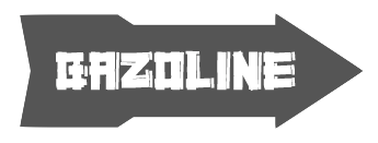 Free and commercial font foundry by Zellik, Belgium-based
  Davide Zomer (Bologna, and before that, Trento, Italy) created the modular typeface
  DCO (or: dcoxy medina, or: Atelier Oxydes) is Greg Médina. Atelier Oxydès is located in St Maurice de Cazevieille, France. He specializes in very funny drawings. Creator of these typefaces in 2012: the fun figurine dingbat typefaces called
 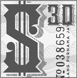 Decade Type foundry (Bandung, Indonesia, est. 2008) is run by Agung Maskund (Agung Gumilang Sugih), b. 1987, Bandung. It specializes in Victorian and vintage type. Creator of
  Great fonts for astrology, hieroglyphics, alchemy and the occult, by Toronto's Jan and Denise Koehler, mostly designed between 1993 and 1995. They moved to Litomerice and then Teplice, the Czech Republic, recently.
  Partner of Jan Koehler in
  Tomar, Portugal-based designer of the angular typeface
  Emil Kozole (Ljubljana, Slovenia) studied communication design at Central Saint Martins London. His type foundry is called Ljudje. Emil created the slab serif typeface
  Graduate of Birmingham Metropolitan College. London (was: Birmingham), UK-based designer of
  Rome, Italy-based designer. In her Fontikon font project (2020), ishe has produced eight fonts, each with letters and culture symbols: Alchemy Complex, Adinkra Wisdom, Aztec Empire, Celtic Iron, Lovecraftian Neue, Japan Kamon, Viking Norse, Slavian Ustav.
  Graphic designer in Guadalajara, Mexico, who works at
  Frank Hemmekam (Nijverdal, The Netherlands, b. 1994) designed these typefaces in 2013: the free alchemic typefaces Phantom, Dumento, Hectica, Droidiga, Defeated, Merula, Anne Sans, Futura FH Custom, Sabado (all caps sans) and Baron Neue (all-caps sans titling typeface: six weights are free at https://fontfabric.com/baron-free-font).
  [
[ [
[
 London-based creator of the super-experimental geometric and hipster typefaces Artificer (2011), Insomiak (2015, a hipster typeface), Illusive (2014, alchemic), Tuna (2014), Kim (2014), Solaris (2017), Sleipnir (2012) and Flatland (2011).
  [
[ Graduate of the London College of Communication. Multidisciplinary designer living and working in London. Creator of the alchemic caps typeface
  [
[ [
[ HelloMe is Till Wiedeck's Berlin-based studio. They created the following typefaces in 2011: HM Extra (the visual identity for HipHop musician Exzem is based around the custom alchemic typeface HM Extra),
  [
[ [
[ [
[ [
[ Jeremy Tankard established Jeremy Tankard Typography in 1997, after corporate design work at Addison Design Consultants and Wolff Olins. This Londoner made some extraordinary and daring font families. In many of his typefaces, Jeremy mixes upper and lower case letters for more impact. A list of his typefaces:
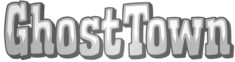
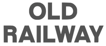 Graphic design graduate from Birmingham City University, who is now based in Marlborough, UK. His typeface Two Lines English Egyptian was developed in 2013 for a university project. It was based on the specimen found in the Blake, Garnett and Co. type specimen c. 1819. This typeface was produced by the first William Caslon's grandson, William Caslon Junior and his type foundry in around 1816, and is said to be the first commercial printing sans serif.
  [
[ Josip Kelava (Jay Kreative, Australia and UK) is an art director and graphic designer. He has done typographic work for fashion mags and fashion-conscious ads such as for
  [
[ Paris-based type designer affiliated with
  Chicago-based designer of an
  During her studies at York University in Toronto, Kadi Koroma created
  Brooklyn, NY-based designer of Incheon (2015), a fantastic poster typeface that is inspired by Seoul and emulates Hangul, and Retrograde (2014, an astrologically-inspired alphabet).
  I like the description of this Catalan foundry at MyFonts: A foundry with a home in Catalunya. Kickingbird font work takes place in the quiet treehouse headquarters near a former Barcelona textile homestead. Font sketches are completed anywhere a notebook is handy... in the cafes of Gràcia, on the RENFE railway or outside the cloisters of Santa Maria del Mar. Font design inspiration comes from many sources. Faded broadside wall manifestoes in Ravel, broken floor tiles washed up on the shores of Vilassar de Mar or from old cigar boxes found at the Mercat de Sant Antoni. For those who know Barcelona, sweet memories. The designer,
  [
[ Turkish designer of
  During his studies, Lajos Csutoras (Kaposvar, Hungary) created Flowish (2014) and Switch (2014, alchemic). [
 French type designer affiliated with
  For her final project in 2015 at the Tagir Safaev Typography School in Moscow, Lina Tumarkina designed Mathilda Bold, a grotesque typeface for Latin and Cyrillic that is modeled after Morris Fuller Benton's Headline Gothic (1936).
  Luis Jaramillo (LJ Design Studios, Monteria, Colombia; b. 1993) created these free typefaces in 2014: AGreaterFoundation-Bold, Capella-Century, CapellaRockIII-Bold, Decasmini, Dolgan, LJStudiosGF, LuisSmartTX-Bold, Melinett1, Parallels, ThePowerlessRise, WallIT-Bold. In 2015, he made the decorative connect-the-dots caps typeface Night of Music, the great slab serif titling typeface Inicio and the extremely tall x-height logotype Lidea National Fontype, the alchemic occult typeface Zilap Geometrik, the sans typeface Fina, and the headline / poster sans family Silver (Regular, Forte, Grunge). The current list of fonts: AoceanbetweenUS, AGreaterFoundation-Bold, AJourney, AnewHeardDecorative, AsILayDyingLogoFont, Beforeandafther-Bold, Blade, CapellaRockIII-Bold, Capella-Century, CapellaRock-LJDesignStudios-Bold, CapellaRockIII-Bold, Condemnedtoyourlove, DZTypography-Zilap-Bold, DZTypography-Zilap, Darkpast, Decas-Bold, DecasII, Decasmini, Dolgan, EarthDry (2014, glaz krak font), Fina (thin sans logotype), Forsaken, Lacalle6, IS-BoldItalic, IS-Bold, IS-Italic, IS-Thin, IS, Logo, LJPromiseDarck, LJStudiosMB, LJStudiosMFJH, LJStudiosMNS, LJStudiosMNS2, LJStudiosMonitorIS-MAYUS, LJStudiosMonitorIS-MAYUSMinus, Leven, Leven, LordZeDD-LJStudios, LordZeDD3-Bold, LorenaGalarcio, LorenaGalarcio, LorettoGrafic-Bold, LorettoGrafic-Italic, LuisSmartTX-Bold, LuisSmatTXNormal-Bold, MarlenThePonderosa, MeliVargas, Melinett1, Melinett2, Melinett3, MyBrush, NeoLR, NovedosaStick-Italic, Overcome, Parallels, ParalyzedSkyandMoon-LJ-designStudios-Grunge, PenetrationOut-Deformed, PenetrationOut-Grunge, Pequeita, Pizcas, PowerDark-Bold, ShadowsofSecurity, SilverDust, SilverForteGrunge-Grunge, SilverForte, Sincedust, TRG-Zilap, The Dark (spooky), TheSoundofTruth-Grunge, TheSoundofTruth-smooth, ThePowerlessRise, ThroughStruggle, WallIT, WritingMemories, ZILAPGEOMETRIK, ZulmCool, redout, thedark, withindestruction.
  [
[ [
[ [
[ Manfred's life story is also being told through tens of typefaces that pay special attention to the eyes. They include some his best and most original contributions as they come straight from the heart. A partial list: AftermathDings, AllesNurGeklaut, AmorEmoticons, AndBullets, ApishOne, Aprilapril, Assoziazione, AugenEyes, AugenWappen, Beardfaces, BlaxBloxxEyes, BulletsMK-Thin, Coincidences, ConfusEyecons2005, Confuseyecons, ConstructionAgainstFreehand, CrazyWorld, Decreations, DingsUndDas, EverypictTellsaStory, Exercises, Expressiones, EyeBeings, EyeBeings, EyeCatching, EyeEye, EyeEyeOnBlack, EyeNStrokeThree, EyeSee, Eyeballs, EyelecBats, Eyemen, Eyes, EyesAlphabet, EyesAndSoOn, EyesAugenMouth, EyesGallery, EyesNStrokes, EyesNoseMouth, EyesTests, FaceLaboratory, FaceToFace, Faces, FacesAlphabetBeta, Facialish, FishFaces, FisheyeButtonsTwo, Florenius, ForAlchemistsOnly, Frontal-Buttons, Frontal, GenesisSketches, GeoEyesOne, GeometricFaces, GeometricFeelings, GesturesMK, Gipfelkoepfe, GoodOldEyeCatchers, GutenbergGoesAbstract, HeadImprovisations, HeadImprovisationsTwo, HeadfeeterOTwo, IdenOfMarch, LaughBajazzo, LifeEyecons, LogoModaRoma, LogoModels, LogoModelsBowToBoss, Look, LookForLeonardo, MKDingBats, MKEyeMinals, MKSymbols, MSkizzen, MansPartsPlaying, MathEmoticonsInverse, MathEmoticonsOne, MiszCinque, MiszellMay, Miszellen-Eight, MiszellenJuly, MiszellenK-Zwo, MiszellenK, MiszellenKOne, MiszellenQuattro, MiszellenTwo, MkDrawings, Morphes, MouseTraps, MouseVectorarts, Nasenbear, NewTechnoFaces, NiceMurders, OldEyeCatchers, Olisillus, OtherEyes, OverHeads, PhantasticBeings, PhantasticSketches, RodgauerFisheyes, RomiPetito, RoundFacesTwo, RoylichBats, RuebenNosesFour, Scannings, SchauSchau, SchiessScheibeUndAuge, SeeAndAct, Strokemen, SuprematismOne, SuprematismTwo, TherapeuticApplications, TheyWasNiceMurdersAlways, TwelveYearsAfter, TypoAnarchycalEyes, VectorFaces, VectorImprovisations, VectorPaintigs, Vectories, Vectorism, VectorizedSignets, WacoGraphireSketches, Wacollection, Wacomusish, WaxworksImprovisations, WaxworksTwo, WildHeads, WithALittleHelp, WysiwygBats, Zettelkasten15.


 Design student in Hoofddorp, The Netherlands, whose first font is the high-contrast art deco typeface
  During his studies in Poznan, Poland, Zolowsky designed the alchemic typeface
  Freelance designer and illustrator in Milan, now based in Laveno. Creator of
  During her studies in Nantes, France, Marion Videlin Roy created the alchemic typeface Aventura (2015) and the decorative caps typeface Kata (2015: created for the catalog of Grandir d'un monde à l'autre). [
 [
[ London-based creator of the hipster typeface Nekow (2014). [
 Graduate of Miami Ad School. Madrid-based designer of
  Graphic designer and illustrator in London, who created the alchemic typeface
  Graphic designer in Barcelona, who created an unnamed modular geometric typeface in 2012.
  Noem9 Studio is an online studio created by Jose A. Garrido, a graphic designer who was born in Alcañiz, Teruel, Spain, in 1987, and lived in Zaragoza. Noem9 is currently based in London.
  [
[ Miami, FL-based creator of the
  Graphic designer in Guadalajara, Mexico, who made
  Papanapa is a Sao Paulo-based multidisciplinary design studio founded by Gustavo Garcia. Designer of these typefaces:
  [
[ [
[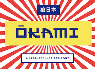 [
[ Caixias do Sul and/or Florianopolis, Brazil-based designer of the free blocky typeface
  Peter Rempel (b. 1958) is a Winnipeg-based calligrapher.
  Barcelona-based designer of the alchemic typeface
  Raihan Nizar (b. 1977) is the Indonesian
  Designer and digital artist in Florence, Italy. He created the ornamental caps typefaces
  [
[ Sea Types is the partly free partly commercial type foundry of Jefferson Cortinove (artist, designer, teacher, sailor and wine maker) and publicist Márcio Duarte in Florianopolis and Marilia, Brazil, est. 2007. Their initial typefaces include
  Shadz XIII is Rafaela Rolfsen. Based in Bauru, Brazil, and Falmouth, UK, she made the bilined typeface
 Skyhaven (Alex, b. 1993) is located in New York City. He designed free typefaces between 2012 and 2015, and turned professional after that.
  Stefanie Schwarz studied Visual Communication at Pforzheim University in Germany and received her M.A. in Communication Design from Central Saint Martins College of Arts and Design in London. Since 2012 she is teaching typography and type design at the Stuttgart State Academy of Art and Design. She also teaches at Bauhaus University Weimar. In 2013 she founded the Typographic Research Lab Open2Type together with Dirk Wachowiak and became an associate of the London-based institution DesignScience.
 Struvictory Art (Hrodna, Belarus) is run by Viktoryia Strukouskaya and
  Paris-based graduate of ESAG Penninghen (where he took courses from, e.g., Muriel Paris) who made a custom
  British studio which published the alchemic typeface
  Buenos Aires-based creator of the children's hand font
  Designer in Bangkok, who runs Tabby Design. He made the experimental geometric typeface
  Graphic and identity design company founded by
  Parisian graphic designer who created a number of vector format commercial typefaces starting in 2012. These include the alchemic typeface
  Graphic designer in London who created the fat brush typeface
  Gugum Gumpita Rahayu (b. Bandung) is a graphic designer based in Bandung and Jakarta, Indonesia, b. 1991. In 2013, he set up Absolut Foundry. In 2015, he started
  During his graphic design studies in Trondheim, Norway, Tommy Larsen designed the display typeface
 Portuguese foundry in Guimaraes and Porto, est. 2011 by Pedro Lobo, that sells
  [
[ Walden Font (est. 1997) sells historical typefaces&clip-art by Oliver Weiss from Winchester, MA. Walden's site includes a
  Berlin-based art director (at Rain Studios, or We Love Rain, his own studio) who created the scary brush font
  Michael Cina (Minneapolis) is the cofounder of WeWorkForThem and
  Jacopo Severitano (Ziamimi) is the Berlin-based designer of
  Juan Guillermo Navarro Barrios runs the design and illustration studio Zilap in Medellin, Colombia. In 2014, he created the hipster typeface Zilap Normal. In 2015, with the cooperation of
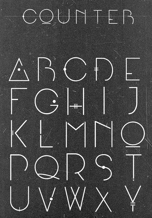
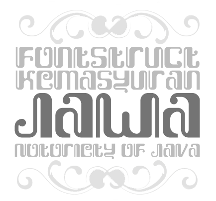
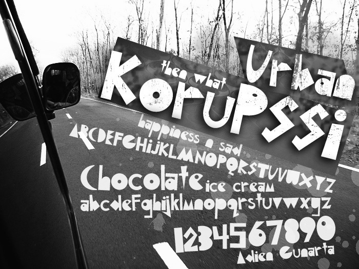
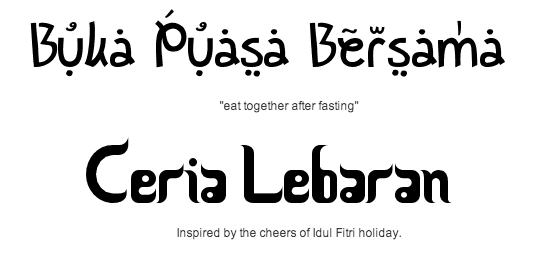
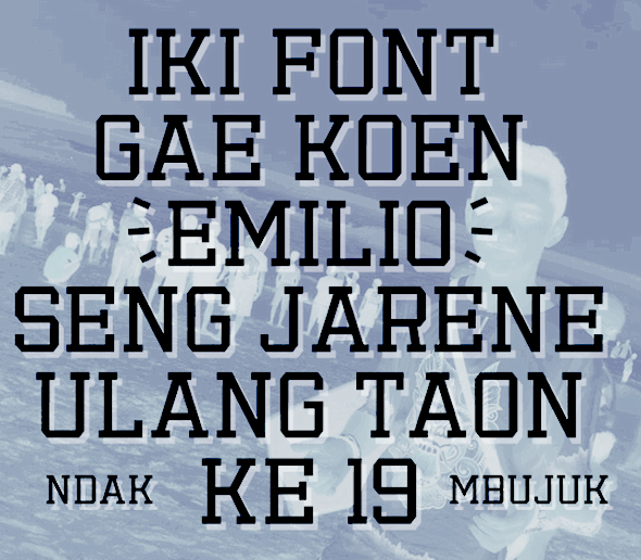
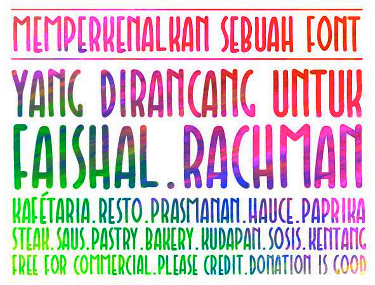
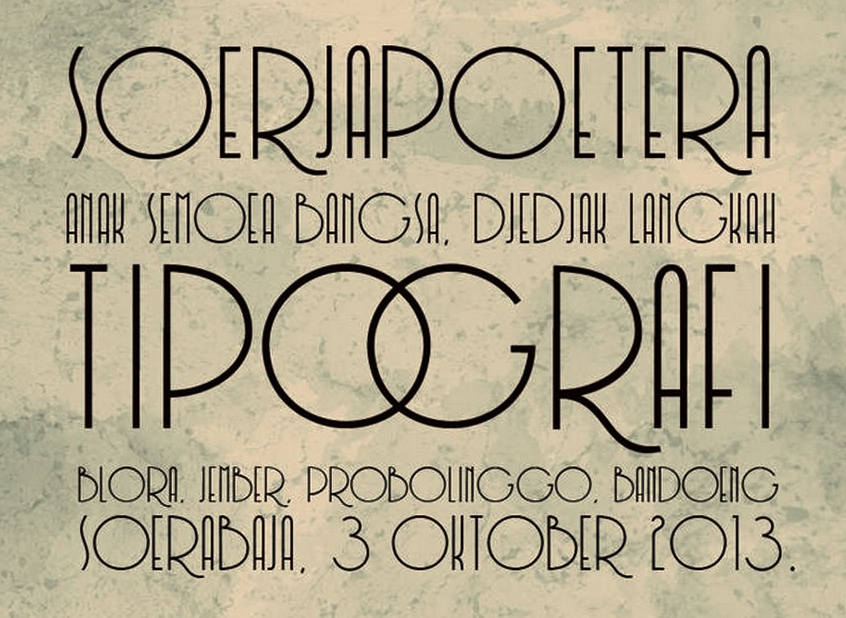
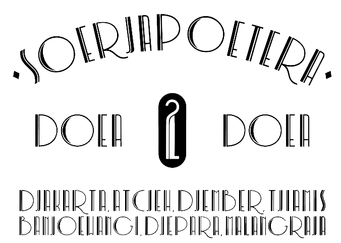
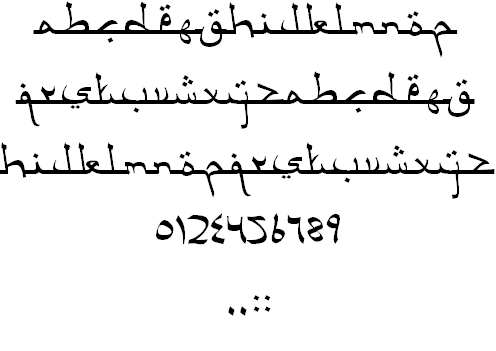
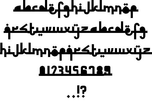
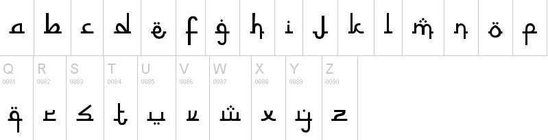
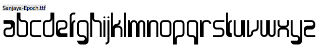
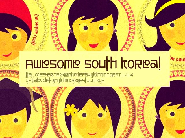
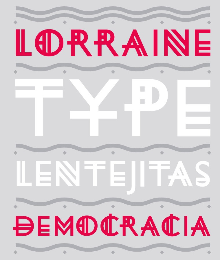
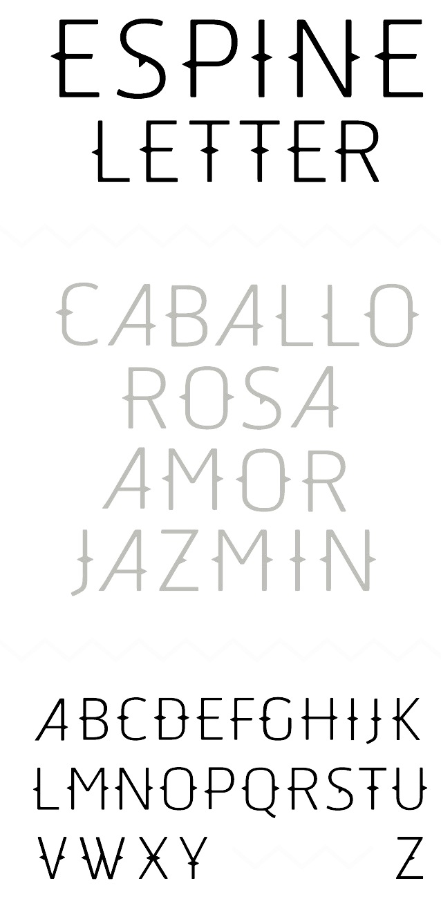
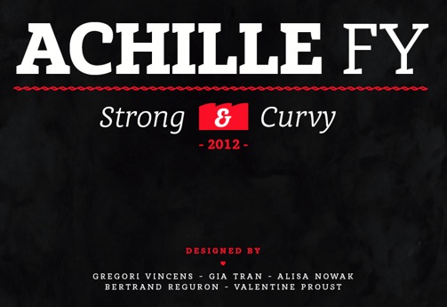
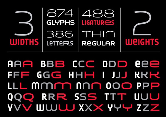
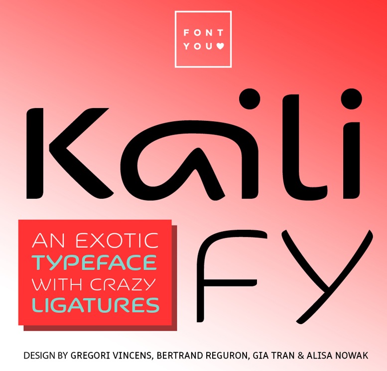
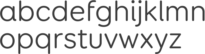
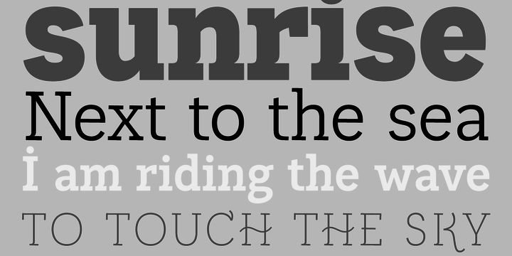
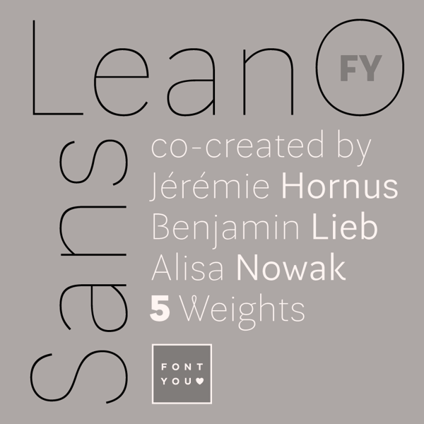
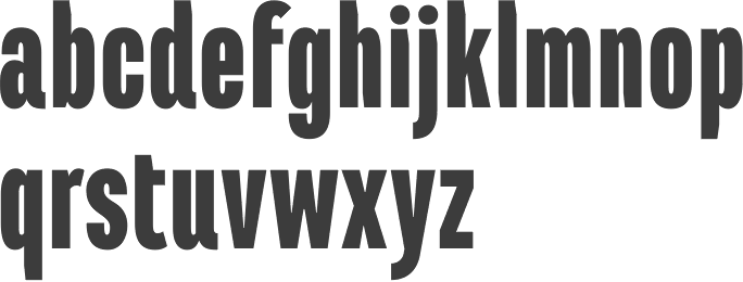
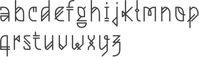
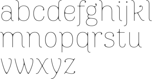
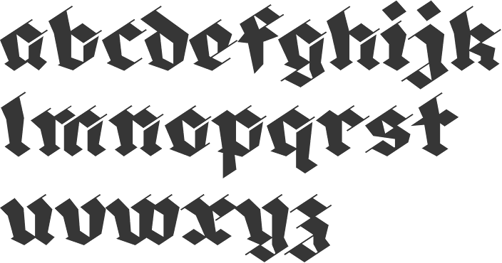
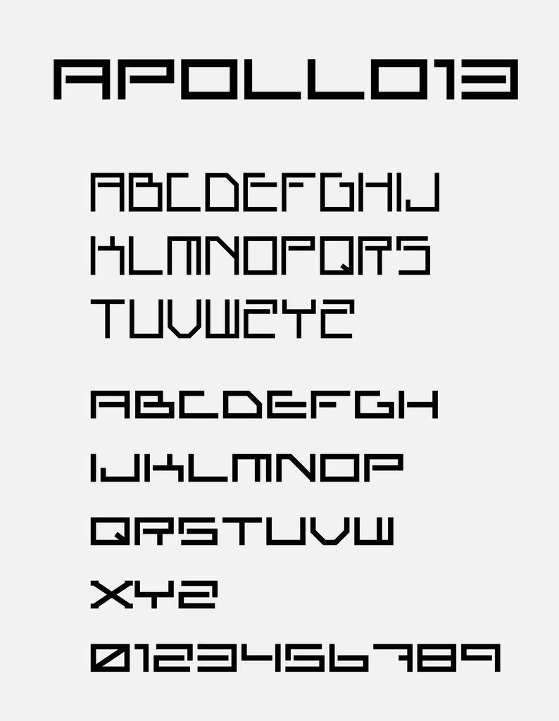
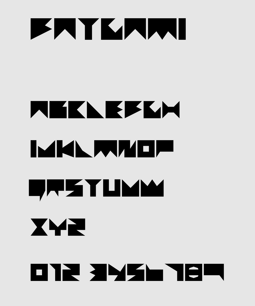
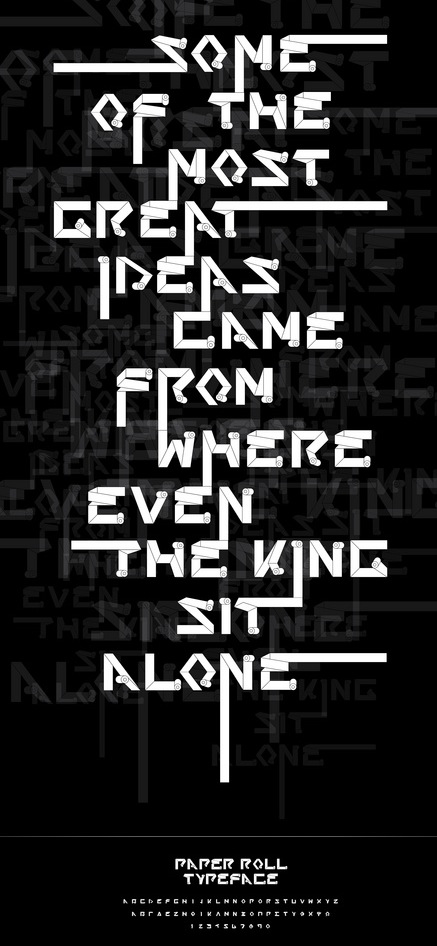
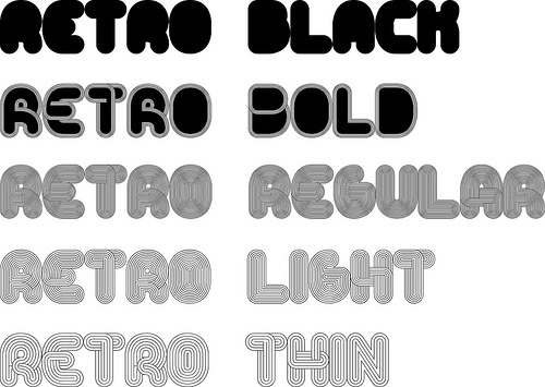
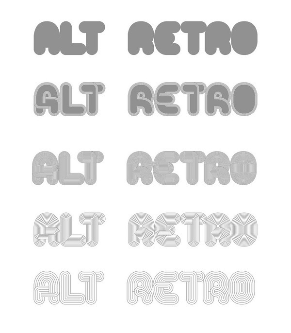
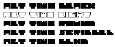
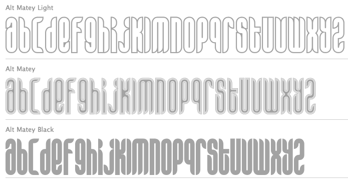
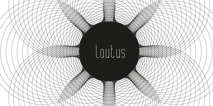
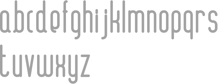
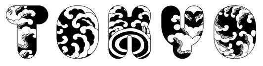
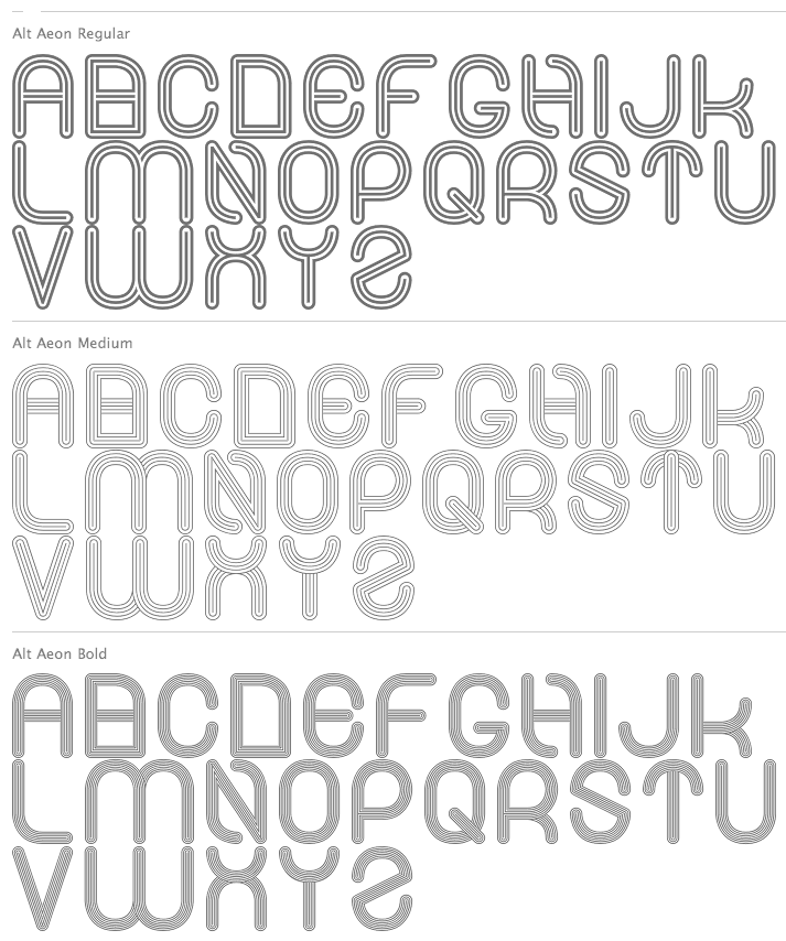
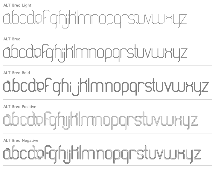
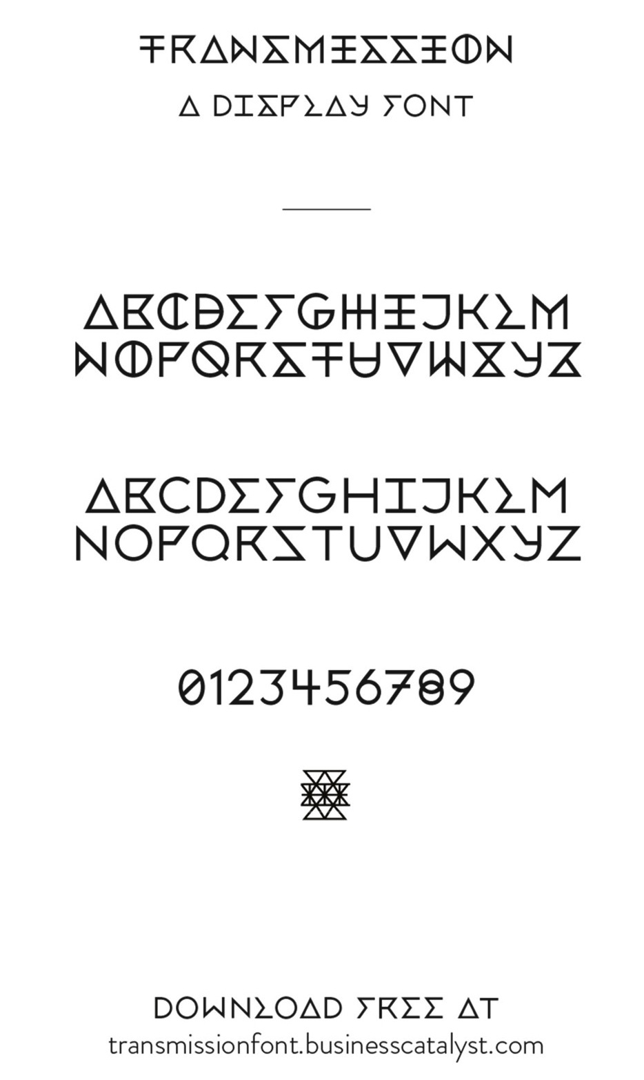
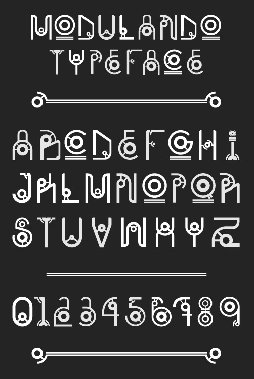
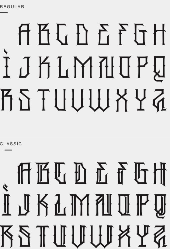
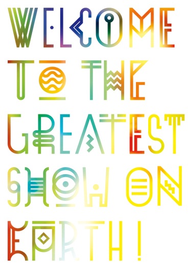
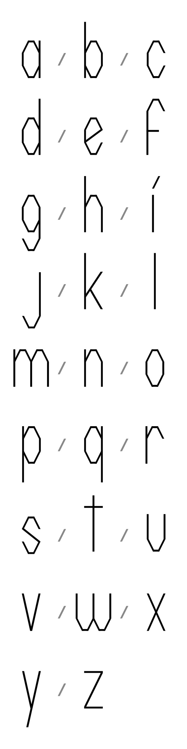
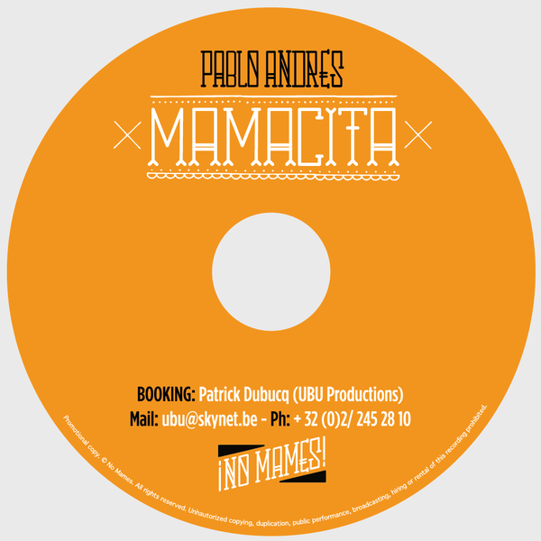
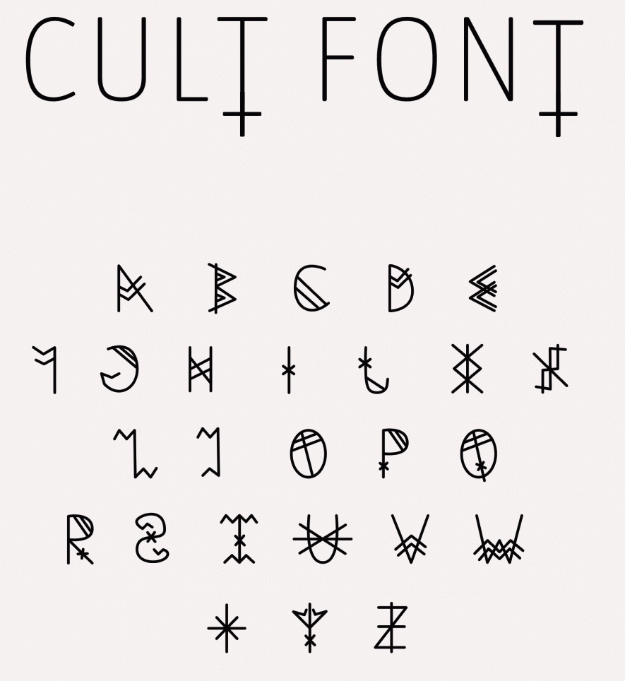
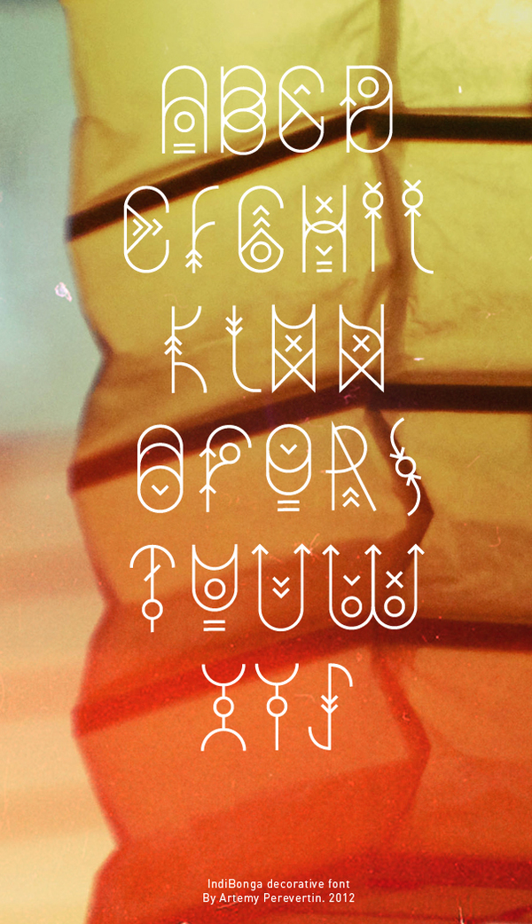
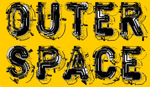
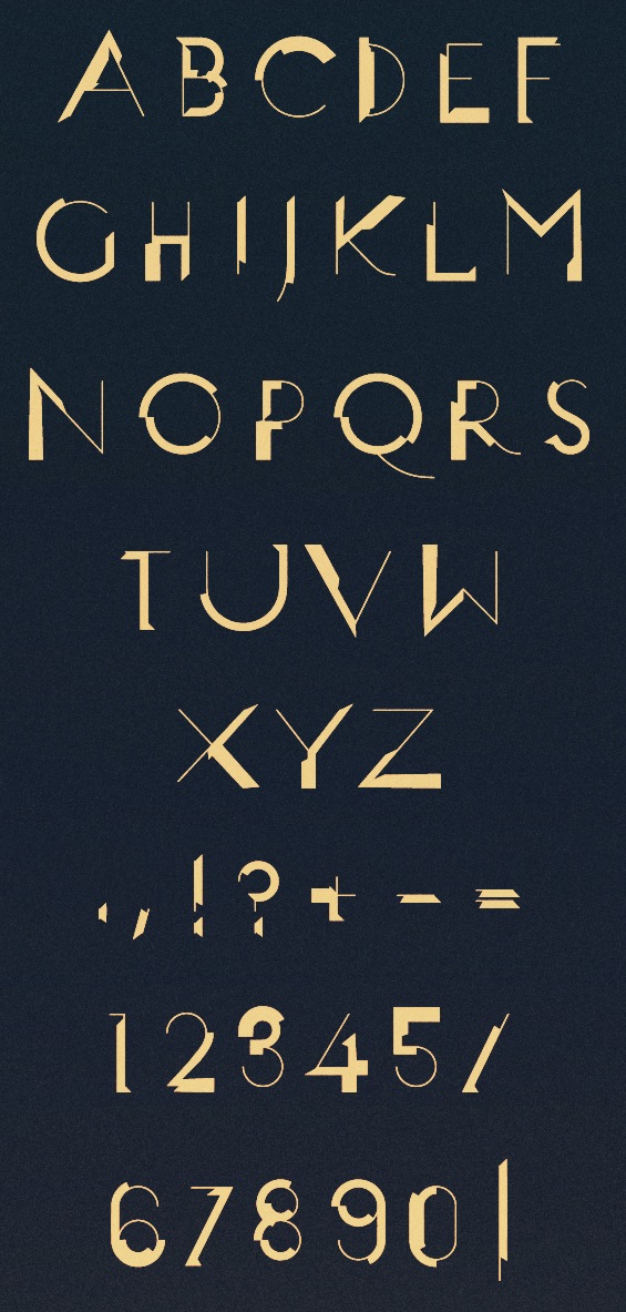
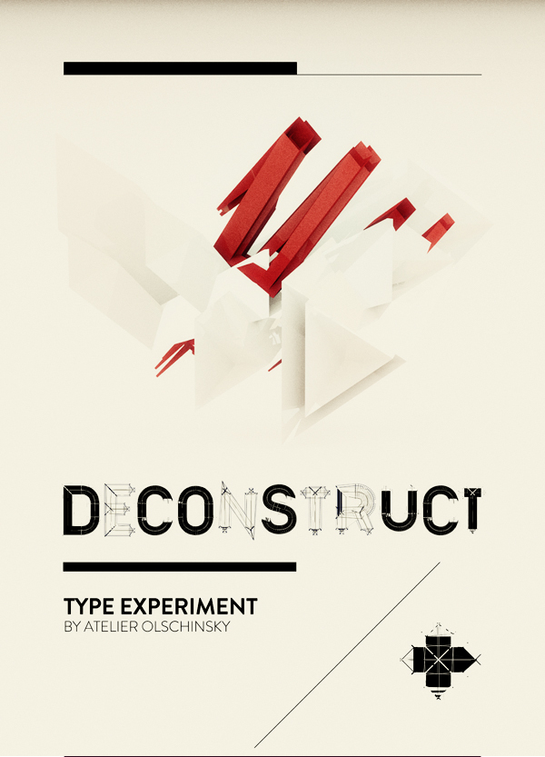
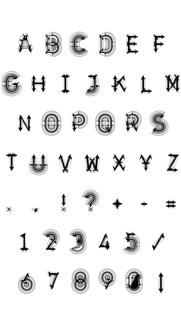
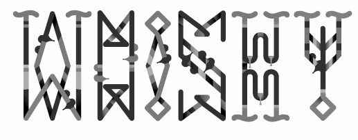
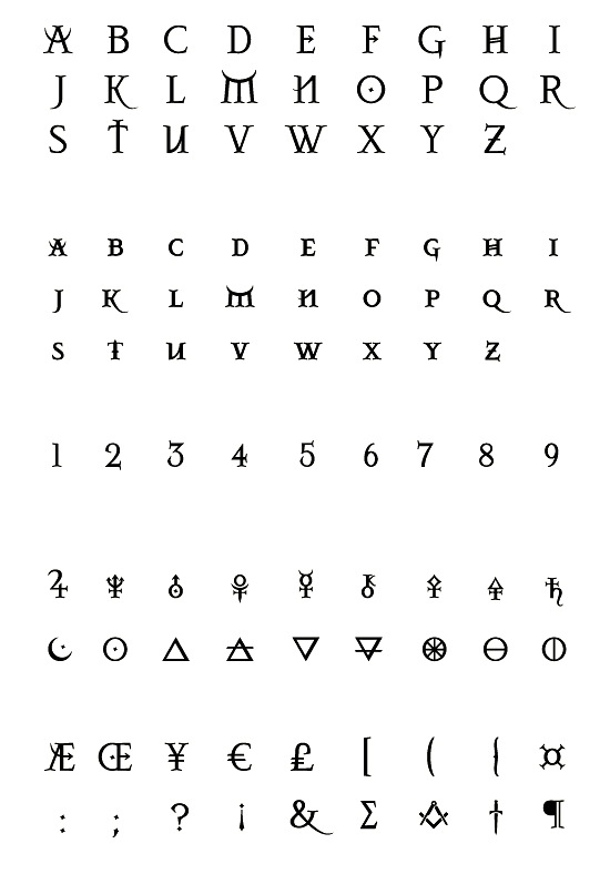
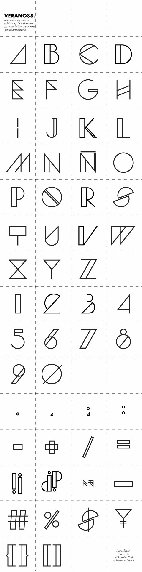
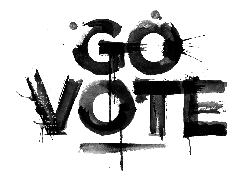
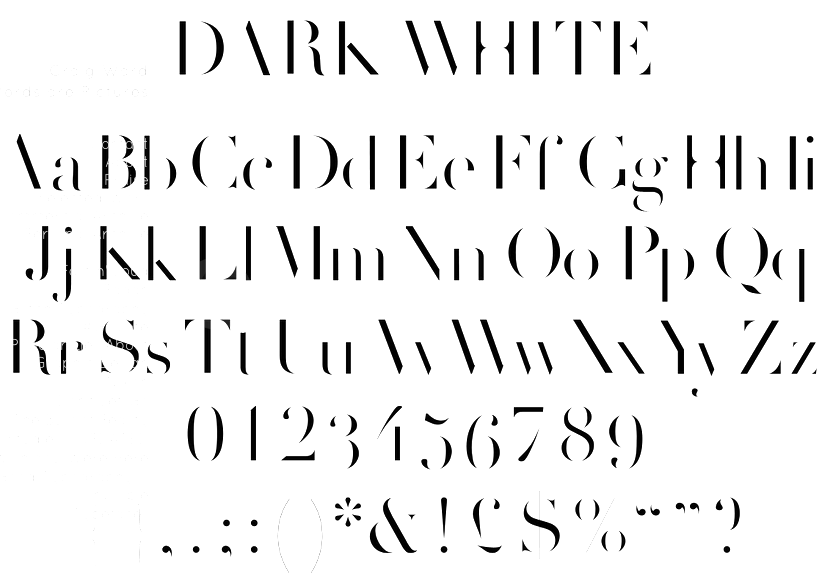
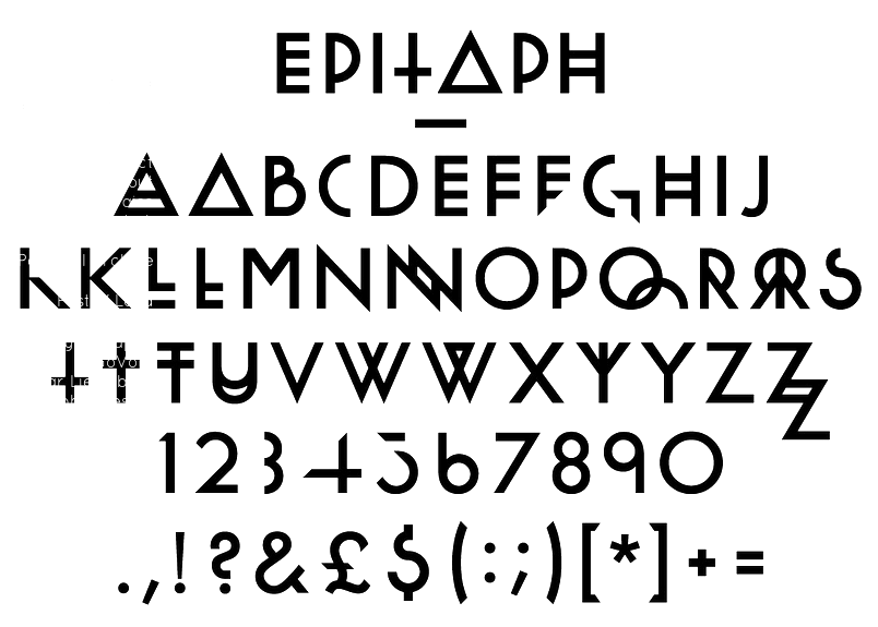
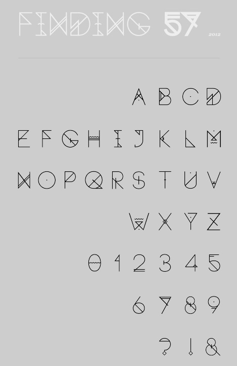
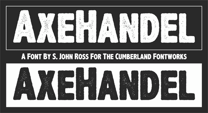
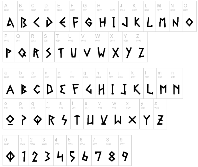
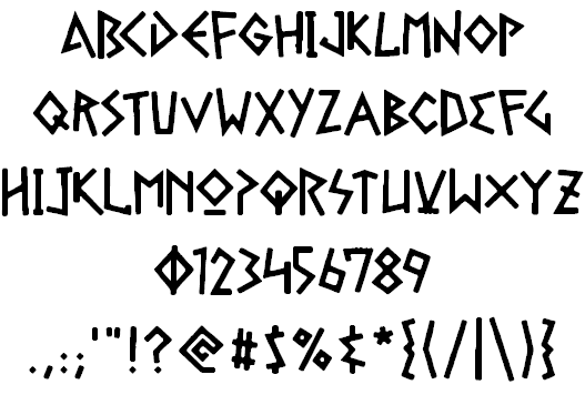
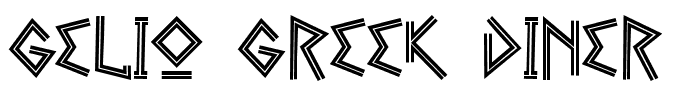
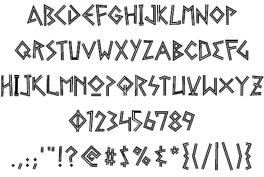
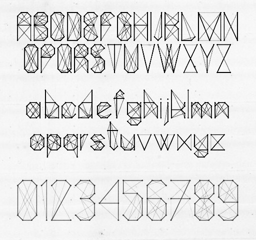
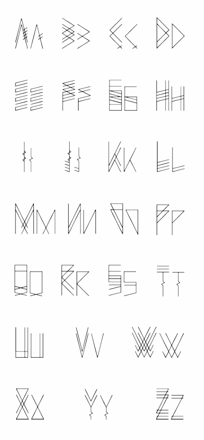
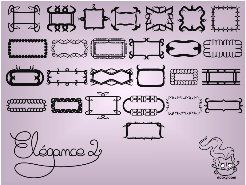
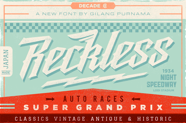
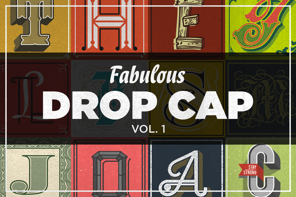
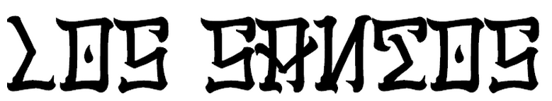
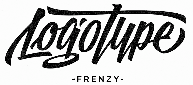
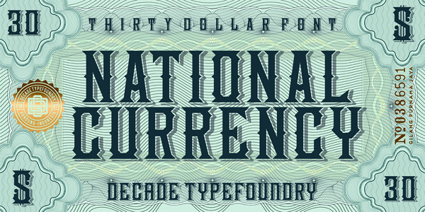
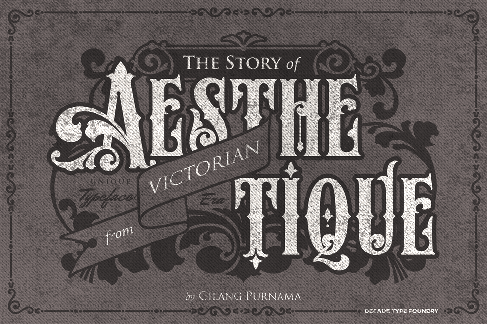
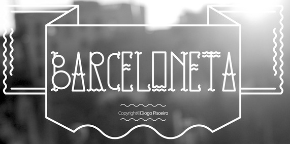
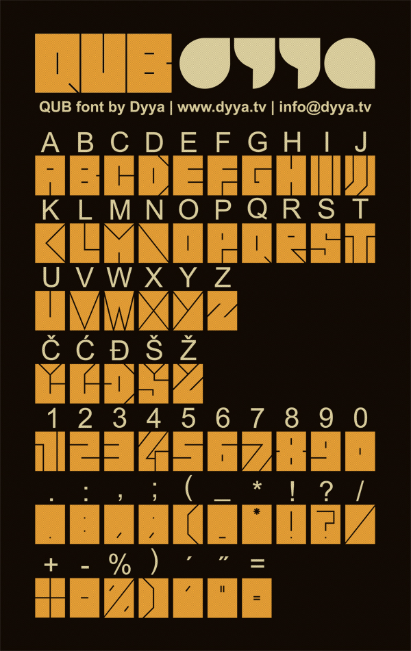
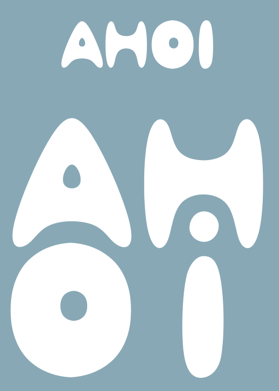
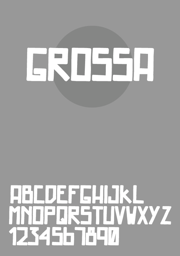
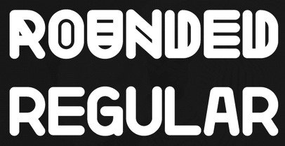
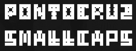
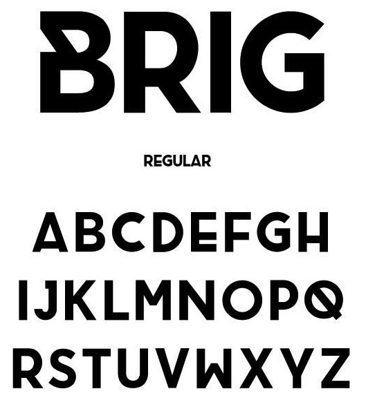
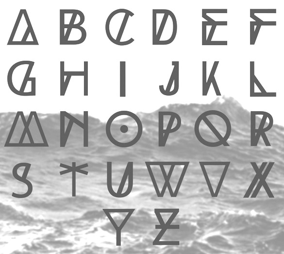
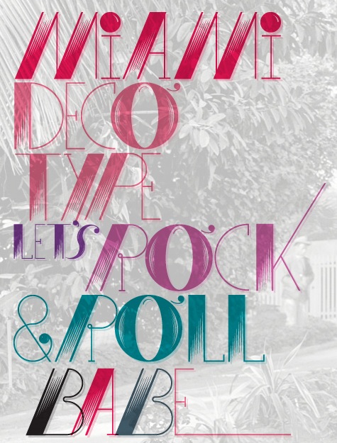
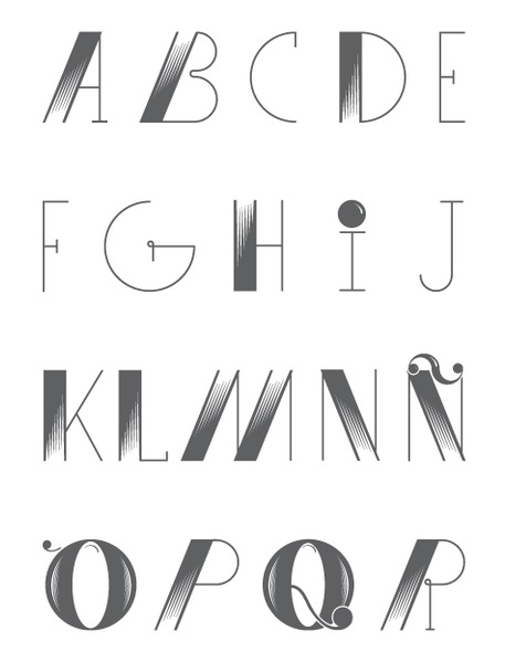
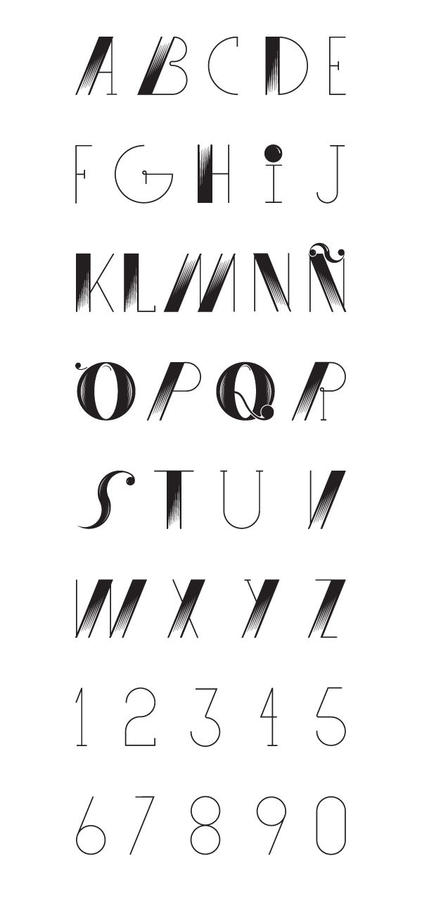
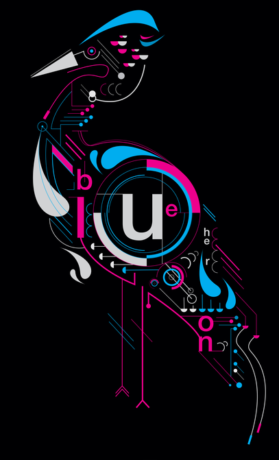
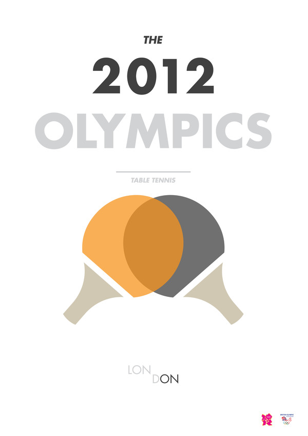
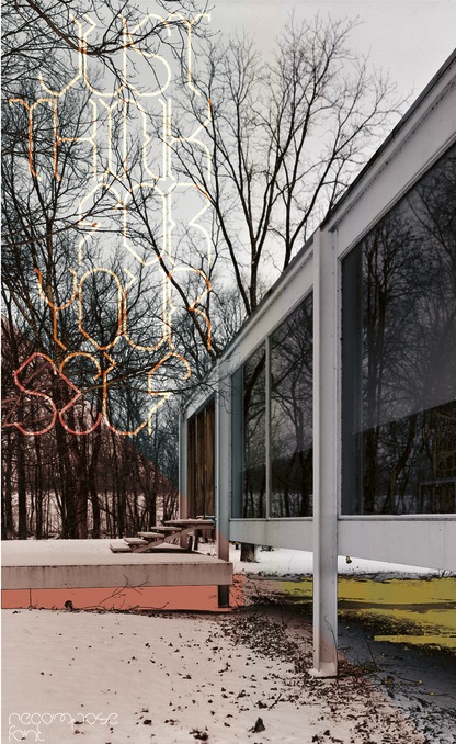
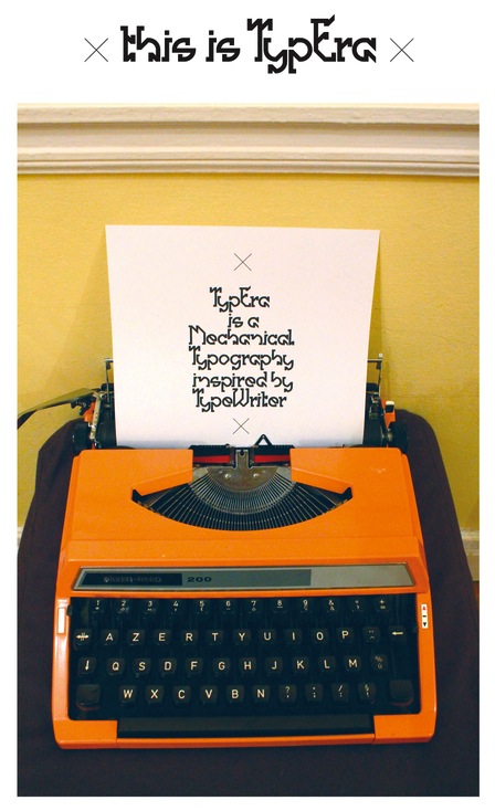
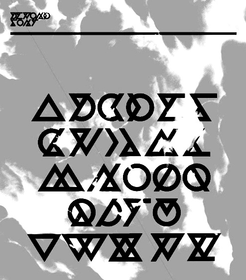
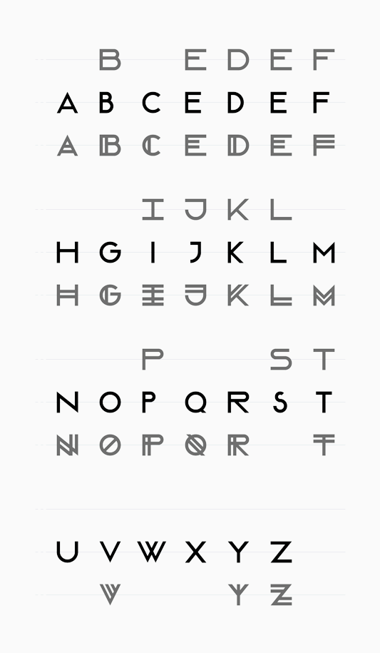
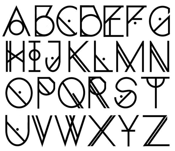
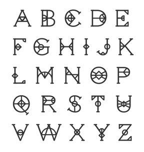
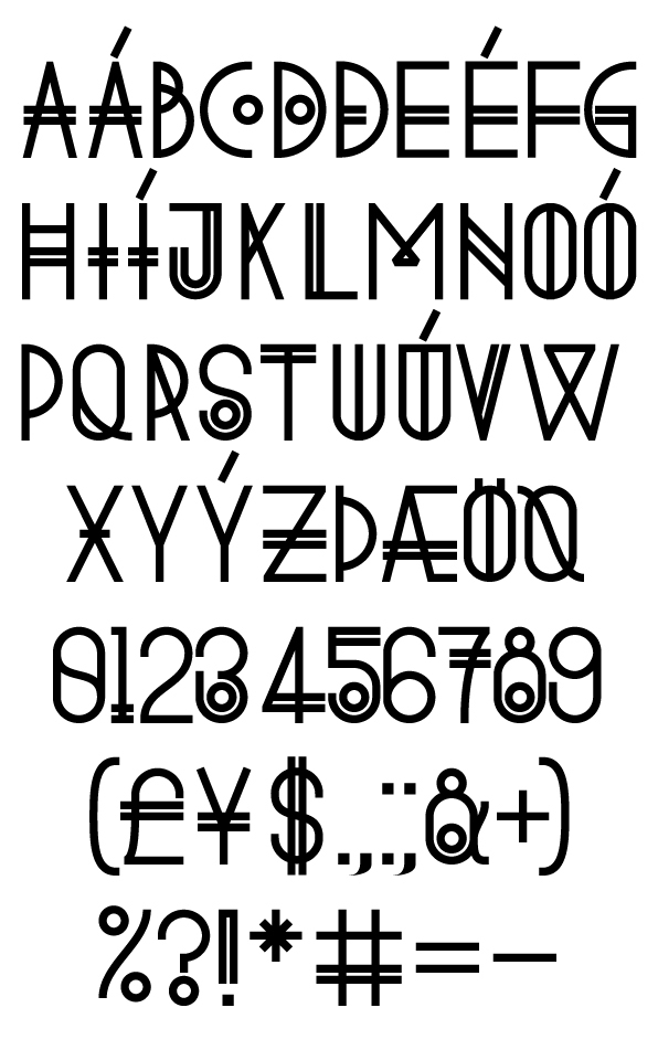
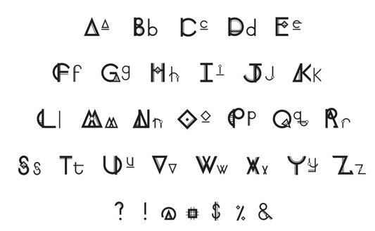
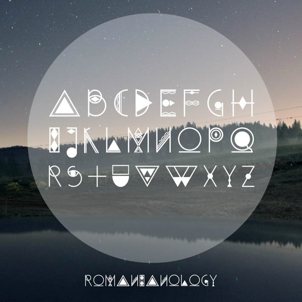
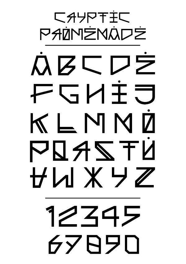
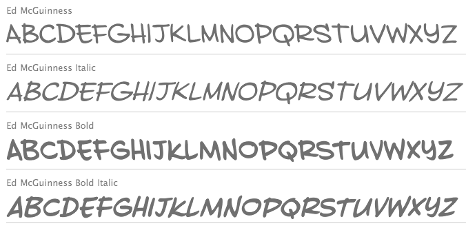
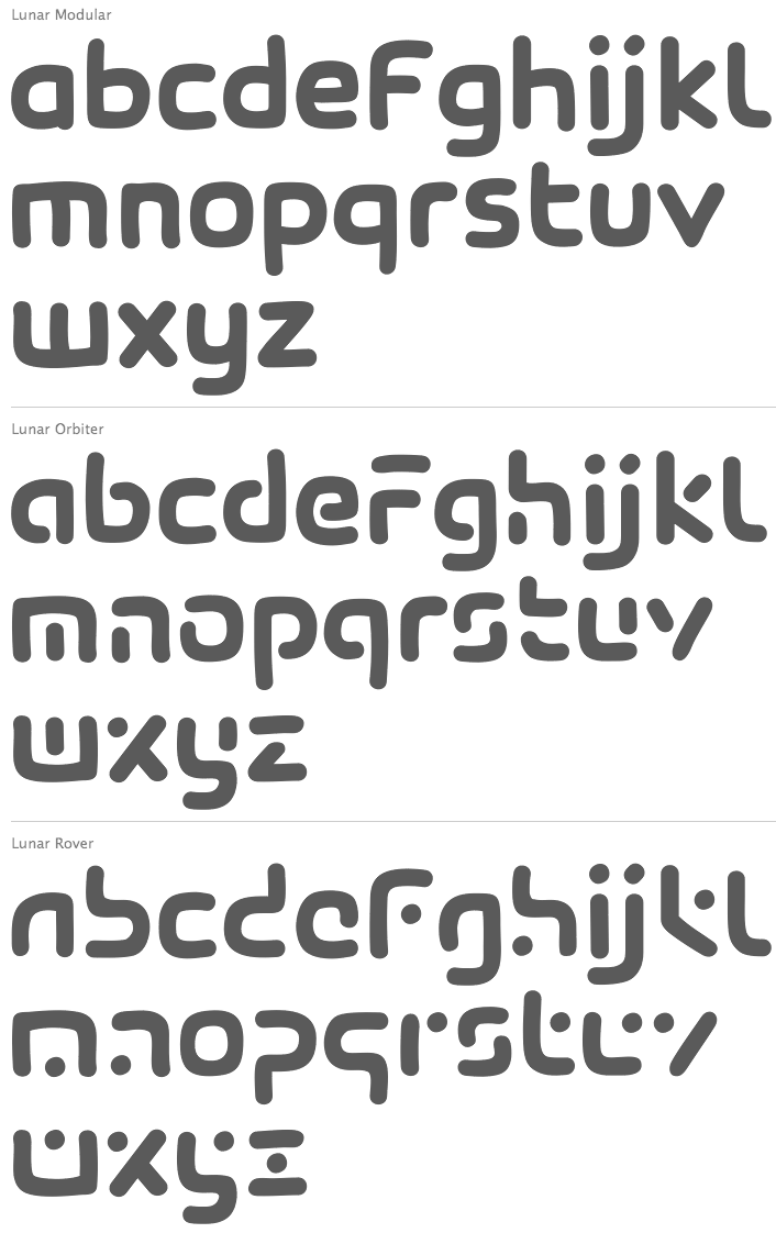
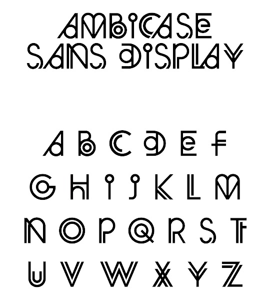
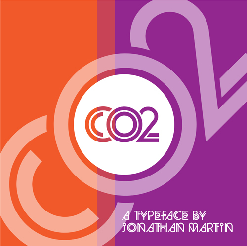
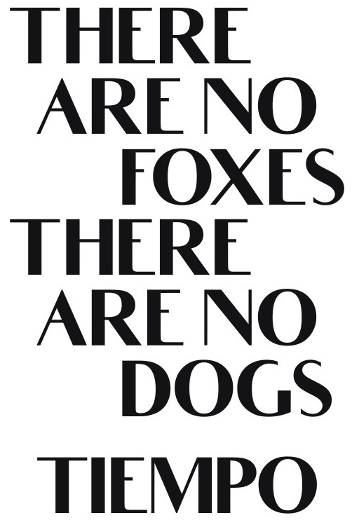
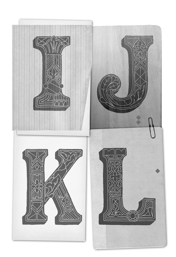
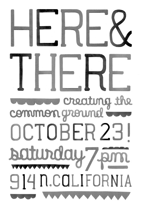
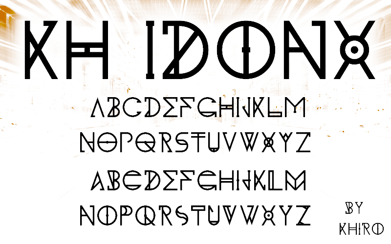
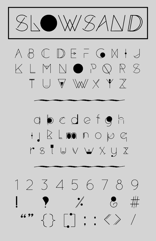
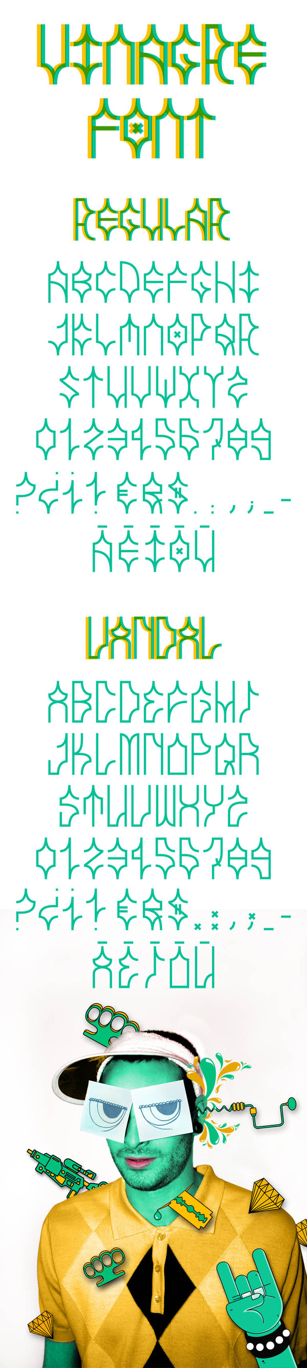
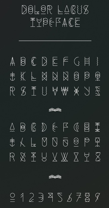
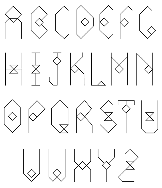
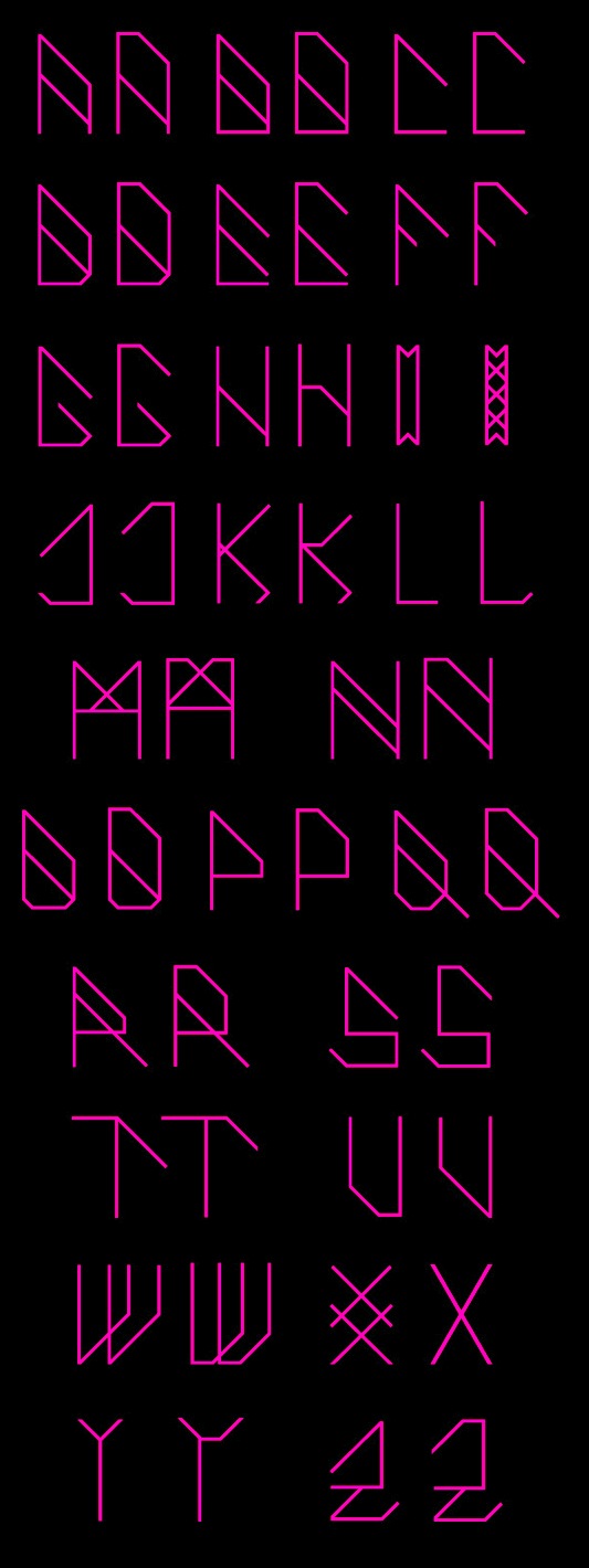
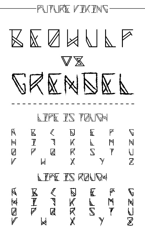
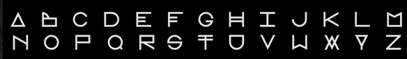
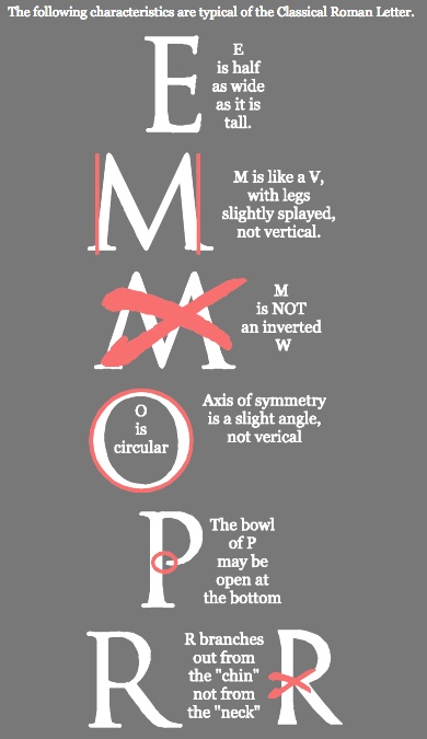
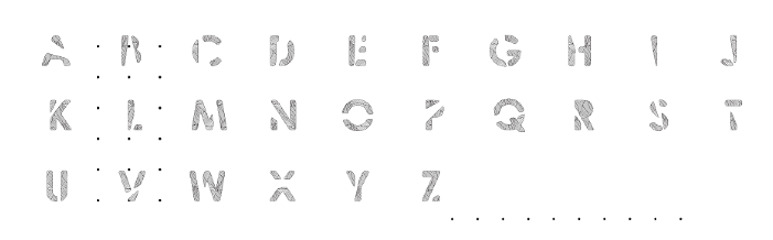
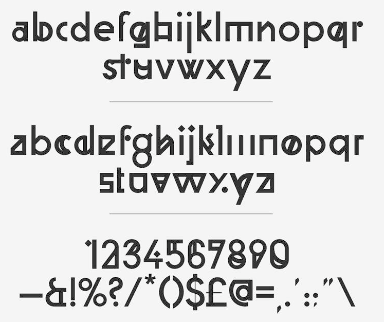
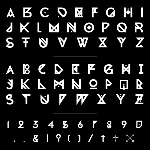
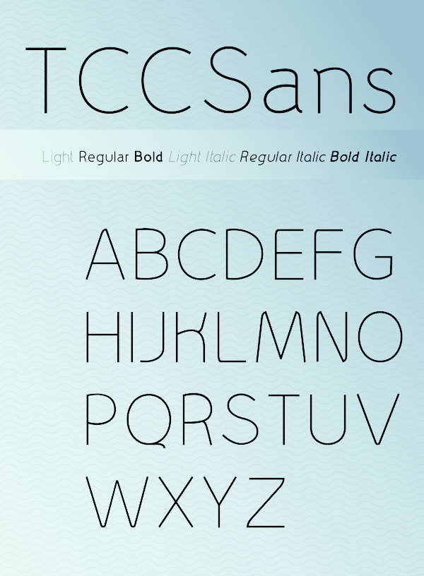
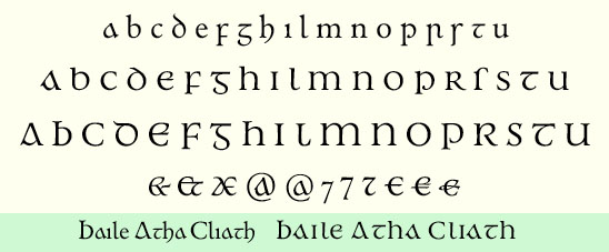
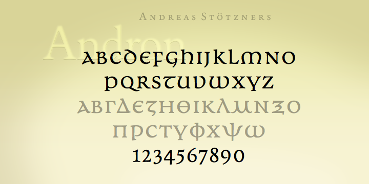
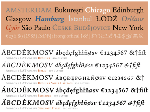
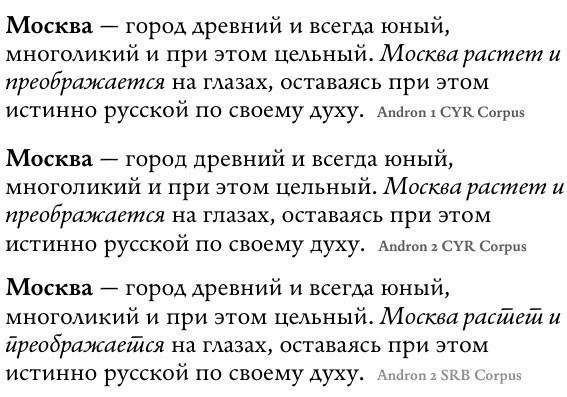
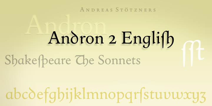
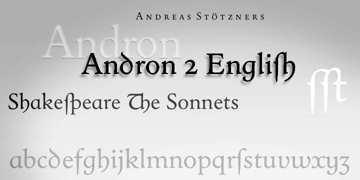
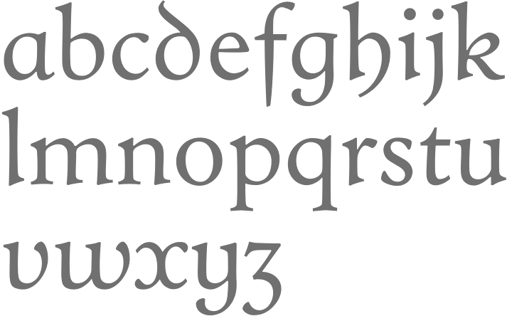
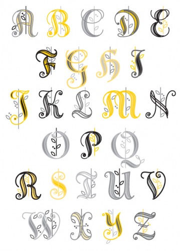
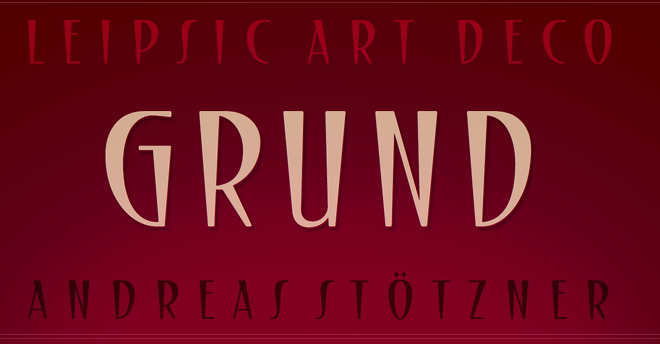
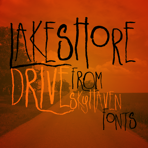
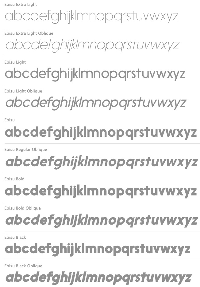
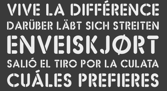
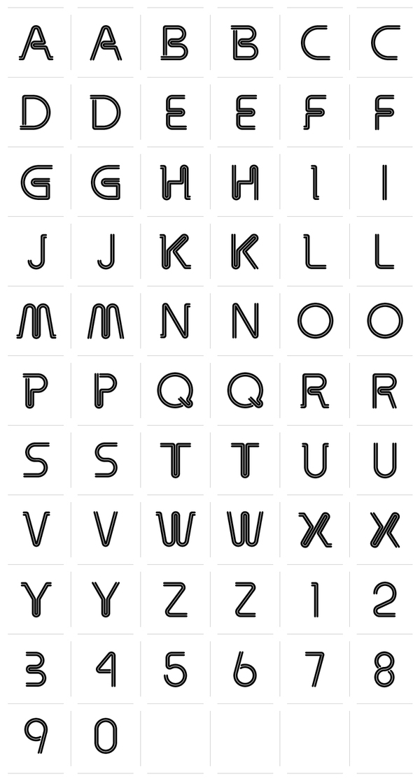
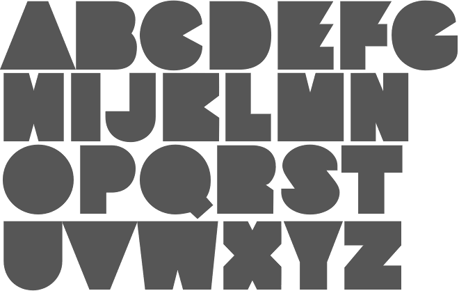
|
|
|
|