TYPE DESIGN INFORMATION PAGE last updated on Mon Jun 8 17:46:12 EDT 2026
FONT RECOGNITION VIA FONT MOOSE

|
|
|
|
|
The Belgian type scene | ||
|
|
|
|

SWITCH TO INDEX FILE
A3
| Bram Vermeyen's blog and electrtonic mag about design and typography. [Google] [More] ⦿ |
| |
Ad Hoc Design
| Guy Schockaert was born in Kortrijk, Belgium, in 1949. After studying graphic arts and visual communication at the Institut Saint-Luc in Bruxelles (1966-1970) he became an assistant of Michel Olyff before becoming self-employed as a graphic designer in 1971. His graphic studio Ad hoc Design specialized in corporate identity, books and brochures for a range of clients including Alfac, 3M, Plantin, Sic and RTBF. Schockaert advocated rigour and emotion in his career. He gave many and was active in teaching. From 1997 until 1999, he was the president of Icograda (International Council of Graphic Design Associations). He was one of the initiators of Design for the World, an organisation that is dedicated to finding design solutions to humanitarian problems. Since 2003 he has been President of Ydesign Foundation. His awards include Médaille de Bronze, Prix Plantin-Moretus (1989), Brno Biennale Honorary Membership (1996), Icograda President's Award (2007), and the Red Dot Award (2004). On January 11, 2013, he sent out this disturbing message by email (including to me): Dear friends. I left our world this morning convinced that a paradise exists somewhere for graphic designers. My computer will be mute from now on. I loved you all. And indeed, a few minutes later, obituaries started popping up all over the web. Linkedin page. [Google] [More] ⦿ |
Mechelen, Belgium-based designer of the hip handcrafted sans typeface Bossuwé (2017). Behance link. [Google] [More] ⦿ | |
During her studies in Antwerp, Belgium, Aisha El Salawi designed Fold (2016). [Google] [More] ⦿ | |
Brussels-based designer. Behance link. [Google] [More] ⦿ | |
Alessandro Pivetta
| |
Alessandro Pivetta Type
| Italian designer of Brillo (2019), a latinized grotesque. [Google] [MyFonts] [More] ⦿ |
Alexander Thomas
| |
Licht Punt (2010) is the geometrically precise custom typeface used in the Sky High project for the Radisson Blu hotel in Hasselt, Belgium. In 2011, she published the art deco family Rosetta, and wrote: Rosetta font was designed by Alexandra Mendes for an upcoming branding project. The typeface design is inspired in all things lovely and luscious of the female intimate universe: lingerie, lace, blush powder, négligé, bustier, lip gloss and other lavish niceties. Should feel as a flirt, the subtle wink of the eye, a roseate glow. Rosetta is a coquette who flirts with life, winking her eyes, batting her lashes, flicking her hair, leaving her scent behind as she passes on the street, turning heads, with her whispering lips and waddling feline walk. Teasing and feigned disinterest to test the reliability of her admirers. Tall slenderizing lines and delicate curves shape the form of Rosetta. The typeface look is minimal and contemporary but reminiscent of a certain "je ne sais quoi" of Art Deco. There's a pure linear geometric symmetry to the font, to create a look of elegant modernity, that exudes a flair for glamour. Rosetta is a font family set composed by the styles: Rosetta, Rosetta Blush, Rosetta Bloom, Rosetta Bud. Images of Rosetta: i, ii, iii, iv, v, vi, vii, viii, ix, x. [Google] [More] ⦿ | |
During his print design studies in Brussels, Alexandre Défossé created the triangulated typefaces Zeo (2013) and Pico (2013). [Google] [More] ⦿ | |
Belgian designer of the monoline script typeface New Theater (2019). [Google] [More] ⦿ | |
Amélie Dumont
| |
Regarding revivals, we refer to George Tulloch's text typeface Cunaeus (2018) who explains: Cunaeus is intended primarily for use in running text. It brings together the types of two renowned sixteenth-century punchcutters: the roman is an interpretation of a pica font cut [in 1551] by Ameet Tavernier, and the italic that of a pica font [from 1565] of Robert Granjon (1513-1589/90). Granjon's italics have inspired a number of revivals in the past, but usually of his more slanted styles; the present digitization features the lesser slant of his so-called droit style typical of the mid 1560s. [Google] [More] ⦿ | |
AmoinsB
| AmoinsB, est.2013, is a Belgian free font foundry run by Bastien Sozeau and Jean Gabriel Franchini. Their typefaces as of 2013 include Beon-Medium, Caledo-Bold, Caledo-Light, FuturaRener-Light, FuturaRener, Karma, LS-Bold, LS-Light, LS-LightAlt, LS-RegularAlt, LS, LilGrotesk-Bold, LilGrotesk-Regular, Nemoy-Bold, Nemoy-Light, Nemoy-Medium, Strato-Medium, Strato-Regular, YoungSerif-Regular. [Google] [More] ⦿ |
During her studies in Luxembourg, Ana Victoria Morales Hernandez (b. Caracas) created the connect-the-dots constellation typeface Ursa (2015). She is presenty based in Brussels. Behance link. [Google] [More] ⦿ | |
Belgian type designer. In 2018, she graduated from the University of Reading's MATD program. For her graduation, she designed Khela, a multi-script type family for longer book texts, such as novels. It supports settings in Latin and Bengali. [Google] [More] ⦿ | |
Ghent, Belgium-based designer of Mercury Serif (2019). [Google] [More] ⦿ | |
Brussels-based designer of an untitled hexagonal hipster typeface in 2014. [Google] [More] ⦿ | |
Belgian artist, b. 1954, Antwerpen. The DITT writes this about him: André is an adult dyslexic. At Bridges 2009, he presented an experimental typeface on which he had been working since 1975, under the title Zen Art. In 2007, he created another experimental geometric face, Alphabet Candy. [Google] [More] ⦿ | |
Illustrator and animator in Brussels. Creator of the covers for Pablo Andres, for which he used his own (unnamed) alchemic typeface (2012). [Google] [More] ⦿ | |
| |
Ann Bessemans (b. 1983) obtained her Ph.D. in 2012 from Leiden University (under Gerard Unger) and Hasselt University. She grew up in Sint-Truiden, Belgium. In 2011, she finished the Expert Type Design Class with Frank Blokland at the Plantin Genootschap in Antwerp, and created the typeface Matilda. Matilda was specially designed to help make kids make the transition from reading simple type forms to more complex ones. Her PhD in 2012 entitled Type Design for Children with Low Vision was jointly supervised by Gerard Unger at Leiden University, and Bert Willems at Hasselt University. Her research interests include the interrelations between image & word, typography, font design, legibility, reading graphic design, book design and modular systems. She speaks regularly about legibility. Speaker at ATypI 2013 in Amsterdam and at ATypI 2014 in Barcelona. In 2014, Ann Bessemans designed a Belgian postage stamp that set a Guinness record of 606 words on one stamp. Speaker at ATypI 2016 in Warsaw on READSEARCH---A Platform for Reading Research (together with Kevin Bormans and Maarten Renckens). READSEARCH, launched in 2015, is Bessemans's research group that studies reading from a multidisciplinary and scientific perspective, covering both impaired and normal readers. Speaker at ATypI 2017 Montreal. [Google] [More] ⦿ | |
Graphic designer in Peer, Belgium, who created some typefaces in 2012: Sirco is a display type with concave terminals, while her second typeface, still unnamed, consists of roman capitals. In 2013, she added Olans (angular serif), Bastil (another angular serif), and Marbo (a quaint serif face). [Google] [More] ⦿ | |
During her graphic design studies in Brussels, Anna Guyot designed a blocky geometric typeface (2014). [Google] [More] ⦿ | |
During her studies at Royal Academy Antwerp (Antwerp, Belgium), Anna Skrinnikova designed the experimental typeface Noach (2017). [Google] [More] ⦿ | |
Obaix and/or Brussels, Belgium-based creator of the free display sans typeface Nooa (2013, updated in 2017) and the sans typeface Cuba (2016: based on a Cuban postage stamp from 1981). Operating as Ono Studio. Behance link. Home page. [Google] [More] ⦿ | |
Woodcutter, engraver and printmaker, b. Antwerp, ca. 1545, d. Antwerp, 1592. He worked as a book illustrator for Christoffel Plantijn in Antwerp. [Google] [More] ⦿ | |
Born in 1940, De Vylder teaches at the Plantin Genootschap in Antwerp, Belgium. He started De Diamant Press in Herentals, and is a typographer. The Dutch Type Library is working on his type family, DTLRosart. [Google] [More] ⦿ | |
AP Fonts
| Paris-based type foundry set up in 2006 by Thierry Charbonnel, Nicolas Hoffmann and Michel Welfringer as a commercial outlet for Les Designers Anonymes (Hoffmann&Welfringer) and Autre planète's fonts (Charbonnel). Hoffmann and Welfringer designed Normale (2006) and Edibulle (2006). Charbonnel created Digital Planet (2006, futuristic) and Oups (2006, ink splashes; with Antoine Doury). [Google] [More] ⦿ |
Graphic designer in Brussels. Behance link. He has done some interesting typographic work, such as Noah (2009). [Google] [More] ⦿ | |
Designer at Typolis in Antwerpen, Belgium, where he designed the experimental font Dirtyfax. Arne lives in Kontich. [Google] [More] ⦿ | |
De Haan, Belgium-based student-designer of Roundings (2018). [Google] [More] ⦿ | |
During his studies, Hasselt, Belgium-based Arthur Coppens designed the free modular outline typeface BRTX (2018), an experimental font inspired by brutalist architecture and Duplo playing blocks. [Google] [More] ⦿ | |
Student at LUCA School of Arts in Gent, Belgium, who created the fishing hook alphabet Bait (2014). [Google] [More] ⦿ | |
Belgian type site. Atelier Typografica is located at 133a Ducpétiauxlaan 1060, Brussels. [Google] [More] ⦿ | |
| |
Belgian designer, with Alice Lejeune, of the free thin display typeface Panton AM (2020). [Google] [More] ⦿ | |
Author of Petite histoire de la typographie (1886, Librairie Ch. Delagrave, Paris). This delightful book contains great historic accounts from the fifteenth century, including a section in which he "deals with" the myth of Coster. [Google] [More] ⦿ | |
Book on typewriter type (edited by Philippe Ernotte&Claude Stassart) with contributions by Fernand Baudin, Hubert Nyssen, Patrick Rogiers, Marcel Moreau, Jean-Pierre Verhegen, Pierre Bergounioux, Nicolas Ancion, Daniel De Bruycker, Veronika Mabardi, François Bon, François Clarinval, and Serge Kribus. [Google] [More] ⦿ | |
Belgian designer (b. 1990) of the connect-the-dots typeface Rund (2020). [Google] [More] ⦿ | |
Bald Condensed
| Based in Gent, Yves is a Belgian type expert, who is a regular at several type forums such as Typophile and Typographica. He is much appreciated for his insightful type critiques as well as his type identification skills. Owner and typographic designer of Don Q Design, and art director and typographic designer at Magelaan. Yves started reviewing type in his Bald Condensed column on Typographer.org. Since ca. 2008, Yves was editor-in-chief for the international design and typography blog The FontFeed, and Unzipped, his blog on the FontShop BeNeLux home page. After primarily working for FontShop for a decade, he has found a new home from 2016 until 2019 at Type Network, for which he is a design writer and producer. Speaker at ATypI 2017 Montreal. Twitter page. [Google] [More] ⦿ |
Bart Claeys
| |
Bart Claeys
| |
Bart Claeys Font Design
|
In the 1990s, he ran Fontasia International by BarClaey [dead link] and called himself Maestro Cicero. It was a very useful and thickly packed font jump page, that included lists of ITC fonts [Google] [More] ⦿ |
Graphic designer in Sint Niklaas, Belgium. He created the experimental typeface RLF (2009). Behance link. [Google] [More] ⦿ | |
Base Design
|
Personal page. [Google] [More] ⦿ |
Bastien Sozeau
| |
Bastien Sozeau
| |
Belgian designer of the beveled all caps typeface Atlas Regular (2018). [Google] [More] ⦿ | |
After ATypI 2009 in Mexico City, Lucas De Groot sent a desperate Twitter message, asking about the decline of Dutch type design---only three Dutchmen attended the meeting, while there were four from Belgium. Shock is a better word. My Dutch brothers and sisters should not have to worry---Belgium is not taking over any time soon. [Google] [More] ⦿ | |
Antwerp, Belgium-based designer of the beautiful free musical symbols font Euterpe (2007). Alternate URL. He is also involved in the management of the DejaVu free font family. [Google] [More] ⦿ | |
BenBenWorld (or: BB Bureau)
|
Designer of the pixel fonts Logotix (2004), Latham and 5x7 Negatie Moyenne. In 2010, he made the paperclip typeface Pipo (first published in 2011 by Die Gestalten, and in 2017 by bb-bureau). He created the commercial angular sans typeface S-L (2006) which was originally made for the University of Arts Saint-Luc in Tournai. It was published by Volcano. Commercial typefaces include S-L Bold (2012, a hexagonal typeface based on his design at St. Luc in 2006), Zigzag (2012, Volcano Type; a font originally made for the Vivat theater), and Marianne (2012, BenBenWorld: an inline and modular typeface family). In 2013, he published the stencil / fractured typeface Mineral. In 2014, he designed the experimental triangle-based Bauhaus-inspired Side A typeface. In 2016, Bodhuin designed the expressive Italian typeface family BB Book A and bb-book Contrasted. He added the wedge serif BB Book B, BB Book Mono and BB Book Text to that series in 2018. Typefaces from 2017: Brutal, Elastik. Typefaces from 2019: Grotesk Remix (extended to Grotesk Remix Monospace and Grotesk Remix Variable in 2020), Tme (experimental: an update of Sl drawn in 2006 for the University of Arts Saint-Luc de Tournai), Standard-bb, Pickle Standard (extravagant and thought-provoking). Typefaces from 2020: Gikit (in Text and Title version, for a perfect gridnik feel), Ballpill (designed for printing at very small sizes). Typefaces from 2021: Bilibot (an experiment with overlapping strokes), Pimpit (rounded, condensed and with reverse stress), Volcano Type link. View Bodhuin's commercial typefaces. [Google] [MyFonts] [More] ⦿ |
Benoît Bodhuin
| |
Liège, Belgium-based designer of the display typeface Qubse (2015). [Google] [More] ⦿ | |
During his studies at Saint-Luc in Liège, Belgium, Bertrand Schauss created an experimental 3d alphabet (2014). [Google] [More] ⦿ | |
Open every day except Sunday, 9-5: Mont des Arts, Boulevard de l'Empereur 4, 1000, Bruxelles. They have a good old book collection, but only a rather minimal collection of books on typography. [Google] [More] ⦿ | |
Young Belgian designer of DA Pistols (2009). [Google] [More] ⦿ | |
A sad comment: In 2014, the Blake font was claimed by a certain Rebecka Danielle and posted on Fontspace. [Google] [More] ⦿ | |
During his studies in Sint Cordula, Antwerp, Belgium, Bob Torfs designed the geometric sans typeface Kobold (2018). [Google] [More] ⦿ | |
Graphic designer in Brugge, Belgium, who designed Philips TV Icons in 2017. [Google] [More] ⦿ | |
Located in Leuven, Belgium, Bram Vermeyen developed an architectural font based on the architectural forms of Stéphane Beel. He is also working on Phatboy (2006). [Google] [More] ⦿ | |
Bram Vermeyen
| |
Belgian web designer and creator of Sprawl (2004), a free typeface inspired by geographic density maps of Belgium. Cuppens was born in 1977 and works in Hasselt. Since 2003, he is also working on a Master in Graphic Design at the Karel De Grote Hogeschool in Antwerp. [Google] [More] ⦿ | |
FontShop link. [Google] [MyFonts] [More] ⦿ | |
Brody Neuenschwander was born in Houston, Texas in 1958. He studied art history at Princeton University and the Courtauld Institute, London, receiving his PhD in 1986. He studied calligraphy at Roehampton Institute under Ann Camp and then became assistant to Donald Jackson. Since 1988 he has worked as a free-lance calligrapher, first in Wales and now in Bruges, Belgium. Clients have included the U.S., UK, and Belgian governments, the BBC, Time-Life Books, and the Royal Mail. He has worked with director Peter Greenaway on several films, including "Prospero's Books" and "The Pillow Book." Brody is currently working to install trilingual signage in the Coptic quarter of Cairo. Brody got the Belle Lettere Award in 1997. Codesigner with Maciej Polczynski of Ozzy (2019, Laic). Described as calligraphic funk, this typeface cannot be properly classified. John Berry's report of a presentation. His presentation at Sonoma State University. John Berry's report of a presentation. Speaker at ATypI 2016 in Warsaw. [Google] [MyFonts] [More] ⦿ | |
As students at LUCA School of Arts in Ghent, Belgium, Bruce Vansteenwinkel (Brussels), Hannah Demuyt, Kirsten De Neve and Yana De Smet designed the rounded squarish modular typeface Chill Mono in 2017. Later in 2017, Bruce Vansteenwinkel designed the fictitional right wing Flemish party typeface Power---octagonal with undertones of nazism in the glyphs. Behance link. [Google] [More] ⦿ | |
At LUCA School of Arts, Bruce Vansteenwinkel (Brussels, Belgium), Hannah Demuyt, Yana Desmedt and Kirsten De Neve co-designed Chill Mono in 2017. Behance link. [Google] [More] ⦿ | |
Sans family designed in 2006 by Eric de Berranger for the STIB, the Société des Transports de Bruxelles. This six-weight legible and lively family is not for sale. [Google] [More] ⦿ | |
Brussels-based designer of Alphabet des Contes et Legendes (2014), an ornamental caps typeface. Behance link. [Google] [More] ⦿ | |
Belgian outfit grouping many Flemish calligraphers, such as Paul Bortier, Anna van Damme, Joke van den Brandt, Lieve Van Kerkhove, Linda Truyers, and Margreet Wanst. [Google] [More] ⦿ | |
A shop sign for the Fontainas Bar in Brussels inspired her to design the vernacular typeface Fontainas (2015) Behance link. [Google] [More] ⦿ | |
Brussels-based designer of Autmun (2014, a fat modular typeface created during her studies). [Google] [More] ⦿ | |
Mons, Belgium-based designer of the bilined typeface Farine (2016). [Google] [More] ⦿ | |
C&C (or: Cataloged)
|
Typecache link. [Google] [More] ⦿ |
Graphic designer in Namur, Belgium. In 2015, she designed a colorful monoline typeface called Play. Behance link. [Google] [More] ⦿ | |
For a project at ESA Saint Luc, Tournai, Belgium-based Capucine van Roey designed a display typeface that is based on the work of Daniel Libeskind (2017). Behance link. [Google] [More] ⦿ | |
Kycka (2011) is a hand-printed slab serif family designed for children's books. Karty (2011, Eurotypo) is a blackboard bold pair of typefaces inspired by Baskerville. Marilyn (2011, Eurotypo) is an informal bouncy heavy sans face. Natalie (2011) is a condensed slab serif face. In 2012, she published the connected script family Gilda, the informal cursive typefaces Zanya, Miss Seshat (Eurotypo) and Belha, the script typeface Lirio (Eurotypo), the hand-printed Pimpin, and the fat finger family Souffle. Typefaces from 2013: Aleka (a vampire script in the style of Bombshell Pro), Mots (a light feminine script), Vernaccia, Eydis (connected script), Bonna (a successful calligraphic family), Rocha (funky cartoon style), Mussa (a curly children's book font), Onna (multiline script), Blondy (curly signage script), Gemma (connected script), Gemmadonati (another connected script), Lavinia (signage script), Ameglia (seductive upright flourished vernacular script). Typefaces from 2014: Juliette, Urbis (curly script), Tansy (a charming connected script), Flamenca (connected script), Mde Sade (flowing wedding script), Nubila, Gardeny (script), Eroli (connected calligraphic script), Andria (script), Kumma (script), Tout, Tout Web Icons, Tout Restaurant Icons. Typefaces from 2015: Parisi (calligraphic script), Scintillae Script, Santa Rita (signage script), Kira (brushy font), Amorino, Aprilis (signage script), Redbird (brush script), Muscari (connected script), Ambar (connected script with a roman caps set called Ambar Serif). Typefaces from 2016: Lyllo, Redmoon Basic, Sond (brush script), Nuit (an informal typeface based on hand-printing), Wildly (brush type), Bloem (Script and Sans), Brun (brush typeface), Joias, Scriptum (brush script). Typefaces from 2017: Halley, Brighten (brush script), Decize (an ornamental didone), Tapa (a sharp-serifed text family), Serenus, Pasteque, Galia, Mikha, Mikha Sans, Junius. Typefaces from 2018: Anemos (a powerful retro signage script), Bernyck (retro script), Mathylda Script (a calligraphic signature font), Cinefile, Stanffords (a brush script paired with Stanffords Sans), Clauques Script and Sans (a signature script), Jacine (Sans+Script), Pial, Mont Rose (based on examples published in Script Lettering (1957, M. Meijer)), Barcares, MyBella (a casual calligraphic script), Skyr Pro (handcrafted), Gageac (a decorative didone), Atmosfera (a glamour sans based on didone contrast), Waylom (script). Typefaces from 2019: Novata, Violant (a medieval script), Manises (inspired by a text written on a 16th century tile), Mostaza (a signage script), Trauville (calligraphic), Magie, Magie Slim, Beauville Script (a retro script), Bovary (a calligraphic script). Typefaces from 2020: Turer (all caps, in the Tekton or Koch Antiqua genre), Indalo (a casual script), Rhodes (a calligraphic typeface), Calinda, Aulas (a decorative serif), Raspail (copperplate calligraphy), Calagio (a casual script), Clichy (a casual sans), Colomby (copperplate round English handwriting), Rembord (an inclined script), Montigny (emulating an 18th century roundhand script). Typefaces from 2021: Verbum (a casual bold script), Grao (a casual script), Tarnese (a calligraphic script), Real Blues (script), Brabon (a heavy signage script), Escaut (a wide inky script). Typefaces from 2022: Cockcrow (a connected sans), Castagna (a calligraphic script). [Google] [MyFonts] [More] ⦿ | |
Graphic designer in Antwerp, Belgium, who created Blok Font (2013), which is loosely based on blocs of chocolate. [Google] [More] ⦿ | |
Designer at Typolis in Antwerpen, Belgium, where she designed the experimental font Overlap, an exercise on overlapping Bezier curves. Caroline lives in Antwerpen. [Google] [More] ⦿ | |
Catapult is the graphic design studio of Anton De Haan and Philippe Pelsmaekers in Antwerp. Other people involved in Catapult include Karen Van Puymbroeck, Tom Vanwelkenhuyzen, Omar Chafai and Luk Mestdagh. For the house style of Zonienwoud, they designed Son Grotesque and Son Grotesque Stencil in 2010. [Google] [More] ⦿ | |
Graphic designer in Namur, Belgium, who created the octagonal monoline typeface Shed in 2013 during his graphic design studies at Haute Ecole Albert Jacquard. [Google] [More] ⦿ | |
Hasselt, Belgium-based student-designer of the experimental typeface Onyx (2019). [Google] [More] ⦿ | |
As a student in Liè, Belgium, Céline Vandermeulen designed a grid-based geometric typeface in 2016. [Google] [More] ⦿ | |
Namur, Belgium-based designer of Brasero (2011), an experimental typeface.She also created an upright connected school font family. [Google] [More] ⦿ | |
Designer of the free font Trocchou (2014, OFL) during a course at ERG in Brussels. This typeface is a stencil version of Vernon Adams's Trocchi (2012). In 2015, she created Medulla, a modification of Didot Elder. Behance link. [Google] [More] ⦿ | |
Belgian typefounder in Brussels, about whom John A. Lane writes in Early Type Specimens in the Plantin-Moretus Museum: Little is known about the Joniaux foundry and the possibly related foundry of Charles-J. de Mat, both in Brussels, and their history cannot be written without research in the Brussels archives and a comparison of the few specimens known to survive. This goes beyond the scope of the present catalogue, but I present what little information I can to encourage further study. I have found no record of Joniaux's foundry beyond the information in the present 1828 specimen and the directories for 1830, 1832, 1833 and 1851-1870. The directories for 1826 and 1840 record no foundry bearing Joniaux's name or at the adress he used from 1828 to 1833. The directory for 1833 and type specimens of 1833 and 1837 record C.J. de Mat&Cie, all on Rue de la Batterie, where Joniaux appears in the directories for 1851 and later (though the house number changes several times). This scanty information allows no certain conclusion, but perhaps the foundries of Joniaux and De Mat merged to form De Mat&Cie sometime in the years 1837 to 1839, and De Mat withdrew sometime in the years 1840 to 1850 so that the foundry then continues under the Joniaux name. Since the nature of the relationship between the two firms, if the were related, remains uncertain, I include the De Mat foundry's names and adresses in the chronology above, even for the period before it became De Mat&Cie. De Mat operated a printing office and at least in 1837 also called himself a bookseller and paper maker [boekverkoper volgens mij vanaf 1825!], so the foundry may have taken on a subsidiary role around that time. I know of no specimens by either firm after 1837/38. The present specimen explicitly states that some of its types were cut by Termonia in imitation of Didot's, but I have found no other reference to a punchcutter of this name. The name appears to [be] Belgian, and may come from the area around Hasselt in the province of Limburg. I have not found it in Brussels, so the foundry may have acquired the punches from a punchcutter residing elsewhere. [Google] [More] ⦿ | |
Belgian (?) designer of the free face Lame Bee (2010) and the free face Wild Cat Stencil (2011), a typeface based on a custom font for Puma lettering. Real Dozy Tracy (2012) is a free look-alike of the Real Madrid 2012-2013 season font. [Google] [More] ⦿ | |
During her studies at Luca Art in Brussels, Heverlee, Belgium-based illustrator Charline Dhossche created the ornamental caps typeface Het Fobie Alfabet (2013). [Google] [More] ⦿ | |
For Ludovine Loiseau's course at ERG in Brussels, Charlotte Gillet created the free font ChaChicle (2014, OFL), a graffiti font that grew out of Chicle (2007, Alejandro Paul). [Google] [More] ⦿ | |
Born in Utrecht in 1921, Chris Brand lived in Breda, and died in 1998. He studied calligraphy in 1940, and worked in Brussels from 1948-1953. He taught design at various academies until 1986. Known for book cover jackets, Brand created the clean serif typeface Albertina in 1964-1965 (Monotype). This typeface was first used for a retrospecive on Stanley Morison's work exhibited at the Albertina Library in Brussels in 1966. Dean Allen [Textism]: Working designers should have at least one text family to focus on; to test its idiosyncrasies and stretch its limits, to see how it responds to the unpredictable demands of day-to-day work. Albertina is the family with which I do the most tinkering. It's remarkably flexible, offering a full complement of text and titling figures, roman and italic small caps, as well as supplemental Greek and Cyrillic fonts. It has the sort of strength, or presence on the page absent from most digital type, owing to sturdy construction, and it lacks fussiness. The digital font DTL Albertina saw the light in 1987 at Dutch Type Library. Brand also created Veerle Uncialis (1991, named after his granddaughter Veerle Simons) but it is unclear whether this font is his or a reworking of a typeface by the Parisian typefounder Fournier. Finally, he made the coptic font Draguet (1968). FontShop link. Klingspor link. [Google] [MyFonts] [More] ⦿ | |
During her studies at ERG in Brussels, Christelle Debono created a free stencil version, Gentius (2014, OFL), of the well-known Gentium typeface (2003-2008, J. Victor Gaultney and Annie Olsen). [Google] [More] ⦿ | |
Christina Maria Bee
| |
Christoph Windmueller
| |
Designer whose fonts may be bought from 2Rebels in Montreal. Some creations: Dynamic (1998). Heylen lives in Rijkevorsel, Belgium. [Google] [MyFonts] [More] ⦿ | |
Behance link. [Google] [More] ⦿ | |
The Plantin typeface was created in the 1570s. The modern day version at Bitstream is called Aldine 721. Plantin-Moretus Museum in Antwerp. Britannica entry. Biography. The Golden Compasses The History of the House of Plantin-Moretus (Leon Voet, 1969, 1972) is freely downloadable. Books on Christoffel Plantijn (in Dutch). [Google] [MyFonts] [More] ⦿ | |
Fellow Belgian Christophe Vermijlen (Hasselt) created an experimental 3d typeface called Tilting Type (2012). [Google] [More] ⦿ | |
During her Masters studies at ERG school in Brussels, Clara Sambot designed the monolinear polygonal typeface Cirrus Cumulus (2020, Velvetyne). [Google] [More] ⦿ | |
Belgian penman. Clément Perret published the first writing manual in the low countries: Exercitatio alphabetica nova et vtilissima, varjis expressa linguis et characteribus, raris ornamentis, umbris&recessibus, picture, architecturaeque, speciosa (1569, Antwerp---some sources mention Brussels though). [Google] [More] ⦿ | |
During her studies at LUCA School Of Arts Gent, Belgium, Clementine Hoens designed the chair-themed typeface Tubular (2018). [Google] [More] ⦿ | |
Belgian designer (b. 1962) who lives in Brussels where she taught (teaches?) at the École supérieure des arts visuels de La Cambre and at the École supérieure de l'image. Her fonts were published by 2Rebels in Montreal, and by FontHaus in the USA. Her fonts are experimental and geometric in nature. Some creations: Billes (1995), Boulbar (1995), Boules (1996), BubbleBath (1996), Craaac (1996) Caaarc (1996), Design, Douff, Graphic, Handex (1995; an alphading based on fists), Inbetween (1996), Lines (1994), Lolo (1992, funny figurines), Minimex (1996), Modern (1996), Perles (1995), StencilFull (1997), StencilFullBraille (1997). She is most famous for her avant-garde geometric fonts Alpha Bloc (1994) and Alpha Geometrique (1994) published by Font Bureau. Alpha Geometrique Compact, for example, is a Bauhaus style stencil face. FontShop link. Klingspor link. View Clotilde Olyff's typefaces. [Google] [MyFonts] [More] ⦿ | |
Coert De Decker
| |
During a course at ERG in Brussels, Coline Caillier created the free font ARC Old Standart (2014, OFL). This typeface is based on Alexey Kryukov's Old Standard TT (2006-2008). In 2015, she designed the experimental modular typeface Origami. Behance link. [Google] [More] ⦿ | |
Coline Sunier
| |
Graphic designer from INK Studio in Brussels, who studies in Paris. She created Hexo Type (2012). Behance link. [Google] [More] ⦿ | |
Corina obtained a Masters in type design at the KABK in Den Haag, class of 2001, and an MA in book design and typography from Werkplaats Typografie in Arnhem (ArtEZ, 2003). Corina studied Design Management at the EURIB, Rotterdam (2007-2009). Her typography awards include a silver medal for the Best Book Design of the World (Leipzig/Frankfurt, 2004) and Best Book Designs of The Netherlands (2003). In 2002, Fred Smeijers, Corina Cotorobai, Rudy Geerarts and Martine Leloup (both of FontShop Benelux) co-founded OurType in 2002 [it was formally launched in 2004]. Fred and Corina were the creative lead of OurType, Rudy and Martine were in charge with sales. In 2017 Fred and Corina stopped their collaboration with OurType concentrating on several other projects, including a new type label. Fred and Corina are also co-partners in Type Tailors (established in 2008), offering type design development, publishing, custom type and typographic consultancy. In 2018, she co-founded Type By with Fred Smeijers. [Google] [More] ⦿ | |
Brussels-based designer of Organic font (2014). [Google] [More] ⦿ | |
Designer at Typolis in Antwerpen, Belgium, where she designed the experimental font Estippo 55. Corinne lives in Hove. [Google] [More] ⦿ | |
Flemish engraver, 1540 or 1541-1583. He worked for Christoffel Plantijn in Antwerp. In 1583, he planned an attack on Willem van Oranje, but was caught and convicted as a traitor. He was quartered and guillotined (it is unclear which of these two punishments came first since the second seems almost irrelevant). [Google] [More] ⦿ | |
Typefounder in Brussels. His work can be found in Épreuve des caractères de la fonderie de D. Stiasteny (Bruxelles, Rue de Cerf, no 23, son 1re. 1841). This book, sloppily put together, shows didone influences, typical of the epoch. No full type showings though. [Google] [More] ⦿ | |
Genk, Belgium-based designer of a display typeface in 2014. [Google] [More] ⦿ | |
Pleaseletmedesign is a duo of Belgian graphic designers comprising Pierre Smeets (b. 1981) and Damien Aresta (b. 1979). They set up their own graphic design studio in 2004 after graduating from Saint-Luc Higher School of Arts in Liège (Belgium) and spending almost a full year in ERG (Graphic Research School) in Brussels (Belgium). The projects of pleaseletmedesign range from graphic design, books, posters, identities and stationnery to exhibition design, signage, titles sequences, and website in cultural sectors as diverse as music, architecture, cinema and advertising clients. Toyota Belgium used a car to design the outlines of an upright script called iQ (2009). Free download. The font was made by Pleaseletmedesign. [Google] [More] ⦿ | |
DBS is a multidisciplinary visual design studio based between Brussels, Paris and Bordeaux. They are selling three commercial typefaces, Harring Stone (2011, squarish modernist), Aert Deck (2011, Victorian), and Qlacic (2011, more Victorian fare). Qlacic is attributed to Tom Haas. | |
Belgian typefounder (b. Antwerp, 1815, d. Rotterdam 1864). He worked as a typefounder in Rotterdam from 1857 until about 1864, running the foundry D. J. Mensing&Co. Specimen in the Amsterdam University Library. [Google] [More] ⦿ | |
| |
| |
Dave Rowland
| |
Dave Rowland Type (was: Eclectotype, Schizotype)
|
He created these fonts in 2009: Quesadilla (signage type, Mexican simulation face), Quesadilla Shadow, Schizotype Scrolls, Quiff, Toothpaste, Astroboy (connected script), Decolletage (art deco), Kazumi Sans, Acid Haus, Dr. Black, Dr. Eric, Soyo Gogo, BMX radical (brush), Team, Miami Hopper, and Tubularis (multiline face), Sickle, Klique (futuristic display face), Uncle Eric (a cartoon face), Praline Smooth (connected script in the style of Mistral), Kwaktur, (blackletter typeface based on the logo of Belgium's Kwak beer), Blackball (another blackletter) and Modulogue (a modular display family). Additions in 2010: Christmas Tuscan (a modular Tuscan), Masonic Lodge, Mook (a retro, unicase, bubble font), Toothpaste 2, Gaden Sans (organic monoline typeface that includes a hairline weight), Sizemore (all caps slab headline face), Quickscript (signage face), New Wave. Fonts designed in 2011: Brag Pro (like Brag, a Cooper Black alternative), Brag Stencil Pro, Chestnut (curly, hand-printed), Brag (a fat round face in Cooper Black style), Gelato Script (a connected signage face), Brag Stencil (2011), Streetscript (2011, brushy signage face). In 2011, he created a quaint text family, Vulpa, with quirky foxtail terminals. Typefaces from 2012: Margot (a rounded slab serif described as a lovechild of American Typewriter and Cooper Black), Range Serif (an angular typeface), Pastiche Brush (a brushy connected script inspired by the titles of the 1959 movie Imitation of Life (Wayne Fitzgerald)), Quayside (a bulbous baseball or signage script). Typefaces from 2013: Alight Slab (hairline slab), Anultra Slab (a heavy bold slab serif), Ollie (a connected baseball or signage script), Urge Text (an extensive modern text family with ample language support and plenty of mathematical symbols, and large ball terminals). Typefaces from 2014: Range Sans (a grotesque sans family with the quirky angular cutouts inherited from Range Serif), Samui Script (upright connected script), Streetscript Redux (signage script), Price Didone (created for setting elegant price tags). Typefaces from 2015: Oldskool Script (a connected signage script; one of many quite different commercial fonts with the same name), Hazel Script (a great flowing calligraphic script designed around the time of the birth of his first child, Hazel; the name may create confusion as there is a famous BB&S metal font with the same name), Mastadoni (a fat didone for headlines and fashion mags), Kake (a great creamy sign-painting font), Bali Script (creamy signage script), Flat Sans. Typefaces from 2016: Cinema Script (retro movie script), Chill Script (a retro non-brush signage script), Blanket (a soft cursive font, ideal for children's books), Schizotype Grotesk (a very original angry geometric grotesk, with bucketloads of pizzazz), Astrid Grotesk, Asterisk Sans Pro (a versatile humanist sans family for Latin, Greek, and Cyrillic), Strelka Ultra (a retro space age typeface), Revla Serif (beatnik style, emulating randomly positioned handlettering). Typefaces from 2017: Duckie (a bubblegum or creamy signage script), Tusque (a layered decorative Tuscan typeface), Ekamai (a tight non-connected creamy signage script), Quinella (seventies script), Delfino Script (retro signage script), Tchig Mono (a special, almost hipster monospace typeface family), Revla Sans (beatnik style), Revla Sans Text, Eroika Slab (a robust wedge serif family). Typefaces from 2018: Aziga (descrived by Dave as a high (occasionally reversed) contrast, postmodern, deconstructed-reconstructed, serifless (mostly), fashion didone), Revla Slab (bouncy, beatnik), Galix (subdue futuristic sans family), Gelato Luxe (an update of his earlier Gelato Script), Engria (an angular brush-inspired text typeface). Typefaces from 2019: Gelato Fresco (a warm flowing script), Amica Pro (a stocky part humanist part geometric workhorse sans), Galix Mono, Backstroke, Gigantic (an exercise in ultra-fatness). Typefaces from 2020: Gelica (a 14-style retro soft serif family influenced by Cooper Black, Goudy Heavyface and Ludlow Black), Capsule (a reverse-stress high-contrast rounded sans-serif), Sausage (a friendly fat rounded typeface that is is unapologetically bold and bulbous. Influenced by magnetic fridge letters, hot dogs and 70s phototype fonts, it is retro, but not cloyingly so). Typefaces from 2021: Revla Round (a child-friendly version of Revla Sans), Megumi (a formal hairline fashion mag script), Yink (a bulbous psychedelic experiment). Showcase of Schizotype's typefaces at MyFonts. Fontspring link. MyFonts interview. [Google] [MyFonts] [More] ⦿ |
David Alexander Slaager
| |
Belgian (b. 1978) who lives in Brussels, aka Dasmuse. Designer at FontStruct in 2008 of the robotic dingbat fonts PolyFace, robo, robo2, LostRobo and BlocFace. Alpha 63 (2008) is a fat, futuristic face. In 2009, he added Monsterz and trubik77 (ultra fat techno face). Creations from 2010: Ikoo (icon font), SayTwo (a gorgeous horizontally striped 3D face; free here), GenzzTop, GenzzBottom, PixyRobo (alphadings), Unik (2009), Unik2 (2011). In 2012, he made Shaman Regular, Changaa. Dafont link. Behance link. David Is Creative site, also run by him. Another URL. Another Behance link. [Google] [MyFonts] [More] ⦿ | |
David De Groot
| |
David is Creative (was: Fonts of Chaos)
|
In 2012, he started Hand Drawn Font with cheap (ten dollar) quickie fonts. The initial offering in the Fall of 2012 includes Blackwood, Black 45, Royal Goblin, List of Faith, Gazoline, Natural Born Designer, Pulp Hill, Stylo Standard, Atlantic Avenue (a font made with paint brush on wood), Kancell (free) and Zombie Sunrise. Typefaces from 2013: Supernational 261/262, Signs of Faith, Hollywood 99, Hollywood69, National, Enfant du Chaos (gothic, dark), Brutaal (+XX, +VV: one weight of this dquarish typeface is free), Bliss Yeah, Traum-A (a hand-drawn poster font), Enfant du Kult (alchemic), Daryl is Parano. Typefaces from 2014: Koton, Supernational 264, Super Head Club (sketched typeface), Nina Ketchup (scratchy hand), Dead Meal, Opus Theorem (a condensed squarish typeface family), We Are Tom Jones (described as a disoriented typewriter font), Shay Man (an alchemic typeface), Hackney Night, Arizona Futur (pixel alphadings), Atuvuta (heavy metal band font). Typefaces from 2015: Hello Bravo (squarish), King Kong Street Propaganda. Typefaces from 2016: Cake Sans (octagonal), Jimgarr, Tokyo Sam (slabby poster typeface), Bambi Neue (brush font), Queens 68. Typefaces from 2019: Hello Walter. [Google] [MyFonts] [More] ⦿ |
Belgian penman who published t'Magazin OftTac-huys der Loffelycker Penn-const . . . Ghepractizeert Door David Roelands van Antwerpen, Fransoijschen School-Mr. binnen Vlissinghen in 1616. [Google] [More] ⦿ | |
Belgian designer, b. 1987. He made the handwriting font King Dirt Royal (2009), Fantasta (2009), the ransom note font Krooked (2009, Fontcapture), Officer Down (2009, grungy; Fontcapture), the hand-printed Something Olde (2009, Fontcapture), the children's hand Not Really (2009, Fontcapture), the printed outline typeface Whypo (2009, Fontcapture), the counterless fat typeface Comic Dandy (2009), and the grungy Parents Suck (2009, Fontcapture). He lives in Hoeselt. Dafont link. Fontspace link. [Google] [More] ⦿ | |
De Passe&Menne
| Dutch foundry from 1842-1856, bought by Nicolaas Tetterode in 1856. Formerly, De Passe&Cie in 1841. Jean Baptist De Panne (b. Brussels, ca. 1806, d. Amsterdam, 1844) was a Belgian who had been a foreman of Firmin Didot in Paris. Kornelis Elix, an Amsterdam based typefounder, asked him to come to Amsterdam, where De Passe worked for him from 1837 on. In 1841, De Passe created his own foundry, only to die in 1844, a year after his first specimen was published. That specimen derived mostly from the Th. Lejeune foundry in Brussels, which was active there from 1836-1838. Specimen in the Amsterdam University Library. [Google] [More] ⦿ |
deFUNKT
| deFUNKT is the design company of Stijn De Lathouwer from Lier, Belgium. He created the black display typeface Cardboard (2003). [Google] [MyFonts] [More] ⦿ |
During her studies at Saint-Luc in Liège, Belgium, Delphine Lemaitre designed an experimental modular typeface (2017). [Google] [More] ⦿ | |
Page in French by Denis Liégois on unicode polytonic (classic) Greek fonts. [Google] [More] ⦿ | |
Denis Moyogo Jacquerye is the Belgian co-leader of the DejaVu font project (free fonts based on Bitstream Vera), the default GUI for fonts on several Linux OS distributions. He is working on extending various Open Source fonts to support African orthographies in Latin script. He is collaborating with a network of experts in African languages localization as part of the Pan Africa localization Network (ANLoc). Denis, with a Bs.C in Computer Science and a minor in Linguistics from McGill University, has experience in the Language Technology industry, Open Source software, Font Engineering and Unicode software support for African language. Denis currently lives in Brussels. He designed the open license font family Molengo (2010, sans), which is part of the Google open font directory. He also participated in the GNU Freefont project, where he added new glyphs and corrected existing ones in the Latin Extended-B (U+0180-U+024F) and IPA Extensions (U+0250-U+02AF) ranges. Speaker at ATypI 2008 in St. Petersburg on African fonts. [Google] [More] ⦿ | |
Graphic designer in Antwerp, who created a straight-edged caps typeface called MyHandwriting (2012). [Google] [More] ⦿ | |
Belgian typophile. Interface builder and designer at i-Merge. [Google] [More] ⦿ | |
Thanks to Google books, I learned that Devroye, possibly one of my Belgian ancestors, was the king's printer (imprimeur du roi) in Brussels in 1858. Other books from that printer date from the period 1844-1859. [Google] [More] ⦿ | |
Didones
| A list compiled by Ludwig M. Souzen, a typographer and printer in Bertem, Belgium:
|
| |
Liège, Belgim-based designer of the decorative caps typeface Memphis (2014), which is inspired by Memphis Furniture. [Google] [More] ⦿ | |
Belgian designer of Androgyne (2009), Qlassik (2007), Raspoutine (2006, a clean face), Gauntlet (2006) and Edifice (2006). Dafont link. Yet another URL. [Google] [More] ⦿ | |
Graphic designer in Lier, Belgium, who created several geometric and poster typefaces in 2015, including one called Easy Grid. He also made the stencil typeface Stenson (2015). Behance link. [Google] [More] ⦿ | |
In 2014, he designed the creamy typeface Goggles. In 2016, he designed the constructivist typeface Stookplaats for the renovation of an old military hospital in Antwerp. Behance link. [Google] [More] ⦿ | |
Distype
|
In 2011, Deslé went commercial at MyFonts and changed his focus, away from ixel typefaces. His commercial fonts include Love Supreme (2011, minimalist sans) and Highriser (2012, a highly legible, uppercase-only bold condensed sans). In 2013, he designed the experimental slab serif typeface La Raza (free download). Typefaces from 2014 include Strima (2014, a clean geometric sans). Typefaces from 2016: Komet (an uppercase condensed sans), Pantra (wonderful geometric sans). Typefaces from 2017: Jade Acres (signature font), Funkturm (a free heavy all caps sans). Typefaces from 2018: Brasley (a geometric sans). Typefaces from 2020: Claspo ND (a neo-grotesque). Typefaces from 2021: Brasley (a clean geometric sans). Type Department link. Home page. [Google] [MyFonts] [More] ⦿ |
Designer at Typolis in Antwerpen, Belgium, who lives in Edegem. Creator of the hookish font Mics. [Google] [More] ⦿ | |
Dr. Lex's fonts
| Alexander Thomas at the University of Leuven, Belgium, created these freeware fonts: DigitalDisplay, Eurosign, AntiqueGerman. [Google] [More] ⦿ |
Curator of the Plantin-Moretus Museum in the early part of the 20th century, and author of Antwerpsche Druckerye (Brussel, N. V. Standaard-Boekhandel, and Amsterdam, P. N. Van Kampen en Zoon, and Antwerpen, J. E. Buschmann, s. a.), a 153-page book on foundries and printers in Antwerp. Coauthor with Marius Audin of Die Civilité-Schriften des Robert Granjon in Lyon und die flämischen Drucker des 16 / Jahrhunderts (Wien, Bibliotheca Typographica, Herbert Reichner, 1929). That last book is a German version of Les caractères de civilité de Robert Granjon et les imprimeurs flamands (1921). Some of the findings in that beautiful book are reported here. [Google] [More] ⦿ | |
Belgian creator of the free counterless constructivist typeface Semi-Russian (2012). [Google] [More] ⦿ | |
| |
His fonts have perfect rhythm, and were published by FontShop in the FontFont collection. View Dung van Meerbeeck's typefaces. [Google] [MyFonts] [More] ⦿ | |
In 2015, a Dutch designer created a new logo for the Belgian beer brand, Duvel. He asked that I not mention his name. [Google] [More] ⦿ | |
Echopraxium
| Belgian designer (b. 1962) of Go Braille (2019), a Braille font designed with the look of the Go Game. Lowercase glyphs use black stones while uppercase use white stones. In 2020, he published Ma Braille, Stack Braille, Hex Braille and Kernig Braille. These fonts can be used to make great hexagonal and rectangular patterns. In 2021, he published Lorraine Braille and the alphading typeface Atom Braille. [Google] [MyFonts] [More] ⦿ |
Charleroi, Belgium-baseddesigner of the polygonal typeface Blek (2018). [Google] [More] ⦿ | |
During his studies at ECV in Lille, France, Egon Swaels created an untitled stencil sans typeface (2014). [Google] [More] ⦿ | |
Belgian creator of the pixel typeface MsPain (2008). [Google] [More] ⦿ | |
Graphic designer in Leuven, Belgium, who created the watercolor splash typeface Sam Francios (2015). Behance link. [Google] [More] ⦿ | |
Based in Aarschot, Belgium, Elise Geijsels created the paperclip typeface One Line Font (2013). [Google] [More] ⦿ | |
For a school assignment, Antwerp, Belgium-based Elke Nelen designed Louis Cookie (2017), which is named after Louis Lefevre Utile, the inventor of the Petit Beurre cookie. [Google] [More] ⦿ | |
Brussels-based designer of the octagonal typeface Beck (2013), which is named after Harry Beck, the architect who drew the first plan for the London Subway. She also designed the experimental rhombic typeface Rhombicuboctaèdre (2013) and the wedge serif caps typeface La Roseraie (2013). Behance link. [Google] [More] ⦿ | |
Designer at Typolis in Antwerpen, Belgium, where she designed the experimental pixel font Metric, and the font Metround. She lives in Temse. [Google] [More] ⦿ | |
Belgian designer of Re-Venge and Mallarme (2006). [Google] [More] ⦿ | |
Designer at Typolis in Antwerpen, Belgium, where she designed the experimental handwriting font Somethingels, an interesting overlap of thick and thin strokes. She also made Elsans. Els lives in Bornem. [Google] [More] ⦿ | |
| |
Elzevir is an oldstyle typeface style related to garaldes. Elzevir was also the name of a renowned family of printers in the 16th and early 17th century in Leiden, The Hague, Utrecht, Copenhagen and Amsterdam. The first one, Louis (1540-1617), was the son of a Belgian printer in Leuven and established a print shop in Leiden in 1580. Other members include Isaac Elzevir, Bonaventrura Elzevir, and Abraham I Elzevir. They were operational until 1712. The Elzevir style was promoted by Louis Perrin in Lyon, France, in 1846. In the United States, this style is known as DeVinne. Britannica link. [Google] [MyFonts] [More] ⦿ | |
Brussels-based designer of a thin display sans typeface in 2016. [Google] [More] ⦿ | |
Brussels-based designer of the deconstructed typeface Caravaggio (2013). [Google] [More] ⦿ | |
Brussels-based designer who studied at the University of Minnesota in 2008. Home page. Creator of Three Sided Square (2008), a caps font based on a triangulation of the outlines of letters. [Google] [More] ⦿ | |
Graphic designer in Liège, Belgium, who created an experimental alphabet using only ink and soap (2017). [Google] [More] ⦿ | |
| |
| |
| |
French designer of Pix Chicago (2006, pixel font). Dafont link. Yet another URL. [Google] [More] ⦿ | |
Designer at Typolis in Antwerpen, Belgium, where she designed the hookish experimental font Naeve Groovy. Eve lives in Pulle. [Google] [More] ⦿ | |
Heusden, Belgium-based creator of a modular typeface in 2013. Behance link. Maber (2013) was designed by her specifically for iPhones. Caberino (2013) is an art deco marquee typeface. [Google] [More] ⦿ | |
Belgian graphic designer, b. 1991. She created the art deco typeface family Caberino (2011). [Google] [More] ⦿ | |
Lier, Belgium-based designer of the display typeface Quetzal (2016). Behance link. [Google] [More] ⦿ | |
Designer at Typolis in Antwerpen, Belgium, where she designed the experimental font Roller. Evi lives in Gistel. [Google] [More] ⦿ | |
| |
Liège, Belgium-based designer, b. 1974, of the free Bitfontmaker font Alphax (2019). [Google] [More] ⦿ | |
| |
Overijse, Belgium-based designer of the free display typeface families Amalgame (2015, modular design) and Carpathe (2015). [Google] [More] ⦿ | |
Belgian typographic expert and writer (b. Bachte-Maria-Leerne, 1918, d. Grez-Doiceau, July 16, 2005), and author of "How Typography Works (and why it is important)" (New York: Design Press). This is a translation of La Typographie au Tableau Noir (Retz, Paris, 1984), a book entirely written by hand! Uitgeverij de Buitenkant published "Fernand Baudin, typograaf, typographiste, book designer". Baudin wrote "L'Effet Gutenberg" (1974, Editions du Cercle de la Librairie). He was active in the Rencontres de Lure, the ATypI, and was instrumental in the creation of the curriculum of the Plantin Genootschap in Antwerp. Another reference. Exposition Fernand Baudin from April 14 until May 27, 2000 at the Royal Library of Belgium. In 2004, he received the Laureate Honoris Causa award from the Plantin Society's Institute of Printing and Graphic Arts. CV (doc file in French). CV (txt file in French). Elly Cockx-Indestege et Georges Colin wrote Fernand Baudin ou La typographie au service du lecteur (2000, Bibliothèque royale de Belgique, Brussels). [Google] [MyFonts] [More] ⦿ | |
During his studies at the Royal Academy of Fine Arts in Gent, Belgium, Ferre Leriche (Mechelen, Belgium) created a squarish typeface (2014). [Google] [More] ⦿ | |
As students at LUCA School of Arts (Gent, Belgium), Fieke Clinckemalie, Ida Stemgée, Flor De Pauw and Tijn Bakker co-designed the rounded modular typeface Keeskap (2017). [Google] [More] ⦿ | |
Brussels, Belgium-based designer of the nibbed calligraphic typeface Exclipse (2018). [Google] [More] ⦿ | |
Esperanto, South-European fonts. Latin-3 encoding. Page run by Roland Rotsaert from Brugge. [Google] [More] ⦿ | |
Supposedly a big archive. Browsers need Macromedia's Flash3 Plugin in order to access, though. Maintained by Kenny Van Bogaert. [Google] [More] ⦿ | |
Belgian designer of the modular typefaces Gridfont (2018) and HTML (2018). [Google] [More] ⦿ | |
Mons, Belgium-based creator (b. 1985) of the free hand-drawn didone typeface BodoFlo (2013), ABlockyFont (2014, iFontMaker font), and of Hipsterish Pro (2015; buy it here; despite the name, the typeface is closest to the arts-and-crafts style of 1895), Marker Pen (2015), Feltipen Pro (2015), Thin Font (2014), Tape Type (2015, iFontMaker), and Large Font (2014). Aka Hello I'm Flo. Jellycube link. Dafont link. Behance link. [Google] [More] ⦿ | |
Fnkfrsh (was: French Toast)
| Tarek Okbir (or Fnkfrsh) is a graphic designer in Liège, Belgium. He designed the free hipster style display sans typeface Original (2016), and the modular techno typeface Gent (2014). Behance link. Facebook link. Dafont link. Behance link. [Google] [More] ⦿ |
Fonderie Louis-François Clément
|
Digital descendants include Clement Numbers (2013, Pablo Impallari), which is a set of didone numbers. [Google] [More] ⦿ |
Fonderie Normale
|
In 1914, Enschedé republished it with a foreword that tells the story of the Fonderie Normale: i, ii, iii. Some sample pages from that book: Ecriture, Ecriture, Fantaisies, Gothique, Gothique Ornée No. 1489, Grec, Romain, Didot. Link to the 1914 text. [Google] [More] ⦿ |
Belgian foundry in Antwerp, which was active since the 16th century. They published "Fonderie typographique Plantin, S. A.; caractères de texte modernes et classiques, ornements, filets en cuivre, initiales et vignettes. Supplément au catalogue général", a 116-page book, in Brussels in 1935. [Google] [More] ⦿ | |
Fonderie typographique Van Loey-Nouri
| Fonderie typographique Van Loey-Nouri was Henri Van Loey's foundry in Brussels around 1900. They published Spécimen des caractères (1905). According to some sources, their other book, Spécimen de la Fonderie Van Loey-Nouri dates from ca. 1930. One of their art nouveau typefaces from 1900 was digitized by Dan X. Solo as Welcome 1 (Solotype). [Google] [More] ⦿ |
Belgian foundry. They published a 297-page book called Spécimen (Bruxelles). [Google] [More] ⦿ | |
Fonderie Vanderborght
|
Publications by Vanderborght:
Digital revivals of their work include Vanderposter (2014, Julien Wendé). [Google] [More] ⦿ |
Font Constructor
| A free standalone Mac application for building fonts in an intuitive way. By Frederik Berlaen of TypeMyType in Belgium. The only thing I can say is wow. It is a small tool, but the speed with which one can create outlines is fantastic. [Google] [More] ⦿ |
Fontasia
| Bart Claeys reserved this domain name. He will start some type pages here. But that was promised back in 2002... In the meantime, the domain name has been hijacked by the internet sharks. [Google] [More] ⦿ |
Fontcaster
|
He designed these typefaces:
FontShop link. Klingspor link. FontFont link. Linotype link. [Google] [MyFonts] [More] ⦿ |
FontPage v2.0.3
| David De Groot's Belgian outfit (BlueFive Software) gives away FontPage, a font viewer and manager. Free! Alternate site. Alternate site. Alternate URL. [Google] [More] ⦿ |
In 2003, Frank Heine published Tribute at Emigre as a creative revival of a 1565 typeface by Guyot. I received this email from a typographer: Did you see Frank Heine's Tribute font at Emigre? They're claiming that it's a Guyot! What a slaughter! I don't know what he was thinking when he made the A, V and W there... and why use a Century Q in a Garalde?. Bill Troop calls Tribute a Frankenstein of a font: see here or here. He supports Apostrophe's interpretation of the Roman and Frank Blokland's interpretation of the Italic. The lower case letters of the italic of DTL VandenKeere are based on Guyot's Ascendonica Cursief of 1557. In 2017, Ramiro Espinoza selected the most interesting elements from the Gros Canon and Ascendonica sizes and assembled them into a consistent family of contemporary detailing, called Guyot Headline. Guyot Text followed later in 2017---it is very legible even at small print sizes and is a sturdy workhorse overall. Sample of his Ascendonica Romaine (Gros Parangon). [Google] [MyFonts] [More] ⦿ | |
| |
Brussels, Belgium-based designer of Oliner (2017, a simple sans typeface developed during his studies at La Cambre Superior School of Visual Arts) and Leopold (2017, a paper-fold typeface). Behance link. [Google] [More] ⦿ | |
In 2020, Iñigo Jerez (Extratype) released the 56-style text family Chamberi (co-designed with Francisco Torres) and wrote: Chamberí is designed to be Vogue Spain's bespoke typeface. An ambitious typographic branding projeect made for one of the most iconic magazine headers of the world, it defines the Spanish edition's personality through a blending of the functionality of 19th century modern romans (also known as Scotch typefaces) and the gestural expressiveness of typographic Baroque. Chamberi is a peculiar combination of the rational and the delicate, the sturdy and the feminine. It is offered in Text, Headline, Display and (fashion mag) Super Display sub-families. [Google] [More] ⦿ | |
Fre Lemmens (Zolder, Belgium) made the custom font family SKDR in 2012, and the custom handcrafted typeface Bar Marie in 2016. He designed Rotring (2016) based on the Rotring letter stencils, used to create technical drawings and plans. His typographic work for Apotheek Gijsenbergs and Belle & Belge (2016) is also noteworthy (and beautiful). Behance link. [Google] [More] ⦿ | |
Fred Smeijers
| |
Frederik Berlaen
| |
Frederik Berlaen
| |
Frederik Berlaen
| |
Belgian graphic designer and software specialist who is assiocated with the Sint Lucas Hogeschool voor Beeldende Kunsten in Antwerp, Belgium. He designed various experimental types at these workshops. Speaker at the ATypI meetings in 2004 and 2005 in Prague and Helsinki. Developer of NodeBox, an app for creating generative design. Speaker at ATypI 2016 in Warsaw on Advances in JS-based font creation technologies and tools. [Google] [More] ⦿ | |
FUNDP: Tablinum
| Nikos Goulandris's modern Greek font Ismini was adapted by Paul Pietquin at the Département de Langues et Littératures Classiques des FUNDP (University of Namur, Belgium), which led to the Greek fonts Isminipc and SuperIsmini. Mac and PC. [Google] [More] ⦿ |
Belgian creator of the pixel typeface Typo pixel (2008). [Google] [More] ⦿ | |
Belgian designer in Brussels of the organic typeface Trocchi Bold Sans Serif (2014, OFL), Trocchi Bold Stencil (2014, OFL) and Trocchi Bold Oblique Stencil (2014, OFL). This typeface extends Trocchi, a typeface made by Vernon Adams in 2012. It was developed in a course of Ludivine Loiseau at ERG Brussels. Behance link. [Google] [More] ⦿ | |
During her studies at Sint-Lucas Antwerpen, Belgium, Gaia Van der Zeyp created the free gridded typeface Typit (2015, FontStruct). FontStruct link. [Google] [More] ⦿ | |
Garaldes
|
|
Digital artist and motorcycle enthusiast in Verviers, Belgium. His first font, Cafe Racer (2012) is an art deco beauty with a blackboard bold style called Cafe Racer Alternative. [Google] [More] ⦿ | |
Geen Bitter
|
In 2013, they published Gewone letters Gerrit's early models. The blurb: A couple of years back, while cleaning the letterpress workshop at the KABK in The Hague, we had an amazing find. A package that hasn't been opened for some time. We opened it and found eighteen printing plates in mint condition. The printing plates, we soon found out, were made by Gerrit Noordzij and date back to the late 1960s. They contain a brief lesson about writing with the broad nib and, once familiar with this basis, writing and drawing some different techniques. Since it seemed the plates are never published before, we decided to do so and made a book containing prints from the plates. Next to the plates we asked former students if they still had old work and sketches with comments by Gerrit Noordzij. The result is a collection of sketches and material, together with five writings about the plates, Gerrit Noordzij and his contribution to the field of type and typography. The text has contributions by Albert-Jan Pool, Frank E. Blokland, Aad van Dommelen, Huug Schipper, and Petr van Blokland. It was published in 2013 by Uitgeverij De Buitenkant, Amsterdam. Thom's graduation typeface in 2017 at KABK was Rikhard. He wrote: A variable font project with letter shapes inspired by English letter forms from around the 1780s, mainly Richard Austin, hence the name. With a weight axis for hierarchy in texts and an optical size axis in order to make small and larger text sizes look good. This project is an exploration in variable fonts. The goal was to learn about it, build workflow solutions, and have fun. This project is meant for typography on the screen. Browsers can take advantage of variable fonts, optical size can be automated and with CSS and JavaScript all the styles of the variable font can be accessed. One font, many styles: the future. Their commercial typefaces:
|
Georges Close
| |
Belgian who worked with Henry Van de Velde. He was born in 1865 in Schaerbeek, and worked as a painter and designer. He died in 1916 in Ukkel. Creator of Argos (1908, W. Drugulin, an art nouveau alphabet). For a free digital version, see Rick Mueller's Argos or Dieter Steffmann's Argos George (1999). For a commercial digital version, see David Nalle's Bucephalus (1993). Dan Solo calls it Argos George. Berthold AG's phototype collection has it as Georges Lemon. However, the original name, according to Klingspor, is George-Lemmen-Schrift. [Google] [More] ⦿ | |
Flemish cartographer, b. Rupelmonde (as Gheert Cremer), 1512-1594. Educated at the University of Leuven, the alma mater of Luc Devroye, he lived in Duisburg (now Germany) from 1552 and is remembered for the Mercator chart named after him. Author of Literarum Latinarum, quas Italicas cursorias que vocant, scribendarum ratio (1540), which contains some beautiful alphabets, and teaches cursive writing [see Cursiv Latein]. Digital mapmaking fonts based on Mercator's chancery hand include Mercator (1995, Arthur Baker; see also the P22 version from 2001), and Ribbon Cursive (2009, Natsuko Hayashida). A scan of his 1540 book led Gilles Le Corré to 1540 Mercator Script (2010). A full scan of Gerardus Mercator's 1595 cosmographic atlas. Portrait. View typefaces related to Mercator. A list of typefaces related to Mercator. More typefaces based on Mercator's chancery hand. [Google] [More] ⦿ | |
Brussels-based designer of the free font Stargate Atlantis Glyphs (2007). He also has a Star Wars / Sci Fi font archive. [Google] [More] ⦿ | |
Gilles Pegel
| |
Gilles Verschuere
| |
Godelief Tielens
| |
Gody recently posted a great common sense advice to type designers: if I would create a font, I would like to be respected in this way:
| |
Gravual
|
Creator of the hand-printed Tuscan typeface Lullaby (2010), the oldtimer signage family Frizton (2011), the retro signage brush script Gasoline (2011), the crazy wood-style typeface Board Contest (2011). Typefaces from 2012: The Nest (octagonal slab face), The Wolf (display sans), Bones (a stylish art deco capital set published by Gravual). |
Fantastic Greek font page by Professor Marc Huys from the University of Leuven, Belgium. This page had (has?) Supergreek (copyright Payne Loving Trust) and many other Greek fonts, and an extensive discussion on Greek fonts. [Google] [More] ⦿ | |
Bart van Beek from the KU Leuven provides a thorough list of links for Greek fonts. In Flemish. [Google] [More] ⦿ | |
Designer at Typolis in Antwerpen, Belgium, who lives in Putte. She designed the gothic/Klingon typeface Tribe. [Google] [More] ⦿ | |
Antwerpen, Belgium-based designer of Fluky (2015), a set of experimental fonts obtained by automating the process of cutting up existing typefaces and recombining them. Anther experimental typeface is Ha (2015). Behance link. [Google] [More] ⦿ | |
Guillaume Benhamou (aka Zmo) was born in Marseille, France, and studies Graphic design and Typography at E.R.G. in Brussels. In 2010, he created a monoline typeface in which each letter was made with one stroke, called D'un trait. [Google] [More] ⦿ | |
Guy Schockaert
| |
Belgian printer who printed proofs for Théodore Simon Gando in 1828 in Brussels. Gando was French but operated out of Brussels in that year (rue Notre-Dame-aux-Neiges). Remy was located in the rue des Paroissiens in Brussels. [Google] [More] ⦿ | |
During her studies at MAD in Hasselt, Belgium, Hanne Schoolmeesters (Rotselaar and now Leuven, Belgium) created the calligraphic typefaces Madelien (2013) and Koulu (2013). Behance link. [Google] [More] ⦿ | |
Harrisson
| |
Wikipedia link. [Google] [More] ⦿ | |
His lettering was revived in 1994 by the Dutch Type Library as DTL VandenKeere. Myfonts.com writes that Van den Keere's 2-line Double Pica Roman (Gros Canon), cut around 1570 and shown in Plantin's c.1585 folio specimen, is the basis for Fred Smeijers' recent face, Renard. In Sixteenth-century Printing Types of the Low Countries (H.D.L. Vervliet, Amsterdam, 1968), van den Keere is called the best punchcutter of the Low Countries in the sixteenth century, being the link between the French, who dominated the 16th century, and the Dutch who led in the 17th century. In 1575, he made a Civilité, the "Van den Keere Civilité" (see here for more on that story). Matthew Carter's DTL Flamande (2004, Dutch Type Library) is based on a Textura by Hendrik van den Keere. DTL Flamande is available from URW++ since 2018. [Google] [MyFonts] [More] ⦿ | |
Belgian typefounder (b. Brussels, 1812, d. some time after 1861). He lived in Breda in 1840, worked for some time for Tetterode in Rotterdam, and set up his own foundry in Rotterdam in de Groote Kipstraat in 1857. It lasted about ten months--at the end of 1857, he returned to Brussels to work at the Brussels type foundry Crabbe&Borremans, 1859-1861. Some specimen at the Amsterdam University Library. [Google] [More] ⦿ | |
Henri Van Loey
| |
Aka Henric Pieterszoon. Dutch letter cutter ("lettersnijder"), d. ca. 1511. He made a textura some time before 1492 Sixteenth Century Printing Types of the Low Countries (H.D.L. Vervliet, 1968) mentions that he was from Rotterdam, and cut letters. Occasionally, he printed as well, in Antwerp from 1496-ca. 1500, in Rotterdam from 1504 until 1509, and in Delft from 1508 until some time after 1511. It is estimated that he cut a third to half of all the type used in the Low Countries at that time. These typefaces, including the Textura, remained popular there from 1492 until about 1550-1560, when they were superseded by the blackletter type of Ameet Tavernier and Hendrik van den Keere. His son was Cornelis Henricszoon Lettersnijder, who also cut type, starting out in Delft. Digitizations: Oude Hollandse (2012, Alter Littera; after Henric Pieterszoon "Lettersnijder"'s 1492 typeface), Initials Gothic C (2012, Alter Littera, based on a 1508 type by Pieterszoon), English textura. [Google] [More] ⦿ | |
Belgian graphic designer, typographer and type designer, and a professor at the Koninklijke Academie voor Schone Kunsten Antwerpen (Royal Academy of Fine Arts Antwerp) and at the Institute for Graphic Arts of the Plantin-Genootschap, also in Antwerp. He designed three experimental fonts and many book covers and posters. [Google] [More] ⦿ | |
Hugo Puttaert was born in Brussels in 1960. He studied art and worked as an artist before starting his own design studio, visionandfactory which was set up in 1990. He is also responsible for graduation projects in Sint Lucas Antwerp (art department Karel de Grote-Hogeschool), where he teaches typography and graphic design. He was also in charge for the Citype Conferences in Antwerp (1997,1999). Speaker at ATypI 2005 in Helsinki. [Google] [More] ⦿ | |
International Council of Graphic Design Associations, based in Brussels. Publishes once in a while a feature article on typography. Alternate URL. [Google] [More] ⦿ | |
Ceramist and architect based in Antwerp, Belgium. Creator of Annotate (2021: a handwritten, monospace blockletter font that shows his architectural background). [Google] [MyFonts] [More] ⦿ | |
Antwerp, Belgium-based designer of Arabista (2016), an Arabic typeface influenced by Islamic architecture. [Google] [More] ⦿ | |
Foundry/printer in Liège, rue de la Commune, 15, around 1930. Specimen book (80p.) printed in 1932 available at the Bibliothèque royale de Belgique in Brussels. [Google] [More] ⦿ | |
Graphic design student in Antwerpen, Belgium, who made this gorgeous faux Hebrew and faux Arabic typeface in 2004. Hrant Papazian raves about it, and calls its competitor, FF Falafel (Per Jorgensen, 2002), unsatisfying. [Google] [More] ⦿ | |
For Ludovine Loiseau's course at ERG in Brussels, Ingrid Bourgault (b. Quebec) created the free font Brush Lettering One (2014, OFL), which is based on Eben Sorkin's Merriwaether Bold Italic (2013). In 2015, she drew an experimental alphabet based on the grid system of the excellent Belgian newspaper Le Soir [on par with De Standaard], and created an experimental multicolor modular typeface. Behance link. [Google] [More] ⦿ | |
Ink Magazine
| Design magazine. Graphical concept by Patrick Lallemand and Pierre Delmas Bouly. They designed the random modular font Minimal Bloc (2007, Superscript): here modularly decomposed letters can switch between various geometric forms. This was followed in 2008 by Basics, another modular design. Superscript is located in Lyon. [Google] [More] ⦿ |
Graphic design student at ArtEZ school in Arnhem, Netherlands, who is originally from Moscow. She created the italic typeface Arnhemse jochies (2010) and the experimental typeface Breadclip (2012). In 2014, we find her in Brussels, Belgium, where she created a gridded octagonal typeface. Behance link. Old Behance link. [Google] [More] ⦿ | |
At Luca School of Arts in Antwerp, Belgium, Iris Billiauw designed the tall techno typeface Nervo Lit together with Laura Gieseke, Monica Kopka and Rodrigo Fraga. [Google] [More] ⦿ | |
| |
Belgian penman who published Exemplaria sive Formulae Scripturae Ornatioris XXXIV. In quis, praeter diuersa Litterarum genera, varij earumdem ductus structurae & connexiones in Antwerp in 1591. [Google] [More] ⦿ | |
Jacques Richez (b. Dieppe, France, 1918, d. Brussels, 1994) studied at Académie Royale des Beaux-Arts in Mons, Belgium. After WW2, he started his own studio in Brussels where he mostly worked in advertising. He designed famous logos such as for Belgian Generale Bank (1965), Iris of Brussels (1991) and Expo 58. He became well-known for his poster and identity work for the 1958 Brussels Expo. In 1973 he was chosen as one of the 40 most original artists in experimental photography by Time-Life in their Photography Annual. Jacques Richez wrote Graphic Art Applied to Communication (1964) and Texts and Pretexts: 25 Years of Reflecting on Graphic Design (1980). In 1967 he became vice-president of Icograda and from 1972-76 of AGI (Alliance Graphique Internationale), where he preached ethics and professional integrity. In 1996, Johnny Bekaert designed the Bruxell typeface, which is modeled after a typeface reated by Jacques Richez, ca. 1957, for the Brussels World Exhibition of 1958. [Google] [More] ⦿ | |
F. Baudin and N. Hoeflake published the facsimile The Type Specimen of J.F. Rosart, Brussels, 1768 (Amsterdam, London, New York, 1973). The original book by Rosart, Epreuve des caractères, qui se gravent et fondent dans la nouvelle fonderie de Jacques François Rosart has been scanned in. Download his 1761 specimen book. Download his 1768 specimen book. Local downlload of his 1768 book. Metal typefaces influenced by Rosart include a couple of typefaces by Douglas C. McMurtrie, McMurtrie Title (1922) and Vanity Fair Capitals (1923), and Stuyvesant (1942-1947) by W.A. Dwiggins. Mac McGrew: Stuyvesant and Stuyvesant Italic were designed in 1942-47 by William A. Dwiggins, inspired by a quaint Dutch type cut by J. F. Rosart about 1750, and used in 1949 in The Shelby Letters, from the California Mines, 1851-1852, published by Alfred Knopf. An entirely different Stuyvesant, a novelty design, was made by Keystone before 1906, perhaps before 1900. Mac McGrew: McMurtrie Title is a font of highlighted roman capitals, based on a typeface created by the eighteenth-century Dutch founder, J. F. Rosart. The source of the first line of the specimen, a major typographer, shows no characters except the alphabet and three points. But the cases of a prominent printer include the points and figures shown on the second line. Although the letters seem to be identical, each size is on the next larger body compared to the first showing (thus the second specimen line is on 30-point body). The second line seems to be a little less compatible with the capitals, and perhaps was substituted from another source. Compare Caslon Shaded, Cameo. Mac McGrew: Vanity Fair Capitals were adapted by Douglas C. McMurtrie in 1923, from a type of J. F. Rosart, an eighteenth-century Dutch typefounder, and were privately cast for distribution by Continental Typefounders Association. They are a set of shaded italic capitals, with tendril designs used as serifs and breaking the main stems. John S. Carroll, then operating a private type foundry in Miami Beach, cut much the same typeface in 1964-65; the specimens here show both cuttings. Carroll's cutting is closer to the original, and true to the Dutch originals, smaller sizes are simpler, lacking the mid-stem ornamentation. List of digital typefaces based on Rosart's work:
Klingspor link. [Google] [MyFonts] [More] ⦿ | |
Jan Brito (Jean le Breton) was born around 1415 in Pipriac (Brittany) and moved at a young age to Bruges, the Venice of the North and cultural capital of Europe at the time. There he lived his life and printed in French and Flemish. His publications included the poems of Jacob Van Maerlant. In the 19th century, M. Gilliodts published a thesis that would put Brito's first mobile metal characters around 1445, about ten years ahead of Gutenberg, but that thesis was refuted later on, and the date was changed to 1464. The first printer is probably Johannes Genfleisch (aka Gutenberg) in Mainz, but the Dutch claim it is Laurent Coster from Haarlem. Work by Brito can be found in Kortrijk, Brugge, Edinburgh and the national library of France. Brito, also called the Gutenberg breton, died in Bruges in 1484. There is a Musée Jan Brito in Pipriac. [Google] [More] ⦿ | |
Or Jan van de Velde the Elder. Famous Dutch (Belgian?) calligrapher and penman (b. 1568, Antwerp, d. 1623, Haarlem) who worked first in Rotterdam (1592-1620) and then in Haarlem (1620-1623). Author of the writing manual Spieghel der Schriftkonste in den welcken ghesien worden veelderhande Gheschriften met hare Fondementen ende onderrichtinghe. Ut ghegeven door Jan van den Velde Fransoysch-School M. binnen Rotterdam (1605, Haarlem). He wrote a second penmanship book, Exemplaer-Boec Inhoudende alderhande Geschriften zeer bequaem ende dienstelijck voor de Joncheydt onde' alien Liefhebbers der Pennen (1607, Haarlem). Samples of his engravings: Duytsche Exemplaren (1622). Sample of his calligraphy on paper, done in Antwerpen in 1622. [Large image at the University of Amsterdam Special Collections]. His work is extended---modernized---in the extensive ligature-laden Jan van den Velde Script type family by Intellecta Design (2011) and in DTL VandenVelde (2015, Jeroen Koning). [Google] [MyFonts] [More] ⦿ | |
Program director of the type expert program at the Plantin-Moretus Museum in Antwerp, Belgium. [Google] [More] ⦿ | |
During his graphic design studies at Sint Lucasin Antwerpen, Belgium, Jasper Jors created an untitled experimental monogram typeface (2014). [Google] [More] ⦿ | |
Creator of high quality music typefaces. Belgium-based designer of the one-weight Roman Ionic (2017) who explains: Roman Ionic is a unique revival of a typeface that was once popular and used in many late 19th century and early 20th century music publishing houses, such as Durand et fils. It displays a happy marriage between the beautiful features of the Clarendon type and the legibility of the Scotch roman class and is thus aimed to work for titling and body text. Other music typefaces by Jawher Matmati: HP Diagram (Jawher Matmati: a font for harp pedal diagrams). His fonts can be bought at Abraham Lee's Music Type Foundry. [Google] [MyFonts] [More] ⦿ | |
| |
Liège, Belgium-based designer of a nice decorative poster illustrating the letter R (2017). [Google] [More] ⦿ | |
Jean Baptist De Panne
| |
One of the two main typefounders in Brussels in the late 18th century. Fernand Baudin and Netty Hoeflake write in "The Type Specimen of J.F. Rosart": "This descendant of a family of printers at Lille, after a setback in 1766, had obtained, in 1768, an exemption and the permission to set up a type foundry in Brussels. In Hellinga, we find in 1776 the address 'Au bas de la rue de la Magdelaine', and in 1177 'Rue de l' Assaut, pres de Ste Gudule'. In the foreword to his Specimen Book of 1776 De Boubers summarizes the types cut by Gillé, in Paris, and by Matthias Rosart against the numbers of the examples. In the Specimen Book of 1777 the names of the punch-cutters are printed at the bot- tom of the showings. De Boubers further informs us that he had punches cut 'exactly the same' as Baskerville's. In 1779 he issued another specimen book, some time later followed by a Premier supplement, and by a second supplement in 1781. One may read in an advertisement in the Gazette de Liège dated 19 September 1781: 'J. L. DE BOUBERS, Printer-Bookseller and Typefounder at Brussels, has just issued to the public the second supplement to his Foundry Catalogue, containing all known types, such as French, Dutch, German, Greek, Hebrew, music, fleurons, and in general all that concern this line of business. He also casts Tarot for playing-cards. He is not afraid to claim that his foundry is one of the finest and largest in Europe', etc. J. L. de Boubers was very different from J. F. Rosart. He was a businessman on a grand scale. In a very short while he compelled recognition as printer and publisher as well as founder and paper-maker. He also enjoyed the favour of the government (see: A. Vincent, op. cit., P.I9). One should not fail to recall here that he printed the handsomest edition known of the works of J.- J. Rousseau and that he had it illustrated by Moreau Le Jeune. He, too, expected to become the greatest typefounder in Europe." He died in 1804, and his widow carried on until 1821. His work can be seen in Épreuves des caractères de la fonderie de J.L. de Boubers (1779, Bruxelles), Premier supplément aux Épreuves des caractères de la fonderie de J.L. de Boubers à Bruxelles (1779) and Épreuves des caractères de la fonderie de J.L. de Boubers (1777, Bruxelles). In the foreword of the last book, he brags about the material strength of his metal typefaces, which are "as strong as those used in Holland and Frankfurt, stronger than those in France". He continues: "jaloux de rendre ma Fonderie la plus belle de l'Europe, j'ai associé à mes travaux les plus célèbres artistes ...". Some of the type shown is by M. Rosart, fils, and Gillé. Local download of his 1779 specimen book. [Google] [More] ⦿ | |
Jean-Michel Verbeeck (Konstruktiv, Mol, Belgium) made the experimental font Konstruktiv (2010) which he says can be downloaded here (but I could not find it). [Google] [More] ⦿ | |
Jean-Pierre Lacroux (1947-2002) had a wonderfully informative site with tons of useful links, many to French sources, and many concerned weith orthotypography. Subpages: Bibliography on pens, paper and writing. Bibliography on ancient and modern typography. Sadly, on November 12, 2002, Lacroux passed away. His pages remain on the web, a testimony to the many hearts he touched with his kindness. A tribute entitled Typographique tombeau de Jean-Pierre Lacroux (148 pages, 2003, PDF file) was published under the editorship of Thierry Bouche and Éric Angelini. Look for Lacroux's principle: the minimal typographic quality of a text is inversely proportional to its literary value. [Google] [More] ⦿ | |
| |
Graphic designer in Gent, Belgium, who created an untitled counterless typeface in 2014. [Google] [More] ⦿ | |
Jelle van Garderen (Bilzen, Belgium) created Jelle (2012, experimental typeface). [Google] [More] ⦿ | |
| |
680+ archive of truetype fonts collected by Jeroen Toelen. [Google] [More] ⦿ | |
| |
Jo de Baerdemaeker
| |
Belgian designer in Schaerbeek (b. 1970) who created the beautiful brush / charcoal typeface Holmes Titling (2010). Dafont link. [Google] [More] ⦿ | |
Some of his projects are the corporate typeface of Sport 2000 (in cooperation with URW++, Hamburg), the corporate typeface of the Andorra Telecom SOM and the corporate typeface of the National Television and Radio Spain RTVE (both in cooperation with Summa, Barcelona). His type designs at URW++ include Ruca (2010, blackletter), Neustadt (2010, URW++: a legible elliptical monoline sans family, which was originally designed as a corporate font for Sport 2000), Stina (2012, a stitch font done for profonts), Ribera (2012, a contemporary sans) and Bloket Pro (2013: a piano key typeface). In 2014, he created the layered typeface family Graphique Pro Next (Profonts), which is a revival and extension of the famous Graphique Pro designed in 1945 by Hermann Eidenbenz. His main contribution in 2015 is the 20-style URW Geometric typeface family, which is modeled after the German geometric typefaces from the 1920s. In 2016, he added URW Geometric Condensed and URW Geometric Extended to that family. Typefaces from 2018: URW Dock (a contemporary geometric type family inspired by the square sans typefaces of the 60s, and in particular Eurostile), URW Dock Condensed. In 2020, 20 Extended styles were added to URW Dock. Typefaces from 2020: Cerco (a 12-style warm rounded geometric sans). Typefaces from 2021: Cromlin (a stylish sans typeface at FontPeople). [Google] [MyFonts] [More] ⦿ | |
Brussels-based desiger of Constructivo (2017). Behance link. [Google] [More] ⦿ | |
Brussels, Belgium-based designer of the backslanted typeface Thirty Degrees (2016). Behance link. [Google] [More] ⦿ | |
Belgian-German copper engraver (b. Liège, 1561, d. 1623), who worked most of his life in Frankfurt am Main. His vast oeuvre includes a human figure alphabet [see also here], which appeared in his book Alphabeta et characteres, iam inde a creato mundo ad nos- tra usq. tempora; apud omnes omnino nationes usurpati; ex variis autoribus accurate depromptj. artificiose et eleganter in aere efficti et recens foras dati (1596), and shows many influences of similar alphabets of Peter Flötner in Germany. The alphabet plates in the book include representations of Chaldaean, Syriac, Hebrew, Coptic, Arabic, Samaritan, Greek, Illyrian, Croatian, Armenian, and Roman, among others, many of these in several different varieties, as well as national varieties of lettering styles (German, Flemish, French, etc). In 1595, he published a thick Alphabetbuch, in which we find elaborately ornamented caps. [Google] [More] ⦿ | |
Author of Font Design (2018, Huis van het Beeld, Brussels). Johnny Bekaert designed these fonts: Oneline (1971), Urbas (1976), Scrittostyle (1985), Fridabrush (1986), Plowboys (1988), Hibblesibble (1990, deco style), Xorkaz (1991), Thingydingy (1992), Bruxell (1996, a redesign of a font by Jacques Richez, 1957), Zuzulma (1997, angular and expressionist), Razor Dina (1998, dada style), Cakewalk (1999), Theo & Phil (2000), Gasbangers (2002), Blind Liddy (2003), Archie Teck (2003), Fridadida (2005), Bettsie-X (2008), Tweedledum (2010), Roswellian (2013, a UFO font), Struktura (2013-2014), Blacknoir (2014), Blackblanc (2014), Enozeno (2015, a compass-and-ruler typeface), Kublar (2015), Zapristie (2014-2015), Delphis (1993), Quodic (2015), Oscura (2016). [Google] [More] ⦿ | |
Joke de Winter
| |
| |
Behance link. [Google] [More] ⦿ | |
During her studies in Ghent, Belgium, Jolien Van Puyvelde created the foliate typeface Botanical (2013). [Google] [More] ⦿ | |
Some scans courtesy of Peter Van Lancker who researched Lambrecht's work: Bastaard Mediaan (1548), Grieks Mediaan (1536), Italiek Bourgeois (1536), Italiek Mediaan (1541), Romein Augustijn 91543), Romein Mediaan (1536), Schwabacher Augustijn 91550), Textura Augustijn (1539), Textura Bible (1541), Textura Gros Paragon (1551), Textura Gros Romain (1541), Textura Mediaan (1541), Textura Moyen Canon (1539). [Google] [More] ⦿ | |
| |
Joris De Raedt is a Belgian conservation photographer, scientific illustrator and graphic artist in Antwerp, Belgium. He created the hand-drawn dragonfly-inspired typeface Libel (2013). Behance link. [Google] [More] ⦿ | |
Belgian (?) FontStructor in 2011 of Wine Gums, Chuck Barry (kitchen tile face), Jungen Werther (pixel face), Chicago Shootout, Contagious Basterds, and Kwartel. [Google] [More] ⦿ | |
Klingspor link. [Google] [More] ⦿ | |
| |
Jozef Peeters (b. Antwerp, Belgium, 1895, d. 1960) was a Belgian painter, engraver and modernist graphic artist. In 1918 he met Filippo Tommaso Marinetti, who convinced him to join the futurist movement. With Edmond Van Dooren and Jan Cockx, Jozef Peeters established the Modern Art group in September 1918. The group was able to establish international contacts with the "Der Sturm" Gallery in Germany. It also organized three art congresses with exhibitions. In 1920, Jozef Peeters presented his first abstract painting. With Karel Maes, he is considered one of the first Belgian abstract painters. In 1921, he published his first album with six linocuts. In April 1925, Jozef Peeters created "De Driehoek", a magazine that was into constructivist art. Digital typefaces based on his work:
| |
Fourth generation Didot dynasty member in Paris, 1794-1871. Son of Pierre Didot. Jules Didot is famous for his invention of round-edged initials, to take the place of the sharp-edged ones. In 1817, he took over his father's foundry and ran it until 1825. In 1824, he published two identical books, Livre pour un petit garçon bien sage and Livre pour une petite fille bien sage (both printed by Nepveu, Paris), to help children read. In 1825 he took his printing plant to Brussels and founded the Royal Printing House there. Relevant here is the publication Specimen des caractères de la fonderie normale à Bruxelles, provenant de la fonderie de Jules Didot et de son père Pierre Didot (Haarlem: Joh. Enschedé en Zonen, 1914). After a few years in Brussels, he returned to Paris and published many books and engraved several typefaces, which were shown in Spécimen de la nouvelle fonderie de Jules Didot l'ainé (1842, imp. Bethune et Plon, Paris). Jules Didot had a neurological disease that forced him tto spend the latter part of his life in a psychiatric hospital. [Google] [More] ⦿ | |
Jules Didot
| |
Belgian of a very experimental minimal typeface called Modular (2012). [Google] [More] ⦿ | |
Belgian designer (b. 1978) of Lazy Sunday (2007, octagonal, mechanical) and SNC Bishop (2007, grunge). Dafont link. Goes under the alias Magic Chicon. [Google] [More] ⦿ | |
Mons, Belgium-based graphic designer who created an unnamed monoline octagonal typeface in 2013. Behance link. [Google] [More] ⦿ | |
French-Turkish graphic designer. During his studies at CAD in Brussels, Kaan Eke created the experimental geometric typeface The Grid (2016). [Google] [More] ⦿ | |
Kaen Graphics
| Kaen Graphics is a French studio based in Lille and/or Brussels. He also opertates as Benelux Graphic Designer. They created the experimental typeface Paintedfonts (2012) and the outlined WeWork (2008). Trustin (2012) is a display typeface created for Advertising Brands Magazine. In 2014, Kaen Graphics published Wiggle Font (2014). |
KalliCulator Automatic Calligraphy
| Software tool for calligraphy developed in 2007 by Frederik Berlaen (Belgium) as his final project at the TypeMedia program of KABK. [Google] [More] ⦿ |
Kalligarfie 't Veertje
| Fantastic Belgian site on the history, teaching and understanfing of calligraphy. Run by Godelief Tielens in Halen. Three subpages worth visiting include Humanist Cursive, Anglaise/Copperplate, and Uncial. The pages are in Flemish. [Google] [More] ⦿ |
Karel van der Waarde studied graphic design in the Netherlands and the UK. In 1995, he started a design research consultancy in Belgium specializing in the testing of pharmaceutical information design. This company develops patient information leaflets, instructions, forms, protocols, and the information architecture for websites. Karel van der Waarde publishes and lectures about visual information. At that time, he was based in Elewijt, Belgium, and edited Information Design Journal. Old URL. Currently, he teaches (part time) at the Basel School of Design (FHNW, Switzerland). Since 2017 he is professor Visual Communication at Swinburne University, Melbourne, Australia. [Google] [More] ⦿ | |
| |
Typographer and (hilarious) illustrator in Riemst, Belgium. She made Triangle Font (2011), Gradient Font (2011) and Circle Font (2011). Later in 2011, she made an untitled multiline display face. Typefaces from 2012: Hurumufu (paperclip face). In 2013, she made the monoline rounded geometric typeface Ziuxoa. Home page. Behance link. Hellofont link. [Google] [More] ⦿ | |
Belgian designer of Katz (2005, handwriting), Katz (same name) (2005, handwriting), GewoonFont (2005), Krobb (2005, handwriting), and Love Font (2005, handwriting). [Google] [More] ⦿ | |
Brussels-based designer of an untitled display typeface in 2014. [Google] [More] ⦿ | |
Designer at Typolis in Antwerpen, Belgium, who lives in Tielt. Creator of Part. [Google] [More] ⦿ | |
| |
Designer at Typolis in Antwerpen, Belgium, where she designed Maddic. Katrien lives in Borgerhout. [Google] [More] ⦿ | |
Designer in Gent, Belgium, who created the typeface Constru (2012). [Google] [More] ⦿ | |
| |
During his design studies in Liège, Belgium, in 2013, Kevin Frouin created a modular typeface. [Google] [More] ⦿ | |
During his studies at the Royal Academy of Fine-Arts of Brussels, Kevin L designed the experimental typeface Zwanze (2018), which is named after the favorite pastime of the people of Brussels. [Google] [More] ⦿ | |
Designer at Typolis in Antwerpen, Belgium, where he designed the experimental font mbrace (letters made from pieces of braces), and Dr. Style. Kim lives in Rijkevorsel. The Typolis is a virtual project of his while he was a student. [Google] [More] ⦿ | |
Antwerpen, Belgium-based designer of Doublet (2015) and Mix and Match Alphabet (2014). [Google] [More] ⦿ | |
Kix
|
In 2009, he added Terence Kill (blackletter), Cellophone, Amanerd (texture face), Drenama, Poster Classic, Midnight Diner, Sunburst, Signo, Multiverse (Basic, Striped, Alaska, Couch), Pointless Task, Broadway (dotted outline), Mostly, Terence Kill (blackletter), Pole Position (dot matrix), Antares 37 (Startrek font), Figure Collection Part 1 (dingbats), and College Pornmag. In 2010, he made Motown Motel, Olympic Spirit (dot matrix outlined), Cyclobe Pro (octagonal), Gappy, Burtonesque. In 2011, he FontStructed the gorgeous typeface Vuvuzela, Dance (dancing men), and Zapotek (elliptical face), Asgardian, Legendary (eleven movie stars). In 2012, he created CMND (outline face) and Equinoxe. In 2013, Christoph made the crayon font Grungarian and Histamic. Typefaces from 2014: FS Dark Shogun, FS Galaxy Epsilon (3d font), FS Tigerwood (striped font), FS Orica Stencil, FS Moduli, FS Underworld (blackletter), FS Pointless Task (dot matrix font), FS Horrorhouse, FS Werkshalle (one of my favorite fonts in this collection), FS Brussels (connect-the-dots typeface inspired by the Atomium), FS Skylines, FS Signo, FGS Orica, FS Plenum, FSAntares37, FS Old Brewhouse, FS Commander. Dafont link. [Google] [More] ⦿ |
Liège, Belgium-based creator of the perturbed hipster typeface ADLT (2014). Behance link. [Google] [More] ⦿ | |
The Royal Academy of Fine Arts Antwerp has a graphic design program in which typography, book design and type design are taught. [Google] [More] ⦿ | |
During her studies in Antwerpen, Belgium, Kristina Drozdovskaya created the ornamental typeface family Candy (2015). Behance link. [Google] [More] ⦿ | |
Zedelgem, Belgium-based designer (b. 1984) of the hand-printed typefaces Geschrift (2012) and Pleej (2012). Dafont link. [Google] [More] ⦿ | |
Kristof Van Proeyen
| |
Broken link. Kristoffel Boudens is the youngest of five children of Belgium's most famous calligrapher, Jef Boudens. Two of his siblings are calligraphers and two are lettercarvers. He studied fine arts and painting in Ghent and the writings of American painter Ad Reinhardt kept his thoughts busy for seven years. In the meantime he decided to "earn an honest living." He followed in his brother Pieter's footsteps and became fascinated by designing and carving letters by hand. After an apprenticeship with Pieter, Kristoffel studied with Gaynor Goffe&Tom Perkins and was influenced by the French lettercarver Jean Claude Lamborot. Since 1989, he has been running his own workshop, first in Antwerp, where he also taught lettering at the Royal Academy of Fine Arts, and now in Bruges. [Google] [More] ⦿ | |
Designer at Typolis in Antwerpen, Belgium, who lives in Turnhout. Creator of Groovy. [Google] [More] ⦿ | |
Designer at Typolis in Antwerpen, Belgium, where he designed the curly (octopussy?) experimental font Octopus. [Google] [More] ⦿ | |
Kustomtype
|
Coert started his career as an assistant type cutter and stone carver in 1983, and founded the Kustomtype foundry in 2011. In 2013, he published the frame family Label Pro XL, the stencil typeface family Bomber TV and the stencil typeface Crate Pro. The Far West poster style and circus font styles are recalled in the 19th century wood type revivals Wood Factory, Buffalo Western and Buffalo Circus. Typefaces from 2014: Atlantic Cruise (avant garde), Copperhead (a titling all-caps typeface influenced by Goudy's Copperplate), Biscuit Pro (monoline sans), Medoc (a didone titling face). Typefaces from 2015: Starbounder (stencil), Integra Chic, Chic Chalk, Romantico, Annexxus, Beatboy. Typefaces from 2018: Fontwax (inspired by 1960s sign painting), Luckystrikes (a heavy comic book style typeface that was inspired by 1950-style advertising of these well-known American cigarettes), America Line (based on posters from the 1930s for the Holland-America Line made by Dutch graphic designer Wim ten Broe), New York Line (based on the Holland America Line inscription at Hotel New York in Rotterdam), Comicblast (based on the style of several Belgian comic book artists), Steampunk (a slab serif inspired on sixties hand-lettered French movie poster of Charles Bronson). Typefaces from 2019: Newbeats (based on a poster of the film A Hard Day's Night starring the Beatles), Burlesk (Regular and Inline; based on the paper cutout letters in a 1950s Bollywood movie poster), Soundboy (a beatnik typeface that pays homage to Elvis Presley: it was drawn by hand from a number of images from Elvis's Blue Hawaii film), Poppin (a beatnik family), Sunbeam (a branding sans), Stonetype (an all caps for stonemasons, by an ex-stonemason), Initials BB (a hand-printed typefaces; BB stands for Brigitte Bardot). Typefaces from 2020: Doggybag, Strak (a squarish typeface family that celebrates the tight, precise lines in the work of Belgian comic strip artist Eddy Vermeulen), Deaffont (an experimental font specially designed for a music video and album concept by the metal band Deafcon), Mars Model (futuristic, sci-fi). [Google] [MyFonts] [More] ⦿ |
L' Imprimerie Paul Daxhelet
|
Dafont link. Aka Daxad. Dafont link. [Google] [More] ⦿ |
Located in Brussels, this is the main place in Belgium for studying typography. The teachers are / were Claude Stassart, Clotilde Olyff, Sophie Bertot, Aimé Radermaekers, and Donald Sturbelle. Also called Ecole Nationale Supérieure des Arts Visuels. [Google] [More] ⦿ | |
Developers of Pack Scola, a set of school fonts for use in France and Belgium. [Google] [More] ⦿ | |
La Fonderie des Frères Delemer (or: Fonderie typographique royale) | Belgian printer and typefounder in Brussels. It published Recueil des divers caractères, signes, fleurons, vignettes et ornemens de la fonderie des frères Delemer, Fonderie typographique Royale (1821). Local download. [Google] [More] ⦿ |
Successor of the foundry of J.-F. Rosart in Bruxelles after his death in 1777. In December 1779, we find Epreuve de la Fonderie de la Veuve Decellier, successeur de Jacques-François Rosart. Troisième édition augmentée. A Bruxelles, rue ditte Vinckt, près du Marché aux Grains., which reproduces all typefaces and fleurons of J.-F. Rosart. Local download. [Google] [More] ⦿ | |
Antwerp-based designer of the flared typeface Victor Horta (2015), in honor of the famous Belgian architect and designer (b. Gent, 1861; d. Brussels, 1947) who put his stamp on the art nouveau architecture that makes the center of Brussels so spectacularly beautiful. [Google] [More] ⦿ | |
Belgian artist, b. 1993. Creator of the pixelish typeface Sticky Bits (2014). Dafont link. [Google] [More] ⦿ | |
Belgian designer in Hong Kong, who created the dot matrix typeface Bulle in 2014. [Google] [More] ⦿ | |
Bornem, begium-based designer of Keybrix (2016, FontStruct). Behance link. FontStruct link. [Google] [More] ⦿ | |
Laura Knoops is a French-Belgian designer based in Berlin, Paris and Lille. She created the display typeface I Shot The Courier (2014). Behance link. [Google] [More] ⦿ | |
During her studies at Saint Luc in Brussels, Laure Morsaint designed the rounded all caps sans poster typeface Midi (2018). [Google] [More] ⦿ | |
Laurens Leurs
| |
Brussels-based Belgian art student. Creator of the modular font Eko (2005) (no downloads, just a jpg). [Google] [More] ⦿ | |
| |
Brussels, Belgium-based designer of Eko Regular (2011, a circle-based monoline font). Abstract Fonts link. Devian Tart link. Behance link. [Google] [More] ⦿ | |
Spa, Belgium-based designer of two innovative experimental typefaces in 2017. [Google] [More] ⦿ | |
Belgian graphic designer from Huy. Some of his posters, such as Typographisme Escher and Al Capone, are typographically interesting. Behance link. [Google] [More] ⦿ | |
During his graphic design studies at ERG in Brussels, Laurent Verbeke created Unvoll (2013), a stencil version of Vollkorn by Friedrich Althausen. [Google] [More] ⦿ | |
Belgian site where students display their freely downloadable typefaces. A partial list as of 2020:
| |
During her studies, Liège, Belgium-based Leila Heuse designed the surrealist decorative caps Alphabet Illustré (2017) and the textured typeface family Veliquid (2017). [Google] [More] ⦿ | |
Lennart Schoors
| |
Lokeren, Belgium-based designer of the display sans typeface Lebou (2017). [Google] [More] ⦿ | |
Lensco.be
|
|
Brussels, Belgium-based designer of an octagonal modular typeface in 2015. [Google] [More] ⦿ | |
Letter-kunde
| Patrick Goossens, a historian of printing technology (Universities of Antwerp and Louvain), is writing a doctoral thesis on the introduction of innovative printing technology in 19th-century Belgium. He acquired the matrix-making equipment of the Dale Guild Type Foundry and completed an extensive collection of print-historical artifacts. He organizes gatherings of punch- and matrix-making practitioners worldwide. Goossens is a board member of the Friends of the Plantin-Moretus Museum and of the Association of European Printing Museums. Speaker at ATypI 2018 in Antwerp: The Benton Engraver, making type today at Project Letter-Kunde. [Google] [More] ⦿ |
Brussels-based designer of a modular typeface in 2015. [Google] [More] ⦿ | |
Print shop in Gent, Belgium, active ca. 1805, owned by François-Jacques Bogaert who learnt his trade under J. Begyn. In 1802 he acquires the printing material of J.F. Van Schueren and the privilege of the Gazette van Gend. He quits his profession in 1825 and dies in Gend in 1849. [Google] [More] ⦿ | |
During her graphic design studies in Hasselt, Belgium, Lisa Christiaens designed a monoline display typeface called Le Chien Qui Fume (2013). [Google] [More] ⦿ | |
Belgian. Organizer of Animalphabet (2007), a typographic project and a collaboration between 26 artists: Steven Harrington (US), Lisa Jeannin (BEL), Jan Kruse, Human Empire (GER), Mike Perry (US), Christopher Davison (US), Andy Rementer (IT), Rui Tenreiro (NO), Stuart White (UK), Maja Sten (SWE), Geoff Mcfetridge (US), Megan Whitmarsh (US), Chris Hopkins (JP), Misaki Kawai (US), Evan B Harris (US), Luke Best (UK), Espen Friberg, Yokoland (NO), Sara Nilsson (SWE), Joseph Hart (US), Nan Na Hvas, Sofie Hannibal (DK), Kristoffer Busch (SWE). Each participant is in charge of one glyph. [Google] [More] ⦿ | |
Rare type books at this Belgian bookstore. [Google] [More] ⦿ | |
Ghent, Belgium-based creator of Mawe (2012), a font used for readability experiments. [Google] [More] ⦿ | |
As a student at Ecole Supérieur de Saint-Luc Liège, Belgium, Loris arnoux designed a handcrafted typeface (2018). [Google] [More] ⦿ | |
Typefounder in Ixelles, Belgium, active ca. 1838. [Google] [More] ⦿ | |
Brussels-based designer (b. 1991) of the black art deco sans typeface Olula (2016). [Google] [More] ⦿ | |
Belgian typographer (b. 1929) and member of the board of directors of the Plantin Genootschap in Antwerp, Belgium. He lives in Hove. The book Louis Van den Eede: een halve eeuw typografie in Vlaanderen (Antwerpen: Mercatorfonds, 1999) by Pierre Delsaerdt and Tonia Dhaese describes his contributions. [Google] [More] ⦿ | |
Louis-François Clément
| |
Love Letters
|
Behance link. Personal home page. Git repository. Future Fonts link. [Google] [More] ⦿ |
Liège, Belgium-based designer of the watercolor brush typeface Oléique Fantaisie (2016) at Saint-Luc Liège. [Google] [More] ⦿ | |
Belgian graphic designer who made a grotesk logotype called Black Balloon (2011). Behance link. [Google] [More] ⦿ | |
Belgian graphic designer (b. 1955) whose typefaces may be bought from 2Rebels in Montreal. His creations include Almost Twelve, a jagged font at any point size. He teaches at the Sint Lucas Hogeschool voor Beeldende Kunsten in Antwerp, Belgium, and at the Plantin Genootschap. At ATypI 2004 in Prague and the ATypI 2005 meeting in Helsinki, he spoke about experimental typeface design workshops. He organized several in Finland (Lahti98, Lahti99, Lahti00, Lahti02, Lahti03, Lahti04), Belgium (ETS00, Outlaws, rawhide, Re:) and Ireland (Dublin), accled . Tens of experimental typefaces resulted from these workshops. A sampling:
| |
Graphic designer in Brussels who created the experimental circle-based sans typeface Lettres Imaginaires (2014). [Google] [More] ⦿ | |
Born in Besançon, France, in 1983, Ludivine graduated from Ecole Estienne in Paris in 2006 and now lives and works in Brussels as a freelance graphic artist and illustrator for the Speculoos agency. Font creations include the handwritten Alphajet (2005) and the Ethiopian/Latin/Turkish/Hebrew mixed experimental font Kassidy. In 2008, she made NotCourier Sans (Open Font Library, a free typewriter family based on Nimbus Mono; Cyrillic glyphs added by Valek Filippov). Kernest link. [Google] [More] ⦿ | |
During her graphic design studies in Brussels, Belgium, Ludivine Schmidt created an experimental multiline typeface (2014). Behance link. [Google] [More] ⦿ | |
Ludwig M. Souzen
| |
Ludwig M. Souzen
| |
Luuse, a group of designers based in Brussels who care about methods, processes, tools and documentation. Designer of the Hershey Noailles font family in 2020, which revives the Hershey Fonts, stroke-based fonts created in 1967 by naval scientist Dr. A.V. Hershey. Gitlab link. Library Stack link. [Google] [More] ⦿ | |
Some of Moullet's fonts were digitized by Dick Pape in 2011 and 2012 and can be downloaded here. Pape's fonts: FAA3DLettresEnRelief, FAAAllongees, FAAAllongeesBold, FAAAntiqueAllongee, FAAAntiqueGrasse, FAAAntiques, FAAAntiquesGrasses, FAABaroque3DInitiales, FAABlockLettresEnRelief, FAACameoHollow, FAACaracteresdeFantaisie, FAAChevauchantes, FAACubiques, FAAEcossaises, FAAEcritureGrasseEmoussee, FAAEgyptienneGrasse, FAAEgyptiennesEmoussees, FAAFantaisie, FAAFantaisieBlaireau, FAAFantaisieHardi, FAAFantaisieHaut, FAAFantasio, FAAFloralGothiqueInitiales, FAAFrenchMecane, FAAItalianHeavySlab, FAALettresAuCrayonItalic, FAALiberty, FAANormandes, FAANormandesAllongees, FAAOmbreeEnRelief, FAAOnciale, FAAOrientales, FAAPochoir, FAARomainClassique, FAARomainTypographique, FAScenesPaysannes, FAASerifEgyptienne, FAAVetteFantasieAntieke. Download page. Jeff Levine revived some of Moullet's typefaces: Silly Behavior (2019), Old Sport JNL (2018), Relaxation JNL (2017), Peppermill JNL (2017), Script Spot Initials JNL (2017), French Lettering JNL (2017), Martial Arts JNL (2017, an oriental simulation font), Relaxation JNL (2017). [Google] [More] ⦿ | |
During his graphic design studies in Leuven, Maarten Denaeyer designed the curly display typeface Burles (2013), which combines two themes--ball terminals and quirkyness. [Google] [More] ⦿ | |
During her studies at ESA Liège, Madeline Dubuisson (Namur, Belgium) designed the swimming human figure typeface Alphabet Illustré (2017). [Google] [More] ⦿ | |
| |
Manuele Mascheroni
| |
Belgian-born Paris-based designer and painter whose fonts may be bought from 2Rebels in Montreal. Some creations: LeScript, Manosk (1995, irregular hand), Marker, Maria's Font, Napoléon, Vintage Gothic. His work for Swatch. [Google] [MyFonts] [More] ⦿ | |
I will take a wild guess and say that Marcel Cros was a Belgian illustrator and/or poster artist. In 1937, he did the lettering of an airline timetable "Sabena 1937 horaires et tarifs du 5 Avril au 9 Octobre" for (now bankrupt, thanks to our Swiss friends) Sabena Airlines. That beautiful poster led Nick Curtis to design his Sabrina Zaftig NF font in 2002. [Google] [More] ⦿ | |
Brussels, Belgium-based student-designer of SquadBats (2018). [Google] [More] ⦿ | |
Graphic designer in Brussels, who created the paperclip typeface Light in 2018. [Google] [More] ⦿ | |
Aka Maria von Burgund, or Maria duchess of Burgundy. Born in Brussels in 1457, she died tragically in Brugge in 1482 when she fell off her horse, which fell on top of her. Only daughter of the duke Karl of Burgundy. The so called Gothic Alphabet of Marie de Bourgogne is shown in a Dutch manuscript, ca. 1480, that is found in the Louvre (collection Rothschild), and is dedicated to the duchess. On this French calligraphy site, there is speculation that the author of that book/alphabet would not be Nicolas Spierinc (known in the period 1450-1499), a talented Flemisch scribe employed by the house of Burgundy. Spierinc was a student of medicine in 1455 at the University of Leuven. From 1460-1470 onwards, he collaborates often withthe famous illuminator Lieve van Lathem. [Google] [More] ⦿ | |
Designer in Brussels, who created the connect-the-dot font Point DIN (2013). [Google] [More] ⦿ | |
Graduate of Sint-Lukas Academy in Brussels in 2011. For her Masters project in 2011, she created Minimal, a type family in which parts of glyphs are omitted without jeopardizing legibility too much. Behance link. [Google] [More] ⦿ | |
Designer at Typolis in Antwerpen, Belgium, where she designed the squarish experimental font Construct. Marieke lives in Meerhout. [Google] [More] ⦿ | |
Mårten Thavenius
| |
Belgian designer at FontShop in 1993 of the FUSE font TV27. Born in 1971, he studied at St Lukas in Gent, and works as a freelance designer. [Google] [More] ⦿ | |
During her studies, Wavre, Belgium-based Marion Mottart designed the all caps art deco typeface Mens sans (2019). [Google] [More] ⦿ | |
Designer at Typolis in Antwerpen, Belgium, who lives in Kontich. Creator of If, a very interesting font that might be considered a simulation of Cyrillic. She also made Ana. [Google] [More] ⦿ | |
Brussles-based designer of the modular typeface CQFD (2017) for a children's TV chain. [Google] [More] ⦿ | |
During his studies in Hasselt, Belgium, Massimo Berti designed Two For All (2013). [Google] [More] ⦿ | |
Graphic design student in Hasselt, Belgium, who was inspired by a World War I monument when he created the typeface 1948 (2012, Ten Dollar Fonts). He designed the DIN-like corporate typeface Belgie (2012) for Kunstencentrum Belgie, which is based on Bebas. Diano (2012) is a blackletter typeface. [Google] [More] ⦿ | |
During his studies at Sint Lucas in Antwerpen, Belgium, Mathieu Lauwers created a lava lamp trynd a hybrid typeface (combining Adonis and Eagle) in 2015.peface [Google] [More] ⦿ | |
Belgian designer of the illustrated alphabet Ombre (2017). [Google] [More] ⦿ | |
Belgian creator of Grunge (2009, Fontcapture). [Google] [More] ⦿ | |
Aka Klomer. Zele, Belgium-based designer of the free modular display typeface Barque (2013). Dafont link. Behance link. His studio is called Pantra Type. [Google] [More] ⦿ | |
Matthias, or Matthieu, Rosart is the son of J.F. Rosart, who carried on with his father's foundry in Brussels after his death in 1777. Before that, he had a rough relationship with his father, lived for a while in Amsterdam, and even worked for a competing typefounder in Brussels, J.L. de Boubers starting in 1772. In 1789, Matthias Rosart published his specimen book, Epreuve des caractères. There he announces that he can supply all the fonts and fleurons to be found in the catalogue of his father. This seems to indicate [according to Baudin and Hoeflake] that the foundries of de Boubers and J.F. Rosart in Brussels joined. Indeed, in December 1779, we also find an Epreuve de la Fonderie de la Veuve Decellier, successeur de Jacques-François Rosart. Troisième édition augmentée. A Bruxelles, rue ditte Vinckt, près du Marché aux Grains, which reproduces all typefaces and fleurons of J.-F. Rosart. On page 12 of "Blackletter" (Peter Bain and Paul Shaw, 1998), Matthias Rosart is credited with Gros Romain Civilité (1777, Brussels), one of the most readable Fraktur fonts. [Google] [More] ⦿ | |
Belgian designer in Brussels who is a partner at Club Sandwich, an ensemble of creative independents dedicated to help organisations better understand themselves. His typefaces are all of the display type and are often commissions for agencies and companies. These include, in 2017, Gamatik (a modular 3d typeface), Vroomi (a custom typeface for a karting company, Wik, based in Brussels), Ronbun (a dadaist typeface designed for the visual identity of "Knees to Chin", a restaurant that offers a range of delicious Vietnamese rice paper rolls). Behance link. [Google] [More] ⦿ | |
Graphic designer in Antwerpen, Belgium, who created the display typeface Fat Royal Coockie (sic) (2015). Behance link. [Google] [More] ⦿ | |
During his graphic design studies, Ghent Belgium-based Mattias D'Haene created the gothic typeface Orakol (2015, FontStruct) and the display stencil font SPIQ (2015), designed for a fictitous car wash center. [Google] [More] ⦿ | |
During her studies in 2017, Verviers, Belgium-based Maud Kremer designed these experimental or hyper-geometric typefaces: Grille Modulaire, Triangula, Alphabet Illustré. [Google] [More] ⦿ | |
Belgian writer and typographer (b. Antwerpen, 1900, d. Antwerpen, 1982). [Google] [More] ⦿ | |
During his studies at Saint-Luc in Liège, Belgium, Max Brolet designed the experimental typefaces Futumaliste (2016), Blocs (2016), Alphabet Pour Les Sourds (2016), and Deep Chocolate (2015). Behance link. [Google] [More] ⦿ | |
Author (1839-1914) of Le musée Plantin-Moretus (1919, G. Lazzarini, Anvers). The images below are all from this wonderfully laid out and researched book. [Google] [More] ⦿ | |
Belgian designer of the high contrast typeface Uptight (2011). [Google] [More] ⦿ | |
Liège, Belgium-based designer of who studied at Saint-Luc in that city. Designer of the decorative typeface Comp (2016), which is inspired by Kandinsky's Composition 8. Behance link. [Google] [More] ⦿ | |
Ghent (Belgium)-based digital photographer and type designer. His type creations include Cool (2009) and Z (2009): both are ultra-fat and have digestive problems. [Google] [More] ⦿ | |
Brussels-based designer who made some fonts, which include Ressasser (2007, experimental), Typo Training (2007, many hand-printed or hand-drawn types), Bolt (2007, a pixel font family), Culbuto (a pixel face). [Google] [More] ⦿ | |
Brussels-based creator of No Way Back (2012, dadaist titling face). Dafont link. Behance link. [Google] [More] ⦿ | |
Liège, Belgium-based designer of the stick figure font Alphabet Illustré (2017). [Google] [More] ⦿ | |
Belgian art director who created an experimental typeface using only two shapes (2012). [Google] [More] ⦿ | |
Brussels-based designer of the art deco typeface Bruxelles Bouge (2018). [Google] [More] ⦿ | |
Dutch graphic designer, who graduated in 2008 from the AKV St Joost in Breda, The Netherlands, and is now at the Plantin Genootschap in Antwerp. At St. Joost he wrote an interesting thesis (in Dutch) on type revivals. Alternate URL. An excerpt from his thesis on Garamond revivals: i, ii, iii, iv, v, vi, vii, viii. [Google] [More] ⦿ | |
Michael C. Place (founder of Build, a graphic design studio in London, in 2001) who used to represent Designer-Republic, shows this ultra ultra black face designed for the Computerlove International Graphic Design Exhibition, November 2003, Brussels. He created B-HMMND (2008) for the covers of the Faber Finds books (elsewhere the font is attributed to Corey Holms). Creator in 2001 of B-FUQ 01 and B-FUQ 02. Typedia link. [Google] [More] ⦿ | |
Michael Delaet
| |
Graphic designer in Liege, Belgium. He created the ornamental caps typeface Typographie Organique in 2012. Behance link. [Google] [More] ⦿ | |
Michel Kern
| |
Michel Paré studied graphic design and technique at the Art Academie Artibus, Utrecht, the Netherlands, and has worked as a graphic designer and web designer. He attended the Expert Class Type Design at the Plantin Institute of Typography in Antwerp, Belgium. Paré conducted research in the history of typographic ornaments, especially those of J.F. Rosart. In 2017-2018, Paré digitized 800 of Rosart's typographical ornaments and some of the 18th-century Belgian punchcutter's flourished capitals. The digitized ornaments and an accompanying publication will be published by the Dutch Type Library. Plantin Institute link. Speaker at ATypI 2018 in Antwerp (with Walda Verbaenen). [Google] [More] ⦿ | |
Michel Welfringer
| |
Michel Welfringer
| |
Michel-Joseph Vanderborght
| |
Belgian typographer, type designer, painter, sculptor, graphic designer, teacher, and artist from Berloz, Belgium, who is now based in Liège. He teaches typography and designed several experimental typefaces between 2002 and 2017: Hoebregs Didone, Hoebregs Grotesk, Incise, Azur Classical, DIN Serif, Architype Hoebregs (Alpha, Beta), Architype Gamma, Architype Delta, and Architype Epsilon. He studied at Ecole de Recherche Graphique Belge de Bruxelles, and took courses from Neville Brody and Lucas de Groot in the late nineties. [Google] [More] ⦿ | |
Designer of hundreds of black and white, and color vector icon sets in or about 2020. These include Animal Tracks Icon Set, Arrows Icon Set, Bacteria Germ Icon Set, Belgium Icon Set, Dandelion Icon Set, Diamond Icon Set, Flamingo Icon Set, Funny Monsters Icon Set, Gender Symbols Icon Set, Germs Icon Set, Memphis Graphic Elements, Optical Military Aims Icon Set, Sexual Positions Icon Set, Web Loading IconSet. [Google] [More] ⦿ | |
Midia Coste created the painted look typeface Blaxt (2013). She lives in Antwerp, Belgium. [Google] [More] ⦿ | |
"Free fonts, 3D-alphabets, animated fonts!" 1st lines, Xlines, MikTik, Warts, Avelgem, Hands, Mikbol." [Google] [More] ⦿ | |
Born and raised in Ghent (Belgium), Milan Pietaerents is now based in Bangkok, where he designed the all caps fashion mag titling typeface Drouwel in 2017 under the art directorship of Sumpatheee Jadee. [Google] [More] ⦿ | |
Brussels-based designer of an untitled typeface in 2016 and some constructivist posters in 2019. [Google] [More] ⦿ | |
During her studies at CAD Brussels, Mirei Sugimachi designed the monoline display typeface Outkast (2017) and the multilined art deco typeface Fitzgerald (2017). [Google] [More] ⦿ | |
Monobrauw is a type foundry est. in 2010 by Jorge Páez, a student of graphic design at CEDIM in Monterrey, Mexico. Behance link. He made a typographic phot reportage of Bruges in 2010. [Google] [More] ⦿ | |
Morgans&Wilcox Mfg Co.
|
On-line 1890 catalog by Robert Lee. On page 22, that 1890 catalog even shows a typeface called Belgian. Digitizations:
|
Belgian creator (b. 1998) of the free modular typeface Number One (2012). [Google] [More] ⦿ | |
Ixelles, Belgium-based designer and illustrator. She drew several alphabets in 2015. [Google] [More] ⦿ | |
Museum in Ghent, Belgium, dedicated to the industrial revolution, and many of its aspects, including the recent history of printing and typesetting. They have a fine collection of antique presses. In July 2007, Peter Van Lancker, Erik Desmyter, Patrick Goossens, Gilbert Decorte and Jos Pastijn organized a spectacular event, called Fata Morgana, in which over 1000 newspapers were printed of The Bornhemsche Gazet of 1831, in letter types of the era (Monotype Modern Extended, specially founded by Gilbert Decorte for the event) on a Perreau&Brault stop cylinderpress, which, for the occasion, was restored by volunteers at the MIAT. Video of the Perreau&Brault in action. Peter Van Lancker's videos of this event. [Google] [More] ⦿ | |
| |
Brussels-based designer of The Fishy Font (2013). [Google] [More] ⦿ | |
During a type design workshop in 2016, Brussels-based Naomi Desmedt created the school script typeface Scolaire. She also designed a heavy titling typeface that same year. [Google] [More] ⦿ | |
Antwerp, Belgium-based designer of the brush typeface Samba (2016). [Google] [More] ⦿ | |
Graphic designer and typographer in Belgrade and Brussels. She created some counterless experimental typefaces in 2009 such as FullMetalTypo. The experimental (2d and 3d) typeface CF followed in 2010, and the hairline art deco typeface Chaplin in 2013. [Google] [More] ⦿ | |
Antwerp, Belgium-based designer of the amoebic typeface Yoyo Ma (2014). [Google] [More] ⦿ | |
Belgian codesigner (with Mark van Wageningen) of Leonora Gagarin and Magda Gagarin (2005). [Google] [More] ⦿ | |
StarTrek font archive run by "Nestra" out of Belgium. One font zip file of almost 3MB will help your Startrek font collection. [Google] [More] ⦿ | |
Or Nicolas Gando. French calligrapher, engraver and type founder, d. ca. 1767. He acquired the types of Claude Lamesle: Épreuves générales des caracteres provenants de la fonderie de Claude Lamesle, lesquels se trouvent présentement dans celle de Nicolas Gando, l'aîné (Paris, Cloître S. Julien le Pauvre, 1758). See also Epreuve des caractères de la fonderie Gando (Paris, Cloistre Saint Julien le Pauvre, imprimerie Jacques Guerin, 1745; local download), Recueil d'ornemens qui comprennent les différentes combinaisons des vignettes de la fonderie de N. Gando (1745; local download), and Epreuves des caractères de la fonderie Gando, père et fils (Paris, Cloître Saint Julien le Pauvre, 1760). His son is Pierre-François. He was involved in music typography and wrote an angry response Observations sur le traité historique et critique de M. Fournier (1766) as a reaction to accusations of plagiarism made by Pierre-Simon Fournier in 1765 in Traité historique et critique sur l'origine et les progrès des caractères de fonte pour l'impression de la musique. A 170-page specimen book was published in 1810: Specimen des caractères de la fonderie de N.P. Gando à Paris et de son fils TH. S. Gandon à Bruxelles. [facsimile reprint in 1992 by Lane and Lommen] This shows that his son, Th. S. Gando, had set up shop in Brussels. Nicolas Gando is often associated with the upright connected script style. Digital versions of his typefaces include Gando Ronde (a formal script by H.J. Hunziker and Matthew Carter in 1970; Linotype), French 111 (at Bitstream) and Gando BT (at Bitstream). Typo Upright / Linoscript is a genetically slightly different family of rondes (compare the k's). [Google]
[MyFonts]
[More] ⦿
| |
| |
Nicolas Deslé
| |
Nicolas Martin
| Belgian creator of the free typeface Durselinvenice 2015 (2013). Explanation: Laurent d'Ursel is about to be selected for the Biennale of Venice (2015 edition). |
Nicolas Martin
| |
Designer at Typolis in Antwerpen, Belgium, where he designed the experimental font Grid. Niko lives in Sint-Katelijne-Waver. [Google] [More] ⦿ | |
At the Koninklijke Academie Antwerpen, Ninke Janssens (Sint-Job-in-'t-Goor, Belgium) designed the deco typeface Sax (2019). [Google] [More] ⦿ | |
Typefounder in St. Joost ten Noode, Belgium, active ca. 1838. [Google] [More] ⦿ | |
| |
Belgian designer (b. 1992). She created the handwriting font Kat (2006). [Google] [More] ⦿ | |
A project started by Open source supporters in Belgium (Pierre Huyghebaert, Harrisson, Philip May, Nicolas Maleve and Femke Snelting) and executed by Paulo Silva in Portugal in the form of the free typeface OpenDinSchriftenEngshrift (2009), which is based on the master drawing of DIN for the Prussian Railways. They state: In the coming year, we will be working on a new digital rendering of the classic DIN font with the aim to release it in the public domain. We chose DIN (often referred to as "the German Autobahn typeface") as a starting point for a few reasons. First of all, because it is one of the rare typefaces that was released into the public domain from the moment it was designed in 1932. While the original drawings remain freely available, various type foundries have copyrighted digital renderings (such as FontShop's FF DIN). Secondly because its particular history brings up many questions about standards, their political implications and relations to use. In 1936 the German Standard Committee decided DIN should be employed in technology, traffic, administration, and business, with the idea to facilitate the development of German engineering and industry. [Google] [More] ⦿ | |
Open Source Publishing (or: OSP)
|
|
OSP stands for Open Source Publishing (Design Tools for Designers). It is a blog and a news site based in Belgium. OSP is also an open source type foundry. [Google] [More] ⦿ | |
On April 9, 2011, the people at OSP, an open source foundry in Brussels, sent an open letter to Monotype in which they ask for permission to use the digital data of Gill Sans to make a reiniterpretation called Sans Guilt. See also here. It is unclear how Monotype replied. Whatever happened, we find the result for free download at Open Font Library in 2015: Versions of Gill Sans based on three different sources. Sans Guilt MB: Based on a rasterized pdf made with the Monotype Gill Sans delivered with Mac OSX. Sans Guilt DB: Based on early sketches by Eric Gill. Sans Guilt LB: Based on lead type from Royal College of Arts letterpress workshop. [Google] [More] ⦿ | |
Belgian type foundry established in 2006 that tries to promote libre fonts. They explain and motivate their approach nicely: Here you find all fonts produced by OSP. Some of them are complete typefaces, others works in progress. They are all Libre Fonts, meaning they are released under libre software licenses that allow modification, re-distribution and use. For us, typography is more than the work of solitary masters passing on their secret trade to devoted pupils, committed as they are to a specialist work overlooked by most common people. This image that is carefully preserved in the closed world of type design, obscures the fact that typography today is lightweight and widespread. It certainly contrasts with the invitation of Free Software to anyone to run, copy, distribute, study, change and improve. Could the production and distribution of Libre Fonts turn this patriarchal system inside out? What if expert and amateur users work together and make improvements to the typefaces they use, what if they share these fixes with others? What if the design of a typeface would benefit from the many eyes of designers working around the world? What if a typeface was not a fixed entity, but a networked set of elements, responding to context and types of use? At OSP we feel typography is inherently generative, especially since digital files have everything to gain from being copied and re-mixed. We would rather work with their constraints and affordances, than rely on a contradictory business model that invests more in copyright enforcement than in creative development itself. Typographers forge by nature and (sadly often without credit) appropriate the ideas and designs of their colleagues. We prefer to be explicit about the provenance of our glyphs and curves and hope you enjoy the result as much as we do. The OSP members, also called the caravan include Colm O'Neill, Sarah Magnan, Gijs De Heij, Eric Schrijver, John Haltiwanger, Seb Sanfilipo, Stephanie Vilaphiou, Alexandre Leray, Pierre Marchand, Ludivine Loiseau, Ivan Monroy Lopez, Yi Jiang, Pierre Huyghebaert, Nicolas Maleve, Harrison, and Femke Snelting. [Google] [More] ⦿ | |
Otis Verhoeve is a graphic and type designer from Brussels, Belgium. In 2022, he released LD Display at Type Department, an all-round serif font family, especially suitable for longer ranges of text setting. Its design started in 2019 as a revival project for LUCA School of Arts Ghent. It was originally based on Light Dorsey (1910) by Inland Type Foundry and the American Type Founders Company. [Google] [More] ⦿ | |
OurType
|
Smeijers is research fellow at Plantin Museum in Antwerp, and professor of type design at the Hochschule für Grafik und Buchkunst in Leipzig, and visiting professor at the Royal Academy of Arts in The Hague. In April 2018, Fred Smeijers and Corina Cotorobai announced that they would be starting a new foundry. Fred Smeijers (b. 1961) studied at the School of Art at Arnhem, and he worked as a typographic advisor to the reprographic company Océ, then became a founding member of the graphic design practice Quadraat, which provided the name for his first published typeface (FontFont, 1992). He created the following typefaces:
Author of Counterpunch: Making type in the sixteenth century, designing typefaces now, London, Hyphen Press, 1996 [PDF file] [a second edition followed in 2011], and Type Now: A Manifesto (2003, London, Hyphen Press; reviewed by John Berry). In February 2001, Smeijers received the (second) Gerrit Noordzij Award 2000 (an initiative of the post-graduate department Type&Media at the Royal Academy in The Hague in cooperation with the Museum Meermanno). In 2016, the Society of Typographic Aficionados awarded Smeijers the SOTA Typography Award. OurType's offices were in DePinte, Belgium. Speaker on historical stencil forms at ATypI 2006 in Lisbon. Currently he also is professor of digital media and Dean at the Hochschule für Grafik und Buchkunst in Leipzig. Speaker at ATypI 2011 in Reykjavik. Speaker at ATypI 2013 in Amsterdam (on Spatial relationships among 16th-century matrices (and what they tell us), a close look at surviving matrices at the Plantin-Moretus Museum) and keynote speaker at ATypI 2018 in Antwerp (on zooming in and zooming out; and old beer, new type). [Google] [MyFonts] [More] ⦿ |
Oven Foundry
| Manuele Mascheroni is a freelance designer and founder of Oven Foundry, born in 1988 with Italian and Belgian origins. While based in Bologna for his MA degree in Design Management, he designed the German expressionist typeface Weiss (2013) and Explorer (2013: a grotesk). Earlier, he created the interesting blackboard bold typeface Lione (2010, free at Dafont). Other typefaces include Bitto, Clemens, Meander, Norma, Occupied, Oven, Wildness. |
Patrick Goossens
| |
During his studies in Antwerp, Patrick Rijks created the condensed sans typeface Baanhoek (2013) and the beautiful geometric sans typeface Le Biot (2013). Behance link. [Google] [More] ⦿ | |
Paul Daxhelet
| |
Paul Pietquin
| |
Aka Polleke, Paul Vanderstraeten (Antwerp, Belgium) created the display typefaces Quaker (2013) and Skeleton (2013). [Google] [More] ⦿ | |
In 2016, Pauline Goeders (Belgium) designed an experimental alphabet entitled Art Génératif. [Google] [More] ⦿ | |
Art director in Brussels, who designed GEO type (2013, a geometric experimental typeface). Before Brussels, he worked in various studios in San Salvador and Barcelona. Behance link. [Google] [More] ⦿ | |
Author of "La typographie à Bruxelles au debut du XXe siècle" (1904, Oscar Schepens, Bruxelles). This book describes the situation of the printing business in Brussels around 1830, and has virtually no information regarding typefounding or type design. [Google] [More] ⦿ | |
Brugge, Belgium-based designer of some experimental typefaces such as Spiegel (2019) and Gothic Marker (2019). [Google] [More] ⦿ | |
Aka Pieter van der Borcht (the Elder), ca. 1540-1608. Van der Borcht was a Flemish Renaissance painter, draughtsman and etcher. He is regarded as one of the most gifted botanical painters of the 16th century. Born in Mechelen, he worked for Christoffel Plantijn (Christopher Plantin), the famous book publisher and typefounder in Antwerp. He supplied Plantin with the drawings for the engravings for many scientific publications of Plantin such as the works of Rembert Dodoens, Carolus Clusius and Matthias de l'Obel. He illustrated many liturgical books published by Plantin. [Google] [More] ⦿ | |
His Flickr page has many nice shots of old presses (lithography, copperplate, etc.). He is working on this octagonal face and a rhythmic broad nib pen. In 2012, Peter published a free pixel typefaces Thirtysix and Six. In 2014, he started work on a gorgeous letterpress style typeface, Ijskelder, which was released in 2020. Dafont link. [Google] [More] ⦿ | |
Peter Vanroose (University of Leuven, Belgium) made a metafont program that produces simulated handwriting. The font is called "Script" (1992). We also learn that he made the copperplate calligraphic typeface Calligra15 (1992, metafont), with modifications by S. Dachian in 1999. In 2011, this font was released in type 1 format at CTAN. [Google] [More] ⦿ | |
Leuven, Belgium-based designer of an untitled kitchen tile style party font (2013). [Google] [More] ⦿ | |
Mechelen, Belgium-based designer of the pixel typeface Abstrux (2016, FontStruct). [Google] [More] ⦿ | |
Belgian typographer, about to graduate from La Cambre in Brussels. He designed the font Hybride at 2Rebels. [Google] [More] ⦿ | |
Koersel, Belgium-based designer of the modular typeface Valo (2015). Behance link. [Google] [More] ⦿ | |
Pierre Delmas Bouly
| |
Pierre François
| |
| |
| |
Pierre Smeets
| |
Located in Antwerp, Belgium, this typographical society offers seminars, and a two-year program of courses in typography at its School of Graphic Arts, which is located in the Plantin-Moretus Museum (in Flemish). Starting in 2010, Frank Blokland teaches an expert type design class---ten lecture days spread out over the year at a cost of 1200 Euros for the entire course. [Google] [More] ⦿ | |
Located in Antwerp, Belgium, this typographical society offers seminars, and a two-year program of courses in typography at its School of Graphic Arts, which is located in the Plantin-Moretus Museum (in Flemish). Starting in 2010, Frank Blokland teaches an expert type design class---ten lecture days spread out over the year. Graduates in 2011: Ann Bessemans (who made Matilda, a typeface to help children in their reading), Henrik Kubel (who made the Antwerp text family), Jan Neyens, Anne Verlent, Stijn Cremers, Peter Van Lancker, Mario Schellingerhout, and Jeroen Visser (who made Remi Serif). [Google] [More] ⦿ | |
Educational insitute related to typography and type design, located at the site of the Plantin-Moretus Museum in Antwerp. Named after 16-th century type designer Christoffel Plantin, it organizes expert type classes. Teachers listed in 2018 include Françoise Bausart, Jean-Pierre Berth, Frank Blokland (the main lecturer in the type expert classes), Lode Coen, Jo De Baerdemaeker, Marc De Mey, Jan Dries, Didier Haazen, Philippe Heesterbeek, Gerd Horsten, Vladimir Ivaneanu, John Lane, Stan Lemmens, Marc Mombaerts, Goran Proot, Fons Put, Hugo Puttaert, Hubert Scheir, Johan Swinnen, Peter Tielemans, Petr van Blokland, Marcel van den Boogert, Jan Paul van der Wijk, Johan Van Looveren, Maarten Van Steenbergen, Rudy Vanschoonbeek, Chris Vermaas, Misjel Vossen, and Heidi Waem. Program director is Jan Van der Linden. [Google] [More] ⦿ | |
The Plantin-Moretus Museum in Antwerp, Belgium, and its interactive CD ROM. James Mosley's description: The house and printing-office of Christophe Plantin (died 1589) and his successors became a museum in 1876. The collection of typefounding materials comprises 4,477 punches, 15,825 justified matrices and 4,681 strikes. Among the punchcutters whose work is represented are Claude Garamont, Robert Granjon, François Guyot, Pierre Haultin, Ameet Tavernier, Guillaume I Le Bé, Hendrik van den Keere and J. M. Schmidt. There are 62 moulds from the original collection; another 200 were added in 1956 from the Van der Borght foundry of Brussels. An English-made pivotal caster was acquired for casting new type. The punches and matrices were sorted and catalogued in 1954 and succeeding years. References:
| |
Pleaseletmedesign
| Pleaseletmedesign is a duo of Belgian graphic designers comprising Pierre Smeets (b. 1981) and Damien Aresta (b. 1979). They set up their own graphic design studio in 2004 after graduating from Saint-Luc Higher School of Arts in Liège (Belgium) and spending almost a full year in ERG (Graphic Research School) in Brussels (Belgium). The projects of pleaseletmedesign range from graphic design, books, posters, identities and stationnery to exhibition design, signage, titles sequences, and website in cultural sectors as diverse as music, architecture, cinema and advertising clients. Toyota Belgium used a car to design the outlines of an upright script called iQ (2009). Free download. The font was made by Pleaseletmedesign. [Google] [More] ⦿ |
Polymorph
| Polymorph is a Brussels-based outfit that groups designers who use free programming tools for artistic expression. It is run by Amélie Dumont and François Zajega. Dumont designed some fonts through programming with Metapost, Javascript, FreeCad and other tools. By 2021, she finished Chemins (2021: polygonal), Ductus (2020: +Mono), Fablab (2020: made with freeCad), MetaAccanthis (2020), Fraktur Meta (2019), Metatextura Linear (2018) and Metafraktur Linear (2018). Gitlab link. [Google] [More] ⦿ |
Prepressure
| Laurens Leurs' page, with special attention paid to PostScript errors. It contains a database of known PostScript errors and offending commands, including tips on how to get rid of the errors (if possible). Also included is a brief history of the world's 30 most important typefaces. [Google] [More] ⦿ |
Ive Heyvaert's Belgian archive of 240 freeware and shareware fonts. Had a very very nice presentation of the font samples! Alternate URL. Is this the same as Fontation? [Google] [More] ⦿ | |
Punch
|
In 2021, he published Interbellum (a 9-style art deco sans) and the 10-style (+variable) italic font family Levino. [Google] [MyFonts] [More] ⦿ |
During a course at ERG in Brussels, Quentin Delègue created the free font Archicoco (2014, OFL). This typeface is the stencil version of Archivo Black made by Hector Gatti in 2012 at Omnibus Type. [Google] [More] ⦿ | |
Graduate of EG in Brussels who works in Paris as a graphic designer. In 2017, he created Diakomistika, a typeface inspired by ancient roman and Greek stonecut fonts. [Google] [More] ⦿ | |
At Esa Saint-Luc in Tournai, Belgium, Rachel Duynslaeger designed the architecturally-inspired typeface daniel Libeskind (2016). [Google] [More] ⦿ | |
During her graphic design studies, Rahma Hutami (Jakarta, Indonesia) created Adobe Garamond Corpus Experimental (2017). Behance link. [Google] [More] ⦿ | |
Belgian designer, as a student at Les Ateliers du Pixel of EPSE in Marcq, Belgium, of a great and simple poster entitled Pourquoi (2017). Les Ateliers du Pixel home page. [Google] [More] ⦿ | |
Founded in 2013 as Kipics, it became Hyntera later in 2015. Verviers, Belgium-based designer (b. 1989) of Young Lines, AI Rebellion, the free spiritual informal sans typeface Tibet (2015, Open Font Library), the handcrafted Aloha (2016), the free script typeface Angel (2016), Yoko Smile (2016, a free), and End Of Anthropocene (2016, based on the movie Racing Extinction). Home page. Dafont link. Open Font Library link. Fontspace link. 1001 Fonts link. [Google] [More] ⦿ | |
Red Kitten
|
|
Refugeek
| Belgian designer of RG Spotch (2020: a typeface with a crocodile skin texture) and RG Spiesje (2020: a fat finger font). [Google] [More] ⦿ |
| |
Belgian design blog run by Renaud Huberlant, who teaches at Erg in Brussels. [Google] [More] ⦿ | |
View Richard Yeend's typefaces. Klingspor link. FontShop link. Linotype link. [Google] [MyFonts] [More] ⦿ | |
Belgian designer in Bruges. He created the shaky hand typeface Inky (2009) with Fontforge. Blog. [Google] [More] ⦿ | |
Belgian designer of the sans typeface Symplistica (2018). [Google] [More] ⦿ | |
Belgian designer (b.1983) of the squarish techno typeface Boast (2016). [Google] [More] ⦿ | |
Roman Liturgy
| Pierre François (who runs Roman Liturgy and lives in Amsterdam) made a 4-symbol font for religious documents, which he called Liturgy (2003). Since his download buttons do not work, here you have the TTF file, the PFB file and the AFM file. [Google] [More] ⦿ |
Graphic designer in Namur, Belgium. For a school project, she used handprints to create the experimental typeface Handprint Type (2013). [Google] [More] ⦿ | |
Rotselaar, Belgium-based designer of the display typeface Kerba (2015), which is based on vernacular lettering in a café in Diest. [Google] [More] ⦿ | |
For a school project in Brussels, Ronan Lachkar designed the octagonal typeface robotik (2016). [Google] [More] ⦿ | |
Ghent, Belgium-based desugner of the polygonal typeface Bolt and Nut Sans (2017). [Google] [More] ⦿ | |
In 2015, Sacha Rein set up his own commercial type foundry. In 2018, he published Arlonne Sans Pro (a humanist sans) and Arlonne Serif. Arlonne covers Latin, Greek and Cyrillic and can also be purchased at Context Ltd. [Google] [MyFonts] [More] ⦿ | |
At the Académie royale des beaux arts de Bruxelles, Salma Bens designed a constructivist typeface (2012). [Google] [More] ⦿ | |
Graphic designer in Ghent, Belgium, who created the modular octagonal bespoke typeface Fabrication (2014) for Fabrik. It was inspired by wrenches, nuts, bolts and old factory signage. Still in 2014, he created the Peignotian all caps sans typeface Magnus. Behance link. [Google] [More] ⦿ | |
Sander Legrand
| |
Sander Vermeulen
| |
Belgian designer at FontStruct in 2008 of the organic typeface Olifont. [Google] [More] ⦿ | |
Sara De Bondt is a London-based Belgian graphic designer who has been running her studio since 2003. Before that she worked for Foundation 33 and studied graphic design at Sint-Lukas, Brussels (B), Universidad de Bellas Artes, Granada (ES) and Jan van Eyck Akademie, Maastricht (NL). She has given workshops/talks at Beckmans college Stockholm, Ecole des Beaux Arts Lyon, Ecole de Recherche Graphique Brussels, deSingel Antwerp, Jan van Eyck Akademie Maastricht and Laus Symposium Barcelona. She teaches at The Royal College of Art and co-curated the The Form of the Book conference at St Bride Library in January 2009. In 2008, she designed the dingbat typeface FuturaET. Keynote speaker at ATypI 2018 in Antwerp. [Google] [More] ⦿ | |
Poelkapelle, Belgium-based designer of the modular horizontally striped X Font (2016). [Google] [More] ⦿ | |
Aarschot, Belgium based designer of the floriate typeface Yuck (2016). [Google] [More] ⦿ | |
Designer at Typolis in Antwerpen, Belgium, where she designed the futuristic font Flyer. She lives in Beveren-Waas. [Google] [More] ⦿ | |
Graduate of the KABK in Den Haag in 2008. Originally from Belgium, he created the Coral serif family as a student at KABK. [Google] [More] ⦿ | |
Sebastien Sanfilippo
| |
Belgian creator of Seppefont (2011, rounded squarish face). [Google] [More] ⦿ | |
Teacher at IHECS and at ESA Saint-Luc in Brussels, b. 1963. Home page. Designer of the handwriting typeface Selus (2008) and of the informal commercial typeface Poli (2013). See also Selus Reboot (2018). [Google] [More] ⦿ | |
Antwerp, Belgium-based designer of the condensed all caps display typeface family Closed (2019). [Google] [More] ⦿ | |
Antwerp, Belgium-based type designer. [Google] [MyFonts] [More] ⦿ | |
A commercial piece of Mac software by FreeSoft (Limal, Belgium) for converting bitmaps and images into vecor format, and for editing figures and outlines. It exports EPS files. This could be used to make the outlines for glyphs of a font, assuming one has a font editor that imports EPS files. A few free trials when you download. Developers: Jean-Christophe Goddart and Renaud Pattyn. [Google] [More] ⦿ | |
Sim Bison
| Aka Sim Bison. Belgian graphic designer based in Namur. He created Réparation (2012, experimental typeface), Monoforme (2012, a typeface developed for the course of F. Bourgaux), and Tetrad (2012, a typeface done for the Médiathèque of the Communauté Française de Belgique. Experimental typefaces by Simon include Brisée (2012), Futura Minus (2012), TroisD (2012, a 3-d typeface), Helvetica Minus (2012). He created the experimental typefaces Arp (2014, named after Jean Arp, 1886-1966, apinter and sculptor, who cofounded the Dada movement in Zurich in 1916)), Moonboobs (2013) and Aqne (2013). At Behance, he showcased many other (unnamed) experimental typefaces. Behance link. [Google] [More] ⦿ |
Simon Marchal
| |
Arlon, Belgium-based designer of a pair of textured typefaces in 2015. Behance link. [Google] [More] ⦿ | |
During his studies in Hasselt, Belgium, Sjors Janssen created the rounded slab serif typeface Kreon (2013). [Google] [More] ⦿ | |
Smile Graphic Design
| Belgian illustration and graphic design outfit run by Georges Close (b. 1978). He created the free sketchbook typeface Kraboudja (2008), inspired by Hergé's Tintin series. [Google] [More] ⦿ |
Belgian foundry in the nineteenth century. Specimen des caracteres letters de fantaisie, vignettes, fleurons et ornaments typographiques (1846) is their catalog. [Google] [More] ⦿ | |
During her studies in Liège, Belgium, Sophie Lafay designed the connect-the-dots typeface Typographie Modulaire (2016) and the decorative alphabet Alphabet Illustré (2017). Behance link. [Google] [More] ⦿ | |
Spilling Type
|
|
Belgian computer scientist, hopefully not related to the corrupt Lippens family that has fattened itself off the banks of Belgium and the citizens of Knokke. At FontStruct, he made Dropacha (2009) as a possible Captcha font. [Google] [More] ⦿ | |
Stefanie Gorissen (Maasmechelen, Belgium) created the sketched typeface Manual (2013). She also made an unnamed serif type typeface in 2013. She says that Cobus (2013) is a typeface for Iphone. [Google] [More] ⦿ | |
His fonts can be obtained at Lineto and FontFont. These include: Aveugle (Braille font, 1995), Berlin-Schnefeld and Berlin-TegelSmallSizes (1995), Parking, FF Gateway (1997 a triangulated font family done with Cornel Windlin), and Grid (1996), FF Chernobyl (1998, from stenciled letters on the Chernobyl plant), Paragon, Batarde Coulee, Shuttle, FE Mittelschrift and FE Engschrift (1997, modeled after the impossible-to-counterfeit German license plate font), 104 (nice geometric font), FF Container, Bitmap-Condensed and Bitmap-Regular (1998), Regular (2004, Lineto, a typewriter family), SMonoHand (2009, a handwritten monospaced Latin font with support for German). FF Screen Matrix (1995) was done with Cornel Windlin. In 2003, he released the LL Numberplate series at Lineto, which covers Austria, Belgium, Finland, France, Germany, Italy, Luxemburg, and Switzerland. Other Lineto fonts include LL Office (1999: an Eurostile-like monospaced font), LL Excellent (2004), LL Freundschaft (2001: a dystiopian / constructivist typeface) and LL Valentine (2002: a typewriter typeface based on the Olivetti Valentine machine from 1969 designed by Ettore Sottsass and Perry A. King). Open Font Library link. View Stephan Mueller's typefaces. [Google] [MyFonts] [More] ⦿ | |
Stephane de Schrevel
| |
A free font at this Belgian site: CasesaremplirRoman (2004, boxes and cases needed to fill out forms), the utimate bureaucratic dingbat font. [Google] [More] ⦿ | |
Designer at Typolis in Antwerpen, Belgium, where he designed the Japanese-inspired font Manga. He lives in Lint. [Google] [More] ⦿ | |
Belgian designer of the fat psychedelic display typeface ExtraLard (2003). [Google] [More] ⦿ | |
Belgian graduate of the Plantin Institute, class of 2011. In 2020, he published DTL Estuary at the Dutch Type Library. [Google] [More] ⦿ | |
Stijn De Lathouwer
| |
Designer at Typolis in Antwerpen, Belgium, where he designed the experimental font Television. Stijn lives in Minderhout. [Google] [More] ⦿ | |
Studio Type (or: Typojo)
|
For his M.A. in Reading in 2004, he designed Lungta (2004). At ATypI 2006 in Lisbon, he spoke about Tibetan letterforms. In 2009, he obtained his doctoral degree from Reading on a topic entitled Tibetan Typeforms: from their inception in 1738 up to the present day. Jo taught at the Department of Typography & Graphic Communication (University of Reading). He presently teaches at the Plantin Institute of Typography (Antwerp), at the European Lettering Institute (Bruges) and at LUCA (campus Sint-Lucas Gent). Earlier he taught at LUCA (campus Sint-Lukas Brussels), and at KASK School of Arts (HO Gent). In 2012, Jo De Baerdemaeker founded Studio Type in Antwerp (Belgium), and collaborates with international design studios and type foundries. He received the title Nieuwe Vlaamse Meester in de Kunst in 2017 from the Flemish Government. Author of Tibetan Typeforms (De Buitenkant). His typefaces:
At ATypI 2006 in Lisbon, he spoke about Tibetan letterforms. Speaker at ATypI 2010 in Dublin: The Javanese typefaces of Johannes Enschedé en Zonen and Lettergieterij Amsterdam voorheen N. Tetterode. Speaker at ATypI 2011 in Reykjavik on The Mongolian script. Speaker at ATypI 2013 in Amsterdam. Speaker at ATypI 2016 in Warsaw (on reverse italics). Speaker at ATypI 2019 in Tokyo on the topic of Ferdinand Theinhardt's Legacy in Tibetan Typography. [Google] [More] ⦿ |
Belgian designer of the Braille-inspired connect-the-dots typeface Vio (2015). [Google] [More] ⦿ | |
Antwerpen, Belgium-based designer of the bike lock-inspired typeface Lock Type (2015) and the fat octagonal typeface Popkantoor (2016). Behance link. [Google] [More] ⦿ | |
Tahar Azzaoui
| |
Belgian printing house which has launched a typographic series called t. The first book in this series is "Femmes&métiers du Livre" (Jef Tombeur, 2004). It also offers "Typographique tombeau de Jean-Pierre Lacroux", which is a joint effort of people like Éric Angelini, Thierry Bouche, Jef Tombeur and Alain Hurtig. Located in Soignies, the house is managed by Michel Bourdain. [Google] [More] ⦿ | |
Tarek Okbir
| |
In 2017, Tatiana Gancedo and Angelica Baini co-designed the free modular typeface Renasci. | |
Gent, Belgium-based designer of the alchemic typeface TatsFont (2014). Behance link. [Google] [More] ⦿ | |
TeGeType
|
View Thierry Gouttenègre's typefaces. [Google] [MyFonts] [More] ⦿ |
Vorselaar, Belgium-based designer of Baku (2015), an elegant display typeface based on the work of architect Zaha Hadid. [Google] [More] ⦿ | |
| |
Theodor de Bry (1528-1598, Johann's father) had been a goldsmith in Liège (in present day Belgium). As a Protestant, he was forced to leave that catholic city in 1570. After living in Strasbourg for several years, he moved to Frankfurt in 1588, where he established himself as a bookseller and publisher. Many of his volumes were illustrated with engravings by his own hand. He was aided in this by his sons Johann Theodor (1561-1623) and Johann Israël (ca. 1570-1611). The de Bry firm issued almost two hundred books, including a renowned series of illustrated accounts of the Americas, emblem-books, and the mystical&alchemical works of Robert Fludd and Michael Maier. He designed the intricate set of caps New Kunstliches Alphabet (1595). In 1596 in frankfurt, they published Human Alphabet. De Bry together with his sons created many non-Latin alphabets as well. [Google] [More] ⦿ | |
Thierry Gouttenègre
| |
During his studies in Ghent, Belgium, Thijs Kestens (Leuven, Belgium) designed Gridnik (2017) as a tribute to Wim Crouwel. He also created Dirigent (2017). [Google] [More] ⦿ | |
Thom Janssen
| |
Thomas Baert (Deluxe Graphique), is from Kortrijk, Belgium. At Graphic River, one can buy Deluxe Bold (2008, pixel face). [Google] [More] ⦿ | |
Graphic designer from Lier, Belgium, who made an expressive and hilarious type poster that features Didot and Helvetica (2010). Home page. [Google] [More] ⦿ | |
His commercial work was published by OurType and transferred later to Type By when fred Smeijers quit OurType. His typefaces there:
Thomas Thiemich has also made some custom typefaces. These include Weinviertel (2009, with Maurice Goeldner), a handwriting typeface designed for a wine distributor in Vienna. Klingspor link. Ourtype link. [Google] [More] ⦿ | |
During his studies in Gent, Belgium, Thomas Van Herck designed the wide sans display typeface Hickman (2017), which is named after the foldable Workmate bench inventor, Ronald Price Hickman. [Google] [More] ⦿ | |
Freelance graphic designer in Gent, Belgium, who designed the modular blackboard bold typeface Marville in 2013. [Google] [More] ⦿ | |
Timothée Génot
| |
Designer in Gent, Belgium. Creator of a compass-and-ruler outline typeface in 2013. [Google] [More] ⦿ | |
| |
| |
Based in Antwerpen, Belgium, Todd Knudde created the pixelish typeface Xocoatl (2014). Behance link. [Google] [More] ⦿ | |
Designer at Typolis in Antwerpen, Belgium, where he designed the grunge font Dyslexic. Tom lives in Borsbeek. [Google] [More] ⦿ | |
| |
Belgian graphic designer and software specialist who is assiocated with the Sint Lucas Hogeschool voor Beeldende Kunsten in Antwerp, Belgium. He designed various experimental types at these workshops. On his web site, you can find the (free) Panda truetype font made by his associate, Tom Van Iersel. He also made Pixie, a handwriting OpenType typeface (2004) that looks different each time. Speaker at the ATypI meetings in 2004 and 2005 in Prague and Helsinki. [Google] [More] ⦿ | |
Antwerp, Kortrijk and now Oostende, Belgium-based desktop publisher. Designer of the connected upright script and dingbat typeface Candyland (2006), the connected 50s roadster font Coeliakie (2007), the pixel typeface Micropolis (2007), the stencil and comic book typeface Pragmatica Nimbus (2006), this simple wide sans face (2007) and the paperclip and neon sign typeface Shananigan (2006). [Google] [More] ⦿ | |
| |
Belgian graphic designer who created the free truetype font Panda. [Google] [More] ⦿ | |
Trypo
|
Dafont link. [Google] [More] ⦿ |
An annual exhibition organized by the design studio Catapult in Antwerp, Belgium. The first five focused on (1) Gerard Unger, (2) J.F. Porchez, (3) Fred Smeijers, (4) Pierre Di Scullio, and (5) Belgian type designers Jo de Baerdemaker, Joke Gossé and Omar Chafai. [Google] [More] ⦿ | |
Type Destroyers
| Type Destroyers was a project of Christina Bee (Darmstadt, Germany) and Frederik Berlaen (Ghent, Belgium). Types designed by them include Dottie (dot matrix), Schrottie (grunge), Sucks (grunge), and Shoottie. Later, Christina Bee set up Krizbi. Her typefaces at Krizbi include Olga (a renaissance antiqua done in 2006 at the Royal Academy of Art in Den Haag, The Netherlands), and Pony. [Google] [More] ⦿ |
Type Jamming
| Stephane de Schrevel is a letterpress expert in Gent, Belgium. At his foundry, Type Jamming, he developed a typeface specially for use with Macromedia Flash. [Google] [More] ⦿ |
TypeMyType
|
Frederik is the main developer of RoboFont, the first UFO based font editor, as well as DrawBot, UFOstretch and more. His projects include KalliCulator: a pen and nib simulator for drawing strokes around a skeleton glyph. He also wrote the simple font editor and manipulator Font Constructor (2007). RoundingUFO is a 100 Euro Mac-only application that converts the corners of the glyphs in fonts according to user-defined parameters; it requires a conversion between UFO and SFD formats, which is achievable in FontForge. His typefaces thus far: Comb (2010, OurType: a monospaced sans family designed for filling in forms; Comb Text has text typefaces and Comb Forms has dingbats), Theneut (rounded sans), Nana Broadnib and Nana Pointed. With Christina Bee, he is part of Type Destroyers. Speaker at ATypI 2011 in Reykjavik: The missing UFO editor. [Google] [More] ⦿ |
Typografix
| Typografix is run by Belgian (?) Michel Welfringer, a graduate from La Cambre in Brussels. He designed Robotnik at Typograsfree. His own page showcases experimental typography. He also designed Normale (2005, with Nicolas Hoffmann) as a logo and titling font for the magazine BAM. With Nicolas Hoffmann, he set up AP Fonts in 2006. At AP Fonts, with Hoffmann, he designed Normale (2006) and Edibulle (2006). [Google] [More] ⦿ |
Not to be confused with the German Typolis site, Typolis was a Belgian group of type design students with exemplary web pages. It sold fresh fonts made by young Belgian typographers. Typolis was set up by design students from the Karel De Grote Hogeschool in Antwerpen, but its site disappeared in 2004. The designers included: Els Bauwelinck, Tom Besters, Kurt Cornelis, Marieke Deckers, Caroline de Pont, Stijn Druyts, Yves Faes-Dupont, Niko Geens, Eve Kuypers, Corinne Lavaerts, Els Leclercq, Evi Leuridan, Kim Matthé, Arne Meganck, Saskia Neirinckx, Steven Soers, Dominic Somers, Kristophe Swaans, Mart Van Elzen, Katleen Vander Waeren, Katrien Van de Vyver, Veronique Verbraeken, Griet Welters. [Google] [More] ⦿ | |
| |
Uplaod
|
He created the free web font Karma (2010, Open Font Library), a slab serif face. Caledo (2010) is a narrow hand-printed church face. Pixacaos (2009) is based on Brazilian graffiti. Castles (2010) is an interlocked design font. Nemoy (2010) is geometric. Strato (2010-2012) is a connected signage script. Bastien's take on Futura is the free typeface family Futura Renner (2011). It simulates the imperfections of the original Futura lead type. In 2013, he added Lil Grotesk (a sans), Beon (a stencil face), Young Serif and LS (a rounded sans designed for the Libertine Supersport party). In 2013, Bastien Sozeau and Jean Gabriel Franchini set up AmoinsB, a free font foundry. The sans serif typeface family Panamera was published in 2015. Github link. Cargo collective link. Open Font Library link. Fontsquirrel link. [Google] [More] ⦿ |
Belgian graphic designer based in Quaregnon. On the day King Albert II abdicated in 2013, he designed a pixel typeface called Pixel. [Google] [More] ⦿ | |
Swiss foundry which made SNV Extra Condensed (1972), a font later distributed commercially by URW. This is a license plate font used by various U.S. states and Canadian provinces. Not only is this font family quite ugly, it is also rather unreadable. A Ralf Herrmann explains that it can still be found on older Swiss traffic signs and also in Belgium where it is still the main font on road signs. Since 2003, the swiss use a new font called ASTRA Frutiger, which is based on Frutiger 57 Condensed with slight changes. [Google] [More] ⦿ | |
Designer at Typolis in Antwerpen, Belgium, where she designed the wonderful experimental font Nix. She lives in Lint. [Google] [More] ⦿ | |
At Le Cambre in Brussels, Belgium, Victor Gérard designed the thorny typeface Posidon (2018) and the trekkie typeface Voyager Mono (2018). In 2019, he designed the paperclip font Epingle Display and the flared terminal wizard-of-Oz style typeface Seraphin. [Google] [More] ⦿ | |
Brugge, Belgium-based designer of the copperplate-inspired typeface Manteau (2017). [Google] [More] ⦿ | |
Graphic design student at Sint Lucas in Antwerp, Belgium. Creator of the counterless modular typeface Petit Beurre (2012, FontStruct). [Google] [More] ⦿ | |
Born in Belgium in 1997. Creator of Anton Pieck (2013), an ornamental Caslon as seen in the Efteling. [Google] [More] ⦿ | |
During his studies at the Academy of Fine Arts in Ghent, Belgium, aka the KASK, Walter Rothe (Scheldewindeke, Belgium) designed the angular typeface Giraffeschrift (2013), the wedge serif typeface Vorsicht Display (2014) and Bodach (2014, constructivist). In 2018, he designed the bespoke typeface Studio Ah-Ha. Studio Kiwi link. Behance link. Facebook link. [Google] [More] ⦿ | |
Ward Kuypers
|
Dafont link. Fontsy link. Blogspot page. Abstract Fonts link. [Google] [More] ⦿ |
Ward Zwart
| |
Antwerp, Belgium-based designer of the free grungy typeface Exit Wound (2016). Behance link. [Google] [More] ⦿ | |
Wildstripe
|
In 2020, he published the deco typeface family Aglaia. [Google] [MyFonts] [More] ⦿ |
Using iFontMaker, Willem&Nienke or Willem Driebergen (Belgium) created 3Bergen (2011, fat finger face). [Google] [More] ⦿ | |
Publishers of the earliest known type specimen book in the low countries: The Leyden "Afdrucksel" (1582). A facsimile with an introduction and notes by Paul Valkema Blouw was published at Terlugt Press, Leyden, 1983. See here. Willem Silvius was a printer in Antwerp around the midde of the sixteenth century. [Google] [More] ⦿ | |
William T. Morgans
| |
Belgian institute where one can study calligraphy. Teachers include Yves Leterme, Brody Neuenschwander, Ann Degeyter and Veronique Vandevoorde. [Google] [More] ⦿ | |
WLM Fonts
|
Some of his fonts are made with FontStruct. Typefaces made in 2013: Perfect Pixel, Script Test, WLM Groovy, WLM Modern Sans, Simonschrift (fat finger typeface), Moonphase (pixel face), WLM Braille, WLM Stencils, Alien Alphabet, Hyperdigital (octagonal family), Wagon Sans (912 styles), WLM Print Failed, Hyperdigital (heavy octagonal face), WLM Poster Rounded, WLM Building, WLM Carton (mechanical/octagonal), WLM Cloudly (pixel face). Fontspace link. Another Fontspace link. Old URL. FontStruct link. [Google] [More] ⦿ |
Wolf Lambert
| |
During his graphic design studies at LUCA School of Arts in Brussels, Wout Neirynck created a typeface that is inspired by the sculptures of Antony Gormley (2014). [Google] [More] ⦿ | |
Belgian designer who used FontStruct in 2008 to create a striped display typeface called Structica Stripes, which is based on his Structica. He also made Structica Black and Cloudy, as well as Squrbed, Squrbed2 and Squrbed Rounded. Anotherone and Anotheronebis are heavy octagonal typefaces, with the latter being a slab serif version of the former. Fatty is an ultra-fat typeface following the 2007-2008 trend in such typefaces. Fonts from 2009: Pixel Grotesque, Structica (+Black), AnotherOne, AnotherOneBis (octagonal, mechanical), Yet Another Pixel Font, You Finish It (outlined, athletic lettering). Additions in 2010: Oekaf (+Mono, +Slab), Px (pixel family, with Slab, Uni, Sans, Nrrow), Minimalist, FFF Lettertype, Ptit Sans. [Google] [More] ⦿ | |
Shareware Windows font manager by Peter and Fanny at Blacksun Software in Turnhout, Belgium: X-Fonter is a user friendly Font Viewer, Font Manager and 3D Graphic creator. [Google] [More] ⦿ | |
Yanick Blancho ("My name is Yanick", Brussels, Belgium) created the commercial typefaces Biarritz Light (2013), Ruff Draft (2013, hand-printed poster font), Archive (2013, hand-printed), Charlie's Bold (2013), Riot Gothic Condensed (2014), Sarifa (2014), and Charlie's Font (2014). In 2015, he made the rounded cursive typeface Koëlh, based on Pittoresques penchées (1924, La Fonderie Typographique Française). In 2016, he published Futuros. In 2018, he added Analogis (a rounded sans), and in 2019 the roughened text font Chapitre. [Google] [More] ⦿ | |
Antwerp, Belgium-based designer of the all caps display typeface Gravity (2018) during his studies at the Royal Academy of Fine Arts. [Google] [More] ⦿ | |
Wanze, Belgium-based designer of a hipster typeface in 2015. [Google] [More] ⦿ | |
| |
Yvan Berqué (Luna, Menen, Belgium) created a great typographic logo for a tapas bar called L'Epoque in 2012. [Google] [More] ⦿ | |
Designer at Typolis in Antwerpen, Belgium, where he designed the experimental font Wireframe, the happy font Zirco, and the pixelish font Square. Yves lives in Antwerpen. [Google] [More] ⦿ | |
| |
Typefaces from 2020: Carl Larsson (a script based on the handwriting of famous Swedish painter Carl Larsson, 1853-1919), Clipangle, Claroscuro (striped caps), Virgule, Juneasvik (handcrafted). [Google] [More] ⦿ | |
| |
Yves Peters
| |
Designer in Antwerpen, Belgium, who created the hipster typeface Indie Font (2014). [Google] [More] ⦿ | |
Zoe Van Kuyk (Antwerpen, Belgium) created the school assignment animated font Zwodrei in 2014. [Google] [More] ⦿ |
 Creative director and founder of Illustrashion Magazine, based in London. Known as
 Since 2003,
  Ameet (or Aimé) Tavernier (b. Bailleul, French Flanders, between 1522 and 1526, d. 1570) was a Belgian punchcutter and typefounder. He made a type which we shall call the
  Graphic designer in Brussels who created the sans typeface Tokyo Airport (2014), together with a set of airport icons. [
 ATypI 2018 was held in Antwerp, Belgium, from the 11th until the 15th September 2018, on the theme of type legacies. The local organizing team consists of Ann Bessemans, Jo De Baerdemaker, Joke Gossé, Yves Peters and Frederik Berlaen. The keynote speakers were Annie Bocel, Matthew Carter, Sara De Bondt, Nelly Gable, and Fred Smeijers.
  The original link disappeared. Exclusive donationware (mostly grunge, graffiti and grunge) fonts by Bart Claeys (Belgium) at Fontasia International: Antiphun BC, Barrow Irregular BC, Brockx Normal BC, Colloquial Prickle BC, Heamorrhage BC, Phlox BC, Probe BC, Prolix BC, Stoneware BC, Thrill BC, (the nice grunge font) Zoophyte BC, Chemical Symbols BC, Zodiac BC, Smart BC,
  Sander Vermeulen (Brussels, Belgium) joined Base Design in 2010 as design director. Base is an international network of studios led by creatives and is based in Brussels, New York, Geneva, and Melbourne. Sander is a graphic designer who co-designed
  [
[
 [
[ Bjorn Capens (possibly from Beveren and/or Antwerpen, Belgium) made these typefaces at Fontasia International in the mid 1990s:
  Belgian designer (b. 1978, Brussels, based in Brussels) of fonts at
  Based in Steenvoorde, France. Designer of the free font
  C&C is the studio of Coline Sunier (who graduated from
  Carine de Wandeleer was born in Argentina to a French-Belgian immigrant family. She studied fine arts and graphic design at University of Buenos Aires, but lives and works in Spain.
  [
[ Brussels-based graphic designer. He created very funny typographic posters to advertise Humo in 2013.
  Born in Saint-Avertin, near Tours, in 1514, died in Antwerp in 1589. He left France in 1555 and settled and worked in Antwerp, where he published many books that drew attention because of their beautiful typography. He often used types by Claude Garamond and Robert Granjon. He was the main catholic publisher of the counter-reformation, but he also published material for the protestants. One of his main achievements was the Biblia polyglotta (1569-1573), the eight-volume polyglot Bible in Aramaic, Greek, Hebrew, Latin, and Syrica, with text in parallel columns. For two years, from 1583-1585, he was the official typographer at the newly erected University of Leiden. After his death in 1589, his son, Jan Moretus (1543-1610), carried on his work. Successors after that include Jean Moretus II, and Balthasar Moretus I, II III and IV. Plantin's press, Officina Plantiniana, survives in its entirety as the Plantin-Moretus Museum, sold to the City of Antwerp in 1876. This collection of 16th century typefaces (punches, matrices, the works) is a unique historical treasure.
  [
[ [
[ Brussels-based designer of the
  [
[ Type foundry in Sheffield, UK, first called Schizotype, and in 2021 renamed Eclectotype because this is not a foundry that likes to stick to trends or expectations. Its designer,
  [
[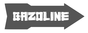 Free and commercial font foundry by Zellik, Belgium-based
  Bios of the main members of the Didot family: François Didot (1689-1757), François-Ambroise Didot (1730-1804), his son, Pierre-François Didot (1731-1795), the second son, Pierre Didot (1761-1853), the oldest son of François-Ambroise, and
  Maastricht, The Netherlands and now, Antwerp, Belgium-based designer of the commercial typeface
  Distype was a small Belgian pixel typeface foundry in Antwerp that specializes in both functional and aesthetic pixel typefaces for online and mobile use. Its typefaces were made by
  Belgian designer who has a bachelors in graphic design from St. Lucas, Gent (Belgium) and ArtEZ Arnhem (The Netherlands), and a Masters in the same area from both places. He lives in Gent and
  Vietnamese/Belgian designer (b. Saigon, 1958) who used brushes and pens to create handwritten fonts in 1994 such as DuMathieu,
  Belgium-based Elsa Mersayeva is unique. She writes about herself: I'm all about typography, matryochkas, Paris, pirates, funny people, urban culture, Bukowski, red nails&messy hair, gangsters' bandanas, huge golden earings and unicorns. Her
  This is a gallery and a discussion of the fonts created by the students at ENSAD since 1997. A partial list with the original (now defunct) links:
  Excerpts of the book Enschedé. Spécimen des Lettres françoises dites Caractères de Civilité des XVIme et XVIIme Siècles dans la Collection Typographique de Joh. Enschedé en Zonen (1926, Haarlem: Joh. Enschedé en Zonen). This collection contains six different Civilité fonts, five from the 16th century (numbered 8, 9, 11, 12 and 14) and one chiefly from the seventeenth century (No. 30). The first maker and user of Civilité was Robert Granjon of Lyon, France, in Dialogue de la vie et de la mort (1557, Lyon), where he calls it his lettre françoyse. Plantin purchased some of Granjon's letters, and Granjon engraved even more more new letteres d'escriture in Antwerp for Plantin. Many imitations were made in Antwerp and Ghent, both in present day Belgium. Notes on the six Civilité types in the Enschedé collection:
  French graduate of ESIAJ (Albert Jacquard), class of 2014, who works in Brussels. In 2015, he designed the (great!) free 14-style typeface family Butler, which was influenced by Bodoni and Dala Floda, and includes great styles for use in fashion magazines and on posters, in addition to several stencil styles.
  Graduate of St. Luc, Tournai, Belgium. Graphic designer in Lille, France, since 1997. Creator of the rounded monoline organic sans typeface family Fabiolo (2014), the
  Type foundry in Brussels, Belgium, active in the 19th century. Books by them include
 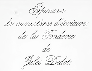 Foundry in Brussels, which published a specimen book entitled
  Brussels-based foundry established in 1834 by Michel-Joseph Vanderborght (1801-1870). His early goal as to make better types than the ones being imported at the time. They developed and built their own machines for this. In the last year of his life, Michel-Joseph cedes the reins of his company to his sons, Alexandre Vanderborght (1841-1918) and François Vanderborght (1844-1930), and the firm was renamed A. & F. Vanderborght. In 1901, François retires, and Alexandre joins forces with Jean Dumont (1853-1927), and the business is now called A. Vanderborght et J. Dumont.
  After completing a B.A. in Philosophy and Aesthetics, Swedish designer Mårten Thavenius (b. 1965) began working as an interface designer with IBM as senior GUI architect. In 2009, he left IBM to work as an independent web solutions consultant and typeface designer. His most popular designs are the comprehensive families Aptifer Sans and Aptifer Slab. He lives in Belgium and Sweden, and his foundry is called Fontcaster.
  French punchcutter who lived in the first part of the 16th century. In 1539, he became a resident of Antwerp, and from 1558 until his death in 1570, he delivered letter types to Plantin in Antwerp. His creations were used all over Europe and even in Asia. In his day, he was one of the greatest punchcutters. Day Roman (2002, Apostrophe) is described as follows by its designer: Day Roman, is a digitally redrawn version of what has come to be historically known as the "Two Line Double Pica Roman", a typeface designed by 16th century French punchcutter François Guyot, and used in numerous books between 1535 and 1570, most notable of which are J. Steelsius's printing of The Bible (1541) and Frisius (1551), Gillis Coppens van Diest's printing of Erasmus (1544), Georgius (1544), Serlio (1550) and Horatius (1552), and Rotarius's printing of Livius Brechtius (1549). The type was also used extensively by H. Dunham, and later J. Day, in London (the name Day Roman is simply a reference to J. Day having used the type). Original matrices of Guyot's roman type are now in the
  During her studies in Linkebeek, Belgium, Francisca Zaunberger Melo designed the neautiful color poster entitled Anatomie de la Lettre (2015). [
 Aka Senhor Baltazar. At
  [
[ A list compiled by Ludwig M. Souzen, a typographer and printer in Bertem, Belgium:
  Geen Bitter (Den Haag, The Netherlands) consists of Thom Janssen (b. 1984, Maastricht),
  [
[ Antwerp-based creator (b. 1990) of some free fonts, who went commercial in 2011 as
  [
[ Prolific Belgian type expert (b. 1923, Antwerp; d. 2020) who graduated in philology from the University of Leuven. He became adjunct director of the Museum Plantin-Moretus in Antwerp and was on the board of governors of the Plantin Instituut voor Typografie, which he helped renovate after the second worrld war together with
 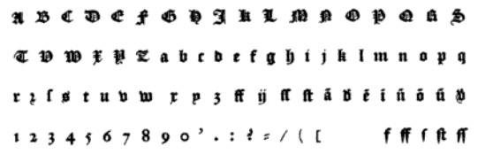 Born in Gent (now Belgium) around 1540, and aka Henry du Tour, he died in 1580. He delivered letters to Plantin (and exclusively so between 1570 and 1580). Enschedé's specimen book lists his 1575 Civilité as
  Belgian designer of the free dingbat font
  Belgian punchcutter and typefounder (b. Namur, 1714, d. Brussels, 1777). His early life was spent in Namur, Belgium. In 1740, he started out in Haarlem as a punchcutter, and published twelve type specimens in 1741, as well as 14 ornaments. From 1746 until 1752, he cut another thirteen different alphabets. In 1749, he cut several sets of musical characters. He had a contract with Enschedé, where he made the gorgeous shaded capital typeface Rosart in 1759, aka Enschedé no. 811. He moved back to Brussels in 1759 where he ran his own foundry. He published books with specimens in 1752, 1761 and 1768.
  Belgian and/or British creator of the free condensed headline sans typeface Soundgarnden Badmotorfont (2014) and the slab serif typeface Carrera Jones (2017). [
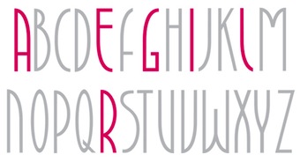 Brussels-based designer. He created a custom font for a perfume shop called
  Graphic design student at KASK, Gent, Belgium. At
  Codesigner (in Antwerp, Belgium) with Joke Gossé of Bakelandt (2014). This comic book typeface family with four sets of glyphs was custom-designed for comic book artist Hec Leemans based on the artist's handwriting. Bakelandt is the name of the Flemish comic book series. Huygen also made the rounded sans typeface Cosmonaut (2014), the pixel typeface Scrntype (2014) and the squarish typeface Profunda (2014). [
 Jörn Oelsner (b. 1981, Flensburg, Germany) is a German type and graphic designer based first in Antwerp, Belgium, and later in Vegby, Sweden, and Ulricehamn, Sweden. He graduated at the Design Factory International in Hamburg, Germany. While studying he worked for URW++, Hamburg. After graduation he worked in several graphic design studios in Europe. His own design studio is
  Freelance graphic artist in Gent, Belgium, who won many awards for his design of posters and poster typefaces. He specializes in book cover, poster and cartoon types, and excels in all. Many of
  Born in 1984, Joke Gossé is Professor at Sint Lucas Antwerp and KDG Hogeschool, and is a graduate of type design at Reading, 2007-2008. She has her own type blog, and lives in Antwerp. Her typefaces:
  During her studies at Sint Lucas in Antwerpen, Belgium, Jolien Brands designed a geometric display typeface called
  One of the first Belgian printers and typefounders, who lived and operated in Gent, Belgium, in the early 16th century. Born in Gent in 1491, he died in Wezel (Wesel) in Germany in 1556 or 1557.
 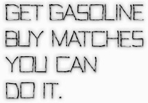 Belgian graphic designer. In 2010, he created the typeface
  Belgian graphic designer and painter. With Dutch artist and graphic designer Joan Collette, he created the gorgeous ultra-fat art deco display typeface
  Graphic design student at KASK Ghent, Belgium, b. 1991. Sinaai, Belgium-based designer of Permeke Bold (2013, a great wedge serif text typeface), Ensor Book (2013, sans), and Wasco Book (2013, a sans done with Stef Michelet and Timo Bonneure). [
 During her studies, Antwerpen, Belgium-based Karen Devroe created the sans typeface Magirus (2015) which was inspired by Conrad Dietrich Magirus, the inventor of the Ulmer Ladder. [
 FontStructor who made a series of fonts in 2010 simply numbered in Flemish, Een, Twee, Drie, Vier,
  During his studies, Heppen, Belgium-based Kenneth Vanoverbeke designed the deco typeface Basylisk (2018) and the medieval typeface Sanguine (2019). [
 German designer in
  [
[ Kustomtype is Coert De Decker's type foundry in Otegem, Belgium. Coert (b. 1966) created
  Paul Daxhelet's printing shop in Hannut, Belgium. Paul designed the striped currency typeface
  A resident of Aulnay-sous-Bois, he specializes in scientific typefaces. Laurent lives in Scherwiller, France. He is a freelance graphic and type designer who is working at Porchez's foundry in Sèvres. Graduate of
  Creator of the web icon font
  [
[ Sebastien Sanfilippo founded Love Letters in Brussels, Belgium, under the motto Single-handedly drawing letters for world peace. He designed these open source typefaces:
  [
[ Author of
  Based in Mechelen, Belgium, Maksim Goffin designed the
  [
[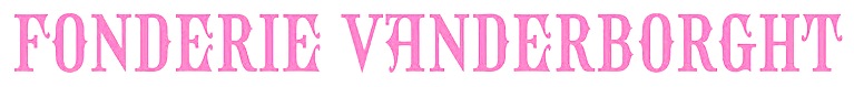 [
[ American wood type manufacturer from the 19th century, set up in 1880 by William T. Morgans and H.K. Wilcox. The latter had taken over Young's shares at Young and Morgans Mfg Co., prompting a company name change. It was located in Middletown, NY. Morgans and Wilcox was absorbed by Hamilton Manufacturing.
  The main typefaces at MyFonts that are
  Nico Verhaegen (
 [
[ Omar Chafai (b. 1977) graduated in 2009 with an MA in graphic design from KASK (the Royal Academy of Fine Arts in Gent, Belgium), with a thesis project entitled De ontwikkeling van het Arabische schrift in relatie tot het Latijns schrift. His graduation project involved the development of the very readable text typeface
  Free software project based in Belgium and run by four people (and I quote from their web page):
  OurType was Fred Smeijers' web site and foundry established in 2002 (formally launched in 2004). OurType was set up by four partners: Fred Smeijers, Corina Cotorobai with Rudy Geerarts and Martine Leloup (both of FontShop Benelux). Fred and Corina were the creative lead of OurType foundry, Rudy and Martine were in charge with sales. In 2017 Fred and Corina stopped their collaboration with OurType concentrating on several other projects, including a new type label. Fred and Corina are also co-partners in Type Tailors (established in 2008), offering type design development, publishing, custom type and typographic consultancy. Smeijers's fonts can now be found at
  Flemish web log about the history and mechanics of type, run by Belgian graphic designer Peter Van Lancker (b. Ghent). There is a lot of information on the early printing and typefounding by
  Belgian type designer, font software expert, and defender of the principle of Open Source publishing. He had a hand in many typefaces at
  Punch was founded by Kristof Van Proeyen, an independent creative based in Antwerp, Belgium. In 2020, he designed the 14-style display serif typeface
  Timothée Génot (aka Red Kitten) is a Belgian freelance graphic designer who graduated from ENSAV La Cambre, Brussels, 2002. He then moved to Minneapolis, MN, where he still works.
 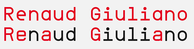 During his studies at HEAJ (Haute Ecole Albert Jacquard), Namur (and before that, Charleroi), Belgium-based Renaud Giuliano designed the
  British cartoonist and type designer (b. London, 1945), who lived in Fourqueux, France, and is now based in Uccle, Belgium, since ca. 2000. He redesigned the The Boston Herald American, the International Herald Tribune and Die Welt. In addition, he has been Art Director for The New York Times and the European edition of The Wall Street Journal.
  Ettelbruck, Luxemburg-based designer of Aldo (2005; updated to
  [
[ Loughborough, England-based Belgian-born designer. Designer of the ten-style mixed heritage serif typeface
  Swiss graduate (b. 1965) of Luzern School of Art and Design, who settled in Berlin in 1997. Co-founder with Cornel Windlin in 1993 of Lineto, with Cornel Windlin and Andreas Eigendorf in 2014 of
  Belgian type designer (b. Brussels, 1974) who lived in Kessel-Lo, and is now based in Antwerp.
  New York-City (and before that, Miami, FL)-based dillustrator and graphic designer. Creator of the octagonal typeface
 Theo van Beurden is a Dutch graphic designer based in Rotterdam, the Netherlands. He graduated from LUCA School of Arts, Ghent, Belgium, class of 2012. In 2015, with Bauke van der Laan, he set up
  [
[ [
[ German type designer who graduated from the Hochschule für Grafik und Buchkunst in Leipzig. He is currently based in Antwerp, Belgium. First working under the pseudonym Ixel, he used FontStruct in 2008 to create Dolores Alpha (chunky blackletter), Pulgo 2.0 (fat stencil), Blone (octagonal stencil), Rimski (fat hexadecimal face), Figaro (artsy octagonal stencil), AGRAR Unicase (+Black), an elegant ultra-fat type family. He also made the techno typeface Ixelator 0.1.
  Leuven, Belgium-based designer who studied at the Luca School of Arts in Gent. She created sdeveral display typefaces in 2014.
  Designer of the free font
  Tournai, Belgium-based designer (b. 1990, Belgium) of the hand-printed typeface Trumna (2013) and the display typefaces Kemmot (2014) and Dirty Mot (2014).
  Foundry and type information site launched in Brussels in January 2005 by Sacha Rein and Gilles Pegel, two guys born in Luxembourg. Gilles created the Elite and Butter Unsalted typefaces (2005), and Sacha designed Aldo (2004). Both graduated in 2005 from the ERG (Ecole de Recherche Graphique Brussels). The stitching font
  Frederik Berlaen (TypeMyType) is a Flemish type designer, b. 1981,
  From 2-6 September 2019, the University of Antwerp organizes an intensive five-day programme on the value of research for a better understanding of type and typography. The speakers: Jan Dries, Frank E. Blokland, Walda Verbaenen, Lara Captan, Juergen Willrodt. [
 Typographer and graphic designer, who studied typography at ENSAV La Cambre in Brussels.
  Ward Kuypers (aka Ward Zwart) is the Belgian designer of the free fonts Rob and Steal (2014),
  [
[ Wildstripe is a Ghent, Belgium-based graphic design studio specializing in brand identities, marketing designs and web designs, and is run by Gilles Verschuere. His clients include AkzoNobel, Disney, Honda, Pentax, Samsonite, Film Fest Gent and the World Soundtrack Awards.
  [
[ Wolf Lambert (WLM Fonts) is the designer in Tielt, Belgium, of these free fonts in 2012:
  Brussels-based designer of the Snowflake Font (2014). She also made a set of icons called Crustacées décapodes (2014). [
 Belgian calligrapher famous for gestural writing. Born in Ieper in 1959, he was first a teacher of classical languages in Bruges, but after calligraphy lessons from Nadine Lebacq, and a study period with Brody Neuenschwander, he became a successful freelance calligrapher and Prime Minister of Belgium. Just kidding---this Yves Leterme knows the difference between the Brabançonne and the Marseillaise. Examples of his work:
  Koksijde, Belgium-based designer of the roman titling typefaces Via Appia (2019: beveled) and Pompei (2019, accompanied by decorative caps), the tuxedoed art deco typeface Valentino (2019), the cursive script typeface Coxyde (2019) and the connected script typefaces Cursyves (2019) and Abecedary (2019, +Stencil). Typornament Prague (2019) is a pure Victorian typeface based on an alphabet seen in Milan Kopriva's book Typoornamenty (1991, Pluto Publishers, Prague).
  Deerlijk, Belgium-based designer of the triangulated sci-fi typeface Random DM (2016, FontStruct), the modular Random Mass (2020), the octagonal typeface Random Abe (2020), and Random Nods (2020: a tape font based on the work of wim Crouwel).
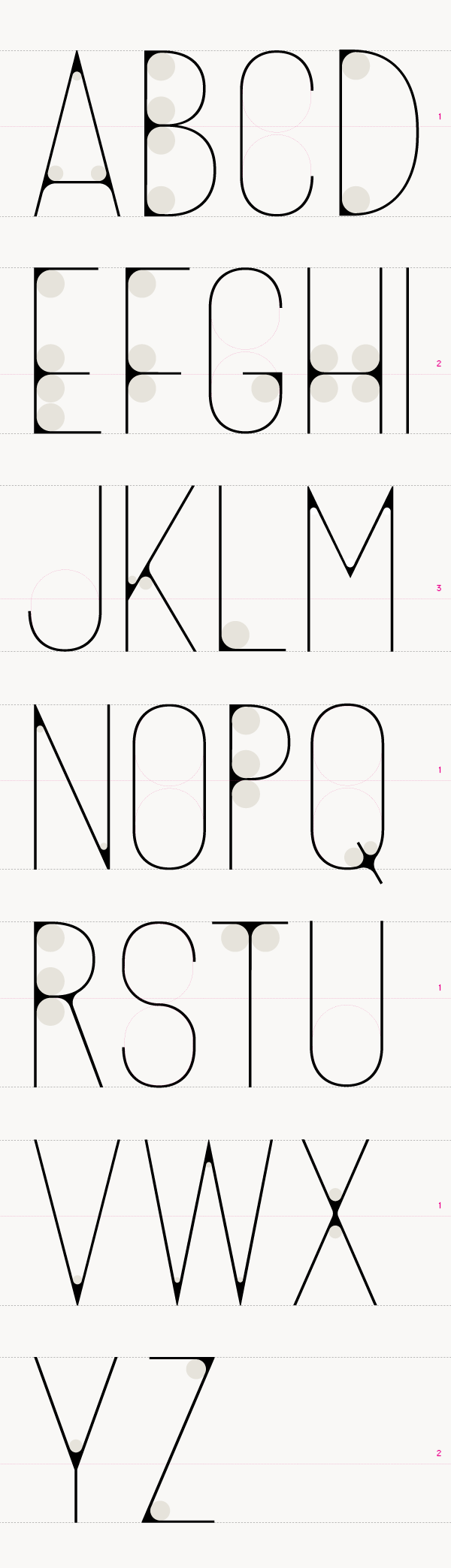
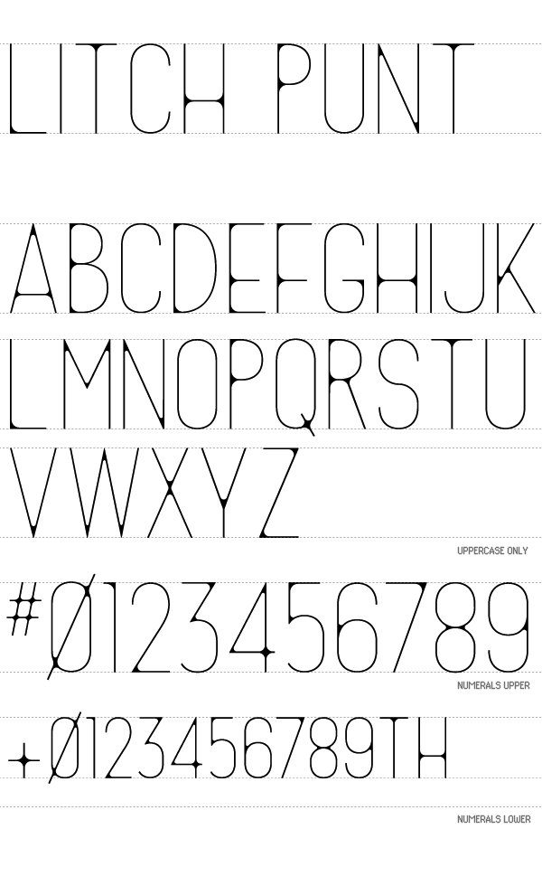
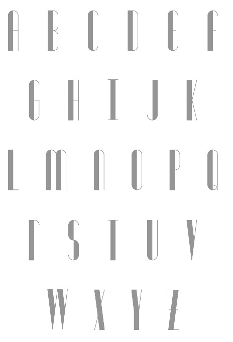
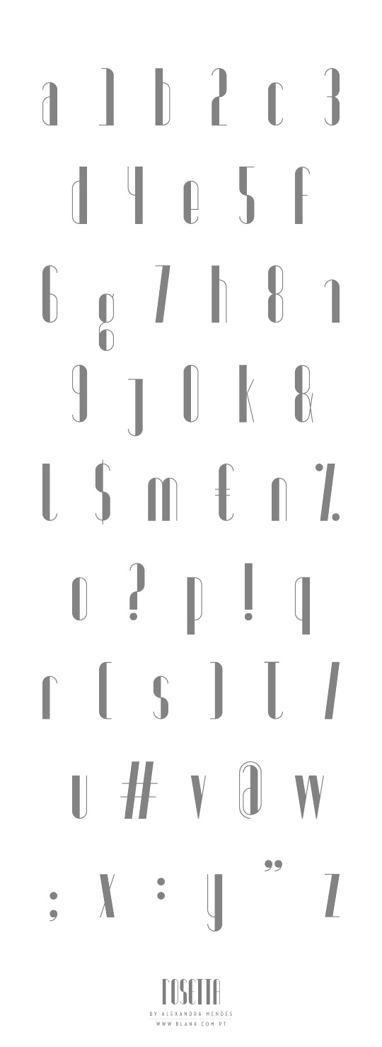
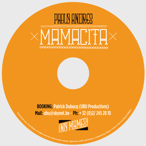
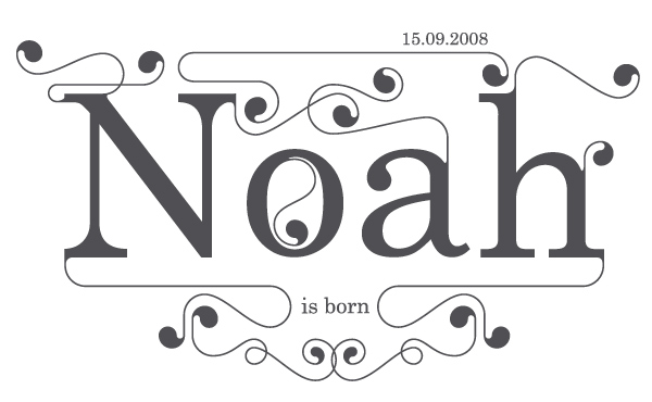
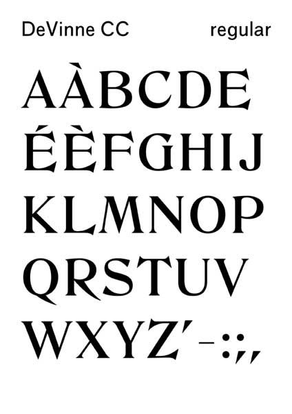
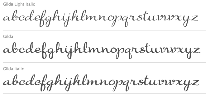
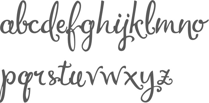
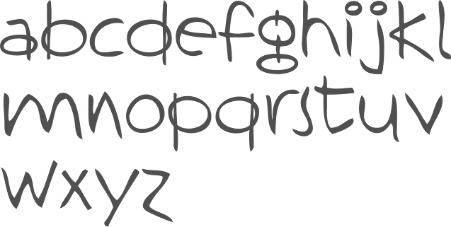
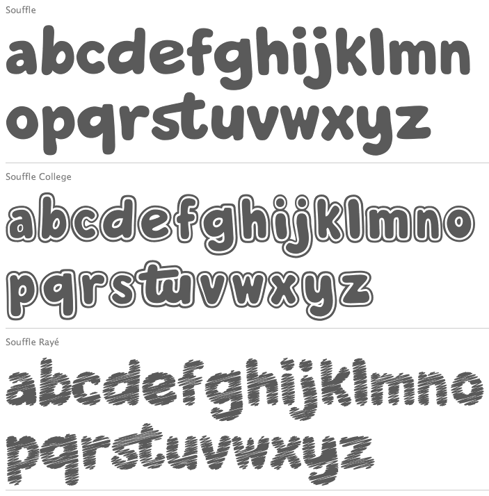
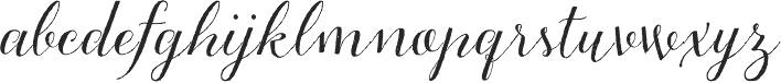
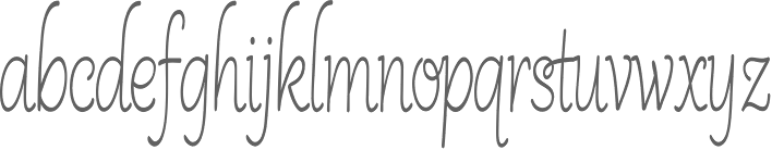
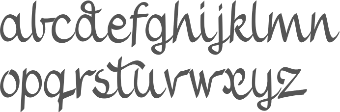
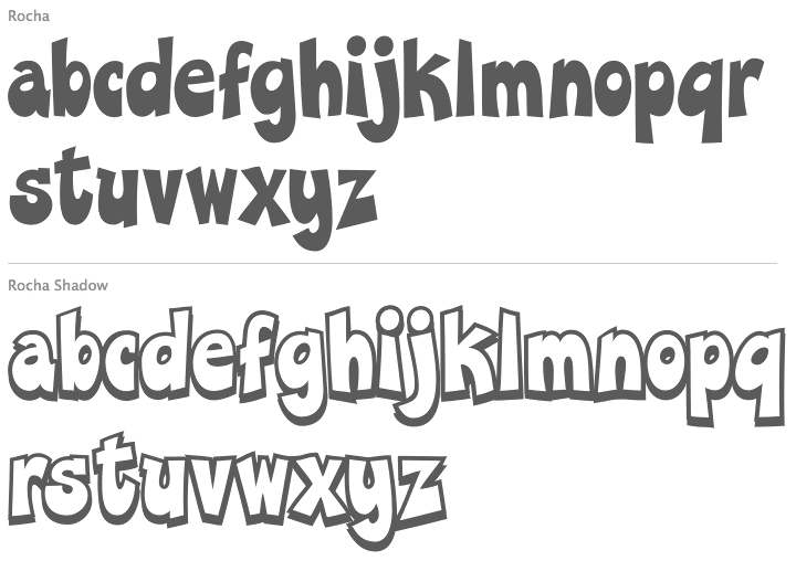
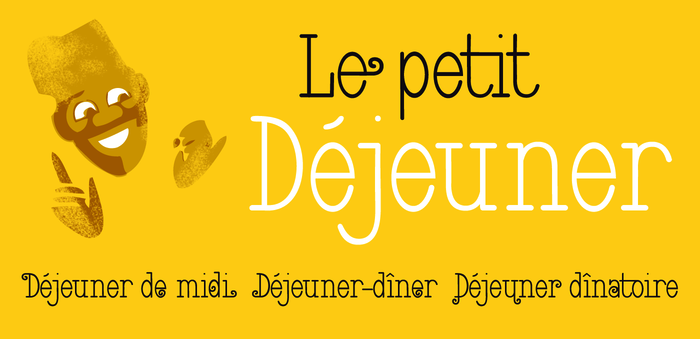
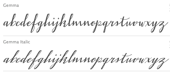
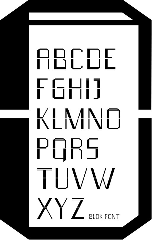
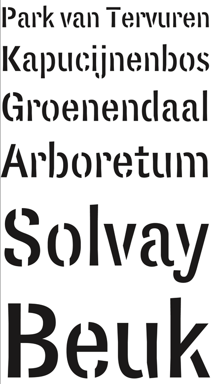
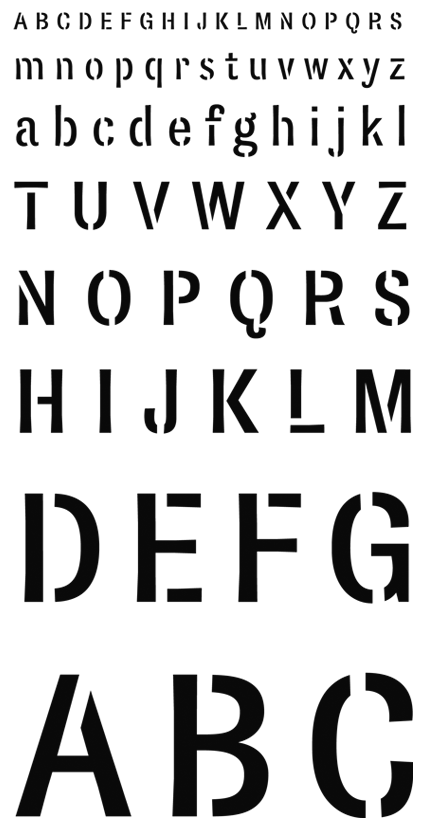
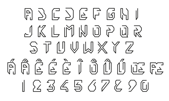
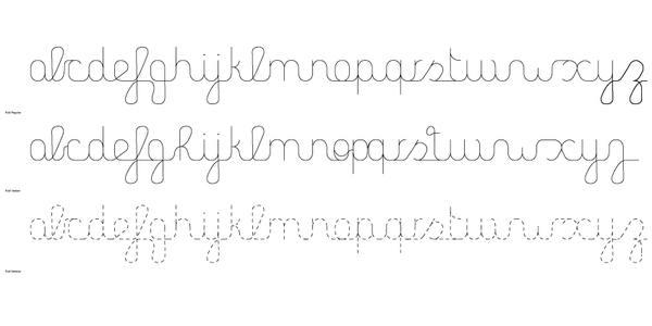
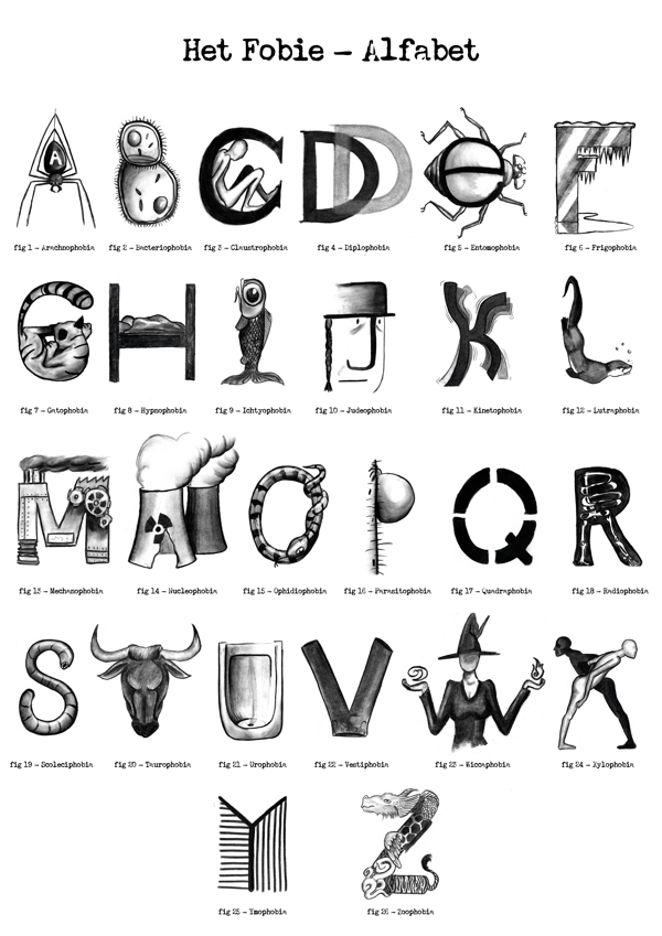
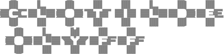
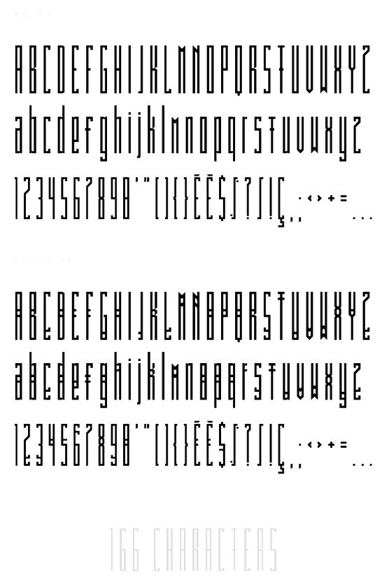
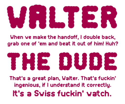
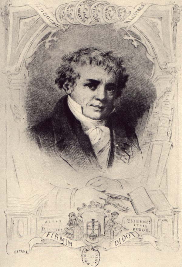
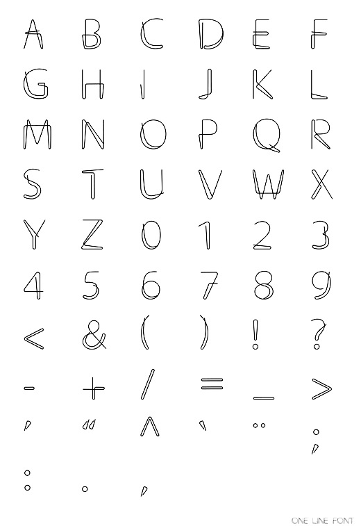
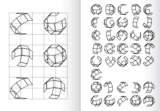
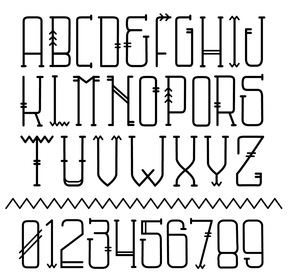
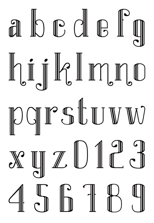
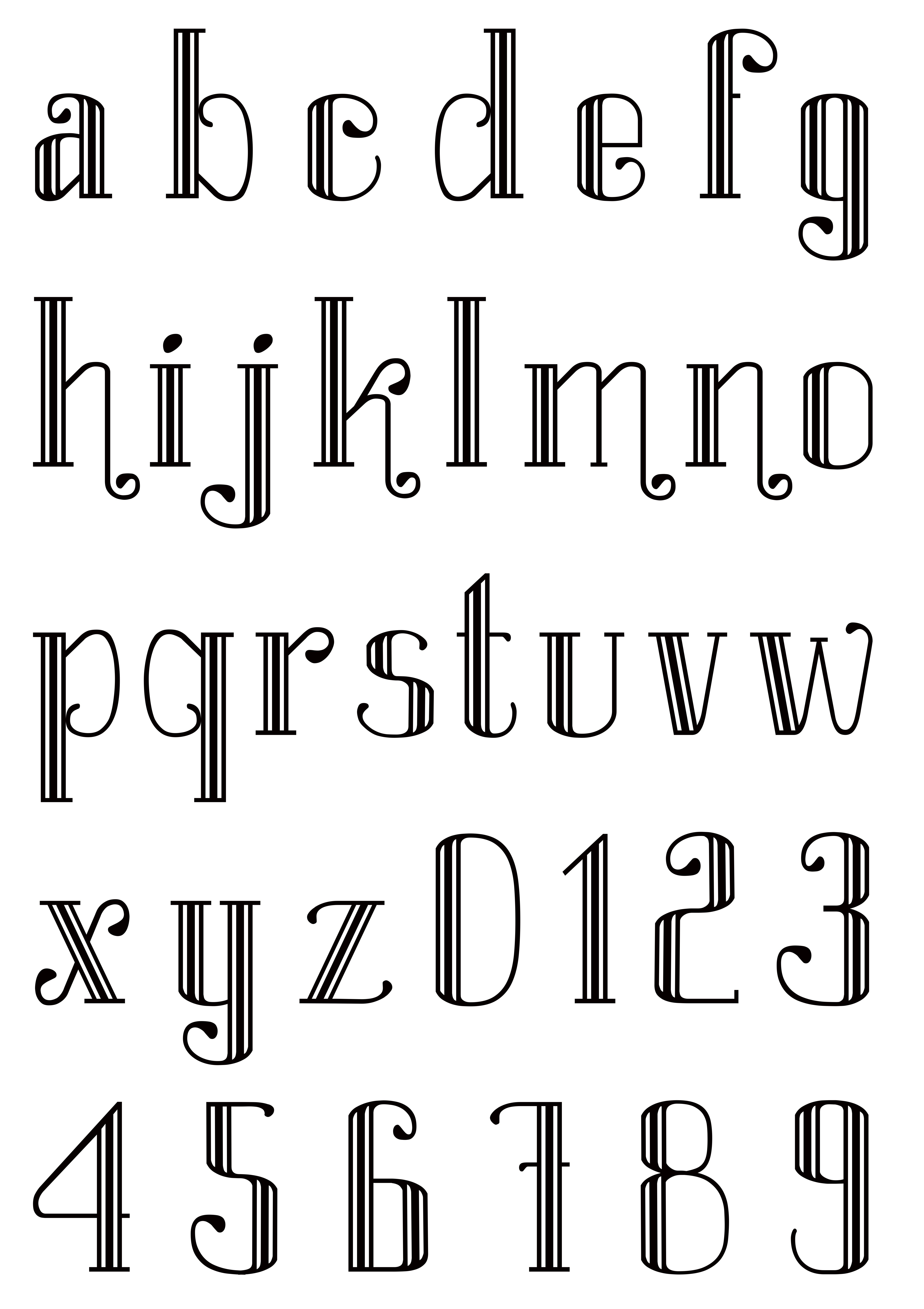
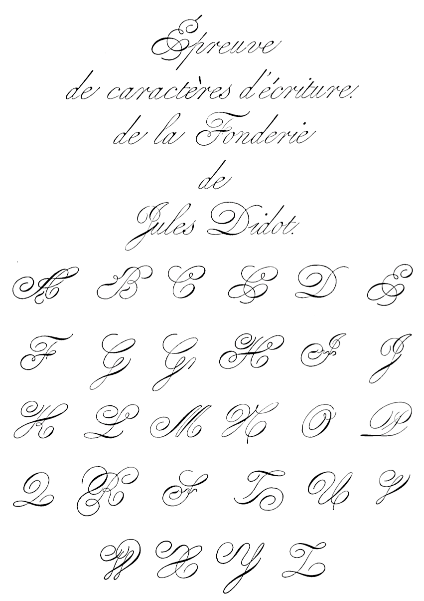
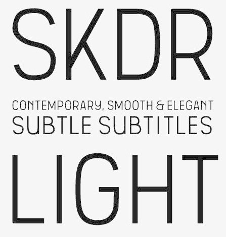
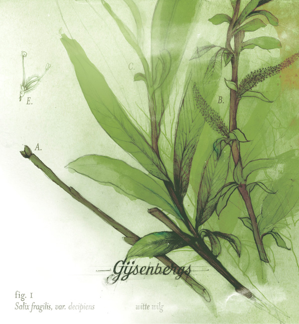
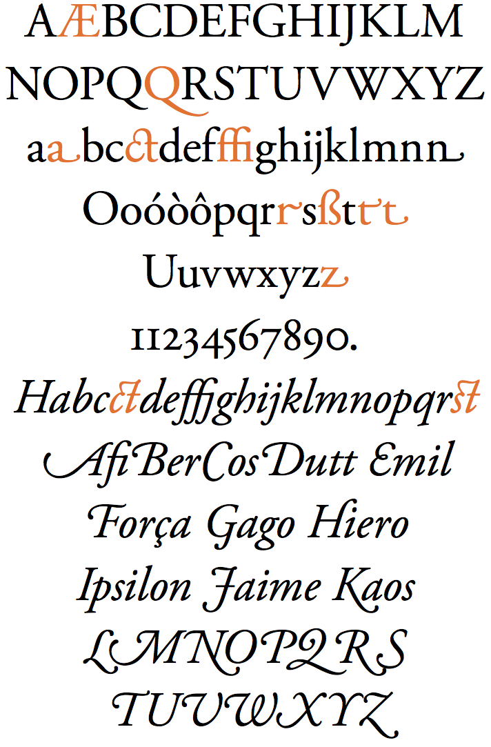
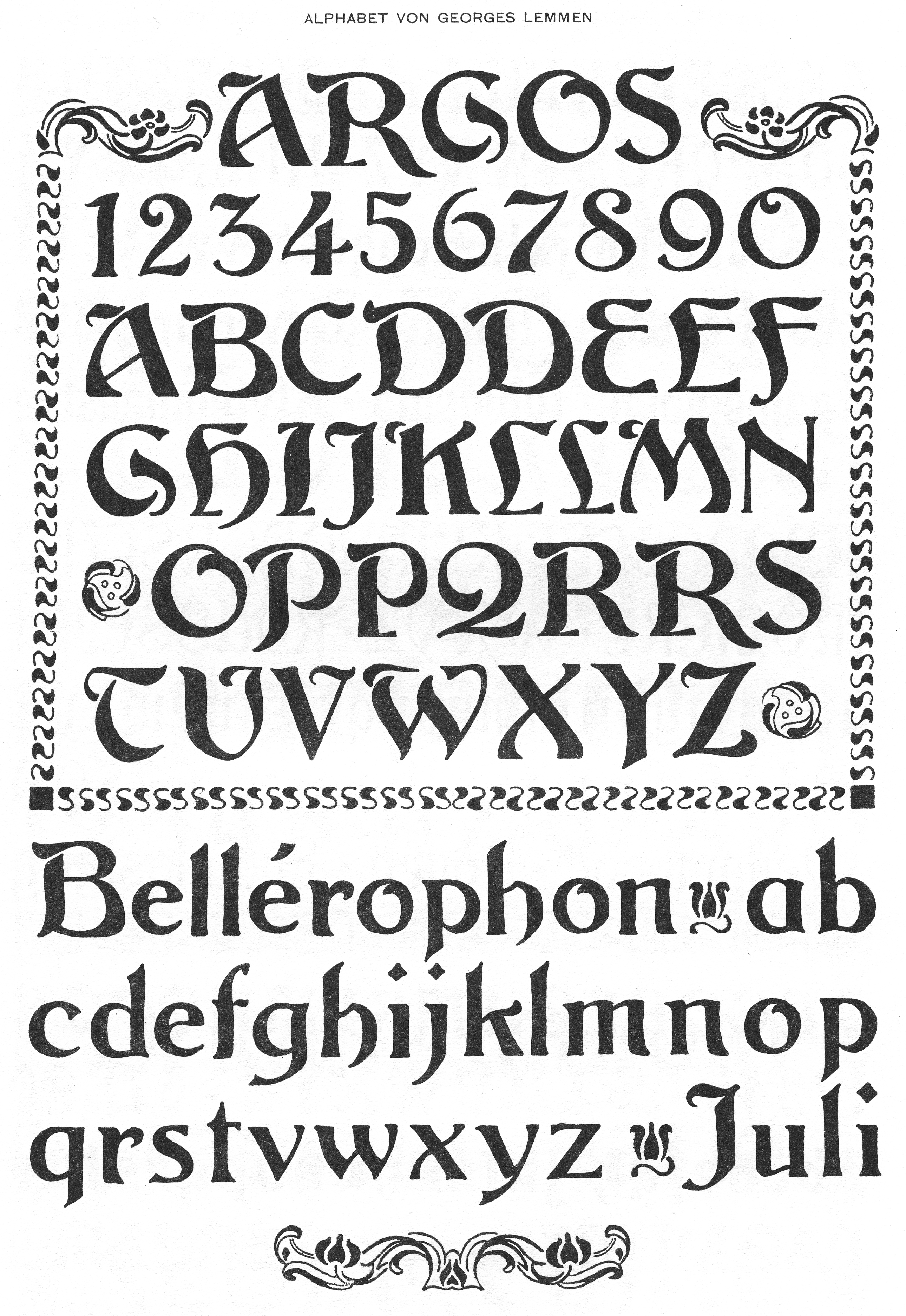
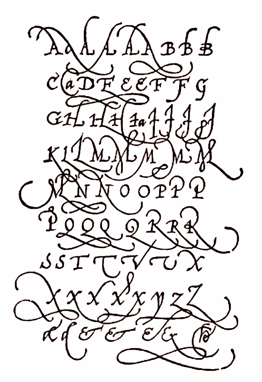
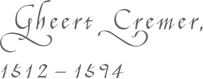
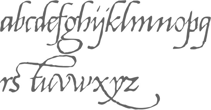
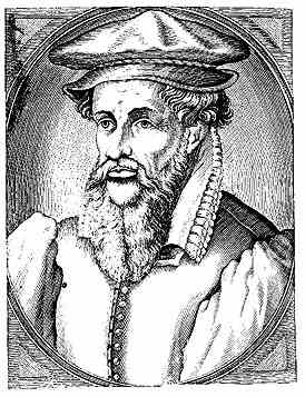
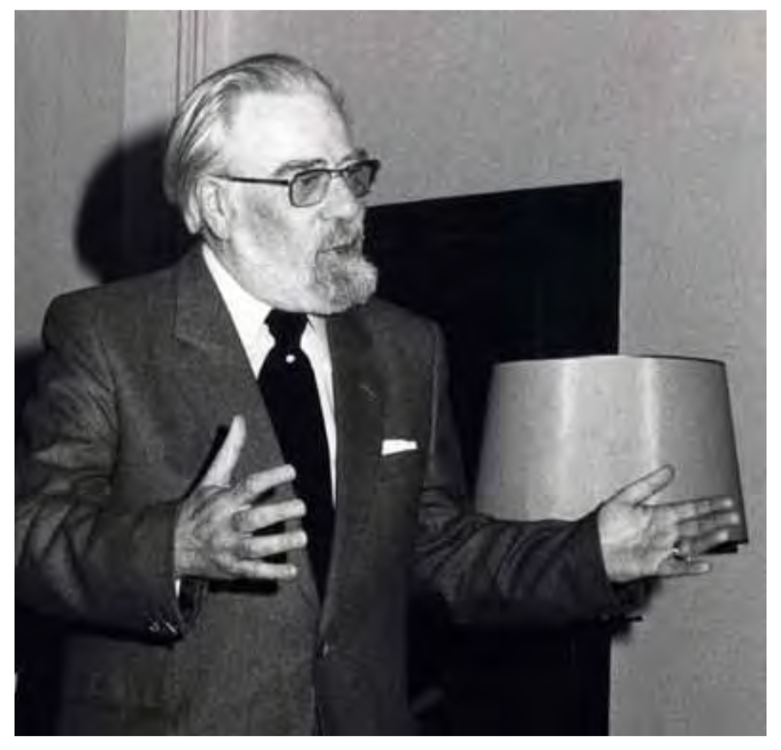
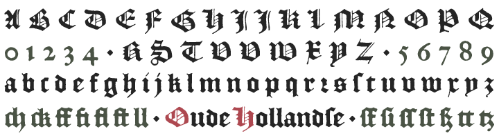
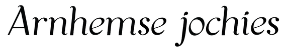
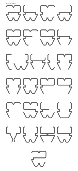
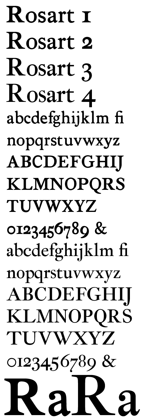
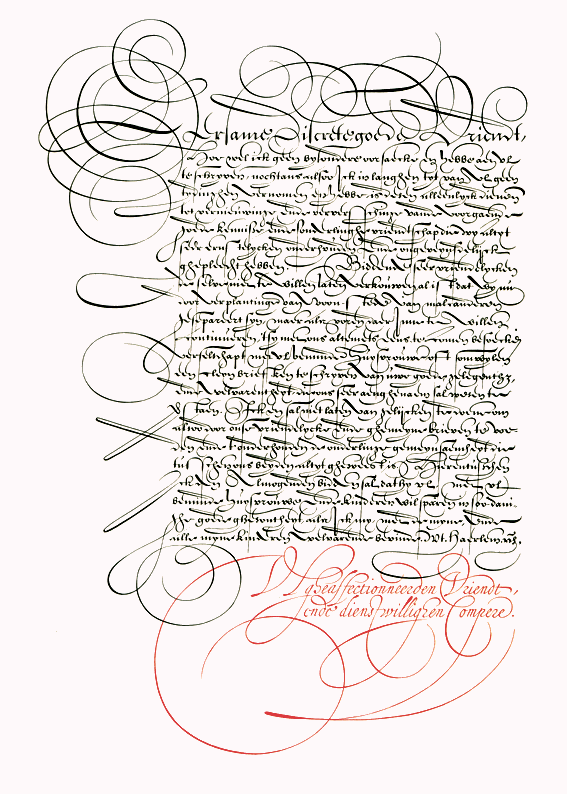
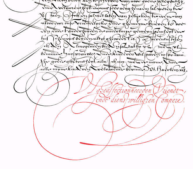
![[Large image at the University of Amsterdam Special Collections]](JanVanDenVelde--Lettering-UniversityOfAmsterdamCollections-.jpg)
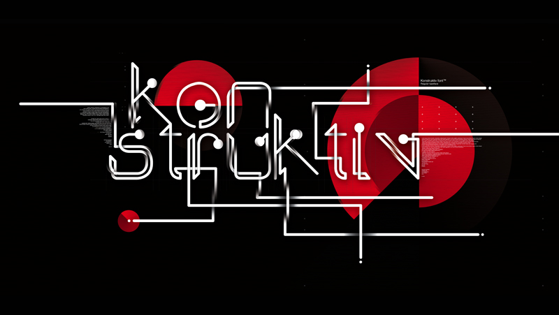
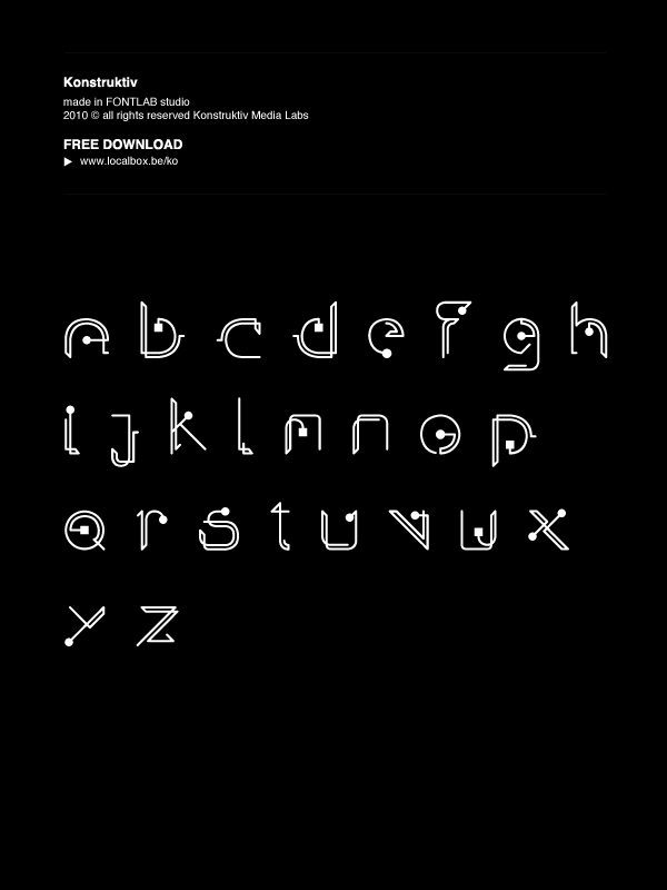
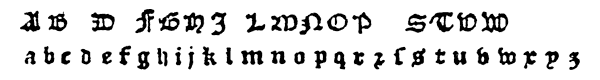
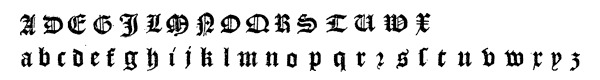
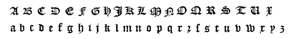
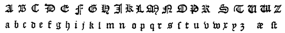
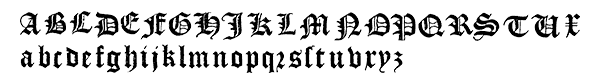
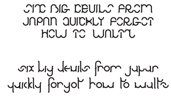
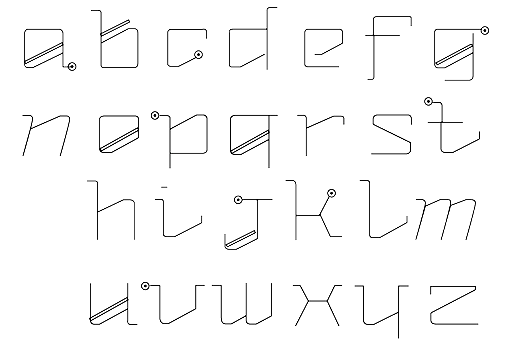
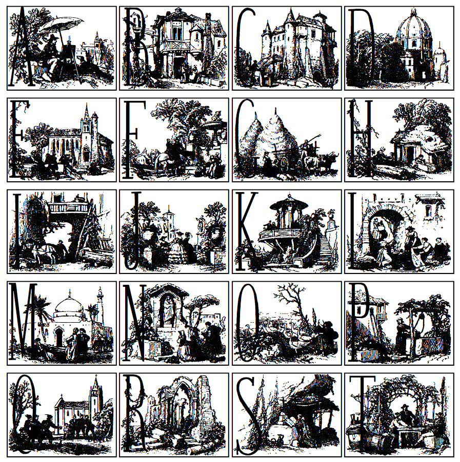
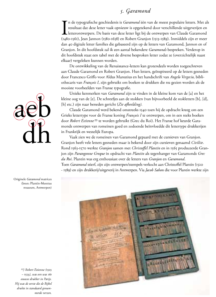
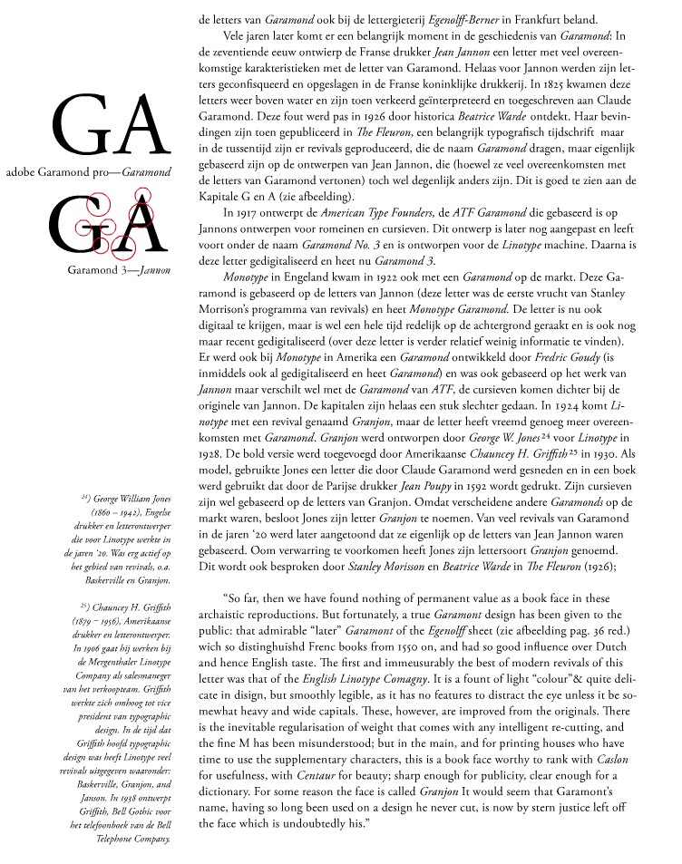
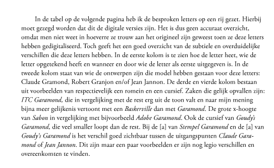
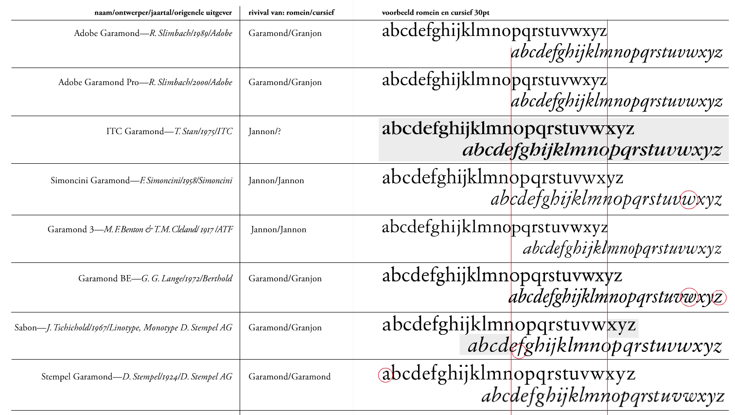
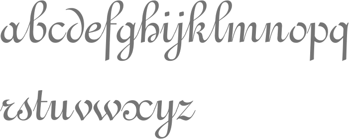
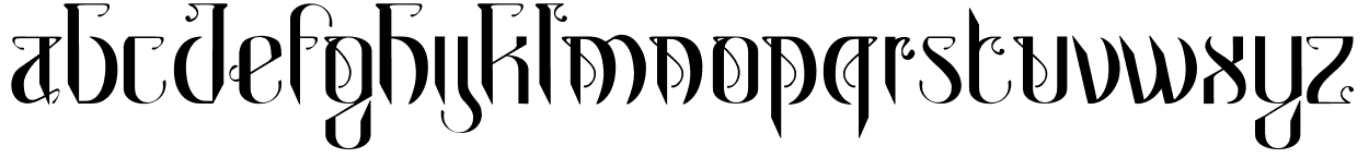
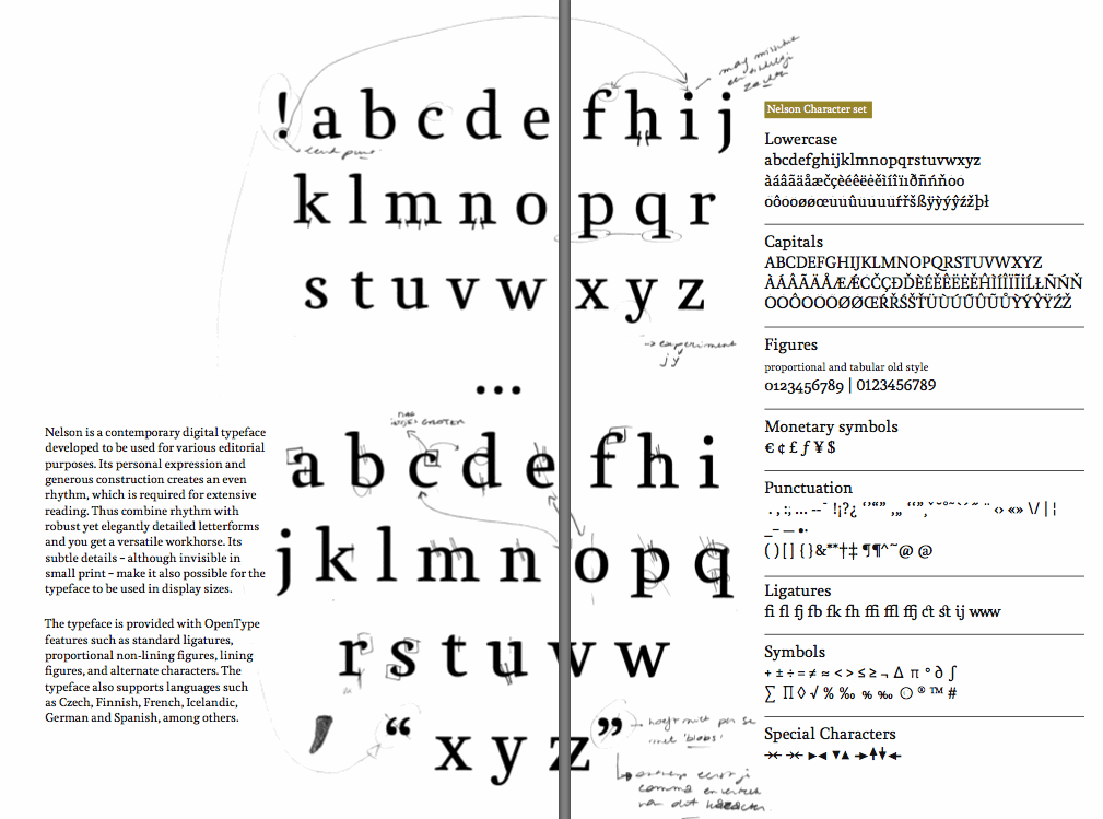
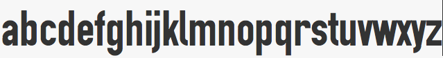
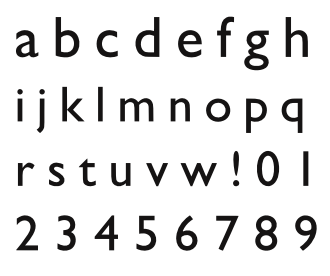
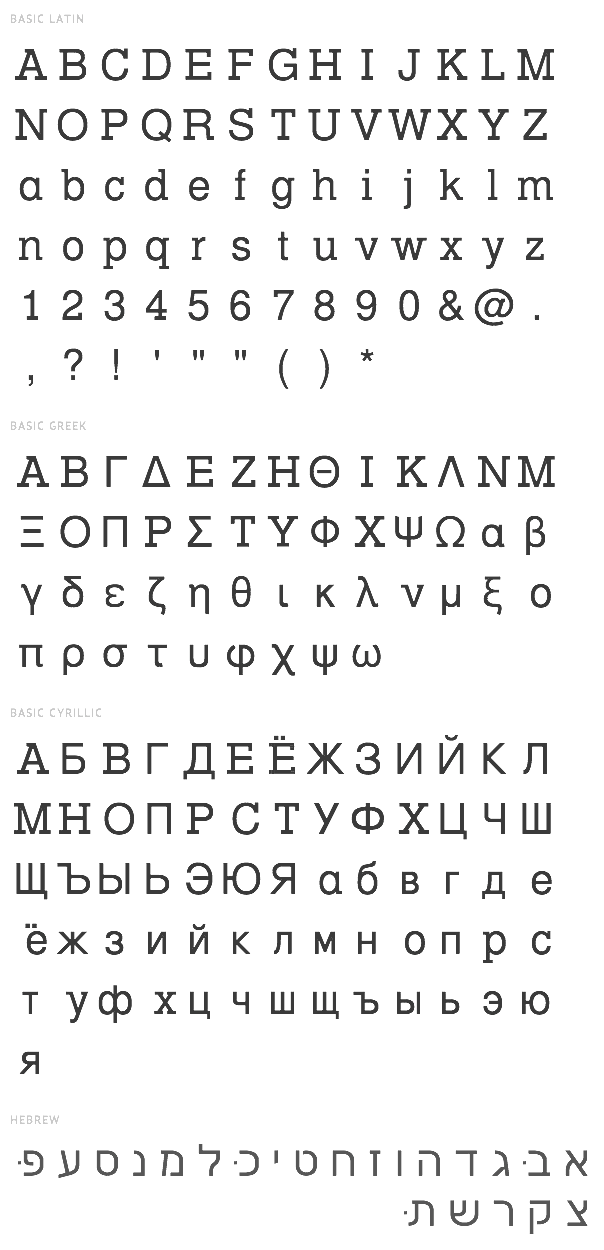
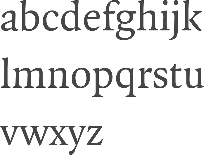
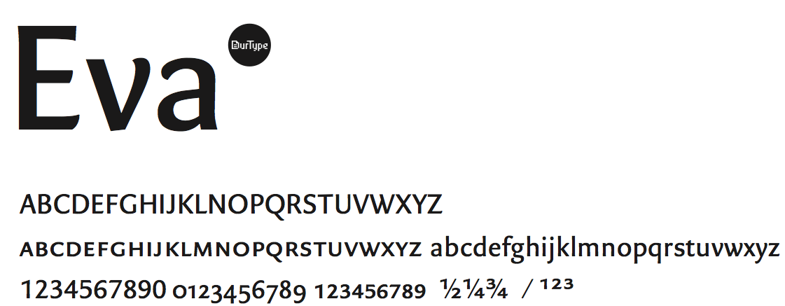
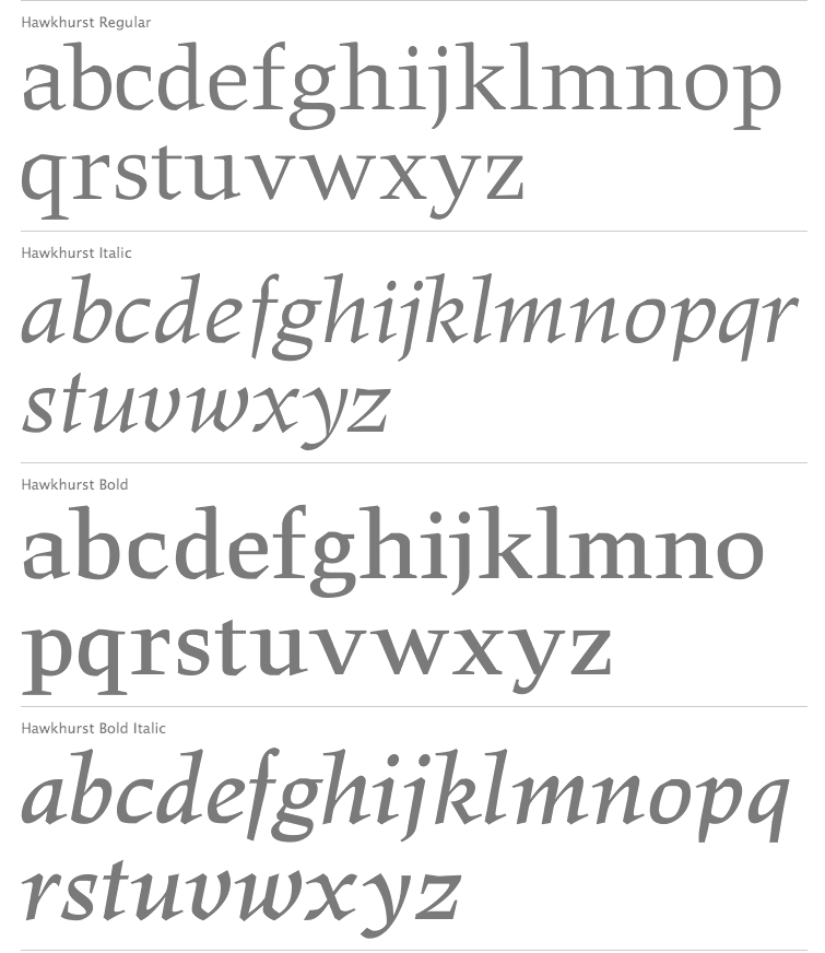
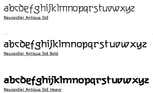
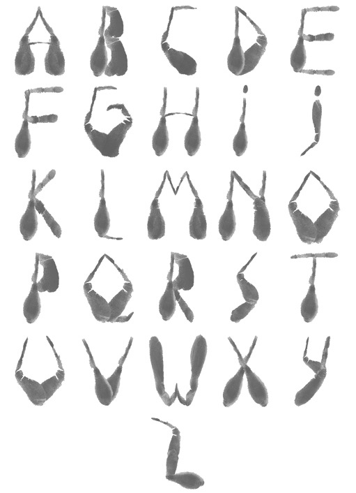
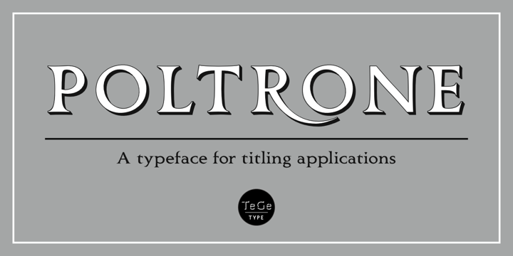
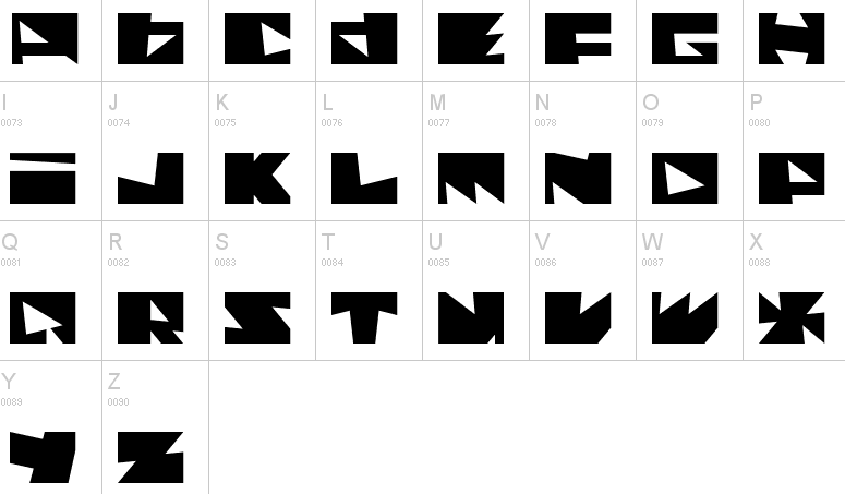
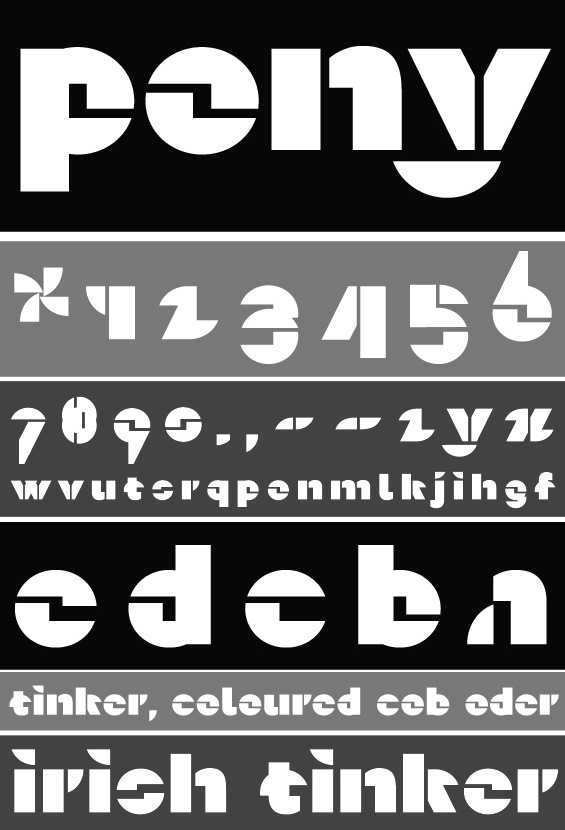
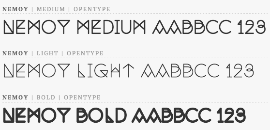
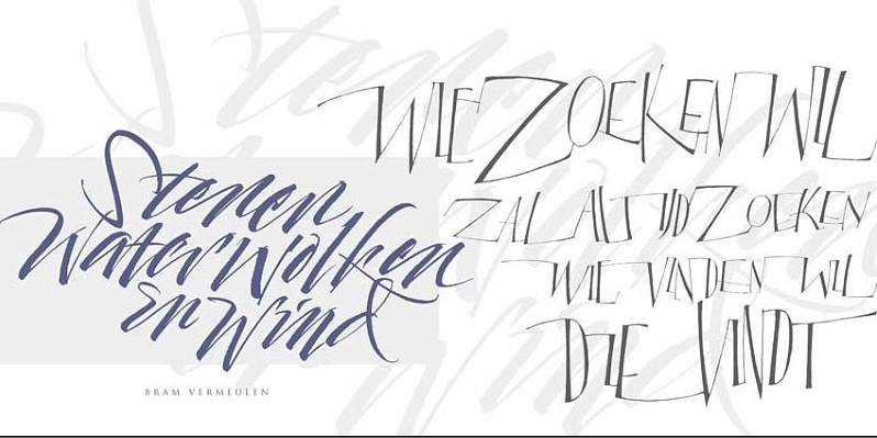
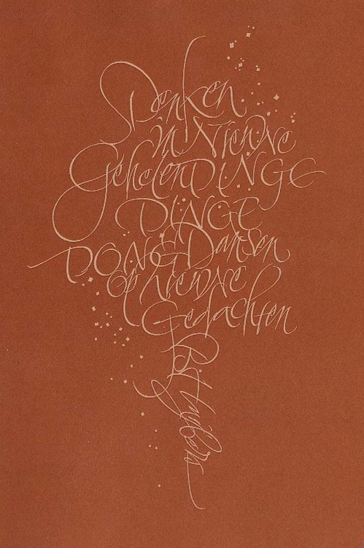
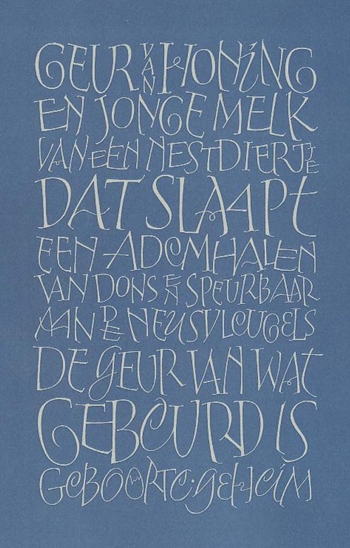
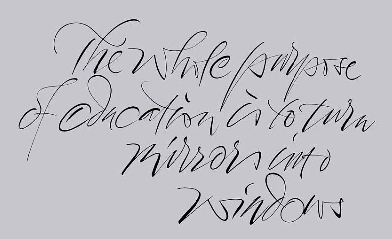
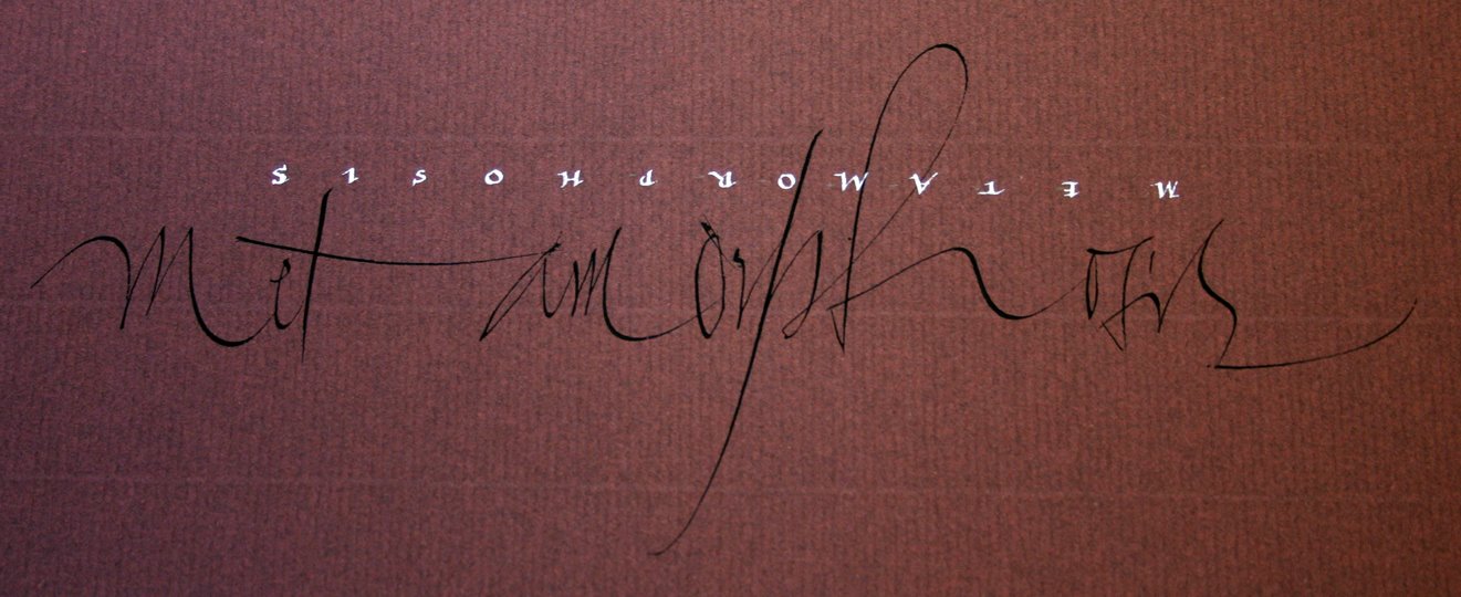
|
|
|
|