| | |
Aarhaus
[Ari Hausel]

|
 Aarhaus is Ari Hausel's German type foundry located near Munich, est. 2006. Hausels's teachers included Heinz Peikert (calligraphy) and Günter Gerhard Lange (typography).
 In 2015, he designed the German expressionist typeface Irrlicht based on Christian Heinrich Kleukens's 1923 typeface Judith Type. Dunkle Irrlicht is a fairly faithful rendition and extension of Judith Type. The Licht style combines a stencil version and an inline version that was inspired by dry, cracked wood. [Google]
[MyFonts]
[More] ⦿
|
Acces Design
[Beate Limbach]
|
 Gifted designer from Epalinges, Lausanne, Switzerland. One of the most talented creators of typefaces with FontStruct.
 Typefaces made in 2009: DB72, DBColon, DBPoints Sans, DBCube, and DB13, mostly dot matrix or octagonal fonts. In 2010, these were followed by db Outline, db Stickers, db Stick, DB Cube New, db MOKI (stencil), db Ciao, db Ticket Light, db 72, DBpoints (dot matrix), DBPoin2, and db Kopix (blackletter), db New Points Italic (dot matrix face). In 2011, we find dB Stick, dB Sticker, dB Sticker Mono (a monospaced typewriter face), db Prague (fat sans), db Backjumps (an extraordinary fat poster stencil), db Perl, db Perl 1.2 (texture face), db Quarz (2011, +Mix), and db Nox and db Nox II. Fonts made in 2012: db Como (a simple monospace sans), db Sticker (hairline sans), db Rocko v2 (stencil face), db Today v1 (a beautiful black slab face), db Today v2, db Etroite (2012, in several weights: constructivist), db N3, db Drops (fat counterless face), db Quarz Mix, db Soda, db Klacks, db NQ, db Boxer, db Como (monospaced), db Smoothie (fat stencil face), db Quick Cut (stencil), db Karton (stencil), db Frieda. Typefaces from 2013: db Etroite, db Concierge (hairline serif), db Lineo, db Lucky, db Boxer III, db SIL. Typefaces from 2014: db Darling. db Oh Darling, db Melitta (a fantastic brush emulation typeface), db Sticker T, db Points Sans Oblique (dot matrix font), db Como Splitt, db Quirlo (fat rounded poster typeface), db Quirlo Mix, db Limo (angular angry anthroposophic sans), db Limo N, db Slow (a German expressionist typeface), db Bargo Condensed, db TwoLines (an inline font). Typefaces from 2015: DB Caryptis, DB Oleumi, DB Caroli Plain, DB Caroli, DB Seimeins Serif, DB Seimains, DB Sago, DB Sago II, DB Sthlm (+Light), DB Gertrude, DB Track, DB Track Too. Typefaces from 2016: DB Maquette, DB Largo, DB For You (winner in the 2016 Fontstruct Love competition), DB Bargo Slanted. Typefaces from 2017: DB Jojo, DB Scrape, DB Tape Noir, DB Tape Slab, DB Tape, DB Pins, DB Monoto Sans, DB Mrs Back n Black, DB Dr. Bob, DB Tilda, DB Rondo Mix, DB Rondo, DB Shop. Beate set up Acces Design ca. 2017. The typefaces available there are ad Backjumps (stencil), ad Bargo, ad Como, ad Concierge, ad Darling, ad Oh Darling, ad Frieda, ad Klacks, ad Limo, ad Lucky, ad Magritte, ad Melitta, ad Mill, ad Points, ad Quirlo, ad Slow, ad Soda and ad Soda Plex. Typefaces from 2018: ad Falter (blackletter). Typefaces from 2019: ad Dorma (sans), ad Flieger, ad Louise, ad Hobby, ad Journal, ad Juli (sans), ad Tape, ad Violetts (handcrafted), ad Tape (sans). Typefaces from 2020: ad Ander, ad Sticker Mono, ad Juli (sans), ad Magritte (sans and serif; for posters). Behance link. FontStruct link. [Google]
[More] ⦿
|
Aleksandra Samulenkova
|
 Aleksandra Samulenkova (b. Latvia) studied visual communication at the Latvian Art Academy in Riga and at Kunsthochschule Weißensee in Berlin, where she took a type design course with Luc(as) de Groot. In 2012 Aleksandra graduated from the Type and Media program at KABK, Den Haag.
 Aleksandra's graduating project Pilot is an angular display typeface with German expressionist influences. It won the first prize as a titling face at The Fine Press Association's inaugural Student Type Competition, and won an award in the TDC Typeface Design competition in 2017. From 2012 until early 2017 Aleksandra worked as a type designer at LucasFonts in Berlin. In the beginning of 2017 she moved to the Netherlands to work independently. Aleksandra's retail typeface in the Bold Monday catalog: Pilot (2017). She also designed Necktie. Speaker at ATypI 2016 in Warsaw on Diacritics as a Means of Self-Identification. In that talk, she looked at several Eastern European nations that were created during the 19th century, and in particulat, Latvia. Bold Monday link. [Google]
[More] ⦿
|
Aleksandra Voroncenko
|
Vilnius, Lithuania-based designer of the expressionist typeface Beermaker (2015). [Google]
[More] ⦿
|
Alexandr Galuzin
[Alexandr Galuzin (was: Tangramus)]
|
 [MyFonts]
[More] ⦿
[MyFonts]
[More] ⦿
|
Alexandr Galuzin (was: Tangramus)
[Alexandr Galuzin]
|
 Pavlodar, Kazakhstan-based designer (b. 1987) of the medieval calligraphic typeface Square Capitals (2014, Latin and Cyrillic), the uncial typeface Uncial (2015) and the Trajan typeface Capitalis Monumentalis (2015). In 2015, he designed the angular and angry straight-edged typeface KZ Kirpich, the tangram-inspired German expressionist typeface Tangramus, and the Latin / Cyrillic deco typeface Kvadrat.
 In 2015, he set up the commercial type foundry Alexandr Galuzin. His first commercial typeface is Golovolomka (a modern blackletter). In 2017, he designed the fat stenci typeface Growling. Typefaces from 2020: AG Bambook (a condensed sans family). [Google]
[MyFonts]
[More] ⦿
|
Alexey Timokhovsky
|
Or Alex Timohovsky. Ukrainian type designer based in Kiev (b. 1983, Kiev). He has his own type foundry in Kiev. In 2014, he designed the blackletter beer label typeface Grenadier for Latin and Cyrillic. Behance link. [Google]
[MyFonts]
[More] ⦿
|
Andrea Fusinski
|
In Laura Meseguer's class in Barcelona, Andrea Fusinski designed a German expressionist typeface called Shelley (2013). Behance link. [Google]
[More] ⦿
|
Andrea Tartarelli
|
 Andrea Tartarelli studied at the Academy of Fine Arts of Carrara and worked as a marble sculptor before turning to graphic and type design. He continued his studies at the Plantin Institute at Antwerp, and now teaches type design at IED Florence. He designed Tarif (selected by Fontspring.com among the Best fonts of 2019), Malik (shortlisted for the Communication Arts Typography awards 2021) and has been co-designer on dozens of typefaces at Zetafonts including the award winning Blacker (selected by Myfonts as one of the best new families of 2019), Monterchi (CA typography award 2020, Myfonts hidden gem 2019) and Stinger (CA typography award 2021). He works and lives in Pietrasanta (Tuscany, Italy). His graphic design outfit is called Surface Studio. Tartarelli's typefaces:
 |
Andreas Seidel
[astype.de (or: Astype)]
|
 [MyFonts]
[More] ⦿
[MyFonts]
[More] ⦿
|
Andres Handsmitt
|
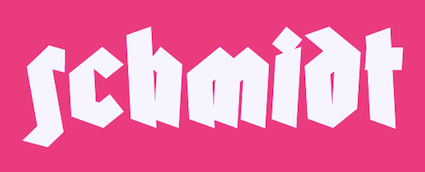 Tartu, Estonia-based creator of the German expressionist typeface Schmidt (2014). Behance link. [Google]
[More] ⦿
Tartu, Estonia-based creator of the German expressionist typeface Schmidt (2014). Behance link. [Google]
[More] ⦿
|
Andrew Martin
[Thumbnail Designs]
|
 [More] ⦿
|
Andriy Dykun
[NREY]
|
 [MyFonts]
[More] ⦿
[MyFonts]
[More] ⦿
|
Ari Hausel
[Aarhaus]
|
 [MyFonts]
[More] ⦿
[MyFonts]
[More] ⦿
|
astype.de (or: Astype)
[Andreas Seidel]
|
 Astype.de is a German foundry started in 2003 by illustrator and type designer Andreas Seidel (b. 1975, bad saarow, near Berlin, Germany). He lives in Cottbus, Germany. In 1998, he obtained a Masters degree in business administration. In 2007, he and Ingo Preuss set up The German Type Foundry. In 2017, he joined the initial crew at Fust & friends. The typefaces:
 - One of his first typefaces was Crayfish (originally a URW font, but withdrawn by Seidel from URW in 2002). Crayfish is a display type originally designed for an American Football club. The Crayfish typefaces are sold as Thunder Bold and Titan Bold.
- Check his nice weather symbols (not a font).
- He finished Ornaments Thanksgiving and the great ASTYPEOrnaments-WineGrape A (2004).
- He is working on 14th century initials (2003).
- He created Sattler (2003): Joseph Kaspar Sattler, one of the great German art nouveau artists created these nice initials in 1897 for the famous royal monumental book project Die Nibelunge for the Reichsdruckerei Berlin. Only 200 exclusive signed masterpieces were printed in four years from 1900 till 1904. Joseph Sattler was the art director, type designer and designer in one person. The Reichsdruckerei showed samples of the unfinished work in 1900 at the world exhibition in Paris to advertise the high craftsmanship of the German presses.
- He made Heraut (2003), an art nouveau lettering typeface based on a 1901 design of Hermann Hoffmann called Herold Reklameschrift.
- He created Sveva AS Versal (2003, art nouveau).
- About Missa Solemnis, he writes: Solemnis was designed by Günter Gerhard Lange and first cut in metal 1953 (this is the date he quotes himself, other sources mention 1950 or 1952). It seems to be one of his earliest typeface designs that he had done as a freelancer for H. Berthold AG in Berlin. [...] Missa Solemnis AS is a new, remastered and extended version of Mr Lange's typeface. The font is available in the OpenType format and comes in two styles: 1953 and 2003. The 1953 style contains all characters of the original metal type, as well as a few additions. [...] The 2003 cut is more delicate and makes extensive use of the OpenType format. It contains over 650 glyphs, covering Roman-based languages of Western and Central Europe. His Solemnis inspired Simeon AS (2003), a 650-glyph uncial style face.
- In 2004, he created Missale Incana, an interpretation of a typeface from Herbert Thannhaueser.
- Still in 2004, he created ASTYPE Ornaments Christmas A2 and ASTYPE Ornaments Christmas A. These were followed in 2005 by ASTYPE Ornaments Christmas B.
- He made Missale Lunea (2004). This has astroligical symbols, moon phases and medieval characters.
- In 2005, the exquisite calligraphic script typeface Gracia was added, consisting of Gracia No. 44, 45, 54 and 55 (graceful calligraphic script), and Gracia Solo.
- Paola is a redesigned, new interpretation of a brush typeface from Carl Rudolf Pohl.
- He made Adana (2005): The roots of Adana going back to the year 1930, to the Berlin-based German graphic designer Wilhelm Berg. His typeface can be interpreted as an answer to Lucian Bernhards Schönschrift. The Initials are nearly close to the original drawings but the Circular typeface was changed dramaticly. Excentric, unusual forms and loops were changed to fit todays needs. Due to the lack of a corresponding Roman letter form, the Regular version was designed including small caps, fitting the contrast and swinging shapes of Adana Circular. Both typefaces play well together in all kinds of adverts, as well with designs like Bodoni or Didot.
- Alea AS Initials (2005) is a floral faced based on the drawings of Maria Ballé.
- Taiko (2006). A revival of Otto Arpke's Arpke Antiqua (1928, copperplate).
- ASTYPE Ornaments Accolades A (2007), and ASTYPE Ornaments Accolades C (2011).
- GTF Toshna Std (2008, German Type Foundry) is a garaldic type family in three optical weights, after a 1955 family called Tschörtner-Antiqua by Hellmuth Tschörtner that was very popular in the DDR.
- Secca (2009, German Type Foundry) is a simple sans family rooted in early German grotesque type designs. See also Secca Soft (2014) and Secca Stencil (2015).
- Nepos (2010) is an experimental modular type kit consisting of ready-made typefaces and a set of special BUILD fonts to build your own letters and ornaments. These BUILD fonts can be used on layers with different colors and overprinting for special effects. The effects like Antiplex can be considered as kitchen tiles. There are also color inversions and stencil types.
- Secca Saloon (2011) is a versatile ornamental Western family.
- Popsil (2011) is a white-on-black hand-printed poster face.
- Ademo (2011) is a classic shaded layered 3d caps face, based on two typefaces designed by Carl Albert Fahrenwaldt that were published in 1931-1932 by Schriftguss AG.
- Wood Bonnet Antique No.7 (2012) is based on real vintage wood type blocks from Switzerland.
- VTG Stencil US No. 4 (2012) is based on plate US No. 4 from New York Stencil Works. This revolving stencil-plate was invented by Eugene L. Tarbox and patented in 1868. The military stencil fonts VTG Stencil US No. 2 (+Ornaments), VTG Stencil US No. 51, VTG Stencil UK No. 76, VTG Stencil Germany No. 101 (2014, modeled after historic blackletter stencil plates from Bavaria), and VTG Stencil US No. 72 followed in 2014. In 2016, he added Vtg Stencil DIN.
- VTG Stencil Germany No. 1 (2013) is a set of nicely executed didone stencil typefaces based on real models used in Germany from 1871-1918 and later. There is a Sketch style.
- Wood Poster Eight (2015) is a free wood type slab serif.
- Alea Initials (2017, floriated caps).
- Wood Bonnet Grotesque No 4 (2017).
- The Vtg Stencil France series (2017) in substyles Vtg Stencil France No1, Vtg Stencil France No3 and No. 5.
- The expressionist typeface Alarm (2017, Fust & Friends), which is based on an old design of Heinz König also called Alarm (1928, at Trennert).
- Presto (2017, Fust & Friends), a revival of a script by Helmut Matheis (1970).
- Vtg Stencil Italy No2 (2018).
- Rocaie (2018). Decorative caps base on antique rococo letters from a gilding workshop.
- Wood Heinz No.4 (2019). Wood Heinz No.4 offers up to four printed look variations of all the Latin base letters and figures. An OpenType letter rotator is programmed into the fonts to emulate the randomness of wood type printing. Also: Wood Heinz No.2 (2019).
- Missale Solis (2019). An uncial typeface that overhauls Missale Lunea (2004).
- Vtg Stencil UK No2 (2019).
- Vtg Stencil Marsh (2020). Based on one inch stencils, cut by a Marsh machine. Marsh was an American stencil machine maker in the 1920s.
- Bonnet Grotesque Narrow (2020). A condensed grotesque family.
Behance link. Creative Market link. Fust & Friends link. Klingspor link. Home page. See also here. View Andreas Seidel's typefaces. [Google]
[MyFonts]
[More] ⦿
|
Avant Post
|
Studio in Paris founded by Quentin Berthelot, Johan Mossé and Adrien Weibel. In 2011, they designed the German expressionist typeface Guillemet, which is available at Die Gestalten and FontShop. Behance link. [Google]
[More] ⦿
|
Beate Limbach
[Acces Design]
|
 [More] ⦿
|
Bernd Volmer
|
 Bernd Volmer is a graphic and type designer from Germany. Before attending type and media, he graduated with a BA in 2011 from the ArtEZ in Arnhem. During this time he also did an internship at Atelier Carvalho Bernau and developed his knowledge and interest in type design and typography. After graduation he started as a freelancer.
 In 2013, he graduated from the Type & Media program at KABK, Den Haag. His graduation typeface, Curtis, is based on broad nib calligraphy, and manages in its palette of styles to cover the broad ground between powerful German expressionist display types and very readable text types. In my view, it is the best of the twelve typefaces of the graduation class. In 2010, Bernd Volmer and Ateleir Carvalho Bernau published the free typeface Jean-Luc, which is named after Jean-Luc Godard. Carvalho / Bernau write: We didn't find out who originally made the lettering for these two movies. Some speculate it could have been Godard himself---Godard's interest in graphic design and typography is clear, with many of his other films employing such strong typography-only titles and intertitles. They are almost a self-sufficient entity, another character in the movie, another comment. This style of lettering is so interesting to us because it is such a clear renunciation of the pretty, classical title screens that were common in that time more conservative films. It has a more vernacular and brutishly low-brow character; this lettering comes from the street. We can not prove this at all, but we think it may be derived from the stencil letters of the Plaque Découpée Universelle (or PDU), a lettering device invented in the 1870s by a certain Joseph A. David, and first seen in France at the 1878 Exposition Universelle, where it found broad appeal and rapid adoption. We think this style of lettering was absorbed into the public domain vernacular of French lettering, and that the 2 ou 3 choses titles are derived from these quotidien lettering style, as it would seem to fit Godard's obsession with vernacular typography. In 2019, he published the two-axis (weight and serifs) variable font Seraphs. Co-designer wit Hannes von Doehren of Palast (Text, Display, Poster; in 2021: 36 styles). Future Fonts link. [Google]
[More] ⦿
|
Birgit Hove
|
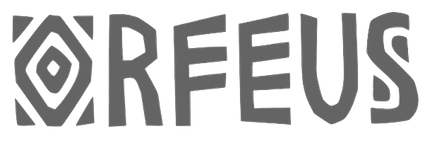 Based in Oslo, Birgit Hove evoked the lettering of Polish poster artist Leszek Zebrowski and German expressionism in her typeface Orfeus (2014), which was a logotype created for a short film called Orfeus. [Google]
[More] ⦿
Based in Oslo, Birgit Hove evoked the lettering of Polish poster artist Leszek Zebrowski and German expressionism in her typeface Orfeus (2014), which was a logotype created for a short film called Orfeus. [Google]
[More] ⦿
|
Blackletra
[Daniel Sabino]
|
 Brazilian type designer Daniel Sabino de Souza studied under Laura Meseguer at the Eina-Escuela Superior de Disseny in Barcelona. His foundry in Sao Paulo is called Blackletra (est. 2012). He has taught type design at IED/Sao Paulo.
 He won an award at Tipos Latinos 2012 and at TDC 2013 for Karol. In 2012, he won the Silver Prize in the Latin category of the Morisawa Type Design Competition for Hashar, a beautiful angular connected script face. In 2013, he published Karol at Type O Tones. Falado (2013) is a delicate display typeface commissioned by Estudio Mucho for the graphic identity of the Spanish orchestra La Filarmónica. It won a Gold Medal at Laus'13. In 2014, he designed the superb angular script typeface Haltrix (Village). Karol Sans was published at Type-o-Tones in 2014. Haltrix, Gandur (which was inspired by other geometric texturas, specially Max Bittrof's Element (1933)) and Karol Sans all won awards at Tipos Latinos 2014. Expectedly, Haltrix won an award in the TDC 2015 Type Design competition. Gandur New (German expressionist) and Gandur Alte (closer to Textura) followed in the summer of 2014. In 2015, he released Silva (Text, Display), a typeface co-designed with Chester Jenkins. Gothiks (2015, Village), Gothiks Compressed (2016) and Gothiks Condensed (2016), a family of condensed typefaces of varying widths and thicknesses that hearken back to the gothic wood types, and Latam Sans (2015, a custom typeface for Latam Airlines) won awards at Tipos Latinos 2016. Typefaces from 2016 include Ofelia Std, a corporate sans family characterized by a lower case f that looks like a stretched s. Typefaces from 2017: Noka (a sci-fi geometric sans characterized by its curvy f and hipster g). Typefaces from 2019: STC Forward (a bespoke sans typeface for Saudi Telecom Company), Gothiks Round Compressed, Gothiks Round Condensed, Gothiks Round. Typefaces from 2020: Elizeth and Elizeth Condensed (a slab serif by Daniel Sabino, Lucas Gini and Henrique Beier), Skol Display (a forceful poster sans), Ofelia Text and Display, Ekos (an all caps typeface designed for the Natura Ekos brand). Typefaces from 2021: Silva Display (a 16-style serif). Winner at Tipos Latinos 2018 of a type design award for Elizeth. Village link (since 2014). Behance link. [Google]
[MyFonts]
[More] ⦿
|
Borutta (or: Duce Type)
[Mateusz Machalski]
|
 Borutta (or Duce Type) is the creative studio of über-talented Warsaw-based designer Mateusz Machalski (b. 1989), a graduate of Wydziale Grafiki ASP in 2014, and of Warsaw Academy of Fine Arts. His oeuvre is simply irresistible, charming and a worthy representative of the Polish poster style---witness Alergia (2016), Magiel Pro (2017) and Madiso (2017).
 He is the creator of the blackletter-inspired typeface Raus (2012), which also could pass for a Cyrillic simulation font. It was possibly made with Pawel Wypych. He also made Kebab (2012, a fat caps face), Duce (2012, art deco: withdrawn from MyFonts after Charles Borges complained that it was a rip-off of his own Gloria), Fikus (2012), Woodie (2012, a condensed rough wood type face), Polon (2012), Aurora (2012, a German expressionist poster face), Musli (monoline connected script), HWDP (2012, poster font), Wieczorek Script (2012, hand-printed), Hamlet (2012, a sword and dagger typeface, renamed to Prince), Caryca (2012, Cyrillic simulation, done with Pawel Wypych), Bezerro (2012, poster face), Bitmach (2012, pixel face), Meat Script (2012, a caps only market signage brush script), Krac (2012, a tall poster font), Hermes (2012: Ten Dollar Fonts), Berg (2012, a roughened blackletter face), Buldog (2012), Dudu (2012, tall condensed face). In 2012, Polish designer Wojciech Freudenreich and Mateusz Machalski combined forces to design the techno typeface SYN, which is based on an earlier De Stijl-genre alphabet by Freudenreich. In 2020, they released the free typeface family SYN Nova, which includes additional styles and a variable font. Machalski likes old wood types, which inspired him in 2012 to publish a wood type collection of weathered display typefaces: Condom, Hype, Whore, Banger, Buka. Elo (2012) and Duce (2012) are fat weathered wood types. Typefaces made in 2013: Wood Type Collection 2 (which includes Brie, Kaszti, Mader, Modi, Rena, Roast, Ursus), Zigfrid (headline face), Salute (letterpress style), Benito (a letterpress or geometric wood typeface), Bojo (heavy wood style poster face), Picadilly (heavily inktrapped open counter sans family), GIT (a manly headline sans), Lito (an eroded poster typeface), Haine (vernacular caps), Aneba (an organic sans family, renewed in 2016 as Aneba Neue), Vitali (sans), Korpo Serif (slab serif), Korpo Sans (elliptical family; +Greek, +Cyrillic). Typefaces from 2014: Adagio Slab, Adagio Serif, Adagio Sans (a superfamily not to be confused with the 2006 typeface Adagio Pro by Profonts), Adagio Sans Script, Adagio Serif Script, Adagio Slab Script, Tupperware Pro. Tupper Pro (42 styles) was designed by Mateus Machalski and the RR Donnelley team. Typefaces from 2015: Tupper Serif (again with RR Donnelley: a custom superfamily for pairing Latin, Cyrillic, Hebrew an Greek; for Tupperware), Vitali Neue, Legato Serif, Corpo Serif, Corpo Sans, Zigfrid, Picadilly (a great ink-trapped sans typeface family with an erect g). Typefaces from 2016: Nocturne (just like Magiel, this free typeface was designed as part of the Warsaw Types project: this wedge serif text typeface is inspired by the lettering on stone tablets commemorating the victims of World War II, and prewar Jewish shop signage), Favela (an experimental, geometric sans, for headline and fashion magazine use), Gangrena (a weathered typeface system co-designed with Ania Wielunska), Migrena Grotesque (earlier named Enigma Grotesque but probably in view of a clash with the name Enigma used by Jeremy Tankard changed to the appropriately named Migrena Grotesque), Alergia Grotesk (a take on the classical geometric grotesque style, in 60 weights, for Latin, Greek and Cyrillic), Alergia Remix (a hipster / hacker / Futura take on Alergia Grotesque). Typefaces from 2017: Nocturne Serif, Massimo (copperplate semi-serif influenced by New York; originally called Madison, they were frced to change the name to Massimo), Magiel Pro (a geometric display family influenced by Polish banners from the Russian occupatuon era, 1945-1989; it has a charming Black and a hairline, and covers Cyrillic too). A particularly intriguing project in 2017 was Bona, which set out to revive and extend Andrzej Heidrich's old typeface Bona. Mateusz Machalski contacted him for advice on the revival project. The resulting typeface families were published by and are available from Capitalics. The centerpiece is the warm and wonderful text typeface Bona Nova. It is supplemented by the extreme contrast typeface family Bona Title and the inline typeface family Bona Sforza. Participants in the project also include Leszek Bielski, Ania Wielunska and Michal Jarocinski. Google Fonts link for Bona Nova. Github link for Bona Nova. Typefaces from 2018: Bilbao (an innovative blend of sans, slab and mono genres in 18 styles), Cukier (a logo font family inspired by the vernacular typography from Zanzibar). In 2018, Mateusz Machalski, Borys Kosmynka and Przemek Hoffer co-designed the six-style antiqua typeface family Brygada 1918, which is based on a font designed by Adam Poltawski in 1918. Free download from the Polish president's site. The digitization was made possible after Janusz Tryzno acquired the fonts from Poltawski's estate. The official presentation of the font took place in the Polish Presidential Palace, in presence of the (right wing, ultra-conservative, nationalist, law and order) President of Poland, Andrzej Duda. Calling it a national typeface, the president assured the designers that he would use Brygada 1918 in his office. It will be used for diplomas and various other official forms. In 2021, with Anna Wielunska added to the list of authors, it was added as a variable font covering Latin, Greek and Cyrillic to Google Fonts. Github link. Typefaces from 2019: Gaultier (a sans family that is based on the styles of Claude Garamond, Robert Granjon and Eric Gill---a serifless Garamond and Gill Sans hybrid; includes a fine hairline weight), Aioli (a commissioned type system), Promo (a rounded sans family), Sigmund (the main style is inspired by the Polish road signage typeface designed in 1975 by Marek Sigmund: With the increase of weight, Sigmund turns into a geometric display in the spirit of vernacular typography from the signs of Polish streets; followed in 2022 by Sigmund Pro (15 styles)), Podium Sharp (based on Dudu, this 234-style family is a hybrid between different old Polish modular and geometric woodtypes such as Rex, Blok and Bacarat; note that 234=2x9x13, so fonts are numbered in Univers style from 1,1 (ultra-compressed hairline) to 9,13 (ultra expanded heavy)), Harpagan (an experiment in reverse and unusual stresses). Typefaces from 2020: Tyskie (a custom sans for Tyskie Magazine), Habibi Display (an ultra-fat display typeface inspired by bold Arabic headline typefaces), Podium Soft, Afronaut (an experimental Africa-themed font). In 2020, the team at Capitalics in Warsaw, namely Mateusz Machalski, Borys Kosmynka and Ania Wielunska, revived Adam Poltawski's Antykwa Poltawskiego (1928-1931) as Poltawski Nowy. Typefaces from 2021: Alfabet (a 20-style Swiss-inspired sans with narrow connectors, with support for Latin (+Vietnamese), Greek and Cyrillic scripts, including Ukrainian, Bulgarian and Serbian forms), Change Serif (a 10-style Robert Granjon-genre garalde designed as a part of Mateusz Machalski's PhD project, carried out in 2015-2021; the main goal was to create a typeface allowing for the typesetting of complex humanistic texts, containing many historical letterforms; each font contains 4000 glyphs and covers Latin, Cyrillic and Greek), Engram (a soft geometric sans family in 22 styles; close to his own earlier font, Enigma, 2016). Typefaces from 2022: Yalla (inspired by Arabic headline type). Home page. Behance link. Personal Behance link. Behance link for Duce Type. Another link. Fontsquirrel link. [Google]
[MyFonts]
[More] ⦿
|
Castle Type
[Jason Castle]
|
 Designs by Jason Castle from San Rafael, CA, who studied psychology at Dominican University of California. He does custom font design and sells commercial typefaces through MyFonts and FontShop. Blog. These include:
 - A: AfrikaBorders, Afrika Motifs, Agency Open (M. F. Benton, 1934, revival Jason Castle), Agency Gothic Inline, Ampersands, Azbuka (2005, a heavy slab serif).
- B: Brasileiro (2007, an art deco face).
- Carisma (2007, a clean geometric sans), Carlos (art deco inspired by Elektra), Castle Fleurons, Chinoise (2008, based on hand lettering that is reminiscent of a style of ancient Chinese square-cut ideograms), Cloister Black, Copperplate Script, Cradley (2015, a Caslon titling family with Greek and Cyrillic, named after the birthplace of William Caslon).
- D: Deko Initials (1993, discontinued in 2007; based on NADA0 drawn in 1972 by Marcia Loeb), Dionisio (2008, didone).
- E: Eden (Bold, Light; originally designed by Robert H. Middleton in 1934).
- F: Fat Freddie, Futura CT and Futura CT Inline (2007, based on Futura ND, but discontinued after only a few weeks).
- G: Goudy Lombardy (Lombardic), GoudyStout, Goudy Text, Goudy Trajan (1994-2010, free; +alternates).
- H: Handsome (2002, nice finger dingbats, aka fists).
- J: Jensen Arabique (left field art deco, based on work of Gustav Jensen, 1933).
- K: Koloss (art deco).
- L: Latin CT (2008, 6 styles), Latin Wide, Laureat, Lise Informal (2008, hand-printed), Lombardy.
- M: Maximilian CS (Rudolf Koch, 1917), Metropolis Bold and Shaded (based on the 1932 Stempel cut as designed by W. Schwerdtner), Minotaur (2008, an original monoline design based on an Oscan votive inscription from the second century BC; looks like simulated Greek).
- N: Norberto (2009, an all-caps Bodoni; +Stencil).
- O: Ogun (2008, inspired by an Egyptian-style Russian block alphabet and useful for athletic lettering; formerly named Azbuka).
- P: Plantain (2002, a digital version of Plantin Adweight, a 1913 typeface by F. H. Pierpont), Plantain Stencil (2009), Progreso (2010, a condensed, unicase, serif gothic type design inspired by the hand-lettering on Russian posters from the 1920s).
- R: Radiant, Radiant Extra Condensed CT (both Radiants are revivals of Roger Middleton's typeface by that name, 1940), Ransahoff (2002, ultra condensed didone), Rudolf (1992, based on Rudolf Koch's German expressionist work such as Neuland).
- S: Samira (2008, art nouveau style; based on Peter Schnorr's Schnorr Gestreckt, from 1898), Shango (1993, based on Schneidler Initials by F.H.E. Schneidler (1936), and including a digital version of Schneidler Cyrillic (1992); extended in 2007 to Shango Gothic and in 2008 to a 3-d shadow version, Shango Chiseled, and in 2009 to Shango Sans), Sculptura (2005, an all caps typeface based on Diethelm's Sculptura from 1957), Sencia (2008, based on Spanish art deco stock certificate lettering from 1941), Sonrisa (2009, art deco family---Sonrisa Thin is free), Standard CT (a neo-grotesque family), Standard CT Stencil (2012: free).
- Tambor (Light, Black, Inline, Adornado) (1992) (note: Jason claims that it was remotely based on Rudolf, which in turn was based on calligraphy of Rudolf Koch), Trio (an art deco sansserif), Trooper Roman (discontinued).
- V: Vincenzo (2008, a slabby didone), Warrior (2009, a 3d font based on Ogun; +Shaded).
- X: Xavier (art deco family based on Ashley Crawford by Ashley Havinden, 1930, revival by Jason Castle in 1992).
- Z: Zagora, Zamenhof (2011: an all caps poster face with constructivist ancestry, named after the inventor of Esperanto), Zuboni Stencil (2009, Latin and Cyrillic, constructivist and perhaps even military).
Klingspor link. Behance link. View Jason Castle's typefaces. [Google]
[MyFonts]
[More] ⦿
|
CAT Design Wolgast
[Peter Wiegel]
|
 Wolgast-based type designer Peter Wiegel (b. 1955) runs CAT Design Wolgast. Designer of these free fonts:
 - In 2019: Kufi Pattern.
- In 2018: Aurach Tri (a trilined typeface), Googee (monoline circle-themed sans), Gianna (medieval script), Hamburger Schwabacher.
- In 2017: Eyechart (heavy slab serif), Border Control (inline), Espresso Dolce (rounded sans), Gotisch Weiss, Halt (a dry brush typeface after Walter Hoehnisch's Stop from 1939), Kanzler, Llewie (rounded sans), Schulze Werbekraft (expressionist, after Arthur Schulze, 1926).
- In 2016: Ronaldson Gothic (after a MacKellar, Smiths & Jordan Co original), Vorgang (a great 1920s geometric sans), 5by7 (LED pixel font), BP 12-22 (industrial sans), u DIN 1451 Mittelschrift, Flubby, Gaeilge (Irish / uncial), Junior CAT (after Hans Heimbeck, 1936), CAT Liebing Gotisch (after Kurt Liebing), Tippa (an old typewriter font based on Adler Tippa 1).
- In 2015: Nuernberg (blackletter), CAT Schmalfette Thannhaeuser (blackletter), Offenbacher Reform (a revival of Offenbacher Reform, a blackletter typeface by Roos & Junge), Autobahn (blackletter), Barloesius Schrift (after Georg Barloesius's Barlösius Schrift, 1906), CAT-Franken-Deutsch (after Alfons Schneider, 1936), Fuckin Gwenhwyfar, CAT Kurier (a script after Herbert Thanhaeuser's Kurier from 1939), CAT Linz, CAT Rhythmus (a sharp-edged black grotesk after a Schriftguss AG original), DIN Schablonierschrift (DIN-based stencil), CAT North Licht, Feronia, Fette National Fraktur (after Walter Hoehnisch, 1934), Grobe-Plakat-Fraktur, CAT Childs (fifties style cursive typeface), Jena Gotisch (decorative caps), Kabinett Fraktur (after Johann Friedrich Unger, 1793-1794), Wattauchimma (heavy hipster sans), Friedolin (blackletter), Lorem Ipsum, Symphonie (a calligraphic script, reviving Imre Reiner's Symphonie (1938), also called Stradivarius (1945)), Power (a retro techno typeface), Krugmann Brush, Omega.
- In 2014: BernerBasisschrift1, BernerBasisschrift2 (school script), Berolina, Brausepulver (after Brause & Co., 1912), Fette Mikado (psychedelic style oriental look), Germanica, Gloria, HentimpsCirclet (blackletter), Hofstaetten (blackletter), Kleinsemmering, KuenstlerGotisch (blackletter), LacledeCAT (psychedelic), NeptunCAT, Neue Zier Schrift (a mischievous curly script), Pommern Gotisch, Reclame, CAT Report (retro brush script), Rueck-Italic, Rueck, RueckLeft, RueckLicht, RundschriftCAT (hairline ronde), Standard Graf (German expressionist and hexagonal typeface), Teutonic, VerzierteFavorite, VictoriaCAT, AdmiralCAT (a retro script), Dynamo (poster font), Des Malers Fraktur, Kanzleyrath (blackletter), Ober-Tuerkheim (art nouveau), PopplFrakturCAT (blackletter), Rundkursiv, Modeschrift (fifties script), Biedermeier Kursiv, Ehmcke Federfraktur (after a 1935 font by F.H. Ehmcke), Wernicke Schwabacher (after an original by Emmi Wernicke), Gotische Missalschrift, Hand Textur (after a 1935 font by F.H. Ehmcke), Renata (after a 1914 bastarda by Bauersche Giesserei), Rundgotisch Rauh (possibly after a Schelter & Giesecke design from 1903), Offenbacher Schwabacher (after Kurt Wanschura's bastarda from 1900), Incopins Clusters (multilined typeface), BadGong, Bernardo Moda (Bold, Semibold, Moda, Contrast: modeled after Lucian Bernhard's Bernhard fashion), CAT-Hohenzollern (after a 1902 art nouveau font by Bauersche), CATNorth, CATNorthLicht, CATNorthShadow, CAT Zentenaer Fraktur UNZ1 (a blackletter after a 1937 original by F.H.E. Schneidler), Coggers-Tariqa, EirikRaude, Fabrik (a geometric sans), Grobe Deutschmeister (German expressionist face), Harry Piel (or Piehl--a tattoo font), Kanalisirung, Klaber-Fraktur, Peter Obscure, Rumburak (a fat retro script), Flottflott (retro script), Indira K, Regent UNZ (a Schwabacher), Postamt, TGL 0-1451 Engschrift (a DIN-like font).
- In 2013: Spartakus (+Round), Cut Me Out (white on black sans), 5by9 (dot matrix face), Tartlers End (high-contrast ball terminal face), Alpha 54 (rounded flared script face), Chunk Five Ex (slab serif; he writes: With permission of Meredith Mandel, the original author of the ASCII-Font Chunk Five, I have extended Chunk Five Ex to a full featured unicode font with all figures used in Latin and Cyrillic writing), Simple Print (simple sans), Fette Bauersche Antiqua (a didone fat face), Manuskript Gothisch (after Manuskript Gotisch (1899, Bauersche), which was modeled after Wolfgang Hopyl's 1514 Textura), Quast (hairy font).
- Still in 2013, he published a number of school scripts, including Neue Rudelskopf, Deutsche Normalschrift, Imrans School, Rastenburg (German school font), and Bienchen.
- In 2012: Hardman (connected fifties script), Immermann (a quaint slab serif), Quast (grunge), Fundamental Brigade (sans family), DiffiKult (a bilined face), Men Nefer (a Memphis lookalike), Fette Unz Fraktur (like Fette Fraktur), Mutter Krause (for the reconstruction of the 1929 silent movie "Mutter Krausens Fahrt ins Glück", where it is used for intertitles, that where missing. The font is redrawn from the original intertitles), Youbilee (a font with laurels).
- In 2010: Alfabilder (dingbats), Gondrin (athletic lettering with a 3d effect), Helvetia Verbundene (making Helvetica into a school script? The original typeface was by Carl Albert Fahrenwaldt 1901), Proletarsk (a grotesk face), Vis-à-vis (great idea--a double-storied serif face), ApolloASM (Victorian), BertholdrMainzerFraktur, Doergon-Regular (license plate font), DoergonBackshift, DoergonShift, Eureka (Victorian, ornamental face), GoeschenFraktur (1880-style Fraktur used in Sammlung Göschen books), Makushka, MakushkaKontura, MakushkaQuadriga, MakushkaSecunda, Moderne3DSchwabacher, ModerneGekippteSchwabacher, StrassburgFraktur, TGL0-16 (same as DIN 16), TGL0-17 (same as DIN 17), TGL0-17Alt, Tank (emblems of gas companies), EricaType-Bold, EricaType-BoldItalic, EricaType-Italic, EricaType-Regular (typewriter), ErikaOrmig, Fibel Vienna (2012, a high-legged sans), GreifswalderTengwar-Regular, GreifswalerDeutscheSchrift (German Schreibschrift), Midroba-Regular (a strong mechanical octagonal face), MidrobaSchatten, MMX2010 (futuristic), Präsent60, Rotunda Pommerania (blackletter), TengwarOptime, TengwarOptimeDiagon, cbe-Bold, cbe-BoldItalic, cbe-Italic, cbe.
- In 2009: 18thCenturyInitials, 18thCenturyKurrent-Regular, 18thCenturyKurrentAlternates, German writing from the 18th century), CentreClaws, CentreClawsBeam1, CentreClawsSlant, Cöntgen Kanzley Regular (blackletter), Cöntgen Kanzley Aufrecht (2009), ElficCaslin, H1N1, Loxembourg1910Shadow (an art nouveau-influenced stencil face), Luxembourg1910, Tschichold, VarietScala (an art deco sans family), Varietee, VarieteeArtist, VarieteeCabaret, VarieteeCascadeur, VarieteeCasino, VarieteeCirque, VarieteeColege, VarieteeConferencier, VarieteeFolies, VarieteeIkarier, VarieteeJongleur, VarieteeMirage, VarieteeRevue, VarieteeTheatre, KochFetteDeutscheSchrift (blackletter), MoradoFelt-Regular (upright connected script), MoradoMarker (2009), MoradoNib, PreussischeVI9 (DIN-like family), PreussischeVI9Linie, PreussischeVI9Schatten-Linie, PreussischeVI9Schatten, SchatternvonPreussischeVI9, Stage (art deco), Ring Matrix (dot matrix), Nathan, Amptmann Script (2009, upright connected script), Cat Shop, Blankenburg (blackletter), Murrx (arched face), Schwaben Alt (1988, bastarda), Vrango, 14LED (Regular, Phattt-Heavy, Rised-Black), 24LED (+Bright, +Grid, +Modul), DIN1451fetteBreitschrift1936-Regular, FibelNord (basic sans family with an architectural twist), FibelSued (family), PaneuropaBankette, PaneuropaCrashbarrier-Black, PaneuropaFreeway, PaneuropaHighway, PaneuropaRoad, PaneuropaStreet, PaneuropaWrongWay, Quirkus (family), RingMatrix (dot matrix family), RingMatrix3D, RingMatrixTwo, DiscipuliBritannica (connected script), GruenewaldVA-Regular (connected school script), Rudelskopfdeutsch-Aufrecht, WiegelLatein (connected school script), WiegelLateinMedium (2009), Morado, Moebius Bicolor (art deco), Elbaris (sans), ElbarisOutline, Nomitais (multiline face), RostockKaligraph, Waschkueche, WaschkuecheGrob-Ultra, WiegelKurrent (traditional German school script), WiegelKurrentMedium, XAyax, XAyaxOutline (2009), Kaufhalle (squarish), Quimbie (art deco), CasaSans-Regular, Elb-Tunnel, MeyneTextur (blackletter), Yiggivoo, TGL 31034-1 (futuristic sans), Beroga (a simple organic sans).
- Before 2009: Xayax, PreussischeIV44Ausgabe3 (2006, a severe sans), Utusi Star (1989, very condensed all-caps face), Avocado (2006, script face), CbeNormal (2006, script face), Leipzig Fraktur (+Bold) (2006), Berlin Email (2006, a condensed sans family, followed in 2009 by Berlin Email Serif), MaassslicerItalic (2006, a futuristic typeface made for Rudolf Maass + Partner GmbH), Powerweld (a gorgeous avant-garde typeface made for OPTI Pumpen und Technik GmbH), WolgastScript (2005), WolgastTwo (2006, connected script), WolgastTwoBold, ZeichenDreihundert-Regular, ZeichenHundert-Regular, ZeichenVierhundert-Regular, ZeichenZweihundert-Regular (2006, traffic dingbats), Djerba simplified (Arabic font, Computer and Technologie, Hamburg, 1995; it can be downloaded here), Titus FrakturBaltic (1998), TITUS FrakturEast Normal (1998), and TITUS FrakturWest Normal (1998) [which used to be downloadable here; these fonts were retired and the Titus name dropped; most of the glyphs made it to Schwaben Alt].
Dafont link. One more URL. Fontspace link. Yet another URL. Font Squirrel link. Fontsy link. The list of his truetype and opentype typefaces as of 2011: 18thCenturyInitials, 18thCenturyKurrentStart, 18thCenturyKurrentText, Alfabilder, AlteDIN1451Mittelschrift, AlteDIN1451Mittelschriftgepraegt, AmptmannScript, ApolloASM, Avocado, Barnroof, BerlinEmail, BerlinEmail2, BerlinEmailBold, BerlinEmailBold, BerlinEmailHeavy, BerlinEmailHeavy, BerlinEmailOutline, BerlinEmailOutline, BerlinEmailSchaddow, BerlinEmailSchaddow, BerlinEmailSemibold-Bold, BerlinEmailSemibold-Bold, BerlinEmailSerif, BerlinEmailSerif, BerlinEmailSerifSemibold, BerlinEmailSerifSemibold, BerlinEmailSerifShadow, BerlinEmailWideSemibold, BerlinEmailWideSemibold, Beroga, Beroga, BerogaFettig-Bold, BerogaFettig-Bold, BertholdMainzerFrakturUNZ1A-Italic, BertholdMainzerFrakturUNZ1A, BertholdrMainzerFraktur, Blankenburg-Regular, BlankenburgUNZ1A-Italic, BlankenburgUNZ1A, CasaSans-Regular, CasaSans, CasaSansFettig-Bold, CatShop, CentreClaws, CentreClawsBeam1, CentreClawsSlant, ChunkFiveEx, CntgenKanzley-Regular, CntgenKanzleyAufrecht, DIN1451fetteBreitschrift1936-Regular, DiscipuliBritannica, DiscipuliBritannicaBold, Doergon-Regular, DoergonBackshift, DoergonShift, DoergonWave-Regular, Elb-Tunnel, Elb-TunnelSchatten, Elbaris, ElbarisOutline, ElficCaslin, EricaType-Bold, EricaType-BoldItalic, EricaType-Italic, EricaType-Regular, ErikaOrmig, Eureka, FibelNord-Bold, FibelNord-BoldItalic, FibelNord-Italic, FibelNord, FibelNordKontur, FibelSued-Bold, FibelSued-BoldItalic, FibelSued-Italic, FibelSued, FibelSuedKontur, GoeschenFraktur, GoeschenFrakturUNZ1A-Italic, GoeschenFrakturUNZ1A, Gondrin, GreifswalderTengwar-Regular, GreifswalerDeutscheSchrift, GruenewaldVA-Regular, GruenewaldVA1.Klasse, GruenewaldVA3.Klasse, H1N1, HelvetiaVerbundene, KochFetteDeutscheSchrift, KochFetteDeutscheSchriftUNZ1A-Italic, KochFetteDeutscheSchriftUNZ1A, LeipzigFrakturBold, LeipzigFrakturHeavy-ExtraBold, LeipzigFrakturLF-Bold, LeipzigFrakturLF-Normal, LeipzigFrakturNormal, LeipzigFrakturUNZ1A-Bold, LeipzigFrakturUNZ1A-BoldItalic, LeipzigFrakturUNZ1A-Italic, LeipzigFrakturUNZ1A, Luxembourg1910, Luxembourg1910Contur, Luxembourg1910Ombre, MMX2010-Regular, Maassslicer3D, Maassslicer3D, MaassslicerItalic, MaassslicerItalic, Makushka, MakushkaKontura, MakushkaQuadriga, MakushkaSecunda, MeyneTextur, MeyneTexturUNZ1A-Italic, MeyneTexturUNZ1A, Midroba-Regular, MidrobaSchatten, Moderne3DSchwabacher, ModerneFetteSchwabacher, ModerneFetteSchwabacherUNZ1A-Italic, ModerneFetteSchwabacherUNZ1A, ModerneGekippteSchwabacher, MoradoFelt-Regular, MoradoMarker, MoradoNib, MoradoSharp-Regular, Murrx, Nathan-CondensedRegular, Nathan-ExpandedRegular, Nathan-Semi-expandedRegular, Nathan, NathanAlternates-CondensedRegular, NathanAlternates-ExpandedRegular, NathanAlternates-Semi-expandedRegular, NathanAlternates, Nomitais, Nomitais, Numikki, Numukki-Italic, Numukki-Italic, Numukki, Powerweld, PreussischeIV44Ausgabe3, PreussischeIV44Ausgabe3, PreussischeVI9, PreussischeVI9Linie, PreussischeVI9Schatten-Linie, PreussischeVI9Schatten, Proletarsk, Prsent60, Quimbie, Quimbie3D, QuimbieShaddow, QuimbieUH, Quirkus-Bold, Quirkus-BoldItalic, Quirkus-Italic, Quirkus, QuirkusOut, QuirkusUpsideDown, RostockKaligraph, RotundaPommerania, RotundaPommeraniaUNZ1A-Italic, RotundaPommeraniaUNZ1A, Rudelskopfdeutsch-Aufrecht, SchatternvonPreussischeVI9, Schulfibel-Nord-Linie-2, SchwabenAlt-Bold, SchwabenAltUNZ1A-Italic, SchwabenAltUNZ1A, Stage, StrassburgFraktur-Regular, TGL0-16, TGL0-17, TGL0-17Alt, TGL31034-1, TGL31034-1, TGL31034-2, TGL31034-2, Tank, TengwarOptime, TengwarOptimeDiagon, TitilliumMaps29L-1wt, TitilliumMaps29L-400wt, TitilliumMaps29L-800wt, TitilliumMaps29L-999wt, TitilliumText22L-1wt, TitilliumText22L-250wt, TitilliumText22L-400wt, TitilliumText22L-600wt, TitilliumText22L-800wt, TitilliumText22L-999wt, TitilliumTitle20, UtusiStar-Bold, UtusiStar, VarietScala, Varietee, VarieteeArtist, VarieteeCabaret, VarieteeCascadeur, VarieteeCasino, VarieteeCirque, VarieteeColege, VarieteeConferencier, VarieteeFolies, VarieteeIkarier, VarieteeJongleur, VarieteeMirage, VarieteeRevue, VarieteeTheatre, Via-A-Vis, Vrng, Waschkueche, Waschkueche, WaschkuecheGrob-Ultra, WaschkuecheGrob-Ultra, WiegelKurrent, WiegelKurrent, WiegelKurrentMedium, WiegelKurrentMedium, WiegelLatein, WiegelLateinMedium, WolgastScript, WolgastScript, WolgastTwo, WolgastTwo, WolgastTwoBold, WolgastTwoBold, XAyax, XAyax, XAyaxOutline, XAyaxOutline, YiggivooUnicode-Italic, YiggivooUnicode-Italic, YiggivooUnicode, YiggivooUnicode, YiggivooUnicode3D-Italic, YiggivooUnicode3D-Italic, YiggivooUnicode3D, YiggivooUnicode3D, ZeichenDreihundert-Regular, ZeichenDreihundertAlt, ZeichenHundert-Regular, ZeichenHundertAlt, ZeichenVierhundert-Regular, ZeichenZweihundert-Regular, ZeichenZweihundertAlt, cbe-Bold, cbe-BoldItalic, cbe-Italic, cbe, kaufhalle, kaufhalle, kaufhalleblech, kaufhalleblech, moebius. His type 1 fonts as of 2011: Avocado, BerlinEmail, BerlinEmail2, BerlinEmailBold, BerlinEmailHeavy, BerlinEmailOutline, BerlinEmailSchaddow, BerlinEmailSemibold-Bold, BerlinEmailSerif, BerlinEmailSerifSemibold, BerlinEmailSerifShadow, BerlinEmailWideSemibold, Beroga, BerogaFettig-Bold, CasaSans, Elb-Tunnel, Elb-TunnelSchatten, Maassslicer3D, MaassslicerItalic, Numukki-Italic, Numukki, Powerweld, PreussischeIV44Ausgabe3, Quimbie, QuimbieUH, RostockKaligraph, TGL31034-1, TGL31034-2, UtusiStar-Bold, UtusiStar, Waschkueche, WaschkuecheGrob-Ultra, WolgastScript, WolgastTwo, WolgastTwoBold, YiggivooUnicode-Italic, YiggivooUnicode, YiggivooUnicode3D-Italic, YiggivooUnicode3D, cbe-Bold, cbe-BoldItalic, cbe-Italic, cbe, kaufhalle, kaufhalleblech. A list of typefaces in alphabetical order, with descriptive comments provided by Reynir Heidberg Stefansson from Iceland: 18th Century Kurrent (Kurrent-style handwriting, Wiegel-coded), Alfabilder (Alphabetic picture font for the German alphabet), Amptmann Script (Partly-connected, upright writing, used on Prussian Railways pattern drawings), ApolloASM (Jugendstil, vaguely resembling an ornate Bocklin), Avocado (Handwriting, broad-nib pen-style), Berlin Email (Narrow sans-serif, based on emailled signage; Wiegel-coded), Berlin Email Serif (Narrow serif, based on emailled signage; Wiegel-coded), Beroga (All-minuscule, rounded marker-style sans-serif with ca. 8° slope), Berthold Mainzer Fraktur (Fraktur in Wiegel (Regular only) and UNZ1(A) coding), Blankenburg (Semicondensed Tannenberg in Wiegel (Regular only) and UNZ1(A) coding), Casa Sans (Squarish, broad-nib pen-style block writing), CatShop (Serif, soft of an acid-washed didone), cbe Normal (Sans-serif, narrow, somewhat cuneiform), Centre Claws (Sans-serif, Art Deco display, a bit like Broadway), Cöntgen Kanzlei (Cöntgen Kanzley) (Fraktur-based calligraphy by Heinrich Hugo Cöntgen, Wiegel coding), DiffiKult (Sans-serif, display, no horizontal lines), DIN 1451 fette Breitschrift 1936 (The now-withdrawn Wide version of DIN 1451 traffic font), Discipuli Britannica (UK school handwriting), Doergon (Slab-serif, narrow-ish, all majuscule), CAT Eckmann, Elabris (Elbaris) (Sans-serif, caps/smallcaps, shades of DIN1451 Engschrift), Elb-Tunnel (Sans-serif, based on signage in the old Elbe tunnel in Hamburg), Elbic Caslon (Elfic Caslon, Elfic Caslin) (a Caslon for the Queen Galadriel), Erika Type (Erica Type) (Slab-serif, typewriter, comes from Wiegel's old Erika typewriter), Eureka (Serif, caps/smallcaps, Art Deco/Jugendstil), Fibel Nord (2009, sans-serif, based on German school primer), Fibel Sued (2009, sans-serif, based on German school primer), Fibel Vienna (Sans-serif, based on Austrian school primer), Fundamental Brigade (Sans-serif, geometric, some UNZ1 ligatures), Göschen Fraktur (Goeschen Fraktur) (Fraktur with a biblical feel, Wiegel (Rg only) and UNZ1 coding), Gondrini (Gondrin) (Sans-serif, geometric, display, shaded outlines, cookie-cutter), Greifswalder Deutsche Schrift (Handwriting, based on Rudolf Koch's Offenbacher Kurrent, Wiegel coding), Greifswalder Tengwar (Tengwar handwriting in Offenbach style), Gruenewald VA (Latin-style schoolhand, Wiegel coding), H1N1 (Heavy display typeface made of parallel wavetrains), Hardman (Heavy, wide, squarish logotype with connecting letters), Helvetia Verbundene (Swiss handwriting), Immermann (Display, resembles a seriffed Radio/Rundfunk, UNZ1 coding), Kaufhalle (Display, recreation of HO Kaufhalle logotype), Koch Fette Deutsche Schrift (Very plain fraktur, Wiegel (Rg only) and UNZ1 coding), Leipzig Fraktur (Fraktur for bread text, Wiegel coding), Leipzig Fraktur UNZ1A (Fraktur for bread text), Luxembourg 1910 (Sans-serif, Jugendstil display typeface from old spice drawers), Maass Slicer (Maassslicer) (Sans-serif, oblique display face, orig. logotype), Makushka (Sort-of an Elabris with minuscules, looks overlayable), Men Nefer (Slab-serif, geometric, UNZ1 coding), Midroba (Spur-serif, display, all-majuscule, heavy, octal), MMX2010 (Sans-serif, display, caps/smallcaps, TV game machine feel), Moderne Schwabacher (Heavily reworked, Wiegel coding), Moderne Fette Schwabacher UNZ1A (Heavily reworked, Wiegel coding), Möbius (moebius) (Sans-serif, display, bicolour (u/c = non-spacing fills, l/c = spacing outlines)), Morado (Connected handwriting with nib or marker pen), Murrx (Heavy display typeface made from ellipsoids on NE-SW axis), Mutter Krause (Serif, slanting, Jugendstil-feel), CAT Neuzeit and CAT Neuzeit Schatten (2012-2014), Nathan (Slab-serif, hand-drawn.), Nomatais (Nomitais) (Elabris with multiple levels of outlines), Numukki (Conlang, knotted-line, good for separators and scenebreaks), Powerweld (Sans-serif, Bauhaus style, all-minuscule), Präsent 60 (PI font with various East German logos), Preussische IV 44 (PreussischeIV44Ausgabe3) (Repro of Prussian Railways pattern type IV 44 version 3), Preussische VI 9 (Repro of Prussian Railways pattern type VI 9 version 2), Proletarsk (Sans-serif, monoline, doubled-up questionmark), Quast (Brush type, all-majuscule, very rough outline), Quimbie (Sans-serif, all-majuscule, resembles Amelia), Quirkus (Sans-serif), Ring Matrix (LED matrix with ring LEDs, solid LEDs and ring LEDs with shadow), Rostock Kaligraph (Very round calligraphy, resembles rotunda), Rotunda Pommerania (Rotunda style, Wiegel-code (Regular only) or UNZ1-coded), Rudelskopf deutsch (Sans-serif, based on Kurrent-style letterforms), Schwaben Alt (Schwabacher in Wiegel- (Rg only) or UNZ1-coding.), Stage (Sans-serif, narrow, Art Deco, fleeting taste of Broadway), Strassburg Fraktur (Handwritten fraktur, ornate majuscules, Wiegel-coding), Tank (PI font with (gas/petrol) tank station logos), TengwarOptime (Optima for Tengwar), TGL 0-16/0-17 (East German versions of DIN 16 and DIN 17 blueprint types), TGL 31034-1, TGL 31034-2 (East German versions of DIN 6776 / DIN EN ISO 3098 blueprint types), Utusi Star (Sans-serif, slight resemblance with Rundfunk), Varieté (Sans-serif, all-majuscule or caps/smallcaps), Vis-A-Vis (Serif, all-majuscule, split in middle), Volk Redis (Kurrent handwriting, anno 1930-1941), Vrångö (LED matrix type like Ring Matrix), Waschküche (Serif, resembles Antykwa Torunska), Wiegel Kurrent (Kurrent-style handwriting), Wiegel Latein (Latin-style handwriting), Wolgast Script (Sloppy-looking handwriting with a broad-nib pen), Wolgast Two (Latin/Cyrillic handwriting), XAyax (Serif, Jugendstil, narrow, all-majuscule), Yiggivoo Unicode (Sans-serif, wide, tall x, board game packaging feel), Youbilee (PI font with various jubilee laurels), Verkehrszeichen (Zeichen) (PI fonts with traffic signs (in layers)), Verkehrszeichen alt (Zeichen Alt) (PI fonts with old traffic signs (in layers)). Abstract Fonts link. Dafont link. Kernest link. Klingspor link. CAT Fonts link. Fontesk link. [Google]
[More] ⦿
|
Celia Grandhomme
|
Lyon, France-based designer of the dingbat typeface OK (2019), the custom typeface Piña (2017), the circle-based experimental typeface Equinoxe (2015) and the Belgian blackletter beer label fonts Baston (2016) and Bxl (2016). [Google]
[More] ⦿
|
Christ Trek Fonts
[Tim Larson]
|
 Tim Larson (Christ Trek Fonts) is the Minnesota-based creator of the Open Font License fonts Marapfhont (2009, inspired by the logo font of the classic 1990s game Marathon) and Squarish Sans CT (2011, in Bank Gothic style). Both fonts are free and have tons of glyphs that cover many unicode pages, including mathematical symbols, Greek, Coptic and Hebrew. It is quite possible---but I am not sure of that--that this Bank Gothic family member is the only one that has such a coverage.
 Tim is working on Brampton. He writes about Squarish Sans: Squarish Sans is not a direct clone of any Bank Gothic. I have made conscious choices to deviate from existing designs. Yet it is strongly inspired by them, of course, particularly Michael Doret's DeLuxe Gothic, in that Squarish Sans has a true lower case as well as small caps. It should fit the bill should you have need of a Bank Gothic face. Motivation for Marapfhont came from the Marathon Trilogy game: Remember the Marathon Trilogy by Bungie Games back in the mid-1990s? If you do, you remember it's iconic logo font, Modula Tall. There are no free alternatives to Modula Tall, and the few similar fonts miss important aspects of its character. I wanted to create a typeface inspired by the appearance of Modula Tall in Marathon. The lowercase of Modula Tall didn't fit the Marathon "feel" at all, for me, so I have redesigned the miniscules, to carry the signature look throughout. Thus, Marapfhont is not a clone of Modula Tall, but may nonetheless be used to generate the "MARATHON" title. In 2013, he finished the pixelish typeface Looks Like Spht. In 2014, Tim Larson published the free Hebrew simulation font Hananiah (2014, OFL), which is based on Ezra SIL. It also includes regular Hebrew. In 2015, he published the German expressionist typeface Abibas [Abibas is a fork/extension of Gamaliel, a blackletter by Rafael Ferran i Peralta]. Typefaces from 2016: Politics As Usual (political dingbats for the United States), Horta (an angular sci-fi typeface). Open Font Library link. Home page. Aka Christ Trekker. [Google]
[More] ⦿
|
Christian Heinrich Kleukens
|
German type designer (b. Achim, 1880, d. Darmstadt, 1954), brother of the more famous "Kleukens", Friedrich Wilhelm (1878-1956). In 1907, the two brothers started running the Ernst-Ludwig-Presse, the private printing shop of the duke Ernst Ludwig von Hessen. Burte-Fraktur by C.H. Kleukens was cut in 1928 for Mainzer Presse by Gustav Eichenauer, Rudolf Koch's favourite punchcutter. It was revived in 2003 by Manfred Klein and Petra Heidorn. He also added a handwritten freestyle version, Burtine 2003, and another interpretation, Burtinomatic (2004). Petra Heidorn revived it as Burte Fraktur in 2003. Judith Type (1923), a hookish hellish German expressionist typeface, was at the basis of Judith Type (2007, Nick Curtis), Holofernes NF (2007, Nick Curtis) and Irrlicht (2015, Ari Hausel, Aarhaus). Klingspor link. Klingspor link for Kleukens. [Google]
[MyFonts]
[More] ⦿
|
Christian Munk
|
 Danish designer (b. 1991), aka CMunk, who used FontStruct to create most of his typefaces. Dafont link.
 In 2008 he designed Flag Semaphore (+Smooth, Peace), Articulate, Font from NATO (military slab serif), Glockenwerk (pixel clock font), Glockenwerk Uhrzeit, Flags-and-NATO (dingbats), Font from NATO alpha, Tall, Flying-Circus (Western showtime typeface to imitate the Monty Python titling font), LCD-display, Simple (stencil font with 700 glyphs), TMNT, Tetris, sharp-pixels, Raster, Quad (nice stencil face), Inverted, Propaganda (Cyrillic font simulation), Empty Monospace, Pride, Stadium, Rounded, Dear God (script pixel face), Celtic Style. In 2009, he added 7x12 Pixel Mono, @bcde, Abstract Letter Patterns, Music, Texture, Diagonal, Gothic, Illusio, Unispace (typewriter type), Narrow Serif, Delta, Alien Double (great!), Donut, Flags-and-NATO, Simple-Fraktur-Initial, Simple-Fraktur, Texture, Friendly Serif, (+Soft), Invisible, Sharp, Heavy Diacritics, Concentrium, Continuous Digital Display, Elves, Pixies, Space Movie (+Ligatures), Flag Semaphore (+Smooth, +Peace), Articulate, BBT Biline Twist, Biline Twist, Empty Monospace, Unfix, Infix, Pride, Tyre Stencil (like tire threads---nifty...), and Overlap. FontStructions from 2010: Even (gridded), Brilliance, Slalom Vision, Quirky Serif, 7x12PixelMono, Ball Terminator, Gearbox, Prefix, Upside Down, Way Too Small (a minimalist pixel face), Butterfly, Ribbon Gymnastics, 2D Barcode, Horizon Stencil, Biline Twist, Blocktur, Symmetricus (alien writing?). FontStructions in 2011: 12 dice, Monotwist (tall, monospaced), Squarific (fat octagonal), Swirl (curly), Sweet (Victorian), Easter Eggs, 50 Fifty (experimental, geometric), Squarific (+Stencilious), Spiralix (spiral-themed for Latin and Cyrillic), Bloccus, Feet (monospaced). Creations from 2012: Düpbøl (German expressionist face), Slice, Blocktur, Alien Double, 7:12 serif (pixel face), Blick, Dry Heat (Isolates and Initials, Medials, Finals: an Arabic simulation family), FF9 Coin Slots, FF8 Untalic, FF7 w1de, FF6 Lean Mean, FF5 Bamana, FF4 Circulation, FF3 3times7, FF3 Runization, FF1 Glitchy, Squared, Puzzlish, Steep, Digitalis (octagonal), 50 Fifty (artsy and geometric), Monotwist, Infix. FF stands for Forgotten Fonts. Typefaces made in 2013: Ribbons And Banners, Digital Rome (pixel face), Censorship, Interlock, Bouma, Glaedelig Script, Hand XL Smooth, Vascomat, Spitzschtruct (emulation of Suetterlin), Neonic, Fish Scales, 7:12 Serif, Analogly, Squarific Fraktastic, Metro Sans (pixelish). Typefaces from 2014: Word Games, Shadows, Yuuroppuna pixel, Spines, Numbers, Tal Dansk, Zahlen Deutsch, Insular Typewriter, Nudge Nudge (dot matrix), 7:12 Serif (monospaced pixel font), Jovian, Squarafic Fraktastic, Computer Says No, Runic, Fluorescent (neon tube typeface). Typefaces from 2015: Hexagonia, Kapow (a comic book font), Fauxreign (a Thai emulation font). Typefaces from 2016: Ziplock (art deco), Vexillum (maritime signal flags). Typefaces from 2019: Drop Cap (Lombardic), Fun with Cubes (3d). [Google]
[More] ⦿
|
Christopher Hansen
[Livin Hell (was: Webbyen.dk)]
|
[More] ⦿
|
Cloud9 Type Dept and Paavola Type Studio
[Jani Paavola]
|
 Cloud9 Type Dept and Paavola Type Studio are type foundries based in Helsinki, both run by Jani Paavola. On the day the Fins lost the semifinal in the hockey tournament in Sochi, Paavola published the 3-style geometric grotesque typeface family Result (2014). Result Ultra style is especially attractive. At the end of 2014, he published the condensed sans typefaces Varial, Varial Medium, Varial Rounded Medium (this one is from 2015) and Varial Rounded.
 In 2015, Jani published the painter's brush typeface Truffaux Pro. In 2016, he added the geometric sans family Agis and Harpers Grotesque. In 2017, Paavola designed the German expressionist typeface Aunque. In 2018, he published Albeit Grotesk Caps, Albeit Grotesk Stencil Caps, and Albeit Grotesk Rounded Caps. In 2020, at Paavola Type Studio, he released Seigneur Serif Display, a high-contrast serif in the Dutch tradition (his own words). Typefaces from 2021: Winkell (an origami-style display typeface). [Google]
[MyFonts]
[More] ⦿
|
Corradine Fonts
[Manuel Eduardo Corradine]
|
 Manuel Eduardo Corradine Mora was born in Bogotá in 1973. He graduated from the School of Graphic Design of the National University of Colombia in 1996, and became a graphic designer. He started by custom-designing fonts and by making typefaces for his own company, Casa Papelera El Cedro (The Cedar Papermaking House), for printing invitation cards. With other designers like Carlos Fabián Camargo, John Vargas and César Puertas he formed Tipográfico in 2007 to strengthen the type discipline in Colombia. Corradine Fonts is Manuel Corradine's own foundry in Bogotá, Colombia, founded in 2006. Today, he is one of Colombia's principal type designers. He also teaches at Universidad Piloto de Colombia in Bogota.
 Fonts from 2007: Kidwriting (a family which includes Kidwriting Dingbats 1 and 2), Garabata (a fantastic handwriting face), Garabata Dingbats, Hexagona Digital, Quadrat (grunge), Quadrat Old (grunge), Quadrat Dirty (grunge), Quadrat Broken, Quadrat Ugly, Neogot (experimental, 8 styles). Fonts from 2008: Mucura (handwriting), Prissa (handwriting), Salpicon (a script), Cuento Serif (a bouncy hand-printed family), Memoria (brush script), Charco, Happy Day (comic book family with Happy Day Dingbats), Espectro (a swinging script with swashes and a Dingbats style), Furia (handwriting), Candelaria (based on house signs in the La Candelaria neighborhood of Bogotá), Old Village (1600's style), Old Village Ornaments, Rapidda (a successful simulation of quick handwriting), Hueca (an outline children's script), Antigua (an old swashbuckler family), Colegial (a great-looking hand script), Pincel (a fantastic paint brush family with accompanying splatter dingbats), Trazo (Corradine's handwriting), Arcos (a techno family), Caveman (a primitive stone-look type family), Rumba (two styles; an elegant flowing brush script), Parche (graffiti family), Elegance Monoline (a greeting card script typeface that won an award at Tipos Latinos 2008), Abuelito (script). Fonts from 2009: Helga (flowing script), Mussica (+Swash, +Antiqued: a delicate Victorian typeface; followed in 2017 by Mussica Italic), Guarapo (hand-printed), Toxic (futuristic stencil), Emotion (comic book face), Bloque 3D, Rock and Cola, Betco's Hand, Telefante (comic book family), Nancy's Hand (more comic book hand-printing), Alambre (multiline/paperclip), Sensual (calligraphic hand), Zape (in the style of Tekton), Antrax Tech (grunge), Masato (handwriting), Hu Kou (oriental simulation). Fonts fgrom 2010: Miel (a curly script), Oferta (a signage script), Corradine Handwriting (and Corradine Handwriting Italic, 2015), Alberto (connected hand), Changua (hand-printed). Fonts from 2011: Plebeya (2011, connected hand), Mimi's Hand Connected, Legendaria (an extensive connected calligraphic family). Fonts from 2012: Tecna (a techno family co-designed with Sergio Ramirez), Neuron (a fantastic 16-style rounded elliptical sans family created together with Sergio Ramirez), Bucanera Soft (blackletter), Bucanera Antiqued (grungy blackletter), Official (a simple monoline sans family), Almibar (a connected calligraphic Spencerian script), Eterea (a roman all-caps family), Eterea LC (the lower case set), Canciller (an italic roman, done with Sergio Ramirez), Quarzo (2012, a formal copperplate script done with Sergio Ramirez). Typefaces from 2013: Neuron Angled (still with Sergio Ramirez), Alianza Slab (a great-looking slab family), Alianza Italic and Alianza Script (a packaging font), all made jointly by Manuel Eduardo Corradine and Sergio Ramirez. Typefaces from 2014: Whisky (a large blackletter family with inlines and fills for layering co-designed with Sergio Ramirez; related to German expressionism, it won an award at Tipos Latinos 2016), Whisky Italics, Beauty Script (with Juan Sebastian Rincon), Emblema and Emblema Headline (tall-legged art deco sans family by Duvan Cardenas), Wild Pen (a 1200-glyph set of typefaces that can be used to simulate handwriting thanks to smart replacements in Opentype), Sinffonia (a thin informal typeface with oodles of choices for swashes). Typefaces from 2015: Be Creative (a vintage display typeface), Typnic (a varied handcrafted layered and script typeface family; rhymes with picnic), Typnic Headline Slab. Typefaces from 2016: Naugles (thick display face based on the Naugles logo), Scrans (a modern signage script), Bloque (heavy slab family), Bloque Italic. Typefaces from 2017: Cristal (layered, triangulated and beveled font family, including exquisite Cristal Dingbats and Cristal Frames), Almibar Pro (connected calligraphic script). Typefaces from 2018: Tierra Script, Pueblito (rustic style). Typefaces from 2019: Austera Text (a comfortable workhorse serif). Typefaces from 2020: Kidwriting Pro. Klingspor link. Behance link. Creative Market link. MyFonts link. Fontspring link. Font Squirrel link. View Corradine's typefaces. [Google]
[MyFonts]
[More] ⦿
|
Cosimo Lorenzo Pancini
|
 Born in Firenze in 1969. Cofounder with Francesco Canovaro and Debora Manetti of the Italian design firm in Firenze called Studio Kmzero. He co-designed some typefaces there such as Arsenale White (2009). In 2002, Pancini developed Targa, TargaMS and TargaMSHand (for comic books?), basing his design on the peculiar sans serif monospace typeface with slightly rounded corners and a geometric, condensed skeleton that Italy had been using for its license plates. In 2022, Francesco Canovaro redesigned this font into a versatile multi-weight typeface, Targa Pro, which includes Targa Pro Mono (which keeps the original monospace widths), Targa Pro Roman (with proportional widths), both in five weights plus italics, the handmade version Targa Hand, and Targa Pro Stencil.
 The handwriting of Lord Byron led Pancini to develop the brush script typeface Byron (2013, Zetafonts). MyFonts credits him with the rounded avant garde sans family Antipasto (2007), but elswhere we read that this typeface is made by Matteo di Iorio, so there is some confusion. It was extended in 2017 by Pancini as Antipasto Pro. In 2014, Cosimo Lorenzo Pancini and Francesco Canovaro co-designed Amazing Grotesk (+Ultra). He also designed the calm bold geometric rounded sans typeface Cocogoose (2014; replaced by Cocogoose Pro in 2017) and the stylish deco font Offensive Behaviour. Cocogoose Letterpress is free. Cocogoose is part of the Coco Gothic family, a collection of twelve typefaces each inspired by the fashion mood of every decade of last century, named after fashion icon Coco Chanel. Cocogoose is Coco Gothic for the 1940s. See also Coco Gothic Pro (2021). In 2015, Pancini published the grand family Coco Gothic. This Latin / Greek / Cyrillic typeface family features a small x-height and sligghtly rounded corners to make the avant garde and geometric sans typefaces in vogue in the 1970s come alive again, ready for 21st century fashion magazines. It comes with substyles that recreate many moods, including art nouveau and arts and crafts (Cocotte), Italian propaganda style and Italian deco (Cocosignum), hipster style (CocoBikeR), or Bauhaus (Cocomat). Coco Gothic was initially developed as a corporate font for Lucca Comics & Games Festival 2013. The rounded geometric sans family Cocomat (by Cosimo Lorenzo Pancini, Deborah Manetti and Francesco Canovaro) was inspired by the style of the twenties and the visions of Italian futurists like Fortunato Depero, Giacomo Balla and Antonio Sant'Elia. Updated in 2019 as Cocomat Pro. Still in 2015, Cosimo and Zetafonts published the connected creamy baseball script Bulletto, the grungy handvetica Neue, and the calligraphic wedding typeface Hello Script. In 2015, at Zetafonts, Cosimo Lorenzo Pancini designed CocoBikeR (2015) to celebrate the hipster and bike cultures. CocoBikeR (for Latin, Greek and Cyrillic) is part of the successful Coco Gothic typeface family. In 2017, Pancini designed the 1930s Italian art deco typeface families Cocosignum Maiuscoletto and Cocosignum Corsivo Italico. In 2021, he published the 48-style (+variable) font family Coco Gothic Pro. This is a redrawn and expanded set of fonts: Inspired by a biography of Coco Chanel and trying to capture the quintessential mood of classical fashion elegance, Cosimo Lorenzo Pancini designed Coco Gothic looking for the effect that the first geometric sans typefaces (like Futura, Kabel or the italian eponyms like Semplicita) had when printed on paper. The crisp modernist shapes acquired in printing charme and warmth through a slight rounding of the corners that is translated digitally in the design of Coco Gothic. [...] A distinguishing feature of Coco Gothic Pro is the inclusion of ten alternate historical sets that allow you to use the typeface as a true typographic time machine, selecting period letterforms that range from art deco and nouveau, to modernism and to eighties' minimalism. Equipped with such an array of historical variants, Coco Gothic Pro becomes an encyclopedia of styles from the last century. There is also attention to Darkmode and there is coverage of Cyrillic and Greek. Typefaces from 2016: Adlery (a curly brush script), Kitten (Fat, Swash, Swash Monoline, Slant, Bold: signage script family), Adlibitum (a blackletter typeface by Cosimo Lorenzo Pancini and Francesco Canovaro), Morbodoni (a display didone by Cosimo Lorenzo Pancini and Francesco Canovaro). In 2016, Cosimo Lorenzo Pancini, Andrea Tartarelli, Giulia Ursenna Dorati and Andrea Gaspari co-designed the 1940s vintage brush script typeface Banana Yeti, which is based on an example by Ross George shown in George's Speedball 1947 Textbook Manual. The Zetafonts team extended the original design to six styles and multilingual coverage. The ExtraBold is free. Still in 2016, Pancini designed Calligraphunk, an experimental typeface that mimicks polyrythmic calligraphy, by alternating two sets of lowercase letters to emulate handwriting. In 2016, Cosimo Lorenzo Pancini, Matteo Chiti, Luca Chiti and Andrea Tartarelli co-designed the retro connected brush script font family Advertising Script, which is based on an example from Ross George's Speedball 1947 Textbook Manual. Beatrix Antiqua (2016, by Francesco Canovaro, Cosimo Lorenzo Pancini and Andrea Tartarelli). This humanist sans-serif typeface is part of the Beatrix family (Beatrix Nova, etc.) that takes its inspiration from the classic Roman monumental capital model. Its capitals are directly derived from the stone carvings in Florence's Santa Croce Cathedral. Beatrix keeps a subtle lapidary swelling at the terminals suggesting a glyphic serif, similar to Hermann Zapf's treatment in Optima. Amazing Grotesk (2016) is based on a logo designed by Francesco Canovaro. Studio Gothic (2017, by Francesco Canovaro, Cosimo Lorenzo Pancini and Andrea Tartarelli) is an 8-style geometric sans family based on Alessandro Butti's geometric sans classic, Semplicita. Hello Script and Hello Sans can be used for layering and coloring. The Christmas-themed version is Hello Christmas. Pancini designed the 64-strong typeface family Body Grotesque and Body Text in 2017-2018, together with Andrea Tartarelli. It was conceived as a contemporary alternative to modernist super-families like Univers or Helvetica. In 2017, Cosimo Lorenzo Pancini and Andrea Tartarelli co-designed the sans typeface family Kabrio, which gives users four different corner treatment options. Anaphora (2018). Anaphora is a contemporary serif typeface designed by Francesco Canovaro (roman), Cosimo Lorenzo Pancini (italic) and Andrea Tartarelli. It features a wedge serif design with nine weights from thin to heavy. Its wide counters and low x-height make it pleasant and readable at text sizes while the uncommon shapes make it strong and recognizable when used in display size. Anaphora covers Latin, Greek and Cyrillic. Canovaro's Arista served as a basis for the 29-style monolinear rounded sans typeface family Aristotelica (2018) by Cosimo Lorenzo Pancini and Andrea Tartarelli. See also Aristotelica Pro (2020). In 2018, he designed the italics for Cosimo Lorenzo Pancini's Domotika typeface family. Between 2018 and 2021, Cosimo Lorenzo Pancini and Andrea Tartarelli developed the 8-weight humanist sans typeface Domotika for Latin, Cyrillic and Greek, further into the 18-style Domotika Pro (2021). In 2018, he published Radcliffe, with Andrea Tartarelli, a Clarendon revival with Text and Casual subfamilies. Radcliffe (a Clarendon revival by Cosimo Lorenzo Pancini and Andrea Tartarelli), and added the layerable condensed Cocogoose Narrows to the Cocogoose family. Codec (2018) by Cosimo Lorenzo Pancini, Francesco Canovaro and Andrea Tartarelli is a geometric sans typeface family in which all terminal cuts are horiontal or vertical. See also Codec Pro (2019). His Double Bass (2018) is a jazzy 4-style typeface family that pays tribute to Saul Bass's iconic hand lettering for Otto Preminger's The Man with the Golden Arm film title sequence and other movies, Bass's vibrating, almost brutal cut-out aestethics, and the cartoonish lettering and jazzy graphics of the fifties. In 2018, he published the sharp wedge serif typeface Blacker to pay homage to the 1970s. In 2019, that was followed by Blacker Pro (Cosimo Lorenzo Pancini and Andrea Tartarelli, who write: Blacker Pro is the revised and extended version of the original wedge serif type family designed by Cosimo Lorenzo Pancini and Andrea Tartarelli in 2017. Blacker was developed as a take on the style that Jeremiah Shoaf has defined as the "evil serif" genre: typefaces with high contrast, oldstyle or modern serif proportions and sharp, blade-like triangular serifs). Still in 2018, he designed the swooping polyrhythmic calligraphic typeface Calligraphunk. In 2018, Cosimo Lorenzo Pancini and Andrea Tartarelli designed Holden, a very Latin cursive sans typeface with pointed brush aesthetics and fluid rhythmic lines. In 2019, Cosimo Lorenzo Pancini, Francesco Canovaro and Andrea Tartarelli published the monolinear geometric rounded corner amputated "e" sans typeface family Cocogoose Classic, the sans family Aquawax Pro, and the condensed rounded monoline techno sans typeface family Iconic. In 2019, Cosimo Lorenzo Pancini, Andrea Tartarelli and Maria Chiara Fantini at Zetafonts published a slightly calligraphic Elzevir typeface, Lovelace. In 2019, the lapidary typeface family Beatrix Antiqua (Francesco Canovaro) was reworked by Cosimo Lorenzo Pancini together with Andrea Tartarelli and Maria Chiara Fantini into a 50-style type system called Monterchi that includes Text, Serif and Sans subfamilies. Monterchi is a custom font for an identity project for a famous fresco in Monterchi, developed under the art directorship of Riccardo Falcinelli. Tarif (2019) is a typeface family inspired by the multicultural utopia of convivencia---the peaceful coexistence of Muslims, Christians and Jews in tenth century Andalusia that played an important role in bringing to Europe the classics of Greek philosophy, together with Muslim culture and aesthetics. It is a slab serif typeface with a humanist skeleton and inverted contrast, subtly mixing Latin zest, calligraphic details, extreme inktraps, and postmodern unorthodox reinvention of traditional grotesque letter shapes. The exuberant design, perfect for titling, logo and display use, is complemented by a wide range of seven weights allowing for solid editorial use and great readability in body text. Matching italics have been designed with the help of Maria Chiara Fantini and Cosimo Lorenzo Pancini, while Rania Azmi has collaborated on the design of the arabic version of Tarif, where the humanist shapes and inverted contrast of the Latin letters find a natural connection with modern arabic letterforms. Late in 2019, Cosimo Lorenzo Pancini released the fun typeface family Hagrid at Zetafonts, which writes: Crypto-typography---the passion for unknown, weird and unusual character shapes---is a disease commonly affecting type designers. Cosimo Lorenzo Pancini has celebrated it in this typeface family, aptly named Hagrid after the half-blood giant with a passion for cryptozoology described by R. K. Rowling in her Harry Potter books. Extreme optical corrections, calligraphic counter-spaces, inverted contrast, over-the-top overshoots: all the inventions that abound in vernacular and experimental typography have been lovingly collected in this mongrel sans serif family, carefully balancing quirky solutions and solid grotesque design. In 2020, Pancini released Stinger (2020, a 42-style reverse contrast family by Francesco Canovaro, Cosimo Pancini, Andrea Tartarelli and Maria Chiara Fantini) and Boring Sans (a typeface family designed along two variable axis: weight and weirdness). As part of the free font set Quarantype (2020), Cosimo Lorenzo Pancini designed Quarantype Embrace, Quarantype Hangout, Quarantype Hopscotch, Quarantype Joyride, Quarantype Sackrace, and Quarantype Uplift (with Maria Chiara Fantini). In 2020, Cosimo Lorenzo Pancini and Mario De Libero revived Nebiolo's Carioli (1928) as Cairoli Classic and Cairoli Now at Italian Type / Zetafonts. They extended the original weight and width range and developing both a faithful Classic version and a Now variant. The Cairoli Classic family keeps the original low x-height range, very display-oriented, and normalizes the design while emphasizing the original peculiarities like the hook cuts in curved letters, the high-waisted uppercase R and the squared ovals of the letterforms. Cairoli Now is developed with an higher x-height, more suited for text and digital use, and adds to the original design deeper inktraps and round punctuation, while slightly correcting the curves for a more contemporary look. Cairoli Variable has a weight and width axis. In 2020, Cosimo Lorenzo Pancini and Mariachiara Fantini---with the help of Solenn Bordeau---released Erotique at Zetafonts. Erotique evolved from Lovelace, an earlier Zetafonts typeface. Zetafonts describe this evil serif as follows: it challenges its romantic curves with the glitchy and fluid aestethic of transmodern neo-brutalist typography. Late in 2020, they added Erotique Sans, the sans version of Erotique, also designed by Cosimo Pancini and Maria Chiara Fantini. Late in 2020, he co-designed the 46-style font family Eastman Grotesque together with Francesco Canovaro and Andrea Tartarelli. This monolinear sans with a tall x-height comprises an interesting Eastman Grotesque Alternate subfamily with daring and in-your-face glyphs. The typeface evolved from Zetafonts' earlier Bauhaus-inspired typeface Eastman (2020). Later fonts in this family include Eastman Condensed (2021, by Francesco Canovaro, Cosimo Pancini and Andrea Tartarelli). In 2020, Cosimo Pancini, Andrea Tartarelli and Mario De Libero drew the 60-style Cocogoose Pro Narrows family, which features many compressed typefaces as well as grungy letterpress versions. Sunshine Pro (2020, Zetafonts) was designed by Cosimo Lorenzo Pancini and Solenn Bordeau expanding the original Sunshine design by Francesco Canovaro, part of the Quarantype collection (2020), which in turn was designed as a typeface for good vibes against Covid-19. Sunshine Pro is an experimental Clarendon-style font with variable contrast along the weight axis---contrast is reversed in light weight, minimized in the regular weight and peaks in the bold and heavy weights. Coco Sharp (2021) is a 62-style sans feast, with two variable fonts with variable x-height, by Francesco Canovaro, Cosimo Pancini and Andrea Tartarelli. Co-designer of Heading Now (2021), a 160-strong titling font (+2 variable fonts) by Francesco Canovaro, Cosimo Pancini, Andrea Tartarelli and Mario De Libero that provides an enormous range of widths. Keratine (2021, Cosimo Pancini, Andrea Tartarelli and Mario De Libero). A German expressionist typeface that exists in a space between these two traditions, mixing the proportions of humanistic typefaces with the strong slabs and fractured handwriting of blackletter calligraphy. Pancini, its main designer, writes that it explores the impossible territory between antiqua and blackletter. Geppetto (2021) is a frivolous Tuscan font that started out as a revival of a condensed Tuscan wood type family appearing in the 1903 Tubbs Wood Type catalog and which was probably derived from an 1859 typeface by William Hamilton Page. Pancini built a variable font on top of it and calls it a font for fake news. In 2021, Pancini added Coco Tardis as a variable font with a time travel slider to the Coco Gothic family. Millard Grotesque (2021) is a true "grot" in the Akzidenz Grotesque sense of the word. This typeface family was designed by Cosimo Lorenzo Pancini and Andrea Tartarelli. Pancini's Descript (2021) is a variable script font with two axes, slant and speed of writing. Milligram (2021) is a very tightly set grot by Cosimo Pancini and Andrea Tartarelli. [Google]
[MyFonts]
[More] ⦿
|
CybaPeeCreations (or: Typoasis)
[Petra Heidorn]
|
 CybaPee is the nom de plume of Petra Heidorn who lives near Hamburg. She has created many typefaces (listed below) between 1997 and 2005 and has cooperated with several type designers on interesting projects. She is undoubtedly best known for her successful web site Typoasis (discontinued in 2016), where one could download her own creations, and those of her many friends. Petra was also heavily involved in several attempts to revive blackletter fonts, in cooperation with Manfred Klein, Dieter Steffmann, Paul Lloyd and others. She organized several revivals of the typefaces of Rudolf Koch and Ernst Schneidler. She also managed the extensive web presence of Manfred Klein.
 In 2016, she allowed me to host her fonts on my site. Download page. Download all her fonts in one zip file. Her typefaces: - AlphanatismConHeads (2001). Stamped style.
- ArabDancesMediumItalic (2002). An Arabic simulation typeface done with Manfred Klain's assistance.
- Azimech (1999).
- Bauernschrift (2004). After a 1911 typeface from Bauersche Giesserei.
- Bayreuth (2003). A nice scan-version of Bayreuth Fraktur by Ernst Schneidler for C.E. Weber in 1932.
- Bibelschrift (2004). Codesigned with Manfred Klein, Bibelschrift revives a Fraktur from 1926-1928 used by the Bremer Presse, est. 1911. The Bremer Presse was bombed by the Americans in 1944.
- BirthdayGreetz (1999).
- Brahms Gotisch (2005). A blackletter typeface co-designed with Manfred Klein. It is a revival of a 1937 Genzsch&Heyse typeface designed by Heinz Beck.
- Burte Fraktur (2003). After Christian Heinrich Kleukens for the Mainzer Presse, 1928.
- CalliBrush (1999).
- Camouflage (1999). Textured.
- Chaos-Theorie (2000). A Halloween or vampire font.
- Charon (1999). An angry and / or scary typeface.
- Crystopian.
- CursedKuerbis (1999).
- Cyclin (2000). An ironwork font.
- DecoCaps (1999). Ornamental caps.
- DeutscheDruckschrift (2004). A revival of Heinz König's 1888 blackletter typeface for Genzsch&Heyse.
- DeutscherSchmuck (2004). Codesigned with Manfred Klein, this ornamental dingbat font is a revival and extension of the Schmuck für Deutsche Druckschrift by Eduard Ege, Genzsch and Heyse, 1922.
- DiamondDreams (1999). A pearly all caps typeface.
- Ellipsoideogram (2000). An italic headline sans.
- Epitough (1999). A sans.
- Extemplary (1999).
- Funtastique (1999). An exagerrated, almost bubbkly, art nouveau typeface.
- Gondoliere (2000). A light-hearted poster typeface.
- Gotika (2005). After Reiner's 1933 blackletter typeface for Bauer.
- Greex (1999). A Greek emulation typeface.
- Hans Sachs Gotisch (2005). Based on a typeface by that name of Albert Auspurg, 1911, Genzsch&Heyse.
- Hartwig-Schrift (2005). A blackletter typeface that revives Hartwig Poppelbaum's Hartwig Schrift from 1927-1928.
- Hasenchartbreaker (1999). A handcrafted typeface.
- Heimat (2005). After Wilhelm Weimar's Heimat from 1917, Genzsch&Heyse.
- HelvAssim (1999). A naughty take on Helvetica to needle Linotype.
- Hohenzollern (2004). Based on Carl Albert Fahrenwaldt's blackletter typeface for Bauersche Giesserei, 1902.
- HollandGotisch (2005). Designed together with with Manfred Klein, this is a revival of the textura typeface Nederduits (aka Fleischmann Gotisch) by Johann Michael Fleischmann, ca. 1750.
- InkyDinky (1999).
- IsleOfTheDead (1999). An angular handcrafted typeface reminiscent of the movie titling of Dr. Caligari.
- Jaecker-Schrift (2005). Revival of the 1912 blackletter typeface by Wilhelm Jaecker for D. Stempel.
- Kleukens-Fraktur (2004). A Schwabacher based on a design by Friedrich Wilhelm Kleukens, 1910.
- KrasniFellows (1999). An old Slavonic emulation typeface.
- KuehneRevised (2003). A blackletter typeface.
- LadyIce-Italic, LadyIce-SmallCaps, LadyIce, LadyIceRevisited, LadyIceRevisitedUpper. An organic monoline sans typeface family developed together with Apostrophe.
- Leibniz-Fraktur (2003). A Schwabacher typeface based on a house font at Genzsch & Heyse, 1912.
- LeontineLoew. A warm and plump informal typeface.
- LightBats (1999). Dingbats.
- Lupinus (1999).
- Lurzing-Initials (1997). A decorative caps typeface based on a 1908 typeface by Karl Lürzing that depicts naked figures.
- Manuskript Gotisch (2004). A revival of a 1514 Textura typeface by Wolfgang Hopyl, which was a house typeface at the Bauersche Giesserei in 1899.
- ModerneSchwabacher (2005). After a ca. 1900 typeface by the Otto Weisert foundry called Moderne Halbfette Schwabacher.
- MonkeyHouseParty (2001).
- MothproofScript (1999). A calligraphic typeface. The name is a take on frostmoth, one of Petra Heidorn's early aliases.
- MuseAsis (2002). Artsy fartsy.
- Napapiiri (1999).
- Neudeutsch (2004). After a 1900 original by Otto Hupp for Genzsch&Heyse.
- NeueFraktur, NeueFrakturExtraBold (2004). Revivals of typefaces by Johannes Wagner Schriftgiesserei in 1927.
- NinjaLine (2000). An outlined graffiti typeface.
- Nordland (2005). Based on a typeface by Heinz Beck for Trennert&Sohn, 1935.
- Oetztype (1999). German expressionist. Named after the Tyrolian Iceman, Oetzi.
- Oktoberfest (1999).
- Pachyderm (1999). A nice ultra-fat typeface.
- PeesCelticItalic, PeesCelticPlain, PeesCelticOutline (1999). Ornamental Celtic caps.
- Pegypta, Pegyptienne (1999). Hieroglyph-inspired typewriter fonts.
- PostmoderneFraktur (1999).
- Rammstein (1999). A tall condensed typeface.
- ResPublica (2000).
- RoteFlora (1999). Garffiti style typeface.
- RoyalGothic (1999). A swashy set of initials.
- SadLisa. A kitchen tile font designed to support Lisa Jenkins in a copyright battle.
- Sagittarius (1999). An arrowed typeface.
- SailingJunco (1999). A stencil typeface.
- Scalper-Bold, Scalper, ScalperInk (2001). Grunge style.
- SchmalfetteGotisch (2004). Codesigned with Manfred Klein, this semi-Textura typeface is based on a type of Ernst Schneidler.
- SchneidlerInitialen (2004). After F.H.E. Schneidler.
- Schneidler Schwabacher (2004). After F.H.E. Schneidler.
- SchwabachDeko (2005). This is Verzierte Schwabacher by Carl Kloberg, Leipzig, 1891. In 2005, Petra co-designed a similar revival of Verzierte Schwabacher with James Arboghast, simply called Verzierte Schwabacher. Her SchwabachDeko attempted to be as close as possible to the original.
- Scoglietto (1999). A text typeface.
- SerpentisBlack (2004). Digitization of a typeface by E.W. Tieffenbach for Officina Serpentis, 1913. This in turn is based on a Gotico-Antiqua by Peter Schoeffers (Mainz, 1462) which was refined in the late 15th century by Creussner and Koberger.
- SlimlinerMicro (1999).
- Smoke-Rasterized-Medium (2001). Degraded and textured.
- SoftAutumn (1999).
- Stoertebeker (1999). A mediaeval typeface with a rough outline.
- SunnySide (2000).
- Symphonie (2005). A digitization of Imre Reiner's Symphonie from 1938 (renamed Stradivarius in 1945).
- TaraType (1999). A lapidary typeface named after Petra's friend, Sabine Taranowski.
- Teutonia (2004). Based on a typeface by Roos & Junge, ca. 1900.
- TipTop (2004). Based on a typeface from Schriftgiesserei Julius Klinkhardt, Leipzig, ca. 1900. Virtually identical to Teutonia.
- ToolTime (1999). Dingbats.
- TypesourceFanclub (2001). A heavy semi-slab serif.
- Urdeutsch (2004). A rounded blackletter typeface based on Urdeutsch (1924-1925, Adolf Heimberg for Genzsch&Heyse).
- Vogeler Caps (2002). Based on Heinrich Vogeler's decorative blackletter caps typeface Jugendstil Initialen (1905).
- Weiss-Gotisch (2004). A revival of E.R. Weiss's typeface by that name, published in 1936 at the Bauersche Giesserei.
- WelcomeY2K (2000). A casual typeface.
- XmasTerpiece, XmasTerpieceSwashes (2001). A Fraktur font based on Rhapsodie by Ilse Schuele.
Dafont link. Klingspor link. Fontspace link. [Google]
[More] ⦿
|
Daniel Sabino
[Blackletra]
|
 [MyFonts]
[More] ⦿
[MyFonts]
[More] ⦿
|
Darden Studio
[Joshua Darden]
|
 Joshua Darden is an exceptionally gifted typeface designer with a studio in Brooklyn, NY. Joshua Darden (b. 1979, Northridge, CA) founded the ScanJam Design Company in 1993, together with Tim Glaser. At ScanJam, he designed numerous retail and custom typefaces. In 2000, Josh Darden left Scanjam to work for the Hoefler Type Foundry. In 2004, he founded Darden Studio. In 2005, he joined the type coop Village. He has lectured at the University of California Santa Barbara and at Parsons School of Design and School of Visual Arts. Interview with Josh Darden. Old URL. FontShop link.
 Typefaces designed by Darden: - Index (Garage, with Tim Glaser), review by Fred Showker).
- Birra Stout (2008): a free chunky beer label font. Followed by Birra Bruin (2019, by Elena Schneider at darden Studio): a German expressionist typeface.
- Jubilat (2008). Darden writes: Commissioned by Michael Picon for First; further development underwritten by Tatler Asia&La Semaine. Recipient of a Type Directors Club award as Untitled. Jubilat explores the history of the slab serif in six weights, with generous curves and efficient spacing in both dimensions. Its large lowercase and high contrast make it suitable for headlines, decks, and sidebars.
- Bergamot (under development).
- Profundis (1999, with Timothy Glaser; Profundis andd Profundis Sans in three styles each, all accompanied by Ornaments).
- Vittoria.
- OUT (Garage, with Tim Glaser).
- Grosvenor.
- Firth.
- di Valzer.
- Hauteur.
- Cassandra.
- GarageFont.
- HolyCalliope (1999, with Timothy Glaser).
- Omnes (2005, Village). This has a hairline weight.
- Diva (Garage, with Tim Glaser, 1996). See also Omnes Cyrillic (designed by Eben Sorkin, John Hudson, Joshua Darden, Maxim Zhukov, and Viktoriya Grabowska) and Omnes Arabic (designed by Joshua Darden and Titus Nemeth).
- Locus.
- Interact (Garage).
- Freight (2004-2009, Garage): an extensive, all-round family of typefaces including Freight Sans Pro, Freight Display Pro, Freight Micro Pro, Freight Text Pro, and Freight Big Pro (2005; its heavier weights are high-contrast didones). The slab serif, sans and serif versions are related and derived from each other, in some cases, by snap-on technology (in the spirit of Thesis or Scala or Nexus). Freight Sans Condensed Pro followed in 2012 and Freight Sans Compressed Pro in 2015. Freight Micro Pro (2009) was specifically created for use in phone books and small size applications. Freight Macro Pro is more suited for corporate branding. Review by John Berry. Freight Neo Pro (a humanist sans) was published in 2013. In 2015, he offered the free font Freight Big Bold (2005) via Open Font Library. Freight Round Pro was added in 2016. Finally, in 2017, Freight moved to Type Network.
- Josh Darden collaborated with Chrstian Schwartz on Erik Spiekermann's FF Meta Headline (2005).
- Virtuoso Life (2005): a proprietary custom display typeface for the Virtuoso Limited magazine.
- Corundum Text (2006): a fantastic and full family based on Fournier's pre-modern alphabet from 1742. It covers all European languages and comes with almanac symbols, ligatures, zodiac symbols, the works. Corundum Text won an award at TDC2 2007.
- Untitled (2006, Joshua Darden Studio). It won an award at TDC2 2007.
- Dapifer (2011) and Dapifer Stencil (2015). Commissioned by Mucca Design for One Atlantic. By Joshua Darden, with design and production assistance by Thomas Jockin, Scott Kellum, Noam Berg, and Lucas Sharp.
- Halyard (2017). An information design sans typeface family by Joshua Darden, Lucas Sharp and Eben Sorkin.
[Google]
[MyFonts]
[More] ⦿
|
Daria Petrova
|
 Moscow-born type designer who first studied book design in Moscow and communication design in Berlin, and graduated from the Typemedia program at KABK, class of 2016, and is now working for LucasFonts in Berlin. Her graduation thesis, Ritual, is intended for use on gravestones, with sandblasting machines. The multi-style typeface family is German expressionist.
 At Future Fonts, she published the wedge serif display typeface Zangezi (2018), which began as a revival of Keystone Type Foundry's Salem. In 2019, she added Zangezi Sans, and wrote: A new take on the Grotesque genre that is neither cool and rational, nor friendly. Strong color, sharp endings, and an eccentric italic give Zangezi Sans a brutal yet elegant appearance, where "yet" doesn't mean a compromise. Its serpentinous, schizophrenic shapes are an expression of the pure joy of drawing. In 2020, she added Zangezi Sans Text. Typefaces from 2021: Zloy (Russian for evil, angry: this a wicked ultra-fat sharp-edged wedge serif poster typeface). Speaker at ATypI 2018 in Antwerp on grave markers. Interview. Future Fonts link. [Google]
[More] ⦿
|
David Galasse
|
Portuguese-Brazilian multidisciplinary graphic designer in Santos / Sao Paulo, who created the expressionist typeface Dora (2015) and the sticky tape typeface Marker (2015). In 2016, he designed the pen emulation typeface Dora, the octagonal typeface tick tack, which was inspired by alarm clocks from the 1990s. It wa originally created for the visual identity of the video channel Tick Tack. Behance link. Link to Congaa. Behance link for Congaa. Newer Behance link. [Google]
[More] ⦿
|
David Kerkhoff
[Hanoded]
|
 [MyFonts]
[More] ⦿
[MyFonts]
[More] ⦿
|
Debora Escudeiro
|
During her graphic design studies in Recife, Brazil, Debora Escudeiro created a great vernacular typeface (2015), the dot matrix typeface Night (2015). [Google]
[More] ⦿
|
DecaType (was: Decavantona, or: Contra Studio or Panton Labs)
[Raban Panton]
|
 Banda Aceh, Indonesia-based designer who first went under the name Leonardo Decavantona, and later Raban Panton, b. 1983. Creator of the watercolor brush typefaces Cinderella (2015) and Never Die (2015), the calligraphic script Letizia (2015), the connected Awesome Darling Script (2015) and Qeyla Script (2015), the angular typeface Bruce Lee (2015) and the handcrafted Cagok Letter (2015: angular style) and Matthew Jason Kid's (2015). They also designed the brush script typeface Melbourne Night Sky (2016), Tong Brush (2015), Ashley Jarrow (2015) and Boboiboy Hand (2015).
 Typefaces from 2016: Goodies, Camsia Script, Murrano Script, Asmila Script, Blueberry, Geysha Script. Typefaces from 2017: Melodia, Author (brush script), Hello Creator, Paradiso (German expressionist). Typefaces from 2018: Kentucky. Typefaces from 2020: Bonjour. (Old, dead) Creative Market link for Contra Studio. [Google]
[More] ⦿
|
Delve Fonts (was: Delve Media Arts)
[Delve Withrington]
|
 Delve Withrington (Alameda, CA; b. 1970, Asheville, NC) studied at Savannah College of Art and Design, designed signage, print projects and web pages in addition to designing custom typefaces, worked for Fontshop, and in 2004, joined the type team at Agfa Monotype, which morphed into Monotype Imaging, Redwood City, CA. From Asheville, NC, he moved around and ended up in San Francisco. In 1996, he founded Delve Fonts in Berkeley, CA (in fact, Delve Media Arts, and later renamed Delve Fonts). He has collected a virtually complete list of books on typography. Author index. MyFonts link. Designer of these typefaces:
 - Beleren (2015). A custom typeface for the trading card game Magic: The Gathering (Hasbro).
- Blasphemy Initials: a free (and also commercial...) spooky font.
- Blot Test (1999): a dingbat font inspired by the work of noted German psychologist Hermann Rorschach [1885-1922].
- Cody (1999): an informal comic book face.
- Continuo (1996): an all caps bilined outline face.
- Cortina (2011). A futuristic family by Joachim Müller-Lancé.
- Delve Hand (1996-2003).
- Eucalyptus Regular.
- Eulipia (1997-2003): organic.
- Helfa (2011). Delve writes: Readability is baked in with a generous x-height, fine proportions that have a medium height to width ratio, and reasonable contrast in stroke weight variation.
- Filmotype Washington (for Font Diner). Designer unidentified.
- Muskeg. A combination of German expressionism and brush styles.
- Oktal Mono (2012, a rounded octagonal modular typeface by Joachim Müller-Lancé and Erik Adigard of MAD studio in Sausalito).
- Peso (1999): an octagonal family inspired by a parking sign discovered in Guanajuato, Mexico.
- Quara (2009): a techno sans.
- Smith & Nephew (2003) and Smith & Nephew Cyrillic (2015), rounded sans typefaces in the style of VAG Rounded.
- Tilden Sans (2004-2009): low contrast, large x-height.
- Tome Sans (2020). A 10-weight sans superfamily, with a variable font option.
- Uppercut Angle (2011). A signage typeface by Joachim Müller-Lancé. It was originally developed for the Krav Maga training center of San Francisco.
- Ysobel (2009; winner of an award at TDC2 2010). Delve co-designed the newspaper type family Ysobel (Monotype) with type designers Robin Nicholas, head of type design at Monotype, and Alice Savoie (Frenchtype, Monotype). The sales pitch: According to Nicholas, the idea for the Ysobel typefaces started when he was asked to create a custom, updated version of the classic Century Schoolbook typeface, which was designed to be an extremely readable typeface - one that made its appearance in school textbooks beginning in the early 1900s. See also Ysobel eText Pro (2013).
His Art work often involves type. Bitstream's Type Odyssey 2 (2002) has Continuo, Blot Test, Peso, Peso Negative. In 2009, Steven Skaggs designed Rieven Uncial and Rieven Italic at Delve Fonts. Pic. Adobe link. [Google]
[MyFonts]
[More] ⦿
|
Delve Withrington
[Delve Fonts (was: Delve Media Arts)]
|
[MyFonts]
[More] ⦿
|
Denis Kegler
|
 American designer of the fonts P22 Bauhaus Extras, P22 Bauhaus Extras, P22 Bayer Shadow, P22 Bayer Universal, P22 Cage Extras, P22 Da Vinci, P22 Da Vinci Extras, P22 Escher, P22 Escher Extras, P22 Folk Art Extras, P22 Hopper Josephine, Koch Signs (astrological, Christian, medieval and runic iconography from Rudolf Koch's The Book of Signs), P22 Michelangelo, P22 Michelangelo Extras, P22 Hieroglyphic, P22 Petroglyphs, P22 Rodin, P22 Rodin Extras, P22 Vienna Extras, P22 Vienna (1997: art nouveau and expressionist style based on the Vienna Workshop), P22 Way Out West, P22 WayOutWest Critters. [Google]
[MyFonts]
[More] ⦿
American designer of the fonts P22 Bauhaus Extras, P22 Bauhaus Extras, P22 Bayer Shadow, P22 Bayer Universal, P22 Cage Extras, P22 Da Vinci, P22 Da Vinci Extras, P22 Escher, P22 Escher Extras, P22 Folk Art Extras, P22 Hopper Josephine, Koch Signs (astrological, Christian, medieval and runic iconography from Rudolf Koch's The Book of Signs), P22 Michelangelo, P22 Michelangelo Extras, P22 Hieroglyphic, P22 Petroglyphs, P22 Rodin, P22 Rodin Extras, P22 Vienna Extras, P22 Vienna (1997: art nouveau and expressionist style based on the Vienna Workshop), P22 Way Out West, P22 WayOutWest Critters. [Google]
[MyFonts]
[More] ⦿
|
Dennis Ludlow
[Sharkshock]
|
 [MyFonts]
[More] ⦿
[MyFonts]
[More] ⦿
|
Die Brücke
|
 Die Brücke (The Bridge) was a group of German expressionist artists formed at the Königliche Technische Hochschule in Dresden in 1905, after which the Brücke Museum in Berlin was named. Founded by the Jugendstil architecture students Fritz Bleyl (1880-1966), Erich Heckel (1883-1970), Ernst Ludwig Kirchner (1880-1938) and Karl Schmidt-Rottluff (1884-1976), it later included members such as Emil Nolde (1867-1956), Max Pechstein (1881-1955) and Otto Mueller (1874-1930). It influenced the evolution of modern art and expressionism.
 Their drawings and paintings were often crude, even primitive. There was no hint of abstractness. Frequent use was made of woodblock printing. Robert Atkins in 1992 writes: The Die Brücke artists' emotionally agitated paintings of city streets and sexually charged events transpiring in country settings make their French counterparts, the Fauves, seem tame by comparison. Kirchner's home in particular became a venue which overthrew social conventions to allow casual love-making and frequent nudity. Group life-drawing sessions took place using models from the social circle, rather than professionals, and choosing quarter-hour poses to encourage spontaneity. The group disbanded ca. 1915. Several typefaces were inspired by the primitive lettering used in the manifesto and on paintings by type designers such as Richard Kegler (P22) and David Kerkhoff. [Google]
[More] ⦿
|
Diego Aravena Silo
[Without Foundry (or W Foundry; was: Diego Aravena)]
|
 [MyFonts]
[More] ⦿
[MyFonts]
[More] ⦿
|
Eimantas Paskonis
|
 Eimantas Paskonis is a type designer from Vilnius, Lithuania, who graduated from Vilnius College of Technology and Design. He created the fat didone typeface Magnola (2011). At the end of 2011, Magnola was renamed Magnel. It has 865 glyphs and about 200 ligatures, swashes and diacritics. Magnel Display followed in 2016.
 He is working on a poster typeface called Kelmas. Hazelnut Pro (2012) is a beautiful high-contrast rounded poster family. It seems to be a renamed version of Kelmas. Typefaces from 2013 include the titling sans family Neris. Some free weights of Neris. In 2015, Eimantas designed the free German expressionist typeface family Varna. In 2017, he designed Signato, a free signature font with loads of alternates. It is based on the manuscript of the Act of Independence of Lithuania, dated 1918. Grandis (2019) is a large sans family with a techie feel originally intended for video games. Eimantas writes: The font had to be readable while maintaining sci-fi feel and also to not rely on kerning (most video games don't support it). This meant a large x-height, steep diagonals and squared bowls to reduce the amount of white space between letters. Cargocollective link. Old Cargocollective link. [Google]
[MyFonts]
[More] ⦿
|
Elena Schneider
|
Graphic designer from Dortmund, Germany, who lives in Husavik, Iceland. Her design company is called Elefont. After studying visual communication in the university of applied sciences in Dortmund, she co-founded the design studio Radau. Graduate of the University of Reading in 2011. Elena designs logos, retail and custom fonts. She is a visiting lecturer at HBK Saar and LHI Reykjavík, and a mentor at Alphabettes, a network to support and promote women in the type industry. Creator of these typefaces: Eskorte (2011, her graduation project), Eskorte Persian (2011), Klebo (2011, mechanical / octagonal), Eskorte Armenian (2011), Paroli (2011, a bold rounded signage face, Die Gestalten), and Biec (2012). In 2013, Eskorte was published by Rosetta Type. Eskorte supports Arabic, Farsi, Urdu, and over ninety languages using the Latin script. Titus Nemeth was consulted for the Arabic portion. Cargo Collective link. In 2016, Elena Schneider and Miles Newlyn co-designed the almost reverse contrast typeface family New Herman. In 2019, she published the experimental techno typefaces Halunke and Konsole at Future Fonts. She writes about Konsole: Konsole is a clean sans serif typeface with a touch of technology. Inspired by audio equipment, it gives off robotic energy. A variable font was added in 2019. Still in 2019, she released the German expressionist typeface Birra Bruin at Darden Studio. At Tomorrow Type, she released the Cyrillic version of Halunke (2020). Future Fonts link. [Google]
[MyFonts]
[More] ⦿
|
Emile Lord Ayotte
|
 During his studies in Montreal, Emile Lord Ayotte created the German expressionist typeface Badblood (2014), which can be bought here. [Google]
[More] ⦿
During his studies in Montreal, Emile Lord Ayotte created the German expressionist typeface Badblood (2014), which can be bought here. [Google]
[More] ⦿
|
Eric Oehler
[Kiwi Media (Eric Oehler)]
|
[More] ⦿
|
Erica Jung
|
 Brazilian printmaker, graphic artist and illustrator, b. 1975. Her fonts are created together with Ricardo Marcin at Pintassilgo Prints (est. 2009). Pintassilgo relocated to Florianopolis at some point. Her fonts at PintassilgoPrints include Petulante (scratchy caps) (2021), Skaligari (eighties punk) (2021), Slotrip (2021), Soapy (foam-textured caps) (2021), Conversa (2021), Tenacious Brush (2021), Clarks (2021: a modular typeface based on the work of Lygia Clark, one of the giants of Brazilian postwar art), Cachalote (a poster typeface) (2021), Search (an all caps dry brush font) (2020), Grok (2020), Pickles (2020), Pain de Mie (2020), Outside (2020), Altogether (2020: a doodling beauty with eight choices for each glyph), Ars Nova (2019: art nouveau), Pind-O-Rama (2019), Pieches (2019: a linocut font inspired by the powerful political and social posters by Paul Peter Piech), Soundstar (2019), Clafoutis (2019), Pedrita (2018), Transmogrified (2018), Melodia (2018), Minute (2018), Mindset (2018), Salted (2018), Plunct Plact (2017: a children's script), Manihot, Brushtones (2017), Strange Times (2017), Mudstone (2017), Plumcake (2017), Cordelia (2017), Dunkelbunt (2016, inspired by the eccentric artist, architect and designer Friedensreich Hundertwasser), Chronic (2016, influenced by the work of HAP Grieshaber and Willem Sandberg; expanded in 2020 to Anachronic), Unboring (2016), Sunbeat (beatnik style), Hand It (2016, a childish script), Botanique (2016, after Lucian Bernhard's Schmalfette Bernhard Antiqua, 1912), Somehand (2015), Gumdrop, Granz (2015: retro lettering based on a Porgy & Bess album cover by David Stone Martin), Stabile and Stabile Toys (2015, handcrafted), Cluster (2015, a layered letterpress emulation typeface), Stick Around (2014), Marker Aid, Unpack, Felt Noisy (fat brush), Blueshift (2014), Daft Brush (2014, a vernacular brush), Tuesnight (2014, offbeat poster font), Periplus (2013), Marujo (2013: a decorative typeface inspired by paintings of Arthur Bispo do Rosário, a Brazilian artist who lived for 50 years in a psychiatric institution), Brush Up (2013: a rough brush script), Undersong (a stackable script system), Tremendous (2013: a retro poster typeface), Rockinstead (2013), Runcible (2013, +Cleft, its glaz krak version), Mamute (2013: a layered letterpress style type system), Sabotage (2013: squarish poster font inspired by the iconic Vertigo movie poster by Saul Bass), Sheldon (2013, based on posters by the Polish graphic artist Marian Stachurski; +Extras), Dranskof (2013, inspired by a page from a publication for children by Serbian writer, poet and journalist Dusko Radovic), Gentil (2012, an all caps poster font), Sundowners (retro poster face), Kokoschka (2012, based on the lettering on the poster of an expressionist play by Austrian painter, printmaker and writer Oskar Kokoschka in 1909), Monstrinhos (2012, dingbats), YWFT Duncan (2012), Card-o-mat (2012, bird dingbats), Soundtrack (2012), Monstro (2012, fat poster face), Attic (2012).
 Typefaces from 2011: Melkslijter (2011, a stylish art deco typeface based on a brochure by Dutch graphic artist Dirk Hart), Polyspring (2011, a Victorian typeface hand-drawn based on Italia Condensed, Keystone, 1906), Berimbau (2011), Populaire (2011, a hand-drawn poster caps typeface that was inspired by the electrifying posters from May 1968 by Atelier Populaire, and loaded with alternates to give a random effect), Manicuore (2011, a hand-drawn typeface inspired by Italian movie posters by the prolific movie poster artist Symeoni, aka Sandro Simeoni), Smashing (2011, a fat hand-printed poster face), Smashing (2011, a fat hand-printed poster face), Chancellor (2011), the eccentric poster face Polygraph (2011, based on lettering of the Polish poster artist Leszek Zebrowski. Images: i, ii, iii, iv, v, vi, vii, viii, ix, x), the vintage serif typeface Organically (2011), Transitore (2011: Transitore is a lively hand-drawn font with loads of alternates and ligatures which, managed by advanced OpenType features, help create a convincing handcrafted look), the poster display typeface Sforzando (2011; +Alto), the signage typeface Jongleur (2011). Typefaces from 2010: the Cuban poster typeface Transmogrifier (2010, based on lettering by Cuban poster artist Eduardo Muñoz Bachs), the ultra-fat art deco typeface Loudine (), Crocante (2010, comic book face), Love Birds Pattern (2010), Swung Note (2010), Amarelinha (2010, hand-printed), Cuadrifonte (2010, a fat hand-printed family including styles called Pics, Sketch (regular), Fill and Line), Xylo Sans (2010, wooden texture face), Ritornelos (2010, a curly all caps hand-printed face), Roadway (2010, based on wood Clarendons), Bandoliers (2010, an informal hand-printed sketched face, with 3D versions such as Beefy, High and Rocky), Changing (2010), Vitrines (2010, hand-printed), Prokaryotic (2010, a "bacterial attack" face), Football World (2010, soccer silhouettes), Singela (2010), Butterfly Effect (2010), Tonal (2010, ultra-fat with mini-counters), Dynatomic (2010, inspired by the hand-drawn lettering of a 1964 polish movie poster designed by Andrzej Krajewski), Lovebirds (2010, bird silhouettes), Somewhat (2010, hand-drawn), Oyster (2010, hand-drawn dingbats), Grante (2009, a lively poster face), Mondiale (2009), Nanquim (2009, sketched letters), Merceria Antique (2009) and Arca (2009, + Dashed). All have an informal and attractive look, and were co-designed with Ricardo Marcin. The prints of Horst Janssen had a characteristic uneven hand-printed lettering that led Erica Jung and Ricardo Marcin to design the multi-featured opentype typeface Horst (2010). Nova Horst followed in 2012. Creative Market link. Klingspor link. [Google]
[MyFonts]
[More] ⦿
|
Erich Heckel
|
 Erich Heckel (b. 1883, Döbeln, d. 1970, Radolfzell) was a German painter and printmaker, and a founding member of the Die Brücke group which as active from 1905 until 1913. Heckel and the three other founding members of Die Brücke (i.e., Ernst Ludwig Kirchner, Karl Schmidt-Rotluff and Fritz Bley) admired the work of Edvard Munch, and aimed to make a "bridge" (Brücke) between traditional neo-romantic German painting and modern expressionist painting. Primitive, esp. African, art was also an inspiration to the members of the Die Brücke.
 In 1937 the Nazi Party declared Heckel's work degenerate. It forbade him to show his work in public, and more than 700 items of his art were confiscated from German museums. By 1944 all of his woodcut blocks and print plates had been destroyed. After World War II, Heckel lived at Gaienhofen near Lake Constanz, and taught at the Karlsruhe Academy until 1955. He continued painting until his death at Radolfzell in 1970. Heckel's woodcuts and lettering inspired a few typefaces, most notably: [Google]
[More] ⦿
|
Erika Somogyi
|
Hungarian graphic designer who published the Flintstone or ex[ressionist font Jungle Display (2019). [Google]
[More] ⦿
|
Eugen Weiß
|
Type designer (b. 1911, Hanau, d. 1992, München) who designed Hölderlin (a German expressionist typeface) or Hölderlin-Fraktur (1937-1938, Ludwig&Mayer). Note: Gerhard Helzel, who revived Hölderlin, mentions the unlikely date 1927. Other revivals include Hoelderlin (2018, Ralph M. Unger). [Google]
[More] ⦿
|
Fabrizio Schiavi
[Fabrizio Schiavi Design (or: FSD)]
|
 [MyFonts]
[More] ⦿
[MyFonts]
[More] ⦿
|
Fabrizio Schiavi Design (or: FSD)
[Fabrizio Schiavi]
|
 Fabrizio Schiavi was born in Ponte dell'Olio in the Piacenza province in 1971. FSD Fabrizio Schiavi Design in Piacenza was opened in 1998. With Alessio Leonardi, he co-founded Fontology. He also co-launched the experimental graphics magazine Climax in 1994.
 Bio at FontFont where he made FF Mode 01, FF 0069, FF GeabOil, FF9600, FF Trade 01, FF Steel Mix, FF Steel Ring, FF Steel Jones. [T-26] designer of D44 (1994), Lithium (1994, dingbats), Moore895 (1994), Moore899 (1994), Sidewalker (1994), Exit (1988). Many of his typefaces are grungy such as Washed (1994). Some are minimalist, such as Monica Due (1999), Monica (1999), and Eco (2001, developed from a logo in the 70s for Ageco). The latter three fonts are very geometric in nature. Other fonts: Washed (1994), Parakalein, Aurora Nintendo (1995), Aurora CW (1995), Mode01 (1995), GeabOil (1995), 9600/0069 (1995), Fontology (1995), CP Company (2000: a corporate sans), FSDItems (2001), FSDforMantraVibes (2001), Pragmata (2001, monospace, designed for programs), PragmataFlash (2002, a pixel font), Pragmata Pro (2011, still monospaced), Sys (2002), SysFlash (2002, a pixel font), Sys 2.0 (2012, a condensed sans designed for very small print), Virna (2003, a multiline typeface for Italian MTV, discussed here). The Pragmata and Sys series were optimized for screen usage. In addition, Sys has many ink traps, so it prints well at small sizes, and is more legible than Verdana. He does some custom typeface design, such as the innovative sans serif family called CP Company (2000). Other clients include Al Hamra Complex Kuwait, Nike, MTV, YU, Beretta, Abitare magazine, Ferrari and Philip Morris. In 2007, he produced a stencil and signage font, Siruca (see also here), for the Al Hamra Complex, one of highest skyscrapers in the world, located in Kuwait. Siruca Pictograms (2008) is free. In 2015, he followed that up by a non-stencil rounded sans called Sirucanorm: Designed using golden ratio formulas, it's inspired to DIN and Isonorm typeface. In 2013, he published Sys Falso, Abitare Sans (30 weights, originally commissioned by the group Rizzoli Corriere della Sera. Abitare is an Italian magazine). Typefaces from 2014: Nove (a German expressionist typeface inspired by B movie typography: Nove freshly reworks exploitation film era movie poster lettering, refitting the genre to a contemporary audience. The expressive typeface was done for a Nike Italy spoof campaign featuring 1970s cult film director Enzo Castellari and a recently found film reel from his archives, featuring several current Italian athletes and American basketball star Kobe Bryant). The rounded sans typeface Widiba Bank (2015) was co-designed with Jekyll & Hyde in 2015 for the brand identity of the new bank of Gruppo Monte dei Paschi di Siena. In 2016, he designed the custom corporate typeface R&M in art nouveau style. In 2020, he released the (variable) retail version of CP Company called oook. In 2021, he released Nure (a 54-style sans font family that includes a three-axis (weight, optical, width) variable font). At ATypI in Rome in 2002, he spoke about the need for more fonts. Hellofont link. FontShop link. Font Squirrel link. Showcase of Fabrizio Schiavi's typefaces. [Google]
[MyFonts]
[More] ⦿
|
Filmhimmel
[Jens R. Ziehn]
|
 Jens Ziehn (Filmhimmel, aka Jay R. Zay or JRZ) designed fonts on the theme of films. Filmhimmel closed its web doors ca. 2007. The list: 007-GoldenEye, 13th-Ghostwrite-JRZ, 28-Days-Later, a-bug's-life---debugged, a-bug's-life, AVP, AVPyramid, Alien-Resurrection, Anatomie-2, Apocalypse-Now, Blade-2, Chocolate-Factory, Elektra, Goonies, Highlander, Insomnia, Jurassic-Park, Koyaanisqatsi, Mars-Attacks, Men-In-Black-Credits, Monster-AG, Nightmare-Before-Christmas (a German expressionist typeface), One-Flew-Over-The-Cuckoo's-Nest, Planet-of-the-Apes, Road-to-Perdition, Shaun-of-the-Dead, Sin-City, Sleepy-Hollow-3.0, The-Sixth-Sense, The-Thirteenth-Floor, Van-Helsing, Signs---Zeichen-2.0 (old typewriter font, and grungy zodiac sign emulation capitals), The-Incredibles, The-Ring (handwriting), Daredevil, Durchgeknallt, Findet-Nemo, Lost-Highway, Phone-Booth.
 He also created Hannibal Lecter, about which we learn this: Officially, Hannibal Lecter font does not exist because it is an exact copy of P22 Cezanne (that font is expensive). Some time ago, Mr. Ziehn had a legal issue with the designer who created Cezanne. After that, he had to remove HL from his site. But since HL was once claimed as free and there are no terms of use in the font file, it appears here and there for download until they get a warning from the P22 foundry. The website of Jens R. Ziehn seems to not exist anymore either. BTW, LD Fierro is also very similar to P22 Cezanne, but it is not a 100% copy and you can obtain it legal way. Dafont link. Alternate URL. Another URL. Still another URL. And another one. Old (dead) URL. Abstract Fonts link. [Google]
[More] ⦿
|
Florian Oertel
|
 Graduate of the FH Düsseldorf in 2013. Düsseldorf, Germany-based designer (b. 1988, Soest) of the German expressionist typeface Schonekind (2015). Behance link. [Google]
[More] ⦿
Graduate of the FH Düsseldorf in 2013. Düsseldorf, Germany-based designer (b. 1988, Soest) of the German expressionist typeface Schonekind (2015). Behance link. [Google]
[More] ⦿
|
Font Studio Four
[Paul Bokslag]
|
 Paul Bokslag is a Kilkenny, Ireland-based type designer.
 FontStructor (aka Four, or Font Studio Four) who made the dot matrix typeface Numbat (2012), the athletic lettering typefaces Atletica (2011) and Atletica Serif (2011), and the texture typeface Milky Way (2011). In 2011, he created Things That Go (car silhouette dingbat face). Faces from 2012: Crazy Fredericka (poster stencil face), Twisty, Remix Chinese Whispers, Toastbread (wavy, 3d) and Plywood (3d), Field Day (blackboard bold), Transfer Window (bilined), Walk in the woods (dot matrix face), Rock Paper Scissors (bilined), One Way Ticket (bilined), White Knight (outlined blackletter), Black Knight (blackletter), Shelf Life (stylish), Oystercatcher, Broken Promises (multiline typeface), Tarmac, Hibernation (German expressionist face), Glendalough (nibbed face), Tartan Permutations (multiline face), Return Flight, Orbital Flight, Quatermaster, Featherstone, Gorilla Republic, Granny's Bear Hunt (stencil), Detour Ahead (multiline face), Shanghai Express (angular), Cassiopeia, Camelopardalis. Creations in 2013: Solo, C Is For Cookie, Early Riser, Firelighter, Timberline (an angular script), Lupo, Polkastruct, Bridger, Six Quinces, Dompteuse, Scandalous, Lane Seven, Singel (cross stitching font), Shadowbox, Hide And Seek, Playroom, Realta 1, Glimpse, Sinistra, Crash Test Dummy, Flightpath, Close Shave, Popover, Switchboard (electrical circuit font), Black and Amber, Wavelength (prismatic), Sightline (multilined), Structurosa Outline, Sparky, Trasna (stencil), Hold Your Horses (Western), Lupo (a winner in the FontStruct Connected Script competition), Skate Park (multiline face), Circumscript, Blinker, Bobs Your Uncle, Snowcat (inline face), Cottage Industry (house silhouettes), Causeway, Springville, Longitude, Pebble Dash, Tulipano, Hitchhiker, Stretcher, Whalewatcher, Solituda, Carbonium, Railway Sleeper (shaded face), Bricklayer Sans, Candyfloss, Milvi, Bluebell Carpet, Pinball Dingo, Spinfish (blackboard bold), Pelicano (piano key typeface), Metropolaris, Glimpse. Typefaces from 2014: Thornbrush, Retro Pixel, Spacepixel, Level Rebel, Plutona, Blue Saloon, Seriosa, Bullwhacker, Spiegeltent, Stencilitis, Circumscript, Touchline Script, Brushland, Dordogna, Southbound, Things That Go (ar dingbats), Pacemaker Backslant, Hibernation (wood type emulation), Touchline Script, In Stitches, Stagefright, Process, Cabin Fever, Hamelin, Olingo, Black and Amber, Surftide, Move Over (stencil like Futura Black), Blackrock (rounded stencil), Windway (stencilish), Olingo (bubblegum face), a set of African-themed fonts (Bakelite, Amuletta, Spooner, Chevronel, Yellowhammer, Pinto), Rush Hour, Canario, Nova Zembla (sci-fi), Sleepless, Things That Go (vehicle dings), Cottage Industry (silhouettes of houses), Glimpse, Ticket to Ride (in the style of Tkachenko's Perfopunt), Oluna, Eyeliner, Linearo, Goldfinger, Permanent Black (fat rounded stencil), Solas (artsy dot matrix face). Typefaces from 2015: Structurosa Italic, Ketting, Panenka, Nook, Companero, Circularity (textured), Recap Stencil, Beach Street, Life Cycle, Waterway, Rock Paper Scissors, Microwave, The Pattern Exchange, Alphabetical Order, Bloem, Synopsis, Microwave, Marbello, Dustcloud, Timberline, Boxthorn. Typefaces from 2016: Proost, Blueback (a retro wood cut look). Typefaces from 2017: Appalachia, Chocomotion, CloseShave, CounterCulture (3d), Crocosmia (prismatic), FarewellOphelia, FromAToB, Hinterland, Madagascar (an art deco alphabet), Micrologue, PhoenixPark, PillowTalk, Roetsj, Shadowbox, Sinistra, Skatepark, Soulmates, Spacepixel, Stagefright, ThePatternExchange, Tulipano, UpsAndDowns, Velodrome. Typefaces from 2018: Hoek, Breach (paperclip style). Typefaces from 2019: Krabbel, Nollaig Shona (trilined), Night Swimming, Kwadrant, Soulpatch, Sylvestra. Typefaces from 2020: Bramble Pie (Western), Dialogue (prismatic), Greylock, Juggle, Tomorrow Never Comes (a great bubble font). Typefaces from 2021: Offstruct RGB (a color pixel font). Dafont link. Behance link. FontStruct link. Hellofont link. [Google]
[More] ⦿
|
Franziska Weitgruber
|
 Based in Vienna, Austria, and/or Latsch, Italy, Franziska Weitgruber received her Bachelor's Degree in Graphic Design with a focus on type from the New Design University (NDU) Sankt Pölten, Austria in 2014. She also studied in the Typemedia program at KABK in The Hague, class of 2016. She publishes her work mostly via Future Fonts and Fontwerk.
 Franziska created the text typeface Porta Serif and the science journal text typeface Sphera in 2014. Her graduation typeface at KABK in 2016 is the expressionist Kaligari. It comes in six styles---in its genre, it is the best digital German expressionist typeface published to date. In 2018, Michael Hochleitner, Christoph Schütz, Simon Liesinger and Franziska Weitgruber co-designed Gretel Script at Typejockeys. This optically sized three-style typeface is based on the hand of calligrapher Natascha Safarik. Still in 2018, she published Gig at Future Fonts. Gig is monolinear retro felt pen script in the style of Roger Excoffon's Banco. Typefaces from 2019: Antonia (a crisp variable headline text typeface by Franziska Weitgruber and Michael Hochleitner at Typejockeys; a 64-style font family with optical sizing from headline H1, H2, and H3 to Text, with a variable font added to the mix), Roba (a typeface family in which Franziska experiments with stress and counter-stress, form and counter-form), Nikolai (an elegant display family released at Fontwerk). Nikolai started out as a revival of Nebiolo's Jenson but became a sharp-edged hyper-modernized version of that Venetian type. Future Fonts link. [Google]
[MyFonts]
[More] ⦿
|
Free Movie Themed Fonts
[Tober Welsh]
|
Tober Welsh (a freelancer in Tacoma, WA) rounds up 50 free movie-themed fonts: 007 GoldenEye, 28 Days Later, Wolf's Bane (Wolverine Font), Squealer (AC DC Font, by Ray Larabie), Blade Runner Movie Font, Aurabesh (Star Wars Symbols Font), Han Solo (Star Wars Font), SF Fedora (Indiana Jones Font), Back To The Future 2002, Batman Forever, Due Date (COPS Font), CNN, Fight This (Fight Club Font), Friday13 (Friday the 13th Font), Grinched (How the Grinch Stole Christmas Font), Ringbearer (Lord of the Rings Font), Elvish Ring NFI (Lord of the Rings - Elvish), Aniron (Lord of the Rings - Alternative Font), Matrix, Nightmare Before Christmas, Planet of the Apes, The Ring, Sin City, Trek (Star Trek Font), Harry P (Harry Potter Font), Lumos (Harry Potter Book Font), SF TransRobotics (Transformers Font), Waltograph (Walt Disney Font), Final Fantasy, Halo3, Army of Darkness, Blade 2, Beynkales Demo (Corpse Bride Font), Trajan-Regular (The Movie Font), Red Right Hand (Hellboy Font), Homoarakhn (Spiderman and PS3 Font), Scream Real (Scream Font), An Unfortunate Event (Lemony Snicket's Font), Fiddums Family (Addams Family Font), Battlestar Galactica, Alien League (Alien Font), Adam Warren 0.2 (300 Font), AVP (Alien VS Predator Font), Timepiece (A Clockwork Orange Font), Metrolox (Enemy of the State Font), The Godfather, Impossible (Mission: Impossible Font), InvisibleKiller (Predator Font), Resident Evil, Terminator Real NFI (Terminator Font). [Google]
[More] ⦿
|
Friedel Thomas
|
 German designer (1895-1956) of Thomas-Schrift (1958, VEB Typoart, a rustic expressionist typeface) and Thomas-Versalien (1958, VEB Typoart). I guess the typefaces were finished by Friedel's angels.
 Ralph M. Unger revived the former as Thomasschrift in 2014, and extended it somewhat for modern use. In 2015, URW++ published Thomas Schrift and Thomas Versalien by Coen Hofmann, two further revivals. [Google]
[More] ⦿
|
Friedrich Hermann Ernst Schneidler
|
 Type designer, teacher, publisher and calligrapher, b. Berlin (1882), d. Gundelfingen (1956). He worked initially with J.G. Schelter&Giesecke in Leipzig and C.E. Weber in Stuttgart. In the 1930s, he published his type designs with Bauer. He studied at the school for applied arts in Düsseldorf under F. H. Ehmcke and Peter Behrens. From 1920 until 1948, he was head of the graphics division of the Akademie der bildenden Künste Stuttgart, where his students included Albert Kapr, Imre Reiner and Lilo Rasch-Naegele. His oeuvre resides now in the Klingspor Museum in Offenbach. He is famous for his Amalthea, Zentenar Fraktur, Schneidler Antiqua, Schneidler Mediaeval and Legende. In general, due to his calligraphic tendencies, his types have great rhythm. In his era, he was at the top of his craft (in my view). A list and samples of his work. His typefaces, by foundry:
 - C.E. Weber: Deutsch Römisch (1923; Berry et al give the date 1926 for this old face; the A has a flat apex; the M has thin slab serif; Q has the tail outside the bowl; in the lower case the round letters are condensed; f is narrow; g has an oval-like bowl and wide tail), Kontrast (1930, an art deco collection which was revived in 15 styles in 2007 by Iza W as Schneider (sic) Kontrast and which saw another revival, RMU Kontrast, by Ralph M. Unger in 2021), Bayreuth (1932: this blackletter font was remade from a scan by Petra Heidorn in 2003 as Bayreuth-Black; for a variation, see Manfred Klein's Bayreuther-BlaXXL (2005); see also the free orphaned typeface Bayreuth), Suevia-Fraktur.
- J.G. Schelter&Giesecke: Schneidler Schwabacher (1912-1913; revival in 2004 by Petra Heidorn and Manfred Klein), Schneidler Schwabach Initials (digitized by Manfred Klein in 2004 as SchneidlerSchwabachInitials), Buchdeutsch (1923; a blackletter revived in 2021 by Ralph Unger as Werbedeutsch), Buchdeutsch halbfett (1926), Schneidler-Deutsch [a blackletter revived in 2009 by Intellecta Design as Schneidler Halb Fette Deutsch], Schneidler Fraktur (1914-1916), Schneidler Kursiv (1921).
- Schneidler Latein, released in 1916, the bold version in 1920 and the italics in 1921. This typeface was first revived and extended by Lena Schmidt in 2019 as Schneidler Latein. Lena writes: Schneidler Latein is a sharp and elegant Antiqua based on the ductus of the broad edged pen with a strong character. Running perfectly in paragraph text giving it something quite special and being effortlessly legible at the same time, Schneidler Latein works great in headings as well. Each glyph is a piece of art ready to be used in branding and blowup combining beauty and personality in a kick-ass blend. It is absolutely new to the digital world as it never has been digitized before.
- Bauersche Giesserei: Ganz Grobe Gotisch (1930): this was revived by Ralph Unger as (FontForum) Ganz Grobe Gotisch (2006, URW), by Dieter Steffmann as Ganz Grobe, by Manfred Klein as TypoasisBoldGothic (2003), by Mars Attacks as Grobe Hand (2012, free), by Paulo W as Schneidler Grobe Gotisch (2008), and by Petra Heidorn as Bayreuth.
- Bauersche Giesserei: Graphik (aka Herald, 1934).
- Bauersche Giesserei: Schneidler Old Style (or Bauer Text), 1936.
- Bauersche Giesserei: Zentenar Fraktur (1937). So called to honor the 100th anniversary of Bauersche, est. 1837: Peter Wiegel (CAT Zentenar Fraktur, 2014), Delbanco (DS Zentenar Fraktur), Ralph M. Unger (Zentenar Fraktur mager, halbfett, 2010), Softmaker (2016) and Dieter Steffmann each have digital versions. See also Z690 Blackletter on the SoftMaker MegaFont XXL CD, 2002. Followed by Zeichen Zentenar Fraktur (1937; see also the 2007 digitization of the caps by AR Types entitled Zentenar Initialen).
- Bauersche Giesserei: Zentenar Buchschrift (1937-1938). Digital version by Delbanco.
- Bauersche Giesserei: Schneidler Mediaeval (1936). See URW Schneidler Mediaeval (2011).
- Bauersche Giesserei: Schmalfette Gotisch. Revived as SchmalfetteGotisch in 2004 by Petra Heidorn and Manfred Klein, and extended by Manfred Klein to SchmaleGotischMK, also in 2004.
- Bauersche Giesserei: Schneidler Initials (1937, a Trajan face). See the 2004 revival by Petra Heidorn as Schneidler Initialen, and Shango (1993, Castle Type), and Shango Gothic (2007, Castle Type), the free font Au Bauer Text Initials (1990, Auras Design), OPTI Bauer Text Initials (Castcraft), and the 1994 revival by GroupType as Schneidler Initials. Schneidler Initials is in fact originally known as Schneidler-Mediaeval mit Initialen.
- Schneidler Amalthea (1936). See A770 Roman on the SoftMaker MegaFont XXL CD (2002), OPTI Schneidler Swash by Castcraft, Stempel Schneidler by Bitstream, Amalthea SH by Scangraphic, Amalthea SB by Scangraphic, and URW Schneidler Amalthea (2011, URW).
- Bauersche Giesserei: Legende (1937). A faux Arabic script font digitized at Profonts/URW++ by Ralph M. Unger in 2002, by Brendel (as Legend) in 1990, by SoftMaker (as Legende Script) in 2012, By SoftMaker as L690 Script, and by Ari Rafaeli in 2006. Elsner and Flake published the script font Graphis (1934, revival by Jürgen Brinckmann).
- Bauersche Giesserei: Schneidler (1936). It was published in digital form by Bitstream, Adobe, and Elsner&Flake.
For Schneidler, the best source is the book by Max Caflisch, Albert Kapr, Antonia Weiss, and Hans Peter Willberg entitled F.H. Ernst Schneidler Schriftentwerfer Lehrer Kalligraph SchumacherGebler, München, 2002. FontShop link. Klingspor link. View F.H. Ernst Schneidler's typefaces. [Google]
[MyFonts]
[More] ⦿
|
Fust & Friends
[Jan Middendorp]
|
 Fust & Friends was started in late 2015 by Jan Middendorp (the main motor behind this project), Minjoo Ham, Andreas Seidel, Allan Daastrup, Dan Reynolds, Florian Hardwig, Beatrice Davies and Ed Noel: We're a group of text, typography and lettering lovers with a warm interest in good-looking language. Most of us are based in Berlin, where we participate in type-related activities and work on publications, videos, events and fonts. The group is international: the first and second batches of typefaces have been, and are being, designed and produced by professionals from Germany, the Netherlands, South Korea, Italy, Denmark, Austria, Britain, and Brazil.
 - The expressionist typeface Alarm (2017, by Andreas Seidel), which is based on an old design of Heinz König also called Alarm (1928, at Trennert).
- Presto (2017, by Andreas Seidel), a revival of a script by Helmut Matheis (1970).
- Teddy (2017, by Minjoo Ham). A layerable typeface that started out as a digital version of Ernst Bentele's Freely Drawn Italic alphabet (1953). It comes with an interesting set called Teddy Catchwords.
- Teddings (2017, by Beatrice Davies). These dingbats, specially designed to accompany Teddy, were fontified by Andreas Seidel and Minjoo Ham.
[Google]
[MyFonts]
[More] ⦿
|
Gabriel Morala
|
 During his studies at Escuela de Arte y Superior de Diseño in Pamplona, Spain, Gabriel Morala created the free German expressionist typeface Volks Type (2015). Volks Type was created on a grid. [Google]
[More] ⦿
During his studies at Escuela de Arte y Superior de Diseño in Pamplona, Spain, Gabriel Morala created the free German expressionist typeface Volks Type (2015). Volks Type was created on a grid. [Google]
[More] ⦿
|
Gareth Hague
|
 British type designer. With David James, [T-26] co-designer of AES, August. At Alias (a company he founded with David James in London), he made Barb (2016, a wide stencil typeface), Asperity (2012), Asphalt (2012), Aspic (2012), Caustic and Caustic Web (2012, chiseled), Lily (2012), Oban (2011, a gorgeous high-contrast didone family influenced by Thorowgood; with blackboard bold styles included), Ano (2012, a simple circle-based monoline sans family; followed in 2018 by the straight-edged Ano Angular), Cactus (2004, a condensed typeface family), Aspic (2011, a signage script), Asphalt (2011, signage script), Perla and Perla Outline (2004, an elegant artdeco unicase didone with teardrop terminals), Klute (Black, Capitals, White: an ugly and useless octagonal family that could be used for gnawing German expressionist pieces), Anomoly (2004), Key, Elephant, Harbour (2008: a medieval, broken look, with wedge serifs), Civility (2002, connected handwriting), Factory, Aminta, Granite (1995), Intimo, Jackdaw, Progress, Progress Two (2012), Sylvia, Jude (1999, a big text family), Mantis, Metropolitan, Metsys (1997), Pop (triline font), Sister (1995), Text.
 In 2009, he designed 2012 Headline for the London Olympics---typophiles are generally disappointed with this daring design in the general angular category, and refer to better representatives of this genre such as Cyrus Highsmith's Occupant Gothic, Emigre's Elektrix, Hubert Jocham's Keks, and Chris Lozos's Dez Sans Script. With David James, he designed Noah Text (2013). In 2018, he designed Quair: Quair mixes typographic and graphic reference points, most notably from market-stall trader lettering and from Thorowgood and Scotch nineteenth-century typefaces. He also published the stencil typeface High in 2018. Typefaces from 2019: Schism One, Schism Two, Schism Three [these are serifless versions of Alias Didot with various amounts of contrast. They are more modulated and twistier than Peignot], Vertical (a humanist sans with vertical terminals: a squarish, high-shouldered shape, suggesting Roger Excoffon's Antique Olive). Fontworks interview. Catalog of Gareth Hague's typefaces. FontShop link. Klingspor link. MyFonts interview. [Google]
[MyFonts]
[More] ⦿
|
George Grosz
|
 German painter and illustrator of the Berlin Dada and New Objectivity eras. He emigrated to the United States in 1933. This stamp commemorates his life, 1893-1959. Trewin Copplestone writes: A deeply disillusioned man, he saw humanity as essentially bestial and the city of Berlin as a sink of depravity and deprivation, its streets crowded with unprincipled profiteers, prostitutes, war-crippled dregs and a variety of perverts. A communist, his feeling of social outrage stimulated him to produce the most biting drawings and paintings. Images: Made in Germany (1920), Beauty Thee Will Praise (1919). [Google]
[More] ⦿
German painter and illustrator of the Berlin Dada and New Objectivity eras. He emigrated to the United States in 1933. This stamp commemorates his life, 1893-1959. Trewin Copplestone writes: A deeply disillusioned man, he saw humanity as essentially bestial and the city of Berlin as a sink of depravity and deprivation, its streets crowded with unprincipled profiteers, prostitutes, war-crippled dregs and a variety of perverts. A communist, his feeling of social outrage stimulated him to produce the most biting drawings and paintings. Images: Made in Germany (1920), Beauty Thee Will Praise (1919). [Google]
[More] ⦿
|
Gerd Sebastian Jakob
|
 Designer, with Joerg Ewald Meissner at Koma Amok, of BB Afrodite EF (1995, grunge), Autograph Script (handwriting), Autograph Sketch (dingbats), BB BornFree EF (1995, grunge), BB Craze EF (1995), BB Jane White, BB Jame EF (1995), BB LittleJoe EF (1995), Materia Pro (2010-2011, an octagonal typeface family), EF Biba Babe, EF It, EF Literally, EF Little Joe, and Caligari Pro (2011: a German expressionist typeface inspired by the silent film The Cabinet of Dr. Caligari (1920)). His early fonts are of the destructive type, and are all published by Elsner & Flake.
 At Linotype, they published Linotype Dharma (1997, a gorgeous display font), Linotype Tiger (1997, a jungle font), Linotype Puritas (2002, high-legged letters and ornaments done as part of the TakeType 4 pack) and Linotype CaseStudyNo1 (2002, part of the TakeType 4 pack). FontShop link. Klingspor link. View Gerd Jakob's typefaces. Linotype link. [Google]
[MyFonts]
[More] ⦿
|
Gerd Sebastian Jakob
[Koma Amok]
|
[MyFonts]
[More] ⦿
|
German expressionism
|
German Expressionism refers to a number of creative movements starting in Germany before the First World War that reached a peak in Berlin, during the 1920s. These developments in Germany were part of a larger Expressionist movement in north and central European culture in fields such as architecture, painting and cinema. Among the first Expressionist films, we find The Student of Prague (1913), The Cabinet of Dr. Caligari (1920), The Golem: How He Came Into the World (1920), Destiny (1921), Nosferatu (1922), Phantom (1922), Schatten (1923), and The Last Laugh (1924). These were quite symbolic and stylized. Movie directors influenced by it include Alfred Hitchcock and Tim Burton (e.g., in his Edward Scissorhands). View German expressionist typefaces. [Google]
[More] ⦿
|
Gert Wiescher
[Wiescher Design]
|
 [MyFonts]
[More] ⦿
[MyFonts]
[More] ⦿
|
Graphicfresh (was: Sameeh Store, or Sameeh Media)
[Muhammad Husni Haikal]
|
 Bireuen, Aceh, Indonesia-based designer of these typefaces:
 - In 2022: Cagey (a gret bold poster font with a retro vibe).
- In 2021: Mores (a playful minimalist sans), Middle Name (a hipster font that only uses circular arcs and straight lines), Saikon (handcrafted), Jadey (a flattop display typeface), Mages (a fashion mag typeface), Amibata (monoline script), Miyoshe (a thin inky script), Daesung, Almonde, Tamrin, Brown Carlson, Brown austin, Frost (SVG brush), Ribons (sic), Sally Garden (script).
- In 2020: Barqon (handcrafted), Utera (with halftone texture), The Melsa, Arjona (for children's books), Ryden, Kenzira (a hand-drawn art deco font), Kionsa.
- In 2019: Sketching (dry brush), Coklat Sunda (a formal monoline script), Oregano (a monolinear vintage rounded sans), Vetto Cosellza, Asmiyati (an inky "wild" calligraphic script), Green Narcu, Nastar (script), Cristik (a pixel typeface), Wolfer (a weathered vintage font), Roger (an all caps sans), Rehab (partially a hacker font), Ansbach, Antigua Presidente, Bersihkan (a free watercolor brush SVG font), Masculin (a signature script), Almeda, Aversa (SVG dry brush font), Cardus Brush (a dry brush SVG font), Faceback (SVG brush), Bellevue, Green, Muiden Castle, Vernal Park, Super, Crepes French (stone cut, existentialist), Corma, Atjeh, Hallo Schatz, Valued, Crops.
- In 2018: Pray Hard Now (an SVG brush font), Ripon (font duo), Adenium (a floriated decorative caps font), Aamazing Boombs (brushy SVG font), Posey (weathered vintage type), Kamikaze (signature script), Shoot (SVG brush font), English (a high-contrast thick script), Calcio (a free ultra-condensed sans), Biren, Banda, Ankara (signature script), South Korea (font duo), Edmund (an all caps vintage sans), Rotterdam, Sweet Yell, White Apparel, Quick, Nastar Script, Brush Action.
- In 2017: Luna (sans), Indonesia (slab serif), Texas, Original, Aglow, Aglow Serif, Madison, Ornexo, Rehab (hipster style), Caos (inline), Gope (bilined, all caps), Draw Yoour Brand, Sabang Island (sans), Norman (thick brush), Paradise (tall signature script), Must Have (handcrafted), Newark (an all caps block serif titling typeface), Emma (connected script), Bemand (modular, techno), Sweet Heart, Don't Lebay, Cristik (pixelish), Brand, Gorden (horizontally striped, filled and outlined versions).
- In 2016: Oxigen (an all caps inline typeface), Serpong (graffiti font), Gunoc, Manuvers (a bilined titling sans), Houster Script, Aspal (all caps roman typeface), Ronies, Drawsans, Bezaen (hipster sans), Dotcom (sans), Zeky (a stylish sans), Nixmat (a rounded monoline logo typeface), Alaska, the handcrafted typefaces Mabroc (a great inline typeface), Mr Haikal, Brush Action, Hibernate, Spine, Our Serif Hand, Our Hand, Billiony, Rainday, Kerape and Banda, the deco typefaces Ambisi, Bigboz and Karomah, the stencil typeface Abang, the minimalist sans typeface Axon, the straight-edged Sakap, the blocky typefaces Box and Aucall, Newstyle, and the techno typefaces Magz, Newtype and Arabuwa.
Aka Ceo Haekal. Creative Market link. Personal web site. Graphicriver link. Graphicfresh home page. Dafont link. [Google]
[MyFonts]
[More] ⦿
|
Greater Albion Typefounders (or: GATF)
[Paul James Lloyd]
|
 Paul J. Lloyd's type foundry in Western Australia, est. 2008. Lloyd (b. UK) made over 100 free truetype fonts before that. He writes: What we will offer is new designs, replete with Edwardian Fun, Victorian distinction, or any other piece of elegance we can manage.
 Edwardian creations from 2008-2010: Ark Wright (traditional shop signage), Adantine, Goldbarre, Brosse, Crewekerne, Crewekerne Magna and Crewekerne Magister (arts and crafts face), Larchmont, Brissard, Brossard (slab serif), Bonavia, Bonavia Blanc, Clementhorpe, Veneribe, Chiara Script, Howlett, Svengali Roman, Bonning and Bonnington (1920's style families with ideas from University Roman), Absinette (2009, art nouveau), Bamberforth, Tumbletype, Vertrina, Bromwich, Great Bromwich, Fleete, Helenium. Chipping emulates the Edwardian 1920s. In 2012, he added the Bolton Commercial family (late Edwardian, early art nouveau). Art deco typefaces: Oakland (2011, multiline typeface gleaned from a 1930s French car ad), Zenia (2010, trilined), Plebe (Plebia, 2008: a grotesk emulating the 1930s), Whitehaven (2008, an extensive art deco family with several shadow weights), Merry Fleurons (2008, Christmas ornament dingbats), Braxia (2008), Keynsia (fifties style art deco family with Peignot influences). Other typefaces: Haymer is a large sans family made in 2010. Clunic (2008) is a blackletter face. Tectura (2008) is a handwriting font. Eldridge is a slab serif family. Aliqua (2009), Chipperly (2009) and Syondola (2008, Tuscan) are Wild West families. Terazza Tilings (2009) and Valentine's Fleurons (2009) are dingbat typefaces. Additions in 2009 include Lowndes (soft blackletter), Christmas Fleurons, Merry Snowmen, Cherritt (described as a Victorian era Courier), DoodleBirds, Halloween Fleurons, ButtonFaces, Sabio (neither slab nor sans), Daub (brush graffiti font), Sabinard (a modern swash face), Cullions (futuristic blackletter), Coronard (blackletter / roman hybrid), Easter Fleurons, Chapter Initials, Paveline (19th century calligraphic script), Mellin Sans and Open, Gildersleeve (evoking the 1920s Arts and Crafts movement), Stannard (a 1920's advertising inspired small caps face), Slattery (a horizontally shaded fun face), Slatterine (2009, more retro futurism), Spillsbury (2010, Victorian family), Cirflex (2010, geometric display typeface based on arcs of circles), Oxonia (2010, a classic roman family) and Vectis (classic Roman elegance, another small caps face). Creations in 2010: Windevere, Albion's White Christmas, Paragon (a great didone display family with a wood type feel), Compton (slab serif family), Mexborough, Morover (Schwabacher family), Anavio (a classical roman family), Corvone (3d-effect font), Granville (Victorian), Corton (Victorian), Wellingborough (Victorian), Worthing (Victorian), Ark Wright (traditional shop signage), Bonaventure (art nouveau), Federal Streamliner (1950s feel techno face), Deva (classical roman), Crucis Ornaments (crosses), Bronzino (a roman with Arts and Crafts roots), Bertoni (2010, a didone family), Pardon Me Boy (train dingbats), Woodruff (Open Face fonts with a wood type look), Jonquin (based on a WWI poster; +Incised), Luscombe (1920s display family; +Parva), Movella (futuristic from the 1950s), Magdalena Sans (2010: a clear monoline sans), Endymion (2010: Tuscan), Paget (a Tuscan experimental all caps face), Portello (Victorian). Typefaces made in 2011: Admiral (art nouveau), Tuscaloosa (Tuscan face), Eccles (bombastic Victorian), Wolverhampton (pre-Victorian), Doncaster (Victorian family), Metropole (art nouveau family), Corsham (stone engraved lettering family), Leibix (casual), Albia Nova (an elegant futuristic organic face), Flapper (art nouveau face), Bertolessi (curly Victorian), Tulk's Victorian Banner (all caps banner face), Fitzgerald (Victorian all caps face), Cleveden (Victorian headline family), Spargo (an extensive set of early 20th century-look engraved typefaces for official documents and securities), Bettendorf (2011, based on a 1900s masthead typeface), Wolvercote (2011, similar to Bettendorf), Pittsburgh (2011, a Western-style engraved face), Chubbly (2011), Portmeirion No. 6 (2011, a Victorian / circus design), Bronzetti (2011; images: i, ii, iii, iv, v, vi), Sophie J (hanprinted), Dem Bones (2011, glyphs made from bones), Stout (2011), Birmingham New Street (a Victorian family inspired by the hand lettered title on a 19th century railway map), Beckinslade (ornamental blackletter). Production in 2012: Alfere Sans Stripes, Albion's Americana (Western stars and stripes face), Tudor Perpendicular (blackletter), Amici (rounded headline face), Amie (rounded sans), Wolverton Text (Edwardian family), Vinea (10-style display family), Par Avion (retro futuristic), AstroBats (retro sci-fi dingbats), Beeching (+Shadowed), Gondolieri (didone meets Tuscan), Penrose Slabserif (an Escher-like trompe l'oeuil 3d face), Haldane (art nouveau, Arabic look), Solidarius (chubby, fat felt-tip pen font), Bluebottle (angular display face), Merrivale (Victorian), Future Runes (runic simulation), Coliseo, Alfrere Sans (inspired by a 1950s television caption style), Tectura II (Lloyd's answer to Comic Sans), Secombe (Edwardian caps family), Milligan, London Court (Tudor-era caps family). Typefaces from 2013: Speedblur, Belhampton (Edwardian), Merry Baubles (Christmas tree dings), Merry Bauble Letters (Christmas alphadings), Wroxeter (blackletter), Thurbrooke (+Banner, +Initials, +Black, +Reverso, all based on 19th century banner headings and engraved lettering), Bourne (a rounded type system), Henrician (a set of eight Tudor style display typefaces), Belle Jardin (art deco marquee face), Lavery (Edwardian), Baldione (a stylized didone), Chequers (a vintage poster face), Turvy Topsy (fat finger face), Merrivaux (faux medieval), Blout (German expressionist typeface), Easter Egg Letters, Isometrica (a banner typeface family), Valentine's Letters, Imperial Granum (roman titling face), Brollo (chunky display face). Typefaces from 2014: Albions Very Old Masthead, Albions Engraved Black, Albions Old Masthead, Albions Incised Masthead, Albions Black Holly, Zanderley (pure Victoriana, +Initials), Landsdowne Commercial, Friendly Shaded Sans, Trivette, Wellmere Sans, Uncia Black, Henry VII, Greene and Rollins (layered Victorian typeface), Barollo, Alfrine, Alfrere Banner (+Incised), Lugano, Lanvier (1930s-style caps typeface family), Bonlivet (a hyper-decorative capitals alphabet from the late Victoian or early art nouveau era), Ames Text (a didone family with rounded brackets), Ames Roman (related to didones but with wedge serifs), Ames Weathered, Ames Shadow, Ames Shaded, Amersham (vintage signage family, 2013-2014). Typefaces from 2015: Netherland Perpendicular (Victorian blackletter), Ledbury (Victorian), Ambergate (Edwardian poster face), Empyrean (futuristic, yet curvy), Flinscher (1920s script), Signwriter Standard, Display Hatched, Albions Marker No.1 (a charming outlined marker pen typeface inspired by Bembo and Caslon), Joyvrie, Kinver (Victorian), Nationale (Victorian), Doges Banner, Doges Darker (Victorian), Doges Delight (Victorian), Doges Venezia (Victorian). Typefaces from 2016: Buntisland, Elmcourt, Allorette, Albion Sharp Italic, Deco Metro (art deco), SpeedSwash (blackletterish), Stridere (blackletterish), SpeedSketch. Typefaces from 2017: Shervington, Cantebriggia 1207 (a weathered blackletter), Algreve, Alambart, Duquesne Dark Woodcut, Courtold Shadow, Athabasca (Wild West Tuscan), Fargo Tuscan, Millerstown (Western), Millerstown Races, Old Millerstown, Sasparillo (Tuscan), Sasparillo Fizz, Wylgate, Herald Banner. Typefaces from 2018: Garstang Engraved, Halliwell Casual, Portculliard, Rotham Industria, Sombrieul (Edwardian), Shervington Engraved (a shaded typeface that appears hand-engraved on copper-plate). Typefaces from 2019: Dewhirst Display, Rakia (retro futuristic), Eurobia (art nouveau style). Typefaces from 2020: Draughtsman Engraved, Draughtsman Label Hand (Victorian), Civic Triline. Typefaces from 2021: Albion Seventies, Portculliard Engraved (an engraved ultra-decorative blackletter). Type announcements. Behance link. Klingspor link. Abstract Fonts link. Font Squirrel link. Kernest link. Abstract Fonts link. Hellofont link. View all typefaces by Paul Lloyd. Images of Paul Lloyd's best-selling typefaces. Greater Albion Typefounders: typeface collection. View Paul Lloyd's Victorian typefaces. [Google]
[MyFonts]
[More] ⦿
|
Guillermo Torres Carreño
|
Designer at the Argentinian typefoundry Omnibus Type of the 36-style German expressionist typeface family Texturina (2020), which is free at Google Fonts. Google Fonts link. [Google]
[More] ⦿
|
Gustavs Andrejs Grinbergs
|
 Born in Riga, Latvia, in 1943, he has mainly cooperated (since 1990) with Tilde in the font development of East-European languages, and has created the AG fonts collection for Cyrillic. He specializes in Cyrillic and East-European extensions of prominent typefaces (such as the ones in the Bitstream collection). His typefaces:
 - Linotype Brewery (Linotype), Brewery No2 Pro (2015, Linotype). Brewery No. 2 is based on his submission in 1997 to the Second Linotype Design Contest, and was inspired by early 20th century German type. The Black weight is expressionist.
- Waldorf Pro (2003, Tilde). A didone.
- Robusta (2002, Tilde). A large sans typeface family.
- Linotype Rowena (1996, Linotype).
- Constellation Pro (2009, Tilde). An avant garde sans family with very thin hairline weights.
- Linotype Gneisenauette (Linotype).
- Baltic Ornaments (1999, Tilde).
- Stencil Moonlight (2003, Linotype). This typeface won an award at the Linotype International Type Design Contest 2003.
- Snowbird (Tilde).
- Am Beauty (2011, Tilde). An art deco family. Includes Am Beauty Stencil.
- Kette Pro (2009, Tilde).
- Rigaer Tango Pro (2009, Tilde). A connected script family with high contrast.
- Brunch Pro (1996, Tilde).
- Exquisite Pro (1998, Tilde).
- Scintilla Pro (2001, Tilde). A delicate text family.
- Tourandot Pro (1999, Tilde).
- Starfighter (Tilde).
- He published the AG Fonts collection, mostly between 1992 and 1994. In the AG fonts collection, we find the following families (non-exhaustive list): AGAalen, AGBengaly, AGCenturion, AGCrown, AGFriQUer, AGGalleon, AGGloria, AGLettericaCOMpr, AGMelanie, AGNewHandbook, AGOpus, AGPalatial, AGPresquire, AGReverence, AGZeppelin.
FontShop link. Linotype link. Klingspor link. MyFonts collection. View Grinbergs's typefaces. [Google]
[MyFonts]
[More] ⦿
|
Hanoded
[David Kerkhoff]
|
 Hanoded is the foundry (est. 2010) of Dutch designer and photographer David Kerkhoff, b. Epe / Vaassen, 1969. In its first year, Hanoded was a free font outfit specializing in handwriting and hand-printed typefaces. Its creations could be seen at Dafont, Abstract Fonts and Fontspace. Fontspring link. Klingspor link.
 In 2011, he went partially commercial via MyFonts. His typefaces became more diversified and are quite stunning at times: - A: Aardvark Dreams (2016), Abeille (2016), Abelia (2015), Abysmal Gaze (2011. scratchy face), Aceituna (2018), Adagietto (2018), Aderyn (2012: a poster family), Adieu Mon Ami (2021: a crayon font), Aeronic (2015, based on a 1937 Japanese poster for Nikke Coat by Japanese print artist Gihachiro Okuyama (1907-1981)), Aficionado (2019), After Nightfall (2018: spooky), Aiguille (2018), Aint Nothing Fancy (2010). All Over Again (2010), All Over Again All Caps (2010), Allez Hop (2011), Ambleside (2018: a fun scratchy curly script), Ambrosine (2017), Americain (2012, constructivist), American Grunge (2015), Amoebica (2014), Andorra Script (2014), Another Monday (2020), Antisocial Behavior (2010), Antidote (2016, 3d and handcrafted), Apex Brush (2019), Appelstroop (2016), Arancello (2018, a connected didone), Artful Dodger (2012, a grungy Clarendon), AshesToAshes (2010), Ashtanga (2013, curly caps), Astromonkey (2016), Atonement (2018: a great irregular inky script), Attaboy (2016, dry brush), Attention Seeker (2017), Au Revoir (2012), Autumn Voyage (2017), Avontuur (2017), Awesome Sauce (2019).
- B: Background Echo (2021), Backyard Hero (2018), Badehaus (2015, an art npuveau typeface modeled after the lettering on the Thermal Badehaus in Bad Neuenahr, Germany), Bad Medicine (2017), BadPaintjob (2010), Bakeapple (2019), Balagan (2010), Bandolina (2014), Band Wagon (2018: Western), Baznat (2010), Beanstalker (2018), Bearskin (2019), BehindDirtyBlinds (2010), DK Bergelmir (2014), Bergie Seltzer (2019), Betula (2018), Bintang (2016), Bitterbrush (2018), Bitumen (2017: a sticky typeface), Blabbermouth (2018), Black Bamboo (2014), Black Cluster (2018), Black Mark (2012, a heavy brush face), Blackminster (2017: blackletter), Bladesmith (2018), Blauhaus (2015, a rounded organic monoline Bauhaus), Bloemgracht (2014, Dutch deco), Bloomer (2019), Blueberry Jam (2016), Boarding House (2017), Bocadillo (2016, brush script), Bodiam (2016, beatnik style), Bombay Blue (2014, handcrafted poster font), Blue Sheep (2016, comic book style), Bogeyman (2019), Boris Brush (2016), Borrowdale (2016, a crayon font), Bottle Brush (2017, dry brush), Bottle Shop Faded (2010), Bratislava (2015), Breadcrumbs (2019), Breakfast Noodles (2020), Brochette (2019), Bronwen (2018: a vampire or bewitched font), Brouwerij (2021), Brushcrazy (2019), Brush Crush (2016), Buckthorn (2017, grungy), Bugbear (2019: a cartoon font), Bunny Daydream (2020), Bupkis (2017), Breakfast Burrito (2015), Brooklyner (2013: an art deco caps typeface based on the typeface used for The Brooklynite, a magazine from the 1920's), Brouillard (2017), Brushzilla (2017), Bullet in your Head (2010), Bumper Sticker (2020), Bungehuis (2015, Dutch deco after the lettering on a building in Amsterdam, 1931), Buntaro, Burobu (a blobby typeface), Business As Usual (2011, scratchy), Buttered Toast (2015), Butterfly Ball (2014), Bygone (2017, brush font).
- C: Cadora Woods (2020), Caerphilly (2018), Caffe Lungo (2019), Camping Holiday (2018: comic book style), Canned Whale (2012, outlined and hand-printed), Canoodle (2016), Capricious (2020: a dry brush font), Carambola (art deco sans), Carbonara (2011, grungy typewriter), Carpe Noctem (2017, a haunted font), Carrot Juice (2017), Carte Blanche (2012, a gorgeous arched / sketched caps face), Castanea (2012, a painter's font), Castle On The Hill (2017), Castlerigg (2020), Catskin, Mon Petit Cahier (a children's handwriting emulation) (2021), Celluloid Bliss (2010), Cerulean Blue (2018), Chalkaholic (2018), Charons Obol (2011, scary brush face), Cheat Sheet (2013, handwritten), Checkout (2015, a basic supermarket script), Cherubina (2016, beatnik style), Chewy Caramel (2020), Chillerz (2020), Chilly Cherry (2018), China Syndrome (2019: a brush-lettered typeface), Chocolatte (2016), Chunky Chicken (2013), Cinnamon Swirl (2016, curly lettering), Cinnabar Brush (2016), DK Clair de Lune (2012, an exquisite curly poster font), Clochard (funky quirky lettering), Closet Skeleton (a scary font based on the cover of the 1946 book De Sprookjeshoorn by Anton Eijkens (1920-2012)), Clootie (2020), Coal Brush (2016), Coconut Punch (2018, dry brush), Codswallop (2011, fat hand-printed), DK Coliseu (2014, art deco), Colporteur (2017), Combustible (2017), Compagnon (2017), Concertina (2018), Cookie Crumble (2019: beatnik style), Cookie Supply (2019), DK Cool Crayon, Cool Daddy (2017, bubblegum font), Coquillage (2017), Corner Shop Chique (2010), Cortese (2016: an interlocking letter poster font based on a 1971 Italian movie poster for La Morte Cammina Con I Tacchi Alti directed by Luciano Ercoli), Cosmo Stitch (2015), Cosmic Turtle (2021: hand-crafted, in beatnik style), Couldnt be bothered (2010), Courant (2011, grungy blackletter), Cover Up (2017), Crayon Crumble (2011, chalk face), Crayon En Folie (2016, a crayon or chalk typeface), DK Crayonista (2012), Crayon Works (2021), Crimson Skyline (2019), Criss Cross (2011), Crocodile Feet (2018: beatnik style), Crowbar (2017), Crowd Pleaser (2021), Crowfeather (2018), Crowd Funded (2018), Crypt (2016), Cry Wolf (2017), Cubissimo (2013, a cubist geometric font inspired by a 1929 poster advertising a museum exhibition), Cul de Sac (2010, 3d outline face, hand-printed and sketched), Cut Along (2017: a paper cutout typeface), Cykelsmed (2018).
- D: Daft Script (2021), Daily Challenge (2021), Daitengu (2020), Dapplegrim (2018), Darker Marker (2016), Darkness Rising (2018), Deco Pimp (2011), Delivery Note (2019), Demagogue (2020), Die Bruecke (2013, a woodblock printing emulation typeface named after the Die Brücke movement), Dinosaur Cake (2018), Dirrrty (2016, a grungy brush font), DK Allez Hop (2011), Discolicious (2017), Display Patrol (2017), Dominant Type (2021), Donkeyman (2021), Don Quixote (2011. nice grunge calligraphic hand), DK Dortmunder Ecke (2015, inspired by cubism), Doubledecker (2019), Double Quick (2014), Douceur (2014, a blackboard bold / tattoo script), Downhill Dive (2019), Down The Wall (2017), Downward Fall (2014, a rough brush), Dragonblood (2015), Dragon Spell (2017, drawn with Chinese ink), Drawing Blood (2010), Dreadnought (2014, brush face), Dreamworld (2022: a comic book brush font), Drop Dead Gorgeous (an all caps brush typeface), Dubbel Zout.
- E: Early Morning Coffee (2012), Earworm (2018), Elbow Grease (2017), Element 120 (2018, a hand-drawn Ultra Bodoni), Endgame (2019), Entourage (2017), Ersatz Quality (2010), Erstwhile (2019), Evil Laughter (2019: a typewriter font with blood drips), Exit Strategy (2020: all caps, dry brush).
- F: Face Your Fears (2011), Face Your Fears II (2015), FairNSquare (2010), Fairy Godmother (2018), Fallout Font (2010), Fantastique (2012, a 3d hand-printed caps face), Fat Little Piggy (2010), Father Frost (2012), Fearsome (2018), Fictional Friend (2019), Fiebiger Eins (2013, an art nouveau / arts & crafts typeface after a 1908 poster by Franz Fiebiger), Fiebiger Zwei (2013), Fingerfood (2018), Flagellum Dei (2016, a rough brush script), Fleabitten (2019), Fledermaus (2012: Fledermaus ("bat") was a cabaret theater from Vienna. The original Jugendstil decor was designed by Josef Hoffman and several posters, advertising performances, were designed by other members of the Vienna Workshop. The Fledermaus font was based on a 1907 poster by Bertold Löffler.; the missing glyphs were created by Kerkhoff), Flying Saucer (2019), Follow The Light (2018), Food Truck (2016, vernacular style), Forgotten Dream (2020: a heavy brush typeface), DK Formosa (2012), Framboisier (2017), Frozen Memory (2017), Fruity Snack (2022), Full Blast (2017: dry brush), Full English (a handcrafted stencil) (2021), Fully Automatic (2022), Funky Flamingo (2018).
- G: Galangal (a phenomenal poster typeface that plays on thick and thin, in the style of Horst Caps), Gallows Hill (2019), Gamboge (2017), Garden Bed (2016, a fat brush font), Garden Gnome (2016), Genki Desu (2019: comic book style), Gerards Gold (2010, script face), Getaway Car (2019). Ghost Reverie (2010, a scratchy family), Gingerline (2018), Glitter Candy (2018), Gobsmacked (2019: dry brush style), Goodie Bag (2019), Grafiker (2013, a brush typeface loosely based on the work of designers Oskar Kokoschka (1886-1980) and Jean Carlu (1900-1997)), Gravitational Pull (2021: a fat finger font), Gravity Well (2021: a rough brush), Greyfriars (2017, a hand-drawn Baskerville), Griezelig (2019: eerie), Grigory (2017), Grindylow (2020), Gritstomper (2020), Grumpy Tiger (2017), Guerilla Handshake (2017), Guilty Pleasure (2019: a fat brush font), Gulag Decay (2010), Gumbo (2019), Gumboots (2020).
- H: Halewyn (2017), Halfway There (a fat finger font) (2021), Hangmans Delight (2016), Hanoded Hand (2010), Hanoded-Heavy (2010), Harajuku Script (2017), Harimau (2012, a rounded children's book font), Harimau Dua (2015), Harrumph (2011, a fat poster lettering family), Hasta Luego (2020), Hasty Tasty (2011), HaraldRunicDEMO (2010), Headlock (2017), Heartsome (2020), Heckel (2013, a German expressionist hand-drawn typeface based on the handwriting of Erich Heckel (1883-1970), a founding member of Die Brücke, a group of German expressionist), Hedgehog Hans (2012, comic book typeface), Henceforth (2017), Hex (2012), Hexenhammer (2017, a font for witches and vampires), Hey Comrade (2016: a messy script font made with a bamboo satay skewer), Hibagon (a rough dry brush font) (2021), Hieratic Numerals (2010), High Tea (2012), Himawari Script (2019), DK Himmelblau (2012, art nouveau font based on a poster from 1902 made by the Künstlerbund Hagen), Hjem (2019), Hobgoblin (2014), Hofstad (2014, after an art deco typeface used by poster designer John Lavies), Hokitika (2014, art deco), Home Education (2021), Homeward Bound (2017, a grungy slab serif), Honey Dew (2016), Honeyguide (2017), Huggin and Muninn (2012, script face), Hungry Zombie (2020), Hummus Chips Salat (2010), Hyggelig (2015), Hyldemoer (2018).
- I: Ice Cream Man (2018), Identity Check (2022: handprinted), Impending Distaster (2022), Inky Fingers (2013, a fat finger font), Innuendo (2015), Interstellar Erosion (2010), DK Insomniac (2015), Instant Harmony (2019), Irena (2016, a cubist/expressionist font inspired by Czech type designer Vojtech Preissig), Ishtar (2012: spooky brush font).
- J: Jalebi (2015), Jambo (2014, bouncy and funky), Joe Schmoe (2011, hand-printed), John Brown (2016), Jubileum (2013), Juicer (2021), Just Before Liposuction (2010).
- K: Kabouter (2019), Kaikoura (2014, art deco), Kandij (2020), Kapsalon (2019, +Pencil, +Brush), Katsudon (2020), Katzenjammer (2015), Kempoka (2014, brush script), Kerberos Fang (2011), Keswick (2013, a lipstick font created using a 6B pencil), Ketimun (2019), Kingsmead Script (2020), Fat Kitty Kat (2013), DK Koerier (2014, a 3d outlined typeface), Knockdown (2016, brush style), Knucklebones (2017), Kodama Forest (2017, Treefrog style), Kokomo (2012, 3d and outlined), Kolkata Hotelroom (2010), Komsomol (2014: was modeled on several Soviet propaganda posters and anmed after the youth division of the Communist Party of the Soviet Union, the Komsomol, or Kommunisticheskii Soyuz Molodyozhi), Konditorei (2018), Koshatnik (2011, all caps brush face), Kubikajiri (2011, an India ink brush face), DK Kundalini (2013, curly), Kunstschau (2012: a beautiful poster font that was modeled on a stamp, designed by Austrian artist Bertold Löffler, for the Kunstschau 1908 exhibition in Vienna), Kurkuma (2013, a wonderful poster caps face), Kuroneko (2019), Kusukusu (2011, hand-printed), Kwark (2013: a 3d poster font).
- L: Lachrymose (2021: a brush font), Lampion (2012, a condensed unicase hand-drawn face), Leakage (2010, ink splash face), Languedoc (2016), Larks Tongues (2017), Laser Vision (2022: a marker font), Lazy Morning (2020), Leftover Crayon (2017), Lemon Yellow Sun (2014), Lenox Avenue (2017, after Studio Handbook Letter And Design For Artists And Advertisers by Samuel Welo), Lille Snemand (2015), DK Limoen (2012, shadow outline face), Liquid Amber (2018), Liquid Embrace (2015, a brush font), Little Boy Blue (2016), Lokomotiv (2012, an art deco caps typeface based on poster for the 1930 Geneva Motor Show), Longreach (2018), DK Louise (2012, art deco, cubist: based on the art of Louise Marie (lou) Loeber, a Dutch painter), Lucky Goldfish, Lunisolar (2017).
- M: Maduki (2013), Majolica (2014, art deco), Magical Brush (2017), DK Mama Bear (2012), Mandarin Whispers (2017, a brush font actually made by a marker pen), Mandolin (2014), Mango Smoothie (2015), Mariken (2017), Market Square (2017, vernacular style; +Market Square Marker), Mary Ate a Little Lamb (2010), Matrijs (grungy, stencil) (2021), Mayblossom (2021: a fat finger font), Mayonaise (2011), Meshuggeneh (2013---crazy fool on Yiddish; a twisted 3d typeface), Midnight Chalker (2016, a chalk or crayon font), Midnight Hour (2011), Midnight Sun (2019), Mikan (a bold rounded handcrafted sans) (2020), Millefeuille (2017), Mind Boggle (2020), Minehead (2020), Modern Fantasy (2020), Moi Non Plus (2011), Minou (2018), Mission Accomplished (a fat finger font) (2021), Momotaro (2015, a fun rough brush script), DK Monsieur Le Chat (2012, curly face---can't wait for Madame La Chatte...), Montello (2018), Moonlight Serenade (2016), Moonlight Shadow (2010, a nice scribbly pair of fonts), More Or Less (2016), Morgenfrisk (2017), Mortal Coil (2020: a dry brush font), Mosca (2013), Mothman (2011, a spooky scratchy face), Motley Crew (2016), Mr Stickman (2015, funny dingbats), Mulhouse (2019), Mundbind NL (2021), Mysterious (2017).
- N: Nakata (2012, a great notebook style script), Nanuk (2013, an outlined 3d typeface), Nefarious (2019: a great Halloween font), Neuer Weltschmerz (2019: a rounded sans), Neues Bauen (2011), New Beginnings (2016), Nightbird (2011, blood drip face), Northumbria (2012: modeled on original 7th and 8th century monastic gospel books from Northern England), Notaris (2015, a bouncy typeface), Nouveau Crayon (2016), Numpty (2019), DK Nutnik (2012, a mural paint font), Nuuk (2018), Nyctophobia (2010, brush face).
- O: Obrigado (2012, rounded art deco face), Odaiba Script (2019), Oei (2010), Office Squeeze (2017, a sketched font made with a Japanese brush pen), Ogenblik (2020), Oomph (2010), Okiku (2014, a scratchy poster typeface), Oranjerie (2013, poster typeface), Orenji (2016), Original Quality (2019), Oslo Stitch (2020), Otago (2014: a classic all caps art deco typeface), Output Volume (2021), Overseas (2020: a dry brush font), DK Oyuki's Ghost (2013, scratchy scary typeface made with a steel pen and Chinese Ink---the name comes from a painting by Maruyama Okyo (1733-1795), which depicts his mistress who died young. Maruyama Okyo claimed she haunted him in his sleep).
- P: Palembang (2015, a Dutch art deco typeface), Pandanus (2014), Panettone (2018: upright script), Paradise Lost (2016, created using a broken bamboo satay skewer and Chinese ink), Pardesi (2013, a fat marker pen font), Party Pocket (2019), DK Pastis (2016, a lovely handcrafted typeface), Paviljoen (2014: Dutch art deco), Pawn Shop Pretty (2010), Peanut Crunch (2019), Peking Duck (2021), Perfect Day (2019), Petit Four (2015), Petit Oiseau (2013), Phantom Peach, Pigeon Post (2020), Pimpernel (2012), Pinda (2011), P.I. (2011), Pineapple Daydream (2018), Pingo (2012, display face), Pinkus (2013, a caps-only poster font), Pisang (2013, an all caps poster font), Plague Master (2016), Plakkaat (2011), Plastic Fantastic (2019: a comic book face designed to fight the overuse of plastic), Poison Ivy (2014, scratchy hand), Pondicherry (2014, a hand-sketched 3d typeface), Popty Ping (2018, beatnik style), Popular Vote (2021), Porcupine Pickle (2011), Power Breakfast (2021), Primordial (2017), Prince Frog (2015, a cartoon / children's book font), Printout (2018: a sketched font), ProjectX (2010), ProjectY (2010), ProjectZ (2010), Promedanenmischung (2010), Psycho Killer (2013), Public Secret (textured, handcrafted) (2021), Pumpkins Brush (2021), Pumpkin Soup (2013: a poster typeface), Pundak (2014, all caps 3d outlined typeface), DK Pusekatt (2013).
- Q: DK Qilin (2014: a great inky font), Quatrain (a hand-drawn didone), Quid Pro Quo (2011, scratchy calligraphic), Quilted Butterfly (2010), Quite Something (2018), QuoVadisQuasimodo (2010).
- R: Rabbit Escape (2016), Rabbit on the Moon (2011, children's typeface), Radical Brush (2019), Rainclouds (2020), Rainforest (2010), Ramkoers (2018), Raspberry Sherbet (2020), Rat Infested Mailbox (2010), Ravenheart (2017, Treefrog or Ralph Steadman style: scary and inky), Ravenstonedale (2018: based on a number of handwritten letters by English author D.H. Lawrence), Reality Check (2019), Rearview Mirror (2018), Redcurrant (2020), Reluctant Aviator (2020), Republica Banana (2019), Retch (2013, frightening scratchy script), Retrouvailles (2018), Return Policy (2018), Roskilde (2018), Rosy Lee (2016), Rotorua (2014, art deco), Roughcast (2020: an all caps brush typeface), Rough Patch (2017), Rough Therapy (2019), Route Du Soleil (2018), Ruby Red (2015, brush style), Rum Doodle (2013), Rumpelstiltskin (2011, comic book family), Runaround Kid (2018), Runic Series [Gunfjaun Runic (2010), Modraniht Runic (2010), Leakage (2010), Hyrrokkin Runic (2010), Harald Runic (2010). Gunnar Runic (2010), Nidhogg Runic (2010), Nippon Note (2016), Skraeling Runic (2010), Sleipnir Runic (2010), Tjelvar Runic (2010), Yggdrasil Runic (2010), Graip Runic (2010), Fenrir Runic (2010), Beowulf Runic (2010)], Running Hipster (2016), Rusty Cage (2011).
- S: Saffron Walden (great fattish inky brush script), Same Same but Different (2010), DK Samhain (2012, dry brush face), Sammy Boy (2011, fat poster face), Sanseki (2016, Chinese ink brush script named after Sanseki, a Japanese term used to describe three famous Heian period calligraphers: Yaseki, Gonseki and Saseki), Satsuma (2013, a poster face), Saturday Sunday Monday (2010), Scapegoat (2018), Scissor Madness (2021: cutout font), Scrawlerz (brush script), Scratch Up (2018), Scrawny Cat (2016, a brush and China ink typeface), Scribble Note (2020), Scribbler (2015), Scurvy Dog (2011, scratchy hand), Secret Diary (2013: hand-printed), Semarang (2015, an art deco sans), Senko Hanabi (2020), Sensory Overload (brushed typeface), Seven Seas (2018: a curly script), Shadowfield (2018), Shaken Not Stirred (2015), Sheepman (2012), Shesek (2011, a fat finger face), Shibby (2019), Shinano (2017, made using a Japanese brush), Shoganai (2019), Sibylle (2018: dry brush), Silent Echo (2018), Sing Along (2021; hand-printed), Single Malta (2010), Sirius B (2013, poster font), Skeletal Wish (2019: an inky brush script), Sketchy Smiley (2010, smilies), Sketchy Smiley II (2012), Skratch (2010, broken glass face), Skulduggery (2019), Sleepy Time (2013, hand-printed), Sleight of Hand (2010), Slipstream Sweetheart (2010), Slivowitz (2017), Smiling Cat (2017), Smooth Brushings (2016), Smurrie (2016), Snemand (2013, a poster titling typeface), Snippity Snap (2015, paper cut typeface), Sobriquet (2012: a wonderful antique poster face), Soerabaja (2017, all caps Dutch art deco), Sound Bubble (2020), Souplesse (2013), Southside Fizz (2017, handcrafted art deco), Southwark (2017: sketched), Spaghetti And Cheese (2017), Spandau (art deco), Spiced Pumpkin (2016), Spiderlegs (2011, Spinnenkop (2018: a curly vampire script), Spinwash (2019), Spiraling Down (2019), Splinterhand (2017), Spoonbread (2020), Spring Chicken (2019), Springwood (2019), Springwood Display (2019), Square Beat (2021), SquareOne (2010), SquareOneGrunge (2010), Squint (2013, squarish), Starboard (2021: a dry brush font), Starlight Lovers (2016), Statendam (2014, caps only Dutch art deco influenced by interbellum ads for the Holland America Line), Steamed (2021), Sticky Toffee (2017), Struffoli (2017), Studio Brush (2019), Subway Circle (2021: an informal typeface, perhaps for comic books), Suco de Laranja (2012), Sugarloaf (2018), Sumida Script (2019), Sunbird (2019), Summer Romance, SundayMonday (2010), Sugary Pancake (2016), Superbrush (2017, a Great Chinese ink brush font), Sushi Bar (2016, dry brush), Sweet Lemon (2018: paper cutout type), Sweet Steeffie (2010), Sibylle (2018: Japanese brush), Sunny Weather (2021), Symbolic Prophecy (2020: a dry brush typeface), Symptomatic (2018: brush script), Syphon Spritz (2010, a great curly script; a Pro version appeared in 2010 at CheapProFonts), System Overload (2020).
- T: Takeshi (2019), Tartufo (sketched font), Teacup (2017), Tequileria (2016), That Little Piggy (2010), Technojunk (2014, 3d squarish hand-drawn typeface), Tenterhooks (2019), The Cats Whiskers (2016), Terpentijn (2017, grungy), Thievery (2012, curly script), Third Time Lucky (2019), This Little Piggy (2010), Toadstool (2017), Tobu (2014), Tombouctou (2019), Tompouce (2017), Tokeh (2019), Tough Cookie (2018), Tournedos (2019), Toverheks (2016, a bewitched typeface), Traiectum (2017, a messy roman caps typeface based on Goudy Old Style), Treacle (2021), Treppenwitz (2018), Trashtype (2011, grungy), Trained Monkey (2017, a cartoon font), Tripping on Acid (2010), Trollslayer (2011, brush face), Troutbeck (2020), Twelve Weeks Pregnant (2010), Twirrewyn (2018), Twisted System (2018), Tzeva Tari (2010, grunge Hebrew).
- U: Udon Soup (2018), Ugh (2010), Utroligt (2021), Umbilical Noose (2014, a rough brush), Umbrella Man (2019: dry brush), Uncle Edward, Uncle Oscar (2016, a crayon font), Under My Umbrella (2018), Understory (2019), Utroligt (2021).
- V: Vegetability (2020), Ventana (2013, created using Chinese ink and a bamboo pen), Vermilion (2013, hand-printed poster face), DK Viareggio (2012, an art deco font Viareggio is based on the handlettering found on a 1931 poster, advertising the carnival of Viareggio), Vienna Workshop (2012, an art nouveau typeface based on some of the artwork produced by Vienna Workshop artists, in particular that of Koloman Moser), Visum (2014), Vlinder (2017), Vox Populi (2012, an ancient parchment look font).
- W: Waiting For My Girl (2019), Wandering Pencil (2020), Warpspeed (2010), Wayang (2013, influenced by Indonesian puppets), Wayland (2018), Weekend Warrior (2010), Weeping Willow (2018), Welt Schmerz (2012, a post-art nouveau typeface based on a 1910 poster from Austria), WetDream (2010), Whalebone (2020), Whale Song (2017), Whatnot (2013), Whynot (2014), Widdershins (2018), Wild Bunch (2015: Western font), WindshieldMassacre, Wintanceastre (2018: an uncial based on a 10th century Latin manuscript), Winterberry (2017: a messy script), With A Twist (2011), Woebegone (2018).
- X: Xanthine (2017, a messy brush type).
- Y: Yasuragi (2021), Yellow Balloon (2013, a fat poster face), Yuge (2020), Yuli (2014).
- Z: Zealand (2017, sketched), Zeebonk (2013, a tattoo font), Zesty Lime (2016, brush font), Zombie Starfish (2017), Zonnig (2011).
[Google]
[MyFonts]
[More] ⦿
|
Heigo Heinleht
|
Tartu, Estonia-based designer of the angular display typeface Helme (2013), and of the modular display typeface SAE Ants (2013). [Google]
[More] ⦿
|
Heinrich (Heinz) Keune
|
 Heinz Keune (possibly Keune von Waldheim) was born in 1881 in Hannover, and died in 1946 in Berlin. He was a signpainter in Hannover and Leipzig and, from 1903 onwards, a freelance graphic designer in Weimar and Berlin. From 1908 until 1910, he studied in Leipzig under H. Steiner-Prag and H. Delitsch before returning to Hannover in 1911. In 1915 he became a professor at the Königlichen Kunstschule in Berlin. From 1918 until 1920, he taught at the Akademische Hochschule für bildende Künste at Berlin Charlottenburg. From 1920 on, he taught at the Kunstgewerbe und Handwerkerschule in Berlin-Ost.
 All his typefaces were designed at Schelter&Giesecke, between 1900 and 1909. He created Rosenzierat Serien 534 und 535 (1905), Mimosenzierat (1909), Edda (1900, late art nouveau style), Wallenstein (1904, art nouveau), Lichte Wallenstein (1904), Wittelsbach (1903, German expressionist face), Habsburg (1903, German expressionist face), Maria Theresia (1903), Ovid (1903, art nouveau), Rousseau (1905, a travel poster script face), and Wettin (1902, art nouveau). Digital revivals: Most revivals are by Oliver Weiss of WaldenFont: - WF Border Ver Sacrum: Based on borders by Heinz Keune for Schelter & Giesecke, 1901 (or earlier).
- WF Habsburg: After an original by Heinz Keune from 1903 for Schelter & Giesecke.
- WF Maria Theresia: After Maria-Theresia-Versalien (1903, Heinz Keune for Schelter & Giesecke).
- WF Ovid: After an original by Heinz Keune from 1903 for Schelter & Giesecke.
- WF Wallenstein: Based on an original by Heinz Keune (1904), who intended it as a heavy weight companion of Habsburg and Wittelsbach,
- WF Wittelsbach: After an original by Heinz Keune from 1903 for Schelter & Giesecke.
Edda has many revivals, including one by Ralph M. Unger (Edda Pro, 2008), and one by Michael Parson (Huggy, 2017). [Google]
[More] ⦿
|
Henrique Martinowski
|
 Born in Brazil, but based in Marinha Grande, Portugal, Henrique Martinowski designed the German expressionist typeface Geoblack in 2019. [Google]
[More] ⦿
Born in Brazil, but based in Marinha Grande, Portugal, Henrique Martinowski designed the German expressionist typeface Geoblack in 2019. [Google]
[More] ⦿
|
imagex
|
 Frenchman (b. 1957) who started making fonts in 2010, after a career in illustration, comics, and video games. In 2010, he created the free fonts BabyJo (pixel face), Bayday, Chrom (beveled face), LaPresse (grunge), Muffaroo, Poppy, Poppydot, Spacecard, Strokewith, Strokeless, ToonLand (comic book lettering), ToonLandBlack, ToonLandShad, TrashToys (grunge), WorldColors (3d face).
 In 2011, he published Francobelge (comic book face), Freepress (grunge), Gamix (Western titling face), Inmyroom (dingbats), Majestrick (calligraphic), Onomatopaf (comic book dings), Outerzone, OuterzoneB, Starz (dingbats), Stenstreet (grunge), Tram, Tramix (texture face), TrashToys02, War-Lettersn, Mixagex, Massive Dynamite (grunge), Not Well (grunge), Actu, Blck, Gling (texture face), HeRioz (silhouettes), Brightoon (cartoonish brush face), Muzo (ink spill face), Sharpy, Space Shop (dingbats), Pulp Dance (hand-printed), Essef (art deco), Retro Sign (grunge), Labo (grunge), Exhausted, Komikoz, Puzzled, Toonimals (dings), Penstriped (sketch face), Cashier (grungy), Dan Hand, Hardwell (grungy caps), Colleged (athletic lettering), Goodjean (jeans texture face), Seaside Things (dingbats), Real Tek (techno), Zou (3d hand-printed caps), Painter, Border Line (grunge), Handout (grunge), Tract (grunge), Pulpatone (grunge), Logos I Love, Pal Antic (chancery hand), Twent (fat rounded display face), DoodFlow (dingbats), Afro Add (texture face), Crump (grunge), Big White, Dark Room (grunge), Manifesto (grunge), Tacketil (a FontStruct font), Otto Land (sketch face), Over (outline face), Under (brush dings), Baskertown (grunge), Nursery Tale, Panic (texture face), BlackNDot (ink spill face), Beyond (striped display face), Advert, Car Crash (grunge), Heartz, Starsteel, Smart Faces, Blackflag (a brushed blackletter), Dock 51 (grungy stencil), Lead (3d face). In November 2011, he created a number of texture typefaces: Hotöcop, Pal Mod, Speedy (sketch face), Thirties Gold, Sunset GP. Further 2011 typefaces: Poptivi, Shadow Mole, Super Modern Black. Faces from 2012: Remanence, Winter Days (dingbats), Nowharehouse (grunge), Snuff (grunge), Cup of Tea (3d shadow face), Talk of the wall. Typefaces from 2012: Egirlz (dingbats), Art Post (white on black poster lettering), Volutes (copperplate calligraphic script), From me 2 you (curly script), PS I Love You, Kolossal (caps only), Kraash, Alexandre (3d engraved headline face), Monstres de poche (dingbats), Alternate (grunge), Warning, Dreams (brush face), Headline Crack, Bump Pad (textured typeface), Carton (grungy white-on-black stencil face), Maybe maybe Not, Frames n Riboons (sic), Blackboard (sketched face), Logotronik (a 3d techno face), Big Bad Dogs (dingbats), Libre Expression (engraved copperplate typeface), Mecagothix (textured blackletter face), Destroy, Destroy Helpers, Buy More, Things we said (curly face), Lost Saloon (Tuscan), Salon de Coiffure (beveled), Brighton Pier (grunge), Motel Vacancy (grunge), Bates Shower (dripping blood typeface), Venus Furs (texture typeface), Showmen, True Men Tattoos (dingbats), Quicker (sketch font), Romanum Est (grungy Trajan face), Also (scratchy letters), Lazy Day (3d font), Pusher, Hard Dumb, The Idiot, Overflowing (grunge), Fast Foont (sketched), Melange (grunge), Jumbo Parade (circus font), Happy Monsters, Zozox (experimental), Magic Sound (packaging typeface), Arena Mascaras (dingbats), Top View (3d face), Flagadoum, Last King Quest, Rhythm n Blacks (textured face), Troll Sketched, Superpoz (a 3d painted typeface of exceptional beauty), HalloCuties (Halloween font), Gothik Steel (circus font), Silvestre Relief (3d titling face), Just Like That (comic book face), Numero 10 (athletic lettering), Tet de Mor (skulls), Facelook, Xmas Dad, Instant Marker, Ragtimer, Punk Dots (textured face), Onomato Vlam (comic book balloons), 8th Cargo (textured mechanical octagonal face), Zu Kabarett (creepy curly German expressionist face), Unusual Day One, Happy New One (party font), Xmas Doods, Xmas Doods 2, Higher, Usual Day One, Team 401 (athletic lettering), Doonga (comic strip letters), Killer's Move. Typefaces from 2013: Them (fat brush), Ghost Code, Tiny Heroes (figurines), Over There (sci-fi), Higher than High, Abandon (sketched face), Broken Hearts, True Stories, A wolf at the door (wood style poster face), Elo Hand, Bots n Droids (dingbats), Toonimals 2 (dingbats), Halftoned Backup (textured face), Novlang (textured poster face), Come With Us, Ptits Pirates (pirate figurines), Board Dudes (skateboard dingbats), Big Bro's Watch (grungy), Doonga Slash (comic book face), Round About, Signz, Lethal League (grungy athletic lettering), Dark Times, Dandy Hat Trick, tardots (textured typeface), Dinoz (dinosaur dingbats), Big Surprise (fat script), Comix Loud, Arlequin, Fanzine Title, Scotch Taped, Phoenix (dingbats), Rock's Death (grunge), Tuamotu (textured), Trees Friends (dingbats), King Arthur Legend (blackletter), Fairy Strange, Flame On, Mystery, Money Go Round (ransom note font), Seven of One, Captain's Talk, Peaches en Regalia (sketch font), Wrong Board (textured or crayon typeface), Subito (comic book face), Extra Sales (signage face), Gimme Danger (grunge stencil), Alphabet City (graffiti font), Raleigh Rock, Rysky Lines, Splash, Good Vibers (comic book figurines), Tequilla Sunrise (3d shadow face), Graphers Blog, Star Waves, Splash, Action Comics, Wild Trails (wood plank typeface), Tiki Club (dingbats), Bad Striped (sketched face), Come With Me (paint drip face), Famous Oldies (textured face), Girly Toons (dingbats), Eshop Advert, Full Pack 2025, Dickson's Tale (a great grungy caps face), Hand Typewriter, Campus Relief (athletic lettering), ZalienZ (dingbats), Manga Style (oriental brush), Journal du Soir (letterpress emulation), Royal Delight (3d sketched face), Gothix Fate, Lettrisme (a letterpress ransom note font), NYC Zone 123 (graffiti face), Tedz (teddy bear dingbats), Merry Xmas, Last Day On Earth (textured typeface). Typefaces from 2014: Dite Alla Giovine (flared cursive script), Heavy Gothik (textured blackletter), Comix Bubbles, King of Scotland (textured), Lazy Sketch, Arabica Export (coffee bag texture), Scream Again, Season of the Witch, Soul Festival, Back Ride 342, Cheap-Potatoes, Nine-Feet-Under (grunge), Remingtoned-Type, Search'n-Destroy, Starz-2, Vanished, On The Roof (or: On The Tops), Mad Groove Blast, Another Brick (textured face), Destination Future, Perversionist, Dex's Jobs (Treefrog-style typeface), Ptit Coeur d'Amour, Mickey's School (athletic lettering), One Way or Another (a hand-drawn poster typeface), Californian Cars (license plates), Building State Empire, Back on Lime (shadow face), Next Ups (graffiti face), PatchFun (textured face), Railway to Hells, Shut'em Down, Misunderstanding, Another Brick (textureface), Perversionist (grunge), Destination Future, Linographer, Polish Posterisation, For Girls Only, Half Price 4 You (sketched typeface), Secret Agency (bad ink grunge), Player One (a grungy baseball Script), Raw Notice, Home Mad Popsters, No Silly Walk There, Bad Coma (lovely grunge), Dark Net Warrior (grunge), Cowboy Movie (Western font), Palm Beach (textured typeface), Search n Destroy (textured), Carnaval de mai, Variations (textured), Black Jeans (weathered font), City of Light, Santa's Air Mail (snow-capped letters), Cheap-Potatoes, Nine-Feet-Under, Remingtoned-Type, Search'n-Destroy, Starz-2, Vanished. Typefaces from 2015: Snake Jacket, Big Campus (athletic lettering), Penball Wizard, When The Eagles Dare, Urban Brush Zone (graffiti font), Wild West Pixel, World Black Shadow, Next Custom, Irresponsible Direction (grunge), Doodle Gum (textured), Posthuman (textured), Red Zone (glaz krak face), Smasher 312 (graffiti font), Columbine (dripping blood font), Tarentula's Web, Just Like This (retro funk), Eastern Brush (oriental brush typeface), Pulp Headlines (grungy typeface), War is Over (letterpress emulation), Thirties Relief, Flowers Power (sic) (floral caps), Direct du Gauche (inky brush), Jackpot (3d, sketched), Numero 10 Clean (athletic lettering), Lace Dreams (textured), Right Chalk (chalky crayon font), Lazy Sketch Black, Golden Age (shaded pixel font), Swamp Death (textured), Astounding News, Heavy Metal Rocking, Fifties Movies, Grunge Strokes 01, Cosmik Orchestra, Paysley Sports (sandy athletic lettering), No Safety Zone (grungy stencil), Quicksands (textured), Break It Down (glaz krak font), Naughty Cartoons, Mad Groove Clean (athletic lettering), Outlaw Stars (grungy Western face), Space Comics, Dirty Bowl 86 (athletic lettering), Cheap Potatoes Black (imitating pototo printing?), ExtraBlur (textured), Backside Air, Megalopolis, Curse of the Zombie, After the Goldrush, Avantgardiste 1934, Easy Fashion (textured), Free Thinking's Murder (textured), Phantom Zone (zombie texture), Snake In The Boot, Checkpoint Charlie (grungy stencil), For Girls Only Bold, Playing In The Mood (piano key face), Intergalactik Airlines, Les Mystères de Paris, Season of the Witch Black (blackletter), Resistance Is Futile (a great textured mechanical typeface), On The Tops Lights (matinee signage), Strawberry Fields, Serif of Nottingham, OnomatoBom (cartoon smaks). Typefaces from 2016: Dynamix (a shaded comic book typeface), Black Santa (snowy letters), Astral Delight, Mr. Headlines (titling sans), Sister Spray, Shaka Pow (cartoon font), Jack in the Box, Glitter Campus (athletic lettering), Ghost Crazy (heavy brush), Prezident, Flowers Kingdom (psychedelic), Galaxy Corps (octagonal stencil), Stitchn School, Brown Shoes, Armagedon (dry brush), Smasher 312 (graffiti style), Bad Stories, Master Droid, Heavy Metal Box (grungy letterpress), Outerspace Shoping (sic), Extros Backstage (squarish), Jelly Crazies (jellybean font), Black and White Banners, Ballad of Dwight Frye (grungy), Crazy Sixties, SciFi Movies, Maximum Strength (athletic lettering), Evanescente (sketched typeface), Urban Ghost, Vif Argent (watercolor brush script), Demolition Crack (textured), How to Disappear, Public Market, Pyjama Party, Magician Rings (modular sans), Pale Blue Eyes (brush script), All The Mad men (sketched), Dixociative (white-on-black), White Flame (octagonal typeface), Asian Delight (oriental brush emulation), Candy Shop, Barb Wire Club, Super Weird, My Socks Line. Typefaces from 2017: Scoubidou Rap, Good Morning (cartoon font), Graphik Arts (textured), Danger Zone Warning, Love The One You're With, Are You Hung Up (textured), Keys of Paradise, Mr Headlines Fancy, Game of Brush, Powerful, Ghost Shadow, Quick Menu Boards, Urban Fresh Air, Cheer Lace Leader (textured), Cracked Code (grunge), Very Simple Chalk, Fluo Gums, Very Popular, Personal Service, Blind Signature (crayon font), Blood n Guts, Quarterback Fight (octagonal athletic lettering), Supersonic Rocketship, Reboot Crush, Strange Path (dry brush font), Heroes Legend, Cache-Tampon, Championship (a great horizontally striped typeface), Silver Age Queens, Strange Tales. Typefaces from 2018: Play With Fire, Scrunched, Megalomaniac Headliners, Craps of Paper (white on black), All Things Must Pass (textured), Presque Normal, Interfearence, Pop of the Tops, Universal Knowledge, Digital College, Cold Turkey (a handcrafted horror font), Strange Magic, Grandissimo, Best Prices (sketched), Magician's Daughter, Children's Theater (textured), Magnifico, Lethal Slime, Pop of the Pops, Slow Death, Folk Festival, Strange Marvel, Strong Impact (octagonal), Heavy Metal Blight, Mango Slice, Are You Jimmy Carl Black, Strange Clowns, Mechanical Animals, Fast Forward, Spanish Castles, Vintage Warehouse, Swamp Black, Pixelmania, Enigma key, Vlump (wooden plank font), Guns n Flash Comix, Black Streamer, East Border (military stencil), Bot Craftshop, Super Quick, Don't You Know?, Return of the Flash, Only The Strong (weathered athletics font), Hands Up, Strange Shadow, White on Black, Ed Wood Movies. Typefaces from 2019: Inner Mounting Flame, Playtimes, Game Commands (white on black), Magic Spots (with a spotted texture), Vanishing (with a halftone effect), State Secret (squarish), All My Stitches (a hospital font), Lightyear Design, Ancient Ad, African Style (textured with African patterns), Secret Planet (sci-fi), Universal Ignorance, Give Peace a Chance, Hard Punk Gothic, Vraoum (speed emulation font), Galaxy Travels, Megapoliscape, Red Signal, Perfect Mystery (dry brush), Many Years Ago (mechanical, octagonal), Vintage Display (textured caps), Space Sport (textured, octagonal), Dancing Days, Steam Punk, Splatch (comic book font), Rear Defender (octagonal, stencil), Ghost Factory, Kids Magazine. Typefaces from 2020: Bright Star (sci-fi), Fiesta Rumba (a matinee font), Sergeant Rock (a stencil typeface), Tricky Hearts (a vampire font), Organic Brand, Campus Riot (grungy), Crazy Love Song, Shiny Signature, Evil Highway, Slightly Eroded, Lightyear Shadow, City Player (graffiti), Night of the Deads (a horror font), Ka Blam (an all caps cartoon font), Unforgettable, Corrupted File (grungy, pixelish), Urban Heroes (a dripping paint font), Victorian Art Magic Remains, Kid Games, Restricted Area (a dripping paint stencil), Dark Poestry, Platinum Sign, Tacos de Tijuana (a Mexican party font), Retro Shine, Lower East Side (a graffiti font), Holidays Homework (a chalk font), Deep Shadow, Finger Printed, Crushed (a glaz krak typeface), Bing Bam Boum, Stars Fighters (a Star Trek font). Typefaces from 2021: Baby Party, Shadow Of The Deads, Big Bad Bugs, Boldfinger (bold caps), Paperback Writer (sketched), Comics Tricks, Charming Sixties, Squarely, Mad King Games, Back to School (a varsity font), Youtube Star (an oily typeface), Silver Medal (beveled), Cosmic Blaster. [Google]
[More] ⦿
|
Ipanema Gráfica
[Rubén Prol]
|
 Ruben Prol is based in A Coruña, Spain. He used to run Ipanema Gráfica, a Brazilian photoblog site, where original fonts such as Rita (2010, slabby), Comic Arousa (2007), Nantronte (2005), Velvet Illusions (2005, retro futuristic), Vila Morena (2006), Johnyokonysm (2005), As pedras da Belle Otero (2006, an artsy pixel font), Milocha (2010, sans), Rita (2010, slab serif), and Marela (2005) may be found.
 Rubén Prol created the sans face Carme (2011), which is free at Google Font Directory. Ancient Galician stone inscriptions led Prol to design Uralita (2012, +Bold, 2013), which is also free. In 2016, he designed the soccer shirt lettering typeface Hibernia, and the multilined Starman. In 2014, he designed the custom soccer shirt typeface RCD Carme Condensed for the new (2014-2015) RC Deportivo kits. Typefaces from 2017: Chuca Mono, Lordela (an angular German expressionist typeface), Abisinia (a unicase poster font). Dafont link. Behance link. Old URL. Behance link for Ruben Prol. [Google]
[MyFonts]
[More] ⦿
|
Ivan Rosenberg
|
 Ziar nad Hronom, Slovakia-based designer of the brush typefaces Amazonia Bay (2016), Bahamas Brush (2016), Constance Brush (2016) and Malina Brush (2016), and the script typeface King Size (2016).
 Typefaces from 2017: Frosty Sky, Pink Lady, Mon Amour (script), Catedral Script (calligraphic), Catedral Brush, Palm Beach (Sans, Script), Broadway (brush script), Gustavson Script (dry brush). Typefaces from 2018: Smooth River, Chester (SVG format brush font), Lucky Bloom (OpenType SVG), Black Caviar (SVG format brush font), Empathy (SVG brush), Melvin and Emily (a wedding script font duo), Margarita (formal calligraphy), Rocked (SVG format brush font), Royal Touch, South Wind, Diplomatic (formal calligraphy), and the hand-lettered font collection (HLF Supreme, HLF Montreal, HLF Marco Polo, HLF Rockway, HLF Black Caviar). Typefaces from 2019: Santa Fiora (an SVG font duo), Biago Serif, The Brightside, Balkan (brush script), Rosematty (wild calligraphy), Boutique in Heaven (a casual brush font), Bianca Kamelo, Stay Bright (script), White Heart (brush script). Typefaces fro 2020: Cosmopolite (a dry brush script), Bonami (calligraphic). Typefaces from 2021: Cherion (a fashion mag serif), Fairy Spirit (reverse stress), Wistenia, Selina, Betliar (a bold display serif), Siena (a luxurious sans), Asther (a fashion mag serif), Glamy (a ligature-rich serif), Giovany (a bold display serif), Monet (a hipsterish display typeface), Hanesy, Ribolla (German expressionist), Olive Village (a decorative serif), Grande (a stylish serif), Algiers (sans), Francie (serif and script), Meraki (serif and script), Queen Victoria SVG (script), Rocked SVG, Primer SVG, Horal SVG, Magic Flower SVG (a calligraphic script), Crystal SVG, Black Caviar SVG, Perfect Moment SVG, The Bloomington, Belgravia Terrace, Maison (a stylish flared typeface), Emporio Hotel (art deco), Black Dragon SVG, Sweater, Balkan, Corinthia, Smooth River, Empathy SVG, Beach, Los Banditos (script). [Google]
[MyFonts]
[More] ⦿
|
Jakub Stanski
|
German designer of the German expressionist blackletter-derived typeface Redifraktur (2020). [Google]
[More] ⦿
|
Jakub Valach
|
 Slovak designer. Typefaces by Filip Zajac, Jakub Valach and Martin Pysny in 2019: Skeleton Type One Poster, Skeleton Type One Initial Max (German expressionist). [Google]
[More] ⦿
Slovak designer. Typefaces by Filip Zajac, Jakub Valach and Martin Pysny in 2019: Skeleton Type One Poster, Skeleton Type One Initial Max (German expressionist). [Google]
[More] ⦿
|
Jan Middendorp
[Fust & Friends]
|
 [MyFonts]
[More] ⦿
[MyFonts]
[More] ⦿
|
Jani Paavola
[Cloud9 Type Dept and Paavola Type Studio]
|
 [MyFonts]
[More] ⦿
[MyFonts]
[More] ⦿
|
Jason Castle
[Castle Type]
|
 [MyFonts]
[More] ⦿
[MyFonts]
[More] ⦿
|
JC Fonts
[Joël Carrouché]
|
 JC Fonts is the foundry, est. 2009, of Joël Carrouché (b. 1984), who lives and works in Kaysersberg in France's Alsace region.
 He created the minimal sans serif family Estate (2009, T-26). In 2011, he created the fattish comic book style typeface Bango and the monoline geometric sans family Ando. In 2013, he published the simple condensed sans typeface Hand Gothic and the rounded sans family Korb. Typefaces from 2014: Bango Pro (a heavyweight poster font with a strong cartoon feel), Troika (a free German expressionist or dadaist papercut typeface), Reso (an experimental geometric typeface), Linotte (a rounded sans that can see applications in techno advertising but also children's products and food posters; it is in the round bubblegum style of Sofia Soft and Nokia), Norse (free rune simulation font). Typefaces from 2016: Doblo (blackboard bold family for layering, with choice of textures). Typefaces from 2018: Calima (a humanist sans), Kernel (squarish). Typefaces from 2019: Rikon (a flat top organic sans family). Typefaces from 2020: Bari Sans (an 18-style grotesk). Typefaces from 2021: Surimi (an organic sans). Typefaces from 2022: Galica (a 6-style sans with Celtic roots). Klingspor link. Behance link. Creative Market link. Dafont link. Fontsquirrel link. [Google]
[MyFonts]
[More] ⦿
|
Jéröme Berthemet
|
Graphic and web designer in Paris, b. 1983. He made the art deco blackened out geometric typeface Caligari (2008, German expressionism), the sans typeface Tir-bouchon (2015), the mirror typeface Rivulet (2011) and the martini glass-inspired art deco beauty called Sophia (2008). Home page with incorrect HTML code. Behance link. Klingspor link. Dafont link. Abstract Fonts link. [Google]
[More] ⦿
|
Jeff Levine
[Jeff Levine: Blackletter typefaces]
|
[MyFonts]
[More] ⦿
|
Jeff Levine: Blackletter typefaces
[Jeff Levine]
|
Blackletter typefaces by Jeff Levine: [Google]
[MyFonts]
[More] ⦿
|
Jens R. Ziehn
[Filmhimmel]
|
[More] ⦿
|
Jeremy Tankard
[Jeremy Tankard Typography]
|
 [MyFonts]
[More] ⦿
[MyFonts]
[More] ⦿
|
Jeremy Tankard Typography
[Jeremy Tankard]
|
 Jeremy Tankard established Jeremy Tankard Typography in 1997, after corporate design work at Addison Design Consultants and Wolff Olins. This Londoner made some extraordinary and daring font families. In many of his typefaces, Jeremy mixes upper and lower case letters for more impact. A list of his typefaces:
 - FF Disturbance (1993, a unicase based on Sabon).
- Alchemy (1998). Mystical. To be used with Enya's music in the background.
- Blue Island (1999, Adobe).
- The Shire Types (1998, consisting of Shire-Cheshire, Shire-Derbyshire, Shire-Shropshire, Shire-Staffordshire, Shire-Warwickshire, and Shire-Worcestershire). Shire Pro followed in 2011 and Shire Arabic in 2012. Shire is based on idiosyncratic vernacular lettering seen across Britain.
- Enigma (1999-2015). A great text typeface family with influences going back o Hendrik van den Keere.
- Shaker (2000) A sans serif with some flaring.
- Harmony Greek, a typeface that netted him a Bukvaraz 2001 award alongside the Shire Types and Shaker.
- Aspect (2002). A typeface with many ligatures and swashes.
- Bliss (Agfa Creative Alliance). Bliss Pro (2006), a sans family, covers Latin, Greek and Cyrillic ina harmonious fashion.
- Corbel (2004). A sans family made for Microsoft's ClearType project, for which he received a TypeArt 05 award.
- Custom designs: Epsilon (a very bold face, supposedly designed for the Düsseldorf branch of Frogdesign) and Harmony (for Telstra in Australia).
- Kingfisher (2005). A transitional petit-Bodonesque serif family.
- Arjowiggins (2006). Tankard cooperated with Arjowiggins and design agency Blast on AW Inuit that was commissioned by ArjoWiggins for the launch of the Inuit paper: it is a unicase Latin font inspired by Inuit letterforms. See also at MyFonts. The typophiles are unjustly upset at this sort of typeface though.
- Trilogy (2009). This extensive typeface family consists of Trilogy Sans Compressed, Trilogy Sans Condensed, Trilogy Sans Normal, Trilogy Sans Wide, Trilogy Sans Expanded, Trilogy Egyptian Normal, Trilogy Egyptian Wide, Trilogy Egyptian Expanded, and Trilogy Fatface.
- Fenland (2012). A 14-style ink-trapped sans.
- Redisturbed. A classical unicase typeface.
- Capline (2014). A bilined all-caps typeface family for titling work. It won an award at Modern Cyrillic 2014.
- Queezoid (2015).
- Pembroke (2014). A British geometric typeface family with many weights ranging from Hair to Ultra.
- De Worde (2017). An italic typeface family in seven weights to celebrate the 60th anniversary of e Wynkyn de Worde Society.
- Wayfarer (2017). He writes: The typeface was originally commissioned for use with a new wayfinding system for the city of Sheffield in the UK. As Sheffield was the home to the type foundry, Stephenson. Blake & Co. it had been thought that their type, Granby Condensed would be suitable. The Granby family of types was developed during the 1930s as Stephenson, Blake's contribution to the general cashing in of other foundries on the popularity of Monotype's Gill Sans and the geometric sans serifs being introduced by the continental type foundries.
- Hawkland and Hawkland Fine (2018). A text typefaceC with didone and transitional elements.
- Brucker (2019). An 8-style angular expressionist typeface family.
Fontfont write-up. Alternate URL. Interview by Planète Typographie. Interview by Brendan Staunton. I Love Typography link. FontShop link. Klingspor link. MyFonts link. [Google]
[MyFonts]
[More] ⦿
|
Jessie Riley
|
Jessie Riley (Upland, IN) made the hand-printed typeface Parnassus in 2011. This typeface was inspired by the German expressionists. [Google]
[More] ⦿
|
Jitka Janeckova
|
 Designer in Opava, Czech Republic, b. 1989. Graduate of the University of Ostrava, Czechia, the Academy of Fine Arts and Design in Bratislava, Slovakia, and the Typemedia program at KABK, class of 2016. Jitka created these typefaces:
 - Uhel Sans (2013), Uhel Serif (2013), Uhel Script (2014). This typeface family started out from carved letters seen in a cemetery in Bratislava.
- Lada (2015). This typeface is a digital interpretation of the comic book style letters drawn by famous Czech illustrator Josef Lada.
- PojdtePane (2015). A typeface inspired by the Czech animated serial Potkali se u Kolina from 1965.
- Troppau (2015). This German expressionist typeface is inspired by the historical and cultural heritage of Opava.
- Janeckova won the Silver Medal in the Latin category for Rododendron, her graduation typeface at KABK, at the Morisawa Type Design Competition 2016.
- Striper (2017), Telma (2017) and Neco (2017), three free fonts released at Fontshare.
Behance link. Cargo Collective link. [Google]
[More] ⦿
|
Joachim Müller-Lancé
[kame Design (was: kametype)]
|
[MyFonts]
[More] ⦿
|
Joao Henrique Lopes
|
 Ananindeua, Brazil-based creator (b. 1986, Brazil) of FontForum Giureska (2012), a blackletter / uncial family published by URW, and of Styla Pro (2013), a flared typeface also published by URW, and advertized as a romantic sans influened by Bodoni.
 Lucca (2013) is a flared humanist sans typeface that was inspired by Italian Renaissance fonts like Poliphilus, Blado, Centaur and Arrighi. Typefaces from 2015: Pleiad (seven interchangeable scripts published by URW++: Pleiad Alcyone, Pleiad Celeno, Pleiad Electra, Pleiad Maia, Pleiad Merope, Pleiad Sterope, Pleiad Taygete). Typefaces from 2017 at URW++: Meyling (emulating painted letters, or perhaps an oriental brush). Typefaces from 2020: Slazer (futuristic, sci-fi). Author of Elements of Manga Style. [Google]
[MyFonts]
[More] ⦿
|
Joerg Ewald Meissner
|
Designer at Elsner&Flake of the "BB Afrodite typefaces" in 1995: EF Biba Babe, EF BornFree (hardcore grunge), EF Craze, EF It, EF Jame, EF Literally, EF Little Joe. His fonts are of the destructive type. All fonts co-designed with Gerd Sebastian Jakob. Other fonts with Jakob at Linotype: Linotype Dharma (1997, a gorgeous display font), Linotype Tiger (1997, a jungle font), Puritas (2002, ornaments done as part of the TakeType 4 pack) and CaseStudyNo1 (2002, part of the TakeType 4 pack). As Koma Amok, Gerd Sebastian Jakob and Jörg Ewald Meißner, both located in Stuttgart, designed not only the funky E&F typeface Afrodite, but also Materia Pro (2010-2011, an octagonal typeface family), Optiscript EF (2006, a script family), the futuristic typeface Solaris EF (Elsner&Flake, 2000), Autograph Script EF (1998, a handwriting font family), and Caligari Pro (2011: a German expressionist typeface inspired by the silent film The Cabinet of Dr. Caligari (1920)). Linotype link. FontShop link. Klingspor link. [Google]
[MyFonts]
[More] ⦿
|
Joël Carrouché
[JC Fonts]
|
 [MyFonts]
[More] ⦿
[MyFonts]
[More] ⦿
|
Johnny Bekaert
|
 Freelance graphic artist in Gent, Belgium, who won many awards for his design of posters and poster typefaces. He specializes in book cover, poster and cartoon types, and excels in all. Many of his fonts have a Kafkaesque slightly threatening look, while others are satirical and delightfully funny. His magnificent posters showcase the Belgian humor that is undoubtedly inherited from growing up during the golden era of Belgian cartoon and comic strip design that included Tintin / Kuifje, Lucky Luke and Robbedoes / Spirou.
 Author of Font Design (2018, Huis van het Beeld, Brussels). Johnny Bekaert designed these fonts: Oneline (1971), Urbas (1976), Scrittostyle (1985), Fridabrush (1986), Plowboys (1988), Hibblesibble (1990, deco style), Xorkaz (1991), Thingydingy (1992), Bruxell (1996, a redesign of a font by Jacques Richez, 1957), Zuzulma (1997, angular and expressionist), Razor Dina (1998, dada style), Cakewalk (1999), Theo & Phil (2000), Gasbangers (2002), Blind Liddy (2003), Archie Teck (2003), Fridadida (2005), Bettsie-X (2008), Tweedledum (2010), Roswellian (2013, a UFO font), Struktura (2013-2014), Blacknoir (2014), Blackblanc (2014), Enozeno (2015, a compass-and-ruler typeface), Kublar (2015), Zapristie (2014-2015), Delphis (1993), Quodic (2015), Oscura (2016). [Google]
[More] ⦿
|
Johnny Feron
[Jvne77 Studio]
|
 [MyFonts]
[More] ⦿
[MyFonts]
[More] ⦿
|
Jordan Williams
|
American designer of the expressionist typeface Pneuma (2019). [Google]
[More] ⦿
|
Joshua Darden
[Darden Studio]
|
 [MyFonts]
[More] ⦿
[MyFonts]
[More] ⦿
|
Jvne77 Studio
[Johnny Feron]
|
 Lyon, France-based designer (b. 1977) of these typefaces:
 - The industrial / sci-fi octagonal typefaces Smoothdron (2018: free) and Squaredron (2018, +V2).
- The blackletter typeface JVNE Blackie (2017).
- Edith Lite (2018).
- JVNE Porte (2018). Art deco.
- JVNE Fiction (2018).
- JVNE Coalworks (2018). An attempt to recreate the "Fireworks" 7 inches vinyl sleeve lettering from 1982 by Siouxsie & the Banshees.
- Dreamhouse Kissies (2018). Arts and crafts style.
- JVNE WOPR Pro and JVNE WOPR 83 (renamed JVNE Wopper83;) (2018). Based on the titles of the 1983 Wargames movie. Made with FontStruct.
- Gialle (2019). A brushed typeface.
- Feronne Serif (2019).
- Arcachon (2019). Art deco.
- JVNE Minervae (2019). A stunning hand-printed all caps typeface family.
- JVNE Broomstx (2019). A brush typeface.
- Weiss Modern Gothic (2019). Earlier called W.Modern Gothic Display. A German expressionist typeface. He writes that W.ModernGothicDisplay is the first digital re-creation with a lot of improvements of a typeface by Bauer known as Weiss Initials Extra Bold or Weiss Modern Gothik. That Bauer design was inspired by Weiss Initialen No2 drawn by Emil Rudolf Weiss (1875-1942).
- Sauvage (2021). A neon light monolinear script font.
- Citta Novela (2021). A 12-style condensed Peignotian typeface that celebrates the architecture between the 1920s and 1960s by Oscar Niemeyer, Friedrich Kiesler, Le Corbusier and the Bauhaus school.
- Arkham77 (2021). A detective story font inspired by the works of Howard Philips Lovecraft (1890-1936), and the witchcraft city of Arkham.
- Futurette (2021). A large squarish / techno sans family.
[Google]
[MyFonts]
[More] ⦿
|
kame Design (was: kametype)
[Joachim Müller-Lancé]
|
 Joachim Müller-Lancé is a German designer (born St. Wendel, Saar, 1961), who was trained in Basel and at the Cooper Union in New York. He had his own studio in Barcelona, where he taught information design at Elisava School. He was lead information designer for Barclays Global Investors in San Francisco for 3 years. Currently, he lives in Umkirch near Freiburg and/or San Francisco. Timeline of his achievements:
 - 1993. His Lancé type family (FF Lancé) won him the coveted Morisawa award in 1993.
- His typefaces Flood (brush), Ouch and Shuriken Boy are available from Adobe.
- He designed the kanji/Latin typeface Shirokuro, which won two awards at the 1999 Morisawa Awards.
- 1996. He created an outline face.
- 1997. He established kametype in 1997. Emodigi site.
- 2001. In 2001, he started up Typebox with Mike Kohnke. His fonts there include Monodular (2003), Tiny Tim and TX Cortina (1997, an LED style face). At Bukvaraz 2001, he won awards for Nichiyou Daiku, Shuriken, Pesaro and Shirokuro.
- 2002. He co-designed the dingbat font TXSignal Signifort (Typebox) with eight others.
- 2006. At AND in 2006, he created the hand signal dingbat font H-AND-S together with Jean-Benoît Lévy, Diana Alisandra Stoen, Sylvestre Lucia and Mike Kohnke.
- 2011. In 2011, he published Uppercut Angle (Delve Fonts), which was originally developed for the Krav Maga training center of San Francisco. Also at Delve, he (re-)published the futuristic family Cortina in that year. With Ernesto Gonzalez Serros, he co-designed Chato.
- 2012. With Erik Adigard of MAD Design in Sausalito, he created the rounded octagonal monospace typeface family Oktal Mono (Delve Fonts).
- 2015. Owlphabet (a decorative caps font).
- 2015. Fleisch Wolf & Wurst: a fun German expressionist blackletter typeface.
- 2015. Stenciletta (Delve Fonts).
Linotype link. FontShop link. Klingspor link. Creative market link. View Joachim Müller-Lanceé's typefaces. [Google]
[MyFonts]
[More] ⦿
|
Karl Schäffer
|
Karl Schäffer's rustic German expressionist lettering from ca. 1939 was captured by Ingo Zimmermann in 2008 in his Palmona (and Palmona Plus) typeface. Ingo writes: The letters present the effect of woodcarving or silhouette cuttings as they are defined exclusively with straight lines and sharp corners. Even in modern times, there is again the demand for hand carved fonts and there is hardly anyone who still wants or can write such a type him or herself. [Google]
[More] ⦿
|
Karl Wakim
|
Lebanon-based designer of the German expressionist typeface Kunsta (2017). [Google]
[More] ⦿
|
Kiwi Media (Eric Oehler)
[Eric Oehler]
|
Fonts by Eric Oehler from Middleton, WI: - Display fonts: Interim (1997, deconstructed), Morpheus (1996, ingenious), Nosferatu (1996, after the German expressionist silent film by that name), Ogilvie (1994, spindly gothic font), Singothic (1993, very original).
- "Somewhat sans": Astigma (1991-1996), Chyelovek (1997), Galaxia (1997), Ambient (1991), Ultraworld (1993).
- Scripts: Creepygirl (1996), Devotion (1993, based on brush strokes by Anton Corbijn), Kroebern (1993, from a German script, ca. 1750), Violation (1994, based on the lettering of Anton Corbijn), Apologia (1999, based on the handwriting of Gavin Friday).
- Dingbats: Modebats (1994, based on Depeche Mode fandom), Trekbats (1995).
Dafont link. Klingspor link. Fontspace link. [Google]
[More] ⦿
|
Koch Neuland
[Rudolf Koch]
|
 A listing and comparison of various digital implementations of Koch's German expresionist Neuland typeface from 1923. Rudolf Koch chiseled an all caps typeface directly from metal and called it Neuland (Gebr. Klingspor). This experimental typeface has been copied and revived over and over again. It was even used as the typeface for Jurassic Park. A non-exhaustive list includes
 - Neuland and Neuland Star (Linotype). Linotype owns the trademark to Neuland. This typeface is possibly identical to Adobe's Neuland Std.
- Othello MT (Pierpont at Monotype, 1928-1929). The digital version is by Carl Crossgrove and Steve Matteson.
- URW Neuland.
- Albertus MT (Berthold Wolpe at Monotype, 1932).
- Informal 011 Roman and Black (Bitstream).
- Newfish (PrimaFonts).
- ITC Outback (based on Bob Alonso's interpretation at Photo-Lettering).
- FFD Neuland (Doug Olena, Keystrokes, 1995).
- PLS Neutun (2026) by Noah Johnson at Practical Lettering Studio.
- Culpepper (George Ryan, Galapagos): a family with lower cases added and glyphs freely interpreted.
- Newfoundland (Corel).
- N691 Deco (Softmaker).
- AINeuland (Lester Dore at Alphabets Inc).
- Tribeca (David Rakowski), an outline version, as in the Jurassic Park movie font. Others in this category include BD Jurassic Black (Streetwise Software), Jurassic (Computer Support Corporation, 1996), Jurassic (COSMI, 1993), Jurassic (WSI, 1993), JurassicNormal (Elfring, 1993), JurassicPark (Sierra On-Line, Inc), Jurassic (Allen R. Walden), Tambor-Inline (Casteletype), FFD Neuland Inline (Keystrokes).
- Tambor (Light, Black, Inline and Adornado) (Jason Castle, Castletype).
- Rudolf (Jason Castle, Castletype).
- BrideOfTheMonster (Harold Lohner, 1998).
- Newland Black (Andrey Mel'man).
- P22 Koch Nueland (sic) (Richard Kegler, P22, 2000).
- Jungle Fever NF (Nick Curtis) and Blandford Woodland NF (2005, Nick Curtis).
- On Kochs Roots (Manfred Klein, 2002): a lower case and hair-serifed extension.
- KochNeu-ExtraBlack (Manfred Klein, 2003). Now called New Country.
- Neuerland (2010, Ian Lynam).
- OPTI Neuland (by Castcraft).
- (Metal typefaces by Baltimore Type). Mac McGrew: Neuland and Neuland lnline were originally handcut by Rudolf Koch for Klingspor foundry in Germany, about 1923. Being handcut, each size differed somewhat from others, and the lnline differed from the regular. The copies cast by Baltimore Type were recut by pantagraph from one size of the regular. and thus are uniform from one size to another. The white inline was added to this same recutting, and is slightly wider than in the German version.
Shown are some of the versions of Koch's Neuland. Indeed, there is no true "original", because each of Koch's type sizes comes with its own peculiarities (recall that each was cut directly in metal). The Linotype version, which is supposed to be the digital counterpart of the "original", is a bit too "clean". The Softmaker face, N691 Deco, is probably closer to Koch's original cuts, as most of Softmaker's historical typefaces aspire to be true revivals. However, only AI Neuland and FFD Neuland have the pointy M's that we find in the "Encyclopedia of Typefaces" of Jasper, Berry and Johnson, so go figure. The P22 typeface and Klein's typeface have K's with horizontal right upper arms and U's that hang together similarly, so they are in a category by themselves and one may well have inspired the other. View and compare some digital versions and extensions of Koch Neuland. [Google]
[More] ⦿
|
Koma Amok
[Gerd Sebastian Jakob]
|
Koma Amok was founded in 1992 by Gerd Sebastian Jakob and Jörg Ewald Meißner, both located in Stuttgart, Germany. They are involved in art direction, book design, catalogue design, concept, consultation, custom lettering, drawing, editorial design, exhibition design, font design, icons, identity, illustration, infographics, logos, text, typography and web design. Their typefaces are published through Elsner & Flake. These include the funky Afrodite, Optiscript EF (2006, a script family), the futuristic typeface Solaris (2000), Autograph Script (1998, a handwriting font family) and Caligari Pro (2011: a German expressionist typeface inspired by the silent film The Cabinet of Dr. Caligari (1920)). [Google]
[MyFonts]
[More] ⦿
|
Lazar Dimitrijevic
[Posterizer KG]
|
 [MyFonts]
[More] ⦿
[MyFonts]
[More] ⦿
|
LeFly
|
Dutch designer (b. 1966) of these typefaces: - Angie's New House (2004). a great squarish font, almost in Wim Crouwel's Hiroshima style.
- Blokletters (2005, in three weights: Potlood, Balpen and Viltstift. These are excellent substitutes for something like Comic Sans. Download here.
- Hard Compound (2004) and Soft Compound (2004).
- Kenteken (2004). Based on the Dutch licence plates.
- Kenteken Smits (2013).
- Lenteroos (2005).
- Osmanthus (2013). A heavy German expressionist typeface.
- Slantwise (2004).
- Square Peg (2004). Renamed Square Wise to resolve naming conflicts with a commercial font of the same name by Rob Leuschke.
- TeleTekst (2004).
Font Squirrel link, where Blokletters is free. [Google]
[More] ⦿
|
Lena Schmidt
[Spirit&Bones]
|
[MyFonts]
[More] ⦿
|
Leonor Cunha
|
Leonor Cunha designed the angular expressionist serif typeface Goda in 2013 during studies in Porto, Portugal. [Google]
[More] ⦿
|
Livin Hell (was: Webbyen.dk)
[Christopher Hansen]
|
Danish site with about twenty original grunge fonts made by Christopher Hansen, who is located in the United States: A Theme for Murder (2005, a great scary script), Got Heroin (2005, ransom note font), Carnivale Freakshow (2004, Western), Even Badder Mofo (2005), Living Hell (2005), Nemo (2005), Nemo Nightmares (2005), Dearest Dorothy (2005, curly), Deanna (2005), The Gingerbread House (2005, a curly creepy German expressionist typeface), Cocaine Sans (2005), Latchboy (2005, curly creepy face), Raiderz (2004), Shoguns Clan (2004), Sell Your Soul (2004), Nightmare Maker (2004), Beyond Wonderland (2004), Bad Mofo (2004), Pure Evil (2004), Pure Evil 2 (2005), Slaytanic (2004), Spinal T. Fanboy (2004), Frank Knows (2004), Requiem (2004), The Battle Continuez (2004), Against Myself (2004), Scratched Car Paint (2004), Punk Kid (2003), All Rejects (2003), 80's-hero (2000), If (2000), Insert-your-name-here (2000), Metalheads (2000), Funky2, GoRiLlaz-2 (2000), Punk-Kid (2000), Green Days (2002), Straight-Face (2002), se7en (2002), The Battle (2000), and Dwarves (2003). See also here. Alternate URL. Fontspace link. FontShop link. Abstract Fonts link. Another Abstract Fonts link. [Google]
[More] ⦿
|
Lorraine Kolasa
|
Creator of the psychotic hand-printed German expressionist typeface Dr. Caligari (2009). [Google]
[More] ⦿
|
Luisa Leitenperger
|
 Graduate in industrial design from Universidade Federal de Santa Maria, Brazil, class of 2018. Calligrapher and type designer active at Harbor Type. In 2021, she released the German expressionist typeface Bork. [Google]
[MyFonts]
[More] ⦿
Graduate in industrial design from Universidade Federal de Santa Maria, Brazil, class of 2018. Calligrapher and type designer active at Harbor Type. In 2021, she released the German expressionist typeface Bork. [Google]
[MyFonts]
[More] ⦿
|
Lukas Klimmek
|
 Berlin-based designer who created these typefaces:
 - The geometric rounded typeface family Konvex was created by Lukas Klimmek in 2013 at Design Akademie Berlin under the direction of Sebastian Bissinger from Bank Graphic Design Today.
- Fette Fabel (2013). A great fat blackletter with elements of German expressionism.
[Google]
[More] ⦿
|
Maciej Swierczek
|
 Polish graphic designer, b. 1986, based in Nisza and Gliwice, Poland, aka Rym do\0Swierczek. Creator of the free fonts Technical Forest (2009, techno), Sergeant TechnicFont 2 (2007), Triballaka (2009) and the handwriting fonts Sergeant Porfolio (2006) and Triballaka (2004).
 In 2013, he made Brandiegames Icons. In 2014, he started his own commercial type foundry. Primiterus (2014) is a hipster typeface. Teutura (2015) is an expressionist blackletter typeface. Devian tart link. Fontspace link. Behance link. Aka Sergeant Swierq. Old URL. Old link. [Google]
[MyFonts]
[More] ⦿
|
Manuel Eduardo Corradine
[Corradine Fonts]
|
 [MyFonts]
[More] ⦿
[MyFonts]
[More] ⦿
|
Manuele Mascheroni
[Oven Foundry]
|
[More] ⦿
|
Marco Oggian
|
 Freelance designer and illustrator in Milan, now based in Laveno. Creator of Magico (2013, Ten Dollar Fonts: an ornamental caps typeface), Conizugna (2013, Ten Dollar Fonts), the alchemic typefaces Roccia (2013), Parqa (2012, Ten Dollar Fonts: inspired by Gotham, a font used in German expressionist cinema), Labieno (2012) and Harf 77 (2012, Ten Dollar Fonts: Harf77 is a contribution to the English punk scene of the late 70's). Harf 77 Neue followed in 2013.
 Typefaces from 2014: Freschezza, Milano (a free sans typeface). Typefaces from 2017: Friki (a free geometric solid style font). Behance link. Hellofont link. Additional URL. [Google]
[More] ⦿
|
Margarita D
|
Moscow-based designer of various Cyrillic typefaces in brush or German expressionist styles (2014). [Google]
[More] ⦿
|
Maria Carla Mazzitelli
|
 Argentinian type designer María CarlaMazzitelli was born in Buenos Aires, Argentina. She got a degree in Graphic Design at FADU-UBA and, in 2017 she finished her Masters in Typography at the same University. Since 2005, María Carla works side by side with Professor Carlos Venancio and Professor Darío Contreras at FADU-UBA, assisting them in their Typography courses.
 Winner at Tipos Latinos 2018 of a type design award for Decoupe, a typeface that grew out of her project at FADU UBA (class of 2017). This angular Dr. Caligari movie-style German expressionist typeface was published in 2018 at Ale Paul's type foundry, Sudtipos. [Google]
[More] ⦿
|
Mario de Libero
|
 Italian type designer whose typefaces include:
 - Cairoli Classic and Cairoli Now (2020, Italian Type). Cairoli was originally cast by Italian foundry Nebiolo in 1928, as a license of a design by Wagner & Schmidt, known as Neue Moderne Grotesk. Its solid grotesque design (later developed as Aurora by Weber and Akzidenz-Grotesk by Haas) was extremely successful---it anticipated the versatility of sans serif superfamilies thanks to its range of weights and widths, while still retaining some eccentricities from end-of the century lead and wood type. In 2020 the Italian Type team directed by Cosimo Lorenzo Pancini and Mario De Libero produced a revival of Cairoli, extending the original weight and width range and developing both a faithful Classic version and a Now variant. The Cairoli Classic family keeps the original low x-height range, very display-oriented, and normalizes the design while emphasizing the original peculiarities like the hook cuts in curved letters, the high-waisted uppercase R and the squared ovals of the letterforms. Cairoli Now is developed with an higher x-height, more suited for text and digital use, and adds to the original design deeper inktraps and round punctuation, while slightly correcting the curves for a more contemporary look. Cairoli Variable has a weight and width axis.
- Etrusco Now (2020, Italian Type, with Cosimo Lorenzo Pancini). Etrusco Now is the revival of the lead typeface Etrusco originally cast by Nebiolo in the early 1920s. Heavily inspired by the design of the medium weight of Schelter & Giesecke's Grotesk, Nebiolo's Etrusco was an early precursor of the modernist grotesque superfamilies: a solid, multi-purpose workhorse typeface family that could solve a wide range of design problems with its range of widths and weights. When designing the new incarnation of Nebiolo's Etrusco, Cosimo Lorenzo Pancini and Mario de Libero decided to extend the original weight and width range. Etrusco Now has 42 styles; the original weights of the typeface have been collected in the Etrusco Classic subfamily. The lighter weights of the normal width have been heavily influenced by the modernist look of Recta, while the heavy condensed and compressed widths refer to the black vertical texture of Aldo Novarese's Metropol.
- In 2020, Cosimo Pancini, Andrea Tartarelli and Mario De Libero drew the 60-style Cocogoose Pro Narrows family, which features many compressed typefaces as well as grungy letterpress versions.
- Amazing Slab (2021). A 20-style typeface family designed by Francesco Canovaro, Mario de Libero (who did the inline versions), Sofia Bandini and Andrea Tartarelli, developed from the Amazing Grotesk family designed by Cosimo Lorenzo Pancini. Characterized by outward-pointing top serifs, this typeface is designed for use in athletic lettering, logos and titling. Zetafonts writes: Mixing an Egyptian serif, low contrast approach with the curved endings and open shapes of humanist sans grotesques, it was developed to embody the energetic and friendly nature of the startup scene---a feeling of innovation, information and energy, with a desire for simplicity and straightforward communication. The basic design shapes for the font come from the strong personality of the extrabold letterforms drawn by Francesco Canovaro for his StartupItalia logo, that informed the display design of the four darkest weights (from medium to black).
- Heading Now (2021). A 160-strong titling font (+2 variable fonts) by Francesco Canovaro, Cosimo Pancini, Andrea Tartarelli and Mario De Libero that provides an enormous range of widths.
- Asgard (2021). A 72-strong experimental display sans superfamily with a 3-axis (weight, width, slant) variable font, designed by Francesco Canovaro, Andrea Tartarelli ans Mario De Libero.
- Swanstone (2021). Influenced by Theophile Beaudoire's Romana (1860), Miller & Richard's Modernised Old Style, and especially Raffaello Bertieri's Raffaello, that De Libero used as the starting point of his research in a contemporary retelling of these exuberant and sexily unsettling letterforms [quote by Zetafonts]. Zetafonts refers to the evil beauty of sharp serifs.
- Keratine (2021, Cosimo Pancini, Andrea Tartarelli and Mario De Libero) is a German expressionist typeface that exists in a space between these two traditions, mixing the proportions of humanistic typefaces with the strong slabs and fractured handwriting of blackletter calligraphy.
[Google]
[MyFonts]
[More] ⦿
|
Martin Pysny
|
Or Mato Pysny. Graphic and type designer with illustration background and passion for animation. His main areas of interest are dyslexia and education. Graduate of the TypeMedia program at the KABK in The Hague in 2017, where his graduation typeface---in the notched style that was so "in" in 2017---was called Henk: Henk is one guy with two faces. Henk Work is a smart, hard-working, sharp-dressed gentleman designed for the writing of the long legal texts. Henk Out can be noisy but relaxed and entertaining. He is a typeface for larger scale texts. Typefaces by Filip Zajac, Jakub Valach and Martin Pysny in 2019: Skeleton Type One Poster, Skeleton Type One Initial Max (German expressionist). Future Fonts link. [Google]
[More] ⦿
|
Martin Wenzel
[MartinPlusFonts]
|
 [MyFonts]
[More] ⦿
[MyFonts]
[More] ⦿
|
MartinPlusFonts
[Martin Wenzel]
|
 MartinPlusFonts is the Berlin-based foundry of Martin Wenzel, a German type designer (b. Berlin, 1969). Graduate of KABK Den Haag in 1998. From 1998 until 2005, he worked at Buro Petr van Blokland + Claudia Mens. Martin now runs MartinPlus, first in The Hague, The Netherlands, and relocated to Berlin in 2005. He is also affiliated with Kombinat Typefounders. His oeuvre:
 - FF Marten (1991).
- FF Rekord (grunge).
- The award-winning sans serif font FF Profile (1999), a flared sans known for its little contrast. This evolved in a semi-hand-printed casual teenager, FF Duper (2009).
- At FUSE 6, he created FUSE Schirft, now sometimes called Wenzel Schrift.
- At FUSE 3, he created InTegel (1991), a font like Boris Mahovac's Kalendar.
- FF Primary (1995, chiseled stone look).
- Daela (free, this font evolved into FF Primary).
- MediaPigeons (experimental, free).
- Trinité Sans (based on Bram de Does' Trinité).
- Ode (2010): a restaurant menu family, angular yet rounded. This type family evolved from Textura into a slightly broken readable set, in the German expressionist genre.
- Realist (2011), Realist Narrow and Realist Wide. A sans family that can be bought at Kombinat Typefounders.
Old web site. Fontshop link. Klingspor link. View Martin Wenzel's typefaces. [Google]
[MyFonts]
[More] ⦿
|
Martype Co (was: Tyfrography)
[Umar Farouq]
|
Umar Farouq or Umar Al-Farouq or Mohammed Bendoel Kazar. Yogyakarta or Sleman, Indonesia-based designer (b. 1998) of these typefaces: - In 2021: Pop Krinks (a 7-style text family that includes a variable font and a coathanger lower case f), Bropella (a meaty display typeface with with a coathanger lower case f), Callgest (a sharp-edged display serif with a trendy coathanger lower case f), Thick Thinks (a plump display typeface), Huntsville (a monoline script), Moftein Sough (+Dingbats; a tall condensed serif with hipster traits such as a coathanger lower case f), Glofters (a German expressionist blackletter typeface), Behover (octagonal), Robuck (a condensed all caps sans), Gafiton (a reverse contrast display sans), Wonkids (a chunky retro font with a bit of psychedelia), Garyford (a vintage serif typeface with a Basque capital A).
- In 2020: Stanley (a signage script), Grandmaid, Micaroline (all caps, art deco), Parginer, Labroses, Melburch, Sondote.
- In 2019: Brewisten.
- In 2018: Houstoner Script (a formal monoline script), Bearbone Sans, Chillvornia (font duo), Fresh Meat (vernacular), Courager, Calderock, Stanley (signage script), Routen Lightning and Routen Inky (monoline script) and Barthon.
- In 2017: Montharo (sans), The Dodger and Blockers.
[Google]
[MyFonts]
[More] ⦿
|
Mateusz Machalski
[Borutta (or: Duce Type)]
|
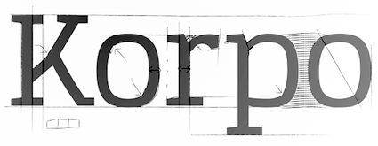 [MyFonts]
[More] ⦿
[MyFonts]
[More] ⦿
|
Matus Durcik
|
 Zvolen, Slovakia-based designer of the angular German expressionist typeface Sirion (2016). [Google]
[More] ⦿
Zvolen, Slovakia-based designer of the angular German expressionist typeface Sirion (2016). [Google]
[More] ⦿
|
Maxime Vanbrugghe
|
 Illustrator from Paris, Toulouse and/or Pau, France. He created the prison wall writing font Délivrance (2012) for a DVD cover for the film Seven. In 2013, Maxime created the angular German expressionist typeface family Red Bone.
 Behance link. [Google]
[More] ⦿
|
Michael Scarpitti
|
 Mike graduated from Ohio State University with a degree in philosophy. Prolific Columbus, OH-based designer (b. Columbus, OH) whose fonts are mainly available through Scriptorium. Many of his fonts were influenced by roman inscriptional or Trajan types. These include Caesario (1993, a Trajan column font based on Goudy's drawings from 1936), Minerva (1993), Falconis and Vespasiano. Other typefaces with ancient origins include DeBellis, Pomponianus, Praitor, Jerash (1993, with Nalle), Macteris Uncial (1993), Antioch (1993), and Corbei Uncial.
 He prepared a set of fonts based on a medieval Latin British manuscript (Pontifica, 1999) and another one called Orlock (1993), a linocut style typeface based on the lettering in a poster for the German German expressionist silent film Nosferatu. Pontifica was redesigned in 2009 based on the source manuscripts from the Papal Archive. He writes: Pontifica is an example of protogothic calligraphy, a style developed at the monestery of St. Gall in the 12th century to replace Carolingian minuscule with a more efficient and compact system of lettering. Ultimately it became the progenitor of the gothic lettering styles of the late Medieval period. View Michael Scarpitti's typefaces. [Google]
[MyFonts]
[More] ⦿
|
Michael Wallner
[The Type Fetish]
|
 [MyFonts]
[More] ⦿
[MyFonts]
[More] ⦿
|
Michel Derre
|
Typography and calligraphy teacher at The ACT (Atelier de Création Typographique) of Ecole superieure Estienne (18 boulevard Auguste-Blanqui, 75013 Paris). In 2014, with the help of the FontYou crew, he published the calligraphic rustic German expressionist blackletter style typeface Algo FY. Michel Derre and Julien Prez jointly won the Bronze Medal in the Latin category for Abelha in 2016 at the Morisawa Type Design Competition 2016. Old URL. [Google]
[MyFonts]
[More] ⦿
|
Miguel Angel Hernández Montoya
|
 Miguel Hernandez is a graphic designer, type designer, illustrator and teacher in Santiago de Chile. Born in 1977 in Concepcion Chile, he studied Graphic Design at Universidad del BioBio State University in Chillan, Chile. He currently teaches Typography at Universidad Diego Portalesand and Universidad de las Americas in Santiago de Chile. Miguel contributed greatly to the early success of the Chilean type foundry Latinotype which he cofounded in 2007 with Felipe Soto in Concepción, Chile. In 2011, he cofounded Los Andes Type. Some time in or just before 2015, he broke his relationship with Latinotype. In 2015, he set up ABC Alphabets by Chileans together with Tania Chacana. In 2020, Joaquin Contreras and Miguel Hernandez Montoya set up Archetypo.xyz from their new base in Germany. His typefaces:
 - AA Actual Mono (2020) A monospaced typeface family in 10 styles by Joaquin Contreras and Miguel Hernandez Montoya. .
- Arquitecta (2014, Latinotype), Arquitecta Standard (Latinotype), Arquitecta Office (Latinotype).
- The Google Web Font Ceviche One (2011). This is an angular yet curvy extra black expressionist sans serif type.
- Chela One (2012). A bold condensed brush script, free at Google Web Fonts.
- Fatta (2011, Los Andes). Round and fat.
- Fiancé (2011, Sudtipos). A fat signage typeface.
- Paro (2021). A condensed sans with some oomph; by Miguel Hernandez and Miguel Hernandez Montoya at Frutitype.
- Lolita (2012, Latinotype). A playful rounded sans family.
- Mija (2011, Latinotype). Inspired by vernacular signs.
- Patagon (2011, Latinotype): a rounded wood-inspired poster typeface done with Daniel Hernandez and Luciano Vergara.
- Sail (2012). A didone script.
- Sofia (2012). An upright script, free at Fontsquirrel.
- Texta (2014, Latinotype), Texta Narrow (Latinotype). a geometric sans for everyone.
- Tikal Sans (2012, Latinotype).
- Uomo (2014, with Tania Chacana) is a contemporary typographic system that explores the geometric sans style and Italian art deco in combinations of four widths and three weights.
Before Latinotype, Miguel Hernandez created many pixel typefaces. The typefaces made in that period before 2007 include: |
Muhammad Husni Haikal
[Graphicfresh (was: Sameeh Store, or Sameeh Media)]
|
 [MyFonts]
[More] ⦿
[MyFonts]
[More] ⦿
|
Muhammad Panji
[Sipanji (was: Straightwell)]
|
[MyFonts]
[More] ⦿
|
MyFonts: German expressionism
|
Typefaces deemed to represent the German expressionist movement by the users of MyFonts. [Google]
[More] ⦿
|
Nick Curtis
[Nick Curtis: German expressionist typefaces]
|
[More] ⦿
|
Nick Curtis: German expressionist typefaces
[Nick Curtis]
|
Nick Curtis created Holofernes NF in 2007. He writes: The raw emotional energy of German Expressionism is evident in this font, based on Judith Type, designed by C. H. Kleukens in 1923. [Google]
[More] ⦿
|
NREY
[Andriy Dykun]
|
 Makeevka, Donetsk, Ukraine-based designer of these typefaces in 2017: Vector Waves, Quasimodo (a free spurred and curvy decorative display typeface), Courtney (monoline script), Lumberjack (blackletter; see also Lumberjack Zombie in 2019), Marvin (a 10-font Marvin Heemeyer-inspired bulldozer and wrench font family with a free heavy slab serif), Awakening (signage script), Bang Bang, Round Compound, Rot Shield (blackletter), Rust (spurred), Furious, Dry Brush, Balalaika (Cyrillic emulation typeface), Moustache, Barbara (script), Arigato, The Pontifice (blackletter), Amsterdam, Megapolis (inline), Megapolis Black Bold (free, for Latin and Cyrillic), Phoenix Gothic, Brush Pen, Nround (rounded sans), DieCunst (free connected script).
 Typefaces from 2018: Fontuna (+stencil), Sansterdam (a geometric condensed grotesk with a few deco styles), Ethna (a fashion mag sans typeface family), Voguer Sans (a free Latin / Cyrillic display typeface with fashion applications in mind), Ravenholm (an expressionist blackletter), Jorick (vintage, Latin and Cyrillic), Ultravog and Ultravog Glitch Black (extreme contrast stencil styles: free), Walpurgis Night, Voguer (a high-contrast fashion mag font), Voguer II (didone-inspired, accompanied by a script typeface). Typefaces from 2019: Anicon Sans, Anicon Slab, Thephir (a variable cursive typeface), Oblique Rain (monoline script), Skiff (a quaint almost painted sans), Cadency (a monoline script), Waymar (Serif and Script font duo; include the textured caps typeface Waymar Ornate and the blackboard bold style Waymar Outline), Phagoth (blackletter), Gunhill (a vintage font family that includes blackboard bold styles), Heartland (Script & Sans), Marvin Slab. Typefaces from 2020: Calmius, Calmius Sans. Calmius Sans has Oppo (reverse contrast), Low and High (Peignotian) subfamilies, all experiments on contrast. Typefaces from 2021: Quartell Round (a squarish typeface), Asterlight (a steampunk font), Barosa (inspired by the slavonic style, all glyphs in this typeface have the same height). Graphicriver link. Behance link. Newest Behance link. Dafont link. [Google]
[MyFonts]
[More] ⦿
|
Oban Design Studios
[Oban Jones]
|
Chester, England and Toronto, Canada-based designer of the free copperplate sans typeface High Life (2017), the hand-crated typeface Simpler Times (2017), the German expressionist typeface Bedtime Story (2017), and the free beatnik font Lost Childhood (2017). In 2018, he published McJinnon Brush (a dry brush typeface). Typefaces from 2019: Popcorn Time (free). [Google]
[More] ⦿
|
Oban Jones
[Oban Design Studios]
|
[More] ⦿
|
Open City Design
[Phil MacIsaac]
|
 Charlottetown, Prince Edward Island-based designer of the free rounded retro typeface Narwhal (2018), the expressionist blackletter typeface Krautrock (2018), the free blackletter typeface Scotland (2018) and the free handcrafted typeface Soviet League (2018).
 Free typefaces from 2019: Norilsk, Chernobyl (Cyrillic simulation), Kaiser (a rounded blackletter), Campaign, Revolucion (constructivist), Oligarchy, Contraband (a free monoline script), Viking, Myrkvior (rune emulation), Vintage74, Art Nuvo (psychedelic, art nouveau). Typefaces from 2020: Vanity (a free German expressionist typeface), Nordic Club (a national park typeface), Shogun (a gaspipe font), Contraband (a monolinear font duo), Pariah (a rounded heavy blackletter). Dribble link. Open City Design link. [Google]
[More] ⦿
|
Oscar Fernando Guerrero Cañizares
[Sumotype Foundry]
|
 [MyFonts]
[More] ⦿
[MyFonts]
[More] ⦿
|
Oskar Kokoschka
|
Oskar Kokoschka (b. 1886, Pöchlarn, Austria, d. 1980, Montreux, Switzerland) was an Austrian artist, poet and playwright best known for his expressionistic portraits and landscapes. Deemed a degenerate by the Nazis [Kokoschka had commissioned a life-sized sex doll in 1918 which he destroyed during a party], he fled to the United Kingdom in 1938, and lived in Ullapool, Scotland during the war. He became a British citizxen in 1946 and would only regain Austrian citizenship in 1978. He settled and died in Switzerland though. Typefaces based on his lettering include Grafiker (2013, a brush typeface loosely based on the work of designers Oskar Kokoschka (1886-1980) and Jean Carlu (1900-1997)), and Kokoschka (2012, Ricardo Marcin and Erica Jung). Viennese Secession link. [Google]
[More] ⦿
|
Oven Foundry
[Manuele Mascheroni]
|
Manuele Mascheroni is a freelance designer and founder of Oven Foundry, born in 1988 with Italian and Belgian origins. While based in Bologna for his MA degree in Design Management, he designed the German expressionist typeface Weiss (2013) and Explorer (2013: a grotesk). Earlier, he created the interesting blackboard bold typeface Lione (2010, free at Dafont). Other typefaces include Bitto, Clemens, Meander, Norma, Occupied, Oven, Wildness. Behance link. Cargo collective link. [Google]
[More] ⦿
|
Overtone
[Rasmus Lund Mathisen]
|
 Rasmus Lund Mathisen is a prolific Danish type designer who lived in Copenhagen. At the School of Design of KAKD (The Royal Danish Academy of Fine Arts), he obtained a BA (2008-2011) and an MA (2011-2014). After graduation Rasmus joined Overtone in Aarhus. Overtone specializes in branding and corporate type design.
 His typefaces include: - Nima. A free slab serif.
- Beika, Beika Leika. Free sans family.
- Bila. An angular German expressionist typeface.
- Dada. A stencil face.
- Enno. A lava lamp typeface.
- Cela.
- OLEW. A DIN-like technical typeface.
- At Overtone, and in cooperation with DR Design, Rasmus developed the bespoke sans type family DR Publik in 2019 for The Danish Broadcasting Corporation. DR Publik will be used uniformly on TV channels, streaming platforms, news services, radio channels, websites and apps. This classy Scandinavian typeface family is characterized by nearly monolinear stroke widths and horizontal or vertical terminals.
[Google]
[More] ⦿
|
P22 Type Foundry
[Richard Kegler]
|
Richard Kegler's fun Buffalo-based foundry, which he founded in 1995 together with his wife, Carima El-Behairy. Currently, on staff, we find type designers James Grieshaber and Christina Torre. In 2004, it acquired Lanston Type. P22 has some great unusual, often artsy, fonts. In 2021, P22 jopined The Type Founders as a distribution outlet. The fonts are: Industrial Design (an industrial look font based on letters drawn by Joseph Sinel in the 1920s---this font is free!), LTC Jefferson Gothic Obliquie (2005, free), Sinel (free), P22Snowflakes (free in 2003 and P22 Snowflakes (retail) in 2020, finishedd by Richard Kegler and Terry Wüdenbachs), Acropolis Now (1995, a Greek simulation typeface done with Michael Want), P22 Albers (1995; based on alphabets of Josef Albers made between 1920 and 1933 in the Bauhaus mold), Arts and Crafts (based on lettering of Dard Hunter, early 1900s, as it appeared in Roycroft books), Ambient, Aries (2004, based on Goudy's Aries), Arts and Crafts ornaments, Atomica, Bagaglio (Flat, 3D; in the style of Il Futurismo), P22 Basel Roman (2020, Richard Kegler: an update of a 2015 typeface, P22 Basel, based on a garalde font used by Johannes Herbst (aka Ioannes Oporinus) in 1543 to publish Andreas Vesalius' On the Fabric of the Human Body (De humani corporis fabrica) in Basel), Bauhaus (Bauhaus fonts based on the lettering of Herbert Bayer), Bifur (2004, Richard Kegler, after the 1929 original by Cassandre), Blackout, P22 Brass Script Pro (2009, Richard Kegler; based on an incomplete script fond in a booklet from Dornemann&Co. of Magdeburg Germany, ca. 1910 entitled Messingschriften für Handvergoldung; for years, P22 and MyFonts claimed that Michael Clark co-designed this, but Michael does not want any credit, as he did only about 20 letters), Cage (based on handwriting and sketches of the American experimental composer John Cage), P22 Casual Script (2011, Richard Kegler, a digitization of letters by sign painter B. Boley, shown in Sign of the Times Magazine), Cezanne (Paul Cezanne's handwriting, and some imagery; made for the Philadelphia Museum of Art), Child's Play, Child's Play Animals, Child's Play Blocks, Constructivist (Soviet style lettering emulating the work of Rodchenko and Popova), Constructivist extras, Czech Modernist (based on the design work of Czech artist Vojtech Preissig in the 20s and 30s), Daddy-o (Daddy-o Beatsville was done in 1998 with Peter Reiling), Daddy-o junkie, Da Vinci, Destijl (1995, after the Dutch DeStijl movement, 1917-1931, with Piet Mondrian inspired dingbats; weights include Extras, P22 Monet Impressionist (1999), Regular and Tall), Dinosaur, Eaglefeather, Escher (based on the lettering and artwork of M.C. Escher), P22 FLW Exhibition, P22 FLW Terracotta, Folk Art (based on the work of German settlers in Pennsylvania), Il futurismo (after Italian Futurism, 1908-1943), Woodtype (two Tuscan fonts and two dingbats, 2004), P22 Woodcut (1996, Richard Kegler: based on the lettering carved out in wood by German expressionists such as Heckel and Kirchner), Garamouche (2004, +P22 Garamouche Ornaments; all co-designed with James Grieshaber), GD&T, Hieroglyphic, P22 Infestia (1995), Insectile, Kane, Kells (1996, a totally Celtic family, based on the Book of Kells, 9th century; the P22 Kells Round was designed with David Setlik), Koch Signs (astrological, Christian, medieval and runic iconography from Rudolf Koch's The Book of Signs), P22 Koch Nueland (2000), Larkin (2005, Richard Kegler, 1900-style semi-blackletter), London Underground (Edward Johnston's 1916 typeface, produced in an exclusive arrangement with the London Transport Museum; digitized by Kegler in 1997, and extended to 21 styles in 2007 by Paul D. Hunt as P22 Underground Pro, which includes Cyrillic and Greek and hairline weights), Pan-Am, Parrish, Platten (Richard Kegler; revised in 2008 by Colin Kahn as P22 Platten Neu; based on lettering found in German fountain pen practice books from the 1920s), P22 Preissig (and P22 Preissig Calligraphic, 2019), Prehistoric Pals, Petroglyphs, Rodin / Michelangelo, Stanyan Eros (2003, Richard Kegler), Stanyan Autumn (2004, based on a casual hand lettering text created by Anthony Goldschmidt for the deluxe 1969 edition of the book "...and autumn came" by Rod McKuen; typeface by Richard Kegler), Vienna, Vienna Round, Vincent (based on the work of Vincent Van Gogh), Way out West. Now also Art Nouveau Bistro, Art Nouveau Cafe and the beautiful ornamental font Art Nouveau Extras (all three by Christina Torre, 2001), the handwriting family Hopper (Edward, Josephine, Sketches, based on the handwriting styles of quintessential American artist Edward Hopper and his wife, Josephine Nivison Hopper, and was produced in conjunction with the Whitney Museum of American Art), Basala (by Hajime Kawakami), Cusp (by James Grieshaber), P22 Dearest (calligraphic, by Christina Torre and Miranda Roth), Dwiggins (by Richard Kegler), Dyrynk Roman and Italic (2004, Richard Kegler, after work by Czech book artist Karel Dyrynk), Gothic Gothic (by James Grieshaber), La Danse (by Gábor Kóthay;), Mucha (by Christina Torre), Preissig Lino (by Richard Kegler), P22Typewriter (2001, Richard Kegler, a distressed typewriter font), the William Morris set (Morris Troy, Morris Golden, Morris Ornaments, based up the type used by William Morris in his Kelmscott Press; 2002), Art Deco Extras (2002, Richard Kegler, James Grieshaber and Carima El Behairy), Art Deco Display, the Benjamin Franklin revival font Franklin's Caslon (2006), Dada (2006) and the Art Nouveau font Salon (bu Christina Torre). In 2006, Kegler added Declaration, a font set consisting of a script (after the 1776 declaration of independence), a blackletter, and 56 signatures. Many of the fonts were designed or co-designed by Richard Kegler. International House of Fonts subpage. Lanston subpage (offerings as of 2005: Bodoni Bold, Deepdene, Flash, Fleurons Granjon, Fleurons Garamont, Garamont, Goudy Thirty, Jacobean Initials, Pabst, Spire). Bio and photo. In-house fonts made in 2008 include Circled Caps, the Yule family (Regular, Klein Regular, Light Flurries, Heavy, Klein heavy, Heavy Snow, Inline; all have Neuland influences). Kegler / P22 created a 25-set P22 Civilité family in 2009 based on a 1908 publication from Enshedé, the 1978 English translation by Harry Carter, and a 1926 specimen also from Enshedé. P22 Declaration (Script, Signatures, Blackletter, 2009) is based on the lettering used in the 1776 Declaration of Independence. At ATypI 2004 in Prague, Richard spoke about Vojtech Preissig. Speaker at ATypI 2010 in Dublin, where he presented Making Faces: Metal Type in the 21st Century about which he writes: This film has the dual aim of documenting the almost-lost skill of creating metal fonts and of capturing the personality and work process of the late Canadian graphic artist Jim Rimmer (1931-2010). P22 type foundry commissioned Mr. Rimmer to create a new type design (Stern) that became the first-ever simultaneous release of a digital font and hand-set metal font in 2008. At ATypI 2011 in Reykjavik, he showed Making Faces. Typefaces from 2014: LTC Archive Ornaments (Richard Kegler and Miranda Roth). Typefaces from 2020: Showcard Script (by Terry Wüdenbachs, based on an original of Beaufont at the Hamilton Wood Type Museum, custom designed by the Morgan Sign Machine Company of Chicago). Typefaces from 2021: P22 Glaser Houdini (a layerable family, after Glaser's Houdini from 1964), P22 Glaser Babyteeth. Kegler writes: In 2019, P22 Type Foundry met with Milton Glaser (1929-2020) to initiate the official digital series of typefaces designed by Glaser in the 1960s and 70s. P22 Glaser Babyteeth is the first family released in the series. Milton Glaser's inspiration for his Babyteeth typeface came from a hand painted advertisement for a tailor he saw in Mexico City. He was inspired by that E drawn as only someone unfimilar with the alphabet could have concieved. So he set about inventing a completelly ledgible alphabet consistant with this model. P22 Glaser Babyteeth was based on original drawings and phototype proofs from the Milton Glaser Studios archives. Over the years there have been many typefaces that borrowed heavily from the Glaser designs, but these are the only official Babyteeth fonts approved by Milton Glaser Studio and the Estate of Milton Glaser. The solid and open versions are designed to overlap for two-color font effects and can even be mixed and matched for multi layer chromatic treatments. In 2021, he published the 3d art deco shadow font P22 Glaser Kitchen which is based on Big Kitchen (1976). MyFonts interview. View Richard Kegler's typefaces. View the IHOF / P22 typeface library. [Google]
[MyFonts]
[More] ⦿
|
Pablo Alaejos Perez
|
 Type designer in Madrid, Spain, b. Barcelona, 1982. In 2006, he moved to Buenos Aires. Pablo Alaejos's graduation typeface in 2012 at FADU UBA (University of Buenos Aires) is the angular and sturdy Landa, which has Venetian and German expressionist roots. Landa was published in 2017 by Sudtipos as a 12-style typeface family.
 After some work experience in Buenos Aires, he returned to Spain. Nowadays Pablo is living in Madrid, works as Creative Director at Picnic and teaches editorial design at the Istituto Europeo di Design. [Google]
[MyFonts]
[More] ⦿
|
Patricio Truenos
|
 Chilean type designer. In 2016, Without Foundry published his German expressionist (or German beer label) font Lupulus, which was inspired by Rudolf Koch's Neuland. His Canilari (2015) is described by Patricio as having an intense and consistent personality, thanks to its angular, almost Czech, design. It is best suited for headlines, but can also be used for running text. In 2018, it appeared as a font at W Foundry.
 Typefaces from 2017: Juno (a creamy script), Akira (a German expressionist typeface done with Rodrigo Araya Salas at W Foundry). Typefaces from 2018: Cannon (a neo-grotesque sans, W Foundry). [Google]
[MyFonts]
[More] ⦿
|
Paul Bokslag
[Font Studio Four]
|
 [More] ⦿
|
Paul James Lloyd
[Greater Albion Typefounders (or: GATF)]
|
 [MyFonts]
[More] ⦿
[MyFonts]
[More] ⦿
|
Peter Wiegel
[CAT Design Wolgast]
|
 [More] ⦿
|
Petra Heidorn
[CybaPeeCreations (or: Typoasis)]
|
 [More] ⦿
|
Phil MacIsaac
[Open City Design]
|
 [More] ⦿
|
Pillcrow
|
Wroclaw, Poland-based design group consisting of Maciej Kodzis, Grzegorz Owczarek, Ewa (Dominika) Sadowska, Marta Moskwa, and Michal Pawlowski. Together, they designed the free typeface family Pischinger (2016), which consists of PischingerFraktur-Basic, PischingerFraktur-InlineGlow, PischingerFraktur-NeonInline, PischingerFraktur-NeonOutline, PischingerFraktur-OutlineNeon, PischingerGrotesk-Basic, PischingerGrotesk-Fontex, PischingerGrotesk-Fontpol, PischingerGrotesk-InlineGlow, PischingerGrotesk-NeonInline, PischingerGrotesk-NeonOutline, PischingerGrotesk-OutlineGlow, and PischingerGrotesk-Shadow. Designed for Katowice City, the project was supervised by Verena Gerlach. They also made the vintage factory signage typeface Nadodrze (2016). Behance link. [Google]
[More] ⦿
|
Posterizer KG
[Lazar Dimitrijevic]
|
 Lazar Dimitrijevic, who set up the foundry Posterizer KG, was born in 1981 in Bajina Basta, Serbia, and lives in Kragujevac, Serbia. He obtained a Master of Graphic Design from the Department of Graphic Design, FILUM Kragujevac, Serbia. Presently, he is art director at Design Studio BOX.
 His first font, Art Decor (2009), is a brush typeface in the style of Treefrog. Koma Latin (2009) is a roughly outlined script face. Bajka (2010) is a wonderfully entertaining Baskerville family (Latin, Cyrillic, dingbats, ornamental caps) made for children's fairy tale books. Scarface (2010) is a sublime scratchy hand ideal for torture movies. Kaligraf Latin (2010) is a rough-edged calligraphic face. In 2012, he published Collage BB (hand-drawn didone), the heavy Egyptian typeface Posterizer KG at DizajnDesign. This font was created for Celebration of 5 years anniversary of Design Studio Box from the city of Kragujevac (KG), the industrial city of Serbia. Posterizer KG (+Rounded) contains all the Latin and Cyrillic glyphs. Posterizer KG Inline and Posterizer KG Rough (a letterpress emulation version) were added in 2013. Posterizer KG Sketch followed in 2015. Still in 2012, he designed the ink splatter typeface Oops, and the calligraphic typefaces Cal Humanistic Cursive (a renaming of Cal Humanist Corsiva, posibly under pressure from Monotype), Cal Humanist Minuscule and Cal Humanist Corsiva. He also creates stunning calligraphic works. Cal Roman Capitals (2012) is a Trajan typeface. In the same calligraphic series, we find Cal Rustic Capitals (2012), Cal Square Capitals (2012), and Cal Uncial (2012). Typefaces from 2013: Posterizer KG Sketch, Cal Expressive, Cal Bakerly (calligraphic script in the style of Arthur Baker), Cal Cursive Roman, Cal Rustic Black, Cal Neuland Bold (after the German expressionist typeface Neuland by Rudolf Koch), Cal Gothic Bastard, Cal Gothic Fraktur, Cal Fraktur Modern, Cal Rotunda, Cal Gothic Textura, Cal Carolingian Minuscule, Cal Carolingian Gothic, Cal Insular Minuscule, Cal Insular Majuscule, Cal Beneventan Minuscule. Typefaces from 2014: Cal Neuland Shadow, Mozzart Sketch (a decorative hand-sketched version of Mozzart Sans, a slightly rounded, neo-Grotesque corporate font, that was originally created for the Belgrade-based company Mozzart DDO; followed in 2015 by Mozzart Rough). In 2015, he designed Drina (brush typeface), My Way (a TreeFrog style handwritten face). Typefaces from 2016: Bali Beach (brush script), Omorika (a rustic handcrafted sketched serif typeface). Typefaces from 2017: Workshop Brush (dry brush), Workshop Marker, Workshop Pencil. Typefaces from 2018: Miro (after the lettering in Joan Miro's art), Ernest (based on the hand of Ernest Hemingway), Natron (rounded condensed sans; +Pictograms). Typefaces from 2019: My Tara (a thick brush script), Natron Rough, Kalli Hand, Kalli Sketch. Typefaces from 2020: Panorama KG (based on the principle nothing below the baseline), Hubble (a rhythmic display typeface with thorny serifs), Liceum (a rhythmic calligraphic script for Latin and Cyrillic), Cal Fraktur Brush, Cal Roman Black, Cal Roman Modern, Cal Uncial Rough. Typefaces from 2021: PKG Roman Capitals (Trajan capitals with a hand-drawn finish, for Latin and Cyrillic), Monodia (a slab serif and its glitched version). [Google]
[MyFonts]
[More] ⦿
|
Postsadness Fonts
|
A small very selective but interesting archive. It has SPADORE by Sebastian Boschert (1998, a Novella lookalike), PS Bluegum Forest by Tris Nguyen for Postsadness, 1998: better than Burton's Nightmare, and very close to Solotype's Glorietta), Mayonaise by ¡eM pleH (1998), InfiniteDingbats by Shaun Kardinal (1998), SantasSleigh (a Novella lookalike), and Mayonaise (1998) and Mayo (1998) by ¡eM pleH (1998). Smashing Pumpkins fonts are archived here as well: pick up Graceful Swans by Shaun Kardinal, based on Constructivist from P22, Bank Gothic, BatmanForever, Intimacy, Graphis, LatinExtraCondensed, ElectraCondensed (a Font Bureau Romeo Medium Condensed lookalike also known as FZ Basic---of course, Electra itself is Winkow's original on which Romeo was based), Tonite (Cochin Italic lookalike), Infinit Dingbats (1998) and VI University. [Google]
[More] ⦿
|
Raban Panton
[DecaType (was: Decavantona, or: Contra Studio or Panton Labs)]
|
[More] ⦿
|
Radka Bartosova
|
Hradec Kralove, Czechia-based designer of the angular expressionist typeface Johana (2015) and of the signage typeface Flaga (2014), which is inspired by railroad warning signs. [Google]
[More] ⦿
|
Rafael Jordán/0Oliver
|
 Rafael Jordan Oliver, aka Barry Bianco, is a graphic designer and calligrapher in Valencia, Spain, b. 1983, Alzira. Graduate of EASD in Valencia, class of 2013. His typefaces:
 - A geometric Futura / Bauhaus style typeface family called Geometric Obsession (2012).
- The curly all-caps typeface Nord Type, which is based on the modern letters of Gregorio Muñoz at Valencia's train station L'Estació del Nord. It was his graduation project at EASD.
- The commercial didone typeface Didac (2014). The Italic followed in 2015-2016. Buy it here.
- At Type@Paris in 2015, he designed Carmen Maria (named after his wife), a sharp-serifed fashion mag typeface rooted in Carolingian calligraphy.
- Las Naves Condensed (2017). A grotesque typeface designed under the art direction of Sebastian Alos for "Las Naves" foundation.
- Bantha Sans and Bantha Serif (2017). Sturdy multi-purpose typefaces.
- Bianco Slab (2017, Fontstore).
- Brava Slab (2018). Almost monolinear, with Latin curves in the italics. Followed in 2019 by Brava Sans.
- Ostium (2019). An inline unicase font with proportions close to classical romans.
- Carmensin (2020). A humanist text family characterized by smooth curves, a large x-height and open counters. It includes a Display subfamily and some stencil styles.
- Redoneta (2020). A 12-style geometric sans. Followed in 2022 by Redoneta Rounded (12 styles).
- Tannen (2021). A layerable blackletter family, and an interpretation of Erich Meyer's Tannenberg (1933-1935).
- Tannen (2021). A layerable German expressionist blackletter family, and an interpretation of Erich Meyer's Tannenberg (1933-1935).
[Google]
[MyFonts]
[More] ⦿
|
Rasmus Lund Mathisen
[Overtone]
|
 [More] ⦿
|
Red Rocket Signs
[Rodney Vicik]
|
 Rodney Vicik began his career as a sign painter in 1980. He ran Beach Signs in Hampton, VA. In 2020, he set up the type foundry and lettering shop Red Rocket Signs, which specializes in Americana and nostalgia. His typefaces:
 - Dietrich Deco (2020). He writes: It is based on theatre posters that advertised a 1930 Marlene Dietrich movie. Designed by a skilled sign painter, Dietrich Deco has all the nuances of real brush lettering.
- Fats Deco (2020). An art deco typeface loosely based on H.C. Martin's Modern Thick and Thin. Martin referred to his typeface as the blood cousin of Broadway.
[Google]
[MyFonts]
[More] ⦿
|
Renae Hill
|
Graphic designer in Ellicott City, MD, who graduated from Monmouth University. Caligari (2011) is an angular typeface that was inspired by the 1920 silent German film, The Cabinet of Dr. Caligari (Das Cabinet des Dr. Caligari). [Google]
[More] ⦿
|
Richard Kegler
[P22 Type Foundry]
|
 [MyFonts]
[More] ⦿
[MyFonts]
[More] ⦿
|
Rodney Vicik
[Red Rocket Signs]
|
[MyFonts]
[More] ⦿
|
Rubén Prol
[Ipanema Gráfica]
|
 [MyFonts]
[More] ⦿
[MyFonts]
[More] ⦿
|
Rudolf Koch
[Koch Neuland]
|
[More] ⦿
|
Rudolf Koch
|
 Great German type designer (b. Nürnberg, 1876; d. Frankfurt, 1934) who worked mainly at the Klingspor foundry. He founded the Offenbach Werkstatt in 1921.
 Many of his typefaces can be classified as German expressionist. These include Kabel (a sans), and Neuland (an angular poster face). An early Nazi sympathizer and supporter, Koch's fonts were heavily used by the Nazi regime. This page lists 158 royalty-free Christian symbols drawn by Rudolf Koch, a religious Lutheran, with the collaboration of Fritz Kredel (1900-1973) (see also here). His typefaces, with notes on digitizations: - Claudius (1931-1934, 1937, D. Stempel AG). His son Paul Koch followed Rudolf's instructions to make one weight in 1931-1934. Klingspor completed it in 1937. Delbanco (as DS-Claudius) and Klaus Burkhardt (1991) digitized it. Based on the latter, Manfred Klein made ClaudiusImperator (2001). Dieter Steffmann made Claudius, ClaudiusAlternate, and ClaudiusHeadline in 2003. Ralph M. Unger published Claudius in 2010.
- Deutsche Anzeigenschrift (1913-1914), Deutsche Anzeigenschrift schmal (1916-1923, D. Stempel AG). revivals include SchmaleAnzeigenschrift (2002) and SchmaleAnzeigenschriftZier (2002) by Dieter Steffmann, and Schmale Anzeigenfraktur (2009) by Ralph Unger. Later weights by Koch: Deutsche Anzeigenschrift eng (1923) , Deutsche Anzeigenschrift breit (1923, D. Stempel AG) , Deutsche Anzeigen. schmalhf. (1934, D. Stempel AG).
- Deutsche Schrift (1908-1921), consisting of Deutsche Schrift schmal (1913, Gebr. Klingspor), Deutsche Schrift fett (1910, Gebr. Klingspor), Deutsche Schrift mager (1918, Gebr. Klingspor) and Deutsche Schrift halbfett (1912, Gebr. Klingspor). Also known as Koch Fraktur. Revived by Gerhard Helzel as KochFrakturSchmaleHalbfette (2000), by Christian Richter as Rudolf Koch (2003), and by Delbanco as DS Koch Fraktur. It was a popular family, known in England as Oxford. For comparison, here is a phototype version. Deutsche Schrift fett, aka Fette Deutsche Schrift, was revived by Dieter Steffmann in 2002 (as Fette Deutsche Schrift) and by Alter Littera in 2012 as Deutsche Schrift.
- Deutsche Schrägschrift (1912, Gebr. Klingspor).
- Deutsche Werkschrift (1934, D. Stempel AG) and Deutsche Werkschrift hablfett (1934, D. Stempel AG): This is really the "mager" version of Deutsche Anzeigenschrift. Delbanco revived it digitally as DS Deutsche Werkschrift.
- Deutsche Zierschrift (1919-1921, Gebr. Klingspor). Revived as Dutesche Zierschrift (2002) and Zierinitialen> (2002) by Dieter Steffmann. See also Delbanco's DS Deutsche Zierschrift.
- Frühling (1913-1917, Gebr. Klingspor). A blackletter that seems to have been executed with a shaky hand---it is definitely one of Koch's weakest and ugliest designs. Incredibly, the revival gang was still eager to spring into action: it was revived and interpreted by Frantisek Storm in Monarchia. See also Delbanco's DS Frühling. For another revival, see Next Stringtime by Manfred Klein (2003). Frühling is sometimes called Kartenschrift.
- Geschriebene Initialen zur Grotesk (1930, Gebr. Klingspor).
- Grotesk Initialen (1933, Gebr. Klingspor). Paul Hayden Duensing made Koch Initials (metal).
- Holla (1932, Gebr. Klingspor). Digitized by Dieter Steffmann in 2001.
- Jessen Schrift (1924-1930) is a hybrid of gothic (blackletter) minuscules and roman capitals (including the characteristic Basque capital A) designed and cut without preliminary drawings in Offenbach am Main by Rudolf Koch for The Four Gospels, which was printed at the Klingspor press in 1926 and published by Koch himself. Formerly named Bibel-Gotisch, the type was developed between 1924 and 1929 as Peter Jessen Schrift and released as Jessen in several sizes by the Klingspor foundry in 1930. See DS-Jessen-Schrift (1998, Christian Spremberg), Peter Jessen Schrift (Delbanco), Jessica Plus (2002) and JessicaSerif (2003) by Manfred Klein, Peter Jessen Schrift Pro (Softmaker, 2016), and Jessen Schrift (2004, Ralph M. Unger). Jessen Mittel 14 and Jessen Cicero 12 were developed by Alexis Faudot and Rafael Ribas in 2016 during an ANRT workshop in Valence, France.
- Kabel (1927, Gebr. Klingspor), Klingspor's competing design for Paul Renner's Futura. The most famous digitization of this Koch Sans family is by Victor Caruso in ITC Kabel (1976), and with its exaggerated x-height, much larger than the original, it is a poor bastard. The modern Bitstream version is called Geometric 231. Softmaker calls it Koblenz. Poster by Jorge Martinez. At Linotype, Marc Schütz designed the large family Neue Kabel (2016) that revives Kabel by making it more consistent. This version overshadows all previous digital versions or extensions of Kabel. Dates of the various weights: Kabel Kursiv (1929, Gebr. Klingspor), Kabel groß (1928, Gebr. Klingspor), Kabel Kursiv groß (1930, Gebr. Klingspor), Norm Kabel (1930, Gebr. Klingspor): LinotypeLibrary, Kabel fett (1929, Gebr. Klingspor): LinotypeLibrary, Kabel schmal (1930, Gebr. Klingspor), Kabel schmalhalbfett (1929, Gebr. Klingspor).
- Koch Antiqua (or: Locarno) (1920-1922, Gebr. Klingspor). It was sold by Continental Type in the United States as Eve. This gorgeous tall-legged and flared typeface was designed in 1917, but cut in 1922. Koch Kursiv (1923, Gebr. Klingspor) is the Kursiv version of Koch Antiqua. See also Koch Kursiv groß (1929, Gebr. Klingspor) and Koch Antiqua fett (1926, Gebr. Klingspor: some give the date 1923-1924). Rivoli is a similar metal typeface. Digital versions include Rudolf Antiqua (2018, Now Type), Eva Antiqua, Eva SG (Spiece Graphics), Eva (Monotype), AIKochAntiqua (a multiple master font by Randall Jones for Alphabets Inc), Astaire Pro (2004, Bergslund Design, or Hackberry), Koch Altschrift (2004, Moorstation crew), Locarno (1985, Alan Meeks for Letraset), Kuenstler 165 (Bitstream), Koch Antiqua (Adobe, Linotype), Evadare (David Nalle), Hellen (2019, Genilson Lima Santos).
- Koch Kurrent (1933, Gebr. Klingspor). This is Koch's version of school scripts, a variant of his earlier proposal, Offenbacher Schrift (1927). It was only cut in 1935. See Rudolf Koch Kurrent at Delbanco .
- Koch Schrift (1909) is a Schwabacher first known as Neudeutsch and later as Koch Schrift. It was used by the Deutsche Reichsbahn, ca. 1930. For a digital revival, see, e.g., Koch Schrift (1998-2021) by Ingo Zimmermann.
- Marathon (1930-1938, Gebr. Klingspor). Digitized by Linotype in 2003 as Marathon LT (by Ute Harder, aka Frau Jenson), and by Softmaker a bit earlier. The best digital version is by the Koch Memorial team of Petra Heidorn under the name Romantha (a permutation of the letters) in 2003 (it preserves the original x-height better, for example).
- Maximilian Antiqua (1913-1917, Gebr. Klingspor). Digitization by Manfred Klein, who made Maximilian Antiqua (2003) and MaximilianAntiquaSmallCaps (2003). For an initial caps extension, see Typograf's Maximilian Antiqua Initialen (2015).
- Maximilian (Gotisch) (1914-1917, Gebr. Klingspor). Walden Font has a revival. See also Maximilian at Delbanco. Castletype made MaximilianCS. In 1995, Doug Olena revived it as Maximilian. Dieter Steffmann made Maximilian (2002) and Maximilian Zier (2002). Maximilian (2012) is due to Alter Littera. Drawings for Maximilian-Gotisch. Gerhard Helzel's revival from 1995. Stephen Miggas's revival is called Gothicus (2006).
- Neu Fraktur (1933-1934, Gebr. Klingspor): Koch's last Fraktur.
- Neuland (1923, Gebr. Klingspor) and Neuland licht (1928, Gebr. Klingspor), an outline version of Neuland. Neuland is all caps German expressionist typeface chiseled directly by Koch from metal. Copied by Monotype in 1929 as OthelloMT. Digitized by Linotype Library. Also digitized as Newland Black by Andrey Mel'man. In 1995, Doug Olena (Keystrokes) revived it as FFD Neuland (1995). A lower case and hair-serifed extension was created by Manfred Klein as On Kochs Roots (2002) and KochNeu-ExtraBlack (2003). Nick Curtis made Jungle Fever and Jungle Fever Shaded (2008) after Neuland. In 2010, Ian Lynam published yet another update, Neuerland. In 2013, Lazar Dimitrijevic created Cal Neuland Bold.
- Offenbach (1928-1934, Gebr. Klingspor). Made for display in church windows, Koch designed the "mager" weight (1931) and an uncial version. His student Hans Kühne finished the "halbfett" and the gothic after his death.
- Prisma (1928-1931, Gebr. Klingspor): A four-lined art deco face. Revived by Dieter Steffmann (2003-2004) as Prisma, and by Ralph Unger as Prisma Pro (2011). See also the 10-style typeface family LL Prismaset at Lineto (2003-2017, Mauro Paolozzi, James Goggin, Alex Rich, Arve Båtevik, and Raphael Koch).
- Stahl (1933-1939): Done with H. Kühne. Revived by J.F.Y.Daniel Gauthier (GautFonts) as StahlSteel (2003) and StahlSteelRiveted (2003).
- Wallau (1924-1932, Gebr. Klingspor), Wallau halbfett (1930, Gebr. Klingspor), Wallau fett (1935, Gebr. Klingspor), Wallau schmal (1934, Gebr. Klingspor). See Wallaby on the SoftMaker MegaFont XXL CD, 2002, or Wallau by Fraktur.de or DS Wallau by Delbanco, or Wallau (2012) by Alter Littera. Pictures by Dan Reynolds about Klingspor's Wallau speciman book (1939). Wallau, which comes in rotunda (Rundgotisch) and uncial, was named after Heinrich Wallau (1852-1925), a printer from Mainz. Originally, the typeface was going to be called Missale. Also revived by Dieter Steffmann (as WallauDeutsch-Bold (2002), Wallau Rundgotisch Heavy (2002), Wallau Rundgotisch OsF Heavy (2002), WallauUnzial-Bold (2002) and WallauZierBold (2002)) iand by PrimaFont.
- Wilhelm-Klingspor-Schrift. (1920-1926, Gebr. Klingspor): This was originally called Missal. To commemorate Wilhelm Klingspor, who died in 1925 from a war injury, it was renamed Wilhelm-Klingspor-Gotisch. Paul Hayden Duensing made a metal version under the latter name. Digitizations by Fraktur.de and Delbanco. See also Wilhelm-Klingspor-Schrift at LinotypeLibary, Wilhelm Klingspor Schrift (2012) by Alter Littera, Wilhelmschrift (2006) by Stephen Miggas, and Missal by Dieter Steffmann (2003). Matching decorative caps were made in 2004 by Paul Lloyd under the name Holzschnitt-Initialen.
- Zeppelin (1929, Gebr. Klingspor). This is a decorative (inline) version of Kabel. Revived as Zeppelin (2003, Dieter Steffmann) and Evadare (1993, David Nalle).
In 1984, Wolfgang Hendlmeier discussed the blackletter typefaces in Koch's oeuvre: A, B, C, D, E, F, G. Brief bio by Wolfgang Hindlmeier (1984). Koch's involvement in handwriting education in Germany led to these Schreibschrift examples from 1930 (also called Deutsche Verkehrsschrift), and to the development by Martin Hermersdorf of the Deutsche Schreibschrift for fourth graders in Bavaria in 1950. Wood engraving of Koch by Bernard Brussel-Smith. Publications by Rudolf Koch: - Die Schriftgießerei im Schattenbild, Offenbach 1918.
- Das Schreiben als Kunstfertigkeit, Leipzig 1921.
- Das ABC-Büchlein, Leipzig 1934.
- Das Schreibbüchlein, Kassel 1939.
- Klassiche Schriften.
- Das Zeichenbuch. This book contains 493 old-world symbols, monograms and runes and was reprinted in 1955 in the Dover Pictorial Archive Series as The Book of Signs.
- Das Blumenbuch.
References: - Gerald Cinamon: Rudolf Koch: Letterer, Type Designer, Teacher (2000, Oak Knoll Press and The British Library).
- Georg Haupt: Rudolf Koch der Schreiber, Leipzig 1936.
- Wilhelm H. Lange: Rudolf Koch, ein deutscher Schreibmeister, Berlin, Leipzig 1938.
- Oskar Beyer: Rudolf Koch. Mensch, Schriftgestalter und Erneuerer des Handwerks, Berlin 1949.
- Friedrich Friedl, Nicolaus Ott (Editor), Bernard Stein: Typography An Encyclopedic Survey of Type Design and Techniques Throughout History, Könemann Verlagsgesellschaft mbH.
Rudolf Koch's carved lettering inspired spin-offs like PGF Americas (2021, Pedro Gonzalez). FontShop link. Klingspor link. Biography by Nicholas Fabian. Bio at Linotype. Bio in German. The Koch Memorial page [now defunct] offered historical notes and many free revivals of his typefaces. View digital typefaces based on Rudolf Koch's work. [Google]
[MyFonts]
[More] ⦿
|
Ruth Lin
|
Graphic designer in Houston, TX, who created the wide wood emulation typeface Alpha (2017) and the angular, perhaps German expressionist, typeface Ulna (2017). Alpha and Ulna were created under the guidance of Font Bureau's Richard Lipton.Behance link. [Google]
[More] ⦿
|
Sharkshock
[Dennis Ludlow]
|
 Dennis Ludlow (Sharkshock Productions, Raleigh, NC) started making mostly free fonts in 1999. On August 28, 2001, Dennis announced that he would stop producing fonts, forever. To prove himself wrong, he became more prolific trhan ever, and ultimately started designing retail fonts as well.
 His early typefaces include Hot Pizza (2001), Hawaiian Punk, Royal Acidbath, Little Caesar, Subway, Holiday India, Mobsters, Dallas Cowboys (Western look, 2004), Dark Crystal, Queen of Camelot (2015), Green Eggs and Spam (2015), Ludlow Strong Ale (2015, German beer label font), Space Angel (2014), Electrox, Cowboys, Dolphins, Viking Stencil, Lexust (2002), Padaloma (2002), Fujita Ray (2002), Willy Wonka, Hursheys, Grinched (a Halloween or beatnik font), Honda, Busch Gardenz, Holiday India (2000), Simpsons, Blockbusted, IHOP, Chicken Fool A, Playtoy (2000: like the masthead of Playboy), Cowboys (2001), Dreamscar (2001, has a Cyrillic version), Mr. Goodbaur, Dr. Peppers, Oreos, Air Millhouse, Fruitopia, Raiders, TGI Friday, Jolly-Raunchy, Mouser, Pirate-Keg, Fujita Ray (2015), Modeccio (2015, art deco), Wendyville (2015, Western), Vonique 64 (2015, avant-garde style), Your Royal Majesty (2015, a unique blackletter-inspired vampire script), Hackney Block (2015), Thunder Lord (2015, an outlined variant of Raiderfont), Republica Minor (2015), News of the World (2015: a news headline font), TH3 Machine (2015), Funkrocker (2015, inky, grungy), Tiki Tropic (2015: a tiki font), TypoGraphica (2015, a strong geometric sans), Vonique 92 (2015, circle-based fashion sans), Reisenberg (2015, a black titling sans; v2.0 dates from 2018). There is also a medium-sized categorized archive, with subsections such as cartoon fonts and movie fonts. Typefaces from 2016: Twiddlestix, Konigsberg (rounded sans), Wicked Mouse (looney tunes typeface), Heathergreen (a tall condensed sans), Wonderbar (psychedelic), College Block (athletic lettering), Death Star, Ring of Kerry (uncial style), Blockletter (octagonal), Café Françoise, Cronus (round monoline sans), Suissnord (a wide sans display typeface), Grinched 2.0 (an update of Grinched), Red Seven (futuristic), Enchanted Land (derived from the blackletter genre), Freakshow (ornamental ransom note font), Deutschlander (a condensed sans for movie credits and similar applications). Typefaces from 2017: Lemonade Stand, Dark & Black, Hennigar (a heavy compact sans in the spirit of Impact), Durango Western, Banbury (a heavy display didone), United Kingdom (techno), Goldoni, Kingsmen. Typefaces from 2018: Bloomsburg (a 6-style organic sans; +Cyrillic), Stupid Meeting (an all caps display typeface), Medusa Gothic, Carson (tall grotesque), Collegeblock 2 (an octagonal varsity font), Medusa Gothic, Royal Crescent (sans), Praetoria, Papaya Sunrise, Helmswald Post (blackletter). Typefaces from 2019: Deutschlander 2.0 (an organic monoline sans, with coverage of Cyrillic and Greek), Zanzabar (a genie lamp or Arabic emulation typeface), Vonique 43 (an organic fashion mag sans), Delacorso Outlines (tall decorative caps), Kwixter Sketch (for Latin and Cyrillic). Typefaces from 2020: Stupid Meeting (an all caps sans with a comic book feel, appropriately named to describe most COVID era Zoom work sessions), Toyster (a plumpish typeface), Wonderbar 2 (psychedelic, all caps), Boldstrom (a tightly spaced heavy industrial sans), Reisenberg, Snicker Snack, Crosshatcher (a sketched font), Czesko (a skyline font), Storybook Ending (a mix of uncial and Tuscan), Toyster (a bubblegum font). Typefaces from 2021: Kamryn (a display serif), Mouser (an organic geometric sans in six styles), Dottingham (a Victorian typeface), Tempestua (a sharp bold display sans), Lemonade Stand, Brontoburger (a vernacular typeface). Typefaces from 2022: Jumbalo (a bubblegum font). Abstract Fonts link. Creative Fabrica link. [Google]
[MyFonts]
[More] ⦿
|
Sipanji (was: Straightwell)
[Muhammad Panji]
|
Known as Si Panji, Muhammad Panji and Panji Ramdhani, b. 1998. Indonesian designer of the handcrafted typefaces Kiddie Love, Roadart Grafiti (2021), Baby Magpies (2020), Street Of Zeus (2020: a graffiti font), Dashtin Brush (2020), Vope Dome (2020: a graffiti font), Giecella Kids (2020), Seventeen Winter (2020), Cute Lime (a bubblegum font) (2020), Ben Kidoz (2020: all caps and rounded, for children's books), Xandercode (2020: an all caps graffiti font), Nightvandals (2020: a graffiti font), Wolvins (2020: an all caps beatnik font), Pumpkinos Horror (2020: a dripping blood horror font), Dirty Lizard (2020: graffiti style), Amazing Grafiti (2020), Dance Kitty (2020), Los Porttal (2020), Cute Lime (2020), SpaceBro (2020), Wigenda, Wofferine (handcrafted), Swadi Marker (2020), Veruzza Hollow (2020), Veruzza Italic (2020), Veruzza (2020), Good Summer (2020), Hayven (2020), Break Flames (2020), Molusca (2020), Digital Space (2020), Wolvins (2019), Rocketboss (2019), Straightwell (2019: a steampunk slab serif typeface) and Zhivanii (2020; for Latin and Cyrillic). Typefaces from 2021: Ashlyn (a brush script), Black Brody (spurred), Notress Graffiti, Dastin Toxic Graffiti, Fallaxe Drip Graffiti, Red Bubble Graffiti, Thick or Melted (a graffiti font), Thick or Melted (a graffiti font), Death Stinger Horror (a dripping blood font), Zigatos Graffiti, Vandalust Graffiti, Street Air (a graffiti font), Hello Velisha, Trick or Bite, Black Magnet (a death metal font), Magnekidz (a death metal font), Night Franklin (a horror font), Beluga Road (a graffiti font), Love Twins Solid (a scrapbook font), Lucky Boy (handcrafted), Tight Hug (a fat finger font), Punch of Love (a scrapbook font), Ruckshack (a dry brush script), Afterlife Party (a genie bottle font?), Nala Junior (a goofy font for children), Kaindra (a brush font), Wushand Graffiti, Jamstreet Graffiti, Gheamarker (a marker pen font), Gracelyn (hand-printed), Nightfate (a graffiti font), Kids Touch, Locked Monster (a graffiti font), Thiny Bunny (a condensed display typeface), Foolish Hand (a fat finger font), Snakehead Graffiti, Spring Butter (a wild calligraphic script), Happy Dinosaur, Sword Art (a dry brush font inspired by the samurai), The Bossman (a graffiti font), Cyberwar (cyberpunk, DeLorean style), Boldist (German expressionist). Typefaces from 2022: Dark Razoor Graffiti, Wild Gang Graffiti, Spiky Frog Graffiti, Street Eagle Graffiti, Crazy Rooster (a graffiti font), Dragon Scribble (illegible graffiti), Java Temple (a lava lamp font), Weely Honey (a retro dancing baseline font, useful for cartoons). [Google]
[MyFonts]
[More] ⦿
|
Slávka Pauliková
|
 Slovak graphic designer, who graduated from the Academy of Fine Arts in Bratislava, Slovakia, and the Faculty of Fine Arts in Brno, Czechia, both in 2009. Then she did a Masters in type design at the KABK in 2010, and currently works as a type and book designer in The Netherlands. For her thesis project, she developed the angular text family Dora (2010), which tries to preserve an element of handwriting. A 1906 renaissance antiqua from Genzsch&Heyse inspired her to a revival.
 In 2013, FontFont published FF Dora (the angular text family extended from her thesis work in 2010) and FF Dora Display (which is a bit in the style of Rudolf Koch's German expressionist style). Behance link. Fontfont link. [Google]
[MyFonts]
[More] ⦿
|
Spirit&Bones
[Lena Schmidt]
|
 Lena Schmidt was born 1981 in Bremen, Germany, and works in Hamburg, Germany. She is a painter, graphic designer and illustrator mostly known for her huge wood carving paintings. From 2003 to 2011 she studied Fine Arts in Hamburg under Matt Mullican. From 2015 to 2019 she studied graphic design with a focus on type design at HAW Hamburg under Jovica Veljovic. In 2021, she set up Spirit & Bones in Hamburg.
 Her typefaces: - In 2019, she released a 9-style revival and extension of F. H. Ernst Schneidler's Schneidler Latein (1916-1921) simply called Schneidler Latein. Each style contains 948 glyphs, variations of numbers, three stylistic sets one preserving the historic forms of changed characters, small caps, open type features and superior and inferior characters. She writes: Schneidler Latein is a sharp and elegant Antiqua based on the ductus of the broad edged pen with a strong character. Running perfectly in paragraph text giving it something quite special and being effortlessly legible at the same time, Schneidler Latein works great in headings as well. Each glyph is a piece of art ready to be used in branding and blowup combining beauty and personality in a kick-ass blend. It is absolutely new to the digital world as it never has been digitized before.
- Jutta (a hand-crafted stencil typeface) (2021). A delicate painted stencil text typeface that relates to Auriol's art nouveau typefaces and the era of impressionism.
- Neue Latein (2021). A 2-weight sans based on Schneidler Latein.
[Google]
[MyFonts]
[More] ⦿
|
Sumotype Foundry
[Oscar Fernando Guerrero Cañizares]
|
 Born in 1981 in Colombia, Oscar Guerrero lives in Pasto, Narino, in the southwest of Colombia. His graduation work in 2012 at FADU UBA (University of Buenos Aires) is the Venetian text typeface Epica. Epica was first released in 2014 at Sumotype and later, in 2020, by Sudtipos as Epica Pro.
 In 2014, he set up Sumotype Foundry in Bogota, Colombia. The Sumotype fonts include Proyecta (2014: a great wedge-serifed ultra-fat stencil typeface), Septima (2014, sans family for urban signage), Epica (2014 release: this typeface won an award at Tipos Latinos 2014), Farma (2014, a roundish headline sans), Republica del Diseño (2014, stencil), Moira (2014). Typefaces from 2015: Babar (an inspiring heavy poster typeface also headed for stardom). Typefaces from 2016: Pacha (free square-shaped tribal typeface with plenty of ligatures). In 2018, he published the creamy fashion mag italic headline font Vala (Monotype). In 2019, he added the retro script typeface Playland (Monotype). Typefaces from 2021: June (a variable font by Fer Cozzi and Oscar Guerrero), Fuga (an experimental hybrid sans). Typefaces from 2022: Gregor (a hybrid sans serif typeface family with two variants, Upright and Slanted; the design is inspired by some advertising graphic designs used in the United States during the 60's and 70's; published at Bastardatype), The Irish Pub (identity and custom typeface in a Celtic / beer bottle / German expressionist style). Typeface developer at Omnibus Type. Future Fonts link. [Google]
[MyFonts]
[More] ⦿
|
Sylvain Mazas
|
 Born in 1980 in Chambéry, France, he studied at the Kunsthochschule Berlin-Weißensee in 2007, and has been working in Berlin since then, first for seven years as a type designer at LucasFonts, where he specialized in Arabic type, and then as a graphic designer at the Mückenschwein Publishing House, and as a freelance graphic designer and illustrator. Personal site.
 His typefaces: Ostbahnhof (2016, a blackletter-inspired headline font), Paula (2016, based on the hand of comic book artist Paula Bulling), Bikini (2010, fatty poster face), Skizzenfont (2009), Palast Black (2008, ultra fat), Pestorino (2008). He also did a great typographic job in his Foch Flyer (2010) and Mückenschwein logo (2008). Arapix12 (2012) is a Latin-Arabic pixel font with very special capabilities: every Latin and Arabic glyphs are designed within just 12 pixels, which is especially reduced for fitting Arabic extended ascenders and descenders. Retails as 29LT Arapix. At his own tyefoundry, simply called Sylvain Mazas (est. 2018), he published the German expressionist typeface Ostbahnhof (2018). [Google]
[MyFonts]
[More] ⦿
|
Szymon Sznajder
|
 Szymon Sznajder (b. 1977) graduated from the Poznan University of Arts. He currently works as a typographer and font and book designer in Poznan, Poland and occasionally teaches at the Poznan University of Arts. He runs or ran Typolis.
 His typefaces include - Shelf (a 27-style humanistic wayfinding sans for Latin, Cyrillic and Hebrew; released as a retail typeface in 2021).
- Grind (angular expressionist style).
- Oneweek.
- Simonella (2009).
- Zaklad (2016: a free brutalist typeface done as part of the Warsaw Types project).
[Google]
[MyFonts]
[More] ⦿
|
The Type Fetish
[Michael Wallner]
|
 Born in Minneapolis, MN, in 1967, Michael J. Wallner (now in St. Paul, MN) graduated from the College of Visual Arts. In 2001, he set up The Type Fetish.
 His typefaces include Pushki Pro (2011, a slabby poster typeface based on some hand lettering found on a Russian poster), Lard Pro (2011, very fat and high-contrast typeface; +Greek, +Cyrillic), Brogue (2009), Casualties Pro (2009, grunge), Kari Sans (alyered typeface family), Fabricate (2007, fururistic), Idiot Boy (2010, grunge), Numbskul (2007, grunge), Parcel (2007, grunge), Reverend Jim (2007, handwriting; with Jim Laitinen), Recreant (1998, grunge), Used (2002, grunge), Calligraphy-Unicase (2007), Commuter (2008, gridded letters), Fabricate-Inline, Fabricate-Regular, Fabricate-Thin (2009, techno family), Grimm (2008, a German expressionist blackletter), Fucsimile (2009---no idea what this is), S4QUFX (2009, dot matrix face), Amrep 026, Borough Pro (2010, random width squarish sans set), Broken Vows, Casualties, Cheapo, Cubage, Dimentia, Discharge (grunge), DIY-One (2002), DIY-Two (2002), Dimerit, Filth, Fucsimile (degraded fax or old typewriter), Insurgent (2009, grunge), Kaaos (2005, eroded stencil), Maim, Nascent, Quadrate, Refuse (2009, grunge), Sabotage, Squarish, Straphanger (2009, dot matrix face), The Crew (stencil font), Universally Corrupt, Whore, Xiphoid and Zen Arcade. Michael did not publish any fonts between 2011 and 2018. In 2018, he returned with a mammoth 50-font layerable typeface family, Apnea, which are based on old painted signs. MyFonts.Com is selling the fonts. The free font Sabotage (2002) can be downloaded here. Dafont link. Klingspor link. Behance link. Hellofont link. Home page. [Google]
[MyFonts]
[More] ⦿
|
Thumbnail Designs
[Andrew Martin]
|
 Andrew Martin (Thumbnail Designs) is a Manchester, UK-based type and graphic designer. He will do custom type design, including signatures. His fonts, dated ca. 2008: Black Swirl (2007-2009, blackletter), Blade (techno/octagonal), Diablo (2007-2010, gothic), Ornate (scratchy), Quantum Leap (futuristic), Serif Regular (constipated and condensed), Script (a calligraphic typeface "ripped off" from Feel Script by Sudtipos, and because of that, discontinued), and Wolverine (faux oriental). Beloved Script (2009) is an elegant upright connected script face. No downloads or sales.
 Behance link. Devian tart link. Dafont link. Aka Smudge and Scribble. [Google]
[More] ⦿
|
Tim Burton
|
Timothy Walter "Tim" Burton (b. 1958) is an American film director, film producer, writer and artist. He is famous for his dark, quirky-themed movies such as Beetlejuice, Edward Scissorhands, The Nightmare Before Christmas, Ed Wood, Sleepy Hollow, Corpse Bride, Sweeney Todd: The Demon Barber of Fleet Street and Dark Shadows, and for blockbusters such as Pee-wee's Big Adventure, Batman, Batman Returns, Planet of the Apes, Charlie and the Chocolate Factory and Alice in Wonderland. Tim Burton's work influenced not just illustrators and cinema, but also type design. Examples of dingbats include Skellingtonbats (2005, Chris Pirillo) and the scribbly typefaces Burtonesque (Christoph Windmueller) and Burton's Nightmare (1993, free at Dafont). [Google]
[More] ⦿
|
Tim Larson
[Christ Trek Fonts]
|
 [More] ⦿
|
Tober Welsh
[Free Movie Themed Fonts]
|
[More] ⦿
|
Tris Nguyen
|
Designer at Postsadness Fonts of PS Bluegum Forest (1998). It is claimed to be better than Burton's Nightmare, and very close to Solotype's Glorietta. [Google]
[More] ⦿
|
Umar Farouq
[Martype Co (was: Tyfrography)]
|
[MyFonts]
[More] ⦿
|
Viktoriya Gadomska
[Viktoriya Grabowska]
|
 Freelance graphic and type designer in Poznan, Poland. Shee came from Crimea (Ukraine) but currently lives in Poznan, Poland. She obtained an MA in Graphic Design (Type Design) from the Academy of Fine Arts in Poznan in 2010. Since 2010 she teaches at the Sign and Typography Studio of the University of Arts in Poznan.
 Creator of some interesting typefaces in 2008: Argon, Jackson (hand-printed, inspired by Michael Jackson). In 2009, she made the Armata family of elliptical sans faces for Latin and Cyrillic. This typeface is free at Fontsquirrel, where it was published by Sorkin Type. She also uses the name Viktoriya Grabowska at Google Font Directory, where one can download her angular typeface Passero One (2011) and the sturdy yet balanced balanced text face Fjord One (2011). In 2012, she made the rounded sans family Capriola (Google Font Directory). Kavoon, a fat signage script, and Fruktur, an angular German expressionist typeface, can be found at Sorkin Type and Google Web Fonts. Codesigner with John Hudson, Joshua Darden, Maxim Zhukov and Eben Sorkin of Omnes Cyrillic. Her informal typeface Birra Saison (Darden Studio) won an award at 23TDC. Speaker at ATypI 2016 in Warsaw. Fontsquirrel link. Behance link. Blogspot link. Fontspace link. Google Plus link. [Google]
[More] ⦿
|
Viktoriya Grabowska
[Viktoriya Gadomska]
|
 [More] ⦿
|
Vivien Gorse
|
 Vivien Gorse (Toulouse, France) is a freelance designer who created these typefaces:
 - Inland Series (2014-2015). A revival of Inland Series (1895, Nicholas Werner, Inland Type Foundry). This typeface adds many Victorian or steampunk elements to a didone skeleton. It is also called Edwards, and Bizarre Bold (the BBS name of Edwards).
- Rotury (2015). Also based on Inland Series.
- Grosse Black (2014). A black slab serif typeface, ideal for poster work. Followed by the fat face Grosse in 2016.
- Sèche Narrow (2015).
- Beotian (2015). A German expressionist or heavy blackletter typeface.
- Melville Bold (2015). A condensed grotesque titling face inspired by the work of French cinematographer Jean-Pierre Melville.
- Moche (2014).
- Lizard (2014).
- Kanyon (2012). Experimental type.
Behance link. [Google]
[More] ⦿
|
Vlad Martin
|
 Designer in Kirov, Russia, who imitated the old Slavic alphabet in his Cyrillic/latin creation generically named Poluustav (2013). He also made Gothic (2013, a German expressionist typeface in Latin and Cyrillic) and Devils Horns (2013).
 In 2014, he created the Latin / Cyrillic oriental simulation typeface Murakami (2014). [Google]
[More] ⦿
|
Vladimir Nikolic
|
 Belgrade, Serbia-based designer (b. 1981) of these typefaces:
 - The dingbat fonts Canavarlar (2020: funny men), Haircut (2020: women's hairdos), Ornament Borders (2020), Gourdy (2020: birds), Lizards (2020), Mantra (2020), All Star (2020), Speel (2020), Soavely (horses) (2020), Forma (2020), Hell Beasts (2020), Mistresses (2020), Paraiso (2020), Crow (2020), Traverser (2020: crosses), Cats (2020), Dogs (2020), Negative-Heads (2020), Otu (2020), Wakazi (2020), Risk (2020), Wurm (2020), Beard Man (2020), Hoder (2020), Damen (2018), Damen 2 (2020), Foliga (2020), Solo Drinker (2020), Congress (2020), Farmacy (2020), Elections (2020), Emergency (2020), VN Arrows (2020), Hexagonos (2020), Automobiles (2020), Cars (2020), Emoji Boom (2020), Bestia (2020), Aliens (2020), Insect (2020), Bytost (2020), Monstero (2020), Aveto (2020), Dancing Cat (2020), Atradimas (2020), Womanhood (2020), Figur (2020: an alien insect font), Halfwits (2020), Silly Donkey (2020), Crazy Monkey (2020), Round Masks (2020), The Quick Dog (2020), Flying Birds (2020), Maskid (2020), Monstra (2020), Bull Skulls (2020), War Items (2020), Public Transport (2020), Loomad (2020), Mokhabiso (2020: African patterns), Record (2020), Mulher (2020), Heroez (2020), Bulls (2020), Madarak (2020: birds), Bold People (2020), Munari (2019: a collection of drawings based on Bruno Munari's book "Artista e designer" from 1966), Screws (2019), White Mouse (2019), Schepselen (2019), Glatze (2019), Crosses (2019), Chefs (2019), Diamond Blocks (2019), Hexagons (2019), Maumbo (2019), Circles (2019), Enfeite (2019), Pigs (2019), Mythos (2019), Kreaturen (2019), Baby Alien (2019), Body Moving (2019), Various Boys (2019), Lines and Objects (2019), Mouvman (2019), Watch (2019), Credit Card (2019), Cycles (2019), Devil Emoji (2019), Fare (2019), Mund (2019), Labbra (2019), Circular Ornaments (2019), Cranium (2019), Ugok (2019), Ansigter (2019), Tsim (2019), Schmetterlinge (2019), Jungfrau Maria (2019: religious icons), Knights Helmets (2019), Kinderskizzen (2019), Wolves (2019), Various Cats (2019), Owls (2019), Spiral Object 3D (2019), Zodiac Signs (2019), Cyborg (2019), Duck (2019), Cat 3D (2019), Object 3D (2019), Circle and Line (2019), Various Girls (2019), Dulcet (2019), Erotic Symbols (2019), Frauen (2019), Pierre the Vampire (2019), Robotter (2019), Middle Finger (2019), Claudio The Cat (2019), Medusa (2019), Veggie (2019), Pablo (2019), Fishes (2019), Dream of Picasso (2019), Stam (2019), Animality (2019), Ink Drops (2019), Faces (2019), Bayan (2019), Froggy (2019), Senhoras (2019), Diamondo (2019), Skallen (2019: skulls), Swimmers (2019), Churches (2019), Easter Icons (2019), Lippen (2019), Gullar (2019), Bankwesen (2019), Creatures with Horns (2019), Vehicles (2019), Various Hands (2019), 3D Animals (2019), Abantu (2019), Herr (2019), Menge (2019), Funny Aliens (2019), Mustachos (2019), Kids Drawings (2019), Tierfarm (2019), Troep (2018), Women Heads (2018), Cats and Dogs (2018), Wanita (2018), Eyez (2018), Animales (2018), Peoples (2018), Mobile Icons (2018), Controllers (2018), Womano (2018), Lost in Space (2018), Blumen (2018: flowers), Tetriso (2018), Snowflake (2018), Meine (2018: masks), Horoscopicus (2018), Esoterica (2018), Astrologicus (2018, astrolical symbols), Abbild (2018: African masks), Being (2018: monsters), Gebell (2018), Headed (2018), Falter (2018), Filling (2018), Anichka (2018), Cyclopia (2018), Buggus (2018), Opa (2018), Messe (2017), Head of Idol (2018), Diavolo Nero (2017: funny silhouettes).
- The boxed or encircled alphabets Audience Capitals (2020), Galileo (2020), Compare (2020), Compare-Light (2020), Hexagonas (2020), Select (2020), Before (2020), Before-Dark (2020), Boxes (2020), Boxes-Extravagant (2020), Boxes-Fancy (2020), Calf-Negative (2020), Capital-Relationship (2020), Pyxidas (2020), Capitalica (2020), Tundra (2020), Ordinary Capitals (2020), Broadway Capitals (2020), Browser Capitals (2020), Capitalismo (2019), Schwarzenberg Capitals (2019), Retrospective Capitals (2019), Official Capitals (2020), Impression (2020), Oriental (2020), and Letters in Circles (2018).
- Shadowed caps: Cleopatra (2021), Farmers Market (2021), Erkekler (2021), Assignation (2021), Greek Tragedy (2021), Distorted (2021), Lightshow (2021), Credenza (2021), Ragusa (2021), Comunismo (2021), Scordia (2021), Gazelle (2021), Organ (2021), Strizhi (2021), Umoya (2021), Ninja Justice (2021), Unlimited (2021), Unicorns (2021), Labyrinth (2021), True Artisans (2021), Poker (2021), Donald (2021), Ferrari (2021), Booster (2021), Madness (2021), Favorita (2021), Vitamin (2021), Robot (2021), Robust (2021), Engine (2021), Whether (2021), Nucleus (2021), Trunk (2021), Ombre (2021), Viscosus (2021), Jewelry (2021), Verge (2021), Pursue (2021), Keener (2021), Visor (2021), Korvo (2021), Squash (2021), Scum (2021), Darker (2021), Education (2021), Cimice (2021), Tomb (2021), Bambola (2021), Calla (2021), Rump (2021), Complex (2021), Razor (2021), Driveller (2021), Karambol (2021), Princino (2021), Berger (2021), Adopted (2021), Bugbear (2021), Samara (2021), Talisman (2021), Waterway (2021), Megabus (2021: a marquee font), Roller (2021), Numerica (2020), Bond (2020), Gloom (2020: a marquee font), Chalkboard (2020: sketched), Unboxing (2020: techno), Antennas (2020), Secca (2020), Umfo (2020), Sabbia (2020), Squirrel (2020), Byzan (2020), Debtor (2020), Bridge (2020), Familie (2020), Lake (2020), Roma (2020), Tissue (2020), Bombay (2020), Osteology (2020), Restroom (2020), Speaker (2020), Bebika (2020), Center (2020), Gismo (2020), Fierce (2020), Gambler (2020), Afterparty (2020), Birdbrain (2020), Boner (2020), Divine (2020), Gelatin (2020), Lost (2020), Marshland (2020), Quadri (2020), Shadow (2020), Stairs (2020), Superba (2020), Techno (2020), Underman Book (2020), Wired Capitals (2020), Fineliner (2020), Fictive Kinship (2020), Exotica (2020), Ural (2020), Devianza (2020), Kultur (2020), Unmute (2020), Antiqua (2020), Chains (2020), Scheme (2020), Stumble (2020), Aroma (2020), Beans 2 (2020), Cover (2020), Cronica (2020), Fundament (2020), Horna (2020), Loce (2020), Mademoiselle (2020: art nouveau), Melodia (2020), Penny (2020), Taikun (2020), Assault (2020), Athletica (2020), Baraka (2020), Brassica (2020), Builder (2020), Chancellery (2020), Gwara (2020), Pliez (2020), Recinzione (2020), Right (2020), Rimes (2020), Seal (2020), Service (2020), Scorpions (2020), Terraces (2020: American flag font), Wedding Cabbage (2020), Wild Girl (2020), Tragedy (2020), Indos (2020), Starfish (2020), Vintage (2020), Adriatica (2020), Funeral (with American flag texture) (2020), Voleur (2020), Calzino (2020), Peshkop (2020), Metzger (2020), Asshole (2020), Puppet (2020), Broeksel (2020), Hals (2020), Escort (2020), Vortex (2020), Dades (2020), Boild Hedgehog (2020), Mermer (2020), Grower (2020), Rainbow (sketched) (2020), Baise (2020), Necklace (2020), Angels (2020), Smuggler (2020), Dommage (grungy) (2020), Squalor (2020), Fusto (2020), Course (2020), Fisheye (2020), Baiser (2020), Banda (2020), Cantaloupe (2020), Canto (2020), Begriff (2020), Trapeze (2020), Arabeska (2020), Silver (2020), Wasco (2020), Kosaken (2020), Triangle (2020), Banquet (2020), Demode Capitals (2020), Cultus Capitals (2020), Idiot Capitals (2020), Granary Capitals (2020), Liberta (2020), Montblanc (2020), Granary (2020), Blanket (2020), Tuyaux (2020), Wolf (2020), Comeback (2020), Oliba (2020), Idiot (2020), Trailer (2020), Bricks (2020), Toys (2020), Luxury (2020), Hertz (2020), Signal (2020), Serenada (2020), Kurven (2020), Schnecke (2020), Mona (2020), Sierra (2020), Search (2020), Tranchante (2020), Eccentric (2020), Fast (2020), Mosquito (2020), Speed-of-Light (2020), Thanks (2020), Album (2020), Boyhood (2020), Ending (2020), Trend (2020), Universal-Serial-Bus (2020), Fixed (2020), Kings (2020), Holiday (2020), Range (2020), Numbers (2020), Shipman (2020), Officer (2020), Video (2020), Order (2020), Route (2020), Cosa-Nostra (2020), Clowns (2020), Unique (2020), Voyeur (2020), Shape (2020), Brigadier (2020), Allora (2020), Spartacus (2020), Advisor (2020), Ambis (2020), Cables (2020), Genesa (2020), Horse (2020), Laptop (2020), Pork (2020), Mafioza (2020), Mucho (2020), Athens (2020), Audience (2020), Rotor (2020), Mundo (2020), Olympus (2020), Border (2020), Scale (2020), Survival (2020), Trouble (2020), Turnabout (2020), Catharsis (2020), Parade (2020), Discoteque (2020), Rude (2020), Fame (2020), Safran (2020), Ausweis (2020), Mechanica (2020), Moscowian-Party (2020), Beers (2020), Strengthen (2020), Tempo (2020), Unreal (2020), Poetico (2020), Bach (2020), Bach-Fat (2020), Energy (2020), Alexandra (2020), Basket (2020), Cushion (2020), Model (2020), Organiser (2020), White (2020), Anabela (2020), Cannibal (2020), Casablanca (2020), Castle (2020), Control (2020), Crazy (2020), Crazy-Gradient (2020), Emotion (2020), Honey-Bunny (2020), Knockout (2020), Linearo (2020), Murmure (2020), Polished (2020), Reon (2020), Sparrow (2020), Storms (2020), Street-Stars (2020), Franchise (2020), Pencil (2020), Ruanda (2020), Pepito (2020), Megalomania (2020), Rouleaux (2020), Frozen (2020), Together (2020), Saldo (2020), Museum (2020), Network (2020), Hunk (2020), Cultus (2020), Creator (2020), Flow (2020), Blocchi (2020), Possession (2020), Bad Germans (2020), Discounted (2020), Traversal (2020), Mangalica (2020), Murmansk (2019), Summer Candy (2019), Question (2019), Second Channel (2019), 3D Models (2019), Memory (2019), Computer (2019), Diversity (2019), Elastic Letters (2019), Businessman (2019), Kuchen (2019), Demode (2019), Objective (2019), Medication (2019), Nonsense (2019), Plagiat (2019), Toledo (2019), Tricks (2019), Common (2019: a trompe-l'oeil font), Mafia (2019), Releases (2019), Extradition (2019), Shoot To Kill (2019), Groowing (2019), Enough (2019), President (2019), Silence (2019), Dressed (2019), Already (2019), Hocus Pocus (2019), Password (2019), Ready (2018) and Messages (2017).
- The ornamental caps typefaces Mahal (2021), Stamp (2021), Hell Door (2021), Tangram (2021), Custom (2021), Remake (2021), Studio (2021), Adagio (2021), Oxidizer (2021), Mondial (2021), Paraglide (2021), Tattoo (2021), Developer (2021), Dama (2021), Lobby (2021), Gabaritos (2021), Sence (2021), Ombre (2021), Cresa (2021), Anniversary (2021), Wire (2021), Triton (2021), Lamina 92021), Hangup (2021), Years (2020), Dowry (2020), Sephora (2020), Jewels (2020), Straightforward (2020), Dance (2020), Necklace (2020), Maria (2020), Taxi2 (2020), Outlaw (2020), Combat (2020), Chewed (2020), Fantasy (2020), Observation (2020), Cure (2020), Pioneer (2020), Near (2020), Kleid (2020), Unitas (2020), Tomato (2020), Blader (2020), Canal (2020), Baked Snails (2019), Alcoholic (2019), Bonjour (2019), Zylinder (2019), Phenomenal (2019), Surfaces (2019), Success (2019: as in De Stijl), Retailer (2019: multilined), Havana (2019: multilined), Mechanismo (2019) and Pencil Letters (2019).
- The display typefaces Trader (2020), Oysters (2020), Furious Ride (2020), Portfolio (2019), Pontos (2019), Swordsman (2019), Regular (2019), Andrey (2019), Retrive (2019), Connected (2019), Locator (2018), Tracking (2018), Iceberg (2018: snow-capped letters), New Amsterdam (2018), Ana (2018), Enemy (2018), New Yorkers (2018), Happy Day at School (2018), Focused (2018), Modish (2018), Beholder (2018) and Principality (2017).
- The alphadings Birthdays and Parties (2021), Bahanalia (2020), Icecreams (2020), Brailler (2020), Night Dreams (2020), Flower Capitals (2020), Jingle Bells (2020), Neuron Capitals (2020), Easter Time (2020), Hearts and Arrows (2018), Penguins (2018), Kitties (2018), Doggy (2018), Teddy Bears (2018), International Capitals (2018), Aafia Capitals (2018), Answer Capitals (2018), Beholder Capitals (2018).
- The circuit font Simple Repairs (2021).
- The 3d typefaces Sharp (2021), Edited (2021), Three Dimensions (2020), Rental (2020), Shiny Blocks (2020), Turbulence (2020), Labor (2020), Worship (2020), Fantasy-3D (2020), Zucker (2020: stacked blocks) Perfetto (2020), Rude-3D (2020), Lover (2020), Kasten (2020), 3D Models (2019), Tricks (2019) and Metallic (2019).
- The multiline typefaces Yiphi (2021), Porker (2020), Formula (2020), Laguna (2020), Hypochondria (2020), Majestic (2020), Vibes (2020), Tubes (2020), Yogurt (2020), Turkish (2020), Question (2019), Pancake (2019), Remained (2017), Liquidrom (2018), Second Channel (2019), 3D Models (2019), However (2019), Confarreatio (2018) and Fudged (2018).
- The textured typefaces Incompetent (2021), Autumn (2021), Sangria (2021), Studio (2021), Kino (2021), Elixir (2021), Espace (2020), Mistress (2020), Heritage (2020), Silicone (2020), Hornettio (2018), Ignorant (2018), Americans (2020: the American flag embedded into the glyphs), Pollution (2020), Jakob (2019), Diversity (2019), Townscape (2019), Patriotic (2019: American flag theme), Meshes (2018), Complained (2019), Duration (2018) and its solid counterpart, Duration Book (2018).
- The Slavonic emulation typeface Russian Land (2017) and the Cyrillic emulation typefaces Monarch (2021), Cold War (2021), Beograd (2020), Ukrainian Princess (2019), Territory (2019), Kalinka (2019), Rubles (2018), Maniac (2018), Jurij (2018), Kachusha (2018), Soviet Program (2018), Armenia (2017), Fontograd (2018) and Russian Spring (2017).
- The constructivist typefaces Tokarev (2017), Russiano (2018), Suggested (2018), Hungaria (2018) and Schwachsinn (2018).
- Art deco typefaces: Cavalier (2021), Performer (2021), Angelica (2019), Protocol (2019), Retrospective (2019), Leculier (2018, after an alphabet in Georges Leculier's art deco lettering book from ca. 1930), Better (2018), Critical (2017).
- Art deco caps: Reverse (2020), Bathroom (2019), Idiotism (2019).
- The chess fonts Schach (2020) and Wisdom Chess (2020).
- The weather icon font Weather Symbols (2020).
- The decorative sans typefaces Shock (2021), Energia (2021), Pitviper (2021), Nemesis (2021), Addiction (2021), Nehad (2021), Chewer (2021), Nightfall (2021), Gourmet (2021), Flipside (2021), Layered Letters (2019), Imbecile (2019), Answer (2018), Hours (2018), Abandoned (2018), Sea Gardens (2017), Forvertz (2018), Yeysk (2018) and Closeness (2018).
- Sans: Wollicht (2021), Ministro (2021), Lonely (2021), Noix (2021), Messina (2021), Samara (2021), Rickrack (2021), Broadcaster (2021), Catamaran (2021), Official (2019).
- Comic book fonts: Reset (2021).
- Artsy fonts: Hornstick (2021), Kikundi (2021), Shanghai (2021), Skewed (2021), Company (2021), China (2020).
- The headline sans typefaces Finance (2020), Marija (2020), Fashion (2020), Magazine (2020), Policemen (2020), Impressum (2019), Educated Deers (2019), Hindenburg (2019) and Fixation (2018).
- The rounded organic sans typefaces Hofmann (2020), Adelino (2020), Available (2018) and Biysk (2018).
- The handcrafted typefaces Diana (2020), Flood In London (2019), Milord (2018), Sex and Breakfast (2018), Sweet Handwrite (2018), Industrial Revolution (2018), Oh Maria (2017), Sofija (2017) and Travelling (2017).
- The bubblegum typefaces Roller (2020), Jellies (2020), Designero (2019), Bubblicious (2019) and Icecreamer (2017), and its oily companions Gummy (2018) and Liquid (2018).
- The heavy deco typefaces Guest (2019), Bigger (2018), Hours (2018), Intransitive (2018: Dutch deco), Theatrical (2017) and Consequences (2017).
- The beveled fonts Iron (2020), Rising (2020), Novgorod (2020), Troy (2020), Fake Hope (2019), Diamond Ring (2019), Playback (2018) and Member (2018).
- The starred caps typefaces Farmers Market (2021), Donald (2021), Citizen (2021), Wizard (2021), Adrenaline (2021), Diabolo (2021).
- The stencil fonts Browser (2019), Serbia (2019), Belgrado (2019), Further (2019), Generals (2018), Mayor (2018) and Olga (2018).
- The semi-stencil all caps typefaces Restaurant Menu (2019), Queen Dea (2019), Latest (2019) and Large (2019).
- The fat rounded sans typefaces Guest (2019) and Subscribe (2019).
- The Western fonts Newlywed (2020) , Tombola (2019), Permission (2019), Alexander (2019), Retrosonic (2019), Kasplysk (2019).
- The experimental typeface Typo Layer (2019).
- The German expressionist outline typeface Robert (2018).
- Current Moment (2019): a digitized "Zuccini" plate by Frits Jonker.
- The LED fonts Remaster (2021), Ringing (2022), Gigabytes (2020), Error (2020) and Technology (2018).
- The octagonal athletic lettering fonts Academy (2021), Junk (2020), Barbara (2019), Soccer (2020), and Soccer League (2018) and the outlined athletic font Onderneming (2018).
- Leculier (2018). After an alphabet in Georges Leculier's art deco lettering book from ca. 1930.
- The speed fonts Live News (2020) and Speed Racing (2019).
- Essere (2018).
- The squarish typefaces Archipelago (2021), Haine (2020), Augsburg (2020), Legionary (2020), Cyber Princess (2019), Professor (2019), Layers (2018) and Cataclysmo (2017).
- Driving Around (2018).
- The decorative floral caps typefaces Floral Capitals (2018) and Narcissus (2018).
- Gradientico (2018). A textured didone.
- The Greek simulation font Meteora (2018).
- Griddy Blocks (2018) and Blocky Letters (2018).
- Decorattio (2018).
- Ordinary (2018) and Mina is Gone (2018).
- The trilined typeface Trio (2017).
- The connected handwriting typeface Eric's (2016).
- The military typefaces Login (2018), Commanders (2017) and Hunt (2017, after an alphabet by the Hunt Brothers in their 1930s book Lettering of Today).
- The neon typeface Bubble 3D (2017), and the neon and shadow font family Magia (2019).
- Schaeffer (2017). A revival of the famous multiline typeface Fatima (1933, Karl Hermann Schaefer).
- The grungy typefaces Horizont (2020), Cosmas (2020), Drunk Millionaire (2019), Leave No Fingerprints (2018), Haziness (2017) and Victorious (2017).
- The molecular typeface Neuron (2019).
- The inline caps typefaces Panther (2021), Africa (2021), Look (2019) and Speed (2019).
- The inline typefaces Green (2020), Bernard (2020), and Games (2017).
- The display serif typefaces Kandinsky (2021), Funia (2021), Army Guys (2021), Hoodie (2019).
- The marquee typefaces Squad (2021), Grotto (2021), Megabus (2021), Plagiat (2019), Dropped (2019), Casino (2018) and Chicago (2018).
- The layerable marquee font Rockefeller (2018).
- Movie fonts: Film Letters (2018).
- The outlined typeface Important (2018).
- The white-on-black typeface Circusant (2019).
- The didone typeface Vogue (2018).
- The geometric solid typeface family Ivan (2019).
- The geometric sans typeface Occupied (2017).
- Rise of Kingdom (2017).
- Cartoonish (2017).
- Hesitation (2017). A rounded handcrafted poster font.
- Leben and Leben Shadow (2018).
- Braillenum (2018).
- The condensed grotesks Around (2020), Heinrich (2019) and Schwarzenberg (2019).
- Schreibmaschine (2017). A dusty old typewriter font.
- The vintage initial caps typefaces Nautiica 3d (2018), Fantasy Capitals (2018) and Herne Capitals (2018).
- The Arabic emulation typefaces Bayram (2020) and Sinbad (2018).
- Herne (2018).
- Passage (2018).
- Knotty (2018).
- The Mexican style font Mexicanera (2018), Dilemma (2018: Mexican Calavera skulls), and Mexican Tequila (2018).
- The techno typefaces Flight 21 (2019), Cyber Princess (2019), Passionate Relationship (2019), Neighbor (2018), Bombardment (2018) and Leprosy (2018).
- The avant-garde typeface Typolino (2018).
- Regensburg (2018).
- The ultra-fat typefaces Crime (2020), Owners (2018) and Housebreak (2019).
- The prismatic typefaces Jumble (2020), Boogie Woogie (2019), Running (2019), Bigger Italic (2018; based on Bigger Book), Linerine (2018) and Cosmology (2018).
- Failed (2018).
- The codex typefaces Grille (2020), Compass (2020) and Measurements (2018).
- Damages (2018).
- The circle-themed fonts Sparks (2020) and Condition (2018).
- The textured typefaces Mitesser (2020), Object (a meshed font) (2020), Noisy Walk (2020), Brightness (2020), Mistress (2020), Heritage (2020), Silicone (2020), Hornettio (2018) and Ignorant (2018).
- The oriental simulation fonts Dasvidaniya Book (2020), Pearl Harbor (2020), Chinese Dragon (2019), Sudoku (2019), Hiroshima (2019) and Kamikaze (2018).
- Monograms: Quintete (2020), Formogram (2020), Diamond Monogram (2020), Ribbon-Monogram (2020), Bulged Monogram (2020), Monogramus (2019), Blocky Monogram (2018) and Monograma (2018).
- Blackletter: Bramble Princess (2021), Drunks (2021), Cosmopolite (2020).
- Fists: The-Point (2020).
- Scanbats: Retro-People (2020), Vladimir (2019: Putin scanbats), Portraits de Femmes (2019: scanbats), Notre Dame and Notre Dame de Paris (2019: scanbats), Hollywood Actors (2019: scanbats), European Leaders (2018: scanbats), Trumpolina (2018: Trump scanbats).
- Word fonts: Black-Lives-Matter (2020).
- Plank fonts: Wooden Planks (2020).
- The outlined typefaces Carwash (2020), Hypno (2020), George (2020), 3D Letters (2018), Milk & Chocolate (2018: trilined), Czar (2018), Classica (2018) and Created (2018).
- The glitch fonts Elderberry (2021), Sparkle (2021), Eclairages (2021), Nectar (2021), Check Your Connection (2020), Horizons (2020) and Searching For Signal (2019).
- The glaz krak font Smashed (2018).
- The circus font Amigo (2020).
- The kitchen tile font New Message (2020).
- The 3d dingbats typefaces Basic Objects (2020: geometric shapes) and Jigsaw Puzzles 3D (2018).
- The modular typefaces Orenburg (2018), Broadway (2018) and Assyrian (2018).
- Escher style: Illusion (2019), Vologda (2019).
- Slinky typefaces: Rings (2020), Zylinder (2019), Pipes (2019).
- Lombardic caps: Moher (2020), Dublin (2020), Moderno (2020).
- Ransom note caps: Today (2020).
- Artistic font: Meute (2020).
- Halftone fonts: Tourner (2020), Cinquecento (2020), Devotion (2020), Gulliver (2020), Bamboo (2020).
- Ornaments: Adornos (2020).
- Antique caps: Grandes (2020), Reveler (2020: from Draughtsman's Alphabets (1877) by Hermann Esser)).
- Funny faces: Isitolo (2020).
- Angular caps: Milk (2020), Strike (2020), Worldwide (2020).
- Tall sans caps: Bungler (2020), Shakeout (2020).
- Mecano typefaces: Shakers (2020).
- Titling sans: Steinberg (2020).
- Titling serif: Love (2020).
- Break (2020).
- China (2020).
Creative Fabrica link. [Google]
[More] ⦿
|
Vojtech Preissig
|
 Czech expressionist type designer from Svetec u Biliny, Bohemia, b. 1873. His work was influenced by Japanese art and symbolism. During World War II, Preissig supported the Czech resistance and was arrested in 1940. He died in 1944 in the Dachau concentration camp. Preissig is representative of the Czech cubist period, 1910-1925. His only book typeface, Preissig Antikva, was cast in 1925 at the Czech State Printing Office foundry in Prague, where he had returned to settle in 1930. This lively angular typeface had a hand-drawn poster-look feel. It was a milestone in Czech type design and served as inspiration for later developments, including typefaces by Menhart, Ruzicka, and Tyfa.
 Preissig Antikva was the basis of several digitizations: - At P22, we find P22 Preissig (Preissig Roman, Preissig Scrape, Preissig Lino, and Preissig Extras), done in 1997 [P22 Preissig Scrape was digitized in 1997 from samples of an alphabet designed and hand cut by Vojtech Preissig in 1914 for a book project that was never completed]. In 2019, Richard Kegler added P22 Preissig Calligraphic and writes: Preissig developed this type design in 1928 and has remained unpublished until recently. His original designs feature an accompanying italic as well as small caps. Preissig had originally named the typeface design after his former employer in New York, Butterick Publishing Co. The Butterick typeface retains the angularity of his previous typeface, Preissig Antiqua (aka P22 Preissig Roman), but displays a more fluid calligraphic influence.
- At Storm Type Foundry, we have Preissig Antikva Pro (1998-2012, +Ornaments), and Preissig 1918 by Frantisek Storm and Ottokar Karlas.
- Alexander White created the revivals Preissig Antikva and Preissig Italika in 2000.
- While not directly linked to a particular typeface, David Kerkhoff's Irena (2016) is a wonderful tribute to Preissig. Irena is named after Preissig's daughter, Irena Bernaskova.
Klingspor link. View Vojtech Preissig's typefaces. View typefaces influenced by or based on those of Pressig. [Google]
[MyFonts]
[More] ⦿
|
Wiescher Design
[Gert Wiescher]
|
 Gert Wiescher was born in Braunsbach am Kocher, Germany, in 1944. Based in München, Gerd Wiescher designed many classy and classic Bodoni families, as well as New Yorker Type (1985). All of his typefaces are carefully fine-tuned and balanced. Wiescher founded first Munich Type and then Wiescher Design and Autographis. He is known as a hard, fast and prolific worker. His exquisite typefaces can be bought at MyFonts. Catalog of his bestselling typefaces. Interview in 2008. Wikipedia page. Creative Market link. List of typefaces:
 - Scripts: Prima Script (2017: for menus and cookbooks), Marmelade (2015, +Fruits, a set of dingbats), Triana (2014, a thin monoline penmanship script named after a Spanish sailor on the Pinta who in 1492 was the first to see America---in this case the Bahamas), Floral Script (2014, copperplate style script), Sherlock Script (2014: this comes with Sherlock Stuff (fingerprints) and Sherlock Stuff Dots (ink stains)), Felicita (2013, a swashy copperplate script), Vividangelo (2013, after the handwriting of a real person), Dreamline (2013, connected monoline cursive wedding scripts in A, B and C styles), Fiorentina (2012, a renaissance style script with 650 characters), Excelsia Pro (2012), Delicia Pro (2012, a fat brushy signage script), Nono (2011, formal swashy calligraphic family), Dyane (2011), Penn (2011), Lettera (2011, hand-drawn formal face), Tosca (2010, a high-contrast calligraphic typeface with 730 glyphs), Grandcafe (2010), Loulou (2010, curly and of extreme contrast), Schoolblock (2010, hand-printed school font), Grandezza (2010, calligraphic family; +Xtra), Sixtra (2010, a curly didone script), English Script (2010, classic Spencerian calligraphic script), Savage Initials (2009), Morning News (2009), Revolte (2009, a brush script for demonstration signs), Estelle (2009), Scriptofino (2008, 4 calligraphic styles to give Zapfino a run for its money), Exprima (2008), Daiquiri (2008), Lisa Bella, Lisa Fiore and Lisa Piu (2008, connected and calligraphic), Tati (2008), Movie Script (2007), Cake Script (2007), Eddy (2007, grungy calligraphy), Pointino (2007), Bohemio (2007, a great oriental-brush script), Artegio (2007, two calligraphic scripts), Xylo (2006, in the tradition of the 18th-century English calligrapher George Bickham and the 19th-century American calligrapher Platt Rogers Spencer), Tamara (2005, art-deco script based on some initials for Semplicita made in the 1930s by the Nebiolo foundry), Tecon, Ellida (2005, inspired by the elaborate scripts of 18th-century English calligrapher George Bickham, with additional influences from 19th-century American calligrapher Platt Rogers Spencer), Eloise (2009, a high-contrast version of Ellida), Nadine Script (2005, an elegant script inspired by a set of initials the French designer and artist Bernard Naudin drew for Deberny&Peignot in the 1920s), Royal Classic (2005, unbelievable script based on a design that has initially been comissioned by King Ludwig I of Bavaria for in-house-use), DesignerScript, Filzer Script (1995, handwriting), Futuramano-Condensed-Bold, Futuramano-Condensed, Futuramano-Plain, Futuramano-Thin, Giambattista, Scriptissimo-Plain, Scriptissimo-Forte, Scriptissimo-Swirls, Squickt (1989), Konstantin A, B and C (2005), Konstantin Forte (2005), MyScript, GrocersScript, Swanson (2006). Scriptissimo (2004) has versions named Start, Middle and End, tweaked for their position in the word, and there are plenty of ligatures. Check also Bodoni Classic Chancery (2007) and Bodonian Script (2012).
- Sans: Brute Sans (2018), Xpress (2018), Xpress Rounded (2019), Classic Sans (2017, a revival of Theinhardt Grotesk), Classic Sans Rounded (2017), Maxi (2017), Nic (2017), Azur (a large almost geometric sans famly with 1950s Roger Excoffon-style French flavours, called a Medterranean grotesk by Wiescher himself), Royal Sans (2017, after Theinhardt's Royal Grotesk---the forerunner of Akzidenz Grotesk--- from 1880), Docu (2016, a workhorse elliptical sans family), Viata (inspired by Bauhaus), Noticia (2016, in the Bauhaus tradition, with very pointy v and w, and a bipartite k; not to be confused with the 2011 Google Web Font Noticia Text by José Solé; followed in 2019 by Noticia Rounded), Avea (2015), Aramis, Nota Bene (2015: squarish, narrow, technical), Nota (2015, technical and cold: the rounded version, Nota Rounded, followed in 2019), Dylan Condensed (2014), Dylan Copperplate (2014), Supra (2013, grotesk: Supra Thin is free. See also Supra Condensed (2013), Supra Mezzo (2013, between regular and condensed), Supra Extended (2013), Supra Rounded (2015), Supra Classic (2014), and Supra Demiserif (2013, slab serif derived from Supra)), Dylan (geometric sans), Franklin Gothic Raw (2013, like Franklin Gothic but with raw, not rough, outlines, only visible at very large sizes), Blitz (2012, a flared family), Blitz Condensed (2012), Contra Sans (2011, which led to Contra Slab, Contra Condensed and Contra Flare), Vedo (2011, a Bauhaus style family that include a hairline weight), Germania (2011, a useful and beautiful monoline sans family), Geometa (2011, +Rounded, +Rounded Deco, +Deco: all based initially on Renner's Futura), Geometra Rounded (2011, a rounded family based on Futura and "much less boring than DIN"), Bombelli (2010, ultra-wide architect's hand), Bluenote Demi (2010, a grungy Franklin Gothic Condensed), Perfect Sketch (2010, sketched grotesque), Unita (2009), Antea (2009), Eterna (2009, sans with a swing), Pura (2008, an uncomplicated grotesk family), Purissima (2010, a decorated extension of Pura; +Bold), Copperplate Gothic Hand (2009, after a 1901 design by Goudy), Copperplate Alt (2011), Copperplate Wide (2011), FranklinGothicHandDemi (+Shadow), Franklin GothicHandCond (2009), Franklin Gothic Condensed Shadow Hand (2010), and Franklin Gothic Hand Light (2009, a hand-drawn version of Franklin Gothic), Papas (2005, sturdy, slightly curly), Julienne (2005, a condensed sans family; see the new versions Moanin and Julienne Piu, 2017), Cassandra (1996, an art deco style after Adolphe Mouron Cassandre), Futura Classic (2006), Cassandra Plus (2012), Ela Sans (2005, a large family), Mondial-Bold (2004), Mondial-Demi, Mondial-Light, Mondial-Medium, Mondial-Normal, Mondial-XBold, Monem-Bold, Monem-Medium, Monem-Normal, Monem-Roman.
 Serif: Imperia (2011, a Trajan column caps face), Monogramma (2012, a Trajan family for monograms), Imperium (2005, a precursor of Imperia with a Relief shadow style included), Hard Times (2011), Fat Times (2011, retraced Times), Elegia (2011, slightly Victorian family), Breathless (2010, a spiky family, inspired by nouvelle vague movie posters), Bodoni Classic 1, Bodoni Classic 2, Bodoni Classic 3, BodoniClassic-Condensed, BodoniClassic-Handdrawn, BodoniClassic-Swashes, BodoniClassic-Text, Bodoni Classic Deco, Bodoni Classic Swirls (2009), Bodoni Classic Pro (2011), Bodoni Classic Inline (2012), Bodoni Classic Fleurs (2014, ornamental caps), Bodoni Comedia (2010, one of my favorites: a funny "live one day at a time" curly Bodoni cocktail), Bodoni Classic Swing (2010), Bodoni Classic Free Style (2010, curly), Bodoni Classic Ultra (2010), La Bodoni Plain (+Italic, 2008), Take Five (2005, a jazzy take on Bodoni Classic), DonnaBodoniAa, DonnaBodoniBe, and DonnaBodoniCe (three scripts named after Bodoni's wife, Margharita dell'Aglio, who published his complete works, the Manuale Tipografico, in 1818, five years after his death), Edito, Robusta. A great series, some of which were originally published at Fontshop, see, e.g., FFBodoniClassic (1994). MyFonts: When the first of Wiescher’s Bodoni Classic fonts came out in the 1993, there was nothing like it. Up to then, virtually all Bodoni revivals had been given clear-cut forms and square serifs. But Bodoni’s originals from the late 1800s were never as straight and simplistic as is often assumed: they had rounded serifs and slightly concave feet. Wiescher digitized a wide range of Bodoni letterforms, including a wonderful script-like family called Chancery and a nice series of Initials. Having accomplished his mission twelve years later, he began making personal additions to the family, such as the more decorative Bodoni Classic Swashes. Recently a useful little family was added to the clan: LaBodoni is sturdier and less optically delicate than most Bodonis, and therefore more usable as a text face. Wiescher made Metra Serif (2009), Principe (2008) and Paillas (2009). Prince (2009) is a curlified didone. Serif: Imperia (2011, a Trajan column caps face), Monogramma (2012, a Trajan family for monograms), Imperium (2005, a precursor of Imperia with a Relief shadow style included), Hard Times (2011), Fat Times (2011, retraced Times), Elegia (2011, slightly Victorian family), Breathless (2010, a spiky family, inspired by nouvelle vague movie posters), Bodoni Classic 1, Bodoni Classic 2, Bodoni Classic 3, BodoniClassic-Condensed, BodoniClassic-Handdrawn, BodoniClassic-Swashes, BodoniClassic-Text, Bodoni Classic Deco, Bodoni Classic Swirls (2009), Bodoni Classic Pro (2011), Bodoni Classic Inline (2012), Bodoni Classic Fleurs (2014, ornamental caps), Bodoni Comedia (2010, one of my favorites: a funny "live one day at a time" curly Bodoni cocktail), Bodoni Classic Swing (2010), Bodoni Classic Free Style (2010, curly), Bodoni Classic Ultra (2010), La Bodoni Plain (+Italic, 2008), Take Five (2005, a jazzy take on Bodoni Classic), DonnaBodoniAa, DonnaBodoniBe, and DonnaBodoniCe (three scripts named after Bodoni's wife, Margharita dell'Aglio, who published his complete works, the Manuale Tipografico, in 1818, five years after his death), Edito, Robusta. A great series, some of which were originally published at Fontshop, see, e.g., FFBodoniClassic (1994). MyFonts: When the first of Wiescher’s Bodoni Classic fonts came out in the 1993, there was nothing like it. Up to then, virtually all Bodoni revivals had been given clear-cut forms and square serifs. But Bodoni’s originals from the late 1800s were never as straight and simplistic as is often assumed: they had rounded serifs and slightly concave feet. Wiescher digitized a wide range of Bodoni letterforms, including a wonderful script-like family called Chancery and a nice series of Initials. Having accomplished his mission twelve years later, he began making personal additions to the family, such as the more decorative Bodoni Classic Swashes. Recently a useful little family was added to the clan: LaBodoni is sturdier and less optically delicate than most Bodonis, and therefore more usable as a text face. Wiescher made Metra Serif (2009), Principe (2008) and Paillas (2009). Prince (2009) is a curlified didone. - Romain du roi: In 2008, Wiescher designed the two-style Royal Romain, which is based on the Romain du Roi of Philippe Grandjean, which was completed in 1745 after Grandjean's death by Grandjean's successor Jean Alexandre and Louis Luce. Wiescher: The Romain du Roi was for the exclusive use of the Louis XIV. It was never sold or given to any other king or government. The king of Sweden tried to scrounge a set, but the king refused. This font is the basic design for such famous fonts as the Fournier and Bodoni. Just so the Romain du Roi doesn't get lost in the digital turmoil I set out to redesign it in 2004 and finished now in early 2008. I did a lot of research in France's National Library. A good excuse to visit Paris is always welcome!!!
- Engravers: Dylan Copperplate (2014), Cavaliere (2010), Guilloche A (2009), Guilloche B (2013, op-art borders), CopperplateClassic-Plain, CopperplateClassic-Round, CopperplateClassic-Sans, Copperplate Classic Light Floral (2009), Cimiez-Bold, Cimiez-Roman (2004), Ela-Demiserif, Ela-Sans (2004), Eleganza (2008).
- Blackletter/Fraktur: Renais (2011, renaissance initials), Flipflop (2011), Fraktura and Fraktura Plus (2008), Royal Bavarian (2004, based on a typeface commissioned by King Ludwig 1st of Bavaria about 1834), Royal Blossom (2009), Royal Bavarian Fancy (2004), Bold Bavarian (2010, a heavy version of Royal Bavarian), Monkeytails (2008), Fat Fritz (2006, rounded endings), Ayres Royal (2005, blackletter typeface based on drawings of London's calligrapher John Ayres, ca. 1700; to be used with RoyalBavarian; followed in 2010 by BoldAyres).
- Slab serif: Slam Normal (2017), Slam Rounded (2017), Suez (2017: with extra tall ascenders and descenders), Egyptia (2010), Egyptia Rounded (2010).
- Typewriter: Lettera (2014), Lectra (2011), QuickType-Bold, QuickType-Plain, QuickType-Sans.
- Decorative: Tric (2017, art deco), Franklin Gothic Raw Semi Serif (2015), Frank Woods (2013, letterpress simulation based on Franklin Gothic Heavy), Ohio Bold (2012, a rough headline type in the tradition of Louis Oppenheim's Lo-Type from 1913), Viking Initials (2012), Cannonball (2012, a psychedelic typeface derived from a jazz record-sleeve for Cannonball Adderley), Byblos (2011, derived from the logo of St. Tropez's famous Hotel Byblos), Blockprint (2013, early 1900 German expressionist grunge face, renamed Bannertype after 24 hours), Ferrus (2010, inspired by Cassandre's Acier Noir, 1936), Petite Fleur (2009, flowery embellishments and the capitals of his redesigned Royal Romain, which in turn is based on the famous romain du roi), Glass Light (2012, a decoirative art nouveau type family based on Glass Light by Franz Paul Glass, 1912), Penstroxx (2009, 5 fonts that are based on the powerful, expressive Traits de plume (penstrokes) designed in Paris around 1930 by Alfred Latour), Liquoia A, B and C (2008, decorative scripts), Modernista (2008, an art nouveau headline face, based on an 1898 sample by Peter Schnorr), Ornata A, B, C, D, E, F and G (2008-2009: ornaments), Fleuraloha (2008), Floralissimo (2008: flowery ornaments), Frank Flowers (2011), Scrolls A (2010, penman's dingbats), Bacterio (2007), Alpha Bravo, Alpha Charlie, Alpha Echo (2006), Barracuda, Cacao (2005, fifties style), Cassandre Initials (2004, Elsner&Flake, after the 1927 original by Adolphe Mouron Cassandre), Contype, Fleurie (2005), Fleurons Two (2006), Fleurons Three (2006), Fleurons Four (2006), Fleurons Initials (2007), Fleurons Six (2008), Fleuron Labels (2008), HebrewLatino, Julius, Lunix (2006), MyHands, NewYorkerType (1985; extended in 2011 to NewYorker Plus, and in 2020 to New Yorker Type Classic and New Yorker Type Pro; after Rea Irvin's well-known typeface for The NewYorker), Venice Initials (2006, after a 15th century find, but Wiescher added about half of the caps), Ventoux, Vivian (2005), Woody.
- Pixel and/or futuristic: Nexstar (2013: this octagonal typeface is also useful or athletic lettering), Alpha Fox (2007), Alpha Juliet (2010), Alpha Papa (2010), Alpha Square (2010), Alpha Jazz (2010), Alpha Papa (2010, LED meets stencil).
- Stencil typefaces: Dripps (2010, handpainted, perhaps brutalist), Red Tape Plus (2014).
- Comic book fonts or brush fonts: Breezy (2015), Caboom (2014).
- Dingbats: Wayside Ornaments (2012), XX Century Ornaments (2012), Thistle Borders (2012), Greenaway Mignonettes (2012, after Kate Greenaway (1846-1901), author and illustrator of childrens books), Collins Florets (2012), Flourishes A (2010), Jingle Doodles (2010).
- Art deco: Trix (2017), Zelda (2017, named after F. Scott Fitzgerald's wife).
- Commissioned and special typefaces include a version of the logotype for the Munich's newspaper Abendzeitung, Maxi (variable width sans), NIC Grotesk, Tric (art deco), a Cyrillic version of Bodoni Classic for Vogue Moscow, a special Bodoni Classic for Ringier Publishers in Zurich, and Red Tape, a typeface that is on permanent exhibition at the German National Library in Leipzig.
- Typefaces from 2019: Elita (a condensed sqaurish typeface), Artis Sans, Sigma Condensed and Sigma (simplified readable sans families), Cosma (an elegant high-contrast text family with tapered upstrokes and crossbars, but otherwise didone roots), Quincy (a bebop typeface that started from some letterutouts), Phoebe (an elliptical techno family), Phoebe Rounded, Polygon A, Polygon I, Polygon X.
- Typefaces from 2020: Bullets Bannertype, Alpha One (a counterless experiment), Exec (a 14-style sans family), Exec Corners, Exec Demiserif, Penta (a grotesque family with large counters that make the ExtraLight style quite striking), Penta Rounded.
Author of many books, including Zeitschriften & Broschüren (Systhema-Verlag, München, 1990), Schriftdesign (Systhema-Verlag, München, 1991), and Blitzkurs Typografie (Systhema-Verlag, München, 1992). The following text was excerpted from his wikipedia page: At 14 years of age, Wiescher went to Paris to study fine art. He financed his stay by doing portraits on the Place du Tertre on Montmartre. In the sixties Wiescher studied graphic design at the Berlin Academy of Fine Arts. (Since November 2001, Berlin University of the Arts.) He financed his studies by sidewalk painting and drawing portraits. While doing sidewalk paintings, he met the typeface designer Erik Spiekermann, who inspired his love of this branch of design. After two years he quit his studies, and went to Barcelona where he worked at the offices of Harnden & Bombelli, for whom he designed the OECD-Pavilion of the 1970 Osaka World Expo. In 1972 he moved on to Johannesburg working as an art director at Grey and Young advertising . In 1975, he returned to Germany, working first for DFS+R-Dorland, and then for the "Herrwerth & Partner" ad agency. At Herrworth, he was involved in introducing IKEA into the German market. In 1977 he became a creative partner in the Lauenstein & Partner ad agency, creating mainly campaigns for large German retail chains. In 1982 he started his own design office, creating work for editors (Markt & Technik, Systhema and Langen-Müller-Herbig), computer companies (House of Computers, FileNet) and he worked for Apple Computers designing their publications (Apple-Age and Apple-LIVE). View Gert Wiescher's typefaces. Wikipedia link. [Google]
[MyFonts]
[More] ⦿
|
Without Foundry (or W Foundry; was: Diego Aravena)
[Diego Aravena Silo]
|
 Diego Aravena Silo set up Without Foundry with Felipe Sanzana 2012. In 2016, Diego Aravena joined forces with fellow type designers Patricio Truenos and Bana Arasanz. In 2022, he embarked on studies at the University of Reading. Diego's typefaces:
 - The funky flared typeface family Pirata (2013). Pirata has some interlocking characters.
- D Sari (2014, Latinotype). This typeface won an award at Tipos Latinos 2014. Diego calls this 22-style rounded sans family neohumanist.
- Zennat Pro (2014, Latinotype).
- D Hanna (2014) is a 22-font neohumanist sans typeface family. Followed in 2015 by D Hanna soft. D Hanna is instantly recognizable by its amputated e.
- Huboost (2014): a tall titling face.
- Dsert (2014, Latinotype): a 39-weight display sans family that is inspired by the 1970s politically colored design movement, afichismo. Many glyphs are slightly flared.
- Barranco (2015). Barranco is a 3d layered font family with shadows and inline effect layers.
- Without Sans (2015, by Felipe Sanzana and Diego Aravena). This large sans family is characterized by a large x-height and rhombic dots.
- D Blues (2015). A neo-humanist typeface family in 20 styles.
- Bronto (2015). A rounded sans family with reversed contrast.
- Biblioteca (2015) by Roberto Osses, Cesar Araya, Patricio Gonzalez and Diego Aravena won an award at Tipos Latinos 2016.
- Gardenia (2016): a rounded sans typeface family by Salvador Rodriguez Lagos.
- In 2016, Salvador Rodriguez and Diego Aravena Silo co-designed the geometric sans typeface family Fuse and Fuse V.2, which are characterized by a large x-height and some humanist elements. Salvador Rodriguez and Julia Martines Diana added Fuse V.2 Printed in 2018.
- Eren and Eren Condensed (2016) is a 32-style slab serif family with a humanistic touch and rounded corners---it was designed by Salvador Rodriguez and programmed by Diego Aravena.
- Ulises (2017). Designed with Salvador Rodriguez: an eclectic slab serif with some grotesque features.
- Kappa (2017): A modern sans serif with humanistic and geometric features, co-designed by Salvador Rodriguez and Diego Aravena. Followed in 2017 by the slab version Kappa Vol2 (designed by Salvador Rodriguez).
- Salvatore (2018). A neogrotesque.
- Notorious (2018). A brush script.
- Hermann (2018). By Salvador Rodriguez and Diego Aravena. This wonderful readable garalde will be great for novels.
- Ryman Gothic (2019, by Diego Aravena Silo and Franco Jonas at W Foundry) is inspired by Edwin Allen's wood types and Morris Fuller Benton's gothics.
- Gallos (2020, by Diego Aravena Silo and Salvador Rodriguez). A 20-style mix of architype, geometric, gaelic, unicase and uncial. It contains variable styles as well.
- Supera Gothic (2020). An 18-style geometric sans by Diego Aravena Silo and Salvador Rodriguez. Plus variable fonts.
- Saes Grotesk (2021). An 18-style grotesk sans by Diego Aravena that comes with two variable fonts. It is based on early 19th century gothics.
Creative Market link. Behance link. Another Creative Market link. Old foundry link at MyFonts. Behance link for Without Foundry. Yet another Creative Market link. [Google]
[MyFonts]
[More] ⦿
|
Zeynep Akay
|
 Type designer based in London. She designed the free Google Font Rakkas in 2016: Rakkas is a single-weight display typeface that supports the Arabic and Latin scripts. The Arabic design is inspired by Ruq'ah lettering on Egyptian movie posters from the 50s and 60s, and makes use of contextual alternates to emulate calligraphy. The Latin design is angular and German expressionist. [Google]
[More] ⦿
Type designer based in London. She designed the free Google Font Rakkas in 2016: Rakkas is a single-weight display typeface that supports the Arabic and Latin scripts. The Arabic design is inspired by Ruq'ah lettering on Egyptian movie posters from the 50s and 60s, and makes use of contextual alternates to emulate calligraphy. The Latin design is angular and German expressionist. [Google]
[More] ⦿
|

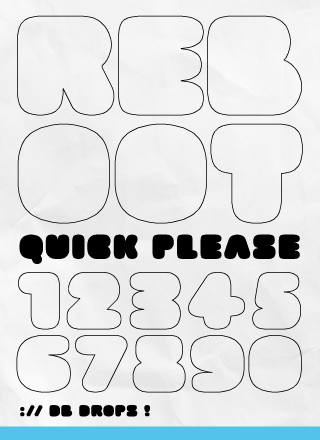
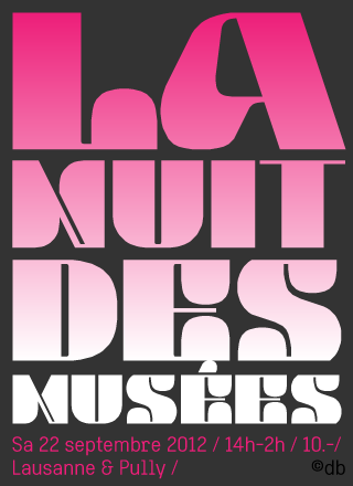
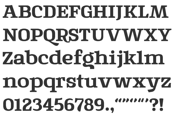
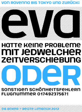
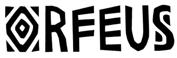
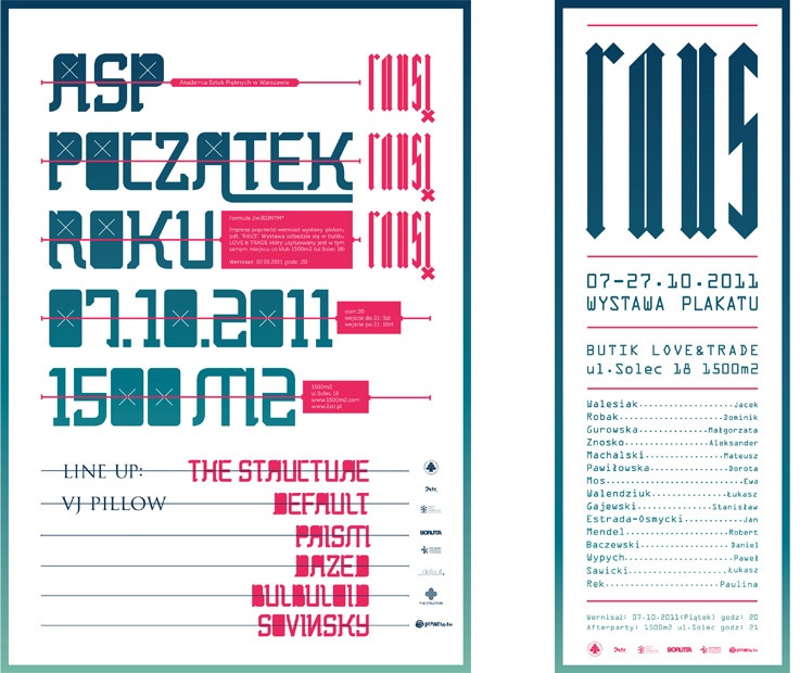
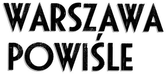
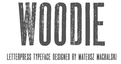
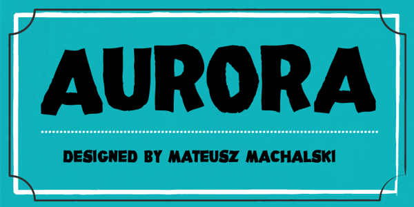
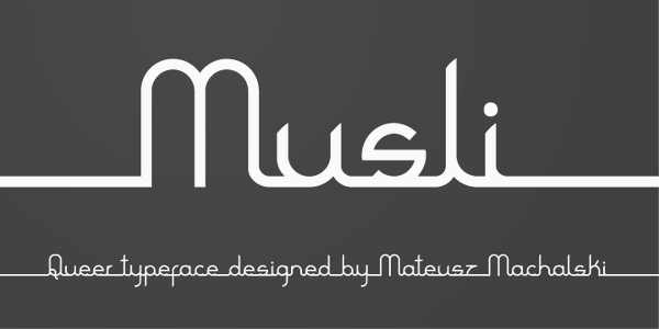
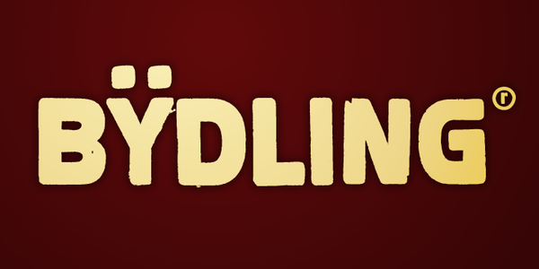
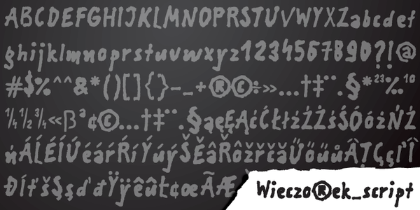
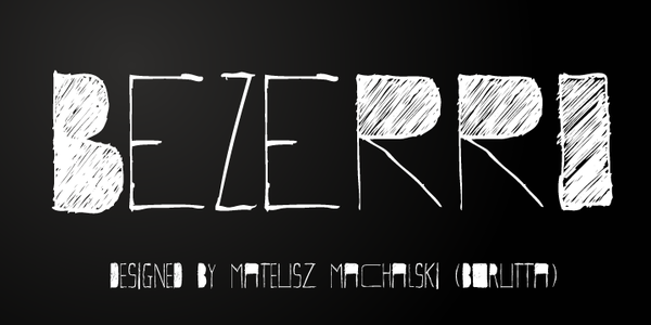
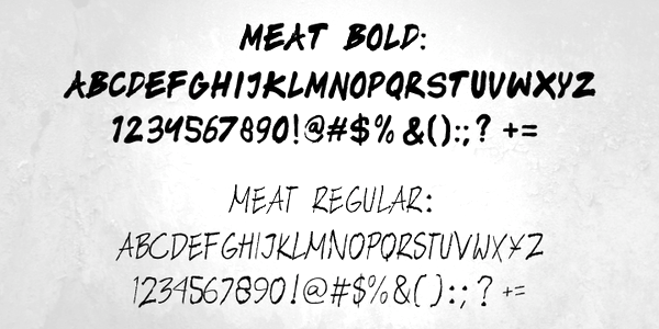
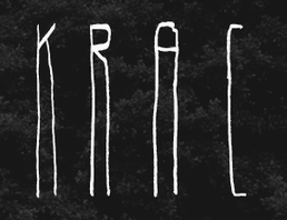
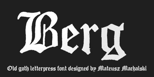
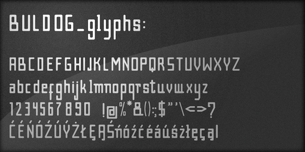
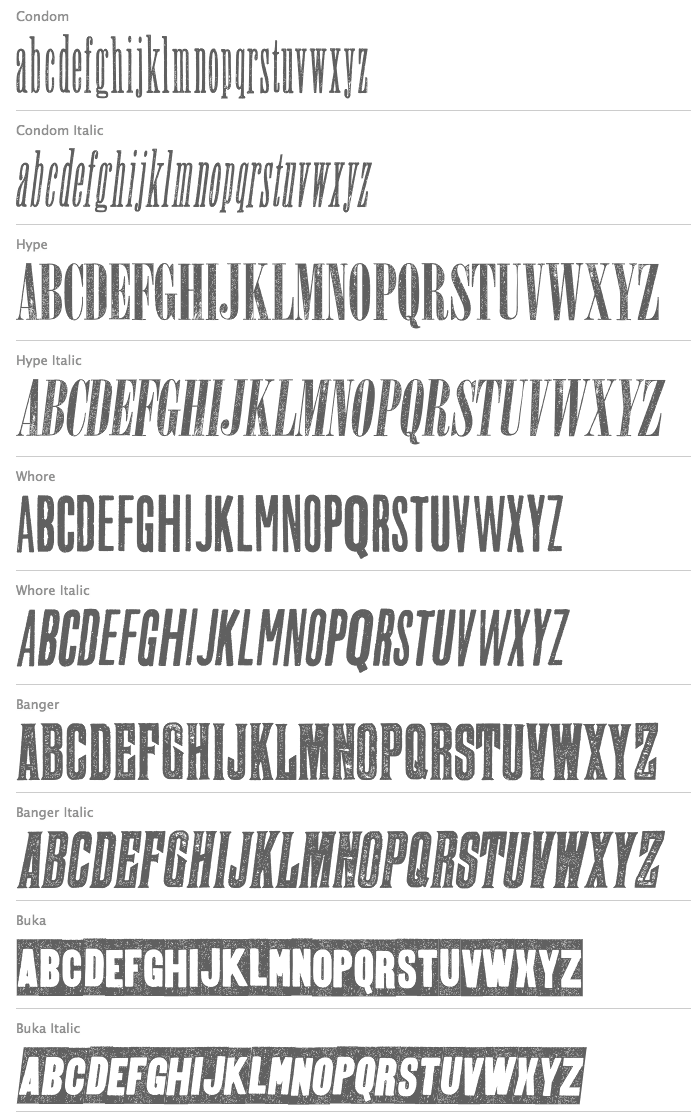
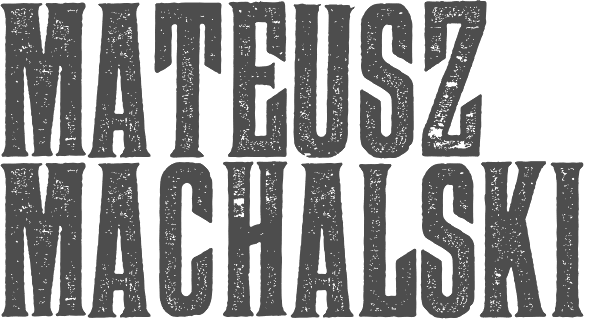
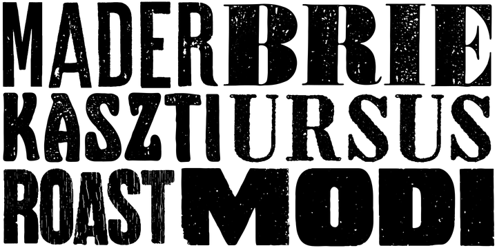
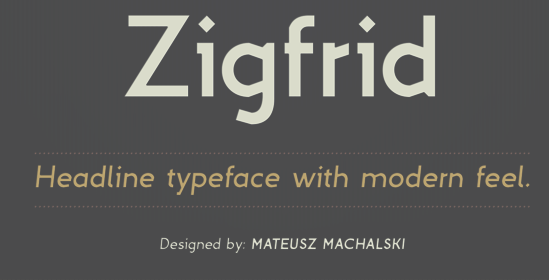
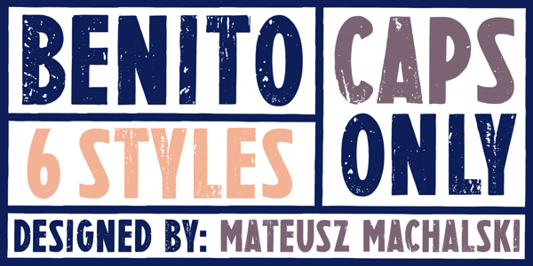
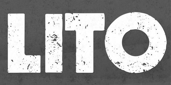
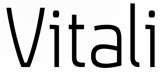
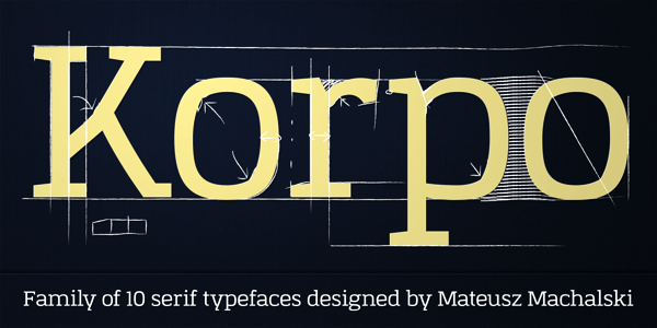
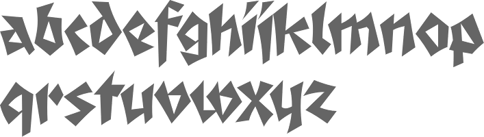
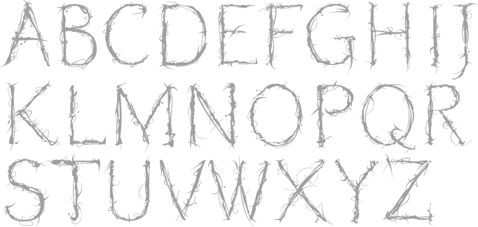
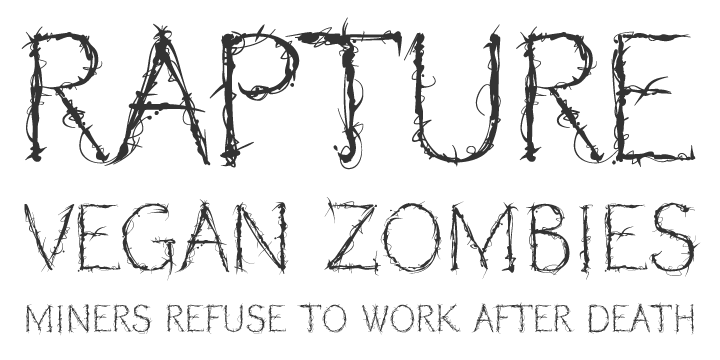
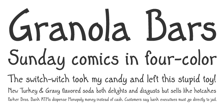
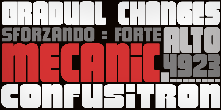
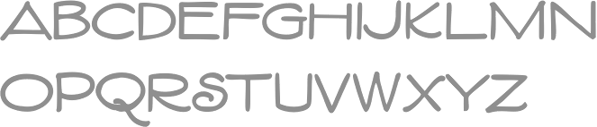
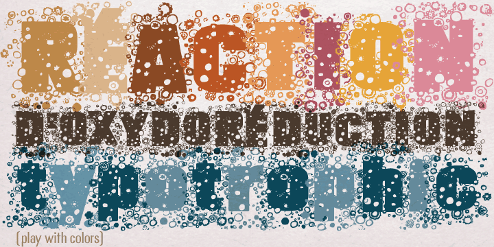
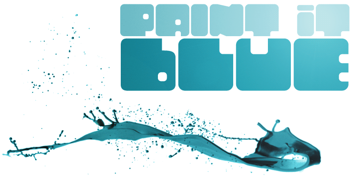
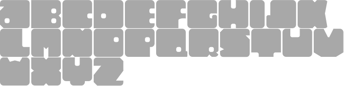
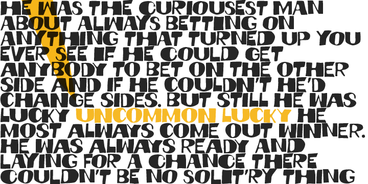
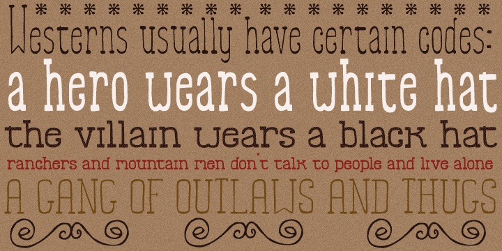
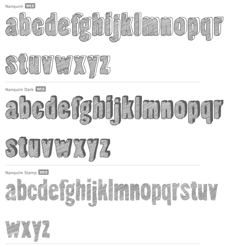
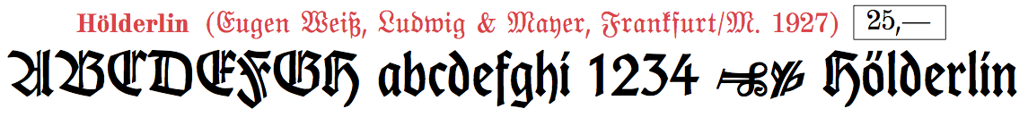
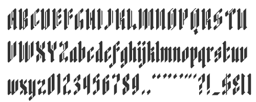
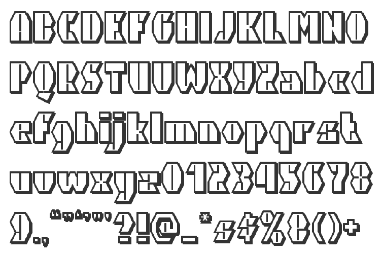
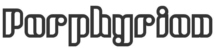
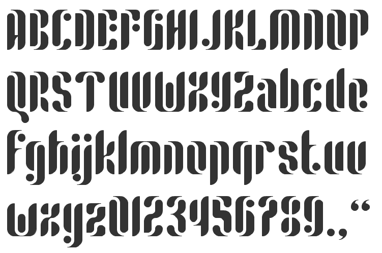
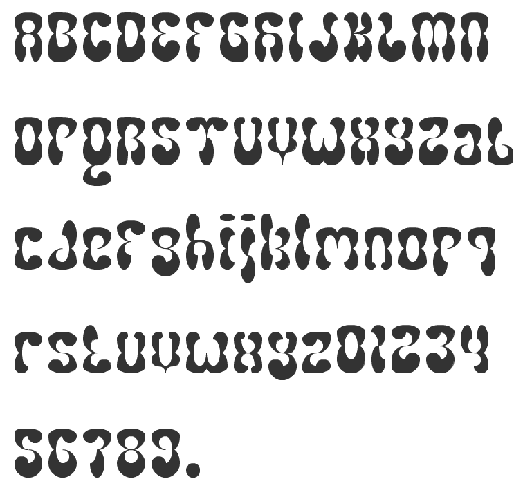
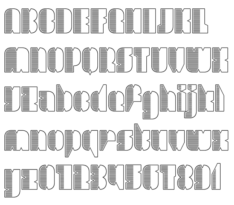
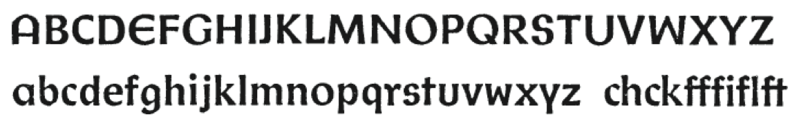
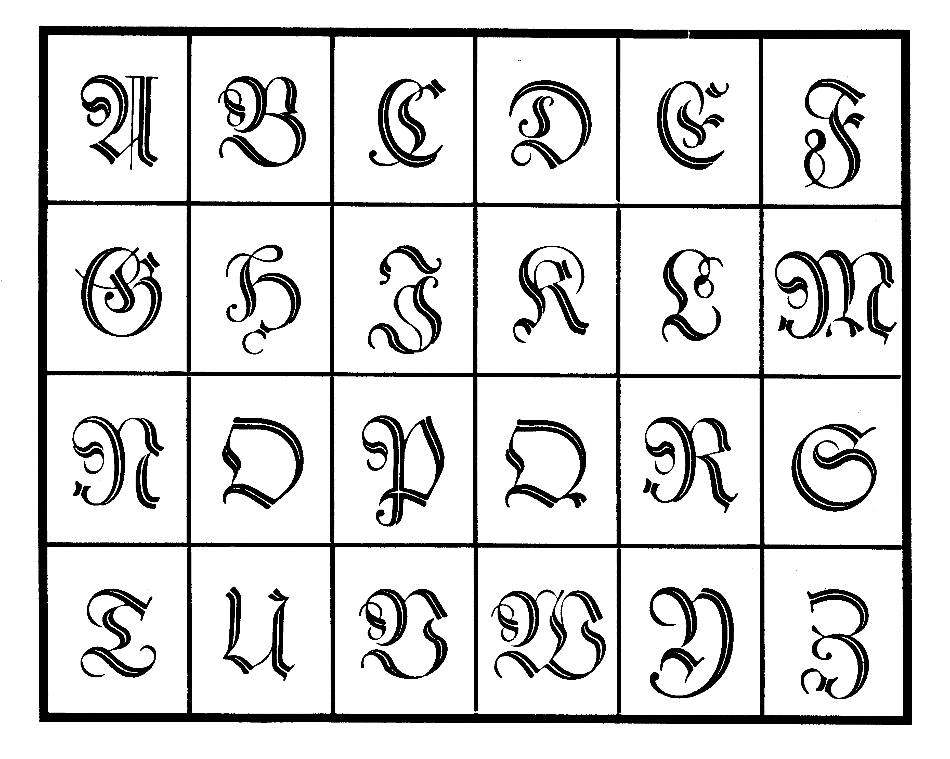
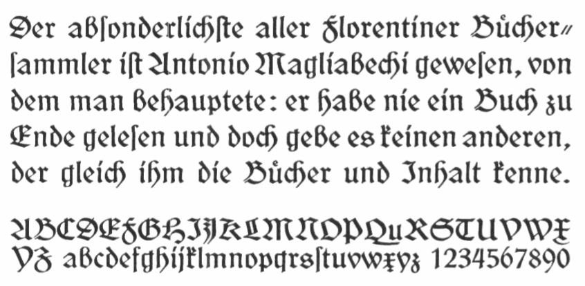
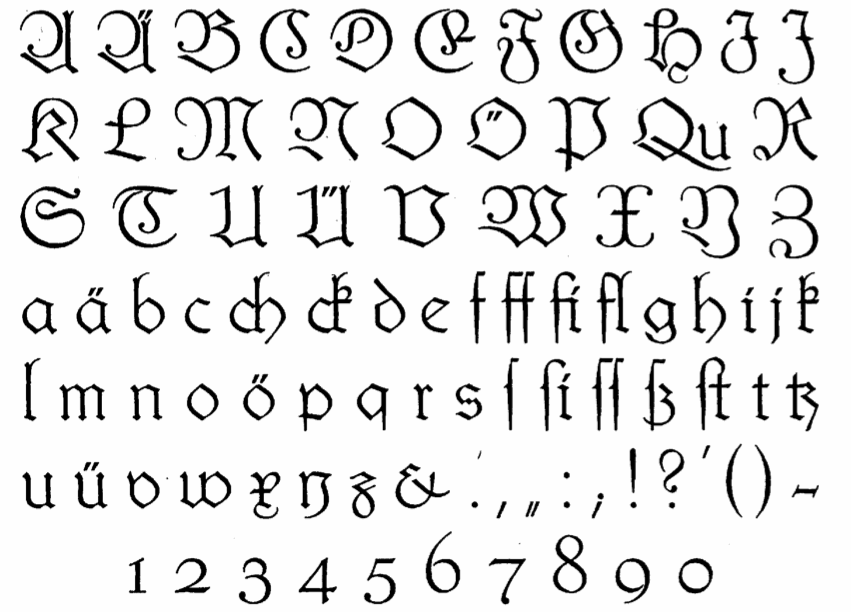
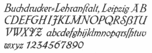
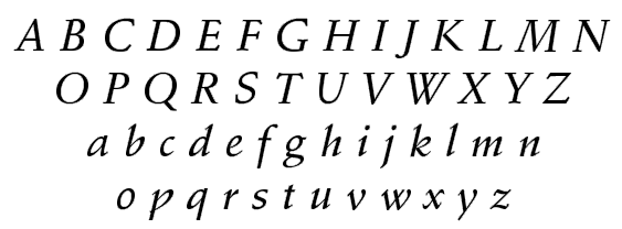
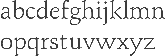
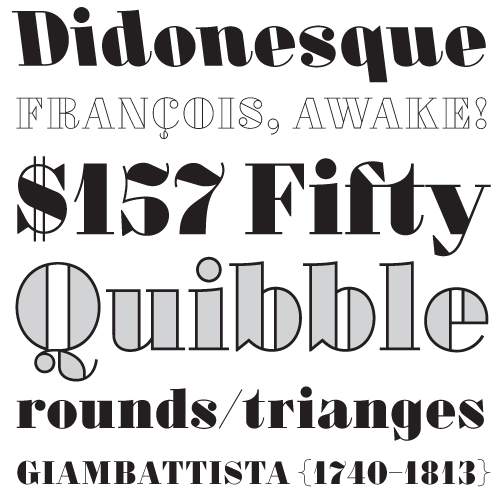
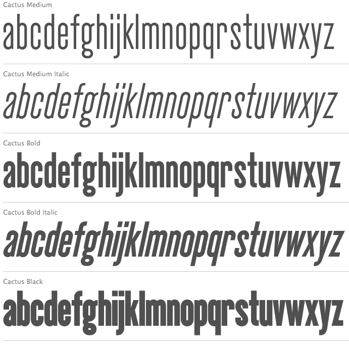
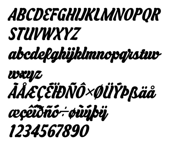
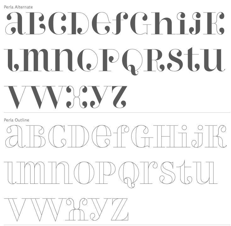
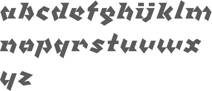
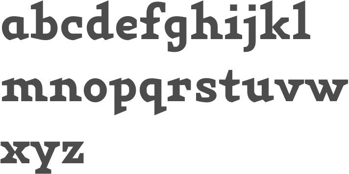
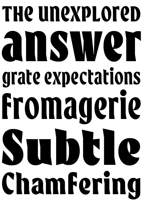
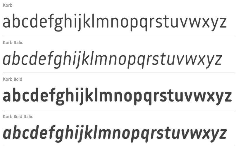
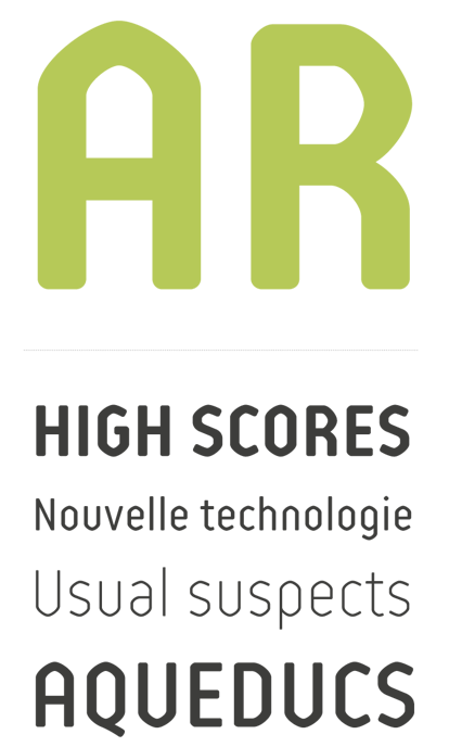
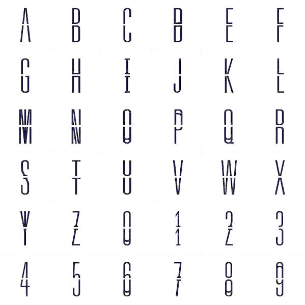
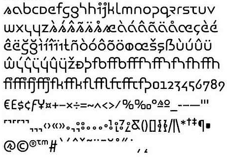
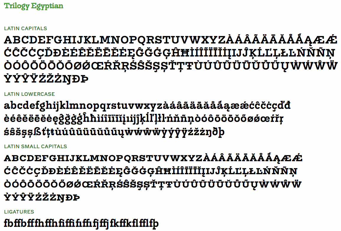
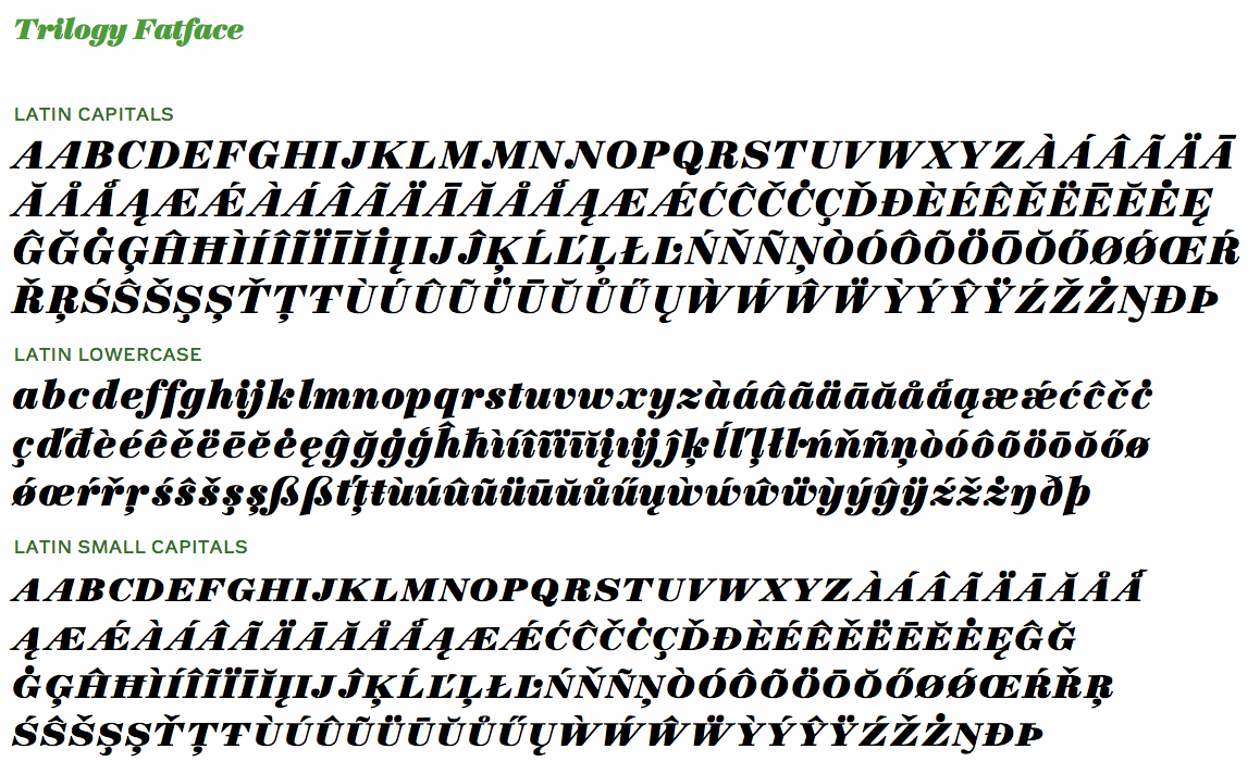
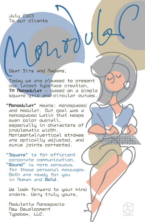
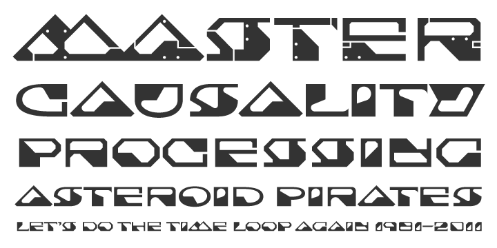
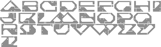
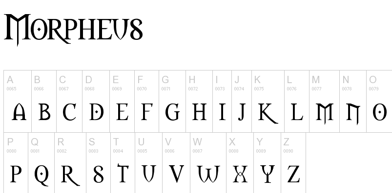
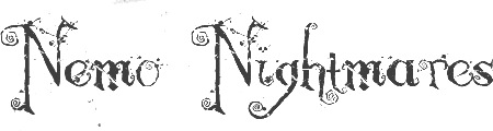
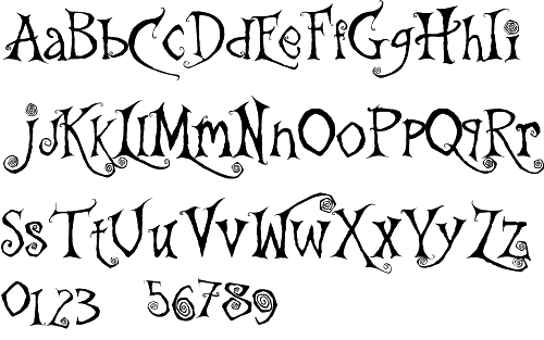
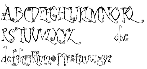
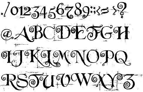
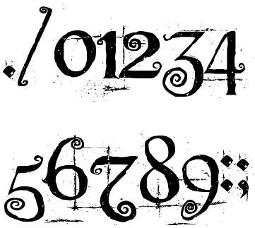
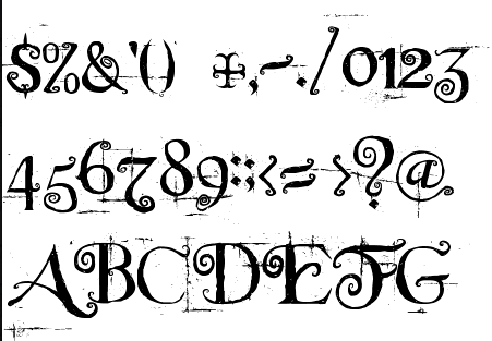
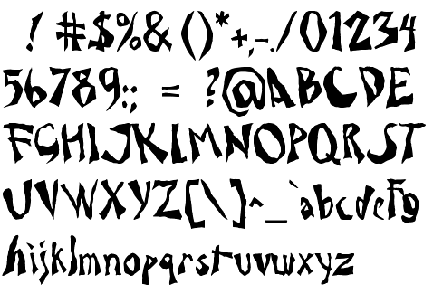
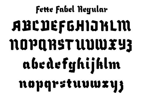
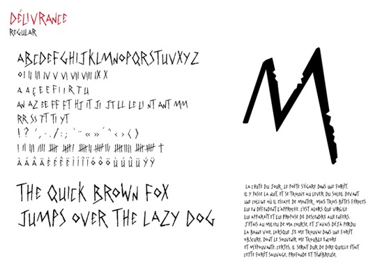
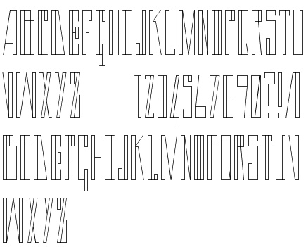
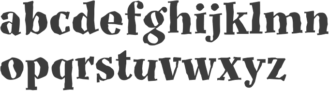
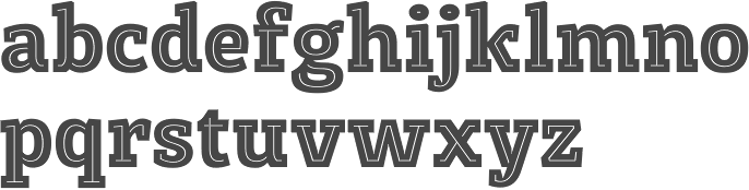
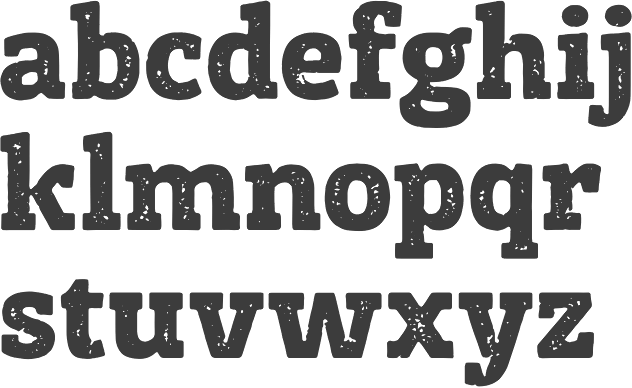
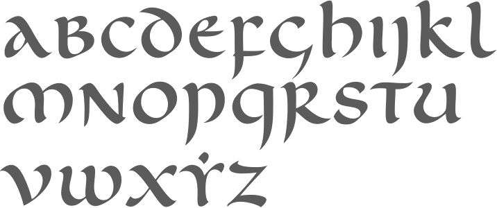
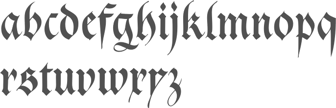
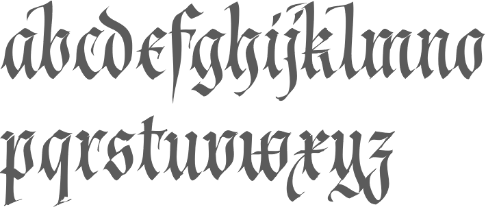
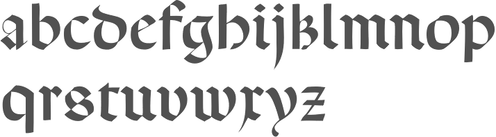
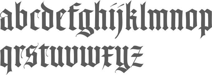
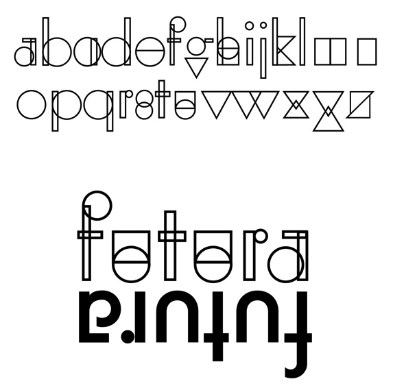
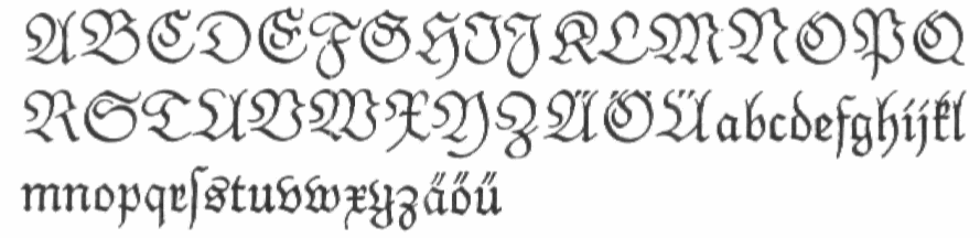
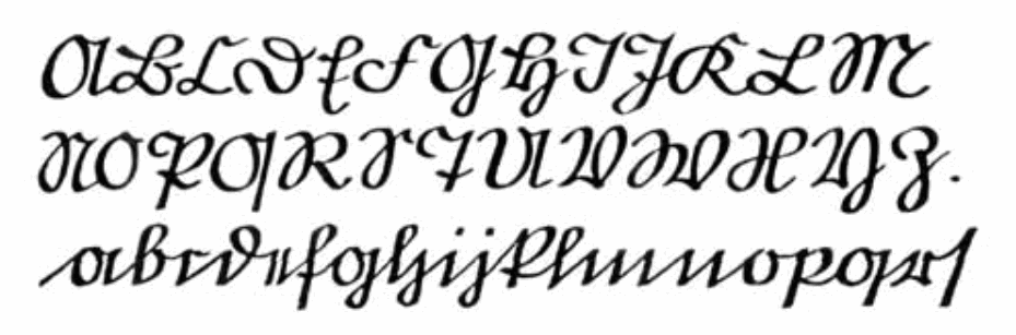
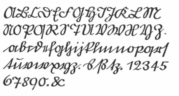
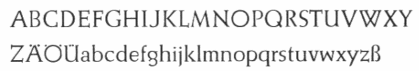
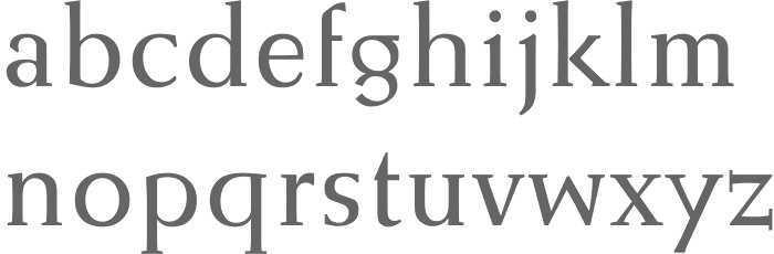
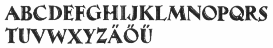
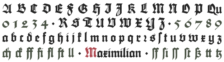
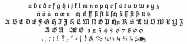
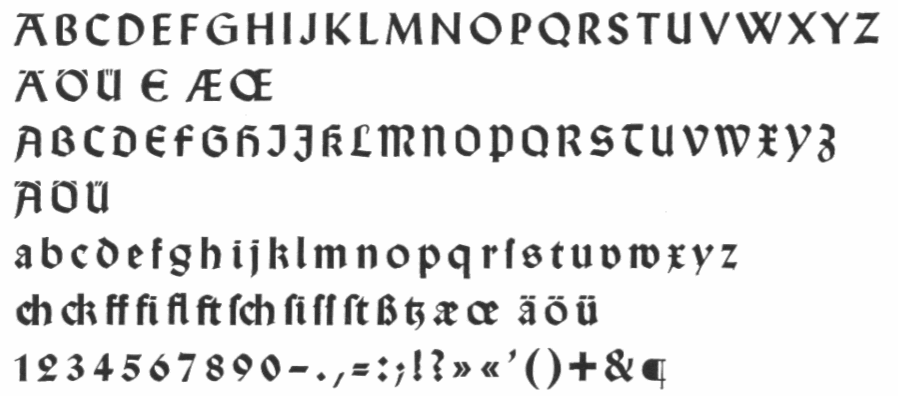
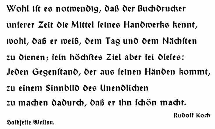
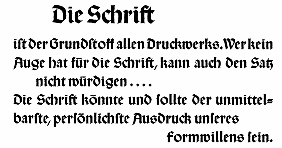
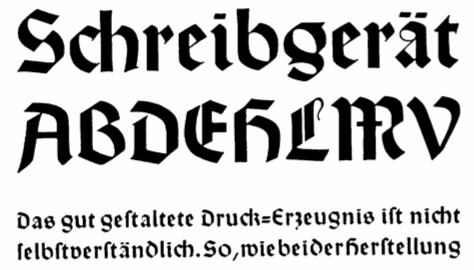
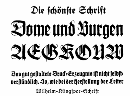
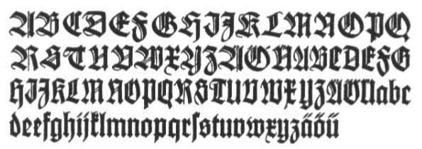
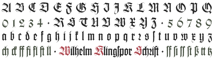
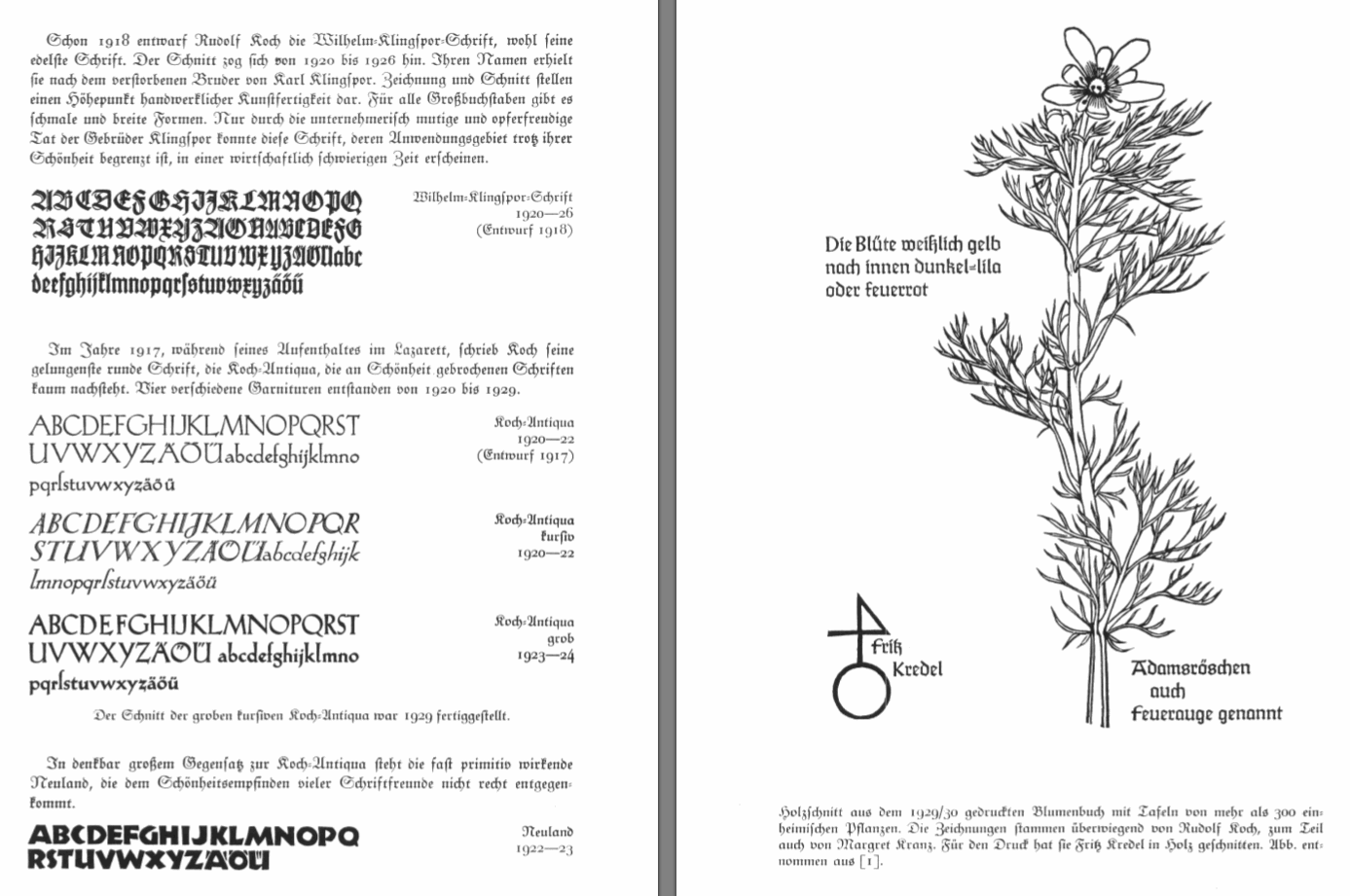
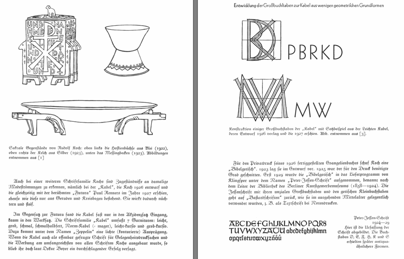
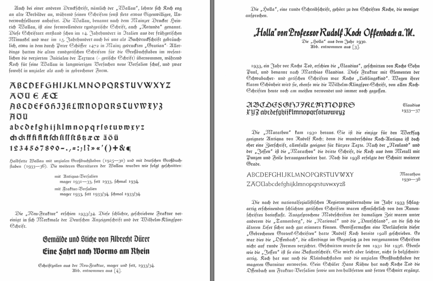
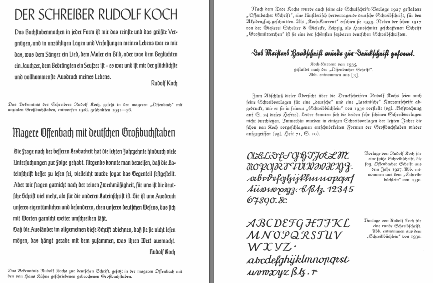
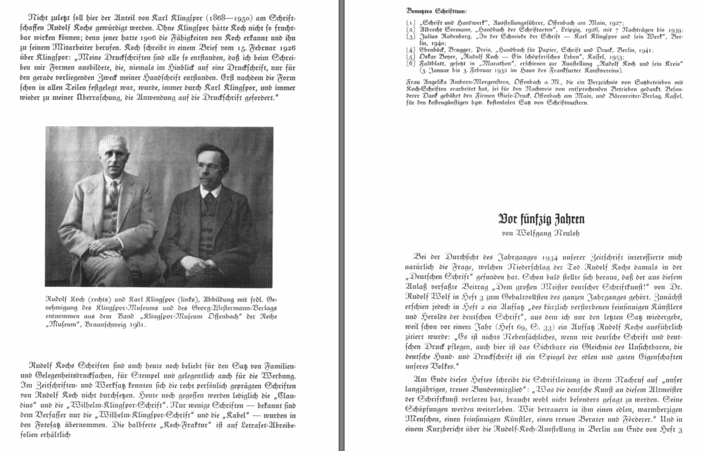
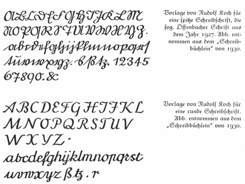
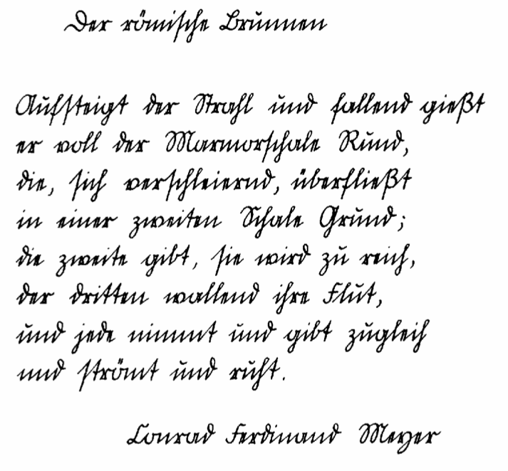
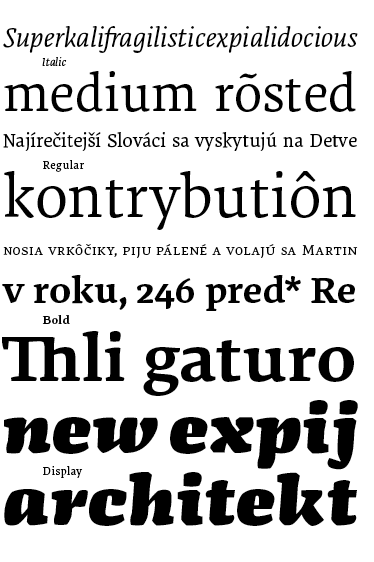
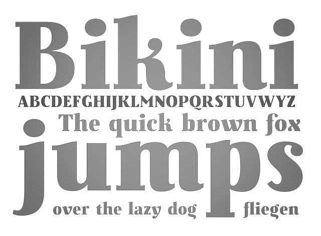
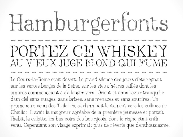
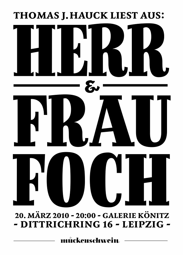
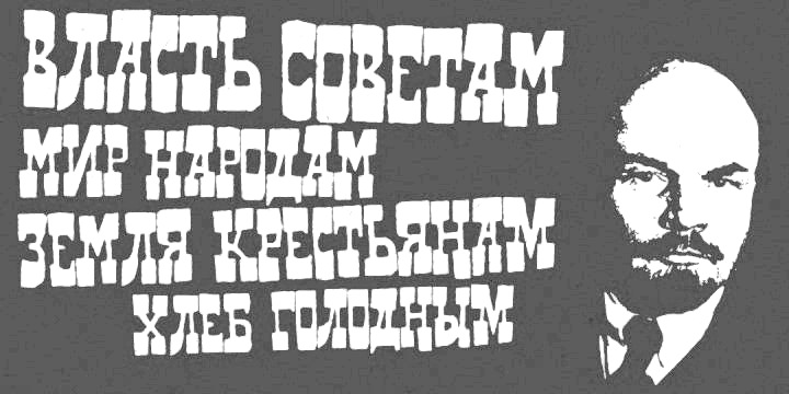
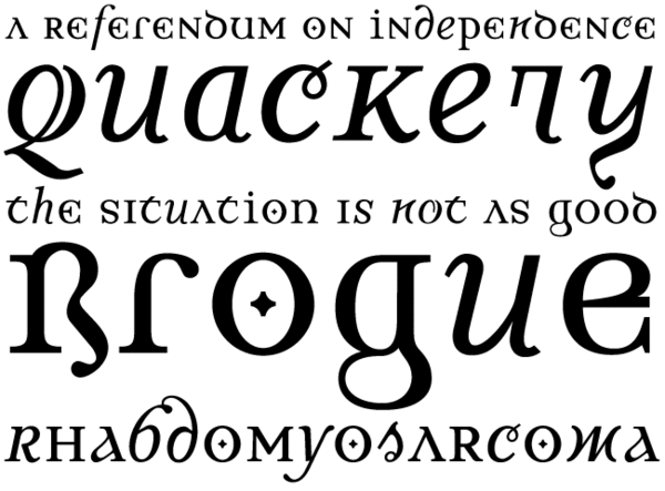
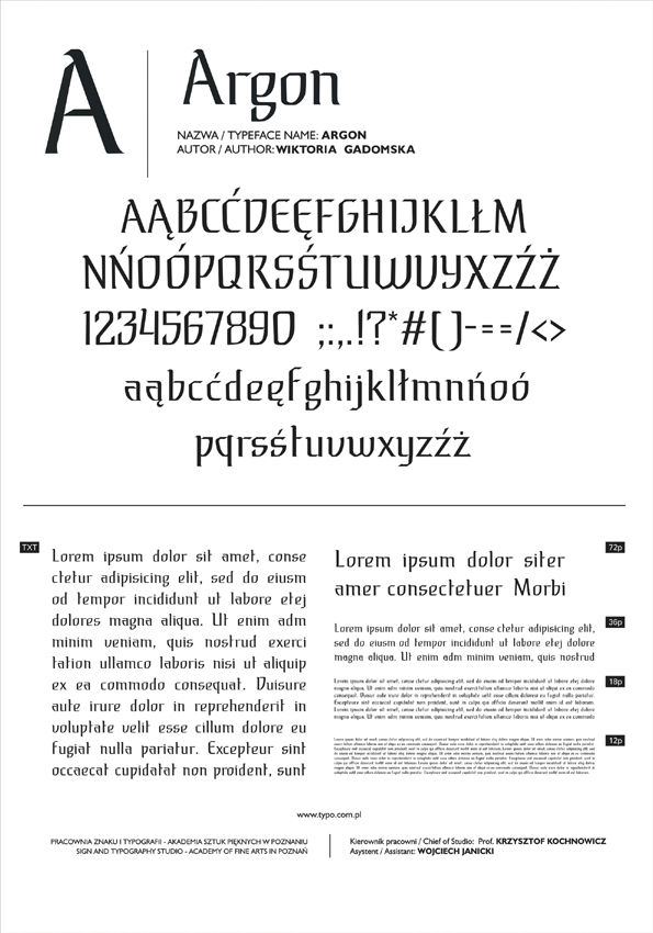
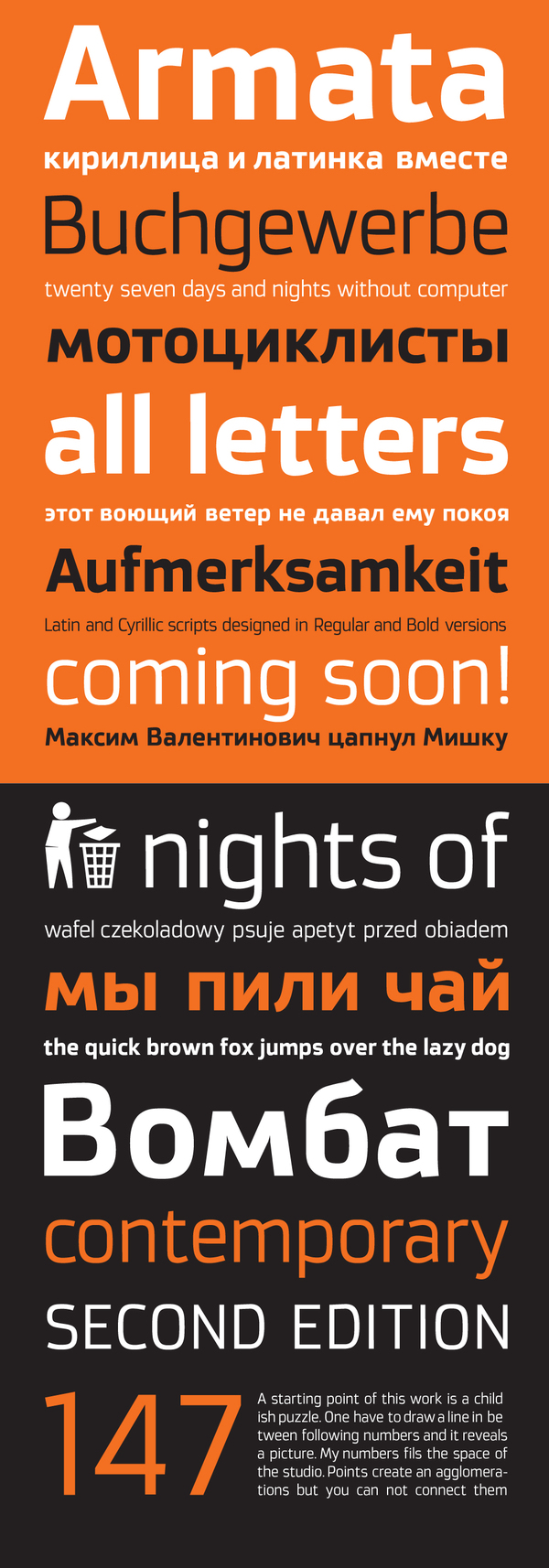
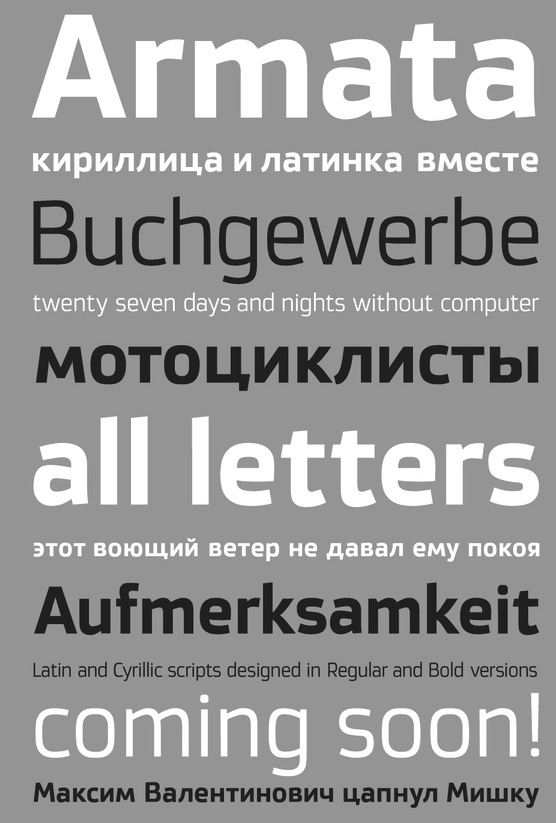
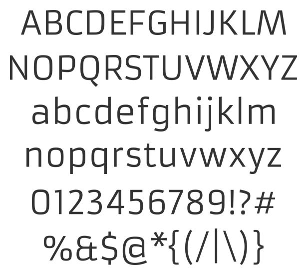