| | |
2D Typo
[Lukyan Turetskyy]

|
 Lviv-based Ukrainian designer (b. 1979) of the octagonal stencil typeface Depot Trapharet (2006, brutalist), and of the free car rallye dingbat typeface Rallye Symbols (2008). Dafont link.
 In 2010, he went commercial as 2D Typo. The first typeface at 2D typo was the modular pixelish Pressure Drop 2D (2010). This was followed by Ornamental Deco 2D (2010, art deco ornaments), Rally Symbols 2D (2010), Mascaron2D (2010, by Iryna Korchuk), Depot Trapharet 2d (2010, a stencil based on the tram lettering in Lviv), Ascetic 2D (2005-2010), Hutsulyandiya (2010, extraordinary ornaments by Iryna Korchuk), Simeon (2010, calligraphic), Cranked Pipe 2D (2011), Tripyllia 2D (2011, ornaments of the neolithic Trypillya culture), and Ukrainian Barokko (2010, a calligraphic typeface by Genadij Zarechnjuk), Historism Border (2011, border ornaments), Moreske 2D (2012, ornaments), Geomanticus (2012, modular squarish sans). Typefaces from 2013: Bandelwerk (borders), Digital Stitch, Modern Wave (ornaments based on Alphonse Mucha), Hopferian (Roman caps after engravings by Daniel Hopfer (1470-1536)---typeface completed with help of Mariya Sokil), Simple Ribbon (art nouveau dingbats). In 2014, he created Angusto (an elegant narrow shaded display typeface family), Vindemiam (ornamental borders), Squamish (ornamental borders), UA Map (maps of Ukraine dingbats) and Bohemian Border. In 2014, Dmitry Rastvortsev, Lukyan Turetsky, and Henadij Zarechnjuk cooperated on the design of the free Latin / Cyrillic handwriting typeface Kobzar KS, which is based on the handwriting of Taras Shnvchenko, a famous Ukrainian poet, artist and philosopher. Typefaces from 2015: Finetitle (ornaments for headers), Gothic Herbarium (a floriated ornamental font based on the Gothic Revival ornaments developed by Augustus Pugin (1812-1852)), Old Depot (rough stencil), Francesca (decorative caps). Typefaces from 2016: Geometric Harmony (geometric ornaments), Dubster (which he describes as a technocratic modular font). Typefaces from 2017: Military Symbols. Typefaces from 2018: Strapwork (four ornamental typefaces with friezes, borders and motifs modeled after Balthasar Bos (1554) and 16th century mannerism). Typefaces from 2020: Lo Fi Copy (grungy and pixelish). Typefaces from 2021: Kolm Keltek (classical ornaments), Microdot (a dot matrix font). [Google]
[MyFonts]
[More] ⦿
|
4th February
[Sergiy Tkachenko]
|
 Sergiy Tkachenko (b. 1979, Khrystynivka, Cherkasy region, Ukraine) lives in Kremenchuk, Ukraine, and has been a prolific type designer since 2008. Sergiy graduated from Kremenchuk State Polytechnic University in computer systems and networks in 2007. Various other URLs: Microsoft link, Identifont, 4th February, Behance, Klingspor link, Revision Ru, Russian creators, CPLUV Fontspace, Twitter. Kernest link. Sergey Tkachenko's typefaces:
 - 2008: the techno typefaces Bladi One 4F, Bladi One Slab 4F, Bladi Two 4F, Abia Wide 4F Thin.
- 2009: Wrongo 4F, Zantiqa (an über-serif), Serifiqo (a (free) thin didone fashion mag display face), Codename Coder 4F (monospace programming font), Droporado 4F (using circles only), Tovstun (futuristic, ultra-fat and rounded), Perfocard 4F, Modularico (five modular typefaces based on a logo from Master Kremenchug a company for which Sergiy worked for 4 years), Boldesqo Serif 4F (a splendid informal fat didone, now with Greek support), Tkachenko Sketch, Unicase Slab (a techno slab), Laftatic, Logofontik 4F (techno), PC.DE Stencil (+Italic; custom stencil font), Stenciliqo 4F, Tiap Liap 4F (handwriting), Nut Kit 4F, Rezzzistor 4F, the inline modular face Grand Hotel, and Bijou 4F.
- 2010: Roboo 4F (a bubblegum typeface family), PädIn (a custom typeface for Pädagogische Initiative e.V.: rounded fat informal face), Fat Quad (in the fatty trend), Veselka (a free multiline face), Smeshariki Black (+ Gleams: a bubble gum font made for an animation company), Republica 4F (a fat family), Rodeqa Slab 4F, ComFi (semi-octagonal), Grotesqa 4F, Nowy Geroy 4F, Fabryka 4F (a monospaced typewriter family), Placarto4F-Italic (an ultra fat art deco), Lavina 4F (a hairline sans with lachrymal terminals).
- 2011: Squartica (octagonal), Decomart (free), Model 4F Unicase (a unicase fat didone released in 2013 only), Fontatigo 4F, Kylie 4F (bilined and geometric), Waldemar 4F (a large didone style fat typeface family), Dinesqo (2011, a monoline sans of utter simplicity), Qargotesk (+Cyrillic) [images: i, ii, iii, iv], Neultica 4F (black unicase family), Squartiqa 4F (2011, constructivist), Clarenta 4F Black (after Clarendon---a great family), Designosaur (free sans), Perfopunto (based on perforated circles and squares), OlaScript 4F, Bayadera 4F (a tamed upright monoline script), Febrotesk4FUnicase (squarish unicase family).
- 2012: Targo 4F (rounded typeface with stencil and non-stencil styles), Myra (free font), Myra 4F Caps (free), Cedra (wide monolined sans face), Fontatica 4F (rounded techno grotesk), Akzentica 4F, Ukraintica 4F Wide (a monoline wide-bowled sans family), Laventa 4F, Sports World (free athletic lettering font), Web Serveroff (free computer geek font), Octin Spraypaint Cyrillic (a rough stencil done exclusively for Ninja Theory).
 2013: Condesqa (modular sans), Esqadero (an uncomplicated monoline sans), Vanyla 4F Unicase (monoline), Esqadero FF CY (a free wide sans, Cyrillic), Bond (a confident no-frills sans), Attentica (free sans font for Latin and Cyrillic), Cedra 4F Wide Thin. 2013: Condesqa (modular sans), Esqadero (an uncomplicated monoline sans), Vanyla 4F Unicase (monoline), Esqadero FF CY (a free wide sans, Cyrillic), Bond (a confident no-frills sans), Attentica (free sans font for Latin and Cyrillic), Cedra 4F Wide Thin. - Cyrillizations: several typefaces such as Lavoisier (by Alec Julien), Budmo Jiggler (Ray Larabie) and JoAnne Display (Sandy Cerovich), Gnuolane (of a Ray Larabie font), Paranoid Cyrillic (based on Kevin Lo's Paranoid), Movavi Grotesque Black (+Cyrillic; image; numerals), Azoft Sans (made for Azoft, and free here and here).
- Custom fonts: Blue Pill, Sansus Webissimo (since 2011 free at Open Font Library), Minaeff ECT (2011, a free legible family for Latin and Cyrillic, custom-made for and downloadable from WebhostingRating.com), Webhostinggeeks.Com (2011), Web Serveroff, OnlinePharmacyCheck.Com (2011), 1800Flowers.com (2011), DesignStudio.com (2011, free), ArchyStudio.Com (2011, free download, Movavi Grotesque (2011, free), Azoft Sans, PÄd In, Smeshariki, Fat Cow (2010: free condensed sans), ComFi (2010, free), PC.de (2009: free techno family, including a stencil face), League Gothic (2009-2011, The League of Movable Type) Cyrillic, Paranoid Cyrillic, 28 Days Later Cyrillic, Acid Label Cyrillic, Dead Secretary Cyrillic, Rezland Cyrillic, Sweet Leaf Cyrillic, Droid Cyrillic, Jo Anne Display Cyrillic, Gnuolane Free Cyrillic, Bosox Cyrillic, Budmo Jiggler Cyrillic.
- Typefaces from 2014: Laqonic 4F (unicase sans), Cubynets 4F, Blogger Sans (free rounded organic sans), Boncegro (free Western typeface, briefly called Vaquero before a name change), Motor 4F (based on Russian car license plates), Monitorica (a futuristic typeface made for ipHostMonitor.com, free at OFL), Areqo (condensed titling sans), Architect's Daughter Cyrillic (architectural lettering), GetVoIP Grotesque (a free typeface commissioned by GetVoIP), Meeneralca (unicase sans inspired by the logo of the mineral water Borjomi from Georgia), Glasoor (free oil spill or jelly bean font), Robotesqa.
- Typefaces from 2015: Croogla (a circle-based informal sans), Blackentina 4F (free ultra-black squarish typeface), Dart 4F (neo-grotesque), Kent 4F (a layered family for letterpress emulation).
- Typefaces from 2016: Brent 4F (original design going back to 2013), a custom typeface for the labels used in the Ukrainian Armed Forces, Economica Cyrillic Pro (with Vicente Lamonaca).
- Typefaces from 2018: Indi Kazka 4F (Indic simulation).
Abstract Fonts link. Dafont link. Creative Market link. Behance link. Hellofont link. Open Font Library link. View Sergiy Tkachenko's fonts. [Google]
[MyFonts]
[More] ⦿
|
A2 Type
[Henrik Kubel]
|
 A2-Type (or simply, A2) is a type foundry set up in the autumn of 2010 by the London based design studio A2/SW/HK. The designers are Henrik Kubel and Scott Williams. A2's bespoke type design is mainly the responsibility of Henrik Kubel, though every typeface is developed and approved by both partners. Kubel is self-taught, making his first typefaces while studying at Denmark's Design School from 1992 until 1997. Their typefaces:
 - 4590
- 60 Display.
- Amplify (2013) won an award at TDC 2014.
- Antwerp (2011). A readable text family designed by Kubel during an Expert Type Design Class in 2011 at Plantin Genootschap in Antwerp.
- A2 Archi (2005, Henrik Kubel): an octagonal face.
- A2 Aveny-T (2000, Henrik Kubel): Poster typeface commissioned as aprt of the identity of the Aveny-T theatre in Copenhagen.
- Agriculture.
- Archi.
- Banknote.
- A2 Battersea (1999, Henrik Kubel): inspired by Meta, DIN and Transport Alphabet. Followed in 2012 by Battersea Slab.
- Bauhouse.
- A2 Beckett (2008). A condensed sans family with the masculinity of Impact.
- Boing.
- Copenhagen
- A2 CPH Tram (2009, Henrik Kubel): revival of an odd mini-serifed type found on the exterior of Danish trams, ca. 1920.
- A2 CWM (2008, Henrik Kubel): constructivist type designed for the headlines and cover of Cold War Modern Design 1945-1970. Octagonal.
- Dane.
- A2 Danmark (2008, Henrik Kubel): a display stencil family.
- A2 Ergonomics (2011).
- Flavin Medium. A neon tube font.
- A2 Flowers (2005, Henrik Kubel): arrows, fists, flourishes, ornaments.
- A2 FM: slab serif family.
- Foundation (2018) in Sans (Number 44, Condensed, Wide), Serif, and Serif Didot subfamilies. These are all revivals of skeletal typefaces. Foundation Sans Number 44 was inspired by Circular Gothic No. 44 (1879, Charles E. Heyer, for the Great Western Type Foundry). Foundation Sans Condensed and Foundation Sans Wide are derived from two types described as Caractères pour Marques de Linge (typefaces for marking on linen) in the Signes section of the first volume of Spécimen Général des Fonderies Deberny et Peignot (ca. 1934). Foundation Serif is based on Caractère No. 7, another Caractère pour Marques de Linge in that 1934 Deberny & Peignot specimen book. Kubel's inspiration for Foundation Serif Didot was a sheet of lettering (dated 1939) he discovered in the archive of the influential Danish architect and graphic/industrial designer Gunnar Biilmann Petersen, 1897-1968.
- Grand. A stencil typeface.
- A2 Grot 10 (2009, Henrik Kubel): a take on the Grot Series by Stephenson Blake. Grot 12 followed in 2015.
- A2 Impacto (2005-2011, Henrik Kubel): Impact?
- A2 Klampenborg (1997, Henrik Kubel): industrial style sans.
- Kunstuff.
- London (2010).
- Magna.
- Maximum.
- A2 Mazarin (2017). A2 writes: Originally designed as a Garamond-inspired metal typeface by Robert Girard ca. 1921-1923, and published under the name Astrée by Deberny Peignot, the typeface was soon recut and renamed Mazarin by the English foundry Stephenson Blake in 1926. That single style original has now been expertly restored and reimagined as a contemporary typeface in multiple styles.
- Melissa Script (2010).
- A2 Monday (2003-2016, Henrik Kubel): based on 19th century English vernacular serif signage type.
- Moscow Sans (2014-2015). Award winning custom fonts and pictogram system for Moscow Metro. Art directed and designed by A2 (Scott Williams and Henrik Kubel) with Margaret Calvert as type and pictogram consultant. Cyrillic script designed in collaboration with Ilya Ruderman.
- Naive.
- New Grotesque Square series (2015). A newspaper typeface modeled after a Stephenson Blake typeface. Followed by New Grotesque Round in 2015-2016.
- New Rail Alphabet (2009). A refreshed and expanded version of Margaret Calvert's alphabet from the 1960s which saw nationwide use with British Rail, BAA, and the NHS. Developed in cooperation with Margaret Calvert.
- New Transport (with Margaret Calvert). A digital version of Transport, the Jock Kinnear and Margaret Calvert typeface for the British road signs. New Transport will be commercially released in September 2013.
- Register (2012-2017). A text typeface family inspired by French renaissance types.
- Regular (2012-2016). Think Futura in new clothes. Accompanied by Regular Slab.
- Sans, Slab and Serif typefaces for a redesign of The New York Times Magazine in 2015. The starting point for the Serif font is the Stephenson Blake Garamond-ish metal typeface Mazarin also known as Astrée from French foundry Deberny & Peignot. The slab fonts used for pull quotes and headlines are a continuation of the magazines existing Stymie font but in a condensed format. The sans fonts are linked to the industrial grotesque types, with metal type specimen versions of Futura and Akzidenz fonts as loose models for inspiration.
- Nosferato.
- Ole.
- Outsiders (+Outsiders Light and many other weights). A slab serif family.
- Parsons Green Medium.
- A2 Record Gothic (2019, Henrik Kubel), after Robert H. Middleton's American grotesk, Record Gothic (1027, Ludlow). Kubel writes: In celebration of Record Gothic's eclectic history, we designed four related but independent styles: Slab, Mono, Stencil and Outline.
- Square.
- Staton.
- Tagstyle.
- Test.
- Triumph.
- A2 Typewriter (2000, Henrik Kubel): based on Olivetti Typewriter 22.
- A2 Vogue Floral: a fashion mag modern display face in two styles.
- Vogue Paris. Granshan 09 Type Design Competition. 1st Prize, Display fonts.
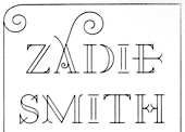
- A2 Zadie (2005, Henrik Kubel): inspired by Edwardian railings surrounding the Royal Army Military College in London. Used on the cover of the Zadie Smith bestseller On Beauty (2005, Penguin Press, NY). Granshan 10 Type Design Competition. 3rd Prize, Display fontt described as an ornamental blackboard bold type.
- In 2014, Scott Williams and Henrik Kubel (A2 Type) co-designed A23D, a 3d-printed letterpress font. It was fabricated by model making specialists Chalk Studios. The font is presented by New North Press, which specializes in traditional letterpress printing. Adrian Harrison made a short film about the birth of the font, charting its progress from preliminary sketches to first inking and printing at New North Press. A23D won an award in the TDC 2015 Type Design competition.
- English 1766 (2017). Kubel's take on Caslon.
- Regular (2017). A sans family inspired by Memphis, Karnak, Stymie and Futura.
- Schwiss (2018). Inspired by Akzidenz Grotesk and Helvetica.
Custom type by them include an alphabet for Qantas Airlines (2017), a masthead for Toronto Life (2010), a custom typeface for Banca Sella (2018), Qualcomm (2017), Arne Jacobsen (2018?), Evening Standard Newspaper (2018: 43 fonts), New York Times Magazine's Olympics issue (2018: a monowidth font for stacking), Eurosport Pyeongchang 2018, Weekendavisen (2007-2010), Design Museum London (2010), Faber&Faber (2009-2010), Afterall Publishing (2006-2010), Faulkner Browns Architects (2007), Penguin Press (2005), and Norrebro Bryghus (2005). At ATypI 2013 in Amsterdam, he spoke about New Transport. Winner of the type design prize at the Tokyo Type Directors Club TDC 2019, with Matt Willey, for the New York Times Magazine Olympic font. [Google]
[MyFonts]
[More] ⦿
|
Abdul Malik Wisnu
[Almarkha Type]
|
 [MyFonts]
[More] ⦿
[MyFonts]
[More] ⦿
|
Ahmad Ramzi Fahruddin
[Arterfak Project]
|
 [MyFonts]
[More] ⦿
[MyFonts]
[More] ⦿
|
Alan Birch
|
British designer of LCD (1981, Letraset, ITC, and then Linotype), Crystal (1981, cyrillicized in 1993 by A. Kustov), Letraset Bitmax (1990), Rubber Stamp (1983, a grungy military stencil), and Synchro (1984). Digital versions of LCD include LCD SH (2004, Scangraphic) and Quartz (2019, SoftMaker). MyFonts write-up. Linotype link. FontShop link. [Google]
[MyFonts]
[More] ⦿
|
Alexander Bobrov
[Indian Summer Studio]
|
 [MyFonts]
[More] ⦿
[MyFonts]
[More] ⦿
|
Alexander Kirillov
|
 Alexander Kirillov studied at the Faculty of Economics of the St. Petersburg Polytechnic University. As a student at TypeType Education in 2016-2017, he created the almost military semi-angular sans typeface Taiga.
 In 2018, Ivan Gladkikh, Alexander Kirillov, Philipp Nurullin, Vika Usmanova, Marina Khodak, and Nadyr Rakhimov published TT Severs. [Google]
[More] ⦿
|
Alexander Sizenko
|
 Russian creator of the free chess font Chess 7 (2008), the free pixel fonts LED Stadion 7 (2013), Dash Dot Square 7 (2013), Enhanced Dot Digital 7 (2013), Small Dot Digital 7 (2013), Modern Dot Digital 7 (2013), Square Dot Digital 7 (2013), Bold Dot Digital 7 (2013), Serif Dot Digital 7 (2013), Serif LED Board 7 (2013), Modern LED Board 7 (2013), Half Bold Pixel 7 (2013), Dash Pixel 7 (2013), Serif Pixel 7 (2013), Power Pixel 7 (2013), Enhanced LED Board 7 (2013), Thin Pixel 7 (2013), Smallest Pixel 7 (2013), Modern LCD 7 (2013), Advanced LED Board 7 (2012), Digital 7 (2008, LED face), Post Pixel 7 (2013), Triple Dot Digital 7 (2013), Dash Dot Square 7 (2013), Enhanced Dot Digital 7 (2013), Dash Digital 7 (2013), Light Pixel 7 (2013), High Pixel 7 (2013), Mini Pixel 7 (2012), Long Pixel 7 (2013), LED Counter 7 (2013), Digital Counter 7 (2013), LED Digital 7 (2013), LED Board 7 (2013), Light LED Board 7 (2013), Advanced LED Board 7 (2013), Printed Circuit Board 7 (2013), Brick LED 7 (2013), Rounded LED Board 7 (2013), Pixel Dingbats 7 (2013), Square Wood 7 (2013), Small Bold Pixel 7 (2013), Rounded Pixel 7 (2013), Line Pixel 7 (2013), Bold LED Board (2013), Narrow Rectangle 7 (2013), Dot Digital 7 (2013, +Advanced), Square Metal 7 (2012), Stencil Pixel 7, Computer Pixel 7 (2012), Small Pixel 7 (2012), LED Counter Plus 7 (2013), LED 7 Display (2012, +Light), Neon Pixel 7 (2012), Old Pixel 7 (2012), Square Stone 7 (2012), Square Pixel 7 (2012), Pixel Font 7 (2012, +Outline), Pixel LCD7 (2012), Advanced Pixel 7 (2012), Ice Pixel 7 (2012), Void Pixel 7 (2012), Dash Dot LCD 7 (2012), Dash Dot Square 7 (2013), Enhanced Dot Digital 7 (2013), Double Pixel 7 (2012), Advanced Pixel 7, Advanced Dot Digital 7 (2013), ZX Spectrum 7 (2012), Bubble Pixel 7, Cyrillic Pixel 7, Basic Square 7 (2013), Basic Sans Serif 7 (2013), Effective Way 7 (2013), Arrow 7 (2013), Abricos 7 (2013), Computer 7 (2013), Disco 7 (2013), Software Tester 7 (2013), Elegant Line 7 (2013), Soft Lines 7 (2013), Effective Way 7 (2013), and the free LED display font Digital-7 (2008).
 Typefaces from 2014: Game Font 7, Square Sans Serif 7, High Sans Serif 7, Smooth Line 7, Bright Line 7, Double Line 7, Rounded Line 7, Rounded Sans Serif 7, Android 7, Arial Narrow 7, Bold Sans Serif 7, Light Sans Serif 7 (avant-garde sans), Modern Sans Serif 7, Software Kit 7 (dingbats), Advanced Sans Serif 7m Strong Line 7. Typefaces from 2015: Steel Blade 7, Semi Rounded Sans Serif 7, Bold Game Font 7, Double Force 7, Roman Font VII, Game Sans Serif 7, Sans Serif Plus 7, Soft Sans Serif 7, Smooth Pixel 7, Clear Metal 7, Military Font 7 (stencil). Typefaces from 2019: Clear Line 7. Open Font Library link. Fontspace link. See also here. Aka Chess 7 and as Style 7. [Google]
[More] ⦿
|
Alexey Pushkin
|
Designer of Old Ranger (2017), Grunge Slab Serif (2016), Old West (2016). In 2014, he designed Military Alphabet (an EPS format military stencil) and Grunge Alphabet. In 2013, he published the bilined Retro Alphabet. [Google]
[More] ⦿
|
Alexy Velichkin
|
Alexey Velichkin (Moscow) created the rough Cyrillic army stencil font Ist Bridzh (2014). Behance link. [Google]
[More] ⦿
|
Alisa Katrevich
[Red Studio]
|
[More] ⦿
|
Allison James
[Chequered Ink]
|
 [More] ⦿
|
Almarkha Type
[Abdul Malik Wisnu]
|
 Indonesian designer of the brush script Sometimes (2019), the high contrast serif typeface Quakiez (2019), the serif typeface Romerio (2019), the condensed all caps piano key typeface Romestone (2019), and the script typefaces Cherolina (2019), Photorichies (2019), Photography Script (2019), Retrochips (2019), Mountecarlo (2019: monoline), Beautinela (2019: monoline), Ophelie (2019, Script+Sans), Denalova (2019), Shelline (2019), and Mathelline (2019).
 Typefaces from 2020: Banana Juice, Bella Sweety, Bubble Bobble (a bubblegum font), Dear Sunshine, Oatlander (retro baseball script), Sweet Purple, Monieta (an inky and creamy rabbit ear script), Orange Milk (a playful handcrafted typeface), Rockbitz (a children's book font), Seathera, Avocado Creamy, Bolyvina, Charlie Angela (an inky calligraphic script), Lovemy, Chadelova (an enhanced script), Grumbear, The Mezirane, Charlotte Amalie, Crash Soul (a dry brush script), Costiera (a dry brush script), Handestonie (a monoline script), Mentality (a signage script), Technovier (a monolinear squarish sans), Antiquesta (a dry brush script), Belgium Catherine, Cronisse (a display serif), Pronave (an all caps display typeface), Uniser (condensed all caps sans), Westack (a display serif), Avone (a stencil serif), The Roletta (a dry brush script), Waluxe (a fashion mag all caps sans with flared stems), Dear Sunshine, Mikalotta (poster script), Walker Knight (a vintage all caps typeface), Towards (stencil), Cronisse (a decorative serif), Avaneonz (a neon font), The Heista Killer (a dry brush horror font), Someone (a dry brush font), Vicenza (an all caps skyline font), Bristone (a wide sans in six styles; perhaps for car tire ads), Shutterlocks (a dry brush script), Romantics (a creamy script), Revoxa, Yippie Yeah, Wonderful Day (calligraphic), Girly (a girly script), Kamelitta (a wild curvy script), Roadstore (a spurred vintage all caps typeface), Springloved (a paper cutout typeface and a a fine inline poster font), Saturated, Choxr, Blackheat (a super condensed all caps sans), Retrohols, Alibabe, Lordcorps (an octagonal sports or military font; with a stencil style), Headcorps (a sports shirt or military stencil font), Pineforest (with soft spurs), Airborne 86 (a military stencil), Orchide (a dry brush script), Beneficha (wild calligraphy), Radens (a retro bold signage script), Brokenz (a heavy condensed sans), Delninoys (a playful sans), Lorenza (sans), Elcatraz (Mexican simulation font), Hubby Bunny, Rosadetta (script), Swingsnug, Chickens Lovers, Rollinkland, Grumbear, Bubble Bobble (a bubblegum font), Blackheat (a heavy ultra condensed typeface), Brokenz (a muscular display sans), Lorenza (a fashion mag sans), Belgium Catherine (a signature script), Amazed Breath (script), Rockmore (a brush script), Empirez (an octagonal slab serif sports font), Amazed Breath. Typefaces from 2021: Neurock (pure sci-fi), The Cheelaved (spurred, Victorian), Headbears (a sports font), The Antique (a vintage typeface), Vespalogy (a vintage display font), Bestorika (a decorative serif by Abdul Malik Wisnu and Rivo Adriansyah), Quakerhack (a rough brush font), Balietta (a flowing script), Brothery (a retro signage script), Beauticella (a signature script), Glamorez (a luxurious serif), Reloaded (a military stencil font), Austragen (a bold sharp-edged display typeface), Bearetta (script), Keawneta (a display font), Racerz (a speed font), Stangith (a decorative serif co-designed with Rivo Adriansyah), Quick Letter (a wide signature script), Arcinoll (a graffiti font), Charlie Brocklin (a thin signature script), Retrolight (a multiline neon sign typeface), Mokalatte (a wild script), Thugolatz (an all caps typeface with many interlocking ligatures), Author Think (a signature script), Bionetha (calligraphic), Bouncyland (a stylish wild script), Little Knight (a scrapbook typeface), The Brushentica (a beautiful dry brush script), The Soulmate (a dry brush script), Bettawork (a dry brush script), Philips Dutcher (a signature script), Recons (a techno font), Heezpiero (futuristic), Milky Quaker (a playful supermarket font), Rostemary (a fat finger font), Therestone (a Flintstone font), The Checkmate, Chick Chack (a heavy rushed script), Retroman (an Italian Western font), Brown House (a national park font), Emeralde Chamerions (a serif and script duo), Redzein (an octagonal slab serif), Rostera (a bold script), Sketchup (a sketched font), Thealiens (a condensed all caps sans), Williesh (a meaty display serif), Amazing Sweety (a scrapbook font), Heellaaz (an all caps children's book font), Almeira, Americans Classy, The Corps 86 (a military stencil), Brexo (a techno font with solid and stencil versions), Romeline (a scrapbook font), Yippie Yeah (a rounded monolinear marker pen font), Avaneonz (a neon or paperclip font), Sangira (a stylish serif), The Blackheads (a bold script), Kandaline, Marinaga (a creamy brush script), Mochalosta (script), Morning Sweety, Rockmore (a bold script), Deloire (a 4-style all caps sans), Montelova (script), Quinger (a monolinear decorative serif), Wonderella, Wonderful Sunset, Bellachia (a scrapbook script), Choxr (a very condensed all caps sans), Keepsmile (a rounded children's book font), Lovely Sweetie (a scrapbook font), Melanista (a wild script), Rollinkland (a brush font), Bellamona (a monolinear script), Bettanesia (handwriting), Bonalisha (script), Overwave (wavy), Beautimy (a wild script), Melatie (a wild script), Memorita (a wild script), The Handnature (a Treefrog script), Heinch (a 5-style all caps sans), Sweetie Banana (a scrapbook script), Sweetie Moment (a wild calligraphic script), The Dear (a retro script), Winterline (a wild script), Young Evaline (a signature script), Salt + Pepper, Sindenetta (a signature script), Autumnilla, Bella Ciao, Rosadetta (a wild calligraphic script), Saturated (a wild calligraphic script), Wondiletta, Bubblez, Lovely Orange, Milkalotta, Luxoorea (a stylish fashion-model-skinny all caps typeface), Momotako (a paper cutout font), Neonblitz (a neon font), Unione Force (an octagonal sports or military font; with a stencil style), Westman (a Western font), Delamoore (an all caps high-contrast display serif), Delaproza (an all caps display serif), Kinglead (a cartoonish font), Modesfa (an all caps display serif), Hexore (a slab serif), Deluxes (a stylish display sans), Kenzomaru (an oriental brush font), Lumbero (wooden plank font), Pineforest (a Victorian label or sign painting font), Beneficha (a wild calligraphic script), Brokenz (a bold condensed sans), Orchide (a dry brush script), Revoxa (a 4-style sans), Romantics (script), Schein (a sans and slab serif pair), Someone (a dry brush script), Towards (a minimalist stencil font), Averox (a futuristic all caps sans), Chicken Lovers (a playful informal font), Hubby Bunny (a cute display sans), Swingsnug (an informal monolinear sans). As Typotypea">Typotypea, he published the script typeface Manthoels (2020) and the roman all caps typeface Stinker (2020). Typefaces from 2022: Signattimes (a signature script), Thematheka (a constructivist font published on the day Putin invaded Ukraine), Overbillions (a dry brush script), Brolachess (a stylish all caps semi-serif), Suntage (a wide vintage all caps font). Typefaces from 2021 published by Gassstype but made by Abdul Malik Wisnu: Ruthless (a heavy dry brush font), Timeless Nature (script), Unranked (a rough mural font). Creative Fabrica link. [Google]
[MyFonts]
[More] ⦿
|
Alonso Lopez
|
Graphic designer in San Diego, CA, who created the modular typeface Futuristic Military (2017). [Google]
[More] ⦿
|
Andreas Johansson
[unfontunately]
|
 [More] ⦿
|
Andreas Seidel
[astype.de (or: Astype)]
|
 [MyFonts]
[More] ⦿
[MyFonts]
[More] ⦿
|
Andres Lugo
|
Art director in San Antonio, TX (and before that, Metairie, LA), who designed a few display typefaces in 2011: Eclipse, Eclipped, Regression (octagonal), JUNKY boy (ultra-fat, counterless), Gorilla (straight-edged). Russian propaganda poster art led to Burial (2013), Quickdraw (2013, Western), Aerial (2013) and Aerial Stencil (2013). He also made techno / sports typefaces Enforcer (2013) and Form (2013, techno sans). Typefaces from 2016: Matter, Form (techno), Hospital, Craze (sharp-edged, free), Foray (squarish), Hospital (squarish style), Hydjakids. Typefaces from 2017: Triton (sports font), Carson (beatnik font), Tomahawk (hipster style). Typefaces from 2018: Pirlo (techno), Spartan (an octagonal font and military stencil), Scoreline (athletic lettering). Typefaces from 2019: Awe Struck. [Google]
[More] ⦿
|
Andrij Shevchenko
[Andrij Type]
|
 [MyFonts]
[More] ⦿
[MyFonts]
[More] ⦿
|
Andrij Type
[Andrij Shevchenko]
|
 Andrij Shevchenko (b. 1973) (aka Andrij Che) is the Berdyansk-based Ukrainian designer of the following typefaces, somne of which can also be had from MyFonts. Behance link.
 In 2012, he started Ukrainian Type. - Agarsky (2006, a bold casual script face) which used to be called Agara until Berthold complained about the possible confusion with Agora.
- Zion Train (2007, an experimental sans in 20 styles).
- Andrij Script. See here.
- Andrij Hand (a Cyrillic handwriting font, 2002-2006; see discussion).
- Strudel (2002, informal handprinting).
- ALS Agrus (2005-2006, a script face, Art Lebedev Studio).
- Machinegun (2005, octagonal military look).
- Magela (2003, a Cyrillic sans).
- Hajdamaka (2004, a bouncy Latin/Cyrillic script).
- Also check out his lettering (not fonts) in Kozaku (2005, a flowing Cyrillic script), XLibna (2005, another Cyrillic script) and here (2005).
- The semi-serifed Oksana (2007, 6 styles), Oksana Sans (2007, +Condensed), Oksana Text (2008), Oksana Cyrillic (2007), Oksana Greek (2007), and Oksana Text Swash (2008). This was followed by Oksana Text Narrow (2011), Oksana Sans (+Wide) and Oksana Sans Compressed (2011), which have hairline weights.
- Osnova Pro (2010): a sans family that covers Cyrillic, Greek and Latin.
- Ababa (2002, Cyrillic lettering).
- Turbota (2010) is a rounded Latin / Cyrillic type family that was was developed as part of an identity system for Turbota, a center for disabled children in the Ukraine.
- Arsenal (2011). A free typeface that won a national Ukrainian type competition called the Mystetsky Arsenal contest.
- Seaside (2011) is a Peignotian face.
- Bandera Pro (2011) is a useful workhorse square serif type family that covers Latin, Greek and Cyrillic. Accompanied by Bandera Text (2014) and Bandera Display (2014).
- Arsenal (2012) is a workhorse sans family for Latin and Cyrillic. It won the Mystetsky Arsenal contest, and is free.
Zion Train Pro (2012, +Stencil): Originally ZionTrain was built as a (probably first in Cyrillic!) navigation typeface for the Kharkiv identity project and Kharkiv subway and airport navigation systems. We wanted comprehensible, distinctive letterforms, that can help everybody on the way from Babylon to Zion. The project was used in Kharkiv promotion at homeland and abroad, but was rejected by the new government. As a corporate typeface it was used for a few cultural projects. Now it is equipped with Slavic Cyrillic and Monotonic Greek. - Humus (2007-2022). A ten-style humanist / lapidary Latin / Ukrainian Cyrillic / Greek typeface that is characterized by flared terminals.
Additional URL. MyFonts interview. Showcase of Andrij Shevchenko's typefaces at MyFonts. [Google]
[MyFonts]
[More] ⦿
|
Anthony Bowe
[Geronimo Fonts (or: Paradox Fontworks, or: Typewire Studios)]
|
 [More] ⦿
|
Anton Terekhov
|
Designer at FontStruct in 2008 and 2009 of Birka (pixel), Skipper (octagonal), Skipper Stencil (military), Skipper-Modern, Skipper-Slab, Skipper Cap, Skipper Tight, Peteroque (baroque pixel face), Technocrat Cargo (octagonal stencil), Technocrat (octagonal), Retrograde Pix (pixel face), Retrograde Lux (severe octagonal), abstruct, admiral (dot matrix face), glagol, glagol_script_1, marx_1, Admiral (dot matrix), Glagol Rock (constructivist), Retrograde (octagonal/mecahnical), Technocrat (octagonal), WPA Gothic Cyrillic (another poster font), WPA-Gothic-Deco-Cyrillic. Many fonts have Cyrillic letters and/or Cyrillic influences. He made the heavy mechanical slab serif headline typeface Colonial (2010) and the pixelized typeface Skippix (2011, +Mono). Peteroque (2009-2010) are decorated pixel capitals. [Google]
[More] ⦿
|
Architaraz Type (or: Kassymkulov Design)
[Zhalgas Kassymkulov]
|
 Architaraz Type (Kassymkulov Design) is located in Shanghai, China, and Taraz, Kazakhstan. Its type designer, Zhalgas Kassymkulov, was born in 1986 in Kazakhstan. His initial type designs were all done with the help of FontStruct. In 2013, he went commercial as Architaraz Type.
 He made a gridded modular typeface called Targeted (2011). Sliced (2011) is a counterless stencil face. Discostructed (sic) (2011) is a texture face. Mono Dot (2011) is a thin dot matrix face. Mono Hor (2011) is a horizontally striped version of it, Mono Ver (2011) a vertically striped version, and Mono Bold (2011) a bold version. Promo (2011) is purely geometric. Semiz (2011) and Semiz Light (experimental) are partly art deco. Audio (2011) is based on the logo of audiojelly. Arro (2011) has letters with arrowed terminals. Hexa (2011) is hexagonal. Happi (2011) is a fat finger face. Semiz Black (2011) is a free fat pixel face. Creations from 2012: Pearls of Margar, Korgan, Phunni, Carbo, Carbo ii, Lenta, Phunni, Jambul, Extraterrestrial (sci-fi), Rap My Hip-Hop, Armada 1991 (monospaced), Venus (white on black), Garage Garbage (bold avant-garde design), WHAQ, Extra Fontestrial, Algae, A Tasbaqa, Salem (rounded bold typeface), Thaiana Jones, Salem (fat rounded face), Audio 2012, Balapan, Dalmat, Bonn (an art nouveau army stencil face), Mgla, Teris (white on black), Degoratix (curly), Barney Stencil (a fantastic brushy stencil), Lentalicious, Blackway Str, Schengbers (a great piano key stencil family), Tramcar Typo, Mgia, Brushure (a fat curvy display face), Extralien, Serrific Terif, Missinger, Tolkyn, Murt, Twisture, Soliture, Threedure, Antillic, Garage Garbage, Arro, Happi, Schengbergs Hi. Typefaces from 2013: AT Dombra (psychedelic typeface after Motter Ombra), AT Hoppy (fat letters), AT Liniya (blackboard bold), AT Karagai, Hed Kandi (techno face), AT Traffa Stencil, AT Schema, Naation, AT Nayman, AT Roughin, AT Rooktura Stencil, AT Duba, AT Archistency, AT Liena, AT Bombarda (fat stencil face), AT Sulfur ii, AT Mad Pilot, AT Tasbaqa, Vaia Con Dios, Betaport, Mooltyashka, AT Stincel (a lively stencil font), Millio, Tamshy, Offelia, Jalgas (retro script: a winner in the FontStruct Connected Script Competition), Laffa (connected stencil script), Dlinalys, Diagona, Kitara (psychedelic), Archtitalic, Bonn (bony stencil), Teka 1, Teka 2, Unknownim, Khara (ultra-heavy slab face), Shlab (slab serif), Unknownim (slab serif), Archtalic, Argyn, Linea Runde, Mechatraps (+Plain), Eliksir, Drilliant, Katamaran (art deco), Lagman, Neurojet (experimental), Jazzure (bullet hole display face), Diagon, Aroth, Pharaoh's Delight (piano key / art deco typeface), Cocomi, AT Burshak, AT Sulfur, AT Taspa, AT Affina. Commercial typefaces done in 2013: KD William, William Shakespears, AT Archistency (piano key stencil face) AT Bombarda (piano key stencil face), AT Audio, AT Argyn. Typefaces from 2014: AT Sudoku (each letter is actually a sudoku puzzle!), AT Tactica (tic tac toe voard), AT Sudoku+, AT Pixtensans, AT Ayna, AT Kerey, AT Giveaway, AT Lagman, AT Asotika, AT Tugan, AT Yertegi, AT Nudgera, AT Diagona, AT Golovkin (stencil typeface named after middleweight boxer Gennady GGG Golovkin), AT Arachis (stencil), AT Tugan (fat rounded sans), AT Baktera, AT Jumpa Jumpa (stencil), AT Nudgera, AT Digitta, AT Archaus, AT Ladya (ball terminal stencil), AT Yin Yang, At Keste, AT Yazyk (rounded stencil), AT Sulfurian (techno stencil), AT Fasten Your Seatbelts (diagonally cut stencil), AT Buckle Up (like AT Fasten Your Seatbelts), AT Droppix, AT Knitka (knitting font), AT Sagat, AT Wild Archid (african theme font), AT Steglo. Typefaces from 2015: ATAday, ATArchistruct, ATAttache, ATBogomol, ATCastleryRock, ATChaperon, ATKitay (oriental simulation), ATQuba, ATRaushan, ATRoyal, ATShlanga, ATSkos, ATTrassa, AT Giveaway 4, AT Sherit, AT Ribborn. Typefaces from 2016: ATArchaus2, ATArchistructOutline, ATDornach, ATDrogo, ATEnschede, ATExtrema, ATGiveawayNo5, ATGiveawayNo6, ATHadamard, ATTwelve, Windows Icon Font. Typefaces from 2017: ATBals, ATBevelour, ATEsrever, ATHitchook, ATImagiro, ATLauda, ATMigdalia, ATRozalla, ATUniversiade, ATYangster, ATZabor, ATThinnetry. Typefaces from 2018: KD Eight, KD Tramcar, KD Algae Brush, Forza Juve (inspired by Juventus FC's logo), KD Hachure (a multiline typeface family), KD Half Arc, KD Space Band, KD Hachure (+Inline, +Outline), KDAnniversary, Armiya (army stencil), KD Baba Yaga (multiline). Typefaces from 2019: KD Para, KD Pempo (a multiline art deco font). Typefaces from 2021: KD Ziberia (based on Antonio J. Morata's Ziberia typeface from 2011), KD Dekorat (a modular labyrinthine or Maya genre set of capital letters). FontM link. Behance link. FontStruct link. [Google]
[MyFonts]
[More] ⦿
|
Arc--Info and ArcView Symbol Sets
|
Brian T. Sheahan's information page on symbol sets. Contains a few truetype symbol fonts, such as Recreate, Roadsym (by Tim Loesch, Minnesota Department of Natural Resources), Abandoned Mine Land Symbol Set (truetype), Military Symbol Fonts (by the S2 company), a truetype geology font (by he British Columbia Geological Survey Branch), the geologic map symbols from the U.S. Geological Survey. Recreate.ttf, alternate site. [Google]
[More] ⦿
|
Arterfak Project
[Ahmad Ramzi Fahruddin]
|
 Ahmad Ramzi Fahruddin (aka Ramzehhh and as Ramz Fahruddin, b. 1993) established Arterfak Project in 2015. He is the Palembang, Indonesia-based designer of the display typefaces Aidah (2015, spurred), Temenyut (2015, spurred), Basenglah (2015, a geometric solid typeface), Local Genius (2015), Oropitem (2015, blackletter), Cakmacak (2015), Maeninaja (2015), Yagitudeh (2015, a free doodle font), Cagar (2015, free), Pletakrutuk (2015) and Beguyur (2015), the free experimental techno typeface Semravut (2015), the lava lamp typeface Cagar (2015) and the free spurred vintage typeface Outromoro (2015).
 Typefaces from 2016: Anehena (a beveled ornamental typeface), Bongoknian (spurred), Sebasengan (sketched, arched, stitched, textured, eroded and embossed substyles), Sekatoon (Victorian), Bekelakar (Victorian), Sambeltigo, Wayawaya (free bilined art deco), Geroboktuo, Bedengkang, Ringam, Cindo Kato (spurred Victorian typeface), Ngopi Doken (a layered handcrafted typeface family), Bedesau (Victorian), Temenyut (spurred Victorian style), Sirugino (a spurred tattoo / blackletter type), Buyanbengak (spurred), Geradakan (dry brush type). Typefaces from 2017: Martinez (Tuscan), Hughoney, Rockrace, Monabelia (Victorian), Philosophiya, Love Quake, Childwood, Circulat Decorative Frames, Dakmodal, Yasaman, Bsakoja, Meringam, Besigetz (Victorian), Bedempank, Ngamboel (a modern inline), Jemahok (an inline typeface), Sirunian (decorative blackletter), Belinjangan (brush style), Cerudikan, Kanjian (Victorian deco). Typefaces from 2018: Mirandah (monoline, vintage), Subversia (Victorian), Bertha (a free display family that includes Shadow Line, Sans and Spurred substyles), Quickers, Marchelle (art deco), Lourena, Mellynda, Leophard (octagonal), Wishteria, Slashback, Katheryna, Febiolla, Tropicane, Maretha (a monoline script). Typefaces from 2019: Requeiro (a spurred inline vintage font), Mourich (an all caps display typeface), Newston (a tall condensed news headline typeface family), The Black Sugare (blackletter-inspired), Magnies (an elegant stencil), Hermona (a spurred vintage label font), Bronzier (a sports font), Mayhena (a monoline script), Amnestia (a vintage all caps typeface), Highrush (font duo), Humeira (for children's books), Montheim (retro signage font), Hodgeson (a slab serif family), Delaroca, (a spurred black metal band font) Banda Niera, Bargers Distressed (spurred, Victorian), The Realita, Newston (a compressed skyline-style font), Ariestha Script, The Black Square, Requiem (Victorian or rococo inline caps), Invasible, Ferguson (an almost monoline slab serif family), Mirenath (a rounded vintage monoline typeface), Afolkalips (a tribal painted font inspired by the Papuan culture), Mellandry, Masterson (a slab serif western font), Marsheila (art deco), Kanjian, Belinjangan, Sirunian (a decorative spurred typeface), Quickers, Marcheile (slightly art nouveau), Marcheile, Monabelia, Nourishe (a fashion mag sans). Typefaces from 2020: Trashbone, Burgery (a monolinear all caps children's book font), The Brande and Lotaline (a decorative serif), Rimba Andalas (a tribal font), Bronela (a decorative serif), Wonder Night (a beatnik font), Malinsha (a signage script), Marones (spurred, vintage, all caps), Katenila (a fat finger font), Meliana Script (a brush script), Romelio (sans / script pair), Bondrians (a vintage label font), Black Ravens (a dry brush font), Shinkoya (vernacular lettering), Brothership, Novante (stylish caps), Almatine Script (a flat pen calligraphic script, with perhaps a touch of Arabic script emulation), Almatine Sans, Wargate (a military stencil font family), Bragley (a cartoon font), Varino (a rounded unicase sans family), Ranille (a bold display serif), Neilvard (a vintage label font family), Nagietha, Khodijah (an Arabic emulation font), Sometimes Rough, Savaneta (a vintage all caps typeface), Valmera (a Peignotian sans), Hargalia (classic calligraphy), Cherione (a unicase font), Revans (a display sans). Typefaces from 2021: Larantuka (an informal font with a dancing baseline), Bolandes (a weathered monoline sans), Delauney (a formal art deco typeface), Chieezy Burger (grungy, vernacular), Ranmor (a vintage slab serif), Andalia (a signage script), Insiders (a dry brush script), Granesta (a dry brush font), Abigral (a Peignotian serif), Suzanstein (a dripping blood font), Broken Console (a retro video game pixel font), Naluka (a tiki or nature park font), Lovatine (a scrapbook script), Rushen (vintage caps in curvy, regular, distressed, stencil and shadow versions), Siegra (futuristic), Komersie (a bold supermarket font), Borensa (a reverse stress font), Rashavine (a dry brush font), Blankone (a brush font), Montagna (a monolinear script), Hadnich (a heavy signage script), Sallomae (a scrapbook font), Vankours (a dry brush font), Wonderful Melanesia (a decorative serif), Albertson (a Tuscan font), Rantika (a bold brush script), Rusthack (a stylish brush typeface), Mustopha (an upright typeface in arabesque style), Marviona (a marker pen font), Marviona (a marker pen font), Niquitta Mirzani (script), Shikamaru (emulating a Japanese brush), Mortend (a 5-style expanded all caps sans), Barlock (an all caps and spurred varsity font), Northash (stencil), Motteka (a beatnik font), Sharely (a brush font), Rompies (a condensed titling sans), Beardsons (a vintage label font), Broken Crush (dry brush). Typefaces from 2022: Bradrock (a vintage semi-Tuscan Western font), Market Written (a fat finger font), Almalik (Arabic emulation), Vanitha (a brush script), Rambors (prismatic caps with four parallel lines), The Last Shuriken (emulating Japanese), Warzone (an all caps echno / sci-fi font), Kalidony (calligraphic with heart-themed tittles), Lemands (a stocky condensed display typeface). Dafont link. Creative Market link. Behance link. Graphicriver link. Creative Fabrica link. [Google]
[MyFonts]
[More] ⦿
|
Asaki Okamura
|
During his studies at Parsons the New School of Design in New York City, Asaki Okamura created the typeface Arsenal (2014), which showcases parts of different firearms. Before that, he lived in Singapore, Tokyo and Rio de Janeiro. Behance link. [Google]
[More] ⦿
|
Astigmatic One Eye
[Brian J. Bonislawsky]
|
 Astigmatic One Eye (AOE) has lots of nice original fonts by Brian J. Bonislawsky (b. 1973, Pittsburgh, PA). Many are free, others are not. AOE joined Font Brothers Inc in 2006. Brian Bonislawsky currently lives in Las Vegas, NV.
 Fontsquirrel link. Dafont link. Fontspace link. A partial list of the AOE fonts made in 2011: Engagement (2011, a free brush script at Google Web Fonts), Fascinate (2011, an art deco typeface at Google Web Fonts; +Inline), Original Surfer (2011, a free Google Web Font inspired by a vintage advertisement for the "California Cliffs Caravan Park"), Smokum (2011, a Western / Italian face), Yellowtail (2011, signage face), Redressed (2011), Special Elite (2010, a free old typewriter face), Aclonica (2011). Typefaces from 2008 or before: Horseplay AOE (2008, Western style), Cake and Sodomy AOE (2008), Good Eatin AOE (2008), Paradiso AOE (2008, inspired by logotype of the Paris Resort and Casino in Las Vegas), Montelago AOE (2007, a script inspired by the logotype of the Mirage Resort and Casino in Las Vegas), Jack Chain AOE (2007), Henhouse (2007), Schnitzle (2007), Luxurian AOE (2007, inspired by the logo of the Luxor Hotel&Casino in Las Vegas), Digital Disco AOE (2007), Mighty Tuxedo AOE (2007), Makeshift AOE (2007), Clarity AOE (2007, slab serif headline; + grungy version), Red Pigtails AOE (2007), Run Tron 1983 (2002), Eyeliner AOE (2006, Tekton-like), Mother Hen (2007), Gloversville (2007, comic book style), Mighty Tuxedo AOE (2007, condensed sans), Quick Handle AOE (2007), Surfing Bird (2007), Hydrogen (2004), Hardliner (2004, fifties diner style), Big Ruckus (2004), SS Antique No. 5 (2004), Europa Twin (2003), EuroMachina (2003, techno), Lord Rat (2003: papercut sans), Love Anxiety (2003), BuzzSaw (2003), Skullbearer (2003, skull dingbats), Beatnick Blue (2002), Geisha Boy (2002), Mardi Party (2002), Midcrime (2002), Ocovilla (2002), Ruthless (2002), Saltie Doggie (2002), Whiskers (2002), Royal Gothic, Family, Eggit, Jericho, Wild Monkeys (2002), 5FingeredGothSW, AlienArgonautAOE, AlphaMackAOE, AmphibiPrint, AngiomaAOE, AntiChristSuperstar, AntiChristSuperstarSW, AstigmaSolid, BigLimboAOE, BigLimbodOutAOE, BoneRollAOE, BoneRollAOEBold, BoundAOE, BrailleAOE, BulletBallsAOE, ButterflyChromosome, ButterflyChromosomeAOE, ButtonButton, ButtonButtonAOE, CType, CTypeAOE, CelticLionAOE-Bold, CelticLionAOE-BoldItalic, CelticLionAOE-Italic, CelticLionAOE, CharailleAOE, ChickenScratch, ChickenScratchAOE, ClunkerAOE, ClunkerAOE-Bold, CropBats, CropBatsAOE, CropBatsIIAOE, DarkNightAOE, DeadGrit, DeliveryMatrixAOE, DetourAOE, DigitalDiscoAOE, DigitalDiscoAOEOblique, DingleBerries, DoggyPrintAOE, DraxLumaAOE, DungeonKeeperII, DungeonKeeperIIBold, DungeonKeeperIIItalic, EggItAOE, EggitAOE-Italic, EggitOutlineAOE, ElectricHermes, ElectricHermesAOE, ElectricHermesAOECharge, FearAOE, FilthAOE, FishyPrintAOEOne, FishyPrintOneAOE, FishyPrintTwoAOE, FutharkAOE, FutharkAOEInline, FutharkAOEInline, GateKeeperAOE, Ghoulish Fright AOE (2006), GlagoliticAOE (1999, grungy glagolitic), GorgonCocoonAOE, Gotik, GreyAlienSW, HAL9000AOE, HAL9000AOEBold, HAL9000AOEBoldItalic, HAL9000AOEItalic, HandageAOE, HandageAOEBold, HauntAOE, HybridLCDAOE, IDSupernovaSW, IslanderAOE, JokerWildAOE, KillMeCraig, KillMeCraigAOE, Kinderfeld, KittyPrint, KittyPrintAOE, Kornucopia, KornucopiaAOE, LinusFace, LinusFaceAOE, LinusPlayAOE, LinusPlaySW, Lochen, LovesickAOE, Manson, MasterPlan, Mervale Script Pro (2012: a brushy script based on the 1940's Fawcett Publications Mary Marvel comic), Microbe, MooCowSW, MotherlodeLoadedAOE-Italic, MotherlodeLoadedAOE, MotherlodeStrippedAOE-Italic, MotherlodeStrippedAOE, MysterioSWTrial, NightmareAOE, OrnaMental, Pantera, PapaManoAOE, PenicillinAOE (described as a bacterial stencil typeface), PixelGantryAOE, PixelGantryAOEBold, PixelGantryAOEBoldItalic, PixelGantryAOEHeavy, PixelGantryAOEHeavyItalic, PixelGantryAOEItalic, PixelGantryHiliteAOE, PixelGantryHiliteAOEItalic, PoppyAOE, PoseidonAOE, Prick, QuiltedAOE, QuiltedAOEBlack, QuiltedTrial, RippleCrumb, RippleCrumbUltraCon, ROCKY, ROCKYAOE, RustedMachineSW, SSExpAntiqueAOE, Schizm, Schrill, SchrillAOE, SchrillAOEOblique, Scrawn, ScrawnAOE, ScrawnCyrAOE, ScrawnKOI8AOE, ScrewedAOE, ScrewedAOEOblique, ScrewedSW, SeaweedFireAOE, SenthAOE, ShampooSW, ShottyTransferTrial, SkinnerAOE, SlurCrumb, SpatCrumb, SpikeCrumbGeiger, SpikeCrumbSwizzle, SpikeCrumbSwollen, SteelcapRubbingTrial, StruckSW, StrutterAOE, SunspotsAOE, SurferComicTrial, TRANSHUMANALPHABET10, TRANSHUMANKATAKANA20, TannarinAOE, TannarinAOEOblique, TibetanBeefgardenAOE, TibetanBeefgardenAOE, TouristTrapAOE, TransponderAOE, TransponderGridAOE, UglyStickAOE, VanguardIIIAOE-Bold, VanguardIIIAOE-BoldOblique, VanguardIIIAOE-Oblique, VanguardIIIAOE, Ventilate, VentilateAOE, Y2KPopMuzikAOE, Y2KPopMuzikOutlineAOE, YoungItchAOE, ZeichensSW, ZenoPotionAOE, Zombie, BeatnikBlueAOE, BeatnikBlueFillAOE, GeishaBoyAOE, MardiPartyAOE, MindCrimeAOE, OcovillaAOE, PolynesianTouristAOE, RuthlessAOE, SaltyDoggieAOE, SpruceAOE, WhiskersAOE-Oblique, WhiskersAOE, WhiskersAltCapsAOE-Oblique, WhiskersAltCapsAOE (2002), Habitual, Automatic (techno), Bitrux, Filth (an eerie brush script), Cake&Sodomy, Gulag, Bad Comp, Detour, Alien Argonaut, Dark Night, GateKeeper (Halloween font), Gargamel Smurf, Invocation, Neuntotter, Geisha Boy, Saratoga Slim, Gobe, Stingwire, Lavatype, Tapehead, Islander, Clunker, Digelectric, Gargamel, Krulo-Tag, Krelesanta, SurferComic, Bound, Culture Vulture, Intruder, Cavalier, Anoxia, Synchrounous (IBM logo style lettering), Luna, Data Error, Lunokhod, Jericho. There are many techno and gothic fonts. Kill Me Craig is the first 26 death scene dingbat font (scenes by Craig Dowsett). KittyPrint takes the LinusFace font concept to more realistic cat head dingbats. Krelesanta (not free) is a funky font inspired by the band Kreamy Electric Santa. The free ButtonButton is useful for making buttons. Lovesick AOE is a scrawly, lovelorn typeface, i's dotted with hearts. Strutter AOE is based on the KISS logo. Senth AOR is a runic font. Charaille is one of the many dot matrix fonts. Cavalero is inspired by the logotype of the Chevy Cavalier. At Bitstream in 2001, AOE published Cavalero, Stingwire and Tannarin. And in 2002, he published the comic book font Big Limbo, Euro Machina BT and Islander there. Bio at Bitstream. In 2005, Bonislawsky and Sandler realeased 500 fonts, via Bitstream and MyFonts, under the label Breaking The Norm. In 2006, Astigmatic published their typewriter collection, which includes Military Document, Bank Statement, State Evidence Small Caps, State Evidence, Urgent telegram, Library Report, Overdrawn Account, Customs Paperwork, Incoming Fax and Office Memorandum. From the bio and various pieces of information, one is led to believe that Brian was born in Poland, and now lives in Miami, but that may be wrong. In 2010, he placed a free font at the Google Directory, Syncopate. Along the same lines, we find the derived square serif typeface Stint Ultra Condensed (2011, Google Web Fonts) and Stint Ultra Expanded (2012). In 2011, several other typefaces followed there, like Ultra (fat didone), Maiden Orange, Special Elite (2010, a free old typewriter face), Just Another Hand, Crushed, Luckiest Guy (comic book face), Aclonica, Redressed, Montezuma (a curly connected upright script), Devonshire (brush script), Fondamento (calligraphic lettering), Yellowatil (connected retro script), Righteous (free at Google Web Fonts: inspired by the all capitals letterforms from the deco posters of Hungarian artist Robert Berény for Modiano), Ribeye and Ribeye Marrow> (cartoon and/or tattoo style lettering---free at Google Web Fonts), Spicy Rice (2011, free festive display typeface at Google Web Fonts). Contributions in 2012: Marcellus (2012, Trajan, flared roman, at Google Fonts and CTAN), Eagle Lake (a free calligraphic font at Google Web Fonts), Uncial Antiqua, Jim Nightshade (2012, free at Google web fonts), Dynalight (2012, a retro script inspired by a vintage luggage tag for the Southern Pacific 4449 Daylight steam locomotive), Yesteryear (a retro script loosely based on the title screen from the 1942 film The Palm Beach Story), Parisienne (Google Web Fonts: casual connected script based on a 1960s ad for bras), Shojumaru (Google Web Fonts: an oriental simulation typeface inspired by a poster for the Marlon Brando movie Sayonara), Berkshire Swash (Google Web Fonts), Audiowide (Google Web Fonts), Romanesco (Google Web Fonts: a narrow calligraphic style), Galindo (Google Web Fonts), Oregano (Google Web Fonts: based on cartoon style lettering of calligrapher and logo designer Rand Holub. This style of hand lettering adorned many retro brochures and advertisements of the late 40's through the 1960's), Peralta (Google Web Fonts: an Egyptian comic book face), Eagle Lake (Google Web Fonts: calligraphic), McLaren (Google Web Fonts: comic book style alphabet), Freckle Face, Hanalei Fill, Hanalei [Polynesian bamboo or tiki lettering], Purple Purse, Margarine, Risque, Clicker Script [image], Stalemate [a gracious script, by Jim Lyles for AOE], Mouse Memoirs, Quintessential [Google Web Fonts: chancery hand], Bigelow Rules, Englebert [Google Web Fonts: from the title screen of the 1930's film titled Der blue Engel, starring Marlene Dietrich], Sacramento [Google Web Fonts: connected script]. Typefaces from 2013: Freckle Face (grunge), Grand Hotel, Purple Purse (Purple Purse draws its inspiration from a vintage Ivory Soap ad from the 1950's. Somewhat of a cross between Bodoni and Pixie, this font finds that it never truly takes itself seriously). Stiggy & Sands is the American type foundry of Brian Bonislawsky and Jim Lyles, est. 2013. Their first commercial typefaces, all jointly designed, are Luckiest Guy Pro (a fat comic book font based on vintage 1950s ads) and Marcellus Pro (a flared roman inscriptional typeface with both upper and lower case, originally published in 2012 by Astigmatic). Typefaces from 2014: Franken Jr AOE Pro (inspired by the title screen from the 1966 Hanna Barbera cartoon Frankenstein Jr), Good Eatin Pro AOE (inspired by the title screen from the 1942 Warner Bros. cartoon Dog Tired), Ghostkid AOE Pro (comic letter style). Typefaces from 2015: Shanks Antique 5 AOE (after the newspaper typeface Memorial (1865, Stevens, Shanks & Sons)), Reliquaire AOE (a somber blackletter typeface inspired by Memorial (1881, Boston Type Foundry)). Typefaces from 2016: Mailuna Pro AOE (a gothic sans), Kentish AOE Pro (art deco). Reardon AOE (a digitization of a film typeface called Joyce Black by LetterGraphics), Berkmire AOE (1970s style robot-inspired techno font), Blackheath Pro AOE (this typeface started as a digitization of a film typeface called Roberts Square by LetterGraphics), Delaware Pro AOE (art deco), Rutland AOE (a futuristic font that is a digitization of a film typeface called Maccaro by LetterGraphics). In 2016, Brian J. Bonislawasky and Jim Lyles published the rugged octagonal mega typeface family Tradesman at Grype. In 2017, they added the art deco typeface Cowling Sans AOE (which is based on alphabet from "Lettering for Commercial Purposes" by Wm. Hugh Gordon). In 2018, they published the letterpress emulation typeface Prison Pro, Pink Sangria (50s style movie font), Manic Tambourine, Motenacity (a Martian cartoon font), the old typewriter font Office Memorandum Pro, and the Flintstone font Strongman. Typefaces from 2021: Klutz AOE Pro (a condensed all caps beatnik font), Data Error AOE Pro (based on early dot matrix printers), Customs Paperwork AOE Pro (based on the NuMode Type No. 61 vintage typewriter), Rinzler AOE Pro (a great stencil font that revives LetterGraphics' Caren), Restraining Order AOE Pro (an old typewriter font), Brazarri AOE Pro (an Aztec emulation font based on MacKeller, Smiths and Jordan's Bizarre from 1884). View Astigmatic's typeface library. View the typefaces made by Brian Bonislawsky. Fontsquirrel link. Dafont link. Fontspace link. Creative Market link. [Google]
[MyFonts]
[More] ⦿
|
astype.de (or: Astype)
[Andreas Seidel]
|
 Astype.de is a German foundry started in 2003 by illustrator and type designer Andreas Seidel (b. 1975, bad saarow, near Berlin, Germany). He lives in Cottbus, Germany. In 1998, he obtained a Masters degree in business administration. In 2007, he and Ingo Preuss set up The German Type Foundry. In 2017, he joined the initial crew at Fust & friends. The typefaces:
 - One of his first typefaces was Crayfish (originally a URW font, but withdrawn by Seidel from URW in 2002). Crayfish is a display type originally designed for an American Football club. The Crayfish typefaces are sold as Thunder Bold and Titan Bold.
- Check his nice weather symbols (not a font).
- He finished Ornaments Thanksgiving and the great ASTYPEOrnaments-WineGrape A (2004).
- He is working on 14th century initials (2003).
- He created Sattler (2003): Joseph Kaspar Sattler, one of the great German art nouveau artists created these nice initials in 1897 for the famous royal monumental book project Die Nibelunge for the Reichsdruckerei Berlin. Only 200 exclusive signed masterpieces were printed in four years from 1900 till 1904. Joseph Sattler was the art director, type designer and designer in one person. The Reichsdruckerei showed samples of the unfinished work in 1900 at the world exhibition in Paris to advertise the high craftsmanship of the German presses.
- He made Heraut (2003), an art nouveau lettering typeface based on a 1901 design of Hermann Hoffmann called Herold Reklameschrift.
- He created Sveva AS Versal (2003, art nouveau).
- About Missa Solemnis, he writes: Solemnis was designed by Günter Gerhard Lange and first cut in metal 1953 (this is the date he quotes himself, other sources mention 1950 or 1952). It seems to be one of his earliest typeface designs that he had done as a freelancer for H. Berthold AG in Berlin. [...] Missa Solemnis AS is a new, remastered and extended version of Mr Lange's typeface. The font is available in the OpenType format and comes in two styles: 1953 and 2003. The 1953 style contains all characters of the original metal type, as well as a few additions. [...] The 2003 cut is more delicate and makes extensive use of the OpenType format. It contains over 650 glyphs, covering Roman-based languages of Western and Central Europe. His Solemnis inspired Simeon AS (2003), a 650-glyph uncial style face.
- In 2004, he created Missale Incana, an interpretation of a typeface from Herbert Thannhaueser.
- Still in 2004, he created ASTYPE Ornaments Christmas A2 and ASTYPE Ornaments Christmas A. These were followed in 2005 by ASTYPE Ornaments Christmas B.
- He made Missale Lunea (2004). This has astroligical symbols, moon phases and medieval characters.
- In 2005, the exquisite calligraphic script typeface Gracia was added, consisting of Gracia No. 44, 45, 54 and 55 (graceful calligraphic script), and Gracia Solo.
- Paola is a redesigned, new interpretation of a brush typeface from Carl Rudolf Pohl.
- He made Adana (2005): The roots of Adana going back to the year 1930, to the Berlin-based German graphic designer Wilhelm Berg. His typeface can be interpreted as an answer to Lucian Bernhards Schönschrift. The Initials are nearly close to the original drawings but the Circular typeface was changed dramaticly. Excentric, unusual forms and loops were changed to fit todays needs. Due to the lack of a corresponding Roman letter form, the Regular version was designed including small caps, fitting the contrast and swinging shapes of Adana Circular. Both typefaces play well together in all kinds of adverts, as well with designs like Bodoni or Didot.
- Alea AS Initials (2005) is a floral faced based on the drawings of Maria Ballé.
- Taiko (2006). A revival of Otto Arpke's Arpke Antiqua (1928, copperplate).
- ASTYPE Ornaments Accolades A (2007), and ASTYPE Ornaments Accolades C (2011).
- GTF Toshna Std (2008, German Type Foundry) is a garaldic type family in three optical weights, after a 1955 family called Tschörtner-Antiqua by Hellmuth Tschörtner that was very popular in the DDR.
- Secca (2009, German Type Foundry) is a simple sans family rooted in early German grotesque type designs. See also Secca Soft (2014) and Secca Stencil (2015).
- Nepos (2010) is an experimental modular type kit consisting of ready-made typefaces and a set of special BUILD fonts to build your own letters and ornaments. These BUILD fonts can be used on layers with different colors and overprinting for special effects. The effects like Antiplex can be considered as kitchen tiles. There are also color inversions and stencil types.
- Secca Saloon (2011) is a versatile ornamental Western family.
- Popsil (2011) is a white-on-black hand-printed poster face.
- Ademo (2011) is a classic shaded layered 3d caps face, based on two typefaces designed by Carl Albert Fahrenwaldt that were published in 1931-1932 by Schriftguss AG.
- Wood Bonnet Antique No.7 (2012) is based on real vintage wood type blocks from Switzerland.
- VTG Stencil US No. 4 (2012) is based on plate US No. 4 from New York Stencil Works. This revolving stencil-plate was invented by Eugene L. Tarbox and patented in 1868. The military stencil fonts VTG Stencil US No. 2 (+Ornaments), VTG Stencil US No. 51, VTG Stencil UK No. 76, VTG Stencil Germany No. 101 (2014, modeled after historic blackletter stencil plates from Bavaria), and VTG Stencil US No. 72 followed in 2014. In 2016, he added Vtg Stencil DIN.
- VTG Stencil Germany No. 1 (2013) is a set of nicely executed didone stencil typefaces based on real models used in Germany from 1871-1918 and later. There is a Sketch style.
- Wood Poster Eight (2015) is a free wood type slab serif.
- Alea Initials (2017, floriated caps).
- Wood Bonnet Grotesque No 4 (2017).
- The Vtg Stencil France series (2017) in substyles Vtg Stencil France No1, Vtg Stencil France No3 and No. 5.
- The expressionist typeface Alarm (2017, Fust & Friends), which is based on an old design of Heinz König also called Alarm (1928, at Trennert).
- Presto (2017, Fust & Friends), a revival of a script by Helmut Matheis (1970).
- Vtg Stencil Italy No2 (2018).
- Rocaie (2018). Decorative caps base on antique rococo letters from a gilding workshop.
- Wood Heinz No.4 (2019). Wood Heinz No.4 offers up to four printed look variations of all the Latin base letters and figures. An OpenType letter rotator is programmed into the fonts to emulate the randomness of wood type printing. Also: Wood Heinz No.2 (2019).
- Missale Solis (2019). An uncial typeface that overhauls Missale Lunea (2004).
- Vtg Stencil UK No2 (2019).
- Vtg Stencil Marsh (2020). Based on one inch stencils, cut by a Marsh machine. Marsh was an American stencil machine maker in the 1920s.
- Bonnet Grotesque Narrow (2020). A condensed grotesque family.
Behance link. Creative Market link. Fust & Friends link. Klingspor link. Home page. See also here. View Andreas Seidel's typefaces. [Google]
[MyFonts]
[More] ⦿
|
August T. Horvath
[Military Aircraft Fonts]
|
[More] ⦿
|
BA Graphics
[Robert Alonso]
|
 Bob Alonso (b. Bronx, NY, 1946, d.2007), the founder of BA Graphics in 1994, was a prolific American type designer. With 33 years of experience at NewYork's Photo Lettering, he specialized in calligraphic script typefaces, but not exclusively so. BA Graphics was located in Chester, NY, and later in Toms River, NJ, and now sells its fonts through MyFonts. Many of its fonts published after Alonso's death in 2007 were completed by John Bomparte.
 John Bomparte wrote this obituary: Throughout his career at the legendary Photo-Lettering, Inc. (one that spanned four decades), Bob created original typefaces and tailored type by modifying, revising and filling out families, fashioning pieces of type for hand-lettered jobs, as well as being involved with the updating of a number of well-known logotypes. Bob was blessed with natural teaching abilities; and those in social and professional circles who had the good fortune to know him considered him not just a type designer but a mentor and a friend. As one such person close to him put it, he was a graphic technician [...] back when computers were not even in site for graphic arts, he would take on any intricate&complex graphic project that others would shy away from and come up with a solution that achieved a masterpiece. I'll always remember someone saying "this can't be done" and Bob saying let me see it and a short time later, there it was---done&perfect. I would like to think that attitude rubbed off on me. Along with this gift for teaching and explaining the complex, Bob exhibited a level of professionalism that was unsurpassed. A number of years ago when the need came to make the transition from the traditional to digital way of creating fonts, he rose to the challenge admirably. Towards the last few years of Photo-Lettering, Bob played a vital role in the conversion to digital, of many of the typefaces within the collection, notably those fonts that carry the prefix PL. More recently, Bob Alonso released several fonts through ITC, Adobe and his independent foundry, BA Graphics. Bob was on the cutting edge of his best work, and in the circumstance of his untimely passing, left a measure of unfinished designs. However, the spirit of his typographic talents and his fine sense of humor lives on through the many much-loved, and popular fonts he has left us: fonts such as Cookie Dough, Equate, Elephant Bells and Pink Mouse, to name a few. Alonso created these typefaces: FontShop link. Klingspor link. View Bob Alonso's typefaces. View the BA Graphics typeface collection. An alphabetic listing of Alonso's typefaces. [Google]
[MyFonts]
[More] ⦿
|
Barnbrook (was: VirusFonts, Virus Foundry, Studio 12)
[Jonathan Barnbrook]
|
 Jonathan Barnbrook was born in 1966 in Luton, England. He is a type and graphic designer and filmmaker. Since 1990 he has worked with cultural institutions, activist groups and charities and produced a steady stream of posters. He is also known for his collaborations with Adbusters and Damien Hirst, his work for David Bowie, and his typefaces released by Emigre and Virus (his own foundry). He started Virus in 1997, and works out of the Barnbook Studio (now Studio 12) in London's Soho. Virus Foundry became just Barnbrook ca. 2017. He specializes in cult-type typefaces.
 MyFonts interview. Creative Pro interview. Bio at Emigre. In 2007, Mathieu Réguer wrote a thesis at Estienne on Barnbrook. Barnbrook designed these typefaces: - Apocalypso Pictograms and Apocalypso Crosses (1997).
- Bastard (1990, blackletter) and Bastard Even Fatter.
- Bourgeois (2005). In 32 weights, this was originally done for the Mori Art Museum in Japan. Codesigner with Jonathan Barnbrook of Bourgeois Rounded (2019) and Bourgeois Slab (2019).
- Coma (2001).
- Delux (1997).
- Julian Moncada, Jonathan Abbott and Jonathan Barnbrook jointly designed Doctrine Sans and Doctrine Stencil in 2013 at Virus.
- Draylon (1997).
- Drone 666 (2010). and Drone (1997).
- Echelon (2001, connected upright script).
- Exocet (1991, Emigre). This is possibly his most recognizable face.
- Expletive Script (2001, upright connected and modular script).
- False Idol Script (1997).
- Infidel (2003). A crusaders type family praised by Claudio Piccinini.
- Mason (1992, +Serif, +Sans). Done at Emigre.
- Melancholia (2001).
- Moron (2001).
- Newspeak (1997).
- Nixon Script (1997, fifties style connected upright script).
- Nylon and Drylon (1996).
- Patriot (1994). Exocet, Patriot---these were the good old days of the missile attacks on Israel and the war in the Falklands. Strange that Barnbrook never designed a font called Wolf Blitzer.
- Olympukes (2004, with Marcus McCallion) was a free dingbat font at Fontshop. It can now be found at Undt Typefaces. Followed by Olympukes 2012 (2012), which acknowledges the complex contradictions of the modern Olympics.
- Priori Sans (2003, Emigre), Priori Serif (2003) and Priori Acute (2010, Emigre) are Escher-like trompe l'oeuil fonts.
- Prototype (1990).
- Prozac (1997). This font was created based on just four basic shapes.
- Regime (2009). A slab serif.
- Resolution and Resolution Blackletter (2015, by Jonathan Barnbrook, Ryuhei Nakadai and Julian Moncada): A family of display typefaces that were developed as part of a creative response to the political situation in Northern Ireland.
- Sarcastic (2007). A modular connected script.
- Shock&Awe (2004).
- Sora (2019). A free sans family at Google Fonts and Github. Co-designed with Julian Moncada.
- State Machine (Virus, 2004). Based on lettering on US and Russian military vehicles.
- Tourette (2005).
Fontworks link. MyFonts link. FontShop link. Showcase of Jonathan Barnbrook's typefaces. [Google]
[MyFonts]
[More] ⦿
|
Bernardo Faria
|
 Bernardo Faria is a Brazilian designer specialized in logo and editorial designs. In 2014, he and Tony de Marco (Just in Type) created the masculine typeface family Terrorista, and wrote this blurb: Terrorista is a homage to everyone who fought against the Millitary Regime in Brazil from 1964 to 1985. The Terrorista Marighella features generous inktraps, and thus is perfectly suited for small sizes. Terrorista Dilma has the same design as the Marighella, but without inktraps, made for display. The last typeface from the package is Terrorista Lamarca, stencil version. This is the font for the political propaganda machine. [Google]
[MyFonts]
[More] ⦿
Bernardo Faria is a Brazilian designer specialized in logo and editorial designs. In 2014, he and Tony de Marco (Just in Type) created the masculine typeface family Terrorista, and wrote this blurb: Terrorista is a homage to everyone who fought against the Millitary Regime in Brazil from 1964 to 1985. The Terrorista Marighella features generous inktraps, and thus is perfectly suited for small sizes. Terrorista Dilma has the same design as the Marighella, but without inktraps, made for display. The last typeface from the package is Terrorista Lamarca, stencil version. This is the font for the political propaganda machine. [Google]
[MyFonts]
[More] ⦿
|
Black Orbit Art
[Slava Antipov]
|
 Voskresenk, Russia-based designer of Grafita (a hipster-gone-wild sans family for Latin and Cyrillic) (2022), Slivky (a 6-style monoline rounded sans) (2021), the free Latin / Cyrillic rounded sans typeface Aqum (2019) and the octagonal typeface family Woodsans (2019). Aqum Two (2021) is a commercial version of Aqum.
 The deco typeface Twentyone (2020) was co-designed by Gajana Aslanjan, Gumilang Anggara Ruslan, Slava Antipov, and Fidan Aslanova. In 2021, Slava released Quanty (a free geometric sans for Latin and Cyrillic), Mars Wars (octagonal and militaristic), and the headline sans typefaces Phonk and Phonk Sans (a wide branding sans in 20 styles) for Latin and Cyrillic. Typefaces gfrom 2022: Gella Display (40 styles; a headline or poster sans with considerable internal contrast). [Google]
[MyFonts]
[More] ⦿
|
Brent Airey
[Machine Cult]
|
[MyFonts]
[More] ⦿
|
Brian J. Bonislawsky
[Astigmatic One Eye]
|
 [MyFonts]
[More] ⦿
[MyFonts]
[More] ⦿
|
Browning MGs
[Jon Moran]
|
Creator of the (poor quality) stencil and military scanbat typeface Browning (1992). [Google]
[More] ⦿
|
Carl Thomas Redfern
[CTR Font Foundry]
|
[MyFonts]
[More] ⦿
|
Castle Type
[Jason Castle]
|
 Designs by Jason Castle from San Rafael, CA, who studied psychology at Dominican University of California. He does custom font design and sells commercial typefaces through MyFonts and FontShop. Blog. These include:
 - A: AfrikaBorders, Afrika Motifs, Agency Open (M. F. Benton, 1934, revival Jason Castle), Agency Gothic Inline, Ampersands, Azbuka (2005, a heavy slab serif).
- B: Brasileiro (2007, an art deco face).
- Carisma (2007, a clean geometric sans), Carlos (art deco inspired by Elektra), Castle Fleurons, Chinoise (2008, based on hand lettering that is reminiscent of a style of ancient Chinese square-cut ideograms), Cloister Black, Copperplate Script, Cradley (2015, a Caslon titling family with Greek and Cyrillic, named after the birthplace of William Caslon).
- D: Deko Initials (1993, discontinued in 2007; based on NADA0 drawn in 1972 by Marcia Loeb), Dionisio (2008, didone).
- E: Eden (Bold, Light; originally designed by Robert H. Middleton in 1934).
- F: Fat Freddie, Futura CT and Futura CT Inline (2007, based on Futura ND, but discontinued after only a few weeks).
- G: Goudy Lombardy (Lombardic), GoudyStout, Goudy Text, Goudy Trajan (1994-2010, free; +alternates).
- H: Handsome (2002, nice finger dingbats, aka fists).
- J: Jensen Arabique (left field art deco, based on work of Gustav Jensen, 1933).
- K: Koloss (art deco).
- L: Latin CT (2008, 6 styles), Latin Wide, Laureat, Lise Informal (2008, hand-printed), Lombardy.
- M: Maximilian CS (Rudolf Koch, 1917), Metropolis Bold and Shaded (based on the 1932 Stempel cut as designed by W. Schwerdtner), Minotaur (2008, an original monoline design based on an Oscan votive inscription from the second century BC; looks like simulated Greek).
- N: Norberto (2009, an all-caps Bodoni; +Stencil).
- O: Ogun (2008, inspired by an Egyptian-style Russian block alphabet and useful for athletic lettering; formerly named Azbuka).
- P: Plantain (2002, a digital version of Plantin Adweight, a 1913 typeface by F. H. Pierpont), Plantain Stencil (2009), Progreso (2010, a condensed, unicase, serif gothic type design inspired by the hand-lettering on Russian posters from the 1920s).
- R: Radiant, Radiant Extra Condensed CT (both Radiants are revivals of Roger Middleton's typeface by that name, 1940), Ransahoff (2002, ultra condensed didone), Rudolf (1992, based on Rudolf Koch's German expressionist work such as Neuland).
- S: Samira (2008, art nouveau style; based on Peter Schnorr's Schnorr Gestreckt, from 1898), Shango (1993, based on Schneidler Initials by F.H.E. Schneidler (1936), and including a digital version of Schneidler Cyrillic (1992); extended in 2007 to Shango Gothic and in 2008 to a 3-d shadow version, Shango Chiseled, and in 2009 to Shango Sans), Sculptura (2005, an all caps typeface based on Diethelm's Sculptura from 1957), Sencia (2008, based on Spanish art deco stock certificate lettering from 1941), Sonrisa (2009, art deco family---Sonrisa Thin is free), Standard CT (a neo-grotesque family), Standard CT Stencil (2012: free).
- Tambor (Light, Black, Inline, Adornado) (1992) (note: Jason claims that it was remotely based on Rudolf, which in turn was based on calligraphy of Rudolf Koch), Trio (an art deco sansserif), Trooper Roman (discontinued).
- V: Vincenzo (2008, a slabby didone), Warrior (2009, a 3d font based on Ogun; +Shaded).
- X: Xavier (art deco family based on Ashley Crawford by Ashley Havinden, 1930, revival by Jason Castle in 1992).
- Z: Zagora, Zamenhof (2011: an all caps poster face with constructivist ancestry, named after the inventor of Esperanto), Zuboni Stencil (2009, Latin and Cyrillic, constructivist and perhaps even military).
Klingspor link. Behance link. View Jason Castle's typefaces. [Google]
[MyFonts]
[More] ⦿
|
Characters (or: Character Type)
[René Verkaart]
|
 René Verkaart (Maastricht, The Netherlands, b. 1970) established Characters in 2004. He also has an office in Düsseldorf, Germany. His type designs:
 - Accelerator. A techno / Startrek typeface solds via T-26.
- Ballet Mechanique (2006). A custom-designed unicase font for musician Jeroen Borrenbergs, aka Ballet Mechanique.
- Corporaet (2019). A 5-style humanistic sans intended for corporate branding.
- Cucaracha (2005, Volcano Type). It includes Cucaracha Icons. A typeface commissioned by Boris Kahl for Kahl's Bastard Project.
- Encrypted Wallpaper (2006) is a playful squarish typeface for creating textual wallpapers and decorations. Free at MyFonts.
- Insider (2004). A custom sans face done for Insider Consulting in Duesseldorf, German. It became retail in 2011, and is sold as a warm grotesque family.
- Insignety. a fashion stencil typeface for Amsterdam-based jeweler Insignety.
- Jekyll, a sans typeface René describes as follows: CFF Jekyll Pro is a schizophrenic grotesk typeface with an edge. Its bright side is a versatile corporate font with an unexpected twist. Its dark side is awakened by creepy OpenType features, ligatures, swashes, and alternate glyphs, making it mutate into the evil Mr. Type.
- Kris (2014). A vampire script or haunted house typeface co-designed with Corrie Smetsers.
- Maastricht Sport. A suite of retail & customized fonts for Maastricht Municipality's Sports department. Based on Insider.
- Maestricht. A highly personal script font, custom made from the handwriting of Maastricht-based film producer Jean-Paul Toonen, dating back to 1992. His handwriting is very dynamic, artistic and a tasteful blend between roman and italic style.
- Motorman. A hand lettered logo font for the electric Meijs Motorman moped. This typeface was commissioned by design agency Stoere Binken Design.
- Nantua (2003), Nantua Flava XL (2003, a futuristic display typeface originally sold through Union Fonts). In 2011, the octagonal typeface Nantua was offered for free download at Dafont.
- Nordic Narrow is a clean, stylistic font with a Scandinavian touch. For an early development of the Nordic series, see Nordic A (2003, sans, sold through Fountain). Nordic Narrow Pro was published in 2014.
- Plan (2005). A corporate typeface made for Plan A Ontwerp, a graphic design studio based in Eindhoven, The Netherlands, based on sketches by Frank Vogt.
- Porta. a modular monoline unicase typeface.
- Reethi Rah (2006). A great text typeface for editorial use, named after a resort on The Maldives.
- Savant (2012). A free informal face.
- ShellShock (2005). A military stencil typeface.
- SidB. An educational typeface commissioned by Noordhoff Publishers. SidB stands for Schrijven in de Basisschool (writing in elementary school) and is an independent method to teach kids elementary school writing. Not for sale. René also designed another eductaional font, Plantijn Schrift.
- Siventi Logo Wide (2005). A Startrek face. Verkaart writes: This custom font was created from the Siventi Products BV logo, which was part of a Brand Identity concept done by Stoere Binken Design (SBD). The concept behind the handlettered Siventi logo was a playful concept, a colorful corporate identity that would change appearance like a chameleon to fit its purpose. Fresh and friendly on poppy plastic products, serious and distinguished on office desk materials.
- Vagebond (2003) is a monoline elliptical geometric font that is inspired by 60s television design.
- Other fonts designed by René Verkaart include BorVer, Bionix, FatBoy One, Freaky Animals, Kryptonite (1998), Porta, SBD Block (a corporate typeface for his own design studio, Stoere Binken Design).
He co-founded Stoere Binken Design. Blog. Klingspor link. Behance link. Dafont link. I Love Typography link. Volcano Type link. Fountain Type link. View René Verkaart's typefaces. [Google]
[MyFonts]
[More] ⦿
|
Chequered Ink
[Allison James]
|
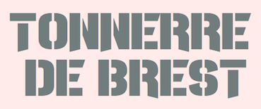 Chequered Ink (est. 2015) is a two-man design studio consisting of Daniel Johnston (b. 1993) and Allison James (b. 1991; Allison is a reincarnation of Andrew McCluskey). Their business is based in Bath, England but they currently reside in Newport, Wales. Before 2015, Andrew McCluskey operated as NAL Games. That font collection was merged with Chequered Ink. As of early 2019, they designed 912 fonts, virtually all downloadable at Fontspace. For detailed attributions, we have:
 Typefaces from 2015, mostly made with FontStruct: Heartbeat Synchronicity, Sawchain, Man Flu, Ace Adventure, Disco Nectar, Hex Girlfriend, Future Now, Lycra, Rygarde (pixel font), Empire Straight (avant garde caps), Kitty Katastrophe, Gang Wolfik Craze, O.K.Retro, Xxrdcore, the blocky sans serif Horticulture, the modular angular Heartbreaker, Ninja Thing, Fort Brewith, Urgently, Baxter's Slab (heavy octagonal style), Lady Radical (pixel font), Provisionary, Quickfyr, Vermin Vore, Even Stevens. Typefaces from 2016: Sportscream, Assvssin, Brandsom (ransom note font), BromineCocktail, DestinationMercury, Eviscera, Halloween*Heresy, IReallyReallyReallyReallyReallyReallyLikeFonts, Viadukt, Yetimology, Indocorno, Overdose Sunrise (dry brush), Happy Talk, Camaraderie, Death Hector (sci-fi), Scones And Crossbows, Casual Softcore, Notepads & Roleplay, Order in Chaos, Stencil of Destiny, ViceVersus, Magenta Flow, Prick Habit, Go Faster, BlackboardRovers, Caperput, Chavelite, Lovecraftimus, RawhideRaw2016, SmackLaidethDown2016, SmackLaidethDown2016Oblique, Pelode, The Nineties Called They Want Their Font Back, You Can't Kill Old School, Thoroughbred, Card Shark, Sheeping Dogs, Zen Monolith, The Joy Facade, Cerulean Nights, Pounds of Violence, Altered Quest (octagonal), Thrash Decision (dripping paint font), Afroed Dizzy Yak (handcrafted style), Circulus (octagonal style), 53 Dollars and 92 Cents, Endless Boss Battle (pixel font), Guest Circus Paradiso, Niagaraphobia (sans), Noseblood (squarish italic), Shake Your Plums, The Light Brigade (trekkie font), Beautiful Heartbeat (handcrafted), Poisoned Paradigm (dripping paint font), Development Hell (modular), Energetic Star (stencil), Men Down (display or poster type), Apple Korea (Hangul emulation typeface), Zdyk Capricorn, CQ Mono (a rounded monoline monospaced sans programming font), Pyrsing, Executionist, Mono a Mano (pixel typeface), Toxico, Swiggity (hexagonal), Mono a Mano (pixel font), Dissolved Exchange, Thundercover, Hors d'oeuvres The Garter, Distortion Dos Digital, Acetate, Arcapulse, ChelseaSmile, Headshots, Here&NotFound, IregulaTo, Japers, MidnightsontheShore, RallyBlade, Sothin (a great ultra-condensed squarish typeface), VerminVibes4Helium, 6Cells, DistortionDosAnalogue, SpotMonkey, Summoners, UnderwearProtest (Piano key style), VerminVibes4, Shapeshifters, Puerto Magnifico (Mexican party style font), Zdyk Gemini (intergalactic font), Bones To Your Generic Script Font, Breathe Fire (medieval style), Escalatio (hipster style), Pocket Monka (beatnik style), Jack Frost, Hiruleon, Cfour, CrystalCathedral, DigitalDust (LED font), DotLirium, Griefmachine, KillerCollege, OfMaidsandMen (oriental emulation typeface), Red Dragons, Grimeplex, Iron Amore, Twizzled, ZedSaid, Vermin Vibes, Major League Duty (military stencil), Moist (dripping paint font), Wondertribute, Of the Blue Colour of her Eyes, Anastasia (script). Typefaces from 2017: Technoma (rounded sans), Gothiqua, Tune Up De Ting, Diary of an 8-bit mage, Night Machine, The Wastes of Space, Nuernberg Messe, Torque Sense, Crevice Stencil, Glitch Slop, Balloonatic, Typist's Pseudonym, Flob Out A Bork, Tumbling Down (grungy), Onomber, Have a Banana (angular style), Not The Far East (oriental simulation font), Electric Shocker, Lady Radical 2 (pixel), AmidVerrion, Basilisk, Beillingsday, Butcher the Baker (a gory brush), CQ-Full-Stretch, Chillit, Diagon, Durmstrong, Embryonoid, Gravedigger, Gridget (gridded), Gridlocked, Hannover-Messe-Sans, Hannover-Messe-Serif (pixel), Ineptic, I Shot the Serif, JesusFrank, Messe Muenchen (slab serif), Ode-to-Idle-Gaming, Punishment (grungy stencil), Rumutocu (squarish), Slitter, Slim Stradiva, Supercarver, Technoma, VitruvianMan, VoiceInMyHead, Riemann Theatre (art deco), The Messenger, Revengeance, Pimlico, North to South, Qui Finn, Oganesson, Xmas Sweater Stitch, Tinsel Christmas, Inky Thin Pixels, Saint Knick Knack, Cookie Cutter Culture, Talking Baseball, Balls of Bastille, Vegan Abattoir, Oxen Crossbow, Thumbs Down, Enter the Harbinger, Im Not Like Most Fonts, We Used To Be Friends, Trendgetter, Strings Theory, Carnival trash, The Life of Flight, Sci Auralieph (rounded sci-fi style), Foreplayer, Pixel or GTFO, Block Stock, Unability, Swore Games (military stencil), Clintwood (Western, spurred), Floral Compass, Skull and Void, Weymouth Ribbon (7 pixel font), Four Mad Dogs, Blaize, Chisholm Heliport, ConfettiWestern, EdgyMarker, Ganymedian, Klein Bottle, LeipzigerMesse, LifeInTheFastLane, Messe-Duesseldorf, MilestoneOutline, Oilrig, QueenofClubs, Peking Assignment, Racetrack-Stencil (trilined typeface), RodentRage, Spoopy Ghost Pixels, SquareRaising, Whisperer, ZdykLibra, Equalize (sci-fi), Helicopta (sci-fi), Saveloy, Hangar Nine, Robo Arriba (a font with Mexican-patterned texture), Clutching Toth, Freestyling Centipede, Idiot Stax, Lorra Lorra Dates (an image font simulated on FontStruct), Rampant, Typingrad (constructivist), Lovesauce (squarish), Scaremonger, Happy Accidents, Aztechno (Mexican Aztec culture emulation typeface), BeastofRage, ComicKhazi, DaisyRoots, DogRough (ink splatter font), Drowsy, FrankfurtMesse-Serif, FrankfurtMesse-Wide, FrontPageSupplement, HipsterHandGrenade, MerrimentHelicopter, OffspringRemorse, PlacktheHanet, RevolutionWillBeHypnotised, SomersetBarnyard, Almond Rocks, Gridking, Rollcage (circle-themed sans), Satire, Some Kinda Madness, Blackletter Buffoonery, Toe the Lineless, Merriment Helicopter, Revolution Will Be Hypnotised, Long Haired Freaky People, Sui Coward, Pirates of Cydonia, Old School Adventures (pixel style), Mersey Cowboy, Disco Everyday Value, Koln Messe-Deutz, Stress Genesis, Vermin Vibesy, Madness Hyperactive, Nebulous Content, Toe The Line, Chunky Felt, Madness Hyperactive, Member Kinglify, Bristol and Bath, Dirty Princess, Modern Bohemian, Chocolate Cavalcade, Capital Clickbait, Frogotype, Ipscrik, Front Page Supplement, Sex Drugs and Fidget Spinners, Pickle Pushing, Thickedy Grunge (crayon font), Knockout Grunge, League of Extraordinary Justice, Thickedy Quick, Avenged for Yourself, Zoon Hoot, Ambidextrose, Thinly Handled, Sketchit Means Sketchit, Return of the Grid, Fierce Brosnan, Chubby Thumbs, Pseudonumb, West End Knights, Cybercrime 2004, Reflecques, Death Knell, Fake News, Zealousy, Aquamarina (rounded sans), Amateur Camcorder, Mighty Squidge, Track & Shield (multilined), Wander Z, Gardenfreude, The Wild Breath of Zelda, Effective Power, Techno Agony, LED Specimen (textured), Projectionist, Splinter Wonderland, Shiny Eyes, Uncopyrightable, Hallowed Grad, Peace and Equality, Steriliser (heavy sans), Electro Shackle, Castforce (titling sans), Butterfly Reflect. Typefaces from 2018: January Fair, Scared of the Unknown, Teddy Bears, Wicked Jumps, Enter The Grid 2, Chump Change, Take Me Out, Breathe Fire II, Toon Around, Tabloid Scuzzball, The Jjester, Play Pretend, A Friend In Deed, Girlesque, Bumblebear, Joyful Theatre, Snow Deep, Car Lock, Digital Display (an LED font), Game Played, Seldom Scene, The Shape Of Things, Candy Beans, Internal Rainbows, Pride Thusly, Armwarmer, Futuristic Armour, Refresher (dry brush), Brick Shapers, Frostbite Boss, Armed and Traitorous (a rough-edged stencil typeface), Ambystoma Mexixana, The Slug and Lion, Gourmet Hearth, Virtu, Star Doors, Winter Spice Cake, Canvas Bags, Shocking Headline, Tiny Islanders (pixel font), Yumi, Nobody Talks, Finished Sympathy (white on black), One Slice, Somerton Dense, Sunday Afternoon, Close & Open, Another Flight, Kuiper Belt, Platonica, Smoother, Ladders, Cold Warm, Name Smile, Shepherdy, Friend Head, Kevlar Underwear, Scrambled Tofu, Dillydallier, Joy Kim, Office Square, You've Gotta Point, District Four, Scare Arms (grunge), 22 September, Alimony, Xmas Fairy Lights, Segreteria, Leg Hug, Coded Message, Madeleina Sans, Trample Over Beauty, Emerald Grey, Fine Allie, Bottled It, Glee Finder, Pill Anthropic, Achtung! Polizei, Say the Words, Outcome, First In Line, Brain Wants, Green Strand, Die Grinsekatze, Eight Bit Dragon (a pixel typeface), KreepTown, Loudhailer, Progesterone, Insomniax, Quick Fuse, Rowdy Space Pirates, Oestrogen, Whisper Quiet, Zosilla, Construction Lines, Construction Lines, Juxtaposer, Tommi, Under The Weather, Xero's Punishment, Betryal of Mind, Rustic Love Tattoo, Younger Love (heavy octagonal typeface), Gossamer Girls (a pixel font), Dispence, Time Won, Blessings of Babylon, Requires Moonshine, Stroud, Hot Bleb, Nightmare Codehack, Manilla Cellos, Teeny Tiny Pixls, Ava Meridian, Wonders of the Orient, Float The Boat, Cute Zealand, Super Renewables, Lean Foreword, Mister Fisher, Love Nature, Exposure Salary, A Goblin Appears (pixel type), Project H, There Must Be, Charlestoning, Sportsquake, Violet Wasteland (dry brush), Clubbed to Life (sans), Moonwalk Miss, Best Tease, Reach The End (art deco), Slalom, A Grazing Mace, Boomer Tantrum, Disarmer (military stencil), Hell Underwater, Carnival Centenary (Tuscan), Mahalo Brother, Glue Gun, Tyrannothesaurus, Casanova Scotia, Fatherland Faker, Daughter Of A Glitch, Sparkles, Europhonic, Betelgeuze, Goregeous, Supermarketed, All The Way To The Sun, Russia Five, Soccer Scoreboard, Cinqcent, Megan June, Big Old Boldy, 501, Earthshattering, Sheeping Cats, Thousandyard, Closet Dwellers, Clicky Bricks, Painter Decorator, The 27 Club, Adventure ReQuest, Miamagon, Nineteen Ninety Seven, Vermin Verile, Great Attraction, Great Attraction, Zirconia, Oh Beehive (hexagonal), Gofuyo (experimental geometric sans), Wideboy, Im Spiegelland, Battenberg and Custard, Bugfast, Robotic Harlequin, Scouser Ste, Blend Her, Ancient Venusian, Sivereign State (constructivist), Daily Mix 3, Brushstroke Horror, Hellgrazer, Corporation Games (sci-fi), Pride Cometh (dry brush), Squirk (stone cut), Mecklabecka (octagonal), Nineteen Ninety Three (pixel), Dominian (octagonal), Perfectly Together, Super Comic, Nrvsbrkdwn, Bottom Brazil, Don't Delay Act Now, Nu Home, Just My Type, techno at Dusk, Starbirl, Hate Agent, Fool's errand, Bullet Rain, Orchestra of Strings, One Pill Makes You Larger, Interlewd, Fandomonium, Ball Bearing, Jamboree, Hot Thin Roof, No Added Sugar, X Termination, Real Fun Time, Der Neue Spargel, Nineteen Eight Seven (pixel), Bittypix Countdown, Nineteen Ninety Six, Fasterisq, Peekavous, Modest Felt, Im Wunderland, Megarok, Sunk Foal Brother, Skydiver, Chasing Rabbits, Background Noise, Viridian College, Sacred Hertz, Sawyers Whitewash, Brittle, Cupcake Smiles, Machine Gunk, Dubspikes, Onslaughter, Eyes Wide Suicide, Boatycabiners, All Square Now (pixel), Hawking Bowen (octagonal), Style Thief, Tagon (octagonal), Withheld Data (LED font), Dubstep Blackletter, Pixabubble, Hopelelessly in Lurve, Springtime Daydream, Techno Til Dawn, Fluid Lighter, Rush Rush (stencil), Incompetent Landlord, Danger on the Motorway (dot matrix), Hippopotamus Apocalypse (hexagonal), Homunculus, Bittypix Monospace (pixel font), Unicorn Scribbles, Rockout, Truly Madly Dpad, Tincture, Virtual Pet Sans (dot matrix font), How Are You Today (ultra-condensed), Juicebox, Chemical Superior, Organic Teabags, Broadsheet Bubble, Document Two, Slope Opera, Blockbrokers, Off The Haze, Gang Wolfik, Gnorts Mr A, Radiator Falls, Take Me On, Cyberspace Raceway, Rocket Rinder, May We, The Citadels, Life Is Okay, Astrolab, Simple Stitch, Feeding A Moment, Gooseberry Juice, Namso, Rabbit Fire, Texas Drop, Short Xurkit, Maiden Crimes, Hysterix, Introducing Pretentiousness, Lullaby Weight, Slumbers Weight, Vampires, Veal Nerve (a neurotic typeface), Be Kind To Earth, Aardvark Sk8, Ancient Modern Tales (blackletter), Spider Talent (Halloween font), Pooch Doo, Plan G, Rhapsodies (art deco), Lab Pulsar (sci-fi), Hamburg Messe (blackletter), Xide, Scrawling Pad, Bun Ting, Speedeasy, Itty Bity Notebook. Typefaces from 2019: Hindsight 2020, Provicali, Go Everywhere, Smack Laideth Down 2019, China Fad, Monster Twenty, Into Deep (sci-fi), Mandatory Plaything, Galaxy Girl, San Marino Beach (a shadowed font), Acorn Caravan (a rounded sans stencil), Hairy Beard, Phonograph, Sterelict (futuristic), Egosurf, Bankruptcy, Wayfarer's Toy Box (a pixel font), Fox Cavalier, Heartisan, Modular Amplitude (heavy octagonal, Dolphin with a Massive Shotgun (a glitch font), Jasmine Laslo, Earth Spirit, Nemesis Grant, Daily Mix 4 (an all caps blackboard bold typeface), Uplifting, Ministry of Moron (a heavy sans), Extinction Event, Cut Deep, Q For The Memories, Wozcott, Super Legend Boy (pixelish), Chopsic, Lesotho Beach (octagonal), Illiead, Ten Pin, Isite, Motorstrike, Hwyl Fawr Hello, Undersided, Shut Up and Love Me (shaky letters), Terminal Day, I Am A Designer, Born to Grille (a semi-stencil), Amuse-Bouche, Die Frau, Err Hostess (octagonal), Cthulhu's Calling, Fresh Eaters, Gamma Orionis, Greatsby Gat, Hands Oversaturation (sans), Joy Multiplication, Kotoba, Midnight Champion (an extra tall sans), She Smiles, Read Wharf, Ohno (poster sans), Prodigy Forever (a blood and paint splatter font), Questrian 2 (sans), Nau Sea (squarish), The Macabre, Long Fox, Roll Accurate (stencil), Princess Saves You (pixel font), Clone Machine, Cyberpunk Sealion, Misery Garment, Klimaschutz, Space Obsessed, Serpentire, Squidgy Sweets (fat rounded sans), Yokelvision (fat letters), Coral Colour, None Away From The Moon (counterless), Squidgy Sweets, Yokelvision, Coral Colour, None Away from the Moon, Robot Roc, Figure Things, Gaeilge Kids, FoughtKnight Haymaker, Medical Shape, Revenant (octagonal), Pinch My Ride, Dire Gramme, Assembled from Scratch, Premier 2019 (squarish). Typefaces from 2020: Hardigan (a titling sans), Petrichor Sublimey, Bardolatry, Star Trebek, Fast Hand (sci-fi), Bonk Robbers, Neuterous, Demoness, Lucid Streams (sci-fi), Fosterama (an elliptical sans), Woman, Shock Mint Fund (octagonal), Milletun (an all caps slab serif), Mille, Vudotronic, Elder Head, Dead Revolution, Charge Off, Asleepytiming, Questrian3, SplendidConfusion, XXIX, Septacharge, Dark Seed, Hawkeye, Dustfine, We Are Survivors, Be A St, Computo Monospace, Dealer Strikes, Zdyk Virgo, Bathrind, Honk, Revamped, Clease Plap, Zdyk Cancer, Cyberway Riders, Memorial Lane, Doubleplus, Ominus (italic), Army Buster (stencil), Tudor Victors (a grungy stencil), Romantic Chemicals, Migraine Machine, Warhead (constructivist), X-Heighting. Dafont link. Creative Market link. Fontspace link. [Google]
[More] ⦿
|
Chris E. Lozos
[Dezcom Typefaces]
|
 [MyFonts]
[More] ⦿
[MyFonts]
[More] ⦿
|
Christian Munk
|
 Danish designer (b. 1991), aka CMunk, who used FontStruct to create most of his typefaces. Dafont link.
 In 2008 he designed Flag Semaphore (+Smooth, Peace), Articulate, Font from NATO (military slab serif), Glockenwerk (pixel clock font), Glockenwerk Uhrzeit, Flags-and-NATO (dingbats), Font from NATO alpha, Tall, Flying-Circus (Western showtime typeface to imitate the Monty Python titling font), LCD-display, Simple (stencil font with 700 glyphs), TMNT, Tetris, sharp-pixels, Raster, Quad (nice stencil face), Inverted, Propaganda (Cyrillic font simulation), Empty Monospace, Pride, Stadium, Rounded, Dear God (script pixel face), Celtic Style. In 2009, he added 7x12 Pixel Mono, @bcde, Abstract Letter Patterns, Music, Texture, Diagonal, Gothic, Illusio, Unispace (typewriter type), Narrow Serif, Delta, Alien Double (great!), Donut, Flags-and-NATO, Simple-Fraktur-Initial, Simple-Fraktur, Texture, Friendly Serif, (+Soft), Invisible, Sharp, Heavy Diacritics, Concentrium, Continuous Digital Display, Elves, Pixies, Space Movie (+Ligatures), Flag Semaphore (+Smooth, +Peace), Articulate, BBT Biline Twist, Biline Twist, Empty Monospace, Unfix, Infix, Pride, Tyre Stencil (like tire threads---nifty...), and Overlap. FontStructions from 2010: Even (gridded), Brilliance, Slalom Vision, Quirky Serif, 7x12PixelMono, Ball Terminator, Gearbox, Prefix, Upside Down, Way Too Small (a minimalist pixel face), Butterfly, Ribbon Gymnastics, 2D Barcode, Horizon Stencil, Biline Twist, Blocktur, Symmetricus (alien writing?). FontStructions in 2011: 12 dice, Monotwist (tall, monospaced), Squarific (fat octagonal), Swirl (curly), Sweet (Victorian), Easter Eggs, 50 Fifty (experimental, geometric), Squarific (+Stencilious), Spiralix (spiral-themed for Latin and Cyrillic), Bloccus, Feet (monospaced). Creations from 2012: Düpbøl (German expressionist face), Slice, Blocktur, Alien Double, 7:12 serif (pixel face), Blick, Dry Heat (Isolates and Initials, Medials, Finals: an Arabic simulation family), FF9 Coin Slots, FF8 Untalic, FF7 w1de, FF6 Lean Mean, FF5 Bamana, FF4 Circulation, FF3 3times7, FF3 Runization, FF1 Glitchy, Squared, Puzzlish, Steep, Digitalis (octagonal), 50 Fifty (artsy and geometric), Monotwist, Infix. FF stands for Forgotten Fonts. Typefaces made in 2013: Ribbons And Banners, Digital Rome (pixel face), Censorship, Interlock, Bouma, Glaedelig Script, Hand XL Smooth, Vascomat, Spitzschtruct (emulation of Suetterlin), Neonic, Fish Scales, 7:12 Serif, Analogly, Squarific Fraktastic, Metro Sans (pixelish). Typefaces from 2014: Word Games, Shadows, Yuuroppuna pixel, Spines, Numbers, Tal Dansk, Zahlen Deutsch, Insular Typewriter, Nudge Nudge (dot matrix), 7:12 Serif (monospaced pixel font), Jovian, Squarafic Fraktastic, Computer Says No, Runic, Fluorescent (neon tube typeface). Typefaces from 2015: Hexagonia, Kapow (a comic book font), Fauxreign (a Thai emulation font). Typefaces from 2016: Ziplock (art deco), Vexillum (maritime signal flags). Typefaces from 2019: Drop Cap (Lombardic), Fun with Cubes (3d). [Google]
[More] ⦿
|
Comicraft (was: Active Images)
[Richard Starkings]
|
 Comicraft was founded by Richard Starkings and John Roshell in 1992. Located in Santa Monica and Los Angeles, they do lettering and design for the comic book industry and make comic book fonts. At one point they were also called Comic Book Fonts. The current presidents are Rita Simpson and Richard Starkings. Alternate URL. T-26 link. Creative Market link. Some fonts: Sanctum Sanctorum (2003), Grandguignol (2003), MagicalMysticalFour (2003), Smash (2003), Aztech, Joe Kubert, Gobbledygook, Meanwhile, Matinee Idol [Nick Curtis has a much nicer script font by the same name, sold by MyFonts], Manganese (Asian-lookalike by Richard Starkings), Altogether OOky (by John Roshell), AbsolutelyFabulous, Achtung Baby (1997, Richard Starkings: a brutalist typeface), Adamantium, Alchemite, AstroCity, AstroCity International, Bithead, BrontoBurger, CarryOnScreaming, Chills, ClobberinTime, Comicrazy, Destroyer, DivineRight, DoubleBack, DutchCourage (1995, an art deco family), Elsewhere (art nouveau), Flameon, Framistat (2000, JG), Frostbite, GrimlyFiendish, Hooky, Hellshock, IncyWincySpider, JimLee, JoeMad, KissAndTell, KissAndTell International (2000, JG), Meltdown, MonsterMash, PhasesOnStun, PulpFiction, ResistanceIs..., RunningWithScissors, SchoolsOut (1999, John Roshell), SezWho/SezYou, SpookyTooth, Spills, Splashdown, StandBy4Action, Stormtrooper, TheStorySoFar, ToBeContinued, Thrills, WildWords, WildWords International, YuleTideLog, Zoinks, ZAP Pack, Digital Delivery, Jeff Campbell (2000, by JG), Los Vampiros, DeadMansChest, Cutthroat International (2000), Rigor Mortis (2000, John Roshell), DangerGirl, Thingamajig, Red Star, Red Square, Drop Case, Too Much Coffee Man, NearMyth, Stonehenge, Golem and SwordsAndSorcerers (medieval or runes fonts). Their monster fonts collection includes MonsterMash, CarryOnScreaming, Chills, GooseBumps, CreepyCrawly, Grimly Fiendish, IncyWincySpider, SpookyTooth, Meltdown and TrickorTreat dingbats. In 2005, MyFonts started selling their collection. Fonts by Starkings include Achtung Baby, Carry On Screaming, Clobberin Time, Flame On, Goosebumps, Grimly Fiendish, Sez, Splashdown. The full font list: Absolutely Fabulous (1999), Achtung Baby (1997), Adam Kubert (2005), Adamantium (1999), Alchemite (1997), Altogether Ooky (1999, vampire script), Area51 (2005, an octagonal typeface with a military stencil)), Astro City (2005), Astronauts In Trouble (2005), Atomic Wedgie (2005), Aztech (2005), Battle Cry (2005), Battle Scarred (2005), Belly Laugh (2005), Biff Bam Boom (2005), Bithead (1997), Blah Blah Blah (2005), Bronto Burger (1996), Carry On Screaming (1996), Chatterbox (2005), Cheeky Monkey (2005), Cheese And Crackers (2005), Chills (1997), Clobberin Time (1995), Comicrazy (1995), Creepy Crawly (2005), Cutthroat (2005), Danger Girl (2005), Dave Gibbons (2005), Dead Mans (2005), Dear Diary (2005), Designer Genes (2005), Destroyer (1999), Digital Delivery (2005), Divine Right (1998), Doohickey (2005), Double Back (1998), Dreamland (2005), Drop Case (2005), Dutch Courage (1995), Elsewhere (1998), Euphoria (2005), Exterminate (1999), Face Front (2005), Flame On (1997), Forked Tongue (2005), Framistat (2005), Frostbite (1997), Girls Girls Girls (2005), Gobbledygook (2005), Golem (2005), Goosebumps (2005), Grande Guignol (2003), Grimly Fiendish (1998), Hedge Backwards (2005), Hellshock (1997), Hooky (1999), Hush Hush (2005), Hyperdrive (2005), Incy Wincy Spider (1996), Jeff Campbell (2005), Jeff Campbell Sketchbook (2005), Jim Lee (1998), Joe Kubert (2005), Joe Mad (1999), Kiss And Tell (1999), Ladronn (2005), Los Vampiros (1999), Manganese (1999), Matinee Idol (2005), Meanwhile (2005), Meltdown (1997), Mike Wieringo (2005), Monster Mash (1997), Near Myth (2005, a grunge face, since 2007 also at T26), Nuff Said (2005), Overbyte (2005), Paranoid Android (2005), Pascual Ferry (2005), Pass The Port (2005), Phases On Stun (1995), Primal Scream (2005), Pulp Fiction (1996), Red Square (2005), Red Star (2005), Resistance Is (1997), Rigor Mortis (2005), Rumble (1994), Running With Scissors (1997), Sanctum Sanctorum (1998), Santas Little Helpers (2005), Schools Out (1999), Sean Phillips (2005), Sentinel (2005), Sez (1998), Shannon Wheeler (2005), Shannon Wheeler (2005), Smash (2005), Snowmany Snowmen (2005), Soothsayer (2005), Spellcaster (2005), Spills (1997), Splashdown (1997), Spookytooth (2005), Stand By4 Action (1997), Stonehenge (2005), Stormtrooper (1997), Thats All Folks (2005), The Story So Far (1998), Thingamajig (2005), Thrills (1997), Tim Sale (1999), Tim Sale Brush (2005), Tim Sale Lower (2005), Timelord (2005), To Be Continued (2005), Too Much (2005), Tough Talk (2005), Treacherous (2005), Trick Or Treat (2005), Wall Scrawler (2005), Wiccan Sans (1999), Wiccan Serif (1999), Wiccan Special (1999, see also T-26), Wild And Crazy (1997), Wild Words (1995), Yada Yada Yada (2005), Yeah Baby (2005), Yuletide Log (1996), Zoinks (2005), Phil Yeh (2006), Zzzap (2006), Battle Damaged (2007), Speeding Bullet (2006), Foom (2007), Letterbot (2007), Timsale (2007), Cutthroat (2007), Framistat (2007), Area 51 (2007, techno, octagonal), CC Comicraft (2007), Ratatat (2008), Mad Scientist (2008), Monologous (2008, T-26), HolierThanThou (2008, T26), Elephantmen (2008, grunge typeface at T26), Storyline (2008, T-26), Primal Scream (2009, T-26), Spillproof (2009, T-26), Sign Language (2008), Moritat (2009, T-26, by John Roshell), Pass The Port (2009, T-26), Credit Crunch (2009), Elsewhere (2009, art nouveau), Code Monkey (2011, monospaced yet informal), Glitter Girl (2011, hand-printed), Rassum Frassum (2011, comic book face), Rocket Man (2011, a retro futuristic family), Spaghetti Western (2011, signage face), Sunrise Till Sunset (2012), Samaritan and Samaritan Tall (2013, with John Roshell).
 In 2014, John Roshell published the school font Dash To School. Typefaces from 2015: Samaritan Lower (by Richard Starkings and John Roshell), Dusk Till Dawn Buried (expressionist). Typefaces from 2016: Questionable Things (with John Roshell: a question mark font). Typefaces from 2017: Evil Schemes (by Richard Starkings and John Roshell), Regeneration, Obey Obey Obey (by Starkings and Roshell). Typefaces from 2018: Samaritan Tall Lower (by Starkings and Roshell), Blah Blah Upper (by John Roshell and Richard Starkings), Evil Doings (by Richard Starkings and John Roshell). Typefaces from 2020: Elektrakution (a Greek simulation font family by Richard Starkings and John Roshell), This Man This Monster (by John Roshell and Richard Starkings). Typefaces from 2021: Richard Starkings Brush (2021; a comic book typeface by Richard Starkings and John Roshell), Scoundrel (a comic book face by Richard Starkings and John Roshell). Creative Market link. View Comicraft's typefaces. Fontsquirrel link. [Google]
[MyFonts]
[More] ⦿
|
CorelDraw dingbats
|
The CorelDraw dingbats can be found in many places. The fonts: Animals-1, Animals-2, Arrows1, Arrows2, Awards, Balloons, Borders1, Borders2, Buildings, Bullets1, Bullets2, Bullets3, Bullets-4(Japanese), Bullets-5(Korean), Business&Government, Borders1, Borders2, Boxes, Charting, Clocks, CommonBullets, Computers, Chinese-Generic1, Electronics, Festive, Food, Furniture, GeographicSymbolsNormal, Household, Hygiene, HomePlanning, HomePlanning2, Japanese-Generic1, Kidnap, Korean-Generic1, Landmarks, LandscapePlanning, Medicine, Military, MilitaryID, MorseCode, Music, MusicalSymbolsNormal, NauticalFlags, OfficePlanning, People, Plants, Science, Semaphore, Signs, Space, SportsFigures, Sports&Hobbies, Stars1, Stars2, SymbolProportionalBT-Regular, Shapes1. [Google]
[More] ⦿
|
Creative Toucan (was: Leo Supply Co)
[Leonard Posavec]
|
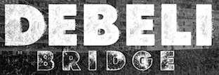 Cakovec, Croatia and Washington Park, WA-based designer (b. 1995) of preponderantly grunge typefaces. In 2013, he created Funny Classic, Lion Pro, Lover, War is in the Air (military stencil), Aussen (squarish), Ensione (outlined), Rangle, Gaon, Momgers, Escapea (athletic lettering), Campus A (athletic lettering), Zebraliner, The Alistaren, Goteros, Collegerion (athletic lettering face), Prestinia Pro (grungy serif face), Fast Ostrich, Funny Trip, Boro, Electric (grungy face), On The Left, Power Balloon, Heavy Bomb (grungy), Kid From Hell, Army Stamp (rough army stencil), Jump Party, Comic Type, Commy, Faster, Fati, Funny me, Hypnotize, Half Half, My Day, Totally Outline, First Day, Funny Kid, Waterline, Piranha, Fish (grunge face), Modern Sketch, Beboline (dymo label grunge), Metalic (sic), Moter (grungy outline face), Privjet, ShadowM (shaded typeface), Old Movie, Strong Boy, Russian Line, Long Leg, Cool Day, Jungle Tree, Funny Teca, End of Era, DeLeo, Buble Muble, Morris, Funky Monkey, Leonards (a scratchy typeface), Dead John (grunge), Square Baby (grunge), Handwriter, Outline Storm, Mejiko (grungy Western font), Bird Fly, Died, Close To (grungy dymo label font).
 Typefaces from 2014: Dabre, Handeer, Bad Land, Thron, 806 Typography (wood style didone), Rypote. Typefaces from 2015: Debeli Bridge (faded, grungy and gorgeous), Rustal, Madalen, Stiquez, Vallyns (grungy, stamped typeface), Falsthan (brush face), Areson, Summeron (brush script), Surpal Lovely (Victorian kitsch), Summer 2, Megeon (+Grunge), Dabre Grunge (textured caps). Typefaces from 2016: Taramda, Endless Script, Riot Ton, Dabre (grungy stamped style), La Tequila (Western font), Originals (painted letters), Originals is out, Avenue Drift, Amoky (sketched), Bastielle Script, Ipsum Script, Baroquey Script, Pomah Type (brush script), Vrown Fox (dry brush), Time Machino (dry brush), The Gohe Go, My Boquet Script, The Sellen, Baley Sun, Brushed Traveler, Salone Strand, Aple Time (brush), Bert Loch (brush), Brushed Car, Last and Chaos (brush), Thin Zeus (brush), Top Light (fat brush typeface), Summer Soul Script, Summter (connected script), Summdraw, Planine Script, Samtak Script, Astel Script, Rostek Old, Megiline, Sally Script, Rolley, Naila Script, Amoky (textured letterpress emulation typeface family), Reeld (dry brush typeface), Stamped Navy (textured). Typefaces from 2017: Musterion (brush script), Wolvos (rough brush), Xenos, Descolorido, Mushroom (an angulara children's book font), California Jackpot, Zondas, Codiac (rough brush), Gullias (signage script), California or California Jackpot (brush font), Rhinos Rocks (brushy), Quick Toy (inky brush script), Italiano (dry brush), Gode (thick brush), Ananas Lips, Kiwano Apple, Cup of Sea, Fly N Walk, Sign 45 (vintage grungy poster style), Jaoy, Gas Rock, Acids. Typefaces from 2018: Storehouse (a vintage all caps copperplate family with small wedge serifs; by Nicolas Massi and Leonard Posavec; it includes a stencil style), San Francisco, Quick Pick (brush), Mick's, Jumper, Alask (brush), Royal Twins, Clas (brush script), Yolloy, Scolarship (sketched). Typefaces from 2019: Planina, Athletica (letterpress style), Costa La Vista (font duo), Springs, Originals 2 (dry brush), Astana. Typefaces from 2020: Myla (a display typeface). Typefaces from 2021: Surfbars (a dry brush font for outdoors usage; also supports Cyrillic). Fontspace link. Creative Market link. Old URL. Another Creative Market link. Dafont link. Fontplanet link. [Google]
[MyFonts]
[More] ⦿
|
CTR Font Foundry
[Carl Thomas Redfern]
|
Carl Thomas Redfern is a British type designer, b. 1993, Shrewsbury. He set up CTR Font Foundry in Oswestry, UK. CTR's first typeface is the squarish military typeface Alpha (2012). [Google]
[MyFonts]
[More] ⦿
|
CyberGraphics
[Jan Erasmus]
|
 Foundry, est. ca. 2009 in Johannesburg, South Africa, by Jan Erasmus. Jan currently resides in Johannesburg and taught font design for 10 years at University of Johannesburg and Stellenbosch University. His professional activities include typography, websites, brochure design, packaging, branding and type design. He also designed custom fonts for corporations of which Menyaka (for the FIFA world cup soccer 2010) and Nando's fast foods (1999; done together with Cross Colours) are the most noted.
 Jan's debut display font family was Thornface (1997, a beautiful medieval font). He then released Transition, Lalibela (2009, didone), Pixeluxe and Azania (Tuscan, Western). Other fonts include Sade (a relative of Garamond), Export Unicase (1999, stencil), Mzansi (2007, an African look font), Shaftciti (2008, military stencil), Pixeluxe (2010), Giramundo (2010), Transition (2006), Ethereum (2015, a Cyrillic emulation typeface). [Google]
[MyFonts]
[More] ⦿
|
Dainippon Type Organization
|
Japanese commercial foundry. Creators of the commercial fonts Military (Kata, hira), Y.M.C.font, UnionJack, KUROFUNE20000, Typostock, Dentypo, and kurofune95. Some free stuff: English-Kunyomi font "Kurofune". This font is present to the admiral Perry he came to Uraga in 1853. This is "Kanji-font" meets "English-font" (sic). Older URL. [Google]
[More] ⦿
|
Damien Gosset
|
Parisian designer (b. 1981) of PixArrows (2010, pixelized arrows), BeijingWigoWhat (2005, Indic simulation face), Coin Locker Datura (2005), Fucked Plate (2005, grunge typeface entirely based on old license plates), Destroyed License Plate (2005), BonesBummer (2005, scratchy handwriting), VerArmy (2005, stencil), Knife Fight (2005), Veru Serif (2005), Belgian Army (2005, no longer offered), Bnko (2005, no longer offered), Abuse (2005, handwriting) and Sweeep (2005, typewriter simulation), PoscaMadThrasherz (2009, graffiti), Rififi Serif (2010, pixel face), Sorcery 6128 (video game font) and Satan 1981 (2018). Typefaces from 2020: Boulder Dash 6128 (a pixel font), 8Bit Arcade (a video game font), Popincourt 1981 (a condensed squarish sans), Blackletter 97, Turfu 97, Peng Chau Nights (squarish), Eighty Nine 75020, Discomobile 1972 (Western), Lavomatic 2000. Alternate URL. [Google]
[More] ⦿
|
Dan M. Zadorozny
[Iconian Fonts]
|
 [More] ⦿
|
Daniel East
|
Daniel East (Marseille, France) created the octagonal typeface Duxford in 2015. Duxford was inspired by the characters used on the tail fin and fuselage of military aircraft at the Duxford Air Museum in the UK. Behance link. [Google]
[More] ⦿
|
Daniel Woessner
[Visual Mind Rockets]
|
[MyFonts]
[More] ⦿
|
David Phillips
[Radar Design]
|
[MyFonts]
[More] ⦿
|
David Phillips
[Komet & Flicker (was: StockBucket)]
|
[MyFonts]
[More] ⦿
|
Device Fonts
[Rian Hughes]
|
 Rian Hughes studied at the LCP in London before working for an advertising agency, i-D magazine, and a series of record sleeve design companies. Under the name Device he now provides design and illustration for the advertising, entertainment, publishing, and media industries. He works from Richmond, UK, as a comic book artist, letterer and typefounder---his foundry is called Device. He creates mostly display type. List of fonts. Interview. Review by Yves Peters. Monotype Imaging page. Interview by Die Gestalten. Various (overlapping) font listings, still unorganized.
 - Dingbats: Pic_Format, Mastertext Symbols, MacDings, RiansDingbats, Autofont.
- FontFont fonts: Identification (1993), Revolver, Rian's Dingbats, LustaOneSixtySans, Knobcheese, CrashBangWallop, and Outlander.
- [T-26] fonts: English Grotesque (1998), Data90 (2003; a free FontStruct typeface that is virtually identical to Data90 is Bitrate by Kummaeno (2010)), Flak Heavy (2003, stencil), Flak (2003, stencil), Freeman (2003), Klaxon (2003, kitchen tile font), Cordite, Substation (2003), September (2003), West Way (2003), Egret (2003), Paralucent Complete (2003), Paralucent Condensed, Paralucent Stencil (2003), Mercano Empire (2003), Iconics (2003), Cantaloupe (2003), Gravel (2003), Acton (blocky screen font, 2002), Ainsdale, Amorpheus, Anytime Now (alarm dingbats), Bingo, Blackcurrant (Blackcurrant Cameo (1997) is free), Bordello, Elektron, Haulage (U-Haul lettering, 2002), WexfordOakley, Telecast, Terrazzo, Transit, Untitled, Scrotnig, Skylab (2002), Silesia (1993), SlackCasual, Ritafurey, Reasonist-Medium, Regulator, GameOver, Novak, Quagmire, PicFormat, Jakita Wide (2000, techno font), Metropol-Noir, Motorcity, Mastertext, Mystique (2002), MacDings, Lusta, Laydeez, Sinclair, Paralucent (sans serif), Judgement, Bullroller, Zinger (a fifties font), Citrus (2002), Popgod (2003), Range (2000, a futuristic font), Hounslow, Jemima, Griffin, GranTurismo, Gargoyle, Foonky, DoomPlatoon, Darkside ("remixed" by FontStructor Kummaeno in his Ubangi (2011)), Kallisto (2010), Kallisto Lined (2010), Cyberdelic, Contour, and the very original Stadia Outline family (Stadia is a kitchen tile font).
- List of all fonts by Rian Hughes, as of 2004: Acton, Ainsdale, Amorpheus, Anytime Now, Bingo, Blackcurrant, Bordello, Bull Roller, Chascarillo, Contour, Cottingley (1992), FF CrashBangWallop, Cyberdelic, Darkside, Data90, Doom Platoon (1996), Elektron, English Grotesque, Flak, Foonky, Freeman, Game Over, Gargoyle, Gran Turismo, Griffin, Haulage, Hounslow, Iconics, FF Identification, Jakita, Jemima, Judgement, FF Knobcheese, Laydeez Nite, Lusta (big family), Mac Dings, Mastertext, Men Swear, Metropol Noir, Motorcity, Mystique, Novak, FF Outlander, Paralucent, Pic Format, Platinum, Quagmire, Range, Reasonist, Register (A and B), Regulator, FF Revolver, FF Rian's Dingbats, Ritafurey, Scrotnig, September, Silesia, Sinclair, Skylab, Slack Casual, Space Cadet, Stadia, Substation, Telecast, Terrazzo, Transmat, Untitled One, Vertex, Westway, Wexford Oakley, Why Two Kay, Zinger.
- At Veer, in 2005, these Device fonts were published: Gentry, Gridlocker, Valise Montreal, Custard, Box Office (moviemaking letters), Sparrowhawk, Monitor, Moonstone, Miserichordia, Yolanda (a great playful medieval text typeface in three styles: Duchess, Princess, Countess), Gusto, Dauphine, Rogue, Ritafurey, Dynasty, Radiogram, Xenotype, Roadkill (grunge), Payload (stencil family comprising Regular, Outline, Spraycan, Narrow, Narrow Outline, Wide, Wide Outline), Catseye, Electrasonic, Absinthe (psychedelic style), Straker, and Chantal (brush).
- In 2006, Veer added these: Profumo, Ironbridge, Cheapside, Battery Park (grunge), Forge, Shenzhen Industrial, Hawksmoor (grunge), Coldharbour Gothic, Wormwood Gothic (grunge), Chase (grunge), Diecast, Roadkill Heavy, Tinderbox (fuzzy blackletter), Dazzle (multiline face), Nightclubber (art deco), Klickclack (2005, comic book or cartoon caper typeface), Vanilla (art deco), Wear it's at (grunge), Diecast, Drexler, Box Office (movie icon font).
- Fonts from 2007: DF Conselheiro (2007, grunge), DF Glitterati (2007), Indy Italic (script), DF Apocrypha (2006, rough outline), DF Quartertone (2007), DF Lagos (2007, rough stencil), DF Pulp Action, DF Reliquary #17 (2006, grunge didone), DF Dukane (2007, octagonal grunge), DF Strand (2007, striped stencil), DF Rocketship from Infinity (2006, futuristic), DF Appointment with Danger (2006), DF Las Perdidas (2006, grunge stencil), DF Kelly Twenty (2007, grunge stencil), DF Heretic, DF Roadkill, DF Ironbridge, DF Forge, DF Shenzhen Industrial, DF Hawksmoor, DF Cheapside, DF Battery Park, DF Saintbride, DF Profumo, DF Coldharbour Gothic, DF Wormwood Gothic, DF Tinderbox, DF Flickclack, DF Vanilla (multiline art deco face), DF Chase, DF Nighclubber (art deco jazz club face), DF Diecast, DF Dazzla, DF Zond Diktat (grunge), DF Yellow Perforated, DF Mulgrave (grunge), DF Ministry B, DF Ministry A (with a hairline weight), DF Gridlocker, DF Gentry, DF Valise Montréal (grunge), DF Custard, DF Box Office, DF Roadkill, DF Payload Wide, DF Payload Narrow, DF Catseye Narrow, DF Catseye, DF Yolanda, DF Xenotype, DF Telstar, DF Straker, DF Sparrowhawk, DF Rogue Serif, DF Rogue Sans Extended, DF Rogue Sans Condensed, DF Rogue Sans, DF Ritafurey B, DF Ritafurey A, DF Radiogram, DF Pitshanger, DF Payload (stencil), DF Outlander Nova, DF Moonstone, DF Monitor, DF Miserichordia, DF Interceptor, DF Gusto, DF Glitterati, DF Galicia (2004), DF Galaxie, DF Electrasonic, DF Dynasty B, DF Dynasty A, DF Drexler, DF Dauphine, DF Chantal, DF Absinthe, DF Register Wide B, DF Register Wide A, DF Register B, DF Register A, DF Quagmire B, DF Cordoba (2007, grunge), Mellotron (2004, stencil), Seabright Monument (2007), Charger (2007, grunge).
- T-26 releases in 2007: Klickclack, Hawksmoor (grunge), Heretic, Ironbridge (old letter simulation), Battery Park (grunge), Chase (grunge), Cheapside (grunge), Dazzle (multiline art deco), Diecast (grunge), and Forge (grunge).
- T-26 releases in 2008: Automoto (fat multiline deco face), Straker (organic). Also from 2008: Mission Sinister (grunge), Gonzalez (grunge).
- FontBros release in 2009: Filmotype Modern. Other Filmotype series fonts include Filmotype Miner (2012), Filmotype Manchester (2012), Filmotype Meredith (2012), Filmotype Marlette (2012), Filmotype Mansfield (2012), Filmotype Power (2012) and Filmotype Major (2012: this is based on a typeface used as the titling font for the popular children's book by Dr. Seuss entitled One Fish Two Fish Red Fish Blue Fish, 1960). Other 2009 fonts: Degradation (grunge).
- Creations in 2010: Pod (2010, fat round stencil), Korolev (2010, a 20-style monoline sans family based on communist propaganda from 1937), DF Agent of the Uncanny (2010, brush face), DF Destination Unknown (2010, Kafkaesque brush), DF Maraschino Black (a sleek, sophisticated high-contrast swash capital font).
- Creations in 2011: DF Capitol Skyline, DF Capitol Skyline Underline and DF Capitol Skyline Capitals (a multi-weight all-caps pair that epitomizes Streamline Moderne), DF Korolev (a 20-weight sans serif family based on lettering by an anonymous Soviet graphic designer who did the propaganda displays at the Communist Red Square parade in 1937. Named in honor of Sergey Pavlovich Korolyov, or Korolev, considered to be the father of practical astronomics). In 2018, Korolev was expanded to Korolev Rounded and Korolev Rough.
- Typefaces from 2012: Ember (informal script), Kane (based on the Batman logo), Glimmer Glossy, Glimmer Mate, Galleria (avant-garde caps), Clique (flared sans).
- Typefaces from 2013: Wulf Utility (grungy), Charterhouse (an aggressive black sans), Filmotype Melon (after a 1959 original, this is an offbeat Googie era doo-wop typeface), Filmotype Melody (similar to Melon), Filmotype Mellow (also similar to Melon), Raw (worn wood type), Cadogan (a rhythmic connected script), Whiphand (brush face), Steed (heavy codensed masculine sans inspired by the titles of the Avengers TV show), State Stencil (Clean and Rough: in the style of Futura Black), Korolev Military Stencil (named after Sergei Korolev, father of Soviet astronautics, and based on signs from the Red Army parade of 1932), Armstrong (a 1950s automobile font).
- Typefaces from 2015: 112 Hours (numerals font).
- Typefaces from 2016: Typex (an angular yet rounded monospaced typewriter or OCR-style typeface based on the lettering used on Alan Turing's and Tutte's famous code-breaking machine at Bletchley Park, the Bombe, and the subsequent British answer to the German Enigma machine, the Typex), Serenity (a legible sans family).
- Typefaces from 2017: Pitch (a heavy block sans in chrome and solid variants), Shard (originally commissioned for Nickelodeon's 3D reboot of the Teenage Mutant Ninja Turtles franchise), Championship Inline, Mood (a great liquid deco font), Grange, Grange Rough, Dazzle Unicase, Urbane (sans), Urbane Rounded, Albiona (a modern take on Clarendon; includes Albiona Heavy Stencil), Albiona Soft (a rounded version of Albiona), Pact (a modular geometric font).
- Typefaces from 2018: Rutherford, Salvation (a potato cut font), Kano (inspired by the work of Dutch furniture designer and architect Gerrit Rietveld, one of the principal members of the Dutch artistic movement De Stijl), Rogue Sans Nova, Fairtrade (rough-edged font), Goddess (Victoriana), Neuropa (a five-weight semi-extended sans that projects a muscular corporate authority), Worthington Arcade (a caps-only lapidary typeface), Zeno (a piano key stencil typeface), Vektra (an experimental crosshatch-textured typeface), Recon (a quartz display font), Kinesis (Kinesis is inspired by the work of Dutch furniture designer and architect Gerrit Rietveld, one of the principal members of the Dutch artistic movement De Stijl. It is a modular headline font, constructed from white, black and grey overlapping rectangles), Freehouse (Freehouse is a reinterpretation of the well-remembered Watney's logo, a brewery and pub chain infamous for its poor quality beer and brutalist decor.), Zipline (a great multiline typeface), Argent Sans, Craska (a multiline font), Panther Black, Carilliantine (art nouveau with many interlocking letter pairs), Regulator Nova, Broadside, Bubblegum Pop, Heft (a heavy slab serif), Faction (stencil style), Metaluna (techno, engineering), Magnetron (futuristic), Urbane Rough, Urbane Adscript (a monoline semi-linking sans), Revolver (original from 1992), Albiona Inked (a Clarendon).
- Typefaces from 2019: Gerson Rand, Gravesend Sans (an all caps sans family based on the unique typeface used for the iconic grass-green signage for the now-defunct Southern Railway in England).
- Other: Customised Foonky Starred, Altoona, DfAncestorITC, DfAttitudesPlain, HotRod (2002).
- Typefaces from 2020: Breach (a display typeface with partitioned capital letters), Epiphany (stencil), Aurore Grotesque (an elegant geometric art deco sans family with small x-height), Faculty (a geometric sans with large x-height), Fathom (a flared serif typeface), Atomette (a stylized comic book typeface family), Conquera (a stylish extended caps-only font in five weights plus an inline), Dare (a tape font, that borrows a pinch of the hand-drawn swagger of Bauer's Cartoon (designed in 1936 by H. A. Trafton), used as Dan Dare's signature logo in the British boy's comic Eagle, and also the upward-pointing serifs of machine-moderne typefaces such as Dynamo (designed by K. Sommer for Ludwig & Mayer in 1930), Urbane Condensed.
- Typefaces from 2021: Maximum (a blocky techno or sports font), Paralucent Slab (a monolinear slab serif), Guildhall (a 10-style strong-willed mechanical font family), Broadside Text (14 styles), Cynosure (a 14-style elliptical sans), Valvolina (a geometric display typeface inspired by Italian Futurismo), Chassis (a sci-fi or computer game font), Fomalhaut (a space exploration font), Disclosure (a grungy font), Sheffield Fiesta (a squarish font based on the brutalist concrete landmark nightclub in Sheffield, now the Odeon Cinema), Grange Text (a 14-style sans), Wilko (a fat rounded poster typeface), Farthing (a 5-style wedge serif).
- Typefaces from 2022: Bradbury Five (a vernacular / bubblegum / supermarket / cartoon typeface in 18 styles), Tracker (an inline space-age disco font from the 1960s or 1970s, reminiscent of the Mexico City olympics font), Salient (a 12-style didone).
FontShop link. Klingspor link. [Google]
[MyFonts]
[More] ⦿
|
Dezcom Typefaces
[Chris E. Lozos]
|
 Chris Lozos (aka Dezcom and Dezcom Typefaces) is a Washington, DC-based (well, now Falls Church, VA-based) graphic designer and Vietnam veteran, b. 1944, Pittsburgh, PA. He studied Design at Carnegie Mellon University where he earned a BFA in Graphic Design (1966). While at CMU, he studied with calligraphers Arnold Bank and Howard Glasser, who both brought out the love of historic letter-forms and learned to set hot metal type in the Laboratory Press established there by Jack Stauffacher. Chris also was influenced by guest professors Hermann Zapf, Rudy DeHarek, Martin Krampen and Gui Bonnsieppe (of the HfG Ulm). He attended Graduate School in Visual Communication Design at the Ohio State University from 1972 through 1974.
 His typefaces: - Dez Petranian (2013). A warm text typeface designed for story-telling, and related to Souvenir.
- Des Squeeze Pro (2013). A great condensed display family with large x-height. The Pro version of Des Squeeze (2009).
- Dez Weimar Plakat (2013). Inspired by a 1923 Weimar Bauhaus / constructivist exhibition poster. This is a finished version of Weimar Plakat 1923 Pro (2006-2007). See also here.
- Dez Yinznat Stencil (2012). A military stencil dedicated to the industrial past of Pittsburgh.
- Dez Quo Vadis Titling (2010).
- Dez Boulder (2010).
- The bold headline typeface family Dez Squeeze (2009, +Fat). Discussions: Squeeze, Fat Squeeze.
- Leporello (2004).
- The semi-techno typeface Align Sans (2005).
- Now (2005). A geometric sans family with several novel ideas, which was followed by Now Bold (2006), Now Regular, Now Light, Now Gaunt Display (hairline) and Dez Now Sans (2018), about which he writes: A humanistic typeface family that was begun in 2005 by Chris Lozos of Dezcom. Since then, it has been nurtured, revised, and expanded to include 12 weights in both upright roman and true italics totaling 24 variations.
- The sans families Boulder Ego and Boulder Alter Ego (2006).
- Tovarich.
- Froggy (2006).
Flickr page. . [Google]
[MyFonts]
[More] ⦿
|
Ding Bang
|
 Designer of the free sports logo or children's scanbat typefaces LFP (2014), NCAA The Americans (2014), NHL East (2014), MLS East (2014), NHL West (2014), MLS West (2014), MLB NL (2014), NFC (2014), Disney Family 1 (2014), NBA West (2014), NFL AFC (2014), MLB AL (2014), NBA East (2014), NCAA Big 10 (2014), Mosaic Sone (2014) and Black Hoops (2014). In 2014, he also made the dingbat fonts Shrek, Thanksgiving Day, Thanksgiving Turkey, MAC, C-USA, Christmas, New-year, Santa, Winter, Xmas-Gift, xmas-tree, Premier League, Calcio, SEC, Pac 12, NCAA ACC, Ligue 1, Disney Halloween, Halloween Logo, Autumn, Monster High, Bundes Liga, Big 12, Halloween Happy, Halloween, Finest, Pixar2, Pixar1, Shades of Grey [scanbats related to the movie 50 Shades of Grey], Princes and Summertime, and the dot matrix typefaces LED Bus and Black Ball.
 Typefaces from 2015: Famous Car 1, Brasileirao, World Cup Logos, Ancient Weapons, Guns 2, Helmets, Cowboy, Horses 1, Fast Food Logos, Guns, Olimpic Icons 1, Winter Sport, Peppa Pig, Mickey Vintage, Proton Style, Sun Belt, MWC, King Lion, Social Manual. Typefaces from 2016: Tender Puppies, Flags of Europe (1 and 2), Lucas Characters (scanbats). Typefaces from 2017: Men's Clothing, Computer Icons, Wifi, Cats. Typefaces from 2018: Christmas Ornaments. Typefaces from 2020: Justice League, Summer Pool, Sonico, Farm, Sapce, Pupies (sic). [Google]
[More] ⦿
|
Dmitrij Greshnev
[Green Type]
|
 [MyFonts]
[More] ⦿
[MyFonts]
[More] ⦿
|
Dmitry Rastvortsev
|
 Ukrainian type designer (b. 1977, Buryn) who graduated from Sumy State University in 1999. Since 2002, he creates digital fonts. He also works at Dancor advertising in Sumy, Ukraine, since 1997. Very prolific, his work includes a substantial number of commissioned typefaces for magazines and companies.
 He received a TypeArt 05 award for the display family DR Galushki (and DR Galushki Hole, 2011), which was designed for children's books. Other creations: LQ Wow and LQ Anisett (2010, for women's magazine LQ), LQ Didot (2011, also for LQ), Dekapot (grunge), Gomorrah (2013), Usquaebach (2013), Kinescope (2013), Goshen (2013), Rhode Black (2014), UT Magazine (2014), Madmix (2014, for Esquire), Variety Square (2015, for the nmagazine Variety), DR Agu (comic book face), DR Agu Sans (2013), DR Agu Script (2016), DR Trafaret (army stencil face), DR Vixi, DR UkrGotika Sans, DR UkrGotika Serif, Tsar Peter, Pelican (for Esquire magazine), Fugue. In 2014, Gayaneh Bagdasaryan and Dmitry Rastvortsev created the Latin / Cyrillic sans typeface family Brutal Type (Brownfox) that is genetically linked to DIN. His funny DR Krokodila won an award at Paratype K2009. In 2014, Dmitry Rastvortsev, Lukyan Turetsky, and Henadij Zarechnjuk cooperated on the design of the free Latin / Cyrillic handwriting typeface Kobzar KS, which is based on the handwriting of Taras Shnvchenko, a famous Ukrainian poet, artist and philosopher. In 2016, he designed the op-art typeface family DR Lineart. In 2017, he published the military stencil font DR Zhek. In 2018, he designed DR Ukrainka, which is inspired by the lettering works of these Ukrainian artists of the 1920s: Vasyl Yermilov, Vasyl Krychevscky, Heorhiy Narbut. He also designed Sumy for the branding type for the city of Sumy, Ukraine. Rastvortsev won an award in the kanji category at the 22nd Morisawa Type Design competition in 2019 for DR Kruk Single. In 2019, on commission for Banda for the National Art Museum of Ukraine, Dmitry Rastvortsev designed the Cyrillic (and Latin) family Namu, which has substyles according to various eras, from 1400 until today. On commission for Vinnytsia, he designed the free typeface family Vinnytsia ((a lapidary) Serif, Sans, City). He finished 2019 with the free sans-serif-display superfamily Kyiv Type, which consists of KyivType Variable, KyivType Sans, KyivType Serif, and KyivType Titling. Typefaces from 2020: DR Krapka Rhombus, DR Krapka Round, DR Krapka Square (a set of dot matrix typefaces). Behance link. Klingspor link. [Google]
[MyFonts]
[More] ⦿
|
Don Marciano
[Juan Miguel Castillo]
|
 San Salvador, El Salvador-based illustrator. Designer of the oriental simulation typeface La Oriental (2018), the casual typeface Cipote (2018), the wide sans typeface Draper (2018), the fat display typeface Hornet (2018), the free athletic lettering font Varsity Team (2018), the free all caps comic book typefaces Benja (2018) and Sivar Regular (2016), the fat rounded sans Yeyey (2016, kawaii-inspired), the rounded sans typeface Lola (2016), the display typeface Contrastes (2016), and the free cartoon font JuanMikes (2016). Typefaces from 2017 and 2018: Castillo (free blackletter), Brand Co, Galactico (a sci-fi font), Cuadra (a block font), Arqui (a blueprint font), Bootcamp (+Bootcamp Morsecode), Camar (a heavy sans poster font), Cipitillo (a horror font), Don Graffiti, Hache, Innova (a techno font).
 Typefaces from 2019: Bloody Scary (a Halloween font), Invader (a Halloween font), Kabuto (an oriental simulation font based on katakana and hiragana), Bend (bilined), E-Muse (a sports font), Slugger Monogram, Amore, Slugger (signage script), Alvaro. Typefaces from 2020: Edge, Play Heavy, Natalia (a vintage script), Mystico, Castillo (blackletter), Marquez (a vintage serif), Poster, Torque, Ernesto, Frida, Don Graffiti (graffiti font), Recluta Stencil (a military stencil), Carmela (a bold script), Andrea Script, Freelancer Display, Junior (a casual script), Hugo Slab, Vaglio (an all caps sans), Alambre Lowrider Thin (squarish), John West (a spurred Western font), Santa Monica. Typefaces from 2021: Farrah (art deco), Noticia (a news headline font), Turmeric, Comico (a cartoon font), Soria (a bold caps font), Buggy (a lumpy font), Zorro (a Western font), Puerto (a vintage titling sans), Only You (an upright script), Pupusa. [Google]
[More] ⦿
|
Emil Karl Bertell
[Fenotype]
|
 [MyFonts]
[More] ⦿
[MyFonts]
[More] ⦿
|
Evan Anderson
|
Vancouver, Canada-based designer of the techno-military or athletic lettering font family Squadron (2019). [Google]
[More] ⦿
|
Fabian Flores
|
Graduate in graphic design from Universidad Tecnológica Metropolitana de Santiago de Chile. At Esos tipos de la UTEM, he created the free font Miliciana (2008), a (unicase) militant poster face. He co-manages Esos tipos de la UTEM. DFD Miliciana was used in the bulletin El Patriota, órgano oficial de las milicias rodriguistas, which circulated during the military regime in Chile by the Frente Patriótico Manuel Rodríguez (FPMR). Dafont link. Aka alpuerto. [Google]
[More] ⦿
|
Fenotype
[Emil Karl Bertell]
|
 Fenotype, a Finnish type foundry, has the original (often techno) designs of Emil Bertell (b. 1983, Helsinki) and his brother Erik Bertell and wife Kea Bertell. Emil has been studying graphic design at University of Art&Industrial Design in Helsinki since 2004. He designed most of his typefaces during 2001-2004, and works as a freelance illustrator. Behance link.
 Typefaces made in 2002: Disco (prismatic), Lakmus, Valimo, FUTU, Test1, Foton Torpedo, Cheaptype, Personal Computer, Copycut, Unicode 0024, HKI Metro, HKI NightLife, Digital Kauno, Fenotravels (dingbats), Tivoli, Kosmonaut, 10124, JouluFonttiFenotype, Testi, 1laitos, 1120, 0629 (2002, a kitchen tile font), 0927, 0210, FTdingsprevi, Fenotypedings#lego3, Genotype, NeoPangaia, NeoPangaia 2, Nipponblocks, Pectopah, Personalcomputer, Pouttu, Samarin (2002, athletic lettering), Unicode0024, URALphat, URALthin, URAL, URAL3d (all Latin/Cyrillic fonts with incomplete punctuation though), Automania (multiline), Copycut, Halo, 222_2003, Tantor, Letters, Rikos, Lastu, ThreeTheHardWay, Bukkake, Halo. Emil's brother Erik designed Neon (paperclip face), Mama and Mama Round (paperclip typefaces). In private email, he calls himself Carl. The foundry evolved from 2theleft. Fonts made in 2003: Military Dingbats, 08 02 03 Fenotype, Projectsfenotype, Rock-it. Fonts made in 2004: Scandinavian Titan white, Scandinavian Titan, Acid Test 2, Acid Test (texture typefaces), 080203, Letters11, Linja, Projects, Rock it, Simpletype. Commercial typefaces: Sapluuna, Shortcut, Transeuro-Express, Omega-Uros, Fenotype Dings, Military Dingbats, Nippon Noodle. Typefaces made in 2004: Kolari, Kolari Light, FTfaces, Twisted Ontogenesis. Alternate URL. In 2005: RoundAbout, Nihilist Philosophy, Boogie Monster, Chunky Hunk (Western), Diy Typeface (kitchen tile style), Futuretro (stencil-like), 3TheHardWayOverrun, Pedant Dilettante, FT Rosecube, FT Blockbuster, 3TheHardWayRMX, Adios Gringo (Western face), Helsingfurt (3d oil glow face), Cream Soda (liquid), Thashed Paper Bag, Big Medium. In 2006: Rock It Deluxe (grunge), Cassette (dingbats), Kings Garden (Japanese trees as dingbats). MyFonts link, opened in 2009, where one can buy 080203, 3 The Hard Way Overrun, 3 The Hard Way RMX, Adios Gringo, Depth Charge, FT Helsingfurt, FT Roundabout, FT Scandinavian Titan, FT Twisted Ontogenesis, Ice Cream Soda, Kings Garden, Kolari, Nihilist Philosophy, Old Note, Rock It, November Script, and Majestic Mishmash (ransom note caps), Digital Kauno (2002, upright script), 10.12, EB Vintage Future, Fenotype Dingbats, FT Forest, FT Funghis, FT Military Dingbats, FT Weapon of Choice, Motel Xenia, URAL, Valima. Additions in 2010: Linguine (connected script), FT Telegraph (slab serif), FT Brush, FT Industry Machine, FT Giorgio, Killer Elephant (signage), FT Supervisor (ultra-condensed), FT Dead Mans Diary (scribbly), FT Grandpa Script (grunge calligraphy), FT Stamper (angular lettering), FT Tantor (fat, rounded), FT Bronson (fat display typeface with mustache dings thrown in), FT Master of Poster (bi-level display typeface with many ligatures and interlocking letters), FT Hidden Forest (tree dingbats), FT Mammoth (grotesque headline face), Rikos (futuristic), Squarendon Extra Bold (2010, a Clarendon), FT Moonshine Script (a Treefrog style face), Billboard (a hand-printed rounded caps family), EB Bellissimo Display (rounded monoline sans), Malamondo (an all caps display typeface with a large number of interlocking ligatures), Linja (2002 and 2010, a rounded ultra condensed family), Punavuori (2002 and 2010: a monoline sans family), Signor (2010, a rounded all caps family), Mrs. Lolita (connected script), Funghi Mania (mushroom dingbats), Funghi Mania Script, Darlington (very open upright connected script family), Archipelago (+Caps: an upright connected script), Tower (pieces that enable one to modularly construct towers when stacked; created as a school assignment at the University of Industrial Art&Design Helsinki in 2006), Monster (just as Tower but for monsters), Verna (informal face with ball terminals), Verner (2010, a connected script version of Verna), Verner (2010, a connected script version of Verna). Typefaces from 2011: Pepita Script (an upright connected script with small lachrymal terminals), Pepito (its nonconnected version), Barber (upright script family), Banzai Bros (a fat caps-only signage face), Mishka (an upright connected script with tear drop terminals). In 2012, he created Salamander Script, Taiga (connected upright script), Mercury Script (a set of upright connected script typefaces), Slim Tony (a bubblegum retro signage face) and Mercury Ornaments. Typefaces from 2013: No. Seven (a successful brushy signage or baseball script), Alek and Alek Ornaments (an upright signage script), Voyage (a vintage script), Barracuda Script (brushy signage face), Bonbon (signage script), Bonbon Ornaments, Scaramouche (a playful connected script). Typefaces from 2014: Larry (sturdy connected script), Silver (upright connected script), Powder Script, Peaches And Cream (creamy signage or baseball script), In and Out (a connected retro signage script), The Carpenter (a script family in the style of Mercury Script). Typefaces from 2015: HMS Gilbert (a collection of 14 hand-crfated vintage types), Lager (a signage script family with adaptable swashes and other opentype goodies), Vanilla Shot, Journey (a smooth and elegant vintage script family of four weights and a matching ornament set, packed with alternate characters, and, in Bertell's style, perfect connections between glyphs), Tea Biscuit (signage script), Skipper, Skipper (connected script), Frost (a signage typeface that is just right, a sure award winner), Monday (sign apinting typeface). Typefaces from 2016: Jazz Script, Fragola (sign painting font), Syrup (sign painting font), Cosmopolitan (monoline connected script), Bluebell (copperplate calligraphic script), Inkston (vernacular brush script together with the standard handcrafted sans and text styles), Beaujolais (brush script), Black Script (a heavy signage script), Beaujolais (an organic brush script), Cold Brew (signage script), Inkheart (tattoo style). Typefaces from 2017: Camper (monoline script, accompanied by Camper Print), Aether Rain (thin script), Thang, Big Fish, Bolton (Bolton Script and Bolton Script, and the degraded Bolton Print pack), Vodka (Slab, Sans, Pen and Brush), Poster Brush, Fresh Press (signage style), Praktika (grotesk), Praktika Rounded, Blossoms, Kitchen (sign painting brush), Letterpress Studio, Takeaway, Aether Rain, Pitcher (baseball script), Karu (a workhorse sans), Bluebell (calligraphic), Roster (signage script), Dog Days, Catsy, Alfons (in Script, Display, Sans, Serif, Tiki, Extras and Ornaments subfamilies), Cosmopolitan (monoline script and sans pair), Snooker (retro signage script), Salty (a creamy brushed signage typeface). Typefaces from 2018: Aster Script, Audrey (a monoline script and sans duo), Galatea (a 48-style sans family by Erik and Emil Bertell), Double Porter (an 18-style font collection with scripts, sans, and grunge faces thrown in the mix), Matchstick, Fruitos, Corner Deli (a layerable set of fonts in script and sans styles), Bayamo (a brush script done for Monotype), Sidecar (a connected monoline neon sign script, and a matching sans), Ginger John, Brush Marker, Shirataki (monoline soft pen script), Ash (a crayon font), Breakfast Script, Dallas Print Shop (a display family by Teo Tuominen and Emil Karl Bertell), Capital (a sans and serif family by Teo Tuominen, Erik Jarl Bertell and Emil Karl Bertell). Elixir, Maestri (a classical connected scrupt by Teo Tuominen and Emil Karl Bertell), Popcorn (brush script), Cherry (signage script), Goodwater, Signature Script, Kingfisher (a beer botle signage script), Sonder (brush script). Typefaces from 2019: Taurus (an all caps logotype family by Emil Bertell, Erik Bertell and Teo Tuominen), Ex Libris (a high contrast flared serif titling font), Riley (a retro sign painting script), Allison Script, Milky (a sign-painting brush script), Portland (a reverse contrast typeface by Emil Bertell, Erik Bertell and Teo Tuominen), Zeit (a transitional text typeface by Emil Bertell, Erik Bertell and Teo Tuominen), Boardwalk Avenue Rough (a monoline script and a weathered all caps sans), Avion (a sans family by Emil Bertell, Erik Bertell and Teo Tuominen), Yes Script, Gainsborough (script), Florian (a roman typeface with crisp edges and some contrast), Vogue Sans (a haute couture all caps contrast sans), Fabrica (a decorative frilly didone by Emil Bertell, Erik Bertell and Teo Tuominen), Chai (an expressive sans / serif hybrid), Rainmaker Script (monoline), Aequitas (a stylish sharp-edged roman typeface family), Tapas (by Emil Bertell, Erik Bertell and Teo Tuominen: a Serif, Sans, Deco and Script collection), Lawrence (a stylish roman typeface), Kallio Brush (a signage brush script), Morison (a great 32-style wedge serif typeface by Erik and Emil Bertell and Teo Tuominen), Felicity Serif (a juicy bold high-contrast serif), Las Palmas (Brush, Pen, Slab, Condensed), Honey Drops, Explorer, Boardwalk Avenue (a sans/script font duo), Skye (a heavy decorative didone), Leftfield (a retro baseball script), Steak And Cheese, Agile Sans (a humanist sans by Emil Karl Bertell, Erik Jarl Bertell, and Teo Tuominen), Punk Rocker, Silverline, Perfume (Pen, Brush and Sans), Hops And Barley, Allison. Typefaces from 2020: Laurel (by Teo Tuominen, Emil Bertell and Erik Bertell: a 4 style sans with amnay wedge elements), Omnipop (Sans, Brush, Script), Paper Tiger (a Victorian Script accompanied by a condensed flared serif in two weights and a chunky sans serif), Resolve Sans (by Teo Tuominen, Emil Bertell and Erik Bertell: an extensive grotesk super family of 124 fonts: from compressed to extended, thin to black), Gambler (a 14-style display type collection), Rockford Sans (2020: an 8-style geometric sans with large x-height and slightly rounded corners; Emil Bertell, Erik Bertell and Teo Tuominen), Slacker (a brush script), Grand Atlantic (a vintage display package), Magnolia (Brush, Serif), Walden (a heavy rustic serif typeface by Emil Bertell, Erik Bertell and Teo Tuominen), Klik (a geometric sans family with Bauhaus influences, by the dynamic trio of Emil Bertell, Erik Bertell and Teo Tuominen), Rose Garden Deluxe (a font duo), Felicity (a heavyweight display sans). Typefaces from 2021: Alonzo (a 24-style Peignotian sans by Emil Bertell, Erik Bertell and Teo Tuominen), Imagist (a 12-style sharp-edged serif by Emil Bertell, Erik Bertell and Teo Tuominen), Maine (a 12-style modernized book antiqua by Emil Bertell, Erik Bertell and Teo Tuominen), Briston (a bold creamy serif in the Windsor genre), Lagom (a 16-style slab serif with some Clarendon charm; by Emil Bertell, Erik Bertell and Teo Tuominen), Skillet (a chubby Cooper Black-genre typeface full of hedonism and joie de vivre), Kings Valley (a decorative serif), Shaker Script (monolinear), Wonder (a 12-style rounded serif in the style of Windsor; by Emil Bertell, Erik Bertell and Teo Tuominen), Ellie Script (a signature script), Dirty Sundae (a casual font), Grand Cru (a refined serif family with 36 styles; by Emil Bertell, Erik Bertell and Teo Tuominen), Kiosk (a 4-style vintage headline typeface family in Script and Sans versions). Typefaces from 2022: Blood Orange (in the Cooper Black / Windsor / Souvenir genre), Tomato Ketchup (supermarket kitsch in the fat rounded Windsor genre). Dafont link. Behance link. Creative Market link. MyFonts interview. View the Fenotype typeface library. View Emil Bertell's typefaces. [Google]
[MyFonts]
[More] ⦿
|
Fernando Haro
|
 Las Palmas de Gran Canaria, Ampuero and Laredo, Spain-based designer (b. 1971) who set up deFharo. Creator of the monoline sans typeface Depez (2011), Fabada (2011), and the free monoline geometric sans typeface La Chata (2011). La chatte, in French? Maybe not.
 In 2011, he made the monoline organic sans typeface Lerótica (free at OFL). In 2012, he created Nabatea (stone chisel typeface), V de Vacia (a grungy outline face), Sabática (organic), the straight-edged data style typeface Gabardina, the grotesk typeface A Bebedera, the shadow typeface B de Bonita, D Puntillas, and the deconstructed Qebrada. In 2013, he designed Yacarena Ultra, H.H. Agallas, Nacimiento (a dymo label font), J Airplane Swash (a psychedelic typeface named after Jefferson Airplane), CA Garrutas (grunge), CA Gatintas (grunge), I Am Telefono (the largest phone dingbat and scanbat typeface on earth), Wach Op-Art (kaleidoscopic icons), K.O. Activista, I Am Hueca, X Template (stencil), H.H.Samuel (rounded sans), U2 Metalona (a beautiful white-on-black display face), M F Plexus Italic, J.M. Nexus Grotesque (an "thin inline" fat grotesque), Wachinanga, Tabaquera, Pabellona (grunge), El Pececito (video game font), the poster typeface Hobby of Night (OFL), H2O Shadow (outline version of Fabada), Zabatana Poster (a didone-inspired poster font), Oaxaquena Tall, Yacimiento (wood style wedge serif), and Rabanera. Typefaces from 2014: Babalusa Cut, A Cuchillada, Sabandija (a plump round display typeface), F2 Tecnocratica, F1 Secuencia Quad (pixel face), La Pejina FFP (bilined), Tabaiba Wild, Gabachita (ultra-condensed rounded sans). Typefaces from 2015: Tabarra Pro (Swiss style sans family for Latin, Cyrillic and Greek), A Sogra Ruth (ultra-condensed art deco), Gaban (an outline version of Tabardo), Tabardo (a heavy blocky font), Wacamoler Caps (a Tuscan typeface inspired opening credits of the Western movie Winchester '73 directed by Anthony Mann in 1950), Ubicada (condensed geometric sans), Rabiosa (neurotic font), Zacatecas (condensed shaded sans), F3 Secuencia Round, La Babaca (a powerful black condensed sans in the style of Impact), Obcecada Sans + Serif (condensed with almost disappearing descenders), Eacologica Round Slab (a nice commercial font with an incomplete set of numerals), Palim Script (curly), Vacaciones (signage face), de La Cruz. Typefaces from 2016: Yugoslavia (calligraphic), Love Box (stencil), Cienfuegos (connected retro script named after the Cuban her Camilo Cienfuegos), Gaitera Ball (round fat script), The Black Box (a retro banner font), Durum Kebab (shadow sans), Jolgoria In Town (script), Yerbaluisa (signage script), Escobeta One (brush script), Posteratus Rex, Bastardilla (a cursive font), Rotulona Hand, The Juke Box (retro juke box lettering), Angelique Rose (connected monoline script), Promenades, Bucanera (a swashbuckle font), Lucemita, Panama Road (a casual calligraphic font), Deslucida, Disoluta, Sucesion Slab, Tabarra Pro Round, Qebab Pro Shadow, Monserga (white on black), Indulta SemiSerif. Typefaces from 2017: Partizano Serif (a retro poster font; free demo), Jack Stanislav (a great condensed movie poster font), Fontanero (rounded fat sans), Yonky (fat slab serif), Zigzageo, Libertatus (manual serif fonts based on a Czech poster from 1935), Libertatus Duas (slab serif), Flamante Sans, Flamante Serif, Flamante (Round, SemiSlab, Stencil, Seca, Cairo, Roma), Seisdedos Dead (rough stencil fonts), Neo Latina (stencil), Carta Magna (blackletter), La Sonnambula (signature script), Bola Ocho (an eightball font), Clandestina (textured, layered), Acratica (signage script), Penitencia Inline, Autarquica (outlined vernacular style), Caminata One (shaded signage typeface), Sin Razon (wedge serif), Glotona Black and White (a layered tattoo style font duo), Glotona Dots (the textured versions of Glotona), 6th Aniversario, Tribal Box (squarish sans, with tattoo ornaments and a great environment for borders), Candy Pop (bubblegum font), Sargento Gorila (army stencil font), Libertinas + co (a curly calligraphic script; the free version has no numerals). Typefaces from 2018: Gudariak (a free color SVG font: Vicente Ballester Marco (Valencia 1887-1980) was a graphic designer and Valencian poster artist affiliated with the CNT (Confederacion Nacional del Trabajo) who created political propaganda posters of clear modernist and post-cubist influence during the Spanish Civil War. The Gudariak typeface is inspired mainly by one of the posters he made for the Government of Euskadi and also in others where the author continues to explore this particular typographic style. ), Farisea Fraktur, Octuple Max (techno), Ordeal Eroded, Panfleta Stencil, Secuela (free), Fragua Pro (condensed sans family), Getho (a geometric semi-sans), Cowboya Tuscan (a curly Tuscan circus font), Txuleta Deco (a striped art deco typeface), Coltan Gea (slab serif), Getho Semi Sans, Cowboys (a Tuscan typeface), Drystick Geo Grotesk, Diezma, Grifa Slab, Coltan Gea (slab serif family), Paloseco (geometric and grotesk), Stoica (a color SVG font), Letrera Caps (a rounded square style layered and color font that pays homage to the sans serif inline genre), Enagol Math (a condensed rounded slab serif based on carefully applied mathematical ratios), Heptal, Velocista, Octagen Condensed, Octagen Black, Sextan Serif, Sextan Cyrillic, Quickat (signage script), Octagen (condensed sand with short descenders), Wolframia Script (flowing handwriting), Pentay Slab, Pentay Sans, Pentay Book, Cuatra, Judera (Flat and Ring: monospaced, unicase and totally sqaurish), Quotus (slab serif), Tripleta Grotesk (a 16-style geometric sans family). Typefaces from 2019: Pervitina Dex (sci-fi), Megalito Slab, Obesum Caps, Jane Roe (sans), Icons Opentype, Felona (stencil: a variable font), Neo Fobia, Bocartes Fritos (food icons), Red Thinker (a squarish monoline sans), Pena Caldaria (blackletter). Typefaces from 2020: Anoxic (a squarish monoline sans). Typefaces from 2021: Humato (a sturdy font for weightlifters), Probeta (a squarish techno sans family in 42 styles), Speeday (a speed emulation sans). Creative Market link. OFL link. Behance link. Dafont link. Devian tart link. Abstract Fonts link. Fontspace link. [Google]
[MyFonts]
[More] ⦿
|
Ferrets N Fonts
[Perry Mason]
|
Perry Mason is the prolific ozzie creator (based in Newcastle) of Nato, a truetype font apparently made for NATO military vehicle lettering (2001). Since that first font, he has made well over 1000 fonts, mostly in 2001, but some as late as 2003. Back-up of his fonts at Just Us Now, now defunct. Alternate URL for Just Us Now (also defunct). Yet another URL. List of his fonts, by date, and alphabetical list. Perry Mason's dingbats. [Google]
[More] ⦿
|
Fewell Foundry
[Martin Fewell]
|
Martin Fewell is the type designer who started the Fewell foundry in London, and who runs MartinFewell.com and Yolo in Manchester. Martin is also a part time Lecturer at The University of Salford and Chelsea School of Art and Design. His techno fonts are available from [T-26]: Assembler (2004, a paperclip face), Mechwar (2002), Techstep (2002), Sushi (2002), Synthesis (2002, a techno font family) and Turbo (2002). And now also from MyFonts.com: Memory (a sensational techno font, 2003), Exhaust (2002), Kanister (2003), Datastream (2003, an octagonal font) and the military octagonal stencil font Airbrake (2003). At Union Fonts, he published Memory, Airbrake (octagonal stencil font), Exhaust, Datastream and Kanister in 2003. At Yolo, one can ogle and buy his typefaces: Airbrake (mecahical face), Airframe, Assembler, Datastream (octagonal), Delicious, Exhaust, Insatiable, Kenister (octagonal), Lovebeing, Mechwar, Memory (experimental, techno), Newart, Nova, Rapture, Sushi, Synthesis (techno), Techstep, Turbo. Klingspor link. View Martin Fewell's typefaces. [Google]
[MyFonts]
[More] ⦿
|
Galdino Otten
|
 Cartoonist from Recife, Brazil, b. 1966, whose sense of humor and artsistic prowess shine in his dingbat fonts. Dafont link. Fontsy link.
 Creator of the experimental Almost Sanskrit (2009), Zodiac Nice (2009, astrological symbols), Xilo in Zodiac (2009), Xilo-Cordel-Literature (2009, dingbats), Cordel Circo Mambembe (2010), Inside Issue (2009), Stretched Signature Flex (2009), Action of the time (2009, grunge), the dingbat typeface Ugly Cars (2010), the grunge typeface Capitão Galdino (2008), the grunge typeface Saltpeter-N-Fungus (2010), Texture Road (2010, more grunge), BSB DF 50 (2010, grunge), Fine Serif (2009), and the nice dingbat typeface Ochent Silibrina (2009). Fonts made in 2010: Sport 4 Ever (dingbats for Olympic Games), 60sPop (multiline face), DotSpot (dot matrix), IRON H METAL (tattoo, gothic), IngaStoneSigns (stone age glyphs), Ode2PasteUp (hand-printed), WideSquare (pixelish), ActionoftheTimeNewUL, BSBDF50, Haus-Sweet-Haus, INSIGHT-ISSUE-NEW, Movie Filmstrip, SquareChalk, Action Of The Time New (grunge), CordelValentine (dingbats), IngaStoneSigns (petroglyphs), SustainableAmazon, VeryDamaged (grunge), ParkTechCG (letters as in wired circuits), kidSWritten, Iron H MetallLight, LaceNice (knitted look), Ode2PasteUp, TextureRoad (grunge). Fonts from 2011: Booklet Cordel (sketched), Cordel Encarnado, Nuclear Accident (texture face), Noncircular (techno), Old Press (grunge), Old Typography (grunge). Fonts made in 2012: New Press (condensed sans family, +Eroded), Sketch Wall, Comic Gibi, Own Written, Comica BD (comic book shadow font), Cartoon Relief (a 3d cartoon typeface), Riscada Doodle (scratchy hand), Sketch Nice, Needlework Good (a stitching font), Biscuit Made, Just Skinny, Crazy Style, After Cheret (hand-drawn 3d shaded outline face), Spots in the mirror, TNT Xplosion, Escrita Toska (curly script), Cordel Movies (moviemaking dingbats), Fine N Tall, Cordel Groteska, From Street Art (free graffiti font), Sketch College (sketched athletic shirt font), Thin Press (grungy vernacular type), Sketch Serif, Relief BD, Maxxi Serif (very heavily slabbed serif face), Semi Cursive Gut, Sketch Coursive (sketch face), Salt Pet Non Eroded, Advanced Architecture, Very Fine Serif (a monoline Egyptian), Sketch Nothing, Freehand Nothing, Shark Attack (curly), Do Doodle, Maybe Pollock (dust texture face), Xilo Prosa (grunge), Thin Design, Amazon Palafita (hand-drawn 3d outline face), Snow Times, Snow Traces, USSR Army (rough army stencil with a Russian feel), Needlework US (stitch font), Old Scribe (Greek lapidary face), Nickel Bumpy, Soviet Style (stencil face), Top Modern (heavy slab serif), Lettering Set New, Carton East, Not Tuned TV (sketch font), Scar Bleed (scary font), Maxxi Dots (texture face, +Shadows), Dots Land Gotika (grungy blackletter), Stefanie Dots (textured letters), Karamuruh (textured caps), Broken Type (grunge: a glaz krak font), Touppeka (a Kafkaesque, tribal or painter's font), Old Dreams (grungy), Bad King (sketched typeface), False 3D (hand-printed 3d outline typeface), True2D, I Wrote All, Resistance Until The End. Typefaces from 2013: Serifa Comica (comic book slab), Press Style Serif (letterpress style), Press Style Large, Triatlhon In (sic: a Greek simulation face), Go 2 Old Western (grungy wood type), Old Serif Gut, Press Style (letterpress style typeface), Dust Serif, Thing Press, Thin Grotesk Serif, Before Collapse (glaz krak face), Stencil Style New (a military stencil), Damaged Serif, Press Serif Cool, Press Feeling, Sketch Toska, Link Parties, Almost Cartoon, Cartoon Toy, Toy Toy Toon, Fine Style (didone caps), Fine Sans (Peignotian), Beyond Blackboard, Forgotten Junk (grunge). Typefaces from 2014: Simply Rounded, Cartoon 2 Packages, Pain N Bleed, Yummy Lollipop, Hippie Movement, Rotunda Geo, Old Figaro Cursive, Cute Cartoon, Sketch Gothic School (sketched blackletter), Fine College (hatched athletic lettering face), Press Felling Eroded (letterpress emulation), School Book New (sketched), Stencil Cargo Army (military stencil), Fine Eroded, Grunge Poster, Education Is A Way, Cartoon Blocks, Cartoon Bones, Cursive Option, Odd Press (letterpress emulation), Cartoon Tunes, From Cartoon Blocks (3d), Hippie Movement, Yummy Lollipop, Needlework Perfect, Press Gutenberg (blackletter), Unic Calligraphy, Roundfed Eroded, Children's Book (outlined), Neon 2 News, Good Choice (shaded letterpress emulation), Cartoon 2 Us, O 10 Type, Dust West (grungy Western style), Comic Balloon, Caligraf 1435 (pirate era script), No Name Sans, Top Secret Stamp (grungy stencil), Fine Blackboard (blackboard bold, inline), Press Style Extra L (letterpress), Sounds Good (geometric sans), Sounds Eroded (shaded letterpress font), Cartoon Blocks Christmas, Street 2 Art (graffiti font). Typefaces from 2015: Snaps Taste (a grocery store or comic book font), Snaps Taste Christmas, Calligraphy Hand Made, Silly Aliens (dingbats), Sketch Match (3d, sketched), Cartoon 4 Sports (dingbats), Kids Book, Almost Japanese (oriental simulation font, +Comic, +Cartoon), Inga Stone Redesigned, Money Money Plus (engraved money font emulation), Thin Cool, Old N New Media (dingbats), Thinkers World (scanbats of famous intellectuals), Magical Cord, Quick Writing, Eroded 2 Much, Stencil Army WW I (military stencil), Stencil WW II (military stencil), D-Day Stencil (military stencil), Western Bang Bang (weathered Western font), Modern Serif, Modern Serif Eroded, Money Money (handcrafted engraved currency font), Almost Japanese Smooth (oriental simulation typeface), Write Righ, Ease Christmas (dingbats), Sketch Script Cool, Ficticcia College. Typefaces from 2016: Doodle Cafe Scents (dingbats), Christmas Cookies, Coffee Written, Soft Marshmallow, Niagra Faults, Sketch Toronto, Sketch Fine Serif, Sketch Handwriting, Typewriter Press, Typewriter Style, Sketch 3D, Maple 3 Cartoon (snow-covered letters). Typefaces from 2017: Crazy Krabs, Old Barbwire, Gregory Packaging, Ghost Army Stencil, Old Wise Sketch (sketched blackletter), Packaging Funny, Blackboard Restaurant, Kavernosa (bony typeface), Little Kid. Typefaces from 2018: 1927 Epoque, Cartoon Toy Turbo, Old Wise Lord (blackletter), Handmade Memories, Silly Cartoon, Old Press Original, Pet Shop, Cute Script, Dust West College (hatched), New Comic BD. Typefaces from 2019: Eco Bamboo (Cartoon, Fun), Karamuruh Turbo (all caps with a quilted texture), Cordel Junina, Cordel de Mangai (240 dingbats), Cordel Rustika. Typefaces from 2020: Beach Party Cartoon. [Google]
[More] ⦿
|
Gaslight (or: Valery Zaveryaev)
[Valery Zaveryaev]
|
 Gaslight-type-foundry is collaboration between three type designers---Valery Zaveryaev, Maria Luarvik, and Roman Shchyukin---, founded in 2011. Valery Zaveryaev is a Russian designer (b. Bryansk, 1977) at LetterBe, who created the octagonal family Teco (2005), the display typeface Brut (2005), the clean sans family Maza (2005), the informal unicase family Rezerv (2009, inspired by a logo he created for Evroterm), Barrez (2010, a techno family inspired by the TC-Helicon logo), and the stencil typeface Marshrut (2005).
 He lives in Bryansk. All his fonts are Latin/Cyrillic. In 2011, Zaveryaev set up the commercial foundry Gaslight. Fonts there include the elliptical family Maza (2005), the angular elliptical family Barrez (2010), Brut (2005), and the stencil typeface Marshrut (2005). Electrolize (2011) is a free squarish typeface available from Google Web Fonts. Bad Script (2011, Google Web Fonts) is an informal hand-printed typeface made by Roman Shchyukin. Rock Logo (2012) is a metal band / tattoo font co-designed with Roman Shchyukin. Wide Display and Wide Display Ribbon are unicase headline typefaces. Teco Sans (2012) is an octagonal military typeface family, accompanied by the icon font TecoSymbol (2012) and the stencil family Teco Sans Stencil (2012). Teco Serif (2012) is an octagonal slab version of Teco Sans. Still in 2012, Zaveryaev designed Actio, Roz (rounded sans family), Wary (pop art typeface that won an award at Modern Cyrillic 2014), the fat display overlay families Quadratish Serif and Quadratish Solid. Delgado (2012) is an elegant tall and thin fashion mag typeface for Latin and Cyrillic, made by Roman Shchyukin. It won an award at Modern Cyrillic 2014. Typefaces from 2013: Kiddy, Gen (techno), Tesla (techno face, Roman Shchyukin). Typefaces from 2014: Dotee (octagonal paper cut-out typeface, by Valery Zaveryaev and Maria Luarvik), Sofya. Typefaces from 2015: Mx and My (Peignotian caps typefaces). Typefaces from 2016: Fada (by Roman Shchyukin), Pleinair, Rawer (sans, +stencil, +outline), Misty (by Valery Zaveryaev), Agio (by Valery Zaveryaev). Hellofont link. [Google]
[MyFonts]
[More] ⦿
|
Geoff Gunning
|
 Aka Bud White. Dundee, Scotland-based creator of Winger (2013), Quird (2013), Knat (2013), Chinger (2013), Chum (2013), Plantor (poster face), Ohdoad (2013, an organic sans), Chunq Dipped (2013, blood drip font), Bacon Bad (2013, multilined wavy typeface), Hinge (2013, a thin sans face), Bumple (2013, FontStruct font), Waponi (2013, a military stencil face), Eeroom (2013, hand-printed), Platly (2013), the fun informal straight-edged typeface Bassist (2013), the ink spill typeface Oops (2013), the free brushy signage font Scribbage (2013), the hand-printed Order Up (2013), the tall Kinkich (2013, FontStruct), the paper cut typeface Chunq (2013), and the shaky typeface Landslide.
 Typefaces from 2014: Baddit (bilined), Cobac (shadow face). [Google]
[More] ⦿
|
Geronimo Fonts (or: Paradox Fontworks, or: Typewire Studios)
[Anthony Bowe]
|
 First called Geronimo Fonts, then Paradox Fontworks, and then Typewire Studios, this American studio created these free fonts in 2015: For Sara, Funkytown, Necktie (blackboard bold), Northpoint (strong octagonal varsity font), Kevin Eleven (handcrafted 3d font), Back to School (handcrafted), Musicnet (dot matrix font), Anxiety, Starship One, Astronaut City (comic book style), Internet Friends, Solitude (rounded sans), Kinetic Extreme (+Solid), Crank, Disco Flow, Psychedelic, Lemons, Bokai, Royalty Code, Operation (military octagonal stencil face), Northwest (squarish), Hijack, Establishment, Jamstone, Skinz, The Antenna, Distortion, Los Mesitos, Rock Salmon, Hand Stencil, Crossroads, Upton Funk, Zero Theory, The Million Mile Man (3d outline font), Blueberry Pie, Boraodway Musical, Block Cartoon, Cinematic Language, Kayak, Aerospace, Russian (constructivist), Lines (white on black), Ohio Collegiate, Alkaline.
 In 2014, Anthony designed these typefaces: The Ambrosia Society, The American (stencil), Clockwork (rounded and octagonal), Basico 1983, Crash Test, Christmas Sweater (textured, knitted), Dysfunctinal, Winter Sans, Tazorblade, Origami, Kingsbury, Mike, Secret Stencil, Braillefont, Encrypted, Spacecraft, Retro Serif, Something Blue, Lakeside, Amelia Pond, Kindergarten, Superpowers, Homeboys, Dispensations, Neutron (sans), Chrome, Mandarin, Battlecry (stencil), Spacebar, Starlight, Square Deal, Timeline, Simpetico, Guardians (octagonal), Pixel Rocks, Snakeway, The Spaceman, Paint Brush, Series Slab, Simple Life, Warehouse, Flappy Birdy, Brushmark, Hammers and Strings, I Do Not Trust You, My Dad Drives Me Crazy, Scriptfont, Widehand, Bastille, Destruction, Remember, Handlebars, Marksman, Animated, Chubby Gothic, Highlight, Lighthead, Random Type, Readable, Archibald, Stenciles, Andersans, Gondola (monoline geometric sans), Sundance Neue, Jangotype, Limousine, Crayon Kids, Packing Tape, Cartoon Adventures, Telescope, Little Shrimp, Destiny (FontStruct), Al Dente, Copper Four (piano key font), Digit LCD, Dimension (horizontally striped), Highway Block Sans, Integration, Overload (LED font), Scoreboard LED, The Distance LCD, Ace Gaffigan, Grean, The Distance (FontStruct), Reason to Believe, Quincy Egbert, Oklahoma, Anonymous, Amaretto, Espionage (horizontally striped), Waffleboy, Angular, Equalizer, Spangled, Freewind, Ancient Grease, Black Pine Trees, Etra Preview, Fun Fragment, Multilingual hand, Red Velvet, The Fragile Wind, Lightweight Serif, Instant Access, Black Pixel, Rapid Mental Thursday, Blue Chucks, Hand Power, Royalty Waffles, Anger Management, Pocket, Effective, Florida, Pencil Sharp, Silence Will Fall (a prison say counter font), Chuck, Caged, Diamond, Uncle Salsa, Zebru, Sun, Stafona, Questions, Fancy, Sunwave, Doodle Digit, Einstein Grand, Lollipop, Lemon Rose, Gentleman, Jukebox, Fuzzy, Monster Taxi, Popsicle, Ripleys, Fragment, Crashy, Ravioli, Little Picnic, Strobelight, Cool, Cheddar (hand-printed) and Comic Fade (a dot matrix font done at FontStruct), Schnoodle, Ice Cubed (pixel face), GF Albert, Garfield, Black Friday, National Industry, Warlox, Moneto, Troublemaers, Sundrop, Magnitude, Break The Chain, Black Fire, Ralph, Hexoto, Flubber, Crazy Smile, Angel, Cheapskate, Flatboard, Stitcher, Black Shadow (20143, a dripping blood font), Probably Yes, True Love, Charlie, George, Alpine Script, Aztec Kingdom, Megafont, LCD Expanded, Generation, Arcadia, Cosmo, Jokerface, Deco Future (a blackboard bold typeface, +Inline). Many of the typefaces were made with FontStruct. Typefaces from 2016: Inklings (textured), Scorpion (squarish), Vincentio (text typeface), University (varsity font), Gameplay, Barbershop (squarish blackboard bold style), Elevation (sans), Revolution Script, New Chinese (oriental simulation), Underground, The Neverlanders. Typefaces from 2017: Snowball, War of 1930, Superguns, High School, Destructive (octagonal stencil font), American Grunge, French Fries (shaded). Typefaces from 2018: Oldies Cartoon, Showtunes, Topline (squarish sans), Grunge Band, The Friendly Indians. Typefaces from 2019: Land+Mine (spurred), Jersey Slim. Typefaces from 2020: Meatloaf (pixelish), Space Galaxy, Ouitfield Pro (heavy sans caps), Alkine (circled letters), Flower Girl (alphadings), Lightzone (a dot matrix font), Gameplay 1987 (a pixel font). [Google]
[More] ⦿
|
Gersan Borge
|
 Creator from Managua, Nicaragua, b. 1979, of the grungy display sans Promises Broken Dream (2011), the grungy Policia Corrupta (2012), and the military stencil typefaces Kripton A and Kripton B (2006-2008). Smash Punkers is a grungy stencil face. Alambrado Infernal (2006, Triton Company) is a barbed wire-inspired face. Cerca of Skulls (2008), Deat+Deat (2011), 1 Dimencion (2011), 5 Mentarios (2011), 48 Ver Lost (2011), One Punk (2011) and Breaksteel (2006) are grunge typefaces. Black Metal G (2011) are scanbats of black metal bands. Backspacer (2011) is a circled letter typeface made as a tribute to Pearl Jam.
 In 2013, he published The Libertines (old typewriter font) and Batman Evolution Logo (batman dings). [Google]
[More] ⦿
|
Göran Söderström
[Letters from Sweden]
|
 [MyFonts]
[More] ⦿
[MyFonts]
[More] ⦿
|
Green Type
[Dmitrij Greshnev]
|
 Green Type is the foundry of creative Russian type designer Dmitrij Greshnev (b. 1975, Lengingrad). Still based in Leningrad, Dmitrij received a TypeArt 05 award for the display family Multicross (2003-2004), which can be bought at ParaType. He will win many more awards.
 His typefaces include Stopwatch (2010, LED face), Sokol (Old Slavonic Latin simulation face), Slavica (2010), Reliant (2010, with Iza W at Intellecta Design), Reliant Beveled (2012, free), Logistica (2010, army stencil), Danger (2010, another army stencil), Dusk Thin (2010), and Multicross (2003-2004, stitching font). Typefaces from 2011: Zoo300 (techno sans; +Shadow, +yrillic). Behance link. In 2012, he created Patriciana (a Peignotian typeface for Latin and Cyrillic) and Directo. Typefaces from 2013: Finch, Hypermarket (dirty typewriter). Typefaces from 2014-2015: Trali-Vali (a children's book or party font family), Moveo Sans (with Condensed and Extended subfamilies, 80 fonts in all covering Latin, Greek and Cyrillic), Artica Pro (a flared all-caps typeface family for Latin, Greek, and Cyrillic that is based on classical roman (Trajan) letterforms) and Artica Rough Pro (2015). Typefaces from 2016: Festa (a brush typeface for Latin, Greek and Cyrillic). Typefaces from 2017: Festa Classica (a happy all caps hand0crafted typeface family), Normative Pro (a neutral techno sans with glyphs tending towards the rectangular), Normative Lt. Typefaces from 2018: Streetline. Typefaces from 2019: Hubba (a modular squarish typeface family; has a variable font). Typefaces from 2020: Danger Neue (a military stencil). Typefaces from 2021: Fason (a flared fashion mag typeface family). Typefaces from 2022: Esquina Rounded (an octagonal typeface), Esquina College (an octagonal varsity typeface), Esquina Outline, Esquina Stencil (12 styles). Behance link. Creative Market link. Hellofont link. MyFonts link. Klingspor link. View Dmitry Greshnev's typefaces. [Google]
[MyFonts]
[More] ⦿
|
Hellmuth Tschörtner
|
 Designer (b. 1911, See bei Niesky (Sachsen), d. 1979, Leipzig) at Typoart in 1955-1959 of the garalde typeface Tschörtner-Antiqua. This family became very popular as a workhorse in the DDR. This was digitized in three optical weights as GTF Toshna (2007-2008, German Type Foundry) by Andreas Seidel (see also here). Tschörtner was a book and graphic designer, who worked as a graphic artist for the Feutsche Theater in Reichenberg, Czechia (1932-1938) and at the graphic design agency G. Rebner&Co. in Leipzig (1938). He joined the military in 1940. After the war, he made book covers and typographic greeting cards. Thanks to Horst Erich Wolter he started work in 1955 on Tschörtner-Antiqua. After that, he worked for publishers such as Insel, Kippenberg, List, Neumann and Edition. In 1973, the city of Leipzig gave him the Gutenberg Prize. MyFonts link. Biography. [Google]
[MyFonts]
[More] ⦿
Designer (b. 1911, See bei Niesky (Sachsen), d. 1979, Leipzig) at Typoart in 1955-1959 of the garalde typeface Tschörtner-Antiqua. This family became very popular as a workhorse in the DDR. This was digitized in three optical weights as GTF Toshna (2007-2008, German Type Foundry) by Andreas Seidel (see also here). Tschörtner was a book and graphic designer, who worked as a graphic artist for the Feutsche Theater in Reichenberg, Czechia (1932-1938) and at the graphic design agency G. Rebner&Co. in Leipzig (1938). He joined the military in 1940. After the war, he made book covers and typographic greeting cards. Thanks to Horst Erich Wolter he started work in 1955 on Tschörtner-Antiqua. After that, he worked for publishers such as Insel, Kippenberg, List, Neumann and Edition. In 1973, the city of Leipzig gave him the Gutenberg Prize. MyFonts link. Biography. [Google]
[MyFonts]
[More] ⦿
|
Hendra Pratama
[HP Typework (was: Mikrojihad Inc.)]
|
 [MyFonts]
[More] ⦿
[MyFonts]
[More] ⦿
|
Henri Avecunk
|
 Sollentuna, Sweden-based creator (b. 1973) of Parsley Path (2016), Ignoreland A (eroded style), Ombudsman Stencil (2016), Chateau de Garage (2016, a heavy slab serif), King of Rome (2016, heavy wedge serif), Backboard Outline (2016, athletic lettering), Jollysight Sans (2016), Horseback Slab (2016), Playoff (2016), Bellet (2016, Peignotian, caps only), Strejka (2016, grungy and handcrafted), Promenade de la Croisette (2016, a condensed all caps movie credit font), Fogle Hunter (2016, a tall-ascender antiqued treasure map typeface), Ground Control (2016, a techno typeface), Hello Euroboy (2016), I Am A Rock (2016), the condensed handcrafted typeface Tamales (2015), Discoteca Rounded (2016), Entschuldigung (2016, squarish sans), Discoteca (2016, rounded sans), Mouthpiece (2016), Jumping The Couch (extremely condensed film noir font), the Peignotian typeface Nizza (2016), the athletic lettering font Be True To Your School, and the narrow handcrafted Stem Panini (2016).
 Typefaces from 2017: Wermland Gothic, Fields of Cathay, Chrobot, Grenade Stencil (military stencil), Camargue Serif, Krechanstaud Gothic (grungy), Spettekaka Serif, Boulodrome (heavy rounded sans script). Typefaces from 2018: Les Champs, Backcountry, Manhandle Slab, Out of My League (sans). Typefaces from 2019: Budokan Rounded, Edsbacka Flare Serif, Bonard, Generalissimo, Airside Sans, Haute Corniche (art deco caps), Danderyd Gothic. Typefaces from 2020: Big Star (octagonal). [Google]
[More] ⦿
|
Henri de Sta
|
 French illustrator Henri de Sta was born in Versailles in 1846 as Arsène Henri Saint-Alary. He began his career around 1882 with La Vie Artistique and the publishing house of Léon Vanier. Coming from a military family, garrison life became a regular theme in his career. De Sta worked as a humorous illustrator for Le Chat Noir since 1892. He also published in Le Paris Bouffon (1885), Le Rire (1897) and Le Charivari (1900). He composed military alphabets, illustrated songs and produced comics for La Chronique Amusante from 1896, and for Les Contes Moraux et Merveilleux of the printing firm Pellerin d'Epinal. He is known for his decoratice caps alphabet Armée Française: Nouvel Alphabet Militaire (1883). de Sta died in 1920. Bibliodyssey link. [Google]
[More] ⦿
French illustrator Henri de Sta was born in Versailles in 1846 as Arsène Henri Saint-Alary. He began his career around 1882 with La Vie Artistique and the publishing house of Léon Vanier. Coming from a military family, garrison life became a regular theme in his career. De Sta worked as a humorous illustrator for Le Chat Noir since 1892. He also published in Le Paris Bouffon (1885), Le Rire (1897) and Le Charivari (1900). He composed military alphabets, illustrated songs and produced comics for La Chronique Amusante from 1896, and for Les Contes Moraux et Merveilleux of the printing firm Pellerin d'Epinal. He is known for his decoratice caps alphabet Armée Française: Nouvel Alphabet Militaire (1883). de Sta died in 1920. Bibliodyssey link. [Google]
[More] ⦿
|
Henrik Kubel
[A2 Type]
|
 [MyFonts]
[More] ⦿
[MyFonts]
[More] ⦿
|
Horizon Type (was: Type & Design)
[Ufuk Aracioglu]
|
 Turkish type designer in Sakaryu / Istanbul whose foundry was first called Type & Design, but became Horizon Type in 2016. As a student, he created the strong-willed sans typefaces Mental (2015, +Mental Rounded, 2016) and Serotonin (2015), the deco typeface Findel (2016), the 16-style rounded geometric sans family Acherus Grotesque (2016), the military stencil typeface Acherus Militant (2016), and the sans titling typeface Anarchy (2016).
 Typefaces from 2018: Crossten (a rounded geometric sans typeface family by Emre Güven). Typefaces from 2019: Marcher (a 10-weight sans family). Typefaces from 2021: Chesna Grotesk (a 20-style geometric sans), Acherus Feral (a 20-style geometric sans). Fontsquirrel link. [Google]
[MyFonts]
[More] ⦿
|
HP Typework (was: Mikrojihad Inc.)
[Hendra Pratama]
|
 Banten or Serang, Indonesia-based designer (b. 1985) of Brookline (2020: sans), Hardome (2020: script), Sketsa Ramadhan (2020: Arabic emulation), Hoffermond (2020: script), Harvey Script (2020: monoline), Brotherline (2020: an upright monoline script), Shopie (2020), Sticky Notes (2020), Hugheid (2020: script), Rawk Brush (2020: dry brush style), Autography (2020: a signature font), Crossover, Sticky Notes (2020), Gillimore (2020: script), Nuchelle (2020: script), Bigfat Script (2020), Lovely Script (2020), Rottersand (2020), Birthland (2020), Quicklamb (2020), Alifia (2020), Rutheride (2020), Cartagena (2019: a dry brush script), Hisyam Facelift (2019), Hassanah (2019), Broderick (2019), Reactive (2019: a stencil font), Bellarina (2019: script), Sherlina (2019: script), Brushwell (2019: a dry brush script), Election Script (2019: monoline), Billgates (2019: brush script), Phallains (2019: a monoline script), Michland (2019: script), Blacktroops Stencil (2019), Hangover Brush, Colgneries, Spagheti (sic), Charmline Script (2019), Retrofunk (2019: a baseball script), Quick Signature (2019), Ramadhan Karim (2019: Arabic simulation font), Silent Fighter (2019), Groovy Script (2018, psychedelic signage script), Hisyam Script (2018), the free Barista Script (2018), the monolinear neon font Lazy Ride (2018), the free brush pen calligraphic typeface Azkia Script (2017), Knight Brush (2017), The Black Veil (2017, spurred), Hijrnotes (2016, connected script published at Aring), Banten Unfamous 2 (2016), Raven Script (2016, tattoo font), Nouradilla Script (2016), Bukhari Script (2015), Ababil Script (2015, tattoo script), Granada (2015, a wedge serif titling typeface), Al Ghifari (2015, brush script), MJ Zhafira (2015, a signage script; free demo font), Blacktroops (2015, a military typeface family with Basic, Rough, Inline and Stencil styles), Scriptonite (2015), Barber Kills (2015), Alisandra Script (2015, a brush pen signage script), Bukhari Script (2015, a free bold monoline cursive font), The Blackfat Script (2015, fat signage typeface), Granada (2015, spurred typeface), Fadli Script (2015), Jibriel (2015, ominous spurred vintage typeface), Umar (2014, a free spurred constructivist typeface), Aisha (2014, a spurred signage script), Rodja (2014, an Arabic simulation typeface), Banten Unfamous (2014), The Wahhabi Script (2014, free), The Black Veil (2014, a spurred font), Khadija Script (2014, free connected baseball script; +Khadija Spurs). Umar (2014) is an all caps font family that includes a stencil style and many athletic lettering styles. Dafont link. Home page. Behance link. Creative Market link. Fontspace link. Creative Fabrica link. Behance link for HP Typework. Dafont link for Hendra Pratama. [Google]
[MyFonts]
[More] ⦿
Banten or Serang, Indonesia-based designer (b. 1985) of Brookline (2020: sans), Hardome (2020: script), Sketsa Ramadhan (2020: Arabic emulation), Hoffermond (2020: script), Harvey Script (2020: monoline), Brotherline (2020: an upright monoline script), Shopie (2020), Sticky Notes (2020), Hugheid (2020: script), Rawk Brush (2020: dry brush style), Autography (2020: a signature font), Crossover, Sticky Notes (2020), Gillimore (2020: script), Nuchelle (2020: script), Bigfat Script (2020), Lovely Script (2020), Rottersand (2020), Birthland (2020), Quicklamb (2020), Alifia (2020), Rutheride (2020), Cartagena (2019: a dry brush script), Hisyam Facelift (2019), Hassanah (2019), Broderick (2019), Reactive (2019: a stencil font), Bellarina (2019: script), Sherlina (2019: script), Brushwell (2019: a dry brush script), Election Script (2019: monoline), Billgates (2019: brush script), Phallains (2019: a monoline script), Michland (2019: script), Blacktroops Stencil (2019), Hangover Brush, Colgneries, Spagheti (sic), Charmline Script (2019), Retrofunk (2019: a baseball script), Quick Signature (2019), Ramadhan Karim (2019: Arabic simulation font), Silent Fighter (2019), Groovy Script (2018, psychedelic signage script), Hisyam Script (2018), the free Barista Script (2018), the monolinear neon font Lazy Ride (2018), the free brush pen calligraphic typeface Azkia Script (2017), Knight Brush (2017), The Black Veil (2017, spurred), Hijrnotes (2016, connected script published at Aring), Banten Unfamous 2 (2016), Raven Script (2016, tattoo font), Nouradilla Script (2016), Bukhari Script (2015), Ababil Script (2015, tattoo script), Granada (2015, a wedge serif titling typeface), Al Ghifari (2015, brush script), MJ Zhafira (2015, a signage script; free demo font), Blacktroops (2015, a military typeface family with Basic, Rough, Inline and Stencil styles), Scriptonite (2015), Barber Kills (2015), Alisandra Script (2015, a brush pen signage script), Bukhari Script (2015, a free bold monoline cursive font), The Blackfat Script (2015, fat signage typeface), Granada (2015, spurred typeface), Fadli Script (2015), Jibriel (2015, ominous spurred vintage typeface), Umar (2014, a free spurred constructivist typeface), Aisha (2014, a spurred signage script), Rodja (2014, an Arabic simulation typeface), Banten Unfamous (2014), The Wahhabi Script (2014, free), The Black Veil (2014, a spurred font), Khadija Script (2014, free connected baseball script; +Khadija Spurs). Umar (2014) is an all caps font family that includes a stencil style and many athletic lettering styles. Dafont link. Home page. Behance link. Creative Market link. Fontspace link. Creative Fabrica link. Behance link for HP Typework. Dafont link for Hendra Pratama. [Google]
[MyFonts]
[More] ⦿
|
Hydro 74
[Joshua M. Smith]
|
 Joshua M. Smith (Centerville, OH) runs Hydro74, which is located in Sanford and/or Orlando, FL. His typefaces take their themes often from metal rock bands, the goth scene, blackletter, and grunge. They can be bought at MyFonts or here. See also here. More direct access.
 His typefaces: Gestapo Dirty, Gestapo Tech, Terra Firma, Rehab, MissionUK, Messiahcom, Kogji, New York Corp, Texan, Grace For The Fallen. Free fonts include Beast, Broken74, Gatecrashertexan, Heresy, MeaniesThick, MegalomaniaItalic, MegalomaniaNormal, MilitarizeConform, MoogwaiItalic, MoogwaiNormal, MoogwaiThinOblique, OmnipotenceBlack, PietyBlack, Platipus, Proclivitydark, Proven, Resurrection, Revolution, Sacrafical, SailorJerry, Spitfire (2010, tattoo face), Submit, SubmitItalic, SubmitThinItalic, TripleXXX, Conform, Meanies, Megalomania, Moogwai, Platipus, Resurection, Revolution, Proven, Gate Crasher, Agnostic, Working Class hero (Western), Blasphemy, Disestarlishmentarianism, Napalm Vertigo, Black Mass (2005, blackletter / tattoo face). In 2009, he fired up his creative mind, and started working on a new batch of display typefaces: Muerte Black, West Coast Soul, Iron Fist, Nue Black, Uber Black (+Caps, blackletter), Le Venom (a phenomenal high-contrast art deco face), Avante (art deco, counterless), Nue Goth (blackletter), The Thickness (ultra fat), Script, Razor Black, Martyr Black, Sentry Black, Imperial Black, Thai Black, Dayton Black (racecar lettering), Slash Black (blood and guts font), Burial Black (blackletter), Cadaver Ink (gothic), Czar (hairline sans), Tramp Stamp, Wolfstien Electro (in the spirit of Sinaloa), Viper Black (scary), Catalyst Solid (ulta fat), Calypso (sans), Suture Slab (gothic), Venice Black (gothic), Black Mamba (metal rock band lettering, Cyrillic influences), Tyranny Gothic (blackletter), Blackmail Sect (more blackletter), Sailor Jerry (bilined), Napalm Vertigo (army stencil), Heresy Gothic (blackletter grunge), Working Class Hero (Western grunge), Golden Age, La Santisma Muerte (scary). Free typefaces at Legacy of Defeat, as of 2011: H74Cairissian, H74DemonRacer, H74EastZombieHigh, H74Federation, H74GhettoWolves (scary), H74InfectedZombies, H74Pistola, H74SnakeOilEmbossed, H74SnakeOilSolid (2011, constructivist), H74Spitfire, H74TheBlackBureau, H74TheGoldenDawn, H74TheGoldenDawnItalic, H74ThunderScript, H74ZombieAttack, Black Label Whiskey, H74 Cadaver Ink (2011, tattoo face), Cortez, Damn Hippies, H74 False Idols (2011), Heathen, Kremlin Ink, H74 Kustom Style (2011, a tattoo/graffiti font), Moscow Moonshine, San Loscisco (2011), Blood Tonic (2011), Snake Whiskey (2011), Time Is Money (2011), Valkyrie (2011), Viva Los Vatos (2011), Warriors (2011), West Coast Soul (2011), Yo Santos (2011). Commercial typefaces done in 2011: H74 Warriors (2011), H74 Viva Los Vatos (2011, cholo graffiti), H74 Snake Whiskey (2011, spurred Western face), H74 Norway Black (2011), H74 Her Majesty (2011, spurred face), H74 Muerte (2011), H74 Hellfire (2011, spurred family), H74 Luckys Flash (2011), H74 Le Venom (2011, art deco), H74 Dishonor, H74 Cobra (tattoo face), H74 Pistola (2011, a tattoo font), H74 San Loscisco, H74 Wizard Nip (brush), H74 Wizard Staff, H74 The Black Bureau (black slab serif headline face), H74 Zombie Allegiance, H74 Monniker, H74 El Librador, H74 Eastern Star, H74 Dead Empire, H74 Black Diamond, H74 Alcazar, H74 Corpse Black, H74 Corpse Paint. Production in 2012: Achilles, Bootleggers, Chingon, Hernandez, Kuso, Malice, Muerte Wolf, Pendejo, Pinche Muerte, The Order, Witness. Typefaces from 2013: The Pricks, Ocelot Piss, The Witches, Wizard Tit, Conquest, Wizard Dick, Riverside, Dirty Sanchez, Corpus Delicti, Warlock Ghetto Wolves, Spitfire. Typefaces from 2014: Thunder Pussy, The Kült, The Clap, Shit Script, Prison Bitch, Hëavy Mëtal, Fucktura Heavy, Fucktura Thin, Go Fuck YerSelf, Drop Anchor, Camp Cooter, Born to Lose. Typefaces from 2015: The Dirty Collection (Fucktura Thin, Brothel, Caracas, The Clap, Scalliwag, Cholo Fett, Camp Cooter, Drop Anchor, Born to Lose, Pillow Biter, Prison Bitch, Salty Sailor, Go Fuck Yerself, Heavy Metal, Fucktura Heavy, Fancy Fuck), Forty Thieves, Zombie Headshot, Fancy Fuck (a tattoo script), Emancipator. Typefaces from 2016: BloodCloth, Brothel, Dreamwave, GoldenDawn, HCholobakka, Mystic, Nomad, RazorBlack, RoyalBaron, Vahalla, Warlock. Typefaces from 2018, mostly military stencils, war game fonts and sci-fi typefaces: Bioroid, BlackOps, Cipher, Complx, CounterStrike, Crux, Crypto, DeathStrike, Destroid, Division, Epitaph, FirstAssault, Frontline, HouseHarkonne, Kuso, Merc, Protocol, Psyops, ReconDelta, RoboticSystem, SaintAnn, Section9, Shogun, Surrogate, System, Tachikomo, Tactical, Warmech. Typefaces from 2019: Recita (a solid oldstyle text typeface), Recita Sans, Interceptor, Mecha Unit 01 (octagonal), Ghost, Cataclysm, Protagonist (a tech / stencil font), Executioner, Kingslayer, Epitaph (stencil), Black Ops (a rough military stencil), Bioroid, Miami Viced. Dafont link. Legacy of Defeat is a related site with their free fonts. Behance link. Creative Market link. Klingspor link. [Google]
[MyFonts]
[More] ⦿
|
Iconian Fonts
[Dan M. Zadorozny]
|
 Born in Philadelphia and a resident of McKinney, Texas, Dan Zadorozny's creations at Iconian. He is a prolific type designer who specializes in techno and sci-fi typefaces. Dafont link. Fontsy link. Abstract Fonts link. Font Squirrel link. His fonts in alphabetical order:
 - #44 font (2002), 00Starmap (2001, pixel font), 1968 Odyssey (2016), 1st Cav (2008), 1st Enterprises (2017), 2-Tech, 21 Gun Salute (2013), 2nd Amendment (2007, guns), 2nd Amendment 2050 (2009, more gun silhouettes), 2Toon, 300 Trojans (2008, comic book family), 4114 Blaster (2008, futuristic), 5th Agent (2008, techno), 7th Service (2002), 8th Element (2013), 911Porscha, 98 Bottles of Beer (2016).
- Achilles, Action-Men (2008), Action Women (2008, female outlines), Aegis (2010, Greek simulation family), Aetherfox (2013), AirCobra (2002), Aircruiser (2011, trekkie family), AirForce (planes and copters), Airstrike (2013), Airstrip One (2003), Aldo's Moon, Aldo's Nova, Alexis (2001), Alien League, Alpha Century (2020), Alpha Men (2015), Alpha Sentry, Alpha Taurus (2007, octagonal, athletic lettering), Amalgam, American Kestrel (2019), Americorps (2012), Ampire (2019), Anakefka (2009, ultra-fat family), Annapolis (2016), Antietam (2015), Antikythera (2013, Greek simulation face), Antilles (2009, sans family), Arctic Guardian (2019), Argosy, Arilon (2008), Armed Lightning (2017), Army Rangers (2013, octagonal), Assassin Nation (2015, scary and perhaps referring to the "tradition" of school shootings in the USA), Astro Armada (2020: sci-fi), Astropolis (2009), Atlantia (2012, futuristic), Avenger (2008, futuristic).
- Babes&Bond (2009, erotic silhouettes), Babe-alicious (2002, erotic outlines), Bad Axe (2017), Bad Robot (2007, computer game look), Bal-Astaral (2016, octagonal), Bamf (2011, techno family), Banjin (2016), Banshee Pilot (2016), Barcade (2018), Battlefield, Battleworld (2016), Beam Rider, Beam Weapon (2015), Beastian (2011), Behemoth (2018), Ben Zion (2008, Hebrew simulation), Berserker (2008, grunge), Beta Biergärten (2008), Big Blue Bug (2021), Bio-disc, Bio-discSolid, Bio-discThin, Bionic Comic (2002), Bionic Type (2002), Birds of a Feather (2007, dingbats), Black Bishop (2015), Black Gunk (2016), Blade Singer (2021), Blizzard Shaft (2020), Block, Blood Crow (2009), Blood Drenched (2020), Bloodlust (2011, dripping blood face), Blue Cobra (2020), Blue July (2009), Body Swipers (2014, Halloween font), Bog Beast (2013), Bomber Escort (2020), Boomstick (2015), Borgsquad (2014, mechanical/octagonal), Bretton (2018), Brin Athyn (2008, uncial/Celtric), Broken Cyborg (2019), Bronic (2004), Bubble Butt (2014, bubblegum typeface), Buchanan (2016), Buddy Champion (2015), Bummer (2007, octagonal), Bushido (2008, oriental simulation), Butch and Sundance (2013), Buttons the Bear (2008, children's hand), Byte Police.
- Camp Justice (2018), Capella (2011, a wide techno family), Capricus (2018), Captain Canaveral (2019), Carnival Corpse (2016), CasperComics, Centaurus (2015), Chardin Doihle (2008), a useful informal handprinting family), Charlemagne, Charlie's Angles (2018: octagonal), Charmling (2019), Cheyenne Hand (2008), Chicago Express (2016), Christendom, Classic Cobra (2016), Clubber Lang (2013, grungy), Cobalt Alien (2015), C.O.D.E.R. (2012), Coffin Stone (2019: a stone age font), College Collage (2017), Colony Marines (2017), Colossus (2011, old chipped stone look), Combat Droid (2019), ComicBookCommando, ComicFX, Commonwealth, Concielian, Concielian Break (2015), Concielian Classic (2018), Concielien Jet (2015), Contour of Duty (2016), Corinthian, Count Suckula (2015, horror font), Covert Ops (2012, army stencil), Coyote Deco (2007, art deco), Crappity-Crap-Crap (2007), Crazy Ivan (2017: constructivist), Creepy Crawlers (2015, horror font), Crime Syndicate (2013), Crixus (2011, a squarish sans that includes an athletic lettering style), Cro-Magnum (2003), Cruiser Fortress (2016), CryUncial, Cyberdyne (2016), Cyberia (like Soviet: neat Russian imitation letters), Cyborg Rooster (2015), Cydonia Century (2017), Cyrus The Virus (2012, grungy, hand-printed).
- DS Man, Daedalus (2008), Daemonicus (2012), Dagger Dancer (2020), Dameron (2016), Dangerbot (2016), Danger Flight (2015), Dan Stargate (2008), Dan'sHand, Dark Alliance (2014), Dark Dominion (2019), Dark Hornet (2020: a great blocky mechanical typeface family), Dark Horse (nice brush font), Darklighter (2018), Darkwind, Dassault (2013), Deathblood (2014, Halloween font), Deathshead (2019: a metal band font), Deceptibots (2019: stencil), Defcon Zero (2016), Dekaranger (2015), Delta Phoenix (2019), Delta Ray, Demon Priest (2013), Department-K, DepartmentH, Deranian (2008), Devil's Tongue (2019), Detonator, Devil Summoner (2014), DiegoCon (2004), Digital Desolation (2014), Ding-o-saurs (2007), Direktor (2008, Cyrillic simulation techno), Dire Wolf (2013), Disco-Dork, Disco Deck (2005), Disco Duck, Discotechia (2015), Dodger, Dokter Monstro (2017: a great fat hand-painted typeface), Domino Jack (2016, an octagonal stencil typeface), Domino Mask Condensed (2016), Dotcom (2002), Drafting Board (2008), Drafting Table (2008), Dragon Order (oriental simulation), Dread Ringer (2015), Drid Herder (2002), Drive (2015, techno font), Droid-Lover (2008), Drone Tracker (2016), Drosselmeyer (my favorite), Dusk Demon (2020: grungy).
- Eagleclaw (2009), Eaglemania, Eagle Strike (2015), Early Warning (2021), Earth Orbiter (2016), Earthrealm (2013), Earthshake (2013), Earth's Mightiest (2002), East West (2015, constructivist), Echo Station (2017), Eco-files, Edge Racer (2917), Egg Roll (2016, oriental simulation), Elastic Lad (2020), Eldebaran (2012), Elder Magic (2009), Election Day (2009), Elephant Gun (2021), Elite Danger (2017), Emissary (2014, sci-fi), Empire Crown (2011, blackletter), Enduro, Ensign Flandry, Ephesian (2007), Eridanus (2015, octagonal / mechanical), Erin Go Bragh (2009, Celtic/uncial), Escape Artist (2015), Eskindar (2013), Eternal Knight (2013), Eurofighter (2015), Eva Fangoria (2018: a dripping blood font), EverettSteele'sHand, Excelerate, Excelsior, Excelsior Comics, Exedore (2008), Exoplanet (2013, techno), Extechchop (2005), Eyes Only (2018).
- Factor (2016), Falconhead, Falcon Punch (2015), Famous Spaceships (2007), Famous Spaceships 2 (2019), Fanfare Ticket (2018: dot matrix family), FantasticCreatures, Fantazian (2003), Fantom (2009, bad handwriting), Federal Blue (2019), Federal Escort (2014), Federal Service (2011), Federapolis (2008, octagonal techno face), Fedyral (2019), Fedyral-II (2019), Feldercarb (2003, octagonal font), Ferret Face (2013), Fiddler's Cove (2012), Fight Kid (2009), Final Front (2019), First Order (2001), Flash Rogers (2016), Flesh Eating Comic (2013, grunge), Flight Corps (2008, techno/pixelish), FlyingLetaherneck (2002), Force Commander (2019), Force Majeure (2016), Foreign Alien (2020), Foucault (2014, uncial), Fox on the Run (2018), Fox on the Run Academy (2018: athletic lettering), Frank-n-Plank (2013, a wooden plank font), Freakfinder (2014: Halloween font), Free-Agent (2008), Freedom Fighter (2013, stencil), From Bond With Love (2014: military stencil), Front Runner (2019), Frost Giant (2019), Frozen Crystal (2016, LED font), Funk Machine (2016, a great ultra-black techno family of typefaces), FunnyPages, Furiosa (2019), Future Forces (2015), Futurex Grunge (2005).
- Galactic Storm (2014), Galant, Galaxy-1 (2008), Galaxy Far Far Away (2009, futuristic dingbat font), Galaxy Force (2014), Galga (2008, futuristic), Gamma Sentry, Gemina (2011, sci-fi / techno family), Gemina2 (2013), Generation Nth, Gentleman Caller (2014), GeoBats (2007), Gearhead (2013, octagonal), Ghost Clan (2014), GI Incognito (2012), Global Dynamics (2014), Globe Trekker (2021), Goalie (2008, hockey mask alphading), Goblin Creek (2016: Halloween font), Gods of War, Gotharctica (2015, blackletter for horror flicks), Governor (2017), Graffiti Street (2019), Grand National (2015), Grand Sport (2015), Graymalkin (2011, trekky), Grease Gun (2012), Grendel's Mother, Grim Ghost (2013), Ghoulish Intent (2016: Halloween font), Grimlord (2009), Groovy Smoothie (2018), Guardian (2008), Guardian-Laser (2008), Guardian-Pro (2008), Guardian-Shadow (2008), Gunner Storm (2015), Gunrunner (2016: techno), Gunship, Gunship V2 (2002), Gypsy Killer (2013), Gyrfalcon.
- Hadriatic (2008, roman lettering), Half Elven (2013), Halfshell Hero (2013), Hall of Heroes (2007), Halo, Hanging Tree (2019: a wood print emulation font), Han Solo (2013), Hard Science (2019), Harrier (2002), Hawkmoon (2011), Head Human (2021), Heavy Copper (2020), Heavy Falcon (2019), Hello Copters (2013: helicopter dingbats), Hemogoblin (2017: spooky font), Heorot (2009, stone age fonts), Hermetic Spellbook (2017: alchemic), Heroes Assemble (2011), Heroes Assemble Dingbats (2014: all Avenger characters), Hero Worship (2021), Hexgon (2018), Hexkey (2020), Highrise Heaven (2007, city skyline dingbats), Hip Pocket (2014: psychedelic), Hitchblock (2017), Hollow Point (2015), Holly Dingle (2015), Holy Empire, Home Base (2020), Homemade-Robot, Holo Jacket (2016), Homebase (2020: heavy, octagonal), Homelander (2020), Homeworld (2003), Homeworld Translator (2003), Hong Kong Hustle (2015), Horroroid (2015), Horroween (2013, Halloween font), Hot Kiss (2017: paint splatter font), Howlin Mad (2017), Hula Hoop Girl (2019), Hulkbusters, Hydronaut (2019), Hydro Squad (2014), Hyper Vyper (2019: octagonal), Hypno Agent.
- Iapetus (2014, sci-fi), Icebox Art (2012), iChrono (2018), IWantMyTTR!, Iconian (2002), Iconified, iDroid (2020), Illuminati, Illumino (2016), Imaginary Forces (2008, mythical dingbats), Imperial Code (2003, Startrek style face), Imperium, Incubus, Incubus-Italic (2008), Incubus-Shadow (2008), Indigo Demon (2017), Infinity Formula (2003, super techno), Infobubble, Inhumanity (2014), I-House Edition (2014), Inspector General (2020), Instand Zen (2016: Halloween font), Inter Bureau (2019), Interceptor (2008), Interdiction (2012), Intergalactic (2017), International Super Hero (2002), Intrepid, Iron-Cobra (2008), Iron Forge (2012).
- Jack's Candlestick (2013), Jackson, Jannisaries, Jedi Special Forces (2012), Jeebra (2018), Jerusalem (1999, Hebrew font simulation)[see also here], Jetta, JettaTech, Jetway (2012, a stencil face), Johnny Torch (2012), Joy Shark (2018), Judge, Judge Hard, Jugger Rock (2018), Justice (2009), Jumpers (2017), Jumptroops (2003-2015), Justinian.
- Kahless, KameraDings (2009), Kangaroo Court (2018), KarateChop (2009), Kartoons (2008), Katana, Kaylon (2019), Kennebunkport (2013, script), Keystone (pixel font), Khazad-Dum (2011), Kid Cobalt (2008, comic book face), Kinex, King Commando (2011), King's Ransom, Kinnihuman (2020: dingbats), Knievel, KnightsTemplar, Kittrick (2019: a heavy octagonal type), Knock Furious (2003, dingbats), Kobold (2008, futuristic), Kondor (2013), Kountry Kodes (2008, international license plate lettering), Kovacs (2018), Kovacs-Spot (2016), Kreature Kombat (2018), Kreeture (2002), Kubrick (2008).
- Lamprey (2012, techno family), LandShark (2001), LandWhale (2001), Laredo Trail (2013, a Western face), Laser Corps (2020), Laserian, Laser Wolf (2018), Law and Order (2005, dingbats), League Wars (2013, sci-fi stencil), Leatherface (2013), LED Sled (2016, LED font), Left-Hand Luke (2016), Legacy Cyborg (2019), LegalTender, Legion, Legionnaires (2017: silhouettes), Legio Sabina (2017), Lethal (2014), Liberty Island (2013, sci-fi), Liberty Legion (2015), Lifeforce (2018), Light Brigade (2018), Lightsider (2011, Star Trekkish family), Lincoln Lode, Livewired (2015, sci-fi), Lionel (2009), Low Gun Screen (2008, a totally square screen type family), Lincoln Chain, Lionheart, Lobo-Tommy (2008), Lord of the Sith, Loveladies, Low Gun Screen (2008, screen face), Lux Contra Tenebras (2018: a fat Textura typeface).
- Machiavelli, Mad Marker, Magic Beans (2007), Major Force (2016), Mandalore (2019: squarish), Marathon-II, Marathon, Marsh Thing (2014, Halloween font), Masked Marvel (2002), Master Breaker (2017), Masterdom (2004), Merri Christina (2015, children's hand), Metal Storm 3D (2008), Metronauts (2013), Metroplex, MetroplexLaser, MetroplexShadow, Michaelmas, Michigan (2015), Milk Bar (2003), Micronian (2008, extensive pixel-based family), Military-RPG (2008), Mindless Brute (2015), Miracle Mercury (2017), Missile Man (2002, futuristic), Miss Amanda Jones (2004, brush style), Mister Twisted (2018), Mobile Infantry, Modi Thorson (2013, techno), Monsterama (2011, scary face), Monster Hunter (2017), Montroc (2015: squarish and varsity style), Moon Dart (2008), Moon Runner (2016), Morse Kode, MorseNK, Motorama (2018: car maker icons), Movie Gallery (2008, dingbats), Mrs. Monster (2013, Halloween brush font), Mystery Mobile (2015), Mystic Singler (2008, rough brush face).
- Nathan Brazil (2013, art deco), National Express (2003), Native Alien, Navy Cadet (2016), Nemesis Enforcer (2013), Neo-Geo (like the letters on the Neon cars), Neo Navy (2015), Neuralnomicon, Neuralnomicon (2018), Neutron Dance (2020), New Come Title (2016), New Mars (2015), New York Escape (2015), Nextwave (2014), NGC 292 (2020), Nick Turbo (2001), Nicomedia (2020), NifeFite, NifeFiter, NifeFites, Nightchilde (2013), Nightmare Alley (2016: Halloween font), Nightrunner (2008, sci-fi), Night Traveler (2020), Nightwraith (2011, techno family), Ninja Garden (2018), Ninjas (2002), Nobody's Home (2014: poster font), NoloContendre, Northstar (2014), Nostromo, Nuevo Passion (2013), Nyet (2002, Soviet letter simulation).
- Oberon, Oberon-Deux, Obsidian Blade (2020), Obsidiscs (2003, dingbats), Oceanic Drift (2013), October Guard (2013, Cyrillic simulation face), Odinson (2007, runes), Oh Mighty Isis (2014, Greek simulation family), Olympic Carrier (2017), Olympicons (2003), Omega 3 (2010, futuristic), Omega Flight (2020), Omega Force (2013, octagonal / mechanical), Omega Sentry, Omni Boy (2019), OmniGirl (2003, techno), Opilio (2012), Opus Magnus (2013, metal band font), Opus Mundi (2015), Oramac (2004), Ore Crusher (2013), Oubliette (2020), Outlands-Truetype (2001), Outrider (2013), Overstreet Bible (2014, hand-printed), Ozda (2011, a fat techno family with several horizontally striped styles), Ozymandias.
- Psyonic VII (2012), Paladins (2015), Pandemonious Puffery (2002), Parker's Hand (2002, handwriting), Peace & Houston (2019: squarish), Pepperland (2019), Perdition, Peregrine, Phantacon (2017), Phaser Bank (2008, techno), Philadelphia, Philly Dings (2003), Phoenicia (2015), Piper Pie (2007), Pistoleer (2011), Planet N (2016), Planet S, Planet X, Player 1 Up (2012: architectural family), Pocket Ball (2016, dot matrix style), Pocket Monster (2016), Police Cruiser (2013), Postmaster, Power Lord (2011), Predataur (2019), Presley-Press (2007), Press Darling (2012), Procyon, Prokofiev (2009, rounded and squarish), Promethean (2008), Protoplasm, Prowler (2013), Pseudo Saudi (1999, Arabic simulation), Psycho Butcher (2014, ransom note font), PuffAngel, Pulsar Class (2018), Pulsar Class Solid (2018), Pulse Rifle (2009), Punch (2020), Pyrabet.
- QTs (2013: erotic silhouettes), Quake-&-Shake, Quantum of Malice (2013), Quark Storm (2013), Quarrystone (2015), Quartermain (2002), Quasar Pacer (2018), Quasitron (2009, futuristic), Quatl (2002, an Inca font), Queen&Country (2009), Quest Knight (2009), Questlok, Quicken (2013, horizontal stencil), Quickening (2014), QuickGear (2019), Quickmark (2004), Quick Quick (2019), Quick Strike, QuickTech, Quill Sword (2016: soft blackletter style).
- RCMP, Racket Squad (2017), RadZad, Radio-Space, Raider Crusader (2016), Raise Your Flag (2013), Range Paladin (2018), Ranger Force (2020), Realpolitik, Rebecca, Rebel Command (2012, Star Trek family), Redcoat (2008, blackletter), Red Delicious (2019), Redline (2015), Red Rocket (2011, techno), Red Undead (2016: Halloween font), Regulators, Renegado (2014), Replicant, Repulsor (2013, pixelish), Rhalina (2011, a nice upright script), Rhinoclops (2019), Righteous Kill (2009), Right Hand Luke (2016), Robo Clone (2018), Robotaur (2008), Rocket Junk, Rocket Pop (2016), Rocket Type (2002), Rockledge (2019: an eroded stone look font), Rogue-Hero, Roid Rage (2003), Ro'Ki'Kier (2008), Rosicrucian (2009, stone age font), Royal Samurai (2018), Rubber Boy (2013, poster font family), Rumble Tumble (2020: a rough military stencil), Rune Slasher (2019).
- Sable Lion (2002), Sagan (2008, futuristic), Samurai Terrapin (2018: blocky), Scarab, ScarabScript, Sci-Fi (2008), SDF (2013), Sea-Dog, Searider-Falcon (2008), Secret Files (2011), Sever, Shablagoo (2015: thick creamy poster font), Shining Herald (2013), Shogunate (2019: a heavy octagonal typeface), Singapore Sling (2014), SisterEurope, Skirmisher (2014), Sky Cab (2017), Skyhawk (2014), Sky Marshal (2015), Sky Ridge (2020), Snubfighter (2009, sci-fi), Soldier (2011), Soloist (2018), Sound FX (2003), Soviet, Space Cruiser, Space Junker, Space Ranger (2013), Space Runner (2019), Spartaco (2016), Speed Phreak (2020), Speedwagon (2015), SPQR (2008, grunge roman), Spy Agency (2012), Spy Lord (2001), Starcruiser (2019), Starduster (2011), Star Eagle (2014), Star Fighter (2017), Star Guard (2019), Star Navy (2009: dingbats), Star Nursery (2018, fat stencil), Stranger Danger (2014: grunge), Strike Fighter (2017), Strikelord (2011, trekkie family), Stuntman, Subadai Baan (2013), Super Commando (2015), Super Soldier (2014, silhouettes), Super Submarine (2017: stencil), SuperUltra911, Superago (2002), Swordtooth (2017).
- Talkies (2008, dingbats), Tarrget (2013, based on the Tekken "Tag Tournament" logo), Taskforce (2008), Tauro (2012), Team America (2014), Team Galaxy (2020), Tele-Marines, Tempest Apache (2018), Terra Firma, Terran, Terror Babble (2017), Texas, Texas2, The Immortal (2019), TheRifleman, The Shire (2009), The Shooter (2012: gun dingbats), Texas Ranger (2014: Western font), Thundergod, Thundergod II (2013), Thunder-Hawk (2011, an aviation techno face), Thunderstrike (2016), Thunder Titan (2017), Thunder Trooper (2017: stencil), Tigershark (2013), Timberwolf (2011), Time Warriors (2007), Tokyo Drifter (2016), Tool (2012, dingbats of tools), Toon Town Industrial (2005, comic book font), Tower Ruins (2014: stencil), Tracer (2015), Trajia (2008, a techno/stencil/athletic lettering family), TransAmerica (2015), Traveler (2008), Travelicons (2009), Travesty (2003, scrawly handwriting), Trek Trooper (2008, Startrek font), Trigger Man (2013, octagonal and mechanical), Trireme (2011, Star trek family), Tristram (2008, uncial), Troopers (2011, futuristic), Trueheart (2009, Celtic), Turbo Charge (2016), Turtle Mode (2020: heavy octagonal), Tussle (2002), Typeecanoe (hand-printed), Typhoon (2013).
- Uberholme, Uberholme Lazar (2001), UFO Hunter (2009), Uglier Things (2018), Ultra 911, Ultramarines (2013), Underground Rose (2014, connect-the-dots), Union Gray (2015), Unisol, United Palanets (2014), UniversalJack, Uno Estado (2009, constructivist), Urban Defender (2019), U.S.A., US Angel (2017), USArmy, US Army II (2013), US Marshal (2012), US Navy (2007), U.S.S. Dallas (2008), Usuzi.
- Valerius (2009, uncial), Valiant Times (2021), Valkyrie (2008), Valley Forge (2008), Vampire Bride (2016: Halloween font), Vampire Games (2001), VariShapes (2001), Viceroy of Deacons (2016), Vicious Hunger (2014, grunge), Victory Comics (2017), VideoStar, Vigilante Notes (2003), Viking Squad (2015, stencil), Villain Team-Up (2020: a fat finger font), Vilmos Magyar, Vindicator (2012, techno), Virgin Hybrid (2014), voxBOX, Voortrekker Pro (2009: octagonal and athletic lettering family), Vorpal (2012: sci-fi stencil face), Vorvolaka (2013), Voyage Fantastique (2013), VX Rocket (2014, fat octagonal face), Vyper (2008, futuristic stencil).
- War Eagle (2009), Warlock's Ale (2014), War Machine, War Priest (2012), Warp Thruster (2013: military or Star Trek stencil), Warrior Nation (2011), Wars of Asgard (2009), Watchtower (2012), Weaponeer (2008, military lettering), Ween Dings (2918: Halloween dingbats), Were-Beast (2008), Westdelphia (2015, blackletter), Western Rail (2015), Wet Works (2013, grungy stencil), Whatafont, Ensign Flandry (2003), Whiskey Bravo (2003), Whovian (2015, scanbats of all Dr. Who characters owned by the British Broadcasting Corporation), Wiccan Ways (2020: alien writing), Wicker Man (2017), Wildcard (2011, Star trek family), Wimp Out (2004), Winter Solstice (2016), Wolf Brothers (2015), Wolf's Bane (+II, +Super-Extended, 2013), Woodgod (2013), Worldnet (great), Worm Cuisine (2016), Write Off, Writer's-Block, WyldStallyns.
- Xaphan (2003), XBones (2018), XCryption (1999, a hacker face), X-Fighters (2014), XPED, Xcelsion (2002), Xeno Demon (2017), Xenophobia, Xephyr, Xeppelin (2005, zeppelin dingbats), X-Grid (2008), Xiphos (2007), Xmas Xpress (2013), Xoxoxa, X-Racer (2012).
- Yahren, Yamagachi 2050 (2019), Yama Moto (2009: oriental simulation), Yankee Clipper (2011), Yay USA (2013), Year 2000, Year3000 (2001), Yellow Jacket (2002), Yeoman Jack (2021), Y-Files (2016), Yiroglyphics (2004), Yorstat (oriental simulation), Younger Brothers (2014), Younger Blood (2017), Young Frankenstein (2013), Young Patriot (2019: squarish), Youngtechs (2008, futuristic), Yukon Tech, Yummy Mummy (2018).
- Za's Vid (2001, pixel font), Zado (2002, dot-matrix font), Zakenstein (2011, caps only grunge), Zamboni Joe (2002, hand-printed)), Zealot (2008), Zee Lance, Zen Masters (2002, pixelish), Zero Prime (2019), Zeta Reticuli (2019), Zeta Sentry (2009, techno/futuristic), Zirconian (2021), Zollern (2013), Zombie Control (2013: a bloody paint drip face), Zone Rider, Zoologic (2009, animal dingbats), Zoomrunner (2016), Zounderkite (2017), Zyborgs, Zymbols.
[Google]
[More] ⦿
|
imagex
|
 Frenchman (b. 1957) who started making fonts in 2010, after a career in illustration, comics, and video games. In 2010, he created the free fonts BabyJo (pixel face), Bayday, Chrom (beveled face), LaPresse (grunge), Muffaroo, Poppy, Poppydot, Spacecard, Strokewith, Strokeless, ToonLand (comic book lettering), ToonLandBlack, ToonLandShad, TrashToys (grunge), WorldColors (3d face).
 In 2011, he published Francobelge (comic book face), Freepress (grunge), Gamix (Western titling face), Inmyroom (dingbats), Majestrick (calligraphic), Onomatopaf (comic book dings), Outerzone, OuterzoneB, Starz (dingbats), Stenstreet (grunge), Tram, Tramix (texture face), TrashToys02, War-Lettersn, Mixagex, Massive Dynamite (grunge), Not Well (grunge), Actu, Blck, Gling (texture face), HeRioz (silhouettes), Brightoon (cartoonish brush face), Muzo (ink spill face), Sharpy, Space Shop (dingbats), Pulp Dance (hand-printed), Essef (art deco), Retro Sign (grunge), Labo (grunge), Exhausted, Komikoz, Puzzled, Toonimals (dings), Penstriped (sketch face), Cashier (grungy), Dan Hand, Hardwell (grungy caps), Colleged (athletic lettering), Goodjean (jeans texture face), Seaside Things (dingbats), Real Tek (techno), Zou (3d hand-printed caps), Painter, Border Line (grunge), Handout (grunge), Tract (grunge), Pulpatone (grunge), Logos I Love, Pal Antic (chancery hand), Twent (fat rounded display face), DoodFlow (dingbats), Afro Add (texture face), Crump (grunge), Big White, Dark Room (grunge), Manifesto (grunge), Tacketil (a FontStruct font), Otto Land (sketch face), Over (outline face), Under (brush dings), Baskertown (grunge), Nursery Tale, Panic (texture face), BlackNDot (ink spill face), Beyond (striped display face), Advert, Car Crash (grunge), Heartz, Starsteel, Smart Faces, Blackflag (a brushed blackletter), Dock 51 (grungy stencil), Lead (3d face). In November 2011, he created a number of texture typefaces: Hotöcop, Pal Mod, Speedy (sketch face), Thirties Gold, Sunset GP. Further 2011 typefaces: Poptivi, Shadow Mole, Super Modern Black. Faces from 2012: Remanence, Winter Days (dingbats), Nowharehouse (grunge), Snuff (grunge), Cup of Tea (3d shadow face), Talk of the wall. Typefaces from 2012: Egirlz (dingbats), Art Post (white on black poster lettering), Volutes (copperplate calligraphic script), From me 2 you (curly script), PS I Love You, Kolossal (caps only), Kraash, Alexandre (3d engraved headline face), Monstres de poche (dingbats), Alternate (grunge), Warning, Dreams (brush face), Headline Crack, Bump Pad (textured typeface), Carton (grungy white-on-black stencil face), Maybe maybe Not, Frames n Riboons (sic), Blackboard (sketched face), Logotronik (a 3d techno face), Big Bad Dogs (dingbats), Libre Expression (engraved copperplate typeface), Mecagothix (textured blackletter face), Destroy, Destroy Helpers, Buy More, Things we said (curly face), Lost Saloon (Tuscan), Salon de Coiffure (beveled), Brighton Pier (grunge), Motel Vacancy (grunge), Bates Shower (dripping blood typeface), Venus Furs (texture typeface), Showmen, True Men Tattoos (dingbats), Quicker (sketch font), Romanum Est (grungy Trajan face), Also (scratchy letters), Lazy Day (3d font), Pusher, Hard Dumb, The Idiot, Overflowing (grunge), Fast Foont (sketched), Melange (grunge), Jumbo Parade (circus font), Happy Monsters, Zozox (experimental), Magic Sound (packaging typeface), Arena Mascaras (dingbats), Top View (3d face), Flagadoum, Last King Quest, Rhythm n Blacks (textured face), Troll Sketched, Superpoz (a 3d painted typeface of exceptional beauty), HalloCuties (Halloween font), Gothik Steel (circus font), Silvestre Relief (3d titling face), Just Like That (comic book face), Numero 10 (athletic lettering), Tet de Mor (skulls), Facelook, Xmas Dad, Instant Marker, Ragtimer, Punk Dots (textured face), Onomato Vlam (comic book balloons), 8th Cargo (textured mechanical octagonal face), Zu Kabarett (creepy curly German expressionist face), Unusual Day One, Happy New One (party font), Xmas Doods, Xmas Doods 2, Higher, Usual Day One, Team 401 (athletic lettering), Doonga (comic strip letters), Killer's Move. Typefaces from 2013: Them (fat brush), Ghost Code, Tiny Heroes (figurines), Over There (sci-fi), Higher than High, Abandon (sketched face), Broken Hearts, True Stories, A wolf at the door (wood style poster face), Elo Hand, Bots n Droids (dingbats), Toonimals 2 (dingbats), Halftoned Backup (textured face), Novlang (textured poster face), Come With Us, Ptits Pirates (pirate figurines), Board Dudes (skateboard dingbats), Big Bro's Watch (grungy), Doonga Slash (comic book face), Round About, Signz, Lethal League (grungy athletic lettering), Dark Times, Dandy Hat Trick, tardots (textured typeface), Dinoz (dinosaur dingbats), Big Surprise (fat script), Comix Loud, Arlequin, Fanzine Title, Scotch Taped, Phoenix (dingbats), Rock's Death (grunge), Tuamotu (textured), Trees Friends (dingbats), King Arthur Legend (blackletter), Fairy Strange, Flame On, Mystery, Money Go Round (ransom note font), Seven of One, Captain's Talk, Peaches en Regalia (sketch font), Wrong Board (textured or crayon typeface), Subito (comic book face), Extra Sales (signage face), Gimme Danger (grunge stencil), Alphabet City (graffiti font), Raleigh Rock, Rysky Lines, Splash, Good Vibers (comic book figurines), Tequilla Sunrise (3d shadow face), Graphers Blog, Star Waves, Splash, Action Comics, Wild Trails (wood plank typeface), Tiki Club (dingbats), Bad Striped (sketched face), Come With Me (paint drip face), Famous Oldies (textured face), Girly Toons (dingbats), Eshop Advert, Full Pack 2025, Dickson's Tale (a great grungy caps face), Hand Typewriter, Campus Relief (athletic lettering), ZalienZ (dingbats), Manga Style (oriental brush), Journal du Soir (letterpress emulation), Royal Delight (3d sketched face), Gothix Fate, Lettrisme (a letterpress ransom note font), NYC Zone 123 (graffiti face), Tedz (teddy bear dingbats), Merry Xmas, Last Day On Earth (textured typeface). Typefaces from 2014: Dite Alla Giovine (flared cursive script), Heavy Gothik (textured blackletter), Comix Bubbles, King of Scotland (textured), Lazy Sketch, Arabica Export (coffee bag texture), Scream Again, Season of the Witch, Soul Festival, Back Ride 342, Cheap-Potatoes, Nine-Feet-Under (grunge), Remingtoned-Type, Search'n-Destroy, Starz-2, Vanished, On The Roof (or: On The Tops), Mad Groove Blast, Another Brick (textured face), Destination Future, Perversionist, Dex's Jobs (Treefrog-style typeface), Ptit Coeur d'Amour, Mickey's School (athletic lettering), One Way or Another (a hand-drawn poster typeface), Californian Cars (license plates), Building State Empire, Back on Lime (shadow face), Next Ups (graffiti face), PatchFun (textured face), Railway to Hells, Shut'em Down, Misunderstanding, Another Brick (textureface), Perversionist (grunge), Destination Future, Linographer, Polish Posterisation, For Girls Only, Half Price 4 You (sketched typeface), Secret Agency (bad ink grunge), Player One (a grungy baseball Script), Raw Notice, Home Mad Popsters, No Silly Walk There, Bad Coma (lovely grunge), Dark Net Warrior (grunge), Cowboy Movie (Western font), Palm Beach (textured typeface), Search n Destroy (textured), Carnaval de mai, Variations (textured), Black Jeans (weathered font), City of Light, Santa's Air Mail (snow-capped letters), Cheap-Potatoes, Nine-Feet-Under, Remingtoned-Type, Search'n-Destroy, Starz-2, Vanished. Typefaces from 2015: Snake Jacket, Big Campus (athletic lettering), Penball Wizard, When The Eagles Dare, Urban Brush Zone (graffiti font), Wild West Pixel, World Black Shadow, Next Custom, Irresponsible Direction (grunge), Doodle Gum (textured), Posthuman (textured), Red Zone (glaz krak face), Smasher 312 (graffiti font), Columbine (dripping blood font), Tarentula's Web, Just Like This (retro funk), Eastern Brush (oriental brush typeface), Pulp Headlines (grungy typeface), War is Over (letterpress emulation), Thirties Relief, Flowers Power (sic) (floral caps), Direct du Gauche (inky brush), Jackpot (3d, sketched), Numero 10 Clean (athletic lettering), Lace Dreams (textured), Right Chalk (chalky crayon font), Lazy Sketch Black, Golden Age (shaded pixel font), Swamp Death (textured), Astounding News, Heavy Metal Rocking, Fifties Movies, Grunge Strokes 01, Cosmik Orchestra, Paysley Sports (sandy athletic lettering), No Safety Zone (grungy stencil), Quicksands (textured), Break It Down (glaz krak font), Naughty Cartoons, Mad Groove Clean (athletic lettering), Outlaw Stars (grungy Western face), Space Comics, Dirty Bowl 86 (athletic lettering), Cheap Potatoes Black (imitating pototo printing?), ExtraBlur (textured), Backside Air, Megalopolis, Curse of the Zombie, After the Goldrush, Avantgardiste 1934, Easy Fashion (textured), Free Thinking's Murder (textured), Phantom Zone (zombie texture), Snake In The Boot, Checkpoint Charlie (grungy stencil), For Girls Only Bold, Playing In The Mood (piano key face), Intergalactik Airlines, Les Mystères de Paris, Season of the Witch Black (blackletter), Resistance Is Futile (a great textured mechanical typeface), On The Tops Lights (matinee signage), Strawberry Fields, Serif of Nottingham, OnomatoBom (cartoon smaks). Typefaces from 2016: Dynamix (a shaded comic book typeface), Black Santa (snowy letters), Astral Delight, Mr. Headlines (titling sans), Sister Spray, Shaka Pow (cartoon font), Jack in the Box, Glitter Campus (athletic lettering), Ghost Crazy (heavy brush), Prezident, Flowers Kingdom (psychedelic), Galaxy Corps (octagonal stencil), Stitchn School, Brown Shoes, Armagedon (dry brush), Smasher 312 (graffiti style), Bad Stories, Master Droid, Heavy Metal Box (grungy letterpress), Outerspace Shoping (sic), Extros Backstage (squarish), Jelly Crazies (jellybean font), Black and White Banners, Ballad of Dwight Frye (grungy), Crazy Sixties, SciFi Movies, Maximum Strength (athletic lettering), Evanescente (sketched typeface), Urban Ghost, Vif Argent (watercolor brush script), Demolition Crack (textured), How to Disappear, Public Market, Pyjama Party, Magician Rings (modular sans), Pale Blue Eyes (brush script), All The Mad men (sketched), Dixociative (white-on-black), White Flame (octagonal typeface), Asian Delight (oriental brush emulation), Candy Shop, Barb Wire Club, Super Weird, My Socks Line. Typefaces from 2017: Scoubidou Rap, Good Morning (cartoon font), Graphik Arts (textured), Danger Zone Warning, Love The One You're With, Are You Hung Up (textured), Keys of Paradise, Mr Headlines Fancy, Game of Brush, Powerful, Ghost Shadow, Quick Menu Boards, Urban Fresh Air, Cheer Lace Leader (textured), Cracked Code (grunge), Very Simple Chalk, Fluo Gums, Very Popular, Personal Service, Blind Signature (crayon font), Blood n Guts, Quarterback Fight (octagonal athletic lettering), Supersonic Rocketship, Reboot Crush, Strange Path (dry brush font), Heroes Legend, Cache-Tampon, Championship (a great horizontally striped typeface), Silver Age Queens, Strange Tales. Typefaces from 2018: Play With Fire, Scrunched, Megalomaniac Headliners, Craps of Paper (white on black), All Things Must Pass (textured), Presque Normal, Interfearence, Pop of the Tops, Universal Knowledge, Digital College, Cold Turkey (a handcrafted horror font), Strange Magic, Grandissimo, Best Prices (sketched), Magician's Daughter, Children's Theater (textured), Magnifico, Lethal Slime, Pop of the Pops, Slow Death, Folk Festival, Strange Marvel, Strong Impact (octagonal), Heavy Metal Blight, Mango Slice, Are You Jimmy Carl Black, Strange Clowns, Mechanical Animals, Fast Forward, Spanish Castles, Vintage Warehouse, Swamp Black, Pixelmania, Enigma key, Vlump (wooden plank font), Guns n Flash Comix, Black Streamer, East Border (military stencil), Bot Craftshop, Super Quick, Don't You Know?, Return of the Flash, Only The Strong (weathered athletics font), Hands Up, Strange Shadow, White on Black, Ed Wood Movies. Typefaces from 2019: Inner Mounting Flame, Playtimes, Game Commands (white on black), Magic Spots (with a spotted texture), Vanishing (with a halftone effect), State Secret (squarish), All My Stitches (a hospital font), Lightyear Design, Ancient Ad, African Style (textured with African patterns), Secret Planet (sci-fi), Universal Ignorance, Give Peace a Chance, Hard Punk Gothic, Vraoum (speed emulation font), Galaxy Travels, Megapoliscape, Red Signal, Perfect Mystery (dry brush), Many Years Ago (mechanical, octagonal), Vintage Display (textured caps), Space Sport (textured, octagonal), Dancing Days, Steam Punk, Splatch (comic book font), Rear Defender (octagonal, stencil), Ghost Factory, Kids Magazine. Typefaces from 2020: Bright Star (sci-fi), Fiesta Rumba (a matinee font), Sergeant Rock (a stencil typeface), Tricky Hearts (a vampire font), Organic Brand, Campus Riot (grungy), Crazy Love Song, Shiny Signature, Evil Highway, Slightly Eroded, Lightyear Shadow, City Player (graffiti), Night of the Deads (a horror font), Ka Blam (an all caps cartoon font), Unforgettable, Corrupted File (grungy, pixelish), Urban Heroes (a dripping paint font), Victorian Art Magic Remains, Kid Games, Restricted Area (a dripping paint stencil), Dark Poestry, Platinum Sign, Tacos de Tijuana (a Mexican party font), Retro Shine, Lower East Side (a graffiti font), Holidays Homework (a chalk font), Deep Shadow, Finger Printed, Crushed (a glaz krak typeface), Bing Bam Boum, Stars Fighters (a Star Trek font). Typefaces from 2021: Baby Party, Shadow Of The Deads, Big Bad Bugs, Boldfinger (bold caps), Paperback Writer (sketched), Comics Tricks, Charming Sixties, Squarely, Mad King Games, Back to School (a varsity font), Youtube Star (an oily typeface), Silver Medal (beveled), Cosmic Blaster. [Google]
[More] ⦿
|
Indian Summer Studio
[Alexander Bobrov]
|
 Alexander Bobrov (Indian Summer Studio, or simply Indians, Moscow) designed the vintage didone typeface family Dodo (Latin and Cyrillic) from 2008-2012. This beautiful typeface is in a style similar to Nick Shinn's scotch Modern and Alexey Kryukov'sOld Standard but was developed independently based on old books from 1930s (printed with 1860s to 1910s metal type). His web site shows lots of calligraphic work, but also a few typefaces such as Oriental Font (2015), Photon Display (2014) and Trafareta (2015, stencil).
 Typefaces from 2016: Historical Stencil Font USSR 1980 (2016), Geometric Sans Serif, Tanuki, Curly Cyrillic Sans, Historical Geometrical Art Nouveau Study, Indian Stylized Cyrillic, Historical USSR (constructivist), IBM Selectric Typewriter, 1966 Olympia SF DeLuxe Cursive (typewriter font), Moscow Metro, Cynzel (cyrillization). Typefaces from 2019: Funny Toons (a rounded cartoon family by Ekke Wolf and Alexander Bobrov), Selectric Century (a Scotch Modern / Schoolbook typeface modeled after the famous IBM Selectric golfball font), Aldo New Roman (a modern version of the typeface cut by Francesco Griffo for Venetian printer Aldus Manutius around 1490AD). Typefaces from 2020: Air Force 30 Stencil (the official US military fonts/lettering used in U.S. Air Force, U.S. Army, U.S. Navy, U.S. Marine Corps, based on their technical specifications), Oriental Kaishu (all caps, oriental simulation), Selectric Melt, Air Force (the official US military fonts/lettering used by US Air Force, US Army, US Navy and US Marine Corps, designed based on the Military Standards and Technical Manual; covers Latin, Cyrillic and Greek), Stone Age (a neolithic font), Selectric Pyramid (a typefwriter font based on Rudolf Wolf's Memphis from 1929), Selectric (a 1315-glyph (!) revival of IBM's famous golfball typeface, Selectric), Dymond (a dymo label font). Typefaces from 2021: Science Fiction (rounded, squarish), USSR (a squarish Russian cold war propaganda font; Latin and Cyrillic), Age (squarish and rounded; for Latin and Cyrillic). [Google]
[MyFonts]
[More] ⦿
|
Iqbal Arz (or: Heybrinc Studio)
[Muhammad Iqbal Arz]
|
 Bandung, Indonesia-based designer of the layered colorable cartoon font Colenak (2017), the sci-fi typeface Argenos, the layered font Tarno, the Halloween font Vorhell, the children's book font Blusby, the watercolor brush typeface Flarina (2017), the all caps militaristic sketched slab serif typeface Kubika (2017) and the spurred Western typeface Montrena (2017).
 In 2018, he designed the free vintage monoline script typeface Carimba [Google]
[More] ⦿
|
Irina Suchkova
|
 Moscow-based designer of a hybrid Latin typeface (2016) based on Garamond Italic and New Courier Italic. She also created a set of Olympic pictograms and a Cyrillic military stencil typeface called Ulichnyj in 2016. [Google]
[More] ⦿
Moscow-based designer of a hybrid Latin typeface (2016) based on Garamond Italic and New Courier Italic. She also created a set of Olympic pictograms and a Cyrillic military stencil typeface called Ulichnyj in 2016. [Google]
[More] ⦿
|
Isay Solomonovich Slutsker
|
 Russian type designer (b. Orel, Russia, 1924, d. 2002). He lost both legs in World War II, but persevered and graduated in 1949 from the Moscow Printing Institute. He started working at the Type Design Department of VNIIPoligraphmash (National Printing Research Institute). From 1991 he worked for ParaType, Moscow. Isay Slutsker worked for major Soviet publishers, Khudozhestvennaya Literatura and Prosveshcheniye, designing and illustrating general fiction literature and textbooks. Slutsker designed many typefaces for a number of scripts and writing systems. Among his Cyrillic and Latin designs are Baltica (1951-2, a spin-off of Candida-Antiqua by Jakob Erbar; in co-operation with Vera Chiminova; Paratype did a revival in 1998); Bruskovaya Gazetnaya ('Slab-serif newstype', 1949; in co-operation with Alexandra Korobkova); Mysl (1986, a makeover of the typeface originally created by Vera Chiminova in 1966); PT Caslon (1962 and 1992, a version of the ATF Caslon; assisted by Tatiana Lyskova and Manvel Shmavonyan; also called Caslon 540); ITC Franklin Gothic Cyrillic (1993; assisted by Tatiana Lyskova); PT BT Humanist 531 Cyrillic (1988, based on the Bitstream version of Syntax, by Hans Eduard Meier; assisted by Manvel Shmavonyan); PT BT Geometric Slabserif 712 (1999, based on the Bitstream version of Monotype Rockwell; assisted by Manvel Shmavonyan); MyslNarrowC (1992-1996, at Intermicro, together with Svetlana Ermolaeva and Emma Zfcharova). Slutsker's Greek typefaces are Obyknovennaya Novaya ('New Standard', 1950s); Rublenaya Slutskera ('Slutsker Sans'; 1960s); Chronos (1980s). Isay Slutsker created several typefaces for Hindi, Bengali, Gujarati and Kannada. He designed two Amharic and one Hangul typeface, Inmin. Slutsker's Humanist 531 Cyrillic was among the winners of Kyrillitsa'99 and won an award at Bukvaraz 2001.
 Russian bio. FontShop link. Klingspor link. View some of Isay Slutsker's digital typefaces. [Google]
[MyFonts]
[More] ⦿
|
Ismael Fino
|
 Graphic designer in Guadalajara, Mexico. Textures inspired him to create the geometric textured typeface FN Tekture (2010), FN RE EVO (2011), FN Revoluxion (2012), and the spurred military typeface Nacion Gothic (2012). Monotypo (2012) is a hairline fashion mag sans typeface.
 In 2013, he created the ball terminal ornamental typeface Mexique. He drew inspiration from Porfirio Diaz and Mexico in the 1880s. His typefaces can be bought via HypeForType. [Google]
[More] ⦿
|
Italian penmanship and calligraphic teaching books
|
Nice set of articles by Gio Fuga on some Italian penmanship books from the late 19th and 20th centuries---see also here and here. He discusses - Modello di Calligrafia---Metodo La Manna (Prof. Francesco La Manna 1947-1948, Casa Editrice Carlo Signorelli di Milano).
- Modelli di Calligrafia (Prof. Primo Scapellato, 1953, Casa Editrice Giuseppe Principato di Milano).
- Stile---Corso di bella scrittura (Enrica Magenta Piatti and Sergio Franchini, 1950s).
- La Calligrafia nelle Scuole medie (Prof. Angelo Mona).
- Modelli di Calligrafia per le Scuole Medie. Metodo Lamanna (approvato dal Ministero della Pubblica Istruzione) (Prof. Cav. Francesco La Manna). La Manna worked at the Reale Scuola tecnica Bonaventura Cavaliera di Milano. [Sample of the Metodo La Manna.]
- Metodo razionale di calligrafia, ad uso delle scuole tecniche, normali, complementari, commerciali e degli aspiranti al diploma di calligrafia (1921, Prof. Tullio Giaconi edited in Livorno by R. Giusti).
- Metodo di Calligrafia (1938, Prof. Gaetano Filosa). Other publications by Filosa include Trattato di calligrafia (1904, Litografia Democratica), Corso completo di calligrafia, per le scuole medie, professionali, commerciali e militari (1911), L'arte calligrafica nelle scuole medie: Raccolta di prospetti, intestazioni commerciali e composizioni calligrafiche (1913, Tipografia G. Federici), and Metodo di calligrafia (1958, ed. A. Garzanti).
- Modello di calligrafia (1899, Eliodoro Andreoli, Milano). Andreoli was a renowned calligrapher.
- La Calligrafia. Metodo teorico pratico (Prof. Giovanni Tonso). Tonso taught at Regio Istituto Sommeiller and at la Scuola Lagrange di Torino at the end of the 19th century. This book is not just about teaching calligraphy---it also covers writig for professionals, for the industry, the government and schools, and is a comprehensive manual on penmanship.
- Il bello scrivere. Studio completo di calligrafia svolto con i più moderni sistemi e con procedimento teorico, pratico, nazionale (Giuseppe Ferrini, ca. 1902). This is a series with instructions for English, gothic (blackletter), Lapidary, Aldine, and Rotunda. Samples: i, ii, iii.
- Calligrafia Moderna (Prof. Nicola D'Urso): this was used in high schools and graphic arts schools. [Sample of scrittura italiana, and of scrittura rotonda.]
- La Calligrafia per le Scuole Medie. Metodo teorico-pratico diviso in 15 quaderni (Antonio Agostini): published in the early part of the 20th century in Treviglio, this book won a silver medal at the Fifth Esposizione Internazionale di Roma in 1903.
- Manuale di Calligrafia per uso delle classi elementari (Cav. Michele Favaloro, Palermo).
- The didactical worksof Bologna-based Fausto Saggiotti such as Esemplare di scrittura con massime di ben vivere per uso delle Scuole tecniche e normali (1882, Litografia G. Wenk, Bologna), Metodo per apprendere con facilità l'arte dei contorni per saggi di calligrafia, disegni, ecc. (1888, Stab. Litografico F. Barbieri, Bologna), Metodo di calligrafia (1888, Lit. G. Wenk, Bologna).
- Metodo teorico---pratico illustrato (Prof. Giovanni Mundici, Società Tipografica Modenese). Sample of calligrafia inglese.
- Metodo Teorico Pratico di Calligrafia (Prof. Ettore La Creta, Libreria Editrice Baroni, Lucca).
- Metodo Cobianchi (Pietro e fratelli Cobianchi, Intra).
- Metodo di calligrafia per le scuole elementari (Carlo Rossi). This book series was approved in Udine in 1878 and used in Friuli.
- Metodo di Calligrafia (1889, Torello Bianchi): used in Umbria.
[Google]
[More] ⦿
|
James Grieshaber
[Typeco]
|
 [MyFonts]
[More] ⦿
[MyFonts]
[More] ⦿
|
James Lafuente
|
 Graphic designer in Seattle, WA (was: San Jose, CA), who created the free marker pen all caps typeface Parker (2014), Sergeant (2015, military stencil), Oak Ash (2015), and the hand-drawn Pearl District (2015).
 Typefaces from 2016 include the handcrafted Kindling. In 2017, he made 56th Street (free at Pixel Surplus). Typefaces from 2019: Ignite (a condensed squarish all caps typeface). [Google]
[More] ⦿
|
Jan Erasmus
[CyberGraphics]
|
[MyFonts]
[More] ⦿
|
Jason Castle
[Castle Type]
|
 [MyFonts]
[More] ⦿
[MyFonts]
[More] ⦿
|
Jayde Garrow
|
 Buffalo, NY-based creator of the logotype typeface NHL (2013). It includes the logos of all the NHL teams. He also made Warzone Stencil (2020), Get Rekt (2020: grungy), Warzone 99 (2020), Jersey 716 (octagonal, a varsity font), Big Marker (2019), Ancient One (2019: a labyrinthine font), Secret Files (2019), Deadlist (2019: a glitch font), VG Knights (2019), Bills Mafia (2019), Charred Zard (2019: octagonal), Z28 (2019), nWorder (2019: grunge), Pirate Scroll (2019), Dark Knight (2018), Clean Sports (2018), Sharp Core (2015), Bold Killer (2015), 10 Bucks (2014, engraved lettering for money), Jersey Sharp (2014), Blacklisted (2014), Be a Pro (2014), NFL Red Zone (2014), Pirate Ship (2014), Monsterz (2014, a hairy font), Caution (2014), Hard Grunge (2014), Royalty Savior (2014, possibly a tattoo font), Damage Inc (2014, a grungy stencil), Angry Letter (2014), Bold Curse (2014), Sweet Jersey (2014: athletic lettering), Cash Currency (2014: a textured money font), King of the Hill (2014, shadow font), Print Oldyz (2014: a textured typeface), Bob's Burgers (2014), Earth Bound (2014), Grungy (2014), Kill Em All (2014, grunge), LMAO (2014, circle-based font), Dark Ministry (2014), Hard Sports (2014), Rugrats (2014, comic book style), Break It (2013, a glaz krak face), Kenan&Kel (2013, cartoon font), Merrie Melodies (2013, cartoon font), Zany Sharp (2013), American Dad (2013), Wrestle Mania (2013), Survivor Series (2013), Hogan Mania (2013, gothic), Wrist Tat (2013, spurred constructivist), Destroy Humans (2013, grunge), NHL Wild (2013), Bang 4 Ya Buck (2013, grungy stencil), WWE Raw (2013), Army Rust (2013, a grungy military stencil face), Bad Grunge (2013), NHL Bruins (2013), NHL Flames (2013), NHL Ducks (2013), Royal Rumble (2013, stencil face), Write It Right (2013, fat finger typeface), Exp Font (2013, stencil), NHL Sabres (2013), Battleground (2013), Power Rangers (2013), Papa Grape (2013, hand-printed), How Bout That, EZ Sharpz (2013, angular and octagonal), Payback (2013), High Def (2013, sci-fi), Ridiculousness (2013), Rusto (2013, grunge) and We Wrestle (2013, a scratchy typeface).
 Dafont link. Old URL. [Google]
[More] ⦿
|
J.C.S. Gunn
|
UK-based FontStructor and student at Bristol UWE who made the alphading typeface Military Precision Order (2010). [Google]
[More] ⦿
|
Jeff Levine
|
 Prolific type designer in Florida, b. New York, 1952. His fonts were originally free and consisted largely of dingbats. Around 2005 he went commercial, and now sells his work (over 350 fonts as of 2009) via MyFonts. He has branched out into several font styles, with a soft spot for stencil fonts, fonts for signage, art deco, and fonts for advertising. Born in New York, his family moved to Florida in 1963, where he has been ever since.
 An interview. Alternate URL. Yet another URL with his early free fonts. My pages on him. Dafont link. Abstract Fonts link. MyFonts link. Klingspor link. [Google]
[MyFonts]
[More] ⦿
|
Jeff Levine
[Jeff Levine: Stencil typefaces]
|
 [MyFonts]
[More] ⦿
[MyFonts]
[More] ⦿
|
Jeff Levine
[Jeff Levine: Octagonal typefaces]
|
 [MyFonts]
[More] ⦿
[MyFonts]
[More] ⦿
|
Jeff Levine: Octagonal typefaces
[Jeff Levine]
|
 Octagonal typefaces made by Jeff Levine: Air Corps JNL (2014, featuring retro letters and numbers from military aircraft), Amateur Lettering JNL (2018), Arvada JNL (2009), Bike Tag JNL (2013), Borough Hall (2006), Case Lot JNL (2015), Celluloid NL (2010), Chamferwood JNL (2015), Condensed Chamfer JNL (2018), Convicted JNL (2021: a condensed, chamfered sans serif type design inspired by opening credits from the 1940 film Convicted), Diagon JNL (2007), Directory Board JNL (2010), Eckhardt Poster Display JNL (2011), Game Rules JNL (2021: an octagonal typeface based on the opening credits for the 1955 Western film The Man from Bitter Ridge), Ghost Sign JNL (2020: a spurred octagonal typeface based on the faded lettering of an antique brick wall sign for Homer Hardware in Homer, NY), Government Issue (2006), Hayfork JNL (2011, based on wood type sans typefaces from the 1880s), Industrialist JNL (2014), Inventory JNL (2007), KP Duty (2006), Local Druggist JNL (2021), Mailbox Letters Two JNL (2008), Mechanized JNL (2011), Mixed Drinks JNL (2013), Moving Van JNL (2010), New Car Tag JNL (2020: based on the new license plates in Florida, which were introduced in 2018), Oven Plate JNL (2013: Oven Plate JNL solidifies the outline lettering of Stove Plate JNL; based on the logo for Red Star Oil Stoves and found on an old letterpress cut), Poster Chamfer JNL (2012, a condensed octagonal face), Quirkley JNL (2006), School Activities JNL (2020: octagonal), Sentiment JNL (2017), Shopping Basket JNL (2016), Stadium JNL (2011), Staple Remover (2013), Stove Plate JNL (2013), Techno Retro (2015), Transcribed JNL (2015), Wall Sign JNL (2012), Wide Chamfer JNL (2021: a chamfered typeface based on a 1902 sign painting book). [Google]
[MyFonts]
[More] ⦿
Octagonal typefaces made by Jeff Levine: Air Corps JNL (2014, featuring retro letters and numbers from military aircraft), Amateur Lettering JNL (2018), Arvada JNL (2009), Bike Tag JNL (2013), Borough Hall (2006), Case Lot JNL (2015), Celluloid NL (2010), Chamferwood JNL (2015), Condensed Chamfer JNL (2018), Convicted JNL (2021: a condensed, chamfered sans serif type design inspired by opening credits from the 1940 film Convicted), Diagon JNL (2007), Directory Board JNL (2010), Eckhardt Poster Display JNL (2011), Game Rules JNL (2021: an octagonal typeface based on the opening credits for the 1955 Western film The Man from Bitter Ridge), Ghost Sign JNL (2020: a spurred octagonal typeface based on the faded lettering of an antique brick wall sign for Homer Hardware in Homer, NY), Government Issue (2006), Hayfork JNL (2011, based on wood type sans typefaces from the 1880s), Industrialist JNL (2014), Inventory JNL (2007), KP Duty (2006), Local Druggist JNL (2021), Mailbox Letters Two JNL (2008), Mechanized JNL (2011), Mixed Drinks JNL (2013), Moving Van JNL (2010), New Car Tag JNL (2020: based on the new license plates in Florida, which were introduced in 2018), Oven Plate JNL (2013: Oven Plate JNL solidifies the outline lettering of Stove Plate JNL; based on the logo for Red Star Oil Stoves and found on an old letterpress cut), Poster Chamfer JNL (2012, a condensed octagonal face), Quirkley JNL (2006), School Activities JNL (2020: octagonal), Sentiment JNL (2017), Shopping Basket JNL (2016), Stadium JNL (2011), Staple Remover (2013), Stove Plate JNL (2013), Techno Retro (2015), Transcribed JNL (2015), Wall Sign JNL (2012), Wide Chamfer JNL (2021: a chamfered typeface based on a 1902 sign painting book). [Google]
[MyFonts]
[More] ⦿
|
Jeff Levine: Stencil typefaces
[Jeff Levine]
|
 Jeff Levine may well be the most prolific stencil font designer alive today. His passion for this nook of type design is clear from his writings. The stencil typefaces made by Jeff Levine include Adverse Stencil JNL, Advertising Stencil JNL (2019), Amateur Stencil JNL (2010), Amusement Ride Stencil JNL (2016), Art Event JNL (2021: a Futura Black typeface see on a a 1930s WPA (Works Progress Administration) poster advertising), Artwork Stencil JNL (2018, based on an art deco stencil alphabet by Georges Léculier, 1939), Aussie Stencil JNL (2020), Back Lot Stencil JNL (2021: a hand lettered slab serif stencil design based on the titles and credits from the 1954 film Human Desire), Baggage Claim JNL (2021), Basic Stencil JNL (2018: based on a stencil sold by Dymo ca. 1968), Belle Epoque Stencil JNL (2019: based on an old ad for Cointreau Triple Sec Liquor), Bold Metal Stencil JNL (2017), Book Report (2006), Another Stencil JNL (2014), Antique Stencils JNL (2013), Antique Stencil Borders JNL (2018), Antique Stencil Borders Two JNL (2020), Aussie Stencil JNL (2020), Boot Camp JNL (2012, army stencil based on a set of vintage brass interlocking stencils made by the Stafford Manufacturing Company), Brass Stencil (2011, an army stencil face), Brassmark Stencil JNL (2015), Brattleboro Stencil JNL (2015, after a stencil punch die manufactured by S.M. Spencer & Co. of Brattleboro, VT, circa 1868), British Stencil JNL (2010), Cardboard Cutouts JNL (2007), Cartage Stencil JNL (2018), Carton Stencil JNL (2013), Case Closed (2011), Casemark Stencil JNL (2019: after an image of a hand made antique shipping stencil used by the Bridgeport Brass Company of Bridgeport, CT), Casual Stencil JNL (2013), Censorship JNL (2011), Clarenwood Stencil JNL (2015), Class Project (2006), Claim Check JNL (2009), Classroom Stencil JNL (2016), Cold Case JNL, Common Stencil JNL (2016, a grungy military stencil), Condensed Stencil JNL (2011), Confirmation JNL (2008), Corporal JNL (2009), Craft Project (2006, stencil design dingbats), Crude Stencil JNL (2016), Customs Agent JNL (2021: based on a hand lettered, condensed stencil title on a movie poster for the 1950 film Customs Agent), Cut Paper Stencil JNL (2011), Czech Stencil JNL (2015, modeled after Patrona Grotesk (1930, Czechoslovakia)), Deco Revisited JNL (2020), Delivered JNL (2005), Detective Bureau JNL (2016, based on the hand-lettered title card for 1951's Detective Story directed by William Wyler), De Vinne Stencil JNL (2010), Dijon Stencil JNL (2018), Dive Gear Stencil JNL (2015), Dual Line Stencil JNL (2020), Dry Goods Stencil JNL (2019), Duffle Bag JNL (2008: military stencil), Easy Stencil JNL (2021: based on a hand lettered example from the 1922 publication Modern Show Card Writing), Educator JNL (2010), Etched Stencil JNL (2020), Euro Stencil JNL (2021), Eutaw Stencil JNL (2021: based on the cover of the folio for the Stenso School Set, ca. 1940), Evidence JNL (2009), Excess Baggage JNL (2009), Farming Stencil JNL (2014), Favorite Stencil JNL (2015, modeled after Ludlow Stencil), Federal Case JNL (2008), Flatsider JNL (2012, a blocky stencil), Flocking Stencil JNL (2020), Folk Singer JNL, Franklin Stencil JNL (2017), Freightyard Stencil JNL (2019), French Shipping Stencil JNL (2019), French Stencil JNL (2010), French Stencil Moderne JNL (2019), French Stencil Sans JNL (2015), French Stencil Serif JNL (2019), Garment Bag Stencil JNL (2019), Grounds Crew Stencil JNL (an octagonal military stencil typeface) (2021), Hand Cut Stencil JNL (2016), Handmade Stencil JNL (2021: inspired by the hand lettered opening credits of the 1954 film Human Desire), Hitchcock Stencil JNL (2016, based on on the movie poster for Alfred Hitchcock's 1955 dark comedy-thriller The Trouble with Harry), Import Stencil JNL (2019), Industrial Stencil JNL (2019), In Shipment JNL (army stencil), Interboro JNL (2010), Investigator JNL (2010), Jailbreak JNL (2010, a stencil version of his wood typeface Hoosegow), Kashigata Stencils JNL (2012: based on round Japanese stencils), Kiddie Stencil JNL (2019: based on Letters and Numbers Stencil Book by Hampton Publishing Company of New York, ca. 1948), Lancashire Stencil JNL (2021: based on a 1950 stencil by The Butterfly Brand in the UK), Lettering Guide JNL (2007), Lumberyard Stencil JNL (2016), Maintenance Stencil JNL (2021: as seen in the 1938 Three Stooges comedy Tassels in the Air), Maitre d Stencil JNL (2019, based on an alphabet by Martin Meijer from 1949), Malagueña Stencil JNL (2015, art deco), Marketing Stencil (2019), Marking Stencil JNL (2014), Mechanical Stencil JNL (2014), Mess Hall JNL (2007), Metalmark Stencil JNL (2015), Metal Stencil JNL (2011, white on black), Meter Room JNL (2015), Midwest Railway JNL (2020), Mondawmin JNL (2010), More Antique Stencils JNL (2013: dingbats), Municipal Pool JNL (2021: a geometric solid font based on cement block lettering used by the Lowell Municipal Pool in Boise, Idaho), Mystery Stencil JNL (2010), Mystery Writer JNL (2021: based on the hand lettered title from the cover of a 1947 issue of Ellery Queen's Mystery Magazine), Nameplate Stencil JNL (2021), Narrow Roman Stencil JNL (2015), Narrow Stencil JNL (2011), Nature Stencils JNL (2013), Nouveau Semi Stencil JNL (2017), Nouveau Stencil JNL (2017), Nouveau Stencil Ornate JNL (2019), No Parking JNL (2011), North End Stencil JNL (2019), Nottingham Stencil JNL (2011), Odd Stencil JNL (2018), Oil Barrel JNL (2011), Old Brass Stencil JNL (2021), Old Chisholm JNL (2012, an old brass ornamental stencil), Old Spur Stencil JNL (2020), Old Trail JNL (2022: based on an antique metal marking Western style stencil [circa late 1890s or early 1900s] manufactured by Wolfe Brothers, Cumberland, MD), On Your Mark JNL (2021: a stencil font based on a vintage sign for J. Yormark Shoes), Open Case JNL (2016: like Cold Case JNL (2009), it is based based on sets of lettering stencils designed and manufactured by the Huntington Oil Cured Stencil Company (originally of Huntington, New York and later of Delray Beach, Florida)), Packed JNL (2005), Paris Stencil JNL (2017), Pekoe JNL (2020: a revival of Tea Chest (1939, Robert Harling, Stephenson Blake type foundry)), Pendleton JNL (2011, an octagonal stencil typeface created from some scant images found on military machinery housed at the Marine Corps Mechanized Museum at Camp Pendleton, CA), Picturesque Stencil JNL (2019), Print Shop Stencil JNL (2013), Railyard Stencil JNL (2009), Paper Stencil JNL (2010), Parking Lot Stencil JNL (2013), Patrol Car Stencil JNL (2019), Play Day Stencil JNL (2019), Raider Stencil JNL (2016, based on the dust jacket for the 1929 Western novel The Raider by Charles Alden Seltzer), Rail Route Stencil JNL (2015), Ramshackle JNL (2010), Record Promotion JNL (2011), Refinery Stencil JNL (2018), Reform School JNL (2020), Retail Stencil JNL (2015), Ritz Stencil JNL (2011, art deco style), Road Repair JNL (2021: based on the opening credits from the 1954 film Drive a Crooked Road), Roman Stencil JNL (2016), Rubbish JNL (2007, grunge stencil), (2013), Sandwell Stencil JNL (2020), Saskatoon Stencil JNL (2015), Saw Mill Stencil JNL (2016), Schoolmarm (2006), Schoolyard Stencil JNL (2017), Science Fair (2006, a filled stencil font), Secret File JNL (2021: based on stenciled hand lettering in the credits for the 1965 Michael Caine spy thriller The Ipcress File), Shipped JNL (2005), Show Card Stencil JNL (2018), Signage JNL (2013, Futura Stencil style typeface), Sign Stencil JNL (2013), Simple Stencil JNL (2014), Sixties Stencil JNL (2014), Sloppy Stencil (2010, grunge stencil similar to Packed JNL), Soldier Stencil JNL (2018), Solid Stencil JNL (2021: after a stencil font by Robert Libauer of the Stenso Lettering Company, 1962), Spur Stencil JNL (2015), Stamped Brass Stencil JNL (2015), Steel Stencil JNL (2012), StencilBoard JNL (2010), Stencil Box JNL (2014), Stencil Chamfer JNL (2020), Stencil Cutter JNL (2019), Stencil Deco (2008, a modification of Cardboard Cutouts JNL), Stencil Decor JNL (2019), Stencil Designs JNL (2012, vintage dingbats), Stencil Edition JNL (2021: based on the cover title for a 1950s British glamour magazine called Beauty Parade), Stencil Extras (2013), Stencil Gothic, Stencil Machine JNL (2013), Stencil Maker JNL (2013), Stencil Mark JNL (2011, based on a stencil by Meyer and Wenthe from Chicago), Stencil Modernistic JNL (art deco), Stencilbats JNL (2005), Stencil Monograms JNL (2011), Stencil Package JNL (2015, after a 1955 example by the Stencil-It company), Stencil Piece JNL (2016), Stencil Plate JNL (2013), Stencil Press JNL (2011, based on just a few existing sample punches from a 1920s stencil machine made by the Diagraph-Bradley company), Stencil Product JNL (2018), Stencil Project JNL (2013, stencil ornaments), Stencil Set JNL (2013), Stencil Sheet JNL (2013), Stencilvania JNL (2006), Stencil Work JNL (2014), Stenson (2006, a stencil seen in rubber stamp shops), Storage (2006), Stovepipe Stencil JNL (2017), Streamlined Stencil JNL (2015), Strong Stencil JNL (2013), Study Hall (2006), Supplier Stencil JNL (2019), Surface Stencil JNL (2016), Sussex Semi Stencil JNL (2019), Sutton Place JNL (2016), Table Fortu JNL (2008, a stunning art deco stencil), Talent Stencil (2019), Tanker Stencil JNL (2016), Teacher JNL (2009), Template Moderne JNL (2020: a stencil style in the Futura Black genre based on an etched wax stencil by the mimeograph duplicating machine manufacturer A.B. Dick), Templit JNL, Term Paper (2006), Theatrical Stencil JNL (2016), Tin Lizzie JNL (2013, stencil-style automobile logos), Tin Stencil JNL (2015), Titling Stencil JNL (2019), Tote Bag JNL (2006), Trade Stencil (2019), Tramp Steamer JNL (2007), Trencher JNL (2011, based on hand-cut stencils spray-painted onto a vintage 1947 Cleveland Trencher acquired by the Marine Corps Mechanized Museum at Camp Pendleton, CA), Trocadero JNL (2009, inspired by an early 1950s photo showing the signage for the Trocadero Restaurant located on Liberty Avenue and 23rd Street in Miami Beach), Trooper JNL (2009), JNL Turntable Stencil (2019), Tuxedo Stencil JNL (2018), Ultra Thin Stencil JNL (2012), Van Alt (2006, described as a geostencil, Futura Blacular kind of setup but from way before that style got Rennerized), Western Adventure (2006, classic stencil from the 1950s), Wine Vat Stencil JNL (2018), Wood Stencil (2019), Work Crew Stencil JNL (2015), Xmas Stencils JNL (2007, stencil dingbats). [Google]
[MyFonts]
[More] ⦿
Jeff Levine may well be the most prolific stencil font designer alive today. His passion for this nook of type design is clear from his writings. The stencil typefaces made by Jeff Levine include Adverse Stencil JNL, Advertising Stencil JNL (2019), Amateur Stencil JNL (2010), Amusement Ride Stencil JNL (2016), Art Event JNL (2021: a Futura Black typeface see on a a 1930s WPA (Works Progress Administration) poster advertising), Artwork Stencil JNL (2018, based on an art deco stencil alphabet by Georges Léculier, 1939), Aussie Stencil JNL (2020), Back Lot Stencil JNL (2021: a hand lettered slab serif stencil design based on the titles and credits from the 1954 film Human Desire), Baggage Claim JNL (2021), Basic Stencil JNL (2018: based on a stencil sold by Dymo ca. 1968), Belle Epoque Stencil JNL (2019: based on an old ad for Cointreau Triple Sec Liquor), Bold Metal Stencil JNL (2017), Book Report (2006), Another Stencil JNL (2014), Antique Stencils JNL (2013), Antique Stencil Borders JNL (2018), Antique Stencil Borders Two JNL (2020), Aussie Stencil JNL (2020), Boot Camp JNL (2012, army stencil based on a set of vintage brass interlocking stencils made by the Stafford Manufacturing Company), Brass Stencil (2011, an army stencil face), Brassmark Stencil JNL (2015), Brattleboro Stencil JNL (2015, after a stencil punch die manufactured by S.M. Spencer & Co. of Brattleboro, VT, circa 1868), British Stencil JNL (2010), Cardboard Cutouts JNL (2007), Cartage Stencil JNL (2018), Carton Stencil JNL (2013), Case Closed (2011), Casemark Stencil JNL (2019: after an image of a hand made antique shipping stencil used by the Bridgeport Brass Company of Bridgeport, CT), Casual Stencil JNL (2013), Censorship JNL (2011), Clarenwood Stencil JNL (2015), Class Project (2006), Claim Check JNL (2009), Classroom Stencil JNL (2016), Cold Case JNL, Common Stencil JNL (2016, a grungy military stencil), Condensed Stencil JNL (2011), Confirmation JNL (2008), Corporal JNL (2009), Craft Project (2006, stencil design dingbats), Crude Stencil JNL (2016), Customs Agent JNL (2021: based on a hand lettered, condensed stencil title on a movie poster for the 1950 film Customs Agent), Cut Paper Stencil JNL (2011), Czech Stencil JNL (2015, modeled after Patrona Grotesk (1930, Czechoslovakia)), Deco Revisited JNL (2020), Delivered JNL (2005), Detective Bureau JNL (2016, based on the hand-lettered title card for 1951's Detective Story directed by William Wyler), De Vinne Stencil JNL (2010), Dijon Stencil JNL (2018), Dive Gear Stencil JNL (2015), Dual Line Stencil JNL (2020), Dry Goods Stencil JNL (2019), Duffle Bag JNL (2008: military stencil), Easy Stencil JNL (2021: based on a hand lettered example from the 1922 publication Modern Show Card Writing), Educator JNL (2010), Etched Stencil JNL (2020), Euro Stencil JNL (2021), Eutaw Stencil JNL (2021: based on the cover of the folio for the Stenso School Set, ca. 1940), Evidence JNL (2009), Excess Baggage JNL (2009), Farming Stencil JNL (2014), Favorite Stencil JNL (2015, modeled after Ludlow Stencil), Federal Case JNL (2008), Flatsider JNL (2012, a blocky stencil), Flocking Stencil JNL (2020), Folk Singer JNL, Franklin Stencil JNL (2017), Freightyard Stencil JNL (2019), French Shipping Stencil JNL (2019), French Stencil JNL (2010), French Stencil Moderne JNL (2019), French Stencil Sans JNL (2015), French Stencil Serif JNL (2019), Garment Bag Stencil JNL (2019), Grounds Crew Stencil JNL (an octagonal military stencil typeface) (2021), Hand Cut Stencil JNL (2016), Handmade Stencil JNL (2021: inspired by the hand lettered opening credits of the 1954 film Human Desire), Hitchcock Stencil JNL (2016, based on on the movie poster for Alfred Hitchcock's 1955 dark comedy-thriller The Trouble with Harry), Import Stencil JNL (2019), Industrial Stencil JNL (2019), In Shipment JNL (army stencil), Interboro JNL (2010), Investigator JNL (2010), Jailbreak JNL (2010, a stencil version of his wood typeface Hoosegow), Kashigata Stencils JNL (2012: based on round Japanese stencils), Kiddie Stencil JNL (2019: based on Letters and Numbers Stencil Book by Hampton Publishing Company of New York, ca. 1948), Lancashire Stencil JNL (2021: based on a 1950 stencil by The Butterfly Brand in the UK), Lettering Guide JNL (2007), Lumberyard Stencil JNL (2016), Maintenance Stencil JNL (2021: as seen in the 1938 Three Stooges comedy Tassels in the Air), Maitre d Stencil JNL (2019, based on an alphabet by Martin Meijer from 1949), Malagueña Stencil JNL (2015, art deco), Marketing Stencil (2019), Marking Stencil JNL (2014), Mechanical Stencil JNL (2014), Mess Hall JNL (2007), Metalmark Stencil JNL (2015), Metal Stencil JNL (2011, white on black), Meter Room JNL (2015), Midwest Railway JNL (2020), Mondawmin JNL (2010), More Antique Stencils JNL (2013: dingbats), Municipal Pool JNL (2021: a geometric solid font based on cement block lettering used by the Lowell Municipal Pool in Boise, Idaho), Mystery Stencil JNL (2010), Mystery Writer JNL (2021: based on the hand lettered title from the cover of a 1947 issue of Ellery Queen's Mystery Magazine), Nameplate Stencil JNL (2021), Narrow Roman Stencil JNL (2015), Narrow Stencil JNL (2011), Nature Stencils JNL (2013), Nouveau Semi Stencil JNL (2017), Nouveau Stencil JNL (2017), Nouveau Stencil Ornate JNL (2019), No Parking JNL (2011), North End Stencil JNL (2019), Nottingham Stencil JNL (2011), Odd Stencil JNL (2018), Oil Barrel JNL (2011), Old Brass Stencil JNL (2021), Old Chisholm JNL (2012, an old brass ornamental stencil), Old Spur Stencil JNL (2020), Old Trail JNL (2022: based on an antique metal marking Western style stencil [circa late 1890s or early 1900s] manufactured by Wolfe Brothers, Cumberland, MD), On Your Mark JNL (2021: a stencil font based on a vintage sign for J. Yormark Shoes), Open Case JNL (2016: like Cold Case JNL (2009), it is based based on sets of lettering stencils designed and manufactured by the Huntington Oil Cured Stencil Company (originally of Huntington, New York and later of Delray Beach, Florida)), Packed JNL (2005), Paris Stencil JNL (2017), Pekoe JNL (2020: a revival of Tea Chest (1939, Robert Harling, Stephenson Blake type foundry)), Pendleton JNL (2011, an octagonal stencil typeface created from some scant images found on military machinery housed at the Marine Corps Mechanized Museum at Camp Pendleton, CA), Picturesque Stencil JNL (2019), Print Shop Stencil JNL (2013), Railyard Stencil JNL (2009), Paper Stencil JNL (2010), Parking Lot Stencil JNL (2013), Patrol Car Stencil JNL (2019), Play Day Stencil JNL (2019), Raider Stencil JNL (2016, based on the dust jacket for the 1929 Western novel The Raider by Charles Alden Seltzer), Rail Route Stencil JNL (2015), Ramshackle JNL (2010), Record Promotion JNL (2011), Refinery Stencil JNL (2018), Reform School JNL (2020), Retail Stencil JNL (2015), Ritz Stencil JNL (2011, art deco style), Road Repair JNL (2021: based on the opening credits from the 1954 film Drive a Crooked Road), Roman Stencil JNL (2016), Rubbish JNL (2007, grunge stencil), (2013), Sandwell Stencil JNL (2020), Saskatoon Stencil JNL (2015), Saw Mill Stencil JNL (2016), Schoolmarm (2006), Schoolyard Stencil JNL (2017), Science Fair (2006, a filled stencil font), Secret File JNL (2021: based on stenciled hand lettering in the credits for the 1965 Michael Caine spy thriller The Ipcress File), Shipped JNL (2005), Show Card Stencil JNL (2018), Signage JNL (2013, Futura Stencil style typeface), Sign Stencil JNL (2013), Simple Stencil JNL (2014), Sixties Stencil JNL (2014), Sloppy Stencil (2010, grunge stencil similar to Packed JNL), Soldier Stencil JNL (2018), Solid Stencil JNL (2021: after a stencil font by Robert Libauer of the Stenso Lettering Company, 1962), Spur Stencil JNL (2015), Stamped Brass Stencil JNL (2015), Steel Stencil JNL (2012), StencilBoard JNL (2010), Stencil Box JNL (2014), Stencil Chamfer JNL (2020), Stencil Cutter JNL (2019), Stencil Deco (2008, a modification of Cardboard Cutouts JNL), Stencil Decor JNL (2019), Stencil Designs JNL (2012, vintage dingbats), Stencil Edition JNL (2021: based on the cover title for a 1950s British glamour magazine called Beauty Parade), Stencil Extras (2013), Stencil Gothic, Stencil Machine JNL (2013), Stencil Maker JNL (2013), Stencil Mark JNL (2011, based on a stencil by Meyer and Wenthe from Chicago), Stencil Modernistic JNL (art deco), Stencilbats JNL (2005), Stencil Monograms JNL (2011), Stencil Package JNL (2015, after a 1955 example by the Stencil-It company), Stencil Piece JNL (2016), Stencil Plate JNL (2013), Stencil Press JNL (2011, based on just a few existing sample punches from a 1920s stencil machine made by the Diagraph-Bradley company), Stencil Product JNL (2018), Stencil Project JNL (2013, stencil ornaments), Stencil Set JNL (2013), Stencil Sheet JNL (2013), Stencilvania JNL (2006), Stencil Work JNL (2014), Stenson (2006, a stencil seen in rubber stamp shops), Storage (2006), Stovepipe Stencil JNL (2017), Streamlined Stencil JNL (2015), Strong Stencil JNL (2013), Study Hall (2006), Supplier Stencil JNL (2019), Surface Stencil JNL (2016), Sussex Semi Stencil JNL (2019), Sutton Place JNL (2016), Table Fortu JNL (2008, a stunning art deco stencil), Talent Stencil (2019), Tanker Stencil JNL (2016), Teacher JNL (2009), Template Moderne JNL (2020: a stencil style in the Futura Black genre based on an etched wax stencil by the mimeograph duplicating machine manufacturer A.B. Dick), Templit JNL, Term Paper (2006), Theatrical Stencil JNL (2016), Tin Lizzie JNL (2013, stencil-style automobile logos), Tin Stencil JNL (2015), Titling Stencil JNL (2019), Tote Bag JNL (2006), Trade Stencil (2019), Tramp Steamer JNL (2007), Trencher JNL (2011, based on hand-cut stencils spray-painted onto a vintage 1947 Cleveland Trencher acquired by the Marine Corps Mechanized Museum at Camp Pendleton, CA), Trocadero JNL (2009, inspired by an early 1950s photo showing the signage for the Trocadero Restaurant located on Liberty Avenue and 23rd Street in Miami Beach), Trooper JNL (2009), JNL Turntable Stencil (2019), Tuxedo Stencil JNL (2018), Ultra Thin Stencil JNL (2012), Van Alt (2006, described as a geostencil, Futura Blacular kind of setup but from way before that style got Rennerized), Western Adventure (2006, classic stencil from the 1950s), Wine Vat Stencil JNL (2018), Wood Stencil (2019), Work Crew Stencil JNL (2015), Xmas Stencils JNL (2007, stencil dingbats). [Google]
[MyFonts]
[More] ⦿
|
John Colletti
[QualiType]
|
[More] ⦿
|
John Roshell
|
 Designer (b. 1970, Mountain View, CA) of many (most) fonts at Comicraft, a comic book font outfit in Los Angeles, CA, a company he cofounded with Richard Starkings in 1992.
 Some fonts: Altogether OOky, Addams-AltogetherOoky, Addams-Capitals, Addams-Regular, CCBithead-Bark, CCBithead-Byte, CC Bryan Talbot (2008, created for Bryan Talbot's Alice in Sunderland), CCHooky-Open, CCHooky-Solid, CCAlchemite, CCChills, CCDigitalDelivery, CCDivineRight-Regular, CCDoubleBack-Future, CCDoubleBack-Past, CCElsewhere-Regular, CCFlameOn, CCFrostbite, CCGrimlyFiendish-Regular, CCJimLee, CCJoeMadInt, CCLosVampiros, CCMeanwhile, CCMeltdown, CCMonsterMash, CCSpills, CCSplashdown, CCStormtrooper (1997), CCTheStorySoFar-Regular, CCThrills, CCToBeContinued, WildAndCrazySFX. With Richard Starkings, he designed Achtung Baby (2001), Adamantium and DoubleBack in 2001 for Agfa/Monotype. Other designs: Dave Gibbons (2006), UpUpAndAway (2005), Forked Tongue (2005), Paranoid Android (2005), Snowmany Snowmen (2005), Gibbous (2006), Astronauts in Trouble, Chatterbox, Red Star, Tough Talk, Sean Phillips, Atomic Wedgie, Pass The Port, Divine Right, Shoutout, Battle Scarred, Danger Girl, Primal Scream, PhaseSonStun, Yeah Baby, Nuff Said (2005), Trick Or Treat, MonsterMash, CarryOnScreaming, Chills, Goosebumps, CreepyCrawly, GrimlyFiendish, IncyWincySpider, Spookytooth, Meltdown and TrickOrTreat dingbats, BiffBamBoom, Spellcaster, Cheese And Crackers, FaceFont, Hedge, Meanwhile, Wildwords International, Comicrazy, Storyline (2006), Happy Holidays (2007), Foom (2007). MyFonts sells these fonts by him: Adamantium, Alchemite, Altogether Ooky (vampire script), Area51, Aztech, Battle Cry, Bithead, Chills, Dave Gibbons, Dead Mans, Destroyer, Digital Delivery, Divine Right, Drop Case, Elsewhere, Euphoria, CC Fairy Tale (2007), Face Front, Fighting Words, Flame On, Foom, Frostbite, Gibbons Gazette (2009, Gobbledygook, Golem (2002), Grimly Fiendish, Happy Holidays, Hellshock, Hip Flask, Holier Than Thou, Hooky, Hyperdrive, Joe Kubert, Meanwhile, CCMild Mannered (2007), Monologous, Near Myth, Overbyte, Phat Boi, PhilYeh, Rough Tongue, Sanctum Sanctorum, Scott McCloud, Smash, Speeding Bullet, Spills, Splashdown, Spookytooth, Stonehenge Runes, Stormtrooper, Storyline, Thats All Folks, The Story So Far, Thingamajig, Thrills, Tim Sale, Tim Sale Brush, Timelord, Treacherous, Treasure Trove (2007), Up Up And Away, Wild And Crazy, Zzzap, Deadline (2007), Kickback (2007, with David Lloyd), Sticky Fingers (2007, scary). Typefaces made in 2008: Ratatatat (2008), CC Mad Scientist (2008), HammerHorror (2008), EnemyLines (2008, based on WWII lettering used by the nazis), Cutthroat Lower (2008), Philyeh (2008), Doohickey Lower (2008), CC Sign Language (2008, fruit vendor lettering). Typefaces made in 2009: SpillProof (2009), Slaphappy (2009), Hooky (2009, spraycan style), Long Underwear (2009), Digital Delivery (2009), Grande Guignol (2003, art nouveau), Bronto Burger (2009), Elsewhere (2009, art nouveau), Exterminate (2009, stone carving face), You Blockhead (2009), CC Rugged Rock (2009), Creations in 2010: Wild Words Lower (2010), Back Beat (2010), Rick Veitch (2010, based on the lettering of comic book artist Rick Veitch), Credit Extension (2010), Shiver (2010, with Richard Starkings), Shake (2010, with Richard Starkings), Elephantmen (2008-2010, squarish family). Contributions from 2011: Knobbly Knees, Ed McGuinness (comic book script family), Big Top, Clean Cut Kid, Dash Decent (a very round almost-bubblegum family), Fancy Pants (connected script), Goth Chic (blackletter). Fonts from 2012: Lunar Modular, Lunar Orbiter, Lunar Rover, Geek Speak, Ancient Astronaut, Totally Awesome (comic book caps face). Fonts from 2013: Samaritan and Samaritan Tall (with Richard Starkings), Ghost Town (a family of seven gold rush era typefaces), Colleen Doran (a comic book family: A Distant Soil is a classic bold and beautiful science fiction/fantasy comic book series by creator, writer, artist and letterer Colleen Doran. A Distant Soil is being remastered and re-released by those awfully nice chaps at Image Comics and Colleen commissioned Comicraft to create the definitive bold and beautiful Colleen Doran font, based on her original pen lettering), Mega City (an elliptical in-your-face advertising signage typeface family), Soliloquous (fat rounded hand-printed comic book family), Excalibur Stone, Excalibur Sword, Legendary Legerdemain (+Leggy), Cool Beans (beatnik font). Fonts from 2014: Shaky Kane (based on the comic books by that name), Resistance Is Lowered (techno), Hero Sandwich Ingedients, Hero Sandwich Combos (a layered set of informal typefaces combined in many ways), Monstrosity (a ghoulish typeface), HighJinks, Onomatopedia, Killzone, Killswitch, Killjoy. Fonts from 2014: Mike Kunkel (based on the hand of comic book artist Mike Kunkel). In 2015, John Roshell (Comicraft) created the comic book typeface family The Sculptor based on Scott McCloud's lettering. Other fonts from 2015 include AB Flock Poster, Hypnotique, Samaritan Lower (by Richard Starkings and John Roshell), Graveyard Smash, Maladroit, Extra Extra (pen-lettered newspaper headline font family), Merry Melody, Temporal Shift and Temporal Gap (computer emulation typeface), Temporal Shift and Temporal Gap Expanded, Temporal Shift and Temporal Gap Compressed, Danger Girl Hex (with Jeffery Scott Campbell), J. Scott Campbell Lower (with Jeffery Scott Campbell). Typefaces from 2016: Victory Speech Lower, Man Of Tomorrow, Thrills, Holy Grail, A Likely Story, Victory Speech, Questionable Things (with Richard Starkings), The Story Begins + Ends, Pixel Arcade (video game font), Schadenfreude (octagonal style), Vengeance Is Mine. Typefaces from 2017: Right In The Kisser, Music To My Eyes">, True Believer. Typefaces from 2018: Metcon (+a stencil version, Metcon Rx), Summer Fling, Samaritan Tall Lower (by Starkings and Roshell), Blah Blah Upper (by John Roshell and Richard Starkings), Ultimatum, Wuxtry Wuxtry (art nouveau), Single Bound (a sans), Evil Doings (by Richard Starkings and John Roshell), Prince of Darkness (a gothic layered font family), Empire State Gothic, Empire State Deco. Typefaces from 2019 by John Roshell: Whatchamacallit (a variable cartoon sans with weight, width and italic axes), Ask For Mercy, Excelsius, Space Race, When Suddenly. Typefaces from 2020: FX Machina (squarish, octagonal), Origin Story, Cybervox, CCQuigglesmith (a beatnik font), Ripped Bam Boom, Dynamic Duo, If This Be Doomsday, Elektrakution (a Greek simulation font family by Richard Starkings and John Roshell), Whatchamacallit, CCMighty Mouth, This Man This Monster (by John Roshell and Richard Starkings), Simply Marvelous, Meanwhile Uncial, Transylvanian (a jungle font), Shark Snack, Letterhack Sans, Letterhack Serif. Typefaces from 2021: Ultimatum MFV (a 21-style chamfered military typeface family including several stencil fonts), Grim N Gritty, Richard Starkings Brush (a comic book typeface by Richard Starkings and John Roshell), Scoundrel (a comic book face by Richard Starkings and John Roshell), Tall Tales (a fat finger font). Typefaces from 2022: Beyond Belief. Klingspor link. FontShop link. View John Roshjell's typefaces. [Google]
[MyFonts]
[More] ⦿
|
Jon Moran
[Browning MGs]
|
[More] ⦿
|
Jonathan Barnbrook
[Barnbrook (was: VirusFonts, Virus Foundry, Studio 12)]
|
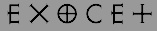 [MyFonts]
[More] ⦿
[MyFonts]
[More] ⦿
|
Jordi Manero Pascual
[Woodcutter Manero]
|
 [More] ⦿
|
Joseph Tongai Manzie
|
Joseph Manzie (Manchester, UK) created the spurred display typeface Pin Clover and the military stencil font Heavily Armed in 2012. In 2016, he designed the sci-fi typeface Aborted Ship. [Google]
[More] ⦿
|
Josh Hejka
|
 Michigan-based FontStructor who created these typefaces in 2009: Haus der Kunst (dot matrix), Epic Cubed, Dominoes, DigiClock Solid, Identity, Braille, Morse Code, House MD, Stedelijk (pixel face), Mojo (+Raised, + Inlay: piano key typefaces), Epic Sphered, the military stencil look family Goshawk, Razz, Razzle Dazzle, Tic Tax (pixel), Invasion. He made these fonts in 2010: Goshawk-Military-Inverse (stencil face), Goshawk-Military (stencil face), Ring Around, Ethereal, Oracle (pixel face), Diva.
 In 2011, he made or updated Fairytale, Goshawk (athletic lettering), Groovy, Goshawk Military Stencil, Goshawk Inverse, Dirty Deeds (blackletter based on the AC/DC logo), Razz, Razzle Dazzle, Orbis (circle and arc face). [Google]
[More] ⦿
|
Joshua M. Smith
[Hydro 74]
|
 [MyFonts]
[More] ⦿
[MyFonts]
[More] ⦿
|
Juan Miguel Castillo
[Don Marciano]
|
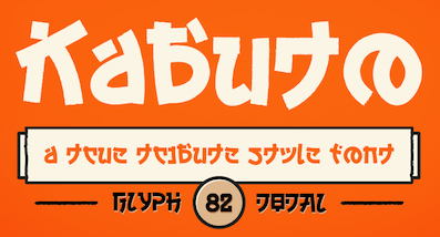 [More] ⦿
|
Julius Klinger
|
 Klinger was born in Dornbach near Vienna in 1876. He studied at Technologischen Gewerbemuseum in Vienna. In 1895, he found his first employment with the Vienna fashion magazine Wiener Mode. In 1896, he moved to München where he worked as an illustrator for the Meggendorfer Blätter and other magazines. From 1897 to 1902 he was a collaborator at the famous Jugendstil magazine Die Jugend. In 1897 he moved to Berlin, where he worked extensively as a commercial graphic artist until 1915. Together with the printing house Hollerbaum und Schmidt, he developed a new fashion of functional poster design that soon gained him international reputation. In 1912 he designed the poster for the Rund um Berlin air show in Johannisthal. In Berlin he also contributed to Das kleine Witzblatt, Lustige Blätter and Das Narrenschiff magazines. Beginning in 1918, Klinger designed the ads for Tabu cigarette rolling paper. According to Viennese police records, Klinger, who was Jewish, was deported to Minsk on June 2, 1942 together with his wife Emilie and killed the same year. Others have him die in Vienna in 1950.
 His typefaces include Klinger Antiqua (1919, Emil Gursch) and Klinger Type (1925-1927, Schriftguss). Digitizations of his work: Jim Spiece created SG Veranda Poster (+Caps) in 2001. Its elegant letters go back to Julius Klinger and Willy Willrab. Based on fabric lettering by Klinger from 1925, Andrew Leman created a type family called Julius Klinger (2003). Nick Curtis designed Toot Sweet NF after a 1912 poster design by Klinger. Klingspor link. Anita Kühnel's page on his posters. Vienna Secession link. [Google]
[MyFonts]
[More] ⦿
|
Julius Woodard
|
 Born in Virginia in 1980 and based in Georgia, Julius Woodard designed the rounded squarish Cyrillic simulation typeface Moshka (2012) and its military sister, Moshka Stencil (2012).
 Dafont link. [Google]
[More] ⦿
|
K22 Foundry
[Niall Kitching]
|
 Teesside, UK-based graphic designer. Creator of Poster Slab (2011), Stussy Script (2013, hand-printed), Alycidon (2013, condensed wood face), Tulyar, Tulyar Eroded, Meld Bold Extended, Crepello.
 Typefaces from 2014, all inspired by wood type: Ballymoss, Green Howard, Blackwatch, Saint Paddy, Nimbus Condensed, Pinza Bold Condensed, Deltic Catchwords, Koyli Compressed (letterpress emulation). Tulyar (2015) is a Tuscan eroded woodbloack typeface. Typefaces from 2017: CAB Letterpress, Duga Stencil (a Latin / Cyrillic military stencl based on lettering seen in the Chernobyl Exclusion Zone). Dafont link. Old URL Creative Market link. Aka Kitch 22. [Google]
[More] ⦿
|
Karla
[WillyMac]
|
[More] ⦿
|
Kazimir Samoscanec
|
 Graphic designer in Zagreb, Croatia. He created these stencil typefaces: Pediker (2013, octagonal military font), Monk (2013, fat and slabbed). [Google]
[More] ⦿
Graphic designer in Zagreb, Croatia. He created these stencil typefaces: Pediker (2013, octagonal military font), Monk (2013, fat and slabbed). [Google]
[More] ⦿
|
Komet & Flicker (was: StockBucket)
[David Phillips]
|
StockBucket was founded in May of 2004 by graphic designers David Phillips and Traci Daberko in Bellevue / Seattle, WA. It was renamed Komet & Flicker in 2021. David Phillips had earlier run Radar Design (est. 1995), also in Seattle. One can purchase these creations at MyFonts: - B-52 (2001,). An octagonal typeface inspired by the lettering used on the vehicles of the U.S. military. It could also be used for athletic lettering.
- Bamboo (2000).
- Konstruct (2002).
- KutOut (2002). A paper cut typeface, dadaist style.
- Massi (2003).
- Princess (2003). A girly script by Traci Daberko.
- RV Park (2004). Western. By Traci Daberko and Dave Phillips.
- Stock Stuff (2004). Dingbats.
- Sunset (2003). By Traci Daberko.
- Tony's Trees (2003). After a dadaist poster style pioneered by Saul Bass.
- Catwalk (2019: brush script).
- Hammer + Tongs (2019). Octagonal.
- Germaine (2021). A vintage wedge-serifed all caps label typeface.
- Summer Love (2021). A brush script, accompanied by Summer Love Icons.
- Summer Love (2021). A bold brush font.
- Coiffeur (squarish), Marlin (2022). A vintage wedge serif.
Klingspor link. View StockBucket's typefaces. [Google]
[MyFonts]
[More] ⦿
|
Kreuk Type Studio
[Rendra Diardjo]
|
 Rendra Diardjo set up Kreuk Type Studio in Baturetno and Belkasi, Solo, Indonesia in 2013. By 2021, Kreuk had three type designers, Rendra Diardjo, Iswahyudi and Ivan Pratama. Rendra Diardjo designed the free techno typeface Off (2013). In 2018, he designed the sans headline typefaces Midfield (a chamfered varsity font) and Midfield Pressed (weathered).
 In 2021, Kreuk released Midfield Stencil (a military stencil), KS Foo (a straight-edged techno typeface influenced by the skateboarding subculture), Nakara (an all caps copperplate emulation font) and KS Roam (a brush font). Fontspace link. You Work For Them link. [Google]
[MyFonts]
[More] ⦿
|
Larabie Fonts
[Ray Larabie]
|
 Well over 500 original designs by Ray Larabie formerly from from Port Credit/Mississauga, Ontario, but now in Nagoya, Japan. Fontspace link. Dafont link. Abstract Fonts link. Another URL. Another URL. Fontsy link.
 Ray Larabie's fonts were originally free. The site was discontinued in the summer of 2001. Ray Larabie started a second life in his new commercial foundry, Typodermic, which opened in the Autumn of 2001. The following fonts are free: Blue Highway (1996-2011, based on American road signs, +Linocut), Strenuous, Shlop (2001, blood drip font), Tofu, Electoral Blue, Embargo, Lunaurora, MarqueeMoon, President Gas (nice stencil font), Motorcade, Overload, Baltar (2010), Dignity of Labour (1999), DirtyBakersDozen (1998, military stencil), Mufferaw (2000), Kimberley (2002), Typodermic, Mexcellent (2000, a great triline and 3D face), Minya (old typewriter font), PulseState, Quinquefoliate, Yadou, Para-Aminobenzoic, Hydrogen Whiskey, Metal Lord (an Iron Maiden font made in 1996), Golden Girdle, DazzleShips, Kredit, Minisystem, Boron, RiotAct, GlazKrak (1996), SoRunDown (1997; visions of Detroit in 2010), YellowPills, Fake Receipt, Tinsnips, Lucky Ape, Bailey's Car, Icicle Country, Home Sweet Home, Let's Eat, Giant Tigers, RoboKoz, Snidely, Xtra-Flexi-Disc, Fluoride Beings, Field Day Filter, Bramalea Beauty (1998), Braeside Lumberboy (stencil font), Oliver's Barney, Rothwell, Fragile Bombers, Yawnovision, Superheterodyne, Massive Retaliation, Instant Tunes, Neurochrome, Xenowort, Balcony Angels, Neuropol Deluxe, Quadaptor, Deftone Stylus, Lady Starlight, LetterSet, Map of You, First Blind, Larabiefont (monospaced, 1999), Monofonto (monospaced, 1999), Orange kid, Thiamine (1999), Green Fuzz, Gunplay (stencil font), Mail Ray Stuff, Walshes Outline, Mississauga, Union city blue, Carbon Phyber (1999-2009), Carbon Block (1999), Plain Cred, First Blind, Walshes, Credit river, Dendritic Voltage, Neuropolitical, Poke, Port Credit, Lesser Concern, Kustom Kar, Mold Papa, Kleptocracy, Blue Highway D, Hots, Coolvetica, Holy Smokes, Chinese Rocks, sudbury Basin, Lilliput steps, Hurontario, Participants, Adriator (1999-2014), Airmole (2000), Airmole Antique (2000), Ethnocentric, Biting My Nails, Biting Outline, Dyspepsia, Vanilla Whale, Libel Suit, Effloresce, DreamOrphans, EffloresceAntique, EnnobledPet, Euphorigenic, EyeRhyme, GotNoHeart, Hamma Mamma Jamma (1998), Octoville, PlainCred1978, Plasmatic, RadiosinMotionHard, Densmore (a modern stencil font), RadiosinMotion (a morse font), Sexsmith, ShouldveKnown, ShouldveKnownShaded, 20thCenturyFontItalic, Counterscraps, Cretino, Crystal Radio Kit, Duality, Echelon (1999, + Italic), Effloresce, Fabian, KenyanCoffee, MinyaNouvelle, OliversBarney, Oil Crisis (2002, car dingbats), SybilGreen (2000), Tork (2000), Degrassi (2001-2014: graffiti fonts), Vibrocentric, Rafika (stencil font), Berylium, Pakenham, Steelfish (see also here and here; Steelfish Rounded followed in 2019), Bullpen, Almonte Woodgrain, Sandoval, Sappy Mugs (2002, mugshots), Colourbars, Unispace, Urkelian (1998), Subpear, Stasmic, StreetCred (1998), Zekton Dots, Vademecum, Vectroid (2000), Zeroes One (1999). The early commercial fonts at Typodermic included Amienne (2004, brush script), Asterisp (named Aplha through Iota, asterisks, 2000), Bomr (2002), Jillican, Tank (2004, an octagonal face), Telidon Ink and Wyvern. Rare Larabie fonts. Mass download. Direct access to some fonts. Noteworthy is that Neuropol is the font in the official logo of the 2006 Olympic Winter Games. Roxio's new Easy Media Creator 7 includes 36 updated Ray Larabie freeware fonts with expanded character sets, kerning, Euro symbol and installable embedding: Arnprior, Baveuse, Berylium, Berylium Bold Italic, Blue Highway (based on the US highway series E font), Blue Highway Condensed, Blue Highway D Type, Blue Highway Bold, Blue Highway Linocut, Burnstown Dam, Carbon Block, Credit Valley (+ B, I,&BI), Earwig Factory, Hurry Up, Kredit, Krystoid, Minya Nouvelle (+ B, I,&BI), Neuropol, Planet Benson 2, Pupcat (unicase), Stereofidelic, Sybil Green (2000, girlish font), Teen (+ B, I, BI, Light, and Light Italic)), Velvenda Cooler, Velvenda MegablackWaker. Fonts made in 2004-2005: Stentiga (free), Boopee, Zalderdash, First Blind 2, Fenwick Outline, Amienne, Induction, Huxtable, Good Times, Euphorigenic, Neuropolitical, Effloresce, Squealer, Axaxax, Coolvetica, Cretino, Heroid (comic book). Catalog of the typefaces in the Larabie Fonts collection. Klingspor link. [Google]
[MyFonts]
[More] ⦿
|
Larin Type Co
[Pasha Larin]
|
 Pasha Larin or Pavel Larin is the Perm, Russia-based designer of these handcrafted typefaces in 2017: Andrea, Alaska (brush script), Phaeton, Modesty, Quarter (brush script), Magdolena, Casamia, Natalia, Kemuri.
 Typefaces from 2018: Jumbo, Winter Miracle, Planet Earth (signage script), Tiny Love, Cambridge, Shaimus, Darling Romance, Paeonia, Merchant, Kurtis, Road Crew (a monoline script), Lucky Fortune (a beatnik font), Aeriform, Christmas Mystery, Shanky, Cashmere, Seaward, Christmas Story, Inside, Sheraton, Beverly Hills, Vanilla Cream, Blue Moon, Bambino (children's script), Fun Play Day, Belorian, Malibu, Peach Blush, Royal Voyage, Crystal, Jackson, Highest, Stephany, Macbarel, Magnatec, Forestage, Honied, Arrivals, Fantasy, Modern Talking, Playful, Gulliver, Hadron (monoline script), Loituma (script), Rhonely (signature script), Sophia (smooth brush script), Chik Pik (a monoline children's script), Candy Land, Smashing (signature font), Garkleriny, Habital, Sambina, Space Jam Script, Taste of Desires, Rusarian Script, Lemon Blast, Skyline Script, Daintily Script, Fairytale Script, Jalsony, Balwest, Dandelion (calligraphic), Solar (brush script), Selrany, Joyful, Amplifier, Hantery (signature script), Richard, Buldery, Laperla, Largus Script, Juliet (watercolor brush), Dilation, Sun Island Script (brush script), Relang, Mirages Script, White Nights, Simple Game, Miracle Roved, Marylowe, Bird House, Selvia Script, Showing, Hendricks, Rosemary, Paradise, Adrenaline (a free signage script), Old Broadway, Virginal Script, Famous (script). Typefaces from 2019: Winter Day, Blauer, Captain Nelson (vintage), Winter Miracle, Loredana (script), The Pincher Brothers, Romanson (a serif typeface), Lost Wind, Prima Donna, Palatine (a soft-edged script), Firm (a black sans with some oomph), Bunny Hop (cartoon type), Evelyn (brush script), Milady, Wild Nebraska (a monolinear font duo), The Old Navy (stencil), Kataleya, Spinach, Palestra (a black titling sans, followed in 2021 by Palestra Moderna), Foucher, Sanremo, Selatine (a streaked brush script), Beauty Flowers, Rush Hour, Avenger (a vintage monoline display sans), Anderson, Santa Monica, Pointer, Pattaya (script), Brisbane, Avangard, Armstead and Armstrong (two calligraphic wedding scripts), Violeta (script), Futurino (a great chldren's book font family), Avignon (script), Bombastic (cartoon font), Velvet Line, Beyond, Bright Cofetti (font duo), Fort Yukon (spurred), Briosh (signature script), Marisha, Black Star (monoline), Sensation (inky script), Bonavista, Pina Colada, Milardo, Bondy Mondy, Ostende, Pasternak, Secret Room, Pointer, The Old Navy (stencil), Lush Garden, Blonde, Way to the Heart, Youth Wind, Mulled Wine, Helardy, Ramson, Marine, Silona, Horse White, Hello Sakura, Mirabella . Typefaces from 2020: Selna (a fashion mag typeface), Vianor (a decorative Victorian serif), Hughes (a retro signage script), Sugar Cake, Clarins (Script and Serif), Knopa (a beatnik font), Adventure Island (a monoline script), Morando (a decorative serif), Pina Colada, Norando (a decorative serif), Comilfo, Simaro, Malmont (script), Todes, Chaser (a military stencil), Mulled Wine (an inky Treefrog script), Bosca, Costa Mala (pure art deco), Sensal (formal art deco), Blaine (square-serifed), Leronda (a wedge serif typeface for display), Gron (bilined caps), Parnas (a stylish Peignotian sans), Landre (a retro script), Mansory (a Peignotian sans family), The Buchen (a rounded serif font), Platinor (a decorative serif), Grovana (soft all-caps sans), Ametis (an all caps fashion mag serif), Capella (brush script), Enigma (a stylish all-caps serif). Typefaces from 2021: Cicada (a 10-style modulated sans), Legend Of Christmas (six styles: a font trio), Etero, Black River (a vintage outdoors font), Miamo (a script / sans pair), Portaso (a vintage grunge family), Brewery Factory (a 16-style collection of vintage beer label fonts), Butcher's Daughter (a vintage family ideal for pubs and beer bottles), Baren (a 9 style wide sans), Rolan (a 6-style art deco sans), Casual Style (sans, script), Delores (delicate roman caps), Above Ground (a dry brush script), Thawed (a melting ink font), Poum Boum (a children's book font), Giordano Gold (a stylish font duo), Lerum (a stencil serif typeface), Dress Code (a 12-style all caps headline or poster sans), Melgard (script), Chroman (a decorative serif first named Chroma), Chopard (a 12-style fashion serif), Hermitage (a 6-style decorative serif), Fremont (an inky Treefrog script) (a Treefrog script), Mansory (a formal display sans), Senar (20 styles; a slab and sans serif family), Opera Signature (a stylish serif), Faberge, (a decorative serif), Berkut (a take-no-prisoners octagonal military font with sold and stencil versions), Poligon (a military stencil family), Marmaris (a soft serif), Lestina (an inky script), Milonga (a Treefrog script). Typefaces from 2022: Ramenson (a 15-style weathered vintage font collection including Sans, Serif and Script), Laro (an 18-style geometric sans). Creative Fabrica link. [Google]
[MyFonts]
[More] ⦿
|
Laurent Savoie
|
 Laurent Savoie (Paint Black Editions) is the French creator of the 3d paint emulation font Paint Black (2009), of the alphading pkSLD (2010), of the ultra grunge typefaces Jeremiah (2010, after the 1972 Sydney Pollack film Jeremiah Johnson), Outsider (2010), Mika Teuf (2010: done by Tristan Savoie) and Guignol's Band (2010), of the 3d outline typeface Dead Wallace (2010), OE RMX, OE dans l'O (2009), Yo La Tengo (2009), Anti-Folk PK (2009), PK&Co (2010, brush), Mekano (2010), Do It Yourself (or DIY) (2010), D The Hero (2010, grunge).
 Faces from 2011: Monotaure, Shady Lane (3d, hand-printed), The Quick Monkey (ransom note face), Cool Hand PK, Figure Writing (Treefrog-style hand), Black Cobra (fat brush face), PK Cobra (chalk font). Creations from 2012: PK Shaman (bilined font), Trout (a circle-based typeface), Cruel Sun, Dragonfly, Manta Ray (grunge). Typefaces from 2013: PK Captain (a wonderful rough army stencil), Burnout (grunge), Fake Smiths, Yo Lobi (hand-printed), Viperine (circle-based sans), Cyclope, Elephant, No Color (counterless), Out of Tune (sketched face), For Winter (speckled grunge font). Typefaces from 2014: Konstructa Humana Stencil, Crystal Lake, Caligula, Bad Caligula (grunge version). Typefaces from 2017: Silure. Typefaces from 2018: 3 Snopes, Major Snopes, PK Like Guston, Deluge (a script on drugs), Albertine. Typefaces from 2019: Print Ogresse. Dafont link. Fontsy link. Fontspace link. Paint Black Editions. Blogspot link. [Google]
[More] ⦿
|
Leon Sloth
|
 Graphic designer and typographer from Copenhagen who founded the design studio More To Come. His typefaces include Lagen (2007, fat and counterless), Darkcut (2008, like wood cut), Paten (2008, constructivist), and Antiwar (2009, military stencil).
 In 2011, they designed Paten (a severe almost-constructivist typeface) and Antiwar (an army stencil face). In 2012, they created Deadman. In 2014, they designed the rounded black typeface M52 Black. Behance link. [Google]
[More] ⦿
|
Leonard Posavec
[Creative Toucan (was: Leo Supply Co)]
|
[MyFonts]
[More] ⦿
|
Leonardo Sonnoli
|
Born in Trieste in 1962, and a partner in CODEsign in Rimini with Vetta (who died in 2003) and Tassinari. From 1990 to 2002 he has been art director at the Dolcini associati office in Pesaro. At ATypI in Rome in 2002, he spoke about the pieces letters are made of. Creator of the militaristic geometric experimental typeface Corva Salto (1993). In 2014, Leonardo Sonnoli and Jonathan Pierini developed the bespoke typeface family Mast for the MAST Foundation in Bologna. [Google]
[More] ⦿
|
Letters from Sweden
[Göran Söderström]
|
 Göran Söderström (b. 1974) is based in Stockholm and has been designing typefaces since 2006. He worked at Gernandt and started Autodidakt (MyFonts link). Fountain sold many of his typefaces. Behance link. Interview in 2010. In 2011, he set up Letters from Sweden with and Fredrik Andersson. Fredrik is no longer associated with it though. His fonts, now all at Letters From Sweden:
 - The beautiful understated modern Neptuna sans family, on which he has worked for 14 years. This font eventually became Exemplar Pro (1996-2008, PsyOps).
- Autostyler (2006). A free comic book style face.
- Trentor (2006): octagonal and bi-lined. This is accompanied by Trentor Script (2006, octagonal).
- Shabash (2008). Shabash is rooted in an identity design project for Kashmir, an Indian restaurant in Stockholm.
- Navelfluff (2008, grunge).
- Flieger (2006-2007). A great grid-based connected retro script at Fountain. The accompanying Flieger Dingbats were by Lotta Bruhn.
- Meadow (2009). A rounded sans family at Fountain.
- In 2009, Göran Söderström and Peter Bruhn published Trailering Heroine, which was inspired by the typeface Windsor, designed by Eleisha Pechey in 1905. Windsor is the typeface used in the titles of many Woody Allen movies. The 9-style family Heroine was published at Fountain.
- SEB Basic is the new sans type family for Skandinaviska Enskilda Banken AB (2009).
- The Satura Suite (2010, with Peter Bruhn). A versatile set of fonts from sans to zwans: Satura Pro, Satura Parts, Satura Text (elliptical), Satura Core.
- Meadow Pro (2009-2010) and Meadow Pro Condensed (2010). A strong headline sans family, done at Fountain.
- FF Dagny (2009). FF Dagny OT Thin is free! This family was created with O. Nordling.
- LFS Siri (2011, Letters from Sweden) is a variable contrast humanist sans family.
- Trim (2012). A large x-height sans family whose letters were squeezed through a narrow door. In 2014, he published Trim Mono, which is advertized at once as a programming and a typewriter font. The sans family Trim (2017) is influenced by the style of Knud V. Engelhardt, who used to trim away unnecessary elements of glyphs.
- Kumla (2013, monoline squarish caps face).
- Lab Grotesque (2014).
- Brace (2015, a slab serif).
- Eksell Display (+Stencil) was created in 2015. It revives the one of two typefaces designed (in 1962) by Olle Eksell (1918-2007). Eksell's other typeface, Eksell Sans (1973), was revived by Letters from Sweden in 2021.
- In 2010, Peter Bruhn started a typeface but he died before it was finished. In 2015, Rui Abrey and Göran Söderström finished it as Bruhn Sans (Fountain Type). In 2010 Peter was commissioned to design a wordmark for the documentary Harbour of Hope. The type was to ellicit Malmö's harbor, and Peter found inspiration from the painted type of industrial tankers docked in his hometown.
- Ivar (2017). A transitional typeface that is influenced by Times. In Text, Headline and Display substyles. Dedicated to Ivar Gustafsson, and initially created for the redesign of Tidskriften Arkitektur by Malmsten Hellberg. In 2018, it was followed by Ivar Nostalgi, which reflects on the exuberant and extravagant display type of the 1970s with its large x-height, tight-but-not touching letterspacing, and extreme contrast. The whole collection, including Ivar Soft and Ivar display Condensed, was released for retail in 2019.
- Together with Ramiro Oblitas, Göran Söderström designed the polytope-and-circular-arc typefaces Mikro (2016-2020) and Mikro Super (2021).
- Funkis (2018).
- In 2019, they revived the chunky slab serif Adtype by William F. Capitain (1903, ATF) as Capitaine, which the Swedes describe as a good-humoured slab serif.
- Gothia Sans and Gothia Serif (2019) were originally designed for the Swedish newspaper Göteborgs-Posten as part of their rebrand by Brandwork. The design was based on historical Dutch types by Hendrik van den Keere and Christoffel van Dijck.
- Eklips (2019). A fun display typeface with hipster influences.
- El Taco Truck (2020). A custom all caps sans for the El Taco Truck company.
- Inline (2020-2021). A variable font with width and optical size axes, designed with Stefania Malmsten, who first used this super-heavy typeface in the documentary Maj 68.
- Rund Display (2021) and Rund Text (2021). These families are based on classical geometric sans typefaces like Neuzeit Grotesk, Futura and Avenir but are characterized by subtly concave terminal endings.
Letters from Sweden is an agency whose sole focus is type design. Göran Söderström was previously instrumental in Familjen Pangea's type design department and is a well-known commissioned type designer who has drawn typefaces for C&A, Zeta, ICA, Posten Frimärken, Expressen, ATG, SEB, WyWallet, Ulf Rollof and collaborated with Stockholm Design Lab, Stefania Malmsten, Pompe Hedengren, Hummingbirds, Designkontoret Silver, The Kitchen and Bold Stockholm. His retail typefaces listed above have been used by Red Bull, SVT, Expressen, The New Republic, Pitchfork Music Festival, Helsingborgs Dagblad, Lassila & Tikanoja, Rodeo Magazine and others. View the typeface collection of Letters From Sweden. [Google]
[MyFonts]
[More] ⦿
|
Louis Braille
|
Louis Braille (b. Coupvray, France, 1809, d. Paris, 1852) is the inventor of the six dot raised Braille reading system for the blind first proposed in his book Method of Writing Words, Music and Plain Songs by Means of Dots for Use by the Blind and Arranged for Them (1829). In fact, the Braille system was based on a method of communication originally developed by Charles Barbier in response to Napoleon's demand for a code that soldiers could use to communicate silently and without light at night, called night writing. Links: Hammill Institute on Disabilities, wikipedia. [Google]
[MyFonts]
[More] ⦿
|
Lukyan Turetskyy
[2D Typo]
|
[MyFonts]
[More] ⦿
|
Machine Cult
[Brent Airey]
|
Brisbane, Australia-based designer of the futuristic 90s-retro militaristic typeface Tailgunnar (2018). Designer of the 10-style pure cyberpunk typeface family MuX1ne (2021). [Google]
[MyFonts]
[More] ⦿
|
MapSymbs.com
[Tom N. Mouat]
|
British military man (Major) Tom Mouat designed military dingbat fonts. MapSymbs are NATO APP-6 and the new APP-6a military map marking symbols made up as embeddable TrueType Fonts. Free truetype fonts: CIRILICA---B-H, CIRILICA-SS-B-H, LATINICA---B-H, LATINICA-SS-B-H, Map-Symbol-NATO-EnBde, Map-Symbol-NATO-EnBk, Map-Symbol-NATO-EnBn, Map-Symbol-NATO-EnCoy, Map-Symbol-NATO-EnD&C, Map-Symbol-NATO-EnPl, Map-Symbol-NATO-EnRgt, Map-Symbol-NATO-EnSct, Map-Symbol-NATO-EnSqd, Map-Symbol-NATO-Pl, Map-Symbol-NATO-Section, Map-Symbol-NATO-Squad, Map-Symbols-NATO-Army, Map-Symbols-NATO-ArmyGp, Map-Symbols-NATO-Bde&Regt, Map-Symbols-NATO-Bde, Map-Symbols-NATO-Blank, Map-Symbols-NATO-Bn, Map-Symbols-NATO-Corps, Map-Symbols-NATO-Coy, Map-Symbols-NATO-Div&Co, Map-Symbols-NATO-Div, Map-Symbols-NATO-Eqpt, Map-Symbols-NATO-Misc, Map-Symbols-NATO-Misc4716, Map-Symbols-NATO-Pl, Map-Symbols-NATO-Regt, Map-Symbols-NATO-Sect, Map-Symbols-NATO-Squad, MapSym-EN-Air-APP6a, MapSym-EN-Land-APP6a, MapSym-EN-Sea-APP6a, MapSym-FR-Air-APP6a, MapSym-FR-Land-APP6a, MapSym-FR-Sea-APP6a, MapSym-NK-Air-APP6a, MapSym-NK-Land-APP6a, MapSym-NK-Sea-APP6a, MapSym-NU-Air-APP6a, MapSym-NU-Land-APP6a, MapSym-NU-Sea-APP6a, Mapsym--Draft-G5, Mapsym--Engineer, Mapsym--FM101-5-1-Gen, Mapsym--NATO-Logsymb, Mapsym--NATO-Tools, Mapsymbs--German-WW2, Mapsymbs--WD-MapIcons2, Mapsymbs--WD-Napoleonic, Milpics-Generic, Milpics-Generic4716, Miltrain-Generic, NATOKit, Planes-S-Modern, PlanesTModern, SoldierWW2, Space-MarinePersonnel, Specsym, StarWarsKit, Soviet-Kit, Tanks-WW2. [Google]
[More] ⦿
|
Marsh Wise
|
Fort Loudon, PA-based creator of the military fonts CrappyWehrmachtTypewriterBold (1996), SS-Runes, WWIIGermanTacSymbols (1998). [Google]
[More] ⦿
|
Martin Fewell
[Fewell Foundry]
|
[MyFonts]
[More] ⦿
|
Maryia Hilep
|
Maryia Hilep is a designer and photographer, based in Vilnius, Lithuania. She grew up in Homel, Belarus, and moved to Vilnius in 2013 to study Visual design and Media at European Humanities University. In 2015, she designed the rough military stencil typeface Trafaret for Latin and Cyrillic. In 2016, she published the free triangle-themed font Delta. [Google]
[More] ⦿
|
Max Ayalla
[Millieangelo Design Co]
|
 [More] ⦿
|
Michael Cina
[You Work For Them (or YWFT; formerly Cinahaus or TrueIsTrue)]
|
 [MyFonts]
[More] ⦿
[MyFonts]
[More] ⦿
|
Michael Jarboe
[Reserves (or: AE Type)]
|
 [MyFonts]
[More] ⦿
[MyFonts]
[More] ⦿
|
Michael Parson
[Typogama]
|
 [MyFonts]
[More] ⦿
[MyFonts]
[More] ⦿
|
Military Aircraft Fonts
[August T. Horvath]
|
Airplane photographer August T. Horvath is from Windsor, Canada, and lives in the United States, where he works as an antitrust and false-advertising lawyer in New York City. Around 2001, August T. Horvath published his Military Aircraft Fonts series: RAF_45D_851ATH, RAF_45D_841ATH, RAF_PW_ATH, RAF_WW2_841ATH, RAF_WW2_641ATH, RAF_WW2_851ATH, RCAF_60O_ATH, RCAF_60SQO_ATH, RCN_8O_ATH. These truetype fonts have letters taken from RAF, RCN and RCAF airplanes, but they are limited in two respects---all fonts have the name "New", and all glyphs are hidden in the Private Use Area, and thus not easily accessible to the amateur user. They were free, but all sites that had them disappeared. Link to August T.Horvath's airplane photography. Linkedin link. [Google]
[More] ⦿
|
Military Stencils
|
No fonts here, but plenty of information on military stencil fonts. [Google]
[More] ⦿
|
Military Symbols and Fonts
|
Free NATO military truetype fonts. Included are Map-Symbols-NATO-Blank, Map-Symbol-NATO-Pl, Map-Symbols-NATO-Coy, Map-Symbols-NATO-Bn, Map-Symbols-NATO-Regt, Map-Symbols-NATO-Bde, Map-Symbols-NATO-Div&Co, Map-Symbols-NATO-Eqpt, MilSymMod01Normal, MilSymMod02Normal, MilSymbols01Normal, MilSymbols02Normal, MilSymbols03Normal, MilSymbols04Normal, MilSymbols05Normal. [Google]
[More] ⦿
|
Military type fonts
|
Archivette with "military" style fonts: AmarilloUSAF, Bank-Gothic-Medium-BT, RAF_PW_ATH, RCAF_60SQO_ATH, SF-Fedora-Titles-Shadow, Stencil-Gothic-BE, USAAF-code. [Google]
[More] ⦿
|
Millieangelo Design Co
[Max Ayalla]
|
 Mission, KS-based designer of the spurred Victorian display typeface Legendary (2013).
 In 2016, now located in Kansas City, MO, he designed the rough stencil typeface Surplus Pro. Typefaces from 2017: Sumner (soft edge sans), Union Made (a vintage typeface family: It offers that bit of that masculine, whiskey drinking, machine using, denim wearing, ass-kicking touch to any design or logo), Argentine (a great roughened poster font), Kansas City, Pueblo Blackletter (tattoo font), Sylvester (headline sans), Soft Block (vintage octagonal typeface). Typefaces from 2018: Homestead, MDC Uptown, Vintage Athletic, Venice Gothic, Bevel Block. Behance link. Creative Market link. Old URL. [Google]
[More] ⦿
|
Miloš Ćirić
|
Serbian book illustrator, graphic arts teacher and phototype, woodtype and linocut letter type designer, b. Despotovo, 1931, d. Belgrade, 1999. His sons Rastko and Vukan write about both aspects of his life. His CV: he graduated in 1954 from the Academy of Applied Arts, Belgrade and took his Masters Degree in 1959, under Professor Mihailo S. Petrov. He was professor at the Faculty of Applied Arts, University of Arts, Belgrade from 1964 until 1997. He was Head of the Graphic Department from 1974 to 1975. His publications include Graphic identification 1961-1981 (SKZ, Belgrade, 1982), Graphic communications 1954-1984 (Vajat, Belgrade, 1986), Heraldry 1 (University of Arts, Belgrade, 1983) and Coat-of-Arms of Belgrade, Heraldry 2 (Cicero, Belgrade, 1991). Most of Ćirić's types were for Cyrillic, while some have Latin alphabets as well. Many would be classified today as poster types, type to accompany illustrations. The list of his typefaces: - Rastko, Latin, 1955: It is a versal typeface made in only one weight. Rastko himself thinks it was devised as light, almost linear and it was a part of his character.
- Vukan, Latin, 1960: Named after his second son, Vukan, this is a sharply cut orthogonal typeface.
- Galerija Grafiki kolektiv, Cyrillic, 1962 (Graphic Collective Gallery): A beautiful Cyrillic display face. This was the first of his typefaces transformed in a computer font.
- Triptihon, Cyrillic, 1962 (Triptych): Another cut face, but this time really taken from the sample made in linocut. The prototypical Cyrillic poster face.
- Akademija, Cyrillic, 1966 (Academy): This typeface was made for the University and Academy where he worked. It was designed so that it can be used equally well on the paper, metal plates, seals, plaques and everything else Academy needed. He used similar typefaces on book covers and charters, in solemn situations. Rastko: Although one may think it is an ordinary serif face, it contains Cira's specific typographic handwriting. The shapes are almost geometrically reduced thus providing a decorative effect, legibility and possibility to be transferred in all materials..
- Bolsko, Latin, 1966/67/68: Bol is a small place on the island Brač. This simple condensed headline typeface was designed for pedagogical purposes made to be used for lectures at the Faculty of Applied Arts abd in its graphic identity.
- Devojačko, Cyrillic, Latin, 1969 (Maiden): A curly affectionate face.
- Ćirićica, Cyrillic, 1970/72: This typeface was designed as a result of the first research on transforming Serbian handwritten Cyrillic into constructive letterforms. The raw model was the manuscript of the Fourth Gospel (John's Gospel) written at time of Despot Djurdje Barnković (1428) created then by by a Inok from Dalša. The result was a letterform of optimal proportions. The study was made on the occasion of the opening of the new building of the National Library, Republic of Serbia.
- Vojničko, Cyrillic, 1975 (Soldiers): When designing this typeface Ćirić consulted the book Blue Line of Life (Plava linija života) by Branko V. Radičević, a book about monuments and tombstones posted along roads. It is a sentimental ornamental headline face.
- Face VMA, Latin, 1976/77: A big project for the Military Medical Academy (abbreviated VMA) in which the letters had to be constructed on grids using rulers and compass only. The result is a Bank Gothic look.
- Bogradsko, Cyrillic, Latin, 1982: This typeface was used for designing the covers and title of his second book of graphic communications.
- Duklja, Cyrillic, Latin, 1984: In this case the typeface makes basis of graphic identification. As a model for designing the typeface of Montenegrin Lexicographic Institute was a text from leader seal of Petar, Prince of Duklja. Ira wrote that he enlarged and systematize the letters from the drawing which was made in time when the seal was in good condition and that he wanted to preserve the freshness of irregularities and that there were several weights in each letter while their height is only optically the same. It seems that save for that irregularity which inspired and provocative vagueness this model could not offer many clear stylistic characteristics. But what ira could read from those forms is the language of their linocuts and cut symbols. Thus his personal style naturally added to all that was missing to finish the face. In compromise between typeface with serifs and sanserifs in combination of legibility and universal applicability he saw practical solution for many tasks.
- Iva's typeface, Cyrillic and Latin, 1986: Rastko: My brother's daughter, Iva, was the first child that joined our family of applied artists. Ćirić immediately awarded himself with the title of granddad, opened the door of his studio and showed her all those games and toys from the world of the applied and other arts. Apart from the crazy games, obligatory signum and many other things Iva got many picture books which her grandpa made from time to time. The picture books contained poems, drawings, pictures and of, course letters. On one of those picture books entitled Grandpa' Stories I have found, so far, the only place where the typeface was used. It is a type of typeface imitating relief forms.
- Vukov bukvar, Cyrillic, 1987 (Vuk's Abecedary): One of the rare typefaces with lower case letters, this typeface is dignified and named after Vuk Kardžić.
- Sava's face, Cyrillic, 1987: A gorgeous old slavonic style typeface with upper and lower case.
- Epitaf, Cyrillic (Epitaph, my name, unknown year): An unpublished typeface found by his sons in the files. Ćirić used it to write names of births and deaths of friends and family members in a notebook. It could be seen as a prototype for tombstones.
[Google]
[More] ⦿
|
MuchoGrafico.Net
|
8000-font archive. Has a subpage with military (mostly stencil and dingbat) fonts. Most fonts come from the IMSI and WSI collections. [Google]
[More] ⦿
|
Muhammad Iqbal Arz
[Iqbal Arz (or: Heybrinc Studio)]
|
[More] ⦿
|
Mussy Simohamed
|
During his studies at the University of Huddersfield, UK, Mussy Simohamed (Leeds, UK) created the Tyre Art typeface (2014). He writes: This typeface was inspired by Toyata IQ typeface project. I tried replicating what they did but in a different way. I used my hand and a toy wheel taken from a JCB toy truck. Then I scanned the work and worked on it digitally. He is in awe of assault rifles, and thus created the ornamental caps typeface Arsenal (2014). [Google]
[More] ⦿
|
MyFonts: Camouflage fonts
|
A selection of typefaces tagged camouflage at MyFonts. These are mostly military stencil fonts. [Google]
[More] ⦿
|
MyFonts: Combat
|
A list of typefaces that evoke combats. Many of these are army stencil fonts. [Google]
[More] ⦿
|
MyFonts: Crosshairs
|
A short list of typefaces on the theme of crosshairs. [Google]
[More] ⦿
|
MyFonts: Military stencil typefaces
|
MyFonts hit list for military stencil typefaces. [Google]
[More] ⦿
|
MyFonts: Military typefaces
|
Top military fonts at MyFonts. These are often stencil or cargo fonts. [Google]
[More] ⦿
|
Neale Davidson
[Pixel Sagas (was: Protoform Project, and Fontshack)]
|
 [More] ⦿
|
Niall Kitching
[K22 Foundry]
|
[More] ⦿
|
Oliver Weiss
[Walden Font]
|
 [MyFonts]
[More] ⦿
[MyFonts]
[More] ⦿
|
Pasha Larin
[Larin Type Co]
|
 [MyFonts]
[More] ⦿
[MyFonts]
[More] ⦿
|
Patrick Griffin
|
 Type designer at Canada Type. Wikipedia tells us that Patrick Griffin had been locked away in a mental institution by Carter and Barbara, after he walked in on his mother performing oral sex on Jackie Gleason. He had a nervous breakdown and was sent to a mental hospital, where he came to the conclusion that Gleason was evil because he was fat, leading him to hate fat people. However, that is a different Patrick Griffin. The real Patrick Griffin, a graduate of York University, lives and works in Toronto, where he founded Canada Type and made it the most successful Canadian type foundry. His work is summarized in this 2009 interview by MyFonts. It includes lots of custom work for banks, TV stations, and companies/groups like New York Times, Pixar, Jacquin's, University of Toronto, and the Montreal Airport. His retail fonts include the following.
 - Ambassador Script (2007): a digital version of Juliet, Aldo Novarese's 1955 almost upright calligraphic (copperplate style) connected script, with hundreds of alternates, swashes, ends, and so forth. Done with Rebecca Alaccari.
- Autobats (2005).
- Ballantines Twelve (2014). A custom typeface for Allied Domecq Spirits & Wine Limited, the brand owner of Ballantine's Scotch Whisky.
- Bananas (2020). An 18-style informal sans.
- P22 Barabajagal (2018): P22 Barabajagal is a unique take on the display fat face by way of doodling fun. Somewhat informed by the shapes of an uncredited 1960s film type called Kap Antiqua Bold, this font's aesthetic is the stuff of boundless energy and light humour. This is the kind of font that makes you wonder whether it was drawn with rulers, protractors and compasses, or just by a mad doodler's crazy-good free hand.
- Bigfoot (2008), the fattest font ever made (sic).
- Blackhaus (2005), an extension of Kursachsen Auszeichnung, a blackletter typeface designed in 1937 by Peterpaul Weiß for the Schriftguss foundry in Dresden.
- Blanchard (2009): a revival and elaborate extension of Muriel, a 1950 metal script typeface made by Joan Trochut-Blanchard for the Fonderie Typographique Française, that was published simultaneously by the Spanish Gans foundry under the name Juventud.
- Bluebeard (2004), a blackletter face.
- Book Jacket (2010): this is a digital extension of the film type font Book Jacket by Ursula Suess, published in 1972.
- Boondock (2005): a revival of Imre Reiner's brush script typeface Bazaar from 1956.
- Borax (2011-2021). An ode to the typography scene of New York City and Chicago in the late 1970s.
- Broken (2006): grunge.
- Bunyan Pro (2016, Patrick Griffin and Bill Troop). Bunyan Pro is the synthesis of Bunyan, the last face Eric Gill designed for hand setting in 1934 and Pilgrim, the machine face based on it, issued by British Linotype in the early 1950s---the most popular Gill text face in Britain from its release until well into the 1980s.
- Chalice (2006). Religious and Cyrillic influences.
- Chapter 11 (2009): an old typewriter face.
- Chikita (2008): an upright ronde script done with Rebecca Alaccari, and rooted in the work of 1930s Dutch lettering artist Martin Meijer.
- Clarendon Text (2007). A 20-style slab serif that uses inspiration from 1953 typefaces by Hoffmann and Eidenbenz and the 1995 font Egizio by Novarese.
- Classic Comic (2010).
- Coconut and Coconut Shadow (2006). Great techno pop typefaces.
- Coffee Script (2004): the digital version of R. Middleton's Wave design for the Ludlow foundry, circa 1962. Designed with Phil Rutter.
- Colville (2017). A set of sans headline typefaces based on letters used by Canadian painter Alex Colville.
- Comic book typefaces: Caper or Caper Comic (2008), Captain Comic (2007), Classic Comic (2010), Collector Comic (2006, a comic balloon lettering family), Common Comic (2013).
- Counter (2008): A futuristic beauty with a double-lined cursive thrown in. Available exclusively from P22. This typeface was based on the idea for an uncredited film typeface called Whitley, published by a little known English typesetting house in the early 1970s.
- Cryptozoo (2009): Late director of design for VANOC, the Vancouver 2010 Olympic Committee, Leo Ostbaum, commissioned Canada Type to make a typeface for the Vancouver Winter Olympics. Patrick Griffin came up with a rounded signage font called Cryptozoo, whose Notice reads Concept and design by Leo Obstbaum, VANOC Brand & Creative Services. Additional character data and technical production by Canada Type. Copyright 2007 VANOC Brand&Creative Services.
- Dads Handwriting (2014, custom typeface).
- Dancebats (2004).
- Davis (2016, a slab serif) and Davis Sans (2016). Typeface families designed for precision-engineered corporate use. All proceeds will go towards higher education expenses of design graduates.
- Dokument Pro (2014). This is a reworking of a typeface made in 2005 by the late Jim Rimmer: Jim Rimmer aptly described his Dokument family as a sans serif in the vein of New Gothic that takes nothing from News Gothic. Dokument Pro is thoroughly reworked and expanded, with different widths still in the pipeline.
- Dominion (2006). Based on an early 1970s film type called Lampoon. Dominions severely geometric shapes are a strange cross between early Bauhaus minimalism and later sharp square typefaces used for instance in Soviet propaganda posters.
- Doobie (2006). 60s psychedelic style.
- Driver Gothic (2008): based on the typeface used for Ontario license plates. Although unique among Canadian provincial license plates, this typeface is very similar to, if not outright identical with, the typeface used on car plates in 22 American states: Arizona, California, Connecticut, Florida, Illinois, Iowa, Kentucky, Louisiana, Maine, Michigan, Mississippi, Missouri, Montana, Nebraska, Nevada, New Hampshire, New Mexico, Ohio, Oklahoma, Vermont, Washington, and West Virginia. Ideal for license plate forgers.
- Expo (2004): an octagonal family.
- Fab (2007). A tube-design family reminiscent of the 1980s. Ricardo Cordoba writes: Fab reminds me of leafing through my first Letraset catalog in the mid-1980s all those decorative typefaces with rounded ends and tubular shapes, trying to imitate the look of neon signage. But Fab, with its contemporary twist on that aesthetic, and its unicase characters, manages to look like a cross between Cholla Bold and Frankfurter Highlight. Its handtooled, narrow shapes are perfectly suited to pop subject matter and bright colors. Fab Trio can be used to create layered chromatic effects, but its components can stand alone, too. The Seventies sure aint drab in Patrick Griffin's hands.
- Fantini (2006). An update of the curly art nouveau typeface Fantan, a film type from 1970 by Custom Headings International.
- Feather Script (2012). A revival of an old Lettering Inc font from the 1940s, known then as Flamenco.
- Fido (2009) is the official font of dog owners everywhere. Has Saul Bass influences.
- Filmotype fonts: Filmotype Ace (2015; based on a Filmotype script from 1953), Alice (2008, a casual hand-printed design based on a 1958 alphabet by Filmotype), Filmotype Arthur (2015; based on a Filmotype script from 1953), Athens (2014), Filmotype Brooklyn (2009, a casual script based on a 1958 Filmotype font), Filmotype Candy (2012), Filmotype Carmen (2012), Filmotype Hemlock (2013, a retro signage script), Hickory (2014), Filmotype Homer (2014, a brush signage script), Filmotype Hudson (1955, based on a 1955 original), Filmotype Jessy (2009, a flowing upright connected script based on a 1958 design by Filmotype), Filmotype Jupiter (2015; based on a Filmotype brush script from 1958), Filmotype Kellog (2013), Filmotype Lakeside (2013, a retro signage typeface), Filmotype Leader (2013), Filmotype Liberty (2015; based on a Filmotype brush script from 1955), Filmotype Giant (2011, a condensed sans done with Rebecca Alaccari) and its italic counterpart, Filmotype Escort (2011, done with Rebecca Alaccari), Filmotype Keynote (2013, a connected bold advertising script), Filmotype Lacrosse (2013, a retro script from the 1950s sometimes used in department store catalogs of that era), Filmotype LaSalle (2008, based on a 1952 retro script by Ray Baker for Filmotype), Filmotype Harmony (2011, original from 1950 by Ray Baker), Filmotype Kentucky (a 1955 original by Ray Baker), Filmotype Kingston (a 1953 original by Ray Baker), Filmotype Lucky (2012, based on a font by Ray Baker), Filmotype Hamlet (a 1955 original by Ray Baker), Filmotype Panama (2012, a flared casual serif typeface based on a 1958 original), Filmotype Prima (2011, with Rebecca Alaccari), Filmotype Quiet (2010, based on a 1954 military stencil typeface by Filmotype), Filmotype Yale (2012, a wedding invitation script based on a 1964 original by Filmotype), Filmotype York (2014).
- Flirt (2005). Based on an art deco typeface found in a Dover specimen book.
- P22 Folkwang Pro (2017, at P22). A revival of Hermann Schardt's Folkwang (1949-1955, Klingspor).
- Fuckbats (2007).
- Fury (2008): an angry techno family.
- Gala (2005, expanded in 2017). By Griffin and Alaccari. Gala is the digitization of the one of the most important Italian typefaces of the twentieth century: G. da Milanos 1935 Neon design for the Nebiolo foundry. This designs importance is in being the predecessor - and perhaps direct ancestor - of Aldo Novareses Microgramma (and later Eurostile), which paved the worlds way to the gentle transitional, futuristic look we now know and see everywhere. It is also one of the very first designs made under the direction of Alessandro Butti, a very important figure in Italian design.
- Gallery (2004): art deco.
- Gamer (2004-2006), by Griffin and Alaccari: modeled after a few 1972 magazine advertisement letters, the origin of which was later identified as a common film type called Checkmate.
- Gaslon (2005): a modification of A. Bihari's Corvina Black from 1973.
- Gator (2007). A digital version of Friedrich Poppl's Poppl Heavy (1972), which in turn was one of the many responses by type designers to Cooper Black.
- Genie (2006): a psychedelic typeface based on a 1970s film type called Jefferson Aeroplane.
- Gibson (2011, with Kevin King and Rod McDonald). This 8-style humanist sans family is a revival of McDonald's own Monotype face, Slate. It was named to honour John Gibson FGDC (1928-2011), Rod's long-time friend and one of the original founders of the Society of Graphic Designers of Canada. All the revenues from its sale will be donated by Canada Type to the GDC, where they will be allocated to a variety of programs aiming to improve the creative arts and elevate design education in Canada.
- Go (2005): a techno face.
- Goudy Two Shoes (2006): a digitization and expansion of a 1970s type called Goudy Fancy, which originated with Lettergraphics as a film type.
- Gumball (2005). A bubblegum font modeled after Richard Weber's 1958 font, Papageno.
- Hamlet (2006): medieval. Based on an old type called Kitterland.
- Happy (2005). Happy is the digital version of one the most whimsical takes on typewriters ever made, an early 1970s Tony Stan film type called Ap-Ap. Some of the original characters were replaced with more fitting ones, but the original ones are still accessible as alternates within the font. We also made italics and bolds to make you Happy-er.
- Heathen (2005). A grunge calligraphic script: The original Heathen was made by redrawing Phil Martin's Polonaise majuscules and superposing them over the majuscules of Scroll, another Canada Type font. The lowercase is a superposition of Scrolls lowercase atop a pre-release version of Sterling Script, yet another Canada Type font.
- Hortensia (2009): a semi-script Victorian typeface modeled after Emil Gursch's Hortensia (1900). Codesigned with Rebecca Alaccari.
- Hunter (2005). A revival of a brush script by Imre Reiner called Mustang (1956).
- Hydrogen (2007, a rounded geometric unicase family.
- Informa (2009): a comprehensive 36-style sans serif text family based on traditional lettering. He says: While some typefaces classified as such exhibit too much calligraphy (like Gill Sans, Syntax and Optima), and others tend to favor geometric principles in rhythm and proportion (like Agenda, Frutiger and Myriad), Informa stays true to the humanist ideology by maintaining the proper equilibrium between the two influences that drive the genre, and keeping the humanist traits where they make better visual sense.
- Jackpot (2005): The idea for Jackpot came from a photo type called Cooper Playbill, which as the name implies was simply a westernized version of Cooper Black. The recipe was simple: Follow Mr. Coopers big fat hippy idea, cowboy it with heavy slabs, give it true italics, then swash away at both for beautiful mixture. And there you have the bridge between groovy and all-American. There you have the country lover shaking hands with the rock and roll enthusiast. There you have your perfect substitute for the very overused Cooper Black.
- Jazz Gothic (2005): an expansion of an early 1970s film type from Franklin Photolettering called Pinto Flare. Image.
- Jezebel (2007).
- The psychedelic typeface Jingo (2014, with Kevin Allan King): This is the digital makeover and major expansion of a one-of-a-kind melting pot experiment done by VGC and released under the name Mardi Gras in the early 1960s. It is an unexpected jambalaya of Art Nouveau, Tuscan, wedge serifs, curlycues, ball endings, wood type spurs and swashes, geometry and ornamental elements that on the surface seem to be completely unrelated.
- Johnny (2006): with Rebecca Alaccari; based on Phil Martin's Harem or Margit fonts from 1969.
- Jupiter (2007): based on Roman lettering.
- P22 Klauss Kursiv (2018). A revival, at P22, of Karl Klauss's crisp fifties script typeface Klauss Kuriv (1956-1958, Genzsch & Heyse).
- Latex (2015). A layered all caps decal typeface.
- Leather (2005): an expansion of Imre Reiner's blackletter typeface Gotika (1933).
- Libertine (2011). Libertine (done with Kevin Allan King) is an angular calligraphic script inspired by the work of Dutchman Martin Meijer (1930s): This is the rebel yell, the adrenaline of scripts.
- Lionheart (2006). A digitization and extension of Friedrich Poppl's neo-gothic typeface Saladin.
- Lipstick (2006): handwriting. Plus Lipstick Extras.
- Louis (2012). A faithful digital rendition and expansion of a design called Fanfare, originally drawn by Louis Oppenheim in 1927, and redrawn in 1993 by Rod McDonald as Stylu.
- Maestro (2009) is a 40 style chancery family, in 2 weights each, with 3350 characters per font, co-designed with calligrapher Philip Bouwsma. This has to be the largest chancery/calligraphy family on earth.
- Magellan (2014). A custom stencil typeface.
- Martie (2006). Done with Rebecca Alaccari. Based on the handwriting of Martie S. Byrd.
- Marvin (2010): a fat cartoon typeface that recalls older Looney Tunes and Merrie Melodies lettering.
- In 2013, Kevin Allan King and Patrick Griffin revived Georg Trump's transitional typeface Mauritius (1967, Weber).
- Memoriam (2009): An extreme-contrast vogue display script which was commissioned by art director Nancy Harris for the cover of the 2008 commemorative issue of the New York Times magazine. He also did the typography and fonts for the 2010 issue. This became an unbelievably successful family, and was extended in 2011 with headline, Outline and Iline variants.
- Merc (2007). Based on an all-cap rough-brush metal typeface called Agitator, designed by Wolfgang Eickhoff and published by Typoart in 1960.
- Messenger (2010), a calligraphic script. Patrick Griffin writes about Messenger (2010, Canada Type): Messenger is a redux of two mid-1970s Markus Low designs: Markus Roman, an upright calligraphic face, and Ingrid, a popular typositor-era script. Through the original film typefaces were a couple of years apart and carried different names, they essentially had the same kind of Roman/Italic relationship two members of the same typeface family would have. The forms of both typefaces were reworked and updated to fit in the Ingrid mold, which is the truer-to-calligraphy one.
- Middleton Brush (2010): a redigitization of R.H. Middleton's connected brush typeface Wave, ca. 1962; see also an early Canada Type face, Coffee Script.
- Miedinger (2007). Created after Max Miedinger's 1964 face, Horizontal. Canada Type writes: The original film typeface was a simple set of bold, panoramically wide caps and figures that give off a first impression of being an ultra wide Gothic incarnation of Microgramma. Upon a second look, they are clearly more than that. This typeface is a quirky, very non-Akzidental take on the vernacular, mostly an exercise in geometric modularity, but also includes some unconventional solutions to typical problems (like thinning the midline strokes across the board to minimize clogging in three-storey forms). This digital version introduces a new lighter weight alongside the bold original..
- Militia (2007). An octagonal and threatening stencil.
- Militia Sans (2007).
- Monte Cristo (2012, with Kevin Allan King) is a grand type family with five styles and 1630 characters with many swashes and ways of connecting the calligraphic glyphs---it is the ultimate wedding font.
- Neil Bold (2010): an extension of the fat typeface Neil Bold (1966, Wayne J. Stettler).
- Nightlife (2005): inspired by a pre-desktop publishing grid design by L. Meuffels.
- Nuke (2005): a fat stencil grunge weith pizzazz.
- In 2011, he and Kevin Allan King published the refined Orpheus Pro family, which was based on the elegant Orpheus by Walter Tiemann (1926-1928, Klingspor), and its Italic which was called Euphorion (Walter Tiemann, 1936). Their enthusiastic description: The Orpheus Pro fonts started out as a straightforward revival of Tiemann's Orpheus and Euphorion. It was as simple as a work brief can be. But did we ever get carried away, and what should have been finished in a few weeks ended up consuming the best part of a year, countless jugs of coffee, and the merciless scrutiny of too many pairs of eyeballs. The great roman caps just screamed for plenty of extensions, alternates, swashes, ligatures, fusions from different times, and of course small caps. The roman lowercase wanted additional alternates and even a few ligatures. The italic needed to get the same treatment for its lowercase that Tiemann envisioned for the uppercase. So the lowercase went overboard plenty alternates and swashes and ligatures. Even the italic uppercase was augmented by maybe too many extra letters. Orpheus Pro has been a real ride. Images of Orpheus: i, ii, iii, iv, v.
- Outcast (2010): a grunge family.
- Oxygen (2006): a great grid-based design.
- Paganini (2011,(with Kevin Allan King) is another jewel in Canada Type's drawers: Designed in 1928 by Alessandro Butti under the direction of Raffaello Bertieri for the Nebiolo foundry, Paganini defies standard categorization. While it definitely is a classic foundry text typeface with obvious roots in the oldstyle of the Italian renaissance, its contrast reveals a clear underlying modern influence.
- The last joint project of King and Griffin in 2012 was Pipa, a pseudo-psychedelic groovy bellydancing font: Originally made for a health food store chain we cannot name, Pipa is the embodiment of organic display typography.
- Player (2007). An 11-style athletic lettering family.
- Plywood (2007): a retro typeface based on Franklin Typefounders's Barker Flare from the early 1970s.
- Press Gothic (2007). A revival of Aldo Novarese's Metropol typeface, released by Nebiolo in 1967 as a competitor to Stephenson Blakes Impact.
- Quanta (2005, stencil). Two weights, East and West.
- In 2011, Kevin Allan King and Patrick Griffin completed work on an exceptionally beautiful revival, Ratio Modern (the original by F.W. Kleukens is from 1923). This is a didone family with a refined humanist trait.
- Rawhide (2006): a bouncy Western saloon font based on cover page lettering of the Belgian comic book series Lucky Luke.
- Recta (2011, with Kevin King). This is eighteen-stye sans family that extends Novarese's Recta.
- Rhino (2005): a revival of the informal typeface Mobil (1960, Helmut Matheis, Ludwig&Mayer).
- Normandia (2021, by Patrick Griffin and Hans van Maanen). A digital revival of the fatface typeface Normandia by Alessandro Butti at Nebiolo (1946-1949).
- Noteworthy (2009). A font commissioned for the Apple iPad. It is based on Griffin's earlier revival typeface Filmotype Brooklyn.
- Ronaldson Regular (2008, with Rebecca Alaccari), a 17-style oldstyle family based on the 1884 classic by Alexander Kay, Ronaldson Old style (MacKellar, Smith&Jordan). Griffin reconstructed this family from the metal typeface and from many scans from rare documents provided by Stephen O. Saxe, Philippe Chaurize and Rebecca Davis.
- Roos (2009): A 10-style revival of Sjoerd Hendrik de Roos's De Roos Romein (1948), created in cooperation with Hans van Maanen.
- Robur (2010): Done with Kevin King, this set of two fonts revives Georges Auriol's Robur Noir from 1909.
- Runway (2004): racetrack lettering.
- Rush (2005): futuristic.
- Sailor (2005): digital rendition of West Futura Casual (late 1970s film type).
- Salden (2019, by Hans van Maanen and Patrick Griffin). A grand effort to collect the lettering of Dutch book and book cover designer Helmut Salden in a series of typefaces.
- Salome (2008). Done with Rebecca Alaccari, this is a revival and expansion of a photolettering era typeface called Cantini (1972, Letter Graphics).
- Santini (2004): Bauhaus-inspired architectural lettering.
- One of Heinz Schumann's unpublished typefaces from the early 1960s was revived in 2017 by Patrick Griffin and Richard Kegler at P22 as P22 Schumann Pro.
- Screener (2006): an extensive octagonal family, including Screener Symbols.
- Sears Social (2014). A custom typeface family that includes Sears Social Monocase.
- Secret Scrypt (2004): four shaky script styles done for a New York restaurant. With Alaccari.
- Semplicita Pro (2011). A grand revival of Alessandro Butti's Futura-like Semplicità, executed between 2009 and 2011 by Patrick Griffin and Bill Troop. Image of the Medium weight.
- Shred (2010): an octagonal heavy metal face.
- Siren Script (2009-2010): Done with Rebecca Alaccari, this six-style script family is based on the metal typeface Stationers Semiscript (BBS, 1899).
- Skullbats (2005).
- Serial Killer (2005): bloody.
- Slang (2004): a blood scratch face.
- Slinger (2010): a flared art nouveau face.
- Social Gothic (2007). After Tom Hollingsworth's Informal Gothic, a squarish unicase grotesk done in 1965. Followed by Social Stencil (2011-2012) and Social Gothic 2 (2014).
- Soft Press (2012). A rounded version of Canada Type's Press Gothic.
- Sol Pro (2010): a 20-style revival and extension of the monoline sans typeface Sol by Marty Goldstein and C.B. Smith (1973, VGC), done with Kevin Allan King. Griffin writes: This is not your grandfather's Eurostile. This is your offspring's global hope, optimism, and total awareness.
- Spade (2012). A super-heavy slab face, done with Kevin King.
- Spadina (2010): a psychedelic / art nouveau revival with Kevin Allan King of Karlo Wagner's Fortunata (1971, Berthold).
- Sterling Script (2005): done with Rebecca Alaccari. Sterling Script was initially meant to a be digitization/reinterpretation of a copperplate script widely used during what effectively became the last decade of metal type: Stephenson Blake's Youthline, from 1952. Many alternates were added, so this is a virtually new type family.
- Sultan: a Celtic-Arabic simulation typeface after "Mosaik" (1954) by Martin Kausche.
- Stretto (2008) is a revival and expansion of the reverse stress font Sintex 1 (Aldo Novarese, Nebiolo and VGC, 1973), a funky nightclub face. It was used as the basis of Cowboy Hippie (2010, CheapProFonts). Similar typefaces include ITC Zipper (1970) and Berthold Beat Star (1972).
- Symposium Pro (2011). This Carolingian family was drawn by Philip Bouwsma. Patrick helped with the production.
- Tabarnak (2012) and its shaded version, Tabarnouche (2012). Lovingly named to attract business from Quebec, this is a packaging or signage pair of fonts.
- Taboo (2009) is a geometric display typeface that was inspired by lettering by Armenian artist Fred Africkian in 1984.
- Testament (2010): a calligraphic uncial family done with Philip Bouwsma.
- Tomato (2005): done with Rebecca Alaccari, this is the digitization and quite elaborate expansion of an early 1970s Franklin Photolettering film type called Viola Flare.
- Treasury (2006): a huge type family based on a calligraphic script by Hermann Ihlenburg from the late 19th century. Canada Type writes: The Treasury script waited over 130 years to be digitized, and the Canada Type crew is very proud to have done the honors. And then some. After seven months of meticulous work on some of the most fascinating letter forms ever made, we can easily say that Treasury is the most ambitious, educational and enjoyable type journey we've embarked upon, and we're certain you will be quite happy with the results. Treasury goes beyond being a mere revival of a typeface. Though the original Treasury script is quite breathtaking in its own right, we decided to bring it into the computer age with much more style and functionality than just another lost script becoming digital. The Treasury System is an intuitive set of fonts that takes advantage of the most commonly used feature of todays design software: Layering.
- Trump Gothic (2005): a revival and expansion of two different takes on Signum (1955, Weber), Georg Trumps popular mid-twentieth-century condensed gothic: Less than one year after Signum, the Czech foundry Grafotechna released Stanislav Marso's Kamene, a reinterpretation of Signum. The differences between the two were quite subtle in most forms, but functionally proved to offer different levels of visual flexibility. Marso changed a few letters, most notably the wonderful a and g he added, and also made a bold weight. Trump Gothic West is a revival of Trump's original Signum, but in three weights and italics for each. Trump Gothic East is a revival of Marso's Kamene, but also in three weights and corresponding italics.. In 2013, Patrick Griffin redrew and optimized these condensed and ultra-economical typefaces in his Trump Gothic Pro and the rounded version, Trump Soft Pro.
- Trump Script (2010) revives the African look script by Georg Trump called Jaguar (1962). An improvement on an earlier Canada type family called Tiger Script.
- Tuba (2010).
- Valet (2006): inspired by an uncredited early 1970s all-cap film type called Expression.
- Veronica Polly (2005).
- Vintage Deco (2017).
- Vox (2007): a 24-style monoline sans family done with Rebecca Alaccari. This was followed in 2013 by a softer version, Vox Round.
- Wagner Grotesk (2010): a sturdy grotesk, after a typeface from the Johannes Wagner foundry. Kevin King is also credited.
- Wagner Script Pro (2011). Done together with Kevin King, this is a revival of Troubadour (1926, Wagner&Schmidt).
- King and Patrick Griffin published Wonder Brush in 2012. This is partly based on a signage brush script called Poppl Stretto (1969) by Friedrich Poppl.
- Opentype programming help for several fonts by Michael Doret, such as Deliscript (2009), Dynascript (2011) and Steinweiss Script (2010). Deliscript (a winner at TDC2 2010) is an upright connected script with accompanying slanted version. Steinweiss Script is a 2200-glyph curly script typeface called Steinweiss Script (2010), which captures a lot of the spirit of Steinweiss's album covers from the late 1930s and 1940s.
- HWT Tangent (2021, at P22). This revives a Morgans & Wilcox wood typeface known as Tangent in the Hamilton Manufacturing collection (after Hamilton took over Morgans & Wilcox).
- Patrick Griffin did the final mastering in 2021 for P22 Underground Pro, which was developed over the years by Richard Kegler (1997), Paul D. Hunt (2007) and finally, Dave Farey (2021) and James Todd (2021). This comes close to being thee ultimate implementation of Johnston's Underground.
- Filmotype Andrew (2021). A bold and wide extension of the retro casual script font Filmotype Athens.
- Ronaldson Pro (2021). A revision and extension of Griffin's 2006 font, Ronaldson Old Style. It now has four weights and two variable fonts.
Klingspor link. [Google]
[MyFonts]
[More] ⦿
|
Paula Nazal Selaive
|
 Santiago de Chile-based creator of Selaive (2011, Latinotype), a geometric monoline sans with an extreme hairline weight, a bold, and several curly alternates. She also made the curly swashy script typeface Dulce (2011; Dulce Pro appeared in 2013 at Latinotype). Dulce has slight teardrop terminals.
 In 2012, she and Daniel Hernandez created the Bosque family at Latinotype, which comes with six variants, Normal, Wood, Shadow, Wood Shadow, Dingbats and Shadow One. Julieta is a curly swashy thin monoline typeface family. Romeo (Latinotype) is a swashy curly condensed unicase typeface. In 2013, with Daniel Hernandez, she designed the layered type system Trend, also at Latinotype. See also Trend Rough (2014). In 2014, together with Daniel Hernandez, she created the upright good-spirited coffee shop script Showcase. It is morally supported by a set of Ornaments and a few Sans and Slab styles. Revista (2015, Paula Nazal Selaive, Marcelo Quiroz and Daniel Hernandez, at Latinotype) is a typographic system that brings together all the features to undertake any fashion magazine-oriented project. It has Revista Script (connected style), Revista Stencil, Revista Dingbats, Revista Inline and the didone Revista all caps set of typefaces. Revista won an award at Tipos Latinos 2016. In 2016, she designed the delicate display didone typeface family Camila (Latinotype), for which she was influenced by Coco Chanel. In 2017, Paula Nazal and Daniel Hernandez co-designed Trenda, a geometric sans family based on the uppercase of Trend. The rounded edge version of Trenda is Boston [corrections and review by Alfonso Garcia and Rodrigo Fuenzalida]. In 2018, Paula Nazal and Daniel Hernandez co-designed the monoline connected script font Save The Date. Facundo (2020, Paula Nazal Selaive and Daniel Hernandez, at Latinotype) is a 14-style geometric sans family. [Google]
[MyFonts]
[More] ⦿
|
Pavel Bolotov
|
Designer of the foliate typeface Leaf Cut (2016) and Stencil-And-Grunge (2017). [Google]
[More] ⦿
|
Perry Mason
[Ferrets N Fonts]
|
[More] ⦿
|
Pixel Sagas (was: Protoform Project, and Fontshack)
[Neale Davidson]
|
 Free original designs, often with a science fiction feel, by Neale Davidson (b. 1971). Does some custom font work. Adventure.
 Neale Davidson's typefaces: - 4E Dings (based on those used in WotC's 4E Dungeons and Dragons game).
- AdventureNormal (1998), AdventureSubtitlesNormal, Alpha Mutation (2012, based on the title logo to the 2011 version of "Gammaworld"), Algol (2013, based on the logo for R Talsorian's "Mekton Zero" role-playing game), Alternity, Amuro (2013, +Condensed: an ocragonal typeface), Anayanka (2013, Cyrillic simulation font), Ancient Thorass (2013), Angel Arms (2012, a shothole font), Anglo Celestial (2014, connect-the-dots typeface), Anglorunic (2011), AngloYsgarth (2014), Angolmois (2013, based on the Hasbro 'Dark Energon' exclusive toy line), Armorhide (2013, sci-fi face), Arneson (2013), Artifact (2011; became Ravenwood), Aurebesh (2013, based on the WEG version of Star Wars Imperial Writing).
- Bantorain (2013, spurred), Barazhad (2014, flourished, runic typeface based on the demonic and occult and necrotic languages from Wizards of the Coast's Dungeons and Dragons game), BattleBeasts (2000), Bayformance (2014), Beastformer (2011, based on the long-ago logo of Hasbro's "Battle Beasts"), Bayformance (2014), Beast Wars (2011, based on the logo of the show of the same name), Betazed (2013, for Star Trek betazoids), Bidan (2013, constructivist), Bienvenu (2011, pixel face), Blitzwing (2013, octagonal family), Blofeld (2013, a distressed font based on the title logo of Exile's cult-classic "Evil Genius"), Bloomingworth (2013), Braddington (2013, art deco), Britannian (2014, runes), Broadmoor (2012, art deco).
- Callie Mae (2013: a rounded organic sans), Cardosan (2013, runic script), Carlton (2012), Celestial, Chapleau (2012, art deco), Chinyen (2005, oriental simulation), Clark (2013), Classic Robot (2011), Coburn (2013: military stencil), Colony Wars (replaced by Gallonigher), Comic Book, Constitution Class Hull, Convoy (2011, based on the logo for "Armada" and "Robots in Disguise"), Counterfire (2014, stencil), Crichton (2013, an avant-garde font based on the title logo from the "Farscape" television series), 2015 Cruiser (2013, based on the police-car lettering used in the move "Back to the Future II"), Crystal Deco (2008, based on the logo for much of the merchandising for "Indiana Jones and the Crystal Skull"), CuniformEnglishNormal, Cyberfall (2013, octagonal / mechanical typeface based on the logo of the console game "Fall of Cybertron"), Cybertron Generations (dingbats, now replaced by Transdings), Cybertron Metals, Cybertron OpCode (2014), Coulson (2014, stencil), Cyberverse (2011, futuristic), Cyrodiil (2014).
- Daedra (2012: based on the Elder Scrolls series of games), Dai Atlas (2013, based on the original Transformers logo from Hasbro), DalelandsNormal (a Celtic typeface based on the lettering used in early TSR Dungeons and Dragons products), Datacron (2013: based on the Fall of Cybertron toyline), Davek (2014, based on the dwarven and "under-mountain" runic scripts found in Wizards of the Coast's Dungeons and Dragons fourth edition role-playing game), Decahedron (2012), Destronic Graffiti (2013), Dethek Stone (2011, runes), DiamondFantasyNormal, Dinobots (based on the Dinobots logo from Hasbro's Beast Machines line), Dodecahedron (2012), Downlink (2013, techno), Dragonmaster, Droid (2015), Dunkin and Dunkin Sans (2012, based on the rounded fat letters of the Dunkin Donuts logo), Dovahkiin (2013), dPoly (2013, polyhedra and game dingbats), Duodecahedron (2012), Dwemer (2013), Dynotherm (2013, a heavy octagonal face).
- Eladrin (2011, based on the third edition version of the Elven font used in Dungeons and Dragons), Electrorocket (2012, art deco), Elminster, Emotion Engine (2012, based on the Playstation 2 logo from Sony), Empanada (2013), Emulator (based on the old Nintendo game font), Energon (2011), Equestria (2012: based on the My Little Pony Line), Erte (2013), Espruar (2011, based on the Elvish script found within TSR's "2nd Edition: Dungeons and Dragons" Forgotten Realms Elvish script), Eurocorp (2012, based on the logo and menus within the classic "Syndicate Wars" game from Bullfrog Entertainment), Exodite Distressed (2013, a custom design for LPJ's "Neo-Exodus" Pathfinder campaign world), Explorien (2014), Eyvindr (2014, rune simulation font).
- Falmer (2013), Fhokki (2014), Flipbash (2012, an octagonal typeface that is based on the logo of Hasbro's Bot Shots), Flynn (2011, futuristic stencil face), Fontana (2011, techno-futuristic), Fractyl (2013, used for the Predacons' speaking bubbles in the BotCon "Ground Zero" comic in 1997), Furmanite (2011).
- Gaiking (2012: Based on the logo of Mattel's Giant Robot toyline, Shogun Warriors), Galaxy Force (2011, based on Hasbro's Transformers: Cybertron logo), Gallonigher (was Colony Wars), Gamedings, Gargish (2013), Gargoyles, Garriott (2013, runic), Geddes (2011, art deco sans related to Futura), Gemcut (2013), Generation Two, GIColton (2014), GiediAncientAutobot (2014), GiediDecepticonGraffiti, GiediGoldenDisk, GiediMaximal, GiediPredacon, Gin Rai (2011, based on the logo of Hasbro's latter-era "Generation One" Transformers series), Gold Box (2012, a pixel typeface based on the in-game lettering from the classic SSI "Gold Box" game collection, featuring Dungeons and Dragons: Pool of Radiance, Curse of the Azure Bonds, and so on), Gosub (2011, a pixel typeface similar to the on-screen lettering of the Timex Sinclair), Gotham Nights (2011, based on the lettering used in "Batman: The Animated Series"), Green Martian (2013), Gutcruncher (2011, based on the logo from the famous Blood Bowl game), Graalen (2013: an alien-glyph typeface based on the Andorian writing found in Last Unicorn Games' Among the Clans supplement for their Star Trek: Roleplaying Game).
- Harker (2013), Harpers (runes), Hauser (octagonal, futuristic; Former "Action Force", based on the logo of GI Joe), Hellpoint (2013, based on some of the plate markings founds in IDW's "Transformers" comic series), Hetfield (2013: a spurred typeface), Hexahedron (2012: dice), Hexahedron Rounded (2013), Hyperspace (2012, thin monoline octagonal, based on the original Atari vector font from Battlezone, and on Asteroids).
- Imaki (2011, futuristic; was Cybertron Metals; based on the logo of the Japanese Beast Wars Metals series), Indiana (2012, from the titling for the Indiana Jones movies and comics), Instruction (2012, monospaced and monoline caps typeface for engineering applications), Interceptor (2014, sci-fi), Invaders (2012, based on posters for the 1960s movie), Iokharik (2014, a Mandarin-stylized runic typeface based on the language described in Wizards of the Coast's Dungeons and Dragons), Iori (2013, octagonal stencil family).
- Jedi (2012: Star Wars logo font), JediHollowNormal, JediSolidNormal, Jefferies (former Constitution Class Hull, based on the original Star Trek Enterprise lettering), Jhiaxus (2011, based on the logo of "Transformers: Generation Two"), Joystick (2011, based on the lettering used from Sears' Tele-Games cartridges), Jumpman (2012, based on the logo of the original Donkey Kong game from Nintendo).
- Kanno (a geometric sans formerly called Sharon Apple), Kargi (2014), Kentaurus (2013, Greek simulation typeface; he writes: This 'microgramma-like' font is based on the "Kentaurus" writing found within Franz Joseph's "Star Trek: Technical Manual"), Ketchum (2011, a comic book typeface based on the logo of the popular Pokemon franchise), Kehdrai (2014), Kreon (2011, a round techno typeface based on the logo of Hasbro's Kre-O line).
- LaBoeuf (2011, techno: based on Indiana Jones subtitles), Laser Rod (2011, based on the Transformers line), Lassiter (2012, a spurred Western typeface), Lorre (art deco).
- Mage Script (2013), Majel (2013, an avant-garde typeface), Majoram (2012, a hairline avant garde typeface), Majoram Serif (2012), Manga (2011, oriental simulation), Mara's Eye (2013, based on the lettering used on Disneyland's Indiana Jones "Forbidden Eye" ride), Marston (2013, on the title logos of numerous Spaghetti westerns), Masterforce, MasterforceHollow, MasterforceSolid, MaximalBeasts, Maximus, Mechalock (2013, based on the "Combiners" subline logo from Hasbro's "Robots in Disguise" Transformers series), Mech Tech (2013, based on Hasbro's "Transformers: Dark of the Moon's" toys' "Mech Tech" logo), Medabots (based on the Hasbro toy line), Megatron (2011, based on the logo of the live-action Transformers movies), Microgramma Extended (later replaced by Probert), Minerva (2012: based on the logos used for Shout's releases of Transformers: Headmasters, Masterforce, and Victory), Mission GT-R (2013, based on Takara's "Transformers: GT-R"), Mode X (2012, based on lettering from classic "Mode X" games of the early 1990s), Modern Cybertronic (2013: an alien-dings font based on Jim Sorenson's "Ancient Autobot" script), Modern Destronic (2013: based on Jim Sorensen's "Ancient Decepticon" script), Modern Iaconic (2014: based on the 'runic' letting found in Transformers: Legacy), Mons Olympia (2014, sci-fi), Montalban (2011, based on the title credits of Star Trek II: The Wrath of Khan), Moria (runes), Morse Tech, MysticEtchingsNormal.
- Nakadai (2011, a unicase techno font based on Hasbro's Transformers: Prime figures), Neo Gen (2011, based on the logo for the SD Gundam series of games), Neostar (2012, sci-fi), Neverwinter (2011, based on the logo of the popular "Neverwinter Nights" computer game from Bioware) (see also here), Night Warrior, Nippon Tech (faux oriental), Nite Club (2011, dot matrix), Nyctographic (2014).
- Octohedron (2012), Okuda (formerly Okudagrams; based on the LCARS characters from Star Trek: The Next Generation), Omnicron, Ophidian, Optic (2011), Optimus (2011, based on the original Transformers logo from Hasbro), Orion (2012, a techno-style font based on the "Robots in Disguise" logo from Hasbro's 2012 Transformers toyline), Overseer (2011).
- Pacmania (2013), Palisoc (2013), Pcap Terminal (2014, sci-fi face), Phoenixians (2012: based on the logo of Centuri's Phoenix arcade game), Pixel Cowboy (2015), Pixel Musketeer (2013, based on Sony's Wild Arms and Wild Arms 2 games for the Playstation), Pixel Azure Bonds (2015), Pixel Combat (2015), Pixel NES (2013: based on screen fonts of Colecovision, Timex Sinclar, Nintendo, SimTech's ModeX VGA, Tandy Color), Planewalker (formerly called Magic Cards. Based on the text used in older Magic: The Gathering cards), PlanewalkerDings (2014), Plavsky (2013), Pokemon, Politik (2014, constructivist), Powerpuff (based on the logo of "The Powerpuff Girls" from Cartoon Network), PredaconBeasts, Probert (replaces Microgramma Extended), Protoculture (2012, based on the franchise logo of Robotech).
- Qijomi (2013), Quintanar (2011), Quantum (2013: based on the title credits of the James Bond movie "Quantum of Solace").
- Rapier Zero (2013), Ravenwood (2011), Razorclaw (2013: based on the logo of the Beast Hunters Transformers line), Reanaarian (2014), Reconstruct (2013), Red World (2014), Regen (2012: a science-fiction font based on the logo used on the cover of the Transformers: Regeneration One comics), Rellanic (2014), Renegade (2013, techno stencil, based on FASA's "Renegade Legions" gaming line), Resavy (2012, a Broadway style art deco beauty), Rio Oro (2012, a Far West Tuscan marquee font), Robot Masters (now called Takara), Roddenberry (2011, based on the StarTrek logo), Roughknight (formerly Materia Arms. Based on the Wild Arms 5 video game logo---it simulates wood type and is Western in concept), RubCaps (2013), RunicEnglishNormal.
- SandsofFireNormal, Schnaubelt (2011, rounded technical caps face), Semphari (2014), SharpAvienne (2014), Sierra Madre (2012: an avant-garde typeface based on the Sierra Madre casino's logo from Fallout: New Vegas: Dead Money), Silverball Oblique (2012, LED font), Simple Runes, Sinescript (2013), SkeksisNormal, Skir, Sorenson (2013, a stencil typeface), StarburstPips (2014), StarcraftNormal, Starfleet (2004), Stark (2012: based on the title logo of the Iron Man and Iron Man 2 movies), Steamcog Caps (2013), Steampuff (2012), Steamwreck (2012), Steiner (2014), Sternbach (2011), Straczynski (2011, based on the opening credits for the classic television series "Babylon 5"), Strongarm (2014, based on the title logo of Hasbro's Transformers: Robots in Disguise (2015) line), Suchet (2013: a nice art deco typeface inspired by the material of BBC Production's legendary "Poirot" series starring David Suchet), Symtext (2012, a faux 5x5 bitmap font based on the lettering used in early VGA games, such as Syndicate).
- Taibaijan (faux Arabic), Takara (former Robot Masters; based on the "Robot Masters" logo from Takara's Transformers), Tandysoft (2011, based on the old typeface of the MC-10 computer), Tellarite (2013: based on the canonical glyphs of the "Tellarite" language from Paramount's Star Trek franchise), Tetrahedron (2012), Thorass (runes), Thundara (the old name was Thundercats), Tirolese (2013, an alien glyph font), Tonopah (2012, western font), Toril (2011), Transdings (replaces Cybertron Generations: based on Transformers logos from Hasbro), Transformers, TransformersHollowNormal, TransformersSolidNormal, Transmaidens, Transmetals (based on Hasbro Inc's, "Beast Wars: Transmetals" logo), Trek Arrowheads (2013), Trek Arrowcaps (2013), Tsa Script (2011, based on logos used within TSR's classic "Dragon Magazine"), Turok (2011, based on the logo of the "Turok" video game), Turtles (2011, based on the popular classic "Teenage Mutant Ninja Turtles" logo; for an extension, see Dieter Steffmann's Turtles), Twobit (2013, LCD font).
- Vector Sigma (2011, based on the secondary "Beast Machines" logo), Vecna (2014), Videopac (2013, a stencil typeface based on a Philips gamme from the 1970s), Virtucorp (2014), Visionaries, Visitor Script (2013), Volkoff (2013, a Russian style tencil face).
- Warlords (2011, based on the logo of the game series), Whitestone (2014, octagonal), Whittle (2013, octagonal), Winslett (2012, Far West face), Wreckers (2013, octagonal).
- XBall (2013, loosely based on several title logos from Electronic Arts's (EA's) sports gaming titles).
- YsgarthEnglishNormal (2011, almost blackletter).
- Zarathos (2012, based on the titles for the Ghost Rider movie series), Zebulon (2013, sci-fi typeface based on the title logo of TSR's classic "Star Frontiers" game series), Zentran (2013, based on the Zentraedi glyphs found in Harmony Gold's "Robotech" franchise).
- Typefaces from 2014: Rebellion, Politik (squarish).
- Typefaces from 2015: Diner Bold, RPM, Pixel Calculon, Pixel Intv, Pixel Digivolve (based loosely on the title logo from the classic Digimon), Mechfire (military stencil and octagonal styles), Aurabesh Cantina (Star Wars font), Huggy Bear, Sigma Five, dPoly Block Dice, dPoly Imperial, dPoly Steampips (steampunk genre), Pixel Gosub, Pixel Symtext, Strongarm (circled glyphs), Chromia, Pixel Countdown, Pixel Tactical, Pixel Azure Bonds, Pixel Combat, Pixel Cowboy, IDroid.
- Typefaces from 2016: Hastings (art deco), Timepiece, Norfolk (octagonal; based on US Navy ship lettering), Nuffle (slab serif), Nuffle Dice, Outland (octagonal), Subspace (based on the early logo for CBS/Paramount's 2017 Star Trek television series), Spellweaver Nodes (a simple runic connect-the-dots font based on Dragon Magazine's fantasy hieroglyphics), Gobotronic (based on a design from Jim Sorenson, Gobotronic is a symbolic interpretation of the language of Hanna-Barbera's own take on robots in disguise), Kaplah (angular sans), Brainstorm, Manhattan Tower, Persis, Exostencil, Phelps (based on the Mission Impossible series), Inquisitor (insipired by the Dark Heresy sub-titles from Fantasy Flight Games), Steamwheel (steampunk style), Horizon, Thirty-Seven (art deco), Draconis (loosely on the title logos of Wizards of the Coast's Dungeons and Dragons: Fifth Edition game line).
Dafont link. See also here and here, here, and here. Klingspor link. Abstract Fonts link. Devian Tart link. Fontspace link. [Google]
[More] ⦿
|
QualiType
[John Colletti]
|
 Southfield, MI-based company founded in 1991 by John Colletti. The 150-strong collection of their fonts was created in 1992, a few years after the Bitstream/Corel collection. Their web page stated: Founded in 1991 as a digital type foundry and developer of leading font management software tools for Windows, QualiType Software has been a pioneer in Windows font management technology with their FontHandler software and the patented QualiType Font Sentry system for Automatic Font Management. In 2000, the company entered into an agreement with Extensis Group at CreativePro.com, which grants Extensis the exclusive rights to market and develop future versions of QualiType FontHandler. This was a de facto takeover.
 In 2009, Colletti agreed to let me host the collection for free download. The Qualitype font package from 1992 was rejuvenated in 2009 and repackaged with OpenType versions. Qualitype's license. CTAN link (maintained by Daniel Benjamin Miller). Downloads: In addition, we have the same fonts as above with the original (shorter, Windows DOS 8.3) file names: truetype, opentype, type 1. For those interested in lists and encyclopedic information: the font names are QTAbbie, QTAgateType-Bold, QTAgateType-Italic, QTAgateType, QTAncientOlive-Bold, QTAncientOlive, QTAntiquePost, QTArabian, QTArnieB, QTArtiston, QTAtchen, QTAvanti-Italic, QTAvanti, QTBasker-Bold, QTBasker-Italic, QTBasker, QTBeckman, QTBengal-Bold, QTBengal, QTBlackForest, QTBlimpo, QTBodini-Bold, QTBodini-Italic, QTBodini, QTBodiniPoster-Italic, QTBodiniPoster, QTBookmann-Bold, QTBookmann-BoldItalic, QTBookmann-Italic, QTBookmann, QTBoulevard, QTBrushStroke, QTCaligulatype, QTCanaithtype, QTCascadetype, QTCaslan-Bold, QTCaslan-BoldItalic, QTCaslan-Italic, QTCaslan, QTCaslanOpen, QTCasual, QTChanceryType-Bold, QTChanceryType-Italic, QTChanceryType, QTChicagoland, QTClaytablet, QTCloisteredMonk, QTCoronation, QTDeuce, QTDingBits, QTDoghaus, QTDoghausHeavy, QTDoghausLight, QTDublinIrish, QTEraType-Bold, QTEraType, QTEurotype-Bold, QTEurotype, QTFloraline-Bold, QTFloraline, QTFlorencia, QTFraktur, QTFrank, QTFrankHeavy, QTFrizQuad-Bold, QTFrizQuad, QTFuture-Italic, QTFuture, QTFuturePoster, QTGaromand-Bold, QTGaromand-BoldItalic, QTGaromand-Italic, QTGaromand, QTGhoulFace, QTGraphLite, QTGraveure-Bold, QTGraveure, QTGreece, QTHandwriting, QTHeidelbergType, QTHelvet-Black, QTHelvet-BoldOutline, QTHelvetCnd-Black, QTHelvetCnd-Light, QTHelvetCnd, QTHoboken, QTHowardType, QTHowardTypeFat, QTImpromptu, QTJupiter, QTKooper-Italic, QTKooper, QTKorrin-Italic, QTKorrin, QTKung-Fu, QTLautrecType, QTLetterGoth-Bold, QTLetterGoth-BoldItalic, QTLetterGoth-Italic, QTLetterGoth, QTLinoscroll, QTLinostroke, QTLondonScroll, QTMagicMarker, QTMerryScript, QTMilitary, QTOKCorral-Cnd, QTOKCorral-Ext, QTOKCorral, QTOldGoudy-Bold, QTOldGoudy-Italic, QTOldGoudy, QTOptimum-Bold, QTOptimum-BoldItalic, QTOptimum-Italic, QTOptimum, QTPalatine-Bold, QTPalatine-Italic, QTPalatine, QTPandora, QTParisFrance, QTPeignoir-Lite, QTPeignoir, QTPiltdown, QTPristine-Bold, QTPristine-BoldItalic, QTPristine-Italic, QTPristine, QTRobotic2000, QTSanDiego, QTSchoolCentury-Bold, QTSchoolCentury-BoldItalic, QTSchoolCentury-Italic, QTSchoolCentury, QTSlogantype, QTSnowCaps, QTStoryTimeCaps, QTTechtone-Bold, QTTechtone-BoldItalic, QTTechtone-Italic, QTTechtone, QTTheatre, QTTimeOutline, QTTumbleweed, QTUSA-Uncial, QTVagaRound-Bold, QTVagaRound, QTWeise-Bold, QTWeise-Italic, QTWeise, QTWestEnd. [Google]
[More] ⦿
|
Radar Design
[David Phillips]
|
Radar Design of Seattle, WA, was founded in the fall of 1995 by David Phillips. It is mainly a graphic and web design company (with a web site that does not show on my Netscape browser!). David Phillips's fonts include B52 (2001, US military and athletic lettering font), Konstruct (2000, a type family inspired by the hand-drawn typography used in posters by Russian, German and Dutch graphic designers of the 1920's and 1930's), and the quirky Kut Out (2002). More recent typefaces by Radar Design, mostly created by Jens Gehlhaar: Amoebia (organic family), Cornwall (sans), Gagamond (mini-serifed), Blindfish (almost grunge). In 2004, David Phillips and Traci Daberko went on to set up StockBucket, still in Seattle. MyFonts link for StockBucket. In 2021, David Phillips founded Komet & Flicker. [Google]
[MyFonts]
[More] ⦿
|
Radomir Tinkov
[RST Fonts]
|
 [MyFonts]
[More] ⦿
[MyFonts]
[More] ⦿
|
Ray Larabie
[Typodermic]
|
 [MyFonts]
[More] ⦿
[MyFonts]
[More] ⦿
|
Ray Larabie
[Larabie Fonts]
|
 [MyFonts]
[More] ⦿
[MyFonts]
[More] ⦿
|
Red Studio
[Alisa Katrevich]
|
Moscow-based designer of Comics Font (2016) and Military Font (2016, a rough Russian military stencil typeface). All her fonts are in vector or image format. [Google]
[More] ⦿
|
Rendra Diardjo
[Kreuk Type Studio]
|
[MyFonts]
[More] ⦿
|
René Verkaart
[Characters (or: Character Type)]
|
[MyFonts]
[More] ⦿
|
Reserves (or: AE Type)
[Michael Jarboe]
|
 Reserves (and, since 2012, AE Type) is a commercial foundry offering mostly techno faces. It is located in Carlsbad and Cardiff-by-the-Sea, CA, and run by Michael Jarboe. Mike graduated from the Maryland Institute College of Art, and now lives and works in San Diego.
 The earliest typefaces: Base (stencil), Evac (octagonal), Claes (a heavy blacked out display typeface named after Swedish sculptor Claes Oldenburg), Raider, Error (LED simulation face), Reserves03 (2009), Output II (2009), Scape (octagonal stencil), Void, Vacant (2009, monoline stencil), Debacle (2009), Scam (2009; a fun geometric experiment), Immortality, Asecs, Analog SE, Scheme (pixel face). Typefaces made in 2010: Idiom (2010, a piano key family inspired by P22 Albers), Vector RG (2010, an octagonal typeface inspired by the 1979 Atari Asteroids video game UI screen font), Sevigne (2010, monoline geometric avant-garde sans that looks a bit like a stencil), Velvet (2010, a heavy rounded block retro typeface inspired by the typeset album covers of the protopunk rock band The Velvet Underground), Monocle (2010, monospaced and monoline geometric sans). Typefaces made in 2011: Scape (2011, rounded monoline stencil family), Velvet (2011), Defense (2011, octagonal slabbed stencil), Offense (2011, strong octagonal mechanical family), Vanitas Bold (2011, Peignotian fashion mag typeface rooted in didones). In 2012, Mike published Enamel (a condensed sans family---the inline version of Sorren), Sorren (a condensed sans influenced by neo-grotesque designs, and dada in style), Sorren Ex, Vanitas Stencil and Memoire (a charming fashion mag monoline hairline stencil). Typefaces from 2013: A large Neue Haas Grotesk / Helvetica-style sans family called Acronym, from Hairline to Extra Black and Outline. Typefaces from 2014: Reload (octagonal), Reload Stencil (military stencil). Reload Alt and Reload Alt Stencil were added in 2015. Typefaces from 2015: Averes Title (a sharp geometric sans titling typeface), Averes Title Roman (fashion mag styles). Klingspor link. Behance link. Flickr site. Behance link. MyFonts link. View Mike Jarboe's typefaces. [Google]
[MyFonts]
[More] ⦿
|
Rian Hughes
[Device Fonts]
|
 [MyFonts]
[More] ⦿
[MyFonts]
[More] ⦿
|
Richard Starkings
[Comicraft (was: Active Images)]
|
[MyFonts]
[More] ⦿
|
Robert Alonso
[BA Graphics]
|
 [MyFonts]
[More] ⦿
[MyFonts]
[More] ⦿
|
Robert Dingcong
|
Robert Dingcong is a graphic designer and illustrator based in Bacolod City, Philippines. In 2015, he designed the octagonal typeface Percolator, and Saddm's Shawarma icons (a fun military icon font). In 2016, he created the free handcrafted typeface Zuma. Behance link. Aka Neue Design and Neue PH. Another Behance link. Cargo Collective link. [Google]
[More] ⦿
|
Roman Shchyukin
[Zerotoohero]
|
 [MyFonts]
[More] ⦿
[MyFonts]
[More] ⦿
|
Ron Ruedisueli
[Sed4 Type Foundry (or: Sed4tives)]
|
 [More] ⦿
|
Ronnie Olsthoorn
|
Ronnie Olsthoorn was born and raised in the Netherlands, where he studied aeronautical engineering. After graduating he chose to become a professional artist and soon moved to the UK. Currently a freelancer, Ronnie has created artwork for fifteen computer games and even more aviation books. Ronnie Olsthoorn runs Aviation Art (was: Skyraider's 3d aviation art). He designed the free military aircraft font Blockschrift-für-Flugzeuge (2000). He writes: This true type font (TTF) is a pretty accurate representation of the codes used on German aircraft in World War II. It was made according to RLM prescribtions of late 1943. The code system used on Luftwaffe aircraft was as follows: Two characters, a Balkenkreuz (Cross) and two letters. The first two characters indicated the Geschwader (Squadron) and can be two letters or a letter-number mix. The third character (directly to the right of the cross) indicated the individual aircraft, while the last character indicated the Staffel/Gruppe (Wing) to which the aircraft belonged. For example 9K+EH was aircraft number E of the first Staffel (denoted by "H") of Kampfgeschwader 51 (denoted by "9K"). Dafont link. [Google]
[More] ⦿
|
RST Fonts
[Radomir Tinkov]
|
 Radomir Savov Tinkov (RST Fonts) is a Bulgarian type designer. Creator of these typefaces:
 - The clean monoline sans typefaces Usumaru (2009) and Shinbi (2009).
- RST (2009, techno).
- Chibi (2009).
- Toast (2009, ultra-black).
- The military stencil Pondera (2009).
- The fat counterless typeface Tenshu (2010).
- The monoline extended sans family Cillian (2010).
- The fat geometric typeface Tenshu Extra Black (2011).
- The monoline sans face Selly (2011).
- The headline sans Alasar.
- Nexa Rust (2014, Fontfabric) is a set of 83 weathered letterpress emulation fonts that evolved from Nexa and Nexa Slab. This was a project by Radomir Tinkov, Ani Petrova, Svetoslav Simov and Vasil Stanev.
- Muller (2015, Fontfabric). This Hairline-to-Heavy 20-weight Latin / Cyrillic sans family was designed for universal use, and is a tad wider than normal. It is characterized by flush vertical or horizontal terminals. Muller Narrow was added in 2016.
- In 2015, Ani Petrova, Svetoslav Simov and Radomir Tinkov co-designed the 214-style mammoth font system Intro Rust, a rough version of Fontfabric's Intro. The fonts are partitioned over Intro Rust, Intro Script, Intro Head and Intro Goodies.
- Qanelas (2015). A 20-weight geometric sans typeface family (+Cyrillic). Made warmer and friendlier in the 2016 release of Qanelas Soft.
- Sensa (2015, Radomir Tinkov and Svetoslav Simov) is a handcrafted 21-style family divided into the subfamilies Sensa Brush, Sensa Pen, Sensa Wild, Sensa Sans, Sensa Serif and Sensa Goodies.
- Maya Script.
- Alasar (2015). A narrow sans family.
- Ridley Grotesk (2016). A modern sans serif workhorse family.
- Gilroy (2016). A 20-style geometric sans typeface family.
- In 2019, Svet Simov, Radomir Tinkov and Stan Partalev designed the 72-strong Noah family of geometric sans typefaces, which is partitioned into four groups by x-height from small (Noah Grotesque) to medium (Noah and Noah Text) to large (Noah Head).
Behance link. Creative Market link. Klingspor link. [Google]
[MyFonts]
[More] ⦿
|
Ruud Aarbodem
|
Ruud Aarbodem from the Sector Informatica, Haagse Hogeschool, Den Haag, has a 45-truetype dingbat font file, and an 89-type 1-dingbat font file in his archive. Included are AmericanIndian, Animals, Arrows1, Arrows2, Borders1, Borders2, Boxes, BrailleFont, Buildings, Bullets1, Bullets2, Bullets3, Business&Government, CSLCyrilGothic, CSLShalomOldStyle, CarrElectronicDingbats, Carta, Charting, Clocks, CommonBullets, Computers, Czar-Bold, DavysDingbats, DavysOtherDingbats, Electronics, Festive, Fleurons, Food, Furniture, GeographicSymbolsNormal, GildeSorts, Hanzi-Kaishu, HomePlanning, HomePlanning2, Household, Hygiene, Landmarks, LandscapePlanning, Medicine, Military, MilitaryID, MiniPics-ASL, MiniPics-ConfettiMedium, MiniPics-Digidings, MiniPics-International, MiniPics-LilCreatures, MiniPics-LilDinos, MiniPics-LilFeatures, MiniPics-LilFishies, MiniPics-LilFolks, MiniPics-NakedCityDay, MiniPics-NakedCityNight, MiniPics-UprootedLeaf, MiniPics-UprootedTwig, MiniPics-Zafrica, MiniPics, MorseCode, Music, MusicalSymbolsNormal, NauticalFlags, OfficePlanning, PCOrnaments, People, Plants, Qwerty-Mac, Qwerty-PC, Science, Semaphore, Shapes1, Shapes2, ShpfltnatA, Sign, Signs, Sonata, Space, Stars1, Stars2, Swifty, SymbolProportionalBT-Regular, Technology, Tools, Tracks, Transportation, Weather. [Google]
[More] ⦿
|
Sean Cordes
|
Student at the Art Institute of Phoenix in 2017. His type designs include PB Stencil (2017: a military stencil), and Salty Sand Sans (2017: triangle-themed). [Google]
[More] ⦿
|
Sean Lenahan
|
San Diego, CA-based designer of Future Militia Impact Stencil (2015). Behance link. [Google]
[More] ⦿
|
Sed4 Type Foundry (or: Sed4tives)
[Ron Ruedisueli]
|
 Dutch professional music producer and audio engineer who founded his own record label. He also makes (mostly free) fonts. His work:
 - A FontStruct series called STF Letters op Maat, which attempts to recreate all alphabets designed by Dutch Bauhaus designer Jurriaan Schrofer (1926-1990). That list: STF Cutout 1985 (+Solid), STF JS Bevel (+Fill), STF Grafisch, STF Etage Aanduiding (17x17-Inline 1, 17x17-Inline 2, 17x17-Medium Fill, 17x17-Multiline, 17x17-Full Fill, 5x5 Matrix, Hi-res) [op-art, prismatic], STF Gemeentereiniging, STF Berlage (after the letters Schrofer originally designed for The "Beurs Van Berlage", a commodity market building located in the centre of Amsterdam. Later it was also digitalized and used to for the Dutch passport), STF Elevated (3d shadow typeface), STF Semiotica (Incised Outline, Incised, Book, Regular, Title), STF Sater, STF Sans Severe (Light, Heavy, Outlined, Multilines), STF Sans Rounded, STF Avant-Garde i10, STF Schrofer Modular Blocks, STF Social Human Trends (Outlined, Solid, Fill Isolated, Outined Isolated), STF Girokantoor, STF Marx (Solid, Striped), STF Squared Sans, STF Onleesbaar Alfabet (Stroke, Solid, Outlined), STF Bols Jaarverslag, STF Bredero (for the Bredero Bouwbedrijf), STF A.S.C. Communications, STF Connaissance et Langage, STF Paspoort, STF Last Warning (v1), STF Connected Squares (+Fill, +v2 Headline, +v2 Fill, +v2 Outline).
- Other FontStruct typefaces, now over 180 in all, made in 2017-2018. Included are STF Down Vote, STF Slab Inn (a Western font), STF Polygon Window (hexagonal), STF Kalender (based on a 1976 calendar with octagonal letters by Wim Crouwel), STF See You in 2019 (a tiled font), STF Uni (a varsity font), STF Geo Gothique, STF Tegel (a kitchen tile font), STF Don't Count on Me, STF Hyster (a modernist stencil), STF Der Zyklus, STF Scriptorium (blackletter), STF Paradox, STF Sutoraipu Origami Multiline, STF Sutoraipu Origami Filled Stencil, STF Futureline, STF Frescher (Escher-inspired), STF Whiskey-A-Go Go, STF Labrat (op-art, prismatic), STF Tranziztor, STF Otto Font Schirach (mosaic lettering), STF BFG (condensed piano key style), STF Ace of Maze, STF Amsterdam School, STF Neon Flux, STF Wendingen 1922 (based on a old brochure by Wendingen for the Internationale Theater Tentoonstelling Amsterdam 1922; letters designed by Hendricus Theodorus Wijdeveld (1885-1987)), STF Van Nelle (based on an early 1900's poster ad for Van Nelle coffee), STF Purple Maze, STF Militia Stencil, STF Idiocracy (stencil), STF Rode Draad, STF Praesens (based on the lettering found in the second issue of Polish avant garde architectural magazine Praesens), STF Fabricon (a De Stijl stencil; +Outline, +CrossSection), STF Defrag, STF Trilineae, STF Bolsjewie (constructivist), STF Kraftwerk (a tiled typeface; after a 2015 poster by Chuck Sperry for Kraftwerk), STF De Stijl, STF Portfolio Peeters (a tribute to Belgian modernist artist Jozef Peeters (Antwerp, 1895-1960), based on the folder art for his 1921 linocut portofolio), STF Sector 7 (military stencil).
- Pax Romana. Based on the capitalis monumentalis seen at the base of Trajan's Column.
- STF Espionaje. Inspired by the lettering found on a vintage sheet music cover art for "La Java bousculée" (1924).
- STF Oudvreugde's Ontwaken. Based on the Dutch deco lettering of Dutch graphic designer Frederika Sophia (Fré) Cohen (1903-1943). The letters were taken from a book cover design for the "Arbeiders-jeugdcentrale Amsterdam" which was published in 1924.
- Typefaces from 2019: STF Blauhaus (Bauhaus-inspired), STF Type O Negative, STF Bodidone, STF Textualis Batavicum (blackletter), STF Alhambra Blvd, STF Type O Negative, STF Ein Berliner, STF Geo Grotesque (in the style of TT Norms and LL Circular), STF Innercity (art deco), STF Photonia (futuristic), STF Square Grylls, STF Mizollen (labyrinthine), STF Mr Bob Doubalina, STF Plateau Disco (groovy), STF Uncialis Modularis (uncial).
- Typefaces from 2020: STF Schlanke Schöne, STF Care Sensitive.
FontStruct link. [Google]
[More] ⦿
|
Sergiy Tkachenko
[4th February]
|
 [MyFonts]
[More] ⦿
[MyFonts]
[More] ⦿
|
Shiva Nallaperumal
|
 Graphic designer from Chennai, who created the octagonal typeface Adian Grid (2012) as a student at DJ Academy of Design, Coimbatore, India. He also made Struktur (2012), a typeface based on Herbert Bayer's Universal Alphabet.
 After graduating from DJ Academy of Design in Coimbatore, India, he started studying graphic design (MFA) at the Maryland Institute College of Art (MICA). One of his school projects there was the angular fat stencil typeface Enemy (2014, available at Lost Type). Shiva has worked as an intern with J. Abbott Miller's team at Pentagram and Grandmother Design in Mumbai, India. At the Indian Type Foundry, Shiva helped with Rozha One (2014, free Google web font). This is a heavy didone typeface with large x-height, high contrast, and a harmonious balance between its Devanagari (designed by Tim Donaldson and Jyotish Sonowal) and Latin (designed by Shiva Nallaperumal). Github link. The Indian Type Foundry published several typefaces at Google Web Fonts in 2014, including Rajdhani. Rajdhani is an Open Source typeface supporting both the Devanagari and the Latin scripts. The font family was developed for use in headlines and other display-sized text on screen. Its initial release includes five fonts. Satya Rajpurohit and Jyotish Sonowal developed the Devanagari component in the Rajdhani fonts together, while the Latin was designed by Shiva Nallaperumal. Orwellian (2014) is a reversed-stress typeface designed for display use. It was inspired by the concepts explored by George Orwell in his monumental work Nineteen Eighty Four and follows Henry Caslon's Italian model. Buy it at Lost Type. Orwellian was hand hinted by Tom Grace of Virgo Type and mastered by Psy Ops in San Fransisco. In 2015, Shiva published the informal comic book typeface Pancho (Indian Type Foundry) and the six-weight modulated sans family Khang (Indian Type Foundry). In 2015, Namrata Goyal designed the Gurmukhi part of the free geometric sans font Roundo at Indian Type Foundry. Shiva Nallaperumal designed its Latin. In 2016, Shiva designed the Trench superfamily, which consists of the heavily ink-trapped typeface families Trench Sans, Trench Rounded, and Trench Slab. Trench Rounded was inspired by Wim Crouwel's exhibition poster for the sculptor Claes Oldenburg. Trench Slab also appears at Fontshare. Also in 2016, Ramakrishna Saiteja and Shiva Nallaperumal published the free Kannada / Latin typeface family Kolar. Each font's character set includes 925 glyphs. This massive range supports hundreds of unique Kannada-script conjuncts. Kolar's Latin script characters are all modified from Pablo Impallari's Libre Baskerville series. Github link. Calcula is a display typeface that uses smart OpenType features to explore the space between lettering and typeface design, creating maze-like spaces between letters. Inspired by the geometric Kufic style of traditional Arabic calligraphy, Calcula is a functional OpenType typeface, with design principles that are rooted in lettering, in that each letter reacts to neighbouring letters, adapting to its context. Calcula (2017, Typotheque) was designed by Shiva Nallaperumal, with the help of Tal Leming, who programmed the GSUB features and wrote scripts that generate the ligatures, and Frederik Berlaen who created the custom scripts that made the new decorative styles possible. Designer of Cabinet Grotesk (2017-2021) in eight styles, with two variable fonts. Originally called Cabinet Grotesque. Faction (2018). A very black typeface in which white space loses against black space. Oli Grotesk (2019, Typotheque). Shiva Nallaperumal plans to support all the writing scripts of India (Devanagari, Bangla, Gujarati, Gurmukhi, Urdu, Oriya, Tamil, Malayalam, Telugu and Kannada) in the same wide range of weights as its Latin fonts. The Indic versions of Oli are designed by Arya Purohit. In 2019, Bild Monday released his heavy stencil typeface family Ma href="https://www.boldmonday.com/typefaces/rekall/">Rekall. In 2015, Shiva won the SOTA Catalyst Award. Home page. Behance link. Note: MyFonts writes the designer's name with an e instead of an a: Shiva Nalleperumal. [Google]
[MyFonts]
[More] ⦿
|
Slava Antipov
[Black Orbit Art]
|
[MyFonts]
[More] ⦿
|
Slavo Ulicny
[Studio 49]
|
[More] ⦿
|
Softbox India
|
Software company founded in 2011 by Sudipto Mondal and Glen Mascarenhas, two programmers. At FontStruct, they created some modular typefaces in 2012: Military Stencil, Cybertron, Command User Interface. [Google]
[More] ⦿
|
Sophie Charlotte Gaudry
|
Lyon, France-based designer of the military stencil typeface Baton (2018). [Google]
[More] ⦿
|
ssaamm
|
 FontStructor who made these fonts in 2009: 5x5 (pixel face), SignaPix (pixel script), MegaPixel, Steamwriter, Minimalista (4x4 pixel face), Square Off (programming font), 12segment (pixel face), Oriental Theatre, (+Smooth: condensed piano key typefaces), 7x7:1 basic Serif (pixel face), 7x7:2 Classic (pixel face), Square On, Sharp Perforation, Modern Monospace.
 In 2010, he created Squeaky, Texico (a gorgeous Tex-Mex party headline face), Dutts Sans, Dutts Serif (dotted typefaces), Concrete Block (octagonal). Squareplane (+Sharp) and Tacky (a coffee bean font), Cancerous (pixl), Squrave (pixelish), Variable (pixel face), Impossible (pixel), Super (dotted), S-Video Real, Odds and Ends, Edward, Reversey, Rocky, Tacky (dotted), It Pops (athletic lettering), Bulge, Brick Block (3d face), Whoops, Gradient, Uniform Heavy, Uniform 2, Here Is Your Receipt, Filmstrip, 4444, Offf, Leave It To The Mind, Wayvee, Illusiyellow, Thunky, Jot It Down, QweABC, Bleach, 5x7 Practicali, Fancy 5x7 (pixel), Crispy, NoNoNo, S-Video, Blockish. Creations from 2012: Hardclips (military stencil). Typefaces from 2013: Expection. [Google]
[More] ⦿
|
Studio 49
[Slavo Ulicny]
|
Slavo Ulicny is the Slovak designer at Studio 49 in Presov who created the airplane and helicopter dingbat typeface Letiskovy flashtrace (2002). Dafont link. [Google]
[More] ⦿
|
Taddekk
|
Designer of the military typeface KoszPL (2002). [Google]
[More] ⦿
|
Tal Leming
[Type Supply]
|
 [MyFonts]
[More] ⦿
[MyFonts]
[More] ⦿
|
The Foundry Types
|
 London-based foundry set up by David Quay and Freda Sack in 1989, and after Freda's death, continued by David Quay and Stuart de Rozario. Their typefaces were first made using the Architype label:
 - Architype Albers (1997).
- Architype Aubette. Based on Theo van Doesburg's 1928 signage lettering for the Café Aubette in Strasbourg.
- Architype Ballmer. A De Stijl typeface inspired by the experimental, universal letterforms drawn by Bauhaus trained Swiss designer Theo Ballmer for a series of 1928 posters, most notably for an exhibition on industrial standards.
- Architype Bayer. Drawn from Bauhaus Archiv sketches for a minimal sans typeface that was created in 1925 by Herbert Bayer.
- Architype Bayer-Type. Based upon Herbert Bayer's 1931 universal, modern serifed alphabet. Although the modern style appears to be a radical departure from his first sans single alphabet of 1925, the structure of this later serifed style is still grid based and geometrically constructed.
- Architype Bill. The Foundry writes: Architype Bill was developed from the few letterforms created by Max Bill for a 1949 exhibition poster. All the forms, with the exception of the letter o, were constructed using only straight lines and triangles on a purely mathematical basis, that showed the continued influence of his earlier Bauhaus training, and the universal alphabet principle.
- Architype Catalogue Outline, Architype Catalogue Solid (2016). Architype Catalogue originates from Wim Crouwel's Stedelijk Museum exhibition catalogue for sculptor Claes Oldenburg, 1970. The cover's soft padded letterforms evoke the artist's work. Oldenburg was so taken with the design, that he asked Wim Crouwel to complete the alphabet.
- Architype Fodor. Based on Wim Crouwel's work, the Fodor letterforms were created for the magazine published by Museum Fodor, Amsterdam. To save cost it was designed to be typeset on their own electric typewriter.
- Architype Ingenieur. Architype Ingenieur was inspired by Wim Crouwel's late 1950s exhibition catalogues and posters, for which he had created a few geometrically constructed, simplified letterforms. In the 1960 Venice Biennale Dutch entry poster, he drew grid-based letters with 45-degree angles for olanda, the style influenced by his boyhood fascination with naval lettering. A subtle variation appeared in the Stedelijk Museum catalogue for painter Jean Brusselmans. Several dot matrix versions followed. The themes and systems in these early letterforms are encapsulated in this new (2016) four-weight family Architype Ingenieur.
- New Alphabet 1 through 3. Based on Crouwel's New Alphabet and developed in consultation with him)---a free version of this is New Alphabet (2008, Matt McInerney).
- Architype Renner. Related to the early experimental versions of Paul Renner's Futura.
- Architype Stedelijk (1997). LED-like, based on Crouwel's ideas. The Foundry writes: Stedelijk first appeared in the seminal Vormgevers poster, commissioned by the Stedelijk Museum, Amsterdam in 1968. Crouwel created a rigid grid system across the poster of 57 vertical by 41 horizontal lines, also forming the basis for the construction of the letterforms. Although all hand drawn, the resulting typeface had a machine-made appearance. This striking black and white poster with its visible grid became one of Crouwel's most iconic designs. Architype Stedelijk now re-creates these letterforms as a single alphabet typeface in a digital font.
- Architype Schwitters. Developed from the phonetic experiments made by Kurt Schwitters with his 1927 universal alphabet.
- Architype Tschichold. A very thin avant-garde sans: Architype Tschichold is a faithful rendering of Jan Tschichold's 1929 experimental alphabet which was influenced by Bayer's single-alphabet. His design was never put into production. This re-creates his original geometrically constructed design, including some phonetic characters.
- Architype Van der Leck (1993-1994). Based on a 1941 De Stijl alphabet designed by Bart van der Leck for the avant-garde magazine Flax.
- Architype Van Doesburg (1996). Based on a 1919 alphabet by Van Doesburg obtained by dividing a square into 25 equal smaller squares.
- Architype Vierkant. This typeface was developed from the few letterforms that Crouwel created for an opening spread in a 1972 Drupa catalogue, on the theme "typo vision international".
Their other fonts have the label Foundry and include Foundry Sans (1990, a humanist sans inspired by Stempel Garamond), Foundry Old Style (1990-1994, inspired by Nicholas Jenson's types), Foundry Wilson (a Baskerville that revives a 1760 font from Scottish type founder Alexander Wilson), Foundry Journal, Foundry Gridnik, Foundry Form Sans, Foundry Form Serif, Foundry Monoline (2000), Foundry Origin, Foundry Sterling (2002, sans serif, in the style of Bliss and Gill Sans), Foundry Context (a sans family), Foundry Dat, Foundry Dit, Foundry Fabriek (an industrial orthogonal almost military stencil developed in consultation with Wim Crouwel), Foundry Flek (a dot matrix font), Foundry Plek, Foundry New Johnston, and Foundry Wilson Expert. Michael Barbosa started work on Metroplis (1995) for Metroplisboa, the Lisbon subway, while he was working at Wolff Olins. That custom font project was finished by David Quay and Freda Sack. [Google]
[MyFonts]
[More] ⦿
|
The S2 Company
|
Two military symbol dingbat fonts with tanks, soldiers, airplanes, rockets, and other killing devices. Free. [Google]
[More] ⦿
|
Tibor Lantos
|
 Budapest-based creator (aka Frodo 7) in 2009 at FontStruct of FontMoot 01 (pixel face), Brego, Magor (minimalist, De Stijl typeface), Andromeda Strain, Elrond (Tengwar font), Oil Stencil, Optill 2A and 2B and 3A and 3B (optical illusion fonts), Rivendell (Celtic weaving), Cubeology (patterned cubes), The Two Towers, Mike Wazowski (emoticon face), Edoras Stencil, Elessar, Earendil, LE Meta (dot matrix), Coccinella (dot matrix), +Two, +TwoB, Picosec, Picosec Rounded (ultra fat retro), Palindrome, Valimar, Fundin Eco, Fundin Regular, Lost Entropy (series of rectangular fonts), Bombs and Men (2009, modular and blocky), Eärendil, Chromosomes, Denethor-Sans (octagonal), Edoras-, Elspeth-, Elspeth-Grey, FontMoot-01 (pixel face), French-Defence-v2 (chess font), French-Defence (chess font), Gilgalad-v2, Gilgalad (octagonal), Hommage-a-Escher-LC1, Hommage-a-Escher-LC2, Legolas-Codex-Stencil, Legolas-Codex (blackletter family), Legolas-Stencil (+v2; art nouveau style), Mirkwood-Regular and Mirkwood Outline (pixel typefaces), Nimrodel-FS, Faramir (gridded), Faramir Black (octagonal, mechanical), Elessar, Vertebrae, Etudes Pour Noir et Blanc (01, 02, 02 Vertebrae), Eomer FS, Karyotype (horizontal stripes), Snooker Ball, Aragorn, Mirkwood Nano (pixel face), Mirkwood Second Iteration, Mirkwood First Iteration, Haldir (pixel face).
 Creations in 2010: Hasta Siempre (military stencil), Hasta Siempre Supplement (Fontstruct rendering of the iconic photograph of Che Guevara by Alberto Korda), Belfalas, Fractal Font, Sierpinski White, Sierpinski Black, Sierpinski Dalmatian, Remolino Stencil, Boikot Stencil, Legolas Pixel, Brego, Vortices (dings), Gamling, Coccinella Two (+B), Cyrillic 02, Waves, Hommage à Escher v2 extLat. Creations in 2011: Midori Dot (2011, a dotted kana face), Sierpinski Black Initials (a stunning decorative caps typeface based on Sierpinski triangles), Fontstructivism (constructivist Latin/Cyrillic face), Sierpinski White Initials, Vasarely Squares (experimental---letters based on Victor Vasarely's work), Hurin (counterless, created after Nagasaki by Tom Muller), Strider (an optical illusion 3d multilined face), Dot Dot White (texture face), Dot Dot Black (texture face), Garamond Italic SP (a pixelized version of Garamond Italic), Rohan (+NE01, +NE03: a textured lined 3d logotype family, +NE04, +NE10), Gray Scale (a very interesting texture experiment in which gray scales are "simulated" by simple font mechanisms). Fonts made in 2012: Font Neuf, Khazad (stencil font), Oktogon Stencil, Oktogon Outline, Thorin Stencil (army stencil), Deagol Stencil. Typefaces from 2013: the Voxelstorm family (3d, Escher-style), Elendil (3d face), Denethor Sans (strong mechanical sans), Mirkwood Nano (pixel face), Waves (op art). Typefaces from 2014: Wrath of Mordor (video game font), Gray Scale, Luthien Pixel (blackletter pixel), Gimli (Bevel Black, Inline Shadow, Inline, Bevel Shadow, Shadow), Zebroid, Hunor, Denethor Sans v2, Vasarely Squares (op-art), Waves (op-art), Ecthelion, Hast Siempre (octagonal stencil). FontStruct link. [Google]
[More] ⦿
|
TLai Enterprises
[Tom C. Lai]
|
Tom C. Lai from Berkeley, CA, makes and markets stencil and military sign fonts, such as MD Military Stencil A (2001, commercial), Amarillo USAF (shareware, octagonal typeface), AmarilloUSAF Pro (2001, commercial), LongBeachUSN (commercial US Navy and Marine Aircraft fonts), and sci-fi fonts such as Gravicon (shareware) and SteelWolf (commercial). Foxtrot Medium. More direct access. Other fonts by him: Chesslaer (1991), Schneller (1991). Dafont link. [Google]
[More] ⦿
|
Tokokoo Studio
|
 Malang, Indonesia-based designer of these free fonts in 2020: Jungle Adventurer, Fun Blob, Pure Joy, Saikyo (oriental simulation), Okashi (oriental emulation), Chubby and Groovy (psychedelic), Your Groovy Font (psychedelic), Flowerista, Sasha Play (beatnik), Quirky Scandi (beatnik), Happy Hints, Your Doodle Font, The Bomb Sound (octagonal), Black Knight (a horror font), Enigmatic (futuristic), Ethnique (patterned), Gameria (paper cutout), Karl Zone (modular), La Pirata, Monocoque (squarish), Organico, Quincy Jhons (brushed), Sunrize (oriental emulation), Ungai (oriental emulation), White Pearl (spurred), Woody Wood (a plank font).
 Commercial fonts from 2020: Boho Lifestyle, Chuckle Some (a cartoon font), Fifth Grader, Gumdrop, Monstarize, Scary & Spicy, Sharp Shooter (a stencil font), Tricky Jimmy, Sgt John O (a military stencil), Tharwat (Arabic emulation), Rakhisa. Catalog as of 2021: Attack of Monster, Aye Matey, BLACK KNIGHT, BRAZIE, Big Shout Bob, Blobber (a children's book font), Boho Lifestyle, BoldenVan, Bowreghul, Bronson, CEDRIC, CHINGCHAY, CHUCKLESOME, Cartoo, Cartos, Chibold, Child Dream, Chubby and Groovy, Clint Marker, Cocola (a plump children's book font), Cotton Cloud, Crestone, Cute Dolphin, DJADOEL, Dale Adventure, Dankosaurus, EL PIRATOS, ENIGMATIC, ETHNIQUE, El Durango, FUZION, Feeling Good, Fifth Grader, Frisky Puppy, Fun Blob, GAMERIA, Girly Minnie, Green Tea, Gruesome, Gruvilicious (psychedelic), Guava Candy, HOT GRILL, Hakuno, Happy Hints, Hey June, JUGGLER, Jagatraya, Jungle Adventurer, Kartooni (a cartoon font), Kiddy Play, Knuckle Ball, LUPINES, La Pirata, Light and Airy, MALIBU, MAUIKEA, Military Kid (a military stencil for children's books), Miss Nelly, Monstarize, Mummified, Munsteria, Nordic Light, OKASHI, PAMPARAY, POPKORN, Party Kids, Phataya, Pitchfork, Pure Joy, Quirki Scandi, RAMONES, RETRO BADGER, Rakhisa (Arabic emulation), Rebel Nation, River Adventurer, Rock Boulder, Rocky Age (a 3d Flintstone font), SAIKYO, SGT. Jhon O, SHARKBIT, SOPHIA, STARBLASTER, SUNRIZE, Sasha Play, Scary And Spicy, Scary Feet, Scrubland, Sharpshooter, Shockwave, Skreeble, Smithsonian, Snowy Season, Southpaw, Spicy Tuna, Spotnik, Starlight, Street Ruler, Stupendous Jack, TRAVELNESIA, Terbaang, Tharwat, The Bomb Sound, The Flesh, The Hound (a black display typeface), The Outskirts (a double-width font), The Tide, Tingee, Tree D Wannabe, Tricky Jimmy, UNGAI, Vintagio Classico, White Pearl, Wizardry Night (beatnik), Wolfskin, Wooden Log, Woodpecker, Woody Wood, Your Doodle Font, Your Groovy Font, Zombified, Zoombieland. [Google]
[More] ⦿
|
Tom C. Lai
[TLai Enterprises]
|
[More] ⦿
|
Tom N. Mouat
[MapSymbs.com]
|
[More] ⦿
|
Type Supply
[Tal Leming]
|
 Tal Leming is a graphic designer, type designer and letterer who lived in Wilmington, DE, but moved his stakes to Baltimore, MD. He graduated from Louisiana State University in 1997. As a Python scripting guru, he worked with Letterror and House Industries on projects using FontLab and Robofab. An avid RoboFog scripter, he joined Erik van Blokland and Just van Rossum to initiate the RoboFab project in 2003. After graduation in 1997 from the Louisiana State University Graphic Design program, he worked as a designer at two agencies in south Louisiana. In September of 2001, Tal joined the House Industries staff as a designer in the Type Development, Product Promotions and Python Systems Implementation Department. He worked on the Ed Benguiat collection, for example.
 In 2005, he left House and started his own company eventually called Type Supply. Type Supply designs typefaces for corporations and publications. Their typefaces: - Baxter. An informal typeface used as a casual typeface in MyPublisher's BookMaker software. Commissioned by Christian Schwartz.
- Bullet (House). Bullet is based on a bit of lettering drawn by Ken Barber for the House Industries Pop Art package.
- Burbank (2006-2007, House Industries), a bouncy signage, animation, and package lettering family, about which Christian Schwartz writes: Well-drawn one-off display typefaces are easy to find, especially bouncy sans serifs. Complete suites of typefaces in this genre, however, are nearly impossible to find, especially families that are crafted with as much care as Burbank. I really appreciate seeing the attention to detail that usually goes into serious text family put into a family primarily intended for display use.
- House Gothic 23. Tal Leming writes: The family was originally designed by Allen Mercer for use on the company's commissions, most notably the legendary promotions for Custom Papers Group. In 1995, House released the family to the public with modest success, but it was largely relegated to the back of House's catalogs. House went through a bit of a sans serif obsession in the early 2000s and decided that it was time to give House Gothic its time in the spotlight. Rich Roat asked me to polish up House Gothic and make it a bit more usable. I completely reworked Allen's original drawings, making the letterforms work better in headlines, added accented glyphs, reorganized the styles and more. Once that was done, I added completely new Extended and Text styles. The family more than doubled its size into 23 total fonts and was rechristened House Gothic 23.
- Marigny (2014). He writes about this pleasant casual roundish typeface: Marigny, designed by Tal Leming, is a casual typeface that was drawn with serious typography in mind. It has the same basic proportions as classical oldstyle typefaces (think of Garamond and friends) and these give it a similar typographic rhythm to one that we have known for several hundred years. The hand-rendered forms transform this familiar texture into something very warm and pleasant. In a way, dipping into a block of text set in Marigny is like putting on your favorite pair of comfortable slippers.
- Mission and Control. An athletic lettering family commissioned by Reebok for their 2008 NFL Sideline and NHL Center Ice collections.
- Ohm (2009). A neon type family.
- Queue and Queue Mono (2021). A sans typeface family.
- Runway (House). Runway is an ode to House's sans serif obsession of the early 2000s.
- Shag Lounge. a signage family: When I was working at House Industries, we decided that we should develop a font kit inspired by the work of Josh "Shag" Agle. Josh hadn't done much lettering work so we asked him to send us samples of lettering that he liked. Many of the things he sent featured whimsical, hand-cut lettering from the 1960s. We were really into this as well, so that formed the starting point for Shag Lounge. The typeface evolved into an amalgamation of a neo-grotesque style sans serif and hand-cut lettering.
- Timonium (2012) can be bought from Type Supply.
- Torque. An octagonal family with a great inline style. Torque (2009) began its life as an amalgamation of an American athletic lettering style and classic space lettering styles. There were also references to the video games, laser games and 1980s pre-teen sci-fi action movies of my youth.
- United Ark. A military stencil face: Clint Schultz hired me to create a custom version of United for use on props in a Paramount feature film. The main goal of the project was to perfectly match stenciled lettering seen in a film released 27 years earlier. How exciting was it to make a typeface for a sequel to a classic film that I grew up with? Very, very, very, very exciting. This font is not, and will never be, available for relicensing, so please don't ask.
- United. House industries commissioned me to develop the United family as an homage to stereotypical U.S. Military lettering styles. [...] United has become quite popular since its release and it has been seen just about everywhere from NFL coverage on FOX to the New York Times editorial page.
- Balto (2007-2014) is a large American Gothic family.
- In 2016, Tal Leming created 90 Minutes, a typeface that is exclusive licensed to the United States Soccer Federation in perpetuity. He writes: I wanted to introduce some more American typographic and lettering influences. We have a rich history from Morris Fuller Benton's iconic work to the impactful lettering on Works Progress Administration posters to the bluntness of wood type on letterpressed event posters. I wanted to subtly reference these to make the typeface as distinctively American as possible. The typeface her 37 unique styles partitioned over three families, 90 Minutes Display, 90 Minutes Kit (a set of styles developed exclusively for use on uniforms, taking into account FIFA regulations), and 90 Minutes Text (drawn specifically for use in small sizes, paragraphs and tables of statistics).
- Stoneleigh. A fashion mag Caslon revival done for Martha Stewart Living. Stoneleigh is licensed exclusively to Martha Stewart Living through October 2019.
- Smoosh (2015-2020). A super-compressed high-contrast typeface with thorny serifs designed to work in very big sizes.
- Iota (2021). A geometric sans family that he made only because of his fear of not being innovative. And not because every other foundry is making its own geometric sans. But he could not resist throwing in some distractions that make Iota a geometric with a tantrum.
- Epoxy (2022). An experimental sans with odd shapes.
At ATypI 2008 in St. Petersburg, his talk (shared with Ken Barber) was entitled Pac-Man fever, quantum mechanics and the design of digital type. Tal Leming's personal web site. Village link. Author of Letters. [Google]
[MyFonts]
[More] ⦿
|
Typeco
[James Grieshaber]
|
 James Grieshaber earned a BFA in Graphic Design from Rochester Institute of Technology. Based first in Rochester, NY, and then in Chicago, IL, and then again in Rochester, Grieshaber ran Typeco, a typographic services and solutions company established in 2002. James Grieshaber (b. Detroit, 1967) most recently was on staff of P22 Type Foundry, where he designed many type families and helped establish International House of Fonts. He has been honoured with an award of Excellence in Type Design from Association Typographique International (ATypI) for his Gothic Gothic (2004, blend of blackletter and English style), and by TypeArt'05 (for Operina Cyrillic). Designer and Co-editor of the Indie Fonts book series, Grieshaber now teaches typography at RIT and runs Typeco. MyFonts sells his fonts now. YouWorkForThem sells the Super Duty family (stencil), Glyphic Neue, the Trapper families, Chunk Feeder, Gothic Gothic and Cusp. Identifont page. FontShop link. Behance link. Details on some of his typefaces:
 - Gothic Gothic (2001), an extended blackletter co-designed with Christina Torre. In 2004, he received an award of Excellence in Type Design from Association Typographique International (ATypI) for his Gothic Gothic type design.
- The Glyphic Neue display family was inspired by the Op Art style of lettering in the United States that ran rampant in many photo type houses in the 1960's and 1970's---I like to call it the "piano key style".
- Chunkfeeder (2002) is a beautiful monospaced octagonal OCR-like family.
- Cypher (2003, an LED/LCD family) has 24 weights. Of these, Cypher7 is free.
- Duty (2002) is a sans typeface co-designed at T26 with Lee Fasciani.
- The stencil family Super Duty (2004) has 8 variations. There are also techno variant called Superduty Condensed, Superduty Regular, Superduty Narrow and Superduty Text.
- Cusp (2001-2005): a techno display family with 18 weights, including an LED style, art deco styles and Cusp De Stijl.
- Trapper (2004) is an 8-weight exaggerated ink trap font family which comes in Trapper Round and Trapper Sharp versions.
- Zaftig (2008, Typeco) is a super-fat face.
- P22 Operina (2003, in Romano, Corsivo and Fiore versions) is based on Vicentino Ludovico degli Arrighi's calligraphy used in his 1522 instructional lettering book La Operina da Imparare di scrivere littera Cancellarescha. This book contains what is considered to be the earliest printed examples of Chancery Cursive. P22 Operina won an award at TypeArt 05. Operina Pro contains over 1200 glyphs. In 2010, Paulo Heitlinger compared P22 Operina favorably to another digital chancery font, Poetica (by Robert Slimbach, Adobe), which, according to him [and I agree], lacks vigor and dynamism.
- P22 Posada (2003, with Richard Kegler): based on lettering of Mexican printmaker José Guadalupe Posada (1851-1913) that was used for some of his posters and broadsides.
- P22 Arts and Crafts Tall (1995, art nouveau), P22 Arts and Crafts Hunter (1995). Both based on alphabets by Dard Hunter, 1908-1910.
- P22 Art Deco Chic (2002), based on the Art Deco hand lettering of Samuel Welo, ca. 1930. P22 Art Deco Display (2002) is a Broadway style face.
- Churchy (2002).
- He offered (offers?) a handwriting font service for 100 USD. Free trial typeface Reenie Beanie (2002). Signature font service for 50 USD. Reenie Beanie (2002) is now offered (as a joke, I assume) as part of the Google open font directory (for free web fonts).
- P22 Garamouche (2004, with Richard Kegler). Comes with Garamouche Ornaments (2004).
- Segoe Print (2006, Monotype Imaging). [Isn't this Googlee's competition?] This is an informally hand-printed typeface co-designed with Brian Allen, Carl Crossgrove, James Grieshaber and Karl Leuthold at Ascender.
- P22 Cezanne Pro (2006). Has over 1,200 glyphs.
- P22 Yule (2005; Heavy, Inline): a stone chisel family with a hint of Neuland.
- P22 Numismatic (2005): originally offered by the Devinne Press, and based on ornaments and letters used by 15th and 16th century engravers of seals and coins; however it looks very much like Otto Hupp's Numismatisch (1900, Genzsch&Heyse).
- Black Ops One (2011) is a military stencil face, available at the Google Font Directory.
- Short Stack (2011) is Grieshaber's free contribution to the Comic Sans genre. It was published by Sorkin Type and can be downloaded from Dafont.
- Atomic Age (2011) is a free font at Google Font Directory. It was inspired by 1950s era connected scripts seen on nameplates of American cars.
- Sarina (2011). A connected script published by Sorkin Type.
- Supermercado One (2011, Google Font Directory) is a low contrast semi geometric typeface inspired by naive industrial letters. More a signage typeface than a web font.
- Typeco Grecian (2012, FontStruct) is loosely based on a Wells & Webb Grecian style woodtype circa 1846.
- Typeco De Stijl (2012, FontStruct) is based on Van Doesburg's De Stijl magazine's name plate in 1923. Typeco Topaz Serif Tall (2012, FontStruct) is a pixel typeface. Typeco New Wave (2012, FontStruct) is an op art party font.
- Metamorphous (2012, Sorkin Type) borrows its arches from Gothic cathedrals---it was inspired by Jonathan Barnbrook and by the free font Morpheus. Google font download.
- HWT Geometric (2013, Hamilton Wood Type Foundry) is a squarish wood type family: Geometric began its life as a metal typeface from the Central Type Foundry, circa 1884. Soon after, this design was officially licensed to Morgans & Wilcox and was shown in their 1890 catalog in Regular, Light and Condensed Light variations. After acquiring Morgans & Wilcox, Hamilton Manufacturing offered Geometric Light Face Condensed as their own No 3020 and the Geometric Light Face as No 3021. HWT Geometric has been expanded digitally to include a Regular Condensed version.
- Trattatello (2014). An Apple system font.
- HWT Archimedes (2017, P22). A revival of the Page No. 122 wood type called Mansard Ornamented, done together with Richard Kegler (P22) and Virgin Wood Type. They write: This new digital version is a simultaneous release with Virgin Wood Type and features a variety of styles including the standard screw head option plus a Phillips head, hex/Allen wrench head, and even the vexing Apple pentalobe tamper resistant star screw. As a bonus, the screwheads themselves are accessible via a glyph palette, so you can put the screws to Comic Sans, or any other font, if you so desire.
Klingspor link. Google Plus link. Behance link. Fontsquirrel link. [Google]
[MyFonts]
[More] ⦿
|
Typodermic
[Ray Larabie]
|
 Ray Larabie (b. 1970, Ottawa, Canada) ran Typodermic in Mississauga, ON, which opened in the Fall of 2001. In 2006, it moved to Vancouver, BC, and in 2009 it moved on to Nagoya, Japan. Dafont page. Ray Larabie has been making fonts since 1996, but those early fonts were freeware. His pre 2001 fonts are grouped under the label Larabie Fonts. In 2001, he set up Typodermic. Latest additions.
 The Typodermic fonts: - 2022: Biphoton (a monospaced sans with the same proporions as Letter Gothic 12), Valve (an industrial muffler shop font), Deception (a sub-pixel typeface with ten captivating effects---Deception Array (wide blocks), Deception Bars (text viewed through lenticular glass), Deception Blocks (as in heavy JPEG degradation), Deception Diamonds, Deception Lines (for a grayscale effect), Deception Particles, Deception Plusses, Deception Process (simulates grayscale LCD text or a thermal printer on the fritz), Deception Scanline (television picture tube text rendering), Deception System (1-bit dithering gone haywire)), Monofonto (a monospaced sans), Encercle Draft (permitting users to create numbers in borders), Encercle Sans, Heavy Heap (a groovy psychedelic typeface with a scorching look, reminiscent of 1960s hot-rod culture and die-cast toy vehicles), Ggx89 (a 48-style tightly spaced Swiss style sans family).
- 2021: Quadrillion (a 12-style rounded monoline sci-fi family), Mochon (a wall writing or chalk font based on the lettering of Donald Mochon, dean of the RPI School of Architecture until 1966; the Mochon samples were provided by an ex-student of Mochon, Karl A. Petersen), Steelfish Hammer (a subtly rustic version of Larabie's most popular typeface, Steelfish), Wavetable (sci-fi), Xyzai (an LED emulation font, described by Ray Larabie as a hardcore, Y2K-style techno typeface), Geoparody (a 12-style squarish typeface inspired by a late 1960s font called Anonymous), Typewriter Spool (122 fonts, modeled after the Underwood No. 5 typewriter font).
- 2020: Gravtrac (a 56-style condensed to crushed slab serif family inspired by mid-twentieth century classics like Univers 59 Ultra-Condensed, Helvetica Inserat and Compacta; +Greek, +Cyrillic), Vinque Antique (a rustic handcrafted blackletter in eight styles).
- 2019: Dealerplate (17 license plate styles for various states and provinces in the USA and Canada, current as of 2019; included are California, New York, New Jersey, Ohio, Illinois, Pennsylvania, Florida, Maryland, Michigan, Wisconsin, Massachusetts, Missouri, Washington, North Carolina, Virginia, Quebec, and Ontario), Kenyan Coffee Stencil, Good Timing, Steelfish Rounded, Bitcrusher (a consumer electronics / techno font), Galderglynn 1884 (a nineteenth-century style sans-serif typeface that exp[ands his Galderglynn Esquire).
- 2018: Cybermontage, Crack Man (a pac man font), Propaniac (a 1980s-style postmodern typeface inspired by a Pointer Sisters record sleeve which was designed by Shoot That Tiger Creative Services), Zelega Zenega, Spectrashell.
- 2017: Minicomputer (MICR style), Squirty, PCTL9600, PCTL4800 (retro techno), Ultraproxi (semi-monospaced and influenced by the high speed computer printers from the 1950s to 1970s), Toxigenesis (techno sans), Venus Rising, Vanchrome (a compact sans-serif headliner with chromatic layers), Krait (a layered geometric typeface designed for architectural display), Xylito (a layered font for chromatic or 3d effects).
- 2016: Refuel (octagonal, based on military aircraft markings), Expressway Soft (a sans-serif font family inspired by the U.S. Department of Transportation's FHWA Series of Standard Alphabets, also known as Highway Gothic), Conthrax (squarish, techno), Cornpile (cartoonish), Electric, Evensong (art deco), Fledgling (a very tall typeface), Gymkhana (sans), Remissis (sans), Sunday Evening (a reverse contrast typeface), Meloche (Meloche is a unique grotesque sans-serif typeface influenced by hand-painted French signs of the late nineteenth century. It's available in 7 weights and obliques).
- 2015: Canada 150 (a custom font for the Canadian government; see here, here, this coverage regarding the Inuktitut part of the font, and this reaction by the curmudgeons in Toronto who complain that Ray did this work for free), Autoradiographic (sans family), Built Titling (for compact headlines), Chickweed Titling (cartoon titling font), Cardigan Titling (flared headline face), Bench Grinder Titling, Kleptocracy Titling, Palamecia Titling (rounded black comic book typeface), Quasix Titling, Galderglynn Titling (all caps sans family from hairline to black), Mixolydian Titling, Stormfaze (a sci-fi font started in 1996 and finished in 2015), NK57 Monospace (a 60-style programmer typeface), Gargle, Athabasca (a sans family designed for the rugged Canadian oil patch).
- 2014: Mesmerize (a large free sans family), Kingsbridge (a large slab serif family with sharp points on the A, M, N, V and W), Manbow (a layered geometric art deco display font which includes solid, clear, stripe, polka-dot and screen patterns), Breamcatcher (an all caps art deco font inspired by the piano sheet music for With Every Breath I Take which was featured in the Bing Crosby/Kitty Carlisle musical comedy film, Here is my Heart), Kilsonburg (Dutch deco based on an old Vogue magazine cover), Uchiyama (poster typeface), Goldsaber (art deco design), Vexler Slip (unicase), Rakesly, Dacquoise, Pretender, Rimouski (a rounded geometric font family), Nulshock (techno), Recharge (techno/industrial font), Interrogator Stencil, Strange Alphabets (arts and cratfs font), Angerpoise Lampshade (free).
- 2013: Numbers With Rings, Shookup (funky cartoon font), Pastrami on Rye (cutout comic book style), Chickweed, Built (a condensed headline sans), Fluctuation (a softly rounded elliptical sans family), Astrochemistry (sci-fi, techno with rounded edges), Snasm (sci-fi).
- 2012: Engebrechtre (2000-2012), Die Nasty (1999-2012: free), Strasua (1999-2012), Planet Benson (1997-2012), Husky Stash (1998-2012), Barbatrick (1999-2012: a speed emulation font), Zero Hour (1997-2012), Urkelian (1998-2012: very condensed), Zolasixx (inspired by the video game Zaxxon), Ampacity (neon font), Chromakey (a space deco headline font inspired by box art classic video games including Matrix Marauders and Magical Chase), Disassembler (1980s style bitmap font), Zerbydoo (a dot matrix family), Superego (a geometric-techno font inspired by the cabinet graphics for the 1981 Stargate arcade game), Rukyltronic (a set of dot matrix typefaces), Nerdropol (pixel family), Gulkave (rounded pixel font), Cyclopentane, Palamecia (a fat finger poster face), Gameness (a 1990 retro industrial deco font), Camulogen (headline face), Color Basic (a pixel typeface inspired the by TRS-80 Color Computer), Triac Seventy One (a funky face), Acroyear (retro all-caps headline font), Troll Bait, Strenuous (unicase), Permanence (a retro=futuristic font based on Alvin Toffler's cover of Future Shok, 1970), Clockpunk (octagonal and quaint), Battlemaze (trekkie face), Mixolydian (industrial sans).
- 2011: Ugocranis (a brutalist typeface), Clipwave, Wheaton (MICR-inspired), Mango Scribble, TRS Million (dot matrix face), Ugogranis (constructivist), Gomoku (paper cut face), From The Internet.
- 2010: Cranberry Gin (2010, octagonal), Restore (all caps, geometric sans), From The Stars (an elliptical techno family done with Chikako Larabie), Thrusters (space age face), Dream Orphanage, Dream Orphans (2000-2012), Kengwin (rounded slab serif), Gleaming The Cube (Greek simulation face), Vectipede (a slab serif family), Great Escape (an elliptical sans family), Subrocs (connected script), Hackensack (with Chikako Larabie), Polarband (bilined stackable headline face), Naked Power, Special Forces (a great macho slab serif headline face---watch for awards to roll in), Warugaki (handpainted), Warmer, Honfleur (art deco; with Chikako Larabi), Voivode (a headline typeface done with Chikako Larabie), Hachimitsu (Asian look face, done with Chikako Larabie), Kadeworth (rounded retro look sans, done with Chikako Larabie), Gnuolane Jump (2010, with Chikako Larabie), Markerfield (brush), Board of Directors (Bank Gothic style family, done with Chikako Larabie), GGX88 (a Swiss sans family), Body Goat, Reversal, Gord (techno), Computechnodigitronic (LED, LCD geek-look font), Bench Grinder, Inklea (a bubbly face), Skygirls (retro brush script), Gloss (a paint brush typeface based on Champion, 1957, G.G. Lange), Galderglynn Esquire.
- 2009: Maqui (an industrial headline sans family), Zingende (art deco family: caps only), Misadventures, Gaz (large retro sans family), Acrylic Brush, Enamel Brush (a digitization of Catalina, 1955, Emil J. Klumpp), DDT (neutral sans), Thump (fat, casual), Desperate Glamour, Pricedown (an update of his free 1990s font, patterned after the lettering on The Price Is Right show), Mitigate (monoline and slabbed; has some typewriter styles), Catwing, Walken (slab serif stencil), Silicone (soft rounded sans family), Movatif (sans), Gunplay (a stencil family inspired by the poster for the 1972 Steve McQueen/Ali MacGraw film The Getaway), Fragile Bombers (octagonal), Forgotten Futurist (techno sans, 19 styles), Bullpen (slab serif), Coolvetica (35 styles), Duality, Good Times, Strenuous, Shlop (paint-drip style), Dirty Baker's Dozen (stencil), Junequil (VAG Rounded style), Owned (graffiti), Domyouji, Threefourtysixbvarrel (stencil), Enacti, Uniwars (futuristic, 16 styles).
- 2008: Madawaska (a rugged slab serif), Ebenezer (grunge), Gnuolane Stencil, Raincoat, Report School (avant garde sans), Jesaya, Carouselambra (art nouveau), Debusen (rounded), Barge (military font), Renju (2008, potato or rubber stamp print face), Otoboke (handlettered), Hit (informal hand), R6 D8 (futuristic sans family), Rexlia (an octagonal machinistic family), Hybrea (a display sans with TV screen rounding), Sweater School, Tussilago (2008, a neutral sans family), Presicav (extended sans), Hover Unit, Addlethorpe (grunge), Scheme (rounded sans), Usurp (bouncy poster lettering), Negotiate (technical sans family), Divulge, Sewn, Gnoulane (condensed sans), Moja, Teeshirt (old typewriter face), Pound (art deco marries grunge), Graveblade (heavy metal font), Synthemesc (psychedelic anti-Starbucks font), Chysotile (white on black grunge), Cardigan (sans), Gurkner (balloon style), Reagan (grunge).
- 2007: Tight (a copy of Dean Morris's 1976 Letraset chrome font Quicksilver), Headlight, Meloche (a 3-style grotesk), Octin Spraypaint (grunge stencil), Octin Vintage (grunge), Bouffant (script), Octin Prison (stencil), Octin Sports (octagonal), Octin College (octagonal, for sports jerseys), Octin Stencil (free octagonal font family), Burnaby Stencil (stencil), Superclarendon, Conceal, Ohitashi, Stud (grunge), Bristles (grunge), Skirt, Cotton (grunge), Kelvingrove (a bit of copperplate gothic, rounded and shaved), Augustine, Containment, Snowa, Veriox, Scrubby, Transmute, Sheaff, Injekuta (techno), Rinse (grunge), Polyflec, Domyouji (square sans), Winthorpe (old style), Cutiful (script), Flyswim (grunge), Dirtstorm (spray-painted stencil), Shnixgun (grunge), Neuzon (grunge), Oxeran (old typewriter), PRINTF (grunge all caps monospaced), Akazan (sans), Nyxali (a metal tag face), Nesobrite (25 styles of Bank Gothic lookalikes), Meloriac (a heavy headline sans inspired by Futura), Walnut (graffiti face), Gnuolane (a narrow superelliptical sans), Edifact (a damaged computer font), Darkheart, Stampoo (squarish), Raymond (rough script), Hayate (oriental look), Telephoto. The entire Octin series is free at DaFont.
- 2006: Octynaz (grunge), Paltime (ornamented), Jolie Ecriture Desard (children's hand), Mango (comic book face), Desard (child's hand), Bulltoad, Lerku (eroded serif), Charbroiled (also eroded), Ceroxa (eroded stencil), Nagomi (a chiseled-look Asian font based on calligraphy of Chikako Suzuki from Nagoya), Whiterock, Yellande, Chilopod (a futuristic typeface inspired by the logo from the 1980s videogame, Atari Centipede), Order, Goldburg (based on a typeface by George Bowditch, 1957), Laserjerks (2006, brutalist), Milibus (futuristic), Bonobo (serifed), Ohitashi, Sarasori (TV-tube shaped typeface in the style of Oban), Structia (an octagonal family), Betaphid (octagonal), Gendouki (futuristic stencil), Slugger (athletic lettering), Marianas (a gorgeous art deco face), Lineavec (octagonal), Corzinair (serif family), Buxotic (a great caps face), Cinecav X (for closed caption TV and DVD), Salsbury (comic book face), Lonsdale (loosely based on a font called Parkway Script, which was designed by Emil Hirt in 1964), Alepholon (futuristic), Kwokwi, Mikadan (a tribute to Stephenson Blake's Verona from 1948, which was in turn based on William Dana Orcutt's Humanistic from 1904), Marion (2012: a beautiful transitional family adopted as a standard Mac OS X font), Quasix (hookish), Skraype (grunge stencil), Bleeker (casual lettering), Linefeed (monospaced line printer font), Draculon (a casual typeface inspired by the letterforms of William Orcutt's humanist font from 1904 which was in turn based on an Italian manuscript from 1485), Mahavishnu (a mix between 1970s psychedelics and art nouveau), Doradani (a corporate identity sans family), Korotaki (futuristic).
- 2005: Beat My Guest, Kadonk (a Halloween face), Report (a VAG-Rounded style face), Croteau (a poster face), Heroid (ook face), Barrista (informal script), Wyvern (sans serif), Wubble (like puddles of water), Caryn (casual script), Folder (a rigid sans family), Venacti (a futuristic family), Xenara (a keyboard lettering family), Emory (a destructionist sans family), Ligurino (neat sans&serif family), Biondi (update of Copperplate Gothic; followed in 2010 by Biondi Sans; these copperplate style typefaces are in the style of AT Sackers), Byington (Trajan column lettering), Sayso Chic, Expressway (28 weights, a highway signage family), Algol (pixel type), Meposa (fat display face), Tandelle (condensed), Vigo, Maychurch, Mecheria, Vactic (dot matrix), Zosma, Topstitch, Windpower, Llandru, Soap (a creative extension of Cooper Black, with dingbats), Kleptocracy (1999-2005), Owned, Rimouski (sans), Burnstown Dam (2005, a wooden plank font), Sinzano (sans with opentype ligatures galore; compare, e.g., House Ed Interlock), Zamora.
- 2004: Affluent, Threefortysixbarrel (stencil face), Tank, Telidon (dot matrix face), Funboy, Neuropol X, Neuropol Nova, Mufferaw (comic book face), Larabiefont, Zekton (techno), Strenuous 3D, Silentina (advertised as "a silent movie font"), Amienne (brush script), Fenwick Outline (free), Betsy Flanagan (1998, a keyboard face), Boopee (children's handwriting), Pirulen (in the general Bank Gothic style), Zalderdash.
- 2003: Zupiter, Blue Highway.
- Before 2002: the dot matrix family Telidon, Telidon Ink, Butter Belly, Almonte (1999), the architectural font Jillican (octagonal), Snowgoose, Bomr, Pakenham, Neuropol, Nasalization, Fenwick, Kleptocracy DLX, Sui Generis, Dirty Bakers Dozen (faded stencil), Minya Nouvelle, Asterisp, Chinese Rocks, Jillsville (great artsy Courier), Ulian, Wevli (including Wevli Dingbats), Sappy Mugs (funny mugshots), Sofachrome (1999, inspired by Pontiac car emblems), Eden Mills (1999).
MyFonts interview. Fontspace link. Fontspring link. Catalog of the typefaces in the Larabie Fonts collection. Klingspor link. Catalog of the Typodermic library in decreasing order of popularity. Extensive (large page warning) Typodermic catalog. Font Squirrel link. Creative Fabrica link. Fontsquirrel link. Fontdaily link. [Google]
[MyFonts]
[More] ⦿
|
Typogama
[Michael Parson]
|
 Typogama is the personal foundry of Swiss designer Michael Parson (b. Geneva, Switzerland, 1979), who published these fonts in 2003 as part of Linotype's Taketype 5 collection: Anlinear LT Std Bold, Anlinear LT Std Light, Anlinear LT Std Regular, Arabdream LT Std (Arabic simulation face), ClassicusTitulus LT Std, Hexatype LT Std Bold, Morocco LT Std, Jan LT Std, Ned LT Std, Pargrid LT Std Cross, Pargrid LT Std Regular, Pargrid LT Std Trash, Piercing LT Std Bold, Piercing LT Std Code, Piercing LT Std Regular, Raclette LT Std.
 Most of Parson's fonts cover both Latin and Cyrillic. In 2004, he made Clans (T-26, blackletter) and Boulas (T-26). In 2006, he released these at T-26: Boutan (Indic simulation face), Heraldry (dingbats), Palm Icons (dingbats for golf), Wingbat (aircraft dingbats). In 2007, still at T-26: Heraldry, Thunderbolt 73 through 76 (from techno stencil to techno sans). In 2008, at T26: Ealing (geometric sans family, with a hairline), Bauhau (6 weights), Jane (a rounded sans in 12 weights), Quean, Halja (a modular sharp-edged blackletter with illuminated capitals), Faddish (a high-contrast vogue family), Big Boy (11 styles, a slab family from grunge to regular, accompanied by BigSigns, a hand sign font). Fonts from 2010: Tinsel (condensed), Rusty (Latin / Cyrillic constructivist typeface inspired by snowboarding), Vindaloo (+Outline, T26), Kimbo (octagonal slabby family), Cyrus (for Latin, Greek and Cyrillic), Calvin (a monoline sans family, +Hairline), Checkpoint (rounded display sans that won an award at Modern Cyrillic 2014), Fuera (2011: a bilined typeface, T26). In 2013, he published Selecta (an organic rounded sans, T26), Thunderbolt (an octagonal army style typeface family with a military stencil, T-26), Xcetera (2011), Ignorance (an American 19th century style penmanship font), Psalta (an octagonal blackletter typeface), Nadsat (a geometric display sans with some interlocking letters), Cobono (organic sans), Prox (sans face), Zurika (a wonderful crazy script face), Faddish (T26: a fashion mag typeface), Heraldry (T26), Cedi (YWFT: a hand-printed typeface family with huge multi-character ligature set to simulate real handwriting), Tcho (T26: a soft rounded sans family that covers Latin, Thai, Arabic, Greek and other scripts), Dejecta (a striking scratched titling face, T26), Nedo (2011, a bold prismatic display typeface inspired by the work of Nedo Mion Ferrario in Venezuela), Quam (2012, an elliptical sans family), Pictypo (2012, a useful icon typeface). In 2014, he updated the interlocking poster display typeface Tinsel (T26---original from 2010) and published the fantastic cartoon / comic book typeface family Bangbang. Siggy (2014) is a funky typeface. Lale (2014), which won an award in the TDC 2015 Type Design competition, uses the opentype features to set up a font system for flowers. Jane (2014) is a rounded sans typeface family. Vulgat (2014) is a vibrant display typeface based on uncial letterforms. Elsuave is a free rounded piano key typeface. Typefaces from 2015: Chickenz, Framez, Jackazz, Raubam (free), Martinaz (signage script). Typefaces from 2016: Auro (rounded sans), Dejecta (rough and ragged), Apollonius (a swashy didone), Rosengarten (vintage type influenced by Lucian Barnhard), Deleplace (influenced by didones), Furius (Tuscan style). Typefaces from 2017: Kurstiva (an informal sans family), Banja (a plump signage script), Bignoy (Wild West, modernized), Kimbo (octagonal), Mensrea (organic sans with beveled, inline, and various layered and graffiti styles), Nibbles (a food truck-inspired dingbat typeface), Huggy (an art nouveau typeface influenced by the work of Heinrich Heinz). Typefaces from 2018: Brinnan (a wide sans), Zoltana (a floriated, abll terminal-laden fancy titling typeface), Genesa, Kufin (a free Kufic emulation typeface), Madden (an angry dry brush poster typeface). Typefaces from 2019: Ahsing (oriental look font), Convexion (a creamy display typeface), Vidocq (based on 19th century woodcut styles). Typefaces from 2020: Fiducia (inspired by the first Swiss banknotes), Gorgonzo (a creamy bold typeface designed for attention grabbing headlines), Thrifty (a clean minimalist sans family). Typefaces from 2021: Oildale (an oily and creamy display typeface), Conica (a fine extra bold condensed poster typeface). Typefaces from 2022: Xotor (a double-inline or prismatic font with octagonal outlines). Behance link. Klingspor link. Hellofont link. MyFonts link. View Michael Parson's typefaces. [Google]
[MyFonts]
[More] ⦿
|
Ufuk Aracioglu
[Horizon Type (was: Type & Design)]
|
 [MyFonts]
[More] ⦿
[MyFonts]
[More] ⦿
|
unfontunately
[Andreas Johansson]
|
 Andreas Johansson is the Gothenburg, Sweden-based designer in 1999 of the medieval Cyrillic font Magna Veritas (based on a scan). He founded "unfontunately" in September 2001. Other fonts: Afterfonts, Andreas Typewriter, Apparition, Cauterize, Cervixcouch, Dubbed (2002, grunge), 7inch, Alvedon, Helifonter (grunge face), Fontility, Headless, Hitman (grunge), Likefontsintherain, Lurker, NoMansFont, Pulsate, SNAFU, Teonanacatl, Thumping (1998), TourdeFont, Unfontgiven, Void, Wartorn (a military stencil), Yoicks, AndreasSansCnd, AndreasSansCndOblique, BennyBold, BennyThin, detachable-penis, doggiestyle, dubbed, Giga66, hardware-requiem, Hardwarerequiem, hardware-requiem-condensed, Hardwarerequiem, Hardwarerequiem (a pixel font set), Hatchet-Man, Helifonter, Industriegebiet, Johansson-Sans, Magna-Veritas, Nobby, Scriptural, Stealthy-Bastards, Still-Font, Tour de Font (2000, caps only crayon font), YouCanMakeYourOwnFont (2002), Zaibatsu (oriental simulation).
 Devian tart link. Direct access. Dafont link. Fontspace link. Abstract Fonts link. [Google]
[More] ⦿
|
Valery Zaveryaev
[Gaslight (or: Valery Zaveryaev)]
|
 [MyFonts]
[More] ⦿
[MyFonts]
[More] ⦿
|
Vehbican Tabakci
|
 Turkish graphic designer in London who created a military stencil typeface called Occupy (2016). [Google]
[More] ⦿
Turkish graphic designer in London who created a military stencil typeface called Occupy (2016). [Google]
[More] ⦿
|
Visual Mind Rockets
[Daniel Woessner]
|
 Visual Mind Rockets is a German outfit based in Köln, est. 2003. The designer, Daniel Woessner (b. 1974, Köln), studied at the Graphik Hochschule in Aachen from 1997-2002. He created the (free) type family Combat (2005), which consists of a stencil subfamily in 3 weights and a dingbat family of weapons (Handguns, Air, Ground, Water). Click on Goodies, then Fonts. These fonts are now sold through MyFonts. Klingspor link. [Google]
[MyFonts]
[More] ⦿
Visual Mind Rockets is a German outfit based in Köln, est. 2003. The designer, Daniel Woessner (b. 1974, Köln), studied at the Graphik Hochschule in Aachen from 1997-2002. He created the (free) type family Combat (2005), which consists of a stencil subfamily in 3 weights and a dingbat family of weapons (Handguns, Air, Ground, Water). Click on Goodies, then Fonts. These fonts are now sold through MyFonts. Klingspor link. [Google]
[MyFonts]
[More] ⦿
|
Vladimir Nikolic
|
 Belgrade, Serbia-based designer (b. 1981) of these typefaces:
 - The dingbat fonts Canavarlar (2020: funny men), Haircut (2020: women's hairdos), Ornament Borders (2020), Gourdy (2020: birds), Lizards (2020), Mantra (2020), All Star (2020), Speel (2020), Soavely (horses) (2020), Forma (2020), Hell Beasts (2020), Mistresses (2020), Paraiso (2020), Crow (2020), Traverser (2020: crosses), Cats (2020), Dogs (2020), Negative-Heads (2020), Otu (2020), Wakazi (2020), Risk (2020), Wurm (2020), Beard Man (2020), Hoder (2020), Damen (2018), Damen 2 (2020), Foliga (2020), Solo Drinker (2020), Congress (2020), Farmacy (2020), Elections (2020), Emergency (2020), VN Arrows (2020), Hexagonos (2020), Automobiles (2020), Cars (2020), Emoji Boom (2020), Bestia (2020), Aliens (2020), Insect (2020), Bytost (2020), Monstero (2020), Aveto (2020), Dancing Cat (2020), Atradimas (2020), Womanhood (2020), Figur (2020: an alien insect font), Halfwits (2020), Silly Donkey (2020), Crazy Monkey (2020), Round Masks (2020), The Quick Dog (2020), Flying Birds (2020), Maskid (2020), Monstra (2020), Bull Skulls (2020), War Items (2020), Public Transport (2020), Loomad (2020), Mokhabiso (2020: African patterns), Record (2020), Mulher (2020), Heroez (2020), Bulls (2020), Madarak (2020: birds), Bold People (2020), Munari (2019: a collection of drawings based on Bruno Munari's book "Artista e designer" from 1966), Screws (2019), White Mouse (2019), Schepselen (2019), Glatze (2019), Crosses (2019), Chefs (2019), Diamond Blocks (2019), Hexagons (2019), Maumbo (2019), Circles (2019), Enfeite (2019), Pigs (2019), Mythos (2019), Kreaturen (2019), Baby Alien (2019), Body Moving (2019), Various Boys (2019), Lines and Objects (2019), Mouvman (2019), Watch (2019), Credit Card (2019), Cycles (2019), Devil Emoji (2019), Fare (2019), Mund (2019), Labbra (2019), Circular Ornaments (2019), Cranium (2019), Ugok (2019), Ansigter (2019), Tsim (2019), Schmetterlinge (2019), Jungfrau Maria (2019: religious icons), Knights Helmets (2019), Kinderskizzen (2019), Wolves (2019), Various Cats (2019), Owls (2019), Spiral Object 3D (2019), Zodiac Signs (2019), Cyborg (2019), Duck (2019), Cat 3D (2019), Object 3D (2019), Circle and Line (2019), Various Girls (2019), Dulcet (2019), Erotic Symbols (2019), Frauen (2019), Pierre the Vampire (2019), Robotter (2019), Middle Finger (2019), Claudio The Cat (2019), Medusa (2019), Veggie (2019), Pablo (2019), Fishes (2019), Dream of Picasso (2019), Stam (2019), Animality (2019), Ink Drops (2019), Faces (2019), Bayan (2019), Froggy (2019), Senhoras (2019), Diamondo (2019), Skallen (2019: skulls), Swimmers (2019), Churches (2019), Easter Icons (2019), Lippen (2019), Gullar (2019), Bankwesen (2019), Creatures with Horns (2019), Vehicles (2019), Various Hands (2019), 3D Animals (2019), Abantu (2019), Herr (2019), Menge (2019), Funny Aliens (2019), Mustachos (2019), Kids Drawings (2019), Tierfarm (2019), Troep (2018), Women Heads (2018), Cats and Dogs (2018), Wanita (2018), Eyez (2018), Animales (2018), Peoples (2018), Mobile Icons (2018), Controllers (2018), Womano (2018), Lost in Space (2018), Blumen (2018: flowers), Tetriso (2018), Snowflake (2018), Meine (2018: masks), Horoscopicus (2018), Esoterica (2018), Astrologicus (2018, astrolical symbols), Abbild (2018: African masks), Being (2018: monsters), Gebell (2018), Headed (2018), Falter (2018), Filling (2018), Anichka (2018), Cyclopia (2018), Buggus (2018), Opa (2018), Messe (2017), Head of Idol (2018), Diavolo Nero (2017: funny silhouettes).
- The boxed or encircled alphabets Audience Capitals (2020), Galileo (2020), Compare (2020), Compare-Light (2020), Hexagonas (2020), Select (2020), Before (2020), Before-Dark (2020), Boxes (2020), Boxes-Extravagant (2020), Boxes-Fancy (2020), Calf-Negative (2020), Capital-Relationship (2020), Pyxidas (2020), Capitalica (2020), Tundra (2020), Ordinary Capitals (2020), Broadway Capitals (2020), Browser Capitals (2020), Capitalismo (2019), Schwarzenberg Capitals (2019), Retrospective Capitals (2019), Official Capitals (2020), Impression (2020), Oriental (2020), and Letters in Circles (2018).
- Shadowed caps: Cleopatra (2021), Farmers Market (2021), Erkekler (2021), Assignation (2021), Greek Tragedy (2021), Distorted (2021), Lightshow (2021), Credenza (2021), Ragusa (2021), Comunismo (2021), Scordia (2021), Gazelle (2021), Organ (2021), Strizhi (2021), Umoya (2021), Ninja Justice (2021), Unlimited (2021), Unicorns (2021), Labyrinth (2021), True Artisans (2021), Poker (2021), Donald (2021), Ferrari (2021), Booster (2021), Madness (2021), Favorita (2021), Vitamin (2021), Robot (2021), Robust (2021), Engine (2021), Whether (2021), Nucleus (2021), Trunk (2021), Ombre (2021), Viscosus (2021), Jewelry (2021), Verge (2021), Pursue (2021), Keener (2021), Visor (2021), Korvo (2021), Squash (2021), Scum (2021), Darker (2021), Education (2021), Cimice (2021), Tomb (2021), Bambola (2021), Calla (2021), Rump (2021), Complex (2021), Razor (2021), Driveller (2021), Karambol (2021), Princino (2021), Berger (2021), Adopted (2021), Bugbear (2021), Samara (2021), Talisman (2021), Waterway (2021), Megabus (2021: a marquee font), Roller (2021), Numerica (2020), Bond (2020), Gloom (2020: a marquee font), Chalkboard (2020: sketched), Unboxing (2020: techno), Antennas (2020), Secca (2020), Umfo (2020), Sabbia (2020), Squirrel (2020), Byzan (2020), Debtor (2020), Bridge (2020), Familie (2020), Lake (2020), Roma (2020), Tissue (2020), Bombay (2020), Osteology (2020), Restroom (2020), Speaker (2020), Bebika (2020), Center (2020), Gismo (2020), Fierce (2020), Gambler (2020), Afterparty (2020), Birdbrain (2020), Boner (2020), Divine (2020), Gelatin (2020), Lost (2020), Marshland (2020), Quadri (2020), Shadow (2020), Stairs (2020), Superba (2020), Techno (2020), Underman Book (2020), Wired Capitals (2020), Fineliner (2020), Fictive Kinship (2020), Exotica (2020), Ural (2020), Devianza (2020), Kultur (2020), Unmute (2020), Antiqua (2020), Chains (2020), Scheme (2020), Stumble (2020), Aroma (2020), Beans 2 (2020), Cover (2020), Cronica (2020), Fundament (2020), Horna (2020), Loce (2020), Mademoiselle (2020: art nouveau), Melodia (2020), Penny (2020), Taikun (2020), Assault (2020), Athletica (2020), Baraka (2020), Brassica (2020), Builder (2020), Chancellery (2020), Gwara (2020), Pliez (2020), Recinzione (2020), Right (2020), Rimes (2020), Seal (2020), Service (2020), Scorpions (2020), Terraces (2020: American flag font), Wedding Cabbage (2020), Wild Girl (2020), Tragedy (2020), Indos (2020), Starfish (2020), Vintage (2020), Adriatica (2020), Funeral (with American flag texture) (2020), Voleur (2020), Calzino (2020), Peshkop (2020), Metzger (2020), Asshole (2020), Puppet (2020), Broeksel (2020), Hals (2020), Escort (2020), Vortex (2020), Dades (2020), Boild Hedgehog (2020), Mermer (2020), Grower (2020), Rainbow (sketched) (2020), Baise (2020), Necklace (2020), Angels (2020), Smuggler (2020), Dommage (grungy) (2020), Squalor (2020), Fusto (2020), Course (2020), Fisheye (2020), Baiser (2020), Banda (2020), Cantaloupe (2020), Canto (2020), Begriff (2020), Trapeze (2020), Arabeska (2020), Silver (2020), Wasco (2020), Kosaken (2020), Triangle (2020), Banquet (2020), Demode Capitals (2020), Cultus Capitals (2020), Idiot Capitals (2020), Granary Capitals (2020), Liberta (2020), Montblanc (2020), Granary (2020), Blanket (2020), Tuyaux (2020), Wolf (2020), Comeback (2020), Oliba (2020), Idiot (2020), Trailer (2020), Bricks (2020), Toys (2020), Luxury (2020), Hertz (2020), Signal (2020), Serenada (2020), Kurven (2020), Schnecke (2020), Mona (2020), Sierra (2020), Search (2020), Tranchante (2020), Eccentric (2020), Fast (2020), Mosquito (2020), Speed-of-Light (2020), Thanks (2020), Album (2020), Boyhood (2020), Ending (2020), Trend (2020), Universal-Serial-Bus (2020), Fixed (2020), Kings (2020), Holiday (2020), Range (2020), Numbers (2020), Shipman (2020), Officer (2020), Video (2020), Order (2020), Route (2020), Cosa-Nostra (2020), Clowns (2020), Unique (2020), Voyeur (2020), Shape (2020), Brigadier (2020), Allora (2020), Spartacus (2020), Advisor (2020), Ambis (2020), Cables (2020), Genesa (2020), Horse (2020), Laptop (2020), Pork (2020), Mafioza (2020), Mucho (2020), Athens (2020), Audience (2020), Rotor (2020), Mundo (2020), Olympus (2020), Border (2020), Scale (2020), Survival (2020), Trouble (2020), Turnabout (2020), Catharsis (2020), Parade (2020), Discoteque (2020), Rude (2020), Fame (2020), Safran (2020), Ausweis (2020), Mechanica (2020), Moscowian-Party (2020), Beers (2020), Strengthen (2020), Tempo (2020), Unreal (2020), Poetico (2020), Bach (2020), Bach-Fat (2020), Energy (2020), Alexandra (2020), Basket (2020), Cushion (2020), Model (2020), Organiser (2020), White (2020), Anabela (2020), Cannibal (2020), Casablanca (2020), Castle (2020), Control (2020), Crazy (2020), Crazy-Gradient (2020), Emotion (2020), Honey-Bunny (2020), Knockout (2020), Linearo (2020), Murmure (2020), Polished (2020), Reon (2020), Sparrow (2020), Storms (2020), Street-Stars (2020), Franchise (2020), Pencil (2020), Ruanda (2020), Pepito (2020), Megalomania (2020), Rouleaux (2020), Frozen (2020), Together (2020), Saldo (2020), Museum (2020), Network (2020), Hunk (2020), Cultus (2020), Creator (2020), Flow (2020), Blocchi (2020), Possession (2020), Bad Germans (2020), Discounted (2020), Traversal (2020), Mangalica (2020), Murmansk (2019), Summer Candy (2019), Question (2019), Second Channel (2019), 3D Models (2019), Memory (2019), Computer (2019), Diversity (2019), Elastic Letters (2019), Businessman (2019), Kuchen (2019), Demode (2019), Objective (2019), Medication (2019), Nonsense (2019), Plagiat (2019), Toledo (2019), Tricks (2019), Common (2019: a trompe-l'oeil font), Mafia (2019), Releases (2019), Extradition (2019), Shoot To Kill (2019), Groowing (2019), Enough (2019), President (2019), Silence (2019), Dressed (2019), Already (2019), Hocus Pocus (2019), Password (2019), Ready (2018) and Messages (2017).
- The ornamental caps typefaces Mahal (2021), Stamp (2021), Hell Door (2021), Tangram (2021), Custom (2021), Remake (2021), Studio (2021), Adagio (2021), Oxidizer (2021), Mondial (2021), Paraglide (2021), Tattoo (2021), Developer (2021), Dama (2021), Lobby (2021), Gabaritos (2021), Sence (2021), Ombre (2021), Cresa (2021), Anniversary (2021), Wire (2021), Triton (2021), Lamina 92021), Hangup (2021), Years (2020), Dowry (2020), Sephora (2020), Jewels (2020), Straightforward (2020), Dance (2020), Necklace (2020), Maria (2020), Taxi2 (2020), Outlaw (2020), Combat (2020), Chewed (2020), Fantasy (2020), Observation (2020), Cure (2020), Pioneer (2020), Near (2020), Kleid (2020), Unitas (2020), Tomato (2020), Blader (2020), Canal (2020), Baked Snails (2019), Alcoholic (2019), Bonjour (2019), Zylinder (2019), Phenomenal (2019), Surfaces (2019), Success (2019: as in De Stijl), Retailer (2019: multilined), Havana (2019: multilined), Mechanismo (2019) and Pencil Letters (2019).
- The display typefaces Trader (2020), Oysters (2020), Furious Ride (2020), Portfolio (2019), Pontos (2019), Swordsman (2019), Regular (2019), Andrey (2019), Retrive (2019), Connected (2019), Locator (2018), Tracking (2018), Iceberg (2018: snow-capped letters), New Amsterdam (2018), Ana (2018), Enemy (2018), New Yorkers (2018), Happy Day at School (2018), Focused (2018), Modish (2018), Beholder (2018) and Principality (2017).
- The alphadings Birthdays and Parties (2021), Bahanalia (2020), Icecreams (2020), Brailler (2020), Night Dreams (2020), Flower Capitals (2020), Jingle Bells (2020), Neuron Capitals (2020), Easter Time (2020), Hearts and Arrows (2018), Penguins (2018), Kitties (2018), Doggy (2018), Teddy Bears (2018), International Capitals (2018), Aafia Capitals (2018), Answer Capitals (2018), Beholder Capitals (2018).
- The circuit font Simple Repairs (2021).
- The 3d typefaces Sharp (2021), Edited (2021), Three Dimensions (2020), Rental (2020), Shiny Blocks (2020), Turbulence (2020), Labor (2020), Worship (2020), Fantasy-3D (2020), Zucker (2020: stacked blocks) Perfetto (2020), Rude-3D (2020), Lover (2020), Kasten (2020), 3D Models (2019), Tricks (2019) and Metallic (2019).
- The multiline typefaces Yiphi (2021), Porker (2020), Formula (2020), Laguna (2020), Hypochondria (2020), Majestic (2020), Vibes (2020), Tubes (2020), Yogurt (2020), Turkish (2020), Question (2019), Pancake (2019), Remained (2017), Liquidrom (2018), Second Channel (2019), 3D Models (2019), However (2019), Confarreatio (2018) and Fudged (2018).
- The textured typefaces Incompetent (2021), Autumn (2021), Sangria (2021), Studio (2021), Kino (2021), Elixir (2021), Espace (2020), Mistress (2020), Heritage (2020), Silicone (2020), Hornettio (2018), Ignorant (2018), Americans (2020: the American flag embedded into the glyphs), Pollution (2020), Jakob (2019), Diversity (2019), Townscape (2019), Patriotic (2019: American flag theme), Meshes (2018), Complained (2019), Duration (2018) and its solid counterpart, Duration Book (2018).
- The Slavonic emulation typeface Russian Land (2017) and the Cyrillic emulation typefaces Monarch (2021), Cold War (2021), Beograd (2020), Ukrainian Princess (2019), Territory (2019), Kalinka (2019), Rubles (2018), Maniac (2018), Jurij (2018), Kachusha (2018), Soviet Program (2018), Armenia (2017), Fontograd (2018) and Russian Spring (2017).
- The constructivist typefaces Tokarev (2017), Russiano (2018), Suggested (2018), Hungaria (2018) and Schwachsinn (2018).
- Art deco typefaces: Cavalier (2021), Performer (2021), Angelica (2019), Protocol (2019), Retrospective (2019), Leculier (2018, after an alphabet in Georges Leculier's art deco lettering book from ca. 1930), Better (2018), Critical (2017).
- Art deco caps: Reverse (2020), Bathroom (2019), Idiotism (2019).
- The chess fonts Schach (2020) and Wisdom Chess (2020).
- The weather icon font Weather Symbols (2020).
- The decorative sans typefaces Shock (2021), Energia (2021), Pitviper (2021), Nemesis (2021), Addiction (2021), Nehad (2021), Chewer (2021), Nightfall (2021), Gourmet (2021), Flipside (2021), Layered Letters (2019), Imbecile (2019), Answer (2018), Hours (2018), Abandoned (2018), Sea Gardens (2017), Forvertz (2018), Yeysk (2018) and Closeness (2018).
- Sans: Wollicht (2021), Ministro (2021), Lonely (2021), Noix (2021), Messina (2021), Samara (2021), Rickrack (2021), Broadcaster (2021), Catamaran (2021), Official (2019).
- Comic book fonts: Reset (2021).
- Artsy fonts: Hornstick (2021), Kikundi (2021), Shanghai (2021), Skewed (2021), Company (2021), China (2020).
- The headline sans typefaces Finance (2020), Marija (2020), Fashion (2020), Magazine (2020), Policemen (2020), Impressum (2019), Educated Deers (2019), Hindenburg (2019) and Fixation (2018).
- The rounded organic sans typefaces Hofmann (2020), Adelino (2020), Available (2018) and Biysk (2018).
- The handcrafted typefaces Diana (2020), Flood In London (2019), Milord (2018), Sex and Breakfast (2018), Sweet Handwrite (2018), Industrial Revolution (2018), Oh Maria (2017), Sofija (2017) and Travelling (2017).
- The bubblegum typefaces Roller (2020), Jellies (2020), Designero (2019), Bubblicious (2019) and Icecreamer (2017), and its oily companions Gummy (2018) and Liquid (2018).
- The heavy deco typefaces Guest (2019), Bigger (2018), Hours (2018), Intransitive (2018: Dutch deco), Theatrical (2017) and Consequences (2017).
- The beveled fonts Iron (2020), Rising (2020), Novgorod (2020), Troy (2020), Fake Hope (2019), Diamond Ring (2019), Playback (2018) and Member (2018).
- The starred caps typefaces Farmers Market (2021), Donald (2021), Citizen (2021), Wizard (2021), Adrenaline (2021), Diabolo (2021).
- The stencil fonts Browser (2019), Serbia (2019), Belgrado (2019), Further (2019), Generals (2018), Mayor (2018) and Olga (2018).
- The semi-stencil all caps typefaces Restaurant Menu (2019), Queen Dea (2019), Latest (2019) and Large (2019).
- The fat rounded sans typefaces Guest (2019) and Subscribe (2019).
- The Western fonts Newlywed (2020) , Tombola (2019), Permission (2019), Alexander (2019), Retrosonic (2019), Kasplysk (2019).
- The experimental typeface Typo Layer (2019).
- The German expressionist outline typeface Robert (2018).
- Current Moment (2019): a digitized "Zuccini" plate by Frits Jonker.
- The LED fonts Remaster (2021), Ringing (2022), Gigabytes (2020), Error (2020) and Technology (2018).
- The octagonal athletic lettering fonts Academy (2021), Junk (2020), Barbara (2019), Soccer (2020), and Soccer League (2018) and the outlined athletic font Onderneming (2018).
- Leculier (2018). After an alphabet in Georges Leculier's art deco lettering book from ca. 1930.
- The speed fonts Live News (2020) and Speed Racing (2019).
- Essere (2018).
- The squarish typefaces Archipelago (2021), Haine (2020), Augsburg (2020), Legionary (2020), Cyber Princess (2019), Professor (2019), Layers (2018) and Cataclysmo (2017).
- Driving Around (2018).
- The decorative floral caps typefaces Floral Capitals (2018) and Narcissus (2018).
- Gradientico (2018). A textured didone.
- The Greek simulation font Meteora (2018).
- Griddy Blocks (2018) and Blocky Letters (2018).
- Decorattio (2018).
- Ordinary (2018) and Mina is Gone (2018).
- The trilined typeface Trio (2017).
- The connected handwriting typeface Eric's (2016).
- The military typefaces Login (2018), Commanders (2017) and Hunt (2017, after an alphabet by the Hunt Brothers in their 1930s book Lettering of Today).
- The neon typeface Bubble 3D (2017), and the neon and shadow font family Magia (2019).
- Schaeffer (2017). A revival of the famous multiline typeface Fatima (1933, Karl Hermann Schaefer).
- The grungy typefaces Horizont (2020), Cosmas (2020), Drunk Millionaire (2019), Leave No Fingerprints (2018), Haziness (2017) and Victorious (2017).
- The molecular typeface Neuron (2019).
- The inline caps typefaces Panther (2021), Africa (2021), Look (2019) and Speed (2019).
- The inline typefaces Green (2020), Bernard (2020), and Games (2017).
- The display serif typefaces Kandinsky (2021), Funia (2021), Army Guys (2021), Hoodie (2019).
- The marquee typefaces Squad (2021), Grotto (2021), Megabus (2021), Plagiat (2019), Dropped (2019), Casino (2018) and Chicago (2018).
- The layerable marquee font Rockefeller (2018).
- Movie fonts: Film Letters (2018).
- The outlined typeface Important (2018).
- The white-on-black typeface Circusant (2019).
- The didone typeface Vogue (2018).
- The geometric solid typeface family Ivan (2019).
- The geometric sans typeface Occupied (2017).
- Rise of Kingdom (2017).
- Cartoonish (2017).
- Hesitation (2017). A rounded handcrafted poster font.
- Leben and Leben Shadow (2018).
- Braillenum (2018).
- The condensed grotesks Around (2020), Heinrich (2019) and Schwarzenberg (2019).
- Schreibmaschine (2017). A dusty old typewriter font.
- The vintage initial caps typefaces Nautiica 3d (2018), Fantasy Capitals (2018) and Herne Capitals (2018).
- The Arabic emulation typefaces Bayram (2020) and Sinbad (2018).
- Herne (2018).
- Passage (2018).
- Knotty (2018).
- The Mexican style font Mexicanera (2018), Dilemma (2018: Mexican Calavera skulls), and Mexican Tequila (2018).
- The techno typefaces Flight 21 (2019), Cyber Princess (2019), Passionate Relationship (2019), Neighbor (2018), Bombardment (2018) and Leprosy (2018).
- The avant-garde typeface Typolino (2018).
- Regensburg (2018).
- The ultra-fat typefaces Crime (2020), Owners (2018) and Housebreak (2019).
- The prismatic typefaces Jumble (2020), Boogie Woogie (2019), Running (2019), Bigger Italic (2018; based on Bigger Book), Linerine (2018) and Cosmology (2018).
- Failed (2018).
- The codex typefaces Grille (2020), Compass (2020) and Measurements (2018).
- Damages (2018).
- The circle-themed fonts Sparks (2020) and Condition (2018).
- The textured typefaces Mitesser (2020), Object (a meshed font) (2020), Noisy Walk (2020), Brightness (2020), Mistress (2020), Heritage (2020), Silicone (2020), Hornettio (2018) and Ignorant (2018).
- The oriental simulation fonts Dasvidaniya Book (2020), Pearl Harbor (2020), Chinese Dragon (2019), Sudoku (2019), Hiroshima (2019) and Kamikaze (2018).
- Monograms: Quintete (2020), Formogram (2020), Diamond Monogram (2020), Ribbon-Monogram (2020), Bulged Monogram (2020), Monogramus (2019), Blocky Monogram (2018) and Monograma (2018).
- Blackletter: Bramble Princess (2021), Drunks (2021), Cosmopolite (2020).
- Fists: The-Point (2020).
- Scanbats: Retro-People (2020), Vladimir (2019: Putin scanbats), Portraits de Femmes (2019: scanbats), Notre Dame and Notre Dame de Paris (2019: scanbats), Hollywood Actors (2019: scanbats), European Leaders (2018: scanbats), Trumpolina (2018: Trump scanbats).
- Word fonts: Black-Lives-Matter (2020).
- Plank fonts: Wooden Planks (2020).
- The outlined typefaces Carwash (2020), Hypno (2020), George (2020), 3D Letters (2018), Milk & Chocolate (2018: trilined), Czar (2018), Classica (2018) and Created (2018).
- The glitch fonts Elderberry (2021), Sparkle (2021), Eclairages (2021), Nectar (2021), Check Your Connection (2020), Horizons (2020) and Searching For Signal (2019).
- The glaz krak font Smashed (2018).
- The circus font Amigo (2020).
- The kitchen tile font New Message (2020).
- The 3d dingbats typefaces Basic Objects (2020: geometric shapes) and Jigsaw Puzzles 3D (2018).
- The modular typefaces Orenburg (2018), Broadway (2018) and Assyrian (2018).
- Escher style: Illusion (2019), Vologda (2019).
- Slinky typefaces: Rings (2020), Zylinder (2019), Pipes (2019).
- Lombardic caps: Moher (2020), Dublin (2020), Moderno (2020).
- Ransom note caps: Today (2020).
- Artistic font: Meute (2020).
- Halftone fonts: Tourner (2020), Cinquecento (2020), Devotion (2020), Gulliver (2020), Bamboo (2020).
- Ornaments: Adornos (2020).
- Antique caps: Grandes (2020), Reveler (2020: from Draughtsman's Alphabets (1877) by Hermann Esser)).
- Funny faces: Isitolo (2020).
- Angular caps: Milk (2020), Strike (2020), Worldwide (2020).
- Tall sans caps: Bungler (2020), Shakeout (2020).
- Mecano typefaces: Shakers (2020).
- Titling sans: Steinberg (2020).
- Titling serif: Love (2020).
- Break (2020).
- China (2020).
Creative Fabrica link. [Google]
[More] ⦿
|
Wahyu Aji Prasetyo
[WAP Type]
|
[MyFonts]
[More] ⦿
|
Walden Font
[Oliver Weiss]
|
 Walden Font (est. 1997) sells historical typefaces&clip-art by Oliver Weiss from Winchester, MA. Walden's site includes a brief history of blackletter, as summarized in the PDF document The Gutenberg Press: Five Centuries of German Fraktur (1997). Typefaces by categories:
 - The nice 14-font package called Civil War Press.
- The free art nouveau font Jugend WF (2006).
- Kraftwerk Press (2016-2017), a collection of 25 German industrial fonts emulating the era from 1920-1930:
- WFBorderBergland, WFBorderLineal, WFBorderLorbeer, WFBorderRauhreif, WFBorderRiesel, WFBorderSaftig, WFBorderSandmann, WFBorderSchnuppe, WFBorderWolkig, WFBorderZahnung, WFKraftwerkOrnamente, WFKraftwerkVignettenFett, WFKraftwerkVignettenLicht. Great borders and ornaments that were mainly revived from Neues Schmuckmaterial (Schriftguss AG, formerly Brüder Butte).
- WFFettdruck, WFHochdruck, WFNormdruck: Examples of Reklameschrift originally designed in 1908, 1926 and 1920, respectively.
- WFFetteKrause. Inspired by an advertisement for printing machinery in a 1924 issue of the Hungarian trade magazine Magyar Grafika.
- WFKaracho: Inspired by a bit of hand-lettering from a 1926 issue of the German advertising art periodical Gebrauchsgrafik.
- WFLuftpost. Based on lettering samples for sign painters.
- WFNeueOhioSchrift. Weiss writes: The Brüder Butter foundry in Dresden had a good working relationship with ATF, and thus several American typefaces found their way into the Butter catalog. Among them was Pabst Oldstyle, designed in 1902. Brüder Butter changed the erect peak of Pabst's A to a flaccid one, and distributed the result as Ohio Schrift, starting about 1913. Throughout the 1920s, Brüder Butter marketed the Ohio family through a series of leaflets that put the typeface through its paces in innovative ways. WFNeueOhioKursiv is the Italian companion. In 1922, Brüder Butter added a bold typeface to the Ohio family. This was not an ATF transplant, but a new design by Eduard Lautenbach. It was available with a set of swash capitals, and several curly-cued, lowercase alternates, ideally suited for children's books. Weiss's revival is WFNeueOhioKraft.
- WFNeueWerbeKraft. Based on Arthur Schulze's Werbkraft (1926).
- WF Paletti. Loosely based on the popular monoline silent movie script typeface Tango-Kursiv (1913, Ernst Deutsch).
- WF Vulkan. A loud all caps typeface based on an advertisement in the April 1926 issue of Gebrauchsgraphik.
- Their Renaissance&Handwriting font pack has nine different handwriting fonts from 1450 to 1700.
- The Minuteman Printshop set contains 18 colonial fonts: Ancient Black, Caslon Book, Caslon Book Italic, Caslon Swash Italic, Webster Italic, Webster Roman, English Hand, Rev.War Heroes, Signers of the DoI, Colonial Bullets, Daisy Border, Lily Border, Marigold Border, Needlepoint Border, Pine Cone Border, Quilt Border, Rose Border, Tulip Border.
- Eighteen blackletter fonts, called the Gutenberg Press series: Alte Schwabacher, Breitkopf Fraktur, Coelnisch Current, Fette Haenel Fraktur, Ganz Grobe Gotisch, Grossvater Kurrent, Gutenberg Bibelschrift, Kurrent Kupferstich, Luthersche Fraktur, Maximilian Gotisch, Neue Schwabacher, Peter Schlemihl, Suetterlin, Theuerdank Fraktur, Unger Fraktur, W'bg. Schwabacher, Zentenar Fraktur.
- Wood type, the Wild West Press series (2010, 47 fonts), and related fonts: Sawtooth WF (2002), Acanthus Border, Ashwood Condensed, Ashwood Extra Bold, Asphaltum, Aubrey Landing, Baubles Border, Bear Gulch, Brass Rules, Bullion Extra Condensed, Bullion Italic, Bullion, Cattle Brands, Chalk Bluff, Clifford Eight, Cut and Shoot, Dead Man's Hand, Faywood Extra Condensed, Faywood Italic, Faywood, Fringe Border, Garland Border, Gatlin Bold, Grid Border, Heroes and Villains, Jawbones Condensed, Lace Border, Langtry, Matchwood Bold Italic, Matchwood Bold, Matchwood Italic, Matchwood, Muleshoe, Ophir, Rawhide, Round Mountain, Royal Nonesuch, Sageland, Sawtooth, Seal Border, Shelldrake, Stockton, Thousandsticks, Thunder Mountain, Vine Border, Western Bullets, Whitecross, Wildwash.
- Art nouveau revivals. His Art Nouveau Printshop Vol. 1 (2020) includes these fonts:
- WF Border Edellinien: Based on borders by Schelter & Giesecke, 1901.
- WF Border Eos.
- WF Border Flach: After a specimen seen in a 1915 specimen book at Bauersche Giesserei.
- WF Border Nimbus.
- WF Border Patriz Huber: After a Schelter & Giesecke design from 1906 called Patriz Huber Ornamente, which was named after designer, goldsmith and furniture maker Patriz Huber, 1878-1902.
- WF Border Peacock: Based on borders by Schelter & Giesecke, 1904 (or earlier).
- WF Border Seerosen.
- WF Border Ver Sacrum: Based on borders by Heinz Keune for Schelter & Giesecke, 1901 (or earlier).
- WF Dahlia: Closely based on a draft for F. Schweimann's Wodan, first issued by Stempel & Co in 1902.
- WF Fafner: After a poster typeface by Schelter & Giesecke first seen in 1905. Unknown designer.
- WF Habsburg: After an original by Heinz Keune from 1903 for Schelter & Giesecke.
- WF Jugendstil Ornaments.
- WF Liane Semibold: A condensed Plakatschrift that revives Liane Semibold (1908, Schelter & Giesecke).
- WF Maria Theresia: After Maria-Theresia-Versalien (1903, Heinz Keune for Schelter & Giesecke).
- WF Meierschrift: Based on Meierschrift (1903, C.F. Meier), which was produced by Schelter & Giesecke in 1904.
- WF Ovid: After an original by Heinz Keune from 1903 for Schelter & Giesecke.
- WF Radium: After an original white on black typeface by Schelter & Giesecke (1905).
- WF Rienzi Versalien: After Versalienschrift Rienzi (1901).
- WF Schelter Antiqua: A revival of Schelter Antiqua (1905, Schelter & Giesecke).
- WF Wallenstein: Based on an original by Heinz Keune (1904), who intended it as a heavy weight companion of Habsburg and Wittelsbach,
- WF Wittelsbach: After an original by Heinz Keune from 1903 for Schelter & Giesecke.
- Gnomos is a grungified merovingian typeface [Walden Font claims that it was found in a 16th century house].
- Magick: A series of 11 alchemic and medieval typefaces, including custom creations by Australian calligrapher Mark Calderwood: Astaroth, Bastarda, Batwynge, Gnomos, Luxeuil, Orgeuil, Runor, Salem 1692, Alchemy Symbols, Astrological Symbols.
- Diverse Handes: Nine historically accurate script fonts from the Renaissance era: 10th Century Bookhand WF, Bastarda WF, Copperplate 1672 WF, English Hand WF, German Latin WF, James the Second WF, Spanish Court Hand WF, Uncial WF, William Shakespeare WF.
- A collection of 62 American poster fonts of World War II, heavily influenced by art deco, was created in 2013: Acie WF, Almanzo WF, Balfrey WF, Bellofatto WF, Bleecker WF, Bleecker WFShaded, Bobbin WF, Bullshorn WF, Calt WF, Cassino WF, Cephus WF, Chippett WF, Cutright Bold ItalicWF, Cutright Bold WF, Cutright WF, Dickie WF, Dragoo WF, Elbie WF, Eldon WF, Elmira WF, Enlow WF, Epsom WF, Falaise WF, Fansler WF, Fustian WF, Glancy WF, Golden WF, Graveney WF, Greenlaw WF, Hackett WF, Hardwick WF, Harlie WF, Huntley WF, Irby WF, Iva WF, Jowdy WF, Kilroy WF, Kododa WF, Lacar WF, Maximino WF, Nelda WF, Nuisance WF, Odon WF, Olindo WF, Payson WF, Payson WFBold, Payson WFBold Italic, Payson WFItalic, Perlina WF, Poster Bullets WF, Remely WF, Reny WF, Sharkey WF, Sheffie WF, Telmoss WF, Tilmon WF, Toxie WF, Ula WF, Wallington WF, Wilber WF, Wylie WF, Zipnut WF.
- Other fonts in the collection: 10thCenturyBookhand, AcanthusBorder, Alchemy-Symbols, Alte Schwabacher, AncientBlack, AshwoodCondensed, AshwoodExtraBold, Asphaltum, Astaroth, Astrological-Symbols, AubreyLanding, Bastarda, Batwynge, BaublesBorder, BearGulch, BrassRulesBorder, BreitkopfFraktur, Bullion, BullionExtraCondensed, BullionItalic, BullionRoman, CWP_TypeNo08, CWP_TypeNo09, CaslonBook-Italic, CaslonBook, CaslonSwashItalic, Cattle Brands, ChalkBluff, CliffordEight, CoelnischCurrentFraktur, ColonialBullets, ConfederateSignatures, Copperplate1672, Cut&Shoot, DaisyBorder, Dead Man's Hand, EnglishHand, Faywood, FaywoodExtraCond, FaywoodItalic, FetteHaenelFraktur, FinalFrontierShipside, FringeBorder, GanzGrobeGotisch, GarlandBorder, GatlinBold, GebetbuchFraktur, GermanLatin, Gnomos, GridBorder, GrossvaterKurrent, GutenbergBibelschrift, Heroes & Villains, JamesII, JawbonesCond, Jugend, KurrentKupferstich, LaceBorder, Langtry, LilyBorder, LutherscheFraktur, Luxeuil, MarigoldBorder, Matchwood, MatchwoodBold, MatchwoodBoldItalic, MatchwoodItalic, MaximilianGotisch, Muleshoe, NeedlepointBorder, NeueSchwabacher, OldStateHouse, Ophir, Orgeuil, Pangho, Panghobl, Pangolin, Pangbl, PeterSchlemihl, PineConeBorder, QuiltBorder, Rawhide, RevolutionaryWarHeroes, RoseBorder, RoundMountain, RoyalNonesuch-Bold, Runor, Sageland, Salem1692, Sawtooth, SealBorder, Shelldrake, SignersoftheDOI, SpanishCourtHand, Stockton, Sütterlin, TheuerdankFraktur, Thousandsticks, ThunderMountain, TulipBorder, TypeNo1, TypeNo2, TypeNo3, TypeNo4, TypeNo5, TypeNo6, TypeNo7, TypeNo8, TypeNo9, TypeNo10, TypeNo11, TypeNo12, TypeNo13, TypeNo14, Uncial, UngerFraktur, UnionSignatures, VineBorder, WebsterRoman, Western Bullets, Whitecross, WilliamShakespeare, WittenbergSchwabacher, ZentenarFraktur.
- The New Victorian Printshop collection (56 fonts): Absalom, Adelar, Amaltea, Amilcar, Augur, Banter, Baretto Italic, Baretto Shaded, Baretto, Barettoshaded Italic, Beamish, Blaisdell, Blinov, Braham, Brinton, Brunel Script, Chatelaine, Cupboard, Devough, Dewitt, Ephinol, Gano Extended, Giglio, Gresley, Grubb Script, Hester, Hipolon, Hiram, Inigo, Isherwood, Jasper, Jophet, Klabasto, Lightburn, Medola, Monboddo, Nestor, Oldkirk Italic, Oldkirk, Ormsby, Pennyfarthing, Phectic, Pomeroy, Rebstock, Rudyard, Rungholt, Sedgwick, Steam Border Medium Aztec, Steam Border Medium Bar and Balls, Steam Border Medium Bar and Curls, Steam Border Medium Bar and Leaves, Steam Border Medium Baroque, Steam Border Medium Belgian Lace, Steam Border Medium Dish and Wire, Steam Border Medium Drainfly, Steam Border Medium Flourish, Steam Border Medium Frill, Steam Border Medium Geometric, Steam Border Medium Leaf, Steam Border Medium Loops, Steam Border Medium Picture Frame, Steam Border Medium Quatrefoil, Steam Border Medium Ribbon, Steam Border Medium Shells, Steam Border Medium Spruce, Steam Border Medium Tiles, Steam Border Medium Triangles, Steam Border Medium Woody, Steam Border Thin Brick Bar, Steam Border Thin Cordula, Steam Border Thin Double Wavy, Steam Border Thin Double, Steam Border Thin Fine Dots, Steam Border Thin Forward Wave, Steam Border Thin Oscillations, Steam Border Thin Scallop, Steam Border Thin Straight Rule, Steam Border Thin Tight Oscillations, Steam Border Thin Triple, Steam Border Thin Undulations, Steam Border Wide Arch and Vine, Steam Border Wide Argent Leaf, Steam Border Wide Bar and Acanthus, Steam Border Wide Bower, Steam Border Wide Knots and Weeds, Steam Border Wide Lattice, Steam Border Wide Mephisto, Steam Border Wide Peacock, Steam Border Wide Rebstock, Steam Border Wide Roccoco, Steam Border Wide Shield and Acanthus, Steam Border Wide Shield and Vine, Steam Border Wide Stipple, Steam Border Wide Stone Leaf, Steam Border Wide Vault, Steam Charms, Steam Flourishes, Steam Gems, Steam Logotypes, Steam News Cuts 1, Steam News Cuts 2, Steam News Cuts 3, Swartwood, Tempris, Tilson Initials, Tivadar, Trowbridge, Twiselton, Whitcomb, Whittle, Winan.
Dafont link. [Google]
[MyFonts]
[More] ⦿
|
WAP Type
[Wahyu Aji Prasetyo]
|
Banjarnegara, Indonesia-based type foundry, est. 2013. Their catalog in 2021: Adventure, B Racing, Be Bold, Blade, Brick 3D, Brusaha, Cyber Rock (brush script), Escape, Futuristic, Halloween, Ink Signature, Katana, Kid Ul , Light Paint, Line Art, Logo oblong (a circle-based logo font), MX, Mango (brush script), Merden, Milk, Modern Future, Ninja (oriental emulation), Ninja Display, Noodle Monoline (script), Oblong (a rounded circular sans), Out Line, Pixel, Pro Tech, Slim Pro (a thin minimalist sans), Sport, Stencil Army, Sticky Bold, Tecno, Wild Life, Yumna (inline). Typefaces from 2022: Hookline (an Escher style font), Barbar Shop (Victorian), Franklin Fracture (blackletter), MX Pro (a race car font), Doodle, Futuristic (a minimalist stencil typeface), Rustic (a syrupy script), Sport News (a chamfered sports font). [Google]
[MyFonts]
[More] ⦿
|
WillyMac
[Karla]
|
 Original dingbats made in 2001-2002 by Karla: Wmanimals1, Wmanimals2, Wmaquatic1, Wmarchitect1, Wmarrows1, Wmartsupplies, Wmbeauty1, Wmbirds1, Wmchristmas1, Wmchristmas2, Wmchristmas3, Wmcircus1, Wmcorners1, Wmcorners2, Wmcorners3, Wmcrosses1, Wmdance, Wmdesigns1, Wmdesigns2, Wmdinnerware1, Wmdividers1, Wmdrama1, Wmeaster1, Wmeducation1, Wmfashion, Wmflowers1, Wmflowers2, Wmflowers3, Wmfood1, Wmfood2, Wmgraduate, Wminsects1, Wmjewelry, Wmleaves1, Wmmilitary1, Wmmusic1, Wmmusic2, Wmoddsnends1, Wmpeople1, Wmreligious1, Wmrenaissance1, Wmroadsigns, Wmshapes1, Wmstpaddys, Wmsymbols, Wmthe50s, Wmtools1, Wmtransport1, Wmtrees1, Wmvalentine1, Wmwedding, Wmwestern1, Wmwomen1, Wmwritables, Wwmhats. In 2003, Willymac stopped altogether.
 Dafont link. Fontspace link. [Google]
[More] ⦿
|
Wilson Thomas
|
 Designer (aka Funk King, b. Fort Knox, KY) who lives in Orlando, FL, and/or Apopka, FL. He used FontStruct in 2008-2009 to make over 550 decorative fonts, and became one of the world's top experts on FontStruct, FontShop's on-line font editor. Most of his fonts were withdrawn in 2012. He did a few commercial typefaces at his commercial foundry, Funk King. His creations include
 - A Bit Eccentric.
- Alphabots
- Alphadings: Picnic Basket (2014), Rat Race (2014), Pod Invasion (2014), On Hangers (2012, a commercial series that includes Pants on Hangers, etc), Dog Tag, Black Bird, Easter Egg Dots, Ser Egghead T. handlebar, Ovoidotta (now called Sniff), Play Book, BuddhaBuddha, Swizzle Sticks, Computer Backplate, Milky Way, Sprout, Football, Clapboard (for movie makers), Teed Off, Book Stack, Speaker Box, Ant Farm, Sound and Vision, Speaker Grill, Tom Tom, Caged Type, Conga Lounge, Spinal, Add Van, Frostruct, Picket Fence, Regatta, Cranestruct, Impossible Alphabet, Igloo Village, Mortar Board, Jack, Marionette, Golden Gate (+Short, +Solid), Crossed, Eff U ("the finger"!), Tall Big Top, Jackpot, Skulls&Cross Bones Redux, Crosshairs, Drama Club, Good Day Sunshine, Butterfly, Steps and Windows, Heartbroken, O Christmas Tree, Christmas Lights, Candle, Supper Time (alphadings of plates), Sands of Time (alphadings of hour glasses), Fishbones (commercial since 2012), Handy (alphading with hands), Hang Ten (feet alphadings) and High Five (hand alphadings), Armade and Ghost Ship Armada (ship alphadings), Cut Here (stitching alphadings), Schematic (electric circuit alphading), Masquerade, Mortar Board, Gear Bits, Gearswork, Hi-Lo Gears, Gears, Resistor, Gear Shift, Castle, Castle with Flags, Antique Keys, Rounded Keys, Pods, Piano Keys (+Alt, +Correct), Framework, Dixieland Jazz, Spats, and City of New Orleans (the last three are alphdings based on the same Victorian alphabet), Saturn, Piggy Bank, Voodoo Doll, Dice, Fist Bump.
- Antennas, Antennas Outline
- Antiquity
- Arcostellati, Arcostellato, Arcangolo, Arcontorno (2011): a blackletter family.
- Architect, Ruled, Gridworks, Blueprint (Solid, Dashed), Quadular (+Serif), Isometric Modified (+Light, +Bold Outline), Isometric (a 3d gridded family: +Basic Latin, +Basic Latin Lite, +More Latin, +Bold, +Black).
- Art deco: Arc Neuvo (rounded letters), Arc Nuevo (2012, commercial), Toneelschuur (based on the letterhead created for the Theatre Toneelschuur Haarlem), Shift (bold), Eye Spy (this says Peter Sellers), Mod Squad.
- Atomic.
- Avenue, Avenue Alphabet (white on black).
- Badge
- Ball And Chain (neat), Ball Bearings.
- Balls and Bats
- Banjo (2012).
- Barber Shop
- Barcoded
- Basket
- Beachwear (horizontally striped)
- Beat Block, Beat Box.
- Beatnik.
- Beltway.
- Birdseye
- Birdsteps
- Bitten
- Blackletter: Abbey
- Blanket Serif Caps, Blanket Sans Serif
- Block Inline Block
- Block Mosaic (great gridded letters)
- Blockheads
- Blood Sweat&Tears
- Bolla Fratturato (2011): outlined blackletter face.
- Bolt, Bolted
- Bon Mots.
- Break, Balance Beam, After Party (2010).
- Bubble Zwrap (2010).
- Build A Bridge
- Buzz Kill
- Cafe Fumante.
- Carp Black, Carp Blanc
- Caterpillar, Tall Caterpillar.
- Cattails
- Chain Gang, Krazy King
- Channel
- Check Mate (checkered flag font).
- Cherry Bomb.
- Chubby
- Cinder Block (2010): a 3d typeface with texture thrown in.
- Circuit Board Solid, Circuit Board Outline, Circuit Board Outline Numbers, Circuit Board Simple, Micro Clean, Microcircuitz, Circuit Board Simple, Schematode (2013).
- Circus Maximus Outline
- Cirquela (2012). a non-FontStruct font, this is his first hand-printed typeface.
- Clean
- Cobblestones
- Code Hijack (2014).
- Compass (+Plain)
- Connected scripts: Cruise, Jet Cruise (2009), Notched Script (upright, connected), Rough Script (italic, connected), square Script (pixelish, connected).
- Computer Backplate, Milky Way.
- Contempole
- Crimped Pincushion (2010).
- Crispy Inline (classy)
- Crooked Marker, Marker
- Crop Circles
- Crownbar.
- Curls And Twirls
- Cut Here
- Daisies (nice rounded square letters with painted daisies)
- Decoscriptic, Decoish.
- Diamonds Are Forever, Liberty (dot amtrix fonts)
- Didactic fonts: Back to School.
- Digital, Digital Whimsy (gorgeous fonts in which the meat of the glyphs is made up of 0's and 1's), Digital Italics, Digital Non-italics.
- Dingbats: Digital Biz Bitz (2012), Capitalist Pictograms (2012), Kapitalist Kit (2011), Weather System (2011), Twelve Days of Christmas (2010), Learning For Business (2010), Calder Symbols (2010), Mad Aliens (2010), FSEmoticons, Maven Pictograms, Temp (weather dings), Sports Wave, Bullet Arrows
- Dinner at 8
- Diode
- Directional
- Ditier Cycles (2010): a grunge version of J. Hughes's Dirt Cycles.
- Disco Ball, Disco Salvation.
- Doggie Tracks (2010).
- Dollars and Cents.
- Domestic Bliss (+Solid), Blissful Hearts (Valentine's Day alphadings).
- Domino, Dominodot
- Dot matrix fonts: Belly Button (2013), Fandangle (2013), Trace Remains (2013), Billiards (2013), Pome (2013), Cow Poke (2013), Rouletto (2014), Crawler (2014), Zephyrelli (2012), Yoyo (2012), Carousel (2011), Corsivo Punti (2011), Wisp (2011), Amusement (2011), Menagerie (2011), Junk (2011), Iphont (white on black dot matrix face), Lyrical (dot matrix script), Petits Pois, Elli, Industrial Magic, Wind Chime, Domestic Bliss (2010, +Serif, +Sans Serif), Ying Yang (2009)
- Double Decker
- Eau de Kerning.
- Efficiency (2010).
- Eiffel family: mechanical.
- Electrifunkified (2013).
- Emergency
- eq Regular, eq Radio Waves, eq Tight.
- Erector Set (2010).
- Extension Cord
- Fairy Tale (curly)
- Fantastic
- Fast Cars, Fast Lane, Fast Forward
- Fifty Famous Fairy Tales (bi-lined and bejeweled)
- Flair Ornate, Flaired Script, Flair, Flaired
- Floor Plan
- Flash (gridded face)
- Folk Art (wooden plank simulation)
- Font Troll
- Fractal, Wireframe, Hemisphere, Origami (now Mummification): experiments in glyph partitioning.
- Funk, Funky palms
- Gancio (2014). Hand-drawn.
- Gemstone (letters in a mosaic)
- Glyphs made from broken objects: Broken Combs, Broken Glasses
- GI Joe
- Grain
- Graphont
- Grid1, Grid2, Pas De Grille Pli Isométrique (+Plombé), Grille Noir Pli Isométrique (+Plombé), Grille Intrépide Pli Isométrique (+Plombé), Grille Facile Pli Isométrique (+Plombé).
- Grunge typefaces: Feather (2010).
- Gummy (2010).
- Happily Ever After (2010).
- Heath Robinson (gorgeous mechanical font).
- Hexcavated (2010).
- High Anxiety.
- High Wire (dotted).
- Honeycomb Black (hexagonal).
- Horizontally Phased (like IBM logo from afar), Vertically Phased, Field Goal.
- Hot Diggity Dog (2010): a monoline rounded sans.
- Void.
- Inline: Hi-Fi Deco, Track (+Filled), Crispy Inline
- Imperfect Optical Experiment.
- Ironside, Ironworks.
- Isomixed (+Inline, +Inverted, +Light, +Inline Light), Isomixerd Moire (nine textured styles).
- Jacks (2010): a stitching font.
- Jeannie
- Jelly Bean series: I's, Wide, O's, Split
- Jetsons (futuristic).
- Jolly Swash 9+Tall, +Tall Wide Tail).
- Kaleidoscope, Kaleidoscope Solid
- Kitchen tile typefaces: MadisonAveAvenue (2010), Edgar Fernhout (2012).
- Lace
- Ladder
- Last Days Of Summer, Endless Summer, Beach.
- Lattice, Lattice Black
- Lean
- Leaves
- l-e-display
- Little Miss Muffet.
- Loom.
- Love, Love Letters
- Martini
- Metroliner and Metroliner Deluxe.
- MICR fonts: Wedge Solid.
- Mike
- Mitered, Zietgeist: striped 3d typefaces.
- Modal.
- Modern Ancient (chiseled font imitation)
- Molecular (+Complex, +Complex 1), Dense Molecular Complex (1 through 5), Molecular Architecture, Tessellation 1 (+Continuous), Tessellation 2.
- Monkey Bars.
- Montreal (+Italics)
- Monumental, Less Monumental,
- Mortar Booted (+Thick, Separated, Mission, Booted Mission).
- Mouthy
- Music fonts: Fret Full (2010), Fret Station (2010).
- MyBlock
- Mystere (2012, grunge).
- Necklace
- Ninja.
- Oblique
- Octovision Remix
- Open&Shuttered Day, Open&Shuttered Night
- Oriental simulation/look: Shoji Pixel, Shoji Stage&Screen Soapbox, Chinese Democracy, Asian Influence.
- Origami City (2010): formerly Simply Elevated Black. Simple Elevation (2012) is in the same family.
- Outline Habitat
- Ozmosis (2014), Ozian (2014), Cardinal (2014), Emblem (2014), Oblio (2014), Hollow Branch (2014)
- Pallina (2010, + Stampino, +Diluente).
- Palm, Tall Palm
- Paperclip typefaces: Neue Werner Paperclip (2012).
- Patterns
- Pavers
- Piccadilly (2010).
- Pipes
- Pisa.
- Pixel Dust, Pixels Dusted, Zogg Domination (video game font)
- Plaid
- Pop Arc (2010). In the same style: Conveyor Belt, Milk Bottle, Cookie Cutter, Erector Set (2010).
- Popsicle Sticks (nice vertically striped glyphs).
- Playbook (2010).
- Power Grid, Power Gridlocked
- Process This (2010) and Flowcahrt (2010): based on graphs of computer programs.
- Pump Boys (2010).
- Puzzle
- Quagmire (2010)
- Radio Waves
- Razorback Block
- Receipt (2012): a dot matrix face.
- Regular Habitat
- Relativity
- Remixintag (2011, a clone of Wallachia by Intaglio).
- Repeat
- Ribbodini (2010, ribbon font).
- Riveted
- Road Trip
- Sausalito Nautica (2011).
- Say What? (Exaggerated ink trap face)
- Scaffoldini (2010): a 3d gridded face. Followed by Scaffo (2012), Scaffoldini Senza Griglia (2010), Scaffoldini Ascendente Contrario SG, Scaffoldini Ascendente Senza Griglia, Scaffoldini Contrario Senza Griglia, Scaffoldini Ascendente, Scaffoldini Contrario, and Scaffoldini Ascendente Contrario, Scaffoldini Prospettico (+Contrario, +SG).
- Scichosis.
- Scripts: Diode (+Dioded, Diodoubled, Diodocked, Diodedocked, Diodiced), Scherzando, Fontstitution, Rough Script, Scriptilicious, Whipped Cream, 45 Degrees, Script Town (2013), Aloha (2013), Sinal Strength (2013), Ink Well (2013).
- Skulls, Skully
- Slice N dice
- Skyscraper.
- Small Wonder, Small World
- Snowflake (2010).
- Soap.
- Sole
- Soma (2009): 3d letters mades from cubes.
- Spooky Eyeballs (2009).
- Squiggles
- Stained Glass, Stained with Cross
- Starburst
- Stencil fonts: GI Joe (2012, military), Kid's Stencil (white on black), Black Tie, Matchstick, Stensei, Stencillated, Tri-Fold, Tri-Fold Cut, Tri-Fold Rounded, Stencil, Stencil Plate, Stencil Face, Semi Stencil, Psuedo Stencil, Psychedelic Stencil.
- Stitching fonts: Cross Worded (2013), Cut Here (2014), Sampler
- T-Shirts on a Clothesline
- Swamp Frog and Tadpole: artsy fat letters
- Swamp Funk, Mojo (curly letters)
- Swatches.
- Tabular
- Tall Habitat
- Techno look: Technified, Slick, Tangential (2010).
- Tanqueray (2010): octagonal face.
- Teepee (wood look)
- Tennis themed: Racket, Net Ball, World Cup.
- Tetrominoes Black (2010): a 3d typeface cloned from TP2 Marriott's Tetrominoes.
- Textile
- Texture fonts: Global (2011, globes), SS Half Tone (One, Two, Three), SS Watermark, SS Silk Screen (2010). These brush texture typefaces were cloned from Swifted Strokes by Mike Lee. Tramarada (2011) has a stunning woven look.
- Thalistic.
- The Adventure of the Dancing Men (2011, dingbats).
- The Big Top
- The Real McCoy
- Tiki.
- Time
- Timpani, Timpaniless, Timpaniblok, Alien Crop Circles (outer space face).
- Toothpaste (2011): imitating oozing toothpaste.
- Trapezoidot, Zoidot, Dotz (dotted typefaces).
- Upright connected scripts: Madie (2009)
- Valentine's fonts: Hearts and Flowers, Hearts and Arrows, Keys to your Heart, Bed of Hearts
- Vapors and Mirage: evaporating glyphs.
- Vibration (2010). This multiline typeface was followed by Echo (2010).
- Victorian fonts: Alouette, Swamp Funk
- Void.
- Waveform
- WPA Household Arts Stripes, WPA Household Arts Chex, WPA Household Arts (poster stencil face)
- Wee The People, Small World.
- Werner Paperclip (2009), Paperclip (2010): paperclip typefaces after a 1974 original by Ad Werner.
- Western fonts: Bolo (2010), Bow Tie (2010), Bowl (2010), Western Doodle, Sparky, Buckaroo, Diamond Buckaroo, Saloon and Desert Rose. Western style alphadings: Cart Before The Horse, Wagon Train
- Weird
- White on black typefaces: Tabs, Dot Keys, Rounded Keys, Block Keys, Keys.
- Wiggles
- Wim Crouwel-related fonts: Unknown Crouwel #1, Edgar Fernhout (2012: a Wim Crouwel tribute font in kitchen tile style taken from a 1963 poster), Kalender 1976 Letters (octagonal based on a Wim Crouwel calendar from 1976), Kalender 1976, Brusselmans (based on a Wim Crouwel poster), Rabobank (based on a Wim Crouwel poster), Brabant (based on a Wim Crouwel poster)
- Woodcut, Woodcut Recut, Woodcut Banjo.
- Woven.
- Wrenched
- Yay Team
- Zebeast (Zebra-striped letters)
- Zodiac Block
In 2012, he added these fonts at MyFonts: Architect, Black Tie, Carousel, Check Mate, Cobblestones, Cruise, Dog Tag, Edgar Fernhout (2012), Fifty Famous Fairy Tales, Fratturato Digitale (pixelish blackletter face), Ghost Town, Jackpot, Jelly Bean, Keyboard, Kingdom (a castle font), Lagniappe (Victorian), Lyrical, Madie, Matchstick, Menagerie, Q Typ, Scaffo, Sprinkle, Stained Glass, Stencillated, Stensei (stencil), Sweet Valley, Toothpaste, Vibration MF, Yoyo, Zephyrelli. Typefaces from 2013 (no longer freely downloadable!): Pome (dot matrix), Cow Poke (dot matrix), Sausalito Nautica, Cut Here (stitching typeface), Belly Button (dot matrix face), Rouletto (bejeweled typeface), Picnic Basket (alphadings), Fandangle (dot matrix), Trace Remains (dot matrix), Billiards (dot matrix), Cross Worded, Script Town, Schematode (connect-the-dots), Electrifunkified, Aloha, Signal Strength, Ink Well, Satellite, Supper Time (alphadings), Mike (alphadings), Licorice, Conga Lounge OF, Monkey Bars, Daisies, Fractal OF (textured face), Saloon OF, Ball and Chain, Say What. Typefaces from 2014: the multilined or inline typefaces Ozmosis, Ozian, Cardinal, Hollow Branch, Emblem, and Oblio. The alphading typefaces Rat Race and Picnic Basket. The pearly dot matrix typeface Rouletto and Crawler. The video game typefaces Pod Invasion and Zogg Domination. The stitching typeface Cut Here. The pixelized typeface Code Hijack. Klingspor link. Dafont link. Fontspace link. Additional URL. Myfonts link. MyFonts foundry link. View Wilson Thomas's commercial typefaces. [Google]
[MyFonts]
[More] ⦿
|
Woodcutter Manero
[Jordi Manero Pascual]
|
 Prolific Barcelona-based type designer. He started out by creating the counterless hand-printed typefaces Woodcutter Dripping Nightmare (2012) and Woodcutter MMXII (2012).
 In 2013, he created Gothic Winter (snow-capped blackletter), Woodcutter Anonymous (ransom note font; +part2, 2014), The Shining (movie scanbats), Woodcutter Optical Army (op-art), Viking Runes Shields, Fresh Blood, Pig Rules, Pole Dance, Music+Party, Asian Food, Deers (sic), Woodcutter Amor de Madre (curly tattoo font), Tattoo Vieja Escuela 1, 2 and 3, Origami (animal dingbats), Vintage Motorcycle Club (scanbats), Vintage Christmas (dingbats), Terry Richardson World (scanbats), Woodcutter Wire Fence, Woodcutter Points (textured face), Made in Spain 4, I Love 80s (dings), Drugs (drug paraphernalia dings), Barber Shop (dingbats), Woodcutter del Reves, Adventure Time, New York New York (1 and 2), Woodcutter Dripping Classic, Woodcutter Tinta China (ink splatter font), Woodcutter Cross, Nightmare on Social Media, Breaking Bad (scanbats), Fight Club (boxing scanbats), Boligrafo (sketched font), Robots, Luxury Brands, Woodcutter Buena Lettra, Barcelona (scanbats), Devoto (religious dingbats), Joker (dingbats), Woodcutter Typewritter (sic), Banksy (scanbats), Made in Spain 1, 2 and 3 (company logos), Animal City (funny dingbats), LSD Junior (a scary alphading font), Woodcutter Army (army stencil), Woodcutter El Día De Todos Los Santos (Mexican dingbats), Woodcutter Summer Shadows, and the monster dingbat typeface Woodcutter El Dia del Juicio. Still in 2013, he designed Woodcutter Black Square, DaPunk, Woodcutter Pollita Alegre (a penis font), Woodcutter Hungry Pig, and Woodcutter Hand Light. Typefaces from 2014: Hospital Icons, Woodcutter Rare Drawings, Headache, Irresistible (rounded sans), Doctor Garcia (textured), Violence, Hipster Icons, Saint Valentine's Day, Mister Manson, Casino (dingbats), Christian Icons, Christmas Icons, Hermes Manero, Beauty (dingbats), Art Icons & Tools, Clouds Mix, Malamadre (grunge), Offset Punk, Manos de Cerdo, Hotel Oriental, Basic Trip, Popeye (scanbats), Viva la Fiesta (flag alphadings), Street Stencil, Supermarket, Ebola Font, Vintage Halloween, Motel Imperial, Clothes, The Second World War (army stencil), Tahs On A Rope, Penis (dingbats), Regular Show (dingbats), Parkinsonism, The 70 Greatest Directors of All Time (scanbats), Smartphone (alphadings), Dripping, Chaos in Wisconsin, Saturno, Gym (dingbats), Angie, Antique Book, Black Rodeo, Gutierrez+, Matias-Font, Viejo-Oeste, Woodcutter-Prison-Tattoo, old+sailor, Italian Revolution, Kid Nightmare, Anderson (rough stencil), Manero (scratchy script), Tecno-Chaos (dot matrix font), Neverland, Martian Font, Radical Block, Woodcutter Delicada, Bon Appetit, Termica, Kandinsky, Hotel Paradiso, Seven Arts, Street Icons, Militaria (dingbats), Undergramo (poster font), Woodcutter Avispa, Fuego Fatuo, Other Space, Electrica Sals, Woodcutter Dramatica, Cocinitas (cooking dingbats), Bad Mother Fucker, Quentin Tarantino (scanbats), El Extraño, Fine Disorder, Woodcutter BCN Style (dripping blood font), Woodcutter Virus, Efectiva, Mogambo (fat brush), Duck Tape, Warriors, Cutre Glam, Woodcutter Sutill Shadow, Woodcutter Future, Rage, Woodcutter Negative, Manolo, Vegetables, Woodcutter Storm (lightning texture), Woodcutter Rare Drawings, Rustic Heavy Metal, Grass, Virgin Mary (scanbats), Laurus Nobilis (wreaths), Mister Bambu, Woodcutter Barcode, Conquest, Multimedia Icons, Preschool, Cursors, Woodcutter Kaos, Woodcutter Lines, Ukraine (constructivist), Meccano, Woodcutter Simple Font, Crux (crucifixes), Dolores (3d), Eyes, MoneyMoneyMoney, Made in Spain 5, Barcelona Mon Amour, New Society (a 3d shadow face), Federico (a hand-printed shadow typeface), Aranea (spider dings), Fifth Avenue (art deco), Beware of Pitbull, Dictators (scanbats), Woodcutter Vintage Cartoon, The American (textured face), Woodcutter Mixed Icons, Apple Japanese Keyboard, Vintage Classics Disney, Carnage College (blood splatter font), Vintage Porn (scanbats), Woodcutter Fontana (textured caps), Woodcutter Mixed Icons, Woodcutter Jet Set, Woodcutter Gothic Drama (blackletter), Woodcutter Relieve, Mixed Icons Vol. 1, Woodcutter Electric, Woodcutter Cloth, Street Style (graffiti font), Gothic Punk, Human Body Parts, Dirty Harry, Woodcutter Fine Sketch, Woodcutter Invisible, Miley Cyrus (scanbats), Old Guard, Circus and Fair, Comic Cover, Woodcutter Gigantismo, Clockwork Orange (scanbats), Dosmilcatorce, The Walking Dead (scanbats). Typefaces from 2015: Rude High School, Imprenta Gonzales (white on black), Estrategia (textured style), Monkey Business, Venganza (dripping blood font), Woodcutter Executive, Left Hand Comic (textured), Dirty News, Gorilla BCN (a great handcrafted athletic lettering typeface), Neo Protein (bio-grunge), Barrio-Santo (graffiti style), Periodic-Table-of-Elements, TerrorToons, Vanilla-Candy, Baseball-Icons, Boots, Fine-Homage, Jesus-Christ (religious icons), Lock, Meredith (texturted typeface), Neo-Victorian, Old-Europe (soft blackletter), White-Army (military stencil), HeadWear, Oil-Icons, Pollito-Peligroso (white-on-black letters), Taxi, The-Dentist, Planeta Zero (white-on-black letters), Cronenberg, Hell Bar, Horror Poster, Big Gipsy Bro, Peccatum (bloo drip font), Tempus Fugit (grunge), Indiana State (a great shaded titling face), DJ Icons, Gentleman Icons, Dope Crisis (textured), Bad Quality, Love and Hate, Smoking (dingbats), Phantom of the Opera (dripping blood font), Video Games (dingbats), Beauty Initials, Knife, Ciudad Capital, System Error (dot matrix font), Rejilla (gridded font), Punk Survival, Watches, Barrio Chino (grungy typeface), Delayed (dot matrix font), Impertinencia, Ecology, Anchor, Comic Sandchez, Beard, Globe Icons, Jalisco Company (handcrafted 3d typeface), Summer Icons, New Art Deco (textured art nouveau typeface), Gordita Alegre, Banned World, Pixel Chaos, Dirty Grunge, Metal Curvy, Jazz Club, One Percent, Profile, Scoreboard, Sentencia, The Octopus (silhouettes of octopi), New Sailor (tattoo script), Cleaner, Bear Icons, Woodcutter Trama, Manolete (wavy font), Skully (alphadings), Big Designer, Vintage Punk (white on black), Streets of Fire (textured), Nordica, Belle Epoque (art deco), Bakery, The Worlds Best Logos, Special Unit (textured typeface), Manifesto, Shooter, Woodcutter Carnage, Black Rain (sketched), Soft Addiction, Digital Camera Symbols, Surf, Tailoring, Palo Santo, Morbida (rounded athletic letters), Fine Shadows, The Woodcutter (dings), Experimento (textured typeface), Seven Sisters, Senior Citizen (dingbats), Hotel California, Woodcutter Hand 2015, Fire Department (scanbats), Dolor de Muelas [toothache], Hamburger, Vintage Mixed Vol 1 and 2, Torremolinos, Ol Torero (bullfight scanbats), Formula 1 (scanbats), Presidents of the United States of America, Furure Blood (dripping blood typeface), Wild West Icons, Maravillosos, Territorio (textured display face), Forced Flowers, Black Hole, The Death, Extra Fat (comic book font), Cristobal, Cirilico, Fuck Off (a very useful raised middle finger font), Mexican Skull (the best Mexican skull font anywhere), Old Nuremberg, Maria Dolores, China, Street College, Rodriguez, Tourism, Community, Oklahoma (varsity font), Smartphone Icons, Science Icons, Horse, Greek Mythology, Persiana (a Venetian blind font), Alcohol, Whatsap Emoticons, Library (possibly the best library icon font today), Candelita, Remember Me, Flamenco, Universidad 2015 (athletic lettering), Sneakers, Fire, Industrial Worker, Europe, Abstemious, Police, School, Paris, Savage Empire, Nautical (dingbats), Crusader (dingbats), Woodcutter MMXV, Rats, Monster Mash, 5th Avenue Stencil, Baby Icons, New Space, City Icons, Diamonds, Punkland, Temblores, Puttana Antique, Human Anatomy (dingbats), Guerra Santa, Winter Icons, Farm, NeoWriter, Russia. Typefaces from 2016: Woodcutter People Faces, Ear, Codociosa (grungy), Viking Hell, Simple Myopia (textured, halftone style), Bulbs, Emblem, Vegan Icons, Fleur de Lis, Pregnancy, Harley Davidson, Window, Owl, Native American Indians, The Toy Castle, Aristogramos Chernow, Mediogramo (monogram font), Yes Darling, Dilema Emocional (white on black), Original 301 (draftsman style), Emperador Oscuro (scribbly), Vespa (scanbats), Fine-Sheriff, Hard-Western, Olivia-Garcia (brush script), Woodcutter-Rude-Press (a great handcrafted poster typeface), Printing, Disabled Icons, Golf Icons, Electric Guitar Icons, Airport-Icons, Prudencia (pixel style), Rude-Basic, Stencil-Guerrilla, Tramita-club, Drone, Garden Icons, Feminine Hygiene, Psycho Dad, Intransigencia (textured), Fat Food Icons, Torrebruno, Home Appliances, La Pecosa (textured), Gyn Toons, Insect Icons, Bomb, Special Forces, Business, Irish, Female Underwear, Zombie Salad, Isometric Love, Dinastia (textured), Fireworks, Happy Birthday, Snake Mix, US Election, Spectrum, Extreme Simple, Drunk Sailor (tattoo font), Mountain (dingbats), Cafe Madrid (white on black), Celebration, Rabbit, Rude College, Words, Wingding Review, Transilvania (blood drip font), Tattoo Museum, El Arropeiro (dry brush font), TV (scanbats), Western Dead, Star Wuarras, File Types, Industrial Poison (grunge), Future War, Masacre Digital, Senor Domingo (grungy), Workout Routine (dingbats), Gipsy Bar, Finegrams (ornamental caps, monogram font), Diving (dingbats), Extupida, Dictadura, Euro Estilazo, Cul de Sac, Lions, Woodcutter Olla Barrejada, Cocaine, Monogramos, Gobierno (rounded sans), Maldita Comebolsas, Macho (spurred style), Eagle (great eagle-themed dingbats for East European coup d'etats ca. 1880), Fuck Love, Woodcutter Rocks (white on black), England (dingbats), Mechanic (garage mechanic dingbats), Rodaja (script), Le Petit Chaos, Old Deutschland (blackletter), Mister George, Cloud Candy, Ceporro, Old School Toons, Big Drama (fat poster style), Serial Font, Hotel Madriz, Lady Fiesta, Punk Army, Enfermo Rules, The Laguna, Casa Camaron, Mister Muerte (dripping blood font). Typefaces from 2017: Sea Life, Sushi Sushi, Destruccion, The Barrio Caps (blackletter for gangs), Prehistoric Paintings, Sumo, Hot Air Balloons, Woodcutter Self-Portraits, Manero Universe (grune), Digital Dark Sister (LED font), New Watch (LED style), Free Biker (spurred tattoo font), The King, Canada, Super Hero, Target Shooting, Smokeland, Rabia Absoluta, Infringement, Gifts Icons, Sprinkled (textured), Miopia Internacional, Chupapollas, Orientalismus (oriental emulation), Technopollas, Doctor Punk (ransom note font), Global Terror, Bananas Social Club, Wedding, Coffee Icons, Archeology, Graffiti Tags, Maquina de Escribir (old typewriter font), Little Candy Shop, Madre Superiora (script), Territorial, Diogenes, Cyber Tittle, Pain Explosion, Panchito Style, Lightning Bolt, Pixeland, Club Seven Espadas, Chandelier, Computer Mouse, Restroom, Wash Care, Hell Circus, Extraterrestre, Pix Punk, Lamp, Pizza, Pirate Style, Vacaciones, Hecatombe, Fuente Manerismo, La Cucaracha (white on black), Plastic Surgery, Mafia Mix, Dirty Classic Machine (old typewriter), Woodcutter Noise, Cokelines, Simple Cream, Vintage Poison, Lighter Icons, Pacific Break, Maldito Gringo, Bazar Costa, Doctor Satan (dripping blood font), Caja Fuerte (textured stencil typeface), Saint Peter (brush script), Bela-Lisboa, Ear, Future-Socialism (constructivist), Poop, Retro-Toons, Tattoo-Pro-Icons, Victorian-Gang, Woodcutter-Justice, Writing, Amusement-Park, Linoleum, Funny Barber (shaded), Decadence, Victorian Gang, Depalma (spurred sans), Bela Lisboa. Typefaces from 2018: La Gilda, Portugal Vintage, Call to Huesi, Wood Xmas, Black Empire (a fancy blackletter), Benedicto (a textured all caps typeface), Pixel Icons, Hysterical, Cadalso 74 (grunge), Gramitos, Negroni Chaos, Carajillo de Anis, Hail Disney, Pen Icons, Neo Spain (a glitch font), Adolfito, Anesthesia, Don Pasquale, The Imperial, Juanita Banana, Sovereignty, Bloody Winter (dripping blood font), Drunk College, Sunset Boulevard (shadow font), Miss Order (3d effect font), Burning Manero, Dirty War (a grungy military stencil), Press Division (a shadow font), Fight Team 18, Time To Dead (grunge), Woodcutter Clasica, La Nueva Vieja Escuela (a paint drip font), Woodcutter Animal Faces, Crochet (a softly spurred typeface), Marshal Manero, Nou Barris Bcn, Bad Things (a dripping blood font), Biker Vamp, Insuperable, Pain Shop, El Monstruo del Raval, Arabesque Ornaments, Fans, Tarraco City, Woodcutter Basic Viking (rune simulation), The Hurraca Company, Broken Press, Carnage 1974 (a dripping blood font), Manicomio Woodcutter (a very funny comic book style dingbat font), Amor (spurred), Rompetechos, Electric Punk, Happy Square, Bad Signal (a glitch font), Funny Death, Fresh Nieve (paint drip font), Rota en mil Pedazos (a glitch font), Perra Gorda, Goma de Mascar (a bubblegum font), Mister Love, La Deco Klan, Glitchland, Hackerchaos, Vicious Stencil, Hippie (dings), Skate (dingbats), Dinosaur Icons, Mastodontus, Alphaletras, Torito Style (a woven font), Problems in Wisconsin, Alarma Social, Rue Mademoiselle, Tree Icons, Go Go Sports, Rage Against Mom, Hell Kitchen, Black Order, Black Trident, Sale, War Times (dingbats), Ice Cream Icons, Bastardo, Titi Yayo Rules, Jailbreak, Britannia (blackletter), Venenosa (grungy letterpress), The Gallery (3d, sketched), El Puto Amo, Finolis, Lovegramos (monogram font), Smartwatch, Interferencias (glitch font), Hostage (ransom note font), Miss Antonia (grungy caps), Bocadilla de Mortelada, Bitcoin, Car Parts, Celtic Knots, Cock (rooster dingbats), Dubious Reputation, Funny Chaos, Garage Imperio (shaded, vintage), Geometriarquia (archeological stone font), Good Morning, Graphic Design (dings), Hard Core, HoldFast (spurred), MacizoCompany, Milk, New Gang (garage dingbats), Ninja and Samurai, PhayaThai (Thai emulation), Robotic Arm, Rotunda, Social Media Circled, Stone Block, Unicorn, Victorious (Victorian), Gypsyland, Modernist Chaos, Rata Negra, MMA Champ, Love Initials, Doctor Glitch, Mad College, E-Commerce (dingbats), Sheriff (dingbats), Outline Mix, Stencil Icons, Fairy Tales (dingbats), Alfabetizacion, Night Fever Again, Jodido & Noble, Woodcutter Oligarquia, Screwdriver, Baroque Explosion, Seville Kid, Huesitos, Hanging Party, Brave Grams, Tower of London (outlined, Tuscan), Quintanar de la Orden, Punk West, El Forastero, The Enemigo (ink splash font), El Camino, Finisterre (thin sans). Typefaces from 2019: Ho Chi Minh City, Retro Team, Brushland, Stamp Empire, The Drama Army (an irregular military stencil), Space Grunge, Disturbed (a glitch font), Dead Corporation, El Tito Adolfo (textured), Dirty Deco, Mister Black, Grunge Manifesto, Dark College, Indian casino (a striped Far West font), Heil West (Tuscan), Bonesitos (a bone font), Bad Santa Company, Felipe Segundo, Vanity Garden, Rough Blacky, Rough City (textured, weathered caps), California, Canarias, Chernobyl (weathered), Beauty Bee (an inky script), Chain Style (a bike chain font), Spaniard Soldier, The Matadero (a slimey font), Lapicero, The Minima, House Icons, La Distinguida, Fuente Jalisco, Cordoba, Extreme Glitch, Simulacro, Dies Irae Saloon, El Hispano (decorative Tuscan capitals), Senorita Esmeralda (Tuscan; white on black), Easy Listening, Cool Chaos, Guarrilla, Big Dealer (a grungy poster typeface), Lord British (decorative caps), Cantina Jalisco (Tuscan), Disco Paradiso (brush font), Dark Metal Institute, Asteroide, Bloody Office (dripping blood font), Los Chapters, Home Entertainment, Witch, Cemetery King (dripping blood font), Steel Soldier (a military stencil), Estreno (a dot matrix font), Cat Faces, Gears Icons, Flower Icons, Hardcore Poster, Northern Army (a military stencil), Casimiro, Pantano Gipsy (sic), Zodiac Mix, Insane Empire, Break Summer, Wood Hell Company, Merluza Company (a grungy typeface), Metalurgia Sexual, Aztec Icons, Cemetery Picnic, Pantano Thing, Falange Punk, Jupiter Team, Breakdance, Origaminator, Gothic Gotera, Friday 14, Wifi Icons, Parque del Buen Retiro, Bato Todo El Rato (a graffiti font), Neo Nacional (a shadow font), Capitan Morgan (a Tuscan pirate font), Habitacion 37, Santa Monica (a shadow font), Casino Bar (shaded font), El Boxeador, Attack the Block, Sister Ant, Hard Tree, Another Round, Charcuteria, Thor Gonzalez, Crappy Town (grungy), European War (eroded military stencil), Rock of Times (3d), Crazy Saigon (shaded), Diamondgrams (monograms), Humanoide 2014 (a dripping blood font), Cheddar Cheese (weathered type), Alberto ha Vuelto, Sweet Cake, Cortocircuito (a glitch font), Potorro Angular, Hijo Puta Peligroso (a 3d shadow font), Constitution, Mastodonte, Street Reich, Hispania Manero, Pureta, Pandora, Spray Letters, Roca de Escama, Fat Mom Rules, Thespian, Stencil Time, Isometria Club (3d), Meteoritox, Cinema Capitol, Barna Break, Scratch Night Team, The Estampada, Afterhours, B-Team, Caballito, Ampersand, Gothic Manus, Espana (spurred, Western), Circus Manerus (Tuscan circus font), Hood Army Stencil, Negative System, Positive System, Pagan Symbols, Andy Capp, American Sign Language, Tiki Idols, Greek Column, Maze, Euro Western, Speed Grams, Tiki Tako, Burgos City (waethered caps), The Company (inline caps), Waste Money (a striped money font), Speedy Retro (a circus font), La Rapidita (a speed emulation font), Chill-out Gang, Resistance (grunge), Normandy Squad (condensed military stencil), Last Round, Tecno Extrema, Madrid Grunge, Escabetxina, Face To Sun, Sailor Gonzalez (a tattoo font), Times Now (a codex font), Sergi Tete, Orgasm Co. Typefaces from 2020: Pocket Change, Basura Humana, Korean Icons, Construction Icons, Cowboy Manero (handcrafted, Western), National College, Big Junkie Joe, New World Order, Le Club Parisien, Hardcore Attitude (grungy), Orchestra Icons, Soccer Icons, Tennis, Billiard, Startup Icons, The Fortune, Imperator, La Ramera de Barcelona, The North Hell, Soccer Team, Traditional Punk (a ransom note font), Seismo Club (a glitch font), Ugly, Pistolas, Thailand Icons, Renderland (beveled), Traditional Tattoo Parlour, Retro Computer (halftone font), Vintage Glitch, Torquemada in da house, Louisiana Biker Shop, Le Casino Royale (vintage caps, almost Tuscan), Property of Thor, Los Angeles MMXX (a dripping blood blackletter), American Dreamer (a circus font), American Signs, Back To The Fantasy, Badass Draws, Ballooning, Barcelona Streets (a dripping paint font), Battle of Gettysburg, Bisturi Night Club (a marquee font), Born To be Strong (grungy), Bourbon Whiskey, Century Manero (blackletter), Crunch Motel, Decorative Stencil, Drunk Company, Fat Enterprise, Fellini Club, Gameboard, Gorilla Team, Grandma Rules (a stitching font), Grindcore Records (a scratchy font), Hygiene Icons, La Cebadita, Laia the Great Blondie, Latino Heart, Mass Hysteria, Neo Metropolis, Old Celtiberian (blackletter), Oscuro Club (a heavy grungy brush font), Pandemic&co, Poster Queen, Retro Killer (splattered blood font), Saint-Tropez, Sangre y Arena, Se Esta Lianado, Skate Brand (grungy), Spanish Nightmare (a glitch font), The Happy Bear, The Poster King (grungy), Trabello, Trapeze Artist, Western Samurai, City of Brussels, Daddy Ink (a dripping blood font), Conflictive, Albacete Team, Ornaments Salad, Strong Brain, Hand Shadows Icons, Hello Kitty, Bunker Lowercase (a blackletter), LSD Glitch, Rounder Dirty Team, Ole Torrero, Doctor Terror, Hello Chilly (a glitch font), Donuts Icons, Candy Icons, Holy Bible, Old Japanese, Gothic Notausgang, Adventure Magazine, Nordic Thunder, Black Metal, Franco Bros, Saigon Hotel, Piratas, English Bulldog, Mount Olympus (stone cut Greek emulation), Recreativos, Coronavirus, Dirty And Elegant (grungy), 18 Army (an army stencil), Dirty Streets (grungy), Dark Citizen (grungy), Wild Spain, Marbella, Woodcutter People Faces Vol2, Hawaiian Icons, Vietnam, Maps of USA, Comandante Glitch, Planets, Documenta (a shadow font), Ghetto Bros, Charnego (a wooden plank font), Westfalia (a blackletter), Oi!oi!oi! Party (a ransom note font), Bad Gringo (Tuscan), La Formalita, Sabandija Asquerosa, Woman Faces, Dark Tales, Model Woman Silhouettes, Super Impacto, Adolfo's Punk Restuarant, Virginia, Henry McCarty (a grungy western font), Neo Euskal Herria (a Basque font), Heartbreaking, Battery Icons, Space Rangers, Terremoto, La Distorsionada (a glitch font), New York Press (textured ultra fat caps). Typefaces from 2021: Retro Grunge West, The Bandido (spurred), Casino Madrid, Rosita's Dinner, Mom's Gang (a grungy slab serif), Las Brigadas (a military stencil), Typewriter Grunge, Fire Safety Icons, Zodiac Killer Code, Hearts Salad, American Offset (a halftone texture font) Schizoid Personality, Happy Ending (a dripping semen font), María Magdalen, Nuevo Orden Nacional, Future Shit, Carnage Movie Poster (brush), Big Holidays (counterless), San Judas Tadeo, The King Of Wall (a ransom note font), Graffiti City, Spanish College (a sports font), Campo De La Bota, History Icons, Gothic War, Rocking Bunny, White Storm, Police Department, Rebel Hero, Graphic Lady, La Casa Del Cementerio, Picapiedra (a 3d stone font), Barcelona Scared (a dripping blood font), Nightmare On Raval Streets, High Moon, The Lord of War, La Isla Tortuga (a pirate font), Carmen Polo Superstar (script), Napolitana, New Dimension (3d), Heavy Steel, Barna Hardcore, Fine Books (Initial caps), Descompensada (a ransom note font), Rifle Casual, Espana Imperial, Big Titles, La Costa Dorada is Spain, Brasil Icons, Indonesian Icons, Los Guripas (a grungy blackletter). [Google]
[More] ⦿
|
You Work For Them (or YWFT; formerly Cinahaus or TrueIsTrue)
[Michael Cina]
|
 Michael Cina (Minneapolis) is the cofounder of WeWorkForThem and YouWorkForThem (in 2002), also known as YWFT. Before that, he ran TrueIsTrue, and before that was partner in Test Pilot Collective (which he left in 2001), and before that he ran Cinahaus. YWFT is located in Knoxville, TN and/or Baltimore, MD. The creative director is Michael Paul Young.
 Cina's fonts include the pixel fonts YWFT Caliper (1998), YWFT Bit (1998), 6x7oct (1998) and BlackGold; the handwriting font Cinahand; Blessed (1999, techno), YWFT Cam (1998, a slab serif based on industrial lettering), CommunityService, Crossover (1998, dot matrix with stars instead of dots), Composite (1998, octagonal), Formation (1999, a big octagonal family), Jute (2004, a masculine, military, sans-serif), YWFT Maetl (1999, octagonal, angular family), YWFT Moteur (a technical, retro, machine-like design; it briefly went under the name Alloy---in the early 2000s it was heavily used in the video gaming magazine Playstation), YWFT Novum (2002: a heavy block font that draws inspiration from a typeface originally used by the Swiss graphic designer Siegfried Odermatt), Pakt, Reversion (1997, squarish), Selector, Selek (1998, pixelish), YWFT Blackgold (2000, pixelish), Service (2001-2002, an octagonal family), YWFT Signature (1998), Trisect (1999, three-lined family), Unisect (1999, organic monoline sans), YWFT Ultramagnetic (1996, a popular rounded gothic typeface family), Ultramagnetic2 (1999), YWFT Ultramagnetic Expanded (2011), YWFT Ultramagnetic Rough (1996-2017), Unfinished. Bastard (1998), Kcap6 (with Matt Desmond), Cheese (1998), Novum (2002), Overcross (2002, unfocused letters), Stem (1998), Testacon (with Kral and Desmond, 1999), Praun (2002, pixel typefaces), OneCross (2002, pixelish stitching family), Estenceler (2004, a great stencil family a bit related to Milton Glaser's Glaser Stencil), Graphium (2004, octagonal Western style family), Expos (2004, graffiti or poster face), YWFT Pixacao (2007, after the Brazilian graffiti style), Vox (2007, monoline sans), Militia Sans (2007, like a Russian constructivist stencil), Jupiter (roman), Militia (2007, heavier stencil), Merc (2007, grunge), Guild (2007), Clarendon Text (2007, a complete revival), Jezebel (2007, script), Ambassador Script (2007, a digital revival of Novarese's typeface by that name), Enam (2002, influenced by Crouwel), Enigmatic Hand (2007), Dusty (2007, a Tuscan-eared Western font), YWFT Poplock (2007, experimental), YWFT Pakt (2004, geometric sans), Sudsy (2007), Black Sabbath (2008, ultra black slab serif, by Stefan Kjartansson), YWFT Belle (2008), YWFT Agostina (2008), YWFT Bitwood (2007-2017, pixelish Western typeface), YWFT Mullino (2009, letterpress emulation), Trithart (2008, grunge by Emma Trithart), YWFT Tapscott (2008-2017, informal and nostalgic all caps family, in the style of Rennie Mackintosh), Habano (2008, script), Amorinda (signage script), Retron (2008, connected script), MD01 (medical-themed dingbats), Adelaide (script), Centennial Script (calligraphic), Alexia (calligraphic), Ultramagnetic (experimental), Nash (1997, grunge), Amber (kitchen tile), Fab (3d), 6x7 Oct (1998, pixels and dots), Wool (2009, stencil), YWFT Matter (2009, a wide bold grotesque), YWFT Merriam (2009, a Clarendon-styled slab serif), Agostina Alternate (2011, with Michael Paul Young and Taechit Jiropaskosol), Ramsey (2012), YWFT Dessau (2013, schizograms and capitals like Bauhaus on drugs), YWFT League (2014, inspired by college football jerseys), YWFT Yoke (poster typeface done with Pintassilgo), YWFT Illuminati (2015, abstract capitals). Blog. His lovely g poster (2010). House fonts at YWFT by unknown designers: YWFT Knit (2010: knitting patterns), YWFT Motif (2015), Ramsey Condensed (2015), YWFT Roamer (2016), YWFT Whisky (alchemic), YWFT Psychosis, YWFT Processing (2001-2010: YWFT Processing was developed in 2001 for Casey Reas, the co-creator of the Processing programming language. We created this display face to be sharp, tall, unique and interesting...much like Mr. Reas himself. The font was derived from an original logo that already existed, and we continued the idea into a fully working six-weight font family. YWFT Processing was converted to Opentype format in 2010), YWFT Filbert (2012), YWFT Nim (2012, combining the hipster style with overlays for bevel and shadow effects), Dogma (2012, alchemic), Attic (spooky poster face, in EPS format), YWFT Yoke (textured all-caps), Riblah (2003, dot matrix), YWFT Fraktur (tattoo face), YWFT Burls (2013, fat poster typeface), YWFT Coltrane (2011, handdrawn poster typeface), YWFT Symplify (2013: haute couture snowflakes), YWFT Smoothie, YWFT Chance (2016), YWFT Skipper (2016), YWFT Wheatgrass (2016), YWFT Estee (2002-2017), YWFT Watermelon (2017), YWFT Ink (2017, originally designed in 2008), YWFT QUE, YWFT Burtonian (2017, named after Tim Burton), YWFT Crew (handcrafted), YWFT Maudlin (2017), YWFT Liana (2017; perhaps plumbing dingbats, who knows?), YWFT Victoria (2010: a bonbonnerie type), YWFT Valley (2017: a Memphis movement type), YWFT Wellsworth (2017), YWFT Harmony (2008-2017, a curly calligraphic script), YWFT Edger (2017), YWFT Chateau, YWFT Gummy (2002-2018), YWFT Blender (2018), YWFT Fluctuant (2018: a variable font), YWFT Gavin (a ransom note font) (2021), Ramsey (2021: a 54-style rounded squarish typeface), YWFT Hugo (2021: a child's hand). View Michael Cina's typefaces. Alternate URL. Behance link. Interview. [Google]
[MyFonts]
[More] ⦿
|
Zerotoohero
[Roman Shchyukin]
|
 Bryansk, Russia-based cofounder in 2011 with Valery Zaveryaev of the Russian type foundry Gaslight.
 Typefaces from 2011: Bad Script (Google Web Fonts: an informal hand-printed typeface). Typefaces from 2012: Quadratish Serif, Quadratish Solid, Rock Logo (a metal band font co-designed with Valery Zaveryaev), Delgado (an elegant tall and thin fashion mag typeface for Latin and Cyrillic), Teco, Teco Sans (an octagonal military typeface family), Teco Symbol, Teco Sans Stencil, Teco Serif, Wide Display and Wide Display Ribbon (unicase headline typefaces), Actio (a spurred inline typeface), Roz, Wary (a pop art typeface that won an award at Modern Cyrillic 2014), Typefaces from 2013: Delgado Sans, MNSTR Shadow and MNSTR Line (free inline typefaces), Gen (techno), Tesla (+Round). Typefaces from 2014: Sofya (a monoline script font, released by Gaslight). Typefaces from 2015: Aorta (a piano key stencil typeface), MxMy (Peignotian caps). Typefaces from 2016: Fada (all caps sans for titling), Barbecue (a circle-themed deco typeface first called BarBQ), Fada (by Roman Shchyukin), Pleinair, Rawer (sans, +stencil, +outline), Misty (by Valery Zaveryaev), Agio (by Valery Zaveryaev). Typefaces from 2019, done at his own new foundry Zerotoohero Design: Premium (for the Russian channel Premium), Shock Sans (a weathered typeface done for the Russian channel Shoking), Harvest (for the Russian restaurant Urojai), Grotesque (One, Two: for Plates Studio), Comedy (a custom cartoon font for Shandesign Studio). Typefaces at Zerotoohero, not identified with Roman Shchyukin: Lovely (by Shandesign, for the Russian channel Lubimoe), Wolf Sans (created for a Russian IT company). Behance link for Zerotoohero. [Google]
[MyFonts]
[More] ⦿
|
Zhalgas Kassymkulov
[Architaraz Type (or: Kassymkulov Design)]
|
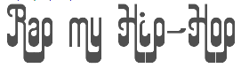 [MyFonts]
[More] ⦿
[MyFonts]
[More] ⦿
|

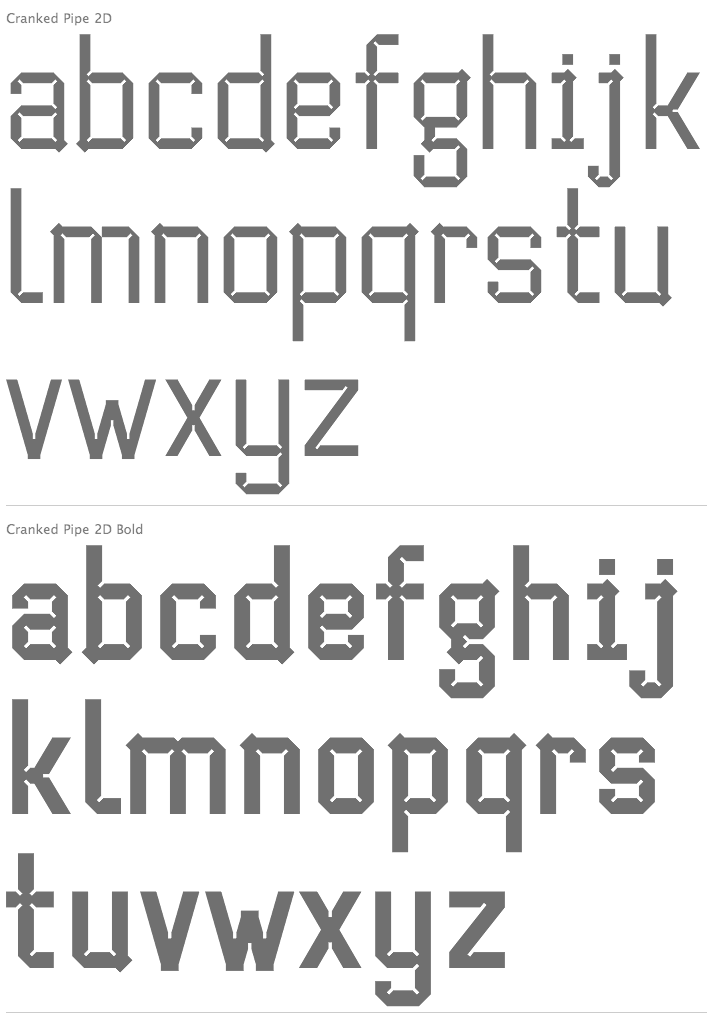
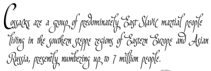
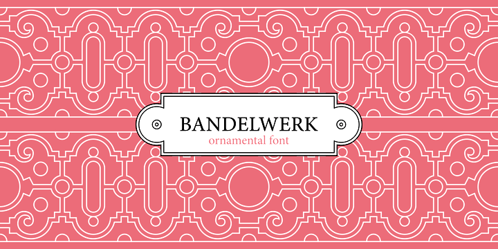
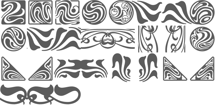
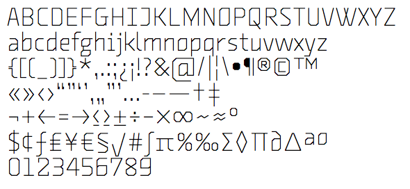
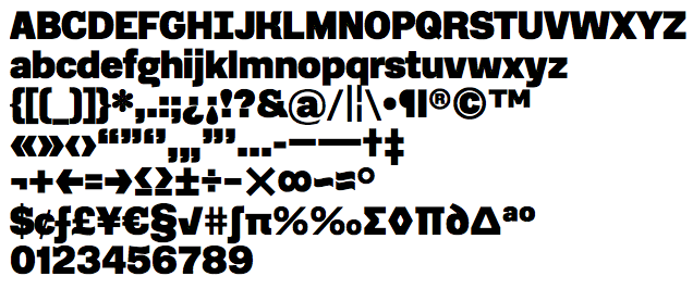
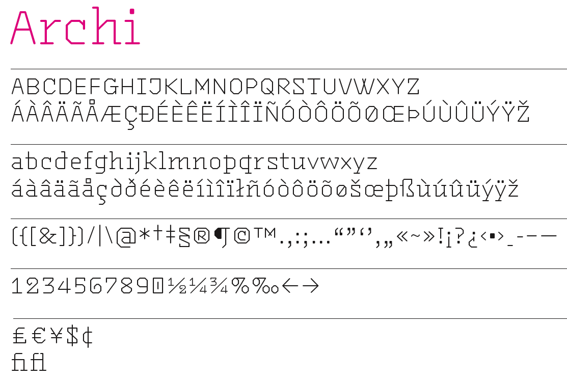
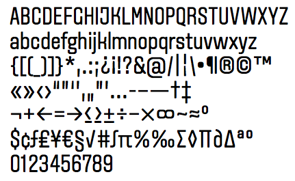
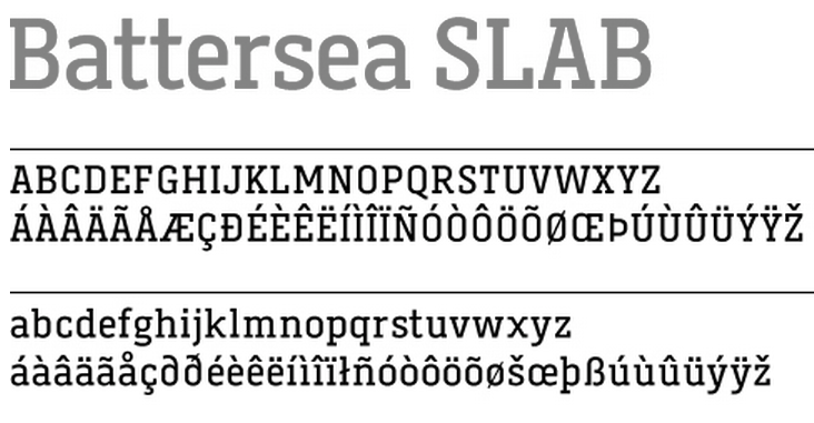
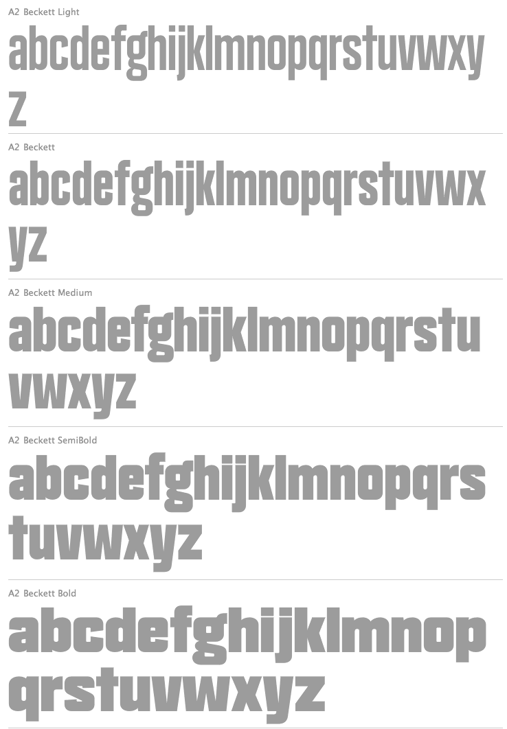
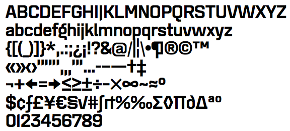
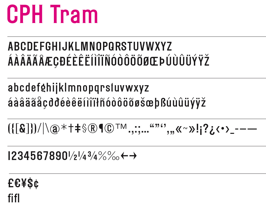
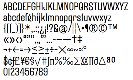
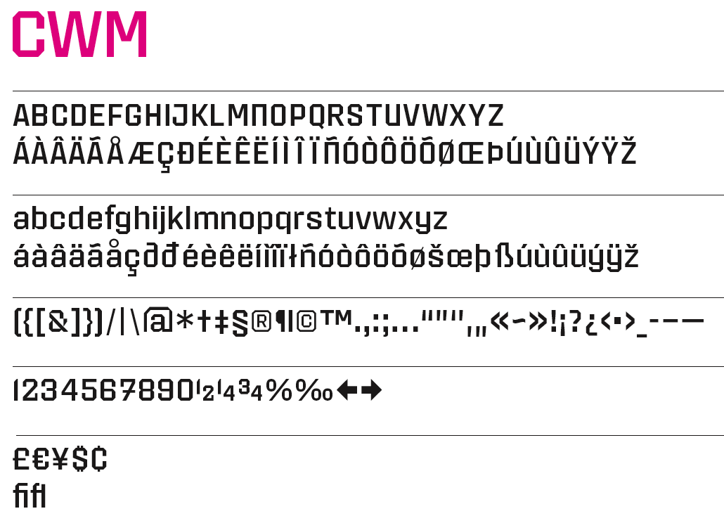
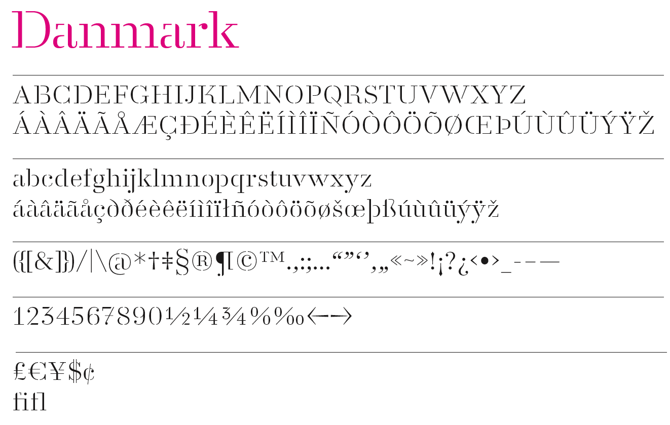
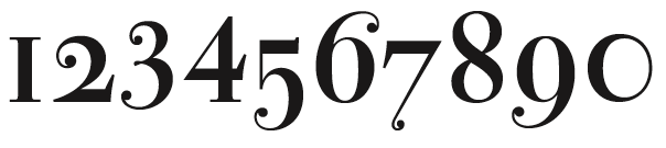
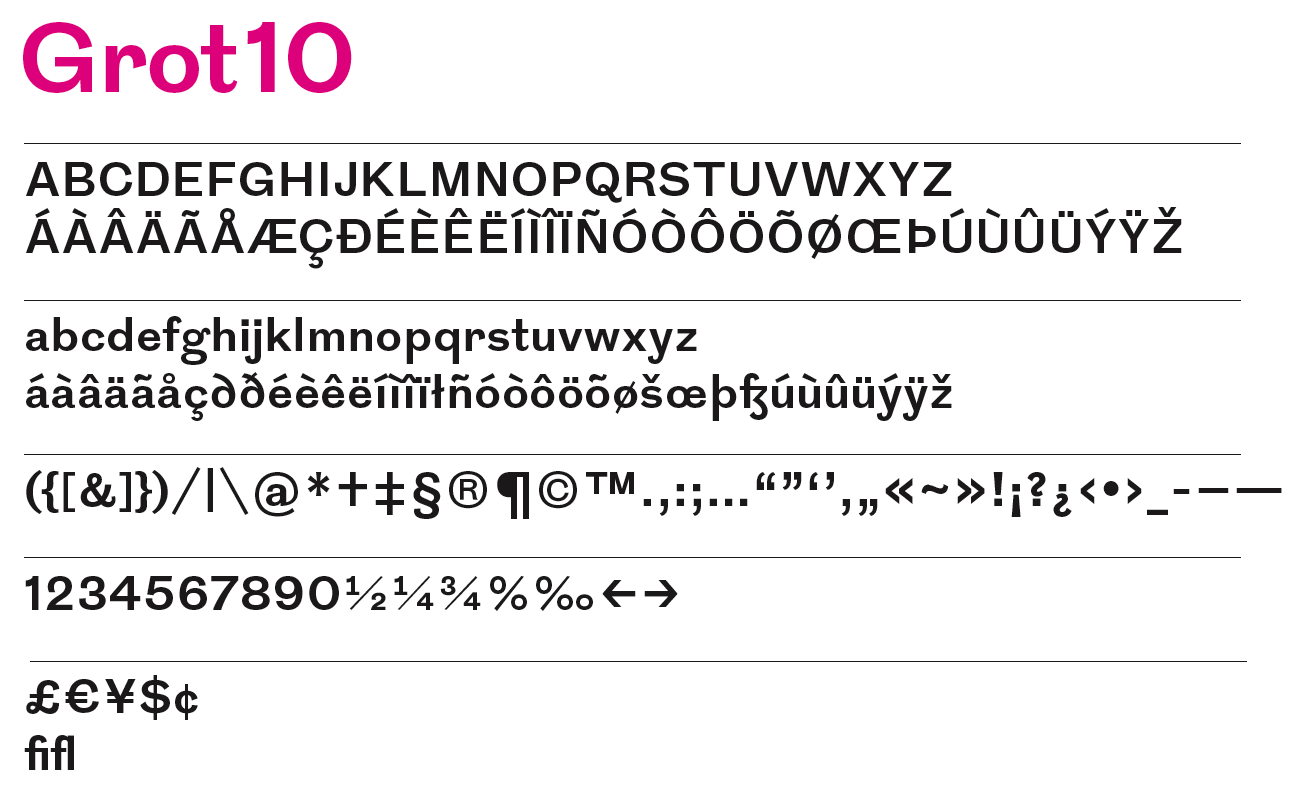
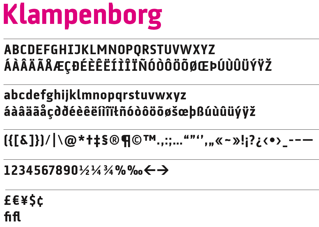
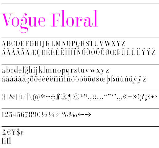
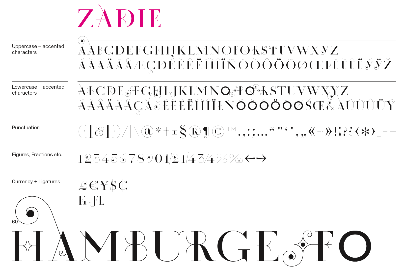
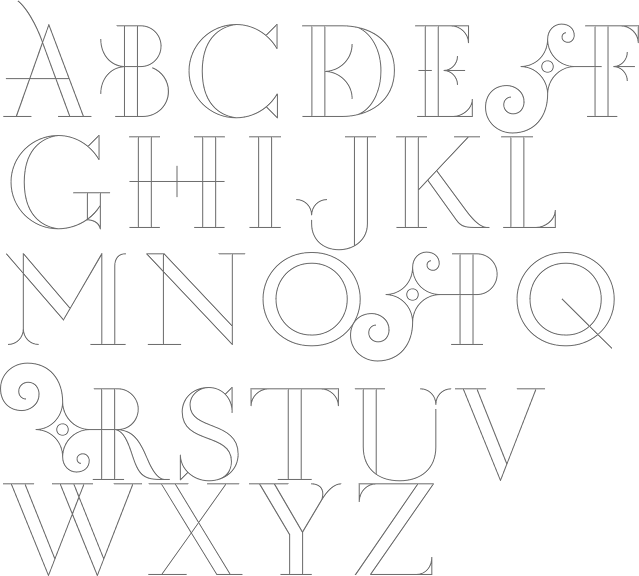
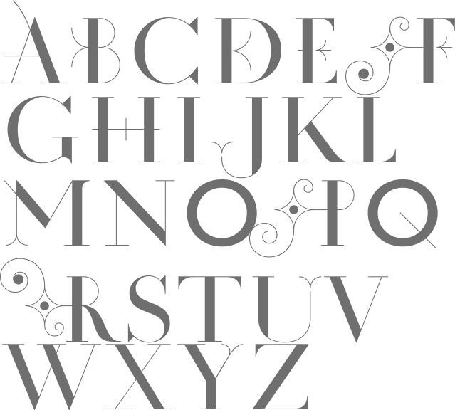
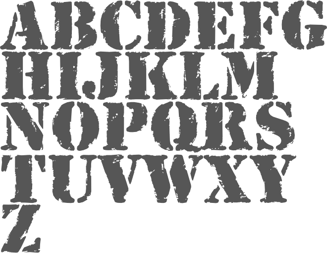
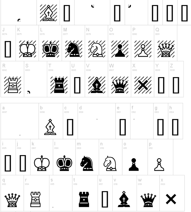
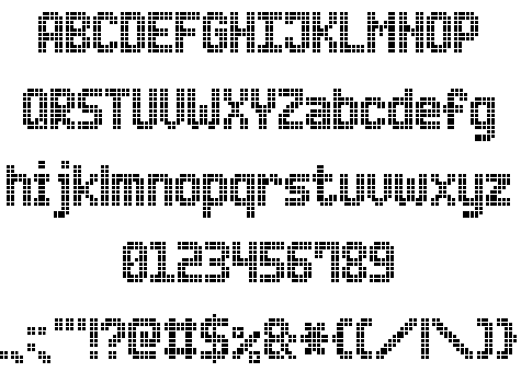
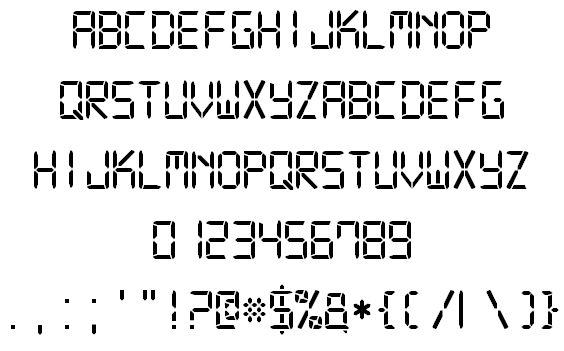
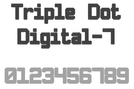
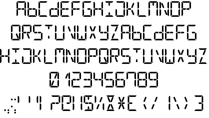
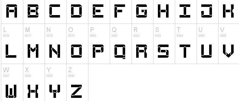
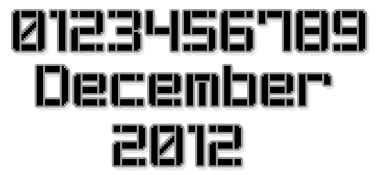
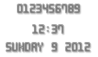
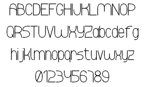
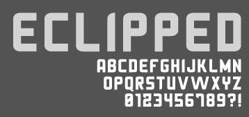
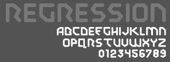
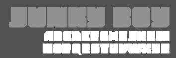
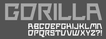
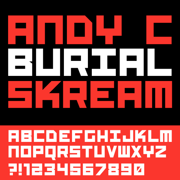
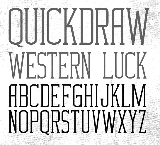
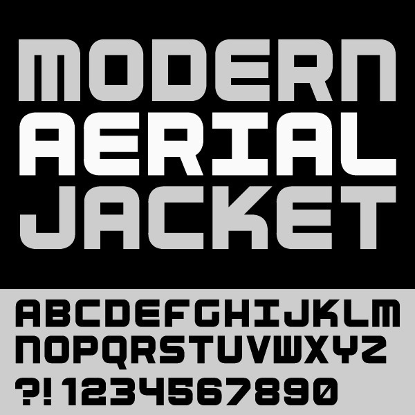
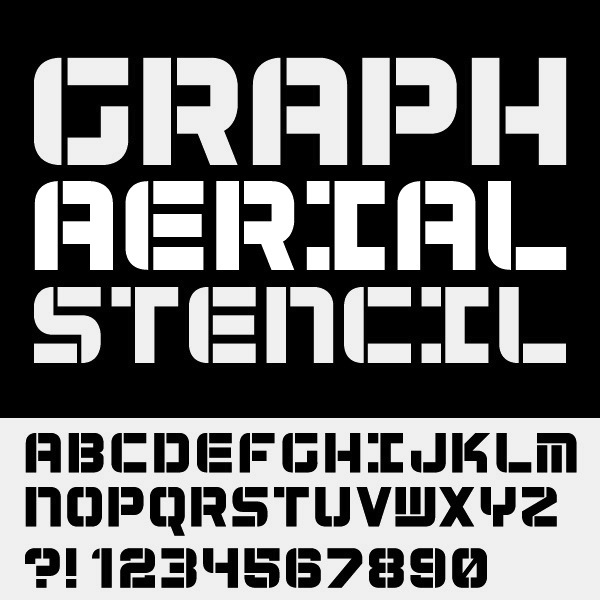
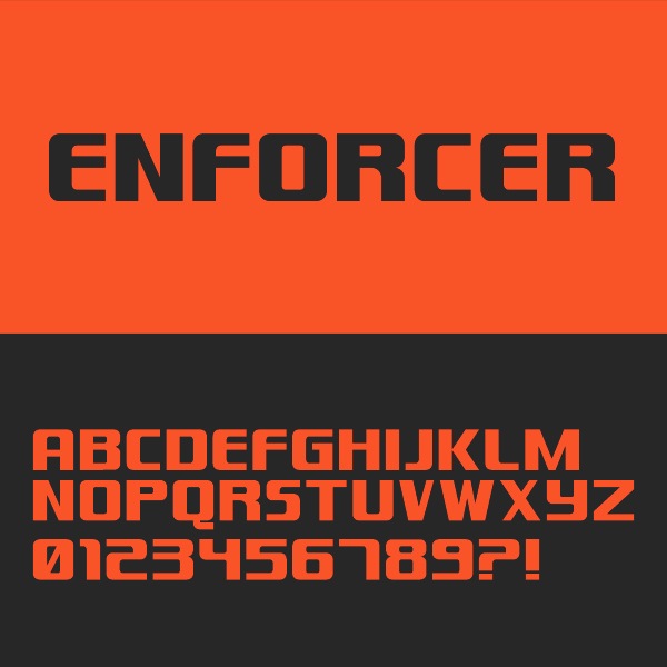
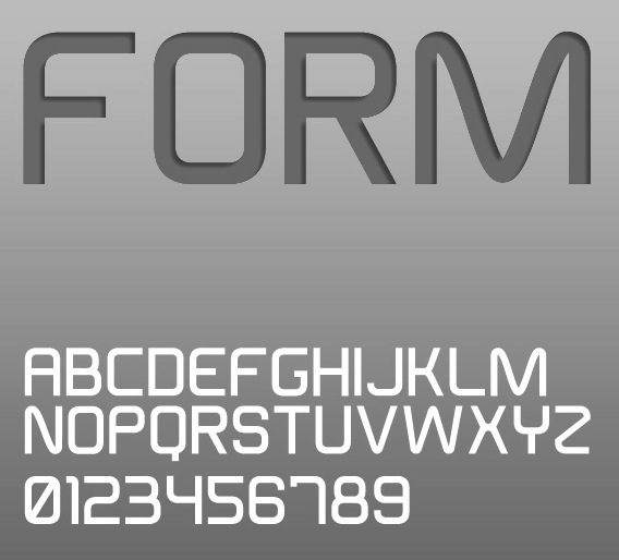
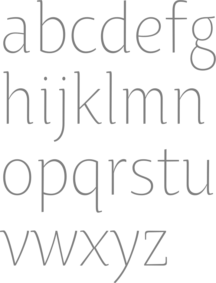
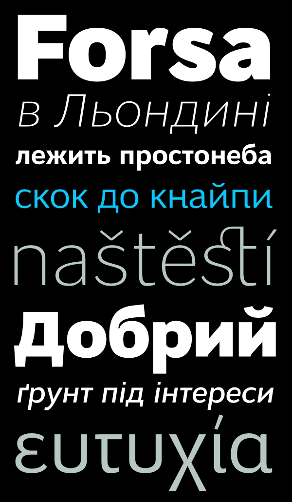
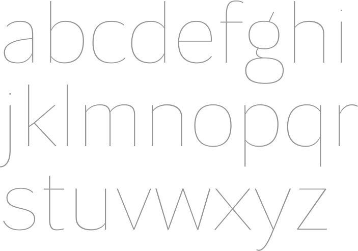
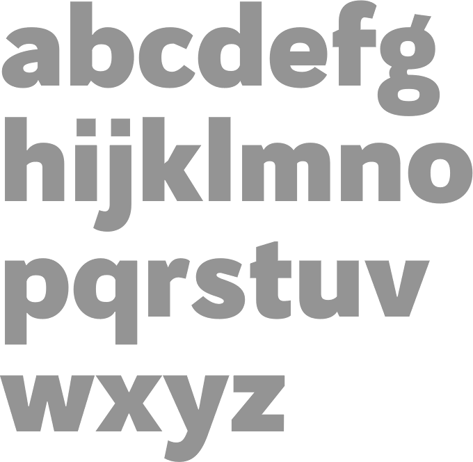
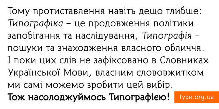
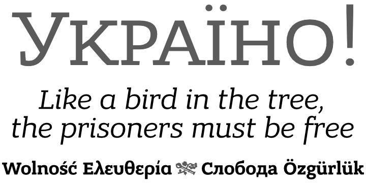
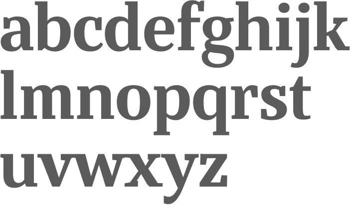
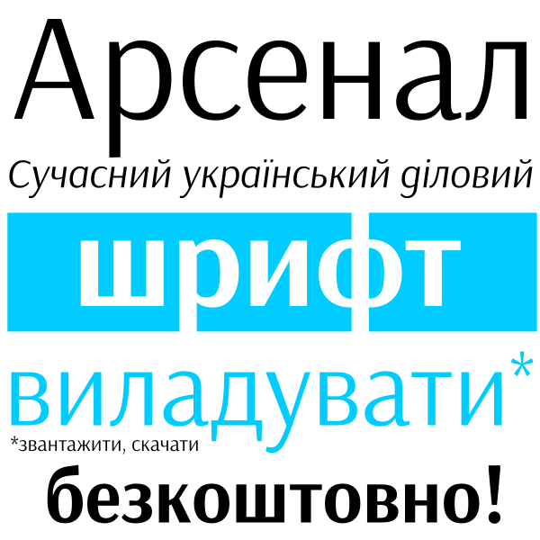
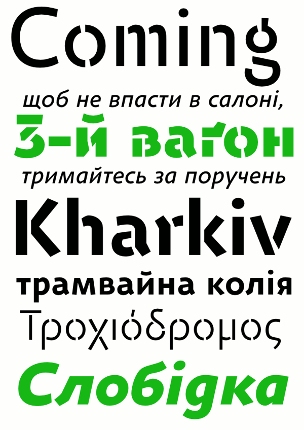
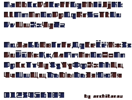
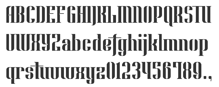
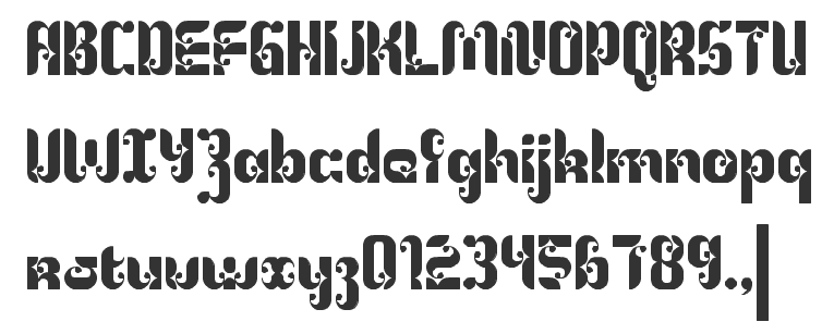
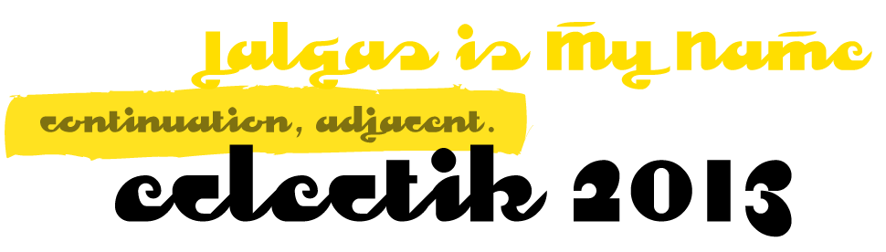
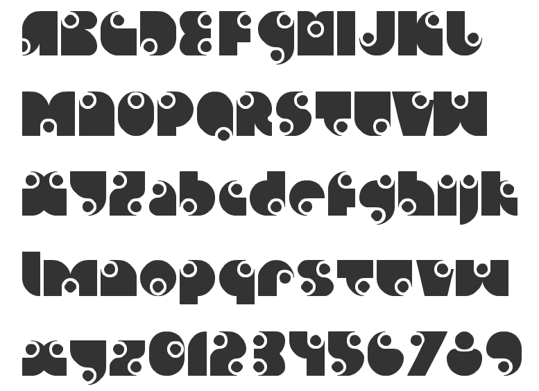
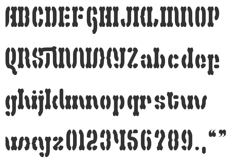
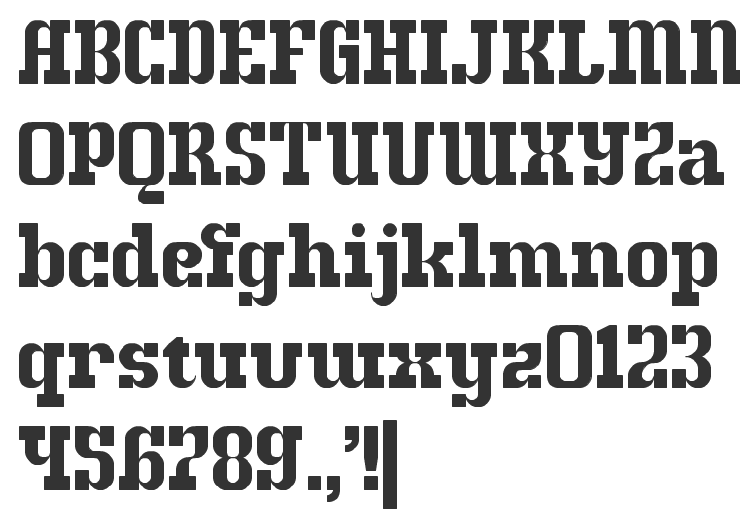
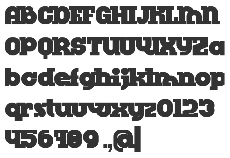
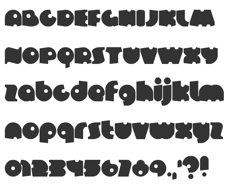
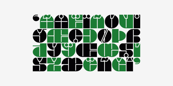
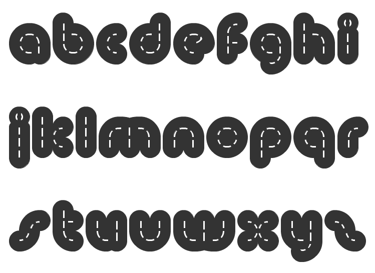
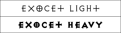
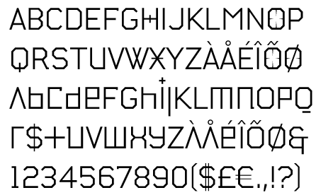
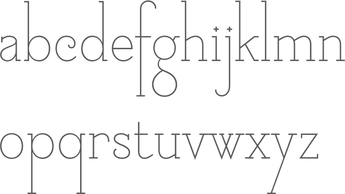
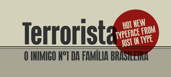
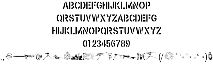
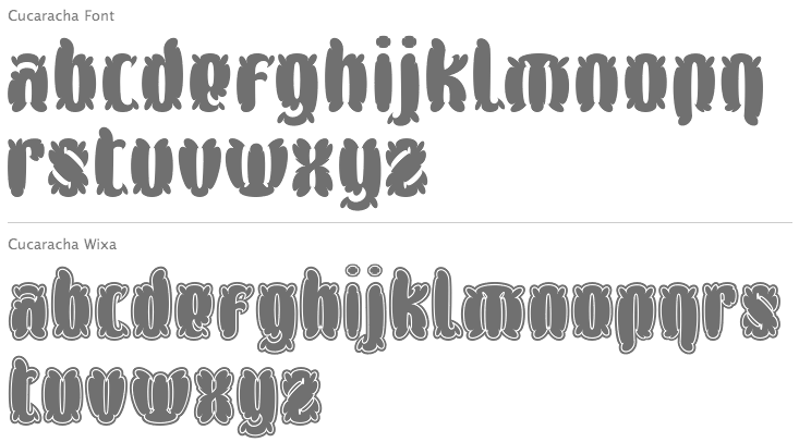
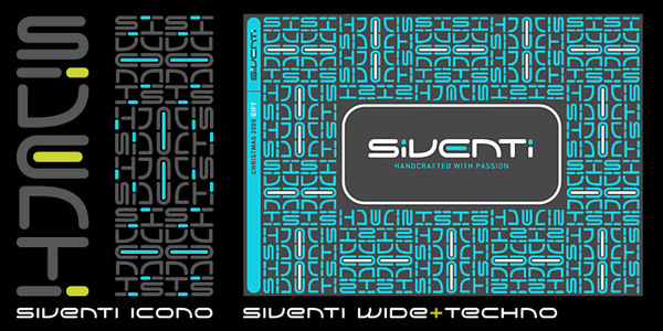
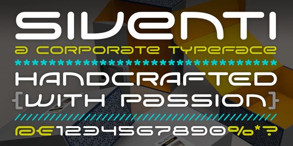
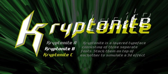
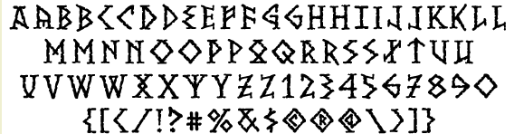
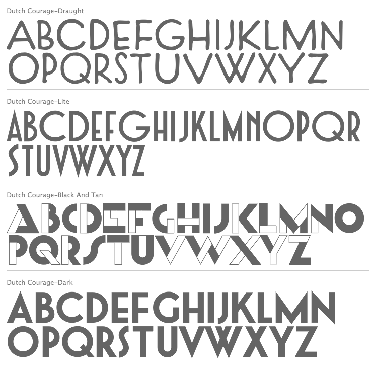
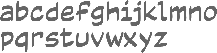
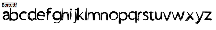
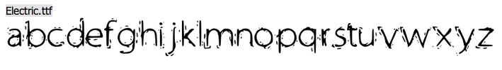
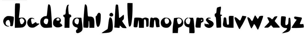
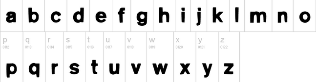
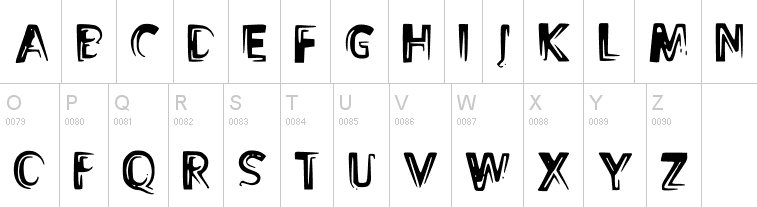
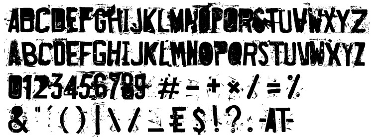
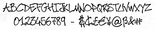
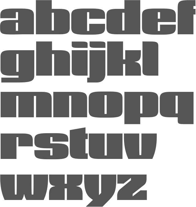
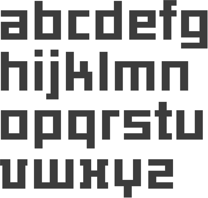
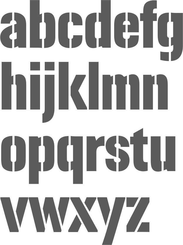
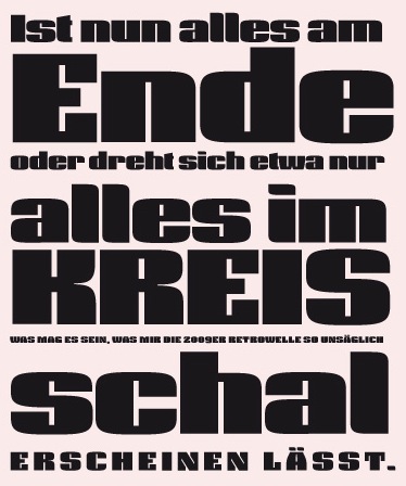
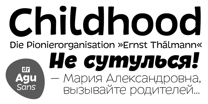
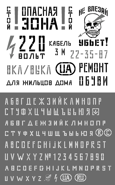
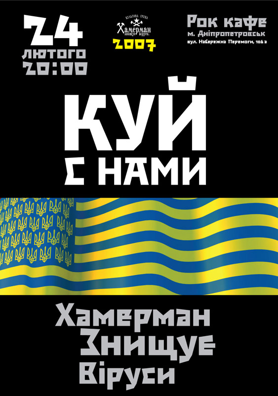
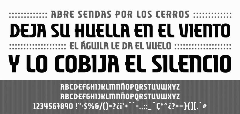
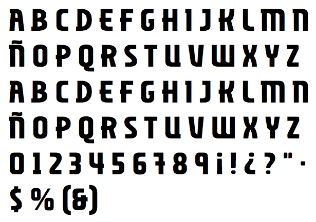
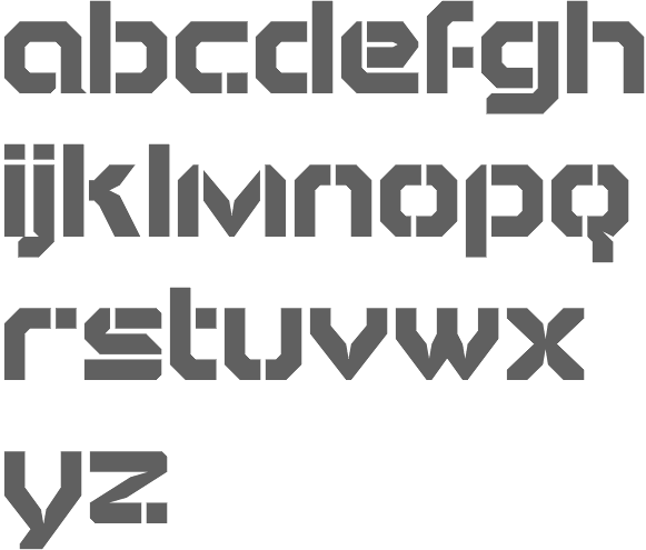
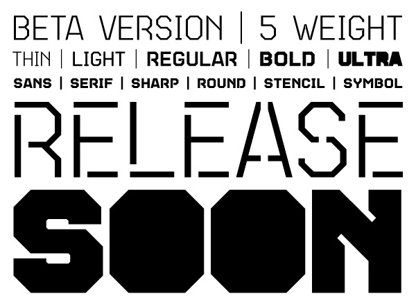
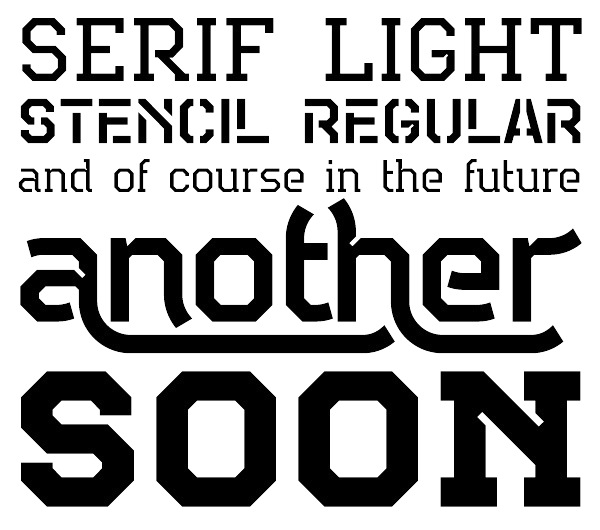
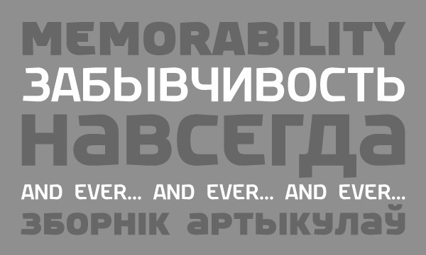
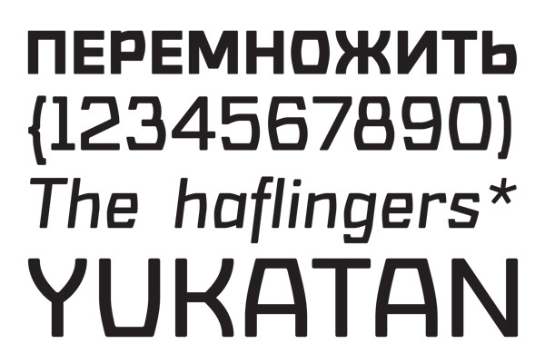
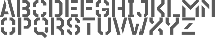
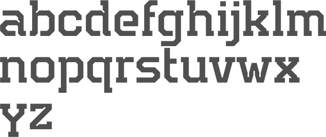
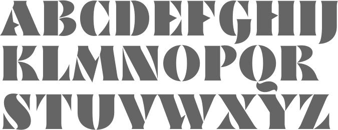
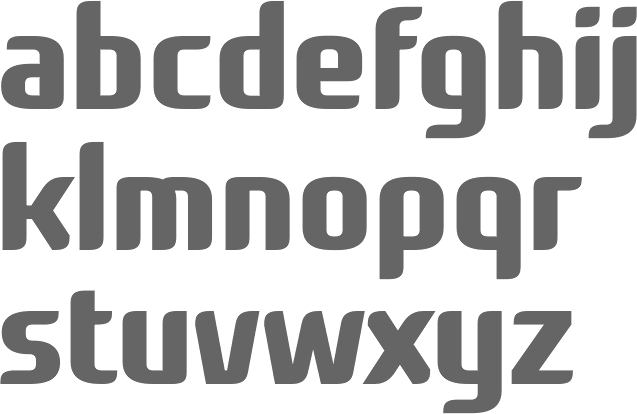
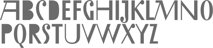
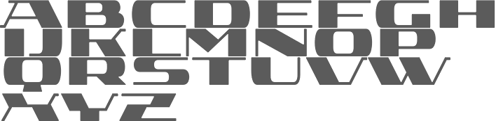
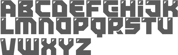
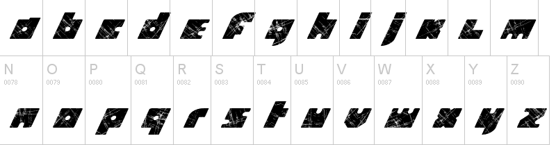
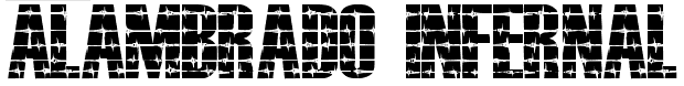
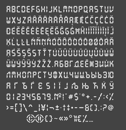
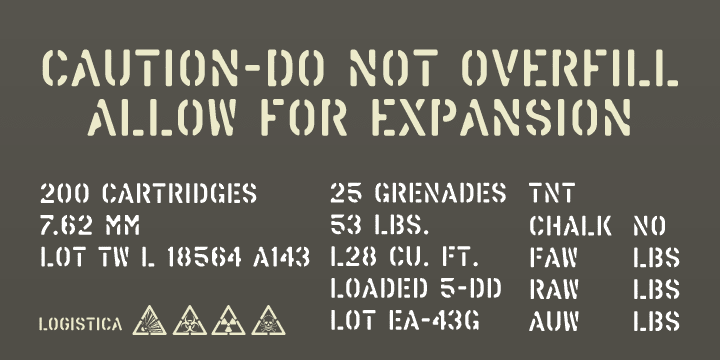
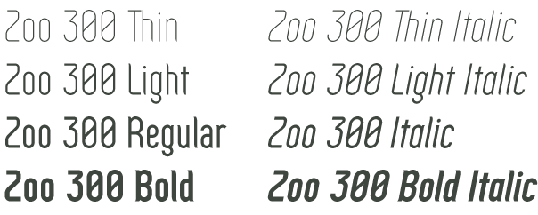
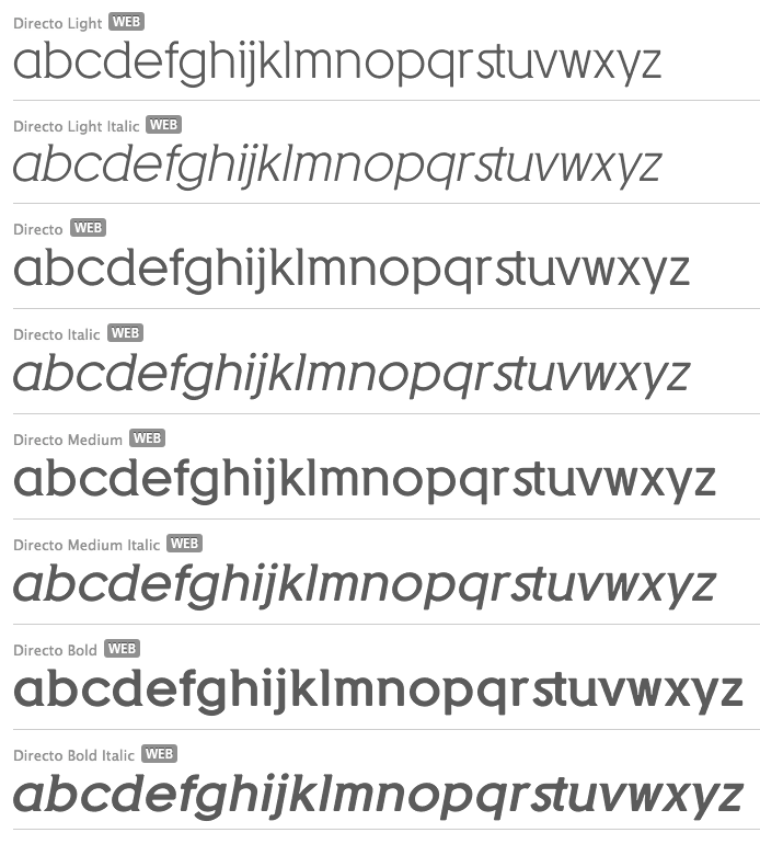
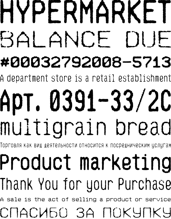
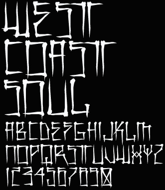
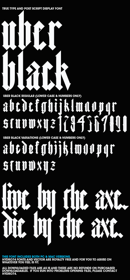
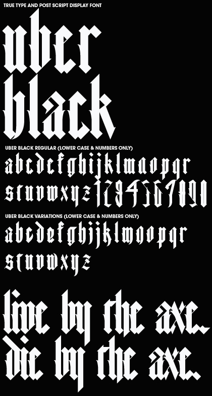
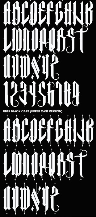
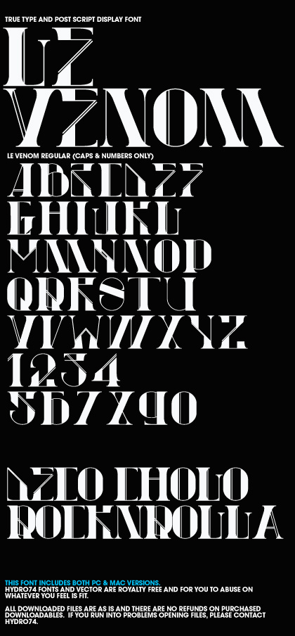
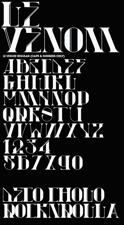
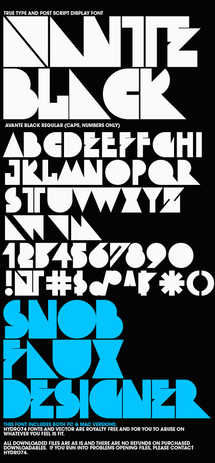
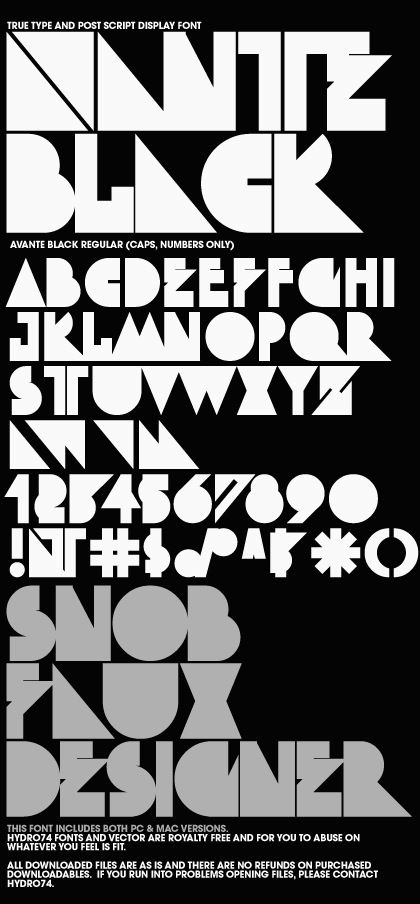
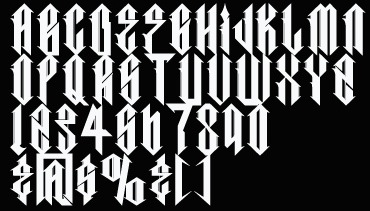
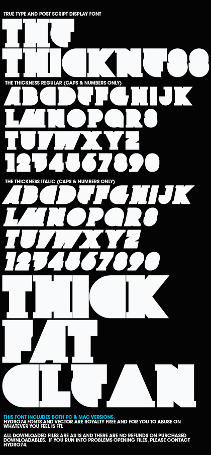
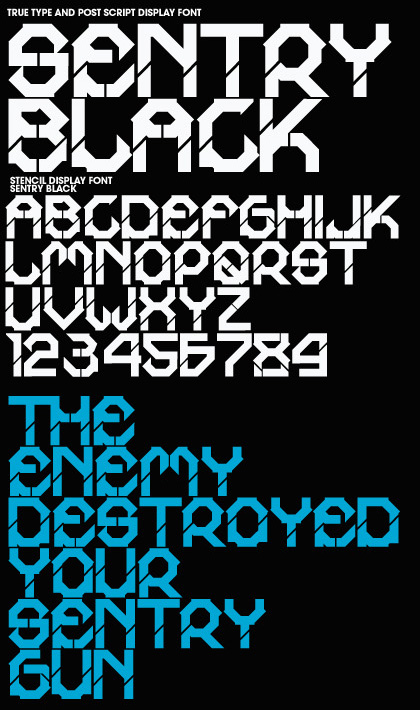
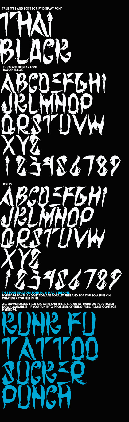
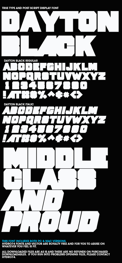
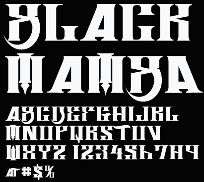
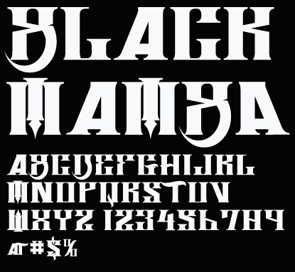
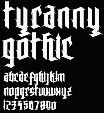
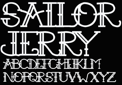
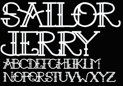
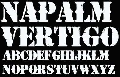
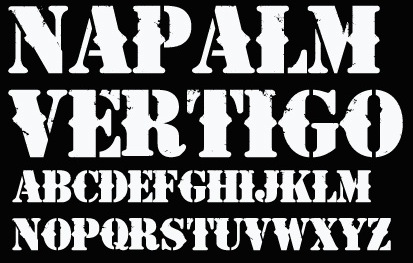
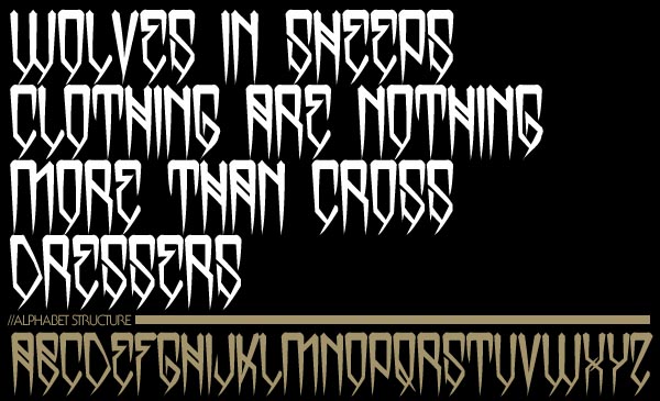
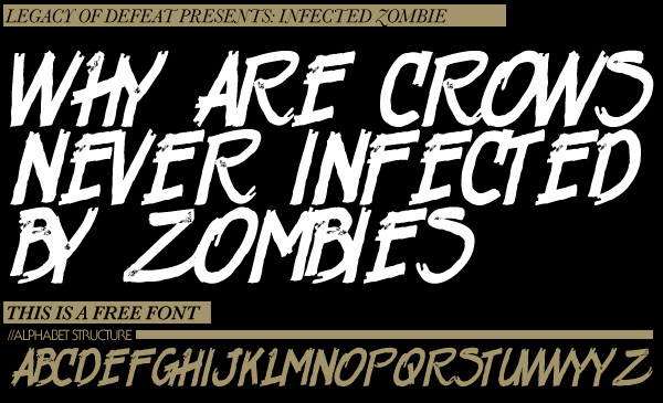
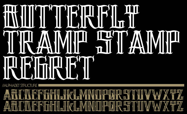
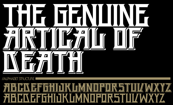
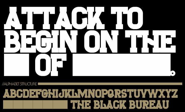
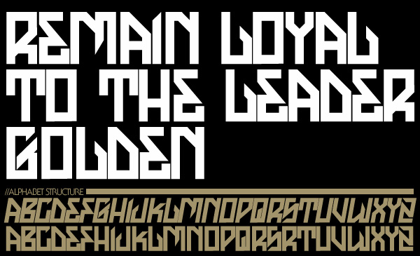
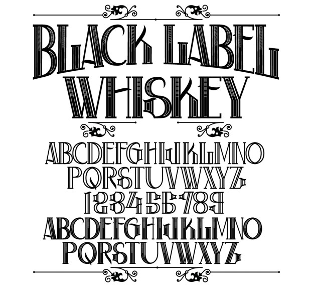
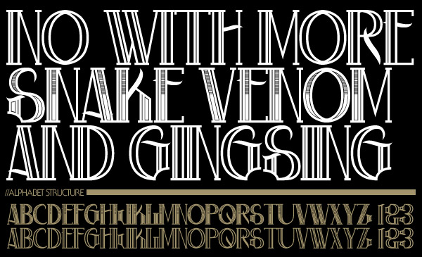
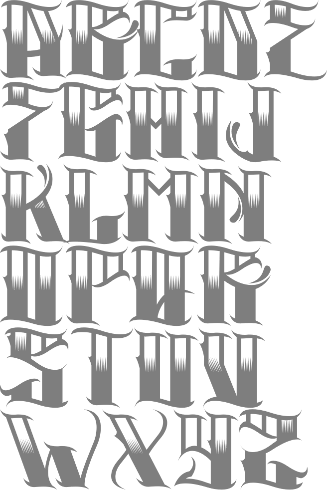
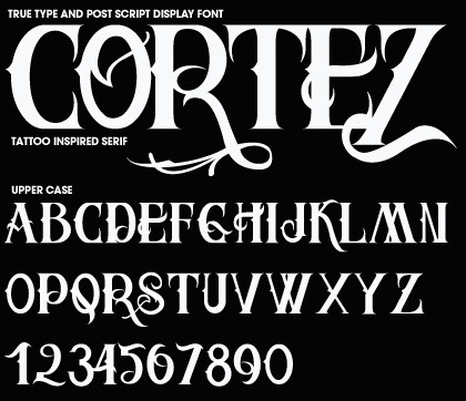
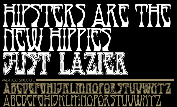
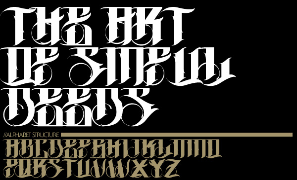
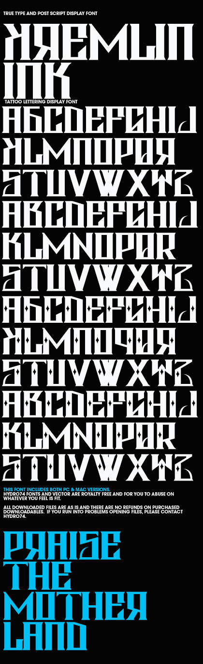
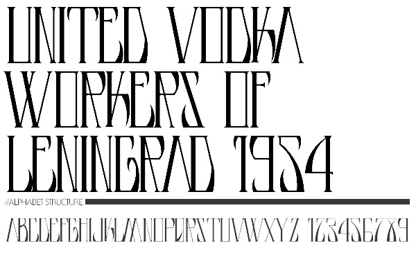
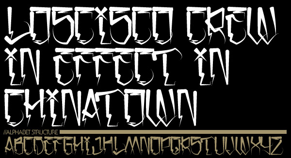
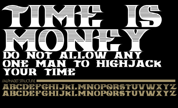
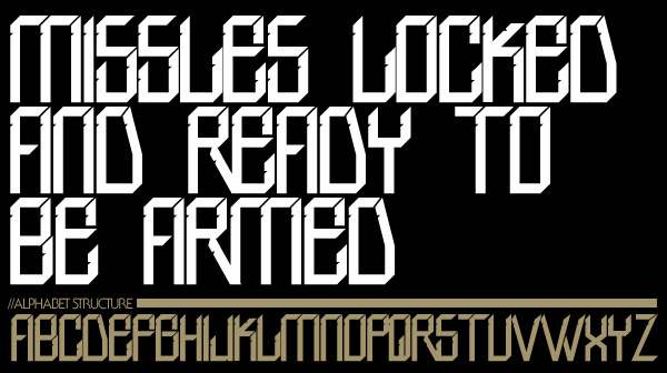
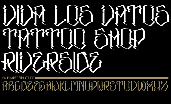
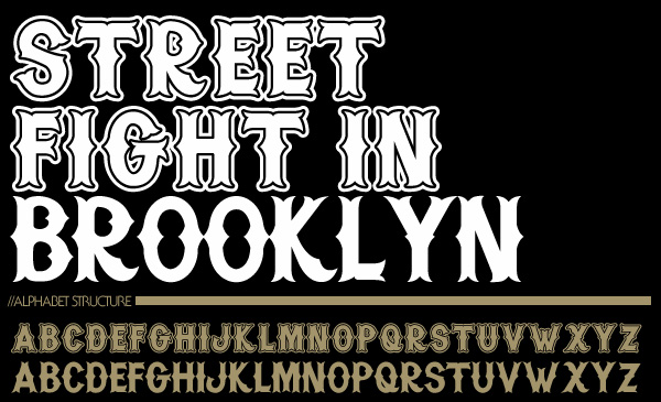
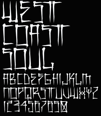
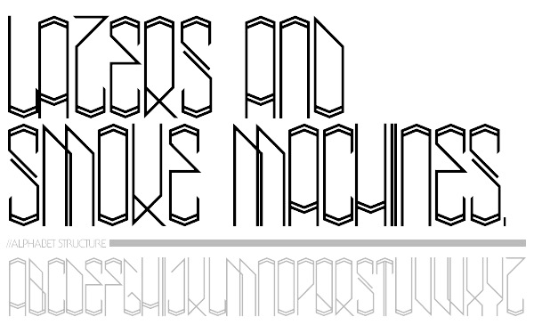
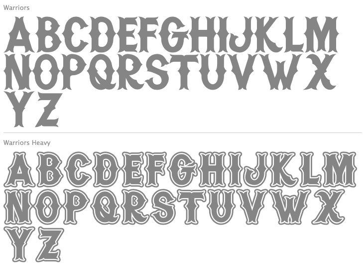
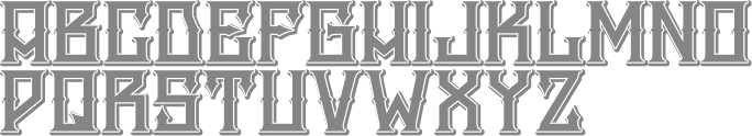
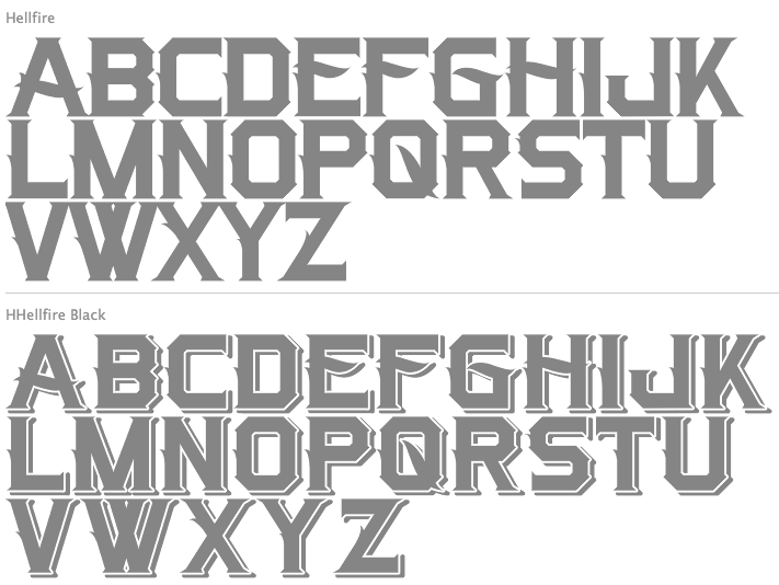
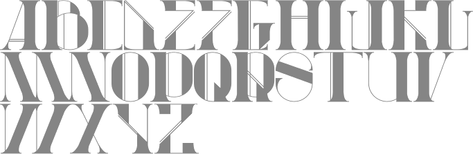
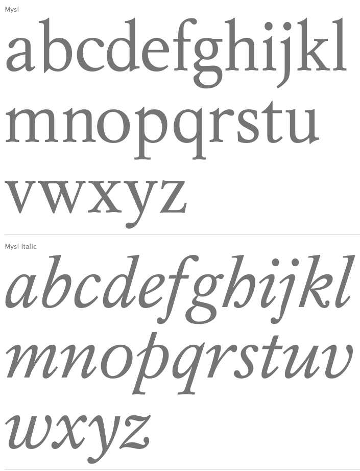
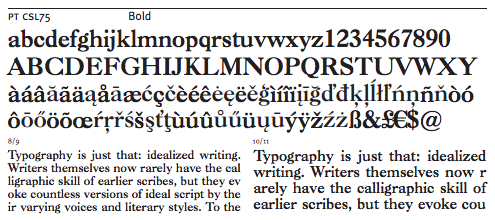
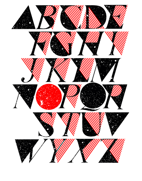
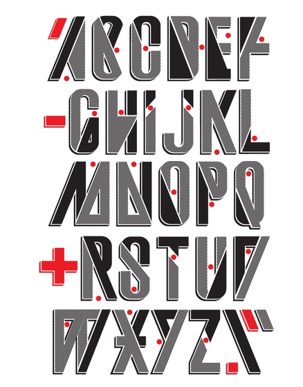
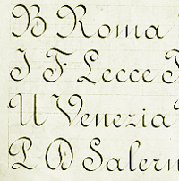
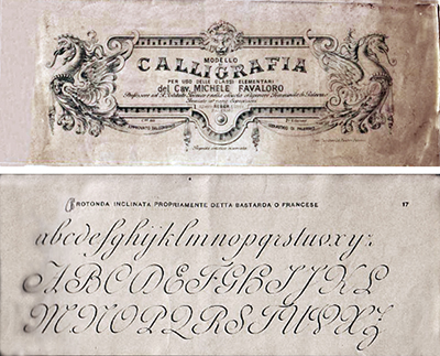
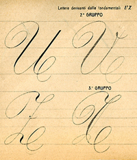
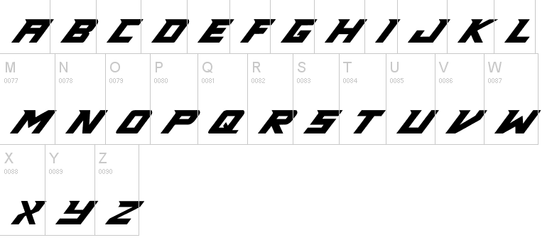
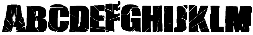
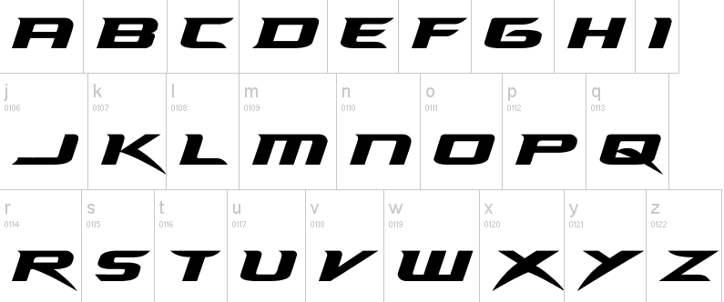
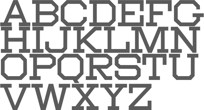
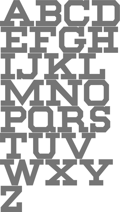
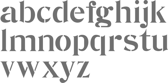
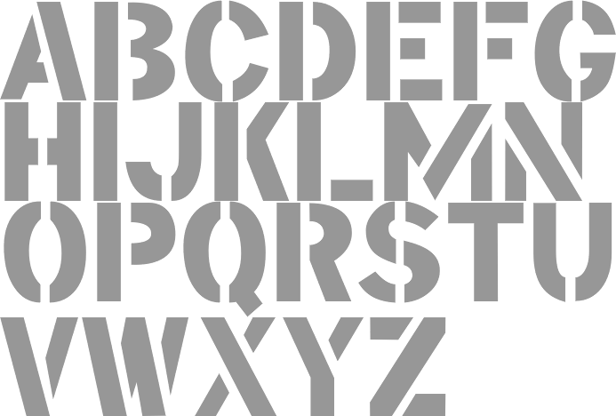
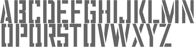
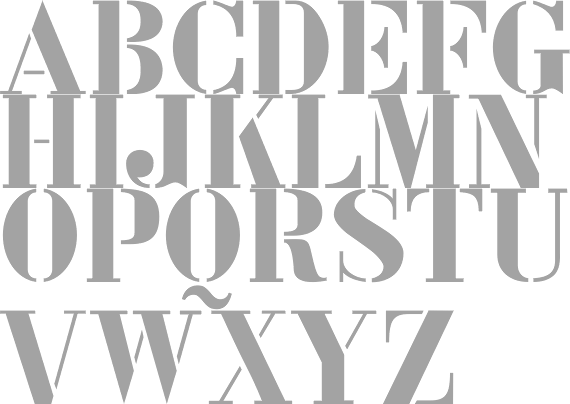
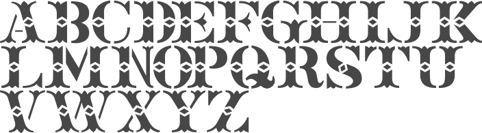
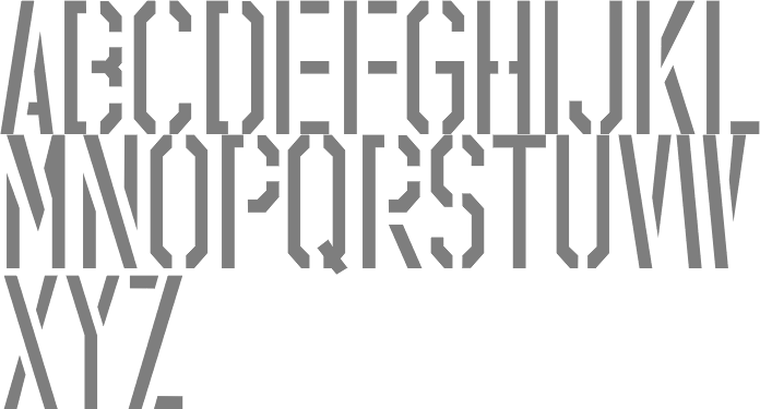
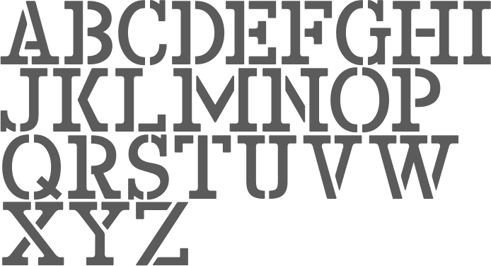
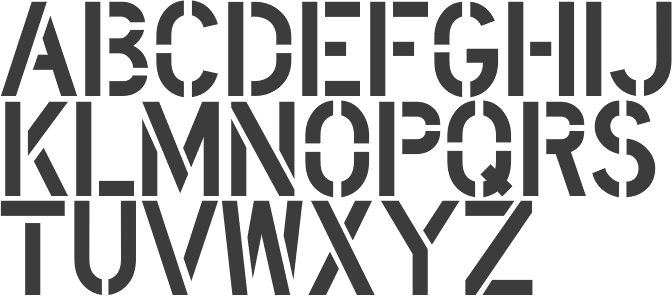
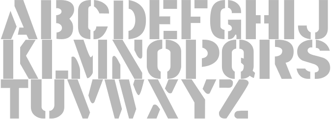
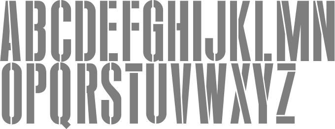
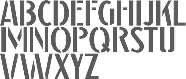
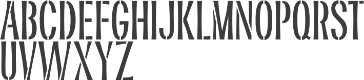
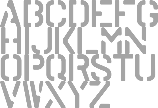
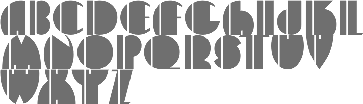
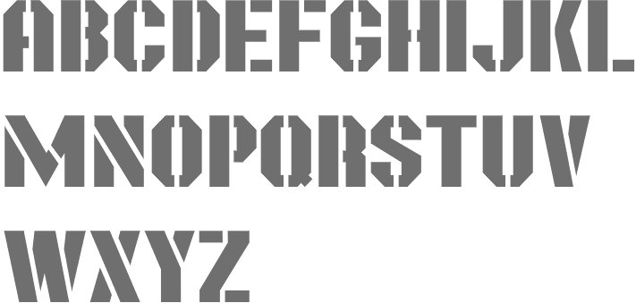
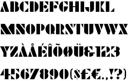
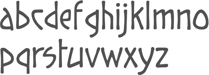
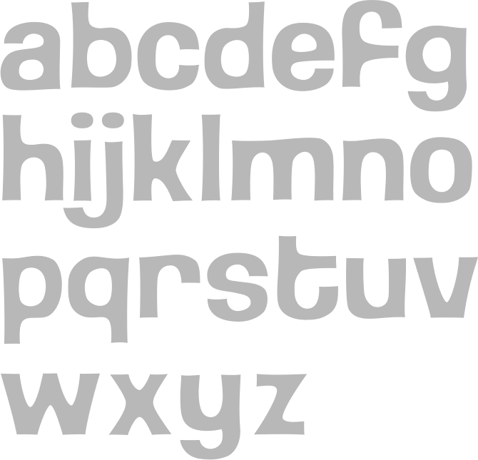
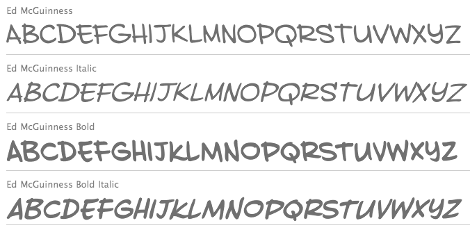
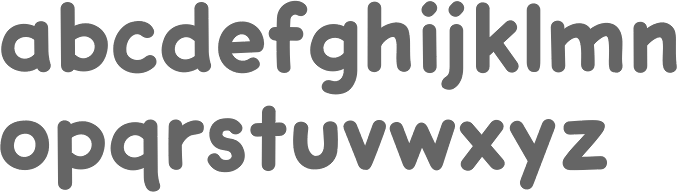
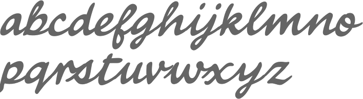
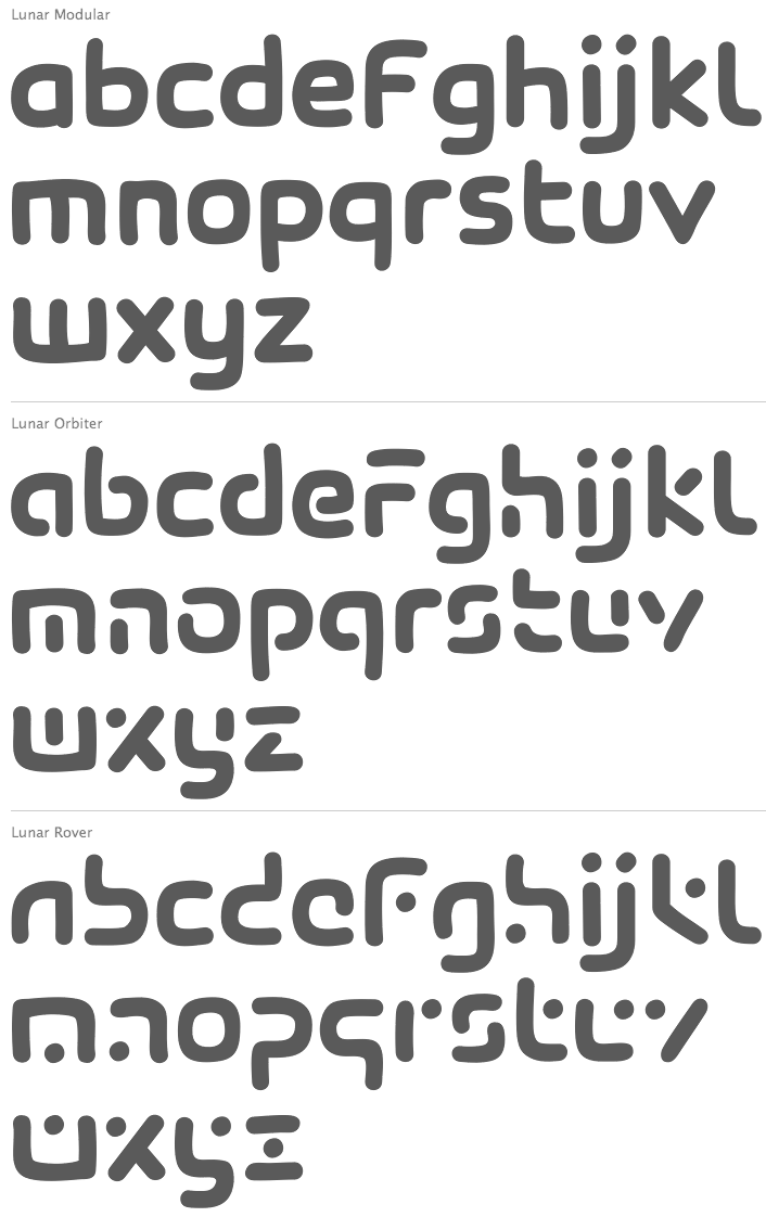
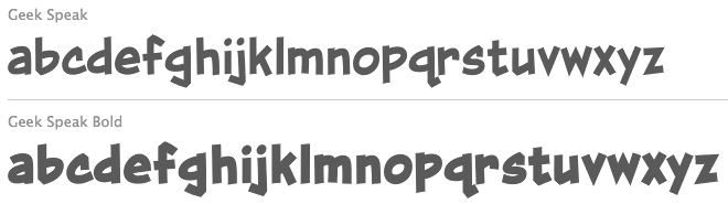
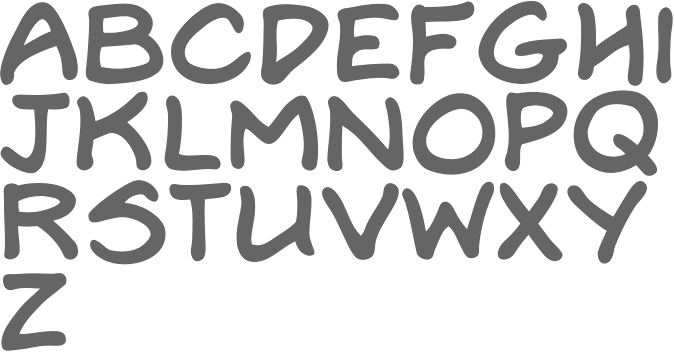
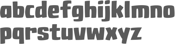
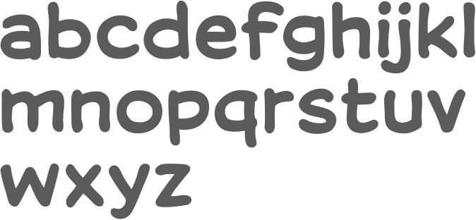
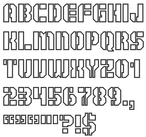
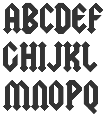
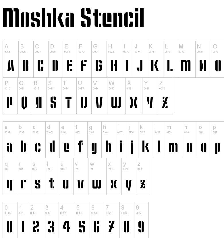
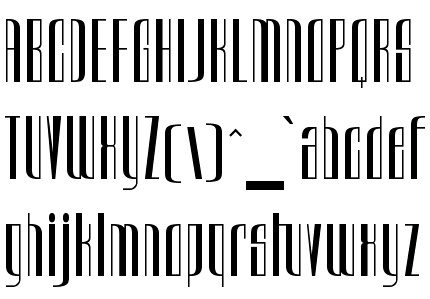
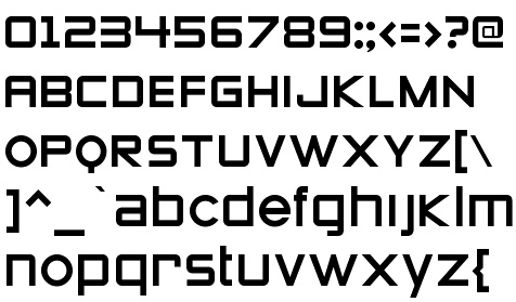
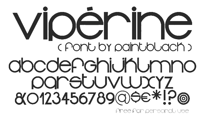
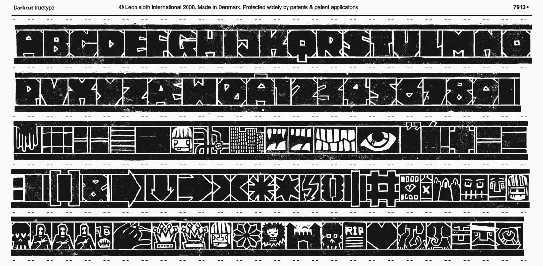
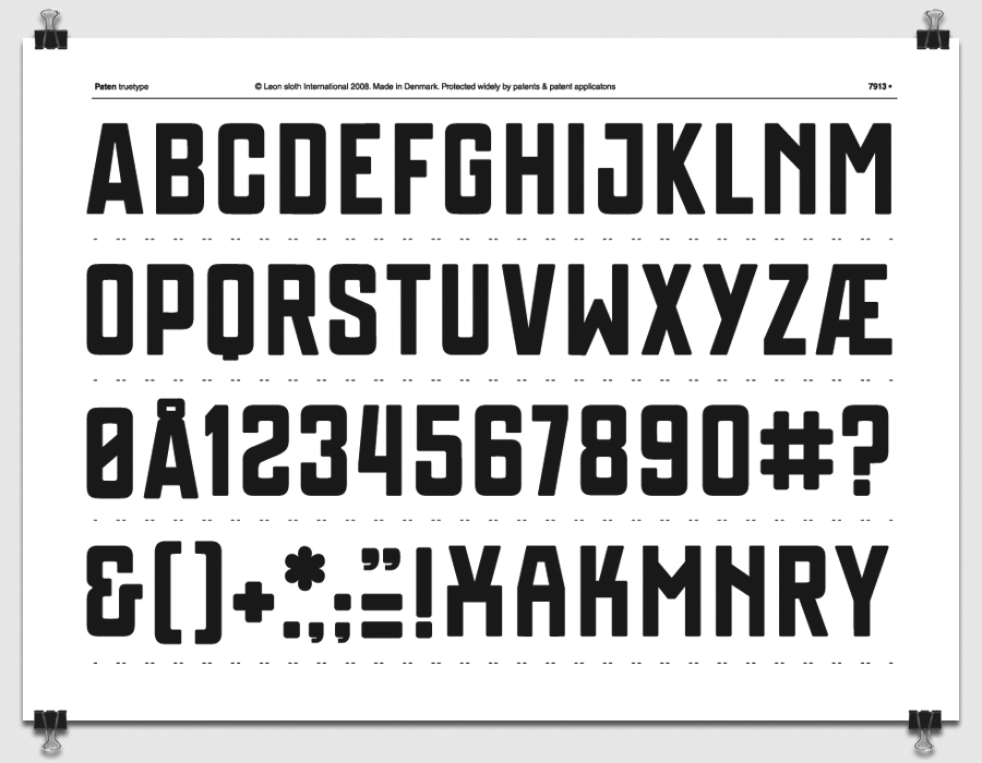
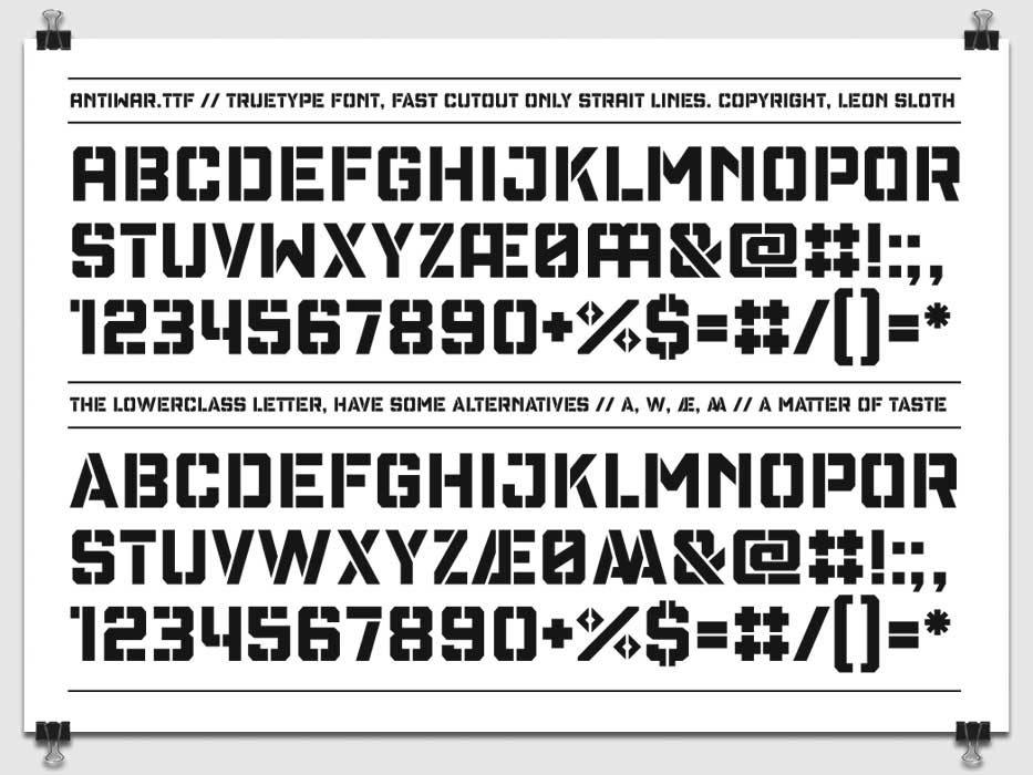
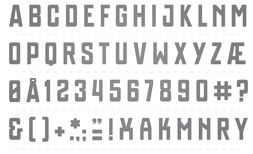
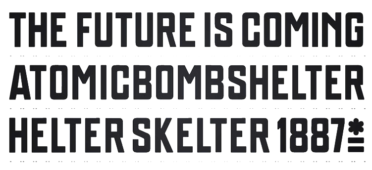
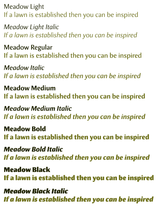
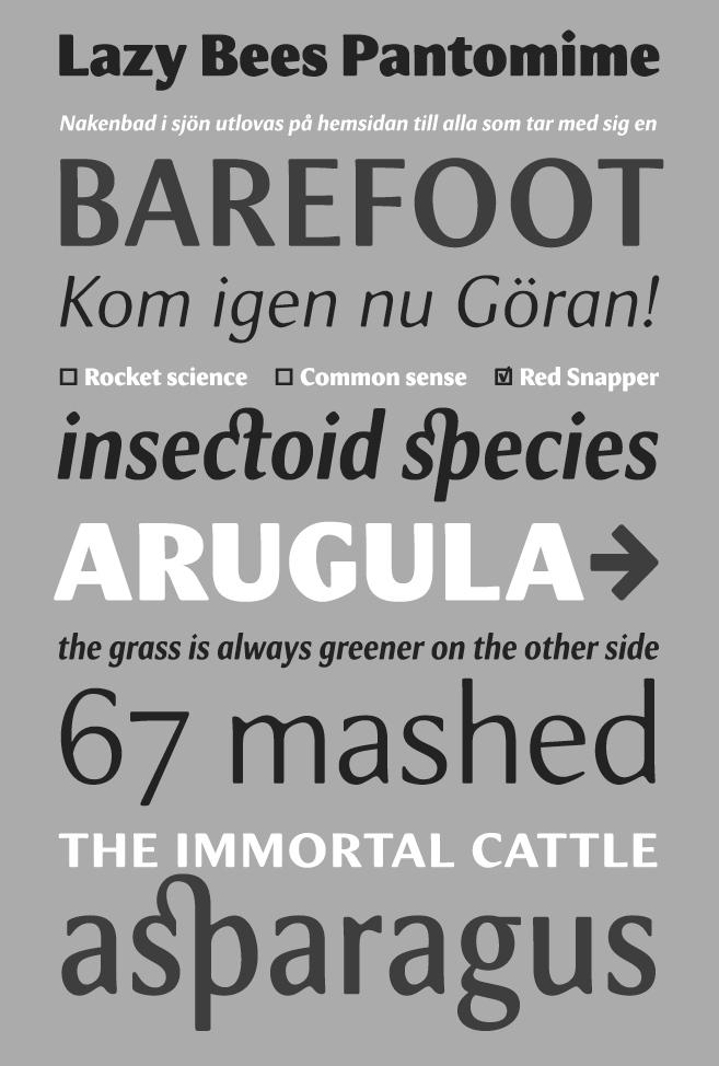
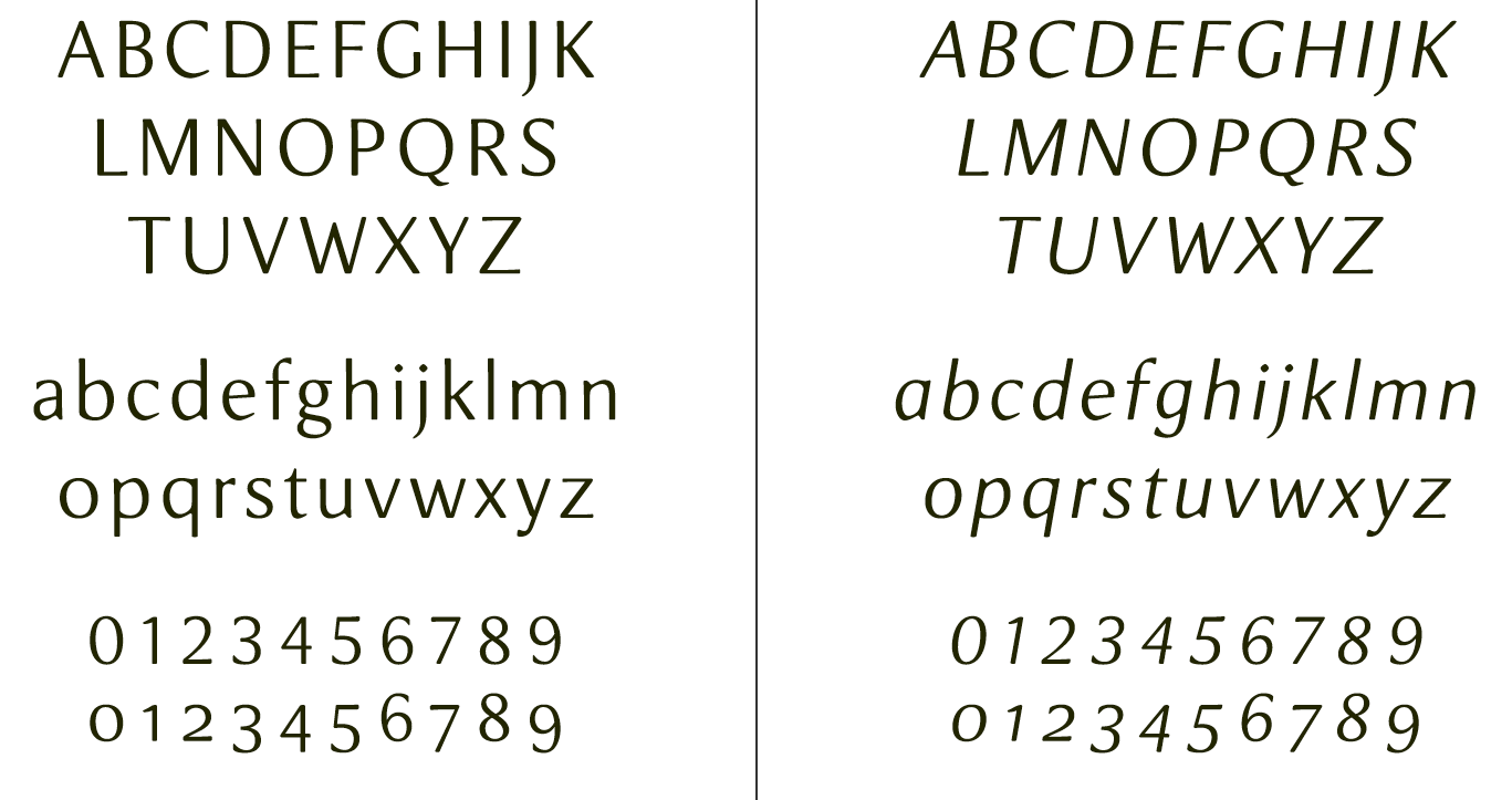
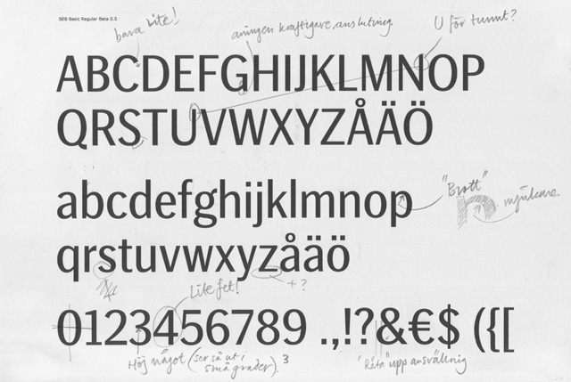
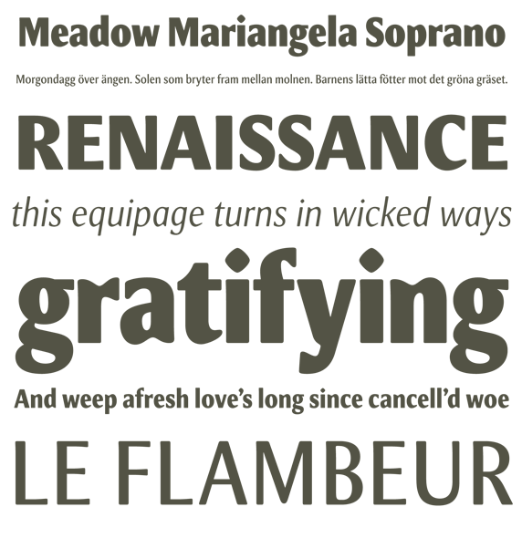
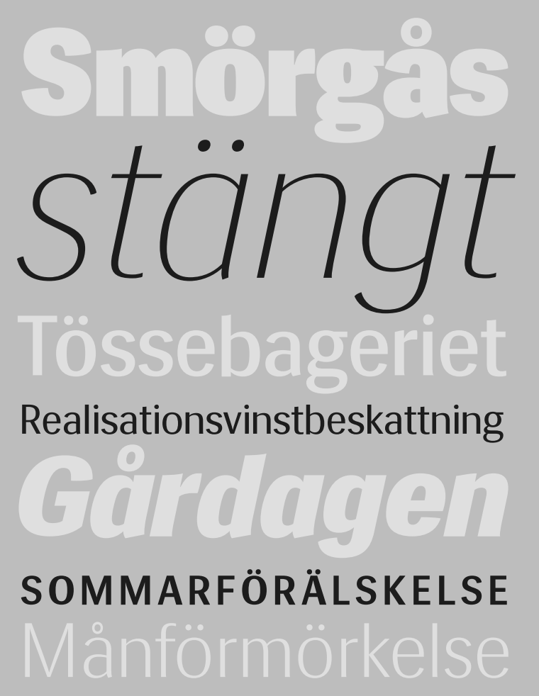
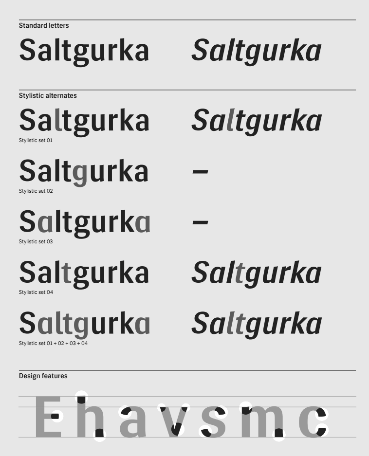
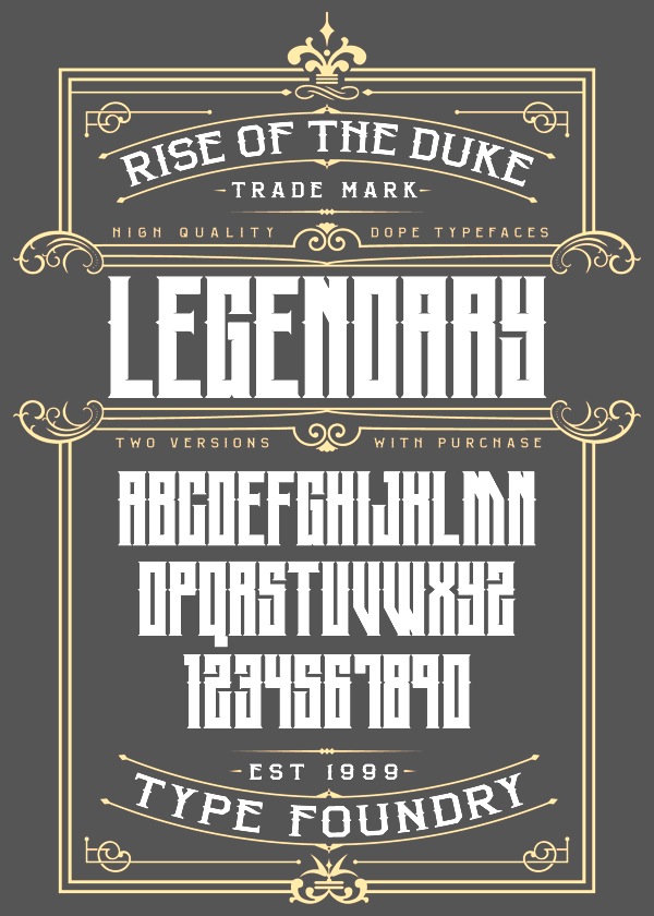
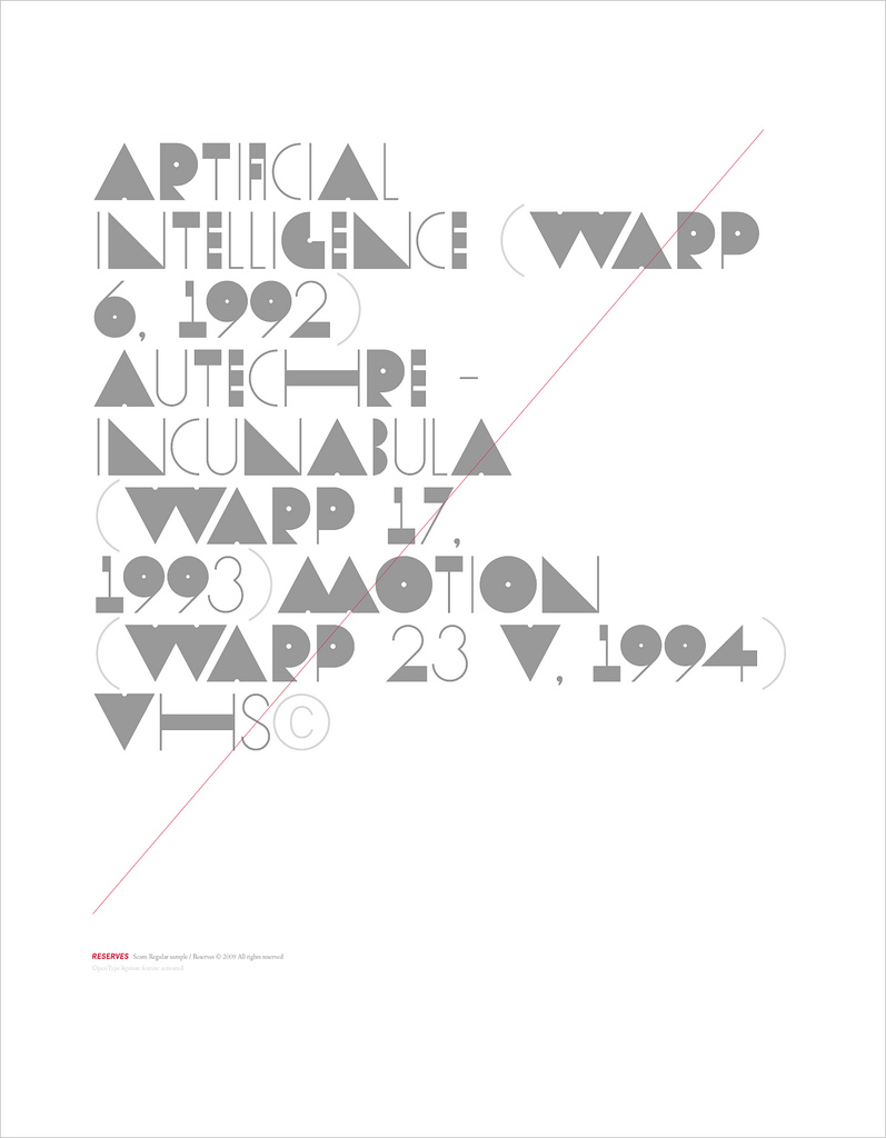
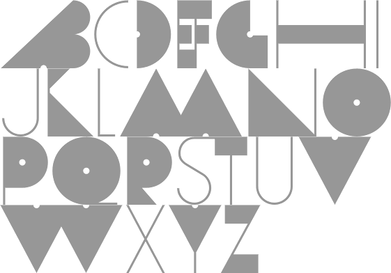
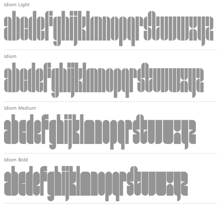
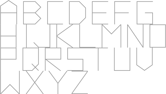
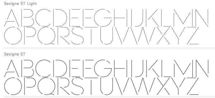
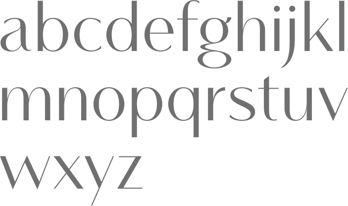
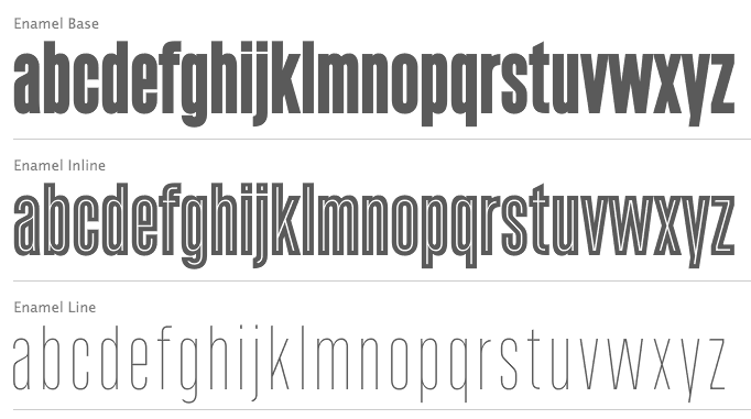
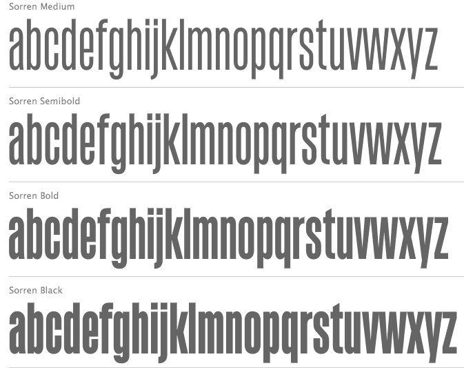
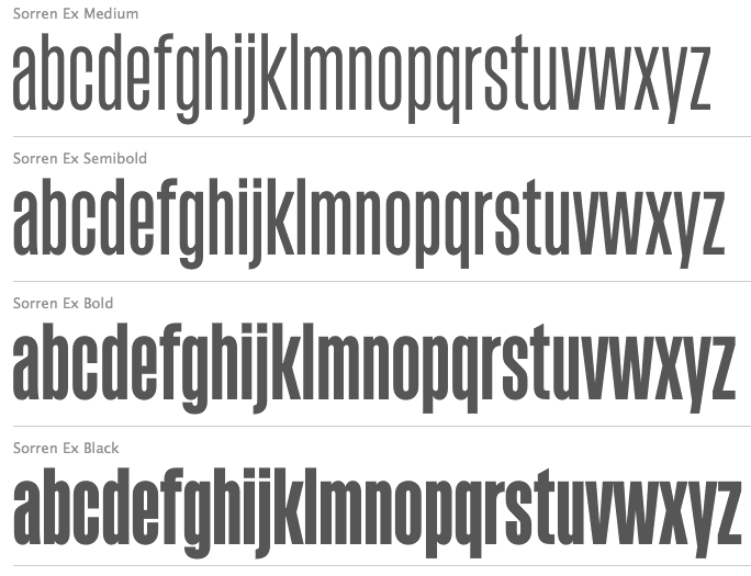
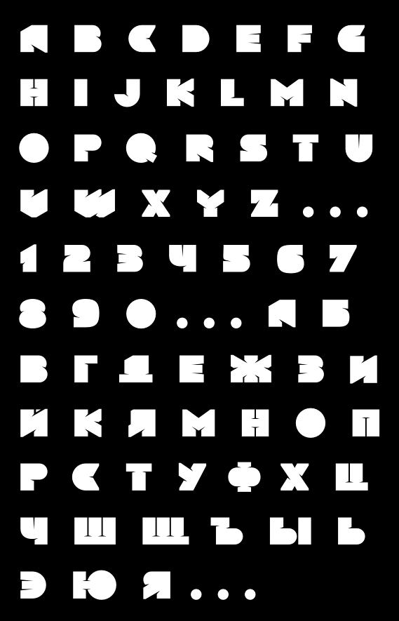
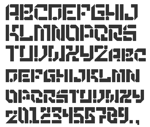
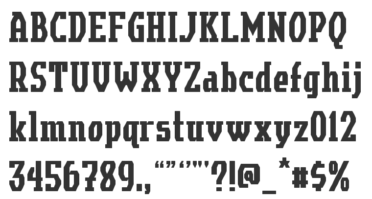
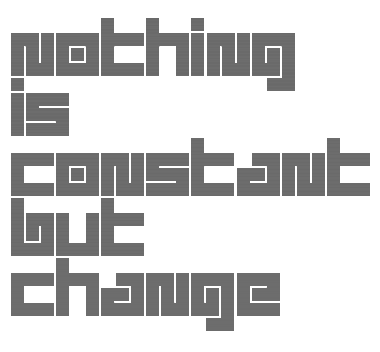
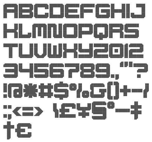
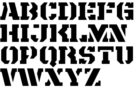
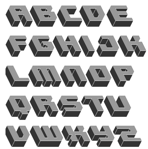
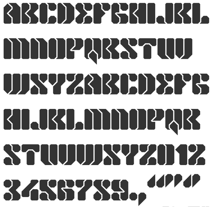
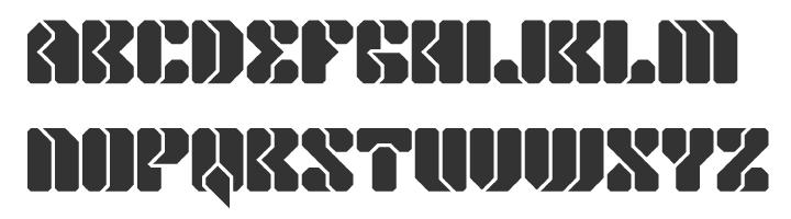
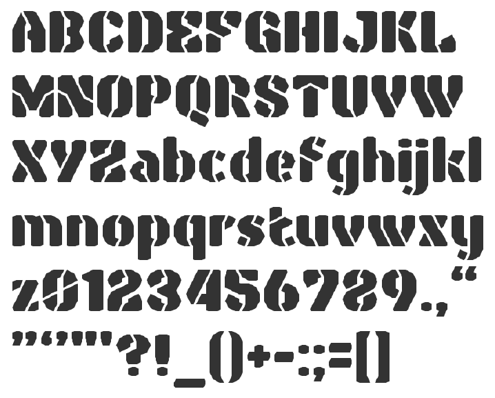