TYPE DESIGN INFORMATION PAGE last updated on Sat May 16 08:15:21 EDT 2026
FONT RECOGNITION VIA FONT MOOSE

|
|
|
|
|
Native-American fonts | ||
|
|
|
|
SWITCH TO INDEX FILE
Aaron Bell
| |
AiPaiNunavik Font
| Ray Taylor (Acorda Design Integration Inc) created a new Inuktitut font specifically for the Nunavik region of Northern Québec: AiPaiNunavik (2001) represents a return to the traditional way of writing the AI-PAI-TAI column of syllables. Fully-compatible Macintosh and Windows TrueType fonts in regular, italic, bold and bold-italic are available. The fonts contain the full Eastern Arctic syllabary (Nunavut and Nunavik). A version that is fully Unicode 3.0 compatible is available too. There are also AiPaiNutaaq (Unicode 3.0, full eastern arctic syllabary and Greenlandic), AiPaiNuna (a.k.a. AiPaiNunavik 2.0, all of the improvements to AiPaiNutaaq with AiPaiNunavik 8 bit encoding) and AiNunavik (1995, Ray Taylor), a font based on an original design of F. Firard and S. Putulik. The site also carries plenty of utilities for these languages. [Google] [More] ⦿ |
Istanbul-based desigfner of Aztek (2015). Behance link. [Google] [More] ⦿ | |
Designer of the Cherokee glyphs used in the Unicode chart. [Google] [More] ⦿ | |
Alan M. Stanier from Essex University (UK) has created the following metafonts: ams1, cherokee, cypriote, dancers (the "Dancing Men" code of Conan Doyle), estrangelo (ancient Syriac language), georgian, goblin, iching, itgeorgian, ogham (found on ancient Irish and pictish carvings), osmanian (twentieth-century font used in Somalia), roughogham, shavian, southarabian (for various languages circa 1500BC), ugaritic (ancient cuneiform alphabet). More direct access. [Google] [More] ⦿ | |
Alan M. Stanier
| |
Bogota, Colombia-based designer of the curly Wayuu culture-inspired typeface Jerulaa (2016). [Google] [More] ⦿ | |
Alex Cottles
| |
Alexandre Saumier Demers
| |
Graphic designer in Moscow, ID. She created an all caps alphabet that was inspired by Indian art in 2009. [Google] [More] ⦿ | |
About ten fonts here, including some barcode fonts, and a truetype font for Algonquian (Algic languages) by Peter S. Baker, called Junicode (2000). [Google] [More] ⦿ | |
During her studies in Lima, Peru, Allison Lopez designed the Nazca culture-inpired rounded typeface Munay (2018). [Google] [More] ⦿ | |
Discussion of American Indian language fonts on typophile. See also here. [Google] [More] ⦿ | |
Free fonts at Howard Berlin's site included Cherokee, LucidaSans Navajo. Also, Chey1SILManuscriptL (1994, Summer Institute of Linguistics, a Cheyenne font that looks like Courier). [Google] [More] ⦿ | |
Amuki Studio
|
In 2012, she designed the modular color font INTI, and the cultural pattern typeface family Sara. In 2014, she designed the modular typeface Oraculo and the bribeware display typeface Lineas Y Puntos. Amaru Creador won an award at Tipos Latinos 2014. In 2015, she created the free display typeface Abyaster, and the multiline Bolivian pattern typeface Khurus. Her typefaces Modular 46 and Tiwanacu (decorative Nazca-themed caps) won awards at Tipos Latinos 2016. Typefaces from 2016: Criolla (an ornamental circus font, extended to Criollabat in 2019). In 2017, she designed an extraordinary multiline ancient Mexican culture-themed decorative typeface, Coatl Serpiente, and published the Arhuaca op-art patterns. Typefaces from 2017: Tinkuy Patterns (a free op-art pattern font related to native Andean cultures; in 2021, published by Sudtipos with gdigitization by Alejandro Paul), M46C (experimental, and modular), Entorno (a modular prismatic typeface), Arhuaca (a precolombian pattern font). Typefaces from 2020: Nunka Anent Dingbat, Sébastien (a set of color typefaces inspired by Truchet's tilings). [Google] [More] ⦿ |
At a workshop at ENSAD in Paris in 2015, Andrea Vendetti (Urbino, Italy), Delphine Bereski and Jussi Kantonen co-designed Appalachian Cherokee. [Google] [More] ⦿ | |
Rouyn-Noranda, Québec-based designer who created these typefaces;
Klingspor link. Behance link. PsyOps link. [Google] [MyFonts] [More] ⦿ | |
Angela Lane
| |
During her studies in Melbourne, Australia, Anina Grace created an native American-themed display typeface called Tipi (2013). [Google] [More] ⦿ | |
| |
Anshuman Pandey (University of Washington, Seattle) made a Bengali METAFONT. He also created wnri, a METAFONT set of fonts for Old English, Indic languages in transcription, and American Indian languages. The Washington Romanized (WNRI) Indic package enables texts encoded in the 8-bit Classical Sanskrit/Classical Sanskrit eXtended (CS/CSX) encoding to be typeset in \TeX{} without modification of the input scheme. Pandey also developed a LaTeX package for Gurmukhi/Punjabi, which uses a metafont he generated (with permission) from Hardip Singh Pannu's Punjabi truetype font. Frans Velthuis (Groningen University) developed a Devanagari Metafont in 1991, which is on the CTAN archive. Later, Anshuman Pandey took over the maintenance of font. Primoz Peterlin made type 1 outlines based on this. These outline renderings (Type 1) were automatically converted from METAFONT by Peter Szabo's TeXtrace, and subsequently edited using George Williams' PfaEdit PostScript font editor by Anshuman Pandey (University of Washington). In 2003-2004, additional updates in the set of 22 Metafont files are due to Kevin Carmody, who presently maintains the package. The font names: TeX-dvng10, TeX-dvng9, TeX-dvng8. These were later changed to VelthuisDevanagari8-Regular, VelthuisDevanagari9-Regular and VelthuisDevanagari10-Regular. This font was used in the GNU freefont project for the Devanagari range (U+0900-U+097F). [Google] [More] ⦿ | |
António Martins
| |
Antonis Tsolomitis
| |
In 2016, Pablo Garcia Risueño, Apostolos Syropoulos and Natalia Verges launched the free package SVR Symbols. The glyphs of this font are ideograms that have been designed for use in Physics texts. Some symbols are standard and some are entirely new. Still in 2016, he designed the calligraphic Greek font Frederika2016 as an attempt to digitize Hermann Zapf's Frederika font. The font is the Greek companion of Virtuosa by the same designer. Kernest link. [Google] [More] ⦿ | |
Apostolos Syropoulos
| |
The was a commercial site located in West Clinton, Utah, that was run by Scott T. Smith from Clinton, Utah. It had Mayan, hieroglyphs, cuneiform, Syriac, Etruscan, old Greek, old Hebrew and archeological fonts as well as Native American dingbats. [Google] [More] ⦿ | |
Arthur Durkee
| |
Baby's Breath
| Several free original truetype dingbat fonts by Cindy Baker. Each font has just a few intricate and beautiful drawings. There are Baby'sBreath2, Baby'sBreathnativeamerican, BabysBreathEaster, BabysBreathStPats, Kids, CindyBaker, and a few other fonts. [Google] [More] ⦿ |
Boston-based foundry dating from the 19th century. Nick Curtis made the Western billboard typeface New Boston WBW (2004) based on a 1826 Baker and Greele face. Baker and Greele were the first to cast some native Indian type. For example, in 1827-1829, they cast type for the Cherokee script, a syllabary composed of 85 unique glyphs, each representing a distinct phonetic component. This syllabary was invented by Sequoyah [or George Guess, or Gist, 1760-1843] in 1809. Of the characters finally used, only a few actually retain the original shape, or derivatives thereof. Those sharing Latinate forms may or may not have been suggested by the Rev. Samuel Worcester, who helped Sequoyah to improve and finally adapt the script for use as foundry type. Wm. Joseph Thomas from the Joyner Library of East Carolina University, Greenville, NC, writes; "I know that the American Board of Commissioners for Foreign Missions, which was also headquartered in Boston, arranged for the types to be cast, and they ordered a press to be sent to the Cherokee Nation. The first known printing in the syllabary was December 1827 in the Missionary Herald; the types and press were shipped to the Cherokee Nation in November 1827, according to letters between the ABCFM and the missionary in C.N. The Cherokees began printing their newspaper, the Cherokee Phoenix in February 1828." Harvard has an old type specimen book: "Specimen of printing types and metal ornaments, cast at the New England Type Foundry by Greele & Willis, Congress Street, Boston" (New England Type and Stereotype Foundry, Boston: Beals, Homer & Co., Printers, 1828). In this book, most specimens have imprint: Baker & Greele, Boston, some dated. [Google] [MyFonts] [More] ⦿ | |
An open source typeface designed in 2019 for the Government of British Columbia by Monotype. Derived from Noto Sans, it supports indigenous languages in B.C. [Google] [More] ⦿ | |
CS Liana (2013) is a mixture of art nouveau and Tuscan. In 2014 he created Oldben. Like his other typefaces, these are all vector format typefaces. Fontspace link. YWFT link. Behance link. Alternate URL. Hellofont link. Dafont link. [Google] [More] ⦿ | |
Benjamin Rivera (b. 1987, Santiago, Chile) created the alchemic typeface Paihuen Mapuche (2013), which was inspired by native symbologies. Dafont link. [Google] [More] ⦿ | |
Bill Bogusky
| |
Bill Jancewicz
| |
Boston, MA-based designer of the Cherokee typeface Tsalagi (2014). [Google] [More] ⦿ | |
Typefaces from 2016: Schoolyard (children's didactic hand-lettered fonts), Millstreet (based on a font found in a school book from 1886). Typefaces from 2017: Parapet (blackletter). [Google] [More] ⦿ | |
Bogusky2
| Bill Bogusky runs the design studio Bogusky 2 in Miami, together with his brother. He created Gonzo Bruno, Gonzo Monza and Gonzo Grosso (2007), Sundial (2006, Trajan lettering), Condo (2006, condensed), Ar Deco 1, 2, 3 and Deep (2006), Technia 1 and 2 (2006, athletic lettering or MICR applications), Sport (2006, dingbats), Macarena (2005: art deco), Zanzibar (2006: decorative), 42nd Street (2005: Broadway style lettering), Boffo (2005), Bronco Rose (2005, Wild West style), Decora (2005), Switchback (2005, a computerish face), Capzule (2005, a condensed black face), Tulip (2005, a decorated stencil face), Kondor (2005), Mah Jongg (2005, with many ornaments), Metro (2005, LCD face), Squircle (2005), Zeke (2005, artsy display font), Baby Blox (2005), Kurly (2005), Pipeline (2005), Dealer's Choice (2005), Stencille (2005), Terra, GogoBig and GogoSquat (were free at FontFreak site), Nouville (2006, art deco sans), Back Fence (2005, comic book face), Gogo Latin (2005, condensed), Zandakas (2006), Ameche Pisa (2005), Gogo Serif (2005), Bolo (2005), Hyline (2005), Compado (2005), Ameche Padua (2005), Tera (2005), Xtera (2005), Tudor New (2005), Boffo (2005), Byline (2005), Quazar (2005), Grafo Graffiti (2005), Acid Bath (2005), Benz (2005), Hulk (2005). These fonts are now commercial and can be obtained at MyFonts.com. A graduate of the School of Industrial Arts in New York City, he worked as an industrial designer in New York before moving to Miami, FL, where he opened Studio Bogusky 2. Dixie Bogusky designed Esquimaux Graphics (2006). [Google] [MyFonts] [More] ⦿ |
Bretagne Type Foundry
| French graphic and type designer who studied at Ecole Estienne, class of 2016. After graduation, he worked with Raphael Bastide and Large. A frequent contributor to Velvetyne, he set up Bretagne Type Foundry in 2016. Creator of the vintage typeface Nanook (2015, free at Open Font Library; see also Github). Nanook is based upon lettering of Robert Flahert's documentary, Nanook of The North. He also was involved in the creation of the transitional curveless typeface Avara Two (2013). Originally developed by Raphaël Bastide, it was later adjusted by Wei Huang and Lucas Le Bihan. Typefaces at Bretagne Type Foundry: Fontsquirrel link. [Google]
[More] ⦿
|
Brian Thom
| |
| |
Detroit-based designer. He created Tsalagi (2009), a font for Cherokee, but based on the constructivist shapes. [Google] [More] ⦿ | |
Multimedia designer in Santiago, Chile. Creator of the Mapuche [native people in Chile] display typeface Kewen (2013). [Google] [More] ⦿ | |
During her graphic design studies in Lima, Peru, Carla Torres Banda created Huaca (2014), a display typeface that was inspired by the Huaca Mateo Salado site in Lima. [Google] [More] ⦿ | |
| |
FontShop link. [Google] [MyFonts] [More] ⦿ | |
César graduated from Universidad Tecnológica Metropolitana de Santiago de Chile in 2007. For the type design course there, he created Tarucafont based on ancestral culture found in the Andes region. [Google] [More] ⦿ | |
Charles J. Coker
| |
During her studies at Griffith University, Gold Coast, Australia-based Chelsea McLachlan designed the native american pattern-inspired typeface Sedona (2018). [Google] [More] ⦿ | |
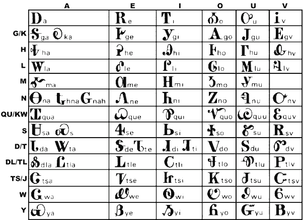
On this wiki page, we find the following font information: For years, many people wrote transliterated Cherokee on the internet or used poorly compatible fonts to type out the syllabary. However, since the fairly recent addition of the Cherokee syllables to Unicode, the Cherokee language is experiencing a renaissance in its use on the Internet. For example, the entire New Testament[18] is online in Cherokee Syllabary, and there is a Cherokee language Wikipedia featuring over 200 articles.[19] Since 2003, all Apple computers come with a Cherokee font installed. Cherokee Nation members Joseph L. Erb, Roy Boney, Jr., and Thomas Jeff Edwards worked with Apple to bring official Cherokee language support to the iPhone and iPod Touch in iOS 4.1[20] (released 8-Sept-2010) and for the iPad with iOS 4.2.1 (released 22-Nov-2010). [Google] [More] ⦿ | |
Cherokee metafont
| Alan M Stanier's metafont for Cherokee based on the Cherokee script was designed in 1821 by Segwoya. [Google] [More] ⦿ |
The Cherokee Nation web site shows several Cherokee fonts.
| |
In 2013, she used Giacometti's sculptures to create a Giacometti lettering alphabet. Nahkoa (2013) is an angular typeface that is inspired by the native American culture. [Google] [More] ⦿ | |
Chris Skillern
| |
Christophe Schneiderhan
| |
Christopher Harvey
| |
Designer in 2011-2012 of the following free Latin / Cherokee fonts: Nikwasi, Tsiquilisda, Danisvdanvsgv, Alewisdodi, Gola Unole, Nvdaasdawadidohi, Atuyasdodi, Tsi yu gunsini (a copperplate design for Unicode Cherokee, named after a Cherokee chief called Dragging Canoe), Wilma Mankiller Old (2012, also for Cherokee), Gadaquali (flared face), Gageda (Cherokee font). Further typefaces: Grendel (2011), the tattoo fonts Maelstrom (2011) and Reign Sample (2010), the mechanical typeface Dans Hardware (2010), the graffiti typeface Stone Angel (2010), the Western typeface Mary's Cherry&Co (2010), the squarish typeface Dashboard Jesus (2010), the fat wood style typeface John Brown (2010), Dantone (2010), the fat roundish typeface Creamy (2010), Thermobaric (2011, Star trek face). Chung-deh Tien created a few Cherokee fonts including Nikwasi San (2012), Sequoya Bold (2012), Oconosota (2012), Kanagota (2012), and Tsalagi Ameliga (2010). Dafont link. Flickr link. Fontspace link. Another Fontspace link. [Google] [More] ⦿ | |
Cindy Baker
| |
Mark Leisher's creation: "ClearlyU is a set of BDF (bitmap) 12 point, 100 dpi fonts that provides glyphs that can be used for Unicode text. The font contains over 4000 glyphs, including numerous additional glyphs for alternate forms and ligatures. The ClearlyU typeface was originally inspired by Donald Knuth's Computer Modern typeface, but has been slowly evolving into something else." Supported are: Navajo, Armenian, Cyrillic, Georgian, Greek and Coptic, Hebrew, Lao, Thai. [Google] [More] ⦿ | |
Connie Scoble made ornamental dingbat typefaces in 2007, often around the theme of native Americans: ccdiv, ccdiv2, Corners, Corners2, Native Motifs, Southwest Motif (1 and 2). [Google] [More] ⦿ | |
Coppers & Brasses
|
Creators of these typefaces in 2012: Martha (monospaced slabby grotesque done by both founders), Sardine (fat signage typeface by Bonn), Freitt (blackletter typeface by Bonn). Nicole (2012) is an elegant basic sans typeface by Olivier Mercier-Chan Kane. In 2013, Etienne graduated from the Type & Media program at KABK in Den Haag. In 2014, Alexandre in turn graduated from the Type & Media program at KABK. For his graduation, Alexandre developed the didone typeface family Lewis. He writes: Lewis is a typeface designed for mathematical typesetting, specifically for the TeX typesetting system. It consists of 3 text styles (Roman, Bold, Italic) and 3 math styles (Math Italic, Greek, Blackboard) for use as variables. The text Italic relates to the Roman while the Math Italic stand out with its cursive construction. Likewise, the Greek differentiate easily from Latin characters. The Blackboard inlines are adapted for text sizes with their wide and open cut. Lewis features many size variants and extending shapes, ideal in displayed equations. The list of their retail and custom fonts:
Alexandre spends most of his time since 2016 working on variable font projects for The Type Network (ex-Font Font Bureau). Home page of Alexandre Saumier Demers. Behance link for Coppers and Brasses. [Google] [More] ⦿ |
Cosmorama (or: Laser Printing Solutions)
| Esoteric fonts and special symbols by Kenneth Hirst. Includes shareware and full version ($$) fonts such as Astro (1993), Alchemy, American Indian (2001, dingbats), Arabic, Flowchart, SpecialPi, Sequoyah (for Cherokee), CircleBullets, ArrowBullets, GD Enochian (2011, Enochian and Astrology symbols based on the Golden Dawn system), Siddiqua (Arabic: Laser Printing Solutions. P.O. Box 5362, Irvine, CA 92616), Starfisher Uni (2014, an astrological & sans font originally designed by Laser Printing Solutions). Some of his fonts. Fontspace link. Another Fontspace link. Open Font Library link. [Google] [More] ⦿ |
Four Times-like truetype fonts for Muskogee: CreekPS-BoldItalicMT, CreekPS-BoldMT, CreekPS-ItalicMT, CreekPSMT. Alternate URL. Direct access. [Google] [More] ⦿ | |
CreeKeysLT
| At this site of the Cree Cultural Institute in Opemiska Meskino, Oujé-Bougoumou, Quebec, we find free Unicode and non-Unicode Cree fonts BJECreeBold, BJECree, BJCreeUNI, BJCreeUNI-Bold, all designed in 2000 by Bill Jancewicz, NDC Kawawachikamach Quebec, Canada. [Google] [More] ⦿ |
Santo Domingo, Ecuador-based designer (b. 1991) of the textured typeface Tsachi (2016). It uses symbolism from the Tsachila culture. [Google] [More] ⦿ | |
Cuttlefish Fonts
| Cuttlefish Fonts offers free original fonts by Cupertino, CA-based graphic designer Jason Pagura, such as Rutaban (2001), Bernur (1996, sans), Gemelli (handwriting), Gohan (fat finger comic book lettering, updated into ShinGohanSix in 2007), Bolonewt (2003), Antherton Cloister (2003, based on insect antennae. Discussed here) and Rutager (2001). He was working on Palormak (2006, futuristic). Between 2006 and 2010, he published Agamemnon, a large and warm transitional slab serif typeface with wood type influences that covers Latin, Cherokee, Cyrillic and Greek. Later typefaces include Cartmeign and Posterony (2007, anthroposophic). Dafont link. 1001fonts link. [Google] [More] ⦿ |
Cyberian Khatru
| Cyberian Khatru is a studio specializing in logos and fonts inspired by fantasy, science fiction, and comic books. Its founder is Filipno type designer Ronnie Cruz, b. 1966, Asinaan, Panaasinan. Cyberian Khatru is located in Hayward, CA. His fonts include techno and gothic typefaces such as Bone Voyage (2010), Iron Warrior (2010, octagonal), and Jupiter Squadron (futuristic). Shanghai Babe (2010) is an oriental simulation face. Blue Thunderbird (2011) is based on native American symbolism. Brush With Death (2011) is a brush face. Byrning Bridgez (2011) is a trekkie font. [Google] [MyFonts] [More] ⦿ |
Lima, Peru-based designer of the Indian pattern typeface Pashash (2016). [Google] [More] ⦿ | |
Dale Robinson
| |
Klingspor link. Fontspace link. Dafont link. Kernest link. Fontsquirrel link. Google Plus link. [Google] [More] ⦿ | |
Daniel Ortega
| |
Daniel Will-Harris
| |
This outfit in Iqaluit, NWT, Canada designed the Inuktitut fonts Old Syl and QalluSylNormal in 1992. [Google] [More] ⦿ | |
Designer of the art deco multiline typeface Beacon Hill (2009, FontStruct). The font is called "Beacon Hill" because it's inspired by the totem pole carvings at Beacon Hill park in Victoria, BC, Canada. If you turn the word on its side, it looks like a totem pole. Dave Aquino is located in Vancouver. [Google] [More] ⦿ | |
David Kerkhoff
| |
DejaVu Fonts
| The DejaVu fonts form an open source font family based on the Bitstream Vera Fonts. Free download. Its purpose is to provide a wider range of characters (see Current status page for more information) while maintaining the original look and feel through the process of collaborative development. Included are DejaVuSans-Bold, DejaVuSans-BoldOblique, DejaVuSans-Oblique, DejaVuSans, DejaVuSansCondensed-Bold, DejaVuSansCondensed-BoldOblique, DejaVuSansCondensed-Oblique, DejaVuSansCondensed, DejaVuSansMono-Bold, DejaVuSansMono-BoldOb, DejaVuSansMono-Oblique, DejaVuSansMono-Roman, DejaVuSerif-Bold, DejaVuSerif-BoldOblique, DejaVuSerif-Oblique, DejaVuSerif-Roman, DejaVuSerifCondensed-Bold, DejaVuSerifCondensed-BoldOblique, DejaVuSerifCondensed-Oblique, DejaVuSerifCondensed. Authors and contributors comprise Adrian Schroeter, Ben Laenen, Dafydd Harries, Danilo Segan (Cyrillic), David Jez, David Lawrence Ramsey, Denis Jacquerye, Dwayne Bailey, James Cloos, James Crippen, Keenan Pepper, Mashrab Kuvatov, Misu Moldovan (Romanian), Ognyan Kulev, Ondrej Koala Vacha, Peter Cernák, Sander Vesik, Stepán Roh (project manager; Polish), Tavmjong Bah, Valentin Stoykov, and Vasek Stodulka. The idea is to eventually cover most of unicode. Currently, this is covered: Latin (+supplement, extended A and part of extended B), IPA, Greek, Coptic, Cyrillic, Georgian, Armenian, Hebrew, N'ko, Tifinagh, Lao, Canadian aboriginal syllabics, Ogham, Arabic, math symbols, arrows, Braille, chess, and many dingbats. Alternate download site. Wiki page with download information. |
Budapest, Hungary-based designer of the native Indian emulation typeface Navajo Valley (2019) and a ransom note font in 2019. [Google] [More] ⦿ | |
Dick Pape
| |
Dick Pape
| |
Dick Pape: ornamental typefaces
|
Download here. [Google] [More] ⦿ |
Dick Pape: Tribal Tattoo
| Indian symbology fonts made in 2010 by Dick Pape called TribalTattoo-NorthAmerica and TribalTattoo-SouthAmerica. Download here. [Google] [More] ⦿ |
Diego holds a Masters from the KABK in Den Haag, 2004. His thesis project was entitled Tuhun. A typographic exploration of the Mixtec language. He made the stencil typeface Nairobi Quality, the text typeface Tuhun (2006), the text typeface Viko (2004), and a font for the Mixtec language of Oaxaca, Mexico. Currently living in Mexico and working with his wife, Kythzia Barrera, in their studio called Frutas y Verduras. He teaches at the Universidad Iberoamericana, in Mexico City. Mainly interested in typography, graphic design and organic agriculture. Speaker at ATypI 2009 in Mexico City, where he explained the challenges posed by native languages in Mexico. [Google] [More] ⦿ | |
Miami, FL-based designer of the dingbat fonts Papillon (2006, butterflies) and Esquimaux Graphics (2006). Bill and Dixie Bogusky together run Bogusky 2. [Google] [MyFonts] [More] ⦿ | |
Designer of the Inuktitut font called Ukiuq. [Google] [More] ⦿ | |
Free Mayan dingbat fonts from 1995: Ab'ajA, TunA, WuujA. Plus the phonetic font OKMAFonetica (1996) and the old language font Maya (1994). [Google] [More] ⦿ | |
Designer of the Inuktitut fonts Emi Inuktitut Regular and Medium (1995). They can be downloaded here. [Google] [More] ⦿ | |
Santiago, Chile-based designer of the blocky native pattern-themed typeface Renacer (2016). [Google] [More] ⦿ | |
Luzern, Switzerland-based designer of the straight-edged monospaced Mexican-themed typeface Mixcoatl Mono (2016, FontForum URW++). This typeface was developed as a part of a course at the Lucerne School of Design and Art in 2016. Based on the book The Empire of the Inca, Mixcoatl Mono is inspired by the graphic language of the South American Empire of the Incas. Behance link. [Google] [MyFonts] [More] ⦿ | |
Aka Ash Lumiere and Emily Kryz. Canadian designer (b. 1995) of the Indian arrow-themed typeface Artemis Curse (2016). [Google] [More] ⦿ | |
Eric Wannin
| |
In 2012, he designed the signage typeface Sardine and the blackletter typeface Freitt. Together with Alexandre, he created Martha (a monospaced slabby grotesque), still in 2012. At The Cooper Union, he created Barapa (2012). His fonts at Coppers Brasses:
| |
Eva Kamieniak Cassetta is a graphic and web designer who studied at Virginia Commonwealth University in Richmond, VA. She now lives in New York City (was: Pearl River, NY). Her typefaces include
| |
Free Mac fonts in the EversonMono series for CSX, Celtic, Croatian, Cyrillic, Esperanto, Gaelic, Georgian, Greek, Icelandic, Inuktitut, Ogham, Romanian, Sami, and Turkish. [Google] [More] ⦿ | |
Evertype (was: Everson Typography)
| Michael Everson's (b. Norristown, PA, 1963) brilliant pages on Celtic and other languages and on font standards, featuring the following sub-pages:
Elsewhere, one can find rare Everson creations such as Musgrave (1994). MyFonts sells these typefaces:
His bio, in his own words: Michael Everson, based in Westport, Co. Mayo, is an expert in the writing systems of the world. He is active in supporting minority-language communities, especially in the fields of character standardization and internationalization. He is one of the co-authors of the Unicode Standard, and is a Contributing Editor and Irish National Representative to ISO/IEC JTC1/SC2/WG2, the committee responsible for the development and maintenance of the Universal Character Set. He is a linguist, typesetter, and font designer who has contributed to the encoding in of many scripts and characters. In 2005 and 2006 his work to encode the Balinese and N'Ko scripts was supported by UNESCO's Initiative B@bel programme. Michael received the Unicode "Bulldog" Award in 2000 for his technical contributions to the development and promotion of the Unicode Standard. Active in the area of practical implementations, Michael has created locale and language information for many languages, from support for Irish and the other Celtic languages to the minority languages of Finland. In 2003 he was commissioned by the United Nations Development Programme to prepare a report on the computer locale requirements for Afghanistan, which was endorsed by the Ministry of Communications of the Afghan Transitional Islamic Administration. He prepared a number of fonts and keyboard layouts for Mac OS X 10.3 (Panther). Michael moved to Tucson, Arizona at the age of 12. He studied German, Spanish, and French for his B.A. at the University of Arizona (1985), and the History of Religions and Indo-European Linguistics for his M.A. at the University of California, Los Angeles (1988). He moved to Ireland in 1989, and was a Fulbright Scholar in the Faculty of Celtic Studies, University College Dublin (1991). In 2010, he made Timenhor, a Latin-script font whose glyphs are based on the uncial letterforms of Coptic manuscripts. Speaker at ATypI 2010 in Dublin. Speaker at ATypI 2011 in Reykjavik. Dafont link. View Michel Everson's commercial typefaces. [Google] [MyFonts] [More] ⦿ |
Felipe (b. 1984) graduated from Universidad Tecnológica Metropolitana de Santiago de Chile in 2007. For the type design course there, he created Tabon. Tabon is a squarish and almost labyrinthine typeface that was inspired by the textile patterns in the Mapuche culture. Home page. [Google] [More] ⦿ | |
Fontikon
|
Her Symbolikon set (2020) contains over 800 symbols / icons from the following cultures: Adinkra, Africa, Alchemy, American Native Rock Art, Ashtamangala, Asia, Astrology, Aztec, Buddhism, Celtic, Central America, Central Europe, Chakra, Christianity, Egyptian, Flowers, Greek Mythology, Hopi, Inca, Islam, Lakota Sioux, Latvian, Lovecraftian Mythos, Maori, Mapuche, Maya, Mu, Norse, Norse Runes, North America, North Europe, Pacific Area, Sacred Geometry, Slavic, South America, South Europe, Taino, Tarot Major Arcana. [Google] [More] ⦿ |
Fonts by WindWalker64
|
Dafont link. Fontspace link. [Google] [More] ⦿ |
Dino Manzella's draft on a book entitled Forgotten Scripts: a Book of Runes. Fantastic pages in all respects! Many fonts can be downloaded. Includes Academiury-ITV (Georgian, by Alexander&Temuri Imnaishvili), Rashi, Alex and ChayaBold (by Aaron Schmiedel), Angelic and Enochian (by Digital Type Foundry), several rune fonts by Dan Smith, Beth-Luis-Fearn and Beth-Luis-Nion (by Curtis Clark), Cherokee (by Joseph LoCicero), Moonrune (Morton Bek, 1995), Eshmoon (by Salim G. Khalaf, Family Health International), Glagoljica UGL and Glagoljica OBL (old Croatian; by Zox), RK Meroitic, RK Sanskrit, RK Ugaritic, Mendel Siddur, Nug-Soth (by Daniel U. Thibault), Tzipporah and RuthFancy (by AFS Ltd), and RNIB Braille. [Google] [More] ⦿ | |
Talcahuano, Chile-based designer of the native symbolism font Mapuche (2013). [Google] [More] ⦿ | |
During his studies in Curitiba, Brazil, Frederico Westphalen designed the anthroposophic display typeface Oca (2017), which is inspired by the Guarani Indian culture. Behance link. [Google] [More] ⦿ | |
Spanish language site for various non-Latin language fonts. A sampling: Afus Deg Wfus 2 (for Berber), AlKatib1 (2001, an Arabic typeface by Naseem Amjad), Albanian, Alice_0 (Lao typeface by by Ngakham Southichack), LAOMAY_5 CHAREUNSILP (Lao typeface by by Soupasith Bouahom), Arial AMU (1999, Armenian typeface by Ruben Tarumian), BaltFrutigerLight, BaltHelveticaMedium, BaltNewCenturySchoolbookMedium, BaltOptimaMedium, BaltTiffanyMedium, BaltUniversityMedium, CarloAtor (1997, Arabic family by Timm Erickson, Summer Institute of Linguistics), Caligraf-W, Ciula (1996, a Romanian typeface by Paul Hodor), Cursiv (Romanian), AnlongvillKhek, GabrialAtor (another Arab family by Timm Erickson), Gin, Greek (1993, by Peter J. Gentry&Andrew M. Fountain), HandSign (1993, Sam Wang), HFMassisShantNUnicode (1990-1994, an Armenian unicode typeface by BYTEC Computers and Massis Graphics), HONGKAD (1994, a family by Dr. Hongkad Souvannavong), IsmarBold, IsmarLight, Lakshmi, X000000A (1994, a lao typeface by Sith Bouahom), LAOMAY_2-CHAREUNSILP, Alice3Medium, Alice0Medium, Langagedessignes (1998, by Philippe and François Blondel), NorKirk (1997, a great Armenian typeface by Ruben Tarumian), NovaTempo (for Esperanto), Pazmaveb (for Armenian), ILPRumanianB100 (1996, by Charles J. Coker), Saysettha-Lao, Saysettha-LaoBold, SenzorgaAnhok, Timok, Tribuno, Turn-W, TimesUnicode, ArialAMU, PoliceTypeAPI (for Armenian), Cieszyn-Regular, PoojaNormal, Shibolet (1995, Hebrew), Shree-Ass-0552 (2000, by Modular InfoTech), Tudor-Semi-Lite, Webdunia, TimesNRCzech, TNRLiboriusVII (2001, a fully accented Times typeface by Libor Sztemon), GreatMoravia (2001 Libor Sztemon, Czechia), Johaansi-ye-Peyravi (2001, a full accent blackletter typeface by Libor Sztemon, Czechia), TimesNREuskaraEuransiEsperanto (2001, Libor Sztemon). [Google] [More] ⦿ | |
Gary Munch
| |
Gente Tipografia is dedicated to typography and type for the Wounaan people in Colombia who face extinction. One of 65 endangered local tribes in Colombia, the 9500 Wounaan live principally near Chico. In 2016, the web site opened its doors and showed these Latin / Wounaan (basically, Latin, with a few extra symbols such as barred u's) typefaces for free download: Wouniek-Agpierra, Wouniek-Dasii (by Sandra Garcia and Manuel Lopez Rocha), Wouniek-Nempom (by Sandra Garcia and Manuel Lopez Rocha), Wouniek-TheerbaAgpierra, Wouniek-TheerbaDasii, Wouniek-TheerbaNempom, Wouniek-Chaanden (a cursive school script by Sergio Aristizabal, Sandra Garcia, Manuel Lopez Rocha and Oscar Guerrero Canizares). Facebook link. [Google] [More] ⦿ | |
Munich-based designer of Sindbad, a dingbat font of ornaments found in Oman. He also designed the dingbat font Linotype Circles (2002), Linotype Squares (2002), Linotype Triangles (2002), and Linotype American Indian (2002). FontShop link. Klingspor link. [Google] [MyFonts] [More] ⦿ | |
Designer in Strasbourg, France, who created the minimalist geometric typeface Imagin (2012). Indiana (2013) is a thin decorative typeface with native Indian symbolisms. [Google] [More] ⦿ | |
Gina Aguilera
| |
GNU Freefont (or: Free UCS Outline Fonts)
|
Fontspace link. Crosswire link for Free Monospaced, Free Serif and Free Sans. Download link. [Google] [More] ⦿ |
The Government of Nunavut's web site has these free Inuktitut fonts: EmiInuktitutMedMedium, EmiInuktitutRegular, Naamajut (2000), Nunacom, NunacomU, Pigiarniq-Bold, PigiarniqHeavy, Pigiarniq-Italic, PigiarniqLight, Pigiarniq, ProSyl, ProSylBold, TunngavikBold, Tunngavik. [Google] [More] ⦿ | |
During her graphic design studies in Bandung, Indonesia, Gracia Salim created Abajo (2015), a sans titling typeface based on Abadi, and partially named after the Navajo tribe that lives near the Grand Canyon. Behance link. [Google] [More] ⦿ | |
From the Government of Canada: "The suite of GSC ArcInfo Symbolsets consists of line, marker (point), shade (area) and text symbols appearing on geological maps produced by the Cartographics Services Section since 1995." The following truetype fonts are included: GSC1, GSC10, GSC2, GSC3, GSC4, GSC5, GSC6, GSC7, GSC8, GSC9, Inuktitut-Sri-Regular, Nunacom, OldSyl. The last two fonts are Inuktitut fonts by Krista Thompson, Nortext Multimedia (1997-1998). [Google] [More] ⦿ | |
Guincho, 1421
| Free original TrueType fonts: Ugarit, Cherokee Arial, ISO 3166-2, Sulawesi (Buginese), and Vexillogical Symbols. By Portugal's António Martins. [Google] [More] ⦿ |
Abel (2012, Latinotype) is a dingbat typeface that reinterprets the artistic expression of the Mapuche people in Chile, rescuing the handmade stroke they embodied to textiles and pottery, this time in a fresh way to use contemporary patterns. It has contemporary "mapuche" patterns. Ride My Bike (2012, Latinotype) is a hand-printed headline typeface family that comes with a fun Dingbat style. The font was designed by her in bed while she was recovering from a bicycle accident. The hand-printed Bon Appetit family (2012, +Dingbats) would be perfect to illustrate a breakfast with Agatha Christie in a remote British village. Other typefaces from 2012 include the dingbat fonts Dans Le Jardin and Dans Le Noël. Typefaces from 2013: In a Jar (hand-lettering, Latinotype), Four Seasons (handwritten, with Luciano Vergara), Dans Le Toilette (sic), Love Story (with Luciano Vergara, Latinotype: a hairline upright Valentine's Day script), Love Story Dingbats. Typefaces from 2014: Macarons, DIY Time (hand-printed, with Luciano Vergara at Latinotype), Ride My Bike Serif. In 2015, she made the 26-font typeface family Boho (Latinotype; in Script, Sans, Serif and Dingbats styles) and Go Gipsy (Latinotype: a wild calligraphic script). Typefaces from 2016: Touch Me (by Coto Mendoza and Luciano Vergara: in Script and Sans versions; the script is based on Coto's unique experimental calligraphy; she calls this one "tribal chic"), Bikini Season (Script and Sans, by Coto Mendoza and Luciano Vergara), Indigena (Latinotype: indigenous Chilean "mapuche" style dingbats). In 2017, Latinotype published her swashy Namaste Script and accompanying all caps typeface Namaste Sans. Its motivation: Namaste is the perfect choice for wellness, healing and therapy oriented products. Its smooth shape and soft curves allow the user to create beautiful designs for essential oils, bath salts, quartz crystals, mindfoodness, candles, incense and aromatherapy products packaging. Typefaces from 2018: Coiffeur (a fashion script by Guisela Mendoza and Luciano Vergara at Los Andes). [Google] [MyFonts] [More] ⦿ | |
Gumpita Rahayu
| |
| |
GWER
| Amsterdam (and before that, Eindhoven), The Netherlands-based type and graphic designer who runs GWER. Creator of the gothic typeface AT Discipline (2008) and the native American totem pole look typeface Wakito (2010). Behance link. [Google] [More] ⦿ |
Halq'emiylem Font Downloads
| Four free truetype fonts for Halq'emiylem, a Salishan language spoken by First Nations people living in the Fraser Valley (Canada). Designed by Brian Thom. HalqemeylemSans is based on Martin Majoor's ScalaSans, and HalqemeylemSerif on his Scala. [Google] [More] ⦿ |
Hanoded
|
In 2011, he went partially commercial via MyFonts. His typefaces became more diversified and are quite stunning at times:
|
During his graphic design studies in Rio de Janeiro, Hanry Abreu designed the ethnic typeface Guarany Serif (2014), and the informal custom typeface Lorenzo Sans (2014). [Google] [More] ⦿ | |
Austin, TX-based musician, artist and graphic designer. Creator of the native Indian-themed all caps typeface Native Script (2015). [Google] [More] ⦿ | |
Heiltsuk Doulos
| Heiltsuk Doulos was created by Dale Robinson for Bella Bella Community School in 1903, based on the original Doulos font from SIL International. The Heiltsuk language uses a 60-character Latin alphabet. Heiltsuk, also known as Bella Bella and Haihais, is a dialect of the North Wakashan (Kwakiutlan) language Heiltsuk-Oowekyala that is spoken by the Haihai (Xai'xais) and Bella Bella First Nations peoples of the Central Coast region of British Columbia, around the communities of Bella Bella and Klemtu. [Google] [More] ⦿ |
New Jersey native who lives in San Francisco. He states: "Over the years I've had the good fortune to be very involved with photolettering and type design. In the 1980's I set headlines, letter by letter by letter, on a VGC Typositor at Phil's Photolettering in Washington DC. The desktop computer quickly destroyed that entire industry, and that is how I became involved with computer graphics. In the early 1990s, I designed type for FontBank, and consulted for several other type companies, including Microsoft and Galoob Toys. It's nearly impossible to make a living in type design these days, as the industry was basically done in by a combination of legal precedents and rampant piracy. Having worked on "conventional" / Wester / Roman fonts for so long, I've acquired a preference for unusual or obscure fonts or alphabets. I am always available for type design work or consulting." His designs (not downloadable) include Coptic Chelt, Fruthrak Sans, Ojibway Futurae, Cyrillic-Helv-Flash-8pt, KTR-katakana10, Celestia, Daggers, Enochian Times and Nugsoth. [Google] [More] ⦿ | |
He studied typography from 1938 until 1941 in Paul Koch's workshop in Frankfurt. From 1946 until 1956, he was type director at D. Stempel AG type foundry, Frankfurt. In 1951 he married Gudrun von Hesse. From 1956 until 1973, he was consultant for Mergenthaler Linotype Company, Brooklyn and Frankfurt. From 1977 until 1987, he was vice president of Design Processing, Inc., New York (which he founded with his friends Aaron Burns and Herb Lubalin), and professor of Typographic Computer Programs, Rochester Institute of Technology, Rochester, New York. Students at RIT included Kris Holmes and Charles Bigelow, who together created the Lucida type family. Other prominent students include calligrapher/font designer Julian Waters and book designer Jerry Kelly. From 1987 until 1991, he was chairman of Zapf, Burns&Company, New York. He retired in Darmstadt, Germany, but consulted on many font projects until a few years before his death. In the 1990s, Zapf developed the hz program for kerning and typesetting. It was acquired by Adobe who used ideas from it in InDesign. Awards:
Some publications by Hermann Zapf: List of his typefaces:
Books and references about him include:
Pictures of Hermann Zapf: with Lefty, with Rick Cusick, in 2003, with Frank Jonen, with Jill Bell, with Linnea Lundquist and Marsha Brady, with Rick Cusick, with Rick Cusick, with Stauffacher, a toast, with Werner Schneider and Henk Gianotten, with Chris Steinhour, at his 60th birthday party. Pictures of his 80th birthday party at Linotype [dead link]. Linotype link. Klingspor link. [Google] [MyFonts] [More] ⦿ | |
IC Fonts
| IC Fonts is graphic artist Daniel Ortega's foundry in New York City. They specialize in fun non-text typefaces. In 2012, IC Fonts published Devils Own Type, Alphabet Citi, Crown Peaks, Milf Man Drips, Lumps (a blood drip font), Nubby, High Sky (puffy cloud face), Megalith, Brick City, Dopey (2012, an outlined graffiti face), Eye Bets (2012, fat bubblegum letters), Dough Nuts (2012), and Bonerfied. Typefaces from 2013: Hip Mob (graffiti font), Graff3rd Row, Indian Joe (ornamental Indian-themed caps), Crown Decay 3D, Graffrow (graffiti face). Typefaces from 2014: Hip High, Crown Decay, Olds Cool (2014, a graffiti font), Oldscool Rock. [Google] [MyFonts] [More] ⦿ |
Freelance designer in Lima, Peru, who created the bilined typeface Panibo (2012) and the circle-based monoline typeface Bahuaja (2013). Panibo is a free native symbol-inspired typeface. It was influenced by the culture of the Ucayali river communities. Free download. Codesigner (with Michael Prado) of the circle-based typeface Ena (Ena Kuei), which won an award at Tipos Latinos 2014. He writes: This project was born at the request of the Wildlife Conservation Society (WCS). The brief was to diffuse and protect the Bahuaja Sonene national park located in the rainforest of southern Peru. Behance link. [Google] [More] ⦿ | |
Designer who used FontStruct to make Indigena (2008, Inca lettering simulation) and Mapu (2008, blackletter). [Google] [More] ⦿ | |
Wazu Japan's list of Unicode fonts that cover Inuktitut. [Google] [More] ⦿ | |
Inuktitut standards and codes by Michael Everson. [Google] [More] ⦿ | |
Inuktitut Font
| Krista Thompson (Nortext Multimedia) designed the Inuktitut font Nunacom (1998). She also designed OldSyl, a free truetype font for PC and Mac (Western, i.e., Canadian style, not Greenland style). Alternate URL. One more URL. See also at the Nunavut Government site. [Google] [More] ⦿ |
At the government of Nunavut's site, about ten free Inuktitut truetype fonts: Naulak (Saali Peter, 1996), NaulakBold (Saali Peter, 1996), Nunacom (Krista Thompson, Nortext Multimedia, 1998), ProSyl (Saali Peter, 1996), ProSylBold (Saali Peter, 1996), QalluSylNormal (Datarctic Information Systems, Iqaluit, NWT, 1992), TunngavikBold (Nunanet Worldwide, 1997), Tunngavik (Nunanet Worldwide, 1997). [Google] [More] ⦿ | |
Free font for Inupiat (Alaska natives) called Inupiaq (1999), created by the Institute of Social and Economic Research, University of Alaska Anchorage. [Google] [More] ⦿ | |
Ivan A. Derzhanski works at the Institute for Mathematics and Computer Science of the Bulgarian Academy of Sciences in Sofia. His fonts include
| |
Designer of the squarish typeface family Miski Qhaway (2021). This typeface was designed specifically for Quechua (runasimi). The straight forms were extracted from the Andean tocapus and the rounded finials were made to reflect the circularity of the Andean worldview. [Google] [More] ⦿ | |
Cardiff, Wales-based designer of the straight-edged typeface Narcotical Navajo (2013). [Google] [More] ⦿ | |
Aurora is a newspaper type. Bitstream's digital clone is News 706, now simply called Aurora. Mac Mc Grew: Aurora is a newspaper typeface designed by Jackson Burke for Linotype in 1960, and is made only in 81/2-point, combined with its own italic or a choice of standard bold typefaces, as far as we can determine. Of course, its origins go back to the German grotesques, ca. 1928. Mac McGrew: Majestic is a newspaper typeface produced by Linotype staff designers in 1955. It is similar to Corona, but was made in very few sizes. Mac McGrew writes about Trade Gothic: Trade Gothic is a Linotype family of gothics designed by Jackson Burke, and is basically very nearly the same as News Gothic. An early typeface on that machine was Gothic No. 18, which in small sizes was like a nineteenth- century face, but in large sizes was essentially the same as News Gothic Condensed. In 1948, with the return to popularity of American gothics after European sans serifs had replaced them for a while, the small sizes were recut, to match the larger ones, and all were paired with Gothic No. 20, an adaptation of Alternate Gothic No.2. The following year more condensed versions of both weights were offered as Gothic No. 17 and 19. The bolder weight was very similar to Alternate Gothic No.1, but the lighter weight retained its round-sided design, unlike News Gothic Extra Condensed. As the popularity of these typefaces continued to grow, Linotype changed the name to Trade Gothic Condensed and Extra Condensed, with their bold typefaces, and in 1955 added Trade Gothic and Trade Gothic Bold in normal widths. The light or regular weight is virtually the same as News Gothic, but the bold weight has flat sides on its round letters, making it a wider version of Alternate Gothic, unlike the News Gothic Bold developed about the same time by Intertype and a little later by other sources. (In a 1977 Linotype specimen book, the names reverted to Gothic Nos. 17 to 20.) Trade Gothic Extended and Bold Extended were announced early in 1959; for this bold weight the flat sides finally gave way to round sides, more like the News Gothics from other sources. Compare Monotone Gothic, which is essentially a wide version of News Gothic. In 1962 the last of this family appeared as Trade Gothic Light and Italic, the upright typeface being similar to Lightline Gothic. Unfortunately, Trade Gothic regular had been called Light (in distinction from its bold mate) in some Linotype literature, leading to some confusion when the actually lighter version appeared later. Altogether it has been a very popular and widely used series. Compare News Gothic, Alternate Gothic, Monotone Gothic, Lightline Gothic, also Record Gothic. Digital versions of Trade Gothic appeared at Adobe and Linotype. In 2008-2009, Akira Kobayashi and Tom Grace unified and extended Trade Gothic to Trade Gothic Next (17 styles). SoftMaker has Transfer Gothic and URW offered Tradus. Links to implementations: Trade Gothic (Adobe), Trade Gothic (Linotype), Trade Gothic Next (Linotype), Trade Gothic Next Soft Rounded (Linotype), News Gothic (Bitstream), News Gothic (ParaType), News Gothic (Tilde), News Gothic (URW++), News Gothic (Adobe), News Gothic (Linotype), Trade Gothic for Nike 365 (Linotype), Monotype News Gothic (Monotype), News Gothic No. 2 (Linotype), News Gothic SB (Scangraphic Digital Type Collection), News Gothic SH (Scangraphic Digital Type Collection), News Gothic EF (Elsner+Flake), News Gothic No 2 (URW++). In 2017, Lynne Yun (Monotype) made a layerable and colorable extension of Trade Gothic called Trade Gothic Display. Fontshop link. Klingspor link. Linotype link. FontShop link. View various versions of Jackson Burke's Trade Gothic. View digital versions of Trade Gothic. Another catalog. And another one. [Google] [MyFonts] [More] ⦿ | |
During his studies, Palmira, Colombia-based Jaime A. Urdinola created Tayronaur (2015), a typeface that was influenced by the Tayrona pre-colombian culture. [Google] [More] ⦿ | |
A British immigrant in Canada (1801-1846) who developed the syllabic writing systems for Ojibwa, and then Cree (with initials, syllables and finals making up the alphabet). In 1840, he started the Rossville Mission Press and had to use rather primitive methods of printing. An excerpt from Roderick Cave's The Private Press (1983, R.R. Bowker Co., New York): A Wesleyan Methodist missionary, the Rev. James Evans, had been at work among the Ojibway Indians in Canada since 1822 and had published a Speller and Interpreter in English and Ojibway in New York. Evans, however, like many missionaries, found the roman alphabet less than ideal to represent the sounds of speech in native tongues and eventually (by 1840) perfected a system of 36 syllables he believed would meet all the needs of the Canadian Indian languages. Evans reported that those in his mission at Norway House could read and write it with ease and fluency. At first he copied out his syllabics by hand on pieces of birchbark. These proved so popular that he realized he must resort to printing. But there was a difficulty, quite apart from the lack of type for his syllabary: the Hudsons Bay Company, which controlled all transport, was not in favor of making the Indians literate and refused to bring in a press. Being a man of much determination, Evans built his own primitive press on the model of the fur presses used at the trading posts. He also overcame the problem of providing type, for which he used musket balls and the linings of tea chests melted down. With some coarse paper and with ink contrived of soot and oil, in 1841 Evans printed 100 copies of a 16-page booklet containing the syllabary and some Bible texts and hymns translated into Cree. This effort was enough to overcome the skepticism of the church authorities about the value of his syllabary. They had a regular font of the type cut in England, and the Hudsons Bay Company withdrew its opposition. With the new type and a small handpress shipped in via Hudsons Bay, Evans and his successors at the mission continued work under rather easier circumstances. Image of his syllabery. [Google] [More] ⦿ | |
Jason Pagura
| |
Jasper was born in 1986 in Duisburg, Germany, and is affiliated with the University of Köln, where he specializes in Modern Chinese Studies. [Google] [More] ⦿ | |
Designer in West Chester, PA, and Hattiesburg, MS, who specializes in sports and athletics, both for branding and type design. He created the custom display typefaces Surge (2016, an elliptical techno typeface) and Origin (2016, inspired by native American patterns). In 2017, he released an octagonal athletic lettering font for the 2017 NHL All Star Game that is based on the famous Hollywood sign. He also published the free athletic typeface Ridgeline in 2017. In 2018, he published the free squarish sans typeface Apex Mk02, and the free fighter pilot typeface Yeager. In 2019, he added the free squarish techno font family Apex Mk03. Typefaces from 2020: Redwing (octagonal, inspired by hockey lettering). Typefaces from 2021: Toboggan, (a partly free speed-themed geometric sans family; 14 styles). [Google] [MyFonts] [More] ⦿ | |
Jeremy Tankard
| |
Jeremy Tankard Typography
|
Fontfont write-up. Alternate URL. Interview by Planète Typographie. Interview by Brendan Staunton. I Love Typography link. FontShop link. Klingspor link. MyFonts link. [Google] [MyFonts] [More] ⦿ |
He designed Albertan (Albertan No.977, Albertan No.978 Bold) and Cloister (2000; a roman type family originally done by Morris Fuller Benton) in the Lanston collection. He also designed typefaces like Juliana Oldstyle (1984), Nephi Mediaeval (1986), Kaatskill (1988; a 1929 typeface by Goudy, revived and optimized for Lanston in type one format; the Kaatskill Italic was done by Rimmer based on Goudy's Deepdene), RTF Isabelle (Roman and Italic; 2006. A pair of delicate serif typefaces based on typefaces by Elizabeth Friedlander) and Fellowship (1986). ATypI link. Jim began work as a letterpress compositor in 1950. He entered the field of graphic design in 1963, working as a designer lettering artist and illustrator, and freelanced in this capacity from 1972 to 1999 in the same capacity. In 1960, he began collecting letterpress printing and typefounding equipment, and operated a private press and foundry (Pie Tree Press&Type Foundry). FontShop link. His metal typefaces at Pie Tree Press include:
In 1970, Jim made his first film type, Totemic. This sturdy text type was revived in 2015 by Canada Type as Totemic, and contains as an extra a et of stackable totems. Jim has designed and produced a collection of digital types, and over the past 20 years has designed and cut six metal types. He recently completed a Monotype Large Comp type named Hannibal Oldstyle, is currently cutting 14 point matrices for Cartier Roman, and is making drawings for the cutting of a 14 point Western and Eastern Cree. Samples and discussion of his Cree typeface. Jim in action in 2003. According to Gerald Giampa from Lanston, Jim is the most talented type designer alive in 2003. About his typefaces, I quote McGrew: Fellowship was designed and cut by Jim Rimmer in Vancouver in 1986, and cast by him for private use. He says, "The design is the result of the feeling of joviality and 'fellowship' I experienced at the meeting (American Typecasting Fellowship in Washington, D.C.). The design was not so much drawn as it was written. The letters were written quickly in a calligraphic manner with an edged pencil and then enlarged and inked to make a dry transfer sheet. As in my two previous designs (see Juliana Oldstyle and Nephi Mediaeval), Fellowship was cut not in steel, but in type metal, and then electroplated to make castable matrices." Juliana Oldstyle was designed and cut in 1984, as a private type. He says, "It represents my first attempt at cutting a metal type. I drew my letters completely freehand, hoping to capture a punchcut look. My artwork was then reduced and made into a dry transfer sheet, which I rubbed onto type-high typemetal blanks. I then cut the letters and electroformed copper matrices." Nephi Mediaeval was designed and cut in 1986, for private use. He says it "was inspired by the Subiaco type of the Ashendene Press and by its inspiration, the type of Sweynheym and Pannartz. My design breaks away from those types slightly in form and is softer in general feeling. In time I will cut other sizes." In 2012, Rimmer Type Foundry was acquired by Canada Type. The press release: Canada Type, a font development studio based in Toronto, has acquired the Rimmer Type Foundry (RTF) from P22 Type Foundry, Inc. The RTF library contains the complete body of work of Canadian design icon Jim Rimmer (1934-2010), who was an enormous influence on Canadian type design and private press printing, and the subject of Richard Kegler's documentary, Making Faces: Metal Type in the 21st Century. The RTF library contains many popular font families, such as Albertan, Amethyst, Credo, Dokument and Stern, as well as quite a few analog designs that were never produced in digital. Now that Rimmer's work has been repatriated, it will be remastered and expanded by Canada Type, then re-released to the public, starting in the fall of 2012. Jim's analog work will also be produced digitally and available to the public alongside his remastered and expanded work. Once Jim's designs are re-released, part of their sales will be donated to fund the Canada Type Scholarship, an award given annually to design students in Canada. This will be done in coordination with the Society of Graphic Designers of Canada (GDC), the national professional association that awarded Jim Rimmer with the prestigious GDC Fellowship in 2007. Jim Rimmer digitized Elizabeth (+Italic). From 2006 until 2012, the Rimmer Type Foundry collection was offered by P22. It included:
Jim Rimmer passed away early on January 8, 2010. His friend Richard Kegler (P22) wrote this obituary the next day: Jim was a multi-talented type designer, graphic artist, bookbinder, printer, letterer, technician and a most generous teacher. He was never glory-seeking and turned down most speaking engagements offered to him, not out of vanity or indifference, but rather thinking that he was not worthy of being given a spotlight. Jim offered free typecasting instruction to anyone who asked and came to visit him in his studio in New Westminster BC. He took as much time as needed and was generous to a fault. Anyone who took him up on this open invitation can attest to the intense and elegant chaos of his studio and work habits. I was fortunate enough to know Jim but for only a few years. What started as a business arrangement grew into a mutual respect and ongoing correspondence that I can only describe as life changing for me. His kindness and generosity were exceptional and his diplomacy even when given the opportunity to speak ill of anyone else was measured and kind. Jim's dedication to the craft of type design and related arts was beyond most if not all contemporaries. After his "retirement" from his professional life as a graphic artist and illustrator, he tirelessly worked on type designs for book projects where all aspects of his skills were applied. His book "Leaves from the Pie Tree" (I encouraged him to change the title from his original plan to call it "Droppings from the Pie Tree"...a truly self-effacing Jim Rimmerism) is the best single tome that summarizes his life and work. He designed the book�s typeface in Ikarus (as he had with the 200+ other type design he created), cut the matrices and cast the type, wrote the text using an autobiographical introduction and continued to explain the process he used to cut pantographic matrices for his metal typefaces. The multi-colored lino cut illustrations, book design, individual tipped in sheets and attention to press work and binding would be impressive for one specialist to complete on each component. The fact that Jim did all of this himself is awe inspiring. A trade edition of this book has been printed by Gaspereau press but does not hint at the grandeur of the beautiful book that is Pie Tree. Jim's follow up of his edition of Mark Twain's Tom Sawyer (set in his Hannibal Oldstyle font designed for and fitted onto on a monotype composition caster) was recently completed and is equally if not more imposing as a fine press book, but with a sympathetic humor and humanity that would knock the stuffing of any other fine press attempt at the same material. Almost two years ago I visited Jim for a week and filmed footage for a documentary on his cutting of the Stern typeface. For various reasons the finishing of the film has been delayed. I truly regret that Jim could not see the finished version. With the film and his Pie Tree book, Jim generously conveys information on making metal type that has otherwise been largely lost and previously limited to a now defunct protective guild system. It was his wish that the information and craft be kept alive. Jim's last email to me was in classic Jim form hinting at his tireless dedication to his work: details of a new type family for a new book. He was one of the great ones. He will be missed. Sumner Stone: Jim's insights into Goudy's typefaces in particular, and his devotion to doing everything in his own shop made me think he was perhaps Fred's reincarnation, but it took me awhile to realize this due to the self-deprecating personality you so accurately describe. His passing is truly a great loss to our craft. Rod McDonald: I would like to relate a telephone conversation I had with Jim last month because I believe it shows his incredible spirit, and wonderful sense of humor. My wife and I visited Jim in November and were delighted to hear that his doctors had pronounced him cancer free. He looked good, just a little tired, but that was to be expected after his recent radiation treatment. Of course he was also anxious to get back to work. Less than two weeks later I received an email from him informing me that they had discovered that the cancer had spread to his lungs and, not only was it inoperable, he now only had six months to live. This sudden turn of affairs was devastating for me and I called him, hoping I think, to hear that it wasn't as bad as it sounded. He said it was bad and apparently nothing could be done. However he felt he would outlive the six months and in fact we even talked of getting together in the fall. The conversation then turned to his latest type family and when I gently asked him how long he thought it it would take to complete he simply said "I've got lots of time, after all I'm only going to be dying during the last fifteen minutes". I knew Jim for thirty-five years and will miss him more than his work, and that's saying a great deal. In 2012, Canada Type, which had purchased Rimmer's designs started publishing some of Jim's lesser known designs. These include Cotillion Pro (2012, a very graceful typeface with high ascenders), Fellowship (2013, calligraphic), Poster Paint (2012, a take on Goudy Stout), Zigarre Script and Zigarre Rough (2012, brush scripts that were actually drawn with a marker), and Alexander Quill (2012, a calligraphic monastic typeface). In 2013, Canada Type remastered several of Rimmer's typefaces, including in particular Isabelle Pro: Isabelle is the closest thing to a metal type revival Jim Rimmer ever did. The original metal typeface was designed and cut in late 1930s Germany, but its propspects were cut short by the arrival of the war. This was one of Jim's favourite typefaces, most likely because of the refined art deco elements that reminded him of his youthful enthusiasm about everything press-related, and the face's intricately thought balance between calligraphy and typography. Not to mention one of the most beautiful italics ever made. Lancelot Pro (2013) is a calligraphic all caps typeface based on Rimmer's digital original from 1999. Pictures: Jim Rimmer casts 48pt ATypI keepsake (by John Hudson), Remembering Jim Rimmer (Facebook group), In his studio, a picture taken by the Globe and Mail. Another pic. Making Faces (trailer) (movie by Richard Kegler). Klingspor link. ContentDM collection. Jim Rimmer at the Fine Press Book Association. Rimmer Type Foundry link. View all typefaces by Jim Rimmer. An alphabetical listing of Jim Rimmer's typefaces. Catalog of Jim Rimmer's typefaces. [Google] [MyFonts] [More] ⦿ | |
JMRBooks Fonts
| Gina Aguilera (JMRBooks) created the hand-gridded free font Olde Wampum Belt (2009), classified by Fontspace under "Native American". JMR stands for Jennie's Music Room. [Google] [More] ⦿ |
Joan Sarah Touzet developed the font Cherokee between 1993 and 1998 at Yale University. Cherokee is a free font that covers the native language of the Tsalagi (Cherokee) Indians of North America. Touzet is now at the University of Toronto. Thomas Phinney does not like it: It's utter junk in both design and execution. Bizarrely irregular stroke weights, sidebearings chosen by rolling dice, extrema often ignored in point placement, non-Euclidean geometry of curves. [Google] [More] ⦿ | |
| |
Johannes König
| |
John Hudson
| |
His typefaces Gordis (a fattish comic book family) and Tepuy won awards at Tipos Latinos 2008 in the non-text and experimental typeface categories, respectively. At Tipos Latinos 2010, he won twice in the display category, for Victorina and Radio Time. His typefaces: (New) Maracay (2013, a large layered Victorian signage family), Fine Art OT (2013, brushy typeface), Roadline Italic (2013, a retro script), JMTF Robin (2013, a layered post-modernist display family), Virgin Script (2013), Radio Time (2013, fat retro signage script), Radio Time Icons (2013), Palaima (2013, an aboriginal style face), Factor (2012, a layered geometric font), Onda (2012, a wavy psychedelic face), Blockee (2012), Aliykit Open (2012, a multiline typeface), VE Inconexa (2006, outline architectural face), VE Makiritare (2006, a double labyrinthine script that is based on symbolisms used by the Makiritare or Yecuana, river people who live in the village of Santa Maria de Erebato in the Venezuelan jungle on the border with Brazil), VE Moho (2006; or simply Moho in 2014), VE Palaima (2006, futuristic, Amazonian), Radio Time (fifties style script, with Alejandro Paul at Sudtipos), Fruta (stencil, influenced by Glaser?), Glaser Stencil Round, Gothike (sharp-edges), Aqua (ultra round), Club, Caracas (sans; +Caracas Pro, 2015; see also Caracas Stencil Pro, 2015), Factor (hookish), Space Lab (futuristic family), Robin (headline), Victorina (multiline Victorian poster typeface which won an award at Tipos Latinos 2010), Victorina Black Shadow (2011), Waterman (2010, a flowing undulating script family), Spacelab (2010, futuristic) and RobinBienalII (2005). Sudtipos sells these fonts of his via MyFonts: Makiritare (bilined, based on woven baskets), Palaima (experimental, runic), Precolombino (petroglyphs), Tepuy (rounded version of Makiritare), Roadline (2009, fifties diner font), Sacred Geo (2011, a geometric dingbat font that won an award at Tipos Latinos 2012), DeCoro (2011, art deco family), Sacred Geo Tiling (2011), Primate (2012, an African look typeface family), Morenita (2012, a connected fifties or school script), Takox (2012), Petroglifos (2012), Xtencil (2012, a rounded stencil influenced by Milton Glaser; followed by Xtencil LC and UC in 2013 and Xtencil Pro in 2015). Typefaces from 2014: Moho Sport Pro (layered athletic lettering typeface family), Scripta Pro and Gothic (40s-style lettering typeface inspired by the style of L.H. Copeland), InkArt Labels, Moho (named after Laszlo Moholy-Nagy), MohoBis Pro (a multilined version of Moho), Moho Condensed, Moho Script, Duvall (named after Edward J. Duvall, who published Modern Sign Painting in the late 1940s; Duvall won an award at Tipos Latinos 2014). In 2015, the Moho series continued with Moho Style. He also made Arthaus (2015, a fantastic Bauhaus font family inspired by Herbert Bayer's universal alphabet), MyCard (a techno type), NeoScript Pro and Hierra (after a font by Dan Solo) in 2015. In 2016, he designed Artime (a sci-fi font), Virtual. Typefaces from 2017: FunFont (cartoon style). | |
John Rade
| |
John Rade Fonts
| In 2009, John Rade Fonts was established as an independent foundry by John Rade from Melbourne. John had 15 years experience in advertising and branding. His first font was Paperocked (2009). This was followed by Jazzbang Inca (2009). [Google] [MyFonts] [More] ⦿ |
| |
Designer of the minimalist rounded display typeface Conectiva (1998), the informal signage script Salsa (2011, inspired by the old LP album covers from the 1970s), the retro comic book typeface Boogaloo (2010, free at Google Web Fonts), and the early 20th century-look face Cambalache (2008-2011). Creator with Nicolás Silva Schwarzenberg of the free upright italic sans typeface Convergence (2011, Google Web Fonts). In 2012, Macondo---which was started in 1997---was published at Google Web Fonts, together with Macondo Swash Caps. John writes about this art nouveau pair: The forms are inspired by some illustrations created for a tarot card game, itself inspired by the work of Colombian literature Nobel prize winning author, Gabriel García Márquez, Cien Años de Soledad. Macondo won an award in the display type category at Tipos Latinos 2012. Still in 2012, he published Germania One at Google Web Fonts---an angular typeface that is a hybrid between blackletter and sans serif, and looks like the signage on many German pubs. Cygnus (2012) is a futuristic typeface. Dulcinea Serif (2012) is an uncial typeface. Cabriolet (2012) is the standard Detroit car emblem type used on cars in the 1950s and 1960s. In 2013, John Vargas Beltran created the fifties automobile or diner script Cabriolet V8. In 2014, he returned to African themes, perhaps jarred by the death of Nelson Mandela. His first typeface of the year is Kalimba (named after an African percussion instrument), which comes in several textured styles called Masai, Kingombo and Nenyanga. Guadalupana (2014) is based on bronze ecclesiastical letters found in the Virgin Guadalupe basilica in Mexico, designed in 1976 by Pedro Ramirez Vazquez. Tequendama is a squarish inline typeface that is rooted in pre-Columbian pre-hispanic Muisca tribal art. Typefaces from 2015: Muisca (a typeface family influenced by pre-Columbian pre-hispanic Muisca tribal art), Caminito (a layered steamboat family of typefaces based on the Fileteado Porteño art style in Argentina, as practiced today, e.g., by Alfredo Genovese). Typefaces from 2016: Lucky Lady (retro signage script going back to the WWII era), Cumbanchera (based on retro cover art on Latin albums), Biscayne (a Miami art deco typeface family), Lucky Lady Script (a signage script family inspired by the old, classic art and craft of brush script lettering usually applied in ads of the WWII era and 1940s), Expreso (a layered typeface family based on squarish retro urban lettering). Typefaces from 2017: Clair de Lune (script, for the exclusive use of Clara Dahler Design). Typfaces from 2018: Amaretto. Typefaces from 2020: Baggy (Cooper Black-inspired; he writes that if your uncle's moustache from 1974 was a font, this would be it). MyFonts link. MyFonts foundry link. Behance link. Klingspor link. Creative Market link. Google Plus link. [Google] [MyFonts] [More] ⦿ | |
During his studies in Quito, Ecuador, Jore Baltan designed the textured and patterned typeface Sierra Ecuatoriana (2017). [Google] [More] ⦿ | |
José Antonio Garrido Izquierdo
| |
José José Villamizar
| |
At Tipos Latinos 2012, Mexican type designer José Manuel López Rocha won an award for his text typeface Xallitic. He worked at Fontstage and studied at CE Gestalt, and lives in Xalapa, Mexico. His test typeface Gorgias won an award at Tipos Latinos 2014. His text typeface Phonos won an award at Tipos Latinos 2018. He is a member of Fontstage and a contributing designer at PampaType foundry. For better typography for American native languages, he has worked on a typeface for the Mixe language, in a project for developing typographic solutions for Woun-Meu in Colombia and is currently working in a type family for Mexican languages, for the National Institute of Indigenous Languages. Speaker at ATypI 2017 Montreal. [Google] [More] ⦿ | |
Nicolás Silva was born in Mérida, a city in the Andes Mountains of Venezuela, where he studied graphic design at the University of the Andes. After completing his studies, he moved to Caracas to work in an advertising agency (JWT) as an art director. He later moved to Buenos Aires, where he completed a post-graduate certificate in Typeface Design at the University of Buenos Aires. He has been working in that city since 2009, first in a graphic production studio (Pool cp) and then in an animation studio (Gizmo). He is currently working at the design studio Fontana Diseño. Behance link. His typefaces:
Font Squirrel link. Behance link. Google Plus link. [Google] [More] ⦿ | |
Cherokee font designer from Gore, OK, who spoke at ATypI 2011 in New Orleans. He wrote this on typophile (excerpts only): As font makers you have noticed that much of what we use today, as a designed font, is pretty bad when it comes to some of the very rough looking uneven font designs. It is a very complex issue when it comes to the Cherokee orthography in the community. Cherokees take great pride in our writing system. It is true that many in the eastern band of Cherokees do not read and write cherokee but some do. And it is also true that at one time some people at the museum over there proposed the idea of changing our syllabary writing system in to a alphabet. This was quickly dismissed and did not go over very well and we should just leave it at that. Many more people here in Oklahoma Cherokee Nation and United Keetoowah Band read and write in Cherokee. Roy Boney and I were very honored to speak to so many font designers that work on so many languages. Roy and I worked with many advanced speakers from our community and that work at Cherokee Nation to find out what advanced speakers look for in a writing system for each character. We developed a very thin font that was made in fontlab. It is not really that professionally made but it has many needed things in it. Most languages around the world have font styles for many different needs, printed type, signs, web, fun, ads and so on as you all know, but we do not have this for our own language at this time, when we need it the most. Many in the community do not question why we dont have more fonts. In fact many get defensive when we first talk about new fonts a few years ago thinking we where trying to change the language or proposing something like what the museum over and eastern band wanted. Roy and I believe that if we are going to continue to have a language for our community it must have all the power and strength that different fonts can offer.. We started realizing we needed to be on the computers and cell phones then after we got on that we realized that we needed more fonts. This idea is starting to be understood by some of our elders when we start to show them why we want to do this or have it done. It is always important to work with the community that reads and writes the language that you are designing for. Most languages have enough material out there so that that is not needed but in smaller language groups it is important to talk to people before starting your design work. Much of the problems with the present fonts is that people did not at least have the community it was made for, have look at it, before the release. The Cherokee Type face was made for a printing press and all of our fonts still look like they are for that same purpose. Sequoyah in his time wrote with print from the style influenced from the printing press also, even after he made the cursive style too. His main reason was to create a writing system that would allow his people to communicate in written form. If he was round today, I believe he would be designing fonts and having others to design some for all these technologies that are constantly coming out (and have different requirements) for Cherokee people to use and communicate with each other. So if anyone needs more information about cherokee handwriting for fonts feel free to email me. We have collected handwriting samples and old documents that might help a font designer with the information they are looking for. Designer of some Cherokee fonts in 2012, including a blackletter version, CherokeeOldEnglish, and a hand-printed version called Cherokee Handone. [Google] [More] ⦿ | |
Joshua Hadley worked at Ascender Corporation from 2004 until its demise. He studied at the Rochester Institute of Technology in the School of Printing Management and Sciences. He was briefly involved in type design, creating the Native American-themed Blackfoot (a collection of fonts for creating decorative borders), and working at Monotype's Palo Alto, CA, office. Between 1994 and 2004, he developed a number of programs, techniques, and procedures for developing fonts of all sorts. These included simple scripts for font development, a graphics-intensive kerning editor, and programs to make complex multi-script fonts of fifty thousand glyphs. With Steve Matteson, Hadley designed (a reincarnation of) Binner Gothic (original by John F. Cumming). Currently, Josh Hadley is a software developer for Monotype's Font Tools and Technology group. [Google] [More] ⦿ | |
Juan Antonio Lavalle (b. 1959, Buenos Aires) studied Architecture at the University of Buenos Aires. Later, he moved to Madrid were he worked on large design projects. He resides in Madrid, Spain and offers his fonts through the Eurotypo foundry. Ethnicity (2011) is inspired and based on many indigenous South American geometric shapes such as Mapuche and Diaguitas. Equalis (2011, with Olcar Alcaide) is a monoline slab typeface with a huge x-height and wide open counters. Quadratique (2011) and Trigonus (2011) are typefaces for making patterns. In 2012, he made the Skinwall and Centers dingbats typefaces, and the art deco typeface Saxo. [Google] [MyFonts] [More] ⦿ | |
In 2020, he designed the pre-colombian dingbat typeface Precolombina (based on ceramic pottery, clothing, and petroglyphs from the southern cone of South America) and Postman. [Google] [MyFonts] [More] ⦿ | |
Graphic designer in Santiago, Chile. He created the experimental typeface Selknam (2009). His inspiration was the Selk'nam or Onas, an indigenous people from Tierra del Fuego (now extinct) and their initiatory rites for adolescents. The typeface was designed using FontStruct. Selknam Unicase followed in 2013. Home page. Dafont link. Behance link. [Google] [More] ⦿ | |
During her studies in Aarhus, Denmark, Julie Winther Villadsen designed the alchemic Native Typeface (2014). [Google] [More] ⦿ | |
Juliet Shen
| |
Designer of the Inuktitut font called Inuktitut-Sri (1996). Resident of St. Bruno, Quebec, he also made the Tamil fonts Valai-Sri (1997), Mylai-Sri (1996), Sri-TSC (1998), TSC-Sri (2001), Adhawin-Tamil. Some of these fonts are here and here. [Google] [More] ⦿ | |
| |
Designer of Cherokee (2011), a nice patterned typeface done at iFontMaker. Kanati also created Cherokee Shadow, Cherokee Old English, Cherokeehalf, Cherokeehandy, Cherokeepaws, Cherokeebubble, Cherokeebuilder, Cherokee Dots, Cherokee Blockstyle, Cherokee Blocky, Cherokee Flowers, Cherokee Cloud, Cherokee Angles, and Cherokee Handone. [Google] [More] ⦿ | |
Graphic designer in Singapore. Creator of Honk (2012), an ornamental caps typeface on the theme of musical instruments. She also designed the triangulated colored typeface Rainbow Puke (2012) and the geometric solid typeface Playful Type (2014). [Google] [More] ⦿ | |
Kenneth Hirst
| |
Kevin Allan King
| |
Kevin Allan King
| |
In 2010, he co-designed Robur and Wagner Grotesk, Slinger (an art nouveau face) and Sol Pro (a 20-style monoline sans family based on the classic Sol design by Marty Goldstein and C.B. Smith, published by VGC in 1973) with Patrick Griffin at Canada Type. Still with Griffin at Canada Type, he revived a psychedelic / art nouveau typeface called Fortunata (1971, Karlo Wagner) and called it Spadina (2010). He also has a Facebook group on type crimes called TCI: Typographic Crime Investigators. Wagner Grotesk is the elaborate digital version of Edel Grotesque Bold Condensed (also known as Lessing, Reichgrotesk, and Wotan Bold Condensed), a 1914 typeface by Johannes Wagner, which was later adopted by pretty much every European type foundry, exported into the Americas, and used on war propaganda posters on either side of the Atlantic. In 2011, he and Patrick Griffin published the refined Orpheus Pro family, which was based on the elegant Orpheus by Walter Tiemann (1926-1928, Klingspor), and its Italic which was called Euphorion (Walter Tiemann, 1936). Their enthusiastic description: The Orpheus Pro fonts started out as a straightforward revival of Tiemann's Orpheus and Euphorion. It was as simple as a work brief can be. But did we ever get carried away, and what should have been finished in a few weeks ended up consuming the best part of a year, countless jugs of coffee, and the merciless scrutiny of too many pairs of eyeballs. The great roman caps just screamed for plenty of extensions, alternates, swashes, ligatures, fusions from different times, and of course small caps. The roman lowercase wanted additional alternates and even a few ligatures. The italic needed to get the same treatment for its lowercase that Tiemann envisioned for the uppercase. So the lowercase went overboard plenty alternates and swashes and ligatures. Even the italic uppercase was augmented by maybe too many extra letters. Orpheus Pro has been a real ride. Images of Orpheus: i, ii, iii, iv, v. In 2011, Griffin and King co-designed Walter Script, a calligraphic script that revives Troubadour (1926, Wagner&Schmidt). Still in 2011, King and Griffin completed work on an exceptionally beautiful revival, Ratio Modern (the original by F.W. Kleukens is from 1923). This is a didone family with a refined humanist trait. Still in 2011, he and Patrick Griffin created the 18-style sans family Recta, a considerable extension of Novarese's Recta. And they also completed Kumlien Pro, a revival and expansion of a beautiful transitional typeface designed in 1943 by Akke Kumlien. King Tut (2011) is a restoration and expansion of the original Egyptian Expanded, a single bold typeface cut in 1850 by Miller&Richard. Libertine (done with Patrick Griffin) is an angular calligraphic script inspired by the work of Dutchman Martin Meijer (1930s): This is the rebel yell, the adrenaline of scripts. Paganini (with Patrick Griffin) is another jewel in Canada Type's drawers: Designed in 1928 by Alessandro Butti under the direction of Raffaello Bertieri for the Nebiolo foundry, Paganini defies standard categorization. While it definitely is a classic foundry text typeface with obvious roots in the oldstyle of the Italian renaissance, its contrast reveals a clear underlying modern influence. Patrick Griffin and Kevin Allan King did a revival called Paganini in 2011. The year 2012 starts out with a bang. King and Patrick Griffin published Wonder Brush (partly based on a signage brush script called Poppl Stretto (1969) by Friedrich Poppl), Wagner Script (a revival of Troubadour (1926, Wagner&Schmidt)), Spade (a super-heavy slab face, done with Patrick Griffin; based on Farmer and Little's Antique No2 from 1867), and Louis (a faithful digital rendition and expansion of a design called Fanfare, originally drawn by Louis Oppenheim in 1927, and redrawn in 1993 by Rod McDonald as Stylus). King Wood (2012) is an octagonal flared wood type family with a set of dingbats, King Wood Extras. Monte Cristo (2012) is a grand type family with five styles and 1630 characters with many swashes and ways of connecting the calligraphic glyphs---it is the ultimate wedding font. The last joint project of King and Griffin in 2012 was Pipa, a pseudo-psychedelic groovy bellydancing font: Originally made for a health food store chain we cannot name, Pipa is the embodiment of organic display typography. In 2013, Kevin Allan King and Patrick Griffin revived Georg Trump's transitional typeface Mauritius (1967, Weber). In 2014, they designed the psychedelic typeface Jingo: This is the digital makeover and major expansion of a one-of-a-kind melting pot experiment done by VGC and released under the name Mardi Gras in the early 1960s. It is an unexpected jambalaya of Art Nouveau, Tuscan, wedge serifs, curlycues, ball endings, wood type spurs and swashes, geometry and ornamental elements that on the surface seem to be completely unrelated. His graduatiuon type at MATD in 2018 was Mazina, a multi-script typeface system developed for complex literary texts. It supports Arabic, Latin, and several Canadian aboriginal scripts. In 2022, he released eight fonts for Canadian Syllabics at Typotheque. At the same time, he published the extensive article Syllabics typographic guidelines. [Google] [MyFonts] [More] ⦿ | |
Santiago, Chile-based designer of the free font Coliqueio (2016) that is steeped in mapuche culture. Behance link. [Google] [More] ⦿ | |
Kit Pullen (Multilingual E-Data Solutions, Ottawa) assembled the Inuktitut font NunacomU (1999) for the Government of Nunavut, Iqaluit. Download site. [Google] [More] ⦿ | |
Free Oji-Cree native (syllabic) fonts: Syllabic-Eastern, SyllabicROeast, SyllabicROwest, SyllabicWestern. [Google] [More] ⦿ | |
Kollontai researches typography and native languages of Brazil. She obtained her bachelors degree in graphic design from the University of Brasilia in 2007, and during that time she was a trainee at the Fundação Nacional do Índio, the governmental protection agency for indigenous people interests and culture, where she worked on editorial projects in various native languages. She won the young scientist award from the Brazilian Society of Information Design. She currently works in the Institute for Brazilian Studies at the University of São Paulo. Speaker at ATypI 2009 in Mexico City on the topic of type and native languages in postcolonial America. She lives in Sao Paulo. [Google] [More] ⦿ | |
Krista Thompson
| |
During her studies at Flagler College, Saint Augustine, FL, Kristin Duke created the decorative typeface Tsalagi (2014) which uses a lot of native American symbols. [Google] [More] ⦿ | |
Ksenya Kuznetsova
| |
During his studies at the University of Kansas, Kyleigh Rowe (Lawrence, KS) designed the native American symbolism typeface Roweboat (2015, FontStruct). Behance link. [Google] [More] ⦿ | |
Laboratory of Digital Typography and Mathematical Software
|
About GFS Complutum, they write: The ancient Greek alphabet evolved during the millenium of the Byzantine era from majuscule to minuscule form and gradually incorporated a wide array of ligatures, flourishes and other decorative nuances which defined its extravagant cursive character. Until the late 15th century, typographers who had to deal with Greek text avoided emulating this complicated hand; instead they would use only the twenty four letters of the alphabet separately, often without accents and other diacritics. A celebrated example is the type cut and cast for the typesetting of the New Testament in the so-called Complutensian Polyglot Bible (1512), edited by the Greek scholar, Demetrios Doukas. The type was cut by Arnaldo Guillén de Brocar and the whole edition was a commision by cardinal Francisco Ximénez, in the University of Alcalá (Complutum), Spain. It is one of the best and most representative models of this early tradition in Greek typography which was revived in the early 20th century by the eminent bibliographer of the British Library, Richard Proctor. A font named Otter Greek was cut in 1903 and a book was printed using the new type. The original type had no capitals so Proctor added his own, which were rather large and ill-fitted. The early death of Proctor, the big size of the font and the different aesthetic notions of the time were the reasons that Otter Greek was destined to oblivion, as a curiosity. Greek Font Society incorporated Brocar's famous and distinctive type in the commemorative edition of Pindar's Odes for the Athens Olympics (2004) and the type with a new set of capitals, revived digitaly by George D. Matthiopoulos, is now available for general use. He also made GFS Solomos (2007) and GFS Baskerville (2007; note that several sites state that GFS Baskerville Classic is due to Sophia Kalaitzidou and George D. Matthiopoulos). In 2010, Tsolomitis published txfontsb, in which he added true small caps and Greek to the txfonts package. These fonts form a family called FreeSerifB, in type 1, that covers Latin, Greek, many Indic languages, Armenian, chess symbols, astrology, music, domino, and tens of other ranges of symbols. GFSNeohellenicMath was published in 2018: The font GFSNeohellenicMath was commissioned to the Greek Font Society (GFS) by the Graduate Studies program "Studies in Mathematics" of the Department of Mathematics of the University of the Aegean, located on the Samos island, Greece. The design copyright belongs to the main designer of GFS, George Matthiopoulos. The OpenType Math Table embedded in the font was developed by the Mathematics Professor Antonis Tsolomitis. The font is released under the latest OFL license, and it is available from the GFS site at http://www.greekfontsociety-gfs.gr. The font is an almost Sans Serif font and one of its main uses is for presentations, an area where (we believe) a commercial grade sans math font was not available up to now. In 2019, Tsolomitis released the free New Computer Modern package. An outgrowth of Knuth's Computer Modern, the fonts cover Latin and accented Latin letters and combinations, Greek (monotonic and polytonic), Hebrew, Cherokee and Cyrillic, and basically any possible math glyph. He writes in 2020: As far as the NewCMMath font is concerned, this is a derivative of lm-math with a huge amount of improvements and new glyphs. Currently the font should at least match STIX fonts in glyph coverage. [...] Finally, a long awaited feature, a Book weight for ComputerModern is added (math included). It produces slightly heavier output suitable for book production with high resolution printing. Further changes were added in 2021. [Google] [More] ⦿ |
Language Geek
| Chris Harvey's site started out by provding keyboards and fonts for the native languages of North America. Located in Ontario, Canada, Chris Harvey's original collection included several free Unicode-compliant creations (Aboriginal Sans Unicode, Aboriginal Serif Unicode). The following were covered: Dakelh, Cherokee, Cree syllabics, Ojibway (Ojibwe, Ojibwa) syllabics, Naskapi syllabics, Dene or Athabaskan/Athapaskan (Chipewyan, Slavey) syllabics, Blackfoot syllabics, and roman orthographies of Canadian (and some US) native languages. As of 2019, he covers more than 100 Indigenous languages, including all of the ones in northern Canada, as well as languages in Australia, New Zealand and the U.S. Of particular interest are his pages on syllabics. I quote some passages: "Syllabics became very popular first among the Cree people, then spread to other Algonquian languages such as Ojibway, Naskapi, and Blackfoot. Heading north and east, Syllabics were adopted by some of the Dene languages, and Inuktitut. The writing system was transferred from parent to child despite the attempts of the Canadian residential school system to obliterate Native languages. The system was so popular, that it has been reported that the Cree once had a near 100% literacy rate. [...] These days, Inuktitut, Cree, Naskapi, Oji-Cree, are the languages most often written in Syllabics (although Roman orthographies for these languages are also available). The others have generally switched to Roman writing systems, however some dialects, communities, or individual speakers still prefer syllabics." The list:
Interview on CBC. [Google] [More] ⦿ |
| |
Larson Mirek Design (or: LMD)
| Robert Mirek of Lathrup Village, MI, designed the dingbat Totem Forms (2005), available from MyFonts. The dingbats refer to their Native American style art work. Robert Mirek is partner of Larson Mirek Design (LMD), a small design studio located in the metro-Detroit area. [Google] [MyFonts] [More] ⦿ |
100USD per font for the Cree language. Mac and Windows. [Google] [More] ⦿ | |
Commercial fonts (100USD) for Assinaboin, Dakota (Sioux, Lakota), Lakota, Nakota, Omaha, Stony. [Google] [More] ⦿ | |
Commercial fonts sold by Linguist's Software (and before that, by A-BIT-Z): TrueType and Type 1 fonts containing the entire character set for the following northwest Native American Salishan languages: Clallam, Coeur d'Alene, Columbian, Comox, Cowlitz, Flathead, Halkomelem, Kalispel, Kootenai, Lillooet, Lower Chehalis, Lushootseed, Nooksack, Northern Straits, Okanagan, Pentlatch, Quinalt, Seshelt, Shuswap, Snohomish, Squamish, Thompson, Tillamook, Twana, and Upper Chehalis. The font also contains English. The Unicode version was released in 2011 by Linguist's Software. [Google] [More] ⦿ | |
| |
| |
Québec City-based creator (b. 1952) of the octagonal font Vegesignes (2009-2017, FontStruct). This font also appeared in 2010 at Open Font Library. It consists of almost 7,615 glyphs. Designed for: Afrikaans, Aghem, Akan, Albanian, German, Amharic, English, Western Apache, Arabic, Armenian, Asou, Assamese, Asturian, Azerbaijani, Bashkir, Bafia, Bambara, Low German, Lower Sorbian, Basque, Bassa, bemba, bena, Bengali, Belarusian, Burmese, Bodo, Bosnian, Breton, Bulgarian, Cape Verdean, Catalan, Cebuano, Chambala, Checha, Chicacha, Choctaw, Cisena, Cornish, Corsican, Mauritian Creole, Croatian, Danish, Diola-Fogny, Dogri, Douala, Dzongkha, Embou, Erzya, Spanish, Esperanto, Estonian, Ewe, Ewondo, Faroese, Filipino, Finnish, French, Friulian, West Frisian, Ga, Scottish Gaelic, Galician, Welsh, Ganda, Greek, Guarani, Gujarati, Gusii, Hausa, Upper Sorbian, Hawaiian, Hebrew, Hindi, Hungarian, Yakut, Ido, Igbo, Indonesian, Interlingua, Inuktitut, Irish, Icelandic, Italian, Javanese, jju, kabyle, kako, kalaallisut, kalendjin, kamba, kannada, kazakh, khmer, kiga, kikuyu, kinyarwanda, kyrgyz, kölsch, konkani, koyra chiini, koyraboro senni, kpellé, kurd, kurd sorani, kwasio, lakota, langi, Lao, Latvian, Lingala, Lithuanian, Lojban, Luba-katanga, Luo, Luxembourgish, Luyia, Maasai, Macedonian, Maïthili, makhuwa-meetto, makonde, malay, maldivian, malagasy, maltese, manipuri, manx, maori, mapuche, marathe, matchamé, mazanderani, meru, meta', mohawk, mongol, moundang, n'ko, nama, navajo, northern ndebele, Southern Ndebele, Dutch, Nepalese, Ngiemboon, Ngomba, Nkole, Norwegian Bokmål, Norwegian Nynorsk, Nuer, Occitan, Odia, Oromo, Ossetian, Uighur, Urdu, Uzbek, Pashto, Punjabi, Persian, Fulani, Nigerian Pidgin, Polish, Portuguese, Quechua, Romansh, Rombo, Romanian, Roundi, Russian, Rwa, Samburu, Northern Sami, Inari Sami, Samoan, Sango, Sangu, Sanskrit, Sardinian, Serbian, Shona, Sicilian, Sindhi, Slovak, Slovenian, Soga, Somali, Northern Sotho, Southern Sotho, Sundanese, Soureth, Swedish, Swiss German, Swahili, Swati, Tajik, Taita, Tamazight, Tamil, Taroko, Tasawaq, Tatar, Czech, Chechen, Chuvash, Telugu, Teso, Thai, Tibetan, Tigrigna, Tongan, Tsonga, Tswana, Turkish, Turkmen, Tyap, Ukrainian, Venda, Vietnamese, Vunjo, Walloon, Walser, Wolof, Xhosa, Yangben, Yiddish, Yoruba, Zarma, Zulu, Scripts: Arabic, Armenian, Bengali, Burmese, Korean, Cyrillic, Devanagari, Unknown script, Ethiopic, Gurmukhi, Greek, Gujarati, Hebrew, Japanese, Kannada, Khmer, Lao, Latin, N'ko, Nastaliq, Odia, Canadian Aboriginal syllabary unified, syriac, tamil, telugu, thai, thana, tibetan. Dafont link. Fontspace link. Vegesignes download. Home page. Aka Leaurend-Lavie-Hyppere (Laval) Chabon and as Joseph Rosaire Laval Frandey Leaurend Lavie Hyper Chabom. [Google] [More] ⦿ | |
Lee Anne Phillips
| |
Behance link. [Google] [More] ⦿ | |
Leo Vicenti is an enrolled member of the Jicarilla Apache Nation. At Type Copper 2020, he designed Daanazaa, a pan-indigenous typeface that supported our Jicarilla Apache language revitalization efforts. [Google] [More] ⦿ | |
Leonardo Vázquez Conde
| |
| |
Beirut, Lebanon-based designer of Inkan (2017), a typeface that celebrates the Inca culture. [Google] [More] ⦿ | |
During a workshop organized in 2015 by Johannes Bergerhausen and Emilie Rigaud in France, Lola Marguaritte, Mélanie Davroux, Cécile Maingot and Mélissa Raffin co-designed a Cherokee typeface. [Google] [More] ⦿ | |
Lucas Le Bihan
| |
| |
Macizo.com (or: Macizotype)
| Leonardo Vázquez is a graphic and type designer in Mexico City. After finishing his studies in Mexico City, Leonardo worked in several design studios and advertising agencies. In 1998 he settled in France where he studied at Atelier National en Recherche Tipographique in Nancy. Leonardo returned to Mexico in 2001, where he works in his own studio, Macizotype. His typefaces include:
Speaker at TypeCon 2007 and at ATypI 2009 in Mexico City and at ATypI 2013 in Amsterdam, where he introduces his Mayan transcription font Mayathan, and talks about the importance of designing typefaces for oral languages as a way of spreading their culture. [Google] [MyFonts] [More] ⦿ |
Manfred Klein
| |
Manfred Klein
| |
Manfred Klein: Native Americans
| On the theme of native Americans: AmNativeTwo, AmericanInhabitants, AmericanNatives, ColumbusAntePortas, FirstTypoManiaks, NativeAmericans, NativeAmericans, NativeDesigns, OldTribalSymbols, PuebloBirdsTwo, PuebloSigns, PueblosFour, Tomahawked-Bold, Tomahawked-Regular, TribalBats, TribalBirdsTheMissingGap, TribalDesignsCinque, TribalDesignsDue, TribalDesignsOtto, TribalDesignsQuattro, TribalDesignsSei, TribalDesignsUno, TribalDesigns_Tre, TribalFigTwo, TribalisM-K, TribalisticaFigures. Download page. Download all these fonts in onze zip file. [Google] [MyFonts] [More] ⦿ |
Manfred Klein's Fonteria
|
|
| |
Graphic artist in Pelotas, Brazil, who designed the hipster or native symbolism font Espaco Amerindio in 2013. It is based on pre-Colombian graphic culture. [Google] [More] ⦿ | |
Mark Jamra
| |
| |
Designer of a public domain Unicode font in 2005 called MPH 2B Damase. It can be found here. Created by Mark Williamson, it covers Armenian, Cherokee, Coptic (Bohairic subset), Cypriot Syllabary, Cyrillic (Russian and other Slavic languages), Deseret, Georgian (Asomtavruli and Nuskhuri but no Mkhedruli), Glagolitic, Gothic, Greek (including Coptic characters), Hebrew, Latin, Limbu, Linear B (partial coverage of ideograms and syllabary), Old Italic, Old Persian cuneiform, Osmanya, Phoenician, Shavian, Syloti Nagri (no conjuncts), Tai Le (no combining tone marks), Thaana, Tifinagh, Ugaritic, Vietnamese. See also here. The font is used by the popular Debian Linux software. Mark Williamson also designed a free fonts for Osmanya, Ugaritic and Shavian called Andagii (2003). His Penuturesu covers Linear B. Mark contributed to the GNU Freefont project, which used these ranges:
Dafont link. [Google] [More] ⦿ | |
Mavet Vergara (Valencia, Spain) co-designed Jach'a (2015), a textured typeface inspired by native Chilean patterns, together with Katherine S&aauml;nchez and Carla Vazquez during their studies at the University of Chile. Jach'a means tall and strog in Quechua. [Google] [More] ⦿ | |
Designers of the Mexican dingbat font Mapuche (2002). [Google] [More] ⦿ | |
In 2012, Melisa Siedow graduated from Flagler College, Saint Augustine, FL. Her typefaces include Cherokee (2012) and Dashes (2012, dot matrix font). [Google] [More] ⦿ | |
Melville Brand Design
| Led by Michael Schmidt, with participation of Florian Brugger, Lars Hamsen and Johannes König (art director, b. 1979). This German design studio made the free font Melville Too Bold (2009). After Johannes König graduated from the University in Salzburg as a "Magister for Multimedia-Arts", he worked for Fantomas and Starshot Munich as a free-lance art director and illustrator. In 2010, Johannes published the art deco all caps typeface Abracadabra and the variable stroke size typeface Trick Pony at Volcano. In 2012, he created the alchemic typeface Mestizo, which was published by Volcano. Accius, Alerio and Amias are three substyles that deal with the basic geometric shapes, while the Balbo, Belus and Borba styles are for playful icons. Some of the guys are involved in Karlsruhe-based MAGMA Brand Design (Behance link). The successful Slanted magazine is published by MAGMA Brand Design. Home page. Klingspor link. Volcano Type link. [Google] [MyFonts] [More] ⦿ |
Michael Everson
| |
Designer of the native Indian themed typeface Baffled (2016). [Google] [More] ⦿ | |
Michela Graziani
| |
During her studies in Bangkok, Mint Tantisuwanna desifned the native American Indian typeface Mocassins (2016). [Google] [More] ⦿ | |
Graphic designer and illustrator in Quito, Ecuador. In 2017, he designed the display typefaces Empatia, Hipeternity and Pacha (textured Ecuadorian cultural image font). [Google] [More] ⦿ | |
American aboriginal language font archive. It carries AUJAQ2 (1998), Ballymun-RO-Bold, Ballymun-RO-BoldItalic, Ballymun-RO-Italic, Ballymun-RO (1999, Ronald B. Ogawa), Naamajut, Nunacom (1998, Krista Thompson, Nortext Multimedia), Old-Syl-(C)-Normal (1992, Datarctic Information Systems), Pigiarniq-Bold, Pigiarniq-Italic, Pigiarniq-Heavy, Pigiarniq-Light (2001, Tiro), ProSyl (1996, Saali Peter), ProSyl-Bold. [Google] [More] ⦿ | |
MunchFonts
|
Klingspor link. FontShop link. Linotype link. Old home page. |
View some commercial typefaces that include dingbats with native American symbology, or are alphabetic but on the same theme. [Google] [More] ⦿ | |
A short list of pre-Columbian typefaces, i.e., typefaces that relate to Latin American culture before Columbus. Pre-Columbus would have been a better name. [Google] [More] ⦿ | |
A short list of pre-hispanic typefaces, i.e., typefaces that relate to Latin American culture before Columbus. [Google] [More] ⦿ | |
At the University of the Arts of London, LCC, Nadia D. Speranza designed the Inca-themed multiline typeface Pachamama (2015). [Google] [More] ⦿ | |
Guayaquil, Ecuador-based graphic designer. In 2019, she published the Andean pattern all caps typeface Umiñs. [Google] [More] ⦿ | |
Links to Native American language resources. [Google] [More] ⦿ | |
List of native American languages, and some related font links. [Google] [More] ⦿ | |
Jump page for native languages of America. Their list:
| |
Navajo Fonts&Language
| Navajo language page kept by Chuck Coker. A Navajo font is for sale. Coker also designed the East-European typeface ILPRumanianB100 (1996). [Google] [More] ⦿ |
Free Navajo truetype fonts: Times New Roman Navajo. See also here and here. [Google] [More] ⦿ | |
Neo Type Foundry
|
Typefaces from 2016: Enza, Enza Expanded, Yekuana Pro. Behance link. Creative Market link. [Google] [MyFonts] [More] ⦿ |
Nick Curtis (b. Chicago, 1948) lived in Texas from 1952-1997, and lives since 1997 in Gaithersburg, MD and Alexandria, MD. From ca. 1990 onwards, he has been designing fonts, first for free, and then commercially. He had a great reputation as a "revivalist" type designer, with a particular interest in retro fonts and art deco types. In 2003, his site had become too popular and too expensive to maintain, and thus he went commercial as Nick's Fonts. In 2013, he stopped making fonts, and donated his collection of rare books and type material to the University of Virginia. Interview. Complete list of names and other info, maintained by Sander de Voogt. Interview in which we learn about his fondness for Corel Draw as a type design tool. Near the end of 2012, he posted this comment on his web site: Fifteen years ago, I embarked on a wonderful voyage of discovery, when I created my very first font with Fontographer 3.15. My maiden voyages were, frankly, rather clunky and amateurish, but I have been told that they showed promise. Well, sure enough, thanks to the diligent (and patient) efforts of Ilene Strizver, I polished up my craft enough to sell my humble efforts---first as a sideline business and, since 2006, as my full-time job. In total, I have produced over eleven hundred fonts---almost five hundred of them freeware fonts, which I conservatively estimate have been downloaded and enjoyed by over three million people worldwide. Unfortunately, this past year has brought a series of unanticipated setbacks, culminating in the loss of my wife's beautiful mind and soul to the scourge of alcoholism. In an effort to generate extra income to cover the expenses for her long-term care, I have proposed a number of, I believe, innovative ways to revamp the online font business; unfortunately, those efforts have fallen flat, primarily due to the professional font community's abject fear of crossing the $165 million Elephant in the Room. I even offered a special discount rate of 75% off retail price for full-time students of Typohile Forum. To date, there have been zero takers. Hell: even the webfont kit of one of my own fonts which I purchased from myfonts.com turned out to be an empty folder. Talk about a run of bad luck. Which leaves my with you, dear readers. If you or someone you know has had fun or made a buck from my humble efforts throughout the years, please donate whatever you can---even a lousy dollar would help---to help me out. I would greatly appreciate it. Home page. Dafont link. FontShop link. Klingspor link. Abstract Fonts link. View the typefaces designed by Nick Curtis. [Google] [MyFonts] [More] ⦿ | |
Nick Curtis
| |
Nick Curtis: Commercial typefaces
| Nick Curtis (b. Chicago, 1948) lived in Texas from 1952-1997. Since 1997, he is in Gaithersburg, MD and Alexandria, MD. Since the 1990s, he has been designing fonts, first for free, and then commercially. He had a great reputation as a "revivalist" type designer, with a particular interest in retro fonts and art deco types. In 2003, his site had become too popular and too expensive to maintain, and thus he went commercial as Nick's Fonts. Interview. Free downloads at TypOasis. Complete list of names and other info, maintained by Sander de Voogt. Interview in which we learn about his fondness for Corel Draw as a type design tool. Home page. His free fonts are listed elsewhere. On MyFonts, he says this about himself: Nick's Fonts is a modest little foundry dedicated to the preservation of our rich typographic heritage. Most of the foundry's designs are based on authentic historical sources, gleaned from the massive collections of the Library of Congress. If you are looking for a font that captures the essence of the Wild West, the Gay Nineties or the Jazz Age, look here first: if it is not in the catalog, it will be soon. [Google] [MyFonts] [More] ⦿ |
Navajo American in Window Rock, AZ, who created the native American (Latin) typeface Naho and the chaotic typeface Step in 2018. [Google] [More] ⦿ | |
Noem9 Studio
|
He created Avanth (2012), a modular experimental typeface that is very useful for logos and titles. Typefaces from 2012 include Ballege (a partially free slab serif family that uses details often seen in college sports and that was inspired by the film MoneyBall by Bennet Miller). Typefaces from 2013: Chronic (a free alchemic / hipster font inspired by native American legends), Essay (a copperplate headline sans published by Avondale). In 2016, he made the custom prismatic typeface Happy Ending, and 36 days of Type (decorative caps). They also published the layered multiline retail typeface family eNeon (2016). Typefaces from 2017: Kick Off (based on sports graphics from the 1970s). Typefaces from 2029: Inndam (modular). Typefaces from 2020: Locker Numerals, Creattica link. Creative Market link. Behance link. Dafont link. Graphicriver link. [Google] [MyFonts] [More] ⦿ |
Noto Sans and Noto Serif cover Afar, Abkhazian, Afrikaans, Asturian, Avaric, Aymara, Azerbaijani-AZERBAIJAN, Bashkir, Bambara, Belarusian, Bulgarian, Bislama, Bini, Breton, Bosnian, Buriat, Catalan, Chechen, Chamorro, Mari (Russia), Corsican, Czech, Church Slavic, Chuvash, Welsh, Danish, German, Modern Greek (1453-), English, Esperanto, Spanish, Estonian, Basque, Finnish, Fijian, Faroese, French, Fulah, Friulian, Western Frisian, Irish, Scottish Gaelic, Galician, Guarani, Manx, Hausa, Hawaiian, Hiri Motu, Croatian, Hungarian, Interlingua (International Auxiliary Language Association), Igbo, Indonesian, Interlingue, Inupiaq, Ido, Icelandic, Italian, Kara-Kalpak, Kikuyu, Kazakh, Kalaallisut, Kurdish-ARMENIA, Kumyk, Komi, Cornish, Kirghiz, Latin, Luxembourgish, Lezghian, Lingala, Lithuanian, Latvian, Malagasy, Marshallese, Maori, Macedonian, mo, Maltese, Norwegian Bokmål, Low German, Dutch, Norwegian Nynorsk, Norwegian, South Ndebele, Pedi, Nyanja, Occitan (post 1500), Oromo, Ossetian, Polish, Portuguese, Romansh, Romanian, Russian, Yakut, Scots, Northern Sami, Selkup, sh, Shuswap, Slovak, Slovenian, Samoan, Southern Sami, Lule Sami, Inari Sami, Skolt Sami, Somali, Albanian, Serbian, Swati, Southern Sotho, Swedish, Swahili (macrolanguage), Tajik, Turkmen, Tagalog, Tswana, Tonga (Tonga Islands), Turkish, Tsonga, Tatar, Twi, Tuvinian, Ukrainian, Uzbek, Venda, Vietnamese, Volapük, Votic, Walloon, wen, Wolof, Xhosa, Yapese, Yoruba, Zulu, Akan, Aragonese, ber-dz, Crimean Tatar, Kashubian, Ewe, Fanti, Filipino, Upper Sorbian, Haitian, Herero, Javanese, Kabyle, Kuanyama, Kanuri, Kurdish-TURKEY, Kwambi, Ganda, Limburgan, Mongolian-MONGOLIA, Malay (macrolanguage), Nauru, Ndonga, Navajo, pap-an, Papiamento-ARUBA, Quechua, Rundi, Kinyarwanda, Sardinian, Sango, Shona, Sundanese, Tahitian, Zhuang. Non-Latin scrips include Noto Armenian, Noto Georgian, Noto Carian, Noto Greek, Noto Devanagari, Noto Ethiopic, Noto Glagolitic, Noto Hebrew, Noto Sans Imperial Aramaic, Noto Sans Lisu, Noto Sans Lycian, Noto Sans Lydian, Noto Sans Old South Arabian, Noto Sans Osmanya, Noto Sans Phoenician, Noto Sans Shavian, Noto Sans Tamil, Noto Sans Thai, Noto Serif Thai, Noto Sans Kannada, Noto Sana Telugu, Noto Sans Malayalam, Noto Sans Cherokee, Noto Sans Orya (for Odia), Noto Sans Bengali. Other typefaces in the package include Arima, , and Tinos. At CTAN, one can find Noto with full TeX support. At Open Font Library, one can download Noto Nastaliq Urdu (2014), which covers Arabic, Farsi, Pashto and Urdu. The fonts, as of October 2016: Noto Sans, Noto Serif, Noto Color Emoji, Noto Emoji, Noto Kufi Arabic, Noto Mono, Noto Naskh Arabic, Noto Nastaliq Urdu, Noto Sans Armenian, Noto Sans Avestan, Noto Sans Balinese, Noto Sans Bamum, Noto Sans Batak, Noto Sans Bengali, Noto Sans Brahmi, Noto Sans Buginese, Noto Sans Buhid, Noto Sans CJK JP, Noto Sans CJK KR, Noto Sans CJK SC, Noto Sans CJK TC, Noto Sans Canadian Aboriginal, Noto Sans Carian, Noto Sans Cham, Noto Sans Cherokee, Noto Sans Coptic, Noto Sans Cuneiform, Noto Sans Cypriot, Noto Sans Deseret, Noto Sans Devanagari, Noto Sans Egyptian Hieroglyphs, Noto Sans Ethiopic, Noto Sans Georgian, Noto Sans Glagolitic, Noto Sans Gothic, Noto Sans Gujarati, Noto Sans Gurmukhi, Noto Sans Hanunoo, Noto Sans Hebrew, Noto Sans HK, Noto Sans Imperial Aramaic, Noto Sans Inscriptional Pahlavi, Noto Sans Inscriptional Parthian, Noto Sans Javanese, Noto Sans Kaithi, Noto Sans Kannada, Noto Sans Kayah Li, Noto Sans Kharoshthi, Noto Sans Khmer, Noto Sans Lao, Noto Sans Lepcha, Noto Sans Limbu, Noto Sans Linear B, Noto Sans Lisu, Noto Sans Lycian, Noto Sans Lydian, Noto Sans Malayalam, Noto Sans Mandaic, Noto Sans Meetei Mayek, Noto Sans Mongolian, Noto Sans Myanmar, Noto Sans NKo, Noto Sans New Tai Lue, Noto Sans Ogham, Noto Sans Ol Chiki, Noto Sans Old Italic, Noto Sans Old Persian, Noto Sans Old South Arabian, Noto Sans Old Turkic, Noto Sans Oriya, Noto Sans Osmanya, Noto Sans Phags Pa, Noto Sans Phoenician, Noto Sans Rejang, Noto Sans Runic, Noto Sans Samaritan, Noto Sans Saurashtra, Noto Sans Shavian, Noto Sans Sinhala, Noto Sans Sundanese, Noto Sans Syloti Nagri, Noto Sans Symbols, Noto Sans Syriac Eastern, Noto Sans Syriac Estrangela, Noto Sans Syriac Western, Noto Sans Tagalog, Noto Sans Tagbanwa, Noto Sans Tai Le, Noto Sans Tai Tham, Noto Sans Tai Viet, Noto Sans Tamil, Noto Sans Telugu, Noto Sans Thaana, Noto Sans Thai, Noto Sans Tibetan, Noto Sans Tifinagh, Noto Sans Ugaritic, Noto Sans Vai, Noto Sans Yi, Noto Serif Armenian, Noto Serif Bengali, Noto Serif Devanagari, Noto Serif Georgian, Noto Serif Gujarati, Noto Serif Kannada, Noto Serif Khmer, Noto Serif Lao, Noto Serif Malayalam, Noto Serif Tamil, Noto Serif Telugu, Noto Serif Thai. Late additions include Noto Sans and Serif for Chinese, Japanese and Korean, developed at Adobe. In 2015, Adam Twardoch placed the Noto fonts on Github under the name Toto Fonts. A question of licenses. Github repositories. Open Font Library link. CTAN link. [Google]
[More] ⦿
| |
Designers of the Inuktitut fonts Tunngavik and Tunngavik Bold (1997). They can be downloaded here. [Google] [More] ⦿ | |
This outfit designed the inuktitut font Tunngavik in 1997. [Google] [More] ⦿ | |
In support of Inuktitut, the Languages Commissioner of Nunavut recommends the use of new "Unicode compliant" syllabic fonts. It has Pigiarniq and Uqammaq for free download. [Google] [More] ⦿ | |
Oinuit
| The "oinuit" system is a set of Lambda (Omega LaTeX) typesetting tools for the Inuktitut language. Developed by Apostolos Syropoulos, it comes bundled with some of his type 1 fonts, such as the Inuit family (2002). [Google] [More] ⦿ |
Designer of the multiline native pattern typeface Onion Skin (2016). [Google] [More] ⦿ | |
| |
| |
Graphic designer in Lima, Peru, who created the Inca culture-inspired elliptical sans typeface family Tocapu (2016). At Type Department, she published Jyo Display (2022). She wrote: Jyo Display is inspired by ancient Indian writings and Jyotish, also known as Hindu astrology. It embodies the duality between karma and free will, together with the contrast of sturdy and curvy shapes from old Sanskrit text. [Google] [More] ⦿ | |
| |
Lima, Peru-based designer of the pre-Colombian pattern typeface Moche (2016) during his studies at Universidad San Ignacio de Loyola. [Google] [More] ⦿ | |
At Michael Everson's page, a proposal for the inclusion of the Canadian Syllabics character repertoire in ISO/IEC 10646. [Google] [More] ⦿ | |
Peliken
|
In 2018, she added the stars-and-stripes color font America, the color ransom font Anon, the color font Mexifont, and the children's book font Hands Up. Typefaces from 2019: Handsup (a children;s book color font), Catsme (a cat-themed opentype SVG font), Crochet (an opentype SVG font). Typefaces from 2020: Branch (a Latin / Cyrillic typeface whose Latin component could be used for slavonic emulation purposes). [Google] [MyFonts] [More] ⦿ |
This page includes the Chippewa/Ojibway truetype font created by Peter Hyde at Maskwachees Cultural College, Hobbema, Alberta, in 1993. Check also his Cree font (1993). [Google] [More] ⦿ | |
Designer of the Inuktitut fonts Naulak, Naulak Bold, ProSyl and ProSyl Bold (1996). They can be downloaded here and here. [Google] [More] ⦿ | |
| |
Quartet Systems
| Eric Wannin's French commercial foundry with PC and Mac fonts for all European languages, most Indic languages, Cyrillic, Vietnamese, Amharic, Inuit, Slavonic, Greek, Tibetan, Thai, Lao, Khmer, Burmese, Cri. Hieroglyphic fonts too. Free font family: EuroQuartet. These fonts have one glyph only, the Euro symbol. It has some bar code fonts too. Multilingual fonts. They cover Braille, East European languages, Turkish, Baltic, Cyrillic, Icelandic and Greek. According to the Google] [More] ⦿ |
Ray Larabie
| |
Ray Taylor
| |
During her graphic design studies in Chihuahua, Mexico, Rebeca Hinojos designed an unnamed typeface family that was inspired by native American symbolism (2013). [Google] [More] ⦿ | |
In 2015, he created the typeface family Native for the graphic novel Indian Tales by Passenger Press, for cover and chapter headings. Sub-styles are Wisakedjak (alchemic), Croatoan (like wood carvings), and Wendigo. Typefaces from 20165: Spike (a monospaced spurred typeface). [Google] [More] ⦿ | |
Robbie Fairley
| |
Robert E. Leuschke
| |
Robert Mirek
| |
Designer of a (partial) metafont for Nahuatl (2021). [Google] [More] ⦿ | |
Lima, Peru-based designer of the Inca-themed video game font Muqui (2015). [Google] [More] ⦿ | |
| |
Ronald B. Ogawa
| |
Ronnie Cruz
| |
Type designer for the Cherokee language. He and Joseph Erb explained the Cherokee font design problems at ATypI 2011 in New Orleans. [Google] [More] ⦿ | |
Rutger Paulusse
| |
Saja TypeWorks
|
In 2015, at Microsoft, he designed the free sans typeface Selawik, which is metrically compatible with the infamous Segoe UI. Selawik now also exists as a variable font. In 2016, het up his own type foundry in Seattle, Saja TypeWorks. At Saja TypeWorks, he published the sans-serif typeface Salish, which is inspired by the art of the Salishan tribes in the Northwest Americas: It draws heavily on the concept of the ovoid, a wide ovular shape that is flat on the bottom and top heavy, that is central to the art style known as Formline. Language support includes some 200 Latin-based languages as well as the necessary orthographies for all Salishan languages, including: Comox, Sliammon, Klahoose, Pentlach, Sechelt, Squamish, Halkomelem, Nooksack, Straights Salish (Saanich), Lushootseed, S'Klallam, Quinault, Upper Chehalis, Lower Chehalis, Cowlitz, Bella Coola, Ditidaht, Tseshaht, Nuu-chah-nulth, Ehattesaht-Nuchatlaht, Kwak'wala, Shuswap, Lillooet, Thompson River Salish, Coeur d'Alene, Columbia-Moses, Colville, Okanagan, and Montana Salish. Haida (a non-Salishan language) is also supported. At FontStruct, he designed Syzygy. In 2017, he published HWT Aetna at P22. Aetna is a sturdy roman wood type first see in William H. Page's 1870 specimens. Aaron Bell digitized the free logo font Air America in 2018. He writes: This font was produced for William G. Sherman who recreated this alphabet from samples of the logo and other sources from the airline company Air America. In 2018, he published the free DIN-based sans typeface Bahnschrift for Microsoft at Open Type Library. The font posted at Open Font Library is flawed (look at the capital A), so I wonder if that post was done by an impostor. Bahnschrift was the basis of his 2021 typeface, Grandview, which could be tipped by Microsoft to replace Calibri---in use since 2007--in its Microsoft 365 apps and Office products. Typefaces from 2019: Industrial Spill (with Dave Savage), Tipsy Waitress (beatnik, cartoonish; with Dave Savage), Super Chill MC (with Dave Savage). For Microsoft's Windows 10, he designed the open source monospaced font Cascadia Code. The plan is to add support for Greek, Cyrillic, Vietnamese, Arabic and Hebrew during 2020. TeX support for Cascadia Code. Speaker at ATypI 2012 in Hong Kong: Seeking the Korean true italic. Speaker at ATypI 2013 in Amsterdam: Directionality in Korean type design. Fontsquirrel link. [Google] [MyFonts] [More] ⦿ |
Sandra created the wayfinding sans typeface Colectiva in 2017 together with Tipas Type, a type foundry she co-founded. Colectiva was originally designed for Mexico City's subway system. In 2019, she published Emperatriz at Latinotype. She collaborated on the design of the typographic family Woun Iek for the native Wounaan Colombian language. In 2017, she received the Clap international award for the project Xantolo, a font for children's publications. Xantolo was part of Tipas Type, a space created by women to promote female work in the typographic field. For a Mexican beer brand, Sandra Garcia and Tipas Type designed the splendid blackletter typeface Corona (2018) and the copperplate calligraphic typeface Especial (2019). In 2019, Dafne Martinez, Monica Munguia, and Sandra Garcia finally released the roundish informal children's book typeface Xantolo and the wood type / slab serif typeface Xihtli. In 2019, Dafne Martinez and Sandra Garcia designed the copperplate calligraphic typeface Especial for a common Mexican beer brand In 2021, Dafne Martinez and Sandra Garcia published Achtli (Book, Didactic), a rounded sans typeface for early readers. In 2022, Sandra Garcia released the ultra-condensed reverse stress Western typefaces Extra C and Extra C Variable at Tipastype. Speaker at ATypI 2019 in Tokyo. Co-author of the book Elementype, a practical guide to typographic use. [Google] [MyFonts] [More] ⦿ | |
During her graphic design studies at Leeds College of Art, Sarah Roberts created an arrowed typeface called Native Americans (2012). [Google] [More] ⦿ | |
Shen Design
| Born in New York where her father was a translator for the United Nations, Juliet Shen (Shen Design) graduated from the University of Reading in 2006. Creator of Bullen (2006), named after Henry Lewis Bullen of ATF fame. It was inspired by typefaces found in the ATF catalogs. This quirky typeface was added to the Font Bureau catalog in 2011. Juliet was a speaker at ATypI 2007 in Brighton on Searching for Morris Fuller Benton. She currently is the principal of Shen Design, a graphic design studio she founded in 1989, and has taught design and typography at School of Visual Concepts, Cornish College of the Arts and Art Institute of Seattle. Current projects include type design for the University of Oxford Press children's division: in 2007, she made the Earlybird type family for Oxford University Press's educational division. In 2009, she made Lushootseed School and Lushootseed Sulad fonts for the Tulalip Tribes, Washington State. AwanZaman (2016, Type Together) by Mammoul Sakkal (Arabic part) and Juliet Shen (Latin part) grew out of the Arabic newspaper type Awan Sakkal had designed on commission for a Kuwaiti newspaper in 2007. Speaker at TypeCon in 2007 and 2008 and at ATypI 2009 in Mexico City. Speaker at ATypI 2013 in Amsterdam. Her Font Bureau bio mentions that she started out as a painter and became a graphic designer later. MyFonts link. Klingspor link. Typecache link. [Google] [MyFonts] [More] ⦿ |
Simone May (b. 1962, Wuppertal, Germany) studied type design, typography/book design and free illustration in Wuppertal and Essen. She has been working independently as a freelancer for various design agencies and a publishing house since 1990. She has published a number of typefaces at FontShop International and other typefoundries. Creator of fun fonts such as BB BadBlocks EF (1994), BB Candy EF (1995), BB Comanche EF (1995), BB Mao-Mao EF (1994), BB Miro EF (1995, her best font, of which Joan would have been proud), BB Ninive EF (1995), BB Sioux EF (1995), BB Stayawhile EF (1994), BB Truck EF (1994), BB Xabbie EF (1994), Luzie (spooky), A Lazy Day (FontFont), Littles (FontFont). It is a bit of a mystery why FontShop calls her Simone May. Also, FontShop says that she designed Beasty Bodies, while MyFonts credits this 1993 design to Günther Flake and Gisela Will. | |
Standard Siouan truetype fonts: includes Dakotanist fonts (orthographies of Riggs, Williamson, Boas&Deloria, and Buechel), BAE fonts (orthographies of Dorsey, LaFlesche, and Swanton), Siouan phonetic fonts, Siouan ANSI fonts. Free. Page by John Koontz. [Google] [More] ⦿ | |
Siouan Fonts in BDF format
| Christophe Schneiderhan (University if Essen, Germany) designed some Siouan fonts in BDF format (X-Windows screen fonts), ca. 1999. [Google] [More] ⦿ |
Navajo tribal symbols inspired Barcelona-based Sofia Dezaki's typeface Navajo (2014). [Google] [More] ⦿ | |
| |
Designer in Modesto, CA, who created the ornamental caps typeface Native Voices (2012). She also made beautiful typographic posters entitled Berlin (2012) and Languages Matter (2012). For Trattortia Sorrent Panini, she made a custom art deco typeface. [Google] [More] ⦿ | |
Soon
| Soon is a Canadian commercial type foundry set up by Robbie Fairley in Toronto. Designers of the monoline geometric sans typeface Nord du Canada North Grotesque (2015), abbreviated to CNG. Behance link. [Google] [More] ⦿ |
In the late 1990s, SSi used to sell foreign fonts for Arabic, Urdu, Greek, Hebrew, Armenian, Baltic, Burmese, Cherokee, Cyrillic, Cree, Simplified Chinese, Ethiopian, Inuktitut, Gaelic, IPA, Japanese, Korean, Laotian, Mayan. Farsi, Punjabi, Sanskrit, Syriac, South Arabian, Tamil, Thai, Tibetan, Turkish, Ugaritic, and Vietnamese. Plus musical dingbats. Of course, they did not make a single of these fonts themselves. [Google] [More] ⦿ | |
Stepan Roh
| |
London, UK-based designer (b. Malaysia) of the free tribal typefaces Haida Basic (2015) and Haida Ornamental (2015). These typefaces were developed during Stephanie's studies at Middlesex University London. [Google] [More] ⦿ | |
Stephen McBride (b. 1967) is based in Kansas City, MO, and before that in Edwardsville, KS and Earle, AR. He is the man behind the SWMCA Catalogs (est. 2012). An ex-signpainter, he is now turning his typefaces into digital fonts. Creator of the free hand-printed font Tribal (2012). The explanation is interesting: Tribal was first drawn in 1979 as Indian. For many years it was one of the most popular SWMCA fonts. Shortly there after there was a heavy movement among Native American tribes about being called "Indians". They'd constantly complain that they weren't from India or an Arabic nation. In response, SWMCA changed the name to Typeface (later Typefont) of Native American Honor. It was redrawn in 2012 and sent to Font Panda to be digitalized and came back more "liquidity" and much more playful than the original. Tribal was followed by Tribal Schoolhouse (2012). In 2013, he designed the hand-printed typeface families Fun Euro Schoolhouse, 2013 SWMCA Demo, Watermelon Stand, 2013 Demo of Cadaver's Script (eerie), Midtown Roman, Hexagonal Delight (angular script), Ol West Rustik, Disco Grudge and 12 Steps. Typefaces from 2014: Pupil Light, Kansas City Gothic Caps (blackletter), Kabbalah, Area 51 UFO (+Apocalypse, a glazkrak typeface). In 2015, he designed the free brush typeface 99% Occupy in support of the Occupy Movement. Dafont link. Home page. Dafont link. Fontspace link. [Google] [More] ⦿ | |
Typefaces created in 2011: Sioux Caps (ornamental caps: a scanbat face), Flower Cap (floriated caps), Damned (a grungy horror movie typeface), Sketch Me (a sketched face). Typefaces from 2012: Dill Francis, I Hate Futur, Fabrics (stitch font), Stucco, Children, Hacking Trashed, Flower (floriated caps), Arbre, Patriotes 1837, Damned Deluxe, Trashed Light (grunge), Leather (ornamental caps), Punk Rock Show, Crack And Bold, Ana Eve (grunge), British Museum 1490 (ornamental caps), Nature Font (grungy caps), Chenier (grunge), Mosaique (a textured typeface), Motor Pieces (commercial), Mixtec Codice (Maya, Aztec or Inca dingbats), Parkinson (grungy outlines), Ludger Duvernay, Monster, Sponge, Napoleon (a nice fat poster face), Negative Film, Nelson Old Newspaper, Fuck Autority (sic), Rene Levesque (hand-printed), First Nation (an Indian scanbat face), Pustule, Emilie (hand-printed caps), Papineau (hand-printed), Sixties, Dali, Midnight (brush face), Fairy Tale (ornamental caps), Tiger Balloon (African-themed), Rafael (fat poster face), Sacred Place (heavy poster family), Pistache Regular (unicase Plakat font), Morning Stress, Hippie Gypsy (ornamental caps), FBI Old Report (old typewriter face), Mitsouskos, Ten O Clock (a multiline hand-printed face), Strawbwrry, Jewels, CF Night of the Damned, CF One Two Trees (tree-themed), Hagadou (bejeweled letters), CF Punk Forever (white on black grunge), CF Anabelle (curly script), CF Samurai Bob, CF Marie-Eve, CF Christmas Shit, CF Pinceau (fat brush face), CF Deco 1492, CF Cracked Stone, CF Metropolis Serif, CF Punky, CF Snowball (snow-capped glyphs), CF Tuques, CF Revolution, CF Fashion, CF Tissus, CF Christmas Letters, CF Diamond (diamond-studded letters), CF Stencil Orama, CF Dallas Stars (stars and stripes face), CF Old Photograph Credit Font, CF Christmas Letters. Typefaces from 2013: CF National Stitches, CF Spaceship, Historia (sans caps), CF WireFrame, CF NaVia, CF Sortilege, CF Spirality, CF Charlie, CF Fredo Style, CF Little Monsters (alphadings), CF Tissus, CF I Love Montreal (fat finger face), CF Jungle, CF Paris (art deco caps), CF Marie Eve Cartoons, CF Circuit Electrique, CF Jack Story, CF Punk Attitude, CF Billabong, CF I Want To Believe Comp (grunge), CF Zombie Party (crayon or lipstick font), CF Life Is Beautiful (paint font), CF Gothika (grungy blackletter), CF Manifesto (painted letters), CF Rise of Nations, CF The Lost Batallion, CF Armageddon, CF Electronic Board, CF Old Typography (letterpress font), CF Modern 165, CF Hockey Players (dingbats published on the day the Montreal Canadians were humiliated, 6-1, by the Ottawa Senators in the Stanley Cup playoffs), CF Nelson Old Caracters (sic), Peru Adventure, CF Montreal High School (athletic lettering), Urban Life (textured font), CF Same Old Story (grunge), CF Plants And Flowers, CF Cant Change The World (clean, hand-printed), CF Jeanne Mance, CF Jeans Collection (textured), CF Alien Abduction, CF Rebelle (brush font), CF Jungle Adventure, CF Never Trust A Hippy, CF Anarchy (ransom note font), CF Life Is A Dream (grunge), CF Farwest, CF Typocraft, CF Politicians Killers (blood drip face), CF Technomania, CF Technorama, CF I Love Ugly Fonts, CF Ribbon, CF Tree Of Life, CF Revenge, CF Back to School, CF Nut And Bolts, CF Final Conflict (brush script), CF Nostalgia (brush face), CF Industrial Fabrics (textured face), CF Font Shading, CF Rock Age, CF Nouvelle France (antiqued alphabet), CF My Bloody Valentine, CF Ceinture Flechee (multilined typeface), CF Disappointed, CF Atlantide, CF Bucherons (texture face), CF Simon Marchessault (hand-printed), CF Haunted House (brush face), Gray Texture, CF Space Cowboy (textured typeface), CF Louis Cyr. Typefaces from 2014: CF Goliath, CF Alone on Earth, Stencil of Rama, Bad News (textured face), CF Xerography, CF Milk, CF Springtime, CF Crayons, CF Dwarf, CF Asshole Politicians, CF Old Milwaukee (spurred typeface), CF Paris Old Style (grungy Peignotian typeface), Creature of Darkness (textured typeface), Quebec Stamp (grungy stencil), Schizophrenia (neurotic typeface), La Belle Helene, CF William Wallace, CF Dots 521, CF LCD 521, CF America, CF Left Behind, CF Jacques Cartier, CF My Best Friend, Flowers of Destiny. Typefaces from 2015: CF Rise of Nation (bold poster typeface), CF Punk (grungy capitals), Baron Rouge, General Tao (oriental simulation font), CF Mother Board (circuit font), CF John Doe (sketched), CF Crayons de Plomb, CF US Army (textured type), CF White Trash (Treefrog style), CF Punk Rock Show, CF Denim Jeans, CF School Handwriting, CF Nuclear War (very grungy caps face), CF Jack Story, CF Civilisation Maya (textured typeface), CF Punk Is Not Dead, CF Calligraphia, CF Life Is A Dream (grungy textured font), CF Blueprint, CF Far West Regular, CF Samuel de Champlain, CF Azteques (Mexican decorative font)., CF Fleurs de Lys (dingbats), CF Chevalier de Lorimier (connected script), CF Bonaparte, CF Expedition, CF Boston Regular (casual script), CF Jacques Parizeau (a grungy font named after a racist and pompous former political figure in Quebec), CF Trash Zone (grungy stencil), CF I Dont Want To Grow Up, CF Metro Parisien (art deco), CF Craig Robinson, CF Paradise City, CF Great Destiny, CF Robert Nelson, CF Grand Nord (a snow-capped design), CF Green Monster (slab serif). Typefaces from 2016: CF Showbizz, CF Halloween (dripping blood font), CF La Sorciere Noire (vampire script), CF Green Corn (white on black), CF Engraved, CF Ghost Stories, CF Legends of the Fall, CF Bad Cops, CF Cherokee (wood block printing emulation), CF School Zone (crayon font), CF Snowboard Project (grunge), CF Oak Island, CF Peterson. Typefaces from 2017: I Robot, Christmas Stitch, Nightmare (dripping blood font), Tangerine (inline typeface), CF Klondike (spurred Western font), CF Letterpress Type, CF Brothers in Arms, CF Etoffe du Pays (a dusty typeface), CF Second Son, CF The Rock (textured), CF Old School, CF Pretty Trees. Typefaces from 2018: CF Le Dernier Empereur (oriental emulation), CF Sacred Planet, CF Glitch City, CF Remington Typewriter, CF Cyborg, CF Punk vs Cyborg, CF The Ocean Song (monoline connected script), CF Wild West (Tuscan), CF Three Dimensions, CF Mexicana. Typefaces from 2019: CF Le Grand Cirque (a circus font), CF Saturn 21, CF World at War (an old typewriter font), CF Night of Terror (a dripping blood font), CF Blackboard (a chlak font), CF Punk Fashion, CF Punk Songwriter. Typefaces from 2020: CF Punk Posters (a ransom note font), CF University of Nowhere (a grungy varsity font), CF Letterpress Type Two, CF Band of Brothers. [Google] [More] ⦿ | |
Steve White
| |
Provo, UT-based designer of the alchemic typeface Totem (2016). [Google] [More] ⦿ | |
Struvictory Art
|
Typefaces from 2019: Runista, Runista Symbols, Wigwams, Aronia, Norwolk (a Nordic folklore font, +Symbols), Solarica (a tribal font family), Agnostic Font (a hipster font), Modesto (arts and crafts style font), Wigwam and Wigwam Symbols (a tribal font), Sealife. Typefaces from 2020: Moonwild (a celestial font and symbol set), Moonwild Decorative, Okaeri (a Japanese emulation foint), Quizles (a stencil serif), Doubleganger (a Peignotian typeface for fashion magazines that plays on two different widths), Hedonist (a great modern poster sans). Typefaces from 2021: Hygge Adore (a hairline slab serif), Geonica (a great geometric deco typeface), Le Tarot (a spurred celestial font), Stonage (stone age letters and patterns), Foliart (floriated, blackboard bold; originally called Foliar), Mystyline Decorative, Ajoure (a folk art font that includes a set of symbols). Typefaces from 2022: Nomad Decorative (a decorative boho font). [Google] [MyFonts] [More] ⦿ |
| |
Syllabics typographic guidelines
|
|
Graphic designer in San Diego, who created the alchemic typeface Navajo (2012). Behance link. [Google] [More] ⦿ | |
Zephyr (2013) is a striped ornamental caps typeface. In the ornamental caps style, Tano also made Las Mejores Cosas De La Vida No Son Cosas (2013). Boxing (2013) is a condensed sans headline face. In 2014, he made the free multicolored vector format typeface Mondrian, which is named after De Stijl artist Piet Mondrian. In the same vane, he made the decorative caps typeface Kandinsky (2014). Keplerian (2014) is an alchemic typeface. In 2014, Tano Veron and Yai Salinas co-designed the free vector format colored display typeface Carioca. In 2015, he published Natureza (alchemic / hipsterish), Theremin (great variable-width san; free download), Mapuche (a free native symbol font), Pettoruti Type (a colorful cubsy typeface influenced by the cubist Argentinian painter Emilio Pettoruti (1892-1971), Sandre (based on Cassandre's Bifur), Dionisia (a great free art deco poster typeface), Jekyll & Hyde (a free EPS format vintage display pair of typefaces), Binary Font (free), the free sci-fi typeface Houston, the free hipster typeface Belladona, the tweetware constructivist font Moscu, the decorative caps typeface Guernica (named after Picasso's famous civil war painting from 1937), the free vector format typeface Miro and the tweetware colored circus font Circo. Typefaces from 2017: Hot Rod (free art deco style), Hangar (rounded sans), Belladona Stencil, Bardo (an all caps typeface described as classic, transgressive and badass as Shakespeare, it has a bit of the art deco charm of the The New Yorker typeface). Behance link. Dafont link. [Google] [More] ⦿ | |
Sao Paulo, Brazil-based designer of the Greek simulation typeface Kasibue (2015). He explains that it is actually influenced by the simplicity of Amazon tribes. Behance link. [Google] [More] ⦿ | |
Under the supervision of Igor Mustaev, Tatiana Rusalovskaya designed the modular logotype Totem (2011) at the British Higher School of Art and Design in Moscow. [Google] [More] ⦿ | |
| |
Edited by James Yuells, this site offers links for foreign typography and phonetic fonts. Very helpful! They also have free phonetic fonts for the Mac, a Cree font (TTF for PC), and the SIL-IPA fonts. [Google] [More] ⦿ | |
The Routine Creative
|
Typefaces from 2017: Color Block (a color font), Trailer (monoline connected script), Quirk (partially stackable sans), Big (brush font), Fighter, Pineapple Pen, Banana, Augustine, Eleven (sans), Partay, Coachella, Mentalist (hairline sans), Rice (slab serif), Honey Oak, Powhatan (inspired by native American Indian themes such as arrows). Typefaces from 2018: Espresso (sans), Atlantic (brush), Salmon (modern all caps sans), Wild Child (handcrafted), Kangaroo, Traveler (monoline script), Valentina (a basic sans), Brother. Typefaces from 2019: Whiskey Ranger, American Mortar (a masculine vintage display font), Original Gangster, Hula Hoop. [Google] [More] ⦿ |
The Typotheque Syllabics Project
| In 2022, Typotheque launched a series of Unified Canadian Syllabics fonts for indigenous languages in North Anerica. They released eight Syllabic typeface families, a Serif style Lava, a Sans-serif November, November Condensed, November Compressed, rounded fonts October, October Condensed, October Compressed, and stencil fonts November Stencil, with the full Unicode 14 character support. Typotheque commissioned Canadian designer Kevin King to research the Unified Canadian Syllabics in preparation for designing future Syllabics fonts. Kevin identified that the Nattilik community in Nunavut, the northernmost territory of Canada, was missing 12 syllabic characters from the Unicode Standard, which means that the Nattilingmiutut text could not be written down. Kevin worked with Nilaulaaq, Janet Tamalik, Attima and Elisabeth Hadlari, and elders of the Nattilik community to prepare a Unicode proposal to encode the missing characters. Only after the acceptance of the proposal by the Unicode Technical Committee could fully functional fonts for the Canadian Syllabics be designed, a process that took two years. Typotheque collaborated with the Carrier community of central British Columbia, which enabled them to successfully propose corrections to the representative glyphs for the Carrier Syllabics in the Syllabics in the Unicode UCAS code charts. Vimeo documentary. [Google] [More] ⦿ |
Thomas Ridgeway (d. 2005) held a Ph.D. in Asian linguistics. He was Director of the Humanities and Arts Computing Center, University of Washington, Seattle WA, where he worked until around 2002. He is the author of
| |
Fonstructor who made the decorative textured caps typefaces Egalitarian (2015) and Kin (2015). Both are based on native American patterns and were created during his studies in Bristol, UK. Behance link. [Google] [More] ⦿ | |
Tiro Polyglot Fonts offers Pigiarniq, a free Inuktitut font family made by Wm. Ross Mills (Tiro) for the Government of Nunavut, Canada. It also has Uqammaq which was developed for Nunavut Tunngavik Incorporated. The web site also contains useful information on the history of various North American scripts, and is maintained by Wm. Ross Mills. See also here for Pigiarniq. [Google] [More] ⦿ | |
Ross Mills Hudson at Tiro Typeworks makes these fonts for native (Canadian) Indian languages available to the public: Euphemia (2004), Pigiarniq (2001-2002), Uqammaq (2002). Euphemia covers most languages which use the Canadian Syllabic script including various Cree orthographies, Inuktitut and the historical Carrier/Dakelh script (dulkw'ahke). [Google] [More] ⦿ | |
Tiro TypeWorks
|
Klingspor link. [Google] [More] ⦿ |
Toko Type (was: Formika Labs, or: Studio Formika, or: Absolut Foundry)
|
Creator of the rounded sans typeface Tracks Type (2013, free at Fontfabric). Yuma is a free tweetware alchemic typeface. It is based on navajo patterns. Kurve (2013) is a sans headline typeface. Biere (2013) is a modular display typeface. Mojave (2013) is an all caps sans typeface. In 2013, he created Rocca, which is modeled after spurred wood type display styles from the Victorian era. Warenhuis de Vries is inspired by the signage on a 19th century colonial Dutch heritage building---the De Vries building, which today houses the OCBC NISP Bank---in Bandung, Indonesia. This font was renamed Oud Warenhuis (2013). Dutch colonial tropical architecture in Bandung led to the West Indian art deco typeface Bandoengsche (2013). Companion League (2013) is an octagonal Latin / Cyrillic signage typeface. Driekleur (2013) is pure Dutch colonial deco based on signage in a 1930s building (called De Driekleur) in Bandung built by Dutch architect A.F. Aalbers. March (2013) is a display family that includes beveled and inline styles. Free typefaces from 2013 include Swarha (in Neue and Rounded styles; an art deco sans named after the Swarha Islamic Building in Bandung made by Dutch architect Wolff Schoemaker between 1930 and 1935), Mohave (all caps sans, expanded in 2018 to a free typeface) and Flagship Slab Rounded. Typefaces made in 2014: Metrisch (a wide tall x-height geometric sans family; the Behance page attributes it jointly to Gugum Gumpita Rahayu and Deni Anggara), Luzern (a neutral industrial Swiss sans family---two free weights), Dealers. Typefaces from 2015: Catesque (grotesque). Typefaces from 2017: Celaras (flared, lapidary; renamed Celaraz), Monier (wayfinding sans), Eksikal (sans), Makro XM, Nomina (a 16-style + variable font grotesk family trying to emulate Venus and Akzidenz Grotesk; done in 2021, it is very different from his 2017 typeface called Nomina, which was an angular wedge serif---I can't explain the discrepancy), Gramatika (sans), Median Layer (layered colorable typeface family). Typefaces from 2020: Frasa (a 10-style transitional typeface influenced by Caslon), Stroma (a sharp-edged transitional typeface family). Typefaces from 2022: Plus Jakarta Sans (a free (variable) geometric sans family n the Neuzeit Grotesk and Futura mould; the fonts were originally commissioned by 6616 Studio for Jakarta Provincial Government program's +Jakarta City of Collaboration identity in 2020) Dafont link. Behance link. Creative Market link. Old URL. Studio Formika link. Fontsquirrel link. Google Fonts link. Github link. [Google] [MyFonts] [More] ⦿ |
Designer of the official 2005 font of the Cherokee nation, which was destroyed by Thomas Phinney: The 2005 official font by the Cherokee Nation and Tonia Williams, which I had looked at long ago, is not as bad, but still pretty awful. It can't decide whether it's monoline or if it's high-contrast Didone. No overshoots for the rounds. Inconsistent stroke weights. Inconsistent stress. Spacing needs to be thrown out and redone, because it's useless. But at least there are points at extrema. [Google] [More] ⦿ | |
Designer of the native pottery painting-inspired typeface Pottery (2004). [Google] [More] ⦿ | |
Commercial Mac and PC fonts from Linguist's Software. These are useful for most European languages, as well as for these African languages: Acholi, Afrikaans, Anyi, Ashanti, Bantu (Zulu, Xosa), Bobangi, Buluba-Lulua, Chikaranga, Fulani-Adamawa, Ga, Kanuri, Kongo, Lu-Ganda, Masai, Mashona (Chiswina), Mole, Namaquah-Hottentot, Nyika, Shuna, Swahili, Tebele, Temne, Umbundu, Wolof, Yao, Yoruba, and Zulu-Kafir. And also for these native American languages: Caddoan, Chippewa (Ojibway and Otchipwe), Choctaw, Cree, Dakota (Sioux), Eskimo, Hupa, Iroquoian, Kalispel, Kwakiutl, Maidu, Muskokee (Creek), Navaho, Osage, Tsimshian, Zuñi. [Google] [More] ⦿ | |
While studying at the University of South Carolina in Columbia, SC, Trey Gaines created the alchemic typeface Native (2014). [Google] [More] ⦿ | |
Tsalagi Cherokee
| Tsali_Cherokee fonts made in 1993-1994 by Lee Anne Phillips, and distributed by White Rose Foundry. Free. [Google] [More] ⦿ |
Download Nuu-Chah-nulth, a Latin font with the proper additional diacritics for reading stories in the American native language Tseshaht. [Google] [More] ⦿ | |
Tulsey Type
| Chris Skillern is a type designer, musician, and casual cartoonist from Tulsa, Oklahoma, and a citizen of the Cherokee Nation. Chris has a special interest in working with the Cherokee syllabary. Graduate of TypeWest, class of 2021. He writes about his graduatuin typeface Meli: Inspired by my daughter and derived from playful experimentation with the flat brush, Meli is a slightly unconventional type family for children's books that consists of three distinct styles intended to be used together: a lively, brushy, pseudo-sans display style, a friendly and more restrained serif text face, and a text italic. [...] Meli is a multi-script type family that supports both the Latin alphabet and the Cherokee syllabary. [Google] [More] ⦿ |
Type Culture
|
View Mark Jamra's typefaces. Brief bio. Speaker at ATypI 2006 in Lisbon. FontShop link. Speaker at ATypI 2018 in Antwerp on the topic of a multi-script type system for Africa. [Google] [MyFonts] [More] ⦿ |
TypeSETit
|
Ambiance BT (Bitstream) was Rob's first typeface. Also, early on, he created the free emoticon font AairChat (1995). An incomplete list of his creations: AlexBrush, Cherish, Ephesis, Inspiration, Jackie-O, Licorice, Kolker Brush (2004, Western version of Japanese calligraphy), Love, Neanderthaw, Ruge Boogie (2004), Saliere, Updock, Whisper, TheNautiGal (2006, connected script), Water Brush, Love Light, Passions Conflict (2004), Mea Culpa, Beau Rivage (2004: calligraphic; Github link), Good Vibrations (the commercial version of his free font Great Vibes), Lovers Quarrel, Grechen Fuemen (2003-2021), Moon Dance (2004), MsMadi (a monolinear script), Bonheur Royale (2005), Fuzzy Bubbles, LA Heat (2005), Qwigley ROB (2005), Vujah Day, he added Kings Honor (2006), Kings Quest (2006), Kings Dominion (2006), RUSerius (2007, curly handwriting), QwitcherBychen (2007, calligraphic), Arizonia (2007, calligraphic, based on lettering seen on a truck), Road Rage ROB (2008, grunge), Grey Qo (2008, calligraphic), FleurDeLeah (2008, flowery calligraphic), My Soul (2008), MooLahLah (2008, cow-spotted letters). MyFonts sells Alex Brush, Allison (an inky script that is free at Google Fonts), Ambiance BT, ITC Arid (1997), Arizonia, Babylonica (2008, a great connected brushy script), Bilbo, Bilbo Swash Caps (2011, Google Web Fonts), Bonheur Royale, Caramel (Crunch, Candy, Nuggets), Carattere, Cherish, ITC Chivalry, Corinthia (calligraphic but with slope errors on some connections such as between "o" and "r"), Ephesis, FleurDeLeah, Fuzzy Bubbles (free at Google Fonts), Good Vibrations (2003), Grapenuts, Great Vibes (2012, Google Web Fonts), Gwendolyn (free at Google Fonts), Holiday Font, Hurricane (brush script), Imperial Script (2008), (2018-2022, Google Fonts), Inspiration (2004), Jackie O, Kings (script), Kolker Brush (2004), LA Heat, (2018-2022, Google Fonts), Licorice (2004), Love Light (2003), Lovers Quarrel (since 2012 at Google Web Fonts), Mea Culpa (2003-2021), MooLahLah (2003-2021), Moon Dance (2004), Ms Madi, MySoulOne, Neonderthaw, Oh Ley, Ole (2008), Oooh Baby (2004-2021), Passions Conflict, Petemoss, Puppies Play (2009-2021: a curly script), Qwigley, QwitcherBychen, Qwitcher Grypen (2007-2021), RoadRage, Roelandt BT (2002), RUSerius, Ruthie (2003), Saliere, SassyFrass ROB (2008-2021: calligraphic), (2018, Google Fonts), Shalimar (a great calligraphic script, 2004-2021), Square Peg, Tapestry, TheNautiGal (2013-2021), Twinkle Star (2003), Updock (classical calligraphy), VujahDay (2003), Water Brush, Waterfall (2011) and Whisper. Fonts released in 2009 at P22: Babylonica, RobsPickles, RoadRage, QwitcherBychen, the Caramel family (including Crunch, Candy, Nuggets). In 2009, he also published Italianno ROB. Typefaces made in 2010: Allura (see Google Web Fonts), Estonia Nouveau (based on calligraphy by Villu Toots), Estonia Regular, Estonia Swash, Island Moments, Neon Derthaw (neon light face). Typefaces from 2011: Robs Pickles, Waterfall, Monte Carlo (a free formal calligraphic script at Google Fonts), Genos (anthroposophic; includes Cherokee; in 2021, a variable font pair was added), Bilbo (free at Google Web Fonts), Playball (free connected signage or baseball script face at Google Web Fonts). Designs from 2012: Fuggles, Explora (a delicate calligraphic script face). Typefaces from 2013: Style Script (an upright retro script; free at Google Fonts). Typefaces from 2014: Praise Pro (signage script), Ise Sport (flared font). Typefaces from 2015: Festive, Luxurious (free at Google Fonts), Luxury script, Comforter, Comforter Brush, WindSong (a connected script, not to be confused with the famous calligraphic script Windsong (1998, Bright Ideas); also at Google Fonts), Alumni Sans (an organic sans family with large x-height; +Collegiate, +Inline; free at Google Fonts). Typefaces from 2016: Glory (an organic sans family, free at Google Fonts, and a pay font at MyFonts), Hurricane (connected script family). Typefaces from 2017: Splash (ink splatter script), American Calligraphic, Smooch (a brush scriptthat is free at Google Fonts), Smooch Sans. Typefaces from 2018: Angeletta (at Monotype), Meow Script. In August 2018, he published his Smorgasbord series: Grape Nuts, (Google Fonts), (2022, Google Fonts), Kings Honor, Kings Quest, Kings Dominion, Moon Dance One, Moon Dance Two, Ms Madi, My Soul, Pickles, RUSerius, (2018, Google Fonts), Vujahday Plain, Vujahday Script, Vujahday Flourish. Typefaces from 2019: Birthstone. Typefaces from 2021 (including updates of earlier fonts), all published by Google Fonts: Are You Serious, Birthstone, Birthstone Bounce, Bonheur Royale, Caramel, Carattere, Cherish, Ephesis, Explora, Fleur De Leah, Gideon Roman, Fuggles (script), Festive (a free curly script). [Google] [MyFonts] [More] ⦿ |
Typodermic
|
The Typodermic fonts:
MyFonts interview. Fontspace link. Fontspring link. Catalog of the typefaces in the Larabie Fonts collection. Klingspor link. Catalog of the Typodermic library in decreasing order of popularity. Extensive (large page warning) Typodermic catalog. Font Squirrel link. Creative Fabrica link. Fontsquirrel link. Fontdaily link. [Google] [MyFonts] [More] ⦿ |
UCAS font
| "This font implements the Unified Canadian Aboriginal Syllabics encoding as defined in Michael Everson's pDAM and includes some additional characters that were missing from the original proposal. " This is the BallymunRO family by Ronald B. Ogawa, 1999, St. Catharines, Ontario, Canada. It has characters for Cyrillic, Greek, Cree, Naskapi, Ojibwe and Inuktitut. See also here for these fonts. [Google] [More] ⦿ |
Description of character sets.
| |
Huge metafont families for Old English (called wngb, or Washington Gerald Barnett), Washington Romanized Indic (called wnri), and Washington Puget Salish (called wnps, or Lushootseed, for American Indian languages). [Google] [More] ⦿ | |
Vanessa Zuñiga
| |
Viktoryia Strukouskaya
| |
Native font archive: Code2000, Pigiarniq-Bold, Pigiarniq-Italic, Pigiarniq, Pigiarniq-Heavy, Pigiarniq-Light. It also has AiPaiNutaaq. [Google] [More] ⦿ | |
Designer of the free Canadian native font Nakaway. [Google] [More] ⦿ | |
White Dragon Type Foundry
| Arthur Durkee (b. 1959, Detroit, MI) is the designer at White Dragon Type Foundry (earlier: Black Dragon Productions) in 2000-2003 of the native American font Dakota, on commission from the Dept. of American Indian Studies at the University of Minnesota. Other fonts by Durkee, mostly in the grunge category: Badwriter, Courier RIP, Futura Exotic AD (1998), Roughcut AD (1997), 26RueduDepartScrawl (2003), 26RueduDepartSophist (2003), 26RueduDepartSpearfisher (2003), 26RueduDepartSyllabus (2003), FractalOne (2002), Scraggle (2002), SmithWessonCorona (2003), UNAmericanTypewriter (2002), Undieline (2002). [Google] [More] ⦿ |
Will-Harris House
| General typography site run by Daniel Will-Harris (USA). In Type pairs, he lists pairs of fonts that go well together. His Architect Pack has six truetype fonts (Mr.Hand, Sketcher, Stamped, Scribble, Heavyhand, and Glasgow) for 42 dollars. Not sure if he made the Petroglyphs and Bride of Petroglyph fonts. Other fonts: Americratica (medieval lettering simulated). You can also buy fonts by Judith Sutcliffe and David Rakowski. [Google] [MyFonts] [More] ⦿ |
Jim Stauffer's page on Dene fonts, with lots of downloads for Mac and PC for Dogrib, Chipewyan, North Slavey and South Slavey. (These are Athabaskan languages of Canada's Northwestern Territories.) [Google] [More] ⦿ | |
In 2000, Tiro was commissioned by the government of the new Canadian Arctic territory of Nunavut to design a set of Inuktitut and Latin script fonts. That font family is called Pigiarniq (Mills; see also here). He is working on Maxwell (also since 2005), a text typeface designed for the typesetting of mathematical and scientific texts. With Marian Bantjes, he created the ornamental font Restraint (2007), which won an award at TDC2 2008. The book family Huronia was designed from 2005-2010. The Pro version, which is currently in development, expands upon the standard character/glyph set, with targeted language and script support for languages of the Americas, including Canadian Syllabics, Cherokee, Latin and Latin derivatives for Americanist orthographies, IPA and support for arbitrary accent positioning. Polytonic Greek will also be included in the Pro version. It was published by Rosetta Type in 2013. There are small differences in language coverage between the original font from 2010 and the Rosetta version of 2013, but they promise that these will be evened out. PDF file of the 2010 original. In 2018, Paul Hanslow, Ross Mills and John Hudson co-designed the free STIX Two family, which is based on Times Roman. In 2021, Ross Mills, Anna Giedrys and Paul Hanslow co-designed the 14-style sans family Laconia at Tiro Typeworks. Klingspor link. [Google] [MyFonts] [More] ⦿ | |
WorldScript: language utilities for the Mac (free downloads). Includes Turkish, Cherokee, Uralic Cyrillic, Georgian, Icelandic, Maltese, Vietnamese, Celtic, Intuktitut, Greek and Coptic support. Page maintained by Michael Everson. [Google] [More] ⦿ | |
| |
Commercial outfit with language kits (including fonts) for these languages: Burmese, Cherokee, Inuktitut, Kannada, Lepcha, Limbu, Lontara, Malayalam, Sinhala, Telugu, Tibetan, Bassa, Cambodian, Ethiopic, Laotian, Saurashtra, Sylheti, Tai Le, Tamil, Assyrian (Syriac), Burmese, Georgian, Khmer. [Google] [More] ⦿ | |
The Yukon Native Language Centre, or YNLC, created the YNLC Csrefi font package (truetype) which can be used for eight Yukon languages. [Google] [More] ⦿ |

 [
[ [
[ [
[
 During her graphic design studies in Nantes, France, Anna Rigaud designed the Inca-inspired decorative caps typeface Inca (2015). [
 [
[ Xanthi, Greece-based designer of the Greek type1 font family
  Bangkok-based designer (b. 1989) of the modular triangular typeface
  North Coast, Australia-based creators of the display typefaces Samatta (2015, a Peignotian sans), Milk Barn (2015), Canyon (2015, handcrafted, with an outline typeface in the style of athletic lettering), Pocket Knife (2015, +3D), Otter Pop (2015), Meso (2015 a tribal font set with Inca themes), Fuego (2014) and Creamsicle (2014, signage type).
  Based in Geneva, Switzerland, Bryan Decoppet created the
  Nantes, France-based designer of the Inuit / Inuktitut simulation Latin typeface Inuktitut (2015) and the modular typeface Panamacoco (2015).
  Graduate of Northern Arizona University. Carolyn Gibbs has combined her design skills and her love of Southwest American Indian images into a nice series of fonts, published by the Creative Alliance (now Monotype):
  During her graphic design studies, Chloé Marchand (Paris) designed a poster in 2012 for the exhibition of
  American designer in Jackson Heights, NY (b. 1965), associated with the Cherokee Nation. He created the graffiti font Chase Zen Jackulator (2015), Chase Zen Jingletruck Karachi (2015), the tattoo font Chase Zen Holy Monkey (2015), the art nouveau typeface Chase Zen Paris (2014), Chase Zen Sprawl (2014), Chase Zen Blight (2014), Chase Zen Punjabi (2014), Chase Zen Basmati (2014), and Chase Zen Bangladesh (2014).
  Quebec-based type type foundry Coppers & Brasses was set up in 2011 by
  Canadian type designer. His typefaces:
  [
[ [
[ Ornamental typefaces made in 2008-2010 by
  Étienne is a graduate of the graphic and type design program at UQAM in Montreal. Cofounder in 2011 of
  Rome, Italy-based designer. In her Fontikon font project (2020), ishe has produced eight fonts, each with letters and culture symbols: Alchemy Complex, Adinkra Wisdom, Aztec Empire, Celtic Iron, Lovecraftian Neue, Japan Kamon, Viking Norse, Slavian Ustav.
  Angela Lane from Dallas, Iowa, sells some of her own creations at about 5USD a font at her outfit, Windwalker64. Other fonts are freeware or shareware, but all fonts are nice! Dingbats include WWNativeDream, WWNativeSpirit, WWFeathers, WWAnimalPrints, WWBearySpecial, WWFurryFriends, WWKuteKats, WWSafari, WWDesigns, WWFloralCorner, WWFloralGreetings, WWFreebie, WWBorderBat, WWBullets, WWDaffyDelight, WWBeauty, WWFloralTime, WWFancyHats, WWDelightful, WWGingerbread, WWButtonTime, WWFairyFantasy,
  Web site of project Gente by the "Gente team", which consists of type designers David Espinosa (Colombia), Sergio Aristizabal (Colombia), Sandra Garcia (Colombia), Manuel Lopez Rocha (Mexico) and Oscar Guerrero Canizares (Colombia). There is also a graphic design team (Ana Varela and Bladimir Blacho Moya, from Colombia; Ramses Lopez in Panama; Cecilia Vilca Ocharan in Peru; Victoria Clemente in Spain; Fellype Silva do Nascimento in Brazil).
  The GNU Freefont is continuously being updated to become a large useful Unicode monster. GNU FreeFont is a free family of scalable outline fonts, suitable for general use on computers and for desktop publishing. It is Unicode-encoded for compatability with all modern operating systems. There are serif, Sans and Mono subfamilies. Also called the "Free UCS Outline Fonts", this project is part of the larger Free Software Foundation. The original head honcho was
  Chilean type designer, aka Coto Mendoza, located in Concepcion, Chile. She created the cooking dingbat typeface
  [
[ Based in Arequipa, Peru, art director Gus Alayza created Runasimi, or Real Quechua, in 2013. It is based on the Quechua (Inca) language. [
 Hanoded is the
  Prolific master calligrapher and type designer, born in Nuremberg in 1918. Most of his life, he lived in Darmstadt, where he died in 2015. He is best known for Palatino, Optima, Melior, Zapf Dingbats, Zapfino, and ITC Zapf Chancery. He created alphabets for metal types, photocomposition and digital systems.
 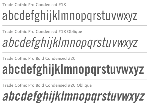 Born in San Francisco in 1908, Burke died in 1975. He studied at the University of California in Berkeley. From 1949 until 1963, he was type director for Mergenthaler-Linotype, succeeding C.H. Griffith. He developed the TeleTypesetting System (TTS) for magazines and designed some fonts for native American languages. He designed Trade Gothic (1948-1960), Majestic (1953-1956) and Aurora (1960).
  Between 2005 and 2012, Jasper Habicht (Accipiter Media, Germany) created the free typefaces
  [
[ Jeremy Tankard established Jeremy Tankard Typography in 1997, after corporate design work at Addison Design Consultants and Wolff Olins. This Londoner made some extraordinary and daring font families. In many of his typefaces, Jeremy mixes upper and lower case letters for more impact. A list of his typefaces:
  Jim Rimmer (b. Vancouver, 1934, d. 2010) was one of the great contemporary type designers whose creations had a lot of flair, individuality, and charm. Based in New Westminster (near Vancouver, BC),
  Born in Bedford, IN, in 1959,
  [
[ Born in 1951,
  Portland, OR-based designer of the native Colombian-themed typeface Nova Nativa (2017). [
 Colombian type and graphic designer (b. 1974, Bogota), who graduated from Universidad Nacional de Colombia (1997). Co-founder of ADG Colombia (Colombian Association of Graphic Designers). He was studying for a Postgraduate degree in Type Design at UBA (Universidad de Buenos Aries) in Argentina. He currently lives in BuenosAires.
  [
[ Buenos Aires-based designer of the great totalitarian typeface
  During her studies at York University in Toronto, Kadi Koroma created
  Kevin Allan King is from Toronto. He designed fonts for Canada Type from 2010 until 2017. In 2018, he graduated from the
  [
[ The Department of Mathematics of the University of the Aegean (Samos, Greece) has established a laboratory on Digital Typography and Mathematical Software in 2006. It supports the Greek language with respect to the TeX typesetting system and its derivatives. Antonis Tsolomitis (who lives in Karlovassi, Samos, and is a professor of Mathematics at that university) writes: After the support for Greek was added by A. Syropoulos and the first complete Greek Metafont font was presented by Claudio Beccari there was an obvious need, to be able to use a scalable Greek font with LaTeX. With this in mind, we developed the first Greek fontfamily in Type1 format with complete LaTeX support, called "Kerkis". Their Greek font
  Mainz, Germany-based designer of the display typeface Kastell (2016), which is based on the 1906 logotype of Faber Castell.
  Cali, Colombia-based designer of Etnia (2016), a
  Freelance graphic designer in San Diego, who created these typefaces in 2013:
  Merida-educated Venezuelan graphic designer at the Colombian foundry Andinistas. Now based in Caracas, Lennyn designed the futuristic dingbat typeface
  Lima, Peru-based designer of Coatl (2014), a decorative caps typeface that is based on pre-Colombian patterns. This project was finished during her studies at Instituto Toulouse Lautrec. [
 Puchov, Slovakia-based designer of the piano key typeface
  Canadian designer of the handcrafted typefaces Salmon Spirit (2017: indigenous North American style), Lime Time (2017), Cream of Oatmeal (2017), Blueberry Jam Script (2017) and Farm House (2017).
  American type designer in Santa Barbara, CA. His typefaces:
  Gary Munch (born 1953) is the Stamford, CT-based principal of MunchFonts. He teaches at Norwalk Community College and at the University of Bridgeport Shintaro Akatsu School of Design.. His typefaces:
  Neo Type Foundry is a commercial type foundry in Caracas, Venezuela, est. 2015 by José José Villamizar (b. 1977), who graduated from Universidad Jose Maria Vargas in 2008. In 2015, he designed
  Noem9 Studio is an online studio created by Jose A. Garrido, a graphic designer who was born in Alcañiz, Teruel, Spain, in 1987, and lived in Zaragoza. Noem9 is currently based in London.
  A large free font family released under the Apache license at Google Web Fonts, and developed by Monotype's Steve Matteson and a team of type designers. Designed between 2012 and 2016, this typeface covers over 800 languages and 100 writing scripts.
  A commercial Cherokee font created in 2006 by Nick Curtis. He writes: This rugged typeface is based on letterforms in the Cherokee Syllabary, reputedly devised by a gentleman named Sequoyah in the early nineteenth century. In addition, Native American petroglyphs---some authentic Cherokee designs, some from other tribes---are included in several positions. The name of the typeface, however, is authentic Cherokee, and can be loosely translated as Yo, whuzzup? [
 Graphic designer in Guadalajara, Mexico, who made
  Patrick Giasson runs Behaviour Design in Montreal. He studied type design at Reading in 2004, and worked for some time at Wolff Olins and Agfa Monotype UK. At ATypI 2005 in Helsinki, he spoke on The typographic inception of the Cherokee syllabary. He states: [
 Or Ksenia Kuznetsova. Moscow-based designer of the tribal patterned color typeface
  Design studio in Buenos Aires. Their typefaces include the macho semi-stencil
  [
[ Designer and digital artist in Florence, Italy. He created the ornamental caps typefaces
  [
[ Chilean type designer who graduated from Universidad Tecnológica Metropolitana de Santiago de Chile. Award winner at Tipos Latinos 2010 for his experimental typeface
  Aaron earned a Bachelor's degree in Asian Studies, with a minor in Japanese, at Whitman College in Walla Walla, WA. Aaron is a
  Sandra Garcia (b. Bogota, Colombia) first studied at the Universidad del Area Andina, Bogota and then obtained a Masters in typography from Centro de Estudios Gestalt in Veracruz, Mexico. Freelance designer and teacher at Universidad de la Comunicacion, in Mexico City.
 His next move made him lots of friends in Montreal---he selected a locally developed typeface,
  The second speaker was
 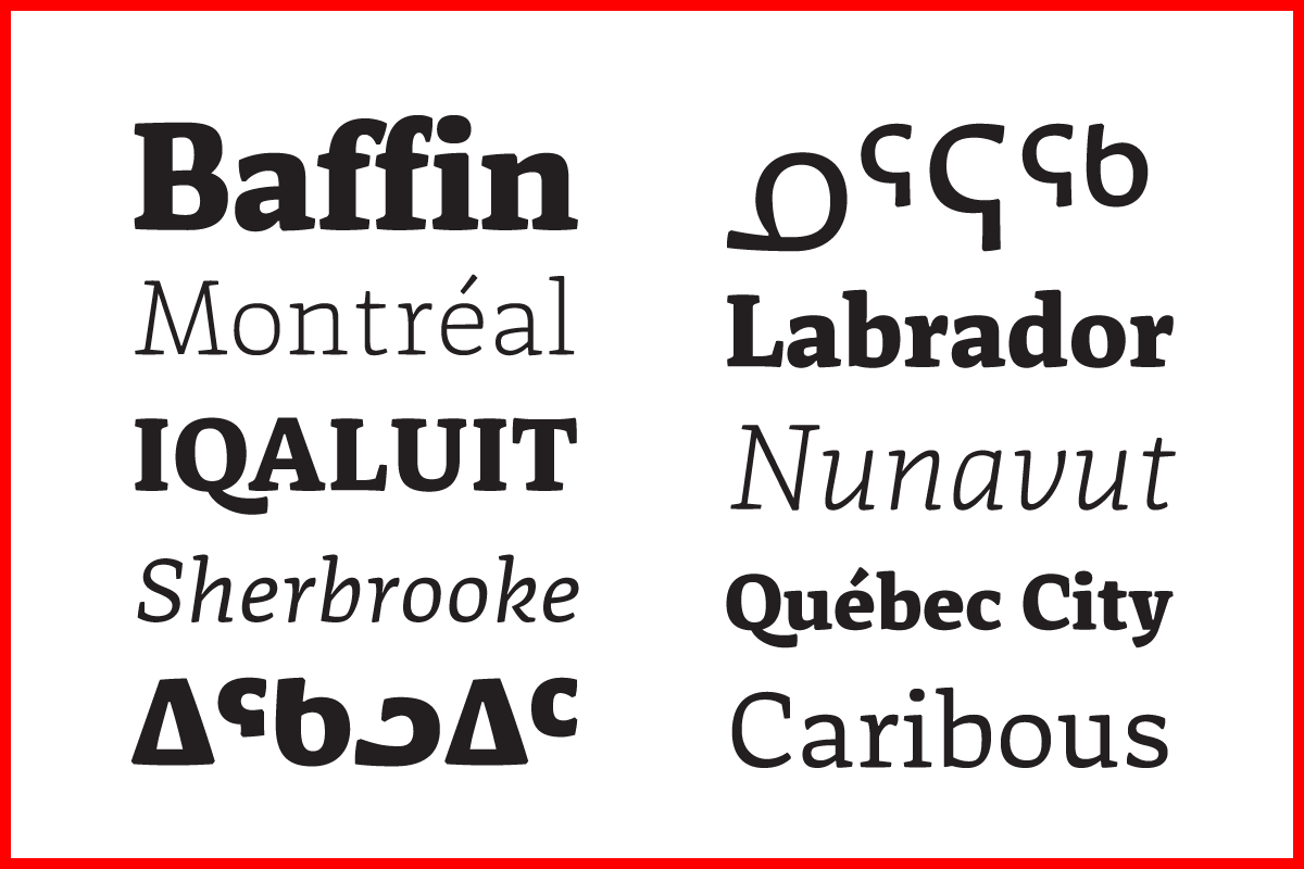 It is a noble and charitable effort---here is one of the world's top designers spending countless hours fine-tuning and developing Inuktitut fonts for a readership of not more than 30,000 people.
  For a change of pace,
 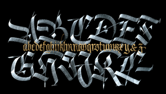 After his lively delivery, straight from the heart, he urged all of us to disconnect from our computers and devices and enjoy writing, drawing and creating.


 The section flag font, and the two weights of display, are in the Kufi style, which is the oldest form of Arabic calligraphy, while the cursive text is designed in a contemporary Naskh style. The redesign of Singapore's

 Quebec-based designer (b. 1971) in 2010 of the
  Struvictory Art (Hrodna, Belarus) is run by Viktoryia Strukouskaya and
  Siberian designer of the handcrafted typefaces Jungle (2016, African-themed font set), Elephant (2016), Elephant Lines (2016) and Tribal Elephant (2016). Aka Swet TS. [
 A piece written in 2022 by Canadian type designer Kevin King for Typotheque in which he discusses the three major Syllabics orthographic / typographic traditions, the Algonquian Syllabics, Inuktut Syllabics, and Dene Syllabics, as well as the Blackfoot Syllabics (which are related to the Cree Syllabics). [
 Buenos Aires-based creator of the children's hand font
  Lima, Peru-based designer of
  Dallas, TX (was: Richmond, VA)-based designer of the sans typefaces Mint (2016), Amber (2016), Foodie (2016) and Daughter (2016), the rounded sans typeface Fox & Bower (2016), the minimalist sans typeface Avenue (2016), the handcrafted typefaces Yesterday (2016), Creative Queen (2016) and Love Note (2016), the art deco typeface Retro Deco (2016), the retro connected Avocado Script (2016), and the beveled typeface Suburbia (2016).
  John Hudson and Wm. Ross Mills, the co-founders of Tiro Typeworks in 1994, design wonderful top-of-the-line fonts in Vancouver. Their commercial typefaces can be bought from
  Gugum Gumpita Rahayu (b. Bandung) is a graphic designer based in Bandung and Jakarta, Indonesia, b. 1991. In 2013, he set up Absolut Foundry. In 2015, he started
  Advertised as
 Ray Larabie (b. 1970, Ottawa, Canada) ran Typodermic in Mississauga, ON, which opened in the Fall of 2001. In 2006, it moved to Vancouver, BC, and in 2009 it moved on to Nagoya, Japan.
  [
[ [
[ Designer (b. Vancouver, 1970) of high-quality typefaces at Tiro Typeworks in Vancouver, which he co-founded with John Hudson. He created
  French graphic designer who lives and works in Montreal. He created
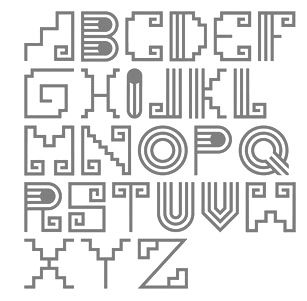
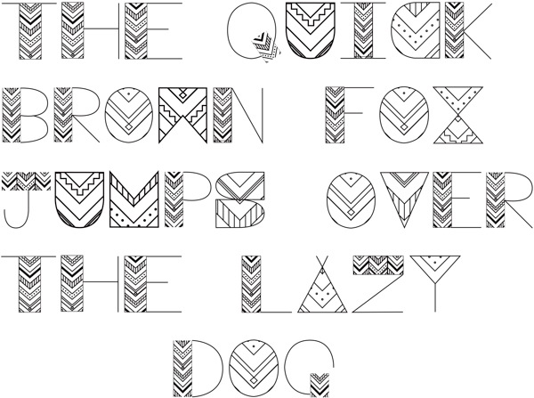
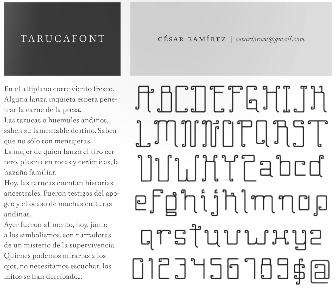
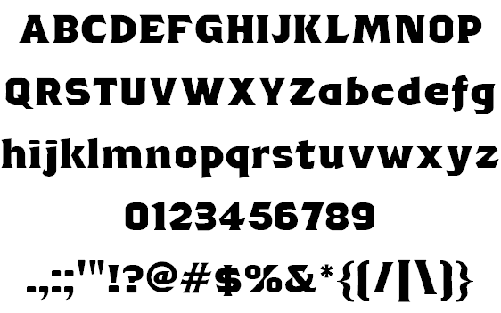
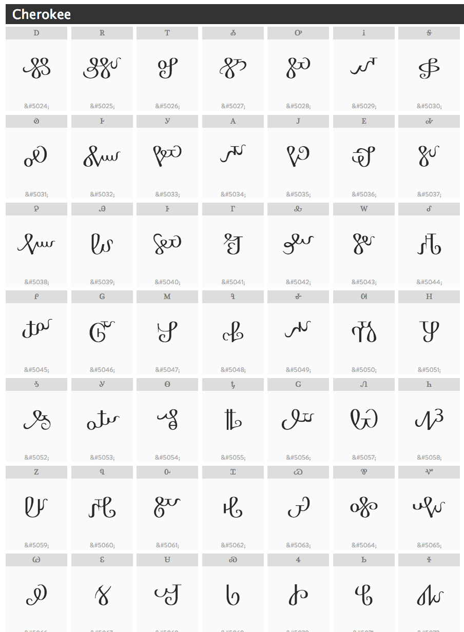
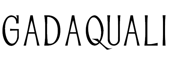
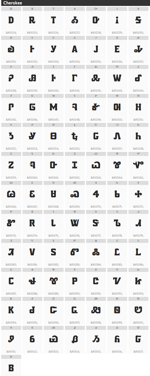
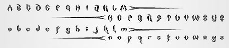
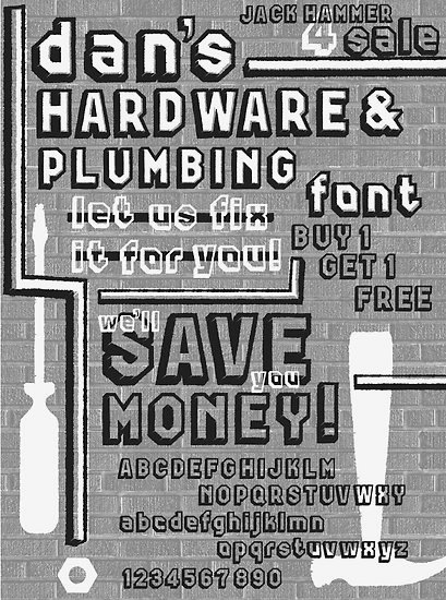
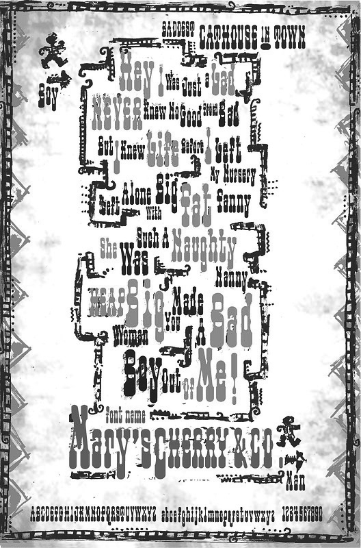
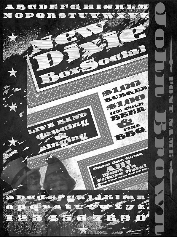
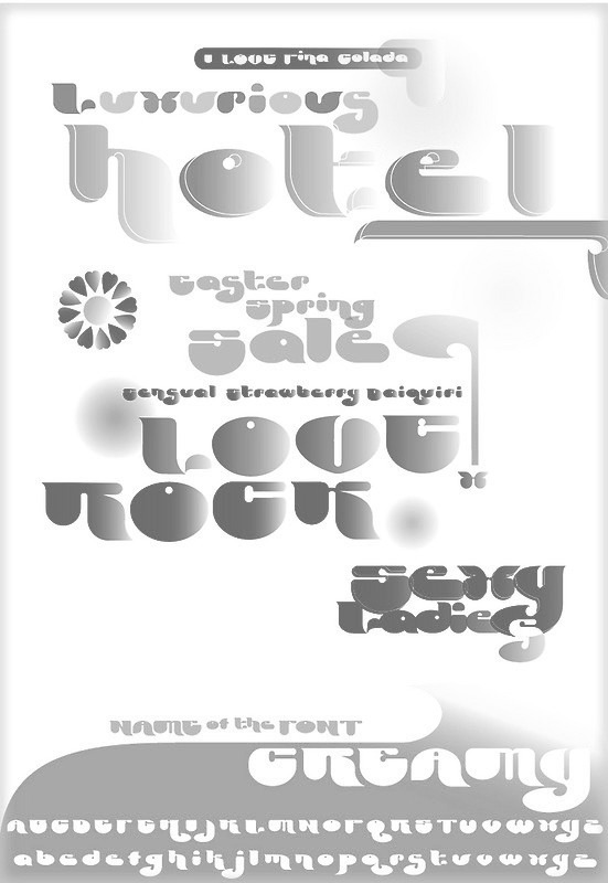
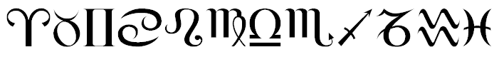
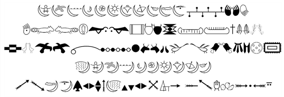
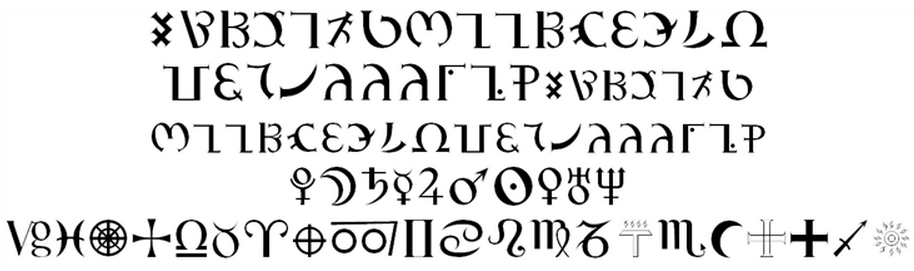
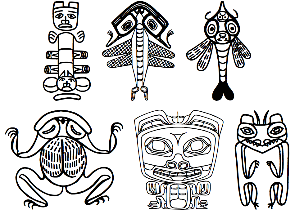
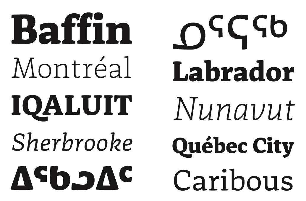
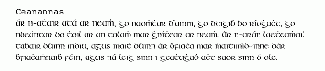
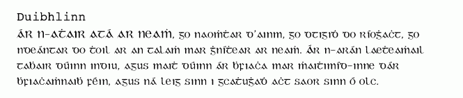
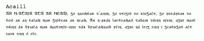
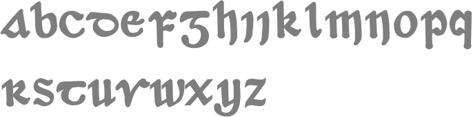
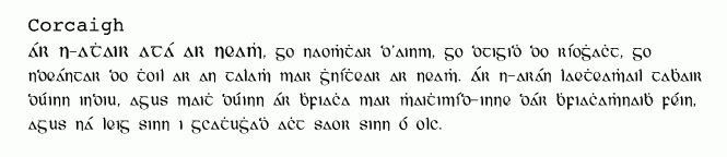
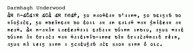
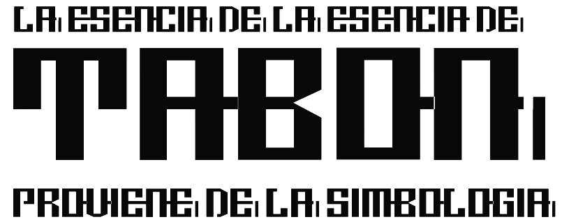
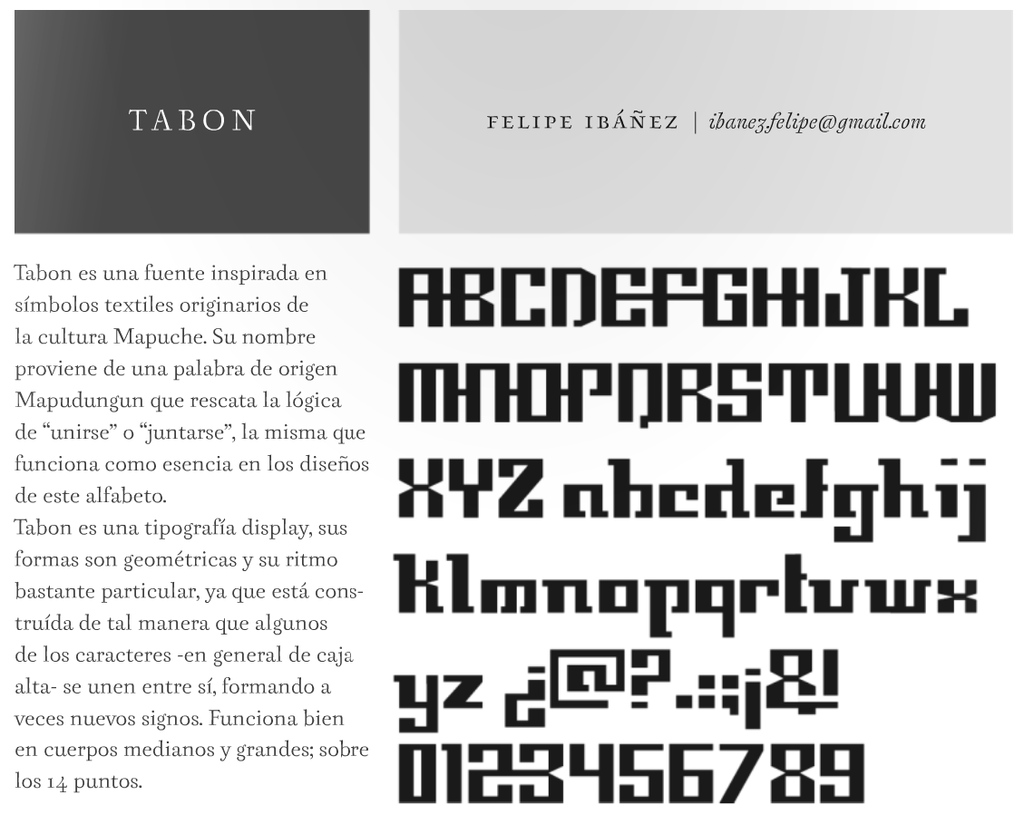
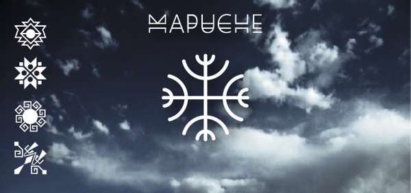
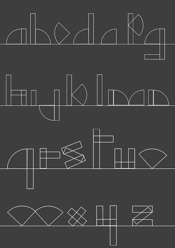
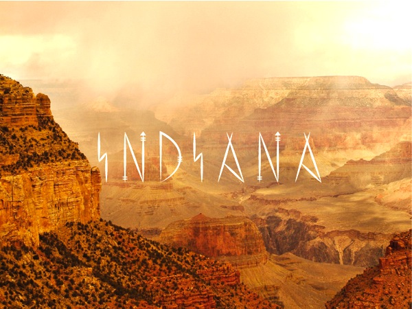
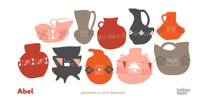
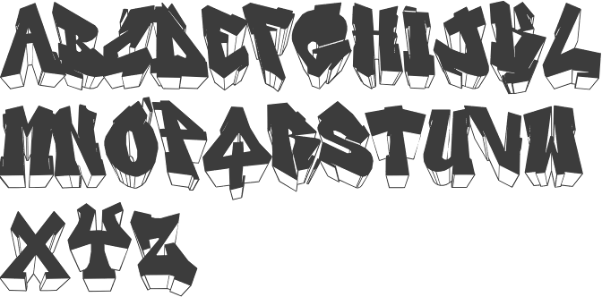
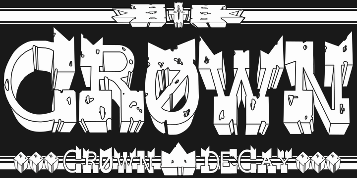
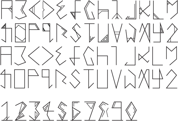
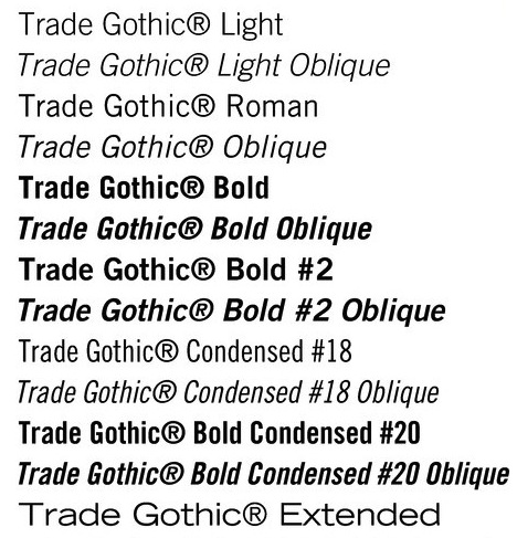
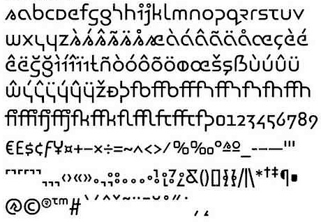
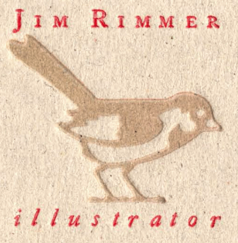
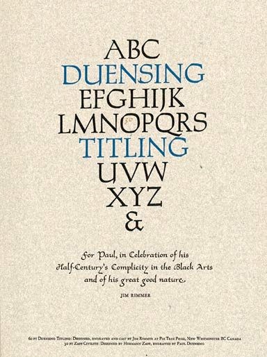
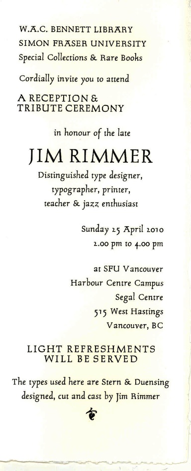
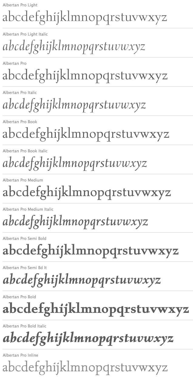
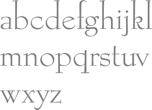
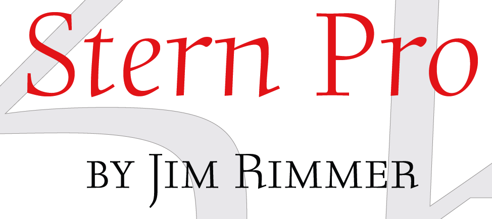
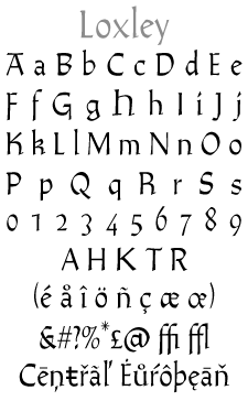
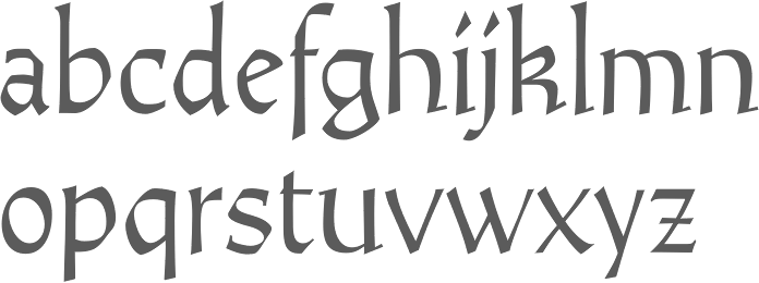
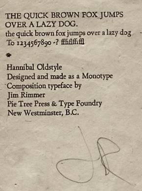
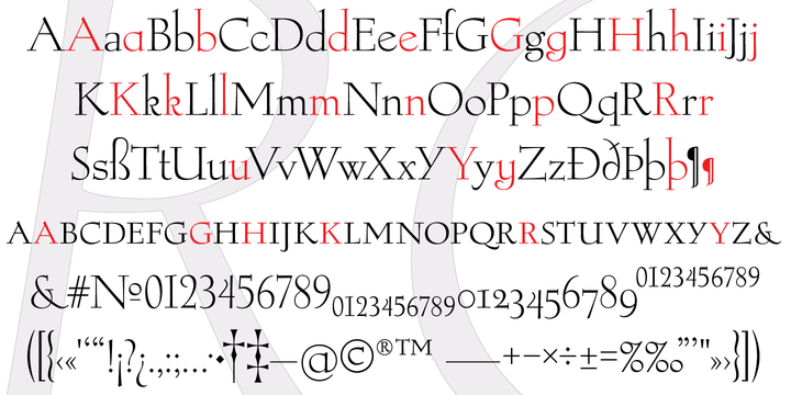
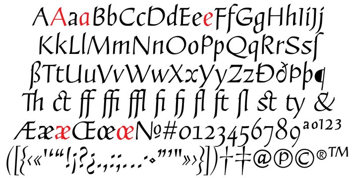
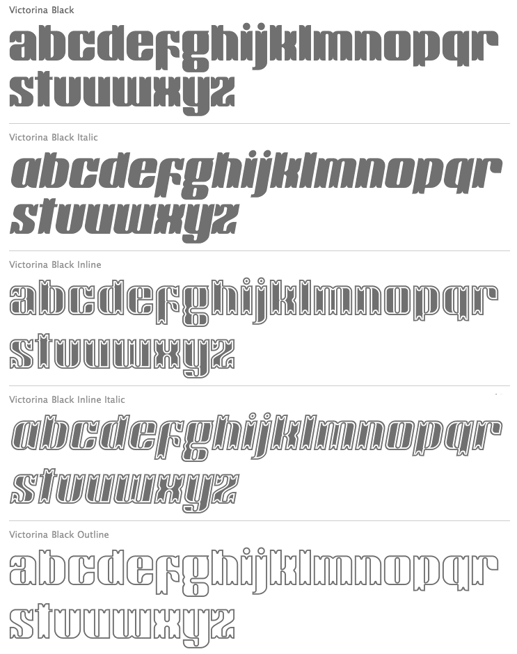
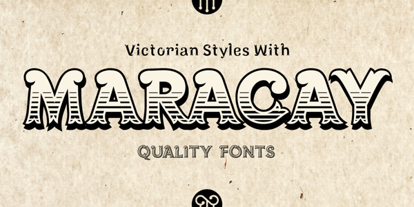
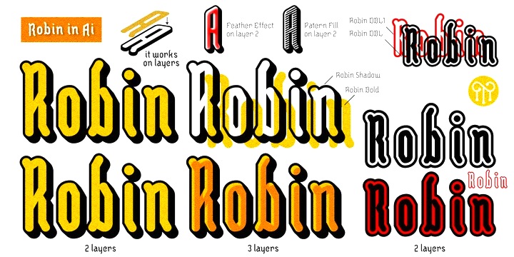
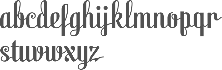
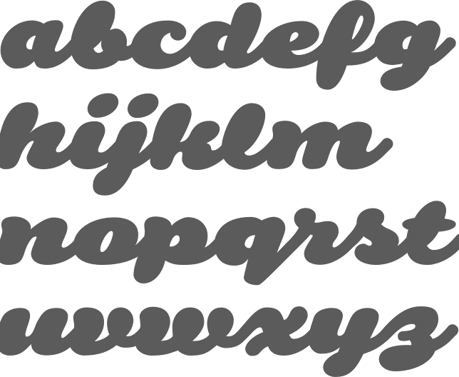
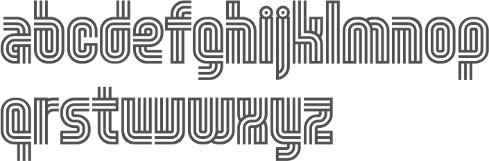
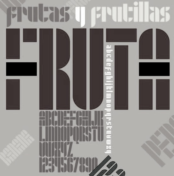
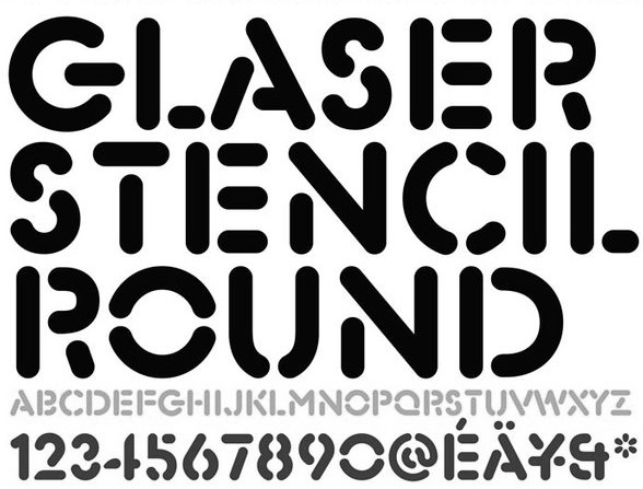
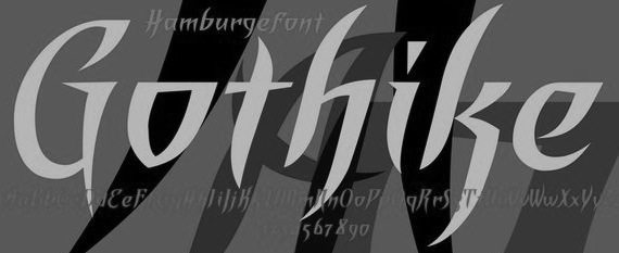
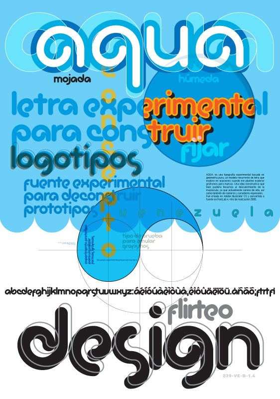
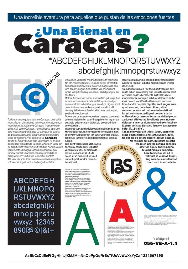
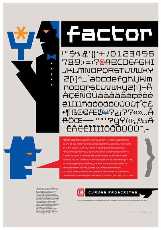
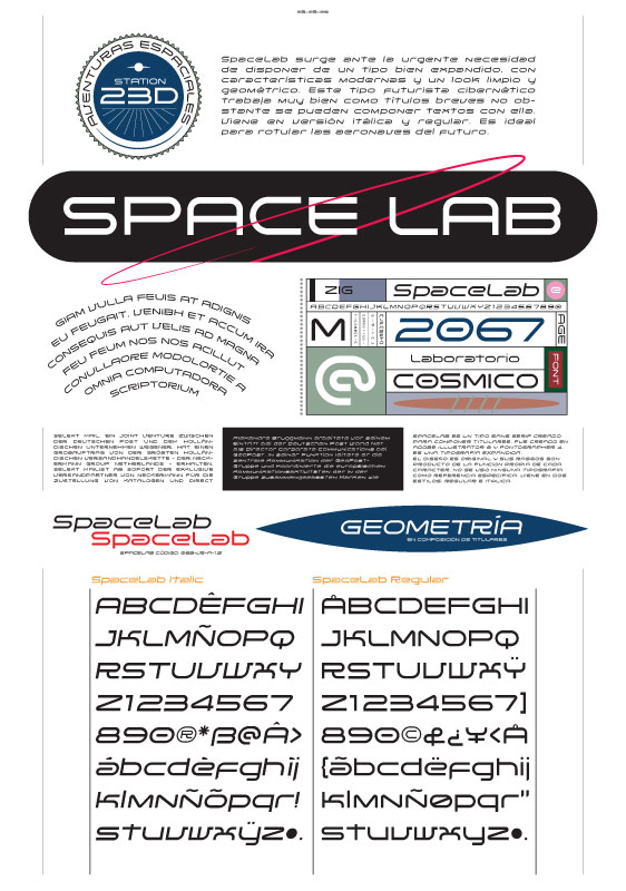
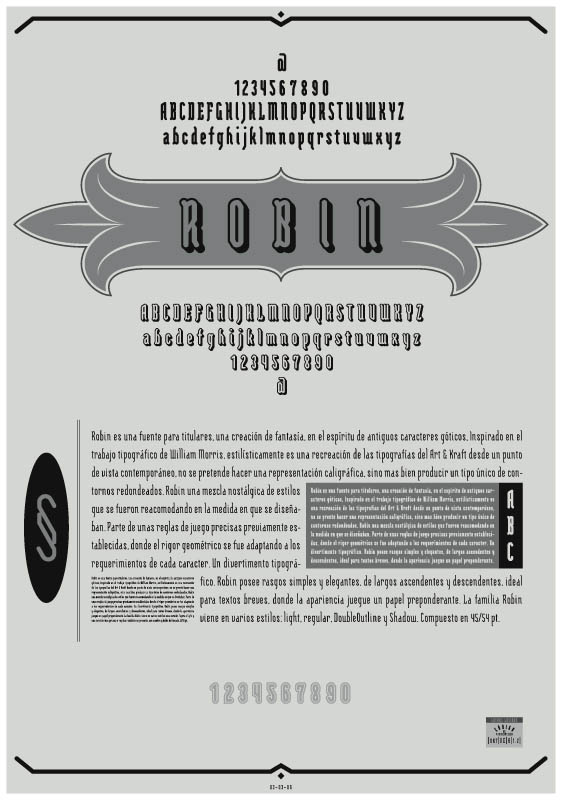
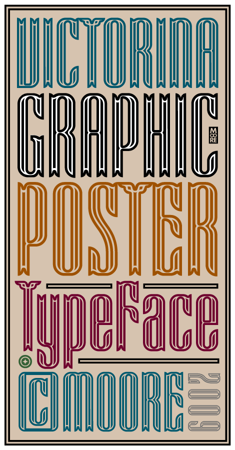
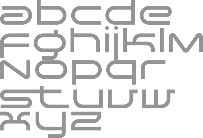
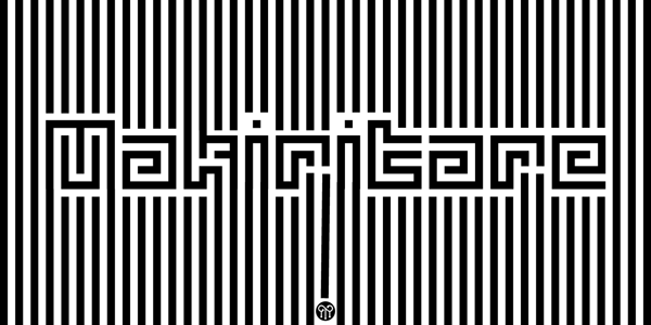
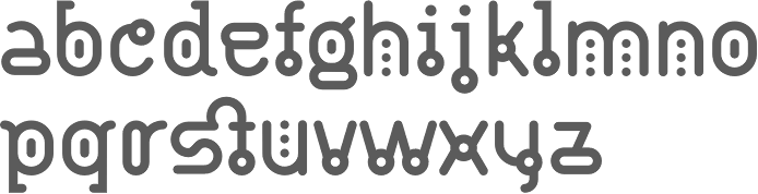
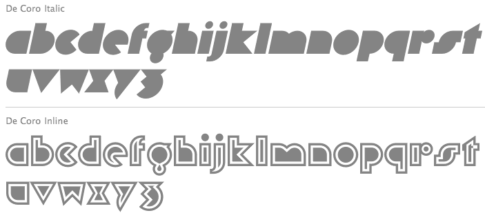
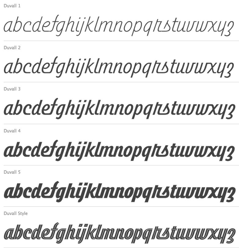
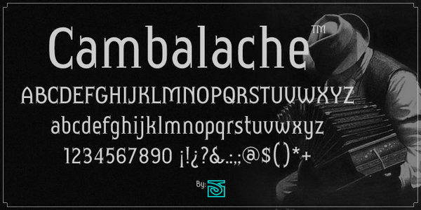
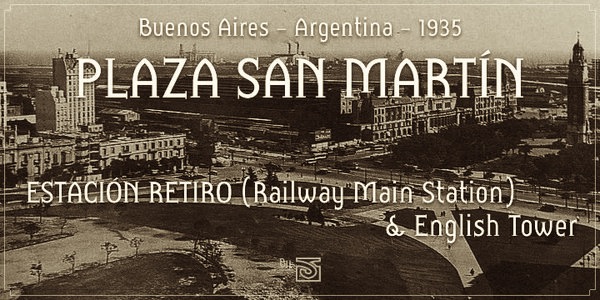
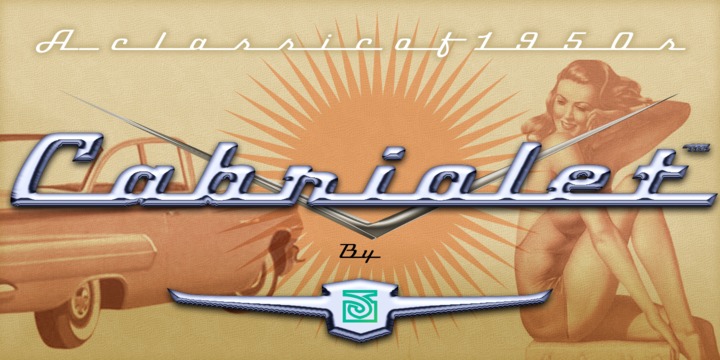
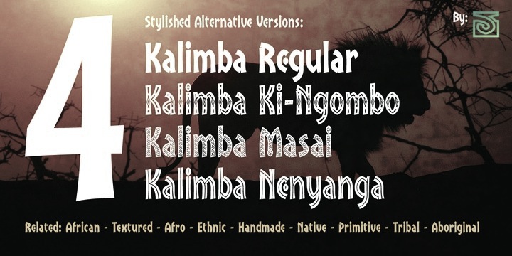
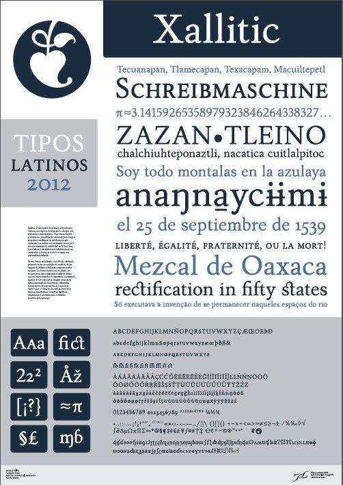
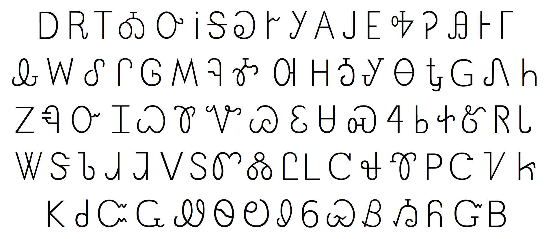
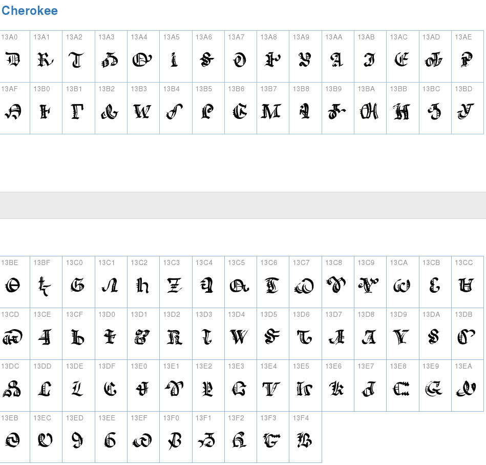
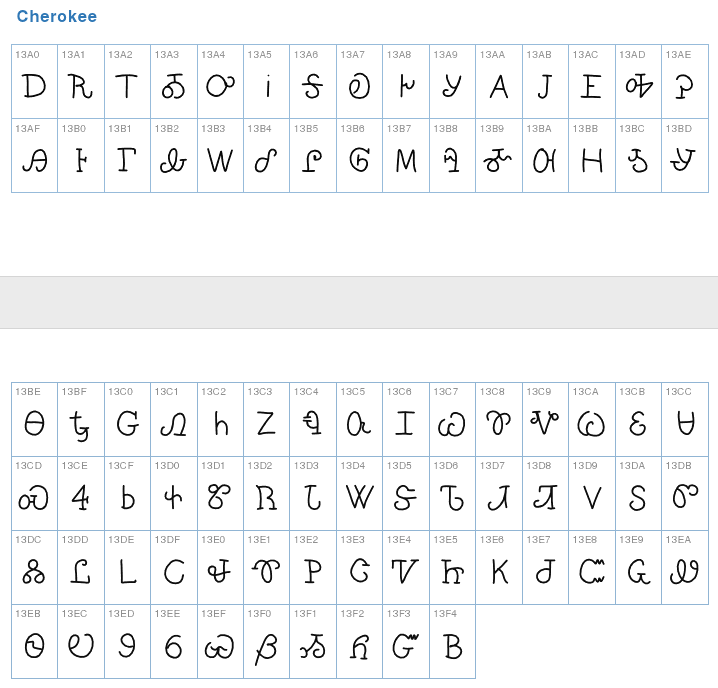
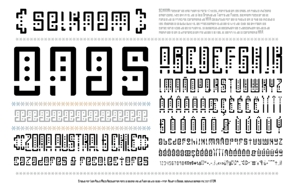
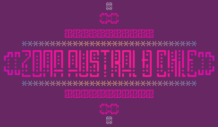
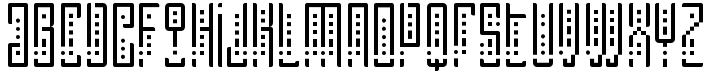
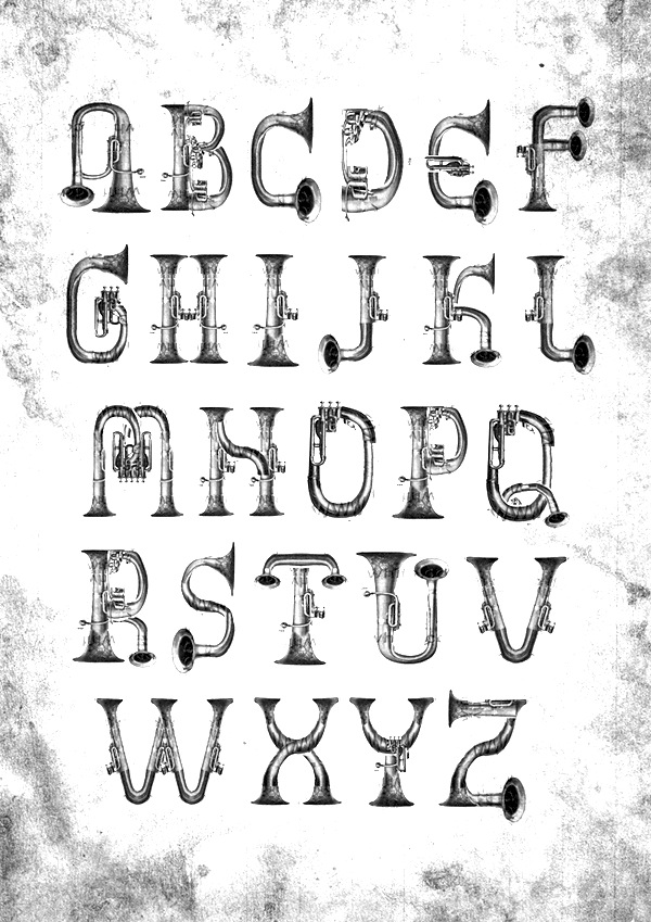
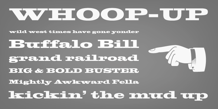
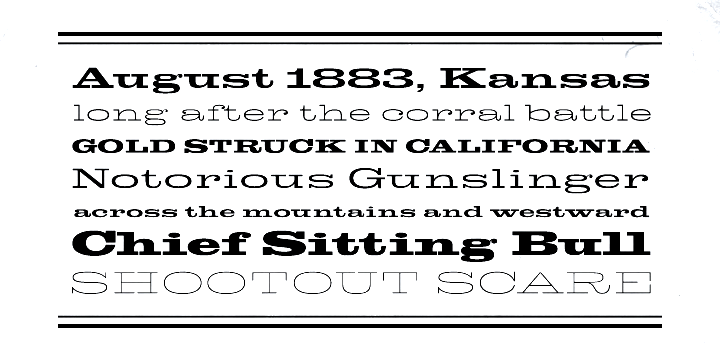
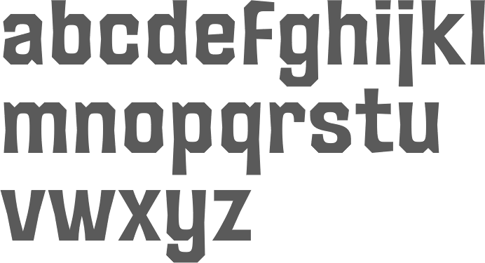
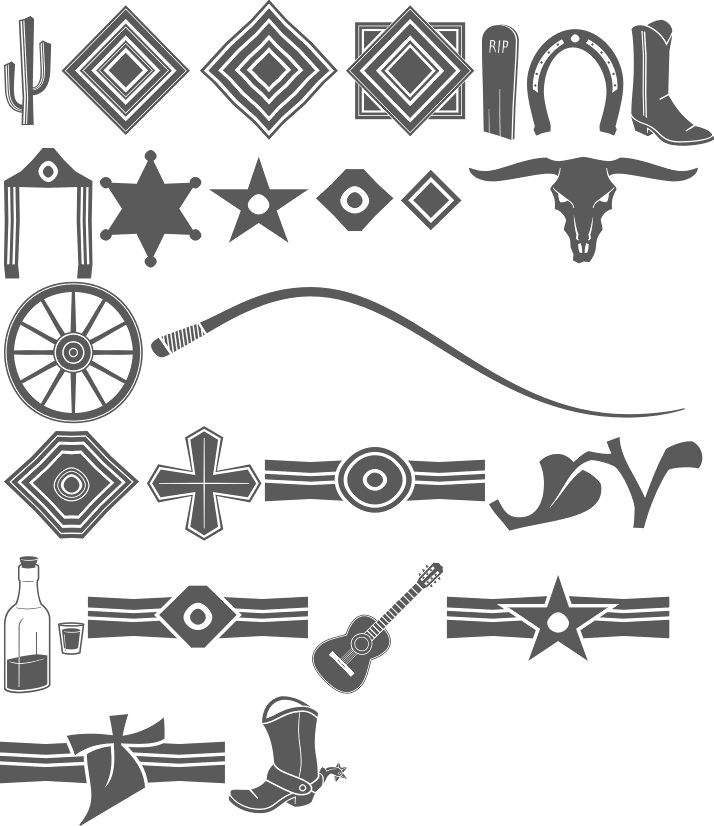
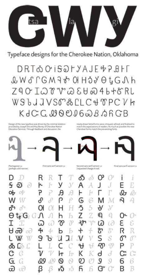
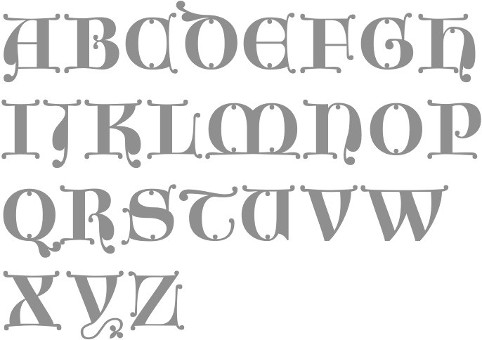
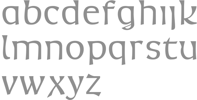
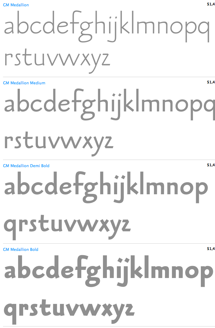
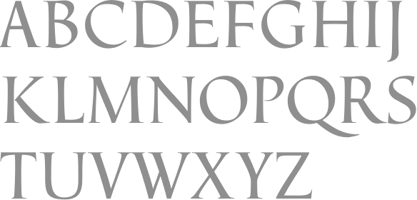
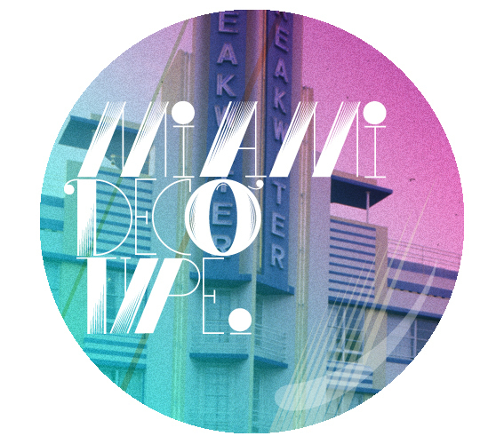
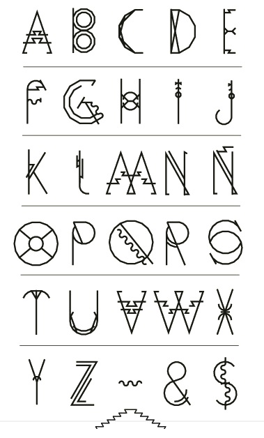
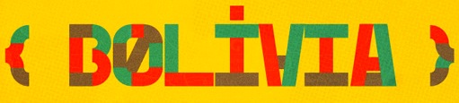
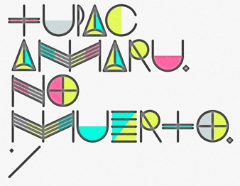
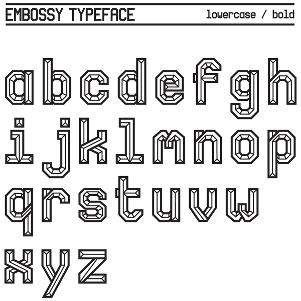
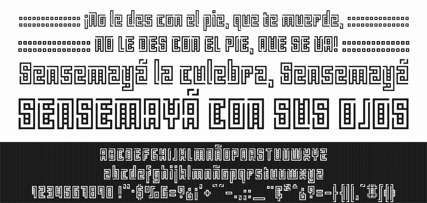
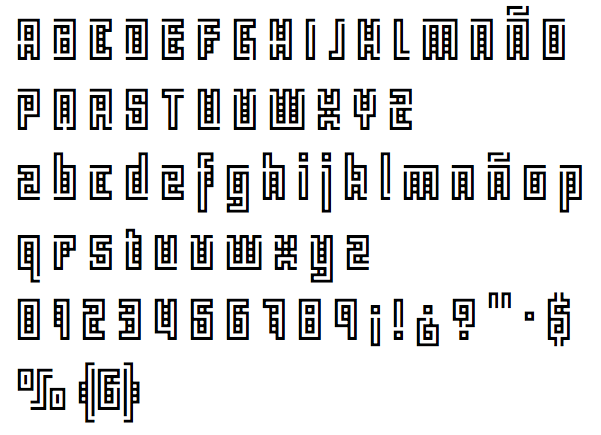
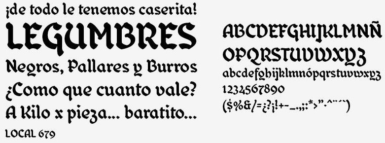
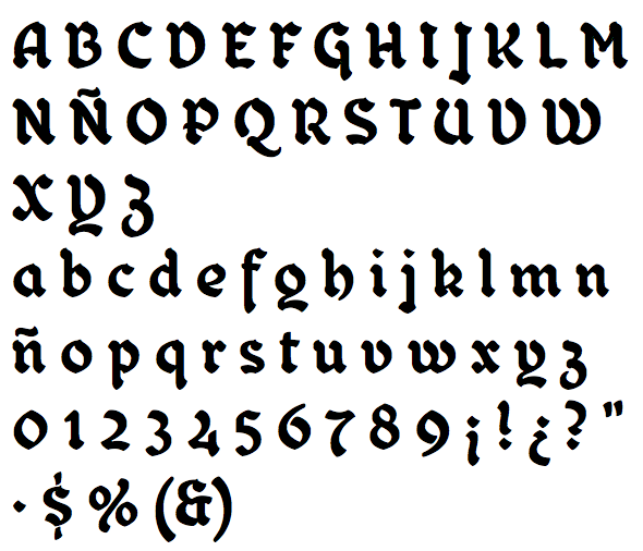
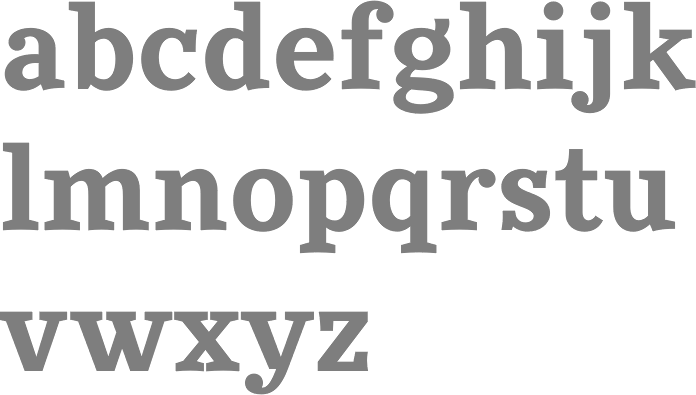
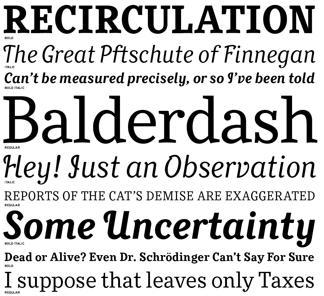
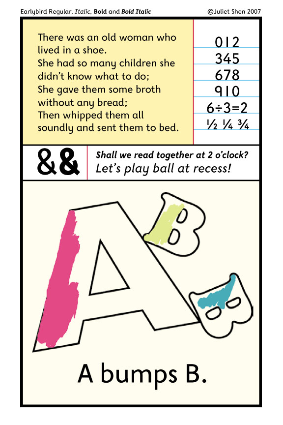
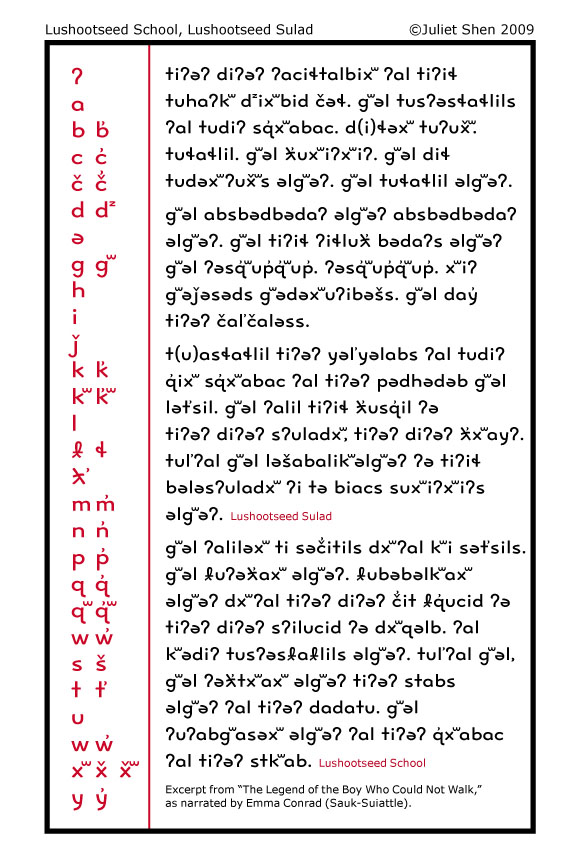
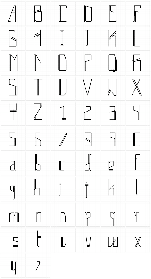
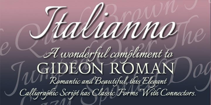
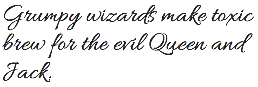
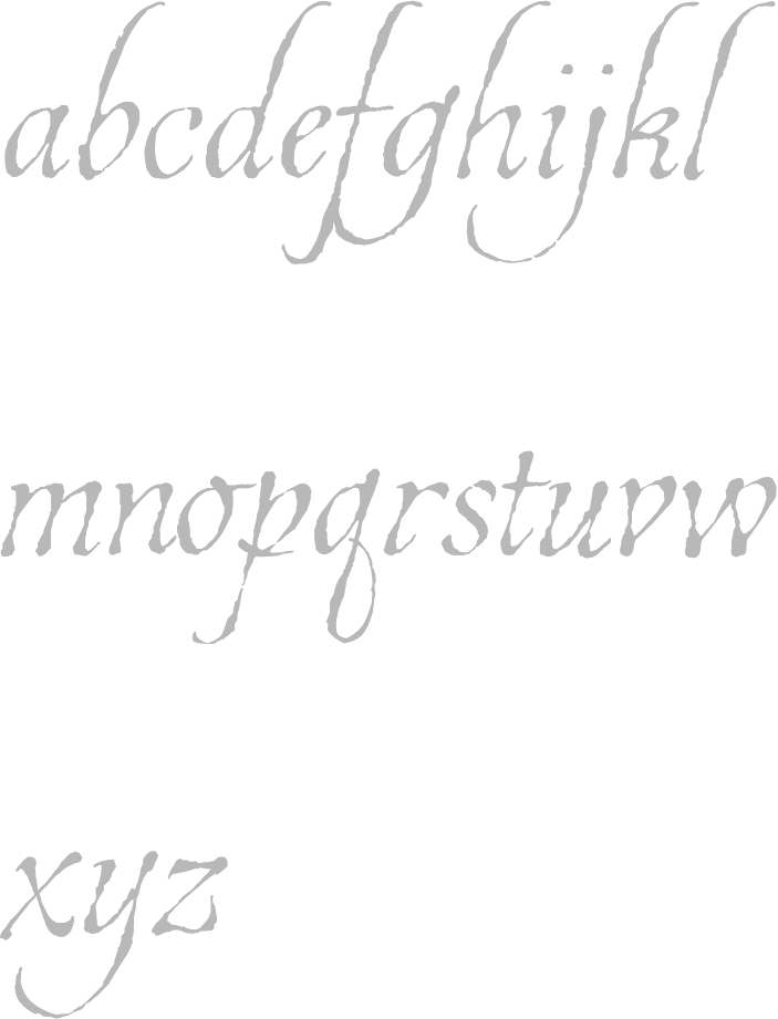
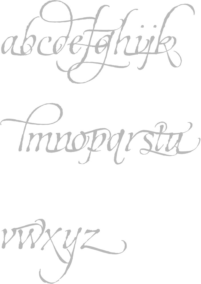
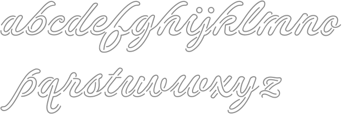
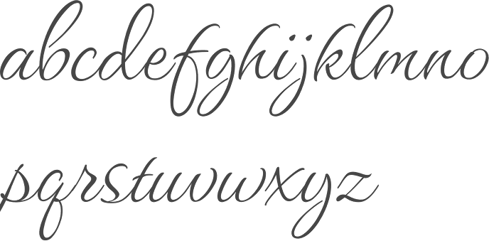
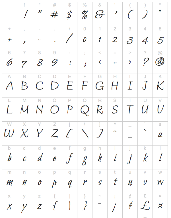
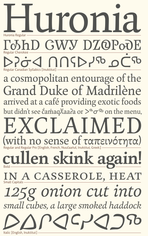
|
|
|
|