TYPE DESIGN INFORMATION PAGE last updated on Mon Jul 20 20:50:20 EDT 2026
FONT RECOGNITION VIA FONT MOOSE

|
|
|
|
|
Armenian fonts | ||
|
|
|
|
SWITCH TO INDEX FILE
Akira Kobayashi
| |
| |
| |
Amadeus Information Systems
| Amadeus Information Systems Limited / Phil Chastney are the designers of SImPL (1999-2001) and Sixpack Medium (2009), great Courier-like monospace fonts with many diacritics and symbols, filling many of the Unicode pages. The designer is Phil Chastney, who writes One of the design aims of the font was to provide a complete set of all known APL symbols, plus sufficient characters to allow prompts, comments, etc., to be expressed in every European language known to be in current use. Basically, that means the Latin, Greek and Cyrillic alphabets, plus accented and variant letter forms as required for other European languages using these alphabets.. Incidentally, Armenian and Cyrillic are also covered, and the number of mathematical symbols is staggering. [Google] [More] ⦿ |
Recent graduate from the BFA program in Graphic Design at the Fashion Institute of Technology in New York City, who is currently living on Long Island and working at Curio Design in NYC. Proposer in 2007 of new letterforms that look a bit Armenian to me. [Google] [More] ⦿ | |
In 2021, she designed ASF Diana (a ten-style text and display family for Latin, Cyrillic and Armenian). [Google] [MyFonts] [More] ⦿ | |
Yerevan, Armenia-based designer of an Armenian blakboard bold typeface in 2019. [Google] [More] ⦿ | |
Yerevan, Armenia-based designer of the Latin / Armenian font Agent 044 (2019). [Google] [More] ⦿ | |
Yerevan, Armenia-born and Paris-based graphic designer. Creator of Shape Type (2012, an octagonal or paper fold typeface). Behance link. [Google] [More] ⦿ | |
| |
Antonis Tsolomitis
| |
| |
Free Georgian, Cyrillic, Greek, Armenian, Coptic and Gothic Truetype fonts. [Google] [More] ⦿ | |
Yerevan, Armenia-based designer of a tringular alphabet (2017). [Google] [More] ⦿ | |
Armenian type and graphic designer and illustrator. She was a student at the National Academy of Fine Arts in Yerevan, Armenia (2005-2009). The Devian Tart site mentions that she lives in Bulgaria. Arevik created the dingbats font Fashion Plate (2007, Paratype). Devian Tart link. [Google] [MyFonts] [More] ⦿ | |
The Armenian alphabet (courtesy of the Granshan site). [Google] [More] ⦿ | |
Armenian metafont
| Free package developed by Serguei Dachian in metafont. He writes: These fonts were converted from the TrueType font family "ArTarumianTimes" made by Ruben Hakobian (Tarumian). We would like to thank him for giving us the permission to use his fonts. Other fonts (ars series) were developed based on Raffi Kojian's Sassoun family (1994). [Google] [More] ⦿ |
Armenotype
|
|
Used to offer commercial Armenian fonts. From Oakville, Ontario. [Google] [More] ⦿ | |
Armenian company which marketed fonts such as ArialArmenian. [Google] [More] ⦿ | |
Yerevan, Armenia-based designer of an Armenian display typeface (2017). [Google] [More] ⦿ | |
Armtype
|
He created (free) Armenian extensions of Microsoft's Tahoma, GHEA Tahoma (Regular, Bold), in 1996. His winning entries in Granshan 2009 include Aragast (for Cyrillic), Asparez, Parmani, Notgrir, and Diana. He also designed Mariam, GHEA Tigran (2008, awarded the Grand price in the Granshan 2008 International Type Design competition), GHEA Koryun (2011), GHEA Gohar (2009), GHEA Aspet (2011), GHEA Lilit (2012, a nice text family), GHEA Narek (2012, a sans family with built-in contrasts), Mijnadaryan (2013), GHEA Arpi (2013), Avandakan (2013), GHEA Dvin (2014), GHEA Tatevik Display (art deco), GHEA Kamar (geometric avant garde sans), GHEA Katil (a plump display typeface related to the modern fat typefaces), GHEA Narek Serif, GHEA Aram. Free official fonts of the Armenian Government: Grapalat, Mariam. Most of his fonts cover Latin, Greek, Cyrillic and Armenian. A partial list of his typefaces: ASF Angela, ASF Angela Sans, ASF Daniel, ASF Daniel Sans, ASF Daniel Slant, ASF Dar21, ASF George, ASF Goga, ASF Library, AVH Arman, GHEA Anahit, GHEA Aragast, GHEA Araks, GHEA Aram (skeletally related to didone), GHEA Aram Display, GHEA Aram Title, GHEA Ararat, GHEA Aratta, GHEA Architect, GHEA Arpi, GHEA Ashot Erkat, GHEA Aspet, GHEA Ayb (2020: a multilingual sans typeface for Latin, Cyrillic (+Bulgarian Cyrillic, +Ukrainian Cyrillic) and Armenian), GHEA Ayg, GHEA Bekum, GHEA Bever, GHEA Biayna, GHEA Circle, GHEA Davit, GHEA Diana, GHEA Dvin, GHEA Erebuni, GHEA Gohar, GHEA Granshan (an 18-style sans) (2021), GHEA Hayk Davtyan, GHEA Hayk Title, GHEA Helvetica Geo, GHEA Heqiat, GHEA Kamar, GHEA Karpet, GHEA Kars, GHEA Katil, GHEA Khoragir Pro, GHEA Koryun, GHEA Lilit, GHEA Mymekh, GHEA Narek, GHEA Narek Display, GHEA Narek Poster, GHEA Narek Pro, GHEA Narek Serif, GHEA News (2021), GHEA Parisp, GHEA Pastar (2021), GHEA Petur, GHEA Samo (wedge serif) (2021), GHEA Script, GHEA Sepatar, GHEA Shooter (2020), GHEA Tamara (2021), GHEA Tatev, GHEA TatevikArt, GHEA Terti, GHEA Tigran Pro, GHEA Title, GHEA TitleSS, GHEA Urartu, GHEA Vanadzor, GHEA Vem, GHEA Vernagrayin, GHEA Warm (2021), GHEA VoskeDar, GHEA Yerevan, GHEA Yerevan Serif, GHEA Yerkar, GHEA Zartonk (2021: an 11-style display sans for Latin, Cyrillic and Armenian), GHEA Zeytun, HASH Ani, HASH Ani Soft, HASH Anna, HASH Anush, HASH Ashtghik, HASH Ashtghik Serif, HASH Eva, HASH Heqiati, HASH Hripsimeh, HASH Romantic, IT Grinnar, LGSH Liana, MAA Marieta, MAA Sergo. GHEA Narek Display won an award at the Morisawa Type Design Competition 2014. Klingspor link. [Google] [MyFonts] [More] ⦿ |
A site devoted to Armenian Unicode fonts (with downloads): Arial AMU, Arial Unicode, Sylfaen, Courier Unicode, Times Unicode. Direct downloads. [Google] [More] ⦿ | |
Yerevan, Armenia-based designer who created a triangulated Armenian alphabet in 2014. [Google] [More] ⦿ | |
Armenian type designer who created ARARAT (1992) and ARAGATZ (1992). [Google] [More] ⦿ | |
Arzo Electronics
| Mike Arzoumanian (Arzo Electronics) created the free Armenian font 1Arzo Ani (1996) and 1ArzoArarat (1996). [Google] [More] ⦿ |
(Extinct?) Russian foundry that produced Latin, Armenian and Cyrillic fonts. Fonts included Chiseled 1 and 2, Stratos, Jacker, Serpentine Bold and Domingo. [Google] [More] ⦿ | |
The original Avenir typeface was designed by Adrian Frutiger in 1988. Unlike Futura, which has partially colored Avenir, Avenir is not purely geometric---it has vertical strokes that are thicker than the horizontals and a lower case o that is not a perfect circle. And just as most fonts from the 1980s, Avenir has shortened ascenders. These nuances aid in legibility but the small x-height makes it less elegant. In 2012, Akira Kobayashi worked alongside Adrian Frutiger on Avenir Next. Akira kept expanding Avenir to cover more languages. Avenir Next World family, released by Linotype in 2021, is an expansive family of fonts that offers support for more than 150 languages and scripts. The subfamilies include Avenir Next Hebrew, Avenir Next Thai, Avenir Next Cyrillic, Avenir Next Arabic and Avenir Next Georgian. Avenir Next World contains 10 weights, from UltraLight to Heavy. Contributors besides Adrian Frutiger and Akira Kobayashi: Anuthin Wongsunkakon (Thai), Yanek Iontef (Hebrew), Akaki Razmadze (Georgian), Nadine Chahine (Arabic), Toshi Omagari (Arabic) and Elena Papassissa (Greek, Armenian). See also Avenir Next Paneuropean (2021; 56 styles; by Akira Kobayashi). [Google] [MyFonts] [More] ⦿ | |
Ben Jones
| |
Yerevan, Armenia-based graphic designer and illustrator. Creator of the free condensed Latin / Armenian sans typeface Calama (2016) and the free update Calama New (2017). [Google] [More] ⦿ | |
Cahya Sofyan
| |
Cankat Saribas is UX/UI, graphic, and type desginer of Armenian and Alevi-Kurdish background who was born and raised in London. In 2022, he designed the stencil display typeface Dersima, as an homage to the victims of genocide and oppression. [Google] [MyFonts] [More] ⦿ | |
Carolyn Puzzovio
| |
Chicago-based punch-cutter, 1841 (Berlin, b. Carl Emil Heyer)-1897 (Chicago). His typefaces have late Victorian and early art nouveau elements:
| |
Cilicia.com
| This is Raffi Kojian's site. Armenian font links and downloads. Included are fonts by
|
| |
Mark Leisher's creation: "ClearlyU is a set of BDF (bitmap) 12 point, 100 dpi fonts that provides glyphs that can be used for Unicode text. The font contains over 4000 glyphs, including numerous additional glyphs for alternate forms and ligatures. The ClearlyU typeface was originally inspired by Donald Knuth's Computer Modern typeface, but has been slowly evolving into something else." Supported are: Navajo, Armenian, Cyrillic, Georgian, Greek and Coptic, Hebrew, Lao, Thai. [Google] [More] ⦿ | |
Cyreal
| Cyreal is a type foundry with expertise in both Latin and Cyrillic scripts. Its founders are lecturers at the British Higher School of Art and Design in Moscow. They are
Fonts:
|
Klingspor link. Fontspace link. Dafont link. Kernest link. Fontsquirrel link. Google Plus link. [Google] [More] ⦿ | |
Darien Valentine
| |
Darren Rigby
| Refreshing fonts created by Canadian Darren Rigby using High-Logic. The fonts come in truetype format (in 2000): Bayern (fraktur font), Beltane (2002), Brasspounder (2004), Con Jitters (2002, handwriting), Enigmatic, EnigmaticUnicodeRegular, Fitzgerald, GangueOuais (2002), HindsightUnicode (2001, with all European languages, Cyrillic, Armenian, and IPA), HindsightSmallCaps, HindsightRegular, HindsightMonospaceRegular, IntruderAlert, QuicktypeRegular, ThinDime, TorturerUpright, SilverDollar, DontWalkRun, History-Repeating (1999-2000), HistoryHappens, HistoryRepeatingH, HistoryHappens, HistoryRepeatingV, Lemon, Norse-Code (runes), OneEighty, TorturerBound, TorturerCrushed, Daybreaker, Yerevan, Seebreaze, Jareth, Tin Birdhouse, Tin Doghouse, Three-Sixty, Three-Sixty Condensed, Levity (2001, Western font), Gravity, River Avenue, Water Street, Warer Street Detour (unicase), Meridiana, Torquemada, Torquemada Starved, Torquemada Starved Unicode, Radian (2002), All Hooked Up (2002), Brasspounder (2004), Quilljoy (2004). [Google] [More] ⦿ |
Darren Rigby
| |
From 2004 to 2007, he ran his own design studio DAVI, with projects in graphic, web and interface design. Back in Brno, he worked with Tiro Typeworks (Canada) as an associate designer. At ATypI 2008 in St. Petersburg, he spoke about multi-script typography. His typefaces include
Blog. Myfonts link. Klingspor link. Speaker at ATypI 2013 in Amsterdam on the topic of multilingual type design. [Google] [MyFonts] [More] ⦿ | |
DejaVu Fonts
| The DejaVu fonts form an open source font family based on the Bitstream Vera Fonts. Free download. Its purpose is to provide a wider range of characters (see Current status page for more information) while maintaining the original look and feel through the process of collaborative development. Included are DejaVuSans-Bold, DejaVuSans-BoldOblique, DejaVuSans-Oblique, DejaVuSans, DejaVuSansCondensed-Bold, DejaVuSansCondensed-BoldOblique, DejaVuSansCondensed-Oblique, DejaVuSansCondensed, DejaVuSansMono-Bold, DejaVuSansMono-BoldOb, DejaVuSansMono-Oblique, DejaVuSansMono-Roman, DejaVuSerif-Bold, DejaVuSerif-BoldOblique, DejaVuSerif-Oblique, DejaVuSerif-Roman, DejaVuSerifCondensed-Bold, DejaVuSerifCondensed-BoldOblique, DejaVuSerifCondensed-Oblique, DejaVuSerifCondensed. Authors and contributors comprise Adrian Schroeter, Ben Laenen, Dafydd Harries, Danilo Segan (Cyrillic), David Jez, David Lawrence Ramsey, Denis Jacquerye, Dwayne Bailey, James Cloos, James Crippen, Keenan Pepper, Mashrab Kuvatov, Misu Moldovan (Romanian), Ognyan Kulev, Ondrej Koala Vacha, Peter Cernák, Sander Vesik, Stepán Roh (project manager; Polish), Tavmjong Bah, Valentin Stoykov, and Vasek Stodulka. The idea is to eventually cover most of unicode. Currently, this is covered: Latin (+supplement, extended A and part of extended B), IPA, Greek, Coptic, Cyrillic, Georgian, Armenian, Hebrew, N'ko, Tifinagh, Lao, Canadian aboriginal syllabics, Ogham, Arabic, math symbols, arrows, Braille, chess, and many dingbats. Alternate download site. Wiki page with download information. |
Di Barros
|
|
Amarilis (2011) is an ornamental caps face, which can be bought here. Chicha (2012) is a bouncy curvy layered set of typefaces published by Cocijotype. It is based upon Peruvian market signs. Typefaces from 2018: Papaia (plumpish and curvy, with many dingbats). Winner at Tipos Latinos 2018 of a type design award for Papaia. MyFonts link. Logo. Interview in March 2010. Behance link. Klingspor link. [Google] [MyFonts] [More] ⦿ | |
Typefaces from 2013 include Bolognese Sans, Moor (multilined art deco family), Bobber Script, and Bread & Milk Sans. Genplan (2013) is a great free layered inline typeface for Latin and Cyrillic that is based on 1930s Soviet poster types. See also TT Genplan Pro (2014). Cittadino Symbols (2013) is a free rounded city traffic icon font related to a Milan subway project. In 2013, this was replaced, still for the Milan metro maps, by Meneghino Wayfind, a tweetware typeface that was influenced by PT Sans Caption. In 2015, Goloub created Ardent: Ardent is my Sergey Chekhonin-inspired typeface. Ardent is an attempt to prove that the bizarre Cyrillic letterforms of 20s are still decent for use in modern design, even in Latin script. It is highly ornamental and lapidary. Still in 2015, he designed the sans typeface family Intersans (a multilingual Swiss army knife sans), which supports Extended Latin, Extended Cyrillic (including Bulgarian and Serbian Cyrillic), Polytonic Greek, Armenian (Asomtavruli, Nuskha-khutzuri, Mkhedruli, Mkhedruli Mrglovani), Georgian and Hebrew. It also includes true italics, small caps, small caps italics and a lot of pictograms. Typefaces from 2020: Grrr (at Paratype, with Alexandra Korolkova: a techno family characterized by an oversized lower case f). Dmitry Goloub's home page. [Google] [MyFonts] [More] ⦿ | |
Edik Ghabuzyan
| |
Italian graduate of ISIA Urbino, Italy (M.Sc. in Communication and Design for Publishing and a Bachelor's in Graphic Design and Visual Communication). Graduate of the MATD program at the University of Reading in 2012. Her graduation typeface at Reading was the multi-script Dr. Jekyll and Miss Hyde (2012), created for Latin, Greek and Armenian. My first reaction is that the curviness and roundness of the Latin part is due to the desire to harmonize with the two other scripts. All styles are flared out near the top, which gives the result a comic book feel. In fact, Elena mentions that children's books was one of the main motivations. Elena Papassissa (Greek) collaborated with Akira Kobayashi and Monotype Studio on the Greek and Armenian parts of Avenir Next World (2021). She is pursuing a PhD at the University of Reading on the history of Armenian type design under Fiona Ross. At ATypI 2013 in Amsterdam, she discusses the current state of Armenian type design. Speaker at ATypI 2017 Montreal. [Google] [More] ⦿ | |
Graphic designer from Dortmund, Germany, who lives in Husavik, Iceland. Her design company is called Elefont. After studying visual communication in the university of applied sciences in Dortmund, she co-founded the design studio Radau. Graduate of the University of Reading in 2011. Elena designs logos, retail and custom fonts. She is a visiting lecturer at HBK Saar and LHI Reykjavík, and a mentor at Alphabettes, a network to support and promote women in the type industry. Creator of these typefaces: Eskorte (2011, her graduation project), Eskorte Persian (2011), Klebo (2011, mechanical / octagonal), Eskorte Armenian (2011), Paroli (2011, a bold rounded signage face, Die Gestalten), and Biec (2012). In 2013, Eskorte was published by Rosetta Type. Eskorte supports Arabic, Farsi, Urdu, and over ninety languages using the Latin script. Titus Nemeth was consulted for the Arabic portion. In 2016, Elena Schneider and Miles Newlyn co-designed the almost reverse contrast typeface family New Herman. In 2019, she published the experimental techno typefaces Halunke and Konsole at Future Fonts. She writes about Konsole: Konsole is a clean sans serif typeface with a touch of technology. Inspired by audio equipment, it gives off robotic energy. A variable font was added in 2019. Still in 2019, she released the German expressionist typeface Birra Bruin at Darden Studio. At Tomorrow Type, she released the Cyrillic version of Halunke (2020). Future Fonts link. [Google] [MyFonts] [More] ⦿ | |
Eugenijus Paulauskas
| |
Evertype (was: Everson Typography)
| Michael Everson's (b. Norristown, PA, 1963) brilliant pages on Celtic and other languages and on font standards, featuring the following sub-pages:
Elsewhere, one can find rare Everson creations such as Musgrave (1994). MyFonts sells these typefaces:
His bio, in his own words: Michael Everson, based in Westport, Co. Mayo, is an expert in the writing systems of the world. He is active in supporting minority-language communities, especially in the fields of character standardization and internationalization. He is one of the co-authors of the Unicode Standard, and is a Contributing Editor and Irish National Representative to ISO/IEC JTC1/SC2/WG2, the committee responsible for the development and maintenance of the Universal Character Set. He is a linguist, typesetter, and font designer who has contributed to the encoding in of many scripts and characters. In 2005 and 2006 his work to encode the Balinese and N'Ko scripts was supported by UNESCO's Initiative B@bel programme. Michael received the Unicode "Bulldog" Award in 2000 for his technical contributions to the development and promotion of the Unicode Standard. Active in the area of practical implementations, Michael has created locale and language information for many languages, from support for Irish and the other Celtic languages to the minority languages of Finland. In 2003 he was commissioned by the United Nations Development Programme to prepare a report on the computer locale requirements for Afghanistan, which was endorsed by the Ministry of Communications of the Afghan Transitional Islamic Administration. He prepared a number of fonts and keyboard layouts for Mac OS X 10.3 (Panther). Michael moved to Tucson, Arizona at the age of 12. He studied German, Spanish, and French for his B.A. at the University of Arizona (1985), and the History of Religions and Indo-European Linguistics for his M.A. at the University of California, Los Angeles (1988). He moved to Ireland in 1989, and was a Fulbright Scholar in the Faculty of Celtic Studies, University College Dublin (1991). In 2010, he made Timenhor, a Latin-script font whose glyphs are based on the uncial letterforms of Coptic manuscripts. Speaker at ATypI 2010 in Dublin. Speaker at ATypI 2011 in Reykjavik. Dafont link. View Michel Everson's commercial typefaces. [Google] [MyFonts] [More] ⦿ |
Fixedsys
| Free truetype fonts: Tai Le Valentinum (for the Tai Le script used in China, Burma and Laos), Valentine Arabic, the faux pixel font Sounds of Apathy, and the unicode faux pixel font Fixedsys Excelsior 2.0 (2007). The latter covers Latin, Greek, Cyrillic, Hebrew, Armenian, Tamil, Hylian, N'Ko, Ethiopic, blackletter, Dehong Dai, Pahawh Hmong, Thaan, Arabic, Thai, Ogham, runic, and IPA. All fonts made by Darien Valentine in 2004. See also here. [Google] [More] ⦿ |
Aka Fred Africkian. Yerevan, Armenia-based architect, letterer and type designer who wrote The Art of Letter-Type by Fred Africkian. 120 Tables of Armenian decorative types (1984). See also here. Taboo (Canada Type) is a Latin typeface inspired by lettering from Africkian's book. Patrick Griffin of Canada Type writes: Virtually unknown in the West, Africkian was one of the most talented eastern block artists. Though mainly a calligrapher working with traditional tools, he embraced geometry on multiple occasions for the sake of drawing simple modern Armenian and Cyrillic alphabets. Though he normally tried to maintain in his work a certain homage to Mesrop Mashtots (5th century Armenian monk who invented the Armenian alphabet), his late 1970s experiments made use of so many modern elements that the results were hailed as "real art mingled with science." [Google] [More] ⦿ | |
Spanish language site for various non-Latin language fonts. A sampling: Afus Deg Wfus 2 (for Berber), AlKatib1 (2001, an Arabic typeface by Naseem Amjad), Albanian, Alice_0 (Lao typeface by by Ngakham Southichack), LAOMAY_5 CHAREUNSILP (Lao typeface by by Soupasith Bouahom), Arial AMU (1999, Armenian typeface by Ruben Tarumian), BaltFrutigerLight, BaltHelveticaMedium, BaltNewCenturySchoolbookMedium, BaltOptimaMedium, BaltTiffanyMedium, BaltUniversityMedium, CarloAtor (1997, Arabic family by Timm Erickson, Summer Institute of Linguistics), Caligraf-W, Ciula (1996, a Romanian typeface by Paul Hodor), Cursiv (Romanian), AnlongvillKhek, GabrialAtor (another Arab family by Timm Erickson), Gin, Greek (1993, by Peter J. Gentry&Andrew M. Fountain), HandSign (1993, Sam Wang), HFMassisShantNUnicode (1990-1994, an Armenian unicode typeface by BYTEC Computers and Massis Graphics), HONGKAD (1994, a family by Dr. Hongkad Souvannavong), IsmarBold, IsmarLight, Lakshmi, X000000A (1994, a lao typeface by Sith Bouahom), LAOMAY_2-CHAREUNSILP, Alice3Medium, Alice0Medium, Langagedessignes (1998, by Philippe and François Blondel), NorKirk (1997, a great Armenian typeface by Ruben Tarumian), NovaTempo (for Esperanto), Pazmaveb (for Armenian), ILPRumanianB100 (1996, by Charles J. Coker), Saysettha-Lao, Saysettha-LaoBold, SenzorgaAnhok, Timok, Tribuno, Turn-W, TimesUnicode, ArialAMU, PoliceTypeAPI (for Armenian), Cieszyn-Regular, PoojaNormal, Shibolet (1995, Hebrew), Shree-Ass-0552 (2000, by Modular InfoTech), Tudor-Semi-Lite, Webdunia, TimesNRCzech, TNRLiboriusVII (2001, a fully accented Times typeface by Libor Sztemon), GreatMoravia (2001 Libor Sztemon, Czechia), Johaansi-ye-Peyravi (2001, a full accent blackletter typeface by Libor Sztemon, Czechia), TimesNREuskaraEuransiEsperanto (2001, Libor Sztemon). [Google] [More] ⦿ | |
Yerevan, Armenia-based designer of a few Armenian alphabets in 2016. [Google] [More] ⦿ | |
Gayaneh Bagdasaryan
| |
George Douros
| |
GNU Freefont (or: Free UCS Outline Fonts)
|
Fontspace link. Crosswire link for Free Monospaced, Free Serif and Free Sans. Download link. [Google] [More] ⦿ |
In 2020, he released Spindle, a symbiotic script typeface for Latin and Armenian, and explains: After the MATD program, I spent late nights digging through medieval Armenian manuscripts. Though not a strict revival, Spindle began as a study of three styles. The basis stems from the Notrgir style, a notary script invented for speed and efficiency, but not always legibility. In contrast, the earlier Bolorgir style is built up from a steady rhythm of vertical strokes and counters. While the later Slagir style is a chaos of cursive flourishes. I began trying to replicate the strokes, and as I transferred the letters into digital, I noticed characteristics from each style synthesizing into surprising and fluid shapes that would later become Spindle. The project was shelved for months until one day David Jonathan Ross asked to see my work. I showed those rough yet-unnamed letters of Spindle, and to my surprise he liked them and was curious if there were plans of adding Latin...there was not. With a little encouragement and constructive feedback, I dusted off the files and began drafting the Latin. The addition was more of a revision, a swinging pendulum constantly going between the two scripts. Future Fonts link. [Google] [More] ⦿ | |
The Ministry of Culture of the Republic of Armenia sponsored a competition for type design: Granshan 2008 (Granshan means character in Armenian). The competition judging took place in Yerevan, 21-28 June 2008. Categories:
| |
The Ministry of Culture of the Republic of Armenia held the type design competition Granshan 2009 (Granshan means character in Armenian). The competition judges were Miguel Sousa, Carolyn Puzzovio, Fred Afrikyan, Ara Baghdasaryan, and Garegin Martirosian. Chairman of the organizing committee was Edik Ghabuzyan. The results:
| |
| |
The Ministry of Culture of the Republic of Armenia and the Typographic Society Munich (tgm --- Typographische Gesellschaft München) organized Granshan 2011, The Fourth International Type Design Competition for Non-Latin Typefaces, which was created especially for Armenian, Cyrillic and Greek fonts. Edik Ghabuzyan and Boris Kochan are the big bosses. The jury consisted of the two big bosses, plus Veronika Burian, Thomas Phinney, Manvel Shmavonyan, Panos Vassiliou and Emil Yakupov. They were aided for Armenian text typefaces by Fred Afrikyan, Gagik Martirosyan, and Aram Megrabyan. For Cyrillic, the help came from Gayane Baghdasaryan, Dmitry Kirsanov, and Vladimir Yefimov. Finally, the Greek rescue subcommittee consisted of Konstantine Giotas, Klimis Mastoridis, and Kostas Aggeletakis. The grand prize (1000 Euors) was won by Alexandra Korolkova for Belladonna. The other results are as follows:
| |
Armenian conference organized from 14-16 June 2012 by the Ministry of Culture of Armenia on the topic of non-Latin type design in Yerevan. Program. Speakers included Ara Baghdasaryan (Yerevan State Academy of Fine Arts), Gayaneh Bagdasaryan (Founder of Brownfox Type Design Studio, Russian Federation), John D. Berry (President of ATypI), Edik Ghabuzyan (National Book Chamber of Armenia), David Ghazaryan (Chief specialist of the Ancient Manuscripts, Department of Matenadaran, Armenia), Lars Harmsen (Executive director of MAGMA Brand Design in Karlsruhe, Germany), Alexander Kazaryn (President of Moscow International Union of Designers, Russian Federation), Vardges Keshishian (Lecturer of History at the Cinema and Theatre State Institute, Armenia), Boris Kochan (President of the Typographic Society Munich), Karen Komendaryan (Founder and Director of ABC connexion Company, Armenia), Ahmed Mansour (Deputy Director, at the Bibliotheca Alexandrina's Calligraphy Center, Egypt), Thomas Milo (Dutch Arabic script expert). [Google] [More] ⦿ | |
The Ministry of Culture of the Republic of Armenia and the Typographic Society Munich (tgm --- Typographische Gesellschaft München) are organizing Granshan 2012, The Fifth International Type Design Competition for Non-Latin Typefaces, which was created especially for Armenian, Cyrillic, Greek, Indic (i.e., Devanagari, Bengali, and Tamil only) and Arabic fonts. Exceptionally, this year, Latin fonts designed in the last ten years can also be nominated. Edik Ghabuzyan and Boris Kochan are the big bosses. The jury consists of Timothy Donaldson, Otmar Hoefer, Ahmed Mansour, Fiona Ross, Manvel Shmavonyan, Panos Vassiliou, and Vladimir Yefimov. There are five expert panels:
| |
Armenian conference and non-Latin typeface competition organized on 10 October 2013 in Amsterdam by the Ministry of Culture of Armenia and the Typographische Gesellschaft München on the topic of non-Latin type design. The chairs were Boris Kochan and Edik Ghabuzyan. [Google] [More] ⦿ | |
Non-Latin typeface competition. Chairmen of the jury: Edik Ghabuzyan (Head of Department of Creating and Keeping Armenian Fonts at the National Book Chamber of Armenia, consultant for Adobe Systems, Armenia) and Boris Kochan (CEO of Kochan & Partner, and Past President of tgm Typographische Gesellschaft München). The jury: Gerry Leonidas (UK), Fiona Ross (UK), Keith Tam (Hong Kong), Angela Poghosova (Armenia), Rezan Fouad Gassas (UK), Anuthin Wongsunkakong (Thailand), Chang Sik Kim (USA). The results:
| |
Non-Latin typeface competition in these categories: Armenian, Arabic, Chinese, Cyrillic, Greek, Hebrew, Indic, Thai, Korean, and display typefaces. Chairmen of the jury are Edik Ghabuzyan (Head of Department of Creating and Keeping Armenian Fonts at the National Book Chamber of Armenia, consultant for Adobe Systems, Armenia) and Boris Kochan (CEO of Kochan & Partner, and Past President of tgm Typographische Gesellschaft München). The jury: Gerry Leonidas (UK), Fiona Ross (UK), Keith Tam (Hong Kong), Angela Poghosova (Armenia), Adi Stern (Israel), Haytham Nawar (Egypt), Anuthin Wongsunkakong (Thailand), Chang Sik Kim (USA). [Google] [More] ⦿ | |
Non-Latin typeface competition in these categories, held in 2016: Armenian, Arabic, Chinese, Cyrillic, Greek, Hebrew, Indic, Thai, Korean, and display typefaces. Chairmen of the jury are Edik Ghabuzyan (Head of Department of Creating and Keeping Armenian Fonts at the National Book Chamber of Armenia, consultant for Adobe Systems, Armenia) and Boris Kochan (CEO of Kochan & Partner, and Past President of tgm Typographische Gesellschaft München). The jury: Gerry Leonidas (UK), Fiona Ross (UK), Liu Zhao (China), Angela Poghosova (Armenia), Adi Stern (Israel), Haytham Nawar (Egypt), Aleksey Vanyashin (Russia), Anuthin Wongsunkakong (Thailand), Chang Sik Kim (USA). The results: The Grand Prize was awarded to Jamal Bustan and Mamoun Sakkal for Bustan. Special categories in which some or all of 1st, 2nd and 3rd prizes are give. Special mentions are denoted by 4, 5 and 6 below, in the order listed on the granshan page.
| |
The results: Special categories in which some or all of 1st, 2nd and 3rd prizes are give. Special mentions are denoted by 4, 5 and 6 below, in the order listed on the Granshan page. Categories without awards are not listed. There was no grand prize this year.
| |
Yerevan, Armenia-based designer of the squarish Latin typeface Riccardo (2019). [Google] [More] ⦿ | |
Torontonian who sells two Armenian fonts at 15 USD a piece. Also, four Arabic fonts. [Google] [More] ⦿ | |
| |
Hasmik Sahakyan
| |
Armenian type designer. His typeface Zah Hasmik won an award at Granshan 2017. [Google] [More] ⦿ | |
A site with over one hundred free Armenian fonts: Aramian Expanded Bold, Aramian Expanded Italic, Aramian Expanded Italic Bold, Aramian Normal, Aramian Normal Bold, Aramian Normal Italic, Aramian Normal Italic Bold, Aramian Outline, Aramian Outline Italic, Aramian Reversed, Aramian Reversed Italic, Araratn, ArialArmST, ArialArmST Bold, ArialArmST Bold Italic, ArialArmST Italic, Arial AM, Arial AM Bold, Arial Armenian, Arial ArmenianNew, Arial ArmenianNew Bold, Arial ArmenianNew Bold Italic, Arial ArmenianNew Italic, Arial LatArm, Arik Armenian, Arm+Times, ArmAdver, ArmAdver Bold, ArmAllegro, ArmAria, ArmArial, Armarialbold, ArmArt Black, ArmBahamas, ArmBernhard, ArmBoloragir Bold Italic, ArmBoloragir Italic, Armbrag, Armbrush, Armcaps, ArmChance, ArmChess, ArmChess New Bold, ArmColon, ArmColonna Bold, ArmCoronet, ArmCottage, ArmCourierNew, ArmCupertino, ArmDauph, ArmDecorative Italic, ArmDesign Bold, ArmDzeragir Italic, Armenian Decorative Italic, Armenian Garamond, Armenian Normal, Armenian Olive Bold, Armenian Round, Armenian SchoolScript Normal, Armenian Vernatun Bold, Armenian Vernatun Bold talic, ArmErkatatarST Italic, Armfrankenstein, Armguard, ArmHarpoon, ArmHelvetica, armhelvetica Bold, armhelvetica Italic, ArmKars Bold, ArmKatil, ArmLincoln, ArmLombard, ArmLongTytle Bold, Armmarigold, Armmatura, ArmMetsatar Bold, ArmModern, Armplaybill, ArmScool, ArmScool Bold, ArmScool Bold Italic, ArmScool Italic, ArmScript, ArmSport Bold, ArmTeg Bold, ArmTertayin, ArmTertayinTytle Bold, ArmTertayin Bold, ArmTertayin Bold Italic, ArmTertayin Italic, ArmText, ArmText Bold, ArmText Bold Italic, ArmText Italic, ArmTimesST, ArmTimesST Bold, ArmTimesST Bold Italic, ArmTimesST Italic, ArmTimesTytleST Bold, ArmTimesTytleST Bold Italic, ArmTitle, ArmTytle Nor Bold, ArmVernagrayinST Bold, ArmVineta Bold, ArMystica, Arm artur, Arm Book, Arm Garamond, Arm Helvetica, Arm Helv etica, Arm Italic, Arm Times, Arm Times Italic, Arm Times Italic Bold, Arm Times Regular Bold, ArshaluyseArt Bold, ArTarumianAfrickian, ArTarumianAnpuit, ArTarumianBakhum, ArTarumianBarak, ArTarumianBarak Bold, ArTarumianErevan, ArTarumianGovazd Italic, ArTarumianGrig, ArTarumianGrqiDasakan, ArTarumianGrqiNor, ArTarumianGrqiNor BoldItalic, ArTarumianGrqiNor Bold, ArTarumianGrqiNor Italic, ArTarumianHamagumar, ArTarumianHandes, ArTarumianHarvats, ArTarumianHeghnar, ArTarumianHeghnar Bold, ArTarumianHelvetica, ArTarumianHelvetica ExtraBold, ArTarumianHelvetica Light, ArTarumianHelvetica Bold, ArTarumianIshxan, ArTarumianKamar, ArTarumianMatenagir Italic, ArTarumianMHarvats, ArTarumianNorMatenagir, ArTarumianPastar, ArTarumianTimes, ArTarumianTimes Bold, ArTarumianTimes Bold Italic, ArTarumianTimes Italic, ArT Heghnar, Art Vernagrayin Bold, Ar SV Versus, Ashot Erkat Bold, ATN, Avetik Mkrtchyan, Avetik Mkrtchyan Bold, Avetik Mkrtchyan Bold Italic, Avetik Mkrtchyan Italic, Barz Condensed, Barz, Barz Condensed Bold, Barz Condensed Italic, Barz Condensed Italic Bold, Barz Expanded, Barz Expanded Bold, Barz Expanded Italic, Barz Expanded Italic Bold, Barz Normal, Barz Normal Bold, Barz Normal Italic, Barz Normal Italic Bold, Barz Outline, Barz Outline Italic, Barz Reversed, Barz Reversed Italic, BazumNew Bold, Bazum Bold, Boloragir Vernagrayin Bold, Brabion Medium, Cakout Tytle Bold, Courier AM, Courier AM Bold, Courier LatArm, Dallak Helv, Dallak Helv Bold, Dallak Time, Dallak Time Bold, Dallak Time Bold Italic, DAL HEADI, DAL TIME, DAL TIME BOLD, DAL TIME BOLD ITALIC, DAL TIME ITALIC, DALL TITLE. [Google] [More] ⦿ | |
Very complete Armenian font page! Most Armenian fonts are displayed, but there are no downloads. The list: ATN, Anguin, Aramian, Ararat, Arial Armenian, Arm, Arm Times, ArmNorkIR, Armenian Play, Armenian School Seript, Armschool, Anpuit, ArTarumian Areg, ArTarumian Bakhum, ArTarumian Afrikian, ArTarumian Barak, ArTarumian Erevan, ArTarumian Grig, ArTarumian Hamagumar, ArTarumian Handes, ArTarumian Harvats, ArTarumian Helvetica, ArTarumian Helvetica Extrabold, ArTarumian Helvetica Light, ArTarumian Kamar, ArTarumian Matenagir, ArTarumian Nor Matenagir, ArTarumian Times, Barz, Dallak Time, Dallak Title, Dallak helv, Eras Contour, Erkatagir, Erkatatar, Grotesk, Kamarak - TT, Maral, MaralBold, Masis, Masis Nihar, Navasard - TT, Nork New, Sassoun, Sovorakan, Times Armenian, VS&TV Nork, ArTarumian Govazd 1997, ArTarumian Grqi Nor 1997, ArTarumian Pastar 1997, Hay Helv, Hay Times, Hay Title, MK Goud Armenian, MK Helv Armenian, MK Nork, MK Times Armenian, Tigran. [Google] [More] ⦿ | |
Lived from 1923-2001. Developer of more than one hundred Armenian typefaces, including Sovorakan Nor, Astch, Mnatsakanyan, Ibbenaran, Anragitaran, Lragrayn, Ararat, Grakan, Shoghshoghoun (1996), Henrik (1978), Grabar (1977), Haykakan Kar (1997), Jinj (1996), Dprotsakan, and Roslin. He founded the Type Design Laboratory in Yerevan in 1964, and ran it until 1984. Bardi (a tall extra-condensed face) and Haverj are Latin/Cyrillic typefaces that were digitized and extended in 2004 by Manvel Shmavonyan at ParaType. At the moment of his death in May 2001, Mnatsakanyan was the leading type designer in Armenia. Obituary at TDC. Sharon Irving: Henrik Mnatsakanyan has been designing typefaces for more than fifty years. He developed more than one hundred Armenian typefaces, including Sovorakan Nor, Astch, Mnatsakanyan, Ibbenaran, Anragitaran, Lragrayn, Ararat, Grakan, Dprotsakan, and Roslin. His design skills were formed in the studio of the well-known Armenian artist Akop Kodjoyan. From 1954 to 1960 Henrik Mnatsakanyan worked at the Type Design Laboratory of the All-Union Printing Research Institute (NIIPolygraphmash). In 1962 he founded the Type Design Laboratory in Yerevan, and directed its work until 1984. He is a veteran of World War II and a member of the Armenian Artists Union. Bardi [Google] [More] ⦿ | |
Designer of the Armenian text typeface Aregak (2011), which won Second Prize at Granshan 2011. He won an award at Granshan 2016 for Hash Anoush (Armenian category). Hash Eva won an award at Granshan 2017. [Google] [More] ⦿ | |
Armenian graphic design student at the College of Fine Arts and Design (CFAD) at the niversity of Sharjah (UAE) in 2016. During his studies, he created a squarish Latin typeface (2016). In 2018, he added the Armenian font Hye. [Google] [More] ⦿ | |
Yerevan, Armenia-based designer of the calligraphic Latin font Masterpiece (2015). [Google] [More] ⦿ | |
Hrant H. Papazian
| |
Yerevan, Armenia-based designer of the squarish Armenian typeface Helime (2019). [Google] [More] ⦿ | |
Here you can find Monotype's Armenian/Latin font Times LatArm. [Google] [More] ⦿ | |
Indrek Hein
| |
Inknagir
| Armenian designer of the geometric Armenian typeface DaDi Arm (2021). [Google] [MyFonts] [More] ⦿ |
Berlin and Frankfurt-based company which published these fonts for ancient Middle Eastern scripts between 1990 and 2001: TitusAncientNeareastNormal, TitusArabic-Farsi, TitusArmenianNormal, TitusAsomtavruliMrglovani, TitusAsomtavruliMrglovani, TitusAsomtavruliNuskhuri, TitusBaltic, TitusBibleGothic, TitusBuzuku, TitusChristianEastNormal, TitusCyrillicNormal, TitusECLINGMxedruli-Normal, TitusECLINGTranscription-Bold, TitusECLINGTranscription-Italic, TitusECLINGTranscription, TitusEastEuropeanNormal, TitusGreekNormal, TitusGreekReverseNormal, TitusHebrew-Normal, TitusHebrewNormal, TitusIndoIranianNormal, TitusIndologyNormal, TitusKroatianGlagolicaNormal, TitusManichean, TitusMiddleIranian-Normal, TitusMxedruliNormal, TitusNearEastNormal, TitusNuskhaKhutsuri, TitusOghamNormal, TitusOldGeorgian, TitusOldPersianNormal, TitusOldPersianNormal, TitusOscanInscriptionsNormal, TitusRoundGlagolicaNormal, TitusRunicNormal, TitusSlavonicNormal, TitusSogdianIntNormal, TitusSyriacEstrangelo, TitusSyriacNestorian, TitusSyriacNestorianNormal, TitusSyriacSerto, TitusSyriacSertoNormal, TitusTaanaNormal, TitusUmbrianInscriptionsNormal, TitusWesternNormal. Downloadable here. [Google] [More] ⦿ | |
Johannes Lang
| |
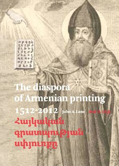
John A. Lane (b. 1955) is a type and printing historian. He was born and raised in the United States and has lived in Leiden (Holland) since 1990. He who often writes on typography:
| |
John M. Fiscella
| |
Cofounder of the Swiss type foundry ABC Litera together with Jost Hochuli and Roland Stieger. In 2018, he designed the soccer shirt font Gruenweiss for FC Sankt Gallen 1879. Creator with Roland Stieger of the sans typeface Alena, about which they write: It all started with the woodcut from Jost Hochuli, published in the year 1980. I found this woodcut in a bookshop around 1992 and was fascinated by it for many years. Until my interest in type design became so huge that I took it as a starting point to design an own typeface, a sans serif, called Alena, which builds on the shapes and proportions of this woodcut. Released in 2019 at Nouvelle Noire. [Google] [More] ⦿ | |
Yeghvard, Armenia-based designer of the Latin art deco typeface Karm (2019). [Google] [More] ⦿ | |
About 60 of the finest free Armenian fonts. [Google] [More] ⦿ | |
After graduation, he started freelancing as a graphic and type designer in Amsterdam. Partner at The Place. Other typefaces include The Chattam (2009, a Clarendon revival), Boujour (2008, an ultra fat deco face), Moudwi (2007, an experimental Arabic detached typeface inspired by the Unified typeface created by Nasri Khattar). His typefaces: Arek, Hagatir, Boujour (2008, piano key typeface), Mulsaq (2008, Arabic), Moudwi, Nuqat (2010: a dot matrix typeface by René Knip, Khajag Apelian, Jeroen van Erp, and Reza Abedini). Graphic Arabic (Wael Morcos and Khajag Apelian) won an award at Granshan 2017. IBM Plex Sans Arabic (2019, by Mike Abbink, Paul van der Laan, Pieter van Rosmalen, Wael Morcos and Khajak Apelian) is a free typeface family at Google Fonts. Typecache link. Behance link. [Google] [More] ⦿ | |
At AUA in Yerevan, Armenia, Kharatyan designed Armenian Rune (2017). [Google] [More] ⦿ | |
Laboratory of Digital Typography and Mathematical Software
|
About GFS Complutum, they write: The ancient Greek alphabet evolved during the millenium of the Byzantine era from majuscule to minuscule form and gradually incorporated a wide array of ligatures, flourishes and other decorative nuances which defined its extravagant cursive character. Until the late 15th century, typographers who had to deal with Greek text avoided emulating this complicated hand; instead they would use only the twenty four letters of the alphabet separately, often without accents and other diacritics. A celebrated example is the type cut and cast for the typesetting of the New Testament in the so-called Complutensian Polyglot Bible (1512), edited by the Greek scholar, Demetrios Doukas. The type was cut by Arnaldo Guillén de Brocar and the whole edition was a commision by cardinal Francisco Ximénez, in the University of Alcalá (Complutum), Spain. It is one of the best and most representative models of this early tradition in Greek typography which was revived in the early 20th century by the eminent bibliographer of the British Library, Richard Proctor. A font named Otter Greek was cut in 1903 and a book was printed using the new type. The original type had no capitals so Proctor added his own, which were rather large and ill-fitted. The early death of Proctor, the big size of the font and the different aesthetic notions of the time were the reasons that Otter Greek was destined to oblivion, as a curiosity. Greek Font Society incorporated Brocar's famous and distinctive type in the commemorative edition of Pindar's Odes for the Athens Olympics (2004) and the type with a new set of capitals, revived digitaly by George D. Matthiopoulos, is now available for general use. He also made GFS Solomos (2007) and GFS Baskerville (2007; note that several sites state that GFS Baskerville Classic is due to Sophia Kalaitzidou and George D. Matthiopoulos). In 2010, Tsolomitis published txfontsb, in which he added true small caps and Greek to the txfonts package. These fonts form a family called FreeSerifB, in type 1, that covers Latin, Greek, many Indic languages, Armenian, chess symbols, astrology, music, domino, and tens of other ranges of symbols. GFSNeohellenicMath was published in 2018: The font GFSNeohellenicMath was commissioned to the Greek Font Society (GFS) by the Graduate Studies program "Studies in Mathematics" of the Department of Mathematics of the University of the Aegean, located on the Samos island, Greece. The design copyright belongs to the main designer of GFS, George Matthiopoulos. The OpenType Math Table embedded in the font was developed by the Mathematics Professor Antonis Tsolomitis. The font is released under the latest OFL license, and it is available from the GFS site at http://www.greekfontsociety-gfs.gr. The font is an almost Sans Serif font and one of its main uses is for presentations, an area where (we believe) a commercial grade sans math font was not available up to now. In 2019, Tsolomitis released the free New Computer Modern package. An outgrowth of Knuth's Computer Modern, the fonts cover Latin and accented Latin letters and combinations, Greek (monotonic and polytonic), Hebrew, Cherokee and Cyrillic, and basically any possible math glyph. He writes in 2020: As far as the NewCMMath font is concerned, this is a derivative of lm-math with a huge amount of improvements and new glyphs. Currently the font should at least match STIX fonts in glyph coverage. [...] Finally, a long awaited feature, a Book weight for ComputerModern is added (math included). It produces slightly heavier output suitable for book production with high resolution printing. Further changes were added in 2021. [Google] [More] ⦿ |
ChicagoVD, GenevaVD, VDTimes, GenevaKirillika, KirillikaVD, FGenEllinika, Timellinik, Latinus, Haykakan. For East-European languages, Cyrillic, Greek, Armenian. Free. Link down. [Google] [More] ⦿ | |
Langustefonts
|
In 2013, Johannes Lang and Stefan Ellmer co-designed the free display typeface Brevier Viennese. It is based on a Victorian typeface called Viennese by the Fann Street Foundry from 1874. In 2014, Johannes Lang and Stefan Ellmer revived the frilly Victorian typeface Stencil Gothic [MyFonts link] originally designed by John West in 1885. In 2014, Stefan Ellmer and Johannes Lang cofounded Ellmer Stefan & Johannes Lang. Alternate URL. [Google] [MyFonts] [More] ⦿ |
Québec City-based creator (b. 1952) of the octagonal font Vegesignes (2009-2017, FontStruct). This font also appeared in 2010 at Open Font Library. It consists of almost 7,615 glyphs. Designed for: Afrikaans, Aghem, Akan, Albanian, German, Amharic, English, Western Apache, Arabic, Armenian, Asou, Assamese, Asturian, Azerbaijani, Bashkir, Bafia, Bambara, Low German, Lower Sorbian, Basque, Bassa, bemba, bena, Bengali, Belarusian, Burmese, Bodo, Bosnian, Breton, Bulgarian, Cape Verdean, Catalan, Cebuano, Chambala, Checha, Chicacha, Choctaw, Cisena, Cornish, Corsican, Mauritian Creole, Croatian, Danish, Diola-Fogny, Dogri, Douala, Dzongkha, Embou, Erzya, Spanish, Esperanto, Estonian, Ewe, Ewondo, Faroese, Filipino, Finnish, French, Friulian, West Frisian, Ga, Scottish Gaelic, Galician, Welsh, Ganda, Greek, Guarani, Gujarati, Gusii, Hausa, Upper Sorbian, Hawaiian, Hebrew, Hindi, Hungarian, Yakut, Ido, Igbo, Indonesian, Interlingua, Inuktitut, Irish, Icelandic, Italian, Javanese, jju, kabyle, kako, kalaallisut, kalendjin, kamba, kannada, kazakh, khmer, kiga, kikuyu, kinyarwanda, kyrgyz, kölsch, konkani, koyra chiini, koyraboro senni, kpellé, kurd, kurd sorani, kwasio, lakota, langi, Lao, Latvian, Lingala, Lithuanian, Lojban, Luba-katanga, Luo, Luxembourgish, Luyia, Maasai, Macedonian, Maïthili, makhuwa-meetto, makonde, malay, maldivian, malagasy, maltese, manipuri, manx, maori, mapuche, marathe, matchamé, mazanderani, meru, meta', mohawk, mongol, moundang, n'ko, nama, navajo, northern ndebele, Southern Ndebele, Dutch, Nepalese, Ngiemboon, Ngomba, Nkole, Norwegian Bokmål, Norwegian Nynorsk, Nuer, Occitan, Odia, Oromo, Ossetian, Uighur, Urdu, Uzbek, Pashto, Punjabi, Persian, Fulani, Nigerian Pidgin, Polish, Portuguese, Quechua, Romansh, Rombo, Romanian, Roundi, Russian, Rwa, Samburu, Northern Sami, Inari Sami, Samoan, Sango, Sangu, Sanskrit, Sardinian, Serbian, Shona, Sicilian, Sindhi, Slovak, Slovenian, Soga, Somali, Northern Sotho, Southern Sotho, Sundanese, Soureth, Swedish, Swiss German, Swahili, Swati, Tajik, Taita, Tamazight, Tamil, Taroko, Tasawaq, Tatar, Czech, Chechen, Chuvash, Telugu, Teso, Thai, Tibetan, Tigrigna, Tongan, Tsonga, Tswana, Turkish, Turkmen, Tyap, Ukrainian, Venda, Vietnamese, Vunjo, Walloon, Walser, Wolof, Xhosa, Yangben, Yiddish, Yoruba, Zarma, Zulu, Scripts: Arabic, Armenian, Bengali, Burmese, Korean, Cyrillic, Devanagari, Unknown script, Ethiopic, Gurmukhi, Greek, Gujarati, Hebrew, Japanese, Kannada, Khmer, Lao, Latin, N'ko, Nastaliq, Odia, Canadian Aboriginal syllabary unified, syriac, tamil, telugu, thai, thana, tibetan. Dafont link. Fontspace link. Vegesignes download. Home page. Aka Leaurend-Lavie-Hyppere (Laval) Chabon and as Joseph Rosaire Laval Frandey Leaurend Lavie Hyper Chabom. [Google] [More] ⦿ | |
Intro to the Georgian and Armenian alphabets. In French, by Jean-Christophe Loubet del Bayle. [Google] [More] ⦿ | |
J.-C. Loubet del Bayle sketches the development of Armenian and Georgian alphabets. [Google] [More] ⦿ | |
Letter Database
| Indrek Hein's online character database, based in Estonia. Invaluable data base of all unicode letters, with pictures! (Only the Asian languages are missing, but it is complete for all East-European languages, for example.) [Google] [More] ⦿ |
Armenian type designer. Her typeface LGSH Liana won an award at Granshan 2017. In 2021, she published LGSH Davit (a typeface family with didone roots; for Latin, Armenian and Cyrillic). [Google] [MyFonts] [More] ⦿ | |
Yerevan, Armenia-based designer of the paper-fold typeface TypE (2016) and the deco typeface Typo (2016). Home page. [Google] [More] ⦿ | |
Yerevan, Armenia-based designer of a decorative Latin display typeface in 2016. [Google] [More] ⦿ | |
Graphic designer in Yerevan, Armenia, who created an experimenal typeface in 2012. Behance link. [Google] [More] ⦿ | |
Yerevan, Armenia-based designer of an Armenian display typeface (2017). Behance link. Home page. [Google] [More] ⦿ | |
MacCampus
| Europe's largest independent foreign language font developer for the Macintosh, which is directed by Sebastian Kempgen from Germany. Fonts include: Western Languages (CoreFont series), Eastern Europe (CE-Font series), Cyrillic (Professional series: RomanCyrillic Pro, Ladoga Pro etc. (text fonts); DEsign fonts: Faktor, Inessa Cyr etc. (headline, handwriting); Olliffe Fonts: Batumi, Schechtel, Russian Open (display type; example: Mashinka); Scientific Cyrillic (includes old orthography, accents, old characters); Old Church Slavonic (Cyrillic and Glagolitic, Square and Round); Non-Slavic Cyrillic: Roman CyrTurk, Ladoga CyrTurk), Greek (Modern Greek and Classical Greek (Agora and Parmenides)), Icelandic&Faeroese (PolarFont series), Irish&Welsh (Gaelic, Celtic in the CeltoFont series), Romanian (DacoFont series), Turkish (TurkoFont series), BalkanFont series (Hungarian, Romanian, Turkish, Azerbaijani, Maltese), Basque (BaskoFont series), Saami (SamoFont series), Georgian, Armenian, Coptic (such as the Pachomius font), Cuneiform, Sabean, SinoFont series for Vietnamese plus more or Chinese (Pinyin) transliteration, phonetic Fonts (Trubetzkoy&Phonetica), Transliteration Fonts. Some of its fonts (like Campus Ten/Twelve and Magister Book) are now sold through Agfa/Monotype. Names of some fonts: Breitkopf Fraktur, Campus Sans, CampusRoman Pro, CampusSans Block, Dareios, Faktor, Glagol Pro, Inessa, Konkret, Kronstadt, Marib, Method, Moskva Pro, Parmenides, Polar, Retrograd, Saames, Tafelkreide, Tatlin, Thule, Trubetzkoy. [Google] [More] ⦿ |
Or Mane Arsh. Yerevan, Armenia-based designer of an Armenian display typeface in 2016. [Google] [More] ⦿ | |
Creator of PT Margarit Armenian and Asmik (1997, Armenian, based on PT Petersburg, 1992, by Vladimir Yefimov), available from ParaType, where he is an active type designer. These fonts won awards from the Type Directors Club in 1999. At ParaType, he also published Propisi Cyrillic + western (1997, a school script family), PT Henman Pictograms (2001, based on Armenian ornaments revived by Henrik Mnatsakanyan), Cooper BT (2000, a Cyrillic version of the Bistream family by the same name), Henman Western, Karolla Western (2002, art nouveau face, based on an alphabet of Lucian Bernhard, 1912), Zagolovochnaya Western (2002, based on a Caslon model from 1725), Haverj Western (2004, flared mini-serifed typeface with an f and a j ready for the paralympics), PT Margarit (1997, based on PT Bodoni by A. Tarbeev), Bardi (2004, Paratype, an extra compressed decorative stenciled typeface based on the lettering created in 1970s by the Armenian type designer Henrik Mnatsakanyan (1923-2001)), Haverj (2004, Paratype, also based on Mnatsakanyan's work), and PT Noah (1997, to accompany Tagir Safayev's PT FreeSet, 1992). Asmik, and Humanist 531 Cyrillic (the latter co-designed with Isay Slutsker) won awards at Bukvaraz 2001. In 2007, he designed the text and display family Susan (Paratype; award winner at Paratype K2009), which was named after his wife. Award winner at Granshan 2008. In 2010, he designed the Ripe Apricot humanist sans family (ParaType). Narevik (2011, Paratype) is a dynamic low contrast design with slightly rounded triangle serifs. In 2011, he created the free Google Web Font Marmelad, meant for headlines. Jacques Francois and Jacques Francois Shadow (2012, Cyreal) were co-designed with Alexei Vanyashin. They are revivals of the Enschedé no. 811 type specimen (ca. 1760) by Jacques François Rosart (1714-1774), made for Enschedé Printing House. Free at Google Web Fonts. Typefaces from 2013: Vaccine (a slab serif family, ParaType). This was followed in 2014 by the humanist Vaccine Sans (2014, with the help of Alexandra Korolkova and Gayaneh Bagdasaryan). In 2015, he made Levnam (ParaType), a sans with wide proportions for small text. In 2016, Alexander Lubovenko and Manvel Shmavonyan co-designed the 30-style Latin / Cyrillic workhorse sans typeface family Mediator, which was followed in 2017 by Mediator Serif. In 2018, Alexandra Korolkova and Manvel Shmavonyan designed Fact at Paratype. Fact is based on Frutiger. The fact type system contains 48 upright styles with variations in width and weight and eight italics of normal width. Vast (2021, Paratype) is a 56-style sans family, with three variable fonts, by Manvel Shmavonyan and Alexander Lubovenko. Choices are from thin to black and regular to extra wide. FontShop link. Catalog. MyFonts link. Klingspor link. [Google] [MyFonts] [More] ⦿ | |
| |
Armenian type designer. She won awards at Granshan 2016 for MAA Mary (Armenian category) and MAA Sergo (display typeface category). [Google] [More] ⦿ | |
Designer of a public domain Unicode font in 2005 called MPH 2B Damase. It can be found here. Created by Mark Williamson, it covers Armenian, Cherokee, Coptic (Bohairic subset), Cypriot Syllabary, Cyrillic (Russian and other Slavic languages), Deseret, Georgian (Asomtavruli and Nuskhuri but no Mkhedruli), Glagolitic, Gothic, Greek (including Coptic characters), Hebrew, Latin, Limbu, Linear B (partial coverage of ideograms and syllabary), Old Italic, Old Persian cuneiform, Osmanya, Phoenician, Shavian, Syloti Nagri (no conjuncts), Tai Le (no combining tone marks), Thaana, Tifinagh, Ugaritic, Vietnamese. See also here. The font is used by the popular Debian Linux software. Mark Williamson also designed a free fonts for Osmanya, Ugaritic and Shavian called Andagii (2003). His Penuturesu covers Linear B. Mark contributed to the GNU Freefont project, which used these ranges:
Dafont link. [Google] [More] ⦿ | |
Yerevan, Armenia-based designer of an Armenian display typeface in 2017. [Google] [More] ⦿ | |
Spanish Lecturer and Language Lab Director at the University of Tennessee in Chattanooga, TN. During his studies in Auburn, AL, Matthew Stephen Stuckwisch (b. 1985) who was working on an extension of the Berling family of fonts for other scripts, including Homeric Greek (polytonic), Golden Age Spanish, Old Church Slavonic, Anglo-Saxon, Vietnamese, and Armenian. See here. He also made the wonderful high-ascendered lively serif family Coruna (2007) and the accompanying Coruna Fraktur (2007). [Google] [More] ⦿ | |
Michael Everson
| |
He graduated from the Master of Arts in Typeface Design programme at the University of Reading, where he developed text typeface named Calouste with extensive support for the Latin and Armenian scripts. Calouste (2005) won an award at TDC2 2006. In April 2006, he joined Adobe's type development department. He had a hand in these Gerard Unger fonts in 2006, custom produced for the University of Reading: RdgSwift-Bold, RdgSwift-BoldItalic, RdgSwift-Italic, RdgSwift-Regular, RdgVesta-Bold, RdgVesta-BoldItalic, RdgVesta-Italic, RdgVesta. In 2013, he created the beautiful typeface Gothic Round (Hamilton Wood Type): After Hamilton bought out Page, Wells and Morgans & Wilcox, they briefly offered the various cuts from their former competitors before standardizing. In settling on which version would best inform this new digitization, designer Miguel Sousa of Adobe looked at specimens from the Newberry Library in Chicago as well as visiting and printing at the WNY Book Arts Center and of course the Hamilton Wood Type Museum to get a full immersion into this font project. Ultimately it was settled upon to use exemplars from multiple cuts to create a more pleasing hybrid. The Upper case was primarily based on the Heber Wells version, while the lower case referenced the Wm. Page version. Overall some of the most jarring quirks found in various versions were left out in favor of a solid type. [Google] [MyFonts] [More] ⦿ | |
Yerevan, Armenia-based designer of a floral all caps Armenian alphabet (2018). [Google] [More] ⦿ | |
Mike Arzoumanian
| |
Melbourne, Australia-based graphic designer. Creator of the Armenian typeface Mirella Marie (2013). Behance link. [Google] [More] ⦿ | |
Mitiya Masuda
| |
Monotype sells fonts for the following languages: Amharic, Aksara Kaganga, Arabic, Armenian, Balinese, Burmese, Cambodian, Chinese, Coptic, Devanagari (Hindi/Marathi/Nepali), Farsi, Georgian, Glagolitic, Gujerathi, Gurmukhi (Punjabi), Hebrew, Japanese, Javanese, Jawi, Kannada, Korean, Laotian, Lontarak, Malayalam, Old Bulgarian, Oriya, Pushto, Sindhi, Sinhalese, Surat Pustaha, Syriac, Tamil, Telugu, Thai, Urdu, Vietnamese. [Google] [More] ⦿ | |
Armenian fonts by Monotype: Aramian, Monotype Aramian Upright, Monotype Aramian Inclined, Barz, Nork. [Google] [More] ⦿ | |
Fonts by Ruben Tarumian: ArialAM, ArialAMBold, CourierAM, CourierAMBold. [Google] [More] ⦿ | |
Naujas Vytis
| Developer of a free family of Lithuanian didone fonts called Vytis (2005). These fonts are quite complete and cover Latin, Cyrillic and Armenian as well. Copyright rests with AKL: Atviras kodas Lietuvai, a Lithuanian Free Software Foundation. Earlier, Paulauskas made the brush typeface ForteU (1998, Klaipeda). [Google] [More] ⦿ |
Armenian font archive. Direct access. Included are: 1Arzo-Ani, 1Arzo-Ararat, ANAHID, ARAGATZ, ARMEN_-TT-Normal, Anguin-Regular, AprilArmenian, ArTarumianAfrickian, ArTarumianAnpuit, ArTarumianAnpuit, ArTarumianBakhum, ArTarumianBarak-Bold, ArTarumianErevan, ArTarumianGortsavar1-Bold, ArTarumianGovazd-Italic, ArTarumianGrig, ArTarumianGrqiNor, ArTarumianGrqiNor-Bold, ArTarumianGrqiNor-Bold-Italik, ArTarumianGrqiNor-Italic, ArTarumianHamagumar, ArTarumianHandes, ArTarumianHeghnar, ArTarumianIshxan, ArTarumianKamar, ArTarumianMHarvats, ArTarumianMatenagir, ArTarumianMatenagir-Bold, ArTarumianMatenagir-Bold-Italic, ArTarumianMatenagir-Italic, ArTarumianNorMatenagir, ArTarumianPastar, ArTarumianTimes-Bold-Italic, ArTarumianTimes-Bold, ArTarumianTimes-Italic, ArTarumianTimes, Dallak-Bold, Ararat, Arasan, Arax-Barab, Arax, Ardahan, Arial-Armenian, Arial-AM, Arial-AM-Bold, Arm-Times, ArmFixed, ArmModern, ArmNet-Courier, Arm-Scool, Arm-Scool-Bold, Arm-Scool-Bold-Italic, Arm-Scool-Italic, Armfrankenstein, Armmarigold, Armmatura, Armold, Armomega, Armumbrella, ArTarumianBarak, Courier-AM, Courier-AM-Bold, Dallak-Helv, Dallak-Title-Normal, Dallak-Helv, Dallak-Helv-Bold, Dallak-Time, Dallak-Time-Bold, Dallak-Time-Bold-Italic, Dallak-Time-Italic, Dallak-Title, Dallak-Title-Bold, HAYKNET-Bold-Italic, HAYKNET-Bold, HAYKNET-Italic, HAYKNET, HF-Barz-Normal, Hay-Helv, Hay-Helv-Bold, Hay-Times, Hay-Times-Bold, Hay-Times-Bold-Italic, Hay-Times-Italic, Hay-Title, Hay-Title-Bold, KAJAJ-NORMAL, Lucine-Italic, Lucine-Roman, MK-Goud-Armenian, MK-Ani-italic, MK-Helv-Armenian, MK-Helv-Armenian-Bold, MK-Times-Armenian, Maral-Regular, Masis, MasisNihar, MkCour, Mk_parzi, Mk_Parz, Nairi-Normal, Nork, Nork-New-Bold, Nork-New-Bold-Italic, Nork-New-Italic, Roupen, SHIRAZ-Normal, Sipan-Normal, Sovorakan-Italic, Tasagan-Italic, Times-Armenian, Times-Armenian, Arial-LatArm, Sassoun. [Google] [More] ⦿ | |
Neue Frutiger
|
In 2019, the Linotype team developed and released the single variable font Neue Frutiger Variable. [Google] [More] ⦿ |
| |
Nina Stössinger
| |
Norstandard is a new standard in the Armenian font encoding that works on both Mac and PC. A collection of Armenian truetype fonts using this standard can be had as part of a 75 USD package. By Windsor Productions, Pasadena, CA. [Google] [More] ⦿ | |
Noto Sans and Noto Serif cover Afar, Abkhazian, Afrikaans, Asturian, Avaric, Aymara, Azerbaijani-AZERBAIJAN, Bashkir, Bambara, Belarusian, Bulgarian, Bislama, Bini, Breton, Bosnian, Buriat, Catalan, Chechen, Chamorro, Mari (Russia), Corsican, Czech, Church Slavic, Chuvash, Welsh, Danish, German, Modern Greek (1453-), English, Esperanto, Spanish, Estonian, Basque, Finnish, Fijian, Faroese, French, Fulah, Friulian, Western Frisian, Irish, Scottish Gaelic, Galician, Guarani, Manx, Hausa, Hawaiian, Hiri Motu, Croatian, Hungarian, Interlingua (International Auxiliary Language Association), Igbo, Indonesian, Interlingue, Inupiaq, Ido, Icelandic, Italian, Kara-Kalpak, Kikuyu, Kazakh, Kalaallisut, Kurdish-ARMENIA, Kumyk, Komi, Cornish, Kirghiz, Latin, Luxembourgish, Lezghian, Lingala, Lithuanian, Latvian, Malagasy, Marshallese, Maori, Macedonian, mo, Maltese, Norwegian Bokmål, Low German, Dutch, Norwegian Nynorsk, Norwegian, South Ndebele, Pedi, Nyanja, Occitan (post 1500), Oromo, Ossetian, Polish, Portuguese, Romansh, Romanian, Russian, Yakut, Scots, Northern Sami, Selkup, sh, Shuswap, Slovak, Slovenian, Samoan, Southern Sami, Lule Sami, Inari Sami, Skolt Sami, Somali, Albanian, Serbian, Swati, Southern Sotho, Swedish, Swahili (macrolanguage), Tajik, Turkmen, Tagalog, Tswana, Tonga (Tonga Islands), Turkish, Tsonga, Tatar, Twi, Tuvinian, Ukrainian, Uzbek, Venda, Vietnamese, Volapük, Votic, Walloon, wen, Wolof, Xhosa, Yapese, Yoruba, Zulu, Akan, Aragonese, ber-dz, Crimean Tatar, Kashubian, Ewe, Fanti, Filipino, Upper Sorbian, Haitian, Herero, Javanese, Kabyle, Kuanyama, Kanuri, Kurdish-TURKEY, Kwambi, Ganda, Limburgan, Mongolian-MONGOLIA, Malay (macrolanguage), Nauru, Ndonga, Navajo, pap-an, Papiamento-ARUBA, Quechua, Rundi, Kinyarwanda, Sardinian, Sango, Shona, Sundanese, Tahitian, Zhuang. Non-Latin scrips include Noto Armenian, Noto Georgian, Noto Carian, Noto Greek, Noto Devanagari, Noto Ethiopic, Noto Glagolitic, Noto Hebrew, Noto Sans Imperial Aramaic, Noto Sans Lisu, Noto Sans Lycian, Noto Sans Lydian, Noto Sans Old South Arabian, Noto Sans Osmanya, Noto Sans Phoenician, Noto Sans Shavian, Noto Sans Tamil, Noto Sans Thai, Noto Serif Thai, Noto Sans Kannada, Noto Sana Telugu, Noto Sans Malayalam, Noto Sans Cherokee, Noto Sans Orya (for Odia), Noto Sans Bengali. Other typefaces in the package include Arima, , and Tinos. At CTAN, one can find Noto with full TeX support. At Open Font Library, one can download Noto Nastaliq Urdu (2014), which covers Arabic, Farsi, Pashto and Urdu. The fonts, as of October 2016: Noto Sans, Noto Serif, Noto Color Emoji, Noto Emoji, Noto Kufi Arabic, Noto Mono, Noto Naskh Arabic, Noto Nastaliq Urdu, Noto Sans Armenian, Noto Sans Avestan, Noto Sans Balinese, Noto Sans Bamum, Noto Sans Batak, Noto Sans Bengali, Noto Sans Brahmi, Noto Sans Buginese, Noto Sans Buhid, Noto Sans CJK JP, Noto Sans CJK KR, Noto Sans CJK SC, Noto Sans CJK TC, Noto Sans Canadian Aboriginal, Noto Sans Carian, Noto Sans Cham, Noto Sans Cherokee, Noto Sans Coptic, Noto Sans Cuneiform, Noto Sans Cypriot, Noto Sans Deseret, Noto Sans Devanagari, Noto Sans Egyptian Hieroglyphs, Noto Sans Ethiopic, Noto Sans Georgian, Noto Sans Glagolitic, Noto Sans Gothic, Noto Sans Gujarati, Noto Sans Gurmukhi, Noto Sans Hanunoo, Noto Sans Hebrew, Noto Sans HK, Noto Sans Imperial Aramaic, Noto Sans Inscriptional Pahlavi, Noto Sans Inscriptional Parthian, Noto Sans Javanese, Noto Sans Kaithi, Noto Sans Kannada, Noto Sans Kayah Li, Noto Sans Kharoshthi, Noto Sans Khmer, Noto Sans Lao, Noto Sans Lepcha, Noto Sans Limbu, Noto Sans Linear B, Noto Sans Lisu, Noto Sans Lycian, Noto Sans Lydian, Noto Sans Malayalam, Noto Sans Mandaic, Noto Sans Meetei Mayek, Noto Sans Mongolian, Noto Sans Myanmar, Noto Sans NKo, Noto Sans New Tai Lue, Noto Sans Ogham, Noto Sans Ol Chiki, Noto Sans Old Italic, Noto Sans Old Persian, Noto Sans Old South Arabian, Noto Sans Old Turkic, Noto Sans Oriya, Noto Sans Osmanya, Noto Sans Phags Pa, Noto Sans Phoenician, Noto Sans Rejang, Noto Sans Runic, Noto Sans Samaritan, Noto Sans Saurashtra, Noto Sans Shavian, Noto Sans Sinhala, Noto Sans Sundanese, Noto Sans Syloti Nagri, Noto Sans Symbols, Noto Sans Syriac Eastern, Noto Sans Syriac Estrangela, Noto Sans Syriac Western, Noto Sans Tagalog, Noto Sans Tagbanwa, Noto Sans Tai Le, Noto Sans Tai Tham, Noto Sans Tai Viet, Noto Sans Tamil, Noto Sans Telugu, Noto Sans Thaana, Noto Sans Thai, Noto Sans Tibetan, Noto Sans Tifinagh, Noto Sans Ugaritic, Noto Sans Vai, Noto Sans Yi, Noto Serif Armenian, Noto Serif Bengali, Noto Serif Devanagari, Noto Serif Georgian, Noto Serif Gujarati, Noto Serif Kannada, Noto Serif Khmer, Noto Serif Lao, Noto Serif Malayalam, Noto Serif Tamil, Noto Serif Telugu, Noto Serif Thai. Late additions include Noto Sans and Serif for Chinese, Japanese and Korean, developed at Adobe. In 2015, Adam Twardoch placed the Noto fonts on Github under the name Toto Fonts. A question of licenses. Github repositories. Open Font Library link. CTAN link. [Google]
[More] ⦿
| |
Armenian designer of the Armenian font Ins Gor (ca. 2013), which won an award at Granshan 2014. [Google] [More] ⦿ | |
Free Armenian fonts: RAGATZ, ARARAT, HF BARZ NORMAL, DALLAK BOLD, KAJAJ NORMAL, MARAL REGULAR, NAIRI NORMAL, NORK, SIPAN NORMAL. [Google] [More] ⦿ | |
Pablo Saratxaga's archive with about 20 display fonts, and fonts for Vietnamese, Armenian, Georgian, Thai, Indic and dingbats. Just the Armenian subarchive has these fonts, mostly by Ruben Tarumian, dated 1994: ArTarumianAfrickian, ArTarumianAnpuit, ArTarumianBakhum, ArTarumianBarak-Bold, ArTarumianBarak, ArTarumianErevan, ArTarumianGovazd-Italic, ArTarumianGrig, ArTarumianGrqiNor-Bold-Italik, ArTarumianGrqiNor-Bold, ArTarumianGrqiNor-Italic, ArTarumianGrqiNor, ArTarumianHamagumar, ArTarumianHandes, ArTarumianHeghnar, ArTarumianIshxan, ArTarumianKamar, ArTarumianMHarvats, ArTarumianMatenagir-Bold-Italic, ArTarumianMatenagir-Bold, ArTarumianMatenagir-Italic, ArTarumianMatenagir, ArTarumianNorMatenagir, ArTarumianPastar, ArmNet-Helvetica. [Google] [More] ⦿ | |
Paul James Miller
| |
Designer at MacCampus of various Armenian fonts such as Mesrop (2010) and Sajat Nova Armenian (2010). [Google] [More] ⦿ | |
Phil Chastney
| |
PJM Homebrew Fonts
|
Fontsquirrel link. Devian Tart link. Localfonts link. Wordpress link. Fontsquirrel link. [Google] [More] ⦿ |
Pomegranate Fonts
| Pomegranate fonts is a joint venture between Edik Ghabuzyyan (Yerevan, Armenia) and Carolyn Puzzovio (b. Yorkshire, UK), intended to produce a number of Armenian / Latin typefaces. Carolyn is a lecturer at the University of Lincoln, UK, and a practising graphic designer. At AtypI 2005 in Helsinki, she spoke on Mesrob & Yacob: The story of the Armenian alphabet. In 2007, she created an Armenian font, Lagoon, which was based on a Venetian model from 1810. She won an award for Armenian type design at Granshan 2008. Since then, she is a regular member of the Granshan competition jury. Part of her research has been to trace the forms of Armenian types cut by the renaissance and later punchcutters in Europe. Carolyn plans to design further OpenType typefaces which feature both Latin and Armenian glyphs and are inspired by historical models. At ATypI 2010 in Dublin, she spoke about Armenian typography. The font list at Pomegranate as of 2010: Lagoon, Davit, Avandakan, Brayford, Hayk, Kantegh, Khoragir, Vosdekar, Tigran. [Google] [MyFonts] [More] ⦿ |
Production First Software
| Production First Software offers edriginal, revival and historic designs and specializing in non-latin scripts including Armenian, Cyrillic, Greek, Hebrew, Thai, mathematical symbols and pi characters. It is run by John M. Fiscella in San Francisco since 1990, with most typefaces created immediately after that. John M. Fiscella designed the fonts for symbols and many of the alphabetic scripts for the unicode charts and all typefaces complky with unicode standards. List of typefaces: BernalPF, Blck2LineGothicPF Logo, Blck3LineGothicPF Logo, Blck4LineGothicPF Logo, CourPF, CourPF Bold, CourPF BoldOblique, CourPF Oblique, EdwardianMansePFTitling, EriePF, EuroPF-Bold, EuroPF-BoldOblique, FiftiesPopPF, GrandVictorianPFTitling, HlvPF Bold, HlvPF BoldOblique, HlvPF Medium, HlvPF Oblique, ItalianatePF, ItalianateMulticolor1PF, ItalianateMulticolor2PF, ItalianateMulticolor3PF, ItalianateSansPF, LafayettePF, LosPFBold, MisionPFAntique, MisionPFBold, MisionPFBook, MisionPFBookMetal, MisionPFLight, MisionPFTitling, PalouPFTitling, PiazzaPFScript, RadioPF, RadioCityPF, SymbolPF Bold, SymbolPF BoldItalic, SymbolPF Italic, TexMexPF, TmsPF Bold, TmsPF BoldItalic, TmsPF Cursive, TmsPF Italic, TmsPF Rom +, TmsMathPF Cursive, TmsHebWidePF Rom, UnvPF Bold, UnvPF BoldOblique, UnvPF Oblique, UnvPF Medium, UviewPF Bold, UviewPF BoldOblique, UviewPF Oblique, UviewPF Medium, ZenonPFTitling. [Google] [MyFonts] [More] ⦿ |
Protimient.com
|
His typefaces:
View Ben Jones's typefaces. [Google] [MyFonts] [More] ⦿ |
Raffi Kojian
| |
Roberto Teixeira
| |
His typefaces include ArTarumianAnpuit (Rage Italic extension, I guess), ArTarumianBakhum, ArTarumianBarak (really BernhardFashionBT), ArTarumianErevan, ArTarumianGovazdItalic, ArTarumianGrig, ArTarumianHamagumar, ArTarumianKamar, ArTarumianPastar, ArTarumianAfrickian, ArTarumianAnpuit, ArTarumianGrqiNor, ArTarumianGrqiNorBold, ArTarumianGrqiNorBoldItalik, ArTarumianGrqiNorItalic, ArTarumianHeghnar, ArTarumianMHarvats, ArTarumian Ishkhan (for Latin and Cyrillic), ArTarumianMatenagir, ArTarumianMatenagirBold, ArTarumianMatenagirBoldItalic, ArTarumianMatenagirItalic, ArTarumianNorMatenagir. These fonts from 1994-1995 are Armenian generalizations of Latin fonts. Arian was created in 2007. In 2019, he published ArTarumianKhachatur (a fantastic architectural drafting or blueprint font) and ArTarumianVard (a lapidary or stone-carving font). Typefaces from 2020: Ar Tarumian Behrens Initialen (a revival of the art nouveau typeface Behrens Initialen by Peter Behrens; for latin, Cyrillic and Armenian), ArTarumianGrigNor (a comic book font). [Google] [MyFonts] [More] ⦿ | |
Armenian cleric (361-440) who devised the 38-character Armenian alphabet in 405 AD. It is a phonetic alphabet that was adopted in 406 AD by an edict of the Armenian King. Mashtots used various scripts as models, including Greek, Syriac, and Aramaic. Most letters have remained unchanged since then. [Google] [More] ⦿ | |
Sam Stepanyan created a set of Armenian sans serif glyphs visually compatible with Helvetica or Arial. He contributed the Armenian range (U+0530-U+058F) to the GNU Freefont project. [Google] [More] ⦿ | |
Yerevan, Armenia-based designer of the well-integrated Latin / Cyrillic / Armenian typeface family AYB (2017). Behance link. [Google] [More] ⦿ | |
Sebastian Kempgen
| |
Developer in 1999 of an Armenian font package for TEX and Armenian metafonts. Co-developers: A. Dalalyan and V. Hakobian. The "artmr" metafont family was converted from the TrueType font family "ArTarumianTimes" made by Ruben Hakobian. The sans serif "arssr" metafont family was converted from the PostScript font "Sassoun", which was originally created and released as "Sassoun" (1994) by Raffi Kojian. Yet another source. [Google] [More] ⦿ | |
Serguei Dachian
| |
Sevag B. Martouni
| |
Armenian graphic designer. In 2019, he designed the Armenian typeface ZSHA. [Google] [More] ⦿ | |
Yerevan, Armenia-based designer of an Armenian typeface (2013). [Google] [More] ⦿ | |
In the late 1990s, SSi used to sell foreign fonts for Arabic, Urdu, Greek, Hebrew, Armenian, Baltic, Burmese, Cherokee, Cyrillic, Cree, Simplified Chinese, Ethiopian, Inuktitut, Gaelic, IPA, Japanese, Korean, Laotian, Mayan. Farsi, Punjabi, Sanskrit, Syriac, South Arabian, Tamil, Thai, Tibetan, Turkish, Ugaritic, and Vietnamese. Plus musical dingbats. Of course, they did not make a single of these fonts themselves. [Google] [More] ⦿ | |
Stepan Roh
| |
Steve White
| |
Studio Sun (or: Sun Brand Co)
|
In 2016, she co-founded Spencer and Sons with Gilang Purnama Jaya. In 2017, she started Studio Sun in Denpasar, Bali. In 2016, Cahyan published June of Fortune, the free hipster typeface family Soda Popp and writes: The new typeface called Soda Popp is inspired by pop-culture, vaporwave music, and seapunk that emerged in the early 2010s among Internet communities. It is characterized by a nostalgic fascination with retro cultural aesthetics, typically of the 1980s, 1990s, and early-mid 2000s. Typefaces from 2017 at Spencer and Sons: S&S Nickson (a copperplate display font including eight font styles and seven dingbat fonts). In 2018, she published the retro auto racing font Intensa, the extended sans typeface Matrice, and the free flared poster typeface Florent. Typefaces from 2019: Alathena (a decorative Victorian and Arts & Crafts typeface family), Rustob Club (a variable font), Tropiline, Matahari Sans (a large family that includes Matahari Sans Mono). Typefaces from 2020: Rachee (a 6-style renaissance text font), Klose Slab (an ultra-fat variable font), Gulfs Display (a 6-width ultra bold cartoon font family), Gliker (an extraordinary comic book font family; a new take on the Hobo typeface), Radiate Sans (40 styles), Balgin (a large display family that celebrates the 1990s), Brice Pop (a sixties display style; with Syarif Hafidh). Typefaces from 2021: Bethari (a 6-style art deco typeface, including a blackboard bold outline style). Typefaces from 2022: Fragmatika (a 9-style a geometric sans serif typeface with support for Latin, Cyrillic, Greek, Arabic, Armenian, Georgian, Hebrew and Thai). [Google] [MyFonts] [More] ⦿ |
Sun-ExtA and Sun-ExtB are two full free Unicode fonts, covering everything under the sun. Inside, we find information that these fonts were made by Beijing ZhongYi Electronics Co. [Google] [More] ⦿ | |
At American University of Armenia in Yerevan, Armenia, Svetlana Petrosyan designed the Harry Potter font 1997 Potteric (2015). [Google] [More] ⦿ | |
Systema 81
| Systema 21 is a free Unicode sans font for European languages, Japanese, Armenian and Cyrillic, made on the basis of Konatu by Mitiya Musuda for the M+ Project. [Google] [More] ⦿ |
Armenian type designer. Her typeface SGH Sepftar won an award at Granshan 2017. [Google] [More] ⦿ | |
Armenian type designer. She won an award at Granshan 2016 for SHK An (Armenian category). [Google] [More] ⦿ | |
Sydney, Australia-based designer of the deco typeface Hye Horizon (2015) that takes clues from Armenian. [Google] [More] ⦿ | |
Tatevik Aghababyan
| |
Tatssachen
| Tatevik Aghababyan is an Armenian designer who lives and works in Frankfurt, where she is the main person at the studio Tatssachen. She designed these typefaces: Fedra Sans Armenian (with Peter Bilak; Third Prize at Granshan 2010 for Armenian text types), Elien (an experiental modular family), Glueziffer (2010; a Treefrog-style scratchy hand family), Arpi (2007; sans Armenian unicode face). Elien (2009, 26plus) is a monospace typeface inspired by bike chains and dot matrix ideas. [Google] [More] ⦿ |
Run by Hagop Gulludjian, this project/site offers free Armenian fonts for Mac, PC and UNIX: 23 typefaces by Ruben Tarumian (Anpuit, Bakhum, Barak, Erevan, Africkian, Govazd, Grig, Grqi Nor, Hamagumar, Harvats, heghnar, Nor Matenagir, Ishxan, Kamar, Matenagir, Pastar), Pavel Dallakian's fonts (Dallak Times and Helvetica), ArmNetCourier, ArmHelvetica, Sovorakan by A.&P.Topouzkhanian, converted by A. Asatoo, Arackel Ketchian's fonts (Hay Times and Helvetica), Mkrtich Karapetian's fonts (Ani, Courier, GoudyArm, Helv and Barz), Times Armenian and Arial Armenian by Monotype. Direct access. [Google] [More] ⦿ | |
The MicroFoundry
| From the Center for Digital Innovation at UCLA, Hrant Papazian designs and works with type, and is a specialist of Armenian. He has even done multiple master fonts for Armenian. Born in 1968 in Beirut, Hrant specializes in Armenian fonts and legibility issues in general. Designer of Linotype Maral. Founder of The Microfoundry, where he practices type design for Latin, Arabic, Cyrillic, Hebrew, Armenian and Georgian. The company is located in Glendale, CA. Latin typefaces: Harrier, TMF Daam (with sub-version Domination, Brutaal and Cristaal, all useful as dungeon typefaces), TMF Paphos, TMF Patria (serif). Armernian fonts: Linotype Maral, TMF Arasan (see here for a download), TMF Roupen. Georgian: TMF Akhalkalak. Other fonts: Brutaal, Cristaal, Trajic NotRoman (unpublished, a destructured version of Trajan, submitted to and rejected by Emigre), and DominationAvailable. In 2004, he joined Ultra Pixel Fonts, where he made the pixel typeface Mana. An entertaining speaker and all-round type boulevardier, he will be remembered for many of his insightful and entertaining quotes. He invented the word Helvomita, and once replied this to a poster: I will now Fartura in your general direction. Bio at MyFonts.com. Bio at Linotype. Bio at ATypI. Interview by Daidala. He won an award at Granshan 2008. Speaker at ATypI 2009 in Mexico City. FontShop link. Speaker at ATypI 2010 in Dublin. [Google] [MyFonts] [More] ⦿ |
Thomas T. Pedersen
| |
Yerevan, Armenia-based designer of a squarish outlined Armenian typeface in 2016. [Google] [More] ⦿ | |
Tofutype
|
In 2018, he addded the calligraphic oriental emulation font Goalthink and the modular typeface CubeFarm Latin (to accompany his Chinese font CubeFarm). Typefaces from 2019: Typori (a rounded sans). Dafont link. Behance link. Home page. [Google] [More] ⦿ |
| |
Transliteration of Non-Roman Alphabets
| From Copenhagen and Estonia, Thomas T. Pedersen's page on non-Roman alphabets. He specializes in all kinds of Cyrillic alphabets, such as Abaza, Abkhaz, Adyghe, Altay, Arabic, Armenian, Avar, Azerbaijani, Bashkir, Belarusian (Belorussian), Bulgarian, Buryat, Chechen, Chukchi, Chuvash, Crimean Tatar, Dargwa (Dargin), Dungan, Erzya Mordvin (Mordva), Eskimo - Yupik, Even, Evenki, Gagauz, Georgian, Greek, Hindi, Marathi, Nepali, Ingush, Kabardian, Kalmyk, Karachay-Balkar, Karakalpak, Kazakh, Khakass, Khanty, Kirghiz, Komi (Komi Zyryan), Komi-Permyak, Koryak, Kumyk, Lakh, Lezgian (Lezgin), Macedonian, Mansi, Mari: Hill Mari, Meadow Mari, Moksha Mordvin (Mordva), Moldovan (Moldavian), Nanai, Nenets, Nivkh, Nogay (Noghay), Ossetian (Ossetic), Ottoman Turkish, Russian, Rusyn (Lemko&Vojvodinian), Selkup, Serbian, Tabasaran, Tajik, Talysh, Tatar, Turkmen, Tuvinian, Udmurt, Ukrainian, Uzbek, Yakut, Yiddish. [Google] [More] ⦿ |
Typeaffair
| |
Tzu-yuan "Erik" Yin
| |
Tamagotchi, or Umbreon 126, made several fonts with the aid of FontStruct in 2012 and 2013. These include pixel typefaces (FS Rebellion, FS Rept, FS Comic Mono, FS Flower Shop, FS 126 Serif), but also truly large workhorse typefaces. For example, FS 126 Sans (a pixel sans face) has 4871 characters and covers Nko, Lisu, Armenian, Tai Le, Ogham, Thaana, Georgian, Coptic, Kayah Li, Tifinagh, Samaritan, and Lao. The 3114 glyph pixel typeface FS Semioriginal covers Hiragana, Katakana, Arabic, Armenian, Hebrew, Bopomofo, Georgian, Greek, and Cyrillic. The 2000+ glyph pixel typeface FS Unoriginal covers Hiragana, Katakana, Arabic, Armenian, Hebrew, Bopomofo and Tifinagh. Other typefaces include FS Fat Piano, FS Typ Stencil (piano key face), FS Frakletter (blackletter) and FS Stupid Me (white on black typeface). [Google] [More] ⦿ | |
Type 1 and truetype fonts for Armenian by Ruben Tarumian: ArialArmenGarBold, ArialArmenGarItalic, ArialArmenGar, ArmoldGar, ArTarGrqiNorGarBold, ArTarGrqiNorGarItalic, ArTarGrqiNorGar, ArTarumianMatenagirGarBold, ArTarumianMatenagirGarItalic, ArTarumianMatenagirGar, ArTarumianTimesGarBold, ArTarumianTimesGarItalic, ArTarumianTimesGar. And the Cyrillic fonts by Garkavets (2000): BookmanUrumBold, BookmanUrumItalic, BookmanUrum. Plus QypchakDiacriticBoldItalic (has characters and ligatures, used in "Codex Cumanicus" and Qypchaq written monuments XIII-XIV centuries, also made by Garkavets, 2000), QypchakDiacriticBold, QypchakDiacriticItalic, QypchakDiacritic. From ParaGraph, the Cyrillic fonts SchoolBookAC-Regular, SchoolBookAC-Italic, SchoolBookAC-Bold, SchoolBookAC-BoldItalic. From Garkavets, the Cyrillic fonts TimesUrumNewBold, TimesUrumNewBold-Italic, TimesUrumNewItalic, TimesUrumNewNormal. By Ralph Hancock, the Greek font VusillusOldFaceItalic. And finally, from Adobe, the Turkish fonts TmsRoman, TmsRomanBold, TmsRomanBoldItalic, TmsRomanItalic. Direct access. [Google] [More] ⦿ | |
Unicode Fonts for Ancient Scripts
|
Since George permits redistribution, I am offering his work for download here. [Google] [More] ⦿ |
Between 2005 and 2020, URW developed first URW Nimbus Sans---their take on max Miedinger's Helvetica---and later URW Nimbus Sans Global that covers all major scripts: Latin, Greek, Cyrillic, Hebrew, Arabic (+Pashtu, +Urdu), Chinese, Japanese, Korean, and Armenian. Each of the seven styles has 65,000 glyphs and costs 2320 Euros (about 2500 dollars) per style. [Google] [More] ⦿ | |
Graphic designer in Yerevan, Armenia, who created the Latin / Armenian sans typeface AVM Vahagn in 2020. [Google] [More] ⦿ | |
Armenian type designer. His typeface Avm Vahagn won an award at Granshan 2017. [Google] [More] ⦿ | |
Yerevan, Armenia-based designer of Porsche Armenian (2016). [Google] [More] ⦿ | |
Art director in Yerevan, Armenia, who created an experimental Armenian alphabet in 2017. [Google] [More] ⦿ | |
Armenian designer of the VAZ Tatevik typeface, which won an award at Granshan 2014. [Google] [More] ⦿ | |
Yerevan, Armenia-based designer of the cutting knife typeface Hrat (2018) and the outlined typeface Yerkatagir (2018). [Google] [More] ⦿ | |
Vasil Stanev
| |
Yerevan, Armenia-based designer of a calligraphic display typeface for Latin in 2015. [Google] [More] ⦿ | |
At TypeArt 01, he won first prize with Varbur Grotesque (1999-2001, with Natalia Makeyeva), third prize with Joker (1970-2000), and honorable mention with Abetka. At TypeArt 05, he received awards for UniOpt (2002, Kafkaeqsue Op Art display style) and Blooming Meadow (dingbats). In 2009, his 2006 digitization of Anatoly Shchukin's 1968 typeface Ladoga (+Text, +Display, +Ladoga Armenian) won an award at Paratype K2009. In 2016, Henadij Zarechnjuk and Viktor Kharyk designed Dnipro for Apostrof. The Cyrillic version of this font follows Ukrainian decorative traditions, initiated by Georgy Narbut and Mark Kirnarsky in the 1920s and continued until the 1980s. The Latin part has an uncial character. Typefaces made in 2018: Algor, Zluka (with Henadij Zarechnjuk; named after The Act Zluka, or Ukraine's Unification Act of 1919), XX Sans, Yurch (developed by Henadij Zarechnjuk and Viktor Kharyk by samples of calligraphic lettering by Ukrainian book designer Volodymyr Yurchyshyn), heb? [Google] [MyFonts] [More] ⦿ | |
VSF (or: Vasil Stanev Foundry)
|
In 2010, he made the ornamental all caps Cyrillic typeface Orthodox. In 2011, he created the ornamental caps typeface Floralis (which was finished by Svetoslav Simov) and the experimental typeface Negativ. In 2012, he made Times New Roman Sans Serif. Nexa Rust is a set of 83 weathered letterpress emulation fonts that evolved from Nexa and Nexa Slab. This was a project by Radomir Tinkov, Ani Petrova, Svetoslav Simov and Vasil Stanev. In 2016 and 2017, he designed the mythological typefaces Bugazoo Letterbat and Etymonster, respectively. Typefaces from 2017: Combax (rounded sans), Tengwar Sindarin Latin and Cyrillic, Hel Grotesk Gothiq Cyr (a cyrillization of Kevin Yuen Kit Lo's Hel Grotesk), Celtic Cyr, Jardin Ornatis (decorated caps). Typefaces from 2018: Crona, Etymonster (a letterbat font), Mistnake (Halloween dingbats), Ergam, Cloch, Ufont (an aliens font), Needlephabet, Ornatis (a floriated caps alphabet for Latin, Cyrillic, Armenian and Hebrew). Typefaces from 2019: TDR (a heavy octagonal / mechanical typeface), Talljob, Moxic, Allebagra, Beejuice, Beltenebros, Pepo The Clown, Plump Fiction, Spartechno. Typefaces from 2020: Coque (a tall extra compressed font family). [Google] [MyFonts] [More] ⦿ |
Yerevan, Armenia-based designer of an Armenian alphabet in 2016. [Google] [More] ⦿ | |
Yannis Haralambous and John Plaice are the authors of Omega typesetting system, which is an extension of TeX. Its first release, aims primarily at improving TeX's multilingual abilities. In Omega all characters and pointers into data-structures are 16-bit wide, instead of 8-bit, thereby eliminating many of the trivial limitations of TeX. Omega also allows multiple input and output character sets, and uses programmable filters to translate from one encoding to another, to perform contextual analysis, etc. Internally, Omega uses the universal 16-bit Unicode standard character set, based on ISO-10646. These improvements not only make it a lot easier for TeX users to cope with multiple or complex languages, like Arabic, Indic, Khmer, Chinese, Japanese or Korean, in one document, but will also form the basis for future developments in other areas, such as native color support and hypertext features. ... Fonts for UT1 (omlgc family) and UT2 (omah family) are under development: these fonts are in PostScript format and visually close to Times and Helvetica font families. Author of From Unicode to Typography, a Case Study the Greek Script, an informatice article written in 1999. Active participant in the GNU Freefont project. With John Plaice, he contributed to these Unicode ranges:
| |
Yerevan, Armenia-based designer of the free handcrafted Armenian typeface Dzeragir (2016). Behance link. [Google] [More] ⦿ |
 Graphic designer in Yerevan, Armenia. Creator of the circle and arc-based Latin typeface KPS (2014). Aka Allergic Designer. [
 Karlsruhe-based software developer. Creator of the large (and free) Unicode font
 Armenian type designer who won an award at Granshan 2009 for her Armenian typeface
  Graphic designer and illustrator in Yerevan, Armenia. Creator of a
  [
[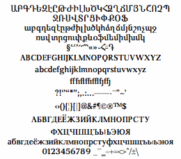 Armenian type designer at the State Academy of Art. At Granshan 2009, he won an award for his Armenian font
 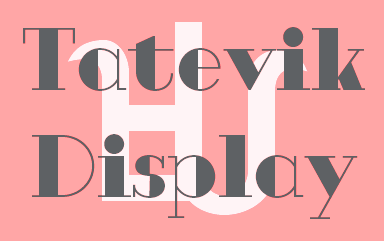 Head of the Department of Creating and Keeping Armenian fonts of the National Book Chamber in Yerevan, Armenia. Edik Ghabuzyan (b. 1952) has been creating Armenian computer fonts since about 1988---a total of about 300 digital fonts. In 1997, one of his fonts won the Best Font prize in HiArt Armenian Fonts competition. In 2005, his Vernatun and ArmTimesST fonts were awarded the main prizes and the Titghosagir the first prize in Mashtots-1600 Electronic Fonts competition. In 2006, several of his fonts won the main prizes in Armenian Schoolbook Fonts competition. He has designed Armenian letters in Unicode and later Latin, Cyrillic and Greek letters, preserving a uniform style /across the spectrum. Today, Edik Ghabuzyan works at the National Book Chamber of Armenia as the head of the section of Saving and Creating Armenian Fonts. He won several awards at
  [
[ [
[ Claire Agopian graduated in 2007 from
  Canadian type designer. His typefaces:
  Czech designer (b. Brno) who graduated with a Masters in Informatics at the Masaryk University in Brno in 2005, spent a term at the Denmark's Designskole in Copenhagen in 2004 and graduated with distinction from the MA in Typeface Design at the
  Brazilian designer of the retro display typeface
  Peruvian creator (b. 1984, Arequipa, Peru) at
  Russian type foundry, est. 2014 by Dmitry Goloub, the Moscow-based codesigner with Lucas Perdidaão of the
 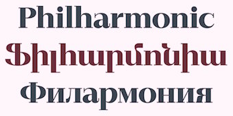 [
[ [
[ The GNU Freefont is continuously being updated to become a large useful Unicode monster. GNU FreeFont is a free family of scalable outline fonts, suitable for general use on computers and for desktop publishing. It is Unicode-encoded for compatability with all modern operating systems. There are serif, Sans and Mono subfamilies. Also called the "Free UCS Outline Fonts", this project is part of the larger Free Software Foundation. The original head honcho was
  Type and graphic designer from Armenia who graduated first from the University of Colorado in Boulder (2012) and later from the
  The Ministry of Culture of the Republic of Armenia and the Typographic Society Munich (tgm --- Typographische Gesellschaft München) organized Granshan 2010, The 3rd International Eastern Type Design Competition, which was created especially for Armenian, Cyrillic and Greek fonts. Edik Ghabuzyan and Boris Kochan were the big bosses. The jury consisted of Gerry Leonidas, Oliver Linke, Hrant Papazian, Carolyn Puzzovio and Manvel Shmavonyan. The outcome:
  Non-Latin typeface competition in these categories, held in 2017: Armenian, Arabic, Chinese, Cyrillic, Greek, Hebrew, Indic, Thai, Korean, and display typefaces. Chairmen of the jury are Edik Ghabuzyan (Head of Department of Creating and Keeping Armenian Fonts at the National Book Chamber of Armenia, consultant for Adobe Systems, Armenia) and Boris Kochan (CEO of Kochan & Partner, and Past President of tgm Typographische Gesellschaft München). The jury: Gerry Leonidas (UK), Chang Sik Kim (USA), and these specialists: (for Armenian) Vahan Balasanyan, Garegin Martirosyan, Ruben Malayan, (for Arabic) Bahia Shehab, (for Chinese) Min Wang, Curt Huang, Zhiwei Zhu, Keith Tam, (for Greek) Klimis Mastoridis, Irene Vlachou, (for Hebrew) Liron Lavi, Anat Katzir, (for South Asian scripts) Ravi Pooviah, Rathna Ramanathan, Graham Shaw, (for Korean) Joo Sung Kim, Jeong-mi Yu, Seong Jae Song.
  [
[ Swiss-born
  Freelance graphic designer from Lebanon. Born in Sharjah, UAE, an Armenian with a Lebanese nationality. Graduate of the
  The Department of Mathematics of the University of the Aegean (Samos, Greece) has established a laboratory on Digital Typography and Mathematical Software in 2006. It supports the Greek language with respect to the TeX typesetting system and its derivatives. Antonis Tsolomitis (who lives in Karlovassi, Samos, and is a professor of Mathematics at that university) writes: After the support for Greek was added by A. Syropoulos and the first complete Greek Metafont font was presented by Claudio Beccari there was an obvious need, to be able to use a scalable Greek font with LaTeX. With this in mind, we developed the first Greek fontfamily in Type1 format with complete LaTeX support, called "Kerkis". Their Greek font
  Johannes Lang (Langustefonts) is a graduate of the
 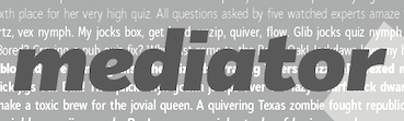 Moscow-based Armenian type designer (b. 1960, Artashat, Armenia) and graphic artist. In 1984 graduated from the Moscow Poligraphic Institute, department of Polygraphic Product Design. He worked for the Type Department of Committee of Print in Yerevan, and for the publishing houses Ayastan, Luys and Sovetakan Grokh. At Microsoft's request, in 1999, he was consulted for the Armenian section of the Sylfaen project.
  Armenian type designer who won an award at Granshan 2009 for her Armenian typeface
 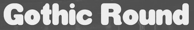 Miguel Sousa is a Portuguese graphic designer with a big interest in Typography and Typeface Design. After completing his five-year degree in Technology and Graphic Arts from the Instituto Politécnico de Tomar in 2002, he worked for the children's books publisher O Bichinho de Conto for one year, as a graphic designer, typographic designer, book designer, web designer and web developer. Before going to Reading he also worked in MBV Design as a graphic designer, web designer and web programmer.
  Neue Frutiger was developed by Akira Kobayashi and the Monotype (ex-Linotype) Design Team, in 2018. An outgrowth of Adrian Frutiger's successful Frutiger font, this wayfinding family was split by Monotype into several packages:
  The Linotype Design team released Neue Helvetica World in 2017. It covers the pan-European area (extended Latin alphabet, Cyrillic and Greek) as well as Arabic, Hebrew, Armenian, Georgian, Thai and Vietnamese. Each font has about 1700 glyphs. Back in 1983, D. Stempel AG redesigned Miedinger's Helvetica typeface and created a digital version. Neue Helvetica World has six additional styles including Arabic, Georgian and a specially-designed Hebrew version. For pairing with languages further afield, Monotype / Linotype recommend these typefaces: Saral Devanagari (for devanagari),
  A large free font family released under the Apache license at Google Web Fonts, and developed by Monotype's Steve Matteson and a team of type designers. Designed between 2012 and 2016, this typeface covers over 800 languages and 100 writing scripts.
  Sheffield, UK-based electronics engineer who works on CAD systems both mechanical and electrobic. An ardent supporter of the open source paradigm, he works for the NHS. Designer of these free fonts:
  Ben Jones (b. 1980, Buckinhamshire, UK) was a student of typography and graphic communication in Reading (2000-2004). He got his
  Ruben Tarumian, aka Ruben Hakobyan (b. 1963, Yerevan), is an Armenian architect and font designer, and son of architect Khachatur Hakobyan. In 1985 he graduated from the Faculty of Architecture and Construction of Yerevan Polytechnical Institute. He started designing typefaces in 1986. In 1989 he created one of the first computer fonts in Armenia, for Xerox Ventura Publishers. Since 2006 he is the chairman of NGO "Association of Type Designers".
  During her studies in Bandung, Indonesia, Bali-based Cahya Sogyan (b. 1994) created the
  Erik Yin (b. 1988) lives in Kaohsiung City, Taiwan. Creator of the gridded rhombic typeface
  Aka Rursus, this Swedish viking calls himself a nerd and a cyber vagabond---exactly my kind of guy! Designer of the slab typewriter font for Latin and Cyrillic called Rursus Compact Mono (2007-2010), an
  This is a fantastic source of free high-quality fonts for scripts of the greater Aegean vicinity, Egyptian Hieroglyphs, Meroitic, Sumero-Akkadian Cuneiform, Musical Symbols and all Symbol Blocks in the Unicode Standard. George Douros is their Greek font designer. His free fonts come with this exemplary footnote: In lieu of a licence: Fonts in this site are offered free for any use; they may be opened, edited, modified, regenerated, posted, packaged and redistributed. Many of his fonts contributed to important section in the GNU Freefont project. Here is the list:
  [
[ Ukrainian designer, b. Kiev, 1957. Graduate of the Senior College for Print and Design in Kiev in 1982. Viktor became art director at Sphera in Kiev. Main type designer at Düsseldorf-based company Unique GmbH since 1998. In 2012, he cofounded
  Typographer and type designer in Sofia, Bulgaria, b. 1982, Sofia, who worked mostly for Svetoslav Simov's type foundry, Fontfabric, before setting up his own shop, VSF (Vasil Stanev Foundry).
  Metafont/TEX font and font software developer, specializing in non-Latin fonts and their integration in TEX. Ran
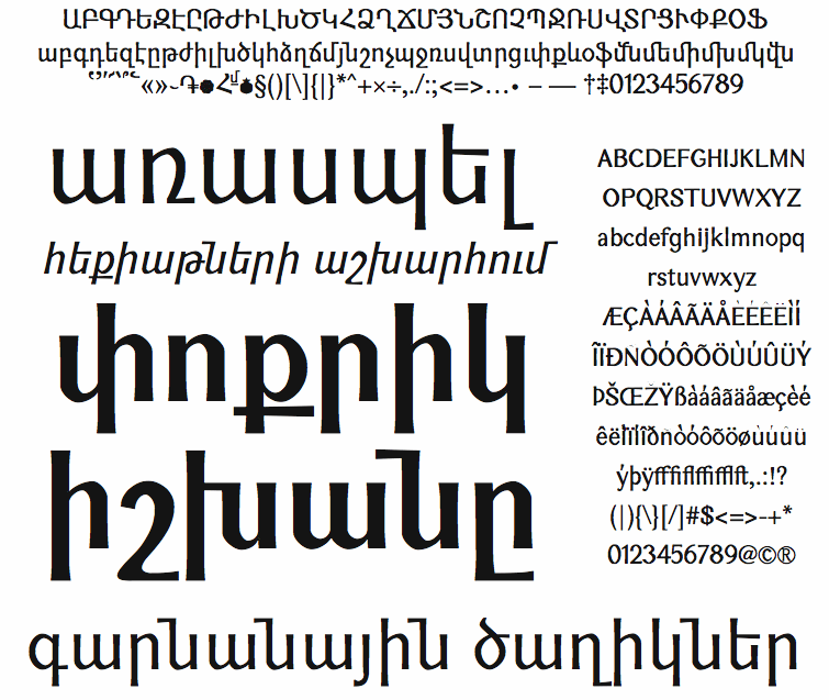
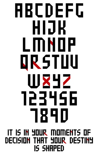
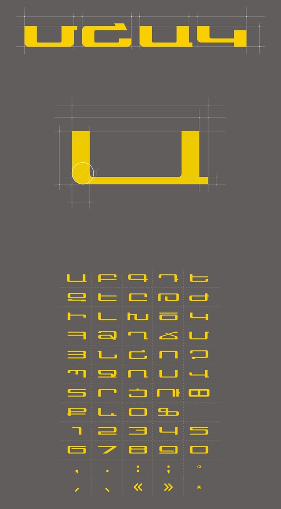
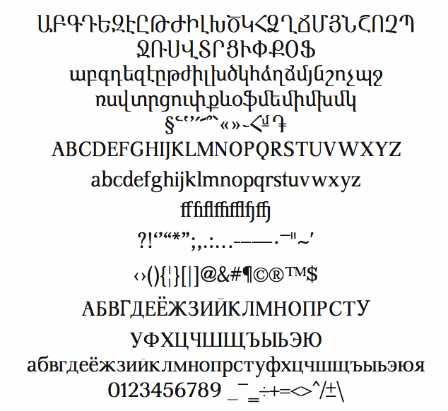
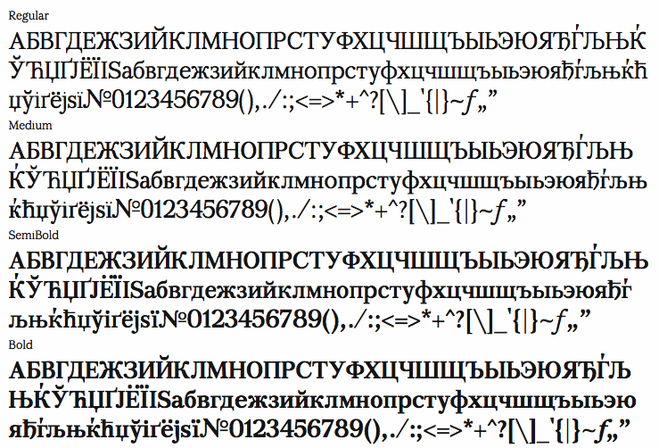
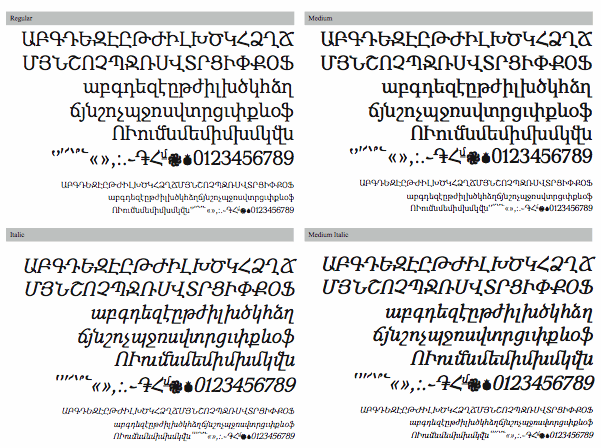
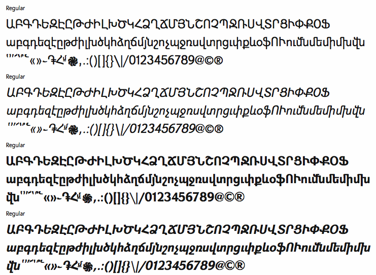
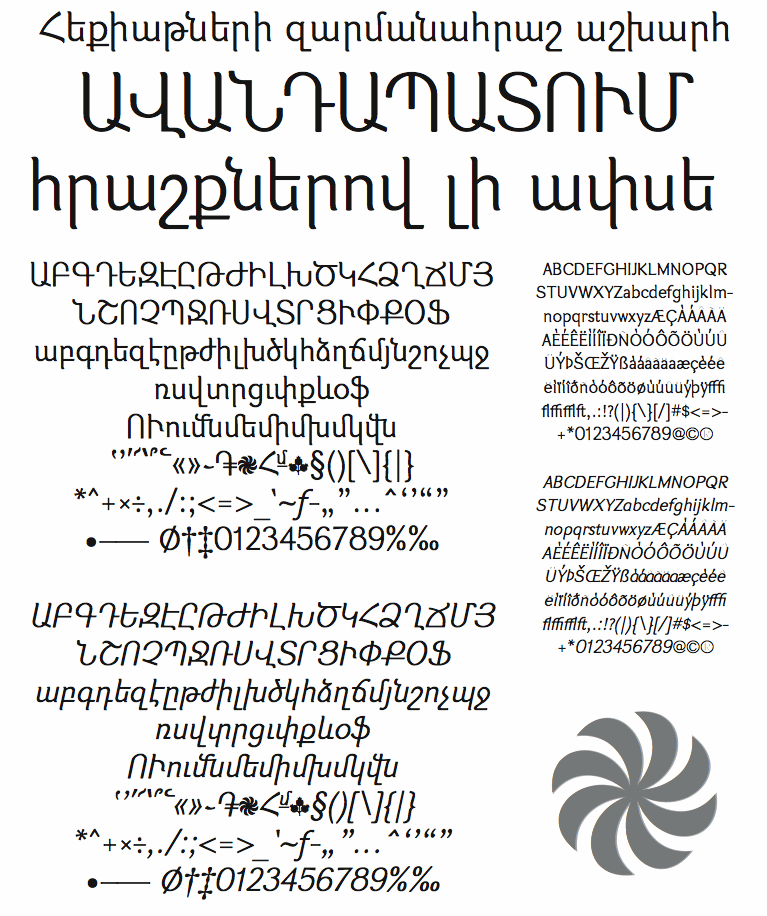
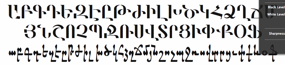
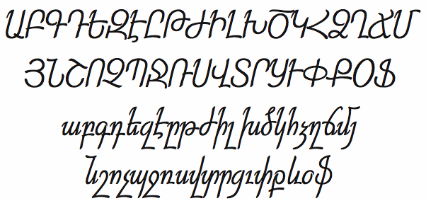
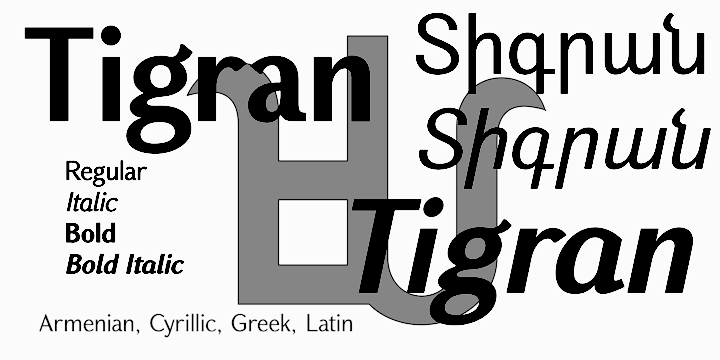
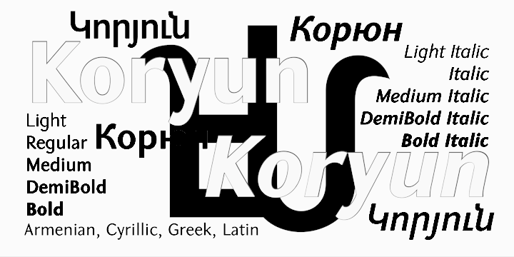
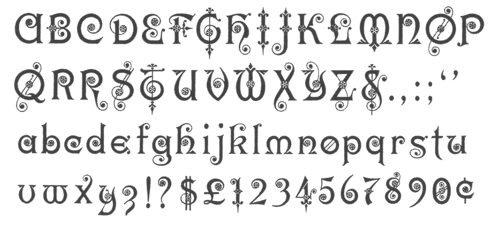
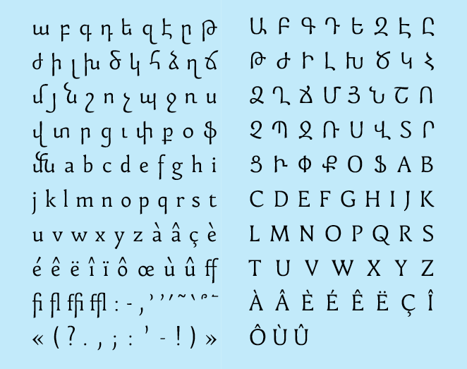
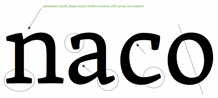
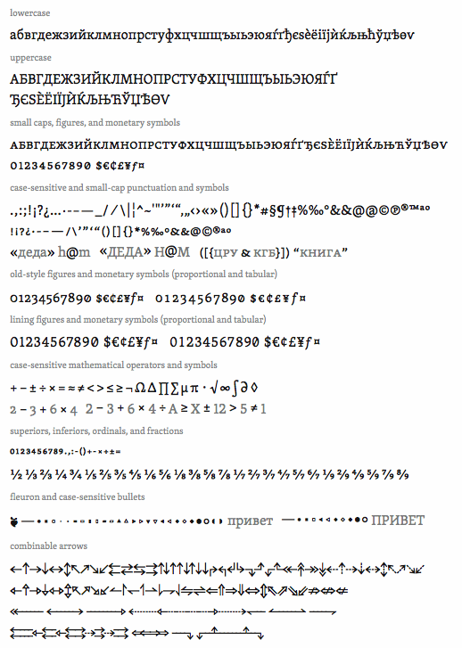
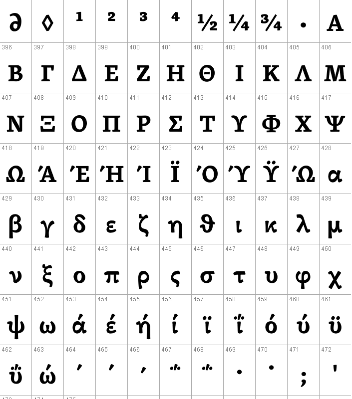
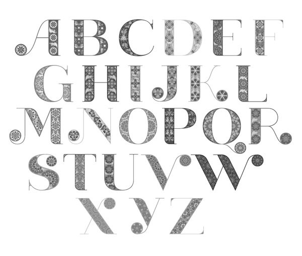
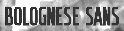
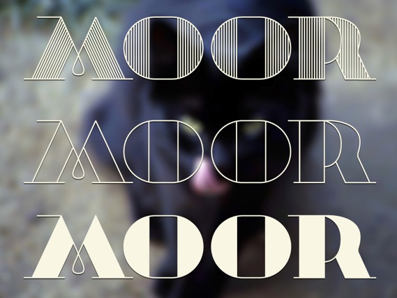
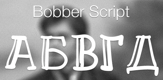
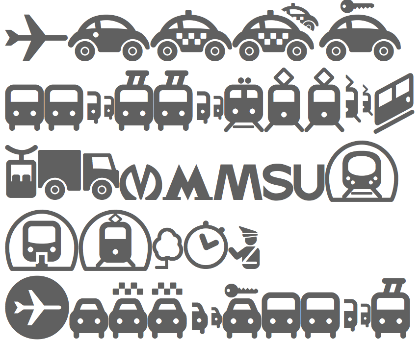
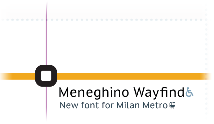
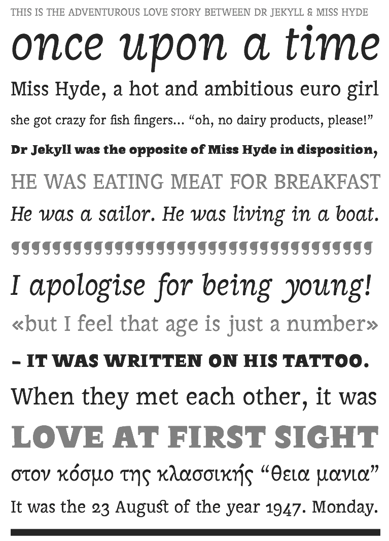
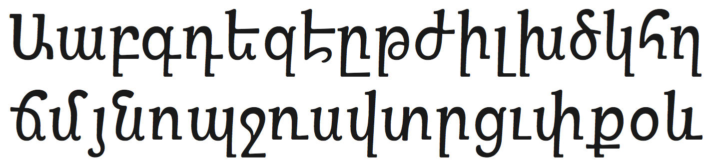
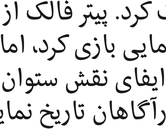
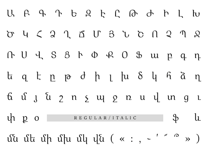
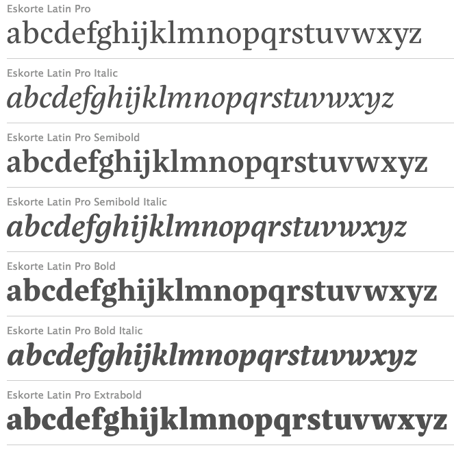
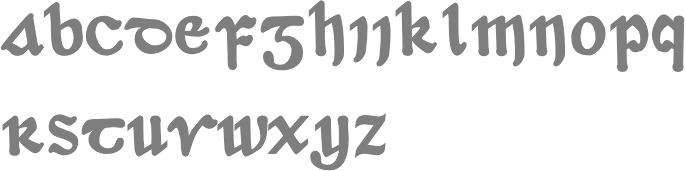
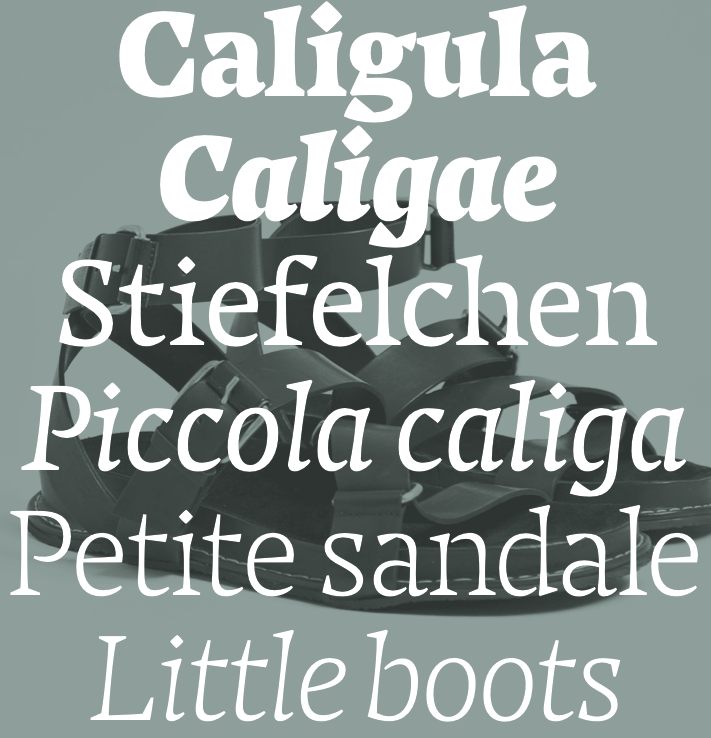
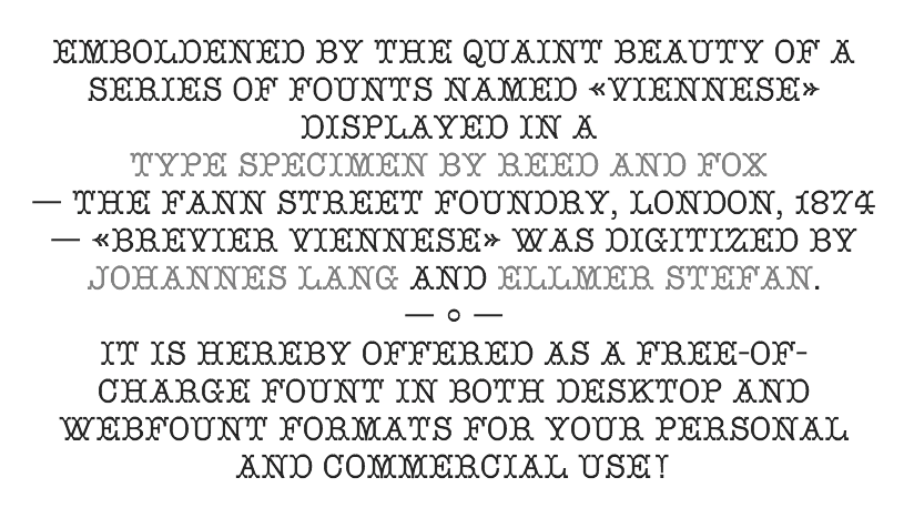
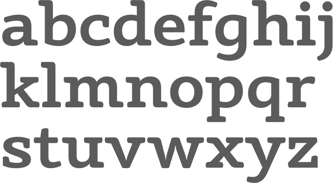
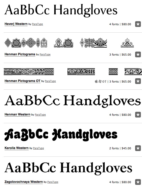
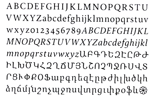
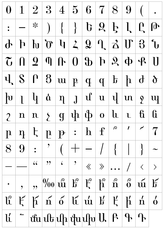
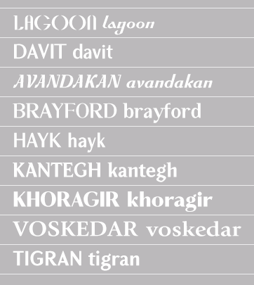
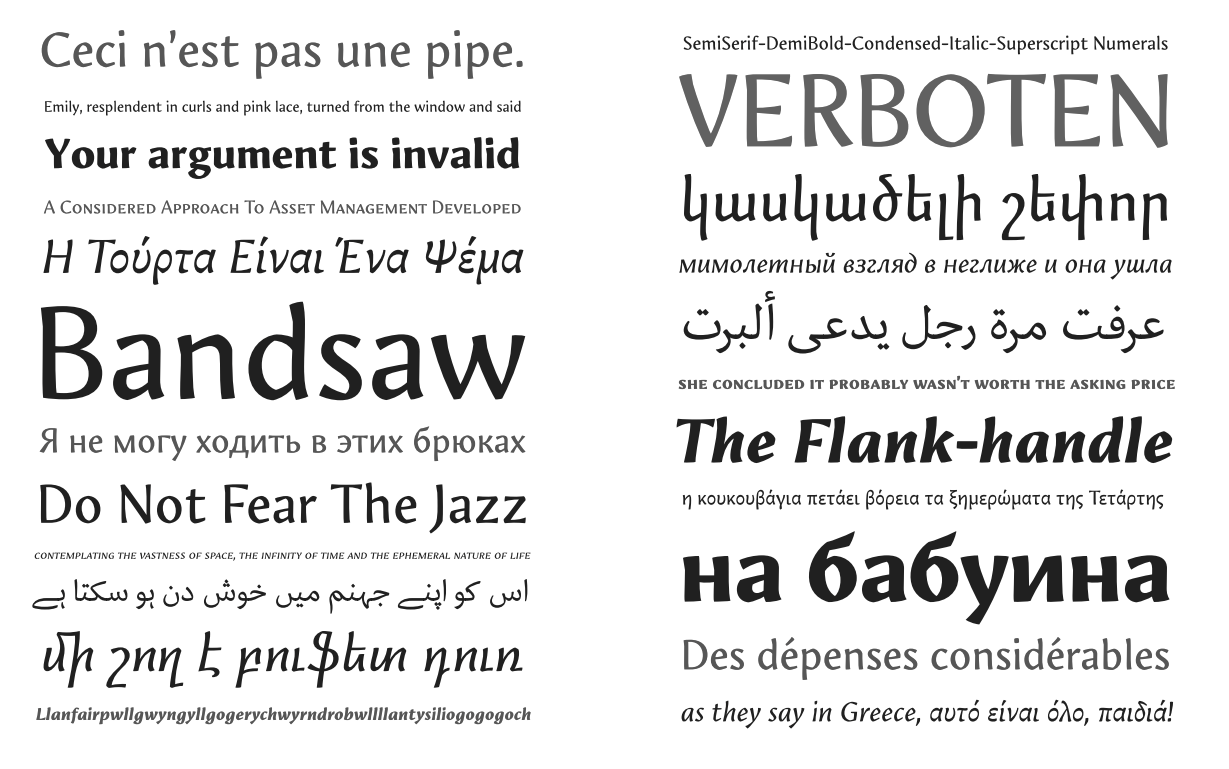
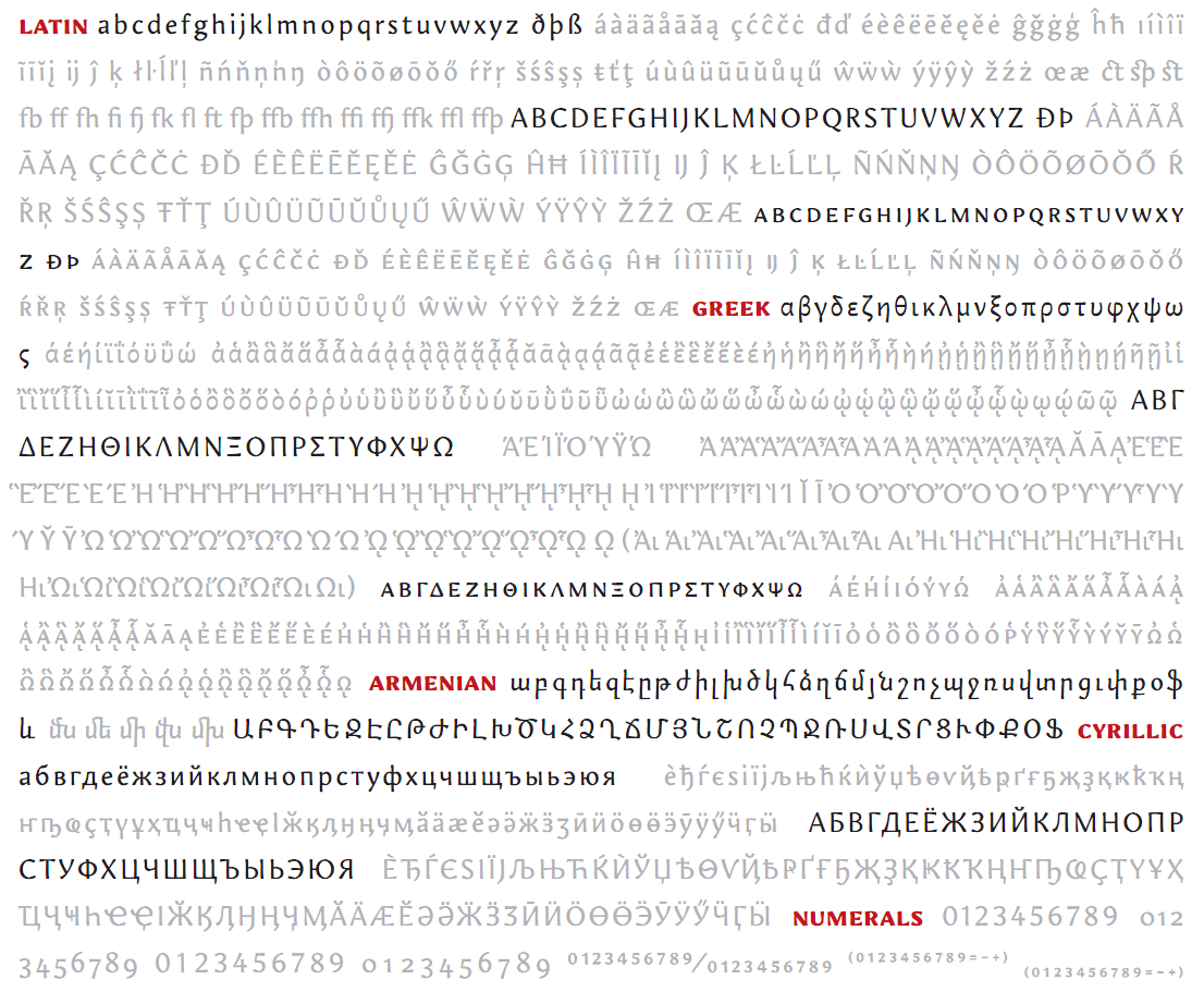
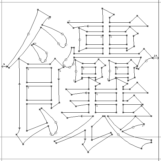
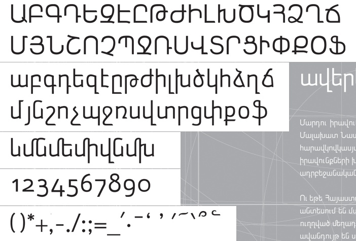
|
|
|
|