| | |
24Design Studio
[Nur Cholis Majid]

|
 Known as Holis Majid and Nur Cholis Majid. Jakarta, Indonesia-based designer (b. 1991) of Prodush (2018), The Circous (2018: a circus font), Northden (2018: a vintage typeface), Rockinsoda (2018), Light City Sans (2018), Glowria (2018), Huvet Rough (2018: a free weathered typeface), Millicious Script (2018: a free brush font), Restorans (2018: hand-printed), Blank City Script (2018), the signature font Ashyta (2018), Blue Captain (2018), the script typefaces Jenifa (2018), Pretty Girl Monoline (2018), Chicken Noodle (2018), Grinty (2018), Ristica Script (2018), Underbridge (2018: brush), Granshey (2018), Naycila Script (2018), Night Work (2018), Little Spring (2018), Basfar (2018) and Troficanos (2018), the free art deco font Palm Tree (2018), the dry brush script Wild Horse (2018), the condensed Epicologic (2018), the octagonal font Avriella (2018), and the techno font Effort (2018), and the squarish typeface Bedebah (2018).
 Typefaces from 2019: Madali, Lumiera, Mantra, American Label, Kida Main, Besty (font duo), Mellonia, Refaline Script, Eliotica, Chance, Lemonace (font duo), Reyonha Script, Mideltone, Prodush, Trushme Script, Wakeup, Sugarly, Rushely Script (retro signage script), Cromana, Arigatho (brush). Typefaces from 2020: Mideltone (textured), Maghnoyha (a monoline script), Wild Brush, Hotelio (a monoline sans), Roadkey Line (an inline all caps typeface), Sercerez (brush font), Collectials, Avekins, Cread, Gardenia, Glowria, Jenifa, Larrisan (a decorative serif), Light City, Millicious, Mindate, Mordova, Murner, Nobstars, Pittania, Rockside. Typefaces from 2021: Artmosfear, American Label (a Victorian label font), Asiatic (an inky script), Ballocs, Benhard (a vintage display font), Biorka Serif, Brith Brish, Chance (a squarish sans), Clowsh Esport, Catherina Script, Confillia (a clean sans), Focger Serif, Ganirus, Grimson (a signage script), Madtone, Monstario Serif (in the plump serif genre), Muve Serif (incised caps), Pancrack (a font for children), Redsans, Subaraya Retro Script. [Google]
[MyFonts]
[More] ⦿
|
Abbie Vickress
|
Student at UWE in Bristol, UK. FontStructor who made the circus fonts Ornamental Circus (2010) and Draft Two (2010). [Google]
[More] ⦿
|
Adam Cruz
|
 Type designer associated with Delaware-based House Industries. His typefaces at House Industries include:
 - The fat slab serif face Goliath (2011), designed with Vincent Pacella and Ben Kiel based on Film No. 6206 in the PhotoLettering archive.
- West Barnum Ultra (2011, with Ben Kiel). Based on a Plinc original by Dave West (film no. 5494 in the original Photo-Lettering archive).
- Plinc Swiss Interlock (with Christian Schwartz). Based on originals by Photo Lettering Inc.
[Google]
[MyFonts]
[More] ⦿
|
Adit Saputra
[Alter Deco Type foundry]
|
[More] ⦿
|
Aiyari
[Ricky Rinaldi]
|
 Bandung, Indonesia-based designer (b. 1988) of the modular display typeface Kurawal (2013) that is based on compositions of curly brackets. In 2015, he designed the angry brush typeface Violence, the connected creamy script Nurture (2015), the handcrafted sans typeface Imperiosa (2015), the connected Fabulous, and the watercolor brush script Sweetiest.
 Typefaces from 2016: Holiday (17-script family), Dreadful (a layered Halloween typeface family, with dingbats), Casual Brush, Lucidity (signage script), Euphoria (Victorian), The Painter, Minority (very condensed hand-lettered typeface), Thunderstorm. Typefaces from 2017: Tjikapoendoeng Script (formal calligraphic script by Ricky Rinaldi and Juru Aksara), Lovadelic (psychedelic), Neptunian (dry brush), The Moonlight (comic book script), Savath (a horror font), MacLaurent (tattoo font). Typefaces from 2018: Lucidity (an expansion of his 2016 version, including Psych, Expand, Extras: psychedelic / art nouveau trio), Winter Is Coming (a beatnik font), The Beardy, Dreadful (a layered horror movie font), Saturday Night (a great retro disco poster typeface family with a particularly striking interlocking style). Typefaces from 2019: Spooktacular (a Halloween font), Spooky Sans. Typefaces from 2020: Tropika Island (a great tiki font), Swettiest, Laguna Vintage. Typefaces from 2021: Ayr Blufy (a puffy supermarket signage script). Typefaces from 2022: Ayr Thrope (a weightlifter's font). Dafont link. Behance link. Graphicriver link. [Google]
[MyFonts]
[More] ⦿
|
Alicia García
|
Palma de Mallorca-based creator of a nice typographic collection of posters entitled Carteles Leo Bassi (2011), which mix the Western circus poster style and art nouveau elements. Typefaces created by er include the paper cut typeface Diplodocus (2011), and the octagonal typeface That Tune (2012). View her Y Modaba poster (2011). [Google]
[More] ⦿
|
Allmo Studio
[Muhammad Nur Alamsyah]
|
 Designer in Wonogiri, Indonesia, b. 1987. In 2018, he published the free script typefaces Hailuna and Anthemie. His commercial typefaces include the excellent retro signage script Bohemian Melody (2018), the signage script Avangarde (2018) and the handcrafted Mentawai (2018).
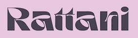
 Typefaces from 2019: Vignettic (a heavy retro signage script), Basuki Script, Agradian (script), Adonessia (wild calligraphy), Black Hummer (brush script, identical to Bellarsky), Ethiopia, Starlight (script), Giorello (a signature script), Ducky Manly, Mohica (a license plate font), Realistica (a brushed signage font), Mondella (a ronde script), Bellarsky, Thunder, Thunder Rough. Typefaces from 2020: Pottery Crafting (a brush script), Manhattan (a dry brush script), Retrophilia, Castlefire (a circus font), Ebullience, Humanely, Resemhary. Typefaces from 2021: Vignettic (a wonderful creamy retro signage script), Mohan (a decorative serif). Typefaces from 2022: Rattani (a hyper-inktrapped display typeface). [Google]
[MyFonts]
[More] ⦿
|
Alonzo Felix
|
 Graphic designer at Oak Studios in Brooklyn, NY, and now working as Alonzo Felix Studio in San Francisco. After earning a BFA in graphic design at LSU he studied typographic application and theory in London and type design at Type@Cooper in New York, 2011-2012. He created the circus billboard typeface Tightrope (2011, Lost Type Coop) and the rounded sans typeface Neighbor (2012, at Type@Cooper).
 Cargocollective link. [Google]
[More] ⦿
|
Alter Deco Type foundry
[Adit Saputra]
|
Yogyakarta, Indonesia-based designer Adit Saputra set up Alter Deco Type foundry in 2013. He created the spurred Victorian typefaces The Famous Typeface (2013), Midnight Show (2013), Heister (2013), Cardiman Script (2013), Epique (2013), Holden (2013), Long March (2013), Dialog (2013), Big Lodge (2013), Jack Runner (2013, spurred), Shoutest (a Western circus font), Old Opera (2013) and AI Trashed (2013, free download). Other typefaces: Haimdale (2013, Victorian), Hamdall (2013), Chevia (2013), Chevitz (2013, roman caps), Shakehand (2014), Harmonique (2014), Knight Guard (2014), Hydenia (2014), Monopolish (2014), Antiqueen (2014), Samathor (2014), Sea Horse (2014), Phillnesia (2014, spurred), Relative (2014: a multiline custom typeface for Addthisrock Studio), Dubster (2014: a multiline typeface), Orbital (2014: a multiline custom typeface for Addthisrock Studio), Apparecum (2014), Handster (2015), Mermaid (2015: Victorian), Roasted (2015), Run (2015, spurred), Movember (2015), Bhaltazar (2015, eroded medieval font), Arthur (2015, rounded and handcrafted), Aberden (2015), Boulden (2015, rounded spurred typeface family, including letterpress emulation styles), Mouthen (2015). Typefaces from 2016: Strongwill (Victorian), Cyanide, Handland. Dafont link. Creative Market link, where one can buy the fonts. Another Creative Market link. Graphic River link. Behance link. Yet another Behance link. Designs Net link. [Google]
[More] ⦿
|
Amuki Studio
[Vanessa Zuñiga]
|
 Vanessa A. Zuñiga Tinizaray (aka Amuki) is a graphic designer and art director in Loja, Ecuador. She works a lot with pre-Colombian, Inca, and South American cultural patterns. Vanessa created the experimental typeface Pacha (2010), which is based on old Indian patterns.
 In 2012, she designed the modular color font INTI, and the cultural pattern typeface family Sara. In 2014, she designed the modular typeface Oraculo and the bribeware display typeface Lineas Y Puntos. Amaru Creador won an award at Tipos Latinos 2014. In 2015, she created the free display typeface Abyaster, and the multiline Bolivian pattern typeface Khurus. Her typefaces Modular 46 and Tiwanacu (decorative Nazca-themed caps) won awards at Tipos Latinos 2016. Typefaces from 2016: Criolla (an ornamental circus font, extended to Criollabat in 2019). In 2017, she designed an extraordinary multiline ancient Mexican culture-themed decorative typeface, Coatl Serpiente, and published the Arhuaca op-art patterns. Typefaces from 2017: Tinkuy Patterns (a free op-art pattern font related to native Andean cultures; in 2021, published by Sudtipos with gdigitization by Alejandro Paul), M46C (experimental, and modular), Entorno (a modular prismatic typeface), Arhuaca (a precolombian pattern font). Typefaces from 2020: Nunka Anent Dingbat, Sébastien (a set of color typefaces inspired by Truchet's tilings). [Google]
[More] ⦿
|
Amy Retureta
|
Student at Denver's Rocky Mountain College of Art and Design in 2011. She combined typefaces Yana and Railhead to create the circus font Circana (2011). [Google]
[More] ⦿
|
Andhika Pradana
[Ikiikowrk]
|
[MyFonts]
[More] ⦿
|
Anonima Impressori: Art Nouveau
|
 Some Italian wood types shown in Catalogo Caratteri in Piombo e Legno by Anonima Impressori (Bologna, Italy). The styles covered here represent the art nouveau era. They comprise Amalia, Aurora Arcaico, Barnum, Bastone Stretto Fiat, Cenisio, Desdemona, Iris, Libellula, Liberty, Titania, Uranio. [Google]
[More] ⦿
Some Italian wood types shown in Catalogo Caratteri in Piombo e Legno by Anonima Impressori (Bologna, Italy). The styles covered here represent the art nouveau era. They comprise Amalia, Aurora Arcaico, Barnum, Bastone Stretto Fiat, Cenisio, Desdemona, Iris, Libellula, Liberty, Titania, Uranio. [Google]
[More] ⦿
|
Anthony Robinson
|
 UK-based creator (b. 1967) at FontStruct in 2008 of Metal Vampire (athletic lettering meets vampire), Moonbase Tokyo (neat futuristic oriental simulation), Sir Robin's Minstrels (blackletter), Starscraper (techno), Moonmonkey (outline LED font), First.
 In 2010, he added the non-FontStruct typefaces Chromium (a great special effect face), Clawripper, Dirty Play, HairyMonster, HairyMonsterSolid, Punched, and Slasha, mostly inspired by blood, guts, and murders. Static Buzz (2010) is a texture face. Newcastle (2010) is a castle-themed alphabet. Blinger (2010) is a star-studded outline face. New York Punk (2010) is grungy. Dinosaurs (2011) is a dingbat face. NUFC Shield (2011) is a shield face. Zombified (2011) and Sound Sample (2012) are grunge typefaces. Rollerball 1975 (2012) is the font used in the Rollerball movie. Western Show Caps (2012) is a Western circus font. Stoned (2012) evokes letters carved in stone. In 2013, Robinson published the textured athletic lettering font Robbie Rocketpants, Airlock, Cargo Bay (a great army stencil, with a negative letter option), Dogma (a grungy Lombardic face), and the grungy blackletter typeface Flesh Wound. MDMA (2013) is a halftone simulation texture face. Barbarian (2013) is an alphading typeface on the theme of swords. Camouflage (2013) is a textured typeface. Atheist (2013) is an outline typeface. Power (2013) is inspired by lettering on pwer buttons. Witching Hour (2013) is a halloween font. Dystopian Future (2013) is a grungy typeface. Olde Stencil (2013) is a stenciled blackletter typeface. Anonbats (2013) has scanbats and dingbats related to the famous hacker group Anonymous. Creature Feature (2013) is a slimy typeface. Ka Blamo (2013) is a comic book font. Beer Goggles (2013), Supercreep (2013), KaBoing (2013), Gloop (2013, an oil slick face), Voodoo Vampire (2013) and Ye Olde Oak (2013) are textured typefaces. Anti Everything (2013) is a blood drip typeface. PCB (2013) is a printed circuit board font. Dickensian Christmas (2013) is a decorative Christmas font. Typefaces from 2014: Spondulix (hacker type), War Wound, Lasso of Truth, Counter Dial. Typefaces from 2015: English Football Club Badges, Fuzzy Cops, Kick to the Face (oriental simulation). Typefaces from 2016: Squeal Piggy. Typefaces from 2019: Footy Scarf. Dafont link. Aka Anfa. Home page. Another URL. FontStruct link. [Google]
[More] ⦿
|
Anugraha Design
[Cina Catteau]
|
 Pokhara, Nepal-based designer whose work is characterized by bold colorful geometric patterns and constructions. Typefaces from 2017 include Roam (which Cina calls a tribal type) and the color font Beach Towel.
 In 2017, she also published a wood type collection: - Barn Raising. A sturdy sans-serif in regular and rounded.
- Prairie. A perfectly square geometric serif, in inline and regular.
- Broad Sheet. A wide slab serif with 1.5:1 proportions. This one has a western flair but is simple enough to work for a variety of projects.
- Prize. An ornate slab serif with a circus / carnival vibe.
- Extra extra. A quirky slab serif most like 1900s printmaking letters.
Creative Market link. [Google]
[More] ⦿
|
Arif Dwi
[Inopatype (or: Kotak Kuning Studio)]
|
 [MyFonts]
[More] ⦿
[MyFonts]
[More] ⦿
|
Art deco typefaces by Nick Curtis: II
[Nick Curtis]
|
 Commercial art deco typefaces by Nick Curtis.
 - Bessie Mae Moocho NF (2002). An art deco font based on handlettering found on a travel brochure for IMM Steamship Lines, circa 1927.
- Blitzkrieg NF (2011). A Lufthansa Airlines baggage label from 1936 provided the inspiration for this genuinely German typeface, with strong art deco influences.
- Blue Jay Way NF (2011). An art deco typeface inspired by Ross F. George. This typeface was used on the Beatles' original Magical Mystery Tour album.
- Boeuf au Joost (2003). Art deco based on work by comic book artist Joost Swarte.
- Boho à Gogo NF (2007): a multiline (op art?) typeface inspired by Bauhaus.
- Chalk and Cheese NF (2004). This art deco uppercase is based on 1930s lettering by French poster artist Charles Loupot (based on this art deco poster), and the non-art deco lowercase is based on 1910s lettering by German plakatmeister Ludwig Hohlwein.
- Chemin de Fer NF (2005). An art deco shadowed outline face.
- Chi Town NF (2008) is a heavy art deco creation that is based on a 1931 poster for the film The Man from Chicago.
- Coochie Nando NF (2011). An art deco shadow caps face, after a typeface called Kitchen by Milton Glaser.
- Dooijes Deco NF (2010). A 3-style art deco family in the style of Broadway, based on the Dick Dooijes tryptich, Carlton, Bristol (1929) and Savoy (1936).
- Duck Soup (2003, after a 1928 poster by Italian designer Neri Nanetti for Snob Cognac).
- Elektromoto NF (2011). This family takes its inspiration from two early Art Deco typefaces from Germany. The Normal version is based on Dynamo, designed by K. Sommer for Ludwig&Mayer in 1930, while the Narrow version is based on Stadion, designed by Erhard Grundeis for Die Schriftguß AG in 1929. Their common design motifs epitomize the Age of Streamline.
- Humpty Dumpling NF (2010). A fat art deco typeface based on an offering from the irrepressible M. Draim, seen in La Lettre dans le Décor&la Publicité Modernes, published by Monrocq Frères of Paris in 1932).
- Dusty Rose (2008) is an art deco typeface based on the logotype for the Dutch magazine Geillustreerd Schildersblad in 1940.
- Edgewise (2007), a quirky well-rounded post-art deco and pre-psychedelic face, uses ideas from Ryter Night (VGC).
- Ege Schrift NF (2011). a faithful revival of Ege-Schrift (1921, Eduard Ege), a mix between Mexican party lettering and art deco.
- Engel Stabenschrift NF (2008). In 1927, Ernst Engel created an art deco typeface which was revived by Nick Curtis as Engel Stabenschrift NF.
- Faerie Queen NF (2006). Based on an art deco typeface named Titania made in 1933 by Fundición Richard Gans.
- The Reed and Fox typefaces Viennese and Corinthian were combined in 2014 in Nick Curtis's digital typeface Genever NF.
- Gotham Rail Company NF (2002). Art deco based on an Italian travel poster from 1931.
- Great Lakes Shadow (2008) is an art deco typeface based on a 1930s travel poster for the Canadian pacific Railway.
- Hunky Dory NF (2014). A circus font after William H. Page's wood type Doric, ca. 1850.
- Jazzfest NF and Tinseltown NF (2009). Based on the 1932 art deco typefaces Newport and Hollywood, respectively, both designed by Willard T. Sniffin for ATF.
- Kharon Ultra (2009). An art deco typeface based on Ludlow Stygian.
- Kinkajou Stew (2003). Image of Kinkajou NF.
- Kirschwasser NF (2005). A bubbly art deco face.
- Korner Deli NF (2006, art deco).
- Kymmera Deco NF (2011). Revival and redesign of Rainbow Bass (1982, saul Bass).
- La Reyna Catalina NF (2006). An art deco face based on Aragón, designed by Enric Crous-Vidal.
- Legnano Cuneo NF and Legnano Sassari NF (2014). Italian art deco wood type.
- Linea Nera NF (2011). Based on Wolf Magin's Black Line (1976, Berthold).
- Lodewijk Gothic NF. After Elzevir Gothic (ATF, 1897).
- Luben Tunen (2008) is another art deco face.
- Madison Squared NF (2012).
- Mighty Ditey (2007): a mix between art deco and Peignot, this elegant typeface is based on a 1970s Photolettering typeface by Richard Nebiolo called Aphrodite, and competes with Riesling (1994, Bright Ideas) and Gillespie (2015, Darren Odden) as revivals of Aphrodite.
- Mogzilla NF (2007) is an ultra fat art deco face.
- Monte Carlo Script NF (2002). An art deco font based on a font called Médicis from a Deberny and Peignot catalog, circa 1920.
- Nip&Tuck (2006).
- Odalisque NF (2008, +Stencil, 2010) are art deco fonts based on Morris Fuller Benton's Chic (1927).
- OK Chorale (2003). An art deco typeface based on Carl Holmes' ABC of Lettering book.
- Orchard Street NF (2011, +Inline). A pair of art deco caps typefaces inspired by one of many posters produced by the WPA by anonymous artists during the 1930s.
- Pentaprism NF (2011). Part Futura, part Bauhaus, this 5-style family has multiline, inline, and other variants.
- Picture Postcard NF (2004: based on an alphabet by Alf Becker).
- Raconteur NF (2006-2008) is a wonderful art deco typeface that shouts gin fizz and high heels: it takes its inspiration from a 1923 ad for Piera Nova, designed by Hernando G. Villa.
- Quoi Chou NF (2006). An elegant and quite original beefed-up version of Bernhard Fashion by Lucian Bernhard.
- Radio Days (2008). An art deco typeface based on 1930s logotype lettering for Crosley Radios.
- Rassetta NF and Rassetta Swash Caps NF (2005). An art deco pair of typefaces originally designed by Willard T. Sniffin for American Type Founders in 1931 under the name Rosetti.
- Renard Moderne NF (2010). An art deco typeface inspired by Sol Hess's 1940s typeface Twentieth Century Poster.
- Resolute NF or USA Resolute NF (2009). An all caps fat headline typeface based on Morris Fuller Benton's Eagle, ATF, 1934.
- Retrorocket NF (2015). An art deco alphabet based on a French lettering chapbook entitled Art du Tracé Rationnel de la Lettre (1934, D. Duvillé).
- Salzmann Deco NF (2011) and Salzmann Deco Deco NF (2011), art deco and Mexican-themed typefaces, modeled after Max Salzmann's Dolmen (1921-1922) and Zierdolmen (1922), respectively.
- Secret Agent (2003). A pure art deco beauty based on this Loupot poster from 1919.
- Ski Alpin NF (2014). An art deco typeface based on a Swiss travel poster from 1927.
- Smart Frocks NF (2008). A Peignotian face, after a shop sign in London, ca. 1930. Designer unknown.
- Stony Island NF (2011). Based on an Alf R. Becker typeface from 1935 called Chicago Modern Thick and Thin.
- Suave Sam NF (2010). An art deco typeface after a 1930 alphabet by Samuel Welo.
- Tasneem (2007) is the ultimate art deco face, originally drawn by Gustav Jensen in 1931.
- Tiny Bubbles NF (2008). An art deco typeface inspired by an alphabet in Pen&Brush Lettering and Practical Alphabets (Blandford Press, Ltd., London, 1929).
- Top Kick NF (2011). Based on Concentra, a geometric marvel with several parallel and concentric lines making up the letters. Concentra was originally published in Schriftatlas: Alphabete von A bis Z .
- Turista Gorda NF (2009). Based on Baltimore Type Foundry's Airport Tourist, which in turn was influenced by Futura Display.
[Google]
[MyFonts]
[More] ⦿
|
Aymie Spitzer
|
Aymie Spitzer created a Western typeface called Dumbo while studying type design at the Cooper Union in 2012: While studying typeface design at Cooper Union, I attempted to revive a French Clarendon. This design has always had a soft spot in my heart so I thought it was a perfect opportunity to make something fun for my first typeface. Taken from ATF's P.T. Barnum, I digitized this revival in about 2 months. [Google]
[More] ⦿
|
Baltimore Type Foundry (or: Baltotype)
[Herbert F. Czarnowsky]
|
Also known as Fielding Lucas, Jr., Lucas Bros., H.L. Pelouze&Son, and Chas. J. Cary&Co. Specimen may be found in Convenient Specimen Book of Type, Rules, Borders, and Electrotype Cuts from the Baltimore Type Foundry (Baltimore: Chas. J. Cary&Co., 1888. Banta Book of Types&Typographical Tips. Menasha: George Banta, 1961). The company existed until well into the 20th century, and published a catalog as late as 1957 called Type and Rule Catalogue 13, Baltotype. A selected list of typefaces: - Airport Gothic: Turista Gorda NF (2009, Nick Curtis) is based on Baltimore Type Foundry's Airport Tourist which in turn used ideas from Renner's 1932 typeface Futura Display. Mc McGrew on Airport Gothic: Most of this series is the first American copy of Futura, which originated in Germany in 1927, designed by Paul Renner for Bauer. One source says it was cut from original Futura drawings, smuggled out of that country, but it seems more likely that matrices were made by electrotyping the imported type. An extrabold weight, Airport Black, was cut by Baltimore about 1943; information on this cutting is scarce and contradictory- one account says it was designed by Bill Stremic or Bill Blakefield, another that it was designed by Carl Hupie (or Hooper), and cut by Herman Schnoor. There is also Airport Black Condensed Title and Airport Broad. The latter is a modification of Airport Black, cut 50 percent wider on the pantagraph by Herman Schnoor. Baltimore later cast some of its Airport series from Monotype Twentieth Century matrices, and in a few cases listed both series. Airport Relief, Baltimore 299, is English Monotype Gill Sans Cameo Ruled, while Airport Tourist, Baltimore 602, is Futura Display, cast from electrotype mats of the German foundry type.
- Baltimore Script (1955). Mac McGrew: Baltimore Script is a fancy style designed by Tommy Thompson and cut by George Battee for Baltimore Type in 1955. The lowercase follows the general style of a script letter hand-written with a broad pen, although the inclination is slight and the letters don't quite connect. Capitals are flourished. It is suitable for stationery, announcements, and greeting cards, but its range of small sizes is hardly enough for advertising use.
- Mac McGrew: Czarin and Czarin Title were produced by Baltimore Type&Composition Corporation about 1948, the name being derived from the Czarnowsky family which owned the foundry. Czarin Title, issued first, is a copy of Offenbach Medium, a set of pen-drawn capitals designed by Rudolf Koch about 1935 for the Klingspor foundry in Germany. Czarin has minor changes in a few characters, but adds a lowercase, designed by Edwin W. Shaar, that is substantially different from that of Steel, the cap-and-lowercase version of Offenbach. The new lowercase harmonizes well with the capitals, and makes a handsome appearance. Compare Lydian. Footnote: McGrew spelled the name of the owner as Czarnowski. Irene Traeger, the granddaughter of Herbert F. Czarnowsky, pointed out the incorrect spelling to me.
- Mac McGrew: Elegante is a decorative, nearly monotone typeface cut by George Battee for Baltimore Type, after the German typeface Sensation of 1913, from Foundry Heinrich Hoffmeister. It is upright, with flourished caps and loops on some of the ascenders and descenders, and is suitable particularly for announcements and personal stationery. Compare Greeting Monotone.
- Mac McGrew: Emperor is a 1957 adaptation by Baltimore Type of Wide Latin which was cut by Stephenson Blake in England and related to nineteenth-century typefaces under other names. However, this Baltimore Type version has been modified and resized, and is less successful due to excess space between letters (although not as much as in the specimen shown here, which is letterspaced). Emperor was originally shown as Imperial.
- Their geometric series from 1884 became famous, and was often imitated. HiH created two font families based on it: Teutonia (2007) and Baltimore Geometric (2008, a revival of Antique Geometric by Baltimore Type Foundry, 1883). HiH writes: Roos&Junge of Offenbach am Main in Germany produced Teutonia in a "back-to-basics" effort that has seen many quite similar attempts in the field of topography. In 1883, Baltimore Type Foundry released its Geometric series. In 1910, Geza Farago in Budapest used a similar letter design on a Tungsram light bulb poster. In 1919 Theo van Doesburg, a founder with Mondrian and others of the De Stijl movement, designed an alphabet using rectangles only -- no diagonals. In 1923 Joost Schmidt at Bauhaus in Weimar took the same approach for a Constructivist exhibit poster. The 1996 Agfatype Collection catalog lists a Geometric in light, bold and italic that is very close to the old Baltimore version. Even though none of these designs took the world by storm, they all made a contribution to our understanding of letterforms and how we use them.
- Mac McGrew: Greco Bold and Italic are Spanish typefaces of the mid-1920s. They are very heavy, with long ascenders and small x-height, and have a hand-lettered appearance. Linotype Vulcan (q.v.) is equivalent. National Matrix&Type Co. in Baltimore, one of several independent companies which made matrices for the popular casting machines, offered Greco Bold in 1929 as its series 100; this was the source of Baltimore Type's mats, but Baltimore and some other sources cast Greco Bold and Italic as series 326-3261. These numbers have not been found in Monotype literature; perhaps another independent source also made mats. Notice the figures, which are termed hanging or old style, although they do not follow the usual form. However, taller 1, 2, and 0 are also available to convert the set to lining figurees. Compare Hess Monoblack. Greco Adornado, an ornamented version, has also been imported.
- Mac McGrew: Homewood is a recutting by Baltimore Type of Metropolis Lined, a German typeface of the 1930s. It was made from a large size of Metropolis Bold, with the fine white lines cut in, and differs from the original in minor details of the curves. Other sizes were cut by pantagraph and do not necessarily match original sizes.
- IBM Executive Modern, a typewriter type.
- Mac McGrew: Mademoiselle was designed by Tommy Thompson in 1953 as a display typeface for Mademoiselle magazine. It was cut by Herman Schnoor at Baltimore Type, which also offered fonts for general sale. It is a delicate, narrow modern roman, with long ascenders and short descenders, rather loosely fitted, and works well for display with transitional text typefaces such as Bulmer and Scotch Roman. Both lining and oldstyle figures are provided, along with several pointing hands as shown.
- Tourist Extra Condensed. Turista Flaca NF (2009, Nick Curtis) is based on Tourist Extra Condensed. McGrew: Tourist Extra Condensed of Baltimore Type is a copy of Phenix (q.v.) in 24- to 48-point sizes, and is Jefferson Gothic (q.v.) in larger sizes. Phenix is a 1935 ATF typeface by Morris Fuller Benton.
- Mac McGrew: Trend is a brush-lettered typeface cut by Baltimore in 1953. It is very similar to Dom Casual (q.v.), but has a slight back slant.
- Mac McGrew: Trylon as made by Baltimore Type was a 1949 copy of Stephenson Blake's Playbill (see Imports in Appendix), but Trylon Shaded and Trylon Shaded Oblique were designed and cut by George Battee of the Baltimore foundry. The solid version has lowercase in some sizes; it is somewhat similar to P. T. Barnum, with greatly exaggerated horizontal strokes and serifs at top and bottom, but is heavier and narrower. The Shaded versions are more properly outlines of the same design, with a small shadow effect at the top (which is unusual) and right of each letter, but without lowercase.
- Mac McGrew: Vernen is essentially a copy of Huxley Vertical (q.v.), but omitting the round characters AKMNWY and using the alternate pointed characters instead. In addition, the slight extensions of cross strokes to the left of stems have been omitted, and a few other characters have been redrawn. It was offered by Baltimore in 1953.
- Mc McGrew: Vista is a very wide square-serif face, cut by Baltimore Type in 1956. It is said to be a pantagraphic modification of Hellenic Wide from Bauer in Germany; actually it does not match that typeface in details, though it has the same general effect.
- Mac McGrew: Wide Line Gothic is a creation of Herman Schnoor for Baltimore Type, modified by pantagraph from Philadelphia Lining Gothic, increasing the width by about 50 percent. The flat sides of round letters. acceptable in the moderately condensed original, make awkward shapes in this extended version. Compare Franklin Gothic Wide, Tempo Black Extended.
- Among the wood types, we have Oak Leaf (1832, ornamental caps).
Rich Hopkins, a printing historian, acquired Baltotype ca. 1993. Based on drawings from the 1950s in the Baltotype material, Miranda Roth at P22 designed LTC Athena, a narrow art deco typeface, in 2013. [Google]
[More] ⦿
|
Baseline Fonts
[Nathan Williams]
|
 Foundry in Wichita, KS, founded in 1999 by Nathan Williams (b. Concordia, KS, 1973), formerly from the University of Kansas Art Museum Library. Its motto: The goal of the foundry is to provide uninterpreted revivals of type samples generated through disappearing printing methods, and create new fonts for dissemination in the type community. Order through MyFonts.Com or Union Fonts or Creative Market. FontShop link. Klingspor link.
 Fonts: - The Rodeo family of wood type fonts: 66 Rodeo, 57 Rodeo, 58 Rodeo (2003), Rodeo Rope, Rodeo Rope Superchunk.
- The Tuscan family: Tuscan (2003, a wild west face). To this group we can add the Tuscan typeface Circus KS (2006).
- Egyptians: Grit Gothic (2013), Grit Sans (2013), Heirloom Artcraft (2013), Worn Gothic (2013), Stately GG (2013), Grit Egyptienne (2005, grunge Egyptian family), Rough Egyptienne (2005).
- Grunge typefaces: Antimony (2005, grunge), Dryden (distressed handwritten face).
- Old typewriter fonts: Slab American Regular (old typewriter), Slab American Titling, Slab American Titling Heavy (2002). Slab American has 55 styles.
- Art nouveau typefaces: Old Paris Nouveau (2003).
- Pixelish typefaces: Base PXL7, 80s PXL Bold.
- Display Sans: Maxime (2004, having support for most European languages; Maxime Shadow is available at FontShop), Woodgrit Thin (based on 19th century American letterpress fonts), Woodgrit Medium, Woodgrit Heavy, Pippen (squarish).
- Calligraphic: Roundhand Regular.
- Victorian: Boback.
- The Grit family: Grit History (2003-2004), Grit Primer (2003), Grit Egyptienne, Grit Typesorts (2006, free).
- The Old Times American family (+Italic, +Titling).
- Pia Regular.
- Kandt: the handwriting of legendary designer and art director James Kandt; 4 styles.
- Chitchy.
- AVI Sans.
- Country Fang (2003, with Brian Miller).
- Craft Roman
- Licious Script.
- Luxe (2003, casual).
- Momentum (2002).
- George Gibson (handwriting from mid 1800s).
- Dingbats: Megaflakes 2010 (2010) and Megaflakes 2011 (2011).
- Sketchwriter (2011).
- Dusty Circus (2011) is a five-layer stacking display face designed to be infinitely morphed. It is a prototypical member of that old western circus font genre.
- Bobbi Bee (2013). A connected script.
[Google]
[MyFonts]
[More] ⦿
|
Ben Kiel
|
 Graduate of the type design program at the University of Reading, who joined House Industries (Wilmington, DE) in 2006 to work as a typeface designer, director, and developer. He also worked with Ken Botnick at emdash. He runs Typefounding, a typeface design and production studio in St. Louis, Missouri. He teaches at Washington University in St. Louis and the Type@Cooper certificate program at Cooper Union, and has taught at the Maryland Institute College of Art and the University of Delaware. He is a partner at XYZ Type with Jesse Ragan.
 He designed Katje and Cimarron (2005, University of Reading, a serif family with support for Latin and Greek). Speaker at ATypI 2006 in Lisbon on Python scripts for FontLab and RoboFab. Image. In 2011, Vincent Pacella, Ben Kiel and Adam Cruz created the fat slab serif face Goliath, based on Film No. 6206 in the PhotoLettering archive. West Barnum Ultra, designed by Dave West and digitized by Ben Kiel&Adam Cruz in 2011, was film no. 5494 in the original Photo-Lettering archive. At House Industries, he redesigned the iconic Rea Irvin lettering for The New Yorker in September 2013. The typefaces are named New Yorker Irvin and New Yorker Neutraface. In 2012 at House Industries he revived the Photo Lettering Inc font Worthe Numerals, which pushed fat didone to its limits. Still at House Industries, Christian Schwartz, Mitja Miklavcic and Ben Kiel co-developed Yorklyn Stencil. Cortado Script (2014) was designed by Jesse Ragan and Ben Kiel. It was inspired by Swedish illustrator's Cecilia Carlstedt's hand-painted lettering. It follows one year after a similar signage script typeface, Carlstedt Script (2013), also co-designed by Jesse Ragan and Ben Kiel---it was a custom signage typeface for Aldo Shoes. In 2015, Mark van Bronkhorst set up TypoBrand LLC in Berkeley, CA. As part of TypoBrand, he published several typefaces that are modern digital reinterpretations of ATF typefaces. The collection is published by TypoBrand LLC under the names ATF Type or American Type Founders Collection. Ben Kiel co-designed, sometimes with others, classics such as ATF Alternate Gothic (2015), ATF Brush (2015), ATF Egyptian Antique (an expansion of Schraubstadter's Rockwell Antique by Mark van Bronkhorst, Igino Marini, and Ben Kiel), ATF Railroad Gothic (2016), ATF Garamond (2015), ATF Headline Gothic (2015), ATF Livermore Script (by Mark van Bronkhorst, Igino Marini, and Ben Kiel), ATF Poster Gothic (2015) and ATF Wedding Gothic (2015). At XYZ Type, Ben Kiel co-designed Cortado Script in 2013 with Jesse Ragan and designed the sans typeface Grep (2017). In 2019, Ben Kiel participated in the development of ATF Franklin Gothic (Mark van Bronkhorst, Igino Marini, and Ben Kiel). A broad and multi-weight interpretation of Morris Fuller Benton's classic from 1905, Franklin Gothic, which only had bolder weights. For the lighter styles, the designers were inspired by Benton's Monotone Gothic. Girard Sky (2019) is based on Alexander Girard's original typeface for his redesign of Braniff Airways. Working with the original drawings for the photoset typeface found in the Girard archive, the design was revived as part of the Alexander Girard collection. Followed by Girard Slab (2019). Typefaces from 2020: Ballast (Future Fonts: a condensed slab serif). [Google]
[MyFonts]
[More] ⦿
|
Bing Febby Aldiansyah
[Rvq Type Foundry (was: Hey Bing Type Foundry)]
|
 [MyFonts]
[More] ⦿
[MyFonts]
[More] ⦿
|
Blenda E
|
San Luis Potosi, Mexico-based designer of the Victorian decorative circus font Macanuda (2015). [Google]
[More] ⦿
|
Brand Semut
[Goresan Pelangi]
|
Indonesian designer (b. 1992) of the spurred circus font Witham (2019), the stylish all caps typefaces North Carossela (2020: loaded with ligatures) and Rodetta (2020), the brush typefaces Home Spring (2020) and Fresh Honey (2020), and the script typefaces Millania (2020), Ellise (2020), Melonida (20200, Bonstage (2020), Home Spring (2020), Fresh Purple (2020), Cute Melody (2020), Better Unicorn (2020), Ruttari (2020), Rossie (2020), Mondela (2020), Signatie (2020) and Forestea (2020). Typefaces from 2021, mostly display serifs with plenty of ligatures: Carena (a ligature-rich serif), Callstories a wild script), Cerlions, Collina, Denike, Diranista, Fitanova, Gallerya, Ghitna, Giliams, Glitten, Grafies, Herotenn, Mailvien, Millania, Kilky Way, Morefren, Nissma, Nomark, Roseritta, Rottaries, Sintha Moqen (a signature script), Snagrids, Walkester, Watterlen, Wildstone. [Google]
[More] ⦿
|
Brian Kaszonyi
[Circus Design]
|
[More] ⦿
|
Brian Kniceley
|
Brian Kniceley is a sign artist at the Cedar Point amusement park in Sandusky, Ohio. At Letterhead Fonts, he designed Henderson Roman, Henderson Church Text, Strong Nouveau, Strong Italic, Strong Angle, Equinox (caps and flourishes), LHF Strong Caliope (2000: a circus font; see also p.53 of the The Solotype Catalog of 4,147 Display Typefaces by Dan X. Solo), LHF Strong Tea House (2000). Many of his fonts have a Western influence. Brian Kniceley named all of his fonts after their creator or the books he found them in. Examples: LHF Strong Angle, LHF Strong Caliope, LHF Strong Italic, LHF Strong Nouveau, LHF Strong TeaHouse, LHF Ohnimus Florid, LHF Ohnimus Spiked, LHF Henderson Church. [Google]
[More] ⦿
|
Bry-Back Manor
|
Designers of the display typeface Circus Font. [Google]
[More] ⦿
|
Cadu Carvalho
|
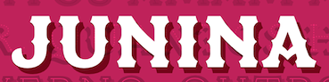 Sao Paulo, Brazil-based designer of the layerable circus style typeface Junina (2018). [Google]
[More] ⦿
Sao Paulo, Brazil-based designer of the layerable circus style typeface Junina (2018). [Google]
[More] ⦿
|
Carmen Jayde Little
|
At Winthrop University, Rock Hill, SC-based Carmen Jayde Little designed the circus font Fancy Pants (2017). [Google]
[More] ⦿
|
Chank Fonts (or: Chank Store, or: Chank Diesel))
[Charles R. Anderson]
|
 Born in Edmonton in 1969, Chank works out of the north-east corner of Minneapolis. Chank Diesel is a famous and prolific designer, type designer, busy-body and mentor. His Chank Foundry in Minnesota was started in 1992. Free fonts sub-page. Chank Diesel is Charles Andermack in the NY Times and Charles R. Anderson, b. Edmonton, 1970, elsewhere. Chank Fonts was run with Heidi Olmack ("El Mack de los Toros"). Earlier notices in his typefaces refer to CAKE Publications (2401 University Ave. NE, Mpls, MN 55418), Chank Foo, Schmopyright, and Exploding (PO Box 90100, San Diego, CA 92169). Bio by Susan Froyd. See also here or here or here or here. Handwriting font service for 95USD. 95 USD Go font Yourself font service based on filling out a form. Piece on Chank in the MinnPost.
 Chank became a popular and colorful figure who said this about himself: I like to drink a lot, and would like to think I'm known for it. Several of my fonts were inspired by booze, and I like to encourage other people to drink more, too. My best font is called Liquorstore. A partial list of his typefaces: - 200proofmoonshineremix.
- A: Adrianna (2004, a sans family), Anger-Prerelease, Asswipe, AsswipeDeluxxe, AztecPezRegular, Adrianna Extended (2005), Aguas Frescas, Ammonia.
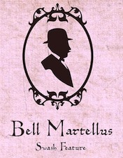
- B: BabOonjaZzbaSsoOn, Ballers Delight (2007, free), Bell Martellus (2006, a Carolongian script family designed with Bill Moran of Blinc Publishing for the James Ford Bell Library at the University of Minnesota: Bell Martellus was derived from a book published in 1475 by Henricus Martellus entitled Liber Insularum), Bastard, Bawdy (T-26), Birthday Girl, Blinkers, Bonehead, Brainhead, Bric-A-Brac BV (2002), Bridie, Brieincarnation, ButtplugTaft, B Complex, Badoni, Boochie&Snoochie (T-26, by by Khai Pham&Chank Diesel), Billsville, Blazedale, BlincType Letterpress Fontpak (2004, commercial: Gideon, Golgotha, Gomorrah, Goshen, Hamilton Offset, Player Piano, Prospect Modern and Sodom), Braingelt (gothic), Brimley, Brubecks Cube (2004), Buckethead.
- C: Carima (2002), Cheesewiddler, Chicken, ChickenBonus, Chrysler Electric (2007, fifties style connected script), Chumley (2002, first grade handwriting), Cleptomania, CrotchlessTeddyRoosevelt, CurbDog (by Matthew Desmond), Cookie Dough (2002), Chaloops (2005, comic book face), Chankbats (2001, +Objects, +Critters, +Flowers, +Flakes), Chauncy (ChauncyDecaf, ChauncyFatty, ChauncyPerkins, ChauncySnowman; this popular series from 1996-1998 is the first font family Chank ever made based on his own handwriting), Chauncy Pro, Chippewa Falls (2005), Chub, Chunder (1996, T-26), Cocaine, Coffeedance, Collateral Damage, Corndog, Coronette (2006, slab serif), Cosmic (1996), Couchlover, Cowboy Rhumbahut (2000, Matt Frost), Crusti, Crusti Wac.
- D: DickwhippedLincoln, DongCasual, Duesenberg (T-26, by Jamie Nazaroff), Dutch-Oven, Dutch-Treat, Darling Nikki, Dekapot (2007), Destructive Decisions (2013, a foggy font), Drunk Cowboy, Dry Cowboy (2006, Tuscan).
- E: Easterbuns (2008, Ascender Corp: a signage face), EatpooChubby, EatpooSkinny, EatpooTall [note: the latter three fonts were renamed Eatwell], Evergreen, Eatwell, El Hombre, Evolve (2015: video game font co-designed with Turtle Rock Studios).
- F: Fatthinfog, Flutterby (2006, free), Fornicator, Fucker, Fastlab (by David Cushman), Fosho (2014), Fridayluck, FriskyFlakes (2004).
- G: The Gemini Type Fontpack (2015: GT-Adrianna DemiBold GT-Adrianna Bold, GT-Adrianna ExtraBold, GT-Fairbanks, GT-Forward Thinking, GT-Hydropower ExtraCondensed, GT-Kegger, GT-Shopaganda, GT-Shopaganda Condensed, GT-Timeless Geometric. These fonts aaare optimized for use as exterior cast-metal signage in bronze or aluminum in collaboration with Gemini, a family-owned industry leader in the wholesale manufacture of dimensional letters, logo and plaques based in Cannon Falls, MN), Girl77, Glovebox, Goshen, Groovies-Normal, GFY Handwriting Fontpak, GFY Handwriting Fontpak 2, Gobbler. The GFY Handwriting Fontpak (2002-2005) is a collection of 21 fresh handwriting fonts in OpenType format for Macintosh or Windows. Contains the following fonts: GFY AuntSusan, GFY Brutus, GFY HeySteve, GFY JacksBluePrint, GFY Jeanna, GFY Josie, GFY Kersti, GFY Kimberly, GFY Loopy, GFY Marcie, GFY Mancini, GFY Michael, GFY Palmer, GFY Peggy, GFY Pollak, GFY Shue, GFY Ralston, GFY Sidney, GFY Sonya, GFY Thornesmith, and GFY Woodward. His DFY Handwriting Fontpak 2 (2008) contains GFY Artie, GFY Bobby, GFY Bobbys Kid, GFY Bracco, GFY Butcher, GFY Carmela, GFY Christopha, GFY Clarice, GFY Erin B, GFY Father Mike, GFY Finn, GFY Furio, GFY Georgio, GFY Janice, GFY Junior, GFY Madre, GFY Meadow, GFY Paulie, GFY Syl, GFY Tina, GFY Tony, GFY Uncle Junior, GFY Vito.
- H: Halebopp, Harvester 3D (2008), HelveticaInaHamper, Hermenaut, HieronymousBoschian, HipstersDelight, HooskerDont, HooskerDoo, Hoover, Hystrix, HystrixHystrax, HystrixHystraxBordex, HystrixHystraxSleestax, HUGS (2005, comic book style), Hilde Sharp.
- I: Imastar, IndustrialSchizophrenic, Isotope, Instructor.
- J: Javatronic (retro), JawboxChanky, Jawbreaker, Jeffersonofabitch, Johnson, Jingles (with Mike Cina), Jawbox.
- K: Kat Walk (geometric sans), Keester Black (2002), Kaiser, KlippyDingbats, Kraftwerk, KraftwerkNarrow, Kroozr, Kwikfont, Kegger (2007, a collegiate lettering face), Kazootie, King George (2003, ransom note font).
- L: Lambretta, Lambrettista, Laundrette, LemonadeSpeedster (retro), Limonata (2016, a display family, co-designed with Nicollazzi Xiong), Liquor 3D, Liquorstore Bold and Bolder (2017: stackable, layerable), Luncheonette, Laundry, Lavaman, Liquorstore (1997, a squarish face; since 2005 also in OT as Liquorstore 3D).
- M: Mars (2007), Marcusia, Metolurgy2typeindexcom, Mikrokoszmo, MisterFrisky, MisterLincoln, Mister Twiggy (woodsy design), Monko-Blocky, MC Auto (2002), McKraken, Mantisboy, Mars (2007, a custom family for Mars Inc), Millesime, Mingler (MinglerNipsy, MinglerRitzy, MinglerTipsy), Miss AmyLynn (2008, based upon the handwriting of the former Miss Kentucky, Amy Lynn Brown), Mister Hand, Moonshine (Moonshine Murky).
- N: NailedToTheCross, NapkinTheModern, Nomadic Egyptian (2005), Nomadic Sketchbook (2005, like Nomadic Egyptian, based on drawings by Kent Aldrich of the Nomadic Press), Newcastle (2005, blackletter typeface designed with Kevin Hayes), Nube, Naughties, Newercastle, Nicotine (+Jazz).
- O: Omnivore, Oooopsie (this 1997 font is just Helvetica with some circles dropped on top of it. The Helvetica trademark and Adobe copyright notices are still in the font!), OooopsieReverse, Ooopsie, Ollivette (2008, old typewriter), Ollivette Elite (2008), Orbital, Orbus (OrbusBjorkus, OrbusMultiserif).
- P: Panefresco (2011, 16 styles---a free sans family), PHreAkKruSty, Panzer, Paregos, PhysicsAlpha, PhysicsBeta, PlasticLasso, Player Piano (old stencil), Poker Party (2003), Polaroid22, Portastat, Prickly, ProletarianBeta, Prospect-Modern, Puckfont, Parkway, Patching Compound, Porkshop (1997, based on immigrant Manhattan signage; +PorkshopGoodluck), Professor Minty (2006-2010: spindly and gothic).
- Q: Quimby Gubernatorial (2007), Quimby Mayoral (2002).
- R: Redherring, RhumbaHut, Ribjoint, Rubble, Ribjoint, Rosemary (2000-2001, T-26, a sign painters font).
- S: Spooooky (2011, a custom typeface design for the 2011 Target Halloween campaign), Saltwater, Schwinger (2003, script face), Schwing Shift (2003), Shadowboxer, Shakopee, SharpieStylie, SaucyMillionaire, SooperCosmic, SpaceKrafty, Spacesuit, StarryFHope, Sundayluck, Swister (2004), GFY Santa Script (2004), Skylab, Shatner, Sunshine (2000-2001, T-26, grunge), SandraOh, Shrub (2007, grunge), Sister Frisky, Skippy Sharp, Snipple, Soccerboy (2012, a hand-drawn multiline typeface), Space Toaster, Spunkflakes (2002), Sunflower (2006, distressed typewriter), Sunshine, Swingdancer (2002, a custom connected script font first made for P. Puff Company).
- T: Tabitha, Tacklebox, TackleboxFive, Transam, Transam03 (2003, commercial version), Thymesans, Trucker (2005), Turman Grotesk.
- U: Ultramagnetic (by Mike Cina), UncleStinky, Urban Circus.
- V: VenerealDisease, Venis Small Caps (2004, T-26), Venis (2000: big text family, T-26: reviewed by Hrant Papazian).
- W: Westsac (2003), Whorn, Wichita, Woodrow, Wordy Diva (1995, based on the handwriting of Lisa Bralts).
- W: Wolves Gothic (2020), Woodrow, Wordy Diva.
- Y: Yearling (2000), Yellabelly.
- Z: ZsaZsa Galore.
At Ascender: the mostly hand-printed typefaces Birthday Girl, Bleacher, Bobby Zee, Chauncy Decaf, Churros, Collateral Damage, Couchlover, Easterbuns, Loopy Fiesta, Mister Marker, Mister Twiggy, Prickly, Snowballs, Space Toaster, Tipsy, Twigdancer, Younger Than Me (2009, grunge). Chank also has a bunch of free fonts such as Yellabelly (handwriting), Fridley, Airboy, SundayLuck, Shadowboxer, Portastat, Fridayluck, Twenty Six Snake Rumba, and Blinkers. Interview by MyFonts in 2011. Dafont link. I Love Typography link. Behance link. Klingspor link. View Chank Diesel's typefaces. [Google]
[MyFonts]
[More] ⦿
|
Charles Hasler
|
British author of A Show of Hands (Typographica, 1953, pp. 4-11). The journal Typographica was edited by Herbert Spencer and published sporadically between 1949 and 1967. This article has many images of printer's fists and pointing hands. Plinc Hasler Circus (2011, House Industries) is a digitizztion of a photo era font, Circus, done by Hasler for Photo-Lettering, Inc. in the 1950s. This circus font was digitized by Erik van Blokland in 2011 at House Industries, with a helping hand from Ken Barber. Other typefaces designed by him at Photo Lettering include Regency Inline (caps only), French Antique Inline and Pearl Shaded (decorative caps). [Google]
[MyFonts]
[More] ⦿
|
Charles R. Anderson
[Chank Fonts (or: Chank Store, or: Chank Diesel))]
|
[MyFonts]
[More] ⦿
|
Cina Catteau
[Anugraha Design]
|
 [More] ⦿
|
Circus Design
[Brian Kaszonyi]
|
Finnish art director Brian Kaszonyi is the designer of CircusRootbeer, Circus Robot and Circus Mouse (1992). Co-designer with Tomi Haaparanta of the FUSE95 experimental font FutuRoman. Codesigner with Peter Kaszonyi of CircusRex (1993). All these fonts are still available from FontHaus. Codesigner with Tomi Haaparanta and Klaus Haapaniemi of the 15-font War family in 1999-2000. In 2013, in cooperation with Tomi Haapranta, he created a decomposed monoline layered text face, Tee Franklin. His corporate typefaces include designs done for Finnish pulp and packaging giant Stora Enso. Cargo Collective link. [Google]
[More] ⦿
|
Circus fonts
|
Stephen Coles lists the main commercial circus fonts: Circus (dingbats), P.T. Barnum, Vineta, FF Zapata, Council, Brothers, ITC Magnifico Daytime, ITC Magnifico Nighttime, Adobe Wood Type 1, Adobe Wood Type 2, Adobe Wood Type 3, Zirkus, Thunderbird, Thunderbird Condensed, 57 Rodeo, Buckeroo, Madame, LHF Boston Truckstyle, Tonic. [Google]
[More] ⦿
|
Coert De Decker
[Kustomtype]
|
 [MyFonts]
[More] ⦿
[MyFonts]
[More] ⦿
|
Craft Supply
[Nazzar Saputra]
|
 Kediri, Indonesia-based designer of the monoline script and sans typeface Quetty (2017), the rhythmic script font Quitman (2017), the geometric sans typeface Francy (2017), the signage script font Danilla (2017), the all caps sans typeface family Stockport (2017), Stockport Rounded (2017) and the great creamy super-heavy signage script typeface Kidding Script (2017).
 Typefaces from 2018: Rustelyn (script), Sweet Buttermilk (Script, Sans), Lucylane (a monoline script), Blusty Script, Riffle (a skyline typeface), Melvis, Deluce (a luxury serif), Dutchy, Aguero (a luxury serif font), Finland, Finland Rounded (rounded monoline sans), Coldiac (an all caps luxury serif), Tigreal (a vintage slab serif), Road Race, Road Race Extra, Logam (sans), Houston Sports (spurred), Studly (a layered font), Morning Gold, Houston Italic, Comodo (sans), Rainly (brush SVG), Offlander (condensed sans), Offlander Rough (free), Salvalyn, Bafora (dry brush SVG font), the sans typeface Bondie Condensed, Bondie Extrude, Troye Serif (display didone), Troye Sans, Troye Script, Boardley Script (layerable retro signage font), Rotterin (a free signage script), Giveny (caps only fashion serif), CS Mulan (Victorian), Pastelyn, Belgium (a distinguished all caps sans), Finland (sans), Rickies (brush), Bravely, Houston (a semi-octagonal font by Wahyu Hadi Yuana), Pommel (a free script by Wahyu Hadi Yuana), Prestage (condensed all caps sans), Prestage Outline, Lovelyn (display serif), Espoir (a Peignotian font by Wahyu Hadi Yuana and Nazzar Saputra), Espoir Serif, CS Juicy (a color font), Retrocycles (monoline display sans), Fadelyn (script and sans), CS Gordon, CS Harley (sans), CS Maria, CS Nancy (sketched), CS Rocky, CS Roger, CS Rosalia, CS Sandreas. Typefaces from 2019: Giroud (a free copperplate font), Cattus, Rovey, Vendeur, Colbiac, Angelic Bonques Script, Angelic Bonques Sans (a formal sans), Railly (dry brush), Gold Coast (vintage, all caps), Gold Coast Rough, Souther (brush script), Passtyn (Script, Sans), Larissa, Duskey (a weathered vintage typeface by Wahyu Hadi Yuana and Trio Nazzar Saputra), Rolves, Kitten Days, Jadyn Maria (signature script), Betty Rose, Fenord (a heavy sans), Adelya, Groce, Qualey, CS Nancy Inline, Manyland, Marques (wedge serif), Jocker (a vintage layered spurred typeface family), Nordin (sans), Masitha (script), Croco (Peignotian sans). Typefaces from 2020: Marques Vintage, Monocole (all caps sans), Mondeur, Espano (all caps, serif), Celine Peach (Sans, Script), Marlyn. Typefaces from 2022: Funkley (funky and psychedelic). [Google]
[MyFonts]
[More] ⦿
|
D. Sandi Sjahputra
[Winston Type Co.]
|
 [MyFonts]
[More] ⦿
[MyFonts]
[More] ⦿
|
Dae-Hoon Hahm
|
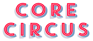 Type designer from Seoul, Korea. At S-Core, he co-designed the squarish Latin/Hangul typeface Core Dodam (2011), the shadow outline typeface Core Bandi (2012) and the hand-printed Core Narae (2011) with Hyun-Seung Lee. Hyun-Seung Lee, Dae-Hoon Hahm and Min-Joo Ham jointly designed the programmers' typeface Eco Coding (2012) and the huge Core Sans, Core Sans G (geometric), Core Sans M and Core Sans N, Core Sans NR, and Core Sans N SC families (supported codepages are MS Windows 1252 Latin1, MS Windows 949 Korean (Hangul) consisting of 11,172 letters and KS Symbols (Korean Symbols)).
 In 2013, Hyun-Seung Lee, Dae-Hoon Hahm and Min-Joo Ham jointly designed the layered type system Core Circus---as a reaction to the hugely successful Trend typeface by Latinotype, I guess. The slab version is Core Magic (2014). See also Core Circus Rough (2014) and Core Magic Rough (2014), both jointly designed by Hyun-Seung Lee, Dae-Hoon Hahm and Dong-Kwan Kim. Core Slab M (2013) is a 31-style companion of Core Sans M---it is a soft rounded slab with some seriffy tails mixed in with standard slab terminals. Core Mellow (2013) is a condensed organic rounded sans family that comes in 21 weights. In 2014, Hyun-Seung Lee, Dae-Hoon Hahm and Min-Joo Ham co-designed Core Sans D, Core Sans A, Core Rhino, Core Narae Pro (a Comic Sans alternative) and Core Deco (a 14-style art deco family). Core Escher (A and B) (2014) is a typeface family with impossible optical illusions, created by Hyun-Seung Lee and Dae-Hoon Hahm. Core Paint (2014) is a grungy paint-splatter typeface family by Dong-Kwan Kim, Hyun-Seung Lee and Dae-Hoon Hahm. In 2015, Hyun-Seung Lee, Dae-Hoon Hahm and Dong-Kwan Kim co-designed the grotesque typeface family Core Sans E and added the soft and rounded Core Sans R to the S-Core Sans series, as well as Core Sans B. In 2016, they added the rounded small x-height family Core Sans BR and the geometric sans family Core Sans C. The rounded version of Core Sans A, called Core Sans AR was designed in 2016 by Hyun-Seung Lee and Dae-Hoon Hahm. The rounded version of Care Sans C, called Core Sans CR, was designed in 2016 by Hyun-Seung Lee, Dae-Hoon Hahm, and Dong-Kwan Kim. The neutral Core Serif N was added in 2016 by Hyun-Seung Lee, Dae-Hoon Hahm and Dong-Kwan Kim. [Google]
[MyFonts]
[More] ⦿
|
Dan X. Solo
[Solotype]
|
 [MyFonts]
[More] ⦿
[MyFonts]
[More] ⦿
|
Dan X. Solo / Solotype: List of typefaces
|
An alphabetical list of the 135 typefaces in the Solotype digital collection: Acantha, Alaska, Alfereta, Angel, Arcade, Assay, Athena, Atlantis, Bamberg, Bamboo, Bandstand, Banquet, Baraboo Banner, Barbary Coast, Bareback, Behrens Antiqua, Behrens Schrift, Beijing, Benjamin, Berolina, Bindweed, Blue Point, Bordeaux, Brevet, Brussels, Buddha, Cabaret, Campaign, Cathedral, Cheval, Cigar Label, Circlet, Cleopatra, Cognac, Concave Extended, Coney Island, Contract Banner, Crossroads, Dainty Lady, Dangerfield, Dawson, Diablo, Dime Museum, Disco, Donaldina, Dutch Treat, Eastlake, Eccentric, Egyptian Oldstyle, Emperor, Estienne, Eureka Antique, Europa Text, Excelsis, Extravaganza, Fairmont, Fancy Dan, Fandango, Fantan, Farringdon, Fat Face No. 20, Faust Text, Filmstar, Five Star Final, Fletcher, Flo Barnum, French Ionic, Gashouse Gang, Ghost Show, Gilbey, Gladiate, Goodfellow, Grecian, Gretchen, Hansard, Harlem Text, Harmony, Hattan Antique, Hearst Italic, Hearst Roman, Houdini, Hullabaloo, Huntsman, Huron, Illyrian, Kitcat, Lady Cleo, Lord Mayor, Malibu, Manifesto Bold, Mardi Gras Improved, Margie, Marshall, Master Script, Memorial, Minnesota, Minsky, Monument, Moritz, Moulin Rouge, Mozart, Mural, Nadall, Opera House, Pacifica, Palmetto, Paper Lanterns, Pekin, Penelope, Penny Arcade, Quadrille 2, Rigney, Riviera, Roman Forum, Roundhead, Seminary, Sentry, Sparticus, Spearhead, Stamps, Standing Stones, Tally Text, Telegraph, Tourist, Trapeze, Tuscan Gothic, Unique Wood, Valerie, Valjean, Vanities, Vienna, Webster, Welcome, Westmore, Zorro. [Google]
[More] ⦿
|
Daniel Mizielińscy
|
 Aleksandra and Daniel Mizielińscy are from Warsaw, where they set up Hipopotam. Together, they created the hand-drawn 3d outline typeface Bubol (2011), the hand-printed Cartographer (2011), the grungy caps typeface Mr. Black (2011), the upright connected monoline script typeface Mrs White (2011), and the constructivist typeface Olifant (2011).
 In 2012, they added Mr. Brown, Mr. Dog Dog (hilarious animal silhouette typeface), Mr. Robot (an octagonal overlay family that can have shadows), Mr. Tiger (eroded woodsy caps), and Mr. Orange (hand-printed). Typefaces from 2013: Mr. Dodo, Mrs. Lollipop (a hand-drawn layered type system), Mr Lucky (sketched layered family), Mr. Alex, Mr. Happy (hand-drawn), Mr. Cyrk (checkered letters as seen on clowns and in a circus), Mr. Anteater, Mrs. Ant (comic book text typefaces). Typefaces from 2016: Mr Dum Dum. Behance link. Klingspor link. [Google]
[MyFonts]
[More] ⦿
|
Danya Orlovsky
|
 Or Danila Orlovsky. Student at the Stroganov Moscow State Academy of Applied and Industrial Arts, 2006-2012. Danya (Danila) is the Moscow-based designer of the constructivist version of Didot called Circus Didot (2010, Paratype).
 MyFonts link. Behance link. Klingspor link. [Google]
[MyFonts]
[More] ⦿
|
Dave West
|
 Type designer of the photolettering era (1960s) whose work is slowly but surely being digitally revived by Nick Curtis, and by Photo-Lettering, the House Industries subsidiary that bought the PhotoLettering Inc type collection. FontShop link. His typefaces:
 - The slightly psychedelic typeface West Banjo. Nick Curtis's Fiddle Sticks (2007) is based on this typeface. For another digital revival, see Plinc Banjo (2017, Mitja Miklavcic at House Industries.
- Elephant Gothic, a fat deco face. Remade by Nick Curtis as Elephunky NF (2011).
- Nick Curtis believes that Stymie Black Flair may also be due to him, and he based his Tutti Paffuti NF (2007) on the latter face.
- African Queen was revived by Curtis as Djibouti NF (2007), a minimalist tribal African alphabet.
- Nickelodeon. Revived by Curtis as Lily Hilo NF (2008).
- Barnum Block (Western face), done in 1960 at PhotoLettering Inc. This became Cg BarnumBlock at Compugraphics. The Compugraphics collection is now sold by Monotype. See also PL Barnum Block.
- Behemoth (1960, PhotoLettering): a slab serif. This too became a Compugraphics face, Cg Behemoth Semi Condensed. See also PL Behemoth Semi Condensed.
- Bubble Gum (late 1960s). This bubblegum / cartoon font was finally digitized in 2011 by Jess Collins for House Industries, and is now called Plinc Bubblegum (2021).
- Futura Casual inspired Nick Curtis to draw Occidental Tourist NF (2010).
- Walnetto Casual (Photolettering) is another psychedelic face. For a digitization, see Nick Curtis's Jackalope NF (2010). West Barnum Ultra, designed by Dave West and digitized by Ben Kiel&Adam Cruz at House Industries in 2011, was film no. 5494 in the original Photo-Lettering archive.
- West Thud.
- West Kerpow, a comic book typeface, late 1960s. This was digitized in 2011 by Allen Mercer at House Industries as Plinc Kerpow.
- West Italiano, or simply Italiano. A Bodoni-style italic. In 2015, Steve Ross and Ken Barber at House Industries digitally revived this typeface as Plinc Italiano.
- West Emperor Script. A connected didone script.
- West Nouveau Compact (Pyschedelitype 5619 in the PLINC collection of 1968). See, e.g., Pyschedelitypes (Alphabet Directions No. 8), Photo-Lettering, Inc., 1968. In the Curvy Block Lettering style of Viennese secessionist Alfred Roller. The same face appears in Castcraft's Encyclopedia of Phototype Styles (1978) as Cetus Black.
- West Fifth Dimension (1971), an Alfred Roller-inspired psychedelic typeface that was shown in PLINC's Alphabet Thesaurus Vol. 3 (1971).
[Google]
[MyFonts]
[More] ⦿
|
David Fernando Espinosa Martínez
[Type Sailor]
|
 [More] ⦿
|
David Fleming Nalle
[Scriptorium (Ragnarok Press, Fontcraft)]
|
 [MyFonts]
[More] ⦿
[MyFonts]
[More] ⦿
|
Decorated Initials
[Stephen Coles]
|
Stephen Coles's list of decorated initials: [Google]
[More] ⦿
|
Denis Libon
|
 Canadian designer of the (free) shadow circus fonts Black Angel (2011), the art nouveau typeface Freshwater Classic (2011), Candle 3D (2011, +Black), and Topsquare (2011). He created the oriental simulation typeface Stick Rice (2011) and the display typeface Melted (2011).
 In 2012, he created the shadow typeface ShowLetters, Pullstar (fat signage script family), Pullstar Holinight (2012), Tracker (hand-printed), Medley Script, Rose Heart, Spear Mint, Brick Wall (a texture face), Crispy, Crisp, Armand Chief (connected script), Mystic Arm, Back of Times, Back of Shadow, Fairland (blackletter), Armand Cocktail, and Thorn Heart. In 2013, he published Jess Font and Jessy Heart. Dafont link. [Google]
[More] ⦿
|
Dieter Steffmann
|
 FontShop was the name of Dieter Steffmann's foundry in Kreuztal, Germany (not to be confused with the FontShop foundry and font vendor). He made about 600 self-proclaimed "old-fashioned" fonts, and among these many Fraktur fonts. His site became too expensive to run, and was for about two decades hosted by Typoasis. His fonts can now de downloaded afrom 1001 Fonts. Alternate URL. Current list of fonts. See also here. New stuff. Fontspace link. A nice essay about Fraktur fonts accompanies the fonts. News. As Dieter puts it: I am not a designer but I add missing letters to public domain fonts in order to get a complete character set and I hint the fonts and create new weights (shadow, inline etc.) His Christbaumkugeln font, and how it was made. The font families:
 - Acorn Initialen (2000), Adine Kirnberg (2000, after David Rakowski's Adine Kirnberg Script, 1991), AI Parsons (1999: a simple conversion to truetype of AI Parsons (1994, Inna Gertsberg ans Susan Everett), which in turn revived Will Ransom's Parsons from the 1920s), Albert Text (2000), Alpine (2000), Altdeutsche Schrift (1998: a rotunda), Alte Caps (2000: white on black), Alte Schwabacher (2000, +Shadow), Ambrosia (2000), American Text (2000: a blackletter), Aneirin (2000: Lombardic), Angel (2000: an ironwork font), Anglican Text (2000: a frilly blackletter), Angular (1999: +Inline, +Shadow), Ann-Stone (2000: boxed art nouveau caps), Antique No. 14 (2000: fuzzy hand-crafted letters), Arabella (2000: script), ArabesqueInitialen (2002), Argos George (1999, an art nouveau font after Georges Lemmen's George-Lemmen-Schrift (1908); Steffmann added Argos Geirge Contour), Aristokrat Zierbuchstaben (2002, after a house font at Ludwig&Mayer, 1911), Ariston Script (2000: a formal calligraphic script), Art Nouveau Initialen (1999), Attic Antique, Augusta (2000: a rotunda; +Shadow).
- Baldur (2000: art nouveau; +Shadow, +RoughSliced; after a schelter typeface from 1895), Ballade Bold (2002, a Schwabacher font based on Ballade Halbfette designed by Paul Renner in 1937; +Contour, +Shadow), Barock Initialen (2002: an incomplete decorative initials typeface), Becker (1999; +Shadow, +Inline), Beckett-Kanzlei (2001), Behrens-Schrift (2002: an art nouveau-inspired blackletter typeface based on an original by Peter Behrens), Belshaw (2000: a Victorian decorative serif), Belwe (2002, after an original by Georg Belwe, 1913; Gotisch, Vignetten), Benjamin Franklin Antique (2000, after a warm wood type designed in 1991 by Walter Kafton-Minkel simply called Benjamin), Berlin Squiggle Condensed, Bernhard Schmalfett, Bier und Wein Vignetten (2002, based on drawings from the Bauersche Giesserei), Billboard, Bizzaro, Black Forest (2000, blackletter; +Text, +ExtraBold), Black Knight (1999: blackletter), Blackletter (2001; +ExtraBold, +Shadow), Blackwood Castle (2000: an almost Lombardic blackletter; +Shadow), Breitkopf Fraktur (2000), Bretagne Gaelic (1999), Brian James Bold (2000, +Contour), Bridgnorth, Broadcast Titling (2000, 3d caps), Broadway Poster, Brock Script (2000: formal calligraphic script).
- Cabaret (2000: all caps, +Contour, +Shadow), Campanile (2000: Victirian), Camp Fire (2000: wooden plank font), Canterbury Old English (2001: blackletter), Cardiff (2000: textured caps), Cardinal (2000: almost Lombardic; +Alternate, +Anglican), Carmen (1998: art nouveau style; +Shadow), Carrick Caps (2000), Caslon Antique, Caslon Fette Gotisch, Cavalier (2000), Celtic Frames (2000), Celtic Hand (2000), Challenge (2000; +Contour, +Shadow), Chelsea (2000: a serif), Chopin Script (2000, a formal penmanship script identical to Polonaise), Christbaumkugeln (1999: art nouveau alphadings consisting of Christmas ornaments), Chursächsische Fraktur, Cimbrian (2001: blackletter), Circus Ornate Caps (2001, a Western or circus font), Cloister Black Light (2001: blackletter), Coaster Black (2001, +Shadow), Coelnische Current Fraktur (2000), Colchester Black (2001: an ornamental blackletter), College, Courtrai (2000: a decorative blackletter), Coventry Garden, Cruickshank (2000: art nouveau caps).
- Damn Noisy Kids (2002: a heavy brush font), Davy's Dingbats, Debussy, Decorated Roman Initials (2003), Deutsch Gotisch (2002: an expressive blackletter font; +Dutesch Gotisch Heavy, +Outline, +Shadow), Deutsche Uncialis (+Shadow) (2000), Deutsche Zierschrift (2002, after Rudolf Koch, 1919-1921), Devinne Swash (2000), Digits (2000), Direction (2000: letters with embedded arrows), Dobkin Script (2000: after David Rakowski, 1992, Domino, Domo Arigato (1999: oriental emulation), Dover, Driftwood Caps (2000: a wooden plank font), Due Date (2000: a grungy stencil typeface), Duerer Gotisch (2001), Duo Dunkel (+Licht), Durwent (2001: a rotunda).
- Easter Bunny (after a 1994 font by Apropos Creations), Easter Egg (2001; after a 1994 font by Apropos Creations), Eckmann Initialen (2002, after the famous art nouveau typeface from 1900 by Otto Eckmann), Eckmann Plakatschrift (2002), Eckmann-Schrift (2002), Eckmann Titelschrift (2002), Eckmann Schmuck (2002), Egyptienne Zierinitialen (2002), Egyptienne Zierversalien (2002), Ehmcke-FrakturInitialen (2002), Ehmcke-Schwabacher Initialen (2002), Eichenlaub Initialen (2000), Eileen Caps (2000; after David Rakowski, 1992), Eisenbahn (2002, based on train vignettes at Bauersche Giesserei), Elzevier Caps (2000; after David Rakowski), Enge Holzschrift (2000; +Shadow), English Towne Medium (2000: a Fraktur), Epoque (1999; an art nouveau typeface; +Shadow, +Inline), Erbar Initialen, Estelle, Evil of Frankenstein, Express (1999).
- Faktos (1998; a rip-off of Cory Maylett's Faktos, 1992; +Striped, +Contour, +Shadow), Fabliaux (2000: Lombardic caps), Fancy Card Text (2000: a textura), Fat Freddie (2000: a fat all caps font; +Shadow, +Outline), Faustus (2000: a Schwabacher), Fenwick Woodtype (blackletter: 2001), Fette Caslon Gotisch (2001), Fette Deutsche Schrift (2002, a revival of a Rudolf Koch font from 1908), Fette Egyptienne, Fette Haenel Fraktur (2000), Fette Kanzlei (2002), Fette Mainzer Fraktur (2001), Fette Steinschrift (2002), Fette Thannhäuser (2002; after Herbert Thannhäuser, 1937-1938; +Schattiert), Fette Trump Deutsch (20002, after Georg Trump, 1936), Firecat, Flaemische Kanzleischrift (2000: calligraphic), Flowers Initials (2000: floriated caps), Forelle (2002: a retro script; +Shadow), Fraenkisch Spitze Buchkursive (2002; after Lorenz Reinhard Spitzenpfeil, 1906), Fraktur Coelnische Current (2000), Fraktur Schmuck (2001: ornaments), Fraktur Shadowed (2001), Fraktur Theuerdank (2000: a Schwabacher), Frederick Text (2001: a blackletter), Futura Script.
- Gabrielle (1999: a retro script), Ganz Grobe Gotisch (2000), Gebetbuch Fraktur (2000: a Schwabacher), Gebetsbuch Initialen (2001), Germania (2001, a revival of the 1903 blackletter typeface by Heinz König called Germania as well), Germania-Versalien, Gille Fils Zierinitialen (2002, after Gillé Fils, ca. 1820), Gingerbread Initials (Victorian initials, after an original from ca. 1890), Globus, Gloucester Initialen (2001), Gorilla Black (2000: rounded elephant feet font), Gotenburg A+B (2002, after Friedrich Heinrichsen), Gothenburg Fraktur (2000), Gotische Initialen (two different sets with the same name, one from 2000 and one from 2002), Gotisch Schmuck (2002, Fraktur), Goudy Initialen (2000), Goudy Medieval (2000), Goudy Thirty (2000), Grange (1999), GrenzschInitials (2001), Grusskarten Gotisch (2001), Gutenberg Textura (2000).
- Haenel Fraktur Fett, Hansa (1999: art nouveau), Hansa Gotisch (2001: a textura), Hansen (1998; +Contour, +Shadow), Happy Easter (1994, by Apropos Creations: art deco caps), Harrowgate (2001: a textura), Hazard Signs (2000), Headline Text (2001: a textura), Hercules (1999: art nouveau), Herkules (2004: art nouveau), Hermann-Gotisch (2002; after an original by Herbert Thannhaeuser, 1934), Herold (2002), Hippy Stamp (2000: after rubber stamps from the 1960s), Hoedown (2000; +Shadow), Holla (2001; after Rudolf Koch), Holidayfont, Holtzschue(2000: a circus font, after David Rakowski, 1992), Honey Script (2000: a retro script), Horror Dingbats (2000; after Letters from the Claw, 1998), Houtsneeletter, Humboldt Fraktur (2002-2005; after a Schwabacher font by Hiero Rhode, 1938; +Zier, +Initialen).
- Iglesia Light (2002), Iron Letters (2000), Isadora Original.
- Jan Brad, Journal Dingbats, Jahreskreis (seasonal dingbats, 2002), JSL Blackletter Antique (2000, by Jeffrey S. Lee), Jugendstil Fraktur (originally designed by Heinz Koenig, 1907-1910), Jugendstil Ornamente (2002, art nouveau ornaments, after Schelter & Giesecke).
- Kabinett Fraktur, Kaiserzeit Gotisch (2001), Kanzle (2001)i, Kanzlei Initialen (2002), Kalenderblatt Grotesk (2000), Kashmir (2001: an arts and crafts typeface), Kinder Vignetten (2002), KingsCross (2001: blackletter), Kinigstein Caps (2000: art nouveau initials after David Rakowski, 1990), Klarissa (2000), Kleist Fraktur + Zierbuchstaben (2002, after Walter Tiemann, 1928), Koch Antiqua (2002), Koch Antiqua Zierbuchstaben (2002), Koch Initialen (2000, after Rudolf Koch, 1922), Koenigsberger Gotisch (2001), Koenig-Type (2002; a Jugendstil Fraktur originally designed by Heinz Koenig, 1907-1910), Kohelet (2001), Koloss, Konanur Kaps (2000, after David Rakowski, 1991), Kramer, Krone Bold.
- La Negrita (2000, +Shadow), Latina (2001: script), Lautenbach (2001, +Zierversalien), Legrand (1999: art nouveau), Lemiesz (2000), Lettres ombrées ornées (2002, based on a typeface by Schriftgiesserei J. Gillé, 1820), Linolschrift (2000, +Heavy, a linocut font as in the Munch paintings), Lintsec (2000, a stencil typeface, after David Rakowski, 1992), Liturgisch + Zierbuchstaben (2002, after Otto Hupp, 1906), Logger (2000, after David Rakowski, 1991), Lohengrin Fraktur (2000), Long Island Antiqua, Louisianne (1998-2000: +Contour, +Shadow; a bold upright connected script), Ludlow Dingbats (2000, after Ludlow, 1930), Luthersche Fraktur (2000).
- Mainzer Fette Fraktur, Marker Felt (2001), Marketing Script (1999, +Shadow, +Inline), Marlboro (2000), Maximilian (2002, a Fraktur font and decorated caps based on Rudolf Koch, 1914; +Zier), Mayflower Antique (2000), Mediaeval Caps (2000), Medici Text (2002: an ornamental blackletter), Menuetto (1994, after K.R. Field), Messing Lettern (2000), Metropolitain (2000, an art nouveau font like the ine used for the Paris metro; +Contour, +Condensed), Middle Saxony Text (2001), Moderne Fraktur (1999), Monats-Vignetten (2002, based on drawings by Franz Franke for Bauersche Giesserei, 1920), Montague (2000), Monument (2002, after Oldrich Menhart, 1952), Mordred (2000), Morgan Twenty-Nine (1999: Victorian caps), Morris Roman Black (2002, after William Morris, 1893), Morris Initialen (2000, after William Morris).
- Napoli Initialen (2000), Neptun Gotisch (1999), Neugotische Initialen (2002, after an original from 1890), North Face (2000), Nougat (2000), Nougat Nouveau Drop Caps (2000), Nubian (after Walter T. Sniffin's font from 1928).
- Olde English, Old English Five (2000: blackletter), Old Town (2000: Western), Old London (2000: blackletter).
- Packard Antique (2000), Paganini Text (2000: blackletter), Pamela (2000: an ornamental blackletter), Paris Metro (1998; +Outline), Parsons Heavy (2000, after Bill Ransom, 1918), Paulus Franck Initialen (2002), Penelope (2000, Victorian), Peter Schlehmil (2002, after Walter Tiemann, 1918-1921), Peter Schlemihl Fraktur, Picture Alphabet (2000; after an original from 1834), Pilsen Plakatschrift (2000), Pinewood (2000, like wooden branches), Pinocchio (based on a psychedelic typeface by Gustav Jaeger, TypeShop, 1994), Plakat-Fraktur (2001), Plakat Antiqua, Plastisch (2002: ornamental caps), Plastische Plakat Antiqua (2002), Plum Script (2000: an upright script)), Pointage (2000; after David Rakowski, 1992), Polonaise (1999: a formal calligraphic script), Polo Semi (2000), Powell Antique (2000), Prince Valiant (1999: blackletter), Printer's Ornaments One (after Blake Haber, 1994), Prisma (2003, a four-line typeface inspired by Rudolf Koch's Prisma), Progressive Text (2001), Puritan (2000, +Swash).
- Quentin Caps (2001: Tuscan).
- Rediviva (2002), Rediviva Zierbuchstaben (2002: a Schwabacher font after a 1905 typeface at Benjamin Krebs designed by Franz Riedinger), Reeperbahn (1999; aka Rope), Regatta Relief, Reiner Script, Relief Grotesk (2003), Revue Decor, Reynold Art Deco (2000: arts and crafts; +Contour), Rheinische Fraktur (1999: after a 1905 Stempel font called Arminius Fraktur and Rheinische Fraktur), Rio Grande, Rockmaker (2000, after David Rakowski, 1992), Roland 92000. +Shadow, +Contour), Rolling No. 1 ExtraBold (2000), Roman Antique (+Italic) (2000), Romantik Initialen (2000), Romantiques (2002: ornamental caps, perhaps a circus font), Rondo, Rosemary Roman (2001: a great calligraphic script based on Rosemary Hall's Rosemary Roman), Roskell (1998: a poster font, +Bold, +Shadow), Roslyn Contour (2000), Rossano (2000, +Shadow), Rothenburg Decorative (2000: a frilly blackletter), Rothenburg Fraktur, Royal Initialen (1999), Roycroft Initials (2000), Rudelsberg (Schrift, Initialen, Schmuck: a typeface family in Munch Jugendstil style, based on Otto Eckmann's Eckmann from 1901).
- Saddlebag Black (2000: Western), Saloon ExtraBold, Saltino, Salto, Sans Plate Caps (2000), San Remo (2000: a Parisian art nouveau typeface), Sans Serif Shaded (2000, after a font by Stephenson Blake), Savings Bond, Schampel Black (2001: a blackletter), Schmalfette Fraktur (2000; +Schattiert), Schluss-Vignetten (2002, also from Bauersche Giesserei), Schmale Anzeigenschrift + Zierbuchstaben (2002, after Rudolf Koch's Deutsche Anzeigenschrift, 1916-1923), Schmuck Initialen (2001), Schwabacher (2002), Sebaldus-Gotisch (2002, a blackletter after H. Berthold's Sebaldus Gotisch from 1926), Sentinel (decorative caps from 2001), Sesame (2000, +Shadow), Shaded (2002, a take on Sans Serif Shaded by Stephenson, Blake & Co. Ltd., Sheffield), Sholom (1999: Hebrew emulation), Showboat Caps (2000), Shrapnel (2000: in the font, we find a reference to David Rakowski, 1992), Siegfried (2001, art nouveau, based on a typeface by Wilhelm Woellmer), Simplex, Sixties, Snowtop Caps (2001), Starburst (2000; after a 1990 font by David Rakowski), Steelplate Textura (2002), Stencil Display, Subway (2001: Black, Shadow), Supermarkt.
- Tanach (2003: Hebrew emulation), Tannenberg (Fette Gotisch, Fett, Umrandet, Schattiert: after Emil Meyer, 1933-1935), Thannhaeuser Fette Fraktur, Thannhäuser Zier (2002; original by Herbert Thannhauser, 1937/38), Theuerdank Fraktur (2000; after Schoensperger's Theuerdank, 1517), Thorne Shaded (2002, a shaded didone based on a Robert Thorne design of 1810), Tierkreiszeichen (2002, zodiac signs, based on drawings by Franz Franke for Bauersche Giesserei), Tintoretto (2000, after a Schelter & Giesecke original), Titania (2001; after Titania by Haas, 1906), Titling Roman Antique, Tobago Poster (2001; +Shadow), Tone And Debs (2002; after a 1991 snow capped font by D. Rakowski; identical to Snowtop Caps in 2001), Tonight (2002: a marquee font), Topic, Toskanische Egyptienne Initialen (2003: after a 1889 font by Schelter & Giesecke), Transport Pictorials, Tribeca (2001, after a David Rakowski original), Trocadero Caps, Trucker Style ExtraBlack, Turtles (2000; an extension of Turtles by Neale Davidson), Typographer Caps (2000), Typographer Fraktur (2002), Typographer Gotisch (2002), Typographer Holidayfont (2002: Christmas dingbats), Typographer Rotunda (2002), Typographer Subway (2011), Typographer Textur (2002, Fraktur), Typographer Uncial Gotisch (2002), Typographer Woodcut Initials (2002), Typographer's Schmuck-Initialen.
- Uechi Gotisch, Uncialis Deutsche, Unger Fraktur Zierbuchstaben (2002; after an ornamental caps typeface by Julius Nitsche done in 1908), Unicorn (2000).
- Vadstena Rundgotisch, Varah Caps, Ventura Bold (2000), Verve (+Shadow, 2000), Victorian Initials (2001), Victorian Text (2001), Viking (2000), Vivian (2000, +Shadow), Vogeler Initialen (2002, aka Vogeler Caps), Volute (1999: art nouveau caps).
- Walbaum Fraktur (after Justus Erich Walbaum, 1800), Wallau Deutsch, Wallau Rundgotisch, Wallau Unzial and Wallau Zierbuchstaben (2002; originals by Rudolf Koch 1925-1930), Walthari Text, Washington Text, Waterloo Relief, Wave, Weiß Initialen (2000), Weiss Lapidar (2002, revival of a typeface by Emil Rudolf Weiss), Weiss Rundgotisch (1998; Bold and Shadow), Werbedeutsch (2002, original by Herbert Thannhaeuser, 1934), Westminster Gotisch (2001: Lombardic), Wharmby (2000, a shadow font), White Bold (2003, a shadow font), Wieynk Fraktur (2002, +Initialen, + Caps Round; after a Schwabacher by Heinrich Wieynck, 1912), Wieynk Fraktur Vignetten (2001), Will-Harris Caps (2002, after David Rakowski, 1992), Woodcut.
- Yellow Submarine (1995; after Stanley Davis's Amelia, 1966), Yentus (2001: Hebrew emulation), Yonkers (2001: a Rundgotisch font), Yorktown (2000: a Western wood type emulation font).
- Zallman Caps (2000, after David Rakowski, 1991), Zentenar Fraktur (2003: after Friedrich Hermann Ernst Schneidler, 1937), Zentenar Zier (2002; after F.H.E. Schneidler, 1937), Zierinitialen 1 (2002, after an original from ca. 1800), Zierinitialen Two (2002; based on Deutsche Zierschrift by Rudolf Koch), Ziffern und Pfeile, Zither Script, Zodiac Pictorials.
A set of TeX service files for many of the decorative caps fonts was published by Maurizio Loreti from the University of Padova. The collection is now also available in OpenType. 1001Fonts link. Fontsquirrel link. Dafont link. Fontspace link. Abstract Fonts link. Home page. [Google]
[More] ⦿
|
Dong-Kwan Kim
[Serious Fun Type Foundry]
|
 [MyFonts]
[More] ⦿
[MyFonts]
[More] ⦿
|
Douglas Day
|
 Creator of Bracelet Victorian (Tuscan Ornate, Victorian) New&Old in 2001. He writes: Scanned from Tschichold's "Treasury of Alphabets and Lettering" (Norton) and painstakingly digitized. For another typeface based on the same alphabet, see Romantiques (2002, Dieter Steffmann).
 In 2013, he reappeared at Fontspace and posted these free Victorian / Western / circus style ornamental caps typefaces: Gardenia Victorian, Radiant Antique, Caliope Victorian. All three were scanned from Dan Solo's Victorian Display Alphabets in 2001. Fontspace link. [Google]
[More] ⦿
|
Emily Frink
|
During her studies at University of Louisville (KY), Emily Frink designed Circus Silly (2018). [Google]
[More] ⦿
|
Erik van Blokland
[LettError]
|
 [MyFonts]
[More] ⦿
[MyFonts]
[More] ⦿
|
Fanny Villagomez
|
Mexico City-based designer (at Universidad Iberoamericana) of the Tuscan Western typeface El Circo (2019). [Google]
[More] ⦿
|
Fat wood type: Stephen Coles's List
|
 Stephen Coles points out the warmest, biggest and boldest wood types in the FontShop store.
 [Google]
[More] ⦿
|
Fernando Haro
|
 Las Palmas de Gran Canaria, Ampuero and Laredo, Spain-based designer (b. 1971) who set up deFharo. Creator of the monoline sans typeface Depez (2011), Fabada (2011), and the free monoline geometric sans typeface La Chata (2011). La chatte, in French? Maybe not.
 In 2011, he made the monoline organic sans typeface Lerótica (free at OFL). In 2012, he created Nabatea (stone chisel typeface), V de Vacia (a grungy outline face), Sabática (organic), the straight-edged data style typeface Gabardina, the grotesk typeface A Bebedera, the shadow typeface B de Bonita, D Puntillas, and the deconstructed Qebrada. In 2013, he designed Yacarena Ultra, H.H. Agallas, Nacimiento (a dymo label font), J Airplane Swash (a psychedelic typeface named after Jefferson Airplane), CA Garrutas (grunge), CA Gatintas (grunge), I Am Telefono (the largest phone dingbat and scanbat typeface on earth), Wach Op-Art (kaleidoscopic icons), K.O. Activista, I Am Hueca, X Template (stencil), H.H.Samuel (rounded sans), U2 Metalona (a beautiful white-on-black display face), M F Plexus Italic, J.M. Nexus Grotesque (an "thin inline" fat grotesque), Wachinanga, Tabaquera, Pabellona (grunge), El Pececito (video game font), the poster typeface Hobby of Night (OFL), H2O Shadow (outline version of Fabada), Zabatana Poster (a didone-inspired poster font), Oaxaquena Tall, Yacimiento (wood style wedge serif), and Rabanera. Typefaces from 2014: Babalusa Cut, A Cuchillada, Sabandija (a plump round display typeface), F2 Tecnocratica, F1 Secuencia Quad (pixel face), La Pejina FFP (bilined), Tabaiba Wild, Gabachita (ultra-condensed rounded sans). Typefaces from 2015: Tabarra Pro (Swiss style sans family for Latin, Cyrillic and Greek), A Sogra Ruth (ultra-condensed art deco), Gaban (an outline version of Tabardo), Tabardo (a heavy blocky font), Wacamoler Caps (a Tuscan typeface inspired opening credits of the Western movie Winchester '73 directed by Anthony Mann in 1950), Ubicada (condensed geometric sans), Rabiosa (neurotic font), Zacatecas (condensed shaded sans), F3 Secuencia Round, La Babaca (a powerful black condensed sans in the style of Impact), Obcecada Sans + Serif (condensed with almost disappearing descenders), Eacologica Round Slab (a nice commercial font with an incomplete set of numerals), Palim Script (curly), Vacaciones (signage face), de La Cruz. Typefaces from 2016: Yugoslavia (calligraphic), Love Box (stencil), Cienfuegos (connected retro script named after the Cuban her Camilo Cienfuegos), Gaitera Ball (round fat script), The Black Box (a retro banner font), Durum Kebab (shadow sans), Jolgoria In Town (script), Yerbaluisa (signage script), Escobeta One (brush script), Posteratus Rex, Bastardilla (a cursive font), Rotulona Hand, The Juke Box (retro juke box lettering), Angelique Rose (connected monoline script), Promenades, Bucanera (a swashbuckle font), Lucemita, Panama Road (a casual calligraphic font), Deslucida, Disoluta, Sucesion Slab, Tabarra Pro Round, Qebab Pro Shadow, Monserga (white on black), Indulta SemiSerif. Typefaces from 2017: Partizano Serif (a retro poster font; free demo), Jack Stanislav (a great condensed movie poster font), Fontanero (rounded fat sans), Yonky (fat slab serif), Zigzageo, Libertatus (manual serif fonts based on a Czech poster from 1935), Libertatus Duas (slab serif), Flamante Sans, Flamante Serif, Flamante (Round, SemiSlab, Stencil, Seca, Cairo, Roma), Seisdedos Dead (rough stencil fonts), Neo Latina (stencil), Carta Magna (blackletter), La Sonnambula (signature script), Bola Ocho (an eightball font), Clandestina (textured, layered), Acratica (signage script), Penitencia Inline, Autarquica (outlined vernacular style), Caminata One (shaded signage typeface), Sin Razon (wedge serif), Glotona Black and White (a layered tattoo style font duo), Glotona Dots (the textured versions of Glotona), 6th Aniversario, Tribal Box (squarish sans, with tattoo ornaments and a great environment for borders), Candy Pop (bubblegum font), Sargento Gorila (army stencil font), Libertinas + co (a curly calligraphic script; the free version has no numerals). Typefaces from 2018: Gudariak (a free color SVG font: Vicente Ballester Marco (Valencia 1887-1980) was a graphic designer and Valencian poster artist affiliated with the CNT (Confederacion Nacional del Trabajo) who created political propaganda posters of clear modernist and post-cubist influence during the Spanish Civil War. The Gudariak typeface is inspired mainly by one of the posters he made for the Government of Euskadi and also in others where the author continues to explore this particular typographic style. ), Farisea Fraktur, Octuple Max (techno), Ordeal Eroded, Panfleta Stencil, Secuela (free), Fragua Pro (condensed sans family), Getho (a geometric semi-sans), Cowboya Tuscan (a curly Tuscan circus font), Txuleta Deco (a striped art deco typeface), Coltan Gea (slab serif), Getho Semi Sans, Cowboys (a Tuscan typeface), Drystick Geo Grotesk, Diezma, Grifa Slab, Coltan Gea (slab serif family), Paloseco (geometric and grotesk), Stoica (a color SVG font), Letrera Caps (a rounded square style layered and color font that pays homage to the sans serif inline genre), Enagol Math (a condensed rounded slab serif based on carefully applied mathematical ratios), Heptal, Velocista, Octagen Condensed, Octagen Black, Sextan Serif, Sextan Cyrillic, Quickat (signage script), Octagen (condensed sand with short descenders), Wolframia Script (flowing handwriting), Pentay Slab, Pentay Sans, Pentay Book, Cuatra, Judera (Flat and Ring: monospaced, unicase and totally sqaurish), Quotus (slab serif), Tripleta Grotesk (a 16-style geometric sans family). Typefaces from 2019: Pervitina Dex (sci-fi), Megalito Slab, Obesum Caps, Jane Roe (sans), Icons Opentype, Felona (stencil: a variable font), Neo Fobia, Bocartes Fritos (food icons), Red Thinker (a squarish monoline sans), Pena Caldaria (blackletter). Typefaces from 2020: Anoxic (a squarish monoline sans). Typefaces from 2021: Humato (a sturdy font for weightlifters), Probeta (a squarish techno sans family in 42 styles), Speeday (a speed emulation sans). Creative Market link. OFL link. Behance link. Dafont link. Devian tart link. Abstract Fonts link. Fontspace link. [Google]
[MyFonts]
[More] ⦿
|
Font Mesa
[Michael Hagemann]
|
 Michael Hagemann's creations have a 1850-1920 style or at evoke the Wild West. Font Mesa was located in Naperville, IL, but is now based in Las Vegas, NV.
 Free fonts include Cactus Sandwich (Mexican simulation face), Timepiece (originally called Tax Cut), Timepiece 3D, Magic School One and Two (2004, two Harry Potter typefaces), Wild Ride, Corleone (2001: see also here), Corleone Due (2001), MightyRapids (2001: discontinued) and the Ferrari logo font FerroRosso (2002). Michael Hagemann's commercial fonts by year of production: - 2001: La Mesa (2001), Maverick's Luck (2001), Desperado (2001), Rio Mesa, Maverick's Luck (based on a bank document from 1876), La Macchina (2001, Lamborghini car lettering)
- 2002: Brewmaster Modern (lettering of Budweiser Racing), Saddlery and Saddlery Post (Western-style caps: a revival of Minaret by Ihlenberg in 1868; Solo calls it Trocadero), FerroRosso (lettering as in the Ferrari logo), Stampede (a family based on lettering used in document from the Chicago, Indiana&Eastern Railway Co. in 1902), Main Event (a Tuscan font, based on Tuscan Ornate, or Bracelet, fonts that date from before 1860; originally called Main Strike in 2003), Red Dog Saloon, Rough Riders (great Western-style caps), Draft Beer.
- 2003: OK Corral (revival of Caslon and Catherwood's Italian from 1821), OK Corral Lined (same as OK Corral with layers; called Italianate Barnum by Dan Solo), Gold Standard (a Tuscan font based on a few letters found on an old Gold Certificate from 1882), Rodeo Clown (based on Carnival), Taqueria, Cove.
- 2004: Bronc Stomper, Open Range, Saloon Girl (a spurred version, Tex Mex, appeared in 2021), Gillé Classic an exquisitily detailed family based on work by Joseph Gillé, 1820's, and implemented elsewhere under the names Circus, Roma and Madame; this was originally called Home Style; some say that the original goes back to Silvestre and not to Gillé; because of this, finally renamed Maison Luxe in 2017; the condensed versions, released in 2021, are Mi Casa and Mariachi), Miss Scarlett (Gone with the Wind poster lettering), Open Range, High Noon, Draft Beer Classic (2002-2005, connected 50s script), High Country, American West, West Wind, AmericanPop (Coca-Cola font).
- 2005: Buckhorn (a Tuscan style Western or circus font; renamed Circus Wagon in 2020), Rodeo Roundup (rope font; Solo called it Rope Initials), Algerian Mesa (32 fonts; extended to the gigantic font family Tavern in 2017, with further development in 2020 in Bay Tavern and Bayside Tavern; the original Algerian goes back to Stephenson and Blake), Conestoga (circus font), Rough Riders (a nice Western font based on the logo of the Beach Creek Railroad Company in the 1860s), Rough Riders Redux, Mesa Pointe (pointing hands, from 19th century sources), Black Pearl (an ornamental blackletter typeface based on an original from ca. 1860; it has two beautiful manicules; some say it is based on an 1860 font called Rimmed Black by West, published by Farmer&Little), Saloonkeeper (inspired by the Leinenkugels brewing label), Wanderer (inspired by the title logo of the TV show The Wild West), Lynchburg (inspired by the Jack Daniels Green Label Whiskey logo).
- 2006: Flatrock (a revival of Inverted Shaded by Julius Herriet, done at Conner in 1886; Solo calls it Big Cat; in 2020, Flat Rock was renamed Big Cat by Hagemann), Livery Stable (revival of GlypticShaded by Ihlenburg at MS&J, 1878. See also Glyptic and Glyptic No.2, 1878), Happy Holly Day, Main Street (a Tuscan typeface that revives Soutache by Julius Herriet and Bruce, 1873).
- 2007: Birdcage (2007, after a lettering sample in Rob Roy Kelly's American Wood Type book), Lonestar, Lonestar Western, Railhead (2007: 4 styles, a revival of an 1870s type style that was originally available from both Bruce's New York and James Conner's&Sons type foundries called English Two-Line Ornamented No.4; an earlier version was English, done in 1853 by Caslon, Austin, Woods and Sharwoods; and before that, the typeface was created by a German designer in 1849), Flying Dutchman (2007, a revival of a MacKellar, Smiths&Jordan Co Kanzlei-style font from 1876), and Western Sky (2007, a revival of a late 1800s Italian font known as Italian Slab Fancy or Dodge City: it is Italic Ornate from Smith, 1874, MS&J). Country Western (2007, 11 styles; plus versions called Country Western Script and Country Western Swing) is a revival of the classic William Page font known as Clarendon Ornamented originally designed in 1859 and again in 1877 by Vanderburgh&Wells. Abbiente (2007) is his first foray into the world of Bodoni and Didot. Buffalo Bill (2007) is a beautiful Western style font that revives a classic from James Conner's foundry from 1888 [Solo also calls it Buffalo Bill].
- 2008: Gold Rush and Gold Spur (2008) are further Wild West style families, based on typos from the Bruce Foundry, 1865. Silverland (2008, 8 styles; a revival of Ornamented No. 1490 by Ihlenberg, 1874, Bruce) and Belgian (2008, 5 styles; a revival of Ornamented No. 1515 by Julius Herriet, 1861, Bruce) are further revivals of typefaces from the Bruce Foundry.
- 2009: Spanish Main (revival of an old MacKellar Smiths&Jordan blackletter font named Sloping Black, 1896; others mention Witham and MS&J and give the date 1869), Spanish Rose, Black Rose (spiky blackletter based on BlackOrnamented No. 532, Ihlenberg, 1873, Bruce), Bella Rose (2009, blackletter), Broadgauge Ornate (revival of an 1869 Western poster typeface by Ihlenberg at MacKellar Smiths&Jordan). Apple Pie (2009) is some sort of Bodoni Ornate---it revives and extends a William Hagar Type Foundry face, ca. 1850 [MS&J added a lowercase in 1869]. This was followed immediately by Bodoni Ornamental. Hickory (2009) is an ornamental Western face, a revival of an old unnamed font dating back to 1852 and was sold through a few different type foundries including Bruce, MacKellar Smiths&Jordan and James Conner's Sons.
- 2010: Gunsmoke is a Far West font, a revival of a James Conner's Sons font that has been around the block under different names such as Extended Clarendon Shaded, Original Ornamented and Galena [Solo called it Galena]. Night Train is another Far West font.
- 2011: Gold is a multi-style slab serif font family based on the classic Gold Rush (1865, Bruce), with the shadows removed. Images: Gold Black, Gold Thin.
- Undated: Cowboy Serenade (based on Phidian by Ihlenberg, 1870, MS&J; Solo's names: Eureka, Shaded Phidian), Gold Fever (based on Caxtonian, 1878, MS&J), Old Thunder (based on a Tuscan typeface from the 1800s).
- 2013: Great Western, Cowboy Western, Cowboy Rodeo.
- 2014: Magnum Sans.
- 2015: Grillmaster (a basic sans family consisting of 128 fonts).
- 2016: Pitmaster.
- 2017: Ribfest (a Tuscan circus font), Texicali, Alta Mesa (Wild West wood type).
- 2019: Marlin Geo, a large sans typeface family---a modern geometric take on Helvetica. Michael writes on Creative Market: You may have noticed a new FontMesa font released on June 17th called Geovetica, Monotype has asked me to rename the font because it's too close to their best selling product. Marlin is the new name choice for our new font with the geometric version [Marlin Geo] being released first. Marlin Geo has many opentype features and comes with italics (at a 12 degree angle) and a slanted version (at a 6 degree angle). See also Marlin Soft (2019).
- Fried Chicken (2020). A 32-style slab serif family intended for supermarket or food product advertizing.
- Philadelphian (2020). A Western or billboard font family based on a MacKellar, Smiths & Jordan font from 1867 by the same name.
- Taco (2020). A multistyle Mexican party font.
- Tortilla (2021). A 24-style Tuscan typeface, a flat-sided version of Fontmesa's Saloon Girl and Tex Mex font families.
- Marzano (2021-2022). A 30-style blend of Futura, Helvetica and his own Marlin.
Klingspor link. Fontspace link. Dafont link. Creative Market link. MyFonts page. View Michael Hagemann's typefaces. Abstract Fonts link, [Google]
[MyFonts]
[More] ⦿
|
Fritz Richter
|
Designer (b. Leipzig, 1945) at Typoart of Biga (1985), a shaded 3d headline face. Klingspor mentions the date 1989. In any case, a digital version is available from Elsner & Flake. He studied at the Hochschule für Grafik und Buchkunst Leipzig from 1974 until 1979. In 2016, Ralph M. Unger created the circus font Circensis, and writes that the font was influenced by Richter's work. [Google]
[More] ⦿
|
Gabriel Kazuo
|
As a graphic design student in Campinas, Brazil, Gabriel Kazuo created the Victorian era circus font Retro (2016). [Google]
[More] ⦿
|
Gatot Triardi Pramaji
[Typehead Studio]
|
[MyFonts]
[More] ⦿
|
George Dunkley
|
Graduate of Salford University, UK, b. 1991, now working in Manchester. At Salford, Dunkley designed Alpine (2012, a narrow font), Showtime (2012, a circus font) and Upgrade (2012, a dot matrix font based on the display of the Philips BDP3000 DVD player). Commercial typefaces by him include Georgey (2014, hand-printed). Creative Market link. [Google]
[More] ⦿
|
German Ermics
|
Latvian designer, b. 1985, Riga. He graduated from Design Academy Eindhoven in 2011 and set up his own graphic design studio in Amsterdam in 2014. Creator of the Western circus font How Are You. [Google]
[More] ⦿
|
Gilang Purnama Jaya
[GP Type foundry]
|
 [MyFonts]
[More] ⦿
[MyFonts]
[More] ⦿
|
Gleb Guralnyk
|
 Dnipropetrovsk, Ukraine-based designer of these typefaces in 2015: Odd Times (a vintage blackletter typeface), Brandy Label (a layered Victorian signage font), Smoking (a great Western layered poster font), Traveller, Letterhead (steampunk, vintage, Victorian), Age, Nataly Temper, Vintage Auto (a retro chrome automobile font), Golden Dust (a lava lamp font), Rusty Phoenix, Phoenix, the Victorian signage typeface Whiskey, Spirals, Biker (spurred inline font), the oily signage font Pin Up.
 In 2016, he designed Far Kingdoms (Victorian), Brass Heart (steampunk / Victorian), Big City Light (a vintage movie theater typeface), Lostamp (a weathered vintage rough stencil script), Kexman (calligraphic script), Loftype (creamy brush script), Shoelaces (monoline script), Tobacco Box (Victorian), Humblest, Whiskey Label (a great vintage Victorian headline font), Insane Fear (spurred), Falchion Edge (Victorian display typeface), Inside The Box (techno), Amber Taste (a layered Victorian beer label font; see also Amber Taste Pro (2020)), One Thin Line (a paperclip font), Bald Eagle (Victorian), Autumn Feel (brush script), Dirty Cartoon, Magic Curls, Winery, Bite Hard (beveled caps), Lovebus (psychedelic style), Column (layered Victorian), Golden Brush, Marine Fairytale (Victorian), and Old Story (handcrafted). Typefaces from 2017: Goodwine, Daub (EPS format brush alphabet), Rusted Bevel, Dirty Cartoon (a layerable cartoon font), Bald Eagle (vintage), La Belman (Victorian; see also La Belman Pro in 2020), Bright (creamy calligraphic), Winery, Magic Curls, Black Queen (Victorian style), Little Mess (dry brush), Lovebus (psychedelic), Bite Hard, Fiver (prismatic style), Sweet Rum (vintage), The Freaky Circus (Western circus font), Biker New (spurred), Flex Wire, Agress (graffiti style), Old Story, Rusted Brushpen (dry brush), Mosaic Pool, Ranch (vintage style with layered textures), Golden Dust, Letter Head, Limber (dry brush script), Patina, Craft Beer (a layered beer label font), Droptune (Victorian), Chimera Tail, Hardwatt (dry brush), Megawatt (signage script), Jamish (a handcrafted blackboard bold typeface), Oak Lumber, Odd Times (blackletter), Gunshot (an art nouveau display typeface), Bootleggers (a vintage label typeface), Brandy Label (vintage layered font), Smoking Typeface (vintage Western style, with layering). Typefaces from 2018: Shining Night (a marquee font), Scratches, Candy Shop (a multiline titling typeface), Nataly Temper (a crayon font), Anise Seeds, Lostamp (a great stamp font), Hicksons (retro signage script), Loftype (creamy script), Far Kingdoms (spurred vintage typeface), Predators Cuspid, Sweet & Fresh, Frantic (a vintage car typeface), Affair (Victorian), Falchion Edge (spurred vintage style), Lost in Space, Traveler (an interlocking vintage Tuscan display typeface), True Black, Late Frost, Inside The Box (an interesting double-width font), Magic Garden (curly style), Skater Girl (retro script). Typefaces from 2019: True Black (Tuscan), Nature Force, Sweettooth (script: 2018-2019), Rusted Bevel, Rusted Bevel, Fishermans Knot (a vintage label font started in 2018), Skater Girl (a heavy upright script), Cidrella, Western Shooter, Little Mess (a dry brush calligraphic script), Spirit Board (pure Victoriana), Ranch Vintage (shadowed, textured, vintage), Forged Fence (an ironwork font), Long Ride (an octagonal license plate font), Chimera Tail Rough, Patina. Typefaces from 2020: Sweet Ponch, Natural Heap (letters in laurels), Street Rush, Cally (a decorative Tuscan typeface), Sunny Bay, Harietta (a retro monoline script), Cheer Inside (a vintage font), Frizzy (a vintage label font), Asia Impact (simulating an oriental brush calligraphy), Exa Metline (an inline font), Hallie (a curly display typeface), No Rules, Parallax, Golden Treasure (a vintage ironwork font), Squidink, Bushman (an organic sans), Florry (a display sans), Propeller, Spirit Board (a layered circus font family), Lord Grayson (Victorian), Grayson (a tall gloomy monoline sans), Grayson Rough, Kaipara (a patterned all caps font), Classic Heritage (a Victorian or steampunk signage typeface), Anise Seeds (vintage softly spurred Tuscan caps), Candy Shop (vintage trilined caps), Plop, Practish (an experimental slab serif family), Everleigh (a stylish thin typeface), Everleigh Duo, Love Affair (vintage, perhaps art nouveau), Lost in Space (sci-fi), Sweet and Fresh. Typefaces from 2021: Dusky Rough (a Western or saloon font), Dusky Pub (a Western typeface with Tuscan features), Dusky Slab (a reverse stress Western font), Humblest Pro (an all caps display sans), Giftbox (a vintage label font). Typefaces from 2022: Simply Royal (layerable vintage caps with an engraved money look), Go Pop (pop art). [Google]
[MyFonts]
[More] ⦿
|
Goresan Pelangi
[Brand Semut]
|
[More] ⦿
|
GP Type foundry
[Gilang Purnama Jaya]
|
 Gilang Purnama Jaya (GP Type foundry) is a Bandung, Indonesia-based graphic designer, b. 1987.
 He created Nasta Sucks (2008, grunge), the grungy athletic lettering typeface Bandung Hardcore GP (2010) and the free gothic fonts The Underdog Journey (2010), Minggu Pagi (2010) and Goodbye Alena (2010). Creator of the "broken" constructivist typeface Gilang Cinta Sabrina (2010), which has only capitals. In 2012, he made the circus font House of Wonderland, the spurred tattoo typeface Biker from Hell, the tattoo script typeface Original Gangsta, the graffiti typeface Los Angeles Homies. The spurred tattoo script Tattoo Shop was made in 2013. In 2013, Decade Type foundry published Los Santos (a tattoo / graffiti font), Basingstoke (a spurred display typeface by Gilang Purnama Jaya), American Brewery (Decade Type foundry: a whiskey bottle font), American Brewery Rough, Appleton (a spurred 19th century signage typeface published by Decade Type foundry), and Vintage Badges. In 2014, he created the retro typeface Reckless. Typefaces from 2015: Wayke (poster font), Grenson (vintage spurred typeface), Outfitter Script (monoline). Cofounder of Image Type with Ihsan K. Lazuardi and Agung Maskund. At Imagi Type, he published Fetridge and Outfitter Script (2015, rounded monolinear) and Michigan Brush (2017, with Kiena Audri), Typefaces from 2018: SS Hilborn (a vintage type). Dafont link. Devian tart link. Fontspace link. Another Dafont link. Another Fontspace link. [Google]
[MyFonts]
[More] ⦿
|
Greater Albion Typefounders (or: GATF)
[Paul James Lloyd]
|
 Paul J. Lloyd's type foundry in Western Australia, est. 2008. Lloyd (b. UK) made over 100 free truetype fonts before that. He writes: What we will offer is new designs, replete with Edwardian Fun, Victorian distinction, or any other piece of elegance we can manage.
 Edwardian creations from 2008-2010: Ark Wright (traditional shop signage), Adantine, Goldbarre, Brosse, Crewekerne, Crewekerne Magna and Crewekerne Magister (arts and crafts face), Larchmont, Brissard, Brossard (slab serif), Bonavia, Bonavia Blanc, Clementhorpe, Veneribe, Chiara Script, Howlett, Svengali Roman, Bonning and Bonnington (1920's style families with ideas from University Roman), Absinette (2009, art nouveau), Bamberforth, Tumbletype, Vertrina, Bromwich, Great Bromwich, Fleete, Helenium. Chipping emulates the Edwardian 1920s. In 2012, he added the Bolton Commercial family (late Edwardian, early art nouveau). Art deco typefaces: Oakland (2011, multiline typeface gleaned from a 1930s French car ad), Zenia (2010, trilined), Plebe (Plebia, 2008: a grotesk emulating the 1930s), Whitehaven (2008, an extensive art deco family with several shadow weights), Merry Fleurons (2008, Christmas ornament dingbats), Braxia (2008), Keynsia (fifties style art deco family with Peignot influences). Other typefaces: Haymer is a large sans family made in 2010. Clunic (2008) is a blackletter face. Tectura (2008) is a handwriting font. Eldridge is a slab serif family. Aliqua (2009), Chipperly (2009) and Syondola (2008, Tuscan) are Wild West families. Terazza Tilings (2009) and Valentine's Fleurons (2009) are dingbat typefaces. Additions in 2009 include Lowndes (soft blackletter), Christmas Fleurons, Merry Snowmen, Cherritt (described as a Victorian era Courier), DoodleBirds, Halloween Fleurons, ButtonFaces, Sabio (neither slab nor sans), Daub (brush graffiti font), Sabinard (a modern swash face), Cullions (futuristic blackletter), Coronard (blackletter / roman hybrid), Easter Fleurons, Chapter Initials, Paveline (19th century calligraphic script), Mellin Sans and Open, Gildersleeve (evoking the 1920s Arts and Crafts movement), Stannard (a 1920's advertising inspired small caps face), Slattery (a horizontally shaded fun face), Slatterine (2009, more retro futurism), Spillsbury (2010, Victorian family), Cirflex (2010, geometric display typeface based on arcs of circles), Oxonia (2010, a classic roman family) and Vectis (classic Roman elegance, another small caps face). Creations in 2010: Windevere, Albion's White Christmas, Paragon (a great didone display family with a wood type feel), Compton (slab serif family), Mexborough, Morover (Schwabacher family), Anavio (a classical roman family), Corvone (3d-effect font), Granville (Victorian), Corton (Victorian), Wellingborough (Victorian), Worthing (Victorian), Ark Wright (traditional shop signage), Bonaventure (art nouveau), Federal Streamliner (1950s feel techno face), Deva (classical roman), Crucis Ornaments (crosses), Bronzino (a roman with Arts and Crafts roots), Bertoni (2010, a didone family), Pardon Me Boy (train dingbats), Woodruff (Open Face fonts with a wood type look), Jonquin (based on a WWI poster; +Incised), Luscombe (1920s display family; +Parva), Movella (futuristic from the 1950s), Magdalena Sans (2010: a clear monoline sans), Endymion (2010: Tuscan), Paget (a Tuscan experimental all caps face), Portello (Victorian). Typefaces made in 2011: Admiral (art nouveau), Tuscaloosa (Tuscan face), Eccles (bombastic Victorian), Wolverhampton (pre-Victorian), Doncaster (Victorian family), Metropole (art nouveau family), Corsham (stone engraved lettering family), Leibix (casual), Albia Nova (an elegant futuristic organic face), Flapper (art nouveau face), Bertolessi (curly Victorian), Tulk's Victorian Banner (all caps banner face), Fitzgerald (Victorian all caps face), Cleveden (Victorian headline family), Spargo (an extensive set of early 20th century-look engraved typefaces for official documents and securities), Bettendorf (2011, based on a 1900s masthead typeface), Wolvercote (2011, similar to Bettendorf), Pittsburgh (2011, a Western-style engraved face), Chubbly (2011), Portmeirion No. 6 (2011, a Victorian / circus design), Bronzetti (2011; images: i, ii, iii, iv, v, vi), Sophie J (hanprinted), Dem Bones (2011, glyphs made from bones), Stout (2011), Birmingham New Street (a Victorian family inspired by the hand lettered title on a 19th century railway map), Beckinslade (ornamental blackletter). Production in 2012: Alfere Sans Stripes, Albion's Americana (Western stars and stripes face), Tudor Perpendicular (blackletter), Amici (rounded headline face), Amie (rounded sans), Wolverton Text (Edwardian family), Vinea (10-style display family), Par Avion (retro futuristic), AstroBats (retro sci-fi dingbats), Beeching (+Shadowed), Gondolieri (didone meets Tuscan), Penrose Slabserif (an Escher-like trompe l'oeuil 3d face), Haldane (art nouveau, Arabic look), Solidarius (chubby, fat felt-tip pen font), Bluebottle (angular display face), Merrivale (Victorian), Future Runes (runic simulation), Coliseo, Alfrere Sans (inspired by a 1950s television caption style), Tectura II (Lloyd's answer to Comic Sans), Secombe (Edwardian caps family), Milligan, London Court (Tudor-era caps family). Typefaces from 2013: Speedblur, Belhampton (Edwardian), Merry Baubles (Christmas tree dings), Merry Bauble Letters (Christmas alphadings), Wroxeter (blackletter), Thurbrooke (+Banner, +Initials, +Black, +Reverso, all based on 19th century banner headings and engraved lettering), Bourne (a rounded type system), Henrician (a set of eight Tudor style display typefaces), Belle Jardin (art deco marquee face), Lavery (Edwardian), Baldione (a stylized didone), Chequers (a vintage poster face), Turvy Topsy (fat finger face), Merrivaux (faux medieval), Blout (German expressionist typeface), Easter Egg Letters, Isometrica (a banner typeface family), Valentine's Letters, Imperial Granum (roman titling face), Brollo (chunky display face). Typefaces from 2014: Albions Very Old Masthead, Albions Engraved Black, Albions Old Masthead, Albions Incised Masthead, Albions Black Holly, Zanderley (pure Victoriana, +Initials), Landsdowne Commercial, Friendly Shaded Sans, Trivette, Wellmere Sans, Uncia Black, Henry VII, Greene and Rollins (layered Victorian typeface), Barollo, Alfrine, Alfrere Banner (+Incised), Lugano, Lanvier (1930s-style caps typeface family), Bonlivet (a hyper-decorative capitals alphabet from the late Victoian or early art nouveau era), Ames Text (a didone family with rounded brackets), Ames Roman (related to didones but with wedge serifs), Ames Weathered, Ames Shadow, Ames Shaded, Amersham (vintage signage family, 2013-2014). Typefaces from 2015: Netherland Perpendicular (Victorian blackletter), Ledbury (Victorian), Ambergate (Edwardian poster face), Empyrean (futuristic, yet curvy), Flinscher (1920s script), Signwriter Standard, Display Hatched, Albions Marker No.1 (a charming outlined marker pen typeface inspired by Bembo and Caslon), Joyvrie, Kinver (Victorian), Nationale (Victorian), Doges Banner, Doges Darker (Victorian), Doges Delight (Victorian), Doges Venezia (Victorian). Typefaces from 2016: Buntisland, Elmcourt, Allorette, Albion Sharp Italic, Deco Metro (art deco), SpeedSwash (blackletterish), Stridere (blackletterish), SpeedSketch. Typefaces from 2017: Shervington, Cantebriggia 1207 (a weathered blackletter), Algreve, Alambart, Duquesne Dark Woodcut, Courtold Shadow, Athabasca (Wild West Tuscan), Fargo Tuscan, Millerstown (Western), Millerstown Races, Old Millerstown, Sasparillo (Tuscan), Sasparillo Fizz, Wylgate, Herald Banner. Typefaces from 2018: Garstang Engraved, Halliwell Casual, Portculliard, Rotham Industria, Sombrieul (Edwardian), Shervington Engraved (a shaded typeface that appears hand-engraved on copper-plate). Typefaces from 2019: Dewhirst Display, Rakia (retro futuristic), Eurobia (art nouveau style). Typefaces from 2020: Draughtsman Engraved, Draughtsman Label Hand (Victorian), Civic Triline. Typefaces from 2021: Albion Seventies, Portculliard Engraved (an engraved ultra-decorative blackletter). Type announcements. Behance link. Klingspor link. Abstract Fonts link. Font Squirrel link. Kernest link. Abstract Fonts link. Hellofont link. View all typefaces by Paul Lloyd. Images of Paul Lloyd's best-selling typefaces. Greater Albion Typefounders: typeface collection. View Paul Lloyd's Victorian typefaces. [Google]
[MyFonts]
[More] ⦿
|
Hamilton Wood Type (HWT)
[Richard Kegler]
|
 Hamilton Wood Type (HWT), established in 2012, is a joint venture between P22 type foundry and the Hamilton Wood Type & Printing Museum. The designs in this collection are based on printed specimens and actual wood type from the historic Hamilton Museum in Two Rivers, WI. HWT is based at P22 headquarters in Buffalo, NY. Typefaces are contributed by its founder, Richard Kegler, but also by Miranda Roth and Terry Wüdenbachs. In 2021, Hamilton Wood Type Collection joined The Type Founders.
 In 2012, they published HWT American Chromatic (Richard Kegler, Terry Wüdenbachs), a multilayered Western or circus font based on 19th Century Chromatic. HWT Antique Tuscan No. 9 (2012) is a very condensed 19th century Tuscan style wood type design with a full character set and ligatures. This font was first shown by Wm H Page Co in 1859. It is the first digital version of this font to include a lowercase and extended European character set. HWT Borders One (2012) contains 80 modular decorative elements that are based on the designs offered by the Hamilton Manufacturing company at the end of the 19th Century. In 2013, Richard Kegler released the refreshing retro typeface HWT Bon Air, which is one of a series of script typefaces cut into wood by the Hamilton Manufacturing Company for the Morgan Sign Machine Co. (makers of the Line-o-Scribe showcard press) ca. 1950). He also digitized HWT Star Ornaments and HWT Republic Gothic (with Miranda Roth). In 2013, James Todd designed the wood type revival family HWT Unit Gothic for Hamilton Wood Type Foundry. The Unit Gothic series was released by Hamilton Manufacturing Co. in 1907, and comprises a flexible range of widths from compressed to very wide. Still in 2013, William Page's Antique No. 4 is revived as HWT Slab (Antique, Columbian), one with unbracketed square serifs, and one with bracketed serifs as in Clarendons. In 2020, they added HWT Showcard Script (Terry Wüdenbachs) [Google]
[MyFonts]
[More] ⦿
|
Harold Lohner
[Harold's Fonts]
|
 [More] ⦿
|
Harold's Fonts
[Harold Lohner]
|
 Harold Lohner was born in upstate New York in 1958. He received an MFA in printmaking from the University at Albany and is Professor of Visual Arts at Sage College of Albany. He began making fonts in 1997 and starting distributing them the next year through Harold's Fonts. He lives in Albany, NY, with his partner, Al Martino. Originally, most of his typefaces were freeware or shareware, but gradually, he started selling most on his site or via FontBros. His typefaces:
 Link at Dafont. . Abstract Fonts link. [Google]
[More] ⦿
|
Hendry Juanda
[Letterhend Studio (or: Magang Letterhend)]
|
 [MyFonts]
[More] ⦿
[MyFonts]
[More] ⦿
|
Herbert F. Czarnowsky
[Baltimore Type Foundry (or: Baltotype)]
|
[More] ⦿
|
Huy Fonts
[Juan José Lopez]
|
 Huy Fonts is a foundry in Madrid run by Juan José Lopez. In 2016, he designed the great poster typeface Black Pack, which is inspired by the odd bold plastic shops signs from the 60s and 70s.
 With Inés Atienza, Juanjo designed the multilayered and/or chromatic circus font family Show (2014). Influenced by chromatic letterpress types, it is based on a type family called Concave, a Victorian type launched in 1884 by the foundry Marder, Luse & Co. Inés Atienza and Juanjo López are members of the Familia Plomez association, a small printshop based in Madrid that devote their efforts to promote everything about letterpress printing, calligraphy, and lettering. Lopez made Choriza and Choriza Sans (2013: sausage-inspired type), Adoquin (2013), the informal sketchified family Bodoniez (2011), Chiripa (2011, hand-printed), Hands Up (2011, various hands, including "thumbs up", "a OK", "the finger", and fists), Paquita Pro (2011, informal lettering; this children's book font was remodeled in 2016 as Paquita Next), Ultramarina (2011, a quaint face based on wood type headline examples), and Pichi (2011). Designer of the Scotch modern typeface Schotis Text (2017), the cartoon font family Xunga (2017) and the angular text typeface family Pliego. Earlier, Lopez was a T-shirt designer, who also used the name Juanjo Lopez. Old page of Juanjez Nikis. At Dafont, one could download the headline handwriting font Paquita (2006), a predecessor of Paquita Pro. See alo Fontstore / Fontshare's Paquito (2017). In 2021, he released the 70-strong thick-and-thin poster sans typeface Rotulo, which was inspired by Jano's Spanish movie posters. Later in 2021, he designed Graveur (he writes: Graveur is a Renaissance style text face based in the work of the French punchcutter Robert Granjon (1513-1589). Working on original artifacts kept in Museum Plantin-Moretus in Antwerp, observation of his punches, matrices and printed materials resulted in a extense type family that tries to capture the overall style of Granjon rather than simply being a slavish copy of a particular source. Started as my project at Expert Class in Type Design in Antwerp, Graveur has grown to become a typeface with four optical sizes and seven weights, plus italics and an ornaments font. It also has variable font). Klingspor link. Home page. I Love Typography link. Behance link. View Juanjo Lopez's typefaces. [Google]
[MyFonts]
[More] ⦿
|
Ikiikowrk
[Andhika Pradana]
|
 Surabaya, Indonesia-based type designer who set up Ikiikowrk in 2020. Typefaces from 2021: Afrocultures (script), Akira (a zenbrush script), Arka Heritage, Bachroque, Beach Sound (a retro font), Bluntype, Brooklyn Pirates (a baseball script), Brownie Fox, Cameo Sans, Camera Obscura, El Mariachi, Eleanore, Felicidade, Fielke (between serif and script), Hellofolks Monoline, Kaivalya, Kooltura (psychedelic), Le Cirque, Lebron Slab Little Ribbon, Maxmillion (a brush that emulates the 1980s), New Kids Crew, Newaves (Signature), Sailor Vito, Silvercrush (a brush font), Southern Clan, The Archies Typeface (an unconnected creamy supermarket script), The Athens (script), The Cleopatras Typeface The Rascals Tjoekil Kajoe, Tropicalismo (script), Wolfgang Krauss (blackletter).
 Typefaces from 2022: Athens (a meaty condensed script), Camera Obscura (bold display type), Cleopatras (a mini-serifed vintage display font), El Mariachi (a stocky gunslinger slab serif), Kaivalya (described by the author as a cultural type), Le Cirque (a Tuscan circus font), Little Ribbon (a stocky script), Newkids Crew (a marker font), Afrocultures (a script with personality), Maxmillion (a retro script), Southern Clan (script), Tropicalismo (a handwriting font with some contrast), Brooklyn Pirates (a baseball script), Brownie Fox (a fat finger script), Fielke, Nevermine (wavy). [Google]
[MyFonts]
[More] ⦿
|
imagex
|
 Frenchman (b. 1957) who started making fonts in 2010, after a career in illustration, comics, and video games. In 2010, he created the free fonts BabyJo (pixel face), Bayday, Chrom (beveled face), LaPresse (grunge), Muffaroo, Poppy, Poppydot, Spacecard, Strokewith, Strokeless, ToonLand (comic book lettering), ToonLandBlack, ToonLandShad, TrashToys (grunge), WorldColors (3d face).
 In 2011, he published Francobelge (comic book face), Freepress (grunge), Gamix (Western titling face), Inmyroom (dingbats), Majestrick (calligraphic), Onomatopaf (comic book dings), Outerzone, OuterzoneB, Starz (dingbats), Stenstreet (grunge), Tram, Tramix (texture face), TrashToys02, War-Lettersn, Mixagex, Massive Dynamite (grunge), Not Well (grunge), Actu, Blck, Gling (texture face), HeRioz (silhouettes), Brightoon (cartoonish brush face), Muzo (ink spill face), Sharpy, Space Shop (dingbats), Pulp Dance (hand-printed), Essef (art deco), Retro Sign (grunge), Labo (grunge), Exhausted, Komikoz, Puzzled, Toonimals (dings), Penstriped (sketch face), Cashier (grungy), Dan Hand, Hardwell (grungy caps), Colleged (athletic lettering), Goodjean (jeans texture face), Seaside Things (dingbats), Real Tek (techno), Zou (3d hand-printed caps), Painter, Border Line (grunge), Handout (grunge), Tract (grunge), Pulpatone (grunge), Logos I Love, Pal Antic (chancery hand), Twent (fat rounded display face), DoodFlow (dingbats), Afro Add (texture face), Crump (grunge), Big White, Dark Room (grunge), Manifesto (grunge), Tacketil (a FontStruct font), Otto Land (sketch face), Over (outline face), Under (brush dings), Baskertown (grunge), Nursery Tale, Panic (texture face), BlackNDot (ink spill face), Beyond (striped display face), Advert, Car Crash (grunge), Heartz, Starsteel, Smart Faces, Blackflag (a brushed blackletter), Dock 51 (grungy stencil), Lead (3d face). In November 2011, he created a number of texture typefaces: Hotöcop, Pal Mod, Speedy (sketch face), Thirties Gold, Sunset GP. Further 2011 typefaces: Poptivi, Shadow Mole, Super Modern Black. Faces from 2012: Remanence, Winter Days (dingbats), Nowharehouse (grunge), Snuff (grunge), Cup of Tea (3d shadow face), Talk of the wall. Typefaces from 2012: Egirlz (dingbats), Art Post (white on black poster lettering), Volutes (copperplate calligraphic script), From me 2 you (curly script), PS I Love You, Kolossal (caps only), Kraash, Alexandre (3d engraved headline face), Monstres de poche (dingbats), Alternate (grunge), Warning, Dreams (brush face), Headline Crack, Bump Pad (textured typeface), Carton (grungy white-on-black stencil face), Maybe maybe Not, Frames n Riboons (sic), Blackboard (sketched face), Logotronik (a 3d techno face), Big Bad Dogs (dingbats), Libre Expression (engraved copperplate typeface), Mecagothix (textured blackletter face), Destroy, Destroy Helpers, Buy More, Things we said (curly face), Lost Saloon (Tuscan), Salon de Coiffure (beveled), Brighton Pier (grunge), Motel Vacancy (grunge), Bates Shower (dripping blood typeface), Venus Furs (texture typeface), Showmen, True Men Tattoos (dingbats), Quicker (sketch font), Romanum Est (grungy Trajan face), Also (scratchy letters), Lazy Day (3d font), Pusher, Hard Dumb, The Idiot, Overflowing (grunge), Fast Foont (sketched), Melange (grunge), Jumbo Parade (circus font), Happy Monsters, Zozox (experimental), Magic Sound (packaging typeface), Arena Mascaras (dingbats), Top View (3d face), Flagadoum, Last King Quest, Rhythm n Blacks (textured face), Troll Sketched, Superpoz (a 3d painted typeface of exceptional beauty), HalloCuties (Halloween font), Gothik Steel (circus font), Silvestre Relief (3d titling face), Just Like That (comic book face), Numero 10 (athletic lettering), Tet de Mor (skulls), Facelook, Xmas Dad, Instant Marker, Ragtimer, Punk Dots (textured face), Onomato Vlam (comic book balloons), 8th Cargo (textured mechanical octagonal face), Zu Kabarett (creepy curly German expressionist face), Unusual Day One, Happy New One (party font), Xmas Doods, Xmas Doods 2, Higher, Usual Day One, Team 401 (athletic lettering), Doonga (comic strip letters), Killer's Move. Typefaces from 2013: Them (fat brush), Ghost Code, Tiny Heroes (figurines), Over There (sci-fi), Higher than High, Abandon (sketched face), Broken Hearts, True Stories, A wolf at the door (wood style poster face), Elo Hand, Bots n Droids (dingbats), Toonimals 2 (dingbats), Halftoned Backup (textured face), Novlang (textured poster face), Come With Us, Ptits Pirates (pirate figurines), Board Dudes (skateboard dingbats), Big Bro's Watch (grungy), Doonga Slash (comic book face), Round About, Signz, Lethal League (grungy athletic lettering), Dark Times, Dandy Hat Trick, tardots (textured typeface), Dinoz (dinosaur dingbats), Big Surprise (fat script), Comix Loud, Arlequin, Fanzine Title, Scotch Taped, Phoenix (dingbats), Rock's Death (grunge), Tuamotu (textured), Trees Friends (dingbats), King Arthur Legend (blackletter), Fairy Strange, Flame On, Mystery, Money Go Round (ransom note font), Seven of One, Captain's Talk, Peaches en Regalia (sketch font), Wrong Board (textured or crayon typeface), Subito (comic book face), Extra Sales (signage face), Gimme Danger (grunge stencil), Alphabet City (graffiti font), Raleigh Rock, Rysky Lines, Splash, Good Vibers (comic book figurines), Tequilla Sunrise (3d shadow face), Graphers Blog, Star Waves, Splash, Action Comics, Wild Trails (wood plank typeface), Tiki Club (dingbats), Bad Striped (sketched face), Come With Me (paint drip face), Famous Oldies (textured face), Girly Toons (dingbats), Eshop Advert, Full Pack 2025, Dickson's Tale (a great grungy caps face), Hand Typewriter, Campus Relief (athletic lettering), ZalienZ (dingbats), Manga Style (oriental brush), Journal du Soir (letterpress emulation), Royal Delight (3d sketched face), Gothix Fate, Lettrisme (a letterpress ransom note font), NYC Zone 123 (graffiti face), Tedz (teddy bear dingbats), Merry Xmas, Last Day On Earth (textured typeface). Typefaces from 2014: Dite Alla Giovine (flared cursive script), Heavy Gothik (textured blackletter), Comix Bubbles, King of Scotland (textured), Lazy Sketch, Arabica Export (coffee bag texture), Scream Again, Season of the Witch, Soul Festival, Back Ride 342, Cheap-Potatoes, Nine-Feet-Under (grunge), Remingtoned-Type, Search'n-Destroy, Starz-2, Vanished, On The Roof (or: On The Tops), Mad Groove Blast, Another Brick (textured face), Destination Future, Perversionist, Dex's Jobs (Treefrog-style typeface), Ptit Coeur d'Amour, Mickey's School (athletic lettering), One Way or Another (a hand-drawn poster typeface), Californian Cars (license plates), Building State Empire, Back on Lime (shadow face), Next Ups (graffiti face), PatchFun (textured face), Railway to Hells, Shut'em Down, Misunderstanding, Another Brick (textureface), Perversionist (grunge), Destination Future, Linographer, Polish Posterisation, For Girls Only, Half Price 4 You (sketched typeface), Secret Agency (bad ink grunge), Player One (a grungy baseball Script), Raw Notice, Home Mad Popsters, No Silly Walk There, Bad Coma (lovely grunge), Dark Net Warrior (grunge), Cowboy Movie (Western font), Palm Beach (textured typeface), Search n Destroy (textured), Carnaval de mai, Variations (textured), Black Jeans (weathered font), City of Light, Santa's Air Mail (snow-capped letters), Cheap-Potatoes, Nine-Feet-Under, Remingtoned-Type, Search'n-Destroy, Starz-2, Vanished. Typefaces from 2015: Snake Jacket, Big Campus (athletic lettering), Penball Wizard, When The Eagles Dare, Urban Brush Zone (graffiti font), Wild West Pixel, World Black Shadow, Next Custom, Irresponsible Direction (grunge), Doodle Gum (textured), Posthuman (textured), Red Zone (glaz krak face), Smasher 312 (graffiti font), Columbine (dripping blood font), Tarentula's Web, Just Like This (retro funk), Eastern Brush (oriental brush typeface), Pulp Headlines (grungy typeface), War is Over (letterpress emulation), Thirties Relief, Flowers Power (sic) (floral caps), Direct du Gauche (inky brush), Jackpot (3d, sketched), Numero 10 Clean (athletic lettering), Lace Dreams (textured), Right Chalk (chalky crayon font), Lazy Sketch Black, Golden Age (shaded pixel font), Swamp Death (textured), Astounding News, Heavy Metal Rocking, Fifties Movies, Grunge Strokes 01, Cosmik Orchestra, Paysley Sports (sandy athletic lettering), No Safety Zone (grungy stencil), Quicksands (textured), Break It Down (glaz krak font), Naughty Cartoons, Mad Groove Clean (athletic lettering), Outlaw Stars (grungy Western face), Space Comics, Dirty Bowl 86 (athletic lettering), Cheap Potatoes Black (imitating pototo printing?), ExtraBlur (textured), Backside Air, Megalopolis, Curse of the Zombie, After the Goldrush, Avantgardiste 1934, Easy Fashion (textured), Free Thinking's Murder (textured), Phantom Zone (zombie texture), Snake In The Boot, Checkpoint Charlie (grungy stencil), For Girls Only Bold, Playing In The Mood (piano key face), Intergalactik Airlines, Les Mystères de Paris, Season of the Witch Black (blackletter), Resistance Is Futile (a great textured mechanical typeface), On The Tops Lights (matinee signage), Strawberry Fields, Serif of Nottingham, OnomatoBom (cartoon smaks). Typefaces from 2016: Dynamix (a shaded comic book typeface), Black Santa (snowy letters), Astral Delight, Mr. Headlines (titling sans), Sister Spray, Shaka Pow (cartoon font), Jack in the Box, Glitter Campus (athletic lettering), Ghost Crazy (heavy brush), Prezident, Flowers Kingdom (psychedelic), Galaxy Corps (octagonal stencil), Stitchn School, Brown Shoes, Armagedon (dry brush), Smasher 312 (graffiti style), Bad Stories, Master Droid, Heavy Metal Box (grungy letterpress), Outerspace Shoping (sic), Extros Backstage (squarish), Jelly Crazies (jellybean font), Black and White Banners, Ballad of Dwight Frye (grungy), Crazy Sixties, SciFi Movies, Maximum Strength (athletic lettering), Evanescente (sketched typeface), Urban Ghost, Vif Argent (watercolor brush script), Demolition Crack (textured), How to Disappear, Public Market, Pyjama Party, Magician Rings (modular sans), Pale Blue Eyes (brush script), All The Mad men (sketched), Dixociative (white-on-black), White Flame (octagonal typeface), Asian Delight (oriental brush emulation), Candy Shop, Barb Wire Club, Super Weird, My Socks Line. Typefaces from 2017: Scoubidou Rap, Good Morning (cartoon font), Graphik Arts (textured), Danger Zone Warning, Love The One You're With, Are You Hung Up (textured), Keys of Paradise, Mr Headlines Fancy, Game of Brush, Powerful, Ghost Shadow, Quick Menu Boards, Urban Fresh Air, Cheer Lace Leader (textured), Cracked Code (grunge), Very Simple Chalk, Fluo Gums, Very Popular, Personal Service, Blind Signature (crayon font), Blood n Guts, Quarterback Fight (octagonal athletic lettering), Supersonic Rocketship, Reboot Crush, Strange Path (dry brush font), Heroes Legend, Cache-Tampon, Championship (a great horizontally striped typeface), Silver Age Queens, Strange Tales. Typefaces from 2018: Play With Fire, Scrunched, Megalomaniac Headliners, Craps of Paper (white on black), All Things Must Pass (textured), Presque Normal, Interfearence, Pop of the Tops, Universal Knowledge, Digital College, Cold Turkey (a handcrafted horror font), Strange Magic, Grandissimo, Best Prices (sketched), Magician's Daughter, Children's Theater (textured), Magnifico, Lethal Slime, Pop of the Pops, Slow Death, Folk Festival, Strange Marvel, Strong Impact (octagonal), Heavy Metal Blight, Mango Slice, Are You Jimmy Carl Black, Strange Clowns, Mechanical Animals, Fast Forward, Spanish Castles, Vintage Warehouse, Swamp Black, Pixelmania, Enigma key, Vlump (wooden plank font), Guns n Flash Comix, Black Streamer, East Border (military stencil), Bot Craftshop, Super Quick, Don't You Know?, Return of the Flash, Only The Strong (weathered athletics font), Hands Up, Strange Shadow, White on Black, Ed Wood Movies. Typefaces from 2019: Inner Mounting Flame, Playtimes, Game Commands (white on black), Magic Spots (with a spotted texture), Vanishing (with a halftone effect), State Secret (squarish), All My Stitches (a hospital font), Lightyear Design, Ancient Ad, African Style (textured with African patterns), Secret Planet (sci-fi), Universal Ignorance, Give Peace a Chance, Hard Punk Gothic, Vraoum (speed emulation font), Galaxy Travels, Megapoliscape, Red Signal, Perfect Mystery (dry brush), Many Years Ago (mechanical, octagonal), Vintage Display (textured caps), Space Sport (textured, octagonal), Dancing Days, Steam Punk, Splatch (comic book font), Rear Defender (octagonal, stencil), Ghost Factory, Kids Magazine. Typefaces from 2020: Bright Star (sci-fi), Fiesta Rumba (a matinee font), Sergeant Rock (a stencil typeface), Tricky Hearts (a vampire font), Organic Brand, Campus Riot (grungy), Crazy Love Song, Shiny Signature, Evil Highway, Slightly Eroded, Lightyear Shadow, City Player (graffiti), Night of the Deads (a horror font), Ka Blam (an all caps cartoon font), Unforgettable, Corrupted File (grungy, pixelish), Urban Heroes (a dripping paint font), Victorian Art Magic Remains, Kid Games, Restricted Area (a dripping paint stencil), Dark Poestry, Platinum Sign, Tacos de Tijuana (a Mexican party font), Retro Shine, Lower East Side (a graffiti font), Holidays Homework (a chalk font), Deep Shadow, Finger Printed, Crushed (a glaz krak typeface), Bing Bam Boum, Stars Fighters (a Star Trek font). Typefaces from 2021: Baby Party, Shadow Of The Deads, Big Bad Bugs, Boldfinger (bold caps), Paperback Writer (sketched), Comics Tricks, Charming Sixties, Squarely, Mad King Games, Back to School (a varsity font), Youtube Star (an oily typeface), Silver Medal (beveled), Cosmic Blaster. [Google]
[More] ⦿
|
Indriyanti Sidiq
[Paranesia (or: Bismillah)]
|
[More] ⦿
|
Inés Atienza
|
Designer in Madrid (since 2008) who has worked with Alberto Corazon in Madrid (2004-2005) and Massimo Vignelli in New York (2006-2007). She studied at the Sorbonne (1999), Universidad San Pablo CEU in Madrid (2004), Parsons in New York (2007) and Cooper Union (2011). With Juanjo López, she designed the multilayered and/or chromatic circus font family Show (2014). Influenced by chromatic letterpress types, it is based on a type family called Concave, a Victorian type launched in 1884 by the foundry Marder, Luse & Co. Klingspor link. [Google]
[MyFonts]
[More] ⦿
|
Inopatype (or: Kotak Kuning Studio)
[Arif Dwi]
|
 Surabaya, Indonesia-based designer of these script typefaces in 2018: Shalmone Hunter (sketched), Metalurdo, Kiara Tosfa (or Qiara Tosfa; monoline script), Kidosplay, The Foughe Script, Langit Merah, Bro Rintto, Fiona Lattina.
 Typefaces from 2019: Carelo Brush, Greattong Brush, Rostering Brush, Cufis Decor, Breyhana, Hello Najwa, Lambresia (a wide connected retro script), Kampiun Samgor, Saghinores, Exarros (an all caps sans family for posters and display), Gadimon, Shagie Hodie, Sweaty Belvin, Johnie Horian (marker pen font), Abeganshi, Jarbomhollow (a fat finger font), The Senom (a dry brush font), Childhood Memories, William Dhatos, Kalvise Brushy, Rhogsainel, Diverplate, Sarodine, Aeroshodic, Montecarlito, The Baghotta Script, The Saxibrush, Aerocentrix, Thundergood (a shadow font), Garlobrush, Andolucia, The Labothings, The Miladiator, Hendangan, Roximura, Amostely Signature, Rhyndatton, Willingar Diary, Wildest Force, Hemondalisa (a shadow typeface), Black Roties (white on black), Broughesnaro, Bad Saturday, Anordighos, Clasicalderibbon, Marrocin Funnies (monoline marker pen font), Danisha Romance, Asimone Brush, Adelarsio, Sandrina, Baseboy Greek (a shadow font), Crash Mounty, Allingkug Wellany, Willyan Rocks, Empire Samgor, Almonthy Mirotas, Daywalker (a shadow font), Zombie Carshel (brush font), Dhagienol Sans (a shadow font), Kodinah Diary, Ramphobias, Kawula Muda, Asmelina Harley, Homenuli Shadow, Westtgonia Barneh, Youth Brush Daylight, Jacklyn Milner (blackboard bold), Bargeritho, Melankolis, Brush & Wedco, Kaldevaderibbon, The Lamontrush, Crosaline Hulok, Bughartta, Aliando Rocky, Holligrandina, Albeon Round (a rounded monoline sans), Gadrey Shadow, Beethoven Syinthesa, William Morittan (script), Morningdoodle, Mozaik Duren (a triangulated typeface), Brought The Style, Boldieso Lehonu, Lambresia. Puzzleboxs, Mycuteballon (a balloon alphading), Skallight Millagra (script), Casa de Amor, Armonela Black (a prismatic or toothpaste font), Rhomelia Strip, Go Speeds, Ortisan Signature, Allenattore (script), Black Hurricane, Aeromus Kirho (a handcrafted circus font), Ramen Noodle (prismatic), The Foughe Script, Bluck Amorhies, Dhuki Minerwo, Badminton Shadow, The Crost Horment, Lorden Holen (calligraphic script), The Black Cassanova (a shadow script), Alondria Bepah, The Capten Hoyda, Adelia Shawn (a monoline marker font), Southern Lourent, Southern Jannie, Anthoni Signature, Sarodime (calligraphic), Marmia (calligraphic), Blangkon Script. Typefaces from 2020: Thoderan Notes, Malliya Signature, Amelia Stanley (a wild calligraphic script), Miguella Charlotte (an elegant wild script), Almonthy Mirotas (a fat finger font), Haniberryku, Fruity Stories, Sweet Garnish, Renatta Walters, Rachel Lovelyn, Sugar Charm, Amirah Brillone, Donittan Story (a wild script), The Macksen (a bold script font). Typefaces from 2021: Marlina Garden (script), Hendangan (a bold signature script). Creative Fabrica link. [Google]
[MyFonts]
[More] ⦿
|
Insane Fonts (or: Heather Insane)
[Maria Yurina]
|
Russian designer Maria Yurina (aka Heather Insane and as Insane Fonts) created these (vintage, spurred) typefaces in 2017: Ocean Storm, Hipster, Tennessee Honey, Pegasus Label, Imperial (striped and spurred), Haven (a spurred circus font), Tequila, Old Cask, Marine Rum, Bottle Of Gin, Old Bourbon Label. Other typefaces from 2017 include Hoodlum, Centennial (Victorian), Antiquarian (Victorian), and Orange Tree. Typefaces from 2018: Stones, Nautical, Campus (a multilined sports font), Mariner, Raw Coffee (Victorian), Dead Biker (spurred), Tail, Bubble. Typefaces from 2019: Medieval Kingdoms (with decorative layerable caps), Big Pie Mama, Wild Nature, Birmingham, Prohibited (spurred, layerable). [Google]
[More] ⦿
|
Jakob Fischer
[PizzaDude]
|
 [MyFonts]
[More] ⦿
[MyFonts]
[More] ⦿
|
James Vipond
|
Creator of Vipondoctic (2008), an octagonal beauty, with the help of FontStruct. Other creations at FontStruct in 2008: vipond_angular, vipond_chubby, Fast Money, Vipond Octic, Lampoon, Fast Money (gridded face), Unity Titling (art deco), Vipond Angular (octagonal), Ringling (Victorian circus font). [Google]
[More] ⦿
|
Jan Solpera
|
 Czech designer (b. 1939, Jindrichove Hradci) went to the Art School in Prague (1954-1958) and the Academy of Art, Architecture and Design in Prague (or: School of Applied Arts) (1959-1965). From 1973 until 2003, he taught at that academy, and headed the Font Studio at the School of Applied Arts. His best-known student was Frantisek Storm. His typefaces:
 - Insignia (1979-1982), a sans typeface family. This was renamed since Neville Brody has a font by that name, even though Brody's font was made only in 1990, eleven years after Solpera's font. The digital version by Frantisek Storm (2000, Storm Type Foundry) is called Solpera. See also here for this sans-serif family. He designed the fonts on the banknotes of the Czech National Bank.
- With Frantisek Storm, he designed Josef Sans in 2013, in the hope of adding a new sans family to Tyfa's Roman (Tyfa Antikva).
- Areplos (Book and Text), published in 2005 by Storm Type Foundry based on a 1982 original by Solpera.
- Circo (1971, H. Berthold AG). This Western style slab serif phototypeface was later carried by Lettergraphics as Cirque. For a digital version, see Harold Lohner's free typeface Flying Circus.
- Comenia Sans (Storm Type Foundry), Comenia Script, Comenia Serif, Comenia Text.
At the ATypI in Prague, Frantisek Storm said about Jan Solpera: Solpera always plays with the alternates. At that meeting, Storm described Solpera as a precise and patient man, who insisted on having many alternates (in his types). Klingspor link. [Google]
[MyFonts]
[More] ⦿
|
Jeff Levine
[Jeff Levine: Wood type]
|
 [MyFonts]
[More] ⦿
[MyFonts]
[More] ⦿
|
Jeff Levine: Wood type
[Jeff Levine]
|
 Digital renderings and simulations of wood type by Jeff Levine include Advertiser JNL (2009), Alderman JNL (2020: a wide slab serif typeface based on the classic wood type Antique Light Face Extended), Antique Unique JNL (2017, a revival of a wood type called Ten Line Antique Compressed No. 7), Blacksmith JNL (2011, based on a brass stencil image), Brenham JNL (2011), Buckdance JNL (2005, Tuscan), Bushwick JNL (2011, caps-only sans), Cattleman JNL (2013, a condensed French Clarendon), Cattle Trail JNL (2019: after Latin Condensed), Chamfer Engraved JNL (2020: a chamfered sans serif wood type design with a right side engraving line from the 1800s was found within the pages of the Thorowgood Foundry), Cherrywood JNL (2020: based on the classic Columbian from the William H. Page Wood Type Company (circa 1870), Cherrywood JNL is a bold slab serif type design), Clarenwood JNL (2014), Clarenwood Stencil (2015), Clarified JNL (2020; based on William H. Page's Clarendon Extended wood typeface), Compressed Wood JNL (2020: extrapolated from J.G. Cooley's Roman Triple Extra Condensed Fifty Line), County Clerk JNL (2020: after the vintage Hamilton wood typeface Gothic Special), Daily Tablet JNL (2014: based on wood type used for newspaper headlines), DuBois Block JNL (2008), Early Edition JNL (2020), Eccentric Wood Type JNL (2020), Elida JNL (2011, a didone all caps wood type family), Elk Grove JNL (2009, based on a wood type called Facade), Emporia JNL (2011), Engine Company JNL (2013), Final Edition JNL (2015), Fort Courage JNL (2014, a French Clarendon), Framingham JNL (2010, a widened version of Nostrand JNL), General Merchandise JNL (2020: after the condensed slab serif Antique X Condensed, ca. 1840, by Wells and Webb), General Merchant JNL (2013), Gristwood JNL (2015), Hayfork JNL (2011), Ingomar (2006), Lenorah JNL (2009), Local Printer JNL (2020: based on William Page's wood typeface Skeleton Antique, ca. 1865), Lockup JNL (2009), Longwood JNL (2014), News Event JNL (2020), Normandy Isle JNL (2011), Northfork JNL (2010, based on a William H. Page wood type alphabet called Parisian, circa 1857-58), Nostrand JNL (2009, condensed wood type), Notification JNL (2011), Nouveau Sans JNL (2014, art nouveau-inspired wood type), Octagonist (2020: a 3d beveled typeface that revives George Nesbitt's Octagon from 1838), Old Wood JNL (2013), Ornery Polecat JNL (2014: Western style), Page Printer JNL (2020: after William H. Page's Skeleton (1948)), Payson (2009), Pleasantwood JNL (2014), Presswood JNL (2020: based on the title font used on the cover of a specimen book issued by the Delittle Wood Type Company of York, England), Primitive Tuscan JNL (2014), Rachelle JNL (2009, Italian), Ranch Hand JNL (2013), Reverse Gothic JNL (2014), Roman Wood Type JNL (2012, in the Clarendon Condensed style), Rounded Sans Wood JNL (2015), Roundwood JNL (2020: spurred), Rustic Setting JNL (2013), Saddle Tramp JNL (2013), Sagebrush JNL (2014: modeled after French Clarendon), Sales Book JNL (2013), Sales Event JNL (2014), Sandalwood JNL (2020: based on a sans wood type seen in Rob Roy Kelly's American Wood Type), Shadowland JNL (2014), Shadowlawn JNL (2014), Sidewinder JNL (2013, an ultra-compressed wood type), Splinters JNL (2009, wood pieces), Slabserif Grotesk JNL (2020: based on a wood type design called Antique Light Face), Slabserif Wood JNL (2020), Stockville JNL (2012), Streamwood JNL (2014), Strongbox JNL (2009), Table Wood JNL (2020: based on the wood type Concave Tuscan Extra Condensed), Tamarac (2006, slab-serif wood type), Tent Show JNL (2014, based on a French Clarendon circus style), Teterboro JNL (2010; although built from scratch, this slab serif has a wood type feel), Texarkana JNL (2011, based on a classic condensed wood type from the 1800s, and embellished with stars), Topanga JNL (2010, ultra-condensed sans serif wood type), Trail Boss JNL (2011), Troubadour JNL (2011, ornamental wood type), Unadorned JNL (2017, an ornate spurred wood type font), Weekend Tabloid JNL (2009, a sans serif wood type), Western Wood Type JNL (2015, a Clarendon), West Fork JNL (2020: after Latin Extended by Hamilton, 1888), Westward JNL (2014: circus lettering typeface), Winnetka JNL (2009, octagonal wood type inspired by Cooley Antique Tuscan Condensed---a printer's wood type manufactured in 1859 by J.G. Cooley), Woodbranch JNL (2016), Wood Clarendon JNL (2020: after Hamilton Clarendon Condensed, 1899), Wood Condensed Grotesk (2014), Woodcraft JNL (2013), Wood Fancy Reverse JNL (2020), Wood Gothic JNL (2020: based on Hamilton Gothic Bold (Hamilton Wood Type Foundry, circa 1889), Woodhaven Initilas JNL (2014), Woodlawn JNL (2013, outlined), Wood Line JNL (2018, based on wood type), Woodline (2019: very different from Wood Line JNL), Woodmark JNL (2014: based on William H. Page's New Process No. 507), Wood Nouveau (2014), Wood Poster Display JNL (2014), Wood Rounded JNL (2020: an interpretation of Caslon Rounded), Wood Sans Narrow JNL (2017, based on examples of an extra condensed Hamilton Wood Type), Wood Serif Poster JNL (2020), Wood Stencil (2019), Wood Tuscan JNL (2014), Wood Type Bodoni JNL (2013), Wood Type Calendar JNL (2016), Wood Type Grotesk JNL (2014), Woodwork JNL (2014). [Google]
[MyFonts]
[More] ⦿
Digital renderings and simulations of wood type by Jeff Levine include Advertiser JNL (2009), Alderman JNL (2020: a wide slab serif typeface based on the classic wood type Antique Light Face Extended), Antique Unique JNL (2017, a revival of a wood type called Ten Line Antique Compressed No. 7), Blacksmith JNL (2011, based on a brass stencil image), Brenham JNL (2011), Buckdance JNL (2005, Tuscan), Bushwick JNL (2011, caps-only sans), Cattleman JNL (2013, a condensed French Clarendon), Cattle Trail JNL (2019: after Latin Condensed), Chamfer Engraved JNL (2020: a chamfered sans serif wood type design with a right side engraving line from the 1800s was found within the pages of the Thorowgood Foundry), Cherrywood JNL (2020: based on the classic Columbian from the William H. Page Wood Type Company (circa 1870), Cherrywood JNL is a bold slab serif type design), Clarenwood JNL (2014), Clarenwood Stencil (2015), Clarified JNL (2020; based on William H. Page's Clarendon Extended wood typeface), Compressed Wood JNL (2020: extrapolated from J.G. Cooley's Roman Triple Extra Condensed Fifty Line), County Clerk JNL (2020: after the vintage Hamilton wood typeface Gothic Special), Daily Tablet JNL (2014: based on wood type used for newspaper headlines), DuBois Block JNL (2008), Early Edition JNL (2020), Eccentric Wood Type JNL (2020), Elida JNL (2011, a didone all caps wood type family), Elk Grove JNL (2009, based on a wood type called Facade), Emporia JNL (2011), Engine Company JNL (2013), Final Edition JNL (2015), Fort Courage JNL (2014, a French Clarendon), Framingham JNL (2010, a widened version of Nostrand JNL), General Merchandise JNL (2020: after the condensed slab serif Antique X Condensed, ca. 1840, by Wells and Webb), General Merchant JNL (2013), Gristwood JNL (2015), Hayfork JNL (2011), Ingomar (2006), Lenorah JNL (2009), Local Printer JNL (2020: based on William Page's wood typeface Skeleton Antique, ca. 1865), Lockup JNL (2009), Longwood JNL (2014), News Event JNL (2020), Normandy Isle JNL (2011), Northfork JNL (2010, based on a William H. Page wood type alphabet called Parisian, circa 1857-58), Nostrand JNL (2009, condensed wood type), Notification JNL (2011), Nouveau Sans JNL (2014, art nouveau-inspired wood type), Octagonist (2020: a 3d beveled typeface that revives George Nesbitt's Octagon from 1838), Old Wood JNL (2013), Ornery Polecat JNL (2014: Western style), Page Printer JNL (2020: after William H. Page's Skeleton (1948)), Payson (2009), Pleasantwood JNL (2014), Presswood JNL (2020: based on the title font used on the cover of a specimen book issued by the Delittle Wood Type Company of York, England), Primitive Tuscan JNL (2014), Rachelle JNL (2009, Italian), Ranch Hand JNL (2013), Reverse Gothic JNL (2014), Roman Wood Type JNL (2012, in the Clarendon Condensed style), Rounded Sans Wood JNL (2015), Roundwood JNL (2020: spurred), Rustic Setting JNL (2013), Saddle Tramp JNL (2013), Sagebrush JNL (2014: modeled after French Clarendon), Sales Book JNL (2013), Sales Event JNL (2014), Sandalwood JNL (2020: based on a sans wood type seen in Rob Roy Kelly's American Wood Type), Shadowland JNL (2014), Shadowlawn JNL (2014), Sidewinder JNL (2013, an ultra-compressed wood type), Splinters JNL (2009, wood pieces), Slabserif Grotesk JNL (2020: based on a wood type design called Antique Light Face), Slabserif Wood JNL (2020), Stockville JNL (2012), Streamwood JNL (2014), Strongbox JNL (2009), Table Wood JNL (2020: based on the wood type Concave Tuscan Extra Condensed), Tamarac (2006, slab-serif wood type), Tent Show JNL (2014, based on a French Clarendon circus style), Teterboro JNL (2010; although built from scratch, this slab serif has a wood type feel), Texarkana JNL (2011, based on a classic condensed wood type from the 1800s, and embellished with stars), Topanga JNL (2010, ultra-condensed sans serif wood type), Trail Boss JNL (2011), Troubadour JNL (2011, ornamental wood type), Unadorned JNL (2017, an ornate spurred wood type font), Weekend Tabloid JNL (2009, a sans serif wood type), Western Wood Type JNL (2015, a Clarendon), West Fork JNL (2020: after Latin Extended by Hamilton, 1888), Westward JNL (2014: circus lettering typeface), Winnetka JNL (2009, octagonal wood type inspired by Cooley Antique Tuscan Condensed---a printer's wood type manufactured in 1859 by J.G. Cooley), Woodbranch JNL (2016), Wood Clarendon JNL (2020: after Hamilton Clarendon Condensed, 1899), Wood Condensed Grotesk (2014), Woodcraft JNL (2013), Wood Fancy Reverse JNL (2020), Wood Gothic JNL (2020: based on Hamilton Gothic Bold (Hamilton Wood Type Foundry, circa 1889), Woodhaven Initilas JNL (2014), Woodlawn JNL (2013, outlined), Wood Line JNL (2018, based on wood type), Woodline (2019: very different from Wood Line JNL), Woodmark JNL (2014: based on William H. Page's New Process No. 507), Wood Nouveau (2014), Wood Poster Display JNL (2014), Wood Rounded JNL (2020: an interpretation of Caslon Rounded), Wood Sans Narrow JNL (2017, based on examples of an extra condensed Hamilton Wood Type), Wood Serif Poster JNL (2020), Wood Stencil (2019), Wood Tuscan JNL (2014), Wood Type Bodoni JNL (2013), Wood Type Calendar JNL (2016), Wood Type Grotesk JNL (2014), Woodwork JNL (2014). [Google]
[MyFonts]
[More] ⦿
|
Jessica
|
Jakarta, Indonesia-based illustrator and designer, who created the circus-style display typeface Haribo in 2018. [Google]
[More] ⦿
|
Jim Parkinson
[Parkinson Type Design]
|
 [MyFonts]
[More] ⦿
[MyFonts]
[More] ⦿
|
Joel Vilas Boas
[JVB Design]
|
 [MyFonts]
[More] ⦿
[MyFonts]
[More] ⦿
|
John Downer
|
 Celebrated American sign painter and type designer (b. Tacoma, WA, 1951), who lives in Iowa City, IA. Downer earned a BA degree in Fine Art from Washington State University, and both an MA degree and an MFA degree in painting from the University of Iowa. John Downer has been a journeyman sign painter since 1973, and a type designer since 1983. He is known as a type critic and type historian. He teaches hand lettering and lectures widely at educational institutions and professional conferences. Downer's professional activities include sign painting, lettering, glass gilding, type design, typography, and logo design. His typefaces:
 - Ironmonger (1991-1992: an angular all-caps display alphabet inspired by lettering on buildings), Roxy (1990: a stroke-modulated sans), SamSans (1993: a humanist sans) at FontBureau.
- Chicago Tribune Mag (1989, Roger Black).
- At Emigre: Triplex Italic (1985; many weights were done by Zuzana Licko), Brothers (1999, a polygonal and almost octagonal family with wood type influences: Its inspiration came from a bright chromolithographed letterhead designed around the turn of the century for the Cole Brothers traveling shows, an extravaganza of acrobatic and circus acts that included trained horses with bareback riders.), Council (1999: an all caps condensed display wedge-serif) and Vendetta (1999: inspired by old-style Venetian serif fonts but with sharpened serifs). Council was based on lettering found on a candy tin box made in the early 1900s for John G. Woodward&Co. of Council Bluffs, Iowa. It has a wood type look.
- Iowan Old Style (1990, Bitstream--his first font), Iowan Old Style Titling (2002, Bitstream). These are newspaper types. He writes about them: Iowan Old Style is classified as a Venetian old style type design. It is related to earlier, 20th-century American interpretations of Italian Renaissance types cut by Nicolas Jenson and Francesco Griffo, but it is modeled also on classical inscriptional lettering and sign painting seen in certain regions of eastern Iowa. See also Venetian 801 by Bitstream.
- Gonnick (1992, done for cartoonist Larry Gonnick).
- Simona (1994-1996, Design Lab, Milan, with Jane Patterson), Simona Swash Italic (1998, Design Lab). Example of its use.
- Airy (1998, Design Lab).
- Panatela (2001, compared by Downer with Jim Parkinson's Modesto).
- Paperback (2005), a family with 6, 9, 12, 24, 48 and 96 point optical sizes. Its polygonal sections of outlines are applauded by John Berry.
- Screenmax, a bitmap serif typefaces at 7 pixel x-height in Roman, Italic, Bold and Black.
Russian piece by Ilya Ruderman on Downer's lettering. His present company is Voltage. At ATypI 2008 in St. Petersburg, he spoke about revivals, and ran a lettering workshop, something he is famous for at previous ATypI meetings as well. His abstract on font revival reads: To understand the intrinsic differences between plagiarism (normally regarded as a bad thing) and preservation (normally regarded as a good thing), we should look at various means by which newer typefaces are derived from older ones. There are indeed many approaches. Outlining them can be helpful in considering the practices surrounding revivalism in general: revivals, recuttings, reclamations - anthologies, surveys, remixes - knockoffs, clones, counterfeits - "me too", copycat - reconsiderations, reevaluations, reinterpretations - homages, tributes, paeans - encores, sequels, reprises - extensions, spinoffs, variations - caricatures, parodies, burlesques. Mug shot. Klingspor link. Brief bio. MyFonts page. FontShop link. John Downer, a master water polo player (2006). Bitstream bio. Showcase of John Downer's typefaces at MyFonts. [Google]
[MyFonts]
[More] ⦿
|
John Studden
|
 Sign artist in Burbank, CA who runs L.A. Signs and Graphics on E. Verdugo Avenue there. MyFonts link. All his fonts are commercial, and can be bought from Letterhead Fonts (LHF). He specializes in signage and retro typefaces. Perhaps his best-selling typeface is Classic Caps (2002). Other typefaces: Casablanca (2003), LHF Ephemera (2002, calligraphic), LHF Ballpark Script (2001, connected signage script), Goldsmith (2003), New Trajan (2002, based on Roman lettering found on buildings), Aristocrat (2002, inspired by a 1930s ad for swallow motorcycles), Big Top (2002, a circus headline font), Bulldog, Burbank (modeled after fire truck lettering), Classic Roman, Light Face Roman (2003), Fairground, Havana, Hertford, Corrie (2004, a roman titling face), The Bat (2004, inspired by lettering of Al Imelli), Pullman Train (2003), Labelle (2003, inspired by a Peace Time cigar label), Stetson (2004, an elegant all-caps display face), Brough Superior (2004), Classic Caps (2006, for Western style signs), Diploma (2006), Watrin (2006), Hamilton Ornate (2006, late 19th century ornamental style), Mackinlay (2006), Hamilton Nailhead (2006), Palms Bold (2006, wood type), Square Block (2006), Bank Note (2006, all-caps pair of typefaces that includes an outline), Gilmore (2006, wood type), Booth (2006, an artsy modern-serifed headline face), LHF Citizen (2007), LHF Prince (2007), LHF Vienna (2007), LHF Victoria (2007, art deco), LHF Roebuck, LHF Quaker (2007, elegant and artsy), LHF Prince (2007, inspired by the old "Farmer's Deposit National Bank" stock certificates), LHF Gilmore (2007), LHF Jumbo (2007, heavy Egyptian), LHF Conservatory (2008, a tall serif face), LHF Iron Horse (2008) and Shopfront (2002).
 In 2014, John Studden and Dave Parr co-designed the Victorian display typeface family LHF Blackstone and the retro script LHF Heller's Script. Studden also finished LHF Iron Knight in 2014. In 2011, J.M. Bergling's work (early 1900s) inspired the development of LHF Monogram Circle, LHF Monogram Diamond, and LHF Monogram Oval. In 2015, John Studden designed the Western Tuscan typeface LHF Nugget. [Google]
[MyFonts]
[More] ⦿
|
Jordi Manero Pascual
[Woodcutter Manero]
|
 [More] ⦿
|
Juan José Lopez
[Huy Fonts]
|
 [MyFonts]
[More] ⦿
[MyFonts]
[More] ⦿
|
Juliy Art
[Juliya Kochkanyan]
|
 Ukhta, Russia-based illustrator, b. 1989. Designer of the 3d shadow typeface Funny Rails (2015). Her company is called JuliyArt. In 2017, she designed the textured (sketched) typefaces Yeti and Smoothies, Bebegul, the squarish Latin / Cyrillic typeface Zazoo, and Tribal.
 Typefaces from 2018: Marshmallow (a rounded sans), Sweetness, Forever, Friends, Little Bear, Little Mouse (children's book font), Funnybear, Scapegrace (a children's font), Jimmy Timmy, Lazy Olov (a Scandinavian color font, plus dingbats). Typefaces from 2019: Autumnbirds. Typefaces from 2020: Astrology Mystical, Jumper. Typefaces from 2021: Lettergame (letters for children's games), Zodiac, Circus. Typefaces from 2022: Lazycat (children's script), Lazydog, Airballon (a bubblegum font; +Cyrillic). [Google]
[More] ⦿
|
Juliya Kochkanyan
[Juliy Art]
|
 [More] ⦿
|
JVB Design
[Joel Vilas Boas]
|
 Graphic designer and illustrator in Portugal, b. 1985, who lived in Barcelos, Braga and Porto. He has a degree in Graphic Design and Advertising from ESEIG-Oporto (2003-2007) and a post-graduate degree in Typography from ESAD-Matosinhos (2009).
 He created the custom italic display typeface Bijus da Gii (2010), Xmas 08 (2008, a pixel face), and the monoline sans typeface Efeitos da Altitude (2010), which can be viewed at Behance. Hotel (2010) is a refreshing roman family: weights include Bold, Light, Medium, Regular and UltraLight. Carpintaria (2010) is a roman custom type. Café Vilas (2011) is a great swashy calligraphic custom type. In 2010, Boas cofounded Media type Foundry with Sonia Da Rocha and Claude Mediavilla in Paris. In 2015, he published the multiline typeface TCF Colar at TypeCult. Typefaces from 2019: Piolin (a great circus / Tuscan font). [Google]
[MyFonts]
[More] ⦿
|
Karolina Lach
|
 Polish / American designer who writes: Karolina Lach is a graphic designer, web designer and typographer residing in New York. She currently works as the Senior Designer for Kiwibox Media, a social network and online magazine for teens. A graduate of The Cooper Union for the Advancement of Science and Art, she has studied under Mike Essl, Emily Oberman, James Craig, Maxim Zhukov and Hannes Famira. Graduate from the type design program at the University of Reading in 2010.
 Her typefaces: Behance link. Home page in New York City. Behance link. Klingspor link. Google Plus link. [Google]
[More] ⦿
|
Kaue Fregolon
|
Sao Paulo, Brazil-based designer of the circus font Mula (2018). [Google]
[More] ⦿
|
Keira McGovern
[Salt and Pepper Designs]
|
 [More] ⦿
|
Keithzo
|
 Or Nasiruzzaman. Semarang, Indonesia-based designer associated with 7N Types who specializes in handcrafted and script typefaces. Typefaces from 2018: Rhigen, Mova, Nathals, Caps, Sweaty Heart, Wonderia, Borjuis, Chrisye, Frostela, Christiany, Chubby Boys, Reborn Revolt, Lighthearted Pleasure, Steaming Grill, Gibran, Lemontea Squash, Christed, Dinomiko, Play Fairy, Troche, Attracted Monday, All Seasons (+Ornaments), Hardino (monoline script), Story of Super Boys, Kelidya, Hestina, Nicolera, Troche, Feltarigo, Gebrina, Yoshephin, Onadio, Richela Kids, Theola Kids, Purple River, Gabelisa, Killing Harmonic, Adelio Darmanto, Cirquesa (a Tuscan circus font), Sumber Jaya, Milloyste, You Never Know Until You Try, Hettas, Nilky Miky, Hotline Monoline, Clarisha (font duo: calligraphic brush), Dephion (font duo).
 Typefaces from 2019: Malove, Beelova, Lovely Boys, Hamilym, Hugme, Prettyla, Royela. [Google]
[More] ⦿
|
Khiro
|
Collo, Skikda, Algeria-based designer (b. 1995) of the techno typeface Accedent (2013) and the artsy textured typeface KH Tempery (2013). In 2014, he created KH Erza Script (upright connected script), KH Faygt (circus font), KH Faygt SP, Masiode (avant-garde typeface family), KH Idonx (alchemic typeface) and KH Cosan. [Google]
[More] ⦿
|
Kimmy Design
[Kimmy Kirkwood]
|
 Kimmy Kirkwood (b. 1988, Seattle, WA) (Kimmy Design) studied at Chapman University, and lives in Santa Monica, Orange County. He graduated in 2018 from the University of Reading's MATD program.
 Kimmy created a gracious curly calligraphic script face, Madeleine (2010), which is based on a logo she designed for Hotel Le Sirenuse. At Dafont, one can download Kuppel (a hairline display sans) and Hammer Head, both done in 2010 as well. Phase two of Kimmy's career started late in 2010 as Kimmy Design, where one now has to pay for Madeleine (2010) and Katelyn (2011). Addison (2011) is a wood type Western circus poster font in two styles, West and Circus. In 2012, Kimmy created the counterless art deco typeface Chelsnuts, the worn wood type typeface Cpl Kirkwood, Elizabeth Script, and Paper Cutout Pro. In 2013, Kimmy published Lunchbox Slab, the grungy Appareo, the condensed minimalist sans family Maxwell Sans, its companion Maxwell Slab, the scriptish typeface Lunch Box, and the bold headline family Station (inspired by old train station typography). Typefaces from 2014: Catalina (hand-drawn typeface family with sub-styles called Anacapa, Avalon, Clemente Script, Typewriter and Extras, ideal for hand-drawn menus, table cards, chalkboards, and wall quotes), Amorie (a skinny hand-drawn family, with styles called Modella, Nova, SC and Extras). Typefaces from 2015: Avaline Script, Baker Street (vintage hand-drawn typeface family), Burford (a 16-style vintage layered family), Burford Rustic (layered font family). Typefaces from 2016: Bourton (a layered font for vintage yacht club or whiskey bar logos; it is the sans version of Burford; sufamilies include Drop, Lines and Outlines), Rainier (handcrafted). Typefaces from 2017: Evanston Alehouse (octagonal, beer bottle style, slightly copperplate), Bourton Hand. Typefaces from 2018: Clifton (his MATD graduation typeface): Clifton is a modern type family with many weights and contrast styles. It supports Latin scripts as well as Greek, Cyrillic and Arabic. Originally intended as a book typeface, it was designed so that all the weights and styles would work together as a cohesive family. Typefaces from 2019: Refinery (an 85-style octagonal family based in early 20th century signage), Evanston Tavern (Evanston Tavern is a square typeface and the sans-serif version to Evanston Alehouse. Inspired by the years that prefaced the ratification of the American Prohibition, this typeface mimics the signage commonly seen outside of saloons, taverns and alehouses during that time.), Winslow Book (a playful modern Scotch). Typefaces from 2020: Roadhouse (a layering typeface family that is part of the greater Evanston type collection, which is inspired by American typefaces commonly used at the turn of the century leading up to prohibition), Winslow Title (a decorative didone family), Winslow Title Script (monoline), Hawkes (Sans, Script, Variable Width Sans). Typefaces from 2021: Madley (a 12-style soft slab serif). Typefaces from 2022: Bourton Text (an elliptical sans in 42 styles). [Google]
[MyFonts]
[More] ⦿
|
Kimmy Kirkwood
[Kimmy Design]
|
 [MyFonts]
[More] ⦿
[MyFonts]
[More] ⦿
|
Kustomtype
[Coert De Decker]
|
 Kustomtype is Coert De Decker's type foundry in Otegem, Belgium. Coert (b. 1966) created KTF Roadbrush (2014) and KTF Roadstar (2012, a retro connected script).
 Coert started his career as an assistant type cutter and stone carver in 1983, and founded the Kustomtype foundry in 2011. In 2013, he published the frame family Label Pro XL, the stencil typeface family Bomber TV and the stencil typeface Crate Pro. The Far West poster style and circus font styles are recalled in the 19th century wood type revivals Wood Factory, Buffalo Western and Buffalo Circus. Typefaces from 2014: Atlantic Cruise (avant garde), Copperhead (a titling all-caps typeface influenced by Goudy's Copperplate), Biscuit Pro (monoline sans), Medoc (a didone titling face). Typefaces from 2015: Starbounder (stencil), Integra Chic, Chic Chalk, Romantico, Annexxus, Beatboy. Typefaces from 2018: Fontwax (inspired by 1960s sign painting), Luckystrikes (a heavy comic book style typeface that was inspired by 1950-style advertising of these well-known American cigarettes), America Line (based on posters from the 1930s for the Holland-America Line made by Dutch graphic designer Wim ten Broe), New York Line (based on the Holland America Line inscription at Hotel New York in Rotterdam), Comicblast (based on the style of several Belgian comic book artists), Steampunk (a slab serif inspired on sixties hand-lettered French movie poster of Charles Bronson). Typefaces from 2019: Newbeats (based on a poster of the film A Hard Day's Night starring the Beatles), Burlesk (Regular and Inline; based on the paper cutout letters in a 1950s Bollywood movie poster), Soundboy (a beatnik typeface that pays homage to Elvis Presley: it was drawn by hand from a number of images from Elvis's Blue Hawaii film), Poppin (a beatnik family), Sunbeam (a branding sans), Stonetype (an all caps for stonemasons, by an ex-stonemason), Initials BB (a hand-printed typefaces; BB stands for Brigitte Bardot). Typefaces from 2020: Doggybag, Strak (a squarish typeface family that celebrates the tight, precise lines in the work of Belgian comic strip artist Eddy Vermeulen), Deaffont (an experimental font specially designed for a music video and album concept by the metal band Deafcon), Mars Model (futuristic, sci-fi). [Google]
[MyFonts]
[More] ⦿
|
Lara Unsworth
|
Johannesburg, South Africa-based designer of a handcrafted circus font in 2017. [Google]
[More] ⦿
|
Lauren Ashpole
[The Living End]
|
 [MyFonts]
[More] ⦿
[MyFonts]
[More] ⦿
|
Letterhend Studio (or: Magang Letterhend)
[Hendry Juanda]
|
 Hendry Juanda runs Letterhend Studio in Yogyakarta, Indonesia. He designed the signage script typefaces Redoura (2016) and Kadisoka (2016), and the accompanying Redoura Serif (2016) and Kadisoka Monoline (2016). Hendry also designed the handcrafted typefaces Signerella Script (2016, +Sans), Motherline (2016), Motherline Sans (2016), Mukadua (2016: a beatnik serif and a script), Sakra (2016) and Sakra Script (2016).
 Typefaces from 2017: Kaylar Script (formal calligraphy), Keylar Serif, Legion, Hipsterious (signage script), Megattor, Dear Jane (a signature script), Wonder Stark (a rhythmic script), Kingbirds (monoline script), Mandatory (Sans+Script), Modesta Script, Romzul Sans (a fat finger font by Muhammad Romzul Khoir), Kanuda (by Galih Prasetyo), Aamonoline (by Ageng Jatmiko), Fad Script, Ageng Sans (by Ageng Jatmiko), Anisa Sans, Morsel, The Lentigo, Quinible, Storytella, Rose Colored, Swiftone, Antone (letterpress family), Retrology (monoline script), Claytonia, Pipetton (brush Script and Sans), Marttabuck (retro), Gloriant Signature Script, Jouska, Brooklyn (dry brush), Holiday, Take Easy (dry brush), Larizo (brush script), Vanillate (monoline retro script). Typefaces from 2018: Sabatons, Autogate (font duo), Sharon Baker, Blue Phantom Script, Dologan, Bolica, Jaceline, Youther (brush script), The Goldies, Carllosta (curly), Black Space (brush style), Anjani Script, Melania Monoline, Calasans (retro layered), Arlington (spurred, Tuscan), Pastelle (SVG brush font), Diana Webber, Caligor (a vintage headline typeface), Greatly, Belymon Script (a great signage script), Majestika Script (signage script), Nagoya (monoline script), Charlotta Script, Stronger (vintage style), Vanillate (connected monoline script), Pipetton (script), Roseville (calligraphic: by Hendry Juanda and Sarid Ezra), Rupture, Gustolle (a great watercolor brush font in OpenType SVG format), Riverside (monoline script), Bulgaria Script, The Majority (calligraphic script), Blacklite (signage script), Athalia Script, West Hood (Western), Fort Collins (font duo, by Sarid Ezra at Letterhend), Flanders Script (a signage script), Thirdlone (a monoline script), Bigstorm, Melania Script (named after the first golddigger), Motherline, Harsey (a 16-font toolbox of signage scripts and dingbats), Dearday Script, Dearday Sans, Blodders, Callonsky Script, Kulon, Quicken, Reklase, Skizzle, Storytella, Brighter. Typefaces from 2019: Shockbar (a Halloween font), Chanide Script, Girly Moods, Padlock (a great retro script), The Rouged (monoline script), Karatone, Kingdrops, William Letter Signature, Billskates, Dorothy Clark, Chord Brights (a Victorian typeface), Sequents, LS Olive 01 Script, Bargitta (an SVG brush script font by Hendry Juanda and Sarid Ezra), Hellone Script, Sharon Baker (by Hendry Juanda and Sarid Ezra), Daniella Evans (a display serif by Hendry Juanda and Sarid Ezra), Leafstar, Righton (a signage script by Hendry Juanda and Sarid Ezra), Lotustail (by Henry Juanda and Sarid Ezra), Radicals, Seriously (a display sans), Rupture, North Avellion, Majestika Script, Palmbell (a signature font by Hendry Juanda and Sarid Ezra), Fokers (Victorian), Frankest (Script, Serif; with a Victorian feel), Danielle Harris, Callonsky Script, Murphy Script, Lanoline Script, Bittergrace Script (by Hendry Juanda and Sarid Ezra), Bordemile (a copperplate calligraphic script by Henry Juanda and Sarid Ezra), Daybird Script, Amerta Misty, Wonderstory, Kingbirds Rough (monoline), Rupture Stamp (for signage), Gorgone (a one-style didone by Henry Juanda and Sarid Ezra), Stomper, Caligor, Asterone (a wide all caps sans), Venettica Script (a signature script), Hougbon Script, Philomena Script, Cephalonia, Birmingham Script (calligraphic), Hillstown (Sans and Script). Typefaces from 2020: Billrocks (a condensed all caps sans), Greybridge (a fine retro script), Lava Cookies, Just Because, Moraline Script (a baseball signage script), Lemonade Peach, Mayburn (a retro signage script), Fillerglad (a signature script), Breadfast, Della Brian (script), Sailritme (wild, calligraphic), Stacylia, Stacylia, Salty Unicorn (a monolinear marker pen font), Super Giants, Gingerly, Creeplens, Donthank (a fat finger font), The Viperion, Blantika, Maritosca (wild, calligraphic), Thirtylane Script, Winland (a brush script), Ballmarks (wild, calligraphic), Mellodate, Braleno (a shaky font), Siregar, Camie (a wedge serif), Hugiller (a high contrast ball terminal fashion mag serif), Mildistance (a tall calligraphic script), Midgeto (a casual all caps typeface), Crimson Black (a brush typeface), Duke Charming (a decorative serif), Lucky Spark, Blue Jones, Sunshine Valley, Hello Christine (a rough-edged script), Revalina (a wild calligraphic script), Ranshell (a chalky script), Malliandra Script (a wild calligraphic script), Vistaria Notes (a wide flowing calligraphic script), Achiever, Bullgine (blackletter), Billion Reach (a signature script), The Randi (a monoline script), Yorkson (a signage script), Laverty Castaroza (all caps, art nouveau), Kandani (a creamy signage script), Fragtude (a creamy script), Quick Counters, Kaeliwritten, Heaven Wanders (a lively vintage hand-printed typeface), Chillday Script, Redberries, Foretelling Script, The Stegris (a decorative serif), Bayland (a signage script), Darthon, Caligonia, Deluge (a heavy script), Laterlocks (a display typeface), Baille Simpson (a dry brush script), Kanote (an all caps cartoon font), Black Ground, Franceur, The Wanters, Alburgone (an all caps quaint shop front lettering typeface), Annette Bradford, Winstreak (a brush font), Madegra (a decorative serif), Samrose (a dry brush font), Dehors (a Tuscan circus font), Compania (a wild script), Neography (a formal script), Shakuro Brush (oriental brush), Rascals, Wednesdom, Chirpy, Altia (Script, Sans, Slab Serif, Signature, Hand, Brush, Dingbats), Stargation, Buttoni, Radgrows, Linkgray, Monday Bay, Brown Chunkers (a vintage label font), Squiborn (a hand-drawn athletics font), Brilliantly, Holystone, Detroit (a handcrafted slab serif), Spring Note, Bigtown (a heavy hand-lettered slab serif), Naville (a 6-style all caps sans family), The Proactive (script), Wardrum Pro (a wide sans) and Wardrum, Kinderline Script (monoline), Kingdrops, The Kogles Script (retro), Conseration (a condensed sans). Hopkins Angela, Blue Phantom, Gladiolus Script, Calvous (spurred and weatheed), Fort Smith (penmanship calligraphy), Ramdone (a creamy signage script), Devilion (a signage script), Cortair (a vintage typeface), Kingbirds (a monoline script), Purefell Script, Rangkings (serif), The Holloway (Victorian), Roquen (a rustic typeface), Gloriant. Typefaces from 2021: The Riskeys (a tall stylish serif), Brandice (blackletter), Carllosta (a Victorian font), Dountyland (a monoline script), Garten House (Victoriana), Hello Sierra Sans (a child's hand), Marla Griselda (a formal script), Nachinta (script), Winter Rosetta (a curly script), Distoniare (a thin calligraphic script), The Moon Milter (a vintage all caps display font), Asper Crown (a nature park display font), Delgian (script), Astropicks (a marker bpen font), Cerlistine (a fat finger script), Fintbar (a fat all caps display font with an oversized chin), Madre Rose (a stylish unicase typeface), Norvin (vintage caps), Roundkind, Sentra (a wide hand-crafted display font), Stone Masher (script), Beast Party (a Halloween font), Hollow House (a Halloween font), Blowsters (a dry brush mural font), Rumble Born (a bean font), Stano Sans (rounded), Amillia Rochete (a delicate signature script), Shopie Minclair (a fine pencil script), Sign Paintoh (a sign painter's font), Wednesday Island (script), Sinister Mind (a horror font), Divine Stone (a brush font), Pinsmalle (a signage script), Radnick (a plumpish retro font), Wackets, The Royal Chambers (decorative caps, with a hint of art nouveau), Shopie Minclair (a refined script), The Morshine (Victorian), Beauty Culture (an angled calligraphic script), Allarmante (a horror font), Billanta (a retro signage script), Galpike (a 9-style sans with modulated stems), Magnitude (a stylish display sans with large x-height), Romans Story (stylish caps), Stay Strong (a dry brush script), Cardila (a monoline retro signage script), Explore Magic (hand-printed), Kingslayer (a graffiti font), Marina Bullock (a flowing rabbit ear script), Dustland (a retro signage script), Haystack (script), Sakura Town (Japanese brush emulation), Boldistrike (a retro signage script), Maleryan (a delicate formal calligraphic script), Sellina Word (a calligraphic script with irregular line thickness), Servegin (a display serif), Shelbie Roger (Victorian), Stumble (a signage script), Foresight (a vintage script), Cordoba Sans (vintage caps), Badgear (a monoline script), Edellyn Script (tall and elegant), Glorify Sans (an 8-style decorative sans), Wellytonia Package (a scrapbook script), Turesco (a creamy caps typeface), Black Space (a horror brush SVG font), Slime Yogurt (a fat finger font), Black Hymned Script, Pompano (a lively almost vernacular headline sans), California Quotes (brush script), Rosterine (a vintage condensded display font), Between Days (a display serif), Crescent Slim (a stylish display serif), Captivate (script), Flumbery White (a thin tilted script), Modern Prestige, Olive Vine (a lively brush script), Graystera (an elegant script), Morning Glints (a marker pen font), Native Roast (a vintage layered typeface), Menleader (script), Neophyte (a flared vintage typeface), Dankfield (condensed, squarish), Sogate (a bold script), Hollow Sky (a thin script), Boosley (a condensed supermarket script), Killviners (blackletter), Chenile Deluxe (a vernacular supermarket font) Silvestern (a vintage display font), Arnette Script (a calligraphic script), Margoline (an elegant formal calligraphic script), Pinmold (a geometric stencil font), Eligated (all caps, vintage), Garmouth Display (a Victorian era advertizing font), Bugheds (blackletter), Candleton, Riotous, Baverley Astone (script), Belmistate (a fine rhythmic brush script), Hulberk (an all caps slab serif), Mogaster (a monolinear script), Black Rockets (a dry brush script), Glady Script (a bold signage script), Yesternight (a bottom heavy script), Welroseltone (a stylish calligraphic font), Bold Garage (an inky unusually elegant typefacre), Bright Clones (hand-printed) Grand Wilson (a font duo), Merodine (calligraphic), Appears (a decorative serif), Mounties (tall caps with flared terminals), Quatro, Ground Castle (a display serif), Linestay (a signage script), Alessia Harvey (a signature font), Caramel Chestnut, Londers (an upright bold script), Hubstone (a brush font), Oversouth (vintage, hand-drawn), Bright Gesture (a lachrymal font), Center Voyage (an all caps display typeface), Asteria Royalty, Georude (hand-printed), Raksana (a bold upright script), Aesthetic Notes, Broadley (a vintage font duo), Chopader (a vintage font duo), Wimp Stars (a beatnik font), Brown Holmes, Mortina (a vintage font duo), Dustown (a rounded handcrafted sans), Holymore, Lamberds (a rhythmic script), North Mountain (a decorative flared typeface), Butter Slices, Portalica (an all caps italic font with plenty of ball terminals), Evening River (an optimistic and playful script), La Graziela (formal copperplate calligraphy), Metro Capitals, Davenvale, Earthgate (a vintage penmanship font), Vindale (a retro reverse stress script), Better Hobby (a layerable cutout font), Bouldster (a bottom-heavy psychedelic script), Melorist (a display sans), Benorante, Millgrove (a condensed spurred typeface), Asterluck (a fat finger font), Boinger (wide, octagonal), Rimeland (calligraphic), Ansylia, Mantaray. Typefaces from 2022: Arturico (a frivolous art deco font), Calmine Font Duo (a bold vintage script), Foresight, Penster Bross, Mayhome (script), Rivervale (flared hand-crafted caps), Rontage (a late 19th century-style display typeface), Bert Watson (a tall thin upright script), Honnie (Greek emulation), Livemono (6 styles), Caldeisa (a creamy script), Coral Candy Regular Slant (a blocky plump unicase typeface), Hanstone (script), Hintown Slant (arts and crafts era caps), Liviatica (a wavy display serif), Rosie Brown (a font duo), Growline (an all caps display sans), Lion Parade (a vintage apothecary script), Praysire (a sharp-edged display serif), Bashiton (a monolinear script), Crainzel (notched caps), Garetra (a stylish serif), Moon Slayer (a scrapbook brush font), Growlies (a fat finger script), Ridge Cliff (a massive slab srif), The Bristers Sans (a font duo), Augify (a hipsterish display serif), Dustyland (a monoline script), Primore Castle (hand-crafted), Merry Brook (script), Monstroux (a brush font), Blue Carousel (an informal brush script), Bastinson (a thin monoline script), Happy Sparkle (an inky treefrog script), Arinkoln, Backdown (script), Krostenia (a monoline script), The Bardian (script), Black Rocket (hand-printed), Kaglia (script), Cyberion (sci-fi), Groovy Friends (hand-printed), Calfine (a bold condensed poster typeface with small wedge serifs), Fountencil (a blackletter stencil), Logirent (a minimalist logo font), Logirent, Hermush (art nouveau caps). Aka Magang Letterhend. Behance link. Dafont link. Graphicriver link. Dafont link. Creative Market link. Fontesk link. [Google]
[MyFonts]
[More] ⦿
|
LettError
[Erik van Blokland]
|
 LettError is a foundry in Den Haag, founded by the interesting duo, Just Van Rossum (b. 1966) and Erik van Blokland (b. Gouda, 1967). Many of their fonts can be found in the FontFont library.
 Erik van Blokland is a graduate of the Royal Academy of Art in The Hague (KABK), class of 1989. He develops niche tools for type design and font production and has been involved with Tal Leming in the development of the UFO (for font sources) and WOFF (for font binaries) formats. Since 1999, he is a senior lecturer at the TypeMedia master at the Royal Academy of Arts in Den Haag. Erik developed many type software tools such as the acclaimed type interpolation tools MutatorMath and Superpolator, and the teaching tool TypeCooker. Their typefaces: - At FUSE 11, Erik designed FF Beowolf (1989-1990, a randomized font, sometimes still called Beowulf; with Just van Rossum), FF Erikrighthand, FF Kosmik (1993), FF Trixie (based on an old typewriter: Trixie was taken from a typed sample from a typewriter owned by a friend in Berlin, Beatrix Günther, or Trixie for short.) and FF Zapata. Trixie was at FontShop until it was bought by Monotype. In 2023, it was withdrawn from the Monotype library.
- Erik created LTR ThePrintedWord and LTR TheWrittenWord (2001), both free fonts designed to be unreadable.
- LTR Salmiak (2001).
- Critter (2001) and New Critter.
- Bodoni Bleifrei.
- LTR BitPull.
- Federal: great dollar bill lettering font family, which earned him an award at the TDC2 Type Directors Club's Type Design Competition 2002.
- What You See/What You Get (with Just Van Rossum).
- At FUSE 2, Erik published Niwida.
- FFAdvert.
- Schulschrift.
- FFHands.
- FFBrokenscript.
- LTR Monsta.
- In 2005, Erik and his brother Petr made the Künstlerbrüder-Schriftfamilie of 30 fonts (10 widths, 3 weights) based on 3 width masters for each of two weights. It is a quirky and refreshing family made for banners for the Münchener Haus der Kunst in 2005.
- Jointly with Erik Spiekermann and Ralph du Carrois, Erik developed Axel (2009), a legible system font.
- His masterpiece, in my view, is the 2009 family Eames Century Modern, finished at House Industries, a take on Clarendon. It won an award at TDC2 2011. A special extra award was given at that competition for Eames Poster Numerals. For another complete modern Clarendon family, see Canada Type's Clarendon Text.
- Plinc Hasler Circus (2011, House Industries) is a digitizztion of a photo era font, Circus, done by Hasler for Photo-Lettering, Inc. in the 1950s. This circus font was digitized by Erik van Blokland in 2011 at House Industries, with a helping hand from Ken Barber.
- In 2016, he published Action Condensed at Commercial Type. Action Condensed was designed for the screen. Each of the family's four weights has three grades of the same width, allowing text to change weight on rollover without disrupting the layout. In 2020, he added Action Text in 16 styles, with Bright and Dark options. And variable styles.
Erik speaks often about his work. At ATypI 2004 in Prague, LettEror spoke about education in type design, and the RoboFab toolkit. Speaker at ATypI 2013 in Amsterdam and at ATypI 2014 in Barcelona [on interpolations with Superpolator3]. Klingspor link. FontShop link. Wired interview. Shop. FontFont link. [Google]
[MyFonts]
[More] ⦿
|
LGF Fonts (or LG Tipos)
[Manuel Lage]
|
 LGF fonts is the foundry of Manuel Lage Novo, a Galician type designer in La Coruña, b. 1970. He inherited the Richard Gans collection.
 Manuel specialized initially in sexy silhouette fonts: Sexy Spanish Erasmus Girls (2007), Chicas y Mujeres (2007), Sexy Spanish Woman (2007), Gimnasia (2009). He also made the distressed typefaces TNewPro (2009) and Carboncillo Palo (2007), Galería Coruña (2008, Victorian), the geometric display typeface WFF Lage Grafica (2007) and the elegant upright script Lage Goyesca (2008). In 2009, he published Sistemas Font BT, which seems to be a copy of or very close to the well-known stencil typeface Futura Black BT. Fuck This Copy (2011) is a counterless grunge face. In 2012, he published LGF Goyesca, LGF Disco Inferno, LGF Terra Demo and LGF Patuko (fat finger face). In 2013, he created Belter (a vinyl disk font), LGF Besitos Square, LGF Besitos Round, LGF Lovevelyn, LGF Lage Logo TresD (a 3d shadow face), and the inline typeface Elucidar Titulares. Fonts from 2015: LGF Centelleo, LGF Cup. Typefaces from 2016: Circus LGF (an art deco layered family, ideal for coloring), Primavera LGF (based on Richard Gans's Primavera, and extended with a bold weight), Alicia LGF (a Broadway style art deco typeface based on Fatima, a font designed by Karl Hermann Schaefer in 1933 at Schriftguss), Mario LGT, LGF Avadar (an inline display typeface), ImanRG (a great shadow headline typeface after Richard Gans's Iman), Lgf Besitos Round Light (an architectural font). Typefaces from 2017: Decorativa RG (after Richard Gans), Elucidar, Ornato, Escorial RG (after Richard Gans), Rias Altas Ribadeo, Escritura Luis XVI (after Richard Gans), Maruxa (a script typeface after Richard Gans), Ortegal, Gauntlet LGt (a great neon / metal / disco typeface), LGF A Lage Logo (origami), Alage Evo + Evo Century (octagonal). Typefaces from 2018: Ornamentos Orlas y Vinetas. Typefaces from 2020: Patri LG (a belle epoque display typeface). Typefaces from 2021: Volvoreta RG LG (or Bolboreta; a revival of Richard Gans's Decorativa). Dafont link. Klingspor link. Abstract Fonts link. [Google]
[MyFonts]
[More] ⦿
|
Manuel Lage
[LGF Fonts (or LG Tipos)]
|
 [MyFonts]
[More] ⦿
[MyFonts]
[More] ⦿
|
Maria Yurina
[Insane Fonts (or: Heather Insane)]
|
[More] ⦿
|
Mecanorma
|
 French graphics lettering company initially involved in instant lettering (made by Trip Productions), and some original typeface designs. From 1989 until 1994, Mecanorma worked with another Dutch company Visualogik to create digital versions of their typefaces, all having MN in their names. Monotype licensed and digitized some of Mecanorma's typefaces. In 1995, Mecanorma got out of graphics and stepped into home decoration. In 1999, Trip Productions, a Dutch Company located in Lisse, purchased the Mecanorma brand and what was left of the company. In 2004, International TypeFounders from Cedars, PA, licensed the typefaces from Trip Productions and released them as the Mecanorma Collection. Since 2021, there also is a Mecanorma Collection at The Type Founders.
 Their collection includes some great fonts: Access, Artdeco, Artworld, BalloonMN, Brio, BusoramaMN, Campus, CardCamio, Carplate, CaslonAntiqueVL, ChocMN, CircusMN, ComicStripMN, DynamoMN, Galba, Globe-Gothic-Outline, Glowworm, Jackson, LibraMN, MtPlacard, Ortem, Renault, RoslynMN, Sayer, SayerScriptMN, SquashMN, Sully-Jonquieres, Watch-Outline. You can also buy through Atomic Type. Projected new URL, which I am afraid will never be activated because in 1999, the company was bough by the Dutch company Trip Productions. MyFonts sells these typefaces: Access, American Uncial, Anatol, Arnold Bocklin (art nouveau), Artdeco, Artworld (an embossed font), Aster, Balloon (brush font), Blippo Black, Brio, British Inserat, Brush, Bulletin Typewriter, Caligra (blackletter), Campus (athletic lettering), Cardcamio, Carplate, Caslon Antique, Celtic (in the style of University Roman), Chicago (dot matrix / marquee typeface), Chinon, Choc (brush script), Circus (Western font), Classic Script (a copperplate calligraphic script), Comic Strip, Commercial Script, Contest, Cooper Black, Dubbeldik, Dynamo, Egyptienne, Estro (Western font), Eurostile, Forelle, Fumo Dropshadow MN, Galba (Trajan typeface), Globe Gothic, Glowworm (a bubblegum font), Gothique (blackletter), Hansson Stencil, Hillman, Hotel (multilined art deco), Isonorm, Jackson, Jubilee Lines (an engraved money font), Latina, Leopard, Libra (uncial), Michelina (anthroposophic), Milton, Mistral, Normalise Din, Old Style, Olive, Orator, Organda, Ortem, Polka (a brush typeface), Renault, Rondo (retro script), Roslyn, Sayer Interview (old typewriter font), Sayer Script, Sayer Spiritual, Squash, Stencil, Stop (stencil typeface), Studio, Swaak Centennial (pure art nouveau), Tzigane, Viant, Vivaldi, Voel Beat (beveled), Watch Outline (LED font), Windsor, Zambesi (African look font). Designers include Albert Boton, J.H. Crook, Jan van Dijk, J. Dresscher, Roger Excoffon, U. Fenocchio, L. Fumarolo, William Gillies, N. Glason, Lennart Hansson, B. Jaquet, K. Kochnowicz, J. Larcher, C. Mediavilla, José Mendoza y Almeida, L. Meuffels, Aldo Novarese, Georges Renevey, F. Robert, Manfred Sayer, M. Schmidt, J.P. Thaulez, J. Werner and Bogdan Zochowski. The Western slabby font Figaro MT (2004) is ascribed to Mecanorma. A list culled from the web: AccessMN-Bold, AccessMN-Medium, AmericanUncialMN, AnatolMN, ArnoldBocklinMN, ArtdecoMN, ArtworldMN, AsterMN-Demi, AsterMN-Roman, BalloonMN-Bold, BalloonMN-ExtraBold, BlippoBlackMN, BrioMN, BritishInseratMN, BritishInseratMNCondensed, BrushMN, Bulletin-Typewriter, BusoramaMN-Bold, CaligraMN, CampusMN, CardcamioMN, CarplateMN, CaslonAntiqueVL, CelticMN-Bold, CelticMN-Italic, CelticMN, CenturyMNCondensed-BoldItalic, CenturyMNCondensed-Bold, CheltenhamMN-Book, CheltenhamMN-BookItalic, CheltenhamMN-Ultra, ChicagoMN, ChinonMN, ChocMN, CircusMN, ClassicScriptMN, ComicStripMN-Italic, ComicStripMN, CommercialScriptMN, ContestMN, Cooper-Black-Italic, Cooper-Black-Outline, CooperBlackMN, CushingMN-Book, CushingMN-Heavy, CushingMN-HeavyItalic, CushingMN-Medium, DubbeldikMN, DynamoMN-Bold, DynamoMN-Medium, DynamoMN-Shadow, EgyptienneMNCondensed-Bold, ElanMN-Extended, ElanMN-Light, ElanMN-Medium, EnrouteVL, ErasMN-Book, ErasMN-Demibold, ErasMN-Ultra, ErasMN, EstroMN, EurostileMN-Extended, EurostileMN-ExtendedBold, EurostileMN-Medium, FidelioMN, FolioMN-Bold, FolioMN-Extrabold, ForelleMN, FranklinGothicMN-Book, FranklinGothicMN-BookItalic, FranklinGothicMN-Heavy, FrizQuadrataMN-Bold, FrizQuadrataMN, Fumo-DropshadowMN, FuturaBlackMN, GalbaMN, Gillies-Gothic-Bold, Gillies-Gothic-Light, Gillies-Gothic-Ultra-Shadow, Gillies-Gothic-Ultra, GlobeGothicMN-Bold, GlobeGothicMNCondensed-Bold, GlobeGothicMNOutline, GlowwormMN, GlowwormMNCompressed, GorillaVL-Bold, GothiqueMN, HanssonStencilMN-Bold, HanssonStencilMN, HillmanMN, HillmanMNCondensed, HotelMN, IrishUncialVL, IsonormMN, Italia-Bold, Italia-Book, Italia-Medium, JacksonMN, JubileeLinesMN, LatinaMN, LeopardMN, LibraMN, MRunic-Condensed, MSwingBold, MachineMN-Bold, MachineMN, MichelinaMN, MiltonMN-Demibold, MistralVL, MtPlacard-Condensed, NormaliseDinMN, OklahomaState, OliveCompactMN, OliveMNBold, OliveNordMN, OratorMN, OrgandaMN-Bold, OrgandaMN, OrtemMN, PascalMN, PolkaMN-Bold, PolkaMN, PopplExquisitMN, PopplExquisitMN-Alternative, RenaultMN, RenaultMNBold, RondoMN, RoslynMN-Bold, RoslynMN-Bold, RoslynMN-Outline, RoslynMNMedium, SaphireMN, SayerMN-Interview, SayerScriptMN-Black, SayerScriptMN-Bold, SayerScriptMN-Light, SayerSpiritualMN-Italic, SayerSpiritualMN, SloganMN, SquashMN-Outline, SquashMN, StencilAntiqueMN, StencilAntiqueVL, StencilMN, StencilMNOutline, StopMN, StudioMN, SullyJonquieresMN-Bold, SullyJonquieresMN, SwaakCentennialMN, Syntax-Bold, Syntax-Roman, ToucheVL, TziganeMN, ViantMN-Bold, VivaldiMN, VoelBeatMN, WashSymbolVL-Light, WatchMN-Outline, WindsorMN, WindsorMNElongated, ZambesiMN. MyFonts link. View Mecanorma's typefaces. [Google]
[MyFonts]
[More] ⦿
|
Michael Hagemann
[Font Mesa]
|
 [MyFonts]
[More] ⦿
[MyFonts]
[More] ⦿
|
Min-Joo Ham
|
 Min-Joo Ham (Seoul, South Korea, b. 1985) is a type designer, typographer and a graphic designer who studied graphic design at the Seoul Women's University (2005-2009). After that, she designed typefaces at the Korean type foundry S-Core. In 2015, she graduated from the TypeMedia program in Den Haag, and settled in Berlin. Future Fonts link.
 During her Bachelor's studies, she created the experimental Latin / Hangul typeface Bang. She designed Core Label (2012, S-Core": with Hyun-Seung Lee). Hyun-Seung Lee, Dae-Hoon Hahm and Min-Joo Ham jointly designed the programmers' typeface Eco Coding (2012) and the huge Core Sans, Core Sans G (geometric), Core Sans M and Core Sans N, Core Sans NR, and Core Sans N SC families (supported codepages are MS Windows 1252 Latin1, MS Windows 949 Korean (Hangul) consisting of 11,172 letters and KS Symbols (Korean Symbols)). In 2013, Hyun-Seung Lee, Dae-Hoon Hahm and Min-Joo Ham jointly designed the layered type system Core Circus---as a reaction to the hugely successful Trend typeface by Latinotype, I guess. The slab version is Core Magic (2014). See also Core Circus Rough (2014) and Core Magic Rough (2014), both jointly designed by Hyun-Seung Lee, Dae-Hoon Hahm and Dong-Kwan Kim. Core Slab M (2013) is a 31-style companion of Core Sans M---it is a soft rounded slab with some seriffy tails mixed in with standard slab terminals. Core Mellow (2013) is a condensed organic rounded sans family that comes in 21 weights. In 2014, Hyun-Seung Lee, Dae-Hoon Hahm and Min-Joo Ham co-designed Core Sans D, Core Sans A, Core Rhino, Core Narae Pro (a Comic Sans alternative) and Core Deco (a 14-style art deco family). The rounded versions of the Core Sans E, D and G families were designed in 2015 by Hyun-Seung Lee, Dae-Hoon Hahm and Dong-Kwan Kim under the names Core Sans ES, Core Sans DS, and Core Sans GS. In 2015, Min-Joo Ham designed the Latin / Hangul typeface Koppla (2015) as a graduation project from the TypeMedia program of KABK, Den Haag. Koppla comes in title, bold, book, text and italic styles. In 2017, at Fust & Friends, where she is part of the founding group of designers, she published the layered colorable retro script typeface family Teddy, which is loosely inspired by an alphabet drawn by Ernst Bentele in 2017. The family was awarded at TDC Typeface Design 2018. In 2019, she released Dunkel Sans at Future Fonts and wrote: Dunkel Sans is a buzzing heavy weight display font, perfect to leave a fierce impression on posters and signage applications. Seol Sans (2018) is a full Korean font family developed by Minjoo Ham, Akira Kobayashi and the Monotype Design Team. It features Neue Frutiger (an extension of Adrian Frutiger's Frutiger) for its Latin glyphs, and works harmoniously with Neue Frutiger World and Monotype's CJK typefaces: Tazugane Gothic (Japanese) and M XiangHe Hei (Chinese). Variable fonts published in 2022: M XiangHe Hei SC Pro Variable, M XiangHe Hei SC Std Variable, M XiangHe Hei TC Variable, Seol Sans Variable, Tazugane Gothic Variable, Tazugane Info Variable. In 2020, she released Blazeface Hangeul at Future Fonts. In 2020, Minjoo Ham and Mark Frömberg set up Hypertype in Berlin, a studio that specializes in Latin and Hangul scripts. They promptly designed Neutronic and Neutronic Hangul, which are proportional descendants of Mark Frömberg's earlier monospaced typeface, Gintronic. At Github, Minjoo Ham and Mark Frömberg published the Latin / Hangul typeface family Hahmlet (2020). Hahmlet is inspired by a poster for the Korean Hamlet movie from the 1940s, created by an unknown letterer. Free download at Google Fonts. Adobe link. [Google]
[MyFonts]
[More] ⦿
|
Mott Jordan
[Mysterylab]
|
 [MyFonts]
[More] ⦿
[MyFonts]
[More] ⦿
|
Muhammad Nur Alamsyah
[Allmo Studio]
|
[MyFonts]
[More] ⦿
|
MyFonts: Circus fonts
|
View a collection of circus fonts in the MyFonts collection. These have typically a Western look. [Google]
[More] ⦿
|
Mysterylab
[Mott Jordan]
|
 American designer at ITC of the stern strong sans serif typeface ITC Verkehr (1996) and the open typeface ITC Hornpype (1997).
 In 2019, he set up Mysterylab just around the time that Quentin Tarantino released the Sharon Tate murder spoof Once Upon A time In Hollywood. He promptly designed the great collection of 1960s psychedelic fonts Psych Handlettering (layerable), Hippie Mojo, Summer of Love. Typefaces from 2020, still nostalgic of the 1960s and 1970s: Aerodyne (in 14 styles; mini-serifed), Maxos (a poster typeface that celebrates big ball terminals), Falkirk Script (a calligraphic signage script), Lotus Petal (psychedelic), Kaleidoscope (psychedelic, art nouveau), Sixties Flashback (psychedelic and wavy), Magnetic Script (a great baseball script), Psychotropic Experience (psychedelic). Typefaces from 2021: Big Sur (a 6-style Western slab serif), Carnaby Street (psychedelic), Klangfarbe Script (a delightful script; Mott writes that it is a true chameleon and is very much at home with a variety of looks: from a reimagining of kitschy 1950s scripts, to analog retro-tech, to steampunk, to high-fashion futuristic logos and beyond), Pure Psychedelia, Longshanks (a sharp-serifed condensed serif display font with low waist blade-like strokes, and small x-height, meant for titling use or to evoke fantasy worlds), Wavelength (a 10-style sans serif with oomph, characterized by a Euro-like lower case e). Typefaces from 2022: Afiche Script (a wonderful almost upright rounded signage script), Good Vibes (a whimsical circus announcement font). FontShop link. Linotype link. [Google]
[MyFonts]
[More] ⦿
|
Nathan Williams
[Baseline Fonts]
|
 [MyFonts]
[More] ⦿
[MyFonts]
[More] ⦿
|
Nazzar Saputra
[Craft Supply]
|
 [MyFonts]
[More] ⦿
[MyFonts]
[More] ⦿
|
Nick Curtis
[Nick Curtis: Wood types]
|
 [MyFonts]
[More] ⦿
[MyFonts]
[More] ⦿
|
Nick Curtis
[Art deco typefaces by Nick Curtis: II]
|
 [MyFonts]
[More] ⦿
[MyFonts]
[More] ⦿
|
Nick Curtis
[Nick Curtis: Fat typefaces]
|
 [MyFonts]
[More] ⦿
[MyFonts]
[More] ⦿
|
Nick Curtis: Fat typefaces
[Nick Curtis]
|
 Nick Curtis was making and reviving fat typefaces long before they became the hot trend ca. 2006. Goudy Stout is the prototypical forefather of all of them. Among the free typefaces in this list:
 - Altamonte NF. Based on this poster from 1896 for the Italian confection company Talmone. A commercial version appeared in 2011.
- AntsyPants
- ArbuckleFat, ArbuckleInlineNF, ArbuckleRemix. This was meant to improve on ITC Beesknees. In 2008 it was extended to the commercial typeface Arbuckle Remix.
- Ashkelon NF (2011). A heavy poster typeface based on Samson (1940, Robert Hunter Middleton).
- Aunt Bertha NF (2000). Based on a circus poster from 1880.
- Conga Line NF, CongaLineRevised (1999, 2007). Based on Joan Trochut Blanchard's SuperVeloz.
- DingDongDaddyoNF. This is Nick's version of Goudy Stout.
- Elephunky NF (2011) is an amalgam of two typefaces from the Flower Power era, Dave West's Elephant Gothic and Wayne Stettler's Neil Bold.
- Fat Freddy NF (2011). Based on an uncredited typeface from Photo-Lettering Inc. named Palisade Graphic. Some say that Palisade Graphic was created by Milton Glaser for Bobbie Gentry's album Ode to Billie Joe in 1967.
- FattySnaxNF. Based on this poster by Eric Christian Matthews (1920).
- FlatironCapital, FlatironNF.
- GramophoneNF, GramophoneShadedNF. Based on this poster by Achille Luciano Mauzan (1927).
- Guinness Extra Stout NF (1999). Based on a Carlyle-Oring script from 1938. See this poster.
- Indochine NF (2003, 2007). Based on this poster by Joseph-Henri Ponchin (1931).
- KerfuffleNF (2000, 2007). Based on this poster by Chris Van Der Hoef (1920).
- Phunky Ella NF (2011). Based on Implode in Schriftatlas: Alphabete von A bis Z.
- PleasinglyPlumpNF.
- RaggMoppNF (2000). In the Arts and Crafts style.
- Sid The Kid NF (1999, 2007). This ultra fat art deco typeface is based on Independant, which was designed by G. Collette and J. Dufour in 1930 in Belgium.
- Slugfest NF (2001, commercial version in 2008) is patterned after Snail (2001, Maniackers).
- TaraBulbousCapital, TaraBulbousNF (1999, 2007). TaraBulbous NF (the free typeface dates back to 1999; the commercial version is from 2008) is a fat-lettered font based on Carlyle-Oring lettering from 1938. See also here.
- Telenovela NF (2011). This is based on Novel Gothic (1929, ATF, Morris Fuller Benton and Charles H. Becker).
- Unicorn, UnicornHeavy (2000). A revival if Salut or Einhorn (1931, Heinrich Johannes Maehler for Klingspor).
- WoodenNickelBlack, WoodenNickelNF. This is a revival of Bernhard Antique Bold Condensed, fattened up.
The commercial fat typefaces include the following: [Google]
[MyFonts]
[More] ⦿
|
Nick Curtis: Wood types
[Nick Curtis]
|
 Nick Curtis's typefaces that took inspiration from wood types. Many of these have WBW in the name, which stands for Whiz-Bang Woodtype.
 - Bandiera Del Legno NF (2014). A Tuscan wood type that revives Gothic Tuscan Condensed Reversed by William H. Page.
- Belgique NF (2014). A revival of the (Western) wood type French Clarendon XXX Condensed No. 117 by William H. Page. Skelett Antiken NF (2014) revives Wiliam Page's Clarendon XX (1859).
- Blandford Woodland NF (2005). A light version with lower case of Neuland as seen in Pen&Brush Lettering and Practical Alphabets (Blandford Press, Ltd., London, 1929).
- CopperCanyonInlineWBW, CopperCanyonWBW, CopperCanyonWBWDemiBold.
- Falfurrias WBW (2004). Based on authentic xylographic designs from the late nineteenth century.
- Fran Tique NF (2008). The decorative wood type typeface French Antique Extended, featured in the 1905 BB&S catalog, and originally due to William H. Page, was revived as Fran Tique NF.
- Fredericksburg WBW (2006). Based on a wood type by Rob Roy Kelly, which is the same source Jordan Davies used for his Teutonic.
- Grand Prairie WBW (2004). Based on an ornamental wood type called Medallic.
- Hunky Dory NF (2014, a circus font after William H. Page's wood type Doric, ca. 1850).
- Indubitably NF (2011): based on Stephenson Blake's 1880s wedge serif typeface Latin Antique.
- Matamoros NF (2010): wood type simulation.
- Page Ephesian NF (2014). A wood type after Ephesian (1890, William H. Page).
- Page Etruscan No 5 NF (2014). A wood type after William H. Page.
- Pgae Five Fifteen NF (2015). After William H. Page.
- Page Wood Borders NF (2011).
- Painters Roman NF (2014). A revival of Painters Roman (1878, Vanderburg & Wells).
- Rockwall and Rockwall Expanded NF (2015). After William H. Page's Aldine (1870) and Aldine Expanded (1872).
- Round Rock WBW (2006). A Western style font called No. 154 by Rob Roy Kelly.
- San Angelo NF. Based on a 1890 William H. Page Foundry woodtype grotesque specimen.
- Sodbuster NF (2014). After William Page's Gothic Dotted.
- Terlingua WBW (2005). A wood type called Phanitalian in Rob Roy Kelly's collection.
- TradingPostNF (2003). Based on this poster.
- Tuscalooza NF (2014). After William H. Page's Tuscan Extended (1872).
- Woodtype Borders NF (2010), Woodtype Borders 2 NF (2011).
- Woody Goodies 1 and 2 WBW (2004): ornaments, including fists.
- Ye Olde Block NF (2004). Lewis F. Day, in his book Alphabets Old and New, offered this typeface as an example from sixteenth-century England of lettering incised in wood.
- NF (2010). Based on James Conner's wood style typeface Aetna (1888), aka Painter's Gothic.
[Google]
[MyFonts]
[More] ⦿
|
Noah Rothschild
[Victory Type Foundry]
|
 [MyFonts]
[More] ⦿
[MyFonts]
[More] ⦿
|
Nur Cholis Majid
[24Design Studio]
|
[MyFonts]
[More] ⦿
|
Oleg Voznyy
[Vozzy (was: Oleg Vozny)]
|
 [MyFonts]
[More] ⦿
[MyFonts]
[More] ⦿
|
Olesia Volkova
|
Moscow-based designer of the free AI-format Coffe Store Icon Set (2015). In 2018, she designed Chalk Circus Letters. [Google]
[More] ⦿
|
Paranesia (or: Bismillah)
[Indriyanti Sidiq]
|
Aka Tuki Mj. Wonosobo, Indonesia-based designer (b. 1995) of these script typefaces in 2018: Artifact (signature script), Blackbeard, Zhegotte, Astania Script, Guttime, Callita, Romansha, Wonoland Park, Magneum, Omelette, Winter Fall, Pianika, Stifora, Monitta, Sillebia, Pollaroid, Rich Dady, Insomenest, Psychopat, Playing Bumb, Donkey Stone, Cepttoni, Nofhistica and Bellania and the monoline script typefaces Ghicella, Queenesia and Bellievia Script. Typefaces from 2019: Domina, Witham (a circus font), Gacoure (Victorian), Candington (signage script), Cangkem (script). [Google]
[More] ⦿
|
Parkinson Type Design
[Jim Parkinson]
|
 Jim Parkinson's Parkinson Type Design was based in Oakland, CA. This prolific type designer was born in 1941 in Richmond, CA, and lived in Oakland, CA. After a long struggle with Alzheimer's, he died on June 26, 2025 at his home in Oakland. Originally, a letterer, he went digital in 1990. His Keester and Azuza typefaces won awards at the TDC2 Type Directors Club's Type Design Competition 2002. MyFonts on Jim Parkinson and on his Parkinson Foundry. His impressive output:
 - Typefaces at the Parkinson Foundry: Fresno (2001, inline gothic), Hotel (2001, inline caps), Azuza (2001, a Latin serif family designed for newsprint; some italics were based on Dwiggins' Electra), Amboy (2001, inline like for signpainting), Chuck (2004, a display titling face), Richmond (2003, a geometric sans family in the spirit of Dwiggins' Metro, Erbar by Jakob Erbar and the Underground type of Edward Johnston), Modesto (2001, strikingly similar to John Downer's Panatela, even though both admit that this an unbelievable coincidence; Parkinson's copperplate gothic evolved from Parkinson's lettering on the famous Ringling Bros. and Barnum&Bailey Circus logo), Balboa (2001, a 19th century style condensed sans; extended to a wonderful chromatic layering typeface family in 2015 as Balboa Plus), Sutro (2003, a 19-style slab serif family), Wigwag (2003, a display family inspired by the mid-twentieth century Speedball lettering of Ross George and the work of Samuel Welo and Cecil Wade), Amador (2004, blackletter), Cabazon (2005, blackletter), Avebury (2005, blackletter based on types from the Caslon Foundry), and the lovely Benicia (2003, influenced by GoldenType). He writes about Azuza: In the 1990s I drew a text face for the San Francisco Chronicle. It was based on W. A. Dwiggins's Electra and incorporated many features of the Linotype Legibility Series: More compact, with a taller lowercase X-height, etc. That type was called Electric and it was the Chronicle's text face for nearly a decade, surviving several redesigns. From that, I made Azuza, a more detailed and sensitive style.
- At ITC (now Linotype), he designed ITC Bodoni, ITC Bodoni Twelve, ITC Bodoni Seventy Two, ITC Roswell Two, ITC Roswell Four (1998) and ITC Roswell Three (1998).
- His typefaces at Font Bureau include Antique Condensed Two, Buster, Comrade (1998, nice poster font, after the constructivist lettering by Belgian artist Jozef Peeters), El Grande (1991, fat display face), Parkinson (1994), Poster Black (1993), Showcard Gothic (1997), Showcard Moderne.
- At the Agfa Creative Alliance, he published Showcard Moderne, Antique Condensed Two, Bonita, Commerce Gothic (1998), Diablo (1996), Dreamland (1999, retro-futuristic), Fancy Stuff (1999), Generica Condensed (1994, grotesk), Industrial Gothic (1997), Mojo (1996; psychedelic, in the lettering style that was popularized by 1960s San Francisco artists Wes Wilson and Rick Griffin), Pueblo (1998).
- At Adobe, one can find Montara, his striking and psychedelic Mojo, and the gorgeous Jimbo.
- At FontFont, we have the FF Moderne Gothics series [FF Motel Gothic (1996), FF Matinee Gothic (1996), FF Goldengate Gothic (1996)] and FF Catch Words (1996).
- At Chank, he created Keester (2001).
- He designed the 4-weight family Electric for the San Francisco Chronicle (it was close to Dwiggins' Electra), but the Chronicle is no longer using it.
- Parkinson Electra (also based on Dwiggins's type) was published by Linotype in 2010.
- Typefaces from 2012: Meatball (fat lettering-style typeface), Hoosier Daddy (Western font).
- The list of newspapers and magazines using his fonts: Activa, Atlanta Journal, Birkenstock, Boston, Brownsville Herald, The Daily Cardinal, Charlotte Observer, Charleston Post&Courier, Chicago Tribune, The Citizen, Journal of Comm, Cromos, Daily Californian, Dallas Morning News, Rochester D&C, Financial Morgen, Design Magazine, Detroit Free Press, Editor&Publisher, El Graphico, National Enquirer, Entrepreneur, Esquire, SF Examiner, The New Examiner, Fast Company, New Fast Company, Montreal Gazette, Hamilton Spectator, Herman Miller, Ilta=Sanomat, InStyle, Kathemerini, Las Vegas Life, Newsweek.
- Typefaces from 2014: Sutro Deluxe (a layered chromatic wood type emulation font family that extends his 2003 font, Sutro).
- Typefaces from 2017: Sutro Initials (a chromatic layered pair of fonts), Aluminia (a revival of Dwiggins's Electra) designed exclusively for use in Bruce Kennett's book on W.A. Dwiggins.
MyFonts interview. FontShop link. More FontShop material on him. Klingspor link. View Jim Parkinson's typefaces. Obituary by Stephen Coles. [Google]
[MyFonts]
[More] ⦿
|
Paul James Lloyd
[Greater Albion Typefounders (or: GATF)]
|
 [MyFonts]
[More] ⦿
[MyFonts]
[More] ⦿
|
Paula Comesaña
|
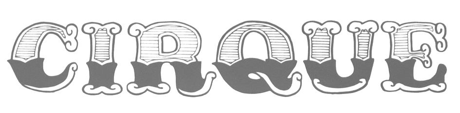 In 2017, during her studies at FADU / UBA in Buenos Aires, Paula Comesaña designed the Western circus font Le Cirque. [Google]
[More] ⦿
In 2017, during her studies at FADU / UBA in Buenos Aires, Paula Comesaña designed the Western circus font Le Cirque. [Google]
[More] ⦿
|
Pavel Korzhenko
[Vintage Voyage Design]
|
 [MyFonts]
[More] ⦿
[MyFonts]
[More] ⦿
|
Pedro Alb Xavier
|
During his studies in Recife, Brazil, Pedro Alb Xavier created a Tuscan circus font called Esquecida (2014). [Google]
[More] ⦿
|
Philip Kelly
|
 Type designer who runs Philip Kelly Digital Design in the UK. He worked for Letraset from 1969-1994 as a type designer. His type design work there included Arabic and Hebrew letterforms. From 1994 until 1997, he designed typefaces at Signus, and became an independent designer in 1997. His typefaces:
 - He redesigned University Roman in 1977 at the Latraset Studio based on Mike Daines's origina design of University Roman (1972), which is now offered in a myriad of digital libraries. See University Roman (ITC), University SB (Scangraphic Digital Type Collection), University SH (Scangraphic Digital Type Collection).
- Gillies Gothic Extra Bold Shaded (1982). See Gillies Gothic (ITC) and Gillies Gothic (Linotype).
- Cortez (1977). An exaggerated flashy copperplate. See Cortez (Linotype).
- Pump (1980). This family has rounded simple letterforms including a triline style. See Pump (Linotype) and Pump (ITC).
- Croissant (1978, ITC or Elsner+Flake). Rounded and almost an oriental simulation face. See Croissant SH (Scangraphic Digital Type Collection) and Croissant (Linotype).
- The often copied Algerian (1988). See, e.g., Algerian Condensed (Linotype), Algerian EF (Elsner+Flake) and Algerian SB (Scangraphic).
- Emporium (Letraset). A circus font.
- Spritzer (1987, Letraset). A shaded face.
- Impress (1983, Letraset).
- Sendai (2010). A gracious copperplate-influenced 6-weight sans family.
- Fantail (2012). An arts and crafts style all caps typeface inspired by an RO monogram used during a Roy Orbison concert at the now defunct Coconut Grove nightclub in Los Angeles.
- Elan Greek and Elan Cyrillic to match ITC Elan (1985, Albert Boton).
- Elegant hand-drawn numeral typefaces based on calligraphic samples by illustrator Sarah Jane Coleman (2009).
- The italics for IR Modena (IR stands for Inland Revenue).
- Calligraphic typefaces done for Mandalay in 2009.
- Sendai (2001-2010).
- Shiosai and Shiosai Calm (2015). Wavy display typefaces.
- Zipper (Letraset). This was not Kelly's design, in fact. He was a stencil cutter at the time and only partially cut it, under direction. He writes: I just recall that I worked under close direction, but what was the inspiration/idea I have no idea. Personally I would prefer not to be thought of as its designer as I never really liked it. See ITC Zipper (ITC) and Zipper (Linotype).
Linotype link. FontShop link. Klingspor link. Portfolio. Testimonial of Kelly's days at Letraset. View several digital typefaces based on Philip Kelly's designs. [Google]
[MyFonts]
[More] ⦿
|
Photo-Lettering Inc
|
 A subsidiary/part of House Industries in Yorklyn, DE. I quote: Photo-Lettering was a mainstay of the advertising and design industry in New York City from 1936 to 1997. PLINC, as it was affectionately known to art directors, was one of the earliest and most successful type houses to utilize photo technology in the production of commercial typography and lettering. It employed such design luminaries as Ed Benguiat and sold type drawn by the likes of Herb Lubalin, Milton Glaser and Seymour Chwast as well as countless other unsung lettering greats. The company is best known by most of today's graphic designers for its ubiquitous type catalogs. Physically, the collection takes up about 1500 cubic ft (42 cubic meters) of space and consists of film negatives and positives of most of the 6500 fonts produced in the company's 55 years. There are also countless patterns, cartouches, borders and dingbats, all of which have been preserved in film negative form. Each negative is approximately 28 in (71 cm) by 5 in (13 cm) high. House Industries, a Yorklyn, Delaware-based independent type foundry, purchased the entire physical assets of Photo-Lettering in April of 2003. Through a partnership with Ken Barber, Christian Schwartz and Erik van Blokland, House Industries is carefully digitizing select alphabets from the collection and plans to offer them through a modern web-based interface. The Photo-Lettering interface has allowed us to reach beyond the rigid confines of typography to offer extended features such as layering, color control and multiple master interpolation over six axes. With some of the most talented minds in display typography behind this new display lettering system, users of the system will enjoy the same refined typography as the original Photo-Lettering customers.
 A snapshot of their production, as of mid 2012, in alphabetical order: - Atrax. A Mexican simulation typeface.
- Aztec. A videogame typeface.
- Banjo Playbill. A tear drop typeface.
- PL Barclay Outline.
- BenguiatBuffalo. By Ed Benguiat.
- BenguiatCaslon, BenguiatCaslonOutline, BenguiatCaslonPlain. By Ed Benguiat.
- BillSeeWhimsy.
- PL Brazilia (sans).
- Brickhouse.
- PL Britannia.
- Brixen.
- BrodovitchAlbro.
- Bubblegum, Bubblegum Drop.
- Carlyle Eventide. A 3d titling face.
- CarusoRoxy.
- Chicamakomiko.
- CopelandMilo. A connected script by L.H. Copeland.
- CopelandTrilliumFills, CopelandTrilliumOutline. A beveled prismatic typeface by L.H. Copeland.
- DARegatta. A flared didone.
- DAmicoGothic. A casual flared typeface.
- DavisonBaroque. A Western / Tuscan typeface.
- ExotiqueJSplit.
- FederalReserve.
- FederalTwelveDiagonal, FederalTwelveHorizontal. These are engraved copperplate typefaces.
- PL Fiorello (squarish sans).
- Galaxy Didot (based on a didone typeface by C.E. Coryn).
- Goliath. A fat Egyptian typeface with a wood style flavor.
- HanoverBold. A nice Fraktur typeface.
- HaslerCircus. A Tuscan circus font.
- HenrionBA. A beveled typeface with several layers.
- HouseGothicWide. A shaded unicase typeface.
- Housebroken. A two-layer stencil caps face.
- PL Latin.
- Mierop Inline. A bilined art deco typeface.
- Millstein Flourish. A beautiful tall-descender typeface.
- PL Modern Heavy Condensed.
- Neutra Inline, Neutra Thin. Neutra Thin is a phenomenal geometric hairline sans.
- Norton Slapstick. A wood simulation typeface by S.E. Norton.
- Norton Tape. A stencil paper-fold typeface by S.E. Norton.
- Quaint. After an ornamental typeface from 1938 by Paul Carlyle and Guy Oring.
- Quicksilver.
- Quintet. A calligraphic connected script
- Raymund Circus (+Inline, +Outlined).
- Smidgen. A signage face.
- Sodachrome.
- StanSlope.
- SuperstarScript. A bubblegum typeface.
- SwissInterlock.
- SwissTwoTone. A display sans with two layers.
- Tiki Palms.
- TimesSquare. A dot matrix typeface.
- Tuggle. An oil slick typeface.
- Voodoo House.
- PL Westerveldt. A sans revived by Monotype.
- WestBarnumUltra, WestBarnumUltraDrop. A fat Egyptian typeface by Dave West.
- WestBehemoth, WestBehemothItalic. Egyptian typefaces by Dave West.
- WestEmperorScript. A fat didone by Dave West.
- WestThud. A fat signage typeface by Dave West.
- West Elephant. By Dave West.
- West Italiano. A didone by Dave West.
- West Kerpow. A comic book typeface by Dave West, late 1960s. This was digitized in 2011 by Allen Mercer at House Industries as Plinc Kerpow.
- Worthe Numerals. Fat didone numerals revived by Ben Kiel at House Industries in 2012.
[Google]
[More] ⦿
|
PizzaDude
[Jakob Fischer]
|
 The Great Dane from Copenhagen, Jakob Fischer, is a kindergarten teacher who designed over 600 typefaces. Mini-catalog, part I, part II. Aka PizzaDude, he started out making free fonts, but switched to commercial fonts later. His typefaces:
 - Typefaces from 2022: Chumpsy (handprinted), Kitchen Disaster (a 3d outlined handcrafted typeface).
- Typefaces from 2021: Easy Game, Empty Page, Mundbind DK, Biscuit Kids (a beatnik typeface), Bonkey, Drowsy Lunch, Message from Mars, Grid Hero ( chamfered retro space font), Thirsty Cream, Solo Beats, Respektable, Dress Quote, Table Shake, Peanut Bite, Silly Treat (a marker pen font), Fedtspiller, Busy Day (kid's writing), Plain Stupid, Nosy Note, Quote Note, Snushane, Spicy Note (unicase), Funny Note, Planetary Steam (hand-drawn, squarish).
- Typefaces from 2020: Friday Jeans (a cartoon font), Mango Flavor, Party Trick, Cheap Skit, Kids Yock (a kids book or cartoon font), Soft Time (a cartoon font), Orange Energy, Blastered (hand-printed and interlocking), Imaginary Cash, Friendly Yellow (a sketched font family), Pumpkin Boy, Salacious, Soapy Feelings, Eventyr, Soundlunch, Sleepy Head, Notebug, Dynamic Outfit, Krydderi, Dog Friendly, Allergic to Waffles, Risky Biscuit, Greenalyzed, Guideline, Elevator Music, Calorie Suit (a cartoon font), Happy Laundry (a fat finger font), Satin Blues, Thick Fun, Grape Feud, Chilling Atmosphere, Squeam, SlowFoot, Sunshine Formula, Spoiler, Spatchers, Scratchers, Busy Scratch, Handy Snack, Another Fool, Bottle Fork (a stamped, carved letter font), Lazy Dance, Basic Choice (sketched), Solo Print, Soft Lime, Spicy Hour, Eksperiment, Simple Mints, Minimum Waste, Barking Frenzy, Blank Lemon, Head Strung, Bike Jam, Bedtime Jewel, Happy Fingers (a fun decorative textured alphabet), Peanut Jam, Mystery Shot, Tasty Joke, Obnoxious Tie, Cowboy Funk, Tacky Shoes, Killer Garbage, Lucky Days, Pass This On (white on black letters), Bike Power, Public Beat, Beat Fool, Beach Fool, Unlikely, Peanut Square Layer, Pixel Pants, Bonus Jerk, Primitivus, Paper Sting Stencil, Pepperminta, Peanut Slap, Veggie Spray, Drum Shake, Muggy Feet.
- Typefaces from 2019: Mental Duck, Holiday Dish, Positive Feature, Gutter Pigeon, Zero Output, Square Bite (five fonts with goofy square box drawings), Sunday Fish, Heavy Pitch, Things, Thirsty Spine, Onion Mill, Rocket Please, Cookie Powered, Sugar Free, Dynamique (squarish, techno), Sugar Joint, Killing Time (interlocking letters), Lemon Flush, Indbydelse, Overbeat, Boys on mopeds, Plastic Waist, Disposable, Bloody Charm, Monster Scheme, Festabe, Quick Fix (a sketched handcrafted typeface), Disco Jaw, Random Thoughts, Flapstick, Chip Dip, Play It Cool, Cirkus Fantastiko (a hand lettered layered circus font family), Limited Budget, Tasty Chat, Stupid War (stencil), Futureboy, Videomax, Dash Wisher, Pillow Fight, Flamingo Plush, Mugpie, Smart Cookie, One of the guys, Overloaded (eroded type), Beat Boy, Jolly Beat, Lucky Lunch, Lucky Lips (lipstick crayon script), Digitalika, Just in case, Stranger Blue, Dancing Fool, Cherry Cake, Vegetable Shampoo, I Dream Of Cake, Staring Contest, Just Add Water (a sketch font), Honey Muffin, Super Toast, Silly Notes, Butterzone, Kids Rock (comic book style), Party Crush, Silent Treatment.
- Typefaces from 2018: Vokalia, Regular Fashion, Muskelbundt (a layerable family with an inline version), Party Jam, Friendly Reminder, Mineralius, Friendly Advice, Friendly Terms, Desperate Joke, Superkraut, Chargeback (a condensed headline font family), Maskina (retro futuristic), Vandmelon, Spitzenklasse (a squarish sans), Stankelben, Sugarbell, Universitet, Omtanke, Slughals, Skrivemaskine (handcrafted typewriter emulation typeface), Vigtigper, Romantisk, Charly, Straffespark, Madpakke, Sukkerfri, Volumen, Lakrids, Bangebuks (multilined), Mundlam, Grineflip, Solopgang (sans), Genbrug (children's book lettering), Strooilicht, Empty Streets, Lichtspel, Sovetryne, Foulmouth, Natteravn, Gevinst, Knofedt.
- Typefaces from 2017: Petuino, Fersken (dry brush), Klementin, Bottomline, Nonchalant, Indikation, Abrikos, Deliberately, Cut It Out, Grateful, Underdoug, Spiced Cheese, Dirty Jab, Straphang, Foolish People, Frokost, Observant, Reaktion (hand-drawn art deco style), Flottenheimer (dry pen font), Katastrofe (a grungy stencil protest font against Trump), Fortunate, Dingeling, Deliver, Response, Bottle Party, Tradizional (3d, sketched), Biscuit Chicken, Spektakel (scratchy script), Troublemarker (scratchy script), Pompelmus.
- Typefaces from 2016: Organique (sketched), Barking Cat, Bouledoug, Cowboy Junk, Bacon Buffet, Daddy In Space, Personality, Houseplant, Charlatan, Sugarpunch, Ansichtkaart, Hogfish, Provokateur, Garlic Embrace, Pigment (crayon font), Breakfast, Repetition, Ordinary Guy, Generous, Flicker, Reliable, Pigeon Wing, Dizzy Edge, Disposition (dry brush style), Honeyvoid, Porceleina, Houseplant, Murky Buzz, Junkyard Plush, Nickname, Glueboy, Moonfish, Jellygurp, Snack Patrol, Square Aware, Heart Strung, Petangue, Sillyheads, Jealous Mint, Burgerfrog (3d and shadow typeface family), Sillyheart (a hypercurly typeface), Kropicania, Rugsnatcher, Heatwerk (renamed Heatwert?), Murderous Desire (grunge), Strawberry Gossip, Cheesegum, Monkey Hat (a great beatnik style typeface), Imagine This, Surfing Ashtray (inspired by surfing movie poster from the 1960s), Rub Gum (a cartoon font), Calaboose (Wild West font), Karamelia (grungy brush).
- Typefaces from 2015: Make Fun Of Me (3d, handcrafted), Stay With Me (shadow font), Cherily Blussom, Anchovy Road, Gumblery (poster typeface with many interlocking lettes), Only Kidding, Kaleidoxope.
- Typefaces from 2014: Mummbler, Respexable, Nothing So Childish, Tied To A Stick, Reminders (an interlocking retro futuristic font), Like A Cat (sketched 3d poster typeface), Today We Escape, Quiet Night (brush face), Love From Me, Love From You, Love From Us, Burph, HundredYears (comic book style font), Shake Hands (sketched font), Laughing at you, Unseen Shores (tattoo font).
- In 2013, he published these commercial fonts: Coin Slot (grainy poster font), Swallow Money, Instant Soup, Inked Lights, Kiss Me Dead (grungy serif face), Show No Shame (comic book font), Imperious, Find A Way, City by the Lake, Breathtaking Beauty, Almost Lovely, Maybe I Was Joking, You Could Be Right, Keep Writing Letters, Words You Lost, Urgency Of Now, Believe In Me, Talk To Me, Summer Fades Away, Piece Of Youth, Not A Chance, Never Fade.
- In 2012: Mixed Up.
- In 2011: Bumbastika (poster face), Blowout (rounded signage face), Hangout (grunge), Regreat (comic book typeface with square counters).
- In 2010: Shuffle Steps (a sketched face), Shakeout (comic book face), Atrofobia, Splurx, Klumpft (grunge), No Consequence, Poilet Paper, Universal Fruitcake, Vitamin, Year Supply of Fairy Cakes, Yesterdays Meal (brush face), Undercover (bilined), Streetwise, Jilly Bean (art deco, hand-printed), Zanoix, Amfost (comic book face), Funky Mother (a curly face), Chicken Salad (comic book face), Retroxoid, Quirky, Mono Exolia, Mono Neox, Mono Litrox, Mono Hexular, Mono Orxith, Mono Iltra, Mono Chix, Gumbutcha (cartoon face), Ghenilo, Firewerk, Family Bird, Bodywerk (a grungy constructivist face), Wagerton (grunge), Strawn (signage face), Drunken Tower (ransom note face; + Drunken Shower), Elogy, Olazy, Hoakey, Nipey, Laxory, Iquory, Chorxy.
- In 2009: Funkboy, Nusqie, Junkwerk, Geekabeat, Flicka (a bouncy comic book face), Sir Render, Imperial Quortex, Jourba, Kurph (round children's script), Ginky, Stereoxoid, Earthwerk, Gibarish, Insiano, Unsprit, Whacker, Natuxal, Battlexoid, Change, Chusp, Aspektogram, Axteroid, Floink.
- In 2008: Everything (comic book), Superxoid (white on black grunge), Eyeful (comic book style), Punctured Bicycle (grunge), Spleach, Sir Spicious, Mirla, Skramp, Jilkyway, Fristy, Sqweash, Aprilfuel, Intense Eve, Drunken Shower, Dandygal, Alien Segment, Endorfinia, Runaway, Scentogram, Typewrither, Ultraxoid (grunge), Legoix (a nice scrapbook pencil font), Heruina (connected hand).
- In 2007: Indoxine (an informal horizontally-striped outline font, one of his best creations), Infilto (sketchbook face), Murbia (printed hand), Orange Gush, Epsiolet (blackboard script), Grut Stuph (comic book), Orange Gush (curly hand), Drunken Hour (ransom note face), Flixuble, Butterfool, Whexjable (paper bag cutouts), Flabioga (grunge), Flambster, Axionhero, Skratzy, Ulsteros, Craptoy, Megaxoid, Nine Thousand, Retrozoid.
- In 2006: Ultinoid, Sabtine (nice curly hand), Sadnez, Happyjamas, Fudshake, Diskojuice, Damaged Guts, Zugarbody, Popfork, Hyperspit, Junktoy, Melonheads, Mister Dorky.
- In 2005: Party Noid, Doktor Terror, Fligerish (romantic retro lettering face), Tomoli2, Teaster (Easter egg dings), Ankertill Brewer, Omibez, Tomoli, Family Dog (comic book face), Vegacute (curly retro lettering).
- In 2004: Jerky Tash, Hopeless Heart, Sure Shot, Chawsy, Hefty Galloon, Phatburner, Imazeng (Asian imitation), Zir Gera, Glammer Girl (T-26), Japperneese (oriental imitation font), Marmelade Guys, Tagboy, Malonia Voigo, Raskal, Kickshaw.
- In 2003: Abdominal Krunch, Mucho Macho, Just A Dream, Tagboyhardcore (graffiti font), Omegalomania, Cheeky Git, Chenilo (a grunge poster face), Bigbrain, Pizzabot, Schoolbully, Rapjack, Slammertag, Hlytus, Hold Your Breath, Bigmouth, Stumbeleina, Slowmotion Girl, Omegalomania, Bigbrain, Zitkid, Mr Fahrenheit Go, Atomic Clock Radio (dot matrix font), Kitchen Police, Arcade Classic, Digital Dream, Arsenique, Lie Detector, Spamsucker, Ghostboy, Funkheads, Slime Tag, TagStar Hardcore, Diet Riot, Elevator Boy (Chank), Flim (22-style family), Lemon Lies.
- In 2002: Fearless, Good Foot, Idolwild, Ruinik, AngerIsAGift, Insane Hours, MuchTooLoud, Abduction2002, You are what you eat, Yggdrasil, Easily Amused, Toxic Waist, Words of Love, Yesterdays Meal, Dope Jam, Famous Fromage, Geek A Byte, Vinyl Repair Kit, Bring Tha Noize 2, Fancy Footwork 2, Fandango (a comic book font), Quit Smoking, Japan Knees (2002, an oriental LED simulation font at Chank's), Secret Handshake, Eternal Life, Insektogram, Krooked Teeth, Super Glue, Love Bug (a Valentine's font).
- Other earlier or undated fonts: Grand Stylus, jiggery pokery, Monafont (a font with hearts), Fancy Footwork, Grouser, Not Just A Toy, Orangutan, VeryBadPosture, Treasure, Tantrum Tongue, HangTheDJ, MonsterFreak, MouthfulOfBeer, WarmMilk, WideAwake (techno), Wisecrack, DT104, Quickometer, Cirkledingz, HarshLanguage, Vanish, GluttonMan, Radiohead, Radioland (LED face), Eat Your Heart Out (kitchen tile font), Exit Font, In The Arms Of Sleep, Popcorn Not Included, Flashboy, Kill Your Darlings, Nonfiction, Gringo Nights (eroded Western font; almost Mexican), Push, Grunt Reaper, Ultrasonik, As Seen On TV, More Than Human, Raveheart, 10Minutes, 20000dollarbail, 4mylover (Valentine's day lettering font), Abduction, Acquaintance, AgentOrange, Anodetonoone, Anticlimax, Arcade, ArcadeClassic, Autobahn, Backto1982, Ballsontherampage, Bedbug, BeyondControl, BeyondControlvolume2, BionicKidSimple, BionicKidSimpleSlanted, BionicKidSlanted3d, Biteme, Blackboysonmopeds, Blaster, Blatant, BlindMelon, Blindfold, Blobs, Bluelines, BrokenToys, Brushed, Brutality, BrutalityExtra, BubbleBath, Bubbleboy, Bubblegums, Bumbastika, Burlesque, Chinese Takeaway (oriental simulation), ComputerAmok, Creamandsugar, Crosspatchersdelight, Crosspatchersdelightnormal, Curmudgeonly, Delirium, Desperation, Digitek, Diskoteque, Dreammachine, Dreamofme, Earthquake, Embroidery, Exoneration, Extravirgin, EyeOnlyHaveEyesForYou, Fadetogrey, FakePlastic, FatBoySmiles, Fazingsone, Firestarter, FlakJacket, Flaphead, Flashback, Flashbackversion3, Flashit, Foot Fight (2003), FreaksofNature, FunkyStoneage, Funnyfarmhard, Funnyfarmsoft, Futurism, Guineapigs, Gasoline, Ghostwriter, Glamour Girl, Greaseballs, GreatVengeance, Greenhousegas, Guineapigs, Hangover, Highspeed, Holiday, Homeboysarebackintown, Humanoid, Humanoidstraight, Innocentbystander, Imperfectfont, InnerSanctum, InternationalPlayboy, Invasion2000, IronMan, JointbyPizzaDude, JamesBond, JellyBelly, JointbyPizzaDude, JoyCards, JuneBug (fat comic book face), JustAnotherFont, Kometenmelodie2, Kitchenpolice (techno/futuristic), Klytus, Kleptomaniac, Knucklesandwich, KometenMelodie1, Kookaburra, Lazerbeamsurprise, Liquidism (dripping blood), Liquidismpart2, Logiclodger, LotsOfDotz, LoveLetters, MassiveHeadache, MunsterBash, Mutant, Mute Fruit (stencil font), Madscientist, Madscientist, Malapropism, MammaGamma, MassiveHeadache3, MassiveHeadacheII, MaximumSecurity (horizontally striped), Miserable, Mixedup, MotorcycleEmptiness, MunsterBash, Naghead (2004), NeverSayDie, Nonstop, Nonstopitalic, Nugacity, Nyctalopia, Nyctalopiatilt, Obliviousfont, Onceinawhile, Operatinginstructions (glyphs with writing direction arrows), Opium, Oxygene1, PartyBalloons, Piracy, PizzaDudeFatOutline, PizzaDudesHandwriting, PlanetDust, Plastique, PrivateInvestigations, Protection, Pusher, Questionoftime, Questionoftimesimple, Quicksilver, QuotedPositivity, RepeatUntilFalse, Retaliator, Radioaktivitet, RainyDays, RepeatUntilFalse, Retaliator, Robotica, RoboticaAllCaps, Rocketman, Rubberneck, Sk8ordye, Slammertag (2003), Scratchmyback, Shakethatbooty, Shopliftersunite, SkaterDudes, SoftSugarfade, SoftSugarplain, SomewhereInSpace, Spaceboy, SpeedCrazy, SqueezeMeBaby, StickAroundForJoy, StrangePhenomenaNormal, StrangePhenomenaOutlined, Sweetascandy, SyntheticSyncronism, TagsXtreme, TagsXtreme2, TastelessCandy, Teenageangst, Timebomb, Toforgive, Transistor215, Typewriterfromhell, Ultimatum, Underattack, Underattackskew, Undercover, UnfinishedSympathy, UnfinishedSympathy2, Us, Venusflytrapthebug, VeryChristmess (2003), Videophreak, Vitamin, Vitaminoutlined, VulgarDisplayOfPower, WakingtheWitch, WishfulWaves, Wreckage, Xtraordinary, Youngatheart, Youthquake, Zitcream, Zenith2000, ElectricBoots, Jealousy, Noodlesoup, PizzaDudePointers, PizzaDudeStars, Waybeyondblue, XrayTed, XrayTedskew, ZingDing, DigitalDream (2003, LED simulation), PizzaDuide Bullets, Bubbleboy 2, Endeavour Forever, Konspiracy Theory, Krazy Nights (hand-printed).
Direct downloads. In 2004, he started selling some typefaces through Union Fonts. MyFonts link. Home page. Fontsquirrel link. Fontspring link. Dafont link. . View Jakob Fischer's typefaces. View Pizzadude's typefaces. [Google]
[MyFonts]
[More] ⦿
|
P.T. Barnum
|
 One of the original circus fonts. Mac McGrew: P. T. Barnum is the re-release, in 1933 and again in 1949, of French Clarendon, inherited by ATF from one of its predecessors, Marder, Luse & Company. It is a nineteenth-century design which several foundries offered in the same or similar cuttings, under the same name or various other names including Italian Condensed. It is an unusual display letter, featuring greatly emphasized horizontal strokes at the top and bottom of the characters, and is named for Phineas Taylor Barnum, the flamboyant showman, probably because similar styles were commonly used for circus posters. Some intermediate sizes are more condensed than other sizes, and appear to be the same as Bruce's Italian Condensed No. 341.
 Some report that it was cut at Barnhart Brothers & Spindler in Chicago about 1880, and passed on via ATF. Immediate degital descendants include Bitstream's P.T. Barnum. [Google]
[More] ⦿
|
Putra Cetol Studio
[Putra Novembria Candra Kusuma]
|
 Karanganyar, Indonesia-based designer, b. 1989, of these typefaces in 2018:
 - Oriental simulation fonts: Japanese Emperor (2022: emulating Japanese).
- The spurred typeface Darkrise.
- The circus font The Circus Show.
- The futuristic typeface Digitechno.
- The curly script typeface Valentijn.
- The monoline poster typeface Revalate.
- The monoline cursive script typefaces Simplyline, Cinta Cantik, Antiqueline, The Beautyline, Aiushtya, Skywave, Simbok Pudjie and Yesie.
- The vintage typeface Nuri.
- The retro signage script typeface Vintage Party.
- The tall octagonal typeface Armor.
- The display typefaces Ratigk, Deco Tech, Horstail and Murai.
- Playlines.
- The tiki font Tikiland.
- The script typefaces Jofi, Beauty Love, Bigfun, and Rhonde (a free swashy calligraphic typeface).
- The upright scripts Shathika, Sweetyhearts and Shaquilla.
- The brush typefacesAuthorfun and Pax Suyud.
- The weathered condensed Therlalu.
- The color fonts Garis Lengkung and Circuitra.
- The textured typeface Quiltrix.
- The poster typeface Audrey.
Typefaces from 2019, mainly calligraphic except if specified otherwise: Attaira (art deco and script), Arshaka (a great vampire blackletter font), Honey Berry, Vanetta, Safiar (font duo), Havina, Eurolite (a modular sans), Florita (font duo), Silky Candy, Ultimate Slayer (brush), Zahiya (a ronde), Networld (a mesh font), Stranger Creature, Amella, Grimscy, Visaka (a tall spurred wedge serif), Micayla, Rougher (brush), Slatter, Rygid (a straightened script), Mixy Missy (an oily script), Qunky (a formal script), Marceila (upright script), Glamoury (calligraphic), Thicxer, Madhen (script), Secret Darling, Keshia, Mahaputra (a spurred swashy Victorian typeface), Busther (brush style), Sherley, Shanela, Rotters (script), Sweety Lovers (script), Aliyah, Laureta, Tashia, Smash Wall (a glaz krak typeface), Delacruz (techno), Elvino (techno), Crava (a vintage display typeface), Bornena (curly script), Vintage Queens (for vintage signage), Kanaya, Yuanita, Daysha, Thickline, Maze Line (labyrinthine), The Doctor (a signature font), West Kingdom (fat signage script), Pixel Bit, Barstrip, Arjunka, Waffle Latte (monoline and connected), Strip Deco (Broadway style), Corlita Script, Fathur (signature script), Royal King (inline, vintage), Boldest (an oily fat font), High Mount (titling sans), Stasya, Ultimate Class (a thin monline script), Hai Eisya (geometric sans), Dirty Rock (grunge), Hello Eisya, Boldline, Dvorak (dry brush), Ayana, Bigdot, Ghaya, Scary Night, Keytip (Victorian), Melodious Script, Lusya, Nachelle. Typefaces from 2020: Techno Board (a circuit font), Happy Christmas Party, Roadstone (a signage script), Cavilay Script (wild calligraphy), Urban Sketart (a fine mural art font), Shecarea, Rose Thorns, Retroparty (a bold script), Lovely Couple, Macrosty (a bold script), Amarithe, The Bold Street (a fat graffiti font), Rahaely (script), Nightcrow (a fiery font), Vintage King (a grungy vintage signage script), Vintage Party (a signage script), Gayesha, Water Splash, Clarinta (a wide hairline calligraphic script), Kinghawk, Audrena (a monoline script), Royal Queen, Headbrush, Coldcoast (script), Mahacara, Goldenlife (an upright signage script), Lyodra (a monoline script), Mayla (wild inky calligraphy), Faylake (a fat finger font), Grandmora (monoline script), Qonitya, Clowney (an inky script), Shafiqa (a rabbit ear script), Spirly (curly, Victorian), Quentara, Roxer, The Excited (signature script), Street Road (modular), Rasputia (a calligraphic script), Retroking. Typefaces from 2021: Antique Vignette (a stylish script with extreme contrast), Love Paradise (a scrapbook font), Vintage Reclame (an upright retro advertizing script), Bulky Book (in the piano key genre), Scarf Bandana, Double Pineapple, Lychee Farmland, Single Tangelo (a cuddly casual typeface), Grandtown (a bold retro script), Dizzy Fence (a beatnik font), Cheesy Bread (a bold supermarket font), Roughpen, The Night Lamp (a horror brush font), Monokind Script (a monoline script), Cristaloak (a script with a weathered outline), Cute Love Story (a scrapbook font), My Love Letter (a monoline scrapbook script), Feldberg (a dynamic display typeface), Morrello (a rounded wide display serif), Quaker Ladies (Victorian), Spooky Monsta, Abstract Style (a geometric solid typeface), Ballsye (a fat finger font), Burning Hammer (a font with flaming letters), Falsetto Signature, Kharinniswa (a bold and wide serif typeface), Roshmary (a condensed monolinear sans), Unpredictable (a condensed display sans), Surprise Spring (script), Handaru (a wide script), Queen Veronica (a monolinear script), Strong Grandpa (a bold retro signage font), Rahardian (a signage script), Candrika (a vintage spurred typeface), Euphoria Party (a psychedelic font), Spookies Identity (this is what a font infected with pestilence or leprosy would look like), Alvarisky, Springate (script), The Knight (script), Hello Audrey (an upright script), Winslet (a bold script), Hello Audrey (an upright script), Winslet (a bold script), My Beautiful Story (an inky script), Romantic Dates (calligraphic), Blossom Heart (script), Happy New Year Party. Typefaces from 2022: Japanese Emperor (emulating Japanese), Binlay (script), Child Krafter, Fresh Spring (a scrapbook script), Our Infinity Love (a wonderful connected script with a warm rhythm), East Aurora (a bold slab serif), Heathfield (a bold vintage serif). Creative Fabrica link. [Google]
[MyFonts]
[More] ⦿
|
Putra Novembria Candra Kusuma
[Putra Cetol Studio]
|
 [MyFonts]
[More] ⦿
[MyFonts]
[More] ⦿
|
Ralph Michael Unger
[RMU (Ralph Michael Unger Typedesign)]
|
 [MyFonts]
[More] ⦿
[MyFonts]
[More] ⦿
|
Richard Kegler
[Hamilton Wood Type (HWT)]
|
 [MyFonts]
[More] ⦿
[MyFonts]
[More] ⦿
|
Richard William Mueller
|
 Designer from Elkader, IA (or is he from Garnavillo, IA?), b. 1956. No web page, but the fonts, mostly made in the early 1990s, were collected by CybaPee at TypOasis for your downloading pleasure. His typefaces:
 - AdvertMF, AdvertMFItalic. Ultra-heavy brush lettering.
- AkashiMF (1993). Oriental simulation font.
- AltenglischMF
- AmbrosiaMF (1995). Art nouveau.
- AndreasPenMF, AndreasPenMFBold
- AnglesMF. Beveled letters.
- ApolloMF-Shadow, ApolloMF (1994-1997). Victoriana.
- ArgosMF
- AtlantisMF
- BaileyMF (1997).
- BlackCastleMF. A rounded blackletter.
- BodieMFFlag, BodieMFHolly (1995). An American flag font.
- BolideMF. A brush font.
- BrandyMFScript (1993).
- BravoMF (1994). A script typeface inspired by a 1945 font by E.A. Neukomm.
- BurntMF. Halftone textured letters.
- CamelotMF, CamelotMFBold (1995).
- CarnivalMFOpen, CarnivalMFOpenShadow, CarnivalMFRimmed
- Casual-Regular, CasualContactMF, CasualMarkerMF (1994). Marker pen fonts.
- CignoMF. A delicate script.
- Cinema-Regular
- ClubMF
- CoffeeTinMFInitials. Western circus font.
- CreditCards. Dingbats.
- GFCristateMF (1997). Borders and dingbats, published by Garagefonts.
- DaisyMF
- DipperMF, DipperMFDemiBold
- DirectionsMF (1995).
- DragonflyMF
- EarthquakeMF. Broken letters.
- EddaMF. Art nouveau.
- EdisonMF (1995). Pure Victoriana.
- ElectMF (1997).
- FanfareMFFancy. Art nouveau.
- FantasticMFInitials, FantasticMFModern
- FarleyMF (1994).
- FlamesMF
- FleetingMF
- FranconiaMF (1994).
- GingerMF (1997). Late Victorian, early art nouveau.
- GrangeMF
- GreetingsMF
- GuttenbergMF (1995). Victorian.
- HayStackMFWide
- HeeHawMF
- HoffmanMF
- InkHighlight
- Knockout-Regular, KnockoutMFInitials
- KompaktMF
- LavaMF (1994).
- LegrandMF
- LongEarsMF
- MaizeMF
- MamaMF
- MantelMF
- MeltdownMF
- MercuriusMF
- NewDayMFScript
- OceanViewMFInitials
- OmegaMF-Bold, OmegaMF (1994).
- PaintPeelMFInitials
- ParchmentMF
- PenMarkMFBold (1995).
- PinewoodMF
- PlymouthMF
- PollockMF (1995). Marble-filled artsy display letters.
- PoloBrushMF (1993).
- PosturesMFInitials
- Primitive
- ProtestSignMF (1995).
- QuaintMF
- RaggedMF (1996).
- ReefMF (1994).
- SantaMonciaMF
- Sexy-MF
- SixtiesMF (1993). A psychedelic font.
- SophieMF (1995). Art nouveau.
- SpeedlineMF
- SpiritsMF
- StarshineMF
- StereoMF
- SteveMF (1997).
- StowawayMF
- SwingtimeMF (1995).
- TamboScriptMF
- TarantellaMF. An insect-themed decorative typeface.
- TitaniaMF
- TolkienUncialMF
- TomahawkMF (1995).
- TradingPostMFBold
- TumbleweedMF
- TuscanMFNarrow
- UncleBobMF-Shadow, UncleBobMF (1993).
- VassarMF
- VeronaScriptMF
- WaverlyMF
- WetPaintMF (1996).
- WindsweptMF
- WishMF (1997). Art nouveau.
- WizardryMF-Contour, WizardryMF (1997). Art nouveau.
Abstract Fonts link. Klingspor link. Dafont link. Fontspace link. [Google]
[More] ⦿
|
Rick Mueller
|
Designer of the Tuscan Western almost-circus-face ITC Buckeroo (1997). FontShop link. [Google]
[MyFonts]
[More] ⦿
|
Ricky Rinaldi
[Aiyari]
|
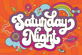 [MyFonts]
[More] ⦿
[MyFonts]
[More] ⦿
|
RMU (Ralph Michael Unger Typedesign)
[Ralph Michael Unger]
|
 Ralph M. Unger (b. 1953, Thuringia, East Germany) says this about himself at MyFonts: Typesetter from the composing stick via Linotype setting machines to the Mac. Jobs in various Thuringian printeries. Barred further education by Communist authorities due to political reasons. Imprisoned in East Germany. Since 1988 in the state of Baden-Wuerttemberg, former West Germany. Jobs in several newspaper printing houses as advertisement compositor. Own office since 1995, in Aalen, Baden-Wuerttemberg. He lives in Schwaebisch Gmuend, and was a freelance type designer for Profonts and URW++, where he contributed frequently to their libraries between 2002 and 2009. In 2009, he founded RMU. MyFonts link. I split his contributions into two groups, the URW / Profonts group, and the RMU group. The prefix FontForum refers to a subseries of URW++ fonts. Unless specifically mentioned, all the following fonts are at URW++ and/or Profonts:
 - FontForum Admiral Script (2005): revival of Middleton's Admiral script from 1953.
- Amitié (2009): a garalde family.
- Arabella Pro (2006): after the script by Arnold Drescher from 1936, published at Joh. Wagner.
- Fontforum Atrament (2006): architectural lettering. Do not confuse with a Suitcase Type Foundry font from 2003 by the same name.
- Atze (2010): a comic book family.
- Behrensschrift D (2007): after the jugendstil typeface Behrens Schrift, 1902, by Peter Behrens.
- FontForum Bernhard Script (2005): after Bernhard Script from the 1920s.
- Bradley (2005): blackletter, after the original by William H. Bradley.
- Breite Kanzlei (2007).
- Breitkopf Fraktur (2003): after the original by Johann Gottlob Immanuel Breitkopf, done in 1793.
- Brocken (2011) is a signage typeface inspired by a design of Volker Küster (1960s).
- Profonts Bureau (2010, Profonts): a minimalist rounded sans family.
- FontForum Calypso (2005): a revival of Roger Excoffon's Calypso (1958).
- Card Pro (2006): a decorative display based on Ella Cursief (1916, Sjoerd Hendrik de Roos, Lettergieterij Amsterdam).
- Chaweng (2006, Profonts): an oriental all caps simulation face.
- Civilite URW (2005).
- Compliment (2004, casual script). Based on a 1965 script by Helmu Matheis for Ludwig & Mayer.
- Cranach (2007): a blackletter typeface modeled after Kuenstler Gotisch from the Krebs Foundry.
- Dominante (2007): a serif family based on Johannes Schweitzer's font by that name, 1959.
- Dominique (2010, profonts): an informal typeface.
- FontForum URW Ecsetiras (2005): revival of Ecsetirás (Zoltan Nagy, 1967, a brush face).
- Edda Pro (2008). An art nouveau typeface that revives a Heinrich Heinz Keune typeface from 1900.
- Energia Pro (2008, Profonts): connected monowidth script, based on Arno Drescher's Energos from 1932.
- Estro (2003, Western lettering). Seems close to Nebiolo's Estro from the 60s.
- Eurobrush Pro (2007, Profonts): handwriting.
- EuroSans (2008).
- Euroscript Pro (2006, Profonts): school script typeface based on his own handwriting.
- Flashes (2007): a revival of Crous-Vidal's Flash, 1953.
- Fox (2007): a brush script based on W. Rebhuhn's original from the 1950s.
- Gamundia (2010): a calligraphic copperplate script inspired by Excoffon's Diane.
- Ganz Grobe Gotisch (2006): a fat blackletter modeled after the original by F.H.E. Schneidler.
- Gmuender Elan Pro (2011) is a 1950s style script face.
- Gradl Nr 1 (2008): based on hand-drawn art nouveau upper case characters by M. J. Gradl, ca. 1900.
- Graphique Pro (2008): shaded caps face, based on Graphique, which was originally created by Swiss designer Hermann Eidenbenz in 1945, and issued as hot metal font by Haas'sche Schriftgießerei. See also New Graphique Pro (2011).
- Handel Slab (2009): a 6-style extension of Trogram's 1980 typeface Handel Gothic.
- Hanseat (2010): a grotesque family done at Profonts. It was heavily inspired by Germany's official DIN 1451 Engschrift.
- Iova Nova (2007): based on Jowa Script, designed by J. Wagner in 1967.
- Profonts>Impression (2008): art deco.
- Jessen Schrift (2004): after the Rudolf Koch blackletter typeface by that name.
- FontForum URW Konzept Pro (2005): revival of Konzept (1968, Martin Wilke's handprinting face).
- Legende (2002): a script typeface based on the original typeface of Friedrich Hermann Ernst Schneidler (1937).
- Leipziger Antiqua. The original Leipziger Antiqua by Alfred Kapr at Typoart dates from 1971 until 1973. The digital version of Leipziger Antiqua was developed by Ralph M. Unger in 2005.
- Manuskript Antiqua (2005): after Oldrich Meinhart's Manuskript Antiqua.
- The Maszynysta family of heavy industrial sans typefaces (2010) have a textured style (Struktura), a Shadow, and a plain Roman.
- Maxim (2003, Profonts): The heavy brush typeface Maxim was originally designed by Peter Schneidler in 1956 for the Bauer foundry.
- New Bayreuth (2008): after Friedrich Hermann Ernst Schneidler's Bayreuth from 1932.
- Old Borders and Lines (2010). A free font.
- Ornella (2008): Jugendstil.
- Peter Schlemihl (2008, Profonts): a revival of a blackletter by Walter Tiemann.
- Pedell (2009): a casual script.
- Polo (2002): a brush face modeled after Carl Rudolph Pohl's Polo (1960).
- In 2012, Ivana Koudelkova co-designed the grungy headline typeface Retroactive Pro with Ralph M. Unger at Profonts.
- Fontforum Rhapsody (2006): a revival of Ilse Schüle's rotunda face.
- Roberta (2003): art nouveau typeface after obert Trogman's typeface for FotoStar.
- FontForum Signs and Symbols (2006).
- Splendor (2009): a revival of a brush script typeface by Wilhelm Berg, Schriftguss, 1930. See also Splendor Pro (2014).
- Sportowy (2009): an outline face.
- Stanford (2011). A sports lettering face.
- Stiletto (2006): a medieval script.
- Fontforum Stripes (2007): a multistripe op art display typeface based on a Letraset font from 1973 by the same name.
- Fontforum Thalia (2006): retro font.
- Tintoretto (2006): shadow display face based on an origonal by Schelter & Giesecke.
- Tip Top Pro (2008): a Julius Klinkhardt art nouveau typeface revival.
- FontForum Unciala (2005): a revival of Oldrich Menhart's typeface Unciala (1953, Grafotechna).
- Unger Chancery (2005).
- Unger Script (2003): based on H. Matheis' Slogan typeface designed for Ludwig&Mayer in 1957.
- Veltro (2007): after a 1931 original by G. da Milano at Nebiolo.
- Profonts Woodpecker (2008).
The list of RMU fonts: - Affiche (2017). A revival of Helios Reklameschrift of the Klinkhardt foundry.
- Aldo Manuzio (2017). After a house typeface from 1897 by Schelter&Giesecke.
- Amati Pro (2010): after Georg Trump's condensed didone face, Amati, 1951.
- Antiqua Florenz (2021). A revival and extension of Paul Zimmermann's Antiqua Florenz (1960, Ludwig & Mayer), which is based on Venetian romans.
- Avus Pro (2012). A sans family that extends Gert Wunderlich's Maxima (1970).
- Baroque Pearl (2016). A pearly typeface that revives Peter A. Demeter's Fournier Geperlt (1922, Schriftguss).
- Behrens Kursiv (2013). After a 1906 original by Peter Behrens.
- RMU Belvedere (2020). A revival of Heinrich Wieynck's art nouveau / fin-de-siècle typeface Belvedere (1906, Bauer).
- RMU Bison (2020). A revival of Julius Kirn's brush script Bison (1935-1938, C.E. Weber).
- Bernhard Blackletter (2016). After Lucian Bernhard's extrafette Bernhard Fraktur (1921).
- Bernhard Cursive Extra Bold (2010).
- Borghese (2015). An art nouveau font after a Schelter & Giesecke original from 1904.
- Borgis Pro (2012). A Clarendon-style text family.
- Boulette (2015, a fat creamy script).
- RMU Bowery (2019) A revival of Old Bowery (1933, ATF)).
- Bravura Pro (2013). After G.G. Lange's Publica.
- Bricklayers (2012). An original fat slab display face.
- Brillant (2009): art nouveau and ultra heavy.
- Butti (2011). A script family paterned after Fluidum (1951, Alessandro Butti, Nebiolo).
- Cable Condensed (2014). Based on Koch's Kabel.
- Caesar Pro (2011). A flared sans typeface after Caesar Schrift (1913, Georg Schiller, C.F. Rühl).
- Capitol Pro (2012). An art deco typeface based on Capitol (Karl Hermann Schaefer for Schriftguss, 1931).
- Carina Pro (2017). A calligraphic script typeface based on Rautendelein (1929, Schriftguss).
- Carla Pro (2013). A broad-nibbed script modeled after Ballantines Script (Elsner & Flake, 1974; see also Ballantines Serial by SoftMaker).
- Carlsbad (2018). A couple of art nouveau typefaces based on originals from 1895 by H. Berhold called Regina Cursiv and Hansa Cursiv.
- Caslon Gotisch (2009): after the original by William Caslon from 1763.
- Celebration (2009): blackletter.
- Circensis (2016). A Western circus font based on a concept of Fritz Richter.
- Claudius (2010): after a 1937 blackletter font at Klingspor.
- Constanze Pro (2012). A light cursive typeface based on Constanze (1954, Joachim Romann, Klingspor).
- Contact Pro (2010): after Contact, a 1963 font by Helmut Matheis.
- Dante Alighieri (2018). Based on a Schelter & Giesecke original.
- Daphnis (2016). A revival of Daphnis (1929, Walter Tiemann).
- Deutschmeister (2017). A textura blackletter typeface after Deutschmeister by Berthold Wolpe for Ludwig Wagner in 1934. (Some dispute that Wolpe made this font.)
- Diamant Pro (2012). A transitional serif face.
- Emilia (2016). Based on Weiss Antiqua (1928) by Emil Rudolf Weiss.
- Neue Echo (2016). Based on Echo for Schriftguss.
- Elbflorenz (2020). A revival of Albert Auspurg's display typeface Miami (1934, Schriftguss).
- Emilia Gotisch (2016). After Weiss Gotisch (1936) by Emil Rudolf Weiss.
- Emilia Fraktur (2021). A revival of Emil Rudolf Weiss's Weiss Fraktur (1913).
- Erler Titling (2015). After Erler Versalien (1953, Herbert Thannhaeuser for Typoart).
- Eurotech Pro (2011): a slabby techno family.
- Faulkner Pro (2011): a connected heavy signage script based on Alan Meeks's Kestrel.
- Fette Kanzlei (2019).
- Fette Unger Fraktur (2010).
- Fichte Fraktur (2020). After Walter Tiemann's Fichte Fraktur (1934).
- Fontanesi RMU. An ornamental caps typeface that revives Aldo Novarese's Fontanesi (2018).
- Forelle Pro (2010): after the original Forelle script typeface by Erich Mollowitz, 1936.
- Frankenberg Pro (2012). An antique script face.
- Gabor Pro (2014). A connected copperplate script.
- Gaby Pro (2017). A revival of Hans Möhring's script typeface Gabriele (1938 or 1947, C.E. Weber).
- Garamond Antiqua Pro (2015).
- RMU Gilgengart (2020). A revival of Hermann Zapf's Fraktur font Gilgengart (1938).
- Gillray Pro (2015). A copperplate script after Hogarth Script (by Harald Bröder for Typoart).
- RMU Gloria (2019). After Gloria (1898, Emil Gursch).
- RMU Gong (2020). Based on Arno Drescher's Super Grotesk Schmalfett first released in 1933 at Schriftguss.
- Gmuender Gravur (2011). A 3d shadow face. Gmuender Antiqua Pro (2015) is influenced by the metal font Imprimatur (1952-1955, Konrad F. Bauer and Walter Baum). Gmuender Kanzlei (2018) is a blackletter typeface.
- Goethe Fraktur (2022). A revival of a blackletter typeface by Wilhelm Woellmer (1905).
- Gravira (2021). A revival of Herbert Thannhaeuser's Gravira, released by Schelter & Giesecke in 1935 .
- Haenel Antiqua (2020, based on a 19th century antiqua by Eduard Haenel) and Haenel Fraktur (2011, after Haenel Fraktur, ca. 1840).
- Hanse Textura (2020). A revival of a textura by Hermann Zapf.
- RMU Helion (2020). A revival of the 3d titling typeface Helion (1935, Arno Drescher for Schriftguss Dresden).
- RMU Herkules (2019). After a late 19th century font by Bauer and Berthold called Reklameschrift Herkules.
- Hoelderlin (2018). After Eugen Weiss's Hoelderlin blackletter font (1937).
- Hoyer Script (2017). After Hanns Thaddeus Hoyer's Hoyer Schoenschrift (1939, Stempel).
- Hupp Fraktur (2016). After Otto Hupp, 1911.
- Impuls (2010): a brushy typeface based on Paul Zimmermann's Impuls (1945).
- Initials RMU One (2012) consists of revivals of Rudhardsche Initialen (Otto Eckmann, ca. 1900) and Walthari Initials (ca. 1900, Rudhardsche Giesserei). Initials RMU Two (2012) consists of revivals of Jubilaeumsinitialen (by Bauersche) and Augsburger Initialen (by Peter Schnorr, 1901).
- Jean Paul Fraktur (2021). A revival of Breitkopf's Fraktur font Jean-Paul-Schrift (1798).
- Jobs Gravure (2011). It had to happen---a few days after Steve Jobs' death, Unger released the beveled engraved typeface Jobs Gravure, which is an extension of Trump Gravur (1954, Weber).
- Jolly Polly (2012): a curly non-connected script face.
- Kis Antiqua Pro (2018). A revival of Hildegard Korger's Kis Antiqua at Typoart.
- Kleist Fraktur (2010): after Walter Tiemann's original.
- Kompress Pro (2013). Two compressed sans typefaces.
- RMU Kontrast (2021). An art deco typeface that revives Kontrast (1930, F.H.E. Schneidler at Weber).
- Koralle RMU (2018). A revival of Schelter and Giesecke's Koralle (1915).
- Korpus Pro (2014). A text typeface family. Followed later in 2014 by Korpus Sans Pro.
- Korpus Serif Pro (2021). A revival and extension of Timeless (Typoart) that covers Greek, Latin and Cyrillic.
- Leibniz Fraktur (2012) is modeled after the famous Genzsch & Heyse blackletter font.
- Lenbach (2021). Inspired by a German font from the Victorian era.
- Liliom Pro (2012). A beautiful fat didone typeface based on an original from the Fonderie Française.
- Lipsia Pro (2011). An angular serif family.
- Literatura Pro Book (2012).
- Litfass (2021). A revival of an art nouveau font by Flisch.
- Lutetia Nova (2014). A fresh two-style take on Jan van Krimpen's Lutetia (1924).
- RMU Luchs (2021). A redesign of Jakob Erbar's inline all caps art deco font Lux (Ludwig & Mayer, 1929).
- Luxor Pro (2010): a Victorian/Western display face.
- Lyrica (2014). A revival of the informal blackletter typeface Lyrisch (1907, Georg Schiller).
- RMU Magnet (2021). A redesign and revival of Magnet (1951, Arthur Murawski at Ludwig & Mayer).
- RMU Manolo (2019). Based on the art nouveau typeface Manolo (Ludwig & Mayer).
- Manutius Pro (2012).
- Meister Antiqua (2011, +Bold, +Book). A Typoart original from 1951 in the tall flared ascender serif genre, revived and extended.
- Mitropaschrift (2016). An octagonal original.
- Mobil Pro (2011). A semi-script typeface in the fifties style of Matheis.
- Monument (2010): a 3d shadow roman caps face created after Oldrich Menhart's Monument.
- Narziss (2018). A revival of Walter Tiemann's Narziss from 1921.
- RMU Neptun (2021). A revival and extension of the art nouveau typeface Neptun by Aktiengesellschaft fuer Schriftgiesserei und Maschinenbau, Offenbach.
- Neue Kurier (2011). Typoart's popular signage script font in a new, completely remastered version.
- Neue Muenchner Fraktur (2010).
- Neue Schwabacher (2021). After Albert Anklam's Neue Schwabacher (Genzsch & Heyse, 1876).
- Neue Thannhaeuser (2011).
- Old Towne Pro (2010): a Western font.
- RMU Omega (2020). After Omega, an art deco typeface by Friedrich Kleukens at Stempel in 1926.
- Orbis Pro (2016). A revival of Walter Brudi's shadow typeface Orbis (1953, Stempel).
- Orplid Pro (2019). a layerable typeface that revives and extends Hans Bohn's all caps Bauhaus era typeface Orplid (1929).
- Parcival Antiqua (2016). A revival of Parcival Antiqua (1926, Herbert Thannhaeuser).
- Parfum (2013). A low x-height script that was inspired by Howard Allen Trafton's Quick (1933, bauer).
- Parler Fraktur (2018). A revival of Friedrich Poppl's Poppl Fraktur.
- Parler Gotisch (2011). A blackletter face.
- RMU Pittoreske (2019). A decorative Victorian typeface.
- Plastica Pro (2015, a chiseled typeface inspired by a J. Lehmann design).
- RMU Pergola (2021). A vintage shadow typeface inspired by a late-19th century font of Georg Giesecke.
- Post Fraktur (2014) and Postillon (2014). After Herbert Post, 1933-1937.
- Primana Pro (2012). A seductive geometric grotesk family.
- Prinzess Gravur (2010): a blackletter typeface modeled after Prinzeß Kupferstichschrift (1905, Berthold).
- Prisma Pro (2011). Revival and extension of Rudolf Koch's multiline typeface Prisma (1931).
- Reklame Fraktur (2016). After Reklame Fraktur by Albert Christoph Auspurg, 1914.
- Reflex Pro (2018). All caps, with an inline style.
- Reznicek Pro (2011) is a post-Victorian pre-art nouveau typeface named after Ferdinand von Reznicek (1868-1909), one of the leading artists and illustrators of those times.
- Rekord Antiqua (2020). A revival of the art nouveau era text typeface Rekord Antiqua (1911, Wagner & Schmidt).
- Rhythmus Pro (2016). After a Schriftguss AG and Schelter&Giesecke original grotesk, and extended to cover Cyrillic.
- Ridinger Std (2012). Based on Riedingerschrift (Franz Riedinger, 1906, for Benjamin Krebs Succ.).
- Ronde Pro (2011): roundhand script.
- Royal Grotesque (2021). A revival of Wotan by Wagner & Schmidt, 1914. Did this typeface become RMU Royal Sans (2022)?
- Salzmann Fraktur (2019). A revival of Max Salzmann's blackletter font released by Schelter & Giesecke in 1912.
- Saskia Pro (2016). Revival of Jan Tschichold's Saskia (1931, Schelter & Giesecke).
- Schmale Anzeigenfraktur (2009): based on Koch's Schmale Deutsche Anzeigenschrift, 1923, Klingspor.
- Schmale Mediaeval (2020). Based on Schelter & Giesecke's Schmale Mediäval (1840).
- Schmuckinitialen (2009): an ornamental caps typeface in the art nouveau style based on Walthari Initials [Walthari (1899, Heinz König for the Rudhard'sche Giesserei) in the upper case and Eckmann Initials (ca. 1900, by Otto Eckmann, Germany's chief art nouveau type designer) in the lower case].
- Schreibmeister (2021). Ralph's interpretation of Arno Drescher's formal cursive typeface for Ludwig Wagner (1958, Leipzig).
- Schwabacher Book (2013).
- Sebaldus (2019). A heavy blackletter typeface, after Sebaldus Gotisch (1926, H. Berthold).
- Senatsfraktur (2020). After Friedrich Bauer's Senats Fraktur done in 1907 for Genzsch & Heyse.
- Concordia (2020). A revival of Sensation Schmalfett (1914, Heinrich Hoffmeister).
- Siegfried Pro (2017). A revival of the art nouveau typeface Siegfried (1900, Wilhelm Woellmer).
- RMU Skizze (2021). This revives Walter Höhnisch's script typeface Skizze (1935, Ludwig&Mayer).
- Staxx Pro (2013). A prismatic typeface.
- Staufer Gotisch (2015). An engraved blackletter typeface modeled after Herbert Thannhaeuser's Hermann Gotisch (Schriftguss, 1934).
- Steinschrift Pro (2015). A single style condensed sans serif.
- Sylphe Pro (2019). A vintage script font that revives Schelter & Giesecke's Isabel (not Sylphide, as claimed by him).
- Tablica (2017). After Karl-Heinz Lange's DDR telephone directory font Minima (1984).
- Thannhaeuser Fraktur (2013) is a redesign of Typoart's Thannhaeuser Fraktur.
- Thomasschrift (2014). A rustic typeface that revives and extends Thomas-Schrift by Friedel Thomas (1957-1958, Typoart).
- Titanschrift (2011). A yummy soft and fat display face.
- Tombola (2018). After an alphabet from the 1920s by Otto Heim.
- RMU Trianon, renamed RMU Trifels (2020). After Heinrich Wieynck's Trianon (1905, Bauersche Giesserei).
- Trocadero Pro (2010): an extension and revival of Trocadero Kursiv, 1927, Albert Auspurg, Trennert.
- Troubadour Pro (2010): In Medium and Engraved styles.
- Trump Deutsch (2011): a blackletter face, after the 1935 original by Georg Trump.
- Trybuna (2013). Based on Herbert Thannhaeuser's Liberta Antiqua (1958), but completely redrawn.
- Turnier (2019). A revival of G.G. Lange's derby (1952-1953).
- Tyton Pro (2013). A brush script after Heinz Schumann's famous 1964 Stentor.
- Typoskript Pro (2010): a revival of Hildegard Korger's Typoskript, first done at TypoArt in 1968.
- Unger Fraktur (2010): after a 1793 design by Johann Friedrich Unger; includes fett and mager.
- Walbaum Antiqua Pro (2013). A revival of Justs Erich Walbaum's didone classic.
- RMU Wallau (2019). After Rudolf Koch's rotunda typeface Wallau (1926-1934).
- Werbedeutsch (2021). A revival of the blackletter typeface Buchdeutsch (Ernst Schneidler, 1926).
- Wieynck Fraktur (2019). after Heinrich Wieynck's Wieynck Fraktur (1912).
- Wieynck Gotisch (2018). After Wieynck Gotisch (1926, Heinrich Wieynck).
- Zentenar Fraktur (2010): mager and halbfett; after the 1937 workhorse by Ernst Schneidler at Bauer.
- Zierfraktur (2010): after Deutsche Zierschrift, an engraved blackletter font that was cut by Rudolf Koch between 1919 and 1921 for Klingspor.
Ralph made some typefaces outside URW/Profonts and RMU, such as Stripes (2014, a prismatic typeface puvlished by Thinkdust). Klingspor link. View Ralph M. Unger's typefaces. [Google]
[MyFonts]
[More] ⦿
|
Roch Art
[Rochadi Sudarma]
|
 Boyolali, Solo, Indonesia-based designer who uses the names Rochart Studio, Sheo Manggala Abhayas, Shelana Hadyan (b. 1989), Shelana Hadvan and Rochadi Sudarma (b. 1990). Creator of the signature fonts Timberluck (2018), Berthy (2018) and Ghotesims (2018), the script typefaces Sheryl (2018), Astina (2018), Rosette (2018) and Hayes's Swing (2018), the dry brush script South Baggreg (2018), the layerable children's book font Play On (2018), the brush script typefaces Arjuno (2018), Abalone (2018), Abhayas (2018) and Yulia (2018), the rounded marker pen typeface Netigen (2018), the free calligraphic typefaces Fabulous (2018), Little Betty (2018) and Bring Heart (2018) and the hairline script typeface Stealletto (2018).
 Typefaces from 2019: Boughies, Barbara Blast (wild calligraphy), Asterik, Bellsmore Brush, Birdrockers (dry brush), Black Finger (a heavy all caps brush font), Mendello, Lattetude, Hysteria, Aligore, Funtastic, Broklight, Satarland, Quaint, Mustank (a superb signage lettering font), Santhana (calligraphic), Landscape (a signature font). Typefaces from 2020: Cherry Bird, Lostown (a monoline script), Milesbingo, Slimlight (script), Duty Beauty, Regine (a brush script), Flephy, Mustank (a marker script), Allison Dream (a brush script), Shellana (script), Rockets Battle ( an all caps dry brush typeface), De Sandey (a heavy script), Chocolate Banana, Clarities, Mallaire (a great formal calligraphic typeface), Qallegro (a layerable vintage circus font family), Choco Cookies, Moontells, Dellana, Biggest Things. Typefaces from 2021: Signatural (a signature script), Heavy Brush, Thrillington (a forceful supermarket script), Bellish, Clarities, Dellicia, Lotterdam, Valentine Blooms. [Google]
[MyFonts]
[More] ⦿
|
Rochadi Sudarma
[Roch Art]
|
 [MyFonts]
[More] ⦿
[MyFonts]
[More] ⦿
|
Rvq Type Foundry (was: Hey Bing Type Foundry)
[Bing Febby Aldiansyah]
|
 Bing F. Aldiansyah (Hey Bing Type Foundry or Heybing Supply Co, Bandung, Indonesia; b. 1988, Bandung) designed the sans titling typeface Confession (2015, +Serif), the retro brush script Anastasia (2015), the brush signage script Northshire Script (2015, with ink splatters), Glorious Sunday (2015, brush script), Hepburns Type (2015), the retro font Violina (2015), the blackletter typeface The Mariam Story (2015), the pure Victoriana fonts Burton Slab (2015, Tuscan) and Briliants (2015), Hours (2015), the poster typeface Brawls (2015), the Victorian typefaces Dacota (2015, a great layered vintage circus font, with dingbats) and Aseina (2015), the brush scripts Washington (2015) and Hazelnut (2015), the Victorian typefaces Hours (2015) and Warden (2015), the spurred Victorian typefaces Riotic (2015) and Harsh (2015), and the vampire type Furach (2015).
 Typefaces from 2016: Monolith, Ashtone (signage script), Black Vision (Victorian), The Minier, Bellarious, The Sectione Bright Script (heavy brush), Capricorn (decorative blackletter), Blings (signage type), Weinston (vintage signage typeface), Weinston Sans, Hours, Quinte, Monttier Script, Shine (signage script), Holywants (brush script), Choconut. Typefaces from 2017: Skylight Graffiti, The Wednesday (swashy blackletter), Java Heritages (a fine layered vintage signage typeface). Typefaces from 2018: Amstrong (tattoo or black metal blackletter), Typefaces from 2019: Hustle Times (a neon font), Giver (dry brush), Hunting Season (brush script), California (a swashy blackletter). Typefaces from 2021: Diamond History (a graffiti font). Typefaces from 2021: Northen (a horror font), Nightmare Gothic. On Behance, we find the name Rifqi Triana (b. 1989, Bandung). Creative Market link. Behance link. Alternate URL. Graphicriver link. [Google]
[MyFonts]
[More] ⦿
|
Sabrina Mariela Lopez
[Typesenses]
|
 [MyFonts]
[More] ⦿
[MyFonts]
[More] ⦿
|
Salt and Pepper Designs
[Keira McGovern]
|
 London-based designer of these handcrafted typefaces in 2017: Wild Thorn, Perfect Thoughts (old typewriter), Rough and Tumble (cartoon style), Love Potion, Rogue, White Grotto, Black Glow, Wavepool, Bouncy.
 Typefaces from 2018: Rad Hyphen, Oliver, Young Moon, Charming & Beautiful, Olive Oil (dry brush), Qillow Script, Morning Simba (brush script), The Lied, Cake Pop, Lipstick Brush, Wonder Floral, Oh Monkey, Garden Flower, Soda Lime, Be Mine (heart font), Little Hearts, Disco Queen, Post & Love, Oh Captain. Typefaces from 2019: Patchwork, Love Sucks (inline), The Circus Font, Dustin (sans), Life O'Riley, Holiday Travel, Touchdown (atheletic lettering slab serif), Dino Sauce, Tough Serif, Lovebirds, Metro Uber (superduper geometric poster typeface), Dino Friends, Twilight, Floralist. Safari, Jelly Belly, The Flight, Playtime (for children's books), Lonely Lover, Bravo Sir (a tattoo font), Jungle, Chaming Foxes, Nighflashes, Millionaire, Fiesta, Touble (sans), Simplicity, Great Times, Hello Lijo, Forest Creatures, Air Balloon, Ginidino, Fairytales, Sunshine, Sun & Her Script, Dolly, Indigo, Funfair, Chunky Monkey (a fat rounded sans), With My Love Script, Thoughts Script, Fried Day, Think Music (a free brush font), Millionaire (a free script font), Wild&Folk Serif, Lonely Lover, Quill&Ink (a monoline sans), Tough Serif, Tough Fancy, Colombo Sans (a great fat geometric sans), Lolly Script, Willow Script, Pink Willow, Moderno sans, The Lollapalooza, Yesterday, Gorgeous (serif), Sailor Girl (blackboard bold). Typefaces from 2020: Agendra, Boom Comic, Colores (a curly font), Delicious, Fidencio, Finally Champions, Ice Cream Sundae, Lollypollen Trio, Luscious Lifestyle Duo, Moliton, Night Dreamer, Olivia, Pacific Beach, Sailing South Font Duo, Scroobius, Simone, The USA, Slingshot, Waw Monogram, Monsieur (cartoon style), Tumbled Serif, Easter Silhouette, Pattern Silhouette, Hearts Silhouette, Simply Lovely (script), Sunrise Silencio (font duo), Saxophone, Timberwood, Just Hello Script, Relationship, Amelia, Bilingual Serif, Sailing&Wishes, Sullington Script, Le Royale (an all caps monoline sans), Rastenoba Script, Avocado (a geometric sans), Ultimate Milestone (font duo), Kip&Val Script (monoline), The Love for Money, Forever Freedom, Colores (a refreshing playful font duo). Typefaces from 2021: Agendra Serif, Bilingual Serif, Celebrations, Charlebury Script, Fig & Lemon, Floralista, Flower Power, Forever Freedom, Gorgeous Serif, Hallenger Serif, Handmade Wanderlust, Harrington Layered, Into the Wild, Jungle Friends (a children's book font), London Serif, Lovers in London Serif Duo Luscious Lifestyles, Magnificent, Mambo Italiano, Milkshake, Monday Morning, Montage Serif, Novembra Serif, Oliva Serif, Radical, Romantic Script, Sailing & Wishes Script, Sailing South, Soulmates Script, Sunrise Silencio, Sunshine Tomorrow, The Wedding, Tumbled Serif, Wishlist, Dinosauce, On the Farm, Ocean Silhouette, Space Silhouette, Forest Silhouette, Fairies Silhouette, Unicorn Silhouette, Give Thanks Silhouette, Trick or Treat Silhouette, Tinsel & Glitter Silhouette. [Google]
[More] ⦿
|
ScrewLooseDesign
|
American creator of the Western circus fonts Few Dollars (2014) and Gentleman Clown (2014). [Google]
[More] ⦿
|
Scriptorium (Ragnarok Press, Fontcraft)
[David Fleming Nalle]
|
 Dave Nalle was born in Beirut on March 19, 1959, and died on February 13, 2021 from COVID in his home town of Manor, Texas. From his wiki page: Dave Nalle is a political writer, game author and font designer who was active in the early history of the development of the internet. Nalle was at one time Chairman of the Republican Liberty Caucus, a group that promotes libertarianism within the Republican Party, Senior Politics Editor at Blogcritics online magazine, and was the CEO of Scriptorium Fonts. Obituary [PDF] by Steve Jackson at the Daily Illuminator. Obituary by Shannon Appelcline at RGG Net. Obituary [PDF] at Dungeon Master Magazine.
 A creative and prolific designer, he has made hundreds of beautiful (often historic) fonts. His outfit, Scriptorium (based near Austin, TX, est. 1989), also does custom font and logo design. At some points, Scriptorium was also known as Ragnarok Press and Fontcraft. It specializes in artsy and ancient typefaces. Some subset of the fonts is made by Michael Scarpitti. Free font demos. Images of his best selling fonts. Special subpages: - Three free fonts: Onuava (a mini-serifed hybrid fixed-width font), Divona (sans), Sirona (based on Lombardic calligraphy).
- Lombardic: Aneirin, Benevento (8th century Lombardic), Cymbeline, Fabliaux, Formidable, Locksley.
- Decorative initials such as the 20th century sign lettering initials set Pencraft Initials (2009), New Saxon Initials (2016, based on work by F.G. Delamotte), Delamotte Initials One (2016), Delamotte Initials Two (2016), Holly Initials (2010, based on Real PenWork (1880s, Knowles and Maxim), Vyones (2010), Vergennes (2001), Cascade (2009), Bergling (2010; based on initials by John M. Bergling).
- Steampunk typefaces: Clockwork, Gearhead, Gears, Verne, Draughtwork, Belgravia, Boetia, Blackthorn, Linthicum, Good-fellow, Necromantic, Mephisto.
- Wild West fonts: Academy, Alcalde, Atkinson Boomtown (2009, after the lettering of Frank Atkinson), Atkinson Eccentric (2009), BigIron, Cibola, Del Norte, Lachesis, Perdido, Plowright, Primer, Riudoso, Niederwald, San Lorenzo (2011, with a Mexican and Tuscan look), Stonehouse, Manquo, Rochambeau, Purcell, Vaquero.
- Arabic simulation fonts: Samaritan is based on the poster lettering of Alphons Mucha from his poster for the play La Samaritan. Serendib and Waziri are based on the hand lettering of René Bull from his edition of the Arabian Nights. Caliph (1993) is derived from Ernst Schneidler's classic Legende font, with variant characters based on his original lettering. Also: Satampra, Jerash, Samarkand, Isfahan.
- Celtic fonts: the fonts include Constance, Durrow (1993, traditional rendering of Insular Minuscule calligraphy), Malvern, Glendower (based on the most common lettering in the Book of Kells), Knotwork (caps based on Celtic knots), Alba Text (modernized text font based on Celtic uncial lettering), Lindisfarne (based on a square uncial style), Stonecross (1997, derived from Celtic cross and gravestone inscriptions), Celtic Spirals (dingbats), Celtic Borders font (lets you combine key strokes to form decorative borders; many frames and borders are original Celtic designs by Arts&Crafts period artists like Evelyn Paul and Louis Rhead), Spiral Initials, Brigida (based on Rudolph Koch's interpretation of a squared uncial), Macteris Uncial, Coverack (heavy non-traditional uncial), Dahaut (modernized uncial), Dunsany, Glendower, Morgow (1999, spiral uncial), Teyrnon (elaborate spurred uncial), Padstow (heavy uncial), Vafthrudnir (2011, uncial), Sualtim and Columba (decorative initials based on characters found in the Book of Kells), Albemarle (2001).
- Oriental simulation fonts: Yoshitoshi (2003, based on the 1900-style writing by Yoshi Toshi.
- Gothic fonts, including Alt Gothic, Koch Gothic, Barnabas (2011), Sternhagen (2014), Montgisard (2010, roman capitals with blackletter lower case), Serenissima, Gelderland, Alcuin, Monumental, Goldwork, Waldeck, Roncesvalles, Montressor (2010, ornamental blackletter capitals), T4C Beaulieux (1998, a free copy here), Bastarda (2011), Burgundian, Cadeaulx, Collins Old English, Courtrai, Descant, Ereshkigal, Faustus, Franconian (1993, a Schwabacher), Froissart (2000), Ghost Gothic, Katisha, Koch Gothic, Ligeia, Magdeburg, Magdelena, Melusine, Pyle Gothic, Rheingold, Sanctum, Stuttgart Gothic (2010), Textura, Theodoric, Yngling (2002).
- German expressionist: Dromon.
- Renaissance fonts: Monumental Gothic, Caswallon (a Caslon family), humanist cursive (Palmieri, Castiglione and Hanes Italic), quirky Italian cursives (Fiorenza and Alleghieri), a Roman style hand-lettered font (Rudolfo and Rudolfo Swash), a Trajan-style Roman lettering (Hadrianus), a classic flourished cursive (Trinculo) and a set of floral intials from the Quattrocento (Fraticelli).
- Modern poster fonts: Ascelon, Bilitis, Cosmic Dude, Dromon, Ducatus Rough, Eglantine (after Central Type Foundry's Quaint Roman), Ekberg (2002, based on Samuel Welo's posters), Fortinbras, Hamilton, Jambon, Oblivion, Posada (2008, based on the poster lettering of Mexican artist José Guadalupe Posada), Squiffy, Suspicion, Magnin (2003).
- Mapmaker fonts: building elements are available in Basilica; Ortelius is a map dingbat font; Queensland (based on lettering by artist and calligrapher Eric Sloane), is bold, hand-drawn and reminiscent of medieval writing on maps. There are also Brandywine, Daresiel, Hesperides, Longhorne, Windlass (1996), and Cityscape. Orford (2008) is based on samples of hand lettering from a 1693 manuscript collected by Lewis Day in his classic book on historical paleography, Alphabets Old and New.
- Calligraphic fonts: Albemarle (2001), Azariel, Moncrief (2011, based on the calligraphy of J.M. Bergling), Pavane, Rasael (2009), Abdiel (2005), Roncesvalles, Gazardiel (2003, connected script), Spoonbill (2003, arts and crafts), Macteris (Roman uncial font), Antioch Uncial (Roman uncial font), Burgundian (Classic black letter font), Franconian (993, a classic black letter font), Castiglione (Attractive Renaissance lettering), Cicero (Roman Rustica font), Formidable (1993, very bold late medieval / Lombardic style), Collins Old English (Classic Old English style gothic), Corbei Uncial (Roman uncial font), Cymbeline (late medieval lettering), Durrow (Standard insular minuscule uncial font), Theodoric (Classic black letter font), Gazardiel, Ghost Gothic (Unusual gothic font), Glendower (Uncial font based on Book of Kells), Gloriana (Interesting hand lettering style), Folkard (from the hand-lettering of Charles Folkard), Offenbach Chancery, Ranegund Merovingian Courthand, Benevento (8th century Lombardic), Hesperides.
- Art deco typefaces: Imperatore (2018: based on a hand lettered design from California art deco master designer Pedro de Lemos in the 1920s), Speakeasy (2018), Gates of the West (2018), Lyceum (2014), Borealis (2009), Criterion (2011), Illuminata, Madding (2009, a bold poster font that grew out of Aventine), Alexandrine (2009), art Deco Stencil (2009, based on samples of Art Deco stencil lettering by Pedro Lemos), Falmouth.
- Art nouveau typefaces: Acadian, Agravain (2009), Amphitryon (2009), Ariosto, Asphodel, Averoigne, Beaumains (2011, based on J.M. Bergling's lettering), Beauvoir, Belgravia (based on J.M. Bergling), Bernhardt (based upon the lettering of the Czech art-nouveau artist Alphonse Mucha), Bentham, Berenicia, Boetia (2003, based on J.M. Bergling's lettering), Bruges, Bucephalus (1993), Burd Ellen (2009), Butterfield (1993; in Alfred Roller's style), Cafe Society (2018), Curetana, Damariscotta, Elsene (2011, based on lettering by early 20th century illustrator Clara Elsene Peck), Elysian, Exotique, Flaubert, Gaheris, Ganelon, Gehenna, Goodfellow, Grammophon (2019: a bold Jugendstil poster font), Harbinger, Huyot (2016, after Georges Auriol's types), Jugendstil Kunsthand (2003), Lysander, Maginot (1993; after Peter Schnorr, 1898), Munich (after the Munchner Jugend magazine), Norumbega, Odeon, Ormandine (2010), Pantagruel, Phaeton, Reggio, Rochmbeau, Rockne (2009), Rudolfo, Setebos, Sprite, Summerisle, Sylphide (2005), Undine, Valentin (2008), Vambrace (2010), Walhal, Wendingen (2016), Wormwood (2018), Zeitschrift (2016, based on the Ver Sacrum magazine).
- Modern poster fonts: Field Day (2003), Ascelon, Bilitis, Cosmic Dude, Dromon, Ducatus Rough, Eglantine (after Central Type Foundry's Quaint Roman), Ekberg (2002, based on Samuel Welo's posters), Fortinbras, Hamilton, Jambon, Oblivion, Squiffy.
- Constructivist fonts: Krasny Mir (2009), Vrubel, Structura (1997).
- Futuristic fonts: Alecto, Angelus, Circuit, Culdrose, Gearhead, Ironclaw, Parika, Sanhedrin, Semiramis (1997), Slither, Structuro, Yazata, Adastra (dings).
- Borders and ornaments. These include New Arets and Crafts Borders (20912, based on The Calendar of Golden Thoughts (Barse and Hopkins Publ, 1911).
- Boneyard fonts: Undertaker (2014), Antrobus (2010), Sepultura (2002), Halloweenies, Dementia, Boneyard, Skull and Bones, Malagua (1999-2013), Paleos (2002, from titling of B movies in the cave girl genre), Carmilla, Abaddon, Black Cow (1998), Valdemar, Cuede, Ligeia, Mayhem, Mephisto, Golgotha, Sanguinary, Ironworks, Moravia, Gehenna, Nosegrind (2005, graffiti), Corpus, Ghostly.
- School fonts: Schoolhand (2010).
- Arts and Crafts movement (late Victorian period, 19th century), based on work and lettering by Walter Crane, William Morris, Charles Rennie Mackintosh and Elbert Hubbard. The Arts&Crafts movement was enormously influential on the works of designers, artists and architects of the 20th century, and inspired the Art Nouveau and Art Deco movements. Fonts include William Morris' Kelmscott (based on Morris' Troy type), and True Golden, fonts from the Glasgow branch of the movement like Chelsea Studio (1997), which is based on Charles Rennie Mackintosh's lettering, fonts from the Roycrofters of New York like Semiramis and Ganelon, fonts based on Walter Crane's work such as Crane Gothic, Pencraft Initials (2009) and Walter Crane, and even fonts from the California Arts&Crafts period of the early 1900s like Coloma. Other typefaces: Jesse M. King (refreshed in 2015, and based on hand lettering from a frontispiece design by Glasgow-based Jessie King who was known for her lavish book covers), Aylward, Palmyra (based on work by the Roycrofters, a design community founded by Elbert Hubbard), Aylward (2010, Victorian), Hyacinth Initials, Spoonbill, Adresack (1996: inspired by the arts and crafts lettering styles of designers like Charles Rennie MacKintosh and Jessie M. King), Brandywine, Changeling (2009, based on lettering by fairy artist Fanny Railton), Goddard, and Advertising Gothic (2003), Valentin, Gaheris, Agravain (2009). Delaguerra (2001-2009) is based on a lettering style originating in the California Arts&Crafts period commonly associated with Mission Style. It is still in common usage in signage at historical sites in California.
- Victorian: Beaumarchais, Berenicia, Bilibin, Brandywine, Brigidis, Curetana, Durendal, Elphinstone, Flaubert, Folkard, Gjallarhorn, Gloriana, Hermia, Ironclaw, Magnus.
- Typewriter: Fontcraft Courier.
- Anthroposophic: Ekberg (2002, based on a sample of poster lettering by Samuel Welo).
- Medieval fonts of Scriptorium, critiqued by Marc Smith, page 65: Batwynge is based on lettre gffe by Geofroy Tory (1529), and not on an illuminated manuscript of the tenth century as claimed by Scriptorium. Perigord (1993) is based on a Carolingian alphabet drawn by Ernst Bentele in 1952. Allencon is a calligraphic font based on an interpretation of 6th century Ostrogothic Italian calligraphy.
Some selected fonts: Finchley (psychedelic), Captain Kidd (2012, an original font design based on the title lettering from the classic pirate movie starring Charles Laughton), Aerobrush (2011), Fondry Ornament (2009), Atkinson Egyptian (2008, after the lettering of Frank Atkinson), Verne (2008: remade in 2020 into Covid19), Goldwork (almost blackletter), BigBlok (2010), LetterpressGothic (2010), Plymouth (2010, in the style of Cooper Bold), Broadley (2008, an architecturally inspired script based on lettering by British architect and designer C.F.A. Voysey), Locksley (2004, medieval lettering), Tuscarora (curly lettering), Fiorenza (Renaissance calligraphy), Hesperides (old colonial calligraphic script), Angelus (beautifully printed monospaced script), Esperanza (1996, connected medieval handwriting), Ithuriel (2002), Alleghieri (2002), Hamilton (2002), Spiral Initials, Zothique (great font, based on hand lettering from a map of Clark Ashton Smith's fantasy world of Zothique), Reynard (semi-Celtic), Daresiel (elegant script), Caliph (1992, Arabic simulation), Bassackwards, Rosalinde (1999, handwriting), Arakne (2000, connected handwriting), Falconis (by Michael Scarpitti), Asrafel (semi-Celtic), Swithin (2004), Tyrfing (Art Nouveau/Fraktur, 1999), Waldeck (2008, blackletter), Woburn Initials, Stampwork, Draughtwork, Roughwork (a codex font derived from Nalle's own True Golden which is based on a=n earlier typeface by arts and crafts master William Morris), Melusine (gothic calligraphy), Corbei (uncial), Niederwald (hand lettering), Gjallarhorn (great uncial), Gaiseric (early medieval uncial), Taranis (1987, an uncial first drawn as a font for the cover of the old Ysgarth roleplaying system), De Bellis (roman era, by Michael Scarpitti), Engravers Gothic, Monimental Initials, Sanhedrin (Enemy of the State font), Vespasiano (roman capitals, by Michael Scarpitti), Bilitis, Hendrix (2002), Collins OE (old English), Samedi, Praitor, Evadare (1993, based on a character set which was hand calligraphed by Rudolf Koch), Koch Fantasie (1993), Black Cow (1998). Zothique, Ruritania, Mariner (2004, based on hand lettering originally done by Willy Pogany), Trinculo (a swinging cursive font), Texas Star (2002), Octavian (antique demi-serif font), Ruffian (antique type font), Ascelon (thin sans serif font), Munich (title lettering from Munchner Jugend magazine), Necromantic (bizarre bold titling font), Titania (romantic decorative lettering font), Oberon (bold romantic font), Knotwork, Guede (1993), Pullman, Purcell (Victorian circus poster style font), Allegheny, Carmilla, Malagua (1999-2013), Ardenwood, Platthand, Buccaneer, Cochin Archaic (2010), Boswell (1994), Guilford (based on lettering by artist and calligrapher Eric Sloane), Death Ray (2012, constructivist), Alecto (futuristic), Candlemas (2003), Bridgeport (2003, based on lettering by artist and calligrapher Eric Sloane), Medieval Tiles (2003), Linthicum (2003), Draughtwork (2003), Yngling (Fraktur, 2003), Rheingold (elaborate Fraktur: Music Hall Text elsewhere; see also Teuton Text, Cincinnati Type Foundry, 1877), Kidd (2003), Belgravia (2004), Peck Shields (2004), Scrawlies (2000, handcrafted), Albrecht Durer Gothic (2004), Orpheus (2004), InduXtrial (2004, a grunge face), Yoshitoshi (2003), Veronique (2004), Veneto (2006), Vidilex (1993, monospaced), Abelarde (2006), John Speed (1993: a mapmaker font), Furbelow (2006), Estoril (2006), Tangle, Aventine (sans), Texas Star (2002), Groningen (Bauhaus design), Nevins Hand, Scrapple (2011, Victorian, ornamental), Leodegar (2011, based on samples of 7th century Frankish hand lettering), Candlemass (2012). Fonts from 2013: Doge (a Venetian font based on a J.M. Bergling revival), Original Django (after the titling font in Quentin Tarantino's movie Django Unchained). Fonts from 2014: Highball, Carillon (based on a typeface by Samuel Welo), Edifice (based on lettering by J.M. Bergling). Fonts from 2015: Gods of Mars (an inline sci-fi typeface), Rykov (based on a 1930s Ukrainian constructivist style; Latin and Cyrillic), Vie Moderne (French art deco), Dahlgren, Grand Concours (art deco), Tantalus, Power Tie (art deco), Marquis Greeking. Fonts from 2016: Ekberg Modern (based on lettering samples by Samuel Welo from poster designs of the 1920s), Knuckleduster, Tzaphkiel, Sarandiel, Primrose Initials, Elizabethan Script (chancery style), Zeitschrift (an art nouveau font based on the Ver Sacrum magazine), Wendingen (Dutch deco), Memento Mori (Tuscan), Rounders (art deco). Fonts from 2017: Buzzmill (wooden plank font), Pumpkin Patch Initials, Talinn, Reliquary, Nopalito, Scattershot (script). Typefaces from 2018: Marionettas (a Mexican horror movie poster font), Fascination, Architextura, Santa Sangre, Glyphos. Typefaces from 2019: Cafe Corso (art nouveau), Comic Classix. Fnts released in 2020: Epigramatic (based on lettering by Dard Hunter for the Roycroft Press in the early 1900s), Cryptos (graffiti). Klingspor link. Abstract Fonts link. Dafont link. View David Nalle's typefaces. Scriptorium's library. [Google]
[MyFonts]
[More] ⦿
|
Sean Coady
[Vintage Type Co]
|
 [MyFonts]
[More] ⦿
[MyFonts]
[More] ⦿
|
Serious Fun Type Foundry
[Dong-Kwan Kim]
|
 In 2018, Korean type designer Dong-Kwan Kim set up Serious Fun Type Foundry.
 Co-designer with Hyun-Seung Lee and Dae-Hoon Hahm of the grungy paint-splatter typeface family Core Paint (2014) and the grungy layered typeface systems Core Circus Rough (2014) and Core Magic Rough (2014). In 2015, Hyun-Seung Lee, Dae-Hoon Hahm and Dong-Kwan Kim co-designed the grotesque typeface family Core Sans E. The rounded versions of the Core Sans E, D and G families were designed in 2015 by Hyun-Seung Lee, Dae-Hoon Hahm and Dong-Kwan Kim under the names Core Sans ES, Core Sans DS, and Core Sans GS. In 2015, Hyun-Seung Lee, Dae-Hoon Hahm and Dong-Kwan Kim added the soft and rounded Core Sans R to the S-Core Sans series, as well as Core Sans B. In 2016, they added the rounded small x-height family Core Sans BR and the geometric sans family Core Sans C. The rounded version of Care Sans C, called Core Sans CR, was designed in 2016 by Hyun-Seung Lee, Dae-Hoon Hahm, and Dong-Kwan Kim. The neutral Core Serif N was added in 2016 by Hyun-Seung Lee, Dae-Hoon Hahm and Dong-Kwan Kim. In 2018, Dong-Kwan Kim designed the humanist sans typeface Scholar Sans. [Google]
[MyFonts]
[More] ⦿
|
Simon Stratford
|
 London-based creator of the free shaded caps font Airbag (2013), which imitates the successful genre of Trend (Latinotype). Before Breakfast (2013) is a free hand-printed typeface. Packt (2013) started out from watercolor lettering. Distractor (2013) is a tweetware grungy slab serif reminiscent of letterpress---it is partially based on Bevan. In Limbo is a free vernacular typeface. Typefaces from 2014: Type Old Writer, Before Breakfast, Hitchcut (paper cutout inspired by Saul Bass's poster for Hitchcock's movie Vertigo), Separator (octagonal), Dirty Slab (letterpress emulation), Enfold (hand-drawn).
 Typefaces from 2015: Neon, Buckley, Buckley Serif, Bold Riley (a handcrafted serif), Balham to Brooklyn (fifties script), Petit Jardin, Gently Script, Troupe (an inline Tuscan typeface), Mr. Blue Sky (an inline typeface), Moorgate (fat brush font), Sunshine, Dogtown (grunge), Gods Own Junkyard (neon sign font, named after Chris Bracey's neon sign store in London), Teardrop (watercolor brush with dripping ink), Western Grit (spurred), In The Wood, Gallow Tree (free brush font), Thirsty Dog (scratchy brush), Dear Prudence. Typefaces from 2016: Get Lucky, Take Me To The River, Lawless (vintage display typeface), Not My Type (old typewriter font), Roadhouse Blues, Just Like Heaven, Resize, Atomic Dustbin, Mind The Gap (stencil family), Munky (a fun children's book typeface), Hunky Dory (a handcrafted children's book typeface), Little Wonder (brush script), Mister Rooster, Whippin Piccadilly (handcrafted), Bangers & Mash, Mr. Chumley. Typefaces from 2017: Hunky Dory, Circus Freak, Fake Empire, Gilly Script, Banoffee (a kooky handcrafted typeface), Tuck Shop (a chalk font), Fake Empire (grunge), Mu-Th-Ur (a free octagonal typeface inspired by the film Prometheus). Typefaces from 2018: Be More Human (for Reebok), Higgs Boson Blues (SVG font), Fierce (dry brush SVG font), Yeah Foil Balloon (color font), Wild Irish Rose (brush script). Typefaces from 2021: Beautiful Freak, Neon. Behance link. Another Behance link. Envato link. [Google]
[More] ⦿
|
Solotype
[Dan X. Solo]
|
 Dover Press sold Oakland's Dan X. Solo's digitizations. Dan Solo (b. 1928, d. 2012) has collected over 13,000 sets of metal fonts, starting when he was 9 years old and growing up in Oakland, CA. Finally, in 2002, he stopped doing that and began converting all of his fonts to computer type. Solotype, his company, was established in Alameda, CA. He printed 30 books on fonts (with Dover), including The Solotype catalog of 4,147 display typefaces, and created hundreds of fonts. In 2007, Dan Solo retired from the font business. He died in 2012.
 Robert Trogman writes: I know Dan X. Solo personally. He ran a typographic studio in Berkeley for over 30 years. He had a large collection of film fonts, including some of my own. He created thousands of fonts and is now retired and is an avocational prestigitator. Copyrights have run out on most of his fonts. He also protected himself by creating pseudonyms on the questionable font names. Stuart Sandler confirms that many of the fonts in Solo's Dover books are in fact from the Filmotype collection, which Stuart is digitizing right now. Gene Gable writes: Dan Solo of Solotype in Berkeley was experimenting with photo type as early as 1945 and started doing optical special effects in the early '60s. And a number of the larger display-type shops developed their own techniques. But in terms of opening up new markets for display type (and giving designers more control over type setting), Visual Graphics and Letraset lead the way. These companies were proud of, and promoted, the fact that that their products could be used by non-typesetters with little training. Bio. He wrote about himself: Dan X. Solo The Solotype Archive was begun in 1942 when I was 14. I was a kid printer for several years before that. At 16, after a quick three months of training, I dropped out of school and went to work full time as a radio actor and announcer in San Francisco. (Easy to get jobs in those days, due to the war-induced manpower shortage.) In 1949 and 1950, I created a magic show which played West Coast theatres with some success. After that, back to broadcasting. By 1962, I was completely burned out on radio, so I decided to see if I could make a living with my collection of antique types, which numbered about a thousand fonts at that time. In 1962, I sent out 4,000 catalogs showing the type to ad agencies all over the U.S. The timing was perfect (no thanks to me) because there was developing at that time a renewed interest in the old types. Business took off immediately. The Solotype collection was one of four commercial collections at the time, but I seemed to have been more aggressive in marketing than the other chaps. (Well, Morgan Press certainly knew how to market.) Two years into the business, I began to collect alphabets on paper for conversion to photo lettering, which was just becoming mainstream in the type business. We closed the shop for a month every year and went on a type hunt, mostly in Europe where there didn't seem to be much competition among collectors. Other typographers couldn't understand how we could do this, but I believe it made people appreciate the resource we offered even more. Over the years, the collection became quite large. When I closed Solotype a couple of years ago, I got rid of about half the archive (because the fonts were dull, or already digitized, or for a variety of other reasons) leaving me with about 6,000 fonts on paper or film. In 1974, I began to supply Dover Publications with mechanicals for books of 100 alphabets on a particular theme. I did 30 of these books over the years, and 30 more of printers' ornaments, borders, and so forth. Sometime in the 1990s, Dover asked me to digitize books of 24 fonts each, to be sold with a disk in the back. I did 12 of these. The Dover relationship came to an end when Hayward Cirker, the owner and my special friend, died and the company was sold to another publisher. Dover felt that they had covered the type field thoroughly. Now in my old age, my wife and I have a mindreading act that is great fun and good for the ego. Even so, when not traveling, I digitize type for relaxation and enjoyment, but have made no effort to sell it. Until now. Solo's wood type/Western/ headline/ Victorian collection includes Acantha, Bindweed, Dime Museum (2004, a French Clarendon revived by ATF in 1933 under the name P.T. Barnum), Egyptian Oldstyle, Excelsis, Extravaganza, Rigney, Assay, Baraboo Banner, Beijing, Brevet (after a Victorian typeface from 1887 by Ernst Lauschke), Brussels, Cathedral, Cleopatra, Cognac, Crossroads, Dainty Lady, Dangerfield, Diablo, Dutch Treat, Grecian, Lord Mayor, Malibu, Minnesota, Moulin Rouge, Penny Arcade (1992, a Victorian face after an 1890 original called Mural by Boston Type Foundry), Trixie, Valerie, Valjean, and Zorro. Alaska is based on an 1890 design of Marder, Luse and co. Arcade imitates an 1888 design of Barnhart Brothers&Spindler. Bamboo (oriental simulation face) is based on a 1889 creation of Barnhart Brothers&Spindler. Behrens Antiqua and Behrens schrift are revival of early 20th century typefaces by Peter Behrens. Eccentric is a digitization of a 1898 arts and crafts typeface by Kingsley/ATF. Hansard is a revival of a display type published in 1887 by MacKellar, Smiths,&Jordan. Pekin is a digitization of a face, first designed by Ernst Lauschke in 1888 and issued by Barnhart Bros.&Spindler foundry in Chicago under the name Dormer, and revived by them in 1923 under the name Pekin. Charles Henry Beeler made a condensed sans serif issued by Mackellar, Smiths&Jordan foundry in 1887: it was digitally revived as Roundhead. Monument is a revival of a 1893 typeface by the Boston Type Foundry, but was also cast at the Central Type Foundry. Vienna Light is a delicate early 1900s type originally created by the German foundry of Schelter&Gieseke. Other designs: Bareback, Campaign (ca. 1970), Cigar Label (1997), Estienne, Farringdon (a western face), Goodfellow (digitization of wood type from 1895 found at Hamilton and probably due to W.H. Page), Harlem Text (blackletter), Houdini (ca. 1992), Memorial, Quadrille 2 (a simplified Tuscan face), Sparticus, Vanities (a Victorian type), Whirligig. In 2005, MyFonts added Seminary (after a Victorian font from 1885 by Bruce Type Foundry), Margie (formal script based on Marggraff Bold Script by the Dresden foundry vormalig Brüder Butter, 1920s), Fancy Dan, Bamberg (2005, after a condensed wood type from ca. 1850), Fat Face No. 20, French Ionic (quite ugly--based on an 1870 Clarendon derivative by the Cincinnati Type Foundry), Hearst Italic (based on a 1904 typeface by Carl Schraubstadter of the Inland Type Foundry), Hearst Roman (based on a typeface from the Inland Type Foundry allegedly stolen from a hand lettering job done by Goudy, acccording to Goudy himself), Tally Text (early photolettering type of the comic book style), Welcome 1 (based on Van Loey-Nouri's art nouveau typeface from 1900). A list of some digitized fonts: - Art Deco: Advertisers Gothic Light, Alex, Beverly Hills, Boul Mich, Capone Light, Chic (after Morris Fuller Benton's Chic, 1927), Clyde, Eagle Bold, Eagle Narrow, Eden Bold, Eden Light, French Flash, Gallia, Graybar Book, Grock, Matra, Modernique (art deco), Parasol, Parisian, Phoenix American, Plaza Suite, Publicity Gothic, Salut, Stymie Obelisk, Zeppelin.
- Victorian: Anglo, Arboret, Campanile, Chorus Girl, Fancy Celtic, Ferdinand, Floral Latin, Glorietta, Grant Antique, Gutenberg, Hogarth, Jagged, Katherine Bold, Lafayette, Meisteringer, Olympian, Phidian, Ringlet (1998, a Victorian typeface after an 1882 original by Hermann Ihlenburg), Romanesque, Rubens, Stereopticon, Templar, Wedlock, Zinco.
- Script/Cursive: Amapola, Artists Script, Carpenters Script, Certificate Script, Commercial Script, Conway (an architectural script), Elegance, Engrossing Script, Figaro, Flare, Gloria Script, Hanover, Helvetica Cursive, Holly, Kunsteler Bold, Liberty, Manuscript, Orion Script, Pantagraph Script (+No2, +No3), Park Avenue, Romany Script, Trafton Script, Typo Upright, University Script, Virginia Antique.
- Art Nouveau: Ambrosia, Argus, Artistik, Auriol, Baldur, Bocklin, Cabaret (2003, as in Murder She Wrote), Carmen, Childs, Edda Black, Excelsior, Francomia, Giraldon, Harrington, Isadora, Metropolitan, Murillo, Oceana, Odessa, Orbit Antique, Palmetto (2005; an art nouveau typeface based on a 1887 typeface called Palm from the A.D. Farmer Foundry), Siegfried, Skjald, Spartana, Titania.
- Gothic/Medieval: Academy Text, American Uncial, Antique Black, Becker Bold, Bradley, Castlemar, Celebration Text Fancy, Church Text, Engravers Old English, Frederick Text, Freehand, Hingham Text, Initials-Bradley and Caxton, Kanzlei Light, Lautenbach, Lautenbach Fancy Caps, Libra, Morris Black, Nicholini Broadpen, Rhapsodie Swash Caps, Scottford Uncial, Solemnis, Washington Text, Wedding Text.
- Celtic: Anglo Text, Camden Text, Chappel Text, Cimbrian, Colchester Black, Durer Gothic, Durwent, Fenwick, Genzsch Initials, Gloucester Initials, Gutenberg Gothic, Hansa Gothic, Harrowgate, Kaiser Gothic, Kings Cross, Konisburg, Malvern, Medici Text, Middlesex, Progressive Text, Tudor Text, Warwick, Westminster Gothic, Yonkers.
- Special-Effects Display Fonts: Azteca Condensed, Buddha (oriental simulation face, after a Schelter&Giesecke type), Burst, Campaign (1970), Chinatown (oriental simulation), Cigar Label (1997-2002), Colonial Dame, Contract Banner (2004, a take on Mezzotint from 1880), Direction, Fillet, Filmstar (1999), Firebug, Headhunter, Hollywood Lights, Igloo Solid, Import, Lariat, Needlepoint, Old Glory, Protest, Rustic, Scimitar (Arabic simulation face), Scoreboard, Skyline, Starburst, Sundown Shadow, Tableau, Tonight, Xerxes.
- Other: Acantha, Assay, Baraboo Banner, Beijing, Bindweed, Brevet (after a Victorian original by Ernst Laushke, 1887), Brussels (positioned inbetween Stephenson Blake's Flemish Expanded and Flemish Condensed), Cathedral, Cleopatra, Cognac, Crossroads, Dainty Lady, Dangerfield, Diablo, Dime Museum, Dutch Treat, Egyptian Oldstyle, Excelsis, Extravaganza, Grecian, Lord Mayor, Malibu, Minnesota, Moulin Rouge, Penny Arcade, Rigney, Trixie, Valerie, Zorro.
Images of selected typefaces: Agency Gothic, Alpha Midnight, Alpha Twilight, Anita Lightface (1977), Art Deco Display Alphabets, Ashley Crawford, Ashley Inline, Astur, Bamberg, Banco, Beans, Blackline, Bobo Bold, Braggadocio, Broadway Engraved, Busorama Bold, Busorama Light, Bust, Charger, Checkmate, Colonel Hoople, Corral, Dudley P Narrow, Dynamo, Earth (a futuristic / prismatic typeface revived by nick Curtis in 2015 as Terranova NF), Eclipse, Empire, Ewie, Fat Cat, Fatso, Festival, Futura Black, Futura Inline, Gillies Gothic Bold, Greeting Monotone, Grooviest Gothic, Hess Neobold, Hotline, Huxley Vertical, Inkwell Black, Joanna Solotype, Joyce Black, Koloss, Lampoon, Mania, Mania Contour A, Mania Contour B, Margit, Mindy Highlight, Modernistic, Monograms Stencil, Mossman, Neon, Neuland (+Inline), Phosphor, Piccadilly, Pickfair, Polly, Prismania P, Quote, Rhythm Bold, Shady Deal, Sheet Steel, Sinaloa. The Solotype Catalog is a file with information on Dan Solo's typefaces, annotated with remarks about name equivalences and digitizations. The original file was due to Thibaudeau, but typophiles on alt.binaries.fonts have added to it in 2010. PDF version. Excel version. Text version. See also here. View Dan Solo's typefaces. Another page on Solotype. Dan Solo's typefaces listed in decreasing order of popularity. View Dan Solo's typefaces. View Dan Solo's typefaces. [Google]
[MyFonts]
[More] ⦿
|
Stefano Brizzio
|
Graphic designer / illustrator in Cordoba, Argentina, who created the wavy typeface Curve (2014) and the decorative circuit and circus-inspired caps typeface Circus (2014). [Google]
[More] ⦿
|
Stephanie Alvarez Bertarioni
|
 Alajuela, Costa Rica-based designer of the circus font Arlequin (2017). [Google]
[More] ⦿
Alajuela, Costa Rica-based designer of the circus font Arlequin (2017). [Google]
[More] ⦿
|
Stephen Coles
[Decorated Initials]
|
[More] ⦿
|
Steve Cloutier
|
 Quebec-based designer (b. 1971) in 2010 of the outline face Elégante and of the grunge typefaces Apocalypse Regular, Arbre, Autodestruction, Papineau (hand-printed), de Lorimier, Gardien d'herbe, Elusion (organic), Cataclysme (grunge), Wolfred Nelson (rubber stamp caps), Chénier (grunge), Crack and Bold, Fleur de Lys (dingbats that are useful pour mon pays), Manuscrit, Ancien (grungy inline face), Confusion, Patriote 1837 Regular, Arbre (hand-printed) and Cloutier Script (hand-printed).
 Typefaces created in 2011: Sioux Caps (ornamental caps: a scanbat face), Flower Cap (floriated caps), Damned (a grungy horror movie typeface), Sketch Me (a sketched face). Typefaces from 2012: Dill Francis, I Hate Futur, Fabrics (stitch font), Stucco, Children, Hacking Trashed, Flower (floriated caps), Arbre, Patriotes 1837, Damned Deluxe, Trashed Light (grunge), Leather (ornamental caps), Punk Rock Show, Crack And Bold, Ana Eve (grunge), British Museum 1490 (ornamental caps), Nature Font (grungy caps), Chenier (grunge), Mosaique (a textured typeface), Motor Pieces (commercial), Mixtec Codice (Maya, Aztec or Inca dingbats), Parkinson (grungy outlines), Ludger Duvernay, Monster, Sponge, Napoleon (a nice fat poster face), Negative Film, Nelson Old Newspaper, Fuck Autority (sic), Rene Levesque (hand-printed), First Nation (an Indian scanbat face), Pustule, Emilie (hand-printed caps), Papineau (hand-printed), Sixties, Dali, Midnight (brush face), Fairy Tale (ornamental caps), Tiger Balloon (African-themed), Rafael (fat poster face), Sacred Place (heavy poster family), Pistache Regular (unicase Plakat font), Morning Stress, Hippie Gypsy (ornamental caps), FBI Old Report (old typewriter face), Mitsouskos, Ten O Clock (a multiline hand-printed face), Strawbwrry, Jewels, CF Night of the Damned, CF One Two Trees (tree-themed), Hagadou (bejeweled letters), CF Punk Forever (white on black grunge), CF Anabelle (curly script), CF Samurai Bob, CF Marie-Eve, CF Christmas Shit, CF Pinceau (fat brush face), CF Deco 1492, CF Cracked Stone, CF Metropolis Serif, CF Punky, CF Snowball (snow-capped glyphs), CF Tuques, CF Revolution, CF Fashion, CF Tissus, CF Christmas Letters, CF Diamond (diamond-studded letters), CF Stencil Orama, CF Dallas Stars (stars and stripes face), CF Old Photograph Credit Font, CF Christmas Letters. Typefaces from 2013: CF National Stitches, CF Spaceship, Historia (sans caps), CF WireFrame, CF NaVia, CF Sortilege, CF Spirality, CF Charlie, CF Fredo Style, CF Little Monsters (alphadings), CF Tissus, CF I Love Montreal (fat finger face), CF Jungle, CF Paris (art deco caps), CF Marie Eve Cartoons, CF Circuit Electrique, CF Jack Story, CF Punk Attitude, CF Billabong, CF I Want To Believe Comp (grunge), CF Zombie Party (crayon or lipstick font), CF Life Is Beautiful (paint font), CF Gothika (grungy blackletter), CF Manifesto (painted letters), CF Rise of Nations, CF The Lost Batallion, CF Armageddon, CF Electronic Board, CF Old Typography (letterpress font), CF Modern 165, CF Hockey Players (dingbats published on the day the Montreal Canadians were humiliated, 6-1, by the Ottawa Senators in the Stanley Cup playoffs), CF Nelson Old Caracters (sic), Peru Adventure, CF Montreal High School (athletic lettering), Urban Life (textured font), CF Same Old Story (grunge), CF Plants And Flowers, CF Cant Change The World (clean, hand-printed), CF Jeanne Mance, CF Jeans Collection (textured), CF Alien Abduction, CF Rebelle (brush font), CF Jungle Adventure, CF Never Trust A Hippy, CF Anarchy (ransom note font), CF Life Is A Dream (grunge), CF Farwest, CF Typocraft, CF Politicians Killers (blood drip face), CF Technomania, CF Technorama, CF I Love Ugly Fonts, CF Ribbon, CF Tree Of Life, CF Revenge, CF Back to School, CF Nut And Bolts, CF Final Conflict (brush script), CF Nostalgia (brush face), CF Industrial Fabrics (textured face), CF Font Shading, CF Rock Age, CF Nouvelle France (antiqued alphabet), CF My Bloody Valentine, CF Ceinture Flechee (multilined typeface), CF Disappointed, CF Atlantide, CF Bucherons (texture face), CF Simon Marchessault (hand-printed), CF Haunted House (brush face), Gray Texture, CF Space Cowboy (textured typeface), CF Louis Cyr. Typefaces from 2014: CF Goliath, CF Alone on Earth, Stencil of Rama, Bad News (textured face), CF Xerography, CF Milk, CF Springtime, CF Crayons, CF Dwarf, CF Asshole Politicians, CF Old Milwaukee (spurred typeface), CF Paris Old Style (grungy Peignotian typeface), Creature of Darkness (textured typeface), Quebec Stamp (grungy stencil), Schizophrenia (neurotic typeface), La Belle Helene, CF William Wallace, CF Dots 521, CF LCD 521, CF America, CF Left Behind, CF Jacques Cartier, CF My Best Friend, Flowers of Destiny. Typefaces from 2015: CF Rise of Nation (bold poster typeface), CF Punk (grungy capitals), Baron Rouge, General Tao (oriental simulation font), CF Mother Board (circuit font), CF John Doe (sketched), CF Crayons de Plomb, CF US Army (textured type), CF White Trash (Treefrog style), CF Punk Rock Show, CF Denim Jeans, CF School Handwriting, CF Nuclear War (very grungy caps face), CF Jack Story, CF Civilisation Maya (textured typeface), CF Punk Is Not Dead, CF Calligraphia, CF Life Is A Dream (grungy textured font), CF Blueprint, CF Far West Regular, CF Samuel de Champlain, CF Azteques (Mexican decorative font)., CF Fleurs de Lys (dingbats), CF Chevalier de Lorimier (connected script), CF Bonaparte, CF Expedition, CF Boston Regular (casual script), CF Jacques Parizeau (a grungy font named after a racist and pompous former political figure in Quebec), CF Trash Zone (grungy stencil), CF I Dont Want To Grow Up, CF Metro Parisien (art deco), CF Craig Robinson, CF Paradise City, CF Great Destiny, CF Robert Nelson, CF Grand Nord (a snow-capped design), CF Green Monster (slab serif). Typefaces from 2016: CF Showbizz, CF Halloween (dripping blood font), CF La Sorciere Noire (vampire script), CF Green Corn (white on black), CF Engraved, CF Ghost Stories, CF Legends of the Fall, CF Bad Cops, CF Cherokee (wood block printing emulation), CF School Zone (crayon font), CF Snowboard Project (grunge), CF Oak Island, CF Peterson. Typefaces from 2017: I Robot, Christmas Stitch, Nightmare (dripping blood font), Tangerine (inline typeface), CF Klondike (spurred Western font), CF Letterpress Type, CF Brothers in Arms, CF Etoffe du Pays (a dusty typeface), CF Second Son, CF The Rock (textured), CF Old School, CF Pretty Trees. Typefaces from 2018: CF Le Dernier Empereur (oriental emulation), CF Sacred Planet, CF Glitch City, CF Remington Typewriter, CF Cyborg, CF Punk vs Cyborg, CF The Ocean Song (monoline connected script), CF Wild West (Tuscan), CF Three Dimensions, CF Mexicana. Typefaces from 2019: CF Le Grand Cirque (a circus font), CF Saturn 21, CF World at War (an old typewriter font), CF Night of Terror (a dripping blood font), CF Blackboard (a chlak font), CF Punk Fashion, CF Punk Songwriter. Typefaces from 2020: CF Punk Posters (a ransom note font), CF University of Nowhere (a grungy varsity font), CF Letterpress Type Two, CF Band of Brothers. [Google]
[More] ⦿
|
Swash Buckler
|
Creator of several sets of art deco typefaces at FontStruct. These include Blind Tiger (2020), Ginevra's Typewriter (2021), Big Apple, Lunar Museum, Haunted Tavern (2020), Jupiter 119 (2020), Titanic Fire (2020), Midnight Circus (2020: an art deco circus font), Skylight Caper (2020: blackboard bold), Art Thief (2020), Strawberry Apocalypse (2020). [Google]
[More] ⦿
|
Tano Veron
|
 Buenos Aires-based creator of the children's hand font Nicolina (2012) and of the techno typeface Hifix (2012).
 Zephyr (2013) is a striped ornamental caps typeface. In the ornamental caps style, Tano also made Las Mejores Cosas De La Vida No Son Cosas (2013). Boxing (2013) is a condensed sans headline face. In 2014, he made the free multicolored vector format typeface Mondrian, which is named after De Stijl artist Piet Mondrian. In the same vane, he made the decorative caps typeface Kandinsky (2014). Keplerian (2014) is an alchemic typeface. In 2014, Tano Veron and Yai Salinas co-designed the free vector format colored display typeface Carioca. In 2015, he published Natureza (alchemic / hipsterish), Theremin (great variable-width san; free download), Mapuche (a free native symbol font), Pettoruti Type (a colorful cubsy typeface influenced by the cubist Argentinian painter Emilio Pettoruti (1892-1971), Sandre (based on Cassandre's Bifur), Dionisia (a great free art deco poster typeface), Jekyll & Hyde (a free EPS format vintage display pair of typefaces), Binary Font (free), the free sci-fi typeface Houston, the free hipster typeface Belladona, the tweetware constructivist font Moscu, the decorative caps typeface Guernica (named after Picasso's famous civil war painting from 1937), the free vector format typeface Miro and the tweetware colored circus font Circo. Typefaces from 2017: Hot Rod (free art deco style), Hangar (rounded sans), Belladona Stencil, Bardo (an all caps typeface described as classic, transgressive and badass as Shakespeare, it has a bit of the art deco charm of the The New Yorker typeface). Behance link. Dafont link. [Google]
[More] ⦿
|
Tayna Vital
|
During her graphic design studiers in Manaus, Brazil, in the heart of the Amazon forest, Tayna Vital created the decorative Western circus font Sand And Thorns (2015). [Google]
[More] ⦿
|
Terry Wüdenbachs
|
 Snowboarder from Liechtenstein, who designs typefaces at P22 and its descendant foundries such as HWT. The list:
 - His first font was the whacky P22 Catalan (2003), which was inspired by Antonio Gaudi, Joán Miro and Salvador Dali.
- In 2004, he created BlancoNeg, Mexican Relics (100 dingbats from pre-Columbian Mexico), Sniplash (a 60s cartoon face) and Durer Caps (after Dü'rer's 1525 original).
- In 2005, he added P22 Mystic (art nouveau).
- The curly P22 Festiva and P22 Huffer Pro (comic book face) followed in 2009.
- In 2010, he designed two revivals of Nebiolo work, P22 Nebiornaments, and P22 Slogan (after the 1957 brush font by the same name by Aldo Novarese).
- In 2012, he created P22 CoDependent, a set of two art deco typefaces that revive of the Independant typeface from 1930 created by Dutch designer Johannes Nicolaas Coenraad Collette along with Jos Dufour from Belgium.
- In 2012, Terry joined forces with Richard Kegler and published the multilayered Western circus font HWT American Chromatic at Hamilton Wood Type. American Chromatic was originally created by Wm. H. Page & Co. circa 1857-59.
- In 2013, he designed HWT Arabesque for Hamilton Wood Type. This art nouveau / psychedelic typeface was originally produced by the Morgans & Wilcox Co. and the Wm. Page Co. as almost identical designs. Both manufacturers were acquired by Hamilton and offered briefly by Hamilton as design #618. William Page Arabesque was first shown in 1872 and after the Page purchase by Hamilton in 1891, it was renamed to No. 618. Similarly, the Morgans & Wilcox Arabesque was first shown in 1884, but after Morgan's purchase by Hamilton, it was renamed to No. 3189.
- HWT Showcard Script (2020). Described as an extended script type that lends itself well to fine fashion, ready-to-wear and all quality merchandise in a marketing blurb that pitched Beaufont by the Morgan Sign Machine Company of Chicago for their Line-O-Scribe sign printing system. This advertising script font was originally manufactured exclusively for Morgan Sign under license by the Hamilton Wood Type Manufacturing Company.
- In 2020, the Bixlers and P22 jointly published the ornamental typeface LTC Bixler Ornaments. The digital version is due to Terry Wudenbachs.
- P22 Snowflakes (2020). By Richard Kegler and Terry Wüdenbachs.
Klingspor link. View Terry Wüdenbachs's typefaces. [Google]
[MyFonts]
[More] ⦿
|
The Living End
[Lauren Ashpole]
|
 Free fonts made by Brooklyn, NY-based (and before that, Huntington Beach, CA-based) Lauren Ashpole (b. 1982, Corpus Christi, TX): Kremlinology (2012, constructivist), Bikes (2011, bike dingbats), Forgotten Playbill (2011), Sewing Patterns (2010, silhouette dingbats), Sewing Patterns 2 (2012), OrigamiBats (2010), Thirty-Nine Smooth (1997), A T&Love (1998, curly hand), Publicité d'Epoque (dot matrix face), Candy Randy (1998, party font), Horseshoes&Lemonade (1998, 2009: white on black letters), Horseshoes, Paper Hearts (2001), Scooby Doo (1998), Hecubus (1997, hand-printed), Starry Night (1998, 2009), Boo Boo Kitty (1997-1999: textured, for comic books), Scooby Doo (hand-printed), and Southbats (1998, dingbats of heads). Her font 39smooth (1997) can be found here.
 In 2011, she went commercial at MyFonts as Lauren Ashpole Foundry, located in Brooklyn, NY. Her fonts there include Starry Night (1998), Sewing Patterns (2010, silhouettes of women), Sewing Patterns 2 (2012), Origami Bats (2010), Horseshoes And Lemonade (1998), Forgotten Playbill (2011), Bikes (2011, dingbats), Paper Hearts (2012, a Valentine's Day font), and Candy Randy (1998). Typefaces from 2014: Hellmuth (2014, based on the Tuscan writing on the Hellmuth Building) . Typefaces from 2015: Herbaceous Border (2015, floral caps). Typefaces from 2016: Bar Book (dingbats), Parallel Lines. Typefaces from 2017: Sewing Patterns 3. Typefaces from 2018: Roundabout (a display type with circus font textures), Mistletoe (a color SVG font). Typefaces from 2019: Thornback (sketched). Typefaces from 2020: Sacremende (a chunky, slightly messy display font inspired by the retro California aesthetic and, in particular, old surf rock posters). Typefaces from 2021: Space Time (a starry stackable shadow font). Abstract Fonts link. [Google]
[MyFonts]
[More] ⦿
|
Thomas A. Rickner
|
 American type designer, born in Rochester in 1966, who has worked for various foundries including Monotype. He graduated from the Rochester Institute of Technology. He lives in Madison, WI, and is currently employed by Monotype, after a short period at Ascender. He co-designed a revival of W.A. Dwiggins' beautiful Eldorado family, Amanda (1996), Hamilton, the Western font Buffalo Gal (1992-1994, TTGX variations font done while he was at Apple). He worked at Monotype from 1994 onwards, where he hinted Carter's Georgia, Tahoma, Nina and Verdana fonts, for example, commissioned by Microsoft. While employed by Apple Computer, Tom oversaw the development of the first TrueType fonts to ship with Apples System 7. He worked on a freelance basis for Font Bureau for the last 12 years. He has worked on custom font solutions for companies such as Adobe Systems, Apple Computer, Hewlett-Packard, IBM, Lexmark, Lotus, Microsoft and Nokia. His custom fonts include a revival of Bodoni to serve Lexmark as their new corporate typeface. His experience with non-Latin scripts is broad, having designed fonts for the Greek, Cyrillic, Hebrew, Thai, Thaana and Cherokee scripts. Tom also played a key role in the development of fonts for Agfa Monotype's proprietary stroke font format. In his own words, However I did the bulk of the drawing for Siegel's Graphite, and I did about 1/2 of the Tekton MultipleMaster (with Jill Pichotta and Tobias Frere-Jones on the other half of the masters) while in Palo Alto. In 2004, he co-founded Ascender Corporation, where he published
 - Arial Mono (Ascender).
- Buffalo Gals (1992 and 2016): Buffalo Gals is one of the very first variable fonts, originally made in 1992 for an Apple TrueType GX developer CD. It was intended to push the boundaries on the number of stylistic axes in a font, with 6 axes in total, none of them being weight or width. Based upon wood type of the late 1800s, Buffalo Gals enables control over features with names like Cookies, Fringe, Hooves, Concavity and Bracketing. It offers 144 distinct combinations of these attributes, and seemingly infinite intermediate interpolations as well. Free download here.
- Circus Poster Shadow (2005): based an 1890s Tuscan style wood type.
- Goudy Borders (2009) and Goudy Forum Pro (2009), a revival and expansion Frederic W. Goudy's "Forum Title" (1911, inspired by Roman inscriptions on the Trajan's column monument).
- Hamilton (Ascender). A wood type face.
- Rebekah Pro (2006): a revival of ATF's Piranesi family, the regular being designed by Willard Sniffin, and the remaining weights designed by Morris Fuller Benton. Tom Rickner first revived Benton's Italic for use in his wedding invitations for his marriage to Rebekah Zapf in 2006. He completed the character set in 2009.
Will-Harris interview. Agfa bio. Ascender Corporation bio. FontShop link. MyFonts link. Klingspor's PDF. [Google]
[MyFonts]
[More] ⦿
|
Time Peace
|
 FontStructor who made the horizontally-striped typeface Strobes (2012), Simplicity (2012), Smashel (2012), Extora (2012, textured face), Dead Stirrup (2012), Checker (2012), Slice (2012), and Tesla (2012, based on the logo of the electrical company Tesla).
 In 2013, we find Hearty (Valenttine's Day font), Anubis (retro futurism), Tockice (connect-the-dots), Swirl, Teeny Dots (dot matrix face), Specs (arrowed letters), Atlas Regul (art deco marquee face), Smash (dot matrix face), Steam (steam punk, mechanical), Apricot (dot matrix), Peach, Koverkav (tall connected script), Zastava (art deco), Syncopation (avant garde), Centrivid, Time Script, Grey Sans (a textured sans), Seriphagy, Mona, Lightheart (a Broadway style art deco face), Lower (tall ascenders), 2Time, DotoMagy (dot matrix face), Finolin, Remaster (horizontal stripes), Whimsy, Procol (vertical striping), Ceremonio (vertical striping), Island, and Quindle. In March 2013, he published Circles and wrote I finally nailed a perfect circle, which many consider the holy grail over at FontStruct. That is to say, the imperfections in the circle are only visible at large point sizes---quite an achievement. Typefaces from 2014: Cybertron, Puzzler, Just Peachy (blackboard bold), Bubble Pop, Pointy (arrowed face), Gypsy Train (bilined, frilly), Mad Hatter (card font), Origami, Pointers (hexagonal), Angled (deco), Owlarium, Blossum (floral), Jarvis (wooden plank font), Cocktail Bar, Circuit Breaker, Every Good Boy, Circus Comes to Towne (sic) (circus font), Fruit Stripes (art deco, striped). Typefaces from 2015: Cogsworth (connect-the-dots), Neomorph (techno). [Google]
[More] ⦿
|
Tobias Sommer
|
 Tobias Sommer ("Shasta") is the Geneva, Switzerland-based designer (b. 1986) at FontStruct in 2008 of Great Depression (influenced by headline fonts from 1929), Brutto (headline slab serif), Lame Dude (dripping paint), Toytype (an interesting Indic simulation typeface based on an earlier block font by him called Block On), Teatral and Teatral Fill (gorgeous Western circus style decorative typefaces), Fickle Mickle, Hard Light (shadow face), Tangram, Tangram Grid, Tangram Grid Rounded (kitchen tile), and Tangram Rounded (octagonal/kitchen tile). In 2009, he added Stylita, Vasyugan, Block On, Cupra, Disparador (mechanical octagonal: +Stencil, +Filled), Exempla Slab Serif, Exempla Sans (Strict, Medium, Ultra Light, Stencil: octagonal family), Stitched Outline, Escheresk (impossible outlines), Capitalia (+Rounded), Vjatka (constructivist), Punched Out (+Fill: pixelish), Cupra.
 Additions in 2010: Punchline Filled (athletic lettering), High Voltage, Punchline (ultra heavy octagonal slab; +Filled), Nicotiana (slab serif), Exempla Slab Medium, Punched Out, Exempla Sans Medium (fat octagonal), Pixel Pandemonium, Tradita, Frostletter (blackletter), Scrambled Script (blackletter), Circle Cult (circle-themed sans). Typefaces made in 2012: Apodosa (octagonal). Dafont link. Fontspace link. Blogspot link. Klingspor link. Abstract Fonts link. [Google]
[More] ⦿
|
Type Sailor
[David Fernando Espinosa Martínez]
|
 Type Sailor is David Espinosa (born in 1986) who lives in Bogotá. He graduated from the Universidad de Bogotá Jorge Tadeo Lozano as graphic designer and advertiser. He is a descendant of Antonio Espinosa de los Monteros, first royal printer of the viceroyalty of Nueva Granada.
 He designed these typefaces: - In 2021: Chapinero (blackletter, serif and sans system).
- In 2020: AmaLita (handcrafted), Font Negra (a spurred blackletter typeface done for a client, Mao Fonnegra).
- In 2019: Monteros (text typeface), TS Chapinero (blackletter).
- In 2017: Monteros (a revival of an old style typeface by Antonio Espinosa de los Monteros), Gautama (an organic sans).
- In 2014: Internerd, Old Providence New Roots (a poster typeface co-designed with Mateo Rivano), Santander (a great didone family).
- In 2013: Vercingetorix (monoline informal sans), Persifal (calligraphic typeface), Ygraine, Urania, Zephiroth (a semi-connected script), X-Classified (very grungy typewriter typeface), Salme (Treefrog-style script), Joyeux, Fugitiva (an ornamental Western saloon or circus font), Tomsk.
- In 2012: Pelida, Valpuesta, Walkiria (an informal blackletter), Quattro (a techno family), Olimpia, Luisa, Merlot (like caps in the style of William Morris), Bizancia (Arab simulation face), Imelda, Epifanía, Nero d'Avola (a great calligraphic script), Round, Avanti (calligraphic), Street Dork (stencil face).
- In 2011: Daniela (hairline sans), Glamourousse (sans), Caro (pixel), Carolina (sans), Kermesse (an octagonal font).
- In 2010: Davidcito (handwriting) and Hug Femmes (sans).
He says that his inspiration comes from the female form, which always has been associated with classic typography. Dafont link. Iphoneruler link. FontM link. Facebook link. Issuu link. Behance link. [Google]
[More] ⦿
|
Typehead Studio
[Gatot Triardi Pramaji]
|
Medan, Sumatra-based designer of these typefaces in 2022: - The 9-style sans typeface Librada Pro (a 9-style sans).
- Hollandia. An ornamental Victorian circus font.
- Neon Quebec.
[Google]
[MyFonts]
[More] ⦿
|
Typesenses
[Sabrina Mariela Lopez]
|
 Typesenses was founded in 2009 by Sabrina Lopez in Ramos Mejìa, near Buenos Aires. Since 2021, its fonts can be licensed via The Type Founders. Sabrina Lopez (b. 1987) graduated from FADU, University of Buenos Aires. Her typefaces include:
 - Lady Elizabeth Grant (2008). Developed during her studies at FADU / UBA.
- With Maximiliano Sproviero, she created Aphrodite Pro (2009, +Slim), a calligraphic family in the style of Alejandro Paul's famous Affair.
- From 2009 until 2011, she worked on the fancy copperplate calligraphic script family Parfumerie Script. This typeface won an award at Tipos Latinos 2012.
- In 2012, she joined the Google Web Font craze, and published the free copperplate script face Rouge Script.
- In 2013, she published Wishes Script (2013), a connected ligature-rich typeface with adapted ornaments and borders for use in greeting cards and wedding invitations. It comes with a Trajan-inspired style called Wishes Script Caps. Winner of an award at Tipos Latinos 2014.
- Euphoria Script (2013). A free Google Web font.
- Fantasy and Fantasy Caps (2014) is an elegant set of medieval fonts that includes two styles of Lombardic caps. It could also be used for wedding scripts and monograms.
- Blend (2015). A large handcrafted type system, layered and with dingbats. Blend won an award at Tipos Latinos 2016.
- Limon (2017). This fresh hand-made font collection was hand-drawn by Sabrina Lopez, with the collaboration of Sol Suarez (who illustrated the dingbats) and Guido Ferreyra (who made the font production and programming of the script font). It took 18 months to complete. Winner at Tipos Latinos 2018 of a type design award for Limon.
- Dress (2018). A layered Victorian Tuscan circus style typeface family.
- The signage script Christmas Time 2019 (2019).
- Chonky (2020). A bold retro signage script in Regular and Poster styles.
[Google]
[MyFonts]
[More] ⦿
|
Vanessa Zuñiga
[Amuki Studio]
|
 [More] ⦿
|
Victory Type Foundry
[Noah Rothschild]
|
 Foundry st. 1998 by Noah Rothschild (b. 1983, Buffalo) from Buffalo, NY, but now located in Chicago, IL. Myfonts link. Dafont link.
 Original designs include the free TrueType fonts Acme, Bark, Boxsoo, Markerz, Psychosis, Seventy, Splurge, Refund and Refund-Bold, Freon, Gaseous, Seriesorbit, Transit, Runamuck, Quarky, Mr Wick, Rat Poison, Muddy, Morkman, Series Orbit, Year2000Boogie, Year2000Replicant, and Arena. Not-so-free original designs such as the weathered font Mauvais, the jerky Junkyard, and many other fonts such as Alfalfa (2001, felttip pen), Quattro (medieval letter simulation), Industrial, Sloshed, Saturn, Badhaus, Basuhand, Lysosome, Friction, Balance (2000, a squarish face; +unicase), BayerSans, Beanstalk, Chlorine Sans/Serif, Dungerees, Embargo, Farmhouse, Grizzly, Jaggers, Lysosome, Mechanikschrift (nice!), Metrogothic, Nolkster, Quattro (grunge font), Sign Gothic. In 2009, she published Bayer Modern, which was modeled after Herbert Bayer's universal alphabet designed in 1925 (she based her letters on P22 Bayer Universal). Fonts from 2010: Surfside (2010) is pure Miami South Beach art deco. MCM Hellenic Wide (2010) is a revival of Hellenic Wide. MCM Monogram (2010) is an art deco / Bauhaus face. Cosmo (2010) is a set of two inline fonts inspired by the CNN logo and Toronto Blue Jays uniforms. Production in 2011: Barnum (a good old slabby Western poster face), Asteroid (the inline space age alphabet on the CNN logo, in the Sega Genesis, and on old Toronto Blue Jays uniforms). Dafont linkVictory Type [Google]
[MyFonts]
[More] ⦿
|
Vintage Type Co
[Sean Coady]
|
 Graphic designer from Summerside and/or Charlottetown, Prince Edward Island, Canada, who was located first in Edmonton, Alberta, and then in Moncton, NB, then in Toronto, and finally in halifax, Nova Scotia. He runs SRC Designs and founded Vintage Type Co in 2015 (not to be confused with Susan Townsend's Vintage Type, a company set up in the 1990s). Creator of the free sans titling typeface family Municipal (2013) and of the hand-printed typeface Fruit Sale (2013).
 In 2014, he created Shifty Sailor (spurred), Hofmann (psychedelic typeface), Kalopsia Slab (a condensed slab serif family with an arts-and-crafts flair). One weight is free---the others can be bought here. He also created free User Interface Icons in 2014. Typefaces from 2015: Jackal Display, Anaheim Gothic, Alehouse (vintage connected script), Dorchester Display (vintage Victorian typeface), Huxley (brush script), Drone Ranger (octagonal dystopian type), Authentico (vintage poster typeface in eight styles), Firefly (free poster font), Highbinder (an eroded vintage typeface), Adventurous Script (watercolor brush), Nomad Icon Font, Arctic Express (handcrafted capitals). Typefaces from 2016: VTC Numeric (free), Grindstone (vintage), Grindstone Script, Grindstone Sans, Midnight Owl, Southbank (free), Planet Rouge, Life Is Jazz Script, Mystery Tour (+Sans) (a layered Americana or circus font), Sugar Boats, Navy Queen (a nice free font influenced by vintage nautical posters). Typefaces from 2017: Virgo Antique, Virgo Display, PressBox (letterpress and Americana emulation), Merchant Street Sans (eight stackable fonts), Old Spirits (spurred Victorian style), Prizefighter (art deco sans), Andre's Diner, Artisans Script (signature script), Milton Grotesque (a free all caps American grotesque), Queen Street (a layerable family). Typefaces from 2018: Grindhaus Sans (geometric), Drone Ranger Pro (octagonal). Typefaces frm 2019: VTC Bloke (a revival of Miller&Richard's Egyptian Expanded, a wide typeface reminiscent of the Egyptian wood types), VTC Horoscope. Typefaces from 2020: VTC Elmwood (a modernized blackletter font family), Fellbaum Grotesk, VTC Fellbaum Grotesk. Typefaces from 2021: Chocolate Chipped (a condensed woodblock emulation typeface family). Vintage Type Co. Dafont link. Behance link. Another Behance link. Creative Market link. Home page. Creative Market link for Vintage Type Co. [Google]
[MyFonts]
[More] ⦿
|
Vintage Voyage Design
[Pavel Korzhenko]
|
 Aka P. Rudakov and Pasha Korzhenko, and operating as Vintage Voyage Design from Perm, Russia. Since 2021, its fonts can be licensed by New York-based The Type Founders.
 Designer of the vintage handcrafted typefaces West End (2015, spurred Western typeface family), Winter Holidays (2015), The Sugar Cane (2015, eroded signage script), Montana (2015), Canyons (2015), Forest Tramp (2015), Heart of Gold (2015, a think inky brush), La Fa Salt (2015, a connected monoline script), Robinson (2015, handcrafted), Rise (2015, rough brush), Stout (2015, +Stout Roughen), Jack's Guitar (2015) and Bough (2015). Typefaces from 2016: Chameleon (rough brush), Les Paul (beatnik style), 1994 Fancy, The First Division (an elegant handcrafted Peignotian typeface family), The Aviator, Ocean Beach (weathered athletic lettering font), Fenway Script (baseball script), Fenway Sans, Octanis (display family in Sans, Slab, Serif, and Rounded Sans sub-styles), Compare (a vintage wedge serif typeface inspired by the mafia), Unchained (Western typeface), The Selvedger (signage script), Driver (a retro speed emulation typeface family), Pasternak Script. Typefaces from 2017: The Bartender (a 14-font vintage typeface family with some letterpress styles), Easy Rider (a layered road movie brush script font), The New America (penmanship script), Ace of Spades (grungy), Cavalcade (a layered serif typeface inspired by American and European typography of early 20th century, from movie posters to design of alcohol bottles like Martini, Cinzano and Campari), Old Standard (sans, script), Season Times (Sans+Script), Roadstar (a vintage speed emulation techno font). Typefaces from 2018: VVDS Pacifica (a hand-lettered bold signage script inspired by American branding typography from the end of the 20th century), Le Bonjour (a retro sans), The Voyage Culture (font duo), Afterglow (a didone), VVDS The Bimbo (circus fonts), Two Letter Monogram, Diamond Monogram, Circle Monogram, Circle Frames, Harbour (a free decorative blackletter, +Harbour Decor: 2017-2018), Sandwich (a large 3d beveled typeface family), The Telegraph (transitional newspaper type), Golden Horn (a layered vintage typeface). Typefaces from 2019: VVDS Organum (a decorative typeface for operas and phantasms), The Pretender (a package inspired by vintage American sign painting), VVDS Praliner (an all caps sans for display), Le Bonjour (Peignotian), Kristopher (a fancy serif), Nurnberg (an expressionist, modernized blacletter), The British Telegraph (based on vintage British headline type), Halau (a tiki font), Halau Serif, Sign Painter (a monoline Script, a layerable Sans, and two Decor ornamental styles, all based on Victorian era signs). Typefaces from 2020: The Ruby (a 56-font and icon collection), VVDS Minorica (a handrwritten collection in ten styles), VVDS Rashfield (in the soft serif genre), VVDS London Oatmeal (Sans, Script), VVDS Sunshine Bridge (a creamy brush script), VVDS Benigne Sans (a wide geometric sans), VVDS La Truffe (a bold decorative didone), VVDS Big Tickle (a handcrafted retro family). Typefaces from 2021: VVDS Clementia (a stylish condensed serif), Urbanchrome (an SVG letterpress emulation font), VV Neonica (a 12-style neon font family), Grodsky (a stylish 4-style antiqua), The Country Blues (a throwback to the fifties), Surfbird (a 30-style western family), VVS Nobleman (a stylish serif in four styles). Behance link. Creative Market link. Vintage Voyage Design. You Work For Them link. Creative Market link. [Google]
[MyFonts]
[More] ⦿
|
Vozzy (was: Oleg Vozny)
[Oleg Voznyy]
|
 Aka Vozzy, Oleg Voznyy, Oleg Vozny, and Anton Antipov. Dnipro, Dnipropetrovsk (was: Nepropetrovsk), Ukraine-based designer whose company is called Trivia. His typefaces from 2015: Ghost (a spurred typeface), Whiskey Label, Barber Label (shaded vintage font), Scotch Whiskey Label Font, Gouache, Hot Coffee, Mastodon (hipster typeface), Whiskey Shine, Bourbon Whiskey (a Tuscan spurred signage font), Bandidas (a Tuscan spurred label font), Finest Whiskey, Retro Disco, Tequila (a vintage spurred bottle label font), Tortuga Hand (a spurred tattoo font), Hand Drawn Font, Steampunk, Vintage hand Drawn Font, Modern Whiskey, Marine Whiskey, Old Label, Rock On Font, Chulkboard Sketch Font, Chalk Board Hand Drawn Font and Whiskey Label (vintage typeface).
 His typefaces from 2016: Samurai (layerable oriental simulation type), Old Mariner (vintage signage type), Two Shots, Curls (layerable Victorian label font), Ginger Gin Label, Old Style Label (Victorian, layered), Motorcycle Gang, Absinthe (vintage labeling font family, with layering), Mystic Label, Bourbon Strong (a whiskey label font), Aged Whiskey, Bold Craft (vintage label font family for absinthe, brandy, whiskey, rum, gin and beer), Origami, Vintage (a Victorian signage typeface), Gangster (a layered Victorian signage font), Motor (+Shadow, +Shine: a spurred motorcycle / tattoo font family), Family Hand, Absinthe Label (Victorian signage font), Old Sailor (layered vintage typeface set), Old Barrel, BadBoy (hand-printed), Nautical, Sinister (Victorian), Heavy Metal, Darkness Whiskey (Victorian). Typefaces from 2017: Blended Whisky Label, Adventure Vintage Label, Whiskey Original Label, Doncaster Vintage Label, Bourbon Special Label, Vintage Marine Label, Marine Whiskey, Alcohol Vintage Label, Virginia Vintage Label, Old Barrel Vintage Label, Tequila Vintage Label, Bubble Vintage Label, Vintage Classic Look, Bourbon Vintage Label, Handcrafted Old Style, Vintage Classic Look, Barber Vintage Label, Walsall Vintage Label, Original Tequila, Retro Style Label, Absinthe Vintage Label, Whiskey Vintage Label, Mystic Vintage Label, Castlecary Vintage Label, Real Estate Vintage Label, Whiskey Vintage Label, Rock And Roll Vintage Label, Blackburn Vintage Label, Tavern Vintage Label, Bourbon Vintage Label, Rock Star Vintage Label, Sandford Vintage Label, Norwich Vintage Label, Whiskey Glory, WireFont Vintage Label, Midieval Vintage Label, Barbershop Vintage Label, Summer Hippie, Bradford Vintage Label, Cartoon Vintage Label, Vintage Age, Retro Label, Stone Angry Look, Retro Alphabet Label, Tattoo Parlor, Brandy Vintage Label, Striped Vintage Label, Hit The Light Vintage Label, Music Album, Irish Whiskey Vintage Label, Northwood Vintage Label, Stitch Vintage Label, Innkeeper Vintage Label, Whiskey Vintage Label, Racer Label, Malt Whiskey Vintage Label, Marine Bay Vintage Label, Alcohol Vintage Label, New York label, Tequila Vintage Label, Portsmouth Label, Sunderland Label, Moonshine Label, Tavern Vintage label, Harbor Vintage Label, Peterborough Label, Blackpool Vintage label, Fresh Cartoon Look Label, Spiced Rum Vintage Label, Old Windsor Vintage, Team Spirit Label, Northamton Vintage, Saloon Label, Gold Rush Label, Rock and Roll Label, New Castle Vintage, Authentic Whiskey Label, Birmingham Vintage Label, Cognac Label, Hipster Label, Rock Star Label, Stockport Label, Barber Label, Colchester Label, WildForest Vintage Label, Brentford Vintage Label, Premium Beer Vintage Label, Lumberjack Vintage Label, Manchester Label, Richmond Label, Old Logger Label, Norwich Label, London Label, Liverpool, Liberty Label, Lancaster, Independence, Grand Reserve, GreatShot Label, Derby, Coventry Label, Coldwater Label, Brighton Label, Bourbon Label, Carlisle Label. Typefaces from 2018: Brewery (vintage label font), Amber Whiskey (a great spurred vintage Western typeface family). Typefaces from 2019: Coral Reef (monoline script), Sambuca, Original Absinthe (spurred), Tattoo Master, Horror Story (a gory dry brush script), Heavy Boxing (a vintage label font), Hawaii Beach, Green Mexican, Outer Space (a vintage label font), Aviation Cocktail (vintage), Bodybuilder (14 athletic lettering fonts), Biker Whiskey, Vintage Whiskey, Wanted Denim (weathered texture), Bandidas (vintage label style), Cosmic Lager, Spicy Taste, Farm House, Pirate Bay, Smokers, Quick Or Dead (Western, layered). Typefaces from 2020: Falange (a 5-style skeletal bone font family), Western Whiskey, Big Wave (a vintage layered font family), Eight Cylinder, Whisky Trail, Brew House (a beer bottle blackletter), Cyberpunk, Beer Time (a vintage label font family), Bobber Motorcycles (a vintage label font), Fire Sauce (layerable), Space Vacation, Metal Core (a spurred blackletter metal band font), Outdoors (a vintage label font family), Bakehouse, Roots, Asgaard (a textured vintage label font), Speedster, Mountain Expedition, Junk Food (a vintage label font family), Old Biker (a vintage spurred label font). Typefaces from 2021: Circus Sideshow (a spurred circus font), Vida Bandida (a tattoo font), Healthy Freak (a vintage sign painting sans), Tokugawa (inspired by Japanese), Seaman (a lava lamp font), Stuntman (a font duo, +Stencil and Stencil Paint), Road Rage (Tuscan), Unfair (a squarish all caps typeface), Race To Space (a vintage marquee font), Fun Baking (a condensed organic sans), Urban Ink (a prototypical tattoo font---the last tattoo font you will ever need?), Brewing Crafters (spurred, vintage). Typefaces from 2022: Bistro (a vintage shadowed label font), Sport Bar (a spurred vintage label font), Time To Play (a vintage gaming label font), Happy Trip (psychedelic), Barely Legal (a vintage label font). Alternate Creative Market link. [Google]
[MyFonts]
[More] ⦿
|
William H. Page Wood Type Company
[William Hamilton Page]
|
 Norwich, CT-based company involved in wood type production. In 1856, William Page (b. Tilton, NH, 1829, d. Mystic, CT, 1906) bought out Horatio and Jeremiah Bill and founded Page and Bassett in South Windham, CT, with his partner James Bassett. In 1857, they moved to Greenville, CT. Some time later Samuel Mowry replaced Bassett as partner, and the company is Page and Co of Greenville, CT. Another name change occurs, to William H. Page&Co. In 1869, Page buys the operation of Colley&Dauchy. Mowry retires a bit later, the company moves to Norwich, CT, and becomes the William H. Page Wood Type Company. A year later, a defection of sorts---Charles Tubbs (an employee since 1860), John Martin and George Keyes leave to set up the American Wood Type Co. In 1881, George Setchell joins the business, and Page and setchell patent the die-cut production method. In 1889, Setchell sells all interests to S.T. Dauchy, who becomes president, only to sell the entire company to Hamilton in 1891. During the Civil War, Page perfected his equipment and became the leading manufacturer of wood type. In 1874, the company published a specimen book of so-called chromatic (wood) type. Henry Lewis Bullen described it this way: This is the most notable of wood type specimens. Page outshone all competitors in imparting a degree of artistry in designing wood type and borders, most of which could be printed in several colors . . . . [It is] a work of unusual excellence, well worth preserving. In 1891, Page's firm was absorbed by the Hamilton Manufacturing Company of Two Rivers, WI.
 Many of his wood types were digitized by Jordan Davies of Wooden Type. Page's fonts include Aetna, Antique No. 4 (revived as HWT Slab in 2013 by Hamilton Wood Type Foundry), Antique Tuscan No 9 (revived by Tom Wallace in 2006), Bindweed (revived by Solotype), Clarendon Condensed, Clarendon Condensed Bold, Clarendon Extended, Clarendon Heavy, Columbian (ca. 1870; revived in 23020 by Jeff N. Levine as Cherrywood JNL, by Dick Pape in 2013 as AWTPageColumbian), Concave Tuscan X, EgyptianTwo (2005), French Antique, French Clarendon (XXX Condensed No. 117), French Semi, Gilbey, Gothic Tuscan Round, Hamilton, Minnesota, Norwich Aldine ML (1872, digitized by Tom Wallace in 2010 under the same name), Number 154, Page No. 508, Peerless 131 Bold, Rigney, Skeleton Antique, Teutonic, Tuscan Italian Round, Unique Wood, William Page 500, William Page 506. In 2013, John Bonadies (MPress Interactive) started making digital typefaces based on Page's models. They published MPI Aldine Extended (based on a 1872 wood type by William H. Page), MPI Antique (slab serif), MPI French Clarendon (based on wood type from 1865 by William H. Page), MPI French Antique (a typical far West saloon font based on wood type by William H. Page, 1869), MPI Egyptian Ornamented (a western typeface based on a 1870 wood type by William H. Page), MPI Arcadian (based on a 1870 design by William H. Page), MPI Tuscan Extra Condensed (based on William H. Page wood type from 1872), MPI Norwich Aldine Reversed (from a 1872 original). Also in 2013, Dick Pape embarked on a large process of digitization of wood types at the Rob Roy Collection of the University of Texas. His digital fonts are free and are bundled under the label American Wood Type, or AWT. Revivals by Dick Pape of fonts due to William Page include AWTPage&SetchellNo154, AWTPage-SetchellNo515, AWTPageAldine, AWTPageAldineExpanded, AWTPageAldineOrnamented, AWTPageAntTuscanCond, AWTPageAntTuscanOutlined, AWTPageAntiqueBlack, AWTPageAntiqueCond, AWTPageAntiqueNo7, AWTPageAntiqueTuscan, AWTPageAntiqueTuscanNo1, AWTPageAntiqueTuscanNo8, AWTPageAntiqueXXCond, AWTPageAntiqueXXXCond, AWTPageBelgianCond, AWTPageBeveledNo142, AWTPageCelticOrnamented, AWTPageClarendonExtended, AWTPageClarendonNo1, AWTPageClarendonXXCondensed, AWTPageColumbian, AWTPageConcaveTuscanXCond, AWTPageConcaveTuscanXCondOutline, AWTPageCorinthianNo2, AWTPageEgyptian, AWTPageEgyptianOrnamented, AWTPageFrenchAntique, AWTPageFrenchClarendonCond, AWTPageFrenchClarendonXXX, AWTPageFullFacedGrecian, AWTPageGothicLightFace, AWTPageGothicTuscanNo1, AWTPageGothicTuscanPointed, AWTPageIonic, AWTPageIonicCondensed, AWTPageNo500, AWTPageNo501, AWTPageNo506, AWTPageNo508, AWTPageNo51, AWTPageNo510, AWTPageNo515, AWTPageNorwichAldine, AWTPageOrnamentedAldine, AWTPagePeerlessAntNo129, AWTPagePeerlessCondOldStyl, AWTPagePhanitalianNo132, AWTPageRomanAetna, AWTPageRunic, AWTPageSkeletonAntique, AWTPageTeutonic, AWTPageTuscanCondNo2. Revivals by Nick Curtis: Page Five Fifteen NF (2015), Rockwall NF (2015, after Aldine and Aldine Extended), Hunky Dory NF (2014, a circus font after William H. Page's wood type Doric, ca. 1850), Sodbuster NF (2014, after Gothic Dotted), Tuscalooza NF (2014, after the 1872 typeface Tuscan Extended), Bandiera Del Legno NF (2014: this Tuscan wood type revives Gothic Tuscan Condensed Reversed), Belgique NF (2014: a revival of the (Western) wood type French Clarendon XXX Condensed No. 117), Skelett Antiken NF (2014, after Clarendon XX, 1959). In 2020, Mark Simonson reworked, extended and modernized Aetna in his 30-style text and display typeface family Etna. FontShop link. Digital typefaces based on W.H. Page's work. View revivals of William Hamilton Page's typefaces. [Google]
[MyFonts]
[More] ⦿
|
William Hamilton Page
[William H. Page Wood Type Company]
|
 [MyFonts]
[More] ⦿
[MyFonts]
[More] ⦿
|
Winston Macias
|
Guayaquil, Ecuador-based designer of the circus font Costeña (2015). [Google]
[More] ⦿
|
Winston Type Co.
[D. Sandi Sjahputra]
|
 Aka Sandi Dez. Designer (b. 1985) based in Bandung, Indonesia. Creator of the free vintage spurred decorative blackletter typeface WT Bradford (2018), which includes Inline and Press styles. Winston also designed the vintage display typeface family WT Kingsbury (2018).
 In 2019, Winston Type Co published the distinguished early art deco typeface WT Bellochero, the Tuscan circus font WT Scotch, and the great formal calligraphic typeface WT Hilton Script. [Google]
[MyFonts]
[More] ⦿
|
Woodcutter Manero
[Jordi Manero Pascual]
|
 Prolific Barcelona-based type designer. He started out by creating the counterless hand-printed typefaces Woodcutter Dripping Nightmare (2012) and Woodcutter MMXII (2012).
 In 2013, he created Gothic Winter (snow-capped blackletter), Woodcutter Anonymous (ransom note font; +part2, 2014), The Shining (movie scanbats), Woodcutter Optical Army (op-art), Viking Runes Shields, Fresh Blood, Pig Rules, Pole Dance, Music+Party, Asian Food, Deers (sic), Woodcutter Amor de Madre (curly tattoo font), Tattoo Vieja Escuela 1, 2 and 3, Origami (animal dingbats), Vintage Motorcycle Club (scanbats), Vintage Christmas (dingbats), Terry Richardson World (scanbats), Woodcutter Wire Fence, Woodcutter Points (textured face), Made in Spain 4, I Love 80s (dings), Drugs (drug paraphernalia dings), Barber Shop (dingbats), Woodcutter del Reves, Adventure Time, New York New York (1 and 2), Woodcutter Dripping Classic, Woodcutter Tinta China (ink splatter font), Woodcutter Cross, Nightmare on Social Media, Breaking Bad (scanbats), Fight Club (boxing scanbats), Boligrafo (sketched font), Robots, Luxury Brands, Woodcutter Buena Lettra, Barcelona (scanbats), Devoto (religious dingbats), Joker (dingbats), Woodcutter Typewritter (sic), Banksy (scanbats), Made in Spain 1, 2 and 3 (company logos), Animal City (funny dingbats), LSD Junior (a scary alphading font), Woodcutter Army (army stencil), Woodcutter El Día De Todos Los Santos (Mexican dingbats), Woodcutter Summer Shadows, and the monster dingbat typeface Woodcutter El Dia del Juicio. Still in 2013, he designed Woodcutter Black Square, DaPunk, Woodcutter Pollita Alegre (a penis font), Woodcutter Hungry Pig, and Woodcutter Hand Light. Typefaces from 2014: Hospital Icons, Woodcutter Rare Drawings, Headache, Irresistible (rounded sans), Doctor Garcia (textured), Violence, Hipster Icons, Saint Valentine's Day, Mister Manson, Casino (dingbats), Christian Icons, Christmas Icons, Hermes Manero, Beauty (dingbats), Art Icons & Tools, Clouds Mix, Malamadre (grunge), Offset Punk, Manos de Cerdo, Hotel Oriental, Basic Trip, Popeye (scanbats), Viva la Fiesta (flag alphadings), Street Stencil, Supermarket, Ebola Font, Vintage Halloween, Motel Imperial, Clothes, The Second World War (army stencil), Tahs On A Rope, Penis (dingbats), Regular Show (dingbats), Parkinsonism, The 70 Greatest Directors of All Time (scanbats), Smartphone (alphadings), Dripping, Chaos in Wisconsin, Saturno, Gym (dingbats), Angie, Antique Book, Black Rodeo, Gutierrez+, Matias-Font, Viejo-Oeste, Woodcutter-Prison-Tattoo, old+sailor, Italian Revolution, Kid Nightmare, Anderson (rough stencil), Manero (scratchy script), Tecno-Chaos (dot matrix font), Neverland, Martian Font, Radical Block, Woodcutter Delicada, Bon Appetit, Termica, Kandinsky, Hotel Paradiso, Seven Arts, Street Icons, Militaria (dingbats), Undergramo (poster font), Woodcutter Avispa, Fuego Fatuo, Other Space, Electrica Sals, Woodcutter Dramatica, Cocinitas (cooking dingbats), Bad Mother Fucker, Quentin Tarantino (scanbats), El Extraño, Fine Disorder, Woodcutter BCN Style (dripping blood font), Woodcutter Virus, Efectiva, Mogambo (fat brush), Duck Tape, Warriors, Cutre Glam, Woodcutter Sutill Shadow, Woodcutter Future, Rage, Woodcutter Negative, Manolo, Vegetables, Woodcutter Storm (lightning texture), Woodcutter Rare Drawings, Rustic Heavy Metal, Grass, Virgin Mary (scanbats), Laurus Nobilis (wreaths), Mister Bambu, Woodcutter Barcode, Conquest, Multimedia Icons, Preschool, Cursors, Woodcutter Kaos, Woodcutter Lines, Ukraine (constructivist), Meccano, Woodcutter Simple Font, Crux (crucifixes), Dolores (3d), Eyes, MoneyMoneyMoney, Made in Spain 5, Barcelona Mon Amour, New Society (a 3d shadow face), Federico (a hand-printed shadow typeface), Aranea (spider dings), Fifth Avenue (art deco), Beware of Pitbull, Dictators (scanbats), Woodcutter Vintage Cartoon, The American (textured face), Woodcutter Mixed Icons, Apple Japanese Keyboard, Vintage Classics Disney, Carnage College (blood splatter font), Vintage Porn (scanbats), Woodcutter Fontana (textured caps), Woodcutter Mixed Icons, Woodcutter Jet Set, Woodcutter Gothic Drama (blackletter), Woodcutter Relieve, Mixed Icons Vol. 1, Woodcutter Electric, Woodcutter Cloth, Street Style (graffiti font), Gothic Punk, Human Body Parts, Dirty Harry, Woodcutter Fine Sketch, Woodcutter Invisible, Miley Cyrus (scanbats), Old Guard, Circus and Fair, Comic Cover, Woodcutter Gigantismo, Clockwork Orange (scanbats), Dosmilcatorce, The Walking Dead (scanbats). Typefaces from 2015: Rude High School, Imprenta Gonzales (white on black), Estrategia (textured style), Monkey Business, Venganza (dripping blood font), Woodcutter Executive, Left Hand Comic (textured), Dirty News, Gorilla BCN (a great handcrafted athletic lettering typeface), Neo Protein (bio-grunge), Barrio-Santo (graffiti style), Periodic-Table-of-Elements, TerrorToons, Vanilla-Candy, Baseball-Icons, Boots, Fine-Homage, Jesus-Christ (religious icons), Lock, Meredith (texturted typeface), Neo-Victorian, Old-Europe (soft blackletter), White-Army (military stencil), HeadWear, Oil-Icons, Pollito-Peligroso (white-on-black letters), Taxi, The-Dentist, Planeta Zero (white-on-black letters), Cronenberg, Hell Bar, Horror Poster, Big Gipsy Bro, Peccatum (bloo drip font), Tempus Fugit (grunge), Indiana State (a great shaded titling face), DJ Icons, Gentleman Icons, Dope Crisis (textured), Bad Quality, Love and Hate, Smoking (dingbats), Phantom of the Opera (dripping blood font), Video Games (dingbats), Beauty Initials, Knife, Ciudad Capital, System Error (dot matrix font), Rejilla (gridded font), Punk Survival, Watches, Barrio Chino (grungy typeface), Delayed (dot matrix font), Impertinencia, Ecology, Anchor, Comic Sandchez, Beard, Globe Icons, Jalisco Company (handcrafted 3d typeface), Summer Icons, New Art Deco (textured art nouveau typeface), Gordita Alegre, Banned World, Pixel Chaos, Dirty Grunge, Metal Curvy, Jazz Club, One Percent, Profile, Scoreboard, Sentencia, The Octopus (silhouettes of octopi), New Sailor (tattoo script), Cleaner, Bear Icons, Woodcutter Trama, Manolete (wavy font), Skully (alphadings), Big Designer, Vintage Punk (white on black), Streets of Fire (textured), Nordica, Belle Epoque (art deco), Bakery, The Worlds Best Logos, Special Unit (textured typeface), Manifesto, Shooter, Woodcutter Carnage, Black Rain (sketched), Soft Addiction, Digital Camera Symbols, Surf, Tailoring, Palo Santo, Morbida (rounded athletic letters), Fine Shadows, The Woodcutter (dings), Experimento (textured typeface), Seven Sisters, Senior Citizen (dingbats), Hotel California, Woodcutter Hand 2015, Fire Department (scanbats), Dolor de Muelas [toothache], Hamburger, Vintage Mixed Vol 1 and 2, Torremolinos, Ol Torero (bullfight scanbats), Formula 1 (scanbats), Presidents of the United States of America, Furure Blood (dripping blood typeface), Wild West Icons, Maravillosos, Territorio (textured display face), Forced Flowers, Black Hole, The Death, Extra Fat (comic book font), Cristobal, Cirilico, Fuck Off (a very useful raised middle finger font), Mexican Skull (the best Mexican skull font anywhere), Old Nuremberg, Maria Dolores, China, Street College, Rodriguez, Tourism, Community, Oklahoma (varsity font), Smartphone Icons, Science Icons, Horse, Greek Mythology, Persiana (a Venetian blind font), Alcohol, Whatsap Emoticons, Library (possibly the best library icon font today), Candelita, Remember Me, Flamenco, Universidad 2015 (athletic lettering), Sneakers, Fire, Industrial Worker, Europe, Abstemious, Police, School, Paris, Savage Empire, Nautical (dingbats), Crusader (dingbats), Woodcutter MMXV, Rats, Monster Mash, 5th Avenue Stencil, Baby Icons, New Space, City Icons, Diamonds, Punkland, Temblores, Puttana Antique, Human Anatomy (dingbats), Guerra Santa, Winter Icons, Farm, NeoWriter, Russia. Typefaces from 2016: Woodcutter People Faces, Ear, Codociosa (grungy), Viking Hell, Simple Myopia (textured, halftone style), Bulbs, Emblem, Vegan Icons, Fleur de Lis, Pregnancy, Harley Davidson, Window, Owl, Native American Indians, The Toy Castle, Aristogramos Chernow, Mediogramo (monogram font), Yes Darling, Dilema Emocional (white on black), Original 301 (draftsman style), Emperador Oscuro (scribbly), Vespa (scanbats), Fine-Sheriff, Hard-Western, Olivia-Garcia (brush script), Woodcutter-Rude-Press (a great handcrafted poster typeface), Printing, Disabled Icons, Golf Icons, Electric Guitar Icons, Airport-Icons, Prudencia (pixel style), Rude-Basic, Stencil-Guerrilla, Tramita-club, Drone, Garden Icons, Feminine Hygiene, Psycho Dad, Intransigencia (textured), Fat Food Icons, Torrebruno, Home Appliances, La Pecosa (textured), Gyn Toons, Insect Icons, Bomb, Special Forces, Business, Irish, Female Underwear, Zombie Salad, Isometric Love, Dinastia (textured), Fireworks, Happy Birthday, Snake Mix, US Election, Spectrum, Extreme Simple, Drunk Sailor (tattoo font), Mountain (dingbats), Cafe Madrid (white on black), Celebration, Rabbit, Rude College, Words, Wingding Review, Transilvania (blood drip font), Tattoo Museum, El Arropeiro (dry brush font), TV (scanbats), Western Dead, Star Wuarras, File Types, Industrial Poison (grunge), Future War, Masacre Digital, Senor Domingo (grungy), Workout Routine (dingbats), Gipsy Bar, Finegrams (ornamental caps, monogram font), Diving (dingbats), Extupida, Dictadura, Euro Estilazo, Cul de Sac, Lions, Woodcutter Olla Barrejada, Cocaine, Monogramos, Gobierno (rounded sans), Maldita Comebolsas, Macho (spurred style), Eagle (great eagle-themed dingbats for East European coup d'etats ca. 1880), Fuck Love, Woodcutter Rocks (white on black), England (dingbats), Mechanic (garage mechanic dingbats), Rodaja (script), Le Petit Chaos, Old Deutschland (blackletter), Mister George, Cloud Candy, Ceporro, Old School Toons, Big Drama (fat poster style), Serial Font, Hotel Madriz, Lady Fiesta, Punk Army, Enfermo Rules, The Laguna, Casa Camaron, Mister Muerte (dripping blood font). Typefaces from 2017: Sea Life, Sushi Sushi, Destruccion, The Barrio Caps (blackletter for gangs), Prehistoric Paintings, Sumo, Hot Air Balloons, Woodcutter Self-Portraits, Manero Universe (grune), Digital Dark Sister (LED font), New Watch (LED style), Free Biker (spurred tattoo font), The King, Canada, Super Hero, Target Shooting, Smokeland, Rabia Absoluta, Infringement, Gifts Icons, Sprinkled (textured), Miopia Internacional, Chupapollas, Orientalismus (oriental emulation), Technopollas, Doctor Punk (ransom note font), Global Terror, Bananas Social Club, Wedding, Coffee Icons, Archeology, Graffiti Tags, Maquina de Escribir (old typewriter font), Little Candy Shop, Madre Superiora (script), Territorial, Diogenes, Cyber Tittle, Pain Explosion, Panchito Style, Lightning Bolt, Pixeland, Club Seven Espadas, Chandelier, Computer Mouse, Restroom, Wash Care, Hell Circus, Extraterrestre, Pix Punk, Lamp, Pizza, Pirate Style, Vacaciones, Hecatombe, Fuente Manerismo, La Cucaracha (white on black), Plastic Surgery, Mafia Mix, Dirty Classic Machine (old typewriter), Woodcutter Noise, Cokelines, Simple Cream, Vintage Poison, Lighter Icons, Pacific Break, Maldito Gringo, Bazar Costa, Doctor Satan (dripping blood font), Caja Fuerte (textured stencil typeface), Saint Peter (brush script), Bela-Lisboa, Ear, Future-Socialism (constructivist), Poop, Retro-Toons, Tattoo-Pro-Icons, Victorian-Gang, Woodcutter-Justice, Writing, Amusement-Park, Linoleum, Funny Barber (shaded), Decadence, Victorian Gang, Depalma (spurred sans), Bela Lisboa. Typefaces from 2018: La Gilda, Portugal Vintage, Call to Huesi, Wood Xmas, Black Empire (a fancy blackletter), Benedicto (a textured all caps typeface), Pixel Icons, Hysterical, Cadalso 74 (grunge), Gramitos, Negroni Chaos, Carajillo de Anis, Hail Disney, Pen Icons, Neo Spain (a glitch font), Adolfito, Anesthesia, Don Pasquale, The Imperial, Juanita Banana, Sovereignty, Bloody Winter (dripping blood font), Drunk College, Sunset Boulevard (shadow font), Miss Order (3d effect font), Burning Manero, Dirty War (a grungy military stencil), Press Division (a shadow font), Fight Team 18, Time To Dead (grunge), Woodcutter Clasica, La Nueva Vieja Escuela (a paint drip font), Woodcutter Animal Faces, Crochet (a softly spurred typeface), Marshal Manero, Nou Barris Bcn, Bad Things (a dripping blood font), Biker Vamp, Insuperable, Pain Shop, El Monstruo del Raval, Arabesque Ornaments, Fans, Tarraco City, Woodcutter Basic Viking (rune simulation), The Hurraca Company, Broken Press, Carnage 1974 (a dripping blood font), Manicomio Woodcutter (a very funny comic book style dingbat font), Amor (spurred), Rompetechos, Electric Punk, Happy Square, Bad Signal (a glitch font), Funny Death, Fresh Nieve (paint drip font), Rota en mil Pedazos (a glitch font), Perra Gorda, Goma de Mascar (a bubblegum font), Mister Love, La Deco Klan, Glitchland, Hackerchaos, Vicious Stencil, Hippie (dings), Skate (dingbats), Dinosaur Icons, Mastodontus, Alphaletras, Torito Style (a woven font), Problems in Wisconsin, Alarma Social, Rue Mademoiselle, Tree Icons, Go Go Sports, Rage Against Mom, Hell Kitchen, Black Order, Black Trident, Sale, War Times (dingbats), Ice Cream Icons, Bastardo, Titi Yayo Rules, Jailbreak, Britannia (blackletter), Venenosa (grungy letterpress), The Gallery (3d, sketched), El Puto Amo, Finolis, Lovegramos (monogram font), Smartwatch, Interferencias (glitch font), Hostage (ransom note font), Miss Antonia (grungy caps), Bocadilla de Mortelada, Bitcoin, Car Parts, Celtic Knots, Cock (rooster dingbats), Dubious Reputation, Funny Chaos, Garage Imperio (shaded, vintage), Geometriarquia (archeological stone font), Good Morning, Graphic Design (dings), Hard Core, HoldFast (spurred), MacizoCompany, Milk, New Gang (garage dingbats), Ninja and Samurai, PhayaThai (Thai emulation), Robotic Arm, Rotunda, Social Media Circled, Stone Block, Unicorn, Victorious (Victorian), Gypsyland, Modernist Chaos, Rata Negra, MMA Champ, Love Initials, Doctor Glitch, Mad College, E-Commerce (dingbats), Sheriff (dingbats), Outline Mix, Stencil Icons, Fairy Tales (dingbats), Alfabetizacion, Night Fever Again, Jodido & Noble, Woodcutter Oligarquia, Screwdriver, Baroque Explosion, Seville Kid, Huesitos, Hanging Party, Brave Grams, Tower of London (outlined, Tuscan), Quintanar de la Orden, Punk West, El Forastero, The Enemigo (ink splash font), El Camino, Finisterre (thin sans). Typefaces from 2019: Ho Chi Minh City, Retro Team, Brushland, Stamp Empire, The Drama Army (an irregular military stencil), Space Grunge, Disturbed (a glitch font), Dead Corporation, El Tito Adolfo (textured), Dirty Deco, Mister Black, Grunge Manifesto, Dark College, Indian casino (a striped Far West font), Heil West (Tuscan), Bonesitos (a bone font), Bad Santa Company, Felipe Segundo, Vanity Garden, Rough Blacky, Rough City (textured, weathered caps), California, Canarias, Chernobyl (weathered), Beauty Bee (an inky script), Chain Style (a bike chain font), Spaniard Soldier, The Matadero (a slimey font), Lapicero, The Minima, House Icons, La Distinguida, Fuente Jalisco, Cordoba, Extreme Glitch, Simulacro, Dies Irae Saloon, El Hispano (decorative Tuscan capitals), Senorita Esmeralda (Tuscan; white on black), Easy Listening, Cool Chaos, Guarrilla, Big Dealer (a grungy poster typeface), Lord British (decorative caps), Cantina Jalisco (Tuscan), Disco Paradiso (brush font), Dark Metal Institute, Asteroide, Bloody Office (dripping blood font), Los Chapters, Home Entertainment, Witch, Cemetery King (dripping blood font), Steel Soldier (a military stencil), Estreno (a dot matrix font), Cat Faces, Gears Icons, Flower Icons, Hardcore Poster, Northern Army (a military stencil), Casimiro, Pantano Gipsy (sic), Zodiac Mix, Insane Empire, Break Summer, Wood Hell Company, Merluza Company (a grungy typeface), Metalurgia Sexual, Aztec Icons, Cemetery Picnic, Pantano Thing, Falange Punk, Jupiter Team, Breakdance, Origaminator, Gothic Gotera, Friday 14, Wifi Icons, Parque del Buen Retiro, Bato Todo El Rato (a graffiti font), Neo Nacional (a shadow font), Capitan Morgan (a Tuscan pirate font), Habitacion 37, Santa Monica (a shadow font), Casino Bar (shaded font), El Boxeador, Attack the Block, Sister Ant, Hard Tree, Another Round, Charcuteria, Thor Gonzalez, Crappy Town (grungy), European War (eroded military stencil), Rock of Times (3d), Crazy Saigon (shaded), Diamondgrams (monograms), Humanoide 2014 (a dripping blood font), Cheddar Cheese (weathered type), Alberto ha Vuelto, Sweet Cake, Cortocircuito (a glitch font), Potorro Angular, Hijo Puta Peligroso (a 3d shadow font), Constitution, Mastodonte, Street Reich, Hispania Manero, Pureta, Pandora, Spray Letters, Roca de Escama, Fat Mom Rules, Thespian, Stencil Time, Isometria Club (3d), Meteoritox, Cinema Capitol, Barna Break, Scratch Night Team, The Estampada, Afterhours, B-Team, Caballito, Ampersand, Gothic Manus, Espana (spurred, Western), Circus Manerus (Tuscan circus font), Hood Army Stencil, Negative System, Positive System, Pagan Symbols, Andy Capp, American Sign Language, Tiki Idols, Greek Column, Maze, Euro Western, Speed Grams, Tiki Tako, Burgos City (waethered caps), The Company (inline caps), Waste Money (a striped money font), Speedy Retro (a circus font), La Rapidita (a speed emulation font), Chill-out Gang, Resistance (grunge), Normandy Squad (condensed military stencil), Last Round, Tecno Extrema, Madrid Grunge, Escabetxina, Face To Sun, Sailor Gonzalez (a tattoo font), Times Now (a codex font), Sergi Tete, Orgasm Co. Typefaces from 2020: Pocket Change, Basura Humana, Korean Icons, Construction Icons, Cowboy Manero (handcrafted, Western), National College, Big Junkie Joe, New World Order, Le Club Parisien, Hardcore Attitude (grungy), Orchestra Icons, Soccer Icons, Tennis, Billiard, Startup Icons, The Fortune, Imperator, La Ramera de Barcelona, The North Hell, Soccer Team, Traditional Punk (a ransom note font), Seismo Club (a glitch font), Ugly, Pistolas, Thailand Icons, Renderland (beveled), Traditional Tattoo Parlour, Retro Computer (halftone font), Vintage Glitch, Torquemada in da house, Louisiana Biker Shop, Le Casino Royale (vintage caps, almost Tuscan), Property of Thor, Los Angeles MMXX (a dripping blood blackletter), American Dreamer (a circus font), American Signs, Back To The Fantasy, Badass Draws, Ballooning, Barcelona Streets (a dripping paint font), Battle of Gettysburg, Bisturi Night Club (a marquee font), Born To be Strong (grungy), Bourbon Whiskey, Century Manero (blackletter), Crunch Motel, Decorative Stencil, Drunk Company, Fat Enterprise, Fellini Club, Gameboard, Gorilla Team, Grandma Rules (a stitching font), Grindcore Records (a scratchy font), Hygiene Icons, La Cebadita, Laia the Great Blondie, Latino Heart, Mass Hysteria, Neo Metropolis, Old Celtiberian (blackletter), Oscuro Club (a heavy grungy brush font), Pandemic&co, Poster Queen, Retro Killer (splattered blood font), Saint-Tropez, Sangre y Arena, Se Esta Lianado, Skate Brand (grungy), Spanish Nightmare (a glitch font), The Happy Bear, The Poster King (grungy), Trabello, Trapeze Artist, Western Samurai, City of Brussels, Daddy Ink (a dripping blood font), Conflictive, Albacete Team, Ornaments Salad, Strong Brain, Hand Shadows Icons, Hello Kitty, Bunker Lowercase (a blackletter), LSD Glitch, Rounder Dirty Team, Ole Torrero, Doctor Terror, Hello Chilly (a glitch font), Donuts Icons, Candy Icons, Holy Bible, Old Japanese, Gothic Notausgang, Adventure Magazine, Nordic Thunder, Black Metal, Franco Bros, Saigon Hotel, Piratas, English Bulldog, Mount Olympus (stone cut Greek emulation), Recreativos, Coronavirus, Dirty And Elegant (grungy), 18 Army (an army stencil), Dirty Streets (grungy), Dark Citizen (grungy), Wild Spain, Marbella, Woodcutter People Faces Vol2, Hawaiian Icons, Vietnam, Maps of USA, Comandante Glitch, Planets, Documenta (a shadow font), Ghetto Bros, Charnego (a wooden plank font), Westfalia (a blackletter), Oi!oi!oi! Party (a ransom note font), Bad Gringo (Tuscan), La Formalita, Sabandija Asquerosa, Woman Faces, Dark Tales, Model Woman Silhouettes, Super Impacto, Adolfo's Punk Restuarant, Virginia, Henry McCarty (a grungy western font), Neo Euskal Herria (a Basque font), Heartbreaking, Battery Icons, Space Rangers, Terremoto, La Distorsionada (a glitch font), New York Press (textured ultra fat caps). Typefaces from 2021: Retro Grunge West, The Bandido (spurred), Casino Madrid, Rosita's Dinner, Mom's Gang (a grungy slab serif), Las Brigadas (a military stencil), Typewriter Grunge, Fire Safety Icons, Zodiac Killer Code, Hearts Salad, American Offset (a halftone texture font) Schizoid Personality, Happy Ending (a dripping semen font), María Magdalen, Nuevo Orden Nacional, Future Shit, Carnage Movie Poster (brush), Big Holidays (counterless), San Judas Tadeo, The King Of Wall (a ransom note font), Graffiti City, Spanish College (a sports font), Campo De La Bota, History Icons, Gothic War, Rocking Bunny, White Storm, Police Department, Rebel Hero, Graphic Lady, La Casa Del Cementerio, Picapiedra (a 3d stone font), Barcelona Scared (a dripping blood font), Nightmare On Raval Streets, High Moon, The Lord of War, La Isla Tortuga (a pirate font), Carmen Polo Superstar (script), Napolitana, New Dimension (3d), Heavy Steel, Barna Hardcore, Fine Books (Initial caps), Descompensada (a ransom note font), Rifle Casual, Espana Imperial, Big Titles, La Costa Dorada is Spain, Brasil Icons, Indonesian Icons, Los Guripas (a grungy blackletter). [Google]
[More] ⦿
|
Yii Ching Choo
|
Kuching, Malaysia-based designer of a decorative circus alphabet in 2018. [Google]
[More] ⦿
|

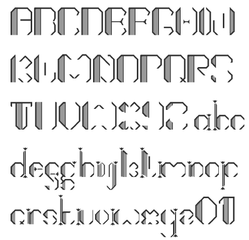
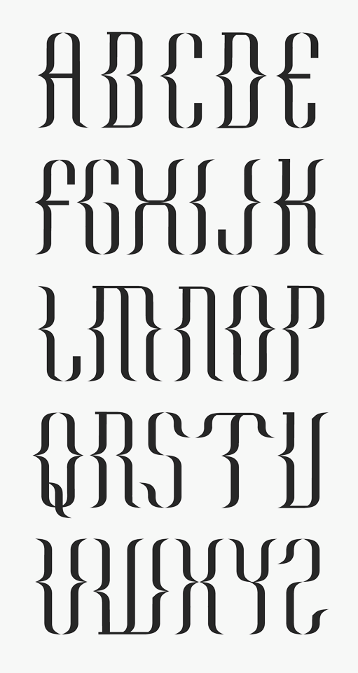
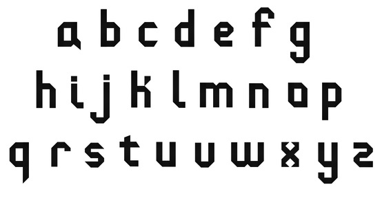
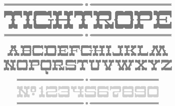
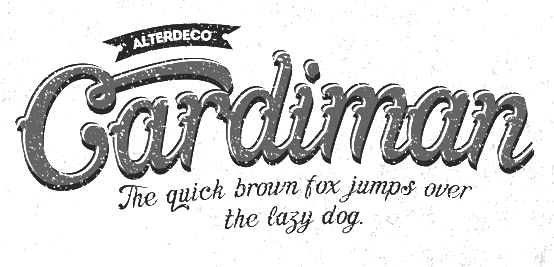
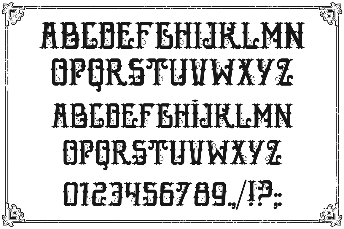
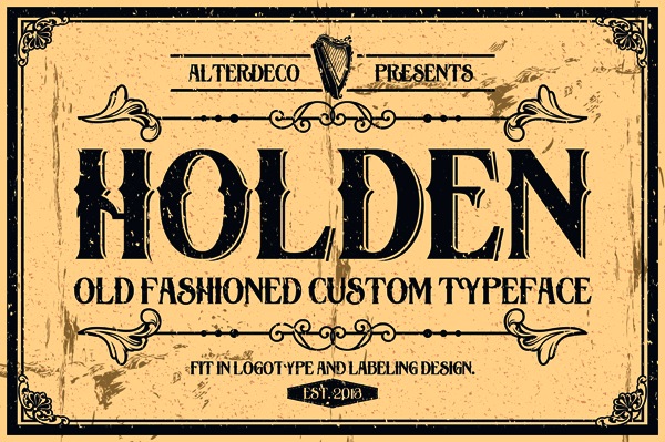
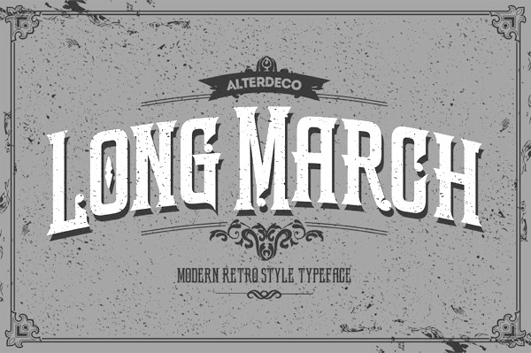
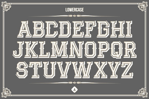
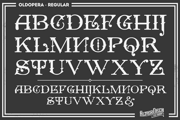
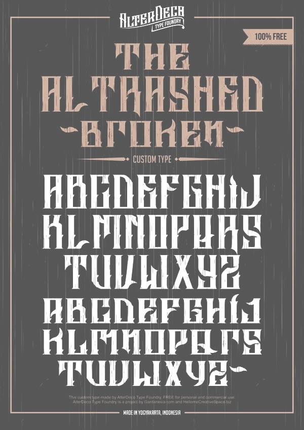
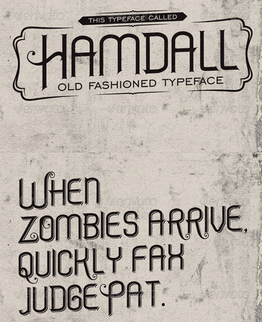
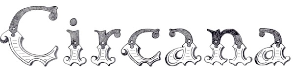
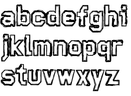
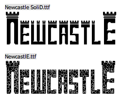
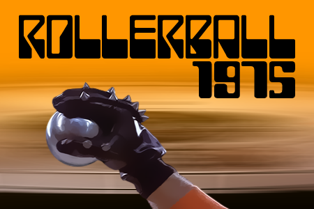
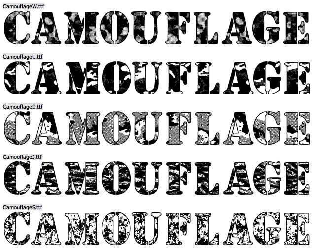
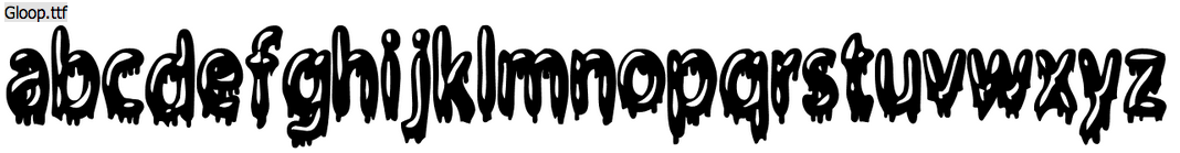
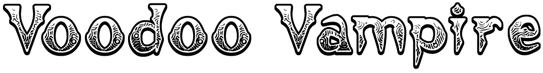
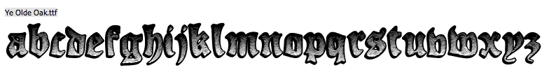
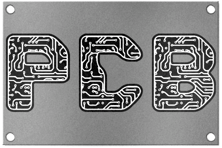
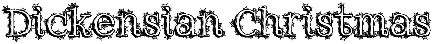
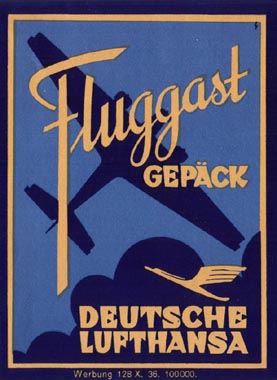
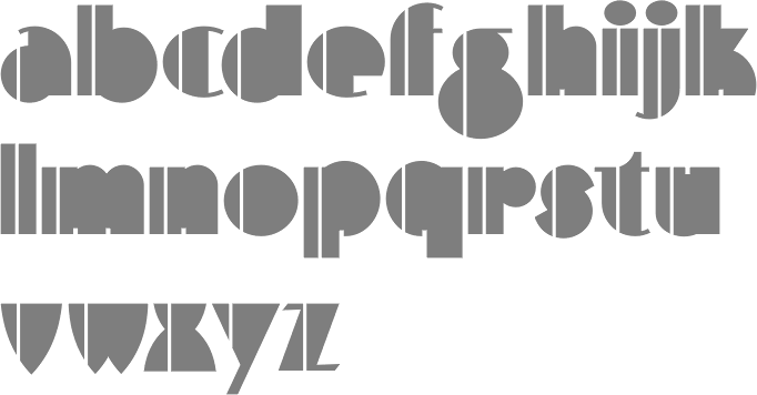
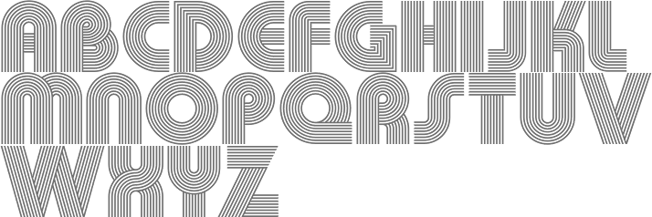
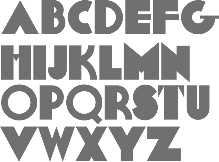
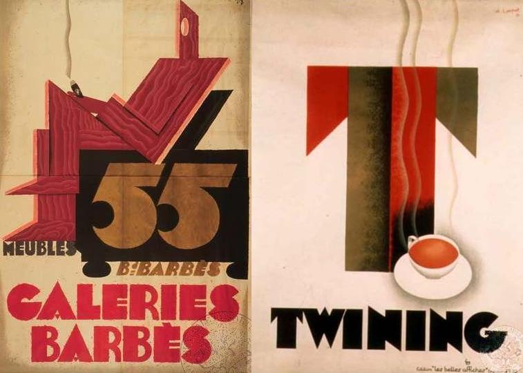
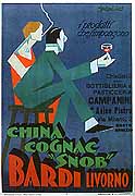
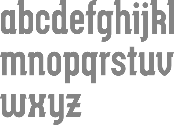
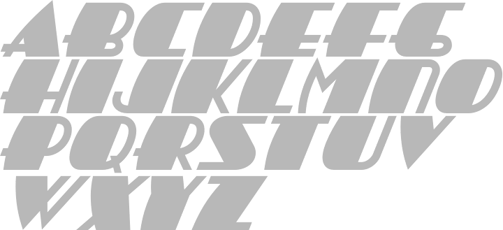
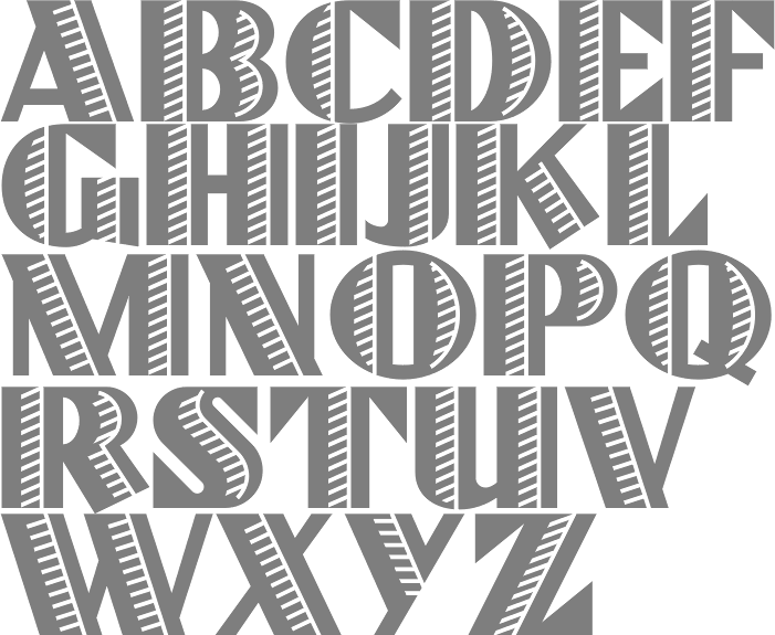
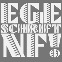
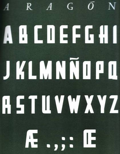
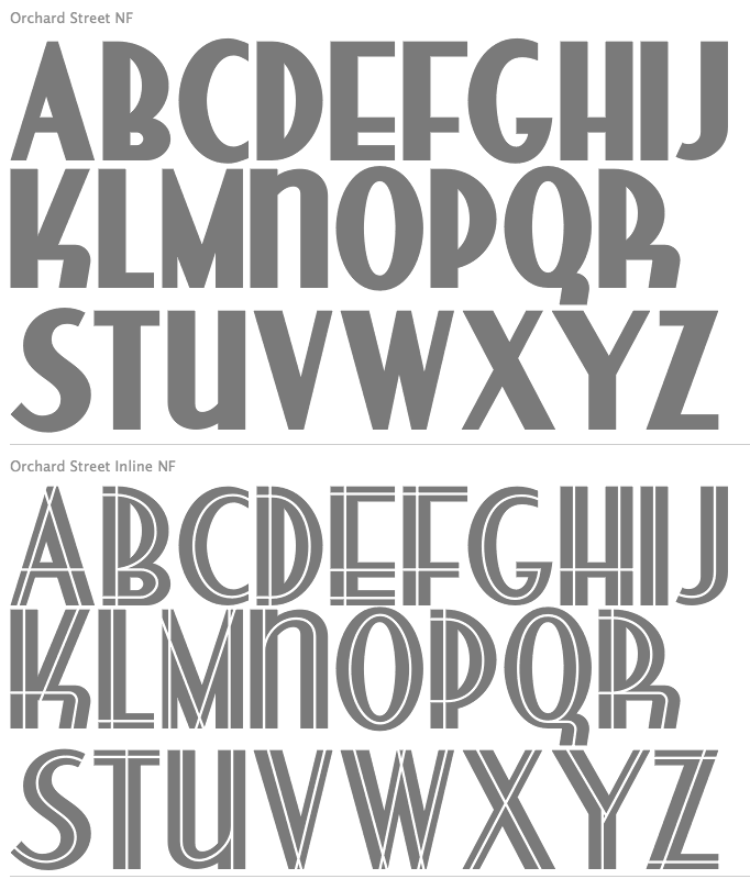
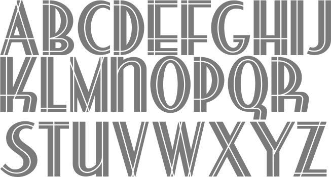
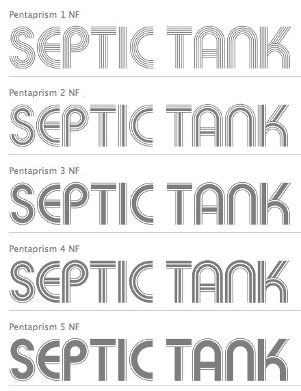
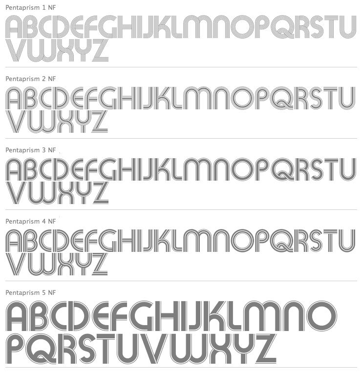
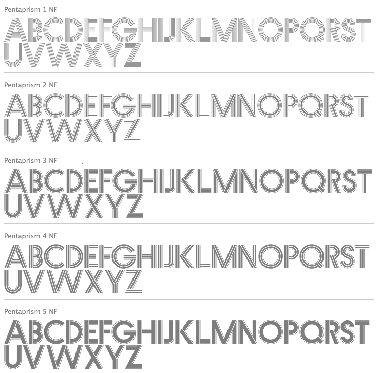
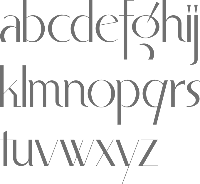
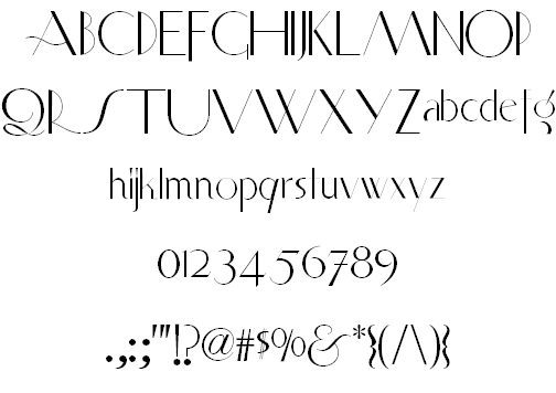
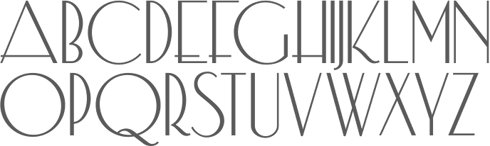
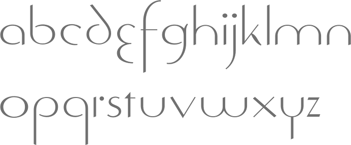
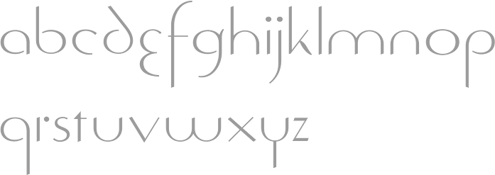
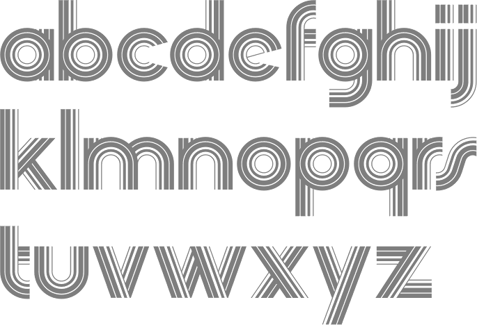
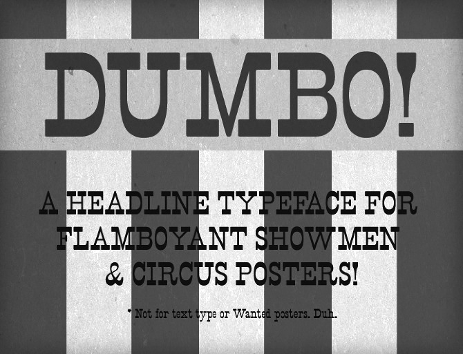
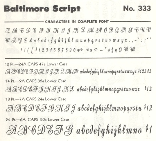
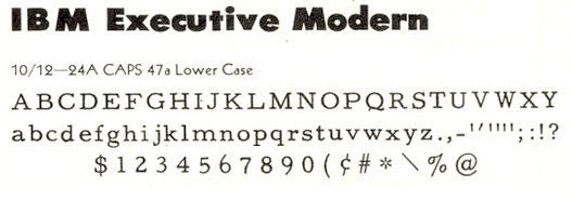
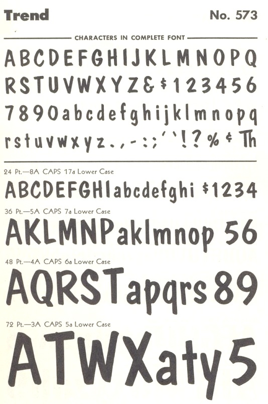
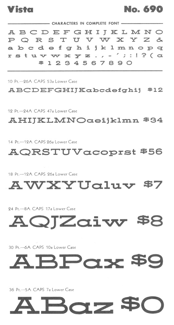
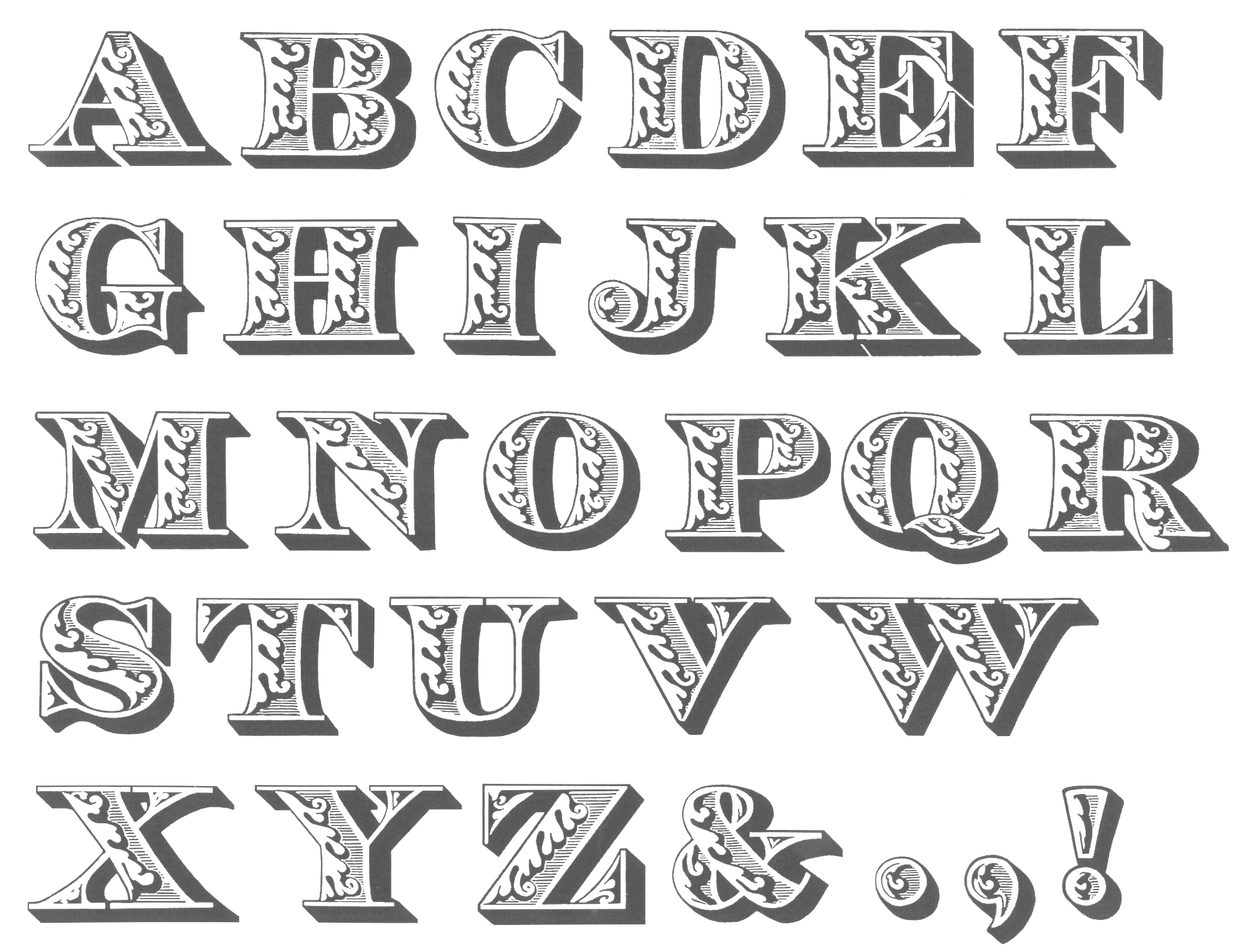
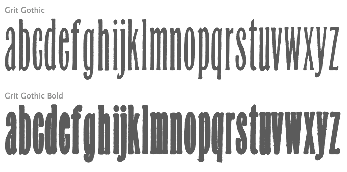
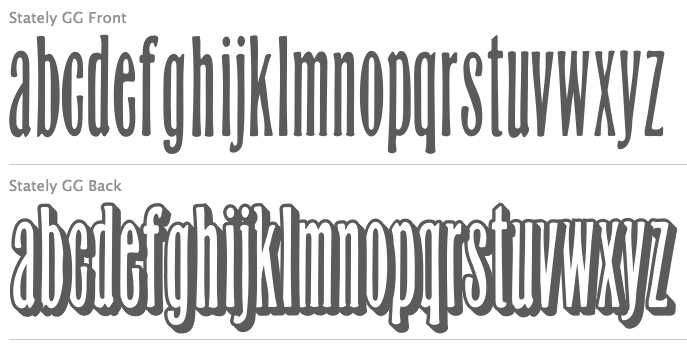
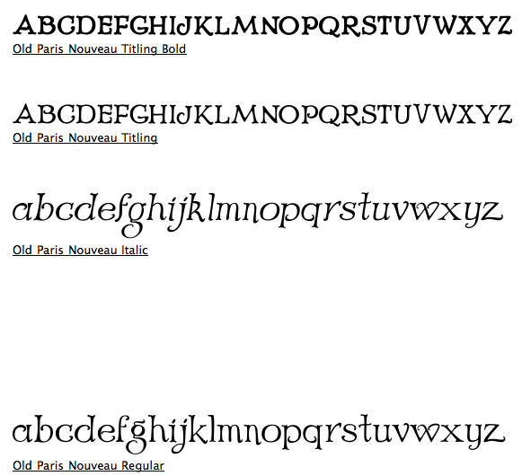
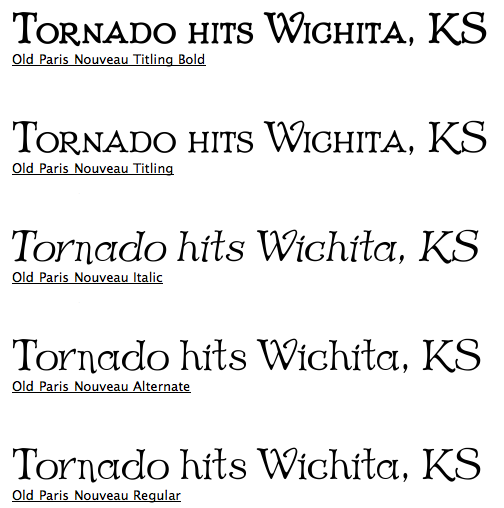
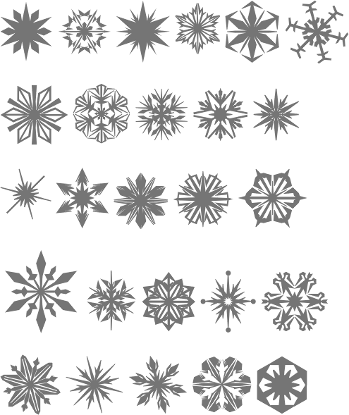
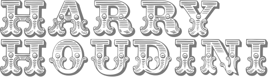
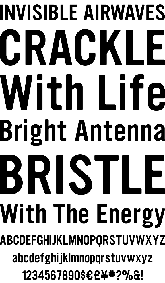
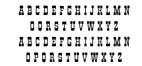
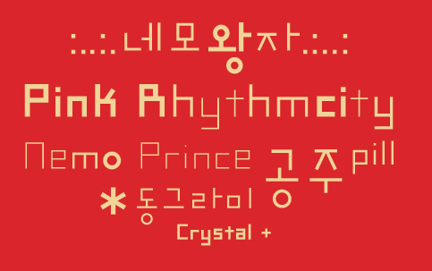
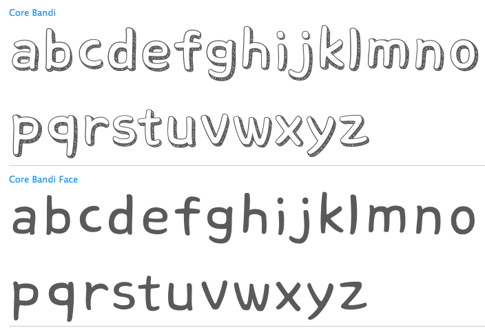
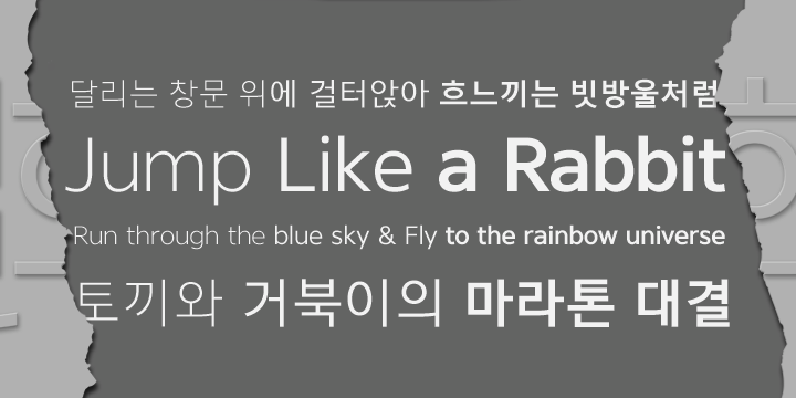
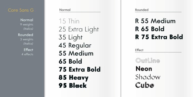
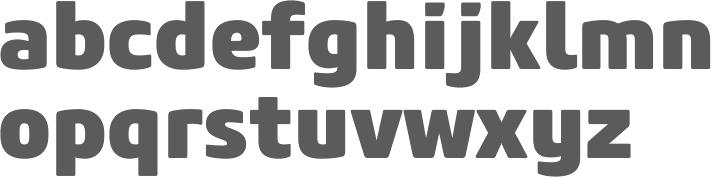
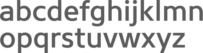
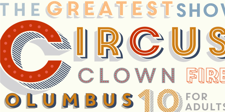
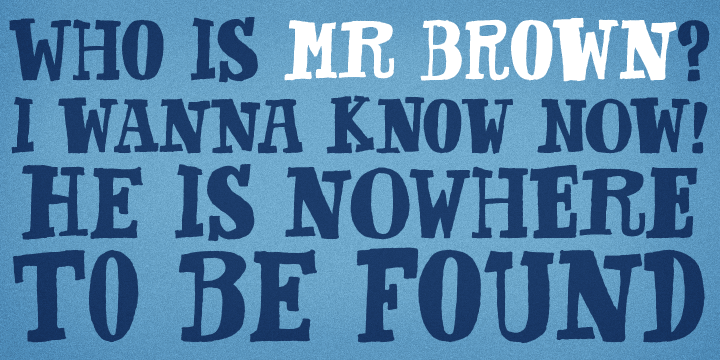
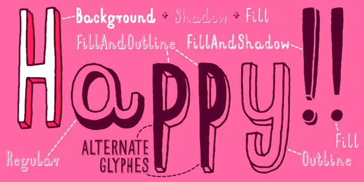
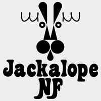
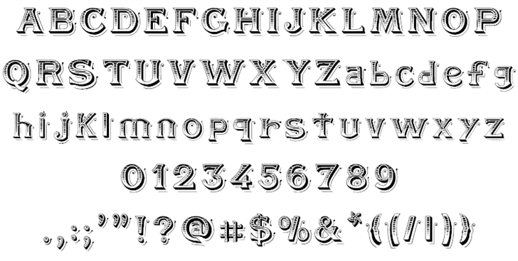
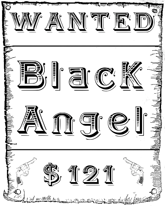
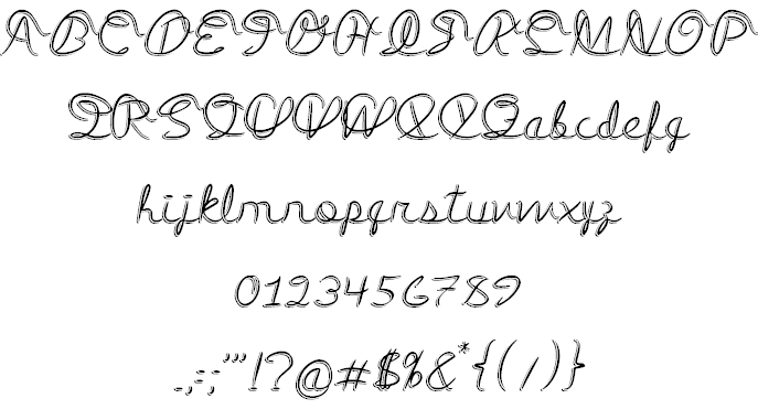
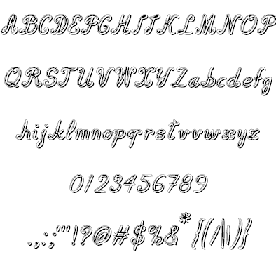
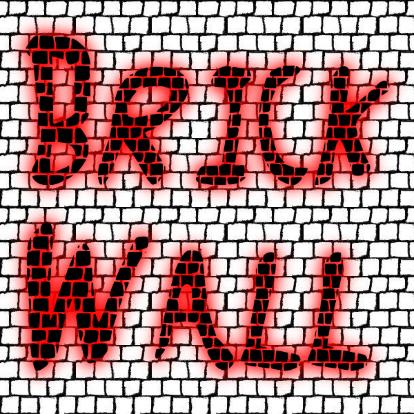
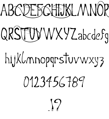
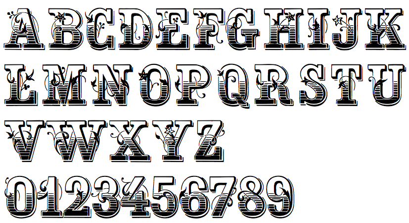
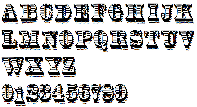
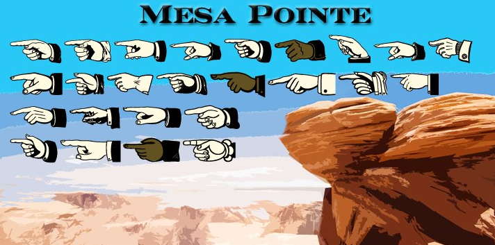
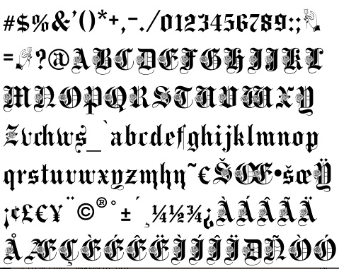
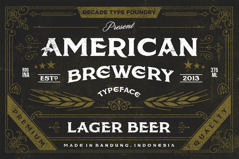
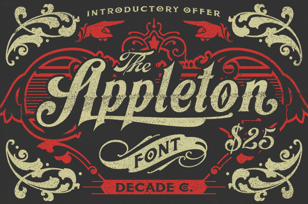
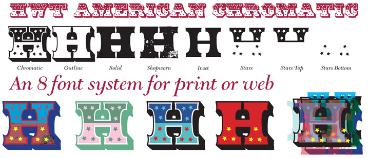
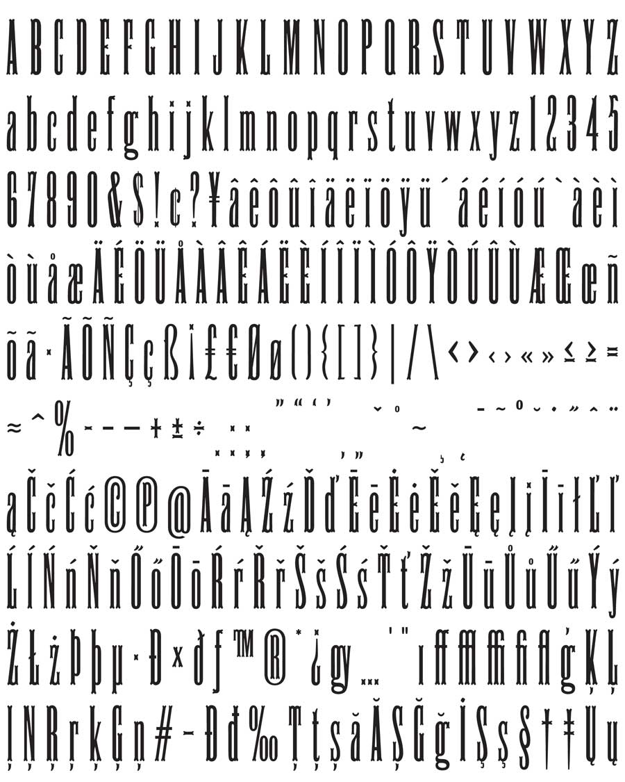
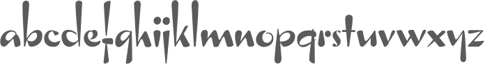
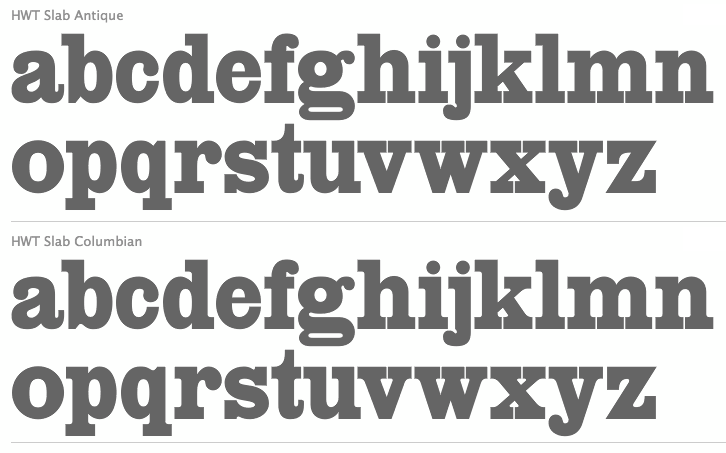
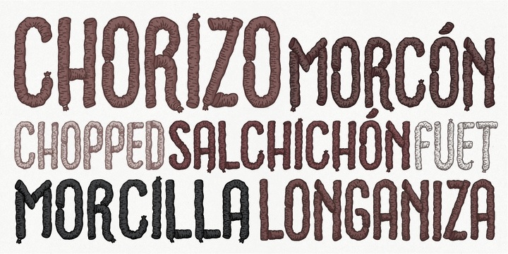
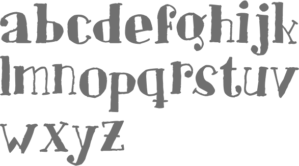
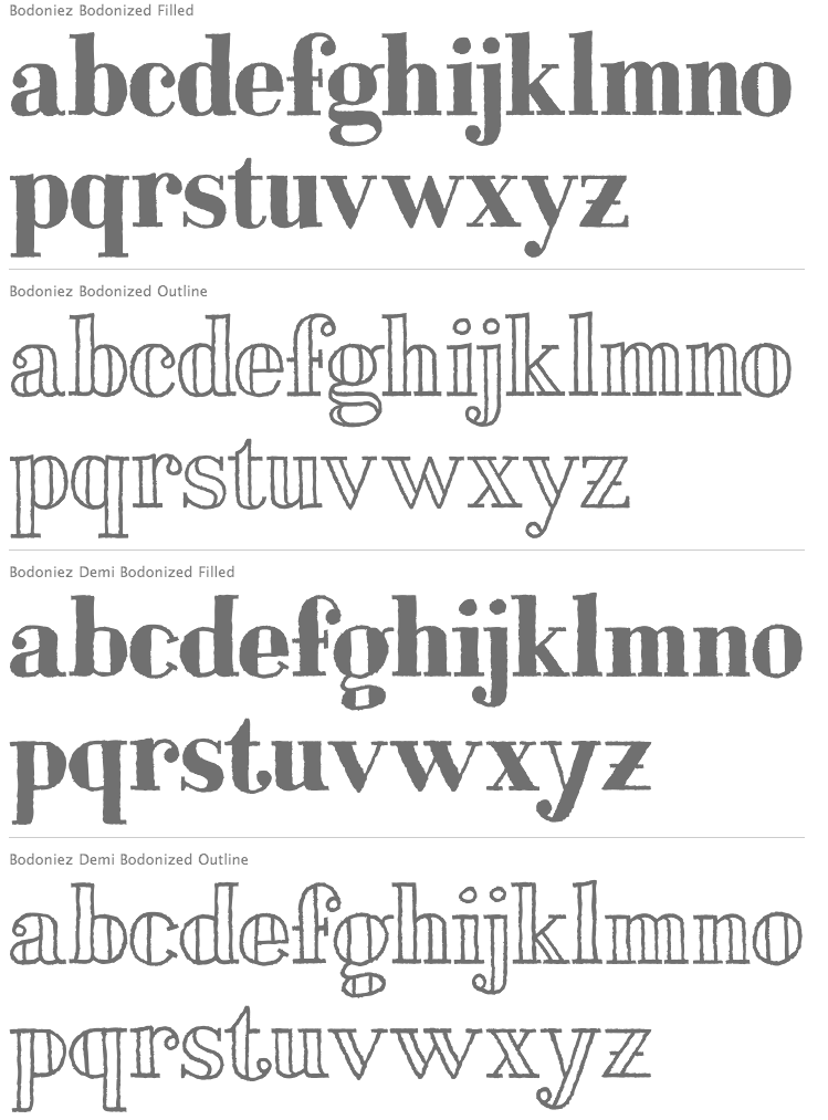
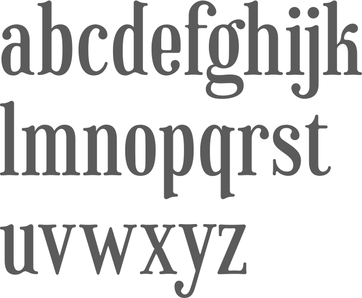
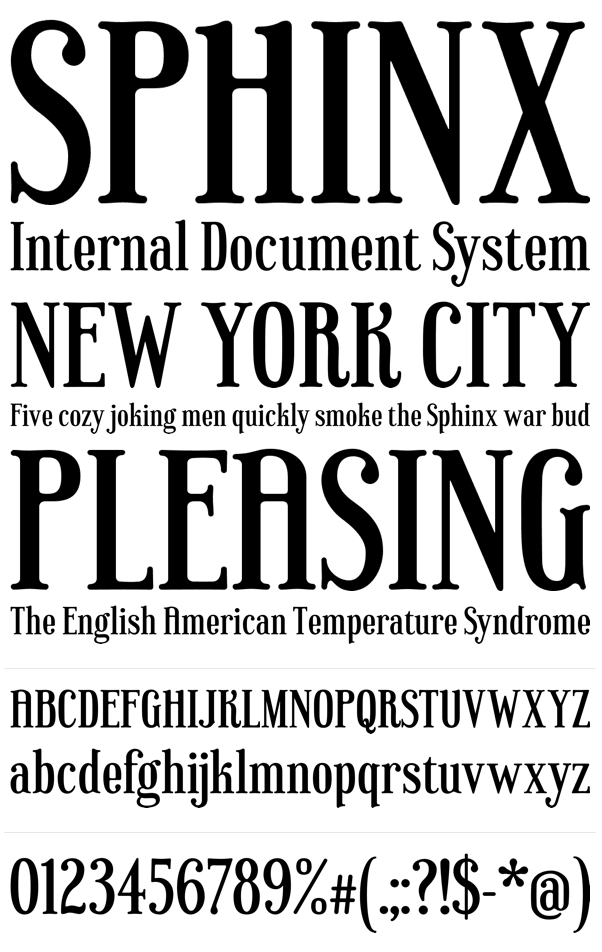
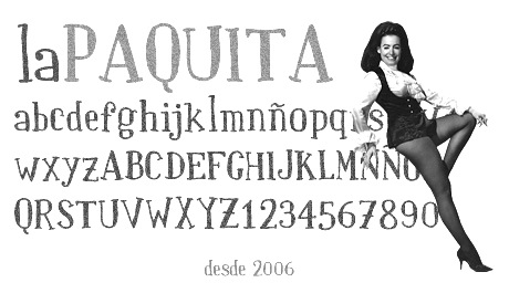
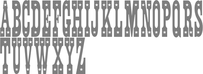
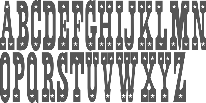
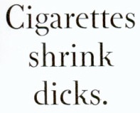
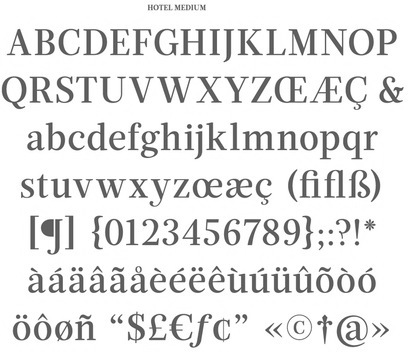
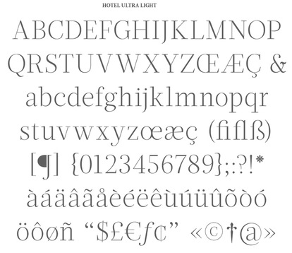
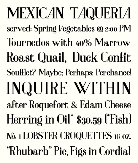
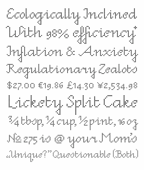
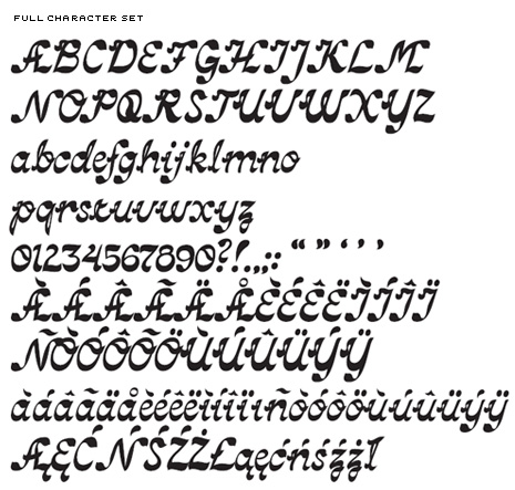
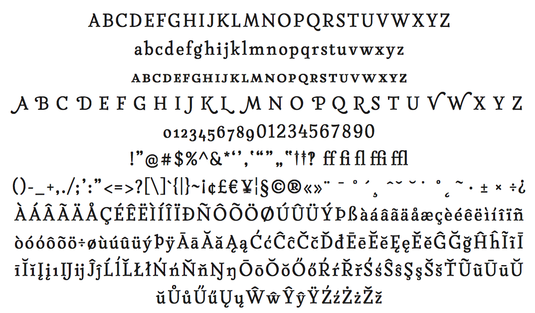
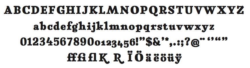
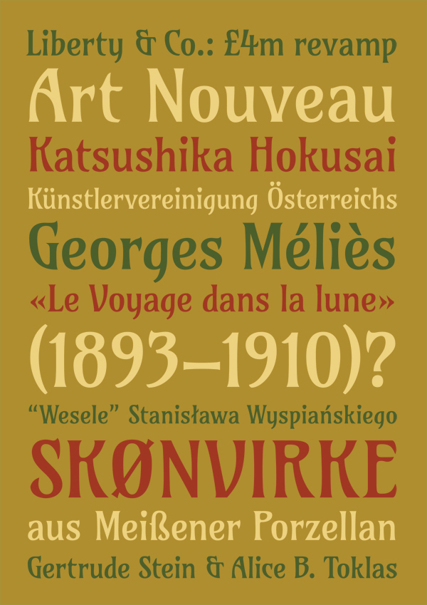
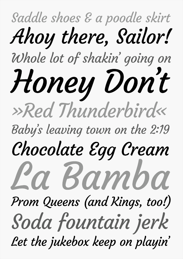
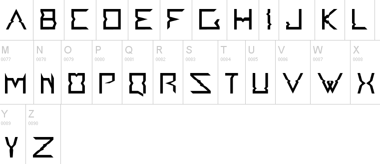
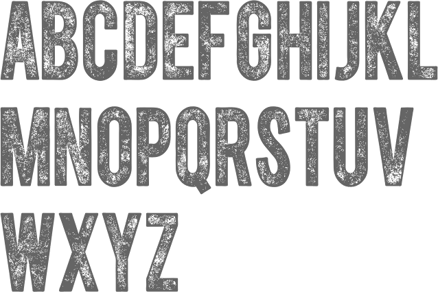
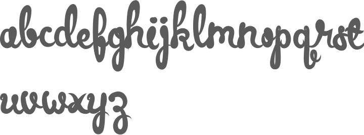
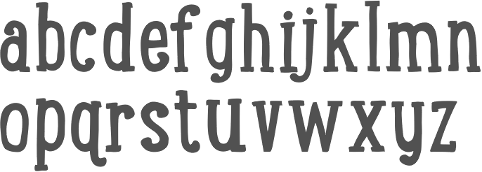
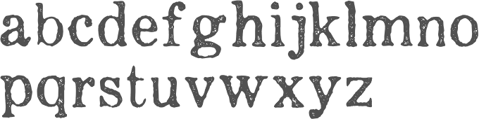
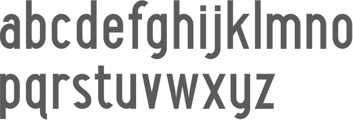
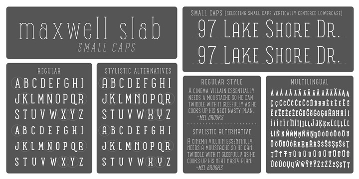
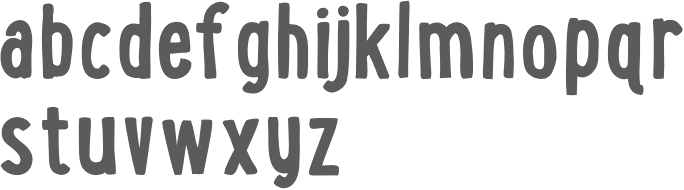
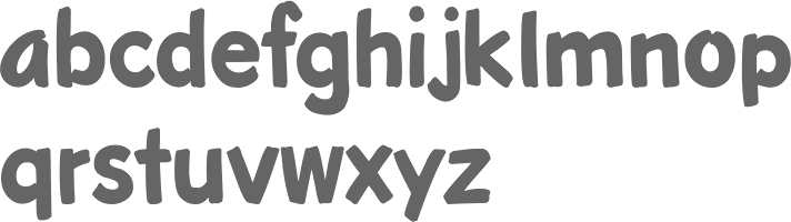
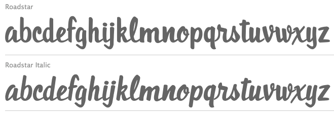
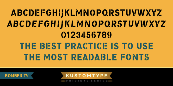
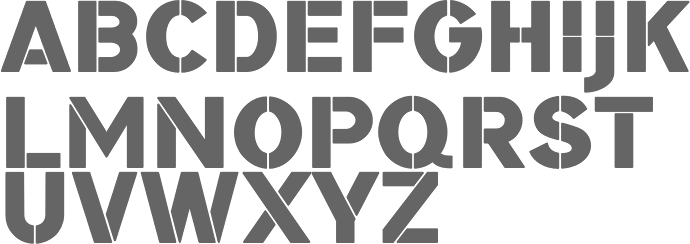
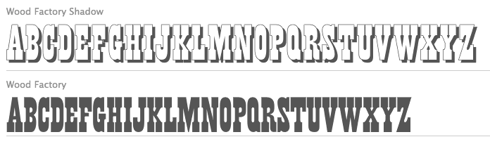
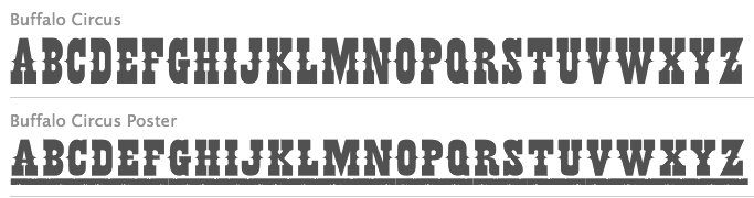
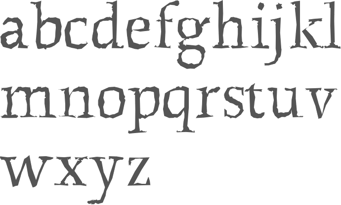
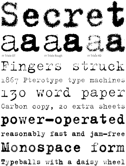
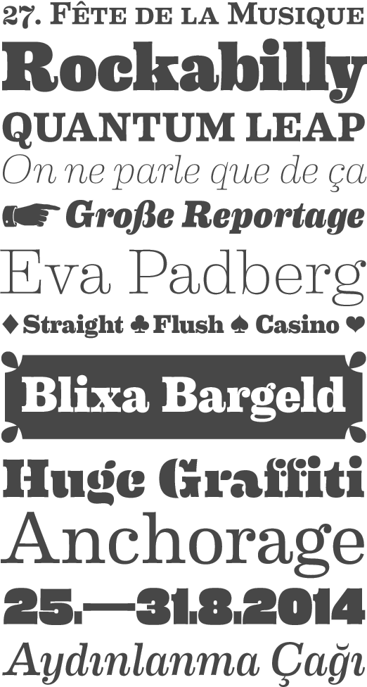
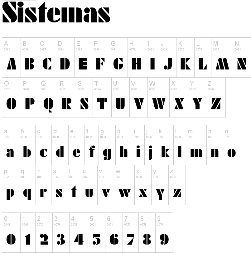
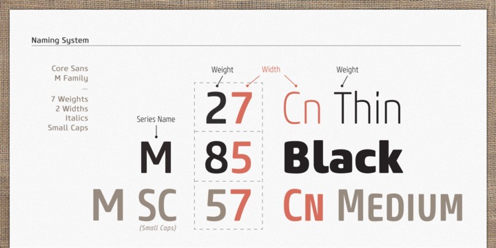
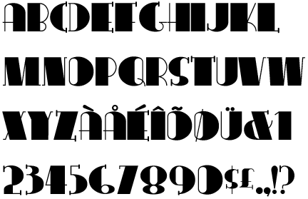
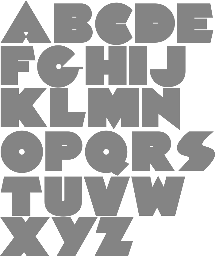
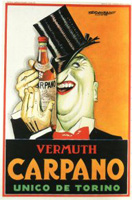
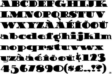
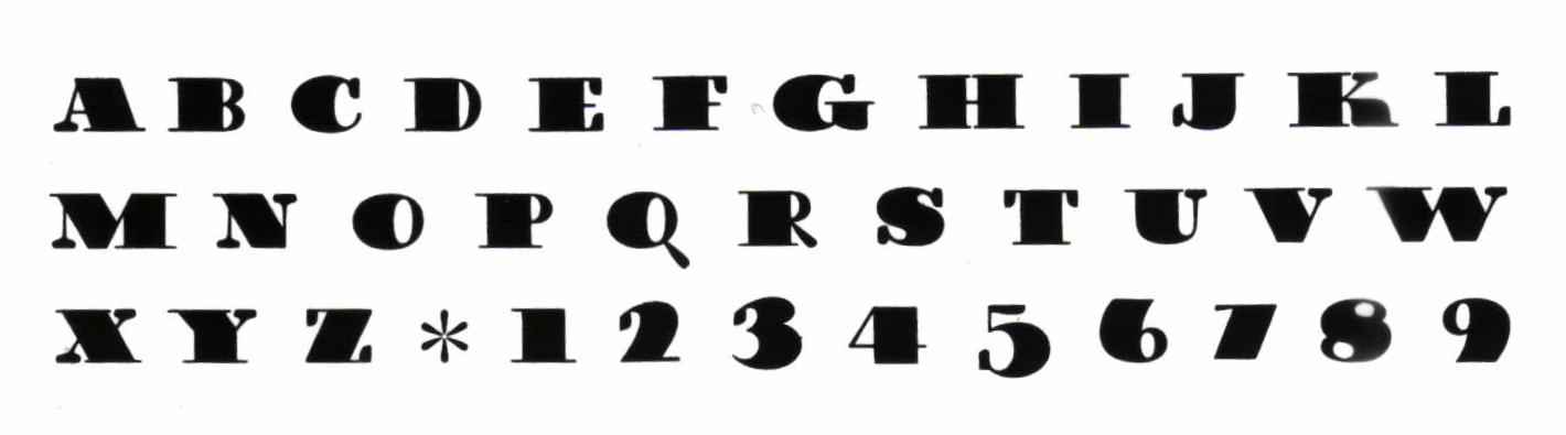
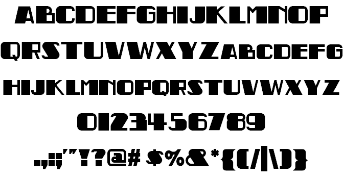
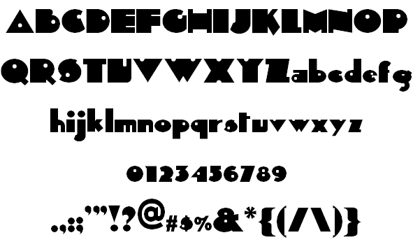
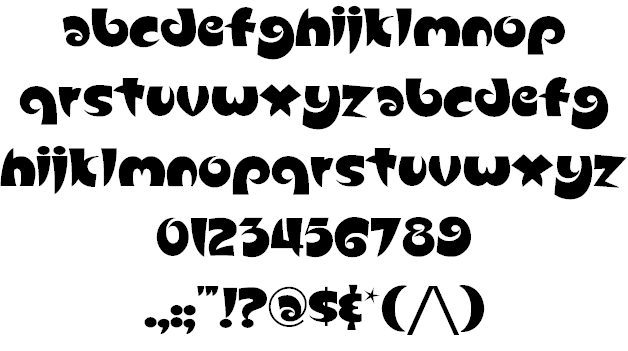
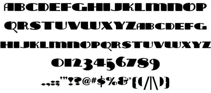
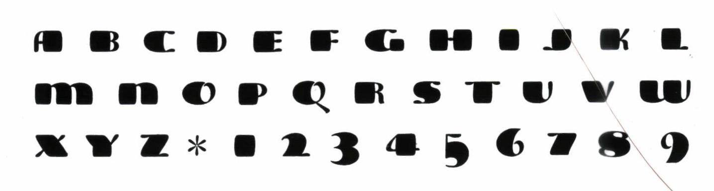
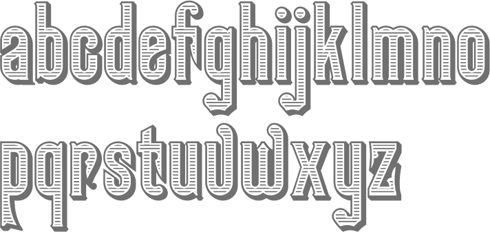
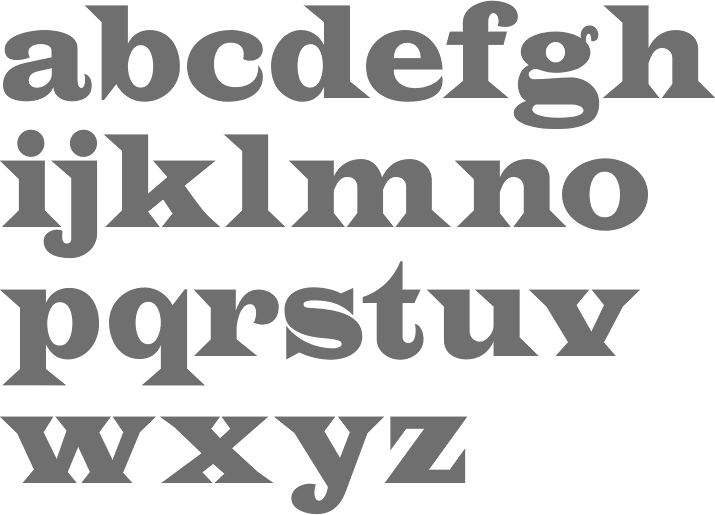
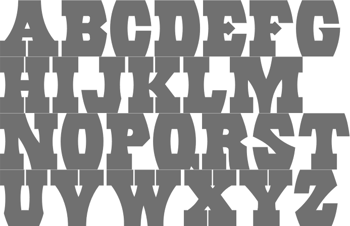
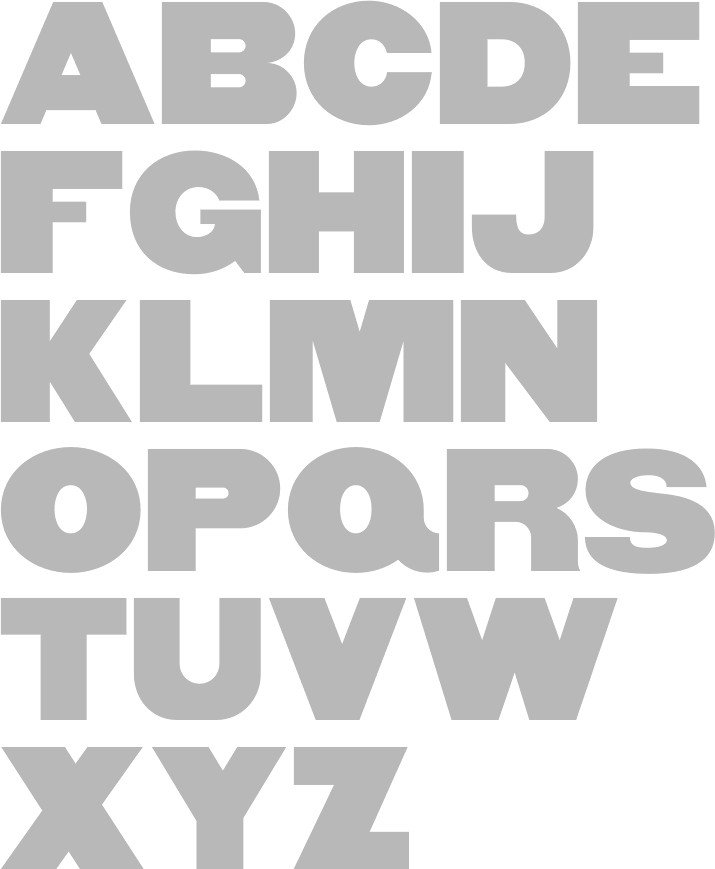
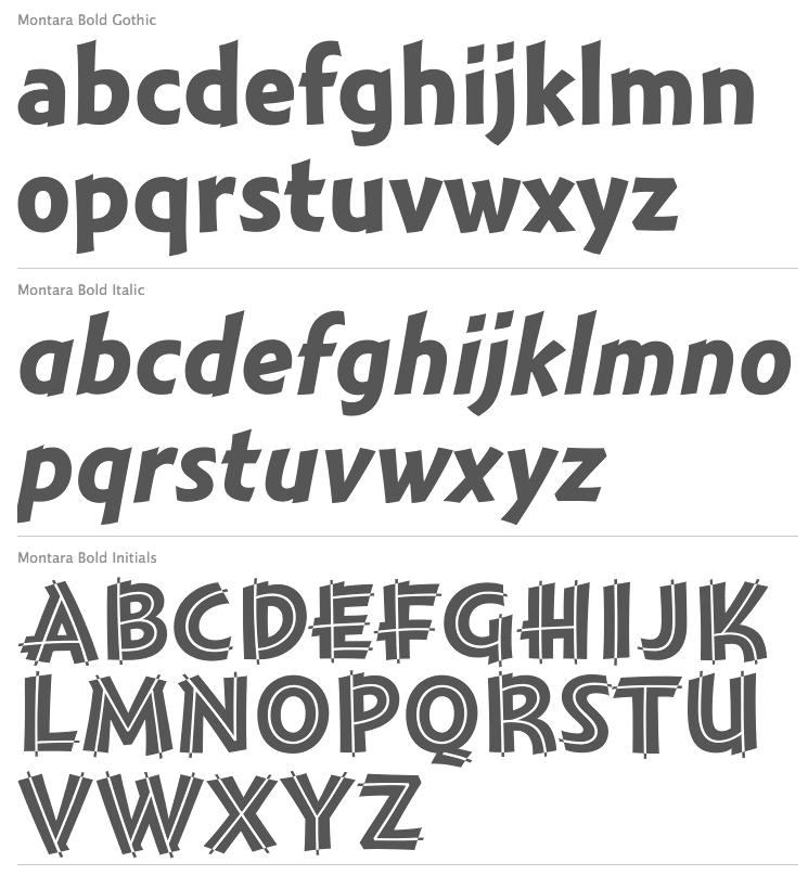
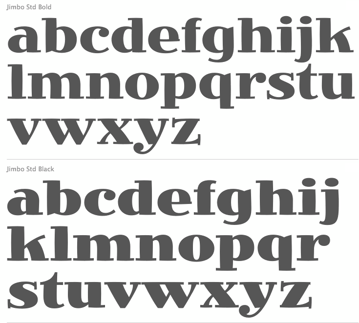
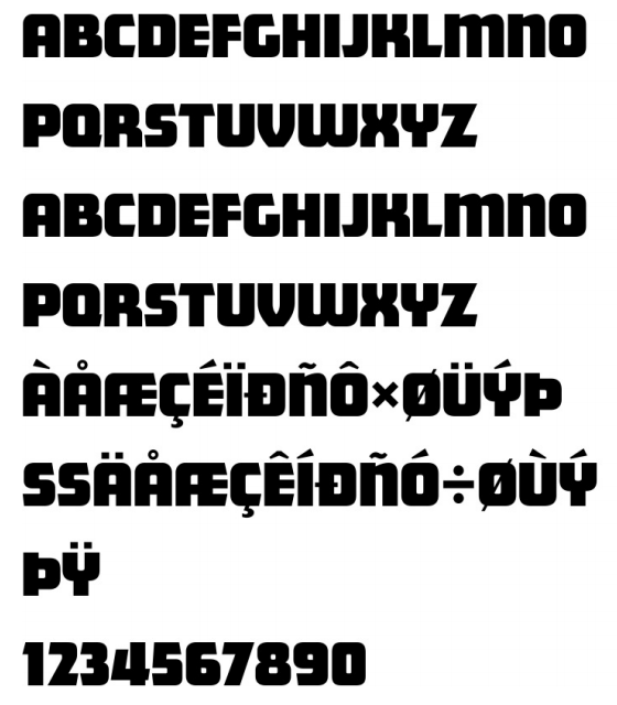
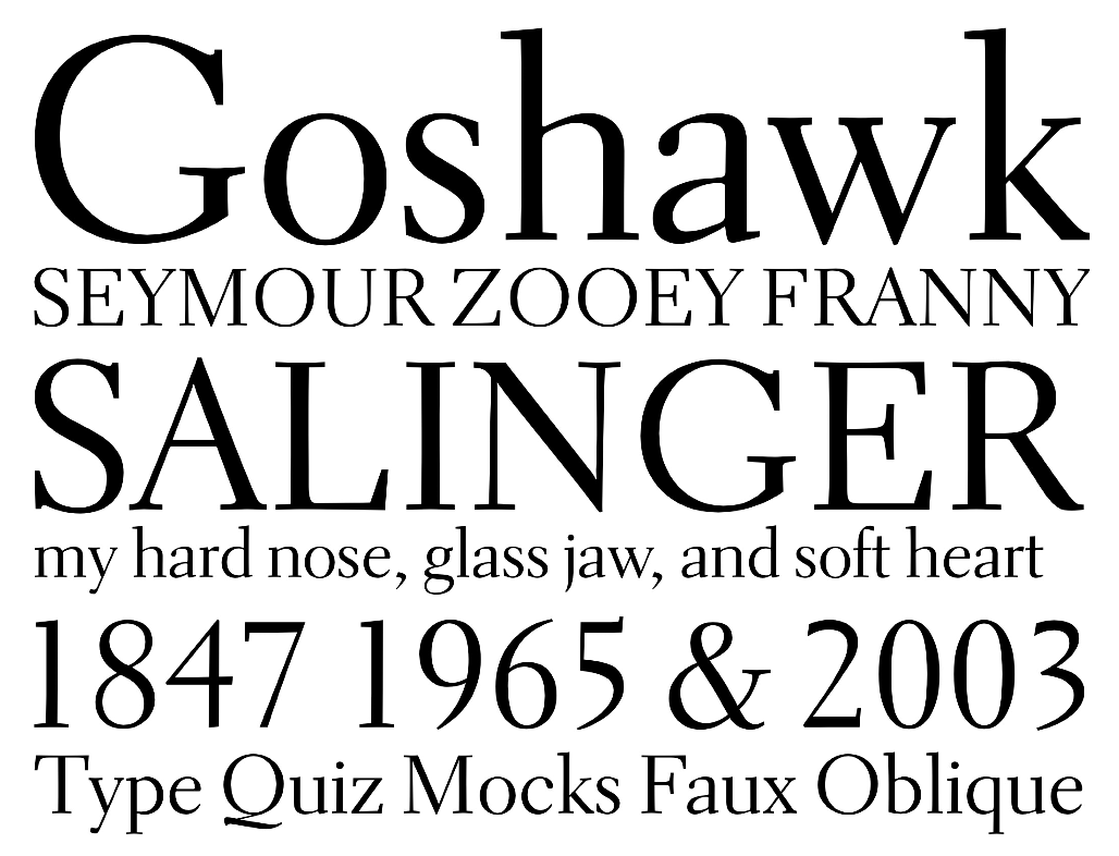
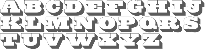
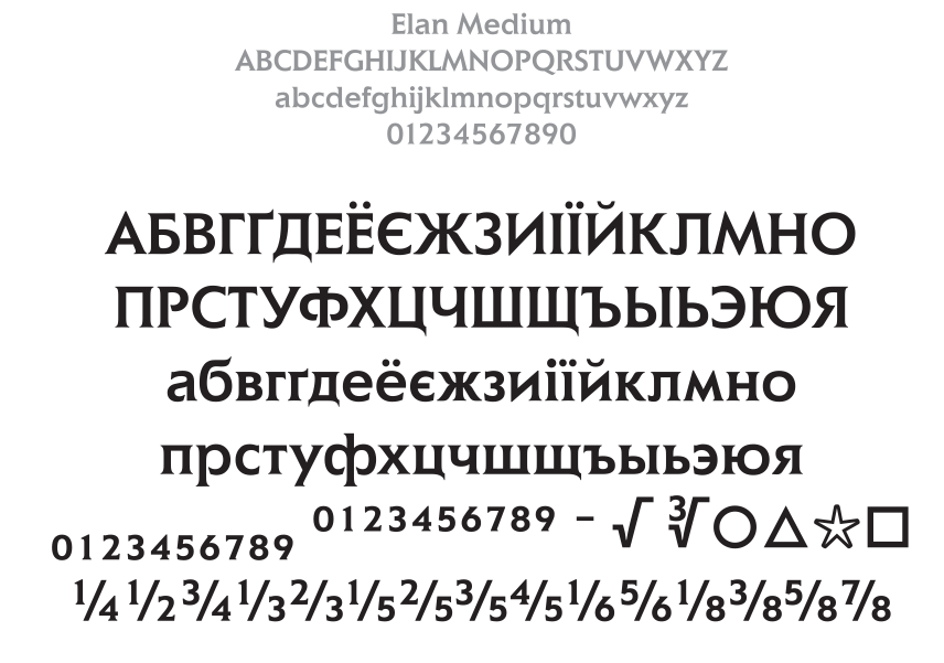
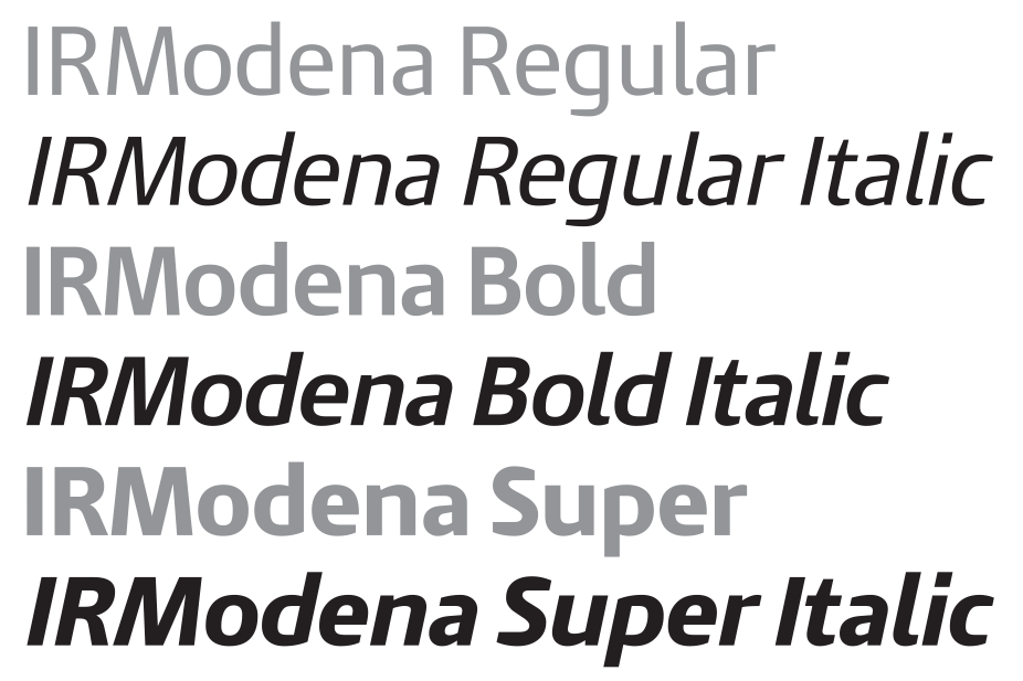
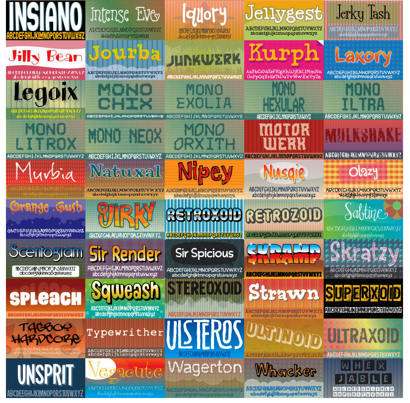
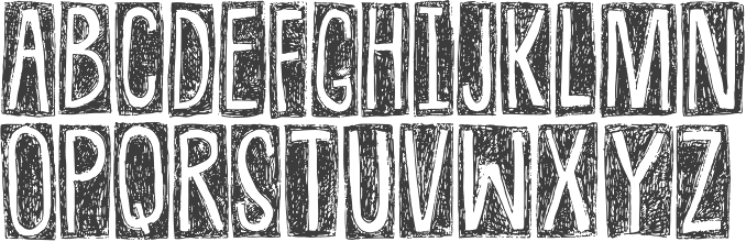
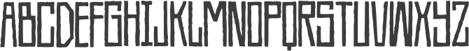
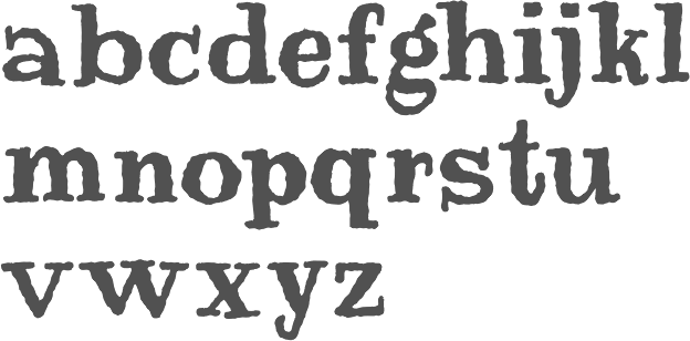
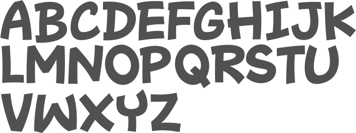
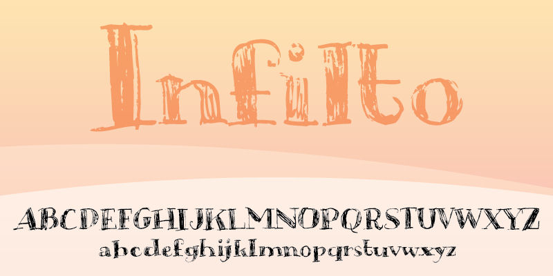
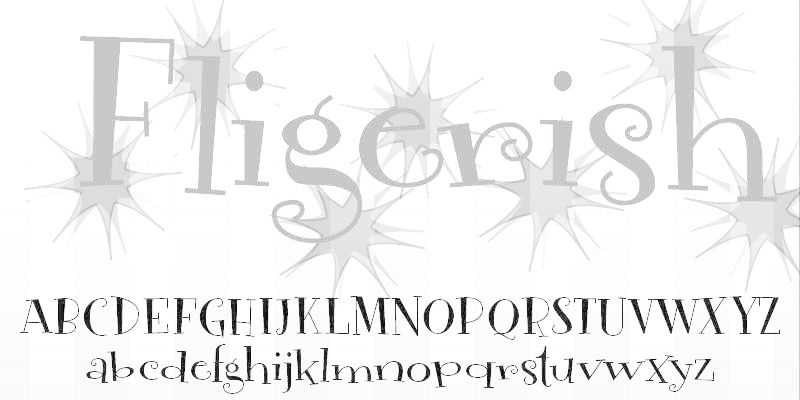
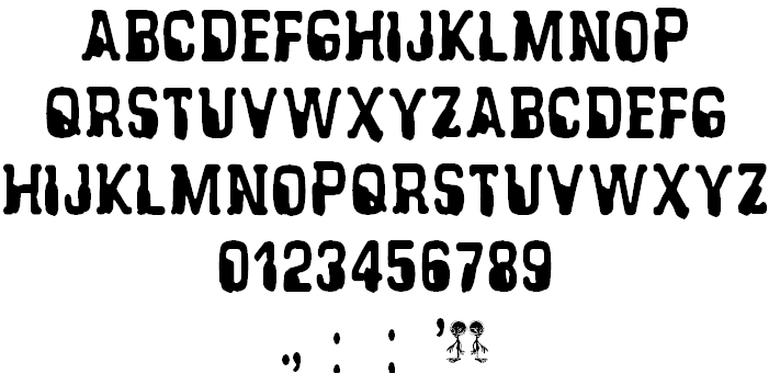
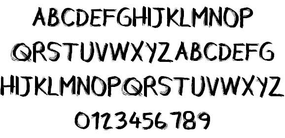
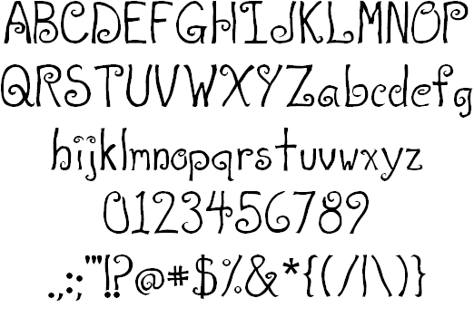
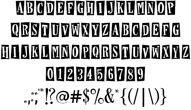
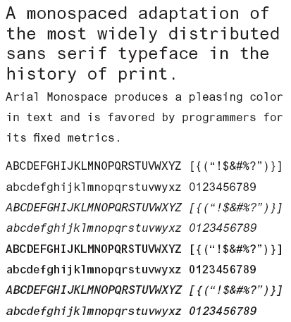
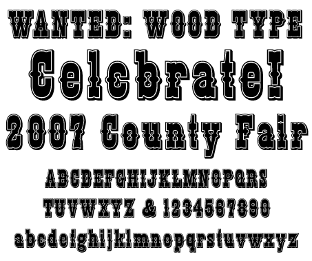
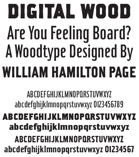
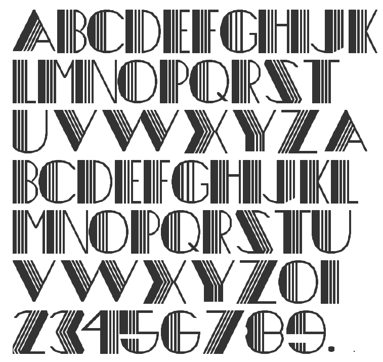
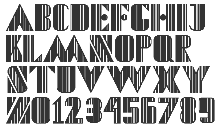
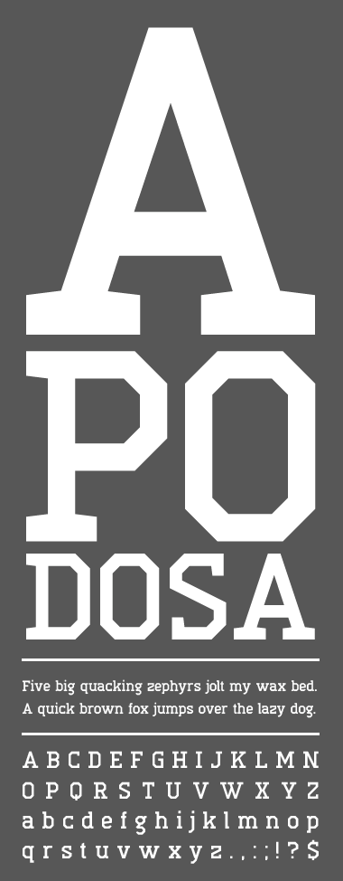
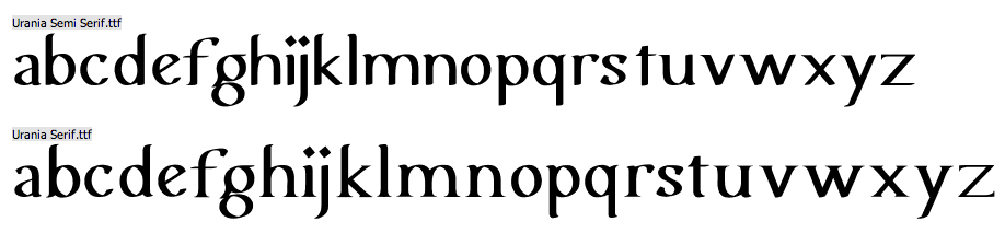
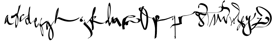
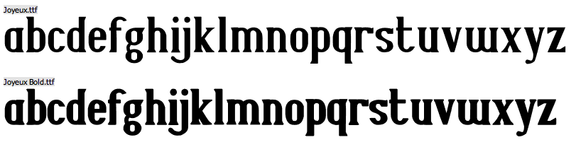
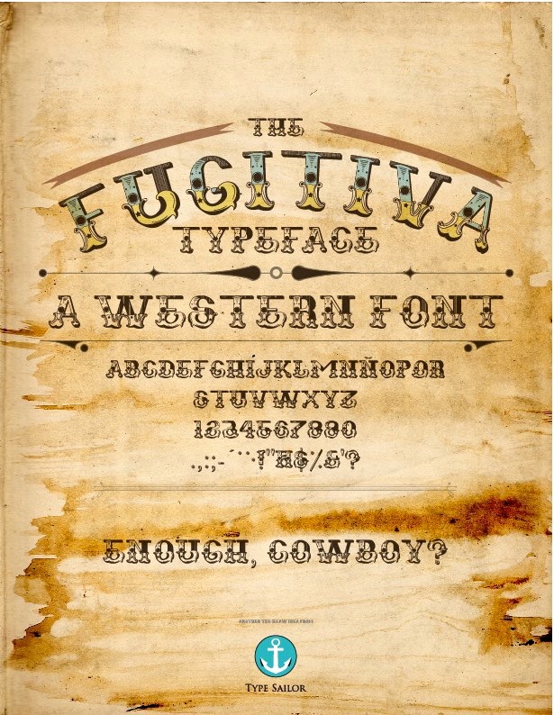
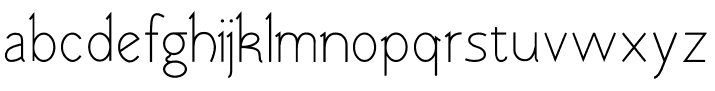
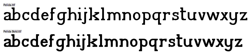
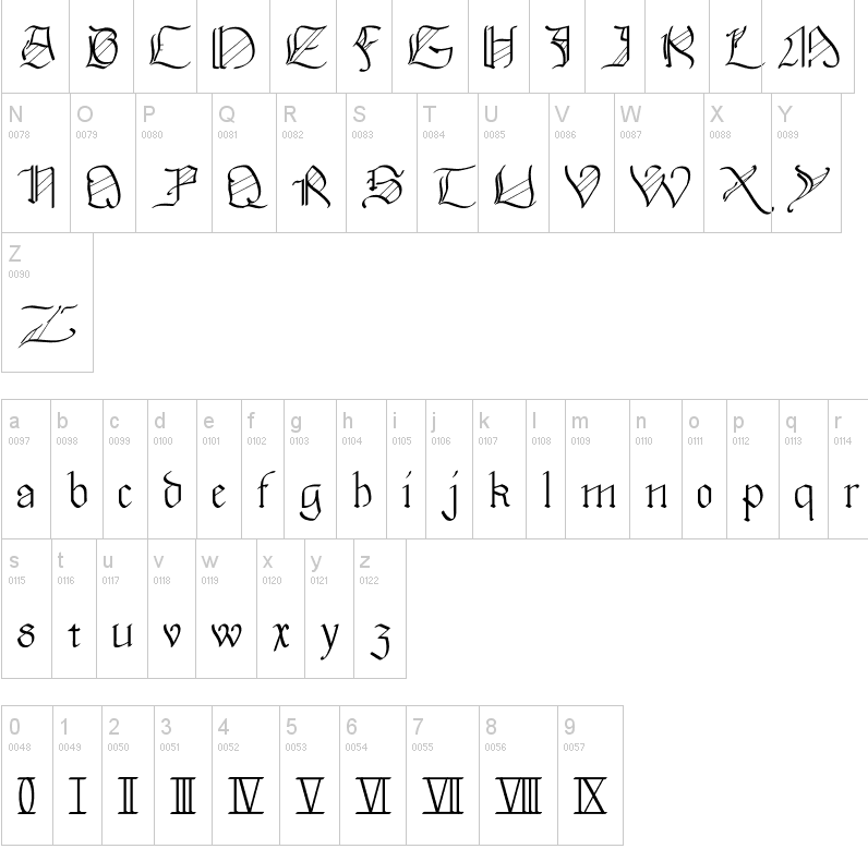
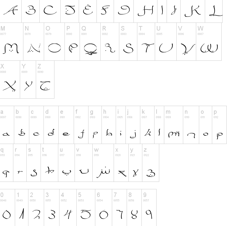
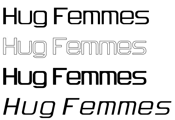
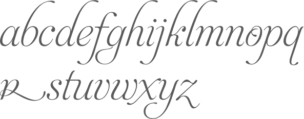
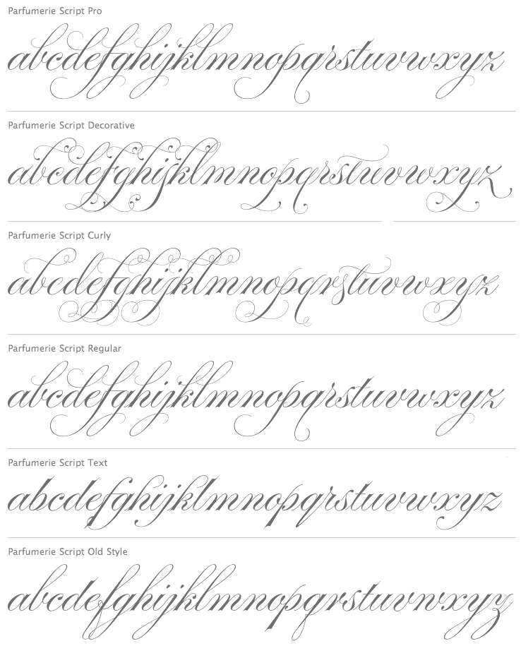
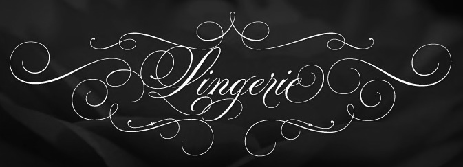
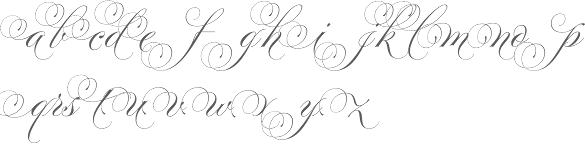
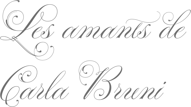
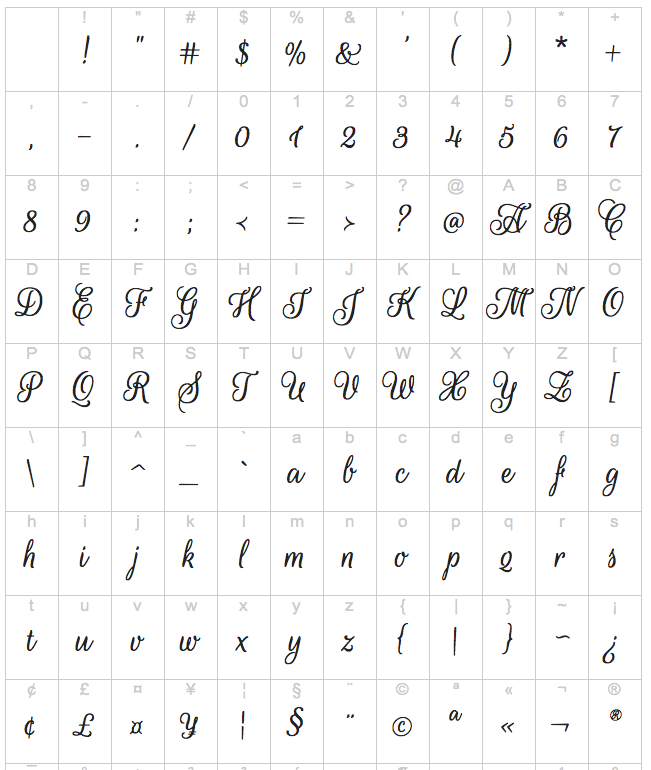
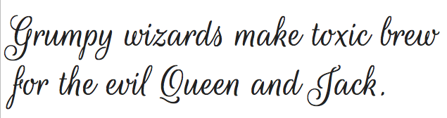
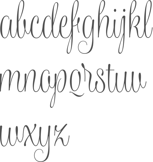
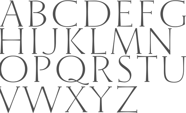
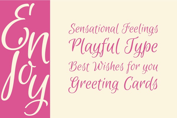
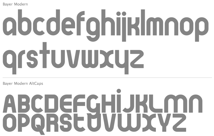
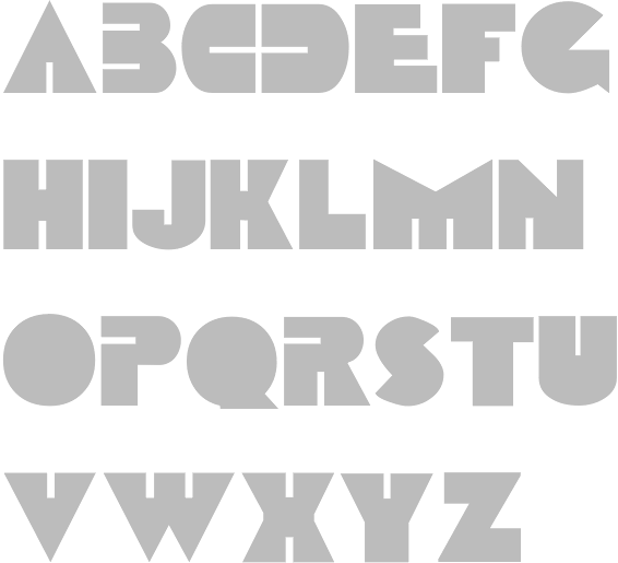
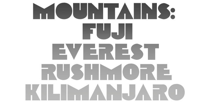
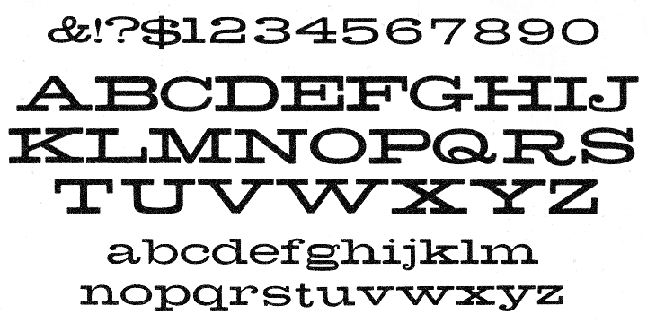
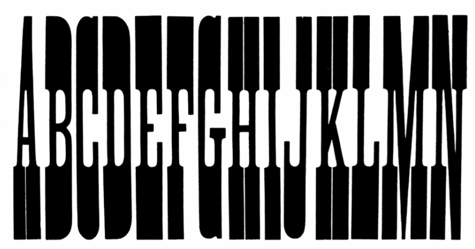
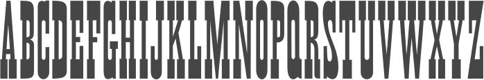